Apple WebObjects 3.5 Tools And Techniques (Manual) User Manual Web Objects3.5Tools Techniques(Manual) Objects3.5 Tech
User Manual: Apple WebObjects WebObjects3.5ToolsAndTechniques(Manual)
Open the PDF directly: View PDF  .
.
Page Count: 88

WEBOBJECTS
TOOLS AND TECHNIQUES
Apple, NeXT, and the publishers have tried to make the information contained in this manual as accurate and reliable
as possible, but assume no responsibility for errors or omissions. They disclaim any warranty of any kind, whether
express or implied, as to any matter whatsoever relating to this manual, including without limitation the
merchantability or fitness for any particular purpose. In no event shall they be liable for any indirect, special,
incidental, or consequential damages arising out of purchase or use of this manual or the information contained
herein. NeXT or Apple will from time to time revise the software described in this manual and reserves the right to
make such changes without obligation to notify the purchaser.
Copyright 1997 by Apple Computer, Inc., 1 Infinite Loop, Cupertino, CA 95014.
All rights reserved.
No part of this publication may be reproduced, stored in a retrieval system, or transmitted, in any form or by any
means, electronic, mechanical, photocopying, recording, or otherwise, without the prior written permission of the
publisher or copyright owner. Printed in the United States of America. Published simultaneously in Canada.
NeXT, the NeXT logo, OPENSTEP, Enterprise Objects, Enterprise Objects Framework, Objective-C, WEBSCRIPT, and
WEBOBJECTS are trademarks of NeXT Software, Inc. PostScript is a registered trademark of Adobe Systems,
Incorporated. Windows NT is a trademark of Microsoft Corporation. UNIX is a registered trademark in the United States
and other countries, licensed exclusively through X/Open Company Limited. ORACLE is a registered trademark of
Oracle Corporation, Inc. SYBASE is a registered trademark of Sybase, Inc. All other trademarks mentioned belong to
their respective owners.
Restricted Rights Legend: Use, duplication, or disclosure by the Government is subject to restrictions as set forth in
subparagraph (c)(1)(ii) of the Rights in Technical Data and Computer Software clause at DFARS 252.227-7013 [or, if
applicable, similar clauses at FAR 52.227-19 or NASA FAR Supp. 52.227-86].
This manual describes WebObjects 3.5
Writing: Ron Karr
Production: Gerri Gray
Art: Karin Stroud
With help from: Andy Belk, Craig Federighi, John Graziano, Ben Haller, Charles Lloyd, Jean Ostrem, Kelly Toshach, Greg Wilson

Contents

v
Table of Contents
Contents iii
Setting Up WebObjects Applications 7
Introduction 9
Creating WebObjects Application Projects 9
Choosing Assistance 11
Choosing the Programming Language 11
The Structure of a WebObjects Application Project 12
Adding or Deleting Items From a Project 13
Web Components 15
Classes 17
Headers 17
Other Sources 17
Resources 17
Web Server Resources 18
Subprojects 18
Supporting Files 19
Frameworks 19
Libraries 20
Non Project Files 20
Opening an Existing Project 21
Editing Your Project’s Source Files 21
Editing Your Component’s HTML and Declarations Files 23
Building Your Application 23
The Application Wrapper 25
Launching Your Application 25
Installing Your Application 26
Converting Old Projects 27
Performing the Conversion 28
Moving Your Images 29
Editing With WebObjects Builder 31
Introduction 33
The Component Window 33
The WebObjects Builder Toolbar 34
Editing Modes 34
Entering Text 36
Creating Elements With the Toolbar 37
Menu Equivalents For Toolbar Commands 38
Selecting Elements 38
The Inspector 39
Structure Elements 40
Paragraphs 40
Lists 41
Headings 41
Horizontal Rule 41
Images 41
Custom Marker 42
Removing Elements or Text From a Container 43
Working With Tables 43
Creating Tables 43
Table Editing Modes 44
Sizing Tables 45
Inspecting Tables, Rows, and Cells 46
Creating Hyperlinks 47
Setting Page Attributes 48
Setting Colors 49
Palettes 49
Creating and Using Palette Items 50
Changing a Palette Icon 52

vi
Working With Dynamic Elements 53
Introduction to Dynamic Elements 55
Attributes 55
Creating Dynamic Elements 56
Using the Toolbar 56
Dragging Elements into the Component Window 56
Using the Add WebObject Panel 57
The Object Browser 58
Creating Variables and Methods in WebObjects Builder 60
Adding Display Groups 63
Configuring the Display Group 65
Creating a Detail Display Group 67
Binding Elements 68
Creating Form-Based Dynamic Elements 72
Dynamic and Static Inspectors 73
Creating Other WebObjects 75
Dynamic Strings 76
Dynamic Hyperlinks 77
Repetitions 78
Conditionals 79
Custom WebObjects 81
Generic WebObjects 82
Dynamic Images 84
WOApplets 84
Reusable Components 85

Setting Up WebObjects Applications
Chapter 1

9
Introduction
To develop WebObjects applications, you use two primary tools: Project
Builder and WebObjects Builder. These tools help you perform the major
tasks required to develop your application
Project Builder is an integrated software-development application. It
contains a project browser, a code editor, build and debugging support, and
many other features needed to develop an application. It helps you to:
•Create and manage your project.
•Write code to provide behavior in your application.
•Build and launch your application.
This chapter discusses the main features of Project Builder that you use
when developing WebObjects applications. For more information on
Project Builder’s other features, refer to its on-line help.
WebObjects Builder is described in the chapters “Editing With
WebObjects Builder” and “Working With Dynamic Elements”.
This document refers to example projects located in the
<DocumentRoot>/WebObjects/Examples/ directory.
Creating WebObjects Application Projects
A WebObjects application project contains all the files needed to build and
maintain your application. You use Project Builder to create a new project.
1. Launch Project Builder.
To do this, launch ProjectBuilder.app, which is found in the NextDeveloper/Apps/
directory. On Mach systems, this directory is under the root directory
/.
On Windows NT, it is under %NEXT_ROOT%, an environment
variable defined when you installed WebObjects (C:\NeXT by default).
On Windows NT, you can launch Project Builder from the
WebObjects program group in the Start menu.
2. Choose Project m New.
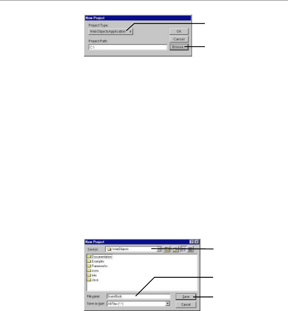
Chapter 1 Setting Up WebObjects Applications
10
The New Project panel has a Project Type pop-up list that lets you choose
the type of project you want to create. WebObjectsApplication is shown by
default.
3. In the Project Type pop-up list, make sure WebObjectsApplication is
selected.
Another type of project you may want to create is WebObjectsFramework.
See “Frameworks” for more information.
4. Click Browse to specify your project’s location.
Note: You can also type your project’s location and name directly in the
Project Path text field.
5. Navigate to the directory in which to create your project.
During development, you typically create a project in the
<DocumentRoot>/WebObjects directory. <DocumentRoot> is your HTTP server’s
document root, which you specified when you installed WebObjects. It is
convenient to have your entire project under this directory so project
resources can be located without going through the installation process (see
“Installing Your Application”). However, when deploying your application,
you can place parts of your project elsewhere, so that only those files
needed by the web server are accessible to users.
Set the project type here.
Click to choose directory in which to
create your project.
Type the project name here.
Click here when finished.
Choose WebObjects under the
server’s document root.
Creating WebObjects Application Projects
11
6. Type the name of the project you want to create.
7. Click Save.
The New Project panel shows the path you specified.
8. Click OK.
The WebObjects Application Wizard starts.
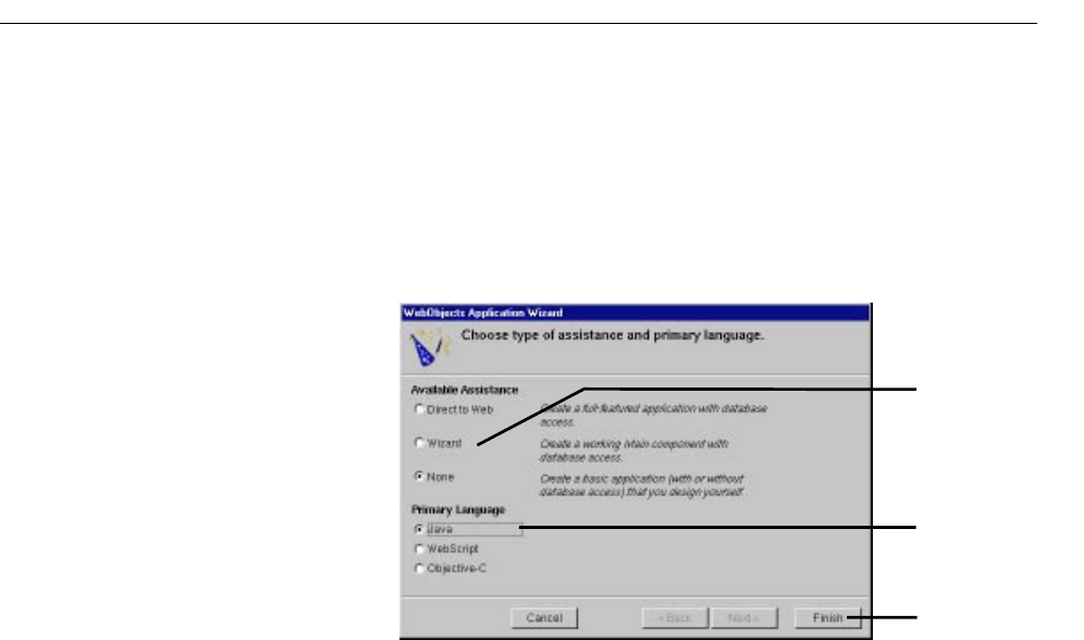
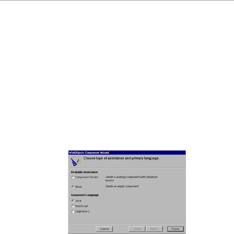
Choosing Assistance
If your application doesn’t access a database, you always choose None for
Available Assistance.
If your application accesses a database, you also choose None if you want to
develop the entire application yourself. However, you may wish to use one
of the levels of assistance that WebObjects provides. These forms of
assistance are described in other documents:
•Information about Direct to Web.
•Information about the Database Wizard is found in “Creating a
WebObjects Database Application” in Getting Started With WebObjects.
Choosing the Programming Language
WebObjects supports three languages:
•Java
•Objective-C
•WebScript
Choose level of
assistance.
Choose programming
language.
Click to proceed.
Chapter 1 Setting Up WebObjects Applications
12
Java and Objective-C are compiled languages. WebScript, which is based on
Objective-C, is a scripted language. A scripted language allows you to make
changes to your application while it is running. When you use compiled code,
your application runs faster, but you must build your application before running
it.
Java files have the extension .java, Objective-C files have the extension .m, and
WebScript files have the extension .wos.
The language you choose in the Wizard applies to the following files:
•The Main component. A component in WebObjects represents a page in your
application (or possibly part of a page). When you create your project,
Project Builder provides you with an initial component called Main. The
component’s code file implements the behavior of the component.
•The application and session code files. Application code contains variables
and methods that affect the entire application. Session code contains
variables and methods that affect a single user’s session.
If, for example, you specify Java as your primary language, the Wizard will create
the files Application.java,Session.java, and Main.java for you. You can mix languages in a
project by choosing a different language when you create other components.
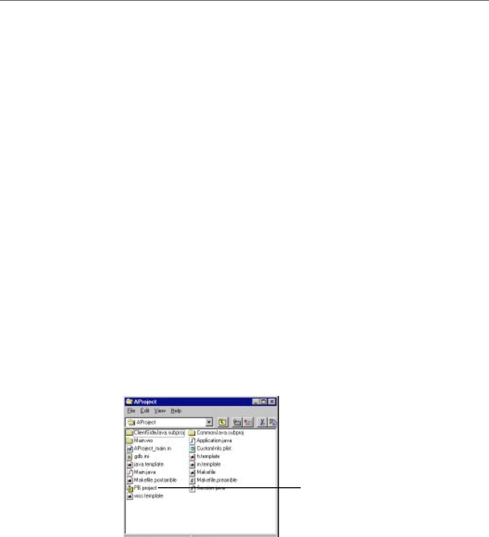
The Structure of a WebObjects Application Project
On disk, your project is a folder whose name is the project name. The project
folder contains all the files in your project. The file PB.project is the project file. You
can open a project by double-clicking this file.
Double-click here to open
your project.
Chapter 1 Setting Up WebObjects Applications
13
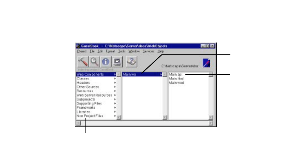
Project Builder displays a browser showing the contents of your project. The
first column lists several categories of files that your project may contain. The
following sections describe these categories.
Adding or Deleting Items From a Project
As you work with your project, you’ll use Project Builder to create new items
(such as components or classes) or to add files (such as images) that you created
with other programs to the project. For items in certain suitcases (such as
subprojects and frameworks), there’s a specific command to add them,
discussed in the section about the suitcase. For other suitcases, you use the
following procedures.
To create a new item of a particular kind:
1. Select the appropriate suitcase in first column of the browser.
2. Choose File m New in Project.
Categories (“suitcases”)
of project resources.
Your project’s components.
Double-click to edit in
WebObjects Builder.
Files in the selected
component. Click to
display their contents in
Project Builder.
Chapter 1 Setting Up WebObjects Applications
14
The New File panel comes up with the suitcase you selected open by
default.
3. Type the name of the item and click OK.
The new item is added to your project.
To add an existing item (for example, a component, a framework, or a source
file) to a suitcase, first select the suitcase in the first column of the browser. Then
either:
•Double-click the suitcase.
•Double-click the suitcase icon at the top right of the browser window.
•Choose Project m Add Files.
A panel called Add SuitcaseName appears, allowing you to find an item to be
added to the suitcase.
Click here, then choose File->New
in Project.
Enter new file name here.
The Structure of a WebObjects Application Project
15
In addition, you can drag a file directly onto the suitcase icon in the browser,
and the file is copied into the project and added to the suitcase.
To delete items from a project:
1. Select one or more items in the browser.
2. Choose Project m Remove Files.
A panel appears, giving you the option of removing the files from the
project only or from the disk as well.
Web Components
Acomponent represents a page, or part of a page, in your application. An
application can have one or more components.
Every application starts with a component called Main, which is shown in
the second column of the browser as Main.wo. All components have the .wo
extension.
If you double-click a component, WebObjects Builder opens the
component for editing. “Editing With WebObjects Builder” shows how to
edit your component using WebObjects Builder.
On disk, a component is represented as a folder with the .wo extension.
Every component has several files that specify the component’s look and
Double-click to add existing
files to this suitcase.
Chapter 1 Setting Up WebObjects Applications
16
behavior. The name of each one is the component’s name followed by a specific
file extension. These are the files in the Main component:
•Main.html is the HTML template for the component. This file contains
HTML tags, just like any web page; in addition, it typically contains tags for
dynamic WebObjects elements.
•Main.wod is the declarations file that specifies bindings between the dynamic
elements and variables or methods in your code.
•Main.api is used for components that are reused by other components (see
“Reusable Components”).
•Main.woo is used to store information about display groups (if your project
accesses a database) and encodings for HTML templates. You should never
edit this file (it does not appear in Project Builder’s browser).
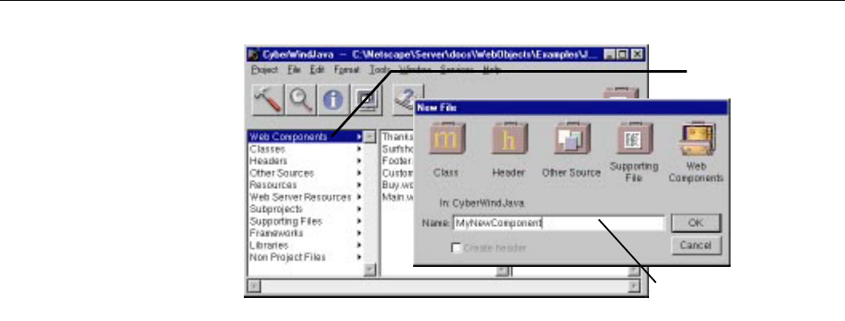
To create a new component:
1. With Web Components selected in the first column of the browser, choose
File m New in Project.
2. In the New File panel, type the name of your project and click OK.
The WebObjects Component Wizard appears.
3. If you want the Wizard to assist you in creating a component with database
access, choose Component Wizard from Available Assistance; otherwise
choose None. See “Creating a WebObjects Database Application” in Getting
The Structure of a WebObjects Application Project
17
Started With WebObjects for more information on using the Wizard with
databases.
4. Specify the language for your component and click Finish.
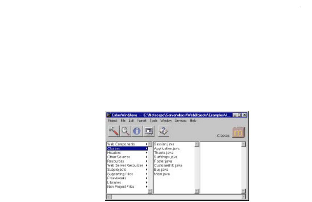
Classes
The Classes suitcase contains Java and Objective-C classes. If your
application’s primary language is Java, this suitcase contains the
Application.java
and Session.java files. If the primary language is Objective-C, it contains the
files Application.m and Session.m. There is a class file for each component that
uses Java or Objective-C, as well as any other classes you add to the project.
You can specify that Java classes are client-side, server-side, or common
classes. See “Subprojects” for more information on how to do this.
Headers
The Headers suitcase contains header files for projects that use Objective-
C.
Other Sources
The Other Sources suitcase contains compiled code that doesn’t belong to
a particular class.
Resources
The Resources suitcase contains files that are needed by your application at
run time, but which do not need to be in the web server’s document root
(and hence will not be accessible to users). It includes:

Chapter 1 Setting Up WebObjects Applications
18
•The Application.wos and Session.wos files, if your application’s primary language is
WebScript
•Configuration files
•EOModel files
•Scripted classes
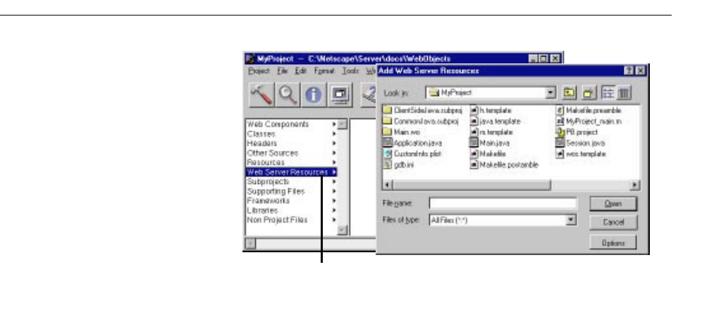
Web Server Resources
The Web Server Resources suitcase contains files, such as images and sounds
that must be under the web server’s document root at run time. When
developing your application, you place these files in your project directory and
add them to the project (see “Adding or Deleting Items From a Project”). When
you build your project, Project Builder copies the files in this suitcase into the
WebServerResources folder of your application wrapper (see “The Application
Wrapper”).
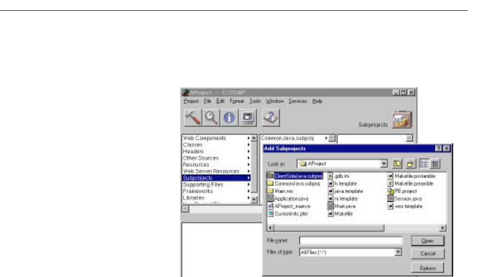
Subprojects
A subproject has the same structure as a WebObjects Application project. You
can use subprojects to divide large projects into manageable chunks.
When you create a new project, ProjectBuilder creates two subprojects
(ClientSideJava and CommonJava) in your project folder. By default, they are
not added to the Subprojects suitcase. If you need to use them, you must add
them to the project. Then you can add your Java classes to the appropriate
project as follows:
•Add server-side Java classes to your top-level project.
•Add client-side Java classes to the ClientSideJava subproject.
•Add Java classes that are common to both client and server to the
CommonJava subproject.
Note: These subprojects have the makefile variables JAVA_IS_CLIENT_SIDE and
JAVA_IS_SERVER_SIDE set in Makefile.preamble so that the appropriate Java code is
generated when you build your project.
To create a subproject:
1. Choose Project m New Subproject.
2. Specify the name of your subproject in the New Subproject panel and click
OK.
A subproject is created inside the project, with a similar structure to the
top-level project. You can add items to the subproject in the same way that
you add items to the top-level project.
The Structure of a WebObjects Application Project
19
To add an existing subproject (such as ClientSideJava or CommonJava) to
your project:
1. Double-click Subprojects in the first column of the browser.
2. In the Add Subprojects panel, navigate to the directory of the
subproject you want to add and click Open.
3. Double-click PB.project to add the subproject to your project.
Supporting Files
The Supporting Files suitcase contains your project’s makefile (which you
should not edit), as well as Makefile.preamble and Makefile.postamble, which you can
modify in order to customize the makefile. You can add other files your
project may need (such as Read Me documents) to this suitcase so that they
can be edited in Project Builder.
Frameworks
Aframework is a collection of classes and resources that an application can
use. By storing items such as components and images in frameworks, you
can reuse them in multiple projects without having to create multiple
copies.

Chapter 1 Setting Up WebObjects Applications
20
Every WebObjects Application project includes several frameworks by default.
When you build, your application links with these frameworks. They are:
•WebObjects: The basic WebObjects classes.
•WOExtensions: Extensions to the WebObjects framework.
•Foundation: Basic object classes that most applications use.
•EOAccess: The Enterprise Objects Access Layer.
•EOControl: The Enterprise Objects Control Layer.
You can include additional frameworks in your project if you need to. To add an
existing framework to your project:
1. Double-click Frameworks in the first column of the browser.
2. In the Add Frameworks panel that appears, select a framework to add and
click Open.
Frameworks are generally installed in the directory
NeXT_ROOT/NextLibrary/Frameworks.
In addition, you can create your own frameworks in order to share WebObjects
components and resources across multiple applications. To create a WebObjects
Framework:
1. Choose Project m New.
2. Select WebObjectsFramework from the pop-up menu.
3. Select the path where you want to create the framework.
Once you have created a framework, you can add components, images, and
other items to it in the same way that you would add them to a project. To have
your framework be accessible by other applications, you must install it (see
“Installing Your Application” for more information). See “Reusable
Components” for more information on using components that live in
frameworks.
Libraries
The Libraries suitcase contains libraries that your application links to.
Non Project Files
The Non Project Files suitcase is used for files that you have opened that aren’t
part of the current project.

Editing Your Project’s Source Files
21
Opening an Existing Project
To open an existing project from Project Builder:
1. Choose Project m Open.
2. In the Open Project panel, navigate to the project folder and click
Open.
3. Select the PB.project file and click Open.
To open an existing project from the file system, double-click the
PB.project
file in the project directory. Project Builder launches (if it is not already
running) and opens the project.
Editing Your Project’s Source Files
Every component in your project has a code file whose name is the name of
the component followed by the appropriate extension (.java for Java, .m for
Objective-C, and .wos for WebScript). Your project may use different
languages for different components.
Each component’s code specifies the component’s behavior. Each
component is actually a subclass of the class WOComponent (or
WebComponent, in Java). This class has standard methods (such as
awake
and init) that you may want to override (see WebObjects Developer’s Guide for
more information on these methods). You can also write your own methods
and bind them to dynamic elements in your component (see “Working
With Dynamic Elements”, as well as the Dynamic Elements Reference, for
information on binding dynamic elements).
In addition to the component’s code, each project has an application code file
(Application.java,Application.m, or Application.wos) and a session code file (Session.java,
Session.m, or Session.wos). These files implement
When you first create your project using the Wizard, you specify the
language you want to use (see “Choosing the Programming Language”).
This language applies to the application and session code, as well as to the
code for your initial component, Main. Other components may be written
in different languages.
The location of your code in the project suitcases varies somewhat
depending on the language used:

Chapter 1 Setting Up WebObjects Applications
22
•If you use Java or Objective-C, all code files appear in the Classes suitcase.
On disk, they live at the top level of the project directory.
•If you use WebScript, the Application.wos and Session.wos files appear in the
Resources suitcase. On disk, they live a the top level of the project directory.
The component scripts (ComponentName.wos) appear in the component
(ComponentName.wo) in the project and on disk.
To edit your code, select the file name in the project browser. The code appears
in the bottom pane of the browser.
To save changes in your code, choose File m Save.
Note: WebObjects Builder gets information from Project Builder about variables
and methods in your code. If you add or delete a variable or method,
WebObjects Builder doesn’t get the updated information until you save the file.

Editing Your Component’s HTML and Declarations Files
23
Editing Your Component’s HTML and Declarations Files
While you must use Project Builder to edit your components’ code or script
files, you typically use WebObjects Builder’s graphical interface to generate
the HTML and declarations files. You can, however, also edit these files
using Project Builder.
To edit a component in WebObjects Builder:
1. Select Web Components in the first column of Project Builder’s
browser.
2. Double-click the component name (for example, Main.wo) in the second
column.
WebObjects Builder launches and opens your component in a window.
See “Editing With WebObjects Builder” for information on using
WebObjects Builder to edit your component.
To edit a component in Project Builder:
1. Select Web Components in the first column of Project Builder’s
browser.
2. Select the component you want to edit in the second column.
3. Select ComponentName.html or ComponentName.wod in the third column.
The text of the file appears in the lower pane of the browser, where it
can be edited.
4. Alternatively, you can double-click the file name or its icon at the top
right of the browser, and the file opens in a separate window.
Building Your Application
You must build your application if your project contains any compiled
code (Java or Objective-C). If your application uses WebScript only,
you do not need to build. In this case, Project Builder runs a default
executable (WODefaultApp) when you launch your application.
Once you have built your application, you do not need to rebuild
unless you have made changes to your compiled code. You can make
Chapter 1 Setting Up WebObjects Applications
24
changes to your components (the .html,.wod, or .wos files) and test them
without rebuilding.
Note: When you are developing a framework, you must rebuild after any
change, even for changes to scripts or images. Therefore, when developing
a framework, it is probably best to develop it as an application project, and
once it has been tested, move its reusable pieces into a framework.
Project Builder has a toolbar with buttons you use to build and launch your
application.
1. Click in the toolbar to open the Project Build panel.
2. Click in the Project Build panel to build your project.
The Project Build panel displays the commands that are being executed to
build your project. If all goes well, it displays the status message “Build
succeeded.”
3. Close the panel.
Click here to open the Project Build panel.
Click here to open the Launch panel.
Click here to open the Project Inspector.
Click here to open the Project
Find panel.
Click here to set
build options.
Click here to “clean”
the project (delete
derived files).
Click here to build
your project.
Building Your Application
25
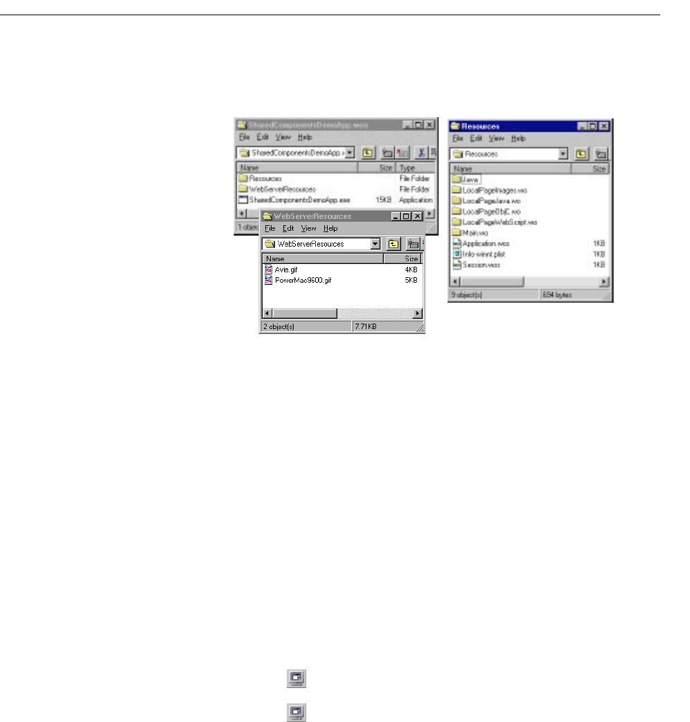
The Application Wrapper
When you build your project, Project Builder creates an application wrapper,
which is a folder whose name is the project name plus the extension
.woa.
The application wrapper has a structure similar to that of a framework. It
consists of the following:
•The executable application.
•The application’s resources.
These include the application’s components as well as other files that
are needed by your application at run time.
•The application’s web server resources.
When you build and install your application, Project Builder copies all the
files from your Web Server Resources suitcase to a folder called
WebServerResources inside the application wrapper. If you have client-side
Java components in your project, these are also copied to the
WebServerResources folder.
Launching Your Application
To launch your application:
1. Click in the toolbar to open the Launch panel.
2. Click in the Launch panel to launch your application.

Chapter 1 Setting Up WebObjects Applications
26
When you launch your application, your machine’s web browser is launched by
default and it accesses your application. To turn off this feature:
1. Click to bring up the Launch Options panel.
2. Select Environment and Command-Line Arguments from the pop-up
menus.
3. Enter -browser OFF as a command line option.
You can also launch your application directly from a command line. See Serving
WebObjects for more information on command line options.
Also, on Windows NT systems, you can launch your application by double-
clicking its executable file. When you build your application, Project Builder
creates an executable file (ProjectName.exe) inside your application wrapper (.woa)
directory.
Installing Your Application
Some files in a web application (such as images and sounds) must be stored
under the web server’s document root in order for the server to access them. The
remaining files (such as your components and source code) must be accessible
to your application but not necessarily by the web server itself.
In previous versions of WebObjects, it was typical to store the entire project
under the web server's document root. This practice has advantages for
turnaround time during development. However, in deployment, it presents the
possibility of allowing users access to your source code. WebObjects 3.5 has a
“split installation” feature that allows you to install only those files (such as
images) that the web server must have access to under the document root. The
remaining files can be stored elsewhere.
The same procedure applies to installing WebObjects applications and
WebObjects frameworks. To install:
1. Click to open the Project Inspector.
2. Under “Install In:”, set the path where the application wrapper will be
installed. This should be NEXT_ROOT/NextLibrary/WOApps for applications and
NEXT_ROOT/NextLibrary/Frameworks for frameworks.
3. In Makefile.preamble (in the Supporting Files suitcase), set the make variable
INSTALLDIR_WEBSERVER to the path where your WebObjects applications
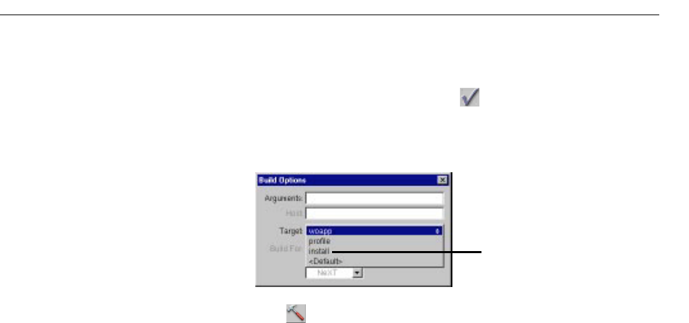
Converting Old Projects
27
will reside under the document root, usually DocumentRoot/WebObjects.
The file contains a line you can uncomment for this purpose.
4. In Project Builder’s Build panel, click .
5. From the Target pop-up menu, choose install. (By default, the target is
set to woapp.)
6. Click in the Build panel to install your application.
The full application wrapper is copied into the “Install In:” directory,
and a wrapper containing only the Web Server Resources is copied into
the document root.
See Serving WebObjects for more information about installing your
application.
Converting Old Projects
Under version 3.5 of WebObjects, projects are organized differently than
under previous versions. This section describes how to convert your old
projects to the new organization so that you can work with them in
WebObjects 3.5 and beyond.
If your existing project is already a WebObjectsApplication project (that is,
it was created by Project Builder and has a PB.project file), you can use Project
Builder to convert your project. If your project does not have a
PB.project file,
you must create a new project and add your existing files to the appropriate
suitcases.
In version 3.5, the .woa extension is reserved for the application wrapper.
Previously, the project directory itself had the .woa extension. Before
converting your project, you should rename its folder to remove the
.woa
extension.
Select “Install.”

Chapter 1 Setting Up WebObjects Applications
28
Performing the Conversion
To convert your project, open it in Project Builder. (It’s a good idea to create a
backup of your project before converting.) If your project was created prior to
WebObjects 3.5, Project Builder detects that a conversion needs to be done. It
reassigns the files in your project to new suitcases, as appropriate. It uses the file
extension to determine what action to take; if there are files whose extensions it
doesn’t recognize, it reports these at the end of the conversion, and you must
manually assign those files to the appropriate suitcases.
The following list summarizes the conversions that take place:
•Components (with a .wo extension) are added to the Web Components
suitcase. Note: Only components found in the top level of the project and
each subproject are moved automatically.
•Java code (.java) files are moved from the components into the Classes
suitcase and stored at the top level of the project on disk.
Note: Keep in mind
that this may affect your source/revision control system.
In addition, you are asked if you want to add two optional subprojects
(ClientSideJava and CommonJava) to your project. You can use these to
divide your Java code into client-side, server-side or common Java. See
“Subprojects” for more information.
•Resources (previously in the Other Resources suitcase) are put into two new
suitcases. Images with known extensions are assigned to the Web Server
Resources suitcase. Other resources are assigned to the Resources suitcase.
Files with unrecognized extensions are left out and you are notified.
•WOProject.plist is no longer used and is deleted if it is in the project.
•Several new makefile variables have been added and are appended to your
existing Makefile.preamble with default values assigned.
•All existing subprojects are recursively converted in the same manner as the
top-level project.
In the conversion process, you are prompted to confirm each type of operation.
In general, you should accept the default action for each prompt; otherwise, you
will have to perform the action manually.
Once the conversion has begun, there is no way to cancel it. If you choose not
to convert at all, you may not be able to view some of your files, since they are
assigned to suitcases that aren’t visible.

Converting Old Projects
29
Moving Your Images
After the project is converted, there are additional changes you may want to
make in order to take advantage of the new features of WebObjects 3.5. In
previous versions, images were stored inside the components themselves.
To support the new “split installation” procedure, images should be stored
in the Web Server Resources suitcase, so that the web server can access
them at run time. (When you build your project, the items in this suitcase
are copied to the WebServerResources directory inside the application wrapper.)
When using the dynamic elements WOImage and WOActiveImage, you
use their filename attribute to reference images inside the WebServerResources
directory. You may also have images in a framework that can be shared by
multiple applications. To access these images, use the framework attribute to
specify the framework name. See “Working With Dynamic Elements” in
this document and the Dynamic Elements Reference for more information.

Editing With WebObjects Builder
Chapter 2

33
Introduction
WebObjects Builder is an application that provides graphical tools for
creating dynamic web pages (components). This chapter describes the basic
procedures of creating your components’ content with WebObjects Builder.
A web page consists of elements. WebObjects Builder allows you to add most
of the common HTML elements to a component by using its graphical
editing tools. You can type text directly into a component window and you
can add additional HTML elements by using the buttons in the toolbar (or
their menu equivalents).
In addition, WebObjects allows you to create dynamic elements, whose look
and behavior are determined at run time. This chapter focuses on basic
editing tasks and the use of standard HTML elements. The next chapter,
“Working With Dynamic Elements”, provides more specifics on using
dynamic elements.
The Component Window
When you open a component, WebObjects Builder displays it in a
component window. You create your component’s appearance graphically
in the upper pane of the component window. The browser at the
bottom of the window (known as the object browser) displays variables
and methods your component uses.
The toolbar at the top of the window contains several buttons you use
to create the content of your component. WebObjects Builder also has
menu commands corresponding to these buttons.
Chapter 2 Editing With WebObjects Builder
34
Note: Depending on the width of the window, the toolbar may appear in two
rows or one.
The WebObjects Builder Toolbar
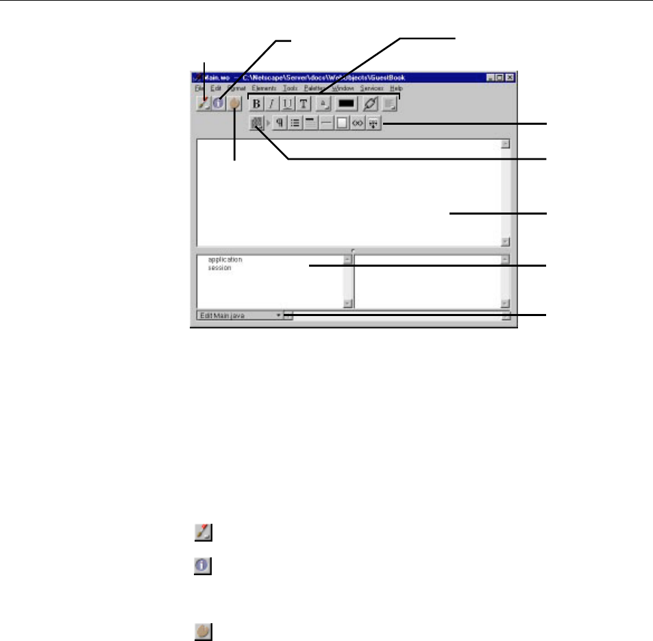
At the left of the toolbar are three buttons:
The pop-up list allows you to switch editing modes. See “Editing Modes”.
The button brings up the Inspector window, which allows you to set various
attributes of the currently selected element. The sections describing each type
of element go into more detail on the Inspector.
The button brings up the Palette window. See “Palettes” for more
information on creating and using palettes.
Editing Modes
WebObjects Builder allows you to view and edit your page in two modes:
These buttons change properties
of selected elements or text.
Object browser shows
variables and methods
in your application’s
code.
Pull-down menu lets
you add variables,
methods, and actions
to your source code.
Pop-up list switches
editing modes.
Click to inspect the
selected element.
Click one of these buttons to
create a specific element.
Elements pop-up list
switches the buttons
displayed to its right.
This window displays
your component’s
elements graphically.
Click to display the
Palette window.
The WebObjects Builder Toolbar
35
•Graphical mode shows a visual representation of your component,
including its dynamic elements. The bottom pane, the object browser,
lists the variables and methods that are defined in your scripts or code
files.
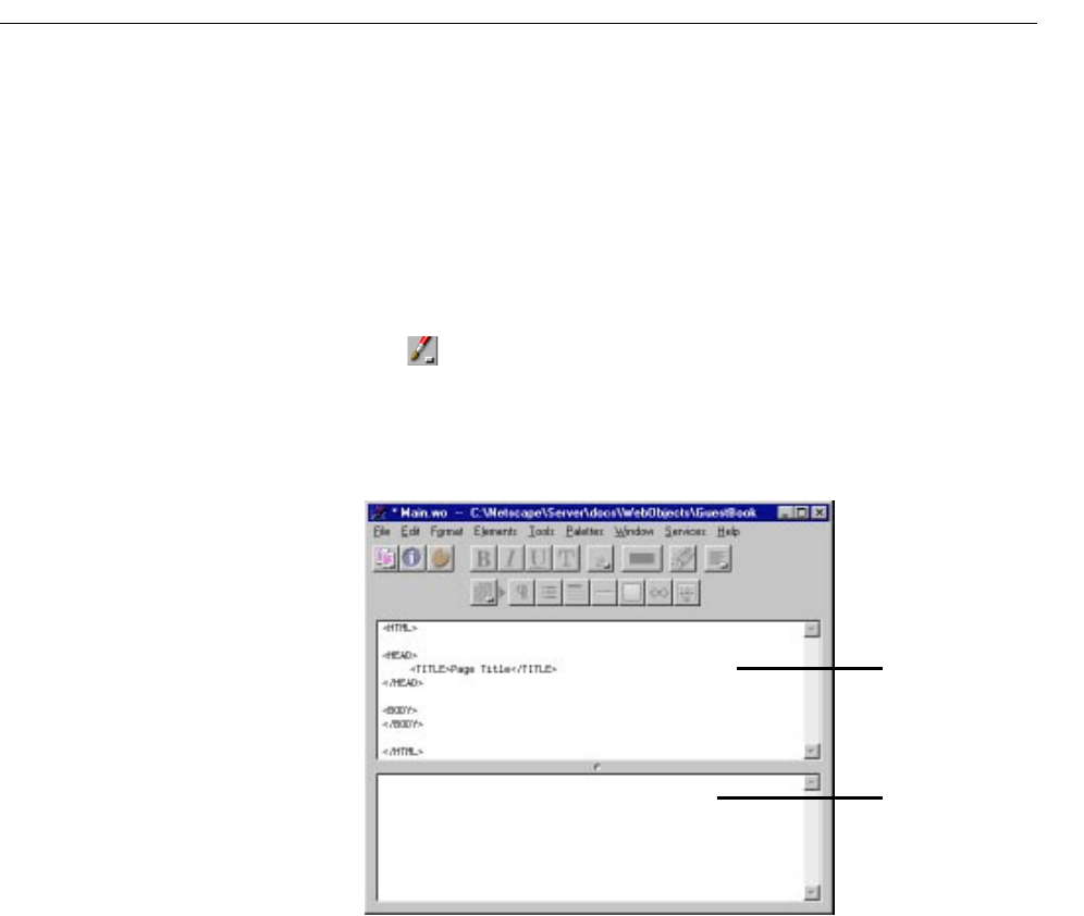
•Source editing mode shows the text of your component’s HTML template
in the upper pane and the text of your declarations (.wod) file in the lower
pane. In this mode, you can enter any HTML code. For example, you
can include HTML elements that are not directly supported by
WebObjects Builder’s graphical tools.
The pop-up list at the left of the toolbar allows you to switch between
graphical editing mode and source editing mode. When you choose source
editing mode, the text of your HTML template (ComponentName.html)
appears. When you add elements graphically, their corresponding HTML
tags appear in this file.
As you can see, when you begin with a blank page, WebObjects Builder
automatically inserts the necessary elements such as <HTML>, <HEAD>, and
<BODY> for you.
The bottom pane shows your declarations (Main.wod) file. When you bind
variables to your dynamic elements, this file stores the information.
Normally, you don’t edit this file directly. “Working With Dynamic
Elements” shows how you use WebObjects Builder to create bindings.
Refer to the WebObjects Developer’s Guide for more information on working
with the declarations file.
The HTML source for your
component.
Information about bindings
is displayed here.
Chapter 2 Editing With WebObjects Builder
36
The Preferences panel provides several options for how text is displayed in both
graphical and source editing modes. Choose Tools m Options to bring up the
panel. For information on resource-handling preferences, see “Dragging
Elements into the Component Window”.
Entering Text
When you begin to edit a new component, the cursor (insertion point) appears
at the upper left of the screen. You can begin typing text directly, and the text
appears in the default font and size. If you press Enter, a line break (
<BR>
element) is inserted after the line. If you want a paragraph element (
<P>), press
Shift-Enter. See “Structure Elements” for information on other types of text
elements.
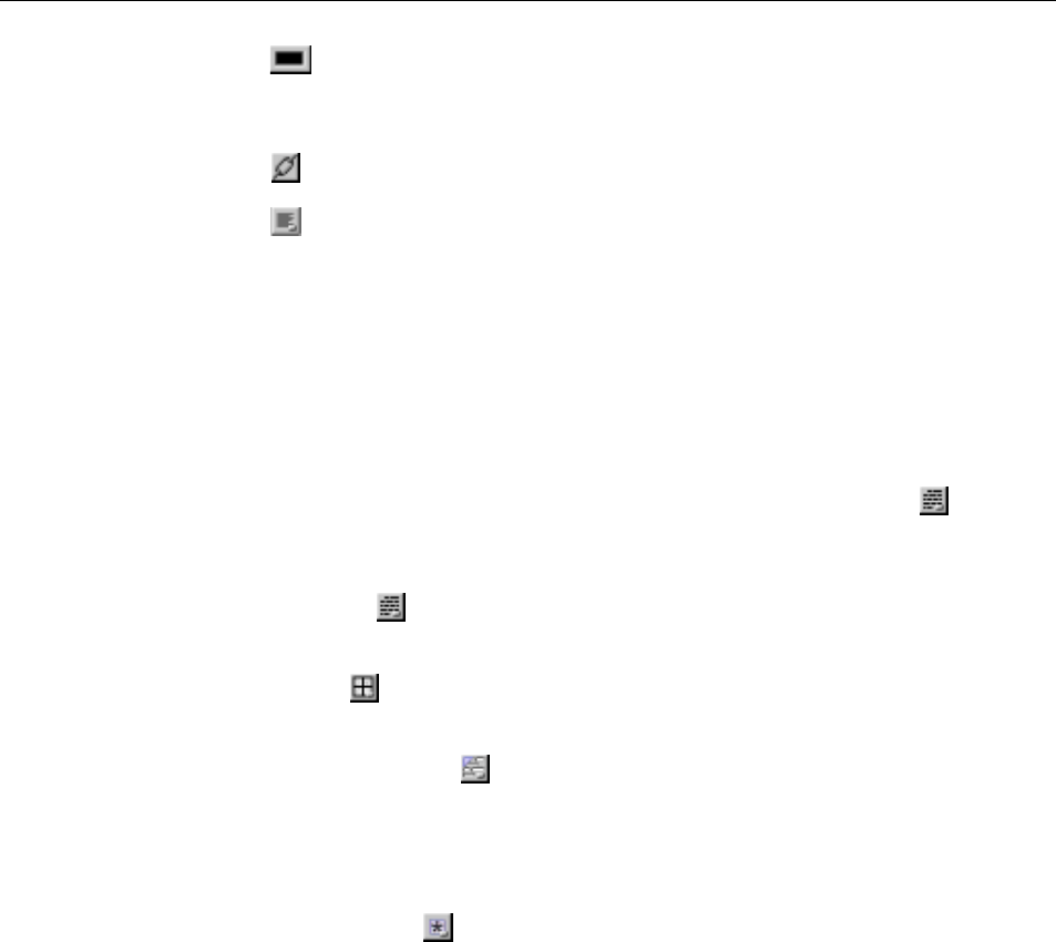
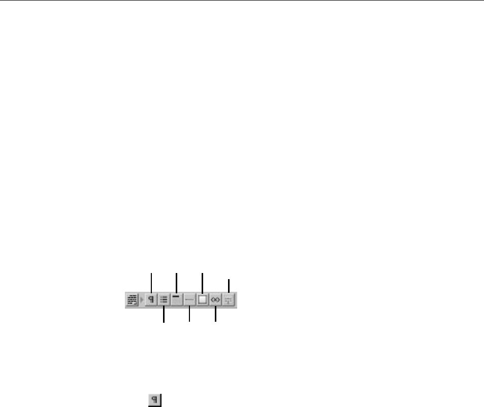
The top row of the toolbar contains a set of buttons that operate on the currently
selected text. If no text is selected, they change the setting for any text typed in
at the insertion point.
: These buttons allow you to toggle the style of the currently
selected text. You can set any combination of bold (<B>), italics (<I>), underline
(<U>) and typewriter (fixed-width) font (<TT>). Note: The user’s web browser
determines how these elements will actually be displayed when the application
is running.
: This pop-up list allows you to set the font size of the currently selected text.
Click here to display formatting
preferences for HTML and
declarations files.
To change the encoding of your
HTML document, choose one from
this pop-up list.
Click here to display resource-handling preferences.
Set default fonts here.
Chapter 2 Editing With WebObjects Builder
37
: This color well allows you to set the color of the currently selected text.
To change the color, click on the border of the color well and select a color from
the Colors panel. See “Setting Colors” for more information.
: This button changes the selected text to a hyperlink.
: This pop-up list allows you to center or justify text.
Note: Version 3.5 of WebObjects Builder does not support Undo. It is
recommended that you save components frequently as you are working. If you
make a mistake and want to undo it, you can revert to the last saved version of
the component.
Creating Elements With the Toolbar
To create HTML elements, you use the buttons on the bottom row of the
toolbar (or at the right of the toolbar if your window is large). There are four
groups of buttons, only one of which is displayed at a time. The pop-up list
lets you switch the group of buttons that are displayed to its right. The groups
are:
•Structures . Use these buttons to create paragraphs, lists, images, and other
static HTML elements. See “Structure Elements” for more information.
•Tables . Use these buttons to create and manipulate HTML table
elements. See “Working With Tables” for more information.
•Dynamic form elements . Use these buttons to create form elements in which
users enter information. WebObjects gives your application access to the
data entered by users by allowing you to associate, or bind, these elements
to variables in your application. See “Creating Form-Based Dynamic
Elements” for more information.
•Other WebObjects . Use these buttons to create other dynamic elements,
which you can bind to variables and methods in your program to control how
they are displayed. Some of these (such as hyperlinks) have direct HTML
equivalents. Others are abstract dynamic elements, such as repetitions and
conditionals, which determine how many times an element is displayed or
whether it is displayed at all. See “Creating Other WebObjects” for detailed
information.
The general procedure for creating an HTML element is:

Chapter 2 Editing With WebObjects Builder
38
1. Place the cursor where you want the element to appear on the page.
2. Click the toolbar button representing the element you want.
The element is placed at the cursor position.
3. Select the element (see “Selecting Elements”). In most cases, the element
is already selected when you create it.
4. Bring the Inspector to the front by clicking it. If it is not open, click .
In the Inspector, you can set various properties of the element. For
example, you can change a paragraph’s type from plain to preformatted.
It’s useful to be aware of what happens when you have text or other elements
selected and you create a new element:
•If the new element is a container element (that is, it can contain other
elements), the selected elements are “wrapped” or contained inside the
new element.
•If the new element cannot contain other elements (for example, a horizontal
rule or image), the new element replaces the selection.
Menu Equivalents For Toolbar Commands
All the toolbar buttons have menu equivalents. This document refers to the
toolbar buttons, but of course you can use the menu commands as well:
•The Elements menu contains equivalents for all the buttons that create
elements (that is, the switchable toolbar).
•The Format menu contains equivalents for the buttons that affect the
selected text.
•The Tools menu contains commands to open the Inspector and Palette
windows (and other commands).
Selecting Elements
There are several operations you perform in WebObjects Builder that require
you to select an element, such as copying, deleting, inspecting, or “wrapping”
one element inside another.
You select text elements as you would in most text-editing applications: by
dragging, or by double-clicking words, or by triple-clicking lines, or by Shift-
clicking. The selected text appears with gray shading.
The Inspector
39
Some elements (such as text fields and text areas) can be selected simply by
clicking them; they appear with a gray line underneath.
Other elements (such as tables) require you to click outside the element
and drag across it in order to select it.
To select a range of elements, drag across them, or press the Shift key while
clicking at the end of the range.
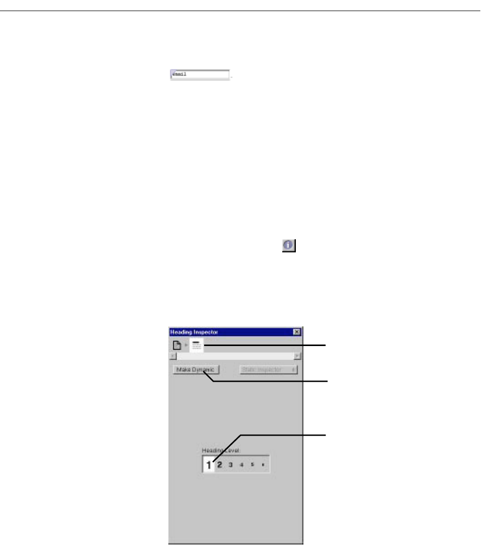
The Inspector
You use the Inspector to set HTML attributes of the elements in your
component.
To open the Inspector, click . The Inspector’s title and contents reflect
the element you’ve selected in the component window. Each element has
its own Inspector that allows you to set properties appropriate for the
element. For example, the Heading Inspector shown here allows you to set
the level of a heading element. Other elements have different properties
that you can set.
Click here to set the heading level.
The element path. Click to inspect
different elements in the hierarchy.
Click here to make static elements
dynamic and vice versa.
Chapter 2 Editing With WebObjects Builder
40
The top of the window shows the element path to the selected element. Any
element can be contained in a hierarchy of several levels of elements and can in
turn contain other elements. Here, the element path shows that the heading
element is contained in the page element, which is the top level of the hierarchy.
When you click an icon in the element path, the appropriate Inspector for that
element appears. In this case, if you click the page icon, the Page Attributes
Inspector appears. (Note: If no element is selected, the Inspector shows Page
Attributes by default.)
The Make Dynamic button in the Inspector allows you to convert an HTML
element into a dynamic WebObjects element. Dynamic elements have a Make
Static button, which allows them to be converted to their static counterparts.
This feature is discussed in more detail in “Dynamic and Static Inspectors”.
Structure Elements
By default, the switchable toolbar displays the Structure elements.
The following sections describe the elements you can create with these buttons.
Paragraphs
Click to create a new paragraph. If there is a text selection, the entire
selection becomes a paragraph.
You can use the Inspector to set the paragraph to one of the following tags:
•Plain (<P>)
•Preformatted (<PRE>)
•Address (<ADDRESS>)
•Block quote (<BLOCKQUOTE>)
•Division (<DIV>)
Paragraph Heading Image
List Horizontal
Line
Custom
Marker
Remove Selection
from Container
Structure Elements
41
Lists
Click to create a new list. If there is a selection, each line in the selection
becomes a list item (<LI>). By default the list is an unordered (bulleted) list
(<UL>). You can use the Inspector to change the list to an ordered list (<OL>).
You can also change the way in which lists appear; for example, displaying
an ordered list in Roman numerals (on browsers that support this feature).
When typing in a list:
•Press Shift-Enter to create a new list item. (If you simply press Enter,
you will create a line break but no new list item.)
•Press Tab to create a new list nested inside the original list.
•Press Shift-Tab to move the nesting out one level.
Headings
Click to create a heading. By default, an <H3> element is created. You
can use the Inspector to change the level of the heading to between
<H1>
and <H6>.
Horizontal Rule
Click to create horizontal rule (<HR>) element. You can use the
Inspector to vary its height and width, and whether it is displayed in 3D.
Images
Click to add a static image (<IMG>). A Select Image panel appears,
allowing you to select an image file to display at the insertion point. The
Inspector allows you to change the image’s properties, including its size, file
path, and whether it uses an absolute or relative reference.
Note: Any selected elements are replaced by the image.
With static images, you must specify a known file path. You can also create
adynamic image, which refers to an image file that lives in your project or in
a framework. See “Dynamic Images” for more information.
To set an image for the page background, see “Setting Page Attributes”.
Chapter 2 Editing With WebObjects Builder
42
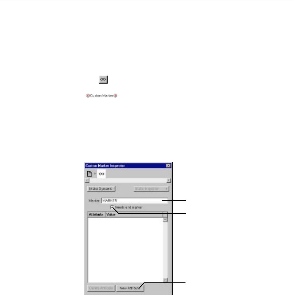
Custom Marker
Not all legal HTML elements can be created directly using WebObjects
Builder’s buttons or menu commands. However, you can create any type of
element using the custom tag.
To create an HTML element using a custom marker:
1. Place the cursor where you want the element.
2. Click .
appears in the component window. You can replace the text
“Custom Marker” with the content of the element (if any).
3. In the Inspector, enter the tag’s name in the Marker field.
4. If the element doesn’t require an end tag, uncheck “Needs end marker.”
5. If the element has attributes you want to specify, click New Attribute, then
enter the attribute’s name and value.
For example, if you want to create a <DL> element, you would create a custom
marker and enter DL for its name in the Inspector’s Marker text field. Because
“Needs end marker” is checked, the </DL> end tag is inserted for you.
Enter the element’s tag.
Check if element
requires end tag.
Click to add an element
attribute, then enter its value.
Working With Tables
43
You can also enter source editing mode and type the marker and its text
directly.
Tip: To save a custom element so you can use it again, save it on a palette. See
“Palettes”.
Removing Elements or Text From a Container
You can remove an element or text from a containing element. For example,
if you’ve typed some text inside a form, but you decide you want the text
to be outside the form:
1. Select the text.
2. Click or choose Elements m Promote Selection.
This causes the text to be removed from the form.
Working With Tables
To work with tables, you use the Tables section of the switchable toolbar (or
the equivalent commands in the Elements m Table menu).
Creating Tables
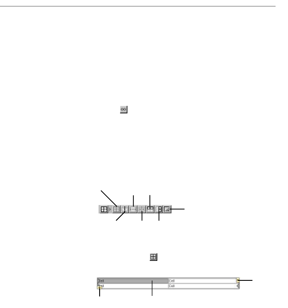
To create a table, click from the toolbar. A 2x2 table is created at the
insertion point. Its width is 100% of the window.
Add table Split cell
horizontally
Delete
selected row
Toggle between table structure/ content editing
Split cell
vertically
Merge selected
cells
Delete selected
column
Click here to add a row.
Click here to
add a column.
Double-click to enter
content-editing mode.
Chapter 2 Editing With WebObjects Builder
44
To add a column, click the icon at the upper right of the table. The column is
added at the right of the table.
To add a row, click the icon at the lower left of the table. The row is added at
the bottom of the table.
Table Editing Modes
There are two “modes” that you can be in when working with tables. When you
first create a table, you are in “structure editing” mode, indicated by the gray
handles and icons. In this mode, you can select cells, groups of cells, or the
entire table, and perform operations on them.
The other mode is “content editing” mode, in which you can insert text or other
elements (including other tables) inside table cells. In this mode, the gray
handles and icons are not present.
To change from structure editing to content editing mode, double-click in a cell.
The cell’s contents are selected, and you can type or select an element from the
toolbar to replace them. To change from content editing to structure editing
mode, press Control and click in any cell other than the one that was selected.
Alternatively, you can switch from one mode to the other by clicking in the
toolbar. Also, after you’ve clicked anywhere outside a table, clicking in the table
puts you in content editing mode; Control-clicking puts you in structure editing
mode.
In structure editing mode, you can:
•Select an individual cell by clicking it.
•Select a row by clicking one of the gray handles at the end of the row.
•Select a column by clicking the top cell in a column and dragging to the
bottom.
•Select additional cells by clicking them while holding down the Shift key.
•Select the entire table, or any group of contiguous cells by clicking and
dragging.
•Delete a row by selecting it (or any cell in the row) and clicking .
•Delete a column by selecting any cell in the column and clicking .

Working With Tables
45
•Split a selected cell horizontally by clicking or vertically by clicking
.
•Merge a group of selected contiguous cells into a single cell by clicking
.Note: This command isn’t enabled unless the selected cells make up
a group that could logically be merged into one cell.
•Wrap an abstract dynamic element (conditional or repetition) around a
selected row or cell (see “Repetitions”) by clicking dynamic element’s
icon in the toolbar.
In content editing mode, you can:
•Type text in the cell.
•Add another element inside a cell (by clicking its toolbar icon or using
a menu command).
In either mode, you can press Tab to move to the next cell to the right (or
the first cell of the next row if in the rightmost column). Pressing Shift-Tab
moves in the opposite direction through the table.
A special case arises when you have embedded a table within a table cell.
In this case:
•To edit text in a cell in the embedded table, just click in the cell.
•To select the embedded table or one of its elements, first click in the
cell surrounding the embedded table, and then Control-click the
embedded table to select it.
Sizing Tables
By default, the size of a table is determined by the contents of the table’s
cells. If you type text (or insert other elements) inside a table cell, the cell’s
width expands as necessary to fit the data. The width of any column,
therefore, will be that of the widest cell in the column. Note: In WebObjects
Builder, a cell does not resize until you have completed editing the cell and
tabbed to another cell or moved out of the table.
If you want to set the size of a table or cell explicitly, use the Inspector:
•To set the width or height of a table, select the table and use the Table
Inspector. You can enter values that correspond to HTML attributes
controlling the size of the table.
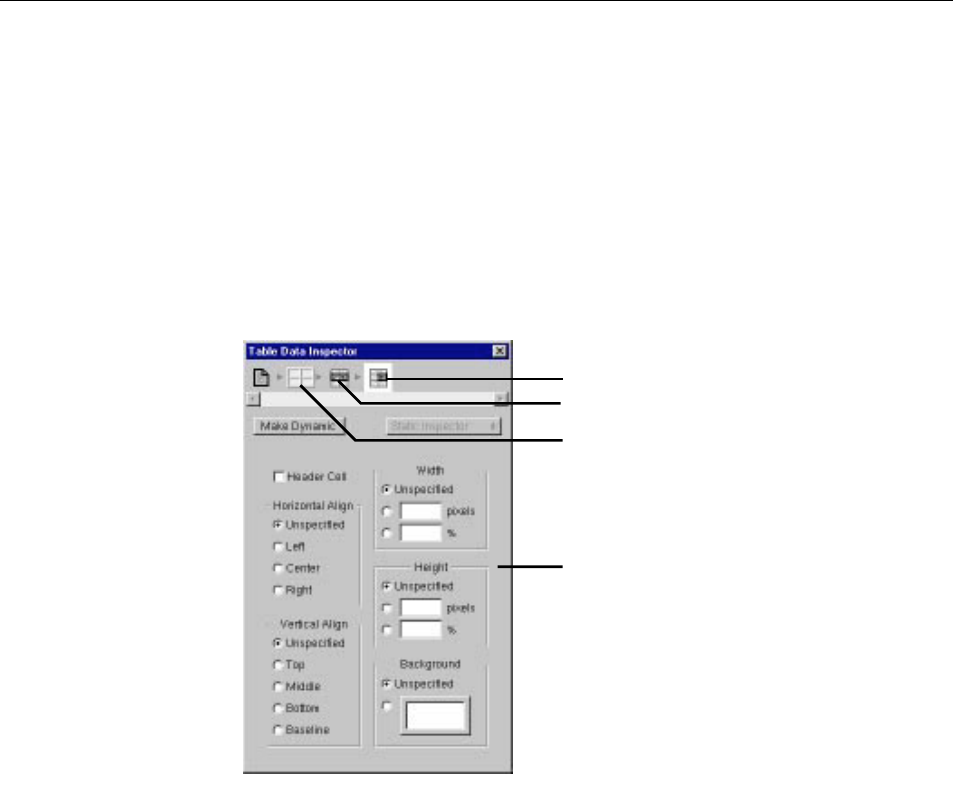
Chapter 2 Editing With WebObjects Builder
46
•To set the width or height of a cell, select the cell and use the Table Data
Inspector. Changing a cell’s size affects the size of the column or row
containing the cell.
Inspecting Tables, Rows, and Cells
An HTML table (<TABLE>) is a hierarchical structure, which contains rows
(<TR>); rows in turn contain cells (<TD>). When you select any of them, the
Inspector shows the path from the selected element up through the page, and
you can inspect any element in the path by clicking its icon. For example, if you
select a table cell, you can inspect the cell (with the Table Data Inspector), the
row, or the table itself.
You can set the HTML properties of any table element (for example, its height
or width) using the Inspector.
Note: When you type a value (such as number of pixels) in one of the Inspector’s
fields, you must press Enter for the change to take effect. In other words, if you
simply type the value and move to another field, the change does not take place.
Click here to inspect the table row.
Click here to inspect the table.
This icon denotes the table cell.
Use these fields to set the table
cell’s HTML properties.
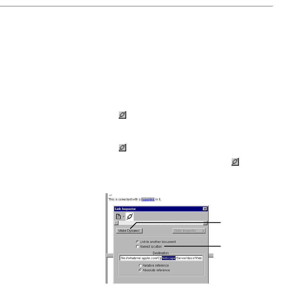
Creating Hyperlinks
47
Creating Hyperlinks
There are two types of hyperlinks that you can use in a WebObjects
application:
•A static hyperlink (which uses the HTML <A> tag), whose destination
is constant.
•A dynamic hyperlink (WOHyperlink), whose destination can be
specified at run time. See “Dynamic Hyperlinks”for more information
about these.
To create a static hyperlink:
1. Click on the toolbar.
2. Type the text that the hyperlink should contain. As you type, the text
is underlined.
3. Click again.
Alternatively, you can select existing text and then click once to
convert the text to a hyperlink.
4. Use the Inspector to set the destination of the link.
Note: While the destination of a static link cannot change, it’s possible to vary
its text at run time by using a dynamic string (see “Dynamic Strings”) inside
the hyperlink.
Click to make hyperlink
dynamic.
Click to make this element
an anchor that can be the
destination of a link.
Chapter 2 Editing With WebObjects Builder
48
Setting Page Attributes
The top level in the element hierarchy is always the page itself. To inspect a
page’s attributes:
1. Select any element in the page.
2. In the Inspector, click the leftmost icon in the element path. (If necessary,
click the Inspector button in the toolbar to display the Inspector.)
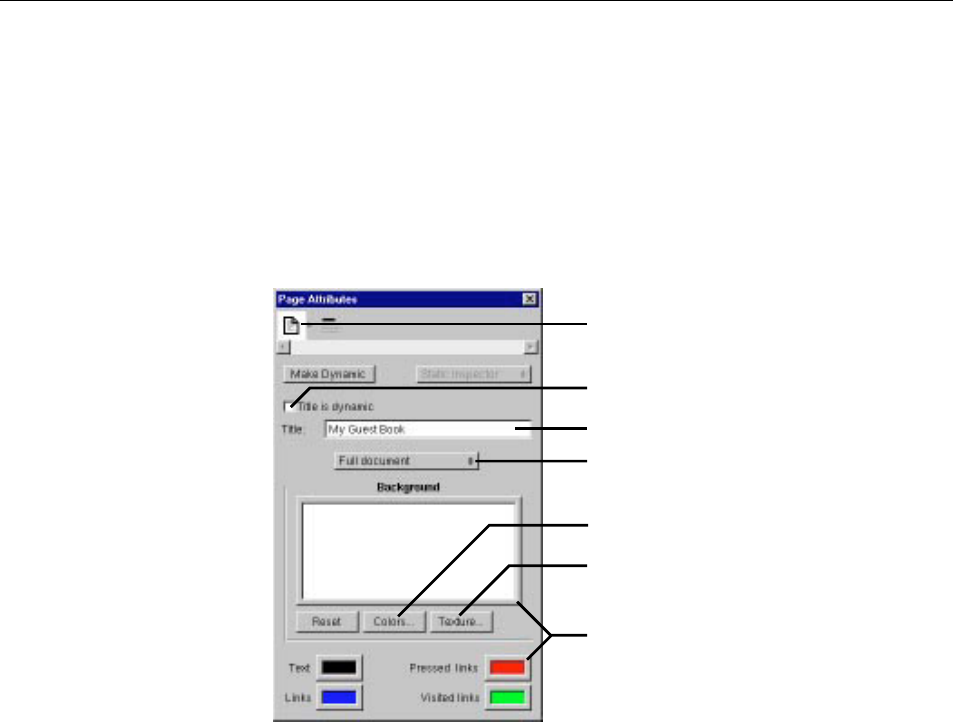
The Title text field allows you to set the title of the document. If you click the
“Title is dynamic” checkbox, the title becomes a dynamic string whose value is
determined at run time. You enter its binding in the Title field. See “Dynamic
Strings” for more information.
You can set the colors to be displayed for the page’s background, text, or links
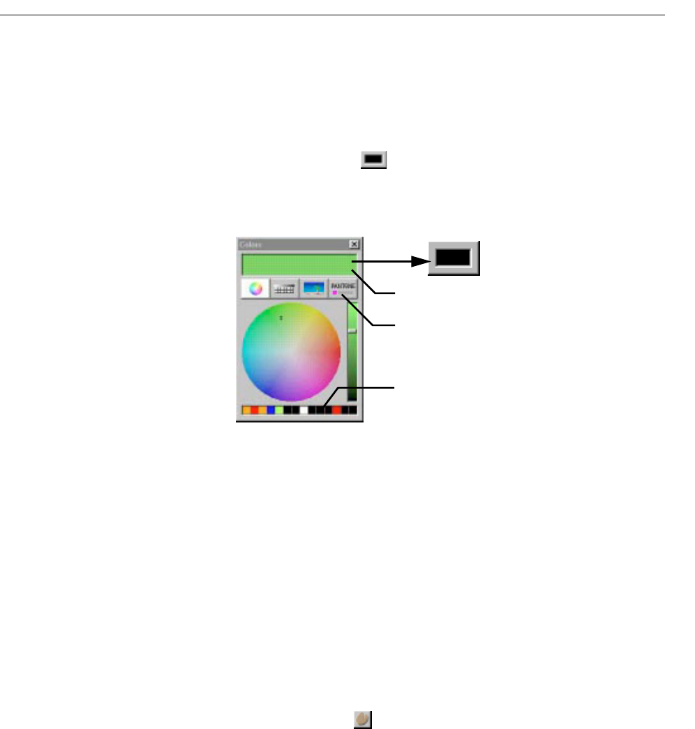
by clicking in the border of the appropriate color well (or by clicking Colors).
(See “Setting Colors” for more information on using the Colors panel.) To select
an image to use as the page’s background, click Texture.
Click here to display Page Attributes.
Click here to make the title a dynamic string.
Enter the page title (or the binding if the title is
dynamic)
Click borders to open the Colors panel and set the
color.
Click to choose a background image.
Click to open the Colors panel.
Select Partial document if the component is
designed for reuse within other components.
Setting Colors
49
Setting Colors
WebObjects Builder allows you to set the colors for a page’s background,
selected text, and hyperlinks.
To set the color of selected text in the component window, click in the
border of the color well in the toolbar. To set other colors, use the Page
Attributes Inspector.
Clicking the border of any color well brings up the Colors panel.
The Colors panel provides several methods of selecting colors. When you
select a color, it appears in the currently selected color well.
You can drag colors from one color well to another, to the window at the top
of the Colors panel, or to one of the squares at the bottom of the Colors
panel to save it.
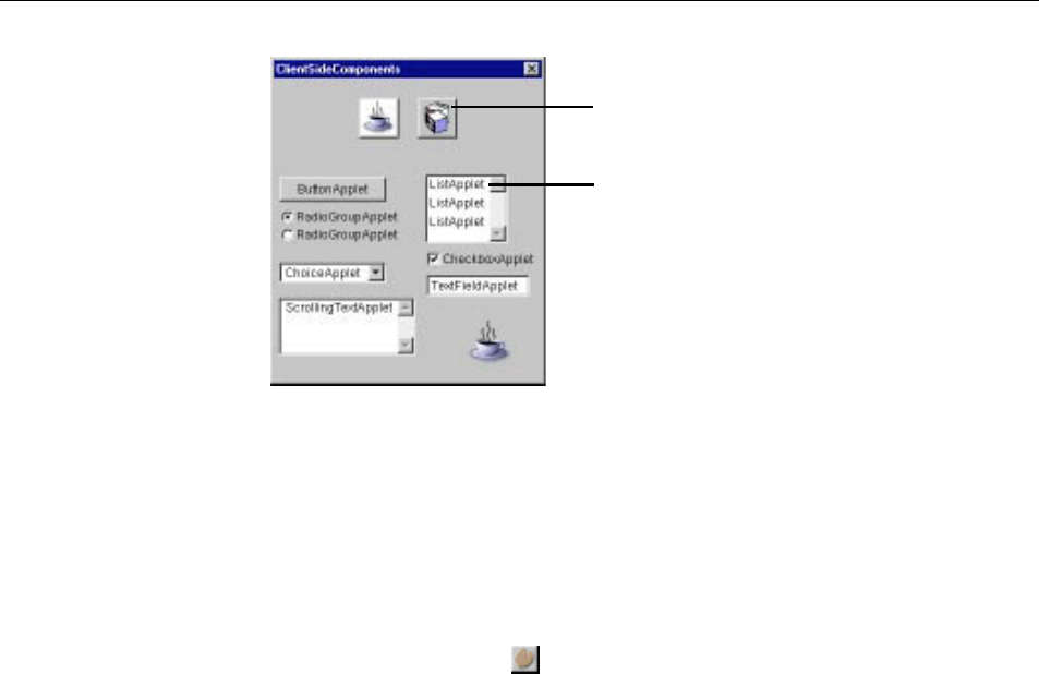
Palettes
A palette is a collection of resources (such as images, static or dynamic
HTML elements, and components). You can drag elements from a palette
to a component to use them. You can also drag elements from a component
to a palette to store them.
Palettes appear in WebObjects Builder’s palette window. To open the
palette window, click on the toolbar or choose Tools m Palette.
These buttons provide different ways to select colors.
You can drag colors between this panel
and any color well.
Drag frequently used colors to these squares to
save. Drag from squares to a color well to apply.
Chapter 2 Editing With WebObjects Builder
50
The icons at the top of the palette window show the available palettes. To select
a palette, click its icon. Two pre-configured palettes are provided: Java client-
side components and components from the WOExtensions framework.
You can create your own palettes to store frequently-used items, such as custom
forms, tables, or images, and you can load palettes created by someone else.
To create a new palette, choose Palettes m New Palette. A panel appears, asking
you to specify a location to save the palette. (A palette is represented on disk as
a folder with the extension .wbpalette.) The palette appears in the palette window
with the default palette icon . To change the palette's icon, see “Changing a
Palette Icon”.
To add an existing palette to the palette window:
1. Choose Palettes m Open Palette.
2. Navigate to the palette’s location and click Open.
To remove a palette from the palette window:
1. Select the palette in the palette window.
2. Choose Palettes m Close Palette.
Creating and Using Palette Items
To add an item from a component to a palette:
1. Make the palette editable.
Click to display this
palette.
Drag an item onto the
window to insert into
the component.
Palettes
51
If the palette’s background is gray, you can’t make any changes to it. To
enable editing, choose Palettes m Make Editable. The palette's
background changes to white and its title says “Alt-drag to insert
item.” Note: When you first create a palette, it is editable until you save
it.
2. In the component window, select the element or elements that you
want to add to the palette.
3. Hold down the Alt key and drag the selection to the palette.
The cursor changes to and displays in the palette when you are
done dragging. You can change the title of the item by selecting its
name and typing. To change the item's icon, see “Changing a Palette
Icon”.
You can also add any item from the file system to a palette (including such
things as a component, an image, or an EOModel). To do so:
1. Make the palette editable.
2. Locate the item in the file system.
3. Drag the item onto the palette.
For example, to add a component to a palette, you would drag its
.wo
folder to the palette.
Note: On Windows NT, you can't drag an item directly to the palette,
because the palette window doesn't appear unless a WebObjects
Builder window is in the foreground. Therefore, you must drag the
item to WebObjects Builder's icon in the taskbar at the bottom of the
screen and hold it until the palette window appears. With the mouse
button still down, drag the item to the palette.
When you are done adding elements to your palette, choose Palettes
m Save
Palette. The background changes to gray, indicating that the palette is no
longer editable.
To copy an item from a palette to the component window:
1. Make sure the palette is not editable (if its background is white, choose
Palettes m Make Editable).

Chapter 2 Editing With WebObjects Builder
52
Note: If the palette is editable, you can drag the item to the window, but it
will disappear from the palette.
2. Drag the item from the palette to the location in the component window
where you want it to appear.
Changing a Palette Icon
You can replace the icon of any palette, or any item in a palette, with an image
of your own choosing. To do so:
1. Open the palette window and select the palette whose icon you want to
change.
2. Make the palette editable.
3. Drag an image from the file system onto the palette's icon.
You can use any image file recognized by WebObjects Builder (such as a
.gif,
.tif or .jpg file) to change the icon of a palette or of any item in the palette.
Note: The same caveat for dragging items to the palette on Windows NT
applies (see “Creating and Using Palette Items”).
4. Save the palette.

Working With Dynamic Elements
Chapter 3

55
Introduction to Dynamic Elements
Adynamic element is an element whose exact HTML representation isn’t
determined until run time. Dynamic elements are represented in the
HTML template by the tag <WEBOBJECT>.
There are several types of dynamic elements that you can use in your
WebObjects applications. Some of them (such as dynamic forms or images)
have counterparts in standard HTML (<FORM> and <IMG>) and are always
translated into those counterparts at run time. Others (such as conditionals
and repetitions) are abstract dynamic elements, which don’t translate
directly into HTML but control the generation of other elements.
This chapter describes the techniques you use to add dynamic elements to
your components and to bind them to variables and methods in your code.
For more information on programming with dynamic elements, see
“Dynamic Elements” in the WebObjects Developer’s Guide. For details about
specific dynamic elements, see the Dynamic Elements Reference.
Attributes
Every dynamic element has one or more attributes. These attributes are
used for several purposes:
•Some attributes are used to determine the exact HTML to be
generated when the element is displayed.
For example, the value attribute of a dynamic string element (WOString)
determines what text is generated in its place. At run time, WebObjects
replaces the WOString with the value of the variable or method that is
bound to it.
•Other attributes are used to capture information provided by users. In
particular, form elements are used for this purpose.
For example, when the user submits a form, text typed by the user into
a dynamic text area (WOText) inside the form is assigned to the
variable bound to the value attribute of the text area.
•Other attributes are used to specify actions to be taken when an event
occurs.
Chapter 3 Working With Dynamic Elements
56
For example, a dynamic hyperlink (WOHyperlink) has an action attribute
that specifies an action method in the application that is executed when the
user clicks the link.
The process of associating an attribute with a variable or method in your code is
called binding. WebObjects Builder provides tools to make it easy for you to
create bindings. Information about your bindings is stored in the declarations
(.wod) file in your component.
Most dynamic elements have a number of attributes that you can bind. Some
are required and others are optional. For complete information about
WebObjects’ dynamic elements and their attributes, see Dynamic Elements
Reference.
Creating Dynamic Elements
There are several methods of adding dynamic elements to your component.
Using the Toolbar
You create dynamic elements in the same way that you create other elements:
by clicking buttons in the toolbar or using the menu commands. In WebObjects
Builder, there are two groups of buttons in the switchable toolbar that allow you
to create dynamic elements:
•The Forms toolbar allows you to
create dynamic form elements. (You can also create standard HTML form
elements using this toolbar.) See “Creating Form-Based Dynamic
Elements” for more detailed information about working with forms.
•The Other WebObjects toolbar allows
you to create all other types of dynamic elements. See “Creating Other
WebObjects” for more detailed information about each type of element.
Dragging Elements into the Component Window
Some elements can be created by dragging an item from the file system into a
component window. These include:
•Components (see “Reusable Components”)
•Client-side Java components (see “WOApplets”)
•Image files and image maps (see “Dynamic Images”)
Creating Dynamic Elements
57
In addition, you can also drag a model file (of type .eomodeld) into a
component to create a variable of type WODisplayGroup (see “Adding
Display Groups”).
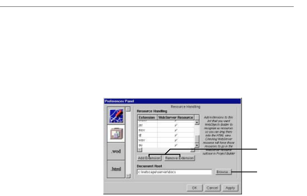
Certain file types (such as .gif,.jpeg,.tif,.eps, and .bmp) are automatically
recognized by WebObjects Builder. The Preferences Panel (which you
display by choosing Tools m Options) shows a list of file extensions that
WebObjects Builder accepts. You can drag any item with one of those file
extensions into a component window, and the item will be added to your
project. You can add file types if you need them.
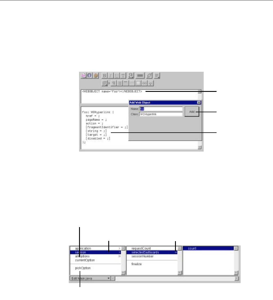
Using the Add WebObject Panel
The Add WebObject panel is an advanced feature for those who wish to
work in source editing mode. It allows you to add a dynamic element and
set its bindings by hand.
1. In source editing mode, place the cursor at the point in the HTML
template where you want to add the element.
2. Choose Tools m Add WebObject.
A panel appears that allows you to create a dynamic element by
entering its class and its name. The name is used by the HTML
template and declarations (.wod) file to uniquely identify the element.
(Normally, you allow WebObjects Builder to generate names for you,
but if you add elements in source editing mode, you must specify their
names.)
3. Click Add.
Click here to add or
remove extensions that
WebObjects Builder
recognizes.
If you’ve changed your
document root, click here
to inform WebObjects
Builder.
Chapter 3 Working With Dynamic Elements
58
The element appears in the HTML template. A template appears in the
lower pane (the declarations file) showing the bindable attributes of the
element. Elements in brackets are optional. See “Binding Elements” for
more information on bindings.
Note: You must type in the bindings of all the attributes you want to bind,
and delete the others. Otherwise, you will not be able to switch back to
graphical editing mode or save the file.
The Object Browser
The bottom part of the component window is the object browser, which displays
your application’s variables and methods. This display provides a graphical
method of binding objects in your code to dynamic elements in the component.
Click here to add element
at cursor position.
Element appears in HTML
source view.
Template for element’s
bindings appears in
declarations file.
Actions appear below the line.
Keys (variables and methods)
appear above the line.
Select key to display its keys and actions in
next column (indicated by “>”.
“>>” indicates an array. Select it to show its
count method in next column.
Chapter 3 Working With Dynamic Elements
59
The first column of the object browser displays two types of objects:
•Keys are displayed above the horizontal line. A key can be either an instance
variable or a method that returns a value.
•Actions are displayed below the line. An action (or action method) is a
method that takes no parameters and returns a component (the next page to
be displayed).
A “>” next to an object’s name in the browser indicates that it contains
additional keys and actions, which are displayed in the next column when you
select it.
In the figure, for example, the session object is selected, showing that there are
keys and actions defined in the session code. One of these,
selectedSailboards, is an
array (indicated by the “>>”), and the array’s count method is displayed in the
next column.
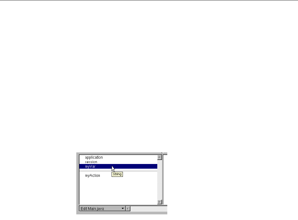
Note that if you point to a key, WebObjects Builder displays its type.
When you create a new project, the only items that appear in the object browser
are application and session (unless you use the Wizard to create a database
application). These are methods that allow you to access variables in your
application and session code.
Chapter 3 Working With Dynamic Elements
60
There are several ways to add items to the object browser:
•Use Project Builder to add keys and actions to your component’s source file.
When you save changes to a source file, WebObjects Builder parses the file,
detects items that have been added and deleted, and updates the object
browser’s display to reflect the changes. The source code can be written in
any of the languages that WebObjects supports (Java, Objective-C, or
WebScript).
•Use the menu at the bottom of the object browser to add items to your code
directly from WebObjects Builder. See the next section, “Creating Variables
and Methods in WebObjects Builder”, for more information.
•Drag a model file into the browser to create a display group variable. See
“Adding Display Groups” for more information.
Creating Variables and Methods in WebObjects Builder
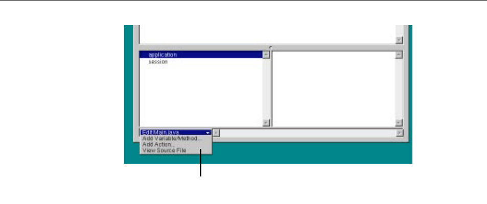
At the bottom of the object browser, there is a pull-down menu called Edit
sourcefile. It has three items:
•Add Variable/Method allows you to add a key (an instance variable or a method
that returns a value) to your source file.
•Add Action allows you to add the template for an action (a method that takes no
parameters and returns a component).
•View Source File opens the source file in a Project Builder window.
Choose a command from this menu to add objects
to your source code or view the code.
Chapter 3 Working With Dynamic Elements
61
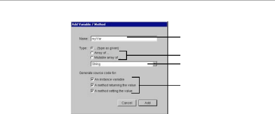
When you choose Add Variable/Method, the following panel opens:
In this panel, you specify:
•The name of the key.
•Its type.
You can choose the type from the pop-up list or type it in directly. You can
also use the radio buttons to specify whether the variable is an array.
•How the key is implemented.
The key can be an instance variable whose value is accessed directly, or a
method that returns a value (not necessarily associated with an instance
variable). You can also create a method that sets the value of an instance
variable.
When you click Add, the key’s name appears in the object browser (below
application and session). To see what was added to your source code, choose View
Source File from the pop-up menu in the object browser. You’ll see something
like the following:
Type the variable name here.
Choose the variable’s type from this pop-up list.
Click one of these buttons if your variable is an array.
Check one or more of these boxes.
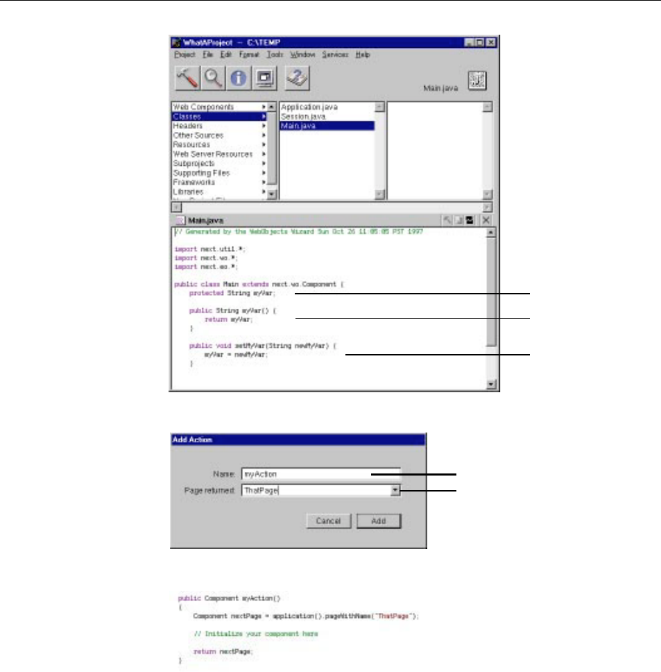
Chapter 3 Working With Dynamic Elements
62
When you choose Add Action, the following panel appears:
When you click Add, the following code is added to your source file:
WebObjects Builder provides these ways to add variables and methods for your
convenience. Of course, you can add variables and methods directly to your
component’s code by editing them in Project Builder.
Instance variable.
Method returning value of
instance variable.
Method setting value of
instance variable.
Enter the action method’s name here.
Select response page name from pop-up
menu (use null or nil to return same page).

Chapter 3 Working With Dynamic Elements
63
Note: To delete a key or action, you must delete it from the source code in Project
Builder. Also, the Add Variable/Method and Add Action commands apply only
to a component’s code file. To add variables and methods to the application and
session code files, or to any other code files, you must edit them directly in
Project Builder.
Adding Display Groups
Adisplay group is an important type of variable that you use in WebObjects
applications that access databases. A display group is an object that can fetch,
insert, delete, display, update and search records in a database.
This section describes the mechanics of adding display groups to a WebObjects
project. For detailed information about display groups, see the DisplayGroup
(Java) or WODisplayGroup (Objective-C) class specification in the WebObjects
Class Reference. To learn more about how to create a WebObjects database
application, see “Creating a WebObjects Database Application” in Getting
Started With WebObjects.
WebObjects applications access databases through the Enterprise Objects
Framework, which represents database rows as enterprise objects. Enterprise
object classes typically correspond to database tables, and an enterprise object
instance corresponds to a single row or record in a table. For detailed
information on enterprise objects, read the Enterprise Objects Framework
Developer’s Guide.
In a database application, you use entity-relationship models. A model associates
database columns with instance variables of objects. You create a model with the
EOModeler application, or you can specify one when you use the Wizard to set
up your application (when you add a model to your project, it is added to the
Resources suitcase). A model is stored in a model file. For more information on
creating models, see the chapter “Using EOModeler” in Enterprise Objects
Framework Developer’s Guide.
A model contains entities,attributes, and relationships. An entity associates a
database table with an enterprise object class. Display groups manage objects
associated with a single entity. An attribute associates a database column with an
instance variable. A relationship is a link between two entities that’s based on
attributes of the entities.
If you used the Wizard to set up your application, a display group was set up for
you based on the model you specified. There are several other ways to create a
display group:
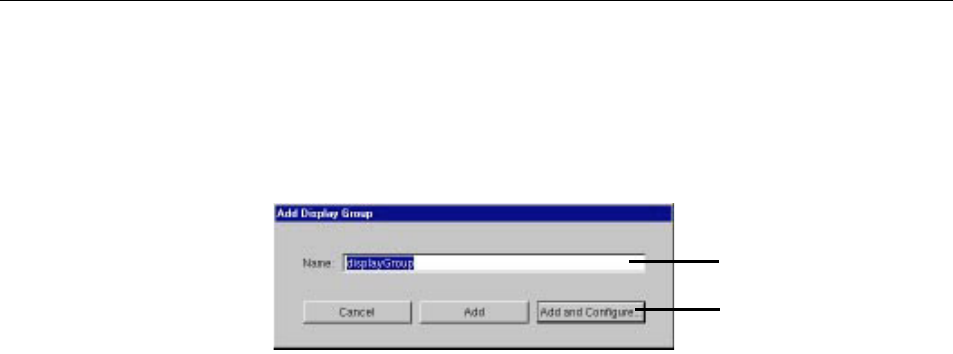
Chapter 3 Working With Dynamic Elements
64
•Drag a model (a folder with the extension .eomodeld) from the file system into
the object browser in your component window, or drag an entity from the
EOModeler application into the object browser.
When you do this, a panel asks you if you want to add the model to your
project. If you reply Yes, the Add Display Group panel appears.
It allows you to specify a name for your display group and decide if you
want to simply add the display group, or configure it as well. “Configuring
the Display Group” describes the configuration process.
•Use Add Variable/Method to define a variable of type DisplayGroup (Java)
or WODisplayGroup (Objective-C or WebScript), or declare the display
group directly in your code:
protected DisplayGroup myDisplayGroup; //this is a Java example
When you add a display group this way, you are responsible for making
sure your project contains the appropriate model file. (For example, once a
model file has been added, you can create any number of display groups
based on it). In addition, you need to configure the display group.
When you use the Add Variable/Method panel, you can create not only display
group variables, but also enterprise objects associated with any of the entities in
your project’s models.
Enter the display group’s name.
Click here to add the display group
and configure it.

Chapter 3 Working With Dynamic Elements
65
In the figure, if you choose the entity CarPackage as the variable’s type, the
following code gets added to your source file:
/** @TypeInfo CarPackage */
protected EnterpriseObject myCarPackage;
The variable myCarPackage is declared as type EnterpriseObject. The comment
/** @TypeInfo CarPackage */ is a structured comment that WebObjects Builder
uses to identify the entity associated with the object. It is then able to display
the attributes in the object browser as shown here:
Configuring the Display Group
A display group must be configured in order for it to be created and initialized
automatically when the component is initialized. Display groups are
instantiated from an archive file (with the extension .woo) that’s stored in the
component. You shouldn’t edit .woo files by hand; they’re maintained by
WebObjects Builder.
Choose an entity from the project’s
models to create an enterprise
object based on that entity.
Choose this item to create a
display group object.
The browser displays the
attributes of the entity
(CarPackage).
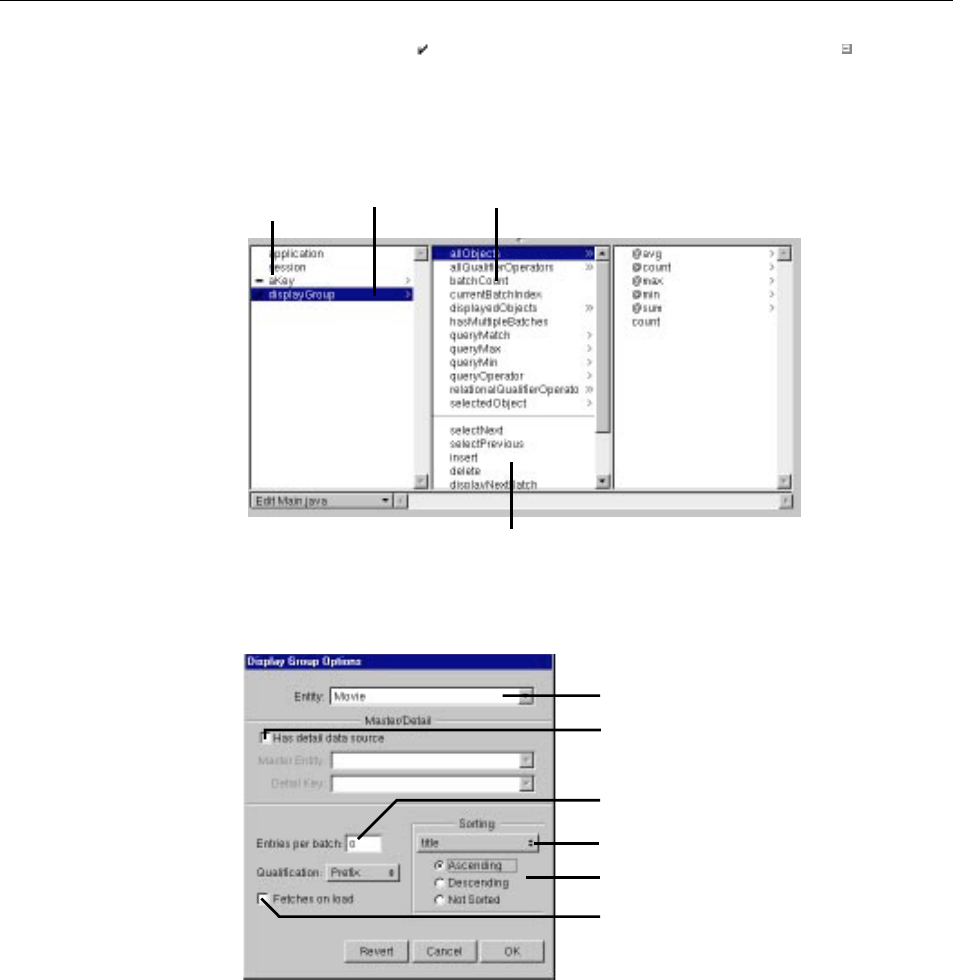
Chapter 3 Working With Dynamic Elements
66
In the object browser, means that the display group has been configured. A
means that it has not been configured, and so the variable isn’t automatically
created. A configured display group shows its keys and actions in the second
column of the object browser. You can bind them to elements in your program.
To configure a display group (or change its configuration), double-click its name
to open the Display Group Options panel.
In this panel, you specify the following information:
Unconfigured display
group (double-click to
configure).
Configured
display group
Display
group’s keys
Display group’s
actions.
Check to create detail display group.
Specify attribute to sort by.
Specify sort order.
Check to fetch records when
component is loaded.
Enter non-zero value to batch
records.
Select entity name

Chapter 3 Working With Dynamic Elements
67
•Entity: The Entity combo box has a list of entities from the models in your
project. You can select one from the list or type the name.
•Has detail data source: Check this to create a detail display group. See
“Creating a Detail Display Group” for more information.
•Entries per batch: Set a non-zero value here to specify the number of records
to be displayed at once. When the value is zero, all records are displayed.
•Qualification: When displaying records according to a query, this setting
determines whether to display records that begin with, end with, or contain
the item specified.
•Fetches on load: When you check this option, the display group fetches all its
objects as soon as the component is loaded into the application.
•Sorting: You select an attribute by which to sort your displayed objects from
the pop-up list, and use the radio buttons to select the order of sorting.
Creating a Detail Display Group
While a display group manages objects associated with a single entity, you can
access other kinds of objects through an entity’s relationships. In a master-detail
configuration, a master display group holds enterprise objects for the source of a
relationship, while a detail display group holds records for the destination. As
individual records are selected in the master display group, the detail display
group gets a new set of enterprise objects to correspond to the selection in the
master.
To create a detail display group, you can use the Display Group Options panel:
1. Check “Has detail data source.”
The Master Entity pop-up list is enabled. It lists the all entities in the
models in your project.
2. Select the Master Entity from the pop-up list.
The Detail Key pop-up list now contains the keys representing the master
entity’s relationships.
3. Select the Detail Key from the pop-up list.
You can also create a detail display group by dragging a to-many relationship
from EOModeler into your component.
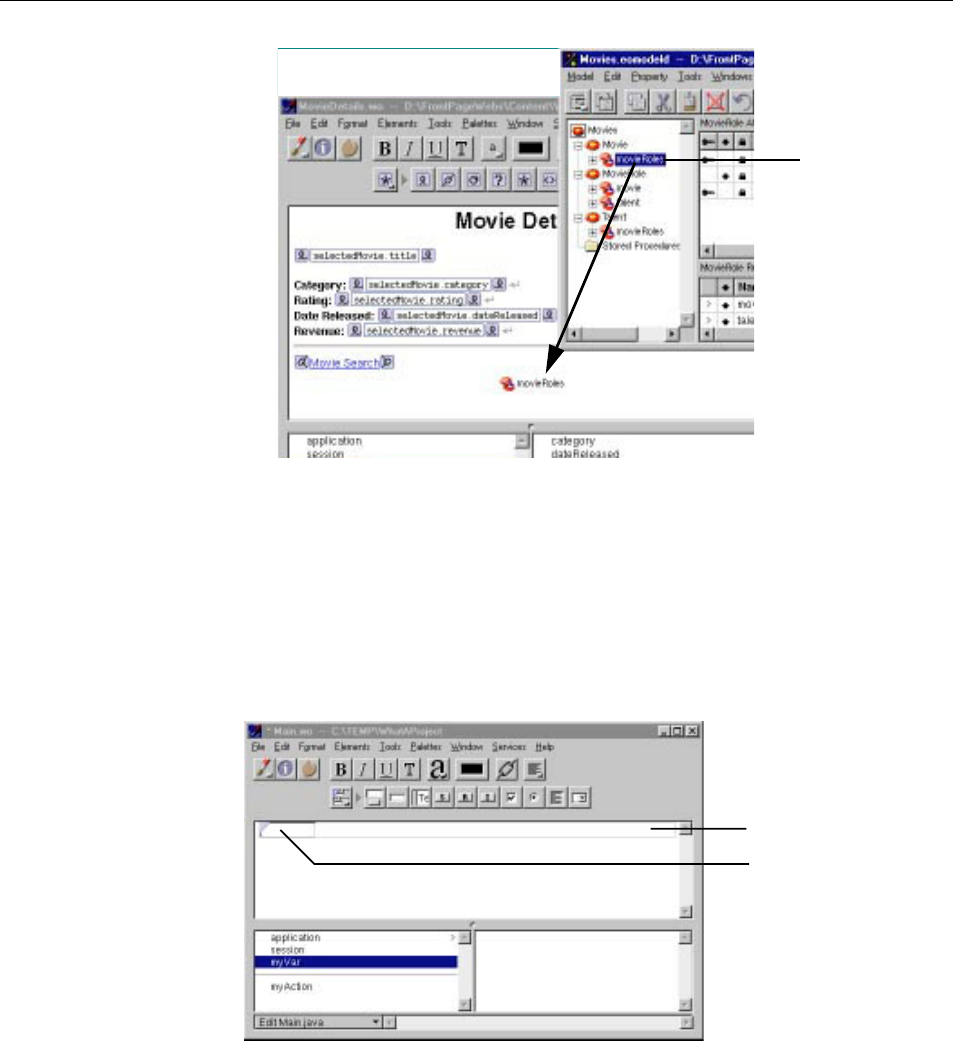
Chapter 3 Working With Dynamic Elements
68
As with other display groups, you can use the Display Group Options panel
to immediately configure the newly created display group.
Binding Elements
This section discusses the basic techniques you use to bind elements. Further
detail is presented in the sections that discuss specific dynamic elements.
Drag relationship from
EOModeler into
component to create
detail display group.
This example creates a
detail display group based
on the movieRoles
relationship, with Movie
as the master entity and
MovieRole as the detail
entity.
Form containing text field.
Dynamic text field.
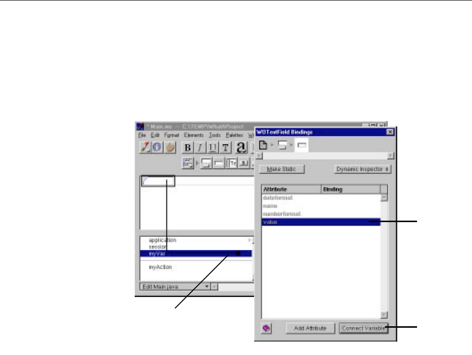
Chapter 3 Working With Dynamic Elements
69
In the figure, you have added a dynamic text field (WOTextField) to your
component. Note the blue triangle in the top left corner, which distinguishes
the dynamic text field from a static HTML text field. The long rectangle
surrounding the text field represents the form of which it is a part.
To bind the text field to the variable myVar:
1. Click myVar in the object browser and drag to inside the text field.
A black line appears as you drag, and a black border appears around the
text field, indicating that you can bind to it.
2. Release the mouse button.
The Inspector for that element appears, listing its attributes. The
value
attribute is selected by default. (This attribute represents the value that
the user enters into the text field.) If this isn’t the attribute you wish to
bind, click another attribute to select it.
3. To complete the binding, click the Connect Variable button.
The name of the variable appears in the Binding column next to the
attribute. Note that it also appears inside the text field in the component
Drag from the key to the
element to bind them.
Default attribute
is selected
automatically.
Click to complete
binding.
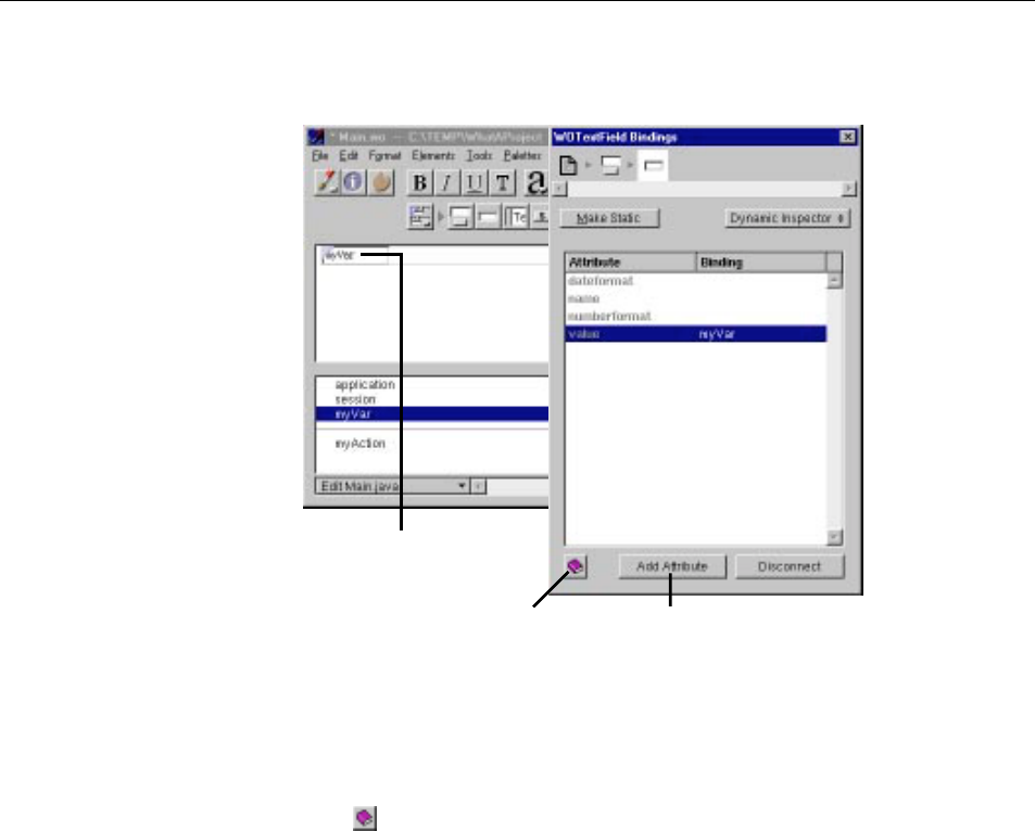
Chapter 3 Working With Dynamic Elements
70
window. Some (not all) dynamic elements display the binding for their
default attribute inside the element itself.
4. If you change your mind, you can click the Inspector’s Disconnect button
(which changed from Connect Variable) to undo the binding.
There are two other buttons on the bottom of the Inspector window:
•Click to view documentation on this dynamic element.
The relevant page from the Dynamic Elements Reference is displayed in your
web browser.
•Click Add Attribute to create a new attribute for this element.
Typically, you don’t add attributes for standard dynamic elements such as
WOTextField or WOString. You use this feature when working with your
own custom WebObjects (see “Custom WebObjects”).
To create an additional binding for the same element:
1. Drag from an item in the object browser to the element as before.
Binding of text field’s
default attribute.
Click to see documentation on
this dynamic element.
Click to add attribute to
element.
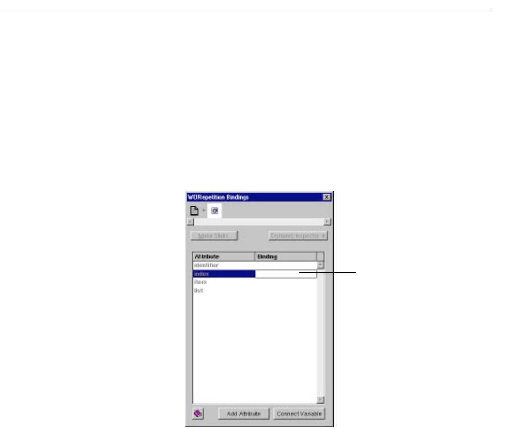
Binding Elements
71
This time, a different attribute is selected, since the default attribute
has already been bound.
2. Click Connect Variable to bind the selected attribute.
3. If, instead, you want to bind an attribute that has already been bound,
double-click its row, and the old binding is replaced with the new one.
You can also bind an element’s attributes by typing in the Inspector without
going through the dragging procedure. To do this:
1. Double-click in the binding column of the row for the attribute you
want to set.
A cursor appears in the Binding column, allowing you to type.
2. Type the binding in the text field, then press Enter.
When entering bindings this way, the following rules apply:
•Constant strings (such as “Joe”) must be in quotes.
•Variable and method names (such as Joe) must not be in quotes.
•Symbolic constants (such as YES and NO) must not be in quotes.
Double-click here to get a
cursor, then type the binding.
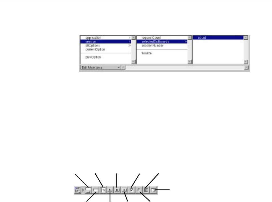
Chapter 3 Working With Dynamic Elements
72
•Keys must specify their full key path. For example, to bind the key that is
selected in the following figure, you would type
session.selectedSailboards.count
Creating Form-Based Dynamic Elements
In HTML, a form is a container element (one that can contain other elements).
Typically, forms contain input elements (such as text fields, radio buttons and
checkboxes) to capture user information, a button or active image to submit the
form data, as well as display elements such as text and images.
In WebObjects Builder, you create form elements by clicking one of the buttons
in the Form Elements portion of the switchable toolbar (or using their menu
equivalents).
All the form elements you create in the toolbar are dynamic equivalents of
standard HTML elements. You can convert any dynamic form element to its
static equivalent (and vice versa) by using the Inspector (see “Dynamic and
Static Inspectors”).
If you add form elements without creating a WOForm first (for example, if you
add a text field to an empty page, or if you add form elements outside of the
form) WebObjects Builder assumes you want to create a new form and places a
<FORM> tag before and a </FORM> tag after the element.
Most form elements have a value attribute that represents the information
entered by the user. You bind this attribute to a variable so that your application
can work with it. Others, such as WOSubmitButton, WOImageButton, or
WOForm WOText WOResetButton WOCheckbox WOBrowser
WOTextField WOSubmitButton
WOPopupButton
WOImageButton WORadioButton
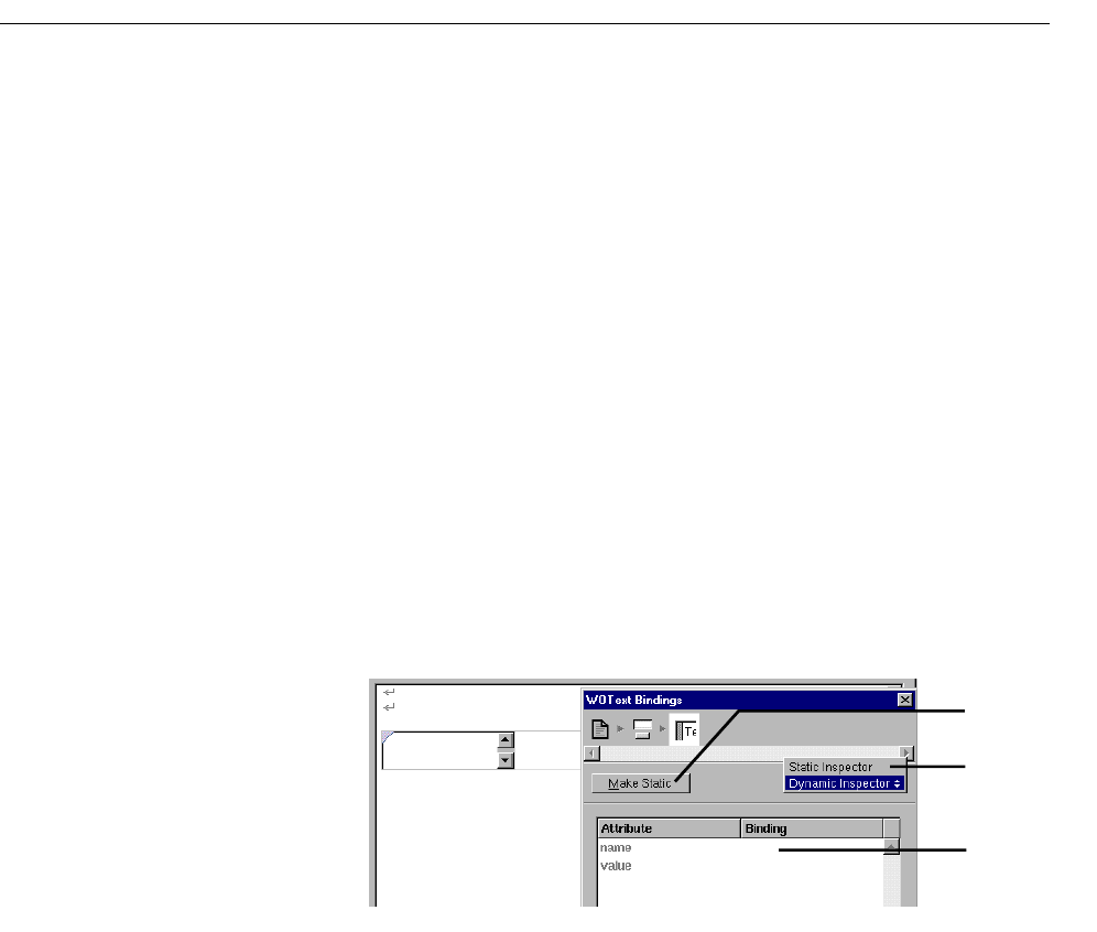
Dynamic and Static Inspectors
73
WOForm itself, don’t receive information but contain an action attribute
representing an action to be taken when the form is submitted. You bind
form-based elements by the process described in “Binding Elements”.
Tip: HTML forms don’t allow you to have multiple submit buttons in a
single form, but the WebObjects WOForm element does. If you want
multiple submit buttons in a form, bind the multiplesubmit attribute of
WOForm to the value YES (by typing it in the Inspector).
Dynamic and Static Inspectors
Most dynamic elements have static HTML counterparts. (The exceptions
are the abstract dynamic elements: WOString, WORepetition,
WOConditional, and WOCustom.) The Inspector for these elements has
two states:
•The Dynamic Inspector, which you use to set the bindings for the
element (see “Binding Elements”).
•The Static Inspector, which you use to set the HTML attributes for the
element’s static counterpart.
This example shows the Inspector for a dynamic text area element. It
displays the bindable attributes for this element. If you select Static
Inspector from the pop-up list, the Text Area Inspector appears. This is the
same Inspector you would see for a static text area element (
<TEXTAREA>)
and allows you to set its HTML attributes (such as COLS or ROWS).
Click here to convert
WOText to a static text
area.
Select Static Inspector to
edit HTML attributes.
Set bindings for the
WOText element here.
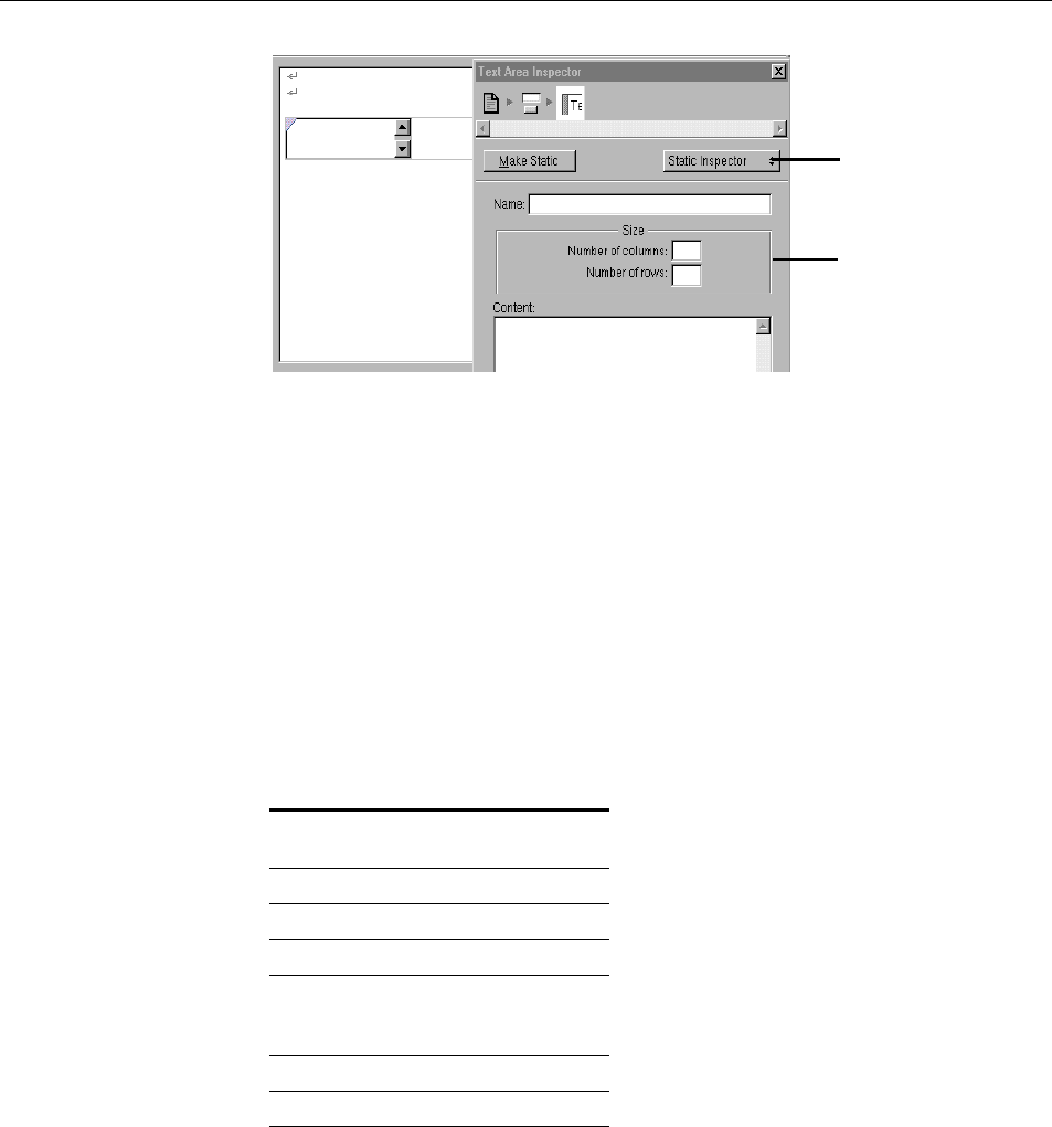
Chapter 3 Working With Dynamic Elements
74
To switch back to the WOText Inspector, select Dynamic Inspector from the
pop-up list.
In addition, you can convert any dynamic element into its static counterpart, or
vice versa:
•When inspecting a dynamic element, if you click Make Static, the element
becomes its static counterpart (if it has one), and the Static Inspector
appears.
•When inspecting a static element, if you click Make Dynamic, the element
becomes its dynamic counterpart. Both the Static and Dynamic Inspectors
are now available.
The following table shows the dynamic counterpart for each static element.
Static Element Dynamic Counterpart
Image WOImage,
WOActiveImage
Form WOForm
Textfield WOTextField
Text Area WOText
Button WOSubmitButton,
WOResetButton,
WOImageButton
Checkbox WOCheckBox
Radio Button WORadioButton
Set HTML attributes of text
area here.
Select Dynamic Inspector to
set the WOText’s bindings.
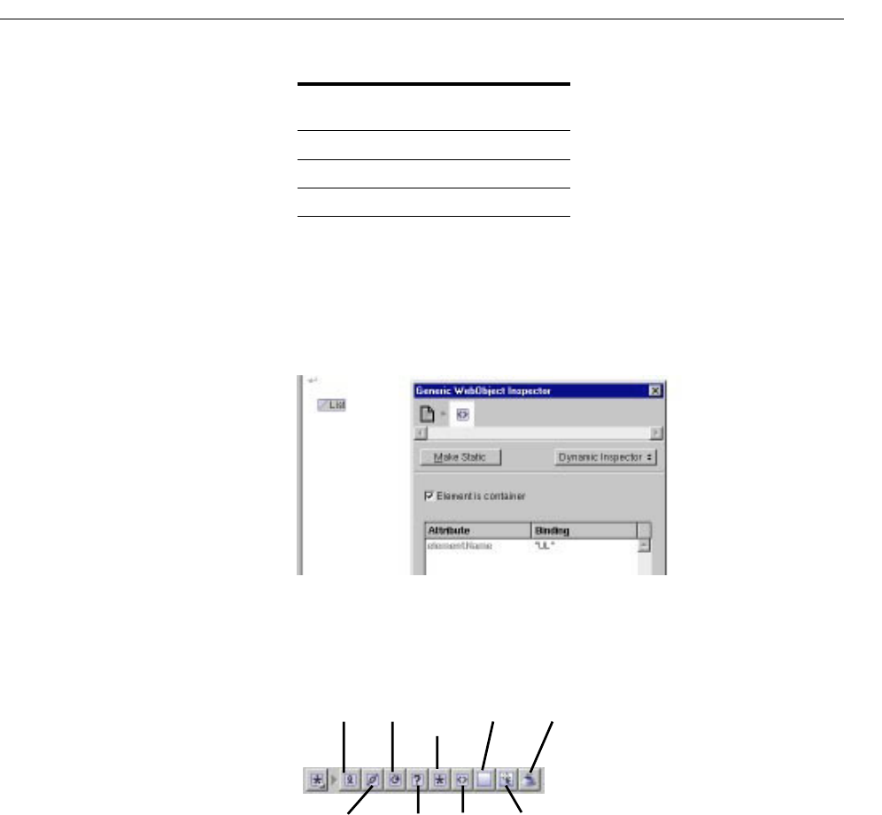
Creating Other WebObjects
75
If you convert a static element to its dynamic counterpart by clicking Make
Dynamic, and there is no direct counterpart, the element becomes a generic
WebObject whose element name is the HTML tag for the static element
(see “Generic WebObjects”). In this figure, a list element (
<UL>) has been
converted to a generic WebObject element.
Creating Other WebObjects
You use this toolbar to create all dynamic elements other than form-based
elements. This section provides some general information about using
these elements. Each element is described in more detail in its own section.
Select WOBrowser,
WOPopupButton
Hyperlink WOHyperlink
Applet WOApplet
Other Generic WebObject
Static Element Dynamic Counterpart
WOString
WOHyperlink
WORepetition Custom
WebObject
WOImage WOApplet
WOConditional Generic
WebObject
WOActiveImage

Chapter 3 Working With Dynamic Elements
76
To create a dynamic element, you click its toolbar icon. One thing to be aware
of is what happens when there are already elements selected when you create
the element:
•Some dynamic elements (WOHyperlink, WOConditional, WORepetition,
custom WebObjects and generic WebObjects) can contain other elements.
In this case, the selected elements appear with the new element “wrapped”
around it.
•Other dynamic elements (WOString, WOImage, WOActiveImage, and
WOApplet) can’t contain other elements. When you create one, it replaces
whatever was selected.
The first six dynamic element types (all those except for WOImage,
WOActiveImage, and WOApplet) display with a pair of icons surrounding the
element (and possibly other icons in between). For example, when you create a
repetition, it appears like this in the component window:
To bind a dynamic element, you drag from an item in the object browser to one
of the outer icons. The Inspector appears, allowing you to complete the binding.
See “Binding Elements” for more information.
You can double-click one of the icons to collapse the element into a single icon:
Collapsing can be desirable when you have dynamic elements that contain other
elements and take up a lot of space on the screen. You can double-click again to
expand the element. In addition, you can use the menu commands Elements
m
WebObjects m Expand All or Elements m WebObjects m Collapse All to expand
or collapse all the dynamic elements in the window.
Dynamic Strings
A WOString element represents a dynamically generated string. You bind the
value attribute of a WOString to a variable or method that returns a string at run
Drag from the object browser to one of the outer
icons to bind (brings up Inspector).
Double-click icon to collapse or expand.
Creating Other WebObjects
77
time. A WOString is abstract in that it doesn’t represent any specific
element, but it can be contained in any other HTML element that can
contain text.
WebObjects Builder provides a shortcut for binding the value attribute of a
WOString, since it is by far the most common attribute you bind.
Instead of dragging to one of the icons, drag to the center binding box. The
binding appears directly in the box, and the Inspector doesn’t come to the
front.
Dynamic Hyperlinks
Dynamic hyperlinks (WOHyperlink) allow you to specify the link’s
destination at run time rather than at compile time. There are several ways
to do this:
•You can specify the name of a page in your application as the destination
of the link. To do this, bind the name to the WOHyperlink’s
pageName
attribute. This is useful since pages in a WebObjects application don’t
have predictable URLs that you can specify in an HTML hyperlink.
•You can specify an action to be performed when the hyperlink is clicked
by binding WOHyperlink’s action attribute to an action method in your
code. This method can perform any sort of action, as well as returning a
page as the destination.
•You can also specify a URL as the destination by binding to the
href
attribute.
To create a dynamic hyperlink:
1. Click in the toolbar.
2. Replace the word Hyperlink with the text of the link.
3. Create the element’s bindings.
To learn how to create a static hyperlink, see “Creating Hyperlinks”.
Drag to here to bind value
attribute directly.
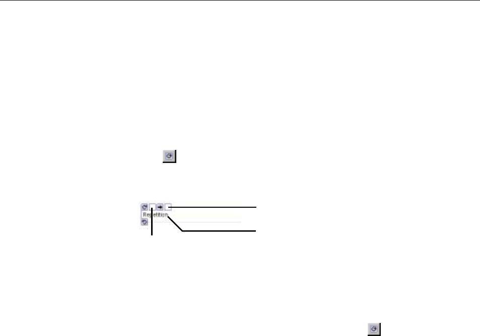
Chapter 3 Working With Dynamic Elements
78
Repetitions
A repetition (WORepetition) is a container element that repeats its contents a
certain number of times. It is like a loop in a structured programming language.
Repetitions are one of the most important elements in WebObjects, since it is
quite common for applications to display repeated data (often from databases)
when the amount of data to be displayed isn’t known until run time. Typically,
a repetition is used to generate items in a list, multiple rows in a table, or
multiple tables.
To create a repetition:
1. Click .
The repetition appears in the component window.
2. Add elements inside the repetition (replacing the word “Repetition”).
A repetition can contain any other elements, either static HTML or
dynamic WebObjects elements.
3. Alternatively, you can select existing elements, then click to wrap the
repetition around the elements. This is necessary in some cases, such as
wrapping a repetition around a table row.
You usually bind two attributes of a repetition: list and item. The list attribute must
be bound to an array. WebObjects generates the elements in the repetition once
for each item in the array. Each time through the array, the
item attribute points
to the current array object. Typically, you bind item to a variable and then use that
variable in the bindings of the elements inside the repetition.
When you drag an item from the object browser to the WORepetition to bind
it, the default attribute shown in the Inspector depends on whether the item is
an array. If it is, list is the default attribute; otherwise, item is the default attribute.
In addition, as with WOStrings, WebObjects Builder provides a shortcut for
binding repetitions so that you don’t have to use the Inspector. Drag to the first
binding box to bind the list attribute; drag to the second box to bind the item
attribute.
Drag to here to bind the item
attribute directly.
Drag to here to bind the
list attribute directly.
Add elements here.
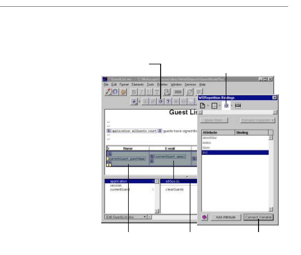
Creating Other WebObjects
79
When you wrap a repetition around a table row, the repetition symbol
doesn’t appear. Instead, a blue border appears around the row. To bind the
repetition, drag from the object browser to anywhere in the row (but not to
a dynamic element inside the row). The Inspector appears, allowing you to
complete the binding as usual.
Note: You can also wrap a repetition around a single cell in a table. In addition,
this same procedure of wrapping a repetition around a table row or cell also
works for conditionals (see next section).
Conditionals
A conditional (WOConditional) is a dynamic container element that
displays its contents only if a particular condition is true. WOConditional’s
main attribute is condition, which takes a Boolean value. If condition is true (1),
Element path shows that the WORepetition is
contained by the table and contains a table row.
Select a table row, then click here
to create a repetition around the row.
Drag variable to the table row
to bind to the repetition.
Click here to bind
allGuests to the
repetition’s list attribute.
The blue border and background
means the row is in a repetition.
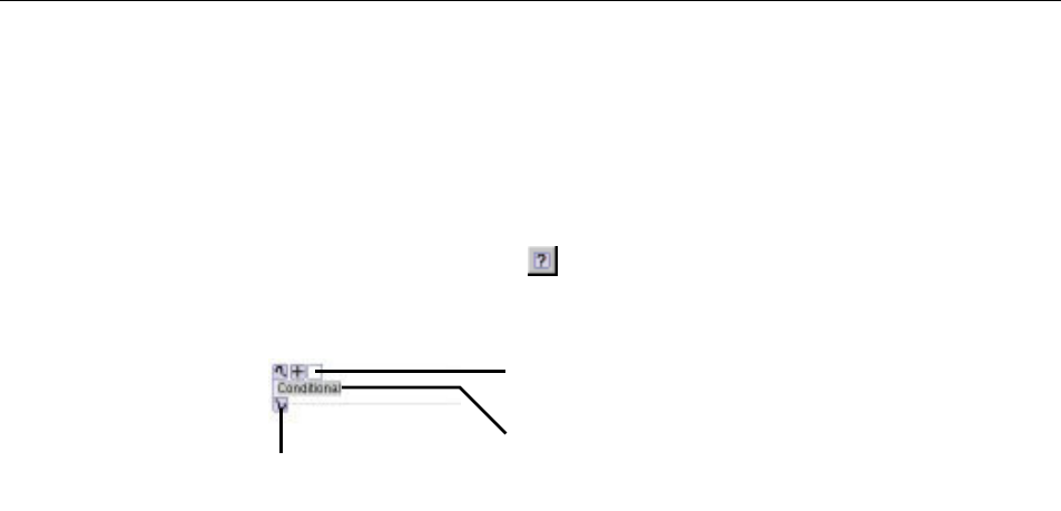
Chapter 3 Working With Dynamic Elements
80
the WOConditional’s contents are displayed. If condition is false (0), the contents
aren’t displayed.
condition can be bound to a variable or to method that returns a Boolean value.
(WebScript and Objective-C use the constants YES and NO; Java uses true and false.)
To bind condition (or any other attribute that takes a Boolean) to a constant value,
enter YES or NO in the bindings Inspector.
To create a conditional, click in the toolbar.
Note: Any selected elements will be contained within the conditional.
To bind to a conditional, click a variable or method and drag to one of the
conditional’s outer icons. The Inspector appears, displaying the bindings for the
WOConditional, with the condition attribute selected by default. Complete the
binding by clicking Connect Variable, or choose a different attribute to bind.
There is a shortcut for binding the condition attribute. Drag from a key in the
object browser to the binding box in the conditional.
Sometimes, you want the equivalent of an “if-then-else” structure; that is, “if
the condition is true, display this text; if not, display this other text.” To
accomplish this, you can use the negate attribute. If negate is true, then the
contents of the conditional are displayed only if condition is false. To create an if-
then-else structure, do the following:
1. Create two WOConditionals.
2. Bind the condition attribute of both of them to the same variable or method.
3. Bind the negate attribute of the second one to YES (true).
By default, negate is false, so you do not explicitly need to bind the first
conditional’s negate attribute.
As with repetitions, you can “wrap” a conditional around a table row (see
“Repetitions”). When you do this, the conditional symbol doesn’t appear but
the row appears with a blue background.
Drag from the object browser to this box to bind the condition attribute
without opening the Inspector. The binding appears inside the box.
Contents of the conditional display if
condition is true.
Drag from the object browser to here
to bind (opensthe Inspector).
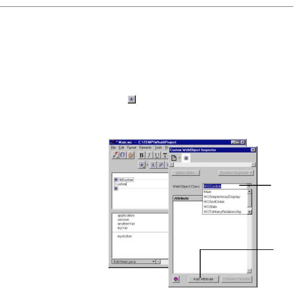
Creating Other WebObjects
81
Custom WebObjects
You use custom WebObjects for two main purposes:
•To implement WebObjects element classes not directly supported by
WebObjects Builder.
•To implement reusable components (see “Reusable Components” for
more details).
To create a custom WebObject:
1. Click in the toolbar.
A template for a custom WebObject appears at the insertion point.
2. In the Custom WebObject Inspector, specify the element class.
The WebObject Class combo box allows you to type the class name or
select it from the components listed in the pop-up menu. This menu
lists all components that are in the current project and frameworks. For
example, the components listed in the menu above
(WOSimpleArrayDisplay, WOSortOrder, and so forth) are defined in
Select class name
from the list or type it.
Click to add the
element’s attributes.
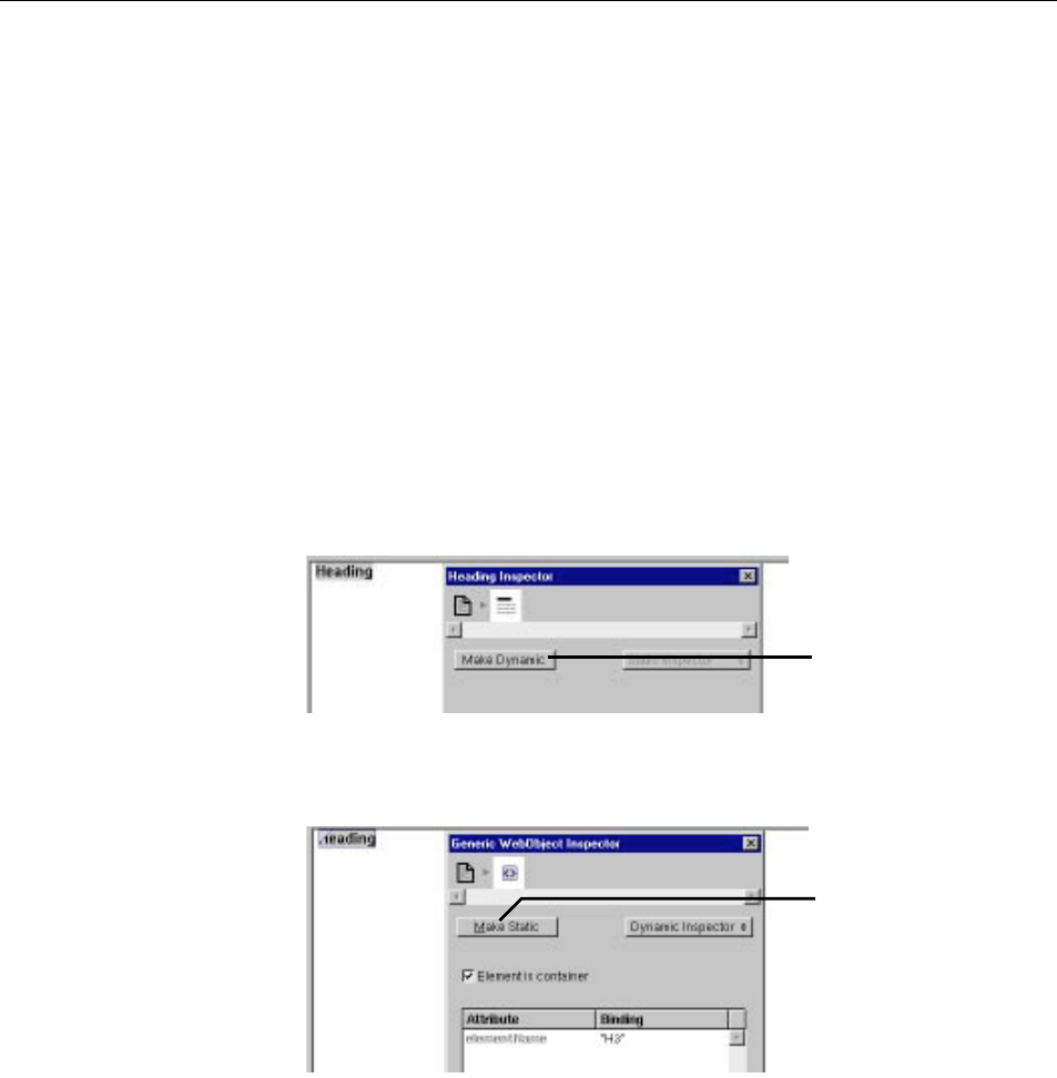
Chapter 3 Working With Dynamic Elements
82
the WOExtensions framework, which is included in your project by
default.
If WebObjects Builder recognizes the element class, it automatically
displays its attributes. Otherwise, you can add them by clicking Add
Attribute.
The WOExtensions palette (see “Palettes”) contains several pre-defined
custom WebObjects elements you can use in a component.
Generic WebObjects
You can use the generic WebObject element to create a dynamic version of any
HTML element.
To create a dynamic version of a standard HTML element):
1. Create the element (say, a heading).
2. In the Inspector, click Make Dynamic.
If the element has no specific dynamic counterpart, it becomes a generic
WebObject element.
To create a generic WebObject corresponding to any HTML element (even
ones not supported by WebObjects Builder):
Click here to convert
the heading to a
dynamic element.
Click here to convert
back to a heading.
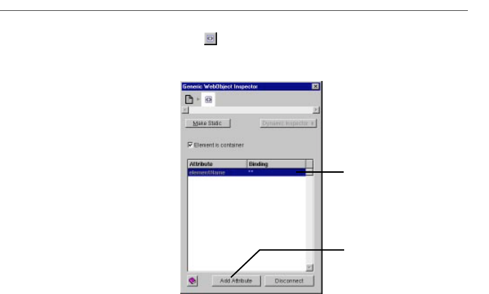
Creating Other WebObjects
83
1. Click in the toolbar.
2. Bring up the Inspector.
A generic WebObject element has one required attribute, elementName,
which specifies what type of element should be generated at run time.
For example, imagine that a future version of HTML adds a container
element called <BLOB>, which you would like to generate dynamically
in your component. You would:
3. Type BLOB between the quotes in the Binding column.
If the name isn’t in quotes, WebObjects assumes it is a binding that
should be resolved at run time. You might use that technique if you
wanted to choose the type of element programmatically rather than
specifying it in advance.
4. Check “Element is container”.
5. Use the Add Attribute button to specify any additional properties of the
element.
Enter the element name here.
Click to add attributes.
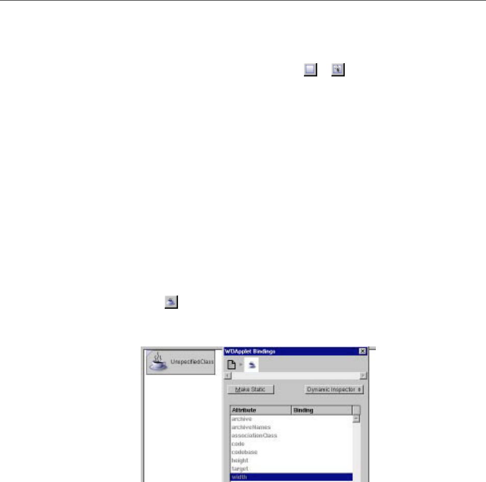
Chapter 3 Working With Dynamic Elements
84
Dynamic Images
The elements WOImage and WOActiveImage are dynamic images. At run
time, WOImage is rendered as a passive image and WOActiveImage as a
mapped, active image. To create them, click or in the toolbar,
respectively.
A static image element requires you to specify its pathname directly in the
HTML. With dynamic images, you bind the filename attribute to specify the
name of an image file in your project, or in a framework. You can bind this
attribute to a variable or method so that the filename is dynamically generated
at run time.
You can also create a WOImage by dragging an image from the file system into
your component (see “Dragging Elements into the Component Window” for
more information). An alert appears, asking whether you want to add the image
to the project (if it is not already in the project). If you do, the file is added to the
Web Server Resources suitcase of your project.
WOApplets
The WOApplet dynamic element represents a Java applet or client-side
component. There are several ways to create a WOApplet. You can:
•Click in the toolbar.
This creates a WOApplet, whose bindings you must set.
•Drag a file of type .class into your component.
You are asked whether you want to add the .class file to your project. If you
reply Yes, it is added to the Web Server Resources suitcase. A WOApplet

Reusable Components
85
appears in your component, with its code attribute set to the name of
the file.
•Drag an element from the Client-Side Components palette to your
component (see “Palettes”).
Reusable Components
One of the strengths of the WebObjects architecture is its support of
reusable components. Any component that you define, whether it
represents an entire page or part of a page, can be reused by any
WebObjects application. A component can be used in multiple pages or
even multiple times in the same page. Reusable components can be used
for such items as headers, footers, and navigation bars.
When a reusable component is used inside another component, it is
referred to as a child component; the containing component is called the
parent component.
To reuse a component, you can:
•Add the component to a framework and include the framework in any
project that wants to use the component. The component is a shared
component and doesn’t need to be copied into each application that uses
it.
•Add the component directly to your project (in the Web Components
suitcase).
See “Frameworks” for information on creating frameworks and adding
them to a project. To add a component directly to a project, you can:
•Drag a component (a folder with the .wo extension) from the file system
onto a component window.
You are asked whether you want to add the component to your project.
If you respond Yes, the component is copied to the project and placed
in the Web Components suitcase, along with all the other components.
The child component then appears in the window at the insertion
point. It is displayed graphically inside a custom WebObject element.

Chapter 3 Working With Dynamic Elements
86
•Use the toolbar to add a custom WebObject element (see “Custom
WebObjects”) to your page, then use the Inspector to set its type to the
name of the reusable component.
•Drag a component that has been stored on a palette to the component
window (see “Palettes”).
A component that is designed for reuse can export keys and actions, which
become attributes that the parent component can bind, just as it would set the
attributes of any other dynamic element. When the component is added to a
parent component, these attributes show up in the Custom WebObject
Inspector. The attributes must be enumerated in the .api file for the component.
For example, the WOSimpleArrayDisplay shared component that lives in the
WOExtensions framework exports the following attributes, as defined in its
.api
file:
When you use this component in one of your pages, it looks like this:

Reusable Components
87
The Inspector shows the child component’s attributes. As with any other
dynamic element, you can bind the child component’s attributes to keys
and actions in the parent component’s code.
Note: When you create a component that is specifically designed to be used
within other pages, specify “Partial document” in the Page Attributes
Inspector popup list (see “Setting Page Attributes”). This way WebObjects
Builder does not wrap <HTML>,<HEAD>, and <BODY> tags around your
component.
For more information, see “Reusable Components” in the WebObjects
Developer’s Guide.
Shared component appears
inside Custom WebObject
icons.
Parent component
can bind to these
attributes.
Name of shared
component.
