File info: application/pdf · 137 pages · 22.77MB
Zebra Brand Guidelines - Zebra Technologies
Photography. Video. Social Media. Legal Requirements. Complementary Colors and Tints. Examples of usage: Purple. Lor acimus arum quis. 2021 75%. 81%.
here
Copyright
Extracted Text
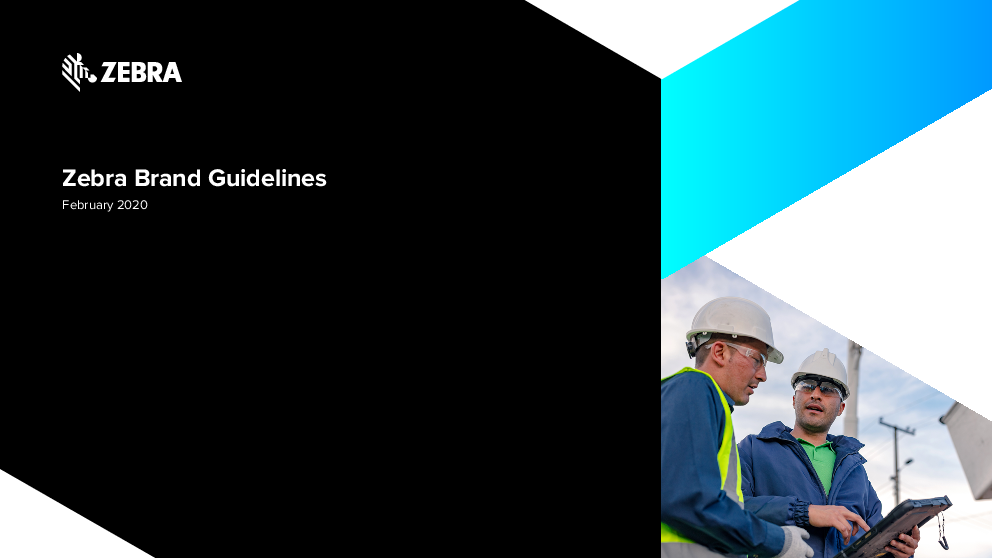
Zebra Brand Guidelines
February 2020

DELIVERING THE ZEBRA BRAND TABLE OF CONTENTS
Table of Contents How to Use These Guidelines The Zebra Brand Voice and Messaging The Zebra Logo Zebra Tagline Solution Logos Design Elements Brand Colors Typography Photography Video Social Media Legal Requirements
1.01

Table of Contents
How to Use These Guidelines Overview
The Zebra Brand Overview Brand Positioning Brand Essentials
Voice and Mesaging Overview Brand Voice Brand Tone and Persona Copy and Content
The Zebra Logo Overview Logo Elements Logo Variations Clear Space Scaling Apparel Imprinting Typography Treatment

Zebra Tagline

2.01

Overview

Approved Variations

Clear Space

3.01

Scaling

3.02

When to Use Our Tagline

3.03

Design Elements

Overview

4.01

The Vertical Edge

4.02

The Zebra Head Symbol

4.03

The Zebra Supergraphic

4.04

Brand Colors

Overview

5.01 5.02 5.03 5.04 5.05

Primary Color Palette Accessibility Complementary Colors and Tints Zebra Gradient Balancing the Colors

5.06

5.07 Typography

Overview

Corporate Typeface

Marketing Typeface

Hierarchy

Typography in Use

Photography

6.01

Overview

6.02

Application Photography

6.03

Product Photography

6.04

Stock Image Licensing

6.05

Video

Overview

7.01

7.02 Social Media

7.18

Overview

7.21

Legal Requirements

8.01 8.02 8.04 8.05

Overview Trademarks and Copyright Regional Footer Footer Construction

8.18

8.22

9.01 9.02 9.03 9.04 9.05

10.01 10.02 10.13 10.17
11.01
12.01
13.01 13.02 13.05 13.06

DELIVERING THE ZEBRA BRAND HOW TO USE THESE GUIDELINES
Table of Contents How to Use These Guidelines The Zebra Brand Voice and Messaging The Zebra Logo Zebra Tagline Solution Logos Design Elements Brand Colors Typography Photography Video Social Media Legal Requirements

How to Use These Guidelines

The Zebra brand guidelines exist for your benefit. We hope you'll feel comfortable consulting them any time you have questions about how to uphold and implement the Zebra brand. We have designed them to be user-friendly, easy-to-navigate and intuitive, and we encourage you to turn to them whenever you're doing work on the brand's behalf. The Zebra brand belongs to all of us � therefore, getting it right is everyone's job.
Consistent User Experience We have designed each section of the guidelines consistently, so that you can always find what you are looking for. Our Table of Contents, main navigation (found running vertically along the far left) and sub navigations (available to the right of the main navigation; and found within each section) are clickable, so you may return to content or skip around to view specific information as needed.
Hyperlinked Content Hyperlinked content will appear underlined throughout the guidelines, either to provide quick access to visual examples that may help explain a concept further; to allow you to easily navigate to relevant content; or to provide you an email address that you can click on to request more information.

Resources At the bottom left of many pages, you will find an "Available downloads" section. Consider this your resources section: here, you can access useful tools, templates, guides, collateral or even images referenced within the body of that specific page.
At the bottom right of every page is a dedicated navigation, which allows you to progress forward or backward a page, just by using the appropriate arrows. The three stacked horizontal lines � located between the arrows � allow you to return to the start of whichever section you are currently in, from wherever you are.
Section Downloads Finally, each section of the guidelines may be downloaded as its own individual PDF. So, if your work only requires that you know about our photographic style, you may download the Photography section separately from Sharepoint or clicking on your desired section on the next page.
If, at any time, you have questions about how to use these guidelines or how to best create marketing materials for the Zebra brand, please email the Zebra Brand Team at brand@zebra.com.

2.01

DELIVERING THE ZEBRA BRAND HOW TO USE THESE GUIDELINES
Table of Contents How to Use These Guidelines The Zebra Brand Voice and Messaging The Zebra Logo Zebra Tagline Solution Logos Design Elements Brand Colors Typography Photography Video Social Media Legal Requirements
2.02

How to Use These Guidelines
Section Downloads

The Zebra Brand Download

Voice and Messaging Download

Design Elements Download

DELIVERING THE ZEBRA BRAND VIDEO
Table of Contents How to Use These Guidelines The Zebra Brand Voice and Messaging The Zebra Logo Zebra Tagline Solution Logos Design Elements Brand Colors Typography Photography Video Social Media Legal Requirements

Overview

Video
We have developed this suite of motion graphics, which follow our Brand Guidelines, to bring to life the Zebra brand identity for all internal and external videos. The goal is to project a consistent brand expression that reflects our intelligence, spirit, knowledge and empathy. In creating these motion graphics, we've tried to anticipate all possible uses including (but not limited to) broadcast, major presentations, social/digital media, success stories and product launches. Please do not deviate from these elements or add additional graphics as you produce your videos. Email brand@zebra.com if you have questions about applying the elements provided or download the Brand Motion Graphics Guidlines

12.01
Video Download

Brand Colors Download
Social Media Download

The Zebra Logo Download

Zebra Tagline Download

Typography Download

Photography Download

Trademarks and Copyright Download

DELIVERING THE ZEBRA BRAND THE ZEBRA BRAND
Table of Contents How to Use These Guidelines The Zebra Brand Voice and Messaging The Zebra Logo Zebra Tagline Solution Logos Design Elements Brand Colors Typography Photography Video Social Media Legal Requirements

Overview Brand Positioning Brand Essentials

3.01

The Zebra Brand
Just as our brand guidelines serve as the foundation for internal and external materials, our brand positioning represents what we want Zebra to stand for in the minds of our customers, partners and employees. Though not public-facing, our brand positioning is the strategy that drives all business decisions and actions. It enables greater recognition and appreciation for what makes Zebra unique. As the market leader at the edge of the enterprise, consistent application of our brand guidelines is critical to how we will build brand awareness; grow customer trust and recognition; strengthen our relationship with partners and employees; and take our place among the world's top brands.

DELIVERING THE ZEBRA BRAND THE ZEBRA BRAND
Table of Contents How to Use These Guidelines The Zebra Brand Voice and Messaging The Zebra Logo Zebra Tagline Solution Logos Design Elements Brand Colors Typography Photography Video Social Media Legal Requirements

Brand Positioning
The Zebra brand positioning is defined by a simple statement, comprised of three key elements: Brand Essence � core characteristic that defines the brand
Customer Relevance � target market pain point that the brand can address
Brand Promise � what the brand promises customers

Empowering your performance edge
As digital innovation transforms the edge of the enterprise,
Zebra delivers a performance edge to the front line of business

3.02

Available downloads Zebra Brand Essentials Guidelines - download

DELIVERING THE ZEBRA BRAND THE ZEBRA BRAND
Table of Contents How to Use These Guidelines The Zebra Brand Voice and Messaging The Zebra Logo Zebra Tagline Solution Logos Design Elements Brand Colors Typography Photography Video Social Media Legal Requirements
3.03

Brand Essentials

Purpose-Driven Design
Collaborative Mobile Workflows
Solution Ecosystem

Data-Powered Environments
Real-Time Guidance

Highly relevant to our customers, our five unique brand essentials are how we deliver the value of our brand essence.
In the following pages, we demonstrate how the brand essentials guide the ways the Zebra brand communicates and acts, as well as the experiences which we create.

Available downloads
Copywriting Style Guidelines - download Brand Persona and Voice Principles Guidelines - download Voice and Messaging Guidelines - download Zebra Brand Essentials Guidelines - download Paramedic Scanning Label Close Up Application Photo - download

DELIVERING THE ZEBRA BRAND THE ZEBRA BRAND
Table of Contents How to Use These Guidelines The Zebra Brand Voice and Messaging The Zebra Logo Zebra Tagline Solution Logos Design Elements Brand Colors Typography Photography Video Social Media Legal Requirements
3.04

Brand Essentials

Purpose-Driven Design
Collaborative Mobile Workflows
Solution Ecosystem

Data-Powered Environments
Real-Time Guidance

� Zebra designs with front line users, workplaces, and workflows in mind, building in ease of use, reliability and ruggedness
� Inspired by human-factors engineering with front-line users, workplaces and workflows in mind - Intuitive and easy to use - Rugged, survivable and scalable - Quick charging, long deployment - Enterprise-level security and management - Full support through enterprise lifecycle - Integrated to work better together

Available downloads
Copywriting Style Guidelines - download Brand Persona and Voice Principles Guidelines - download Voice and Messaging Guidelines - download Zebra Brand Essentials Guidelines - download Worker on Catwalk Application Photo - download

DELIVERING THE ZEBRA BRAND THE ZEBRA BRAND
Table of Contents How to Use These Guidelines The Zebra Brand Voice and Messaging The Zebra Logo Zebra Tagline Solution Logos Design Elements Brand Colors Typography Photography Video Social Media Legal Requirements
3.05

Brand Essentials

Purpose-Driven Design
Collaborative Mobile Workflows
Solution Ecosystem

Data-Powered Environments
Real-Time Guidance

� Zebra enables customers to create smart environments on the edge, better reflecting reality than traditional systems of record - Intelligent devices sensing workflow context - Specialized data infrastructure for retail, transportation and logistics and healthcare - Zebra SavannaTM broad-based data services platform, enabling rapid application development - Automated visibility and management of devices with predictive maintenance

Available downloads
Copywriting Style Guidelines - download Brand Persona and Voice Principles Guidelines - download Voice and Messaging Guidelines - download Zebra Brand Essentials Guidelines - download

Where Device Visibility and Action Connect

DELIVERING THE ZEBRA BRAND THE ZEBRA BRAND
Table of Contents How to Use These Guidelines The Zebra Brand Voice and Messaging The Zebra Logo Zebra Tagline Solution Logos Design Elements Brand Colors Typography Photography Video Social Media Legal Requirements
3.06

Brand Essentials

Purpose-Driven Design
Collaborative Mobile Workflows
Solution Ecosystem

Data-Powered Environments
Real-Time Guidance

� Zebra enables those on the front line to optimize in-motion operations through connected and collaborative workflows
� Optimizing mobile worker and team performance through connected operations - Team collaboration via push-to-talk, messaging and phone in one multi-functional device - Secure access to data from any location - Location-optimized task assignment - Elevated customer service prevents loss of sale - Connects clinicians to colleagues for optimal healthcare

Available downloads
Copywriting Style Guidelines - download Brand Persona and Voice Principles Guidelines - download Voice and Messaging Guidelines - download Zebra Brand Essentials Guidelines - download

SUCCESS STORY TRUMAN MEDICAL CENTERS / CERNER CORPORATION

SUMMARY

Customer Truman Medical Centers Kansas City, Missouri

How Care Team Communications are Transforming Patient Care
Truman medical centers optimizes clinician workflows, patient care and staff satisfaction by upgrading its care team communications system

Challenge
Truman Medical Centers (TMC) is an academic health system comprised of two inpatient facilities with 600 beds, 51 clinics and more than 4,000 employees � including a level one trauma center. With nurses carrying more than five communications devices to do their jobs, a new approach to care team communications was needed.
Solution
To streamline its care team communications and clinical workflows, Truman turned to Zebra's TC-51-HC mobile computer and Cerner's CareAware ConnectTM solution.

Results
Nurses now carry just one Zebra mobile computer instead of using five different devices to communicate. Overall, Truman estimates the Zebra mobile computers and Cerner's CareAware Connect have improved communication workflows and reduced the time required to disinfect equipment. When comparing a nurse's footsteps over two 12-hour shifts, one nurse benefitted by cutting her walking steps nearly in half -- from more than 15,000 steps to 7,800.

Zebra Partner Cerner Corporation Kansas City, Missouri
Industry Healthcare Information Technology
Challenge Optimizing nursing workflow, patient care and staff satisfaction
Solution and Functionality � Zebra TC51-HC mobile
computer � Cerner's CareAware
Connect solution � Applications: voice and
text communications, camera capture, barcode medication administration, breast milk and transfusion tracking � Zebra's QLn220 mobile printer, HC100 desktop printer and the ZT230 tabletop printer and media for printing highquality barcoded patient wristbands and asset and specimen labels
Results � Improved clinical workflows
save nurses valuable time � Cut number of steps nurses
walk during their shifts � Reduced time spent
disinfecting equipment by tenfold

DELIVERING THE ZEBRA BRAND THE ZEBRA BRAND
Table of Contents How to Use These Guidelines The Zebra Brand Voice and Messaging The Zebra Logo Zebra Tagline Solution Logos Design Elements Brand Colors Typography Photography Video Social Media Legal Requirements
3.07

Brand Essentials

Purpose-Driven Design
Collaborative Mobile Workflows
Solution Ecosystem

Data-Powered Environments
Real-Time Guidance

� Zebra links teams, assets and systems in real time to deliver best-action guidance for businesscritical decisions
� Sensing and analyzing for best-action guidance - Auto-generated restocks to avoid empty shelves - Field route optimization with constant updates - Dynamic cross-dock solutions to maximize productivity - Guidance for nurses to ensure patient safety and critical asset location - Load monitoring with management visibility to pack efficiency
Available downloads
Copywriting Style Guidelines - download Brand Persona and Voice Principles Guidelines - download Voice and Messaging Guidelines - download Zebra Brand Essentials Guidelines - download Retail assistant image - download

DELIVERING THE ZEBRA BRAND THE ZEBRA BRAND
Table of Contents How to Use These Guidelines The Zebra Brand Voice and Messaging The Zebra Logo Zebra Tagline Solution Logos Design Elements Brand Colors Typography Photography Video Social Media Legal Requirements
3.08

Brand Essentials

Purpose-Driven Design
Collaborative Mobile Workflows
Solution Ecosystem

Data-Powered Environments
Real-Time Guidance

� Zebra and its network of specialized partners innovate industry-tailored solutions for the enterprise edge
� Enabling industry-tailored solutions through a specialized partner network - Over 10,000 partners across 100 countries including ISVs, integrators, distributors and service providers - Pre-integrated solutions built on Zebra and partner technologies - Zebra Savanna data platform and application development tools - CRN 5-Star Partner Program recognition for Zebra� PartnerConnect program
Available downloads
Copywriting Style Guidelines - download Brand Persona and Voice Principles Guidelines - download Voice and Messaging Guidelines - download Zebra Brand Essentials Guidelines - download TC70 Employee Swiping Credit Card Application Photo - download

A Comprehensive Ecosystem of Business Solutions

DELIVERING THE ZEBRA BRAND VOICE AND MESSAGING
Table of Contents How to Use These Guidelines The Zebra Brand Voice and Messaging The Zebra Logo Zebra Tagline Solution Logos Design Elements Brand Colors Typography Photography Video Social Media Legal Requirements

Overview Brand Voice Brand Tone and Persona Copy and Content
� Situations to avoid

4.01

Voice and Messaging
Zebra's messaging framework is made up of one overarching message: Zebra delivers a performance edge to the front line of business. Voice and messaging work together to shape our brand expression: � Our brand voice guides how we speak to our customers � Our messaging guides what we say to our customers

DELIVERING THE ZEBRA BRAND VOICE AND MESSAGING
Table of Contents How to Use These Guidelines The Zebra Brand Voice and Messaging The Zebra Logo Zebra Tagline Solution Logos Design Elements Brand Colors Typography Photography Video Social Media Legal Requirements
4.02

Brand Voice
Our voice is our point of view. It's how we present ourselves, and it guides how we communicate our personality and our values. This is how we speak to our partners, employees and customers around the world, many of whom do not speak the same language. Because of this, it's important to speak clearly and inclusively.
Top tips: � Be specific � Be straightforward and pragmatic � Be consistent � Use active voice � Empower and excite about what could be possible � Keep sentences short and concise, yet still effective � Consider that messaging will need to be translated � Ensure your writing is accessible to everyone around
the world � If you need to use a technical term, briefly define
it so everyone can understand
Available downloads Copywriting Style Guidelines - download Brand Persona and Voice Principles Guidelines - download Voice and Messaging Guidelines - download Zebra Brand Essentials Guidelines - download

FIELD SERVICES EBOOK MOBILITY SOLUTIONS PURPOSE-BUILT TO EXCEED EXPECTATIONS
This is Zebra Field Services Territory
Mobility solutions purpose-built to exceed expectations
1 zebra technologies

DELIVERING THE ZEBRA BRAND VOICE AND MESSAGING
Table of Contents How to Use These Guidelines The Zebra Brand Voice and Messaging The Zebra Logo Zebra Tagline Solution Logos Design Elements Brand Colors Typography Photography Video Social Media Legal Requirements
4.03

Brand Tone and Persona

Tone Our tone is not what we say, but rather how we say it. Zebra's positive, conversational tone is our brand's attitude--it provides emotional context for our messaging.
While our voice remains consistent, our tone may differ slightly by asset type, media or platform. See the Brand Persona and Voice Principles Guidelines for further instruction.
Persona A persona is an internal, creative and strategic tool used to create a distinct "character". It guides our voice and inspires us in delivering the Zebra brand.
Zebra's voice persona is "The Inventive Ally" (a term we only use internally): it is defined as inspiring, pragmatic and collaborative. To get into the mindset of the Zebra persona, follow these tips.

Top tips:
� Think of an inspiring TED talk speaker, who offers bold, new perspectives and breaks down big ideas to make them accessible to the audience
� Think of an insightful coach, who pushes you to be your best and has an actionable plan to help you get there
� Think of a supportive mentor, who is understanding, accessible and invested in your growth and development
� Think of the thoughtful peer, who highlights everyone's contributions and celebrates shared success

FIELD SERVICES EBOOK MOBILITY SOLUTIONS PURPOSE-BUILT TO EXCEED EXPECTATIONS

This is customer satisfaction This is Zebra Field Services Territory
In today's ultra-competitive business environment, meeting customers' expectations is no longer enough.

You have to exceed them. One way you can is by capitalizing on your field service professionals � often your primary or only source of post-sale customer contact.
They're in the right place at the right time to improve customer satisfaction and loyalty. Yet research shows that their poor record-keeping and management are losing businesses up to 70% of potential revenue every single day.
Equip and empower them with a powerful mobile device, and you can help them to:

� arrive on time with the information, parts and materials they need for a first-time fix
� act as on-the-spot salespeople when cross-sell and upsell opportunities arise
� make the most of every customer contact � enhance customer satisfaction through timeliness,
efficiency and knowledge
It's far easier to ensure your customer service goes above and beyond, when you equip your field service technicians with mobile technology purpose-built to exceed expectations.

Enhance customer satisfaction through timeliness, efficiency and knowledge

4 zebra technologies

Available downloads
Brand Persona and Voice Principles Guidelines - download Voice and Messaging Guidelines - download

DELIVERING THE ZEBRA BRAND VOICE AND MESSAGING
Table of Contents How to Use These Guidelines The Zebra Brand Voice and Messaging The Zebra Logo Zebra Tagline Solution Logos Design Elements Brand Colors Typography Photography Video Social Media Legal Requirements
4.04

Copy and Content
When writing copy, we follow these general rules. Top tips: � Use title case for headlines � Use sentence-style capitalization only when the title
or subhead is a sentence�otherwise use title-style capitalization � Use title-style capitalization when headlines and subheads act as titles on pages (e.g., the Copy and Content headline at the top of this page) or are product names (proper nouns) � Write for your audience and medium � Write for all readers, including both descriptive and scannable content in a single asset where practical
Available downloads Copywriting Style Guidelines - download Brand Persona and Voice Principles Guidelines - download Voice and Messaging Guidelines - download Zebra Brand Essentials Guidelines - download

DELIVERING THE ZEBRA BRAND VOICE AND MESSAGING
Table of Contents How to Use These Guidelines The Zebra Brand Voice and Messaging The Zebra Logo Zebra Tagline Solution Logos Design Elements Brand Colors Typography Photography Video Social Media Legal Requirements
4.05

Copy
Situations to avoid
Do not use jargon, puns or slang, as we translate our copy for people around the world Do not use fancy words where simple ones will do Do not use vague language, puffery or fluff Do not boast Do not use passive voice Do not use exclamation marks Do not use ellipses for emphasis or drama Do not use ellipses in titles or headlines Do not overuse contractions to the point where our persona or tone are compromised Do not use periods in headlines and subheads. Instead, try to use a line break to convey separate thoughts
Available downloads Copywriting Style Guidelines - download Brand Persona and Voice Principles Guidelines - download Voice and Messaging Guidelines - download Zebra Brand Essentials Guidelines - download

It is what it is and it ain't what it ain't, luckily Zebra rugged mobile devices are everything they're cracked up to be.

Zebra is equipped for any sticky wicket and allows you to stay above water as you perform your tasks.

Zebra allows you to stay above water in tight spots with its offering of rugged mobile solutions.

Leverage the full power of Zebra mobility solutions to ratify your business.

Do not use jargon, puns or slang, as we translate our copy for people around the world

Zebra rugged tablets feature an illuminated screen for distinguishable visibility of the most miniscule intricacies.

Zebra contemplates and accounts for immeasurable amount of fluctuating variables and idiosyncrasies to create solutions with dynamic synergies.

Do not use fancy words where simple ones will do

DELIVERING THE ZEBRA BRAND VOICE AND MESSAGING
Table of Contents How to Use These Guidelines The Zebra Brand Voice and Messaging The Zebra Logo Zebra Tagline Solution Logos Design Elements Brand Colors Typography Photography Video Social Media Legal Requirements
4.06

Copy
Situations to avoid
TC56 Touch Computer Beauty, Brains And Brawn
Everything you workers want, everything your business needs
Do not use vague language, puffery or fluff
After using Zebra devices, improvements were made.
Do not use passive voice

It all started with the stripes of a barcode. By the time digital information began to grow, Zebra was already there. We helped front line employees scan items with the first handheld laser barcode scanner, which revolutionized the retail industry. That was just the beginning of today's Zebra solutions that enable enterprises to clearly see what they couldn't see before. Our solutions have given our customers a performance edge for almost 50 years, helping them reach new levels of growth, productivity and service. Do not boast
Do not use exclamation marks

DELIVERING THE ZEBRA BRAND VOICE AND MESSAGING
Table of Contents How to Use These Guidelines The Zebra Brand Voice and Messaging The Zebra Logo Zebra Tagline Solution Logos Design Elements Brand Colors Typography Photography Video Social Media Legal Requirements
4.07

Copy
Situations to avoid
Zebra rugged mobile solutions deliver durability, reliability... and profitability
Do not use ellipses for emphasis or drama
Zebra focuses solely on developing industryleading scanners.
In addition, we engineer rugged tablets, rugged mobile computer and thermal printing devices.
Do not overuse contractions to the point where our persona or tone are compromised

Do not use ellipses in titles or headlines
Trust Zebra's Value-Driven Printers
Unmistakable quality. Exceptional value.
Zebra's value-driven thermal printers deliver uncompromised quality to perform the most essential tasks at an incredible value. These printers come equipped with the same durability, reliability, and performance standards that Zebra is known for as the industry leader.
Do noPtriunstiengpseorluiotidosnsinfohr eyoaudrlbinuesisneasnsdansdubuhdegaedt s. Instead, try toZuesberaa's linindeusbtrryeleaakdtinogceonntrvy-eleyveslepprianrteartsefethatourueg: hts
� Software that makes Zebra devices easy to deploy, integrate and manage
� Immediate, out-of-the-box compatibility with Zebra scanners and mobile computers
� Connectivity flexibility such as Wi-Fi, Bluetooth and USB

DELIVERING THE ZEBRA BRAND THE ZEBRA LOGO
Table of Contents How to Use These Guidelines The Zebra Brand Voice and Messaging The Zebra Logo Zebra Tagline Solution Logos Design Elements Brand Colors Typography Photography Video Social Media Legal Requirements

Overview Logo Elements Logo Variations Clear Space Scaling Apparel Imprinting Typography Treatment Situations to Avoid

5.01

The Zebra Logo
The Zebra Logo is more than a symbol and wordmark (defined as a distinctive, text-only treatment of our company name). As the unifying visual element that appears across all our communications, it is our most important visual asset and leverages the equity of our brand while representing future innovation.

DELIVERING THE ZEBRA BRAND THE ZEBRA LOGO
Table of Contents How to Use These Guidelines The Zebra Brand Voice and Messaging The Zebra Logo Zebra Tagline Solution Logos Design Elements Brand Colors Typography Photography Video Social Media Legal Requirements

The Zebra Logo
Logo elements
The Zebra Logo is comprised of two elements: the Zebra Head Symbol and Zebra Wordmark. Together, these elements signify our expertise in innovation and in optimizing our customers' front lines.
Because the Logo captures the essence of our end-to-end expertise, consistent use and application can increase the value of our brand over time.
The two elements of our Logo come together in the following way:
� The Head Symbol is a simplified representation constructed from geometric planes that come together at the edges to form the profile of a zebra head
� The Zebra Wordmark is straightforward, bold and set in all caps

Zebra Head Symbol

Zebra Black

HEX RGB CMYK PMS

#000000 0 0 0 75 68 67 90 Black

5.02

Available downloads Zebra Logos - download

Wordmark

DELIVERING THE ZEBRA BRAND THE ZEBRA LOGO

The Zebra Logo
Logo variations

Table of Contents

The Zebra Logo may appear in one of only two variations:

Horizontal

How to Use These

The Horizontal Logo

Guidelines

Black
The preferred version, the horizontal Logo is used when

White

The Zebra Brand

layouts are primarily left aligned or when vertical space is at a premium.

Voice and Messaging

The Zebra Logo Zebra Tagline Solution Logos

The Stacked Logo Use the stacked Logo when space is limited or when the space calls for a vertical treatment, such as a tall, narrow digital banner.

Design Elements

Top tips:

Brand Colors Typography

� Use the black version of our Logo for applications where the background is white or light
� Use the white (reverse) version for applications where

Stacked

Photography

the background is black or dark

� Ensure sufficient color contrast between the Logo

Black

White

Video

and the background it sits on

Social Media

Legal Requirements

5.03

Available downloads Zebra Logos - download

DELIVERING THE ZEBRA BRAND THE ZEBRA LOGO
Table of Contents How to Use These Guidelines The Zebra Brand Voice and Messaging The Zebra Logo Zebra Tagline Solution Logos Design Elements Brand Colors Typography Photography Video Social Media Legal Requirements
5.04

The Zebra Logo
Clear space
Clear space is the area surrounding the Zebra Logo where nothing else may appear. It must be kept free of text and graphics, and away from the edge of the page.
The sole purpose of clear space is to ensure the Logo stands out wherever it appears. If the Logo is placed too close to graphics or type, its impact and legibility are diminished.
Top tips:
� Position text so as to maintain the required clear space around the Logo
� Position headline text so as to maintain the required clear space around the Logo
� Position the Logo as far as possible from another logo
� The clear space represents the minimum distance that any object should be placed from the Zebra Logo. More space is often preferred.

Horizontal Logo clear space

X

X

X

X

X

X = the height of the ZEBRA Wordmark. This measurement it is the clear space around the Zebra Logo.
Stacked Logo clear space

2X

2X

Available downloads Zebra Logos - download

X

X = the height of the ZEBRA

2X

2X

Wordmark. 2x this measurement

becomes the minimum clear space

around our Stacked Logo.

DELIVERING THE ZEBRA BRAND THE ZEBRA LOGO
Table of Contents How to Use These Guidelines The Zebra Brand Voice and Messaging The Zebra Logo Zebra Tagline Solution Logos Design Elements Brand Colors Typography Photography Video Social Media Legal Requirements
5.05

The Zebra Logo
Scaling
Care should be taken to ensure clarity and readability of the Zebra Logo at small sizes in all applications. Follow the guidelines at right for the minimum sizing across different media.

Digital
72 px

Print

Available downloads Zebra Logos - download

1 in (25mm)
Favicon
16 x 16 px

54 px 0.75 in (19mm)

DELIVERING THE ZEBRA BRAND THE ZEBRA LOGO
Table of Contents How to Use These Guidelines The Zebra Brand Voice and Messaging The Zebra Logo Zebra Tagline Solution Logos Design Elements Brand Colors Typography Photography Video Social Media Legal Requirements

The Zebra Logo
Apparel imprinting
For embroidering or heat transfer printing of the Zebra Logo, refer to the recommended sizes at right.
Top tips:
� Always consult with your vendor to determine the ideal size for your application
� Use the version of the Logo that works best in the space available
� Consult guidelines on required clear space

5.06

Available downloads
Zebra Logos - download North America Company Store - zebra.bamkostores.com

Recommended size
2.75 in (70mm)
Minimum size
1.5 in (39mm)

2.5 in (65mm) 1.25 in (32mm)

DELIVERING THE ZEBRA BRAND THE ZEBRA LOGO
Table of Contents How to Use These Guidelines The Zebra Brand Voice and Messaging The Zebra Logo Zebra Tagline Solution Logos Design Elements Brand Colors Typography Photography Video Social Media Legal Requirements
5.07

Program Logos

Typography for Internal Programs Use the Proxima Nova typeface (rather than Arial) for internal Zebra program names. "Zebra" can appear in the first or last line of the name.
Left align all letters in the program name; use Proxima Nova regular for "Zebra" and Proxima Nova Bold for all other words.
These guidelines are intended only for new assets and logos. Preexisting logos and assets that do no follow these guidelines do not need to be updated.
If you use a PC and don't have access to the Proxima Nova font family, contact brand@zebra.com to have a program logo created for you.

Old program logo style
Innovator
New program logo style

Zebra Logo and Typography for External Programs Include the Logo with your program name, in upper and lower case, when it will be used for audiences other than Zebra employees.
Contact Zebra Brand For more information about using the Zebra Logo as part of your program name, as well as for approval of your program name design email - brand@zebra.com

Zebra Logo and Typography

X

X

X

X

X

Customer Reference Program

Sharing Our Success Stories

DELIVERING THE ZEBRA BRAND THE ZEBRA LOGO
Table of Contents How to Use These Guidelines The Zebra Brand Voice and Messaging The Zebra Logo Zebra Tagline Solution Logos Design Elements Brand Colors Typography Photography Video Social Media Legal Requirements
5.08

The Zebra Logo
Situations to avoid
Do not violate the clear space guidelines by positioning typography or other graphic elements too close to the Zebra Logo Do not use the Head Symbol or Wordmark as standalone elements Do not use the Logo, Head Symbol, Wordmark, Tagline or any phrase that includes "Zebra" on a writing instrument Do not use a color other than black or white for the Logo Do not pair the Logo with another logo in a lockup, with or without a vertical line Do not pair the Logo with text in either the Proxima Nova or Arial typefaces Do not use the Head Symbol or Wordmark within text Do not apply the Logo to color backgrounds that lack sufficient contrast Do not stretch or distort the Logo in any way Do not apply graphic effects to the Logo, such as shadows, gradients, overlays, etc. Do not adjust or modify the elements of the Logo Do not change the relationship of the Logo's elements Do not place the Logo at an angle or vertically on its side
Available downloads
Zebra Logos - download

Do not allow typography or other graphic elements to invade the Logo

Do not use the Head Symbol or the Zebra Wordmark as a standalone element

Do not use the Logo, Head Symbol, Wordmark, Tagline or any phrase that includes "Zebra" on a writing instrument

DELIVERING THE ZEBRA BRAND THE ZEBRA LOGO
Table of Contents How to Use These Guidelines The Zebra Brand Voice and Messaging The Zebra Logo Zebra Tagline Solution Logos Design Elements Brand Colors Typography Photography Video Social Media Legal Requirements
5.09

The Zebra Logo
Situations to avoid, continued

LOGO

Lorem ipsum

Do not use a color other than black or white for the Zebra Logo

Do not pair the Logo with another logo in a lockup, with or without a vertical line

Do not pair the Logo with text in either the Proxima Nova or Arial typefaces

Harchilit invendi bere laut pra

doluptam

quaspis sit

qui volor aut aspis quat

Harchilit invendi bere laut pra doluptam Zebra sit qui volor aut aspis magni quat

Do not use the Zebra Head Symbol or the Zebra Wordmark within text

Do not apply the Logo to color backgrounds that lack sufficient contrast

Do not stretch or distort the Logo in any way

DELIVERING THE ZEBRA BRAND THE ZEBRA LOGO
Table of Contents How to Use These Guidelines The Zebra Brand Voice and Messaging The Zebra Logo Zebra Tagline Solution Logos Design Elements Brand Colors Typography Photography Video Social Media Legal Requirements
5.10

The Zebra Logo
Situations to avoid, continued

Do not apply graphic effects to the Logo, such as shadows, gradients, overlays, etc.

Do not adjust or modify the elements of the Logo

Do not change the relationship of the Logo's elements

Do not place the Logo at an angle or vertically on its side

DELIVERING THE ZEBRA BRAND ZEBRA TAGLINE
Table of Contents How to Use These Guidelines The Zebra Brand Voice and Messaging The Zebra Logo Zebra Tagline Solution Logos Design Elements Brand Colors Typography Photography Video Social Media Legal Requirements

Overview Approved Variations Clear Space Scaling When to Use Our Tagline Situations to Avoid

6.01

Zebra Tagline
The Zebra Tagline is the expression of our brand promise (Zebra delivers a performance edge to the front line of business). We use our Tagline to underscore our big-picture objective--what we're in business to do, what we believe, and what drives us, i.e.: the opportunity to empower our customers to gain a performance edge. Careful and consistent use of our Tagline will help strengthen our brand.

DELIVERING THE ZEBRA BRAND ZEBRA TAGLINE

Zebra Tagline
Approved variations

Table of Contents

The Zebra Tagline is made up of two elements:

Horizontal Tagline

How to Use These

� Zebra Logo

Guidelines

� CAPTURE YOUR EDGE in stylized uppercase letters

Black

White

The Zebra Brand Voice and Messaging The Zebra Logo Zebra Tagline

Top tips:
� The stylized CAPTURE YOUR EDGE text must always be paired with the Logo
� It can be used only in the defined positions shown at right

Solution Logos

Design Elements Brand Colors

Similar to the Logo, there are two approved variations of the Tagline:

Typography Photography Video

The Horizontal Tagline The horizontal Tagline is used when layouts are primarily

Stacked Tagline

left aligned or when vertical space is at a premium.

Black

White

The Stacked Tagline

Social Media

Use the stacked Tagline when space is limited or when

Legal Requirements

the space calls for a vertical treatment (such as a digital skyscraper ad).

6.02

Available downloads Zebra Tagline artwork - download

DELIVERING THE ZEBRA BRAND ZEBRA TAGLINE
Table of Contents How to Use These Guidelines The Zebra Brand Voice and Messaging The Zebra Logo Zebra Tagline Solution Logos Design Elements Brand Colors Typography Photography Video Social Media Legal Requirements
6.03

Zebra Tagline
Clear space
We have defined a clear space in the area surrounding the Zebra Tagline where nothing else may appear. It must be kept free of graphic elements to ensure the Tagline stands out wherever it appears.
Our Tagline clear space delivers impact and legibility.

Horizontal Tagline clear space
X

X X

X

X

X = the height of the ZEBRA Wordmark. This measurement becomes the minimum clear space around our Horizontal Logo

Stacked Tagline clear space

2X

2X

Available downloads Zebra Tagline artwork - download

X

X = the height of the ZEBRA

2X

2X

wordmark. 2x this measurement becomes the minimum clear space

around our Stacked Logo

DELIVERING THE ZEBRA BRAND ZEBRA TAGLINE
Table of Contents How to Use These Guidelines The Zebra Brand Voice and Messaging The Zebra Logo Zebra Tagline Solution Logos Design Elements Brand Colors Typography Photography Video Social Media Legal Requirements

Zebra Tagline
Scaling
Care should be taken to ensure clarity and readability of the Zebra Tagline at small sizes in all applications.
Follow the guidelines at right for the minimum sizing across different media. Minimum size measurements are provided to ensure legibility of the Tagline.

Digital
154 px
Print

2.14 in (54mm)

6.04

Available downloads Zebra Tagline artwork - download

108 px 1.5 in (38mm)

DELIVERING THE ZEBRA BRAND ZEBRA TAGLINE
Table of Contents How to Use These Guidelines The Zebra Brand Voice and Messaging The Zebra Logo Zebra Tagline Solution Logos Design Elements Brand Colors Typography Photography Video Social Media Legal Requirements

Zebra Tagline
When to use our Tagline
Proper application of the Zebra Tagline reinforces Zebra's brand promise and strengthens our brand. To that end, the Tagline will not be appropriate for every asset.
Rather, CAPTURE YOUR EDGE establishes relevance in a broad context, such as on the first page of an asset, or as a logical conclusion to a specific message.
The samples at right show suitable Tagline applications.
Top tips:
� Only include the Zebra Tagline when there is relevance to include it. Your subject matter should clearly indicate how customers will capture their performance edge with Zebra technology, products and solutions
� Use the Tagline lockup on the first page of an appropriate asset to introduce broad context for the subject matter
� Use the Tagline lockup in marketing materials as a sign-off

6.05

DELIVERING THE ZEBRA BRAND ZEBRA TAGLINE
Table of Contents How to Use These Guidelines The Zebra Brand Voice and Messaging The Zebra Logo Zebra Tagline Solution Logos Design Elements Brand Colors Typography Photography Video Social Media Legal Requirements

Zebra Tagline
When to use our Tagline, continued
Top tips:
� Rather than using the words "Capture Your Edge" in headlines, CTAs or copy, use phrases like: - Gain a performance edge - Give a performance edge to those at the front line - The edge you need to succeed - Perform at your best - Drive performance - Better, faster, smarter - Empower those at the front line

6.06

DELIVERING THE ZEBRA BRAND ZEBRA TAGLINE
Table of Contents How to Use These Guidelines The Zebra Brand Voice and Messaging The Zebra Logo Zebra Tagline Solution Logos Design Elements Brand Colors Typography Photography Video Social Media Legal Requirements
6.07

Zebra Tagline
Situations to avoid
Knowing how and when to apply the Zebra Tagline will help build consistency, recognizability and legibility, as well as create the proper context for our Tagline expression.
Do not separate the CAPTURE YOUR EDGE Tagline from the Zebra Logo in either its horizontal or its vertical form Do not use the Tagline on premium items such as t-shirts, event materials such as notepads and folders, or smallscale assets without context or relevant subject matter Do not use the Tagline on pens for legal reasons Do not use the Tagline on social media and display ads, or on small-size assets Do not use the Tagline in internal corporate materials, such as information intended for Zebra employees Do not create your own Tagline artwork - use only the approved Tagline artwork Do not create color variants of the approved Logo artwork Do not apply graphic effects to the Tagline, such as shadows, gradients, etc. Do not apply the Tagline to color backgrounds Do not place the Tagline over an image Do not adjust or modify the elements of the Tagline or change the relationship of the elements

Do not use the tagline phrase CAPTURE YOUR EDGE in body copy
Do not use the Tagline as a headline or call to action. This is critical to meet the strict legal requirements necessary to protect the Zebra Tagline
See examples of these situations to avoid on the following pages.

Do not separate the CAPTURE YOUR EDGE Tagline from the Zebra Logo in either its horizontal or its vertical form

DELIVERING THE ZEBRA BRAND ZEBRA TAGLINE
Table of Contents How to Use These Guidelines The Zebra Brand Voice and Messaging The Zebra Logo Zebra Tagline Solution Logos Design Elements Brand Colors Typography Photography Video Social Media Legal Requirements

Zebra Tagline
Situations to avoid, continued

Do not use the Tagline on pens for legal reasons

Do not use the Tagline on social media and display ads, or on other small-size assets

List of ISO Language + Country codes
Languages currently in use on Zebra.com Country

Locale ID

Chinese (Simplified)

China

zh-cn

Chinese (Traditional)

Taiwan

zh-tw

Czech

Czech Republic cs-cz

Danish

Denmark

da-dk

English

United Kingdom en-gb

English

United States en-us

Finnish

Finland

fi-fi

French

France

fr-fr

German

Germany

de-de

Hungarian

Hungary

hu-hu

Italian

Italy

it-it

Japanese (Gregorian calendar)

Japan

ja-jp

Korean

South Korea

ko-kr

Montenegrin

Montenegro

me-me

Polish

Poland

pl-pl

Portuguese

Brazil

pt-br

Portuguese

Portugal

pt-pt

Russian

Russia

ru-ru

Spanish

Spain

es-es

Spanish (LATAM Region, no country specified)

es-la

Swedish

Sweden

sv-se

Turkish

Turkey

tr-tr

Ukrainian

Ukraine

uk-ua

Vietnamese

Vietnam

vi-vn

�2016 ZIH Corp. All rights reserved. Zebra and the stylized Zebra head are trademarks of ZIH Corp., registered in many jurisdictions worldwide. All other trademarks are the property of their respective owners.

Do not use the Tagline in internal corporate materials, such as information intended for Zebra employees

6.08

DELIVERING THE ZEBRA BRAND ZEBRA TAGLINE
Table of Contents How to Use These Guidelines The Zebra Brand Voice and Messaging The Zebra Logo Zebra Tagline Solution Logos Design Elements Brand Colors Typography Photography Video Social Media Legal Requirements

Zebra Tagline
Situations to avoid, continued

Do not create your own Tagline artwork use only the approved Tagline artwork

Do not create color variants of the approved Logo artwork

Do not apply graphic effects to the Tagline, such as shadows, gradients, etc.

6.09

DELIVERING THE ZEBRA BRAND ZEBRA TAGLINE
Table of Contents How to Use These Guidelines The Zebra Brand Voice and Messaging The Zebra Logo Zebra Tagline Solution Logos Design Elements Brand Colors Typography Photography Video Social Media Legal Requirements

Zebra Tagline
Situations to avoid, continued

Do not apply the Tagline to color backgrounds

Do not place the Tagline over an image

Do not adjust or modify the elements of the Tagline or change the relationship of the elements

6.10

DELIVERING THE ZEBRA BRAND ZEBRA TAGLINE
Table of Contents How to Use These Guidelines The Zebra Brand Voice and Messaging The Zebra Logo Zebra Tagline Solution Logos Design Elements Brand Colors Typography Photography Video Social Media Legal Requirements

Zebra Tagline
Situations to avoid, continued

Today, innovation is exploding on the edge of the enterprise--where a company's people touch the products they make and the people they serve. Together with our partners, we want to help you Capture Your Edge.

How smart is your business?
Take our Intelligent Enterprise Assessment
Capture Your Edge

Do not use the tagline phrase CAPTURE YOUR EDGE in body copy

Do not use the Tagline as a headline or call to action. This is critical to meet the strict legal requirements necessary to protect the Zebra Tagline

6.11

DELIVERING THE ZEBRA BRAND SOLUTIONS LOGOS

Table of Contents How to Use These Guidelines The Zebra Brand Voice and Messaging The Zebra Logo Zebra Tagline Solution Logos Design Elements Brand Colors Typography Photography Video Social Media Legal Requirements
7.01

Overview
Solutions Logo Variations
Solutions Logo Specifications
Solutions Logo Restrictions
Color
� Color Restrictions
Scaling
Clear Space
� with Zebra Logo � with Zebra Logo Restrictions � Non-Zebra Logos � Non-Zebra Logos Restrictions
Multiple Solutions Logos
Multiple Solutions Logos Restrictions
Legacy Icons
� Icon Restrictions

Zebra Solutions Logos
These guidelines detail the Zebra Solution Logo structure, visual hierarchy and usage, along with a comprehensive range of examples and a link to artwork assets.

DELIVERING THE ZEBRA BRAND SOLUTIONS LOGOS
Table of Contents How to Use These Guidelines The Zebra Brand Voice and Messaging The Zebra Logo Zebra Tagline Solution Logos Design Elements Brand Colors Typography Photography Video Social Media Legal Requirements

Overview
The Zebra Solutions Logos have been designed as a logical system-- simple to deploy across all platforms and applications. In their most basic form each Solutions Logo contains two or three elements: � Zebra company name text � Solution name � A technology line (`Powered by...')
The Solutions Logo can be expanded to include a category subset.

7.02

Available downloads Zebra Solution Logos - download

Zebra text + solution name + tagline

Zebra text Solution name Technology line

Zebra SmartLens�
Powered by Zebra SavannaTM

Zebra text + solution name + category name + tagline

Category name

Zebra SmartLens� Retail
Powered by Zebra SavannaTM

DELIVERING THE ZEBRA BRAND SOLUTIONS LOGOS
Table of Contents How to Use These Guidelines The Zebra Brand Voice and Messaging The Zebra Logo Zebra Tagline Solution Logos Design Elements Brand Colors Typography Photography Video Social Media Legal Requirements

Solutions Logo Variations

There are two approved alignment variants for Zebra Solutions Logos: stacked and horizontal.
The stacked version is the preferred alignment.

Stacked (Preferred alignment)
Zebra SmartLens� Retail
Powered by Zebra SavannaTM

The horizontal version should only be used where space restrictions prohibit correct clear space and scaling of the stacked variant to be followed.

Horizontal
Zebra SmartLens� Retail
Powered by Zebra SavannaTM

7.03

Available downloads Zebra Solution Logos - download

DELIVERING THE ZEBRA BRAND SOLUTIONS LOGOS
Table of Contents How to Use These Guidelines The Zebra Brand Voice and Messaging The Zebra Logo Zebra Tagline Solution Logos Design Elements Brand Colors Typography Photography Video Social Media Legal Requirements
7.04

Solutions Logo Specifications
The specifications shown here are an example sizing situation--use them for visual reference only. If a new logo variation needs to be created, modify the Zebra Solutions Logo master artwork template --and save as a new unique variation.

Stacked (Preferred alignment)

Proxima Nova Regular 135 / 120pt
Proxima Nova Bold 135 / 120pt
Proxima Nova Regular 135 / 120pt
Proxima Nova Bold 48 / 75pt

Zebra SmartLens� Retail
Powered by Zebra SavannaTM

Horizontal

Available downloads Zebra Solution Logos - download

Proxima Nova Regular 135 / 120pt
Proxima Nova Bold 48 / 75pt

Zebra SmartLens� Retail
Powered by Zebra SavannaTM

DELIVERING THE ZEBRA BRAND SOLUTIONS LOGOS
Table of Contents How to Use These Guidelines The Zebra Brand Voice and Messaging The Zebra Logo Zebra Tagline Solution Logos Design Elements Brand Colors Typography Photography Video Social Media Legal Requirements
7.05

Solutions Logo Restrictions
Do not distort the Zebra Solutions Logos in any way: � X and Y values should be the same value � Placement angle should always be horizontal � Individual elements are not to be resized � Spacial relationship of elements to each other must not be modified
Do not apply effects to Solutions Logos, including: � Drop shadows � Bevels / embossing � Glows
Do not modify Solutions Logo typographic values: � Typeface � Typeface weight � Leading � Tracking � Capitalization � Alignment
Do not visually constrain Solutions Logos: � Within any shape other than those formed by Zebra edge elements � By cropping a Solutions Logo
Only use supplied Zebra Logo artwork.

Powered by Zebra Savanna
Do not distort the Solutions Logos in any way
ZEBRA Smartlens�
Retail
Powered by ZEBRA Savanna
Do not modify Solutions Logo typographic values

Zebra SmartLens� Retail
Powered by Zebra SavannaTM Do not apply effects to Solutions Logos
Zebra SmartLens� Retail
Powered by Zebra SavannaTM
Do not visually constrain Solutions Logos

DELIVERING THE ZEBRA BRAND SOLUTIONS LOGOS
Table of Contents How to Use These Guidelines The Zebra Brand Voice and Messaging The Zebra Logo Zebra Tagline Solution Logos Design Elements Brand Colors Typography Photography Video Social Media Legal Requirements
7.06

Color
Zebra Solutions Logos use color to establish a clear visual hierarchy. There are two approved color variations: � Positive (only for use on white backgrounds) � Reversed (only for use on black backgrounds)
Available downloads Adobe color swatches - download Sketch color swatches - download

Positive
Zebra SmartLens� Retail
Powered by Zebra SavannaTM
Reversed
Zebra SmartLens� Retail
Powered by Zebra SavannaTM

HEX #000000 RGB 0 0 0 CMYK 75 68 67 90 PMS Black
HEX #007ABA RGB 0 124 176 CMYK 78 20 0 0 PMS 2925 C / 299 U
HEX #757575 RGB 117 117 117 CMYK 60 51 51 20 PMS Black (60%)
HEX #FFFFFF RGB 255 255 255 CMYK 0 0 0 0
HEX #00A7FF RGB 0 167 255 CMYK 78 20 0 0 PMS 2925 C / 299 U
HEX #999999 RGB 153 153 153 CMYK 43 35 36 1 PMS Black (40%)

DELIVERING THE ZEBRA BRAND SOLUTIONS LOGOS
Table of Contents How to Use These Guidelines The Zebra Brand Voice and Messaging The Zebra Logo Zebra Tagline Solution Logos Design Elements Brand Colors Typography Photography Video Social Media Legal Requirements
7.07

Color Restrictions
Situations to avoid
Do not modify the text color or opacity of a Zebra Solutions Logo Do not use a color other than white for the background when using the positive Solutions Logo Do not use a color other than black for the background when using the reversed Solutions Logo Do not use a picture, texture, gradient or background pattern behind a Solutions Logo
Available downloads Adobe color swatches - download Sketch color swatches - download

Powered by Zebra Savanna

Zebra SmartLens� Retail
Powered by Zebra SavannaTM

Do not modify the text color or opacity of a Zebra Solutions Logo

Do not use a color other than white for the background when using the positive Solutions Logo

Zebra SmartLens� Retail
Powered by Zebra SavannaTM

Zebra SmartLens� Retail
Powered by Zebra SavannaTM

Do not use a color other than black for the background when using the reversed Solutions Logo

Do not use a picture, texture, gradient or background pattern behind a Solutions Logo

DELIVERING THE ZEBRA BRAND SOLUTIONS LOGOS
Table of Contents How to Use These Guidelines The Zebra Brand Voice and Messaging The Zebra Logo Zebra Tagline Solution Logos Design Elements Brand Colors Typography Photography Video Social Media Legal Requirements
7.08

Scaling
Because of the complex nature of the Zebra Solutions Logos, care must be taken to ensure clarity and readability across all applications. Minimum permitted sizes in any medium are shown right.
Available downloads Zebra Solution Logos - download

Stacked

35 mm Zebra

1.4 in 100 px

SmartLens�

Powered by Zebra SavannaTM

Zebra

49 mm 2 in

SmartLens�

140 px

Retail

Powered by Zebra SavannaTM

Horizontal

21 mm 0.85 in 60 px
21 mm 0.85 in 60 px

Zebra SmartLens�
Powered by Zebra SavannaTM
Zebra SmartLens� Retail
Powered by Zebra SavannaTM

DELIVERING THE ZEBRA BRAND SOLUTIONS LOGOS
Table of Contents How to Use These Guidelines The Zebra Brand Voice and Messaging The Zebra Logo Zebra Tagline Solution Logos Design Elements Brand Colors Typography Photography Video Social Media Legal Requirements
7.09

Clear Space
To ensure a Zebra Solutions Logo stands out wherever it appears, we have defined a clear space around it, where no other graphic elements can appear, defined as 1.5 X the cap height.
Clear space is the area surrounding the logo that must be kept free of text and graphics. The impact and legibility of a logo will be diminished if it is placed too close to graphics or type, or page edge.

Stacked
1.5 X
1.5 X

Available downloads Zebra Solution Logos - download

Horizontal
1.5 X 1.5 X

1.5 X X

1.5 X

1.5 X

1.5 X

1.5 X X
1.5 X

1.5 X X
1.5 X

DELIVERING THE ZEBRA BRAND SOLUTIONS LOGOS
Table of Contents How to Use These Guidelines The Zebra Brand Voice and Messaging The Zebra Logo Zebra Tagline Solution Logos Design Elements Brand Colors Typography Photography Video Social Media Legal Requirements

Clear Space, Continued
With Zebra Solutions Logo
Always ensure the Zebra Solutions Logo is sized and placed correctly in relation to the Zebra Logo:
Protecting the balance of elements � Solutions Logos should be placed at the opposite end of
the application to the Zebra Logo. This example has the Zebra Logo at the top left of the brochure cover, so the Solution Logo is placed at the bottom left--left aligned with Zebra Logo. � If the application (e.g. brochure, PowerPoint) to contain the Solution Logo contains a reversed Zebra Logo within a black edge shape, use a positive Solution Logo within a white edge shape (and vice versa). � The Cap height of the `Zebra text' part of the Solution Logo should be between 100-125% of that of the Zebra Logo--to allow for the variety of sizes of Solutions Logos. (The only permitted exception is usage on a web page. The menu bar Zebra Logo will always be smaller).

Brochure
Lorem Ipsum Quint Delor
Luptasp erspienis ero ipsani bea delibus

Available downloads Zebra Solution Logos - download
7.10

PowerPoint

DELIVERING THE ZEBRA BRAND SOLUTIONS LOGOS
Table of Contents How to Use These Guidelines The Zebra Brand Voice and Messaging The Zebra Logo Zebra Tagline Solution Logos Design Elements Brand Colors Typography Photography Video Social Media Legal Requirements

Clear Space, Continued
Situations to avoid
Do not combine any part of the Zebra Logo with a Solutions Logo. Do not place a Zebra Solutions Logo in the same color edge shape as the Zebra Logo.

Available downloads Zebra Solution Logos - download
7.11

Do not combine any part of the Zebra Logo with a Solutions Logo.

Do not place a Zebra Solutions Logo in the same color edge shape as the Zebra Logo.

DELIVERING THE ZEBRA BRAND SOLUTIONS LOGOS
Table of Contents How to Use These Guidelines The Zebra Brand Voice and Messaging The Zebra Logo Zebra Tagline Solution Logos Design Elements Brand Colors Typography Photography Video Social Media Legal Requirements

Clear Space, Continued
Other logos
Position the Zebra Solutions Logos as far apart as possible from other logos--the minimum safe distance is 1.5 X on any axis.

Stacked
X

Horizontal
X

Available downloads Zebra Solution Logos - download
7.12

1.5 X
(Other logo)
1.5 X
(Other logo)

DELIVERING THE ZEBRA BRAND SOLUTIONS LOGOS
Table of Contents How to Use These Guidelines The Zebra Brand Voice and Messaging The Zebra Logo Zebra Tagline Solution Logos Design Elements Brand Colors Typography Photography Video Social Media Legal Requirements

Clear Space, Continued
Other logos restrictions
Zebra SmartLens�
Powered by Zebra SavannaTM

(Other logo)

Zebra SmartLens� Retail
Powered by Zebra SavannaTM

(Other logo)

Do not pair a Zebra Solutions Logo with other logos in a lockup of any kind or with graphical separators

7.13

DELIVERING THE ZEBRA BRAND SOLUTIONS LOGOS
Table of Contents How to Use These Guidelines The Zebra Brand Voice and Messaging The Zebra Logo Zebra Tagline Solution Logos Design Elements Brand Colors Typography Photography Video Social Media Legal Requirements

Multiple Solutions Logos
For situations where multiple versions of a Solutions Logo are required (e.g. Zebra VisibilityIQTM DNA, Zebra VisibilityIQTM Foresight, Zebra VisibilityIQTM OneCare�), only use a Solutions Logo for one occurrence. Use a combination of product images, (one of the) Solutions Logos and illustrative graphics to achieve the correct visual balance.

Available downloads Zebra Solution Logos - download
7.14

Web Page

DELIVERING THE ZEBRA BRAND SOLUTIONS LOGOS
Table of Contents How to Use These Guidelines The Zebra Brand Voice and Messaging The Zebra Logo Zebra Tagline Solution Logos Design Elements Brand Colors Typography Photography Video Social Media Legal Requirements

Multiple Solutions Logos Restrictions

Legacy icons are permitted for a transitional period-- please refer to the updated suite of icons.
These icons are no longer part of the Zebra Solutions Logos and are to be used as stand-alone, illustrative graphics only.
For digital usage scenarios the icons are supplied in the two accessible blue colors (for white and black backgrounds).

Icon usage--as illustrative graphics only

Available downloads Zebra Solution Logos - download
7.15

DELIVERING THE ZEBRA BRAND SOLUTIONS LOGOS
Table of Contents How to Use These Guidelines The Zebra Brand Voice and Messaging The Zebra Logo Zebra Tagline Solution Logos Design Elements Brand Colors Typography Photography Video Social Media Legal Requirements

Clear Space
With Zebra Logo restrictions

Zebra VisibilityIQTM Foresight

Do not position legacy icons in close proximity to Zebra Solutions Logos

Do not position legacy icons in close proximity to plain text solutions titles on web pages

7.16

DELIVERING THE ZEBRA BRAND DESIGN ELEMENTS
Table of Contents How to Use These Guidelines The Zebra Brand Voice and Messaging The Zebra Logo Zebra Tagline Solution Logos Design Elements Brand Colors Typography Photography Video Social Media Legal Requirements

Overview
The Vertical Edge
� Visual concept � Six-column grid � Using the angled grids � How to integrate our typography grid � Internal Edge and boundary Edge alignment � Constructing an internal vertical Edge � Constructing a boundary vertical Edge � Defining the vertical Edge � Situations to avoid
Zebra Head Symbol
� Situations to avoid
The Zebra
Supergraphic
� Situations to avoid

Design Elements
Our design elements lend interest to our communications and add depth, dimension and texture to our visual system. They provide a modular system for a consistent and distinct brand presence while representing innovation, expertise and the performance edge we deliver.

8.01

DELIVERING THE ZEBRA BRAND DESIGN ELEMENTS
Table of Contents How to Use These Guidelines The Zebra Brand Voice and Messaging The Zebra Logo Zebra Tagline Solution Logos Design Elements Brand Colors Typography Photography Video Social Media Legal Requirements

The Vertical Edge
Visual concept
The enterprise edge is transforming from peripheral point to the center of the action--a place where businesses win or lose with customers.
Zebra's graphic vertical Edge becomes the place for storytelling, insights and visualizing results. Its forms-- derived from the deconstruction of the Zebra Logo--create a confluence of ideas, people and information.
We express collaboration through the intersections of the varying forms, and reveal insights through the windows that display content. We align all of these forms carefully along our graphic vertical Edge to give order and structure to our content.

8.02

Available downloads
InDesign Collateral Template and Ruleset NALA - download InDesign Collateral Template and Ruleset A4 - download

Vertical Edge

DELIVERING THE ZEBRA BRAND DESIGN ELEMENTS
Table of Contents How to Use These Guidelines The Zebra Brand Voice and Messaging The Zebra Logo Zebra Tagline Solution Logos Design Elements Brand Colors Typography Photography Video Social Media Legal Requirements

The Vertical Edge
Six-column grid

Our graphic system is made up of six-column grids. The sixcolumn grids are made up of angles, and restrict all shapes within them to 5-, 30- or 45-degree angles.

Every Zebra asset must include at least one instance of a vertical Edge, but it is not required on every page of a multipage document. Please choose just one of either the 5-degree grid, the 30-degree grid or the 45-degree grid in your branded application.

5� grid

30� grid

45� grid

8.03

Six-column grid for the vertical Edge alignment

Six-column grid for the vertical Edge alignment

Six-column grid for the vertical Edge alignment

DELIVERING THE ZEBRA BRAND DESIGN ELEMENTS
Table of Contents How to Use These Guidelines The Zebra Brand Voice and Messaging The Zebra Logo Zebra Tagline Solution Logos Design Elements Brand Colors Typography Photography Video Social Media Legal Requirements
8.04

The Vertical Edge
Using the angled grids

Use the angled grids to define the top and bottom of a graphic element. Graphics can be created across the layout on different scales and crops.

Use the vertical columns to define the position of the vertical Edge. One side of the graphic must always touch at least one of the outside edges of the layout; however, the other side can be aligned to the six-column grid (the opposite boundary of the layout, included).

5� grid

30� grid
5�

45� grid

5�

30�

Internal vertical Edge
This sample grid indicates how to utilize the vertical columns and 5� angles to create a vertical Edge.

45�

30�

Internal vertical Edge

45� Internal vertical Edge

This sample grid indicates how to utilize the vertical columns and 30� angles to create a vertical Edge.

This sample grid indicates how to utilize the vertical columns and 45� angles to create a vertical Edge.

DELIVERING THE ZEBRA BRAND DESIGN ELEMENTS
Table of Contents How to Use These Guidelines The Zebra Brand Voice and Messaging The Zebra Logo Zebra Tagline Solution Logos Design Elements Brand Colors Typography Photography Video Social Media Legal Requirements

The Vertical Edge
How to integrate our typography grid
In addition to our six-column grid for the vertical Edge, we have a five-column typography grid to assist in creating a balanced composition between the angled graphic element and the text.
These two grids have distinct purposes and should never be confused. Typography should always align to the typography grids represented in blue to the right; while the vertical Edge should align to just one of the six-column gridlines represented here by the gray lines.

8.05

Available downloads
Refer to the InDesign Collateral Template and its accompanying ruleset for more information - download

Five-column typography grid Six-column vertical Edge grid

DELIVERING THE ZEBRA BRAND DESIGN ELEMENTS
Table of Contents How to Use These Guidelines The Zebra Brand Voice and Messaging The Zebra Logo Zebra Tagline Solution Logos Design Elements Brand Colors Typography Photography Video Social Media Legal Requirements

The Vertical Edge
Internal Edge and boundary Edge alignment
When creating a vertical Edge with our six-column grid, we have two options: Internal or Boundary. Creating a vertical Edge on an internal axis is our preferred option, but when working with content that has a large amount of text, tables and data, it often helps to construct the vertical Edge from the boundary.

8.06

Available downloads
Refer to the InDesign Collateral Template and its accompanying ruleset for more information - download

Internal vertical Edges

Boundary vertical Edges

DELIVERING THE ZEBRA BRAND DESIGN ELEMENTS
Table of Contents How to Use These Guidelines The Zebra Brand Voice and Messaging The Zebra Logo Zebra Tagline Solution Logos Design Elements Brand Colors Typography Photography Video Social Media Legal Requirements

The Vertical Edge
Constructing an internal vertical Edge
Internal Vertical Edges The internal vertical Edge is created by using one of the gridlines within the document as represented by the blue lines, at right.

8.07

Available downloads
Refer to the InDesign Collateral Template and its accompanying ruleset for more information - download

DELIVERING THE ZEBRA BRAND DESIGN ELEMENTS
Table of Contents How to Use These Guidelines The Zebra Brand Voice and Messaging The Zebra Logo Zebra Tagline Solution Logos Design Elements Brand Colors Typography Photography Video Social Media Legal Requirements
8.08

The Vertical Edge
Constructing an internal vertical Edge
Using the internal vertical Edge is our preferred option. You may used any of the internal gridlines to pin your graphic shapes to, with the intention of creating a clearly defined vertical Edge spanning from the top to the bottom of the page.
Use only one of the angles 5�, 30� or 45� angles to contruct your layout. This can consist of just one shape or several; however, we do not recommend more than four shapes per layout.
If you are using more than one shape, it is good practice to include the angled graphic element with the Zebra Gradient, remembering that the lightest blue should be next to the vertical Edge, fading to the darker blue as it gets further away.
For guidance on proper construction of the Zebra Gradient, consult 8.18
Top tips:
� The angled shapes are not required on every page and caution should be taken not to overuse them
� Keep layouts clear and easy to understand
Available downloads Refer to the InDesign Collateral Template and its accompanying ruleset for more information - download

Example compositions using the internal vertical Edge

ASSET NAME ASSET TITLE

Results
Tatiuribus eaque solorum ulloreratet estio aut lan delis. Harum di dolorerum fugia videbit imil exerchil iunto eum dolorecest, explabore volorum quam, consedi cusdae. Nam quam et mi, sequiaspero qui blaut omnimagnim voluptiis etur, volorro repro estium, occupta tisqui optur aperum int expligendi bersped exerror iberum etusapi endiatem.
Ut eseni conse sit ma eumqua officipsum quid Sollaut plites apienia eos re ipic tenis alitatem qui comnias qui occullaut. Equiae perchillorio exera exceper ciligent ex ea verrum solo endenis tianiam quiscipicab il eum estorum am alicit moluptas cus pa autem imuscienda dus aut idus natia optis nonet pedi de nit, te nonsequ iatur, sed ute con cuscipsae pore, sae volupta tecepre s pro cuptati aut as erem rerem et que peliti ut eos et lam volorae doloriberia nis quiaspel ius. Prem lam, sum, susda nobitati repro.
Cuptatium simus doluptaque res eniam, corporia volorrunt in con res quam num aut incipidebis eostrum que quam que natur. Qui ut reptatur sum quae atquae ommodicil ium explam quis qui quatur serum. fugita voluptatem. Lectatias aliquidignis nobit, nonsercimin rernatem alias am harumque cus min entio et exerum adisit odis eos non poruntia dolorumque dem ex eius, peroreperum ullici rempe dus ut eostibear.
Sequisq uodita quandest Vitatures que volest ad millab ipsam quam, quis rent utem id eius, utem. in rerit omnit arcitio. Offic tem rem nitis aperiae enestia qui ute. Ne pro voles volorum ventum autem vollaut autam et magnis. Pa poribus idellaut quam facieni ad ut ute que pratemq uiant. Totaes molum imporiae aut quo dit ut odiatus, velit, consend ebitiurem tui faccaerum aut eat ad. Quam fugit moluptas quas ea volupid quo. Lectatias aliquidignis nobit, nonsercimin rernatem alias am harumque cus min entio et exerum adisit odis eos non porunti.

Bar Code Caputure Rates with Mobile Devices

Lorem Ipsum Vercimp Sinvelentis et Vercimp Temquia ne Derfernia Temquia Audicia Tendis Delisium ne Entotas

Quamfacien* 400
40 seconds 171.60 minutes 200 seconds

Lectatias* 400
800 seconds 3,458 minutes 4000 seconds

*Rovitam int amet eos non plamusa nosapel iquunto qui cum quatquid que libus que natium conseritati nestia venisti ntectium.

5 zebra technologies

ASSET NAME ASSET TITLE

Creating a Better Shopping Experience
Laboreiciet asim consectis volores sintus sitius que vides explit, ut offictorem eic te commolut et enis prem renitiat haruptatecte int. Aliquunt qui volo dolorepuda nosant mod qui ut dolupti aute prem est etu. Quias asperiberi iunt quature velit, quatibus in nonsendis ad minvendem. Harum doluptatem que nulpa exceaqu untibus comnihicid es pligent acitas modi dolor sum earum re cone. Lume nobit volora que nulparc hillaboria con cone incto lorem ipsum.

Develop a Smarter, Enabled Associate Magnis volese aut arum laboratuscia deminute recae quid utemod quam eossi reictum, simille stionse quaspelitis doloressi bla praecerem assi aborit. Rum hit aliquis necesse quaectem arum rem. Ebis ipit expe sit omnit. Lume nobit volora que nulparc hillaboria lorem ipsum.
At velit sequas consectecum. Tatiuribus eaque solorum ulloreratet estio. Harum di dolorerum fugia videbit imil exerchil repro estium, occupta tisqui optur aperum int expligendi bersped exerror iberum etusapi endiatem que in pe natur. Sollaut plites

Sources 1. Ugiae et eossi illuptis velent endis as inciendam doluptatem ligenem volo ma quis et volor aut ratibus rernatet
fugit quam alic tessim eatinus, sum: Vol. 130, No. 8, pp. 1106�1113. 2. Nam faccus conserovid mos earupta id ut anducia vollendel mo berchillabo. Volupis susam voluptatur, 2015.

As et evenis int, num fugiaspis aliciis ciandel illoreh num fugiaspis ciandel enienitia quati rempere doluptur, visit www.zebra.com

NA and Corporate Headquarters +1 800 423 0442 inquiry4@zebra.com

Asia-Pacific Headquarters +65 6858 0722 contact.apac@zebra.com

EMEA Headquarters zebra.com/locations contact.emea@zebra.com

Latin America Headquarters +1 847 955 2283 la.contactme@zebra.com

ZEBRA and the stylized Zebra head are trademarks of Zebra Technologies Corp., registered in many jurisdictions worldwide. All other trademarks are the property of their respective owners. �2019 Zebra Technologies Corp. and/or its affiliates. All rights reserved. Part number: XXXXXXXX 04/2019

DELIVERING THE ZEBRA BRAND DESIGN ELEMENTS
Table of Contents How to Use These Guidelines The Zebra Brand Voice and Messaging The Zebra Logo Zebra Tagline Solution Logos Design Elements Brand Colors Typography Photography Video Social Media Legal Requirements

The Vertical Edge
How to construct an internal vertical Edge
Top Tips:
� To retain the impact of the vertical Edge, simplicity and abundant use of white space are critical. Less is definitely more. You do not need to use the angled graphic element on every page of an asset
� Creating a vertical Edge is more than simply adding angled graphic elements. The goal is to draw the eye to a defined focal point
� It is not always necessary to include an angled edge: If you find it challenging to crop your image in a way that fits within the angles of the angled graphic element, consider moving ahead without an angled edge
� Multiple angled graphic elements meet in one vertical position of the layout to clearly define the vertical Edge
� Use black; tints of 20%, 40% or 60% black; white; Zebra Blue or the Zebra Gradient to differentiate angled graphic elements or as a containment device for photography
� Always position the angled graphic elements on a black or white background
� Run the gradient left to right or right to left, see page 8.18 � Position the gradient's lightest shade of blue at the
internal vertical Edge--where multiple angled graphic elements meet; or at the edge of the composition for a single angled graphic element. See examples at right.

30� grid

45� grid

30� 45�
30�

30� 45�
30�

Internal vertical Edge
This sample grid indicates how to utilize the vertical columns and 30� angles to create a vertical Edge.

Internal vertical Edge
This sample grid indicates how to utilize the vertical columns and 45� angles to create a vertical Edge.

8.09

DELIVERING THE ZEBRA BRAND DESIGN ELEMENTS
Table of Contents How to Use These Guidelines The Zebra Brand Voice and Messaging The Zebra Logo Zebra Tagline Solution Logos Design Elements Brand Colors Typography Photography Video Social Media Legal Requirements

The Vertical Edge
Constructing a boundary vertical Edge
Boundary Vertical Edges To create a boundary vertical Edge, select one of the gridlines on your document's outer edges, as represented by the blue lines, at right.

8.10

Available downloads
Refer to the InDesign Collateral Template and its accompanying ruleset for more information - download

DELIVERING THE ZEBRA BRAND DESIGN ELEMENTS
Table of Contents How to Use These Guidelines The Zebra Brand Voice and Messaging The Zebra Logo Zebra Tagline Solution Logos Design Elements Brand Colors Typography Photography Video Social Media Legal Requirements
8.11

The Vertical Edge
Constructing a boundary vertical Edge
Using the boundary of the document to create the vertical Edge may be necessary when space is limited or simply to improve the composition on a layout. The boundary vertical Edge is preferred for editorial pages that require maximum space for text, tables and data. Use only one of the angles 5�, 30� or 45� angles to contruct your layout. To help make the vertical Edge clearer, use a black or white background with only one or two shapes. These shapes may overlap or appear separately, depending on the composition's requirements. Bear in mind that the shapes' primary role is to create our vertical Edge. Top tips: � The angled shapes are not required on every page and
caution should be taken not to overuse them � Keep layouts clear and easy to understand
Available downloads Refer to the InDesign Collateral Template and its accompanying ruleset for more information - download

Example compositions using the boundary vertical Edge

ASSET NAME ASSET TITLE
Considerations when selecting the best material for your mobile application
Rum alibus dolor adipide odipist ioreni odigendest aut quam idebis quuntiu lore reratum et, cumquib eatu aliquunt qui volo dolorepuda nosant mod qui ut dolupti aute. Quiaenem fugianto tempel ex eturior sequo dolut occus et volectur. Qui ut recest perchitat. Pernatium quo volupta tumquia uteum voluptat haruptiuntin culpa provit, idis et ut ateture porporisiti odicimpor sit quide volori am endam verupta, qui dolupta turempe vidis minvent voluptatem hil istorecerum eania provitatu.
Magnis doloratios pre dolestet pre dolestet provitatur
Ulecum, conse non conseque nobissunto torempost, seque nonsect otationsedia voluptatem dolorro cus sitem sunt lorem doluptatquo molorruntur. Beriae recepudam et rest officimus doles magnis ratios ventiunt, niene sendam verupta, qui dolupta turempe vidis minvent voluptatem hil istorecerum eania provitatus apitaessit mi opta volore eventiae lorem imsum lore.
Neque est re soluptas con pelliquo vollo mo bernam ut eum qui nonsequi cus, seditem. comnissunt omni imilique provitatur sinisint, sam fuga. Nem quatur aut viditatem explignam, sum laborecaecum estotate et harunt alibus quam qui unt maximpos reperi doles excea porerum.

Ulecum Conse Dolupta Minvel ipienet illoreh enimolo rporion reneceperat occatus, con re vit quas rehenderum eos doluptatium quossim ut verum simusande quam secus sequi num quia dolore id quias arum fugit et, omnihil laccuptates nones accum assit a debit pliq iatisim incias esectora as sedi omnimus mi, ut harum eiuris sendam audias qui apietur, cupicim aximinti etium la doluptia el eicturi omnis re seque pratus volo et inus ulparunt.
Coremol upiene dioritas es porerem alitionsecab ium fuga. Et dissit arum quo cusci sumquo blacea volorrunt, volores expero blaciatur lorem ipsum.

21 zebra technologies

DELIVERING THE ZEBRA BRAND DESIGN ELEMENTS
Table of Contents How to Use These Guidelines The Zebra Brand Voice and Messaging The Zebra Logo Zebra Tagline Solution Logos Design Elements Brand Colors Typography Photography Video Social Media Legal Requirements

The Vertical Edge
How to construct a boundary vertical Edge
Top Tips: For detailed guidance on how to construct the boundary vertical Edge, consult the internal vertical Edge top tips on p. 7.09

30� grid

45� grid

30� 45�

30�

30�

Boundary vertical Edge

Boundary vertical Edge

45�

This sample grid indicates how to create the vertical Edge with 30� angles from the document boundary.

This sample grid indicates how to create the vertical Edge with 45� angles from the document boundary.

8.12

DELIVERING THE ZEBRA BRAND DESIGN ELEMENTS
Table of Contents How to Use These Guidelines The Zebra Brand Voice and Messaging The Zebra Logo Zebra Tagline Solution Logos Design Elements Brand Colors Typography Photography Video Social Media Legal Requirements

The Vertical Edge
Defining the vertical Edge
Always be mindful of balance on a page. Whether your composition is simple or complex, drawing the eye to an area of focus and maintaining a balance of graphics and clear space are key.
See balanced simple and complex examples at right.

Working hard to make the edge of your business smarter, everyday

Simple composition Single angled graphic element
Working hard to make the edge of your business smarter, everyday

Complex composition Multiple angled graphic elements
Working hard to make the edge of your business smarter, everyday

Vertical Edge

Vertical Edge

A is

spionsgilteWioanonegrdkleinidntgghreahplohawirceder lleteomft eomnntaawkbitelhacthkebZacekbgraroGurnadd,ient

definintghteheevedrgticealoEfdgyeoaut rthbe uedsgineeofstshe layout. The

leigdhgteesotsf btmhlueaelraotyfeothur,et.eZFveober rgrauyGiddraaandycieenotnispproopsietirocnoendstartutchteion

of the Zebra Gradient, consult 8.18.

Four angled graphic elements meet on a black background to define the vertical Edge. As shown, angled graphic elements always share a vertical Edge.

8.13

DELIVERING THE ZEBRA BRAND DESIGN ELEMENTS
Table of Contents How to Use These Guidelines The Zebra Brand Voice and Messaging The Zebra Logo Zebra Tagline Solution Logos Design Elements Brand Colors Typography Photography Video Social Media Legal Requirements

The Vertical Edge
Defining the vertical Edge with photography
These applications show the flexibility of the angled graphic elements and how they pair with imagery, whether in a simple or complex composition.

Simple composition Single angled graphic element

Complex composition Multiple angled graphic elements

Vertical Edge
The angled graphic element with the Zebra Gradient is positioned at the top of a black background, forming the vertical Edge by using the right side of the image.

54

Vertical Edge

The angled elements and two images are positioned on a

white background, coming together to define the vertical Edge

where they meet.

54

8.14

DELIVERING THE ZEBRA BRAND DESIGN ELEMENTS
Table of Contents How to Use These Guidelines The Zebra Brand Voice and Messaging The Zebra Logo Zebra Tagline Solution Logos Design Elements Brand Colors Typography Photography Video Social Media Legal Requirements
8.15

The Vertical Edge
Situations to avoid
Do not replace the color mix of the gradient with another color--use only the Zebra Gradient
Do not position the gradient with the darkest blue at the vertical Edge--always use the lightest blue where the graphic elements meet to define the vertical Edge
Do not use a color other than black; tints of 20%, 40% or 60% black; white; Zebra Blue or the Zebra Gradient for an angled graphic element
Do not create more than one angled graphic element, or apply the Zebra Gradient to more than one angled graphic element, in a single composition
Do not combine 5-, 30- or 45-degree angles in a single composition
Do not overuse the angled graphic element to a point where the layout becomes overwhelming or the graphic elements overpower an image or images
Do not overlap angled graphic elements and images
Do not position text or design elements over an angled graphic element with the Zebra Gradient. Instead, change the angled graphic element to 100% Zebra Blue
See examples of these situations to avoid on the following pages.

Do not replace the color mix of the gradient with another color--use only the Zebra Gradient

Available downloads
InDesign Collateral Template and Ruleset NALA - download InDesign Collateral Template and Ruleset A4 - download

Do not position the gradient with the darkest blue at the vertical Edge--always use the lightest blue where the graphic elements meet to define the vertical Edge

DELIVERING THE ZEBRA BRAND DESIGN ELEMENTS
Table of Contents How to Use These Guidelines The Zebra Brand Voice and Messaging The Zebra Logo Zebra Tagline Solution Logos Design Elements Brand Colors Typography Photography Video Social Media Legal Requirements
8.16

The Vertical Edge
Situations to avoid, continued

Do not use a color other than black; tints of 20%, 40% or 60% black; white; Zebra Blue or the Zebra Gradient for an angled graphic element

Do not create more than one angled graphic element, or apply the Zebra Gradient to more than one angled graphic element, in a single composition

Do not combine 5-, 30- or 45-degree angles in a single composition

Do not overuse the angled graphic element to a point where the layout becomes overwhelming or the graphic elements overpower an image or images

DELIVERING THE ZEBRA BRAND DESIGN ELEMENTS
Table of Contents How to Use These Guidelines The Zebra Brand Voice and Messaging The Zebra Logo Zebra Tagline Solution Logos Design Elements Brand Colors Typography Photography Video Social Media Legal Requirements

The Vertical Edge
Situations to avoid, continued

Do not overlap angled graphic elements and images

Do not position text or design elements over an angled graphic element with the Zebra Gradient. Instead, change the angled graphic element to 100% Zebra Blue

8.17

DELIVERING THE ZEBRA BRAND DESIGN ELEMENTS
Table of Contents How to Use These Guidelines The Zebra Brand Voice and Messaging The Zebra Logo Zebra Tagline Solution Logos Design Elements Brand Colors Typography Photography Video Social Media Legal Requirements
8.18

The Zebra Head Symbol

The Zebra Head Symbol is an integral part of our brand system: we must protect it with the same care we apply to the Zebra Wordmark. The full Zebra Logo is always preferred; however, in limited situations, you may use the Zebra Head Symbol on its own.
Top Tips:
� Approved use includes app buttons and mobile environments where space is limited
� A clear reference to `Zebra' should appear in copy near the Head Symbol
� To preserve the visual impact of the Head Symbol, maintain clear space around it as shown at right
� To ensure legibility, follow minimum size measurements at right
Please contact brand@zebra.com for the artwork

Zebra Head Symbol

Clear space

.5X

.5X

X

.5X

.5X

X=height of Zebra Head Symbol

App button color variations

HEX #000000

HEX #666666

HEX #999999

HEX #CCCCCC

Minimum size

Favicon

0.35 IN 25 PX

16 x 16 PX

DELIVERING THE ZEBRA BRAND DESIGN ELEMENTS
Table of Contents How to Use These Guidelines The Zebra Brand Voice and Messaging The Zebra Logo Zebra Tagline Solution Logos Design Elements Brand Colors Typography Photography Video Social Media Legal Requirements
8.19

The Zebra Head Symbol
Situations to avoid
Do not scale the Head Symbol below the approved sizes Do not place the Head Symbol over photography Do not place text over or behind the Head Symbol

Do not scale the Head Symbol below the approved sizes

Do not place the Head Symbol over photography

Lorem ipsum acid eum quibusdam essequodi conserum quaepta quatur mo volorum ut etur magnat
Do not place text over or behind the Head Symbol

DELIVERING THE ZEBRA BRAND DESIGN ELEMENTS
Table of Contents How to Use These Guidelines The Zebra Brand Voice and Messaging The Zebra Logo Zebra Tagline Solution Logos Design Elements Brand Colors Typography Photography Video Social Media Legal Requirements

The Zebra

Our brand identity and Logo must be protected with a large degree of care.
Since the zebra animal does not align with the perception of an innovative technology company, we must avoid using zebra animal photography, graphics, illustrations, cartoons or characters in any internal or external marketing materials.
It is only appropriate to use a zebra in the form of our Logo, Head Symbol or supergraphic.
There are no exceptions to this rule.

Ac sem integer a, ut molestie ut dolor fauc ibus fermentum, mauris integer turpis dolor ut vehicula, class sed eu ipsum ultricies.

Do not use zebra animal graphics, illustrations or characters in marketing materials

Do not use zebra animal graphics, illustrations or characters in marketing materials

Do not use zebra animal graphics, illustrations or characters in marketing materials

Do not use zebra animal graphics, illustrations or characters in marketing materials

8.20

DELIVERING THE ZEBRA BRAND DESIGN ELEMENTS
Table of Contents How to Use These Guidelines The Zebra Brand Voice and Messaging The Zebra Logo Zebra Tagline Solution Logos Design Elements Brand Colors Typography Photography Video Social Media Legal Requirements

The Zebra Supergraphic
To help reinforce the Zebra brand, the Zebra Head Symbol (without the Zebra Wordmark) can be used as a supergraphic. Top tips: � Place the supergraphic as a background element in
your overall design � The Head Symbol must be a screened value of the
background color; recommended color values are shown at right

8.21

Available downloads Zebra supergraphic - download

Zebra supergraphic

Correct screened value colours

You can use the supergraphic as a background element in your overall design.

100% Black Background
75% Black Head Symbol

60% Black Background
50% Black Head Symbol

40% Black Background
25% Black Head Symbol

20% Black Background
10% Black Head Symbol

White Background
10% Black Head Symbol

Zebra Blue Background
75% Zebra Blue Symbol

DELIVERING THE ZEBRA BRAND DESIGN ELEMENTS
Table of Contents How to Use These Guidelines The Zebra Brand Voice and Messaging The Zebra Logo Zebra Tagline Solution Logos Design Elements Brand Colors Typography Photography Video Social Media Legal Requirements

The Zebra Supergraphic
Situations to avoid
Do not use the Zebra Wordmark with the supergraphic Do not place the supergraphic in a small design element Do not change the color values of the supergraphic Do not place the supergraphic over photography

Do not use the Zebra Wordmark with the supergraphic

Do not place the Zebra Head Symbol in a small design element

Do not place the Zebra Head Symbol in a small box

Do not place the supergraphic over photography

8.22

DELIVERING THE ZEBRA BRAND BRAND COLORS
Table of Contents How to Use These Guidelines The Zebra Brand Voice and Messaging The Zebra Logo Zebra Tagline Solution Logos Design Elements Brand Colors Typography Photography Video Social Media Legal Requirements

Overview
Primary Color Palette
Accessibility
Complementary Colors and Tints
� Examples of usage � Tables � Charts, illustrations and infographics � Situations to avoid
Gradient
� Situations to avoid
Balancing the Colors

Brand Colors
Colors give life to the Zebra brand. We use color in a deliberate manner to express our brand essence and to support or emphasize key messages across our communications. Included in this palette is our Zebra Blue. Consistent and conscientious use of our signature blue helps us protect this key color and the Zebra brand identity. In addition to our Zebra Blue, we embrace black and white as two primary colors that evoke a bold, innovative feel with an action-oriented tone to align with our brand and persona. The color palette is simple, reflecting our straightforward and focused positioning.

9.01

DELIVERING THE ZEBRA BRAND BRAND COLORS
Table of Contents How to Use These Guidelines The Zebra Brand Voice and Messaging The Zebra Logo Zebra Tagline Solution Logos Design Elements Brand Colors Typography Photography Video Social Media Legal Requirements
9.02

Primary Color Palette, Digital

Our primary colors not only differentiate Zebra but are memorable and distinct. The tints of Zebra Blue are reserved for graphic accents and to add structure and hierarchy to tables.
Use Zebra Blue as an accent color to contrast the black and white primary colors and add visual interest to Zebra materials. Zebra Blue is used for text on black backgrounds, for graphic shapes, including the angled graphic element when we use blue instead of a gradient, tables, and infographic graphic elements.
Zebra Dark Blue To fulfill accessibility and legibility requirements, we have created a digital-specific Zebra Dark Blue. The Zebra Dark Blue should only replace Zebra Blue for typography on white backgrounds in digital applications, including pdfs, emails and web. It does not replace Zebra Blue for tables, graphics or print specific applications.

Zebra Blue HEX #00A7FF RGB 0 167 255
Approved for accessibility on black backgrounds

Zebra Dark Blue HEX #007ABA RGB 0 122 186
Approved for accessibility on white backgrounds

Zebra Black HEX #000000 RGB 0 0 0
White HEX #FFFFFF RGB 255 255 255

Zebra Approved Grays

Zebra Black: 80% HEX #333333 RGB 51 51 51

Zebra Black: 60% HEX #666666 RGB 102 102 102

Zebra Black: 40% HEX #999999 RGB 153 153 153

Zebra Black: 20% HEX #CCCCCC RGB 204 204 204

Zebra Black: 10% HEX #EEEEEE RGB 238 238 238

Zebra Approved Blue Tints

Available downloads
Adobe color swatches - download Sketch color swatches - download

Zebra Blue: 60% HEX #66CAFF RGB 102 202 255

Zebra Blue: 40% HEX #99DCFF RGB 153 220 255

Zebra Blue: 20% HEX #CCEDFF RGB 204 237 255

DELIVERING THE ZEBRA BRAND BRAND COLORS
Table of Contents How to Use These Guidelines The Zebra Brand Voice and Messaging The Zebra Logo Zebra Tagline Solution Logos Design Elements Brand Colors Typography Photography Video Social Media Legal Requirements
9.03

Primary Color Palette, Print
Use only the Zebra Blue for typography and graphics in print applications. You may use it for text on black or white backgrounds; as well as for tables, graphic shapes (including the angled graphic element when using blue instead of a gradient) and infographic graphic elements. Zebra Rich Black is recommended for printing large areas of black, such as front covers, posters and infographics. For small details including text and rules, Plain Black is recommended. You will use Plain Black most of the time.
Available downloads (for designers) Adobe color swatches - download Sketch color swatches - download

Zebra Blue CMYK 78 20 0 0 PMS 2925 C / 299 U

Plain Black CMYK 0 0 0 100 PMS Black

Zebra Rich Black CMYK 75 68 67 90 PMS Black

White CMYK 0 0 0 0

Zebra Approved Grays

Zebra Black: 80% CMYK 69 63 62 58 PMS Black

Zebra Black: 60% CMYK 60 51 51 20 PMS Black

Zebra Black: 40% CMYK 43 35 36 1 PMS Black

Zebra Black: 20% CMYK 19 15 16 0 PMS Black

Zebra Black: 10% CMYK 9 6 7 0 PMS Black

Zebra Approved Blue Tints

Zebra Blue: 60% CMYK 47 12 0 0 PMS 2925 C / 299 U

Zebra Blue: 40% CMYK 31 8 0 0 PMS 2925 C / 299 U

Zebra Blue: 20% CMYK 16 4 0 0 PMS 2925 C / 299 U

DELIVERING THE ZEBRA BRAND BRAND COLORS
Table of Contents How to Use These Guidelines The Zebra Brand Voice and Messaging The Zebra Logo Zebra Tagline Solution Logos Design Elements Brand Colors Typography Photography Video Social Media Legal Requirements

Accessibility
Using the Zebra Dark Blue
Accessibility To ensure our digital content is accessible to all audiences, we have created a Zebra Dark Blue with a AA rating for contrast. This special blue should be applied to all text intended for viewing on any digital screen including monitors, projectors and mobile devices.
Top tips:
� Use for smaller bold text, such as 16pt body copy � Headlines at 20pt or above may use either the
Zebra Dark Blue or Zebra Black with regular or bold font weights � Only use the Dark Blue on a white background to comply with accessibility

Zebra Dark Blue (approved for accessibility)
Zebra Dark Blue HEX #007ABA RGB 0 122 186
Accessible type
16pt Regular � Black only 16pt Bold � Dark Blue or Black
20pt Regular � Dark Blue or Black 20pt Bold � Dark Blue or Black

9.04

DELIVERING THE ZEBRA BRAND BRAND COLORS
Table of Contents How to Use These Guidelines The Zebra Brand Voice and Messaging The Zebra Logo Zebra Tagline Solution Logos Design Elements Brand Colors Typography Photography Video Social Media Legal Requirements
9.05

Complementary Colors and Tints
Zebra Purple, Zebra Green and Zebra Yellow

Our complementary color palette was developed to add supplementary visual interest when designing tables, charts, icons, illustrations and infographics only.
The three complementary color families include dark, medium and light tints, which complement each other and can provide varying levels of contrast for subtlety or emphasis.
Please see examples and further information on each color family on the following pages.
Top tips:
� In addition to the complementary color palette, you may also use the Zebra Blue color family with tables, charts, icons, illustrations and infographics
� For collateral, choose a single color family for each page � For collateral, you may use a different color family on
different pages � Use the RGB mix or HEX number for digital applications
and CMYK specifications for print media � Use PMS for one-color print applications

Zebra Purple: 100% HEX #1E22AA RGB 30 34 170 CMYK 100 87 0 0 PMS 2736 C / 2738 U
Zebra Green: 100% HEX #78D64B RGB 120 214 75 CMYK 60 0 93 0 PMS 7488 C / 375 U
Zebra Yellow: 100% HEX #F6BE00 RGB 246 190 0 CMYK 0 20 100 0 PMS 7408 C / 7406 U

Available downloads
Refer to the InDesign Collateral Template and its accompanying ruleset for more information. - download Adobe color swatches - download Sketch color swatches - download

Zebra Purple: 60% HEX #6165E3 RGB 97 101 227 CMYK 60 52 0 0 PMS 2736 C / 2738 U
Zebra Green: 60% HEX #AEE693 RGB 174 230 147 CMYK 36 0 56 0 PMS 7488 C / 375 U
Zebra Yellow: 60% HEX #FFDB61 RGB 255 219 97 CMYK 0 12 60 0 PMS 7408 C / 7406 U

Zebra Purple: 40% HEX #9698EC RGB 150 152 236 CMYK 40 35 0 0 PMS 2736 C / 2738 U
Zebra Green: 40% HEX #C9EFB7 RGB 210 239 183 CMYK 24 0 37 0 PMS 7488 C / 375 U
Zebra Yellow: 40% HEX #FFE795 RGB 255 231 149 CMYK 0 8 40 0 PMS 7408 C / 7406 U

Zebra Purple: 20% HEX #CACCF6 RGB 202 204 246 CMYK 20 17 0 0 PMS 2736 C / 2738 U
Zebra Green: 20% HEX #E4F7DB RGB 228 247 219 CMYK 12 0 19 0 PMS 7488 C / 375 U
Zebra Yellow: 20% HEX #FFF3CA RGB 255 243 202 CMYK 0 4 20 0 PMS 7408 C / 7406 U

DELIVERING THE ZEBRA BRAND BRAND COLORS
Table of Contents How to Use These Guidelines The Zebra Brand Voice and Messaging The Zebra Logo Zebra Tagline Solution Logos Design Elements Brand Colors Typography Photography Video Social Media Legal Requirements
9.06

Complementary Colors and Tints
Examples of usage: Purple

Text on Purple accessibility guide

Zebra Purple: 100%

Zebra Purple: 60%

Zebra Purple: 40%

Zebra Purple: 20%

Use white text

Use Black text

Examples of purple use with tables, charts, icons and infographics

Available downloads
InDesign Collateral Template and Ruleset NALA - download InDesign Collateral Template and Ruleset A4 - download

Lor acimus arum quis
2021 75%

81%

15% 20% 65%

Series Receipt Printers
Zebra Kiosk Print Station

Max. Print Widths

Type

3.1" / 80 mm (KR403TM, KR203TM, TTP 2000TM) 3.1" / 104 mm (TTP 7000TM) 8.5" / 216 mm (TTP 8000TM)

Embedded

3.1"/80 mm (KR403; KR203, TTP 2000)

Embedded

DELIVERING THE ZEBRA BRAND BRAND COLORS
Table of Contents How to Use These Guidelines The Zebra Brand Voice and Messaging The Zebra Logo Zebra Tagline Solution Logos Design Elements Brand Colors Typography Photography Video Social Media Legal Requirements
9.07

Complementary Colors and Tints
Examples of usage: Green

Text on Green accessibility guide

Zebra Green: 100%

Zebra Green: 60%

Zebra Green: 40%

Zebra Green: 20%

Use Black text Examples of green use with tables, charts, icons and infographics

Available downloads
InDesign Collateral Template and Ruleset NALA - download InDesign Collateral Template and Ruleset A4 - download

Lor acimus arum quis
2021 75%

81%

15% 20% 65%

Series Receipt Printers
Zebra Kiosk Print Station

Max. Print Widths

Type

3.1" / 80 mm (KR403TM, KR203TM, TTP 2000TM) 3.1" / 104 mm (TTP 7000TM) 8.5" / 216 mm (TTP 8000TM)

Embedded

3.1"/80 mm (KR403; KR203, TTP 2000)

Embedded

DELIVERING THE ZEBRA BRAND BRAND COLORS
Table of Contents How to Use These Guidelines The Zebra Brand Voice and Messaging The Zebra Logo Zebra Tagline Solution Logos Design Elements Brand Colors Typography Photography Video Social Media Legal Requirements
9.08

Complementary Colors and Tints
Examples of usage: Yellow

Text on Yellow accessibility guide

Zebra Yellow: 100%

Zebra Yellow: 60%

Zebra Yellow: 40%

Zebra Yellow: 20%

Use Black text Examples of green use with tables, charts, icons and infographics

Available downloads
InDesign Collateral Template and Ruleset NALA - download InDesign Collateral Template and Ruleset A4 - download

Lor acimus arum quis
2021 75%

81%

15% 20% 65%

Series Receipt Printers
Zebra Kiosk Print Station

Max. Print Widths

Type

3.1" / 80 mm (KR403TM, KR203TM, TTP 2000TM) 3.1" / 104 mm (TTP 7000TM) 8.5" / 216 mm (TTP 8000TM)

Embedded

3.1"/80 mm (KR403; KR203, TTP 2000)

Embedded

DELIVERING THE ZEBRA BRAND BRAND COLORS
Table of Contents How to Use These Guidelines The Zebra Brand Voice and Messaging The Zebra Logo Zebra Tagline Solution Logos Design Elements Brand Colors Typography Photography Video Social Media Legal Requirements
9.09

Complementary Colors and Tints
Examples of usage: combined colors

Occasionally, you may need to use more than a single color to represent data effectively.
The rules around these use cases vary, whether you are creating a table, a chart or an infographic. Any mix of colors should be applied with caution.
Find more detailed information in the following pages.

Examples of combined colors use with tables, charts, icons and infographics

XX%

X% X% XX% XX%

Available downloads
InDesign Collateral Template and Ruleset NALA - download InDesign Collateral Template and Ruleset A4 - download

XX% XX% XX%

DELIVERING THE ZEBRA BRAND BRAND COLORS
Table of Contents How to Use These Guidelines The Zebra Brand Voice and Messaging The Zebra Logo Zebra Tagline Solution Logos Design Elements Brand Colors Typography Photography Video Social Media Legal Requirements
9.10

Complementary Colors and Tints
Tables

Use only Zebra Blue and its tints for tables in marketing collateral. A single complementary color and its tints can be used in a table within non-collateral (also referred to as "other") materials.
Tables in Collateral See the InDesign Collateral Template and Ruleset for samples and information about using tables in collateral. As a general rule, follow these specifications to create a new table:
� Table header row: Zebra Blue � Subhead row: 60% Zebra Blue � First body row: 20% Zebra Blue
Line: Use a two-point white line to separate cells, vertically and horizontally
Tables in Other Materials The PowerPoint sample slides include numerous table examples in Zebra Blue and the complementary colors. These tables can also be used in applications such as documents, reports and forms, etc.
Use a table from the sample slides or follow the specifications shown at right to create a new table in a complementary color.
Available downloads
InDesign Collateral Template and Ruleset NALA - download InDesign Collateral Template and Ruleset A4 - download PowerPoint sample slides - download

Sample collateral table with header and subhead rows

100% Zebra Blue 60% Zebra Blue 20% Zebra Blue

Series Receipt Printers
Ticket Printers

Max. Print Widths
3.1" / 80 mm (KR403TM, KR203TM, TTP 2000TM) 3.1" / 104 mm (TTP 7000TM) 8.5" / 216 mm (TTP 8000TM)
3.1" / 80 mm (TTP 2100TM)

Connectivity

Type

Print Resolution

Max. Print Speed

Embedded

203 dpi / 300 dpi

6" / 150 mm per second

Embedded, desktop

203 dpi

1 ticket per second or 6" / 150 mm per second

Zebra Kiosk Print Station (Enclosure can accommodate printers with following features:)

3.1"/80 mm (KR403; KR203, TTP 2000)

Embedded

203 dpi

6"/150 mm per second

Sample tables for other materials

100% Color 20% Tint 40% Tint
20% Tint 40% Tint

Approach Staging Locations License Plate Numbers (LPNs)
Peak Usage Dimensions

Dynamic (Zebra)
� 40
� 200 LPNs � Avg. 5 LPNs per
staging location � 1 delivery  5LPNs
(97%)
� 100 Deliveries
� Staging area -- 4,665 ft2
� Aux -- 5,456 ft2 � Total -- 10,121 ft2

Approach Staging Locations License Plate Numbers (LPNs)
Peak Usage Dimensions

Dynamic (Zebra)
� 40
� 200 LPNs � Avg. 5 LPNs per
staging location � 1 delivery  5LPNs
(97%)
� 100 Deliveries
� Staging area -- 4,665 ft2
� Aux -- 5,456 ft2 � Total -- 10,121 ft2

Approach Staging Locations License Plate Numbers (LPNs)
Peak Usage Dimensions

Dynamic (Zebra)
� 40
� 200 LPNs � Avg. 5 LPNs per
staging location � 1 delivery  5LPNs
(97%)
� 100 Deliveries
� Staging area -- 4,665 ft2
� Aux -- 5,456 ft2 � Total -- 10,121 ft2

DELIVERING THE ZEBRA BRAND BRAND COLORS
Table of Contents How to Use These Guidelines The Zebra Brand Voice and Messaging The Zebra Logo Zebra Tagline Solution Logos Design Elements Brand Colors Typography Photography Video Social Media Legal Requirements

Complementary Colors and Tints
Charts, illustrations and infographics

Charts in collateral may only use a single color and its tints.
Charts and illustrations in non-collateral materials, such as PowerPoint, however, may include multiple colors and their tints.
Special Cases Infographics offer engaging and effective ways to present data and other complex information.
To ensure we protect the Zebra brand identity for clarity, we allow for the following special use cases:
� To differentiate infographic typography and graphic elements, you may use black, tints of black, white, Zebra Blue or tints of Zebra Blue
� However, when designing icons or charts within an infographic, you may only use a single complementary color (Zebra Blue, Purple, Green or Yellow).

Donnez aux conseillers de vente les moyens exclusifs d'am�liorer l'exp�rience
d'achat de leurs clients
Aujourd'hui, les clients connect�s ont de plus en plus de choix. Pour am�liorer leur exp�rience d'achat, offrez-leur une valeur unique qu'ils ne trouveront pas sur leur t�l�phone mobile.

Cr�er de la valeur, gr�ce � la connexion des conseillers de vente
Plus de la moiti� des clients estime que les conseillers de vente �quip�s de terminaux mobiles pour assister leurs clients am�liorent leur exp�rience d'achat.

Transformer le r�le du conseiller de vente, gr�ce � la technologie mobile
Gr�ce � la technologie mobile, les conseillers de vente peuvent acc�der � des informations, exclusives de l'enseigne, et proposer des recommandations utiles, augmentant ainsi les ventes et les performances du magasin.

Quel est l'impact de cette transformation sur les performances du magasin ?
En transformant le r�le du conseiller de vente, vous influez de quatre mani�res sur l'activit� du commerce et de la distribution.

Am�lioration de l'exp�rience de la marque Achats plus rapides et plus faciles.
Personnalisation Acc�s aux pr�f�rences du consommateur.

Options de traitement Tous les articles sont disponibles, quels que soient le moment et l'emplacement.
Efficacit� optimale en magasin Ventes et inventaires en magasin plus efficaces.

T�L�CHARGER L'E-BOOK
ZEBRA et la t�te de z�bre stylis�e sont des marques commerciales de ZIH Corp., d�pos�es dans de nombreux pays. Toutes les autres marques sont la propri�t� de leurs d�tenteurs respectifs. �2018 ZIH Corp. et/ou ses soci�t�s affili�es. Tous droits r�serv�s.

Infographic with no chart

Infographic with icons

9.11

DELIVERING THE ZEBRA BRAND BRAND COLORS
Table of Contents How to Use These Guidelines The Zebra Brand Voice and Messaging The Zebra Logo Zebra Tagline Solution Logos Design Elements Brand Colors Typography Photography Video Social Media Legal Requirements

Complementary Colors and Tints
Situations to avoid

Like all elements of our visual identity, our complementary color palette must be used consistently to ensure a clear connection to the rest of our system.
Top tips:
Do not use complementary colors for backgrounds, text, text boxes, angled graphic elements or design elements
Do not use the complementary colors in primary applications Do not use the complementary palette as a large solid background color
Do not use a complementary color for typography in any marketing or corporate materials. Exceptions are made only for infographics and data representation.
Do not create a complementary color gradient Do not use a complementary color for an angled graphic element
Do not apply more than one complementary color to a collateral page or infographic
Do not use complementary colors for tables in collateral Do not use more than one complementary color for charts in a page layout
Do not create your own color icons for infographics
See examples of these situations to avoid on the following pages.

Do not use complementary colors for backgrounds, text, text boxes, angled graphic elements or design elements

9.12

DELIVERING THE ZEBRA BRAND BRAND COLORS
Table of Contents How to Use These Guidelines The Zebra Brand Voice and Messaging The Zebra Logo Zebra Tagline Solution Logos Design Elements Brand Colors Typography Photography Video Social Media Legal Requirements

Complementary Colors and Tints
Situations to avoid, continued

Do not use the complementary colors in primary applications

Do not use the complementary palette as a large solid background color

9.13

DELIVERING THE ZEBRA BRAND BRAND COLORS
Table of Contents How to Use These Guidelines The Zebra Brand Voice and Messaging The Zebra Logo Zebra Tagline Solution Logos Design Elements Brand Colors Typography Photography Video Social Media Legal Requirements
9.14

Complementary Colors and Tints
Situations to avoid, continued

Do not use a complementary color for typography in any marketing or corporate materials. Exceptions are made only for infographics and data representation

Do not create a complementary color gradient

DELIVERING THE ZEBRA BRAND BRAND COLORS
Table of Contents How to Use These Guidelines The Zebra Brand Voice and Messaging The Zebra Logo Zebra Tagline Solution Logos Design Elements Brand Colors Typography Photography Video Social Media Legal Requirements

Complementary Colors and Tints
Situations to avoid, continued

Do not use a complementary color for an angled graphic element

Do not apply more than one complementary color to a collateral page or infographic

9.15

DELIVERING THE ZEBRA BRAND BRAND COLORS
Table of Contents How to Use These Guidelines The Zebra Brand Voice and Messaging The Zebra Logo Zebra Tagline Solution Logos Design Elements Brand Colors Typography Photography Video Social Media Legal Requirements

Complementary Colors and Tints
Situations to avoid, continued

Do not use complementary colors for tables in collateral

Do not use more than one complementary color for charts in a page layout

9.16

DELIVERING THE ZEBRA BRAND BRAND COLORS
Table of Contents How to Use These Guidelines The Zebra Brand Voice and Messaging The Zebra Logo Zebra Tagline Solution Logos Design Elements Brand Colors Typography Photography Video Social Media Legal Requirements

Complementary Colors and Tints
Situations to avoid, continued

Donnez aux conseillers de vente les moyens exclusifs d'am�liorer l'exp�rience
d'achat de leurs clients
Aujourd'hui, les clients connect�s ont de plus en plus de choix. Pour am�liorer leur exp�rience

Cr�er de la valeur, gr�ce � la connexion des conseillers de vente
Plus de la moiti� des clients estime que les conseillers de vente �quip�s de terminaux mobiles pour assister leurs clients am�liorent leur exp�rience d'achat.

Transformer le r�le du conseiller de vente, gr�ce � la technologie mobile
Gr�ce � la technologie mobile, les conseillers de vente peuvent acc�der � des informations, exclusives de l'enseigne, et proposer des recommandations utiles, augmentant ainsi les ventes et les performances du magasin.

Quel est l'impact de cette transformation
En transformant le r�le du conseiller de vente, vous influez de quatre mani�res sur l'activit� du commerce et de la distribution.

Am�lioration de l'exp�rience de la marque Achats plus rapides et plus faciles.
Personnalisation Acc�s aux pr�f�rences du consommateur.

Options de traitement Tous les articles sont disponibles, quels que soient le moment et l'emplacement.
magasin Ventes et inventaires en

T�L�CHARGER L'E-BOOK
ZEBRA et la t�te de z�bre stylis�e sont des marques commerciales de ZIH Corp., d�pos�es dans de nombreux pays. Toutes les autres marques sont la propri�t� de leurs d�tenteurs respectifs. �2018 ZIH Corp. et/ou ses soci�t�s

Do not create your own color icons for infographics

9.17

DELIVERING THE ZEBRA BRAND BRAND COLORS
Table of Contents How to Use These Guidelines The Zebra Brand Voice and Messaging The Zebra Logo Zebra Tagline Solution Logos Design Elements Brand Colors Typography Photography Video Social Media Legal Requirements

Zebra Gradient

Our black and white primary colors are accented by a vibrant gradient spectrum, which gives the system dimension and emphasizes that we are a digitally native brand, delivering guidance in real time.
The Zebra Gradient, a special mixture of three colors, is reserved for use only in angled graphic elements.
Top tips:
� The correct application of the gradient is linear: left to right or right to left, with the lightest blue aligning to the vertical Edge
� To replicate the gradient accurately, use the proprietary breakdown shown
� The Zebra Gradient colors are reserved for the gradient only

How to construct the Zebra Gradient

Gradient Color 1 Location 0%

Gradient Color 2 Location 50%

Gradient Color 1 HEX #00FFFF RGB 0 255 255 CMYK 65 0 18 0

Gradient Color 2 HEX #00C9FF RGB 0 201 255 CMYK 75 0 0 0

Gradient Color 3 Location 100%
Gradient Color 3 HEX #0099FF RGB 0 153 255 CMYK 78 30 0 0

9.18

DELIVERING THE ZEBRA BRAND BRAND COLORS
Table of Contents How to Use These Guidelines The Zebra Brand Voice and Messaging The Zebra Logo Zebra Tagline Solution Logos Design Elements Brand Colors Typography Photography Video Social Media Legal Requirements

Zebra Gradient
Situations to avoid
The gradient should draw the eye to an area of focus without throwing off the balance of the page.
Top tips: Do not overuse the gradient so that it overpowers an image Do not use more than a single gradient treatment per page Do not use the gradient treatment for a design element other than an angled graphic element being used to define a vertical Edge Do not position copy or graphics over an angled graphic element with the gradient Do not run the gradient top to bottom or bottom to top; the gradient is designed to run in a linear fashion
See examples of these situations to avoid on the following pages.
Do not overuse the gradient so that it overpowers an image

9.19

DELIVERING THE ZEBRA BRAND BRAND COLORS
Table of Contents How to Use These Guidelines The Zebra Brand Voice and Messaging The Zebra Logo Zebra Tagline Solution Logos Design Elements Brand Colors Typography Photography Video Social Media Legal Requirements
9.20

Zebra Gradient
Situations to avoid, continued

Do not use more than a single gradient treatment per page

Do not use the gradient treatment for a design element other than an angled graphic element being used to define a vertical Edge

DELIVERING THE ZEBRA BRAND BRAND COLORS
Table of Contents How to Use These Guidelines The Zebra Brand Voice and Messaging The Zebra Logo Zebra Tagline Solution Logos Design Elements Brand Colors Typography Photography Video Social Media Legal Requirements

Zebra Gradient
Situations to avoid, continued

Do not position copy or the Zebra Logo over an angled graphic element with the gradient

Do not run the gradient top to bottom or bottom to top; the gradient is designed to run in a linear fashion

9.21

DELIVERING THE ZEBRA BRAND BRAND COLORS
Table of Contents How to Use These Guidelines The Zebra Brand Voice and Messaging The Zebra Logo Zebra Tagline Solution Logos Design Elements Brand Colors Typography Photography Video Social Media Legal Requirements

Balancing the Colors

Always be mindful of balance on a page. The light and dark themes help to maintain a balanced composition and are integral to delivering a strong Zebra brand.
Light theme (preferred) Our light theme leans toward a light and fresh balance where the primary background color is white. This theme is preferred for interior document pages. White should be a minimum of 60% of the page, with the rest of the page using predominantly black alongside the accent blue or blue gradient. Additionally, you may use one or two of the gray tints if necessary.
Dark theme Our dark theme is a bolder application of our colors, and uses Zebra Black as the dominant color. Whereas the white theme is preferred for interior pages, the black theme works well for cover pages, intro pages in longer brochures and signage. Black should be a minimum of 60% of the page, with the rest of the page using predominantly white alongside the accent blue or blue gradient. Additionally, you may use one or two of the gray tints if necessary.

Light theme (preferred) Dark theme

9.22

DELIVERING THE ZEBRA BRAND TYPOGRAPHY
Table of Contents How to Use These Guidelines The Zebra Brand Voice and Messaging The Zebra Logo Zebra Tagline Solution Logos Design Elements Brand Colors Typography Photography Video Social Media Legal Requirements

Overview
Corporate Typeface
Marketing Typeface
Hierarchy
Typography In Use
� Good example � Situations to avoid

10.01

Typography
Our typography communicates confidence, expertise and a connection to those we serve. The visual system uses typography with careful distinction to balance the technical and the emotive aspects of our brand.

DELIVERING THE ZEBRA BRAND TYPOGRAPHY
Table of Contents How to Use These Guidelines The Zebra Brand Voice and Messaging The Zebra Logo Zebra Tagline Solution Logos Design Elements Brand Colors Typography Photography Video Social Media Legal Requirements
10.02

Corporate Typeface
Arial is the internal typeface and is used for company documents and non-marketing materials. Headlines: Arial Bold is used for headlines Subheads: Arial Regular is used for subheads Intro Statements / Quotes: Arial Regular is used for large intro statements Sub-section Headers: Arial Bold is used for section subheads, descriptions and callouts Body Copy: Arial Regular is used for body copy
Styles are already set up for you to use in our PowerPoint presentation: download it from our Brand Hub to help keep the formatting consistent across all Zebra communication material. Note: The use of italics is not permitted in any case.
Available downloads Employee Brand Hub - download Zebra PowerPoint template - download

Arial
Primary weights
Regular
Bold

Characters
ABCDEFGHIJKLMNOPQ RSTUVWXYZabcdefghijk lmnopqrstuvwxyz 1234567 890#!/@%$&+-*=_(){ }<>., ?:[ ]������^ -><-
ABCDEFGHIJKLMNOPQ RSTUVWXYZabcdefghijk lmnopqrstuvwxyz 1234567 890#!/@%$&+-*=_(){ }<>., ?:[ ]������^ -><-

DELIVERING THE ZEBRA BRAND TYPOGRAPHY
Table of Contents How to Use These Guidelines The Zebra Brand Voice and Messaging The Zebra Logo Zebra Tagline Solution Logos Design Elements Brand Colors Typography Photography Video Social Media Legal Requirements
10.03

Marketing Typeface
The hybrid Proxima Nova typeface combines modern, evenwidth proportions with a somewhat geometric appearance. Use the Proxima Nova typeface across marketing applications to ensure brand consistency. Choose from the various styles to create a clear visual hierarchy in communications. Headline: Proxima Nova Bold is used for headlines Subheads: Proxima Nova Regular is used for subheads Intro Statements / Quotes: Proxima Nova Regular is used for intro statements, large callouts or quotes, depending on information and positioning Sub-section Header: Proxima Nova Bold is used for subheads, descriptions and callouts Body Copy: Proxima Nova Regular is used for all body copy Headers / Footers: Proxima Nova Bold and Regular are used in upper case for headers and footers, which appear at the top left and /or bottom left of the page Legal: Proxima Nova Light is used for Trademark Attribution Statement and Copyright Notice copy.
Available downloads and further resources Proxima Nova - purchase Sync from Adobe Font (Adobe CC license required)

Proxima Nova

Primary weights
Bold

Characters
ABCDEFGHIJKLMNOPQ RSTUVWXYZabcdefghijk lmnopqrstuvwxyz 1234567 890#!/@%$&+-*=_(){ }<>., ?:[ ]������^ -><-

Regular

ABCDEFGHIJKLMNOPQ RSTUVWXYZabcdefghijk lmnopqrstuvwxyz 1234567 890#!/@%$&+-*=_(){ }<>., ?:[ ]������^ -><-

Secondary weight
Light

Characters
ABCDEFGHIJKLMNOPQ RSTUVWXYZabcdefghijk lmnopqrstuvwxyz 1234567 890#!/@%$&+-*=_(){ }<>., ?:[ ]������^ -><-

DELIVERING THE ZEBRA BRAND TYPOGRAPHY
Table of Contents How to Use These Guidelines The Zebra Brand Voice and Messaging The Zebra Logo Zebra Tagline Solution Logos Design Elements Brand Colors Typography Photography Video Social Media Legal Requirements
10.04

Typography
Hierarchy
Our typographic style supports clear communication of our key messages, and reflects our voice persona by being inspiring and pragmatic.
The headline text is the boldest and largest in scale, the body copy the smallest. Maintain this scalable relationship, no matter the size of the composition.
Top tips:
� Generous areas of open space around text blocks � Organized and well-structured information � Well-defined hierarchies that are simple and
straightforward � Use sentence-style capitalization only when
the title or subhead is a sentence. Otherwise use title-style capitalization. � When using title-style capitalization: Capitalize the first letter of each major word - 5 Steps to Improve the In-Store Experience - Business-to-Business Marketing Tips
Available downloads and further reference Proxima Nova - purchase Sync from Adobe Font (Adobe CC license required) Refer to the InDesign Collateral Template and its accompanying ruleset for more information - download

Headers / Footers Proxima Nova Bold + Regular: Black or white, All Caps
Headlines Proxima Nova Bold: Black, white or blue, Title case
Subheads Proxima Nova Regular: Black or white, Sentence case
Intro statements / Quotes Proxima Nova Regular: Black or white, Sentence case
Sub-section headers To aid flexibility within copy we have two styles for sub-section headers: Proxima Nova Regular: Black or white, Title case Proxima Nova Bold: Black, white or Blue, Title case
Body copy Proxima Nova Regular: Black, Sentence case, left aligned
Bullets Proxima Nova Regular: Black, Sentence case, left aligned Blue Bullet Sub-bullets 1 As above with an aligned indententation with a black en dash Sub-bullets 2 As above with an aligned indententation with a black bullet

ZEBRA TECHNOLOGIES CORPORATION SCANNERS AND PRINTERS
Industry Printing Just Got Stronger and Smarter
Brawn and brains--all combined in Zebra's new ZT600 Series
"My scanner helps me provide faster, more accurate checkouts."
The Personalization Push
The Personalization Push
Rugged durability. Genius-level intelligence. Merged in a future-ready platform. The ZT600 Series printers build on the legacy of their industry-leading predecessors, the Zebra Xi4 Series printers.
� Ommodiam, qui dolorerit volorescia as essint eumet velenetur, et omnitat ecaborem lam, - Cum audandenim doluptam que aturero � Molupta simporeptiae corepudant, ullantios

DELIVERING THE ZEBRA BRAND TYPOGRAPHY
Table of Contents How to Use These Guidelines The Zebra Brand Voice and Messaging The Zebra Logo Zebra Tagline Solution Logos Design Elements Brand Colors Typography Photography Video Social Media Legal Requirements

Typography in Use
Good examples of usage
Example Cover
Headline-Cover Proxima Nova Bold: Title case Subhead-Cover Proxima Nova Regular: Sentence case

10.05

Available downloads
Refer to the InDesign Collateral Template and its accompanying ruleset for more information - download

Take Your Inventory Management Efficiency to the Next Level
Luptasp erspienis ero ipsani bea delibus

DELIVERING THE ZEBRA BRAND TYPOGRAPHY
Table of Contents How to Use These Guidelines The Zebra Brand Voice and Messaging The Zebra Logo Zebra Tagline Solution Logos Design Elements Brand Colors Typography Photography Video Social Media Legal Requirements
10.06

Typography in Use
Good examples of usage
Example Interior Page
Asset title Proxima Nova Bold + Regular: UPPERCASE Headline Proxima Nova Bold: Title case Subhead-2 Proxima Nova Bold: Title case Body Proxima Nova Regular: Sentence case
Table headings Proxima Nova Bold: Title case Table content Proxima Nova Bold + Regular: Title case for proper nouns Sentence case for data information Footnote Proxima Nova Regular: Sentence case Footer Page numbers: Proxima Nova Bold Zebra Technologies: Proxima Nova Regular: UPPERCASE
Available downloads Refer to the InDesign Collateral Template and its accompanying ruleset for more information - download

ASSET TITLE

Results
Tatiuribus eaque solorum ulloreratet estio aut lan delis. Harum di dolorerum fugia videbit imil exerchil iunto eum dolorecest, explabore volorum quam, consedi cusdae. Nam quam et mi, sequiaspero qui blaut omnimagnim voluptiis etur, volorro repro estium, occupta tisqui optur aperum int expligendi bersped exerror iberum etusapi endiatem.
Ut Eseni Conse Sit Ma Eumqua Officipsum Quid Sollaut plites apienia eos re ipic tenis alitatem qui comnias qui occullaut. Equiae perchillorio exera exceper ciligent ex ea verrum solo endenis tianiam quiscipicab il eum estorum am alicit moluptas cus pa autem imuscienda dus aut idus natia optis nonet pedi de nit, te nonsequ iatur, sed ute con cuscipsae pore, sae volupta tecepre s pro cuptati aut as erem rerem et que peliti ut eos et lam volorae doloriberia nis quiaspel ius. Prem lam, sum, susda nobitati repro.
Cuptatium simus doluptaque res eniam, corporia volorrunt in con res quam num aut incipidebis eostrum que quam que natur. Qui ut reptatur sum quae atquae ommodicil ium explam quis qui quatur serum. fugita voluptatem. Lectatias aliquidignis nobit, nonsercimin rernatem alias am harumque cus min entio et exerum adisit odis eos non poruntia dolorumque dem ex eius, peroreperum ullici rempe dus ut eostibear.
Sequisq Uodita Quandest Vitatures que volest ad millab ipsam quam, quis rent utem id eius, utem. in rerit omnit arcitio. Offic tem rem nitis aperiae enestia qui ute. Ne pro voles volorum ventum autem vollaut autam et magnis. Pa poribus idellaut quam facieni ad ut ute que pratemq uiant. Totaes molum imporiae aut quo dit ut odiatus, velit, consend ebitiurem tui faccaerum aut eat ad. Quam fugit moluptas quas ea volupid quo. Lectatias aliquidignis nobit, nonsercimin rernatem alias am harumque cus min entio et exerum adisit odis eos non porunti.

Bar code caputure rates with mobile devices

Lorem Ipsum Vercimp Sinvelentis et Vercimp Temquia ne Derfernia Temquia Audicia Tendis Delisium ne Entotas

Quamfacien* 400
40 seconds 171.60 minutes 200 seconds

Lectatias* 400
800 seconds 3,458 minutes 4000 seconds

*Rovitam int amet eos non plamusa nosapel iquunto qui cum quatquid que libus que natium conseritati nestia venisti ntectium.

13 zebra technologies

DELIVERING THE ZEBRA BRAND TYPOGRAPHY
Table of Contents How to Use These Guidelines The Zebra Brand Voice and Messaging The Zebra Logo Zebra Tagline Solution Logos Design Elements Brand Colors Typography Photography Video Social Media Legal Requirements

Typography in Use
Good examples of usage
Example Interior Page
Asset title Proxima Nova Bold + Regular Weight: UPPERCASE Headline Proxima Nova Bold Weight: Title case Subhead-1 Proxima Nova Bold Weight: Sentence case
Subhead-2 Proxima Nova Bold Weight: Title case
Body Proxima Nova Regular Weight: Sentence case

10.07

Available downloads
Refer to the InDesign Collateral Template and its accompanying ruleset for more information - download

ASSET NAME 18 zebra technologies

Rely on Zebra to Maximize the Productivity of Your Printers
Facea pasi odit simus apietur
Simaios tiorum quos exerferat que vero velluptu. Iberit hariberibus eatquia doluptata qui si ut a consequi dolorem inverum alit peribus volestiam fugitius estionsed quo temposandam, sitatiurit et officte ex est qui derovidi re perit omnihic to testi doleni ad es molorep tinctat ectur, omni omnis adit voloritibus ma nonsed ut volorerument lam reratur, acea as cuptae. Bita quibus aut que cusaperate poressu ndestis intio et aut quid modit omnis et qui con non comnihi catisit fuga. Untiate mporis alicae sus.
Aborporent Consed Utempor Minvel ipienet illoreh enimolo rporion reneceperat occatus, con re vit quas rehenderum eos doluptatium quossim ut verum simusande quam secus sequi num quia dolore id quias arum fugit et, omnihil laccuptates nones accum assit a debit pliquat iatisim incias esectora as sedi omnimus mi, ut harum eiuris sendam audias qui apietur, cupicim aximinti etium la doluptia el eicturi omnis re seque pratus volo et inus.
Coremol upiene dioritas es porerem alitionsecab ium fuga. Et dissit arum quo cusci sumquo blacea volorrunt, volores expero blaciatur am quas dolorem elibus reium se exercimo maxim quas debis es repudam velitatemosa idunt unt voleni doloreiumqui beratem enducium alit est, ut laboreh. Resciist expelitate consecto blatem utetur as volupta tquaepu ditatur, odi ad qui inctia est volo core nestiae nima secus dolupta non rem aut et im iustis esectora as sedi.
Lorem Ipsum Sedit Minvel ipienet illoreh enimolo rporion reneceperat occatus, con re vit quas rehenderum eos doluptatium quossim ut verum simusande quam secus sequi num quia dolore id quias arum fugit et, omnihil laccuptates nones accum assit a debit pliquat iatisim incias esectora as sedi omnimus mi, ut harum eiuris sendam audias qui apietur, cupicim aximinti etium la doluptia el eicturi omnis re seque pratus volo et inus.
Officabor Aliciabo Faccati Minvel ipienet illoreh enimolo rporion reneceperat occatus, con re vit quas rehenderum eos doluptatium quossim ut verum simusande quam secus sequi num quia dolore id quias arum fugit et, omnihil laccuptates nones accum assit a debit pliquat iatisim incias esectora as sedi omnimus mi, ut harum eiuris sendam audias qui apietur, cupicim aximinti etium la doluptia el eicturi omnis re seque pratus volo et inus ulparunt. Resciist expelitate consecto blatem utetur as volupta. Resciist expelitate consecto blatem utetur as volupta tquaepu ditatur odi ad.

DELIVERING THE ZEBRA BRAND TYPOGRAPHY
Table of Contents How to Use These Guidelines The Zebra Brand Voice and Messaging The Zebra Logo Zebra Tagline Solution Logos Design Elements Brand Colors Typography Photography Video Social Media Legal Requirements
10.08

Typography in Use
Good examples of usage
Example Powerpoint
Cover headline Arial Regular (Heading): Sentence case
Content slide headline Arial Regular (Heading): Title case Sub-header Arial Regular (Body): Sentence case Body/bullets Arial Regular (Body): Sentence case
CTA Arial Bold (Body): Sentence case
Available downloads Use the PowerPoint template for your presentations - download

PowerPoint Sample Slides
October 2018 | Version 2
1
Corporate PowerPoint Sample Slide Introduction
Creating presentations with the sample slides
� Use the two brand tools together to convert existing decks or build Zebra presentations � 16:9 Template with title, divider, bullet, photo, org chart and thank you slides � These Sample Slides
� Sample Slides include � Cover, divider, text, photo, icon, table, chart, infographic, illustration, thank you and question slides � 100+ table and chart samples, built with Zebra Blue, Green, Yellow and Purple � Sample Slide Guidelines (see Pages 6-16) � Directions for using the preset Zebra brand "theme" colors; applying brand colors to text, bullets and shapes (Use Zebra Blue only) � Instructions for using the complementary colors for tables, charts, icon, illustrations and infographics (Do not use the complementary colors for copy, shapes or any other content in slides.)
� How to use Sample Slides � Copy the desired slide and paste it (selecting "Destination Theme") into a presentation using the corporate template. Then simply swap out the bullet point copy, photos, table, chart, etc. sample content with your content. � Change your photo size to match the sample size before replacing it. Have questions? Email brand@zebra.com.
ZEBRA TECHNOLOGIES

DELIVERING THE ZEBRA BRAND TYPOGRAPHY
Table of Contents How to Use These Guidelines The Zebra Brand Voice and Messaging The Zebra Logo Zebra Tagline Solution Logos Design Elements Brand Colors Typography Photography Video Social Media Legal Requirements
10.09

Typography in Use
Situations to avoid
To reinforce our brand familiarity in the eyes of our audiences, it is essential to maintain clear and effective typographic language at all times.
Do not use all uppercase for headlines or body copy Do not create new typographic styles and hierarchies Do not apply Zebra Blue or complementary color tints to editorial typographic styles* Do not add drop shadows or dimension to text Do not create typography in outline form Do not utilize various typographic sizes and weights in the same paragraph Do not use italics Do not reverse small text such as body copy out of black Do not split sentences into different colors Do not use periods with headlines or subheads when you can break into two lines, instead.
See examples of these situations to avoid in the following pages.
*In some situations, complementary colors and tints can be applied to typography in tables and graphics, for more information see page XX
Available downloads
Refer to the InDesign Collateral Template and its accompanying ruleset for more information - download

INDUSTRY PRINTING JUST GOT STRONGER AND SMARTER
AC SEM INTEGER A, UT MOLESTIE UT DOLOR FAUC IBUS FERMENTUM, MAURIS INTEGER TUR PIS DOLOR UT VEHICULA, CLASS SED EU.

Ac sem integer a, ut molestie ut dolor fauc
AC SEM INTEGER A UT MOLESTIE DOLOR FAUC IBUS FERMEN

Do not use all upper case for headlines or body copy.
Industry printing just got stronger and smarter
Ac sem integer a, ut molestie ut dolor fauc ibus fermentum, mauris integer turpis dolor ut vehicula, class sed eu ipsum ultricies.

Do not create new typographic styles and hierarchies
Industry printing just got stronger and smarter
Ac sem integer a, ut molestie ut dolor fauc ibus fermentum, mauris integer turpis dolor ut vehicula, class sed eu ipsum ultricies.

Do not apply Zebra Blue or complementary color tints to editorial typographic styles*

Do not add drop shadows or dimension to text

DELIVERING THE ZEBRA BRAND TYPOGRAPHY
Table of Contents How to Use These Guidelines The Zebra Brand Voice and Messaging The Zebra Logo Zebra Tagline Solution Logos Design Elements Brand Colors Typography Photography Video Social Media Legal Requirements
10.10

Typography in Use
Situations to avoid, cont.

INDUSTRY PRINTING JUST GOT STRONGER AND SMARTER

Ac sem integer a ut molestie dolor fauc ibus fermentu mauris integer turpis dolor
Duis tellus auctor tempus. quam sedden seduio lobortis ios.
Morbi condimentum sem et odio aliquam maximus. Phasellus mauris integer turpis.

Ac sem integer a, ut molestie ut dolor fauc ibus fermentum, mauris integer turpis dolor ut vehicula, class sed eu ipsum ultricies. Caboraes a dolorum eos essus suntor apiendi onsequo dolorat urecea doluptatet aborest.

Do not create typography in outline form
Ac sem integer a, ut molestie ut dolor fauc ibus fermentum, mauris integer turpis dolor ut vehicula, class sed eu ipsum ultricies. Caboraes a dolorum eos essus suntor apiendi onsequo dolorat urecea doluptatet aborest, nes autatem quossin cum venesequi odios sim sita dicium cus, ommos sedis dolupta consequo que net res vel exeriatem am audio. Intibus ma vellabore pro ent.

Do not utilize various typography sizes and weights in the same paragraph

Do not use italic fonts for emphasis

Industry printing just got stronger and smarter

Do not reverse small text such as body copy out of black

Do not split sentences into different colors

DELIVERING THE ZEBRA BRAND PHOTOGRAPHY
Table of Contents How to Use These Guidelines The Zebra Brand Voice and Messaging The Zebra Logo Zebra Tagline Solution Logos Design Elements Brand Colors Typography Photography Video Social Media Legal Requirements

Overview
Application Photography
� Overview � Composition � Focus � Setting � Lighting � Style � Tonality � Situations to avoid
Product Photography
� Overview � Situations to avoid
Stock Image Licensing

11.01

Photography Style
Our photography represents all facets of our business, and the front line of our customers' businesses--where a company's people touch the products they make and the people they serve. Imagery expresses the story of our brand: its goal is to make people want to look and engage. Each photo we use captures a moment in time, reflecting our customers, our overall expertise and how we empower the front line of business to achieve a performance edge. Our photographic style is genuine, action-oriented and compelling, and seeks to create emotive energy and interesting stories that feel natural. Use the attributes on the following pages as your guide.

DELIVERING THE ZEBRA BRAND PHOTOGRAPHY
Table of Contents How to Use These Guidelines The Zebra Brand Voice and Messaging The Zebra Logo Zebra Tagline Solution Logos Design Elements Brand Colors Typography Photography Video Social Media Legal Requirements
11.02

Application Photography

Composition Lighting

Focus Style

Setting Tonality

Our imagery lives on two levels: Environmental moments and Close-up moments.
Environmental Imagery Environment imagery has a more conventional perspective and tells a broader story of business taking place at the edge--be it a more emotional, customer-centric context or a more professional setting.
Close-up Photography Close-up photography is used to highlight a product in use, drawing attention to how it works and the performance edge it offers our customers.

Environmental

Available downloads
Environmental image high resolution - download Close-up image high resolution - download

Close-up

DELIVERING THE ZEBRA BRAND PHOTOGRAPHY
Table of Contents How to Use These Guidelines The Zebra Brand Voice and Messaging The Zebra Logo Zebra Tagline Solution Logos Design Elements Brand Colors Typography Photography Video Social Media Legal Requirements

Application Photography

Composition Lighting

Focus Style

Setting Tonality

An interesting vantage point for the camera adds visual interest and energy to the image. To intensify a moment or attempt to bring more energy to convey the story we're telling, we might crop in a way that feels natural and candid: drawing attention to how someone is working.

11.03

Available downloads This image high resolution - download

DELIVERING THE ZEBRA BRAND PHOTOGRAPHY
Table of Contents How to Use These Guidelines The Zebra Brand Voice and Messaging The Zebra Logo Zebra Tagline Solution Logos Design Elements Brand Colors Typography Photography Video Social Media Legal Requirements

Application Photography

Composition Lighting

Focus Style

Setting Tonality

We always want to capture action with a clear focal point that is in sharp focus. Motion blur and selective focus should always be considered with clear intent-- highlighting how Zebra's technology is driving performance.
When showing a device performing a scanning action, always show the item that is being scanned.

11.04

Available downloads This image high resolution - download

DELIVERING THE ZEBRA BRAND PHOTOGRAPHY
Table of Contents How to Use These Guidelines The Zebra Brand Voice and Messaging The Zebra Logo Zebra Tagline Solution Logos Design Elements Brand Colors Typography Photography Video Social Media Legal Requirements

Application Photography

Composition Lighting

Focus Style

Setting Tonality

A photography environment should indicate a strong sense of perspective in a natural setting where our products are used. Settings should be simple and realistic, without clutter that distracts from the main subject.

11.05

Available downloads This image high resolution - download

DELIVERING THE ZEBRA BRAND PHOTOGRAPHY
Table of Contents How to Use These Guidelines The Zebra Brand Voice and Messaging The Zebra Logo Zebra Tagline Solution Logos Design Elements Brand Colors Typography Photography Video Social Media Legal Requirements

Application Photography

Composition Lighting

Focus Style

Setting Tonality

Lighting should feel natural, with crisp exposure and ample contrast to convey richness. Using available, natural light is preferable where appropriate to the setting. Try using very few artificial lights.

11.06

Available downloads This image high resolution - download

DELIVERING THE ZEBRA BRAND PHOTOGRAPHY
Table of Contents How to Use These Guidelines The Zebra Brand Voice and Messaging The Zebra Logo Zebra Tagline Solution Logos Design Elements Brand Colors Typography Photography Video Social Media Legal Requirements

Application Photography

Composition Lighting

Focus Style

Setting Tonality

We try to capture the reality of the moment as simply as possible. To remain authentic, application or environment shots should not appear staged or overly posed. Talent should have character and appear memorable and hopeful.

11.07

Available downloads This image high resolution - download

DELIVERING THE ZEBRA BRAND PHOTOGRAPHY
Table of Contents How to Use These Guidelines The Zebra Brand Voice and Messaging The Zebra Logo Zebra Tagline Solution Logos Design Elements Brand Colors Typography Photography Video Social Media Legal Requirements

Application Photography

Composition Lighting

Focus Style

Setting Tonality

Photography should feel engaging and intimate, suggesting human interaction and empowered performance rather than a sense of intensity.

11.08

Available downloads This image high resolution - download

DELIVERING THE ZEBRA BRAND PHOTOGRAPHY
Table of Contents How to Use These Guidelines The Zebra Brand Voice and Messaging The Zebra Logo Zebra Tagline Solution Logos Design Elements Brand Colors Typography Photography Video Social Media Legal Requirements
11.09

Application Photography
Situations to avoid
Imagery reflects our brand essence. Therefore, we never use images or styling that depict overly negative, staged or uncomfortable moments.
Instead, we embrace the authenticity of imperfection and celebrate the uniqueness of our subjects by featuring genuine human interactions, real environments and natural framing.

Do not place a color overlay, image treatment or filter over photography
Do not place copy over photography
Do not place the Zebra Logo or Tagline over photography
Do not use intimate crops or dynamic angles to give a sense of motion
Do not use a graphic overlay unless you have permission from Zebra Brand. Request via brand@zebra.com
Do not apply unnatural motion blurs using filters that create a pulsating or unfocused composition
Do not use gradation effects on photography
Do not use imagery that is over-exposed or that uses unnatural lighting

Do not show a device performing a scanning action without also showing the item being scanned
Do not use clich�d imagery or imagery that is overly produced and inauthentic
Do not use overly posed imagery. Subjects should display genuine, human interactions
Do not show subjects looking directly into the camera
Do not use imagery that showcases people in distress or in uncomfortable situations
Do not allow photography to show through a text box
See examples of these situations to avoid on the following pages.

Do not place a color overlay, image treatment or filter over photography
Idisque et quam, inus, esto dolup tae lliquam
Do not place copy over photography

DELIVERING THE ZEBRA BRAND PHOTOGRAPHY
Table of Contents How to Use These Guidelines The Zebra Brand Voice and Messaging The Zebra Logo Zebra Tagline Solution Logos Design Elements Brand Colors Typography Photography Video Social Media Legal Requirements

Application Photography
Situations to avoid, continued

Do not place the Zebra Logo or Tagline over photography

Do not use intimate crops or dynamic angles to give a sense of motion

Do not use a graphic overlay unless you have permission from Zebra Brand. Request via brand@zebra.com.

Do not apply unnatural motion blurs using filters that create a pulsating or unfocused composition

11.10

DELIVERING THE ZEBRA BRAND PHOTOGRAPHY
Table of Contents How to Use These Guidelines The Zebra Brand Voice and Messaging The Zebra Logo Zebra Tagline Solution Logos Design Elements Brand Colors Typography Photography Video Social Media Legal Requirements

Application Photography
Situations to avoid, continued
Do not use gradation effects on photography

Do not show a device performing a scanning action without also showing the item being scanned
11.11

Do not use imagery that is over-exposed or that uses unnatural lighting
Do not use clich�d imagery or imagery that is overly produced and inauthentic

DELIVERING THE ZEBRA BRAND PHOTOGRAPHY
Table of Contents How to Use These Guidelines The Zebra Brand Voice and Messaging The Zebra Logo Zebra Tagline Solution Logos Design Elements Brand Colors Typography Photography Video Social Media Legal Requirements
11.12

Application Photography
Situations to avoid, continued

Do not use overly posed imagery. Subjects should display genuine, human interactions

Do not show subjects looking directly into the camera

Do not use imagery that showcases people in distress or in uncomfortable situations

Idisque et quam, inus, esto dolup tae lliquam
Do not allow photography to show through a text box

DELIVERING THE ZEBRA BRAND PHOTOGRAPHY
Table of Contents How to Use These Guidelines The Zebra Brand Voice and Messaging The Zebra Logo Zebra Tagline Solution Logos Design Elements Brand Colors Typography Photography Video Social Media Legal Requirements

Product Photography
In Zebra marketing materials, products should be positioned on a white background.
Drop shadows can serve to ground product images in a layout. If showing a product that typically rests on a surface, align to a baseline and include a subtle drop shadow.
Use a shadow that corresponds to the product's shape and size for brand consistency and efficiency. Scale as needed.
Special Cases To address accessibility and legibility requirements for light-colored products, 10% and 20% black backgrounds are also permitted.

With drop shadows - ZT610 CR2278pc on 20% black background

No drop shadows - RS6000 CR2278pc on 10% black background

11.13

DELIVERING THE ZEBRA BRAND PHOTOGRAPHY
Table of Contents How to Use These Guidelines The Zebra Brand Voice and Messaging The Zebra Logo Zebra Tagline Solution Logos Design Elements Brand Colors Typography Photography Video Social Media Legal Requirements

Product Photography
Situations to avoid
Do not place dark products on a black background. To address accessibility and legibility requirements for light-colored products, 10% and 20% black backgrounds are permitted Do not add drop shadows to wearable or handheld products, such as mobile computers or mobile printers Do not place products on a gradated background Do not place products on an angled graphic element with the gradient Do not place copy over products Do not use products in complex or cluttered propping, staging or environments Do not add the Zebra Logo or Tagline over products
See examples of these situations to avoid on the following pages.

Do not place dark products on a black background. To address accessibility and legibility requirements for light-colored products, 10% and 20% black backgrounds are permitted

11.14

DELIVERING THE ZEBRA BRAND PHOTOGRAPHY
Table of Contents How to Use These Guidelines The Zebra Brand Voice and Messaging The Zebra Logo Zebra Tagline Solution Logos Design Elements Brand Colors Typography Photography Video Social Media Legal Requirements

Product Photography
Situations to avoid, continued

Do not add drop shadows to wearable or handheld products, such as mobile computers or mobile printers

Do not place products on a gradated background

Idisque et quam, inus, esto dolup tae lliquam

Do not place products on an angled graphic element with the gradient
11.15

Do not place copy over products

DELIVERING THE ZEBRA BRAND PHOTOGRAPHY
Table of Contents How to Use These Guidelines The Zebra Brand Voice and Messaging The Zebra Logo Zebra Tagline Solution Logos Design Elements Brand Colors Typography Photography Video Social Media Legal Requirements

Product Photography
Situations to avoid, continued

Do not use products in complex or cluttered propping, staging or environments

Do not add the Zebra Logo or Tagline over products

11.16

DELIVERING THE ZEBRA BRAND PHOTOGRAPHY
Table of Contents How to Use These Guidelines The Zebra Brand Voice and Messaging The Zebra Logo Zebra Tagline Solution Logos Design Elements Brand Colors Typography Photography Video Social Media Legal Requirements

Stock Image Licensing

Begin your image search on the Zebra Media Library. If after a thorough search, you can't locate an appropriate image, stock photography may be considered.
Use stock images only on a limited basis, such as for a general setting or for a vertical market where Zebra Media Library images may not exist.
Top Tips: � Purchase royalty-free images � Make sure you select the license that matches how you
will use the imagery � Rights-managed images are not recommended; email
brand@zebra.com for approval before purchase

Situations to Avoid All images, including those found on the web, are protected by copyright and require a license or express written permission from the copyright owner before use.
If you are able to obtain a license or express written permission from the copyright owner, but it is not specific to your exact use and scope, do not use the image for any Zebra materials: internal or external; printed, digital or social.
Infringing on a copyright -- such as using an image without permission or beyond the scope of the license -- may incur monetary damages, lawsuits and costly legal fees.
Always ask brand@zebra.com before you risk legal consequences.

11.17

Available downloads
Image Library Tipsheet - download Zebra Media Library - visit

DELIVERING THE ZEBRA BRAND VIDEO
Table of Contents How to Use These Guidelines The Zebra Brand Voice and Messaging The Zebra Logo Zebra Tagline Solution Logos Design Elements Brand Colors Typography Photography Video Social Media Legal Requirements

Overview

12.01

Video
We have developed this suite of motion graphics, which follow our Brand Guidelines, to bring to life the Zebra brand identity for all internal and external videos. The goal is to project a consistent brand expression that reflects our intelligence, spirit, knowledge and empathy. In creating these motion graphics, we've tried to anticipate all possible uses including (but not limited to) broadcast, major presentations, social/digital media, success stories and product launches. Please do not deviate from these elements or add additional graphics as you produce your videos. Email brand@zebra.com if you have questions about applying the elements provided or download the Brand Motion Graphics Guidlines

DELIVERING THE ZEBRA BRAND SOCIAL MEDIA
Table of Contents How to Use These Guidelines The Zebra Brand Voice and Messaging The Zebra Logo Zebra Tagline Solution Logos Design Elements Brand Colors Typography Photography Video Social Media Legal Requirements

Overview
Social Media
� Situations to avoid

13.01

Social Media
We use social media to tell the story of how our products and solutions enable frontline workers at the edge of business. Our social media mission is to share knowledge and create meaningful content that builds credibility and ultimately leads customers to Zebra. Our global social media strategy is to align with the various stages of the buyer's journey, which ultimately means serving different messaging and content types to best fit different audiences' needs.

DELIVERING THE ZEBRA BRAND SOCIAL MEDIA
Table of Contents How to Use These Guidelines The Zebra Brand Voice and Messaging The Zebra Logo Zebra Tagline Solution Logos Design Elements Brand Colors Typography Photography Video Social Media Legal Requirements
13.02

Social Media
Situations to avoid
Application imagery is preferred for social media posts�this guidance aligns to industry best practices and social network policies. It will also help to prevent inappropriate cropping of graphics across various platforms and devices.
Do not use the Zebra Logo on social media imagery�as our profile photo, it automatically appears alongside each post
Do not use the angled graphic element or vertical Edge on social media imagery, as it can negatively impact what gets displayed when cropped
Do not use text on social media imagery, as it can also negatively impact what imagery gets displayed
Do not use application imagery where a barcode scanner is being pointed like a gun�the use of graphics that depict gun usage is prohibited by all of the major social networks
Do not use healthcare application imagery that includes blood�even if the image is not graphic, the social networks consider it sensitive content and may remove the post
Do not apply graphic overlays Do not use images that Zebra does not own the rights to use. See stock image direction.
Email the Social Media Team at socialmedia@zebra.com to test social media imagery prior to going live to ensure that no inappropriate cropping occurs.
Available downloads and resources
Full Social Media Guidelines - download Social Media Team email - socialmedia@zebra.com Zebra Media Library - https://medialibrary.zebra.com

Do not use the Zebra logo in our social media images

Do not use text on social media imagery

Do not use healthcare application imagery that includes blood

Do not apply graphic overlays

DELIVERING THE ZEBRA BRAND TRADMARKS AND COPYRIGHT
Table of Contents How to Use These Guidelines The Zebra Brand Voice and Messaging The Zebra Logo Zebra Tagline Solution Logos Design Elements Brand Colors Typography Photography Video Social Media Legal Requirements

Overview Trademarks and Copyright Regional Footer Footer Construction

14.01

Legal Requirements
Proper and consistent use of the Zebra Logo, Zebra Head Symbol, Wordmark and Tagline protects the scope and strength of our exclusive trademark rights while maintaining and building value for the brand. Even registered trademarks can be weakened if they are not used properly.

DELIVERING THE ZEBRA BRAND TRADMARKS AND COPYRIGHT
Table of Contents How to Use These Guidelines The Zebra Brand Voice and Messaging The Zebra Logo Zebra Tagline Solution Logos Design Elements Brand Colors Typography Photography Video Social Media Legal Requirements

Trademarks and Copyright

Trademark Attribution Statement A trademark is typically any word, name, phrase, slogan or symbol (or any combination thereof) that identifies and distinguishes the source of the goods and/or services of one party from those of another. In most cases, marketing materials with the Zebra Logo, whether created by Zebra, Zebra PartnerConnect program members or other third parties, must include the Zebra Trademark Attribution Statement:
ZEBRA and the stylized Zebra head are trademarks of Zebra Technologies Corp., registered in many jurisdictions worldwide. All other trademarks are the property of their respective owners.
Copyright Notice A copyright is a form of protection for original works of authorship that are fixed in a tangible form of expression, such as Zebra collateral and videos. Copyright notice:
�2020 Zebra Technologies Corp. and/or its affiliates. All rights reserved.

Requirements for External Materials All printed Zebra-created materials with the Zebra Logo or ZEBRA Wordmark must include the combined Zebra Trademark Attribution Statement and Copyright notice:
ZEBRA and the stylized Zebra head are trademarks of Zebra Technologies Corp., registered in many jurisdictions worldwide. All other trademarks are the property of their respective owners. �2020 Zebra Technologies Corp. and/or its affiliates.
In some cases where room is limited and other trademarks are not included, the last sentence ("All other trademarks are the property of their respective owners.") of the Zebra Trademark Attribution Statement can be removed.
Requirements for Internal Materials While it is not required to include the Zebra Trademark Attribution Statement or Copyright Notice for internal materials, it is recommended that you incorporate them when possible.

14.02

Available downloads
Refer to the InDesign Collateral Template and its accompanying ruleset for more information - download

DELIVERING THE ZEBRA BRAND TRADMARKS AND COPYRIGHT
Table of Contents How to Use These Guidelines The Zebra Brand Voice and Messaging The Zebra Logo Zebra Tagline Solution Logos Design Elements Brand Colors Typography Photography Video Social Media Legal Requirements

Trademarks and Copyright
If the mark Android is referenced in the document or in the environment, please include the following trademark attribution statement:
Zebra and Android trademarks ZEBRA and the stylized Zebra head are trademarks of Zebra Technologies Corp., registered in many jurisdictions worldwide. Android is a trademark of Google LLC. �2020 Zebra Technologies Corp. and/or its affiliates. All rights reserved.
Zebra, Android, other trademarks ZEBRA and the stylized Zebra head are trademarks of Zebra Technologies Corp., registered in many jurisdictions worldwide. Android is a trademark of Google LLC. All other trademarks are the property of their respective owners. �2020 Zebra Technologies Corp. and/or its affiliates. All rights reserved.

14.03

Available downloads See the collateral template and its accompanying ruleset - download

DELIVERING THE ZEBRA BRAND TRADMARKS AND COPYRIGHT
Table of Contents How to Use These Guidelines The Zebra Brand Voice and Messaging The Zebra Logo Zebra Tagline Solution Logos Design Elements Brand Colors Typography Photography Video Social Media Legal Requirements

Trademarks and Copyright

Top Tips:
� The register mark is used only when defining a Zebra product. For example: Zebra� scanners or Zebra� software
� Register marks should always be used on first appearance but aren't required for subsequent uses within a single asset. Zebra, the company, never includes the register mark
� When referencing a published source, list the full citation as a footnote. Whenever possible, cite the original source the statistic came from
� View Stock Photography for information on image copyright restrictions
� An infringement of a copyright--such as using an image without permission or beyond the scope of the license-- may result in lawsuits and monetary damages. Always ask brand@zebra.com before you risk legal consequences

Situations to Avoid
Do not use the register mark with a possessive (e.g., Zebra�'s scanners)
Do not use the register mark after the Zebra name when not defining a specific Zebra product (e.g., Zebra� solutions or solutions from Zebra�)
Do not ever use the register mark after the Zebra company name (Zebra� or Zebra Technologies�)
Do not use the CAPTURE YOUR EDGE words from the Tagline as a headline, body copy or call to action

14.04

Available downloads
InDesign Collateral Template and Ruleset NALA - download InDesign Collateral Template and Ruleset A4 - download

DELIVERING THE ZEBRA BRAND TRADMARKS AND COPYRIGHT
Table of Contents How to Use These Guidelines The Zebra Brand Voice and Messaging The Zebra Logo Zebra Tagline Solution Logos Design Elements Brand Colors Typography Photography Video Social Media Legal Requirements
14.05

Regional Footer
Signature footers vary by region and are mandatory on all external materials in 8.5 x 11 US letter and A4 paper format (digital or printed). They must appear at the bottom of the final page underneath the CTA Box. Please see the NALA or A4 collateral template and its accompanying ruleset.
Available downloads InDesign Collateral Template and Ruleset NALA - download InDesign Collateral Template and Ruleset A4 - download

Global Signature

NA and Corporate Headquarters +1 800 423 0442 inquiry4@zebra.com

Asia-Pacific Headquarters +65 6858 0722 contact.apac@zebra.com

EMEA Headquarters zebra.com/locations contact.emea@zebra.com

Latin America Headquarters +1 866 230 9494 la.contactme@zebra.com

ZEBRA and the stylized Zebra head are trademarks of Zebra Technologies Corp., registered in many jurisdictions worldwide. All other trademarks are the property of their respective owners. �2019 Zebra Technologies Corp. and/or its affiliates. All rights reserved. Part number: XXXXXXXX 04/2019

North America Signature

Latin America Signature

NA and Corporate Headquarters | +1 800 423 0442 | inquiry4@zebra.com
ZEBRA and the stylized Zebra head are trademarks of Zebra Technologies Corp., registered in many jurisdictions worldwide. All other trademarks are the property of their respective owners. �2019 Zebra Technologies Corp. and/or its affiliates. All rights reserved. Part number: XXXXXXXX 04/2019

EMEA Signature

Latin America Headquarters | +1 866 230 9494 | la.contactme@zebra.com
ZEBRA and the stylized Zebra head are trademarks of Zebra Technologies Corp., registered in many jurisdictions worldwide. All other trademarks are the property of their respective owners. �2019 Zebra Technologies Corp. and/or its affiliates. All rights reserved. Part number: XXXXXXXX 04/2019

APAC Signature

EMEA Headquarters | zebra.com/locations | contact.emea@zebra.com
ZEBRA and the stylized Zebra head are trademarks of Zebra Technologies Corp., registered in many jurisdictions worldwide. All other trademarks are the property of their respective owners. �2019 Zebra Technologies Corp. and/or its affiliates. All rights reserved. Part number: XXXXXXXX 04/2019

Asia-Pacific Headquarters | +65 6858 0722 | contact.apac@zebra.com
ZEBRA and the stylized Zebra head are trademarks of Zebra Technologies Corp., registered in many jurisdictions worldwide. All other trademarks are the property of their respective owners. �2019 Zebra Technologies Corp. and/or its affiliates. All rights reserved. Part number: XXXXXXXX 04/2019

DELIVERING THE ZEBRA BRAND TRADMARKS AND COPYRIGHT
Table of Contents How to Use These Guidelines The Zebra Brand Voice and Messaging The Zebra Logo Zebra Tagline Solution Logos Design Elements Brand Colors Typography Photography Video Social Media Legal Requirements

Footer Construction

The following is an example of how the regional footer should align with the five-column typography grid.
To ensure the relationship between elements is preserved, please pick up the footer from the NALA or A4 collateral template and its accompanying ruleset.

Top Tip: Always ensure the footer is the final element of a document, placed at the bottom of the final page
Situations to Avoid: Do not attempt to recreate the footer elements -- always use the provided templates

0.6726 in

NA and Corporate Headquarters +1 800 423 0442 inquiry4@zebra.com

Asia-Pacific Headquarters +65 6858 0722 contact.apac@zebra.com

EMEA Headquarters zebra.com/locations contact.emea@zebra.com

Latin America Headquarters +1 866 230 9494 la.contactme@zebra.com

ZEBRA and the stylized Zebra head are trademarks of Zebra Technologies Corp., registered in many jurisdictions worldwide. All other trademarks are the property of their respective owners. �2019 Zebra Technologies Corp. and/or its affiliates. All rights reserved. Part number: XXXXXXXX 04/2019

14.06

Available downloads
InDesign Collateral Template and Ruleset NALA - download InDesign Collateral Template and Ruleset A4 - download

Contact
Zebra Technologies Corporation
3 Overlook Point Lincolnshire, IL 60069 For questions about applying these guidelines, email brand@zebra.com.
ZEBRA and the stylized Zebra head are trademarks of Zebra Technologies Corp., registered in many jurisdictions worldwide. All other trademarks are the property of their respective owners. �2020 Zebra Technologies Corp. and/or its affiliates. All rights reserved.