01 Power Apps Canvas App Lab Manual
User Manual:
Open the PDF directly: View PDF  .
.
Page Count: 59

Power platform
App in a Day
Module 1: PowerApps Canvas App
Hands-on Lab Step-by-Step
November 2018
Contents
PowerApps Canvas App ............................................................................................................................................................... 1
Lab Prerequisites ............................................................................................................................................................................................................... 1
PowerApps Canvas Studio Layout ............................................................................................................................................................................... 1
Introduction: Device Ordering Scenario .................................................................................................................................................................... 2
Solution overview .............................................................................................................................................................................................................. 2
Locale-specific difference in formulas ........................................................................................................................................................................ 3
Exercise 1: Create the app in PowerApps.................................................................................................................................................................. 4
Exercise 2: Add Device Gallery and Connect to Data Source .......................................................................................................................... 15
Exercise 3: Add Second Screen .................................................................................................................................................................................... 39
Lab survey .......................................................................................................................................................................................................................... 56
References .......................................................................................................................................................................................................................... 56
Copyright ..................................................................................................................................................................................... 57

Power platform App in a Day Module 1: PowerApps Canvas App
1 | P a g e ©2018 Microsoft Corporation
PowerApps Canvas App
Lab Prerequisites
Follow the pre-requisite steps described in the document: 00-AppInADay Lab Overview.pdf, that is included in the lab
package. Before beginning this lab, confirm that you have provisioned an environment where you still save your apps,
flows and database entities.
IMPORTANT: Do not proceed ahead, before going through the Lab pre-requisite steps
PowerApps Canvas Studio Layout
PowerApps Canvas Studio is available as a web application (http://web.powerapps.com) that you can use in any modern
browser.
PowerApps Studio is designed to have a user interface familiar to users of the Office suite. It has three panes and a ribbon
that make app creation feel like building a slide deck in PowerPoint. Formulas are entered within a function bar that
is like Excel. Studio components:
1. Left navigation bar, which shows all the screens and controls in your app
2. Middle pane, which contains the app screen you are working on
3. Right-hand pane, where you configure properties for controls, bind to data, create rules, and set additional advanced settings
4. Property drop-down list, where you select the property for the selected control that you want to configure
5. Formula bar, where you add formulas (like in Excel) that define the behavior of a selected control
6. Ribbon, where you perform common actions including customizing design elements

Power platform App in a Day Module 1: PowerApps Canvas App
©2018 Microsoft Corporation 2 | P a g e
Introduction: Device Ordering Scenario
Imagine an organization where every three years the employees go through a hardware refresh cycle. The organization
would like to build a customized app that runs on the web and mobile devices, which will help streamline the device order
and approval process. Moreover, they do not have traditional development resources available, such as a .NET, Xamarin or
custom website developer, to create this application.
Solution overview
The Microsoft business application platform technologies enable tech-savvy business users (aka “citizen developers”) to
build a customized device ordering solution. The application user interface and interaction logic are built in PowerApps,
the approval workflow is automated using Microsoft Flow, and the device order data is stored in the Common Data
Service.
Key features of the solution:
a. Ability to browse through a selection of devices and filter the list by manufacturer
b. Select devices to compare
c. View detailed specs for the selected devices on a second comparison screen
d. Select a device to order
e. Enter order details into a customized form, including an optional coupon image
f. By default, have the approver set to the logged in user’s manager
g. Capture additional default properties, such as the date of the request
h. Store device orders in a secure and scalable database
i. Enable an admin to view all device orders
j. Follow a customized procurement process to place purchase orders for devices
k. Send an automated approval request email when the order is placed
l. Allow the approver to approve or reject an order and add comments without leaving their email inbox
m. View all sent and received approval requests on the web and mobile
n. Notify the user via email when their order is approved or rejected
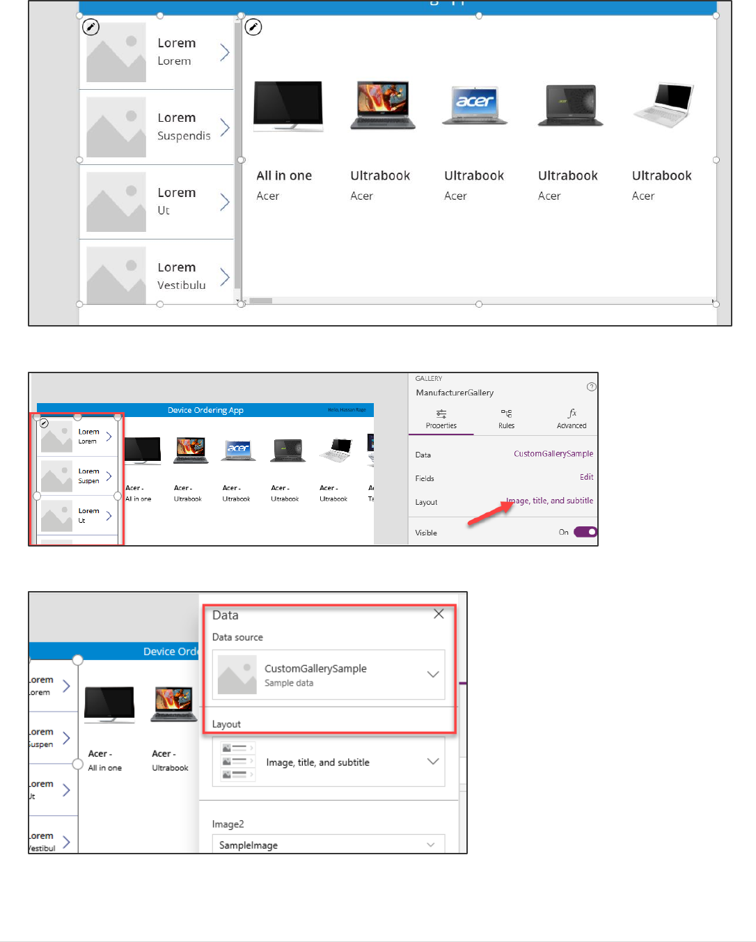
This document will walk through creating a PowerApps Canvas Studio basics to enable features (a) thru (d).
When you are done with this first portion of the lab, your app will look like this:

Power platform App in a Day Module 1: PowerApps Canvas App
3 | P a g e ©2018 Microsoft Corporation
Locale-specific difference in formulas
Before you begin, please note that if your computer has its regional settings set to use the comma ‘,’ for its
decimal separator (like in much of Europe) your formulas will need to use a semicolon ‘;’ instead of a comma in
your formulas. For example:
En-US
Filter(Machines, OEMsGallery.Selected.MFR=MFR)
de-DE
Filter(Machines; OEMsGallery.Selected.MFR=MFR)
These localized formats are indicated with the symbol throughout the document. If you are in the en-us
locale, you can ignore any of the formulas indicated by the locale symbol.
Power platform App in a Day Module 1: PowerApps Canvas App
©2018 Microsoft Corporation 4 | P a g e
Exercise 1: Create the app in PowerApps
IMPORTANT: Do not proceed ahead, before going through the Lab pre-requisite steps
Task 1: Sign-in to PowerApps web studio
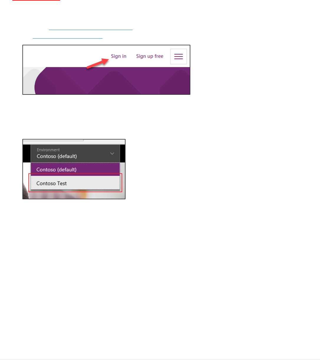
1. Go to http://powerapps.microsoft.com and click Sign-in. You may also directly navigate to
http://web.powerapps.com.
2. Sign in with your business or school account if you have not already done so.
3. Before creating an app, let’s switch to the new environment that you created. Click the Environment drop-
down in the top right of the screen to switch to the new environment. (If your environment doesn't show up,
try logging out and logging in again)
Power platform App in a Day Module 1: PowerApps Canvas App
5 | P a g e ©2018 Microsoft Corporation
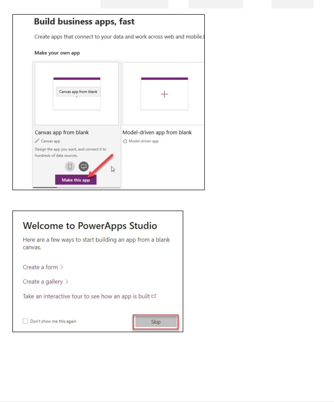
Task 2: Create a new application
1. In the Home hover over the Canvas App from Blank, select Tablet Form Factor, and click Make this App.
2. Click Skip on the welcome prompt.
Power platform App in a Day Module 1: PowerApps Canvas App
©2018 Microsoft Corporation 6 | P a g e
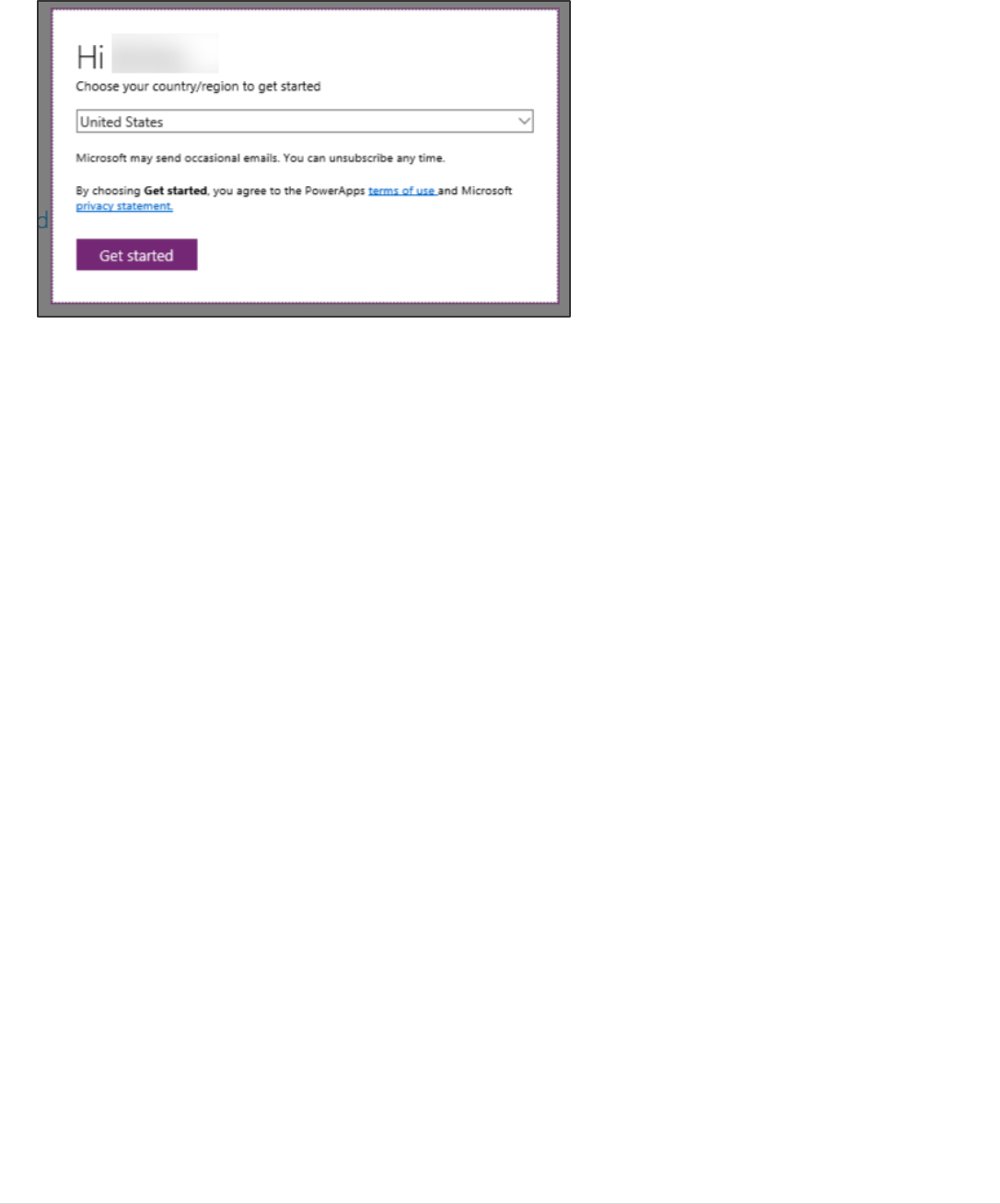
3. If prompted, select your region, then click Get started.
Power platform App in a Day Module 1: PowerApps Canvas App
7 | P a g e ©2018 Microsoft Corporation
Task 3: Rename the screen
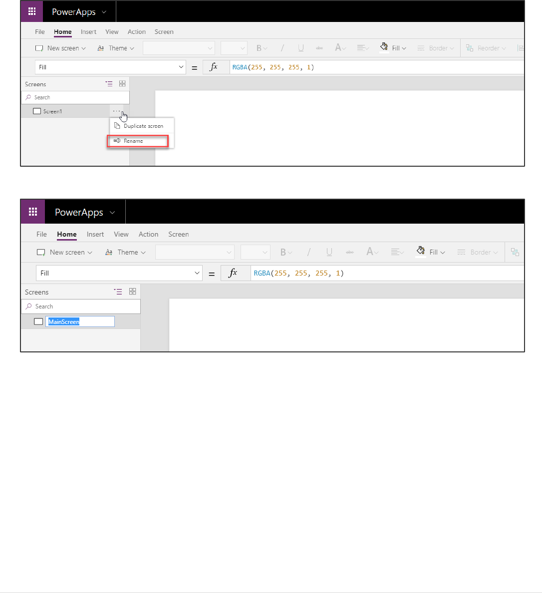
In this task, you will rename Screen1 to MainScreen
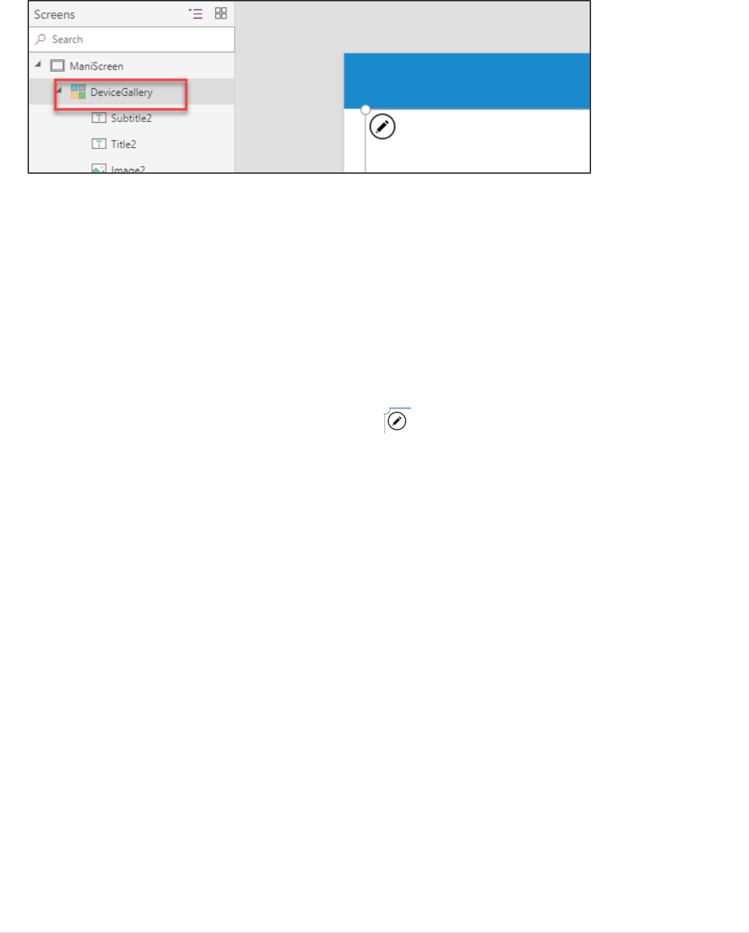
1. Select the screen by clicking the Screen1 tile in the left navigation bar.
2. Click “…” next to Screen 1 (or right click Screen1) and select the Rename option.
3. Change the name to MainScreen
Note: You can also rename the screen by clicking on the screen name in the right pane and selected the edit icon.
Tip: It is a good practice to rename screens and controls as you create them, so they are easier to locate as you work with
formulas that reference different controls. In this lab, you will be prompted to rename screens and some of the controls. For
the others, you may rename them as you please on your own.
Power platform App in a Day Module 1: PowerApps Canvas App
©2018 Microsoft Corporation 8 | P a g e
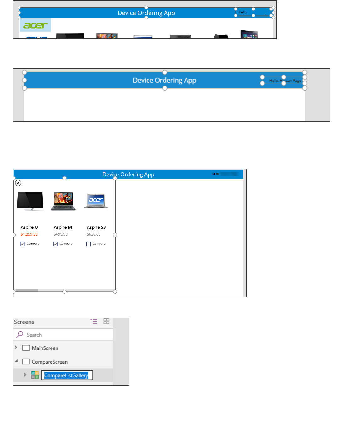
Task 4: Add a header containing the app name and logged in user’s name
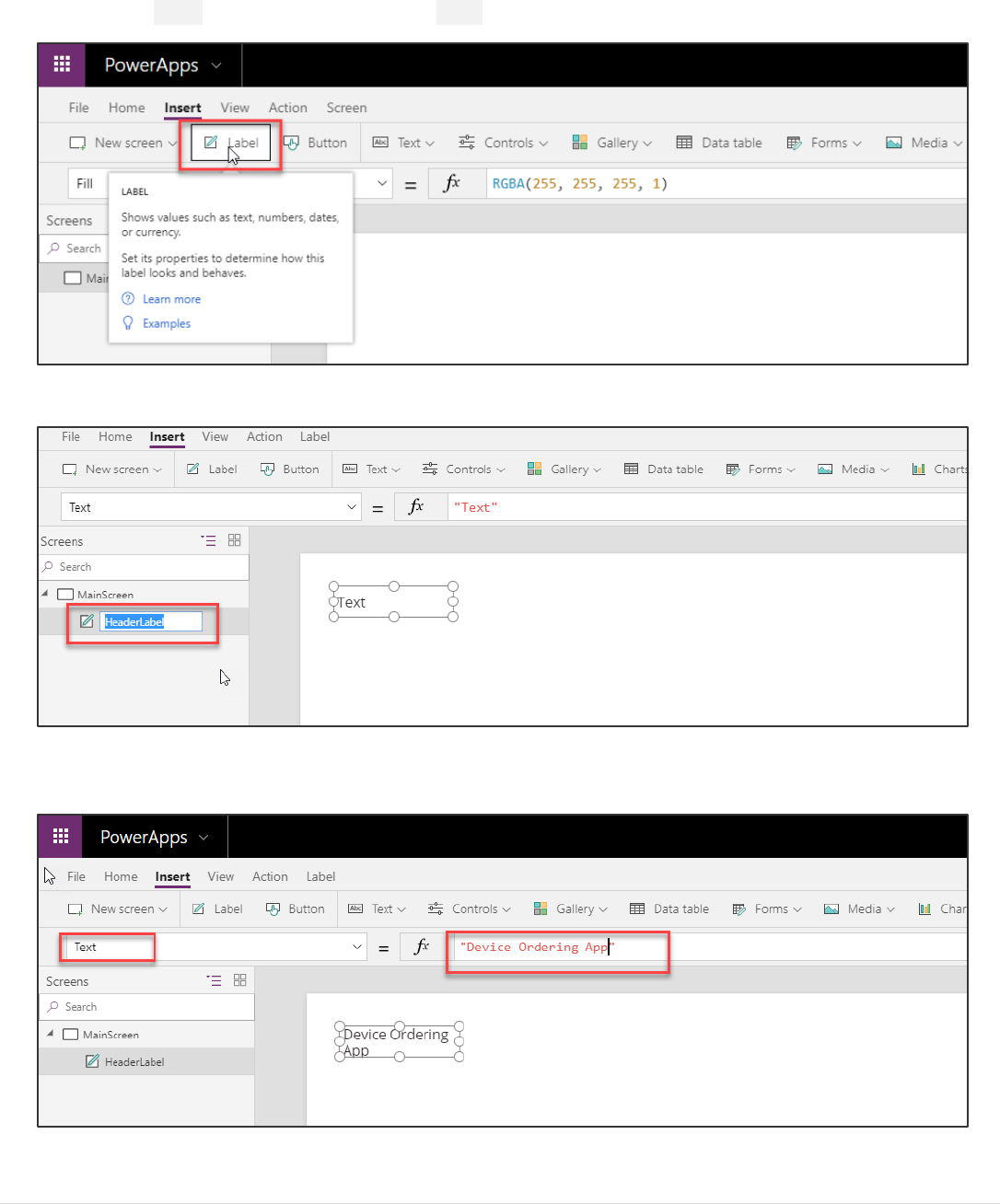
1. Select the Insert tab in the ribbon and select Label to add a text label.
2. Rename the label from Label1 to HeaderLabel, see the previous task on renaming controls.
3. Select Text from the property drop-down list and enter “Device Ordering App” in the formula bar. You can also
type directly in the label.
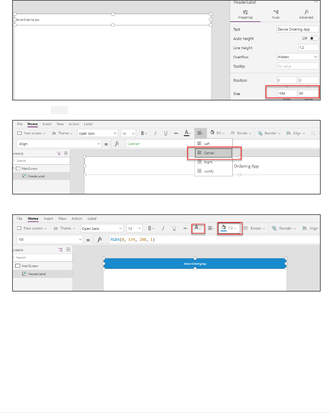
4. Resize the label such that the width is the width of the screen and the height is a reasonable size for a header. You
can resize the label by either dragging the corners of the label or adjusting the size in the Right Pane.
Power platform App in a Day Module 1: PowerApps Canvas App
9 | P a g e ©2018 Microsoft Corporation
5. Select the Home tab and set the Align option in the ribbon to Center.
6. Change the Fill to blue and the font Color to white.
Power platform App in a Day Module 1: PowerApps Canvas App
©2018 Microsoft Corporation 10 | P a g e
7. Change the Font Size to 24.
Tip: You can also use the formula bar above or the Advanced tab on the far right of the screen to enter specific values
or formulas for any property on a control.
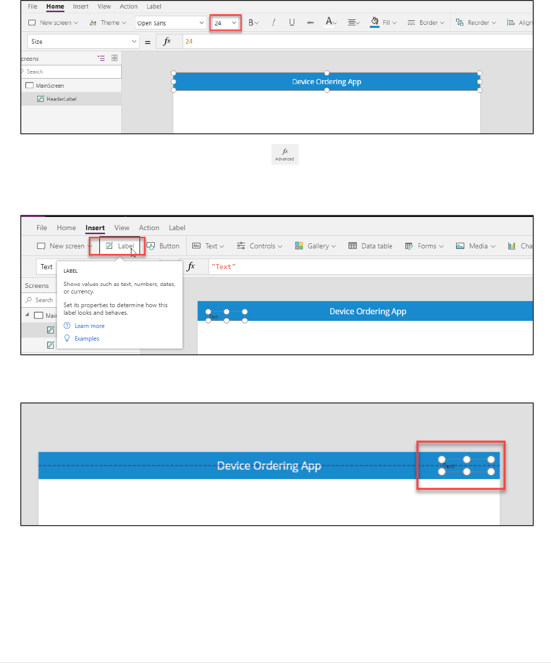
8. From the Insert tab, select Label. We are going to use this label to display the logged in user’s name.
9. Drag the label to the far-right side of the screen as shown and center the label vertically to be in line with the
header text. You can use the purple alignment markers as shown below.
Power platform App in a Day Module 1: PowerApps Canvas App
11 | P a g e ©2018 Microsoft Corporation
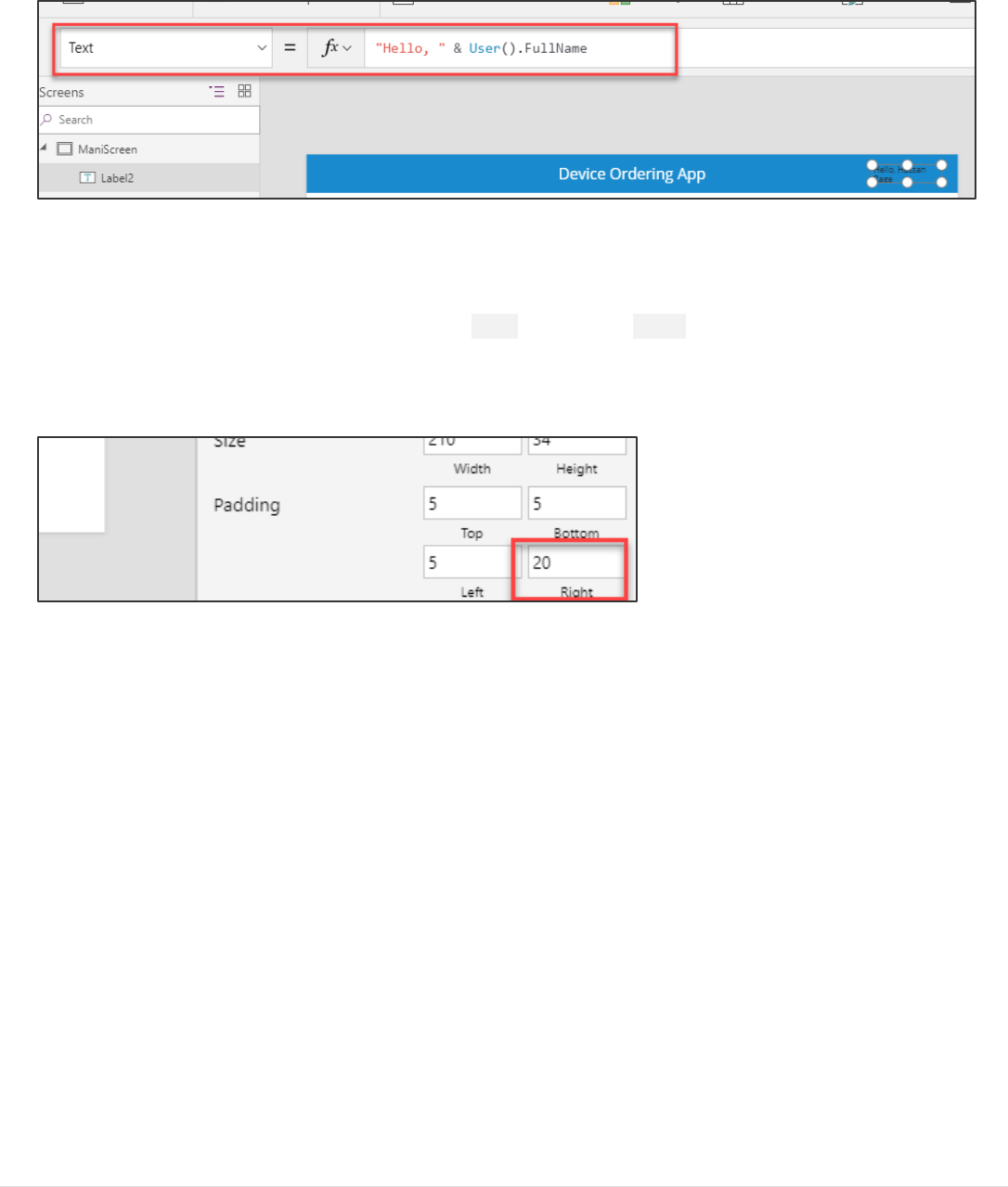
10. Rename the label to UserLabel.
11. Change the value of the Text field to: "Hello, " & User().FullName
Note: All functions in PowerApps are case sensitive. As you start typing “User” you will see a drop-down of available choices.
It is a good idea to pick from the autocomplete options. You will also notice help text at the top showing the required
parameters, in this case, it requires no input parameters.
12. Right-justify the text in the label by selecting the Align option in the Home tab on the ribbon.
13. If necessary, widen the label, so the text doesn’t wrap.
14. Change the PaddingRight property from 5 to 20. You can do this quickly using the Properties pane on the right
side.
Note: The User() function in PowerApps allows you to retrieve the Email, Full Name, and Picture for the currently logged
in user. App users will always be logged in with their business or school account (Azure Active Directory (AAD) credentials),
so this information will always be available for any PowerApps app.

Power platform App in a Day Module 1: PowerApps Canvas App
©2018 Microsoft Corporation 12 | P a g e
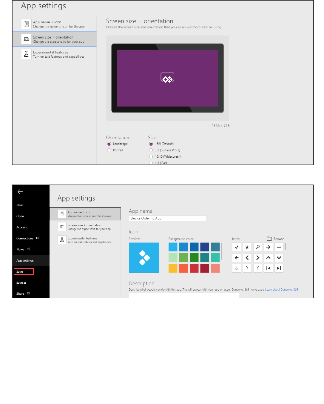
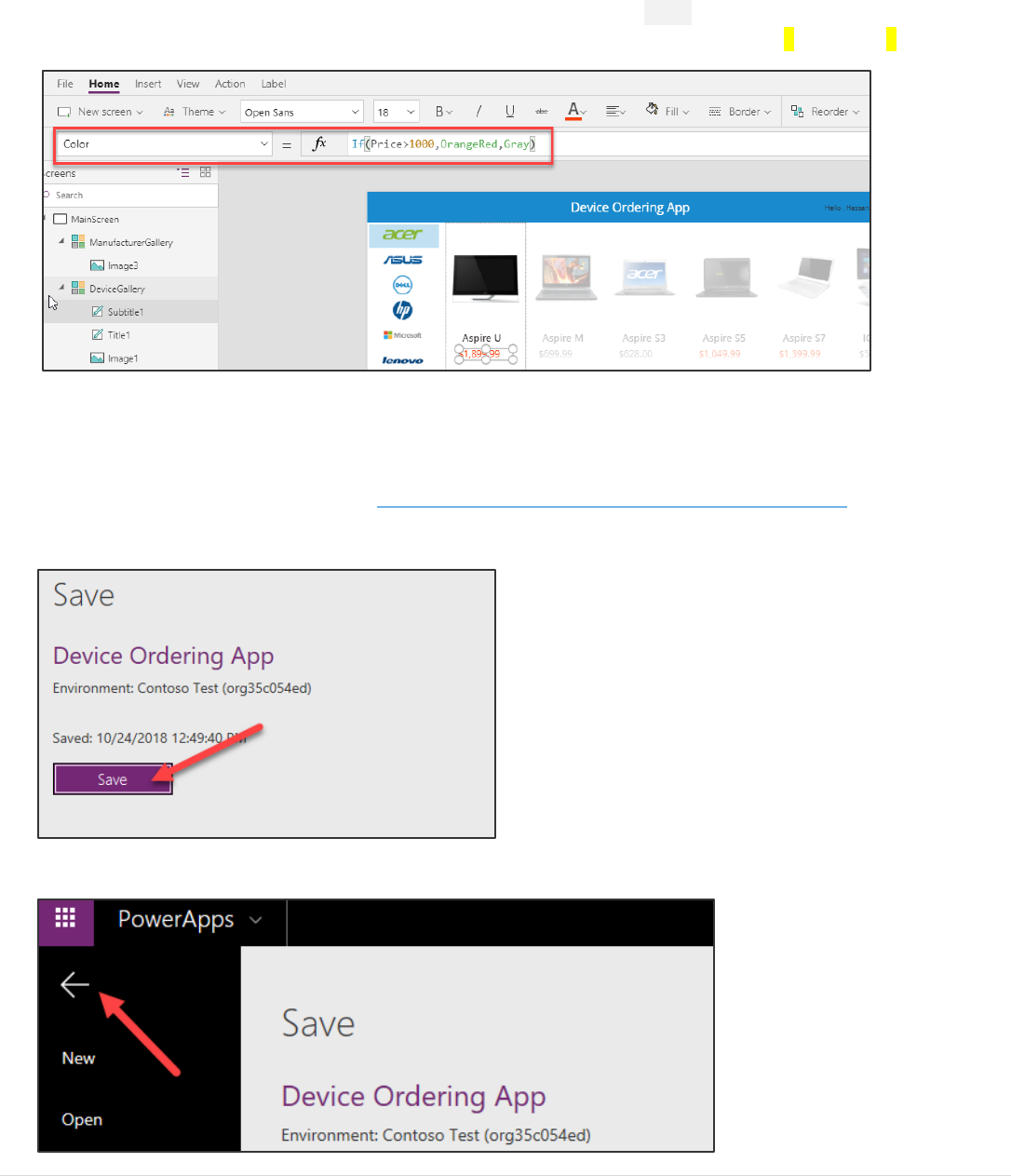
Task 5: Save the Application
In this task, you will save an initial version of the app. It is a good practice to keep saving app updates at regular intervals.
1. Click File.
In the application settings page, you can:
- Give your app a name, such as “Device Ordering App”
- Customize the app icon – choose a background color and symbol
2. Select the Screen Size + Orientation tab to view the available screen orientation and aspect ratio settings. For this
app, we will leave it at the default setting of Landscape with 16:9 aspect ratio.
Power platform App in a Day Module 1: PowerApps Canvas App
13 | P a g e ©2018 Microsoft Corporation
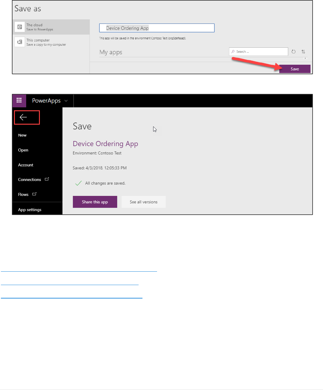
3. Select the App Name + Icon tab, name your application Device Ordering App and click Save in the left navigation.
Power platform App in a Day Module 1: PowerApps Canvas App
©2018 Microsoft Corporation 14 | P a g e
4. Select The cloud and click Save.
5. After the app is saved, click the back arrow in the top left to get back to the studio.
Tip: In PowerApps when you save a version of your app the first version is published by default and available to everyone you
share the app with. Subsequent saves are only visible to the app maker in the studio. You must explicitly publish it for all app
users to get the update. For more details on saving, publishing and sharing apps, see:
https://powerapps.microsoft.com/tutorials/save-publish-app/
https://powerapps.microsoft.com/tutorials/share-app/.
https://powerapps.microsoft.com/blog/saveandpublish/.
Power platform App in a Day Module 1: PowerApps Canvas App
15 | P a g e ©2018 Microsoft Corporation
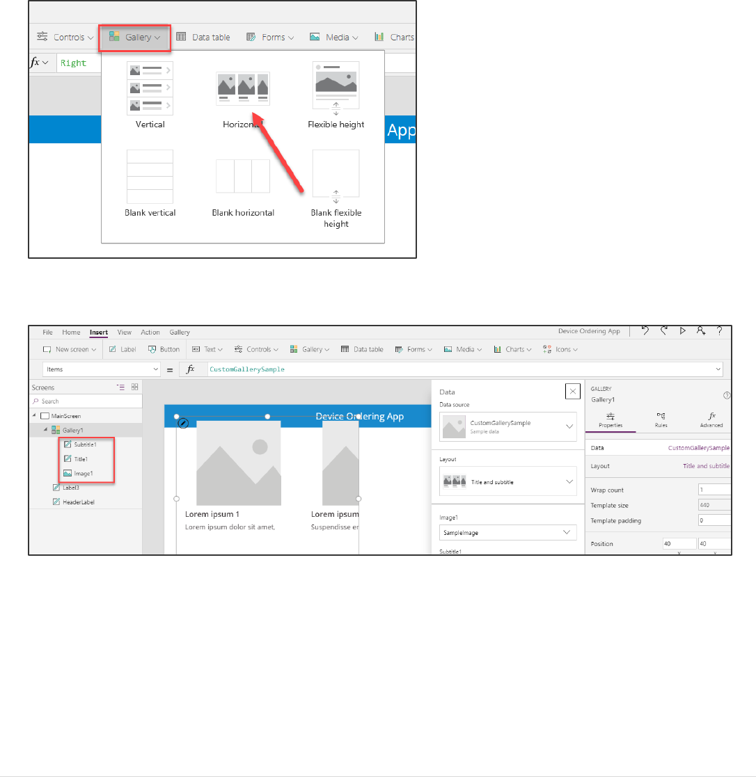
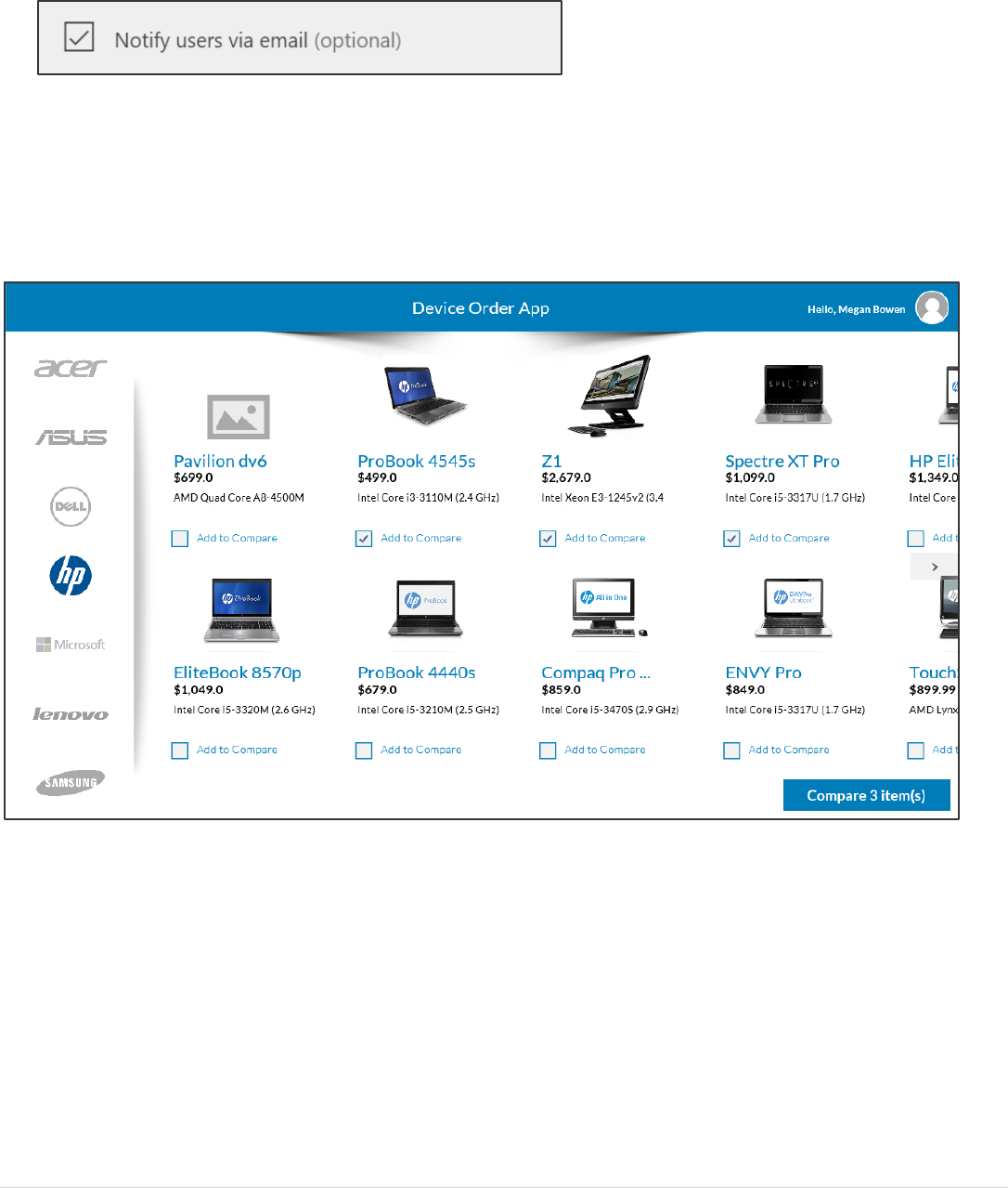
Exercise 2: Add Device Gallery and Connect to Data Source
In this exercise, you will add a gallery of all available devices making it easy for users to browse the list and get a quick
overview of the devices available.
Task 1: Add device gallery
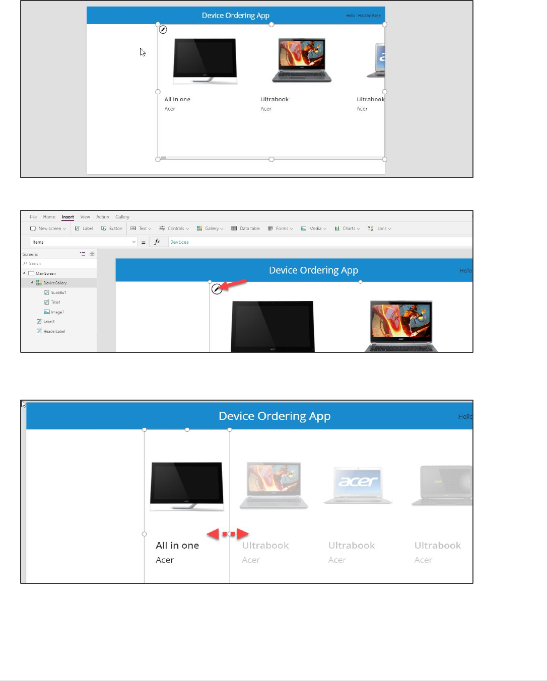
1. Select the Insert tab and click Gallery and select Horizontal.
This will add a gallery called Gallery1 onto the screen. Notice the control tree view on the left displays this gallery with
three controls within it – two labels and an image. A data pane will pop up on the right.
Power platform App in a Day Module 1: PowerApps Canvas App
©2018 Microsoft Corporation 16 | P a g e
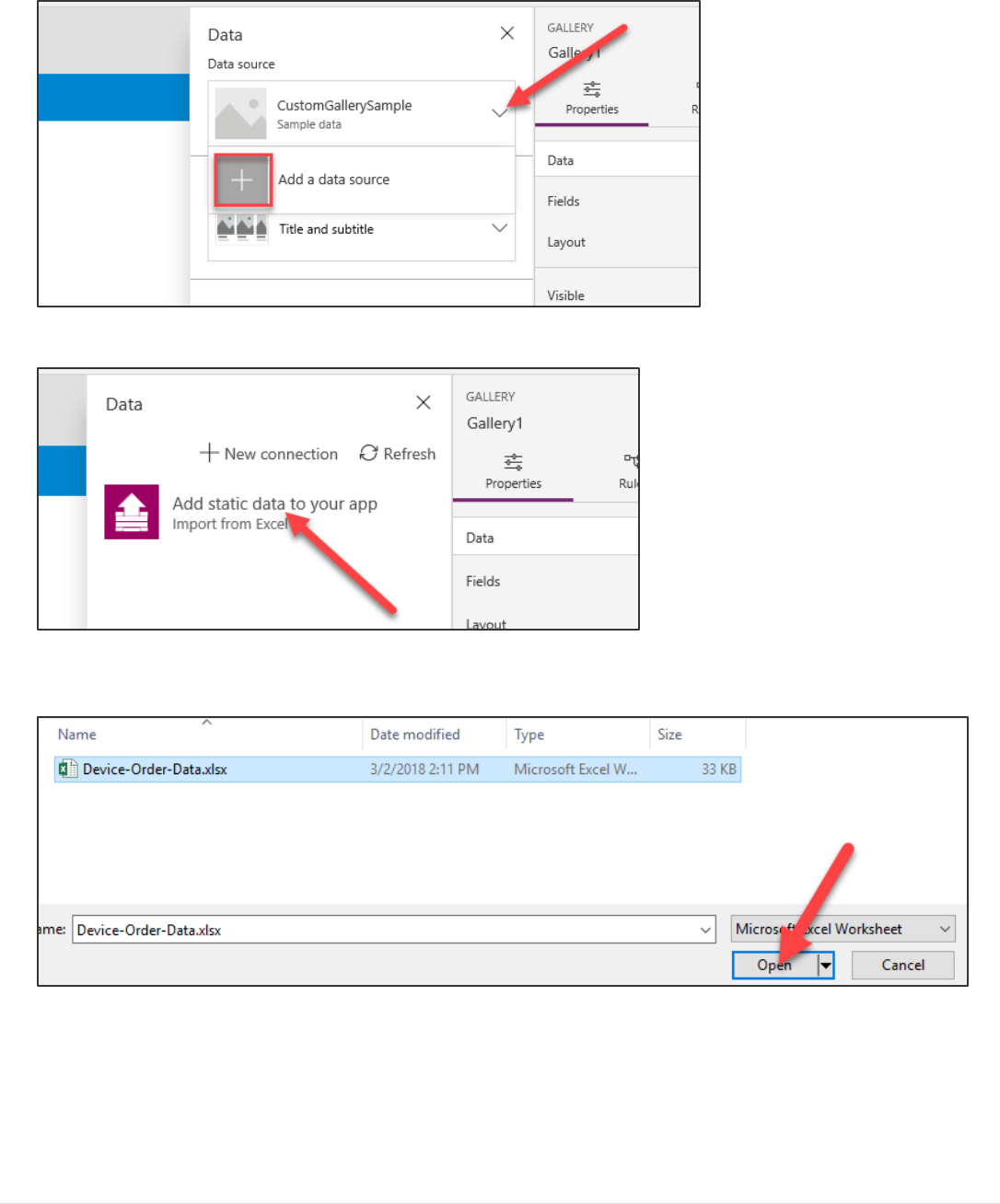
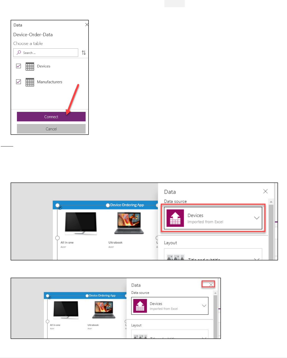
2. In the data pane, click the Data source drop-down and select + Add a data source.
3. Select the “Add static data to your app (Import from Excel)” option.
4. In the File Open dialog, browse to the location where you unzipped the data file (for example
C:\AIAD\PAHandsOnLabContent\) and select Device-Order-Data.xlsx to load it.
Power platform App in a Day Module 1: PowerApps Canvas App
17 | P a g e ©2018 Microsoft Corporation
5. Select both tables, Devices and Manufacturers, and click the Connect button. This will add both these tables as
static data into the application.
Note: In this lab, you will work with tables imported from a static data file and embedded as resources in the app. If you
were building a real solution, the same tables would likely be stored in the cloud, such as in a SharePoint list, a SQL table,
or a Common Data Service entity.
6. Select the data source for this gallery – Devices. Notice the gallery will get populated with data.
7. Close the Data pane by clicking the X in the top right of the pane.
8. Rename the Gallery1 to DeviceGallery.
Power platform App in a Day Module 1: PowerApps Canvas App
©2018 Microsoft Corporation 18 | P a g e
Tips on working with galleries:
Galleries provide a powerful way to visualize tabular data in PowerApps. It is important to become familiar with
customizing a gallery. Key components of a gallery: the gallery control, the template cell (first cell), and controls within the
template cell.
To select the entire gallery – click on the gallery in the tree view on the left or click on the second or third cell. Clicking
any cell that is not the first cell of the gallery will select the entire gallery. Now you can specify properties that apply to the
entire gallery, such as the Items property which is the data source, the gallery fill color, borders, etc.
To customize how each item is displayed in the gallery, you will customize the template cell. Select the template by
clicking in the first cell of the gallery or click on the pencil icon in the top left corner when the entire gallery is
selected.
You can now add, remove and customize the controls within the template cell. These changes will then repeat across each
item or row in the table.
Go ahead and select the device image in the template cell and change its size. Notice how the size of the image changes
in all the cells.
You can also test your gallery right on the canvas by holding down the Alt key to activate.
You will customize the device gallery in subsequent steps.
For now, your gallery should look something like the image above. Don’t worry about making it pixel perfect, the purpose of
this exercise is to get your app working with a good enough UX.
Task 2: Arrange the device gallery
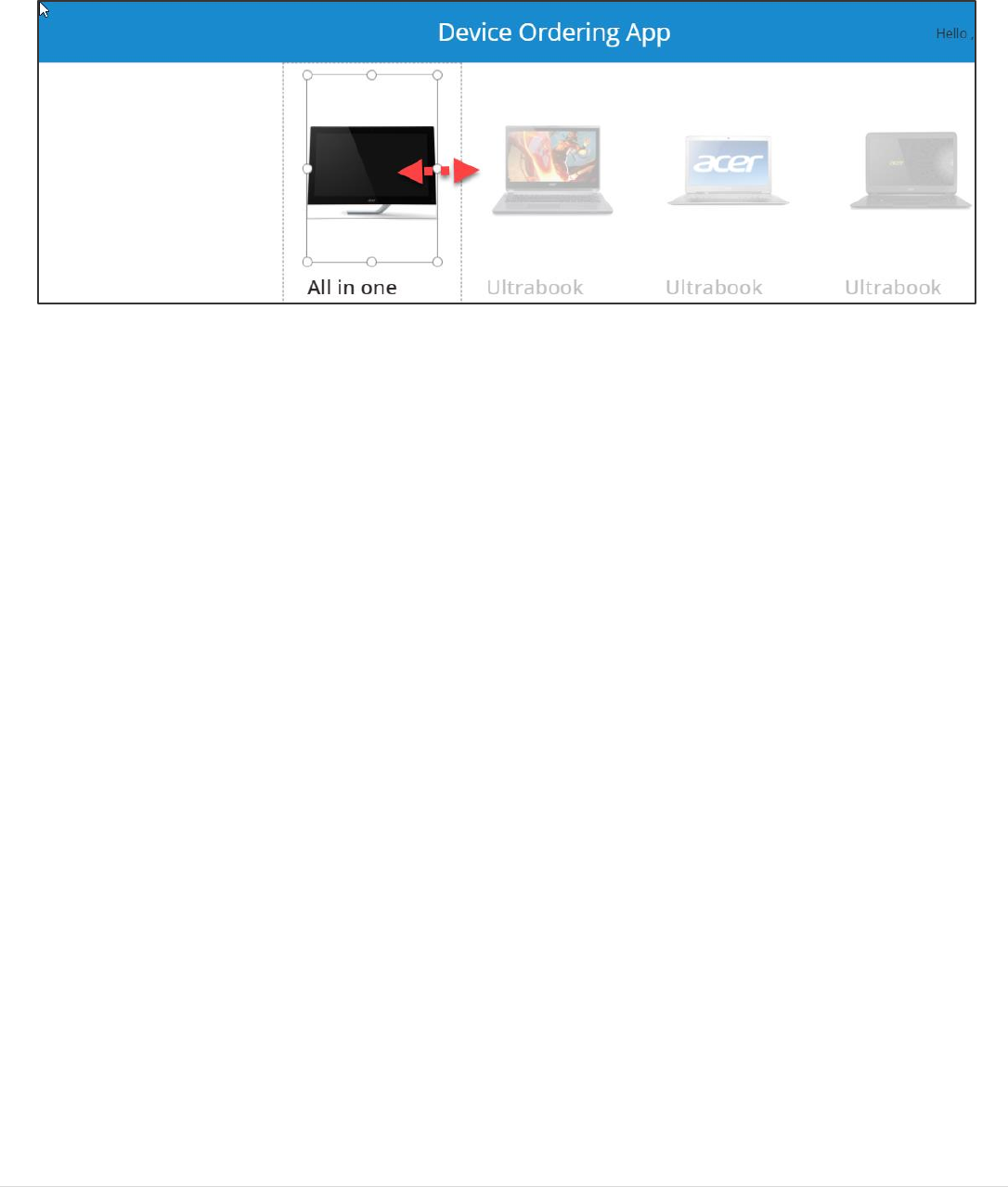
1. Resize and reposition the gallery.
Power platform App in a Day Module 1: PowerApps Canvas App
19 | P a g e ©2018 Microsoft Corporation
2. Select the DeviceGallery and click the Edit (pencil) icon in the top left to edit the template cell.
3. Using the right drag control, resize the first box to be narrower. Notice that all the items get narrower and more
devices are visible on the screen.
Power platform App in a Day Module 1: PowerApps Canvas App
©2018 Microsoft Corporation 20 | P a g e
4. Narrow the image as well by clicking on the image control and resizing it using the drag handles. Make sure
the width of the image control is positioned within the template.

Power platform App in a Day Module 1: PowerApps Canvas App
21 | P a g e ©2018 Microsoft Corporation
Task 3: Add gallery to show manufacturers
In this task, you will add a second gallery that will list the various device manufacturers. This will be a single column
vertical gallery down the left side of the screen, with each cell displaying the manufacturer’s logo image. This gallery will
later be used as a filter for the device gallery created above.
1. Select the MainScreen.
2. Select the Insert tab on the ribbon and open the Gallery drop-down, then select Vertical.
3. Rename the gallery to ManufacturerGallery.
4. Close the Data pane.
5. Move this new gallery so that it is left aligned with the left edge of the screen and top aligned with the top of the
device gallery. Your two galleries should like the image below.
Power platform App in a Day Module 1: PowerApps Canvas App
©2018 Microsoft Corporation 22 | P a g e
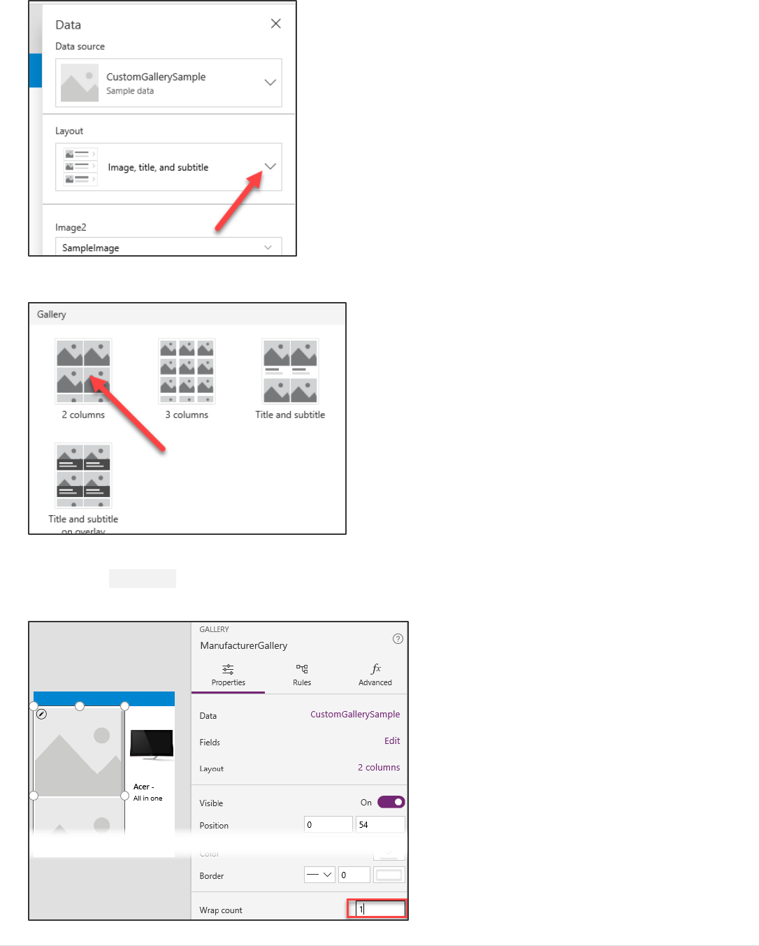
6. Select ManufacturerGallery (not just the template cell), in the Properties tab on the right, select Layout or Data.
7. This will open a Data pane that allows you to configure the layout template and data source for the gallery.
8. In the Data pane, select the Layout drop-down.
Power platform App in a Day Module 1: PowerApps Canvas App
23 | P a g e ©2018 Microsoft Corporation
9. Scroll down and select the layout called “2 columns” with just images and no text.
10. Close the data pane.
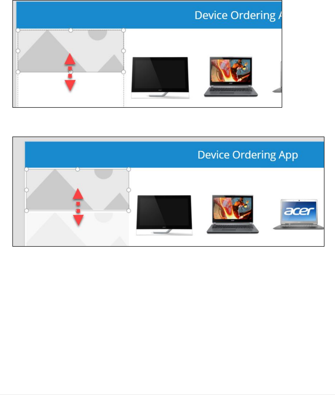
11. Click the Properties tab in the right pane and change the Wrap count from 2 to 1. This will change it to a single
column gallery.
Power platform App in a Day Module 1: PowerApps Canvas App
©2018 Microsoft Corporation 24 | P a g e
12. Select the image control within the gallery (the Edit Pencil icon) and reduce its height by dragging the middle
bottom drag control upwards. The image size will reduce whereas the template size will still be expanded.
13. Reduce the height of the template cell to match the image below. We essentially want the image to occupy the
entire cell.

Power platform App in a Day Module 1: PowerApps Canvas App
25 | P a g e ©2018 Microsoft Corporation
Task 4: Connect ManufacturerGallery to manufacturers table
Earlier you connected the data source using the Data tab in the right pane. You can also connect to data via the formula
bar.
1. Select the ManufacturerGallery. Make sure the whole gallery is selected and not just the first cell.
2. Select Items from the property drop-down next to the formula bar and type Manufacturers in the formula bar.
Notice that the gallery gets populated with images of buildings. This is because PowerApps picked a default
binding which mapped to the HQ column in the table.
3. Select the image control in the first template cell in the gallery and change the value of Image in the formula bar
from ThisItem.HQ to ThisItem.Logo. All the gallery items will now display logo images. You can also use the left
tree view to select the controls, sometimes that is easier!
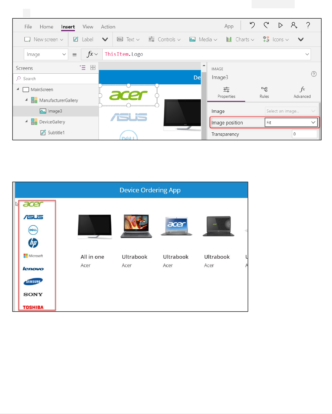
Power platform App in a Day Module 1: PowerApps Canvas App
©2018 Microsoft Corporation 26 | P a g e
4. Select the first (top-most) image and using the Properties pane on the right, set the Image position property to
Fit.
5. Reduce the height of the template cell such that all nine manufacturers fit without a scrollbar. To do this, use the
drag handles to first reduce the height of the image and subsequently reduce the height of the template cell.
Note again that to select the template cell, select the entire gallery and click on the pencil icon in the top left.
Task 5: Highlight the selected item in the gallery
In this task, you will use the TemplateFill property of the manufacturer gallery to specify a highlight color for the selected
item
1. With the whole gallery selected, set the TemplateFill property to:
If(ThisItem.IsSelected,ColorFade(HeaderLabel.Fill,75%))
This is conditionally setting a Fill color if the cell is selected

Power platform App in a Day Module 1: PowerApps Canvas App
27 | P a g e ©2018 Microsoft Corporation
You could have set a specific color or RGB value, but we recommend using the ColorFade function, so it matches the
header label with a 75% fade. If you change the fill color of header label, this template fill color will automatically change.
2. Now try using the preview mode to perform a quick test of this highlighting. You can enable preview mode by
holding down the Alt key (also known as the Option key) and clicking a few different manufacturers in the gallery,
notice the selected item is highlighted in a light blue color. The preview mode ends when you stop holding the
key.
Alternatively, you could click the Play button to enter preview mode, and to exit this you would hit the X in the
upper right corner or use the Esc key.
Power platform App in a Day Module 1: PowerApps Canvas App
©2018 Microsoft Corporation 28 | P a g e
Task 6: Filter the devices based on selected manufacturer
In this task, you will use the Filter() function to filter the items in the DeviceGallery to only display devices that match the
selected item in the ManufacturerGallery.
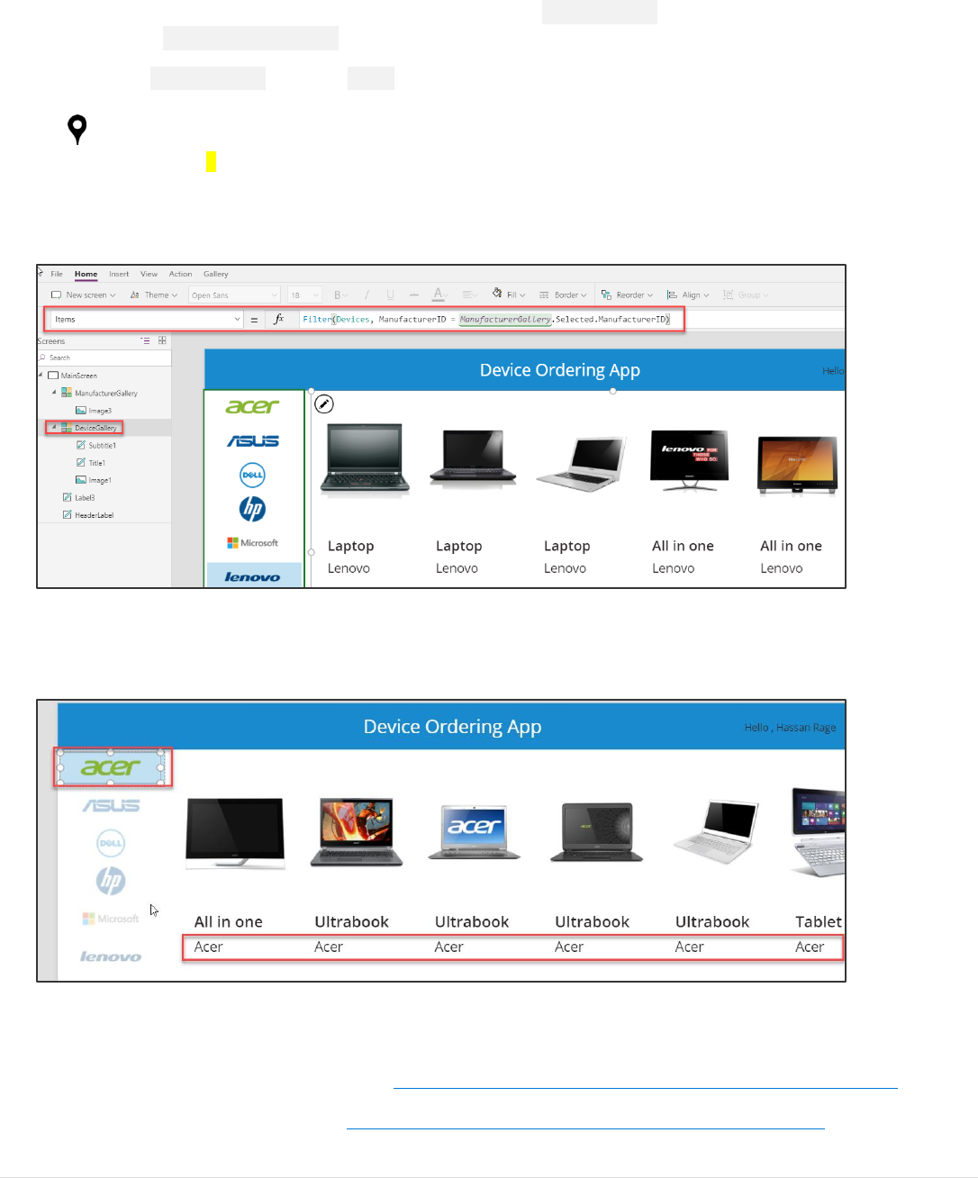
1. Select the DeviceGallery. With the Items property selected, enter the following expression in the formula bar:
Filter(Devices, ManufacturerID = ManufacturerGallery.Selected.ManufacturerID)
for alternate/European locales:
Filter(Devices; ManufacturerID = ManufacturerGallery.Selected.ManufacturerID)
This will filter the device gallery to only display items that match the selected manufacturer based on
ManufacturerID.
2. Select a different item in the manufacturer gallery on the left, and you will notice the device gallery will update
accordingly. Note: In some cases, the first few items won’t show the selection, try selecting the 5th or 6th item if
that occurs.
Note: If you get an error when entering the Filter command, check the name of the manufacturer gallery. The name in
the filter command must match the name of your gallery.
More details on the Filter() function is available at https://powerapps.microsoft.com/tutorials/function-filter-lookup/.
A complete set of expressions is available at https://powerapps.microsoft.com/tutorials/formula-reference/.

Power platform App in a Day Module 1: PowerApps Canvas App
29 | P a g e ©2018 Microsoft Corporation
Task 7: Configure text labels in the device gallery
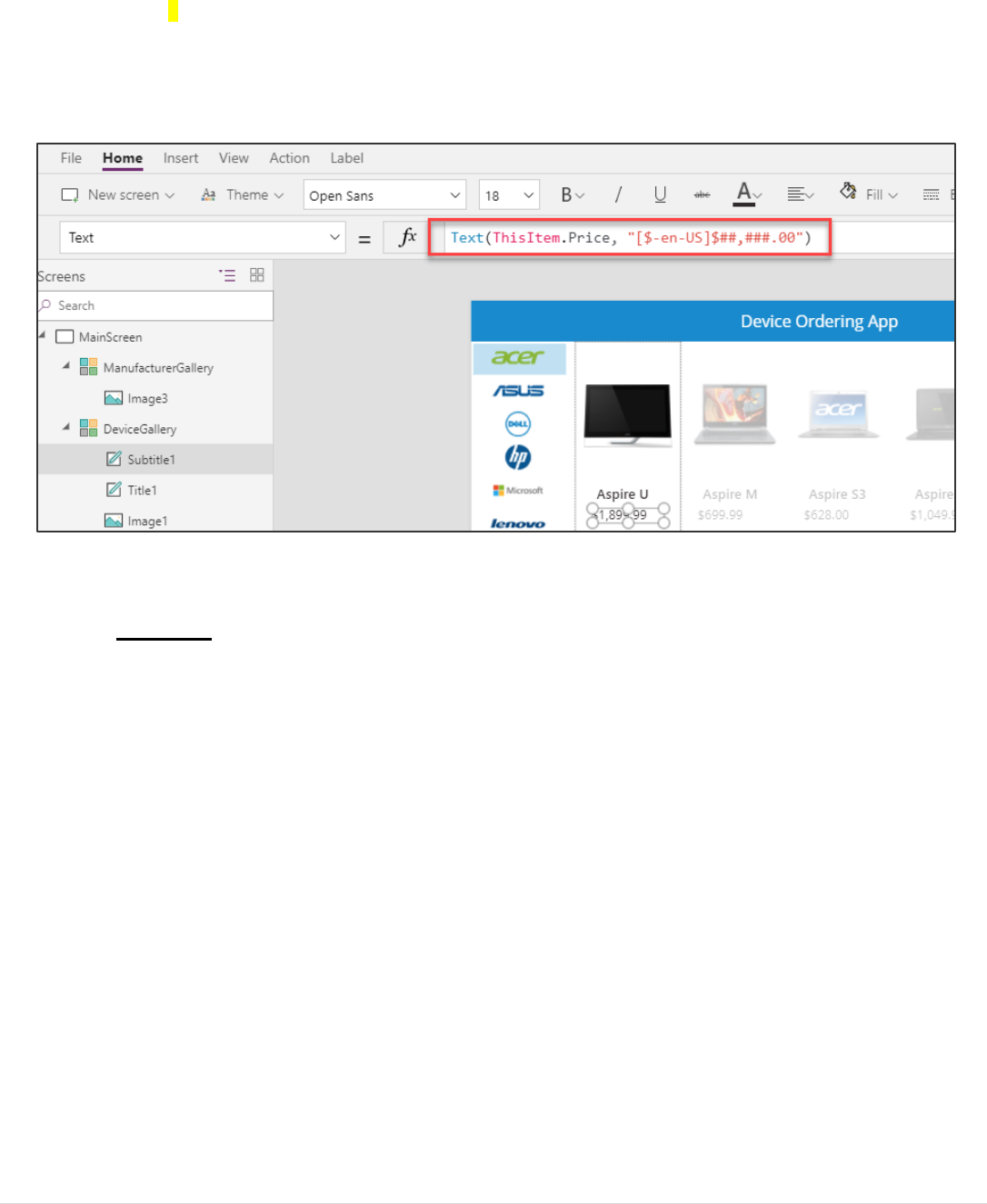
1. Select the top label in the first item in the DeviceGallery. It is named Title1 in the left side control navigation. It
may have the default value set to the DeviceType property (e.g. Tablet).
2. Change the label to display the device name by setting the label’s Text property to: ThisItem.Title
Here are some additional formatting suggestions. These are for cosmetic purposes only, feel free to skip past these:
- Expand the width of the label to the template width.
Notice that the second label expands as well. This is because it is X property is set to Title1.X, the X coordinate
position of the Title1 label. For more on the relative positioning of controls, see
https://powerapps.microsoft.com/blog/ux-patterns-control-positioning/
- Change the PaddingLeft from 0 to 10.
- Change the font to Segoe UI.
3. Select the second label.
4. In the property drop-down list, select the Text field and change it from ThisItem.ManufacturerName to
ThisItem.Price.
Power platform App in a Day Module 1: PowerApps Canvas App
©2018 Microsoft Corporation 30 | P a g e
5. To add the $, use the text format expression: Text(ThisItem.Price,"$##,###.00") or for alternate/European
Text(Price;"$##.###,00")
locales:
Note: After you enter the above value in the formula bar, it will automatically resolve to include your locale, e.g.
[$-en-US]. If you see an error here, it might be because your locale is not yet supported, in which case as a
workaround, manually change it to [$-en-US]:
Optional UI enhancement:
- Like above, change the value of the PaddingLeft property of the SubTitle1 label from 0 to 10. Or set it to
Title1.PaddingLeft.
- Change font to Segoe UI.
Power platform App in a Day Module 1: PowerApps Canvas App
31 | P a g e ©2018 Microsoft Corporation
Task 8: Conditional formation to highlight devices above $1,000
We can make it easy to spot devices that cost more than $1,000, by displaying the price in Red.
1. Select the label in the template cell that displays the price and set the Color to
If(Price>1000,OrangeRed,Gray) or for alternate/European locales: If(Price>1000;OrangeRed;Gray)
Note: As you are typing this formula notice that the autosuggest shows a choice of matching colors. PowerApps comes with a
set of standard colors that you can easily reference in any property that accepts a color value. You can also set specific RGB
values.
For a full list of Color functions and colors, see https://powerapps.microsoft.com/tutorials/function-colors/
2. Click File and select Save.
3. Click the back arrow.
Power platform App in a Day Module 1: PowerApps Canvas App
©2018 Microsoft Corporation 32 | P a g e
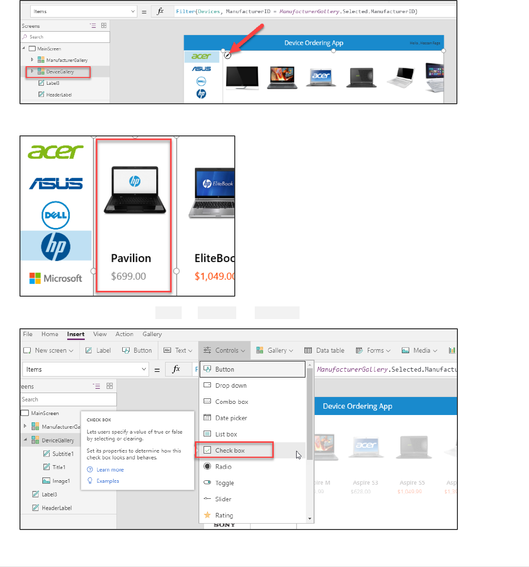
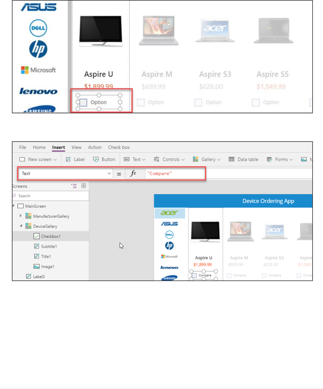
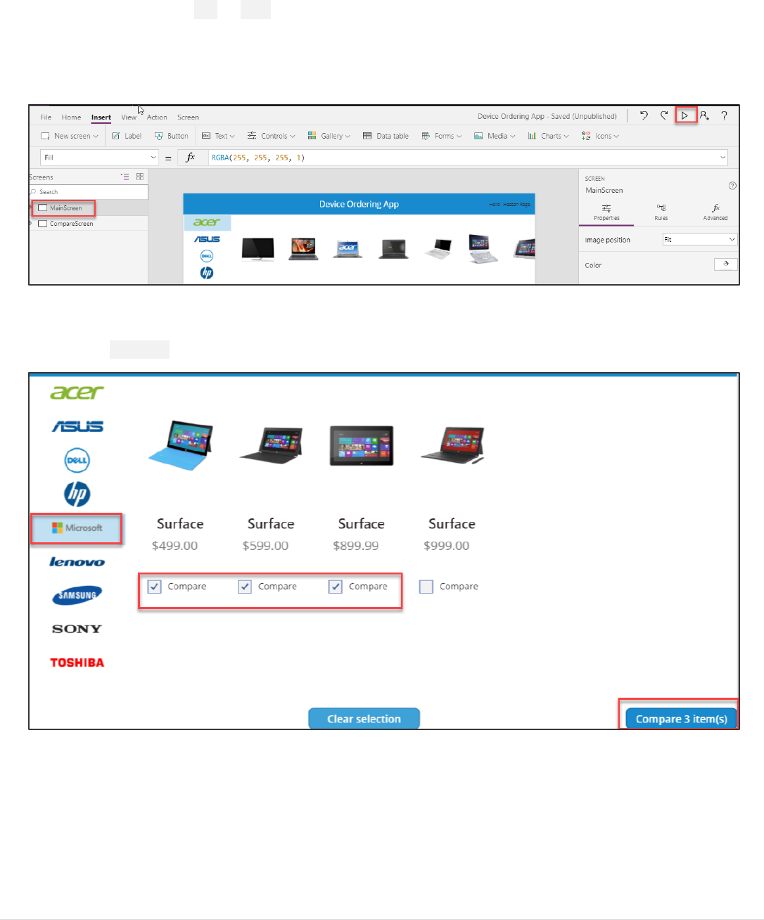
Task 9: Add a checkbox to add a device to Compare list
We want to allow users to select multiple devices to compare before making a final selection on the next screen.
1. Select the device gallery, click the Pencil edit icon in the top left of the gallery to select the template cell.
2. Make sure that only the first item in the gallery is selected (not the entire gallery).
3. Add a checkbox by clicking Insert -> Controls -> Checkbox.
Power platform App in a Day Module 1: PowerApps Canvas App
33 | P a g e ©2018 Microsoft Corporation
4. Move the inserted checkbox below the price.
5. Change the checkbox text to “Compare”. You can do this by setting the Text property or clicking within the text
of the control and typing directly into the control.

Power platform App in a Day Module 1: PowerApps Canvas App
©2018 Microsoft Corporation 34 | P a g e
Task 10: Create a collection for the selected devices
When a user selects a device to compare, we will add it to a collection called CompareList. You can think of this as an in-
memory collection of devices that have been selected for comparison.
1. Select the Checkbox control and click on the Action tab in the ribbon, click OnCheck and set the value in the
formula bar to: Collect(CompareList,ThisItem)
2. Set the OnUncheck value to: Remove(CompareList,ThisItem)
3. Set the Default property of the checkbox to: ThisItem in CompareList
The Default setting of the checkbox is a Boolean true or false value that determines if the checkbox should be checked or
not by default. Setting it to this formula will ensure that the checkbox is checked by default if the item has already been
added to the collection since the result will be true, i.e. this item *is* in CompareList.
4. Let’s test out adding items to a collection by running the app in Preview (F5) or by clicking the Preview button on
the top right. Click on the checkboxes of three devices.
Power platform App in a Day Module 1: PowerApps Canvas App
35 | P a g e ©2018 Microsoft Corporation
5. Close the preview.
6. Click the View tab and select Collections.
7. You will see the CompareList collection and the three items you selected.

Power platform App in a Day Module 1: PowerApps Canvas App
©2018 Microsoft Corporation 36 | P a g e
8. Click the back arrow on the top left to get back to the main view.
Note that each item in the collection has all the information for each machine that we get from the Machines data source,
not just the fields we display in the Devices Gallery.
For more information on working with Collections in PowerApps, see:
https://powerapps.microsoft.com/tutorials/create-update-collection/ and
https://powerapps.microsoft.com/tutorials/function-clear-collect-clearcollect
Power platform App in a Day Module 1: PowerApps Canvas App
37 | P a g e ©2018 Microsoft Corporation
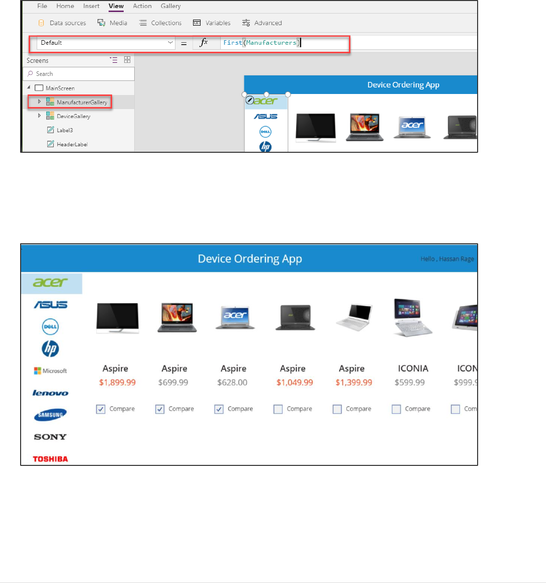
Task 11: Set the default selection to the first manufacturer and test the app
To avoid getting a blank list of devices when the app starts, set the default selected item in the Manufacturer gallery to be
the first item.
1. Select the entire gallery (by clicking ManufacturerGallery in the tree view on the left) and set the Default
property of the gallery in the formula bar to: First(Manufacturers)
This will set it to the first item in the table.
2. To preview the app, press the Preview button on the upper right of the top menu. Pressing the F5 key will also
preview the application. Note: You can also test your app right on the canvas by holding down the Alt key to
activate buttons and other controls, as well as double-clicking to type into controls.
3. Your app should look like the image below.
Power platform App in a Day Module 1: PowerApps Canvas App
©2018 Microsoft Corporation 38 | P a g e
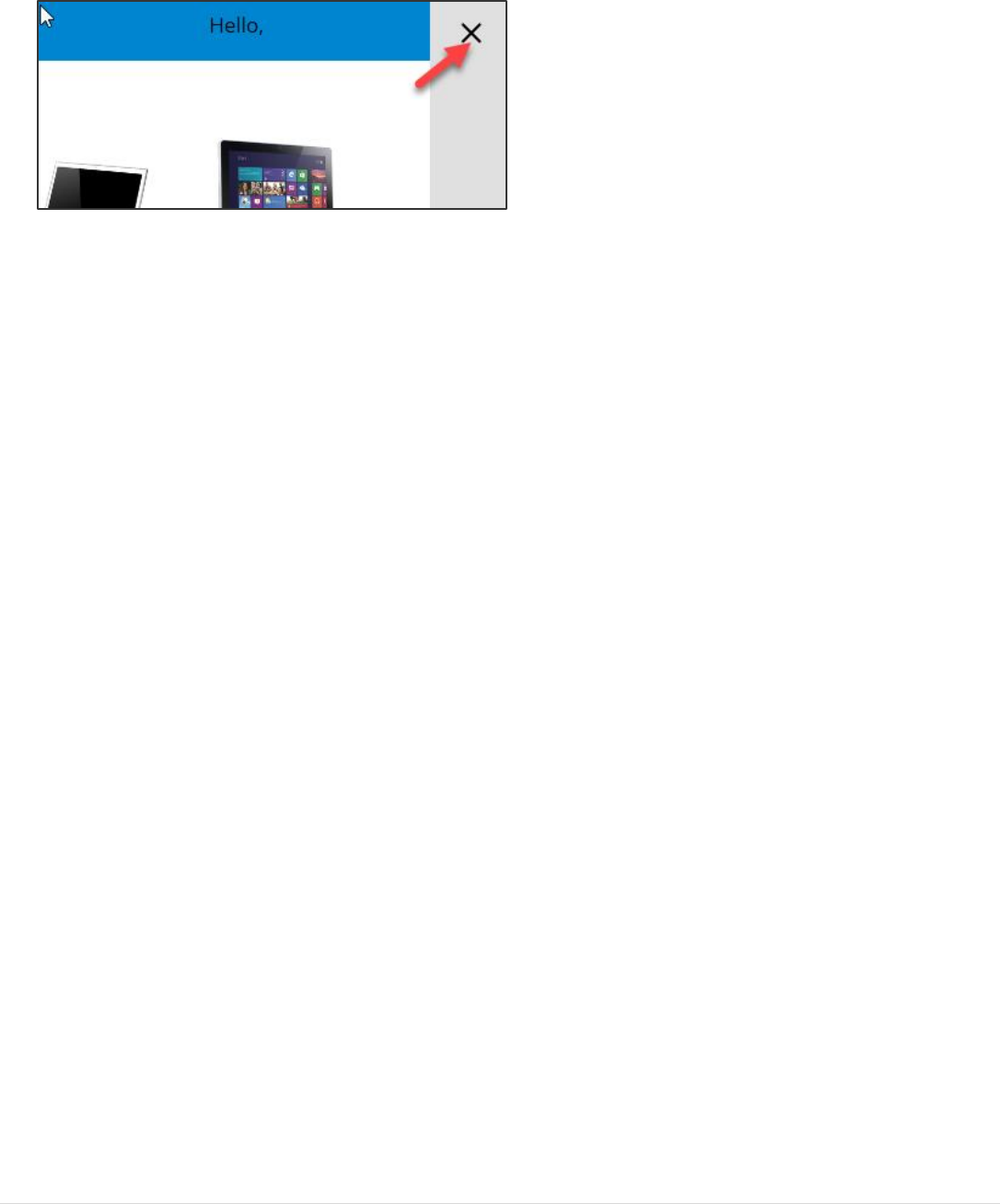
4. To exit preview mode, click the X in the top right corner.
5. Save the application.

Power platform App in a Day Module 1: PowerApps Canvas App
39 | P a g e ©2018 Microsoft Corporation
Exercise 3: Add Second Screen
The second screen is where users compare the selected devices and then choose the one they wish to submit for approval.
This screen will include:
• A back button for navigation back to the main screen.
• A list of selected devices for comparison (carried over from the main screen).
• Additional details for each device.
• Highlighting the selected device
In a subsequent lab, you will create the database entities to store the device orders and add an edit form to this screen to
enter additional information and submit the request.
Task 1: Add screen
1. From the ribbon click Home and New Screen and choose Blank.
2. Rename the screen to CompareScreen.
Power platform App in a Day Module 1: PowerApps Canvas App
©2018 Microsoft Corporation 40 | P a g e
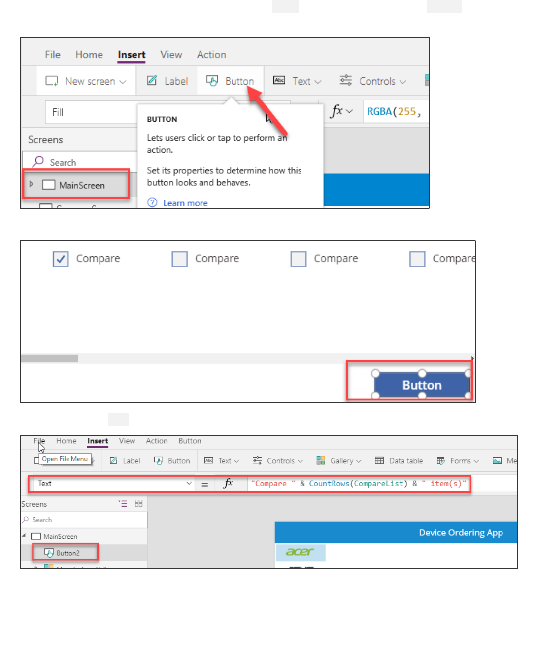
3. In the left tree view, click on MainScreen, click on the Insert tab on the ribbon and select Button to add a button
to the screen.
4. Place the button in the bottom right corner.
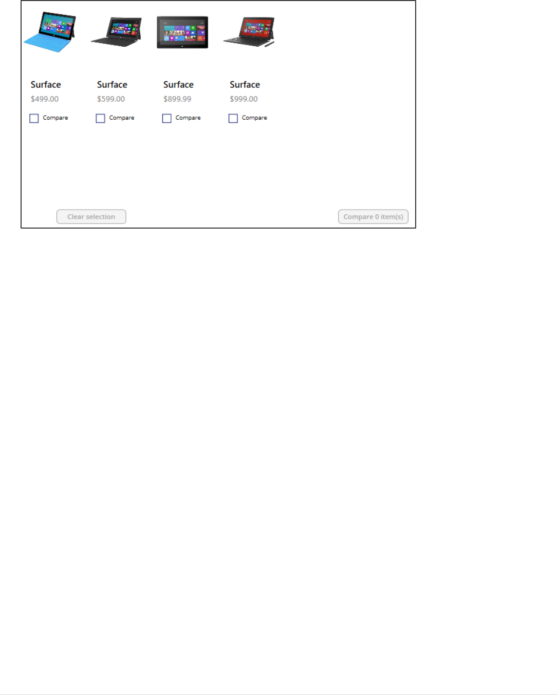
5. Set the button’s Text property to: "Compare " & CountRows(CompareList) & " item(s)"
Power platform App in a Day Module 1: PowerApps Canvas App
41 | P a g e ©2018 Microsoft Corporation
6. Resize the button, so the text fits.
7. Select the button, and set its DisplayMode property to Disabled if there are no items in CompareList:
If(CountRows(CompareList) > 0, DisplayMode.Edit, DisplayMode.Disabled)
8. Unselect all devices – notice the button is grayed.
9. Select the compare button and copy (Ctrl-C) this button.
10. Paste (Ctrl-V) the button on the same screen.
11. Position it to the left of the compare button.
Power platform App in a Day Module 1: PowerApps Canvas App
©2018 Microsoft Corporation 42 | P a g e
12. Change the Text property to "Clear selection"
13. Set the OnSelect property for this button to: Clear(CompareList) This will remove all the items in the
CompareList collection.
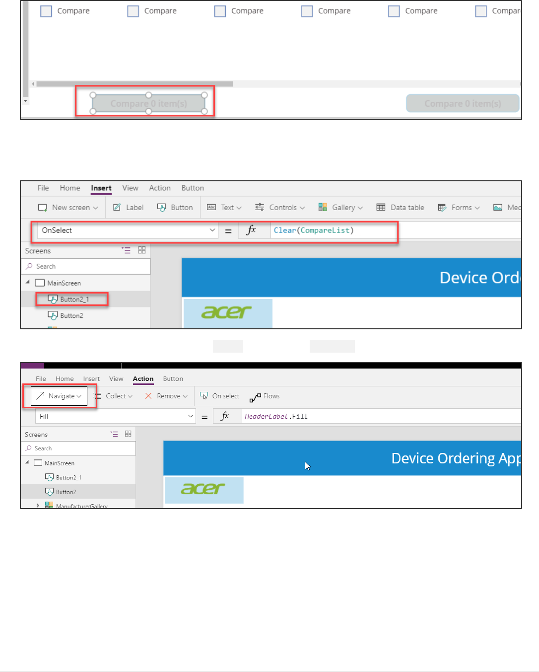
14. Select the Compare button, click on the Action tab and select Navigate.
Power platform App in a Day Module 1: PowerApps Canvas App
43 | P a g e ©2018 Microsoft Corporation
15. Select CompareScreen from the drop-down and ScreenTransition.None for transition type.
16. Click Preview.
17. Select a couple of devices and click the compare button and verify that it takes you to the second screen.
18. You should navigate to the new empty screen. Close the preview.
19. Select the MainScreen in the left navigation bar and keep the Ctrl key pressed down while multi-selecting the
blue header label and the “Hello, <user>” label. Once you have multi-selected the controls, type (Ctrl-C) to copy
them to the clipboard.
Power platform App in a Day Module 1: PowerApps Canvas App
©2018 Microsoft Corporation 44 | P a g e
20. Go back the CompareScreen by clicking in the left navigation bar, and type (Ctrl-V) to paste the controls. You
may need to move them up to align with the top of the screen.
21. Finally, copy the DeviceGallery from the MainScreen and paste a copy into to the newly created CompareScreen.
22. Move the gallery to the left edge of the screen. Align the top of the gallery to be just under the header banner.
Use the right drag handle to reduce the width of the gallery and create space for a data entry form on the right of
the screen. You will insert a Form control here and configure it in a subsequent lab.
23. Rename this gallery to CompareListGallery.
Power platform App in a Day Module 1: PowerApps Canvas App
45 | P a g e ©2018 Microsoft Corporation
Task 2: Configure the gallery
In this task, you will configure the gallery to show devices that were selected from the comparison gallery on the
MainScreen.
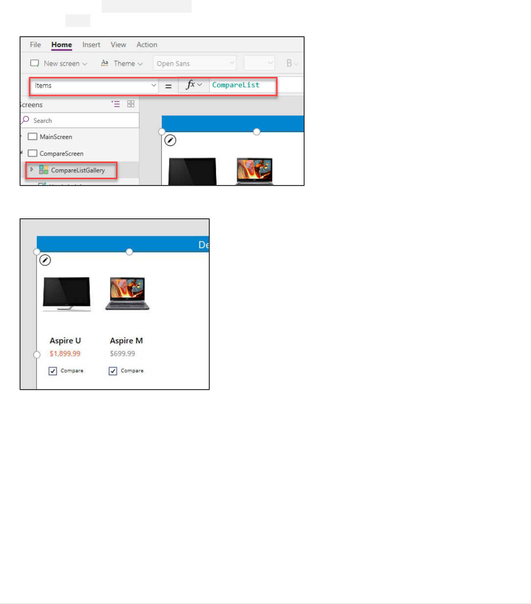
1. Select the new CompareListGallery.
2. Select Items in the property drop-down list and change the data source in the formula bar to CompareList.
3. The gallery will now show the selected items from the MainScreen.
Power platform App in a Day Module 1: PowerApps Canvas App
©2018 Microsoft Corporation 46 | P a g e
Task 3: Remove and add controls to the gallery
In the second screen we are selecting a given item to get approved, so we do not need a Compare checkbox.
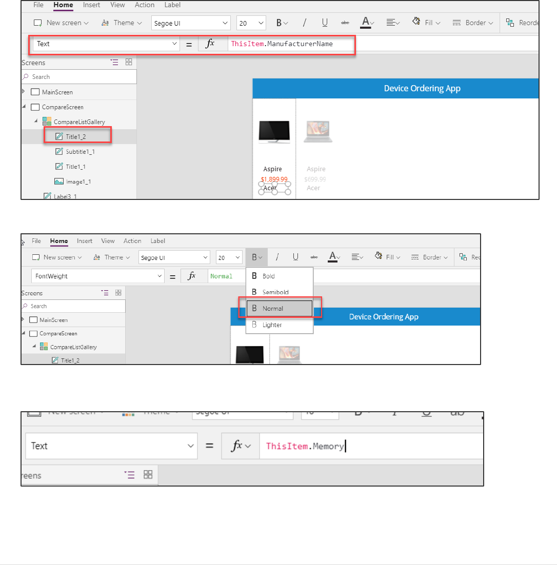
1. Select the Compare checkbox on the left most template cell and press the Delete key to delete the checkbox.
2. Now let’s add a few labels to display additional attributes about the device. A good way to do this is to copy paste
an existing label. Select the first label in the gallery that is displaying the device name. Copy it (Ctrl-C) and paste it
(Ctrl-V).
3. Move the pasted label so that it is just below the price. Set the Text property to: ThisItem.ManufacturerName.
4. Use the ribbon to change the font weight from Semibold to Normal and Change the Size property from 20 to 18.
5. Copy and paste this label and move the new fourth label below the third label. Set its Text property to:
ThisItem.Memory
6. Repeat this and add text boxes to display the additional device properties – Processor, Storage, Screen Size, etc.
Feel free to customize the labels by changing their Size, Color, Fill and FontWeight properties.
Note: For this lab, to save time you may add one or two of these additional properties and skip adding all the
additional device properties.

Power platform App in a Day Module 1: PowerApps Canvas App
47 | P a g e ©2018 Microsoft Corporation
Task 4: Highlight the selected device
Like the behavior in the manufacturer gallery in the first screen, use the TemplateFill property to specify a highlight color
for the selected item.
1. Select the CompareListGallery.
2. With the whole gallery selected, set the TemplateFill property to:
If(ThisItem.IsSelected,ColorFade(HeaderLabel.Fill,75%), White)
This is conditionally setting a Fill color if the cell is selected.
You could have set a specific color or RGB value, but we recommend using the ColorFade function, so it matches
the header label with a 75% fade. If you change the fill color of header label, this template fill color will
automatically change.
3. Click a few different items in the gallery, notice the selected item is highlighted in a light blue color.
Power platform App in a Day Module 1: PowerApps Canvas App
©2018 Microsoft Corporation 48 | P a g e
Task 5: Add an icon to navigate to the first screen
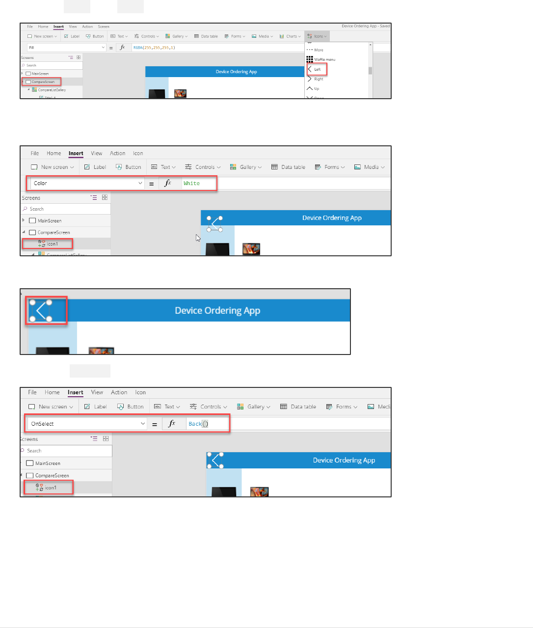
1. Select the CompareScreen.
2. Go to Insert, then Icons and select the Left icon. Position it in the upper left corner of the screen.
3. Select the arrow control, change the Color property to White. You can change this in the formula bar or through
the Properties pane on the right.
4. Move the arrow to the top-left corner.
5. Set the OnSelect action for the icon to Back(). This will cause navigation back to the previous screen.
Optional UI enhancement:
Add padding around the icon using the Properties pane. Set the padding values to 10 each for Top, Bottom, Left, and
Right. This will make the icon look smaller but still have a larger hit target for the click action. This is a good pattern to use
for most icons.
Power platform App in a Day Module 1: PowerApps Canvas App
49 | P a g e ©2018 Microsoft Corporation
Task 6: Test the app
Let’s save the app by selecting File -> Save. It is a good idea to save your app regularly. Note: You can also test your app
right on the canvas by holding down the Alt key to activate buttons and other controls, as well as double-clicking to type
into controls.
1. Go to the main screen and Preview the app by hitting the Play button in the top right.
2. Select a manufacturer logo on the left to show a filtered set of devices.
3. Check the compare box on a few devices on the main screen from a few different manufacturers.
4. Click the Compare button to navigate to the compare screen.
5. Tap or click on different devices in the gallery and verify that the selection highlight works.
Power platform App in a Day Module 1: PowerApps Canvas App
©2018 Microsoft Corporation 50 | P a g e
6. Click the back button and confirm you get back to the main screen.
7. Click Clear Selection.
8. The Compare List will clear, and the Compare button will become disabled.
Power platform App in a Day Module 1: PowerApps Canvas App
51 | P a g e ©2018 Microsoft Corporation
9. Close the preview.

Power platform App in a Day Module 1: PowerApps Canvas App
©2018 Microsoft Corporation 52 | P a g e
Task 7: Test the app on a mobile device
Congratulations! You’ve created your PowerApps app. Now let’s publish and test it on a mobile device.
1. File -> Save and click the Publish button.
2. Click Publish this version on the confirmation prompt.
This action will publish the latest saved version of the app.

Power platform App in a Day Module 1: PowerApps Canvas App
53 | P a g e ©2018 Microsoft Corporation
3. Go to your device’s app store application. Search for “PowerApps” and install the PowerApps application. Launch
the app.
Android:
iOS:
Microsoft Store:
4. When the app starts, it will prompt for your business or school account credentials. Log in with the same account
that you used to create the PowerApps app. You should see the app you just created in the list of apps. Run the
app.
Power platform App in a Day Module 1: PowerApps Canvas App
©2018 Microsoft Corporation 54 | P a g e
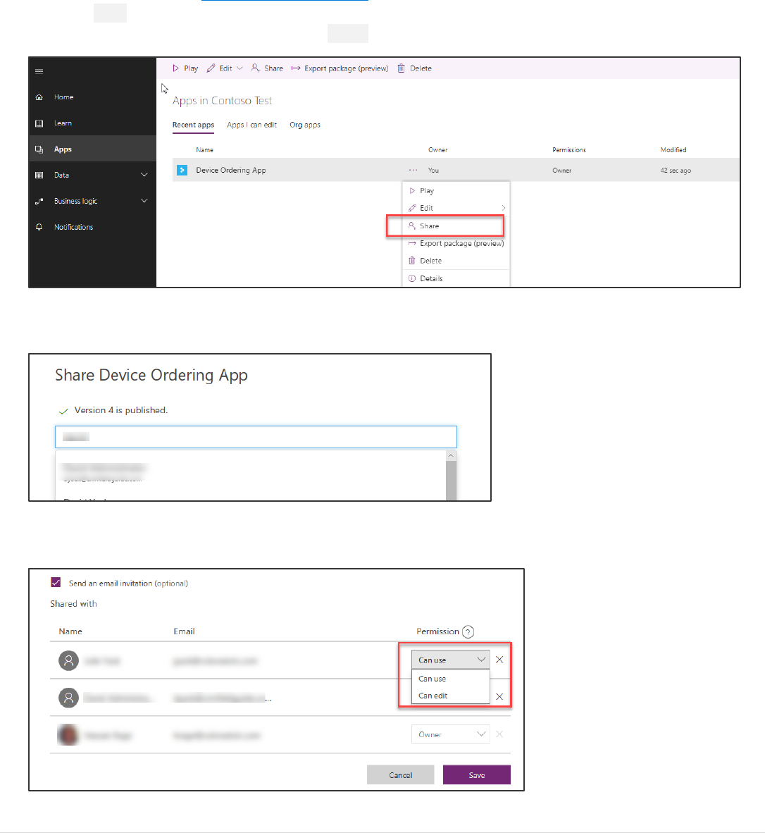
Task 8: [Optional] Share the application with a colleague
You may optionally share the application with another user within the same organizational tenant as the user who created
the app. So, if you had logged in as meganb@contoso.com, you may share the app with any other User, Security Group or
Distribution Group within the @contoso.com tenant.
1. To share the app, go to http://web.powerapps.com. Log in if prompted for credentials.
2. Select Apps in the left pane, look for your Device Ordering app in the app list, click the three dots (…) next to the
app to bring up the context menu. Click the Share option.
3. In the share screen, enter the name or email of the user you would like to share the app with. You may also share
it with a user group.
4. Select the user or group; this will add it to the Shared with list below. You may provide this user/group either Can
use or Can edit permissions.
Power platform App in a Day Module 1: PowerApps Canvas App
55 | P a g e ©2018 Microsoft Corporation
5. If the Notify users via email option is checked, when you hit Save, the user or all users in the group will receive
an email letting them know that the app has been shared with them, along with a link to open the app.
Next steps
Now that you have learned the basics of creating an app, take a little time to think about what you would like to create
next. What made you most excited about the device ordering app? What would you have done differently? Here’s an
example of some changes you can make to the UI:
Features like shading, number of rows, and greying out items not selected can have a big impact on how your app looks
and feels. To learn more, check out the links in the reference section and take the next step in building great apps.

Power platform App in a Day Module 1: PowerApps Canvas App
©2018 Microsoft Corporation 56 | P a g e
Lab survey
We would appreciate your feedback on the Business Application Platform technologies and on this hands-on-lab, such as
the quality of documentation and the usefulness of the learning experience.
Please use the survey at http://aka.ms/appinadayLabSurvey to share your feedback.
You may provide feedback for each module as you complete it or at the end once you’ve completed all the modules.
Thank you!
References
App in a Day introduces some of the key capabilities available in PowerApps. For a list of learning resources, see
http://aka.ms/powerapps-resources and http://aka.ms/flow-resources.
PowerApps
- Website | Blog | Documentation | Community | Suggest Ideas | Webinars
- Product updates
- Guided Learning | YouTube playlist
- Licensing / Pricing
- Support – known issues | view/report issues | create a support ticket
Microsoft Flow
- Website | Blog | Documentation | Community | Suggest Ideas | Webinars
- Product updates
- Guided Learning | YouTube Playlist
- Licensing / Pricing
- Support
Common Data Service (CDS)
- Common Data Service documentation portal
- Feature updates
Microsoft Business Platform
- https://businessplatform.microsoft.com/

Power platform App in a Day Module 1: PowerApps Canvas App
57 | P a g e ©2018 Microsoft Corporation
Copyright
© 2018 Microsoft Corporation. All rights reserved.
By using this demo/lab, you agree to the following terms:
The technology/functionality described in this demo/lab is provided by Microsoft Corporation for purposes of obtaining
your feedback and to provide you with a learning experience. You may only use the demo/lab to evaluate such technology
features and functionality and provide feedback to Microsoft. You may not use it for any other purpose. You may not
modify, copy, distribute, transmit, display, perform, reproduce, publish, license, create derivative works from, transfer, or
sell this demo/lab or any portion thereof.
COPYING OR REPRODUCTION OF THE DEMO/LAB (OR ANY PORTION OF IT) TO ANY OTHER SERVER OR LOCATION FOR
FURTHER REPRODUCTION OR REDISTRIBUTION IS EXPRESSLY PROHIBITED.
THIS DEMO/LAB PROVIDES CERTAIN SOFTWARE TECHNOLOGY/PRODUCT FEATURES AND FUNCTIONALITY, INCLUDING
POTENTIAL NEW FEATURES AND CONCEPTS, IN A SIMULATED ENVIRONMENT WITHOUT COMPLEX SET-UP OR
INSTALLATION FOR THE PURPOSE DESCRIBED ABOVE. THE TECHNOLOGY/CONCEPTS REPRESENTED IN THIS DEMO/LAB
MAY NOT REPRESENT FULL FEATURE FUNCTIONALITY AND MAY NOT WORK THE WAY A FINAL VERSION MAY WORK.
WE ALSO MAY NOT RELEASE A FINAL VERSION OF SUCH FEATURES OR CONCEPTS. YOUR EXPERIENCE WITH USING
SUCH FEATURES AND FUNCTIONALITY IN A PHYSICAL ENVIRONMENT MAY ALSO BE DIFFERENT.
FEEDBACK. If you give feedback about the technology features, functionality and/or concepts described in this demo/lab
to Microsoft, you give to Microsoft, without charge, the right to use, share and commercialize your feedback in any way
and for any purpose. You also give to third parties, without charge, any patent rights needed for their products,
technologies and services to use or interface with any specific parts of a Microsoft software or service that includes the
feedback. You will not give feedback that is subject to a license that requires Microsoft to license its software or
documentation to third parties because we include your feedback in them. These rights survive this agreement.
MICROSOFT CORPORATION HEREBY DISCLAIMS ALL WARRANTIES AND CONDITIONS WITH REGARD TO THE DEMO/LAB,
INCLUDING ALL WARRANTIES AND CONDITIONS OF MERCHANTABILITY, WHETHER EXPRESS, IMPLIED OR STATUTORY,
FITNESS FOR A PARTICULAR PURPOSE, TITLE AND NON-INFRINGEMENT. MICROSOFT DOES NOT MAKE ANY
ASSURANCES OR REPRESENTATIONS WITH REGARD TO THE ACCURACY OF THE RESULTS, OUTPUT THAT DERIVES FROM
USE OF DEMO/ LAB, OR SUITABILITY OF THE INFORMATION CONTAINED IN THE DEMO/LAB FOR ANY PURPOSE.
DISCLAIMER
This demo/lab contains only a portion of new features and enhancements in Microsoft PowerApps. Some of the features
might change in future releases of the product. In this demo/lab, you will learn about some, but not all, new features.
