A Guide To Flexbox CSS Tricks
User Manual:
Open the PDF directly: View PDF  .
.
Page Count: 18
22/03/2018 A Complete Guide to Flexbox | CSS-Tricks
https://css-tricks.com/snippets/css/a-guide-to-flexbox/ 2/18
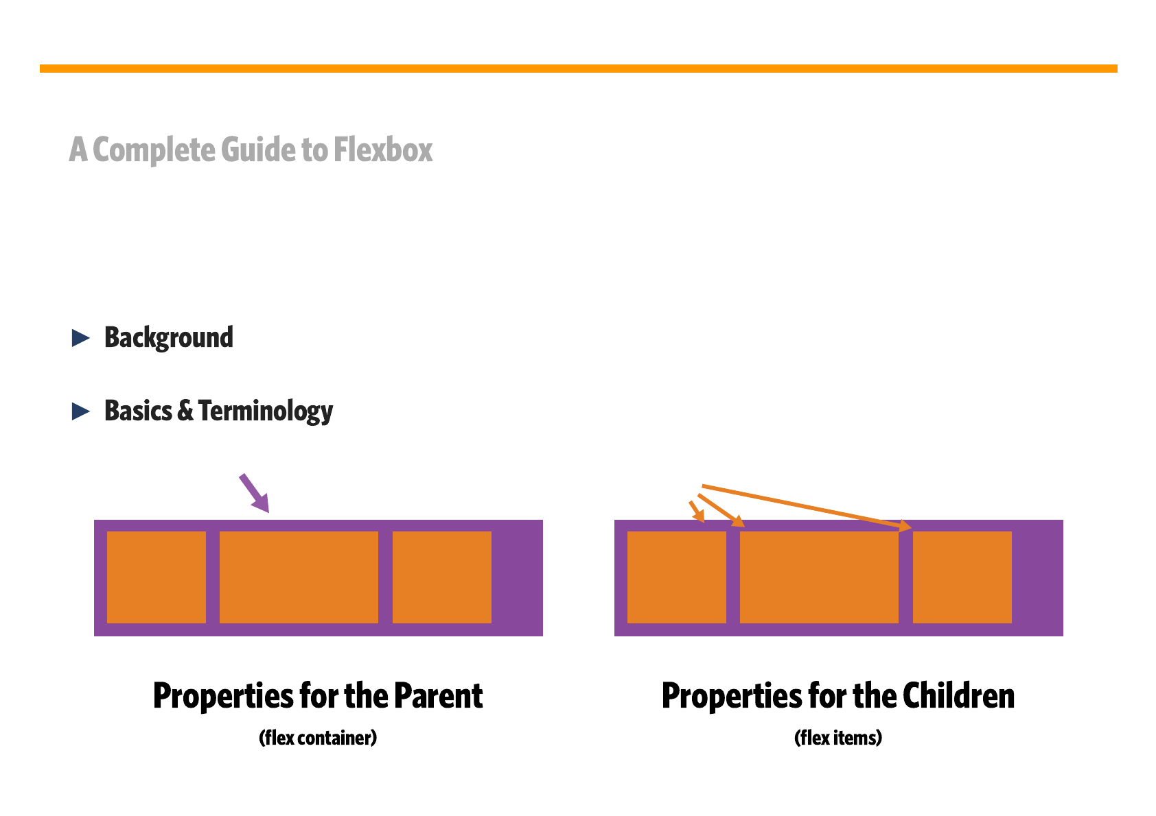
This defines a flex container; inline or block depending on the
given value. It enables a flex context for all its direct children.
Note that CSS columns have no effect on a flex container.
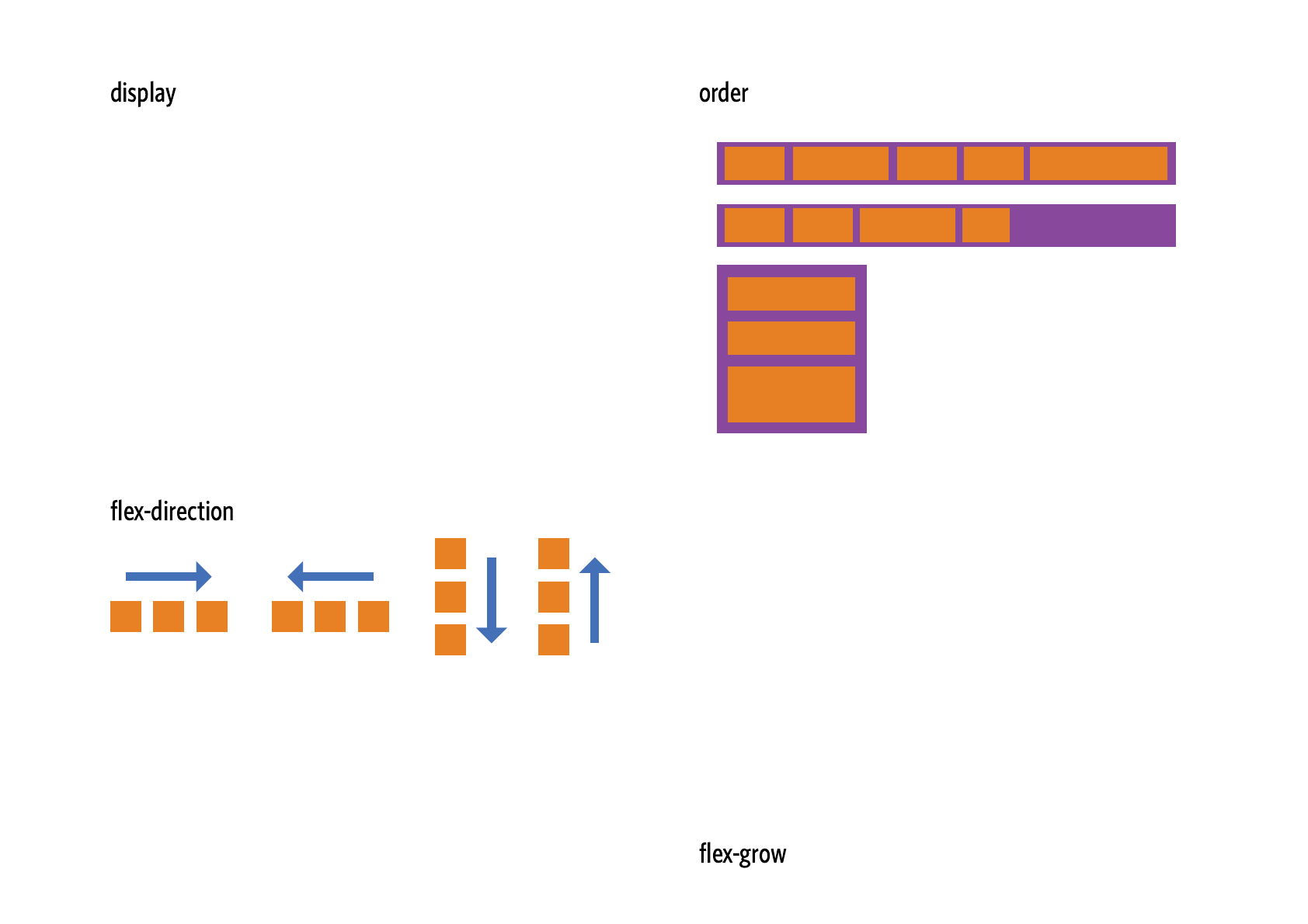
This establishes the main-axis, thus defining the direction flex
items are placed in the flex container. Flexbox is (aside from
optional wrapping) a single-direction layout concept. Think of
flex items as primarily laying out either in horizontal rows or
vertical columns.
1
-1 1 2 5
1 1 2 3
2
2
99
By default, flex items are laid out in the source order. However,
the property controls the order in which they appear
in the flex container.
#
.container {
display: flex; /* or inline-flex */
}
CSS
#
#
order
.item {
order: <integer>; /* default is 0 */
}
CSS
#
22/03/2018 A Complete Guide to Flexbox | CSS-Tricks
https://css-tricks.com/snippets/css/a-guide-to-flexbox/ 3/18
(default): left to right in ; right to left in
: right to left in ; left to right in
: same as but top to bottom
: same as but bottom
to top
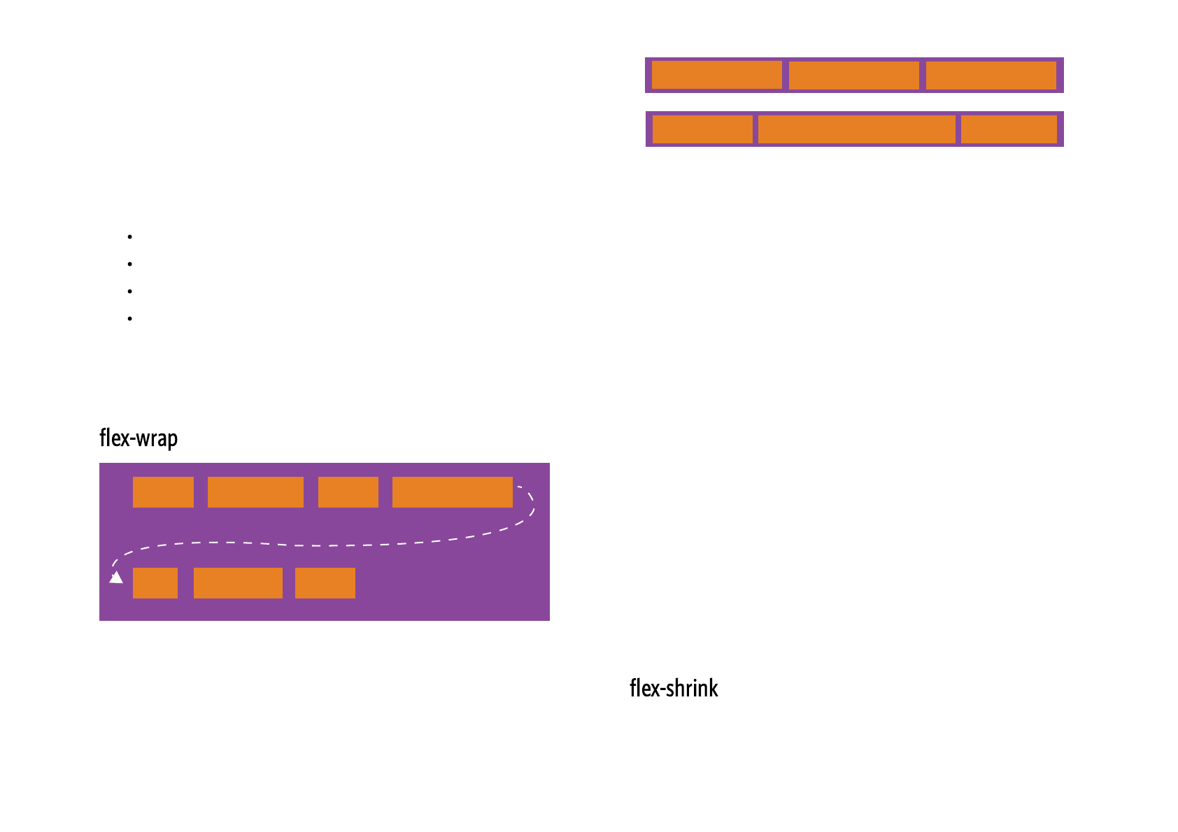
By default, flex items will all try to fit onto one line. You can
change that and allow the items to wrap as needed with this
property.
1 1 1
1 2 1
This defines the ability for a flex item to grow if necessary. It
accepts a unitless value that serves as a proportion. It dictates
what amount of the available space inside the flex container
the item should take up.
If all items have set to 1, the remaining space in
the container will be distributed equally to all children. If one of
the children has a value of 2, the remaining space would take
up twice as much space as the others (or it will try to, at least).
Negative numbers are invalid.
This defines the ability for a flex item to shrink if necessary.
.container {
flex-direction: row | row-reverse | col
}
CSS
rowltr rtl
row-reverse ltr rtl
column row
column-reverserow-reverse
#
flex-grow
.item {
flex-grow: <number>; /* default 0 */
}
CSS
#
22/03/2018 A Complete Guide to Flexbox | CSS-Tricks
https://css-tricks.com/snippets/css/a-guide-to-flexbox/ 4/18
(default): all flex items will be on one line
: flex items will wrap onto multiple lines, from top
to bottom.
: flex items will wrap onto multiple lines
from bottom to top.
There are some visual demos of flex-wrap here.
This is a shorthand and
properties, which together define the flex container's main and
cross axes. Default is .
Negative numbers are invalid.
This defines the default size of an element before the
remaining space is distributed. It can be a length (e.g. 20%,
5rem, etc.) or a keyword. The keyword means "look at
my width or height property" (which was temporarily done by
the keyword until deprecated). The
keyword means "size it based on the item's content" - this
keyword isn't well supported yet, so it's hard to test and harder
to know what its brethren , , and
do.
.container{
flex-wrap: nowrap | wrap | wrap-reverse
}
CSS
nowrap
wrap
wrap-reverse
#
flex-direction flex-wrap
row nowrap
flex-flow: <‘flex-direction’> || <‘flex-w
CSS
#
.item {
flex-shrink: <number>; /* default 1 */
}
CSS
#
auto
main-size content
max-content min-content
fit-content
.item {
flex-basis: <length> | auto; /* default
}
CSS
22/03/2018 A Complete Guide to Flexbox | CSS-Tricks
https://css-tricks.com/snippets/css/a-guide-to-flexbox/ 5/18
flex-start
flex-end
center
space-between
space-around
space-evenly
This defines the alignment along the main axis. It helps
distribute extra free space left over when either all the flex
items on a line are inflexible, or are flexible but have reached
their maximum size. It also exerts some control over the
alignment of items when they overflow the line.
If set to , the extra space around content isn't factored in. If
set to , the extra space is distributed based on its
value. See this graphic.
This is the shorthand for and
combined. The second and third parameters
( and ) are optional. Default is
.
It is recommended that you use this shorthand property
rather than set the individual properties. The short hand sets
the other values intelligently.
0
auto flex-
grow
#
flex-grow, flex-shrink
flex-basis
flex-shrink flex-basis 0
1 auto
.item {
flex: none | [ <'flex-grow'> <'flex-shr
}
CSS
#
22/03/2018 A Complete Guide to Flexbox | CSS-Tricks
https://css-tricks.com/snippets/css/a-guide-to-flexbox/ 6/18
(default): items are packed toward the
start line
: items are packed toward to end line
: items are centered along the line
: items are evenly distributed in the
line; first item is on the start line, last item on the end
line
: items are evenly distributed in the line
with equal space around them. Note that visually the
spaces aren't equal, since all the items have equal space
on both sides. The first item will have one unit of space
against the container edge, but two units of space
between the next item because that next item has its
own spacing that applies.
: items are distributed so that the
spacing between any two items (and the space to the
edges) is equal.
flex-end
flex-start
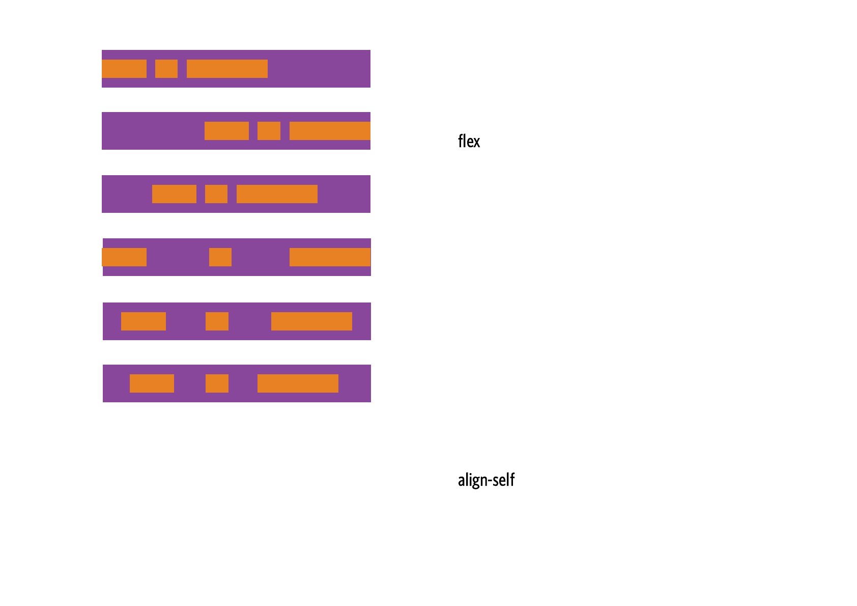
This allows the default alignment (or the one specified by
) to be overridden for individual flex items.
Please see the explanation to understand the
available values.
Note that , and have no
effect on a flex item.
.container {
justify-content: flex-start | flex-end
}
CSS
flex-start
flex-end
center
space-between
space-around
space-evenly
#
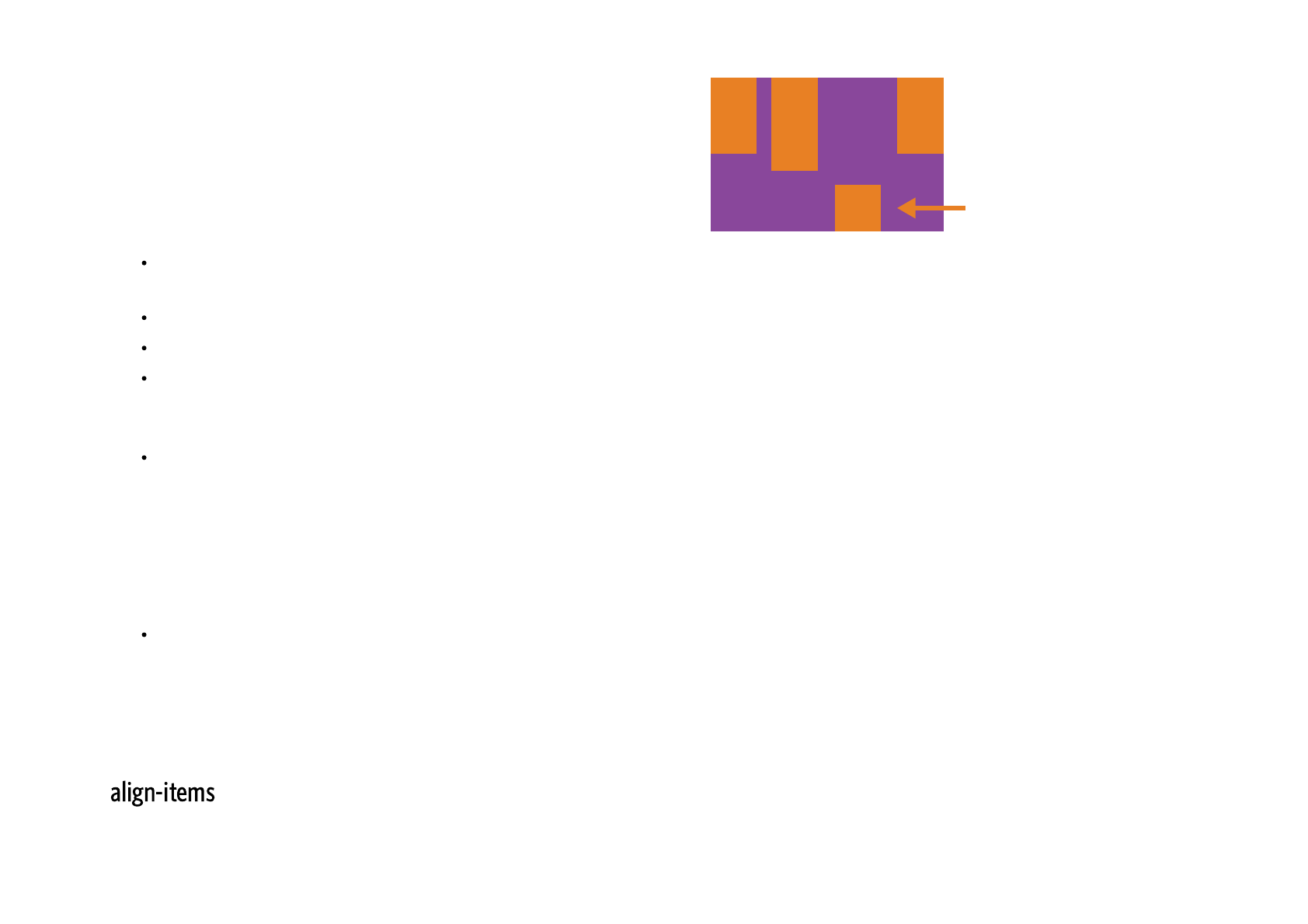
align-items
align-items
.item {
align-self: auto | flex-start | flex-en
}
CSS
float clearvertical-align

22/03/2018 A Complete Guide to Flexbox | CSS-Tricks
https://css-tricks.com/snippets/css/a-guide-to-flexbox/ 7/18
flex-start
center
baseline
stretch
flex-end
text text text text
text text text text
This defines the default behaviour for how flex items are laid
out along the cross axis on the current line. Think of it as the
version for the cross-axis (perpendicular
to the main-axis).
justify-content

22/03/2018 A Complete Guide to Flexbox | CSS-Tricks
https://css-tricks.com/snippets/css/a-guide-to-flexbox/ 8/18
: cross-start margin edge of the items is
placed on the cross-start line
: cross-end margin edge of the items is
placed on the cross-end line
: items are centered in the cross-axis
: items are aligned such as their baselines
align
(default): stretch to fill the container (still
respect min-width/max-width)
.container {
align-items: flex-start | flex-end | ce
}
CSS
flex-start
flex-end
center
baseline
stretch
#
22/03/2018 A Complete Guide to Flexbox | CSS-Tricks
https://css-tricks.com/snippets/css/a-guide-to-flexbox/ 9/18
flex-start
center
space-between
stretch
space-around
flex-end
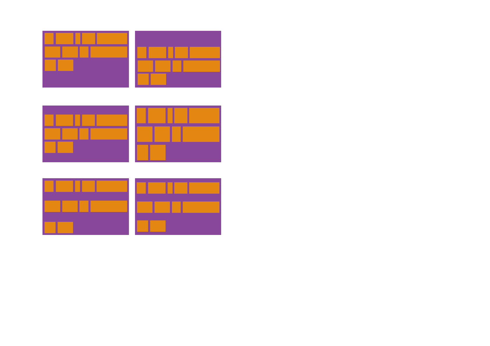
This aligns a flex container's lines within when there is extra
space in the cross-axis, similar to how
aligns individual items within the main-axis.
Note: this property has no effect when there is only one line of
flex items.
justify-content
22/03/2018 A Complete Guide to Flexbox | CSS-Tricks
https://css-tricks.com/snippets/css/a-guide-to-flexbox/ 10/18
: lines packed to the start of the container
: lines packed to the end of the container
: lines packed to the center of the container
: lines evenly distributed; the first line is
at the start of the container while the last one is at the
end
: lines evenly distributed with equal
space around each line
(default): lines stretch to take up the
remaining space
Let's start with a very very simple example, solving an almost daily problem: perfect centering. It
couldn't be any simpler if you use flexbox.
.container {
align-content: flex-start | flex-end |
}
CSS
flex-start
flex-end
center
space-between
space-around
stretch
#
.parent {
display: flex;
height: 300px; /* Or whatever */
CSS

22/03/2018 A Complete Guide to Flexbox | CSS-Tricks
https://css-tricks.com/snippets/css/a-guide-to-flexbox/ 11/18
This relies on the fact a margin set to `auto` in a flex container absorb extra space. So setting a
vertical margin of will make the item perfectly centered in both axis.
Now let's use some more properties. Consider a list of 6 items, all with a fixed dimensions in a matter
of aesthetics but they could be auto-sized. We want them to be evenly and nicely distributed on the
horizontal axis so that when we resize the browser, everything is fine (without media queries!).
}
.child {
width: 100px; /* Or whatever */
height: 100px; /* Or whatever */
margin: auto; /* Magic! */
}
auto
.flex-container {
/* We first create a flex layout context */
display: flex;
/* Then we define the flow direction
and if we allow the items to wrap
* Remember this is the same as:
* flex-direction: row;
* flex-wrap: wrap;
*/
CSS
22/03/2018 A Complete Guide to Flexbox | CSS-Tricks
https://css-tricks.com/snippets/css/a-guide-to-flexbox/ 12/18
Done. Everything else is just some styling concern. Below is a pen featuring this example. Be sure to go
to CodePen and try resizing your windows to see what happens.
Let's try something else. Imagine we have a right-aligned navigation on the very top of our website, but
we want it to be centered on medium-sized screens and single-columned on small devices. Easy
flex-flow: row wrap;
/* Then we define how is distributed the remaining space */
justify-content: space-around;
}
1234
5 6
HTML SCSS Result Edit on

22/03/2018 A Complete Guide to Flexbox | CSS-Tricks
https://css-tricks.com/snippets/css/a-guide-to-flexbox/ 13/18
enough.
/* Large */
.navigation {
display: flex;
flex-flow: row wrap;
/* This aligns items to the end line on main-axis */
justify-content: flex-end;
}
/* Medium screens */
@media all and (max-width: 800px) {
.navigation {
/* When on medium sized screens, we center it by evenly distributing empty space around items
justify-content: space-around;
}
}
/* Small screens */
@media all and (max-width: 500px) {
.navigation {
/* On small screens, we are no longer using row direction but column */
flex-direction: column;
CSS
22/03/2018 A Complete Guide to Flexbox | CSS-Tricks
https://css-tricks.com/snippets/css/a-guide-to-flexbox/ 14/18
Let's try something even better by playing with flex items flexibility! What about a mobile-first 3-
columns layout with full-width header and footer. And independent from source order.
}
}
Home About Products Contact
HTML SCSS Result Edit on
.wrapper {
display: flex;
flex-flow: row wrap;
}
/* We tell all items to be 100% width, via flex-basis */
.wrapper > * {
CSS

22/03/2018 A Complete Guide to Flexbox | CSS-Tricks
https://css-tricks.com/snippets/css/a-guide-to-flexbox/ 15/18
flex: 1 100%;
}
/* We rely on source order for mobile-first approach
* in this case:
* 1. header
* 2. article
* 3. aside 1
* 4. aside 2
* 5. footer
*/
/* Medium screens */
@media all and (min-width: 600px) {
/* We tell both sidebars to share a row */
.aside { flex: 1 auto; }
}
/* Large screens */
@media all and (min-width: 800px) {
/* We invert order of first sidebar and main
* And tell the main element to take twice as much width as the other two sidebars
*/
.main { flex: 2 0px; }
.aside-1 { order: 1; }
22/03/2018 A Complete Guide to Flexbox | CSS-Tricks
https://css-tricks.com/snippets/css/a-guide-to-flexbox/ 16/18
.main { order: 2; }
.aside-2 { order: 3; }
.footer { order: 4; }
}
Header
Aside 1
Pellentesque habitant morbi tristique senectus et netus et
malesuada fames ac turpis egestas. Vestibulum tortor
quam, feugiat vitae, ultricies eget, tempor sit amet, ante.
Donec eu libero sit amet quam egestas semper. Aenean
ultricies mi vitae est. Mauris placerat eleifend leo.
Aside 2
Footer
EDIT ON
HTML CSS Result
22/03/2018 A Complete Guide to Flexbox | CSS-Tricks
https://css-tricks.com/snippets/css/a-guide-to-flexbox/ 17/18
Broken up by "version" of flexbox:
(new) means the recent syntax from the specification (e.g. )
(tweener) means an odd unofficial syntax from 2011 (e.g. )
(old) means the old syntax from 2009 (e.g. )
Chrome: 20- (old)
21+ (new)
Safari: 3.1+ (old)
6.1+ (new)
Firefox: 2-21 (old)
22+ (new)
Opera: 12.1+ (new)IE: 10 (tweener)
11+ (new)
Android: 2.1+ (old)
4.4+ (new)
iOS: 3.2+ (old)
7.1+ (new)
Blackberry browser 10+ supports the new syntax.
For more informations about how to mix syntaxes in order to get the best browser support, please
refer to this article (CSS-Tricks) or this article (DevOpera).
#
display: flex;
display: flexbox;
display: box;
Build and deploy a CMS-enabled site with Gatsby in just a few clicks. It's free.
22/03/2018 A Complete Guide to Flexbox | CSS-Tricks
https://css-tricks.com/snippets/css/a-guide-to-flexbox/ 18/18
