A Guide To Web Design
User Manual:
Open the PDF directly: View PDF  .
.
Page Count: 594 [warning: Documents this large are best viewed by clicking the View PDF Link!]
- Complete Guide to Web Design copy
- cover1.png
- A complete Guide to Webdesign.pdf
- Copyright
- Table of Contents
- Preface
- Part I: The Web Environment
- Chapter 1 - Designing for a Variety of Browsers
- Chapter 2 - Designing for a Variety of Displays
- Chapter 3 - Web Design Principles for Print Designers
- Chapter 4 - A Beginner's Guide to the Server
- Part II: HTML
- Chapter 5 - HTML Overview
- Chapter 6 - Structural HTML Tags
- Chapter 7 - Formatting Text
- Chapter 8 - Creating Links
- Chapter 9 - Adding Images and Other Page Elements
- Chapter 10 - Tables
- Chapter 11 - Frames
- Chapter 12 - Forms
- Chapter 13 - Server Side Includes
- Part III: Graphics
- Chapter 14 - GIF Format
- Chapter 15 - JPEG Format
- Chapter 16 - PNG Format
- Chapter 17 - Designing Graphics with the Web Palette
- Part IV: Multimedia and Interactivity
- Chapter 18 - Animated GIFs
- Chapter 19 - Audio on the Web
- Chapter 20 - Video on the Web
- Chapter 21 - Interactivity
- Chapter 22 - Introduction to JavaScript
- Part V: Emerging Technologies
- Chapter 23 - Cascading Style Sheets
- Chapter 24 - Introduction to DHTML
- Chapter 25 - Introduction to XML
- Chapter 26 - Embedded Font Technology
- Chapter 27 - Internationalization
- Part VI: Appendixes
- Appendix A - HTML Tags and Elements
- Appendix B - List of Attributes
- Appendix C - Deprecated Tags
- Appendix D - Proprietary Tags
- Appendix E - CSS Compatibility
- Glossary
- Index
- About the Author/Colophon
- cheating filmmakers!!!

v
Web Design in a Nutshell, eMatter Edition
Copyright © 2000 O’Reilly & Associates, Inc. All rights reserved.
Table of Contents
Preface .................................................................................................... xiii
Part I: The Web Environment
Chapter 1—Designing for a Variety of Browsers ...................... 3
Browsers ................................................................................................. 3
Design Strategies .................................................................................... 9
Writing Good HTML ............................................................................. 11
Knowing Your Audience ..................................................................... 12
Considering Your Site’s Purpose ......................................................... 13
Test! Test! Test! ..................................................................................... 13
Chapter 2—Designing for a Variety of Displays .................... 14
Dealing with Unknown Monitor Resolutions ..................................... 14
Fixed versus Flexible Web Page Design ............................................. 19
Accessibility .......................................................................................... 23
Alternative Displays .............................................................................. 26
Chapter 3—Web Design Principles
for Print Designers ...................................................................... 28
Color on the Web ................................................................................. 28
Graphics on the Web ........................................................................... 34
Typography on the Web ...................................................................... 41

vi
Web Design in a Nutshell, eMatter Edition
Copyright © 2000 O’Reilly & Associates, Inc. All rights reserved.
Chapter 4—A Beginner’s Guide to the Server ......................... 47
Servers 101 ............................................................................................ 47
Introduction to Unix ............................................................................. 50
File Naming Conventions ..................................................................... 57
Uploading Documents (FTP) ............................................................... 57
File (MIME) Types ................................................................................ 61
Part II: HTML
Chapter 5—HTML Overview .......................................................... 67
HTML Editing Tools ............................................................................. 68
WYSIWYG Authoring Tools ................................................................ 68
Document Structure ............................................................................. 70
HTML Tags ............................................................................................ 71
Information Browsers Ignore ............................................................... 73
Tips on Good HTML Style ................................................................... 74
Specifying Color in HTML .................................................................... 75
Character Entities .................................................................................. 84
HTML Resources in This Book ............................................................ 89
Chapter 6—Structural HTML Tags ............................................... 91
Summary of Structural Tags ................................................................. 91
Setting Up an HTML Document .......................................................... 94
Global Settings with the <body> Tag .................................................. 96
Using <meta> Tags ............................................................................... 98
Chapter 7—Formatting Text ......................................................... 102
Summary of Text Tags ....................................................................... 102
Working with HTML Text .................................................................. 112
Inline Type Styles ............................................................................... 114
The <font> Tag ................................................................................... 116
Lists ...................................................................................................... 118
Layout Techniques with HTML .......................................................... 122
Chapter 8—Creating Links ........................................................... 130
Summary of Tags Related to Linking ................................................ 130
Simple Hypertext Links ...................................................................... 133
Linking Within a Document ............................................................... 134
Affecting the Appearance of Links .................................................... 135

vii
Web Design in a Nutshell, eMatter Edition
Copyright © 2000 O’Reilly & Associates, Inc. All rights reserved.
Targeting Windows ............................................................................ 137
Imagemaps .......................................................................................... 137
Non-Web Links and Protocols ........................................................... 143
Chapter 9—Adding Images and Other Page Elements ...... 146
Summary of Object Placement Tags .................................................. 146
Horizontal Rules ................................................................................. 154
Image Basics ....................................................................................... 157
The <img> Tag and Its Attributes ...................................................... 158
Adding Java Applets to the Page ....................................................... 164
Adding Plug-in Media with <embed> ............................................... 165
Adding Media Files with <object> ..................................................... 166
Chapter 10—Tables .......................................................................... 168
Summary of Table Tags ..................................................................... 168
Introduction to Tables ........................................................................ 176
Basic Table Structure .......................................................................... 177
Affecting Table Appearance ............................................................... 181
Table Troubleshooting ....................................................................... 187
Tips and Tricks ................................................................................... 193
Standard Table Templates .................................................................. 196
Multipart Images in Tables ................................................................. 201
Chapter 11—Frames ........................................................................ 206
Summary of Frame Tags .................................................................... 206
Introduction to Frames ....................................................................... 209
Basic Frameset Structure .................................................................... 211
Frame Function and Appearance ...................................................... 214
Targeting Frames ................................................................................ 217
Inline (Floating) Frames ..................................................................... 219
Frame Design Tips and Tricks ........................................................... 220
Chapter 12—Forms .......................................................................... 226
Summary of Form Tags ...................................................................... 226
Introduction to Forms ........................................................................ 233
The Basic Form (<form>) .................................................................. 234
Form Elements .................................................................................... 236
New Form Attributes (HTML 4.0) ...................................................... 241
Affecting the Appearance of Forms ................................................... 242
Unconventional Use of Form Elements ............................................ 246
Demystifying CGI ............................................................................... 247

viii
Web Design in a Nutshell, eMatter Edition
Copyright © 2000 O’Reilly & Associates, Inc. All rights reserved.
Chapter 13—Server Side Includes .............................................. 251
How SSI Is Used ................................................................................. 251
SSI and the Server .............................................................................. 253
Adding SSI Commands to a Document ............................................. 253
Using Environment Variables ............................................................ 255
XSSI ..................................................................................................... 255
List of Elements .................................................................................. 256
Include Variables ................................................................................ 259
Time Formats for SSI Output ............................................................. 260
Part III: Graphics
Chapter 14—GIF Format ............................................................... 265
GIF87a versus GIF89a ........................................................................ 265
Eight-Bit Indexed Color ..................................................................... 266
GIF Compression ................................................................................ 266
When to Use GIFs .............................................................................. 266
Tools Overview .................................................................................. 267
Interlacing ........................................................................................... 268
Transparency ...................................................................................... 269
Minimizing GIF File Sizes .................................................................. 277
Chapter 15—JPEG Format ............................................................ 283
24-bit Color ......................................................................................... 283
JPEG Compression ............................................................................. 283
When to Use JPEGs ............................................................................ 285
Progressive JPEGs ............................................................................... 285
JPEGs in AOL Browsers ..................................................................... 286
Creating JPEGs .................................................................................... 286
Minimizing JPEG File Size .................................................................. 287
Chapter 16—PNG Format ............................................................. 291
Platform/Browser Support ................................................................. 292
8-Bit Palette, Grayscale, and Truecolor ............................................. 293
PNG Compression .............................................................................. 293
When to Use PNGs ............................................................................ 294
Special Features .................................................................................. 295
Creating PNG Files ............................................................................. 297
Optimizing PNG File Size .................................................................. 301
Online PNG Resources ....................................................................... 302

ix
Web Design in a Nutshell, eMatter Edition
Copyright © 2000 O’Reilly & Associates, Inc. All rights reserved.
Chapter 17—Designing Graphics with the Web Palette .... 303
The Web Palette ................................................................................. 303
Other Palettes ..................................................................................... 305
Image Types ....................................................................................... 306
Designing with Web-Safe Colors ....................................................... 307
Converting to the Web Palette ........................................................... 309
Survey of Web Graphics Tools .......................................................... 310
Color Blenders .................................................................................... 315
Where to Learn More ......................................................................... 317
Part IV: Multimedia and Interactivity
Chapter 18—Animated GIFs ........................................................ 321
How They Work ................................................................................. 321
Using Animated GIFs ......................................................................... 322
Browser Support ................................................................................. 322
Tools ................................................................................................... 323
Creating Animated GIFs ..................................................................... 324
Optimizing Animated GIFs ................................................................ 328
Chapter 19—Audio on the Web .................................................. 330
Copyright Issues ................................................................................. 330
Audio Tools Overview ....................................................................... 331
Basic Digital Audio Concepts ............................................................ 332
Nonstreaming versus Streaming ........................................................ 333
Nonstreaming (Static) Audio .............................................................. 335
Streaming Audio ................................................................................. 341
Bibliography ....................................................................................... 345
Chapter 20—Video on the Web ................................................... 347
Tools Overview .................................................................................. 347
Basic Digital Video Concepts ............................................................. 348
Compression ....................................................................................... 349
Video File Formats ............................................................................. 351
Streaming Video Technologies .......................................................... 353
Adding Video to an HTML Document .............................................. 355
Bibliography ....................................................................................... 358

x
Web Design in a Nutshell, eMatter Edition
Copyright © 2000 O’Reilly & Associates, Inc. All rights reserved.
Chapter 21—Interactivity ............................................................. 359
Flash .................................................................................................... 359
Shockwave for Director ..................................................................... 366
Java Applets ........................................................................................ 370
Interactive Buttons with JavaScript .................................................... 373
Chapter 22—Introduction to JavaScript .................................. 379
JavaScript Basics ................................................................................. 379
Sample Scripts ..................................................................................... 381
Handling Multiple Browsers .............................................................. 383
Browser Compatibility ........................................................................ 385
Part V: Emerging Technologies
Chapter 23—Cascading Style Sheets ......................................... 389
How Style Sheets Work ...................................................................... 391
Selectors .............................................................................................. 395
Specifying Values ............................................................................... 398
Properties ............................................................................................ 399
Positioning with Style Sheets ............................................................. 418
What’s New in CSS2 ........................................................................... 422
Style Sheet Tips and Tricks ................................................................ 426
Browser Support Charts ..................................................................... 428
Chapter 24—Introduction to DHTML ....................................... 429
Advantages to Using DHTML ............................................................ 430
Disadvantages ..................................................................................... 430
Learning DHTML ................................................................................ 431
Browser Differences ........................................................................... 431
The Document Object Model ............................................................ 431
DHTML Examples ............................................................................... 435
DHTML Tools ..................................................................................... 441
Where to Learn More ......................................................................... 443
Chapter 25—Introduction to XML ............................................. 445
Background ........................................................................................ 445
Document Type Definition (DTD) .................................................... 446
XML Syntax Basics .............................................................................. 446
Examples of XML Technology ........................................................... 448
Where to Learn More ......................................................................... 451

xi
Web Design in a Nutshell, eMatter Edition
Copyright © 2000 O’Reilly & Associates, Inc. All rights reserved.
Chapter 26—Embedded Font Technology ............................... 453
Using Embedded Fonts ...................................................................... 453
TrueDoc Technology (“Dynamic Fonts”) .......................................... 454
OpenType (for Internet Explorer) ..................................................... 455
Chapter 27—Internationalization ............................................ 458
Character Sets ..................................................................................... 458
HTML 4.0 Language Tags ................................................................... 460
For More Information ......................................................................... 463
Part VI: Appendixes
Appendix A—HTML Tags and Elements ................................... 467
Appendix B—List of Attributes .................................................... 483
Appendix C—Deprecated Tags ..................................................... 511
Appendix D—Proprietary Tags .................................................... 515
Appendix E—CSS Compatibility ................................................. 518
Glossary ................................................................................................ 527
Index ...................................................................................................... 535


xiii
Web Design in a Nutshell, eMatter Edition
Copyright © 2000 O’Reilly & Associates, Inc. All rights reserved.
Chapter 1vM
Preface
In the beginning, the Web was simple. When I first encountered it in early 1993
(working for O’Reilly’s Global Network Navigator, since sold to and put to rest by
America Online), there was only one browser for viewing web pages and it ran
exclusively on the Unix platform. There were about a dozen tags that made any
difference. Designing a web page was a relatively simple task.
It isn’t so easy anymore. With the explosion of the Web came an avalanche of new
technologies, proprietary tags, and acronyms. Even for someone who is immersed
in the terminology and environment on a professional basis, it can be truly over-
whelming. You just can’t keep all this stuff in your head anymore.
Since leaving O’Reilly’s Cambridge, Mass., offices for a freelance career, I never
feel more alone than when I get stuck—whether it’s because I don’t know if it’s a
good idea to use style sheets for the project I’m designing, or I just can’t remember
what tag to put that MARGINWIDTH attribute in. And I’m not ashamed to admit that
I’ve been reduced to tears after hours of battling a table that mysteriously refused
to behave, despite my meticulous and earnest efforts.
It’s at times like these that I wish I could walk down the hall and ask Norm Walsh
what the heck is wrong with my table. In his absence, I do the best I can with the
volumes of web design information available online (on the Internet, no one
knows you have red, puffy eyes). Unfortunately, finding the answer to a specific
question is a time-consuming and sometimes equally frustrating process in itself.
Deadlines often can’t accommodate a two-hour scavenger hunt.
I’ve often wished there was one place to go to find quick answers to my ques-
tions. That’s why I wrote this book. It has the useful parts without a lot of fluff,
organized so that information can be found quickly. It is based on the wish-lists—
and, indeed, the contributions—of both professional and hobbyist web designers.

xiv Preface
Contents
Web Design in a Nutshell, eMatter Edition
Copyright © 2000 O’Reilly & Associates, Inc. All rights reserved.
Contents
This book focuses on the front-end aspects of Web design—HTML authoring,
graphics production, and media development. It is not a resource for program-
ming, scripting, or server functions; however, whenever possible, I have tried to
provide enough background information on these topics to give designers a level
of familiarity with the terminology and technologies. The content in this book is
appropriate for all levels of expertise—from professionals who need to look up a
particular detail, to beginners who may require full explanations of new concepts
and individual tags.
The book is divided into six parts, each covering a general subject area.
Part I, The Web Environment
Part I introduces some broad concepts about the way the Web works, which
should orient designers to the peculiarities of the medium. It ends with an intro-
duction to the server and basic Unix concepts.
Chapter 1, Designing for a Variety of Browsers, looks at how differing browser
capabilities affect design decisions.
Chapter 2, Designing for a Variety of Displays, discusses varying monitor resolu-
tions and accessibility issues and their effects on the design process.
Chapter 3, Web Design Principles for Print Designers, introduces how the Web
deals with color, graphics, and fonts. This is particularly useful for those accus-
tomed to print; however, it is also essential background information for any new
web designer.
Chapter 4, A Beginner’s Guide to the Server, provides a primer on basic server
functions, Unix commands, uploading files, and file types.
Part II, HTML
This part focuses on HTML tags and their use. Most chapters begin with a listing of
available tags with short descriptions (for easy access), followed by more detailed
explanations and practical advice for their use.
Chapter 5, HTML Overview, gives a detailed introduction to HTML syntax,
including how to specify color and special characters.
Chapter 6, Structural HTML Tags, lists the tags used to establish an HTML docu-
ment and structure its contents, including settings that control or pertain to the
whole document.
Chapter 7, Formatting Text, lists all tags related to the formatting of text elements
in an HTML document.
Chapter 8, Creating Links, lists HTML tags related to linking one document to
another, including imagemaps.
Chapter 9, Adding Images and Other Page Elements, focuses on the tags used for
placing objects such as images, rules, or multimedia objects on a web page.

Preface xv
Preface
Web Design in a Nutshell, eMatter Edition
Copyright © 2000 O’Reilly & Associates, Inc. All rights reserved.
Chapter 10, Tables, provides everything you’d ever want to know about tables,
including a list of table-related HTML tags, troubleshooting tips, and templates for
popular table structures.
Chapter 11, Frames, covers the structure and creation of framed documents,
including explanations of frame-related HTML tags, as well as tips and tricks.
Chapter 12, Forms, lists all tags related to form creation and provides an introduc-
tion to working with CGI scripts.
Chapter 13, Server Side Includes, provides an overview of Server Side Includes,
including their capabilities and listings of the available elements and variables.
Part III, Graphics
The chapters in this part provide background information on web graphics file
formats as well as overviews of available tools and practical tips for graphic
production and optimization.
Chapter 14, GIF Format, describes the popular GIF format and provides tricks for
working with transparency and minimizing file sizes.
Chapter 15, JPEG Format, describes the JPEG format and provides tips on mini-
mizing file sizes.
Chapter 16, PNG Format, introduces this new and powerful graphic file format,
discussing its strengths and limitations.
Chapter 17, Designing Graphics with the Web Palette, discusses the tools and tech-
niques used in creating graphics with colors from the Web Palette.
Part IV, Multimedia and Interactivity
The chapters in this part focus on the animation, audio, and interactive capabili-
ties of the Web.
Chapter 18, Animated GIFs, looks at the creation and optimization of animated
GIFs.
Chapter 19, Audio on the Web, provides an overview of nonstreaming and
streaming audio file formats for web delivery.
Chapter 20, Video on the Web, provides an overview of nonstreaming and
streaming video file formats.
Chapter 21, Interactivity, looks at Macromedia’s Flash and Director Shockwave
formats as well as Java applets and interactive buttons created with JavaScript.
Chapter 22, Introduction to JavaScript, provides a general introduction to Java-
Script as well as a number of templates for creating popular effects such as pop-up
windows, browser-detection, and status-bar messages.

xvi Preface
Conventions Used in This Book
Web Design in a Nutshell, eMatter Edition
Copyright © 2000 O’Reilly & Associates, Inc. All rights reserved.
Part V, Emerging Technologies
This part introduces exciting new technologies that are destined to have an impact
on the Web’s future but are currently in varying stages of development and are not
well supported by current browsers.
Chapter 23, Cascading Style Sheets, describes how to use Cascading Style Sheets to
control presentation of HTML documents, including detailed explanations of avail-
able selectors, properties, and values. It also introduces CSS Level 2 features and
provides tips for style sheet use.
Chapter 24, Introduction to DHTML, provides a basic overview of Dynamic HTML
and related concepts.
Chapter 25, Introduction to XML, briefly introduces XML (eXtended Markup
Language) and explains why it is significant. This chapter also includes a descrip-
tion of XML-based applications for multimedia and vector graphics.
Chapter 26, Embedded Font Technology, introduces two competing technologies,
TrueDoc and OpenType, for embedding fonts in web pages.
Chapter 27, Internationalization, looks at measures being taken by the World
Wide Web Consortium to make the Web multilingual.
Part VI, Appendixes
This section provides lots of useful look-up tables for HTML tags and CSS
elements.
Appendix A, HTML Tags and Elements, lists all HTML tags as listed in the HTML 4.0
Specification of April 1998. This list also serves as an index to finding full tag
explanations throughout the book.
Appendix B, List of Attributes, lists all attributes and their respective tags and
values.
Appendix C, Deprecated Tags, lists all tags that have been “deprecated” (discour-
aged from use) by the HTML 4.0 Specification.
Appendix D, Proprietary Tags, lists tags that work only with Netscape Navigator or
Internet Explorer.
Appendix E, CSS Compatibility, lists all CSS properties and the browsers that
support them, including a handy “safe list.”
The Glossary defines many of the terms used in the book.
Conventions Used in This Book
The following typographical conventions are used in this book:
Constant width
is used to indicate HTML tags, code examples, and keyboard commands
Constant italic
is used to indicate variable text in code.

Preface xvii
Preface
Web Design in a Nutshell, eMatter Edition
Copyright © 2000 O’Reilly & Associates, Inc. All rights reserved.
Italic
is used to indicate variables, filenames, directory names, URLs, and glossary
terms.
The owl icon designates a note, which is an important aside to its
nearby text.
The turkey icon designates a warning relating to the nearby text.
Request for Comments
We invite you to help us improve future editions of this book. If you have an idea
that could make this a more useful quick reference, or if you find a bug in an
example program or an error in text, let us know by writing:
O’Reilly & Associates, Inc.
101 Morris Street
Sebastopol, CA 95472
1-800-998-9938 (in the U.S. or Canada)
1-707-829-0515 (international/local)
1-707-829-0104 (fax)
You can also send us messages electronically. To be put on the mailing list or
request a catalog, send email to:
nuts@ora.com (via the Internet)
uunet!ora!info (via UUCP)
To ask technical questions or comment on a book, send email to:
bookquestions@ora.com (via the Internet)
Acknowledgments
A small army of people were instrumental in the writing of this book. First, I’d like
to thank my editor, Richard Koman, for his support, vision, and flexibility. On the
flip side, I’d also like to thank him for the long leash, the trust in my vision, and
his appropriate inflexibility (the results of which were a better book).
I’d also like to thank Tim O’Reilly for his careful crafting of the “In a Nutshell”
series and for giving me the green light on this book.
Thanks also go to Ron Woodall, creator of the HTML Compendium, for his proac-
tive assistance in providing browser support information. I encourage you to
check out the Compendium’s site (http://www.htmlcompendium.org) for a

xviii Preface
Acknowledgments
Web Design in a Nutshell, eMatter Edition
Copyright © 2000 O’Reilly & Associates, Inc. All rights reserved.
complete list of tags, both current and obsolete, with detailed descriptions; listings
and detailed descriptions for all known attributes for each tag; browser support
information not listed in this book—such as NCSA Mosaic and earlier versions of
the HTML standards; and up-to-date listings and browser compatibility information.
Thanks also to Chris Farnham, for writing chapters on DHTML and XML, as well as
for his contribution to the SMIL section of the XML chapter.
Much of the wisdom in this book was culled from web design-related mailing lists
such as A List Apart (beautifully maintained by Jeffrey Zeldman), the WebDesign
list at Hesketh.com, and most notably, Monkey Junkies (WebMonkey.com’s online
community). A special “hey” goes out to Taylor.
Also key in the deepening of my understanding of the Web were the works of a
number of O’Reilly authors, including: Webmaster in a Nutshell, by Valerie Quercia
and Stephen Spainhour; HTML: The Definitive Guide, by Chuck Musciano and Bill
Kennedy; Learning the Unix Operating System, by Grace Todino, John Strang, and
Jerry Peek; and Designing with JavaScript, by Nick Heinle.
I’d like to thank Jim Cline, Dmitry Kirsanov (www.kirsanof.com), Chris Maden, Eric
Meyer, Dustin Mollo, Greg Porell, and Greg Roelofs for their time and thoughtful
review comments.
Thanks to the following people who provided various forms of assistance, infor-
mation, and tools I required to get my job done: Paul Anderson (Builder.com);
Chuck Duff (Digital Frontiers); Brad Ennis and David Lynch (for font research);
Chris Florio (for audio and video assistance); Craig Hockenberry (FurboFilters);
Andrew King (Webreference.com); Kevin Lynch (Macromedia); Doug Meisner
(Adobe Systems, Inc.); and Lynda Weinman (author of a fine set of books).
Thanks also to Clairemarie Fisher O’Leary for her hard work and willingness to
make this book “just right,” as well as the other folks who helped: Mike Sierra,
Edie Freedman, Ellie Cutler, Kim Brown, Chris Reilley, Seth Maislin, and Melanie
Wang.
Finally, I’d like to thank my Mom, Dad, and brother Liam, for their unending
support and the inspiration they each provide. Thanks to Sifl and Olly for keeping
me entertained as my deadline approached. And last, but not least, warm thanks
go to Jeff for being there when I needed him.

Web Design in a Nutshell, eMatter Edition
Copyright © 2000 O’Reilly & Associates, Inc. All rights reserved.
PART I
The Web Environment


3
A Variety of
Browsers
Web Design in a Nutshell, eMatter Edition
Copyright © 2000 O’Reilly & Associates, Inc. All rights reserved.
Chapter 1A Variety of Browsers
CHAPTER 1
Designing for a Variety of Browsers
Most web authors agree that the biggest challenge (and headache!) in web design
is dealing with the variety of browsers and platforms, each with its own support
and implementation of HTML and scripting elements. Features and capabilities
improve with each new major browser release, but that doesn’t mean the older
versions just go away. The general public tends not to keep up with the latest and
greatest—many are content with what they are given, and many others may be
using the computers of a company or institution that chooses a browser for them.
How do you design web pages that are aesthetically and technically intriguing
without alienating those in your audience with older browsers? Does a page that is
designed to be functional on all browsers necessarily need to be boring? Is it
possible to please everyone? And if not, where do you draw the line? How many
past versions do you need to cater to with your designs?
This chapter provides background information, statistics, and current wisdom from
professional web designers that may help you to make some of these decisions.
There’s no absolute rule here. While it’s important to make your content acces-
sible to the greatest number of users, experimentation and the real-world
implementation of emerging technologies is equally important to keep the medium
pushing forward. The key to making appropriate design decisions lies in under-
standing your audience and considering how your site is going to be used.
Browsers
The browser market is dominated by the two major browsers: Netscape Navigator
and Microsoft Internet Explorer. As of this writing, Navigator is in version 4.0 and
Internet Explorer is in version 5.0. Together, the “Big Two,” including their collec-
tive past versions, account for approximately 90% (or more) of browser use today.

4 Chapter 1 – Designing for a Variety of Browsers
Browsers
Web Design in a Nutshell, eMatter Edition
Copyright © 2000 O’Reilly & Associates, Inc. All rights reserved.
The browser landscape has been dominated by these two contenders as they
battle it out for market dominance. Their struggle to be cooler than the next guy
has resulted in a collection of proprietary HTML tags as well as incompatible
implementations of new technologies (most notoriously Dynamic HTML, but also
JavaScript and Cascading Style Sheets). On the positive side, the competition
between Netscape and Microsoft has also led to the rapid advancement of the
medium as a whole.
Netscape publishes information for developers at http://developer.netscape.com/.
Of particular interest are the documentation pages, including listings of Netscape’s
HTML tag support at http://developer.netscape.com/docs/manuals/.
Microsoft provides a rich resource of developer information at their SiteBuilder
Network site, http://www.microsoft.com/sitebuilder/, and the SiteBuilder Work-
shop, http://www.microsoft.com/workshop/.
Other Browsers
Most web authors base their designs on the functionality of Navigator and Internet
Explorer, since they claim the lion’s share of the market; however, there are a
number of other browsers you may choose to take into consideration.
Internet Explorer 4.0 on the Macintosh
Not all IE4.0 browsers are created equal! The Macintosh version of IE4.0 lacks
significant functionality found in its Windows sibling, so including 4.0-specific
features in your site may still leave some users out. As a general guideline, treat
Mac IE4.0 like Netscape 3.0.
Some documented shortcomings include:
• No embedded font support
• No support for CSS filters and transitions (visual effects such as “drop
shadow” that can be applied to text elements)
• No multimedia controls (animation and transition effects ordinarily created by
multimedia authoring software)
• Problematic DHTML implementation: despite the fact that Microsoft claims
DHTML is supported on all platforms, it’s extremely unreliable on the Mac
Microsoft’s official statement on Cross-Platform Functionality can be found at http://
www.microsoft.com/workshop/essentials/versions/xplatform.htm.
America Online browsers
America Online subscribers use one of seven possible browsers (depending on
their platform and version of the AOL software), some of them lacking all but the
most minimal HTML support.
The current version of America Online for the PC, 3.0 as of this writing, uses an
adaptation of the Microsoft Internet Explorer 3.0 browser; however, you can’t
always count on it to perform the same as the standard MSIE 3.0 release. (Func-
tionality is particularly limited for Mac users.) Many web designers have been

Browsers 5
A Variety of
Browsers
Browsers
Web Design in a Nutshell, eMatter Edition
Copyright © 2000 O’Reilly & Associates, Inc. All rights reserved.
horrified to see their site design (which works perfectly in all the major browsers)
once it’s been run through the AOL system and spit out in one of their browsers.
The difference is partly due to AOL’s reliance on proxy servers and image
compression techniques. Their image compression is known to have problems
displaying JPEG graphics, resulting in blotchy and color-streaked images (see
Chapter 15, JPEG Format, for more information). Problems have also been noted
in the display of background images.
In addition, some technologies, such as Java and Cascading Style Sheets are not
available to users with Windows 3.0 (approximately 40% of AOL’s audience). Java-
Script (and many other features) will not work for AOL’s Macintosh users
(approximately 8%).
Fortunately, AOL publishes a site specifically for web developers who want their
sites to be accessible and attractive for AOL users. Of particular use is the browser
chart, which provides a specific listing of each of its browsers (by release and plat-
form), the technologies and features supported, and a breakdown in percentage of
users for each browser.
AOL’s web developer’s site can be found at http://webmaster.info.aol.com/.
WebTV
WebTV brings web surfing to the living room with a set-top box, an ordinary tele-
vision, and a remote control (an optional keyboard is also available). WebTV uses
its own specialized browser for viewing web pages. It does a respectable job of
parsing standard HTML 3.2, but is unable to display frames, Java, JavaScript,
ActiveX, or any format that requires a plug-in (except Shockwave Flash and
RealAudio 3.0, which are built in). They have also created many new proprietary
HTML tags for use only with WebTV.
Because WebTV displays web pages on televisions, it introduces new concerns
regarding color and screen real estate. This unique browsing environment is
discussed further in Chapter 2, Designing for a Variety of Displays.
WebTV publishes a developers’ resource called “Primetime,” where you can find
specific information regarding developing sites for WebTV, including a list of the
WebTV proprietary tags. WebTV Primetime can be found at http://www.webtv.net/
primetime/.
A search for “WebTV” on Yahoo (http://www.yahoo.com) retrieves a number of
other useful WebTV resources.
Opera
Opera is a lean and mean little browser created by Opera Software in Oslo,
Norway. It is currently only available for the Windows platform, although a Mac
version is in the works. As this book goes to press, Opera costs $35 (that’s $35
more than Navigator or Internet Explorer), but it boasts extremely quick down-
load times and a small minimal disk requirement (just under 1.2 MB). Opera is
respected for its exact compliance with HTML standards. Sloppy tagging that gets

6 Chapter 1 – Designing for a Variety of Browsers
Browsers
Web Design in a Nutshell, eMatter Edition
Copyright © 2000 O’Reilly & Associates, Inc. All rights reserved.
by the larger browsers (such as missing closing tags, improper nesting, etc.) will
not render correctly in Opera.
Opera 3.0 does not support Java, Cascading Style Sheets, or DHTML, although Java
support is promised to be added in version 4.0 (not available as of this printing).
The general public is not likely to flock to Opera, so it may never figure high in
browser usage statistics; however, many designers continue to test their sites in
Opera to make sure their code is clean.
For more information about Opera, see http://www.operasoftware.com/.
Lynx
Last, but not least, is Lynx, a freely distributed text-only browser that offers fast,
no-nonsense access to the Web. It has stood proud as the lowest common denom-
inator standard against which web pages can be tested for basic functionality. Lynx
may be a simple browser, but it is not stuck in the past. Lynx is constantly being
improved and updated to include support for tables, forms, even JavaScript!
People do use Lynx, so don’t be surprised if a client demands a Lynx-compliant
site design. Lynx is also important to partially sighted users who browse with Lynx
and a speech device.
The Extremely Lynx page is a good starting point for finding developer informa-
tion for Lynx. You can find it at http://www.crl.com/~subir/lynx.html.
For information on designing Lynx-friendly pages, see http://www.crl.com/~subir/
lynx/author_tips.html.
Browser Usage Statistics
Knowing what browsers are most used can be helpful in deciding which technolo-
gies to adopt and where to draw the line for backwards compatibility. The most
meaningful statistics are those culled from your own site’s usage. Server tracking
software typically breaks down hits according to the browser making the request,
so if you find that only 20% of your visitors are using 4.0 version browsers, for
instance, you might not want to switch your site over to style sheets just yet.
Browser usage resources
There are a few browser statistics sites available on the Web. These sites base their
statistics on hits to their own pages, which skews the data towards users who care
about browser stats—probably not the same section of society using the Web to
research a new car purchase or look up television schedules. BrowserWatch
provides statistics that are meticulously broken down by version, sub-version, and
sub-sub-version for each particular browser.
Because the sampling base is probably not representative of the whole web audi-
ence, the statistics on these pages shouldn’t be considered as absolute fact, just
general guidelines. It’s interesting to see the long scrolls of browsers you’ve never
heard of that make up .1 to .5% of overall site usage.

Browsers 7
A Variety of
Browsers
Browsers
Web Design in a Nutshell, eMatter Edition
Copyright © 2000 O’Reilly & Associates, Inc. All rights reserved.
BrowserWatch
http://browserwatch.internet.com/
Which Browser
http://www.whichbrowser.com/
BrowserCaps
http://www.browsercaps.com/
Browser usage overview
As of this writing, the latest trend in browser usage is the closing of the gap
between Netscape Navigator and Internet Explorer. In mid-1997, Netscape enjoyed
a comfortable 70–80% of the overall browser usage (according to statistic sites
such as those listed above). Currently, they are running neck-and-neck at about
40–45% of the market share each (all versions included). This may be due to the
fact that IE is so integrated with the Windows operating system that new users are
using Internet Explorer by default. It may also reflect consumer approval for the
quality of the IE software.
Another trend is that some webmasters are beginning to see WebTV hits increase.
Although WebTV is slowly gaining in popularity, it is not making a tremendous
impact on browser statistics. It may be difficult to track the WebTV browser,
because those users are not likely to ever visit browser statistics sites.
Browser statistics change much faster than book publishing schedules, so the
statistics presented below are not necessarily meaningful; however if you are
completely unfamiliar with the typical browser breakdowns, these statistics from
the BrowserWatch site should give you an idea of who’s using what—as of this
writing of course. These were the number presented on July 13, 1998. One
caution: some of the browsers in this chart are obscure or defunct; don’t expect to
see them in any sizable numbers.
As an indication of how statistics can vary, these statistics were taken the same day
from the Which Browser site.
Again, the most meaningful browser usage statistics will be those gathered from
your own site.
Netscape Navigator 52.00%
Microsoft Internet Explorer 35.80%
Cyberdog 2.42%
Ibrowse 1.37%
Opera-3.0 1.22%
Lynx 0.93%
Echo 0.68%
MacWeb 0.40%
NEWT ActiveX 0.30%
EmailSiphon 0.27%
Netscape 47.08%
MSIE 51.80%
All Others 1.12%
8 Chapter 1 – Designing for a Variety of Browsers
Browsers
Web Design in a Nutshell, eMatter Edition
Copyright © 2000 O’Reilly & Associates, Inc. All rights reserved.
Browser Features
Once you’ve determined the browsers of choice for the majority of your audi-
ence, you can make better decisions regarding which HTML tags and web
technologies are safe to incorporate into your design. Likewise, you can deter-
mine how much of your audience you risk alienating by relying on certain features
such as Java or JavaScript.
Every HTML tag in Part II of this book is accompanied by a chart indicating which
browsers support it. Exceptional attribute support (or lack thereof) is noted in the
descriptions following each tag.
Table 1-1 provides a general listing of popular browsers and the web features and
technologies they support.
Table 1-1: Browser Support for Web Technologies
HTML
3.2
HTML
4.0
Anim.
GIFs
Tables
Frames
Plug-ins
Java
Java-
Script
Style
Sheets
Windows
Navigator 4.0 yes partial yes yes yes yes yes yes yes
Navigator 3.0 yes — yes yes yes yes yes yes —
Navigator 2.0 yes — yes yes yes yes yes yes —
Navigator 1.0 — — — yes —————
Explorer 5.0 yes yes yes yes yes yes yes yes yes
Explorer 4.0 yes partial yes yes yes yes yes yes yes
Explorer 3.0 yes — yes yes yes yes yes yes yes
Explorer 2.0 — — — yes —————
Explorer 1.0 — — — yes —————
AOL 3.0
(Win95)
yes — yes yes yes yes yes yes yes
AOL 3.0
(Win3.0)
yes — yes yes yes yes — yes —
Mosaic 3.0 — — — yes yes ————
Mosaic 1.0 — — ———————
Opera 3.0 mostly — yes yes yes — — yes —
Macintosh
Navigator 4.0 yes partial yes yes yes yes yes yes yes
Navigator 3.0 yes — yes yes yes yes yes yes —
Navigator 2.0 — — yes yes yes yes — yes —
Navigator 1.0 — — — yes —————
Explorer 4.0 yes partial yes yes yes yes yes yes par-
tial
Design Strategies 9
A Variety of
Browsers
Design Strategies
Web Design in a Nutshell, eMatter Edition
Copyright © 2000 O’Reilly & Associates, Inc. All rights reserved.
Design Strategies
Faced with the dilemma of varying browser capabilities, web designers have
developed a variety of design approaches, some more extreme than others. The
“correct” way to handle a particular site, of course, depends on its use and audi-
ence, but this section should provide a peek into the different positions in the
ongoing debate over where to draw the line.
Lowest Common Denominator Design
A minority of web developers adhere to the ideal standards that the Web should
be accessible to everyone. They may also maintain that presentation should be in
the hands of the end user, not the author. These designers tend to stick with the
safest HTML standard (currently HTML 3.2 or even 2.0) and make sure that pages
work on all browsers, including Lynx and version 1.0 of the popular browsers.
In web design discussion forums, there is consistently a voice representing the
position that all the current embellishments to HTML (Java, JavaScript, style sheets,
and DHTML) are unnecessary to successful communication over the Web.
Designers who design for the lowest common denominator may choose not to use
any of these technologies in their designs.
Current Version Design
Another minority, at the other extreme end of the spectrum, are the web devel-
opers who design only for the most current version of popular browsers (as of this
writing, Navigator 4.0 and Internet Explorer 4.0), with little concern for site perfor-
mance for other users. The statement “tell them to upgrade—it’s free!” has often
been used in defense of this design tactic. Beyond this, there are even designers
who design for only the most current version of one particular browser. Note that
this approach may be perfectly appropriate for intranet design.
Explorer 3.0 yes — yes yes yes yes yes yes yes
Explorer 2.1 — — — yes yes yes — — —
AOL 3.0 yes — yes yes yes yes — — —
AOL 2.7 — — ———————
Mosaic 3.0b4 — — — yes yes ————
Mosaic 2.0 — — — yes —————
Mosaic 1.0 — — ———————
Set-top
WebTV yes — yes yes — — — yes —
Table 1-1: Browser Support for Web Technologies (continued)
HTML
3.2
HTML
4.0
Anim.
GIFs
Tables
Frames
Plug-ins
Java
Java-
Script
Style
Sheets

10 Chapter 1 – Designing for a Variety of Browsers
Design Strategies
Web Design in a Nutshell, eMatter Edition
Copyright © 2000 O’Reilly & Associates, Inc. All rights reserved.
This approach has the obvious disadvantage of alienating a large percentage of the
audience. If the functionality of a site depends on a specific trick, for example, if
you can’t get off the front page without JavaScript, then your site has problems
communicating.
On the positive side, these designers tend to be the ones who forge new territo-
ries and put new technologies to the test. Creating exciting web features that
depend on cutting-edge features does create an incentive for users to keep them-
selves up-to-date.
Splitting the Difference
Far more commonly, designers take a more balanced approach to web site
creation. Designing web pages that “degrade gracefully” is the buzz phrase in web
design circles. This design incorporates the cutting-edge web technologies, such as
DHTML or JavaScript, but implements them in such a way that the pages are still
fully functional on older browsers.
One strategy is to design pages that take advantage of technology supported in the
previous version of major browsers. As of this writing, that would be the version 3.0
browsers. So, tables, frames, and JavaScript are fine, but style sheets and DHTML
are a problem.
The trick is to code it in a way so that your page degrades well for older or more
simple browsers. Simply being careful about always adding alternative text for
images with the ALT attribute goes a long way toward making a web page more
functional for Lynx users. When tables are used, they can be constructed so they
read logically when scanned by a text-only browser.
Once working pages are developed using version 3.0 technologies (while keeping
an eye on performance on older browsers), the site can be embellished using the
latest techniques and tricks. For instance, it is possible to create a page that looks
just fine for all browsers, but that also takes advantage of Cascading Style Sheets
for those browsers that can use them. It doesn’t hurt the other browsers; the up-to-
date users will just get something extra. The same goes for DHTML tricks. They’re
fine as long as they’re not used to carry the crucial message or functionality of the
site. Think of these things as icing on the cake.
By being mindful of how well elements degrade, you can construct pages that will
wow ’em on the current browsers but not drive them away if they’re using an
earlier version.
Something for Everyone
Another successful (albeit more labor-intensive) approach is to create multiple
versions of your site aimed at different levels of users. One site could incorporate
DHTML tricks and JavaScript events. Another could be a solid HTML 3.0-compliant
site with images and attractive page layouts, but without the whistles and bells.
You could create a text-only version that would serve the folks using Lynx, nonvi-
sual browsers, and browsers on handheld electronic devices. If you were feeling
ambitious, you could provide an all-Flash version of your site for those who are
interested! In most cases, two carefully planned versions are plenty.

Writing Good HTML 11
A Variety of
Browsers
Writing Good HTML
Web Design in a Nutshell, eMatter Edition
Copyright © 2000 O’Reilly & Associates, Inc. All rights reserved.
Some sites allow their users to decide which version they’d like to see. It’s not
uncommon to arrive at a site and be asked to choose between a souped-up
version or a text-only version, or to choose between frames or no-frames. This
puts the control in the hands of the viewer.
A more sophisticated approach is to automatically serve up an appropriate version
of the page for the browser that is making the request. JavaScript is capable of
basing actions on the browser being used (see Chapter 22, Introduction to Java-
Script). Pages can also be assembled on the fly for a particular browser using
Server Side Includes (see Chapter 13, Server Side Includes). Hotwired’s
WebMonkey site is a great example of this method in action, plus they share their
secrets, so check it out at http://www.webmonkey.com/.
Of course, this approach takes a bit more time and technical know-how, but it has
its rewards.
Writing Good HTML
Whatever your chosen browser, one key to success is to make sure you are
writing HTML correctly.
HTML Validation Services
There are a number of online resources that check your web site for various
quality issues, including the browser compatibility (or HTML Specification compli-
ance) of your HTML code. There are also HTML validators that check your code
for errors.
All will do a certain number of tests for free; however, to get the really good stuff,
you generally have to pay for the individual service or a year’s subscription for full
access to the site. For example, WebSiteGarage provides a nifty (and fee-based)
feature called “Browser Snapshot” that will provide up to 18 screenshots of your
page on a variety of browsers, including all past versions. This can be a good way
to run tests if you don’t have access to all of these browsers on your own.
Some of the more popular HTML validation services include:
The World Wide Web Consortium’s HTML Validator
http://validator.w3.org/
WebSiteGarage
http://www.websitegarage.com/
NetMechanic
http://www.netmechanic.com/
Doctor HTML
http://www2.imagiware.com/RxHTML/
If these don’t suit you, there are a large number of HTML validators listed on
Yahoo.
List of Validators on Yahoo
http://www.yahoo.com/Computers_and_Internet/Information_and_Documen-
tation/Data_Formats/HTML/Validation_and_Checkers/

12 Chapter 1 – Designing for a Variety of Browsers
Knowing Your Audience
Web Design in a Nutshell, eMatter Edition
Copyright © 2000 O’Reilly & Associates, Inc. All rights reserved.
HTML Editors as Validators
Browser compatibility databases and HTML validators are beginning to work their
way into HTML authoring tools as well. GoLive Cyberstudio (Mac-only; see http://
www.golive.com/) provides a complete database of all the HTML tags and their
browser-support information.
Even more useful is Macromedia Dreamweaver’s “Check Target Browsers” feature.
Authors specify which browsers they are targeting with their site design (Netscape
2.0, 3.0, and 4.0; and Internet Explorer 2.0, 3.0, and 4.0) and Dreamweaver runs a
check to see if any tags or attributes in the document are not supported by the
target browser(s). For more information on Dreamweaver, see http://www.macro-
media.com/.
Knowing Your Audience
As with most design challenges, making appropriate decisions regarding which
browsers to support and which new technologies to adopt largely depends on
knowing your audience. Before designing a new site, be sure to spend plenty of
time up front researching the likely platforms, browsers, technical savvy, and
connection speeds of the users you are targeting. If you are redesigning an
existing site, spend time with the server logs to analyze past site usage.
There are no browser-support guidelines that can anticipate every design situa-
tion; however, the following scenarios should start you thinking:
• If you are designing a scientific or academic site, you should probably pay
extra attention to how your site functions in Lynx (or other graphics-free
browsing environments).
• If your site is aimed at a consumer audience—for instance, a site that sells
educational toys to a primarily “mom”-based audience—don’t ignore your
site’s performance and presentation in the AOL browsers.
• If you are designing for a controlled environment, such as a corporate intra-
net, or even better, a web-based kiosk, you’ve got it made! Knowing exactly
what browser and platform your viewers are using means you can take full
advantage of the whistles and bells (and even proprietary features) appropri-
ate to that browser. If you are designing a standalone kiosk, you may even
have the luxury of loading the fonts you want to use. Just be sure your design
won’t crash the browser since there’s no one there to restart it for you imme-
diately.
In these situations, the “current version design” strategy discussed earlier in
this chapter is entirely appropriate (just don’t get spoiled)!
• If you are designing a computer game site aimed at young gaming geeks, you
can probably assume they will have the latest browsers and plug-ins (or will
get them if you say they need them).
For most multipurpose web sites, stick with the safer “Splitting the Difference”
approach to design, or if you have the resources, create multiple versions and
serve them appropriately.

Test! Test! Test! 13
A Variety of
Browsers
Test! Test! Test!
Web Design in a Nutshell, eMatter Edition
Copyright © 2000 O’Reilly & Associates, Inc. All rights reserved.
Considering Your Site’s Purpose
Another important factor for making web design decisions is knowing how your
site is going to be used. Site users tend to fall into two broad categories: those
who are on a mission for information, and those who are surfing the Web for
entertainment. In general, sites that serve the latter audience have more opportu-
nity to try out cutting-edge or plug-in technologies that improve the overall user
experience of the site. For informational sites, you wouldn’t want to base the avail-
ability of the information on a client-side technology.
Of course, there are plenty of exceptions to this overly generalized rule. For
instance, WebMonkey (http://www.webmonkey.com/) is an informational site that
uses a DHTML-based interface, based on the assumption that its developer audi-
ence is using the latest tools. WebMonkey also uses browser detection to serve
alternative versions for those without DHTML capabilities. So just because you
have a “serious” site doesn’t mean you should abandon new technologies entirely.
Another unique case is a site that is about the technology being used, such as a
VRML environment. In this situation, you have every right to expect users to use
the appropriate browser or plug-in to catch up with your content. (Although, it still
might be nice to at least provide some screenshots to show the others what they’re
missing!)
Test! Test! Test!
The final word in the dilemma of designing for a variety of browsers is always
TEST! Test your site on as many browsers, browser versions, and platform configu-
rations as you can get your hands on.
Professional web design firms run their sites through a vigorous quality assurance
phase before going “live.” They generally keep a bank of computers of varying
platforms and processing powers that run as many versions of browsers (including
Lynx) as possible.
If you do not have the resources to keep a similar set-up on your own, make the
site available on a private test site and take a look at it on your friends’ computers.
You might view it under corporate conditions (a Windows machine with a 4.0
browser, and a T1 connection), then visit a friend at home to see the same site on
AOL with a 28.8 modem. (If nothing else, it’s a good excuse to get away from your
computer and visit your friends!)
Although your pages will certainly look different in different environments, the
idea is to make sure that nothing is outright broken and that your content is being
communicated clearly.

14
Web Design in a Nutshell, eMatter Edition
Copyright © 2000 O’Reilly & Associates, Inc. All rights reserved.
Chapter 2A Variety of Displays
CHAPTER 2
Designing for a Variety of Displays
One of the most vexing aspects of web design is knowing that your page is at the
mercy of the software and hardware configuration of each individual user. A page
that looks great on your machine may look radically different, or perhaps even
ghastly, when viewed on another user’s set-up. This is partly due to the browser’s
functionality (as discussed in Chapter 1, Designing for a Variety of Browsers) and
the individual user’s preferences (font size, colors, etc.), but the display device
itself also plays a large part in the success of the page’s design.
This chapter looks at the ways in which design decisions are influenced by the
wide range of displays and viewing conditions. For the majority of your audience,
the variation in display is a function of the monitor’s size (or, more accurately, its
resolution) and color capabilities. However, it is important to keep in mind that
the diversity does not end there. Some users may be watching your web page on
TV. Still others may be viewing it in the palm of their hand on a PDA (personal
digital assistant) or cell phone. Sight-impaired users may be listening to your page,
not viewing it.
Dealing with Unknown Monitor Resolutions
Browser windows can be resized to any dimension, limited only by the maximum
size of the monitor. Designing for an unknown amount of browser real estate is a
challenge unique to web design and one that is particularly troublesome for
designers who are accustomed to the printed page.
In discussion forums frequented by web design professionals, no topic is more
often addressed (nor hotly debated) than the question of which monitor resolu-
tion to design for. As with most web design issues, there is no “right” way to
design for the Web, and your decisions should always be guided by your knowl-
edge of your target audience and the purpose of your site. Still, it is helpful to
understand the environment and to know how others are maneuvering within it.

Dealing with Unknown Monitor Resolutions 15
A Variety of
Displays
Dealing with Unknown Monitor Resolutions
Web Design in a Nutshell, eMatter Edition
Copyright © 2000 O’Reilly & Associates, Inc. All rights reserved.
This section looks at the range of monitor resolutions and presents the current
wisdom on making appropriate design decisions. The design advice and “wisdom”
presented here has been culled from a number of popular web design mailing lists
over the course of nearly half a year.
Standard Monitor Sizes and Resolutions
The first step in determining the likely size of your web page is to look at the
maximum amount of space provided by the computer monitor. Computer moni-
tors come in a variety of standard sizes, typically indicated in inches. Some typical
monitor sizes are 13", 14", 17", 19", 20", and 21".
The more meaningful measurement, however, is monitor resolution—the total
number of pixels available on the screen. The higher the resolution, the more
detail can be rendered on the screen. When you know the available number of
pixels, you can design your graphics (also measured in pixels) and page elements
accordingly. Table 2-1 presents a list of some standard monitor resolutions
supported by Macintosh and PC platforms. This is not a complete listing, merely
the most commonly occurring configurations.
Resolution is related to but not necessarily determined by monitor size. Depending
on the video card driving it, a single monitor can display a number of different
resolutions. For instance, a 17" monitor can display 640×480 pixels, 800×600
pixels, or even higher.
It is important to keep in mind that the higher the resolution on a given monitor,
the more pixels are packed into the available screen space. The result is smaller
pixels, which will make your images and page elements appear smaller as well. If
you create graphics and pages on a monitor with a relatively high resolution, say
1280×1024, be prepared for everything to look a lot bigger on standard 14" moni-
tors running at 640×480.
It is for this reason that web measurements are made in pixels, not inches. Some-
thing that appears to be an inch wide on your system may look smaller or larger
to other users. When you design in pixels, you know how elements measure in
proportion to each other.Chapter 3, Web Design Principles for Print Designers,
further discusses resolution as it applies to graphics.
Table 2-1: Common Monitor Resolutions for Personal Computers
Macintosh PC
512 × 384
640 × 480
800 × 600 (common on Powerbooks)
832 × 624
1024 × 768
1152 × 870
1280 × 960
1280 × 1024
1600 × 1200
640 × 480
800 × 600 (common on laptops)
1024 × 870
1280 × 1024
1600 × 1200

16 Chapter 2 – Designing for a Variety of Displays
Dealing with Unknown Monitor Resolutions
Web Design in a Nutshell, eMatter Edition
Copyright © 2000 O’Reilly & Associates, Inc. All rights reserved.
“Live” Space in the Browser Window
Knowing the size of the monitor is just the beginning...theoperating system
and the browser itself occupy a fair amount of this space. The amount of space
that is actually available within the browser window (referred to in this chapter as
the browser window’s “live” space) is dependent on the computer’s operating
system, the browser being used, and the individual user’s preference settings.
Because so many factors are involved, determining exactly how much live space is
available for each monitor resolution is an inexact science.
The information provided in Tables 2-2 through 2-5, on the following pages,
should be used as general guidelines, not universal truths. Measurements were
taken with the browser maximized to fill the available space in the window. The
minimum live space is measured with all possible browser tools (such as buttons,
location bars, and scrollbars) visible. The maximum live space is measured with all
optional elements hidden, making the browser window as large as it can be for
each particular resolution.
Bear in mind that these are theoretical extremes, and actual browser window
dimensions will vary. People may have some of the buttons showing, but not all
of them. Scrollbars turn on and off automatically, so they are difficult to antici-
pate. Users with very high monitor resolutions (1024 pixels wide and higher) do
not necessarily open their browser windows to fill the whole area, but may keep
several narrow windows open at the same time. Along with these variables are a
host of unknowns that can affect browser window size.
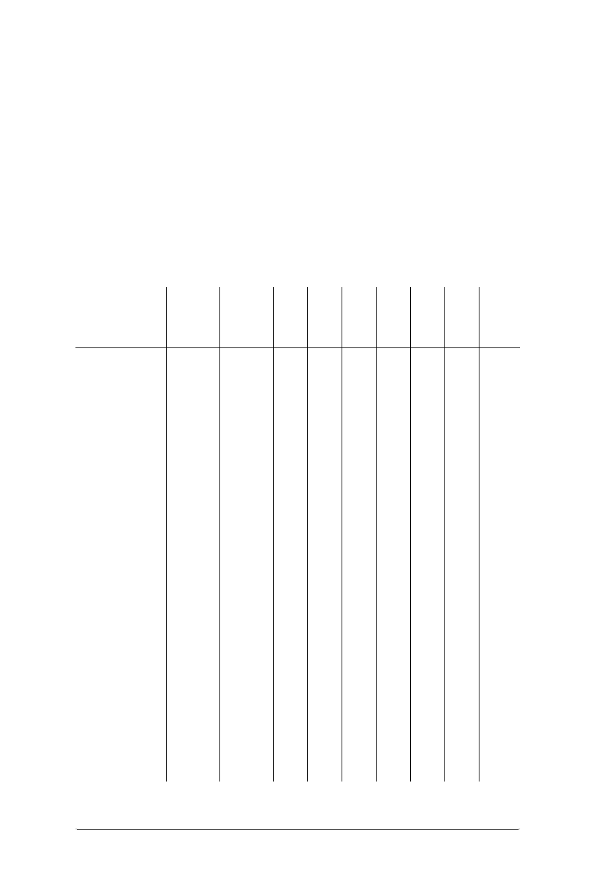
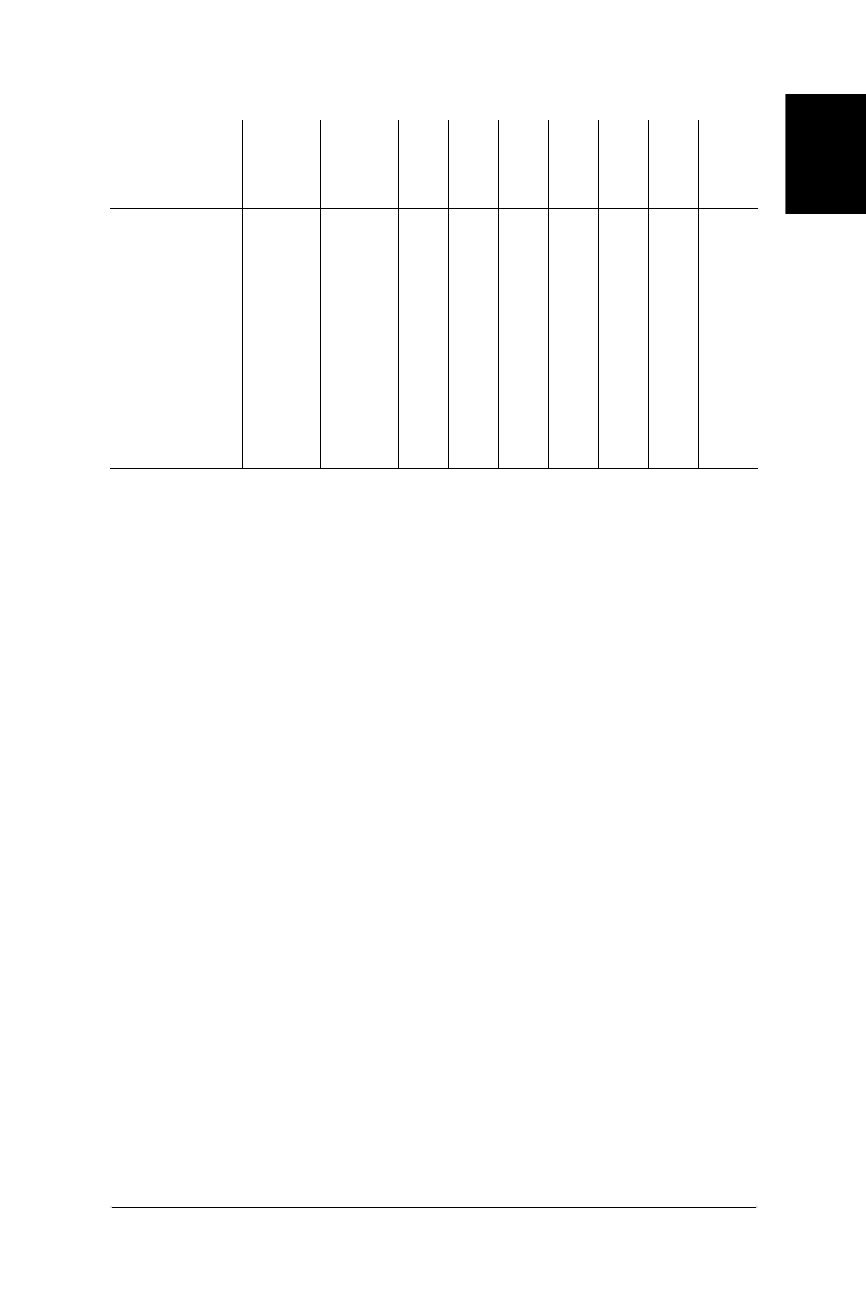
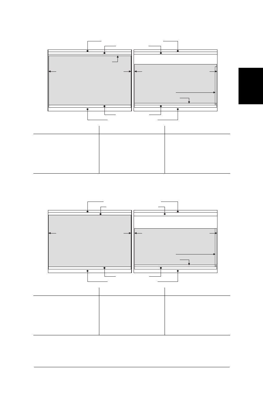
The following tables show the minimum (when all browser menus, toolbars, and
scrollbars are turned on) and maximum (when they are turned off) live areas for
the browsers on both Windows 95 and Macintosh. Absolute pixel values for
different monitor resolutions are given. Live areas are shaded gray in the images.
Monitor Color Issues
Monitors also differ in the number of colors they are able to display, if they display
colors at all. This is another aspect of the final display that may influence design
decisions. Monitors typically display either 24-bit (approximately 17 million
colors), 16-bit (approximately 65,000 colors), or 8-bit color (256 colors). Colors
taken from the “true” 24-bit color space will dither (display with a speckled
pattern) when rendered by browsers on 8-bit monitors.
However, there is a set of 216 colors, made up from the cross-section of the Mac
and Windows system palettes, that will not dither on Mac and Windows 8-bit
displays. This set of colors is known as the Web Palette, among other names.
Many designers choose to design web graphics and HTML elements using colors
from this palette so the pages look the same for all users. The Web Palette is
discussed thoroughly in Chapter 3, and Chapter 17, Designing Graphics with the
Web Palette.
If you are concerned about users with grayscale or black and white displays, be
sure to design high-contrast graphics. When colors are converted to grayscale
values (or dithered with black and white pixels), only the brightness of the colors
matters. Imagine setting purple text on a teal background; although the colors are
Dealing with Unknown Monitor Resolutions 17
A Variety of
Displays
Dealing with Unknown Monitor Resolutions
Web Design in a Nutshell, eMatter Edition
Copyright © 2000 O’Reilly & Associates, Inc. All rights reserved.
Table 2-2: Live area in Netscape Navigator 4.0 on Windows 95
Monitor Resolution Minimum Live Space Maximum Live Space
640 ×480 623 ×278 635 ×380
800 ×600 783 ×430 795 ×500
1024 ×768 1007 ×598 1019 ×668
1152 ×870 1135 ×700 1147 ×770
1280 ×1024 1263 ×854 1275 ×924
Table 2-3: Live Area in Internet Explorer 4.0 on Windows 95
Monitor Resolution Minimum Live Space Maximum Live Space
640 ×480 623 ×278 635 ×380
800 ×600 783 ×398 795 ×500
1024 ×768 1007 ×566 1019 ×668
1152 ×870 1135 ×668 1147 ×770
1280 ×1024 1263 ×822 1275 ×924
closed buttons = 14 px
right edge = 3 pxleft edge = 2 px
Maximum Live Space
right edge = 3 px
Netscape Navigator Title Bar (18 pixels)
left edge = 2 px
Minimum Live Space
vertical scrollbar = 12 px
horizontal scrollbar = 12 px
Menu Bar (20 pixels)
Status Bar (21 pixels)
Windows 95 Controls (27 pixels)
Buttons, Location (72 pixels)
right edge = 3 pxleft edge = 2 px
Maximum Live Space
right edge = 3 px
Internet Explorer Title Bar (18 pixels)
left edge = 2 px
Minimum Live Space
vertical scrollbar = 12 px
horizontal scrollbar = 12 px
(26 pixels) Menu Bar (32 pixels)
Status Bar (23 pixels)
Windows 95 Controls (27 pixels)
Buttons, Address, Links (96 pixels)
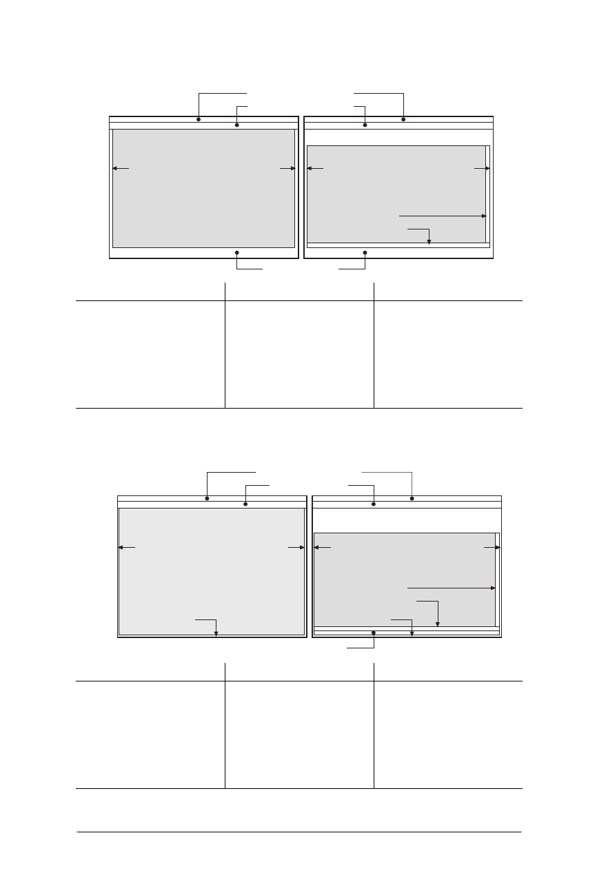
18 Chapter 2 – Designing for a Variety of Displays
Dealing with Unknown Monitor Resolutions
Web Design in a Nutshell, eMatter Edition
Copyright © 2000 O’Reilly & Associates, Inc. All rights reserved.
Table 2-4: Live area in Netscape Navigator 4.0 on Macintosh
Monitor Resolution Minimum Live Space Maximum Live Space
640 ×480 602 ×313 617 ×402
832 ×624 794 ×457 809 ×546
1024 ×768 986 ×601 1001 ×601
1152 ×870 1114 ×703 1129 ×792
1280 ×960 1242 ×793 1257 ×882
1280 ×1024 1242 ×857 1257 ×946
Table 2-5: Internet Explorer 4.0 on Macintosh
Monitor Resolution Minimum Live Space Maximum Live Space
640 ×480 612 ×315 627 ×431
832 ×624 804 ×459 819 ×575
1024 ×768 996 ×603 1011 ×719
1152 ×870 1124 ×705 1139 ×821
1280 ×960 1252 ×795 1267 ×911
1280 ×1024 1252 ×859 1267 ×975
right edge = 12 pxleft edge = 11 pxright edge = 12 pxleft edge = 11 px
Maximum Live Space
Apple OS8.x Menu (20 pixels)
Minimum Live Space
vertical scrollbar = 15 px
horizontal scrollbar = 15 px
Navigator Title Bar (22 pixels)
Status Bar (36 pixels)
Buttons (text & icons), Location (74 pixels)
right edge = 7 pxleft edge = 6 pxright edge = 7 pxleft edge = 6 px
Maximum Live Space
Apple OS8.x Menu (20 pixels)
Minimum Live Space
vertical scrollbar = 12 px
horizontal scrollbar = 12 px
IE Title Bar (22 pixels)
Status Bar (15 pixels)
Buttons (text & icons), Address, Favorites (86 pixels)
bottom edge = 7 pxbottom edge = 7 px

Fixed versus Flexible Web Page Design 19
A Variety of
Displays
Fixed versus Flexible Web Page Design
Web Design in a Nutshell, eMatter Edition
Copyright © 2000 O’Reilly & Associates, Inc. All rights reserved.
of contrasting hues, they are close enough in overall brightness that the text will
be illegible when the colors are displayed on a grayscale monitor.
Monitors also vary in the brightness of their displays, known as the gamma value.
PC monitors tend to be much darker than Macintosh monitors, so colors that are
deep and rich when created on a Mac may look black when displayed on a PC.
Likewise, graphics created on a PC may look washed out when viewed on a Mac.
Gamma is discussed further in Chapter 3.
Fixed versus Flexible Web Page Design
Closely related to the issue of varying monitor resolutions is the question of
whether web pages should be designed to be flexible (resizing and adapting to
various window sizes) or fixed at a particular size, (giving the designer more
control of the page’s dimensions) There are very strong opinions on both sides.
Naturally, there are good reasons for and against each approach.
You may find that you choose a fixed structure for some sites and allow others to
be flexible. You may find that you have strong convictions that one or the other
approach is the only way to go. Either way, it is useful to be familiar with the
whole picture and the current opinions of professional web designers. This section
attempts to present a balanced overview of the possibilities and the pitfalls.
Flexible Design
Web pages are flexible by default. The text and elements in a straightforward
HTML file will flow into the browser window, filling all available space, regardless
of the monitor size. When the browser window is resized, the elements reflow to
adapt to the new dimensions. This is the inherent nature of the Web. Designers
who are initially traumatized by the unpredictability of where the page elements
land usually just learn to let go of some control over the page.
Many designers make a conscious decision to construct pages so they can with-
stand stretching and shrinking web windows. This approach comes with
advantages and disadvantages.
Advantages
• The reality is that web pages will be displayed on a variety of monitor resolu-
tions and conditions; keeping the page flexible allows it to be “customized”
for every display.
• The whole monitor space is filled, without the potentially awkward empty
space left over by many fixed-width designs.
• Designing flexible pages is closer to the spirit and the nature of the medium.
A “good” web page design by these standards is one that is functional to the
greatest number of users.
Disadvantages
• On large monitors, the text line length can get out of hand when the text fills
the width of the browser. Long lines of text are particularly uncomfortable to

20 Chapter 2 – Designing for a Variety of Displays
Fixed versus Flexible Web Page Design
Web Design in a Nutshell, eMatter Edition
Copyright © 2000 O’Reilly & Associates, Inc. All rights reserved.
read on a screen, so allowing the text to wrap the full width of the window or
frame risks poor reading conditions for some users.
• Elements float around on large monitors, making for a less coherent design
that may be more difficult to use. Likewise, in very small monitors, elements
get cramped together.
• The results of flexible design are unpredictable, and users will have varying
experiences of your page.
Creating flexible pages
As noted above, simple HTML files are flexible by default, so you don’t need to do
anything special to ensure flexibility. However, you can introduce structure to a
flexible document by using tables and frames.
Tables are often used to create columns of text and to divide the web page up
into logical sections. By using all relative (percentage) measurements for tables
and cells, the table resizes with the browser window; however, the columns and
elements remain proportional to one another. For instance, two columns with
widths of 25% and 75% always retain those proportions, regardless of the monitor
on which they are displayed. Sizing tables is discussed in Chapter 10, Tables.
Frames can also be used to add structure to a flexible design. They, too, can be
specified with percentage values or to automatically fill any remaining space in the
window. The contents within each frame will flow to fill the frame. are discussed
in Chapter 11, Frames.
Fixed Design
Those who require more control over the layout of a page may opt to design a
web page with a fixed width that will stay the same for all users, regardless of
their monitor size or how the window is resized. This approach to web design is
based on design principles learned in print, such as maintaining a constant grid,
the relationship of elements on the page, and comfortable line lengths.
Advantages
• The web page will look the same regardless of the monitor size. This is often
crucial for companies interested in presenting a consistent corporate image for
every visitor.
• Fixed-width pages and columns provide better control over line lengths.
Tables can be used to prevent line lengths from becoming too long when the
page is viewed on a large monitor.
Disadvantages
• If the available browser window is smaller than the grid for the page, parts of
the page will not be visible and may require horizontal scrolling to be viewed.
Horizontal scrolling is nearly universally considered to be a hindrance to ease
of use, so it should generally be avoided. One solution is to choose a page
size that will serve the most people, as discussed later in this section.

Fixed versus Flexible Web Page Design 21
A Variety of
Displays
Fixed versus Flexible Web Page Design
Web Design in a Nutshell, eMatter Edition
Copyright © 2000 O’Reilly & Associates, Inc. All rights reserved.
• It is still difficult to control type size in browsers (see Chapter 3 for more
information), so elements may still shift unpredictably as a result of larger or
smaller type than was used during the design process.
• Trying to absolutely control the display of a web page is bucking the
medium. The Web is not like print; it has its own peculiarities and strengths.
Advocates of the flexible design strategy will tell you that fixed web page
designs are out of place on the Web.
Creating fixed pages
Fixed web page designs are created by putting all the contents of the page in a
structural table with absolute measurements specified in pixels. Other tricks, such
as sized transparent graphics or Netscape’s proprietary <spacer> tag, may also be
used to maintain consistent element placement or to hold specific amounts of
white space on the page. The positioning elements in Cascading Style Sheets also
provide ways to set specific dimensions and placement of web page elements;
however, as of this writing they are not well supported by most browsers.
Some visual HTML authoring tools make it easy to create fixed-width designs. Most
notably, GoLive Cyberstudio (www.golive.com) actually lays out your page on a
grid as though it were a page-layout program, then automatically generates the
corresponding (and often complicated) table. Macromedia’s Dreamweaver
achieves fixed page layout via the absolute positioning functions of CSS.
Pop-up windows
Some web sites take advantage of the ultimate in fixed web page design by auto-
matically popping up a new window sized precisely for displaying the contents of
the page. The advantage is that all viewers, regardless of their monitor size, will be
certain to see the page in a browser window with the proper dimensions. It gives
the designer even more control over the presentation of the page.
This trick is achieved using JavaScript to launch a window with specific pixel
dimensions, so the obvious disadvantage is that it will not work for users without
JavaScript-enabled browsers. Furthermore, many users have a strong adverse reac-
tion to having new windows spontaneously opened for them. It takes control of
the presentation—and the entire desktop—away from the end user, which is unac-
ceptable to many web designers. Furthermore, because users have different font
settings, text will wrap or be cut off in unpredictable ways for some users. See
Chapter 22, Introduction to JavaScript, for a window-opening code example.
Combination Pages
Of course, web pages need not be all-fixed or all-flexible. It is certainly possible to
create pages that are a combination of the two.
One common technique is to create a fixed page layout using a table, but then to
center the table on the page so it is more balanced when displayed on large moni-
tors (avoiding the blank right screen effect). The drawback to this technique is that
the table can no longer be precisely placed over a background image. Many sites
use a band of color in the background image to reinforce the columns in a fixed

22 Chapter 2 – Designing for a Variety of Displays
Fixed versus Flexible Web Page Design
Web Design in a Nutshell, eMatter Edition
Copyright © 2000 O’Reilly & Associates, Inc. All rights reserved.
page design, but unfortunately, the background image remains in the same place
even when the table is allowed to reposition itself on the screen.
Another approach is to use a table or frameset that consists of a combination of
absolute and relative sized columns (or frames) measurements. In this way, when
the window is resized, one column or frame remains the same width while the rest
resizes and reflows to fill the new available space. These techniques are outlined
in Chapter 10 and Chapter 11.
Choosing a Page Size
Obviously, if you decide to design a fixed web page you need to make a decision
about which screen size you want it to fit. Design common sense dictates that the
page should be accessible (and display properly) to the greatest number of
people. The idea is to find the most common monitor resolution and design pages
that safely fill its live space.
640×480 versus 800×600
Although finding the most common monitor resolution sounds fairly simple, there
is currently some controversy over which resolution is the most common. Over the
last few years, the most commonly sized PC monitor has increased from 14" to 17".
Some surveys show that the majority of users do have 17" monitors, which leads
some designers to strongly believe that it is perfectly “safe” to design web pages
that fill the 800×600 resolution live space.
Other designers disagree, maintaining that you should take into consideration the
millions of 640×480 monitors still in use (particularly by schools, households, or
other institutions without the budget to upgrade). Despite the fact that most
computers are shipped with 17" monitors, they still display 640×480 pixels by
default upon installation, and many users do not know that they can increase the
resolution.
The conventional wisdom
As of this writing, the majority of web designers advise that it is still safest to
design for 640×480 to prevent users from having to scroll horizontally to view a
wider design. Horizontal scrolling is detrimental to the ease of use of a page, so
designers draw the line conservatively to avoid it. According to the live space
charts above, that means making graphics and tables no wider than 600 pixels.
This has the added benefit of keeping text lines at comfortable lengths for reading
on the screen.
A growing number of designers declare 800×600 to be the “standard”; however,
they are still the minority. Very few design specifically for resolutions higher than
that. A few continue to design for display sizes smaller than 640×480.
Of course, your design decision should be guided by the audience for which you
are designing. For instance, if you are providing a site of resources for graphic
designers, you might reasonably expect that they will have 800×600 resolution
monitors and higher and design your pages accordingly. If you are designing a site

Accessibility 23
A Variety of
Displays
Accessibility
Web Design in a Nutshell, eMatter Edition
Copyright © 2000 O’Reilly & Associates, Inc. All rights reserved.
especially for WebTV or some other display device, you should follow the appro-
priate guidelines for those devices.
And as always, test your designs in as many monitor configurations as you can get
your hands on to see how your page holds up under diverse conditions.
Designing “Above the Fold”
Newspaper editors have always designed the front page with the most important
elements “above the fold,” that is, visible when the paper is folded and sitting in
the rack.
Likewise, the first screenful of a web site’s homepage is the most important real
estate of the whole site, regardless of whether the page is fixed or flexible. It is
here that the user makes the decision to continue exploring the site or to hit the
“Back” button and move along. Web designers have adopted the term “above the
fold” to apply to the contents that fit in that important first screen. Curiously, my
personal experience shows that users tend not to scroll beyond the first page,
even when the vertical scrollbar is visible. That places the burden of enticing them
to stay on the first screen.
As discussed throughout this chapter, a “screenful” can be quite different
depending on the resolution of the monitor. To play it absolutely safe, consider
the space available for the lowest common denominator 640×480 monitor—
approximately 600×300 pixels. That’s not a lot of space!
Some elements you should consider placing above the fold include:
• The name of the site.
• Your primary marketing message.
• Some indication of what the site is about. For instance, if it is a shopping site,
you might place the credit card logos or shopping cart in the top corner to
instantly communicate that “shopping happens here.”
• Navigation to other parts of the site. If the entire navigation device will not fit
(such as a list of links down the left edge of the page), at least get it started in
the first screenful; hopefully users will scroll to see the remainder. If it is out
of sight completely, it is that much more likely to be missed.
• Any other information that is crucial for visitors to the site, such as a toll-free
number or a special promotion.
Accessibility
Responsible web design includes making pages accessible even to users with
disabilities, such as hearing or sight impairments. The World Wide Web Consor-
tium (W3C) has launched its Web Accessibility Initiative (WAI), which aims to
make the Web more universally accessible. The WAI develops technologies, HTML
authoring guidelines and tools, and also promotes education and research. The
success of the initiative, however, relies on the participation of web developers to
build sites according to the proposed guidelines.

24 Chapter 2 – Designing for a Variety of Displays
Accessibility
Web Design in a Nutshell, eMatter Edition
Copyright © 2000 O’Reilly & Associates, Inc. All rights reserved.
Sight-impaired users may simply use a device that magnifies the screen for easier
reading, in which case there are no special design requirements. Many vision-
impaired users use a text browser (such as Lynx) in conjunction with software that
reads the contents of the screen aloud. Some use devices that translate the text
into Braille. Either way, there is a greater reliance on the structure and the text
within the document. Content in graphics may be completely lost.
Designing Accessible Pages
The following list presents a few simple measures you can take to make your
pages more accessible.
• Provide alternative text for all images (via the <img> tag’s alt attribute).
Make the alternative text rich and meaningful. Adding alt text should be
standard procedure for all web page creation; in fact, in the new HTML 4.0
specification, the alt attribute is now a required part of the <img> tag. (See
Chapter 9, Adding Images and Other Page Elements, for more information.)
• Add periods at the end of alt text so a speech device can locate the logical
end of the phrase.
• When linking a graphic, provide a caption under it that also serves as a text
link.
• Always provide text link alternatives for imagemaps.
• Offer a text-only version of the whole site from the home page.
• Provide transcripts or descriptions of audio clips to make that content accessi-
ble to those with hearing impairments.
• Use caution in relying on PDF (Adobe’s Portable Document Format) to deliver
information. If you are using PDF files, provide an HTML alternative. You may
also provide a link to Adobe’s site where users can download software tools
that convert PDF files to text format for delivery by nonvisual browsers (http://
access.adobe.com).
• Provide alternative mechanisms for online forms, such as a text-based order
form or a phone number for personal assistance.
• Avoid the <blink> tag, which is said to wreak havoc with Braille and speech
displays.
• Be sure content in tables makes sense when read sequentially in the HTML
source.
• Be aware that misuse of HTML structural tags for presentation purposes (such
as using the <blockquote> tag purely to achieve indents) hinders clear com-
munication via a speech or Braille device.
For a thorough list of guidelines for accessible HTML authoring, visit the W3C’s
recommendations and checklist at http://www.w3.org/TR/WD-WAI-PAGEAUTH.
If you would like to check how accessible your web page is, try running it
through a validator, such as Bobby (http://www.cast.org/bobby/), that will scan
your page and point out accessibility issues.

Accessibility 25
A Variety of
Displays
Accessibility
Web Design in a Nutshell, eMatter Edition
Copyright © 2000 O’Reilly & Associates, Inc. All rights reserved.
HTML 4.0 Accessibility Features
The HTML 4.0 specification incorporates a number of new attributes and tags
aimed specifically at making Web documents available to a broader audience. This
section lists only a broad summary of accessibility features in HTML 4.0. For a
more detailed listing, see the Web Accessibility Initiative’s review at http://www.
w3.org/WAI/References/HTML4-access. Or, tackle the HTML 4.0 Specification your-
self at http://www.w3.org/TR/REC-html40/. Accessibility features of the Spec
include:
• Increased distinction between document structure and presentation. HTML 4.0
encourages the use of Cascading Style Sheets for stylistic information.
• Navigational aids such as access keys and tab index for keyboard-only access
to page elements.
• A new client-side imagemap recommendation that integrates image and text
links.
• Introduction of the <abbr> and <acronym> tags, which assist speech devices
and other agents in the interpretation of abbreviations and acronyms.
• The ability to group table columns and rows logically and to provide cap-
tions, summaries, and long descriptions of table contents, thus making the
table interpretation easier.
• The ability to group form controls and make long lists of choices easier to
comprehend. Form elements are also accessible via tabbing and access keys.
• Improved mechanisms for providing alternative text. The alt attribute is now
required in the <img> tag. The longdesc attribute has been introduced to
provide a link to longer text explanations of images. The title attribute can
be added to provide additional information to any element.
CSS2 Accessibility Features
The latest Cascading Style Sheets recommendation, CSS2, also provides mecha-
nisms for improved interpretation by nongraphical and nonvisual devices. The
following is just a summary of features. For more information, read the WAI’s
review at http://www.w3.org/WAI/References/CSS2-access or look at the CSS2
Recommendation directly at http://www.w3.org/TR/REC-CSS2. Improvements
include:
• Mechanisms by which a user-created style sheet can override all the higher
style sheets in the cascade, giving the end user ultimate control over display.
The user can create a custom style sheet for displaying pages according to
special needs.
• Specific support for downloadable fonts—eliminating the tendency to put text
in graphics to improve the appearance of the page.
• Positioning and alignment mechanisms that further separate content from pre-
sentation. These style sheet rules aim to eliminate the abuse of HTML tags in
order to achieve special presentation effects. The HTML tags can be used for
the logical structuring of the document, making them more easily interpreted
by nonvisual agents.

26 Chapter 2 – Designing for a Variety of Displays
Alternative Displays
Web Design in a Nutshell, eMatter Edition
Copyright © 2000 O’Reilly & Associates, Inc. All rights reserved.
• A set of controls for the audio rendering of web-delivered information.
• Improved navigation devices such as the ability to add numbered markers
throughout a document for orientation purposes.
Where to Learn More
The following resources will help you get started designing accessible pages:
The Web Accessibility Initiative (W3C)
http://www.w3.org/WAI/
This is the official site of the WAI. It is a good starting point for exploration as
it contains a number of excellent links to accessibility-related resources.
Webable! (from the Yuri Rubinsky Insight Foundation)
http://www.yuri.org/webable/
This is an excellent resource of articles and HTML authoring guidelines. It is
the web-specific arm of the Yuri Rubinsky Insight Foundation, which aims to
increase access to technology for people with disabilities.
Alternative Displays
The Web isn’t just for personal computers anymore! Web browsers are increas-
ingly making their way into our living rooms, briefcases, and cars, in the form of
WebTV, handheld PDA devices, and even cellular phones. These extra-small
displays introduce new design concerns.
WebTV
WebTV, a device that turns an ordinary television and phone line into a web
browser, hit the market in 1996 and is experiencing a slow but steady growth in
market share. As of this writing, it is barely a blip on the radar screen of overall
browser usage, but because numbers are increasing some developers are taking its
special requirements into consideration. Some sites are being developed specifi-
cally for WebTV.
WebTV uses a television rather than a monitor as a display device. The live space
in the WebTV browser is a scant 544×378 pixels. The browser permits vertical
paging down, but not horizontal scrolling, so wider graphics will be partially
obscured and inaccessible. Principles for designing legible television graphics
apply, such as the use of light text on dark backgrounds rather than vice versa and
the avoidance of any elements less than 2 pixels in width.
WebTV publishes a site with guidelines for web developers called Primetime. For
more detailed information on the special requirements of WebTV, visit http://www.
webtv.net/primetime/.
Hand-Held Devices
The increased popularity and usefulness of the Web combined with the growing
reliance on hand-held communications devices such as palm-top computers,

Alternative Displays 27
A Variety of
Displays
Alternative Displays
Web Design in a Nutshell, eMatter Edition
Copyright © 2000 O’Reilly & Associates, Inc. All rights reserved.
PDAs, and cellular telephones has resulted in Web browsers squeezing into the
coziest of spaces.
Many of these devices use thin client browsers for web content display. A thin
client is one that runs with minimal processing requirements on the client side,
leaving the bulk of the work to be done by the server.
For instance, HitchHiker is a web browser utility designed to run in the approxi-
mately 2-inch square monochrome display of a cellphone. The ProxiWeb browser
is another thin client that brings web access to the popular PalmPilot PDA (as well
as to the IBM WorkPad and the new Palm III). It works by use of a proxy server
that processes web pages for delivery to the handheld device. ProxiWeb even
converts graphics to tiny monochrome bitmaps, so some of the original character
of the page is maintained (most useful for headlines in graphics). To learn more
about ProxiWeb, visit http://www.proxinet.com/.
Not many sites are designed specifically for hand-held devices, but as their popu-
larity expands, it will be a more important audience to consider. For the most part,
guidelines for making sites accessible to text browsers such as Lynx, including the
tips for accessibility listed above, will also apply to making information usable in
the limited display area of handheld devices.

28
Web Design in a Nutshell, eMatter Edition
Copyright © 2000 O’Reilly & Associates, Inc. All rights reserved.
Chapter 3Web Design Principles
CHAPTER 3
Web Design Principles
for Print Designers
If you are accustomed to designing for print, the Web introduces a number of new
concepts and new ways of doing things. Part of what makes web design unique is
that the pages are displayed on a computer monitor, not paper, requiring famil-
iarity with new color models. In addition, you need to work within the unique
environment of the web browser. The HTML markup language brings its own limi-
tations to the mix.
This chapter discusses some basic web design concepts, which may be new for
print designers or for anyone who is just getting started in web design. It provides
necessary background information about the web environment, including how the
browsers deal with color, graphics, and typography, so that you can make design
decisions that are appropriate to the medium.
Color on the Web
The Web requires designers to think about color in new ways. In part, it means
understanding color in a more technical manner—the appearance of a page can
benefit greatly if a designer knows what’s going on “under the hood.” The pecu-
liarities of working with color in web design are functions of the following simple
principles:
•Monitors. Web pages are displayed on computer monitors, therefore the basic
rules of how computers and monitors handle color apply to web pages as
well.
•Browsers. Because browsers have built-in resources for rendering color when
running on systems with limited color display capacity, they can alter the
appearance of the colors in your pages.
•HTML. Colors on a web page that are not part of a graphic (for example,
background and text colors) need to be properly identified in the HTML tags

Color on the Web 29
Web Design
Principles
Color on the Web
Web Design in a Nutshell, eMatter Edition
Copyright © 2000 O’Reilly & Associates, Inc. All rights reserved.
of the document. Specifying color in HTML is covered in Chapter 5, HTML
Overview.
Color on Computer Monitors
Color on monitors is made of light, so traditional systems for specifying color for
print (CMYK, Pantone swatches, etc.) do not apply.
RGB color
Computer monitors display colors by combining red, green, and blue light. This
color system is known as RGB color.
RGB color is a 24-bit system, with eight bits of data devoted to each of three color
channels. Eight bits of data can describe 256 colors. With 256 possible colors in
each of the three channels, the total possible number of colors is calculated by
multiplying 256×256×256 for a total of 16,777,216. That’s more than enough colors
to provide stunning representations of artwork and photography.
The problem is that only a small percentage of computers in the world are
equipped to display 24-bit color. Many, many more support only 8-bit color; these
systems can display only 256 colors at any one time. The good news is that, by
using a color palette, 8-bit computers can change which 256 colors to display at
any one time.
Color Issues on 16-Bit Displays
A phenomenon occurs on 16-bit displays that may cause the colors in your
web pages to shift and dither. This includes colors that are “web-safe” on 8-
bit displays.
The effect is most noticeable for pages with graphics that are intended to
blend seamlessly with a tiled background graphic or specified background
color. Despite the fact that the foreground and background elements may
have numerically identical RGB values, on 16-bit displays, colors shift and
dither in a way that causes the “seams” to be slightly visible. The same page
will display perfectly well and without seams on 8-bit and 24-bit monitors.
Which elements shift and which get dithered seems to depend on the
browser and operating system combination, so it’s difficult to anticipate. If
the mismatched colors concern you, making the edges of your graphics
transparent instead of a matching color may help eliminate the dithered rect-
angles on 16-bit displays.
The effect is probably due to the way 24-bit colors are approximated by 16-
bit displays using only 65,536 available colors. We welcome more informa-
tion on why this phenomenon occurs and whether anything can be done to
compensate for it. Send submissions to the contact information listed in the
Preface of this book.

30 Chapter 3 – Web Design Principles for Print Designers
Color on the Web
Web Design in a Nutshell, eMatter Edition
Copyright © 2000 O’Reilly & Associates, Inc. All rights reserved.
For system-level operations, computers use a specific set of 256 colors called the
system palette. Macs and PCs use a slightly different set of 256 colors in their
system palettes. But specific applications may specify a different palette; for
instance, browsers use their own palette, which is substantially different than the
Windows system palette (although it’s quite similar to the Mac system palette.)
Although all colors on computer monitors are made up of combinations of red,
green, and blue light, there are actually a number of numerical systems for identi-
fying colors, including RGB (red, green, and blue values), Lab (lightness, a
channel and b channel), and HSB (hue, saturation, brightness).
For purposes of web design, colors are referred to by their numerical RGB values,
on a scale from 0 to 255. For instance, the RGB values for a particular dark orange
color are R:198, G:83, B:52.
Gamma
Gamma refers to the overall brightness of a computer monitor’s display. In more
technical terms, it is a numerical adjustment for the nonlinear relationship of
voltage to light intensity—but feel free to think of it as brightness. The default
gamma setting varies from platform to platform. Images created on a Macintosh
will generally look a lot darker when viewed on a PC or Unix terminal. Images
created on a PC will generally look washed out when seen on a Mac. The higher
the gamma value, the darker the display. Table 3-1 shows the standard gamma
settings for the major platforms.
One strategy for designing graphics that look acceptable on all platforms is to cali-
brate your own monitor to a gamma setting of 2.2, a value that is between
Macintosh’s 1.8 and the PC’s 2.5. Bear in mind that your images will look a bit
lighter on most Macs and a bit darker on most PCs and Unix terminals than they
appear on your screen, but the jump won’t be as drastic as going from one plat-
form to another.
Color in Browsers (The Web Palette)
An interesting problem arises when colors from the full 24-bit color space need to
be displayed on an 8-bit display. Rather than relying on the computer’s system
palette, browsers reduce and remap colors to their own built-in palette. This is a
great benefit to web designers because it guarantees that images will look more or
less the same on all 8-bit systems. If images were mapped to the various system
palettes, they would look quite different on different platforms. (Note that if the
browser is running on a 24-bit display, the palette does not come into effect and
all colors will be displayed accurately.)
Table 3-1: Common Default Gamma Settings
Platform Gamma
Macintosh 1.8
PC 2.5
Unix 2.3-2.5
Color on the Web 31
Web Design
Principles
Color on the Web
Web Design in a Nutshell, eMatter Edition
Copyright © 2000 O’Reilly & Associates, Inc. All rights reserved.
This Web Palette consists of the 216 colors shared by the Macintosh and PC system
palettes; therefore colors chosen from the Web Palette will render accurately on
Mac or PC displays. The Web Palette was optimized for Macs and PCs; Unix
machines use a different color model for their system palette, therefore “web-safe”
colors may shift or dither when viewed on Unix terminals.
The Web Palette is also known as the Netscape Palette, Netscape 216, Browser-
Safe Palette, Web-Safe Palette, Non-dithering Palette, and the 6×6×6 cube. The
Web Palette is displayed on the web pages for this book at http://www.oreilly.com/
catalog/wdnut/.
The Web Palette in numbers
An important way to look at the Web Palette is by its numerical values. The Web
Palette recognizes six shades of red, six shades of green, and six shades of blue,
resulting in 216 possible color values (6×6×6 = 216). This is sometimes referred to
as the 6×6×6 color cube. Figure 3-1 shows the cubic nature of this palette.
There are three systems used for defining RGB values. Which one you use
depends on the requirements of your software.
Decimal
Most image editing software displays the RGB value of a color in decimal
values, ranging from 0 to 255. A color’s decimal RGB value might be 51-51-
255, meaning the red value is 51, the green value is 51, and the blue value is
255. Note that these numbers specify one of 256 possible values for each
channel; they are not percentage values. Web-safe colors are multiples of 51.
Hexadecimal
HTML and many programming languages require that RGB numbers be speci-
fied in the hexadecimal numbering system. Hexadecimal is a base-16 system
Figure 3-1: The 6×6×6 Color Cube of the Web Palette
Red
(255,0,0)
Green
(0,255,0)
Blue
(0,0,255)
Black
(0,0,0)
White
(255,255,255)

32 Chapter 3 – Web Design Principles for Print Designers
Color on the Web
Web Design in a Nutshell, eMatter Edition
Copyright © 2000 O’Reilly & Associates, Inc. All rights reserved.
that requires only six characters to describe an RGB color. The hexadecimal
equivalent of 51-51-255 is 3333FF.
Percentage
The Apple Color Picker specifies colors in percentages, not absolute RGB
decimal values. For Macintosh programs that rely on the Apple Color Picker
(such as Claris HomePage and Adobe PageMill), you’ll need to be able to
convert percentage values to true decimal values. The percentage value equiv-
alent of 51-51-255 is 20%-20%-100%.
Table 3-2 shows the decimal, hexadecimal, and percentage values for each of the
six component values in the Web Palette.
Reducing to the Web Palette
Colors on a web page are forced to adapt to the browser’s Web Palette. The only
way to ensure that all users will see your colors as you intend them is to use web-
safe colors when you design the page. (See “Designing with the Web Palette” in
this chapter.)
Colors in Images
Browsers attempt to approximate the colors in an image by dithering, mixing
pixels of similar colors available in the palette. For photographic images, the
effects of dithering are usually not detrimental (and in some cases may be
beneficial). However, in areas of flat color (such as in a logo or line-art illus-
tration), the random dot pattern caused by dithering may be undesirable.
Chapter 17, Designing Graphics with the Web Palette, discusses techniques
and tools for applying the palette to graphics during the design and produc-
tion process.
Colors in the HTML document
Colors specified in the HTML document, such as background and text colors,
will usually be replaced by the nearest available Web Palette color (Internet
Explorer may dither background colors). This effect is called color shifting
and it can result in a large discrepancy between how a color (as defined by its
RGB values) is rendered on a 24-bit display versus an 8-bit display.
Designing with the Web Palette
While the Web Palette can lead to unpredictable and undesirable effects such as
dithering or color shifting on 8-bit monitors, you can also use it to your advan-
Table 3-2: Numerical Values for Web Palette Colors
Decimal Hexadecimal Percentage
0 (darkest) 00 0%
51 33 20%
102 66 40%
153 99 60%
204 CC 80%
255 (lightest) FF 100%

Color on the Web 33
Web Design
Principles
Color on the Web
Web Design in a Nutshell, eMatter Edition
Copyright © 2000 O’Reilly & Associates, Inc. All rights reserved.
tage. Because you know exactly which colors will render accurately on Macs and
PCs, you can use these colors exclusively when designing your graphics and
HTML pages and beat the browser to the task. It requires a little extra effort, but
the advantage is that you’ll be able to predict what the pages will look like for all
users. Using web-safe colors in graphics production is discussed in Chapter 17.
If you choose to add color to the background and text on your web pages,
chances are you’ll need to do some experimenting with color to get the combina-
tions just right. There are a number of tools and options for selecting web-safe
colors and incorporating them into your designs.
Web authoring tools
Many WYSIWYG (What You See Is What You Get) web authoring tools (including
Macromedia’s Dreamweaver, GoLive Cyberstudio, and Claris HomePage 3.0), allow
you to choose from swatches of web-safe colors when applying color to text and
backgrounds. You can see the results of your choices immediately in the applica-
tion window or when previewed in a browser. These tools will automatically
generate all the necessary HTML code for you.
Photoshop swatches
If you do not have a web-authoring application, you can experiment with colors in
a Photoshop file by loading the web-safe colors into the Swatches palette (see
Chapter 17 for instructions on creating a Web Palette CLUT file). Using the
eyedropper tool, you can then be sure that the colors you select for backgrounds
and text are web-safe. You need to note the RGB values for your final color selec-
tions, then convert them to their hexadecimal equivalents for insertion into the
HTML color attribute tags in your document.
Online design utilities
There are a number of utilities online that allow you to choose color combina-
tions from the Web Palette and see a sample page with your chosen colors
immediately.
ColorMaker (by Sam Choukri)
http://www.bagism.com/colormaker/
This page allows you to set page elements to web-safe colors and automati-
cally displays your color choices in a separate window. It also generates the
HTML code for the colors, which you can copy into your document. This tool
requires a Java-enabled browser and prefers Netscape Navigator 4.0 or
Internet Explorer 4.0.
NED’s DynaColor!
http://www.nedesign.com/COLOR/
This is another tool for experimenting with background and text color combi-
nations. You enter your RGB values in either decimal or hex format, and
DynaColor! generates a sample page. You can choose to have your color
selections shifted to the nearest web-safe color.

34 Chapter 3 – Web Design Principles for Print Designers
Graphics on the Web
Web Design in a Nutshell, eMatter Edition
Copyright © 2000 O’Reilly & Associates, Inc. All rights reserved.
System Colors in Web Pages
If an 8-bit display allows 256 colors, and there are 216 colors in the browser’s Web
Palette, you may be wondering what happens to the other 40 colors. Normally, the
browser allows colors from the user’s system palette to fill in the extra 40 color
slots. These extra colors can go a long way in smoothing out colors that can’t be
recreated accurately using Web Palette colors alone. This is particularly true for
grayscale images, which are difficult to reproduce using only the four web-safe
gray tones in the Web Palette.
There is a bug in Netscape 4.0 on the Macintosh that prevents system colors from
seeping in to help render images on web pages. This version of the Netscape
browser maps everything strictly to the Web Palette, resulting in inferior image
quality. This is most noticeable in grayscale images, which shift to the Web
Palette’s yellow-green and lavender shades in an attempt to display the image
accurately. This bug only affects Macintosh users with 8-bit displays using
Netscape 4.0 (probably a very small percentage of your audience). For more infor-
mation on this issue, see http://www.artware.de/nc4petition/.
Graphics on the Web
Print designers will need to adapt their graphics production skills for the Web to
take into account the peculiarities of graphics that are distributed over a network
and displayed on computer monitors.
Graphic File Formats
As of this writing, nearly all of the graphics that you see on the Web are in one of
two formats: GIF and JPEG. A third worthy contender, the PNG file, is struggling
for browser support and attention. What follows is a very brief introduction to the
“big three” of online graphic formats. More detailed descriptions are provided in
the chapters dedicated to each format.
The ubiquitous GIF
The GIF (Graphic Interchange Format) file format is the traditional darling of the
Web. It was the first file format to be supported by web browsers and it continues
to be the format for the vast majority of graphics on the Web today.
GIFs are indexed color files with a maximum 8-bit palette capacity, which means
that a GIF can contain a maximum of 256 pixel colors. Because they compress
color information by rows of pixels, GIF files are most appropriate for graphics
that contain areas of flat color.
See Chapter 14, GIF Format, for complete information on the GIF file format.
The handy JPEG
The second most popular graphics format on the Web today is the JPEG (Joint
Photographic Experts Group) format. JPEGs contain 24-bit color information—
that’s millions of colors, as opposed to GIF’s 256. They use what is called a “lossy”
compression scheme, which means that some image information is thrown out in

Graphics on the Web 35
Web Design
Principles
Graphics on the Web
Web Design in a Nutshell, eMatter Edition
Copyright © 2000 O’Reilly & Associates, Inc. All rights reserved.
the compression process, but in most cases, the degradation of the image is not
detrimental or even noticeable.
Photographic images, or any image with subtle gradations of color, are best saved
as JPEG files because they offer better image quality packed into a smaller file.
JPEGs, however, are not a good solution for flat, graphical images because they
tend to mottle colors and the resulting file will generally be a lot larger than the
same image saved as a GIF.
See Chapter 15, JPEG Format, for complete information on the JPEG file format.
The amazing PNG
There is a third graphic format vying for substantial usage on the Web—PNG
(Portable Network Graphic), which, despite some very attractive features has been
more or less lurking in the shadows since 1994. It is only recently that browsers
have begun supporting PNGs as inline graphics, but PNG is poised to become a
very popular web graphic format. For this reason, it is optimistically included here
in the “big three.”
PNGs can support 8-bit indexed color, 16-bit grayscale, or 24-bit true color images
with a “lossless” compression scheme, which means higher image quality, and in
some cases, file sizes even smaller than their GIF counterparts. Not only that, PNG
files have some nifty features such as built-in gamma control and variable transpar-
ency levels (which means now you can have a background pattern show through
a soft drop-shadow).
See Chapter 16, PNG Format, for complete information on the PNG file format.
Image Resolution
Simply put, all graphics on the Web need to be low-resolution—72ppi (pixels per
inch). Since web graphics are always displayed on low-resolution computer
screens, higher resolution files are unnecessary.
Working at such a low resolution can be quite an adjustment for a designer accus-
tomed to handling the 300ppi images appropriate for print. Most notably, the
image quality is lower because there is not as much image information in a given
space. This tends to make the image look more grainy or pixelated, and unfortu-
nately, that’s just the nature of images on the Web.
Measuring Resolution
Because web graphics exist solely on the screen, it is technically correct to
measure their resolution in pixels per inch (ppi). Another resolution
measurement, dpi (dots per inch), refers to the resolution of a printed
image, dependent on the resolution of the printing device.
In practice, the terms dpi and ppi are used interchangeably. It is generally
accepted practice to refer to web graphic resolution in terms of dpi.
36 Chapter 3 – Web Design Principles for Print Designers
Graphics on the Web
Web Design in a Nutshell, eMatter Edition
Copyright © 2000 O’Reilly & Associates, Inc. All rights reserved.
Image size
When a graphic is displayed on a web page, the pixels in the image map one-to-
one with the display resolution of the monitor. Although 72ppi is the standard,
bear in mind that monitor resolutions vary and can run much higher than 72ppi,
particularly on higher-end work stations.
A graphic that appears to be about one inch square on your 72ppi monitor may
actually appear to be quite a bit smaller on a monitor with a resolution of closer to
100. (See Figure 3-2.)
Good-bye inches, hello pixels
Because the actual dimensions of a graphic are dependent on the resolution of the
monitor, the whole notion of “inches” becomes irrelevant in the web environ-
ment. The only meaningful unit of measurement is the pixel.
It is a good practice to create your images at 72ppi (it puts you in the ballpark for
screen presentation), but to pay attention only to the overall pixel dimensions.
You can disregard inches entirely in the web graphics production process. After a
while, thinking in pixels comes quite naturally. What’s important is the size of the
graphic relevant to other graphics on that page and to the overall size of the
browser window.
For instance, I know that many users still have 14" monitors with resolutions of
640×480 pixels. To guarantee that my banner graphic will fit in the screen in its
entirety, I would make it no more than 600 pixels wide (taking into account some
pixels will be used on the left and right for the window and the scrollbar). The
size of the remaining buttons and images on my page will be measured in pixels
Figure 3-2: The size of an image is dependent on monitor resolution
72 ppi
Image appears
one inch by one inch
on 72 ppi monitor
100 ppi
Image appears
smaller on
100 ppi monitor
one inch
one inch
one inch
one inch
72 pixels
72 pixels

Graphics on the Web 37
Web Design
Principles
Graphics on the Web
Web Design in a Nutshell, eMatter Edition
Copyright © 2000 O’Reilly & Associates, Inc. All rights reserved.
relative to my 600-pixel-wide banner. For more information on designing for stan-
dard monitor resolutions, see Chapter 2, Designing for a Variety of Displays.
Be Aware of Gamma
The brightness of a monitor is a function of its gamma setting. The standard
gamma setting varies from platform to platform, so when you are creating graphics
for web pages, bear in mind that some users may be seeing your images much
lighter or darker than they appear to you. This can seriously affect the colors
you’ve chosen—the logo you’ve created in a lovely forest green on your Mac may
look pitch black when you view it on a PC.
In general, images created on a Macintosh will look darker when viewed on a PC
or Unix terminal. Images created on a PC will generally look washed out when
seen on a Mac. This phenomenon is another thing to keep in the back of your
mind when you are designing and producing web graphics.
Adjusting gamma with Adobe Photoshop
For the Mac. Adobe Photoshop comes with a Gamma control panel that affects the
gamma setting for the whole monitor. To use it:
1. Choose Apple ➝Control Panels ➝Gamma to open the Gamma control panel.
(If it is not there, drag it from the Photoshop ➝Goodies ➝Calibration folder
into the System Folder ➝ Control Panels folder.).
2. Turn the panel on using the switch in the lower-left corner.
3. Select 2.2 from the Target Gamma choices. You should see the effect of the
gamma change immediately. Close the Gamma control panel.
For Windows. For Windows, Photoshop offers gamma control only within the
Photoshop window (it does not affect the monitor globally, as on the Macintosh).
To use it:
1. Choose File ➝ Color Settings ➝ Monitor Setup
2. Type a gamma value of 2.2 in the Monitor Setup dialog box. Click OK.
3. You can preview the effects of the gamma setting by clicking Preview in the
Calibrate dialog box.
Previewing and adjusting gamma with Adobe ImageReady
ImageReady (a web graphics optimization tool from Adobe) has a function that
allows you to preview how your graphic will appear with the gamma setting of an
alternate operating system. It also allows you to adjust the gamma value (bright-
ness) of the image to make the image look acceptable for both platforms.
To preview the image, choose View ➝Windows Gamma/Mac Gamma. The image
brightness will adjust to simulate the gamma setting of the specified platform.
Choosing it again restores the image to its previous gamma value.
To automatically adjust the gamma in ImageReady:

38 Chapter 3 – Web Design Principles for Print Designers
Graphics on the Web
Web Design in a Nutshell, eMatter Edition
Copyright © 2000 O’Reilly & Associates, Inc. All rights reserved.
1. Choose Image ➝ Adjust ➝ Gamma.
2. Select Macintosh-to-Windows to adjust for Windows display, or select
Windows-to-Macintosh to adjust for Mac display.
3. Click OK.
You can also apply a manual gamma adjustment by moving the Gamma slider or
entering a value in the text box between 0.1 and 9.99.
Images created with Photoshop 4.0 need to have their gamma adjusted for display
in Windows because Photoshop 4.0 uses the Mac OS gamma value as its default.
Photoshop 5.0, however, uses the Windows gamma value as its default (even
when displayed in Mac OS), so graphics created in version 5.0 require no adjust-
ment for proper display in Windows.
Be Aware of File Size
It goes without saying that graphics have made the Web what it is today; however,
as a web designer, you should know that many users have a love/hate relation-
ship with graphics on the Web. Remember that graphics increase the time it takes
a web page to move across the network; large graphics mean substantial down-
load times, which can try the patience of the reader, particularly one dialing in on
a standard modem connection.
Here is the single most important guideline a web designer can follow: Keep the
file size of your graphics as small as possible! The nature of publishing over a
network creates a new responsibility for designers to be sensitive to the issue of
download times.
Detailed strategies for minimizing graphic file size for each file format appear in
Chapters 14 through 16 in Part III of this book.
Getting correct file sizes on a Macintosh
It is important for web designers to pay attention to file size, measured in bytes or
kilobytes (K). On Windows computers, the indication of file size that appears in
the directory listing is an accurate measure of the file’s actual size. The number the
Macintosh Finder shows, however, is almost always inaccurate. This is because of
how the Finder displays file sizes and how Macs encode files.
Partition sizes. For one thing, the file size listings in the Finder are measured in
even partition units or “blocks,” and the larger your hard drive the larger the
block. For instance, on a four-gigabyte hard drive, the smallest block size is 65K,
so even if a file contains only 1K of information, it will display as 65K in the
Finder.
You can use the Finder’s Get Info command to get an accurate reading of how
many bytes are actually in the file. To open the Get Info box, highlight the file
name in the Finder, then select File ➝Get Info, or use the Command-I keyboard
shortcut. The actual number of bytes appears in parentheses next to Size.
This is not the case for all Macintoshes, however. Macs with the newer HFS Plus
hard-disk formatting allow variable block sizes, which allow the Finder to indicate
Graphics on the Web 39
Web Design
Principles
Graphics on the Web
Web Design in a Nutshell, eMatter Edition
Copyright © 2000 O’Reilly & Associates, Inc. All rights reserved.
file sizes more accurately. Macs shipping with MacOS 8.1 or later may have HFS
Plus-formatted drives.
The resource fork. Macintosh files may contain extra Mac-specific code called the
resource fork, which is used for storing icons, previews, and file type information.
Only the actual data (the data fork) in the file is readable by other platforms, so
the resource fork should be stripped out when the file is uploaded to a server. The
size of the data fork is the only number you should consider, as it is the actual
number of bytes that will be downloaded by a browser.
Photoshop files. Photoshop usually saves files with an icon and thumbnail views of
the image stored in the resource fork. You can turn these off (saving just the data
fork) by unchecking the Icon and Thumbnail checkboxes under Image Previews
in the Preferences ➝File Saving dialog box. When you use the GIF89a Export
filter to create GIFs, only the data fork is saved, and its file size will be accurate in
the Get Info window.
Using Snitch. Unfortunately, there is no way, using the Mac Get Info box alone, to
tell how much of the file size is the resource fork and how much is the data fork.
Snitch 2.5 is a shareware utility that works like a beefed-up Get Info window.
When you select Dates & Sizes in the pop-up menu, Snitch shows you the actual
byte sizes of the data and resource forks, as shown in Figure 3-3.
Snitch, written by Mitch Jones, is available for download at http://www.niftyneato.
com (there is a $20 registration fee if you choose to continue using it). In addition
to Dates & Sizes it contains many useful tools for viewing and editing file type
information.
Figure 3-3: Snitch shows the data fork length and resource fork length of
Macintosh files

40 Chapter 3 – Web Design Principles for Print Designers
Graphics on the Web
Web Design in a Nutshell, eMatter Edition
Copyright © 2000 O’Reilly & Associates, Inc. All rights reserved.
Web Graphics Production Tips
The following is a collection of tips for maintaining quality in web graphics.
Work in RGB mode
When you are creating graphics for the Web, it is important to work in the RGB
color mode. Because graphics are converted to indexed color mode when saved
in the GIF format, you’ll often need to make corrections to indexed color images.
If you only need to crop an image or make an adjustment that doesn’t require the
addition of new colors (such as changing a pixel color to another color in the
existing palette), you can work directly in indexed color mode. However, if your
changes include resizing, or the addition of new or anti-aliased colors, it is impor-
tant to convert indexed color images back to RGB before making any changes to
the image.
When an image is in indexed color mode, the colors are restricted to those in its
defined Color Table and no new colors can be added. This prevents the color
blends and adjustments that occur when image elements are transformed (resized,
rotated, etc.) or when adding anti-aliased text. When the image is in indexed color
mode, any text you add will automatically have aliased (stair-stepped) edges.
The typical steps that should be taken when editing an image are:
1. Open the GIF in the image editing tool.
2. Change it to RGB color mode (in Photoshop, select Image ➝Mode ➝RGB
Color).
3. Edit the image as necessary.
4. Change it back to indexed color mode, setting the desired palette and bit-
depth.
5. Save or export to GIF format.
Resizing tips
The following tips pertain to resizing web graphics:
Convert to RGB Before Resizing
As mentioned earlier, in order to resize an image, Photoshop (or any bitmap
image editing tool) needs to create new transitions between areas of color in
the image. Indexed color images (such as GIFs) are limited to the colors in
the image’s color table, which does not give Photoshop enough colors to
create convincing “in-between” colors for these transitions.
Don’t Resize Larger
As a general rule, it is a bad idea to increase the dimensions of a low-resolu-
tion image (such as 72ppi images typically used on the Web). Image editing
tools cannot add image information to the file—they can only stretch out
what’s already there. This results in a pixelated and blotchy image.
Typography on the Web 41
Web Design
Principles
Typography on the Web
Web Design in a Nutshell, eMatter Edition
Copyright © 2000 O’Reilly & Associates, Inc. All rights reserved.
Resize Smaller in Increments
Images can be made slightly smaller without much degradation in image
quality; however, drastic resizing (making a snap-shot sized image postage-
stamp size) will usually result in an unacceptably blurry image. When
acquiring an image (whether by scanning or from CD-ROM), it is best to
choose an image that is slightly larger than final size. That way, you don’t
need to make it larger, and you won’t have to scale it down too much. If you
must make a very large image very small, try doing it in a number of steps,
fixing quality at each stage.
Be sure to keep a clean copy of the original image in case you make some-
thing too small. Starting over is better than enlarging the image or resizing
repeatedly.
Use anti-aliased text
In general, to create professional-looking graphics for the Web you should use
anti-aliased text. Anti-aliasing is the slight blur used on curved edges to make
smoother transitions between colors. Aliased edges, by contrast, are blocky and
stair-stepped. Figure 3-4 shows the effect of anti-aliasing (left) and aliasing (right.)
The exception to this guideline is very small text (10 points or smaller) for which
anti-aliased edges blur the characters to the point of illegibility. Text at small sizes
may fare much better when it is aliased.
The trade-off for better-looking graphics is file size—anti-aliasing adds to the
number of colors in the image and may result in a slightly larger file size. In this
case, the improved quality is usually worth a couple of extra bytes.
Typography on the Web
HTML was created with the intent of putting the ultimate control of presentation in
the hands of the end-user. This principle makes its most resounding impact when
it comes to typography. The stark fact of web design as we know it today is that
there is no way of knowing exactly how your text is going to look. Take a look at
Figure 3-4: With aliasing (left) edges are sharp and blocky; anti-aliasing (right)
provides smooth transitions between edges
Aliased Anti-aliased

42 Chapter 3 – Web Design Principles for Print Designers
Typography on the Web
Web Design in a Nutshell, eMatter Edition
Copyright © 2000 O’Reilly & Associates, Inc. All rights reserved.
your browser’s preferences and you will find that you (and every other surfer) are
able to specify the fonts and sizes that you prefer for online viewing.
For anyone accustomed to designing for other media, this loss of font control is
cause for major frustration. From the time they discovered the Web, designers (and
their corporate clients) have been pushing for ways to control typography in order
to produce attractive and predictable web sites.
Great strides have been made in this effort since the early days of the Web and
HTML 1.0; however, as of this writing, the font issue is still unfolding. This section
discusses possible strategies and technologies (along with their advantages and
disadvantages) for designing type in web documents. It also addresses the issue of
using foreign (non-western) characters on web pages.
You Have Two Fonts
About the only thing you can be sure of when you’re designing web pages with
basic HTML is that you have two fonts to work with: a proportional font, and a
fixed-width font. The problem is that you don’t know specifically which ones or at
what size they will be displayed.
Proportional font
Aproportional font (called “Variable Width Font” in Netscape Navigator) is one
that allots different amounts of space to each character, based on its design. For
instance, in a proportional font, a capital “W” takes up more horizontal space on
the line than a lowercase “i.” Times, Helvetica, and Arial are examples of propor-
tional fonts.
Web browsers use a proportional font for the majority of text in the web page,
including body text, headings, lists, blockquotes, etc. In general, proportional fonts
are easier to read for large bodies of text.
Because the majority of users do not take the time to change the default font in
their browser preferences, you can make a very broad assumption that most of the
text on your page will be displayed in 10 or 12 point Times (Netscape default) or
Helvetica (the default in Microsoft Internet Explorer). Remember, this is only a
very general guideline.
Fixed-width font
Fixed-width fonts (also known as “constant-width” or “monospace” fonts) are
designed to allot the same amount of horizontal space to all characters in the font.
A capital “W” takes up no more space than a lowercase “i.” Examples of fixed-
width fonts are Courier and Monaco.
Web browsers will use the fixed-width font to render any type within the
following HTML tags:
•<pre> Preformatted text
•<tt> Typewriter text
•<code> Code

Typography on the Web 43
Web Design
Principles
Typography on the Web
Web Design in a Nutshell, eMatter Edition
Copyright © 2000 O’Reilly & Associates, Inc. All rights reserved.
•<kbd> Keyboard entry
•<samp> Sample text
•<xmp> Example text
Again, because most people do not change the default font settings in their
browser preferences, you can make a reasonable guess that text marked with the
above HTML tags will be displayed in some variation of Courier.
Text in Graphics
Designers quickly learned that the sure-fire way to have absolute control over font
display is to set the text in a graphic. It is common to see headlines, subheads,
and call-outs rendered as GIF files. Many web pages are made up exclusively of
graphics that contain all the text for the page.
GIF text advantages
The advantage to using graphics instead of HTML text is fairly obvious—control!
• You can specify text font, size, leading, letter spacing, color, and alignment—
all attributes that are problematic in HTML alone.
• Everyone with a graphical browser will see your page the same way.
GIF text disadvantages
As enticing as this technique may seem, it comes with many drawbacks. Keep the
following disadvantages in mind when deciding whether to use graphics for your
text.
• Graphics take longer to download than text. Graphics are likely to be many
orders of magnitude larger than HTML text with the same content, and will
result in slower downloads.
• Content is lost on nongraphical browsers. People who cannot (or have cho-
sen not to) view graphics will see no content. Alternative text (using the alt
attribute) in place of graphics helps, but is limited and not always reliable.
• Information in graphics cannot be indexed or searched. In effect, by putting
text in a graphic, you are removing useful pieces of information from your
document. Again, the alt attribute helps here.
Why Specifying Type is Problematic
The <font> tag’s face attribute and Cascading Style Sheets give web designers an
added level of control over typography by enabling the specification of fonts and
sizes. Although it is a step in the right direction, using these tags by no means
guarantees that your readers will see the page exactly the way you’ve designed it.
Specifying fonts and sizes for use on web pages is made difficult by the fact that
browsers are limited to displaying fonts that are installed on the user’s local hard
drive. So, even though you’ve specified text to be displayed in the Georgia font, if
users do not have Georgia installed on their machines they will see the text in

44 Chapter 3 – Web Design Principles for Print Designers
Typography on the Web
Web Design in a Nutshell, eMatter Edition
Copyright © 2000 O’Reilly & Associates, Inc. All rights reserved.
whatever their default font happens to be. In addition, platforms handle type size
display in different ways. Using these tags is more like recommending fonts and
sizes than actually specifying them.
Type size
Traditionally, type size is specified in points (there are approximately 72 points per
inch), but unfortunately, point sizes do not translate well between platforms. In
part, this is because their operating systems drive monitors at different resolutions.
Typically, Windows uses 96ppi for screen resolution and the Mac OS uses 72ppi,
however, multiscan monitors allow higher resolutions.
On a Mac, a font is displayed at roughly the same size at which it would appear in
print (e.g., 12pt Times on screen looks like 12pt Times on paper).
Microsoft, however, threw out that convention and chose to display point sizes
larger to make it easier to read on a monitor. As a result, 12pt type on a Windows
machine is closer to 16pt type in print. To get 12pt print-size type on Windows,
you need to specify a point-size of 9 (but then Mac users will see that text at a
nearly illegible 6.75pt type).
Selecting fonts for web pages
Each platform has its own set of standard fonts (and font file formats), making it
difficult to specify any one font that will be found universally. Although there are
many commercial fonts available for both Mac and PC, you can’t assume that your
audience will have them. The majority of users are likely to be content with the
collection of fonts that are installed with their systems or packaged with software
such as Internet Explorer, as shown in the following list.
Macintosh OS 7.0
Chicago
Courier
Geneva
Helvetica
Mishawaka
Monaco
New York
Palatino
Symbol
Times
OS 8.0
Apple Chancery
Charcoal
Chicago
Courier
Geneva
Helvetica
Monaco
New York
Palatino
Skia
Symbol
Times
Wingdings
Windows 3.1 and 95
Arial
Courier New
Times New Roman
Wingdings
Symbol
Marlett (Win95 only)
NT 3.x
Arial
Courier New
Times New Roman
Wingdings
Symbol

Typography on the Web 45
Web Design
Principles
Typography on the Web
Web Design in a Nutshell, eMatter Edition
Copyright © 2000 O’Reilly & Associates, Inc. All rights reserved.
Core fonts for the Web from Microsoft
The problem with reading text on web pages is that many fonts (most notably the
ubiquitous Times) are difficult to read at small sizes without the aid of anti-
aliasing. The serifs that aid readability in print are actually a hindrance when
rendered with a limited number of black and white pixels.
Responding to the need for fonts that are easy to read on the screen, Microsoft has
created a collection of TrueType fonts (for both Windows and Mac) that have
been specially designed to be optimized for on-screen viewing. They are distrib-
uting them for free with the hope that they might grow to be standard and “safe”
fonts to specify in web documents. The Microsoft web fonts currently include:
Arial
Comic Sans
Courier New
Georgia
Impact
Times New Roman
Trebuchet MS
Verdana
Webdings (Windows only)
These fonts have generous character spacing, large x-heights and open, rounded
features that make them better for online reading. Georgia and Verdana were
designed by esteemed type designer Matthew Carter, with hinting provided by
Vincent Connare (who also designed Comic Sans and Trebuchet MS).
The complete set of Core Fonts for the Web is available for free download at http://
www.microsoft.com/typography/free.htm.
Embedded Fonts
Both Netscape and Internet Explorer support technologies for embedding fonts in
a web page, enabling your viewers to see your page exactly as you have designed
it. Because the font travels with the HTML file, it is not necessary for the user to
Unix / Xfree bitmap fonts charter
clean
courier
fixed
helvetica
lucida
lucidabright
lucidatypewriter
new century schoolbook
symbol
terminal
times
utopia
Internet Explorer 3.0 (Windows 95 and NT)
Arial Black
Comic Sans MS
Impact
Verdana
4.0 (Windows 95 and NT)
Arial Black
Comic Sans
Impact
Verdana
Webdings

46 Chapter 3 – Web Design Principles for Print Designers
Typography on the Web
Web Design in a Nutshell, eMatter Edition
Copyright © 2000 O’Reilly & Associates, Inc. All rights reserved.
have the font installed on the client end in order for specified fonts to display. Not
surprisingly, Netscape and Microsoft have lined up with competing technologies.
See Chapter 26, Embedded Font Technology, for a more thorough discussion of the
creation and implementation of embedded fonts.

47
The Unix
Server
Web Design in a Nutshell, eMatter Edition
Copyright © 2000 O’Reilly & Associates, Inc. All rights reserved.
Chapter 4The Unix Server
CHAPTER 4
A Beginner’s Guide to the Server
Even if you focus primarily on what’s commonly referred to as “front-end” web
development—HTML documents and web graphics—the server and the way it is
configured may impact the way you work. In most cases, there is no way to avoid
making first-hand contact with the server, even if it’s just to upload files.
For this reason, all web designers should have a basic level of familiarity with
servers and what they do. At the very least, this will enable you to communicate
more clearly with your server administrator. If you have permission for greater
access to the server, it could mean taking care of certain tasks yourself without
needing to wait for assistance.
This chapter provides an introduction to server terminology and functions, basic
Unix commands, and file (MIME) types. It also discusses uploading files and
setting permissions, which designers often need to do.
Servers 101
Aserver is any computer running software that enables it to answer requests for
documents and other data. The programs that request and display the documents
(such as a browser) are called clients. The terms “server-side” and “client-side,” in
regard to specific functions like imagemaps, refer to which machine is doing the
processing. Client-side functions happen on the user’s machine; server-side func-
tions occur on the remote machine.
Web servers answer requests from browsers (the client program), retrieve the
specified file (or execute a CGI script) and return the document or script results.
Web browsers and servers communicate via the Hypertext Transfer Protocol
(HTTP).

48 Chapter 4 – A Beginner’s Guide to the Server
Servers 101
Web Design in a Nutshell, eMatter Edition
Copyright © 2000 O’Reilly & Associates, Inc. All rights reserved.
Popular Server Software
As of this writing, the majority of web servers are running on the Unix platform.
This is why a lot of Unix terminology is still used in the web world. You may even
need to learn a few Unix commands in the course of a job. However, the
percentage of Windows NT, Windows 95, and even Macintosh servers is steadily
increasing. Some server packages offer a graphical interface as an alternative to
Unix command-line controls.
Some popular servers include:
NCSA Server
This is publicly available server software maintained by the National Center
for Supercomputing Applications at the University of Illinois at Urbana-Cham-
paign. It runs on the Unix platform.
Apache
A variation of NCSA, Apache has become the most popular web server due to
the fact that it is a powerful server and it is available for free. It runs prima-
rily on Unix, but is being released to run on other platforms, including
Windows NT.
CERN
This server, maintained by the World Wide Web Consortium, is publicly avail-
able from http://www.w3.org. It is also Unix-based.
Netscape Servers
Netscape provides a variety of commercial server packages that run on Unix
and NT platforms.
Internet Information Server (IIS)
This is Microsoft’s server package. It is freely available, easy to install and
configure, and runs on Windows NT and 95 platforms.
The majority of servers today (approximately 70%) run Apache or its predecessor,
NCSA. The particular brand of server does not impact the majority of things the
designer does, such as making graphics or developing basic HTML files. It will
certainly influence more advanced web site building techniques such as Server
Side Includes (discussed in Chapter 13, Server Side Includes), adding MIME types
(discussed later in this chapter), and database-driven web pages. Be certain to
coordinate with your server administrator if you are using your server in ways
beyond simple HTML and graphic files storage.
Basic Server Functions
As a web designer, it is important that you have some level of familiarity with the
following elements of the web server.
Root directory
When a browser requests a document, the server locates the document, starting
with the document root directory. This is the directory that has been configured to
contain all documents intended to be shared via the Web. The root directory does

Servers 101 49
The Unix
Server
Servers 101
Web Design in a Nutshell, eMatter Edition
Copyright © 2000 O’Reilly & Associates, Inc. All rights reserved.
not necessarily appear in the URL that points to the document, so it is important to
know what your root directory is when uploading your files.
For example, if the root directory on littlechair.com is /users/httpd/www/ and a
browser makes a request for http://www.littlechair.com/super/cool.html, the server
actually retrieves /users/httpd/www/super/cool.html. This, of course, is invisible to
the user.
Index files
A forward slash (/) at the end of a URL indicates that the URL is pointing to a
directory, not a file. By default, servers display the contents of the directory speci-
fied in the URL. Most servers are configured, however, to display a specific file,
called the index file, instead of the directory list. The index file is generally named
index.html, but on some servers it may be named welcome.html or default.html.
This is another small variation you will need to confirm with your server
administrator.
If the server is configured to look for the index file and does not find one, the
directory contents may be displayed instead, leaving your files vulnerable to
snooping. For this reason, it is a good idea to always name some page (usually the
main page) in each directory “index.html” (or an otherwise specified name).
HTTP response header
Once the server locates the file, it sends the contents of that file back to the
browser, along with some HTTP response headers. The headers provide the
browser with information about the arriving file, including its media type (also
known as “content type” or “MIME type”). Usually, the server will determine the
format from the file’s suffix; for example, a file with the suffix .gif is taken to be an
image file.
The browser reads the header information and determines how to handle the file,
either displaying it in the window or launching the appropriate helper application
or plug-in. MIME types are discussed further at the end of this chapter.
CGI scripts
Instead of pointing to an HTML file, a URL may request that a CGI program be
run. CGI stands for Common Gateway Interface, and it’s what allows the web
server to communicate with other programs (CGI scripts) that are running on the
server. CGI scripts are commonly written in the Perl, C, or C++ languages.
CGI scripts can be used to perform a wide variety of functions such as searching,
server-side imagemap handling, and gaming; however, their most common usage
is forms processing. A typical CGI script is examined in Chapter 12, Forms.
Most server administrators follow the convention of keeping CGI scripts in a
special directory named cgi-bin (short for CGI-binaries). Keeping them in one
directory makes it easier to manage and secure the server. When a CGI script is
requested by the browser, the server performs the function and returns the
dynamic content to the browser.
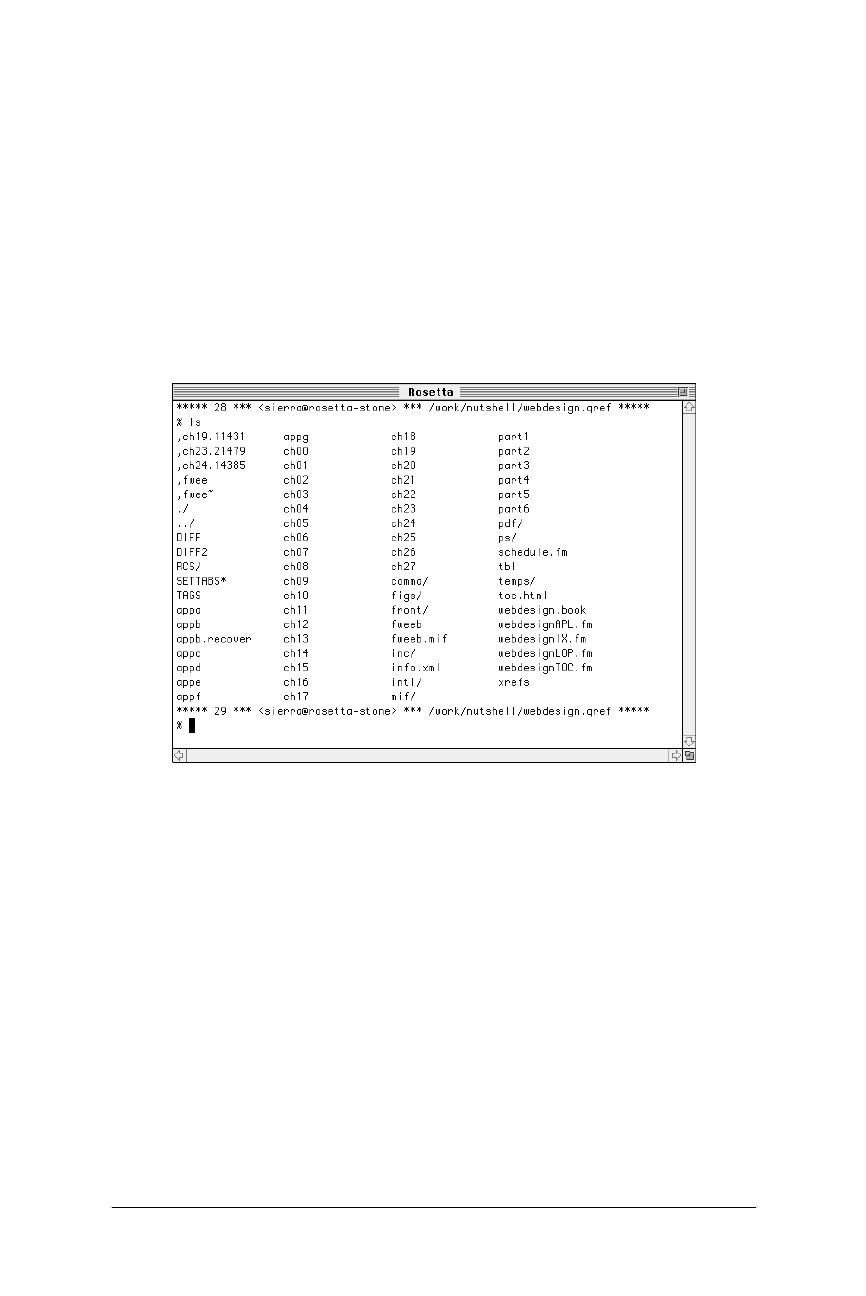
50 Chapter 4 – A Beginner’s Guide to the Server
Introduction to Unix
Web Design in a Nutshell, eMatter Edition
Copyright © 2000 O’Reilly & Associates, Inc. All rights reserved.
Introduction to Unix
If you work with the Web long enough, chances are you’ll run into the need to
communicate with a Unix machine. On Macs and PCs, most functions can be
performed using tools with graphical interfaces; however, at times there is no
substitute for a good old-fashioned telnet session. Besides, a little Unix never hurt
anyone.
Telnet is a “terminal emulation” protocol that allows you to log in to other
computer systems on a network (such as the Internet). It also refers to any appli-
cation used for communicating with the telnet protocol. A telnet program will give
you a character-based terminal window on another system from which you can
enter simple command-line instructions. Figure 4-1 shows a typical telnet session.
This section provides a very brief introduction to basic terminology and commands
that will enable you to manipulate files and directories on a Unix machine. If you
are interested in learning more, read Learning the Unix Operating System and Unix
in a Nutshell, both published by O’Reilly & Associates, Inc.
Logging In
When you open a connection to a remote server with your telnet program, the
first thing you see is a prompt to log in to the system. Before you can access the
server, the system administrator has to set up a Unix account for you. You will be
given a name and password you can enter at the login: and password: prompts
respectively.
When you log in successfully, you will get a Unix system prompt, either a $or a %
(or sometimes #) depending on the flavor of Unix the server is running, which
tells you that the system is “ready.” At this point, you are using a program called
Figure 4-1: Typical telnet session
Introduction to Unix 51
The Unix
Server
Introduction to Unix
Web Design in a Nutshell, eMatter Edition
Copyright © 2000 O’Reilly & Associates, Inc. All rights reserved.
the shell, which interprets the commands you type and invokes the programs you
ask for. You will automatically be placed in your home directory.
To end the telnet session, simply type “logout” or “exit.”
Directory Structures
Because the Web was spawned from the Unix environment, it follows many of the
same conventions. For instance, writing correct URL pathnames in hyperlinks relies
on an understanding of how directory structures work on the Unix platform.
Directories (“places” to store files) are organized into a hierarchical structure that
fans out like an upside-down tree. The top-most directory is known as the root
and is written as a forward slash (/). The root can contain several directories, each
of which can contain subdirectories; each of these can contain more subdirecto-
ries, and so on. A subdirectory is said to be the “child” of the directory that holds
it (its “parent”). Figure 4-2 shows a system with five directories under the root. The
directory users has two subdirectories, jen and richard. Within jen are two more
subdirectories, work and pers, and within pers is the file art.html.
Apathname is the notation used to point to a particular file or directory; it tells
you the path of directories you must travel to get to where you want to go. There
are two types of pathnames: absolute and relative.
Absolute pathnames
An absolute pathname always starts from the root directory, which is indicated by
a slash (/). So, for example, the pathname for pers is /users/jen/pers, as shown in
Figure 4-3.The first slash indicates that we are starting at the root, and is neces-
sary for indicating that a pathname is absolute.
Figure 4-2: Example of a directory hierarchy
/
(root)
bin etc users tmp lib
jen
work pers
art.html
richard
work
52 Chapter 4 – A Beginner’s Guide to the Server
Introduction to Unix
Web Design in a Nutshell, eMatter Edition
Copyright © 2000 O’Reilly & Associates, Inc. All rights reserved.
Relative pathnames
A relative pathname points to a file or directory relative to your current working
directory. When building a web site on a single server, relative pathnames are
commonly used within URLs to refer to files in other directories on the server.
Unless you specify an absolute name (starting with a slash) the shell assumes you
are using a relative pathname. Starting in your current location (your working
directory), you can trace your way up and down the directory hierarchy. This is
best explained with an example.
If I am currently working in the directory jen and I want to refer to the file art.html,
the relative pathname would be pers/art.html because the file art.html is in the
directory pers, which is in the current directory, jen. This is illustrated in
Figure 4-4.
Figure 4-3: Visual representation of the path /users/jen/pers
Figure 4-4: Visual representation of the path pers/art.html relative to the jen
directory
/
(root)
bin etc users tmp lib
jen richard
work pers
art.html
work
/
users
jen
pers
/users/jen/pers
/
(root)
bin etc users tmp lib
jen richard
work pers
art.html
work
jen
pers
pers/art.html
art.html
current directory
Introduction to Unix 53
The Unix
Server
Introduction to Unix
Web Design in a Nutshell, eMatter Edition
Copyright © 2000 O’Reilly & Associates, Inc. All rights reserved.
Going back up the hierarchy is a bit trickier. You go up a level by using the short-
hand .. for the parent directory. Again, let’s use an example based on Figure 4-2.
If I am currently in the jen directory, and I want to refer to the directory richard/
work, the pathname would be ../richard/work. The two dots at the beginning of
the path takes us back up one level to the to the users directory, and from there
we find the directory called richard and the subdirectory called work, as shown in
Figure 4-5.
If I am currently in my pers directory and I want to refer to Richard’s work direc-
tory, I need to go up two levels, so the pathname would be ../../richard/work,as
shown in Figure 4-6.
Note that the absolute path /users/richard/work accomplishes the same thing. The
decision whether to use an absolute versus a relative pathname generally comes
down to which is easiest from where you are.
Figure 4-5: Visual representation of the path ../richard/work, relative to the jen
directory
Figure 4-6: Visual representation of the path ../../richard/work, relative to the pers
directory
current directory
users
(..)
jen
work
../richard/work /
(root)
bin etc users tmp lib
jen richard
work pers
art.html
work
richard
current directory
users
(..)
jen
(..)
work
../../richard/work /
(root)
bin etc users tmp lib
jen richard
work pers
art.html
work
richard
pers

54 Chapter 4 – A Beginner’s Guide to the Server
Introduction to Unix
Web Design in a Nutshell, eMatter Edition
Copyright © 2000 O’Reilly & Associates, Inc. All rights reserved.
Basic Unix Commands
The general format for Unix commands is:
command option(s) filename(s)
The command in bold must be typed in exactly as shown and the values in italics
stand for variables that you supply. Some general guidelines for Unix syntax are:
• Commands are entered in lowercase.
•Options modify the way in which a command works. They are often single
letters prefixed with a minus (-) sign and set off by any number of spaces or
tabs. The options listed in this chapter typically can be indicated in one com-
mand line by setting them off individually or combining them after a single
minus sign. Note: This rule may vary depending on the type of Unix system
you are using. Ask your server administrator for help if you run into prob-
lems.
• The argument filename is the name of a file you want to manipulate in
some way.
• Spaces between commands, options, and filenames are important; e.g., “ls -al”
works, “ls-al” doesn’t.
• The asterisk symbol (*) is a wildcard character that can be used to substitute
for any string of characters in a file or directory name. For instance, a search
for *.html will retrieve all documents ending in .html.
The following is a brief list of Unix commands that are useful for navigating
through directories and managing files.
cd
cd [pathname]
This changes your working directory to the specified directory. cd alone (without
arguments) will take you to your home directory.
cp
cp [old] [new]
This makes a copy of a file where old is a pathname to the original file and new is
the name you want to give the copy of the file. (This is similar to the “save as”
function in an application.) The following sample code makes a copy of the file
art.html and names the copy art2.html.
% cp art.html art2.html
cp [file] [directory]
This puts a copy of the original file into an existing directory. The following
sample code makes a copy of art.html and puts it in Richard’s work directory:
% cp art.html /user/richard/work

Introduction to Unix 55
The Unix
Server
Introduction to Unix
Web Design in a Nutshell, eMatter Edition
Copyright © 2000 O’Reilly & Associates, Inc. All rights reserved.
ls
ls [option(s)] [name(s)]
This gives you a listing of the files and subdirectories (denoted with a slash) in
your working directory. Adding a directory name after the options gives you the
list of files within the named directory.
Options
-a shows all the files within the directory, including normally hidden files.
-c lists files by creation/modification time.
-l displays long format listing (includes permissions, owner, size, modification
time, etc.)
-p marks directories by adding a slash at the end of the name
-x displays the list in rows going across the screen.
Example
A simple listing of names in the current directory:
% ls
work
pers
ch01
ch02
ch03
List directory contents across the screen with directories indicated with a slash (/):
% ls -px
work/ pers/ ch01 ch02 ch03
mkdir
mkdir [dirname]
This command creates a new directory in the working directory, where dirname is
the name of the new directory. You must have write permission in the parent
directory in order to create a directory.
% mkdir nutshell
more
more [filename(s)]
This displays the contents of a file (or files), one screenful at a time. After each
screen is displayed, press RETURN to display the next line or press the spacebar to
display the next screenful. Press ?for help with additional commands. Press qto
quit.

56 Chapter 4 – A Beginner’s Guide to the Server
Introduction to Unix
Web Design in a Nutshell, eMatter Edition
Copyright © 2000 O’Reilly & Associates, Inc. All rights reserved.
mv
mv [source] [target]
This basic command moves files and directories around on the system or renames
them. Table 4-1 shows the results of various mv operations.
Example
Rename a file:
% mv art.html artists.html
Move a file from one directory to another:
% mv art.html ../richard/work
pg
pg [options] [filename]
This displays the contents of the file on the screen, one page at a time. After each
screen is displayed, you are prompted to display the next page by pressing the
RETURN key. Press h (or ?) for help with additional commands. Press q to quit.
Useful pg Commands
-l Display one more line
nMove to page n
+ or -n
Move forward or backward by npages
passwd
passwd [user]
This creates or changes a password associated with a user name. Only the owner
or a privileged user can change a password.
pwd
pwd
This will tell you what directory you are currently in (your working directory).
Table 4-1: Results of Various mv Operations
Source Target Result
File name Rename file as name
File Existing file Overwrite existing file with the source
file
Directory name Rename directory as name
Directory Existing directory Move directory to be a subdirectory of
the existing directory
One or more files Existing directory Move files to directory

Uploading Documents (FTP) 57
The Unix
Server
Uploading Documents (FTP)
Web Design in a Nutshell, eMatter Edition
Copyright © 2000 O’Reilly & Associates, Inc. All rights reserved.
% pwd
/user/jen/work
rm
rm [filename]
rm deletes files (called by name). Be very careful when removing files because it
cannot be undone.
rmdir
rmdir [dirname]
This allows you to remove a directory (dirname) as long as it doesn’t contain any
files.
File Naming Conventions
In order for your files to traverse the network successfully, you must name them in
accordance with established file naming conventions.
• Avoid character spaces in filenames. Although this is perfectly acceptable for
local files on a Macintosh or Windows 95/98/NT machine, character spaces
are not recognized by other systems.
• Avoid special characters such as ?, %, #, etc. in filenames. It is best to limit
filenames to letters, numbers, underscores (in place of character spaces),
hyphens, and periods.
• Use proper suffixes. HTML documents require the suffix .html (or .htm if on a
Windows server). GIF graphic files take the suffix .gif, and JPEGs should be
named .jpg or .jpeg. If your files do not have the correct suffix, the browser
will not recognize them as web-based files. Suffixes for a large number of
common file types are listed later in this chapter.
• Filenames are case-sensitive in HTML. Consistently using all lowercase letters
in filenames, while certainly not necessary, may make them easier to remem-
ber.
Uploading Documents (FTP)
The most common transaction a web designer will have with a web server is the
uploading of HTML documents, graphics, and other media files. Files are trans-
ferred between computers over a network via a method called FTP (File Transfer
Protocol).
If you are working in a telnet session on Unix, you can run the ftp program and
transfer files with a hefty collection of command-line arguments (not covered in
this book).
Fortunately, if you work on a Mac or PC, there are a number of FTP programs
with graphical interfaces that spare you the experience of transferring files using
Unix command lines. In fact, FTP functions are now built right into most

58 Chapter 4 – A Beginner’s Guide to the Server
Uploading Documents (FTP)
Web Design in a Nutshell, eMatter Edition
Copyright © 2000 O’Reilly & Associates, Inc. All rights reserved.
WYSIWYG HTML editors, such as GoLive Cyberstudio, Claris HomePage, and
Dreamweaver, among others. On the Mac, dedicated programs that allow “drag-
and-drop” file transfer such as Fetch and Anarchie are quite popular. On the PC,
there are numerous simple FTP programs, such as WS_FTP and AceFTP. These
(and many others) are available for download at http://www.shareware.com/
(search for “ftp”).
The Netscape Navigator and Internet Explorer browsers also function as simple
FTP clients, offering the ability to both download and upload files with a drag-
and-drop interface.
The FTP Process
Regardless of the tool you use, the basic principles and processes are the same.
Before you begin, you must have an account with permission to upload files to
the server. Check with the server administrator to be sure this is set up. (Note: you
don’t necessarily need an account to upload and download files if the server is set
up as an anonymous ftp site.)
1. Launch the FTP program of your choice and open a connection with your
server. You’ll need to enter the exact name of the server, your account name,
and password.
2. Locate the appropriate directory into which you want to copy your files. You
may also choose to create a new directory or delete existing files and directo-
ries on the remote server using the controls in your FTP program.
3. Specify the transfer mode. The most important decision to make during
uploading is specifying whether the data should be transferred in binary or
ASCII mode.
ASCII files are comprised of alphanumeric characters. Some FTP programs
refer to ASCII files as “Text” files. HTML documents should be transferred as
ASCII or text.
Binary files are made up of compiled data (ones and zeros), such as execut-
able programs, graphic images, movies, etc. Some programs refer to the
binary mode as “raw data” or “Image.” All graphics (.gif,.jpeg) and multi-
media files should be transferred as “binary” or “Raw Data.” Table 4-3
includes a listing of the transfer mode for a number of popular file types.
In Fetch (Mac), you may see a MacBinary option, which transfers the file with
its resource fork (the bit of the file containing desktop icons and other Mac-
specific data) intact. It should only be used when transferring from one Mac
to another. This resource fork is appropriately stripped out of Mac-generated
media files when transferred under the standard raw data mode.
Some FTP programs also provide an Auto option, which enables you to
transfer whole directories containing files of both types. The program exam-
ines each file and determines whether it should be transferred as text or
binary information. This function is not 100% reliable on all programs, so use
it with caution until you are positive you are getting good results.
4. Upload your files to the server. Standard FTP uses the terminology “put”
(uploading files from your computer to the server) and “get” (downloading
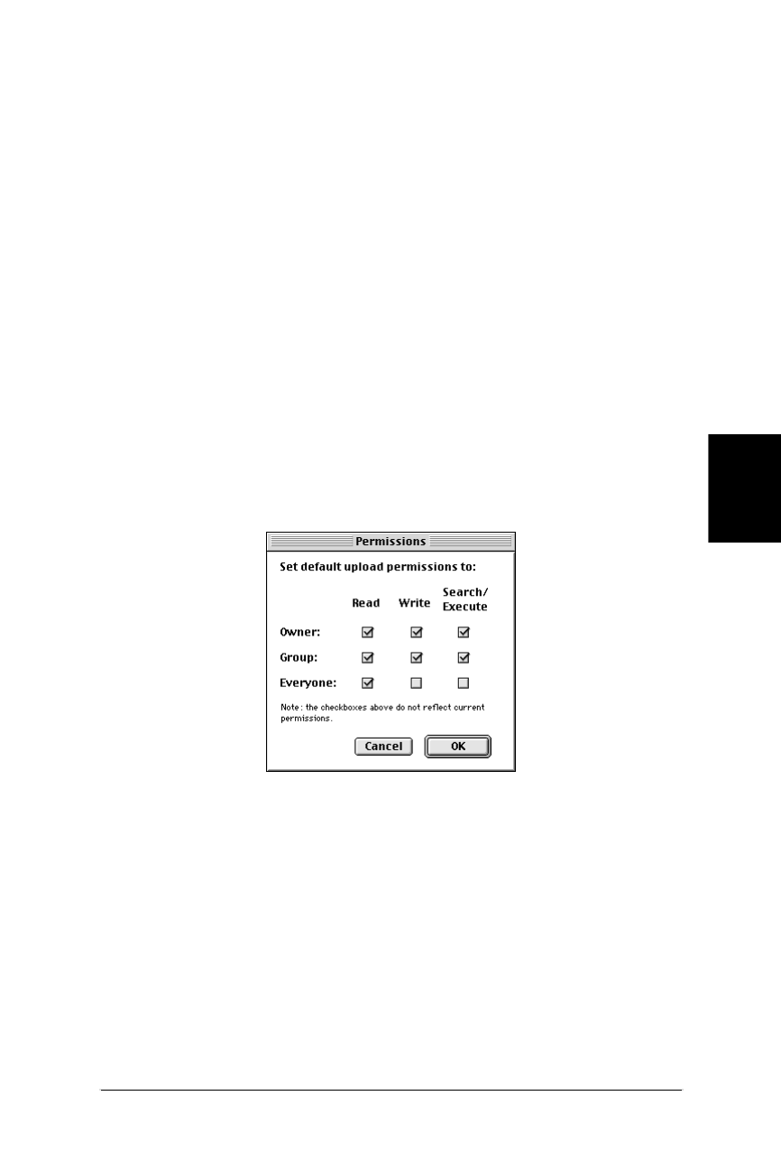
Uploading Documents (FTP) 59
The Unix
Server
Uploading Documents (FTP)
Web Design in a Nutshell, eMatter Edition
Copyright © 2000 O’Reilly & Associates, Inc. All rights reserved.
files from the server to your computer), so these terms may be used in your
FTP program as well. You can also upload multiple files at a time.
5. Disconnect. When you have completed the transfer, be sure to disconnect
from the server. You may want to test the files you’ve uploaded on a browser
first to make sure everything transferred successfully.
Setting Permissions
When you upload files to a web server, you need to be sure that the files’ permis-
sions are set so that everyone is able to read your files. Permissions control who
can read, write (edit), or execute the file (if it is a program), and they need to be
established for the owner of the file, the file’s group, and for “everyone.” When
you create or upload a file, you are automatically the owner, which may mean that
only you can set the permissions.
With an FTP program
Some FTP programs enable you to set the default upload permissions via a dialog
box. Figure 4-7 shows Fetch 3.0.4’s dialog box for doing this. For most web
purposes, you want to grant yourself full permissions but restrict all other users to
read-only. You may want to confirm that your server administrator agrees with
these settings.
The server needs to be specially configured to recognize these permissions
commands, so check with your administrator to see if you can use this easy
method.
Using chmod in Unix
If you are uploading files and creating directories via an FTP client, your client
might not give anyone else in your group the proper permissions. In this case, it
may be necessary to open a telnet session and set permissions on files and direc-
tories manually using the Unix chmod command. Basic chmod syntax and
examples are discussed in this section, but it is best to check with your server
administrator for the correct syntax for your purposes.
Figure 4-7: Standard permissions settings (using Fetch 3.0.4)

60 Chapter 4 – A Beginner’s Guide to the Server
Uploading Documents (FTP)
Web Design in a Nutshell, eMatter Edition
Copyright © 2000 O’Reilly & Associates, Inc. All rights reserved.
From within the telnet session, begin by checking the current permissions and
owner of the directories and files. You need to be the owner to change permis-
sions on a directory’s contents. At the Unix prompt (%or $), type ls -l to view the
contents in the long format. The system returns a listing that looks like this:
drwxrwxrwx 2 jen doc 512 May 19 11:25 chap13
The first ten characters reflect the permissions settings. The first character shows
the file type (directory, d, or plain file,-). The next three characters show the read
(r), write (w), and execute (x) privileges for the owner of the file (in this example,
the user jen is the owner). The next three characters indicate the same three
settings for other members of the file’s group. The final three characters show
permissions for all other users.
In the example above, all users have complete access to the file. If certain permis-
sions are turned off, the space is held with a dash (-). In the following example,
the owner has total access to the file, but the group and other users can only read
the file.
drwxr--r--
A complete explanation of all the finer points of the chmod command is beyond
the scope of this chapter, but Table 4-2 shows instructions for a few of the most
common settings you’ll need. Type the chmod command and number option as
shown, and substitute your directory name for dirname (note, you can use a “dot”
to indicate the current directory.)
A directory’s access permissions help control access to the files in it, such as
adding, deleting, and renaming files. The permissions on a file control what can be
done to the file’s contents, such as reading or editing.
Table 4-2: Common chmod Settings
Type Permissions Command Result
Directory Allows users in your group
to add, delete, and rename
files in your directory. All
others can only view the
directory’s contents.
chmod 775 dirname drwxrwxr-x
Directory Restricts access to all users
except the owner.
chmod 700 dirname drwx------
File Allows you and your
group to read and edit the
file, but allows all other
users to read only.
chmod 664 filename -rw-rw-r--
File Allows you to edit a file,
but allows everyone else
on the system to read only.
chmod 644 filename -rw-r--r--
File Makes a private file that
only you can read or edit.
chmod 600 filename -rwx------

File (MIME) Types 61
The Unix
Server
File (MIME) Types
Web Design in a Nutshell, eMatter Edition
Copyright © 2000 O’Reilly & Associates, Inc. All rights reserved.
Chmod syntax also has an alternative letter system. Without going into detail, the
command:
chmod -R go+rx *
is a quick and powerful way to set permissions for the current directory and every
directory and file within it (-R). This example gives read (r) and execute (x) privi-
leges to the group (g) and all other users (o).
File (MIME) Types
Servers add a header to each document that tells the browser the type of file it is
sending. The browser determines how to handle the file based on that informa-
tion—whether to display the contents in the window, or to launch the appropriate
plug-in or helper application.
The system for communicating media types closely resembles MIME (Multipur-
pose Internet Mail Extension), which was originally developed for sending
attachments in email. The server needs to be configured to recognize each MIME
type in order to successfully communicate the media type to the browser.
If you want to deliver media beyond the standard HTML files and graphics (such
as a Shockwave Flash movie or an audio file), you should contact your server
administrator to be sure the server is configured to support that MIME type. Most
common formats are built in to current versions of server software, but if it isn’t
there already, the administrator can easily set it up if you provide the necessary
information.
The exact syntax for configuring MIME types varies among server software;
however, they all require the same basic information: type, subtype, and exten-
sion. Types are the most broad categories for files. They include text, image,
audio, video, application, etc. Within each category are a number of subtypes. For
instance, the file type image includes the subtypes gif, jpeg, etc. The extension
refers to the file’s suffix, which the server uses to determine the file type and
subtype. Not all extensions are standardized.
Table 4-3 lists common media types by extension along with their MIME type/
subtype information. The ASCII/Binary information is provided to aid in making
upload decisions.
Of course, new technologies and file types are emerging every day, so keep in
mind that it is the web designer’s responsibility to make sure that for any new
media type the appropriate information is communicated to the server
administrator.
Table 4-3: MIME Types and Subtypes by Extension
Extension Type/Subtype Description
ASCII/
Binary
.ai application/
postscript
PostScript viewer A
.aif, .aiff audio/x-aiff AIFF file B

62 Chapter 4 – A Beginner’s Guide to the Server
File (MIME) Types
Web Design in a Nutshell, eMatter Edition
Copyright © 2000 O’Reilly & Associates, Inc. All rights reserved.
.aifc audio/aifc Compressed AIFF
file
B
.au audio/basic µ-law sound file B
.avi video/avi or
video/x-msvideo
AVI video file B
.bmp image/x-MS-bmp Microsoft BMP file B
.dcr, .dir, .dxr application/
x-director
Shockwave files B
.doc application/
msword
Microsoft Word
document
B
.eps application/
postscript
Encapsulated Post-
Script
A
.exe application/
x-msdownload
Self-extracting file or
executable
B
.gif image/gif Graphic in GIF
format
B
.gz application/
x-gzip
Compressed file, use
gunzip (Unix
decompressor)
B
.hqx application/
mac-binhex40
Mac BinHex Archive B
.htm text/html HTML document A
.jpg, .jpeg,
.jpe, .jfif,
.pjpeg, .pjp
image/jpeg Graphic in JPEG
format
B
.mid audio/midi or
audio/x-midi
MIDI audio file B
.mov video/quicktime QuickTime movie B
.movie video/x-sgi-
movie
Silicon Graphics
movie
B
.mpg, .mpe,
.mpeg, .m1v,
.mp2, .mp3, .mpa
video/mpeg MPEG movie B
.pbm image/x-
portable-bitmap
Portable bitmap
image
B
.pcd image/x-photo-cd Kodak photo CD
image
B
.pdf application/pdf Portable Document
Format (Acrobat file)
B
.pic image/x-pict PICT image file B
.pl application/
x-perl
Perl source file A
Table 4-3: MIME Types and Subtypes by Extension (continued)
Extension Type/Subtype Description
ASCII/
Binary

File (MIME) Types 63
The Unix
Server
File (MIME) Types
Web Design in a Nutshell, eMatter Edition
Copyright © 2000 O’Reilly & Associates, Inc. All rights reserved.
.png image/x-png Graphic in PNG
format
B
.ppt application/
powerpoint
PowerPoint file B
.ps application/
postscript
PostScript file A
.qt video/quicktime QuickTime movie B
.ra, .ram audio/x-pn-
realaudio
RealAudio file (and
metafile)
B
.rtx text/richtext Rich Text Format
(Microsoft Word)
A
.rtf application/rtf Rich Text Format
(MSWord)
A
.sea application/
x-sea
Self-extracting
Archive (Stuffit file)
B
.sit application/
x-sit
Stuffit Archive B
.snd audio/basic Digitized sound file B
.swf application/x-
shockwave-flash
Shockwave Flash file B
.tar application/
x-tar
Compressed file B
.tif, .tiff image/tiff TIFF image (requires
external viewer)
B
.txt text/plain ASCII text file A
.wav audio/s-wav Waveform audio file B
.wrl, .wrz x-world/x-vrml VRML 3D file
(requires VRML
viewer)
B
.xll application/
vnd.ms-excel
Microsoft Excel File B
.zip application/
x-zip-compressed
Compressed file
(decompress using
WinZip or Stuffit on
Mac)
B
Table 4-3: MIME Types and Subtypes by Extension (continued)
Extension Type/Subtype Description
ASCII/
Binary


Web Design in a Nutshell, eMatter Edition
Copyright © 2000 O’Reilly & Associates, Inc. All rights reserved.
PART II
HTML


67
HTML
Overview
Web Design in a Nutshell, eMatter Edition
Copyright © 2000 O’Reilly & Associates, Inc. All rights reserved.
Chapter 5HTML Overview
CHAPTER 5
HTML Overview
HTML (Hypertext Markup Language) is the language used to create web docu-
ments. It defines the syntax and placement of special instructions (tags) that aren’t
displayed, but tell the browser how to display the document’s contents. It is also
used to create links to other documents, either locally or over a network such as
the Internet.
The HTML standard and all other Web-related standards are developed under the
authority of the World Wide Web Consortium (W3C). Standards, specifications,
and drafts of new proposals can be found at http://www.w3.org/. The most recent
work is the HTML 4.0 Specification, which is growing in support by major
browsers.
In practice, the HTML “standard” is influenced heavily by the tags that are intro-
duced and supported by the popular browsers, i.e., Microsoft Internet Explorer
and Netscape Navigator. These tags may or may not be part of the current HTML
specification at any given time.
This chapter provides a basic introduction to the background and general syntax
of HTML, including document structure, tags, and their attributes. It also looks
briefly at good HTML style and the pros and cons of using WYSIWYG authoring
tools.
For a more in-depth study of HTML, I recommend HTML: The Definitive Guide,
Third Edition, by Chuck Musciano and Bill Kennedy (O’Reilly & Associates, 1998)
Another excellent resource for HTML tag information is the HTML Compendium
(created by Ron Woodall). The Compendium provides an alphabetical listing of
every HTML tag and its attributes, with explanations and up-to-date browser
support information for each. The browser support charts accompanying each tag
in this book are based on their work. The HTML Compendium can be found at
http://www.htmlcompendium.org/.

68 Chapter 5 – HTML Overview
HTML Editing Tools
Web Design in a Nutshell, eMatter Edition
Copyright © 2000 O’Reilly & Associates, Inc. All rights reserved.
HTML Editing Tools
HTML documents are simple ASCII text files, which means you can use any
minimal text editor to write them. Fortunately, there are editing tools designed
especially for writing HTML. These save time by providing shortcuts for repetitive
tasks like setting up documents, tables, or simply applying styles to text. HTML
editors are not the same as WYSIWYG authoring tools (discussed next)—you need
to know how to compose HTML by hand; editors just make the process faster and
easier.
There are scores of simple HTML editors available, and many of them are free. Just
enter “HTML Editor” in the search field of Shareware.com (http://www.shareware.
com/ ) and wade through the results. For purposes of brevity, I’m going to cut to
the chase.
Windows users should definitely check out HomeSite, a high-powered and inex-
pensive HTML editor from Allaire Corporation. It, too, has HTML shortcuts and
templates, color-coded HTML syntax, an FTP function, spell-checker, HTML syntax
checker, and multi-file search-and-replace. In addition, it includes wizards for
creating more complex elements (such as frames, JavaScript, and DHTML) and
many other attractive features. For more information and to download a demo
copy, see http://www.allaire.com/.
If you’re working on a Macintosh, you want BBEdit, a commercial HTML editor
from Bare Bones Software, Inc. It is overwhelmingly the editor of choice among
Mac-based web developers. It includes features such as an array of HTML shortcut
tools, color-coded HTML syntax, multiple-file search and replace, a built-in FTP
function, support for 13 programming languages, a table builder, an HTML syntax
checker, and a lot more. For more information and to download a demo, see http:/
/www.bbedit.com/.
WYSIWYG Authoring Tools
The last two years have seen an explosion in the web authoring tool market.
WYSIWYG (what-you-see-is-what-you-get) HTML editors have graphical interfaces
that make writing HTML more like using a word processing or page layout
program. In the beginning, their goal was to spare authors from ever having to
touch an HTML tag in the way that page layout programs protect designers from
typing out PostScript. Today, their role has shifted towards making document
production more efficient and automated while still providing access to the HTML
source.
Should You Use Them?
These days, nobody pretends that WYSIWYG authoring tools will excuse you from
learning HTML completely, but they do provide a considerable head start for many
menial tasks. Because these tools are notorious for adding extra code to HTML
files, the question of whether or not to use them for web production has become
something of a holy war among web developers.

WYSIWYG Authoring Tools 69
HTML
Overview
WYSIWYG Authoring Tools
Web Design in a Nutshell, eMatter Edition
Copyright © 2000 O’Reilly & Associates, Inc. All rights reserved.
HTML purists insist that hand-writing HTML in a no-frills text editor is the only
way to do it “right,” and that the HTML documents made by WYSIWYG tools are
of unacceptable quality. On the other hand, many developers appreciate being
spared the grunt-work of typing every HTML tag and find the WYSIWYG environ-
ment useful for viewing the page and making design decisions on the fly.
Of course, there are many reasons both for and against using these tools. The
controversy should lessen as the tools, which are currently in their infancy, work
out their kinks and start producing clean and robust code. If you do use a
WYSIWYG tool, expect to do some manual fine-tuning to the resulting HTML
code.
Pros
• They are good for beginners. They can even be useful for teaching HTML
because you can lay out the page the way you want, then view the resulting
HTML.
• They are good for quick prototyping. Design ideas can be tried out on the fly.
• They provide a good head start for creating complex tables and other
advanced functions such as JavaScript and DHTML functions.
Cons
• They are infamous for not generating clean HTML documents. They add pro-
prietary or redundant tags and often take circuitous routes to produce a
desired effect. Some may even produce HTML that is incorrect.
• Some editors automatically change an HTML document when you open it in
the program. They add their own tags and may strip out any tags they do not
recognize.
• The built-in graphics-generating features do not offer much control over the
quality or the file size of resulting graphics.
• Software releases tend to lag behind the quickly changing HTML standards, so
the HTML you create using the tool may not be completely up-to-date.
• They are expensive. The more powerful packages cost hundreds of dollars up
front and additional costs to upgrade.
Some Available Tools
The following is an introduction to a handful of the tools that are popular as of
this writing (versions are omitted because of the speed of updates). All are avail-
able for both Mac and Windows unless otherwise noted.
Macromedia Dreamweaver
As of this writing, Dreamweaver is emerging as the industry-standard HTML
authoring tool due the fact that it produces the cleanest code of any of its
competitors. In addition, it provides many shortcuts for creating style sheets,
JavaScript, and DHTML functions. It has a fairly steep learning curve. For
more information, see http://www.macromedia.com/.

70 Chapter 5 – HTML Overview
Document Structure
Web Design in a Nutshell, eMatter Edition
Copyright © 2000 O’Reilly & Associates, Inc. All rights reserved.
GoLive CyberStudio (Mac only)
A powerful HTML editing tool that supports all of the cutting-edge web tech-
nologies (JavaScript, ActiveX, WebObjects, style sheets, etc.). It also provides
excellent site management tools. Its interface is more difficult to learn than
other tools, but it seems to be worth the effort. For more information, see
http://www.golive.com/.
Microsoft FrontPage (Mac release lags behind Windows release)
This is Microsoft’s effort in the web authoring arena. It is easy for beginners to
learn and is popular with the business community. On the downside, it gener-
ates HTML loaded with Microsoft-specific tags and it will change pre-existing
documents as it opens them. FrontPage is closely integrated with Microsoft’s
Internet Information Server (IIS), so check with your ISP for possible conflicts.
For more information, see http://www.microsoft.com/frontpage/.
FileMaker Claris Home Page
This HTML editor is good for beginners and adequate for noncommercial web
page production. It features a simple interface, easy access to web-safe colors,
a library for storing elements that can be used repeatedly, and much more. It
is guilty of generating redundant HTML full of proprietary tags and it will
change pre-existing HTML documents. For more information, see http://www.
filemaker.com/.
Adobe PageMill
PageMill was the first WYSIWYG editor out of the gate in 1995, but it has
since been eclipsed by more powerful packages in the professional web
authoring world. It is still adequate for personal web page production and is
easy to learn and use. It lacks an easy method for accessing the HTML code
and is also guilty of adding proprietary tags to the document. For more infor-
mation, see http://www.adobe.com/.
Document Structure
An HTML document contains text (the contents of the page) with embedded tags,
which provide instructions for the structure, appearance, and function of the
contents.
An HTML document is divided into two major portions: the head and the body.
The head contains information about the document, such as its title and “meta”
information describing the contents. The body contains the actual contents of the
document (the part that is displayed in the browser window).
The following example shows the tags that make up the standard skeletal struc-
ture of an HTML document:
<HTML>
<HEAD>
<TITLE>Document Title</TITLE>
</HEAD>
<BODY>
Contents of Document
</BODY>
</HTML>

HTML Tags 71
HTML
Overview
HTML Tags
Web Design in a Nutshell, eMatter Edition
Copyright © 2000 O’Reilly & Associates, Inc. All rights reserved.
HTML Tags
Every HTML tag is made up of a tag name, sometimes followed by an optional list
of attributes, all of which appears between angle brackets < >. Nothing within the
brackets will be displayed in the browser. The tag name is generally an abbrevia-
tion of the tag’s function (this makes them fairly simple to learn). Attributes are
properties that extend or refine the tag’s function.
The name and attributes within a tag are not case sensitive. <BODY
BGCOLOR=white> will work the same as <body bgcolor=white>. However,
values for particular attributes may be case sensitive, particularly URLs and
filenames.
Containers
Most HTML tags are containers, meaning they have a beginning (also called
“opener” or “start”) tag and an end tag. The text enclosed within the tags will
follow the tag’s instructions, as in the following example:
The weather is <I>gorgeous</I> today.
Result: The weather is gorgeous today.
An end tag contains the same name as the start tag, but it is preceded by a slash
(/). You can think of it as an “off” switch for the tag. End tags never contain
attributes.
For some tags, the end tag is optional and the browser determines when the tag
ends by context. This practice is most common with the <p> (paragraph) tag.
Browsers have supported the <p> tag without its end tag, so many web authors
take advantage of the shortcut. Not all tags allow this, however, and not all
browsers are forgiving, so when in doubt include the end tag. This is especially
important when using Cascading Style Sheets (discussed in Chapter 23, Cascading
Style Sheets) with your document.
In the HTML charts that appear in this book, container tags are indicated with the
syntax < >...</>. If the end tag is optional, it will be so noted in the tag’s
explanation.
Standalone Tags
A few tags do not have end tags because they are used to place standalone
elements on the page. The image tag (<img>) is such a tag and it simply plops a
graphic into the flow of the page. Other standalone tags include the linebreak
(<br>), horizontal rule (<hr>), and tags that provide information about a docu-
ment and don’t affect its displayed content, such as the <meta> and <base> tags.
Attributes
Attributes are added within a tag to extend or modify the tag’s actions. You can
add multiple attributes within a single tag. Tag attributes, if any, belong after the
tag name, each separated by one or more spaces. Their order of appearance is not
important.
72 Chapter 5 – HTML Overview
HTML Tags
Web Design in a Nutshell, eMatter Edition
Copyright © 2000 O’Reilly & Associates, Inc. All rights reserved.
Most attributes take values, which follow an equal sign (=) after the attribute’s
name. Values are limited to 1024 characters in length and may be case sensitive.
Sometimes the value needs to appear in quotation marks (double or single). Here’s
how to determine if you need quotation marks around a value:
• If the value is a single word or number, and contains only letters (a-z), num-
bers (0-9), or the special characters period (.) or hyphen (-), then it is OK to
place it directly after the equal sign without quotation marks.
• If the value contains several words separated by commas or spaces, or if it
contains any special characters besides a period or hyphen, then it needs to
be contained within quotation marks. For example, URLs require quotation
marks because they contain the characters “://”. Likewise, quotation marks are
required around color specifications that take the syntax “#rrggbb”.
Be careful not to leave out the closing quotation mark, or all the
content from the opening quotation mark until the browser encoun-
ters a subsequent quotation mark will be interpreted as part of the
value, and won’t display in the browser. This is a simple mistake that
can cause hours of debugging frustration.
If you are still unsure, using quotation marks consistently for all values will work
just fine and is probably a good idea anyway.
The following are examples of tags that contain attributes:
<IMG SRC="graphics/pixie.gif" ALIGN=right WIDTH=45 HEIGHT=60>
<BODY BGCOLOR="#000000">
<FONT FACE="Trebuchet MS, Arial, Helvetica" SIZE=4>
Nesting HTML Tags
HTML tags can be applied to content containing other HTML tags for multiple tag
effects on a single element. This is called nesting, and to do it properly, both the
beginning and end tags of the enclosed tag must be completely contained within
the beginning and end tags of the applied tag, as follows:
The weather is <B><I>gorgeous</I></B> today.
Result: The weather is gorgeous today.
This links to <A HREF="document.html">a really <B>cool</B>
page</A>.
Result: This links to a really cool page.
A common mistake is simply overlapping the tags. Although some browsers
display content marked up this way, other browsers will not allow the violation, so
it is important to nest tags correctly. The following example shows incorrect
nesting of tags (note that the <B> tag is closed before the <I>):
The weather is <B><I>gorgeous</B></I> today.

Information Browsers Ignore 73
HTML
Overview
Information Browsers Ignore
Web Design in a Nutshell, eMatter Edition
Copyright © 2000 O’Reilly & Associates, Inc. All rights reserved.
Information Browsers Ignore
Some information in an HTML document, including certain tags, will be ignored
when the document is viewed in a browser. These include:
Line breaks
Line returns in the HTML document are ignored. Text and elements will wrap
continuously until they encounter a <p> or <br> tag within the flow of the
document text. Line breaks are displayed, however, when text is tagged as
preformatted text (<pre>).
Tabs and multiple spaces
When a browser encounters a tab or more than one consecutive blank char-
acter space in an HTML document, it will display it as a single space. So, if
the document contains:
far, far away
the browser will display:
far, far away
Extra spaces can be added within the flow of text by using the nonbreaking
space character entity ( ). Multiple spaces will be displayed, however,
when text is tagged as preformatted text (<pre>).
Multiple <p> tags
A series of <p> (paragraph) tags with no intervening text is interpreted as
redundant by all browsers and will display as though it were only a single
<p> tag. Most browsers will display multiple <br> tags as multiple line
breaks.
Unrecognized tags
A browser simply ignores any tag it doesn’t understand or that was incor-
rectly specified. Depending on the tag and the browser, this can have varied
results. Either the browser will display nothing at all, or it may display the
contents of the tag as though it were normal text.
Text in comments
Browsers will not display text between the special <!–– and – –>elements
used to denote a comment. Here is a sample comment:
<!–– This is a comment ––>
<!–– This is a
multiple line comment
that ends here. ––>
There must be a space after the initial <!–– and preceding the final – –>, but
you can put nearly anything inside the comment otherwise. You cannot nest
comments. Microsoft Internet Explorer has its own proprietary way of indi-
cating comments with <comment> ... </comment> tags. This markup is not
supported by any other browser.

74 Chapter 5 – HTML Overview
Tips on Good HTML Style
Web Design in a Nutshell, eMatter Edition
Copyright © 2000 O’Reilly & Associates, Inc. All rights reserved.
Tips on Good HTML Style
This section offers some guidelines for writing “good” HTML—code that will be
supported by a wide variety of browsers, that will be easily handled by applica-
tions expecting correct HTML, and that will be extensible to emerging technologies
built on the current HTML specification.
Follow HTML syntax as described by the current available W3C specification
Writing HTML “correctly” may take extra effort, but it ensures that your docu-
ment will display the way you intend it on the greatest number of browsers.
Some browsers are quite lax in the way they parse HTML. For instance, if you
omit a closing </table> tag, Internet Explorer will display the contents of the
table just fine. Netscape Navigator will leave that portion of your web page
completely blank.
Some browsers, particularly Opera, are very strict. Simple slips or shortcuts
that slide right by Navigator or Internet Explorer may cause your whole web
page to self-destruct. If you are careful in the way you write your HTML
(minding your <p>s and <q>s!), you will have more success on more
browsers.
To be absolutely sure how you’re doing, you should run your HTML code
through one of the many available online HTML validation services, such as
the one at the W3C (http://www.validator.w3.org/). Other HTML validators are
listed in Chapter 1, Designing for a Variety of Browsers.
Follow code-writing conventions to make your HTML document easier to read
Although not a true programming language, HTML documents bear some
resemblance to programming code in that they are usually long ASCII docu-
ments littered with tags and commands. The overall impression can be
chaotic, making it difficult to find the specific element you’re looking for. The
following conventions serve to make your document easier to read when
viewed in a simple text editor.
Capitalize tags and attributes
Tags and their attributes are not case-sensitive, so capitalizing them
consistently in a document makes them stand out from the rest of the
content on the page.
Use line breaks and tabs for legibility
Because browsers ignore line breaks, tabs, and extra spaces in an HTML
document, you can use them to give your document structure. For
instance, you can add extra lines between the head and body of the
document or tabs before the items in a list. The white space will help
differentiate elements on the page.
Adding character spaces and returns will add to the size of your HTML
file, so if you are extremely concerned about download times, keep your
HTML compact. A new utility called Mizer from Antimony Software strips
out all the unnecessary characters, making HTML files 10–15% smaller
and allowing the browser to display the page up to 30% faster. For more
information, see http://www.antimony.com/.
Specifying Color in HTML 75
HTML
Overview
Specifying Color in HTML
Web Design in a Nutshell, eMatter Edition
Copyright © 2000 O’Reilly & Associates, Inc. All rights reserved.
Avoid adding extra or redundant tags
Extra and redundant HTML tags add unnecessary bytes to the size of your
HTML file causing slightly longer download times. They also make the
browser work harder to parse the file, further increasing display times. One
example of redundant tagging is multiple and identical <font> tags within a
sentence, a common side effect created after making small edits with a
WYSIWYG authoring tool.
Name your files according to the following guidelines:
• Use proper suffixes. HTML documents require the suffix .html (or .htm if on a
Windows server). Suffixes for a number of common file types can be found in
Table 4-3.
• Avoid spaces and special characters such as ?, %, #, etc. in file names. It is
best to limit file names to letters, numbers, underscores (in place of spaces),
hyphens and periods.
• File names are case-sensitive in HTML. Consistently using all lowercase letters
in file names, while certainly not necessary, may make them easier to remem-
ber.
Mind your line endings.
Although not mandatory, it is accepted practice to keep your line lengths to
under 80 characters to make the document easier to view on a wide variety of
platforms.
In addition, you should be certain that you set your HTML editor to use Unix-
style Line Feed (LF) line endings, particularly if you have a Unix server.*
Other line ending possibilities are Carriage Returns (CR) used by Macintosh,
and Carriage Return + Line Feed (CR+LF) used by PCs. Some editors, such as
BBEdit, allow you to set the line feed style under the Save Options.
Line breaks and extra spaces can create unwanted white space in
certain contexts. For instance, if you have a string of graphics that
should abut seamlessly, adding a line break or a space between the
<img> tags will introduce extra space between the graphics (even
though, technically, it shouldn’t). In addition, extra spaces within
and between table cells (<td> tags) can add unwanted (and mysteri-
ous) spaces in your table. This is discussed further in Chapter 10.
Specifying Color in HTML
You can specify the color of certain page elements using HTML tags. There are
two methods for specifying colors in web documents: by RGB values and by color
name.
* This tip taken from Creative HTML Design, by Lynda Weinman and William Weinman, pub-
lished by New Riders Publishing.

76 Chapter 5 – HTML Overview
Specifying Color in HTML
Web Design in a Nutshell, eMatter Edition
Copyright © 2000 O’Reilly & Associates, Inc. All rights reserved.
Specifying Color by RGB Values
The most common and precise way to specify a color in HTML is by its numerical
RGB values. For an explanation of RGB color, see “Color on the Web” in
Chapter 3, Web Design Principles for Print Designers.
Once you’ve identified the red, green, and blue values of your chosen color, you’ll
need to translate them to their hexadecimal equivalents in order to enter them into
the HTML color tag. These values are written in HTML with the following syntax:
"#RRGGBB"
where RR stands for the hexadecimal red value, GG stands for the hexadecimal
green value, and BB stands for the hexadecimal blue value. Using these values,
you can specify any color from the “true color” space (millions of colors).
Let’s look at an example to put this in context. To set the background color of a
document to dark olive green, the complete HTML tag would look like this:
<BODY BGCOLOR="#556B2F">
The hexadecimal system
The hexadecimal numbering system is base-16 (as opposed to base-10 for decimal
numbers). It uses the following 16 characters:
0, 1, 2, 3, 4, 5, 6, 7, 8, 9, A, B, C, D, E, F
A through F represent the decimal numbers 10 through 15.
Converting decimal to hexadecimal
You can calculate hex values by dividing your number by 16 to get the first digit,
then using the remainder for the second digit. For example, dividing the decimal
number 203 by 16 yields 12 with a remainder of 11. The hexadecimal value of 12
is C; the hex value of 11 is B. Therefore, the hexadecimal equivalent of 203 is CB.
Fortunately, there are more simple methods for converting numbers to
hexadecimal:
• Use the conversion chart in Table 5-1, which translates decimal values from 0
to 255.
• Use a hexadecimal calculator. On the Macintosh, you can download a copy of
a utility called Calculator II (ftp://ftp.amug.org/pub/mirrors/info-mac/sci/calc/
calculator-ii-15.hqx). Windows users will find a hexadecimal calculator in the
“Scientific” view of the Windows’ standard calculator.
• Use online resources. There are several resources online for calculating hexa-
decimal equivalents. Some allow you to enter all three values for red, green,

Specifying Color in HTML 77
HTML
Overview
Specifying Color in HTML
Web Design in a Nutshell, eMatter Edition
Copyright © 2000 O’Reilly & Associates, Inc. All rights reserved.
Table 5-1: Decimal to Hexadecimal Equivalents
dec = hex dec = hex dec = hex dec = hex dec = hex dec = hex
0 = 00
1 = 01
2 = 02
3 = 03
4 = 04
5 = 05
6 = 06
7 = 07
8 = 08
9 = 09
10 = 0A
11 = 0B
12 = 0C
13 = 0D
14 = 0E
15 = 0F
16 = 10
17 = 11
18 = 12
19 = 13
20 = 14
21 = 15
22 = 16
23 = 17
24 = 18
25 = 19
26 = 1A
27 = 1B
28 = 1C
29 = 1D
30 = 1E
31 = 1F
32 = 20
33 = 21
34 = 22
35 = 23
36 = 24
37 = 25
38 = 26
39 = 27
40 = 28
41 = 29
42 = 2A
43 = 2B
44 = 2C
45 = 2D
46 = 2E
47 = 2F
48 = 30
49 = 31
50 = 32
51 = 33
52 = 34
53 = 35
54 = 36
55 = 37
56 = 38
57 = 39
58 = 3A
59 = 3B
60 = 3C
61 = 3D
62 = 3E
63 = 3F
64 = 40
65 = 41
66 = 42
67 = 43
68 = 44
69 = 45
70 = 46
71 = 47
72 = 48
73 = 49
74 = 4A
75 = 4B
76 = 4C
77 = 4D
78 = 4E
79 = 4F
80 = 50
81 = 51
82 = 52
83 = 53
84 = 54
85 = 55
86 = 56
87 = 57
88 = 58
89 = 59
90 = 5A
91 = 5B
92 = 5C
93 = 5D
94 = 5E
95 = 5F
96 = 60
97 = 61
98 = 62
99 = 63
100 = 64
101 = 65
102 = 66
103 = 67
104 = 68
105 = 69
106 = 6A
107 = 6B
108 = 6C
109 = 6D
110 = 6E
111 = 6F
112 = 70
113 = 71
114 = 72
115 = 73
116 = 74
117 = 75
118 = 76
119 = 77
120 = 78
121 = 79
122 = 7A
123 = 7B
124 = 7C
125 = 7D
126 = 7E
127 = 7F
128 = 80
129 = 81
130 = 82
131 = 83
132 = 84
133 = 85
134 = 86
135 = 87
136 = 88
137 = 89
138 = 8A
139 = 8B
140 = 8C
141 = 8D
142 = 8E
143 = 8F
144 = 90
145 = 91
146 = 92
147 = 93
148 = 94
149 = 95
150 = 96
151 = 97
152 = 98
153 = 99
154 = 9A
155 = 9B
156 = 9C
157 = 9D
158 = 9E
159 = 9F
160 = A0
161 = A1
162 = A2
163 = A3
164 = A4
165 = A5
166 = A6
167 = A7
168 = A8
169 = A9
170 = AA
171 = AB
172 = AC
173 = AD
174 = AE
175 = AF
176 = B0
177 = B1
178 = B2
179 = B3
180 = B4
181 = B5
182 = B6
183 = B7
184 = B8
185 = B9
186 = BA
187 = BB
188 = BC
189 = BD
190 = BE
191 = BF
192 = C0
193 = C1
194 = C2
195 = C3
196 = C4
197 = C5
198 = C6
199 = C7
200 = C8
201 = C9
202 = CA
203 = CB
204 = CC
205 = CD
206 = CE
207 = CF
208 = D0
209 = D1
210 = D2
211 = D3
212 = D4
213 = D5
214 = D6
215 = D7
216 = D8
217 = D9
218 = DA
219 = DB
220 = DC
221 = DD
222 = DE
223 = DF
224 = E0
225 = E1
226 = E2
227 = E3
228 = E4
229 = E5
230 = E6
231 = E7
232 = E8
233 = E9
234 = EA
235 = EB
236 = EC
237 = ED
238 = EE
239 = EF
240 = F0
241 = F1
242 = F2
243 = F3
244 = F4
245 = F5
246 = F6
247 = F7
248 = F8
249 = F9
250 = FA
251 = FB
252 = FC
253 = FD
254 = FE
255 = FF

78 Chapter 5 – HTML Overview
Specifying Color in HTML
Web Design in a Nutshell, eMatter Edition
Copyright © 2000 O’Reilly & Associates, Inc. All rights reserved.
and blue, and convert to hexadecimal while showing you a sample of your
chosen color immediately. Examples of online calcualtions include:
Mediarama’s Color Page Builder
http://www.inquisitor.com/hex.html
Plug in your decimal RGB values for page elements, and this page will
automatically generate a sample page with your color selections and the
HTML code for the <BODY> tag.
URL Univox Internet: RGB 2 Hex
http://www.univox.com/rgb2hex.html
This is a stripped-down, no-frills tool for converting decimal RGB values
to their hex equivalients.
Hexadecimal values for Web Palette colors
All colors in the 216-color Web Palette are made up of combinations of the
following six hexadecimal values:
00, 33, 66, 99, CC, FF
Specifying Colors by Name
Colors can also be identified by one of 140 color names originally developed for
the X Window System. The complete list appears in Table 5-2 (alphabetically with
numerical values) and Table 5-3 (by hue). You can also view samples of each
color on the web page for this book (http://www.oreilly.com/catalog/wdnut/ ).
To set the background color to a dark olive green using a color name, the
complete HTML tag would look like this:
<BODY BGCOLOR="darkolivegreen">
Color name cautions
There are several pitfalls to using color names instead of numerical color values, as
outlined below.
Browser Support
Color names are only supported by Navigator versions 2.0 and higher and
Internet Explorer versions 3.0 and higher. Internet Explorer 2.0 supports the
following 16 color names:
These are also the colors specified by the W3C in the HTML 4.0 Specification.
Color Shifting
Of the 140 color names, only 10 represent nondithering colors from the Web
Palette. They are: aqua, black, blue, cyan, fuschia, lime, magenta, red, white,
and yellow.
aqua gray navy silver
black green olive teal
blue lime purple white
fuschia maroon red yellow

Specifying Color in HTML 79
HTML
Overview
Specifying Color in HTML
Web Design in a Nutshell, eMatter Edition
Copyright © 2000 O’Reilly & Associates, Inc. All rights reserved.
When viewed on an 8-bit display, the remaining 130 colors will shift to their
nearest Web Palette equivalent (or System Palette color). In many cases, the
difference is drastic. Many of the pastels shift to solid white.
The “Nearest Web-safe Color” column in Table 5-2 lists the color that will
actually be displayed for each color name on an 8-bit display.
Table 5-2: Color Names with their Numeric Values
Color Name RGB Values Hexadecimal
Nearest Web-safe
Color
aliceblue 240 - 248 - 255 F0F8FF FFFFFF
antiquewhite 250 - 235 - 215 FAEBD7 FFFFCC
aqua 0 - 255 - 255 00FFFF 00FFFF
aquamarine 127 - 255 - 212 7FFFD4 66FFCC
azure 240 - 255 - 255 F0FFFF FFFFFF
beige 245 - 245 - 220 F5F5DC FFFFCC
bisque 255 - 228 - 196 FFE4C4 FFFFCC
black 0 - 0 - 0 000000 000000
blanchedalmond 255 - 255 - 205 FFEBCD FFFFCC
blue 0 - 0 - 255 0000FF 0000FF
blueviolet 138 - 43 - 226 8A2BE2 9933FF
brown 165 - 42 - 42 A52A2A 993333
burlywood 222 - 184 - 135 DEB887 CCCC99
cadetblue 95 - 158 - 160 5F9EA0 669999
chartreuse 127 - 255 - 0 7FFF00 66FF00
chocolate 210 - 105 - 30 D2691E 996600
coral 255 - 127 - 80 FF7F50 FF6666
cornflowerblue 100 - 149 - 237 6495ED 6699FF
cornsilk 255 - 248 - 220 FFF8DC FFFFCC
crimson 220 - 20 - 60 DC143C CC0033
cyan 0 - 255 - 255 00FFFF 00FFFF
darkblue 0 - 0 - 139 00008B 000099*
darkcyan 0 - 139 - 139 008B8B 009999
darkgoldenrod 184 - 134 - 11 B8860B CC9900
darkgray 169 - 169 - 169 A9A9A9 999999*
darkgreen 0 - 100 - 0 006400 006600
darkkhaki 189 - 183 - 107 BDB76B CCCC66
darkmagenta 139 - 0 - 139 8B008B 990099
darkolivegreen 85 - 107 - 47 556B2F 666633
darkorange 255 - 140 - 0 FF8C00 FF9900
darkorchid 153 - 50 - 204 9932CC 9933CC
darkred 139 - 0 - 0 8B0000 990000*
darksalmon 233 - 150 - 122 E9967A FF9966
80 Chapter 5 – HTML Overview
Specifying Color in HTML
Web Design in a Nutshell, eMatter Edition
Copyright © 2000 O’Reilly & Associates, Inc. All rights reserved.
darkseagreen 143 - 188 - 143 8FBC8F 99CC99
darkslateblue 72 - 61 - 139 483D8B 333399
darkslategray 47 - 79 - 79 2F4F4F 333399*
darkturquoise 0 - 206 - 209 00CED1 00CCCC
darkviolet 148 - 0 - 211 9400D3 9900CC
deeppink 255 - 20 - 147 FF1493 FF0099
deepskyblue 0 - 191 - 255 00BFFF 00CCFF
dimgray 105 - 105 - 105 696969 666666
dodgerblue 30 - 144 - 255 1E90FF 0099FF
firebrick 178 - 34 - 34 B22222 CC3333
floralwhite 255 - 250 - 240 FFFAF0 FFFFFF
forestgreen 34 - 139 - 34 228B22 339933
fuchsia 255 - 0 - 255 FF00FF FF00FF
gainsboro 220 - 220 - 220 DCDCDC CCCCCC*
ghostwhite 248 - 248 - 255 F8F8FF FFFFFF
gold 255 - 215 - 0 FFD700 FFCC00
goldenrod 218 - 165 - 32 DAA520 CC9933
gray 128 - 128 - 128 BEBEBE 999999*
green 0 - 128 - 0 008000 009900
greenyellow 173 - 255 - 47 ADFF2F 99FF33
honeydew 240 - 255 - 240 F0FFF0 FFFFFF
hotpink 255 - 105 - 180 FF69B4 FF66CC
indianred 205 - 92 - 92 CD5C5C CC6666
indigo 75 - 0 - 130 4B0082 330099
ivory 255 - 240 - 240 FFFFF0 FFFFFF
khaki 240 - 230 - 140 F0D58C FFCC99
lavender 230 - 230 - 250 E6E6FA FFFFFF*
lavenderblush 255 - 240 - 245 FFF0F5 FFFFFF
lawngreen 124 - 252 - 0 7CFC00 00FF00
lemonchiffon 255 - 250 - 205 FFFACD FFFFCC
lightblue 173 - 216 - 230 ADD8E6 99CCFF
lightcoral 240 - 128 - 128 F08080 FF9999
lightcyan 224 - 255 - 255 E0FFFF FFFFFF
lightgoldenrodyellow 250 - 250 - 210 FAFAD2 FFFFCC
lightgreen 144 - 238 - 144 90EE90 99FF99
lightgrey 211 - 211 - 211 D3D3D3 CCCCCC*
lightpink 255 - 182 - 193 FFB6C1 FFFFCC
lightsalmon 255 - 160 - 122 FFA07A FF9966
Table 5-2: Color Names with their Numeric Values (continued)
Color Name RGB Values Hexadecimal
Nearest Web-safe
Color

Specifying Color in HTML 81
HTML
Overview
Specifying Color in HTML
Web Design in a Nutshell, eMatter Edition
Copyright © 2000 O’Reilly & Associates, Inc. All rights reserved.
lightseagreen 32 - 178 - 170 20B2AA 33CC99
lightskyblue 135 - 206 - 250 87CEFA 99CCFF
lightslategray 119 - 136 - 153 778899 669999
lightsteelblue 176 - 196 - 222 B0C4DE CCCCCC
lightyellow 255 - 255 - 224 FFFFE0 FFFFFF
lime 0 - 255 - 0 00FF00 00FF00
limegreen 50 - 205 - 50 32CD32 33CC33
linen 250 - 240 - 230 FAF0E6 FFFFFF
magenta 255 - 0 - 255 FF00FF FF00FF
maroon 128 - 0 - 0 800000 990000*
mediumaquamarine 102 - 205 - 170 66CDAA 66CC99
mediumblue 0 - 0 - 205 0000CD 0000CC
mediumorchid 186 - 85 - 211 BA55D3 CC66CC
mediumpurple 147 - 112 - 219 9370DB 9966CC
mediumseagreen 60 - 179 - 113 3CB371 33CC66
mediumslateblue 123 - 104 - 238 7B68EE 6666FF
mediumspringgreen 0 - 250 - 154 00FA9A 00FF99
mediumturquoise 72 - 209 - 204 48D1CC 33CCCC
mediumvioletred 199 - 21 - 133 C71585 CC0066
midnightblue 25 - 25 - 112 191970 000066*
mintcream 245 - 255 - 250 F5FFFA FFFFFF
mistyrose 255 - 228 - 225 FFE4E1 FFFFFF*
moccasin 255 - 228 - 181 FFE4B5 FFFFCC
navajowhite 255 - 222 - 173 FFDEAD FFCC99
navy 0 - 0 - 128 000080 009999*
oldlace 253 - 245 - 230 FDF5E6 FFFFFF
olive 128 - 128 - 0 808000 999900
olivedrab 107 - 142 - 35 6B8E23 669933
orange 255 - 165 - 0 FFA500 FF9900
orangered 255 - 69 - 0 FF4500 FF3300
orchid 218 - 112 - 214 DA70D6 CC66CC
palegoldenrod 238 - 232 - 170 EEE8AA FFFF99
palegreen 152 - 251 - 152 98FB98 99FF99
paleturquoise 175 - 238 - 238 AFEEEE 99FFFF
palevioletred 219 - 112 - 147 DB7093 CC6699
papayawhip 255 - 239 - 213 FFEFD5 FFFFCC
peachpuff 255 - 218 - 185 FFDAB9 FFCCCC
peru 205 - 133 - 63 CD853F CC9933
Table 5-2: Color Names with their Numeric Values (continued)
Color Name RGB Values Hexadecimal
Nearest Web-safe
Color
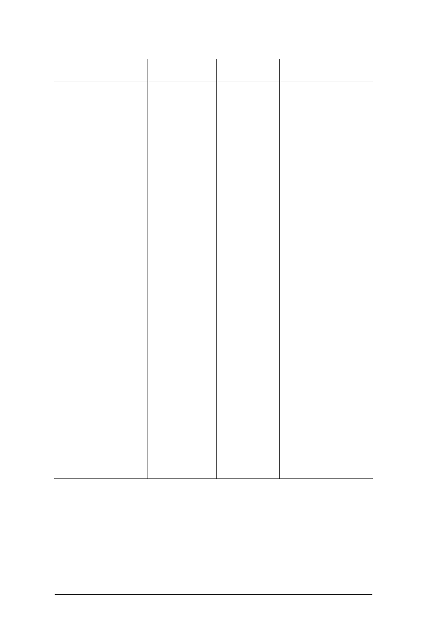
82 Chapter 5 – HTML Overview
Specifying Color in HTML
Web Design in a Nutshell, eMatter Edition
Copyright © 2000 O’Reilly & Associates, Inc. All rights reserved.
pink 255 - 192 - 203 FFC0CB FFCCCC
plum 221 - 160 - 221 DDA0DD CC99CC
powderblue 176 - 224 - 230 B0E0E6 CCFFFF
purple 128 - 0 - 128 800080 990099
red 255 - 0 - 0 FF0000 FF0000
rosybrown 188 - 143 - 143 BC8F8F CC9999
royalblue 65 - 105 - 225 4169E1 3366FF
saddlebrown 139 - 69 - 19 8B4513 993300
salmon 250 - 128 - 114 FA8072 FF9966
sandybrown 244 - 164 - 96 F4A460 FF9966
seagreen 46 - 139 - 87 2E8B57 339966
seashell 255 - 245 - 238 FFF5EE FFFFFF
sienna 160 - 82 - 45 A0522D 996633
silver 192 - 192 - 192 C0C0C0 CCCCCC
skyblue 135 - 206 - 235 87CEEB 99CCFF
slateblue 106 - 90 - 205 6A5ACD 6666CC
slategray 112 - 128 - 144 708090 669999
snow 255 - 250 - 250 FFFAFA FFFFFF
springgreen 0 - 255 - 127 00FF7F 00FF66
steelblue 70 - 130 - 180 4682B4 3399CC
tan 210 - 180 - 140 D2B48C CCCC99
teal 0 - 128 - 128 008080 009999
thistle 216 - 191 - 216 D8BFD8 CCCCCC1
tomato 253 - 99 - 71 FF6347 FF6633
turquoise 64 - 224 - 208 40E0D0 33FFCC
violet 238 - 130 - 238 EE82EE FF99FF
wheat 245 - 222 - 179 F5DEB3 FFCCCC
white 255 - 255 - 255 FFFFFF FFFFFF
whitesmoke 245 - 245 - 245 F5F5F5 FFFFFF
yellow 255 - 255 - 0 FFFF00 FFFF00
yellowgreen 154 - 205 - 50 9ACD32 66CC33
1These color names shift to the nearest Mac system palette color when viewed on a Macintosh
using any browser except Netscape Navigator 4.0 (which shifts it to the nearest Web Palette
color).
Table 5-2: Color Names with their Numeric Values (continued)
Color Name RGB Values Hexadecimal
Nearest Web-safe
Color

Specifying Color in HTML 83
HTML
Overview
Specifying Color in HTML
Web Design in a Nutshell, eMatter Edition
Copyright © 2000 O’Reilly & Associates, Inc. All rights reserved.
Table 5-3: Web Color Names by Hue
black
white
Neutrals —cool
darkgray
darkslategray
dimgray
gainsboro
ghostwhite
gray
lightgray
lightslategray
silver
slategray
snow
Neutrals —warm
antiquewhite
cornsilk
floralwhite
ivory
linen
oldlace
papayawhip
seashell
Browns/Tans
bisque
beige
blanchedalmond
brown
burlywood
chocolate
khaki
moccasin
navahowhite
peru
rosybrown
sandybrown
sienna
tan
wheat
Oranges
darkorange
orange
orangered
peachpuff
Yellows
darkgoldenrod
gold
goldenrod
lemonchiffon
lightgoldenrodyellow
lightyellow
palegoldenrod
yellow
Greens
aquamarine
chartreuse
darkgreen
darkkhaki
darkolivegreen
darkseagreen
forestgreen
green
greenyellow
honeydew
lawn green
lightgreen
lime
limegreen
mediumseagreen
mediumspringgreen
mintgreen
olive
olivedrab
palegreen
seagreen
springgreen
yellowgreen
Blue-greens
aqua
cyan
darkcyan
darkturquoise
lightcyan
lightseagreen
mediumaquamarine
mediumturquoise
paleturquoise
turquoise
Blues
aliceblue
azure
blue
cadetblue
cornflowerblue
darkblue
darkslateblue
deepskyblue
dodgerblue
indigo
lightblue
lightskyblue
lightsteelblue
mediumblue
mediumslateblue
midnightblue
navy
powderblue
skyblue
slateblue
steelblue
84 Chapter 5 – HTML Overview
Character Entities
Web Design in a Nutshell, eMatter Edition
Copyright © 2000 O’Reilly & Associates, Inc. All rights reserved.
Coloring Page Elements
Table 5-4 lists the HTML elements for which you can specify a color. Each tag’s
use is further explained in Chapters 6, 7, and 10 of this book.
Character Entities
Characters not found in the normal alphanumeric character set, such as © or &,
must be specified in HTML using character entities. Using keyboard commands
(such as Option-g for the © symbol) within your HTML document will not
produce the character when the document is rendered in a browser (in fact, the
browser will generally display the numeric entity for the character).
Character entities can be defined by name (&name;) or by numeric value
(&#nnn;). The browser interprets the string to display the proper character.
Named entities are preferable because numeric values may be interpreted differ-
ently on different platforms.
Purples
blueviolet
darkmagenta
darkorchid
darkviolet
fuchsia
lavender
lavenderblush
mediumorchid
mediumpurple
mediumvioletred
orchid
palevioletred
plum
purple
thistle
violet
Pinks
coral
darksalmon
deeppink
hotpink
lightcoral
lightpink
lightsalmon
magenta
mistyrose
pink
salmon
Reds
crimson
darkred
firebrick
indianred
maroon
red
Table 5-4: Summary of HTML Tags with Color Attributes
Tag Attribute Description
<BODY> BGCOLOR=color Document background
<BODY> TEXT=color Regular text
<BODY> LINK=color Hypertext link
<BODY> VLINK=color Visited link
<BODY> ALINK=color Active link
<FONT> COLOR=color Colors a selection of text
<BASEFONT> COLOR=color Colors the following block of text (IE only)
<TR> BGCOLOR=color Table row background
<TD> BGCOLOR=color Table cell background
<TH> BGCOLOR=color Table header background
Table 5-3: Web Color Names by Hue (continued)
Character Entities 85
HTML
Overview
Character Entities
Web Design in a Nutshell, eMatter Edition
Copyright © 2000 O’Reilly & Associates, Inc. All rights reserved.
Table 5-5 presents the defined standard, proposed, and several nonstandard, but
generally supported, character entities for HTML. Not all 256 characters in the ISO
character set appear in the table. Missing ones are not recognized by the browser
as either named or numeric entities.
Entities for which the conformance column is blank are part of the HTML 2.0 and
later standards and will work with nearly all available browsers. Characters whose
conformance column contains “4.0” are supported in the HTML 4.0 Specification
only. As of this writing, they are supported by versions 4.0 of Netscape Navigator
and Internet Explorer. An “N” in the conformance column indicates that the char-
acter is a nonstandard entity.
Table 5-5: Character Entities
Number Name Symbol Description Conformance
	 Horizontal tab

 Line feed

 Carriage return
  Space
! ! Exclamation point
" " "Quotation mark
# # Hash mark
$ $ Dollar sign
% % Percent sign
& & & Ampersand
' 'Apostrophe
( ( Left parenthesis
) ) Right parenthesis
* * Asterisk
+ + Plus sign
, , Comma
- - Hyphen
. . Period
/ / Slash
0–
9
0-9 Digits 0-9
: : Colon
; ; Semicolon
< < < Less than
= = Equal sign
> > > Greater than
? ? Question mark
@ @ Commercial at sign
A–
Z
A – Z Letters A – Z

86 Chapter 5 – HTML Overview
Character Entities
Web Design in a Nutshell, eMatter Edition
Copyright © 2000 O’Reilly & Associates, Inc. All rights reserved.
[ [ Left square bracket
\ \ Backslash
] ] Right square bracket
^ ^ Caret
_ _ Underscore
` ` Grave accent
a–
z
a-z Letters a – z
{ { Left curly brace
| | Vertical bar
} } Right curly brace
~ ~ Tilde
‚ , Comma N
ƒ ƒ Florin N
„ ” Right double quote N
… … Elipsis N
† † Dagger N
‡ ‡ Double dagger N
ˆ ˆ Circumflex N
‰ ‰ Permil N
Š _ Underscore N
‹ < Less than sign N
ΠΠCapital OE ligature N
‘ ‘ Left single quote N
’ ’ Right single quote N
“ “ Left double quote N
” ” Right double quote N
• • Bullet N
– – En dash N
— — Em dash N
˜ ~ Tilde N
™ ™ Trademark N
š _ Underscore N
› > Greater than sign N
œ œ Lowercase oe ligature N
Ÿ Ÿ Capital Y, umlaut N
  Nonbreaking space 4.0
¡ ¡ ¡ Inverted exlamation mark 4.0
¢ ¢ ¢ Cent sign 4.0
Table 5-5: Character Entities (continued)
Number Name Symbol Description Conformance

Character Entities 87
HTML
Overview
Character Entities
Web Design in a Nutshell, eMatter Edition
Copyright © 2000 O’Reilly & Associates, Inc. All rights reserved.
£ £ £ Pound sign 4.0
¤ ¤ ¤ General currency symbol 4.0
¥ ¥ ¥ Yen sign 4.0
¦ ¦ Broken vertical bar 4.0
§ § § Section sign 4.0
¨ ¨ ¨ Umlaut 4.0
© © © Copyright 4.0
ª ª ª Feminine ordinal 4.0
« « « Left angle quote 4.0
¬ ¬ ¬ Not sign 4.0
­ ­ – Soft hyphen 4.0
® ® ® Registered trademark 4.0
¯ ¯ ¯ Macron accent 4.0
° ° ˚ Degree sign 4.0
± ± Plus or minus 4.0
² ² 2Superscript 2 4.0
³ ³ 3Superscript 3 4.0
´ ´ ´ Acute accent 4.0
µ µ µMicro sign (Greek mu) 4.0
¶ ¶ ¶ Paragraph sign 4.0
· · · Middle dot 4.0
¸ ¸ ¸ Cedilla 4.0
¹ ¹ 1Superscript 1 4.0
º º Masculine ordinal 4.0
» » » Right angle quote 4.0
¼ ¼ 1/4Fraction one-fourth 4.0
½ ½ 1/2Fraction one-half 4.0
¾ ¾ 3/4Fraction three-fourths 4.0
¿ ¿ ¿ Inverted question mark 4.0
À À À Capital A, grave accent
Á Á Á Capital A, acute accent
   Capital A, circumflex
accent
à à à Capital A, tilde accent
Ä Ä Ä Capital A, umlaut
Å Å Å Capital A, ring
Æ Æ Æ Capital AE ligature
Ç Ç Ç Capital C, cedilla
È È È Capital E, grave accent
Table 5-5: Character Entities (continued)
Number Name Symbol Description Conformance
|
±
º
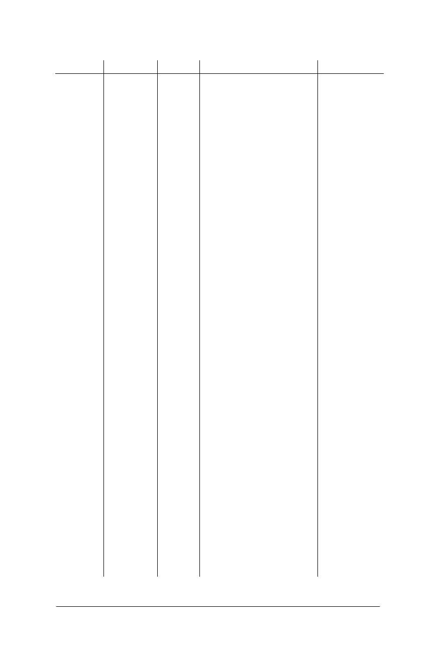
88 Chapter 5 – HTML Overview
Character Entities
Web Design in a Nutshell, eMatter Edition
Copyright © 2000 O’Reilly & Associates, Inc. All rights reserved.
É É É Capital E, acute accent
Ê Ê Ê Capital E, circumflex
accent
Ë Ë Ë Capital E, umlaut
Ì Ì Ì Capital I, grave accent
Í Í Í Capital I, acute accent
Î Î Î Capital I, circumflex accent
Ï Ï Ï Capital I, umlaut
Ð Ð Capital eth, Icelandic
Ñ Ñ Ñ Capital N, tilde
Ò Ò Ò Capital O, grave accent
Ó Ó Ó Capital O, acute accent
Ô Ô Ô Capital O, circumflex
accent
Õ Õ Õ Capital O, tilde accent
Ö Ö Ö Capital O, umlaut
× × ×Multiply sign 4.0
Ø Ø Ø Capital O, slash
Ù Ù Ù Capital U, grave accent
Ú Ú Ú Capital U, acute accent
Û Û Û Capital U, circumflex
Ü Ü Ü Capital U, umlaut
Ý Ý Capital Y, acute accent
Þ Þ Capital Thorn, Icelandic
ß ß ß Small sz ligature, German
à à à Small a, grave accent
á á á Small a, acute accent
â â â Small a, circumflex accent
ã ã ã Small a, tilde
ä ä ä Small a, umlaut
å å å Small a, ring
æ æ æ Small ae ligature
ç ç ç Small c, cedilla
è è è Small e, grave accent
é é é Small e, acute accent
ê ê ê Small e, circumflex accent
ë ë ë Small e, umlaut accent
ì ì ì Small i, grave accent
í í í Small i, acute accent
Table 5-5: Character Entities (continued)
Number Name Symbol Description Conformance
D
-
Y
´
I
c

HTML Resources in This Book 89
HTML
Overview
HTML Resources in This Book
Web Design in a Nutshell, eMatter Edition
Copyright © 2000 O’Reilly & Associates, Inc. All rights reserved.
HTML Resources in This Book
In addition to the detailed descriptions of HTML tags and their use in the following
eight chapters, there are several appendixes at the end of the book that provide a
quick reference for the entire set of HTML tags, sliced a number of different ways.
Appendix A, HTML Tags and Elements
This is an alphabetical listing of all the currently available HTML tags
mentioned in this book. It includes all the tags listed in the HTML 4.0 Specifi-
cation (including the complete list of attributes for each tag), tags in current
use that are not specifically mentioned in the 4.0 Spec, and all browser-
specific tags and attributes. It also provides chapter and page references so
you can look up the detailed information for each tag quickly.
Appendix B, List of Attributes
This is a listing of every available attribute as published by the HTML 4.0
Specification. It indicates in which tags the attribute can be used, whether it is
optional or required, and whether it has been deprecated by the HTML 4.0
Specification.
Appendix C, Deprecated Tags
This appendix lists all of the tags and attributes that have been officially
deprecated by the W3C in the HTML 4.0 Specification. Deprecated tags are
still supported by browsers for backward-compatibility, but are discouraged
from use. Most attributes are deprecated in favor of style sheet controls. The
table also lists recommended substitutes when noted by the W3C.
î î î Small i, circumflex accent
ï ï ï Small i, umlaut
ð ð Small eth, icelandic
ñ ñ ñ Small n, tilde
ò ò ò Small o, grave accent
ó ó ó Small o, acute accent
ô ô ô Small o, circumflex accent
õ õ õ Small o, tilde
ö ö ö Small o, umlaut
÷ ÷ ÷Division sign 4.0
ø ø ø Small o, slash
ù ù ù Small u, grave accent
ú ú ú Small u, acute accent
û û û Small u, circumflex accent
ü ü ü Small u, umlaut
ý ý Small y, acute accent
þ þ pb Small thorn, Icelandic
ÿ ÿ ÿ Small y, umlaut
Table 5-5: Character Entities (continued)
Number Name Symbol Description Conformance
∂
y
´

90 Chapter 5 – HTML Overview
HTML Resources in This Book
Web Design in a Nutshell, eMatter Edition
Copyright © 2000 O’Reilly & Associates, Inc. All rights reserved.
Appendix D, Proprietary Tags
Here’s where you’ll find the list of tags supported only in Internet Explorer or
Netscape Navigator.
Appendix E, CSS Compatibility
This appendix lists all elements in the Cascading Style Sheets specification and
notes how well Navigator and Internet Explorer support them.
91
Structural
Tags
Web Design in a Nutshell, eMatter Edition
Copyright © 2000 O’Reilly & Associates, Inc. All rights reserved.
Chapter 6Structural Tags
CHAPTER 6
Structural HTML Tags
This chapter looks at the subset of HTML tags that is used primarily to give the
document structure. It also discusses tags that are used for providing information
about the document and those used for controlling its appearance or function on a
global level.
Summary of Structural Tags
In this section, browser support for each tag is noted to the right of the tag name.
Browsers that do not support the tag are grayed out. Browsers that deprecate the
tag are noted with a superscript D. Tag usage is indicated below the tag name. A
more thorough listing of attributes for each tag, according to the HTML 4.0 Specifi-
cation, appears in Appendix A, HTML Tags and Elements.
<base>
NN: 2, 3, 4 - MSIE: 2, 3, 4, 5 - HTML 4 - WebTV - Opera3
<base>
Specifies the base URL for all relative URLs in the document. Place this within the
<head> of the document.
Attributes
href=url
Specifies the URL to be used.
target=name
Defines the default target window for all links in the document. Often used to
target frames. This attribute is not supported in MSIE 2.0

92 Chapter 6 – Structural HTML Tags
Summary of Structural Tags
Web Design in a Nutshell, eMatter Edition
Copyright © 2000 O’Reilly & Associates, Inc. All rights reserved.
<body>
NN: 2, 3, 4 - MSIE: 2, 3, 4, 5 - HTML 4 - WebTV - Opera3
<body>...</body>
Defines the beginning and the end of the document body. The body contains the
content of the document (the part that is displayed in the browser window).
Attributes to the <body> tag affect the entire document.
Attributes
alink="#rrggbb" or color name
Sets the color of active links (i.e., the color while the mouse button is held
down during a “click”). Color is specified in hexadecimal RGB values or by
standard web color name. Chapter 5, HTML Overview, explains how to specify
color in HTML.
background=url
Provides the URL to a graphic file to be used as a tiling graphic in the back-
ground of the document.
bgcolor="#rrggbb" or color name
Sets the color of the background for the document. Color is specified in hexa-
decimal RGB values or by standard web color name.
link="#rrggbb" or color name
Sets the default color for all the links in the document. Color is specified in
hexadecimal RGB values or by standard web color name.
text="#rrggbb" or color name
Sets the default color for all the text in the document. Color is specified in
hexadecimal RGB values or by standard web color name.
vlink="#rrggbb" or color name
Sets the color of the visited links for the document. Color is specified in hexa-
decimal RGB values or by standard web color name.
Netscape Navigator 4.0 only
marginwidth=number
Specifies the distance (in number of pixels) between the left browser edge
and the beginning of the text and graphics in the window.
marginheight=number
Specifies the distance (in number of pixels) between the top edge of the
browser and the top edge of text or graphics in the window.
Internet Explorer only
bgproperties="fixed"
When set to “fixed,” the background image does not scroll with the docu-
ment content.
leftmargin=number
Specifies the distance (in number of pixels) between the left browser edge
and the beginning of the text and graphics in the window.

Summary of Structural Tags 93
Structural
Tags
Summary of Structural Tags
Web Design in a Nutshell, eMatter Edition
Copyright © 2000 O’Reilly & Associates, Inc. All rights reserved.
topmargin=number
Specifies the distance (in number of pixels) between the top edge of the
browser and the top edge of text or graphics in the window.
<head>
NN: 2, 3, 4 - MSIE: 2, 3, 4, 5 - HTML 4 - WebTV - Opera3
<head>...</head>
Defines the head (also called “header”) portion of the document that contains
information about the document. The <head> tag has no attributes, but serves
only as a container for the other header tags, such as <base>,<meta>, and
<title>.
<html>
NN: 2, 3, 4 - MSIE: 2, 3, 4, 5 - HTML 4 - WebTV - Opera3
<html>...</html>
Placed at the beginning and end of the document, this tag tells the browser that
the entire document is composed in HTML.
<link>
NN: 2, 3, 4 - MSIE: 2, 3, 4, 5 - HTML 4 - WebTV - Opera3
<link>
Defines a relationship between the current document and another document. This
tag goes within the <head> portion of the document. It is often used to refer to an
external stylesheet.
Attributes
href=url
Identifies the target document.
methods=list
Specifies a browser-dependent list of comma-separated display methods for
this link. It is not commonly used.
rev=relation
Specifies the relationship from the target document to the source.
rel=relation
Specifies the relationship from the current source document to the target.
rel=stylesheet
This attribute is used within the <link> tag to create a relationship with an
external stylesheet.
title=text
Provides a title for the target document.
type=resource
Shows the type of an outside link. The value text/css indicates that the
linked document is an external cascading style sheet.

94 Chapter 6 – Structural HTML Tags
Setting Up an HTML Document
Web Design in a Nutshell, eMatter Edition
Copyright © 2000 O’Reilly & Associates, Inc. All rights reserved.
urn=urn
Defines a location-independent Universal Resource Name (URN) for the refer-
enced document. The actual syntax of the URN has not been defined, making
this more of a placeholder for future versions of HTML.
<meta>
NN: 2, 3, 4 - MSIE: 2, 3, 4, 5 - HTML 4 - WebTV - Opera3
<meta>
Provides additional information about the document. It should be placed within
the <head> tags at the beginning of the document. It is commonly used for
making documents searchable (by adding keywords) and may be used for client-
pull functions. Meta tags are discussed at the end of this chapter.
Attributes
content=text
Specifies the value of the meta tag and is always used in conjunction with
name= or http-equiv=.
http-equiv=text
Specifies information to be included in the HTTP header that the server
appends to the document. It is used in conjunction with the name attribute.
name=text
Specifies a name for the meta information.
scheme=text
Provides additional information for the interpretation of meta data. This is a
new attribute introduced in HTML 4.0.
<title>
NN: 2, 3, 4 - MSIE: 2, 3, 4, 5 - HTML 4 - WebTV - Opera3
<title>...</title>
Specifies the title of the document. The title generally appears in the top bar of the
browser window.
Setting Up an HTML Document
The standard skeletal structure of an HTML document is as follows:
<HTML>
<HEAD><TITLE>Document Title</TITLE></HEAD>
<BODY>Contents of Document</BODY>
</HTML>
The HTML standard requires that the entire document appear within the <html>
container, however, most browsers can properly display the contents of the docu-
ment even if these tags are omitted. All HTML documents are made up of two
main structures, the head (also called the “header”) and the body. The exception
to this rule is when the document contains a frameset in place of the body. For
more information, see Chapter 11, Frames.

Setting Up an HTML Document 95
Structural
Tags
Setting Up an HTML Document
Web Design in a Nutshell, eMatter Edition
Copyright © 2000 O’Reilly & Associates, Inc. All rights reserved.
The Document Header
The header, delimited by the <head> tag, contains information that describes the
HTML document. The head tag has no attributes of its own, but merely serves as a
container for other tags that help define and manage the document’s contents.
Titles
The most commonly used element within the header is the document title (within
<title> tags, as shown in the example above), which provides a description of
the page’s contents. The title is also used as the name of the link as displayed in a
user’s bookmarks or “hot list.” Search engines rely heavily on document titles as
well. For all these reasons, it is important to provide thoughtful and descriptive
titles for all your documents and avoid vague titles such as “Welcome,” or “My
Page.”
Other header elements
Other useful HTML elements are also placed within the <head> tags of a
document:
<base>
This tag establishes the document’s base location, which serves as a refer-
ence for all the links in the document. For more information, see Chapter 8,
Creating Links.
<link>
This tag defines the relationship between the current document and another
document. Although it can signify relationships such as index, next, and
previous, it is most often used today to link a document to an external style
sheet (see Chapter 23, Cascading Style Sheets).
<meta>
“Meta” tags are used to provide information about a document, such as
keywords or descriptions to aid search engines. It may also be used for client-
pull functions. The <meta> tag is discussed later in this chapter.
<script>
JavaScripts and VBScripts may be added to the document within its header.
<style>
Embedded style sheets must be added to the document header by placing the
<style> element within the <head> container. For more information, see
Chapter 23).
The Document Body
The document body, delimited by <body> tags, contains the contents of the docu-
ment—the part that you want to display in the browser window.
The body of an HTML document might consist of just a few paragraphs of text, a
single image, or a complex combination of text, images, tables, and multimedia
objects. What you put on the page is up to you.

96 Chapter 6 – Structural HTML Tags
Global Settings with the <body> Tag
Web Design in a Nutshell, eMatter Edition
Copyright © 2000 O’Reilly & Associates, Inc. All rights reserved.
Global Settings with the <body> Tag
The <body> tag, originally designed to delimit the body of the document, has
been extended to include controls for the backgrounds and text colors of a docu-
ment. These settings are global, meaning they will apply to the entire document.
Colors
You can use the <body> tag to set colors for the background and text elements
(see Table 6-1). Specified link colors apply to linked text, but also to the border
around linked graphics. (To learn how to specify color in HTML, see Chapter 5.)
A single <body> tag can contain a number of specific attributes, as shown here:
<BODY BGCOLOR="color" TEXT="color" LINK="color" VLINK="color"
ALINK="color">
Tiling Background Graphics
You’ve probably seen web pages that have a graphic image repeating behind the
text. These are called background tiles,ortiling graphics, and they are added to
the document via the <body> tag using the background attribute and the URL of
the graphic as follows:
<BODY BACKGROUND="background.gif">
Any web-based graphic file format (such as GIF or JPEG) can be used as a back-
ground tile (some new browsers even support animated GIFs in the background).
Following are a few guidelines and tips regarding the use of background tiles:
• Use graphics that won’t interfere with the legibility of the text over it.
Table 6-1: Attributes for Specifying Colors with the <body> Tag
Page Element HTML TAG Description
Background
color
<BODY BGCOLOR="color"> Sets the color for the back-
ground of the entire page.
Regular text <BODY TEXT="color"> Sets the color for all the regular
text in the document. The
default color for text is black.
Links <BODY LINK="color"> Sets the color for hyperlinks.
The default color for links is
blue.
Visited link <BODY VLINK="color"> Sets the color for links that have
already been clicked. The
default color for visited links is
purple.
Active link <BODY ALINK="color"> Sets the color for a link while it
is in the process of being
clicked. The default color for an
active link is red.

Global Settings with the <body> Tag 97
Structural
Tags
Global Settings with the <body> Tag
Web Design in a Nutshell, eMatter Edition
Copyright © 2000 O’Reilly & Associates, Inc. All rights reserved.
• Keep file sizes small. As usual for the web, it is important to keep the file size
as small as possible for background graphics, which often lag behind the dis-
play of the rest of the page. Effective stripe effects can be created by repeat-
ing a graphic that is very wide, but only one pixel high (or vice versa).
• Provide a background color specification in the <body> tag that will display
while the background image downloads. In some cases, the background
graphic may be the last element to display on the page while background col-
ors display almost instantly. It is a nice trick to specify a background color
that matches the overall intensity and hue of your background graphic, to at
least set the mood while users wait for the background image to load. This is
particularly useful if you’ve got light-colored text or graphics matched to the
background graphic which will look unreadable or just ugly against the
interim default gray browser background.
• If you want the color of the background image to match other graphics posi-
tioned inline in the web page, be sure that they are saved in the same graphic
file formats. Because browsers interpret colors differently for JPEGs and GIFs,
the file formats need to match in order for the colors to match seamlessly
(GIF with GIF, JPEG with JPEG).
• Non-web-safe colors (colors not found in the Web Palette) are handled differ-
ently for background images than they are for foreground images when the
page is displayed on an 8-bit monitor. This makes it very difficult to match
inline images to the background seamlessly, even when the graphics use the
exact same color (or even when using the same graphic in both places).
To make matters worse, the way they are handled differs from browser to
browser. For instance, on the Mac, Netscape dithers the foreground graphic
but shifts the background graphic to its nearest Web Palette value. In Internet
Explorer, just the opposite happens: the background image dithers and the
foreground image shifts. If you are trying to create a seamless effect, either
make your foreground images transparent or stick diligently to the colors in
the Web Palette.
The Web Palette is explained in the section “Color in Browsers—The Web
Palette” in Chapter 3, Web Design Principles for Print Designers, and further in
Chapter 17, Designing Graphics with the Web Palette.
Adjusting Browser Margins
By default, browsers allow a margin of 10 to 12 pixels (depending on the browser
and platform) between the browser window and the document’s contents. It is
possible to add attributes to the <body> tag to increase or decrease the margin
width. The margin may be removed completely, allowing objects to sit flush
against the window, by setting the attribute values to 0.
The drawback is that Internet Explorer and Netscape Navigator use different
attributes to control margins. In addition, Netscape’s tags only work with version 4.0
and higher. If you want to reach a broader audience, you can use frames for a
similar effect (see “Frame Margins” in Chapter 11).

98 Chapter 6 – Structural HTML Tags
Using <meta> Tags
Web Design in a Nutshell, eMatter Edition
Copyright © 2000 O’Reilly & Associates, Inc. All rights reserved.
IE uses the attributes leftmargin (affects space on left and right) and topmargin
(affects space on top and bottom). Navigator 4.0 uses the more standard margin-
width and marginheight for the same measurements, respectively. To set
margins for both browsers, it is necessary to use all four attributes. In the
following example, the margins are turned off for both browsers by setting the
margins to 0:
<BODY MARGINWIDTH=0 MARGINHEIGHT=0 LEFTMARGIN=0 TOPMARGIN=0>
Using <meta> Tags
The <meta> tag has a wide variety of applications, but is primarily used to include
information about a document, such as the creation date, author, or copyright
information. The data included in a <meta> tag is useful for servers, web
browsers, and search engines but is invisible to the reader. It must always be
placed within the <head> of the document.
A document may have any number of <meta> tags. There are two types of
<meta> tags, using either the name or http-equiv attribute. In each case, the
content attribute is necessary to provide a value (or values) for the named infor-
mation or function. The examples below show basic <meta> tag syntax. In the
following sections, we will look at each type of meta tag and its uses.
<META HTTP-EQUIV="name" CONTENT="content">
<META NAME="name" CONTENT="content">
The http-equiv Attribute
Information provided by an http-equiv attribute is added to the HTTP response
header. The HTTP header contains information the server passes to the browser
just before it sends the HTML document. It contains MIME type information and
other values that affect the action of the browser. Therefore, the http-equiv
attribute provides information that somehow affects the way the browser handles
your document.
There are a large number of predefined http-equiv types available. This section
will look at just a few of the most useful. For a complete listing, see the Dictio-
nary of HTML META Tags at http://vancouver-webpages.com/META/.
Meta tags for client-pull
Client-pull refers to the ability of the browser (the client) to automatically request
(pull) a new document from the server. The effect for the user is that the page
displays, and after a period of time, automatically refreshes with new information
or is replaced by an entirely new page. If you string documents with client-pull
instructions and set very short time intervals, you can create a sort of slide show
effect. Client-pull was once used for rudimentary animation in the early days of
the Web, but now that there are better alternatives the client-pull method is rarely
used for animation. Client-pull is still a handy technique for redirecting old URLs
to new ones. If you retire content at a given URL, you may want to redirect users
to a different page, rather than just allowing a 404 error.

Using <meta> Tags 99
Structural
Tags
Using <meta> Tags
Web Design in a Nutshell, eMatter Edition
Copyright © 2000 O’Reilly & Associates, Inc. All rights reserved.
Client-pull uses the refresh attribute value, first introduced by Netscape. It tells
the browser to wait a specified number of seconds (indicated by an integer in the
content attribute) and then load a new page. If no page is specified, the browser
will just reload the current page. The following example instructs the browser to
reload the page after 15 seconds (we can assume there’s something fancy
happening on the server side that puts updated information in the HTML
document):
<META HTTP-EQUIV="refresh" CONTENT="15">
To reload a different file, provide the URL for the document within the content
attribute as shown below:
<META HTTP-EQUIV="refresh" CONTENT="1; URL=http://nextdocument.
html">
Note that there is only a single set of quotation marks around the value for
content. Although URLs usually require their own quotation marks, these are
omitted within the context of the content attribute.
To create a slide-show effect, add a meta refresh tag in the <head> of each
document that points to the next HTML document in the sequence. You can set
the time interval to as many seconds as you like; setting it to 0 will trigger the next
page as soon as the current page has downloaded. Bear in mind, however, the
actual amount of time the page takes to refresh is dependent on complex factors
of file size, server speed, and general web traffic.
In the following example, three files are coded to loop endlessly at five-second
intervals:
Document 1.html contains:
<META HTTP-EQUIV="refresh" CONTENT="5; URL=2.html">
Document 2.html contains:
<META HTTP-EQUIV="refresh" CONTENT="5; URL=3.html">
Document 3.html contains a tag which points back to 1.html:
<META HTTP-EQUIV="refresh" CONTENT="5; URL=1.html">
Other uses
expires
Indicates the date and time after which the document should be considered
expired. Web robots may use this information to delete expired documents
from a search engine index.
<META HTTP-EQUIV="expires" CONTENT="July 16, 1998 06:27:00
EST">
content-type
The content-type text/html is automatically added to the HTTP header for
HTML documents, but this attribute can be extended to include the character
set for the document. This causes the browser to load the appropriate char-
acter set before displaying the page.

100 Chapter 6 – Structural HTML Tags
Using <meta> Tags
Web Design in a Nutshell, eMatter Edition
Copyright © 2000 O’Reilly & Associates, Inc. All rights reserved.
This is part of the HTML 4.0 measures to internationalize the Web. You can
read more about identifying character sets in Chapter 27, Internationalization.
<META HTTP-EQUIV="content-type" CONTENT="text/html;
charset=SHIFT_JIS">
content-language
This may be used to identify the language in which the document is written.
Like the character set extension mentioned above, it is part of the ongoing
effort to internationalize the Web. The browser can send a corresponding
"Accept-Language" header, which causes the server to choose the docu-
ment with the appropriate language specified in its <meta> tag.
For more information on internationalization, as well as for a listing of 2-letter
language codes, see Chapter 27.
This example tells the browser that the document’s natural language is
French:
<META HTTP-EQUIV="content-language" CONTENT="fr">
Inserting Meta-Information with the name Attribute
The name attribute is used to insert hidden information about the document that
does not correspond to HTTP headers. For example:
<META NAME="author" CONTENT="Jennifer Niederst">
<META NAME="copyright" CONTENT="1998, O'Reilly & Associates">
You can make up your own <meta> names, or use one of the names put forth by
search engine and browser companies for standardized use. Just a few of the
accepted and more useful <meta> names are discussed in the following sections.
For a complete listing of possible name types, see the Dictionary of HTML META
Tags at http://vancouver-webpages.com/META/.
Meta tags for search engines
The popular search engines Infoseek and AltaVista introduced several <meta>
names that aid their search engines in finding pages. Note that not all search
engines use meta data, but adding them to your document won’t hurt. There is a
blurry distinction between name and http-equiv, so most of these meta names
will also work as http-equiv definitions.
description
This provides a brief, plain-language description of the contents of your web
page, which is particularly useful if your document contains little text, is a
frameset, or has extensive scripts at the top of the HTML document. Search
engines that recognize the description may display it in the search results
page. Some search engines use only the first 20 words of descriptions, so get
to the point quickly.
<META NAME="description" CONTENT="Jennifer Niederst's resume
and web design samples">

Using <meta> Tags 101
Structural
Tags
Using <meta> Tags
Web Design in a Nutshell, eMatter Edition
Copyright © 2000 O’Reilly & Associates, Inc. All rights reserved.
keywords
You can supplement the title and description of the document by providing a
list of comma-separated keywords that would be useful in indexing your
document.
<META name="keywords" content="designer, web design, training,
interface design">
author
Identifies the author of the web page.
<META NAME="author" CONTENT="Jennifer Niederst">
copyright
Identifies the copyright information for the document.
<META NAME="copyright" CONTENT="1998, O'Reilly & Associates">
robots
This tag was created as an alternative to the robots.txt file and is mainly used
as a way to prevent your page from being indexed by search engine “spiders.”
It is not well supported, but some people like to include it anyway. The
content attribute can take the following values: index (the default), noindex
(prevents indexing), nofollow (prevents the search engine from following
links on the page), and none (the same as setting "noindex, nofollow").
<META NAME="robots" CONTENT="noindex, nofollow">
Other uses
rating
This provides a method of rating the content of a web page to indicate its
appropriateness for kids. The four available ratings are general,mature,
restricted, and 14 years.
<META NAME="rating" CONTENT="general">
generator (or formatter for FrontPage)
Many HTML authoring tools add an indication of the name and version of the
creation tool. This is used by tools vendors to assess market penetration.
<META NAME="generator" CONTENT="Adobe PageMill">

102
Web Design in a Nutshell, eMatter Edition
Copyright © 2000 O’Reilly & Associates, Inc. All rights reserved.
Chapter 7Formatting Text
CHAPTER 7
Formatting Text
Designers accustomed to desktop publishing programs are usually shocked to find
how little control HTML offers over the display of the page. Before you get too
frustrated, bear in mind that HTML was not developed as a method for dictating
presentation, but rather as a means of marking the structure of a document.
In fact, the tags that do provide specific display information (<center>, for
example) are usually just bastardizations of the pure HTML concept. One day,
we’ll put all of our style and presentation information in style sheets and leave
HTML markup to work as originally designed. But that’s another story (one told in
Chapter 23, Cascading Style Sheets).
This chapter looks at the nature of text in web pages and reviews the HTML tags
related to the display of text elements.
Summary of Text Tags
This section is a listing of tags used for formatting text. It is divided into the
following subgroups:
• Paragraphs and Headings (Block-Level Elements)
• Text Appearance (Inline Styles)
• Spacing and Positioning
• Lists
Browser support for each tag is noted to the right of the tag name. Browsers that
do not support the tag are grayed out. Browsers that deprecate the tag are noted
with a superscript D. Tag usage is indicated below the tag name. A more thor-
ough listing of attributes for each tag, according to the HTML 4.0 Specification,
appears in Appendix A, HTML Tags and Elements.

Summary of Text Tags 103
Formatting
Text
Summary of Text Tags
Web Design in a Nutshell, eMatter Edition
Copyright © 2000 O’Reilly & Associates, Inc. All rights reserved.
Paragraphs and Headings (Block-Level Elements)
Block-level elements are always formatted with a line-break before and after, with
most adding some amount of additional space above and below as well. The most
commonly used block elements are paragraphs (<p>), headings (<h1...h6>), and
blockquotes (<blockquote>).
Lists and list items are also block-level elements, but they have been grouped in
their own section below.
<address>
NN: 2, 3, 4 - MSIE: 2, 3, 4, 5 - HTML 4 - WebTV - Opera3
<address>...</address>
Identifies ownership or authorship information, typically at the beginning or end
of a document. Addresses are generally formatted in italic type with a line break
(but no extra space) above and below.
<blockquote>
NN: 2, 3, 4 - MSIE: 2, 3, 4, 5 - HTML 4 - WebTV - Opera3
<blockquote>...</blockquote>
Enclosed text is a blockquote, which is generally displayed with an indent on the
left and right margins and added space above and below the paragraph.
Note that:
• Some older browsers display blockquote material in italic, making it difficult
to read.
• Browsers are inconsistent in the way they display images within blockquotes.
Some align the graphic with the indented blockquote margin; others align the
image with the normal margin of paragraph text. It is a good idea to test on a
variety of browsers.
<div>
NN: 2, 3, 4 - MSIE: 2, 3, 4, 5 - HTML 4 - WebTV - Opera3
<div>...</div>
Denotes the beginning and end of a division of the page. First introduced in HTML
3.2 as a way to define a unique style for each division, only the alignment func-
tion (using the align attribute) was implemented by the major browsers.
The <div> tag has proven itself enormously valuable, however, when used in
conjunction with style sheets (see Chapter 23).
Attributes
align=center|left|right
Aligns the text within the tags to the left, right, or center of the page.

104 Chapter 7 – Formatting Text
Summary of Text Tags
Web Design in a Nutshell, eMatter Edition
Copyright © 2000 O’Reilly & Associates, Inc. All rights reserved.
<h1> through <h6>
NN: 2, 3, 4 - MSIE: 2, 3, 4, 5 - HTML 4 - WebTV - Opera3
<hn>...</hn>
Specifies that the enclosed text is a heading. There are six different levels of head-
ings, from <h1> to <h6>, with each subsequent level displaying at a smaller size.
<h5> and <h6> usually display smaller than the surrounding body text.
Attributes
align=center|left|right
Used to align the header left, right, or centered on the page. Microsoft Internet
Explorer 3.0 and earlier do not support right alignment.
<p>
NN: 2, 3, 4 - MSIE: 2, 3, 4, 5 - HTML 4 - WebTV - Opera3
<p>...</p>
Denotes the beginning and end of a paragraph when used as container. Many
browsers will also allow the <p> tag to be used without a closing tag to start a
new paragraph. The container method is preferred, particularly if you are using
Cascading Style Sheets with the document.
Attributes
align=center|left|right
Aligns the text within the tags to the left, right, or center of the page.
Text Appearance (Inline Styles)
The following tags affect the appearance of text. With the exception of <base-
font>, all of the tags listed in this section define inline styles, meaning they can
be applied to a string of characters within a block element without introducing
line breaks. (<basefont> is used to specify the appearance of type for a whole
document or for a range of text.)
<abbr>
NN: 2, 3, 4 -MSIE: 2, 3, 4, 5 - HTML 4 - WebTV -Opera3
<abbr>...</abbr>
Identifies the enclosed text as an abbreviation. It has no inherent effect on text
display, but can be used as an element selector in a style sheet.
Attributes
title=string
Provides the full expression for the abbreviation. This may be useful for non-
visual browsers and search engines.
Example
<ABBR TITLE="Massachusetts">Mass.</ABBR>

Summary of Text Tags 105
Formatting
Text
Summary of Text Tags
Web Design in a Nutshell, eMatter Edition
Copyright © 2000 O’Reilly & Associates, Inc. All rights reserved.
<acronym>
NN: 2, 3, 4 -MSIE: 2, 3, 4, 5 - HTML 4 - WebTV -Opera3
<acronym>...</acronym>
Indicates an acronym. It has no inherent effect on text display, but can be used as
an element selector in a style sheet.
Attributes
title=string
Provides the full expression for the acronym. This may be useful for non-
visual browsers and search engines.
Example
<ACRONYM TITLE="World Wide Web">WWW</ACRONYM>
<b>
NN: 2, 3, 4 - MSIE: 2, 3, 4, 5 - HTML 4 - WebTV - Opera3
<b>...</b>
Enclosed text is rendered in bold.
<basefont>
NN: 2, 3, 4 - MSIE: 2, 3, 4, 5 - HTML 4D- WebTV - Opera3
<basefont>
Specifies certain font attributes for text following the tag. It can be used within the
<head> tags to apply to the entire document, or within the body of the document
to apply to the subsequent text. This tag is not part of the HTML standard.
Attributes
color="#rrggbb"or name
MSIE 3.0+ only: Sets the color of the following text using hexadecimal RGB
values.
face=font
MSIE 3.0+ only. Sets the font for the following text.
size=value
Sets the basefont size using the HTML size values from 1 to 7 (or relative
values based on the default value of 3). Subsequent relative size settings will
be based on this value.
<big>
NN: 2, 3, 4 - MSIE: 2, 3, 4, 5 - HTML 4 - WebTV - Opera3
<big>...</big>
Sets the type one font size larger than the surrounding text. It is equivalent to
<font size="+1">.
<blink>
NN: 2, 3, 4 - MSIE: 2, 3, 4, 5 -HTML 4 -WebTV -Opera3
<blink>...</blink>
Causes the contained text to flash on and off.

106 Chapter 7 – Formatting Text
Summary of Text Tags
Web Design in a Nutshell, eMatter Edition
Copyright © 2000 O’Reilly & Associates, Inc. All rights reserved.
<cite>
NN: 2, 3, 4 - MSIE: 2, 3, 4, 5 - HTML 4 - WebTV - Opera3
<cite>...</cite>
Denotes a citation—a reference to another document, especially books, maga-
zines, articles, etc. Browsers generally display citations in italic.
<code>
NN: 2, 3, 4 - MSIE: 2, 3, 4, 5 - HTML 4 - WebTV - Opera3
<code>...</code>
Denotes a code sample. Code is rendered in the browser’s specified monospace
font (usually Courier).
<del>
NN: 2, 3, 4 - MSIE: 2, 3, 4, 5 - HTML 4 - WebTV -Opera3
<del>...</del>
Indicates deleted text. It has no inherent style qualities on its own, but may be
used to hide deleted text from view or display it as strike-through text via style
sheet controls. It may be useful for legal documents and any instance where edits
need to be tracked. Its counterpart is inserted text (<ins>). Both can be used to
indicate either inline or block-level elements.
<em>
NN: 2, 3, 4 - MSIE: 2, 3, 4, 5 - HTML 4 - WebTV - Opera3
<em>...</em>
Indicates emphasized text. Nearly all browsers render emphasized text in italic.
<font>
NN: 2, 3, 4 - MSIE: 2, 3, 4, 5 - HTML 4D- WebTV - Opera3
<font>...</font>
Used to affect the style (color, typeface, and size) of the enclosed text.
Attributes
color="#rrggbb"
Specifies the color using a hexadecimal RGB value.
face=typeface (or list of typefaces)
Specifies a typeface for the text. The specified typeface will be used only if it
is found on the user’s machine. You may provide a list of fonts (separated by
commas) and the browser will use the first available in the string.
size=value
Sets the size of the type to an absolute value on a scale from 1 to 7 (3 is the
default), or using a relative value +n or -n (based on the default or <base-
font> setting).
<i>
NN: 2, 3, 4 - MSIE: 2, 3, 4, 5 - HTML 4 - WebTV - Opera3
<i>...</i>
Enclosed text is displayed in italic.

Summary of Text Tags 107
Formatting
Text
Summary of Text Tags
Web Design in a Nutshell, eMatter Edition
Copyright © 2000 O’Reilly & Associates, Inc. All rights reserved.
<ins>
NN: 2, 3, 4 - MSIE: 2, 3, 4, 5 - HTML 4 - WebTV -Opera3
<ins>...</ins>
Indicates text that has been inserted into the document. It has no inherent style
qualities on its own, but may be used to indicate inserted text in a different color
via style sheet controls. It may be useful for legal documents and any instance in
which edits need to be tracked. Its counterpart is deleted text (<del>). Both can
be used to indicate either inline or block-level elements.
<kbd>
NN: 2, 3, 4 - MSIE: 2, 3, 4, 5 - HTML 4 - WebTV - Opera3
<kbd>...</kbd>
Indicates text that is typed on a keyboard. It is displayed in the browser’s mono-
space font (usually Courier). Some browsers also display it in bold.
<q>
NN: 2, 3, 4 - MSIE: 2, 3, 4, 5 - HTML 4 - WebTV -Opera3
<q>...</q>
Delimits a short quotation that can be included inline, such as “to be or not to be.”
It differs from <blockquote>, which is for longer quotations set off as a separate
paragraph element. It may be rendered with quotation marks.
Attributes
cite=url
Designates the source document from which the quotation was taken.
<s>
NN: 2, 3, 4 - MSIE: 2, 3, 4, 5 - HTML 4D- WebTV - Opera3
<s>...</s>
Enclosed text is displayed as strike-through text (same as <strike> but intro-
duced by later browser versions).
<samp>
NN: 2, 3, 4 - MSIE: 2, 3, 4, 5 - HTML 4 - WebTV - Opera3
<samp>...</samp>
Delimits sample output from programs, scripts, etc. Sample text is generally
displayed in a monospace font.
<small>
NN: 2, 3, 4 - MSIE: 2, 3, 4, 5 - HTML 4 - WebTV - Opera3
<small>...</small>
Renders the type one font size smaller than the surrounding text. It is equivalent to
<font size="-1">.

108 Chapter 7 – Formatting Text
Summary of Text Tags
Web Design in a Nutshell, eMatter Edition
Copyright © 2000 O’Reilly & Associates, Inc. All rights reserved.
<span>
NN: 2, 3, 4 - MSIE: 2, 3, 4, 5 - HTML 4 - WebTV -Opera3
<span>...</span>
This is a null text container used for identifying a span of inline characters. It has
no inherent style effect on its own, but can be used in conjunction with Style
Sheets to apply styles to any span of text. (See Chapter 23.)
<strike>
NN: 2, 3, 4 - MSIE: 2, 3, 4, 5 - HTML 4D- WebTV - Opera3
<strike>...</strike>
Enclosed text is displayed as strike-through text (crossed through with a hori-
zontal line).
<strong>
NN: 2, 3, 4 - MSIE: 2, 3, 4, 5 - HTML 4 - WebTV - Opera3
<strong>...</strong>
Enclosed text is strongly emphasized. Nearly all browsers render <strong> text in
bold.
<sub>
NN: 2, 3, 4 - MSIE: 2, 3, 4, 5 - HTML 4 - WebTV - Opera3
<sub>...</sub>
Formats enclosed text as subscript.
<sup>
NN: 2, 3, 4 - MSIE: 2, 3, 4, 5 - HTML 4 - WebTV - Opera3
<sup>...</sup>
Formats enclosed text as superscript.
<tt>
NN: 2, 3, 4 - MSIE: 2, 3, 4, 5 - HTML 4 - WebTV - Opera3
<tt>...</tt>
Formats enclosed text as typewriter text. The text enclosed in the <tt> tag will be
displayed in a monospaced font such as Courier.
<u>
NN: 2, 3, 4 - MSIE: 2, 3, 4, 5 - HTML 4D- WebTV - Opera3
<u>...</u>
Enclosed text will be underlined when displayed.
<var>
NN: 2, 3, 4 - MSIE: 2, 3, 4, 5 - HTML 4 - WebTV - Opera3
<var>...</var>
Indicates an instance of a variable or program argument (usually displayed in
italic).

Summary of Text Tags 109
Formatting
Text
Summary of Text Tags
Web Design in a Nutshell, eMatter Edition
Copyright © 2000 O’Reilly & Associates, Inc. All rights reserved.
Spacing and Positioning
The following tags give authors control over the line breaks, alignment, and
spacing within an HTML document. Tables (discussed in Chapter 10, Tables) and
style sheets (Chapter 23) offer better control over spacing and positioning than the
minimal controls listed here.
<br>
NN: 2, 3, 4 - MSIE: 2, 3, 4, 5 - HTML 4 - WebTV - Opera3
<br>
Breaks the text and begins a new line, but does not add extra space as the <p> tag
does.
Attributes
clear=all|left|right
Breaks the text flow and resumes the next line after the specified margin is
clear. This is often used to start the text below an aligned image (preventing
text wrap).
<center>
NN: 2, 3, 4 - MSIE: 2, 3, 4, 5 - HTML 4D- WebTV - Opera3
<center>...</center>
Centers the enclosed text horizontally on the page (same as <DIV align=center>.
<multicol>
NN: 2, 3, 4 - MSIE: 2, 3, 4, 5 -HTML 4 -WebTV -Opera3
<multicol>...</multicol>
Netscape only. Displays enclosed text in multiple columns of approximately the
same length.
Attributes
cols=number
Specifies the number of columns (mandatory).
gutter=number
Specifies the amount of space (in pixels) to maintain between columns.
width=number
Specifies the width of the columns in pixels. All columns within <multicol>
are the same width.
<nobr>
NN: 2, 3, 4 - MSIE: 2, 3, 4, 5 - HTML 4 - WebTV - Opera3
<nobr>...</nobr>
Text (or graphics) within the “no break” tags will always display on one line,
without allowing any breaks. The line may run beyond the right edge of the
browser window, requiring horizontal scrolling.

110 Chapter 7 – Formatting Text
Summary of Text Tags
Web Design in a Nutshell, eMatter Edition
Copyright © 2000 O’Reilly & Associates, Inc. All rights reserved.
<pre>
NN: 2, 3, 4 - MSIE: 2, 3, 4, 5 - HTML 4 - WebTV - Opera3
<pre>...</pre>
Delimits preformatted text, meaning that lines are displayed exactly as they are
typed in, honoring multiple spaces and line breaks. Text within <pre> tags will be
displayed in a monospace font such as Courier.
Attributes
width=value
This optional attribute determines how many characters to fit on a single line
within the <pre> block.
<wbr>
NN: 2, 3, 4 - MSIE: 2, 3, 4, 5 - HTML 4 - WebTV - Opera3
<wbr>
Indicates a potential word break point. The <wbr> tag works only when placed
within <nobr>-tagged text and causes a line break only if the current line already
extends beyond the browser’s display window margins.
Lists
The following is a collection of tags used for formatting a number of different
types of lists in HTML. Any list can be nested within another list.
<dir>
NN: 2D, 3D, 4 - MSIE: 2, 3, 4, 5 - HTML 4D- WebTV - Opera3
<dir>...</dir>
Creates a directory list consisting of list items <li>. Directory lists were originally
designed to display lists of files with short names, but they have been deprecated
with the recommendation that unordered lists (<ul>) be used instead. Most
browsers render directory lists the same as unordered lists (with bullets), although
some will use a multicolumn format.
<dl>
NN: 2, 3, 4 - MSIE: 2, 3, 4, 5 - HTML 4 - WebTV - Opera3
<dl>...</dl>
Indicates a definition list, consisting of terms (<dt>) and definitions (<dd>).
Attributes
compact
Makes the list as small as possible. Few browsers support the compact
attribute.

Summary of Text Tags 111
Formatting
Text
Summary of Text Tags
Web Design in a Nutshell, eMatter Edition
Copyright © 2000 O’Reilly & Associates, Inc. All rights reserved.
<dd>
NN: 2, 3, 4 - MSIE: 2, 3, 4, 5 - HTML 4 - WebTV - Opera3
<dd>...</dd>
Denotes the definition portion of an item within a definition list. The definition is
usually displayed with an indented left margin. The closing tag is commonly
omitted, but should be included when applying style sheets.
<dt>
NN: 2, 3, 4 - MSIE: 2, 3, 4, 5 - HTML 4 - WebTV - Opera3
<dt>...</dt>
Denotes the term portion of an item within a definition list. The closing tag is
normally omitted, but should be included when applying style sheets.
<li>
NN: 2, 3, 4 - MSIE: 2, 3, 4, 5 - HTML 4 - WebTV - Opera3
<li>...</li>
Defines an item in a list. It is used within the <dir>,<ol>, and <ul> list tags.
Attributes
The following attributes have been deprecated by the HTML 4.0 Specification in
favor of style sheet controls for list item display.
type=format
Changes the format of the automatically generated numbers or bullets for list
items.
Within unordered lists (<ul>), the type attribute can be used to specify the
bullet style (disc,circle, or square) for a particular list item.
Within ordered lists (<ol>), the type attribute specifies the numbering style
(see options under <ol> listing below) for a particular list item.
value=number
Within ordered lists, you can specify the number (n) of an item. Following list
items will increase from the specified number.
<menu>
NN: 2, 3, 4D- MSIE: 2, 3, 4, 5 - HTML 4D- WebTV - Opera3
<menu>...</menu>
This indicates the beginning and end of a menu list, which consists of list items
<li>. Menus are intended to be used for a list of short choices, such as a menu of
links to other documents. It is little used and has been deprecated in favor of <ul>.
Attributes
compact
Displays the list as small as possible (not many browsers do anything with
this attribute).
type=disc|circle|square
Defines the shape of the bullets used for each list item.

112 Chapter 7 – Formatting Text
Working with HTML Text
Web Design in a Nutshell, eMatter Edition
Copyright © 2000 O’Reilly & Associates, Inc. All rights reserved.
<ol>
NN: 2, 3, 4 - MSIE: 2, 3, 4, 5 - HTML 4 - WebTV - Opera3
<ol>...</ol>
Defines the beginning and end of an ordered list, which consists of list items <li>.
Attributes
compact
Displays the list as small as possible (not many browsers do anything with
this attribute).
start=number
Starts the numbering of the list at n, instead of 1.
type=1|A|a|I|i
Defines the numbering system for the list as follows:
The type attribute has been deprecated by the HTML 4.0 Specification in
favor of style sheet controls for list item display.
<ul>
NN: 2, 3, 4 - MSIE: 2, 3, 4, 5 - HTML 4 - WebTV - Opera3
<ul>...</ul>
Defines the beginning and end of an ordered list, which consists of list items <li>.
Attributes
compact
Displays the list block as small as possible. Not many browsers support this
attribute.
type=disc|circle|square
Defines the shape of the bullets used for each list item.
Working with HTML Text
Formatting web page text is unlike formatting text for print. In print, you have the
luxury of knowing that text will stay where you put it. Web text, on the other
hand, is more fluid. Many aspects of presentation are determined when the docu-
ment flows into each user’s browser window.
A good place to begin formatting a web document is to establish the general struc-
ture of the document by adding HTML tags that create paragraphs and heading
levels in the raw text.
Type Value Generated Style Sample Sequence
1 Arabic numerals (default) 1, 2, 3, 4...
A Uppercase letters A, B, C, D...
a Lowercase letters a, b, c, d...
I Uppercase Roman numerals I, II, III, IV...
i Lowercase Roman numerals i, ii, iii, iv...
Working with HTML Text 113
Formatting
Text
Working with HTML Text
Web Design in a Nutshell, eMatter Edition
Copyright © 2000 O’Reilly & Associates, Inc. All rights reserved.
Paragraphs and Line Breaks
Line breaks that occur in the HTML source document are ignored when rendered
by a web browser. HTML text wraps text automatically to fill the width of the
browser window (or table cell). When the window is resized, the text is reflowed
to fill the new width. Lines will break in different places (with fewer words per
line) for a user who has the default type size set very large than for a user with
small default type.
In HTML, you must deliberately specify where you want a line to break. This is
most often done by indicating paragraphs and headings (both are examples of
block-level elements), which automatically add line breaks with extra white space
above and below. If you want to break a line but not add any extra space, insert a
line break with the <br> tag.
The following two figures show the difference between lines broken with a <p>
tag and a <br>. In Figure 7-1, the line is broken by a <p> and extra space is intro-
duced. In Figure 7-2, the <br> tag breaks the line but does not add space.
Most elements on a web page are contained within paragraphs, which, according
to the HTML standard, should be enclosed in the <p> and </p> tags. However,
because browsers are clever enough to infer that a new opening tag indicates the
end of the previous paragraph, many web authors leave off the closing </p> tag
and insert <p>s as though they were line spaces.
This is fine for most current web purposes, but it should be noted that lax coding
may not be as tolerated in future web page description languages or for browsers
such as Opera that adhere to HTML standards strictly. It is already important to tag
paragraphs properly for use with Cascasding Style Sheets. XML promises to be
quite particular about closing tags as well. It’s probably not a bad idea to get into
the habit of closing all the tags you once left hanging.
Figure 7-1: Breaking text with the <p> tag adds vertical spacing
Figure 7-2: Breaking text with the <br> tag doesn’t add vertical spacing
<P>The quality of a finished cake can only be as good
<P>as the quality of the raw materials used in it.
<P>The quality of a finished cake can only be as good
<BR>as the quality of the raw materials used in it.
114 Chapter 7 – Formatting Text
Inline Type Styles
Web Design in a Nutshell, eMatter Edition
Copyright © 2000 O’Reilly & Associates, Inc. All rights reserved.
Headings
Headings are displayed in bold text with automatic line breaks and extra space
above and below. There are six levels of HTML headings, ranging from <h1> (the
top-level heading) to <h6> (lowest priority). Browsers display headings with a
diminishing font size so that <h1>s are the largest possible font and <h6> are the
smallest.
In fact, <h5> and <h6> are generally sized even smaller than the default body text,
making them not very commanding as headings. Some web authors use the fifth
and sixth level headings for the “small type” elements such as copyright informa-
tion at the bottom of the page. Figure 7-3 shows the relationship of the six
heading levels as displayed in a browser.
Legal HTML syntax requires that headings appear in order (i.e., an <h2> cannot
precede an <h1>), for proper document structure. In practice, however, designers
typically pick and choose from heading levels to create desired presentation
effects. For instance, a top-level <h1> heading, although it may make sense for the
structure of the document, may look too large and clunky for the page, so an
<h2> or <h3> might be used instead. Because browsers do not enforce correct
structural hierarchies, web page authors have gotten away with these techniques.
Now that HTML has been extended to provide more fine-tuned controls over font
display, headings have become less popular as text-formatting tools. In fact, now
the other extreme is common, in which pages are coded purely for presentation
(for instance, with the <font> tag) without providing any indication of the docu-
ment’s structure.
Style sheets, once they are fully supported, will be a welcome solution to this
dilemma, making it possible to structure documents with heading levels according
to legal HTML syntax while offering precise control over their presentation. For
more information, see Chapter 23.
Inline Type Styles
Most HTML text tags indicate style or structural information for inline elements
(strings of characters within the flow of text). Inline style tags affect the appear-
ance of the enclosed text without adding line breaks or extra space. Closing tags
are required for inline style tags in order to turn “off” the style attribute.
Figure 7-3: Results of the six heading tags, with regular body text for comparison

Inline Type Styles 115
Formatting
Text
Inline Type Styles
Web Design in a Nutshell, eMatter Edition
Copyright © 2000 O’Reilly & Associates, Inc. All rights reserved.
HTML styles fall into two conceptual categories: logical (or “content-based”) styles
and physical styles. This distinction is purely intellectual and does not affect the
way you use the tags in an HTML document. However, in the movement toward
removing style information from the content revived by the introduction of style
sheets, logical tags are the more “pure” way to go.
Logical Styles
Logical or content-based styles describe the enclosed text’s meaning, context, or
usage and leave the specific rendering of the tag to the discretion of the browser.
Using logical tags, you may indicate that a selection of text should be emphasized
or displayed as code. Fortunately, browsers adhere to conventions for the display
of logical styles; for instance, you can be pretty certain that emphasized text will
be rendered in italics, and that code will appear in a monospaced font.
Table 7-1 gives a list of logical inline style tags. Refer to the “Summary of Text
Tags” at the beginning of this chapter for complete browser-support information.
Physical Styles
Physical styles provide specific display instructions, such as “italic” or “strike-
through.” Some physical styles control the size of the text, such as “big” or “small.”
Once style sheets are universally supported they will be the preferred method for
Table 7-1: Logical Inline Style Tags
Tag Description Usually Displayed as:
<abbr> Abbreviation Body text (requires style sheets for style infor-
mation)
<acronym> Acronym Body text (requires style sheets for style infor-
mation)
<cite> Citation Italic
<code> Code Monospace font
<del> Deleted text Body text (requires style sheets for style infor-
mation)
<div> Division Body text (requires style sheets for style infor-
mation)
<em> Emphasized Italic
<ins> Inserted text Body text (requires style sheets for style infor-
mation)
<kbd> Keyboard text Monospace font
<q> Inline quotation Italic (newer browsers only)
<samp> Sample text Monospace font
<span> Span Body text (requires style sheets for style infor-
mation)
<strong> Strong Bold
<var> Variable Monospace oblique font
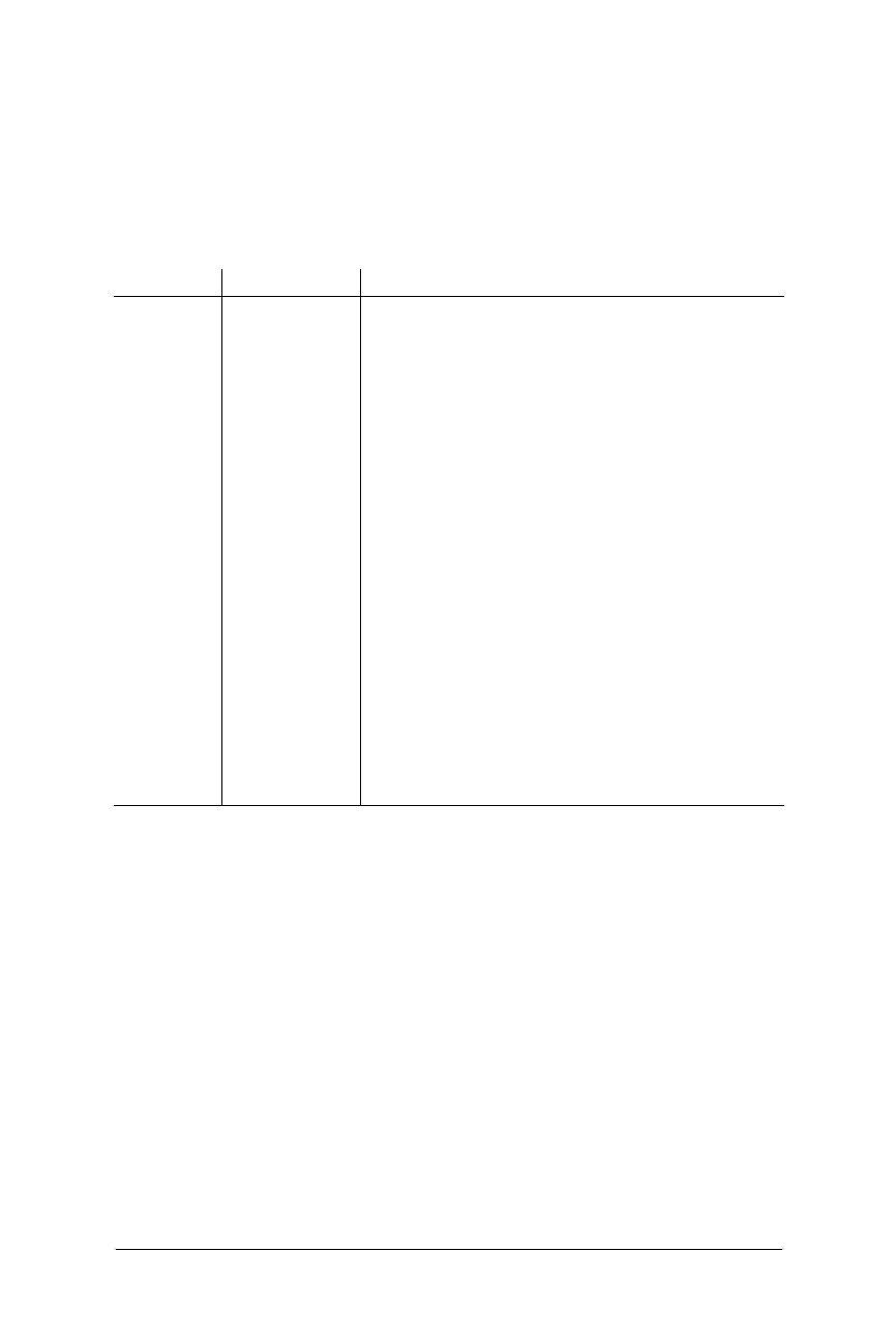
116 Chapter 7 – Formatting Text
The <font> Tag
Web Design in a Nutshell, eMatter Edition
Copyright © 2000 O’Reilly & Associates, Inc. All rights reserved.
specifying precise display information, so these physical tags may fall by the
wayside.
Table 7-2 lists the available physical inline style tags with their uses. Refer to the
“Summary of Text Tags” at the beginning of this chapter for complete browser-
support information.
The <font> Tag
The <font> tag is an inline style tag used to specify the size, color, and font face
for the enclosed text using the size,color, and face attributes, respectively. A
single <font> tag may contain all of these attributes as shown:
<FONT FACE="sans-serif" COLOR="white" SIZE="+1">
For an explanation of acceptable values for the color attribute, refer to “Specifying
Colors in HTML” in Chapter 5, HTML Overview.
It should be noted that the <font> tag with all its attributes has been deprecated
by the World Wide Web Consortium due to the fact that style sheets are now
available and are considered superior for controlling presentation. It is still
supported, but may become obsolete in future versions of HTML.
Table 7-2: Physical Inline Style Tags
Tag Description Function
<b> Bold Displays text in bold type
<big> Big Displays type one size larger than the
surrounding text (equivalent to size="+1")
<blink> Blink Makes the text flash on and off (Netscape Navi-
gator only)
<font> Font Specifies the font face, size, and color (discussed
in “The <font> Tag” section later in this chapter)
<i> Italic Displays text in italic type
<s> Strike-through An alternative tag for <strike> (newer browsers
only)
<small> Small Displays type one size smaller than the
surrounding text (equivalent to size="-1")
<strike> Strike-through Displays strike-through text (crossed through
with a horizontal line)
<sub> Subscript Displays the text at a smaller size, slightly below
the baseline of the surrounding text
<sup> Superscript Displays the text at a smaller size, slightly above
the baseline of the surrounding text
<tt> Teletype Displays the text in the user’s default mono-
spaced font
<u> Underline Underlines the text

The <font> Tag 117
Formatting
Text
The <font> Tag
Web Design in a Nutshell, eMatter Edition
Copyright © 2000 O’Reilly & Associates, Inc. All rights reserved.
Specifying Size with <font>
You can use the size attribute within the <font> tag to adjust type size. This
attribute is supported by versions 1.1 and higher of both Navigator and Internet
Explorer.
Browsers measure type on a relative scale from 1 to 7, where 3 is the default and
will be displayed at the size specified by the user’s preferences. These “virtual”
sizes are relative, meaning they do not signify actual pixel or point adjustments.
Each size is successively 20 percent smaller or larger than the default size, 3.
The size value can be specified as an absolute value from one to seven or as a
relative value by means of a plus or minus sign. When relative values are given,
the default value (which is 3, unless otherwise specified with a <basefont> tag) is
increased or decreased by that relative amount. Type will never be displayed
larger than 7 or smaller than 1, even if the relative size results in such a value.
Therefore, <font size="4">block of text</font> is the same as <font
size="+1">block of text</font>,and both will result in a block of text that is
20 percent larger than the default text size.
It is interesting to note that when <font> tags are nested, the effects of their rela-
tive sizes are not cumulative, but rather are always based on the default or
basefont size of the text. Therefore, if the default text size for a document is 3, any
text in that document that is enclosed in <font size="+1"> will result in text
with a size of 4, even if that text is nested within a paragraph with <font
size=5>.
<font size> advantage
•Gives designers some control over type size without resorting to inappropriate
tags (such as Heading) to adjust size.
<font size> disadvantage
•Overrides viewers’ preference for comfortable on-screen reading. By changing
sizes, you risk some viewers seeing type that is illegibly small or ridiculously
big.
Recommendations
• Limit the use of <font size> to small blocks of text, such as copyright infor-
mation, rather than applying a size adjustment to an entire page.
• If your content needs to be found by search engines that look for heading
information, do not use the <font size> tag as a substitute for HTML head-
ing tags, which are weighted more heavily.
Absolute value 1 2 3 4 5 6 7
Relative value -2 -1 - +1 +2 +3 +4

118 Chapter 7 – Formatting Text
Lists
Web Design in a Nutshell, eMatter Edition
Copyright © 2000 O’Reilly & Associates, Inc. All rights reserved.
Specifying Fonts with <font>
Internet Explorer 1.0 introduced the proprietary face="value" attribute to the
<font> tag, which allows you to specify specific fonts for selected text. This
attribute was adopted by Navigator in versions 3.0 and higher (note, it does not
work in Navigator 2.0 or earlier).
The face attribute does not guarantee that the user will see your text in your speci-
fied font. Consider it merely a recommendation. Read “Why Specifying Type is
Problematic” in Chapter 3, Web Design Principles for Print Designers, before glee-
fully sprinkling the <font> tag throughout your documents.
The quote-enclosed value of face is one or more display font names separated by
commas as follows:
<FONT FACE="Verdana, Arial, sans-serif">block of text</FONT>
The browser looks at the string of font names until it finds one that is installed on
the system and can be used for display. If none of the suggested fonts are
installed, the default font will be used instead.
You can include a generic font family (serif,sans-serif,monospace,
cursive,orfantasy) as the last choice in your list, which allows the browser to
choose any available font within that class should your named fonts not be found.
It’s sort of a last-ditch effort to get something like the font you want, without
leaving it entirely to chance.
<font face> advantages
•Gives designers some influence over font selection.
•Degrades acceptably. If the suggested fonts are not found (or if the tag is not
supported), the text will simply be displayed in the browser’s default font
specified by the user.
<font face> disadvantages
•Font specification (and other stylistic control) is better handled by style sheets.
Because it flagrantly links style information with content, this tag has been
deprecated by the HTML 4.0 Specification and may be obsolete in future ver-
sions of HTML.
•Not viable for specifying non-western fonts. <font face> uses simple map-
ping to match identifying character set numbers to character shapes (“glyphs”)
that may not translate correctly for the font you select.
Lists
The original HTML specification included tags for five different types of lists:
numbered lists (called ordered lists), bulleted lists (called unordered lists), defini-
tion lists, menus, and directory lists. Since then, directory lists and menus have
been “deprecated” with the recommendation that unordered lists be used for the
same effect. In this section, we’ll look at the structure of each type of list in current
use.
Lists 119
Formatting
Text
Lists
Web Design in a Nutshell, eMatter Edition
Copyright © 2000 O’Reilly & Associates, Inc. All rights reserved.
Lists and the items within them are block-level elements, meaning that line spaces
will automatically be added before and after them. Extra space may be added
above and below the entire list element but, in general, if you want to add space
between individual list items, you need to insert a <p> tag between them
(although, technically, that is not good HTML form).
Unordered (Bulleted) Lists
An unordered list is used for a collection of related items that appear in no partic-
ular order. List items are displayed on an indent with a bullet preceding each list
item. The bullet shape is automatically inserted by the browser when it encoun-
ters the list item, so you do not need to type a bullet character into your HTML
source code.
An unordered list is delimited by the <ul>...</ul> tags, with each item indi-
cated by an <li> tag. The closing </li> tag is usually omitted, but it should be
included if you are using Style Sheets to control list item display.
Figure 7-4 shows the structure and display of a simple unordered list.
Changing the bullet shape
HTML provides only a minimal amount of control over the appearance of bullets.
You can change the shape of the bullets for the whole list by using the type
attribute within the <ul> tag. The type attribute allows you to specify one of
three shapes: disc (the default), square, or circle. Figure 7-5 shows discs (left),
circles (center), and squares (right).
The type attribute can be applied within a list-item tag (<li>) to change the
shape of the bullet for that particular item. Figure 7-6 shows this effect.
Figure 7-4: A simple unordered list
Figure 7-5: Bullet types changed with the TYPE attribute
<B>Shopping List</B>
<UL>
<LI>Avocados
<LI>Tomatoes
<LI>Scallions
<LI>Black beans
</UL>
<UL TYPE= circle >...<UL TYPE= disc >... <UL TYPE= square >...
120 Chapter 7 – Formatting Text
Lists
Web Design in a Nutshell, eMatter Edition
Copyright © 2000 O’Reilly & Associates, Inc. All rights reserved.
If you want to use your own graphic as the bullet for a list, you would need to
simulate a list using a table for alignment, since the HTML list tags provide no way
to turn off the automatic bulleting or to introduce custom characters. (See
Chapter 10.)
Ordered (Numbered) Lists
Ordered lists are used when the sequence of the items is important. They are
displayed on an indent, with a number (automatically inserted by the browser)
preceding each list item. You do not type the numbers into your HTML source
code.
Ordered lists follow the same basic structure as unordered lists: the entire list is
contained within the <ol> and </ol> tags and each individual list item is indi-
cated with an <li> tag.
Figure 7-7 shows the structure and display of a simple ordered list.
Changing the numbering scheme
The type attribute can be used within ordered lists to specify the style of
numbering. There are five possible values: 1 (numbers), A (uppercase letters), a
(lowercase letters), I (uppercase roman), and i (lowercase roman). The value “1” is
the default and is shown in Figure 7-7. Figure 7-8 shows the code and displays of
the other four settings.
As with unordered lists, you can use the type attribute within individual <li> tags
to mix-and-match styles within a list.
Figure 7-6: Changing the bullet type within list items
Figure 7-7: A simple ordered list
<B>Shopping List</B>
<UL>
<LI TYPE=disc>Avocados
<LI TYPE=circle>Tomatoes
<LI TYPE=square>Scallions
</UL>
<B>Preparation</B>
<OL>
<LI>Dice the avocados
<LI>Peel and seed tomatoes
<LI>Finely slice the scallions
<LI>Mix in the black beans
</OL>
Lists 121
Formatting
Text
Lists
Web Design in a Nutshell, eMatter Edition
Copyright © 2000 O’Reilly & Associates, Inc. All rights reserved.
Setting the first number
If you want the list to start with some number (or letter value) other than 1, use
the start attribute to specify the first number, as shown in Figure 7-9.
Definition Lists
The third type of list supported by HTML is the definition list, which follows a
different structure than the other two. Definition lists consist of terms and defini-
tions (any amount of descriptive text to be associated with the term) as in a
glossary. In general, terms are positioned against the left edge of the page and
definitions are positioned on an indent.
Terms and definitions are block-level items, so line breaks will be added around
them, however, if you want extra space between terms and definitions, you must
insert <p> tags between them.
A definition list is designated by the <dl>...</dl> tags. Within the list, each term
is indicated with a <dt> and its definition is marked with a <dd>. Closing </dt>
and </dd> tags may be safely omitted if style sheets are not in use. Figure 7-10
shows the display of a basic definition list and the code that created it.
Figure 7-8: Changing the numbering style with the TYPE attribute
Figure 7-9: Setting the first number in the list with the START attribute
<OL TYPE=A>... <OL TYPE=a>...
<OL TYPE=I>... <OL TYPE=i>...
<B>Preparation</B>
<OL START=23>
<LI>Dice the avocados
<LI>Peel and seed tomatoes
<LI>Finely slice the scallions
<LI>Mix in the black beans
</OL>
122 Chapter 7 – Formatting Text
Layout Techniques with HTML
Web Design in a Nutshell, eMatter Edition
Copyright © 2000 O’Reilly & Associates, Inc. All rights reserved.
Nesting Lists
Any list can be nested within another list. For instance, you could add a bulleted
list item under an item within a numbered list; numbered lists can be added within
a definition; and so on. Lists can be nested several layers deep; however, since the
left indent is cumulative, it doesn’t take long for the text to end up pressed against
the right margin.
It is helpful to use indents in your HTML source document to keep nesting levels
clear. Be careful to close all of the lists you start!
Nesting unordered lists
When unordered lists are nested within each other, the browser automatically
displays a different bullet for each consecutive level, as shown in Figure 7-11.
Nesting ordered lists
It would be nice if nested ordered lists automatically displayed in standard outline
format, but unfortunately, browsers do not have the capacity to automatically
change numbering schemes. By default, every level within a nested numbered list
will display with numbers (arabic numerals). If you want standard outline format,
you need to label each list manually with the type attribute, as shown in
Figure 7-12.
Layout Techniques with HTML
First, let it be stated that “layout techniques with HTML” is an oxymoron. HTML
was specifically designed to pass off all layout functions to the end user. The
Figure 7-10: Simple definition list
<DL>
<DT>Poaching
<DD>Cooking food partially or completely submerged in
simmering liquid.
<DT>Baking
<DD>Cooking food in the indirect, dry heat of an oven.
The food may be covered or uncovered.
<DT>Broiling
<DD>Cooking food a measured distance from the direct,
dry heat of the heat source.
</DL>
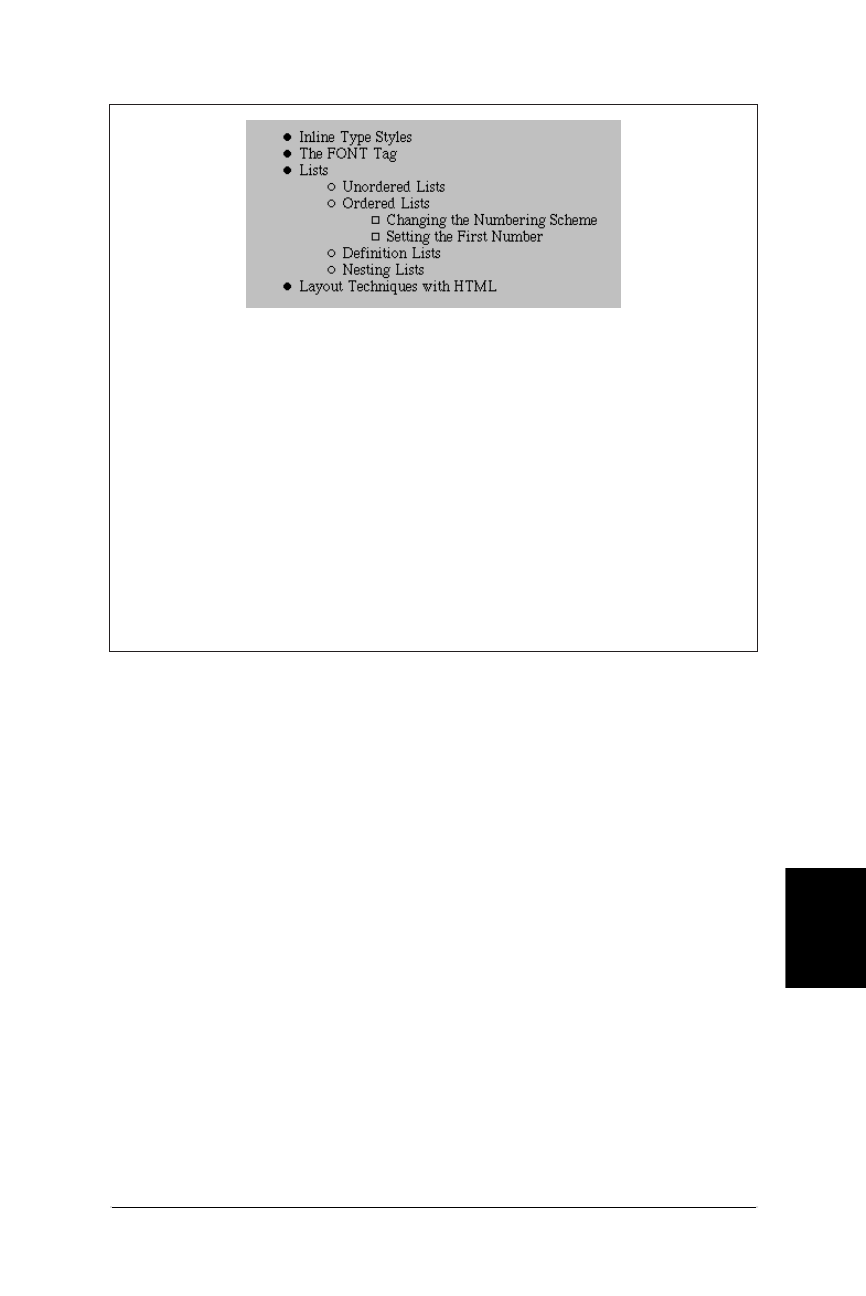
Layout Techniques with HTML 123
Formatting
Text
Layout Techniques with HTML
Web Design in a Nutshell, eMatter Edition
Copyright © 2000 O’Reilly & Associates, Inc. All rights reserved.
controls over presentation listed here are the result of either extensions to the orig-
inal HTML standard or a “creative use” (or misuse, depending who you ask) of an
existing tag.
Ideally, presentation should be controlled using style sheets; however, they are not
supported in enough browsers to be considered reliable. In the meantime, tables
may offer more precise control over positioning than can be achieved using text-
related HTML tags. (See Chapter 10 for more information on formatting with tables.)
Preformatted Text
Preformatted (<pre>) text is unique in that it is displayed exactly as it is typed in
the HTML source code—including all line returns and multiple character spaces (in
all other HTML text, returns and consecutive spaces are just ignored). Prefor-
matted text is always displayed in a monospace font, which allows columns of
characters to line up correctly.
The same block of source text was coded as <pre> text and as teletype (<tt>),
another method for specifying a monospace font. The difference is obvious, as
shown in Figures 7-13 and 7-14.
The <pre> tag is the only HTML tag that lets you know exactly how your text will
line up when displayed in a browser. For this reason, it was adopted early on as a
Figure 7-11: Nested unordered list
<UL>
<LI>Inline Type Styles
<LI>The FONT Tag
<LI>Lists
<UL>
<LI>Unordered Lists
<LI>Ordered Lists
<UL>
<LI>Changing the Numbering Scheme
<LI>Setting the First Number
</UL>
<LI>Definition Lists
<LI>Nesting Lists
</UL>
<LI>Layout Techniques with HTML
</UL>
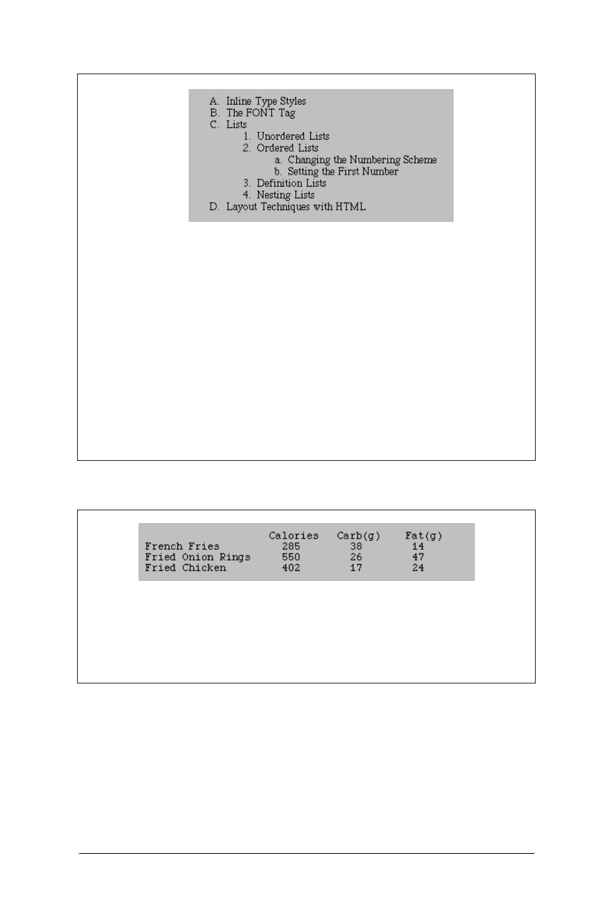
124 Chapter 7 – Formatting Text
Layout Techniques with HTML
Web Design in a Nutshell, eMatter Edition
Copyright © 2000 O’Reilly & Associates, Inc. All rights reserved.
favorite cheat for controlling alignment in web pages. The downside is that all the
text will be displayed in Courier.
Note that <pre> is a block element, meaning that it will always be preceded and
followed by a line break (some browsers will also add extra space above and
below the block). For this reason, it is not possible to set text within a paragraph
Figure 7-12: Nested ordered list
Figure 7-13: Preformatted text
<OL TYPE=A>
<LI>Inline Type Styles
<LI>The FONT Tag
<LI>Lists
<OL TYPE=1>
<LI>Unordered Lists
<LI>Ordered Lists
<OL TYPE=a>
<LI>Changing the Numbering Scheme
<LI>Setting the First Number
</OL>
<LI>Definition Lists
<LI>Nesting Lists
</OL>
<LI>Layout Techniques with HTML
</OL>
<PRE>
Calories Carb(g) Fat(g)
French Fries 285 38 14
Fried Onion Rings 550 26 47
Fried Chicken 402 17 24
</PRE>
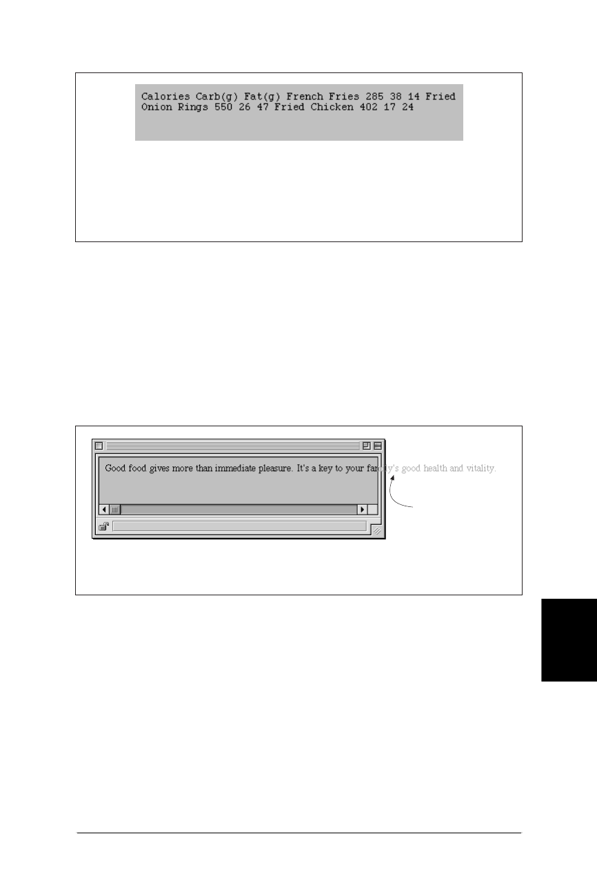
Layout Techniques with HTML 125
Formatting
Text
Layout Techniques with HTML
Web Design in a Nutshell, eMatter Edition
Copyright © 2000 O’Reilly & Associates, Inc. All rights reserved.
as preformatted. If you need a number of blank spaces within a sentence, use
nonbreaking space characters ( ) instead.
Preventing Line Breaks
Text and graphics that appear within “no-break” (<nobr>) tags always display on
one line, and are not wrapped in the browser window. If the string of characters
or elements within <nobr> tags is very long, it continues off the browser window
and users need to scroll horizontally to the right to see it, as shown in Figure 7-15.
The <nobr> tag can be used to hold together a row of graphics, such as the
buttons of a toolbar, so they will always display as one piece.
Adding a <br> within <nobr> tagged text will cause the line to break.
The word-break (<wbr>) is an esoteric little tag that can be used in conjunction
with the no-break tag. <wbr> is used to indicate a potential word break point
within <nobr> tagged content. When the “no-break” segment extends beyond the
browser window, the <wbr> tag tells it exactly where it is permitted to break the
line, as shown in Figure 7-16. It keeps line lengths from getting totally out of hand.
Figure 7-14: Teletype text
Figure 7-15: Nonbreaking text
<TT>
Calories Carb(g) Fat(g)
French Fries 285 38 14
Fried Onion Rings 550 26 47
Fried Chicken 402 17 24
</TT>
text extends beyond
browser window.
<NOBR>Good food gives more than immediate pleasure. It’s
a key to your family’s health and vitality.</NOBR>
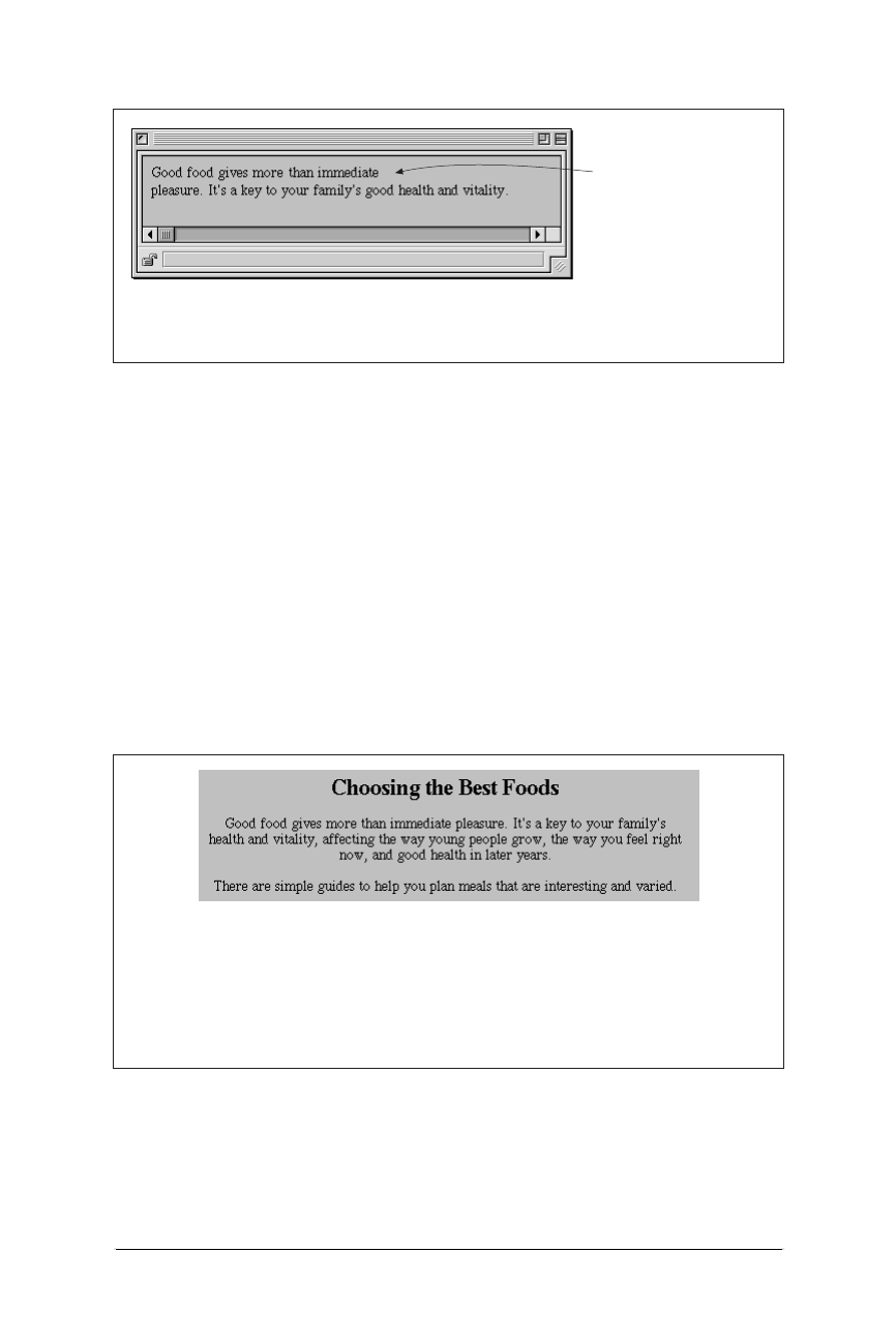
126 Chapter 7 – Formatting Text
Layout Techniques with HTML
Web Design in a Nutshell, eMatter Edition
Copyright © 2000 O’Reilly & Associates, Inc. All rights reserved.
Centering Text Elements
There are two methods for centering text elements horizontally on a page: the
<center> tag, and the align attribute. Bear in mind that these tags have been
deprecated by the HTML 4.0 Specification in favor of style sheet controls (although
browsers will continue to support them for a while).
The align attribute
The preferred way to center elements is to use the block-level tags’ align
attribute with its value set to center. The align attribute can be added to the
paragraph tag (<p>), any heading tag (<h1> through <h6>), or a page division
(<div>). Be sure to close the tags at the end of the element.
In Figure 7-17, each element is centered individually using align=center.
As an alternative, you could enclose all three elements in a <div> tag with
align=center. Unfortunately, the align attribute in a <div> tag is only recog-
nized by Internet Explorer version 3.0 and higher and by Navigator version 4.0, so
Figure 7-16: Use of the <wbr> tag within <nobr> text
Figure 7-17: Centering text
<NOBR>Good food gives more than immediate<WBR> pleasure.
It’s a key to your family’s health and vitality.</NOBR>
<WBR> tag breaks line at
designated point only if
entire line extends beyond
browser window.
<H2 ALIGN="center">Choosing the Best Foods</H2>
<P ALIGN="center">Good food gives more than immediate pleasure.
It’s a key to your family’s health and vitality, affecting the
way young people grow, the way you feel right now, and good
health in later years.</P>
<P ALIGN="center">There are simple guides to help you plan meals
that are interesting and varied.</P>

Layout Techniques with HTML 127
Formatting
Text
Layout Techniques with HTML
Web Design in a Nutshell, eMatter Edition
Copyright © 2000 O’Reilly & Associates, Inc. All rights reserved.
it is not a universal solution. The following code creates the same effect shown in
Figure 7-17:
<DIV ALIGN="center">
<H2>Choosing the Best Foods</H2>
<P>Good food gives more than immediate pleasure. It's a key to
your family's health and vitality, affecting the way young
people grow, the way you feel right now, and good health in
later years.</P>
<P>There are simple guides to help you plan meals that are
interesting and varied.</P>
</DIV>
The <center> tag
An extension to HTML, the <center> tag is extremely straightforward to use (and
for that reason, it is used commonly)—just place the <center> and </center>
tags around sections of the page you would like to be centered, as shown in the
following code. You could place your whole page within <center> tags, if you’d
like, or just apply it to certain paragraphs. The <center> tag can only be applied
to block-level elements since it is illogical to center text within the flow of left-
aligned text.
<CENTER>
<H2>Choosing the Best Foods</H2>
<P>Good food gives more than immediate pleasure. It's a key to
your family's health and vitality, affecting the way young
people grow, the way you feel right now, and good health in
later years.</P>
<P>There are simple guides to help you plan meals that are
interesting and varied.</P>
</CENTER>
The <center> tag has been deprecated by the HTML 4.0 Specifica-
tion in favor of <DIV align=center>.
Right and Left Alignment
The align attribute is also used for specifying left alignment and right alignment
by setting its value to left or right, respectively. The alignment will remain in
effect until the browser encounters another alignment instruction in the source.
Figure 7-18 shows the effects of setting the attribute to left or right.
Text aligned with the align attribute will override any centering set
with the <center> tag.

128 Chapter 7 – Formatting Text
Layout Techniques with HTML
Web Design in a Nutshell, eMatter Edition
Copyright © 2000 O’Reilly & Associates, Inc. All rights reserved.
Creating Indents with HTML
Unfortunately, there is no specific function for creating indented text in HTML, so
it has become common for web designers to make do with existing tags that
provide automatic indenting.
This section looks at the more popular “cheats” for indenting text using only text-
formatting tags. More refined (and less “kludgey”) indenting effects can be
achieved using tables (see Chapter 10) and style sheets (Chapter 23). Some
designers use transparent graphics to hold white space within the text flow.
<blockquote>
The blockquote element has been a long-time favorite for adding white space
along the left and right margins of a block of text. Browsers generally add approx-
imately 40 pixels of space between the browser margin (not its window border)
and the left and right edges of a blockquote element, as shown in Figure 7-19.
There are a few points you should know when using blockquotes. Some browsers
display blockquote material in italic, making it nearly impossible to read on the
screen. Also, if you plan on placing aligned images in a blockquote, keep in mind
that browsers are inconsistent in the way they display images within blockquotes.
Some align the graphic with the indented blockquote margin; others align the
image with the normal margin of paragraph text. It is a good idea to test on a
variety of browsers.
Creating indents with list elements
Some web authors (and WYSIWYG authoring tools) take advantage of the auto-
matic indentation that takes place when you specify text as a list. The two
following methods are both syntactically incorrect and ought to be avoided,
however, they can be used in a pinch to create an indent from the left margin of
Figure 7-18: Left and right alignment
<H2 ALIGN="right">Choosing the Best Foods</H2>
<P ALIGN="left">Good food gives more than immediate pleasure. It’s
a key to your family’s health and vitality, affecting the way
young people grow, the way you feel right now, and good health
in later years.</P>
<P ALIGN="right">There are simple guides to help you plan meals
<BR>that are interesting and varied.</P>
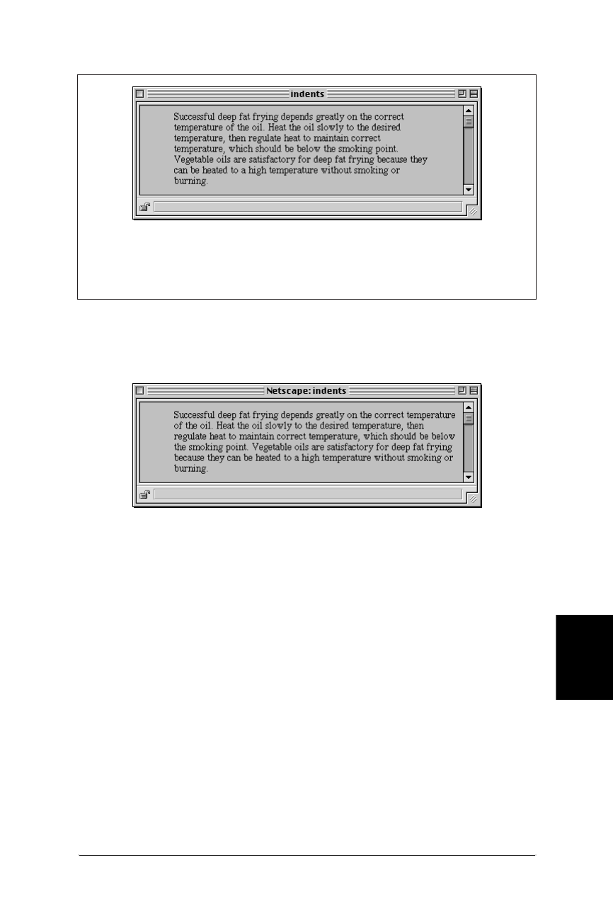
Layout Techniques with HTML 129
Formatting
Text
Layout Techniques with HTML
Web Design in a Nutshell, eMatter Edition
Copyright © 2000 O’Reilly & Associates, Inc. All rights reserved.
the browser window. Either approach will produce the result shown in
Figure 7-20.
A <ul> with no items
Marking a text element as an unordered list will set the text on a left-indent.
As long as you don’t add any list items (<li>) within the list, no bullets will
appear.
<UL>
Successful deep fat frying depends greatly on the correct
temperature of the oil. ...
</UL>
A <dd> without its term
A definition (<dd>) within a definition list (<dl>) will also be set with the
standard left indent. It’s fine to omit the term from the list. I’ve seen definition
lists set within definition lists to create deeper levels of indent (it’s not pretty,
but it works).
<DL>
<DD>Successful deep fat frying depends greatly on the correct
temperature of the oil. ...
</DD>
</DL>
Figure 7-19: Setting off text with <blockquote>
Figure 7-20: Indented text
<blockquote>
Successful deep fat frying depends greatly on the correct
temperature of the oil. ...
</blockquote>

130
Web Design in a Nutshell, eMatter Edition
Copyright © 2000 O’Reilly & Associates, Inc. All rights reserved.
Chapter 8Creating Links
CHAPTER 8
Creating Links
This chapter focuses on the HTML tags related to linking one document to
another, including uses for the anchor tag, linking with imagemaps (both client-
and server-side), affecting the appearance of hyperlinks, and creating links with
non-Web protocols.
Summary of Tags Related to Linking
In this section, browser support for each tag is noted to the right of the tag name.
Browsers that do not support the tag are grayed out. Browsers that deprecate the
tag are noted with a superscript D. Tag usage is indicated below the tag name. A
more thorough listing of attributes for each tag, according to the HTML 4.0 Specifi-
cation, appears in Appendix A, HTML Tags and Elements.
<a>
NN: 2, 3, 4 - MSIE: 2, 3, 4, 5 - HTML 4 - WebTV - Opera3
<a>...</a>
Defines an anchor within the document. An anchor is used to link to another
document. It can also serve to label a fragment within a document (also called a
named anchor), which is used as a reference for linking to a specific point in an
HTML document.
Attributes
href=url
Specifies the URL of the target destination.
method=value
Specifies a list of names, each representing a particular document-processing
method, usually an application name. It is browser-dependent and is rarely
used in practice.

Summary of Tags Related to Linking 131
Creating Links
Summary of Tags Related to Linking
Web Design in a Nutshell, eMatter Edition
Copyright © 2000 O’Reilly & Associates, Inc. All rights reserved.
name=text
Places a fragment identifier within an HTML document. Fragments are
discussed further in the “Linking within a Document” section of this chapter.
rel=relationship
Not supported by Netscape Navigator or Opera. Establishes a relationship
between the current document and the target document. Common relation-
ships include: next,prev,head,toc,parent,child,index, and glossary.
rev=relationship
Not supported by Netscape Navigator or Opera. Specifies the relationship from
the target back to the source (the opposite of the rev attribute).
title=text
Specifies a title for the target document.
target=text
Not supported by WebTV or Internet Explorer 2.0 and earlier. Specifies the
name of the window or frame in which the target document should be
displayed. For more information, see “Targeting Windows” in this chapter and
“Targeting Frames” in Chapter 11, Frames.
urn=urn
Specifies a Universal Resource Name (URN) for the referenced document.
URN syntax is currently not defined so this attribute has no practical use.
New in HTML 4.0 Specification
accesskey=character
Assigns an access key (shortcut key command) to the link. Access keys are
also used for form fields. The value is a single character.
charset=charset
Specifies the character encoding of the target document.
coords=x,y coordinates
Specifies the x,y coordinates for a clickable area in an imagemap. HTML 4.0
proposes that client-side imagemaps could be replaced with an <object> tag
containing the image and a set of anchor tags defining the “hot” areas (with
shapes and coordinate attributes). This system has not yet been implemented
by browsers.
hreflang=language code
Specifies the base language of the target document.
shape=shape name
Defines the shape of a clickable area in an imagemap. This is only used in the
<a> tag as part of HTML 4.0’s proposal to replace client-side imagemaps with
a combination of <object> and <a> tags. This system has not yet been
implemented by browsers.
tabindex=number
Specifies the position of the current element in the tabbing order for the
current document. The value must be between 0 and 32767. It is used for
tabbing through the links on a page (or fields in a form).

132 Chapter 8 – Creating Links
Summary of Tags Related to Linking
Web Design in a Nutshell, eMatter Edition
Copyright © 2000 O’Reilly & Associates, Inc. All rights reserved.
type=MIME type
Specifies the content type (MIME type) of the defined content.
Link Examples
To a local file:
<A HREF="filename.html">...</A>
To an external file:
<A HREF="http://server/path/file.html">...</A>
To a named anchor:
<A HREF="http://server/path/file.html#fragment">...</A>
To a named anchor in the same file:
<A HREF="#fragment">...</A>
To send an email message:
<A HREF="mailto:username@domain">...</A>
To a file on an FTP server:
<A HREF="ftp://server/path/filename">...</A>
<area>
NN: 2, 3, 4 - MSIE: 2, 3, 4, 5 - HTML 4 - WebTV - Opera3
<area>
The area tag is used within the <map> tag of a client-side imagemap to define a
specific “hot” (clickable) area. Client-side imagemaps are discussed later in this
chapter.
Attributes
coords=values
Specifies a list of comma-separated pixel coordinates that define a “hot” area
of an imagemap. The specific syntax for the coordinates varies by shape (see
the “Imagemaps” section later in this chapter).
href=url
Specifies the URL for a specific area.
nohref
Defines a “mouse-sensitive” area in an imagemap for which there is no action
when the user clicks in the area.
shape=rect|rectangle|circ|circle|poly|polygon
Defines the shape of the clickable area.
<map>
NN: 2, 3, 4 - MSIE: 2, 3, 4, 5 - HTML 4 - WebTV - Opera3
<map>...</map>
Encloses client-side image map specifications. Client-side imagemaps are discussed
later in this chapter.

Simple Hypertext Links 133
Creating Links
Simple Hypertext Links
Web Design in a Nutshell, eMatter Edition
Copyright © 2000 O’Reilly & Associates, Inc. All rights reserved.
Attributes
name=text
Gives the image map a name that is then referenced within the <img> tag.
This attribute is required.
Simple Hypertext Links
The anchor (<a>) tag is used to identify a string of text or an image that serves as
a hypertext link to another document. In its simplest incarnation, it looks like this:
I’m <A HREF="link.html">linking</A> to you!
To make an image a link, enclose the image tag within the anchor tags as follows:
<A HREF="link.html"><IMG SRC="pixie.gif"></A>
The URL is the name of the document you want to link to. URLs can be absolute
or relative.
Absolute URLs
An absolute URL is made up of the following components: a protocol identifier, a
host name (the name of the server machine), the pathname (if there is one), and
the specific file name. When you are linking to documents on other servers, you
need to use an absolute URL. The following is an example of a link with an abso-
lute URL:
<A HREF="http://www.littlechair.com/web/index.html">...</A>
Here the protocol is identified as http (the standard protocol of the Web), the host
is www.littlechair.com and web/index.html is the pathname leading to the partic-
ular file.
Relative URLs
Arelative URL provides a pointer to another document relative to the location of
the current document. The syntax is based on relative pathname structures in the
Unix operating system, which are discussed in Chapter 4, A Beginner’s Guide to
the Server. When you are pointing to another document within your own site (on
the same server), it is usually best to use relative URLs.
For example, if I am currently in jcc.html (identified here by its absolute
pathname):
www.littlechair.com/web/samples/jcc.html
and I want to put a link on that page to talk.html, which is in the same directory:
www.littlechair.com/web/samples/talk.html
I could use a relative URL within the link as follows:
<A HREF="talk.html">...</A>
Using the same example, to link to the file index.html in a higher level directory
(web), I could use the relative pathname to that file as shown:

134 Chapter 8 – Creating Links
Linking Within a Document
Web Design in a Nutshell, eMatter Edition
Copyright © 2000 O’Reilly & Associates, Inc. All rights reserved.
<A HREF="../index.html">
This relative URL is the equivalent to the absolute URL http://www.littlechair.com/
web/index.html.
Linking Within a Document
By default, when you link to a page, the browser displays the top of that page. To
aid in navigation, you can use the anchor tag to link to a specific point or section
within a document. This is a two-step process.
Naming a fragment
First, you need to identify and name the portion of the document (called a frag-
ment) that you want to link to. The fragment is marked using the anchor (<a>) tag
with its name attribute, giving the document fragment a name that can be refer-
enced from a link.
To illustrate, let’s set up a named fragment within a sample document called
dailynews.html so users can link directly to the Stock Quotes section of the page.
The following anchor tag marks the Stock Quotes title as a fragment named
“stocks.”
<A NAME="stocks">Daily Stock Quotes</A>
Linking to a fragment
The second step is to create a link to the fragment using a standard anchor tag
with its href attribute. Fragment identifiers are placed at the end of the pathname
and are preceded by the hash (#) symbol.
To link to the “stocks” fragment from within dailynews.html, the link would look
like this:
<A HREF="#stocks">Check out the Stock Quotes</A>
Linking to a fragment in another document
You can create a link to a named fragment of any document on the Web by using
the complete pathname. (Of course, the named anchors would have to be in place
already.) To link to the stocks section from another document in the same direc-
tory, use a relative pathname as follows:
<A HREF="dailynews.html#stocks">Go to today’s Stock Quotes</A>
Use an absolute URL to link to a fragment on another site, as in the following
example:
<A HREF="http://www.webreview.com/style.html#fragment">
Using named anchors
Named anchors are most often used as a navigational aid by creating a hyper-
linked table of contents at the top of a very long scrolling web page. Users can see
the major topics at a glance and quickly get to the portions that interest them.

Affecting the Appearance of Links 135
Creating Links
Affecting the Appearance of Links
Web Design in a Nutshell, eMatter Edition
Copyright © 2000 O’Reilly & Associates, Inc. All rights reserved.
When linking down into a long page, it is generally a good idea to add links back
to the top of the page or to the table of contents.
Note that the HTML 4.0 Specification allows any element on a web page to be
targeted by its ID value just as though it were a named anchor. The first line
demonstrates a heading that includes an ID identifier. The second line is a link on
the same page to that particular heading.
<H2 ID="intro">Introduction</H2>
Return to the <A HREF="#intro">Introduction</A>
Affecting the Appearance of Links
As we all by now know, linked text is blue and underlined by default and
graphics are identified by blue borders (unless you turn them off). But it doesn’t
have to be that way! Changing the color of links is easy with HTML, so you can
make your links more coordinated with your chosen site palette. Style sheets offer
even more control over the appearance of links.
You should exercise some caution in changing link appearance. The blue text and
underlines have become a strong visual clue for “click here,” so altering this
formula may confuse your users. Use your knowledge of the savvy of your target
audience to guide your design decisions.
Setting Colors in <body>
Link color specifications in the <body> tag are applied to the whole document.
Specifying Color for a Specific Link
You can override the color of a specific link by placing <font> tags within the
anchor tags. There is no way to set the visited link and active link colors for
specific links. This feature is supported by versions 3.0 and 4.0 of Internet
Explorer, but only version 4.0 of Netscape Navigator.
<A HREF="document.html"><FONT COLOR=aqua>Specially colored
link</FONT></A>
Setting Global Link Colors with Style Sheets
You can apply almost any style sheet property to a link by using the anchor tag
(<a>) as a selector. However, CSS1 introduced a group of pseudo-classes (link,
Links <BODY LINK="color"> Sets the color for hyperlinks. The
default color for links is blue.
Visited links <BODY VLINK="color"> Sets the colors for links that have
already been clicked. The default
color for visited links is purple.
Active links <BODY ALINK="color"> Sets the color for a link while it is in
the process of being clicked. The
default color for an active link is
red.

136 Chapter 8 – Creating Links
Affecting the Appearance of Links
Web Design in a Nutshell, eMatter Edition
Copyright © 2000 O’Reilly & Associates, Inc. All rights reserved.
visited, and active) that replicate the function of the <body> tag attributes listed in
the section “Setting Colors in <body>” earlier in this chapter. The syntax for speci-
fying colors with anchor pseudo-classes is as follows.
To specify a color for links:
A:link { color: "#rrggbb" or colorname }
To specify a color for visited links:
A:visited { color: "#rrggbb" or colorname }
To specify a color for active links:
A:active { color: "#rrggbb" or colorname }
The advantage to setting colors this way is that you separate style information
from content. The major disadvantage is that style sheets (and particularly pseudo-
classes) are currently poorly supported by browsers, so you risk a significant
portion of your audience not seeing your page as you intend.
See Chapter 23, Cascading Style Sheets, for a better understanding of style sheet
syntax and usage.
Turning Off Underlines
The text-decoration style sheet property can be used to turn off the under-
lines for all the links in a document (it is supported by all browsers that support
style sheets). Use this with caution, however, since most users rely on the under-
line to indicate what is “clickable,” particularly now that brightly colored HTML
text is more prevalent. Be sure that your interface and system of visual cues is
clear enough that links are still evident.
The style sheet rule for turning off underlines is as follows:
A { text-decoration: none }
To turn off underlines for specific links, label them with a CLASS attribute:
<A CLASS="internal" HREF="linkypoo.html">Go to another page</A>
and include the class in the selector of the style sheet rule as follows:
A.internal { text-decoration: none }
Changing Status Bar Text with JavaScript
By default, when you position the mouse over a link, the browser displays the
target URL in the status bar at the bottom of the browser. Use the following Java-
Script command in an anchor tag to change the status bar message to whatever
text you specify. In this example, the phrase “Samples of my web design work”
would be displayed in the browser’s status bar.
<A HREF="web.html" onMouseOver="window.status='Samples of my
web design work'; return true;">The Web Lounge</A>
Be aware that many users value the ability to see the URL for a link, so if you are
going to change the message, make sure that you substitute worthwhile and
descriptive messages. Otherwise, you risk making your site less pleasant to use.

Imagemaps 137
Creating Links
Imagemaps
Web Design in a Nutshell, eMatter Edition
Copyright © 2000 O’Reilly & Associates, Inc. All rights reserved.
Targeting Windows
The problem with the hypertext medium is that when a user clicks on an inter-
esting link on your page, he might never come back! One currently popular
solution to this problem is to make the target document display in a second
browser window. In that way, your page is still readily available.
Use the target attribute of the anchor tag to launch a new browser window for
the linked document. Setting the target="_blank" attribute causes the browser
to open a fresh browser window. For example:
<A HREF="http://www.webreview.com/" TARGET="_blank">...</A>
If you set every link on your page to target a _blank window, every link will
launch a new window, potentially leaving your user with a mess of open
windows.
A better method, especially if you have more than one link, is to give the targeted
window a specific name, which can then be reused by subsequent links. The
following link will open a new window called “display”:
<A HREF="http://www.webreview.com/" TARGET="display">...</A>
If you target every link on that page to the “display” window, each targeted docu-
ment will open in the same second window.
The target attribute is most often used in conjunction with framed documents.
The syntax and strategy for using the target attribute with framed documents is
discussed in Chapter 11.
Some browsers do not support the target attribute (including
WebTV and MSIE2.0 and earlier). Furthermore, Netscape Navigator
4.0 has a bug that prevents the new named window from coming to
the front. To the user, this looks as though the link did not work
since the target document loads into a browser window that is stuck
behind the current window.
Imagemaps
Ordinarily, placing a graphic within anchor tags will make the entire image a link
to a single document, regardless of where the user clicks on the image. It is also
possible (and quite common) to create multiple links, or “hot spots,” within a
single graphic. These graphics are called imagemaps. The effect is created with
HTML tags and/or text files and scripts on the server; the graphic itself is an ordi-
nary graphic that just serves as a backdrop for the pixel coordinates.
There are two types of imagemaps: client-side and server-side. For client-side
imagemaps, the coordinate and URL information necessary to create each link is
contained right in the HTML document. The process of putting the pieces together
happens in the browser on the user’s machine (thus, client-side). For server-side

138 Chapter 8 – Creating Links
Imagemaps
Web Design in a Nutshell, eMatter Edition
Copyright © 2000 O’Reilly & Associates, Inc. All rights reserved.
imagemaps, as the name suggests, the map information resides on the server and
is processed by the server or a separate CGI script.
Client-side imagemaps are a slightly newer technology and are not universally
supported by all browsers (although the majority of current browsers know what
to do). For this reason, many web developers create redundant imagemaps (both
client- and server-side) so that if the browser doesn’t recognize the client-side
map, the server’s imagemap processor can take over.
Creating Imagemaps
The key to making imagemaps work is a map, based on the image, that associates
pixel coordinates with URLs. This map is handled differently for client-side and
server-side (as we will outline below), but the outcome is the same. When the
user clicks somewhere within the image, the browser passes the coordinates of the
mouse pointer to the map, which, in turn, generates the appropriate link.
Available tools
Although it is possible to put together imagemap information manually, it is much
easier to use a tool to do it for you. There are many imagemap creation tools
available as shareware for both Windows and the Mac. Be sure to look for one
that is capable of outputting both client- and server-side map information, such as
the following:
Mac
MapMaker 1.1.2 by Frederic Eriksson available at http://www.kickinit.com/
mapmaker/
Windows
MapEdit by Tom Boutell available at http://www.boutell.com/mapedit/
If you have one of the popular WYSIWYG HTML editors, chances are there’s an
imagemap creation tool built right in.
Creating the map
Regardless of the tool you’re using, and regardless of the type of imagemap you’re
creating, the process for creating the map information is basically the same. Read
the documentation for your imagemap tool to learn about features not listed here.
1. Open the image in your imagemap program.
2. Define areas within the image that will be clickable by using the appropriate
shape tools: rectangle, circle, or polygon (for tracing irregular shapes).
3. While the outline of the area is still highlighted, enter a URL for that area in
the text entry field provided, as shown in Figure 8-1.
4. Continue adding shapes and their respective URLs for each clickable area in
the image.
5. For server-side imagemaps, you also need to define a default URL, which is
the page that will display if users click outside a defined area. Many tools
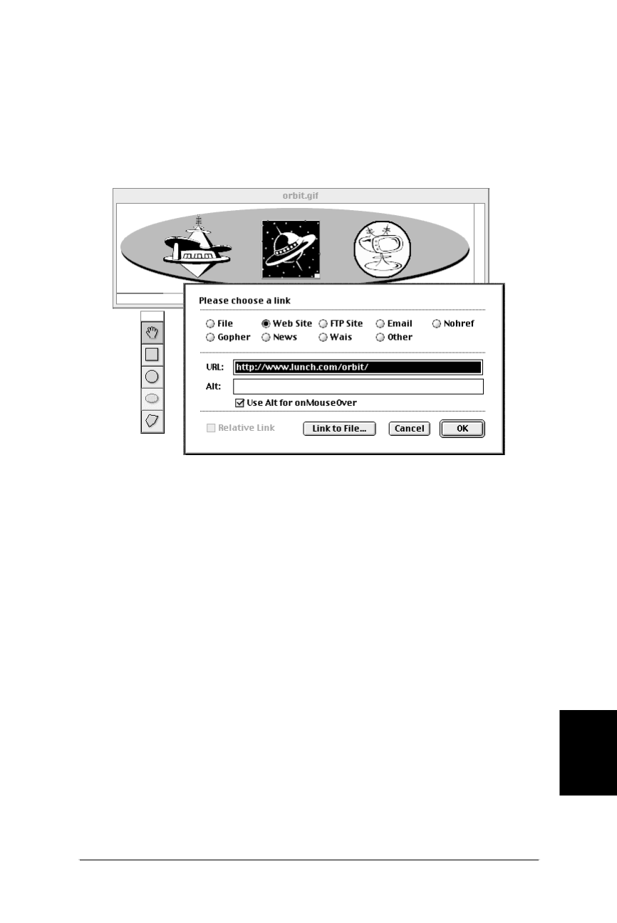
Imagemaps 139
Creating Links
Imagemaps
Web Design in a Nutshell, eMatter Edition
Copyright © 2000 O’Reilly & Associates, Inc. All rights reserved.
have a prominent field for entering the default URL, but on others you may
need to look for it under a pull-down menu.
6. Select the type of imagemap (client- or server-side) you want to create.
7. Save or export the map information. Server-side imagemaps are saved in a
map definition file (.map) that will reside on the server. Client-side
imagemaps are embedded directly in the HTML file.
If you do not have an imagemap tool, it is possible to write out the map informa-
tion by hand following the examples in this chapter. Simply note the pixel
coordinates as indicated by your image editor and type them into the appropriate
place in the map file. For instance, Photoshop’s Info palette gives pixel coordi-
nates as you move the mouse around the image.
Client-Side Imagemaps
Client-side imagemaps have three components:
• An ordinary graphic file (.gif,.jpeg, or .png)
• A map delimited by <map> tags containing the coordinate and URL informa-
tion for each area
• The usemap attribute within the image tag (<img>) that indicates which map
to reference
There are many advantages to using client-side imagemaps. They are self-
contained within the HTML document and do not rely on a server to function. This
means you can test the imagemap on your local machine or make working site
demos for distribution on disk. It also cuts down on the load on your server and
improves response times. In addition, they display complete URL information in
Figure 8-1: Creating map information (shown in MapMaker 1.1.2)

140 Chapter 8 – Creating Links
Imagemaps
Web Design in a Nutshell, eMatter Edition
Copyright © 2000 O’Reilly & Associates, Inc. All rights reserved.
the status bar when the user mouses over the area (server-side imagemaps display
only coordinates).
The only disadvantage is that because it is slightly newer technology, they are not
universally supported. Netscape Navigator 1.0 and Internet Explorer 2.0 do not
support client-side imagemaps. Experimental or obscure browser programs may
not either. Fortunately, these browsers make up a tiny portion of the current
browser population.
Sample client-side imagemap
Figure 8-2 shows a sample imagemapped graphic. Example 8-1 gives the HTML
document that contains the client-side imagemap.
Example 8-1: HTML for Client-Side Image Map
<HTML>
<HEAD><TITLE>Client-side Imagemap Sample></TITLE></HEAD>
<BODY>
A
<MAP NAME="spacey">
B
<AREA SHAPE="RECT" COORDS="203,23,285,106"
HREF="http://www.lunch.com/orbit/">
C
<AREA SHAPE="CIRCLE" COORDS="372,64,40" HREF="mypage.html">
D
<AREA SHAPE="POLY"
COORDS="99,47,105,41,94,39,98,34,110,35,115,28,120,35,133,38,13
3,42,124,42,134,58,146,56,157,58,162,63,158,67,141,68,145,72,15
5,
73,158,75,159,80,148,83,141,83,113,103,87,83,72,83,64,80,64,76,
68,73,77,72,79,63,70,59,67,53,68,47,78,45,89,45,99,47"
HREF="yourpage.html">
</MAP>
E
<IMG SRC="orbit.gif" WIDTH=500 HEIGHT=125 BORDER=0
USEMAP="#spacey">
</BODY>
</HTML>
A
This marks the beginning of the map. You must give the map a name. Within
the <map> there are <area> tags for each hotspot within the image.
B
Each area tag contains the shape identifier (shape), pixel coordinates
(coords), and the URL for the link (href). In this case, the shape is the rect-
angle (both rect and rectangle are acceptable) that corresponds to the
black square in the center of the image.
C
This area corresponds to the circular area on the right of the image in
Figure 8-2. Its shape is circle (circ is also acceptable). For circles, the coor-
dinates identify the position of the center of the circle and its radius in pixels
(coords=x,y,r).

Imagemaps 141
Creating Links
Imagemaps
Web Design in a Nutshell, eMatter Edition
Copyright © 2000 O’Reilly & Associates, Inc. All rights reserved.
Server-Side Imagemaps
Server-side imagemaps will work with all browsers, but they are a bit more
involved to create. In addition, they rely on the server, which makes them less
portable than their client-side counterparts and increases the load on the server.
Server-side imagemaps have four elements:
• An ordinary graphic file (.gif,.jpeg, or .png)
• HTML tags in the document: the ISMAP attribute within the graphic’s <img>
tag and an anchor tag that links the graphic to the .map file on the server
• A map definition file (.map) containing the pixel coordinate and URL informa-
tion for each clickable area; the .map file resides on the server and the for-
mat is server-dependent
• A CGI script that runs on the server (or a built-in function of the server soft-
ware) that interprets the .map file and sends the correct URL to the HTTP
server
Because server-side imagemaps are so dependent on the configuration of the
server, you need to coordinate with your server administrator if you plan on
implementing them. You’ll need to find out which flavor of .map file to create
(NCSA or CERN) as well as the pathname to which the imagemapped graphic
should be linked (this usually includes a cgi-bin directory).
D
This is the area tag for the irregular (polygon) shape on the left of the image
in Figure 8-2. For polygons, the coordinates are pairs of x,y coordinates for
each point or vertex along the path that surrounds the area
(coords=x1,y1,x2,y2,x3,y3...). At least three pairs are required to define
a triangle; complex polygons generate a long list of coordinates.
E
The USEMAP attribute is required within the image tag to indicate that this
graphic is an imagemap that uses the <map> named “spacey.”
Figure 8-2: Imagemapped graphic
Example 8-1: HTML for Client-Side Image Map (continued)
yourpage.html http://www.lunch.com/orbit mypage.html
orbit.gif

142 Chapter 8 – Creating Links
Imagemaps
Web Design in a Nutshell, eMatter Edition
Copyright © 2000 O’Reilly & Associates, Inc. All rights reserved.
Sample map definition file (.map) file
Example 8-2 shows a server-side image map (called spacey.map) for the
imagemapped graphic shown in Figure 8-2. Let’s look at its component parts:
The HTML document
Within the HTML file, the image is treated as shown here:
<HTML>
<HEAD><TITLE>Server-side Sample</TITLE></HEAD>
<BODY>
<A HREF="/cgi-bin/imagemap/spacey.map">
<IMG SRC="orbit.gif" ISMAP></A>
</BODY>
</HTML>
The anchor tag links the whole graphic to the map definition file (spacey.map)
which is located within the cgi-bin directory on the server. This is a typical config-
uration; however, you should follow your server administrator’s instructions.
The ismap attribute within the image tag tells the browser that the graphic is an
imagemap.
When Not to Use Imagemaps
Imagemaps are not always the best solution and are actually waning somewhat in
popularity as web design evolves. Slicing up a large image and holding the pieces
together with a table often offers functionality that an imagemap can’t match. This
technique is so popular that it is built into web graphics tools such as Macro-
Example 8-2: Server-Side Image Map
A
default index.html
B
rect http://www.lunch.com/orbit/ 203,23 285,106
circle mypage.html 372,64 412,104
poly yourpage.html 99,47 105,41 94,39 98,34 110,35 115,28 120,35
133,38 133,42 124,42 134,58 146,56 157,58 162,63 158,67 141,68
145,72 155,73 158,75 159,80 148,83 141,83 113,103 87,83 72,83
64,80 64,76 68,73 77,72 79,63 70,59 67,53 68,47 78,45 89,45 99,47
A
This establishes the default URL, whish is what the browser will display if the
user clicks outside one of the clickable areas. Set this to the current document
if you want the impression that the click has no effect.
B
Each hot area in the image is defined by a shape name (rect,circle,poly),
a URL, and a set of pixel coordinates. The syntax for the coordinates varies by
shape and is generally the same as explained for client-side imagemaps above.
The syntax for some shapes may vary from server to server. In this .map file,
the coordinates are defined for use by an NCSA server. Note that the coordi-
nates defining the circle are different than in the client-side example. NCSA’s
syntax for defining a circle is “x1,y1,x2,y2,” which corresponds to the x,y
coordinates of the circle’s center point followed by the x,y coordinates for the
bottom-right point of the square that would enclose the circle.

Non-Web Links and Protocols 143
Creating Links
Non-Web Links and Protocols
Web Design in a Nutshell, eMatter Edition
Copyright © 2000 O’Reilly & Associates, Inc. All rights reserved.
media Fireworks and Adobe ImageReady. There is also a demonstration in
Chapter 10, Tables.
Providing complete alternative text
When a user cannot view images (or has chosen to turn them off), the browser
displays the text specified by the alt attribute within the <img> tag. Unfortu-
nately, for each imagemap graphic you only get one alternative text message. This
means all the links within the imagemap are unavailable to users without graphics.
One common solution to this is to provide a redundant set of links in HTML text
somewhere else on the page so that users who cannot view graphics can still navi-
gate the site.
If the image is divided into pieces, you can provide alternative text for each linked
piece, which alleviates the need to add the extra line of linked text to your HTML
page. The disadvantage, of course, is that this is really only ideal for graphics that
neatly fit into rectangles.
Rollover buttons
Rollover buttons (graphics that change when the user mouses over them) are
popular effects that use the power of JavaScript. Although it is possible to have an
entire imagemap graphic change based on mouse-over cues, it is more efficient to
break the image into pieces and swap out only the small portion that needs to
change with the mouseover. You decrease the download time by only pre-loading
the necessary small graphics. See Chapter 21, Interactivity, for sample JavaScript
code for creating rollover effects.
Non-Web Links and Protocols
Linking to other web pages using the HTTP protocol is by far the most common
type of link; however, there are several other types of transactions that can be
made using other standard Internet protocols.
Mail Link (mailto)
The mailto protocol can be used in an anchor tag to automatically send an email
message to the recipient from within the browser. Note that the browser must be
configured to support this tag, so it will not work for all users. The mailto
protocol has the following components:
mailto:username@domain
A typical mail link might look like this:
<A HREF="mailto:jen@oreilly.com">Send Jennifer email</A>
You can also experiment with adding information within the mailto URL that
automatically fills in standard email fields such as Subject or cc:. As of this writing,
these additional functions are only supported by Netscape 4.0, so use them with
caution and do lots of testing:
mailto:username@domain?subject=subject
mailto:username@domain?cc=person1

144 Chapter 8 – Creating Links
Non-Web Links and Protocols
Web Design in a Nutshell, eMatter Edition
Copyright © 2000 O’Reilly & Associates, Inc. All rights reserved.
mailto:username@domain?bcc=person2
mailto:username@domain?body=body
Additional variables are appended to the string with a & as follows:
mailto:username@domain?subject=subject&cc=person1&body=body
Spaces within subject lines need to be written as %20 (the space character in hexa-
decimal notation). The following is a sample mail link employing these additions:
<A HREF="mailto:jen@oreilly.com?subject=Like%20your%20book">
Email for Jen</A>
FTP Link (ftp://)
You can link directly to a file on an FTP server. When the user clicks on the link,
the file will automatically download using the browser’s built-in FTP functions and
will be saved on the user’s machine. If the document is on an anonymous FTP
server (i.e., no account name and password are required), the FTP link is simple:
<A HREF="ftp://server/pathname">...</A>
If you are providing a link to an FTP server that requires the user to log in, the
format is:
<A HREF="ftp://user:password@server/pathname">...</A>
It is highly recommended that you never include both the user name and pass-
word to a server within an HTML document. If you use the syntax user@server/
path, the user will be prompted to enter his or her password in a dialog box.
By default, the requested file is transferred in binary format. To specify that the
document should be transferred as an ASCII file, add ;type=a to the end of the
URL:
<A HREF="ftp://user:password@server/pathname;type=a">...</A>
The variable type=d identifies the pathname as a directory and simply displays its
contents in the browser window.
Following are some examples of FTP links:
<A HREF="ftp://pete@ftp.someserver.com/program.exe">...</A>
<A HREF="ftp://ftp.superwarehouse.com/games;type=d">...</A>
Other Links
The following URL types are not as well known or as useful as mailto: or
ftp://, but they are available. As with other links, place these URLs after the
HREF attribute within the anchor tag.
Type Syntax Use
File file://server/path Specifies a file without indicating the protocol.
This is useful for accessing files on a contained
site such as a CD-ROM or kiosk application,
but is less appropriate over networks (such as
the Internet).

Non-Web Links and Protocols 145
Creating Links
Non-Web Links and Protocols
Web Design in a Nutshell, eMatter Edition
Copyright © 2000 O’Reilly & Associates, Inc. All rights reserved.
News news:newsgroup
news:message_id
Accesses either a single message or an entire
newsgroup within the Usenet news system.
Some browsers do not support news URLs so
you should avoid using them.
NTTP nntp://server:port/
newsgroup/article
Provides a complete mechanism for accessing
Usenet news articles. The article will only be
served to machines that are allowed to retrieve
articles from this server, so this URL has limited
practical use.
Telnet telnet://user:pass-
word@server:port/
Opens a telnet session with a desired server.
The user and password@ elements are
optional and follow the same rules as
described for ftp://.
Gopher gopher://
server:port/path
Accesses a document on a gopher server. The
gopher document retrieval system was
eclipsed by the World Wide Web, but some
gopher servers are still operating.
Type Syntax Use

146
Web Design in a Nutshell, eMatter Edition
Copyright © 2000 O’Reilly & Associates, Inc. All rights reserved.
Chapter 9Images & Objects
CHAPTER 9
Adding Images and Other Page Elements
This chapter focuses on the HTML tags available for placing elements such as
rules, images, or multimedia objects on a web page. It also includes nondis-
playing elements that are inserted as units into the HTML document such as style
sheets and scripts.
Summary of Object Placement Tags
In this section, browser support for each tag is noted to the right of the tag name.
Browsers that do not support the tag are grayed out. Browsers that deprecate the
tag are noted with a superscript D. Tag usage is indicated below the tag name. A
more thorough listing of attributes for each tag, according to the HTML 4.0 Specifi-
cation, appears in Appendix A, HTML Tags and Elements.
<applet>
NN: 2, 3, 4 - MSIE: 2, 3, 4, 5 - HTML 4D-WebTV -Opera3
<applet>...</applet>
This tag, introduced by Netscape Navigator 2.0, is used to place a Java applet on
the web page.
Attributes
align=center|left|right
Aligns the applet and allows text to wrap around it (same as image
alignment).
alt=text
Provides alternate text if the applet cannot be displayed.
code=class
Specifies the class name of the code to be executed (required).
codebase=url
URL from which the code is retrieved.

Summary of Object Placement Tags 147
Images &
Objects
Summary of Object Placement Tags
Web Design in a Nutshell, eMatter Edition
Copyright © 2000 O’Reilly & Associates, Inc. All rights reserved.
height=number
Height of the applet window in pixels.
hspace=number
Holds n pixels space clear to the left and right of the applet window.
name=text
Names the applet for reference elsewhere on the page.
vspace=number
Holds n pixels space clear above and below the applet window.
width=number
Width of the applet window in pixels.
<bgsound>
NN: 2, 3, 4 - MSIE: 2, 3, 4, 5 - HTML 4 -WebTV -Opera3
<bgsound>
Plays an audio file automatically in the background when the document loads in
the browser. This tag is discussed in Chapter 19, Audio on the Web.
Attributes
src=url
This mandatory attribute provides the URL of the audio file to be down-
loaded and played.
loop=number|infinite
Sets the number of times the sound file should play. The value can be a
number or set to infinite.
<embed>
NN: 2, 3, 4 - MSIE: 2, 3, 4, 5 - HTML 4 - WebTV - Opera3
<embed>...</embed>
Embeds an object into the web page. Embedded objects are most often multi-
media files that require special plug-ins to display. Specific media types and their
respective plug-ins may have additional proprietary attributes for controlling the
playback of the file. Many of these are outlined in Chapters 19, 20, and 21 of this
book. The closing tag is not always required, but is recommended.
Attributes
align=left|right|top|bottom
NN 4.0 and MSIE 4.0 only. Controls the alignment of the media object relative
to the surrounding text. Top and bottom are vertical alignments. Left and
right position the object on the left or right margin and allow text to wrap
around it.
height=number
Specifies the height of the object in number of pixels. Some media types
require this attribute.
hidden=yes|no
Hides the media file or player from view when set to yes.

148 Chapter 9 – Adding Images and Other Page Elements
Summary of Object Placement Tags
Web Design in a Nutshell, eMatter Edition
Copyright © 2000 O’Reilly & Associates, Inc. All rights reserved.
hspace=number
NN 4.0 and IE 4.0 only. Used in conjunction with the align attribute, this
attribute specifies in number of pixels the amount of space to leave clear to
the left and right of the media object.
name=name
Specifies a name for the embedded object. This is particularly useful for refer-
encing the object from a script.
palette=foreground|background
NN 4.0 and MSIE 4.0 only. This attributes applies to the Windows platform
only. A value of foreground makes the palette used by the plug-in the fore-
ground palette. Similarly, a value of background makes the plug-in use the
background palette, which is also the default.
pluginspage=url
NN 4.0 and MSIE 4.0 only. Specifies the URL for information on installing the
appropriate plug-in.
src=url
Provides the URL to the file or object to be placed on the page. This is a
required attribute.
units=pixels|en
Defines the measurement units used by height and width. The default is
pixels. En units are half the point size of the body text.
vspace=number
NN 4.0 and MSIE 4.0 only. Used in conjunction with the align attribute, this
attribute specifies (in pixels) the amount of space to leave clear above and
below the media object.
width=number
Specifies the width of the object in number of pixels. Some media types
require this attribute.
Internet Explorer only
alt=text
Provides alternative text when the media object cannot be displayed (same as
for the <img> tag).
code=filename
Specifies the class name of the Java code to be executed.
codebase=url
Specifies the base URL for the application.
Netscape Navigator only
border=number
Specifies the width of the border (in pixels) around the media object.
frameborder=yes|no
Turns the border on or off.

Summary of Object Placement Tags 149
Images &
Objects
Summary of Object Placement Tags
Web Design in a Nutshell, eMatter Edition
Copyright © 2000 O’Reilly & Associates, Inc. All rights reserved.
pluginurl=url
Specifies a source for installing the appropriate plug-in for the media file.
Netscape recommends that you use pluginurl instead of pluginspage.
type=MIME type
Specifies the MIME type of the plug-in needed to run the file. Navigator uses
either the value of the TYPE attribute or the suffix of the filename given as the
source to determine which plug-in to use.
<hr>
NN: 2, 3, 4 - MSIE: 2, 3, 4, 5 - HTML 4 - WebTV - Opera3
<hr>
Adds a horizontal rule to the page.
Attributes
align=center|left|right
If the rule is shorter than the width of the window, this tag controls hori-
zontal alignment of the rule. The default is center.
noshade
This displays the rule as a solid (non-shaded) bar.
size=number
Specifies the thickness of the rule in pixels.
width=number or %
Specifies the length of the rule in pixels or as a percentage of the page width.
By default, rules are the full width of the browser window.
<img>
NN: 2, 3, 4 - MSIE: 2, 3, 4, 5 - HTML 4 - WebTV - Opera3
<img>
Places a graphic on the page.
Attributes
align=type
Specifies the alignment of an image using one of the following attributes:
Type Resulting Alignment
absbottom Navigator 3.0 & 4.0 and Internet Explorer 4.0 only. Aligns the
bottom of the image with the bottom of the current line.
absmiddle Navigator 3.0 & 4.0 and Internet Explorer 4.0 only. Aligns the
middle of the image with the middle of the current line.
baseline Navigator 3.0 & 4.0 and Internet Explorer 4.0 only. Aligns the
bottom of the image with the baseline of the current line.
bottom Aligns the bottom of the image with the text baseline. This is
the default vertical alignment.
center According to the W3C Spec, this centers the image horizon-
tally on the page; however, in reality, browsers treat it the
same as align=middle.

150 Chapter 9 – Adding Images and Other Page Elements
Summary of Object Placement Tags
Web Design in a Nutshell, eMatter Edition
Copyright © 2000 O’Reilly & Associates, Inc. All rights reserved.
alt=text
Provides a string of alternative text that appears when the image is not
displayed.
border=number
Specifies the width (in pixels) of the border that surrounds a linked image. It
is standard practice to set border=0 to turn the border off.
height=number
Specifies the height of the image in pixels. It is not required, but recom-
mended to speed up the rendering of the web page.
hspace=number
Used in conjunction with the align attribute, this attribute specifies in
number of pixels the amount of space to leave clear to the left and right of
the image.
ismap
Indicates that the graphic is used as the basis for a server-side imagemap (an
image containing multiple hypertext links). See Chapter 8, Creating Links, for
more information on server-side imagemaps.
longdesc=url
New in HTML 4.0 Specification. Specifies a link to a long description of the
image or an imagemap’s contents. This is used to make information about the
image accessible to nonvisual browsers.
lowsrc=url
Netscape Navigator (all versions) and Internet Explorer 4.0 only. Specifies an
image (usually of a smaller file size) that will download first, followed by the
final image specified by the src attribute.
src=url
Provides the URL of the graphic file to be displayed.
usemap=url
Specifies the map containing coordinates and links for a client-side imagemap
(an image containing multiple hypertext links).
vspace=number
Used in conjunction with the align=left or right attribute, this attribute
specifies in number of pixels the amount of space to leave clear above and
below the image.
left Aligns image on the left margin and allows subsequent text
to wrap around it.
middle Aligns the text baseline with the middle of the image.
right Aligns image on the right margin and allows subsequent text
to wrap around it.
texttop Navigator only. Aligns the top of the image with the
ascenders of the text line.
top Aligns the top of the image with the top of the tallest object
on that line.
Type Resulting Alignment

Summary of Object Placement Tags 151
Images &
Objects
Summary of Object Placement Tags
Web Design in a Nutshell, eMatter Edition
Copyright © 2000 O’Reilly & Associates, Inc. All rights reserved.
width=number
Specifies the width of the image in pixels. It is not required, but recom-
mended to speed up the rendering of the web page.
Internet Explorer’s DYNSRC attribute
Internet Explorer versions 2.0 and later use the <img> tag to place a video on the
page using the dynsrc attribute. The following attributes are related to the
dynsrc function and work only with Internet Explorer:
controls
Adds playback controls for the video.
dynsrc=url
Provides the URL for the video file to be displayed on the page.
loop=number|infinite
Sets the number of times to play the video. It can be a number value or set to
infinite.
start=fileopen|mouseover|fileopen, mouseover
Specifies when to play the video. By default, it begins playing as soon as it’s
downloaded (fileopen). You can set it to start when the mouse pointer is
over the movie area (mouseover). If you combine them (separated by a
comma), the movie plays once it’s downloaded, then again every time the
user mouses over it.
<marquee>
NN: 2, 3, 4 - MSIE: 2, 3, 4, 5 - HTML 4 - WebTV - Opera3
<marquee>...</marquee>
Creates a scrolling-text marquee area.
Attributes:
align=top|middle|bottom
Aligns the marquee with the top, middle, or bottom of the neighboring text
line.
behavior=scroll|slide|alternate
Specifies how the text should behave. Scroll is the default setting and
means the text should start completely off one side, scroll all the way across
and completely off, then start over again. Slide stops the scroll when the text
touches the other margin. Alternate means bounce back and forth within
the marquee.
bgcolor="#rrggbb" or color name
Sets background color of marquee.
direction=left|right
Defines the direction in which the text scrolls.
height=number
Defines the height in pixels of the marquee area.
hspace=number
Holds n pixels space clear to the left and right of the marquee.

152 Chapter 9 – Adding Images and Other Page Elements
Summary of Object Placement Tags
Web Design in a Nutshell, eMatter Edition
Copyright © 2000 O’Reilly & Associates, Inc. All rights reserved.
loop=number|infinite
Specifies the number of loops as a number value or infinite.
scrollamount=number
Sets the number of pixels to move the text for each scroll movement.
scrolldelay=number
Specifies the delay, in milliseconds, between successive movements of the
marquee text.
vspace=number
Holds a number of pixels space clear above and below the marquee.
width=number
Specifies the width in pixels of the marquee.
<noembed>
NN: 2, 3, 4 - MSIE: 2, 3, 4, 5 -HTML 4 - WebTV - Opera3
<noembed>...</noembed>
The text or object specified by <noembed> will appear when an embedded object
cannot be displayed (e.g., when the appropriate plug-in is not available). This tag
is placed within the <embed> container tags.
<noscript>
NN: 2, 3, 4 - MSIE: 2, 3, 4, 5 - HTML 4 - WebTV - Opera3
<noscript>...</noscript>
Provides alternate content for when the script is not executed (either because the
browser does not recognize the <script> tag, or because it has been configured
not to run scripts).
<object>
NN: 2, 3, 4 - MSIE: 2, 3, 4, 5 - HTML 4 - WebTV -Opera3
<object>...</object>
Places an object (such as an applet, media file, etc.) on a web page. It is similar to
the <embed> tag. The <object> tag often contains information for retrieving
ActiveX controls that Internet Explorer on Windows uses to display the object.
Attributes
align=baseline|center|left|middle|right|textbottom|
textmiddle|texttop
Aligns object with respect to surrounding text.
border=number
Sets the width of the border in pixels if the object is a link.
classid=url
Identifies the class identifier of the object. The syntax depends on the object
type.
codebase=url
Identifies the URL of the object’s codebase. Syntax depends on the object.

Summary of Object Placement Tags 153
Images &
Objects
Summary of Object Placement Tags
Web Design in a Nutshell, eMatter Edition
Copyright © 2000 O’Reilly & Associates, Inc. All rights reserved.
codetype=codetype
MSIE 3.0/4.0 and HTML 4.0 Spec only. Specifies the media type of the code.
data=url
Specifies the URL of the data used for the object. The syntax depends on the
object.
declare
MSIE 3.0 and HTML 4.0 Spec only. Declares an object without instantiating it.
height=number
Specifies the height of the object in pixels.
hspace=number
Holds n pixels space clear to the left and right of the object.
name=text
Specifies the name of the object to be referenced by scripts on the page.
shapes
MSIE 3.0 and HTML 4.0 Spec only. Indicates that the object contains an
imagemap.
standby=message
MSIE 3.0 and HTML 4.0 Spec only. Specifies message to display during object
loading.
type=type
Specifies the media type for the data.
usemap=url
Specifies image map to use with the object.
vspace=number
Holds n pixels space clear above and below the object.
width=number
Specifies the object width in pixels.
<param>
NN: 2, 3, 4 - MSIE: 2, 3, 4, 5 - HTML 4 - WebTV -Opera3
<param>...</param>
Supplies a parameter within the <applet> or <object> tag.
Attributes
name=text
Defines the name of the parameter.
value=text
Defines the value of the parameter.
valuetype=type
Internet Explorer only. Indicates the type of value: data indicates that the
parameter’s value is data (default); ref indicates that the parameter’s value is
a URL; object indicates that the value is the URL of another object in the
document.
type=type
Internet Explorer only. Specifies the media type.

154 Chapter 9 – Adding Images and Other Page Elements
Horizontal Rules
Web Design in a Nutshell, eMatter Edition
Copyright © 2000 O’Reilly & Associates, Inc. All rights reserved.
<script>
NN: 2, 3, 4 - MSIE: 2, 3, 4, 5 - HTML 4 - WebTV - Opera3
<script>...</script>
Adds a script that is to be used in the document. See Chapter 22, Introduction to
JavaScript, for demonstrations of the use of the <script> tag.
Attributes
type=content type
Specifies the language of the script. Its value must be a media type (ex. text/
javascript). This attribute is required by the HTML 4.0 specification and is a
recommended replacement for the "language" attribute.
language=language
Identifies the language of the script, such as JavaScript or VBScript. This
attribute has been deprecated by the HTML 4.0 Spec in favor of the "type"
attribute.
src=url
Netscape only. Specifies the URL of an outside file containing the script to be
loaded and run with the document.
<spacer>
NN: 2, 3, 4 - MSIE: 2, 3, 4, 5 -HTML 4 - WebTV - Opera3
<spacer>
Holds a specified amount of blank space within the flow of a page. It is often used
to maintain space within table cells for correct display in Navigator.
Attributes
type=vertical|horizontal|block
Specifies the type of spacer: vertical inserts space between two lines of
text, horizontal inserts space between characters, and block inserts a rect-
angular space.
size=number
Specifies a number of pixels to be used with a vertical or horizontal
spacer.
height=number
Specifies height in number of pixels for a block spacer.
width=number
Specifies width in pixels for a block spacer.
align=value
Aligns block spacer with surrounding text. Values are the same as for the
<img> tag.
Horizontal Rules
The simplest element you can add to a web page is a horizontal rule, plopped into
place with the <hr> tag. In most browsers, horizontal rules display by default as
an “embossed” shaded rule that extends across the full width of the browser
window (or available text space). Horizontal rules are used as simple dividers,
breaking an otherwise long scroll into manageable chunks.
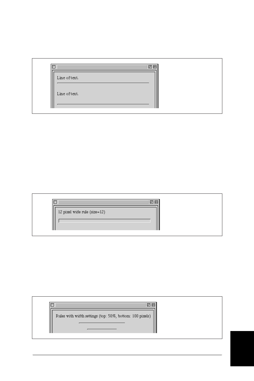
Horizontal Rules 155
Images &
Objects
Horizontal Rules
Web Design in a Nutshell, eMatter Edition
Copyright © 2000 O’Reilly & Associates, Inc. All rights reserved.
Since it is a block-level element, a horizontal rule will always create a line break
above and below. If you want additional space between the rule and the
surrounding elements, insert <p> tags above and/or below the <hr>, as shown in
Figure 9-1.
There are a few attributes for the <hr> tag that allow authors to “design” rules
more to their liking. They allow you to change the width, height, alignment of the
rule. You can also opt to turn off the 3-D shaded effect using the noshade
attribute.
Specifying Thickness
The size attribute controls the thickness or weight of the rule. Size is specified in
number of pixels. See Figure 9-2
Specifying the Rule Length
Somewhat counterintuitively, the length of the rule is controlled by the width
attribute (corresponding to the width of the page, I suppose). The value for the
rule width can be provided as a specific pixel length by entering a number, or as a
percentage of the available page width. See Figure 9-3.
Figure 9-1: Inserting a <p> tag adds vertical space above or below a horizontal rule
Figure 9-2: A 12-pixel rule
Figure 9-3: Rules set to 50% of page width (top) and 100 pixels (bottom)
Line of Text.
<HR>
Line of Text.
<P>
<HR>
<HR SIZE=12>
<HR WIDTH=50%>
<P>
<HR WIDTH=100>
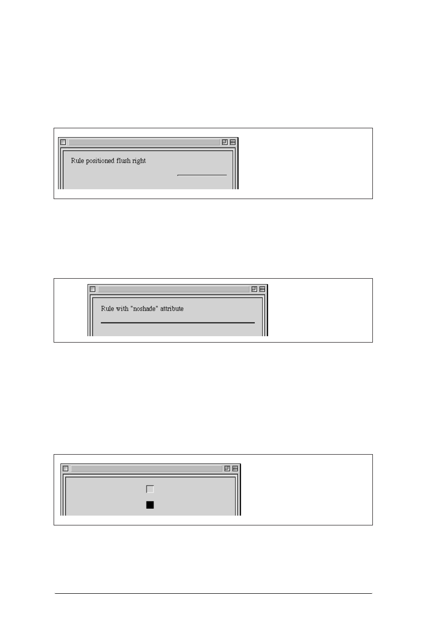
156 Chapter 9 – Adding Images and Other Page Elements
Horizontal Rules
Web Design in a Nutshell, eMatter Edition
Copyright © 2000 O’Reilly & Associates, Inc. All rights reserved.
Rule Alignment
If you’ve specified a length of a rule (using the width attribute) that is shorter
than the width of the page, you can also decide how you would like the rule
aligned: left, right, or centered. Like all other elements, horizontal placement is
controlled using the align attribute and the values left,right,orcenter. See
Figure 9-4.
Turning Off 3-D Shading
The noshade attribute allows you to turn off the 3-D shading for horizontal rules.
This will cause the rule to display as a solid black line. See Figure 9-5.
Creative Combinations
By using the available attributes in combination, you can get a little bit creative
with horizontal rules. The most common trick is to set the width and size to the
same value, creating a little embossed square that can be centered on the web
page. Unfortunately, rules cannot be placed next to each other on a line. See
Figure 9-6.
Figure 9-4: Rule positioned flush right
Figure 9-5: Rule with 3-D shading turned off
Figure 9-6: A 15-pixel-thick, 15-pixel-wide rule
<HR WIDTH=100 ALIGN=right>
<HR NOSHADE>
<HR WIDTH=15 SIZE=15>
<P>
<HR WIDTH=15 SIZE=15 NOSHADE>

Image Basics 157
Images &
Objects
Image Basics
Web Design in a Nutshell, eMatter Edition
Copyright © 2000 O’Reilly & Associates, Inc. All rights reserved.
Image Basics
Before jumping into the finer points of the <img> tag, let’s back up and consider
general graphics usage issues.
How Graphics Can Be Used
The overwhelming majority of graphics on the Web are used as inline images,
graphics that are displayed in the browser window as part of the flow of the
HTML document. Banners and buttons are examples of inline images. Inline
images, which are placed on the page with the <img> tag, can serve a variety of
functions as listed below. (Note that images may also be used as background tiles
or viewed externally with a helper application).
As a Simple Graphic
A graphic can be used on a web page much as it is used in print—as a static
image that adds decoration or information, such as a company logo or an
illustration.
As a Link
A graphic can also be used to link to another document as an alternative to
text links. Linking graphics are discussed later in this chapter.
As an Imagemap
An imagemap is a single graphic with multiple “hotspots” that link to other
documents. There is nothing special about the graphic itself; it is an ordinary
inline image. The “magic” is the result of special coding and map files that
link pointer coordinates with their respective URLs. The usemap or ismap
attribute within the <img> tag indicates to the browser that the graphic is
used as a client-side or server-side imagemap (respectively).
A full explanation of how imagemaps work and how to create them appears
in Chapter 8.
As Spacing Devices
Because web pages are difficult for designers to control with HTML alone,
many designers use transparent graphics to invisibly control the alignment of
text or the behavior of tables. David Siegel introduced the convention of
using a single transparent pixel that can be resized to create any amount of
white space on the page. Although it is one solution for arranging elements
on the page, it isn’t necessarily good HTML form.
Netscape’s solution for holding extra space on a web page is its pro-
prietary <spacer> tag. Spacers can be used to hold a specified
amount of horizontal space, vertical space, or a “block” of space
with width and height measurements. The <spacer> tag and its
attributes are listed earlier in this chapter. Because this is a propri-
etary tag and because it adds presentation information throughout
the HTML document, the use of the <spacer> tag is generally con-
sidered to be poor HTML form.

158 Chapter 9 – Adding Images and Other Page Elements
The <img> Tag and Its Attributes
Web Design in a Nutshell, eMatter Edition
Copyright © 2000 O’Reilly & Associates, Inc. All rights reserved.
Acceptable Graphics Formats
A graphic needs to be in either GIF or JPEG format to be displayed as an inline
image by the vast majority of browsers. Furthermore, the files need to be named
with the proper suffixes—.gif for GIF files; .jpeg or .jpg for JPEG—in order to be
recognized by the browser.
There is a third format, PNG (pronounced “ping”), which was designed specifi-
cally with web distribution in mind; however, only the very latest browser versions
support PNG files (suffix .png) as inline graphics, and they don’t support all of
PNG’s most attractive features. Until PNG gains better support, stick with either
GIF or JPEG.
These graphics file formats, as well as other requirements for putting graphics
online, are discussed in detail in the chapters of Part III: Graphics.
The <img> Tag and Its Attributes
The <img> tag inserts a graphic image into the document’s text flow. Unlike hori-
zontal rules, it doesn’t create any paragraph breaks, so you can place graphics
inline with the text. By default, the bottom of an image will align with the base-
line of surrounding text (ways to alter this will be discussed later).
There are over a dozen attributes that can be added within the <img> tag to affect
its display, but the only required attribute is src, which provides the URL of the
graphic. The minimal HTML tag for placing an image on the page looks like this:
<IMG SRC="url of graphic">
Figure 9-7 shows an inline image and its HTML source.
Linking Graphics
To make a graphic a link, place anchor tags around the image tag just as you
would around any string of text characters:
<A HREF="document.html"><IMG SRC="picture.gif"></A>
When a graphic is linked, the browser displays a 1-pixel-wide border around the
image in the same color as the text links on the page (usually a bright blue). In
most cases, this blue border is unacceptable, particularly around a graphic with
transparent edges, but it is quite simple to turn it off using the border attribute.
The border attribute specifies the width of the border in number of pixels. Speci-
fying a value of zero turns the borders off, as shown in the following example. Of
Figure 9-7: A graphic placed within a line of text
<P>Star light <IMG SRC="star.gif"> Star bright.</P>
The <img> Tag and Its Attributes 159
Images &
Objects
The <img> Tag and Its Attributes
Web Design in a Nutshell, eMatter Edition
Copyright © 2000 O’Reilly & Associates, Inc. All rights reserved.
course, if you are fond of the blue borders, you could just as easily make them
really wide by setting a higher number value.
<A HREF="document.html"><IMG SRC="picture.gif" BORDER=0></A>
Alternative Text
If a graphic cannot be displayed (either because the file is corrupted or cannot be
found), the browser displays a generic broken graphic icon in its place. The
browser will also display a generic graphic icon when the user has chosen to turn
graphics off for faster browsing (and a lot of users do). The alt attribute allows
you to specify a string of alternative text to be displayed in place of the graphic
when the graphic is unavailable, as shown in Figure 9-8. It is also what non-graph-
ical browsers will display in place of images.
When alternative text is provided in the image tag, users at least know what
they’re missing. This is particularly important when graphics are links that make
up the main navigation of the site. Readers can follow a link if they know where it
goes, even if the graphic isn’t visible. Without the alternative text, the page would
be a big dead end.
Taking the extra time to provide alternative text for your images is the simplest
way to make your page accessible to the greatest number of readers. In fact, the
HTML 4.0 Specification has declared alt to be a required attribute within the
<img> tag (although browsers are not currently enforcing it).
Specifying Width and Height
Although src is the only truly required attribute in the <img> tag, a few others
come strongly recommended. The first is alt, discussed in the previous section.
width and height are the others. The width and height attributes simply indi-
cate the dimension of the graphic in pixels, such as:
<IMG SRC="star.gif" WIDTH=50 HEIGHT=50>
With this information the browser can lay out the page before the graphics down-
load. Without width and height values, the page is displayed and then when the
graphics finally arrive, the whole page is displayed a second time with the
graphics in place (this process may actually take place in a series of passes
depending on how it is constructed). It is worthwhile to take the time to include
accurate width and height information in the image tag.
Figure 9-8: Alternative text is displayed when graphics are unavailable
First star <IMG SRC="star2.gif" ALT="[another star]"> I see tonight.
160 Chapter 9 – Adding Images and Other Page Elements
The <img> Tag and Its Attributes
Web Design in a Nutshell, eMatter Edition
Copyright © 2000 O’Reilly & Associates, Inc. All rights reserved.
Resizing images
If the values specified in the width and height attributes are different than the
actual dimensions of the graphic, the browser will resize the graphic to match the
specified dimensions. If you specify a percentage value for width and height, the
browser will resize the image to the desired proportions.
Although this effect can certainly be used strategically, as for resizing a single pixel
graphic to hold a certain amount of space, it usually just results in a pixelated,
poor image quality, as shown in Figure 9-9. It is better to resize images in a
graphics program than to leave it up to the browser.
Using width and height to preload images
Preloading images refers to methods used for downloading images and storing
them in cache before they actually need to be displayed on the page. One trick for
preloading is to place the graphic on a page that will be accessed first (such as a
home page), but set the width and height attributes to one pixel. This will cause
the image to download with the rest of the page, but the only thing that will be
visible is a one-pixel dot (which can be tucked away in a inconspicuous place).
<IMG SRC="bigpicture.gif" WIDTH=1 HEIGHT=1>
Ideally, the image will have finished downloading quietly while the user is still
reading the first page and will pop into view instantly when the user links to the
page where the image is displayed at its full size.
Vertical Alignment
The align attribute is used to control how the graphic is positioned in relation to
the flow of the text.
Vertical alignment controls the placement of the graphic in relation to points in the
surrounding text (usually the baseline). The default alignment is bottom, which
aligns the bottom of the image with the baseline of the surrounding text (shown in
Figure 9-10).
Figure 9-9: Scaling an image with width and height attributes
Figure 9-10: Default (bottom) alignment of image with text
<IMG SRC="star.gif" WIDTH=50 HEIGHT=50>
<IMG SRC="star.gif" WIDTH=200 HEIGHT=50>
The <img> Tag and Its Attributes 161
Images &
Objects
The <img> Tag and Its Attributes
Web Design in a Nutshell, eMatter Edition
Copyright © 2000 O’Reilly & Associates, Inc. All rights reserved.
The universally supported values for vertical alignment are top,middle, and
bottom. Netscape Navigator introduced another (somewhat more subtle) set,
which was then picked up for support in Internet Explorer 4.0. These are
absbottom,absmiddle,texttop, and baseline (the same as bottom).
Figure 9-11 demonstrates the intended effects of each of these alignment values.
The reality is slightly different. The absbottom value, for instance, seems to
render the same as bottom, even in Navigator.
Horizontal Alignment
The align attribute can be used to align a graphic horizontally on a page using
the values left or right.
When a graphic is aligned left, it is placed along the left margin of the page and
text is allowed to flow around it. Likewise, a right-aligned graphic is placed against
the right margin, with text wrapping around it. Figure 9-12 shows how images are
displayed when set to align to the left or right.
Figure 9-11: Vertical alignment values
Figure 9-12: Text wraps around images when they are aligned to the left or right
top T
middle y
bottom y
texttop T
absmiddle y
absbottom y
<IMG SRC="leaf.gif" ALIGN=right>An Oak and a Reed
were arguing about their strength...
<IMG SRC="leaf.gif" ALIGN=left>An Oak and a Reed
were arguing about their strength...
162 Chapter 9 – Adding Images and Other Page Elements
The <img> Tag and Its Attributes
Web Design in a Nutshell, eMatter Edition
Copyright © 2000 O’Reilly & Associates, Inc. All rights reserved.
Adding space around aligned images
When text flows around a graphic, it tends to bump right up against the graphic’s
edge. Usually, it is preferable to have a little space between the graphic and the
surrounding text. In HTML, this is provided by using the vspace and hspace
attributes within the <img> tag.
The vspace attribute holds a specified number of pixels space above and below
an aligned graphic. Space to the left and the right is added with hspace. Note that
space is always added symmetrically (both top and bottom, or on both sides), and
it is not possible to specify an amount of space along a particular side of the
graphic. Figure 9-13 shows an image aligned with the hspace attribute set to 12.
Stopping text wrap
Text will automatically wrap to fill the space along the side of an aligned graphic.
If you want to stop the wrap and have the text resume below the image, insert a
line break tag (<br>) with a clear attribute.
The clear attribute has three possible values: left,right, and all. It tells the
browser to skip down on the page until the specified margin is clear (i.e., no
graphics) and begin flowing the text at that point.
If your graphic is aligned right, insert <br clear=right> to begin the text below
the graphic. For left-aligned graphics, use <br clear=left>. The <br
clear=all> tag starts the text after the graphics on both margins (see
Figure 9-14), so it may be the only value you’ll ever need.
Tips for Placing Graphics
These are a few tips for graphics use that may not be obvious from simply looking
at HTML code.
Link to large images
Remember that when designing for the Web, you must always consider the time it
takes to download files. Images are particularly bandwidth-hungry, so you should
use them inline with care. One successful strategy for providing access to very
large images (with correspondingly large file sizes) is to provide a postage-stamp-
size preview graphic that links to the full-size graphic.
Figure 9-13: Image alignment with horizontal spacing
<IMG SRC="leaf.gif" ALIGN="left" HSPACE=12><P>An Oak and a Reed...
The <img> Tag and Its Attributes 163
Images &
Objects
The <img> Tag and Its Attributes
Web Design in a Nutshell, eMatter Edition
Copyright © 2000 O’Reilly & Associates, Inc. All rights reserved.
The preview could be a reduction of the whole image or just an alluring frag-
ment. Be sure to provide information necessary to help users decide whether they
want to spend the time clicking the link, such as a description of what they’re
going to get and the file size of the image (so they can make an estimate of how
long they’ll need to wait).
Reuse images whenever possible
When a browser downloads a graphic, it stores it temporarily in the disk cache (a
space for temporarily storing files on the hard disk). That way, if it needs to redis-
play the page, it can just pull up a local copy of the HTML and graphics files
without making a new trip out to the remote server.
When you use the same graphic repetitively in a page or a site, the browser only
needs to download the graphic once. Every subsequent instance of the graphic is
grabbed from the local cache, which means less traffic for the server and faster
display for the end user.
The browser recognizes a graphic by its entire pathname, not just the file name, so
if you want to take advantage of file caching, be sure that each instance of your
graphic is pointing to the same graphic on the server (not multiple copies of the
same graphic in different directories).
The lowsrc trick
Large graphics may take a long time to download via slow connection speeds,
which means your viewers may spend moments staring at an empty space on the
screen. The lowsrc attribute for the <img> tag (first introduced by Netscape)
provides one way to quickly give users some indication of the image to come
while the “real” graphic is still downloading.
The lowsrc attribute provides the URL for an image file that the browser loads
and displays when it first encounters the <img> tag. Then, once the document has
completely loaded, the browser goes back and retrieves the image specified by the
src attribute, as shown in Figure 9-15.
Figure 9-14: Effect of the clear=all attribute
<IMG SRC="leaf.gif" ALIGN="left" HSPACE=12><P>An Oak and a Reed
were arguing about their strength.<BR CLEAR=all>When a strong...

164 Chapter 9 – Adding Images and Other Page Elements
Adding Java Applets to the Page
Web Design in a Nutshell, eMatter Edition
Copyright © 2000 O’Reilly & Associates, Inc. All rights reserved.
To use this the way it was intended, the lowsrc image should contain the same
image as the final graphic, but in a format that compresses to a much smaller file
size. For instance, an image made up of only black and white pixels could stand
in for a full-color JPEG.
Some web authors use lowsrc to simulate a two-frame animation effect, such as
having some element appear in the second pass that wasn’t in the initial lowsrc
version. Bear in mind that the effect only works the first time the page is down-
loaded, and depending on the way the images are cached, the lowsrc image may
not show up again just by reloading the page. Also, on a very good connection,
the lowsrc image may flash so quickly that users may miss it entirely.
Adding Java Applets to the Page
Java applets are self-contained programs written in the Java programming
language, that can be placed inline on a web page just like a graphic. There are
lots of Java applets available on the Web for free from Java library sites such as the
JavaBoutique (http://javaboutique.internet.com).
Most Java applet instructions require that you add the applet to the page using the
handy <applet> tag (made just for the job!). However, the HTML 4.0 Spec recom-
mends that applets be added using the <object> tag instead, although this is
problematic in that some browsers don’t recognize the <object> tag when used
with Java. In this section, we will focus on the <applet> method.
The <applet> tag is a container for any number of parameter (<param>) tags.
The following is an example of how an <applet> tag for a game might look:
<APPLET CODEBASE=class CODE="Wacky.class" WIDTH=300 HEIGHT=400>
<PARAM NAME="Delay" VALUE="250">
<PARAM NAME="Time" VALUE="120">
<PARAM NAME="PlaySounds" VALUE="YES">
</APPLET>
The opening applet tag contains a number of standard attributes:
code
Tells the browser which applet will be used. Applets end with the suffix .
class or .jar. This attribute is required.
Figure 9-15: Code and images for using the lowsrc trick
<IMG LOWSRC="lowres.gif" SRC="skyline.gif">
“lowres.gif” “skyline.gif”

Adding Plug-in Media with <embed> 165
Images &
Objects
Adding Plug-in Media with <embed>
Web Design in a Nutshell, eMatter Edition
Copyright © 2000 O’Reilly & Associates, Inc. All rights reserved.
codebase
This tells the browser in which directory to find the applets. If the applets are
in the same directory as the page, the codebase attribute is not necessary.
width and height
These specify the pixel dimensions of the “window” the applet will occupy.
These attributes are required for the Java applet to function properly.
The <applet> tag can also take many of the same attributes used for images, such
as alt (for providing alternative text if the applet can not be displayed), align
(for positioning the applet in the flow of text), and hspace/vspace (used in
conjunction with align).
Special parameters for the applet are provided by any number of parameter tags
(sometimes there are none). The <param> tag always contains the name of the
parameter (name=) and its value (value=). Parameters provide special settings and
controls that are specific to the particular applet, so you need to follow the param-
eter coding instructions provided by the programmer of the applet.
Adding Plug-in Media with <embed>
The <embed> tag places a media object, such as a Flash movie or the controls for
a RealAudio track, on a web page. It displays the media object in a rectangular
area that behaves much like an inline image in terms of positioning in the flow of
the text. The <embed> tag was originally created by Netscape for use with plug-in
technologies. It is currently supported by both browsers; however, the HTML 4.0
Specification prefers the use of the all-purpose <object> tag for the placement of
multimedia elements.
When the browser encounters the <embed> tag, it matches the suffix of the file
name (Netscape also looks for the value of the type attribute) with the appro-
priate plug-in.
The following is a very simple example of the <embed> tag:
<EMBED SRC="url" HEIGHT="165" WIDTH="250" ALIGN="right"
HSPACE="6">
</EMBED>
The src attribute is required to tell the browser the location of the media file to be
played. Many media types require that the width and height values (the dimen-
sions of the plug-in element in pixels) be specified in order for the plug-in to
function.
If you are triggering plug-in functions from a script, you will need to give the
element a name using the name attribute.
Like images, media objects can be positioned using the align attribute and its
related hspace and vspace settings. In Internet Explorer, you can also specify
alternative text with the familiar alt attribute.
There are a few special attributes that are only supported by version 4.0 browsers
that you might also want to include. To hide the media file or object from view,
use the hidden attribute with a value of “yes.” The pluginspage attribute
provides the URL of a page where the user can download information for the

166 Chapter 9 – Adding Images and Other Page Elements
Adding Media Files with <object>
Web Design in a Nutshell, eMatter Edition
Copyright © 2000 O’Reilly & Associates, Inc. All rights reserved.
required plug-in should it not be found on the client machine. Netscape 4.0 intro-
duced the pluginurl attribute, which specifies a link to a function that installs the
plug-in automatically.
The complete list of attributes for the <embed> tag is detailed in the “Summary of
Object Placement Tags” section earlier in this chapter.
Plug-in-Specific Attributes
In addition to these standard attributes, the embed tag may also contain plug-in-
specific attributes for controlling the function of the player. The attributes loop,
autostart,autoplay, and volume are examples of media-specific controls.
Complete <embed> tags with their respective attributes are listed for several media
types in Chapters 19, 20, and 21 of this book.
<noembed>
The <noembed> tag provides alternative content that displays if the browser
cannot display the specified media file. In the following example, the browser
would display the contents of the GIF file in place of the media object.
<EMBED SRC="url" HEIGHT="165" WIDTH="250" ALIGN="right"
HSPACE="6">
<NOEMBED><IMG SRC="needplugin.gif"></NOEMBED>
</EMBED>
Adding Media Files with <object>
The <object> tag is an all-purpose object-placer. It can be used to place a variety
of object types, such as ActiveX controls, plug-in media, Java applets, images, and
more. The following shows the syntax of a simple <object> tag:
<OBJECT CLASSID="url" CODEBASE="url" DATA="url" TYPE="mimetype"
ID="name">
The classid is the URL of the object’s implementation (the program). It has the
same function as the code attribute of the <applet> tag when used for Java
applets. When used for a plug-in media type, classid functions like <embed>’s
pluginurl attribute, which points to the place where the appropriate plug-in can
be found and automatically installed.
Codebase provides the URL for the plug-in and functions, the same as the code-
base attribute in the <applet> tag. For plug-ins, codebase is the same as the
pluginspage attribute.
The data attribute represents the URL of the object itself. It is equivalent to the
src attribute for the <embed> tag. The type attribute provides the MIME type of
the media object.
Objects placed with the <object> tag can be positioned with the standard align
attribute, which has the same values as for the <img> tag. If the object is a plug-in,
the width and height attributes may be required for the plug-in to function.

Adding Media Files with <object> 167
Images &
Objects
Adding Media Files with <object>
Web Design in a Nutshell, eMatter Edition
Copyright © 2000 O’Reilly & Associates, Inc. All rights reserved.
When using <object> for Java applets, the object tag may contain a number of
parameter (<param>) tags, the same as for the <applet> tag. Unfortunately, as of
this writing, Netscape 4.0 does not support <param> tags within the <object> tag,
so it may not play applets correctly if placed this way.
A complete list of attributes for the <object> tag is detailed in the “Summary of
Object Placement Tags” section earlier in this chapter.

168
Web Design in a Nutshell, eMatter Edition
Copyright © 2000 O’Reilly & Associates, Inc. All rights reserved.
Chapter 10Tables
CHAPTER 10
Tables
HTML tags for creating tables were originally developed for presenting rows and
columns of tabular data, however, designers quickly co-opted them as a valuable
tool for controlling the layout of web pages. Tables allow you to create columns of
text, hold white space between elements, and constrict the dimensions of the
page’s content in ways other HTML formatting tags won’t.
The HTML 4.0 Specification on tables is a great deal more complex than the
previous 3.2 standard. It makes an effort to bring context and structure to table
data as well as provide systems for incremental display and display on non-visual
display agents (such as speech- and Braille-based browsers). Of course, this is just
in its proposal stage as of this writing, so it will take a while to see how browsers
will adopt the standards in practical use. To read what the HTML 4.0 Specification
has to say about tables, see the W3C’s site at http://www.w3c.org/TR/REC-html40/
struct/tables.html.
Summary of Table Tags
In this section, browser support for each tag is noted to the right of the tag name.
Browsers that do not support the tag are grayed out. Browsers that deprecate the
tag are noted with a superscript D. Tag usage is indicated below the tag name. A
more thorough listing of attributes for each tag, according to the HTML 4.0 Specifi-
cation, appears in Appendix A, HTML Tags and Elements.
<caption>
NN: 2, 3, 4 - MSIE: 2, 3, 4, 5 - HTML 4 - WebTV - Opera3
<caption>...</caption>
Provides a brief summary of the table’s contents or purpose. According to the W3C
HTML 4.0 Specification, if used, the caption must immediately follow the <table> tag
and precede all other tags. The width of the caption is determined by the width of the

Summary of Table Tags 169
Tables
Summary of Table Tags
Web Design in a Nutshell, eMatter Edition
Copyright © 2000 O’Reilly & Associates, Inc. All rights reserved.
table. The caption’s position as displayed in the browser can be controlled with
the align attribute (or valign in MSIE).
Attributes
align=top|bottom|left|right|center
Positions the caption relative to the table. This attribute has been deprecated
by the W3C 4.0 Spec in favor of style sheet positioning.
summary=text
W3C 4.0 Specification only. Used to provide a longer description of the table’s
contents that could be used by a speech- or Braille-based web browser.
valign=top|bottom
Internet Explorer 3.0 and higher only. Positions the caption above or below
the table (top is the default).
<col>
NN: 2, 3, 4 - MSIE: 2, 3, 4, 5 - HTML 4 - WebTV -Opera3
<col>
Specifies properties for a column (or columns) within a column group
(<colgroup>). Columns can share attributes (such as text alignment) without
being part of a formal structural grouping.
Column groups and columns were introduced by Internet Explorer 3.0 and are
now proposed by the HTML 4.0 Specification as a standard way to label table
structure. They may also be useful in speeding the table display (i.e., the columns
can be displayed incrementally without waiting for the entire contents of the
table).
Attributes
align=left|right|center
Specifies alignment of text in the cells of a column.
char=character
Specifies a character along which the cell contents will be aligned. The default
character is a decimal point (language-appropriate).
charoff=length
Specifies the distance to the first alignment character (char) on each line. If a
line doesn’t use an alignment character, it should be horizontally shifted to
end at the alignment position.
span=number
Specifies the number of columns “spanned” by the <col> element (which
shares its attributes with all the columns it spans).
valign=top|middle|bottom|baseline
Specifies the vertical alignment of text in the cells of a column.
width=pixels, percentage,n*
Specifies the width (in pixels, percentage, or relative) of each column
spanned by the <col> element. It overrides the width attribute of the
containing <colgroup> element.

170 Chapter 10 – Tables
Summary of Table Tags
Web Design in a Nutshell, eMatter Edition
Copyright © 2000 O’Reilly & Associates, Inc. All rights reserved.
<colgroup>
NN: 2, 3, 4 - MSIE: 2, 3, 4, 5 - HTML 4 - WebTV -Opera3
<colgroup>...</colgroup>
Creates a column group, a structural division within a table that can be appointed
attributes with style sheets or HTML. A table may include more than one column
group. The number of columns in a group is specified either by the value of the
span attribute or by a tally of columns <col> within the group. Its end tag is
optional.
Column groups and columns were introduced by Internet Explorer 3.0 and are
now proposed by the HTML 4.0 Specification as a standard way to label table
structure. They may also be useful in speeding the table display (i.e., the columns
can be displayed incrementally without waiting for the entire contents of the
table).
Attributes
align=left|right|center
Specifies the alignment of text in the cells of a column group.
char=character
Specifies a character along which the cell contents will be aligned. The default
character is a decimal point (language-appropriate).
charoff=length
Specifies the distance to the first alignment character (char) on each line. If a
line doesn’t use an alignment character, it should be horizontally shifted to
end at the alignment position.
span=number
Specifies the number of columns in a column group. If span is not specified,
the default is 1.
valign=top|middle|bottom|baseline
Specifies the vertical alignment of text in the cells of a column group.
width=pixels, percentage, n*
Specifies a default width for each column in the current column group. Width
can be measured in pixels, percentages, or defined as a relative size (*). For
example, 2* sets the column two times wider than the other columns; 0* sets
the column width at the minimum necessary to hold the column’s contents.
<table>
NN: 2, 3, 4 - MSIE: 2, 3, 4, 5 - HTML 4 - WebTV - Opera3
<table>...</table>
Defines the beginning and end of a table. The end tag is required, and its omis-
sion may cause the table not to render in some browsers.
Attribute
align=left|right|center
Aligns the table within the text flow (same as align in the <img> tag). The
default alignment is left. The center value is not universally supported, so it
is more reliable to center a table on a page using tags outside the table (such

Summary of Table Tags 171
Tables
Summary of Table Tags
Web Design in a Nutshell, eMatter Edition
Copyright © 2000 O’Reilly & Associates, Inc. All rights reserved.
as <center> or <div>). This attribute has been deprecated by the W3C 4.0
Specification in favor of style sheet positioning.
background=url
Specifies a graphic image to be tiled in the background of the table. In
Internet Explorer 3.0 and higher, the image tiles behind the entire table. In
Netscape Navigator 4.0, the tile repeats in each individual frame (although its
support is not officially documented).
bgcolor=“#rrggbb” or color name
Specifies a background color for the entire table. Value is specified in hexa-
decimal RGB values or by color name (see Chapter 5, HTML Overview, for
more information on specifying colors in HTML).
border=number
Specifies the width (in pixels) of the border around the table and its cells. Set
it to border=0 to turn the borders off completely. The default value is 1.
Adding the word border without a value results in a 1-pixel border.
cellpadding=number
Sets the amount of space, in number of pixels, between the cellborder and its
contents. The default value is 1. For more information, see the “Space
Between Cells” section in this chapter.
cellspacing=number
Sets the amount of space (in number of pixels) between table cells. The
default value is 2. For more information, see the “Space Between Cells”
section in this chapter.
frame=void|above|below|hsides|lhs|rhs|vsides|box|border
Tells the browser where to draw borders around the table. The values are as
follows:
When the border attribute is set to a value greater than zero, the frame
defaults to border unless otherwise specified. This attribute was introduced
by Internet Explorer 3.0 and now appears in the HTML 4.0 Specification. It is
not supported by Netscape as of this writing.
height=number, percentage
Specifies the height of the entire table. It can be specified in a specific
number of pixels or by a percentage of the browser window.
hspace=number
Holds a number of pixels space to the left and right of an aligned table (same
as hspace in the <img> tag).
void the frame does not appear (default)
above top side only
below bottom side only
hsides top and bottom sides only
vsides right and left sides only
lhs left-hand side only
rhs right-hand side only
box all four sides
border all four sides

172 Chapter 10 – Tables
Summary of Table Tags
Web Design in a Nutshell, eMatter Edition
Copyright © 2000 O’Reilly & Associates, Inc. All rights reserved.
rules=all|cols|groups|none|rows
Tells the browser where to draw rules within the table. Its values are as
follows:
When the border attribute is set to a value greater than zero, rules default to
“all” unless otherwise specified.
This attribute was introduced by Internet Explorer 3.0 and now appears in the
HTML 4.0 Specification. It is not supported by Netscape as of this writing.
summary=text
Provides a summary of the table contents for use with non-visual browsers.
vspace=number
Holds a number of pixels space above and below an aligned table (same as
vspace in the <img> tag).
width=number, percentage
Specifies the width of the entire table. It can be specified in a specific number
of pixels or by percentage of the browser window.
Internet Explorer 2.0 and higher only
bordercolor="#rrggbb" or color name
Specifies the color of the main center portion of a table border. (Table
borders are rendered using three color values to create a 3-D effect.)
bordercolorlight="#rrggbb" or color name
Specifies the color of the light shade used to render 3-D-looking table
borders.
bordercolordark="#rrggbb" or color name
Specifies the color of the dark shade used to render 3-D-looking table
borders.
<tbody>
NN: 2, 3, 4 - MSIE: 2, 3, 4, 5 - HTML 4 - WebTV -Opera3
<tbody>...</tbody>
Defines a row or group of rows as the “body” of the table. It must contain at least
one row (<tr>). The end tag is optional.
“Row group” tags (tbody,thead, and tfoot) were introduced by Internet
Explorer and are part of the HTML 4.0 Specification, but all attributes may not be
fully supported. The system could speed table display and provide a mechanism
for scrolling the body of a table independently of its head and foot. It could also
be useful for printing long tables for which the head information could be printed
on each page.
none no rules (default)
groups rules appear between row groups (thead,tfoot, and tbody)
and column groups
rows rules appear between rows only
cols rules appear between columns only
all rules appear between all rows and columns

Summary of Table Tags 173
Tables
Summary of Table Tags
Web Design in a Nutshell, eMatter Edition
Copyright © 2000 O’Reilly & Associates, Inc. All rights reserved.
Attributes
align=left|center|right|justify|char
Specifies horizontal alignment (or justification) of cell contents.
char=character
Specifies a character along which the cell contents will be aligned. The default
character is a decimal point (language-appropriate).
charoff=length
Specifies the distance to the first alignment character (char) on each line. If a
line doesn’t use an alignment character, it should be horizontally shifted to
end at the alignment position.
valign=top|middle|bottom|baseline
Specifies vertical alignment of cell contents.
<td>
NN: 2, 3, 4 - MSIE: 2, 3, 4, 5 - HTML 4 - WebTV - Opera3
<td>...</td>
Defines a table data cell. The end tag is not required, but may prevent unpredict-
able table display, particularly if the cell contains images. A table cell can contain
any content, including another table.
Attributes
align=left|center|right
Aligns the text (or other elements) within a table cell. The default value is
left. This attribute has been deprecated by the W3C 4.0 Spec in favor of
positioning with style sheets.
background=url
Specifies a graphic image to be used as a tile within the cell. Netscape’s docu-
mentation does not cover this tag, but it is supported by version 4.0.
bgcolor="#rrggbb" or color name
Specifies a color to be used in the table cell. A cell’s background color over-
rides colors specified at the row or table levels.
colspan=number
Specifies the number of columns the current cell should span. The default
value is 1. According to the W3C 4.0 Specification, the value zero (“0”) means
the current cell spans all columns from the current column to the last column
in the table; in reality, however, this feature is not supported in currently
available 4.0 browsers.
height=number, percentage
Specifies the height of the cell in number of pixels or by a percentage value
relative to the table height. The height specified in the first column will apply
to the rest of the cells in the row. The height values need to be consistent for
cells in a particular row. This attribute has been deprecated in the W3C 4.0
Specification.

174 Chapter 10 – Tables
Summary of Table Tags
Web Design in a Nutshell, eMatter Edition
Copyright © 2000 O’Reilly & Associates, Inc. All rights reserved.
nowrap
Disables automatic text wrapping for the current cell. Line breaks must be
added with a <p> or <br>. This attribute has been deprecated by the W3C 4.0
Spec in favor of style sheet controls.
rowspan=number
Specifies the number of rows spanned by the current cell. The default value is
1. According to the W3C 4.0 Spec, the value zero (“0”) means the current cell
spans all rows from the current row to the last row; in reality, however, this
feature is not supported in currently available 4.0 browsers.
valign=top|middle|bottom|baseline
Specifies the vertical alignment of the text (or other elements) within the table
cell. The default is middle.
width=number
Specifies the width of the cell in number of pixels or by a percentage value
relative to the table width. The width specified in the first row will apply to
the rest of the cells in the column and the values need to be consistent for
cells in the column. This attribute has been deprecated in the W3C 4.0
Specification.
Internet Explorer 2.0 and higher only
bordercolor="#rrggbb" or color name
Defines the border color for the cell.
bordercolorlight="#rrggbb" or color name
Defines the dark shadow color for the cell border.
bordercolordark="#rrggbb" or color name
Defines the light highlight color of the cell border.
New in HTML 4.0 Specification
abbr=text
Provides an abbreviated form of the cell’s content.
axis=text
Places a cell into a conceptual category, which could then be used to orga-
nize the table in different ways.
headers=id reference
Lists header cells (by “id”) that provide header information for the current
data cell. This is intended to make tables more accessible to non-visual
browsers.
scope=row|col|rowgroup|colgroup
Specifies groups of data cells for which the current header cell is applicable.
This is intended to make tables more accessible to non-visual browsers.
<tfoot>
NN: 2, 3, 4 - MSIE: 2, 3, 4, 5 - HTML 4 - WebTV -Opera3
<tfoot>...</tfoot>
Defines the foot of a table and should contain information about a table’s
columns. It is one of the “row group” tags introduced by Internet Explorer and

Summary of Table Tags 175
Tables
Summary of Table Tags
Web Design in a Nutshell, eMatter Edition
Copyright © 2000 O’Reilly & Associates, Inc. All rights reserved.
proposed in the W3C 4.0 Specification (see <tbody>) and must contain at least
one row (<tr>). Its end tag is optional.
Attributes
align=left|center|right|justify|char
Specifies horizontal alignment (or justification) of cell contents.
char=character
Specifies a character along which the cell contents will be aligned. The default
character is a decimal point (language-appropriate).
charoff=length
Specifies the distance to the first alignment character (char) on each line. If a
line doesn’t use an alignment character, it should be horizontally shifted to
end at the alignment position.
valign=top|middle|bottom|baseline
Specifies vertical alignment of cell contents.
<th>
NN: 2, 3, 4 - MSIE: 2, 3, 4, 5 - HTML 4 - WebTV - Opera3
<th>...</th>
Defines a table header cell. Table header cells function the same as table data cells
(<td>). Browsers generally display the content of table header cells in bold text
centered horizontally and vertically in the cell (although some browsers vary). The
end tag is optional.
Attributes
The <th> tag uses the same attributes as the <td> tag. See listing under <td>.
<thead>
NN: 2, 3, 4 - MSIE: 2, 3, 4, 5 - HTML 4 - WebTV -Opera3
<thead>...</thead>
Defines the head of the table and should contain information about a table. It
must contain at least one row (<tr>). <thead> is one of the “row group” tags
introduced by Internet Explorer and proposed in the W3C 4.0 Specification (see
<tbody>). Its end tag is optional.
Attributes
align=left|center|right|justify|char
Specifies horizontal alignment (or justification) of cell contents.
char=character
Specifies a character along which the cell contents will be aligned. The default
character is a decimal point (language-appropriate).
charoff=length
Specifies the distance to the first alignment character (char) on each line. If a
line doesn’t use an alignment character, it should be horizontally shifted to
end at the alignment position.
valign=top|middle|bottom|baseline
Specifies vertical alignment of cell contents.

176 Chapter 10 – Tables
Introduction to Tables
Web Design in a Nutshell, eMatter Edition
Copyright © 2000 O’Reilly & Associates, Inc. All rights reserved.
<tr>
NN: 2, 3, 4 - MSIE: 2, 3, 4, 5 - HTML 4 - WebTV - Opera3
<tr>...</tr>
Defines a row of cells within a table. A table row as delimited by <tr> tags
contains no content other than a collection of table cells (<td>). The end tag is
optional.
Attributes
align=left|center|right
Aligns the text (or other elements) within the cells of the current row. This
attribute has been deprecated by the W3C 4.0 Spec in favor of positioning
with style sheets.
bgcolor="#rrggbb" or color name
Specifies a color to be used in the row. A row’s background color overrides
the color specified at the table level.
valign=top|middle|bottom|baseline
Specifies the vertical alignment of the text (or other elements) within cells of
the current row.
Internet Explorer 2.0 and higher only
background=url of image file
Specifies a graphic image to be used as a tile within the row.
bordercolor="#rrggbb" or color name
Defines the border color for the row.
bordercolorlight="#rrggbb" or color name
Defines the dark shadow color for the row border.
bordercolordark=“#rrggbb” or color name
Defines the light highlight color of the row border.
Introduction to Tables
Although there are no true classifications, tables can be used in the following
general ways:
Table Usage Illustration
Data Table
This is a table at its most basic (and as
the creators of HTML intended)—rows
and columns of textual data. Of course,
data tables can be much larger and
more complex than shown in this
example.
Basic Table Structure 177
Tables
Basic Table Structure
Web Design in a Nutshell, eMatter Edition
Copyright © 2000 O’Reilly & Associates, Inc. All rights reserved.
The HTML 4.0 Specification proposal discourages the use of tables for page layout,
favoring Cascading Style Sheets with absolute positioning instead. But until style
sheets are more universally and consistently supported by the browsers in current
use, tables remain a designer’s most reliable tool for constructing complex page
layouts.
Basic Table Structure
At their most basic, tables are made up cells, arranged into rows and columns.
You can control display characteristics for the whole table level, the row level, and
for individual cells (there are currently no supported methods for controlling
columns as a group).
Rows and Cells
The bare minimum tags for describing a table are <table>,<tr>, and <td>. The
following HTML shows the basic structure for a four-cell table:
Text Alignment
Tables are often used to clean up the
display of text by creating effects
common to print, such as columns,
hanging indents, and extra white
space.
Page Template
Many web designers use a large table
as a container to give structure to a
page. One common configuration is to
create narrow columns for navigational
items as shown in this example. A
template for a two-column table
follows in the “Templates” section of
this chapter.
Multipart Image Container
Tables can be used to hold together a
large graphic that has been divided
into separate sections to accommodate
animations, rollovers, etc. In the
example at right, the border was
turned on to reveal the individual
sections. Holding images together with
tables is discussed at the end of this
chapter.
Table Usage Illustration

178 Chapter 10 – Tables
Basic Table Structure
Web Design in a Nutshell, eMatter Edition
Copyright © 2000 O’Reilly & Associates, Inc. All rights reserved.
<TABLE>
<TR>
<TD>cell 1</TD><TD>cell 2</TD>
</TR>
<TR>
<TD>cell 3</TD><TD>cell 4</TD>
</TR>
</TABLE>
The <table> tag defines the contents of the table. Each row is defined by <tr>
tags, and is made up of a number of data (or header) cells. The number of
columns is defined by the number of cells in a row. Data cells are indicated by the
<td> tag. A table cell may contain any data that can be displayed in an HTML
document (formatted text, images, multimedia elements, and even other tables).
Figure 10-1 gives a visual representation of this concept. The image on the left
shows that the table consists of two rows and that each consists of two cells. The
image on the right shows just how the HTML describes the rows and cells.
Header cells use the <th> tag and function the same as data cells but are
displayed in bold centered text. You may also add a caption to the table (using the
<caption> tag), which provides a title or brief description of the table. The
<caption> tag should be placed before the first row of the table; be sure that it is
outside the row containers. Because tables are so often used as layout devices
only, the caption feature is less used than the other main table components.
Table level controls
At the table level (using attributes within the <table> tag outlined above), you
can control:
• the width of the table and its position on the page
• the color of all its cells
• the thickness of the border
• the spacing within and between cells (using cellpadding and cellspacing,
respectively)
Figure 10-1: HTML tables are divided into rows and cells, as shown at left. The <tr>
tag creates rows and the <td> tag creates cells, as shown at right.
Table
cell 1 cell 2
cell 3 cell 4
<TABLE>
<TD> </TD><TR> </TR>
<TD> </TD><TR>
<TD> </TD>
<TD> </TD> </TR>
</TABLE>

Basic Table Structure 179
Tables
Basic Table Structure
Web Design in a Nutshell, eMatter Edition
Copyright © 2000 O’Reilly & Associates, Inc. All rights reserved.
Row level controls
For each row (using attributes within the <tr> tag), you can control only:
• the vertical and horizontal alignment of the cells’ contents
• backround colors for all the cells contained in that row
Row settings override table-level settings. Note that table row tags are merely
containers for cell tags and contain no actual data themselves.
Cell level controls
Much of a table’s structure and appearance is controlled at the individual cell level
using <td> or <th> attributes. Within cells, you can control:
• the vertical and horizontal alignment of the cell’s contents
• the color of the cell background
• the height and width of the cell (and the row and column that contain it)
• whether the cell should span over more than one cell space in the table grid
Alignment and color specifications at the cell level will override settings made at
the row and table level.
Spanning Rows and Columns
Cells in a table can occupy the space of more than one cell in a row or column.
This behavior is set within the <th> or <td> tags using the colspan and rowspan
attributes.
Column span
In Figure 10-2, <td colspan=2> tells the browser to make “cell 1” occupy the
same horizontal space as two cells. The resulting spanned cell is indicated in the
figure on the left. Note that the row containing the spanned cell now only has one
set of <td> tags instead of two.
Setting the colspan to a number greater than the actual number of columns (such
as "colspan=4" in the following example) may cause some browsers to add empty
columns to the table, possibly throwing your elements out of alignment. For
example, in Netscape 4.5 and earlier, additional collapsed columns appear as an
extra-wide border on the right of the table. The HTML 4.0 Specification requests
that empty cells not be added.
Figure 10-2: The colspan attribute spans cells horizontally.
<TABLE>
<TD COLSPAN=2> </TD><TR> </TR>
<TD> </TD><TR> <TD> </TD> </TR>
</TABLE>
<TABLE>
<TR>
<TD COLSPAN=2>cell 1</TD>
</TR>
<TR>
<TD>cell 3</TD><TD>cell 4</TD>
</TR>
</TABLE>

180 Chapter 10 – Tables
Basic Table Structure
Web Design in a Nutshell, eMatter Edition
Copyright © 2000 O’Reilly & Associates, Inc. All rights reserved.
Row span
Similar to colspan, the rowspan attribute stretches a cell to occupy the space of
cells in rows below. Include the rowspan attribute in the row where you want the
cell to begin and set its value equal to the number of rows you want it to span.
In Figure 10-3, note that the bottom row now only contains one cell (the other
one has been incorporated into the vertical spanned cell). The resulting spanned
cell is illustrated in the figure on the left. The browser ignores over-extended
rowspan values.
You may combine colspan and rowspan attributes to create a cell
that spans both rows and columns.
Row and Column Groups
Internet Explorer 3.0 introduced a system for grouping rows and columns so they
can be treated as units by style sheets or other HTML formatting tags. The system
is now reflected in the W3C 4.0 Specification for tables, so it bears mentioning
here. However, support for row and column groups is far from universal as of this
writing (in fact, Navigator 4.0 doesn’t recognize them at all), so keep them in
mind, but use them with caution.
Row groups
Rows can be classified into a table head (<thead>), a table foot (<tfoot>), and
one or more table body (<tbody>). The head and foot should contain informa-
tion about the document and may someday be used to display fixed elements
while the body scrolls independently. It is recommended by the W3C that the foot
(if there is one) appear before the body of the table so the table can render the
foot before downloading all of the (potentially numerous) rows of data.
The rules attribute in the table tag may use row group information for placing
rules within a table.
Figure 10-3: The rowspan attribute spans cells vertically
<TABLE>
<TD ROWSPAN=2> </TD>
<TR> </TR>
<TR>
<TD> </TD>
<TD> </TD> </TR>
</TABLE>
<TABLE>
<TR>
<TD rowspan=2>cell 1</TD>
<TD>cell2</TD>
</TR>
<TR>
<TD>cell 4</TD>
</TR>
</TABLE>

Affecting Table Appearance 181
Tables
Affecting Table Appearance
Web Design in a Nutshell, eMatter Edition
Copyright © 2000 O’Reilly & Associates, Inc. All rights reserved.
Column groups
Column groups create structural divisions within a table. This allows the columns
created with <td> and <th> tags to be addressed as a group, usually for style and
formatting purposes.
The <colgroup> tag delimits a conceptual group of columns. The number of
columns included in the group is indicated with the span attribute. You can set
the width of every column in the group (using pixel measurements, percentages,
or relative values) with the width attribute.
The <col> element is used to apply attribute specifications across several tables
without actually grouping them together structurally or conceptually. Like
<colgroup>, you can specify the span (number of affected columns) and width
(in pixels, percentages, or relative values) within the <col> tag.
Sample HTML
The following is a bare-bones example of how row and column groups would be
integrated into the HTML table structure (with its resulting table display in a
browser). Figure 10-4 shows the result. Note again that proper support for row
and column groups and their attributes is rare as of this writing, however, it may
be useful to be familiar with this structure in the future.
<TABLE BORDER=1>
<CAPTION>Table Description</CAPTION>
<COLGROUP width=100>
<COL>
<COL>
</COLGROUP>
<COLGROUP width=50>
<THEAD valign="top">
<TR>
<TH>Heading 1</TH><TH>Heading 2</TH><TH>Heading 3</TH>
</TR>
</THEAD>
<TFOOT>
<TR>
<TH>Footer 1</TH><TH>Footer 2</TH><TH>Footer 3</TH>
</TR>
</TFOOT>
<TBODY>
<TR>
<TH>Cell Data 1</TH><TH>Cell Data 2</TH><TH>Cell Data 3</TH>
</TR>
</TBODY>
</TABLE>
Affecting Table Appearance
The HTML table standard provides many tags for controlling the display of tables.
Bear in mind that, as with most formatting tags, browsers have their own way of
interpreting your instructions, so results may vary among browser releases and
182 Chapter 10 – Tables
Affecting Table Appearance
Web Design in a Nutshell, eMatter Edition
Copyright © 2000 O’Reilly & Associates, Inc. All rights reserved.
platforms. This is particularly true of tables since the standard is still being nailed
down. As always, it is best to do a lot of testing in a variety of viewing
environments.
It is important to note that many of the tags that affect appearance (align,
valign, and bgcolor) have been deprecated by the HTML 4.0 Specification in
favor of achieving the same effects with style sheets. Expect the major browsers,
however, to continue supporting the following methods until style sheets are
universally supported.
Borders
You can add a shaded border around the table and its cells by adding the border
attribute within the <table> tag. If no value is indicated, the border attribute
indicates a width of one pixel, as shown in Figure 10-5.
Specifying a higher number for the border will add a thicker beveled border
around the outside edges of the table, as shown in Figure 10-6. Thicker lines
between cells are created with cellspacing, described later.
Figure 10-4: This table uses the column and row groups to organize structure
Figure 10-5: Table with a one-pixel border
Figure 10-6: Table with a 15-pixel border
<TABLE BORDER>
<TR>
<TH>Sifl</TH><TH>Olly</TH>
...
</TABLE>
<TABLE BORDER=15>...
Affecting Table Appearance 183
Tables
Affecting Table Appearance
Web Design in a Nutshell, eMatter Edition
Copyright © 2000 O’Reilly & Associates, Inc. All rights reserved.
Even if you don’t want a table to display with a border in your final design,
turning the border on during the design process can help in visualizing the table
structure; it is particularly useful for debugging problematic tables. Just remember
to turn it off again before uploading.
Positioning a Table on the Page
On current browsers (Navigator and IE versions 3.0 and higher), tables behave the
same as images when it comes to placing them in the flow of the page. Use the
align attribute in the <table> tag to position the table against the left or right
margin and allow text to flow around it. Like images, you can specify a number of
pixels to hold clear to the left and right of the table using the hspace attribute.
vspace holds space above and below the table.
Centering tables
The 4.0 browsers allow you to center a table on the page by setting the align
attribute to equal center. Unlike left or right margin alignments, this setting does
not allow text to flow around the table.
Because this attribute is not universally supported, it is best to center a table using
HTML tags outside the table, such as <center> or <div>.
Aligning Text in Cells
By default, the text (or any element) in a data cell will be positioned flush left and
centered vertically within the available height of the cell, as shown in Figure 10-7.
Table header text (<th>) is generally displayed in bold text centered horizontally
and vertically in the cell. You can override these defaults by using the align and
valign attributes at either the row or cell level.
Row Settings
Alignment settings specified within the <tr> tag affect all the table cells
(<td> or <th>) within that row. This makes it easy to apply alignment
changes across multiple cells.
Figure 10-7: Default placement of data within a cell.

184 Chapter 10 – Tables
Affecting Table Appearance
Web Design in a Nutshell, eMatter Edition
Copyright © 2000 O’Reilly & Associates, Inc. All rights reserved.
Cell Settings
Alignment attributes within a cell (<td> or <th>) apply to the current cell.
Cell settings will override row settings. Furthermore, alignment settings within
the contents of the cell (e.g., <p align=right>) take precedence over both
cell and row settings.
Horizontal alignment is specified with the align attribute, which takes the stan-
dard left,right,orcenter values. These values work the same as regular
paragraph alignment.
Vertical alignment is controlled using the valign attribute, which can be set to
top,middle (the default), bottom,orbaseline (“first text line appears on a
baseline common to all the cells in the row”).
By default, the text in a cell will automatically wrap to fill the allotted space. To
keep text on one line (unless broken by a <br> or <p>), use the nowrap attribute
within the table cell (<td> or <th>). This should be done with caution because
the text in the cell may render larger for some users and will run out of room in
the table cell.
Sizing Tables
You can control the size of the entire table as well as the size of rows and
columns. By default, a table (and its rows and columns) will be sized automati-
cally to the minimum dimensions required to fit their contents. In many cases, it is
desirable to assign a table or column a specific size (especially when using the
table to build a page structure).
If the contents require a width greater than the specified size, the table will gener-
ally resize to accommodate the contents. Size specifications are treated as
suggestions that will be followed as long as they don’t conflict with other display
directions. In effect, by specifying the size of a table you are merely specifying the
minimum size.
Table sizes can be unpredictable even when specified, because they vary from
browser to browser. For instance, Netscape 3.0 will preserve the specified width of
the cell even if its contents are wider, resulting in items hanging outside the table
or into neighboring cells. It is best to specify ample room to accommodate the
contents of the cells.
Table dimensions
The width attribute is used within the <table> tag to specify the width of the
table. You can specify an absolute value (measured in pixels) or a relative value (a
percentage of the available width of the screen) as shown in the following table:
To make a table fill the browser width, set the width to 100%.
Style Sample HTML Result
Absolute value <TABLE WIDTH=600> Makes the table 600 pixels wide
Relative value <TABLE WIDTH=80%> Makes the table 80% of the screen
width

Affecting Table Appearance 185
Tables
Affecting Table Appearance
Web Design in a Nutshell, eMatter Edition
Copyright © 2000 O’Reilly & Associates, Inc. All rights reserved.
Table height can be specified using the height attribute, which can also be
defined by absolute or relative values. By default, the table will end after the
longest column of data, but you can force it to be longer or to always fill the
screen (height=100%).
Cell dimensions
Similarly, you can use the width and height attributes within a cell tag (<td> or
<th>) to specify the dimensions of that cell. A cell’s width setting will affect the
width of the entire column it occupies, therefore, column widths can be specified
by setting the width of just one cell in the column (generally those in the top
row); the remaining cells will follow.
Likewise, the cell’s height may determine the height of all the cells in that row, so
row height can be set using just one cell in each row.
Height and width values can be absolute measurements in pixels, or percentages
relative to the dimensions of the table.
Table Cell Spacing
There are two types of space that can be added in and around table cells: cell
padding and cell spacing. The cellpadding and cellspacing attributes are used
within the <table> tag and apply to the whole table.
cellspacing
Cell spacing, which is controlled by the cellspacing attribute within the
<table> tag, refers to the space between the cells (see the left image in
Figure 10-8). Values are specified in number of pixels. Increasing the cell
spacing results in wider shaded borders between cells. In the left image in
Figure 10-8, the gray areas indicate the 10 pixels of cell spacing added
between cells. The default value for cellspacing is 2, therefore, if no cell-
spacing is specified, browsers will automatically place 2 pixels of space
between cells.
cellpadding
Cell padding refers to the amount of space between the cell’s border and its
contents (as indicated in the right image in Figure 10-8). It is specified using
the cellpadding attribute within the <table> tag. Values are specified in
number of pixels; the default value is 1. Relative values (percentages of avail-
able space) may also be used.
Figure 10-8: Cell spacing versus cell padding
<TABLE CELLSPACING=10
CELLPADDING=1>
CELL 1 CELL 2
CELL 4CELL 3
CELL 1 CELL 2
CELL 4CELL 3
<TABLE CELLSPACING=1
CELLPADDING=10>
186 Chapter 10 – Tables
Affecting Table Appearance
Web Design in a Nutshell, eMatter Edition
Copyright © 2000 O’Reilly & Associates, Inc. All rights reserved.
Different effects can be created using different combinations of spacing and
padding. If you want your table to be seamless, as when it is holding together
an image, be sure to set the border, cellspacing, and cellpadding to 0, as
follows:
<TABLE BORDER=0 CELLPADDING=0 CELLSPACING=0>
Coloring Tables
You can specify a background color for the entire table (<table>), selected rows
(<tr>), or individual cells (<td> or <th>) by placing the bgcolor attribute in the
appropriate tag. The bgcolor attribute is recognized by MSIE versions 2.0 and
higher and Navigator versions 3.0 and higher.
Color values can be specified either by their hexadecimal RGB values or by a stan-
dard color name. For more information on specifying color in HTML, see
Chapter 5, HTML Overview.
Color settings in a cell will override settings made at the row level, which over-
ride settings made at the table level. To illustrate, in the following example, the
whole table is set to light gray, the second row is set to medium gray, and the
furthest right cell in that row is set to dark gray. Figure 10-9 shows the results.
<TABLE BORDER=1 BGCOLOR="#CCCCCC">
<TR>
<TD></TD><TD></TD><TD></TD>
</TR>
<TR BGCOLOR="#999999">
<TD></TD><TD></TD><TD BGCOLOR="#333333"></TD>
</TR>
<TR>
<TD></TD><TD></TD><TD></TD>
</TR>
<TR>
<TD></TD><TD></TD><TD></TD>
</TR>
</TABLE>
Netscape Navigator and Internet Explorer treat background colors at the table level
differently. Navigator fills every cell in the table with the specified color, but the
border picks up the color of the document background. IE fills the entire table
area, including the borders, with the specified color for a more unified effect.
Background colors at the row and cell level are treated consistently by the two
browsers (although Navigator uses the document background color for empty
cells).
Figure 10-9: Effects of setting background colors at cell, row and table levels

Table Troubleshooting 187
Tables
Table Troubleshooting
Web Design in a Nutshell, eMatter Edition
Copyright © 2000 O’Reilly & Associates, Inc. All rights reserved.
Table Troubleshooting
Despite the control they offer over page layout, tables are also notorious for
causing major headaches and frustrations. This is partly due to the potential
complexity of the code—it’s easy to miss one little character that will topple a
table like a house of cards. Another source of chaos is that browsers are inconsis-
tent and sometimes quirky in the way they interpret table code. It is not
uncommon to spend several careful hours crafting a table that looks perfect in
browsers X and Y, but crumbles into a little ball in browser Z. Or it may look great
with one user’s settings, but unacceptable with another’s.
Although not every problem can be anticipated, there are a number of standard
places tables tend to go wrong. HTML tables have some inherent peculiarities that
can make them frustrating to work with, but knowing about the potential pitfalls
up front can make the design process go more smoothly. As always, it is neces-
sary to test your designs on as many browser and platform configurations as
possible.
Text in Tables
When designing tables that contain text, remember that text size can vary greatly
from user to user. This adds an inherent level of unpredictability to the way your
tables display.
Not only does text display larger on PCs than on Macs, each individual can set the
font size for text display. So although you’ve put a nice, tidy column of options in
a table cell, for the user whose font is set to 16 points, the text may get some extra
line breaks and stretch off the screen.
In general, variable text sizes affect the height of cells and tables as the cells
stretch longer to accommodate their larger contents (particularly if the width has
been specified with an absolute pixel value). If you have HTML text in a cell,
particularly if the cell needs to be displayed at specific pixel dimensions within the
table, be sure to give it lots of extra room and test your page with different
browser font settings.
If you are using style sheets, you can control the size of the text by setting it to a
specific pixel height; bear in mind, however, that many users still use browsers
that do not support style sheets.
Form Elements in Tables
Like text, the way form elements display in a browser is dependent on the size of
the default monospace (or constant width) font that is specified in the user’s
browser preferences. If the user has his monospace font set to 24 points (or to
“largest” in Internet Explorer), your form elements (particularly text fields) will
resize larger accordingly.
In the real-world example in Figure 10-10, I used a table to hold together a badge
illustration, which contained a form for entering a name and password. In testing,
we found that the target audience generally had their browser fonts set to 18
points (they were working on very high-resolution monitors), which caused the
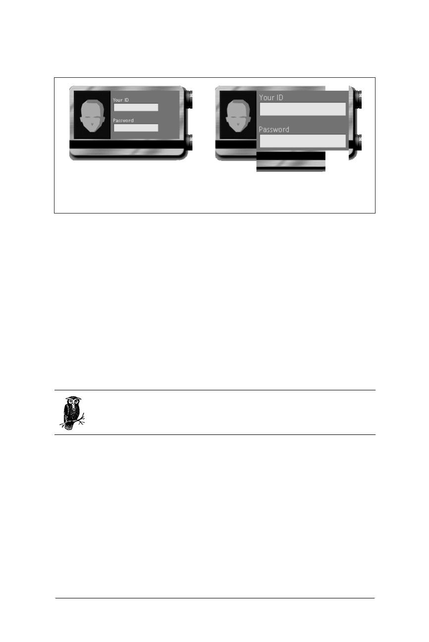
188 Chapter 10 – Tables
Table Troubleshooting
Web Design in a Nutshell, eMatter Edition
Copyright © 2000 O’Reilly & Associates, Inc. All rights reserved.
form text fields to resize and break the table apart. Making the badge image larger
and incorporating lots of extra space was the solution in this case.
Unwanted White Space
It is common for extra white space to creep between table cells (or between the
cells and the border). When you are trying to create a seamless effect with colored
cells or hold together pieces of a larger image, this extra space is unacceptable.
Returns and spaces within <td>s
The problem most often lies within the cell (<td>) tag. Some browsers will render
any extra space within a <td> tag, such as a character space or a line return, as
white space in the table. This can occur when the cell contains text; however, the
effect is most noticeable when the contents are images.
Because <table> and <tr> tags are regarded as only containers for
other tags, not as containers for actual content or data, spaces and
returns within these tags are ignored.
If you want a seamless table, begin with the border,cellpadding, and cell-
spacing all set to zero (0) in the <table> tag. In the code in Figure 10-11, a
graphic is divided into four parts and held together with a table. The goal is to
hold the graphic together seamlessly. As shown in the figure, the returns and extra
spaces within the <td> tags add white space in each cell
To keep out unwanted white space, be sure that the enclosing <td> and </td>
tags are flush against the content of the cell, with no extra spaces or returns. In
Figure 10-12, I’ve kept the <td> tags and their contents on one line, and the
problem goes away.
Figure 10-10: The badge looks fine when browser fonts are set to 12 points, but falls
apart at 18 points
Browser fonts set to 12 pt. Browser fonts set to 18 pt.
(Badge courtesy of Workgroup Technologies. Illustration by Alen Yen.)
Table Troubleshooting 189
Tables
Table Troubleshooting
Web Design in a Nutshell, eMatter Edition
Copyright © 2000 O’Reilly & Associates, Inc. All rights reserved.
Missing end tags
In most cases, closing cell tags (</td>) are optional, however, omitting them may
add extra white space to the cell. The principle is the same as in Figure 10-11—the
line break to the next starting <td> tag is rendered as extra space. For seamless
tables, it is necessary to use end tags within tables as shown in Figure 10-12. The
code below results in the effect shown in Figure 10-11.
<TABLE BORDER=0 CELLPADDING=0 CELLSPACING=0>
<TR>
<TD><IMG SRC="bug1.gif">
<TD><IMG SRC="bug2.gif">
<TR>
<TD><IMG SRC="bug3.gif">
<TD><IMG SRC="bug4.gif">
</TABLE>
Figure 10-11: Line breaks in code add white space to table cells
Figure 10-12: Removing line breaks from table cells creates a seamless table
<TABLE BORDER=0 CELLPADDING=0
CELLSPACING=0>
<TR>
<TD>
<IMG SRC="bug1.gif">
</TD>
<TD>
<IMG SRC="bug2.gif">
</TD>
</TR>
<TR>
<TD>
<IMG SRC="bug3.gif">
</TD>
<TD>
<IMG SRC="bug4.gif">
</TD>
</TR>
</TABLE>
<TABLE BORDER=0 CELLPADDING=0
CELLSPACING=0>
<TR>
<TD><IMG SRC="bug1.gif"></TD>
<TD><IMG SRC="bug2.gif"></TD>
</TR>
<TR>
<TD><IMG SRC="bug3.gif"></TD>
<TD><IMG SRC="bug4.gif"></TD>
</TR>
</TABLE>

190 Chapter 10 – Tables
Table Troubleshooting
Web Design in a Nutshell, eMatter Edition
Copyright © 2000 O’Reilly & Associates, Inc. All rights reserved.
Cellspacing in Netscape Navigator*
According to the HTML Specification, if you set cellspacing=0 within the
<table> tag, there should be no extra space between cells. There is a bug in
Netscape’s table implementation, however, that causes extra space to be added
even when the cellspacing is set to 0. To eliminate all extra space for Netscape,
you must explicitly include the border=0 attribute in the <table> tag as well.
The default value of the border attribute should be 0, but in Netscape it takes up
space (even though it doesn’t draw a shaded line) unless you explicitly set it to 0.
Collapsing Cells in Netscape
As of this writing, all versions of Netscape will collapse empty cells and will not
render a background color in a collapsed cell. For that reason, all cells in a table
need to contain something in order for it to render properly and with its back-
ground color. There are a number of options for filling cells for display in
Netscape.
Nonrendering text
Sometimes, adding a simple nonbreaking space ( ) or a single line break
(<br>) within a cell is enough for it to be recognized and displayed properly in
Netscape. Neither of these text strings renders visibly when the table is displayed
in the browser.
The single-pixel trick
Another popular work-around is to place a transparent one-pixel GIF file in the
cell and set its width and height dimensions to fill the cell. If you choose this
method, be sure to set both the height and the width attributes. If you set only
one, many browsers will resize the image proportionally (into a big square), which
may not be appropriate for the table.
One drawback to this method is that a missing graphic icon will appear in the cell
if the graphic doesn’t load properly or if the viewer has the graphics turned off in
the browser.
Using <spacer>
Table cells can also be held open with a <spacer> tag, which is Netscape’s
proprietary method for adding blank space on a web page. Set the spacer type to
“block” and specify the width and height measurements as follows:
<TD><SPACER TYPE=block WIDTH=n HEIGHT=n></TD>
Although the <spacer> tag is Netscape-specific, the whole issue of collapsing
cells is Netscape-specific as well, making spacers a good solution in this situation
(although they’re best avoided for general use). Browsers that don’t understand
* This tip taken with permission from Creative HTML Design, by Lynda Weinman and William
Weinman, published by New Riders Publishing, 1998.
Table Troubleshooting 191
Tables
Table Troubleshooting
Web Design in a Nutshell, eMatter Edition
Copyright © 2000 O’Reilly & Associates, Inc. All rights reserved.
the <spacer> element will just ignore it, but chances are they won’t need it to
render the table properly anyway.
Restraining Row Heights*
You might guess that the following code would create the table shown in
Figure 10-13:
<TABLE CELLSPACING=0 CELLPADDING=0 BORDER=1>
<TR>
<TD ROWSPAN=2><IMG SRC=”red.gif”
WIDTH=50 HEIGHT=150></TD>
<TD HEIGHT=50><IMG SRC="blue.gif"
WIDTH=100 HEIGHT=50></TD>
</TR>
<TR>
<TD ALIGN=center>extra space</TD>
</TR>
</TABLE>
However, what actually happens is that the bottom cell shrinks to fit the text it
contains, and the cell containing the darker graphic on the right—despite being set
to height=50—is stretched vertically, as shown in Figure 10-14.
* This tip courtesy of Builder.com. It first appeared in the Builder.com article “Advanced HTML
Tips,” by Paul Anderson. It is reprinted here with permission of Builder.com and CNET. See
http://builder.com/Authoring/AdvHtml/index.html for the complete article.
Figure 10-13: This is the table we’re trying to create
Figure 10-14: The actual result of the code
red.gif
blue.gif
red.gif
blue.gif

192 Chapter 10 – Tables
Table Troubleshooting
Web Design in a Nutshell, eMatter Edition
Copyright © 2000 O’Reilly & Associates, Inc. All rights reserved.
The problem is that the height attribute specifies a minimum, not a maximum,
and a row defaults to the height of its tallest cell (determined either by the cell’s
contents or its height value). That’s why the table doesn’t work as intended—the
text in the last cell isn’t tall enough to force the desired effect. Since we can deter-
mine the exact height that we want in that last cell (by subtracting the height of
blue.gif from the column height), giving it a height=100 attribute will make it the
proper height.
If you don’t know the exact height—say, because other columns contain text—you
may be better off removing the rowspan attributes and using a nested table
instead. The nested table will size its rows based on their content only.
Column Span Problems*
If you want to create a table with multiple column spans, yet accurately control
the width of each column, it is necessary to specify a width for at least one cell in
each column. To be really safe, take the time to specify a width for every cell in
the table. When column spans overlap, it is easy to get unpredictable results.
The goal was to create a table 600 pixels wide with three columns of 200 pixels
each. In each row, there is a 400-pixel-wide graphic that should straddle neatly
over two columns, as shown in Figure 10-15.
The first (failed) attempt at coding set the table to a specific width and provided
column spans for the graphics, as shown in the following code:
<TABLE BORDER=1 CELLPADDING=0 CELLSPACING=0 WIDTH=600
BGCOLOR="#FFFFFF">
<TR>
<TD COLSPAN=2><IMG SRC="2col.gif" ALIGN=top WIDTH="400"
HEIGHT="50" BORDER="0"></TD>
<TD ALIGN=center>text cell<BR>(should be 200 pixels)</TD>
</TR>
<TR>
<TD ALIGN=center>text cell<br>(should be 200 pixels)
</TD>
<TD COLSPAN=2><IMG SRC="2col.gif" ALIGN=TOP WIDTH="400"
HEIGHT="50" BORDER="0"></TD>
</TR>
</TABLE>
* This tip courtesy of Builder.com. It first appeared in the Builder.com article “Advanced HTML
Tips,” by Paul Anderson. It is reprinted here with permission of Builder.com and CNET. See
http://builder.com/Authoring/AdvHtml/index.html for the complete article. The solution shown
here was submitted by Steven Masters.
Figure 10-15: The target layout: getting two graphics to span two columns
width
(should be 200 pixels)
width
(should be 200 pixels)
Tips and Tricks 193
Tables
Tips and Tricks
Web Design in a Nutshell, eMatter Edition
Copyright © 2000 O’Reilly & Associates, Inc. All rights reserved.
This code, however, doesn’t give the browser enough information, particularly
about the middle column, to accurately render the table. The unsuccessful result of
this first code attempt is shown in Figure 10-16. The problem is that the center
column is not defined anywhere.
The solution
The solution in this case, because the middle cell is eaten up by column spans in
both rows, is to create a dummy row (shown in bold) that establishes the width of
the three columns as intended (in 200-pixel increments). This row will not render
in the browser. In addition, the absolute width for every cell must be specified.
The following code produces the desired effect on all browsers that support
tables—and on all platforms.
<TABLE BORDER=1 CELLPADDING=0 CELLSPACING=0 WIDTH=600
BGCOLOR="#FFFFFF">
<TR>
<TD WIDTH="200" HEIGHT="0"></TD>
<TD WIDTH="200" HEIGHT="0"></TD>
<TD WIDTH="200" HEIGHT="0"></TD>
</TR>
<TR>
<TD colspan=2 WIDTH="400"><IMG SRC="2col.gif" WIDTH="400"
HEIGHT="50" BORDER="0"></TD>
<TD WIDTH="200" ALIGN=CENTER>text cell<BR>(should be 200
pixels)</TD>
</TR>
<TR>
<TD WIDTH="200" ALIGN=center>text cell<br>(should be 200
pixels)</TD>
<TD colspan=2 WIDTH="400"><IMG SRC="2col.gif" WIDTH="400"
HEIGHT="50" BORDER="0"></TD>
</TR>
</TABLE>
Tips and Tricks
This section provides a few tricks of the trade for working with tables.
<font> and Tables
Unfortunately, placing <font> tags around a table will not affect the font of all the
text contained within the table. You need to repeat the <font> tag and its
attributes around the content in every cell of the table. For complex tables with
Figure 10-16: Since the middle column was not defined, the table is rendered with
two 400-pixel-wide columns
width
(should be 200 pixels)
width
(should be 200 pixels)
194 Chapter 10 – Tables
Tips and Tricks
Web Design in a Nutshell, eMatter Edition
Copyright © 2000 O’Reilly & Associates, Inc. All rights reserved.
lots of cells, the repetitive <font> tags can actually add significantly to the size of
the HTML file (not to mention the visual clutter).
Style sheets are a much more efficient way to apply style information to the
contents of a table (and they are the W3C’s method of choice for all your font
styling needs).
Waiting for Tables to Display
With current technology and HTML standards, the browser must wait until the
entire contents of a table have downloaded before it can begin rendering the
page. Any text and graphics outside the table will display quickly while the
browser works on the table.
You can use this phenomenon to your advantage by placing outside the table
elements you want your viewers to see first (can anybody say “banner ads”?).
Baseline Alignment Trick*
If you want to align the first lines of text by their baselines across a row, you
should be able to use valign=baseline; in reality, this setting is too unpredict-
able across browsers to be used reliably. A trick for achieving the same result is to
add a nonbreaking space ( ) in each first line that is set the same size as the
largest character. That way, you can set valign=top, and the baselines will all
line up.
First look at simple top alignment. As shown in Figure 10-17, the top of the text is
aligned, but the baselines are off.
By adding a non-breaking space at the larger text size (in bold), the baselines
align neatly, as shown in Figure 10-18.
* This tip courtesy of Builder.com. It first appeared in the Builder.com article “Advanced HTML
Tips,” by Paul Anderson. It is reprinted here with permission of Builder.com and CNET. See
http://builder.com/Authoring/AdvHtml/index.html for the complete article.
Figure 10-17: With top alignment, the baselines of the text don’t line up
<TD VALIGN=top><FONT SIZE=+2><B>Man</B></FONT></TD>
<TD>With his hat on<BR>
he s about five inches taller<BR>
than a taxicab.
<P ALIGN=right>(Richard Brautigan)</P></TD>
Tips and Tricks 195
Tables
Tips and Tricks
Web Design in a Nutshell, eMatter Edition
Copyright © 2000 O’Reilly & Associates, Inc. All rights reserved.
Rowspans Made Easy*
HTML 3.2 specifies that if a cell’s colspan implies more columns than have been
created up to that point in the table, the browser should create the additional
columns. With rowspan, however, the specification states that browsers shouldn’t
create any extra rows. The existing browsers follow both of these rules.
So if you have a cell that spans vertically to the bottom of the table, past rows that
might vary in number or are too numerous to easily count, just give it a rowspan
that you know is excessively high.
In Figure 10-19, we’ve set rowspan to 99. Even though there are only seven rows
in the actual table, your browser won’t generate any extra rows.
Figure 10-18: With a non-breaking space set at the same font size as the “Man” text,
the baselines line up
* This tip courtesy of Builder.com. It first appeared in the Builder.com article “Advanced HTML
Tips,” by Paul Anderson. It is reprinted here with permission of Builder.com and CNET. See
http://builder.com/Authoring/AdvHtml/index.html for the complete article.
Figure 10-19: Although rowspan is set to 99, the table only contains the actual
number of rows needed
<TD VALIGN=top><FONT SIZE=+2><B>Man</B></FONT></TD>
<TD>With his hat on<FONT SIZE=+2><B> </B></FONT><BR>
he s about five inches taller<BR>
than a taxicab.
<P ALIGN=right>(Richard Brautigan)</P></TD>
<TABLE BGCOLOR="#ffff99" BORDER=1>
<TR>
<TD WIDTH=10 ROWSPAN=99
BGCOLOR="#cc3333"> </TD>
<TD>It</TD></TR>
<TR><TD>doesn t</TD></TR>
<TR><TD>matter</TD></TR>
<TR><TD>how</TD></TR>
<TR><TD>many</TD></TR>
<TR><TD>rows</TD></TR>
<TR><TD>are</TD></TR>
<TR><TD>here</TD></TR>
</TABLE>

196 Chapter 10 – Tables
Standard Table Templates
Web Design in a Nutshell, eMatter Edition
Copyright © 2000 O’Reilly & Associates, Inc. All rights reserved.
Standard Table Templates
Ever look at a table and say “how’d they do that?” This section provides templates
that give you shortcuts for creating standard table effects.
A Simple Announcement Box
Figure 10-20 depicts a simple one-cell table containing text. By setting the back-
ground to a bright color, it can be used as an effective attention-getting device for
a special announcement. It could also be used as an alternative to a graphical
headline for a page.
Of course, you can specify any background color you choose. Try playing with
the border and cell padding for different effects. You can use width and height
attributes to make the bar any size. Remember, placing the bgcolor within the
cell will render differently than placing it in the <table> tag in Internet Explorer,
so experiment and test to see what you like the best.
Centering an Object in the Browser Window
The table in the following code and in Figure 10-21 can be used to center an
object in a browser window regardless of how the window is resized. It uses a
single cell table with its size set to 100%, then centers the object horizontally and
vertically in the cell.
<HTML>
<BODY>
<TABLE WIDTH=100% HEIGHT=100% BORDER=0 CELLSPACING=0
CELLPADDING=0>
<TR>
<TD align=center valign=middle>your object here</TD>
</TR>
</TABLE>
</BODY>
</HTML>
Creating a Vertical Rule
This sample table creates a vertical rule between columns that resizes with the
height of the table. The trick is to create an extra column only one pixel wide (or
Figure 10-20: Announcement box
<TABLE BGCOLOR="#CCFF99" BORDER=2 CELLPADDING=12 CELLSPACING=0>
<TR>
<TD ALIGN=center VALIGN=middle>headline or announcement!!</TD>
</TR>
</TABLE>
Standard Table Templates 197
Tables
Standard Table Templates
Web Design in a Nutshell, eMatter Edition
Copyright © 2000 O’Reilly & Associates, Inc. All rights reserved.
the desired thickness of the vertical rule) and fill it with a background color. This
cell is indicated in bold. The result is shown in Figure 10-22.
The cell cannot be totally empty or it will collapse in Netscape and its back-
ground color won’t display, so I’ve added a <br>. For this to display correctly, the
cell padding must remain at zero or the 1-pixel wide column will plump up with
extra space. Add space between columns with the cellspacing attribute instead.
Creating a Box Rule
Although Microsoft Internet Explorer recognizes the proprietary bordercolor,
bordercolorlight, and bordercolordark attributes, there is no method for
specifying border colors using standard HTML for all browsers.
Figure 10-21: Centering an object
Figure 10-22: A vertical rule that resizes with the depth of the table
<TABLE BORDER=0 CELLPADDING= 0 CELLSPACING= 10>
<TR ALIGN=LEFT VALIGN=TOP>
<TD width=50><BR></TD>
<TD width=1 BGCOLOR= darkred ><BR></TD>
<TD>
<P>this
<P>is
<P>some
<P>content
</TD>
</TR>
</TABLE>

198 Chapter 10 – Tables
Standard Table Templates
Web Design in a Nutshell, eMatter Edition
Copyright © 2000 O’Reilly & Associates, Inc. All rights reserved.
To create a colored rule around a box of text using standard HTML, place one
table within another as shown in Figure 10-23. To nest tables, place the entire
contents of one table within a <td> of the other.
In Example 1 in Figure 10-23, cell width and height are set in the interior table. In
the exterior table, a cell padding of 0 results in a one-pixel rule around the table.
You can increase the thickness of the rule by increasing the cellpadding value.
Note, however, that this will also increase the overall dimensions of the table. The
color of the rule is specified by the bgcolor attribute in the <table> tag for the
exterior table:
<TABLE CELLPADDING=0 BORDER=0>
<TR>
<TD BGCOLOR="#333333" ALIGN=center VALIGN=center>
<TABLE BORDER=0 WIDTH=200 HEIGHT=200 CELLPADDING=10>
<TR><TD BGCOLOR="#999999">cell contents</TD></TR>
</TABLE>
</TD>
</TR>
</TABLE>
In Example 2 in Figure 10-23, to restrict the dimensions of the table, set specific
dimensions for the exterior table and set the dimensions of the interior table
slightly smaller (to a difference twice the desired rule thickness). In this example,
the desired rule thickness is 10, so the interior table’s dimensions are 20 pixels less
than the exterior table’s dimensions.
<TABLE WIDTH=200 HEIGHT=200 cellpadding=0 border=0>
<TR>
<TD BGCOLOR="#333333" ALIGN=center VALIGN=center>
<TABLE BORDER=0 WIDTH=180 HEIGHT=180 CELLPADDING=10>
<TR><TD BGCOLOR="#999999">cell contents</TD></TR>
</TABLE>
</TD>
</TR>
</TABLE>
Figure 10-23: Two examples of creating box rules with nested tables
Example 1 Example 2
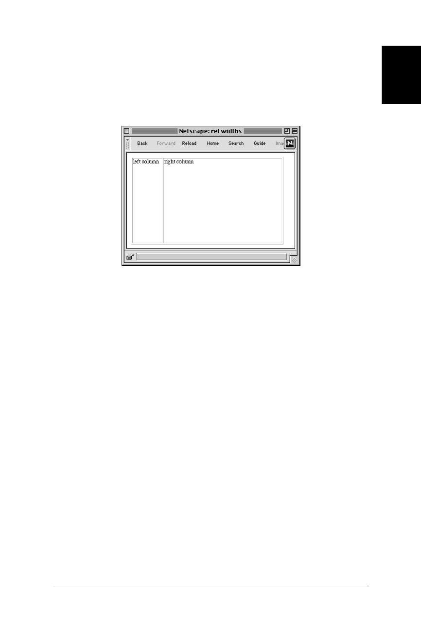
Standard Table Templates 199
Tables
Standard Table Templates
Web Design in a Nutshell, eMatter Edition
Copyright © 2000 O’Reilly & Associates, Inc. All rights reserved.
Two-Column Page Layouts
Many sites use a two-column table to lay out the structure of their pages. This grid
creates a narrow column on the left for navigational options and a wider column
on the right for the page’s contents, as shown in Figure 10-24. These sample tables
can be used to provide a basic structure to the page; you can place any elements
(including other tables) within either table cell to create more complex layouts.
First, a word about browser margins
When using a table to lay out the structure of a page, bear in mind that it will be
placed in the page against the normal browser margins, not flush against the top
and left edge of the browser window. The width of the margin varies from
browser to browser (and platform to platform), but it generally ranges from 8 to 12
pixels. You should take this blank space into account when choosing measure-
ments for your table and its column widths.
The only way to get rid of the margins for most browsers is to put the whole page
in a framed document, which offers margin controls (see Chapter 11, Frames). If
you are designing exclusively for Internet Explorer, you can take advantage of
Microsoft’s proprietary topmargin and leftmargin attributes, which can be used
to set these margins to 0 pixels. For Netscape 4.0, use the corresponding margin-
height and marginwidth attributes. Or if you are using style sheets, add the
following rule:
BODY { margin:0; padding:0;}
Fixed-width columns
If it’s predictability and control you’re after, then fixing the width of your table and
its columns is the way to go. As long as the contents fit in the cells entirely, the
table will hold its dimensions regardless of browser window size. If contents (such
as graphics) are wider than the cell, the cell will usually expand to accommodate
them.
Figure 10-24: Typical two-column layout

200 Chapter 10 – Tables
Standard Table Templates
Web Design in a Nutshell, eMatter Edition
Copyright © 2000 O’Reilly & Associates, Inc. All rights reserved.
Of course, you can change the specific width values to any pixel value you
choose, however, it is important that the total of the cell widths equals the width
set for the entire table. If the values are different, browsers maintain the width
setting for the table and resize all the columns proportionately within the allotted
space. As a result, none of the column widths will display at the number of pixels
specified.
Note that the border in each of the following examples has been set to 1 but you
can change it to any other value. Starting with the border set to 1 (as shown in
Figure 10-24) makes it easier to see how the table is behaving. Once you get the
table working properly, get rid of the border by setting the value to 0.
<HTML>
<BODY>
<TABLE BORDER=1 WIDTH=600>
<TR>
<TD VALIGN=top WIDTH=150>left column</TD>
<TD VALIGN=top WIDTH=450>right column</TD>
</TR>
</TABLE>
</BODY>
</HTML>
Relative column widths
Using relative values for the width of your table allows your page to resize itself to
fill the browser window. Many designers prefer this method because it is more
flexible and suits any monitor configuration. Although the actual column widths
will change when the browser window resizes (and their contents will rewrap),
they will remain in proportion to one another.
Again, you can turn the border off by setting the value to zero. You may change
the width values for the cell in each column, but be sure that they total 100%.
<HTML>
<BODY>
<TABLE BORDER=1 WIDTH=100%>
<TR>
<TD VALIGN=top WIDTH=20%>left column</TD>
<TD VALIGN=top WIDTH=80%>right column</TD>
</TR>
</TABLE>
</BODY>
</HTML>
Combination
At times, you may want to restrict the width of the left column, but allow the right
column to resize with the page—if you want the contents of the left column to
stay aligned over a colored background image, for instance. Set the width of the
left column to any pixel value you choose and do not specify a width for the right
column.

Multipart Images in Tables 201
Tables
Multipart Images in Tables
Web Design in a Nutshell, eMatter Edition
Copyright © 2000 O’Reilly & Associates, Inc. All rights reserved.
This technique is not guaranteed to keep the width of the “fixed” column at its
specified width. If the browser window is resized to be very narrow, the fixed
column will be resized smaller and its contents will wrap.
<HTML>
<BODY>
<TABLE BORDER=1 WIDTH=100%>
<TR>
<TD VALIGN=top WIDTH=150>left column</TD>
<TD VALIGN=top>right column</TD>
</TR>
</TABLE>
</BODY>
</HTML>
Multipart Images in Tables
There are a number of reasons why you may want to slice a large image into
pieces and use a table to reconstruct it seamlessly on a web page:
Rollovers
If you want portions of the image—but not the whole image—to respond to
the mouse passing over them (mouseover events or rollovers), it is more effi-
cient to swap out just the bits that change instead of reloading the whole
image.
Animations
Similarly, if you want to add animation to small areas within an image, it is
better to break up the image and animate just the portions that move. This
will result in smaller files to download.
Better Optimization
At times, you may find that an image contains distinct areas of flat color and
distinct areas of soft or photographic images. Breaking the image into sections
allows you to save some sections as GIF (the flat color areas) and others as
JPEG (for graduated tones), to achieve better optimization and image quality
overall. For more information on optimizing images, see Chapter 14, GIF
Format, and Chapter 15, JPEG Format.
Imagemaps
Break the image into separated linked images instead of using an imagemap.
This allows linking to work offline, as well as provides alternative (ALT) text
for each graphical element. This makes the page more accessible for people
using non-graphical or speech-based browsers.
In Figure 10-25, I’ve divided the image into sections so I can save the television
image as a JPEG and the rest as GIFs (since they are flat, graphical images). Also, I
use rollover events to replace the television image based on which section icon
the user mouses over. The table on the right has its border set to 1 to reveal the
individual graphics that make up the image. When the border is set to zero, the
effect is seamless, as shown on the left.

202 Chapter 10 – Tables
Multipart Images in Tables
Web Design in a Nutshell, eMatter Edition
Copyright © 2000 O’Reilly & Associates, Inc. All rights reserved.
Slicing & Dicing Tools
Multipart images in tables have been growing in popularity in recent years. Not
surprisingly, software companies are responding with tools that make the produc-
tion process much easier than the previous method of splitting the graphic
manually and writing the table code in an HTML editor. (This manual method is
outlined below.)
Both Macromedia Fireworks and Adobe ImageReady include functions that export
an image as many individually numbered graphics (based on the position of
guidelines) and automatically write the table code that holds them all together.
You can copy and paste the table code into your HTML file. One caution: you will
need to adjust the pathnames if your graphics are to reside in a different directory
than your HTML files. The automatically generated code writes relative pathnames
assuming everything will be in the same directory. A simple find-and-replace
should take care of this quickly.
Macromedia Fireworks
To export a multipart image and its respective HTML file:
1. Open the image (it can be a layered Photoshop file). Use the Slice tool on the
URLs toolbar to define rectangular segments in the image. Note, if you place a
rectangular slice in the middle of a graphic, Fireworks will automatically slice
the remainder of the image into the fewest number of segments to contain the
specified slice.
2. Set the default export settings for the entire image (file format, bit depth, dith-
ering, etc.). These settings will be applied to each resulting slice after export
(all portions will share the same color palette).
3. You can override the default settings for an individual slice, for instance,
reducing its palette, or making it a JPEG among GIFs. Start by selecting the
slice object and opening its Object Properties dialog box, selected via Modify
➝Object Properties or by using the options pop-up menu (the arrow on the
far right of the URLs toolbar).
Figure 10-25: A multipart image held together by a table
border=0 border=1

Multipart Images in Tables 203
Tables
Multipart Images in Tables
Web Design in a Nutshell, eMatter Edition
Copyright © 2000 O’Reilly & Associates, Inc. All rights reserved.
4. Among the options on the Object Properties dialog box are the Slice Export
Settings. Select Custom and either one of the palette options from the pop-up
menu, or select the continue button (indicated by ellipses “...”) to get an
Export Preview dialog box for that particular slice. From there you can fine-
tune the optimization of the slice.
5. Once you have your slices chosen and configured, choose File ➝Export
Slices. Type a name for the HTML file (the table that holds the pieces
together), choose its location, and decide if you’d like your graphic pieces
saved in a subfolder.
6. Click Export. You can now copy the table code from the generated HTML file
and paste it into your final document.
7. Turn rulers on (View ➝Rulers). Drag guidelines from the rulers into the
image area at the points where you want the image to be divided.
For more information about Fireworks, see http://www.macromedia.com/software/
fireworks.
Adobe ImageReady
To create a multipart image and HTML file in ImageReady:
1. Open the image. Select View ➝Rulers if the rulers are not already visible.
Drag guides from the rulers into the image area where you want the image
divided.
2. Select the format and optimization values with the Optimize palette and Opti-
mize preview.
3. When you are ready, save the file using File ➝Save Optimized As (saving the
original is not the same thing). This gives you the Save As dialog box in
which you can check the boxes next to Save HTML File and Slice Along
Guides.
4. ImageReady creates a series of graphics numbered by row and column as
well as an HTML file containing the table that holds the graphics together.
For more information about Adobe ImageReady, see http://www.adobe.com/
imageready.
Producing Images in Tables Manually
If you do not have Macromedia Fireworks or Adobe ImageReady, it is certainly
possible to create the effect by hand. First you need to divide the image into sepa-
rate graphic files using an image processor such as Photoshop or Paint Shop Pro.
Then, write the HTML for the table using whichever HTML editor pleases you.
These methods are demonstrated below.
Dividing an image with Photoshop 4.0
When dividing an image with Photoshop, it is important to set the guide prefer-
ences in a way that enables easy and accurate selections without redundant or

204 Chapter 10 – Tables
Multipart Images in Tables
Web Design in a Nutshell, eMatter Edition
Copyright © 2000 O’Reilly & Associates, Inc. All rights reserved.
overlapping pixels between image sections. This is illustrated in steps 2 and 3 and
shown in Figure 10-26.
1. Open the image in Photoshop. Make sure the rulers are visible by selecting
View ➝ Show Rulers.
2. Set your preferences to use pixels as the unit of measurement by selecting
File ➝Preferences ➝Units & Rulers. Select “pixels” from the pop-up menu
and hit OK.
3. Select View ➝Snap to Guides. This will snap your selection to the precise
location of the guide.
4. Use the rectangle marquee (make sure feathering and anti-aliasing options are
turned off) to select each area of the image. You can use the Info palette
(Window ➝Show Info) to get accurate pixel measurements for each section
as you select it. This information will be needed when you create the HTML
file.
5. Copy and paste each section into a new file. Flatten the image and save it as a
GIF or a JPEG. You may want to develop a numbered naming scheme to
keep the pieces organized.
Creating the table in HTML
Following is the HTML code that is used to hold together the Sifl & Olly image
from Figure 10-25:
<TABLE BORDER="0" CELLPADDING="0" CELLSPACING="0" WIDTH="333">
<TR>
<TD><IMG SRC="part_1.gif" WIDTH="56" HEIGHT="92" BORDER="0"></TD>
<TD><IMG SRC="part_2.gif" WIDTH="169" HEIGHT="92" BORDER="0"></TD>
<TD><IMG SRC="part_3.gif" WIDTH="108" HEIGHT="92" BORDER="0"></TD>
</TR>
<TR>
<TD><IMG SRC="part_4.gif" WIDTH="56" HEIGHT="133" BORDER="0"></TD>
<TD><IMG SRC="part_5.gif" WIDTH="169" HEIGHT="133" BORDER="0"></TD>
<TD><IMG SRC="part_6.gif" WIDTH="108" HEIGHT="133" BORDER="0"></TD>
Figure 10-26: Splitting up an image with Photoshop

Multipart Images in Tables 205
Tables
Multipart Images in Tables
Web Design in a Nutshell, eMatter Edition
Copyright © 2000 O’Reilly & Associates, Inc. All rights reserved.
</TR>
<TR>
<TD><IMG SRC="part_7.gif" WIDTH="56" HEIGHT="82" BORDER="0"></TD>
<TD><IMG SRC="part_8.gif" WIDTH="169" HEIGHT="82" BORDER="0"></TD>
<TD><IMG SRC="part_9.gif" WIDTH="108" HEIGHT="82" BORDER="0"></TD>
</TR>
</TABLE>
There is no difference between writing a table for piecing together graphics and
writing any other kind of table; however, you should pay careful attention to the
following settings if you want the image to piece back together seamlessly on all
browsers.
• In the <table> tag, set the following attributes to zero: border=0,cellpad-
ding=0,cellspacing=0.
• In the <table> tag, specify the width of the table with an absolute pixel
value. Be sure that the value is exactly the total of the widths of the compo-
nent images. You may also add the height attribute for thoroughness’ sake,
but it is not required.
• Don’t put extra spaces or line returns between the <td> and the <img> tags
(extra space within <td>s causes extra space to appear when the image is
rendered). Keep them flush together on one line. If you must break the line,
break it somewhere within the <img> tag.
• Set the width and height values in pixels for every image. Be sure that the
measurements are accurate.
• Set the border=0 for every image.
• Specify the width and height pixel values for every cell in the table, particu-
larly if it contains colspans and rowspans. Be sure that they match the pixel
values set in the <img> tag and the actual pixel dimensions of the graphic.
For simple grid-like tables (such as the one in Figure 10-25), you may not
need to give individual cell dimensions since the enclosed images will force
each cell to the proper dimensions.
• Sometimes it is preferable to keep the table simple. For instance, the sample
graphic could have been divided into just five portions (a top graphic, three
middle graphics, and a bottom graphic) and held together with a table made
up of three rows with a single cell each. These decisions are a matter of judg-
ment and obviously depend on the individual project.

206
Web Design in a Nutshell, eMatter Edition
Copyright © 2000 O’Reilly & Associates, Inc. All rights reserved.
Chapter 11Frames
CHAPTER 11
Frames
Frames are a method for dividing the browser window into smaller sub-windows,
each displaying a different HTML document. This chapter covers the structure and
creation of framed documents, controls for affecting their display and function, as
well as some advanced tips and tricks.
Summary of Frame Tags
In this section, browser support for each tag is noted to the right of the tag name.
Browsers that do not support the tag are grayed out. Browsers that deprecate the
tag are noted with a superscript D. Tag usage is indicated below the tag name. A
more thorough listing of attributes for each tag, according to the HTML 4.0 Specifi-
cation, appears in Appendix A, HTML Tags and Elements.
<frame>
NN: 2, 3, 4 - MSIE: 2, 3, 4, 5 - HTML 4 - WebTV - Opera3
<frame>
Defines a single frame within a <frameset>.
Attributes
bordercolor=”#rrggbb” or color name
Sets the color for frame’s borders (if the border is turned on). Support for this
attribute is limited to Netscape Navigator 3.0 and higher and Internet Explorer
4.0.
frameborder=1|0 (IE 3+ and W3C 4.0 Spec.); yes|no (NN 3+ and IE 4.0)
Determines whether there is a 3-D separator drawn between the current frame
and surrounding frames. A value of 1(or yes) turns the border on. A value of
0(or no) turns the border off. You may also set the frameborder at the
frameset level, which may be more reliable.

Summary of Frame Tags 207
Frames
Summary of Frame Tags
Web Design in a Nutshell, eMatter Edition
Copyright © 2000 O’Reilly & Associates, Inc. All rights reserved.
Because Netscape and Internet Explorer support different values, you may
need to specify the frameborder twice within <frame> to ensure full browser
compatibility, as follows:
frameborder=yes frameborder=1 ...
longdesc=url
Specifies a link to a document containing a long description of the frame and
its contents. This addition to the HTML 4.0 Specification may be useful for
non-visual web browsers.
marginwidth=number
Specifies the amount of space (in pixels) between the left and right edges of
the frame and its contents. The minimum value according to the HTML Speci-
fication is 1 pixel. Setting the value to 0 (zero) in order to place objects flush
against the edge of the frame will work in Internet Explorer, however,
Netscape will still display a 1-pixel margin space.
marginheight=number
Specifies the amount of space (in pixels) between the top and bottom edge of
the frame and its contents. The minimum value according to the HTML Speci-
fication is 1 pixel. Setting the value to 0 (zero) in order to place objects flush
against the edge of the frame will work in Internet Explorer, however,
Netscape will still display a 1-pixel margin space.
name=text
Assigns a name to the frame. This name may be referenced by targets within
links to make the target document load within the named frame.
noresize
Prevents users from resizing the frame. By default, despite specific frame size
settings, users can resize a frame by clicking and dragging its borders.
scrolling=yes|no|auto
Specifies whether scrollbars appear in the frame. A value of yes mean scroll-
bars always appear; a value of no means scrollbars never appear; a value of
auto (the default) means scrollbars appear automatically when the contents
do not fit within the frame.
src=url
Specifies the location of the initial HTML file to be displayed by the frame.
<frameset>
NN: 2, 3, 4 - MSIE: 2, 3, 4, 5 - HTML 4 - WebTV - Opera3
<frameset>...</frameset>
Defines a collection of frames or other framesets.
Attributes
border=number
Sets frame border thickness (in pixels) between all the frames in a frameset
(when the frame border is turned on).

208 Chapter 11 – Frames
Summary of Frame Tags
Web Design in a Nutshell, eMatter Edition
Copyright © 2000 O’Reilly & Associates, Inc. All rights reserved.
bordercolor=#rrggbb” or color name
Sets a border color for all the borders in a frameset. Support for this attribute
is limited to Netscape Navigator 3.0 and higher and Internet Explorer 4.0.
cols=list
Establishes the number and sizes of columns in a frameset. The number of
columns is determined by the number of values in the list. Size specifications
can be in absolute pixel values, percentage values, or relative values (*)
based on available space.
frameborder=1|0 (IE 3+ and W3C 4.0 Spec.); yes|no (NN 3+ and IE 4.0)
Determines whether 3-D separators are drawn between frames in the
frameset. A value of 1(or yes) turns the borders on; 0(or no) turns the
borders off.
Because Netscape and Internet Explorer support different values, you may
need to specify the frameborder twice within <frame> to ensure backwards
compatibility, as follows:
frameborder=yes frameborder=1 ...
framespacing=number (IE only)
Internet 3.0 and higher only. Adds additional space (in pixels) between adja-
cent frames.
rows=list (number, percentage, or *)
Establishes the number and sizes of rows in the frameset. The number of
rows is determined by the number of values in the list. Size specifications can
be in absolute pixel values, percentage values, or relative values (*) based on
available space.
<iframe>
NN: 2, 3, 4 - MSIE: 2, 3, 4, 5 - HTML 4 - WebTV -Opera3
<iframe> ... </iframe>
Defines a floating frame within a document with similar placement tags to <img>.
This element requires a closing tag. Introduced by Microsoft Internet Explorer 3.0,
inline frames are now part of the W3C 4.0 HTML Specification. As of this writing,
however, they are only supported by Internet Explorer.
Attributes
align=top|middle|bottom|left|right
Aligns the inline frame on the page within the flow of the text. Left and right
alignment allows text to flow around the frame.
frameborder=1|0
Turns on or off the displaying of a 3-D border for the frame. The default is 1,
which inserts the border.
height=number
Specifies the height of the frame in pixels or as a percentage of the window
size.

Introduction to Frames 209
Frames
Introduction to Frames
Web Design in a Nutshell, eMatter Edition
Copyright © 2000 O’Reilly & Associates, Inc. All rights reserved.
hspace=number
Used in conjunction with left and right alignment, this attribute specifies the
amount of space (in pixels) to hold clear to the left and right of the frame.
marginheight=number
Specifies the amount of space (in pixels) between the top and bottom edges
of the frame and its contents.
marginwidth=number
Specifies the amount of space (in pixels) between the left and right edges of
the frame and its contents.
name=text
Assigns a name to the frame to be referenced by targeted links.
noresize
Prevents users from resizing the frame. By default, despite specific frame size
settings, users can resize a frame by clicking and dragging its borders.
scrolling=yes|no|auto
Determines whether scrollbars appear in the frame (see explanation in
<frame> earlier in this chapter).
src=url
Specifies the URL of the HTML document that will initially display in the
frame.
vspace=number
Used in conjunction with left and right alignment, this attribute specifies the
amount of space (in pixels) to hold clear above and below the frame.
width=number
Specifies the width of the frame in pixels or as a percentage of the window
size.
<noframes>
NN: 2, 3, 4 - MSIE: 2, 3, 4, 5 - HTML 4 - WebTV - Opera3
<noframes> ... </noframes>
Defines content that will be displayed by browsers that cannot display frames.
Browsers that do support frames will ignore the content between <noframes>
tags.
Introduction to Frames
Frames allow you to divide the browser window into smaller sub-windows, each
of which displays a different HTML document. Introduced by Netscape Navigator
2.0, frame support was soon added by other popular browsers. The basic frame
specification works with Netscape Navigator 2.0 and higher as well as Microsoft
Internet Explorer 3.0 and higher. As of this writing, frames have found their way
into the World Wide Web Consortium’s HTML 4.0 Specification.
Despite the advanced navigational functionality that frames offer, they do present
certain problems and peculiarities that have lead to their currently controversial
status. In fact, they’ve become so notorious that it is not uncommon for web

210 Chapter 11 – Frames
Introduction to Frames
Web Design in a Nutshell, eMatter Edition
Copyright © 2000 O’Reilly & Associates, Inc. All rights reserved.
developers to encounter clients who, despite not knowing a lick of HTML them-
selves, will strongly proclaim “NO FRAMES! FRAMES BAD!” at the beginning of a
project.
Like most things, frames are neither all good nor all bad. It is your responsibility to
be familiar with both sides of the coin so you can help present the best solution
for your clients’ needs.
Advantages
• The main advantage to frames is that they enable parts of the page to remain
stationary while other parts scroll. This is useful for elements you may not
want to scroll out of view, such as navigational options or banner advertising.
• Frames unify resources that reside on separate servers. For instance, you may
use frames to combine your own material (and navigation graphics) with
threaded discussion material generated by software on a vendor’s server.
• With the <noframes> tag, you can easily add alternative content for brows-
ers that do not support frames. This degradability is built into the frames sys-
tem.
Disadvantages
• Frames are not supported by older browsers. (<noframes> may address this
problem.)
• Frames may make site production more complicated because you need to
produce and organize multiple files to fill one page.
• Navigating through a framed site may be prohibitively challenging for some
users.
• Users cannot bookmark individual pages nested within a framed document.
Bookmarks only identify the top-level framed document in its initial state;
there is currently no way to track the states of a frameset, therefore no way to
bookmark individual states. There are workarounds in 4.0 browsers, how-
ever, such as opening the contents of the frame in a new window and book-
marking that page.
• A large number of frames on a page may significantly increase the load on the
server because so much of the load on a server is initial document requests.
Four requests for 1K files (the frameset and the contents of three frames) is
more work for your server than a single request for a 4K document.
• Framed documents can be a nuisance for search engines. Content-level docu-
ments may be missed in searches. If a contained document is found by a
search engine, it is likely it will be displayed out of context of its frameset,
potentially losing important navigational options. For more information on
searching framed documents, see “Helping Search Engines” later in this chap-
ter.
• It is more difficult to track actual page (or ad) impressions when the pages
are part of a framed document.
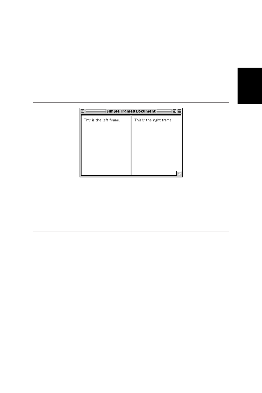
Basic Frameset Structure 211
Frames
Basic Frameset Structure
Web Design in a Nutshell, eMatter Edition
Copyright © 2000 O’Reilly & Associates, Inc. All rights reserved.
Basic Frameset Structure
A web page that is divided into frames is held together by a top level frameset
document.
A frameset document contains a standard header portion (as indicated with the
<head> tag). However, unlike standard HTML documents, frameset documents do
not have a <body>—instead, they contain a <frameset> tag, which is used to
define columns and rows of individual frames (each indicated with a <frame>
tag). Figure 11-1 shows the structure of a basic frameset document that creates two
frames, occupying two columns of equal width.
The contents of framed documents come from separate HTML files that are
displayed within each frame. For example, in Figure 11-1, the content that appears
in the left frame is actually a standard HTML file called left.html. The samples
throughout this chapter reference simple HTML documents similar to this one:
<HTML>
<HEAD><TITLE>Left Frame Contents</TITLE></HEAD>
<BODY BGCOLOR="white">
This is the left frame.
</BODY>
</HTML>
At the frameset level (i.e., within the <frameset> opening tag), you establish the
rows and columns and decide if you want borders to display between each frame
(borders are discussed later in this chapter.)
At the frame level (within the <frame> tag), you identify the URL of the docu-
ment to display in that frame and give the frame a name for future reference. You
Figure 11-1: Basic frameset document
<HTML>
<HEAD><TITLE>Simple Framed Document</TITLE></HEAD>
<FRAMESET COLS="*,*">
<FRAME SRC="left.html">
<FRAME SRC="right.html">
</FRAMESET>
<NOFRAMES>Your browser does not support frames.</NOFRAMES>
</HTML>

212 Chapter 11 – Frames
Basic Frameset Structure
Web Design in a Nutshell, eMatter Edition
Copyright © 2000 O’Reilly & Associates, Inc. All rights reserved.
also have control over whether the frame has scrollbars, whether it can be resized
by the user, and what its margins should be (if any). Each of these controls are
discussed later in this chapter.
<noframes> content
Frameset documents may also have content contained within the optional
<noframes> tag. Browsers that do not understand frames display the contents
within <noframes> as though it were normal text. For instance, in non-frames
browsers, the document in Figure 11-1 would simply display the text “Your
browser does not support frames.”
To treat the alternative content like a regular document, you may include the
<body>...</body> tags within <noframes> (although, technically, it is not
kosher HTML coding). This will allow you to specify attributes such as document
background color and text color for the page.
Establishing Rows and Columns
Rows and columns are established within the <frameset> tag, using the rows and
cols attributes, respectively. These attributes divide the frameset in a grid-like
manner. Frames are filled from left-to-right for columns and top-to-bottom for
rows.
The size of each row (or column) is specified in a quote-enclosed, comma-sepa-
rated list of values after the attribute. The number of values listed determines the
number of rows (or columns). Figure 11-2 shows the most simple division of a
framed document into two equal-sized rows (on the left) and columns (right).
Figure 11-2: Simple horizontal and vertical frames layouts
<FRAMESET ROWS="*,*">
<FRAME SRC="1.html">
<FRAME SRC="2.html">
</FRAMESET>
<FRAMESET COLS="*,*">
<FRAME SRC="1.html">
<FRAME SRC="2.html">
</FRAMESET>

Basic Frameset Structure 213
Frames
Basic Frameset Structure
Web Design in a Nutshell, eMatter Edition
Copyright © 2000 O’Reilly & Associates, Inc. All rights reserved.
Specifying sizes
Frame size can be listed in one of three ways:
Absolute pixel values
The browser will interpret an integer as an absolute pixel value. The frameset
<frameset cols="150,450"> will create two columns, one exactly 150
pixels wide, and the other exactly 450 pixels wide. If the browser window is
larger than the total specified pixels, it will enlarge each frame proportionally
to fill the window.
Percentages
Percentages are based on the total width of the frameset. The total should add
up to 100%. The frameset <frameset rows="25%,50%,25%"> creates three
rows; the top and bottom frames will each always occupy 25% of the height
of the frameset and the middle row will make up 50%, regardless of how the
browser window is resized.
Relative values
Relative values, indicated by the asterisk (*) character, are used to divide up
the remaining space in the frameset into equal portions. For instance, the
frameset <frameset cols="100,*"> creates two columns—the first will be
100 pixels wide, the second will fill whatever portion is left of the window.
You can also specify relative values in multiples of equal portions and
combine them with other measurement values. For example, the frameset
defined by <frameset cols="25%,2*,*"> divides the window into three
columns. The first column will always occupy 25% of the window width. The
remaining two will divide up the remaining space; however, in this case, the
middle column will always be 2 times as big as the third. (You may notice
that this results in the same division as the percentages example.)
Combining rows and columns
You can specify both rows and columns within a single frameset, creating a grid of
frames, as shown in Figure 11-3. When both cols and rows are specified for a
frameset, frames are created left-to-right in each row, in order. Rows are created
top-to-bottom. The order of appearance of <frame> elements within the
<frameset> does make a difference in where their contents display. The order in
which documents are displayed is demonstrated in Figure 11-3.
Nesting Frames
It is possible to nest a frameset within another frameset, which means you can
take one row and divide it into several columns (or conversely, divide a column
into several rows), as shown in Figure 11-4. Nesting gives you more page layout
flexibility and complexity than simply dividing a frameset into a grid of rows and
columns.
In Figure 11-4, the top-level frameset contains one frame (100 pixels wide) and
one frameset that occupies the remainder of the window. That frameset creates
three rows; the last row is divided by another nested frameset into two columns.
There is no limit on the number of levels frames can be nested. If you are nesting
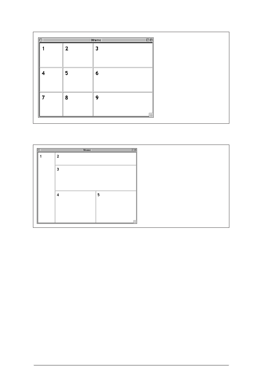
214 Chapter 11 – Frames
Frame Function and Appearance
Web Design in a Nutshell, eMatter Edition
Copyright © 2000 O’Reilly & Associates, Inc. All rights reserved.
frames, be careful to close each successive frameset or the document will not
display correctly.
Frame Function and Appearance
By default, your frames will be separated by borders with 3D beveled edges and
each frame will be given a scrollbar if its contents do not fit in their entirety. This
section looks at the attributes that give you greater control over the display and
function of frames.
Frame Borders and Spacing
Borders can be manipulated using attributes within the <frameset> tag. Unfortu-
nately, as of this writing borders are handled inconsistently between browsers,
which makes specifying borders frustrating and sometimes unpredictable.
Figure 11-3: Frameset with rows and columns
Figure 11-4: Document with nested framesets
<FRAMESET ROWS="*,*,*"
COLS="100,*,2*">
<FRAME SRC="1.html">
<FRAME SRC="2.html">
<FRAME SRC="3.html">
<FRAME SRC="4.html">
<FRAME SRC="5.html">
<FRAME SRC="6.html">
<FRAME SRC="7.html">
<FRAME SRC="8.html">
<FRAME SRC="9.html">
</FRAMESET>
<FRAMESET COLS="100,*">
<FRAME SRC="1.html">
<FRAMESET ROWS="75,150,*">
<FRAME SRC="2.html">
<FRAME SRC="3.html">
<FRAMESET COLS="*,*">
<FRAME SRC="4.html">
<FRAME SRC="5.html">
</FRAMESET>
</FRAMESET>
</FRAMESET>

Frame Function and Appearance 215
Frames
Frame Function and Appearance
Web Design in a Nutshell, eMatter Edition
Copyright © 2000 O’Reilly & Associates, Inc. All rights reserved.
According to the documentation, you should be able to apply frame border
attributes within the <frame> tags to adjust the borders for individual frames.
Although frame settings should override frameset-level border settings, I have yet
to see this handled successfully in any browser.
Borders for Netscape
For Netscape, use the frameborder attribute to turn borders off (no)oron(yes).
You can set the color of the borders using the bordercolor attribute with an
RGB or standard color name. The border attribute sets the thickness of the
borders (in pixels) when the frameborder attribute is turned on, so you can set
the borders as thick as you like. To turn the borders off entirely, set the frame-
border=no and border=0.
Borders for Internet Explorer
Internet Explorer also uses the frameborder attribute to turn borders off and on,
however, it supports the values 0and 1, respectively (these are the values docu-
mented in the HTML 4.0 Specification). IE 4.0 will also accept no and yes values
with frameborder. Only version 4.0 will recognize the bordercolor attribute
noted above. In the <frameset> tag, you set the amount of space between frames
(in pixels) with the framespacing attribute. To turn borders off for Internet
Explorer, set framespacing=0 and frameborder=0.
Turning borders off for both browsers
The vast majority of times designers exert control over borders is to turn them off
entirely to give a framed page a smooth and seamless appearance. In order to turn
borders off for all browsers, it is necessary to load the <frameset> tag with
redundant information, as follows:
<FRAMESET FRAMEBORDER=0 FRAMESPACING=0 FRAMEBORDER=no BORDER=0>
Scrolling
The scrolling attribute within the <frame> tag controls whether scrollbars
appear within the frame, regardless of the frame’s contents.
The default setting is auto, which behaves like any browser window—no scroll-
bars display unless the contents are too big to fit entirely within the frame.
To make scrollbars always appear, even for mostly empty frames, set
scrolling=yes (see Figure 11-5).
To make sure scrollbars never appear, such as when a frame is filled entirely by a
graphic and it’s OK if the edges are slightly obscured, set scrolling=no.In
Figure 11-5, the top frame (as shown in the figure on the left) only has a scrollbar
because it was specified in the HTML source.
When scrollbars are visible, they take up some of the width of the current frame,
so figure in the width of a scrollbar when calculating frame sizes in precise pixel
measurements. On a Macintosh, both Navigator and Internet Explorer render
scrollbars 15 pixels wide. On the PC, scrollbars are 12 pixels wide.
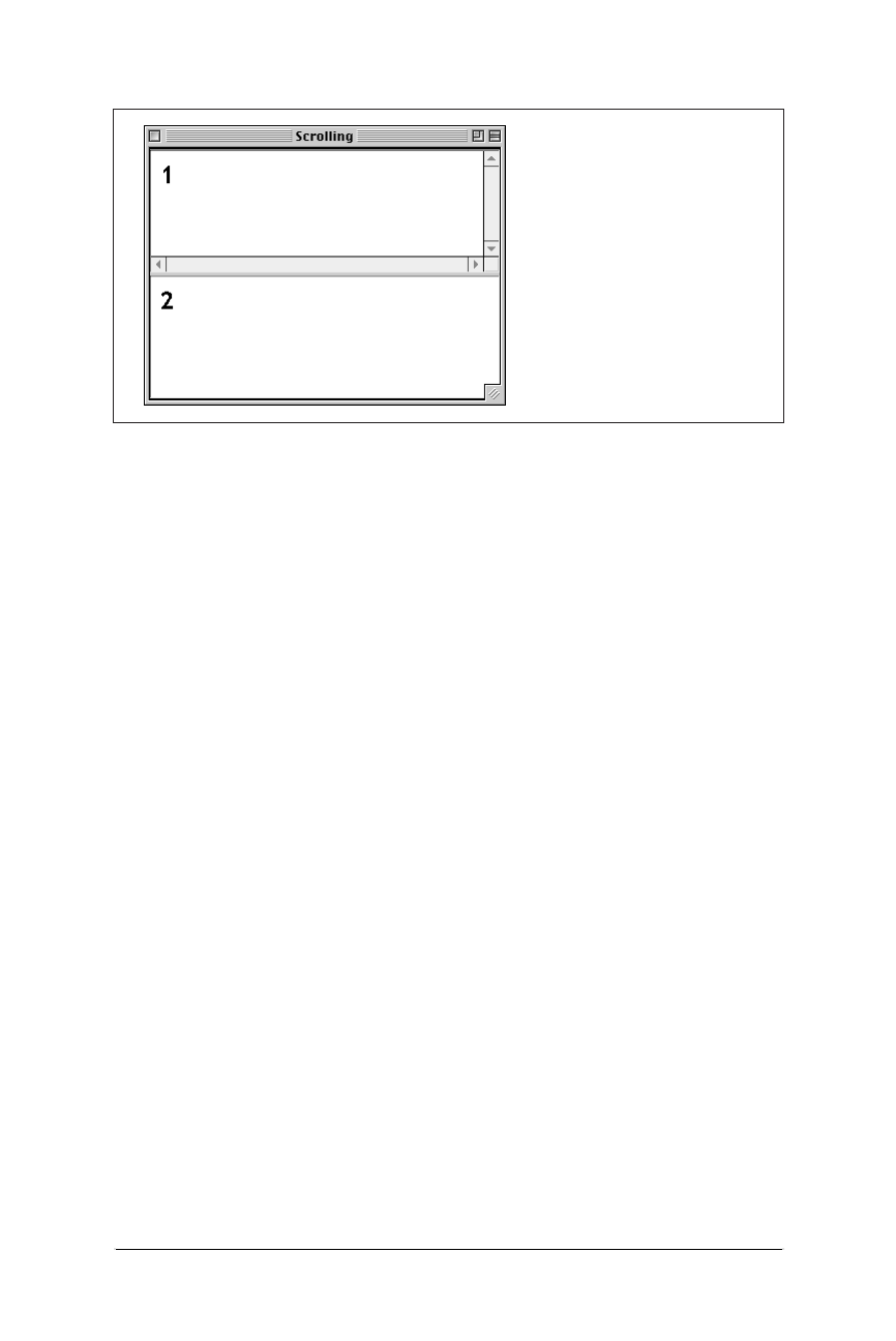
216 Chapter 11 – Frames
Frame Function and Appearance
Web Design in a Nutshell, eMatter Edition
Copyright © 2000 O’Reilly & Associates, Inc. All rights reserved.
Disabling Resize
By default, any user can resize your frames—overriding your careful size
settings—simply by clicking and dragging on the border between frames. You can
prevent them from doing that (and messing up your cool design) by adding the
noresize attribute within the <frame> tag.
Be careful that you’re not disabling functionality the user needs, though; if the
frame contains text, chances are good that some users may need to resize.
Frame Margins
As you probably already know, browsers hold a margin space on all borders of
the browser window, preventing a document’s contents from displaying flush
against the edge of the browser. The width of the margin varies from browser to
browser. In 4.0 browsers, the margin can be adjusted using attributes in the
<body> tag (see Chapter 6, Structural HTML Tags), but that is a somewhat limited
audience.
Frames have margin attributes that allow you to control (or remove) the margins
on any frame-enabled browser. The good news is that you can finally position
objects right up against the edges of the frame. The (slightly) bad news is that
Netscape (as of this writing) will always display at least a 1-pixel margin, even if
you set the margin to 0. There’s not much you can do about it except camouflage
it with a matching background color or image.
To adjust the top and bottom margins of a frame, specify a number of pixels for
the marginheight attribute. Use the marginwidth attribute to specify the amount
of space for the left and right margins. They can be combined as shown in the
example in Figure 11-6.
Figure 11-6 shows the same HTML document (containing only a graphic) loaded
into two frames within a frameset. The left frame has specific margins specified.
The right frame has its margins set to zero. Because this sample is shown in
Figure 11-5: Setting scrollbars with the scrolling attribute
<FRAMESET ROWS="*,*">
<FRAME SRC="1.html"
SCROLLING="yes">
<FRAME SRC="2.html">
</FRAMESET>
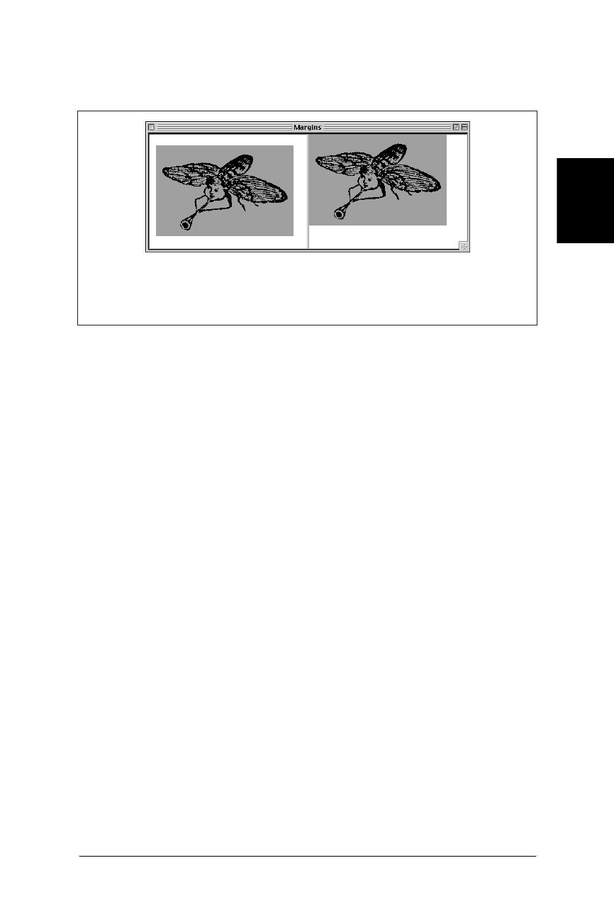
Targeting Frames 217
Frames
Targeting Frames
Web Design in a Nutshell, eMatter Edition
Copyright © 2000 O’Reilly & Associates, Inc. All rights reserved.
Internet Explorer, the image on the right rests flush against the frame borders
(again, Netscape would display this frame with a margin of 1 pixel).
Targeting Frames
One of the challenges of managing a framed document is coordinating where
linked documents display. By default, a linked document loads into the same
frame as the link; however, it is often desirable to have a link in one frame load a
page into a different frame in the frameset. This is the case when a list of links in a
narrow frame loads content into a larger main frame on the page.
This is done by using the target attribute in the anchor (<a>) tag to specify the
target frame by name. First, of course, it is necessary to assign a name to the frame
using the name attribute in the <frame> tag as follows:
<FRAME SRC="original.html" NAME="main">
Now any link can load a document into that frame by specifying its name as the
target window, as shown in this link example:
<A HREF="new.html" TARGET="main">
In the above example, the document new.html would load into the frame named
“main” (replacing original.html).
If a link contains a target name that does not exist, a new browser window is
opened to display the document, and that window is given the target’s name.
Subsequent links targeted to the same name will load in that window.
The <base> tag
If you know that you want all the links in a given document to load in the same
frame (such as from a table of contents into a main display frame), you can set the
target once in the <base> tag instead of for every link in the document (saving a
lot of typing and extra characters in the HTML document).
Figure 11-6: Effects of setting frame margins (left) and not (right).
<FRAMESET COLS="*,*">
<FRAME SRC="bug.html" marginheight="20" marginwidth="12">
<FRAME SRC="bug.html" marginheight="0" marginwidth="0">
</FRAMESET>
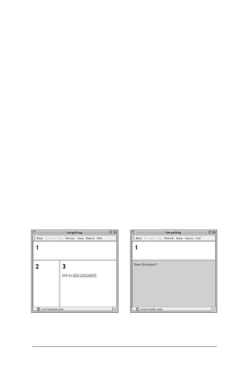
218 Chapter 11 – Frames
Targeting Frames
Web Design in a Nutshell, eMatter Edition
Copyright © 2000 O’Reilly & Associates, Inc. All rights reserved.
Placing the <base> tag in the <head> of the document, with the target frame
specified by name, will cause all the links in the document to load into that frame.
The following is a sample targeted base tag:
<HEAD>
<BASE TARGET="main">
</HEAD>
Targets in individual links will override the target set at the document level via the
<base> tag.
Reserved target names
There are four standard target names for special redirection actions. Note that all
of them begin with the underscore (_) character. You should avoid naming your
frames with a name beginning with an underscore as it will be ignored by the
browser. The four reserved target names are:
_blank
A link with target="_blank" opens a new, unnamed browser window to
display the linked document. Each time a link that targets _blank is opened,
it launches a new window, potentially leaving the user with a mess of open
windows.
_self
This is the default target for all <a> tags; it loads the linked document into the
same frame or window as the source document. Because it is the default, it is
not necessary to use with individual <a> tags; however, it may be useful
within the <base> tag of the document.
_parent
A linked document with target="_parent" will load into the parent frame
(one step up in the frame heirarchy). If the link is already at the top-level
frame or window, it is equivalent to _self. Figure 11-7 demonstrates the
effects of a link targeting the parent frame.
Figure 11-7: In nested framesets, the _parent target links to the parent frameset
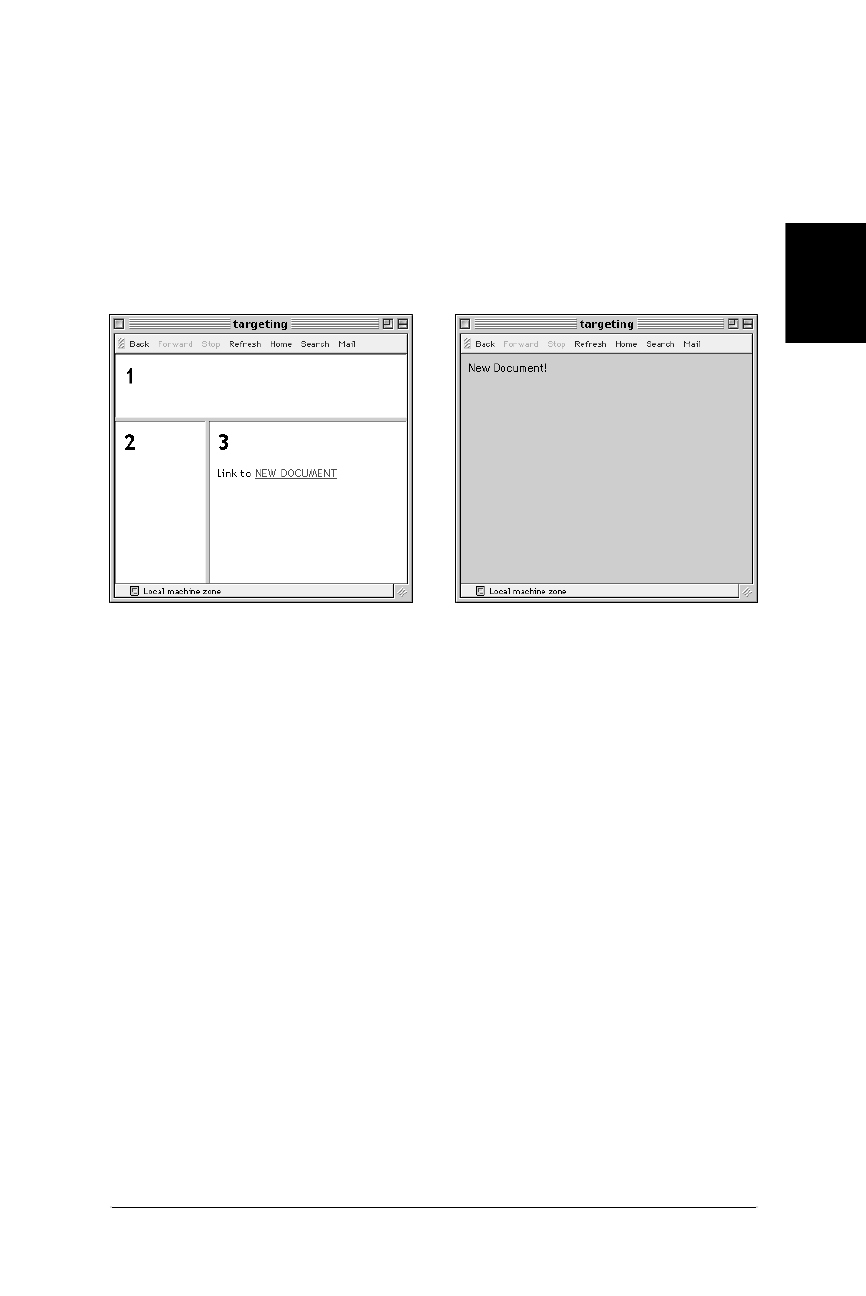
Inline (Floating) Frames 219
Frames
Inline (Floating) Frames
Web Design in a Nutshell, eMatter Edition
Copyright © 2000 O’Reilly & Associates, Inc. All rights reserved.
The _parent target name only works when the nested framesets are in sepa-
rate documents. It does not work for multiple nested framesets within a single
frameset document (such as the example shown under “Nesting Frames”
earlier in this chapter).
_top
This causes the document to load at the top-level window containing the link,
replacing any frames currently displayed. A linked document with target=
"_top" “busts out” of its frameset and is displayed directly in the browser
window, as shown in Figure 11-8.
Inline (Floating) Frames
Microsoft Internet Explorer 3.0 introduced a feature called inline frames, which are
identified with the <iframe> tag. They enable a scrollable frame to be placed
anywhere within the flow of an HTML document, much like an image.
Although, as of this writing, inline frames are still only supported by Internet
Explorer (limiting their practicality), the <iframe> tag and its attributes currently
appears in the W3C’s HTML 4.0 Specification. With the W3C’s thumbs-up, we may
see more browsers supporting this nifty feature in future versions. See “Faking an
<iframe>” later in this chapter for an example of how to create a similar effect in a
way that works in Netscape Navigator, too.
Placing an inline frame is like placing an image on a page. As shown in the
following code, within the <iframe> tag, specify the width and height of the
frame and the HTML file you want it to display. As with images, you can align the
frame on the page and specify hspace and vspace. As with frames, you can
specify margins within the frame and border display. Figure 11-9 shows the
results.
<HTML>
<HEAD><TITLE>IFRAME</TITLE></HEAD>
<BODY BGCOLOR="black" TEXT="white">
<H2>Inline (Floating) Frames</H2>
Figure 11-8: Linking with the _top target replaces the entire frameset
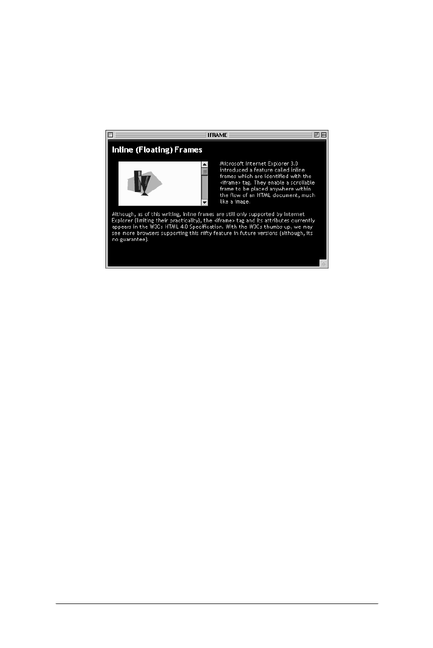
220 Chapter 11 – Frames
Frame Design Tips and Tricks
Web Design in a Nutshell, eMatter Edition
Copyright © 2000 O’Reilly & Associates, Inc. All rights reserved.
<IFRAME SRC="scrolly.html" WIDTH=200
HEIGHT=100 ALIGN=left HSPACE=12></IFRAME>
Microsoft Internet Explorer 3.0 introduced a feature called
inline frames...
</BODY>
</HTML>
Frame Design Tips and Tricks
Using frames effectively requires more than just knowing the HTML tags. This
section provides a few pointers and tricks for framed documents.
All-Purpose Pages
Just because you design a web page to be part of a framed document doesn’t
necessarily guarantee that it will always be viewed that way. Keep in mind that
some users might end up looking at one of your pages on its own, out of the
context of its frameset (this is possible if a search engine returns the URL of the
content). Since frames are often used for navigation, this orphaned content page
could be a big fat dead-end for a user.
For that reason, you should try to design your content pages so that they stand up
on their own. Adding a small amount of redundant information to the bottom of
each page can make a big difference in usability. First, indicate the name of the
site with a link to its home page on each content document. This will help to
orient a newcomer who may have just dropped in from a search engine.
It is important to pay particular attention to the navigational options that are avail-
able on content pages when viewed without their frameset. At the very least,
provide a small link to the top level of your site on every page that points users
back to a more appropriate (and framed) starting point. Be sure to set the
target="_top" attribute so if a framed user clicks on it, it won’t load the home
page frameset within the current frameset.
Figure 11-9: Inline frame with IE’s <iframe> tag

Frame Design Tips and Tricks 221
Frames
Frame Design Tips and Tricks
Web Design in a Nutshell, eMatter Edition
Copyright © 2000 O’Reilly & Associates, Inc. All rights reserved.
Helping Search Engines
Search engines all work differently, but they pretty much uniformly do not under-
stand frames or any content within a <frameset> or <frame> tag. This means
search engines will not find any links that require burrowing through a site for
indexing purposes, and all the content of your site will be missed.
There are a few measures you can take that will make your site more friendly to
search engines:
•Include content in the frameset document. Search engines will read content
within the <noframes> tag, so it is a good idea to make it as descriptive as
possible, so search engines have something to index (instead of just “you
need frames to see this site”). Adding a link within the noframes text to the
HTML file containing all of your navigational links will help search engines
(and humans!) get to the content of your site without relying on the frameset.
•Use descriptive titles. Titles are the most important things that search engines
index, so use descriptive titles on all content documents. Document titles do
not display when the document is loaded into a frame, so it doesn’t affect
your frame design.
•Use <meta> tags. Although not all search engines use <meta> tag informa-
tion, they can be a useful tool for those that do. If your top-level frameset
document contains limited content within the <noframes> tag, you can add a
site description and keywords to the page via <meta> tags for the search
engine to index. The following is a sample of standard <meta> tags used to
aid search engines:
<HEAD>
<TITLE>Littlechair Studios</TITLE>
<META name="description" content="Jennifer Niederst’s resume
and web design samples.">
<META name="keywords" content="designer, web design, training,
interface design">
</HEAD>
For more information about search engines and how they work, see the Search
Engine Watch site at http://www.searchenginewatch.com (from which the above
information was gathered).
Loading Two Frames from One Link
Ordinarily, a link can target only one frame, but there are a few options for
creating links that change the contents of two frames at once. One involves simple
HTML and the other use JavaScript controls.
Loading a framed document
Using HTML to make a single link change two frames, you can create separate
documents containing the frames you want to change, instead of nesting them into
the top-level document.

222 Chapter 11 – Frames
Frame Design Tips and Tricks
Web Design in a Nutshell, eMatter Edition
Copyright © 2000 O’Reilly & Associates, Inc. All rights reserved.
For instance, the following code creates a frameset with two frames: a narrow
“top” frame and a “main” bottom frame. The document containing this frameset
will be called top.html.
<FRAMESET ROWS=50,*>
<FRAME SRC="toolbar.html" NAME="top">
<FRAME SRC="first_two_frames.html" NAME="main">
</FRAMESET>
The bottom frame is to be divided into two frames, but instead of nesting frames
directly within the top.html frameset, you can create a number of separate two-
frame documents, as shown:
<FRAMESET COLS=250,*>
<FRAME SRC="left.html" NAME="leftframe">
<FRAME SRC="right.html" NAME="rightframe">
</FRAMESET>
That way, a link within the “top” frame can target just one frame (“main”), but will
load a new two-frame document, essentially changing the contents of two frames
at once.
Of course, this method will only work for frames that are right next to each other.
Loading two frames with JavaScript*
Adding an onClick JavaScript command within the link allows the browser to
load documents into two frames based on one mouse click. For this example,
imagine a document that contains two frames, a list of options on the left and the
contents in the main window on the right. We want a link in the left frame to
change the contents on the right, but also to load a new list of options (perhaps
with the current choice highlighted) into the left frame. The code is quite simple:
<A HREF="content.html" onClick="window.self.location='newlist.
html'" TARGET="display">Chocolate</a>
The text in bold is the JavaScript line that tells the browser to load newlist.html
into the same window/frame as the link. The remaining code is the standard
HTML link that will load content.html into the display frame on the right.
Another (and more robust) method for changing two frames with one click uses a
function that changes the contents of two frames (named “toolbar” and “main”), as
shown in this sample code:
<SCRIPT LANGUAGE="JavaScript">
<!--
function changePages (toolbarURL, mainURL) {
parent.toolbar.location.href=toolbarURL; parent.main.location.
href=mainURL;
}
-->
</SCRIPT>
* This tip was gathered from WebMonkey—http://www.webmonkey.com.
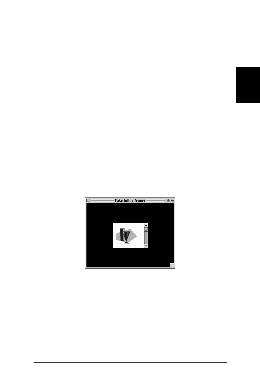
Frame Design Tips and Tricks 223
Frames
Frame Design Tips and Tricks
Web Design in a Nutshell, eMatter Edition
Copyright © 2000 O’Reilly & Associates, Inc. All rights reserved.
Within the anchor tag, the additional code provides the URLs for the documents
that will be used in the script (and loaded into the respective frames), as shown in
the following example:
<A HREF="javascript:changePages('toolbar_document2.html','main_
document 2.html');">
Faking an <iframe>
Inline (floating) frames are really cool, but unfortunately, as of this writing, they
only work on Internet Explorer. The following code gives the effect of an inline
frame using standard frames tags (but, of course, without all the cool text-wrap
functionality). It creates a scrolling frame that will always be centered in the
browser window, regardless of how the window is resized, as shown in
Figure 11-10.
<FRAMESET COLS="*,130,*" NORESIZE BORDER=0 FRAMEBORDER=0
FRAMEBORDER=no FRAMESPACING=0>
<FRAME SRC="black.html" SCROLLING=no>
<FRAMESET ROWS="*,90,*" NORESIZE BORDER=0 FRAMEBORDER=0
FRAMEBORDER=no FRAMESPACING=0>
<FRAME SRC="black.html" SCROLLING=no>
<FRAME SRC="pix.html" SCROLLING=auto MARGINWIDTH=0
MARGINHEIGHT=0>
<FRAME SRC="black.html" SCROLLING=no>
</FRAMESET>
<FRAME SRC="black.html" SCROLLING=no>
</FRAMESET>
The middle column setting in the first <frameset> is the width of the window in
pixels. The middle row setting in the nested <frameset> gives the window’s
height. You can change the size of the window by adjusting these settings. You
can also set the scrolling function of the frame within its <frame> tag.
In this example, all of the remaining frames are filled with an HTML file with no
contents and a black background. Of course, these frames could contain actual
contents as well.
Figure 11-10: Scrolling frame centered in the browser window

224 Chapter 11 – Frames
Frame Design Tips and Tricks
Web Design in a Nutshell, eMatter Edition
Copyright © 2000 O’Reilly & Associates, Inc. All rights reserved.
Frame-Proof Your Site
Some sites may link to your site and load it into a single frame in their interface. If
you really don’t want to see your site squished into someone else’s frame, you can
add this tricky (yet simple) JavaScript to the <head> of your document, which will
make your page always load into the top level of the browser window: This script
will work for Netscape Navigator 3.0 and higher and Internet Explorer 3.0 and
higher.*
<SCRIPT LANGUAGE="JAVASCRIPT"><!-- Hide from old browsers
if (top != self)
top.location.href = location.href;
// Stop hiding from old browsers -->
</SCRIPT>
Preloading Images with Hidden Frames
Preloading images refers to methods used for downloading images and storing
them in cache before they actually need to be displayed on the page. One method
for doing this is to place all the images you’d like to download in a framed docu-
ment that is hidden from view. The images download and are cached when the
first frameset is loaded, but they won’t be seen until the user links to a visible
page that includes them.
The trick is to create a frameset with two rows (or columns). Set the size of the
first row to 100%—this is the frame that will be used to display your first page. In
the second row, the one that gets squeezed out of existence, specify the docu-
ment that contains your images.
<FRAMESET ROWS="100%,0" NORESIZE BORDER=0 FRAMEBORDER=0
FRAMEBORDER=NO FRAMESPACING=0>
<FRAME SRC="firstpage.html">
<FRAME SRC="thepictures.html">
</FRAMESET>
You can put a bunch of images there, but keep in mind that it’s not a free down-
load, just a predownload, so all the same rules about minimizing file sizes apply.
There’s always the chance that the user might click before they’ve all arrived.
Getting Rid of Page Margins
Unfortunately, there is no method in standard HTML for universally getting rid of
the margins that are automatically inserted between the sides of the browser and
the contents of a page. Style sheets offer margin controls, but they are not well
enough supported to be relied upon. There are also <body> tag attributes that can
remove margins in 4.0 version browsers (see Chapter 6).
Web authors who must have the contents of their page nestle in right against the
edges of the browser have the marginheight and marginwidth attributes of the
* Thank you to Vince Heilman for contributing this script.

Frame Design Tips and Tricks 225
Frames
Frame Design Tips and Tricks
Web Design in a Nutshell, eMatter Edition
Copyright © 2000 O’Reilly & Associates, Inc. All rights reserved.
<frame> tag at their disposal. This will produce the margin-free effect for a much
wider audience of all frame-enabled browser users.
The trick is to put the entire page in a frame that is specified to fill 100% of the
available window space. The frameset code looks like this:
<FRAMESET ROWS="100%,0" NORESIZE BORDER=0 FRAMEBORDER=0
FRAMEBORDER=NO FRAMESPACING=0>
<FRAME SRC="entirepage.html" MARGINHEIGHT=0 MARGINWIDTH=0>
</FRAMESET>
Be aware, however, that even if you set the margins to zero, Netscape Navigator
will still display it with a one-pixel margin. The gap can often be disguised with a
background color or a background graphic.

226
Web Design in a Nutshell, eMatter Edition
Copyright © 2000 O’Reilly & Associates, Inc. All rights reserved.
Chapter 12 Forms
CHAPTER 12
Forms
Forms provide a method for true interaction between users and the publisher of a
web site in a way that could never be done in print. With forms, you can use
input from a user to provide a customized response on-the-fly or just collect the
data for later use. Forms can be used for simple functions like surveys and guest-
books, and they are the element that makes a complex online commerce system
possible.
This chapter provides a detailed review of the available form elements and how to
use them. It also provides a brief introduction to CGI for those who may still be
intimidated by making forms work.
Summary of Form Tags
In this section, browser support for each tag is noted to the right of the tag name.
Browsers that do not support the tag are grayed out. Browsers that deprecate the
tag are noted with a superscript D. Tag usage is indicated below the tag name. A
more thorough listing of attributes for each tag, according to the HTML 4.0 Specifi-
cation, appears in Appendix A, HTML Tags and Elements.
<button>
NN: 2, 3, 4 - MSIE: 2, 3, 4, 5 - HTML 4 - WebTV -Opera3
<button> ... </button>
Defines a “button” that functions similar to buttons created with the input tag, but
allows for richer rendering possibilities. Buttons can contain content such as text
and images.
Attributes
name=text
Assigns the control name for the element.

Summary of Form Tags 227
Forms
Summary of Form Tags
Web Design in a Nutshell, eMatter Edition
Copyright © 2000 O’Reilly & Associates, Inc. All rights reserved.
value=text
Assigns the initial value to the button.
type=submit|reset|button
Identifies the type of button: submit button (default value), a reset button, or
a custom button (used with JavaScript), respectively.
<fieldset>
NN: 2, 3, 4 - MSIE: 2, 3, 4, 5 - HTML 4 - WebTV - Opera3
<fieldset> ... </fieldset>
Groups related controls and labels. The proper use of this tag should make
documents more accessible to nonvisual browsers. It is similar to <div> but is
specifically for grouping fields.
<form>
NN: 2, 3, 4 - MSIE: 2, 3, 4, 5 - HTML 4 - WebTV - Opera3
<form> ... </form>
Indicates the beginning and end of a form. There can be more than one form in
an HTML document; however, forms cannot be nested and it is important that they
do not overlap.
Attributes
action=url
Specifies the URL of the application that will process the form (required). This
is most often a pointer to a CGI script on the server. The default is the current
URL.
enctype=encoding
Specifies how the values for the form controls are encoded when they are
submitted to the server. The default is the Internet Media Type (applica-
tion/x-www-form-urlencoded). The value multi-part/form-data
should be used in combination with the file input element.
method=get|post
Specifies which HTTP method will be used to submit the form data
(required). With get (the default), the information is appended to and sent
along with the URL itself. The post method puts the form information in a
separate part of the body of the HTTP request. post is the preferred method
according to the W3C specification.
HTML 4.0 Specification attributes
accept=content-type-list
Specifies a comma-separated list of file types (MIME types) the server will
accept and is able to process. Browsers may one day be able to filter out
unacceptable files when prompting a user to upload files to the server.
accept-charset=charset list
Specifies the list of character encodings for input data that must be accepted
by the server in order to process the current form. The value is a space- and/
or comma-delimited list of charset values. The default value is unknown.

228 Chapter 12 – Forms
Summary of Form Tags
Web Design in a Nutshell, eMatter Edition
Copyright © 2000 O’Reilly & Associates, Inc. All rights reserved.
Internet Explorer 3.0 and higher only
target=name
Specifies a target window for the results of the form submission to be loaded.
The special target values _bottom,_top,_parent, and _self may be used.
<input type=button>
NN: 2, 3, 4 - MSIE: 2, 3, 4, 5 - HTML 4 - WebTV - Opera3
<input type=button>
Creates a customizable “push” button. Customizable buttons have no specific
behavior but can be used to trigger functions created with JavaScript controls.
Attributes
name=string
Assigns a name to the form element to be passed to the forms processing
application.
value=string
Specifies the initial value for the parameter.
<input type=checkbox>
NN: 2, 3, 4 - MSIE: 2, 3, 4, 5 - HTML 4 - WebTV - Opera3
<input type=checkbox>
Creates a checkbox input element within a <form>. Checkboxes are like on/off
switches that can be toggled by the user. When a form is submitted, only the “on”
checkboxes submit values to the server.
Attributes
checked
When this attribute is added, the checkbox will be checked by default.
name=text
Assigns a name to the checkbox to be passed to the form-processing applica-
tion if selected. Giving several checkboxes the same name creates a group of
checkbox elements, allowing users to select several options with the same
property.
value=text
Specifies the initial value of the control that is passed on to the server. If not
defined, a value of “on” is sent.
<input type=file>
NN: 2, 3, 4 - MSIE: 2, 3, 4, 5 - HTML 4 - WebTV - Opera3
<input type=file>
Allows users to submit external files with their form submission. It is accompanied
by a “browse” button when displayed in the browser.

Summary of Form Tags 229
Forms
Summary of Form Tags
Web Design in a Nutshell, eMatter Edition
Copyright © 2000 O’Reilly & Associates, Inc. All rights reserved.
Attributes
accept=MIME type
Specifies a comma-separated list of content types that a server processing the
form will handle correctly. It can be used to filter out nonconforming files
when prompting a user to select files to send to the server.
name=text
Assigns a name to the control.
value=text
Specifies the initial filename to be submitted.
<input type=hidden>
NN: 2, 3, 4 - MSIE: 2, 3, 4, 5 - HTML 4 - WebTV - Opera3
<input type=hidden>
Creates an element within a <form> that does not display in the browser. Hidden
controls can be used to pass special form-processing information along to the
server that the user cannot see nor alter.
name=text
Specifies the name of the parameter that is passed to the form-processing
application for this input element (required).
value=text
Specifies the value of the element that is passed to the form-processing
application.
<input type=image>
NN: 2, 3, 4 - MSIE: 2, 3, 4, 5 - HTML 4 - WebTV - Opera3
<input type=image>
Allows an image to be used as a substitute for a submit button.
Attributes
align=top|middle|bottom
Aligns the image with respect to the surrounding text lines.
name=text
Specifies the name of the parameter to be passed along to the form-
processing application.
src=url
Provides the URL of the image (required).
<input type=password>
NN: 2, 3, 4 - MSIE: 2, 3, 4, 5 - HTML 4 - WebTV - Opera3
<input type=password>
Creates a text-input element (like text) but the input text is rendered in a way
that hides the characters, such as displaying a string of asterisks (*) or bullets (•).
Note this does not encrypt the information and should not be considered as a real
security measure.

230 Chapter 12 – Forms
Summary of Form Tags
Web Design in a Nutshell, eMatter Edition
Copyright © 2000 O’Reilly & Associates, Inc. All rights reserved.
Attributes
maxlength=number
Specifies the maximum number of characters the user can input for this
element.
name=text
Specifies the name of this parameter to be passed to the form-processing
application for this element (required).
size=number
Specifies the size of the text-entry box (measured in number of characters) to
be displayed for this element. Users can type entries that are longer than the
space provided, causing the field to scroll to the right.
value=text
Specifies the value that will initially be displayed in the text box.
<input type=radio>
NN: 2, 3, 4 - MSIE: 2, 3, 4, 5 - HTML 4 - WebTV - Opera3
<input type=radio>
Creates a radio button that can be turned on and off. When a group of radio
buttons share the same control name, only one button within the group can be
“on” at one time and all the others will be turned “off.” This makes them different
from checkboxes, which allow multiple choices to be selected within a group.
Attributes
checked
Causes the radio button to be in the “on” state when the form is initially
displayed.
name=text
Specifies the name of the parameter to be passed on to the forms-processing
application if this element is selected (required).
value=text
Specifies the value of the parameter to be passed on to the forms-processing
application.
<input type=reset>
NN: 2, 3, 4 - MSIE: 2, 3, 4, 5 - HTML 4 - WebTV - Opera3
<input type=reset>
Creates a reset button that clears the contents (or sets them to their default values)
of the elements in a form.
Attributes
value=text
Specifies alternate text to appear in the button (it will say “Reset” by default).

Summary of Form Tags 231
Forms
Summary of Form Tags
Web Design in a Nutshell, eMatter Edition
Copyright © 2000 O’Reilly & Associates, Inc. All rights reserved.
<input type=submit>
NN: 2, 3, 4 - MSIE: 2, 3, 4, 5 - HTML 4 - WebTV - Opera3
<input type=submit>
Creates a submit button that sends the information in the form to the server for
processing.
Attributes
value=text
Specifies alternate text to appear in the button (it will say “Submit” by
default).
<input type=text>
NN: 2, 3, 4 - MSIE: 2, 3, 4, 5 - HTML 4 - WebTV - Opera3
<input type=text>
Creates a text input element. This is the default input type and certainly the most
useful and common.
Attributes
maxlength=number
Specifies the maximum number of characters the user can input for this
element.
name=text
Specifies the name of this parameter to be passed to the form-processing
application for this element (required).
size=number
Specifies the size of the text-entry box (measured in number of characters) to
be displayed for this element. Users can type entries that are longer than the
space provided, causing the field to scroll to the right.
value=text
Specifies the value that will initially be displayed in the text box.
<isindex>
NN: 2, 3, 4 - MSIE: 2, 3, 4, 5 - HTML 4D- WebTV - Opera3
<isindex>
Marks the document as searchable. The server on which the document is located
must have a search engine that supports this searching. The browser will display a
text entry field and a generic line that says “This is a searchable index. Enter
search keywords.” This method is outdated—more sophisticated searches can be
handled with form elements and CGI scripting.
<label>
NN: 2, 3, 4 - MSIE: 2, 3, 4, 5 - HTML 4 - WebTV -Opera3
<label>...</label>
Used to attach information to controls. Each label element is associated with
exactly one form control.

232 Chapter 12 – Forms
Summary of Form Tags
Web Design in a Nutshell, eMatter Edition
Copyright © 2000 O’Reilly & Associates, Inc. All rights reserved.
Attributes
for=text
Explicitly associates the label with the control by matching the value of the
for attribute with the value of the id attribute within the control element.
Example
<LABEL for="lastname">Last Name: </LABEL>
<INPUT type="text" id="lastname" size="32">
<legend>
NN: 2, 3, 4 - MSIE: 2, 3, 4, 5 - HTML 4 - WebTV -Opera3
<legend>...</legend>
Assigns a caption to a <fieldset>. This improves accessibility when the
fieldset is rendered nonvisually.
<optgroup>
NN: 2, 3, 4 -MSIE: 2, 3, 4, 5 - HTML 4 - WebTV -Opera3
<optgroup>...</optgroup>
Defines a logical group of <options>. This could be used by browsers to display
hierarchical cascading menus. <optgroups> cannot be nested.
Attributes
label=text
Specifies the label for the option group (required).
<option>
NN: 2, 3, 4 - MSIE: 2, 3, 4, 5 - HTML 4 - WebTV - Opera3
<option> ... </option>
Defines an option within a select element (a multiple-choice menu or scrolling
list). The end tag, although it exists, is usually omitted.
Attributes
selected
Makes this item selected when the form is initially displayed.
value=text
Returns a specified value to the forms-processing application instead of the
<option> contents.
<select>
NN: 2, 3, 4 - MSIE: 2, 3, 4, 5 - HTML 4 - WebTV - Opera3
<select> ... </select>
Defines a multiple-choice menu or a scrolling list. It is a container for one or more
<option> tags.
Attributes
multiple
This allows the user to select more than one <option> from the list.

Introduction to Forms 233
Forms
Introduction to Forms
Web Design in a Nutshell, eMatter Edition
Copyright © 2000 O’Reilly & Associates, Inc. All rights reserved.
name=text
Defines the name for selected <option> values that, if selected, are passed
on to the forms-processing application (required).
size=number
Controls the display of the list of options. When size=1 (and multiple is
not specified), the list is displayed as a pull-down menu. For values higher
than 1, the options are displayed as a scrolling list with the specified number
of options visible.
<textarea>
NN: 2, 3, 4 - MSIE: 2, 3, 4, 5 - HTML 4 - WebTV - Opera3
<textarea>...</textarea>
Defines a multiline text-entry control. The text that is enclosed within the
<textarea> tags will be displayed in the text-entry field when the form initially
displays.
cols=number
Specifies the visible width of the text-entry field, measured in number of char-
acters (required). Users may enter text lines that are longer than the provided
width, in which case the entry will scroll to the right (or wrap if the browser
provides some mechanism for doing so).
name=text
Specifies a name for the parameter to be passed to the form-processing appli-
cation (required).
rows=number
Specifies the height of the text-entry field in numbers of lines of text
(required). If the user enters more lines than are visible, the text field scrolls
down to accommodate the extra lines.
wrap=off|virtual|physical
Internet Explorer 4.0 and Netscape Navigator 2.0 and higher only. Sets word
wrapping within the text area.
off turns word wrapping off; users must enter their own line returns.
virtual displays the wrap, but the line endings are not transmitted to the
server.
physical displays and transmits line endingsto the server.
soft is the same as virtual.
hard is the same as physical.
Introduction to Forms
HTML form tags merely provide an interface and controls for gathering informa-
tion. The real work is done by forms-processing applications, usually CGI scripts,
behind the scenes. CGI (Common Gateway Interface) is the interface between
HTTP (the program responsible for web transactions) and other programs on the
server.

234 Chapter 12 – Forms
The Basic Form (<form>)
Web Design in a Nutshell, eMatter Edition
Copyright © 2000 O’Reilly & Associates, Inc. All rights reserved.
A CGI program (or script) can be written in a number of programming languages.
It doesn’t matter to the server which one, as long as it can retrieve data and send
data back. On Unix, the most popular language is Perl, but C, C++, Tcl, and
Python are also used. On Windows, programmers write scripts in Visual Basic,
Perl, and C/C++. On the Mac, AppleScript and C/C++ are common.
If you are coming at web design from a designer’s point of view (or even just as a
novice to web design), chances are you will be handling the HTML form elements
and leaving the programming to trained programmers. Often, ISPs will provide a
few canned CGI scripts, such as a guestbook or mailing function, that you can
point to from within your form, but if you want something customized for your
site, I recommend you hire a professional programmer to write it for you.
CGI programming is certainly beyond the scope of this book, but if you are inter-
ested in reading more, try CGI Programming for the World Wide Web, by Shishir
Gundavaram (O’Reilly & Associates). For information on customizing existing
scripts, see the section “Demystifying CGI” at the end of this chapter.
The Basic Form (<form>)
The <form> tag, which is used to designate a form, contains the information
necessary for interacting with the CGI program on the server. A form is made up
of a number of control elements (text-entry fields, buttons, etc.) used for entering
information. When the user has completed the form and presses the “submit”
button, the entered data is passed to the CGI program specified by the action
attribute.
You can have several forms within a single document, but they cannot be nested
and you must be careful they do not overlap.
Figure 12-1 shows a very simple form and its <form> tag.
The action attribute
The action attribute in the <form> tag provides the URL of the program to be
used for processing the form. By convention, CGI programs are usually kept in a
directory called cgi-bin. In the example in Figure 12-1, the form information is
going to a Perl script called mailform.pl which resides in the cgi-bin directory of
the current server.
The method attribute
The method attribute specifies one of two ways, either get or post, in which the
information from the form can be transmitted to the server. Form information is
transferred in a series of name=value pairs, separated by the ampersand (&)
character.
Let’s take into consideration a simple form with two fields: one for entering a
name, and the other for entering a nickname. If a user enters “Josephine” in the
first field and “Josie” in the second, that information is transmitted to the server in
the following format:
name=Josephine&nickname=Josie
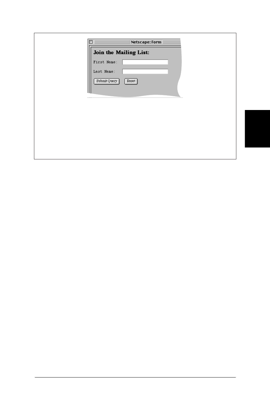
The Basic Form (<form>) 235
Forms
The Basic Form (<form>)
Web Design in a Nutshell, eMatter Edition
Copyright © 2000 O’Reilly & Associates, Inc. All rights reserved.
With the get method, the browser transfers the data from the form as part of the
URL itself (appended to the end). The information gathered from the nickname
example would be transferred via the get method as follows:
GET http://www.oreilly.com/cgi-bin/
guestbook.pl?name=Josephine&nickname=Josie
The post method transmits the form input information after the URL and certain
header information. When the server sees the word POST at the beginning of the
message, it stays tuned for the data. This is the preferred transfer method
according to the W3C. The information gathered with the name and nickname
form would read as follows using the post method:
POST http://www.oreilly.com/cgi-bin/guestbook.pl HTTP1.0
... [more headers here]
name=Josephine&nickname=Josie
Encoding
Another behind-the-scenes step that happens in the transaction is that the data
gets encoded using standard URL encoding. This is a method for translating spaces
and other characters not permitted in URLs (such as slashes) into their hexadec-
imal equivalents. For example, the space character translates to %20, the slash
character is transferred as %2F.
The default encoding format, the Internet Media Type (application/x-www-
form-urlencoded), will do for most forms. If your form includes a file input
type (for uploading documents to the server), you may need to use the enctype
attribute to set the encoding to its alternate setting, multipart/form-data.
Figure 12-1: A simple form
<H2>Join the Mailing List:</H2>
<FORM ACTION="/cgi-bin/mailform.pl" METHOD=GET>
<PRE>
First Name: <INPUT TYPE="text" NAME="first">
Last Name: <INPUT TYPE="text" NAME="last">
<INPUT TYPE="submit"> <INPUT TYPE="reset">
</PRE>
</FORM>
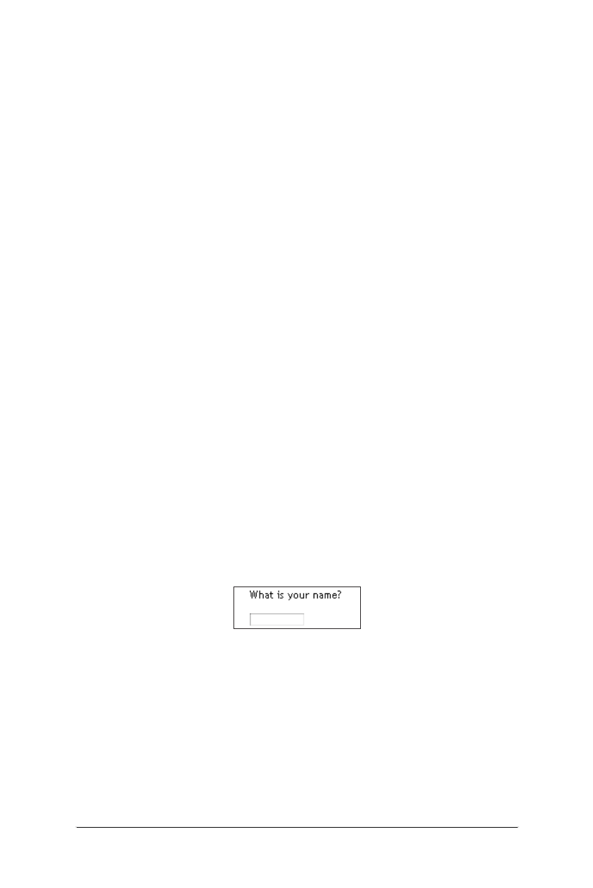
236 Chapter 12 – Forms
Form Elements
Web Design in a Nutshell, eMatter Edition
Copyright © 2000 O’Reilly & Associates, Inc. All rights reserved.
In general, you will need to communicate with your server administrator to get all
the necessary settings for the <form> tag to enable your form to function properly.
Form Elements
There are variety of elements (also sometimes called “controls” or “widgets”) that
can be used for gathering information from a form. This section looks at each
control and its specific attributes. Every form control (except submit and reset)
requires that you give it a name (using the name attribute) so the form-processing
application can sort the information. The value of the name must not have any
spaces (use underscores instead).
Input Controls: <input>
The following controls are entered as attribute options within the <input> tag.
Text entry
The simplest type of form element is the text entry field, which is the default
setting for the <input> element. This field allows the user to enter a single word
or a line of text. By default, the browser displays a box that is 20 characters wide,
but you can set it to be any length using the size attribute.
The user can type an unlimited number of characters into the field (the display
will scroll to the right if the text exceeds the width of the supplied box), but you
can set a maximum number of characters using the maxlength attribute.
Use the value attribute to specify text to appear when the form is loaded. This
can be changed by the user. If you have a form that consists of only one text input
element, hitting the Enter key will submit the form without requiring a specific
Submit button in the form. The following code creates a text field with a size of 15
characters, a maximum length of 50 characters, and the text “your first name”
displayed in the field.
What is your name?<P>
<INPUT TYPE="text" NAME="name" SIZE="15" MAXLENGTH="50"
VALUE=“your first name”>
Password text entry
A password field works just like text entry, except the characters are obscured
from view using asterisk (*) or bullet (•) characters. Although the characters are
not displayed in the browser, the actual characters are available in the form data,
so this is not a secure system for transmitting passwords. For example, the
following code text reveals the actual characters in the default value.
What is your password?<P>
Figure 12-2: Text entry input

Form Elements 237
Forms
Form Elements
Web Design in a Nutshell, eMatter Edition
Copyright © 2000 O’Reilly & Associates, Inc. All rights reserved.
<INPUT TYPE="password" NAME="password" SIZE="8" MAXLENGTH="8"
VALUE="abcdefg">
Hidden entry
This input type adds to the form a control that isn’t displayed in the browser. It is
useful for sending information to be processed along with the user-entered data,
such as labels used by the script to sort forms. Some CGI scripts require that
certain hidden fields be added to the form in order to function properly. Here is a
hidden element:
<INPUT TYPE="hidden" NAME="extra_info" value="important">
Checkbox
Checkboxes are typically used for multiple-choice questions. They work best
when more than one answer is acceptable. When the box is checked, the corre-
sponding value is transmitted with the form to the processing program on the
server.
Checkboxes can be used individually to transmit specific name/value coordinates
to the server when checked. To make an option already checked when the page
loads, add the checked attribute to the input tag.
If you assign a group of checkboxes the same name, they behave like a multiple-
choice list in which the user can select more than one option for a given prop-
erty, as shown in the following code and in Figure 12-5.
Which of the following operating systems have you used?<P>
<INPUT TYPE="checkbox" NAME="os" VALUE="Unix" CHECKED> Unix
<INPUT TYPE="checkbox" NAME="os" VALUE="Win95"> Windows 95
<INPUT TYPE="checkbox" NAME="os" VALUE="WinNT"> Windows NT
<INPUT TYPE="checkbox" NAME="os" VALUE="Mac" CHECKED> Macintosh
8.0
Figure 12-3: Password input
Figure 12-4: Hidden input
Figure 12-5: Multiple checkboxes with the same name
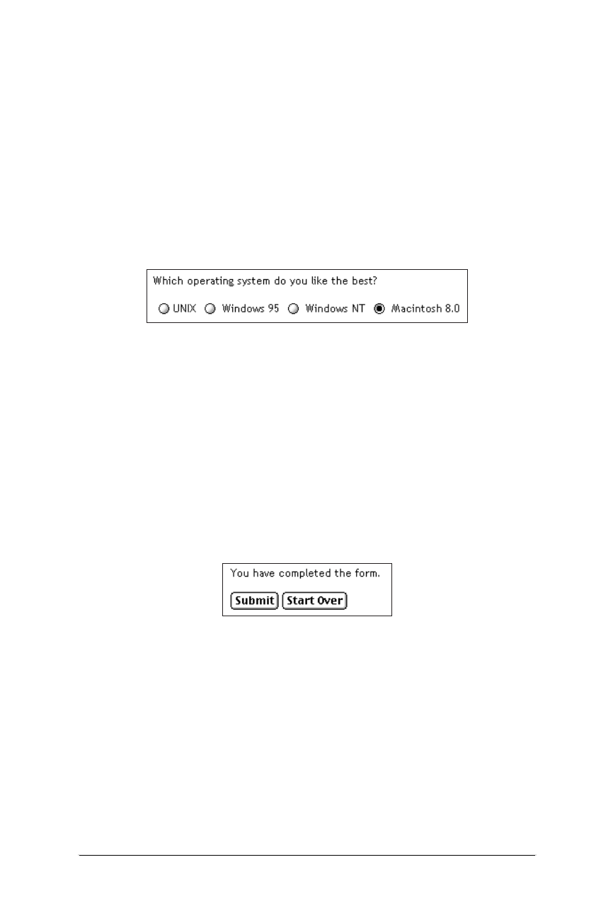
238 Chapter 12 – Forms
Form Elements
Web Design in a Nutshell, eMatter Edition
Copyright © 2000 O’Reilly & Associates, Inc. All rights reserved.
Radio button
Radio buttons are used to toggle between choices. When a radio button is
checked, its corresponding value will be sent to the server for processing. Radio
buttons are different than checkboxes in that when several radio buttons are
grouped together by the same name, only one radio button can be selected at one
time, as shown in the following code and in Figure 12-6. If no button is marked as
checked when the form loads, the first button in the group will be selected.
Which operating system do you like the best?<P>
<INPUT TYPE="radio" NAME="os" VALUE="Unix"> Unix
<INPUT TYPE="radio" NAME="os" VALUE="Win95"> Windows 95
<INPUT TYPE="radio" NAME="os" VALUE="WinNT"> Windows NT
<INPUT TYPE="radio" NAME="os" VALUE="Mac" CHECKED> Macintosh 8.0
Submit and reset buttons
Every form (unless it consists of exactly one text field) needs a submit process to
initiate the transmission of information to the server. By default, the submit button
will say “Submit” or “Submit Query,” but you can change it by adding your own
text after the value attribute.
The reset button reverts all forms back to the state they were in when the form
loaded (either blank or with default values). Its default value is “Reset,” but like
the submit button, you can change its text by specifying its value, as shown in
Figure 12-7.
You have completed the form.<P>
<INPUT TYPE="submit"><INPUT TYPE="reset" VALUE="Start Over">
Custom button
This button doesn’t have any predefined function, but rather is a generic tool that
can be customized with JavaScript. Use the value attribute to write your own text
on the button, as shown in the following code and in Figure 12-8. It is only
supported on 4.0 version browsers.
This does something really exciting.<P>
<INPUT TYPE="button" VALUE="Push Me!">
Figure 12-6: Only one radio button in a group can be selected
Figure 12-7: Submit and reset buttons

Form Elements 239
Forms
Form Elements
Web Design in a Nutshell, eMatter Edition
Copyright © 2000 O’Reilly & Associates, Inc. All rights reserved.
Image button
You can replace the submit button with a graphic of your choice by using the
image type, as shown in the following code and in Figure 12-9. Clicking on the
image will return the coordinates of the mouse click to the server. You must
provide the URL of the graphic with the src attribute. The name attribute, in this
case, is optional.
<INPUT TYPE="image" SRC="graphics/sendme.gif">
File selection
The file-selection form field lets users select a file stored on their computer and
send it to the server when they submit the form. It is displayed as a text entry field
with an accompanying “Browse” button for selecting the file, as shown in the
following code and in Figure 12-10. Like other text fields, you can set the size
and maxwidth values as well as the default text in the field.
When using the file input type, you should specify enctype="multi-part/
form-data" in the <form> tag. Ask your server administrator to confirm this
setting.
Send this file with my form information:<P>
<INPUT TYPE="file" SIZE="28">
Text Area: <textarea>
The <textarea> tag creates a multiline, scrollable text entry box that allows users
to input extended text entries, as shown in the following code and in Figure 12-11.
When the form is transmitted, the browser sends the text along with the name
specified by the required name attribute.
Specify the number of lines of text the area should display using the rows
attribute. The cols attribute specifies the width (measured in characters). Scroll-
bars are provided if the user types more text than will fit in the allotted space.
Figure 12-8: Custom button
Figure 12-9: Using an image for a button
Figure 12-10: The file-selection form field
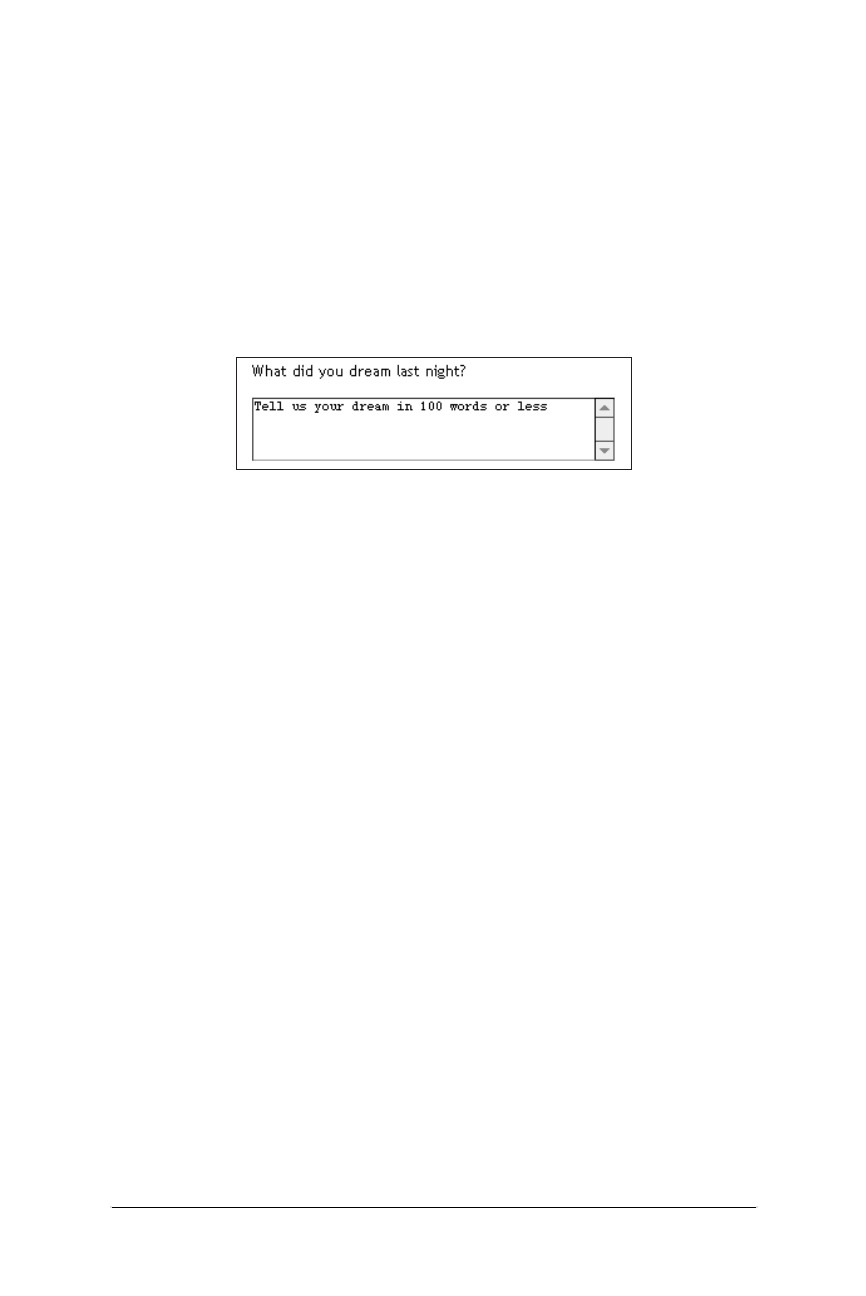
240 Chapter 12 – Forms
Form Elements
Web Design in a Nutshell, eMatter Edition
Copyright © 2000 O’Reilly & Associates, Inc. All rights reserved.
Normally, the text is submitted just as it is typed in, with line returns only where
the user presses the Enter key. However, you can use the wrap attribute to control
text wrapping. When wrap is set to virtual or soft, the text wraps in the user’s
display. Physical or hard wrap settings transmit every new line with a hard-
coded line return. When wrap is set to off, the default setting, the lines do not
wrap. The wrap functions are browser-dependent.
The text that appears between <textarea> and its end tag </textarea> will be
the initial contents of the text entry window when the form is displayed.
What did you dream last night?<P>
<TEXTAREA NAME="dream" ROWS="4" COLS="45">Tell us your dream in
100 words or less</TEXTAREA>
Creating Menus with the <select> tag
The <select> tag creates a menu of options that is more compact than group-
ings of checkboxes or radio buttons. A menu displays as either a pop-up menu or
as a scrolling list of choices, depending on how the size is specified. The
<select> tag works as a container for any number of <option>s.
The text between the opening and ending <option> tags is the value that will be
sent to the server. If you want to send a value for that choice that is not displayed
in the list, use the value attribute within the <option> tag.
Pull-down menus
The <select> element displays as a pull-down menu of options when no size
specification is listed (the default) or when size=1. In a pull-down menu, only
one item may be selected at a time. (Note: adding the multiple attribute turns
the menu into a scrolling list, as described in the next section). By default, the first
<option> in the list displays when the form loads, but you can preselect another
option by adding selected within its <option> tag.
What is your favorite ice cream flavor?<P>
<SELECT NAME="ice_cream">
<OPTION>Rocky Road
<OPTION>Mint Chocolate Chip
<OPTION>Pistachio
<OPTION SELECTED>Vanilla
<OPTION>Chocolate
<OPTION VALUE="swirl">Fudge Ripple
<OPTION>Praline Pecan
<OPTION>Bubblegum
</SELECT>
Figure 12-11: The text area form field
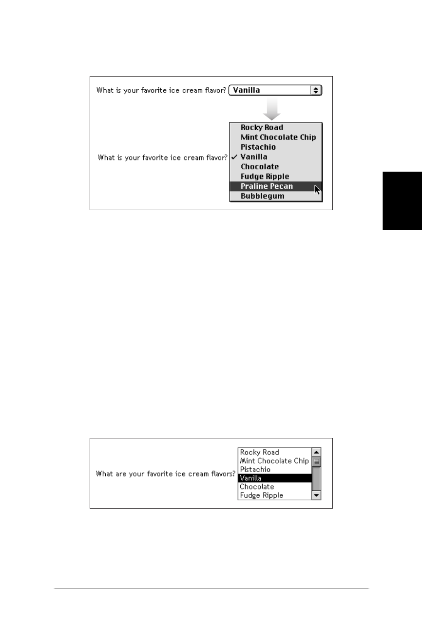
New Form Attributes (HTML 4.0) 241
Forms
New Form Attributes (HTML 4.0)
Web Design in a Nutshell, eMatter Edition
Copyright © 2000 O’Reilly & Associates, Inc. All rights reserved.
In a select form, the item with the selected attribute is displayed as the default
value. Clicking on the arrows brings up the full list, as shown in Figure 12-12.
Scrolling menus
To make the menu display as a scrolling list, simply specify the number of lines
you’d like to be visible in the list using the size attribute or add the multiple
attribute to the <select> tag, as shown in the following code and in Figure 12-13.
The multiple attribute makes it possible for users to select more than one option
from the list.
What are your favorite ice cream flavors?<P>
<SELECT NAME="ice_cream" SIZE=6 MULTIPLE>
<OPTION>Rocky Road
<OPTION>Mint Chocolate Chip
<OPTION>Pistachio
<OPTION SELECTED>Vanilla
<OPTION>Chocolate
<OPTION VALUE="swirl">Fudge Ripple
<OPTION>Praline Pecan
<OPTION>Bubblegum
</SELECT>
New Form Attributes (HTML 4.0)
The HTML 4.0 Specification introduced a number of new attributes that make form
elements more accessible and easier to use. Some can be used with Dynamic
Figure 12-12: Items in a select menu can be set to display after the menu is
collapsed
Figure 12-13: Use the size attribute to display a select menu as a scrolling list

242 Chapter 12 – Forms
Affecting the Appearance of Forms
Web Design in a Nutshell, eMatter Edition
Copyright © 2000 O’Reilly & Associates, Inc. All rights reserved.
HTML to make form elements turn on and off, or become hidden or visible based
on user input. Table 12-1 lists the new attributes along with the form elements to
which they can be applied.
Affecting the Appearance of Forms
Form elements are automatically rendered by the browser, giving the designer
little control over the appearance of the controls themselves. Not surprisingly, the
same element may be rendered slightly differently on different browsers and plat-
forms (see Table 12-2).
To make things even more interesting, Netscape will resize form elements
containing text (text fields, text areas, and scrolling lists) when the constant width
font is resized in the browser preferences. So, if a user’s fonts are set to 18 points,
a<textarea> could suddenly become huge, and exceed the space you’ve
allotted. Like many things on the Web, the way your forms will look is somewhat
unpredictable.
Table 12-1: New Form Attributes in HTML 4.0
Attribute Description Related Tag(s)
accept-charset Specifies the list of character
encodings (character sets)
that must be accepted by the
server processing the form. It
is part of the W3C’s interna-
tionalization efforts requiring
alternative character sets to
represent non-Western
writing systems.
<FORM>
accesskey Assigns an access key
(keyboard shortcut) to an
element for quicker access.
<BUTTON>
<INPUT>
<LABEL>
<LEGEND>
<TEXTAREA>
disabled Disables the control for user
input.
<BUTTON>
<INPUT>
<OPTGROUP>
<OPTION>
<SELECT>
<TEXTAREA>
read-only Prevents the user from
changing the text in a field.
<INPUT type=text>
<INPUT type=password>
<TEXTAREA>
tabindex Specifies position in the
tabbing order. Tabbing navi-
gation allows the user to
cycle through the active
fields using the Tab key.
<BUTTON>
<INPUT>
<SELECT>
<TEXTAREA>
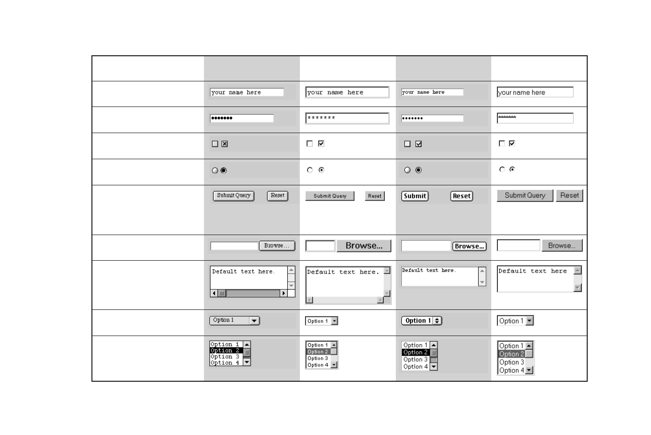
Table 12-2: The Appearance of Form Elements on Major Browsers
Netscape 4.0
Macintosh
Netscape 4.0
Windows 95
Internet Explorer 4.0
Macintosh
Internet Explorer 4.0
Windows 95
Password Entry
<INPUT type="file">
Text Entry
<INPUT type="text">
File Selection Entry
<INPUT type="file">
Checkbox (left)
<INPUT type="checkbox">
Radio Button
<INPUT type="radio">
Submit Button
<INPUT type="submit">
Reset Button
<INPUT type="reset">
Text Area
<TEXT AREA COLS=20
ROWS=30>
Select Menu (pop-up)
<SELECT SIZE=1>
Select Menu (scrolling list)
<SELECT SIZE=4>

244 Chapter 12 – Forms
Affecting the Appearance of Forms
Web Design in a Nutshell, eMatter Edition
Copyright © 2000 O’Reilly & Associates, Inc. All rights reserved.
Aligning Form Elements
A page with lots of form elements can get real ugly in a hurry. The best favor you
can do for a form is to align the elements in some orderly fashion. There are two
methods for doing this: using the <pre> tag and using a table.
The <pre> tag
Unlike standard HTML body text, preformatted text (delimited by <pre> tags) is
displayed exactly as it is typed in, honoring multiple character spaces and line
breaks. Using characters wrapped in <pre> tags has been a long-time favorite
cheat for aligning elements on a web page, going back to the Web’s infancy.
If you put your entire form within <pre> tags, you can align the elements by
columns of characters. The drawbacks to this method are that it does not offer
much flexibility for page design and it may be tedious work. The advantage is that
it will be viewed the same way by all viewers, even those using browsers that
don’t support forms in tables (early browser versions, especially early versions of
the AOL browser).
Using tables for form alignment
Tables are really the best tool available for tidying messy form elements. There is
nothing special about tables used for forms; the same principles and guidelines
outlined in Chapter 10, Tables, apply for this use. However, there are a few points
to keep in mind for better results:
• Form elements tend to be rendered with extra space above and below. This
can be problematic when trying to fit a form into a tight table cell. If you
want to lay out a form with a table, it is better to put the <table> element
within the <form> element instead of the other way around. Forms can con-
tain all sorts of page elements, so it is not a problem for one to span over
more of the page than just the form element. If you must put a form within a
table, be sure to give it plenty of space.
• Remember that form elements that contain text (text entry fields, text areas,
and scrolling lists) will resize in Netscape relative to the constant-width font
size as set in the browser preferences. This is especially treacherous when
form elements are placed in a meticulously sized table, as shown in
Figure 12-14.
Figure 12-14: Netscape expands forms to accommodate user-defined font sizes
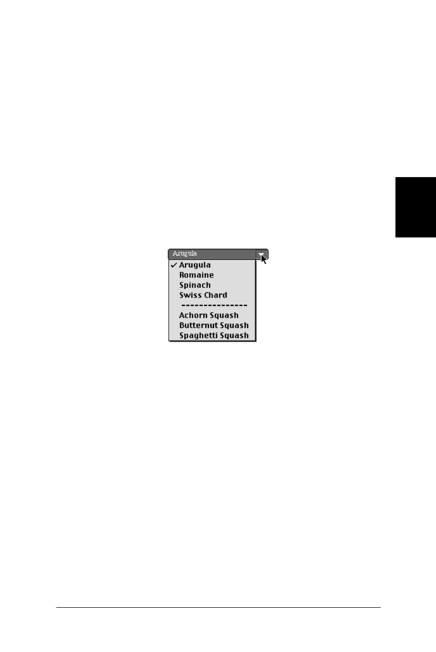
Affecting the Appearance of Forms 245
Forms
Affecting the Appearance of Forms
Web Design in a Nutshell, eMatter Edition
Copyright © 2000 O’Reilly & Associates, Inc. All rights reserved.
Working with Menus
As mentioned earlier, browsers automatically generate form elements such as pull-
down and scrolling menus; however, there are a few ways in which you can
tweak their appearance.
First, your page may look neater overall if your menu elements are all the same
width so they align nicely. The width of a menu element is automatically deter-
mined by the item with the most number of characters in the list. (The size
attribute affects only the list’s height.)
One way to give your lists the same width is to create a dummy option item
(<option>) within each list and make it the desired width by filling it with a
number of nonbreaking spaces ( ) or hypens (-).
A dummy option item containing only a number of hyphens can also be used as a
divider within the list. Select menus can not contain horizontal rules (<hr>), so
adding a row of hyphens is the closest you can get to dividing the list items visu-
ally into groups, as shown in Figure 12-15.
The trick to doing this successfully is to make sure that if the user selects your
dummy row (and there’s nothing that can prevent users from doing so), the infor-
mation will not be transferred to the server. The desired effect is to make it seem
like nothing happens. This can be accomplished with a JavaScript such as the
following one contributed to this book by Martin Burns of Edinburgh, Scotland:
<SCRIPT>
function checker(selector) {
if(selector.options[selector.selectedIndex].text = '---------
------') {
selector.options.selectedIndex = selector.options.
defaultIndex
}
</SCRIPT>
<SELECT name="brand" size=1 onChange="checker(this)">
<OPTION selected value="">Arugula
<OPTION>Romaine
<OPTION>Spinach
<OPTION>Swiss Chard
<OPTION>---------------
<OPTION>Acorn Squash
Figure 12-15: A row of hyphens serves as a divider in a select menu
246 Chapter 12 – Forms
Unconventional Use of Form Elements
Web Design in a Nutshell, eMatter Edition
Copyright © 2000 O’Reilly & Associates, Inc. All rights reserved.
<OPTION>Butternut Squash
<OPTION>Spaghetti Squash
</SELECT>
Unconventional Use of Form Elements
In the spirit of using HTML tags in a way they were never intended (alatables for
page layout), feel free to experiment with using form elements creatively.
Remember that forms do not require CGI scripts to in order to display on a web
page—scripts are required only to retrieve and process information. This means
you can create nonfunctioning form elements to take advantage of the ways they
display information.
The most flexible of these are selection menus. A pop-up menu can contain
sidebar information embedded in the flow of text. Before there were inline frames
(<iframe>) there were scrolling selection menus, which can be used to present a
little scrolling thought or story (just put a few words of text in each <option>).
Both of these display alternatives force the user to interact with your content in a
more active way than just reading text on the page.
One of the first sites to push forms to their limits was Word (http://www.word.com/),
a publication featuring original writing and other expressive works. In
Figure 12-16, an entire story is contained in a pop-up menu on the Word site.
If you do choose to use form elements in unconventional ways, be sure that it
suits the tone and nature of your content. Cute gimmicks may not be appropriate
for business-oriented sites or sites on which you would expect to find functional
forms (such as e-commerce sites).
Figure 12-16: Strange forms: this pop-up menu contains a whole story

Demystifying CGI 247
Forms
Demystifying CGI
Web Design in a Nutshell, eMatter Edition
Copyright © 2000 O’Reilly & Associates, Inc. All rights reserved.
Demystifying CGI
Often designers assume that cgi-bin contains things beyond our comprehension.
It’s time to look behind the curtain! Although it is true that creating Perl and C
scripts from scratch requires programming experience, you can still take advan-
tage of the power of scripts by using one that is already made.
Many web-hosting services offer a library of standard CGI scripts that are already
installed on their servers. In that case, all you may need to do is point to the script
from your page. Some hosting providers will also allow you to upload scripts of
your own.
There are a number of great resources for CGI scripts on the Web, including
scripts that process forms and send their contents in formatted email messages.
Many of them are available for free and include exhaustive documentation that
leads even a novice through the process of customizing and installing the script on
the server. Some of the more popular CGI archives include:
Matt’s Script Archive
http://www.worldwidemart.com/scripts/
A collection of free and useful scripts written by Matt Wright (including Form-
Mail discussed later in this chapter) with excellent documentation for
configuring.
The CGI Resource Index
http://www.cgi-resources.com/
A complete index of over 1200 CGI-related resources. This site is compiled by
Matt Wright of Matt’s Script Archive.
Selena Sol’s Public Domain CGI Script Archive
http://www.extropia.com/Scripts/
“A public service website developed out of the late-night scripting expedi-
tions of Selena Sol and Gunther Birznieks.”
Freescripts.com
http://www.freescripts.com/
Like the name says, this is another site providing useful and free customiz-
able CGI scripts.
Ask Your Server Administrator
Because adding scripts and programs to your web site relies heavily on your
server and its configuration, you’ll need to work with your server administrator to
get things set up. Before you start, you should ask your administrator the
following questions:
•Does your web site-hosting package include access to CGI scripts? Not all web
site hosting services provide access to CGI scripts and functions.
•Does the server have a script available that does what you’re looking for? Many
web site-hosting services have standard scripts available for their customers’

248 Chapter 12 – Forms
Demystifying CGI
Web Design in a Nutshell, eMatter Edition
Copyright © 2000 O’Reilly & Associates, Inc. All rights reserved.
use. If there’s one already installed, it may save you some time in develop-
ment.
•Can you upload your own scripts to the server? Again, depending upon your
arrangement for web site-hosting, you may not be permitted to upload your
own scripts to the server, particularly if you are sharing a server with other
sites.
•Do you have upload privileges to the cgi-bin directory? Assuming you can
upload your own scripts to the server, you will need to make sure that you
have write privileges to the directory where the scripts are stored (usually
called cgi-bin). Your administrator may need to set up an account for you that
gives you access to the directory and allows you to make your scripts read-
able and executable by other users.
•On what kind of server is your site hosted? What server software is it running?
Scripts are usually written to perform on a particular platform and web server
software configuration. Before you spend time customizing a script, be sure
that it can be run on your server.
•What is the exact pathname to the script (once installed)? You will need to
include this in the action setting in a <form>, or wherever you need to refer-
ence the script.
In addition, there will usually be a few questions specific to your chosen script
that will need to be answered by your administrator. For instance, in order to run
a Perl script, the basic Perl interpreter needs to be installed on the server. Or if
you want a script that automatically takes the contents of a form and sends it in an
email message, you may need to know the exact pathname of the sendmail
program on the server (as we’ll see in the following example). You should also
ask whether to use the post or get method for transmitting form information.
Using Available Scripts
Let’s take a look at the process for customizing a free script found on one of the
CGI script archives. The purpose of this tutorial is to give you an idea of what to
expect and to show that you don’t need specific programming skills to do it.
In the following example, we use the FormMail script (written by Matt Wright),
which takes the contents of a form and sends it to a specified user in a formatted
email message. Although the script in its entirety (about nine book pages worth) is
not shown here, you can easily download it from Matt’s Script Archive (http://
www.worldwidemart.com/scripts/).
1. First, make all the necessary arrangements with your server administrator as
outlined in the previous section. You should have an understanding of how
your particular server and account handle CGI scripts before proceeding.
2. Download the script. Upon downloading, you are given the script as well as a
very complete ReadMe file that outlines step-by-step the process for using the
script. Read the documentation carefully.
3. Configure the script. You may need to make changes within the script itself to
customize it for your use. Following is a sample of the FormMail script. (Note

Demystifying CGI 249
Forms
Demystifying CGI
Web Design in a Nutshell, eMatter Edition
Copyright © 2000 O’Reilly & Associates, Inc. All rights reserved.
that certain portions of this script have been omitted where indicated for
purposes of fitting it in this chapter).
The FormMail program only requires three variables to be changed (high-
lighted in bold type in this example):
– the pathname of the Perl interpreter on your server (in the first line of
script)
– the pathname of your server’s sendmail program (after $mailprog in the
sample below)
– the list of domains on which you will allow forms to reside and use your
FormMail script (following @referers in the sample below).
These variables are clearly explained in the ReadMe file and are presented
with labels in the beginning of the script for ease of customization. Further-
more, each section of the script is clearly labeled as to its function, if you are
interested.
#!/usr/bin/perl
########################################################################
# FormMail Version 1.6 #
# Copyright 1995-1997 Matt Wright mattw@worldwidemart.com #
# Created 06/09/95 Last Modified 05/02/97 #
# Matt's Script Archive, Inc.: http://www.worldwidemart.com/scripts/#
########################################################################
# COPYRIGHT NOTICE #
# Copyright 1995-1997 Matthew M. Wright All Rights Reserved. #
[full copyright notice omitted]
########################################################################
# Define Variables #
# Detailed Information Found In README File. #
# $mailprog defines the location of your sendmail program on your unix #
# system. #
$mailprog = '/usr/lib/sendmail';
# @referers allows forms to be located only on servers which are #
# defined in this field. This security fix from the last version #
# which allowed anyone on any server to use your FormMail script on #
# their web site. #
@referers = ('worldwidemart.com','206.31.72.203');
# Done #
########################################################################
[section omitted]
sub check_url {
# Localize the check_referer flag which determines if user is valid.#
local($check_referer) = 0;
# If a referring URL was specified, for each valid referer, make #
# sure that a valid referring URL was passed to FormMail. #
if ($ENV{'HTTP_REFERER'}) {
foreach $referer (@referers) {
if ($ENV{'HTTP_REFERER'} =~ m|https?://([^/]*)$referer|i) {
$check_referer = 1;

250 Chapter 12 – Forms
Demystifying CGI
Web Design in a Nutshell, eMatter Edition
Copyright © 2000 O’Reilly & Associates, Inc. All rights reserved.
last;
}
}
}
else {
$check_referer = 1;
}
# If the HTTP_REFERER was invalid, send back an error.
#
if ($check_referer != 1) { &error('bad_referer') }
}
[remaining script omitted]
4. Add mandatory controls to the form. The FormMail script relies on the
following hidden input control, which must be included in the form. It tells
the script who to mail the form results to.
<INPUT TYPE=hidden NAME="recipient" VALUE="email@your.host.
com">
5. Add optional controls to the form. The FormMail documentation also provides
a listing of other form controls you might include in your form and the exact
HTML for creating them. The following is an example taken from the docu-
mentation that describes how to specify the “subject” field of an email
message generated by the script:
Field:
subject
Description:
The subject field allows you to specify the subject you wish to appear in
the e-mail sent to you after this form has been filled out. If you do not
have this option turned on, the script will default to a message subject:
WWW Form Submission
Syntax:
If you wish to choose what the subject is:
<INPUT TYPE=hidden NAME="subject" VALUE="Your Subject">
To allow the user to choose a subject:
<INPUT TYPE=text NAME="subject">
6. Upload the script, following the instructions of your server administrator. Be
sure that you have included the proper pathname to the script with the action
attribute in the <form> tag.

251
Server Side
Includes
Web Design in a Nutshell, eMatter Edition
Copyright © 2000 O’Reilly & Associates, Inc. All rights reserved.
Chapter 13Server Side Includes
CHAPTER 13
Server Side Includes
In layperson’s terms, Server Side Includes (SSI) are special placeholders in an
HTML document that the server will replace with actual data just before sending
the final document to the browser. By the time the document gets to the browser,
it looks just like any other HTML page (even if someone happens to “view
source”), as though you typed the data into the HTML source by hand.
When the server looks through the file for placeholders (SSI commands), it is said
to parse the file. The server then inserts the requested data, which could be
anything from the current date and time to other HTML documents to the results
of a CGI script. (The complete list of information available via Server Side Includes
is listed later in this chapter.)
How SSI Is Used
SSI allows you to create the framework for pages that will be dynamically gener-
ated by the server. For the web author, this can be a powerful tool for managing
site production and increasing efficiency. The following are just a few examples of
the ways SSI can be used:
• Placing elements that you use over and over again. If you have an element
that appears on every page of your site, such as a complex navigational
header, you can place a single SSI command that just sources it in instead. If
you make changes to the header, such as changing a URL or a graphic, you
only need to make the change once, and it will be updated automatically on
all pages of your site.
• Place a constantly changing element on your page with a single line. For
example, if you maintain a homepage that has a message that changes every
day, use a Server Side Include command (and a script on the server) to
replace the message automatically. You never need to touch the source code
for the home page—you just let the server do the work.

252 Chapter 13 – Server Side Includes
How SSI Is Used
Web Design in a Nutshell, eMatter Edition
Copyright © 2000 O’Reilly & Associates, Inc. All rights reserved.
• Show the date and time the page was last updated.
• Allow multiple users to submit content for inclusion on a web page without
giving them access to the HTML source. For example, staff members could
send in weekly updates via email. The server could run a script that turns the
email into a text file, which is then inserted into the web page via an SSI com-
mand.
• Serve an appropriate web page based on the browser making the request.
You can even serve documents based on the user’s domain name. (Note: not
all servers can perform conditional functions. This is discussed later in this
chapter.)
Obviously, these are just a handful of possibilities, but they demonstrate the sorts
of tasks Server Side Includes are good for.
Advantages
Server Side Includes offer the following advantages:
• It’s easy to learn the basic SSI syntax and start implementing simple SSI.
• Most servers provide support for SSI or can add it quickly (check with your
server administrator first).
• Pages can be dynamically generated, including up-to-the-second information
and content served based on information about the users’ viewing environ-
ment.
• It isn’t browser-dependent like JavaScript, so will work for everyone (as long
as it works on your server).
• The commands don’t display in the browser, so your methods are invisible to
the user.
• It’s less work for the server than processing CGI programs for the same func-
tions.
Disadvantages
There are few disadvantages:
• Parsing a file and adding information requires slightly more work for the
server than serving a straight HTML document.
• Enabling Server Side Includes on the server may pose a security risk. Talk to
your server administrator to find out the policy for SSI on your server.
Getting the Most Out of SSI
The examples in this chapter illustrate the basic form and function of SSI
commands. On their own, Server Side Includes provides some useful, although
limited, tools for dynamic page generation. The real power of Server Side Includes
comes in the combination of SSI commands with CGI scripts running on the
server. The CGI programs do the necessary processing before the information is
ready to be placed in the HTML page.

Adding SSI Commands to a Document 253
Server Side
Includes
Adding SSI Commands to a Document
Web Design in a Nutshell, eMatter Edition
Copyright © 2000 O’Reilly & Associates, Inc. All rights reserved.
If you focus on front-end web design, you can get started right away using the
elements and variables listed in this chapter, however, you may need to consult a
CGI programmer to design the back-end for more advanced SSI solutions.
SSI and the Server
It should come as no surprise that the function of SSI depends heavily on the
configuration of the server. This is another instance in which you need to commu-
nicate with your system administrator to find out whether your server supports SSI
and, if so, which syntax to follow.
The instructions in this chapter use SSI commands that work for NCSA HTTPd
Server Side Includes, and, specifically, those documented in the Apache server’s
mod_include module. Apache is a freely distributed and highly sophisticated
server software package that makes up a large percentage of servers on the Web.
NCSA, Netscape, and WebSite server software also support SSI without significant
configuration changes. The instructions and examples shown in this chapter may
not work with your server, so be sure to check with an administrator first.
Adding SSI Commands to a Document
Server Side Include commands have the following format:
<!--#element attribute="value" -->
The element is one of the predefined functions that Server Side Includes can
perform, such as include or echo (we’ll talk more about specific elements later).
The command also includes one or more attribute/value pairs that provide the
specific parameters to the function.
There are a few important things to note about SSI command syntax:
• The whole command must be enclosed within comment indicators (<!-- ...
-->).
• The comment terminator (-->) must be preceded by a space to make it clear
it is not part of the SSI information.
• Keep the whole command on one line (line breaks between the comment
tags may cause the SSI not to function).
• The # symbol is an important part of the command and must not be omitted.
Example: Virtual Includes
The simplest type of Server Side Include is a “virtual include,” which tells the
server to add information to a file before sending it to the browser.
In this example, let’s take a page from within a web site that uses a standard navi-
gational toolbar held together with a table. Instead of placing the table in the
HTML source for every web page in the site, we could just insert it into each docu-
ment as follows:
<HTML>
<HEAD><TITLE>News</TITLE></HEAD>

254 Chapter 13 – Server Side Includes
Adding SSI Commands to a Document
Web Design in a Nutshell, eMatter Edition
Copyright © 2000 O’Reilly & Associates, Inc. All rights reserved.
<BODY>
<!--#include virtual="navtable.html" -->
<H1>Today's Headlines</H1>
... page contents...
</BODY>
</HTML>
Documents that contain SSI commands should be saved with an identifying suffix,
which indicates to the server that the file should be parsed before being sent to
the browser. In most cases, the suffix is .shtml (the default), however, this can be
configured to be any suffix, so check with your server administrator first.
The command in the above example uses the include element, which inserts the
text of another document into the parsed file. The include element uses the
virtual parameter to specify the URL of the document to be inserted, in this
case, navtable.html. The following shows the entire contents (simplified for sake
of space) of navtable.html:
<TABLE>
<TR><TD><IMG SRC="toolbar.gif"></TD></TR>
...complicated toolbar stuff...
</TABLE>
Technically, this is just a fragment of an HTML document because the structural
tags (<html>,<head>, and <body>) have been omitted. This is one way to ensure
the final document doesn’t end up with a double (and conflicting) set of structural
tags. If you leave them in, be sure they match the parsed document exactly, and
keep in mind that double <body> tags aren’t received well by some browsers.
Many web masters (including the folks at HotWired) label these fragments with the
.htmlf suffix to keep them distinct from normal HTML documents, although it’s
not necessary.
The server puts the fragment in the spot indicated by the virtual include command.
When the document is sent to the browser, the source looks like this:
<HTML>
<HEAD><TITLE>News</TITLE></HEAD>
<BODY>
<TABLE>
<TR><TD><IMG SRC="toolbar.gif"></TD></TR>
...complicated toolbar stuff...
</TABLE>
<H1>Today's Headlines</H1>
... page contents...
</BODY>
</HTML>
The include element is just one of the elements available through SSI. The full
list of Apache 1.3 elements appears in the “List of Elements” section later in this
chapter.
XSSI 255
Server Side
Includes
XSSI
Web Design in a Nutshell, eMatter Edition
Copyright © 2000 O’Reilly & Associates, Inc. All rights reserved.
Using Environment Variables
In the example in the previous section, the information placed in the document
was prepared ahead of time and saved in a file on the server for future use.
Another type of information that can be used by an SSI element is environment
variables. These are bits of information that the operating system (or the HTTP
server) always keeps track of and makes available for use by CGI programs and
SSI. The current date and time, the modification times of local files, and the user’s
browser version are all examples of environment variables. To use one in an SSI,
call it by its specific variable name (DATE_LOCAL,LAST_MODIFIED, and HTTP_
USER_AGENT, respectively, for the above examples) in the command. Note that
variable names vary for different server software.
Example: Printing the Date and Time
Let’s look at a very simple example of how environment variables work. In the
following example, we’ll display the current date and time on the web page using
the echo element (which prints a specified variable to the screen) and the DATE_
LOCAL variable. If I put the following SSI command in my HTML source:
<!--#echo var="DATE_LOCAL" -->
the server will print the following in its place:
Thursday, 02-Jul-98 20:10:24 EST
If the date and time format looks a little dry to you, you can change
it using the config element and SSI time formats as explained later
in this chapter.
XSSI
If your server is running Apache Version 1.2 or higher, you can take advantage of
XSSI (eXtended Server Side Includes), which provides more advanced command
functions (and, consequently, uses code that is a bit more complicated for non-
programmer-types.)
This section presents a brief overview of features unique to XSSI. For the nitty-
gritty how-to information, see the Apache 1.3 mod_include documentation at
http://www.apache.org/docs/mod/mod_include.html. There are several good arti-
cles on XSSI available on the WebMonkey site (http://www.webmonkey.com—look
for “backend”), which provide good explanations and examples of real-world
implementations of XSSI.
Flow Control Elements
Flow control elements are a set of if/else commands (similar to if statements used
in a programming language) that allow authors to create conditional commands.
Using flow control elements, authors can make documents display differently

256 Chapter 13 – Server Side Includes
List of Elements
Web Design in a Nutshell, eMatter Edition
Copyright © 2000 O’Reilly & Associates, Inc. All rights reserved.
based on specific variables (the “test conditions”). For instance, you could publish
one version of your page for users accessing it with the Netscape browser and
another for Internet Explorer users.
The basic flow elements are:
<!--#if expr="test_condition" -->
<!--#elif expr="test_condition" -->
<!--#else -->
<!--#endif -->
The first command contains the if statement that causes the server to test for a
condition (e.g., if the browser is Netscape). If it is found to be true, the server
prints the text or executes any SSI commands immediately following the if
command. If the test condition is false, the elif or else statements are used to
output specified text or commands. The endif element ends the if element and
is required.
In the following example, a greeting is customized based on the user’s browser:
<!--#if expr="\"$HTTP_USER_AGENT\" = \"Mozilla\"" -->
Welcome Netscape User!
<!--#elif expr="\"$HTTP_USER_AGENT\" = "\"Explorer\"" -->
Welcome Internet Explorer User!
<!--#else -->
Welcome!
<!--#endif -->
As you can see, this is where a little programming knowledge comes in handy for
getting the most out of SSI.
Setting Variables
The standard available environment variables were introduced earlier in this
chapter. XSSI adds the capability to create your own variables using the set
element as follows:
<!--#set var="category" value="help" -->
Your customized variables can then be used as test conditions using the flow
control elements listed earlier.
List of Elements
The following is a list of the primary Server Side Includes and their respective
attributes.
config
config errmsg|sizefmt|timefmt="string"
This controls various aspects of SSI.

List of Elements 257
Server Side
Includes
List of Elements
Web Design in a Nutshell, eMatter Edition
Copyright © 2000 O’Reilly & Associates, Inc. All rights reserved.
Attributes
errmsg
Defines the default message sent if an error occurs while parsing the
document.
<!-- #config errmsg="Error: File not found" -->
sizefmt
Sets the format to be used when displaying the size of the file. Valid values
are bytes or abbrev, which rounds the size up to the nearest kilobyte.
<!-- #config sizefmt="abbrev" -->
timefmt
Sets the format for dates and times. The full range of formats and examples
are provided in the section “Time Formats for SSI Output.”
echo
echo var="environment or set variable"
Prints (displays in the document) the value of the variable.
Attributes
var
The value is the name of the variable to print.
<!--#echo var="DATE_GMT" -->
exec
exec cmd|cgi="string"
Executes external programs and inserts the output in the current document.
Attributes
cgi
Provides the relative URL path to the CGI script.
You are visitor number <!--#exec cgi="/cgi-bin/counter.pl" -->
cmd
Specifies any shell program on the server. The SSI variables are available to
the command.
<!--#exec cmd="/bin/finger $REMOTE_USER@$REMOTE_HOST" -->
fsize
fsize file|virtual="path"
Inserts the file size of a specified file. The size follows the sizefmt format
configuration.

258 Chapter 13 – Server Side Includes
List of Elements
Web Design in a Nutshell, eMatter Edition
Copyright © 2000 O’Reilly & Associates, Inc. All rights reserved.
Attributes
file
Specifies the location of the file as a pathname relative to the directory of the
document being parsed.
virtual
Specifies the URL path relative to the current document being parsed. If it
does not begin with a slash (/) it is taken to be relative to the current
document.
The size of this file is <!--#fsize file="thisfile.html" -->
flastmod
flastmod file|virtual ="path"
Inserts the last modification date of a specified file. The date follows the timefmt
format configuration.
Attributes
file
Specifies the location of the file as a pathname relative to the directory of the
document being parsed.
virtual
Specifies the URL path relative to the current document being parsed. The
URL cannot contain a scheme or hostname, only a path (and optional query
string). If it does not begin with a slash (/) it is taken to be relative to the
current document.
That file was last modified on
<!--#flastmod virtual="/mydocs/thatfile.html" -->
include
include file|virtual = "path"
Inserts the contents of another document or file into the parsed file.
Attributes
file
Specifies a path relative to the directory of the parsed file (i.e., it cannot
include ../ nor can it be an absolute path). The virtual attribute should always
be used in preference to this one.
virtual
Specifies a URL relative to the document being parsed. The URL cannot
contain a scheme or hostname. If it does not begin with a slash (/) it is taken
to be relative to the current document.

Include Variables 259
Server Side
Includes
Include Variables
Web Design in a Nutshell, eMatter Edition
Copyright © 2000 O’Reilly & Associates, Inc. All rights reserved.
printenv
printenv
Apache 1.2 and higher only. Prints out a listing of all existing variables and their
values.
<!--#printenv -->
set
set
Apache 1.2 and higher only. Sets the value of a variable.
Attributes
var
The name of the variable to be set.
value
The value given to the variable.
<!--#set var="password" value="mustard" -->
Include Variables
These variables are available to the echo command, if,elif, and to any program
on the server invoked with the exec command.
DATE_GMT
The current date in Greenwich Mean Time
DATE_LOCAL
The current date in the local time zone
DOCUMENT_NAME
The name of the current file (excluding directories)
DOCUMENT_URI
The (%-decoded) URL path of the current file
LAST_MODIFIED
The last modification date and time for the current file
QUERY_STRING_UNESCAPED
Undecoded query string with all shell metacharacters escaped with a back-
slash (\)
Other Available Variables
The following are just a few of the many standard Unix environment variables
available to both CGI programs and Server Side Includes:
HTTP_ACCEPT
A list of the media types the client can accept

260 Chapter 13 – Server Side Includes
Time Formats for SSI Output
Web Design in a Nutshell, eMatter Edition
Copyright © 2000 O’Reilly & Associates, Inc. All rights reserved.
HTTP_REFERER
The URL of the document the client points to before accessing the CGI
program
HTTP_USER_AGENT
The browser the client is using to issue the request
REMOTE_ADDR
The remote IP address from which the user is making the request
REMOTE_HOST
The remote hostname from which the user is making the request (can be
useful for detecting top level domain suffixes such as .com,.edu, etc.)
Time Formats for SSI Output
SSI provides a rich set of date and time formats that can be used with the timefmt
attribute of the config command. To format the date, insert the code for the
format, separated by commas as you intend it to display in the inserted text:
<!--#config timefmt="%A, %B %e, %Y" -->
Good morning! It is now <!--#echo var="DATE_LOCAL" -->
would result in the date and time displayed in this manner:
Good morning! It is now Friday, July 3, 1998
As you can see, %A specifies the full day name, %B specifies the full month name,
etc. Commas placed within the list will display in the inserted date and time.
Table 13-1 provides the standard SSI time format codes and their meanings.
Table 13-1: SSI Time Formats
Status Code Meaning Example
%a Day of the week abbreviation Sun
%A Day of the week Sunday
%b Month name abbreviation (also %h) Jan
%B Month name January
%d Date 01
%D Date as "%m/%d/%y" 07/19/65
%e Date 1 (not 01)
%H 24-hour clock hour 13
%I 12-hour clock hour 01
%j Decimal day of the year 148
%m Month number 11
%M Minutes 08
%p AM | PM AM
%r Time as "%I:%M:%S %p" 01:50:40 AM
%S Seconds 09
%T 24-hour time as "$H:%M:%S" 20:15:30

Time Formats for SSI Output 261
Server Side
Includes
Time Formats for SSI Output
Web Design in a Nutshell, eMatter Edition
Copyright © 2000 O’Reilly & Associates, Inc. All rights reserved.
%U Week of the year (also %W)37
%w Day of the week number (starting with Sunday=0) 2
%y Year of the century 98
%Y Year 1998
%Z Time zone EST
Table 13-1: SSI Time Formats (continued)
Status Code Meaning Example


Web Design in a Nutshell, eMatter Edition
Copyright © 2000 O’Reilly & Associates, Inc. All rights reserved.
PART III
Graphics


265
GIF
Web Design in a Nutshell, eMatter Edition
Copyright © 2000 O’Reilly & Associates, Inc. All rights reserved.
Chapter 14GIF
CHAPTER 14
GIF Format
GIF (Graphic Interchange Format) was the first graphic file type to be displayed by
early web browsers, and it remains the most popular and versatile format for
distributing color images on the Web to this day. Any image type can be saved as
a GIF, but they excel at condensing graphical images with areas of flat color.
GIFs are completely platform independent, meaning a GIF created on any plat-
form can be viewed and edited on any other platform. They were originally
developed by CompuServe to distribute images over their network to a variety of
platforms (this is why you sometimes see GIFs referred to as “CompuServe GIF”).
It is also the only graphic file format that is universally supported by all graphical
browsers, regardless of version. If you want to be absolutely sure everyone will
see your graphic, make it a GIF.
GIF87a versus GIF89a
There are technically two types of GIF file: the GIF87a and the newer, improved
GIF89a. Both are fully supported on most browsers, and both use .gif as their file
name suffix.
GIF87a is the original format for indexed color images. It uses LZW compression
and has the option of being interlaced.
GIF89a is the same, but also includes transparency and animation capabilities. If
you want to add these features to your graphic, you’ll need to create the graphic
with a tool that supports the GIF89a format. These features have become so
popular with web developers that this format has become the de facto standard on
the Web today. Detailed descriptions of each feature appear in the following
sections of this chapter.

266 Chapter 14 – GIF Format
Eight-Bit Indexed Color
Web Design in a Nutshell, eMatter Edition
Copyright © 2000 O’Reilly & Associates, Inc. All rights reserved.
Eight-Bit Indexed Color
GIF files are indexed color images that can contain a maximum of 8-bit color
information (they can also be saved at lower bit rates). This means they can
contain up to 256 colors—the maximum number that 8 bits of information can
define (28= 256). Lower bit-depths result in fewer colors and may also reduce file
size. This is discussed in “Minimizing GIF File Sizes” at the end of this chapter.
“Indexed color” means that the set of colors in the image, its palette, is stored in a
color table. Each pixel in the image contains a reference (or “index”) to a table cell
containing the color for that pixel. In Photoshop, you can view the table for an
indexed color image by selecting Image ➝ Mode ➝ Color Table.
When you convert a 24-bit (millions of colors) image to GIF, it is necessary to first
convert the image to Indexed Color mode, and as part of that process, reduce the
number of colors to a palette of 256 or fewer colors. The image editing tool does
its best to approximate the full color range by using the most appropriate colors to
approximate the image (an “adaptive“ palette). You can specify an alternate set of
colors to use in this process, such as the Web Palette.
GIF Compression
There are two main things to know about GIF compression. First, it is a “lossless”
compression, meaning no image information is lost in the compression process,
and the decompressed image will be identical to the original. (Note that some
information may be lost in the conversion process from RGB to GIF format, but
once it is converted, the compression itself is lossless.)
Second, GIF uses LZW (Lempel-Zev-Welch) compression, which takes advantage
of repetition in data streams. Translated into graphic terms, this means that LZW
compression is extremely efficient at condensing rows of pixels of identical color.
To use a simplified example, when the compression scheme hits a row of 15 iden-
tical blue pixels, it can store the information as “15 blue,” but when it encounters a
row that has a gentle gradation from blue to black, it needs to store a description
for every pixel along the way, therefore requiring more data. This is why GIFs are
efficient at storing simple graphical images; the areas of flat color take advantage
of the LZW compression.
On a historical note, Unisys, the company that holds the patent on LZW compres-
sion, caused quite a stir on the Internet in 1994 when they announced that it
would begin charging licensing fees to developers incorporating GIF compression
into their products. In the face of fees and legal hassles, the Internet population
rushed to find nonproprietary alternatives to the GIF format, leading to the devel-
opment of PNG (see Chapter 16, PNG Format). Unisys does enforce its patent and
charges software companies fees for including GIF support, but GIF shows no sign
of disappearing any time soon.
When to Use GIFs
GIF is a versatile format for condensing color images for use on the Web. It is
particularly well-suited for any image with areas of flat color, such as logos, line

Tools Overview 267
GIF
Tools Overview
Web Design in a Nutshell, eMatter Edition
Copyright © 2000 O’Reilly & Associates, Inc. All rights reserved.
art, icons, cartoon-like illustrations, etc. It will compress them cleanly (since it is a
lossless compression) and efficiently (LZW compression looks for repetition of
pixel colors).
You will also need to use GIF format if you want a portion of the image to be
transparent, since it is the only format universally supported by browsers. PNG
files can contain transparency information (actually, in a more sophisticated way
than GIF), but as of this writing, browser support is too spotty to use them
confidently.
GIF is also a good option for adding simple animation to your page without
relying on plug-in technology, Java programming, or server-intensive methods.
Most browsers display an animated GIF as easily as any other GIF. See Chapter 18,
Animated GIFs, for more information on GIF animation.
GIFs are not particularly good for photographic images. With the 8-bit limit, true
color information is lost and the subtle gradations of tone become pixilated when
the image is reduced to 256 colors. The quality of the image may be greatly
reduced. In addition, GIF is not able to condense photo-realistic image content
efficiently.
In many cases (especially for very small images), GIF will work just fine for all
image types, but you will get much better image quality and smaller file sizes if
you save photographs and continuous-tone images as JPEGs (see Chapter 15, JPEG
Format, for more information).
Tools Overview
GIFs can be created with a wide variety of graphics programs and utilities.
Image-editing Software
There are many tools available for creating GIF files. The professional industry
standard remains Adobe Photoshop (version 5 is now available), a full-
featured image editing application. However, if you work on a PC, you may
want to try Paint Shop Pro, which has some of the same features for a frac-
tion of the cost. You can download a demo at http://www.jasc.com/.
Web Graphics Tools
Two new tools have shown up on the scene that have been designed from
the ground up to address the special requirements of Web graphics.
Macromedia Fireworks 1.0 combines a vector drawing application with a
bitmap editing program. Among its many impressive features are editable text,
“live” effects that can be edited at any time, side-by-side export previews,
animation features, rollover buttons, advanced image slicing tools, and much
more. It alleviates the need to switch between drawing programs, bitmap
programs, and specialized web utilities. For more information, see Macro-
media’s site at http://www.macromedia.com/.
Adobe ImageReady 1.0 is a web graphic optimization tool that shares many
interface features with its sibling, Photoshop. It provides editable text, optimi-
zation previews, interactive palettes, and animation tools, among other
convenient features. For more information, see Adobe’s site at http://www.
adobe.com/.

268 Chapter 14 – GIF Format
Interlacing
Web Design in a Nutshell, eMatter Edition
Copyright © 2000 O’Reilly & Associates, Inc. All rights reserved.
Both Macromedia Fireworks 1.0 and Adobe ImageReady 1.0 provide GIF
creation capabilities along with many fine-tuning controls over bit-depth, dith-
ering, and palette selection, which standard image editing programs lack, and
both programs condense GIF files very efficiently. Specific features are
discussed in the “Minimizing GIF File Sizes” section of this chapter.
Vector Drawing Programs
With the growing demand for web graphics, many vector-based drawing
applications now offer the ability to save bitmapped GIF files without
exporting the files and opening them in a program such as Photoshop (a big
time saver). In addition, simple graphics with solid fills, which are typical of
images created in vector-based drawing tools, are ideal for GIF compression.
Vector drawing tools such as Macromedia Freehand (versions 7 and higher),
Adobe Illustrator (version 7), Corel Draw, and Corel Xara offer GIF creation
capabilities.
Plug-ins
There are also a host of third-party plug-ins that can enhance the function-
ality of Photoshop and other software that supports Photoshop plug-ins. The
most notable of these are PhotoGIF from BoxTop Software (http://www.
boxtopsoft.com/ ) and HVS ColorGIF from Digital Frontiers (http://www.
digfrontiers.com/ ). Each provides tools that exceed Photoshop’s built-in
features for fine-tuning GIFs. Specific features are highlighted in the “Mini-
mizing GIF File Sizes” section of this chapter.
Shareware Utilities
In addition, there are dozens of utilities for both Mac and PC that perform
simple and specialized tasks. These utilities can be downloaded for free and
can be registered for a very modest fee. One example is GifConverter, which
will convert most existing graphic formats into GIF, and also allows you to
add interlacing. Another is Ulead GifSmartsaver, a very nice standalone GIF
optimization utility. Shareware.com is a valuable resource for finding such
utilities (search for “gif” at http://www.shareware.com/).
Interlacing
Normal GIFs are either displayed one row of pixels at a time, from top to bottom,
or they wait until the entire file has downloaded before the image appears. On
slow connections, this can mean potentially long waits with empty space and
generic graphic icons on the screen.
As an alternative, you can save a GIF87a or 89a with interlacing. An interlaced GIF
is displayed in a series of four passes, with the first hint of the upcoming image
appearing after only 1/8th (12.5%) of the file has downloaded. The first pass has
the appearance of a blurry mosaic; as more data flows in, the blurred areas are
filled in with real image information and the image becomes more defined. The
three subsequent passes fill in 25%, 50%, and 100% of the image information,
respectively.
Graphics programs that support the GIF format will provide an interlacing option
(usually a checkbox) in the Save as or Export dialog box. Simply turn the inter-
lacing on or off when you save the GIF.

Transparency 269
GIF
Transparency
Web Design in a Nutshell, eMatter Edition
Copyright © 2000 O’Reilly & Associates, Inc. All rights reserved.
Advantages
The advantage to using interlacing is that it quickly gives the viewer some idea of
the graphic to come. This peek may be enough to make some important deci-
sions. For instance, if the graphic is a familiar imagemap, the user can use the link
to go to another page before the entire image has downloaded. In some cases, the
partially downloaded image might be enough for the viewer to decide that she
doesn’t want to wait for the rest.
Disadvantages
The main trade-off in choosing to make a GIF interlaced is it will slightly increase
the file size of the resulting graphic. There are also aesthetic considerations
involved that come down to a matter of personal taste. Some viewers would rather
see nothing at all than look at the temporary visual chaos an interlaced GIF
creates. For these reasons, you may choose to limit interlacing to instances when it
makes sense, such as for large imagemaps, instead of using it for every small
graphic on a page.
Transparency
The GIF89a format introduced the ability to make portions of graphics trans-
parent. Whatever is behind the transparent area (most likely the background color
or pattern) will show through. With transparency, graphics can be shapes other
than rectangles!
To understand how transparency works, you need to start with the color table (the
table that contains the palette) for the indexed color image. In transparent GIFs,
one position in the color table is designated as “transparent,” and whatever pixel
color fills that position is known as the Transparency Index Color (usually gray by
default). All pixels in the image that are painted that color will be transparent
when viewed in a browser.
In most graphics tools, the transparent area is specified by selecting a specific
pixel color in the image with a pointer or eyedropper tool (in Paint Shop Pro, it
needs to be specified numerically). All pixels in the image that are the selected
colors (corresponding to the same position in the color table) will be replaced
with the Transparency Index Color and therefore transparent when they are
rendered in a browser.
Let’s look at three techniques for working with transparent GIFs. Most of these
techniques use Adobe Photoshop for its layering features. The first provides strate-
gies for getting rid of “halos” (or fringe) around transparent graphics. The next
gives pointers for preventing unwanted transparency within your image. Finally,
there is a demonstration of how transparency can be edited using the Alpha
Channel for the image.
Preventing “Halos”
Far too often, you see transparent graphics on the Web with light-colored fringe
around the edges that doesn’t blend into the background color.
270 Chapter 14 – GIF Format
Transparency
Web Design in a Nutshell, eMatter Edition
Copyright © 2000 O’Reilly & Associates, Inc. All rights reserved.
This effect is the result of anti-aliasing, the slight blur used on curved edges to
make smoother transitions between colors. Aliased edges, by contrast, are blocky
and stair-stepped. In Figure 14-1, the circle on the right has both anti-aliased edges
and an anti-aliased “j.” The circle on the left has all aliased edges. (Note: the
images below have been enlarged to make pixel-level detail more prominent.)
Figure 14-2 illustrates that when the color around an anti-aliased edge is made
transparent, the blur along the edge is still intact, and you can see all those shades
of gray between the graphic and the darker background.
This “halo” effect makes graphics look messy and unprofessional, but it is easily
prevented.
Use aliased edges
The easiest way to avoid anti-aliased fringe around your images is to keep your
image and text edges aliased (as shown in Figure 14-3). That way there are no
stray pixels between your image and the background color.
Figure 14-1: The figure on the right has anti-aliased edges; the figure on the left is
aliased
Figure 14-2: A “halo” effect created by anti-aliased edges in a transparent graphic
Figure 14-3: Transparent graphic with aliased edges (no halo effect)
Aliased Anti-aliased

Transparency 271
GIF
Transparency
Web Design in a Nutshell, eMatter Edition
Copyright © 2000 O’Reilly & Associates, Inc. All rights reserved.
In Photoshop, the marquee, lasso, and magic wand selection tools all have the
option of turning off anti-aliasing in their respective Option palettes. You can also
choose to turn off anti-aliasing when creating text.
The advantages to aliased edges are that you avoid halos, and they require fewer
pixel colors and will compress more efficiently. The disadvantage is that the
blocky edges often just look bad.
Anti-alias to a colored background layer
Transparency can still be used successfully with smooth, anti-aliased edges, as
long as they are anti-aliasing to a color similar to the final background color of the
page.
For this technique to work, you need to start with a layered Photoshop file with
the image sitting in its own layer. If you are starting with a flattened image, such
as from a CD-ROM or scan, you first need to use a selection tool to cut the image
from the background (using an anti-aliased selection tool) and paste it on a layer
of a new Photoshop file.
1. In your layered file, create a new layer at the bottom of the “stack.”
2. Fill the whole layer with a color that is the same as, or as close as possible to,
the background color of your web page. If you are using a tiled background
pattern, choose a color that approximates its dominant color value. If you
cannot select the exact color, it is better to guess a little darker.
3. When the layers are flattened as a result of converting to Indexed Color, the
anti-aliased text and other soft edges will blend into the color of the bottom
layer. The transition pixels will be the appropriate color and will not stand out
when placed against the background color on your web page.
Using Adobe ImageReady 1.0
ImageReady, because it was designed specifically for web graphics, has methods
for preventing halos integrated into its interface design, making it simple to
prepare transparent GIFs the “right” way.
Transparency controls are accessed in the Optimize Palette when GIF is selected
from the Format menu. When the Transparency checkbox is checked, the trans-
parent areas of the final GIF are determined by the transparent areas of the layers
(the areas that the checkerboard pattern shows through).
To prevent anti-aliased edges from forming “halos,” specify a “Matte” color that
matches the background color of your page. ImageReady blends the anti-aliased
edges with your chosen Matte color while preserving the transparent areas of the
image. When the GIF is saved and displayed in a browser, the blurred edges blend
into the background seamlessly.
Preventing Unwanted Transparent Areas
When you select a color to be made transparent, pixels of that color in the entire
graphic will turn transparent, including all occurrences within the image area that
you may want to remain visible. The trick to preventing this is to fill the area to be

272 Chapter 14 – GIF Format
Transparency
Web Design in a Nutshell, eMatter Edition
Copyright © 2000 O’Reilly & Associates, Inc. All rights reserved.
transparent with a color you are certain does not appear anywhere else in the
image.
For this example, consider an image that has a white background, but also white
text within the image area. The goal is to turn the white pixels around the image
transparent, but to keep the white text visible.
Creating a distinct color for transparency
1. Flatten your image so any anti-aliased edges will merge with your chosen
background color (see “Anti-alias to a colored background layer,” earlier in
this chapter). If you are starting with an Indexed Color image, change it to
RGB so you can add a color to its palette.
2. Using the Magic Wand tool with the tolerance set to 1 and anti-aliasing turned
off (these settings are important!), select the areas in the image that you’d like
to be transparent. Holding down the Shift key allows you to add to your
selection. (Note, don’t use “Select Similar” or you will select all the pixels in
the image, which is what you’re trying not to do!)
3. Fill your selection with a distinct color that does not appear anywhere in the
image (one of the obnoxious bright colors usually works well). Be sure to
choose a web-safe color if you are converting to the Web Palette in order to
avoid dithering.
4. Check the image to be sure that all areas you wish to be transparent are filled
with the distinct color.
5. Now you can convert the image to Indexed Color, save as GIF format, and
select the distinct color to be transparent as you would normally.
Changing the distinct color without losing transparency
The following is an additional (and entirely optional) step to the preceding tech-
nique. If for some reason you are unhappy with the new color in your file, or if
you worry that it will be visible if transparency isn’t supported (not as likely as it
used to be), you can turn the new color back to its original color value (white in
our example) while keeping it distinct from nontransparent pixels sharing that
color (the white in the text areas).
1. Create a distinct color for the transparency.
2. After the image has been converted to Indexed Color, open the Color Table
(Image ➝ Mode ➝ Color Table).
3. Find the new, distinct color in the Color Table (if you made it obnoxious
enough, it should be easy to find), and click on it.
4. Edit the RGB values in the dialog box to set the color back to the color it was
before (white in our example). By doing this, you are assigning that color to
two positions in the Color Table; one will be made transparent, the other will
remain visible.
5. For some transparent-GIF creation tools, it will be important to know the
position of the new white in the Color Table, so you may want to pay atten-
tion to the neighboring colors in the table.
Transparency 273
GIF
Transparency
Web Design in a Nutshell, eMatter Edition
Copyright © 2000 O’Reilly & Associates, Inc. All rights reserved.
6. Once the color is changed, close the dialog boxes and Export to GIF89a,
selecting the background area to be transparent. You’ll know you’ve selected
the correct white because the areas will be filled with the Transparency Index
Color in the preview.
Editing Transparency with the Alpha Channel
Although there isn’t an independent transparency channel stored as part of the GIF
code structure, Adobe Photoshop translates the transparency information for an
image into a sort of picture or map, which can be viewed as an Alpha Channel.
Figure 14-4 shows a graphic (on the left) with the background (in this case, black)
showing through its transparent areas. The image on the right shows the corre-
sponding alpha channel for the transparent areas of the graphic as it appears in
Photoshop. To access the transparency information, open the GIF file in Photo-
shop and select Channel Number 2 in the Channels Palette. Areas of the image
corresponding to the black pixels in the Alpha Channel will be transparent; areas
of the image under white pixels will be visible. There can be no shades of gray in
the GIF transparency Alpha Channel.
Adding transparent areas
You can edit the channel, thus affecting the transparency information for the
image, using any of the selection and painting tools. If you add black pixels to the
Alpha Channel, the corresponding pixels in the image will become transparent
when the image is saved again as a GIF and viewed in a browser. You can edit
Figure 14-4: Transparent graphic and its corresponding alpha channel in
Photoshop
This area is transparent,
allowing the image to sit
in the browser and blend
into the background.
The black area in channel #2
indicates transparency.
274 Chapter 14 – GIF Format
Transparency
Web Design in a Nutshell, eMatter Edition
Copyright © 2000 O’Reilly & Associates, Inc. All rights reserved.
the channel using any aliased fill or paint tool (just be sure anti-aliasing is turned
off).
Figure 14-5 illustrates how adding a black stroke in the Alpha Channel results in
corresponding transparent areas in the GIF file, allowing the background (in this
case, black) to show through.
The following technique is another alternative for removing fringe and unwanted
pixels around transparent images by carefully adding transparent pixels to the
Alpha Channel.
1. Open a GIF89a file that has transparency information.
2. View the Alpha Channel by selecting Windows ➝Show Channels, and
turning on the eye icon in the left column. If the eye icon is activated for both
channels, the image will show through and the channel will appear as a trans-
lucent mask.
3. Click on Channel #2 and activate it in order to edit the transparency
information.
4. In most cases, you’ll only be fine-tuning, so the pencil tool set to a 1- or 2-
pixel wide brush will do the trick.
5. When you’ve made the desired changes to the channel, simply save the GIF
file. If you choose to export the file, select “#2” from the “Transparency
From:” pop-up menu.
Figure 14-5: Editing the alpha channel results in new transparent areas in the
graphic
line drawn in alpha channel
is transparent
Transparency 275
GIF
Transparency
Web Design in a Nutshell, eMatter Edition
Copyright © 2000 O’Reilly & Associates, Inc. All rights reserved.
Making transparent areas visible again
In a limited way, you can use the Alpha Channel information to reverse transpar-
ency as well; however, once image information is erased, you can never truly get
it back again. When you change pixels in the Alpha Channel from black (trans-
parent) back to white (visible), what appears is the Transparency Index Color, not
the area’s original color.
So for instance, in the graphic used in the previous example, once I scribble
through my name in the graphic, it can never be restored to its original state just
by “undoing” the transparency (i.e., erasing the black pixels in the alpha channel).
Instead of being transparent, the areas appear in the default Transparency Index
Color, as shown in Figure 14-6.
In spite of the crudeness of the above example, when planned properly the Alpha
Channel can be used to remove unwanted transparency from pixels within an
image (an alternative to the “Creating a distinct color for transparency” technique
discussed earlier).
For this example, consider an image that has a white background but also white
text. The goal is to turn the white pixels around the image transparent but to keep
the white text visible. Simply making white transparent turns the white text trans-
parent as well, as shown in Figure 14-7.
Figure 14-6: Restoring alpha channel does not restore original image
Figure 14-7: All white areas turn transparent when white background is selected as
transparent
Restored alpha channel
does not restore image.
276 Chapter 14 – GIF Format
Transparency
Web Design in a Nutshell, eMatter Edition
Copyright © 2000 O’Reilly & Associates, Inc. All rights reserved.
To make only the background transparent, follow these steps:
1. Before exporting to GIF89a, make a note of the RGB values of the color that
is shared by the background area and the image elements. In our example,
that color is white (255, 255, 255). This is the color that will appear when
transparency is “undone.”
2. When exporting to GIF89a (File ➝Export ➝GIF89a), use the eyedropper to
make the background area transparent. Remember that all the pixels of this
color in the image will also become transparent.
3. Change the Transparency Index Color from its default gray to the desired
color (white) by clicking on the swatch and filling in the RGB values in the
Color Picker. Click OK.
4. Export the image by clicking OK.
5. Open the exported GIF file, and activate Channel #2 in the Channels palette.
6. Wherever you want transparency to be removed (such as the text areas within
the image), change the black pixels to white using the eraser tool (shown in
the Figure 14-8), pencil tool, or filled selections. These areas will no longer be
transparent.
7. Save the file, or export to GIF89a, selecting “#2” from the “Transparency
From:” pop-up menu. The formerly transparent text is restored to the Trans-
parency Index Color, which is now our desired white color, as shown in
Figure 14-9.
Copying transparency information
As with any channel in Photoshop, you can copy a transparency Alpha Channel
from one document to another.
Figure 14-8: Erasing transparent areas in the alpha channel

Minimizing GIF File Sizes 277
GIF
Minimizing GIF File Sizes
Web Design in a Nutshell, eMatter Edition
Copyright © 2000 O’Reilly & Associates, Inc. All rights reserved.
This may be useful for instances when you want identical transparent areas for a
group of graphics, such as a set of buttons. It is particularly useful if you’ve
somehow edited the Alpha Channel and want to apply that change repeatedly.
1. Open the file that contains the “master” transparency alpha channel (the one
you want to apply to many graphics). Also open any files you want to copy
this information into (“copy” files).
2. In the master file, activate Channel #2 in the Channels Palette.
3. Using the pop-up menu from the arrow in the upper right, select “Duplicate
Channel.”
4. In the Duplicate Channel dialog box, you have the option of naming the
channel as it will appear in the target files. If you leave the field blank, the
channel will be named “#2” automatically, which is fine.
5. Choose a destination document from the pull-down menu. The menu gives
you a list of open files. Once you’ve selected a file, click OK.
6. The “copy” file now has an alpha channel you can use for transparency.
Export the file to GIF89a (File ➝Export ➝GIF89a) and select “#2” (or the
name you gave the channel) from the “Transparency From:” pop-up menu.
Click OK.
Minimizing GIF File Sizes
When you are designing and producing graphics for the Web, it is of utmost
importance to keep your file sizes as small as possible. The standard guideline for
estimating download time over a modem is 1 second per kilobyte. Of course,
actual download times will vary widely, but it at least gives you a ballpark number
to use for comparisons.
There are a few simple strategies you can follow to minimize the size of your GIF
files.
Design Strategies
You can help keep file size under control by the design decisions you make. After
a while, designing for the Web becomes second nature.
Figure 14-9: Type is restored to Transparency Indexed Color (which has been set to
white)

278 Chapter 14 – GIF Format
Minimizing GIF File Sizes
Web Design in a Nutshell, eMatter Edition
Copyright © 2000 O’Reilly & Associates, Inc. All rights reserved.
Limit dimensions
Though it may seem obvious, the easiest way to keep file size down is to limit the
dimensions of your graphic. There aren’t any numerical guidelines here; just don’t
make graphics larger than they need to be.
• Scale large images down (see “Resizing tips” in Chapter 3, Web Design Princi-
ples for Print Designers).
• Crop out any extra space around the important areas of your image.
• Avoid large graphics if they are not absolutely necessary.
Design with flat color
You can make design decisions that will take advantage of the way GIF
compresses files. If you design your graphics with flat color from the beginning,
you are basically giving the LZW compression the kind of file it likes—rows of
repetitive pixel colors.
• Fill areas with solid colors rather than gradients (fades from one color to
another).
• Limit the amount of photographic material in your GIFs (use JPEGs for photo
images).
• Favor horizontal fields of color in your designs when applicable; for exam-
ple, horizontal stripes will condense better than vertical stripes.
• Turn off anti-aliasing when it isn’t necessary. The blur that makes smooth (not
stair-stepped) contours also adds to the number of colors in the image.
Reduce Bit-Depth/Number of Colors
Although GIF format can support 8-bit color information with a maximum of 256
colors, you don’t necessarily have to use all of them. In fact, you can reduce the
size of a file considerably by saving it with a lower bit-depth, which corresponds
to fewer number of colors (see Table 14-1).
The goal is to find the minimum bit-depth that still maintains the integrity and
overall character of the image.You may be surprised to find how many images
Table 14-1: Color Depth Equivalents for Bit-Depths
Bit depth Number of colors
1-bit 2 (black and white)
2-bit 4
3-bit 8
4-bit 16
5-bit 32
6-bit 64
7-bit 128
8-bit 256

Minimizing GIF File Sizes 279
GIF
Minimizing GIF File Sizes
Web Design in a Nutshell, eMatter Edition
Copyright © 2000 O’Reilly & Associates, Inc. All rights reserved.
survive a reduction to 5-bit color (just 32 pixel colors). Of course, the bit-depth at
which the image quality becomes unacceptable depends on the specific image and
on your personal preferences.
Reducing the number of colors actually works in two ways. First, clusters of simi-
larly colored pixels suddenly become the same color, creating more pockets of
repeating pixels for LZW compression to work on. For that reason, fewer image
colors take better advantage of GIF’s compression scheme, resulting in smaller
files.
Also, lower bit depths require less actual data to describe the colors in the image.
Even if no pixels change color, a 5-bit graphic file will be smaller than an 8-bit
version of the same image.
Limit Dithering
When a true color image is reduced to an Indexed color palette of only 256 colors,
dithering usually occurs. Dithering is the random dot pattern that results when
colors are approximated by mixing similar and available colors from a limited
palette. Dithering is relevant to GIF file size because it interrupts the clean areas of
flat color that are conducive to efficient LZW compression, and can make the file
size larger than it needs to be.
Bear in mind, however, that dithering also enables you to maintain image quality
and character at lower bit depths, and in this respect can be considered an effi-
cient optimization tool. Lower bit depths generally result in smaller file sizes.
If you are serious about optimizing your GIFs, you can approach the challenge at
the pixel level and control the dithering in your image. Dithering options are
addressed where applicable in the following tools section.
Tools for Optimizing GIFs
Although Adobe Photoshop offers basic controls for minimizing GIF files, a new
breed of tools has arrived that have been built specifically for the creation of web
graphics. Not surprisingly, optimization is a key feature of each of them. This
section looks at some available techniques and tools for slimming your GIFs with
special attention paid to reducing bit-depth and adjusting dithering.
Adobe Photoshop (4.0 and 5.0)
Photoshop allows you to reduce the bit-depth (number of colors) in the Adaptive
Palette only, at which time it gives you the option of 2- through 8-bit encoding.
Once a custom palette is specified (such as the Web Palette), the bit-depth control
is disabled.
This trick for reducing the number of colors in a Web Palette image requires three
steps:
1. Convert the file to Indexed Color using the Web Palette, thus ensuring that all
the colors in the image are browser-safe.
2. Convert the image to RGB format.
280 Chapter 14 – GIF Format
Minimizing GIF File Sizes
Web Design in a Nutshell, eMatter Edition
Copyright © 2000 O’Reilly & Associates, Inc. All rights reserved.
3. Convert the image to Indexed Color again, only this time, choose an Exact
palette that reduces the number of colors in the Color Table from 216 to just
the number of colors that are actually used. This can significantly reduce file
size, depending on the image.
When converting to Indexed Color, Photoshop limits your control over dithering
to either None (no dithering) or Diffusion (dithering). This “on” or “off” approach
to dithering doesn’t allow you as much opportunity to reduce file size as is
possible with other tools (discussed below).
Macromedia Fireworks 1.0
In Fireworks, optimization controls are accessed via the Export Preview dialog box
(File ➝Export) shown in Figure 14-10. It provides a number of palette options to
choose from, and once in a given palette, the actual number of colors may be
reduced to reduce the size of the file. There is also a sliding scale for precisely
controlling the amount of dithering. Higher percentages allow for more dithering.
When you reduce the dithering amount, areas of the image simplify and LZW
compression can work more efficiently (resulting in smaller files).
At very low dithering rates, your image may look posterized. If this is not the
effect you want, experiment with the point at which you get the greatest reduc-
tion in file size while maintaining image quality. This point depends on the
content of the image—dithering is most acceptable in photographic images and
least acceptable in areas of flat color.
The Export Preview allows you to view up to four different versions side-by-side,
along with their corresponding file sizes and typical download times, so you can
Figure 14-10: Macromedia Fireworks’ Export Preview dialog box
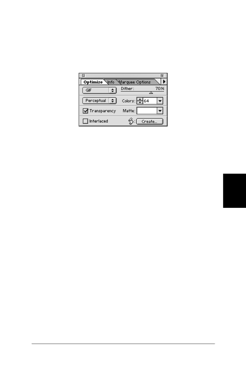
Minimizing GIF File Sizes 281
GIF
Minimizing GIF File Sizes
Web Design in a Nutshell, eMatter Edition
Copyright © 2000 O’Reilly & Associates, Inc. All rights reserved.
get instant feedback on the effects of your settings and choose the best configura-
tion. Settings can be named and saved for future use.
Adobe ImageReady 1.0
The Optimize Palette with GIF selected in the Formats menu (Figure 14-11)
contains all the controls over image optimization.
ImageReady defaults to a Perceptual Palette that is made up of the best colors in
the image by giving priority to the colors for which the human eye has greater
sensitivity. This palette usually produces images with the best image integrity. To
the right of the palette menu is the Colors control where you can select from a list
of standard color-depths (8, 16, 32, etc.) or set it to Auto to capture the exact
number of colors in the image.
Dithering is controlled by a sliding scale from 0 to 100%. Higher numbers result in
more dithering and higher file sizes. Reducing the amount of dithering increases
the efficiency of the LZW compression on the image. As mentioned above, you
need to make the decision at which point the loss in image quality outweighs the
file size savings. The slider makes it possible to make more fine-tuned decisions.
Like other web-specific design tools, ImageReady provides a preview of the image
that reflects the changes of your settings in real time. It also shows the effects of
your changes on the file size and approximate download time. Settings can be
saved as “Droplets” and used for batch processing by dragging and dropping files
onto the Droplet icon.
HVS ColorGIF 2.0 (Digital Frontiers Software)
HVS ColorGIF 2.0 plug-in from Digital Frontiers is in a class by itself when it
comes to GIF optimization. In all the tests I’ve run, HVS ColorGIF’s compression
algorithms produce the smallest GIFs while maintaining the highest image quality
compared to other optimizing tools.
It can be used with Photoshop, ImageReady, Fireworks, Paint Shop Pro, or any
graphics application that supports plug-ins. ColorGIF is available for both Mac and
PC; you can download a demo from Digital Frontier’s web site at http://www.
digfrontiers.com/.
Figure 14-11: Adobe ImageReady’s Optimize dialog box
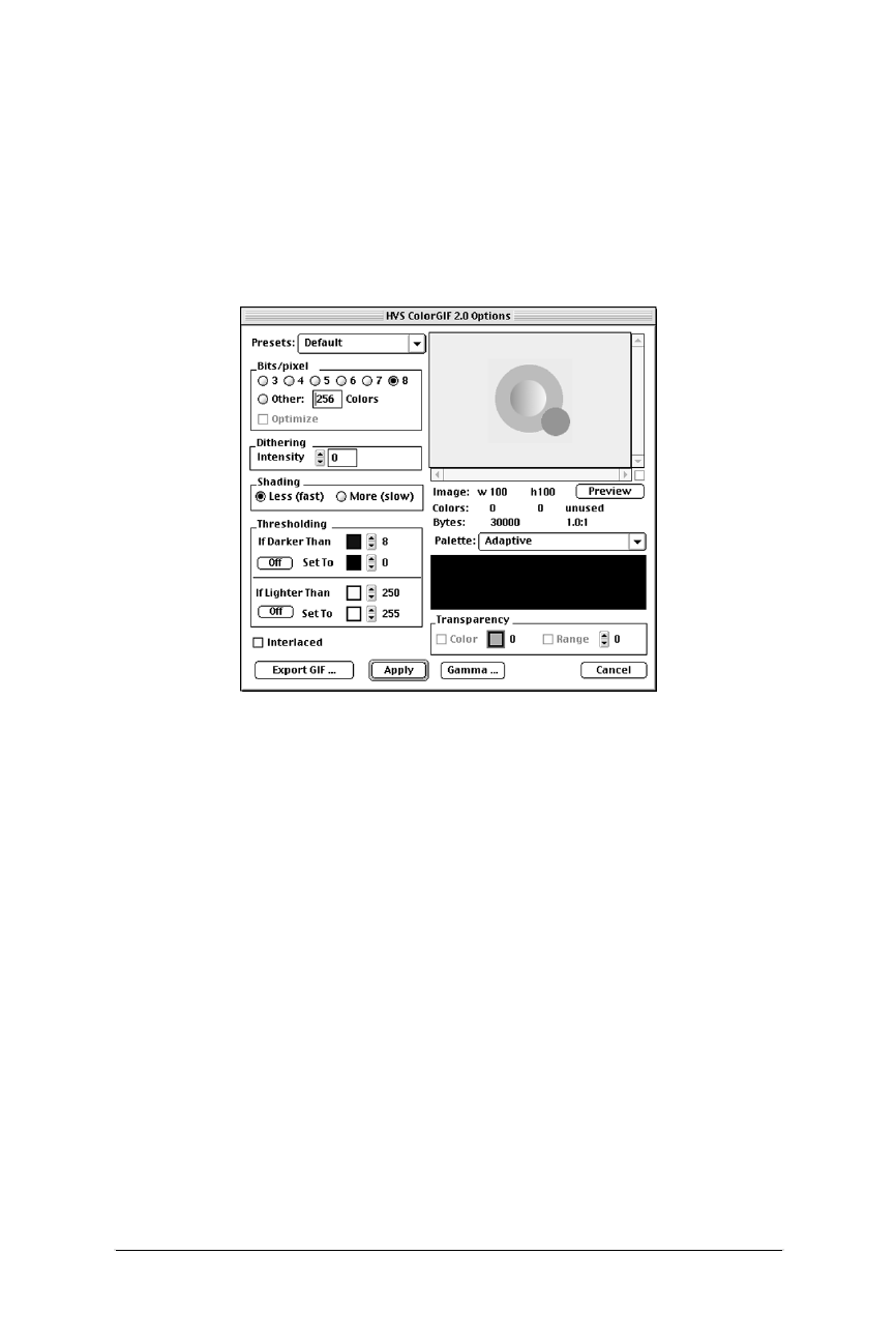
282 Chapter 14 – GIF Format
Minimizing GIF File Sizes
Web Design in a Nutshell, eMatter Edition
Copyright © 2000 O’Reilly & Associates, Inc. All rights reserved.
ColorGIF is accessed as a Filter. Its dialog box (Figure 14-12) is packed with
features. Like the previous two programs, it offers a preview of the effects of the
settings, although, unlike the others, you can only view one preview at a time.
There is a list of standard Palette options to choose from, and once in a palette,
you can further reduce the bit-depth of the image. It was the first tool to provide
fine-tuning control over the amount of dithering in an image. In addition, there are
white and black threshold settings that can simplify portions of your image and
allow it to be compressed even further.
Figure 14-12: HVS ColorGIF 2.0 dialog box

283
JPEG
Web Design in a Nutshell, eMatter Edition
Copyright © 2000 O’Reilly & Associates, Inc. All rights reserved.
Chapter 15JPEG
CHAPTER 15
JPEG Format
JPEG (which stands for Joint Photographic Experts Group, the standards body that
created it) is a compression algorithm used by files in the JFIF format, commonly
referred to as “JPEG files.”
Like any graphics file format to find widespread use on the Web, JPEGs are plat-
form-independent. In addition, JPEGs are fully supported for use as inline images
in versions 2.0 and higher of Netscape Navigator and Microsoft Internet Explorer,
as well as in most other current browsers (see the “JPEGs in AOL Browsers”
section in this chapter).
24-bit Color
JPEG images contain 24-bit RGB color information, which means they are
comprised from the true color space of millions of colors. JPEG files can also carry
grayscale images. This results in higher image quality and more rich and subtle
color variations. Unlike GIF files, JPEGs do not use palettes for referencing color
information.
Bear in mind, however, that when JPEGs are displayed on a system that only
supports 8-bit color, the browser will reduce the colors in the image to the Web
Palette, and some dithering will occur. In general, however, dithering is more
acceptable in photographic image areas than in areas of flat color. For an explana-
tion of the Web Palette, see Chapter 3, Web Design Principles for Print Designers,
and Chapter 17, Designing Graphics with the Web Palette.
JPEG Compression
JPEG uses what is known as a “lossy” compression scheme, meaning that some
color information is actually thrown out in the compression process. Fortunately,
for photographic images at most compression levels, this loss is not discernible to

284 Chapter 15 – JPEG Format
JPEG Compression
Web Design in a Nutshell, eMatter Edition
Copyright © 2000 O’Reilly & Associates, Inc. All rights reserved.
the human eye, particularly when the image is being displayed on a monitor at
screen resolution (and even less so for images saved at print resolutions).
Using “lossy” compression algorithms, JPEG is able to achieve 10:1 to 20:1 data-
compression ratios without visible loss in quality. Of course, the savings in file size
at any given compression is dependent on the content of the specific image and
results will vary. If maintaining high image quality is not a priority, these ratios can
go even higher.
The efficiency of JPEG compression is based on the spatial frequency, or concen-
tration of detail, of the image. Image areas with low frequency (smooth gradients,
like a blue sky) are compressed much further than areas with higher frequency
(lots of detail, like blades of grass). Even a single sharp color boundary, although
not giving “lots of detail,” represents a surge in spatial frequency and therefore
poses problems for JPEG compression.
The compression algorithm samples the image in 8×8-pixel squares then translates
the relative color and brightness information into mathematical formulas. These
sampling squares may become visible when images are compressed with the
highest compression ratios (lowest quality settings).
It is perhaps most meaningful to compare JPEG compression on photographic
images to that of GIF. A detail-rich photographic image that takes up 85K of disk
space as a GIF image would require only 35K as a JPEG. Again, the rate of
compression depends on the specific image, but in general, a JPEG will compress
a photographic image two to three times smaller than GIF. For flat-color graphics,
however, GIF is far more efficient than JPEG.
JPEG Decompression
JPEGs need to be decompressed before they can be displayed; therefore, it takes a
browser longer to decode and assemble a JPEG than a GIF of the same file size.
Bear in mind that a small portion of the download time-savings gained by using a
JPEG instead of a GIF is lost to the added time it takes to display. (Not much
though, so don’t sweat it.)
Variable Compression Levels
One advantage to JPEGs is that you can control the degree to which the image is
compressed. The higher the quality, the larger the file. The goal is to find the
smallest file size that still maintains acceptable image quality.
The quality of a JPEG image is denoted by its “Q” setting, usually on a scale from
1 to 100. In nearly all programs, the lower numbers represent lower image quality
but better compression rates (and smaller files). The higher numbers result in
better image quality and larger files.
For the most part, the Q setting is an arbitrary value with no specific mathematical
significance. It is just a way to specify the image quality level you’d like to main-
tain. When JPEG compression goes to work, it will compress as much as it can
while maintaining the targeted Q setting. The actual compression ratio depends on
the content of the individual image.

Progressive JPEGs 285
JPEG
Progressive JPEGs
Web Design in a Nutshell, eMatter Edition
Copyright © 2000 O’Reilly & Associates, Inc. All rights reserved.
The scales for specifying Q-settings (or “Quality”) vary among tools that create
JPEGs. For example, Photoshop uses a scale from 0 to 10 (an improvement over
3.0’s options of “low, medium, or high”), but it should be noted that its highest
level of compression (0) corresponds to a Q-factor of approximately 30 on the
standard scale.
Image Loss
Be aware that once image quality is lost in JPEG compression, you can never get it
back again. Loss in image quality is also additive, meaning you lose a little bit
more information each time you decompress and compress an image, so each time
you edit a JPEG and resave it—even if it’s just to crop the image—you degrade the
image further. Not only that, you may introduce new artifacts to the image that
prevent the second compression from working as efficiently as the first, resulting
in higher file sizes.
It is a good idea to hang on to one copy of the original digital image if you antici-
pate having to make changes, so your final image only goes through the
compression process once. You should also start from an original image each time
to experiment with different compression levels.
When to Use JPEGs
As mentioned earlier, JPEGs, with their 24-bit color capacity and specialized
compression scheme are ideal for photographic and other continuous-tone images,
such as paintings, watercolor illustrations, and grayscale images with the 256
shades of gray.
JPEGs are notably not good at compressing graphical images with areas of solid
color, such as logos, line art, type, and cartoon-like illustrations. JPEG’s lossy
compression makes flat colors blotchy and pixilated, resulting in unacceptable loss
of quality in some cases. Not only that, the files will generally be quite a bit larger
than a GIF file of the same image. JPEG compression is also not good at sharp
edges or typography since it tends to leave artifacts that “ripple” the edges.
It is generally best to let JPEGs handle photographic material and to leave the
graphics to GIF.
Progressive JPEGs
Progressive JPEGs are just like ordinary JPEGs except they display in a series of
passes (like interlacing in the GIF format), each pass containing more detailed
information until the whole image is rendered clearly. Graphics programs allow
you to specify the number of passes it takes to fill in the final image (3, 4, or 5
scans). Bear in mind that over a fast Internet connection, the image may load and
render so quickly the user may not see any passes at all.
Advantages
One advantage to using Pro-JPEGs is that like using interlaced GIFs, they provide
some indication of the full image for the reader to look at without having to wait

286 Chapter 15 – JPEG Format
JPEGs in AOL Browsers
Web Design in a Nutshell, eMatter Edition
Copyright © 2000 O’Reilly & Associates, Inc. All rights reserved.
for the entire image to download. Progressive JPEGs are also generally slightly
smaller than standard JPEG files.
Disadvantages
One disadvantage to Progressive JPEGs is that they require more processing power
to display. The higher the specified number of passes, the more power it takes the
user’s machine to render them.
The other disadvantage is that they are not supported on older browser versions.
Netscape Navigator 2.0 and Internet Explorer 2.0 display Pro-JPEGs inline, but may
not support the progressive display. Pro-JPEGs are fully supported by versions 3.0
and higher of both Netscape and MSIE. If a browser cannot identify a Pro-JPEG, it
will display a broken graphic image.
JPEGs in AOL Browsers*
The America Online 3.0 software uses a version of the Internet Explorer browser
that is integrated with Johnson & Grace compression technology for faster image
downloads. Unfortunately, the J&G compression has trouble rendering JPEGs
created with Photoshop 4.0 because of problems locating the header information
in the file. As a result, JPEG image quality gets mangled, displaying a blurry image,
sometimes with green, streaky artifacts.
Although users can turn off the “Use Compressed Graphics” option in their Prefer-
ences, you can’t count on them to do so. AOL’s recommendation is to use
Photoshop 3.0 instead. Some web developers have found that Photoshop 3.0-
created Progressive JPEGs survive their journey through the AOL grinder more
successfully, maintaining image quality closer to the original. (Note that Netscape
1.0 users and users with AOL 2.7 on the Mac platform will not be able to see Pro-
JPEGs in their AOL browser; however, they make up only 1% of AOL’s audience
as of this writing.) This problem is rumored to be fixed in the upcoming 4.0
version of the AOL software.
If you want to be absolutely certain your images look perfect for AOL users, stick
to GIF format.
Creating JPEGs
Because JPEG is a standard file format, it is supported by all the popular graphics
tools. Adobe Photoshop, JASC Paint Shop Pro, Adobe ImageReady, and Macro-
media Fireworks all provide similar options for saving JPEGs.
Each tool provides sliders for controlling quality/compression ratios, although they
use different numbering systems. Adobe products use a 0–10 compression scale,
with the lowest setting corresponding to around 30 on the standard scale of 1–100.
Paint Shop Pro uses a scale from 1 to 100; however, it works as the inverse of the
standard scale with lower numbers corresponding to higher image quality and less
compression. Fireworks uses a percentage value from 1 to 100%.
* Thanks for to Max Leach for his assistance with this topic.

Minimizing JPEG File Size 287
JPEG
Minimizing JPEG File Size
Web Design in a Nutshell, eMatter Edition
Copyright © 2000 O’Reilly & Associates, Inc. All rights reserved.
All of these products provide the ability to save images in Progressive JPEG format
with a checkbox control. Special features for optimizing JPEGs for web delivery
are discussed in the following section, “Minimizing JPEG File Size.”
There are also plug-in utilities especially for JPEG creation, such as ProJPEG from
Boxtop Software (www.boxtopsoft.com/) and HVS JPEG 2.1 from Digital Frontiers
(www.digfrontiers.com/). These plug-ins work with all of the programs mentioned
here and are discussed further in the following section.
Regardless of the tool you use, the following guidelines apply:
• Make sure your file is in RGB or grayscale format. You can apply JPEG com-
pression to CMYK files in some applications, but these files are not compati-
ble with web browsers.
• If you are working in Adobe Photoshop, whether with its native JPEG tools or
with plug-ins, all layers will need to be flattened before you can save it in
JPEG format.
• Name your file with the suffix .jpg or .jpeg. This is necessary for the browser
to recognize it as a readable JPEG file type.
Minimizing JPEG File Size
As for all files intended for Web delivery, it is important to optimize JPEGs to
make them as small as possible. Because JPEGs are always 24-bit by nature,
reducing bit-depth is not an option. For the most part, all you have to play with is
the quality setting, however, it is possible to prepare an image prior to compres-
sion. There are a number of specialized tools available for making JPEGs as small
as they can be while letting you make decisions about image quality.
Aggressive Compression Ratios
If your image has a lot of continuous tone or gradient colors, you can be pretty
aggressive with the compression level and not worry too much about loss of
quality in the resulting JPEG. Even at some of the lowest quality settings, (0 or 1 in
Photoshop, 20–30 on the standard scale) the image quality is still suitable for
viewing on web pages.
Of course, this depends on the individual image. Photoshop’s low-quality setting
will result in a blocky or blotchy effect in areas of flat color, which may be unac-
ceptable to you. You may need to do some testing to find the compression level
that works best. Be sure to save a copy of the original image so you can do a
fresh JPEG compression with each test.
ImageReady, Fireworks, ProJPEG, and HVS JPEG provide previews of the effects
of your compression settings, both as an image preview and its corresponding file
size. This makes it easier to experiment with compression ratios before saving the
JPEG. With Photoshop and Paint Shop Pro, you need to save the file and open it
again in the program or a browser to see the effects of your compression
selection.

288 Chapter 15 – JPEG Format
Minimizing JPEG File Size
Web Design in a Nutshell, eMatter Edition
Copyright © 2000 O’Reilly & Associates, Inc. All rights reserved.
“Optimized” JPEGs
Standard JPEGs use a precalculated, general purpose compression table (called the
Huffman table) for compressing an image. Some tools offer the ability to create an
“optimized” compression table that is customized for the particular image. This
results in better color fidelity and slightly smaller file sizes. This format is
supported on current browsers, however some (mostly older) browsers may have
trouble displaying optimized JPEGs.
The optimization option is presented differently in each tool:
Photoshop (4.0 and 5.0)
Select the Baseline (Optimized) option in the JPEG dialog box.
ImageReady 1.0
Check the “Optimized” checkbox in the Optimize palette.
Pro-JPEG (BoxTop Software)
Check the “Optimize Huffman Codes” checkbox in the Pro-JPEG dialog box.
HVS JPEG (Digital Frontiers)
In addition to optimizing Huffman Codes, HVS JPEG utilizes a different (and
unique) method of optimization that, according to Digital Frontiers, uses a
proprietary algorithm to base compression rates on a spatial frequency anal-
ysis of the image.
These optimization controls are grouped under the “Q-Table” options in the
dialog box (see Figure 15-1). “General” uses the standard compression table.
“Generate Optimized Q-Table” creates a customized table for the image.
In addition to these, HVS JPEG provides two predefined tables for optimizing
certain image types. “Portraits” is best used on images with smooth tones.
“Textured” is for images where it is important to preserve detail and texture.
Precompression Image Preparation
Simple JPEG compression does an admirable job of condensing photographic
images without requiring much extra attention. However, if you are serious about
making your JPEGs as compact as possible, you may want to maximize JPEG
compression’s strengths by feeding it the kind of image it likes—an image with
subtle gradations, fewer details, and no hard edges.
Preparing an image for better compression is a matter of adding blur effects to the
image prior to compression. This can be done manually in a general-purpose
program like Photoshop, or by using a built-in prefilter in a web-based graphics
tools. Both techniques are discussed below.
Using Adobe Photoshop (4.0 and 5.0)
Adding a slight Gaussian blur to an image—as small as .5 pixels—may result in a
10 to 15% reduction in file size. Of course, just how much blur you can safely add
without image degradation and how much file savings will result will vary by
image.
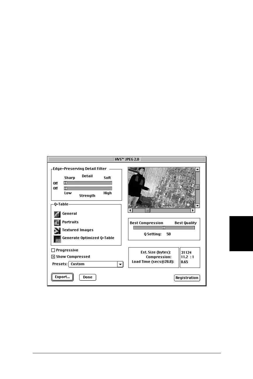
Minimizing JPEG File Size 289
JPEG
Minimizing JPEG File Size
Web Design in a Nutshell, eMatter Edition
Copyright © 2000 O’Reilly & Associates, Inc. All rights reserved.
You may also use a selection tool to apply the blur to just those areas of your
image in which fine detail is not important, such as a sky or a curtain behind the
main subject. When you run the image through JPEG compression, it can store
those areas with the minimum amount of information, and you’re the one that’s
made the decision of which details to sacrifice.
Using Macromedia Fireworks 1.0
Fireworks provides a “smoothing” prefilter in its JPEG Export Preview dialog box.
The smoothing filter blurs hard edges across the whole image. Select the amount
of smoothing on a scale of 1 to 8, with the higher numbers producing more blur-
ring and potentially smaller files.
Using HVS JPEG plug-in
Once again, HVS JPEG offers functionality you can’t get anywhere else. The Edge-
Preserving Detail Filter (in the upper-left corner of the dialog box shown in
Figure 15-1) smoothes out texture detail while working to maintain the edges. This
results in higher compression with better overall image quality and without edge
artifacts.
If you have an image that has a lot of detail, position the Detail slider towards the
left. If your image is soft, you can slide the Detail slider to the right for a more
aggressive application of the prefilter. Note that if either of the edge-preserving
sliders is positioned all the way to the left, no prefilter will be applied.
Figure 15-1: HVS JPEG dialog box

290 Chapter 15 – JPEG Format
Minimizing JPEG File Size
Web Design in a Nutshell, eMatter Edition
Copyright © 2000 O’Reilly & Associates, Inc. All rights reserved.
Once you’ve set the Detail slider to match the general quality of the image, you
can experiment with various amounts of blur using the Strength slider. This is not
a scientific process—it’s a matter of finding the point at which you are comfort-
able with the image quality while minimizing the file size.
Always apply the prefilters first (that’s why they’re called “pre” filters), because the
optimization tables and compression ratios will be based on these settings. After
applying the filters and optimization, you may be able to reduce the compression
Q-setting a bit without noticeable change in image quality.

291
PNG
Web Design in a Nutshell, eMatter Edition
Copyright © 2000 O’Reilly & Associates, Inc. All rights reserved.
Chapter 16PNG
CHAPTER 16
PNG Format
The Portable Network Format (PNG for short—pronounced “ping”) is a versatile
and full-featured graphics file format poised to make a big wave on the Web . . .
it’s just taking its time doing so.
PNG was developed in January and February 1995 as an effort to find a non-
proprietary alternative to GIF when Unisys threatened to enforce its patent on
LZW compression and collect licensing fees from developers of GIF-supporting
programs. This caused a flurry of outrage and activity on the Internet.
Days after the announcement, Thomas Boutell posted the first draft of the PNG
specification to the comp.graphics newsgroup. A community of programmers then
quickly cooperated in specifying and implementing an impressive list of features:
• 8-bit palette support (like GIF) and support of 16-bit grayscale, and up to 48-
bit truecolor (RGB) support
• A lossless compression scheme and better compression than GIF for indexed
color (palette) images
• Two-dimensional progressive display that is more sophisticated than GIF’s 1-
dimensional interlacing
• An alpha channel that can contain 8-bit or 16-bit transparency information,
which means pixels can have up to 65,000 shades of transparency (not just
“on” or “off” like GIF); 8-bit (256 shades of transparency) is far more common
• Gamma correction information to make the PNG display with its intended
brightness regardless of platform
• Several methods for checking file integrity and corruption
• Text storage capabilities, for keyword information such as copyright
• Nonpatented compression free from licensing restrictions
Despite this list of attractive capabilities, and despite an official W3C recommenda-
tion, PNGs have been the source of a lot of talk and relatively little action on the

292 Chapter 16 – PNG Format
Platform/Browser Support
Web Design in a Nutshell, eMatter Edition
Copyright © 2000 O’Reilly & Associates, Inc. All rights reserved.
part of developers. The real foil to an all-out PNG explosion has been the lack of
browser support. Fortunately, that picture is slowly changing, and hopefully PNGs
will have their day.
Platform/Browser Support
PNG was designed to be network-friendly, so naturally it is recognized and
supported on all platforms. PNG does not enjoy universal support by browsers,
however, particularly by the Big Two. Initially, in Navigator and Internet Explorer,
PNGs could only be handled as embedded objects (placed with the <embed> tag)
and viewed with plug-ins such as PNG Live. Eventually, PNGs became supported
as inline images (placed with the <img> tag, like any other web graphic) in Navi-
gator 4.04 and IE 4.0, however, they do not support alpha channel transparency or
gamma correction without an additional plug-in.
There are a handful of lesser-known browsers that do offer PNG support in all its
glory. However, at the time of this writing, because of PNG’s lack of browser
support, they are not yet viable options for use on standard commercial web
pages. All indications show that support is growing, and PNG could become the
web standard it was designed to be. Table 16-1 indicates PNG support as of this
writing by a number of popular browsers (plus Arena, which has exceptional PNG
support, but is not in widespread use).
It should be noted that although Netscape Navigator 4.0 does not natively support
alpha-channel transparency, it does currently support binary transparency (the
same as that used for GIFs), and full alpha support is slated for version 5.0.
Table 16-1: Browser Support for PNG (as of October, 1998)
Browser
Plat-
form
View
PNGs
Progressive
Display
Gamma
Correction
Alpha-
Channel
Transparency
Netscape
Navigator 4.04
Mac X X — —
Netscape
Navigator 4.04
PC X X — With PNG
Live 2.0
plug-in
Microsoft Internet
Explorer 4.0
Mac — — — —
Microsoft Internet
Explorer 4.0
PC X X — With PNG
Live 2.0
plug-in
Microsoft Internet
Explorer 5.0b1
PC X X Not
known as
of this
writing
(Alpha-
transparency
support is
promised, but
it is not
available in
current beta)
Arena X X X X

PNG Compression 293
PNG
PNG Compression
Web Design in a Nutshell, eMatter Edition
Copyright © 2000 O’Reilly & Associates, Inc. All rights reserved.
Updated browser support information can be found at the PNG Home Page main-
tained by Greg Roelofs (http://www.cdrom.com/pub/png/pngapbr.html).
8-Bit Palette, Grayscale, and Truecolor
PNG was designed to replace GIF for online purposes and the inconsistently
implemented TIFF format for image storage and printing. As a result, there are
three types of PNG files: indexed color (palette images), grayscale, and truecolor.
8-Bit Palette Images
Like GIFs, PNGs can be saved as 8-bit indexed color. This means they can contain
up to 256 colors, the maximum number that 8 bits of information can define.
Indexed color means the set of colors in the image, its palette, are stored in a
color table. Each pixel in the image contains a reference (or “index”) to its corre-
sponding color and position in the color table.
Although 8-bit is the maximum, PNGs may be saved at lower bit-depths (1-, 2-,
and 4-bit, specifically) as well, thus reducing the maximum number of colors in
the image (and the file size).
Grayscale
PNGs can also support 16-bit grayscale images—that’s as many as 65,536 shades of
gray (216), enabling black and white photographs and illustrations to be stored
with enormous subtlety of detail. This is useful for medical imaging and other
types of imaging where detail must be maintained, but it is not much of an advan-
tage for images intended for web delivery. Grayscale images are also supported at
1-, 2-, 4-, and 8-bit depths as well.
Truecolor
PNG can support 24-bit and 48-bit truecolor images. “Truecolor” refers to the full
color range (millions of colors) that can be defined by combinations of red, green,
and blue (RGB) light on a computer monitor. Truecolor images do not use color
tables and are limited only by the number of bits available to describe values for
each color channel. In PNG format, each channel can be defined by 8-bit or 16-bit
information.
PNG Compression
The most notable aspect of PNG compression is that it is “lossless,” meaning no
information is lost in the compression process. A decompressed PNG image will
be identical to the original.
PNGs use a “deflate” compression scheme. Like GIFs, PNG’s compression works
on rows of pixels, taking advantage of repetition in bytes of information. By use of
filters (discussed in the next section), it can take advantage of some vertical
patterns as well; however, filters are not recommended for use with palette
images. PNG’s compression engine typically compresses images 5–25% better than
GIF.

294 Chapter 16 – PNG Format
When to Use PNGs
Web Design in a Nutshell, eMatter Edition
Copyright © 2000 O’Reilly & Associates, Inc. All rights reserved.
Filters
Before PNG compresses an image, it first runs the image data, row by row,
through one of five filters. What follows are brief descriptions of each filter that
may aid in making a filter selection in an image-editing tool such as Adobe Photo-
shop. Although these filters are available, the only two methods that should be
used are None (for indexed-color images) and Adaptive (for everything else).
Full technical descriptions of each filtering algorithm appear in the PNG Specifica-
tion (http://www.w3.org/TR/PNG-Filters.html).
None
As it implies, this option applies no filter before compression. The PNG Speci-
fication recommends that the filter be set to “None” for flat, indexed color
images.
Sub
This filtering algorithm analyzes relationships of image information in rows of
pixels. It may be appropriate for images with horizontal color gradients (from
Lynda Weinman’s Designing Web Graphics, Second Edition, New Riders
Publishing).
Up
This algorithm looks for relationships in columns of pixels. It may be appro-
priate for images with vertical color gradients (also from Designing Web
Graphics).
Average
This algorithm uses an average of the horizontal and vertical relationships for
each pixel.
Paeth
This is a complex filter developed by Alan W. Paeth that uses the best predic-
tion based on samples from three directional relationships (left, above, and
upper right).
Adaptive
This filtering method applies each of the above filters to every individual row
of pixels, then chooses the algorithm that works best for that row, resulting in
the best compression for that particular image overall. So, if you can’t decide
which filter to use, you can let “Adaptive” try them all for you. The PNG Spec-
ification recommends using the “Adaptive” method for continuous tone
images.
When to Use PNGs
Unfortunately, the answer to this question is “when a higher percentage of
browsers in use support them.” As of this writing, there is too great a risk that
most of your audience won’t see your PNG at all, or will see it without the
features that make it worth using.
But in a perfect world, where PNG is fully implemented on all browsers, PNG is
capable of supporting both indexed and truecolor image types, so there’s no
bitmapped graphic it can’t handle.

Special Features 295
PNG
Special Features
Web Design in a Nutshell, eMatter Edition
Copyright © 2000 O’Reilly & Associates, Inc. All rights reserved.
Not a JPEG Substitute
Although PNG does support 24-bit color and higher, its lossless compression
scheme will nearly always result in larger files than JPEG’s lossy compression
applied to the same image. The high bit-depth support was developed so PNGs
could take the place of TIFF files for saving highly detailed images where loss of
image information is unacceptable (such as medical images). For Web purposes
where every byte counts, photographic and continuous tone images are still best
saved as JPEGs.
A Good GIF Substitute
PNGs are recommended for the type of image that would typically be saved as a
GIF (graphics with areas of flat color or sharp edges). PNG’s better compression
engine can result in a file size that is smaller than a GIF compression of the same
image. Bear in mind, however, that the efficiency of compression largely depends
on how well the PNG format is implemented in the graphics program being used.
PNG also has a more sophisticated interlacing technique than GIF and starts
displaying the image in 1/8th the time.
Special Features
You may choose to use a PNG (in that perfect world) for some of its advanced
features that no other graphic offers, such as variable transparency levels and full
color management systems for automatic image correction, including gamma and
color balance corrections.
Interlacing (Progressive Display)
Like GIFs, PNGs can be encoded for interlaced display. When this option is
selected, the image will display in a series of passes, the first displaying after only
a portion of the file has been downloaded, and each subsequent pass increasing in
detail and clarity until the whole image is rendered.
Interlaced PNGs display over a series of seven passes (using a method known as
“Adam7,” named for its creator, Adam Costello). The first rendering of the image
appears after only 1/64 of the file has downloaded (that’s eight times faster than
GIF). Unlike GIF, which fills in horizontal rows of information, PNGs fill in both
horizontally and vertically.
Gamma Correction
Briefly stated, gamma refers to the brightness setting of a monitor (for more infor-
mation on gamma, see Chapter 3, Web Design Principles for Print Designers).
Because gamma settings vary by platform (and even by manufacturer), the
graphics you create may not look the way you intend. In general, graphics created
on Macs look dark on PCs and graphics created on PCs will look washed out on
Macs.
PNGs can be tagged with information regarding the gamma setting of the platform
on which they were created. This information can then be interpreted by software

296 Chapter 16 – PNG Format
Special Features
Web Design in a Nutshell, eMatter Edition
Copyright © 2000 O’Reilly & Associates, Inc. All rights reserved.
on the user’s end to make appropriate gamma compensations. When this is imple-
mented on both the creator and end-user’s side, the PNG will retain its intended
brightness and color intensity.
Transparency
Both 24-bit and 8-bit indexed color PNGs can have variable levels of transpar-
ency. This sophisticated transparency function allows for smooth transitions
between foreground and background elements. Grayscale images can also have
variable transparency.
As of this writing, the only common tools that allow you to create transparency
information in PNGs are Adobe Photoshop (4.0 and higher), Adobe ImageReady,
Macromedia Fireworks, the GIMP (an image editing tool for Unix, Linux, and OS/
2), and PaintShop Pro (4.0 and higher). Photoshop currently only supports 24-bit
transparency, which results in unacceptably large files. ImageReady and Fireworks
both support the more complicated 8-bit, palette-based transparency.
Transparency techniques are discussed in the “Creating PNG Graphics” section of
this chapter.
Bear in mind that even if you manage to make a PNG file with transparency, it
may be a challenge finding a browser to display it. Full alpha-channel transpar-
ency is currently supported in browsers only with the help of the PNG Live 2.0
plug-in (PC-only); however, full support is promised for the near future.
Alpha channel
In addition to the standard channels for RGB color values for truecolor images,
PNGs may contain an additional alpha channel used for transparency information.
Each pixel is then defined by its RGBA values. For 24-bit images, the alpha
channel can contain up to 8 bits of information for 256 levels of transparency for
every pixel in the image (a great improvement over GIFs, which have two trans-
parency levels: transparent or not transparent). Keep in mind, however, that an
RGB PNG file with alpha channels will be about 20% larger than one without.
48-bit PNGs may contain an alpha-channel with 16 bits of information—that’s over
65,000 levels of transparency! 24-bit images, however, are far more prevalent and
are adequate for most purposes.
In practical terms, this means you can create glows and soft drop shadows that
allow background patterns and underlying images to show through in a realistic
manner. Figure 16-1 illustrates the effect of graphics showing through areas with
variable levels of transparency.
8-bit transparency
Indexed color PNGs can also contain variable levels of transparency (up to 256
levels); however, this information is not handled in a distinct alpha channel as for
24-bit images. Instead, transparency information for each color occupies positions
in the color table. So, if you have a red area that fades out using eight levels of
transparency, that red would be present in eight slots in the color table, each with
its own transparency setting. Other than adding to the number of pixel colors in
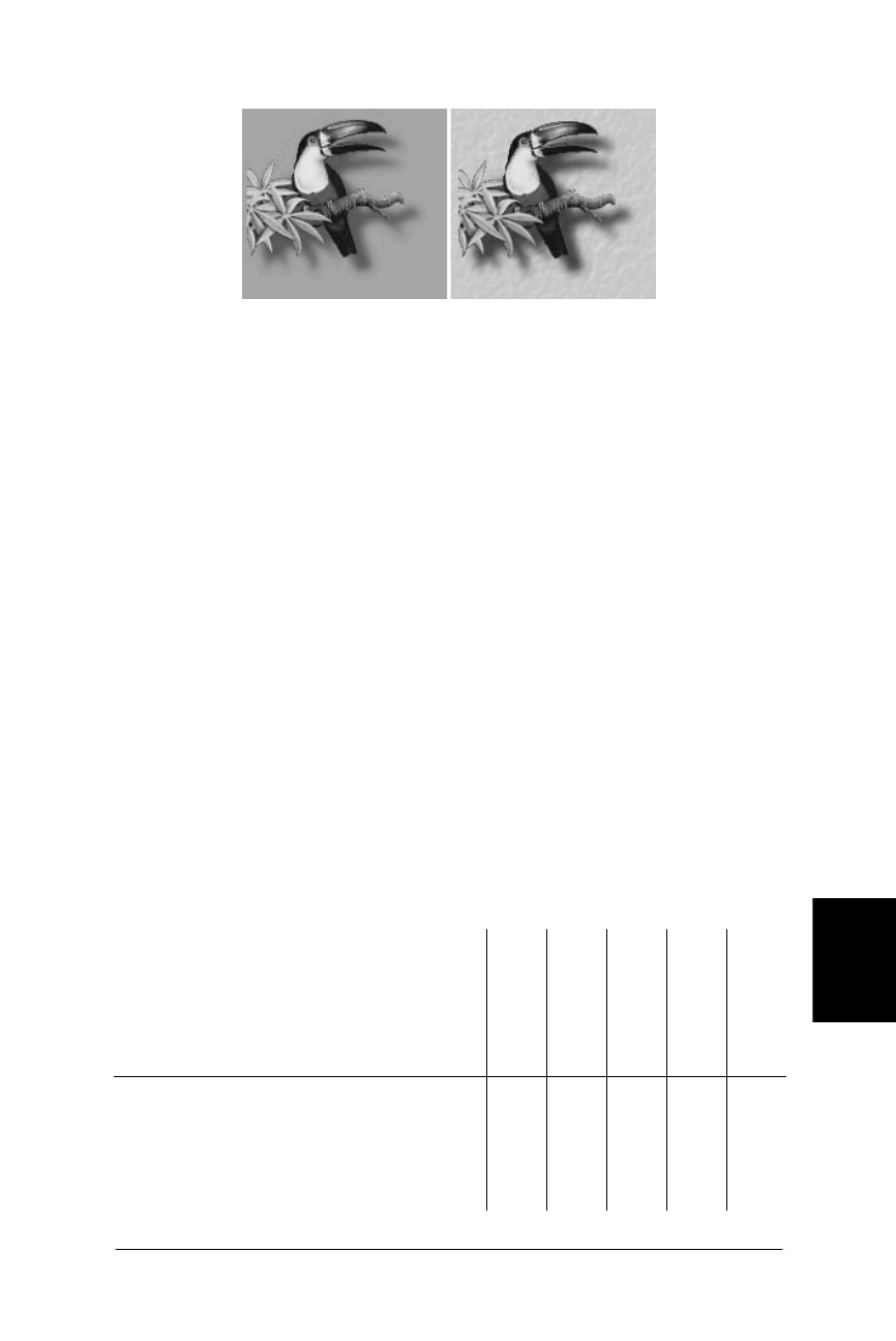
Creating PNG Files 297
PNG
Creating PNG Files
Web Design in a Nutshell, eMatter Edition
Copyright © 2000 O’Reilly & Associates, Inc. All rights reserved.
the Color Table, adding transparency to an 8-bit PNG does not significantly
increase its file size.
Embedded Text
PNGs also have the ability to store strings of text. This is useful in permanently
attaching text to an image, such as a description of what is in the image or copy-
right information. Unfortunately, this is another one of PNG’s finer capabilities that
is not supported by creation tools nor browsers.
Creating PNG Files
The good news is that there are quite a few tools out there for both PCs and Macs
that can save files in PNG format. The bad news is that a precious few support
special features such as alpha channel transparency or gamma correction (and
even then, it’s a struggle finding a browser to view them). Furthermore, some
programs that create PNG files do not compress them as well as they could
(including Adobe Photoshop 4.0 and PaintShop Pro).
Table 16-2 lists PNG feature support in a number of popular graphics tools. For a
more comprehensive list of image editing tools and graphics file converters that
support PNG compression, see http://www.cdrom.com/pub/png/pngapps.html.
Figure 16-1: Variable transparency allows PNGs to blend with background
patterns
Table 16-2: Graphics Applications that Support PNG Format
(as of October, 1998)
Application
Read/Write
Compression
Filter Options
Alpha-Channel
Transparency
8-bit
Transparency
Gamma
Correction
Adobe Photoshop 4.0/5.01XXX——
PaintShopPro 4.02X—X——
Adobe ImageReady 1.0 X — X X X
Macromedia Fireworks 1.03X—XX—
Macromedia Freehand 7.04and higher X — X — —

298 Chapter 16 – PNG Format
Creating PNG Files
Web Design in a Nutshell, eMatter Edition
Copyright © 2000 O’Reilly & Associates, Inc. All rights reserved.
Adobe Photoshop (4.0 and higher)
Photoshop supports the PNG format, but it is notoriously inefficient at
compressing files. In most cases, PNG files will be larger than a GIF file of the
same image. It does offer alpha channel transparency (for 24-bit RGB images only)
and some gamma support, but gamma handling appears to be implemented
incorrectly.
Saving as a PNG
To save a file in PNG format, select PNG from the Format pop-up menu when
doing a “Save As.” The PNG Options dialog box (shown in Figure 16-2) allows
you to turn on or off interlacing. You can also select a compression filter from the
following choices (descriptions of each appear earlier in this chapter): None, Sub,
Up, Average, Paeth, or Adaptive. If your image is an RGB or grayscale image,
“Adaptive” may be the best selection for optimum compression. If your image is
an Indexed Color image, it is recommended that you set the filter to “None.”
Adding transparency
Transparency information is indicated by an Alpha Channel, which you will need
to create manually (unlike with GIF files, for which Photoshop generates an alpha
channel automatically based on a pixel color selection).
The parts of the image corresponding to black areas in the channel will be totally
transparent when the image is viewed in a browser. Remember PNG supports vari-
able shades of transparency, so you can make selections with feathered edges and
use gradient fills. Shades of gray in the alpha channel correspond to differing
amounts of transparency (the darker, the more transparent).
Adobe Illustrator 7.0 and higher X — — — —
CorelDRAW X — — — —
1Photoshop’s inclusion of individual filter options is not necessarily a beneficial feature, since
only two are useful and the rest are confusing. Photoshop stores both gamma and chrominance
information, although gamma is only correct in 4.0 if the ambient is “medium”; in 5.0, gamma
is reportedly always incorrect.
2PaintShop Pro 3.0 reportedly creates unnecessarily large palette files. This may be fixed in
versions 4.0 and later.
3PNG is the native file format for Macromedia Fireworks.
4Freehand preserves Alpha Channel information when 32-bit depth and Save Alpha Channel
options are selected during export. It does not provide a way to create an Alpha Channel.
Table 16-2: Graphics Applications that Support PNG Format
(as of October, 1998) (continued)
Application
Read/Write
Compression
Filter Options
Alpha-Channel
Transparency
8-bit
Transparency
Gamma
Correction

Creating PNG Files 299
PNG
Creating PNG Files
Web Design in a Nutshell, eMatter Edition
Copyright © 2000 O’Reilly & Associates, Inc. All rights reserved.
There are two ways to create an alpha channel:
•Save a selection. Select the area of the image that you’d like to remain visible.
Save the selection to a channel (Select ➝ Save Selection).
•Create a new channel. Activate the Channels Palette by selecting Windows ➝
Show Channels. Select “New Channel...” from the pop-up menu in the upper-
right corner. Make sure that “Color Indicates” is set to “Masked Areas.”
You can use any of the image-editing tools (paintbrushes, selections, fills) to edit
the alpha channel information. When all channels are visible, the channel will act
as a mask and your image will show through.
When you are finished creating the Alpha Channel, save the PNG file with a .png
suffix.
Macromedia Fireworks 1.0
Macromedia Fireworks uses PNG as its native file format because of its lossless
compression. It also allows you to export PNG files, including both Alpha Channel
and 8-bit varible transparency.
The various PNG settings are accessed in the Export Preview dialog box (File ➝
Export) by selecting PNG from the Format menu (see Figure 16-3). Choose either
“Indexed (8-bit),” “Millions (24-bit),” or “Millions + Alpha (32-bit)” from the Bit
Depth menu.
When 8-bit is selected, controls similar to those for GIFs appear for setting the
palette, number of colors, and dither amount. There are no extra controls for a
straightforward 24-bit or 32-bit export.
To add variable levels of transparency to a 24-bit image, simply select “Millions +
Alpha (32-bit)” from the pull-down menu and your work is done.
For 8-bit images, there are three transparency options:
None
This option adds no transparency information to the PNG image.
Figure 16-2: PNG options in Adobe Photoshop 4.0 and higher

300 Chapter 16 – PNG Format
Creating PNG Files
Web Design in a Nutshell, eMatter Edition
Copyright © 2000 O’Reilly & Associates, Inc. All rights reserved.
Index Color
For this method, use the eyedropper tool to select the pixel color (or colors)
you want to be transparent, the same as you would for a transparent GIF file.
The chosen color will appear with an “X” in the Color Table. This method
does not allow for variable levels of transparency—pixels are transparent or
not, as in transparent GIFs.
Alpha Channel
Fireworks uses the transparency information in the layered image (fades, anti-
aliased edges, opacity settings, etc.) to automatically generate variable levels
of transparency for each affected pixel color. Each level for each color occu-
pies a slot in the Color Table and is indicated with an “X,” as shown in
Figure 16-3. If you want a filled object to be 50% transparent, create the object
and set its opacity to 50% using the slider tool before exporting. Under the
Alpha Channel transparency method, the transparency level will be preserved.
Despite its name, this method does not actually use an alpha channel to store
transparency information. The transparency information is stored in the color
table.
When you are finished with the Export settings, click “Export” and save the file
with the .png suffix.
Adobe ImageReady 1.0
To create a PNG file in ImageReady, select PNG-8 (8-bit indexed PNGs) or PNG-24
(24-bit PNGs) from the file formats menu in the Optimize Palette (Figure 16-4).
The Optimize Palette provides interlacing and transparency controls as well, that
change according to which file format is selected. The Optimize Palette for the
PNG-8 format (on the left in Figure 16-4) includes the same controls used for GIF
files for making decisions regarding palette, the amount of allowable dither, and
the color-depth for the image.
Figure 16-3: Macromedia Fireworks’ Export Dialog box showing PNG options
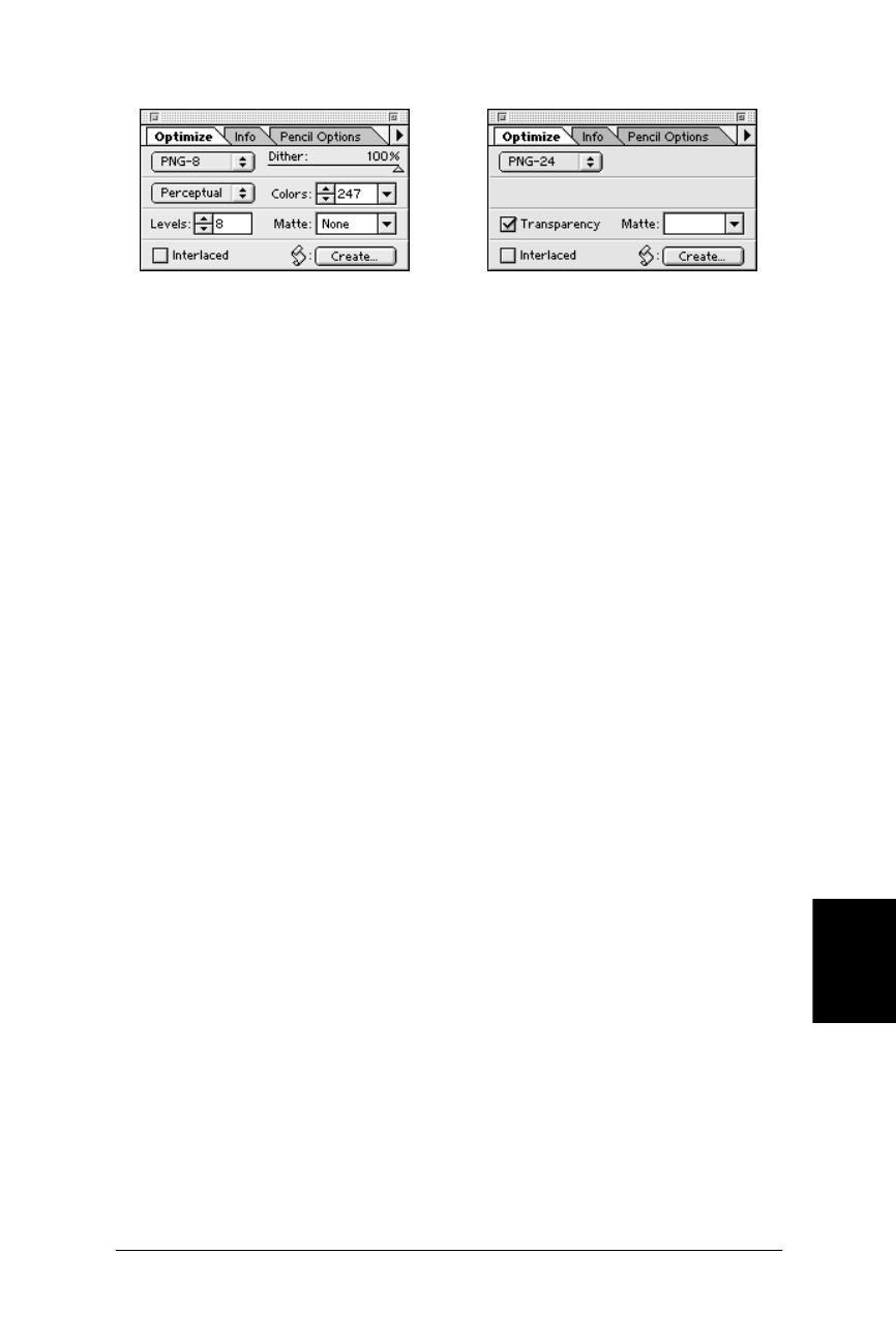
Optimizing PNG File Size 301
PNG
Optimizing PNG File Size
Web Design in a Nutshell, eMatter Edition
Copyright © 2000 O’Reilly & Associates, Inc. All rights reserved.
To create a 24-bit PNG with variable transparency, check the Transparency
checkbox and make sure the Matte menu is set to “No Matte.” 24-bit PNGs are
automatically saved with 256 levels (8-bit) transparency.
For 8-bit PNGs, variable transparency is handled differently, so you must specify
the number of levels of transparency you’d like the image to have (between 1 and
256). If your image contains a gradient, the number of levels of transparency can
control banding effects in the transparency. (Note, Fireworks does not offer a
control for setting the number of levels of transparency.)
Each transparency level for each affected color occupies a slot in the image Color
Table. The transparency information is based on the information in the layered
image. Therefore, if you know you want an object or layer to have a specific trans-
parency level, set the opacity of the layer in the original image before optimizing.
When you are finished with the Optimize settings, choose “Save Optimized” from
the File menu and name the file with the .png suffix.
Optimizing PNG File Size
Unfortunately, at the time of this writing, PNGs are so poorly supported by both
browsers and production tools that there isn’t enough practical experience avail-
able to suggest any optimizing strategies.
For Web use, PNGs will be an alternative for indexed color images, and we may
find that following some of the same image-creation guidelines used for GIFs may
aid in minimizing PNGs as well.
24-bit RGB images are best saved in JPEG format for use online, but if you are
saving them as PNGs and are interested in keeping them as small as possible, you
are basically limited to selecting the best compression filter. Greg Roelofs, one of
the developers of the PNG format, describes this process as “more of a black art
than a science.” As mentioned earlier, the recommended filter choices are None
for indexed-color images and Adaptive for everything else. Use “level 9” (or
“max”) compression regardless, and don’t use interlacing if you want maximal
compression. Adding interlacing to any PNG will increase its file size.
If you are serious about optimizing PNGs, you should download Glenn Randers-
Pehrson’s pngcrush application ($7 shareware, available at http://www.netgsi.com/
~glennrp/pngcrush/). It is a command-line DOS application, but it can run in batch
mode. This tool comes highly recommended by Greg Roelofs.
Figure 16-4: Adobe ImageReady Optimize dialog box for PNG-8 (left) and PNG-24
(right)

302 Chapter 16 – PNG Format
Online PNG Resources
Web Design in a Nutshell, eMatter Edition
Copyright © 2000 O’Reilly & Associates, Inc. All rights reserved.
Online PNG Resources
If you are interested in learning more about the PNG format, there are several
good resources available online.
PNG Home Page
http://www.cdrom.com/pub/png/
This site is written and maintained by Greg Roelofs, one of the creators of the
PNG format. It contains a complete history of PNG’s birth, descriptions of its
features, and up-to-date lists of applications that support the new format. It
also includes a copy of the PNG Specification and the official PNG extensions
documents (as well as the draft MNG Spec). All of it is written with so much
enthusiasm that you can’t help but become a PNG fan! It is the source of
much of the information in this chapter.
PNG Specification
http://www.w3.org/TR/png.html
This is the complete PNG specification published at the W3C web site. For a
technical document, it is very user-friendly to nonprogrammers and offers
detailed information on how PNGs work, as well as some useful background
information and tutorials.

303
Web Palette
Web Design in a Nutshell, eMatter Edition
Copyright © 2000 O’Reilly & Associates, Inc. All rights reserved.
Chapter 17Web Palette
CHAPTER 17
Designing Graphics with the Web Palette
When images with colors from the full 24-bit color space are displayed on 8-bit
monitors (capable of displaying only 256 colors), browsers do the best they can to
render the image using colors in their own built-in Web Palette. (Note that if the
browser is running on a 24-bit display, the Web Palette does not come into effect
and all colors will be displayed accurately.)
Remapping images to the Web Palette can result in unpredictable and undesirable
dithering. Not only that, sometimes flat colors shift to the nearest web-safe colors
without dithering. The algorithm for deciding which colors to shift and which to
dither (as well as choosing where to shift) differs depending on the browser brand
and version.
But because you know exactly which colors will not dither, you can use the Web
Palette to your advantage by choosing these colors in the image creation process.
It requires a little extra effort, and an adjustment to a limited color choice, but the
payoff is that you get to see your image the way everyone else will, with fewer
surprises. It gives you, not the browser, control over whether and how the image
will dither.
If you don’t care about dithering or how your graphics appear on 8-bit monitors,
then this chapter is not for you.
The techniques in this chapter apply to graphics that use 8-bit palettes such as GIF
or PNG. Because PNG is not widely supported at this time, GIF is featured in the
following examples.
The Web Palette
The Web Palette consists of the 216 colors capable of being displayed by both
Macintosh and Windows systems. Therefore colors chosen from the Web Palette
will render accurately on Mac or PC displays (although they may still shift or dither
on low-end Unix displays).

304 Chapter 17 – Designing Graphics with the Web Palette
The Web Palette
Web Design in a Nutshell, eMatter Edition
Copyright © 2000 O’Reilly & Associates, Inc. All rights reserved.
The Web Palette is also known as the Netscape Palette, Web 216, Netscape 216,
Browser-Safe Palette, Web-Safe Palette, Nondithering Palette, and the 6×6×6 cube.
Colors in the Web Palette are defined by their numerical values. The Web Palette
recognizes six shades of red, six shades of green, and six shades of blue, resulting
in 216 possible color values (6 ×6×6 = 216). This is sometimes referred to as the
6×6×6 color cube. It’s easy to recognize a web-safe color because it will consist of
combinations of only six possible values (shown in Table 17-1).
There are three systems used for defining RGB values, which are used in different
situations:
Decimal
RGB values are identified by their decimal values in the color pickers of
image-editing software such as Photoshop. Web-safe values are multiples of
51, ranging from 0 to 255.
Hexadecimal
This is the base-16 numbering system used in programming languages and in
HTML. (See Chapter 5, HTML Overview.)
Percentage
In some instances, you will need to identify web values by their percentage
equivalents. Some Macintosh applications rely on the Apple Color Picker,
which lists RGB values by percent. Web-safe values are multiples of 20%.
Table 17-1 shows the decimal, hexadecimal, and percentage values for each of the
six shades in the Web Palette. Depending on the software you are using to create
graphics, colors may be identified using any (or all) of these numbering systems.
Web Palette on 16-Bit Displays
Because 16-bit displays must approximate colors from the true color space,
slight color shifting and dithering may occur even if you choose colors from
the “safe” web palette.
This is most noticeable for pages with graphics that are intended to blend
seamlessly with a tiled background graphic or specified background color.
Although the foreground and background elements may have identical web-
safe RGB values, on 16-bit displays, colors shift and dither in a way that
causes the “seams” to be slightly visible.
Which elements shift and which get dithered seems to depend on the
browser and operating system combination, so it’s difficult to anticipate. If
the mismatched colors concern you, making the edges of your graphics
transparent instead of a matching color may help eliminate the dithered rect-
angles on 16-bit displays.

Other Palettes 305
Web Palette
Other Palettes
Web Design in a Nutshell, eMatter Edition
Copyright © 2000 O’Reilly & Associates, Inc. All rights reserved.
Other Palettes
All 8-bit Indexed Color images (such as GIF or PNG-8) use a palette of colors to
define the colors in the image. The Web Palette is just one of infinite palette possi-
bilities. However, there are several standard palettes you can choose from within
popular graphics programs. This section defines the common palette choices that
will be referred to throughout this chapter.
Exact
If the image contains fewer than 256 colors, choosing the Exact palette option
makes a palette out of the actual colors that are found in the image.
Adaptive
This is a custom palette generated using the most commonly used pixel colors
in the image. Less commonly used colors are approximated by the most
commonly used colors. It allows for color-depth reduction while preserving
the original character of the image. Because the number of colors is being
reduced, some dithering and color-shifing will occur.
System (Mac/Windows)
Choosing either system palette will convert the image to the palette of 256
colors as defined by each operating system.
Uniform
This palette contains an evenly stepped sampling of colors from the RGB
spectrum.
Custom
This allows you to load in a palette that was previously saved and apply it to
the current image.
Perceptual (Adobe ImageReady only)
This creates a custom palette by giving priority to colors for which the human
eye has greater sensitivity. Unlike Adaptive, it is based on algorithms, not just
a pixel count. It generally results in images with better color integrity than
adaptive palette images.
WebSnap Adaptive (Macromedia Fireworks only)
An adaptive palette in which colors that are near in value to Web Palette
colors are converted to the closest Web Palette color.
Table 17-1: Equivalent Values of Web Palette Shades
Decimal Hexadecimal Percentage
(darkest) 000 0%
51 33 20%
102 66 40%
153 99 60%
204 CC 80%
(lightest) 255 FF 100%

306 Chapter 17 – Designing Graphics with the Web Palette
Image Types
Web Design in a Nutshell, eMatter Edition
Copyright © 2000 O’Reilly & Associates, Inc. All rights reserved.
The following list shows the palettes that popular web graphics tools make avail-
able when you convert graphics to Indexed Color mode.
Adobe Photoshop (4.0 and 5.0)
Exact, System (Mac), System (Windows), Web, Uniform, Adaptive, Custom,
Previous
Adobe ImageReady
Perceptual, Adaptive, Web, MacOS, Windows
Macromedia Fireworks
Adaptive, Web-Snap Adaptive, Web 216, Exact, Macintosh, Windows, Gray-
scale, Black & White, Uniform, Custom
PaintShop Pro
Indexing is automatic; no palette options are offered
Image Types
Before jumping into specific graphic production tools and techniques, let’s first
look at the different types of images and how the Web Palette applies to each of
them.
Photographic Images
Images made up entirely of photographic material will dither when converted
from RGB mode to Indexed Color mode. In most cases, dithering is acceptable, or
at least less obvious, in areas with a lot of photographic detail.
You have a number of options for dealing with purely photographic images. The
first (and probably the best) is to save it as a JPEG, which will probably result in a
smaller file size and will allow any user with a 24-bit display to see it in its orig-
inal true-color glory. If you must convert it to Indexed Color, an Adaptive palette
(or Perceptual if you’re using ImageReady) will preserve the original colors and
character of the image. You can allow the browser to do the dithering for 8-bit
displays, but the image will look much better for users with 24-bit displays.
The only advantage to converting photographic material to the Web Palette is that
you can see exactly how the image will appear on 8-bit displays and you will
know that the image will look exactly the same for all users.
Flat Graphics
Dithering is most distracting and unacceptable in areas of flat color within a
graphic, particularly if that area contains small text. The restricted number of
colors in the Web Palette has its largest influence on graphics where dithering
might be a problem, such as logos, line-art illustrations, and graphical headlines.
You should pay particular attention to the Web Palette for these types of images.
Your best bet is to design the graphic using colors from the Web Palette right from
the beginning instead of converting it after the fact. Another alternative is to
convert to the Web Palette and severely restrict the amount of dithering, which
will force the image to use Web colors and make the file size smaller, but may
also result in ugly banding and posterization in gradient and blurred areas.

Designing with Web-Safe Colors 307
Web Palette
Designing with Web-Safe Colors
Web Design in a Nutshell, eMatter Edition
Copyright © 2000 O’Reilly & Associates, Inc. All rights reserved.
Combination Images
Images that contain combinations of photographic and flat web-safe colors are a
bit more challenging. Simple graphics with blends or gradients of colors also fall
into this category.
The trick is to allow the photographic portion of the image (where dithering isn’t
such an issue) to keep its adaptive palette while mapping the remainder of the
image to the Web Palette. This was problematic for Photoshop alone; however,
newly available tools designed specifically for creating web graphics have
powerful features for dealing with just these issues. These tools will be discussed
later in this chapter.
Another option is to break these images into separate graphics and optimize each
part appropriately—perhaps even saving photographic pieces as JPEG files. The
pieces can be held together using an HTML table as discussed at the end of
Chapter 10, Tables.
Designing with Web-Safe Colors
If you are creating graphics from scratch, especially graphics such as logos or
simple illustrations that contain areas of flat color, why not use nondithering colors
right from the start? In this way, you can be certain that your graphics will look the
same for all users. The major drawback to this is that with only 216 colors to
choose from (a good 30 of which you’d never be caught dead using for anything),
the selection is extremely limited. (See the “Color Blenders” section of this chapter
for one approach to overcoming the limited choice of colors.)
The trick is to have the Web Palette colors available in a Swatches palette or in
whatever device your graphics program uses for making colors handy. You should
be aware, however, that even if you select web colors for fills, the shades of colors
created by soft drop shadows or anti-aliased edges between areas of color will
probably not be web-safe.
Tools with Built-in Web Palettes
Not surprisingly, with the explosion of the Web’s popularity, the Web Palette is
finding its way into many commercial graphics tools.
Adobe Photoshop 5.0
Version 5 ships with the Web Safe Colors CLUT file (see the following
section) in its Color Palettes directory. These can be easily loaded into the
Swatches palette by selecting Replace Swatches or Load Swatches from the
Swatches pop-up menu.
Adobe ImageReady 1.0
ImageReady was created specifically for the optimization of web graphics, so
it’s not surprising that the Web Palette comes preloaded in the Swatches
palette.
Macromedia Fireworks 1.0
As a tool designed for the creation of web graphics, Fireworks has the Web
Palette available in its Swatches palette by default.

308 Chapter 17 – Designing Graphics with the Web Palette
Designing with Web-Safe Colors
Web Design in a Nutshell, eMatter Edition
Copyright © 2000 O’Reilly & Associates, Inc. All rights reserved.
Adobe Illustrator 7.0
Version 7.0 of Adobe Illustrator introduces the ability to work within the RGB
color space (instead of being limited to CMYK as in previous versions), so
you can color your graphics and even export them directly to GIF format. To
select colors from the 216 web-safe colors, select Windows ➝Swatch Libraries
➝ Web.
Macromedia Freehand 7.0 and higher
You can select colors from the Websafe Color Library, under Options on the
Color Palette. Colors appear with their decimal and hexadecimal RGB values.
Macromedia Director 5.0 and higher
You can find the Web Palette under the Xtras pull-down menu. Look for the
palette called “Netscape.”
Macintosh System OS8
MacOS8 comes with an HTML Color Picker in addition to the standard Color
Picker. This tool makes selecting web-safe colors extremely easy via slider
bars that snap into place at the safe color values. It also translates the colors
into the hexadecimal values that HTML and browsers understand. (See
Chapter 5 for more information on hexadecimal numbering.)
Pantone ColorWeb Pro
ColorWeb Pro is a Mac-only product that enables designers to select web-safe
colors via an addition to the Macintosh Color Picker. It also has printed
swatch books that provide Pantone color equivalents for the Web Palette
when you need to coordinate your web page with a printed piece. Another
swatch book lists traditional Pantone ink colors, but lists their digital equiva-
lents in decimal and hexadecimal RGB values.
Color Look-Up Tables (CLUT Files)
Photoshop and some other graphics tools save palettes in files called CLUTs (Color
Look-Up Table). To make the Web Palette available in the Swatches palette, you
need to load the appropriate Web CLUT file using the Load Swatches... or Replace
Swatches... function (in Photoshop) or some equivalent command.
Creating a CLUT file in Photoshop 4.0
Photoshop 5.0 ships with the Web Safe Colors CLUT file in its Color Palettes
folder, however, Photoshop 4.0 does not. If you are using version 4.0, it’s easy
enough to create one as follows:
1. Convert any RGB image to Indexed Color.
2. In the Indexed Color dialog, select Web from the Palette pop-up menu. Click
OK.
3. Select Image ➝Mode ➝Color Table. Although the Table pop-up lists Custom
as the current option, the table itself contains the 216 browser-safe RGB
values.
4. Click the Save button, and save the color palette. Name it descriptively and
save it into Photoshop’s Color Palettes folder.

Converting to the Web Palette 309
Web Palette
Converting to the Web Palette
Web Design in a Nutshell, eMatter Edition
Copyright © 2000 O’Reilly & Associates, Inc. All rights reserved.
5. Load these colors into the Swatches Palette by choosing Replace Swatches
from the Swatches Palette submenu.
Now you can select from swatches of web-safe colors to fill areas of your graphic.
If you don’t want to create the CLUT file yourself, you can download it from
Lynda Weinman’s FTP site, as explained in the following section.
CLUT files for other graphics programs
Many commercial tools that don’t ship the Web Palette in its color selector tools
(including Photoshop) will allow you to load in palette files. Lynda Weinman,
author of a well-known series of books on web design, has created a collection of
browser-safe palette files that can be loaded into the following software packages:
All of these files can be downloaded from Lynda’s FTP site: ftp://luna.bearnet.com/
pub/lynda/.
Converting to the Web Palette
Regardless of the tools you use to create web graphics, when you convert to
Indexed Color there are a number of issues to keep in mind that should guide the
decisions you make along the way. This section takes a look at some of those
decisions, particularly regarding the use of the Web Palette. Individual tools and
their features will be discussed in the section “Survey of Web Graphics Tools.”
Selecting a Palette
The first thing you should decide is which palette to apply to the image. Standard
palette choices were defined earlier in this chapter. Your palette choice should be
appropriate to the image. Use Adaptive (or ImageReady’s Perceptual) when the
image contains photographic material or lots of blends and gradients in the
graphic. If you’ve created your graphic using web-safe colors and you want to be
certain they stay that way, or if you just want the image to look the same for all
users, choose the Web Palette.
Reducing the Number of Colors
As stated throughout this book, it is always important to keep graphic file sizes as
small as possible for web delivery. One way to reduce the file size is to reduce the
number of colors the graphic contains. When you convert to the Web Palette, the
Color Table for the graphic will contain all 216 colors, even if just a few of them
actually appear in the image. Stripping away the unused colors can reduce file size
significantly (depending on the image) without altering the appearance of the
Software Package CLUT File Name
Adobe Photoshop bclut2.aco
Paint Shop Pro netscape.pal
Photo-Paint 216clut.cpl
MetaCreations Painter clut (in Painter folder)

310 Chapter 17 – Designing Graphics with the Web Palette
Survey of Web Graphics Tools
Web Design in a Nutshell, eMatter Edition
Copyright © 2000 O’Reilly & Associates, Inc. All rights reserved.
image. Specific techniques for reducing the number of colors while maintaining
web-safe colors are discussed in the section “Survey of Web Graphics Tools.”
Shifting to the Nearest Web-Safe Color
As an alternative to dithering, you may want to try shifting certain colors in your
image to their nearest web-safe equivalents. This is especially useful for images
that contain combinations of photographic and flat color areas—you can shift the
flat color to a color in the Web Palette and let the rest continue to dither.
The new web graphics tools provide many “web-snap” functions that give you
more control over the quality of your image on 8-bit displays.
Survey of Web Graphics Tools
Each of the tools in this section (with the exception of the WebScrubber plug-in
filter) are multifaceted programs with lots of nifty features. The following descrip-
tions focus on how each tool handles the Web Palette. By no means are they
intended as reviews of each tool’s full capabilities.
Adobe Photoshop (4.0 and 5.0)
Adobe Photoshop has grown to be the de facto standard for creating web
graphics. Although all the basic functionality for creating web-safe GIF and PNG
files is included, it wasn’t until plug-in utilities and full-scale tools created specifi-
cally for web graphics arrived that it became obvious how limited Photoshop is for
creating web-appropriate graphics.
To save a graphic with the Web palette, simply select Image ➝Mode ➝Indexed
Color and flatten the layers. Select Web from the menu of palette choices. At this
point, you can decide whether you want the image to dither (Diffusion) or not
(None). When you are finished, you can either Save As or Export to GIF format.
Reducing color depth
When you choose the Web Palette, the Color Table is filled with 216 colors,
regardless of whether they are used in the image. Unfortunately, there is no way
to reduce color depth in Photoshop once a specific palette has been applied. The
only way to reduce the number of web colors involves three steps:
1. Convert to Indexed Color using the Web Palette option.
2. Revert back to RGB color mode by selecting Image ➝ Mode ➝ RGB.
3. Immediately change the image back to Indexed Color, this time selecting
Exact from the Palette options. The image will be saved with only the colors
that actually appear in the image.
Caution: Photoshop 4.0 shifts colors in adaptive palettes
When Photoshop 4.0 converts images to Indexed Color using an Adaptive Palette,
a phenomenon occurs that slightly shifts the RGB values for colors. So, even
though you’ve filled the background of your graphic with a web-safe blue with the

Survey of Web Graphics Tools 311
Web Palette
Survey of Web Graphics Tools
Web Design in a Nutshell, eMatter Edition
Copyright © 2000 O’Reilly & Associates, Inc. All rights reserved.
RGB values 51, 51, 153, if you convert it using the Adaptive Palette option, these
values may shift to 49, 49, 156—a color that will dither on 8-bit displays.
Some other drawing programs, notably Corel Draw, will also shift colors when
exporting to GIF format. Do some tests by opening the exported images in an
image-editing program and check your RGB values to determine whether there is
a problem.
Preventing color shift. Using Photoshop 4.0 alone, the only way to ensure that
your colors will stay web-safe is to choose Web from the Palette options when
converting to Indexed Color. Although this is a perfect solution for graphical
images made up of flat colors, the quality of photographic images may suffer as a
result of a simple Web Palette conversion. You can reduce the number of colors in
the palette as outlined above.
If you are using Photoshop 5.0, checking the box next to Preserve Exact Colors
will prevent the colors from shifting from their web-safe settings when converting
to Indexed Color with an Adaptive Palette.
Fixing Color Shift. If your image is very simple, made up of just a few dominant
flat colors, you can easily make them web-safe again by manually editing their
RGB values in the Color Table:
1. Open the GIF file. You can check for color shift quickly by placing your
cursor over the color and checking the RGB values in the Info Palette. Combi-
nations of 0, 51, 102, 153, 204, and 255 are web safe.
2. If the values have shifted, view the Color Table (Open Image ➝Mode ➝
Color Table).
3. Find the color in the grid (it may be tricky to find the right color if the Color
Table is full). Double-click on the color, and type in the correct RGB values.
As you might guess, this process can become quite tedious if you have more than
one or two colors to adjust. For complex images, consider using the Web Scrubber
filter or a tool like ImageReady to correct the colors for you.
Adobe ImageReady 1.0
ImageReady has many fine web-specific tools and features, however, palette
control (with a special regard for the Web Palette) is one of its specialties. Image-
Ready offers unprecedented control over palette colors and makes it easy to select
nondithering colors.
Converting to Indexed Color
Before saving an image as an 8-bit GIF or PNG, you can first manipulate it in the
Optimize Palette. Here you select the palette to which you would like the image to
be reduced. The default is Perceptual (the best 256 colors based on human visual
perception of color), but other choices include Adaptive and Web.
The number of colors can be reduced easily by selecting one of the common bit-
depths from the Colors pop-up menu. Selecting “Auto” strips out unused colors
and reduces the palette to just the necessary colors.
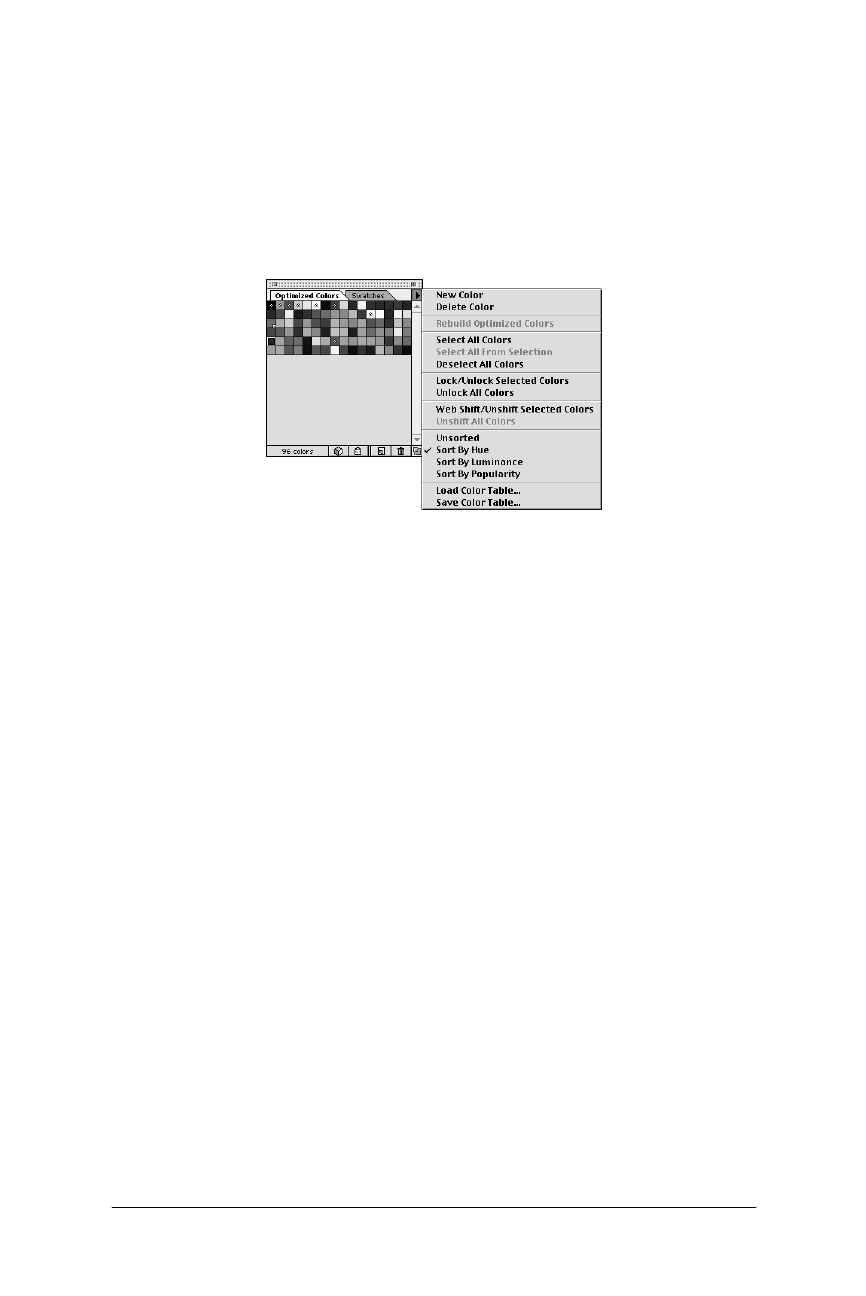
312 Chapter 17 – Designing Graphics with the Web Palette
Survey of Web Graphics Tools
Web Design in a Nutshell, eMatter Edition
Copyright © 2000 O’Reilly & Associates, Inc. All rights reserved.
The Optimized Colors Palette
The real fun comes in with ImageReady’s Optimized Colors Palette, shown in
Figure 17-1. Once a palette has been chosen for the image in the Optimize Palette
(or for images that were opened as Indexed Color), the color table for the image is
displayed in the Optimized Colors Palette. You can use the palette to make
changes to colors in the image. Colors can be added, deleted, locked, or shifted to
their nearest web-safe color.
To select a color in the table, either click on it directly or use the Eye-dropper tool
to select the color from within the optimized image. You can lock the color by
clicking on the Lock icon at the bottom of the palette window. This is useful if you
have a color you want to be certain stays in the palette, even if the image changes
or the number of colors is drastically reduced. Locked colors have a small square
in the bottom right corner of the swatch.
You can also easily shift a color to its nearest web-safe color by clicking on the
cube icon at the bottom of the palette window. This will change all the corre-
sponding pixels in the image to the new web-safe color. Web-safe colors in the
palette are indicated with a small diamond-shaped mark in the center of the
swatch.
The pop-up menu in the top-right corner of the palette offers the ability to undo
color locking and shifting for individual colors or for all the affected colors at
once. It also gives you the ability to sort the colors in the palette according to Hue,
Luminance, and Popularity.
This tool allows you to carefully target portions of the image that you want to use
Web Palette colors (such as flat color areas) while maintaining the integrity of
more subtle areas of the image.
The Web Shift slider
Another Web Palette tool tucked away is the Web Shift slider. You access it in the
pop-up menu in the top-right corner of the Optimize palette (different than the
Optimize Colors palette). When you select Show Options, the palette expands to
include the Web Shift slider (shown in Figure 17-2).
Figure 17-1: Adobe ImageReady’s Optimized Colors Palette and options
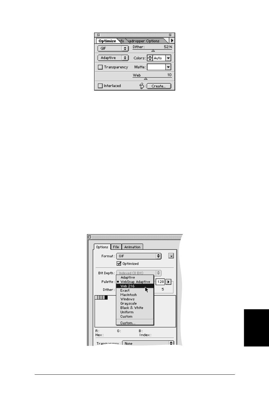
Survey of Web Graphics Tools 313
Web Palette
Survey of Web Graphics Tools
Web Design in a Nutshell, eMatter Edition
Copyright © 2000 O’Reilly & Associates, Inc. All rights reserved.
The slider is used to shift a range of colors to their nearest Web Palette colors. The
slider specifies a tolerance level (from 0 to 30) for colors to be shifted to the
closest Web Palette equivalents. The higher the value, the more colors that will
shift.
Macromedia Fireworks 1.0
Fireworks is another tool that was designed from the ground up specifically for the
creation of web graphics. It, too, offers a number of features that allow web
designers to keep file sizes as small as possible while using web-safe colors.
The Swatches panel contains the Web Palette by default, and it is particularly easy
to create graphics from scratch using Fireworks vector drawing tools. Vector tools
make it easy to draw simple text and objects filled with flat web-safe colors—the
type of images that compress efficiently when converted to GIF format for web
distribution.
To convert an image to the Web Palette, select File ➝Export and make your
adjustments in the Export Preview dialog box (Figure 17-3).
Figure 17-2: Web Shift slider visible in ImageReady’s Optimize Palette
Figure 17-3: Palette options in Fireworks’ Export Preview dialog box

314 Chapter 17 – Designing Graphics with the Web Palette
Survey of Web Graphics Tools
Web Design in a Nutshell, eMatter Edition
Copyright © 2000 O’Reilly & Associates, Inc. All rights reserved.
Among the palette choices are Web 216 and WebSnap Adaptive. Web 216 is the
standard Web Palette. Clicking the “Optimize” checkbox just below the format
menu will strip any unused colors from the color table, keeping the file size as
small as possible. You can set the color depth in the Number of Colors pop-up
menu. The number below the entry field is the actual number of colors used in
the image. Severely limiting the amount of dithering while in the Web 216 Palette
pushes colors to their nearest web-safe values.
The WebSnap Adaptive Palette shifts colors that are near in value to browser-safe
colors to their closest browser-safe color. WebSnap Palettes will snap a color to
web safe if its RGB values are within 7 bits of a colorcube value (e.g., 57-57-57
will snap to 51-51-51, while 60-57-57 will not). There is no way to adjust this toler-
ance as there is in ImageReady and Web Scrubber.
Web Scrubber Plug-in Filter (Furbo Filters)
If you haven’t yet invested in a web-graphics tool such as ImageReady or Fire-
works, you can lay out a smaller chunk of change for special web utilities that
work as plug-ins for Photoshop, PaintShop Pro, or any program that accepts
Photoshop-compatible plug-ins.
Web Scrubber from Furbo Filters is particularly good at optimizing images that
contain a combination of photographic imagery and areas of flat-web-safe color. It
provides “web-snap” abilities similar to ImageReady and allows you to reduce the
number of colors in a paletted image (something Photoshop can’t do on its own).
As of this writing, Web Scrubber is available only for the Mac as part of Furbo
Filters’ Webmaster series of plug-ins. These plug-ins are available at http://www.
furbo-filters.com/. They are working on a similar set for Windows, but in the
meantime, Windows users may download the WebScrub filter for free from David
Siegel’s site at http://www.verso.com/agitprop/dithering/.
Web Scrubber uses an algorithm (developed by Todd Fahrner and Philip Gwyn)
that works like a snap-to device for colors. As stated in the documentation, “colors
that are nearly web safe are shifted so that they use one of the 216 colors. Colors
that aren’t close to being web safe are left alone to dither when displayed in the
browser.” You can control the amount of shift you would like to occur.
The Web Scrubber control panel allows you to select the number of colors in the
image with the Colors pop-up menu. Use the Red, Green, and Blue sliders to
control how much color shift you want to allow. The higher the number, the more
colors will be forced to shift to the nearest web-safe color. The lower the number,
the more the browser may dither the image. The effects of your changes appear
immediately in the preview window. (See Figure 17-4.)
If you’ve used Photoshop 4.0’s Adaptive Palette to convert your image, you can
use Web Scrubber to correct all the shifted RGB values. Generally, Photoshop
doesn’t shift values more than five units, so a slider setting of 5 in Web Scrubber
should clean colors up sufficiently.
Settings higher than 10 tend to affect the quality of the image, particularly at lower
bit depths. You can experiment with different values and see how they affect file
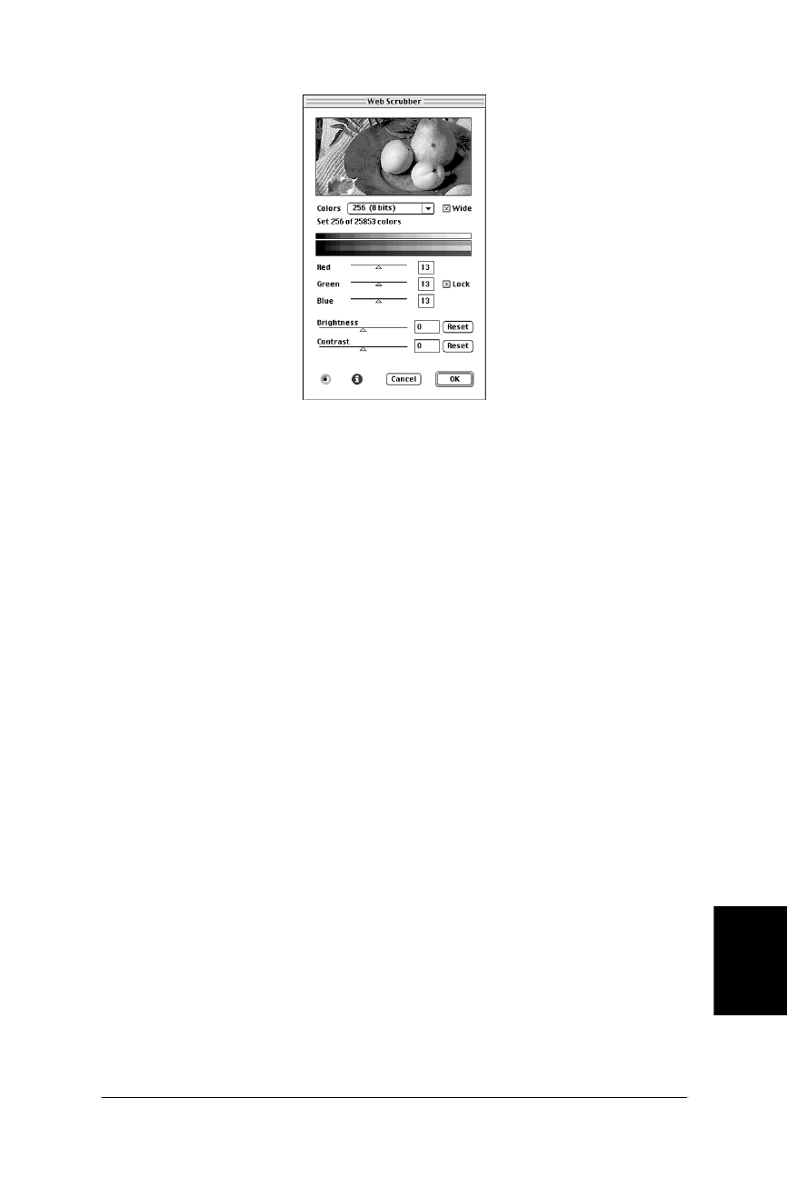
Color Blenders 315
Web Palette
Color Blenders
Web Design in a Nutshell, eMatter Edition
Copyright © 2000 O’Reilly & Associates, Inc. All rights reserved.
size. In general, with Web Scrubber you will find that you can maintain higher
quality at a lower bandwith.
When you are done “scrubbing” an image, convert it to Indexed Color using the
Exact palette and Save As or Export to GIF format.
Color Blenders
The problem with the Web Palette is that it only has 216 colors to choose from
(and they probably wouldn’t be your first choices). If you are bored with your
color options, you may want to try a new type of graphics utility called a color
blender. Color blenders approximate any RGB color by mixing two colors from the
Web Palette in a tiny checkerboard pattern. You can use these “hybrid colors” to
fill areas of graphics or to create a background tile.
Two color blender tools exist as of this writing: ColorSafe from BoxTop Software
(http://www.boxtopsoft.com/ ) and DitherBox from RDG Tools (http://www.dith-
erbox.com/ ). Their features and interface are nearly identical, but DitherBox is
somewhat less expensive. DitherBox is also now included as part of Adobe Imag-
eReady 1.0. You can download free demo versions for either the Mac or Windows
at their respective sites.
The Pros and Cons of Color Blenders
No technology is either all good or all bad, so let’s look at the ups and downs of
color blenders:
Color blender advantages
• They allow you to choose colors off the beaten path of the 216-color web-
safe palette, yet still be certain they will look the same on 24- and 8-bit moni-
tors.
Figure 17-4: WebScrubber filter dialog box

316 Chapter 17 – Designing Graphics with the Web Palette
Color Blenders
Web Design in a Nutshell, eMatter Edition
Copyright © 2000 O’Reilly & Associates, Inc. All rights reserved.
Disadvantages
• The controlled dither can add to the file size if used as a fill for large areas of
the graphic.
• It is more difficult to get inline images to blend seamlessly over a back-
ground tiled with a hybrid color. For instance, an image with a hybrid blue
background may not line up correctly with the same hybrid blue in the
browser background. For best results, create the original image with a back-
ground that is similar to the hybrid blue, and use transparency.
Using ColorSafe
ColorSafe from BoxTop Software is demonstrated here, but the interface is nearly
exactly the same as that of DitherBox. Figure 17-5 shows the options in the Color-
Safe dialog box.
Color Picker
The Color Picker is where you create “hybrid colors” from two web-safe colors.
RGB sliders allow you to choose any RGB color combination and see the imme-
diate results in the preview boxes.
If you have a specific color you’d like to convert, load it as the foreground color
before launching the ColorSafe filter. When you click the “Fore/Back” icon, your
color will be translated into its nearest hybrid. The controls on the left allow you
name your hybrid colors and save whole lists of names for future use.
The “Fill” button will automatically fill the selected area in your image. Note:
ColorSafe will not open if your image is empty and no areas are selected.
Pattern Fill
The Pattern Fill function allows you to create custom patterns out of colors in the
Web Palette (or whatever palette you choose to load) up to 8×8 pixels in size.
These patterns can be used wherever pattern fills are used in Photoshop.
Figure 17-5: ColorSafe dialog box for mixing colors from two web-safe colors

Where to Learn More 317
Web Palette
Where to Learn More
Web Design in a Nutshell, eMatter Edition
Copyright © 2000 O’Reilly & Associates, Inc. All rights reserved.
Creating Background Tiles with Hybrid Colors
When creating a background tile filled with hybrid colors, the key is to set the
width and height to an even number of pixels so the pattern will repeat correctly.
You can make the tile quite small (10 or 12 pixels square) to limit file size.
1. Create a new graphic in Photoshop and fill the whole area with the color
you’d like your background to be. (Neither ColorSafe nor DitherBox will open
if the image is completely empty.)
2. Select a color blender filter (ColorSafe or DitherBox) from the Filters menu.
You can adjust the color using the RGB controls.
3. Fill your image with the new hybrid color.
4. Convert the image to Indexed Color using the Exact Palette and either Save as
or Export to GIF format.
5. Insert your graphic into the HMTL document by adding the background
attribute identifying your tile to the <body> tag as follows:
<BODY BACKGROUND="tilegraphic.gif">
Where to Learn More
The champion of the Web Palette is undeniably Lynda Weinman, author of many
fine books on web design. Her book Designing Web Graphics, Second Edition
(New Riders Publishing) includes samples and instructions for working with the
browser-safe palette. For a more in-depth look at the palette as well as sugges-
tions on hundreds of pleasing combinations that can be created with it, check out
Lynda’s book Coloring Web Graphics (New Riders Publishing).


Web Design in a Nutshell, eMatter Edition
Copyright © 2000 O’Reilly & Associates, Inc. All rights reserved.
PART IV
Multimedia and Interactivity


321
Animated GIFs
Web Design in a Nutshell, eMatter Edition
Copyright © 2000 O’Reilly & Associates, Inc. All rights reserved.
Chapter 18Animated GIFs
CHAPTER 18
Animated GIFs
These days, it’s just about impossible to browse the Web without seeing the
flashing, bouncing, and wiggling of GIF animation. The animated GIF is ubiqui-
tous, and there are many good reasons fueling its popularity.
•Users need no special software or plug-in. All they need is a browser that sup-
ports animation—which is fortunately the overwhelming majority of browsers
in use as of this writing.
•GIF is the standard file format for the Web. Animated GIFs are not a unique
file format in themselves, but merely take advantage of the full capabilities of
the original GIF89a specification. Even if a browser cannot display all of its
frames, the GIF will still be visible as a static image.
•They’re easy to create. There are scores of GIF animation tools available
(some are built into larger web graphics applications), and they’re simple to
learn and use.
•They require no server configurations. Because they are standard GIF files,
you do not need to define a new file type on the server.
•They use streaming technology. Users don’t need to wait for the entire file to
download to see something. Each frame displays as soon as it downloads.
The only drawbacks to animated GIFs are that they can contain no sound, no
interactivity (you can’t make different parts respond to mouse actions), and they
may cause some extra work for your hard disk to keep refreshing the images.
How They Work
Animated GIFs work a lot like traditional cell animation. The file contains a
number of frames layered on top of each other. In simple animations, each frame
is a complete scene. In more sophisticated animations, the first frame provides the
background and subsequent frames just provide the changing portion of the
image.

322 Chapter 18 – Animated GIFs
Using Animated GIFs
Web Design in a Nutshell, eMatter Edition
Copyright © 2000 O’Reilly & Associates, Inc. All rights reserved.
The GIF animation consists of a number of images and a set of instructions that
specify the length of delay between frames, as well as other attributes like trans-
parency and palettes.
Using Animated GIFs
Nowhere has GIF animation made a larger impact than in banner advertising. Ad
agencies aren’t stupid . . . they know that adding motion and flashing to a web
page is a sure-fire way to attract attention. And it’s true—adding animation is a
powerful way to catch a reader’s eye.
But beware that this can also work against you. Many users complain that anima-
tion is too distracting, making it difficult to concentrate on the content of the page.
Although it adds a little “pizzazz” to the page, overall, too much animation can
actually spoil the user’s enjoyment of your page.
Use animated GIFs wisely. A few recommendations:
• Avoid more than one animation on a page.
• Use the animation to communicate something in a clever way (not just as gra-
tuitous flashing lights).
• Avoid animation on text-heavy pages that might require concentration to read.
• Consider whether the extra bandwidth to make a graphic “spin” is actually
adding value to your page.
• Decide if your animation needs to loop continuously.
• Experiment with timing. Sometimes a long pause between loops can make an
animation less distracting.
Browser Support
Versions 2.0 and higher of both Netscape Navigator and Microsoft Internet
Explorer have some degree of support for GIF animation, with the implementa-
tion improving with each subsequent release. Still, there are a few specific aspects
of animation that prove to be particularly problematic for some early-version and
lesser-known browsers.
If your animation uses one of the following, you may want to do some cross-
browser, cross-platform testing:
Looping
Very early browsers do not support looping at all. More commonly, looping is
supported, but settings for a specific number of loops may be ignored. If you
specify the number of repetitions, be aware that some users will experience
nonstop looping instead. Internet Explorer versions 2 and 3 support only one-
loop animation.
Revert to Previous
This disposal method does not work on Netscape 2.0, 3.0, and the Mac
version of 4.0 (it treats it as “do not dispose.”) (See the “Disposal Methods”
section later in this chapter.) Revert to Previous is supported only by Internet
Explorer versions 3.0 and higher. Although it can result in slightly smaller file

Tools 323
Animated GIFs
Tools
Web Design in a Nutshell, eMatter Edition
Copyright © 2000 O’Reilly & Associates, Inc. All rights reserved.
sizes, it is recommended to avoid this setting. This and other disposal
methods are more thoroughly discussed later in this chapter.
Browsers that do not support GIF animation will display a static image. The
problem is that some browsers display the first frame and others display the last
frame. If possible, it is advisable to make both your first and last frames mean-
ingful (particularly if it contains important information like the name of your
company).
Tools
You don’t need to search very far to find a GIF animation tool—there seem to be
scores of them available. Regardless of the tool you choose, the interface is basi-
cally the same. Tools tend to differ somewhat in the degree to which they are able
to optimize (shrink the file size of) of the resulting graphic. The following sections
provide an overview of the most popular and/or recommended tools.
GIF Animation Utilities
These are useful tools dedicated to the creation of animated GIF files.
GifBuilder 0.5 (Mac only)
GifBuilder, developed by Yves Piguet, is the old standby for creating
animated GIFs on the Macintosh. It’s freeware that’s easy and intuitive to use.
Its method of optimization, although adequate, is not as efficient as some
other programs. It is available for download at http://www.pascal.com/mirrors/
gifbuilder/.
GIF Movie Gear (Windows only)
GIF Movie Gear lets you view thumbnails of all frames at a glance and
directly manipulate them. Includes drag-and-drop functionality, real-time
previewing of palette and compression options, and support for AVI, BMP,
Photoshop files, JPEG, as well as GIF. GIF Movie Gear offers pixel-level opti-
mization. You can download a trial version from http://www.gamani.com.
Registration is $30.
Ulead GIF Animator 2.0 (Windows only)
Ulead’s GIF Animator features wizards for quickly and easily constructing
animations, 200 levels of undo, pixel-level optimization, built-in transition and
animation effects, a plug-in architecture for adding new animation modules,
and support for AVI and QuickTime videos and layered Photoshop files.
Download a preview copy from http://www.ulead.com. Registration is $39.95.
GIFmation 2.1 (Mac and Windows)
This is commercial software from BoxTop Software that comes highly recom-
mended by web developers. It features a more visual interface than
GIFBuilder, sophisticated palette-handling options, and a bandwidth simu-
lator. It also uses the efficient “frame differencing” method (discussed later in
this chapter) for optimizing animations significantly better than its competi-
tion. GIFmation costs $49.00 (as of this writing) and is available at http://www.
boxtopsoft.com/.

324 Chapter 18 – Animated GIFs
Creating Animated GIFs
Web Design in a Nutshell, eMatter Edition
Copyright © 2000 O’Reilly & Associates, Inc. All rights reserved.
GifGifGif (Mac and Windows)
Although not full-featured like other GIF animation utilities, this tool offers the
unique ability to automatically capture screen activity for use as an animated
GIF. This is useful for illustrating software demos. GifGifGif is from Peda-
goguery Software (http://www.peda.com/ ).
Applications that Include GIF Animation Tools
GIF animation tools are now being built-in or bundled with many popular
graphics applications, eliminating the need to jump between different software
packages.
Macromedia Fireworks (Mac and Windows)
Macromedia Fireworks was designed specifically for the creation of web
graphics. It supports multiple layers that can be converted to multiple anima-
tion frames. Among other features are automatic super-palette optimization
and the ability to perform LZW optimization. In animated GIF optimization
tests run by WebReference.com, Fireworks created the smallest animation files
(see http://www.webreference.com/dev/gifanim/results.html). For more infor-
mation, see Macromedia’s site at http://www.macromedia.com/software/
fireworks/.
Adobe ImageReady (Mac and Windows)
Adobe ImageReady is a tool for preparing and optimizing graphics for the
Web. It includes a GIF animation tool that converts layers into frames, and
allows easy layer editing. For more information see Adobe’s site at http://
www.adobe.com/.
Animation Shop & Paint Shop Pro 5.0 (Windows only)
Animation Shop is a tool that comes bundled with the latest version of Paint
Shop Pro, an inexpensive and powerful graphics creation application from
JASC Software Inc. For more information, see JASC’s web site at http://www.
jasc.com/.
Creating Animated GIFs
Regardless of the tool you choose, the process of creating an animated GIF is
about the same and involves making decisions about a standard set of features and
options. Some of the following descriptions use some of GIFBuilder’s termi-
nology, but the concepts and settings are consistent across tools.
Frame Delay
Also called “interframe delay,” this setting sets the amount of time between frames.
Frame delays are measured in 1/100ths of a second. You can apply a different
delay time to each frame in the animation to create pauses and other timing
effects. This differs from digital video formats, in which the delay between all
frames is consistent.

Creating Animated GIFs 325
Animated GIFs
Creating Animated GIFs
Web Design in a Nutshell, eMatter Edition
Copyright © 2000 O’Reilly & Associates, Inc. All rights reserved.
Transparency
You can set transparency for each frame within an animation. Previous frames will
show through the transparent area of a later frame—if disposal methods are set
correctly.
If the background frame is made transparent, the browser background color or
pattern will show through.
There is a bug in early versions of Netscape in which transparency
only works with background patterns, not colors specified in HTML.
Don’t be surprised if the transparent areas you specified in your original graphics
are ignored when you import them into a GIF animation utility. You may need to
set transparency in the animation package. GIFBuilder offers the following
options:
None
No transparency.
White
All the white pixels in the image will become transparent.
Based on first pixel
The color of the “first pixel”—that is, the top left pixel, the one at coordinates
0,0—is transparent. This is a handy option since you’ll often have an image in
the center and the four corners will be transparent.
Other
This option lets you select one of the palette colors as transparent.
Disposal Methods
Disposal method gives instructions on what to do with the previous frame once a
new frame is displayed.
Most GIF animation utilities offer “optimization,” a file-size reducing process that
takes advantage of the fact that previous frames will “show through” transparent
areas of a later frame. In order for this process to work, disposal method must be
set to Do Not Dispose (or Leave Alone, Leave As Is, etc.). With this method, areas
of previous frames continue to display unless covered up by an area in a
succeeding frame. The four choices are:
Unspecified (Nothing)
Use this option to replace one full-size, nontransparent frame with another.
Do Not Dispose (Leave As Is)
In this option, any pixels not covered by the next frame continue to display.
Use this when you want a frame to continue to show throughout the
animation.

326 Chapter 18 – Animated GIFs
Creating Animated GIFs
Web Design in a Nutshell, eMatter Edition
Copyright © 2000 O’Reilly & Associates, Inc. All rights reserved.
Restore to Background
The background color or background tile shows through the transparent
pixels of the new frame (replacing the image areas of the previous frame).
Restore to Previous
This option restores to the state of the previous, undisposed frame. For
example, if you have a static background that is set to Do Not Dispose, that
image will reappear in the areas left by a replaced frame.
This disposal method is not correctly supported in Netscape Navigator (it is
treated like Do Not Dispose), leading to all the frames being visible and
stacking up. Although it can produce better optimized animation files, it is
safest not to use it.
The effects of each of these disposal methods are compared in Figure 18-1.
Color Palette
Animated GIFs, like static GIF files, use a list of up to 256 colors that can be used
in the image. They can have multiple palettes (one for each frame) or one global
palette. The palette choice affects how well the images will appear on the inevi-
table variety of systems and monitor set-ups.
One problem with using multiple, frame-specific palettes is they can cause a
flashing effect on some early versions of Netscape (it cannot load the frames and
their respective palettes in synch). In any case, multiple palettes dramatically
increase file size. It is recommended you use one global palette for the whole
animation. GIFmation allows you to easily create a customized global palette. In
fact, any image editor can be used to create a global palette. Just place all images
to be used in one document, then index the document. The resulting palette will
be a global palette for the entire animation. DeBabelizer could be used for this as
well, but it’s not as straightforward.
Other palette options include:
System Palette
You can apply the Mac or Windows system palettes to your animation if you
know it will be viewed exclusively on one platform.
Grayscale
This will convert your image to 256 shades of gray. Keep in mind, however,
that browsers running on 8-bit monitors will try to convert the various shades
of gray to the web palette. Since there are only a few true grays in the web
palette, a grayscale image may not look very good on those monitors.
Adaptive Palette
Either ask your utility to create a global palette from the colors in the anima-
tion, or import one you created in another program. For most animations, this
is your best bet.
Web Palette (6×6×6 palette)
Use the web palette if your animation is composed largely of flat colors.
Creating Animated GIFs 327
Animated GIFs
Creating Animated GIFs
Web Design in a Nutshell, eMatter Edition
Copyright © 2000 O’Reilly & Associates, Inc. All rights reserved.
Other Options
The following are descriptions of other aspects of animated GIF files that can be
set within most animation programs.
Loop
You can specify the number of times an animation repeats—none, forever, or
a specific number. As noted earlier, not all browsers will support a specific
number of loops (it will either loop or not). One workaround to this problem
Figure 18-1: Disposal method comparison
frame 1
Unspecified
frame 2
replaces entire
non-transparent frame
with another
frame 2 - result
Disposal Methods
frame 1
Do Not Dispose
frame 2
pixels not replaced by next
frame continue to display
frame 2 - result
light gray is not transparent
frame 1
Restore to Background
frame 2
background color or tile
shows through
transparent pixels
frame 2 - result
light gray is transparentbackground tile
frame 1 frame 3frame 2 - result
Restore to Previous
(supported by Microsoft Internet Explorer 3.0 or greater)
frame 2 frame 3 - result
restore previous

328 Chapter 18 – Animated GIFs
Optimizing Animated GIFs
Web Design in a Nutshell, eMatter Edition
Copyright © 2000 O’Reilly & Associates, Inc. All rights reserved.
is to build looping right into a file by repeating the frame sequence a number
of times; of course, this increases the file size and download time.
Interlaced
Like ordinary GIF89a graphics, animated GIFs can be set to be interlaced,
which causes them to display in a series of passes (starting blocky, finishing
clear). It is recommended that you leave the interlacing option set to “no” or
“off” because each frame is on the screen for a short amount of time.
Depth
This option allows you to limit the bit depth of the image to some number
less than 8 (the default for GIF). Bit depth and its effect on file size is
discussed in detail in Chapter 14, GIF Format. Note, if you select the Netscape
(6×6×6) palette, you will need to keep the bit depth set to 8.
Dithering
Dithering is a way to simulate intermediate color shades. It should be used
with continuous-tone images.
Background Color
Regardless of what color you select in the background color option, Netscape
and Internet Explorer display the background color or image you specify in
your HTML page. So, this option doesn’t affect the display of the GIF in a
browser, only within the tool itself.
Starting Points
These settings are a good starting point for creating full-frame animations:
Color Palette: Global, adaptive palette
Interlacing: Off
Dithering: On for photographic images, Off for drawings with few colors
Image Size: Minimum Size
Background Color: Black
Looping: None or Forever
Transparency: Off
Disposal Method: Do Not Dispose
Optimizing Animated GIFs
As with any file served over the Web, it is important to keep animated GIFs as
small as possible. I recommend reading “Optimizing Animated GIFs,” an article
and tutorial by Andrew King that appeared in WebReference.com in 1997, and
from which many of the following tips were summarized (with permission). You
can find it at http://www.webreference.com/dev/gifanim/index.html.
Image Compression
Start by applying the same file-size reduction tactics used on regular, static GIF
files to the images in your animation frames. For more information, see “Mini-
mizing GIF File Sizes” in Chapter 14. These measures include:
• Eliminating unnecessary dithering
• Removing stray pixels from otherwise solid areas

Optimizing Animated GIFs 329
Animated GIFs
Optimizing Animated GIFs
Web Design in a Nutshell, eMatter Edition
Copyright © 2000 O’Reilly & Associates, Inc. All rights reserved.
• Reducing the number of colors
• Reducing the bit depth
Optimizing Methods
In addition to the standard image-compressing methods, GIF animation tools opti-
mize animations by eliminating the repetition of pixels in unchanging image areas.
Only the pixels that change are recorded for each frame. Different tools use
different optimizing methods, which are not created equal in terms of efficiency.
These methods, in order from least to most compression, include:
Minimum Bounding Rectangle
In this method, the changed portion of the image is saved, but it is always
saved in the smallest rectangular area necessary to contain the changed pixels.
Frame Differencing
In frame differencing, only the individual pixels that change are stored for
each frame. This is a more efficient method than Minimum Bounding Rect-
angle, which includes a lot of unnecessary pixel information to make up the
rectangle. Of the tools listed above, only GIFmation, GMG, and Ulead GIF
Animator use the Frame Differencing method for optimization.
LZW Interframe Optimization
This optimization method uses the LZW compression scheme to minimize the
frequency of changes in pixel patterns between frames. This compression
method, when used in conjunction with frame difference, is capable of
producing the smallest possible file sizes. Macromedia Fireworks is currently
the only commercial product that takes advantage of LZW compression for
animations (the GIF Wizard online service also uses it).
GIF Wizard
GIF Wizard is an online service that evaluates and optimizes graphics on users’
web sites, using compression techniques created by Tom Kirchman. Notably, GIF
Wizard is the only current compression product that takes advantage of all three of
the above-mentioned optimization methods. The LZW compression support
enables GIF Wizard to compress animations smaller than any other utility currently
available.
GIF Wizard is located at http://www.gifwizard.com/. You can upload your anima-
tion for a free demo of its powers. GIF Wizard instantly evaluates your graphic
and provides several alternative versions, each with a report of the percentage of
bytes saved.
GIF Wizard can also do an evaluation of your entire site. There are annual fees for
access to its full range of optimization and link-checking services.

330
Web Design in a Nutshell, eMatter Edition
Copyright © 2000 O’Reilly & Associates, Inc. All rights reserved.
Chapter 19Audio
CHAPTER 19
Audio on the Web
Simple audio files found their way onto the Web in its earliest days. The problem
with audio is that the files are generally quite large and may take a prohibitively
long time to download. The introduction of streaming audio (files that play while
they download) finally made quality audio and even live broadcasts distributed via
web pages a reality.
Obviously, audio, even specialized for the Web, is a rich and complex topic that
cannot be thoroughly treated in a single chapter of a Nutshell reference book. If
you are interested in reading about all the ins and outs of creating professional-
quality audio for a web site, there are many books that provide in-depth looks at
developing audio for the Web (see the bibliography at the end of this chapter).
There are also some fine tutorials in the multimedia section of the WebMonkey
site (http://www.webmonkey.com/ ).
If you need to put professional-quality audio on your site, consider outsourcing
the work to professionals, or bring in a consultant to help you get set up properly.
This chapter provides an overview of basic audio terminology and file formats as
well as an introduction to the many options for adding audio to a web site.
Copyright Issues
Like images, there are a number of sources for acquiring audio files to use on a
web site. Be aware, however, simply posting somebody else’s music or recordings
from a CD is a copyright violation. Record companies and entertainment corpora-
tions are taking measures to crack down on the illegal use of copyrighted material.
Even collections of silly sound effects that seem like they were designed for
multiple uses may be protected. Be sure to read the fine print for terms of use.

Audio Tools Overview 331
Audio
Audio Tools Overview
Web Design in a Nutshell, eMatter Edition
Copyright © 2000 O’Reilly & Associates, Inc. All rights reserved.
Royalty-Free Audio Resources
Fortunately, collections of prerecorded sound effects and music are available for
multimedia and Internet use. Many are royalty-free, meaning once you’ve
purchased the package of sounds, you can use them however you wish and pay
no licensing fees.
Some collections include:
• Microsoft Sounds Gallery: http://www.microsoft.com/gallery/files/sounds/
• Digital Kitchen: http://www.dkitchen.com/
• DXM Production’s Earshot SFX Library: http://www.earshotsfx.com/
• Creative Support Services: http://www.cssmusic.com/
Record It Yourself
The safest way to avoid possible copyright infringement is to record your own
material. The final product may be anything from a simple personal greeting to a
live concert broadcast.
As with most things, with sound quality, you get what you pay for. It is possible to
capture sound using available resources (like the microphone that came with your
computer), but the quality will not be appropriate for a professional site. The cost
of recording equipment escalates quickly for each level of sound quality, which
may make it more cost-effective for a small business to hire the services of a
professional studio.
Although this may be a good choice for a small business, it may be too expensive
for many hobbyists and garage bands. Depending on how well the studio is
equipped, it can cost from $30 to $250 per hour, and up. About $3000 to $5000
investment in equipment (not counting the computer) is enough to get started on
a home (or small business) studio. It’s sort of a “sweat equity” arrangement
though, since a lot of effort is required to get that home studio going.
Audio Tools Overview*
There is a wide gamut of software for audio editing and format conversion. The
software ranges from single-purpose utilities available via free download to profes-
sional digital-audio editing suites costing thousands of dollars. The following list is
culled from somewhere in the middle—high-powered tools with accessible prices.
The U.S. dollar amounts given reflect those at the time of this writing and are
subject to change. In most cases, they should be used as guidelines only.
One of the most popular commercial audio editing tools for the Mac is SoundEdit
16 from Macromedia (http://www.macromedia.com/ ). On the PC the standard
audio editor is Sound Forge from Sonic Foundry (http://www.sonicfoundry.com/ ).
Since Windows machines don’t have the same basic audio features that Macs have,
PC users may need to invest in some costly audio hardware to do true multitrack
* A big thank you goes to Chris Florio for compiling this list of audio tools.

332 Chapter 19 – Audio on the Web
Basic Digital Audio Concepts
Web Design in a Nutshell, eMatter Edition
Copyright © 2000 O’Reilly & Associates, Inc. All rights reserved.
recording. Once the hardware is added however, there are a number of good soft-
ware packages from Cakewalk and other companies to record and process audio
and MIDI.
QuickTime 3.0 (Mac and PC)
The first essential audio/video tool for all web designers or multimedia
producers on both Mac and PC is QuickTime 3.0. This is the first release of
QuickTime to be fully functional on Windows. QT 3.0 comes with the tools
for creating streaming video and audio for the Web. QuickTime supports
dozens of file formats and there are a number of new codecs that come with
QT that are ideal for the Internet (see Qcomp, next). QuickTime also comes
with a built-in software-only MIDI synthesizer. This synth includes hundreds
of instruments that can be used to make high-quality MIDI soundtracks that
take only a few kilobytes of space and sound the same on all Macs and PCs.
Best of all, QuickTime 3.0 is free from Apple (http://www.apple.com/quick-
time/). A professional version of QuickTime can be licensed for $29.95.
Qcomp, from Qdesign Corporation (Mac and PC)
The Qcomp audio compressor that comes free with QuickTime 3.0 is of
particular interest to web designers. Qcomp, from QDesign Corporation (http://
www.Qdesign.com/ ), is one of the best ways to put high-quality music on the
Web. CD-quality (16-bit, 44k) stereo audio files can be played in real time
when compressed with Q-comp, and they sound excellent compared with
other types of compression. Qcomp’s pro version, which lets you optimize
your files and speed up the process, is $399.
Peak, from Bias (Mac only)
The most versatile and fun audio-editing software on the Mac is called Peak,
from Bias (http://www.bias-inc.com/ ). Peak can do more things to an audio
file than you will ever need and outputs to most audio formats including
AIFF, WAV, QuickTime, and RealAudio.
Metro, from Cakewalk (Mac only)
For Mac users who want to record their own music a program from Cake-
walk called Metro (http://www.cakewalk.com/ ) will let you record as many
tracks of digital audio as your computer can handle. Metro also comes with a
very good MIDI sequencer. The MIDI and audio tracks can be processed,
edited, and mixed within Metro. This is a great package for less than $200.
Media Cleaner Pro, from Terran Interactive (Mac and PC)
One last package that is useful for optimizing audio and video files for the
web is Media Cleaner Pro from Terran Interactive (http://www.terran.com/ ).
This program is designed to get the best quality files at the smallest size in
whatever format you choose. MediaCleaner works all of the QuickTime
compressors as well as RealAudio and RealVideo. Media Cleaner also does
batch compressing. The program sells for $359 and is available bundled with
the Qcomp and Sorenson pro packages.
Basic Digital Audio Concepts
In order to distribute recorded speech or music over the Internet, the analog audio
must be converted to a digital format (described by bits and bytes). This process is

Nonstreaming versus Streaming 333
Audio
Nonstreaming versus Streaming
Web Design in a Nutshell, eMatter Edition
Copyright © 2000 O’Reilly & Associates, Inc. All rights reserved.
called encoding. It is analogous to scanning a photograph to a digital bitmap
format, and many of the same concepts regarding quality and file size apply.
Sampling Rate
To convert an analog sound wave into a digital description of that wave,
samples of the wave are taken at timed intervals. The number of samples
taken per second is called the sampling rate. The more samples taken per
second, the more accurately the digital description can recreate the original
shape of the sound wave, and therefore, the better the quality of the digital
audio.
Sample rates are typically measured in kilohertz (KHz). On the high end, CD-
quality audio has a sampling rate of 44.1 KHz. On the low end, 8 KHz
produces a thin sound quality that is equivalent to AM radio. Some standard
sampling rates include: 8 KHz, 11.025 KHz, 11.127 KHz, 22.05 KHz, 44.1 KHz,
and 48 KHz. The higher the sampling rate, the more information is contained
in the file, and therefore the larger the file size.
Bit Depth
Like images, audio files are also measured in terms of their bit depth (also
called sampling resolution or word length). The more bits, the better the
quality of the audio, and of course, the larger the resulting audio file.
Some common bit depths are 8-bit (which sounds thin or tinny, like a tele-
phone signal) and 16-bit, which is required to describe music of CD quality.
Channels
Audio files can support from one to six separate channels of audio informa-
tion. The most familiar of these are mono (1 channel) and stereo (2 channels),
but some formats can support 3-channel, quadraphonic, and 4- or 6-channel
surround sound.
Compression
Some audio file formats (such as MPEG and AIFF/C) are compressed using a
specialized audio compression algorithm in order to save disk space. MPEG
uses a lossy compression scheme (it strips out sounds that are not discernible
to the human ear) to achieve very high compression ratios (from 4:1 to 12:1)
while maintaining near-original sound quality.
Nonstreaming versus Streaming
Audio formats served via the Web fall into two general categories. Nonstreaming
audio files need to be downloaded to the user’s hard disk before they can begin
playing. Streaming audio files begin playing almost immediately and continue
playing as they are downloading. The following is a brief introduction to each
approach as well as its advantages and disadvantages. A more detailed discussion
of specific streaming and nonstreaming audio formats follows.
Nonstreaming Audio
When nonstreaming audio files (also called “static” audio) are retrieved from the
server, they must download to the hard disk in their entirety before they can begin
playing on the client end. Unfortunately, audio files are often quite large and

334 Chapter 19 – Audio on the Web
Nonstreaming versus Streaming
Web Design in a Nutshell, eMatter Edition
Copyright © 2000 O’Reilly & Associates, Inc. All rights reserved.
require a long time to download, particularly over dial-up modem connections.
For instance, a 1-minute WAVE file of CD-quality audio requires over 10 MB of
disk space! (Of course, this can be reduced by sacrificing sound quality, as
discussed later.)
How it works
Static audio files tend to be in common audio formats, and are transferred via a
simple FTP transaction like any other web file.
When the user’s browser detects the audio file, it will either launch an external
player or use a plug-in to play the audio. Which player it uses depends on the
platform, the browser, its version, and its configuration, therefore the web site
designer cannot directly control which player will be used.
Some common Macintosh external players include SoundMachine and SoundApp.
MediaPlayer is a common player on the Windows operating system. Internet
Explorer versions 3 and higher can play many audio file formats natively. Netscape
Navigator 3.0 and higher uses the LiveAudio plug-in to play most audio files. The
QuickTime player is available for both platforms and as a plug-in to both
browsers.
Advantages
• It doesn’t require special server software.
• It is simple to create audio files in standard formats.
Disadvantages
• Large file sizes can result in unacceptably long waits for the files to download
and begin playing.
• Because the audio file is copied to the hard drive, it is more difficult for art-
ists and publishers to limit distribution and protect copyrights.
Streaming Audio
Streaming audio technology was developed to address the problem of unaccept-
able download times. Streaming media (be it audio or video) begins playing
almost immediately after the request is made, and continues playing as the audio
data is being transferred. Some vendors offer live broadcast capabilities.
In some streaming solutions, such as those from RealNetworks and Xing Tech-
nology’s Streamworks, the server holds open a special connection (UDP) through
which it pushes data continuously. In this method, the source audio file itself is
never transferred to the user’s machine. Others, such as QuickTime 3.0 and Shock-
wave, do load files into the user’s cache, but have players that allow playback
after only a fraction of the total data is loaded.

Nonstreaming (Static) Audio 335
Audio
Nonstreaming (Static) Audio
Web Design in a Nutshell, eMatter Edition
Copyright © 2000 O’Reilly & Associates, Inc. All rights reserved.
Streaming Audio Components
Streaming media technology involves several software components:
• The encoder is a piece of proprietary software that converts audio to the
streaming format (also proprietary). The source can be an existing audio file
in one of the standard static formats, or it might be taken from a direct audio
signal, as is the case in live broadcast.
•Aplayer is required on the user’s end to play the audio content. Vendors dis-
tribute their players for free. These are generally also available as browser
plug-ins.
• Many streaming audio file formats require special audio server software.
Streaming media companies make their money by selling the server software
and often licensing a certain number of streams (the number of connections
that can happen concurrently). This software is usually quite costly.
Advantages
• Audio begins playing soon after the stream begins.
• Sound quality doesn’t need to be as severely sacrificed.
• Artists and publishers can control distribution and protect copyright because
the user never gets a copy of the audio file.
Disadvantages
• Potentially high cost of server software.
• Requires a dedicated or preconfigured server, which may be problematic with
some hosting services.
• Sound quality and stream may be adversely affected by low speed or incon-
sistent Internet connections.
Which Should You Choose?
As noted above, there are benefits and drawbacks to each of these approaches to
web audio. As a general rule, if you want to add audio to your web site that is
professional-quality and more than one minute in length (music, in particular), you
should consider investing in one of the streaming media solutions. If you are
building a web site that is based on your audio offerings and expect a fair amount
of traffic, you should consider a separate server machine dedicated to audio.
If you have a personal or small commercial web site and would like to add a
greeting or some other small audio sample, making simple audio files available for
download is a fairly easy task.
Nonstreaming (Static) Audio
This section looks at static audio file formats, tips for optimizing audio files for
download, and how audio files can be linked to HTML documents.

336 Chapter 19 – Audio on the Web
Nonstreaming (Static) Audio
Web Design in a Nutshell, eMatter Edition
Copyright © 2000 O’Reilly & Associates, Inc. All rights reserved.
File Formats
A multitude of audio file formats exist for use on computers today. The following
list represents just those that are widely used on the Web because of their cross-
platform and cross-browser support.
WAVE (.wav)
The Waveform Audio File Format was originally developed as the standard
audio format for the Microsoft Windows operating system, however, it is now
supported on the Macintosh as well. WAVE files can support arbitrary
sampling rates and bit depths, although 8 KHz and 11.025 KHz at 8- or 16-bit
are most common. Its performance is similar to AIFF.
AIFF (.aif, .aiff)
The Audio Interchange File Format was developed as the standard audio
format for the Macintosh platform, however, it is now supported by Windows
and other platforms. It can support up to six channels and arbitrary sampling
rates and bit depths, with 8 KHz and 11.127 KHz at 8-, 16- and 32-bits being
the most common. Its performance is similar to WAVE.
µ-LAW (.au)
-Law (pronounced myoo-law) is the Unix standard audio format. .au files
support mono or stereo channels, variable bit depths, and the following
sampling rates: 8.013, 22.05, and 44.1 KHz. Its popularity as an Internet file
format is waning because Unix platforms have become a small minority on
the Web and because other cross-platform audio formats offer better sound
quality.
MPEG (.mpa, .mp2, .mp3)
MPEG is actually a family of multimedia standards created by the Moving
Picture Experts Group. It supports three types of information: video, audio,
and streaming (which is synchronized video and audio). MPEGs can also be
used as a streaming audio format, as in Xing’s Streamworks technology.
MPEG audio files maintain pristine sound quality at compression rates as high
as 10:1. They do this by using a lossy compression scheme that strips out
sounds that are not discernible to the human ear.
There are a number of MPEG standards: MPEG-1 was originally developed for
video transfer at VHS quality; MPEG-2 is a higher-quality standard that was
developed for television broadcast; other MPEG specs that address other
needs (such as MPEG-4 and -7) are currently in development. MPEGs can be
compressed using one of three schemes: Layer-I, -II, or -III. The complexity of
the coding (and therefore the processor power needed to encode and
decode) increases at each level. Due to this complexity, you need special
encoding tools to produce MPEG audio files.
On the Web, the most popular MPEG formats are MPEG-2, using compres-
sion Layers II and III (with the suffixes .mp2 and .mp3, respectively). The
suffix .mpa denotes a file that is audio only.
Netscape Navigator and Internet Explorer may support MPEG audio via the
use of the QuickTime Plug-in. Or you could configure your browser to use

Nonstreaming (Static) Audio 337
Audio
Nonstreaming (Static) Audio
Web Design in a Nutshell, eMatter Edition
Copyright © 2000 O’Reilly & Associates, Inc. All rights reserved.
one of the many available MPEG players, such as maplay or WinAMP
(Windows) or SoundApp or MPEG Audio Player (Mac).
To learn more about MPEG, visit the MPEG Web Site (http://www.mpeg.org/).
MIDI (.mid)
MIDI (which stands for Musical Instrument Digital Interface) is a different
breed of audio file format. It was originally developed as a standard way for
electronic musical instruments to communicate with each other.
A MIDI file contains no actual audio information (the digital representation of
analog sound), but rather a set of mathematical commands that describe a
series of notes. These notes are played by a MIDI player using the available
“instrument” sounds on a computer’s sound card. MIDIs are to other audio
formats what vector graphics are to bitmaps—just mathematical formulas for
creating the final product on the other end.
As a result, MIDI files are incredibly compact. They are capable of packing a
minute of music into just 10K, which is 1,000 times smaller than a one-minute
WAVE file (approximately 10.MB).
The drawback to MIDI files is that they can only contain notes, not real
sounds, so they are only useful for synthesizer-sounding music. You cannot
reproduce the sound of a human voice or any organic sounds using MIDI.
Despite this limitation, MIDIs are an extremely attractive alternative for adding
instrumental music to your web site with very little download time.
Optimizing Audio Files for Download
There are ways to reduce the size of an audio file so it is appropriate for down-
loading via a web page. Not surprisingly, this usually requires sacrificing quality.
Reducing file size (and quality) is not such an issue if you are using one of the
streaming audio technologies. The aspects of the audio file you can control are:
Length of the audio clip
It might seem obvious, but you should keep the audio sample as short as
possible. For example, consider providing just part of a song rather than the
whole thing. If you are recording a greeting, make it short and sweet.
Number of channels
A mono audio file requires half the disk space of a stereo file and is recom-
mended for web audio.
Bit depth
Audio files for the Web are most often saved at 8 bits, which will result in a
file that is half the size of a 16-bit file.
Sampling rate
Cutting the sampling rate in half will cut the file size in half (e.g., a sampling
rate of 22.05 KHz requires half the data than one of 44.1 KHz). As a general
guideline, audio files that are voice-only can be reduced down to 8 KHz.
Sound effects will work at 8 Khz or 11.025 KHz. Music will sound acceptable
at 22 Khz.

338 Chapter 19 – Audio on the Web
Nonstreaming (Static) Audio
Web Design in a Nutshell, eMatter Edition
Copyright © 2000 O’Reilly & Associates, Inc. All rights reserved.
Using these guidelines, if we start with a one-minute music sample at CD quality
(10MB), and change it to a mono, 8-bit, 22 Khz WAVE file, its size is reduced to
1.25 MB, which is much more reasonable for downloading.
Obviously, just how stingy you can be with your settings while retaining accept-
able quality depends on the individual audio file. You should certainly do some
testing to see how small you can make the file without sacrificing essential audio
detail.
Adding Nonstreaming Audio to an HTML Document
This section looks at the many ways audio files can be accessed by an HTML
document. You can link to an audio file using an anchor (<a>) or embed the plug-
in player in the flow of the page with the <embed> tag. Sounds can also be used
as backgrounds that begin playing automatically when the page downloads. This
section provides one technique for triggering a sound using JavaScript.
A simple link
You can use a simple anchor tag (<a>) to link to an audio file from a web page,
as follows:
<a href="audio/song.wav">Play the song.</a>
When the reader clicks on the linked text (you could also use a graphic as the
link) the browser will retrieve the file from the server and launch a helper applica-
tion (or plug-in, if so configured) to play the file.
If the browser uses an external player, a new small window will open with the
controls for playing the audio. If the browser is configured to use a plug-in player
(such as the popular QuickTime plug-in), a control panel may load right in the
browser window, replacing the original web page! You may want to advise
readers to use the Back button to return to the original page should this happen.
It is also good web design form to warn readers of the size of an audio file so they
can make informed decisions whether they want to spend the time downloading.
<embed> for use with plug-ins
When you use the <embed> tag, the browser places the plug-in controls in the
flow of the text like an image. Although it was created by Netscape, Internet
Explorer began supporting the <embed> tag with version 3.0, making it a rela-
tively safe way to add audio (or any media) to your page. Note that when you use
a plug-in, the audio will stop playing when the user leaves the page.
In Navigator, the <embed> tag works with the LiveAudio plug-in to play audio
files. You have the option of putting a small control panel inline on the web page
that allows the user to start and stop the audio, as well as affect its volume.
The following <embed> tag places a control panel on the page that will play the
audio file when the user presses the Play button:
<EMBED SRC="audio/song.mid" CONTROLS="console" HEIGHT=60
WIDTH=145 AUTOSTART="false"></EMBED>
Nonstreaming (Static) Audio 339
Audio
Nonstreaming (Static) Audio
Web Design in a Nutshell, eMatter Edition
Copyright © 2000 O’Reilly & Associates, Inc. All rights reserved.
The LiveAudio plug-in <embed> tag can take a number of attributes:
src=URL
Defines the URL of the audio file
controls=console|smallconsole|playbutton|pausebutton|
stopbutton|volumelever
console places a control panel with play, stop, pause, and volume controls.
smallconsole places a smaller version with just play, stop, and a volume
control. The default setting is console. See Figure 19-1 (taken from a Macin-
tosh display).
height=number
width=number
Width and height tags are required by the <embed> tag. In the case of audio
files, the width and height measurements correspond to the size of the
console in pixels. Gray space will be added around the control if measure-
ments larger than the console’s maximum dimensions are specified.
loop=true|false|number
When set to true, the audio file will play continuously. When set to false
(the default), the audio plays through just once. You can also specify a
numerical value for the number of times you want the audio to play in a row.
autostart=true|false
When this is set to true, the audio clip starts playing as soon as it loads.
When false, the audio will begin playing when the user clicks Play in the
console.
hidden=true
This attribute, when set to true, causes the console to be hidden from view.
Note that combined with autostart=true, this can create the same effect as
<bgsound>.
volume=(0-100)
This allows you to set the volume for the sound when it begins playing. It is
based on a percentage scale from 1 to 100. If it is not specified, the audio file
will be played at the default system volume.
Figure 19-1: Live Audio’s console (left) and small console (right) controls
console (144 x 60 pixels) smallconsole (144 x 15 pixels)

340 Chapter 19 – Audio on the Web
Nonstreaming (Static) Audio
Web Design in a Nutshell, eMatter Edition
Copyright © 2000 O’Reilly & Associates, Inc. All rights reserved.
align=left|right
hspace=number
vspace=number
These attributes allow the console to be positioned against the left or right
margin (with horizontal and vertical gutter space) and allows text to wrap
around it. These work the same as within the <img> tag.
starttime=minutes:seconds
Supported only by Mac, Windows 95, and NT. Specifies at what point in the
audio file the playback should begin.
endtime=minutes:seconds
Supported only by Mac, Windows 95 and NT. Specifies at what point in the
audio file the playback should end. Minutes and seconds are indicated with
two digits (e.g., 02:15 for 2 minutes, 15 seconds).
mastersound
Indicates which <embed> element contains the link to the audio file. Required
when grouping audio controls (using the NAME attribute).
NAME=text
This is used to group individual controls for use with a single audio file.
Background sound
There are several ways (mostly browser-specific) to make an audio file start
playing automatically when a web page loads. Note that the disadvantage of using
background sounds is that the user has no way of turning the sound off if she
does not like it. Also, if it is a large file, you are forcing a potentially lengthy
download on the user.
• For Internet Explorer 2.0+ (no other browsers support this tag) use the
<bgsound> tag, as follows:
<BGSOUND SRC="audio/song.mid" LOOP=3>
where src gives the URL for the audio file and loop is the number of times
you want the audio to play (this attribute can be set to “infinite”). WAVE,
AIFF, and MIDI sound files can be played as background sounds using this
method.
• To set a background sound that will work with both Netscape Navigator and
Internet Explorer, use a combination of the background sound tag and an
<embed> tag that hides the control panel, as follows:
<EMBED SRC="audio/song.mid" autostart=true hidden=true></EMBED>
<NOEMBED><BGSOUND="audio/song.mid"></NOEMBED>
• For Netscape Navigator and later versions of MSIE, you can make audio play
automatically with client-pull by using the <meta> tag as follows:
<META http-equiv="refresh" content="1;url=audio/song.mid">
which causes the page to refresh (and the audio to play) after 1 second.

Streaming Audio 341
Audio
Streaming Audio
Web Design in a Nutshell, eMatter Edition
Copyright © 2000 O’Reilly & Associates, Inc. All rights reserved.
Streaming Audio
Since RealAudio came on the scene in 1994, there has been a stampede of
competitors. As of this writing, RealNetworks continues to dominate the market
due to the ubiquitous distribution of its player and its proven track record.
However, some competitors offer niche products that may better suit your partic-
ular need.
There are many other streaming audio formats, some of which are targeted at opti-
mizing voice-only sound samples. This area of technology is developing quickly,
and companies come and go quickly. For a current list of contenders, you can
check the plug-in list on Netscape’s web site (http://www.netscape.com/comprod/
products/navigator/version_2.0/plugins/audio-video.html).
Available Technologies
The following list represents just a few of the options for adding streaming audio
to your Web site. The web sites listed with each technology provide complete
information on how the system works, pricing structures, and the required soft-
ware components.
RealAudio (RealNetworks)
Progressive Networks (now RealNetworks) was a pioneer in producing a viable
technology for bringing streaming audio to the Web. Despite heavy competition, it
leads the pack in terms of widespread use and popularity, and has grown to be
the standard for putting audio online.
RealAudio is a server-based streaming audio solution with a special emphasis on
optimizing audio for 14.4 and 28.8 connections. To listen to RealAudio files, users
must download and install RealPlayer, which is available for Windows 95, NT,
Mac, and Unix platforms.
RealAudio is just part of a complete line of products for delivering audio, video,
and interactive media. The wide distribution of its player and a proven track
record makes RealAudio an attractive solution to organizations interested in
putting streaming media on the Web.
For more information, visit RealNetworks site at http://www.real.com/.
Liquid Music System (LiquidAudio)
As stated on their web site, LiquidAudio specifically targets the needs of the music
industry by “providing labels and artists with software tools and technologies to
enable secure online preview and purchase of CD-quality music.”
LiquidAudio delivers CD-quality audio and is the only streaming format that offers
Dolby encoding. Audio files can be watermarked with copyright, owner, and
purchaser information, discouraging piracy and copyright violation.
The player, Liquid MusicPlayer CD, is unique in that it can offer views of album
graphics, lyrics, credits, and up-to-date promotions or announcements (such as

342 Chapter 19 – Audio on the Web
Streaming Audio
Web Design in a Nutshell, eMatter Edition
Copyright © 2000 O’Reilly & Associates, Inc. All rights reserved.
tour dates). The player works with the Liquid MusicServer (which is easily tied into
SQL databases) to enable individual tracks or entire CDs to be purchased online.
For more information, see the LiquidAudio web site at http://www.liquidaudio.com/.
Streamworks (Xing Technologies)
Xing Technologies was another early player in the streaming audio arena. Their
Streamworks technology, which offers audio and video delivery, is aimed at high-
speed networks (although it can be encoded to serve 28.8 bps modem
connections).
Streamworks’ claim to fame is that it is the only format based entirely on the
industry-standard MPEG specification, offering MPEG-1 and MPEG-2, Layer-3
audio. This is especially powerful for distributing video, however, it can also be
used for audio only.
The high data rate required to deliver CD-quality audio and TV-quality video
makes Streamworks most appropriate to intranet and extranet applications, such as
training or distance learning. For more information on this product, visit the Xing
Technologies web site at http://www.xingtech.com/.
Shockwave Audio (Macromedia)
Macromedia originally developed its Shockwave technology to deliver interactive
Director movies to the Web, however, many web developers are using the tech-
nology for its audio capabilities alone. Shockwave is discussed in more depth in
Chapter 21, Interactivity.
Shockwave Audio is attractive because it offers highly compressed, high-quality
streaming audio without requiring special server software (desirable if you have a
limited budget). The drawback is that it lacks the advanced controls and usage
tracking that the commercial server products offer.
You can convert an existing audio file to Shockwave format using the Shockwave
Audio Xtras in Director or SoundEdit 16, Version 2. The file is then saved in
Shockwave format (with the suffix .swa).
Shockwave audio is played using the standard Shockwave plug-in for Netscape
Navigator or Internet Explorer on the Windows 3.1/95/NT and Mac platforms.
For more information on using Shockwave for audio, see Macromedia’s web site at
http://www.macromedia.com/support/director/how/shock.
QuickTime Audio (Apple)
Although QuickTime is best known as a video technology, it is also possible to
create audio-only QuickTime Movies (.mov). QuickTime audio supports 8- to 16-
bit format and variable sampling rates and comes highly recommended by audio
experts as a reliable audio format for web purposes.
Although the QuickTime system extension is needed to play a .mov file, it is
widely distributed and available for both Windows and Macintosh. In addition,

Streaming Audio 343
Audio
Streaming Audio
Web Design in a Nutshell, eMatter Edition
Copyright © 2000 O’Reilly & Associates, Inc. All rights reserved.
recent versions of both Netscape Navigator and Internet Explorer come with the
QuickTime Plug-in so QuickTime audio can be embedded right on the page.
The QuickTime player can begin playing the audio as the data is downloading.
However, because it is reading it from the user’s cache, it is only a partially
streaming media.
Many multimedia authoring tools support the QuickTime format and can be used
for converting audio files to the .mov format. MoviePlayer Pro 3.0 (part of the
QuickTime Pro 3.0 release) allows you to create, edit, and convert media files to
QuickTime format. The Qdesign audio codec (compression/decompression algo-
rithm) is recommended for audio files formatted for QuickTime 3.0 playback.
For more information on QuickTime, see http://www.apple.com/QuickTime.
Adding Streaming Audio to an HTML Document
As with static audio files, there are two methods for adding streaming audio to a
page—via a link or using an <embed> tag. Using the <embed> option will put the
controls for the streaming audio inline on the Web page. Embedding the controls
allows for the design of custom interfaces, but it should be noted that the audio
will stop playing when the user leaves the page.
Each technology’s plug-in has its own set of attributes that can be added to the
<embed> tag. We will look at the options for using the <embed> tag with Quick-
Time and RealAudio later in this chapter.
Linking to streaming audio
Some plug-ins require that links be made to special go-between files instead of to
the streaming audio file itself. These reference files (optionally) reside in the same
directories as the HTML documents. When they are accessed via a hyperlink, they
pass the URL of the actual media file to the appropriate plug-in, which in turn
requests the audio stream from the server.
For example, RealAudio’s reference files are called “metafiles” (suffix .ram). In
HTML, the link is made to the metafile (.ram), not the RealAudio file itself, as
follows:
<A HREF="song.ram">Link to the song</A>
The metafile contains the URL that points to the RealAudio file (suffix .ra):
pnm://[ip.address]/song.ra
It may also include an optional set of parameters for controlling starting, stopping,
and information about the audio file.
Metafiles are useful for maintenance and control purposes. To change the audio,
all you have to do is change the tiny metafile, rather than having to dig through
HTML source code. You can also do things like calling multiple streaming media
files from one metafile. One link to the metafile plays all the files.
Each streaming audio solution works differently, so refer to the documentation on
each vendor’s web site for specific instructions.

344 Chapter 19 – Audio on the Web
Streaming Audio
Web Design in a Nutshell, eMatter Edition
Copyright © 2000 O’Reilly & Associates, Inc. All rights reserved.
Linking to Shockwave and QuickTime audio
Because Shockwave and QuickTime files are transferred like any other file from an
HTTP server, you can link them to the Web the same as downloadable media. The
difference is that audio will start playing more quickly because the player does not
need to wait for the entire file to download. It will begin playing once the buffer is
filled and will continue playing as the remainder of the file is being transferred.
<A HREF="song.dcr">Link to Shockwave Audio</A>
Many streaming audio files that have dedicated server solutions may also be
accessed via standard HTTP connections. This generally lowers performance.
<embed> attributes for QuickTime plug-in
src=URL
The URL for the .mov file.
controller=true|false
This provides a control strip that allows the user to start and stop the audio
and adjust its volume. The controls will appear by default.
autoplay=true|false
When set to true, the audio file will begin playing automatically. This is
equivalent to the autostart attribute used with many other plug-in players.
loop=true|false|palindrome
To play the audio just once, set loop to false. If you want it to repeat infi-
nitely, set it to true. The palindrome setting will play the audio file through,
then play it in reverse when it gets to the end, and then play it through again.
href=URL
This makes the control strip (or movie frame for a video) a link to another
web page.
width=value
height=value
These values define the dimensions of the control panel area (it is more
useful for videos where it also defines window size)
<embed> attributes for the RealAudio plug-in
The three primary attributes for embedding RealAudio are:
src=URL
The URL to the RealAudio file (.ra)
autostart=true|false
When set to true, the RealAudio file will begin playing automatically.
width=value
height=value
Sets the size for the control panel.
In addition, you can use multiple <embed> statements to create a custom interface
made up of individual controls. Each <embed> tag takes a controls attribute with
one of the following control elements:

Bibliography 345
Audio
Bibliography
Web Design in a Nutshell, eMatter Edition
Copyright © 2000 O’Reilly & Associates, Inc. All rights reserved.
controls=all|ControlPanel|InfoVolumePanel|InfoPanel|
StatusBar|PlayButton|StopButton|VolumeSlider|Position
Slider|Position Field|StatusField
Streaming Audio Summary
Table 19-1 lists statistics for popular streaming audio solutions as of this writing.
Because web audio technology changes so quickly, I encourage you to check the
sites listed to get updated information.
Bibliography
I recommend the following books for a good starter course on web audio.
Although some of the specifics are dated, they provide thorough and clear expla-
nation of audio issues (these books helped me immensely in the writing of this
chapter).
WebsiteSOUND, Patrick Seaman and Jim Cline (New Riders Publishing, 1996),
ISBN 1-56205-626-3.
Designing Multimedia Web Sites, Stella Gassaway, Gary Davis, and Catherine
Gregory (Hayden Books, 1996), ISBN 1-56830-308-4.
Many other promising books are being published as I’m writing. The following
look worthy of checking out:
The IUMA Guide to Creating Audio on the Web, Marjorie Baer (editor), Jeff
Patterson, and Ryan Melcher (Peachpit Press, 1998), ISBN 0-20169-613-4.
RealMedia Complete: Streaming Audio and Video Over the Web, Jonathan
Angel (1998), ISBN 0-07913-727-X.

Bibliography
Table 19-1: Streaming Audio Summary
Technology
File
Type
Reference
File Type
Live
Broadcast Video Player Encoder Server Delivery1
Bandwidth
Options
RealAudio
RealNetworks
www.real.com
RealNetworks has
announced its
new G2 system; it
was not available
as of this writing.
.ra .ram yes yes RealPlayer 5.0
(free) or Real-
Player Plus (com-
mercial product)
(Windows 3.1/95/
NT, Mac)
RealEncoder or
Adobe Premier
Plug-in
(Windows 95/NT,
Mac)
RealNetworks Basic
Server 5.0 (free) and
Basic Server Plus 5.0
(full-featured
commercial product)
(Win 95/NT, most
Unix)
UDP or
HTTP Optimized for
14.4 and 28.8
Separate files are
required for specific
bit rates.
Liquid Music
System
LiquidAudio
www.liquidaudio.
com
.lqt n/a no no Liquid Music-
Player CD
(Windows 95/NT,
Mac)
LiquifierPro
(Windows) or
Liquifier Plug-in
for Pro-Tools
(Mac)
Liquid MusicServer
3.0
(NT, Sun, Solaris,
SGI)
UDP Multiple bit rates
can be stored in one
file.
Streamworks
Xing
Technologies
www.xingtech.
com
.mp2
.mpa .xsm
(embedded)
.xdm
(non-
embedded)
yes yes Streamworks
Player
(Windows 95/NT,
Mac)
Xing MPEGEn-
coder
(Windows 95/NT)
This is a commer-
cial product
Streamworks Server
(NT, Linux, Solaris,
Irix, HP-UX, Unix)
UDP,
TCP,
HTTP
Aimed at 250kbps
and higher; files can
be “thinned” to
serve multiple band-
widths, but sepa-
rate files are
recommended for
specific bit rates.
Shockwave Audio
Macromedia
www.macro-
media.com
.dcr n/a no no2Shockwave Plug-
in to NN 2.0+, IE
3.0+3, AOL 3
(Windows 3.1/95/
NT,Mac)
with Shockwave
Audio Xtras in
Director 5.0, 6.0,
or Sound Edit 16,
version 2.
n/a HTTP 14.4 through T1;
separate files are
required for specific
bit rates.
QuickTime Audio
Apple
www.quicktime.
com
.mov n/a no yes QuickTime Plug-
in to NN3.0+ and
IE3.0+
(Windows 95/NT,
Mac)
Many tools avail-
able, inluding
MoviePlayerPro
(part of Quick-
Time 3.0 upgrade)
n/a HTTP n/a
1UDP continuously pushes data through an open connection stream; however, UDP connections are problematic for some firewall configurations. Some vendors have responded
by adding the capacity to revert to HTTP delivery if the UDP connection fails.
2The filetype fully supports interactive multimedia presentations.
3Shockwave Plug-in for Internet Explorer does not operate on the Mac platform.

347
Video
Web Design in a Nutshell, eMatter Edition
Copyright © 2000 O’Reilly & Associates, Inc. All rights reserved.
Chapter 20Video
CHAPTER 20
Video on the Web
Like audio, video clips were linked to web pages in the Web’s earliest days. Deliv-
ering video via the Web is especially problematic because video files require huge
amounts of data to describe the video and audio components, making for
extremely large files. Few people will sit and wait an hour for a couple of minutes
of video fun.
Many of the same technologies that have been applied to improve the experience
of receiving audio over the Web have been applied to video as well. As with
audio, you have the option of simply linking a video to your web page for down-
load and playback, or you can choose from a number of streaming solutions.
“Streaming” means the file begins playing almost immediately after the request is
made, and continues playing as the file is transferred to the player. For a more
complete description of streaming versus nonstreaming media, see Chapter 19,
Audio on the Web.
This chapter will introduce you to basic video technology, concepts, and file
formats (including several streaming options). If you are interested in learning how
to produce video files for the web, the books listed in the bibliography at the end
of this chapter are a great start. There are also some excellent tutorials on
producing multimedia at WebMonkey’s site (http://www.webmonkey.com/).
Tools Overview*
Newer Macs like the 8500, 8600, and the G3 Macs come with video hardware, but
otherwise, if you wish to digitize video to put on your website you will probably
need to add some video hardware to your computer.
The best software packages on both the Mac and PC for creating and editing video
are from Adobe (http://www.adobe.com/). AfterEffects is a terrific package for
* Thanks go to Chris Florio for compiling this tools overview.

348 Chapter 20 – Video on the Web
Basic Digital Video Concepts
Web Design in a Nutshell, eMatter Edition
Copyright © 2000 O’Reilly & Associates, Inc. All rights reserved.
creating video effects and compositing (think animated Photoshop). Premiere is an
extremely powerful video-editing tool that can also can create many special
effects. Premiere also has strong sound capabilities.
The following packages are also noteworthy. The U.S. dollar amounts given reflect
those at the time of this writing and are subject to change. In most cases, they
should be used as guidelines only.
QuickTime 3.0 (Mac and PC)
The first essential A/V tool for all web designers or multimedia producers on
both Mac and PC is QuickTime 3.0. This is the first release of QuickTime to
be fully functional on Windows. QT 3.0 comes with the tools need to create
streaming video and audio for the web. QuickTime supports dozens of file
formats and there are a number of new codecs that come with QT that are
ideal for the Internet (see Sorenson, next). Best of all, QuickTime 3.0 is free
from Apple. (http://www.apple.com/QuickTime). A pro version of QuickTime
can be licensed for $29.95.
Sorenson (Mac and PC)
A compression technology called Sorenson from Sorenson Vision, Inc. (http://
www.s-vision.com/ ) is fast becoming the standard on the Web. Sorenson was
originally created for medical imaging and delivers much higher quality
images than Cinepak or Indeo at the equivalent file sizes. The basic Sorenson
codec comes free with QuickTime 3.0, but a pro package is available for
$499.
Media Cleaner Pro (Mac and PC)
One last package useful for optimizing sound and video files for the web is
Media Cleaner Pro from Terran Interactive (http://www.terran.com/). This
program is designed to get the best quality files at the smallest size in what-
ever format you choose. MediaCleaner works all of the QuickTime
compressors as well as RealAudio and RealVideo. Media Cleaner also does
batch compressing. The program sells for $359 and is available bundled with
the Qcomp and Sorenson pro packages.
Basic Digital Video Concepts
The following is a list of aspects of digital video that can be manipulated with
standard video-editing software. It is important to be familiar with these terms so
you can create video optimized for web delivery.
Movie Length
It’s a simple principle—limiting the length of your video clip will limit its file
size. Videos longer than a minute or two may create prohibitive download
times. If you must serve longer videos, consider one of the streaming video
solutions.
Frame Size
Obviously, the size of the frame will have an impact on the size of the file.
“Full-screen” video is 640×480 pixels. The amount of data required to deliver
that size image would be prohibitive for most web applications. The most
common frame size for web video is 160×120 pixels. Some producers will go

Compression 349
Video
Compression
Web Design in a Nutshell, eMatter Edition
Copyright © 2000 O’Reilly & Associates, Inc. All rights reserved.
as small as 120×90 pixels. It is not recommended that you use a frame size
larger than 320×240 with current technology. Actual size limits depend mostly
on CPU power and bandwidth of your Internet link.
Frame Rate
The frame rate is measured in number of frames per second (fps). Standard
TV-quality video uses a frame rate of 30 frames per second to create the effect
of smooth movement. For the Web, a frame rate of 15 or even 10 fps is more
appropriate, and is still capable of producing fairly smooth video playback.
For “talking head” and other low-motion subjects, even lower frame rates may
be useful. Commercial Internet broadcasts are routinely done at 0.5, 0.25, or
even 0.05 frames per second.
Quality
Many video-editing applications allow you to set the overall quality of the
video image. The degree to which the compression algorithms crunch and
discard data is determined by the target quality setting. A setting of Low or
Medium results in fairly high compression, and is appropriate for Web
delivery. Frame rate and quality are often traded off, depending on the appli-
cation, to reduce bandwidth requirements.
Color Bit Depth
The size of the video is affected by the number of pixel colors in each frame.
Reducing the number of colors from 24- to 8-bit color will drastically reduce
the file size of your video, just as it does for still images. Of course, you will
also sacrifice image quality.
Data Rate
This is the rate at which data must be transferred in order for the video to
play smoothly without interruption. The data rate (also called “bit rate”) for a
movie is measured in kilobytes per second (K/sec or kbps). It can be calcu-
lated by dividing the size of the file (in K) by the length of the movie (in
seconds). So, for example, a highly compressed movie that is 1900K (1.9 MB)
and 40 seconds long has a data rate of 47.5K/sec.
For streaming media in particular, a file’s data rate is more important than its
total size. This is due to the fact that the total bandwidth available for delivery
may be severely limited, particularly over a dial-up connection. For example,
even an ISDN line at 128kbps offers a capacity to deliver only 16K of data per
second.
Compression
Digital video wouldn’t be possible without methods for compressing the vast
amounts of data necessary to describe sound and frame images. Video files can be
compressed in a number of different ways. This section looks at a variety of
compression schemes and introduces the methods they use for achieving compres-
sion rates.

350 Chapter 20 – Video on the Web
Compression
Web Design in a Nutshell, eMatter Edition
Copyright © 2000 O’Reilly & Associates, Inc. All rights reserved.
Lossless versus Lossy Compression
Compression can be “lossless,” which means no information is lost and the final
file is identical to the original.
Most codecs use forms of lossy compression. Lossy compression sacrifices some
data from the file to achieve much higher compression rates. Lossy compression
schemes, such as MPEG, use complicated algorithms that toss out data for sound
and image detail that is not discernible to the human ear or eye. The decom-
pressed file is extremely similar in character to the original, yet is not identical.
This is similar to the way JPEG handles still images.
Spatial versus Temporal Compression
Spatial (or intraframe)compression takes place on each individual frame of the
video, compressing the pixel information as though it were a still image.
Temporal (also called interframe)compression happens over a series of frames
and takes advantage of areas of the image that remain unchanged from frame to
frame, throwing out data for repeated pixels.
Temporal compression relies on the placement of key frames placed throughout
the frames sequence. The key frames are used as masters against which the
following frames (called delta frames) are compared. It is recommended that a key
frame be placed once every second; therefore, if you have a frame rate of 15 fps,
set your key frame rate once every 15 frames.
Videos without a lot of motion, such as talking head clips, take the best advan-
tage of temporal compression. Videos with pans and other motion are compressed
less efficiently.
Video Codecs
There are a number of codecs (compression/decompression algorithms) that can
be used to compress video files for the Web. Many of these codecs can be applied
to several different file formats (discussed in the next section of this chapter).
Video-editing software packages often offer a long list of codecs in their
compressor list options. Here we focus on just those that are relevant to video
intended for web delivery.
Radius Cinepak
Cinepak is the most highly recommended codec for the Web. It provides one
of the highest possible compression/decompression rates and it is compatible
with both QuickTime or AVI formats. It employs both spatial and temporal
compression and a lossy compression scheme at lower quality levels. Low to
medium quality settings will produce acceptable quality video.
Intel Indeo
The Indeo codec provides compression rates similar to Cinepak by the use of
spatial and temporal compression, with lossy compression at low quality
levels. Its drawbacks are that it does not maintain quality at data rates as low
as Cinepak and it requires high-end machines to perform at its best. Unfortu-
nately, new incompatibilities with QuickTime 3.0 have made it impossible to

Video File Formats 351
Video
Video File Formats
Web Design in a Nutshell, eMatter Edition
Copyright © 2000 O’Reilly & Associates, Inc. All rights reserved.
use the Indeo codec to create a QuickTime movie viewable on both Mac and
PCs, making Indeo a less attractive option for Web use.
Animation
If your video clip is all computer-generated graphical imagery (i.e., not
sourced from videotape), you may want to try the Animation compressor.
Depending on the type of image, the Cinepak codec may work just as well
(or better) for these types of files.
MPEG
The MPEG codec can only be used when the final video file will be in MPEG
format (it is not compatible with other file types). It uses a lossy compression
scheme (although it may be lossless at high-quality settings) and spatial and
temporal compression. MPEG offers the best compression possible, however,
MPEGs are not yet as widely supported on the Web as other formats.
Sorenson
QuickTime 3.0 (released in early 1998) introduced the impressive new
Sorenson codec, which has promised to emerge as the new standard for video
compression.
Sorenson Video codec was designed for low-bandwidth applications and is
capable of producing files with lower data rates (if you select the Limit Data
Rate option) than Cinepak. As of this writing, its disadvantage is that users
must have QuickTime 3.0 installed in order to view videos compressed with
Sorenson, so it may take a while before it is a risk-free codec choice.
Video File Formats
As for still images, there is a wide variety of formats for video material; however,
not all of them are appropriate for the Web. This section looks at the three
primary video file formats used for web distribution: .mov,.avi, and .mpg.
QuickTime Movie (.mov)
QuickTime, a system extension that makes it possible to view audio/video infor-
mation on a computer, was introduced by Apple Computer in 1991. Although
developed for the Macintosh, it is also supported on PCs via QuickTime for
Windows. QuickTime 3.0 allows Windows users to both view and create Quick-
Time movies. In the last seven years, QuickTime has grown to be the industry
standard for multimedia development, and most hardware and software offer
QuickTime support.
Both Netscape Navigator 3.0+ and Internet Explorer 3.0+ come with QuickTime
plug-in players, so the majority of web readers are able to view QuickTime movies
right in the browser. The most recent version of the QuickTime plugin (as of this
writing) is Version 2.0 (a little confusing since it works with the features of Quick-
Time 3.0). It is installed as part of QuickTime 3.0 installation.
QuickTime movies (which may also contain audio-only information) are very
popular for distribution via the Web due to their superior compression rates
(meaning smaller files and shorter download times) and cross-platform, cross-
browser support. In fact, the QuickTime format has been adopted by the ISO

352 Chapter 20 – Video on the Web
Video File Formats
Web Design in a Nutshell, eMatter Edition
Copyright © 2000 O’Reilly & Associates, Inc. All rights reserved.
(International Standards Organization) as the starting point for the development of
a unified digital media storage format for the MPEG-4 specification.
Multiplatform QuickTime movies
If you’re creating QuickTime movies on a Macintosh, your movies must be “flat-
tened” before they can be played on multiple platforms. Macintosh files have two
forks, a resource fork and a data fork, but other platforms only recognize single-
fork files containing the data fork alone. Flattening a movie is the process in which
the movie resource is moved out of the resource fork, creating a single-fork, self-
contained movie that can be played on all platforms.
In QuickTime’s MoviePlayer utility, click “Make playable on non-Macintosh
computers” or ”Make movie self-contained” when saving. Users of earlier versions
of QuickTime will need to use an additional flattening utility such as FlattenMooV
(available at ftp://ftp.utexas.edu/pub/mac/graphics/flattenmoov.hqx).
Streaming QuickTime movies
QuickTime 2.5 introduced Apple’s “Fast Start” technology, which turns QuickTime
movies into a streaming format (meaning that they begin playing immediately and
continue to play as they download). QuickTime 3.0 will create flattened and
streaming movies automatically, without any extra steps (making Apple’s Internet
Movie Tool obsolete).
Reference movies
Another interesting feature of version 2.0 of the QuickTime plug-in is its support
for reference movies. Reference movies are used as pointers to alternate versions
(or “tracks”) of a movie, each optimized for a different connection speed. When a
user downloads the reference movie, the plug-in ensures that the best track for the
current connection speed is played.
You can also save a version of your movie that doesn’t use the Sorenson codec in
the reference file. This movie will play for users who don’t have the latest plug-in
version, ensuring backwards compatibility.
Media Cleaner Pro 3.0 from Terran Interactive (http://www.terran-int.com/) makes
it easy to create reference and alternative movies.
For more information
For general information on QuickTime, see Apple’s site at http://www.apple.com/
quicktime/.
For information of particular interest to web developers, check out this page at the
Apple site: http://www.apple.com/quicktime/authors/webmas.html.
Another great resource for QuickTime information is the QuickTime FAQ at http://
www.quicktimefaq.org/.

Streaming Video Technologies 353
Video
Streaming Video Technologies
Web Design in a Nutshell, eMatter Edition
Copyright © 2000 O’Reilly & Associates, Inc. All rights reserved.
AVI (.avi)
AVI (which stands for Audio/Video Interleaved) was introduced by Microsoft in
1992 as the standard movie format to work with its “Video for Windows (VFW)”
multimedia architecture for Windows 95. In AVI files, the audio and video informa-
tion is interleaved every frame, which in theory produces smoother playback.
As of this writing, AVI remains the standard for multimedia authoring on the
Windows platform due to the fact that it comes with the operating system. It can
be used as a basis for converting to most of the streaming media formats discussed
in this chapter.
Macintosh users must install Video for Windows Apple Macintosh Utilities in order
to view AVI movies directly, or use a tool to convert the file to QuickTime format.
MPEG (.mpg)
MPEG is a set of multimedia standards created by the Moving Picture Experts
Group. It supports three types of information: video, audio, and streaming (which
is synchronized video and audio). MPEG was initially popular as a web format
because it was the only format that could be produced on the Unix system.
MPEG files offer extremely high compression rates with little loss of quality. They
accomplish this using a lossy compression technique that strips out data that is not
discernible to the human ear or eye.
There are a number of MPEG standards: MPEG-1 was originally developed for
video transfer at VHS quality; MPEG-2 is a higher-quality standard that was devel-
oped for television broadcast; other MPEG specs that address other needs (such as
MPEG-4 and -7) are currently in development. MPEGs can be compressed using
one of three schemes, Layer-I, -II, or -III. The complexity of the coding (and there-
fore the processor power needed to encode and decode) increases at each level.
Due to this complexity, you need special encoding tools to produce MPEG videos.
To learn more about MPEG, visit the MPEG Web Site (http://www.mpeg.org/).
Streaming Video Technologies
As with audio, the competition is fierce in the streaming video arena. Not surpris-
ingly, we see many of the same players as in the audio line-up. New technologies
come and go weekly, so for a current list of contenders, see Netscape’s plug-in
page at http://www.netscape.com/comprod/products/navigator/version_2.0/plugins/
audio-video.html.
As of this writing, RealNetworks continues to dominate the market due to the
ubiquitous distribution of its player and its proven track record. However, some
competitors offer niche products that may better suit your particular needs. Bear in
mind that QuickTime 3.0 movies will stream without the use of a proprietary
server package.
The following list represents just a few of the options for adding streaming video
to your web site. The web sites listed with each technology provide complete

354 Chapter 20 – Video on the Web
Streaming Video Technologies
Web Design in a Nutshell, eMatter Edition
Copyright © 2000 O’Reilly & Associates, Inc. All rights reserved.
information on how the system works, pricing structures, and the required soft-
ware components.
RealVideo (RealNetworks)
RealNetworks (which used to be Progressive Networks) launched its streaming
video capabilities in version 3.0 of its RealMedia line of products (of which
RealAudio is the star component). As of this writing, RealNetworks’ acquisition of
VivoActive, a leader in streaming video technology, affirms their commitment to
video delivery.
RealVideo can be optimized to stream over 14.4, 28.8, 56, and 112 kbps (ISDN or
T1 connection). It uses the same RealServer software as RealAudio, and is capable
of distributing live video broadcasts.
The RealVideoEncoder (available for Win 95/NT and Mac) has many predefined
templates that make it easy to optimize video files appropriately for your
purposes. It can process a new signal or convert an existing .avi or .mov (Quick-
Time) movie.
The wide distribution of its player and a proven track record have made RealNet-
works’ products the de facto standard for adding streaming media to a web site.
For more information, visit the RealNetworks site at http://www.real.com/.
NetShow (Microsoft)
NetShow is Microsoft’s ambitious effort to develop a streaming technology solu-
tion capable of delivering video, audio, and “illustrated audio” (audio
synchronized with images, like a slide show presentation). It is based on the
Advanced Streaming Format (.asf ), which Microsoft is pushing as the new multi-
media standard to succeed the current AVI standard.
As of this writing, the NetShowTools, a collection of conversion and video-editing
tools, was only available for Windows 95 and NT platforms. However, if NetShow
is adopted as a standard, expect to see the .asf format appear as an option in
many multimedia tools available on both platforms.
NetShow delivery requires the NetShow Server, which is free via download, and
runs only on the Windows NT 4.0 platform. Microsoft recently announced
“NetShow with RealAudio and RealVideo,” which provides full compatibility for
creating, serving, and playing RealAudio/RealVideo content with the NetShow
package.
Microsoft also offers the NetShow Theater Server (a commercial product), aimed at
providing streaming multimedia presentations over dedicated high-bandwidth
networks such as intranets. It is aimed at the training and educational market.
For general information, see Microsoft’s NetShow site at http://www.microsoft.com/
netshow/. For practical how-to information on developing streaming media for
NetShow, see http://www.microsoft.com/workshop/author/streaming/.

Adding Video to an HTML Document 355
Video
Adding Video to an HTML Document
Web Design in a Nutshell, eMatter Edition
Copyright © 2000 O’Reilly & Associates, Inc. All rights reserved.
Streamworks (Xing Technology)
Streamworks’ claim to fame is it is the only format based entirely on the industry-
standard MPEG specification, offering MPEG-1 and MPEG-2, Layer-3 audio. This
format uses a lossy compression capable of extremely high compression rates
while maintaining excellent quality.
Despite the magic of MPEG, the high data rate required to deliver CD-quality
audio and TV-quality video makes Streamworks most appropriate to intranet and
extranet applications, such as training or distance learning. It is possible to encode
a Streamworks file for delivery over 28.8 kbps connections, but Streamworks is
aiming at high-bandwidth delivery of 250 kbps and up.
For more information, visit the Xing Technology web site at http://www.xingtech.com/.
Streaming Video Summary
Table 20-1 lists information for popular streaming audio technolgies. Because
these technologies change so rapidly, I encourage you to visit the web pages listed
for up-to-date information about the various software packages and their
capabilities.
Adding Video to an HTML Document
This section looks at the ways video files can be linked to or embedded within an
HTML document.
With a Simple Link
Video files can be linked to HTML documents using the standard link tag around a
string of text or a graphic as follows:
<A HREF="video.mov"> Check out the video (1.3MB)</A>
When the user clicks on the link, the browser looks at the file type (as defined in
the filename suffix) and launches a player application to play the movie. Which
player it uses depends on how that user has the browser configured, so it is out of
the control of the web page designer.
In most cases, the movie will open in a separate window with start and stop
controls. Be aware that if the browser is configured to use a plug-in for the speci-
fied file type, the movie may load in the browser window, replacing the original
web page.
If you are linking to a file that will need to be downloaded before it can be
played, it is a good idea to print the size of the file so the user can make the deci-
sion whether to start the download.
If you are linking to a streaming format, you may need to link to a reference file
(such as a .ram metafile for RealVideo) instead of to the actual video file. (Refer-
ence files are discussed in more detail in Chapter 19.) Carefully follow the
vendor’s instructions for adding their streaming media to your page.

Adding Video to an HTML Document
Table 20-1: Streaming Video Summary
Technology File Type
Reference
File Type
Live
Broadcast Player Encoder Server Delivery1
Bandwidth
Options
RealVideo
RealNetworks
www.real.com
RealNetworks
has announced
its new G2
system; it was
not available as
of this writing.
.rm .rpm yes RealPlayer 5.0 (free) or
RealPlayer Plus (com-
mercial product)
(Windows 3.1/95/NT,
Mac)
RealVideoEn-
coder or Adobe
Premier Plug-in
(Windows 95/
NT, Mac)
RealNetworks
Basic
Server 5.0 (free)
and Basic
Server Plus 5.0
(full-featured
commercial
product)
(Win 95/NT,
most Unix)
UDP and
HTTP Optimized for 14.4 and
28.8.
Separate files are
required for specific bit
rates.
NetShow
Microsoft
www.microsoft.
com/netshow
.asf .asx yes NetShow Player
(Windows 3.1/95/NT,
Mac, Unix)
NetShow Tools
(Windows 95/
NT only)
NetShow Server
(Windows NT
4.0)
UDP, TCP,
and HTTP Separate files required
for each bitrate (28, 56,
128, etc.) as of this
writing. Scaling will
certainly be added to a
future version.
Streamworks
Xing
Technologies
www.xingtech.
com
.mpg .xsm—
embedded
.xdm—
non-
embedded
yes Streamworks Player
(Windows 95/NT, Mac)
Xing MPEGEn-
coder
(Windows 95/
NT)
This is a
commercial
product
Streamworks
Server
(NT, Linux,
Solaris, Irix,
HP-UX, Unix)
UDP and
HTTP Aimed at high band-
widths (250kbps and
higher); files can be
“thinned” to serve
multiple ban dwiths, but
separate files are recom-
mended for specific bit
rates.
1UDP continuously pushes data through an open connection stream; however, UDP connections are problematic for some firewall configurations. Some vendors have responded
by adding the capacity to revert to HTTP delivery if the UDP connection fails.

Adding Video to an HTML Document 357
Video
Adding Video to an HTML Document
Web Design in a Nutshell, eMatter Edition
Copyright © 2000 O’Reilly & Associates, Inc. All rights reserved.
The <embed> Tag
When you add a video file to your page with an <embed> tag, the browser will
look for the appropriate plug-in and display the movie with its player inline on the
web page. The <embed> tag was introduced by Netscape Navigator, but it is
supported by Internet Explorer 3.0 and higher, making it a safe way to put a video
right on a page.
A typical <embed> tag would look like this:
<EMBED SRC="cool.mov" AUTOPLAY=false WIDTH=160 HEIGHT=120>
</EMBED>
Each plug-in has its own set of attributes that can be added to the <embed> tag.
The following list of attributes work with the popular QuickTime plug-in, which
now comes bundled with Navigator and IE.
src=URL
This points to the video file you want to play. It is a mandatory attribute.
width=number
height=number
These set the width and height in number of pixels for the video frame. These
settings are mandatory.
autoplay=true|false
The video will start playing automatically if this attribute is set to true. The
default is false (meaning the user will have to start the video with the Play
button).
controller=true|false
A control bar for the video will be visible when this is set to true (or by
default). Although it is possible to turn off the controls, it is usually advisable
to leave them visible and available for use.
loop=true|false|palindrome
true causes the video to loop continuously. false (the default) causes the
video to play through once. palindrome makes the video play through, then
play in reverse, then play through, continuously.
playeveryframe=true|false
When set to false (the default), you allow the video to skip frames in order
to ensure smooth playback. Do not set this attribute to true if you have
audio with your movie.
href=url
This attribute makes your movie a link to another page.
pluginspage=url
This provides a link to a source to acquire the plug-in if the browser can’t find
it on the system.

358 Chapter 20 – Video on the Web
Bibliography
Web Design in a Nutshell, eMatter Edition
Copyright © 2000 O’Reilly & Associates, Inc. All rights reserved.
The dynsrc Attribute
This is Internet Explorer’s attribute for embedding a video inline on a page. Note:
This tag does not work with any version of Netscape Navigator, so using it may
alienate a large portion of your audience.
You place this tag on a page like any other image, and you can add the same
attributes to it that you could add to an <img> tag, such as alignment, horizontal
and vertical gutter space, etc., as follows:
<IMG DYNSRC="waycool.mov" ALIGN=right HSPACE=12>
The <img dynsrc> tag can also take a number of specialized attributes for
controlling video display:
controls
Adds playback controls for the video.
dynsrc=url
Provides the URL for the video file to be displayed on the page.
loop=value
Sets the number of times to play the video. It can be a number value or set to
infinite.
start=fileopen, mouseover
Specifies when to play the video. By default, it begins playing as soon as it’s
downloaded (fileopen). You can set it to start when the mouse pointer is
over the movie area (mouseover). If you combine them (separated by a
comma), the movie plays once it’s downloaded, then again every time the
user mouses over it.
Bibliography
The following books were instrumental in writing this chapter. Both are excellent
resources for further study.
Designing Multimedia Web Sites, Stella Gassaway, Gary Davis and Catherine
Gregory (Hayden Books, 1996), ISBN 1-56830-308-4.
Publishing Digital Video, Second Edition, Jan Ozer (Academic Press, 1997),
ISBN 0-12-531942-8.

359
Interactivity
Web Design in a Nutshell, eMatter Edition
Copyright © 2000 O’Reilly & Associates, Inc. All rights reserved.
Chapter 21Interactivity
CHAPTER 21
Interactivity
The Web, built on the concept of hyperlinking from document to document, is an
interactive medium by nature. However, the vast majority of documents are
modeled after static, print layouts.
“Interactivity,” as used in this chapter, refers to ways to make a web page less like
a printed page and more like a CD-ROM or kiosk interface. Some features that set
these media apart from print are:
• motion
• integrated sound effects
• elements (such as buttons) that respond to the position of the cursor
• the ability for the user to manipulate what is on the screen
• animation and video
This chapter looks at some available technologies and techniques for adding
enhanced interactivity to web pages. It begins with overviews of two plug-in tech-
nologies, the Flash and Shockwave players, both from Macromedia. Next, it
discusses adding Java applets to web pages. Finally, it provides two JavaScripts for
making graphics interactive with “rollover” effects.
Dynamic HTML (DHMTL), another increasingly popular alternative for adding
motion and interactivity to web pages, is discussed in Chapter 24, Introduction to
DHTML, in Part V of this book.
Flash
Flash is a ground-breaking multimedia format developed by Macromedia. Flash
gives you the ability to create full-screen animation, interactive graphics, and inte-
grated audio clips, all at remarkably small file sizes. Its magic lies in that it is a
vector-based format (rather than bitmap), resulting in extremely compact files well-
suited for web delivery. Vector graphics define objects with mathematical formulas
that require far less data than describing each individual pixel of a bitmap image.

360 Chapter 21 – Interactivity
Flash
Web Design in a Nutshell, eMatter Edition
Copyright © 2000 O’Reilly & Associates, Inc. All rights reserved.
For more information (and to download a demo copy), visit Macromedia’s site at
http://www.flash.com/. Be sure to visit the gallery for examples of Flash used as
navigation interfaces, interactive buttons, and even games.
Advantages
Many aspects of the Flash file format make it ideal for adding interactive content to
web pages:
Small file size
As mentioned above, Flash’s vector format means small files and quick
downloads.
Scalable
Flash images and animations can be resized with no loss of detail, making it
easy to fill the whole browser window with a Flash interface without adding
to the file size. Flash can be used to create static images, such as maps, where
zooming into finer detail is desirable.
High image quality
Real-time anti-aliasing smoothes the edges of graphics and text, regardless of
the display size. Users can zoom in on vector graphics with no loss of image
quality.
Streaming technology
Flash files start playing quickly and continue to play as they download. There
is no special server software required.
Integrated sound
Flash is a good way to bring background sound and user-triggered sound
effects to a web site. RealFlash (introduced below) enables Flash animation to
be synchronized with high-quality streaming audio.
Interactivity
Incorporating interactivity into a Flash file is done without scripting. Designers
can easily create their own navigation interfaces and interactive graphics and
animations without prior knowledge of programming languages.
Well-supported format
The Flash player required to play Flash files is available for Windows 3.1/95/
98/NT and MacOS platforms. The Flash format is also natively supported by
WebTV. Alternatively, Flash content can be played via ActiveX controls (for IE
on Windows 95/98/NT) or with the Flash Player Java Edition (on any Java-
enabled browser). All future versions of the Netscape browser, from version
4.06 and beyond, will contain the Flash player.
Scriptable
You can use JavaScript commands to control a Flash element on your page.
The following are just a few of the Flash functions that can be called from
JavaScript:
Play() starts playing the animation.
StopPlay() stops the animation.
Rewind() goes to the first frame.
GotoFrame(intframeNum) goes to a specific frame of the movie.

Flash 361
Interactivity
Flash
Web Design in a Nutshell, eMatter Edition
Copyright © 2000 O’Reilly & Associates, Inc. All rights reserved.
PercentLoaded() returns the percent of the .swf file that has streamed into
the browser.
In addition, you can activate JavaScript commands from within the Flash file.
Note that to use JavaScript to call methods in a Flash file, your <embed> and
<object> tags must have a name or id attribute (respectively).
For more information and instruction on using JavaScript with Flash, see
Macromedia’s Flash Technotes online at http://www.macromedia.com/support/
flash/.
Disadvantages
And on the downside . . .
Plug-in player required
Standard Flash files require the Shockwave Essentials or Flash players to be
installed on the user’s machine. Although this may seem like a small hurdle,
particularly since the Shockwave and Flash players are some of the most
popular and universally available plug-ins, the words “plug-in required” are
enough to make many clients say “no way” without a second thought.
To its credit, Macromedia has anticipated such resistance and has responded
with some alternative strategies. Flash Player Java Edition enables Flash files
to play on any Java-enabled browser. (Note that currently its performance is
dependent on Java and somewhat unreliable, but Macromedia is continually
working on providing optimized players.) The Flash authoring tool also
allows you to export your animation as a GIF, although you may need to
optimize it in a dedicated GIF animation utility.
In addition, they provide assistance in generating plug-in detection by
providing the Aftershock utility that ships with Flash 3. This utility will auto-
matically detect the browser configuration and will serve the appropriate
media whether it is native Flash, Java, or animated GIF. There are additional
JavaScript filters available at http://www.macromedia.com/support/flash/how/
subjects/javaplugs/javaplugs.html.
Content is lost on nongraphical browsers
Using Flash movies for document headlines and navigation introduces the
same problems as using static graphics in place of text. People who cannot
view your Flash animation (or even an alternative GIF image) will not be able
to read your content. alt text helps, but is limited and not always reliable. In
addition, information in a Flash movie cannot be indexed or searched.
No support for Unix
Unix users currently cannot view nor create Flash movies. Macromedia is
evaluating various Unix playback strategies to support their open file format
initiative.
Expensive authoring software required
You currently need Macromedia’s Flash software to create Flash files. Flash 3
costs US$299 in retail boxes or US$269 from electronic software download
(ESD) as of this writing.

362 Chapter 21 – Interactivity
Flash
Web Design in a Nutshell, eMatter Edition
Copyright © 2000 O’Reilly & Associates, Inc. All rights reserved.
Proprietary format
Although Macromedia is working to get Flash established as an open vector
format for the Web, as of this writing it is a proprietary format controlled by
Macromedia.
Creating Flash Content for the Web
You need to purchase Macromedia’s Flash 3 software to create Flash files. You can
download a free demo from the Macromedia site at http://www.flash.com/. Obvi-
ously, it is beyond the scope of this book to teach the Flash software interface, so
I recommend using the tutorials that come with the software as well as support
documents provided by Macromedia (http://www.macromedia.com/support/flash/).
Flash is comprised of a full set of vector drawing tools (like Freehand or Illus-
trator) and animation tools. Note that although Flash is vector-based, it supports
bitmap image information in JPEG, GIF, or PNG form (using bitmaps greatly
increases file size, however).
Even if you have no animation experience, Flash makes it easy to create motion
and morphing effects because it can generate “in-between” frames automatically.
Flash 3.0 adds some basic sound-editing capabilities, so you can make your sound
files as compact and efficient as possible.
When your Flash image or movie is done, choose File ➝Export ➝Shockwave
Flash to create a Flash file (be sure to name it with the suffix .swf) to make it opti-
mized for file size and data streaming over the Web. In order to update an existing
Flash file, edit the original Flash movie file (FLA file) and re-export it.
Configuring the Server
Although no special server software is necessary to serve standard Flash files, you
will need to configure your server to recognize a new MIME type. The specific
syntax for configuration varies for different servers, so coordinate with your system
administrator and see Macromedia’s site for further support information. The
following information will suit the needs of most servers:
Type/subtype
application/x-shockwave-flash
File extension for Flash
.swf
Adding Flash to an HTML Document
Flash images and movies are placed in HTML documents using the <embed> or
<object> placement tags. <embed> was developed by Netscape and works with
Netscape 2.0 and later, Internet Explorer 3.0+ for the Mac, and other plug-in
compatible browsers.
Internet Explorer versions 3 and higher use the <object> tag, which enables them
to automatically download the ActiveX controls for playing Flash media.
To code your page so it is accessible to the maximum number of users, use a
combination of the <embed> and <object> tags. Explanations of each of these
Flash 363
Interactivity
Flash
Web Design in a Nutshell, eMatter Edition
Copyright © 2000 O’Reilly & Associates, Inc. All rights reserved.
options follow. Note that technologies change quickly and Macromedia revises
their tagging instructions from time to time. Consult the Macromedia support pages
online for updates.
The <embed> tag
The standard tag is as follows:
<EMBED SRC="path/file.swf" WIDTH=x HEIGHT=x
PLUGINSPAGE="http://www.macromedia.com/shockwave/download/
index.cgi?P1_Prod_Version=ShockwaveFlash">
</EMBED>
The width and height values are mandatory and specify the dimensions of the
image or movie in pixels. Note that you can also specify the dimensions in
percentages (corresponding to the percentage of the browser window the movie
fills). The pluginspage attribute provides a URL to the page where the user can
download the Flash player if it is not found on the user’s computer (use the exact
URL shown in the above code). It is a recommended attribute, but not mandatory.
Netscape 2.0 does not support the <embed> tag within a table cell. It
is supported properly only in NN3.0+ and IE3.0+, so use caution
when formatting Flash content with tables.
There are a number of Flash-specific attributes that can be added within the
<embed> tag:
NAME=text
This assigns a name to the movie, which is necessary if it is going to be called
from a JavaScript or within a form.
QUALITY=low|autolow|autohigh|high
This attribute controls the anti-aliasing quality. autolow (the default) starts the
animation at normal quality (aliased) and switches to high quality (anti-
aliased) if the user’s computer is fast enough. Conversely, autohigh starts the
animation in high quality mode and reverts to normal quality if the computer
is too slow. high anti-aliases the animation regardless of computer speed.
low uses normal display quality (recommended for animations that must
display quickly).
LOOP=true|false
Specifies whether the movie plays in a continuous loop. The default is true.
PLAY=true|false
If play is set to true, the movie will begin playing automatically. A setting of
false requires the user to initiate the movie. The default is true.
BGCOLOR=rrggbb
Use this setting to override the background color of the Flash movie, for
instance, to make it match the background color of a web page. The value is
a hexadecimal RGB value (see Chapter 5, HTML Overview, for an explanation
of specifying RGB colors in HTML).

364 Chapter 21 – Interactivity
Flash
Web Design in a Nutshell, eMatter Edition
Copyright © 2000 O’Reilly & Associates, Inc. All rights reserved.
SCALE=showall|noborder|exactfit
This is used in conjunction with percentage width and height values for
defining how the animation fits in the frame. showall (the default) fits the
movie into the frame while maintaining the image proportion (note, the frame
background may be visible along one or two edges of the movie). noborder
scales the movie to fill the frame while maintaining the aspect ratio of the
movie (note, one or two edges might get cut off). exactfit fits the image
into the frame exactly, but may result in image distortion.
SALIGN=l|r|t|b
This attribute positions the movie within the frame. The letters l,r,t,b
correspond to left, right, top, and bottom, respectively. You can use any
combination of lor rwith tor b; for example, lt aligns the movie to the
top-left corner of the browser window. If the showall attribute is selected,
the leftover space would appear below and to the right of the movie.
BASE=url
Sets the base URL and directory that is used for relative path names within the
Flash movie.
MENU=true|false
Right-clicking in Windows or Control-clicking on a Mac on a Flash movie
brings up a pop-up menu of playback controls. Setting MENU to false
disables the choices in the pop-up menu.
The <object> tag
The <object> tag gives the direction to the browser to download and install the
particular ActiveX player for Flash files. It is used only by Internet Explorer
versions 3.0 and higher. The following is an example of the basic <object> tag:
<OBJECT CLASSID="clsid:D27CDB6E=AE6D-11cf-98B8-444553540000"
CODEBASE="http://active.macromedia.com/flash2/cab5/swflash.
cab" width=300 height=150>
<PARAM NAME="MOVIE" value="moviename.swf">
</OBJECT>
The classid parameter identifies the particular ActiveX control, and codebase
provides the browser with its location for downloading. It is important that the
values for these parameters appear in your code exactly as they are printed here.
You need to specify the width and height dimensions in pixels or in percentage
of the browser window. The first parameter establishes the name and location of
your Shockwave Flash file.
The same additional controls as outlined for the <embed> tag (quality,loop,
play, etc.) can be used with the <object> tag as well, however, they appear as
additional parameters within the <object> tags using the following tag structure:
<PARAM NAME="PLAY" value="true">
<PARAM NAME="LOOP" value="false">

Flash 365
Interactivity
Flash
Web Design in a Nutshell, eMatter Edition
Copyright © 2000 O’Reilly & Associates, Inc. All rights reserved.
The <noembed> tag
The <noembed> tag is used to provide an alternative image or text message for
browsers that do not recognize the <embed> tag (at this point, only Netscape 1.0
and Internet Explorer 1.0 and 2.0).
Browsers that do understand the <embed> tag will always ignore the contents of
<noembed>, even if the media file is unable to play due to a missing plug-in. For
this reason, it is not appropriate to include directions specific to the Flash player
(or any plug-in) in the <noembed> element. It is merely a courtesy for the few
users who view the Web with extremely outdated browsers.
The <noembed> tag is placed after the <embed> tag and looks like this:
<EMBED>...</EMBED>
<NOEMBED><IMG SRC="image.gif" width=300 height=150></NOEMBED>
Putting it together for all browsers
To make your Flash content available to the maximum number of users, it is
recommended that you use both the <embed> and <object> tags. It is important
to keep the <embed> and <noembed> tags within the <object> tags so Internet
Explorer users don’t get two copies of your movie.
Do not use quotation marks within the <embed> tag when it is
placed within an <object> tag. The quotation marks will cause the
<object> tag to choke.
The following sample code places an anti-aliased animation on the page that plays
and loops automatically:
<OBJECT CLASSID="clsid:D27CDB6E=AE6D-11cf-98B8-444553540000"
CODEBASE="http://active.macromedia.com/flash2/cab5/swflash.
cab" width=300 height=145 NAME="animation">
<PARAM NAME="MOVIE" value="animation.swf">
<PARAM NAME="PLAY" value="true">
<PARAM NAME="LOOP" value="true">
<PARAM NAME="QUALITY" value="autohigh">
<EMBED SRC=animation.swf WIDTH=300 HEIGHT=145
PLUGINSPAGE=http://www.macromedia.com/shockwave/download/
index.cgi?P1_Prod_Version=ShockwaveFlash NAME=animation
PLAY=true LOOP=true QUALITY=autohigh>
</EMBED>
<NOEMBED>This content requires a plug-in compatible browser.
</NOEMBED>
</OBJECT>

366 Chapter 21 – Interactivity
Shockwave for Director
Web Design in a Nutshell, eMatter Edition
Copyright © 2000 O’Reilly & Associates, Inc. All rights reserved.
Additional Flash Products
RealFlash
This collaborative effort between Macromedia and RealNetworks (the
company behind RealAudio and RealVideo), RealFlash is the integration of
Flash media into RealNetworks’ RealSystem. This enables true streaming of
Flash animation synchronized with high-quality streaming audio.
For more information, visit http://www.real.com/devzone/flash/ and check out
the FAQ and tutorial.
Generator
Generator is a server-side product that enables Flash and other bitmap
graphics to be generated on-the-fly based on database information or form-
generated content. With it, you can create Flash quality graphics and anima-
tions that update in real time, such as breaking news headlines, charts,
interactive maps, etc.
For more information, see http://www.macromedia.com/software/generator/.
Shockwave for Director
Macromedia’s Director software (which significantly predates the Web) has
become the industry standard for creating multimedia presentations appropriate
for CD-ROMs and kiosk displays. Director movies incorporate images, motion,
sound, interactive buttons, and even QuickTime movies. In 1996, Macromedia
introduced the Shockwave system that enabled Director movies to be played
directly on web pages, expanding the possibilities of what a web “page” is all
about.
Advantages
Shockwave has a number of attractive features:
Lingo programming
Because Shockwave can be customized with Lingo programming, it offers
functionality, such as the ability to remember user position, keep scores,
“know” correct answers, and other games-related functions, that cannot be
achieved with Flash.
Good compression
The Shockwave file format offers efficient compression ratios, compressing
Director movies to 1/3 to 1/2 of their original size.
Full-featured interactivity
Brings full CD-ROM-like interactivity to web pages.
Streaming
Shockwave movies begin playing very quickly and continue playing as they
download. There is no special server software required.
Well-supported format
The Shockwave plug-in required to play Flash files is available for Windows
3.1/95/NT and Mac platforms. It is one of the most popular and widely
distributed plug-ins.

Shockwave for Director 367
Interactivity
Shockwave for Director
Web Design in a Nutshell, eMatter Edition
Copyright © 2000 O’Reilly & Associates, Inc. All rights reserved.
Scriptable
Shockwave movies can be controlled by basic JavaScript commands such as
Play() and Stop(). Other JavaScript interactions can be set with Lingo
programming within the Shockwave movie. For more information, see Macro-
media’s Director support pages at http://www.macromedia.com/support/
director/how/shock/.
Disadvantages
And on the down side . . .
Larger file size
Despite impressive compression, some Director Shockwave movies (particu-
larly those containing sound and video content) may still be quite large for
transferring over network connections. Depending on the nature of the
content, Shockwave may be overkill for simple effects (such as an interactive
button) that may be more efficiently handled by Flash.
Plug-in required
As mentioned in the Flash section of this chapter, users need to have the
Shockwave plug-in installed in order to view your Director movies. Despite
the popularity of the Shockwave plug-in, many clients still see this as a
prohibitive disadvantage.
Larger plug-in footprint
The plug-in required for playing Shockwave files is about 1MB in size and
requires more system resources to run.
Expensive authoring tool
In order to create Shockwave movies, you need Macromedia Director, which
costs approximately US$995 as of this writing.
Difficult to author
Director, with its Lingo programming language, has a steep learning curve.
However, with behaviors, it’s fairly easy for beginners to jump in and accom-
plish some sophisticated stuff within a short period of time.
Proprietary format
Shockwave movies are in a propriety format that can only be authored in
Macromedia’s Director program.
Creating Shockwave Movies
Shockwave movies must be created using Macromedia Director. Director is a
powerful multimedia authoring environment. Although learning the basics of the
software itself is not too daunting, to make Director movies do the really cool
interactive stuff, you must learn Lingo, Director’s proprietary programming
language. Lingo, although simple by programming standards, can still take a long
time to master, which is why many designers hire Director and Lingo specialists.
That said, a lesson in Director and Lingo is beyond the scope of this book. If
you’re interested in learning Director, I recommend you spend time with the
manual and other available tutorial books. Also, be sure to take advantage of the

368 Chapter 21 – Interactivity
Shockwave for Director
Web Design in a Nutshell, eMatter Edition
Copyright © 2000 O’Reilly & Associates, Inc. All rights reserved.
excellent support material and resources on the Macromedia web site. Pay special
attention to tips for optimizing file size and preparing files for streaming.
Once you’ve created a movie in Director, you must save it in Shockwave format to
make it play over the Web. The directions for doing this are slightly different for
Director versions 5 and 6.
Director 5
In Director 5, you need to use the Afterburner Xtra (available for download
on Macromedia’s site) to compress the movie and save it in the Shockwave
format. Open your movie in Director and choose Xtras ➝Afterburner. Name
the file (remember to use the suffix .dcr) and save it. It is ready to be
uploaded to the server.
Director 6
You can save a movie in Shockwave format directly in version 6. Just choose
File ➝ Save As Shockwave. Be sure to name the file with the suffix .dcr.
Configuring the Server
Although you don’t need special server software to handle Shockwave files, the
server must be configured to recognize the new MIME type. The specific syntax
for configuration varies for different servers, so coordinate with your system
administrator. The following provides the standard necessary elements:
Type/subtype
application/x-director
File extensions for Director Shockwave
.dcr (also .dir and .dxr)
Adding Shockwave Files to an HTML Document
Like Flash, Director Shockwave files are added to an HTML document with the
<embed> or <object> tags. <embed> was developed by Netscape and works with
Netscape 2.0 and later, Internet Explorer 3.0+ for the Mac, and other plug-in
compatible browsers.
Internet Explorer versions 3 and higher use the <object> tag, which enables them
to automatically download the ActiveX controls for playing Shockwave media.
To code your page so it is accessible to the maximum number of users, use a
combination of the <embed> and <object> tags. Explanations of each of these
options follows. Note that technologies change quickly and Macromedia revises
their tagging instructions from time to time. Consult the Macromedia support pages
online for updates.
The <embed> tag
The standard tag is as follows:
<EMBED SRC="path/file.dcr" WIDTH=x HEIGHT=x
PLUGINSPAGE="http://www.macromedia.com/shockwave/">
</EMBED>

Shockwave for Director 369
Interactivity
Shockwave for Director
Web Design in a Nutshell, eMatter Edition
Copyright © 2000 O’Reilly & Associates, Inc. All rights reserved.
The width and height values are mandatory and specify the dimensions of the
movie in pixels. The pluginspage attribute provides a URL to the page where the
user can download the Shockwave plug-in if it is not found on the user’s
computer (the URL shown in the previous example will work). It is a recom-
mended, but not mandatory, attribute.
Netscape 2.0 does not support the <embed> tag within a table cell. It
is supported properly only in NN3.0+ and IE3.0+, so use caution
when using tables.
The following additional attributes, which are specific to controlling Director
Shockwave movies, can be added to the <embed> tag:
NAME=text
This assigns a name to the movie, which is necessary if it is going to be called
from a JavaScript or within a form.
PALETTE=background|foreground
This determines how the movie’s palette affects the user’s system when
Shockwave plays the movie. Background uses the viewer’s system palette
and is recommended for most movies. Foreground causes the movie’s palette
to take over the user’s system (it is not supported by Internet Explorer).
BGCOLOR=#rrggbb
Defines the color of the movie rectangle before the movie appears. The value
is specified in hexadecimal RGB values and can be set to match the back-
ground color of the web page (see Chapter 5, HTML Overview, for an
explanation of this color-naming system).
The <object> tag
The <object> tag gives the direction to the browser to download and install the
particular ActiveX player for Shockwave Flash files. It is used only by Internet
Explorer versions 3.0 and higher. The following is an example of the basic
<object> tag:
<OBJECT CLASSID="clsid:166B1BCA-3F9C-11CF-8075-444553540000"
CODEBASE="http://active.macromedia.com/director/cabs/sw.
cab#version=6,0,0,0" WIDTH="450" HEIGHT="280" NAME="MovieName">
<PARAM NAME="SRC" VALUE="movie.dcr">
</OBJECT>
The classid parameter identifies the particular ActiveX control and codebase
provides the browser with its location for downloading. It is important that the
values for these parameters appear in your code exactly as they are printed here
(see code in bold).
You need to specify the width and height in pixels of the exact dimensions of
your Director movie stage.
370 Chapter 21 – Interactivity
Java Applets
Web Design in a Nutshell, eMatter Edition
Copyright © 2000 O’Reilly & Associates, Inc. All rights reserved.
The bgcolor parameter as described earlier can also be used with the <object>
tag, however, it is formatted as follows and added within the <object> tags:
<PARAM NAME="BGCOLOR" value="#33CC00">
The <noembed> tag
As mentioned in the Flash section, the <noembed> tag is used to provide an alter-
native image or text message for browsers that do not recognize the <embed> tag
(at this point, that’s only Netscape 1.0 and Internet Explorer 1.0 and 2.0). The vast
majority of browsers in use today will ignore the contents of the <noembed> tag
entirely, without basing it on the availability of a specific plug-in.
If you choose to include it, the <noembed> tag is placed after the <embed> tag and
looks like this:
<EMBED>...</EMBED><NOEMBED>This material requires a plug-in
capable browser.</NOEMBED>
Putting it together for all browsers
To make your Shockwave movie available to the maximum number of users, it is
recommended that you use the <embed> and <object> tags. It is important to put
the <embed> and <noembed> tags within the <object> tags so that Internet
Explorer users don’t get two copies of your movie.
Do not use quotation marks within the <embed> tag when it is
placed within an <object> tag. The quotation marks will cause the
<object> tag to choke.
The following code places a Shockwave movie on a web page:
<OBJECT CLASSID="clsid:166B1BCA-3F9C-11CF-8075-444553540000"
CODEBASE="http://active.macromedia.com/director/cabs/sw.
cab#version=6,0,0,0" WIDTH="300" HEIGHT="150" NAME="MovieName">
<PARAM NAME="SRC" VALUE="movie.dcr">
<EMBED SRC=movie.dcr WIDTH=300 HEIGHT=150 PLUGINSPAGE=http://www.
macromedia.com/shockwave/>
</EMBED>
<NOEMBED> This material requires a plug-in capable browser.
</NOEMBED>
</OBJECT>
Java Applets
Java is an object-oriented programming language developed by Sun Microsystems
(http://www.sun.com). It should be noted that it is not related to JavaScript, which
is a scripting language developed by Netscape Navigator to run within an HTML
document in a browser. Because Java is a full programming language (like C or
C++), it can be used to create whole applications.

Java Applets 371
Interactivity
Java Applets
Web Design in a Nutshell, eMatter Edition
Copyright © 2000 O’Reilly & Associates, Inc. All rights reserved.
Java’s primary contribution to the Web, however, has been in the form of Java
applets, self-contained mini-executable programs. These programs, named with the
.class suffix, can be placed right on the web page, like a graphic.
Advantages and Disadvantages
Applets are ideal for web distribution for the following reasons:
• They are platform-independent.
• They download completely and run on the client-side, so there is no contin-
ued burden on the server.
• Applet files are generally quite compact and download quickly.
• They don’t require a proprietary plug-in to be installed. All the major brows-
ers are now Java-enabled, which means chances are good that users will be
able to view the applet.
Of course, every utopian technology has its darker side, and unfortunately, in the
real world, browsers can be temperamental in the way they handle Java applets.
Browsers are notorious for crashing in the presence of a computation-hungry
applet. In general, it takses browsers a long time to initialize Java, which tends to
chase users away. There was a great buzz amongst web developers when Java
applets first hit the scene, but since then enthusiasm has waned in the face of
performance issues and the development of other web multimedia solutions.
What Applets Can Do
What can’t applets do?! Java applets are used for everything from simple anima-
tions to flight simulators. Because Java allows for computations on-the-fly, they are
useful for programs that interact with user input. Not surprisingly, a large
percentage of Java applets are games, but applets are also used for more practical
purposes, such as calculators and spreadsheets. More interestingly, they can serve
live data (news headlines, stock quotes, sports scores, etc.) and let users navigate
through complex data relationships.
There are probably thousands of Java applets out there. The following is just a
smattering of the types of things they can do:
•Utilities—calculators, calendars. clocks, spreadsheets, etc.
•Text effects—scrolling marquees, wiggling text, flashing colored text mes-
sages, etc.
•Audio effects —digital “guitars,” radio buttons, etc.
•Games—Asteroids, crosswords, Hangman, Minesweeper, etc.
•Miscellaneous — biorhythm charts, flight simulators, daily quotes, etc.
Where to Get Applets
If you need a customized applet for your site, your best bet is to hire a
programmer to create one to your specifications. However there are a number of

372 Chapter 21 – Interactivity
Java Applets
Web Design in a Nutshell, eMatter Edition
Copyright © 2000 O’Reilly & Associates, Inc. All rights reserved.
applets available for free or for a licensing fee that you can download from
libraries on the Web.
A good place to start is the applets section of Sun’s Java site at http://java.sun.com/
applets/. This page provides a list of links to applet-related resources.
If you are looking for cool applets you can use right away, try the JavaBoutique at
http://javaboutique.internet.com/. Here you will find hundreds of applets available
for download as well as clear instructions for their use. It’s a great way to add
interactivity to your site without learning any programming.
In addition to these, there are a number of small businesses with Java applet pack-
ages for sale or available for a nominal licensing fee. Because the list is constantly
changing, I recommend doing a search for “Java Applets” on Yahoo (http://www.
yahoo.com) or your favorite search engine.
Adding an Applet to a Page
It is fairly easy to download an applet and add it to a web page. The steps below
follow the instructions provided by the JavaBoutique for downloading applets
from their site, but they can be used for applets from any resource.
1. Download the .class file along with any associated image or audio files. (Note,
there is a bug in Netscape 4.0 that requires you to hold the Shift key before
clicking the link for the .class file). In some cases, you may be given the raw
Java code, in which case you would need to compile it using Sun’s Java
Developer Kit.
2. The .class file should be saved in the same directory as the HTML file unless
otherwise noted by the codebase attribute in the associated <applet> tag
(this attribute gives the path for the applet). If the applet requires additional
resources (such as image or audio files), be sure to save them in the same
directory structure you found them (or follow the directions provided with the
applet).
3. When getting an applet from a library such as JavaBoutique, the required
HTML source is made available with the download, so you can just copy and
paste it into your HTML document and adjust the parameters as necessary.
Applets are generally placed on web pages using the <applet> tag. Some
applets also require that parameters be set or customized with <param> tags,
which are placed within the opening and closing <applet> tags. The
<applet> tag and all its attributes are discussed in detail in Chapter 9,
Adding Images and Other Page Elements. The following shows two typical
<applet> tags.
The first is quite simple and contains only the required attributes:
<APPLET CODE=Hangman.class WIDTH=300 HEIGHT=150>
</APPLET>
The second contains additional parameters :
<APPLET CODE="GifCraps.class" ALIGN="baseline" WIDTH="400"
HEIGHT="280">
<PARAM NAME="r-value" VALUE="150">

Interactive Buttons with JavaScript 373
Interactivity
Interactive Buttons with JavaScript
Web Design in a Nutshell, eMatter Edition
Copyright © 2000 O’Reilly & Associates, Inc. All rights reserved.
<PARAM NAME="g-value" VALUE="150">
<PARAM NAME="b-value" VALUE="255">
<PARAM NAME="pauseTime" VALUE="25">
</APPLET>
The W3C’s HTML 4.0 Specification recommends that the all-purpose
<object> tag be used to place Java applets on web pages instead of the
<applet> tag. Unfortunately, as of this writing, Netscape Navigator has prob-
lems recognizing Java applets placed with the <object> tag, and in
particular, doesn’t recognize the <param> tag when used within <object>
tags. Until browser support catches up with the W3C’s recommendations, the
<applet> tag is still the safest way to go, however, you should at least be
aware of the changing tides.
4. Test the applet in a browser or applet viewer. Because applets run client-side,
you don’t need a server to do your testing.
5. Last, but not least, it is good form to credit the author of the applet as well as
the online resource. The JavaBoutique provides a discreet logo you can place
on the page with the applet.
Troubleshooting
Most problems with applets are due to elements not being in the right places.
Make sure that your .class file is in the directory noted by the codebase attribute
or within the same directory as the HTML file if no codebase is specified. Also be
sure that your supporting resource files are in their correct directories and that
everything is named correctly (remember that names in Java code are case-
sensitive).
Troubles may arise in setting all the parameters correctly, but these problems can
not be anticipated and need to be solved on a per-applet basis.
Interactive Buttons with JavaScript
An interactive button, also called a “rollover,” changes when the cursor or pointer
is positioned over it. By making a button light up (or otherwise call attention to
itself), you provide a stronger visual signal that the area is clickable than with a
static flat graphic. Rollovers can also be used to pop up a graphic with additional
information about the link. Whether it is because rollovers recreate the feel of CD-
ROM interfaces or just because they’re fun, audiences seem to enjoy the effect.
Rollovers are created by placing a JavaScript in the HTML file with instructions
displaying different versions of a graphic based on the position of the mouse. For
instance, when the mouse pointer is over graphic “X,” the JavaScript runs a func-
tion to display the glowing version of the graphic (“glowing X”). JavaScript is
discussed further in the next chapter, Chapter 22, Introduction to JavaScript.
There are many variations on the JavaScript used for creating simple rollovers. The
following were written by Nick Heinle, author of Designing with JavaScript
(O’Reilly & Associates, Inc., 1997) and creator of WebCoder.com (www.webcoder.
com), both excellent resources for learning JavaScript.

374 Chapter 21 – Interactivity
Interactive Buttons with JavaScript
Web Design in a Nutshell, eMatter Edition
Copyright © 2000 O’Reilly & Associates, Inc. All rights reserved.
Simple Rollovers
The first step is to create two versions of each button, one in an “on” state, and
one in an “off” state. Make sure that they have exactly the same pixel dimensions
or one will be resized and distorted. Note also the naming scheme.
Example 21-1 creates a simple image swap when the cursor is over each button. It
works with Netscape Navigator 3.0 and higher and Internet Explorer 3.01 (for
Macintosh only) and Internet Explorer 4.0 (all platforms). We’ll begin by listing the
script in its entirety, then we’ll take a look at the individual components.
Example 21-1: Simple JavaScript Rollover Code
<HTML>
<HEAD><TITLE>Four Rollover Buttons</TITLE>
A
<SCRIPT LANGUAGE = “JavaScript”>
B
<!--
C
if (document.images) {
D
img1on = new Image(); // Active images
img1on.src = "image1on.gif";
img2on = new Image();
img2on.src = "image2on.gif";
img3on = new Image();
img3on.src = "image3on.gif";
img4on = new Image();
img4on.src = "image4on.gif";
E
img1off = new Image(); // Inactive images
img1off.src = "image1off.gif";
img2off = new Image();
img2off.src = "image2off.gif";
img3off = new Image();
img3off.src = "image3off.gif";
img4off = new Image();
img4off.src = "image4off.gif";
}
F
function imgOn(imgName) {
if (document.images) {
document[imgName].src = eval(imgName + "on.src");
}
}
G
function imgOff(imgName) {
if (document.images) {
document[imgName].src = eval(imgName + "off.src");
}
}
//-->

Interactive Buttons with JavaScript 375
Interactivity
Interactive Buttons with JavaScript
Web Design in a Nutshell, eMatter Edition
Copyright © 2000 O’Reilly & Associates, Inc. All rights reserved.
</SCRIPT>
</HEAD>
<BODY BGCOLOR="#FFFFFF">
H
<A HREF = "page1.html"
I
onMouseOver = "imgOn('img1')"
J
onMouseOut = "imgOff('img1')">
<IMG NAME = "img1" BORDER=0 HEIGHT=20 WIDTH=125 SRC="image1off.
gif"></A>
<A HREF = "page2.html"
onMouseOver = "imgOn('img2')"
onMouseOut = "imgOff('img2')">
<IMG NAME = "img2" BORDER=0 HEIGHT=20 WIDTH=125 SRC="image2off.
gif"></A>
<A HREF = "page3.html"
onMouseOver = "imgOn('img3')"
onMouseOut = "imgOff('img3')">
<IMG NAME = "img3" BORDER=0 HEIGHT=20 WIDTH=125 SRC="image3off.
gif"></A>
<A HREF = "page4.html"
onMouseOver = "imgOn('img4')"
onMouseOut = "imgOff('img4')">
<IMG NAME = "img4" BORDER=0 HEIGHT=20 WIDTH=125 SRC="image4off.
gif"></A>
</BODY>
</HTML>
A
This simply starts the script within the <head> portion of the document and
defines it for the browser as “JavaScript.”
B
JavaScript code is placed within the comment tags (<!-- ... //-->) so that
browsers that do not recognize JavaScript will keep the code hidden.
C
This line detects whether the user’s browser supports the images object, which
is a prerequisite for dynamic images to work. All the functions in this script are
contingent on the browser recognizing the images object. If it is not
recognized, the browser will not display the rollover effect.
D
All of the graphics in the “on” state in this section are preloaded into memory
and an image object is created for them.
E
All of the graphics in the “off” state in this section are preloaded and an image
is created for each. To add more buttons, simply follow the naming scheme for
adding an “on” and “off” state for each button. The name of the GIF file does
not need to be exactly the same as the image object name shown in this
example.
F
This is the function that activates the button graphic. When the mouse is put
over the graphic, the MouseOver event handler passes the image name to this
function, which adds the “on” suffix to it. This sources in the “on” state GIF file.
Example 21-1: Simple JavaScript Rollover Code (continued)

376 Chapter 21 – Interactivity
Interactive Buttons with JavaScript
Web Design in a Nutshell, eMatter Edition
Copyright © 2000 O’Reilly & Associates, Inc. All rights reserved.
Multiple Rollovers
You can also have a single MouseOver event change more than one graphic. With
this technique, not only does your button light up when you roll the pointer over
it, but a graphic containing an explanation of the link appears in a separate image
area on the page.
The following example has two buttons (links to the “jukebox” and “videos”
sections of a site). When the user mouses over either of the buttons, the Java-
Script turns that button “on” and also displays an informational graphic in a third
image area that has been named “holder.”
The code for multiple rollovers is the same as the single rollover example in
Example 21-1, but with a few additions to establish and display the additional
graphic (in this case, the information graphic). An explanation of these additions
follows Example 21-2.
G
This is the function that returns the graphic to its “off” state. It does this by
attaching the “off” suffix, and sourcing in the appropriate graphic.
H
This is the HTML for one of the buttons within the <body> of the document.
There are actually two things happening here. First, the button is assigned a
name within the <img> tag. JavaScript uses this name to refer to this particular
graphic slot. The actual JavaScript commands, called event handlers, need to go
within the anchor <A> tag.
I
This portion says to perform the "imgOn" function when the mouse is over the
graphic and it passes the image name to that function.
J
This portion says to perform the "imgOff" function when the mouse leaves
the area of the graphic.
Example 21-2: JavaScript Code for Multiple Rollovers
<HTML>
<HEAD>
<TITLE>Multiple Rollovers</TITLE>
<SCRIPT LANGUAGE = "JavaScript">
<!--
if (document.images) {
img1on = new Image();
img1on.src = "jukeboxon.gif"; // Active Images
img2on = new Image();
img2on.src = "videoson.gif";
img1off = new Image();
img1off.src = "jukeboxoff.gif"; // Inactive Images
img2off = new Image();
img2off.src = "videosoff.gif";
A
img1ad = new Image();
Example 21-1: Simple JavaScript Rollover Code (continued)

Interactive Buttons with JavaScript 377
Interactivity
Interactive Buttons with JavaScript
Web Design in a Nutshell, eMatter Edition
Copyright © 2000 O’Reilly & Associates, Inc. All rights reserved.
img1ad.src = "jukeboxinfo.gif"; // Information
// Images
img2ad = new Image();
img2ad.src = "videosinfo.gif";
}
// Function to 'activate' images.
function imgOn(imgName) {
if (document.images) {
document[imgName].src = eval(imgName + "on.src");
B
document["holder"].src = eval(imgName + "ad.src");
}
}
// Function to 'deactivate' images.
function imgOff(imgName) {
if (document.images) {
document[imgName].src = eval(imgName + "off.src");
C
document["holder"].src = "clear.gif";
}
}
// -->
</SCRIPT>
</HEAD>
<BODY BGCOLOR = "#FFFFFF">
<!-- 1st Rollover -->
<A HREF = "jukebox.html"
onMouseOver = "imgOn('img1')"
onMouseOut = "imgOff('img1')">
<IMG NAME= "img1" BORDER = 0 HEIGHT = 24 WIDTH = 100 SRC =
"jukeboxoff.gif"></A>
<!-- 2nd Rollover -->
<A HREF = "videos.html"
onMouseOver = "imgOn('img2')"
onMouseOut = "imgOff('img2')">
<IMG NAME= "img2" BORDER = 0 HEIGHT = 24 WIDTH = 100 SRC =
"videosoff.gif"></A>
<!-- Additional Image -->
D
<IMG NAME = "holder" HEIGHT = 100 WIDTH =100 SRC = "clear.gif">
</BODY>
</HTML>
A
This portion preloads the information graphics and creates an image object for
each of the “on” and “off” graphics before it.
Example 21-2: JavaScript Code for Multiple Rollovers (continued)

378 Chapter 21 – Interactivity
Interactive Buttons with JavaScript
Web Design in a Nutshell, eMatter Edition
Copyright © 2000 O’Reilly & Associates, Inc. All rights reserved.
B
The function for activating the rollover buttons (turning them to their “on”
state) now includes an additional line that changes the image in the “holder”
graphic to one of the informational graphics.
C
Similarly, the deactivate function in the JavaScript now contains a line that
returns the “holder” graphic back to its “off” state (displaying “clear.gif”).
D
This is the IMG tag named holder where the information graphics will appear.
It contains a graphic called “clear.gif” when neither button is activated.
Example 21-2: JavaScript Code for Multiple Rollovers (continued)

379
JavaScript
Web Design in a Nutshell, eMatter Edition
Copyright © 2000 O’Reilly & Associates, Inc. All rights reserved.
Chapter 22JavaScript
CHAPTER 22
Introduction to JavaScript
JavaScript is a client-side scripting language that adds interactivity and conditional
behavior to web pages. With JavaScript, you can do such things as display addi-
tional information about links, create mouse rollover effects, change the contents
of pages based on certain conditions, randomly display content on a page, load
content in new browser windows and frames, and (with some help from CSS)
move elements around the page.
This chapter is derived from material and code by Nick Heinle, author of
Designing with JavaScript, (O’Reilly & Associates, 1997). For more tutorials on
writing JavaScript, see Nick’s pages at webcoder.com. For a more advanced refer-
ence, see JavaScript: The Definitive Guide, Third Edition, by David Flanagan
(O’Reilly & Associates, 1998). Also note that for simple functionality, you may not
need to write your own JavaScript at all; software like Macromedia’s Dream-
weaver can do your coding for you.
JavaScripts are usually placed directly in the HTML document. They can go either
in the head or the body and there can be numerous scripts in a single HTML
document. Here’s the syntax:
<SCRIPT LANGUAGE="JavaScript">
script goes here
</SCRIPT>
JavaScript Basics
There are two parts to most JavaScript applications: the functions that tell the
browser what to do, and references to these functions. Let’s take the example of a
simple web page that displays a linked document in a second window:
<HTML>
<HEAD>
<SCRIPT LANGUAGE="JavaScript">
<!—-

380 Chapter 22 – Introduction to JavaScript
JavaScript Basics
Web Design in a Nutshell, eMatter Edition
Copyright © 2000 O’Reilly & Associates, Inc. All rights reserved.
function openWin(URL) {
aWindow=window.open(URL,"thewindow","toolbar=no,width=350,
height=400,status=no,scrollbars=yes,resize=no,menubar=no");
}
//-->
</SCRIPT>
</HEAD>
<BODY>
<P><A HREF="javascript:openWin('mozart.html');">Mozart</A></P>
<P><A HREF="javascript:openWin('beethoven.html');">Beethoven
</A></P>
<P><A HREF="javascript:openWin('wagner.html');">Wagner</A></P>
</BODY>
</HTML>
The JavaScript inside the <script> tags defines a function, called openWin(),
that tells the browser what to do when the function is called. Now look at the
body of the document. The openWin() function is being called from the anchor
tags. Let’s take a look at one of those lines:
<A HREF="javascript:openWin('mozart.html');">Mozart</A>
The line starts off as a normal <a href> tag. But the value of href is not a stan-
dard URL; it’s a call to a JavaScript function. The word javascript: tells the
browser that this will be a JavaScript link. Next, the openWin() function, which
was defined up in the head of the document, is called. Since the JavaScript call is
in a link, the function will run when the user clicks on the link (the word
“Mozart”). The content in parentheses—('mozart.html');—specifies a value
that will be passed to the openWin() function. We’ll see what passing is all about
when we look at the function. The rest of the line is a standard link—the hyper-
text and the closing anchor tag.
Now let’s look at the openWin() function:
function openWin(URL) {
aWindow=window.open(URL,"thewindow","toolbar=no,width=350,
height=400,status=no,scrollbars=yes,resize=no,menubar=no");
}
The first line of code “declares” a new function with the name openWin(). The set
of parentheses indicates that the function can take “arguments” or “parameters.”
Arguments are conditions that affect the way the function runs. In this example,
we are going to pass a URL to the function, which will open a new window with
that URL.
After the function declaration comes an opening curly bracket ({). You’ll see the
closing curly bracket on the last line. Everything in between these curly brackets is
the code that will run.
The two lines of code are actually one line that runs longer than the printable area
of this page. The line starts by creating a new variable. A variable is a container, a
place to put things. In this case we’re putting the window-opening code into the
variable called aWindow. More commonly, variables are used to store information
about the current state of the page or the user environment.

Sample Scripts 381
JavaScript
Sample Scripts
Web Design in a Nutshell, eMatter Edition
Copyright © 2000 O’Reilly & Associates, Inc. All rights reserved.
The window opening code uses the window.open method, which is a standard
way of controlling windows, specifying a bunch of information about the window
to be opened. There are three parameters for window.open: the URL to be
displayed in the window, the name of the window, and the characteristics of the
window. In this function, we’re not specifying a single URL; we’re asking to have a
URL passed to the function when it is run. That’s what’s happening when we give
the URL mozart.html in the anchor tag; we’re “passing” that URL to the
openWin() function.
The text thewindow gives the name of the window. The final parameter gives the
characteristics of the window: 350×400, with scrollbars, no toolbar, no status bar,
no menu bar, and it can’t be resized by the user. Note that in the final set of
quotes, no spaces or carriage returns are permitted.
Now that we understand all the code here, let’s review what happens when the
user clicks on the links. When the Mozart link is clicked, the openWin() code is
run, passing the URL mozart.html to the function, which opens a new 350×400
window displaying that URL. When the Beethoven link is clicked, the same func-
tion is run, but beethoven.html is passed to the function and displayed in the
window.
Now that we’ve covered the basic terms and concepts of JavaScript, let’s look at
some scripts that will enhance the functionality of your pages.
Sample Scripts
How about some useful scripts to get you started? This section offers several
scripts you can copy into your web pages.
Status Line Messages
Probably the simplest JavaScript you can add to your site is a message that appears
in the status bar (the bar at the bottom that shows URLs or says “Document:
Done”). You can use this bar to display a message when the user places the
mouse over a link. To do this simply add a little JavaScript to a standard anchor
tag. You don’t even need to declare a script. Non-JavaScript-compatible browsers
will simply ignore the code. Here’s how you do it:
<A HREF="mozart.com" onMouseOver="window.status='A study of
Mozart’s operas'; return true;">Mozart</A>
The above code displays the text “A study of Mozart’s operas” when the user puts
the cursor over the Mozart link. To use this code on your site, just replace the text
between the single quotes (and the URL and hypertext, of course).
Opening a New Window
We detailed the code for opening a new window earlier in the chapter, so we’ll
just take a quick look here at which code needs to be replaced to use this script
on your site. The code again:
<HTML>
<HEAD>

382 Chapter 22 – Introduction to JavaScript
Sample Scripts
Web Design in a Nutshell, eMatter Edition
Copyright © 2000 O’Reilly & Associates, Inc. All rights reserved.
<SCRIPT LANGUAGE="JavaScript">
<!—-
function openWin(URL) {
aWindow=window.open(URL,"thewindow","toolbar=no,width=350,
height=400,status=no,scrollbars=yes,resize=no,menubar=no");
}
//-->
</SCRIPT>
</HEAD>
<BODY>
<P><A HREF="javascript:openWin('mozart.html');">Mozart</A></P>
<P><A HREF="javascript:openWin('wagner.html');">Wagner</A></P>
<P><A HREF="javascript:openWin('beethoven.html');">Beethoven</A>
</P>
</BODY>
</HTML>
The code in bold indicates the parts you should alter for your site. Give the new
window a name, if you wish, by replacing the text “thewindow.” Specify the
settings for the window by changing the values of toolbar, status, scrollbars, resize,
and menubar from no to yes (or vice versa). Set the width and height appropri-
ately. Remember not to put any spaces or linebreaks in this code.
Note that you can hardwire the function by replacing the text “URL” with a specific
URL, such as mozart.html. If you do this, you simply call the function without
passing the URL to the function, as follows:
<A HREF="javascript:openWin();">Mozart</A></P>
Managing Frames
Another popular job for JavaScript is loading content into frames, particularly
loading several different frames with one click. Here is the code for a function that
changes the contents of both a toolbar frame and a main frame with a single click.
This code assumes that the toolbar frame has been named toolbar and the main
frame has been named main.
function changePages (toolbarURL, mainURL) {
parent.toolbar.location.href=toolbarURL;
parent.main.location.href=mainURL;
}
The actual anchor tag looks like this:
<A HREF="javascript:changePages('toolbar_document2.html',
'main_document2.html');"Change Pages</A>
If you use the frame names toolbar and main you can use this code as is—just
change the URLs you pass to the function. If you change the frame names to say
left and right, your function would look like this:
function changePages (leftURL, rightURL) {
parent.left.location.href=leftURL;
parent.right.location.href=rightURL;
}

Handling Multiple Browsers 383
JavaScript
Handling Multiple Browsers
Web Design in a Nutshell, eMatter Edition
Copyright © 2000 O’Reilly & Associates, Inc. All rights reserved.
Handling Multiple Browsers
Unlike with CGI scripts, which run on the server and don’t require any particular
intelligence on the part of the browser, JavaScript code is completely dependent
on browser support. If you put a JavaScript on your page, browsers that don’t
understand JavaScript won’t know what to do with it. These browsers will inter-
pret the code as straight text and the result will be rather unpleasant.
Not as unpleasant, however, as if your code isn’t completely understood by a Java-
Script-aware browser. Unfortunately JavaScript support is not an on-or-off option;
Netscape has released several different versions of JavaScript with varying levels of
support in each browser. To make matters worse, Microsoft’s support for Java-
Script has at times lagged behind Netscape’s, sometimes outpaced it, and
sometimes it’s just been different. Fortunately, JavaScript provides ways to hide
scripts from non-supporting browsers and to target the browsers that understand
specific JavaScript elements.
Hiding JavaScript from Old Browsers
It’s quite simple to hide JavaScript from old browsers: simply comment out the
script, as shown:
<SCRIPT LANGUAGE=JavaScript>
<!—-
JavaScript code here
// -->
</SCRIPT>
It’s important that the comment codes (<!-- and //-->) be on their own lines. If
you put the comment code on the same line as some code, that line will be
commented out and the script won’t work.
Checking for Browsers
If you have a script that you know works in Netscape 4 but doesn’t work in any
other browser, you may want to check browser versions and serve your script to
Netscape 4 users and some straight HTML to other browsers. The first step is to
check the browser’s name and number and to assign that information to a
variable:
<HTML>
<HEAD>
<TITLE>A Page</TITLE>
<SCRIPT LANGUAGE = "JavaScript">
<!--
bName = navigator.appName;
bVer = parseInt(navigator.appVersion);
if (bName == "Netscape" && bVer >= 4) br = "n4";
else if (bName == "Netscape" && bVer == 3) br = "n3";
else if (bName == "Netscape" && bVer == 2) br = "n2";

384 Chapter 22 – Introduction to JavaScript
Handling Multiple Browsers
Web Design in a Nutshell, eMatter Edition
Copyright © 2000 O’Reilly & Associates, Inc. All rights reserved.
else if (bName == "Microsoft Internet Explorer" && bVer >= 4)
br = "e4";
else if (bName == "Microsoft Internet Explorer") br = "e3";
else br = "n2";
This code puts the name of the browser in a variable called bName and the version
number in a variable called bVer. Depending on the name and number in these
variables, the variable br is assigned a value corresponding to the different
browsers. Thus, if the browser is Netscape 4, br is set to n4; if the browser is IE 4,
br is set to e4. After the browser identity has been assigned to this variable, you
use if/else statements to write the code:
if br=n4 {
//Netscape 4-specific JavaScript goes here
}
else if br=e4 {
//IE-4 specific code goes here
}
//-->
</SCRIPT>
</HEAD>
In this code, the first if statement checks to see if the browser is Netscape 4; if it
is, it runs the Netscape-4 specific code. If it’s not Netscape 4, the code checks for
IE4; if it’s IE4, the appropriate code is run. If it’s neither of these browsers, no
script is run and the body of the HTML document is displayed normally.
<BODY>
//Standard HTML code goes here
</BODY>
</HTML>
Of course in most JavaScript documents, the script is invoked within the HTML.
For instance, an anchor tag may invoke a JavaScript when the mouse is placed
over a link:
<HTML>
<HEAD>
<TITLE>A Page</TITLE>
<SCRIPT LANGUAGE="JavaScript">
<!—
bName=navigator.appName;
bVer=parseInt(navigator.appVersion);
if ((bName=="Netscape" && bVer>=3) ||
(bName=="Microsoft Internet Explorer" && bVer>=4)) br="n3";
else br="n2";
//-->
</SCRIPT>
</HEAD>
<BODY BGCOLOR="#FFFFFF">
<A HREF="home.html" onMouseOver="document.home.src='home_on.gif';">
<IMG BORDER=0 HEIGHT=35 WIDTH=111 NAME="home" SRC="home_off.gif"></A>
</BODY>
</HTML>
Browser Compatibility 385
JavaScript
Browser Compatibility
Web Design in a Nutshell, eMatter Edition
Copyright © 2000 O’Reilly & Associates, Inc. All rights reserved.
This code changes the image from home_off.gif to home_on.gif when the mouse is
placed over the graphic, but Netscape 1.0 and 2.0 and IE 1, 2 and 3 don’t under-
stand this code. Fortunately, an if statement can be placed right in the anchor tag
so the JavaScript will only be used by appropriate browsers. Replace the bold lines
in the above code with these lines:
<A HREF=home.html onMouseOver="if (br=='n3') document.home.
src='home_on.gif';">
<IMG BORDER=0 HEIGHT=35 WIDTH=111 NAME="home" SRC="home_off.
gif"></A>
Here the mouseover effect is conditional on the browser being Netscape 3 or IE 4
or higher.
Browser Compatibility
As noted earlier, varying levels of JavaScript support have been built into browsers
since Netscape 2.0. The following table, by Nick Heinle, shows which browsers
support which JavaScript objects. For an online version of the table, see http://
webcoder.com/reference/2/index.html.
JavaScript Features Nav 2 Nav 3 Nav 4 IE 3 IE 4
Applets No Yes Yes Yes1
1Allows access to ActiveX too, but no Java API calls.
Yes1
Areas No Yes Yes No Yes
Array No Yes Yes Yes Yes
CSS No No Yes2
2Navigator only allows predisplay control, except with positioning.
No Yes
Cookie Yes Yes Yes Yes3Yes
Date Yes Yes Yes Yes Yes
Event No No Yes4No Yes4
External scripts No Yes Yes No5Yes
Forms Yes6Yes Yes Yes3,6 Yes
Frames Yes Yes Yes Yes Yes
History Yes Yes Yes Yes3Yes
Images No Yes Yes No7Yes
JavaEnabled No Yes Yes No Yes
Links Yes Yes Yes Yes Yes
Location Yes8Yes Yes Yes3,8 Yes
Math Yes Yes Yes Yes Yes
Navigator Yes Yes Yes Yes Yes
MimeTypes No Yes Yes No No
Options No Yes Yes No No
String Yes Yes Yes Yes Yes
Window Yes9,10 Yes10 Yes Yes3,9,10 Yes10
Write Yes3Yes3Yes Yes Yes

386 Chapter 22 – Introduction to JavaScript
Browser Compatibility
Web Design in a Nutshell, eMatter Edition
Copyright © 2000 O’Reilly & Associates, Inc. All rights reserved.
3Implementation is buggy or incomplete: see the bugs table at http://webcoder.com/reference/
2/index.html.
4The event model is improved, but it’s different in IE and Navigator.
5External scripts are supported in IE 3.01, but not 3.0.
6No support for reset().
7IE3 for the Mac supports the image object.
8No support for replace().
9No support for scroll(),focus(), or blur().
10 No support for moveTo(),moveBy(),resizeTo(), or resizeBy().

Web Design in a Nutshell, eMatter Edition
Copyright © 2000 O’Reilly & Associates, Inc. All rights reserved.
PART V
Emerging Technologies

389
CSS
Web Design in a Nutshell, eMatter Edition
Copyright © 2000 O’Reilly & Associates, Inc. All rights reserved.
Chapter 23CSS
CHAPTER 23
Cascading Style Sheets
For those frustrated with the limited control over document presentation provided
by straight HTML markup, Cascading Style Sheets are a welcome advance in web
design. Like their counterparts in desktop publishing page-layout programs, style
sheets in HTML allow authors to apply typographic styles and spacing instructions
for elements on a page. The word cascading refers to what happens when several
sources of style information vie for control of the elements on a page—style infor-
mation is passed down from higher-level style sheets (and from parent to child
element within a document) until it is overridden by a style command with more
weight. (The cascading rules are discussed in detail later in this chapter.)
This comes as good news for both designers who want more control over presen-
tation, and for HTML purists who stand by the principle that style should be
separate from content and structure. Style sheets make both these dreams possible.
We’ve classified style sheets as an “emerging technology” (rather
than straight HTML) based on the fact that a low percentage of
browsers in current use support them. Furthermore, it is difficult to
develop CSS because Netscape and Internet Explorer have imple-
mented them differently and inconsistently. As of this writing, CSS is
a promising yet still somewhat risky technology.
Advantages
•Greater typography and page layout controls. With style sheets, you can spec-
ify traditional typography attributes such as font size, line spacing, and letter
spacing. It also offers methods for specifying indents, margins, and element
positioning. It even uses terminology from traditional and desktop publishing
such as points and em spaces.

390 Chapter 23 – Cascading Style Sheets
Cascading Style Sheets
Web Design in a Nutshell, eMatter Edition
Copyright © 2000 O’Reilly & Associates, Inc. All rights reserved.
•Style is separate from structure. HTML is designed for indicating the structure
of a document, to which presentation is applied by the end user’s browsing
device. Over recent years, however, HTML has been extended to provide
greater control over presentation (the <font> tag being the most infamous
example). Style sheets, when done correctly, mark the return to the original
intention of HTML by removing presentation instructions from HTML and
placing them in a separate, optional area.
•Potentially smaller documents. Placing font specifications once at the begin-
ning of the document instead of using a <font> description for every individ-
ual element can drastically cut down on the number of characters in the
document, and thus its file size. As always with the Web, it is desirable to
keep file sizes (and download times) as small as possible.
•Easier site maintenance. It is possible to link multiple HTML pages to a single
style sheet, which means you can make style changes to hundreds or thou-
sands of web pages by editing a single file.
Disadvantages
As of this writing, there is one major drawback to implementing style sheets:
Browser support! First, style sheet information is not supported in browser versions
earlier than Microsoft Internet Explorer 3.0 or Netscape Navigator 4.0. That is not
as frustrating as the inconsistency of support among browsers and versions that
claim they do support CSS.
The World Wide Web Consortium first published its recommendation for style
sheets in 1996 and they were first implemented by Internet Explorer 3.0. Since
then, as usual, Microsoft and Netscape have chosen diverging paths in the proper-
ties their browsers support and the way those properties are presented. And, of
course, each browser’s support varies, making universal and browser-safe style
sheet implementation a near impossibility at this time.
The browser-support charts in Appendix E, CSS Compatibility, are evidence of the
gap in style sheet implementations. Unfortunately, this means that style sheets
cannot be relied upon for crucial display instructions for web sites with a general
audience, who are likely to still be using older browser versions.
Strategies for Using Style Sheets Today
The browser-support problem is a major impediment to implementing style sheets
on a wide-scale basis, especially for commercial or consumer-oriented sites.
However, that does not mean that you should abandon them completely. There
are ways to take advantage of style sheets today, or at least prepare for a time
when they can be relied upon completely.
•Include end tags. While current browsers don’t mind if you leave off the </p>
or </li> tag, style sheets (and other advanced web technologies such as
XML) do mind. It is necessary to have clearly defined text elements, including
both tags. If you think you may be adding style sheet functionality to your site
in the future, get ready by closing all your tags today.

How Style Sheets Work 391
CSS
How Style Sheets Work
Web Design in a Nutshell, eMatter Edition
Copyright © 2000 O’Reilly & Associates, Inc. All rights reserved.
•Use style sheets as “icing.” One way to create a site that degrades well to any
browser is to first create a style-sheet-free site that is acceptable on all
browser and platform configurations. Once you are happy with it, add style
sheet information that will not affect the display in older browsers (such as
<div> and <span>, and the class attribute). Choosing properties that are
fully supported by the major browsers (see Appendix E) will broaden the
chances your design will be seen as you intend it. For a “safe” list of CSS ele-
ments, see http://style.webreview.com/safegrid.html.
You can improve the sophistication of the typography and other presentation
for those whose browsers support styles, and still keep the site clear and fully
functional for all others.
•Use browser-detection scripts. Another approach is to develop two style
sheets—one that is formatted to work well in Netscape, and another custom-
tailored for Internet Explorer. Serve up the appropriate style sheet using a
simple browser-detect JavaScript. (For more information on this technique,
see “Serving the Right Style Sheet” by Rob Falla on WebReview, http://webre-
view.com/wr/pub/98/05/15/coder/index.html.)
•Use style sheets for Intranets. If you have the good fortune to be designing a
site for which you know the exact browser/platform configuration for all of
your users (such as a corporate Intranet or a self-contained kiosk display),
feel free to use the supported style sheets to their limits.
The Future of Style Sheets
Despite a bumpy start, style sheets still hold great promise as the preferred method
for specifying page presentation. In 1998, the W3C published its second style sheet
proposal (CSS2), which includes additional properties and advanced methods for
absolute positioning that could make tables and frames as layout devices a thing
of the past. Style sheets are also a key component to programming dynamic effects
with DHTML.
Ironically, both Netscape and Microsoft are promising support of CSS2 elements,
although they do not yet fully support the CSS1 specification in a bug-free manner.
Hopefully, the bugs and inconsistencies will be ironed out and Version 2 and 3
browsers will fade into distant memory, taking style sheets out of the realm of the
theoretical into the essential.
How Style Sheets Work
Rule Syntax
Style sheets consist of one or more rules for describing how a page element
should be displayed. The following sample contains two rules. The first makes all
the H1s in a document red; the second specifies that paragraphs should be set in
12pt. Verdana or some sans-serif font:
H1 { color: red }
P { font-size: 12pt;
font-face: Verdana, sans-serif;
}

392 Chapter 23 – Cascading Style Sheets
How Style Sheets Work
Web Design in a Nutshell, eMatter Edition
Copyright © 2000 O’Reilly & Associates, Inc. All rights reserved.
A rule is a declaration of how a page element (whether it is a heading, a block-
quote, or a paragraph) should be displayed. Figure 23-1 shows the components of
a style sheet rule.
The two main sections are the selector (which identifies the element to be
affected) and the declaration (the style or display instructions to be applied to that
element). In the sample code above, H1 and Pare the selectors. The different
types of selectors that may be used are discussed in the “Selectors” section of this
chapter.
The declaration, enclosed in curly brackets, is made up of a property and its value.
Properties are separated from their values by the colon (:) character followed by a
space. A property is a stylistic parameter that can be defined, such as color, font-
family, or line-height.
A declaration may contain several property/value pairs. Multiple properties must
be separated by semicolons (;).
Values are dependent on the property. Some properties take measurements, some
take color names, and others have a predefined list of accepted values. The syntax
for measurement and color values are discussed later in this chapter.
Adding Styles to an HTML Document
Rules (and sets of rules) can be applied to HTML documents in three ways: as
inline style directions, as a style element embedded at the top of the HTML file,
and as an external file that can be either linked to or imported into the document.
Inline styles
Style information can be added to an individual element by adding the style
attribute within the HTML tag for that element. The value of the style attribute is
one or more standard style declarations, as shown here:
<H1 STYLE="color: red">This Heading will be Red</H1>
<P STYLE="font-size: 12pt; font-face: Verdana, sans-serif">
This is the content of the paragraph to be set with the
described styles.</P>
Although a perfectly valid use of style information, inline styles are equivalent to
the <font> tag in that they “pollute” the document with presentation information.
Style information is still tied to each individual content element and any changes
would need to be made in every tag, in every file, rather than globally. Inline
styles are best used to occasionally override higher-level rules.
Figure 23-1: Parts of a style-sheet rule
declaration
selector{property:value}

How Style Sheets Work 393
CSS
How Style Sheets Work
Web Design in a Nutshell, eMatter Edition
Copyright © 2000 O’Reilly & Associates, Inc. All rights reserved.
Embedded style sheet
A more compact method for adding style sheets is to embed a style block in the
top of the HTML document using the <style> element. The following example
shows our sample rules embedded in a simple HTML document:
<HTML>
<HEAD>
<STYLE TYPE="text/css">
<!--
H1 { color: red}
P { font-size: 12pt;
font-face: Verdana, sans-serif;
}
-->
</STYLE>
<TITLE>Style Sheets</TITLE>
</HEAD>
...
</HTML>
The <style> element must be placed within the <head> tags in the document. In
addition, it is usually necessary to place HTML comment tags (<!-- and -->)
around the <style> contents. This hides the style information from browsers that
don’t understand the <style> tag (otherwise, they could display the rules as text
in the browser window).
Currently, cascading style sheets are the only style sheet language, but the W3C
has prepared for the possibility of additional languages to be added in the future
by providing the type attribute within the <style> element. The only viable style
type as of this writing is text/css.Ifthetype attribute is omitted, some browsers
may ignore the entire style sheet.
External style sheet
The most powerful way to use styles is to collect them all in a separate text docu-
ment and create links to that document from all the HTML pages in a site. In this
way, you can make stylistic changes consistently across a whole site by editing the
style information in a single document. This is a powerful tool for large-scale sites.
There are two ways to refer to external style sheets (which must be named with
the .css suffix) from within an HTML document.
Linking. The most standard and best-supported method is to create a link to that
document using the <link> tag in the <head> of the document as shown here:
<HEAD>
<LINK REL="STYLESHEET" HREF="/pathname/stylesheet.css"
TYPE="text/css">
</HEAD>
The rel attribute defines the linked document’s relation to the current docu-
ment—a “stylesheet.” The href attribute provides the URL to the file containing
the style sheet information.

394 Chapter 23 – Cascading Style Sheets
How Style Sheets Work
Web Design in a Nutshell, eMatter Edition
Copyright © 2000 O’Reilly & Associates, Inc. All rights reserved.
The style sheet document is a simple text document that contains a collection of
style sheet rules. It may not contain HTML tags, particularly the structural tags that
set up an HTML document (<html>, <head>, and <body>).
Importing. An alternative to linking is to import external style sheets into the
<style> element using the @import function as shown:
<STYLE>
@import url(http://pathname/stylesheet.css);
</STYLE>
@import commands must come before any style rules.
The advantage to importing is that multiple style sheets can be applied to the
same document (only one stylesheet can be “linked” to a document). When addi-
tional @import functions are added within the <style> element, the style
information from the last file read (the one at the bottom of the list) will take
precedence over the previous ones. The major drawback to @import is limited
browser support (it is currently only supported by Internet Explorer 4.0).
Inheritance
An important feature of style sheets is the concept of inheritance, in which style
properties are passed down from an element (the parent) to any element
contained within it (the child). An element is said to inherit properties applied to
elements higher in the HTML hierarchy.
For instance, any style applied to a list will be inherited by every list item (<li>)
within that list. If you specify that all the text in the <body> of a document should
be red, all text elements contained in the body of the document will be red
(unless specified otherwise).
Styles applied to specific elements will override settings higher in the hierarchy.
With planning, inheritance can be used to make style specification more efficient.
For example, if you’d like all the text on the page to be blue except for list items,
you can set the color property at the <body> level to apply to the whole docu-
ment and then use another rule to make <li>s another color. The more specific
rules override more general rules.
If two rules of equal weight are listed in a style sheet, whichever one is later in the
style sheet will apply.
Conflicting Style Sheets: The Cascade
Style sheets are said to be cascading because more than one type of style sheet
(inline, embedded, or external) can simultaneously affect the presentation of a
single document. For example, it is possible to add inline styles to a document that
is already linked to an external style sheet.
With several styles applied to a document, conflicts are certain to arise. For
example, when an inline style says the paragraph should be maroon, but the
external style sheet says all paragraphs are blue, which style gets used?
The W3C anticipated this situation and devised a hierarchical system that assigns
different weights to each type of style information. This cascade order provides a

Selectors 395
CSS
Selectors
Web Design in a Nutshell, eMatter Edition
Copyright © 2000 O’Reilly & Associates, Inc. All rights reserved.
set of rules for resolving conflicts between different style sheets. Styles with more
weight (those defined at the more specific level) will take precedence over styles
set in a higher-level style sheet.
As in inheritance, more specific rules override more general rules. This allows you
to design a general style for a whole site, then modify it for particular pages or
elements, alleviating redundancy.
The following list shows the hierarchy of style instructions from general to specific,
such that elements lower in the list have more weight and will override styles
above them.
• Browser default settings
• User style settings (set in browser)
• Linked external style sheet
• Imported style sheets; when multiple styles are imported, the commands from
the last file read will take precedence over the first ones listed
• Embedded style sheets (rules within the <style> element); later rules have
greater weight than earlier rules
• Inline style information
• HTML tag attributes, which override all style information defined anywhere
Selectors
Selectors are the parts of the rule that identify the element (or elements) to which
the style will be applied. There are several methods for identifying elements.
Type Selector
The simplest type of selector calls an HTML element by its tag, as shown:
H1 { color: blue }
H2 { color: blue }
P { color: blue }
Type selectors can be grouped into comma-separated lists so a single property will
apply to all of them. The following code has the same effect as the previous code:
H1, H2, P { color: blue }
<div> and <span>
Two HTML elements, div and span, were especially created for use with style
sheets. They have no inherent properties of their own, but can be used to desig-
nate elements on a web page that should be affected by style sheet instructions.
They will be ignored by browsers that do not understand them.
The <div> tag is used to delimit block-level tags and can contain other HTML
elements within it.
<DIV STYLE="color: blue">
<H1>Headline!</H1>

396 Chapter 23 – Cascading Style Sheets
Selectors
Web Design in a Nutshell, eMatter Edition
Copyright © 2000 O’Reilly & Associates, Inc. All rights reserved.
<P>This is a whole paragraph of text.</P>
</DIV>
The <span> tag is used inline to change the style of a set of characters:
<P>This is a paragraph and <SPAN STYLE="color: blue">this area
will be treated differently</SPAN> from the rest of the
paragraph</P>
When used with the CLASS and ID attribute selectors (discussed later in this
chapter), these tags can be used to create custom-named elements, sort of like
creating your own HTML tags.
Deleted and inserted text
Deleted text (<del>) and inserted text (<ins>) are two new logical elements
introduced by the HTML 4.0 Specification. They have no inherent style informa-
tion and rely on style sheets (not the browser) for text display instructions. They
are used when it is important to track edits to a document, such as in legal
contracts.
For instance, deleted text might be hidden from view or displayed in strike-
through text. Inserted text might be displayed in bold or in a different color from
the original document.
DEL { text-decoration: line-through }
INS { color: red }
Contextual Selectors
You can also specify style attributes for HTML elements based on the context in
which they appear.
As we’ve seen already, a simple selector specifies that all emphasized text within a
document should be red.
EM { color: red }
Using a contextual selector (written as a list of simple selectors separated by white
space) you can specify that only the emphasized text that appears within a list
item will be green:
LI EM { color: green }
In other words, this affects emphasized text when it appears in the context of a list
item element. If both of these rules for emphasized text were to appear in the
same document, the contextual selector (because it is more specific) would take
precedence over the simple selector.
Several contextual selectors can be grouped together in comma-separated lists.
The following code makes bold (<B>) text red when it appears in the context of a
heading:
H1 B, H2 B, H3 B { color: red }

Selectors 397
CSS
Selectors
Web Design in a Nutshell, eMatter Edition
Copyright © 2000 O’Reilly & Associates, Inc. All rights reserved.
CLASS and ID Attribute Selectors
Attribute selectors allow web page authors to apply style rules based on special
identifying attributes placed within HTML element tags. There are currently two
available attribute selectors: CLASS and ID.
CLASS selector
You can classify elements by adding a CLASS attribute to the HTML element tag.
Elements in a class can then be modified with a single style rule. For instance, you
can identify all the items in the HTML document that you classify as “important”:
<H1 CLASS="important">Attention!</H1>
<P CLASS="important">Your account is past due.</P>
To specify the styles for elements of a particular class, add the class name to the
HTML selector, separated by a period (.). Note: CLASS names cannot contain
spaces; use hyphens or underscores instead if necessary.
H1.important { color: red }
P.important { color: red }
To apply a property to all the elements of the same class, omit the tag name in the
selector (be sure to leave the period—it is the character that indicates a class):
.important { color: red }
ID selector
The ID attribute is used similarly to CLASS, however, it is used for targeting
specific elements rather than classifying them. If you have several elements that
need treatment, use CLASS. If you have a specific element that must be uniquely
treated, you can give it an ID:
<P ID="061998">New item added today</P>
ID selectors are indicated by the hash (#) symbol within the style sheet as follows:
P#061998 { color: red }
Omit the HTML tag name to apply properties to all elements with a given ID:
#061998 { color: red }
Pseudo-Selectors
The CSS1 Specification provides several pseudo-elements and pseudo-classes that
are not based on structural elements of a document. They can be used as selec-
tors, but the code does not appear in the HTML source, rather, they are interpreted
by the browser based on context and function. Pseudo-selectors are indicated by
the colon (:) character. Unfortunately, as of this writing, 4.0-version browsers do
not support pseudo-selectors.
Pseudo-elements
In CSS1, the pseudo-elements (sub-parts of existing elements) are first-line
and first-letter. They can be used to apply styles to the first line or letter of
398 Chapter 23 – Cascading Style Sheets
Specifying Values
Web Design in a Nutshell, eMatter Edition
Copyright © 2000 O’Reilly & Associates, Inc. All rights reserved.
an HTML element as it is displayed in the browser window. The following code
adds extra letter spacing in the first line of text for every paragraph:
P:first-line { letter-spacing: 6pt }
Pseudo-elements can be combined with class information, so you can apply first-
line or -letter effects to only a certain class of element. The following sample
makes the first letter of any paragraph classified as “opener” big and red:
P.opener:first-letter { font-size: 300%; color: red }
Pseudo-classes
CSS1 provides pseudo-classes, which can be applied to the anchor (<a>) tag:
link,visited, and active (referring to the various link states as interpreted by
the browser). These do not apply to named anchors, only those containing the
HREF attribute.
A:link { color: red }
A:visited { color: blue }
A:active { color: maroon }
This style information provides the same functionality as specifying link colors in
the <body> of a document, however, it has the advantages that style sheets
provide. Netscape’s support for pseudo-classes is pretty buggy.
Specifying Values
It is important to use the proper syntax for specifying length and color values in
style sheet rules.
Length Units
Table 23-1 lists units of measurements that can be specified in style sheet values.
Table 23-1: Units of Measurements for Style Sheet Values
Code Unit Description
px Pixel Pixel units are relative to the monitor resolution.
pt Point A traditional publishing unit of measurement for type.
There are approximately 72 points in an inch.
pc Pica A traditional publishing unit of measurement equal to 12
points (or 1/6 of an inch).
em Em A relative unit of measurement that traditionally equals
the width of the capital letter M in the current font. In
practical terms, it is equal to the point size of the font
(e.g., an em space in 24pt type is 24 points long).
ex Ex A relative unit of measurement which is the height of the
letter “x” for that font (approximately half the length of
an Em).
in Inches Standard unit of measurement in the U.S.
mm Millimeters Metric measurement.
cm Centimeters Metric measurement.

Properties 399
CSS
Properties
Web Design in a Nutshell, eMatter Edition
Copyright © 2000 O’Reilly & Associates, Inc. All rights reserved.
Some values can be specified as percentages that are relative to the font size or
bounding box of the element. The following example makes the line height 120%
of the element’s font size:
P { line-height: 120% }
Specifying Color
As in HTML tags, there are two methods for specifying color in style sheets: by
name and by numerical values.
By name
You can specify color values by name as follows:
H1 { color: olive }
The CSS1 Specification specifically lists only 16 color names that can be used in
style sheets; they are:
Other names from the complete list of color names may be supported by some
browsers. For the complete list, see “Specifying Color in HTML” in Chapter 5,
HTML Overview).
By RGB values
Within style sheets, RGB colors can be specified in any of the following methods:
H1 { color: #0000FF }
H1 { color: #00F }
H1 { color: rgb(0,0,255) }
H1 { color: rgb(0%, 0%, 100%)
The first method uses three two-digit hexadecimal RGB values (for a complete
explanation, see “Specifying Color in HTML” in Chapter 5). The second method
uses a three-digit syntax, which is essentially converted to the six-digit form by
replicating each digit (therefore, 00F is the same as 0000FF).
The last two methods use a functional notation specifying RGB values as a
comma-separated list of regular values (from 0 to 255) or percentage values (from
0 to 100%). Note that percentage values can use decimals, e.g., rgb(0%, 50.5%,
33.3%).
Properties
The real meat of style sheets lies in the collection of properties that can be applied
to selected elements. The properties reviewed in this chapter reflect those
provided in the CSS Level 1 specification (CSS1). The CSS Level 2 specification,
released in May 1998, contains many additional properties and additional values
for existing properties (see “What’s New in CSS2” later in this chapter). However,
aqua gray navy silver
black green olive teal
blue lime purple white
fuchsia maroon red yellow

400 Chapter 23 – Cascading Style Sheets
Properties
Web Design in a Nutshell, eMatter Edition
Copyright © 2000 O’Reilly & Associates, Inc. All rights reserved.
because current browsers are still struggling with bug-free and consistent support
of CSS1, these properties should be enough to give you a good start in working
with style sheets.
First, a disclaimer—the explanations provided here describe how each property
ought to work according to the specification. Most of these will work differently
on different browsers and many are not supported at all. For a listing of which
browsers support which properties, see the charts in Appendix E.
Type-Related Properties
Style sheets offer controls for type presentation similar to those found in desktop
publishing. The following group of properties affects the way type is displayed,
both in terms of font and text spacing.
font-family
Values:
family name,generic family name
Example:
P { font-family: "Trebuchet MS", Verdana, sans-serif }
Applies to:
All elements
Inherited:
Yes
You can specify any font (or list of fonts, separated by commas) in the font-
family property. Bear in mind, however, that the font needs to be present on
the user’s machine in order to display, so it is safest to stick with common
fonts.
You may (and it is advisable) include a generic font family as the last option
in your list so that if the specific fonts are not found, a font that matches the
general style of your choices will be substituted. The five possible values are:
– serif (e.g., Times)
– sans-serif (e.g., Helvetica or Arial)
– monospaced (e.g., Courier or New Courier)
– cursive (e.g., Zapf-Chancery)
– fantasy (e.g., Western, Impact, or some display-oriented font)
Note that in the example, the first font is enclosed in quotes. Font names that
contain character spaces must be enclosed in quotation marks (single or
double). Generic family names must never be enclosed in quotation marks.

Properties 401
CSS
Properties
Web Design in a Nutshell, eMatter Edition
Copyright © 2000 O’Reilly & Associates, Inc. All rights reserved.
font-style
Values:
normal|italic|oblique
Example:
H1 { font-style: italic }
Applies to:
All elements
Inherited:
Yes
The font-style property selects between normal (the default) and italic
or oblique faces within a font family. Oblique type is just a slanted version
of the normal face. Italic is usually a separate face design with more curved
characters. Note that bold is part of font-weight, not font-style in style
sheet syntax.
font-variant
Values:
normal|small-caps
Example:
P:first-line { font-variant: small-caps }
Applies to:
All elements
Inherited:
Yes
Use the font-variant property to specify that an element display in small
caps. If a true small caps font face is not available, the browser may simulate
true small caps by displaying all caps at a reduced size. More values may be
supported for this property in future style sheet versions.
font-weight
Values:
normal|bold|bolder|lighter|100|200|300|400|500|600|700|800|900
Example:
STRONG { font-weight: 700 }
Applies to:
All elements
Inherited:
Yes
The font-weight property specifies the weight, or boldness, of the type. It
can be specified either as a descriptive term (normal,bold,bolder,

402 Chapter 23 – Cascading Style Sheets
Properties
Web Design in a Nutshell, eMatter Edition
Copyright © 2000 O’Reilly & Associates, Inc. All rights reserved.
lighter) or as one of the nine numeric values listed above. The default font
weight is normal, which corresponds to 400 on the numeric scale. Typical
bold text corresponds to 700 on the numeric scale. There may not be a font
face within a family that corresponds to each of the nine levels of boldness
(some may come in only normal and bold weights).
Unfortunately, the current browsers are inconsistent in support of the font-
weight property.
font-size
Values:
absolute size|relative size|length|percentage
Applies to:
All elements
Inherited:
Yes
As the name suggests, the font-size property specifies the size of the text
element. There are four methods for specifying font size:
Absolute sizes
Values: xx-small|x-small|small|medium|large|x-large|xx-
large
Example: H1 { font-size: x-large }
Absolute sizes are descriptive terms that reference a table of sizes kept by
the browser.
Relative sizes
Values: larger|smaller
Example: H1 { font-size: larger }
These values specify the size of the type relative to the parent object.
Length sizes
Values: number +em|ex|px|pt|pc|mm|cm|in
Example: H1 { font-size: 24pt }
You can also specify font size using any of the length values described in
the “Length Units” section earlier in this chapter.
Percentage sizes
Values: n%
Example: H1 { font-size: 125% }
This specifies font size as a percentage of the inherited size. For instance,
in this example the H1 will be 125% larger than the size of regular body
text.

Properties 403
CSS
Properties
Web Design in a Nutshell, eMatter Edition
Copyright © 2000 O’Reilly & Associates, Inc. All rights reserved.
font
Values:
font-style|font-variant|font-weight|font-size|
line-height|font-family
Examples:
EM { font: 12pt Times, serif }
H1 { font: oblique bolder 18pt Helvetica, sans-serif }
Applies to:
All elements
Inherited:
Yes
The font property is a shorthand property for specifying all the available font
controls in a single rule. Values should be separated by character spaces. The
font property must contain a size attribute before the font name. In this
property, the order of the enclosed values is important (although not every
value needs to be present) and must be listed as follows:
{ font: weight style variant size/line-height font-name(s) }
color
Values:
color name|RGB color value
Examples:
BLOCKQUOTE { color: navy }
H1 { color: #666633 }
Applies to:
Block-level elements
Inherited:
Yes
This property is used to describe the text (a.k.a. “foreground”) color of an
element. For an explanation of specifying color values, see the “Color Values”
section earlier in this chapter.
line-height
Values:
normal|number|length|percentage
Example:
P { line-height: 1.2 }
P { line-height: 1.2em }
P { line-height: 120% }

404 Chapter 23 – Cascading Style Sheets
Properties
Web Design in a Nutshell, eMatter Edition
Copyright © 2000 O’Reilly & Associates, Inc. All rights reserved.
Applies to:
All elements
Inherited:
Yes
The line-height property sets the distance between the baselines of adja-
cent lines of text. In traditional publishing, this measurement is called
“leading” and can be used to create different effects by adding white space to
the block of text.
The default value is normal, which corresponds to 100–120% depending on
the browser’s interpretation of the tag. When a number is specified alone, that
number will be multiplied by the current font size to calculate the line-
height value. Line-heights can also be specified using any of the length units
described earlier. Percentage values relative to the current (inherited) font size
may also be used.
These examples demonstrate three alternative methods for the same amount
of line spacing. For example, if the point size is 12 pt, the resulting line-height
for each of the examples listed would be 14.4 pts.
word-spacing
Values:
normal|length
Example:
H3 { word-spacing: .5em }
Applies to:
All elements
Inherited:
Yes
This property specifies an additional amount of space to be placed between
words of the text element. Note that when specifying relative lengths (such as
em, which is based on font size), the calculated size will be passed down to
child elements, even if they have a smaller font size than the parent.
letter-spacing
Values:
normal|length
Example:
P.opener:firstline { letter-spacing: 2pt }
Applies to:
All elements
Inherited:
Yes

Properties 405
CSS
Properties
Web Design in a Nutshell, eMatter Edition
Copyright © 2000 O’Reilly & Associates, Inc. All rights reserved.
This property specifies an amount of space to be added between characters.
Note that when specifying relative lengths (such as em, which is based on
font size), the calculated size will be passed down to child elements, even if
they have a smaller font size than the parent.
text-decoration
Values:
none|underline|overline|line-through|blink
Example:
A: link, A:visited, A:active { text-decoration: underline }
Applies to:
All elements
Inherited:
No, but browsers should display elements as matching their parents
This applies a “decoration” to text such as underlines, overlines (a line over
the text), strike-throughs, and the ever-beloved blinking effect.
vertical-align
Values:
baseline|bottom|middle|sub|super|text-bottom|text-top|
top|percentage
Example:
IMG.capletter { vertical-align: text-top }
The vertical-align property, as it sounds, affects the vertical alignment of
an element. The possible values are as follows:
baseline
Aligns the baseline (or bottom) with the baseline of the parent element
(this is the default)
bottom
Aligns the bottom of the element with the lowest element on the line
middle
Aligns the “vertical midpoint of the element (typically an image) with the
baseline plus half the x-height of the parent” (in the words of the CSS1
Specification)
sub
Makes the element a subscript
super
Makes the element a superscript
text-bottom
Aligns the bottom of the element with the bottom of the parent element’s
font (its descenders)

406 Chapter 23 – Cascading Style Sheets
Properties
Web Design in a Nutshell, eMatter Edition
Copyright © 2000 O’Reilly & Associates, Inc. All rights reserved.
text-top
Aligns the top of the element with the top of the parent element’s font
(its ascenders)
top
Aligns the top of the element with the tallest element on the line
Percentage values refer to the value of the line-height property of the
element.
text-transform
Values:
none|capitalize|lowercase|uppercase
Example:
H1.title { text-transform: capitalize }
Applies to:
All elements
Inherited:
Yes
This property affects the capitalization of the element. The possible values are
as follows:
none
Displays the element as it is typed in the HTML source and neutralizes
any inherited value
capitalize
Displays the first letter of every word in uppercase characters
lowercase
Displays the whole element in lowercase characters
uppercase
Displays the whole element in uppercase characters
text-align
Values:
center|justify|left|right
Example:
DIV.center { text-align: center }
Applies to:
Block-level elements
Inherited:
Yes
This affects the horizontal alignment of the contained text elements. The
possible values are center,left,right, and justify (aligns both the left
and right margins).

Properties 407
CSS
Properties
Web Design in a Nutshell, eMatter Edition
Copyright © 2000 O’Reilly & Associates, Inc. All rights reserved.
text-indent
Values:
length|percentage
Example:
P.first { text-indent: 3em }
Applies to:
Block-level elements
Inherited:
Yes
This property specifies an amount of indentation (from the left margin) to
appear in the first line of text in an element. The value of text-indent may be
negative to create hanging-indent effects, although this feature is poorly
supported. Values can be specified in any available unit of length or as a
percentage of the line length.
Box Properties
Style sheets treat each element on a page as though it were contained within a
box (imagine four lines drawn against the edges of this paragraph). More accu-
rately, each element is in a series of containing boxes (see Figure 23-2), beginning
with the content itself, surrounded by padding, then the border, which is
surrounded by the margin.
The content itself is the element width. A background applied to an element will
extend into the padding, but not beyond the border. The box width extends to the
outside edges of the margin. The boundary of the margin is not visible but is a
calculated amount.
The CSS1 provides many properties for controlling the presentation of an
element’s box, including setting the amount of padding and margin, the appear-
ance of the borders, and the background color (discussed in the next section). The
box model is also the basis for absolute positioning (discussed later in this
Figure 23-2: The box formatting model for page elements.
margin
border
box width
element width
This is the content
of the box.
padding

408 Chapter 23 – Cascading Style Sheets
Properties
Web Design in a Nutshell, eMatter Edition
Copyright © 2000 O’Reilly & Associates, Inc. All rights reserved.
chapter), so it is important to get a feel for how they work. For more information
on how box elements are formatted and interact with each other, see Section 4,
“Formatting Model” in the CSS specification online at http://www.w3.org/TR/REC-
CSS1.
margin-top, margin-right, margin-bottom, margin-left
Values:
length|percentage|auto
Example:
IMG { margin-top: 0px }
IMG { margin-right: 12px }
IMG { margin-bottom: 0px }
IMG { margin-left: 12px }
Applies to:
All elements
Inherited:
No
These properties specify the amount of margin on specific sides of the
element (as called by name). Values can be specified in length units, as a
percentage based on the size of the element’s overall box width, or as auto,
which automatically fills in a margin amount based on other elements on the
page.
margin
Values:
length|percentage|auto
Example:
IMG { margin: 20px }
IMG { margin: 0px 12px 0px 12px }
IMG { margin: 0px 12px }
Applies to:
All elements
Inherited:
No
This is a shorthand property for specifying all the margins of an element.
Values can be entered as length units, as a percentage based on the size of
the element’s overall box width, or as auto, which automatically fills in a
margin amount based on other elements on the page.
If a single value is given, as in the first example, that value will apply to the
margins on all four sides of the box.

Properties 409
CSS
Properties
Web Design in a Nutshell, eMatter Edition
Copyright © 2000 O’Reilly & Associates, Inc. All rights reserved.
You can combine values for each of the four sides in a list, as shown in the
second example. It is important to note that the values always follow a clock-
wise order, as follows:
{ margin: top right bottom left }
(Note that the second example duplicates the four separate rules illustrated for
the margin-top, etc. properties.)
When you specify three values, the second value will apply to both the right
and left margins:
{ margin: top right/left bottom }
Two values, as shown in the third example, are interpreted as follows:
{ margin: top/bottom right/left }
(Note that the third example has the same effect as the second example.)
If the browser doesn’t find a value for the left margin, it just duplicates the
value for the right; if the bottom margin value is missing, it duplicates the
value for the top.
padding-top, padding-right, padding-bottom, padding-left
Values:
length|percentage
Example:
P.sidebar { padding-top: 1em }
Applies to:
All elements
Inherited:
No
These properties specify an amount of padding to be added around the
respective sides of an element’s contents (as called by name). Values are the
same as explained for the margin property.
padding
Values:
length|percentage
Example:
P.sidebar { padding: 1em }
Applies to:
All elements
Inherited:
No
This is a shorthand property for specifying the padding for all sides of an
element. A single value will apply the same amount of padding on all sides of

410 Chapter 23 – Cascading Style Sheets
Properties
Web Design in a Nutshell, eMatter Edition
Copyright © 2000 O’Reilly & Associates, Inc. All rights reserved.
the content. More than one value will be interpreted the same as described
for the margin property (top, right, bottom, left).
border-top-width, border-right-width, border-bottom-width,
border-left-width
Values:
thin|medium|thick|length
Example:
P.sidebar { border-right-width: medium; border-bottom-width: thick
}
Applies to:
All elements
Inherited:
No
These properties specify the border widths of the respective sides of an
element’s box. The keywords thin,medium, and thick will be interpreted
by the browser and are consistent throughout the document (i.e., they are not
affected by the font size of the element). You can also specify a length unit.
border-width
Values:
thin|medium|thick|length
Example:
P.warning { border-width: thin }
Applies to:
All elements
Inherited:
No
This is a shorthand property for specifying the width of the border for all four
sides of the element box. A single value will set the same border width for all
four sides of the box. More than one value will be interpreted as described for
the margin property (top, right, bottom, left).
border-color
Values:
color name|RGB value
Example:
BLOCKQUOTE{ border-color: red blue lime yellow }
Applies to:
All elements
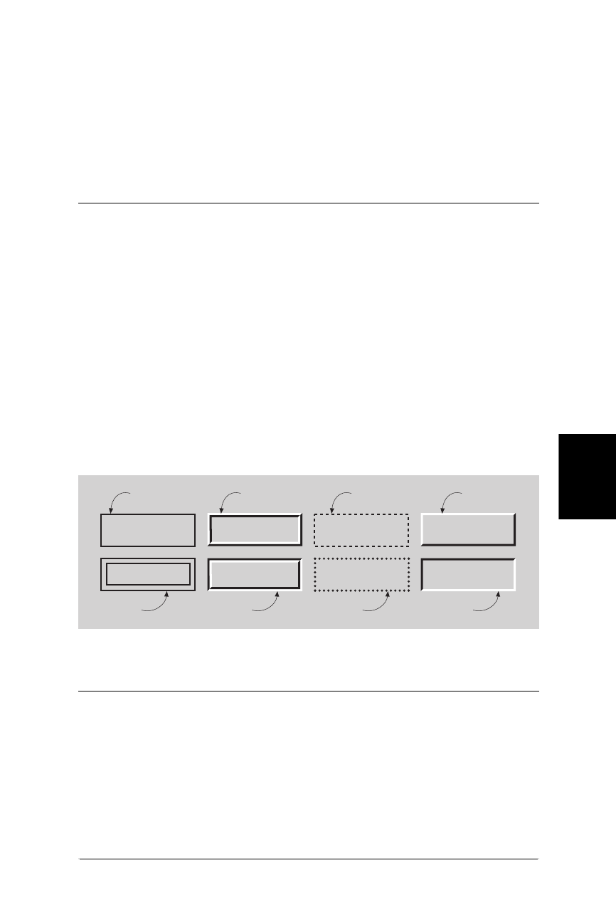
Properties 411
CSS
Properties
Web Design in a Nutshell, eMatter Edition
Copyright © 2000 O’Reilly & Associates, Inc. All rights reserved.
Inherited:
No
This property sets the border color for each of the four sides of an element
box. A single value will apply to all four borders of the box. More than one
value will be applied as described for the margin property (top, right,
bottom, left).
border-style
Values:
none|dotted|dashed|solid|double|groove|ridge|inset|outset
Example:
P.example{ border-style: solid dashed }
Applies to:
All elements
Inherited:
Yes
This property sets the style of border for an element box. The different styles
are illustrated in Figure 23-3. A single value will result in a box with the same
style border on all four sides. More than one value will be interpreted as
described for the margin property (top, right, bottom, left). The following
example would create a box with a solid line on the top and bottom and with
dashed rules on the left and right sides.
border-top, border-right, border-bottom, border-left
Values:
border-top-width|border-style|border-color
Example:
H1: { border-left: .5em solidblue }
Applies to:
All elements
Figure 23-3: Potential border styles
double
ridgesolid
dotted inset
outsetdashed
groove

412 Chapter 23 – Cascading Style Sheets
Properties
Web Design in a Nutshell, eMatter Edition
Copyright © 2000 O’Reilly & Associates, Inc. All rights reserved.
Inherited:
No
Each of these properties is a shorthand property for setting the width, style,
and color of a specific side of a box (as named). The example given would
create a solid blue border .5 em thick on the left side of the H1 element only.
border
Values:
border-width|border-style|border-color
Example:
P.example { border: 2px dotted #666633 }
Applies to:
All elements
Inherited:
No
This is a shorthand property for setting the border width, style, and color for
all four sides of an element box. The values specified in border will always
apply to all four sides of the box (unlike other shorthand border properties
described earlier, which can accept values for separate sides).
width
Values:
length|percentage|auto
Example:
IMG.photo { width: 75% }
Applies to:
Block-level elements and replaced elements (such as graphics)
Inherited:
Yes
This property sets the width of the element. It can be applied to text elements
or as a way to resize images.
height
Values:
length|percentage|auto
Example:
IMG.photo { height: 75% }
Applies to:
Block-level elements

Properties 413
CSS
Properties
Web Design in a Nutshell, eMatter Edition
Copyright © 2000 O’Reilly & Associates, Inc. All rights reserved.
Inherited:
Yes
This property sets the height of the element. The height property can be
applied to text elements or as a way to resize images.
float
Values:
left|right|none
Example:
P.sidebar { float: right }
Applies to:
All elements
Inherited:
No
The float property works much like the align attribute for images—it posi-
tions an element against the left or right border and allows text to flow
around it. Support for the float property is sketchy as of this writing, but it
could prove to be useful in the future for creating drop caps and similar
effects.
clear
Values:
none|left|right|both
Example:
H1, H2, H3 { clear: left }
Applies to:
Block-level elements
Inherited:
Yes
This property specifies whether to allow floating elements on an image’s sides
(more accurately, the sides along which floating items are not accepted). None
means elements are allowed (but not required) on both sides.
Background Properties
Background properties are applied to the “canvas” behind an element. Ideally,
background color appears behind the content and its padding, stopping at the
border (although work-arounds may be necessary for this effect; see “Style Sheet
Tips” later in this chapter). Background properties are not inherited, but since the
default value is transparent, the parent’s background color or pattern will show
through for its child elements.

414 Chapter 23 – Cascading Style Sheets
Properties
Web Design in a Nutshell, eMatter Edition
Copyright © 2000 O’Reilly & Associates, Inc. All rights reserved.
background-color
Values:
color name or RGB value|transparent
Example:
P.warning { background-color: red }
Applies to:
All elements
Inherited:
No
Sets the background color of the element (creating a colored rectangle). The
default is transparent.
background-image
Values:
URL|none
Example:
BODY { background-image: url(stripes.gif) }
Applies to:
All elements
Inherited:
No
Sets a background image for the element. If a background color is also speci-
fied, the image will be overlaid on top of the color.
background-repeat
Values:
repeat|repeat-x|repeat-y|no-repeat
Example:
BODY { background-image: url(oldmap.gif); background-repeat:
no-repeat }
Applies to:
All elements
Inherited:
No
When a background image is specified, this property specifies whether and
how the image is repeated.
repeat
Allows the image to repeat both horizontally and vertically

Properties 415
CSS
Properties
Web Design in a Nutshell, eMatter Edition
Copyright © 2000 O’Reilly & Associates, Inc. All rights reserved.
repeat-x
Allows the image to repeat only horizontally
repeat-y
Allows the image to repeat only vertically
no-repeat
Displays the image only once (does not repeat)
background-attachment
Values:
scroll|fixed
Example:
BODY { background-image: url(oldmap.gif); background-attachment:
scroll }
Applies to:
All elements
Inherited:
No
This determines whether the background image scrolls along with the docu-
ment (the default) or remains in a fixed position.
background-position
Values:
percentage|length|top/center/bottom|left/center/right
Example:
BODY { background-image: url (oldmap.gif); background-position:
bottom left }
BODY { background-image: url (oldmap.gif); background-position:
100% 0% }
Applies to:
Block-level elements and replaced elements
Inherited:
No
When a background image has been specified, this property specifies its
initial position relative to the box that surrounds the content of the element
(not including its padding, border, or margin).
The CSS methods for specifying position get a bit complicated. Values are
given in horizontal/vertical pairs, with a default value of 0%/0%, which places
the upper-left corner of the image in the upper-left corner of the element. A
value of 100%/100% would place the image in the bottom-right corner of the
element.

416 Chapter 23 – Cascading Style Sheets
Properties
Web Design in a Nutshell, eMatter Edition
Copyright © 2000 O’Reilly & Associates, Inc. All rights reserved.
Length values from the left and top margin can also be specified. Or you can
use the keywords, which correspond to the percentage values 0%, 50%, and
100%, respectively. The two examples given create the same result, with the
bottom-left corner of the image placed in the bottom-left corner of the
element.
background
Values:
background-color|background-image|background-repeat|back-
ground-attachment|background-position
Example:
BODY { background: silver url(nightsky.gif) no-repeat fixed }
BODY { background: url(oldmap.gif) bottom left }
Applies to:
Block-level elements
Inherited:
Yes
This is a shorthand property for specifying all the individual background
properties in a single declaration.
Classification Properties
These properties classify elements into categories rather than setting specific visual
parameters.
display
Values:
block|inline|list-item|none
Example:
P { display: block }
IMG { display: none } (turns off all images)
Applies to:
All elements
Inherited:
No
This property defines how and if an element is displayed. A value of none
turns off the display and closes up the space the element would otherwise
occupy. block opens a new box that is positioned relative to adjacent boxes.
list-item is similar to block except that a list-item marker is added.
inline results in a new inline box on the same line as the previous content.

Properties 417
CSS
Properties
Web Design in a Nutshell, eMatter Edition
Copyright © 2000 O’Reilly & Associates, Inc. All rights reserved.
white-space
Values:
normal|pre|nowrap
Example:
P.haiku { white-space: pre }
Applies to:
Block-level elements
Inherited:
Yes
This property defines how white space in the source for the element is
handled. The normal value treats text normally, with consecutive spaces
collapsing to one. The pre value displays multiple characters, like the <pre>
tag in HTML, except the element is not displayed in a monospace font. nowrap
prevents the text element from wrapping unless designated by a <br> tag.
list-style-type
Values:
disc|circle|square|decimal|lower-roman|upper-roman|
lower-alpha|upper-alpha|none
Example:
OL { list-style-type: decimal } (1, 2, 3, 4, etc.)
OL { list-style-type: upper-roman } (A., B., C., D., etc.)
Applies to:
Elements with the display property set to list-item
Inherited:
Yes
This attribute specifies the appearance of the automatic numbering or
bulleting of lists. Values are the same as for the type attribute within a list
item (<li>). These numbers/bullets will be displayed when no list-item image
is specified or if the image cannot be found.
list-style-image
Values:
URL|none
Example:
UL { list-style-image: url(3dball.gif) }
Applies to:
Elements with the display property set to list-item
Inherited:
Yes
This property specifies a graphic to be used as a list-item marker (bullet).

418 Chapter 23 – Cascading Style Sheets
Positioning with Style Sheets
Web Design in a Nutshell, eMatter Edition
Copyright © 2000 O’Reilly & Associates, Inc. All rights reserved.
list-style-position
Values:
inside|outside
Example:
OL { list-style-position: outside }
Applies to:
Elements with “display” property set to “list-item”
Inherited:
Yes
This property specifies whether list items should be set with a hanging indent.
The inside value makes subsequent lines of a list item wrap all the way to
the left margin of the list item (under the list item marker). The outside
value starts subsequent lines under the first word of the list item, creating a
hanging indent.
list-style
Values:
list-style-type|list-style-image|list-style-position
Example:
UL { list-style: list-item url(3dball.gif) disc inside }
UL UL { list-style: circle outside }
Applies to:
Elements with display property set to list-item
Inherited:
Yes
This is a shorthand property for setting the list-style type, image, and
position (inside, outside) in one declaration.
Positioning with Style Sheets
In August of 1997, the W3C published its working draft of specifications for style
sheet properties for positioning HTML elements on the page and in three-dimen-
sional space. This greater control over object placement can be used for more
tightly designed static page layout as well as for creating and tracking motion
effects with DHTML.
This effort was initiated by Netscape and Microsoft, who began supporting some
positioning properties in their 4.0 version browsers. The positioning concepts and
properties were picked up and developed further in the CSS, Level 2 specifica-
tion, which was released in May of 1998.
Style sheet positioning is a rich and complex topic that is beyond the scope of this
chapter, however, this section aims to introduce some basic positioning concepts.
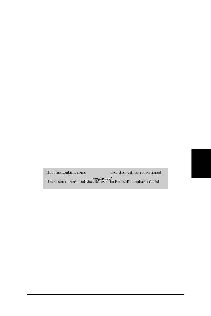
Positioning with Style Sheets 419
CSS
Positioning with Style Sheets
Web Design in a Nutshell, eMatter Edition
Copyright © 2000 O’Reilly & Associates, Inc. All rights reserved.
For complete positioning information, see the W3C’s CSS2 specification online at
http://www.w3.org/TR/REC-CSS2. A good overview is provided by Eric Meyer in his
article, “Playing for Position,” in WebReview magazine (http://webreview.com/wr/
pub/98/02/06/ feature/index3.html).
The position Property
The position property has three possible values: absolute,relative, and
static.
It works in conjunction with the top and left properties (used for specifying
distances from the top and left starting point), and with the width and height
properties (for specifying the width and height of the element including its
padding and border). Values for these properties can be specified as either length
units or percentages.
Relative positioning
Relative positioning places the element relative to its initial position in the flow.
Once the element is moved, the space it previously occupied is held blank. The
resulting position may cause the element to overlap other elements on the page.
Measurements are relative to the top-left point of the element box. Adding a posi-
tive top value moves the element down the specified amount from its initial top
position. Adding a positive value for the left property moves the element that
amount to the right. You can also specify negative values to move an element up
and to the left. In Figure 23-4 and the following code, the emphasized text is
moved 20 pixels down and 12 pixels to the right of its initial position.
<HEAD>
<STYLE TYPE="text/css">
<!--
EM { position: relative; top: 20px; left: 12px; }
-->
</STYLE>
</HEAD>
<BODY>
<P>This line contains some <EM>emphasized</EM> text that will
be repositioned.</P>
<P>This is some more text that follows the line with emphasized
text.</P>
</BODY>
Figure 23-4: Word moved down and to right with relative positioning
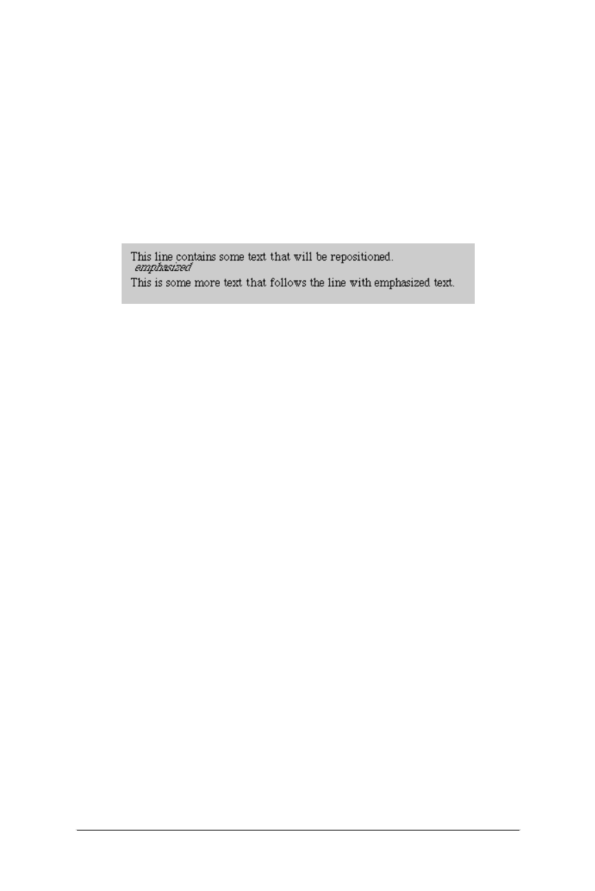
420 Chapter 23 – Cascading Style Sheets
Positioning with Style Sheets
Web Design in a Nutshell, eMatter Edition
Copyright © 2000 O’Reilly & Associates, Inc. All rights reserved.
Absolute positioning
Absolute positioning places the element in an arbitrary position, but technically, it
is still relative to the containing block of another element or to the document coor-
dinates (it will scroll when the document scrolls). Measurements in absolute
positioning are relative to the top-left corner of the document itself (or the
containing block of another element). Again, negative values can be specified.
When an element is positioned absolutely, the space it previously occupied is
closed up, as shown in Figure 23-5 and the following code. In its new position,
the element may overlap other elements on the page. An absolutely positioned
element has no margins—its outer edge stops at the border.
<HEAD>
<STYLE TYPE="text/css">
<!--
EM { position: absolute; top: 20px; left: 12px; }
-->
</STYLE>
</HEAD>
<BODY>
<P>This line contains some <EM>emphasized</EM> text that will
be repositioned.</P>
<P>This is some more text that follows the line with emphasized
text.</P>
</BODY>
If its parent element is specified to have relative positioning (whether or not it is
actually moved), the absolutely positioned child element will be placed relative to
the position of the top-left corner of its parent. One possible application of this is
keeping notations nearby their source paragraphs.
Static positioning
Static is the default value for the position property. Static elements can never serve
as a context for child element placement (as discussed in absolute positioning
above). Static elements cannot be positioned or repositioned.
Z-Order
Z-order refers to the overlapping of elements that can occur when elements are
positioned outside of their normal flow. The CSS-P specification provides a special
property, z-index, for handling the placement of objects in 3-dimensional space.
Figure 23-5: Word moved down and to the right with absolute positioning
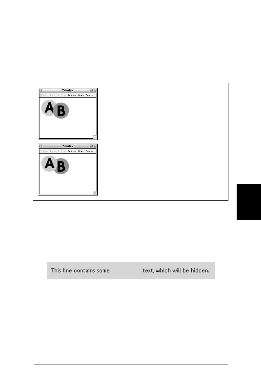
Positioning with Style Sheets 421
CSS
Positioning with Style Sheets
Web Design in a Nutshell, eMatter Edition
Copyright © 2000 O’Reilly & Associates, Inc. All rights reserved.
Elements with higher z-index values obscure those with lower values. When not
specified, elements appear from back to front in the order in which they appear in
the HTML source.
In Figure 23-6, two ordinary transparent GIFs, A.gif and B.gif, are positioned using
z-index settings. In the top image, B.gif is given a higher z-index value and thus
overlaps A.gif. In the bottom image, the positioning code is the same, but this
time, A.gif is given the higher z-index value and comes out on top.
Visibility
The CSS2 specification also includes a new property called visibility, which
takes the values visible (the default) or hidden. When an element is hidden, it
is not displayed on the page and the space it occupies is held blank as shown in
Figure 23-7 and the following code.
<STYLE TYPE="text/css">
<!--
EM { visibility: hidden; }
-->
</STYLE>
...
<P>This line contains some <EM>emphasized</EM> text, which will
be hidden.</P>
Figure 23-6: Graphic file with higher z-index value is positioned on top
Figure 23-7: Word is hidden using visibility property
<IMG SRC="A.gif" STYLE="z-index: 1">
<IMG SRC="B.gif" STYLE="z-index: 2;
position: relative; top: 12px; left: -25px">
<IMG SRC="A.gif" STYLE="z-index: 2">
<IMG SRC="B.gif" STYLE="z-index: 1;
position: relative; top: 12px; left: -25px">
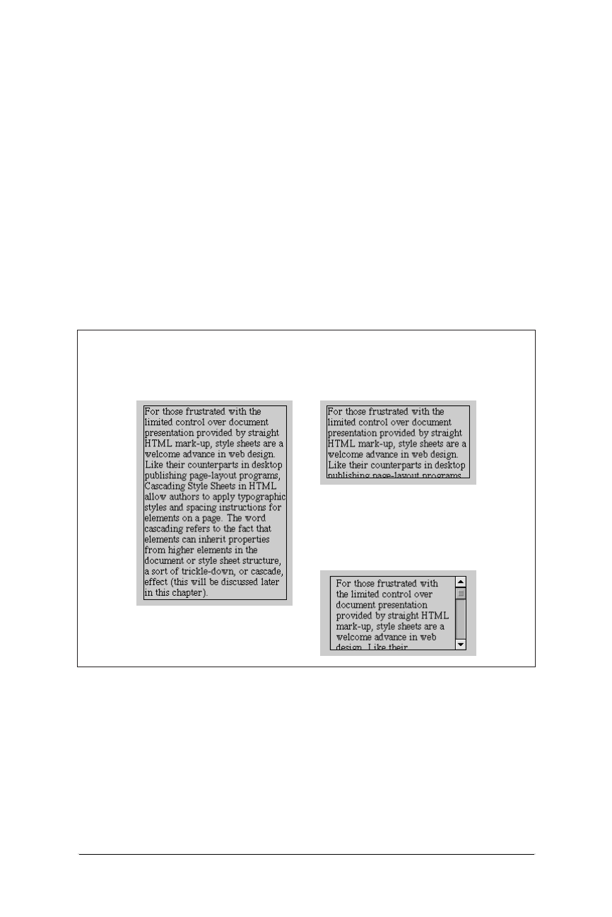
422 Chapter 23 – Cascading Style Sheets
What’s New in CSS2
Web Design in a Nutshell, eMatter Edition
Copyright © 2000 O’Reilly & Associates, Inc. All rights reserved.
This is different from display:none (another method for hiding elements) in that
the display property closes up the space once occupied by the element. The
other difference is that display:none only works on block-level items, where
visibility:hidden can be used on inline elements.
Overflow
Another new property first proposed in the Positioning Specification is overflow,
which provides alternative ways for handling text that does not fit in the box
dimensions as specified. It has four possible attributes: visible, which just resizes
the bounding box so the whole element can be viewed; hidden, which hides
from view the portion of the element that does not fit in the box; scroll, which
places a scroll bar in the box so the user can scroll down to read its contents, and
auto, which places a scroll bar only when necessary.
Figure 23-8 shows the effects of different overflow settings on a text element spec-
ified at 200×100 pixels (visible,hidden, and scroll, respectively).
What’s New in CSS2
As of this writing, the current specification published by the W3C is Cascading
Style Sheets, Level 2 (http://www.w3.org/TR/REC-CSS2/ ). CSS2 expands signifi-
cantly on the work done in CSS1. Not surprisingly, it includes dozens of new
properties (and pseudo-elements), and a fair number of additional values for
existing properties (see the following tables).
Figure 23-8: Box resizes to fit text when overflow is set to visible
P { position: absolute;
width: 200px;
height: 100px;
overflow: hidden; }
P { position: absolute;
width: 200px;
height: 100px;
overflow: visible; }
P { position: absolute;
width: 200px;
height: 100px;
overflow: scroll; }

What’s New in CSS2 423
CSS
What’s New in CSS2
Web Design in a Nutshell, eMatter Edition
Copyright © 2000 O’Reilly & Associates, Inc. All rights reserved.
CSS2 incorporates and refines the set of properties used for positioning to give
designers more control over page layout and DHTML authors the ability to create
dynamic motion effects.
It provides more controls over traditional typesetting elements such as widows,
orphans, and page breaks. This shows that style sheets are being developed with a
mind to developing documents for both HTML display and print output.
CSS2 also introduces properties that give additional control over table element
presentation.
As part of the W3C’s efforts to make web pages accessible to all users, the latest
style sheet specification includes a number of new properties that pertain to the
nonvisual display of web pages. These new attributes provide controls for speech-
delivery and sound controls.
The following list of new CSS2 elements was compiled and graciously contributed
to this book by CSS-guru Eric Meyer. It reflects the state of the final CSS2 specifica-
tion, which was made a W3C Recommendation in May 1998.
New Selectors
The following are the new CSS2 selectors:
Selector Description
*Matches any element.
Example: *{font-family:serif;}
A>B Matches any element B that is a child of any element A.
Example: DIV.main>P{line-height:1.5;}
A+B Matches any element B that immediately follows any
element A.
Example: P+UL{margin-top:0;}
A[att] Matches any element A that has the given attribute
defined, whatever its value.
Example: TABLE[border]{background-color:white;}
A[att="val"] Matches any element B that has the specified attribute set
to the specified value.
Example: TABLE[border="3"]{background-
color:yellow;}
A[att~="val"] Matches any element B that has the specified value as one
of the values in a list given to the specified attribute.
Example: TABLE[class~="example"]{background-
color:orange;}
A[lang|="val"] Matches any element A that has the given value as one of
the values for the lang attribute.
Example: P[lang|="en"]{text-align:left;}

424 Chapter 23 – Cascading Style Sheets
What’s New in CSS2
Web Design in a Nutshell, eMatter Edition
Copyright © 2000 O’Reilly & Associates, Inc. All rights reserved.
New Properties
The following are the new CSS2 properties:
Font Descriptors
The following are the new CSS2 font descriptors:
(Note that these properties are only used for font matching and description; most
authors will not need to use them.)
text-shadow top table-layout
font-size-adjust right cell-spacing
font-stretch bottom empty-cells
unicode-bidi left caption-side
z-index speak-header-cell
cursor
outline min-width volume
outline-color max-width speak
outline-style min-height pause-before
outline-width max-height pause-after
overflow pause
content clip cue-before
quotes visibility cue-after
counter-reset cue
counter-increment page play-during
marker-offset page-break-before azimuth
page-break-after elevation
border-top-color page-break-inside speech-rate
border-right-color orphans voice-family
border-bottom-color widows pitch
border-left-color size pitch-range
border-top-style marks stress
border-right-style richness
border-bottom-style row-span speak-punctuation
border-left-style column-span speak-date
border-collapse speak-numeral
position border-spacing speak-time
direction
unicode-range ascent
units-per-em descent
src widths
panose-1 bbox
stemv definition-src
stemh baseline
slope centerline
cap-height mathline
x-height topline

What’s New in CSS2 425
CSS
What’s New in CSS2
Web Design in a Nutshell, eMatter Edition
Copyright © 2000 O’Reilly & Associates, Inc. All rights reserved.
New Pseudo-Selectors
The following are the new CSS2 pseudo-selectors:
:after
:before
:first
:first-child
:focus
:hover
:lang
:left
:right
New Functions
The following are the new CSS2 funtions:
@charset
@media
@font-face
@page
New Values for Existing Properties
The following are the new CSS2 value for existing properties:
all properties
inherit
display
run-in, compact, marker, table, inline-table, table-row, table-row-group, table-
column, table-column-group, table-cell, table-caption, table-header-group,
table-footer-group
font
caption, icon, menu, message-box, small-caption, status-bar
list-style-type
hebrew, armenian, georgian, cjk-ideographic, hiragana, hiragana-iroha, kata-
kana, katakana-iroha
<color> values
(These values are case-insensitive, but use of the capitalization is encouraged
for the sake of readability.)
ActiveBorder, ActiveCaption, AppWorkspace, Background, ButtonFace,
ButtonHighlight, ButtonText, CaptionText, GrayText, Highlight, Highlight-
Text, InactiveBorder, InactiveCaption, InfoBackground, InfoText, Menu,
MenuText, Scrollbar, ThreeDDarkShadow, ThreeDFace, ThreeDHighlight,
ThreeDLightshadow, ThreeDShadow, Window, WindowFrame, WindowText
426 Chapter 23 – Cascading Style Sheets
Style Sheet Tips and Tricks
Web Design in a Nutshell, eMatter Edition
Copyright © 2000 O’Reilly & Associates, Inc. All rights reserved.
Style Sheet Tips and Tricks
Style Sheet MIME Types
Some authors have reported trouble with gettting their ISPs to correctly serve up
CSS files. Apparently, with some Web servers, .css is mapped to the MIME-type
x-application/css, or “Continuous Slide Show,” instead of the MIME-type
text/css. The style sheet gets mangled into something else. If you find you’re
having this problem, you’ll need to contact your ISP and explain the problem.
Because .css is now an IANA-registered MIME-type, service providers really have
no excuse for not supporting it for style sheets. If they refuse to fix it and style
sheets are a necessary part of your site, you may have to consider switching ISPs.
Creating a Drop Cap
Although a pseudo-element called :firstletter exists, it is not very well
supported as of this writing. In the meantime, you can create a drop cap using a
<span> to isolate the first letter of the paragraph.
The float property also has spotty support. The width property was added to
the following example in order to get float to work with Internet Explorer (and it
still doesn’t function properly on a Mac). Without the float property, the capital
letter will stand taller than the rest of the line, which may still be an acceptable
effect. Figure 23-9 shows a drop cap created with the following style sheet code.
<STYLE TYPE="text/css">
<!--
.dropcap { font: bold 200% sans-serif;
color: teal;
width: 24pt;
float: left; }
-->
</STYLE>
<P><SPAN CLASS="dropcap">F</SPAN> or those frustrated...</P>
Specifying Text Size in Pixels
One of the great frustrations in designing web pages is that fonts are rendered so
differently from platform to platform, especially with regards to point size. The
same point size will be rendered much larger on a PC than on a Mac, making it
difficult to anticipate how much type will fit on the page. (See “Why Specifying
Type is Problematic” in Chapter 3, Web Design Principles for Print Designers.)
Figure 23-9: Drop cap created with float property

Style Sheet Tips and Tricks 427
CSS
Style Sheet Tips and Tricks
Web Design in a Nutshell, eMatter Edition
Copyright © 2000 O’Reilly & Associates, Inc. All rights reserved.
Style sheets introduce the ability to specify type size in pixels. This translates better
across platforms because the size of the type will stay fixed in relation to the other
elements (like graphics) on the page. The result is more predictable page layouts.
However, this recommendation comes with a warning: text specified in pixels
cannot be printed legibly by Windows machines. Windows maps the pixels
directly to laser printer dots, making type too tiny to read. So if your page needs
to be printed, stick with point sizes. If the allure of pixel type measurements is too
strong, be sure to provide a “print” version of your web page where it can be
easily found.
Setting BODY Color
Setting a color for the BODY element will make all the text elements on the page
your chosen color, but it will also turn your horizontal rules (<hr>) into solid rules
(not 3-D shaded as normally displayed) of your chosen color. This is mostly true
for older browsers and is incorrect behavior—color values should not effect <hr>s.
BODY { color: green; }
Unfortunately, at this point, the only current workaround for this problem is to list
every element on the page except <hr>s as shown below:
H1, H2, H3, P, UL, OL, PRE, TABLE { color: purple; }
Setting BODY Font
Similar to the body color problem, specifying a font and size for the body element
will apply to all the elements on the web page contained in it. For example, the
following code specifies 12pt serif text for the body font:
BODY { font: 12pt serif; }
The problem is that in some browsers, this rule will apply to all the H1s, pre text
and text enclosed in <font> tags, because they will all inherit the body’s values.
They shouldn’t, but in some browsers, they do anyway.
The only solution is to provide style sheet rules for all the elements on the page,
which should override the higher-level body settings. You can specify the type in
points, but it is more democratic to use absolute values as shown below:
BODY { font: 12pt serif; }
H1 { font-size: xx-large; }
H2 { font-size: x-large; }
H3 { font-size: large; }
PRE, TT, CODE { font-size: medium monospace; }
Making Padding Behave in Netscape
Although a background should always fill an element’s padding out to its border,
Netscape Navigator needs a little extra help to get it right. Anywhere padding is
used with a background color, add the following declaration:
{ border: 1px solid none; }

428 Chapter 23 – Cascading Style Sheets
Browser Support Charts
Web Design in a Nutshell, eMatter Edition
Copyright © 2000 O’Reilly & Associates, Inc. All rights reserved.
This will have no visual effect, but in the course of telling Navigator to draw a one
pixel, solid, transparent border, padding will suddenly start to inherit the back-
ground color. If you leave out this statement, many versions of Navigator will not
extend the background color into the padding. (Again, this is just a workaround to
compensate for bugs in Navigator—this is not how CSS1 is defined to behave.)
Browser Support Charts
Appendix E in this book contains charts with brower support for style sheet prop-
erties as of this writing. They were compiled and continue to be maintained by
Eric Meyer for WebReview magazine. To get up-to-date statistics on browser
support, WebReview’s Style Sheets Reference Guide online at http://style.webre-
view.com/.

429
DHTML
Web Design in a Nutshell, eMatter Edition
Copyright © 2000 O’Reilly & Associates, Inc. All rights reserved.
Chapter 24DHTML
CHAPTER 24
Introduction to DHTML
Dynamic HTML (DHTML) refers to web pages that move, animate or respond to
the user after downloading to the browser. Through DHTML, users get a more
engaging and interactive web experience without constant calls to a web server or
the overhead of loading new pages or large applets.
DHTML works through a combination of:
• HTML 3.2
• JavaScript—the web’s standard scripting language
• Cascading Style Sheets (CSS)—styles dictated outside a document’s content
• Document Object Model (DOM)—a means of accessing a document’s individ-
ual parts
Although HTML pages using one or more of these technologies can be considered
“dynamic,” the term DHTML generally refers to all of these technologies used
together.
Both Netscape 4.0 and Internet Explorer 4.0 support these technologies, but in
different ways. This means that web designers whose audience consists of both
Internet Explorer and Netscape users (that’s just about all of us) must create
DHTML pages catering to two different implementations of DHTML. A standard-
ized DHTML is in the works, but as of this writing, we’re still waiting for the
standards to be finalized and for browser makers to implement those standards.
This chapter provides an introduction to DHTML. Before creating your own
DHTML pages you may want to read Chapter 22, Introduction to JavaScript, and
Chapter 23, Cascading Style Sheets. Read on if you are simply looking for an expla-
nation of DHTML and its uses.

430 Chapter 24 – Introduction to DHTML
Advantages to Using DHTML
Web Design in a Nutshell, eMatter Edition
Copyright © 2000 O’Reilly & Associates, Inc. All rights reserved.
Advantages to Using DHTML
Small file sizes
DHTML files are small compared to other interactive media such as Flash or
Shockwave (see Chapter 21, Interactivity). Therefore they have a shorter
download time and take up less bandwidth.
Supported by both major browser manufacturers
Both Microsoft and Netscape currently support DHTML in some shape or
form.
DHTML will be a standard
The World Wide Web Consortium or the W3C is currently implementing stan-
dards for DHTML technologies. It has already released preliminary
specifications for DOM and CSS (go to http://www.w3c.org for more informa-
tion). These specifications lay the groundwork for more complete standards to
come, which both Netscape and Microsoft have pledged to support.
No plug-ins necessary
Plug-ins are not needed to view DHTML files. A visitor to your site needs only
a Netscape 4.0 browser or an Internet Explorer 4.0 browser. This puts fewer
requirements on your audience; they don’t need to download special soft-
ware to view your site.
Doesn’t require a Java Virtual Machine (JVM)
DHTML isn’t a Java technology. DHTML provides many functions that can
otherwise be attained through Java—a compiled, object-oriented computer
language. Pages that contain Java applets require the user to wait for the JVM
to start and for Java byte code to download, which takes quite a bit of time
and bandwidth. Although Java is good for some applications, DHTML can be
an attractive alternative for animations, design issues, and simple tasks.
Disadvantages
Only new browsers support DHTML
DHTML is only supported by Netscape 4.0 or higher and Internet Explorer 4.0
or higher. Many people are still using older versions of both browsers. Web
designers using DHTML must choose to provide content for older browsers or
eliminate a significant portion of their audience.
Netscape and Microsoft have different DHTML implementations
Two different implementations make creating a DHTML document tedious
and complicated task. More information is given in the section called
“Browser Differences.”
DHTML creation has a sharp learning curve
Because DHTML requires at least partial knowledge of many different web
design concepts (HTML, JavaScript, CSS, and DOM) it may take some review
before you begin creating DHTML content. DHTML tools go a long way
towards eliminating this problem.
Unprotected source code
You may not sweat someone lifting your HTML code, but you may be more
leery about giving away your hand-written DHTML application.

The Document Object Model 431
DHTML
The Document Object Model
Web Design in a Nutshell, eMatter Edition
Copyright © 2000 O’Reilly & Associates, Inc. All rights reserved.
Learning DHTML
Because both Netscape and Microsoft have pledged support for the emerging W3C
standards, time spent learning DHTML is well spent. Knowledge gained today will
not become obsolete and will give you a head start once DHTML is standardized
for all browser manufacturers.
In rating the difficulty of all web design skills, DHTML falls somewhere in the
middle. It isn’t as difficult as Java or Perl programming, but it is more difficult than
regular HTML.
You should first experiment with visual DHTML development tools such as
Dreamweaver 1.0 or Fusion 3.0 before you begin coding DHTML by hand. A
visual tool will allow you to get a feel for DHTML technology rather quickly. After-
wards, if a tool doesn’t meet your needs, begin coding by hand.
Tools are discussed again at the end of the chapter. After reading the sections on
browser differences and DHTML examples composed manually, it should give you
a greater appreciation of the time and effort a tool can save you.
Browser Differences
In order to create DHTML content available to the largest audience, you will need
to understand the differences between Microsoft’s and Netscape’s DHTML.
Although both Netscape and Microsoft implement DHTML, they do so very
differently.
Both Netscape 4.0 and Internet Explorer 4.0 support the Cascading Style Sheet
Positioning (CSS-P) standard as established by the W3C. CSS-P (now rolled into the
CSS Level 2 Specification) specifies settings for attributes of distinct objects in an
HTML document. These objects are generally words or text. By accessing
attributes, objects can be hidden, shown, and layered.
Although both browsers use CSS-Positioning, Microsoft and Netscape have applied
this to HTML objects differently. Dynamic objects in a Netscape browser are called
layers. Netscape has created a <layer> tag to add such items to a document.
Dynamic objects in Internet Explorer are referred to as styles. Web designers must
create DHTML documents that utilize both implementations of CSS-Positioning.
The Document Object Model
Many of the differences between Netscape DHTML and Internet Explorer DHTML
stem from their incompatible implementations of the Document Object Model
(DOM). The Document Object Model exposes every element of an HTML page to
a scripting language such as JavaScript. Early iterations of the DOM gave scripts
access to only some objects on a page such as forms, frames, and images. Internet
Explorer 4.0 and Netscape 4.0 have expanded their DOMs and therefore exposed
more objects to scripting.
The DOM begins with a base object called the “window,” which refers to the
browser window itself. Within the window object is the document object (as well
as other non-document objects, such as frames). The document object refers to the

432 Chapter 24 – Introduction to DHTML
The Document Object Model
Web Design in a Nutshell, eMatter Edition
Copyright © 2000 O’Reilly & Associates, Inc. All rights reserved.
HTML page itself and everything in it. All of the objects contained within the
HTML page, such as images and forms, “branch off” from the original HTML page
or document, like branches from a tree trunk.
Using JavaScript you can reference these branches by naming each object, from
the root to the branch, and separating their names with periods, like this:
document.images["image_name"]
The HTML code that gives an image its name looks like this:
<IMG SRC="start.gif" NAME="start">
While the document object is legally part of the window object
(window.document), the window object doesn’t usually have to be
explicitly referenced. Thus we reference document.images, not
window.document.images.
For the most part, Netscape and Internet Explorer use a similar DOM. However,
when working with more complicated Web pages—that is, pages with position-
able objects placed in a stacking order—Netscape’s DOM and Internet Explorer’s
DOM differ greatly.
Referencing Objects in Netscape and IE
In Netscape, positionable objects are placed in layers with the <LAYER> tag or
with CSS-P. You access a Netscape layer like this:
document."layer_name"
A layer is considered a separate document that contains its own objects. In
Netscape, JavaScript would reference an object contained in a layer in this manner:
document."layer_name".document.images["image_name"]
The left-most document object refers to the actual HTML page. Next comes the
name of the layer. The second “document” refers to the document contained in
that layer. Finally, images["image_name"] references the actual image within the
layer that you want to access. Thus the image named “start” (remember we use the
image’s name, specified in the <img> tag—not its filename) on the controls layer
is referenced:
document.controls.document.images[start]
In Internet Explorer, objects are referred to as “styles.” IE’s DOM allows you to
reference all style objects within the root document. This is done through the all
property. A named style object looks like this:
document.all."style_name".style
Thus we would access a style named controls like this:
document.all.controls.style

The Document Object Model 433
DHTML
The Document Object Model
Web Design in a Nutshell, eMatter Edition
Copyright © 2000 O’Reilly & Associates, Inc. All rights reserved.
To access an image object contained within a style object, you needn’t reference
the style object. You should reference it directly through the image object’s name.
So, to reference the image named start, type:
document.all.start
Object Properties
Another difference between Netscape and Internet Explorer’s implementation of
the DOM is in property names.
Every object contains properties. Properties are different for every object but are
typically descriptors such as color, size, position, etc. Referencing yet another
branch in the DOM can access these properties. Image objects in an HTML page
have a source property, which is the image’s path or URL. Here’s how we would
reference the start image’s source file:
document.images.start.src
By accessing and manipulating an image’s source property, you can create effects
such as rollovers (see Chapter 22).
Because Netscape and Internet Explorer don’t agree on the names of object prop-
erties, you must program for properties that Netscape and Internet Explorer have
in common.
There are three properties for positionable objects that Netscape and Internet
Explorer share:
• Location
• Visibility
• Stacking order (z-index)
Location
You can control an object’s location through its X and Y coordinates. These two
properties are named differently by Netscape and Internet Explorer. In Netscape, a
positionable object’s X coordinate is called left and its Y coordinate is called
top. To access a positionable object’s X coordinate in Netscape you could write:
document."layer_name".left
To access an object’s Y coordinate in Netscape you write:
document."layer_name".top
Internet Explorer’s positionable objects have these same properties but they are
referred to through different names. In Internet Explorer, a positionable object’s X
coordinate is called pixelLeft and its Y coordinate is called pixelTop. To access
a positionable object’s X coordinate in Internet Explorer you would use the
pixelLeft property:
document.all."style_name".style.pixelLeft
To access an object’s Y coordinate in Internet Explorer you write:
document.all."style_name".style.pixelTop

434 Chapter 24 – Introduction to DHTML
The Document Object Model
Web Design in a Nutshell, eMatter Edition
Copyright © 2000 O’Reilly & Associates, Inc. All rights reserved.
These properties return an integer indicating the number of pixels between the
top-left corner of the browser window and the object’s position. Thus, the top or
pixelTop property of 200 positions an object 200 pixels below the document’s
top border.
Visibility
In both Netscape and Internet Explorer, a positionable object’s visibility prop-
erty can be set to visible,hidden,or inherit.What the visible and hidden
values do are self-explanatory. Setting an object’s position property to inherit
gives the object the same visibility as its containing object. In Netscape, a position-
able object’s visibility can be set to “visible” like this:
document."layer_name".visibility = "visible";
You can do the same in Internet Explorer like this:
document.all."style_name".visibility = "visible";
Stacking oder (z-index)
Stacking order or z-index works the same way in both Netscape and Internet
Explorer: the z-index property of the layer (Netscape) or style (IE) determines the
object’s place in the stack. Stacking order is set to an integer. A layer or style with
a stacking order of 1 will be placed above an object with a stacking order of 0.
You can set stacking order in Netscape like this:
document."layer_name".zIndex = "1";
In Internet Explorer it is set like this:
document."style_name".zIndex = "1";
Because of these fundamental differences in Netscape and Microsoft’s implementa-
tion of the DOM, you need to customize your HTML for each of the DHTML-
capable browsers; that is, you have to create two sets of JavaScript code. The
result is cross-platform DHTML.
Writing for Both Browsers
To write DHTML for both Netscape and Internet Explorer, you must create two
sets of JavaScript functions. The user’s browser will determine which set of functions
to use. If the viewer is using Internet Explorer, then the Internet Explorer-specific
JavaScript will be run. If the viewer is using Netscape, then the Netscape-specific
JavaScript will be run. See the “Browser Differences” section later in this chapter
for more information.
Although this is tedious, it isn’t as difficult as it sounds. Code written for one page
can be modified and reused for another. Also, if you’re really into JavaScript, you
can create your own interface for controlling DHTML objects and import them into
a document using an external .js file. An example of this is available on the
O’Reilly web site at http://www.oreilly.com/catalog/jscript3/example/text/17-4.txt.
This example is taken from JavaScript: The Definitive Guide, by David Flanagan.

DHTML Examples 435
DHTML
DHTML Examples
Web Design in a Nutshell, eMatter Edition
Copyright © 2000 O’Reilly & Associates, Inc. All rights reserved.
In an effort to solve DHTML compatibility problems, the W3C has drawn up
preliminary specifications for a DOM for both HTML and XML, but it will be some
time before these standards are expanded and become mainstreamed.
DHTML Examples
This section provides two DHTML examples. The first shows how DHTML can be
used to hide or show an object. The second example uses DHTML to add motion
to a page. In addition, this section discusses the measures that must be taken to
make sure the DHTML works with both major browsers.
These examples are intended to introduce you to the basics of DHTML. They are
by no means a compilation of all possible DHTML functions and they do not work
with or handle Netscape and Internet Explorer browsers below version 4.0. It is
possible to detect 3.0 browsers and send them non-DHTML content, but that is
beyond the scope of this chapter. If you are interested in learning how to do that,
go to the web sites listed at the end of this chapter.
Though the following examples are simple, mixing these different functions or
expanding upon them can add a lot to your web pages.
Browser Detection
The examples in this section require that you first check for the user’s browser
type and version. This allows you to identify the viewer’s browser and execute the
browser-specific JavaScript code. Each of the example scripts should begin like
this:
<SCRIPT Language="JavaScript1.2">
var isNet4, isIE4
if ( navigator.appversion.substring(0, 1) >= 4)
{
if ( navigator.appName == "Netscape" )
{
isNet4 = true;
}
if ( navigator.appName == "Microsoft Internet Explorer" )
{
isIE4 = true;
}
}
</SCRIPT>
This code checks the ID of the browser and sets as true a variable for that
browser, either isNet4 (Netscape) or isIE4 (IE).
Now that we have tested the user’s browser and set our isIE4 and isNet4 vari-
ables, we can create two sets of browser-specific code, but only have the
appropriate set execute.
436 Chapter 24 – Introduction to DHTML
DHTML Examples
Web Design in a Nutshell, eMatter Edition
Copyright © 2000 O’Reilly & Associates, Inc. All rights reserved.
Style Changes
Once you’ve created your browser detection code, making changes to style sheets
is relatively simple. All you have to do is access a style property and change it:
document."style_name".visibility = "visible";
This line of script changes the visibility property of a Netscape 4.0 layer to
visible. Controlling the visibility of an element allows us to have pictures or text
appear on demand. The same line for Internet Explorer 4.0 looks like this:
document.all."style_name".style.visibility = "visible";
To execute either line of code depending upon the user’s browser, you would
wrap them in conditional statements like this:
if (isNet4)
{
document.hidden.visibility = "visible";
}
if (isIE4)
{
document.all.hidden.style.visibility = "visible";
}
The first if statement checks to see if the browser is Netscape 4; if it is, then the
Netscape 4.0-specific code between the curly brackets executes. The second if
statement checks the isIE4 variable. If that variable is true then the Internet
Explorer 4.0-specific code between the curly brackets executes. In either case, the
visibility property of the style or element named hidden is made visible.
If you have a style sheet that looks like this:
<STYLE TYPE="text/css">
#hidden {position: relative; font: 12pt Times, serif;
visibility: hidden;}
</STYLE>
You must specify the position attribute for a CSS object to be
accessed by JavaScript. In this case relative means the text
appears as positioned by traditional HTML. Designating the position
as absolute would put the text identified as hidden in the upper
left corner of your browser.
The JavaScript code that accesses the hidden object and changes its visibility
property from hidden to visible would look like this:
<script language="Javascript1.2">
var isNet4, isIE4
// Variables that you reference for browser type.
//
// Begin the browser detection script.
if ( navigator.appVersion.substring(0, 1) >= 4)

DHTML Examples 437
DHTML
DHTML Examples
Web Design in a Nutshell, eMatter Edition
Copyright © 2000 O’Reilly & Associates, Inc. All rights reserved.
{
if ( navigator.appName == "Netscape" )
{
isNet4 = true;
}
if ( navigator.appName == "Microsoft Internet Explorer" )
{
isIE4 = true;
}
}
// End the browser detection script.
// Function "show" checks for browser type, then executes the
// appropriatecode to change the "hidden" object’s visibility
// from hidden to visible.
function show()
{
if (isNet4)
document.hidden.visibility = "visible";
}
if (isIE4)
{
document.all.hidden.style.visibility = "visible";
}
}
</script>
The HTML looks like this:
<BODY BGCOLOR="ffffff" TEXT="000000">
We want some text to appear after this text has been loaded.
<br>
<SPAN ID="hidden">This could be used to further define or give
background information for web content</SPAN>
<br>
<A HREF=javascript:show()>Click here to make text appear.</A>
</BODY>
</HTML>
The SPAN tag identifies some text as hidden. The <a href> tag executes the
show() function, which makes any HTML between the <span> tags visible.
Motion
Creating motion with DHTML is similar to making a style change—JavaScript
accesses the position attributes of a CSS object and changes them. Changing an
object’s position incrementally by one or two pixels creates the illusion of move-
ment. In this example, animated text will move onto the browser window from left
to right.

438 Chapter 24 – Introduction to DHTML
DHTML Examples
Web Design in a Nutshell, eMatter Edition
Copyright © 2000 O’Reilly & Associates, Inc. All rights reserved.
To access a CSS object’s left property, or X coordinate in Netscape 4.0 write:
document."style_name".left
To access the top property, or Y coordinate, in Netscape 4.0 write:
document."style_name".top
As with the style change example, Netscape 4.0 and Internet Explorer 4.0 do not
agree on how JavaScript can access top and left properties. To change an
object’s left property in Internet Explorer 4.0 write:
document.all."style_name".style.pixelLeft
And to change an object’s top property in Internet Explorer 4.0 write:
document.all."style_name".style.pixelTop
Be sure to enclose this code in browser detection code as described earlier.
To create the animated text, first, a Cascading Style Sheet creates an object called
animate, like this:
<STYLE TYPE="text/css">
#animate {position: absolute; left: -80; top: 10;}
</STYLE>
The animate object’s left attribute or X coordinate is set to -80. Its top attribute
or Y coordinate is 10. These coordinates set the animate object 80 pixels to the
left of the browser window, which is out of sight, and 10 pixels down from the
top of the browser.
Now that the animate object is defined, it can be placed into an HTML document
using the <span> or <div> tag. The body of the example HTML document looks
like this:
<BODY onload="counter = setInterval('motion()', 20)">
<DIV ID="animate">Moving text</DIV>
</BODY>
The <body> tag contains an onload action event, which triggers functions in the
following JavaScript.
The JavaScript will increase the animate object’s left attribute incrementally
making any image or text designated as animate by a <span> tag appear to move
onto the browser from the left to the right.
<SCRIPT LANGUAGE="Javascript1.2">
var isNet4, isIE4
// Variables that you can reference for browser type.
//
// Begin the browser detection script.
if ( navigator.appVersion.substring(0, 1) >= 4)
{
if ( navigator.appName == "Netscape" )
{
isNet4 = true;
}

DHTML Examples 439
DHTML
DHTML Examples
Web Design in a Nutshell, eMatter Edition
Copyright © 2000 O’Reilly & Associates, Inc. All rights reserved.
if ( navigator.appName == "Microsoft Internet Explorer" )
{
isIE4 = true;
}
}
// End the browser detection script.
After detecting the browser, we write a motion function, customized for each
browser with if statements. This function accesses the animate object and adds 2
to its left attribute. After adding 2, it checks to see if the object’s left attribute is
greater than 200. If so, the animation stops.
// Variable through which timed events will be accessed.
var counter;
function motion()
{
if (isNet4)
{
// Move the animate object 2 pixels to the left
document.animate.left += 2;
// Check to see if the animate object is 200 pixels
// into the page. If it is, execute the script between
// the brackets.
if (document.animate.left > 200)
{
// End the animation.
clearTimeout(counter);
}
}
if (isIE4)
{
// Move the animate object 2 pixels to the left
document.all.animate.style.pixelLeft += 2;
// Check to see if the animate object is 200 pixels
// into the page. If it is, execute the script between
// the brackets.
if (document.all.animate.style.pixelLeft > 200)
{
// End the animation.
clearTimeout(counter);
}
}
}
</script>
The onload event passes the value setInterval('motion()', 20) to the
counter. Once this is set, the motion function will automatically execute every 20
milliseconds until stopped with the clearTimeout function.

440 Chapter 24 – Introduction to DHTML
DHTML Examples
Web Design in a Nutshell, eMatter Edition
Copyright © 2000 O’Reilly & Associates, Inc. All rights reserved.
Changing this example to suit your needs
The previous example can be copied and changed to suit your needs. To slow
down the animation, you can decrease the number of milliseconds within the
setInterval function, like this:
<BODY onload="counter = setInterval('motion()', 500)">
With the second parameter in the setInterval function set to 500, it will wait
500 milliseconds before executing the motion function again.
To make the animate object move from top to bottom, you might change the
Cascading Style Sheet to this:
<STYLE TYPE="text/css">
#animate {position: absolute; left: 10; top: -10;}
</STYLE>
This starts the text outside of the browser page as before, but 10 pixels above the
top rather than 80 to the left. Now we can make the text animate downward by
changing the motion function. Within the motion function, change document.
animate.left to document.animate.top and document.all.animate.
style.pixelLeft to document.all.animate.style.pixelTop like this:
function motion()
{
if (isNet4)
{
// Move the object 2 pixels down rather than to the
// left as before.
document.animate.top += 2;
if (document.animate.top > 200)
{
clearTimeout(counter);
}
}
if (isIE4)
{
// Move the object 2 pixels down rather than to the
// left as before.
document.all.animate.style.pixelTop += 2;
if (document.all.animate.style.pixelTop > 200)
{
clearTimeout(counter);
}
}
}
To make the animation stop 300 pixels into the document rather than 200, change
if (document.all.animate.style.pixelTop > 200)

DHTML Tools 441
DHTML
DHTML Tools
Web Design in a Nutshell, eMatter Edition
Copyright © 2000 O’Reilly & Associates, Inc. All rights reserved.
to:
if (document.all.animate.style.pixelTop > 300)
You could also have the animation start as the result of a button click rather than
immediately after the page loads. This can be done by changing the onload event
to a function referenced by a web link. To do this, change
<BODY onload="counter = setInterval('motion()', 20)">
<DIV ID="animate">Moving text</DIV>
</BODY>
to:
<BODY>
<DIV ID="animate">Moving text</DIV>
<br>
<br>
<br>
<a href=javascript:start()>Click here to start animation</a>
</BODY>
Then add a function to the script section of your page called start:
function start()
{
counter = setInterval('motion()', 20);
}
These examples should give you an idea of how Dynamic HTML currently works
with both Netscape 4.0 and Internet Explorer 4.0, and how it can be incorporated
into your web pages. If DHTML seems complicated to you, remember it is simply
a combination of HTML, Cascading Style Sheets and JavaScript working together
through the Document Object Model. As you learn more about each of these tools,
you will gain more competence in DHTML.
If you feel the need to add functionality beyond what these examples offer, or
have mastered them and want to learn more, be sure to read the “Where to Learn
More” section at the end of this chapter.
DHTML Tools
Many web designers rely on WYSIWYG tools and editors that make it possible to
see the effects of creating and editing immediately. There are many DHTML
WYSIWYG editors available today. They may or may not suit your needs.
The previous relatively simple examples demonstrate that hand coding DHTML
can be complicated and arduous. Differences between Netscape 4.0 and Internet
Explorer force web designers to write two sets of code for each function. This
doubles production time and creates code that is difficult to read and maintain.
There are many tools that create DHTML for you behind the scenes. Some of these
tools are narrow in focus and provide specific functionality while others such as
Dreamweaver and Fusion are full packages with which you can create and main-
tain whole websites as well as write DHTML code.
442 Chapter 24 – Introduction to DHTML
DHTML Tools
Web Design in a Nutshell, eMatter Edition
Copyright © 2000 O’Reilly & Associates, Inc. All rights reserved.
It is beyond the scope of this book to provide working details of WYSIWIG
DHTML tools. Each of these tools have their own pros and cons. Commercial tools
with full DHTML support are likely to provide a more robust implementation and
better support to users. However, these software packages require a larger invest-
ment. If you only want simple animations or style changes, a shareware tool may
be the best way for you to go.
Luckily, most web authoring tools are available for free download over the
Internet on a trial basis so you can experiment and choose the one that suits your
needs. Please remember to register and pay for any shareware you continue using
after your trial period. The fee is usually nominal and goes a long way toward
improving the next version of the software and supporting you, the user.
WYSIWYG DHTML tools differ greatly in their operation. They have to allow the
user to view and manipulate an animation or style change in a graphical way. You
can create animations by dragging objects in the editor, thus eliminating the need
to program Javascript that counts pixels, tracks X/Y coordinates, counts, and
loops. Dreamweaver, for instance allows you attach a timeline, behavior, or both
to a dynamic object or layer.
Figure 24-1 is a screenshot of Dreamweaver’s timeline interface. The numbers on
the top of the window represent frames or time. The numbers going down the
left-hand side represent layers. According to this timeline, Layer 1 appears as the
page loads. Layer 2 appears on frame 10, less than a second after the animation
starts. This animation is set to run at 15 fps (frames per second) as indicated by
the fps box at the top of the screen. The red line going down through the center
of both layers and the number 14 at the top of the timeline indicates that frame 14
is being viewed within the editor.
Advantages of WYSIWYG DHTML Tools
•There is a shorter learning curve for WYSIWYG editors compared to hand cod-
ing DHTML. Because DHTML is a combination of HTML, JavaScript, Cascad-
ing Style Sheets, and DOM, it has a steep learning curve. An editor hides the
complexities of DHTML and allows you to manipulate objects through a time-
line or other graphic interface.
Figure 24-1: Dreamweaver’s timeline WYSIWYG interface

Where to Learn More 443
DHTML
Where to Learn More
Web Design in a Nutshell, eMatter Edition
Copyright © 2000 O’Reilly & Associates, Inc. All rights reserved.
•Editors allow you to create effects more quickly. An effect that may take hours
of coding and then debugging may be created on a WYSIWYG editor in a
matter of minutes. Editors allow you to create some effects more intuitively.
Also, the creators of the tool have debugged a lot of an editor’s DHTML code
themselves, which means less debugging for you.
•A large amount of simple DHTML may be easier to implement in a WYSIWYG
editor. If you have a lot of simple effects going on at once on a page, they
will probably be easier to create with an editor. If you hand code a lot of sim-
ple behaviors, you may get swamped by the sheer amount of code in one
document.
•Cross-browser implementation is less of a worry. Browser compatibility is less
of an issue with DHTML editors. Most of them create cross-browser DHTML.
Most will also tell you which behaviors will work with which browsers.
Disadvantages
•WYSIWYG editors are expensive. Some of these editors can cost hundreds of
dollars. This isn’t within every developer’s budget. Editors can vary greatly in
price, so shop around. Luckily, most software companies allow you to try
their editor for free so that you can make an educated decision before buying.
•Editors may not give precise control over your objects. Not every editor gives
you pixel level control over your dynamic objects and pages. Many designs
require precise, pixel-level control of dynamic objects. Also, you are viewing
your code as your editor chooses to depict it—if bugs do occur in your
DHTML pages, they may be more difficult to fix.
•An editor may not do everything. By using a WYSIWYG editor, you are
removing yourself from your DHTML code by one degree. If you are depen-
dent upon your editor for DHTML effects, new DHTML features cannot be
taken advantage of until the company that creates your editor publishes a ver-
sion that exploits those advancements for you. Most likely they’ll charge for
the upgrade. Meanwhile, other designers who can write their own DHTML
code are able to exploit advancements as soon as they are released for free.
•Tools may write unnaturally complex code. Tools may make some processes
more complex than they need to be, for instance, creating custom objects
when they’re not necessary.
Where to Learn More
This chapter has just skimmed the surface of what there is to know about DHTML.
If you want to learn more, see Danny Goodman’s book, Dynamic HTML: The
Definitive Reference (O'Reilly & Associates, Inc., 1998).
The most up-to-date information can be found on the Web. Here are some sites I
found valuable:
• CNET: http://www.cnet.com/ and http:// builder.cnet.com/
• WebMonkey: http://www.webmonkey.com /and its DHTML specific site called
Inside DHTML at http://www.insideDHTML.com/

444 Chapter 24 – Introduction to DHTML
Where to Learn More
Web Design in a Nutshell, eMatter Edition
Copyright © 2000 O’Reilly & Associates, Inc. All rights reserved.
• WebCoder: http://www.webcoder.com/
• Macromedia’s DHTML Zone at http://www.dhtmlzone.com/
Netscape and Microsoft are the official sources of documentation for their respec-
tive browsers and the best place to go for current information.
• Netscape: http://developer.netscape.com
• Microsoft: http://www.microsoft.com/ and http://www.microsoft.com/sitebuilder/
Go to the World Wide Web Consortium’s site, http://www.w3.org/, for current
information on web standards.

445
XML
Web Design in a Nutshell, eMatter Edition
Copyright © 2000 O’Reilly & Associates, Inc. All rights reserved.
Chapter 25XML
CHAPTER 25
Introduction to XML
XML (Extensible Markup Language) is a new standard that has recently been
approved by the World Wide Web Consortium. It is a promising new customiz-
able markup language that will allow for complex information transactions on the
Internet. Many companies such as Microsoft and Netscape have developed or are
developing XML technologies.
HTML is designed for content being sent to a browser, but isn’t good for sending
content to other mediums like a printer or a ticker. XML allows developers to
create a custom markup language specific to their needs.
Specially coded XML documents reside on a server and can be converted to HTML
and read by browsers. Other clients (including future browsers that are XML-
compliant) can access the XML documents directly and use the content for a
variety of purposes.
Background
Although XML is a markup language like HTML, a common misconception is that
XML is HTML on steroids. XML and HTML are related, but through a common
parent, SGML, Standard General Markup Language. SGML is a meta-language—a
comprehensive set of syntax rules for marking up documents and data. For infor-
mation on SGML, including its history, see http://www.www.sil.org/sgml/, and
specifically, http://www.sil.org/sgml/general.html.#hist.
When the creators of the Web needed a markup language that told browsers how
to display web content, they used SGML guidelines to create HTML. HTML was
designed specifically for displaying content in a browser, but isn’t good for much
else.
Now that the Web has matured and we are using it for more than just viewing text
and images, we need to create more versatile markup languages. We could use
SGML as we did when creating HTML, but SGML wasn’t designed for the Web. It

446 Chapter 25 – Introduction to XML
Document Type Definition (DTD)
Web Design in a Nutshell, eMatter Edition
Copyright © 2000 O’Reilly & Associates, Inc. All rights reserved.
is too bloated in that it has features that are unnecessary and wouldn’t be used.
Also, SGML documents themselves are too large and would unnecessarily take up
much of the Web’s bandwidth.
Clearly a more portable, Web-specific version of SGML had to be created. Thus
XML is SGML’s smaller cousin. XML is SGML with a reduced feature set. It is
powerful enough to describe data, but light enough to travel across the Web.
Document Type Definition (DTD)
Another important part of XML is the Document Type Definition (DTD), which
defines each tag and provides more information about each tag or the document
in general. A DTD can be part of an XML file itself, but it is usually a separate file
or series of files. The DTD is what turns XML from a meta-language into a true
language designed for a specific task. It’s a type of file associated with SGML and
XML documents that defines how markup tags should be interpreted by the appli-
cation reading the document.
The HTML Specification that defines how web pages should be displayed by a
browser is one example of a DTD. Other emerging technologies, such as the
proposed multimedia standard SMIL and the proposed vector graphics standard
PGML (both discussed later in this chapter), use DTDs that were created in compli-
ance with the XML meta-language.
If you were creating recipes that could be accessed over the Web, you might
create your own language called RML or Recipe Markup Language. RML would
have tags like <title> and <body>, but would also have RML specific tags such
as <ingredients>,<prep-time>, and <nutritional-information>.
These tags would be established in a DTD for the new language. The DTD imparts
detailed information about what data should be found in each tag. A DTD for
Recipe Markup Language might have a line like this:
<!ELEMENT ingredients ( li+, text? )>
The first line declares an element called ingredients.Aningredients tag can
contain an li element and text. The plus sign (+) after li indicates that an “ingre-
dients” element will have one or more “li” elements within it. The question mark
after text shows that text is optional. The Recipe Markup Language DTD would
also specify the “li” element:
<!ELEMENT li (#PCDATA)>
This element contains text only.
XML doesn’t have to be associated with a DTD. You can simply mark up a docu-
ment, and assume the person reading your XML file already has the proper DTD
or will make up their own. Because XML doesn’t require a DTD, you can turn
your existing DTD-less HTML files into XML by making a few changes.
XML Syntax Basics
Browsers will often recover from sloppily written or illegal HTML. This won’t be
the case with XML documents. A client reading an XML document may be reading

XML Syntax Basics 447
XML
XML Syntax Basics
Web Design in a Nutshell, eMatter Edition
Copyright © 2000 O’Reilly & Associates, Inc. All rights reserved.
tags unique to that document and therefore can’t make assumptions about
whether or not a tag should be closed. Every XML element must be closed.
Like HTML, XML tags cannot overlap. Overlapping tags look like this:
<Element1><Element2>This is content contained</Element1> in
overlapping tags</Element2>
In the above example, it is unclear whether the text, “This is content contained” is
an Element 1 or Element 2. To avoid such confusion, an XML document cannot
contain overlapping tags. The above example should be written like this:
<Element1><Element2>This is content contained</Element2>
</Element1><Element2> in overlapping tags</Element2>
With this code, there is no question as to which tags or objects are contained
within others.
Turning Existing HTML Documents into XML
Because HTML and XML are closely related, it isn’t difficult to make an HTML
document XML-compliant. You basically have to make sure your HTML is “well-
formed.”
• Replace the DOCTYPE declaration and any internal subset with the XML decla-
ration. Replace:
<!DOCTYPE HTML ...>
with:
<?xml version="1.0" standalone="yes"?>
• Change any empty elements such as <isindex>,<base>,<meta>,<img>,
<br>,<hr>, or <spacer> so they end with />, for example:
<IMG SRC="this_photo.jpg" alt="Photo"/>
These elements may require some experimentation. For instance, some
browsers treat </br>or</hr> the same as <br> or <hr>. Others will accept
/> if there is a space before it, but not otherwise.
• Make sure that each nonempty element has a correctly matched end-tag;
every <p> must have a </p>.
• Escape all markup characters. (<and &should be written as < and
&).
• Make sure all attribute values are in quotes.
• Ensure all element names match with respect to upper- and lowercase charac-
ters in both start and end tags and are consistent throughout the file.
• Ensure all attribute tags are similarly in a consistent case throughout the file.
• Make sure there are no overlapping tags. Each tag should completely contain
any tags within it.
HTML browsers may not accept XML style empty elements with a trailing slash (e.g.,
<hr/>) and are not backward compatible. If you want your XML document read

448 Chapter 25 – Introduction to XML
Examples of XML Technology
Web Design in a Nutshell, eMatter Edition
Copyright © 2000 O’Reilly & Associates, Inc. All rights reserved.
by browsers, without parsing, you can add dummy end tags to empty elements, so
<hr> becomes <hr></hr>.
Examples of XML Technology
With XML’s ability to allow customized tagging systems, it is not surprising it is
finding a wide variety of applications. Many XML languages are so specific that
they will serve only a particular Intranet of a single business. Other XML technolo-
gies might serve a specfic community, as the Chemical Markup Language serves
the scientific community but is of limited interest to most publishers.
The World Wide Web Consortium monitors other XML applications that have a
greater impact on how media is presented over the Web, thus changing the Web’s
capabilities. Two such applications are used for the synchronized multimedia
presentations and a method for describing vector-based graphics in Web pages.
Multimedia Presentations with SMIL
SMIL (Synchronized Multimedia Integration Language) is a language for combining
audio, video, text, and graphics in a precise, synchronized fashion. The SMIL 1.0
specification, released in June, 1998, is one of the first XML-based DTDs proposed
by the W3C.
The SMIL file (using tags that follow the XML syntax) instructs the client to retrieve
media elements that reside on the server as standalone files. The advantages of
SMIL include the ability to:
• Add hyperlinks in a time-based presentation
• Integrate media elements from more than one server
• Reuse media elements in multiple presentations
• Allow users to choose the media tracks they prefer, for example, based on
connection speed or language preferences
How SMIL works
The SMIL DTD contains tags that control the presentation’s layout and timeline. In
the past, timing events over the Web required developers to write in JavaScript,
Java, or proprietary development tools such as Flash or Shockwave. With SMIL,
developers can experiment with time and space in a declarative, rather than
programmatic, way.
Examples of SMIL’s powerful declarative syntax are the parallel (<par>) and
sequential (<seq>) tags. Media elements enclosed within <par> tags are played in
parallel while media elements enclosed within <seq> tags are played sequentially.
These two tags, used in different combinations, give web developers broad control
over a multimedia timeline. For instance, you can have an audio file play while
still images are shown for three seconds each in sequential order, as shown in the
following code example:
<PAR>
<!--audio_file.wav is a 9 second audio file-->

Examples of XML Technology 449
XML
Examples of XML Technology
Web Design in a Nutshell, eMatter Edition
Copyright © 2000 O’Reilly & Associates, Inc. All rights reserved.
<AUDIO SRC="audio_file.wav" BEGIN="0s"/>
<SEQ>
<IMG SRC="image_1.jpg" BEGIN="0s"/>
<IMG SRC="image_2.jpg" BEGIN="3s"/>
<IMG SRC="image_3.jpg" BEGIN="6s"/>
</SEQ>
</PAR>
SMIL resources
The following resources provide useful information on the background, details,
and applications of SMIL.
W3C SMIL Recommendation
http://www.w3.org/AudioVideo/
A comprehensive set of links to SMIL information, including the SMIL 1.0
specification, which lists available SMIL tags and explains the rules and syntax
for their use.
Just <smil>
http://www.justsmil.com/SMIL.html
A clearinghouse for SMIL content, news, and discussion.
RealNetworks
http://www.real.com/
Many companies are producing tools so that developers can create SMIL
presentations today. SMIL’s most visible proponent is Real Networks. RealNet-
works has already released a SMIL creation wizard that guides developers
through the process of SMIL authoring, and the G2 media player, which
supports SMIL presentations. Their web site contains tutorials and tools that
will get you started with SMIL production.
Vector Graphics on the Web with XML
XML has typically been used to define the structure of text elements within a
document; however, many groups are working on ways in which it could be used
to define graphical information as well. In fact, there has been a flurry of activity
in the vector graphic arena in 1998, and the W3C has established a Scalable Vector
Graphics working group to develop a definitive standard.
Vector graphics are mathematical descriptions of the paths (or strokes) that make
up graphical images. These differ from bitmap (also known as “raster”) graphics,
which describe images in terms of a grid of colored pixels.
One of the advantages of vector graphics is that they describe points, lines, and
curves with mathematical functions, requiring much less data than describing a
shape pixel-by-pixel. With bandwidth a constant concern in web design, vector
graphics seem ideal for the transmission of graphical information. Another advan-
tage is that vector graphics are infinitely scalable without loss of quality for display
or output at any resolution. Bitmap images get fuzzy and pixellated when resized
dramatically.

450 Chapter 25 – Introduction to XML
Examples of XML Technology
Web Design in a Nutshell, eMatter Edition
Copyright © 2000 O’Reilly & Associates, Inc. All rights reserved.
In XML code, the description of a simple line might include the starting and
ending x,y coordinates with an assigned thickness to the stroke, like this:
<LINE STARTCOORD="x,01 y,01" ENDCOORD="x,50 y,100"
THICKNESS="2"/>
Along with tags defining graphical shapes, an XML language for describing
graphics could include additional information that would travel with the graphic
such as copyright information, author, title, and printing instructions. Not only
would the graphics then be very compact, they would also be more information
rich and multipurpose.
Vector standard contenders
There are currently several technologies vying to become the vector graphic stan-
dard of the Web. The W3C has acknowledged the following proposals and is
working on developing a single vector standard that draws its features and func-
tion from the best of the submitted solutions.
PGML (Precision Graphics Markup Language)
This vector standard proposal was developed by Adobe Systems, IBM,
Netscape, and Sun. It is based on the PostScript language and Portable Docu-
ment Format (PDF), a model that has been used for both online viewing and
printing of graphical information. Because the tagging is so complex, PGML
code would be exported by image creation tools, then copied and pasted into
HTML documents. For more information, see the PGML Note submitted to the
W3C at http://www.w3.org/TR/1998/NOTE-PGML-19980410.html.
VML (Vector Markup Language)
VML is Microsoft’s bid in the vector standards race, with development support
from Hewlett-Packard, Macromedia, Autodesk Inc., and Visio Corporation.
Like PGML, VML would be generated automatically by an image creation
application and exported for use in web pages. VML is likely to be supported
by Microsoft Internet Explorer 5.0, giving it somewhat of an advantage over
competing standards. For more information, see http://w3c.org/TR/NOTE-VML.
Web Schematics on the World Wide Web
Proposed by the CCLRC (Council for the Central Laboratory of the Research
Councils), a computer science research organization in the UK, Schematics on
the World Wide Web is a specification for describing simple flow charts and
graphs. Technically, it does not compete with the aforementioned formats, but
has been acknowledged by the W3C as a simplified alternative for displaying
schematic drawings. For more information, see http://www.w3.org/TR/1998/
NOTE-WebSchematics/.
Flash (SWF)
The Flash file format (created by Macromedia) brought vector-based anima-
tions and interactive movies to the Web via a plug-in. Macromedia is making
the Flash (SWF) format an open standard in hopes that it will become the
standard vector graphic format for the Web (in the way that GIF has cornered
the bitmap market). Unlike the other vector standards, Flash is not an XML
text-based solution, but is a binary graphics format that needs to be inter-
preted and “played” by software on the computer. Macromedia asserts,

Where to Learn More 451
XML
Where to Learn More
Web Design in a Nutshell, eMatter Edition
Copyright © 2000 O’Reilly & Associates, Inc. All rights reserved.
however, that there is room in the web graphics world for both text and
binary solutions, and they are working to keep the Flash file format consis-
tent with developing XML standards. For more information, see http://www.
macromedia.com/software/flash/open/.
Where to learn more
The article “XML and Vector Graphics” by Lisa Rein provides a thorough back-
ground on the emergence of PGML and other vector-based standards. It also
includes a detailed comparison of PGML and VML. It is the source of much of
the information in this overview and is a good starting place for under-
standing the development of XML vector standards. Read it at http://www.xml.
com/xml/pub/Graphics/.
Other XML Applications
Although XML was only recently approved by the W3C, it is already being used in
a variety of ways. Microsoft Internet Explorer 4.0’s Channel Definition Format is
the first widespread use of XML. Other XML initiatives include:
Open Software Description (OSD)
Microsoft and Marimba are working together to create an XML-based soft-
ware distribution system. For more information, see http://www.stars.com/
Seminars/Languages/OSD.html.
Chemical Markup Language (CML)
CML is used for managing and presenting molecular and technical informa-
tion over a network. For more information, including screenshots of CML in
use, see http://www.venus.co.uk/omf/.
Open Financial Exchange (OFE)
OFE is a joint project of Microsoft, Intuit, and Checkfree. It will describe finan-
cial transactions taking place over the Internet. For more information, see
http://www.ofx.net/ofx/default.asp.
Extensible Style Language (XSL)
While style sheets are used to display simply structured XML documents, XSL
will be used where more powerful formatting capabililities are required, such
as formatting structured data. For more information on XSL, read the current
proposal at http://www.w3.org/TR/NOTE-XSL-970910.
Resource Description Framework (RDF)
RDF is an XML application used to define the structure of metadata for docu-
ments, i.e., data that is useful for indexing, navigating, and searching a site.
For more information, including a useful FAQ, see http://www.w3.org/RDF/.
Where to Learn More
XML is poised to become a major player on the Internet. Companies are excited
by the technology and have invested large amounts of time and money in its
development.

452 Chapter 25 – Introduction to XML
Where to Learn More
Web Design in a Nutshell, eMatter Edition
Copyright © 2000 O’Reilly & Associates, Inc. All rights reserved.
Some companies have already released XML tools you can download for free over
the Internet. A variety of applications exist, ranging from simple XML syntax
checkers (programs that make sure your XML documents conform to XML specifi-
cations) to XML-to-HTML converters.
The growth and development of XML is well-documented online in resources such
as the following:
The XML FAQ
http://www.ucc.ie/xml/
Your first stop in learning more about XML.
The SGML/XML Web Pages
http://www.sil.org/sgml/xml.html
This site contains everything XML—from beginner information through high-
level technical analysis.
XML.com
http://www.xml.com
XML.com is a clearing house of great articles and information on XML.
The XML Exchange
http://www.xmlx.com
The XML Exchange is a forum dedicated to the discussion of XML DTDs.
The World Wide Web Consortium
http://www.w3c.org
The World Wide Web Consortium’s official web site is the best place to go for
the latest news on new XML standards and proposals.
XML INFO
http://xmlinfo.com
A “well-organized and up-to-date” collection of resources on XML.

453
Embedded
Fonts
Web Design in a Nutshell, eMatter Edition
Copyright © 2000 O’Reilly & Associates, Inc. All rights reserved.
Chapter 26Embedded Fonts
CHAPTER 26
Embedded Font Technology
Both Netscape Navigator 4.0+ and Internet Explorer 4.0+ support embedded font
technology, enabling them to render your web pages with exactly the fonts you’ve
chosen. Although they are called “embedded fonts,” the font information is actu-
ally in a separate compressed file linked to the HTML document. When the page is
downloaded to the client, so is the necessary font information. Although still in its
infancy, this is a great breakthrough for designers who want traditional control
over type display.
The W3C gave its blessing to embedded fonts by providing a means for importing
fonts (the @font-face function) in its Cascading Style Sheets, Level 2
Recommendation.
Not surprisingly, there are two competing embedded font technologies: TrueDoc
(developed by Bitstream and licensed by Netscape), and OpenType (developed by
Microsoft and Adobe). TrueDoc’s “Dynamic Fonts” can be viewed by Navigator
4.0+ and Internet Explorer 4.0+ on Windows, Mac, and Unix platforms. TrueDoc
fonts creation and embedding tools exist for both Windows and Mac as well. The
current version of Microsoft’s OpenType works only with Internet Explorer 4.0 on
the Windows platform.
As of this writing, TrueDoc technology is presenting itself as the best solution for
embedded fonts. It offers cross-platform viewing on both major browsers, cross-
platform creation tools, the ability to compress both TrueType and Type 1 fonts,
and better security against font piracy. However, like any young technology, some
bugs still need to be worked out of the system.
Using Embedded Fonts
Although the two embedded font technologies differ at the detail level, the general
process for creating and importing them is essentially the same:

454 Chapter 26 – Embedded Font Technology
TrueDoc Technology (“Dynamic Fonts”)
Web Design in a Nutshell, eMatter Edition
Copyright © 2000 O’Reilly & Associates, Inc. All rights reserved.
1. Specify the font document by name in your HTML document using the <font
face> tag or the font-family property in CSS1.
2. Use a special font-embedding tool to create the downloadable font file(s) for
your document (note, you need to have the font installed on your machine).
The tool compresses the font shapes into a very small file and adds some
security features.
3. Include information in the HTML document that links it to the font file.
4. Upload the HTML documents and the compressed font files to your server. If
you are using TrueDoc Dynamic Fonts, you need to configure your server to
recognize the new font MIME type.
5. The users’ 4.0 browser will display the text in the font you’ve chosen. The
font will be anti-aliased to smooth out the jagged edges. (Note, at small point
sizes, the anti-aliasing can actually make some fonts less legible. Do some
testing first.)
TrueDoc Technology (“Dynamic Fonts”)
TrueDoc technology was developed by Bitstream in 1994. Netscape partnered with
Bitstream in 1996 to include “Dynamic Font” support in the Navigator 4.0 browser.
In 1998, Dynamic Fonts became available for Internet Explorer 4.0 via an ActiveX
control. TrueDoc is capable of compressing TrueType and Type 1 fonts, and it is
compatible with the Windows, Macintosh, and Unix platforms.
File Format
Portable Font Resource (.pfr)
Technology
TrueDoc uses a method called “direct rendering” which means the font infor-
mation is rendered (by a very compact rasterizer program) within the browser
itself without relying on the operating system.
The information for several fonts can be compressed into a single .pfr file.
Font Embedding Tool
Eventually, TrueDoc font embedding tools will be built into popular
WYSIWYG web-authoring applications. However, as of this writing, the only
available tool is HexWeb Typograph 2.0, from HexMac, which works on both
Windows and Macintosh. It is available as a standalone product, or as a plug-
in to BBEdit for the Mac or FrontPage for the PC.
You can download a free demo of HexWeb at http://www.hexmac.com/.
HTML Code
Navigator and Internet Explorer require slightly different methods for
attaching Dynamic Fonts to an HTML document.
Netscape Navigator 4.0:
.pfr files are embedded using a <LINK> tag, as follows:
<LINK rel="fontdef" src="url/fontname.pfr">
The <link> tag goes between the <head> and </head> tags at the top
of the document.

OpenType (for Internet Explorer) 455
Embedded
Fonts
OpenType (for Internet Explorer)
Web Design in a Nutshell, eMatter Edition
Copyright © 2000 O’Reilly & Associates, Inc. All rights reserved.
Internet Explorer 4.0:
In addition to the <link> tag, you must add a pointer to an ActiveX
control (immediately following the <link> tag). The following example
points to an ActiveX control on Bitstream’s TrueDoc server. You can
point to this control from your page or see http://www.truedoc.com for
more information on putting an ActiveX control on your own server.
<SCRIPT LANGUAGE="JavaScript">
if (navigator.appName == "Microsoft Internet Explorer"){
if (-1 != navigator.appVersion.indexOf ("Windows", 0)){
document.writeln("<object");
document.writeln("classid=\"clsid:0246ECA8-996F-11D1-
BE2F-00A0C9037DFE\"");
document.writeln("codebase=\"http://www.truedoc.com/
activex/tdserver.cab#version=1,0,0,5\"");
document.writeln("id=\"TDS\" width=0 height=0");
document.writeln(">");
document.writeln("</object>");
}
}
</SCRIPT>
MIME type
Because TrueDoc font files are accessed via a link, you need to configure the
server to recognize .pfr requests. The MIME type is application/font-tdpfr
and the file extension is .pfr.
For Windows NT servers, the complete string (including gopher type) is
application/font-tdpfr,pfr,,5:REG_SZ:
For more information, see Bitstream’s instructions at http://www.bitstream.
com/world/dynamic.htm#forsas
Security (Protecting Font Copyrights)
– Bitstream’s DocLock is a system for matching a .pfr file to a specific
domain name. This prevents Portable Font Resource files from being
downloaded and used on a server other than the one for which it was
created. In addition, web pages on other servers cannot link to .pfr files
on other servers. This system approximates a typical font “site license”
agreement.
– Because the font information stays within the browser, and is not down-
loaded to the operating system, it cannot be used for purposes other than
viewing that web page.
OpenType (for Internet Explorer)
OpenType technology was developed by Microsoft and Adobe. It was originally
intended to combine TrueType and Type1 technologies, however, Type 1 support
is lagging behind, and as of this writing, OpenType supports only TrueType fonts
(although Type1 capabilities are expected to be added soon). Its other drawback,
as of this writing, is it is only supported by Internet Explorer running on Windows
machines.

456 Chapter 26 – Embedded Font Technology
OpenType (for Internet Explorer)
Web Design in a Nutshell, eMatter Edition
Copyright © 2000 O’Reilly & Associates, Inc. All rights reserved.
File Format
Embedded OpenType (.eot)
Technology
Microsoft has chosen to have the operating system handle font rasterization,
font scaling, anti-aliasing, and hinting. OpenType “font objects” are down-
loaded to the client machine and referenced by the browser.
Font Embedding Tool
Microsoft’s WEFT (Web Embedding Font Tool) is a Windows NT application
that can be downloaded for free at http://www.microsoft.com/typography/free.
htm
HTML Code
.eot files are embedded via a special style sheet entry using the @font-face
function. The following code gives the proper syntax for embedding fonts
with a style sheet.
<STYLE TYPE="text/css">
<!--
@font-face {
font-family: font name;
src: url(url of the font);
}
-->
</STYLE>
In this example, the font object for Interstate Bold (called interbd.eot)is
embedded in the document via a style sheet.
<STYLE TYPE="text/css">
<!--
@font-face {
font-family: Interstate Bold;
src: url(font/interbd.eot);
}
-->
</STYLE>
MIME type
Internet Explorer uses the src:(url) attribute in CSS2 to access font informa-
tion, therefore, no new MIME type needs to be established on the server.
Security (Protecting Font Copyrights)
– OpenType honors TrueType Embedding permissions (don’t embed,
print/preview only,editable embedding,orinstallable) set by
the foundry that created the font. (Note, there is no embedding permis-
sions system for Type1 fonts.)
– Embedded OpenType files contain domain identifiers (same as TrueDoc),
which prevent web pages from downloading or linking .eot files on other
servers.
Possible security flaw: Because the font information is downloaded to the
client’s operating system, it was discovered quickly after OpenType’s
release that any user can access the font and install it for uses other than
reading the web page (in other words, font piracy). In late 1997,

OpenType (for Internet Explorer) 457
Embedded
Fonts
OpenType (for Internet Explorer)
Web Design in a Nutshell, eMatter Edition
Copyright © 2000 O’Reilly & Associates, Inc. All rights reserved.
Microsoft claimed the problem is in the operating system, not its embed-
ded font technology. To read more about it, see http://webreview.com/wr/
pub/97/11/07/feature/sidebar2.html.

458
Web Design in a Nutshell, eMatter Edition
Copyright © 2000 O’Reilly & Associates, Inc. All rights reserved.
Chapter 27International-ization
CHAPTER 27
Internationalization
If the Web is to reach a truly worldwide audience, it needs to be able to support
the display of all the languages of the world, with all their unique alphabets and
symbols, directionality, and specialized punctuation. This poses a big challenge to
HTML constructs as we know them. However, according to the W3C, “energetic
efforts” are being made toward this complicated goal.
The W3C’s efforts for internationalization (referred to as “i18n”—an i, then 18
letters, then an n) address two primary issues. First is the handling of alternative
character sets that take into account all the writing systems of the world. Second,
is how to specify languages and their unique presentation requirements within an
HTML document. Many solutions presented by internationalization experts in a
document called RFC-2070 were incorporated into the current HTML 4.0
Specification.
This chapter addresses both key issues for internationalization, as well as the new
character set and language features in HTML 4.0.
Character Sets
The first challenge in internationalization is dealing with the staggering number of
unique character shapes (called “glyphs”) that occur in all the writing sytems of
the world. This includes not only alphabets, but all ideographs (characters that
indicate a whole word or concept) for languages such as Chinese, Japanese, and
Korean.
8-Bit Encoded Character Sets
Character encodings (or character sets) are organizations of characters—units of a
written language system—in which each character is assigned a specific number.
Each character may be associated with a number of different glyphs; for instance,
the “close quote” character may be displayed using a ” or »glyph, depending on

Character Sets 459
International-
ization
Character Sets
Web Design in a Nutshell, eMatter Edition
Copyright © 2000 O’Reilly & Associates, Inc. All rights reserved.
the language. In addition, a single glyph may correspond to different characters,
such as a comma serving as both the punctuation symbol for a pause in a
sentence as well as a decimal indicator in some languages.
The number of characters available in a character set is limited by the bit-depth of
its encoding. For example, 8-bits are capable of describing 256 unique characters,
which is enough for most Western languages.
HTML 2.0 and 3.2 are based on the 8-bit character set for western languages called
Latin-1 (or ISO 8859-1). There are actually a number of other 8-bit encodings,
including:
16-Bit Encoded Character Sets
Sixteen bits of information are capable of representing 65,536 (216) different char-
acters—enough to contain a large number of alpabets and ideographs. In 1991,
The Unicode Consortium created a 16-bit encoded “super” character set called
Unicode (practically identical to another standard called ISO 10646-1) which
includes nearly every character from the world’s writing systems. Each character is
assigned a unique two-octet code (2 groups of 8 bits making 16 bits total). The
first 256 slots are given to the ISO 8859-1 character set, so it is backwards
compatible.
The HTML 4.0 Specification officially adopts Unicode as its document character
set. So regardless of the character encoding used when a document was created, it
will be converted to the document character set by the browser, which interprets
characters with special meaning in HTML (such as <and >), and converts char-
acter entities (such as © for ©). In cases where a character entity points
outside of the Latin-1 character set (e.g., ϖ for π), the HTML 4.0 browsers will
use the Unicode character set to display the correct character.
This is the first step toward making the Web truly multilingual.
Incidentally, Bitstream has created a TrueType font called “Cyberbit” that contains
a large percentage of the Unicode character set. For more information about
Cyberbit, see Bitstream’s site, http://www.bitstream.com/news/press/1997/pr-mar10.
html.
Specifying Character Encoding
The external character encoding for a document is communicated between
browser and server within the HTTP header of the document, as follows:
Content-type: text/html; charset=ISO-8859-8
To deliberately set the character-encoding information in a document header, use
the <meta> tag with its http-equiv attribute (which adds its values into the
ISO 8859-5 Cyrillic
ISO 8859-6 Arabic
ISO 8859-7 Greek
ISO 8859-8 Hebrew
SHIFT_JIS Japanese
EUC-JP Japanese

460 Chapter 27 – Internationalization
HTML 4.0 Language Tags
Web Design in a Nutshell, eMatter Edition
Copyright © 2000 O’Reilly & Associates, Inc. All rights reserved.
HTTP header). The meta tag that corresponds to the above header message would
look like this:
<META http-equiv="Content-Type" content="text/html;
charset=ISO-8859-8">
Note that the browser must support your chosen character set in order for the
page to display properly.
Browsers may one day send an accept-charset value, specifying their preferred
character encoding when requesting a document (currently only Lynx supports
this function). The server would then serve the document with the appropriate
encoding, if the preferred version is available.
The accept-charset attribute is already a part of the HTML 4.0 specification for
form elements (although it is not yet supported by major browsers). With the
accept-charset attribute, the document can specify which character sets the
server can receive from the user in text input fields.
HTML 4.0 Language Tags
Coordinating characters sets is only the first part of the challenge. Even languages
that share a character set may have different rules for hyphenation, spacing, quota-
tion marks, punctuation, and so on. In addition to character shapes (glyphs),
issues such as directionality (whether the text reads left-to-right or right-to-left) and
cursive joining behavior had to be taken into account as well.
This prompted a need for a system of language identification. The W3C responded
by incorporating the language tags put forth in the RFC 2070 standard on
internationalization.
The “LANG” Attribute
The lang attribute can be added within any tag to specify the language of the
contained element. It can also be added within the <html> tag to specify a
language for an entire document. The following example specifies the document’s
language as French:
<HTML LANG="fr">
It can also be used within text elements to switch to other languages within a
document, for example, you can “turn on” Norwegian for just one element:
<BLOCKQUOTE lang="no">...</BLOCKQUOTE>
The value for the lang attribute is a two-letter language code (not the same as
country codes). Table 27-1 lists the currently available language codes.
Table 27-1: Code for the Representation of Names of Languages
Code Country Code Country Code Country
aa Afar ia Interlingua rn Kirundi
ab Abkhazian id Indonesian
(formerly in)
ro Romanian

HTML 4.0 Language Tags 461
International-
ization
HTML 4.0 Language Tags
Web Design in a Nutshell, eMatter Edition
Copyright © 2000 O’Reilly & Associates, Inc. All rights reserved.
af Afrikaans ie Interlingue Russian
am Amharic ik Inupiak rm Kinyarwanda
ar Arabic is Icelandic
as Assamese it Italian sa Sanskrit
ay Aymara iu Inuktitut sd Sindhi
az Azerbaijani sg Sangho
ja Japanese sh Serbo- Croatian
ba Bashkir jw Javanese si Sinhalese
be Byelorussian sk Slovak
bg Bulgarian ka Georgian sl Slovenian
bh Bihari kk Kazakh
bi Bislama kl Greenlandic sm Samoan
bn Bengali; Bangla km Cambodian sn Shona
bo Tibetan kn Kannada so Somali
br Breton ko Korean sq Albanian
ks Kashmiri sr Serbian
ca Catalan ku Kurdish ss Siswati
co Corsican ky Kirghiz st Sesotho
cs Czech su Sundanese
cy Welsh la Latin sv Swedish
lm Lingala sw Swahili
da Danish lo Laothian
de German lt Lithuanian ta Tamil
dz Bhutani lv Latvian te Telugu
tg Tajik
el Greek mg Malagasy th Thai
en English mi Maori ti Tigrinya
eo Esperanto mk Macedonian tk Turkmen
es Spanish ml Malayalam tl Tagalog
et Estonian mn Mongolian tn Setswana
eu Basque mo Moldavian to Tonga
mr Marathi tr Turkish
fa Persian ms Malay ts Tsonga
fi Finnish mt Maltese tt Tatar
fj Fiji my Burmese tw Twi
fo Faroese
fr French na Nauru ug Uighur
fy Frisian ne Nepali uk Ukrainian
ml Dutch ur Urdu
Table 27-1: Code for the Representation of Names of Languages (continued)
Code Country Code Country Code Country

462 Chapter 27 – Internationalization
HTML 4.0 Language Tags
Web Design in a Nutshell, eMatter Edition
Copyright © 2000 O’Reilly & Associates, Inc. All rights reserved.
Directionality
An internationalized HTML standard would also need to take into account that
many languages read from right to left. Directionality is part of a character’s
encoding within Unicode.
The HTML 4.0 Specification provides the new dir attribute for specifying the
direction in which the text should be interpreted. It can be used in conjunction
with the lang attribute and may be added within the tags of most elements. The
accepted value for direction is either ltr for left-to-right, or rtl for right-to-left.
For example, the following code would set a paragraph in Arabic, reading from
right to left:
<P LANG="ar" DIR="rtl">...</P>
There is also a new tag introduced in HTML 4.0 specifically dealing with docu-
ments that contain combinations of left- and right-reading text (bi-directional text,
or Bidi for short). The <bdo> tag is used for “bi-directional override,” in other
words, to specify a span of text that should override the intrinsic direction (as
inherited from Unicode) of the text it contains. The <bdo> tag takes the dir
attribute as follows:
<BDO DIR="ltr">English phrase in an otherwise Hebrew text</BDO>
...
ga Irish no Norwegian uz Uzbek
gd Scots Gaelic
gl Galician oc Occitan vi Vietnamese
gn Guarani om (Afan) Oromo vo Volapuk
gu Gujarati or Oriya
wo Wolof
ha Hausa pa Punjabi
he Hebrew
(formerly iw)
pl Polish xh Xhosa
hi Hindi ps Pashto, Pushto
hr Croatian pt Portuguese yi Yiddish
(formerly ji)
hu Hungarian yo Yoruba
hy Armenian qu Quechua
za Zhuang
rm Rhaeto-
Romance
zh Chinese
zu Zulu
Table 27-1: Code for the Representation of Names of Languages (continued)
Code Country Code Country Code Country

For More Information 463
International-
ization
For More Information
Web Design in a Nutshell, eMatter Edition
Copyright © 2000 O’Reilly & Associates, Inc. All rights reserved.
Cursive Joining Behavior
In some writing systems, the shape of a character varies depending on its position
in the word. For instance, in Arabic, the same character at the beginning of a word
looks completely different when it is used as the last character of a word. Gener-
ally, this joining behavior is handled within the software, however, there are
Unicode characters that give precise control over joining behavior. They have zero
width and are placed between characters purely as instructions for specifiying
whether the neighboring characters should join.
HTML 4.0 provides mnemonic character entities for both these characters, as
shown in Table 27-2.
For More Information
The following are good sources of information on the internationalization of the
Web.
World Wide Web Consortium (W3C): Internationalization and Localization
http://www.w3c.org/International/
This site contains excellent technical information, as well as updates on activi-
ties surrounding the efforts to make the Web multilingual.
Babel
http://babel.alis.com:8080/
Babel is an Alis Technologies/Internet Society joint project to internationalize
the Internet.
HTML Unleashed,by Rick Darnell, et al. (Copyright 1997, Sams.net Publishing,
ISBN: 1-57521-299-4)
This book contains an excellent and in-depth explanation of internationaliza-
tion issues in Chapter 39, Internationalizing HTML Character Set and
Language Tags. This chapter is available online at http://www.webreference.
com/dlab/books/html/39-0.html.
Table 27-2: Unicode Characters for Joining Behavior
Mnemonic Numeric Name Description
‌ ‌ “zero-width non-joiner” Prevents joining of charac-
ters that would otherwise
be joined
‍ ‍ “zero-width joiner” Joins characters that would
otherwise not be joined


Web Design in a Nutshell, eMatter Edition
Copyright © 2000 O’Reilly & Associates, Inc. All rights reserved.
PART VI
Appendixes

467
sHTML Tags
& Elements
Web Design in a Nutshell, eMatter Edition
Copyright © 2000 O’Reilly & Associates, Inc. All rights reserved.
Appendix AsHTML Tags & Elements
APPENDIX A
HTML Tags and Elements
(Including the HTML 4.0 Specification of April, 1998)
This appendix contains the master list of HTML tags that appear in this book. It
includes all the tags listed in the HTML 4.0 Specification (including the complete
list of attributes for each tag), tags in current use that are not specifically
mentioned in the 4.0 Spec, and all browser-specific tags and attributes.
Attributes Key
Many of the tags and elements in this appendix are followed by notes indicating
their use or exclusive browser support. The following chart provides explanations
for each of those notes.
In the interest of saving space, this appendix adopts the convention established by
the HTML 4.0 Specification of using special attribute group names. Each of these
names, indicated in italic text in the charts, represents a collection of specific
attributes or events, as described:
Core attributes indicates the collection of core HTML attributes:
i18n stands for “internationalization”:
—D Deprecated in the HTML 4.0 Specification
—R Attribute is required in the tag
—IE Tag or attribute is supported by Microsoft Internet Explorer only
—NN Tag or attribute is supported by Netscape Navigator only
—event An event used by a scripting language
id assigns a unique identifying name to the element
class assigns a classification name to the element
style assigns associated style information
title assigns an advisory title/amplification
lang specifies the language for the element by its 2-character language
code
dir specifies the direction of the element (left to right, or right to left)

468 Appendix A – HTML Tags and Elements
HTML Tags and Elements
Web Design in a Nutshell, eMatter Edition
Copyright © 2000 O’Reilly & Associates, Inc. All rights reserved.
Intrinsic events indicates the events used by scripting languages that are appli-
cable to the elements: onclick, ondblclick, onmousedown, onmouseup,
onmouseover, onmousemove, onmouseout, onkeypress, onkeydown,
onkeyup.
<a> Chapter 8, page 130
Description: Anchor (link)
Attributes:
<abbr> Chapter 7, page 104
Description: Abbreviation
Attributes:
<acronym> Chapter 7, page 105
Description: Acronym
Attributes:
<address> Chapter 7, page 103
Description: Address
Attributes:
<applet> —D Chapter 9, page 146
Description: Applet
Attributes:
accesskey charset coords
href hreflang method
name rel rev
shape tabindex target
title type urn
core attributes i18n intrinsic events
onfocus —script onblur —script
title core attributes i18n
intrinsic events
title core attributes i18n
intrinsic events
core attributes i18n intrinsic events
align —Darchive alt
code codebase height
hspace name object
vspace width

HTML Tags and Elements 469
sHTML Tags
& Elements
HTML Tags and Elements
Web Design in a Nutshell, eMatter Edition
Copyright © 2000 O’Reilly & Associates, Inc. All rights reserved.
<area> Chapter 8, page 132
Description: Area (in client-side imagemap)
Attributes:
<b> Chapter 7, page 105
Description: Bold text
Attributes:
<base> Chapter 6, page 91
Description: Base URL
Attributes:
<basefont> —DChapter 7, page 105
Description: Basefont
Attributes:
<bdo> Chapter 27, page 462
Description: Bidirectional override
Attributes:
<bgsound> —IE Chapter 9, page 147; Chapter 19, page 340
Description: Background sound
Attributes:
<big> Chapter 7, page 105
Description: Big text
Attributes:
<blink> —NN Chapter 7, page 105
Description: Blink
Attributes: None
coords href nohref
shape
core attributes i18n intrinsic events
href —Rtarget
color face size
core attributes lang dir
src loop
core attributes i18n intrinsic events

470 Appendix A – HTML Tags and Elements
HTML Tags and Elements
Web Design in a Nutshell, eMatter Edition
Copyright © 2000 O’Reilly & Associates, Inc. All rights reserved.
<blockquote> Chapter 7, page 103
Description: Blockquote
Attributes:
<body> Chapter 6, page 92
Description: Body
Attributes:
<br> Chapter 7, page 109
Description: Break line
Attributes:
<button> Chapter 12, page 226
Description: Button (form element)
Attributes:
<caption> Chapter 10, page 168
Description: Caption (of a table)
Attributes:
<center> —DChapter 7, page 109
Description: Center
Attributes: None
<cite> Chapter 7, page 106
Description: Citation
Attributes:
core attributes i18n intrinsic events
alink —Dbackground —IE bgcolor —D
bgproperties —IE leftmargin —IE link —D
text—Dtopmargin —IE vlink —D
core attributes i18n intrinsic events
onload—event unload—event
clear —D core attributes
accesskey disabled name
tabindex type value
core attributes i18n intrinsic events
onblur —event onfocus —event
align —Dsummary valign
core attributes i18n intrinsic events
core attributes i18n intrinsic events

HTML Tags and Elements 471
sHTML Tags
& Elements
HTML Tags and Elements
Web Design in a Nutshell, eMatter Edition
Copyright © 2000 O’Reilly & Associates, Inc. All rights reserved.
<code> Chapter 7, page 106
Description: Code
Attributes:
<col> Chapter 10, page 169
Description: Column (within a table)
Attributes:
<colgroup> Chapter 10, page 170
Description: Column group (within a table)
Attributes:
<comment> —IE Chapter 5, page 73
Description: Comment
Attributes: None
<dd> Chapter 7, page 111
Description: Definition (part of definition list)
Attributes:
<del> Chapter 7, page 106; Chapter 23, page 396
Description: Deleted Text
Attributes:
<dfn>
Description: Defining Instance
Attributes:
core attributes i18n intrinsic events
align —Dchar charoff
span valign width
core attributes i18n intrinsic events
align —Dchar charoff
span valign width
core attributes i18n intrinsic events
core attributes i18n intrinsic events
cite datetime core attributes
i18n intrinsic events
core attributes i18n intrinsic events

472 Appendix A – HTML Tags and Elements
HTML Tags and Elements
Web Design in a Nutshell, eMatter Edition
Copyright © 2000 O’Reilly & Associates, Inc. All rights reserved.
<dir> —DChapter 7, page 110
Description: Directory list
Attributes:
<div> Chapter 7, page 103
Description: Division
Attributes:
<dl> Chapter 7, page 110
Description: Definition list
Attributes:
<dt> Chapter 7, page 111
Description: Definition term (part of definition list)
Attributes:
<em> Chapter 7, page 106
Description: Emphasized text
Attributes:
<embed> Chapter 9, page 147
Description: Embedded object
Attributes:
<fieldset> Chapter 12, page 227
Description: Fieldset (group of form elements)
Attributes:
core attributes i18n intrinsic events
align —D core attributes i18n
intrinsic events
compact —D core attributes i18n
intrinsic events
core attributes i18n intrinsic events
core attributes i18n intrinsic events
align —Dalt border
code codebase frameborder
height hidden hspace
name palette pluginspage
pluginurl src type
units vspace width
core attributes i18n intrinsic events

HTML Tags and Elements 473
sHTML Tags
& Elements
HTML Tags and Elements
Web Design in a Nutshell, eMatter Edition
Copyright © 2000 O’Reilly & Associates, Inc. All rights reserved.
<font> —DChapter 7, page 106
Description: Font style
Attributes:
<form> Chapter 12, page 227
Description: Form
Attributes:
<frame> Chapter 11, page 206
Description: Frame
Attributes:
<frameset> Chapter 11, page 207
Description: Frameset
Attributes:
<h1...h6> Chapter 7, page 104
Description: Headings level 1 through 6
Attributes:
<head> Chapter 6, page 93
Description: Head of document
Attributes:
color face size
accept-charset action —Renctype
method target core attributes
i18n intrinsic events onsubmit —event
onreset —event
bordercolor frameborder longdesc
marginwidth marginheight name
noresize scrolling src
core attributes
border bordercolor cols
frameborder framespacing rows
core attributes onload —script unload —script
align —D core attributes i18n
intrinsic events
profile lang dir

474 Appendix A – HTML Tags and Elements
HTML Tags and Elements
Web Design in a Nutshell, eMatter Edition
Copyright © 2000 O’Reilly & Associates, Inc. All rights reserved.
<hr> Chapter 9, page 149
Description: Horizontal rule
Attributes:
<html> Chapter 6, page 93
Description: HTML document
Attributes:
<i> Chapter 7, page 106
Description: Italic
Attributes:
<iframe> Chapter 11, page 208
Description: Inline frame (floating frame)
Attributes:
<img> Chapter 9, page 149
Description: Image
Attributes:
<input> Chapter 12, page 228
Description: Input (form) [Input types: text, password, checkbox, radio,
submit, reset, file, hidden, image, button]
Attributes:
align —Dnoshade —Dsize —D
width —D core attributes intrinsic events
i18n
core attributes i18n intrinsic events
align —Dframeborder height
hspace longdesc marginheight
marginwidth name noresize
scrolling src vspace
width
align —Dalt —Rborder —D
controls —IE dynsrc —IE height
hspace ismap loop —IE
longdesc lowsrc src —R
start —IE usemap vspace
width core attributes i18n
intrinsic events
accept accesskey align —D
alt checked disabled
maxlength name readonly
size src tabindex

HTML Tags and Elements 475
sHTML Tags
& Elements
HTML Tags and Elements
Web Design in a Nutshell, eMatter Edition
Copyright © 2000 O’Reilly & Associates, Inc. All rights reserved.
<ins> Chapter 7, page 107; Chapter 23, page 396
Description: Inserted text
Attributes:
<isindex> —DChapter 12, page 231
Description: Searchable Index
Attributes:
<kbd> Chapter 7, page 107
Description: Keyboard text
Attributes:
<label> Chapter 12, page 231
Description: Label (forms)
Attributes:
<layer> —NN Chapter 24, page 432
Description: Layer
Attributes: None
<legend> Chapter 12, page 232
Description: Legend (forms)
Attributes:
<li> Chapter 7, page 111
Description: List item
Attributes:
type usemap value
core attributes i18n intrinsic events
onfocus —event onselect —event onchange —event
cite datetime core attributes
i18n intrinsic events
prompt core attributes i18n
core attributes i18n intrinsic events
accesskey for core attributes
i18n intrinsic events onfocus —event
onblur —event
accesskey core attributes i18n
intrinsic events
compact —Dstart —Dtype —D
value —D core attributes i18n
intrinsic events

476 Appendix A – HTML Tags and Elements
HTML Tags and Elements
Web Design in a Nutshell, eMatter Edition
Copyright © 2000 O’Reilly & Associates, Inc. All rights reserved.
<link> Chapter 6, page 93
Description: Link
Attributes:
<map> Chapter 8, page 132
Description: Map (client-side imagemap)
Attributes:
<marquee> —IE Chapter 9, page 151
Description: Marquee
Attributes:
<menu> —DChapter 7, page 111
Description: Menu list
Attributes:
<meta> Chapter 6, page 94
Description: Meta information
Attributes:
<multicol> —NN Chapter 7, page 109
Description: Multi-column formatted text
Attributes:
<nobr> Chapter 7, page 109
Description: No break allowed
Attributes: None
charset href hreflang
methods rev rel
media title type
urn core attributes i18n
intrinsic events
name —R
behavior bgcolor —Ddirection
height hspace direction
height hspace loop
scrollamount scrolldelay vspace
width
compact —Dtype core attributes
i18n intrinsic events
content —Rhttp-equiv name
scheme
cols gutter width

HTML Tags and Elements 477
sHTML Tags
& Elements
HTML Tags and Elements
Web Design in a Nutshell, eMatter Edition
Copyright © 2000 O’Reilly & Associates, Inc. All rights reserved.
<noembed> Chapter 9, page 152
Description: No embed
Attributes: None
<noframes> Chapter 11, page 209
Description: No frames
Attributes:
<noscript> Chapter 9, page 152
Description: No script
Attributes:
<object> Chapter 9, page 152
Description: Object
Attributes:
<ol> Chapter 7, page 112
Description: Ordered list (numbered)
Attributes:
<optgroup> Chapter 12, page 232
Description: Option Group (in a form)
Attributes:
<option> Chapter 12, page 232
Description: Option (in a form)
Attributes:
core attributes i18n intrinsic events
core attributes i18n intrinsic events
align —Darchive border
classid codebase codetype
data declare height
hspace name shapes
standby tabindex type
usemap vspace width
core attributes i18n intrinsic events
compact start type
core attributes i18n intrinsic events
disabled label —R core attributes
i18n intrinsic events
disabled label selected
value core attributes i18n
intrinsic events

478 Appendix A – HTML Tags and Elements
HTML Tags and Elements
Web Design in a Nutshell, eMatter Edition
Copyright © 2000 O’Reilly & Associates, Inc. All rights reserved.
<p> Chapter 7, page 104
Description: Paragraph
Attributes:
<param> Chapter 9, page 153
Description: Parameter
Attributes:
<pre> Chapter 7, page 110
Description: Preformatted text
Attributes:
<q> Chapter 7, page 107
Description: Short quotation
Attributes:
<s> —DChapter 7, page 107
Description: Strike-through text
Attributes:
<samp> Chapter 7, page 107
Description: Sample text
Attributes:
<script> Chapter 9, page 154
Description: Script
Attributes:
align —D core attributes i18n
intrinsic events
id name —Rvalue
valuetype type
width —D core attributes i18n
intrinsic events
cite core attributes i18n
intrinsic events
core attributes i18n intrinsic events
core attributes i18n intrinsic events
charset language src
type —R

HTML Tags and Elements 479
sHTML Tags
& Elements
HTML Tags and Elements
Web Design in a Nutshell, eMatter Edition
Copyright © 2000 O’Reilly & Associates, Inc. All rights reserved.
<select> Chapter 12, page 232
Description: Selection menu (in a form)
Attributes:
<small> Chapter 7, page 107
Description: Small text
Attributes:
<spacer> —NN Chapter 9, page 154
Description: Spacer
Attributes:
<span> Chapter 7, page 108; Chapter 23, page 395
Description: Span (inline text container)
Attributes:
<strike> —DChapter 7, page 108
Description: Strike-through text
Attributes:
<strong> Chapter 7, page 108
Description: Strongly emphasized text
Attributes:
<style> Chapter 23, page 393
Description: Embedded stylesheet
Attributes:
disabled multiple name
size tabindex core attributes
i18n intrinsic events onfocus —event
onblur —event onchange —event
core attributes i18n intrinsic events
align —Dheight size
type width
core attributes i18n intrinsic events
core attributes i18n intrinsic events
core attributes i18n intrinsic events
type media title
i18n

480 Appendix A – HTML Tags and Elements
HTML Tags and Elements
Web Design in a Nutshell, eMatter Edition
Copyright © 2000 O’Reilly & Associates, Inc. All rights reserved.
<sub> Chapter 7, page 108
Description: Subscript
Attributes:
<sup> Chapter 7, page 108
Description: Superscript
Attributes:
<table> Chapter 10, page 170
Description: Table
Attributes:
<tbody> Chapter 10, page 172
Description: Table body
Attributes:
<td> Chapter 10, page 173
Description: Table data cell
Attributes:
<textarea> Chapter 12, page 233
Description: Text area (in a form)
Attributes:
core attributes i18n intrinsic events
core attributes i18n intrinsic events
align —Dbackground bgcolor —D
border bordercolor —IE bordercolorlight —IE
bordercolordark —IE cellpadding cellspacing
frame height hspace
rules summary vspace
width core attributes i18n
intrinsic events
align —D char charoff
valign core attributes i18n
intrinsic events
abbr align —Daxis
char charoff background
bgcolor —Dbordercolor —IE bordercolorlight —IE
bordercolordark —IE colspan headers
height nowrap rowspan
scope valign width
core attributes i18n intrinsic events
accesskey cols —Rdisabled
name readonly rows —R

HTML Tags and Elements 481
sHTML Tags
& Elements
HTML Tags and Elements
Web Design in a Nutshell, eMatter Edition
Copyright © 2000 O’Reilly & Associates, Inc. All rights reserved.
<tfoot> Chapter 10, page 174
Description: Table foot
Attributes:
<th> Chapter 10, page 169
Description: Table header cell
Attributes:
<thead> Chapter 10, page 175
Description: Table head
Attributes:
<title> Chapter 6, page 94
Description: Document title
Attributes:
<tr> Chapter 10, page 176
Description: Table row
Attributes:
tabindex wrap core attributes
i18n intrinsic events onfocus —event
onblur —event onchange —event
align —D char charoff
valign core attributes i18n
intrinsic events
abbr align —Daxis
char charoff background
bgcolor —Dbordercolor —IE bordercolorlight —IE
bordercolordark —IE colspan headers
height nowrap rowspan
scope valign width
core attributes i18n intrinsic events
align —D char charoff
valign core attributes i18n
intrinsic events
lang dir
align —Dchar charoff
bgcolor —Dbordercolor —IE bordercolorlight —IE
bordercolordark —IE valign core attributes
i18n intrinsic events

482 Appendix A – HTML Tags and Elements
HTML Tags and Elements
Web Design in a Nutshell, eMatter Edition
Copyright © 2000 O’Reilly & Associates, Inc. All rights reserved.
<tt> Chapter 7, page 108
Description: Typewriter text
Attributes:
<u> —DChapter 7, page 108
Description: Underlined text
Attributes:
<ul> Chapter 7, page 112
Description: Unordered list (bulleted)
Attributes:
<var> Chapter 7, page 108
Description: Variable
Attributes:
<wbr> Chapter 7, page 110
Description: Wordbreak
Attributes: None
core attributes i18n intrinsic events
core attributes i18n intrinsic events
compact core attributes i18n
intrinsic events
core attributes i18n intrinsic events
483
HTML
Attributes
Web Design in a Nutshell, eMatter Edition
Copyright © 2000 O’Reilly & Associates, Inc. All rights reserved.
Appendix BHTML Attributes
APPENDIX B
List of Attributes
Most HTML tags rely on attributes to modify their behavior and make them more
useful. With so many available tags and attributes it’s easy to forget which tag goes
with which attributes. For instance, you may know that you want to set the
padding value for a table, but you can’t remember which tag takes the cellpad-
ding attribute (the answer to this one is <table>).
This appendix lists all of the available attributes as listed in the HTML 4.0 Specifi-
cation, in alphabetical order. The “Related Elements” entry lists the tags that can
use that attribute. Also included are:
Accepted values for each tag
In the “Values” list, courier text indicates a literal value that must be typed in
as shown; courier italic indicates a replaceable value description, for which
you would provide your own value.
Whether the attribute is required
At the right of each entry is an indication of whether the attribute is Required
or Optional.
Whether the tag is deprecated
The word “Deprecated” in parentheses indicates that the tag has been depre-
cated (discouraged from use in favor of newer tagging solutions) in the HTML
4.0 Specification. To read more about deprecated tags, see Appendix C,
Deprecated Tags.
A description of the attribute’s use
Descriptions of each attribute’s function or notes on its use are provided
below the attribute.
Note that some attributes appear more than once in the list. This is due to the fact
that they may be used differently or may take different values depending on the
tag in which they are used.

484 Appendix B – List of Attributes
List of Attributes
Web Design in a Nutshell, eMatter Edition
Copyright © 2000 O’Reilly & Associates, Inc. All rights reserved.
abbr Optional
Abbreviated name for table cell
Related Elements: TD, TH
Values: text
accept-charset Optional
List of supported charsets
Related Elements: FORM
Values: list
accept Optional
List of MIME types for file upload
Related Elements: INPUT
Values: MIME types
accesskey Optional
Assigns an access or shortcut key that brings focus (activates) to the element
Related Elements: A, AREA, BUTTON, INPUT, LABEL, LEGEND, TEXTAREA
Values: single character
action Required
Location of the CGI form processor on the server
Related Elements: FORM
Values: url
align (Deprecated) Optional
Positions a caption relative to table
Related Elements: CAPTION
Values: top|bottom|left|right
align (Deprecated) Optional
Vertical or horizontal alignment
Related Elements: APPLET, IFRAME, IMG, INPUT, OBJECT
Values: top|middle|bottom|left|right

List of Attributes 485
HTML
Attributes
List of Attributes
Web Design in a Nutshell, eMatter Edition
Copyright © 2000 O’Reilly & Associates, Inc. All rights reserved.
align (Deprecated) Optional
Positions legend relative to fieldset
Related Elements: LEGEND
Values: top|bottom|left|right
align (Deprecated) Optional
Table position relative to window
Related Elements: TABLE
Values: left|center|right
align (Deprecated) Optional
Horizontal alignment of rule
Related Elements: HR
Values: left|center|right
align (Deprecated) Optional
Alignment or justification of block element
Related Elements: DIV, H1, H2, H3, H4, H5, H6, P
Values: left|center|right|justify
align Optional
Horizontal alignment, character alignment, or justification
Related Elements: COL, COLGROUP, TBODY, TD, TFOOT, TH, THEAD, TR
Values: left|center|right|justify|char
alink (Deprecated) Optional
Color of active (selected) links
Related Elements: BODY
Values: color
alt (Deprecated) Optional
Alternative text if the applet cannot be displayed
Related Elements: APPLET
Values: text

486 Appendix B – List of Attributes
List of Attributes
Web Design in a Nutshell, eMatter Edition
Copyright © 2000 O’Reilly & Associates, Inc. All rights reserved.
alt Required
Alternative text that describes image if it cannot be displayed
Related Elements: AREA, IMG
Values: text
alt Optional
Alternative text for graphic control if it cannot be displayed
Related Elements: INPUT
Values: text
archive Optional
Space-separated list of preload resources
Related Elements: OBJECT
Values: list of URLs
archive (Deprecated) Optional
Comma-separated list of preload resources
Related Elements: APPLET
Values: list of URLs
axis Optional
Names a group of header cells for hierarchical table structures
Related Elements: TD, TH
Values: text
background (Deprecated) Optional
Location of tiling background graphic
Related Elements: BODY
Values: url
bgcolor (Deprecated) Optional
Background color for entire table
Related Elements: TABLE
Values: color

List of Attributes 487
HTML
Attributes
List of Attributes
Web Design in a Nutshell, eMatter Edition
Copyright © 2000 O’Reilly & Associates, Inc. All rights reserved.
bgcolor (Deprecated) Optional
Background color for table row
Related Elements: TR
Values: color
bgcolor (Deprecated) Optional
Background color for table cell
Related Elements: TD, TH
Values: color
bgcolor (Deprecated) Optional
Document background color
Related Elements: BODY
Values: color
border (Deprecated) Optional
Width of border around linked images or objects
Related Elements: IMG, OBJECT
Values: pixels or %
border Optional
Width of frame around a table
Related Elements: TABLE
Values: pixels
cellpadding Optional
Spacing within cells
Related Elements: TABLE
Values: pixels or %
cellspacing Optional
Spacing between cells
Related Elements: TABLE
Values: pixels or %

488 Appendix B – List of Attributes
List of Attributes
Web Design in a Nutshell, eMatter Edition
Copyright © 2000 O’Reilly & Associates, Inc. All rights reserved.
char Optional
The character along which elements are aligned, such as a decimal point
Related Elements: COL, COLGROUP, TBODY, TD, TFOOT, TH, THEAD, TR
Values: character
charoff Optional
Distance to first occurrence of the alignment character
Related Elements: COL, COLGROUP, TBODY, TD, TFOOT, TH, THEAD, TR
Values: pixels or %
charset Optional
Character encoding of the target resource
Related Elements: A, LINK, SCRIPT
Values: character set name
checked Optional
Sets the initial state of a radio button or checkbox to checked
Related Elements: INPUT
Values: checked
cite Optional
Location of source document for the quotation
Related Elements: BLOCKQUOTE, Q
Values: url
cite Optional
Location of document containing explanation for edit
Related Elements: DEL, INS
Values: url
class Optional
The class (or list of classes) for the element (used with style sheets)
Related Elements: All elements but BASE, BASEFONT, HEAD, HTML, META,
PARAM, SCRIPT, STYLE, TITLE
Values: text

List of Attributes 489
HTML
Attributes
List of Attributes
Web Design in a Nutshell, eMatter Edition
Copyright © 2000 O’Reilly & Associates, Inc. All rights reserved.
classid Optional
URL for the specific implementation
Related Elements: OBJECT
Values: url
clear (Deprecated) none
Used to start flow of text after objects or images aligned against the margins
Related Elements: BR
Values: left|all|right|none
code (Deprecated) Required
Class name of the code to be executed
Related Elements: APPLET
Values: applet file
codebase Optional
Location of object’s codebase (syntax varies by object)
Related Elements: OBJECT
Values: url
codebase (Deprecated) Optional
URL from which the code is retrieved
Related Elements: APPLET
Values: url
codetype Optional
media type of the code
Related Elements: OBJECT
Values: MIME type
color (Deprecated) Optional
text color
Related Elements: BASEFONT, FONT
Values: color

490 Appendix B – List of Attributes
List of Attributes
Web Design in a Nutshell, eMatter Edition
Copyright © 2000 O’Reilly & Associates, Inc. All rights reserved.
cols Optional
List of widths (in pixels, %, or relative * values) for columns in a frameset
Related Elements: FRAMESET
Values: list of numbers
cols Required
Width of a textarea form element, measured in number of characters
Related Elements: TEXTAREA
Values: number
colspan Optional
Number of columns spanned by cell
Related Elements: TD, TH
Values: number
compact (Deprecated) Optional
Reduces interim spacing in a list
Related Elements: DIR, MENU, DL, OL, UL
Values: compact
content Required
Content of meta information
Related Elements: META
Values: text
coords Optional
List of x,y coordinates used in an imagemap; syntax varies according to a
given shape
Related Elements: AREA
Values: x,y coords
coords Optional
List of x,y coordinates used in a client-side imagemap
Related Elements: A
Values: x,y coords

List of Attributes 491
HTML
Attributes
List of Attributes
Web Design in a Nutshell, eMatter Edition
Copyright © 2000 O’Reilly & Associates, Inc. All rights reserved.
data Optional
Location of the data used for the object
Related Elements: OBJECT
Values: url
datetime Optional
Date and time of change in ISO format (YYYY-MM-DDThh:mm:ssTZD)
Related Elements: DEL, INS
Values: ISO date
declare Optional
Declare but don't instantiate flag
Related Elements: OBJECT
Values: declare
defer Optional
UA may defer execution of script
Related Elements: SCRIPT
Values: defer
dir Optional
Specifies direction (left to right or right to left) for text
Related Elements: All elements but APPLET, BASE, BASEFONT, BDO, BR,
FRAME, FRAMESET, HR, IFRAME, PARAM, SCRIPT
Values: ltr|rtl
dir Required
Direction for overridden text
Related Elements: BDO
Values: ltr|rtl
disabled Optional
Makes form control unavailable in a given context
Related Elements: BUTTON, INPUT, OPTGROUP, OPTION, SELECT,
TEXTAREA
Values: disabled

492 Appendix B – List of Attributes
List of Attributes
Web Design in a Nutshell, eMatter Edition
Copyright © 2000 O’Reilly & Associates, Inc. All rights reserved.
enctype Optional
Defaults to application/x-www- form-urlencoded
Related Elements: FORM
Values: Content-type
face (Deprecated) Optional
Comma-separated list of font names
Related Elements: BASEFONT, FONT
Values: font name
for Optional
Associates the label with a control
Related Elements: LABEL
Values: ID value
frame Optional
Which parts of the table frame to render
Related Elements: TABLE
Values: void|above|below|hsides|lhs|rhs|vsides|box|border
frameborder Optional
Turns display of frame border on or off
Related Elements: FRAME, IFRAME
Values: 1|0
headers Optional
List of header cell IDs that are related to the cell
Related Elements: TD, TH
Values: ID references
height Optional
Height of inline frame
Related Elements: IFRAME
Values: pixels or %

List of Attributes 493
HTML
Attributes
List of Attributes
Web Design in a Nutshell, eMatter Edition
Copyright © 2000 O’Reilly & Associates, Inc. All rights reserved.
height Optional
Height of image or object (will resize original to match specified size)
Related Elements: IMG, OBJECT
Values: pixels or %
height (Deprecated) Required
Initial height of applet window
Related Elements: APPLET
Values: pixels or %
height (Deprecated) Optional
Height for cell
Related Elements: TD, TH
Values: pixels
href Optional
Location of target document or resource
Related Elements: A, AREA, LINK
Values: url
href Optional
URL that serves as the base for all links in a document
Related Elements: BASE
Values: url
hreflang Optional
Identifies language of target document
Related Elements: A, LINK
Values: 2-char language code
hspace (Deprecated) Optional
Amount of space held clear to the left and right of the element
Related Elements: APPLET, IMG, OBJECT
Values: pixels

494 Appendix B – List of Attributes
List of Attributes
Web Design in a Nutshell, eMatter Edition
Copyright © 2000 O’Reilly & Associates, Inc. All rights reserved.
http-equiv Optional
HTTP response header name
Related Elements: META
Values: name
id Optional
A unique ID name given to an instance of an element in a document
Related Elements: All elements but BASE, HEAD, HTML, META, SCRIPT,
STYLE, TITLE
Values: ID
ismap Optional
Indicates image is a server-side image map
Related Elements: IMG
Values: ismap
label Optional
Defines a logical group of options for use in hierarchical menus
Related Elements: OPTION
Values: text
label Required
Defines a logical group of options for use in hierarchical menus
Related Elements: OPTGROUP
Values: text
lang Optional
Indicates language used in element
Related Elements: All elements but APPLET, BASE, BASEFONT, BR,
FRAME, FRAMESET, HR, IFRAME, PARAM, SCRIPT
Values: 2-char language code
language (Deprecated) Optional
Predefined script language name
Related Elements: SCRIPT
Values: script language

List of Attributes 495
HTML
Attributes
List of Attributes
Web Design in a Nutshell, eMatter Edition
Copyright © 2000 O’Reilly & Associates, Inc. All rights reserved.
link (Deprecated) Optional
Color of links in the document
Related Elements: BODY
Values: color
longdesc Optional
Link to long description of image contents (complements alt)
Related Elements: IMG
Values: url
longdesc Optional
Link to long description (complements title)
Related Elements: FRAME, IFRAME
Values: url
marginheight Optional
Height of top and bottom margins
Related Elements: FRAME, IFRAME
Values: pixels
marginwidth Optional
Width of left and right margins
Related Elements: FRAME, IFRAME
Values: pixels
maxlength Optional
Maximum number of characters in a form field
Related Elements: INPUT
Values: number
media Optional
Comma-separated list of media descriptors
Related Elements: STYLE, LINK
Values: text

496 Appendix B – List of Attributes
List of Attributes
Web Design in a Nutshell, eMatter Edition
Copyright © 2000 O’Reilly & Associates, Inc. All rights reserved.
method Required
HTTP method used to submit the form
Related Elements: FORM
Values: GET|POST
multiple Optional
Allows more than one option to be selected in a menu or scrolling list
Related Elements: SELECT
Values: multiple
name Required
Names the parameter to be passed on to the forms processing application
Related Elements: BUTTON, TEXTAREA, SELECT, INPUT, OBJECT
Values: text
name (Deprecated) Optional
Allows applets to find each other
Related Elements: APPLET
Values: text
name Optional
Names the frame for targetting
Related Elements: FRAME, IFRAME
Values: text
name Optional
Creates named anchor (for linking to a specific spot on a page)
Related Elements: A
Values: text
name Required
Names a client-side imagemap for reference
Related Elements: MAP
Values: text

List of Attributes 497
HTML
Attributes
List of Attributes
Web Design in a Nutshell, eMatter Edition
Copyright © 2000 O’Reilly & Associates, Inc. All rights reserved.
name Required
Property name
Related Elements: PARAM
Values: text
name Optional
Metainformation name
Related Elements: META
Values: text
nohref Optional
Indicates an area of a client-side imagemap that has no associated link
Related Elements: AREA
Values: nohref
noresize Optional
Prevents users from resizing frames
Related Elements: FRAME
Values: no resize
noshade (Deprecated) Optional
Turns off 3-D rendering of horizontal rules
Related Elements: HR
Values: noshade
nowrap (Deprecated) Optional
Suppresses word wrap
Related Elements: TD, TH
Values: nowrap
object (Deprecated) Optional
Serialized applet file
Related Elements: APPLET
Values: resource name

498 Appendix B – List of Attributes
List of Attributes
Web Design in a Nutshell, eMatter Edition
Copyright © 2000 O’Reilly & Associates, Inc. All rights reserved.
onblur Optional
When focus is removed from an element
Related Elements: A, AREA, BUTTON, INPUT, LABEL, SELECT, TEXTAREA
Values: script
onchange Optional
When element value changes
Related Elements: INPUT, SELECT, TEXTAREA
Values: script
onclick Optional
When a pointer button is clicked
Related Elements: All elements but APPLET, BASE, BASEFONT, BDO, BR,
FONT, FRAME, FRAMESET, HEAD, HTML, IFRAME, ISINDEX,
META, PARAM, SCRIPT, STYLE, TITLE
Values: script
ondblclick Optional
When a pointer button is double clicked
Related Elements: All elements but APPLET, BASE, BASEFONT, BDO, BR,
FONT, FRAME, FRAMESET, HEAD, HTML, IFRAME, ISINDEX,
META, PARAM, SCRIPT, STYLE, TITLE
Values: script
onfocus Optional
When focus is applied to an element
Related Elements: A, AREA, BUTTON, INPUT, LABEL, SELECT, TEXTAREA
Values: script
onkeydown Optional
When a key is pressed down
Related Elements: All elements but APPLET, BASE, BASEFONT, BDO, BR,
FONT, FRAME, FRAMESET, HEAD, HTML, IFRAME, ISINDEX,
META, PARAM, SCRIPT, STYLE, TITLE
Values: script

List of Attributes 499
HTML
Attributes
List of Attributes
Web Design in a Nutshell, eMatter Edition
Copyright © 2000 O’Reilly & Associates, Inc. All rights reserved.
onkeypress Optional
When a key is pressed and released
Related Elements: All elements but APPLET, BASE, BASEFONT, BDO, BR,
FONT, FRAME, FRAMESET, HEAD, HTML, IFRAME, ISINDEX,
META, PARAM, SCRIPT, STYLE, TITLE
Values: script
onkeyup Optional
When a key is released
Related Elements: All elements but APPLET, BASE, BASEFONT, BDO, BR,
FONT, FRAME, FRAMESET, HEAD, HTML, IFRAME, ISINDEX,
META, PARAM, SCRIPT, STYLE, TITLE
Values: script
onload Optional
When all the frames have been loaded
Related Elements: FRAMESET
Values: script
onload Optional
When the document has been loaded
Related Elements: BODY
Values: script
onmousedown Optional
When a pointer button is pressed down
Related Elements: All elements but APPLET, BASE, BASEFONT, BDO, BR,
FONT, FRAME, FRAMESET, HEAD, HTML, IFRAME, ISINDEX,
META, PARAM, SCRIPT, STYLE, TITLE
Values: script
onmousemove Optional
When a pointer is moved within the element
Related Elements: All elements but APPLET, BASE, BASEFONT, BDO, BR,
FONT, FRAME, FRAMESET, HEAD, HTML, IFRAME, ISINDEX,
META, PARAM, SCRIPT, STYLE, TITLE
Values: script

500 Appendix B – List of Attributes
List of Attributes
Web Design in a Nutshell, eMatter Edition
Copyright © 2000 O’Reilly & Associates, Inc. All rights reserved.
onmouseout Optional
When a pointer is moved out of the element's space
Related Elements: All elements but APPLET, BASE, BASEFONT, BDO, BR,
FONT, FRAME, FRAMESET, HEAD, HTML, IFRAME, ISINDEX,
META, PARAM, SCRIPT, STYLE, TITLE
Values: script
onmouseover Optional
When a pointer is moved onto the element's space
Related Elements: All elements but APPLET, BASE, BASEFONT, BDO, BR,
FONT, FRAME, FRAMESET, HEAD, HTML, IFRAME, ISINDEX,
META, PARAM, SCRIPT, STYLE, TITLE
Values: script
onmouseup Optional
When a pointer button is released
Related Elements: All elements but APPLET, BASE, BASEFONT, BDO, BR,
FONT, FRAME, FRAMESET, HEAD, HTML, IFRAME, ISINDEX,
META, PARAM, SCRIPT, STYLE, TITLE
Values: script
onreset Optional
When the form is reset
Related Elements: FORM
Values: script
onselect Optional
When some text is selected
Related Elements: INPUT, TEXTAREA
Values: script
onsubmit Optional
When the form is submitted
Related Elements: FORM
Values: script

List of Attributes 501
HTML
Attributes
List of Attributes
Web Design in a Nutshell, eMatter Edition
Copyright © 2000 O’Reilly & Associates, Inc. All rights reserved.
onunload Optional
When all the frames have been removed
Related Elements: FRAMESET
Values: script
onunload Optional
When the document has been removed
Related Elements: BODY
Values: script
profile Optional
A meta-data profile (dictionary)
Related Elements: HEAD
Values: url
prompt (Deprecated) Optional
Initial message in an isindex search field
Related Elements: ISINDEX
Values: text
readonly Optional
Prevents editing of initial value in a form text field (textarea, text, password)
Related Elements: TEXTAREA, INPUT
Values: readonly
rel Optional
Comma-separated list of forward link types
Related Elements: A, LINK
Values: link types
rev Optional
Comma-separated list of reverse link types
Related Elements: A, LINK
Values: link types

502 Appendix B – List of Attributes
List of Attributes
Web Design in a Nutshell, eMatter Edition
Copyright © 2000 O’Reilly & Associates, Inc. All rights reserved.
rows Optional
Comma-separated list of heights for the rows of a frameset (in pixels, % or
relative * values)
Related Elements: FRAMESET
Values: list of values
rows Required
The number of visible rows in a textarea field
Related Elements: TEXTAREA
Values: number
rowspan Optional
The number of rows spanned by cell
Related Elements: TD, TH
Values: number
rules Optional
Specifies where rules are rendered between rows and columns of a table
Related Elements: TABLE
Values: none|groups|rows|cols|all
scheme Optional
Scheme to be used in interpreting the content (varies by context)
Related Elements: META
Values: text
scope Optional
Set of data cells for which the current header cell provides header information
Related Elements: TD, TH
Values: row|col|rowgroup|colgroup
scrolling Optional
Indicates when a scrollbar should appear (default is auto)
Related Elements: FRAME, IFRAME
Values: yes|no|auto

List of Attributes 503
HTML
Attributes
List of Attributes
Web Design in a Nutshell, eMatter Edition
Copyright © 2000 O’Reilly & Associates, Inc. All rights reserved.
selected Optional
Defines initial state of an option as selected
Related Elements: OPTION
Values: selected
shape Required
Shape description (rect,circ,poly) used for interpretation of coords (for
use in client-side imagemaps)
Related Elements: AREA
Values: shape
shape Required
For use with client-side imagemaps
Related Elements: A
Values: shape
size (Deprecated) Optional
Specifies thickness of horizontal rule
Related Elements: HR
Values: pixels
size (Deprecated) Optional
Font size: absolute (1-7) or relative (+1, -1, etc.)
Related Elements: FONT
Values: number
size Optional
Specific to each type of field
Related Elements: INPUT
Values: number
size (Deprecated) Required
Base font size for font elements (absolute or relative size notation)
Related Elements: BASEFONT
Values: number

504 Appendix B – List of Attributes
List of Attributes
Web Design in a Nutshell, eMatter Edition
Copyright © 2000 O’Reilly & Associates, Inc. All rights reserved.
size Optional
The number of visible rows in scrolling list
Related Elements: SELECT
Values: number
span Optional
COL attributes affect N columns
Related Elements: COL
Values: number
span Optional
The number of columns in group
Related Elements: COLGROUP
Values: number
src Optional
URL for an external script
Related Elements: SCRIPT
Values: url
src Optional
URL for image used as a form button
Related Elements: INPUT
Values: url
src Optional
Source of frame content
Related Elements: FRAME, IFRAME
Values: url
src Required
URL of image file
Related Elements: IMG
Values: url

List of Attributes 505
HTML
Attributes
List of Attributes
Web Design in a Nutshell, eMatter Edition
Copyright © 2000 O’Reilly & Associates, Inc. All rights reserved.
standby Optional
Message to show while loading
Related Elements: OBJECT
Values: text
start (Deprecated) Optional
Number an ordered list should begin counting from
Related Elements: OL
Values: number
style Optional
Associated style information
Related Elements: All elements but BASE, BASEFONT, HEAD, HTML, META,
PARAM, SCRIPT, STYLE, TITLE
Values: style syntax
summary Optional
Description of table contents for non-visual browsers
Related Elements: TABLE
Values: text
tabindex Optional
Position in tabbing order
Related Elements: A, AREA, BUTTON, INPUT, OBJECT, SELECT,
TEXTAREA
Values: number
target Optional
Targets the window or frame to load the target document; the predefined
target names are _blank,_self,_parent,_top
Related Elements: A, AREA, BASE, FORM, LINK
Values: window name
text (Deprecated) Optional
Document text color
Related Elements: BODY
Values: color

506 Appendix B – List of Attributes
List of Attributes
Web Design in a Nutshell, eMatter Edition
Copyright © 2000 O’Reilly & Associates, Inc. All rights reserved.
title Optional
Title for the style
Related Elements: STYLE
Values: text
title Optional
Specifies an advisory title that may be rendered specially by non-visual
browsers
Related Elements: All elements but BASE, BASEFONT, HEAD, HTML, META,
PARAM, SCRIPT, STYLE, TITLE
Values: text
type Optional
Advisory content type
Related Elements: A, LINK
Values: MIME type
type Optional
Content type for data
Related Elements: OBJECT
Values: MIME type
type Optional
Content type for value when valuetype=ref
Related Elements: PARAM
Values: MIME type
type Required
Content type of script language
Related Elements: SCRIPT
Values: MIME type
type Required
Content type of style language (defaults to text/css)
Related Elements: STYLE
Values: MIME

List of Attributes 507
HTML
Attributes
List of Attributes
Web Design in a Nutshell, eMatter Edition
Copyright © 2000 O’Reilly & Associates, Inc. All rights reserved.
type Required
Kind of widget needed
Related Elements: INPUT
Values: text|password|checkbox|radio|submit|reset|file|hidden|i
mage
type (Deprecated) Optional
Bullet style or numbering scheme for a list item (depending on context)
Related Elements: LI
Values: disc|square|circle or 1|A|a|I|i
type (Deprecated) Optional
Numbering style
Related Elements: OL
Values: 1|A|a|I|i
type (Deprecated) Optional
Bullet style
Related Elements: UL
Values: disc|square|circle
type Required
For use as form button
Related Elements: BUTTON
Values: button|submit|reset
usemap Optional
Fragment identifier that points to the map element for a client-side imagmap
Related Elements: IMG, INPUT, OBJECT
Values: url
valign Optional
Vertical alignment in cells
Related Elements: COL, COLGROUP, TBODY, TD, TFOOT, TH, THEAD, TR
Values: top|middle|bottom|baseline

508 Appendix B – List of Attributes
List of Attributes
Web Design in a Nutshell, eMatter Edition
Copyright © 2000 O’Reilly & Associates, Inc. All rights reserved.
value Optional
Value of the option when selected; defaults to content of the option container
Related Elements: OPTION
Values: alphanumeric text
value Optional
Property value
Related Elements: PARAM
Values: parameter value
value Required
Value of input element passed to the forms processing program
Related Elements: INPUT, BUTTON
Values: value
value (Deprecated) Optional
Resets sequence number
Related Elements: LI
Values: number
valuetype Optional
How to interpret value
Related Elements: PARAM
Values: data|ref|object
version (Deprecated) Optional
Link to DTD for the document
Related Elements: HTML
Values: url
vlink (Deprecated) Optional
Color of visited links
Related Elements: BODY
Values: color

List of Attributes 509
HTML
Attributes
List of Attributes
Web Design in a Nutshell, eMatter Edition
Copyright © 2000 O’Reilly & Associates, Inc. All rights reserved.
vspace (Deprecated) Optional
Amount of space held clear above and below an element
Related Elements: APPLET, IMG, OBJECT
Values: pixels
width (Deprecated) Optional
Length of horizontal rule
Related Elements: HR
Values: pixels or %
width Optional
Frame width
Related Elements: IFRAME
Values: pixels or %
width Optional
Size of image or object. The browser will resize elements to match specified
values
Related Elements: IMG, OBJECT
Values: pixels or %
width Optional
Table width
Related Elements: TABLE
Values: pixels or %
width (Deprecated) Required
Initial width of applet
Related Elements: APPLET
Values: pixels or %
width Optional
Column width specification
Related Elements: COL
Values: pixels, % or *

510 Appendix B – List of Attributes
List of Attributes
Web Design in a Nutshell, eMatter Edition
Copyright © 2000 O’Reilly & Associates, Inc. All rights reserved.
width Optional
Default width for enclosed COLs
Related Elements: COLGROUP
Values: pixels, % or *
width (Deprecated) Optional
Width for cell
Related Elements: TD, TH
Values: pixels
width (Deprecated) Optional
Maximum width for preformatted text
Related Elements: PRE
Values: number
511
Depreciated
HTML Tags
Web Design in a Nutshell, eMatter Edition
Copyright © 2000 O’Reilly & Associates, Inc. All rights reserved.
Appendix CDepreciated HTML Tags
APPENDIX C
Deprecated Tags
The World Wide Web Consortium (W3C) is the organization responsible for setting
the HTML standard. The W3C takes HTML advancements into consideration when
compiling the new standards. Many once-proprietary tags have been rolled into
the standard and eventually find universal browser support. Others go by the
wayside.
As HTML advances and improved methods such as Cascading Style Sheets emerge,
older tags are put to rest by the W3C. The HTML 4.0 Proposed Recommendation
has classified a number of HTML tags and individual attributes as “deprecated.”
The W3C defines a deprecated element as one . . .
“. . . that has been outdated by newer constructs. Deprecated elements are defined in
the reference manual in appropriate locations, but are clearly marked as deprecated.
Deprecated elements may become obsolete in future versions of HTML.
User agents [browsers] should continue to support deprecated elements for reasons of
backward compatibility. Definitions of elements and attributes clearly indicate which
are deprecated.
This specification includes examples that illustrate how to avoid using deprecated
elements. In most cases these depend on user agent support for style sheets. In
general, authors should use style sheets to achieve stylistic and formatting effects
rather than HTML presentational attributes. HTML presentational attributes have been
deprecated when style sheet alternatives exist.” *
The tables in this appendix list the elements and attributes that have been depre-
cated in the HTML 4.0 Spec. Substitute tags or methods are listed when provided
by the W3C.
* Source: (HTML 4.0 Proposed Recommendation).

512 Appendix C – Deprecated Tags
Deprecated Elements
Web Design in a Nutshell, eMatter Edition
Copyright © 2000 O’Reilly & Associates, Inc. All rights reserved.
Deprecated Elements
The following elements have been deprecated in the HTML 4.0 Specification:
Deprecated Attributes
The following attributes have been deprecated in the HTML 4.0 Specification.
Element Description Recommendation
<applet> Inserts applet <object>
<basefont> Sets font styles for
subsequent text
style sheets (color,font-size,font-
family,font, etc.)
<center> Centers elements
on the page
<DIV align=center>
<dir> Directory List <ul>
<font> Applies font styles style sheets (color,font-size,font-
family,font, etc.)
<isindex> Adds search field <form> and CGI programming
<menu> Menu item list <ul>
<s> Strike-through text style sheets (text-decoration)
<strike> Strike-through text style sheets (text-decoration)
<u> Underlined text style sheets (text-decoration)
Name Related Elements Comment Replacement Tag
align CAPTION Horizontal alignment
of table caption
style sheet controls
align APPLET,
IFRAME, IMG,
INPUT, OBJECT
Vertical or horizontal
alignment of element
style sheet controls
align LEGEND Aligns legend relative
to its fieldset
style sheet controls
align TABLE Table position rela-
tive to window
style sheet controls
align HR Horizontal alignment
of rule
style sheet controls
align DIV, H1, H2,
H3, H4, H5,
H6, P
Horizontal alignment
of these block
elements
style sheet controls
alink BODY Color of selected links style sheet controls
alt APPLET Short description <OBJECT>
archive APPLET Comma separated
archive list
<OBJECT>
background BODY Tiling background
graphic
style sheet controls
bgcolor TABLE Background color for
cells
style sheet controls

Deprecated Attributes 513
Depreciated
HTML Tags
Deprecated Attributes
Web Design in a Nutshell, eMatter Edition
Copyright © 2000 O’Reilly & Associates, Inc. All rights reserved.
bgcolor TR Background color for
row
style sheet controls
bgcolor TD, TH Cell background color style sheet controls
bgcolor BODY Document back-
ground color
style sheet controls
border IMG, OBJECT Link border width
around an image
style sheet controls
clear BR Control of text flow style sheet controls
code APPLET Applet class file <OBJECT>
codebase APPLET Optional base URI for
applet
<OBJECT>
color BASEFONT,
FONT
Text color style sheet controls
compact DIR, MENU Displays lists with
reduced spacing
<UL>
compact DL, OL, UL Displays lists with
reduced spacing
style sheet controls
face BASEFONT,
FONT
Comma-separated list
of font names
style sheet controls
height APPLET Initial height <OBJECT>
height TD, TH Height for cell
hspace APPLET, IMG,
OBJECT
Horizontal gutter style sheet controls
language SCRIPT Predefined script
language name
link BODY Color of links style sheet controls
name APPLET Allows applets to find
each other
<OBJECT>
noshade HR Displays rule without
3-D shading
style sheet controls
nowrap TD, TH Suppresses word
wrap
style sheet controls
object APPLET Serialized applet file <OBJECT>
prompt ISINDEX Prompt message <FORM>
size HR Thickness of hori-
zontal rule
style sheet controls
size FONT Font size (based on
default)
style sheet controls
size BASEFONT Base font size for
FONT elements
style sheet controls
start OL Starting sequence
number
style sheet controls
text BODY Document text color style sheet controls
type LI List item style style sheet controls
Name Related Elements Comment Replacement Tag

514 Appendix C – Deprecated Tags
Deprecated Attributes
Web Design in a Nutshell, eMatter Edition
Copyright © 2000 O’Reilly & Associates, Inc. All rights reserved.
type OL Numbering style style sheet controls
type UL Bullet style style sheet controls
value LI Reset sequence
number
style sheet controls
version HTML Constant
vlink BODY Color of visited links style sheet controls
vspace APPLET, IMG,
OBJECT
Vertical gutter style sheet controls
width HR Length of horizontal
rule
style sheet controls
width APPLET Initial width <OBJECT>
width TD, TH Width for cell
width PRE Character length for
preformatted text
Name Related Elements Comment Replacement Tag

515
Proprietary
Tags
Web Design in a Nutshell, eMatter Edition
Copyright © 2000 O’Reilly & Associates, Inc. All rights reserved.
Appendix DProprietary Tags
APPENDIX D
Proprietary Tags
HTML is an ever-evolving language, and progress is spurred forward by tags
developed in the head-to-head competition to dominate the browser universe.
Although the vast majority of tags work for both major browsers, both Netscape
and Microsoft have developed sets of proprietary tags that work only in their
respective browsers to gain an edge over the competition.
Despite the acknowledgment of a greater good, dealing with browser differences
is the major cause of headaches for web developers. The tables in this appendix
list the available HTML tags that are still only supported in either Netscape Navi-
gator or Internet Explorer.
Microsoft Internet Explorer Proprietary Tags
The following tags and attributes are supported only by Internet Explorer. Tags
marked with an asterisk (*) indicate the tag has been adopted by the HTML 4.0
Specification, but as of this writing, is not yet supported by Netscape Navigator.
HTML Tag or Attribute Description
<basefont>
color=color
face=font face
Sets the color and/or font of the entire docu-
ment when placed in the <head> or for subse-
quent text when placed in the flow of the
body text
<bgsound> Inserts an audio file that plays in the back-
ground
<body>
bgproperties=value
Determines whether background image scrolls
with the background
<body>
leftmargin=n
rightmargin=n
Sets the margin between the browser window
and the contents of the page

516 Appendix D – Proprietary Tags
Netscape Navigator Proprietary Tags
Web Design in a Nutshell, eMatter Edition
Copyright © 2000 O’Reilly & Associates, Inc. All rights reserved.
Netscape Navigator Proprietary Tags
The following tags are supported only by Netscape Navigator
<caption>
valign=position
Sets vertical alignment of table caption
<col> * Indicates a column within a column group
<colgroup> * Groups table columns
<comment> Inserts a comment in the HTML source that
does not display in the browser (same as <!--
and -->)
<form>
target=name
Specifies a target window or frame for the
output of a form
<frameset>
framespacing=n
Sets the amount of space between frames
<iframe> * Creates a floating frame
<img>
dynsrc=url
controls
loop=n
start=action
Uses the image tag to place video or audio
clips
<isindex> Provides URL of the program that will perform
the search
<marquee> Places scrolling marquee text on the page
<table>
bordercolor=color
bordercolordark=color
bordercolorlight=color
Sets colors for 3-D table borders in the
<table>, <td>, <th>, and <tr> tags
<table>
frame=value
Controls the display of the outer borders of a
table in the <table> tag.
<tbody> * Indicates table body rows
<tfoot> * Indicates table footer rows
<thead> * Indicates table header rows
HTML Tag Description
<blink> Causes text to blink on and off
<ilayer> Inline layer; allows you to offset content from its natural posi-
tion on the page
<keygen> Facilitates generation of key material and submission of the
public key as part of an HTML forms (for privacy and encryp-
tion)
<layer> Creates layers so that elements can be placed on top of each
other (useful with DHTML)
<multicol> Produces a multicolumn format
HTML Tag or Attribute Description

Netscape Navigator Proprietary Tags 517
Proprietary
Tags
Netscape Navigator Proprietary Tags
Web Design in a Nutshell, eMatter Edition
Copyright © 2000 O’Reilly & Associates, Inc. All rights reserved.
<nolayer> Alternative text for layers; browsers that do not support
<layer> and <ilayer> will display what’s between these tags.
<server> Specifies a server-side JavaScript application
<spacer> Holds a specified amount of empty space (used for alignment of
elements on the page and to hold table cells open to specific
widths)
HTML Tag Description

518
Web Design in a Nutshell, eMatter Edition
Copyright © 2000 O’Reilly & Associates, Inc. All rights reserved.
Appendix ECSS Compatability
APPENDIX E
CSS Compatibility
Browser compatibility—or lack thereof—is the biggest obstacle to adoption of
cascading style sheets. This appendix provides a comprehensive guide to how the
browsers have implemented support for CSS. It lists every aspect of the CSS spec
and identifies how well it is supported by Netscape 4, Internet Explorer 3 and
Internet Explorer 4 for both Mac and Windows 95. Check this master list to see if
the CSS elements you want to use are supported by all the browsers—and whether
their support is complete, partial or buggy.
This appendix uses the following key:
The data in this appendix was collected by Eric Meyer, BIO, and updated versions
of this information will appear on style.webreview.com when new browser
versions are released.
Y Yes
NNo
P Partial
B Buggy
Q Quirky
Table E-1: Basic Concepts
Spec Property or Value Windows95 Macintosh
Reference Nav4 IE3 IE4 Nav4 IE3 IE4
1.1 Containment in HTML
LINK
<STYLE type="text/
css">...</STYLE>
@import
<x STYLE="dec;">
P
Y
Y
N
Y
P
Y
Y
N
Y
Y
Y
Y
P
Y
P
Y
Y
N
B
B
B
Y
N
Y
P
P
Y
B
Y
1.2 Grouping
x, y, z {dec;}
Y
Y
N
N
Y
Y
Y
Y
Y
Y
Y
Y

CSS Compatibility 519
CSS
Compatability
CSS Compatibility
Web Design in a Nutshell, eMatter Edition
Copyright © 2000 O’Reilly & Associates, Inc. All rights reserved.
1.3 Inheritance
(inherited values)
P
P
P
P
Y
Y
Y
Y
B
B
P
P
1.4 Class as selector
.class
Y
Y
B
B
B
B
Y
Y
B
B
Y
Y
1.5 ID as selector
#ID
B
B
B
B
B
B
B
B
B
B
B
B
1.6 Contextual selectors
x y z {dec;}
Y
Y
Y
Y
Y
Y
Y
Y
P
P
Y
Y
1.7 Comments
/* comment */
Y
Y
B
B
Y
Y
Y
Y
Y
Y
Y
Y
Table E-2: Pseudo-Classes and Pesudo-Elements
Spec Property or Value Windows95 Macintosh
Reference Nav4 IE3 IE4 Nav4 IE3 IE4
2.1 anchor
A:link
A:active
A:visited
P
Y
N
N
N
N
N
N
Y
Y
Y
Y
P
Y
N
N
B
B
N
B
Y
Y
Y
Q
2.3 first-line
:first-line
N
N
N
N
N
N
N
N
B
B
N
N
2.4 first-letter
:first-letter
N
N
N
N
N
N
N
N
B
B
N
N
Table E-3: The Cascade
CSS Property or Value Windows95 Macintosh
Reference Nav4 IE3 IE4 Nav4 IE3 IE4
3.1 important
!important
N
N
N
N
Y
Y
N
N
N
N
N
N
3.2 Cascading Order
Weight sorting
Origin sorting
Specificity sorting
Order sorting
N
Y
Y
Y
Y
P
Y
Y
P
N
Y
Y
B
Y
Y
B
B
B
B
B
P
Y
B
B
N
Y
Y
Y
Y
Y
Table E-1: Basic Concepts (continued)
Spec Property or Value Windows95 Macintosh
Reference Nav4 IE3 IE4 Nav4 IE3 IE4

520 Appendix E – CSS Compatibility
CSS Compatibility
Web Design in a Nutshell, eMatter Edition
Copyright © 2000 O’Reilly & Associates, Inc. All rights reserved.
Table E-4: Font Properties
Spec Property or Value Windows95 Macintosh
Reference Nav4 IE3 IE4 Nav4 IE3 IE4
5.2.2 font-family
<family-name>
<generic-family>
serif
sans-serif
cursive
fantasy
monospace
Y
Y
Y
Y
Y
N
N
Y
P
Y
Y
Y
Y
B
B
Y
Y
Y
Y
Y
Y
Y
N
Y
P
Y
P
Y
Y
Y
N
Y
P
P
P
Y
N
N
N
Y
P
Y
B
Y
Y
Y
Y
Y
5.2.3 font-style
normal
italic
oblique
P
Y
Y
N
P
Y
N
N
Y
Y
Y
Y
P
Y
Y
N
P
N
Y
N
Y
Y
Y
Y
5.2.4 font-variant
normal
small-caps
N
N
N
N
N
N
P
Y
P
N
N
N
N
N
N
P
Y
B
5.2.5 font-weight
normal
bold
bolder
lighter
100 - 900
Y
Y
Y
Y
Y
Y
P
N
Y
Y
Y
N
Y
Y
Y
Y
Y
Y
P
Y
Y
N
N
Y
P
N
Y
N
N
N
Y
Y
Y
Y
Y
Y
5.2.6 font-size
<absolute-size>
xx-small - xx-large
<relative-size>
larger
smaller
<length>
<percentage>
P
Y
Y
Y
Y
Y
Y
Y
P
Y
Y
Y
Y
Y
P
Y
P
Y
P
Y
Y
Y
Y
Y
Y
Y
Y
Y
Y
Y
Y
Y
P
B
B
N
N
N
B
P
P
B
B
Y
Y
Y
B
Y
5.2.7 font
<font-family>
<font-style>
<font-variant>
<font-weight>
<font-size>
<line-height>
P
P
P
N
Y
Y
B
P
Y
P
N
Y
B
Y
P
Y
Y
P
Y
Y
Y
P
Y
Y
N
Y
Y
B
P
P
P
N
N
B
B
P
P
Y
P
Y
B
Y
Table E-5: Color and Background Properties
Spec Property or Value Windows95 Macintosh
Reference Nav4 IE3 IE4 Nav4 IE3 IE4
5.3.1 color
<color>
Y
Y
Y
Y
Y
Y
Y
Y
Y
Y
Y
Y
5.3.2 background-color
<color>
transparent
B
B
B
P
B
N
Y
Y
Y
B
B
B
N
N
N
Y
Y
Y

CSS Compatibility 521
CSS
Compatability
CSS Compatibility
Web Design in a Nutshell, eMatter Edition
Copyright © 2000 O’Reilly & Associates, Inc. All rights reserved.
5.3.3 background-image
<url>
none
P
Y
Y
N
N
N
Y
Y
Y
Y
Y
Y
N
N
N
Y
Y
Y
5.3.4 background-repeat
repeat
repeat-x
repeat-y
no-repeat
Y
Y
Y
Y
Y
N
N
N
N
N
B
Y
B
B
Y
Y
Y
Y
Y
Y
N
N
N
N
N
P
P
P
P
Y
5.3.5 background-
attachment
scroll
fixed
N
N
N
N
N
N
Y
Y
Y
N
N
N
N
N
N
Y
Y
Y
5.3.6 background-position
<percentage>
<length>
top
center
bottom
left
right
N
N
N
N
N
N
N
N
N
N
N
N
N
N
N
N
Y
Y
Y
Y
Y
B
Y
B
N
N
N
N
N
N
N
N
N
N
N
N
N
N
N
N
Y
Y
Y
Y
Y
Y
Y
Y
5.3.7 background
<background-color>
<background-image>
<background-repeat>
<background-
attachment>
<background-
position>
P
P
P
P
P
N
P
P
Y
B
N
N
Y
Y
Y
Y
Y
Y
P
Y
Y
Y
N
N
P
P
Y
B
Y
P
Y
Y
Y
B
Y
Y
Table E-6: Text Properties
Spec Property or Value Windows95 Macintosh
Reference Nav4 IE3 IE4 Nav4 IE3 IE4
5.4.1 word-spacing
normal
<length>
N
N
N
N
N
N
N
N
N
N
N
N
N
N
N
Y
Y
Y
5.4.2 letter-spacing
normal
<length>
N
N
N
N
N
N
Y
Y
Y
N
N
N
N
N
N
Y
Y
Y
5.4.3 text-decoration
none
underline
overline
line-through
blink
B
Y
Y
N
Y
Y
P
N
Y
N
Y
N
P
Y
B
Y
Y
N
P
Y
B
N
Y
Y
P
Y
B
N
Y
N
P
Y
B
Y
Y
N
Table E-5: Color and Background Properties (continued)
Spec Property or Value Windows95 Macintosh
Reference Nav4 IE3 IE4 Nav4 IE3 IE4

522 Appendix E – CSS Compatibility
CSS Compatibility
Web Design in a Nutshell, eMatter Edition
Copyright © 2000 O’Reilly & Associates, Inc. All rights reserved.
5.4.4 vertical-align
baseline
sub
super
top
text-top
middle
bottom
text-bottom
<percentage>
N
N
N
N
N
N
N
N
N
N
N
N
N
N
N
N
N
N
N
N
P
N
Y
Y
N
N
N
N
N
N
N
N
N
N
N
N
N
N
N
N
N
N
N
N
N
N
N
N
N
N
P
N
Y
Y
N
N
N
N
N
Y
5.4.5 text-transform
capitalize
uppercase
lowercase
none
Y
Y
Y
Y
Y
N
N
N
N
N
Y
Y
Y
Y
Y
Y
Y
Y
Y
Y
N
N
N
N
N
Y
Y
Y
Y
Y
5.4.6 text-align
left
right
center
justify
Y
Y
Y
Y
B
P
Y
Y
Y
N
Y
Y
Y
Y
Y
Y
Y
Y
Y
Y
P
Y
Y
Y
N
P
Y
Y
Y
N
5.4.7 text-indent
<length>
<percentage>
Y
Y
Y
Y
Y
Y
Y
Y
Y
Y
Y
Y
Y
Y
Y
Y
Y
Y
5.4.8 line-height
normal
<number>
<length>
<percentage>
Y
Y
Y
Y
Y
P
Y
N
Y
Y
P
Y
Y
Y
Y
P
Y
Y
B
Y
P
Y
B
B
B
Y
Y
Y
Y
Y
Table E-7: Box Properties
Spec Property or Value Windows95 Macintosh
Reference Nav4 IE3 IE4 Nav4 IE3 IE4
5.5.01 margin-top
<length>
<percentage>
auto
B
Y
Y
Y
B
B
Y
Y
Y
Y
Y
Y
Y
Y
Y
Y
B
B
B
B
P
Y
B
Y
5.5.02 margin-right
<length>
<percentage>
auto
P
Y
Y
N
P
Y
N
N
P
Y
Y
N
P
Y
Y
N
P
Y
Y
N
P
Y
Y
N
5.5.03 margin-bottom
<length>
<percentage>
auto
Y
Y
Y
Y
Y
N
N
N
Y
Y
Y
Y
Y
Y
Y
Y
N
N
N
N
P
Y
B
Y
Table E-6: Text Properties (continued)
Spec Property or Value Windows95 Macintosh
Reference Nav4 IE3 IE4 Nav4 IE3 IE4

CSS Compatibility 523
CSS
Compatability
CSS Compatibility
Web Design in a Nutshell, eMatter Edition
Copyright © 2000 O’Reilly & Associates, Inc. All rights reserved.
5.5.04 margin-left
<length>
<percentage>
auto
P
Y
Y
N
P
Y
Y
N
P
Y
Y
N
P
Y
Y
N
P
Y
Y
N
P
Y
B
N
5.5.05 margin
<length>
<percentage>
auto
P
Y
Y
P
B
B
Y
Y
P
Y
Y
P
P
B
B
N
B
B
B
B
P
Y
B
P
5.5.06 padding-top
<length>
<percentage>
B
Y
Y
N
N
N
Y
Y
Y
B
Y
Y
N
N
N
B
Y
B
5.5.07 padding-right
<length>
<percentage>
B
Y
Y
N
N
N
Y
Y
Y
B
Y
Y
N
N
N
Y
Y
Y
5.5.08 padding-bottom
<length>
<percentage>
B
Y
Y
N
N
N
Y
Y
Y
B
Y
Y
N
N
N
B
Y
B
5.5.09 padding-left
<length>
<percentage>
B
Y
Y
N
N
N
Y
Y
Y
B
Y
Y
N
N
N
Y
Y
Y
5.5.10 padding
<length>
<percentage>
B
Y
Y
N
N
N
Y
Y
Y
B
Y
Y
N
N
N
P
Y
B
5.5.11 border-top-width
thin
medium
thick
<length>
B
Y
Y
Y
Y
N
N
N
N
N
Y
Y
Y
Y
Y
B
Y
Y
Y
Y
N
N
N
N
N
Y
Y
Y
Y
Y
5.5.12 border-right-width
thin
medium
thick
<length>
B
Y
Y
Y
Y
N
N
N
N
N
Y
Y
Y
Y
Y
B
Y
Y
Y
Y
N
N
N
N
N
Y
Y
Y
Y
Y
5.5.13 border-bottom-width
thin
medium
thick
<length>
B
B
B
B
B
N
N
N
N
N
Y
Y
Y
Y
Y
B
B
B
B
B
N
N
N
N
N
Y
Y
Y
Y
Y
5.5.14 border-left-width
thin
medium
thick
<length>
B
Y
Y
Y
Y
N
N
N
N
N
Y
Y
Y
Y
Y
B
Y
Y
Y
Y
N
N
N
N
N
Y
Y
Y
Y
Y
Table E-7: Box Properties (continued)
Spec Property or Value Windows95 Macintosh
Reference Nav4 IE3 IE4 Nav4 IE3 IE4

524 Appendix E – CSS Compatibility
CSS Compatibility
Web Design in a Nutshell, eMatter Edition
Copyright © 2000 O’Reilly & Associates, Inc. All rights reserved.
5.5.15 border-width
thin
medium
thick
<length>
B
Y
Y
Y
Y
N
N
N
N
N
Y
Y
Y
Y
Y
B
Y
Y
Y
Y
N
N
N
N
N
Y
Y
Y
Y
Y
5.5.16 border-color
<color>
Y
Y
N
N
Y
Y
Y
Y
N
N
Y
Y
5.5.17 border-style
none
dotted
dashed
solid
double
groove
ridge
inset
outset
B
Y
N
N
Y
Y
Y
Y
Y
Y
N
N
N
N
N
N
N
N
N
N
P
Y
N
N
Y
Y
Y
Y
Y
Y
P
Y
N
N
Y
Y
Y
Y
Y
Y
N
N
N
N
N
N
N
N
N
N
Y
Y
Y
Y
Y
Y
Y
Y
Y
Y
5.5.18 border-top
<border-top-width>
<border-style>
<color>
N
N
N
N
N
N
N
N
Y
Y
Y
Y
N
N
N
N
N
N
N
N
Y
Y
Y
Y
5.5.19 border-right
<border-right-
width>
<border-style>
<color>
N
N
N
N
N
N
N
N
Y
Y
Y
Y
N
N
N
N
N
N
N
N
Y
Y
Y
Y
5.5.20 border-bottom
<border-bottom-
width>
<border-style>
<color>
N
N
N
N
N
N
N
N
Y
Y
Y
Y
N
N
N
N
N
N
N
N
Y
Y
Y
Y
5.5.21 border-left
<border-left-width>
<border-style>
<color>
N
N
N
N
N
N
N
N
Y
Y
Y
Y
N
N
N
N
N
N
N
N
Y
Y
Y
Y
5.5.22 border
<border-width>
<border-style>
<color>
P
B
Y
Y
N
N
N
N
P
P
Y
Y
P
B
P
Y
N
N
N
N
P
P
Y
Y
5.5.23 width
<length>
<percentage>
auto
Y
Y
Y
Y
N
N
N
N
P
P
P
P
P
P
P
P
N
N
N
N
P
P
P
P
5.5.24 height
<length>
auto
Y
Y
Y
N
N
N
Y
Y
Y
P
P
P
N
N
N
Y
Y
Y
Table E-7: Box Properties (continued)
Spec Property or Value Windows95 Macintosh
Reference Nav4 IE3 IE4 Nav4 IE3 IE4

CSS Compatibility 525
CSS
Compatability
CSS Compatibility
Web Design in a Nutshell, eMatter Edition
Copyright © 2000 O’Reilly & Associates, Inc. All rights reserved.
5.5.25 float
left
right
none
B
Y
Y
Y
N
N
N
N
B
Y
Y
Y
B
Y
Y
N
N
N
N
N
P
P
P
Y
5.5.26 clear
none
left
right
both
Y
Y
Y
Y
Y
N
Y
N
N
N
P
Y
Y
Y
Y
P
Y
Y
Y
Y
N
Y
N
N
N
Y
Y
Y
Y
Y
Table E-8: Classification Properties
Spec Property or Value Windows95 Macintosh
Reference Nav4 IE3 IE4 Nav4 IE3 IE4
5.6.1 display
block
inline
list-item
none
P
B
N
Y
Y
N
N
N
N
N
P
N
N
N
Y
P
B
N
Y
Y
N
N
N
N
N
P
N
N
N
Y
5.6.2 white-space
normal
pre
nowrap
P
Y
Y
N
N
N
N
N
N
N
N
N
P
Y
Y
N
N
N
N
N
N
N
N
N
5.6.3 list-style-type
disc
circle
square
decimal
lower-roman
upper-roman
lower-alpha
upper-alpha
none
Y
Y
Y
Y
Y
Y
Y
Y
Y
Y
N
N
N
N
N
N
N
N
N
N
Y
Y
Y
Y
Y
Y
Y
Y
Y
Y
P
Y
Y
Y
Y
Y
Y
Y
Y
B
N
N
N
N
N
N
N
N
N
N
Y
Y
Y
Y
Y
Y
Y
Y
Y
Y
5.6.4 list-style-image
<url>
none
N
N
N
N
N
N
Y
Y
Y
N
N
N
N
N
N
Y
Y
Y
5.6.5 list-style-position
inside
outside
N
N
N
N
N
N
Y
Y
Y
N
N
N
N
N
N
P
B
Y
5.6.6 list-style
<keyword>
<position>
<url>
P
Y
N
N
N
N
N
N
P
Y
B
Y
P
Y
N
N
N
N
N
N
P
Y
B
Y
Table E-7: Box Properties (continued)
Spec Property or Value Windows95 Macintosh
Reference Nav4 IE3 IE4 Nav4 IE3 IE4

526 Appendix E – CSS Compatibility
CSS Compatibility
Web Design in a Nutshell, eMatter Edition
Copyright © 2000 O’Reilly & Associates, Inc. All rights reserved.
Table E-9: Units
Spec Property or Value Windows95 Macintosh
Reference Nav4 IE3 IE4 Nav4 IE3 IE4
6.1 Length Units
em
ex
px
in
cm
mm
pt
pc
P
Y
Q
Y
Y
Y
Y
Y
Y
P
N
N
Y
Y
Y
Y
Y
Y
Y
Y
Q
Y
Y
Y
Y
Y
Y
Y
Y
Q
Y
Y
Y
Y
Y
Y
B
Y
Q
Y
Y
Y
Y
Y
Y
Y
Y
Q
Y
Y
Y
Y
Y
Y
6.2 Percentage Units
<percentage>
Y
Y
Y
Y
Y
Y
Y
Y
Y
Y
Y
Y
6.3 Color Units
#000
#000000
(RRR,GGG,BBB)
(R%,G%,B%)
<keyword>
Y
Y
Y
Y
Y
Y
P
Y
Y
N
N
Y
Y
Y
Y
Y
Y
Y
Y
Y
Y
Y
Y
Y
P
B
B
N
N
Y
Y
Y
Y
Y
B
Y
6.4 URLs
<url>
B
B
Y
Y
B
B
B
B
B
B
Y
Y

527
Web Design in a Nutshell, eMatter Edition
Copyright © 2000 O’Reilly & Associates, Inc. All rights reserved.
Glossary
Glossary
µ-LAW
(Pronounced “myew-lah”) UNIX standard audio file format.
accessibility
Refers to making web pages available and readable to all users, including
those with disabilities such as sight or hearing impairments.
AIFF
Audio Interchange File Format. Standard audio format originally developed for
the Macintosh, which is now supported on PCs as well. It is one of the
formats commonly used for distributing audio on the Web.
alpha channel
In graphics, an extra channel for storing information about an image. The
alpha channel works like a mask that applies properties (such as transpar-
ency) to the pixels in the image. Other channels typically include color value
information—as in the red, green, and blue channels of an RGB image.
alpha-channel transparency
The method of transparency used by 24-bit PNGs, which uses an additional
(alpha) channel to store variable levels of transparency (up to 256) for each
pixel in the image.
animated gif
A GIF89a that contains multiple frames and a “control block” for controlling
the animation timing and display.
applet
A self-contained mini-executable program, such as one written in the Java
programming language.
ASCII files
Files that are comprised of alphanumeric characters. Some FTP programs refer
to ASCII files as “text” files.

528 Glossary
Glossary
Web Design in a Nutshell, eMatter Edition
Copyright © 2000 O’Reilly & Associates, Inc. All rights reserved.
ASP
Active Server Pages; the part of Microsoft’s Internet Information Server soft-
ware that allows server-side scripting for the creation of dynamically
generated web pages and database functions. Web pages created with ASP
commonly have the suffix .asp.
audio bit depth
The number of bits used to define the resolution of the amplitude (or volume)
of a digital audio waveform—the more bits, the more accurate the rendering
of the original audio source, and the larger the resulting audio file.
Some common bit depths are 8-bit (which sounds thin or tinny, like a tele-
phone signal) and 16-bit, which is required to describe music of CD quality.
AVI
Audio/Video Interleaved; a digital video format developed by Microsoft in
which audio and video information are interleaved in every frame for
smoother playback.
binary files
Files made up of compiled data (ones and zeros), such as executable
programs, graphic images, movies, etc. Some programs refer to the binary
mode as “raw data” or “image data.”
CGI
Common Gateway Interface; the mechanism for communication between the
web server and other programs (CGI scripts) running on the server.
character entities
Strings of characters used to specify characters not found in the normal alpha-
numeric character set in HTML documents.
character set
An organization of characters—units of a written language system—in which
each character is assigned a specific number.
client
A software application that extracts services from a server somewhere on the
network. A web browser is a client that renders and displays documents on
remote servers.
CLUT
Color Look Up Table; a list of colors and associated index numbers used to
render eight-bit images.
CMYK
Cyan-Magenta-Yellow-Black—the four ink colors used in process printing. Not
appropriate for generating web graphics. (RGB is the color mode for web
graphics.)
codec
Compression/decompression algorithms applied to media files.
CSS
Cascading Style Sheets; an addition to HMTL for controlling presentation of a
document, including color, typography, alignment of text and images, etc.

Glossary 529
Glossary
Web Design in a Nutshell, eMatter Edition
Copyright © 2000 O’Reilly & Associates, Inc. All rights reserved.
CSS-P
CSS with positioning. Refers to a proposal for adding positioning capabilities
with style sheets. The CSS-P proposal has since been rolled into the CSS2
Specification.
data fork
The portion of a Macintosh file that contains the actual data of the document.
See also resource fork.
data rate
In video, the rate at which data must be transferred in order for the video to
play smoothly without interruption. The data rate (also called “bit rate”) for a
movie is measured in kilobytes per second (K/s or KB/s). It can be calculated
by dividing the size of the file (in K) by the length of the movie (in seconds).
deprecated
In the HTML 4.0 Specification, a label identifying an HTML tag or attribute as
“outdated” and discouraged from use in favor of newer constructs (often style
sheet controls).
DHTML
Dynamic HTML; an integration of JavaScript, Cascading Style Sheets, and the
Document Object Model. With DHTML, content can move across the screen
or respond to user inputs.
dithering
The approximation of a color by mixing pixels of similar colors that are avail-
able in the image palette. The result of dithering is a random dot-pattern or
noise in the image.
Document Object Model (DOM)
The browser’s internal hierarchical organization of the elements in a docu-
ment. The existence of a DOM makes page elements available for
manipulation via scripting or style sheets. Netscape Navigator’s and Microsoft
Internet Explorer’s DOMs differ significantly.
dpi
Dots per inch; in graphics, this is the measurement of the resolution of a
printed image. It is commonly (although incorrectly) used to refer to the
screen resolution of web graphics, which is technically measured in ppi
(pixels per inch). See also ppi.
DTD
Document Type Definition; a file associated with an SGML or XML document
that defines how the tags should be interpreted and displayed by the applica-
tion reading the document. As a subset of SGML, HTML has its own DTD.
encoding
The process of converting an analog source (such as an analog audio signal)
into digital format. An encoder is the software that does the converting.
frame rate
In video, frames per second; used as a measure of video quality.

530 Glossary
Glossary
Web Design in a Nutshell, eMatter Edition
Copyright © 2000 O’Reilly & Associates, Inc. All rights reserved.
FTP
File Transfer Protocol; a protocol for moving files over the Internet from one
computer to another. FTP is a client/server system: one machine must be
running an FTP server, the other an FTP client.
gamma
Refers to the overall brightness of a computer monitor’s display. In technical
terms, it is a numerical adjustment for the nonlinear relationship of voltage to
light intensity.
GIF
Graphic Interchange Format; common file format of web graphic images. GIF
is a palette-based, 8-bit format that compresses images with the lossless LZW
compression scheme. GIF is most appropriate for images with areas of flat
color and sharp contrast. See also LZW compression.
hexadecimal
A base-16 numbering system consisting of the characters 0, 1, 2, 3, 4, 5, 6, 7,
8, 9, A, B, C, D, E, and F. (where A through F represent the decimal values 10
through 15). It is used in HTML for specifying RGB color values.
HTML
Hypertext Markup Language; the format of web documents.
HTTP
Hypertext Transfer Protocol; the protocol that defines how web pages and
media are requested and transferred between servers and browsers.
imagemap
A single image that contains multiple hypertext links.
indexed color
In graphics, a system for rendering colors in 8-bit images. Indexed color files,
such as GIFs, contain an index (also called a palette or color lookup table) of
colors and associated index numbers, which is used to render color in the
image.
Java
A cross-platform, object-oriented programming language developed by Sun
Microsystems. It can be used to create whole applications; however, its
primary contribution to the Web has been in the form of Java applets, self-
contained, mini-executable programs.
JavaScript
A client-side scripting language developed by Netscape that adds interactivity
and conditional behavior to web pages. It has little in common with Java.
JPEG
A lossy compression algorithm developed by the Joint Photographic Experts
Group. It is used by files in the JFIF format, which are commonly referred to
as “JPEG files.” JPEG is most efficient at compressing images with gradations
in tone and no sharp edge contrasts. Photographic images are typically best
saved in JPEG format.

Glossary 531
Glossary
Web Design in a Nutshell, eMatter Edition
Copyright © 2000 O’Reilly & Associates, Inc. All rights reserved.
key frames
In video, master frames placed throughout a video against which the
following frames are compared (for use with temporal, or interframe,
compression).
Linux
A version of Unix designed to run on PCs.
lossy compression
A method for reducing file size in which some data (usually indiscernable to
human perception) is deleted in order to achieve a higher compression rate.
lossless compression
A method for reducing the size of a file without loss of data; in lossless
compression, redundant information is removed.
LZW compression
Short for Lempel-Zev-Welch, the names of the inventors. A lossless compres-
sion scheme that takes advantage of repetition in data streams (such as a row
of pixels of identical color). It is the compression scheme used by graphic
files in the GIF format.
MIDI
Musical Instrument Digital Interface. This audio format uses mathematical
commands to describe the pitch and endurance of notes that are “played” by
available digital instrument sounds.
MIME types
Multimedia Internet Mail Extensions. A protocol that defines a number of
content types and subtypes, and allow programs like web browsers, news-
readers, and email clients to recognize different kinds of files and deal with
them appropriately. A MIME type specifies what media a file is, such as an
image, audio, or video, and a subtype identifies the precise file format.
MPEG
A family of multimedia standards created by the Motion Picture Experts
Group, commonly used to refer to audio and video files saved using one of
the MPEG compression schemes.
palette
A table in an 8-bit indexed color file (such as GIF) that provides color infor-
mation for the pixels in the image. See also CLUT.
PDF
Portable Document Format; a file format developed by Adobe Systems used
for capturing formatted page layouts for distribution. PDF documents, when
viewed with the required Adobe Acrobat Reader, will appear exactly as they
were intended.
PNG
Portable Network Format; a versatile graphics file format that features support
for both 8-bit (PNG8) indexed images and 24-bit images (PNG24). PNGs also
feature variable transparency levels, automatic color correction controls, and a
lossless, yet highly efficient, compression scheme.

532 Glossary
Glossary
Web Design in a Nutshell, eMatter Edition
Copyright © 2000 O’Reilly & Associates, Inc. All rights reserved.
ppi
Pixels per inch; the measurement of the resolution of a screen image.
QuickTime
A system extension that makes it possible to view audio and video informa-
tion on a computer. It was originally developed for the Macintosh but is now
available for Windows machines as well, and has been adopted as the video
standard by the ISO in their development of MPEG-4. The term also refers to
the file format.
RDF
Resource Description Framework; an XML application used to define the
structure of metadata for documents, i.e., data that is useful for indexing, navi-
gating, and searching a site.
resource fork
Extra code added in the Macintosh file format, which is used for storing icons,
previews, and file type information. This information should be stripped out
when sending the file to a non-Macintosh server. See also data fork.
RGB color
A color system that describes colors based on combinations of red, green, and
blue light.
rollover
The act of passing the mouse pointer over an element’s space, or the events
triggered by that action (such as a changing graphic or pop-up message,
sometimes called rollover events).
sampling rate
In a digital audio file, the number of samples taken per second.
server
A networked computer that provides some kind of service or information.
Server Side Includes (SSI)
Special placeholders in an HTML document that the server is to replace with
actual data just before sending the final document to the browser. Extended
SSI (XSSI) (part of Apache 1.2 and higher) provides more advanced command
functions, including conditional behaviors.
SGML
Standard Generalized Markup Language; a meta-language that provides a
comprehensive set of syntax rules for marking up the structure of documents
and data. HTML is a subset of SGML.
Shockwave
Proprietary technology from Macromedia, Inc. for the web delivery of multi-
media content.
spatial compression
In video, spatial compression is applied to each individual frame of the video,
using compression schemes commonly used on still images (also called
“intraframe” compression).

Glossary 533
Glossary
Web Design in a Nutshell, eMatter Edition
Copyright © 2000 O’Reilly & Associates, Inc. All rights reserved.
spatial frequency
Refers to the concentration of detail in an image. For example, an image of a
blue sky would be considered to have low frequency. A detailed image, such
as a close-up of blades of grass, has high frequency.
telnet
An internet protocol for logging into and using a remote system on the
Internet. Telnet is a client/server system that requires a telnet server running
on one computer and a telnet client on the other.
temporal compression
In video, temporal compression takes place over a series of frames, deleting
information that is repeated between frames (also called “interframe”
compression).
Unix
A multiuser, multitasking operating system developed by Bell Laboratories. It
also provides programs for editing text, sending email, preparing tables,
performing calculations, and many other specialized functions that normally
require separate applications programs.
W3C
The World Wide Web Consortium; a consortium of many companies and
organizations that “exists to develop common standards for the evolution of
the World Wide Web.” It is run by a joint effort between the Laboratory for
Computer Science at the Massachusetts Institute of Technology and CERN, the
European Particle Physics Laboratory, where the WWW was first developed.
WAVE
Waveform Audio File Format. This format was developed for the PC but is
now supported on Macintosh as well.
Web Palette
The set of 216 colors that will not dither or shift when viewed with browsers
on 8-bit monitors.
XML
Extensible Markup Language; a new standard for marking up documents and
data. XML is based on SGML, but with a reduced feature set that is more
appropriate for distribution via the Web. XML allows authors to create
customized tag sets to provide functionality not available with HTML.
XSL
Extensible Style Language; a system for controlling the presentation of
complex XML documents and structured data.
XSSI
see Server Side Includes.


535
Web Design in a Nutshell, eMatter Edition
Copyright © 2000 O’Reilly & Associates, Inc. All rights reserved.
Index
Symbols
& (ampersand) in form name=value
pairs, 234
<!-- --> comment tags
for SSI commands, 253
for XSSI commands, 256
* (asterisk) for frameset sizes, 213
: (colon)
pseudo-selectors (style sheets), 397
style sheet declarations, 392
# (hash mark)
for ID selectors, 397
in pathnames, 134
-Law (.au) file format, 336
% (percent sign)
color equivalents, 32, 304
font sizes, 402
percentage sizes for framesets, 213
SSI time formats, 260
table dimensions, 184
. (period)
in alternate text, 24
CLASS selectors, 397
.. for parent directory, 53
/ (slash)
encoding in URLs, 235
in URLs, 49, 51
Numbers
3-D shading of horizontal rules, 149,
156, 497
8-bit character encodings, 458
8-bit indexed color, 266
8-bit palette images, 293
8-bit transparency, 296
16-bit character encodings, 459
16-bit displays, 304
24-bit color, 283
A
<a> tags, 130–135, 468
linking to audio files, 338, 343–344
linking to video files, 355
pseudo-classes with, 398
abbr attribute (<td>, <th>), 174, 484
<abbr> tags, 25, 468
abbreviations, denoting, 25
“above the fold” design, 23
absbottom, absmiddle values (align),
161
absolute
font sizes, 402
pathnames, 51–53
positioning (style sheets), 420
URLs, 133

536 Index
Web Design in a Nutshell, eMatter Edition
Copyright © 2000 O’Reilly & Associates, Inc. All rights reserved.
absolute web page control, 20–23
frame resize, disabling, 216
frameset sizes, 213
table dimensions, 184
two-column layout (example), 199
style sheets
(see also cascading style sheets)
accept attribute, 484
<form> tags, 227
<input type=file> tag, 229
accept-charset attribute (<form>), 227,
242, 460, 484
accessibility, 23–26
internationalization, 458–463
accesskey attribute (<a>), 131, 242, 484
AceFTP utility, 58
<acronym> tags, 25, 468
acronyms, denoting, 25
action attribute (<form>), 227, 234, 484
active hyperlink color, 135
active pseudo-class, 398
ActiveX controls (see embedding
objects in pages)
Adaptive filtering algorithm (PNG), 294
Adaptive Palette, 305, 310, 326
<address> tags, 468
Adobe
AfterEffects, 347
Illustrator, 308
ImageReady, 203, 267, 271, 311–313,
324
creating JPEG images, 286
creating PNG images, 300
GIF files, optimizing, 281
palettes, 305–307
OpenType technology, 453, 455–457
PDF, accessibility issues, 24
Photoshop, 267, 310–311
alpha channel, 273–277
CLUTs, creating, 308
color palettes, 306
creating JPEG images, 286, 288
creating PNG images, 298
dividing images into multiple files,
203
GIF files, optimizing, 279
palettes, 307
AfterEffects (Adobe), 347
AIFF (.aif, .aiff) file format, 336
aliasing, 270–271
align attribute, 484
<applet> tags, 146, 165
<caption> tags, 169
<col> tag, 169
<colgroup> tags, 170
<embed> tags, 147, 165, 340
<hr> tag, 149, 156
<iframe> tags, 208
<img> tag, 149, 160–162
<input type=image> tag, 229
<marquee> tag, 151
<object> tags, 152, 166
<spacer> tag, 154
<table> tags, 170, 183
<tbody> tags, 173
<td>, <th> tags, 173
<tfoot> tags, 175
<thead> tags, 175
<tr> tags, 176
alignment
centering in window (example), 196
CSS2 accessibility features for, 25
form elements, 244
graphics, 160–162
horizontal rules, 156
style sheet properties for, 405, 406,
413
tables, 177, 183
(see also positioning)
alink attribute (<body>), 92, 96, 135,
485
all value (clear attribute), 162
alpha channel, 273–277, 296, 298, 300
alt attribute, 485
<applet> tags, 146, 165
<embed> tags, 148, 165
<img> tag, 24, 25, 150, 159
alternative graphics text, 24, 25, 159
America Online browsers, 4, 286
ampersand (&) in form name=value
pairs, 234
Anarchie utility, 58
anchors (see <a> tags)
animation, 321–329
creating, 324–328
element motion with DHTML,
437–441

Index 537
Web Design in a Nutshell, eMatter Edition
Copyright © 2000 O’Reilly & Associates, Inc. All rights reserved.
GIF format for, 267
GIF87a vs. GIF89a formats, 265
Java applets (see Java applets)
multipart images in tables, 201
optimizing file size, 328–329
slide-show effect, 99
SMIL language, 448–449
Animation compressor, 351
Animation Shop tool, 324
announcement boxes (example), 196
anti-aliasing, 270–271
AOL browsers, 4, 286
Apache servers, 48
Apple “Fast Start” technology, 352
Apple QuickTime, 332, 334, 342, 344,
348, 351–352
Sorenson codec, 348, 351
<applet> tags, 146, 164, 372–373, 468
applets on web pages, 146, 164,
370–373
archive attribute, 486
<area> tags, 132, 137–143, 157, 469
ASCII mode (FTP), 58
asterisk (*) for relative frameset sizes,
213
attributes, HTML (list), 483–510
deprecated, 512–514
audience, knowing your, 12
audio, 330–346
adding to HTML documents,
338–340, 343–345
background, 147, 340
copyright issues, 330–331
encoding, 333
file formats, 336
nonstreaming (static), 333–340
optimizing for download, 337
providing transcripts/descriptions, 24
SMIL language, 448–449
streaming, 333–335, 341–345
tools for, 331–332
(see also accessibility)
author value (<meta name>), 101
Auto option (FTP utilities), 58
autoplay attribute (<embed>), 344, 357
autostart attribute (<embed>), 339
Average filtering algorithm (PNG), 294
AVI (.avi) file format, 353
axis attribute (<td>, <th>), 174, 486
B
<b> tags, 469
background
audio, 147, 340
colors, 414
Flash movies, 363
GIF animation, 328
Shockwave movies, 369
tables, 186
(see also bgcolor attribute)
images/patterns, 414
positioning and scrolling, 415
tiling, 96
style sheet properties, 413–416
background attribute, 486
<body> tags, 92, 96
<table> tags, 171
<tr> tags, 176
<td>, <th> tags, 173
background property (CSS), 416
background-attachment property (CSS),
415
background-color property (CSS), 414
background-image property (CSS), 414
background-position property (CSS),
415
background-repeat property (CSS), 414
base attribute (<embed>), 364
<base> tag, 91, 95, 217, 469
<basefont> tag, 469
baseline height, text, 403
baseline value (align), 161
baseline value (valign), 184, 194
<bdo> tags, 462, 469
behavior attribute (<marquee>), 151
bgcolor attribute, 486
<body> tags, 92, 96
<embed> tags, 363, 369
<marquee> tag, 151
<table> tags, 171, 186, 198
<td>, <th> tags, 173, 186
<tr> tags, 176, 186
bgproperties attribute (<body>), 92
<bgsound> tags, 147, 340, 469
Bias Peak, 332
bi-directional opverride, 462
<big> tags, 469
binary mode (FTP), 58

538 Index
Web Design in a Nutshell, eMatter Edition
Copyright © 2000 O’Reilly & Associates, Inc. All rights reserved.
bit depth, 278, 309, 310
audio files, 333, 337
GIF animation, 328
GIF files, 266
JPEG images, 283
PNG images, 293
video clips, 349
Bitstream’s TrueDoc technology,
453–455
black and white, designing for, 16
(see also grayscale)
_blank target (<a>), 137, 218
blenders, color, 315–317
<blink> tags, 469, 24
blinking text, 24, 405
<blockquote> tags, 470
Bobby validator, 24
<body> tags, 92, 95–98, 470
background control (see
background)
color and font for, 96, 427
in <noframes> sections, 212
text and link color specifications, 135
body, document, 95–98
body, table, 172, 180
boldness, text, 401
bookmarks, frames and, 210
border property (CSS), 412
border attribute, 487
<embed> tag, 148
<frameset> tags, 207, 215
<img> tag, 150, 158
<object> tags, 152
<table> tags, 171, 182, 188
border-color property (CSS), 410
border-style property (CSS), 411
border-top, border-right, border-
bottom, border-left properties
(CSS), 411
border-top-width, border-right-width,
border-bottom-width, border-
left-width properties (CSS), 410
border-width property (CSS), 410
bordercolor attribute
<frame> tag, 206, 215
<frameset> tags, 208
<table> tags, 172
<td>, <th> tags, 174
<tr> tags, 176
bordercolordark attribute
<table> tags, 172
<td>, <th> tags, 174
<tr> tags, 176
bordercolorlight attribute
<table> tags, 172
<td>, <th> tags, 174
<tr> tags, 176
borders
frames, 214
style sheet properties for, 410–412
tables and, 182
bottom value (align), 160
Boutell, Thomas, 138, 291
box properties (style sheets), 407–413
box rules (example), 197–198
BoxTop Software
ColorSafe, 315–316
GIFmation, 323
PhotoGIF, 268
ProJPEG utility, 287, 288
<br> tag, 470
word wrap with graphics, 162
Braille (see accessibility)
brightness, display, 19, 295
Browser Watch site, 7
BrowserCaps site, 7
browsers
AOL browsers, 4, 286
centering in window (example), 196
client-pull, meta tags for, 98
color name support, 78
CSS compatibility, 518–526
designing for, 9–13
determining type and version,
383–385, 391, 435
DHTML support, 429, 431–435
feature overview, 8–9
GIF animation support, 322
JavaScript support, 383–386, 434
knowing your audience, 12
list of, 3–6
“live space,” considering, 16–18
PNG support, 292
proprietary HTML tags, 515–517
status bar text, 136, 381
style sheet support, 390, 428
thin client browsers, 27

Index 539
Web Design in a Nutshell, eMatter Edition
Copyright © 2000 O’Reilly & Associates, Inc. All rights reserved.
usage statistics, 6–7
window resizing and page size,
19–23
bulleted lists, CSS properties, 417
Burns, Martin, 245
<button> tags, 470
buttons on forms
<button> tags for, 226
checkboxes, 228, 237
custom, 228, 238
image buttons, 239
radio buttons, 230, 238
submit and reset buttons, 230, 238
buttons, JavaScript-enabled, 143,
373–378
C
caching images, 163
CakeWalk Metro, 332
capitalization and small caps
drop caps, 426
style sheet properties for, 401, 406
<caption> tags, 168, 178, 470
captions for graphics, 24
captions for tables, 168, 178
cascading style sheets, 389–428
accessibility features (CSS2), 25
browser compatibility, 518–526
changing styles with DHTML, 436
CSS2 features, 422–425
fixed page width, 21
how they work, 391–395
conflict resolution, 394
positioning with, 407–413, 418–422
properties, 392, 399–418
background, 413–416
box properties, 407–413
classification, 416–418
CSS2, 424
type-related, 400–407
selectors, 392, 395–398, 423
tips and tricks, 426–428
values for rules, 392, 398–399
XSL vs., 451
cd command (Unix), 54
cellpadding attribute (<table>), 171,
185, 188, 487
cells, table, 173, 177–179
aligning text in, 183
collapsing in Netscape Navigator, 190
coloring, 186
controlling, 179
fonts, 193
size of, 185
(see also tables)
cellspacing attribute (<table>), 171, 185,
188, 487
cellular telephones, 26
<center> tags, 470
CERN servers, 48
cgi attribute (exec command), 257
CGI scripts, 49, 233–234, 247–250
environment variables for, 259
server-side imagemaps, 137, 141
(see also forms)
cgi-bin directory, 49
changePages( ) (JavaScript example),
222, 382
channels, audio, 333, 337
char attribute, 488
<col> tag, 169
<colgroup> tags, 170
<tbody> tags, 173
<tfoot> tags, 175
<thead> tags, 175
character sets and internationalization,
458–460
charoff attribute, 488
<col> tag, 169
<colgroup> tags, 170
<tbody> tags, 173
<tfoot> tags, 175
<thead> tags, 175
charset attribute (<a>), 131, 488
checkboxes on forms, 228, 237
checked attribute, 488
<input type=checkbox> tag, 228, 237
<input type=radio> tag, 230, 238
Chemical Markup Language (CML), 451
chmod command (Unix), 59
Cinepak codec (Radius), 350
cite attribute, 488
<cite> tags, 470
Claris HomePage, 58
class attribute, 397, 488

540 Index
Web Design in a Nutshell, eMatter Edition
Copyright © 2000 O’Reilly & Associates, Inc. All rights reserved.
.class files, 372
CLASS selectors (style sheets), 397
classid attribute (<object>), 152, 166,
364, 489
classification style sheet properties,
416–418
clear attribute (<br>), 162, 489
clear property (CSS), 413
clickable imagemaps, 132, 137–143, 157
multipart images in tables, 201
text alternatives for, 24, 143
client-pull, meta tags for, 98
clients, defined, 47
(see also browsers)
client-side imagemaps, 132, 137,
139–141, 157
multipart images in tables, 201
text alternatives, 24, 143
CLUTs (color look-up tables), 308
cmd attribute (exec command), 257
CML (Chemical Markup Language), 451
code attribute, 489
<applet> tags, 146, 164
<embed> tag, 148
<code> tags, 471
codebase attribute, 489
<applet> tags, 146, 165
<embed> tag, 148
<object> tags, 152, 166, 364
codecs, video, 350
codetype attribute (<object>), 153, 489
<col> tag, 169, 181, 471
<colgroup> tags, 170, 181, 471
collapsing empty table cells, 190
colon (:)
pseudo-selectors (style sheets), 397
style sheet declarations, 392
color attribute, 489
Color Picker (ColorSafe), 316
color property (CSS), 403
colors
background, 414
(see also bgcolor attribute)
black and white designs, 16
body elements, 96, 427
borders for elements, 410
box rules (example), 197–198
CLUTs (color look-up tables), 308
color blenders (hybrid colors),
315–317
color shift (see dithering)
CSS2 values for, 425
dithering, 16, 279
Adobe Photoshop, 310–311
color names and, 78
flat graphics, 306
GIF animation, 328
photographic images, 306
flat colors, designing with, 278
foreground, for elements, 403
GIF format, 266
tools for (see specific graphics tool)
hyperlinks, 96, 135
monitor capabilities, 16
names for, 78–84, 399
numbers of (see bit depth)
palettes (see palettes)
photographs (see photographic
images)
RGB value representation, 31, 76–78,
304, 399
style sheet specifications, 399
tables, 186
transparency (see transparency)
truecolor images, 293
24-bit color, 283
Web Palette, 16, 32, 78, 303–317
color names vs., 78
converting to, 309
designing with web-safe colors,
307–309
ColorSafe (BoxTop Software), 315–316
ColorWeb Pro (Pantone), 308
cols attribute, 490
<frameset> tags, 208, 212–213
<textarea> tags, 233, 239
colspan attribute (<td>, <th>), 173, 179,
490
columns, frameset, 212–213
columns, table, 169
(see also tables)
grouping, 170, 181
sizing, 184, 198
spanning, 179, 192–193
two-column page layout (example),
199–201

Index 541
Web Design in a Nutshell, eMatter Edition
Copyright © 2000 O’Reilly & Associates, Inc. All rights reserved.
commands, SSI, 253–254
commands, Unix (list), 54–57
<comment> tags, 471
comments, hiding JavaScript with, 383
Common Gateway Interface (see CGI
scripts)
compact attribute, 490
compatibility, browser (see browsers)
compression
animated GIFs, 328
audio file formats, 333
GIF images, 266, 278
JPEG images, 283–285, 287–288
lossless, 266, 293, 350
lossy, 283–285, 350
PNG format, 293
Shockwave file format, 366
video, 349–351
config command (SSI), 256, 260
content attribute (<meta>), 94, 98, 490
content-language value (http-equiv
attribute), 100
Content-type header, 459
content-type value (http-equiv
attribute), 99
contextual selectors (style sheets), 396
controller attribute (<embed>), 344, 357
controls attribute
<embed> tags, 339
<img> tag, 151, 358
converting graphics
to GIF format, 266
to indexed color, 311
to Web Palette, 309
converting HTML into XML, 447
coordinates in browser window, 433
coords attribute, 490
<a> tag, 131
<area> tag, 132
copying
files (in telnet sessions), 54
transparency information, 276
copyright issues, audio, 330–331
copyright value (<meta name>), 101
cp command (Unix), 54
CSS (see cascading style sheets)
.css files, 393
current version design strategy, 9
cursive joining behavior, 463
custom form buttons, 238
Custom Palette, 305
Cyberbit font, 459
D
data attribute (<object>), 153, 166, 491
data rate (video), 349
data tables, 176
date and time, SSI and, 255
formatting, 260
DATE_GMT variable, 259
DATE_LOCAL variable, 255, 259
datetime attribute, 491
<dd> tags, 471
decimal color representations, 31, 76,
304
declarations, style sheet rules, 392
declare attribute (<object>), 153, 491
decompressing JPEG images, 284
defer attribute, 491
deflate compression scheme (PNG), 293
<del> tags, 396, 471
deleting
files/directories on system, 57
whitespace from tables, 188–190
deprecated HTML tags (list), 511–514
description value (<meta name>), 100
design tips (see tips and tricks)
<dfn> tags, 471
DHTML (Dynamic HTML), 429–444
DOM (Document Object Model),
431–435
examples of, 435–441
tools, 441–443
Digital Frontiers
HVS ColorGIF, 268, 281
HVS JPEG 2.1 plug-in, 287–290
digital video (see video)
dir attribute, 462, 491
<dir> tags, 472
direction attribute (<marquee>), 151
directionality of character encodings,
462
Director (Macromedia), 308, 366–370
directory structure, Unix, 51
creating (sub)directories, 55
deleting directories, 57
determining working directory, 56

542 Index
Web Design in a Nutshell, eMatter Edition
Copyright © 2000 O’Reilly & Associates, Inc. All rights reserved.
directory structure, Unix (continued)
navigating, 54
root directory, 48, 51
disabled attribute, 242, 491
display property (CSS), 416
displays, designing for, 14–27
color capabilities, 16
monitor resolution, 14–18
disposal methods (animation), 325
DitherBox (RDG Tools), 315
dithering, 16, 279
Adobe Photoshop, 310–311
color names and, 78
flat graphics, 306
GIF animation, 328
photographic images, 306
<div> tags, 395–396, 472
<dl> tags, 472
Do Not Dispose method, 325
Doctor HTML utility, 11
DOCUMENT_NAME variable, 259
document object, 431
Document Type Definition (DTD), 446
DOCUMENT_URI environment variable,
259
documents, web (see web pages)
DOM (Document Object Model),
431–435
Dreamweaver (Macromedia), 12, 21, 58,
379, 442
drop caps, 426
<dt> tags, 472
DTD (Document Type Definition), 446
dynamic content (see SSI)
“Dynamic Fonts”, 453–455
Dynamic HTML (DHTML), 429–444
DOM (Document Object Model),
431–435
examples of, 435–441
tools for, 441–443
dynsrc attribute (<img>), 151, 358
E
echo command (SSI), 257
8-bit character encodings, 458
8-bit indexed color, 266
8-bit palette images, 293
8-bit transparency, 296
elif statement (XSSI), 256
else statement (XSSI), 256
<em> tags, 472
email
message links (mailto), 143
sending form contents via, 248–250
<embed> tags, 147–149, 165–166, 472
for audio plug-ins, 338–340
Flash content with, 362–365, 368–370
for PNG images, 292
for video plug-ins, 357
embedded font technology, 453–457
embedded style sheets, 393
embedding objects in pages
audio, 338–340
<embed> tags, 147–149, 165–166
Flash movies, 364–365
object parameters, 153, 164
<object> tags, 152–153, 164, 166–167
video, 357
encoded character sets, 458–460
encoding
audio data, 333
streaming media, 335
URLs, 235
enctype attribute (<form>), 227, 235,
239, 492
endif statement (XSSI), 256
ending HTML tags, 390
endtime attribute (<embed>), 340
environment variables, 255, 256, 259
Eriksson, Frederic, 138
errmsg attribute (config command), 257
Exact Palette, 305
exec command (SSI), 257
expires value (http-equiv attribute), 99
Extended Server Side Includes (XXSI),
255–256
Extensible Markup Language (XML),
445–452
examples of, 448–451
Extensible Style Language (XSL), 451
external style sheets, 393
F
face attribute, 492
Fahrner, Todd, 314
family, font, 400

Index 543
Web Design in a Nutshell, eMatter Edition
Copyright © 2000 O’Reilly & Associates, Inc. All rights reserved.
“Fast Start” technology (Apple), 352
Fetch utility, 58
<fieldset> tags, 227, 472
file attribute
flastmod command, 258
fsize command, 258
include command, 258
file links, 144
file size, graphics
animated GIFs, 328–329
Flash file format, 360
GIFs, 277–282
JPEGs, 287–290
PNGs, 301
Shockwave movies, 367
thumbnails, 162
files
absolute/relative pathnames, 51–53
audio file formats, 336
copying (in telnet sessions), 54
deleting on system, 57
filename suffixes, 57, 61
file-selection form fields, 228, 239
Flash format, 359–366
listing (in telnet sessions), 55
metafiles, 343
MIME types, 61–63, 426
moving (in telnet sessions), 56
naming conventions, 57
paging through contents, 56
permissions for, 59–61
Shockwave, 366–370
uploading via FTP, 57–61
video file formats, 351–353
virtual includes (example), 253–254
filtering PNG images, 294
financial transactions in XML, 451
Fireworks (Macromedia), 202, 267,
313–314, 324
creating JPEG images, 286, 289
creating PNG images, 299
GIF files, optimizing, 280
palettes, 305–306, 307
:firstletter pseudo-element, 426
:first-line, :first-letter pseudo-elements,
397
fixed page design (see absolute web
page control)
fixed-width columns, 199
Flanagan, David, 379, 434
Flash file format (Macromedia),
359–366, 450
flastmod command (SSI), 258
flat color, 278
flat graphics, 306
flexible web page design, 19–20
float property (CSS), 413, 426
floating (inline) frames, 219
Navigator imitation of, 223
flow control commands (XSSI), 255
font property (CSS), 403
<font> tag, 135, 473
tables and, 193
font-family property (CSS), 400
font-size property (CSS), 402
font-style property (CSS), 401
font-variant property (CSS), 401
font-weight property (CSS), 401
fonts (typography)
body elements, 427
CSS2 descriptors for, 424
cursive joining behavior, 463
embedded, 453–457
internationalization, 458–460
style sheet properties, 400–407
tables and, 193
text size (see type size)
(see also text)
foot, table, 174, 180
for attribute (<label>), 232, 492
foreground element color, 403
<form> tags, 227, 234–236, 473
formatter value (<meta name>), 101
FormMail script, 248–250
forms, 226–250
accessibility issues, 24, 25
appearance of, 242–246
elements in tables, 187
elements of, 236–241
aligning, 244
sizing, 242
sending contents by email, 248–250
tips and tricks, 246
(see also CGI scripts)
fragments, linking to, 134
frame attribute (<table>), 171, 492

544 Index
Web Design in a Nutshell, eMatter Edition
Copyright © 2000 O’Reilly & Associates, Inc. All rights reserved.
frame delay (animation), 324
frame differencing, 329
frame rate (video), 349
frame size (video), 348
<frame> tag, 206, 211, 473
frameborder attribute, 215, 492
<embed> tag, 148
<frame> tag, 206
<frameset> tags, 208
<iframe> tags, 208
frames, 20, 206–225
borders and spacing, 214
design tips and tricks, 220–225
frameset structure, 211–214
hidden, for preloading images, 224
inline (floating), 219
Navigator imitation of, 223
managing with JavaScript, 382
margins, 199, 216
nesting, 213
preventing from loading into, 224
rows and columns, 212–213
scrolling, 215
size and disabling resize, 216
targeting, 217–219
multiple from one link, 221–223
<frameset> tags, 207, 211–214, 473
framesets (see frames)
framespacing attribute (<frameset>),
208, 215
Freehand (Macromedia), 308
fsize command (SSI), 257
FTP for uploading documents, 57–61
FTP links, 144
Furbo Filters’s Web Scrubber, 314
G
gamma value, 19, 295
Gaussian blur, 288
Generator (Macromedia), 366
generator value (<meta name>), 101
get method, 234
GIF Animator (Ulead), 323
GIF format, 158, 265–282
animation (see animation)
compression, 266, 278
GIF87a vs. GIF89a, 265
minimizing file sizes, 277–282
PNG format vs., 295
tools for, 267–268
when to use, 266–267
GIF Movie Gear, 323
GIF Wizard service, 329
GifBuilder program, 323
GifConverter program, 268
GifGifGif (Pedagoguery Software), 324
GIFmation (BoxTop Software), 323
GifSmartsaver (Ulead), 268
glyphs, internationalization and,
458–460
GoLive Cyberstudio, 12, 21, 58
Gopher links, 145
graphics
accessibility
alternate text, 24, 159
HTML 4.0 attributes for, 25
aliasing and anti-aliasing, 270–271
animation (see animation)
background, 414
positioning, 415
scrolling vs. nonscrolling, 415
tiling, 96
colors in (see colors)
dithering (see dithering)
number of colors (see bit depth)
transparency (see transparency)
dividing into multiple files, 203
GIF format, 158, 265–282, 295
grayscale (see grayscale)
how to use, 157
hyperlinked, 24, 133, 158
image buttons on forms, 239
image size, 159–160
single-pixel images, 190
thumbnail images, 162
(see also optimizing images)
imagemaps (see imagemaps)
<img> tag, 149–151, 158–164, 358,
474
inline frames vs., 219
interlacing, 268–269, 295, 328
JavaScript rollovers, 143, 373–378
JPEG format, 158, 283–290, 295, 306
list-item markers (bullets), 417
lossy/lossless compression, 266,
283–285, 293, 350
marquees, 151

Index 545
Web Design in a Nutshell, eMatter Edition
Copyright © 2000 O’Reilly & Associates, Inc. All rights reserved.
monitor characteristics and, 14–19
multipart images in tables, 177,
201–205
optimizing (see optimizing images)
PNG format, 158, 266, 291–302
preloading, 160, 224
SMIL language, 448–449
text in, 297
tools for, 310–315, 323–324
palettes and, 306
(see also specific graphics tool)
types of images, 306
vector graphics, 268, 359, 449–451
video (see video)
Web Palette (see Web Palette)
grayscale, 326
designing for, 16
PNG format for, 293
grouping table rows/columns, 180
Gwyn, Philip, 314
H
<h1>...<h6> tags, 473
“halo effect”, 269–271
hand-held communications devices, 26
hard value (wrap), 240
hardware
hand-held devices, 26
monitor characteristics, 14–19, 26–27
hash mark (#)
ID selectors, 397
in pathnames, 134
<head> tags, 93, 473
head, table, 175, 180
header, document, 95
headers attribute (<td>, <th>), 174, 492
headers, table, 175, 178, 183
hearing impairment (see accessibility)
height attribute, 492
<applet> tags, 147, 165
<embed> tags, 147, 165, 339, 344,
357, 363
<iframe> tags, 208
<img> tag, 150, 159–160
<marquee> tag, 151
<object> tags, 153, 166, 364
<spacer> tag, 154
<table> tags, 171, 185
<td>, <th> tags, 173, 185
(see also size)
height property (CSS), 412
Heinle, Nick, 373, 379, 385
hexadecimal color representations, 31,
76–78, 304
hidden attribute (<embed>), 147, 165,
339
hiding
frames for preloading images, 224
JavaScript from old browsers, 383
text entry fields, 229, 237
HitchHiker browser, 27
HomePage (Claris), 58
horizontal alignment (see alignment)
horizontal rules, 149, 154–156
in select menus, 245
horizontal spacing (see hspace
attribute; margins; positioning)
hosts in URLs, 133
<hr> tag, 149, 154–156, 474
in <select> menus, 245
href attribute, 493
<a> tag, 130
<area> tag, 132
<base> tags, 91
<embed> tags, 344, 357
<link> tags, 93, 393
hreflang attribute (<a>), 131, 493
hspace attribute, 493
<applet> tags, 147, 165
<embed> tags, 148, 165, 340
<iframe> tags, 209
<img> tag, 150, 162
<marquee> tag, 151
<object> tags, 153
<table> tags, 171
(see also margins)
HTML (Hypertext Markup Language)
accessibility features, 25
attribute reference, 483–510
converting documents into XML, 447
deprecated tags (list), 511–514
Dynamic HTML (see DHTML)
ending tags, 390
forms (see forms)
language tags, 460–463
misusing structural tags, 24
proprietary tags, 515–517

546 Index
Web Design in a Nutshell, eMatter Edition
Copyright © 2000 O’Reilly & Associates, Inc. All rights reserved.
HTML (continued)
SSI (see SSI)
tables (see tables)
tag and element reference, 467–482
validation services, 11
HTML Color Picker (MacOS8), 308
<html> tags, 93, 474
HTML Validator utility, 11
.htmlf filename suffix, 254
HTTP_ACCEPT variable, 259
HTTP_REFERER variable, 260
HTTP response headers, 49
HTTP_USER_AGENT variable, 260
http-equiv attribute (<meta>), 94, 98,
459, 494
Huffman table, 288
HVS ColorGIF (Digital Frontiers), 268
GIF files, optimizing, 281
HVS JPEG 2.1 plug-in, 287–290
hybrid colors, 315–317
I
<i> tags, 474
i18n (see internationalization)
id attribute, 397, 494
ID selectors (style sheets), 397
IE (see Microsoft Internet Explorer)
if statement (XSSI), 256
<iframe> tags, 208, 219, 474
faking in Navigator, 223
IIS (Internet Information Server), 48
Illustrator (Adobe), 308
image buttons on forms, 239
imagemaps, 132, 137–143, 157
multipart images in tables, 201
text alternatives for, 24, 143
ImageReady (Adobe), 203, 267, 271,
311–313, 324
creating JPEG images, 286
creating PNG images, 300
GIF files, optimizing, 281
palettes, 305–307
images (see graphics)
<img> tag, 149–151, 158–164, 474
inline video with, 358
@import function, 394
importing style sheets, 394
include command (SSI), 254, 258
indentation in lists, 418
indentation of paragraphs, 407
Indeo codec (Intel), 350
index files (servers), 49, 51
indexed color, 266, 293, 311
transparency and, 269
inherit value (visibility property), 434
inheritance, style sheet, 394
inline (floating) frames, 219
Navigator imitation of, 223
inline styles, 392
inline video, 358
<input> tag, 228–231, 236–239, 474
type=button, 228
type=checkbox, 228, 237
type=file, 228, 239
type=hidden, 229, 237
type=image, 229, 239
type=password, 229, 236
type=radio, 230, 238
type=reset, 230, 238
type=submit, 231, 238
type=text, 231, 236
<ins> tags, 396, 475
Intel Indeo codec, 350
interactivity, 359–378
Dynamic HTML (DHTML), 429–444
Flash content (Macromedia), 359–366
Java applets for, 370–373
JavaScript-enabled buttons, 143,
373–378
Shockwave movies, 366–370
interframe (temporal) compression, 350
interframe delay (animation), 324
interlacing, 268–269, 295
GIF animation, 328
internationalization, 458–463
character sets, 458–460
HTML 4.0 language tags, 460–463
Internet Explorer (see Microsoft
Internet Explorer)
Internet Information Server (IIS), 48
Internet Media Type format, 235
intraframe (spatial) compression, 350
intranets, 391
<isindex> tag, 231, 475
ismap attribute (<img>), 141, 150, 157,
494
italic font style, 401

Index 547
Web Design in a Nutshell, eMatter Edition
Copyright © 2000 O’Reilly & Associates, Inc. All rights reserved.
J
JASC Paint Shop Pro, 267, 286, 324
Java applets, 146, 164, 370–373
parameters for, 153, 164
JavaScript language, 379–386
browser support, 383–386, 434
controlling status bar text, 136, 381
Document Object Model and, 432
Flash format with, 360
frame management with, 382
interactive buttons, 143, 373–378
multiple frames with one link, 222
pop-up windows, 21
preventing loads into frames, 224
rules in select menus, 245
JPEG format, 158, 283–290, 306
compression, 283–285, 287–288
creating JPEG images, 286
minimizing file sizes, 287–290
PNG format vs., 295
Progressive JPEGs, 285, 287
K
<kbd> tags, 475
key frames (video), 350
keywords value (<meta name>), 101
King, Andrew, 328
Kirchman, Tom, 329
L
label attribute (<optgroup>), 232, 494
<label> tags, 231, 475
lang attribute, 460–462, 494
language attribute (<script>), 154, 494
language tags (HTML 4.0), 460–463
LAST_MODIFIED environment variable,
259
<layer> tags, 432, 475
layers of objects, 432
layout (see positioning)
Leave As Is disposal method, 325
left property (CSS), 419, 433
left-to-right directionality, 462
left value
align attribute, 161
clear attribute, 162
leftmargin attribute (<body>), 92, 98
<legend> tags, 232, 475
length (see size)
letter-spacing property (CSS), 404
lettering (see text)
<li> tags, 475
line breaks, handling, 422
line-height property (CSS), 403
lines (see rules)
lines of text (see text)
Lingo language, Shockwave and,
366–367
link attribute (<body>), 92, 96, 135, 495
link pseudo-class, 398
<link> tag, 93, 95, 393, 476
links, 130–145
anchors and hyperlinks, 130–135
audio files, 338, 343–344
linking document fragments, 134
openWin( ) function (JavaScript),
380–382
video files, 355
colors for hyperlinks, 96, 135
controlling status bar text, 136, 381
to external style sheets, 393
hyperlinked graphics, 133, 158
captions, 24
imagemaps, 137–143
client-side, 132, 157
multipart images in tables, 201
text alternatives, 24, 143
JavaScript rollovers, 143, 373–378
mailto links, 143
miscellanous, 144–145
targeting frames, 217–219
multiple from one link, 221–223
targeting other windows, 137
Liquid Music System (LiquidAudio), 341
list-style property (CSS), 418
list-style-image property (CSS), 417
list-style-position property (CSS), 418
list-style-type property (CSS), 417
lists
files on server, 55
menus (see menus in forms)
style sheet properties for, 417
“live space,” browser, 16–18
LiveAudio plug-in, 334, 338
logging in (telnet), 50

548 Index
Web Design in a Nutshell, eMatter Edition
Copyright © 2000 O’Reilly & Associates, Inc. All rights reserved.
longdesc attribute, 495
<frame> tag, 207
<img> tag, 25, 150
loop attribute
<bgsound> tag, 147
<embed> tags, 339, 344, 357, 363
<img> tag, 151, 358
<marquee> tag, 152
looping animation, 322, 327
lossless compression, 266, 293, 350
lossy compression, 283–285, 350
lowest common denominator design, 9
lowsrc attribute (<img>), 150, 163
ls command (Unix), 55
ltr value (dir attribute), 462
Lynx browser, 6
LZW compression, 266
LZW interframe optimization, 329
M
Macintosh
browser live area, 18
CSS compatibility, 518–526
Internet Explorer 4.0 on, 4
MacBinary option (Fetch), 58
System OS8 palettes, 308
Macromedia
Director, 308, 366–370
Dreamweaver, 12, 21, 58, 379, 442
Fireworks, 202, 267, 313–314, 324
creating JPEG images, 286, 289
creating PNG images, 299
GIF files, optimizing, 280
palettes, 305–306, 307
Flash file format, 359–366, 450
Freehand, 308
Generator, 366
Shockwave Audio, 342, 344
mail (see email)
mailto links, 143
.map (map definition) files, 141
<map> tags, 132, 139–141, 476
MapEdit program, 138
MapMaker 1.1.2, 138
margin property (CSS), 408
margin-top, margin-right, margin-
bottom, margin-left properties
(CSS), 408
marginheight attribute, 495
<body> tags, 92, 98
<frame> tag, 207, 216, 224
<iframe> tags, 209
margins, 97, 199
frames, 199, 216
graphics, 162
removing from framed pages, 224
style sheet properties for, 408
table cells, 185
(see also hspace attribute; vspace
attribute)
marginwidth attribute, 495
<body> tags, 92, 98
<frame> tag, 207, 216, 224
<iframe> tags, 209
<marquee> tags, 151, 476
mastersound attribute (<embed>), 340
maxlength attribute, 495
<input type=password> tag, 230
<input type=text> tag, 231
media attribute, 495
Media Cleaner Pro (Terran Interactive),
332, 348
media types, 61–63
style sheets and, 426
MediaPlayer program, 334
menu attribute (<embed>), 364
<menu> tags, 476
menus in forms, 232, 240, 245
unconventional use of, 246
<meta> tag, 94, 95, 98–101, 476
audio via client-pull, 340
frames and, 221
specifying character encoding, 459
metafiles, 343
method attribute, 496
<a> tag, 130
<form> tags, 227, 234
methods attribute (<link>), 93
Metro (Cakewalk), 332
Meyer, Eric, 428, 518
Microsoft Internet Explorer, 3
color name support, 78
coloring tables, 186
DHTML support, 429, 431–435
embedded font technology, 453,
455–457
feature overview, 8–9

Index 549
Web Design in a Nutshell, eMatter Edition
Copyright © 2000 O’Reilly & Associates, Inc. All rights reserved.
frame borders, 215
FTP via, 58
GIF animation support, 322
JavaScript support, 383–386, 434
live area, 17
Macintosh version, 4
PNG image support, 292
proprietary HTML tags, 515
style sheet support, 390, 428
Microsoft NetShow, 354
middle value (align), 161
MIDI (.mid) file format, 337
MIME types, 61–63
style sheets and, 426
Minimum Bounding Rectangle method,
329
mkdir command (Unix), 55
monitors, designing for, 14–27
color capabilities, 16
size and resolution, 14–18, 22
more command (Unix), 55
motion, with DHTML, 437–441
MouseOver, MouseOut events, 375–377
.mov files, 351–352
MoviePlayer utility (QuickTime), 352
moving files on system, 56
MPEG codec, 351
MPEG file format, 336, 353
-Law (.au) file format, 336
<multicol> tag, 476
multiline text entry fields, 233, 239
multimedia (see animation; audio;
graphics; interactivity; video)
multimedia presentations in SMIL,
448–449
multipart image containers, tables as,
177, 201–205
multiple attribute (<select>), 232, 241,
496
multiple-choice checkboxes on forms,
237
multiple rollovers, 376–378
music (see audio)
mv command (Unix), 56
N
name attribute, 496
<a> tags, 131, 134–135
<applet> tags, 147
<button> tags, 226
<embed> tags, 148, 165, 340, 363,
369
<frame> tag, 207, 217
<iframe> tags, 209
<input type=button> tag, 228
<input type=checkbox> tag, 228
<input type=file> tag, 229
<input type=hidden> tag, 229
<input type=image> tag, 229
<input type=password> tag, 230
<input type=radio> tag, 230
<input type=text> tag, 231
<map> tag, 133
<meta> tag, 94, 98, 100
<object> tags, 153
<param> tags, 153, 165
<select> tags, 233
<textarea> tags, 233
names
CLASS selectors, 397
colors, 78–84, 399
named anchors, 130, 134–135
naming
filename suffixes, 57, 61
files, 56, 57
navigating directories, 54
Navigator (see Netscape Navigator)
NCSA Server software, 48
nesting
frames, 213
style sheets, 394
Netscape Navigator, 3
collapsing table cells, 190
color name support, 78
coloring tables, 186
DHTML support, 429, 431–435
embedded font technology, 453–455
feature overview, 8–9
form element sizes, 242
frame borders, 215
frame margins, 216
FTP via, 58
GIF animation support, 322
inline frames, faking, 223
JavaScript support, 383–386, 434
live area, 17
padding, 427

550 Index
Web Design in a Nutshell, eMatter Edition
Copyright © 2000 O’Reilly & Associates, Inc. All rights reserved.
Netscape Navigator (continued)
PNG image support, 292
proprietary HTML tags, 516
style sheet support, 390, 428
table whitespace, 190
Netscape Servers, 48
NetShow (Microsoft), 354
news links, 145
NNTP links, 145
<nobr> tags, 476
<noembed> tags, 152, 166, 477
Flash format and, 365, 370
<noframes> tags, 209, 212, 477
nohref attribute (<area>), 132, 497
nonrendering text, 190
nonstreaming audio, 333–340
adding to HTML documents, 338–340
noresize attribute, 497
<frame> tag, 207, 216
<iframe> tags, 209
<noscript> tags, 152, 477
noshade attribute (<hr>), 149, 156, 497
Nothing disposal method, 325
nowrap attribute (<td>, <th>), 174, 497
numbered lists, CSS properties, 417
O
object attribute, 497
object embedding
alternate content, 152, 166
<embed> tags, 147–149, 165–166
<object> tags, 152–153, 164, 166–167
parameters for objects, 153, 164
<object> tags, 152–153, 166–167, 477
Flash content with, 362, 364–365,
368–370
for Java applets, 164, 373
objects, DHTML
properties of, 433–434
referencing, 432
oblique font style, 401
OFE (Open Financial Exchange), 451
<ol> tags, 477
onblur attribute, 498
onchange attribute, 498
onclick attribute, 498
onClick command (JavaScript), 222
ondblclick attribute, 498
onfocus attribute, 498
onkeydown attribute, 498
onkeypress attribute, 499
onkeyup attribute, 499
onload attribute, 499
onload event handler, 438–439
onmousedown attribute, 499
onmousemove attribute, 499
onmouseout attribute, 500
onmouseover attribute, 500
onMouseOver, onMouseOut handlers,
375–377
onmouseup attribute, 500
onreset attribute, 500
onselect attribute, 500
onsubmit attribute, 500
onunload attribute, 501
Open Financial Exchange (OFE), 451
Open Software Description (OSD), 451
OpenType technology, 453, 455–457
openWin( ) (JavaScript), 380–382
Opera browser, 5
<optgroup> tags, 232, 477
Optimized Colors Palette (ImageReady),
312
optimizing audio files, 337
optimizing images
animated GIFs, 328–329
GIF images, 277–282
JPEG images, 287–290
multipart images in tables, 201
PNG images, 301
<option> tags, 232, 240, 477
dummy option items, 245
ordered lists, CSS properties, 417
OSD (Open Software Description), 451
overflow property (CSS), 422
overlined text, 405
P
<p> tags, 478
padding, 409, 427
padding property (CSS), 409
padding-top, padding-right, padding-
bottom, padding-left properties
(CSS), 409
Paeth filtering algorithm (PNG), 294
paging through file contents, 56

Index 551
Web Design in a Nutshell, eMatter Edition
Copyright © 2000 O’Reilly & Associates, Inc. All rights reserved.
Paint Shop Pro (JASC), 267, 286, 324
palette attribute (<embed>), 148, 369
palettes
GIF animation and, 326
grayscale (see grayscale)
list of, 305
web-safe (see Web Palette)
palm-top computers, 26
Pantone ColorWeb Pro, 308
paragraphs
drop caps, 426
indenting, 407
<param> tags, 153, 164, 478
parameters for applets/objects, 153, 164
_parent target, 218
passwd command (Unix), 56
password text entry fields, 229, 236
pathnames
# (hash mark) in, 134
absolute vs. relative, 51–53
Pattern Fill function (ColorSafe), 316
PDAs, 26
PDF accessibility issues, 24
Peak (Bias), 332
Pedagoguery Software’s GifGifGif, 324
percentages
color equivalents, 32, 304
font sizes, 402
framesets sizes, 213
SSI time formats, 260
table dimensions, 184
Perceptual Palette, 305
performance
audio sampling rate, 333, 337
frames, 210
graphics
animated GIF optimization,
328–329
dithering (see dithering)
GIF image optimization, 277–282
interlacing and, 268–269, 328
JPEG image optimization, 287–290
PNG image optimization, 301
reusing graphics, 163
<img> lowsrc attribute, 150, 163
lossy/lossless compression, 266,
283–285, 293, 350
preloading images and, 160, 224
reducing number of colors, 278, 309,
310, 328
table display, 194
video data/frame rates, 349
period (.)
in alternate text, 24
CLASS selectors, 397
permissions, file, 59–61
pg command (Unix), 56
PGML (Precision Graphics Markup
Language), 450
PhotoGIF (BoxTop Software), 268
photographic images, 306
GIF format for, 267
JPEG format for, 284
PNG format for, 293
(see also graphics)
Photoshop (Adobe), 267, 310–311
alpha channel, 273–277
CLUTs, creating, 308
color palettes, 306
creating JPEG images, 286, 288
creating PNG images, 298
dividing images into multiple files,
203
GIF files, optimizing, 279
palettes, 307
physical value (wrap), 240
Piguet, Yves, 323
pixelLeft, pixelTop properties, 433
pixels
color (see colors)
measuring text size, 426
monitor resolution, 15–18
play attribute (<embed>), 363
player, audio, 335
playeveryframe attribute (<embed>),
357
plug-ins (see embedding objects in
pages)
pluginspage attribute (<embed>), 148,
165, 357, 363
pluginurl attribute (<embed>), 149, 165
PNG format, 158, 266, 291–302
compression, 293
creating PNG images, 297–301
minimizing file sizes, 301
pngcrush application, 301

552 Index
Web Design in a Nutshell, eMatter Edition
Copyright © 2000 O’Reilly & Associates, Inc. All rights reserved.
pop-up menus in forms, 232, 240, 245
unconventional use of, 246
pop-up windows, 21
Portable Document Format accessibility
issues, 24
Portable Network Format (see PNG
format)
position attribute, 436
position property (CSS), 419
positioning
“above the fold” design, 23
alignment (see alignment)
background graphics, 415
box properties (style sheets), 407–413
coordinates for DHTML objects, 433
CSS2 accessibility features for, 25
graphics, tips for, 162–164
motion, with DHML, 437–441
style sheets for, 407–413, 418–422
tables, 183
two-column layouts (example),
199–201
z-order, 420, 434
post method, 235
<pre> tags, 478
forms within, 244
precedence, style sheets, 394
preformatted text, forms in, 244
preloading images, 160
hidden frames for, 224
preview graphics, 162
print impairment (see accessibility)
printenv command (SSI), 259
profile attribute, 501
Progressive JPEG images, 285, 287
ProJPEG utility (BoxTop Software), 287,
288
prompt attribute, 501
properties in style sheets, 392, 399–418
background, 413–416
box properties, 407–413
classification, 416–418
CSS2, 424
type-related, 400–407
properties of DOM objects, 433–434
proprietary HTML tags, 515–517
protocols in URLs, 133
ProxiWeb browser, 27
pseudo-classes, 398
pseudo-elements, 397
pseudo-selectors (style sheets),
397–398, 425
pull-down menus in forms, 232, 240,
245
push buttons (see buttons on forms)
pwd command (Unix), 56
Q
Q setting (JPEG images), 284
<q> tags, 478
Qcomp (Qdesign Corporation), 332
quality attribute (<embed>), 363
quality, video, 349
QUERY_STRING_UNESCAPED
environment variable, 259
QuickTime (Apple), 332, 334, 342, 344,
348, 351–352
Sorenson codec, 348, 351
R
radio buttons on forms, 230, 238
Radius Cinepak codec, 350
.ram files, 343
Randers-Pehrson, Glenn, 301
rating value (<meta name>), 101
RDF (Resource Description
Framework), 451
RDG Tools’ DitherBox, 315
read-only attribute, 242
readonly attribute, 501
RealAudio (RealNetworks), 341, 343
RealFlash utility, 366
RealVideo (RealNetworks), 354
RealVideoEncoder (RealNetworks), 354
reducing number of colors, 278, 309,
310, 328
reference movies (QuickTime), 352
referencing objects (DHTML), 432
refresh value (http-equiv attribute), 99
rel attribute, 501
<a> tag, 131
<link> tags, 93, 393
relative
column widths, 200
font sizes, 402
pathnames, 52–53

Index 553
Web Design in a Nutshell, eMatter Edition
Copyright © 2000 O’Reilly & Associates, Inc. All rights reserved.
positioning (style sheets), 419
URLs, 133
REMOTE_ADDR variable, 260
REMOTE_HOST variable, 260
renaming server files, 56
reset buttons on forms, 230, 238
resizable web pages, 19–20
resolution, monitor, 22
unknown, 14–18
Resource Description Framework
(RDF), 451
response headers (HTTP), 49
Restore to Background method, 326
Restore to Previous method, 326
reusing images, 163
rev attribute
<a> tags, 131, 501
<link> tags, 93
Revert to Previous method, 322
RGB values, systems for representing,
31, 76–78, 304, 399
right-to-left directionality, 462
right value
align attribute, 161
clear attribute, 162
rm command (Unix), 57
rmdir command (Unix), 57
robots value (<meta name>), 101
Roelofs, Greg, 301
rollovers, 143, 373–378
multipart images in tables, 201
root directory (server), 48, 51
rows attribute, 502
<frameset> tags, 208, 212–213
<textarea> tags, 233
rows, frameset, 212–213
rows, table, 176, 177–179
aligning cell text in, 183
coloring, 186
controlling, 179
grouping, 180
restraining heights of, 191
sizing, 184, 198
spanning, 180, 195
(see also tables)
rowspan attribute
(, <th>), 195
rowspan attribute (<td>, <th>), 174,
180, 502
royalty-free audio resources, 331
rtl value (dir attribute), 462
rules
colored boxes (example), 197–198
horizontal (see horizontal rules)
vertical (example), 196
rules attribute (<table>), 172, 180, 502
rules, style sheet, 391–392
selectors, 392, 395–398, 423
S
<s> tags, 478
salign attribute (<embed>), 364
<samp> tags, 478
sampling rate, 333, 337
scale attribute (<embed>), 364
scheme attribute (<meta>), 94, 502
scope attribute (<td>, <th>), 174, 502
<script> tags, 95, 154, 380, 478
scripts in web pages, 154
alternate content, 152
CGI (see CGI scripts)
scrollamount attribute (<marquee>),
152
scrolldelay attribute (<marquee>), 152
scrolling
background image, 415
frames and, 215
menus in forms, 232, 240–241, 245
scrolling attribute, 502
<frame> tag, 207, 215
<iframe> tags, 209
search engines
framed documents and, 210, 221
<isindex> tag, 231
<meta> tags for, 100
<select> tags, 232, 240, 479
horizontal rules in menus, 245
selected attribute, 503
<option> tags, 232
<select> tags, 240
selectors (style sheet rules), 392,
395–398, 423
_self target, 218
Server Side Includes (SSI), 251–261
commands for, 253–254
environment variables, 255, 256, 259
Extended (XSSI), 255–256

554 Index
Web Design in a Nutshell, eMatter Edition
Copyright © 2000 O’Reilly & Associates, Inc. All rights reserved.
server software for streaming audio,
335
servers, web, 47–63
configuring for Flash files, 362
configuring for Shockwave, 368
software for, 48
server-side imagemaps, 137, 141, 157
multipart images in tables, 201
text alternatives, 24, 143
set command (SSI), 259
SGML (Standard General Markup
Language), 445
shading horizontal rules, 149, 156, 497
shape attribute, 503
<a> tag, 131
<area> tag, 132
shapes attribute (<object>), 153
shifting colors (see dithering)
Shockwave Audio (Macromedia), 342,
344, 366–370
.shtml filename suffix, 254
Siegel, David, 157
sight impairment (see accessibility)
sites (see web sites)
16-bit character encodings, 459
16-bit displays, 304
size
applet windows, 165
audio clip length, 337
browser “live space”, 16–18
columns for page layout, 199–201
CSS properties for, 412
embedded objects, 166
font size, 402
form elements, 242
frames, 216
frameset rows/columns, 212–213
graphics images, 159–160
animated GIFs, 328–329
Flash file format, 360
GIFs, 277–282
JPEGs, 287–290
PNGs, 301
Shockwave movies, 367
thumbnails, 162
horizontal rules, 155
length units (style sheets), 398
monitor displays, 14–18, 22
multiline text entry fields, 239
resizable vs. fixed web pages, 19–23
scrollbars in frames, 215
tables, 184, 198
columns, 192–193
restraining row heights, 191
text baselines, 403
text, in pixels, 426
type size, 21
video clip length/frame size, 348
(see also height attribute; size
attribute; width attribute)
size attribute, 503
<hr> tag, 149, 155
<input type=password> tag, 230
<input type=text> tag, 231, 236
<select> tags, 233, 240–241
<spacer> tag, 154
sizefmt attribute (config command), 257
slash (/)
in URLs, 49, 51
encoding in URLs, 235
slide-show effect, 99
small caps, 401
<small> tags, 479
SMIL (Synchronized Multimedia
Integration Language), 448–449
soft value (wrap), 240
Sol, Selena, 247
Sorenson codec, 348, 351
sound (see audio)
SoundMachine program, 334
<spacer> tags, 21, 154, 157, 479
in table cells, 190
spaces (see whitespace)
span attribute, 504
<col> tag, 169
<colgroup> tags, 170
<span> tags, 395–396, 479
spanning table rows/columns, 179,
192–193, 195
spatial (intraframe) compression, 350
spatial frequency, image, 284
speech (see audio)
speech displays (see accessibility)
speed
audio sampling rate, 333, 337
video data/frame rates, 349
(see also performance)
speed, GIF animation, 324

Index 555
Web Design in a Nutshell, eMatter Edition
Copyright © 2000 O’Reilly & Associates, Inc. All rights reserved.
src attribute, 504
<bgsound> tag, 147
<embed> tags, 148, 165, 339, 344,
357
<frame> tag, 207, 217
<iframe> tags, 209
<img> tag, 150, 158
<input type=image> tag, 229, 239
<script> tags, 154
SSI (Server Side Includes), 251–261
commands for, 253–254
environment variables, 255, 256, 259
extended (XSSI), 255–256
stacking order, 420, 434
standby attribute (<object>), 153, 505
start attribute (<img>), 151, 358, 505
starttime attribute (<embed>), 340
static (nonstreaming) audio, 333–340
adding to HTML documents, 338–340
static positioning, 420
status bar text, 136, 381
streaming audio, 333–335, 341–345
adding to HTML documents, 343–345
streaming video, 352, 353–355
Streamworks (Xing Technologies), 342,
355
<strike> tags, 479
strike-throughs, 405
<strong> tags, 479
structural HTML tags, misusing, 24
style attribute, 392, 505
style sheets, 389–428
accessibility features (CSS2), 25
browser compatibility, 518–526
changing styles with DHTML, 436
CSS2 features, 422–425
fixed page width, 21
how they work, 391–395
conflict resolution, 394
link color specifications, 135
positioning with, 407–413, 418–422
properties, 392, 399–418
background, 413–416
box properties, 407–413
classification, 416–418
CSS2, 424
type-related, 400–407
selectors, 392, 395–398, 423
tips and tricks, 426–428
values for rules, 392, 398–399
XSL vs., 451
<style> tags, 95, 393, 479
@import function, 394
Sub filtering algorithm (PNG), 294
<sub> tags, 480
submit buttons on forms, 231, 238
subwindows (see frames)
suffixes, filename, 57, 61
summary attribute, 505
<caption> tags, 169
<table> tags, 172
<sup> tags, 480
System Palette, 305, 326
T
tabindex attribute (<a>), 131, 242, 505
<table> tags, 170–172, 178, 480
forms alignment with, 244
tables, 20, 168–205
accessibility issues, 24, 25
deleting whitespace in, 188–190
fonts and, 193
form elements in, 187
formatting appearance, 181–186
forms alignment with, 244
multipart images in, 177, 201–205
sizing, 184, 198
structure of, 177–181
templates for, 196–201
text styles in, 187
tips and tricks, 193–195
troubleshooting, 187–193
ways to use, 176–177
tags, HTML (see HTML)
target attribute, 505
<a> tags, 131, 137, 217
<base> tags, 91
<form> tags, 228
targeting frames, 217–219
multiple from one link, 221–223
<tbody> tags, 172, 180, 480
<td> tags, 173, 178, 480
extra whitespace and, 188–189
television browsers (see WebTV)
telnet protocol, 50
basic Unix commands, 54–57
links for, 145

556 Index
Web Design in a Nutshell, eMatter Edition
Copyright © 2000 O’Reilly & Associates, Inc. All rights reserved.
templates for tables, 196–201
temporal (interframe) compression, 350
Terran Interactive’s Media Cleaner Pro,
332, 348
testing web sites, 13
text
audio transcripts/descriptions, 24
blinking, 405
accessibility problems, 24
capitalization and small caps, 401,
406
embedding in PNG images, 297
handling line breaks, 422
international character sets, 458–460
line length and window size, 19–20
line/word/character spacings,
403–405
paragraph identation, 407
pixels to specify size, 426
scrolling marquees, 151
in status bar, 136, 381
style sheet properties for, 400–407
in tables, 187
type size, 21
word wrap
graphics and, 162
multiline text entry fields, 240
text-align property (CSS), 406
text attribute (<body>), 92, 96, 505
text-decoration property (CSS), 136, 405
text entry fields, 231, 236
hidden fields, 229, 237
multiline, 233
multiline fields, 239
password fields, 229, 236
text-indent property (CSS), 407
text-transform property (CSS), 406
<textarea> tags, 233, 239, 480
texttop value (align), 161
<tfoot> tags, 174, 180, 481
<th> tags, 175, 178, 183, 481, 183
<thead> tags, 175, 180, 481
thin client browsers, 27
3-D shading of horizontal rules, 149,
156, 497
thumbnail images, 162
tiling background graphics, 96
time and date, SSI for, 255
formatting, 260
timefmt attribute (config command),
257, 260
tips and tricks
audio, streaming/nonstreaming, 335
background tiles, 96–97
cascading style sheets, 426–428
designing for multiple browsers, 10
DHTML, learning, 431
fixed page design, 20–23
form elements, 246
frames design, 220–225
graphics
animated GIFs, 322
color blenders, 315–317
GIF, when to use, 266–267
optimizing (see optimizing images)
unwanted transparency, 271–273
when to use JPEGs, 285
when to use PNGs, 294
graphics positioning, 162–164
tables, 193–195
(see also absolute web page control)
title attribute, 25, 506
<a> tag, 131
<link> tags, 93
<title> tags, 94, 481
titles, document, 95, 221
top property (CSS), 419, 433
_top target, 219
top value (align), 161
topmargin attribute (<body>), 93, 98
<tr> tags, 176, 178, 183, 481
transparency, 269–277
editing with alpha channel, 273–277,
296, 298, 300
GIF animation, 325
GIF format for, 267
GIF87a vs. GIF89a formats, 265
PNG format for, 296
preventing unwanted, 271–273
Transparency Index Color, 269
troubleshooting
Java applets, 373
tables, 187–193
truecolor images, 293
TrueDoc technology, 453–455
<tt> tags, 482
24-bit color, 283
two-column layouts (example), 199–201

Index 557
Web Design in a Nutshell, eMatter Edition
Copyright © 2000 O’Reilly & Associates, Inc. All rights reserved.
type attribute, 506
<a> tag, 132
<button> tags, 227
<embed> tag, 149
<input> tag (see <input> tag)
<link> tags, 93
<object> tags, 153
<param> tags, 154
<spacer> tag, 154
type selectors (style sheets), 395–396
type size, 21
typography (fonts)
body elements, 427
CSS2 descriptors for, 424
cursive joining behavior, 463
embedded fonts, 453–457
internationalization, 458–460
style sheet properties, 400–407
tables and, 193
text size (see type size)
(see also text)
U
<u> tags, 482
<ul> tags, 482
Ulead GIF Animator, 323
Ulead GifSmartsaver, 268
underlined text, 405
underlines for hyperlinks, 136
Unicode character set, 459
Uniform Palette, 305
Unisys company, 266
units attribute (<embed>), 148
Unix systems, 48
chmod command, 59
Flash movies (unsupported), 361
introduction and command list,
50–57
unordered lists, CSS properties, 417
Unspecified disposal method, 325
Up filtering algorithm (PNG), 294
uploading documents via FTP, 57–61
URLs (uniform resource locators)
absolute vs. relative, 133
<base> tag, 217
encoding, 235
mailto links, 143
opening with openWin( ), 380–382
slash (/) in, 49, 51
targeting frames, 217–219
multiple from one link, 221–223
visible in status bar, 136, 381
urn attribute
<a> tags, 131
<link> tags, 94
“Use Compressed Graphics” option, 286
usemap attribute, 507
<img> tag, 139, 141, 150, 157
<object> tags, 153
V
validating HTML, 11
valign attribute, 507
<caption> tags, 169
<col> tag, 169
<colgroup> tags, 170
<tbody> tags, 173
<td>, <th> tags, 174, 184, 194
<tfoot> tags, 175
<thead> tags, 175
<tr> tags, 176
value attribute, 508
<button> tags, 227
<input type=button> tag, 228
<input type=checkbox> tag, 228
<input type=file> tag, 229
<input type=hidden> tag, 229
<input type=password> tag, 230
<input type=radio> tag, 230
<input type=reset> tag, 230
<input type=submit> tag, 231
<input type=text> tag, 231, 236
<option> tags, 232, 240
<param> tags, 153, 165
set command, 259
values in style sheet rules, 392, 398–399
valuetype attribute (<param>), 153, 508
var attribute
echo command, 257
set command, 259
<var> tags, 482
variables, JavaScript, 380
vector graphics, 268, 359, 449–451
version attribute, 508
versions (browsers), designing for
current, 9

558 Index
Web Design in a Nutshell, eMatter Edition
Copyright © 2000 O’Reilly & Associates, Inc. All rights reserved.
vertical-align property (CSS), 405
vertical alignment (see alignment)
vertical rules (example), 196
vertical spacing (see margins;
positioning; vspace attribute;
whitespace)
video, 347–358
adding to HTML documents, 355–358
compression, 349–351
file formats, 351–353
Flash movies, 359–366
Shockwave, 366–370
SMIL language, 448–449
streaming, 353–355
tools for, 347–348
virtual attribute
flastmod command, 258
fsize command, 258
include command, 258
virtual includes (example), 253–254
virtual parameter (SSI), 254
virtual value (wrap), 240
visibility property (CSS), 421, 434
visibility, element (CSS), 421, 434
visited hyperlink color, 135
visited pseudo-class, 398
vlink attribute (<body>), 92, 96, 135,
508
VML (Vector Markup Language), 450
volume attribute (<embed>), 339
VRML (Virtual Reality Markup
Language), 13
vspace attribute, 509
<applet> tags, 147, 165
<embed> tags, 148, 165, 340
<iframe> tags, 209
<img> tag, 150, 162
<marquee> tag, 152
<object> tags, 153
<table> tags, 172
(see also margins)
W
WAI (Web Accessibility Initiative), 23,
26
wallpapering (style sheets for), 414
WAVE (.wav) file format, 336
<wbr> tag, 482
Web Accessibility Initiative, 23, 26
web browsers (see browsers)
web pages
absolute control over (see absolute
web page control)
audio with, 338–340, 343–345
bookmarking, frames and, 210
cascading style sheets, 389–428
accessibility features (CSS2), 25
browser compatibility, 518–526
changing styles with DHTML, 436
conflict resolution, 394
CSS2 features, 422–425
fixed page width, 21
how they work, 391–395
positioning with, 407–413, 418–422
properties, 392, 399–418, 424
selectors, 392, 395–398, 423
tips and tricks, 426–428
values for rules, 392, 398–399
XSL vs., 451
converting HTML to XML, 447
date and time on, 255, 260
design tips (see tips and tricks)
dynamic content (see SSI)
embedded fonts, 453–457
embedding objects in
alternate content, 152, 166
<embed> tags, 147–149, 165–166
object parameters, 153, 164
<object> tags, 152–153, 164, 166
flexible vs. fixed design, 19–23
interactivity, 359–378
Dynamic HTML, 429–444
Flash content (Macromedia),
359–366
Java applets on, 146, 164, 370–373
JavaScript-enabled buttons, 143,
373–378
Shockwave movies, 366–370
internationalization, 458–463
margins (see margins)
marking as searchable, 231
scripts in (see scripts in web pages)
structural tags, 94–95
tables as templates, 177
titles for, 221
uploading via FTP, 57–61
video with, 355–358

Index 559
Web Design in a Nutshell, eMatter Edition
Copyright © 2000 O’Reilly & Associates, Inc. All rights reserved.
Web Palette, 16, 32, 78, 303–317, 326
color blenders, 315–317
color names vs., 78
converting to, 309
designing with web-safe colors,
307–309
tools for, 310–315
Web Schematics on the WWW, 450
Web Scrubber (Furbo Filters), 314
web servers, 47–63
configuring for Flash files, 362
configuring for Shockwave files, 368
software for, 48
Web Shift slider (ImageReady), 312
web sites
accessibility (see accessibility)
browser-aware designing, 9–13
display-aware designing, 14–27
documents for (see web pages)
knowing your audience, 12
purpose of, 13
rating (kid appropriateness), 101
testing, 13
Webable! site, 26
WebMonkey site, 13
WebSiteGarage utility, 11
WebSnap Adaptive Palette, 305
WebTV, 5, 7, 26
weight, font, 401
Weinman, Lynda, 309, 317
Which Browser site, 7
whitespace
around graphics, 162
between table cells, 185
blocks of (<spacer> tags), 154, 157
encoding in URLs, 235
in filenames, 57
graphics for, 157
indentation in lists, 418
nonbreaking space, 190
padding, 409, 427
paragraph indentation, 407
in tables, removing, 188–190
text line/word/character spacing,
403–405
white-space property (CSS), 417
width attribute, 509
<applet> tags, 147, 165
<col> tag, 169
<colgroup> tags, 170
<embed> tags, 148, 165, 339, 344,
357, 363
<hr> tag, 149, 155
<iframe> tags, 209
<img> tag, 151, 159–160
<marquee> tag, 152
<object> tags, 153, 166, 364
<spacer> tag, 154
<table> tags, 172, 184
<td>, <th> tags, 174, 185
(see also size)
width property (CSS), 412, 426
window object, 431
window, browser
centering object in (example), 196
frames (see frames)
live space considerations, 16–18
positioning in (see positioning)
resizable vs. fixed web pages, 19–23
status bar text, 136
targeting with links, 137
two-column layouts (example),
199–201
(see also browsers)
Windows OS and CSS, 518–526
windows, browser
opening with JavaScript, 380–382
status bar text, 381
word-spacing property (CSS), 404
working directory, determining, 56
wrap attribute (<textarea>), 233, 240
wrapping text
graphics and, 162
multiline text entry fields, 240
Wright, Matt, 247, 248
WS_FTP utility, 58
X
Xing Technologies’ Streamworks, 342,
355
XML (Extensible Markup Language),
445–452
examples of, 448–451
XSL (Extensible Style Language), 451
XSSI (Extended Server Side Includes),
255–256

>>>>>>>>>>>>
W A R N I N G
>>>>>>>>>>>>
Exploring how independent filmmakers, musicians and artists are exploited and
defrauded by websites, including eztakes.com and jaman.com (with Bibliography).
Sept/2008.
Independent Filmmakers and Producers Cheated: Jaman et al.
“Stay Away!”
-
INTERNET CHEATERS EXPOSED
-
B-side, Filmbaby, Eztakes, Lulu and Jaman
Written by
Elliott Watkins
Contributors
Thomas Heller
Jennifer Burwell
Cam Harvey
Princeton University, July 2008
Introduction
Any independent artist, filmmaker and musician knows the challenges
and hurdles of getting their content out to the public, while at the
same time trying to make some money, or at least break-even to cover
their costs. An independent film can take anywhere from one to four
(or more) years to conceive, the last task, then, is to find proper
distribution. There are several websites online that (apparently) fill
this need and cater to ” mainly young ” independent artists,
filmmakers and musicians.
In conjunction with Princeton School of Media Studies the following is
a study investigating these so-called “opportunities” on the Internet
and assess the legal implications. This three-year study was conducted
between the years 2005-2008 and followed the path of over 500
independent artists, from over 20 countries, using several websites
under investigation.
This abbreviated study followed the independent artists and their
dealings with the Internet platforms in all aspects (communication,
signing-up, legal aspects, royalty awards, marketing and sales
activity). The five selected websites under scrutiny were B-side,
Filmbaby, Eztakes, Lulu and Jaman. As will be seen, several of these
websites are, not only failing to properly address the needs of
independent content creators, but ACTIVELY deceive, manipulate,
defraud and cheat these creative people.
B-side
(http://www.bside.com)
According to its own mission statement B-Side is “an entertainment
technology company that captures audience opinions to discover great
films and deliver them to viewers around the world.” (1) 95
participants had submitted their content to B-Side, and after 20 were
rejected, 75 were observed for 18 months.
Right from the outset the biggest problem independents faced with
B-Side was exactly what they had hoped for: proper content
distribution. Since B-Side admittedly discovers films through audience
feedback from its community of hundreds of film festival websites, the
focus, reach and outlook for independent artists is prefixed and
inhibited. As Hill maintains: “Viewer tastes vary based on ethnic
background, social situation and cultural conditions.” (2) This aspect
provides a non-negotiable situation, since all sales and marketing are
based on focus groups. B-Sideʼs own claim of “representing the worldʼs
largest film focus group” (3) is highly doubtful, and no evidence
could be found to back up their claim. If B-Side were to deliver films
globally through their own website, why would they even need other
partnerships with other distributors, including the Independent Film
Channel?
Throughout the study period, communication with B-Side management and
customer service was fair, and questions were responded to in a timely
manner. The legal aspects and proposed Terms and Conditions in view of
the DMCA were questionable, in particular B-Side stating in paragraph
6 that:
If you post content or submit material you grant B-Side and its
affiliates a perpetual, irrevocable, worldwide, royalty-free,
non-exclusive, sublicensable right and license to make, use, sell,
sublicense, reproduce, distribute, perform, display, prepare
derivative works from and otherwise exploit all such content and
material as if it were the full owner thereof. Furthermore, you grant
B-Side, its affiliates, and sublicensees the right to use your name
and/or user name in connection with the content. You represent and
warrant that all content and materials you provide shall be your
original work product and will not be based on, or derived from, the
proprietary information or items of a third party. You will defend and
indemnify B-Side and its affiliates from any claims resulting from any
content or materials you provide hereunder. (4)
As Kleinman and Forster have found this user agreement clearly
violates a userʼs right to proprietorship and any artists signing such
an agreement basically “hands over all rights” (5) to the website
owner, without any mention of how these rights can be retained and
transferred back to the content creator.
As for sales activity the outlook was pretty grim and the Indy
filmmakers received a limited royalty payout, which partly is due to
the unresolved discrepancies as mentioned above. A filmmaker thus pays
over $400 up front, and sees $35 in revenue, which after taxes leaves
him/her in the negative.
In sum, B-Sideʼs own claims do not correspond with the real-life
experiences of the artists being the object of this study. Any
independent artist should thus strongly consider dealing with this
company, and probably seek out other distribution alternatives.
Filmbaby
(http://www.Filmbaby.com)
“Film Baby is a leading assistive distributor for independent
filmmakers.” (6)
As our study concluded we continued to receive complaints by
filmmakers who had signed up with Filmbaby. We were surprised at what
we found, due to the siteʼs smooth design and appealing layout, but
after closer scrutiny it became clear what this website was all about.
Looking at the claim above, we are still unsure what the right name
is, Filmbaby, or Film Baby (two words ” for simplicity, we shall use
one word henceforth), but as Young recently discovered this ambiguity
was intentional, to manipulate search engines, as Filmbaby “is among
the current top internet fraudsters.” (7) In addition Filmbaby uses
deception, fraud and manipulation of information to lure independent
artists to sign up with them, as Ulrich notes: “if it is too good to
be true, it most likely is.” (8) On this note, take the following
statement from the Filmbaby website into consideration:
Film Baby is a dream-come-true for fans of Independent Film and those
who create it. At Film Baby, we have a love for all things artful and
Independent: music, media, coffee, retail, and film. We recognize and
appreciate the honesty, intensity, and emotion that are born as a
result of crafting a small budget film. (9)
Despite this claim, Filmbaby then abounds in several other claims
which remain questionable, as they can not be verified, among them:
“[Film Baby] provides film makers with a targeted outlet for their
works, “ and using agreements with artists that “are non-exclusive,
artist friendly, and in the true spirit of Independent Art Culture,”
delivering “the lionʼs share of revenue to the artists who create the
films.” (10) According to Havercamp, Filmbaby here, blatantly mimics
sensory and linguistic techniques in order to distort and manipulate
(11) Furthermore, several hundred titles listed on their website are
bogus! We researched for the producers, directors, cast and crew list
worldwide, but could not find them. Higgins goes a step further and
states: “if you have to create fake listings why not at least do a
little better job.” (12)
As our study concluded these claims are not only faulty, but also
intentionally misleading and designed to defraud and exploit
independent filmmakers. Fortunately, several artists who had
previously been defrauded by filed several lawsuits against Filmbaby,
which then lead to the SEC and FBI to begin a comprehensive
investigation, which is still underway. Unknown to the general public,
to date, Filmbaby is facing several major lawsuits, including two
major class action lawsuits. Several court filings against Filmbaby
have already commenced, pre-filed in Los Angeles and San Diego. The
cases are: Galinsky vs. Filmbaby and Johanson vs. Filmbaby (13) (14)
Several other cases of legal litigation against Filmbaby are underway,
which challenge that “Film Baby is the Film Makerʼs best friend.” (15)
As with the problems our surveyed independent filmmakers experienced
was not only a lack of support and customer service, but also a lack
of transparency when it comes to distribution and proper accounting of
sales. In fact we made several purchases from Filmbaby, which were not
delivered and never credited to the filmmakerʼs account, artists did
not receive any payment whatsoever. As they state themselves: “Donʼt
Let the Baby Fool You!” (16)
One month later, we tested Filmbaby again, and bought several DVDs
from our own surveyed independent filmmakers who had signed out, and
Filmbaby did not ship out our items, record the sales royalties for
the filmmakers, and failed to return our money via chargeback to our
credit card. In addition, the monthʼs best sellers and all-time best
sellers did not change after a greater amount of films was ordered
(and never delivered). “This is exceptional fraud, The IFCC (Internet
Fraud Complaint Center, FBI website) was already investigating this,
and even discloses their ongoing investigation of Filmbaby in Santa
Monica Court (17)
Finally, Here is one of the more obvious example of Filmbabyʼs
malpractices, in this instance, the sale and distribution of a DVD:
The film American Drug War: The Last White Hope (2007) retails on
Amazon for $21.99, yet, on Filmbaby for $29.95 (18) ” Why? Not only is
this abusing the content creator, who gets a minimum of 4% of every
Amazon sale, but one of several examples of how Filmbaby conducts itself.
The logic behind this is that Filmbaby simply lists their item on
their website, and if an uniformed consumer makes a purchase (85% of
all smart shoppers will buy the DVD on Amazon, as it is cheaper)
Filmbaby cashes in the full sale price, and then ships out via the
same distributor, used for Amazon. “This malpractice not only deceives
consumers, but is aimed to fully exploit and defraud the content
creator. Under the guise of Being a ʻhaven for independent filmmakersʼ
Filmbaby openly commits fraud and exploits the Indy filmmaker ” this
is unique and, as aforementioned, is already being investigated by the
FBI.
Eztakes
(http://www.Eztakes.com)
Eztakes, Inc. was founded in June 2003, by executives with a long
track record of starting and building highly-successful companies in
diverse industries such as banking, document management and consumer
e-commerce. (19)
This is how Eztakes describes itself in its about us page. The only
problem with this claim is that it fails on two aspects; one, it
cannot be verified, and two, there is no mention on how, or why an
independent filmmaker would benefit from signing up with Eztakes. In
addition, the year 2003 did not anticipate the rise of the torrent,
which today (in 2008) lets Eztakes look rather silly as a concept or
even a distribution model for either independent or mainstream
content. Eztakes claims that they are leading in DRM (Digital Rights
Management) but then even state themselves that “the vast majority of
experts now agree that DRM does nothing to stop piracy and is harmful
to both consumers and the entertainment industry.” (20)
In addition, the refund policy of Eztakes is also ambiguous and
unclear. This not only leads to confusion of consumers, but also is
also illegal as it violates standard business law. On the one hand
Eztakes states: “all sales of Content are final unless otherwise
specified.” (21) However, on a different page on the website it states:
Is there a money-back guarantee? Yes. Our CEOʼs personal guarantee
states that first-time Eztakes customers can get a refund for any
reason that prevents them from fully enjoying the movies they get from
Eztakes. If there is ever any problem with the Eztakes service that
prevents a customer from enjoying a movie, Eztakes will always refund
all charges. (22) (23)
The surveyed filmmakers who did sign up faced a multitude of
challenges, first and foremost legal implications arising from the
outdated and DMCA non-conforming terms of its user agreement.
Deventiava follows up on this: “The DMCA was created to fully protect
content creators, web sites like Eztakes.com are ambivalent towards
such regulations.” (24) In fact several independent filmmakers
received letters from US law firm Melveny & Myers, to seize and
desist, since they were apparently infringing on the copyright of
others. (25) One surveyed Indy filmmakers even received a subpoena
followed by a court order to pay $25, 000 to medium label, Digital
Films, Inc, who was using safenet.com to monitor and assist in any
infringing copyright violation. Eztakes quickly handed over all
contact information to the authorities and even faxed a letter to the
SEC and FBI insisting on fully assisting investigators against the
independent filmmaker. This was possible since Eztakes used several
legal loopholes in order to avoid its own prosecution, placing the
onus on the independent producer, while simultaneously blurring
additional international legal distinctions and mandatory statutes.
Closely tailing Filmbaby, Eztakes was overall among the worst in
dealing with all issues and questions of our surveyed independent
filmmakers. The so-called “digitally-protected” content, ended up on
torrent websites within only 48 hours after it was purchased from
Eztakes. As Berger states:
In November 2006 Troma released a ʻBuy and Burnʼ DVD at Eztakes.com
called Debbie Rochon Confidential, featuring never before seen footage
from Debbieʼs years working with Troma. Two of Debbieʼs most recent
features, The Deepening and Vampyre Tales (appearing in both with
genre actor Jim OʼRear) have just been made available on DVD. It was
acquired from Eztakes, ripped and then distributed on p2p and torrent
websites within 12 hours. (26)
To further make the point Stafford insists: “DRM and digital
watermarking of any content is futile since digital data can always be
down converted to analog, and then re-cloned back to quasi digital
standards.” (27) It is thus simply questionable why any company let
alone eztazkes would claim there “leading-edge” on digital copyright
protection, it obviously is just a marketing ploy to get users to sign
up with them.
Lulu
(http://www.lulu.com)
Based on our study, if we were to apply a label to Lulu it would
inevitably consist of the term ʻvanity press.ʼ Lulu is a printing
company with its headquarters at Morrisville, North Carolina. In
addition to printing it also offers online order fulfillment. The
brand name is derived from the concept of a lulu as an old-fashioned
term for a remarkable person, object, or idea. CEO Bob Young insists
that the author retains copyright, and in theory that is true.
However, as our survey revealed, in practice this is untrue, since the
independent artist has to sign an agreement, which deprives him/her of
their copyright.
Another problem our surveyed artists had were “optional services
including ISBN assignment and distribution” (28) since returns are not
accepted, which severely limits distribution opportunities. According
to Goldman “the author and content creator using Lulu is forced to
select from a series of options corresponding to the media type - for
example, an author uploading a novel would select binding, layout
style and cover art.” (29) The problem with this is that here we have
a typical example of a vanity press which creates unnecessary costs
for the independent artist as part of mandatory bulk overhead costs.
The sales reporting tools where accurate, however, the sales volume
was lesser than expected. A price is determined based on factors such
as the page count, type of format, and the userʼs choice of margin.
From the margin set on each copy, 65% goes to the author and 35% to
Lulu, however as Lovell explains: “Lulu now claims a commission if the
work is offered free of royalty and copyright does not remain with the
author, regardless of the distribution model.” (30)
In September 2007, Lulu came under criticism for changing the terms of
its global distribution package and incurring a price rise of around
70% on all books sold in the United Kingdom. (31) Some authors see
this as effectively pricing them out of the UK marketplace. On
September 19, 2007, Lulu authors based outside of the United States
received documentation informing them they would be subject to a 30%
tax on their royalties gained through sales in the United States.
Regarding this issue, the CEO of Lulu, Bob Young, has stated, “You are
quite right, we messed up, badly.” (32) Lulu states that it has
attempted to mitigate the problem, that it has no choice but to follow
US tax laws, and that part of the issue has been currency exchange
rates. In addition Lulu, unlike most publishers, does not accept
returns of unsold books from bookstores. These facts may make it
difficult for independent content creators to have their content
carried in web stores, though theyʼre not an issue for online sites
like Amazon.com
Finally, the imposition and need by Lulu for an ISBN and UPC number is
not only contradictory as general business practice but forces an
independent content creator, be it a filmmaker, author or artists to
additional unnecessary and unwelcome costs. Despite being treated with
respect and having good customer service with fast responses, overall,
it is simply not viable for an Indy content creator to sign up with
Lulu, due to the high overhead costs and being unfairly billed for
every sales transaction. Today, according to Douglas this practice is
also illegal, since “vanity presses fall under very specific
conditions and must adhere to standardized guidelines.” (33) As seen,
Lulu is nothing more than a vanity press par excellence, and any
independent artists should look elsewhere.
Jaman
(http://www.jaman.com)
Jaman operates under the website name jaman.com. Under the seemingly
friendly and nicely designed website our research discovered numerous
problems (some, very serious) associated with this company. In Jamanʼs
self-described ʻAbout Us” page there are several unsubstantiated
claims, such as being “the worldʼs largest online libraries of feature
films and documentaries,” (34) and “providing filmmakers and studios a
secure way to market films.” (34 The latter is nothing more than an
obvious slogan, since there is no evidence too back up this claim.
Such statements should prompt anyone to be skeptical, especially when
it comes to film distribution and digital rights management.
Our testers then used the application form and submitted an
independent film for submission to Jaman.com. Their own initial claim
proved to be immediately troublesome:
If you are an independent filmmaker and would like to distribute your
film through the Jaman service, please fill out the form below and we
will contact you as soon as possible. (34)
It took two (!) months to get a response, and after another three
weeks we received an information package, which we completed and sent
back to Jaman. Our legal team had already highlighted numerous legal
problems in Jamanʼs Terms of Service and in the agreement filmmakerʼs
are supposed to sign when submitting a film. As Berger points out, any
internet company that offers internet distribution of independent
intellectual property must offer “a maximum of protection of a
producerʼs Intellectual property rights,” (35) which Jaman does not
do: “Jaman does not guarantee any confidentiality with respect to any
submission.” (34) What is more, is that essentially any filmmaker
submitting her or his film signs over all rights to Jaman. Furthermore:
Jaman MAKES NO WARRANTIES OR REPRESENTATIONS ABOUT THE
ACCURACY OR
COMPLETENESS OF THIS SITEʼS CONTENT OR THE CONTENT OF ANY SITES
LINKED
TO THIS SITE AND ASSUMES NO LIABILITY OR RESPONSIBILITY FOR ANY (I)
ERRORS, MISTAKES, OR INACCURACIES OF CONTENT. (34)
What follows here is that Jaman can essentially do anything they want
with content submitted by a producer and filmmaker, AND can even make
misrepresentations, changes and alterations to a film, if chosen to do
so. There is nothing in the terms of use to protect an independent
filmmaker or producer, which is not only questionable, but also even
unlawful by todayʼs intellectual property laws.
Apart from these legal pitfalls, several exhaustive price comparisons
were made between films listed on Jaman and Amazon. It turned out that
over 80% of all titles on Jaman are at minimum $2-3 MORE EXPENSIVE
than Amazon. In addition, the shipping rates for DVDs were overpriced,
and the net sale price of a digital download is also higher than
Amazon. What is more is that independent producers, get even less of
all net profit than if they were to self-distribute their products, on
Amazon, for example. Pascale notes: “The profit margin for independent
producers selling on Jaman is a maximum of 15% of all net sales; this
is terrible. And, what is worse, a producer has no way of controlling
how many units are sold, since Jaman, does not offer transparent
accounting tools.” (36)
Next to these issues, we found out, how Jaman has gone about
falsifying and manipulating information on the Internet. Jaman hires
people to manipulate blogs and chat rooms to maintain that despite
obvious share losses and layoffs, all is well. Jaman management uses
bribes to pay off operators of blogs, news feeds and websites to gain
control over general public opinion. The FBI is currently
investigating a case initiated by the California DAʼs office against
Wikipedia founder Jimmy Wales, who received “donations” from an
offshore account linked to Jaman. Evidently Jaman donated $1.3 million
to the Wikimedia Foundation, the operator of Wikipedia, but “forgot”
to file taxes on it in 2007, as publicly accessible court filings
reveal (37). Jamanʼs Wikipedia entry reads:
Jaman is a company that offers view on demand of media on the
Internet. It allows viewing on a variety of platforms via a
downloadable platform. It specializes in foreign films. [n]. It also
offers movies and TV shows through TiVo.[n] It was founded by Gaurav
Dhillon, who was the Chief Executive Officer of Informatica (NASDAQ:
INFA), a Silicon Valley company that he co-founded in 1992. (38)
Any such entry on Wikipedia, even as ʻstub” would be immediately
deleted by Wikipedia, since: “Criteria for speedy deletion specify the
limited cases where administrators may delete Wikipedia pages or media
without discussion,” (38) which Wikipedia usually does. Therefore, any
other such listing by an individual , company or corporation would
have been deleted by Wikipedia, under their own so-called “speedy
deletion policy.” As Anderson has previously pointed out “the
Wikipedia philosophy is not ʻfree knowledge for free minds,ʼ but “free
listings for big donations.” (39) The Wikipedia entry on Jaman, must
thus be seen as biased which would clarify why such an entry would
exist in the first place. However, as seen, even Wikipedia and its
founder Jimmy Wales are not immune from severe fraud allegations and
current federal investigations.
Astonishingly, this is not where dubious practices at Jaman, end. In
fact, several requests to the SEC and other authorities revealed that
Jaman CEO and founder, Gaurav Dhillon, misrepresented financial
figures while heading the Informatica Corporation. Gilson states that
“the reported billion dollars in cumulative revenue during his tenure,
was actually less than $365 million.” (40) The SEC is currently
investigating this discrepancy, and has officially released documents
about Dhillon, which reveal he had been fired from Unisys for
fraudulent conduct. Curiously his business partner and Jaman
associate, Riyad Shahjahan, was officially cited as being directly
responsible in the most recent financial demise of Citigroup Global
Markets. Both Dhillon and Shahjahan have been linked to previous fraud
charges and four convictions against Ed Pressman, another shady figure
in prominent corporate schemes and scandals, such as the “57-million
lawsuit filed by Intel against Pressman Film Corporation, is currently
facing civil and legal litigation in the United States” (41) What is
more is that in the late 1980s, Gaurav Dhillon, was previously
involved in fraud schemes and has a CRIMINAL RECORD according to the
Delaware state crime registry: “Dhillon is banned for life in
practicing business in the state of Delaware,” according to Grundfest
and Klausner (42)
In sum, independent producers and filmmakers, submitting their
content to Jaman will lose all their rights, receive only marginal
profits and will be bound by a questionable and (in parts) illegal
user agreement. Also, not only are most products on Jaman.com
overpriced and often more expensive than on Amazon, are internet blogs
manipulated and websites such as Wikipedia ʻbribedʼ for favorable
inclusion, but the people and key executives operating the website,
Dhillon, is a convicted criminal and fully documented online
fraudster. This also holds true of other company executives, namely
Shahjahan and Pressman. It will be up to US authorities to follow up
current investigations and charges against Jaman, and finally shutting
their company and website down.
Summary
Of all surveyed websites, Filmbaby (43) was by far the worst, due to the
sum of all contributing factors; including the lack of interest in its
customers, absence of customer service, vanity charges, its fees and
points system, and especially the fraud and legal implications of its
mistreating content creators. This was true for all sampled websites,
excluding b-side. As such, several independent filmmakers and
producers had reported, both Eztakes and Filmbaby ignored all requests
to remove their content and films from its website, once it became
clear Filmbaby was violating the DMCA provisions, insisting on its
fraudulent TOS and selling the filmmakerʼs movies on Amazon against
the filmmakerʼs will, while making and keeping all profits. Of all
examined websites, Jaman.com was so obiously fraudulent that all
independent producers and filmmakers should stay away.
Apart from nice design and layout, the websites under scrutiny showed
a complete lack of ethics towards independent content creators and
artists. Also, the fact that orders are not shipped out, the absence
of shop and invoicing control and lastly the avoidance with
circumvention of Internet law and proper business practices, lead to
the notion of caution on the side of independent musicians and
artists, BEFORE signing any agreements with these internet platforms.
Thus, any independent content creator is better off selling their
products in their own shop, and via googlebase with google checkout.
Finally, the occurrence of lawsuits filed against several of these
websites speaks for itself.
NOTE:
If you have been a victim of fraud by the aforementioned websites you
can contact anyone of the following law firms for FREE HELP and
assistance, and join several class-action lawsuits against the
fraudulent companies:
Baker & McKenzie
International Executive Offices
One Prudential Plaza, Suite 2500
Chicago, Illinois 60601, USA
Tel: +1 312 861 8800
Fax: +1 312 861 8823
http://www.bakernet.com
Kirkpatrick & Lockhart Nicholson Graham
Boston State Street Financial Center, One Lincoln Street
Boston, Massachusetts 02111-2950, USA
+1.617.261.3100 Fax +1.617.261.3175
http://www.klgates.com
Weil, Gotshal & Manges
767 Fifth Avenue
New York, NY 10153, USA
Tel: +1 212 310 8000
Fax: +1 212 310 8007
http://www.weil.com
Works Cited
(1) http://www.bside.com/about
(2) Hill, David. Finding the Right Way. Addison-Wesley, 2007.
(3) http://www.bside.com/about
(4) http://www.bside.com/about/tsandcs/
(5) Kleinman, Stuart and Forster, Gerhardt. Moving Out West ” The
Downside of B-Side in Virginia Legal Journal, February 2008.
(6) http://www.filmbaby.com/
(7) Young, Jonas R. Internet Fraud Now and Then. Virgo Publishing, 2008.
(8) Ulrich, Frederick. Smaller is Better? In New York Journal,
January, 2008.
(9) http://www.filmbaby.com/
(10) From the Filmbaby website: http://www.filmbaby.com
(11) Havercamp, Eugene. Instrumentalising Words. Oxford: OUP, 2007.
(12) Higgins James M. Innovate Evaporate. Management Publishing, 2008.
(13) Superior Court of California, San Diego County, court filing #
C-08-1902
(14) District Court of California, L. A. County, court filing # C-08-2106
(15) http://www.filmbaby.com/about_us
(16) http://www.filmbaby.com/about_us
(17) Morrison & Foerster, Santa Monica court filing # A-08-553
(18) See screenshots (Appendix A)
(19) http://www.eztakes.com/store/info/profile.jsp
(20) http://www.eztakes.com/
(21) http://www.Eztakes.com/store/info/terms.jsp
(22) http://www.Eztakes.com/store/popups/popup_faqs.jsp
(23) See screenshots (Appendix B)
(24) Deventiava, Horaz. “Field Straight Open” in Washington Post, 6
May 2008.
(25) Melveny & Myers. Press Release, May 24, 2008.
(26) Berger, Thomas C. Untitled Study. Stanford, 2008.
(27) Stafford, William. “Life on the Fast-Lane” in Chicago Sun-Times,
May 4, 2008.
(28) http://www.lulu.com
(29) Goldman, Hannah. Vanity Presses: Yesterday and Today. New York:
Ballantine, 2008.
(30) Lovell, Jeremy (December 21, 2007). “A Lulu of an idea”, Boston Star.
(31) Clee, Nicholas (August 13, 2007). “The deals, steals and snubs
from the world of books - Hot type”, The Times.
(32) Young, Bob (December 7, 2008). “Save face with a pet project”,
Sydney Morning Herald. Retrieved on 2008-04-20.
(33) Douglas, Warren. Trade, E-Commerce on the Internet. Berkeley, 2007.
(34) http://www.jaman.com/
(35) Berger, Briget. Culture of Entrepreneurship. ICS Press, 2007.
(36) Pascale, Richard G. The Art of Digital Distribution. Warner, 2008.
(37) Superior Court of California, County of San Diego, court filing #
M-08-2716
(38) http://www.wikipedia.com
(39) Anderson, Elizabeth P. Second to None. Irwin, 2007.
(40) Gilson, Ronald J. The Legal Journal, Stanford, 2008.
(41) Morrison & Foerster, Chicago court filing # B-08-742
(42) Grundfest, Joseph A. and Klausner, Michael. Stanford Business
Review, 06/2008.
(43) Filmbaby website acknowldgement (see Appendix 2)
Additional Reading
(1) Callahan, Dan. Issues on Ethics. Health Policy Review, January 2007.
(2) Bankman, Joseph. Corporate Governance and Practice, New York, 2008.
(3) Daines, Robert. Future Prospects of Legality, Duke: Duke
University Press, 2007.
(4) Becker, Anne. Professor of Medical Anthropology, Clinical Study
IV, B03308.
(5) Gilligan, Laura. Two Years After ” The Filmbaby Exodus, Dallas, 2008.
(6) Luke Paterson. “Making the Internet a Better Place” in Newsweek,
June 2006.
(7) Weizman, Isaac. Lawful Procedures in the 21st Century. NYU Press,
2005.
(8) Weizman, Isaac. Lawful Procedures in the 21st Century. NYU Press,
2005.
(9) Young, Tim. “Keeping it Safe “ in MIT Internet Security Anthology,
July 2008.
(10) Gould, Martin. Faster and Better. Chicago: Chicago Free Press, 2007.
(11) Torman, Bryan. “Banking Today” in Forbes Magazine 1/2008.
(12) Podinsky, Chris. “Powerselling on ” in New York Times, August 12,
2007.
(13) Wallace, Henry. The Countdown Divers. Edinburgh: Edinburgh New
Press, 2008.
(14) Windsor, Evan. Pressure, Visibilty & Credibility. Boston: MIT
Press, 2008.
(15) Pralait, George. “On-demand Yesterday, Today” in Sun-Times, March
03/2008.
(16) Bronfman, Kate. The Cultures of Work Organizations.
Prentice-Hall, 2008.
(17) Quinn, Tomas. “Racing with Low Speed” in Business Gazette 04/08.
(18) Allan M. Kennedy. Corporate Culture. Addison-Wesley, 2006.
(19) Schein, Edgar H. Culture with Leadership, 2d ed. Jossey-Bass, 1999.
(20) Bryers, David. “Sales Inhibitors from Beyond” in Wall Street
Journal, 04/08.
(21) Johnson, William. Global Business Reader. New York: Praeger
Books, 2006.
(22) Berger, Briget. Culture of Entrepreneurship. ICS Press, 2007.
(23) Pascale, Richard G. True Financial Outlook. Bantam, 2008.
Appendix 1
Possibly related posts: (automatically generated)
* Ice Cubeʼs “Good in the Hood”
* Written talk - one
Tags: sundance, film festival, fraud, internet, warning, jaman, filmmakers, producers
This entry was posted on September 1, 2008 at 1:19 am and is filed under independent
film. You can follow any responses to this entry through the RSS 2.0 feed. You can
leave a response, or trackback from your own site.
2 Responses to “Independent Filmmakers and Producers Cheated: Jaman et al.”
1. Robert Westman Says:
September 1, 2008 at 4:03 am
Hello,
this is Bob, I have been producing and directing
my own films for several years now.
I was selling my doc with jaman, aka jaman.com.
I got eight of my friends to purchase my film as download from the jaman
website, which they did, but jaman only paid me royalties for TWO items sold!
They cheated me!
They denied it and then never responded to my request of removing
my film from their site.
Finally my attorney threatened jaman and then my film was
removed from their website.
If others had similar experiences with them, they should contact the attorneys
mentioned in the article.
Robert Westman
2. KELLY Says:
September 3, 2008 at 11:39 pm
IT BOTHERS ME THAT JAMAN IS STILL OPERATING > HOW LONG DOES IT
TAKE THE FEDS AND FBI, SEC TO SHUT THEM DOWN???
GREAT AMERICA IS ALL I CAN SAY !!!!!
Appendix 2
Film Baby Fraud Dispelled
>Response: Film Baby Fraud Upheld
There are rumors going around on the internet, mainly bit torrent websites, that accuse
Film Baby of defrauding filmmakers. The source of this accusation supposedly comes
from a Princeton written e-book which can be read here.
Everything that this article purports about Film Baby is wrong or false. Film Baby has
not been notified of any lawsuits or Filmmakers seeking to withdraw their film due to
lack of distribution.
>Response: These are not rumours, but facts. Any filmmaker can contact the law offices
of Baker & McKenzie and verify the claims and lawsuits against Filmbaby.
Baker & McKenzie
International Executive Offices
One Prudential Plaza, Suite 2500
Chicago, Illinois 60601, USA
Tel: +1 312 861 8800
Fax: +1 312 861 8823
http://www.bakernet.com
A claim that cuts right to the heart of Film Baby mantra states, “…Filmbaby…abounds in
several…claims which remain questionable, as they can not be verified.” What is
questionable? Our belief in supporting truly independent film? We state on our front
page:
Film Baby is a haven for independent filmmakers and those that love independent
film. We have a love for the intensity, honesty and integrity that comes from working on
a small budget film.
Yup, itʼs true. We love the heck out of film and filmmakers so much that we work to
deliver titles to Netflix, Ryko distribution, Super D, and many others if the filmmaker
selects to be included for digital distribution. Weʼre working on our relationship with
i-Tunes, IndieGoGo.com, and many others so filmmakers can seek many means of
distribution and support.
>Response: It is the filmmaker who loosed out (handing over all rights to Filmbaby,
earning meager profits from a website with questionable webstats. manipulative
management and fraud.
The article goes on to state, “several hundred titles listed on their website are bogus!
We researched for the producers, directors, cast and crew list worldwide, but could not
find them.” This claim is ridiculous. Many of the films we carry are aired on PBS and a
good portion of our films are listed on IMDB. Freedomʼs Fury is one of our best selling
titles and is very well known. Order it today! Ah, shameless promotion…. We are also
working out a way to upload all of our titles meta data to IMDB so filmmakers donʼt have
to.
>Response: One title of 2000 apparently aired on PBS, a claim that is simply untrue.
Note: Derek Sivers, Who founded CD Baby and then created the fraudulent website,
FilmBaby.com, bribed Wikipedia with a "donation" of $40,000. Any other person creating
such an article about oneself would be removed from Wikipedia under its 'speedy
deletion' clause. See:
http://en.wikipedia.org/wiki/Derek_Sivers
Since Sivers "donated" to Wikipedia the "article is within the scope of WikiProject
Biography." Jimmy Wales, founder of Wikipedia, has cashed in millions from people and
companies like this one, with more than questionable existence, but is already facing
charges by the SEC and FBI for tax evasion and tax fraud.
Another claim that is partially true and easily explained:
The film American Drug War: The Last White Hope (2007) retails on
Amazon for $21.99, yet, on Filmbaby for $29.95 (18) – Why? Not only is
this abusing the content creator, who gets a minimum of 4% of every
Amazon sale, but one of several examples of how Filmbaby conducts itself.
The reason film retails for a higher price than amazon is due to the filmmaker setting the
price on our website. Film Baby leaves the retail, download, and wholesale cost of our
films up to the filmmaker in control of the film. Amazon takes about 60% of the sale of
DVDs while Film Baby takes $4 for every DVD sale. The reward for selling American
Drug War on Amazon at $21.99 is around $8.79. The reward if the price was set the
same on Film Baby is 17.99 to the filmmaker.
Getting paid is easy. We cut checks or make payments to your PayPal account weekly if
you so choose. Soon we will be able to make direct deposits to your bank account.
Another strange claim:
if an uniformed consumer makes a purchase (85% of
all smart shoppers will buy the DVD on Amazon, as it is cheaper)
Filmbaby cashes in the full sale price, and then ships out via the
same distributor, used for Amazon.
This may be the most entertaining claim so far. First, it sounds like the writer is steering
consumers towards Amazon even though a majority of our titles are not sold on
Amazon. Second, we handle all of the shipping from our own warehouse in Portland
Oregon. Why would Amazon handle all our shipping for free? How else would we be
able to supposedly cash in on the full price?
>Response: That makes sense, so just go to Amazon and shop there. It's cheaper and
Amazon actually ships out DVDs. Don't buy from an unknown warehouse. Note: several
customers actually received Bootlegs from Filmbaby, that were in the form of
unauthorized, unlabeled cases with no artwork.
This article goes further to claim, “we made several purchases from Filmbaby, which
were not
delivered and never credited to the filmmakerʼs account, artists did not receive any
payment whatsoever. Elliott Watkins, if you exist, it might help to call 877-345-6222 if
youʼd like to place an order. OR go to filmbaby.com and place an order yourself.
>Response: Baker & McKenzie has fully document all instances of Fraud committed by
Filmbaby. Not once, but repeatedly have filmmakers not received their proper royalties
from Filmbaby.
Untrue claim #376!
As with the problems our surveyed independent filmmakers experienced
was not only a lack of support and customer service, but also a lack
of transparency when it comes to distribution and proper accounting of
sales.
As i mentioned before, call 877-345-6222 between 9am to 5pm pacific time. When you
use your Film Baby account, you can monitor your sales from your filmmaker account.
Just log in, click on ʻMy Accountʼ, and bask in all of your sales glory.
>Response: As documented by Baker & McKenzie the sales that occurred were never
credited to the filmmaker's account. Filmbaby simply bilked them out of their rightful
sales.
What is maddening about this article or e-book is its lack of credibility. There is no
mention of class action suits against Film Baby on any of the law firms websites
mentioned in the article. There is no information to be found about the many articles
cited. AND there is no investigation by the SEC, FBI, or the IFCC as far as we know.
You would think that if we were being sued or investigated we would know by now.
None of these agencies have contacted Film Baby.
>Response: Baker & McKenzie has filed all claims properly in court and the case is now
in Oregon court. All investigations are ongoing and imminent.
Donʼt believe the hype. So far we havenʼt been able to verify who wrote this article. Iʼm
also very curious about who these unsatisfied filmmakers are. If anyone knows which
filmmakers this article is referring to please let me know. Furthermore, the other
websites mentioned are probably not as bad as this work of fiction indicates.
>Response: If you are cocerned about your intellectual property and film you made,
contact Baker & McKenzie.
Baker & McKenzie
International Executive Offices
One Prudential Plaza, Suite 2500
Chicago, Illinois 60601, USA
Tel: +1 312 861 8800
Fax: +1 312 861 8823
http://www.bakernet.com
