Android User Interface Development Beginner S Guide
User Manual:
Open the PDF directly: View PDF  .
.
Page Count: 304 [warning: Documents this large are best viewed by clicking the View PDF Link!]
- Cover
- Copyright
- Credits
- About the Author
- About the Reviewer
- www.PacktPub.com
- Table of Contents
- Preface
- Chapter 1:
Developing a Simple Activity
- Developing our first example
- Creating the project structure
- Time for action – setting up the Android SDK
- Time for action – starting a new project
- Time for action – running the example project
- The screen layout
- Time for action – setting up the question activity
- Populating a View and a ViewGroup
- Time for action – asking a question
- Time for action – adding a space for answers
- Time for action – adding more buttons
- Limitations of the layout XML format
- Populating the QuestionActivity
- Time for action – writing more Java code
- Dynamically creating widgets
- Time for action – putting the questions on the screen
- Handling events in Android
- Summary
- Chapter 2:
Presenting Data for Views
- Listing and selecting data
- Time for action – creating a fast food menu
- Time for action – improving the restaurant list
- Time for action – creating a Burger item layout
- Time for action – presenting Burger objects
- Time for action – implementing TheBurgerPlaceActivity
- Using the ExpandableListView class
- Using the GridView class
- Time for action – creating the fruit icon
- Time for action – building the fruit menu
- Time for action – creating the FourBucketsActivity
- Summary
- Chapter 3:
Developing with Specialized Android Widgets
- Creating a restaurant review application
- Time for action – creating the robotic review project structure
- Building a TabActivity
- Implementing the ReviewActivity
- Time for action – writing the ReviewActivity class
- Time for action – creating the Review layout
- Time for action – turning on the TextSwitcher
- Creating a simple photo gallery
- Time for action – building the Photos tab
- Time for action – the GalleryAdapter
- Time for action – making the gallery work
- Building the reservation tab
- Time for action – implementing the reservation layout
- Time for action – initializing the reservation tab
- Time for action – listening to the SeekBar
- Time for action – selecting date and time
- Creating complex layouts with Include, Merge, and ViewStubs
- Summary
- Chapter 4: Leveraging Activities and Intents
- Chapter 5:
Developing Non-linear Layouts
- Time for action – creating a layouts example project
- FrameLayout
- Time for action – developing a FrameLayout example
- Table Layout
- Time for action – developing a simple memory game
- AbsoluteLayout/Custom Layouts
- Time for action – creating a custom layout
- Time for action – finishing the CircleLayout example
- RelativeLayout
- Time for action – creating a contact editor
- Time for action – integration with the layout example
- SlidingDrawer
- Time for action – creating a SlidingDrawer
- Time for action – sliding drawer integration
- Summary
- Chapter 6:
Validating and Handling Input Data
- Dealing with undesirable input
- Avoiding invalid input entirely
- Building activities for results
- Generic filtering search Activity
- Time for action – creating the ListItemSelectionActivity
- Time for action – creating an ArrayAdapter
- Time for action – creating the CursorAdapter
- Time for action – setting up the ListView
- Time for action – filtering the list
- Time for action – returning the selection
- Summary
- Chapter 7: Animating Widgets and Layouts
- Chapter 8:
Designing Content-centric Activities
- Considering design options when displaying content on an Android device
- Displaying content with the WebView class
- Time for action – creating a recipe viewer application
- Creating relative layouts for content display
- Time for action – developing specialized content views
- Developing an online music store
- Time for action – building a track item
- Time for action – developing the main user interface layout
- Time for action – developing the main user interface Java code
- Summary
- Chapter 9;
Styling Android Applications
- Working with style resources
- Using shape resources
- Time for action – drawing a broken line
- Time for action – creating a rounded border
- Time for action – applying a gradient to an oval shape
- Time for action – rendering a spinner ring
- Stretching using nine-patch images
- Using bitmap images in Android
- Handling configuration changes
- Summary
- Chapter 10:
Building an Application Theme
- Creating a basic calculator layout
- Time for action – building the standard calculator
- Building the calculator styling
- Time for action – creating the button images
- Time for action – styling the calculator buttons
- Time for action – styling the display
- Scientific landscape layout
- Time for action – coding the scientific layout
- Supporting hardware keyboards
- Adding in display animations
- Time for action – animating the display
- Summary
- Appendix: Pop quiz answers
- Index


Android User Interface Development
Beginner's Guide
Copyright © 2011 Packt Publishing
All rights reserved. No part of this book may be reproduced, stored in a retrieval system,
or transmied in any form or by any means, without the prior wrien permission of the
publisher, except in the case of brief quotaons embedded in crical arcles or reviews.
Every eort has been made in the preparaon of this book to ensure the accuracy of the
informaon presented. However, the informaon contained in this book is sold without
warranty, either express or implied. Neither the author nor Packt Publishing, and its dealers
and distributors will be held liable for any damages caused or alleged to be caused directly or
indirectly by this book.
Packt Publishing has endeavored to provide trademark informaon about all of the
companies and products menoned in this book by the appropriate use of capitals. However,
Packt Publishing cannot guarantee the accuracy of this informaon.
First published: February 2011
Producon Reference: 1160211
Published by Packt Publishing Ltd.
32 Lincoln Road
Olton
Birmingham, B27 6PA, UK.
ISBN 978-1-849514-48-4
www.packtpub.com
Cover Image by Charwak A (charwak86@gmail.com)
www.allitebooks.com

Credits
Author
Jason Morris
Reviewers
David J. Groom
Marn Skans
Acquision Editor
Chaitanya Apte
Development Editor
Reshma Sundaresan
Technical Editor
Harshit Shah
Copy Editor
Neha Shey
Indexer
Tejal Daruwale
Editorial Team Leader
Akshara Aware
Project Team Leader
Priya Mukherji
Project Coordinator
Shubhanjan Chaerjee
Proofreader
Joel T. Johnson
Graphics
Nilesh R. Mohite
Producon Coordinators
Kruthika Bangera
Aparna Bhagat
Cover Work
Kruthika Bangera
www.allitebooks.com

About the Author
Jason Morris has worked on soware as diverse as fruit tracking systems, insurance
systems, and travel search and booking engines. He has been wring soware for as long
as he can remember. He is currently working as a Soware Architect for Travelstart in South
Africa. He works on mulple front-end and middleware systems, leveraging a variety of Java
based technologies.
The people I'd like to thank most for their direct, or indirect help in wring
this book are my wife Caron Morris, my father Mike Morris, my mom Jayne
Morris, and the rest of my family for their love and support. I'd also like
to thank Wayne, Stuart, Angela, and James, and everyone on my team at
Travelstart. Finally a very big thanks to Marn Skans for his invaluable input.
www.allitebooks.com
About the Reviewer
Marn Skans graduated from Lund University in Sweden, with a Master's degree in
Computer Science. Aer a couple of years in the online markeng industry, he moved on to
become a developer for Travelstart, an online travel agency. He relocated to Cape Town and
is currently working on Travelstart's African travel plaorm which has been recently launched
for the mobile market.
www.allitebooks.com

www.PacktPub.com
Support les, eBooks, discount offers and more
You might want to visit www.PacktPub.com for support les and downloads related to your
book.
Did you know that Packt oers eBook versions of every book published, with PDF and ePub
les available? You can upgrade to the eBook version at www.PacktPub.com and as a print
book customer, you are entled to a discount on the eBook copy. Get in touch with us at
service@packtpub.com for more details.
At www.PacktPub.com, you can also read a collecon of free technical arcles, sign up for a
range of free newsleers and receive exclusive discounts and oers on Packt books and eBooks.
http://PacktLib.PacktPub.com
Do you need instant soluons to your IT quesons? PacktLib is Packt's online digital book
library. Here, you can access, read and search across Packt's enre library of books.
Why Subscribe?
Fully searchable across every book published by Packt
Copy and paste, print and bookmark content
On demand and accessible via web browser
Free Access for Packt account holders
If you have an account with Packt at www.PacktPub.com, you can use this to access
PacktLib today and view nine enrely free books. Simply use your login credenals for
immediate access.
www.allitebooks.com

Table of Contents
Preface 1
Chapter 1: Developing a Simple Acvity 11
Developing our rst example 11
Creang the project structure 12
Time for acon – seng up the Android SDK 12
Time for acon – starng a new project 13
Examining the Android project layout 14
Time for acon – running the example project 14
The screen layout 15
The layout XML le 16
Resource selecon qualiers 16
Time for acon – seng up the queson acvity 18
Populang a View and a ViewGroup 19
Time for acon – asking a queson 19
Time for acon – adding a space for answers 21
Time for acon – adding more buons 23
Dening common dimensions 25
Limitaons of the layout XML format 27
Populang the QuesonAcvity 29
Time for acon – wring more Java code 30
Dynamically creang widgets 32
Time for acon – pung the quesons on the screen 32
Handling events in Android 34
Summary 36
Chapter 2: Presenng Data for Views 37
Lisng and selecng data 38
ListView choice modes 38
No selecon mode – CHOICE_MODE_NONE 38
Single selecon mode – CHOICE_MODE_SINGLE 39
Mulple selecon mode – CHOICE_MODE_MULTIPLE 40
www.allitebooks.com
Table of Contents
[ ii ]
Adding header and footer widgets 40
Creang a simple ListView 41
Time for acon – creang a fast food menu 41
Styling the standard ListAdapters 43
Dening standard dimensions 43
Time for acon – improving the restaurant list 44
Creang custom adapters 47
Creang a menu for The Burger Place 47
Time for acon – creang a Burger item layout 48
Time for acon – presenng Burger objects 50
Creang TheBurgerPlaceAcvity class 52
Time for acon – implemenng TheBurgerPlaceAcvity 53
Registering and starng TheBurgerPlaceAcvity 54
Using the ExpandableListView class 56
Creang ExpandableListAdapter implementaons 57
Using the GridView class 58
Time for acon – creang the fruit icon 59
Displaying icons in a GridView 60
Time for acon – building the fruit menu 61
Time for acon – creang the FourBucketsAcvity 62
Summary 64
Chapter 3: Developing with Specialized Android Widgets 67
Creang a restaurant review applicaon 68
Time for acon – creang the roboc review project structure 68
Building a TabAcvity 70
Creang tab icons 70
Android tabs and icons 71
Implemenng the ReviewAcvity 72
Time for acon – wring the ReviewAcvity class 72
Time for acon – creang the Review layout 74
Working with switcher classes 75
Time for acon – turning on the TextSwitcher 76
Creang a simple photo gallery 78
Time for acon – building the Photos tab 79
Creang a thumbnail widget 80
Implemenng a GalleryAdapter 80
Time for acon – the GalleryAdapter 81
Time for acon – making the gallery work 83
Building the reservaon tab 86
Time for acon – implemenng the reservaon layout 86
Time for acon – inializing the reservaon tab 89
www.allitebooks.com
Table of Contents
[ iii ]
Time for acon – listening to the SeekBar 92
Time for acon – selecng date and me 93
Creang complex layouts with Include, Merge, and ViewStubs 96
Using Include tags 97
Merging layouts 97
Using the ViewStub class 99
Summary 100
Chapter 4: Leveraging Acvies and Intents 103
Exploring the Acvity class 104
Using Bundle objects 105
Time for acon – building an example game: "guess my number" 106
Creang and consuming intents 110
Dening Intent acons 111
Passing data in an Intent 112
Adding extra data to an Intent 112
Using advanced Intent features 113
Geng data back from an Intent 113
Time for acon – viewing phone book contacts 114
Summary 118
Chapter 5: Developing Non-linear Layouts 119
Time for acon – creang a layouts example project 120
FrameLayout 121
Common uses 121
Time for acon – developing a FrameLayout example 122
Table Layout 126
Common uses 127
Using TableLayout for a memory game 127
Time for acon – developing a simple memory game 128
AbsoluteLayout/Custom Layouts 133
Developing your own Layouts 134
Time for acon – creang a custom layout 134
Using the CircleLayout 137
Time for acon – nishing the CircleLayout example 137
RelaveLayout 140
Common uses 140
Integrang the RelaveLayout 141
Time for acon – creang a contact editor 141
Time for acon – integraon with the layout example 144
SlidingDrawer 146
Common uses 146
www.allitebooks.com
Table of Contents
[ iv ]
Creang a SlidingDrawer example 147
Time for acon – creang a SlidingDrawer 147
Time for acon – sliding drawer integraon 148
Summary 150
Chapter 6: Validang and Handling Input Data 153
Dealing with undesirable input 153
Correctly labeling input 154
Signaling undesirable input 154
Recovering from undesirable input 155
Giving users direct feedback 155
Avoiding invalid input enrely 156
Capturing date and me 156
Using spinners and ListView for selecon 159
Changing the data set 159
Disabling selecons 159
Capturing text input 160
Autocompleng text input 160
Building acvies for results 162
Generic ltering search Acvity 162
Time for acon – creang the ListItemSeleconAcvity 163
Time for acon – creang an ArrayAdapter 164
Time for acon – creang the CursorAdapter 165
Time for acon – seng up the ListView 169
Time for acon – ltering the list 170
Time for acon – returning the selecon 171
Using the ListItemSeleconAcvity 172
Summary 174
Chapter 7: Animang Widgets and Layouts 175
Using standard Android animaons 176
Time for acon – animang a news feed 176
Using ipper and switcher widgets 181
Using the ImageSwitcher and TextSwitcher implementaons 182
Animang layout widgets 182
Time for acon – animang a GridView 183
Creang Custom Animaons 187
Time for acon – wring a custom animaon 188
Time for acon – making a Buon vanish 189
Summary 192
Chapter 8: Designing Content-centric Acvies 193
Considering design opons when displaying content on an Android device 194
Table of Contents
[ v ]
Considering user behavior 195
Drawing user aenon 196
Displaying content with the WebView class 197
Using a WebView object 198
Time for acon – creang a recipe viewer applicaon 198
Taking WebView further 203
Creang relave layouts for content display 204
Taking full advantage of RelaveLayout 205
Considering Android layout constraints 206
Styling TextView objects 207
Time for acon – developing specialized content views 210
Developing an online music store 213
Designing the music store 213
Developing the music store 215
Time for acon – building a track item 218
Time for acon – developing the main user interface layout 219
Time for acon – developing the main user interface Java code 222
Summary 225
Chapter 9: Styling Android Applicaons 227
Working with style resources 228
Using shape resources 230
How shapes behave 231
Rendering lines 231
Time for acon – drawing a broken line 231
Rendering rectangles 232
Time for acon – creang a rounded border 232
Rendering ovals 234
Time for acon – applying a gradient to an oval shape 235
Rendering rings 236
Time for acon – rendering a spinner ring 237
Dening layers 238
Stretching using nine-patch images 239
Creang nine-patch images 240
Using bitmap images in Android 241
Handling dierent screen sizes 242
Handling dierent screen densies 243
Handling conguraon changes 244
Providing landscape layouts 245
Providing text input on a landscape layout 246
Altering screen content 247
Summary 247
Downloa d f r o m W o w ! e B o o k < w w w.woweb o o k . c o m >
Table of Contents
[ vi ]
Chapter 10: Building an Applicaon Theme 249
Creang a basic calculator layout 250
Designing a standard calculator 251
Time for acon – building the standard calculator 252
Building the calculator styling 254
Time for acon – creang the buon images 255
Time for acon – styling the calculator buons 257
Time for acon – styling the display 260
Scienc landscape layout 263
Dening string resources for the scienc layout 263
Styling the scienc layout 265
Building the scienc layout 265
Time for acon – coding the scienc layout 266
Handling the Acvity restart 269
Supporng hardware keyboards 270
Adding in display animaons 271
Time for acon – animang the display 271
Summary 274
Appendix: Pop quiz answers 275
Chapter 1 275
Layouts as XML es 275
Populang an acvity 275
Chapter 2 276
List views and adapters 276
Chapter 3 276
Gallery objects and ImageViews 276
Chapter 4 276
Intents & Acvies 276
Chapter 5. 277
Custom layouts 277
Chapter 6 277
Text input 277
Chapter 8 277
The WebView widget 277
WebView versus nave layouts 277
Chapter 10 278
Layout resources 278
Nine-Patch Images 278
Android resources 278
Index 279
Preface
On 9th January, 2007, Apple ocially launched the iPhone, and the world of user interface
design shied. While tablet PCs had been around for a while, the iPhone was the rst device
to give so many people a portable touchscreen, and people loved it. Just over a year later,
Google and the Open Handset Alliance announced Android which in many ways is the direct
competor to iPhone.
What is it about touchscreen phones that we love? The answer is simple—feedback.
Touchscreens oer a way to directly manipulate on-screen objects, which in the past had to
be driven through a keyboard, mouse, joysck, or other input device. The touchscreen model
of direct manipulaon has a large impact on the way we think about our user interfaces as
developers, and changes the expectaons a user has for the applicaon. Touchscreen devices
require us to stop thinking in terms of forms, and start thinking about object-oriented user
interfaces.
Android is used as the primary operang system for a rapidly expanding range of consumer
electronics, including:
Smartphones
Netbooks
Tablets
Some desktop systems
While all of these devices have dierent purposes and specicaons, all of them run
Android. This is unlike many other operang environments which are almost always have a
special purpose. The services and the APIs they provide to developers generally reect their
target hardware. Android on the other hand makes the assumpon that a single applicaon
may be required to run on many dierent types of devices, with very dierent hardware
capabilies and specicaons, and makes it as easy as possible for developers to handle the
dierences between these devices simply and elegantly.
Preface
[ 2 ]
New challenges
As Android and the touchscreen devices it powers become increasingly common, they will
bring a new set of challenges to user interface design and development:
You generally don't have a mouse
You may have more than one poinng device
You oen don't have a keyboard
Any keyboard that does exist may be a soware keyboard
A soware keyboard may consume some of your applicaon's screenspace
The soware keyboard reduces the amount of screen space available to your applicaon,
and in much the same vein, if there is a hardware keyboard present it may or may not always
be exposed to the user. Therefore, not only are dierent Android devices dierent, but they
may also appear to change features while your applicaon is running.
The rule of nger
Most Android devices have touchscreens (although this is not a requirement). The rst
restricon placed on any touchscreen user interface is the size of the human forenger,
which of course varies widely from one person to another. If a widget is too small on the
screen, it won't be clear what the user is trying to touch. You'll noce that most Android
widgets take up plenty of space, and have more than the normal amount of padding around
them. On a touchscreen device, you can't rely on pixel-perfect precision. You need to make
sure that when the user touches a widget, they make contact, and they don't accidentally
touch another widget.
The magic touch
Another impact touchscreens have on user interface design is that an applicaon and all the
widgets that it uses must be enrely self-explanatory (even more than usual). Far too oen,
we substute good user interface planning and design with a roll-over or toolp to indicate
a widget's funcon. On a touchscreen device, there is no mouse or poinng device. The rst
interacon it has with the user is when they touch it, and they will expect something to happen.
A touchy subject
Most Android devices have a touchscreen, but it's not a requirement. The quality of
a touchscreen also varies wildly from device to device. The category of touchscreens
and their capabilies will also vary from one device to the next, depending on the
intended use of the device and oen its intended market segment.

Preface
[ 3 ]
A smaller view on the world
Most Android devices are small, and as a result have smaller screens and generally fewer
pixels than a normal PC or laptop. This lack of size limits the size of the widgets. Widgets
must be big enough to touch safely, but we also need to pack as much informaon onto the
screen as possible. So don't give your users informaon that they don't want, and also avoid
asking them for informaon you don't need.
Classic user interface principals
Here are some core guidelines which every user interface should follow. These guidelines
are what will keep your users happy, and ensure your applicaon is successful. Throughout
the rest of the book, we'll be walking through these guidelines with praccal examples of
improvements that can be made to a user interface.
Consistency
This is the cornerstone of good user interface design. A buon should look like a buon.
Make sure that the layout of each screen has a relaonship with every other screen in your
applicaon. People oen mistake this principle for "sck to the plaorm look and feel". Look
and feel is important, consistency mostly applies to the layout and overall experience of the
applicaon, rather than the color scheme.
Recycling your interface
The easiest way to maintain a consistent user interface, is to recycle as much of it as possible.
At rst glance, this suggeson looks merely like a "good object-oriented" pracce. However,
a closer look will reveal ways to reuse graphical widgets in ways you hadn't thought of. By
changing the visibility of various widgets, or you can reuse an edit screen to view list items
of the intended type.
Simplicity
This is especially important in a phone-based applicaon. Oen, when a user encounters a
new applicaon, it's because they are looking for something. They may not have the me
(or more oen paence) to learn a new user interface. Make sure that your applicaon
asks for as lile as possible, and guides the user to the exact informaon they want in as
few steps as possible.

Preface
[ 4 ]
The Zen approach
Generally, when you are using a mobile device, your me is limited. You may also be using
an applicaon in less-than-ideal circumstances (perhaps, in a train). The lesser informaon
a user needs to give an applicaon, and the lesser they need to absorb from it, the beer.
Stripping away opons and informaon also leads to a shorter learning-curve.
Android's hidden menu
A very useful feature of Android is the hidden menu structure. The menu is only visible
when the user presses the "Menu" buon, which would generally mean, they're looking
for something that isn't currently on the screen. Typically, a user shouldn't need to open a
menu. However, it's a good way of hiding advanced features unl they are needed.
Feedback
Feedback is what makes a touchscreen device excing. When you drag an object, it scks to
your nger across the screen unl you let go of it. When the users puts their nger on your
applicaon, they expect some reacon. However, you don't want to get in their way—instead
of showing an error message when they touch a buon, disable the buon unl it's valid to
use, or don't show it at all.
Location and navigation
When you're in a place you've never been to previously, it's easy to get disoriented, or lost.
The same is true for a piece of soware. Just because the applicaon makes sense to you,
the developer, it doesn't mean it seems logical to your user. Adding transion animaons,
breadcrumbs, and progress gauges help the user to idenfy where in the applicaon they
are, and what's happening.
The road to recovery
A common way to tell users that something is wrong on a desktop applicaon, or on the web
is to open an error dialog. On a mobile device, people want smoother use of an applicaon.
While in a normal applicaon you may inform the user that they selected an invalid opon,
in a mobile applicaon, you generally want to make sure they can't select that opon in the
rst place. Also, don't make them scroll through huge lists of opons. Instead, allow them to
lter through the list using an auto-complete or something similar.
When something goes wrong, be nice, and be helpful—don't tell the user, "I couldn't nd any
ights for your search". Instead tell them, "There were no available ights for your search,
but if you're prepared to leave a day earlier, here is a list of the available ights". Always
make sure your user can take another step forward without having to go "Back" (although
the opon to go backwards should always exist).

Preface
[ 5 ]
The Android way
The Android plaorm is in many ways similar to developing applicaons for the web.
There are many devices, made by many manufactures, with dierent capabilies and
specicaons. Yet as a developer, you will want your users to have the most consistent
experience possible. Unlike a web browser, Android has built-in mechanisms for coping with
these dierences, and even leveraging them.
We'll be looking at Android from the point of view of a user rather than having a purely
development-centric approach. We'll cover topics such as:
What user interface elements Android provides
How an Android applicaon is assembled
Dierent types of Android layouts
Presenng various types of data to the user
Customising of exisng Android widgets
Tricks and tools to keep user interfaces looking great
Integraon between applicaons
We're about to take a jump into building user interfaces for Android devices—all Android
devices, from the highest speed CPU to the smallest screen.
What this book covers
Chapter 1, Developing a Simple Acvity introduces the basics of building an Android
applicaon, starng with a simple user interface. It also covers the various opons available
to you when implemenng your design as code.
Chapter 2, Views With Adapters shows us how to leverage Adapter-based widgets, Android's
answer to the Model-View-Controller (MVC) structure. Learn about these widgets, and
where they will best serve you.
Chapter 3, Specialized Android Views takes a close look at some of the more specialized
widgets that the Android plaorm provides, and how they relate to the mundane widgets.
This chapter covers widgets such as the gallery and rang-bar, and how they can be used and
styled.
Chapter 4, Acvies and Intents discusses more about how Android runs your applicaon,
and from that point-of-view, how best to write its user interfaces. This chapter takes a look at
how to make sure that your applicaon will behave the way users expect it to, with minimal
eort on your part.

Preface
[ 6 ]
Chapter 5, Non-Linear Layouts takes a look at some of the advanced layout techniques which
Android oers. It talks about the best way to present dierent screens to the user while
taking into account the wide discrepancy in the screens on Android devices.
Chapter 6, Input and Validaon provides ps regarding taking input from a user, and how
to keep this experience as painless as possible. This chapter invesgates the dierent input
widgets Android provides and how to congure them best, depending on the situaon. Also,
when everything else fails, how best to inform your users that what they are doing is wrong.
Chapter 7, Animang Widgets and Layouts will inform the reader as to where, when,
why, and how to animate your Android user interfaces. It also sheds light on what kind of
animaons are provided by default, how to compose them together, and how to build your
own. This chapter looks at the importance of animaons in a mobile user interface and
demonstrates how complex animaons are made easy by Android.
Chapter 8, Content-centric Design details how to go about designing the screen layout, when
presenng the user with informaon on the screen. This chapter looks at the pros and cons
of some of the dierent display techniques which Android oers.
Chapter 9, Styling Android Applicaons shows us how to keep the look of our enre
applicaon consistent, in order to make our applicaon easier to use.
Chapter 10, Building an Applicaon Theme looks at the design process, and how applicaon-
wide themes can be applied to help your applicaon stand out.
What you need for this book
Please have a look at "System Requirements" menoned on the Andriod Developers website
at http://developer.android.com/sdk/requirements.html.
The code for this book was tested on Ubuntu Linux 10.04 and Mac OS X.
Who this book is for
This book is aimed at developers with at least some Java experience who want to build
applicaons on the Android plaorm. It will also be of use to people who have developed
applicaons on the Android plaorm and would like to gain addional knowledge about
its user interface design. It will also be a helpful reference for the numerous widgets and
resource structures that the Android plaorm provides.
Preface
[ 7 ]
This book will also be helpful to:
Java developers learning Android development
MIDP developers looking to broaden their skill-set
iPhone developers wanng to port applicaons
Entrepreneurial Android developers wanng to widen their user base
Conventions
In this book, you will nd several headings appearing frequently.
To give clear instrucons of how to complete a procedure or task, we use:
Time for action – heading
1. Open the res/layout/main.xml layout resource in an editor or IDE.
2. Remove the default content within the LinearLayout element.
Instrucons oen need some extra explanaon so that they make sense, so they are
followed with:
What just happened?
This heading explains the working of tasks or instrucons that you have just completed.
You will also nd some other learning aids in the book, including:
Pop quiz – heading
These are short mulple choice quesons intended to help you test your own understanding.
Have a go hero – heading
These set praccal challenges and give you ideas for experimenng with what you have learned.
You will also nd a number of styles of text that disnguish between dierent kinds of
informaon. Here are some examples of these styles, and an explanaon of their meaning.
Code words in text are shown as follows: "We'll start o by creang a selector Activity,
and a simple NewsFeedActivity".
www.allitebooks.com
Preface
[ 8 ]
A block of code is set as follows:
<activity
android:name=".AskQuestionActivity"
android:label="Ask Question">
<intent-filter>
<action android:name="questions.askQuestion"/>
<category android:name="android.intent.category.DEFAULT"/>
</intent-filter>
</activity>
When we wish to draw your aenon to a parcular part of a code block, the relevant lines
or items are set in bold:
<?xml version="1.0" encoding="UTF-8"?>
<FrameLayout
xmlns:android="http://schemas.android.com/apk/res/android"
android:layout_width="fill_parent"
android:layout_height="fill_parent">
<ViewStub android:id="@+id/review"
android:inflatedId="@+id/inflated_review"
android:layout="@layout/review"/>
<ViewStub android:id="@+id/photos"
android:inflatedId="@+id/inflated_photos"
android:layout="@layout/photos"/>
<ViewStub android:id="@+id/reservations"
android:inflatedId="@+id/inflated_reservations"
android:layout="@layout/reservations"/>
</FrameLayout>
Any command-line input or output is wrien as follows:
android create project -n AnimationExamples -p AnimationExamples -k com.
packtpub.animations -a AnimationSelector -t 3
New terms and important words are shown in bold. Words that you see on the screen, in
menus or dialog boxes for example, appear in the text like this: "Generally users are more
inclined to feel a sense of trust if they pick the Buy Music buon and are not suddenly
whisked o to their web browser".
Warnings or important notes appear in a box like this.
Preface
[ 9 ]
Tips and tricks appear like this.
Reader feedback
Feedback from our readers is always welcome. Let us know what you think about this
book—what you liked or may have disliked. Reader feedback is important for us to
develop tles that you really get the most out of.
To send us general feedback, simply send an e-mail to feedback@packtpub.com, and
menon the book tle via the subject of your message.
If there is a book that you need and would like to see us publish, please send us a note in the
SUGGEST A TITLE form on www.packtpub.com or e-mail suggest@packtpub.com.
If there is a topic that you have experse in and you are interested in either wring or
contribung to a book, see our author guide on www.packtpub.com/authors.
Customer support
Now that you are the proud owner of a Packt book, we have a number of things to help you
to get the most from your purchase.
Downloading the example code for this book
You can download the example code les for all Packt books you have purchased
from your account at http://www.PacktPub.com. If you purchased this
book elsewhere, you can visit http://www.PacktPub.com/support and
register to have the les e-mailed directly to you.
Errata
Although we have taken every care to ensure the accuracy of our content, mistakes do
happen. If you nd a mistake in one of our books—maybe a mistake in the text or the
code—we would be grateful if you would report this to us. By doing so, you can save other
readers from frustraon and help us improve subsequent versions of this book. If you
nd any errata, please report them by vising http://www.packtpub.com/support,
selecng your book, clicking on the errata submission form link, and entering the details
of your errata. Once your errata are veried, your submission will be accepted and the
errata will be uploaded on our website, or added to any list of exisng errata, under the
Errata secon of that tle. Any exisng errata can be viewed by selecng your tle from
http://www.packtpub.com/support.

Preface
[ 10 ]
Piracy
Piracy of copyright material on the Internet is an ongoing problem across all media. At Packt,
we take the protecon of our copyright and licenses very seriously. If you come across any
illegal copies of our works, in any form, on the Internet, please provide us with the locaon
address or website name immediately so that we can pursue a remedy.
Please contact us at copyright@packtpub.com with a link to the suspected pirated material.
We appreciate your help in protecng our authors, and our ability to bring you valuable content.
Questions
You can contact us at questions@packtpub.com if you are having a problem with any
aspect of the book, and we will do our best to address it.
1
Developing a Simple Activity
In the world of Android, an Activity is the point at which you make contact
with your users. It's a screen where you capture and present informaon to the
user. You can construct your Activity screens by using either: XML layout les
or hard-coded Java.
To begin our tour of Android user interfaces, we need a user interface to start with. In this
chapter, we will begin with a simple Activity. We will:
Create a new Android project
Build the Activity layout in an applicaon resource le
Tie the resource le to an Activity class
Dynamically populate the Activity with a series of mulple-choice quesons
Developing our rst example
For our rst example, we're going to write a mulple-choice queson and answer Activity.
We could use it for applicaons such as "Who wants to be a millionaire?", or "What type of
a monkey are you?". This example will pose quesons in order to answer a very important
queson: "What should I have to eat?" As the user answers the quesons, this applicaon
will lter a database of food ideas. The user can exit the process at any me to view a list of
suggested meals, or just wait unl the applicaon runs out of quesons to ask them.
Since it's a user interface example, we'll skip building lters and recipe databases. We'll just
ask our user food preference-related quesons. For each queson, we have a list of preset
answers which the user can select from (that is, mulple-choice quesons). Each answer
they give will allow us to narrow the list of suitable recipes.
Developing a Simple Acvity
[ 12 ]
Creating the project structure
Before we can start wring code, we need a project structure. An Android project
is made up of far more than just its Java code—there are also manifest les, resources,
icons, and more. In order to keep things easy, we use the default Android toolset
and project structure.
You can download the latest version of the Android SDK for your favorite operang system from
http://developer.android.com. A single Android SDK may be used to develop against any
number of target Android versions. You will need to follow the installaon instrucons on the
website at http://developer.android.com/sdk/installing.html to install the latest
SDK "starter package" and one or more plaorm targets. Most of the examples in this book will
work on Android 1.5 and higher. The Android website also maintains a very useful chart where
you can see what the most popular versions of Android are.
Time for action – setting up the Android SDK
Once you have downloaded the Android SDK archive for your operang system, you'll need
to install it and then download at least one Android Plaorm package. Open a command-line
or console and complete the following steps:
1. Extract the Android SDK archive.
2. Change directory to the root of the unpackaged Android SDK.
3. Change directory to the tools directory of the Android SDK.
4. Update the SDK by running the following command:
android update sdk
5. Create a new Virtual Device by going to the Virtual Devices screen and clicking on
the New buon. Name the new Virtual Device default.
6. Specify its target as the most recent version of Android downloaded by the SDK. Set
the size of the SD Card to 4096 MiB. Click on the Create AVD buon.
What just happened?
The above command tells the new Android SDK installaon to look for available packages
and install them. This includes installing a Plaorm Package. Each Plaorm Package that you
install can be used to create an Android Virtual Device (AVD). Each AVD you create is much
like buying a new device on which tests can be performed, each with its own conguraon
and data. These are virtual machines that the Android emulator will run your soware on
when you wish to test.
Chapter 1
[ 13 ]
Time for action – starting a new project
The Android SDK provides a handy command-line tool named android which can be used
to generate the skeleton of a new project. You'll nd it under the tools directory of your
Android SDK. It's capable of creang a basic directory structure and a build.xml le (for
Apache Ant) to help get you started with your Android applicaon development. You will
need to make sure that the tools directory is in your executable path for this to work. Open
a command-line or console.
1. Create a new directory in your home directory or desktop named
AndroidUIExamples. You should use this directory for each of the examples
in this book.
2. Change the directory to the new AndroidUIExamples.
3. Run the following command:
android create project -n KitchenDroid -p KitchenDroid -k com.packtpub.
kitchendroid -a QuestionActivity -t 3
What just happened
We just created a skeleton project. In the preceding command line, we used the following
opons to specify the structure of the new project:
Opon Descripon
-n Gives the project a name, in our case, KitchenDroid. This is really just an internal
idener for the project.
-p Gives the base directory for the project. In this case use the same name as that of the
project. The android tool will create this directory for you.
-k Species the root Java package for the applicaon. This is a fairly important concept
since it denes our unique namespace on the Android client devices.
-a Gives the tool a name for a "main" Activity class. This class will be populated
with a skeleton layout XML, and serves as a base point to build your applicaon from.
The skeleton project will be pre-congured to load this Activity when it's started.
If you run the command android list targets and it presents you with an empty list of
possible targets, then you have not downloaded any of the Android Plaorm packages. You
can generally run the android tool by itself and use its graphical interface to download and
install Android Plaorm packages. The previous example uses API Level 3 which corresponds
to Android Plaorm version 1.5.
Downloa d f r o m W o w ! e B o o k < w w w.woweb o o k . c o m >

Developing a Simple Acvity
[ 14 ]
Examining the Android project layout
A typical Android project has almost as many directories and les as an enterprise Java
project. Android is as much of a framework as it is an operang environment. In some ways,
you can think of Android as an applicaon container designed for running on phones and
other limited devices.
As part of the new project structure, you will have the following important les and directories:
Folder name Descripon
bin Your binary les will be placed in this directory by the compiler.
gen Source code generated by various Android tools.
res Applicaon resources go here, to be compiled and packaged with
your applicaon.
src The default Java source code directory, where the build script
will look for source code to compile.
AndroidManifest.xml Your applicaon descriptor, similar to a web.xml le.
Resource Types and Files
Most types of applicaon resources (placed in the res directory) receive special
handling by the Android applicaon packager. This means these les consume
less space than they usually would (since XML is compiled into a binary format
instead of being le as plain text). You access resources in various ways, but
always through an Android API (which decodes them into their original form for
you).
Each subdirectory of res indicates a dierent le format. Therefore, you cannot
put les directly into the root res directory since the package tool won't know
how to handle it (and you'll get a compile error). If you need to access a le in its
raw state, put it in the res/raw directory. Files in the raw directory are copied
byte-for-byte into your applicaon package.
Time for action – running the example project
The android tool has given us a minimal example of an Android project, basically a "Hello
World" applicaon.
1. In your console or command-line, change directory to KitchenDroid.
2. To build and sign the project, run:
ant debug
3. You will need to start the emulator with the default AVD you created earlier:
emulator -avd default
Chapter 1
[ 15 ]
4. Now install your applicaon in the emulator:
ant install
5. In the emulator, open the Android menu and, you should see an icon named
QuesonAcvity in the menu. Click on this icon.
What just happened?
The Android emulator is a full hardware emulator including the ARM CPU, hosng the enre
Android operang system stack. This means soware running under the emulator will run
exactly how it will on bare-metal hardware (although the speed may vary).
When you use Ant to deploy your Android applicaons, you will need to use the install
Ant target. The install Ant target looks for a running emulator and then installs the
applicaon archive on its virtual memory. It's useful to note that Ant will not start the
emulator for you. Instead, it will emit an error and the build will fail.
Applicaon Signatures
Every Android applicaon package is digitally signed. The signature is used to
idenfy you as a developer of the applicaon, and establish permissions for the
applicaon. It's also used to establish permissions between applicaons.
You will generally use a self-signed cercate, since Android doesn't require that
you use a cercate authority. However, all applicaons must be signed in order
for them to be run by the Android system.
The screen layout
While Android allows you to create a screen layout in either Java code, or by declaring the
layout in an XML le, we will declare the screen layout in an XML le. This is an important
decision for several reasons. The rst is that, using the Android widgets in Java code requires
several lines of code for each widget (a declaraon/construcon line, several lines invoking
seers, and nally adding the widget to its parent), while a widget declared in XML takes up
only one XML tag.

Developing a Simple Acvity
[ 16 ]
The second reason for keeping layouts as XML is that it's compacted into a special Android
XML format when it's stored in the APK le. Therefore your applicaon uses less space on
the device, takes less me to download, and its in-memory size is also smaller since less byte
code needs to be loaded. The XML is also validated by the Android resource packing tool
during compilaon, and so is subject to the same type safety as Java code.
The third reason XML layouts are a "good idea" is that they are subject to the same resource
selecon process as all the other external resources. This means that a layout can be varied
based on any of the dened properes, such as language, screen orientaon and size, and
even the me of day. This means that you can add new variaons on the same layout in
the future, simply by adding new XML les, and without the need to change any of your
Java code.
The layout XML le
All XML layout les must be placed in the /res/layout directory of your Android
project in order for the Android packaging tools to nd them. Each XML le will result
in a resource variable of the same name. For example, if we name our le /res/layout/
main.xml, then we can access it in Java as R.layout.main.
Since we are building the screen layout as a resource le, it will be loaded by the applicaon
resource loader (having been compiled by the resource compiler). A resource is subject to a
selecon process, so while there is only one resource that the applicaon loads, there may
be mulple possible versions of the same resource available in the applicaon package. This
selecon process is also what Android internaonalizaon is built on top of.
If we wanted to build a dierent version of the user interface layout for several dierent
types of touchscreens, Android denes three dierent types of touchscreen properes for
us: notouch, stylus, and finger. This roughly translates to: no touchscreen, resisve
touchscreen, and capacive touchscreen. If we wanted to dene a more keyboard-driven
user interface for devices without a touchscreen (notouch), we write a new layout XML le
named /res/layout-notouch/main.xml. When we load the resource in our Activity
code, the resource selector will pick the notouch version of the screen if the device we're
running on doesn't have a touchscreen.
Resource selection qualiers
Here is a list of commonly used qualiers (property names) that will be taken into account
when Android selects a resource le to load. This table is ordered by precedence, with the
most important properes at the top.
Chapter 1
[ 17 ]
Name Descripon Examples API
Level
MCC and MNC The mobile-country-code (MCC) and mobile-network-
code (MNC). These can be used to determine which
mobile operator and country the SIM card in the device is
ed to.
The mobile-network-code oponally follows the mobile-
country-code, but cannot be used on its own (you must
always specify country-code rst).
mcc505
mcc505-mnc03
mcc238
mcc238-mnc02
mcc238-mnc20
1
Language and
region codes
Language and region codes are probably the most
commonly used resource properes. This is generally
how you localize your applicaon to the user language
preferences.
These values are standard ISO language and region
codes, and are not case-sensive. You cannot specify a
region without a country code (similar to java.util.
Locale).
en
en-rUS
es
es-rCL
es-rMX
1
Screen size There are only three variaons of this property: small,
medium, and large. The value is based on the amount of
screen space that can be used:
Small: QVGA (320×240 pixel) low-density type
screens;
Medium: WQVGA low-density, HVGA (480x360
pixels) medium-density, and WVGA high-density
type screens;
Large: VGA (640x480 pixels) or WVGA medium-
density type screens
small
medium
large
4
Screen aspect This is the aspect type of the screen, based on the way
the device would "normally" be used. This value doesn't
change based on the orientaon of the device.
long
notlong
4
Screen
orientaon
Used to determine whether the device is currently in
portrait (port) or landscape (land) mode. This is only
available on devices that can detect their orientaon.
land
port
1
Night mode This value simply changes with the me of day. night
notnight
8
www.allitebooks.com
Developing a Simple Acvity
[ 18 ]
Name Descripon Examples API
Level
Screen density
(DPI)
The DPI of the device screen. There are four possible
values for this property:
ldpi: Low-density, approximately 120dpi;
mdpi: Medium-density, approximately 160dpi;
hdpi: High-density, approximately 240dpi;
nodpi: Can be used for bitmap resources that
shouldn't be scaled to match the screen density
ldpi
mdpi
hdpi
nodpi
4
Keyboard
status
What sort of keyboard is available on this device? This
aribute shouldn't be used to determine whether the
device has a hardware keyboard, but instead whether a
keyboard (or soware keyboard) is currently visible to the
user.
keysexposed
keyshidden
keyssoft
1
Time for action – setting up the question activity
To kick things o we're going to be working with Android's simplest layout called:
LinearLayout. Unlike Java AWT or Swing, Android layout managers are dened as
specic container types. Thus a LinearLayout is much like a Panel with a built-in
LayoutManager. If you've worked with GWT, you'll be quite familiar with this concept. We'll
lay out the screen in a simple top-to-boom structure (which LinearLayout is perfect for).
1. Open the le in the /res/layout directory of your project named main.xml in
you favorite IDE or text editor.
2. Delete any template XML code.
3. Copy the following XML code into the le:
<?xml version="1.0" encoding="UTF-8"?>
<LinearLayout
xmlns:android="http://schemas.android.com/apk/res/android"
android:orientation="vertical"
android:layout_width="fill_parent"
android:layout_height="wrap_content">
</LinearLayout>
What just happened?
We just removed the "Hello World" example, and put in an enrely empty layout structure
which will serve as the plaorm for us to build the rest of the user interface upon. As you can
see, Android has a special XML namespace for its resources.
Chapter 1
[ 19 ]
All resource types in Android use the same XML namespace.
We declare our root element as LinearLayout. This element corresponds directly to
the class android.widget.LinearLayout. Each element or aribute prexed with
the Android namespace corresponds to an aribute that is interpreted by the Android
resource compiler.
The AAPT (Android Asset Packaging Tool) will generate an R.java le into your root (or
primary) package. This le contains all of the Java variables used to reference your various
applicaon resources. In our case, we have the main.xml package in the /res/layout
directory. This le becomes an R.layout.main variable with a constant value assigned
as its idencaon.
Populating a View and a ViewGroup
A widget in Android is called a View, while a container (such as LinearLayout) is a
ViewGroup. We have an empty ViewGroup now, but we need to start populang it in
order to build up our user interface. While it is possible to nest a ViewGroup inside another
ViewGroup object, an Activity has only one root View—so a layout XML le may have
only one root View.
Time for action – asking a question
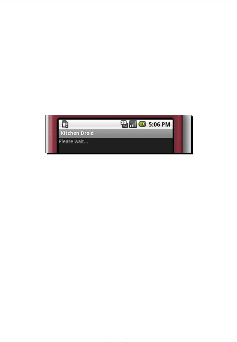
In order to ask our user a queson, you will need to add a TextView to the top of your
layout. A TextView is a bit like a Label or JLabel. It's also the base class for many other
Android View widgets that display text. We want it to take up all of the available horizontal
space, but only enough vercal space for our queson to t. We populate the TextView
with Please wait... as its default text. Later, on we will replace this with a dynamically
selected queson.
1. Go back to your main.xml le.
2. Between the <LinearLayout...> and </LinearLayout> create a <TextView
/> element, ending it with the empty element /> syntax since elements
represenng View objects are not allowed to have child elements.
3. Give the TextView element an ID aribute:
android:id="@+id/question"
Developing a Simple Acvity
[ 20 ]
4. Change the layout width and height aributes to fill_parent and wrap_
content respecvely (the same as the LinearLayout element):
android:layout_width="fill_parent"
android:layout_height="wrap_content"
5. Give the TextView some placeholder text so we can see it on the screen:
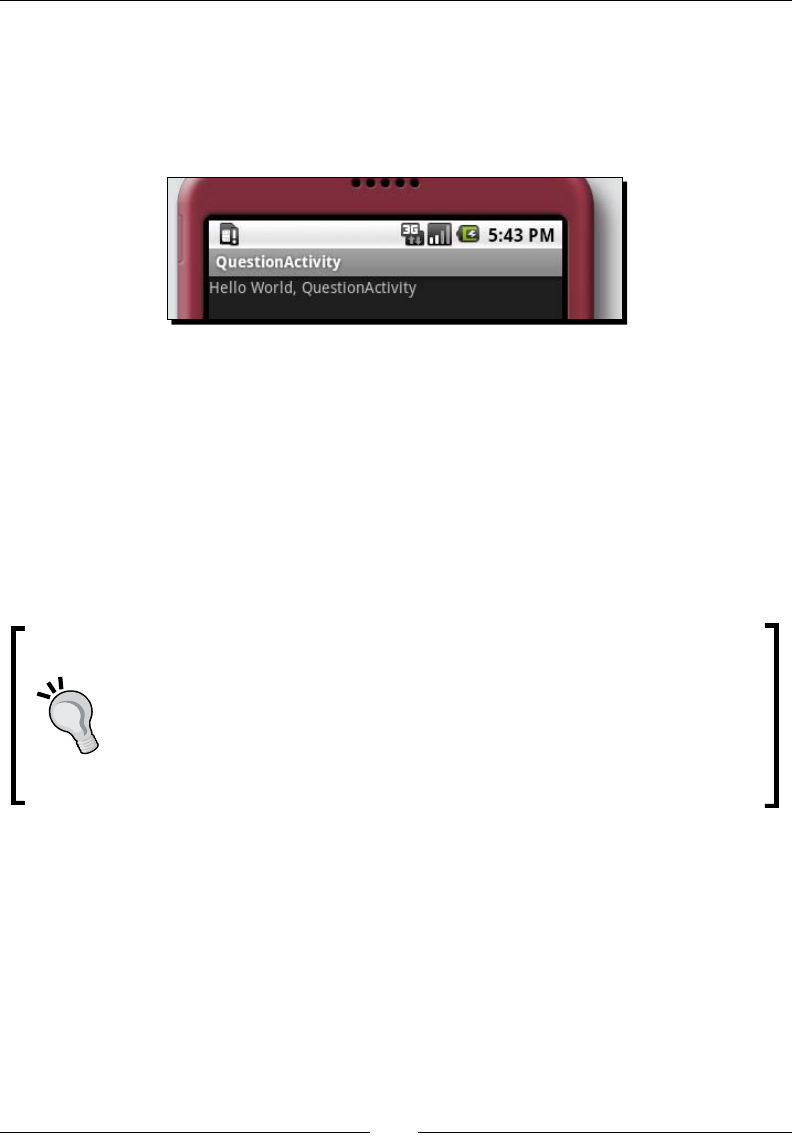
android:text="Please wait..."
6. Reinstall the applicaon using Apache Ant from your project root folder:
ant install
7. Run the applicaon again in the emulator and it should look like the following
screenshot:
The code for the TextView should end up looking something like this:
<TextView android:id="@+id/question"
android:text="Please wait..."
android:layout_width="fill_parent"
android:layout_height="wrap_content"/>
What just happened
In the preceding example, we used fill_parent and wrap_content as values for the layout
width and height aributes. The fill_parent value is a special value that is always equal to
the parent size. If it's used as the value for the android:layout_width aribute (as in our
example), then it's the width of the parent view. If it's used in the android:layout_height
aribute, it would be equal to the height of the parent view instead.
The value wrap_content can be used much like a preferred size in Java AWT or Swing.
It says to the View object, "Take as much space as you need to, but no more". The only
valid place to use these special aribute values is in the android:layout_width and
android:layout_height aributes. Anywhere else will result in a compiler error.
Chapter 1
[ 21 ]
We will need to access this TextView in our Java code later, in order to invoke its setText
method (which directly corresponds to the android:text aribute we used for the
placeholder text). A Java reference to a resource variable is created by assigning the resource
an ID. In this example, the ID is declared here as @+id/question. The AAPT will generate
an int value as an idener for each resource of id as part of your R class. The ID aribute
is also needed for accessing resources from another resource le.
Time for action – adding a space for answers
While posing a queson to the user is all very ne and well, we need to give them some
way to answer that queson. We have several possibilies at our disposal: We could use a
RadioGroup with a RadioButton for each possible answer, or a ListView with an item
for each answer. However, to minimize the required interacon, and make things as clear
as possible, we use one Button for each possible answer. However, this complicates things
slightly, since you can't declare a variable number of Button objects in your layout XML le.
Instead, we will declare a new LinearLayout and populate it with Button objects in the
Java code.
1. Under the TextView where we pose our queson, you will need to add a
<LinearLayout /> element. While this element would normally have child
elements, in our case, the number of possible answers is varied, so we leave it as an
empty element.
2. By default, a LinearLayout will place its child View objects horizontally alongside
each other. However, we want each child View to be vercally below each other, so
you'll need to set the orientation aribute of the LinearLayout:
android:orientation="vertical"
3. We will need to populate the new ViewGroup (LinearLayout) later in our Java
code, so give it an ID: answers:
android:id="@+id/answers"
4. Like our TextView and root LinearLayout, make the width fill_parent:
android:layout_width="fill_parent"
5. Make the height wrap_content so that it doesn't take up more space than all the
buons it will be populated with:
android:layout_height="wrap_content"

Developing a Simple Acvity
[ 22 ]
The resulng code should look like this:
<LinearLayout android:id="@+id/answers"
android:orientation="vertical"
android:layout_width="fill_parent"
android:layout_height="wrap_content"/>
What just happened?
You may have noced that for this example, we have no content in our new LinearLayout.
This may seem a lile unusual, but in this case, we want to populate it with a variable
number of buons—one for each possible answer to our mulple-choice quesons.
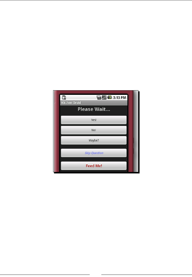
However, for the next part of the example we need some simple content Button widgets
in this LinearLayout so that we can see the enre screen layout in acon. Use the
following code in your layout resource le to add Yes!, No!, and Maybe? Button widgets
to the LinearLayout:
<LinearLayout android:id="@+id/answers"
android:orientation="vertical"
android:layout_width="fill_parent"
android:layout_height="wrap_content">
<Button android:id="@+id/yes"
android:text="Yes!"
android:layout_width="fill_parent"
android:layout_height="wrap_content" />
<Button android:id="@+id/no"
android:text="No!"
android:layout_width="fill_parent"
android:layout_height="wrap_content" />
<Button android:id="@+id/maybe"
android:text="Maybe?"
android:layout_width="fill_parent"
android:layout_height="wrap_content" />
</LinearLayout>
In Android XML layout resources, any View classes extending from the ViewGroup class
are considered containers. Adding widgets to them is as simple as nesng those View
elements inside the element of your ViewGroup (as opposed to closing it with no child
XML elements).
Downloa d f r o m W o w ! e B o o k < w w w.woweb o o k . c o m >

Chapter 1
[ 23 ]
The following is a screenshot of the preceding Yes!, No!, Maybe? opons:
Time for action – adding more buttons
We have two addional buons to add to the screen layout. One will allow the user to skip
the current queson; the other will allow them to look at the short list of meals that we have
ltered through so far (based on the quesons they have already answered).
1. Start by creang an empty <Button /> element below our answers ViewGroup
<LinearLayout /> (but sll within the root LinearLayout element). Assign it
the ID skip, so that we can reference it in Java:
android:id="@+id/skip"
2. Create some padding between the answers and the new buon by using a margin:
android:layout_marginTop="12sp"
3. Give it the display label Skip Queson:
android:text="Skip Question"
4. Like all of the previous widgets, the width should be fill_parent and the height
should be wrap_content:
android:layout_width="fill_parent"
android:layout_height="wrap_content"
5. Now create another empty <Button /> element below the Skip Queson buon
6. The ID for the new buon should be view:
android:id="@+id/view"
7. We want this buon to display the text: Feed Me!:
android:text="Feed Me!"

Developing a Simple Acvity
[ 24 ]
8. Again, put a lile space between the Skip Queson buon, and the new
Feed Me! buon:
android:layout_marginTop="12sp"
9. Finally, set the width and height of the Feed Me! buon as with the other elements
we've created so far:
android:layout_width="fill_parent"
android:layout_height="wrap_content"
When you've completed these two buons, your layout XML le should now end with:
<Button android:id="@+id/skip"
android:text="Skip Question"
android:layout_marginTop="12sp"
android:layout_width="fill_parent"
android:layout_height="wrap_content"/>
<Button android:id="@+id/view"
android:text="Feed Me!"
android:layout_marginTop="12sp"
android:layout_width="fill_parent"
android:layout_height="wrap_content"/>
</LinearLayout>
What just happened
Separaon of unrelated user interface objects is a very important part of user interface
design. Groups of items can be separated by whitespace, a border, or a box. In our case, we
chose to use whitespace, as space also helps make the user interface feel cleaner.
We created our whitespace by using a margin above each of the buons. Margins and
padding work exactly the same way as they (should) do in CSS. A margin is spacing outside of
the widget, while padding is spacing inside the widget. In Android, a margin is the concern of
the ViewGroup, and so its aribute name is prexed with layout_. Because padding is the
responsibility of a View object, the padding aribute has no such prex:
<Button android:id="@+id/view"
android:text="Feed Me!"
android:padding="25sp"
android:layout_marginTop="12sp"
android:layout_width="fill_parent"
android:layout_height="wrap_content"/>
The previous code would create extra space between the edge of the Button and the text in
the middle of it, as well as retaining the margin above the buon.
Chapter 1
[ 25 ]
All of the measurements in the preceding example are specied in the sp unit, which is short
for "scale independent pixels". Much like CSS, you sux your measurement numbers
with the unit of size that you are specifying the measurement in. Android recognizes the
following measurements:
Unit sux Full name Descripon and uses
px Pixel Exactly one pixel of the device screen. This unit is the most
common when wring desktop applicaons, but with the wide
variety of phone screen sizes, it becomes much harder to use.
in Inch One inch (or the closest approximaon). This is based on the
physical size of the screen. This is great if you need to work with
real world measurements, but again, because of the variaons in
the size of a device screen, it is not always very useful.
mm Millimeters Another real world measurement, made to the closest
approximaon. This is just a metric version of inches: 25.4
millimeters in 1 inch.
pt Points Points are 1/72 of an inch in size. Much like millimeters and
inches, they are very useful for sizing things against real-world
sizes. They are also commonly used for sizing fonts, and so work
well relave to font sizes.
dp or dip Density-
independent-
pixels
A single DP is the same size as a single pixel is for a 160 dpi screen.
This size is not always a direct rao, not always precise, but is a
best approximaon for the current screen.
sp Scale-
independent
pixels
Much like the dp unit, it is a pixel scaled according to the user
selected font size. This is possibly the best unit to use, as it's
based on a user-selected parameter. The user may have increased
the font size because they nd the screen hard to read. Using an
sp unit ensures that your user interface scales with it.
Dening common dimensions
Android also allows you to dene your own dimension values as resource constants (note:
dimensions, not measurements). This can be useful when you want several view widgets to
be the same size, or to dene a common font size. Files containing dimension declaraons
are placed in the /res/values directory in your project. While the actual le name isn't
signicant, a common name is dimens.xml. Dimensions can technically be included with
other value types (that is, strings), but this is not recommended since it makes it harder to
trace the dimension that are being applied at runme.

Developing a Simple Acvity
[ 26 ]
One advantage of having your dimensions in their own le as opposed to being declared
inline) is that you can then localize them based on the size of the screen. This makes screen-
resoluon-signicant scales (such as pixels) much more useful. For example, you can place a
dimens.xml le with dierent values into /res/values-320x240 and another version of
the same dimensions into /res/values-640x480.
A dimensions resource le is a simple values le (much like strings.xml), but dimensions
are dened with the <dimen> tag:
<resources>
<dimen name="half_width">160px</dimen>
</resources>
To access this as a size in a layout XML le, you use a resource reference (much the same way
as you access a resource string):
<TextView layout_width="@dimen/half_width" />
Building a list of common dimensions comes in handy when you want to build complex
layouts that will look good on many dierent screens since it avoids the need to build several
dierent layout XML les.
Have a go hero – improve the styling
Now we have the most basic structure for this user interface, but it doesn't really look too
great. Other than the margins between the answer buons, and the Skip Queson and Feed
Me! buons, you can't really tell them apart. We need to let the user know that these buons
all do dierent things. We also need to draw more aenon to the queson, especially if they
don't have a lot of me to squint at their screen. You may need the Android documentaon,
which can be found online at http://developer.android.com/reference/.
We have a queson at the top of our screen, but as you can see in the previous screenshots,
it doesn't stand out much. Therefore, it's not really very clear to the user what they need to
do (especially the rst me they use the applicaon).
Try making the following styling changes to the queson TextView at the top of our screen.
These will only require you to add some aributes to its XML element:
1. Center the text.
2. Make the text bold.
3. Change the text size to 24sp.
4. Add 12sp spacing between the boom of the queson and the answer buons
Chapter 1
[ 27 ]
The Feed Me! buon is also very important. This is the buon that gives the user access to
the list of suggested recipes that the applicaon has ltered based on their answers, so it
should look good.
The following styling should help the Feed Me! buon to stand out nicely (hint: Button
extends TextView):
1. Make the text size 18sp.
2. Change the text color to a nice red #9d1111.
3. Style the text as bold.
4. Add a text shadow: x=0, y=-3, radius=1.5, and color=white ("#fff").
When you've nished styling the screen, it should look like the following screenshot:
Limitations of the layout XML format
One of the most obvious limitaons of the layout XML format is that you can't dynamically
populate part of the Activity based on external variables—there are no loops or methods
in the XML le.
In our example, this limitaon shows itself in the form of our empty LinearLayout.
Because each queson has any number of possible answers, we need a varying number of
buons in the group. For our purposes, we will create the Button objects and put them into
the LinearLayout as part of the Java code.
www.allitebooks.com
Developing a Simple Acvity
[ 28 ]
The other place the XML layout format falls down is dynamically referencing
external resources. This can be seen in our example, where we put placeholder text in
the android:text aribute on the TextView element—question. We could have
referenced an external string using the following syntax:
<TextView android:id="@+id/question"
android:text="@string/question"
android:gravity="center"
android:textStyle="bold"
android:layout_width="fill_parent"
android:layout_height="wrap_content"/>
This will eecvely reference a stac variable from the strings.xml le. It's not suitable
for a dynamically selected queson, which will change each me we inialize the Activity.
Pop quiz
1. What reason do you have for wring your layouts in XML instead of in pure Java
code?
a. Android can read the layout le externally for opmizaon.
b. The layout becomes part of the resource selecon process.
c. Your users could download new layouts from the App Store.
d. The layout can have custom themes applied to it.
2. How would we make the text of the Next Queson buon bold?
a. Use the android:typeface aribute.
b. Create a custom Button implementaon.
c. Add a CSS aribute: style="font-weight: bold".
d. Use the android:textStyle aribute.
3. What would happen if we changed the LinearLayout from vertical orientaon,
to horizontal?
a. The layout would turn on its side.
b. All of the widgets would be squashed together on the screen.
c. Only the queson TextView would be visible on the screen.
d. The queson, and possibly some other View objects may be visible on the
screen depending on the number of pixels available.
e. The layout would overow, causing the widgets to appear next to each other,
over several lines.

Chapter 1
[ 29 ]
Populating the QuestionActivity
We have a basic user interface, but right now, it's stac. We may want to ask our user many
dierent quesons, each of which have dierent answers. We may also want to vary which
quesons we ask in some way or another. In short, we need some Java code to populate the
layout with a queson and some possible answers. Our quesons are made up of two parts:
The queson
A list of possible answers
In this example, we will make use of string array resources to store all of the queson and
answer data. We will use one string array to list the queson ideners, and then one string
array for each queson and its answers. The advantages of this approach are very similar
to the advantages of using a layout XML le instead of hard-coding it. The res/values
directory of your project will have an auto-generated strings.xml le. This le contains
string and string-array resources that you want your applicaon to use. Here is the start
of our strings.xml le, with two quesons to ask the user:
<?xml version="1.0" encoding="UTF-8"?>
<resources>
<string name="app_name">Kitchen Droid</string>
<string-array name="questions">
<item>vegetarian</item>
<item>size</item>
</string-array>
<string-array name="vegetarian">
<item>Are you a Vegetarian?</item>
<item>Yes</item>
<item>No</item>
<item>I\'m a vegan</item>
</string-array>
<string-array name="size">
<item>How much do you feel like eating?</item>
<item>A large meal</item>
<item>Just a nice single serving of food</item>
<item>Some finger foods</item>
<item>Just a snack</item>
</string-array>
</resources>
The rst item of each question array (vegetarian and size) is the queson itself, while
each following item is an answer.

Developing a Simple Acvity
[ 30 ]
Time for action – writing more Java code
1. Open the QuestionActivity.java le in an editor or IDE.
2. Import the Android Resources class below the package declaraon:
import android.content.res.Resources;
3. In order to start asking the quesons from your strings.xml le, you'll need a
method to look in the questions <string-array> and nd the name of the
array that contains the current queson. This is not normally something you need to
do with applicaon resources—their ideners are generally known to you through
the R class. In this case however, we want to work in the order dened in the
questions <string-array>, making things a lile bit more dicult:
private int getQuestionID(Resources res, int index) {
4. We can now look at the questions string-array, which contains the idenfying
name of each queson (our index string-array):
String[] questions = res.getStringArray(R.array.questions);
5. We have the array of quesons, and we need to nd the idener value. This is
much like using R.array.vegetarian for the vegetarian queson, except
that it's a dynamic lookup, and therefore much slower than normal. In general, the
following line is not recommended, but in our case it's very useful:
return res.getIdentifier(
questions[index],
"array",
"com.packtpub.kitchendroid");
6. The QuestionActivity class will display several quesons to the user. We want
the applicaon to "play nice" with the phone and its environment. For that reason,
each queson will be posed in a new instance of QuestionActivity (allowing
the device to control the display of our Activity). However, this method raises
an important queson: How do we know the index of the queson to pose to the
user? The answer: Our Intent. An Activity is started with an Intent object, and
each Intent object may carry any amount of "extra" informaon (similar to request
aributes in the HttpServletRequest interface) for the Activity to use, sort of
like arguments to a main method. So, an Intent is also like a HashMap, containing
special data for the Activity to use. In our case we use an integer property named
KitchenDroid.Question:
private int getQuestionIndex() {
return getIntent().getIntExtra("KitchenDroid.Question", 0);
}

Chapter 1
[ 31 ]
These two methods form the basis for populang our queson screen and navigang our
way through a dened list of quesons. When complete, they should look like this:
private static int getQuestionID(
final Resources res,
final int index) {
final String[] questions = res.getStringArray(R.array.questions);
return res.getIdentifier(
questions[index],
"array",
"com.packtpub.kitchendroid");
}
private int getQuestionIndex() {
return getIntent().getIntExtra("KitchenDroid.Question", 0);
}
What just happened
The getQuestionID method is prey straight forward. In our code we use R.array.
questions to access the <string-array> which idenes all of the quesons we
are going to ask the user. Each queson has a name in the form of a String, and a
corresponding resource idencaon number in the form of an int.
In the getQuestionID method, we make use of the Resources.getIdentifier
method, which looks for the resource idener (the integer value) for a given resource
name. The second parameter of the method is the type of resource to look up. This
parameter is normally an inner class to the generated R class. Finally, we pass the base
package that the resource is found in. Instead of all three of these parameters, you could
also look up the resource by its full resource name:
return res.getIdentifier(
"com.packtpub.kitchendroid:array/" + questions[index],
null,
null);
The getQuestionIndex method tells us where in the questions <string-array>
we currently are, and thus, which queson to ask the user. This is based on the "extra"
informaon in the Intent that triggered the Activity. The getIntent() method provides
you with access to the Intent that triggered your Activity. Each Intent may have any
amount of "extra" data, and that data may be any "primive" or "serializable" type. Here
we fetch the KitchenDroid.Question extra integer value from our Intent, substung
a value of 0 if it has not been set (that is, the default value). If the user taps our icon in the
menu, Android won't have specied that value, so we start from the rst queson.
Developing a Simple Acvity
[ 32 ]
Dynamically creating widgets
Up to this point we've only used the layout XML le to populate our screen. In some cases,
this is just not enough. In this simple example, we want the user to have a list of buons that
they can touch to answer the quesons posed to them. We could pre-create some buons
and name them button1, button2, and so on, but that means liming the number of
possible answers.
In order to create buons from our <string-array> resources, we need to do it in
Java. We created a ViewGroup earlier (in the form of the LinearLayout that we named
answers). This is where we will add our dynamically created buons.
Time for action – putting the questions on the screen
Your applicaon now knows where to nd the quesons to ask, and knows which queson
it should be asking. Now it needs to put the queson on the screen, and allow the user to
select an answer.
1. Open the main.xml le in your editor or IDE.
2. Remove the Yes!, No!, and Maybe? Button elements from the layout resource.
3. Open the QuestionActivity.java le in an editor or IDE.
4. We will need a new class eld to hold the dynamically-created Button objects
(for reference):
private Button[] buttons;
5. In order to keep things neat, create a new private method to put the quesons on
the screen: initQuestionScreen:
private void initQuestionScreen() {
6. In this method, we assume that the layout XML le has already been loaded into the
Activity screen (that is, it will be invoked aer we setContentView in onCreate).
This means that we can look up parts of the layout as Java objects. We'll need both the
TextView named question and the LinearLayout named answers:
TextView question = (TextView)findViewById(R.id.question);
ViewGroup answers = (ViewGroup)findViewById(R.id.answers);
7. These two variables need to be populated with the queson and its possible
answers. For that we need the <string-array> (from our strings.xml le)
which contains that data, so we need to know the resource idener for the current
queson. Then we can fetch the actual array of data:

Chapter 1
[ 33 ]
int questionID = getQuestionID(resources, getQuestionIndex());
String[] quesionData = resources.getStringArray(questionID);
8. The rst element of a question string array is the queson to pose to the user.
The following setText call is exactly the same as specifying an android:text
aribute in your layout XML le:
question.setText(quesionData[0]);
9. We then need to create an empty array to store references to our Button objects:
int answerCount = quesionData.length – 1;
buttons = new Button[answerCount];
10. Now we're ready to populate the screen. A for loop over each of the answer values
indexed according to our arrays:
for(int i = 0; i < answerCount; i++) {
11. Get each answer from the array, skipping the queson string at index zero:
String answer = quesionData[i + 1];
12. Create a Button object for the answer and set its label:
Button button = new Button(this);
button.setText(answer);
13. Finally, we add the new Button to our answers object (ViewGroup), and reference
it in our buttons array (where we'll need it later):
answers.addView(button);
buttons[i] = button;
14. Having done that, just aer the setContentView calls in onCreate, we need to
invoke our new initQuestionScreen method.
What just happened?
The findViewById method traverses the tree of View objects looking for a specic
idenfying integer value. By default, any resource declared with an android:id aribute
in its resource le will have an associated ID. You could also assign an ID by hand using the
View.setId method.
Unlike many other user interface APIs, the Android user interface API is geared towards XML
development than pure Java development. A perfect example of this fact is that the View
subclasses have three dierent constructors, two of which are designed for use with the XML
parsing API. Instead of being able to populate the Button label in a constructor (as with
most other UI APIs), we are forced to rst construct the object, and then use setText to
dene its label.
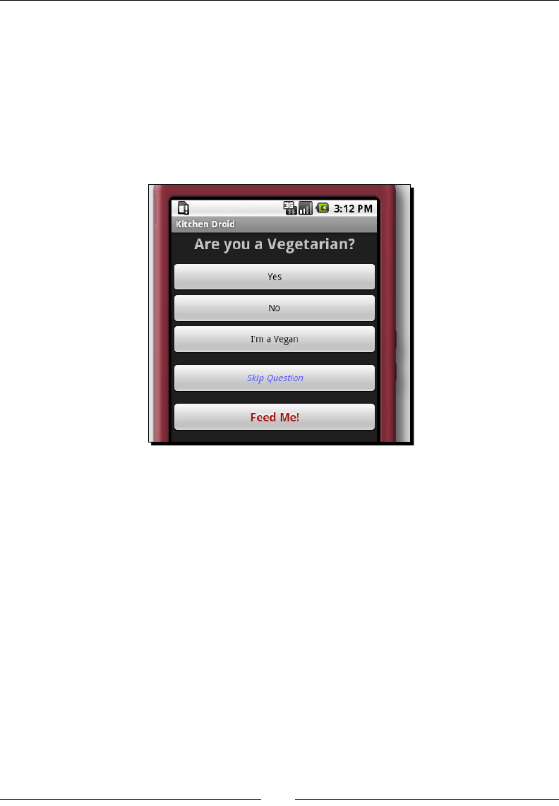
Developing a Simple Acvity
[ 34 ]
What you do pass into the constructor of every View object is a Context object. In the
preceding example you pass the Activity object into the constructor of the answer
Button objects as this. The Activity class inherits from the Context class. The
Context object is used by the View and ViewGroup objects to load the applicaon
resources and services that they require in order to funcon correctly.
You can now try running the applicaon, in which case you'll be greeted with the following
screen. You may have noced that there is addional styling in this screenshot. If you don't
have this, you may want to backtrack a lile to the previous Have a go hero secon.
Handling events in Android
Android user interface events work in much the same way as a Swing event-listener or a
GWT event-handler. Depending on the type of event you wish to receive, you implement an
interface and pass an instance to the widget you wish to receive events from. In our case we
have Button widgets that re click-events when they are touched by the user.
The event-listener interfaces are declared in many of the Android classes, so there isn't a
single place you can go look for them. Also, unlike most event-listener systems, many widgets
may only have one of any given event-listeners. You can idenfy an event-listener interface
by the fact that their class names are prexed with On (much like HTML event aributes). In
order to listen for click-events on a widget, you would set its OnClickListener using the
View.setOnClickListener method.
The following code snippet shows how a click-listener might be added to a Button object
to show a Toast. A Toast is a small pop-up box which is displayed briey to give the user
some informaon:
Chapter 1
[ 35 ]
button.setOnClickListener(new View.OnClickListener() {
public void onClick(View clicked) {
Toast.makeText(this, "Button Clicked!", Toast.LENGTH_SHORT).
show();
}
});
The preceding event-listener is declared as an anonymous inner class, which is okay when
you are passing similar event-listeners to many dierent widgets. However, most of the me
you'll want to be listening for events on widgets you've declared in an XML layout resource.
In these cases it's beer to either have your Activity class implement the required
interfaces, or create specialized classes for dierent event-driven acons. While Android
devices are very powerful, they are sll limited when compared to a desktop computer
or laptop. Therefore, you should avoid creang unnecessary objects in order to conserve
memory. By placing as many event-listener methods in objects that will already be created,
you lower the overhead required.
Pop quiz
1. When you declare an object in a layout XML le, how do you retrieve its Java object?
a. The object will be declared in the R class.
b. Using the Activity.findViewById method.
c. By using the Resources.getLayout method.
d. The object will be injected into a eld in the Activity class.
2. What is the "best" way of listening for events in an Android applicaon?
a. Declaring the listeners as anonymous inner classes.
b. Create a separate event listener class for each Activity.
c. Implement the event-listening interfaces in the Activity class.
3. Why do you pass this Activity into the constructors of View objects
(that is, new Button(this)).
a. It denes the Activity screen they will be displayed on.
b. It's where event messages will be sent to.
c. It's how the View will reference its operang environment.
Downloa d f r o m W o w ! e B o o k < w w w.woweb o o k . c o m >

Developing a Simple Acvity
[ 36 ]
Summary
Android comes with some great tools to create and test applicaons, even if you don't
have an Android device handy. That said, there's no replacement for actually touching your
applicaon. It's part of what makes Android such a compelling plaorm, the way it feels and
responds (and the emulator just doesn't convey that).
One of the most important tools in an Android developer's arsenal is the resource selecon
system. With it you can build highly dynamic applicaons that respond to changes in
the devices, and thus, the user environment. Changing the screen layout based on the
orientaon of the device, or when the user slides out the phone's QWERTY keyboard, lets
them know that you've taken their preferences into account when building your applicaon.
When building user interfaces in Android, it's strongly recommended to build at least the
layout structure in an XML le. The XML layout les are not only considered as applicaon
resources, but Android also strongly favors building XML user interfaces over wring Java
code. Somemes, however, a layout XML le isn't enough, and you need to build parts of the
user interface in Java. In this case it's a good idea to dene at least a skeleton layout as XML (if
possible), and then place the dynamically created View objects into the layout by using marker
IDs and containers (much like dynamically adding to an HTML document in JavaScript).
When building a user interface, think carefully about the look and feel of the outcome. In
our example, we use Button objects for the answers to quesons. We could have used
RadioButton objects instead, but then the user would have needed to select an opon,
and then touch a Next Queson buon, requiring two touches. We could also have used
a List (which interacts nicely with the fact that it needs to be dynamically populated),
however, a List doesn't indicate an "acon" to the user quite the way a Button does.
When coding layouts, be careful with the measurement units that you use. It's strongly
recommend that you sck to using sp for most purposes—if you can't use one of the special
fill_parent or wrap_content values. Other values are highly dependent on the size
of screen, and won't respond to the user preferences. You can make use of the resource
selecon process to build dierent screen designs for small, medium, or large screens.
You could also dene your own measurement unit and base it on the screen size.
Always think about how your user will interact with your applicaon, and how much
(or lile) me they are likely to have with it. Keeping each screen simple and responsive
keeps your users happy.
Now that we've learned how to create a skeleton Android project, and a simple Activiy,
we can focus on the more subtle problems and soluons of Android user interface design.
In the next chapter, we will focus on working with data-driven widgets. Android has several
widgets designed specically for displaying and selecng from more complex data structures.
These widgets form the basis of data-driven applicaons such as an address book or a
calendar applicaon.

2
Presenting Data for Views
In the rst chapter we covered the basic creaon of a project, and how to put
together a simple user interface. We backed our rst Activity with enough
code to dynamically generate some buons that the user can use to answer our
mulple-choice quesons.
So now we can capture some data, but what about displaying data? One large
advantage of soware is its ability to present and lter very large volumes of
data quickly and in an easy-to-read format. In this chapter we will look at a
series of Android widgets that are designed exclusively for presenng data.
Most Android data-centric classes are built on top of Adapter objects, and thus extend the
AdapterView class. An Adapter can be thought of as a cross between a Swing Model,
and a renderer (or presenter). An Adapter object is used to create View objects for data
objects that your soware needs to display to the user. This paern allows the soware to
maintain and work with a data-model and only create a graphical View for each of the data
objects when one is actually needed. This doesn't just help conserve memory, but it is also
more logical from a development point of view. As a developer you work with your own data
objects instead of trying to keep your data in graphical widgets (which are oen not the most
robust of structures).
The most common AdapterView classes you'll encounter are: ListView, Spinner, and
GridView. In this chapter we'll introduce the ListView class and GridView, and explore
the various ways they can be used and how they can be styled.
www.allitebooks.com
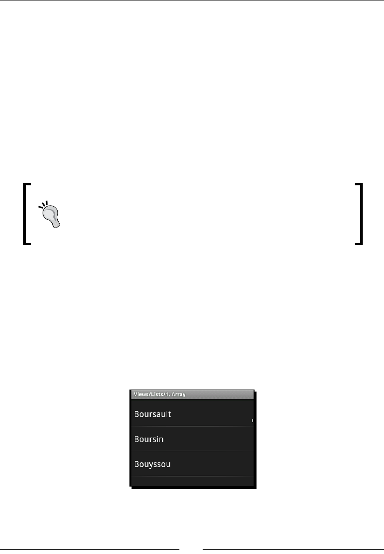
Presenng Data for Views
[ 38 ]
Listing and selecting data
The ListView class is probably the most common way to display lists of data. It's backed
by a ListAdapter object, which is responsible for both holding the data and rendering the
data objects in a View. A ListView includes built-in scrolling, so there's no need to wrap it
in a ScrollView.
ListView choice modes
The ListView class allows for three basic modes of item selecon, as dened by its
constants: CHOICE_MODE_NONE, CHOICE_MODE_SINGLE, and CHOICE_MODE_MULTIPLE.
The mode for a ListView can be set by using the android:choiceMode aribute in your
layout XML le, or by using the ListView.setChoiceMode method in Java.
Choice modes and items
The choice mode of a ListView changes the way the ListView
structure behaves, but not the way it looks. The look of a ListView
is dened mostly by the ListAdapter, which provides View objects
for each of the items that should appear in the ListView.
No selection mode – CHOICE_MODE_NONE
On a desktop system, this would make no sense—a list that doesn't allow the user to choose
anything? However, it's the default mode of an Android ListView. The reason is it makes
sense when your user is navigang by touch. The default mode of a ListView allows the
user to tap on one of the elements, and trigger an acon. As a result of this behavior, there's
no need for a "Next" buon, or anything similar. So the default mode for a ListView is to
act like a menu. The following screenshot is a default ListView object displaying a list of
dierent strings from a String array Java object, taken from one of the default ApiDemos
examples in Android SDK.
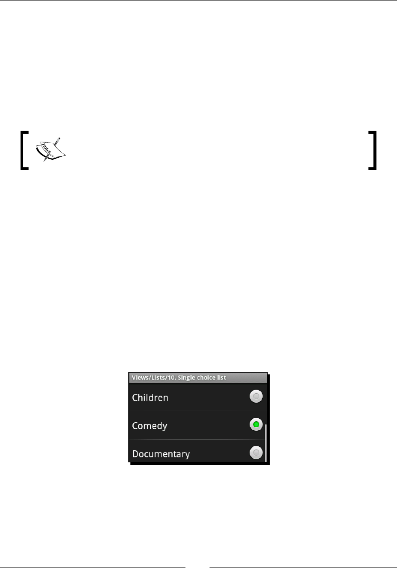
Chapter 2
[ 39 ]
Single selection mode – CHOICE_MODE_SINGLE
In this mode, the ListView acts more like a desktop List widget. It has the noon of
the current selecon, and tapping on a list item does nothing more than selecng it.
This behavior is nice for things like conguraon or sengs, where the user expects the
applicaon to remember his or her current selecon. Another place a single selecon list
becomes useful is when there are other interacve widgets on the screen. However, be
careful not to put too much informaon in a single Activity. It's quite common for a
ListView to occupy almost an enre screen.
Single-choice selecon: It doesn't directly change the way your list items
appear. The look and feel of your list items is dened enrely by the
ListAdapter object.
Android does, however, provide a collecon of sensible defaults in the system resources.
In the android package you will nd an R class. It's a programmac way to access the
system's default resources. If you wanted to create a single-choice ListView with a
<string-array> of colors in it, you could use the following code:
list.setAdapter(new ArrayAdapter(
this,
android.R.layout.simple_list_item_single_choice,
getResources().getStringArray(R.array.colors)));
In this case we use the provided ArrayAdapter class from the android.widget package.
In the second parameter we referenced the Android layout resource named simple_list_
item_single_choice. This resource is dened by the Android system as a default way to
display items in a ListView with CHOICE_MODE_SINGLE. Most typically this is a label with
a RadioButton for each object in the ListAdapter.
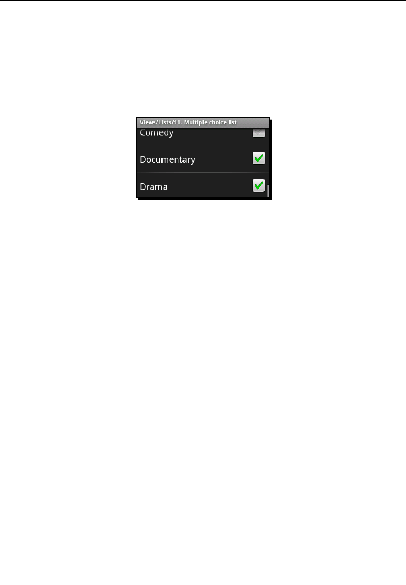
Presenng Data for Views
[ 40 ]
Multiple selection mode – CHOICE_MODE_MULTIPLE
In mul-selecon mode, the ListView replaces the radio buons of single-selecon mode
with normal checkboxes. This design structure is oen used on desktops and web-based
systems as well. Checkboxes are easily recognized by users, and make it easy to go back and
turn opons o again. If you wish to use a standard ListAdapter, Android provides you
with the android.R.layout.simple_list_item_multiple_choice resource
as a useful default: A label with a CheckBox for each object in the ListAdapter.
Adding header and footer widgets
Headers and footers in a ListView allow you to put addional widgets at the top and
boom of the List. The header and footer widgets are by default treated as though they
are items in a list (as though they come from your ListAdapter). This means that you will
be able to select them as though they are data elements in the List structure. A very simple
example of a header item could be:
TextView header = new TextView(this);
header.setText("Header View");
list.addHeaderView(header);
Oen you don't want your headers and footers to be items in the ListView, but instead a
label or group of labels idenfying parts of the ListView, or providing other informaon. In
this case you need to tell the ListView that your header or footer views are not selectable
list items. This can be done by using the extended implementaon of addHeaderView or
addFooterView:
TextView footer = new TextView(this);
footer.setText("Footer View");
list.addFooterView(footer, null, false);
The ListView class integrates headers and footers so ghtly into the list structure
that you can also provide an Object that it will return from the AdapterView.
getItemAtPosition(index) method. In our previous example we have provided null.
Each header item will oset the index of subsequent views by one (as though you are adding
new items to the ListView). The third parameter tells the ListView whether the header
or footer should be counted as a selectable list item (in our previous example it shouldn't).
Chapter 2
[ 41 ]
If you are used to desktop widgets, the header and footer widgets on an Android ListView
will have a bit of a surprise for you. They will scroll with the rest of the list items, and won't
stay aached to the top and boom of the ListView object.
Creating a simple ListView
To introduce the ListView class, we'll start a new example which will be enhanced by
various subsequent secons of this chapter. The rst Activity we will create will use a
simple ListView populated from a <string-array> resource.
Time for action – creating a fast food menu
To connue with the food and eang theme, let's build a simple applicaon that allows us
to order various types of fast food, and get it delivered! The user will rst select where they
want to order from, and then select the various foodstus that they want to eat.
1. Create a new android project using the Android command-line tool:
android create project -n DeliveryDroid -p DeliveryDroid -k com.
packtpub.deliverydroid -a SelectRestaurantActivity -t 3
2. Open the /res/values/strings.xml le in your favorite editor or IDE.
3. Create a string-array structure lisng the various fast-food restaurants our users can
order from:
<string-array name="restaurants">
<item>The Burger Place</item>
<item>Mick's Pizza</item>
<item>Four Buckets \'o Fruit</item>
<item>Sam\'s Sushi</item>
</string-array>
4. Open the /res/layout/main.xml le in your favorite editor or IDE.
5. Remove any widget that is inside the default LinearLayout.
6. Add a new <ListView> element.
7. Assign the <ListView> element an ID of restaurant:
<ListView android:id="@+id/restaurant"/>
8. Assign the width and height of the ListView to fill_parent:
android:layout_width="fill_parent"
android:layout_height="fill_parent"
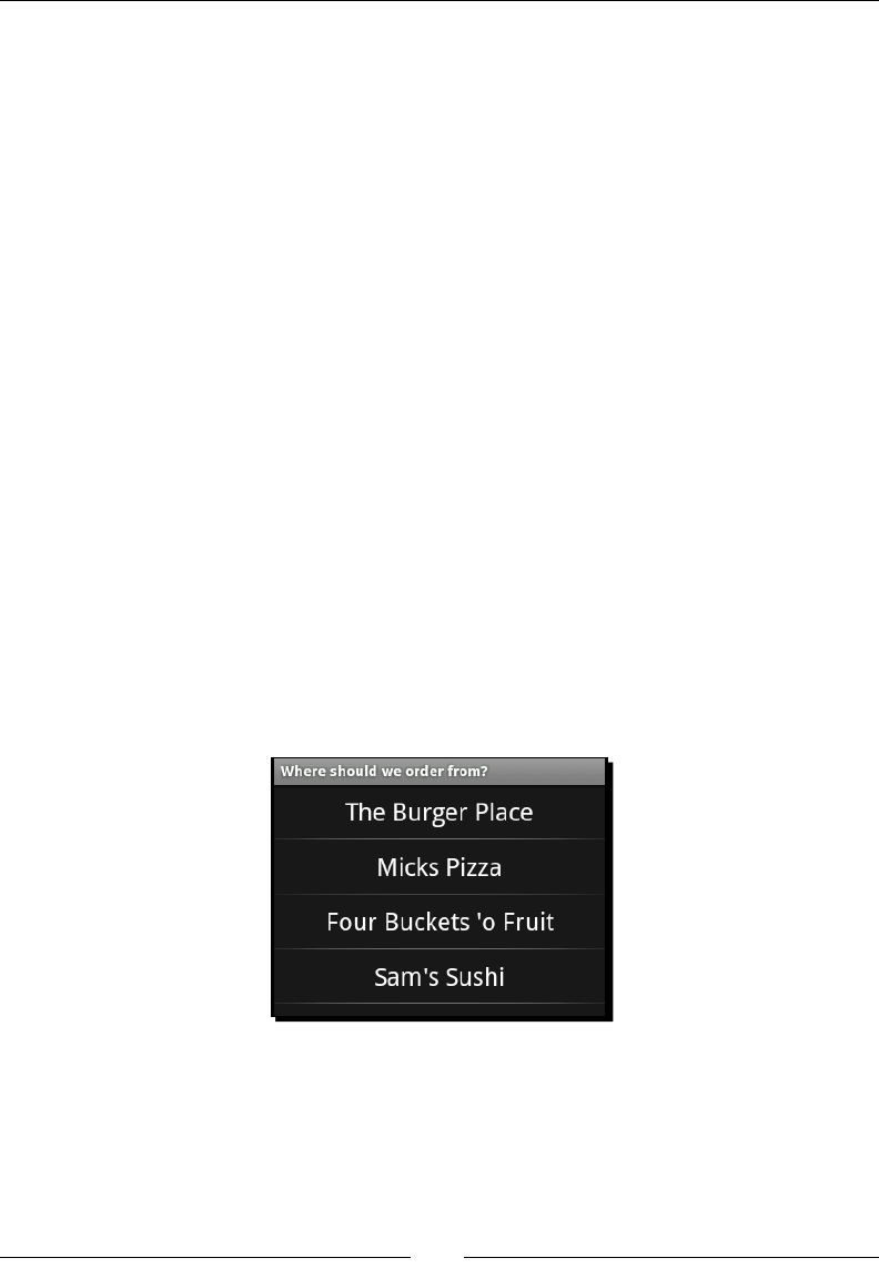
Presenng Data for Views
[ 42 ]
9. Since we have a string-array resource of the content we want to populate the
ListView with, we can reference it directly in our layout XML le:
android:entries="@array/restaurants"
10. When you've completed the specied steps, you should have a main.xml layout le
that looks like the following:
<?xml version="1.0" encoding="UTF-8"?>
<LinearLayout
xmlns:android="http://schemas.android.com/apk/res/android"
android:orientation="vertical"
android:layout_width="fill_parent"
android:layout_height="fill_parent">
<ListView android:id="@+id/restaurant"
android:layout_width="fill_parent"
android:layout_height="fill_parent"
android:entries="@array/restaurants"/>
</LinearLayout>
What just happened
If you install your applicaon into the emulator, and run it, you'll be presented with a screen
where you can select from the list of restaurants specied in your string-array resource.
Noce that the choiceMode on the ListView is le as CHOICE_MODE_NONE, making this
into a more direct menu where the user selects their restaurant and is instantly transported
to its menu.
In this example, we used the android:entries aribute in the layout XML le to specify
a reference to a string-array resource with our desired list items in it. Normally, using an
AdapterView requires you to create an Adapter object to create View objects for each of
the data objects.

Chapter 2
[ 43 ]
Using the android:entries aribute allows you to specify the data contents of the
ListView from your layout resource, instead of requiring you to write the normal Java code
associated with an AdapterView. It, however, does have two disadvantages to be aware of:
The View objects created by the generated ListAdapter will always be the
system-specied defaults, and so cannot be easily themed.
You cannot dene data objects that will be represented in the ListView. Since
string-arrays are easily localized, your applicaon will rely on the index locaons of
items to determine what they indicate.
You may noce that at the top of the screenshot, the label Where should we order
from? is not the applicaon default. The label for an Activity is dened in the
AndroidManifest.xml le as follows:
<activity
android:name=".SelectRestaurantActivity"
android:label="Where should we order from?">
Styling the standard ListAdapters
The standard ListAdapter implementaons require each item be represented in a
TextView item. The default single-choice and mulple-choice items are built using a
CheckedTextView, and while there are plenty of other TextView implementaons
in Android, it does limit our opons a bit. However, the standard ListAdapter
implementaons are very convenient and provide solid implementaons for the most
common lisng requirements.
Since a ListView with CHOICE_MODE_NONE is a lot like a menu, wouldn't it be nice to
change the items into Button objects instead of normal TextView items? Technically, a
ListView can contain any widget that extends TextView. However, some implementaons
are more suitable than others (for example, a ToggleButtonView won't maintain the
specied text-value when the user touches it).
Dening standard dimensions
In this example we'll be creang various menus for the applicaon. In order to maintain a
consistent look and feel, we should dene a set of standard dimensions which will be used
in each of our layout les. This way we can redene the sizes for dierent types of screens.
There's nothing more frustrang for a user than only being able to see a paral item because
it's been sized bigger than their screen.
Create a new resource le to contain the dimensions. The le should be named res/
values/dimens.xml. Copy the following code into the new XML le:
Presenng Data for Views
[ 44 ]
<?xml version="1.0" encoding="UTF-8"?>
<resources>
<dimen name="item_outer_height">48sp</dimen>
<dimen name="menu_item_height">52sp</dimen>
<dimen name="item_inner_height">45sp</dimen>
<dimen name="item_text_size">24sp</dimen>
<dimen name="padding">15dp</dimen>
</resources>
We declare two height dimensions for the list items: item_outer_height and item_
inner_height. The item_outer_height will be the height of the list items, while the
item_inner_height is the height of any View object contained inside the list item.
The padding dimension at the end of the le is used to dene a standard amount of
whitespace between two visual elements. This is dened as dp so it will remain constant
based on the DPI of the screen (instead of scaling according to the font size preferences of
the user).
Sizing of interacve items
In this styling, you'll noce that the item_outer_height and menu_item_
height are 48sp and 52sp, which makes the items in the ListView rather
large. The standard size of a list view item in Android is 48sp. The height of a list
item is crical. If your users have large ngers, they will struggle to tap on their
target list item if you make them too small.
This is a general "good pracce" for Android user interface design. If the user
needs to touch it, make it big.
Time for action – improving the restaurant list
The list of restaurants we put together earlier is nice, but it's a menu. In order to further
emphasize the menu, the text should stand out more. In order to style a ListView with a
standard ListAdapter implementaon, you will need to specify the ListAdapter object
in your Java code.
1. Create a new le in the res/layout directory named menu_item.xml.
2. Create the root XML element as a TextView:
<?xml version="1.0" encoding="UTF-8"?>
<TextView />
3. Import the Android resource XML namespace:
xmlns:android="http://schemas.android.com/apk/res/android"

Chapter 2
[ 45 ]
4. Center the text in the TextView widget by seng its gravity:
android:gravity="center|center_vertical"
5. We assign the textSize of the TextView to our standard item_text_size:
android:textSize="@dimen/item_text_size"
6. The default color of the text of TextView is a bit gray, we want it to be white:
android:textColor="#ffffff"
7. We want the width of the TextView to be the same as the ListView that contains
it. Since this is for our main menu, its height is menu_item_height:
android:layout_width="fill_parent"
android:layout_height="@dimen/menu_item_height"
8. Now that we have a styled TextView resource, we can incorporate it into our
menu. Open the SelectRestaurantActivity.java le.
9. In the onCreate method, aer you use setContentView, we need a reference to
the ListView we created earlier in main.xml:
ListView restaurants = (ListView)findViewById(R.id.restaurant);
10. Set the restaurants ListAdapter to a new ArrayAdapter containing the string-
array of restaurants we created in our values.xml le:
restaurants.setAdapter(new ArrayAdapter<String>(
this,
R.layout.menu_item,
getResources().getStringArray(R.array.restaurants)));
What just happened
We rst created a new layout XML resource containing the styled TextView that we wanted
to be used for each list item in our restaurant's ListView. The menu_item.xml le you
wrote should contain the following code:
<?xml version="1.0" encoding="UTF-8"?>
<TextView xmlns:android="http://schemas.android.com/apk/res/android"
android:gravity="center|center_vertical"
android:textSize="@dimen/item_text_size"
android:textColor="#ffffff"
android:layout_width="fill_parent"
android:layout_height="@dimen/menu_item_height" />
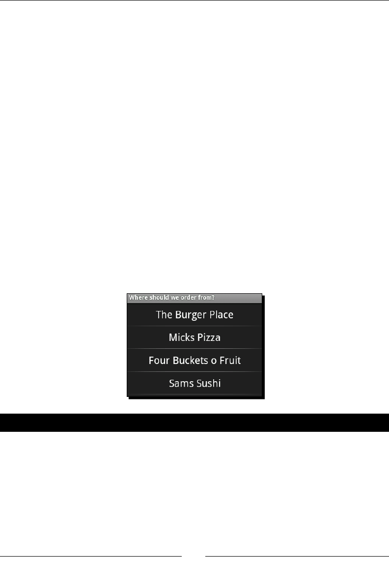
Presenng Data for Views
[ 46 ]
Unlike our previous layout resources, menu_item.xml contained no ViewGroup (such as
LinearLayout). This is due to the fact that the ArrayAdapter will aempt to cast the
root View of the menu_item.xml le to a TextView. So, if we nested the TextView in a
ViewGroup of some sort, we'd get a ClassCastException.
We also created an ArrayAdapter instance to reference both our menu_item XML
resource, and the string-array of restaurants we created earlier. This acon eliminates
the use of the android:entries aribute on the ListView in the main.xml layout
XML resource. If you want, you can remove that aribute. Your onCreate method in
SelectRestaurantActivity should now look as follows:
public void onCreate(final Bundle icicle) {
super.onCreate(icicle);
setContentView(R.layout.main);
final ListView restaurants = (ListView)
findViewById(R.id.restaurant);
restaurants.setAdapter(new ArrayAdapter<String>(
this,
R.layout.menu_item,
getResources().getStringArray(R.array.restaurants)));
}
Try re-installing the applicaon into the emulator with Apache Ant, and you'll now be
greeted by a screen that looks a lot more like a menu:
Have a go hero – developing a multiple-choice question application
Try going back to the mulple-choice queson applicaon we wrote in Chapter 1, Developing a
Simple Acvity. It uses LinearLayout and Button objects to display the possible answers to
the quesons, but it also uses string-arrays for the answers. Try modifying the applicaon to:
Use a ListView instead of a LinearLayout
Style the ListView with Button objects, as we styled our restaurant menu with
TextView objects

Chapter 2
[ 47 ]
Make sure you have some margin between the Button list items so that they're not
too close to each other
Creating custom adapters
When we want to order food, we oen want to order more than one of the same item. The
ListView implementaon, and the standard ListAdapter implementaons allow for
us to select a Cheese Burger item, but not for us to request 3 Cheese Burgers. In order to
display a menu of dierent foods that the user can order in mulple quanes, we need
a customized ListAdapter implementaon.
Creating a menu for The Burger Place
For each restaurant in our main menu, we are going to build a separate Activity class. In
reality, this is not a great idea, but it allows us to invesgate dierent ways of organizing and
displaying the menu data. Our rst stop is The Burger Place, for which we present the user
with a list of burgers, and let them tap the ones they want on the screen. Each me they
tap a list item, they order another burger. We will display the number of burgers they are
ordering in bold to the le of the burger's name. Next to burgers that they aren't ordering,
there should be no number (this allows the user to see what they are ordering at a
quick glance).
The Burger class
In order to display the menu, we need a simple Burger data object. The Burger class
will hold a name to be displayed in the menu, and the number of Burger the user
is ordering. Create a Burger.java le in the root package of your project with the
following code:
class Burger {
final String name;
int count = 0;
public Burger(String name) {
this.name = name;
}
}
You'll noce that there are no geers and seers in the preceding code, and that both the
name and count elds are declared as package-protected. In versions of Android prior to
2.2, methods incurred a heavy expense when compared to a straight eld lookup. Since this
class will be a small part of the rendering procedure (we will be extracng data from it for
display), we should make sure we incur as lile expense as possible.
www.allitebooks.com

Presenng Data for Views
[ 48 ]
Time for action – creating a Burger item layout
The rst thing to do in order to create a nice looking menu for The Burger Place is to design
the menu items. This is done in much the same way as the styling of the restaurant list
with a layout XML resource. However, since we will be building the ListAdapter ourselves
this me, we are not forced to use a single TextView, but can instead build a more
complex layout.
1. Create a new XML le in the res/layout directory named burger_item.xml.
This le will be used for each burger in the ListView.
2. Declare the root of the layout as a horizontal LinearLayout (note the height,
which will be the height of each item in the ListView):
<LinearLayout
xmlns:android="http://schemas.android.com/apk/res/android"
android:orientation="horizontal"
android:layout_width="fill_parent"
android:layout_height="@dimen/item_outer_height">
3. Next, declare a TextView, which we will use as a counter for the number of
burgers being ordered. We will later access this through its ID:
<TextView android:id="@+id/counter" />
4. The counter text size is exactly the same as all of the other list items in the
applicaon. However, it should be bold, so it can be easily idened and read:
android:textSize="@dimen/item_text_size"
android:textStyle="bold"
5. We also want the counter to be square, so set the width and height exactly
the same:
android:layout_width="@dimen/item_inner_height"
android:layout_height="@dimen/item_inner_height"
6. We also want to center the text inside the counter:
android:gravity="center|center_vertical"
7. We'll also need a text space to display the name of the burger:
<TextView android:id="@+id/text" />
8. The text size is standard:
android:textSize="@dimen/item_text_size"

Chapter 2
[ 49 ]
9. We want a lile bit of space between the counter and the text label:
android:layout_marginLeft="@dimen/padding"
10. The label's width should ll the ListView, but we want the size of both TextView
objects to be the same:
android:layout_width="fill_parent"
android:layout_height="@dimen/item_inner_height"
11. The text of the label should be centered vercally, to match the locaon of the
counter. However, the label should be le-aligned:
android:gravity="left|center_vertical"
What just happened?
You've just built a very nice LinearLayout ViewGroup which will be rendered for each
of the burgers we sell from The Burger Place. Since the counter TextView is a separate
object from the label, it can be independently styled and managed. This makes things much
more exible going forward if we want to apply addional styles to them independently.
Your complete burger_item.xml le should now appear as follows:
<?xml version="1.0" encoding="UTF-8"?>
<LinearLayout
xmlns:android="http://schemas.android.com/apk/res/android"
android:orientation="horizontal"
android:layout_width="fill_parent"
android:layout_height="@dimen/item_outer_height">
<TextView android:id="@+id/counter"
android:textSize="@dimen/item_text_size"
android:textStyle="bold"
android:layout_width="@dimen/item_inner_height"
android:layout_height="@dimen/item_inner_height"
android:gravity="center|center_vertical" />
<TextView android:id="@+id/text"
android:textSize="@dimen/item_text_size"
android:layout_marginLeft="@dimen/padding"
android:layout_width="fill_parent"
android:layout_height="@dimen/item_inner_height"
android:gravity="left|center_vertical" />
</LinearLayout>

Presenng Data for Views
[ 50 ]
Time for action – presenting Burger objects
The standard ListAdapter classes work well if your data objects are either strings or easily
represented as strings. In order to display our Burger objects nicely on the screen, we need
to write a custom ListAdapter class. Fortunately, Android provides us with a nice skeleton
class for ListAdapter implementaons named BaseAdapter.
1. Create a new class named BurgerAdapter, and have it extend from the android.
widget.BaseAdapter class:
class BurgerAdapter extends BaseAdapter {
2. An Adapter is part of the presentaon layer, but is also the underlying model of the
ListView. In the BurgerAdapter we store an array of Burger objects which we
assign in the constructor:
private final Burger[] burgers;
BurgerAdapter(Burger... burgers) {
this.burgers = burders;
}
3. Implement the Adapter.getCount() and Adapter.getItem(int) methods
directly on top of the array of Burger objects:
public int getCount() {
return burgers.length;
}
public Object getItem(int index) {
return burgers[index];
}
4. An Adapter is also expected to provide ideners for the various items, we will just
return their index:
public long getItemId(int index) {
return index;
}
5. When an Adapter is asked for a View of a list item, it may be given an exisng
View object that could be reused. We will implement a simple method to handle
this case, and if required, inate the burger_item.xml le we wrote earlier using
the LayoutInflator class from the android.view package:
private ViewGroup getViewGroup(View reuse, ViewGroup parent) {
if(reuse instanceof ViewGroup) {
return (ViewGroup)reuse;
}

Chapter 2
[ 51 ]
Context context = parent.getContext();
LayoutInflater inflater = LayoutInflater.from(context);
ViewGroup item = (ViewGroup)inflater.inflate(
R.layout.burger_item, null);
return item;
}
6. The most important method for us in the BurgerAdapter is the getView method.
This is where the ListView will ask us for a View object to represent each list item
it needs to display:
public View getView(int index, View reuse, ViewGroup parent) {
7. In order to fetch the correct View for a given item, you'll rst need to use the
getViewGroup method to ensure you have the burger_item.xml ViewGroup to
display the Burger item in:
ViewGroup item = getViewGroup(reuse, parent);
TextView counter = (TextView)item.findViewById(R.id.counter);
TextView label = (TextView)item.findViewById(R.id.text);
8. We'll be populang these two TextView objects with the data from the Burger
object at the requested index. The counter widget needs to be hidden from the
user if the current count is zero:
Burger burger = burgers[index];
counter.setVisibility(
burger.count == 0
? View.INVISIBLE
: View.VISIBLE);
counter.setText(Integer.toString(burger.count));
label.setText(burger.name);
return item;
What just happened?
We just wrote a custom Adapter class to present an array of Burger objects to the user in
a ListView. When a ListView invokes the Adapter.getView method, it will aempt to
pass in the View object that was returned from a previous call to Adapter.getView. A View
object will be created for each item in the ListView. However, when the data displayed by
the ListView changes, the ListView will ask the ListAdapter to reuse each of the View
objects it generated the rst me around. It's important to try and honor this behavior, since
it has a direct impact on the responsiveness of your applicaon. In our preceding example, we
implemented the getViewGroup method so that it would take this requirement into account.
Presenng Data for Views
[ 52 ]
The getViewGroup method is also used to inate the burger_item.xml le we wrote.
We do this using a LayoutInflator object, which is exactly how the Activity.
setContentView(int) method loads XML layout resources. The Context object which
we fetch from our parent ViewGroup (which will generally be the ListView) denes
where we will load the layout resource from. If the user hasn't selected a Burger, we hide
the counter TextView using the View.setVisibility method. In AWT and Swing, the
setVisible method takes a Boolean parameter, whereas in Android, setVisibility
takes an int value. The reason for this is that Android treats visibility as part of the layout
process. In our case we want the counter to disappear, but sll take up its space in the
layout, which will keep the text labels le-aligned with each other. If we wanted the
counter to vanish and take up no space, we could use:
counter.setVisibility(burger.count == 0
? View.GONE
: View.VISIBLE);
ListView objects will automacally handle the highlighng of a selected item. This includes
when the user holds their nger on the item, and when they use a track-pad or direconal
buons to navigate the ListView. When an item is highlighted, its background generally
changes color, according to standard UI convenons.
However, using widgets in a ListView that in some way directly captures user input
(that is, a Button or EditText) will cause the ListView to stop showing the selecon
highlighng for that widget. In fact, it will stop the ListView from registering OnItemClick
events completely.
Custom separators in a ListView
If you override the isEnabled(int index) method of ListAdapter,
you can strategically disable specied items in the ListView. A common
use of this is to turn certain items into logical separators. For example, a
secon separator in an alphabecally sorted list, containing the rst leer of
all items in the next "secon".
Creating TheBurgerPlaceActivity class
In order to put the Burger menu on the screen, and to allow the user to order items, we
need a new Activity class. We need to know when the user touches the items in the
list, for which we will need to implement the OnItemClickListener interface. When a
specic event occurs (in this case the user touches a specic item in the ListView), objects
registered as listeners will have a related method invoked with the details of the event that
occurred. Android provides a simple ListActivity class to provide some default layout
and ulity methods for this scenario.

Chapter 2
[ 53 ]
Time for action – implementing TheBurgerPlaceActivity
In order to present a ListView of Burger objects with the BurgerAdapter class, we will
need to create an Activity implementaon for The Burger Place. The new Activity will
also be responsible for listening to "touch" or "click" events on the items in the ListView.
When the user touches one of the items, we need to update the model and ListView to
reect that the user has ordered another Burger.
1. Create a new class in the root package of your project named
TheBurgerPlaceActivity, and make sure it extends ListActivity:
public class TheBurgerPlaceActivity extends ListActivity {
2. Override the Activity.onCreate method.
3. Invoke the super.onCreate to allow normal Android startup.
4. Create an instance of BurgerAdapter with some Burger objects, and set it as the
ListAdapter for the ListActivity code to use:
setListAdapter(new BurgerAdapter(
new Burger("Plain old Burger"),
new Burger("Cheese Burger"),
new Burger("Chicken Burger"),
new Burger("Breakfast Burger"),
new Burger("Hawaiian Burger"),
new Burger("Fish Burger"),
new Burger("Vegatarian Burger"),
new Burger("Lamb Burger"),
new Burger("Rare Tuna Steak Burger")));
5. Finally, implement the onListItemClicked method with the following code:
protected void onListItemClick(
ListView parent,
View item,
int index,
long id) {
BurgerAdapter burgers = (BurgerAdapter)
parent.getAdapter();
Burger burger = (Burger)burgers.getItem(index);
burger.count++;
burgers.notifyDataSetInvalidated();
}
Downloa d f r o m W o w ! e B o o k < w w w.woweb o o k . c o m >

Presenng Data for Views
[ 54 ]
What just happened?
This implementaon of TheBurgerPlaceActivity has a simple hard-coded list of Burger
objects to display to the user and creates a BurgerAdapter to turn these objects into the
burger_item View objects which we created earlier.
When the user taps a list item, we increment the count of the related Burger object
in the onItemClick method. We then call notifyDataSetInvalidated() on the
BurgerAdapter. This method will inform the ListView that the underlying data has
changed. When the data changes, the ListView will re-invoke the Adapter.getView
method for each item in the ListView.
The items in a ListView are represented by eecvely stac View objects. This means
that the Adapter must be allowed to update or recreate that View when the data model
is updated. A common alternave is to fetch the View represenng your updated data, and
update it directly.
Registering and starting TheBurgerPlaceActivity
In order to start the new Activity class from our restaurant menu, you will need to
register it in the AndroidManifest.xml le. First, open the AndroidManifest.xml
le in an editor or IDE, and copy the following <activity> code into the
<application>...</application> block:
<activity android:name=".TheBurgerPlaceActivity"
android:label="The Burger Place\'s Menu">
<intent-filter>
<action android:name=
"com.packtpub.deliverydroid.TheBurgerPlaceActivity"/>
</intent-filter>
</activity>
To start the Activity, you'll need to go back to SelectRestaurantActivity
and implement the OnItemClickListener interface. Aer seng the
Adapter on the restaurants ListView, set SelectRestaurantActivity
as the OnItemClickListener of the restaurants ListView. You can start
TheBurgerPlaceActivity using an Intent object in the onItemClick method. Your
SelectRestaurantActivity class should now look like the following code snippet:
public class SelectRestaurantActivity extends Activity
implements OnItemClickListener {
@Override
public void onCreate(Bundle icicle) {
super.onCreate(icicle);
setContentView(R.layout.main);
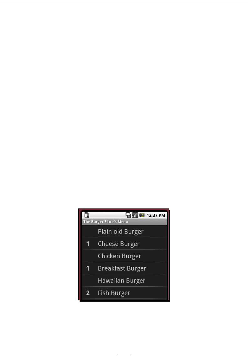
Chapter 2
[ 55 ]
ListView restaurants = (ListView)
findViewById(R.id.restaurant);
restaurants.setAdapter(new ArrayAdapter<String>(
this,
R.layout.menu_item,
getResources().getStringArray(R.array.restaurants)));
restaurants.setOnItemClickListener(this);
}
public void onItemClick(
AdapterView<?> parent,
View item,
int index,
long id) {
switch(index) {
case 0:
startActivity(new Intent(
this,
TheBurgerPlaceActivity.class));
break;
}
}
}
When you reinstall the applicaon and start it up in the emulator, you'll be able to navigate
to The Burger Place and place an order for burgers. Pressing the hardware "Back" buon in
The Burger Place menu will take you back to the restaurant menu.
Presenng Data for Views
[ 56 ]
Pop quiz
1. Seng the choice mode on a ListView object to CHOICE_MODE_SINGLE will:
a. Add a RadioButton to each item.
b. Do nothing (this is the default).
c. Make the ListView track a "selected" item.
2. A ListAdapter denes how a ListView displays its items. When will it be asked
to reuse a View for an item object?
a. When the data model is invalidated or changed.
b. On every item, for rubber-stamping.
c. When the ListView redraws itself.
3. When a ListView is scrollable, header and footer objects will be posioned:
a. Above and below the scrolling items.
b. Horizontally alongside each other, above and below the scrolling items.
c. Scrolling with the other items.
Using the ExpandableListView class
The ListView class is great for displaying small to medium amounts of data, but there
are mes when it will ood your user with far too much informaon. Think about an email
applicaon. If your user is a heavy email user, or subscribes to a few mailing lists, they
may well have several hundred emails in a folder. Even though they may not need to scroll
beyond the rst few, seeing the scrollbar shrink to a few pixels in size doesn't have a good
psychological eect on your user.
In desktop mail clients, you will oen group the email list by me: Today, yesterday,
this week, this month, and forever (or something similar). Android includes the
ExpandableListView for this type of grouping. Each item is nested inside a group, and a
group can be displayed or hidden by the user. It's a bit like a tree view, but always nested
to exactly one level (you can't display an item outside a group).
Massive ExpandableListView groups
There are mes where even an ExpandableListView will not be enough
to keep the amount of data to a reasonable length. In these cases, consider
giving your user the rst few items in the group and adding a special View
More item at the end. Alternavely, use a ListView for the groups, and a
separate Activity for the nested items.
Chapter 2
[ 57 ]
Creating ExpandableListAdapter implementations
Since the ExpandableList class includes two levels of detail, it can't work against
a normal ListAdapter which only handles a single level. Instead, it includes the
ExpandableListAdapter which uses two sets of methods: one set for the group level and
another set for the item level. When implemenng a custom ExpandableListAdapter,
it's generally easiest to have your ExpandableListAdapter implementaon inherit from
the BaseExpandableListAdapter, as it provides implementaons for event registraon
and triggering.
The ExpandableListAdapter will place an arrow pointer on the le side of
each group item to indicate whether the group is open or closed (much like a drop-
down/combobox). The arrow is rendered on top of the group's View object as
returned by the ExpandableListAdapter. To stop your group label from being
partly obscured by this arrow, you'll need to add padding to your list item View
structures. The default padding for a list item is available as the theme parameter
expandableListPreferredItemPaddingLeft, which you can make use of:
android:paddingLeft=
"?android:attr/expandableListPreferredItemPaddingLeft"
In order to keep your ExpandableListView looking consistent, it's a good idea to add the
same amount of padding to the normal (child) items of the ExpandableListView (to keep
their text aligned with that of their parent group), unless you are pung an item on the
le-hand side, such as an icon or checkbox.
Have a go hero - ordering customized pizzas
For the Mick's Pizza example, we're going to create a menu of categorized pizza toppings.
Each topping consists of a name, whether it's 'on' or 'o' the pizza, or 'extra' (for example,
extra cheese). Use two TextView objects arranged horizontally for each item. The right
TextView can hold the name of the topping. The le TextView can be empty when
toppings are not included, On when toppings are included, and Extra for toppings that the
user wants more than the usual amount.
Create an object model with ToppingCatagory objects, containing a name and an array of
PizzaTopping objects. You'll want to store some state whether each topping is ordered,
and in what quanty.
You'll also want to implement a PizzaToppingAdapter class, extending the
BaseExpandableListAdapter class. Make use of the default Android simple_
expandable_list_item_1 layout resource for the group label, and a new customized
layout resource for the item labels.
www.allitebooks.com
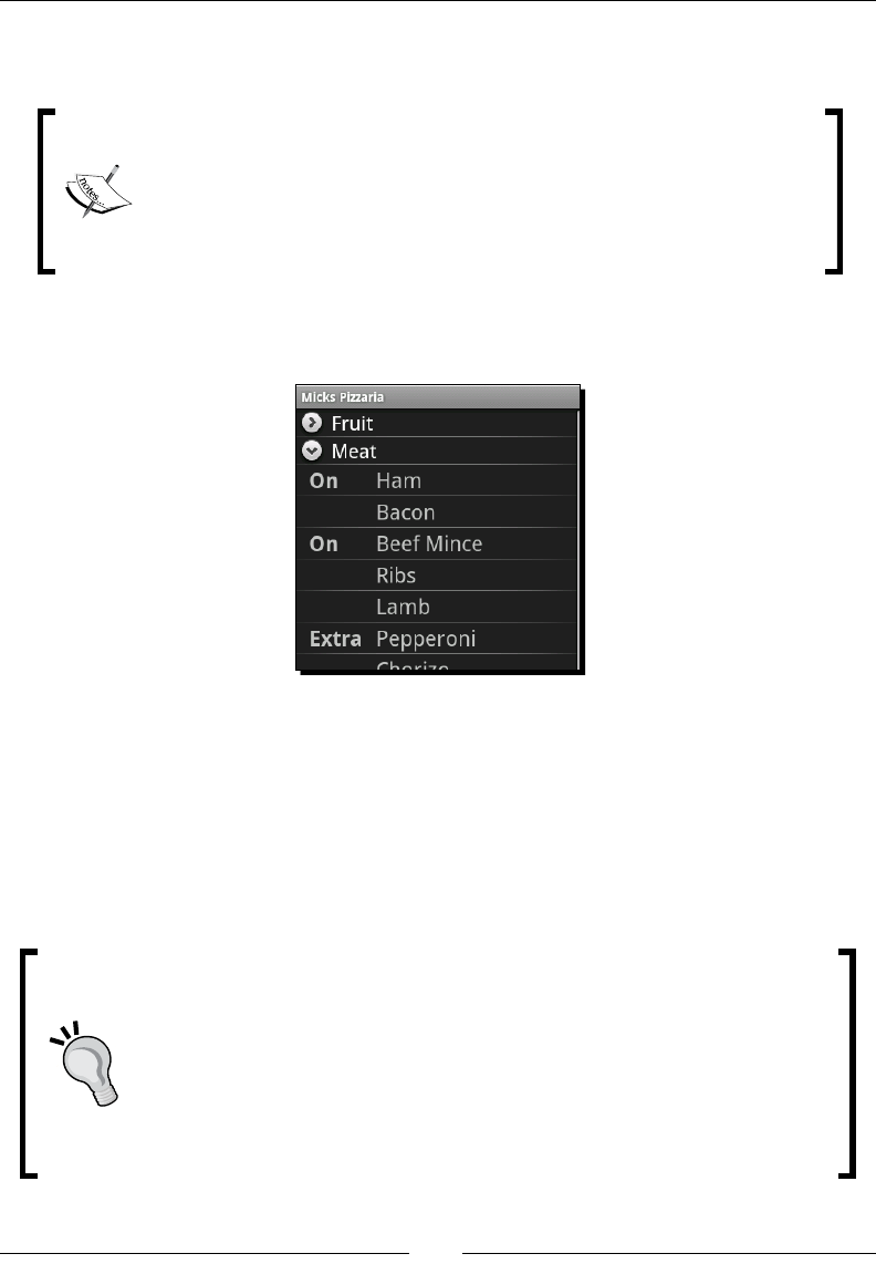
Presenng Data for Views
[ 58 ]
When the user taps on a pizza topping, it changes its status between the three values: O,
On, and Extra.
Using the ListView.getAdapter() method will not return your
ExpandableListAdapter implementaon, but a wrapper instead.
To fetch the original ExpandableListAdapter, you will need to use
the getExpandableListAdapter() method. You will also want to
make use of the ExpandableListView. OnChildClickListener
interface to receive click events.
When your new Activity is complete, you should have a screen which looks something
like the following:
Using the GridView class
A GridView is a ListView with a xed number of columns, arranged le-to-right,
top-to-boom. The standard (un-themed) Android applicaon menu is arranged like a
GridView. The GridView class makes use of a ListAdapter in the exact same format
as ListView. However, because of its xed column count, a GridView is very well suited
for lists of icons.
Using GridViews eecvely
A GridView can display signicantly more informaon on a single screen
than a ListView, at the expense of not being able to show as much text
informaon. From a usability point of view, icons are oen easier to work
with than text. Icons can be recognized more quickly than text, thanks to their
colors. When you have informaon that can be represented using icons, it's
a good idea to display it as such. However, remember that icons need to be
unique within a single screen preferably within the enre applicaon.

Chapter 2
[ 59 ]
For our next example, we're going to build the Four Buckets 'o Fruit menu, using GridView.
The GridView will have an icon for each item on the menu, and the name of the item below
the icon. So, when complete, it will look much like the standard Android applicaon menu.
This next example will focus less on the implementaon of the ListAdapter, since it's
largely the same as the ListAdapter we built for The Burger Place.
Icons on touchscreen devices
It's important to think about icons on a touchscreen device. They need to be
even more self-explanatory than usual, or be accompanied by some text. With
a touchscreen, it's very hard to provide any sort of contextual help, such as a
tool-p. If the user is touching the object, it's oen obscured by their nger
and/or hand, making the icon and tool-p invisible.
Time for action – creating the fruit icon
In order to display the various types of fruits as icons, we will need to create a layout XML
le. Each icon in the GridView will be represented as an instance of this layout, in exactly
the same way as list items are represented in a ListView. We create each item as an
ImageView for the icon, with a TextView below it for the label.
1. Create a le in the res/layout directory named fruit_item.xml.
2. Declare the root element of the icon as a vercal LinearLayout:
<LinearLayout
xmlns:android="http://schemas.android.com/apk/res/android"
android:orientation="vertical"
android:layout_width="fill_parent"
android:layout_height="fill_parent">
3. Create the ImageView element that will serve as our icon:
<ImageView android:id="@+id/icon"
android:layout_width="fill_parent"
android:layout_height="wrap_content"/>
4. Next, create the TextView element that will serve as the label:
<TextView android:id="@+id/text"
android:textSize="@dimen/item_description_size"
android:layout_width="fill_parent"
android:layout_height="wrap_content"
android:gravity="center|center_vertical" />
Presenng Data for Views
[ 60 ]
What just happened?
The fruit_item.xml le is a very simple layout for our menu icons, and could be used for
many other types of icons represented as a grid. ImageView objects will, by default, aempt
to scale their content to their size. In our previous example, the root LinearLayout has the
width and height dened as fill_parent. When placed in a GridView as a single item,
using fill_parent as a size will cause the LinearLayout to ll the space provided for
that grid item (not the enre GridView).
Displaying icons in a GridView
We need an object model and ListAdapter in order to display the fruits to the user in a
GridView. The adapter is fairly straighorward at this point. It's a normal ListAdapter
implementaon built on top of an item class and the layout XML we dened for the icons.
For each item of fruit, we will need an object holding both the fruit's name and icon. Create
a FruitItem class in the root package with the following code:
class FruitItem {
final String name;
final int image;
FruitItem(String name, int image) {
this.name = name;
this.image = image;
}
}
In the preceding code, we referenced the icon image for the fruit as an integer. When we
reference applicaon resources and IDs in Android, it's always with an integer. For this
example we're assuming that all of the dierent types of fruit each have an icon as an
applicaon resource. Another opon would be to hold a reference to a Bitmap object
in each FruitItem. However, this would have meant holding the full image in memory
when the FruitItem is potenally not on the screen.
In order for the Android Asset Packaging Tool to recognize and store the icons, you will need
to put them in the res/drawable directory.
Android Image Resources
Generally, it's considered a good pracce in Android to store bitmap images
as PNG les. Since you will be accessing these les from your code, make
sure they have Java-friendly lenames. The PNG format (unlike JPG) is
lossless, can have various dierent color depths, and correctly handles
transparency. This generally makes it a great image format on the whole.

Chapter 2
[ 61 ]
Time for action – building the fruit menu
For the Four Buckets 'o Fruit menu, we're going to need a ListAdapter implementaon to
render the FruitItem objects into the fruit_item.xml layout resources. We'll also need
a layout resource for the GridView which we will load in our new Activity class.
1. Create a new class named FruitAdapter extending BaseAdapter in the root
package of the project.
2. FruitAdapter needs to hold and represent an array of FruitItem
objects. Implement the class using the same structure as the BurgerAdapter.
3. In the ListAdapter.getView method, set the label and icon as dened in the
fruit_item.xml layout resource:
FruitItem item = items[index];
TextView text = ((TextView)view.findViewById(R.id.text));
ImageView image = ((ImageView)view.findViewById(R.id.icon));
text.setText(item.name);
image.setImageResource(item.image);
4. Create a new layout resource to hold the GridView that we will use for the Four
Buckets 'o Fruit menu, and name it res/layout/four_buckets.xml.
5. Populate the new layout resource with a three column GridView:
<GridView
xmlns:android="http://schemas.android.com/apk/res/android"
android:numColumns="3"
android:horizontalSpacing="5dip"
android:verticalSpacing="5dip"
android:layout_width="fill_parent"
android:layout_height="fill_parent"/>
What just happened?
The new four_buckets.xml layout resource has nothing but a GridView. This is unlike
the other layout resources we've wrien so far, especially since the GridView has no ID.
For this example, the fruit menu Activity will contain nothing but the GridView, so
there's no need for an ID reference or layout structure. We also specied horizontal and
vercal spacing of 5dip. A GridView object's default is to have no spacing between its cells,
which makes for fairly squashed content. In order to space things out a bit, we ask for some
whitespace between each of the cells.

Presenng Data for Views
[ 62 ]
Time for action – creating the FourBucketsActivity
Since we are working with a layout resource with only a GridView, and no ID reference,
we're going to walk through the creaon of the Activity step-by-step. Unlike previous
Activity implementaons, we will need a direct reference to the GridView dened in
four_buckets.xml, and this means loading it manually.
1. Start by creang a new class in your project's root package:
public class FourBucketsActivity extends Activity {
2. Override the onCreate method, and invoke the super implementaon:
protected void onCreate(final Bundle istate) {
super.onCreate(istate);
3. Get the LayoutInflator instance for your Activity object:
LayoutInflater inflater = getLayoutInflater();
4. Inate the four_buckets.xml resource and cast its contents directly to a
GridView object:
GridView view = (GridView)inflater.inflate(
R.layout.four_buckets,
null);
5. Set the ListAdapter of the view object to a new instance of the FruitAdapter
class, and populate the new FruitAdapter with some FruitItem objects:
view.setAdapter(new FruitAdapter(
new FruitItem("Apple", R.drawable.apple),
new FruitItem("Banana", R.drawable.banana),
new FruitItem("Black Berries", R.drawable.blackberry),
// and so on
6. Use setContentView to make the GridView your root View object:
setContentView(view);
7. Register your FourBucketsActivity class in your AndroidManifest.xml.
8. Add a case to the SelectRestaurantActivity to start the new
FourBucketsActivity when the user selects it.
What just happened?
You just completed the Four Buckets 'o Fruit menu. If you re-install the applicaon into your
emulator, you'll now be able to go and order fruits (just be careful to have the 16 ton weight
ready in case the delivery guy aacks you).
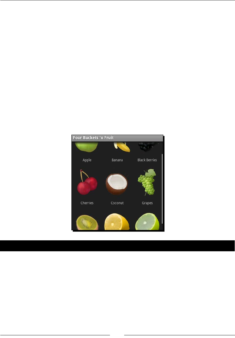
Chapter 2
[ 63 ]
If you look through the Activity documentaon, you'll noce that while there's a
setContentView method, there's no corresponding getContentView method. Take a
closer look and you will noce the addContentView method. An Activity object may
have any number of View objects aached to it as "content". This precludes any useful
implementaon of a getContentView method.
In order to get around this limitaon, we inated the layout ourselves. The
getLayoutInflator() method used is simply a shortcut for LayoutInflator.
from(this). Instead of using an ID and findViewById, we simply cast the View returned
directly to a GridView, since that's all that our four_buckets.xml le contains (much the
same way the ArrayAdapter class works with TextView objects). If we wanted to make
things a lile more abstract, we could have cast it to an AdapterView<ListAdapter>, in
which case we could have swapped in implementaon in the le with a ListView. However,
this wouldn't have been very useful for this example.
If you now re-install and run the applicaon, your new FourBucketsActivity will present
you with a screen similar to the following one:
Have a go hero – Sam's Sushi
The last restaurant on the menu is Sam's Sushi. Try using the Spinner class along with
a GridView to create a composite sushi menu. Place the spinner at the top of the screen,
with opons for dierent types of sushi:
Sashimi
Maki Roll
Nigiri
Oshi

Presenng Data for Views
[ 64 ]
California Roll
Fashion Sandwich
Hand Roll
Below the Spinner, use a GridView to display icons for each dierent type of sh that the
user can order. Here are some suggesons:
Tuna
Yellowtail
Snapper
Salmon
Eel
Sea Urchin
Squid
Shrimp
The Spinner class makes use of the SpinnerAdapter instead of a ListAdapter.
The SpinnerAdapter includes an addional View object which represents the
drop-down menu. This is most typically a reference to the android.R.layout.simple_
dropdown_item_1line resource. However, for this example, however, you can probably
make use of the android:entries aribute on the Spinner XML element.
Summary
Data display is one of the most common requirements of a mobile applicaon, and Android
has many dierent opons available. The ListView is probably one of the most commonly
used widgets in the standard Android suite, and styling it allows it to be used to display
varying amounts of data, from one line menu items to mul-line to-do notes.
The GridView is eecvely a tabular version of ListView, and is well suited for presenng
the user with icon views. Icons have enormous advantages over text, since they can be
recognized much more quickly by the user. Icons can also take up signicantly less space, and
in a GridView, you could easily t four to six icons in a portrait screen without making the
user interface cluered or more dicult to work it. This also frees up precious screen space
for other items to be displayed.

Chapter 2
[ 65 ]
Building custom Adapter classes not only allows you to take complete control over the
styling of the ListView, but also determine where the data comes from, and how it's
loaded. You could, for example, load the data directly from a web service by using an
Adapter which generates dummy View objects unl the web service responds with actual
data. Take a good look at the default Adapter implementaons, they will generally serve
your requirements, especially when coupled with a custom layout resource.
In the next chapter, we will take a look at some less generic, more specialized View classes
that Android provides. As with almost everything in Android, the defaults may be specic,
but they can be customized in any number of ways to t some very unusual purposes.
3
Developing with Specialized
Android Widgets
Along with the many generic widgets such as buons, text elds, and
checkboxes, Android also includes a variety of more specialized widgets. While
a buon is fairly generic, and has use in many situaons, a gallery-widget for
example, is far more targeted. In this chapter we will start looking at the more
specialized Android widgets, where they appear, and how best they can be
used.
Although these are very specialized View classes, they are very important. As menoned
earlier (and it really can't be stressed enough) one of the cornerstones of good user interface
design is consistency. An example is the DatePicker widget. It's certainly not the preest
date-selector in the world. It's not a calendar widget, so it's somemes quite dicult for
the user to select exactly which date they want (most people think in terms of "next week
Tuesday", and not "Tuesday the 17th"). However, the DatePicker is standard! So the user
knows exactly how to use it, they don't have to work with a broken calendar implementaon.
This chapter will work with Android's more specialized View and layout classes:
Tab layouts
TextSwitcher
Gallery
DatePicker
TimePicker
RatingBar
www.allitebooks.com

Developing with Specialized Android Widgets
[ 68 ]
These classes have very specialized purposes, and some have slight quirks in the way they
are implemented. This chapter will explore how and where to use these widgets, and
where you need to be careful of their implementaon details. We'll also discuss how
best to incorporate these elements into an applicaon, and into a layout.
Creating a restaurant review application
In the previous chapter, we built an ordering-in applicaon. In this chapter, we're going
to take a look at reviewing restaurants. The applicaon will allow the user to view other
people's opinions on the restaurant, a gallery of photos of the restaurant, and nally
a secon for making an online reservaon. We will divide the applicaon into three secons:
Review: Review and rangs informaon for this restaurant
Photos: A photo gallery of the restaurant
Reservaon: Request a reservaon with the restaurant
When building an applicaon where all three of these secons need to be quickly available
to the user, the most sensible opon available is to place each of the secons in a tab on the
screen. This allows the user to switch between the three secons without having all of them
on the screen at the same me. This also saves screen real estate giving us more space for
each secon.
The Review tab will include a cycling list of comments that people have made about the
restaurant being viewed, and an average "star" rang for the restaurant.
Displaying photographs of the restaurant is the job of the Photos tab. We'll provide the
user with a thumbnail "track" at the top of the screen, and a view of the selected image
consuming the remaining screen space.
For the Reservaon tab, we will want to capture the user's name and when they would like
the reservaon to be (date and me). Finally we also need to know for how many people
the reservaon will be made.
Time for action – creating the robotic review project structure
To start this example we'll need a new project with a new Activity. The new layout and
Activity will be a lile dierent from the structures in the previous two chapters. We
will need to use the FrameLayout class in order to build a tabbed layout. So to begin, we'll
create a new project structure and start o with a skeleton that will later become our tab
layout structure. This can be lled with the three content areas.
Downloa d f r o m W o w ! e B o o k < w w w.woweb o o k . c o m >

Chapter 3
[ 69 ]
1. Create a new Android project using the Android command-line tool:
android create project -n RoboticReview -p RoboticReview -k com.
packtpub.roboticreview -a ReviewActivity -t 3
2. Open the res/layout/main.xml le in an editor or IDE.
3. Clear out the default code (leaving in the XML header).
4. Create a root FrameLayout element:
<FrameLayout
xmlns:android="http://schemas.android.com/apk/res/android"
android:layout_width="fill_parent"
android:layout_height="fill_parent">
5. Inside the new FrameLayout element, add a vertical LinearLayout:
<LinearLayout android:id="@+id/review"
android:orientation="vertical"
android:layout_width="fill_parent"
android:layout_height="wrap_content">
</LinearLayout>
6. Aer the LinearLayout, add another empty LinearLayout element:
<LinearLayout android:id="@+id/photos"
android:orientation="vertical"
android:layout_width="fill_parent"
android:layout_height="wrap_content">
</LinearLayout>
7. Then, aer the second LinearLayout element, add an empty ScrollView:
<ScrollView android:id="@+id/reservation"
android:layout_width="fill_parent"
android:layout_height="fill_parent">
</ScrollView>
The FrameLayout will be used by the Android tab structures as a content area, each of
the child elements will become the contents of a tab. In the preceding layout, we've added
in two LinearLayout elements for the Review and Photos secons, and a ScrollView for
the Reservaon tab.
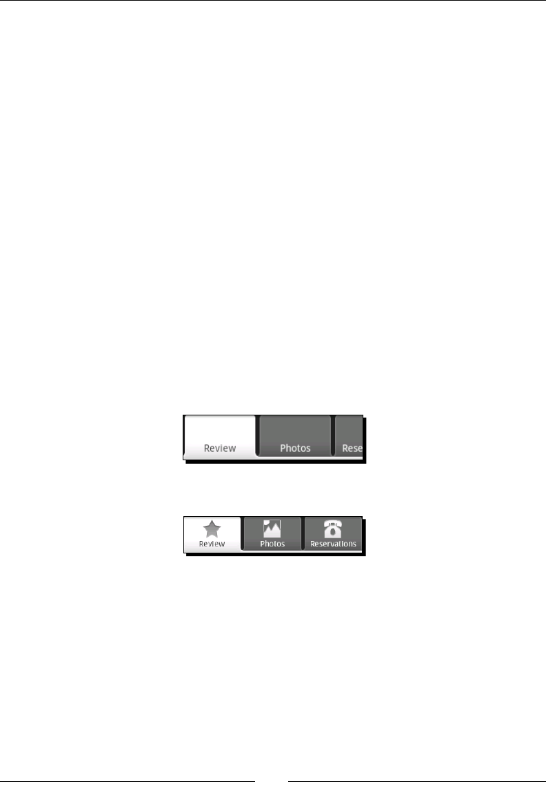
Developing with Specialized Android Widgets
[ 70 ]
What just happened?
We've just started the "restaurant review" applicaon, building a skeleton for the user
interface. There are several key parts of this main.xml le which we should walk through
before connuing the example.
First, our root element is a FrameLayout. The FrameLayout anchors all of its children to its
own top-le corner. In eect, the two occurrences of LinearLayout and the ScrollView
will overlap each other. This structure can be used to form something like a Java AWT
CardLayout, which will be used by the TabHost object to display these objects when their
relave tab is acve.
Second, each of the LinearLayout and the ScrollView have an ID. In order to idenfy
them as tab roots, we need to be able to easily access them from our Java code. Tab
structures may be designed in XML, but they need to be put together in Java.
Building a TabActivity
In order to connue, we need our Activity class to set up the three tab content
elements we declared in our main.xml le as tabs. By preference, all tabs in Android
should have an icon.
The following is a screenshot of the tabs without their icons:
The following is a screenshot of the tabs with the icons:
Creating tab icons
Android applicaons have a specic look and feel dened by the default widgets provided
by the system. In order to keep all applicaons consistent for users, there are a set of user
interface guidelines that applicaon developers should follow. While it's important to have
your applicaon stand out, users will oen get frustrated with applicaons that are not
familiar or look out of place (this is one of the reasons why automacally ported applicaons
are oen very unpopular).

Chapter 3
[ 71 ]
Android tabs and icons
When selecng tab icons for your applicaon, it's considered a good pracce to include
several dierent versions of the icon for dierent screen sizes and densies. The an-aliased
corners that look so good on a high-density screen, look terrible on low-density screens.
You can also provide enrely dierent icons for very small screens, instead of loosing all
of your icons details. Android tabs appear raised when they are selected, and lowered in
the background when they are not selected. The Android tab icons should appear in the
"opposite" etching eect to the tab that they are placed in, that is, lowered when they
are selected and raised when they are not selected. The icons therefore have two primary
states: selected and unselected. In order to switch between these two states, a tab-icon will
generally consist of three resource les:
The selected icon image
The unselected icon image
An XML le describing the icon in terms of its two states
Tab icons are generally simple shapes while the image size is squared (generally at a
maximum of 32 x 32 pixels). Dierent variaons of the image should be used for screens of
dierent pixel densies (see Chapter 1, Developing a Simple Acvity for "Resource Selecon"
details). Generally you will use a dark outset image for the selected state, since when a tab is
selected, the tab background is light. For the unselected icon, the opposite is true and a light
inset image should be used instead.
The bitmap images in an Android applicaon should always be in the PNG format. Let's call
the selected icon for the Review tab res/drawable/ic_tab_selstar.png, and name
the unselected icon le res/drawable/ic_tab_unselstar.png. In order to switch
states between these two images automacally, we dene a special StateListDrawable
as an XML le. Hence the Review icon is actually in a le named res/drawable/review.
xml, and it looks like this:
<selector xmlns:android="http://schemas.android.com/apk/res/android"
android:constantSize="true">
<item
android:drawable="@drawable/ic_tab_selstar"
android:state_selected="false"/>
<item
android:drawable="@drawable/ic_tab_unselstar"
android:state_selected="true"/>
</selector>
Developing with Specialized Android Widgets
[ 72 ]
Note the android:constantSize="true" of the <selector> element. By default,
Android will assume that each state in the resulng StateListDrawable object will cause
the image to be of a dierent size, which in turn may cause the user interface to re-run its
layout calculaons. This can be fairly expensive, so it's a good idea to declare that each of
your states is exactly of the same size.
For this example, we'll be using three tab icons, each with two states. The icons are named
review, photos, and book. Each one is composed of three les: A PNG for the selected
icon, a PNG for the unselected icon, and an XML le dening the state-selector. From our
applicaon, we will only make direct use of the state-selector XML les, leaving the Android
APIs to pickup the actual PNG les.
Implementing the ReviewActivity
As usual, we will want to have localized text in our strings.xml le. Open the res/
values/strings.xml le and copy the following code into it:
<resources>
<string name="app_name">Robotic Review</string>
<string name="review">Review</string>
<string name="gallery">Photos</string>
<string name="reservation">Reservations</string>
</resources>
Time for action – writing the ReviewActivity class
As already said, we will need to set up our tabbed-layout structure in our Java code.
Fortunately, Android provides a very useful TabActivity class that does much of the heavy
liing for us, providing us with a ready-made TabHost object with which we can construct
the Activity tab structure.
1. Open the ReviewActivity.java le generated earlier in an editor or IDE.
2. Instead of extending Activity, change the class to inherit TabActivity:
public class ReviewActivity extends TabActivity
3. In the onCreate method, remove the setContentView(R.layout.main) line
(generated by the android create project ulity) completely.
4. Now start by fetching the TabHost object from your parent class:
TabHost tabs = getTabHost();

Chapter 3
[ 73 ]
5. Next, we inate our layout XML into the content view of the TabHost:
getLayoutInflater().inflate(
R.layout.main,
tabs.getTabContentView(),
true);
6. We'll need access to our other applicaon resources:
Resources resources = getResources();
7. Now we dene a TabSpec for the Review tab:
TabHost.TabSpec details =
tabs.newTabSpec("review").
setContent(R.id.review).
setIndicator(getString(R.string.review),
resources.getDrawable(R.drawable.review));
8. Dene two more TabSpec variables for the Photos and Reservaon tabs using the
preceding paern.
9. Add each of the TabSpec objects to our TabHost:
tabs.addTab(details);
tabs.addTab(gallery);
tabs.addTab(reservation);
This concludes the creaon of the tab structure for the ReviewActivity class.
What just happened?
We built a very basic tabbed-layout for our new ReviewActivity. When working with
tabs, we didn't simply use the Activity.setContentView method, instead we inated
the layout XML le ourselves. Then we made use of the TabHost object provided by the
TabActivity class to create three TabSpec objects. A TabSpec is a builder object that
enables you to build up the content of your tab, similar to the way you build up text with
a StringBuilder.
The content of a TabSpec is the content-view that will be aached to the tab on the screen
(assigned using the setContent method). In this example, we opted for the simplest opon
and dened the tab content in our main.xml le. It's also possible to lazy-create the tab
content using the TabHost.TabContentFactory interface, or even to put an external
Activity (such as the dialer or browser) in the tab by using setContent(Intent).
However, for the purposes of this example we used the simplest opon.
You'll noce that the TabSpec (much like the StringBuilder class) supports chaining
of method calls, making it easy and exible to either set up a tab in a "single shot" approach
(as done previously), or build up the TabSpec in stages (that is, while loading from an
external service).

Developing with Specialized Android Widgets
[ 74 ]
The indicator we assigned to the TabSpec is what will appear on the tab. In the previous
case, a string of text and our icon. As of API level 4 (Android version 1.6) it's possible to use
a View object as an indicator, allowing complete customizaon of the tab's look and feel.
To keep the example simple (and compable with earlier versions)
we've supplied a String resource as the indicator.
Time for action – creating the Review layout
We've got a skeleton tab structure, but there's nothing in it yet. The rst tab is tled Review,
and this is where we are going to start. We've just nished enough Java code to load up the
tabs and put them on the screen. Now we go back to the main.xml layout le and populate
this tab with some widgets that supply the user with review informaon.
1. Open res/layout/main.xml in an editor or IDE.
2. Inside the <LayoutElement> that we named review, add a new TextView that
will contain the name of the restaurant:
<TextView android:id="@+id/name"
android:textStyle="bold"
android:textSize="25sp"
android:textColor="#ffffffff"
android:gravity="center|center_vertical"
android:layout_width="fill_parent"
android:layout_height="wrap_content"/>
3. Below the new TextView, add a new RatingBar, where we will display how other
people have rated the restaurant:
<RatingBar android:id="@+id/stars"
android:numStars="5"
android:layout_width="wrap_content"
android:layout_height="wrap_content"/>
4. Keeping this rst tab simple, we add a TextSwitcher where we can display other
people's comments about the restaurant:
<TextSwitcher android:id="@+id/reviews"
android:inAnimation="@android:anim/fade_in"
android:outAnimation="@android:anim/fade_out"
android:layout_width="fill_parent"
android:layout_height="fill_parent"/>
The Review tab only has three widgets in this example, but more could easily be added
to allow the user to input their own reviews.

Chapter 3
[ 75 ]
What just happened
We just put together the layout for our rst tab. The RatingBar that we created has a width
of wrap_content, which is really important. If you use fill_parent, then the number
of stars visible in the RatingBar will simply be as many as can t on the screen. If you
want control over how many stars appear on your RatingBar, sck to wrap_content,
but also make sure that (at least on portrait layouts) the RatingBar has its own horizontal
line. If you install the Activity in the emulator now, you won't see anything in either the
TextView or the TextSwitcher.
The TextSwitcher has no default animaons, so we specify the "in" animaon as
the default fade_in as provided by the android package, while the "out" animaon
will be fade_out. This syntax is used to access resources that can be found in the
android.R class.
Working with switcher classes
The TextSwitcher we've put in place is used to animate between dierent TextView
objects. It's really useful for displaying things like changing stock-prices, news headlines, or
in our case, reviews. It inherits from ViewSwitcher which can be used to animate between
any two generic View objects. ViewSwitcher extends ViewAnimator which can be used
as a sort of animated CardLayout.
We want to display a series of comments from past customers, fading between each of them
with a short animaon. TextSwitcher needs two TextView objects (which it will ask us to
create dynamically), for our example. We want these to be in a resource le.
For the next part of the example, we'll need some comments. Instead of using a web service
or something similar to fetch real comments, this example will load some comments from its
applicaon resources. Open the res/values/strings.xml le and add <string-array
name="comments"> with a few likely comments in it:
<string-array name="comments">
<item>Just Fantastic</item>
<item>Amazing Food</item>
<item>What rubbish, the food was too hairy</item>
<item>Messy kitchen; call the health inspector.</item>
</string-array>

Developing with Specialized Android Widgets
[ 76 ]
Time for action – turning on the TextSwitcher
We want the TextSwitcher to display the next listed comment every ve seconds. For
this we'll need to employ new resources, and a Handler object. A Handler is a way for
Android applicaons and services to post messages between threads, and can also be used
to schedule messages at a point in the future. It's a preferred structure to use over a java.
util.Timer since a Handler object will not allocate a new Thread. In our case, a Timer is
overkill, as there is only one task we want to schedule.
1. Create a new XML le in your res/layout directory named review_comment.xml.
2. Copy the following code into the new review_comment.xml le:
<TextView
xmlns:android="http://schemas.android.com/apk/res/android"
android:gravity="left|top"
android:textStyle="italic"
android:textSize="16sp"
android:padding="5dip"
android:layout_width="fill_parent"
android:layout_height="wrap_content"/>
3. Open the ReviewActivity.java le in your editor or IDE.
4. We'll need to be able to load the review_comment resources for the
TextSwitcher, so ReviewActivity needs to implement the ViewSwitcher.
ViewFactory interface.
5. In order to be update the TextSwitcher, we need to interact with a Handler, and
the easiest way to do that here is to also implement Runnable.
6. At the top of the ReviewActivity class, declare a Handler object:
private final Handler switchCommentHandler = new Handler();
7. We'll also want to hold a reference to the TextSwitcher for our run() method
when we switch comments:
private TextSwitcher switcher;
8. In order to display the comments, we'll need an array of them, and an index to keep
track of which comment the TextSwitcher is displaying:
private String[] comments;
private int commentIndex = 0;
9. Now, in the onCreate method, aer you add the TabSpec objects to the TabHost,
read the comments string-array from the Resources:
comments = resources.getStringArray(R.array.comments);

Chapter 3
[ 77 ]
10. Next, nd the TextSwitcher and assign it to the switcher eld:
switcher = (TextSwitcher)findViewById(R.id.reviews);
11. Tell the TextSwitcher that the ReviewActivity object will be its ViewFactory:
switcher.setFactory(this);
12. In order to comply with the ViewFactory specicaon, we need to write a
makeView method. In our case it's really simple—inate the review_comment
resource:
public View makeView() {
return getLayoutInflater().inflate(
R.layout.review_comment, null);
}
13. Override the onStart method so that we can post the rst med event on the
Handler object declared earlier:
protected void onStart() {
super.onStart();
switchCommentHandler.postDelayed(this, 5 * 1000l);
}
14. Similarly, override the onStop method to cancel any future callback:
protected void onStop() {
super.onStop();
switchCommentHandler.removeCallbacks(this);
}
15. Finally, the run() method alternates the comments in the TextSwitcher, and in
the finally block, posts itself back onto the Handler queue in ve seconds:
public void run() {
try {
switcher.setText(comments[commentIndex++]);
if(commentIndex >= comments.length) {
commentIndex = 0;
}
} finally {
switchCommentHandler.postDelayed(this, 5 * 1000l);
}
}
Using Handler objects instead of creang Thread objects means all of the med tasks
can share the main user interface thread instead of each allocang a separate thread. This
reduces the amount of memory and CPU load your applicaon places on the device, and has
a direct impact on the applicaon performance and baery life.
www.allitebooks.com
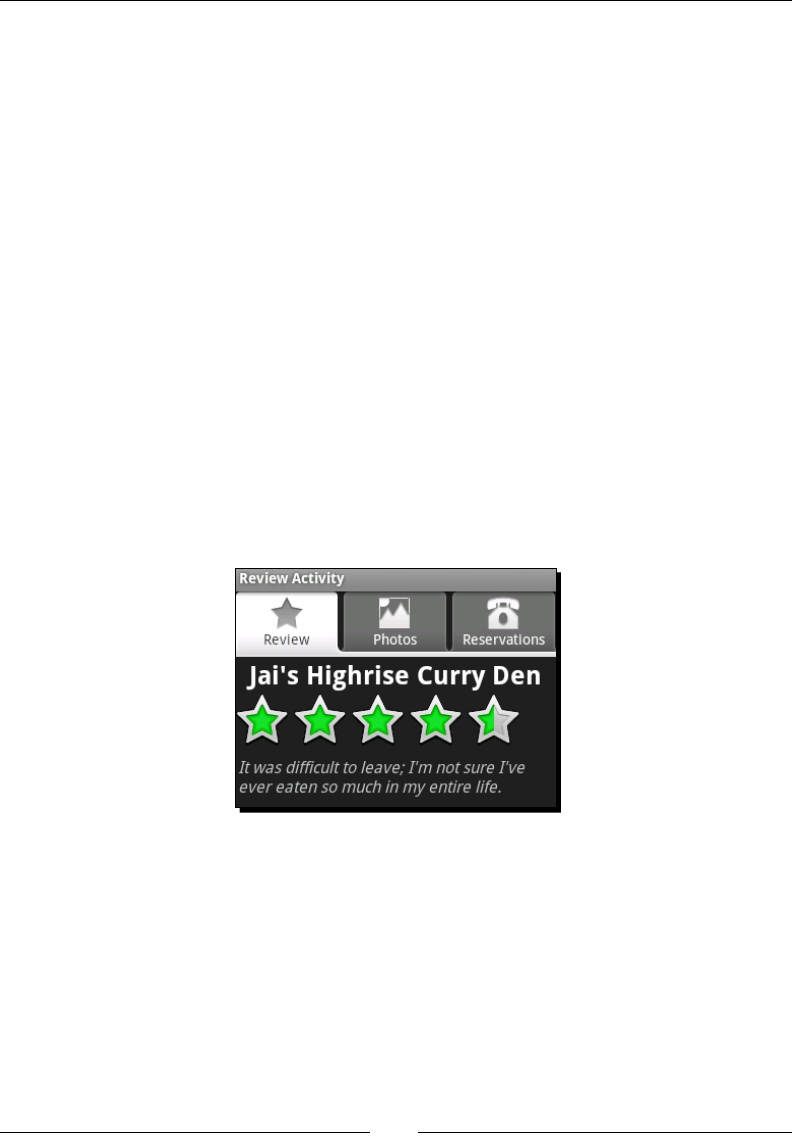
Developing with Specialized Android Widgets
[ 78 ]
What just happened?
We just built a simple mer structure to update the TextSwitcher with a rotang array of
comments. The Handler class is a convenient way to post messages and acons between
two applicaon threads. In Android, as with Swing, the user interface is not thread-safe, so
inter-thread communicaon becomes very important. A Handler object aempts to bind
itself to the thread it's created in (in the preceding case, the main thread).
It's a prerequisite that a thread which creates a Handler object must have an associated
Looper object. You can set this up in your own thread by either inhering the
HandlerThread class, or using the Looper.prepare() method. Messages sent to a
Handler object will be executed by the Looper associated with the same thread. By
sending our ReviewActivity (which implements Runnable) to the Handler object that
we had created in the main thread, we know that the ReviewActivity.run() method
will be executed on the main thread, regardless of which thread posted it there.
In the case of long-running tasks (such as fetching a web page or a long-running calculaon),
Android provides a class that bares a striking resemblance to the SwingWorker class,
named AsyncTask. AsyncTask (like Handler) can be found in the android.os package,
and you make use of it by inheritance. AsyncTask is used to allow interacon between
a background task and the user interface (in order to update a progress bar or
similar requirements).
Creating a simple photo gallery
The use of the word Gallery is a lile misleading, it's really a horizontal row of items with
a "single item" selecon model. For this example we'll be using the Gallery class for what
it does best, displaying thumbnails. However, as you'll see, it's capable of displaying scrolling
lists of almost anything. Since a Gallery is a spinner, you work with it in much the same
way as a Spinner object or a ListView, that is, with an Adapter.

Chapter 3
[ 79 ]
Time for action – building the Photos tab
Before we can add images to a Gallery, we need the Gallery object on the screen. To
start this exercise, we'll add a Gallery object and an ImageView to FrameLayout of our
tabs. This will appear under the Photos tab that we created at the beginning of the chapter.
We'll sck to a fairly tradional photo gallery model of the sliding thumbnails at the top of
the screen, with the full view of the selected image below it.
1. Open res/layout/main.xml in your editor or IDE.
2. Inside the second LinearLayout, with android:id="@+id/photos", add a new
Gallery element to hold the thumbnails:
<Gallery android:id="@+id/gallery"
android:layout_width="fill_parent"
android:layout_height="wrap_content"/>
3. Gallery objects, by default, squash their contents together, which really doesn't
look great in our case. You can add a lile padding between the items by using the
spacing aribute of Gallery class:
android:spacing="5dip"
4. We also have tabs directly above the Gallery, and we'll have an ImageView
directly below it. Again, there won't be any padding, so add some using a margin:
android:layout_marginTop="5dip"
android:layout_marginBottom="5dip"
5. Now create an ImageView which we can use to display the full-sized image:
<ImageView android:id="@+id/photo"
android:layout_width="fill_parent"
android:layout_height="fill_parent"/>
6. In order to ensure that the full display is scaled correctly, we need to specify the
scaleType on the ImageView:
android:scaleType="centerInside"
The Gallery element provides us with the thumbnail track at the top of the screen. The
image selected in the Gallery will be displayed at full-size in the ImageView widget.

Developing with Specialized Android Widgets
[ 80 ]
What just happened?
We just populated the second tab with the standard widgets required for a basic photo
gallery. This structure is very generic, but is also well known and understood by users. The
Gallery class will handle the thumbnails, scrolling, and selecon. However, you will need
to populate the main ImageView with the selected image, and provide the Gallery object
with the thumbnail widgets to display on the screen.
The spacing aribute on the Gallery element will add some whitespace, which serves
as a simple separator between thumbnails. You could also add a border into each of the
thumbnail images, border each ImageView widget you return for a thumbnail, or use
a custom widget to create a border.
Creating a thumbnail widget
In order to display the thumbnails in the Gallery object, we will need to create an
ImageView object for each thumbnail. We could easily do this in Java code, but as usual, it is
preferable to build even the most basic widgets using an XML resource. In this case, create a
new XML resource in the res/layout directory. Name the new le gallery_thn.xml and
copy the following code into it:
<ImageView xmlns:android="http://schemas.android.com/apk/res/android"
android:scaleType="fitXY"/>
That's right, it has just two lines of XML, but to reiterate, this allows us to customize this
widget for many dierent conguraons without eding the Java code. While eding the
code might not seem like a problem (the resource needs to be recompiled anyway), you
also don't want to end up with a long series of if statements to decide on exactly how you
should create the ImageView objects.
Implementing a GalleryAdapter
For the example, we'll sck to using applicaon resources to keep things simple. We'll
have two arrays of resource IDs, thumbnails, and the full-size images. An Adapter
implementaon is expected to provide an idener for each of the items. In this next
example, we're going to provide an idener as the resource idener of the full-size
image, which gives us easy access to the full-size image in classes outside of the Adapter
implementaon. While this is an unusual contract, it provides a convenient way for us to
pass the image resource around within an already dened structure.
In order to display your gallery, you'll need some images to display (mine are sized 480 x 319
pixels). For each of these images, you'll need a thumbnail image to display in the Gallery
object. Generally, these should simply be a scaled-down version of the actual image (mine
are scaled to 128 x 84 pixels).

Chapter 3
[ 81 ]
Time for action – the GalleryAdapter
Creang the GalleryAdapter is much like the ListAdapter classes we created in Chapter
2, Presenng Data for Views. The GalleryAdapter however, will use ImageView objects
instead of TextView objects. It also binds two lists of resources together instead of using
an object model.
1. Create a new Java class in your project root package named GalleryAdapter. It
should extend the BaseAdapter class.
2. Declare an integer array to hold the thumbnail resource IDs:
private final int[] thumbnails = new int[]{
R.drawable.curry_view_thn,
R.drawable.jai_thn,
// your other thumbnails
};
3. Declare an integer array to hold the full-size image resource IDs:
private final int[] images = new int[]{
R.drawable.curry_view,
R.drawable.jai,
// your other full-size images
};
4. The getCount() method is simply the length of the thumbnails array:
public int getCount() {
return thumbnails.length;
}
5. The getItem(int) method returns the full-size image resource ID:
public Object getItem(int index) {
return Integer.valueOf(images[index]);
}
6. As menoned earlier, the getItemId(int) method returns the full-size image
resource ID (almost exactly the way that getItem(int) does):
public long getItemId(int index) {
return images[index];
}

Developing with Specialized Android Widgets
[ 82 ]
7. Finally, the getView(int, View, ViewGroup) method uses a LayoutInflater
to read and populate the ImageView which we created in the gallery_thn.xml
layout resource:
public View getView(int index, View reuse, ViewGroup parent) {
ImageView view = (reuse instanceof ImageView)
? (ImageView)reuse
: (ImageView)LayoutInflater.
from(parent.getContext()).
inflate(R.layout.gallery_thn, null);
view.setImageResource(thumbnails[index]);
return view;
}
The Gallery class is a subclass of AdapterView and so funcons in the same way as
a ListView object. The GalleryAdapter will provide the Gallery object with View
objects to display the thumbnails in.
What just happened
Much like the Adapter classes built in the last chapter, the GalleryAdapter will aempt
to reuse any View object specied in its getView method. A primary dierence however,
is that this GalleryAdapter is enrely self-contained, and will always display the same list
of images.
This example of a GalleryAdapter is extremely simple. You could also build a
GalleryAdapter that held bitmap objects instead of resource ID references.
You'd then make use of the ImageView.setImageBitmap method instead of
ImageView.setImageResource.
You could also eliminate the thumbnail images by having the ImageView scale the full-size
images into thumbnails. This would just require a modicaon to the gallery_thn.xml
resource le in order to specify the required size of each thumbnail.
<ImageView xmlns:android="http://schemas.android.com/apk/res/android"
android:maxWidth="128dip"
android:adjustViewBounds="true"
android:scaleType="centerInside"/>
The adjustViewBounds aribute tells the ImageView to adjust its own size in
a way such that it maintains the aspect rao of the image it contains. We also change the
scaleType aribute to centerInside, which will also retain the aspect rao of the
image when it scales. Finally, we set a maximum width for the ImageView. Using the
standard layout_width or layout_height aributes is ignored by the Gallery class,
so we instead specify the desired thumbnail size to the ImageView (the layout_width
and layout_height aributes are handled by the Gallery, while the maxWidth and
maxHeight are handled by the ImageView).

Chapter 3
[ 83 ]
This would be a standard speed/size trade-o. Having the thumbnail images takes up more
applicaon space, but having the ImageView perform the scaling makes the applicaon
slower. The scaling algorithm in ImageView will also not be as high-quality as the scaling
performed in an image-manipulaon applicaon such as Adobe Photoshop. In most cases
this won't be a problem, but if you have high detail images, you oen get "scaling arfacts"
with simpler scaling algorithms.
Time for action – making the gallery work
Now that we've got the GalleryAdapter working, we need to connect the Gallery, the
GalleryAdapter, and the ImageView together, so that when a thumbnail is selected, the
full-view of that image is displayed in the ImageView object.
1. Open the ReviewActivity source code in your editor or IDE.
2. Add AdapterView.OnItemSelectedListener to the interfaces that the
ReviewActivity implements.
3. Below the declaraon of the TextSwitcher, declare a reference to the ImageView
which will hold the full-size image:
private TextSwitcher switcher;
private ImageView photo;
4. At the end of the onCreate method, nd the ImageView named photo and assign
it to the reference you just declared:
photo = ((ImageView)findViewById(R.id.photo));
5. Now fetch the Gallery object as declared in the main.xml layout resource:
Gallery photos = ((Gallery)findViewById(R.id.gallery));
6. Create a new GalleryAdapter and set it on the Gallery object:
photos.setAdapter(new GalleryAdapter());
7. Set the OnItemSelectedListener of the Gallery object to this:
photos.setOnItemSelectedListener(this);
8. At the end of the ReviewActivity class, add the onItemSelected method:
public void onItemSelected(
AdapterView<?> av, View view, int idx, long id) {
photo.setImageResource((int)id);
}
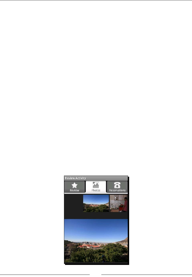
Developing with Specialized Android Widgets
[ 84 ]
9. OnItemSelectedListener requires an onNothingSelected method as well,
but we don't need it to do anything for this example.
The GalleryAdapter provides the ReviewActivity with the resource to load for the
full view of the photo through the id parameter. The id parameter could also be used as
an index or idener for a URL if the image was located on a remote server.
What just happened?
We've now connected the Gallery object to the ImageView where we will display the full-
size image instead of the thumbnail. We've used the item ID as a way to send the resource
ID of the full-size image directly to the event listener. This is a fairly strange concept since
you'd normally use an object model. However, an object model in this example wouldn't just
introduce a new class, it would also require another method call (in order to fetch the image
object from the Adapter when the event is triggered).
When you specify an Adapter on an AbsSpinner class like Gallery, it will by default
aempt to select the rst item returned from its new Adapter. This in turn noes the
OnItemSelectedListener object if one has been registered. However, because of the
single-threading model used by the Android user interface objects, this event doesn't get
red immediately, but rather some me aer we return from the onCreate method. When
we call setAdapter(new GalleryAdapter()) on the Gallery object, it schedules a
selecon change event, which we then receive. The event causes the ReviewActivity
class to display the rst photo in the GalleryAdapter object.
If you now reinstall the applicaon in your emulator, you'll be able to go to the Photos
tab and browse through a Gallery of all the images that you had populated the
GalleryAdapter with.
Chapter 3
[ 85 ]
Pop quiz
1. What would happen in the previous example if you substuted
OnItemSelectedListener with OnItemClickListener (as done in the
ListView examples)?
a. The full size won't appear anymore.
b. The Gallery will not rotate the thumbnails when they are touched.
c. The full-size photo won't appear unl a thumbnail is clicked.
2. What is the primary dierence between the ScaleType values fitXY
and centerInside?
a. The fitXY type will anchor the picture to the top-le, while centerInside
will center the picture in the ImageView.
b. fitXY will cause the picture to distort to the size of the ImageView, while
centerInside will maintain the picture's aspect rao.
c. centerInside will cause the larger axis to be cropped in order to t the
picture into the ImageView, while fitXY will scale the picture so that the
larger axis is of the same size as the ImageView.
3. What dictates the size of a Gallery object containing ImageView objects when
using the wrap_content aribute?
a. The width and height of the ImageView objects, as dictated by the size of their
content image, or their maxWidth and maxHeight parameters.
b. The itemWidth and itemHeight parameters on the Gallery object.
c. The LayoutParams set on the ImageView objects (either with the
setLayoutParams method, or layout_width/layout_height aributes).
Have a go hero – animations and external sources
Now that you have the basic example working, try improving the user experience a bit.
When you touch the images, they should really animate instead of undergoing an instant
change. They should also come from an external source instead of applicaon resources.
1. Change the ImageView object of full-size images to an ImageSwitcher, use the
standard Android fade-in/fade-out animaons.
2. Remove the thumbnail images from the project, and use the ImageView declared
in the gallery_thn.xml le to scale the images.
3. Change from a list of applicaon resource IDs to a list of Uri objects so that the
images are downloaded from an external website.
Downloa d f r o m W o w ! e B o o k < w w w.woweb o o k . c o m >

Developing with Specialized Android Widgets
[ 86 ]
Building the reservation tab
While the Review and Photos tabs of this example have been concerned with displaying
informaon, the Reservaon tab will be concerned with capturing the details of a
reservaon. We really only need three pieces of informaon:
The name under which the reservaon needs to be made
The date and me of the reservaon
How many people the reservaon is for
In this part of the example we'll create several widgets which have formaed labels. For
example, How Many People: 2, which will update the number of people as the user changes
the value. In order to do this simply, we specify that the widget's text (as specied in the
layout le) will contain the format to use for display. As part of the inializaon procedure,
we read the text from the View object and use it to create a format structure. Once we have
a format, we populate the View with its inial value.
Time for action – implementing the reservation layout
In our main.xml layout resource, we need to add the View objects which will form the
Reservaon tab. Currently it consists only of an empty ScrollView, which enables
vercally-long layouts to be scrolled by the user if the enre user interface doesn't t
on the screen.
1. Open the main.xml le in your editor or IDE.
2. Inside the <ScrollView> we had created for the Reservation tab earlier. Declare
a new vercal LinearLayout element:
<LinearLayout android:orientation="vertical"
android:layout_width="fill_parent"
android:layout_height="wrap_content">
3. Inside the new LinearLayout element, create a TextView to ask the user under
what name the reservaon should be made:
<TextView android:text="Under What Name:"
android:layout_width="fill_parent"
android:layout_height="wrap_content"/>
4. Aer the TextView label, create an EditText to allow the user to input the name
under which reservaon is to be made:
<EditText android:id="@+id/name"
android:layout_width="fill_parent"
android:layout_height="wrap_content"/>

Chapter 3
[ 87 ]
5. Create another TextView label to ask the user how many people will be going. This
includes a format element where we will place the number:
<TextView android:id="@+id/people_label"
android:text="How Many People: %d"
android:layout_width="fill_parent"
android:layout_height="wrap_content"/>
6. Add a SeekBar with which the user can tell us about how many people are going:
<SeekBar android:id="@+id/people"
android:max="20"
android:progress="1"
android:layout_width="fill_parent"
android:layout_height="wrap_content"/>
7. Use another TextView to ask the user what date the reservaon will be on:
<TextView android:text="For What Date:"
android:layout_width="fill_parent"
android:layout_height="wrap_content"/>
8. Add a Button to display the date for which the reservaon is made. When the user
taps this Button, we will ask him to select a new date:
<Button android:id="@+id/date"
android:text="dd - MMMM – yyyy"
android:layout_width="fill_parent"
android:layout_height="wrap_content"/>
9. Create another TextView label to ask the me of reservaon:
<TextView android:text="For What Time:"
android:layout_width="fill_parent"
android:layout_height="wrap_content"/>
10. Add another Button to display the me, and allow the user to change it:
<Button android:id="@+id/time"
android:text="HH:mm"
android:layout_width="fill_parent"
android:layout_height="wrap_content"/>
11. Finally add a Button to make the reservaon, and add some margin to separate it
from the rest of the inputs in the form:
<Button android:id="@+id/reserve"
android:text="Make Reservation"
android:layout_marginTop="15dip"
android:layout_width="fill_parent"
android:layout_height="wrap_content"/>

Developing with Specialized Android Widgets
[ 88 ]
Several of the preceding widgets include the format of their labels instead of the label literal,
the actual label will be generated and set in the Java code. This is because these labels are
subject to change when the user changes date, me, or the number of people expected for
the reservaon.
What just happened?
In the Reservaon tab, we ask the user how many people the reservaon is for, and in order
to capture their answer, we make use of a SeekBar object. The SeekBar works in much the
same way as a JSlider in Swing, and provides the user with a way of selecng the number
of people for the reservaon, as long as that number is within a range that we dene.
SeekBar in Android is actually built on top of the ProgressBar class, and so inherits all of
its XML aributes, which will seem a lile strange at mes. Unfortunately, unlike a JSlider
or JProgressBar, the SeekBar class has no minimum value, and since you can't make a
reservaon for 0 people, we work around this by always adding 1 to the selected value of the
SeekBar before display. This means that the default value is 1 (seng the displayed value
to 2 people).
Most people would make a restaurant reservaon
for two people, hence the default value of 1.
In the How Many People: label, we put in a %d, which is a printf marker for where we
will put the number of people the reservaon is being made for. When the SeekBar is
manipulated by the user, we'll update the label with the number the user selects using
String.format. In the "date" and "me" Button labels, we want to display the currently
selected date and me for the reservaon. We set the label in the XML le to the format
that we want to display this data in, and we'll parse it later with a standard java.text.
SimpleDateFormat.
What about internaonalizaon in our previous example? Shouldn't we have put the labels
in the strings.xml le so that the layout doesn't need to change? The answer is: Yes, if
you want to internaonalize your user interface. Later, make sure you have all of your display
text in an applicaon resource le. However, I strongly recommend fetching the format
strings directly from the layout, since it allows you to decouple the format data
one addional level.
In the preceding layout, you created Button widgets to display the date and me. Why not
use a DatePicker and TimePicker object directly? The answer is: They unfortunately
don't t well into normal layouts. They take up a large amount of vercal space, and don't
scale horizontally. If we placed a DatePicker and TimePicker inline in this user interface,
it would look like the following screenshot on the le, while the actual user interface is the
screenshot on the right.
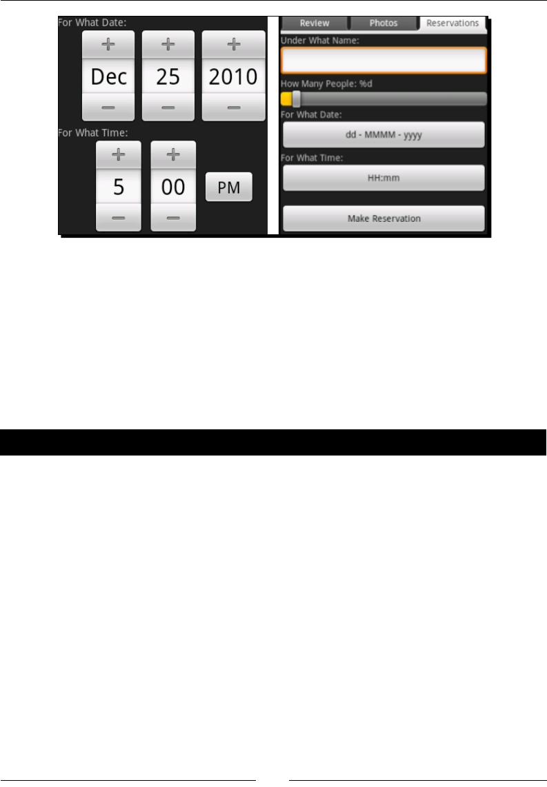
Chapter 3
[ 89 ]
As you can see, the Button objects give a much cleaner user interface. Thankfully, Android
provides us with a DatePickerDialog and TimePickerDialog for just this sort of
situaon. When the user taps on one of the Button widgets, we'll pop up the appropriate
dialog and then update the selected Button label when he approves.
While the use of a Button and Dialog adds at least two more touches to the user interface,
it dramacally improves the look and feel of the applicaon. User interfaces that are not
properly aligned will irritate users, even if they can't tell why it's irritang. Screens that users
nd annoying or irritang are screens that they will avoid, or worse—simply uninstall.
Time for action – initializing the reservation tab
In the Reservaon tab we made use of formaed labels. These labels shouldn't be displayed
to the user as-is, but need to be populated with data before we let the user see them. For
this, we need to go to our Java code again and build some funconality to remember the
format, and populate the label.
1. Open the ReviewActivity Java source in your editor or IDE.
2. Below of all the elds you've declared so far, we need to add some more for the
Reservaons tab. Declare a String to remember the formang of the How Many
People: label:
private String peopleLabelFormat;
3. Then declare a reference to the How Many People: label:
private TextView peopleLabel;

Developing with Specialized Android Widgets
[ 90 ]
4. Declare a SimpleDateFormat object for the format of the date Button:
private SimpleDateFormat dateFormat;
5. Declare a reference to the date Button:
private Button date;
6. Add another SimpleDateFormat for the format of the time Button:
private SimpleDateFormat timeFormat;
7. Next, declare a Button reference for the time Button object:
private Button time;
8. At the end of the onCreate method, we need to inialize the Reservaons tab.
Start by assigning out the peopleLabel and fetching the peopleLabelFormat
using the TextView.getText() method:
peopleLabel = (TextView)findViewById(R.id.people_label);
peopleLabelFormat = peopleLabel.getText().toString();
9. Then fetch the date Button reference and its label format:
date = (Button)findViewById(R.id.date);
dateFormat = new SimpleDateFormat(date.getText().toString());
10. Do the same for the time Button and its label format:
time = (Button)findViewById(R.id.time);
timeFormat = new SimpleDateFormat(time.getText().toString());
11. Now we need to populate the Button objects with a default date and me, and for
this we need a Calendar object:
Calendar calendar = Calendar.getInstance();
12. If it's later than 4:00p.m., it's likely that the reservaon should be made for the next
day, so we add one day to the Calendar if this is the case:
if(calendar.get(Calendar.HOUR_OF_DAY) >= 16) {
calendar.add(Calendar.DATE, 1);
}
13. Now we set the default me of day for a reservaon on the Calendar object:
calendar.set(Calendar.HOUR_OF_DAY, 18);
calendar.clear(Calendar.MINUTE);
calendar.clear(Calendar.SECOND);
calendar.clear(Calendar.MILLISECOND);
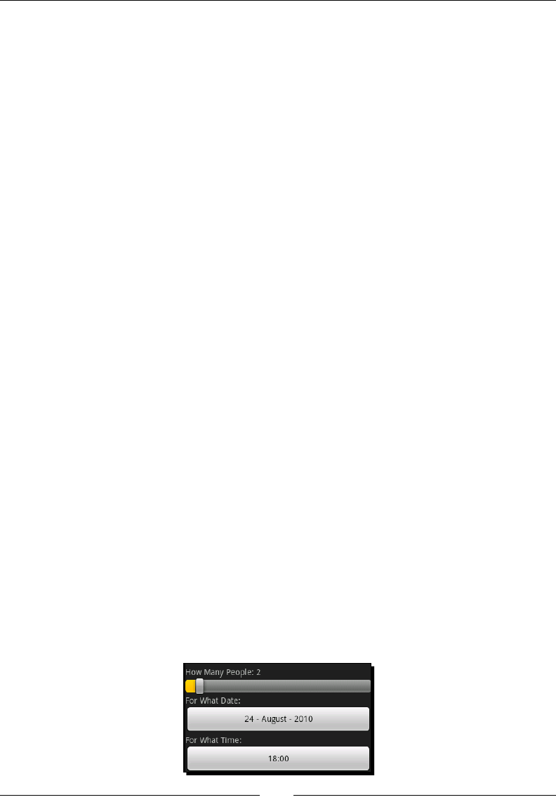
Chapter 3
[ 91 ]
14. Set the label for the date and time buon from the Calendar object:
Date reservationDate = calendar.getTime();
date.setText(dateFormat.format(reservationDate));
time.setText(timeFormat.format(reservationDate));
15. Now we need the SeekBar so that we can fetch its default value (as declared in the
layout applicaon resource):
SeekBar people = (SeekBar)findViewById(R.id.people);
16. Then we can use the label format, and the SeekBar value to populate the How
Many People label:
peopleLabel.setText(String.format(
peopleLabelFormat,
people.getProgress() + 1));
Now we have the various formats in which the labels need to be displayed on the
user interface. This allows us to regenerate the labels when the user changes the
reservaon parameters.
What just happened?
The Reservaons tab will now be populated with the default data for a reservaon, and
all the formang in the labels has disappeared. You will probably have noced the many
calls to toString() in the previous code. Android View classes generally accept any
CharSequence for labels. This allows for much more advanced memory management
than the String class, as the CharSequence may be a StringBuilder, or may facade
a SoftReference to the actual text data.
However, most tradional Java APIs expect a String, not a CharSequence, so we use
the toString() method to make sure we have a String object. If the underlying
CharSequence is a String object, the toString() method is a simple return this;
(which will act as a type cast).
Again, to work around the fact that the SeekBar doesn't have a minimum value, we add 1
to its current value in the last line, when we populate the peopleLabel. While the date
and time formats are stored as a SimpleDateFormat, we store the peopleLabelFormat
as a String and will run it through String.format when we need to update the label.
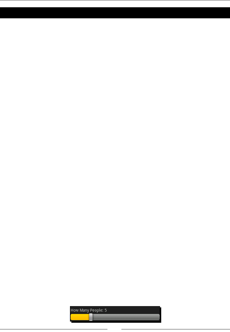
Developing with Specialized Android Widgets
[ 92 ]
Time for action – listening to the SeekBar
The user interface is now populated with the default data. However, it's not interacve at all.
If you drag the SeekBar the How Many People: label will remain at its default value of 2.
We need an event listener to update the label when the SeekBar is used.
1. Open the ReviewActivity Java source in your editor or IDE.
2. Add SeekBar.OnSeekBarChangeListener to the interfaces that
ReviewActivity implements.
3. In onCreate, aer fetching the SeekBar with findViewById, set its
OnSeekBarChangeListener to this:
SeekBar people = (SeekBar)findViewById(R.id.people);
people.setOnSeekBarChangeListener(this);
4. Implement the onProgressChanged method to update peopleLabel:
public void onProgressChanged(
SeekBar bar, int progress, boolean fromUser) {
peopleLabel.setText(String.format(
peopleLabelFormat, progress + 1));
}
5. Implement an empty onStartTrackingTouch method:
public void onStartTrackingTouch(SeekBar bar) {}
6. Implement an empty onStopTrackingTouch method:
public void onStopTrackingTouch(SeekBar bar) {}
The String.format method is a common method of placing parameters in a localized
string in Android. While this is rather dierent to the normal java.text.MessageFormat
class, it's the preferred method in Android (although MessageFormat is sll supported).
What just happened?
When you reinstall the applicaon in the emulator, you'll now be able to use SeekBar
to select the number of people that the reservaon is to be made for. While we didn't
implement the onStartTrackingTouch or onStopTrackingTouch methods, they can
be extremely useful if you hide the actual status value by default. For example, you could use
a Dialog containing icons of people to inform the user how many people the reservaon is
for. When they touch the SeekBar—display the Dialog, and then when they release the
SeekBar—hide the Dialog again.

Chapter 3
[ 93 ]
Time for action – selecting date and time
We've made the SeekBar work as expected, but what about the date and time Button
widgets? When the users touch them, they expect to be able to select a dierent date
or me for their reservaon. For this we'll need a good old OnClickListener, the
DatePickerDialog and TimePickerDialog classes.
1. Open the ReviewActivity Java source in your editor or IDE again.
2. Add View.OnClickListener, DatePickerDialog.OnDateSetListener,
and TimePickerDialog.OnTimeSetListener to the interfaces that
ReviewActivity implements. Your class declaraon should now look
something like this:
public class ReviewActivity extends TabActivity
implements ViewSwitcher.ViewFactory,
Runnable,
AdapterView.OnItemSelectedListener,
SeekBar.OnSeekBarChangeListener,
View.OnClickListener,
DatePickerDialog.OnDateSetListener,
TimePickerDialog.OnTimeSetListener {
3. Implement a ulity method to parse a CharSequence into a Calendar object with
a specied SimpleDateFormat:
private Calendar parseCalendar(
CharSequence text, SimpleDateFormat format) {
4. Open a try block to allow handling of parse errors if the CharSequence is not
formaed according to the SimpleDateFormat.
5. Parse the CharSequence into a Date object:
Date parsedDate = format.parse(text.toString());
6. Then create a new Calendar object:
Calendar calendar = Calendar.getInstance();
7. Set the me on the Calendar object to the me in the Date object:
calendar.setTime(parsedDate);
8. Return the parsed Calendar object:
return calendar;

Developing with Specialized Android Widgets
[ 94 ]
9. You'll need to catch(ParseException) in this method. I recommend wrapping it
in a RuntimeException and re-throwing it:
catch(ParseException pe) {
throw new RuntimeException(pe);
}
10. In the onCreate method, aer seng the labels of the date and time Button
widgets, set their OnClickListener to this:
date.setText(dateFormat.format(reservationDate));
time.setText(timeFormat.format(reservationDate));
date.setOnClickListener(this);
time.setOnClickListener(this);
11. Implement the onClick method to listen for when the user taps the date or
time Button:
public void onClick(View view) {
12. Use the View parameter to determine if the clicked View is the date Button:
if(view == date) {
13. If so, use the parseCalendar method to parse the current value of the date
Button widget's label:
Calendar calendar = parseCalendar(date.getText(), dateFormat);
14. Create a DatePickerDialog and populate it with the date in the Calendar,
then show() the DatePickerDialog:
new DatePickerDialog(
this, // pass ReviewActivity as the current Context
this, // pass ReviewActivity as an OnDateSetListener
calendar.get(Calendar.YEAR),
calendar.get(Calendar.MONTH),
calendar.get(Calendar.DAY_OF_MONTH)).show();
15. Now check if the user has clicked on View Button instead of date:
else if(view == time) {
16. If so, parse a Calendar using the time Button widget's label value:
Calendar calendar = parseCalendar(time.getText(), timeFormat);
17. Now create a TimePickerDialog with the selected me, then show() the new
TimePickerDialog to the user:
new TimePickerDialog(

Chapter 3
[ 95 ]
this, // pass ReviewActivity as the current Context
this, // pass ReviewActivity as an OnTimeSetListener
calendar.get(Calendar.HOUR_OF_DAY),
calendar.get(Calendar.MINUTE),
false) // we want an AM / PM view; true = a 24hour view
.show();
18. Now implement the onDateSet method to listen for when the user accepts the
DatePickerDialog with a new date selected:
public void onDateSet(
DatePicker picker, int year, int month, int day)
19. Create a new Calendar instance to populate the date into:
Calendar calendar = Calendar.getInstance();
20. Set the year, month, and day on the Calendar:
calendar.set(Calendar.YEAR, year);
calendar.set(Calendar.MONTH, month);
calendar.set(Calendar.DAY_OF_MONTH, day);
21. Set the label of the date Button to the formaed Calendar:
date.setText(dateFormat.format(calendar.getTime()));
22. Implement the onTimeSet method to listen for when the user accepts the
TimePickerDialog aer selecng a new me:
public void onTimeSet(TimePicker picker, int hour, int minute)
23. Create a new Calendar instance:
Calendar calendar = Calendar.getInstance();
24. Set the Calendar object's hour and minute elds according to the parameters
given by the TimePickerDialog:
calendar.set(Calendar.HOUR_OF_DAY, hour);
calendar.set(Calendar.MINUTE, minute);
25. Set the label of the time Button by formang the Calendar object:
time.setText(timeFormat.format(calendar.getTime()));
Having stored the format for the date and time objects, we can now display the values
selected by the user in the Button widgets. When the user has selected a new date or
me we update the Button labels to reect the new selecons.
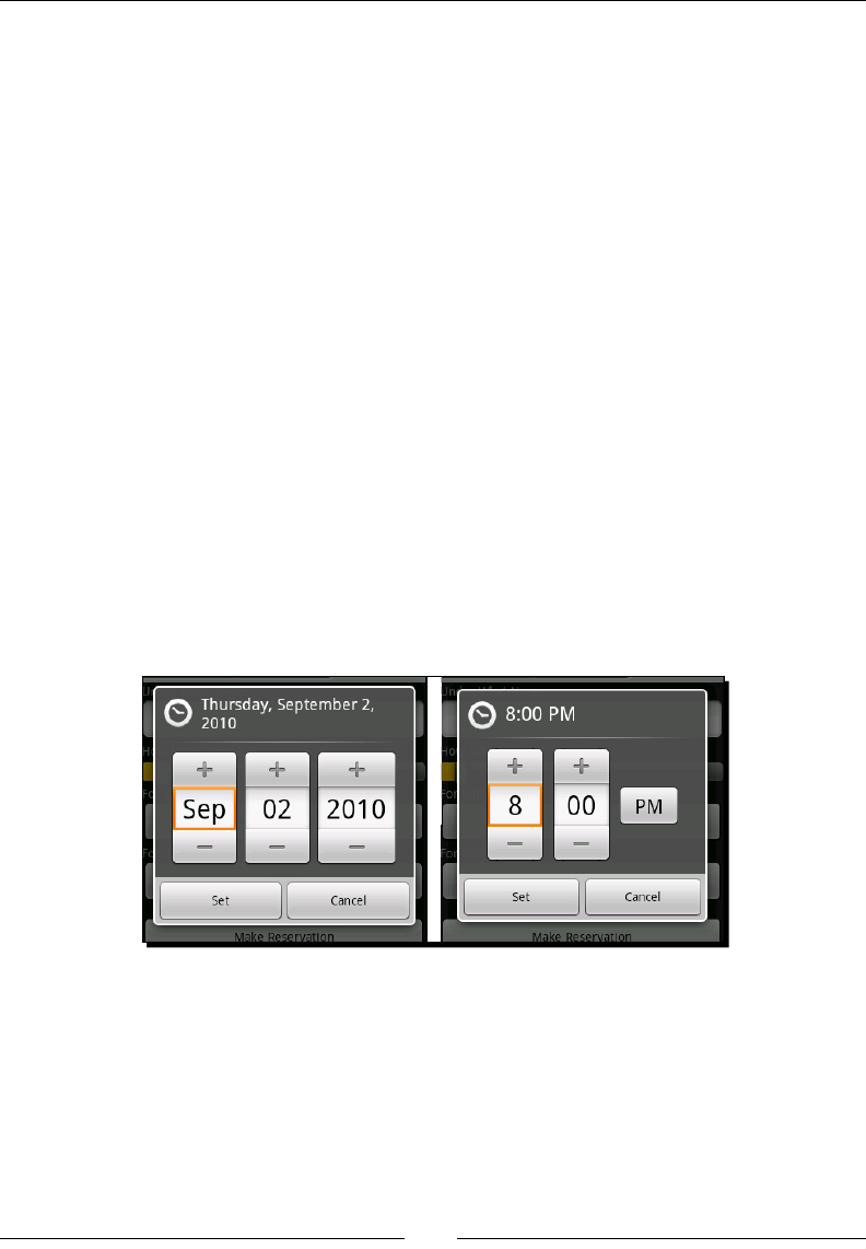
Developing with Specialized Android Widgets
[ 96 ]
What just happened
If you install and run the applicaon in the emulator, you can now tap on either the date or
time Button widgets, and you will be greeted by a modal Dialog allowing you to select a
new value. Beware of overusing modal Dialog widgets, because they block access to the
rest of your applicaon. You should avoid using them for displaying status messages as they
eecvely render the rest of the applicaon useless during that me. If you do display a
modal Dialog, ensure that there is some way for the user to dismiss the Dialog without
any other interacon (that is, a Cancel buon or something similar).
The rst advantage to using a DatePickerDialog and TimePickerDialog comes
from the fact that both include Set and Cancel buons. This allows the user to manipulate
the DatePicker or TimePicker, and then cancel the changes. If you used an inline
DatePicker or TimePicker widget, you could provide a Reset buon, but this would
take up addional screen space, and generally would seem out-of-place (unl it's
actually needed).
Another advantage of the DatePickerDialog over the DatePicker widget is that the
DatePickerDialog displays a long-format of the selected date in it's tle area. This
long-format date generally includes the day of the week that the user has currently selected.
The "day of the week" is a eld that is noceably missing from the DatePicker widget,
which makes it surprisingly dicult to use. Most people think in terms of "next Thursday",
instead of "the 2nd of August, 2010." Having the day of the week visible makes the
DatePickerDialog a much beer choice for date selecon than an inline DatePicker.
Creating complex layouts with Include, Merge, and
ViewStubs
In this chapter we've built a single layout resource with three dierent tabs in it. As a result
of this, the main.xml le has become quite large and hence, more dicult to manage.
Android provides several ways in which you can break up large layout les (such as this one)
into smaller chunks.

Chapter 3
[ 97 ]
Using Include tags
The include tag is the simplest one to work with. It's a straight import of one layout XML
le into another. For our previous example, we could separate each tab out into its own
layout resource le, and then include each one in the main.xml. The include tag has
only one mandatory aribute: layout. This aribute points to the layout resource to be
included. This tag is not a stac or compile-me tag, and so the included layout le will be
selected through the standard resource selecon process. This allows you to have a single
main.xml le, but then add a special reviews.xml le (perhaps for Spanish).
The layout aribute on the include tag is not prexed with the android XML namespace.
If you aempt to use the layout aribute as android:layout, you won't get any compile-
me errors, but your applicaon will strangely fail to run.
The include element can also be used to assign or override several aributes of the root
included element. These include the element android:id, and any of the android:
layout aributes. This allows you to reuse the same layout le in several parts of your
applicaon, but with dierent layout aributes and a dierent ID. You can even include the
same layout le several mes on the same screen, but with a dierent ID for each instance.
If we were to change our main.xml le to include each of the tabs from other layout
resources, the le would look something more like this:
<?xml version="1.0" encoding="UTF-8"?>
<FrameLayout xmlns:android="http://schemas.android.com/apk/res/
android"
android:layout_width="fill_parent"
android:layout_height="fill_parent">
<include
android:id="@+id/review"
layout="@layout/review"/>
<include
android:id="@+id/photos"
layout="@layout/photos"/>
<include
android:id="@+id/reservation"
layout="@layout/reservations"/>
</FrameLayout>
Merging layouts
The include element is very ne and well when you want to include a single View or
ViewGroup into a larger layout structure. However, what if you want to include mulple
elements into a larger layout structure, without implying the need for a root element in the
included structure? In our example each tab needs a single root View in order that each tab
carries a single and unique ID reference.

Developing with Specialized Android Widgets
[ 98 ]
However, having an addional ViewGroup just for the sake of an include can adversely
aect the performance of large layout trees. In this case, the merge tag comes to the rescue.
Instead of declaring the root element of a layout as a ViewGroup, you can declare it as
<merge>. In this case, each of View objects in the included layout XML will become direct
children of the ViewGroup that includes them. For example, if you had a layout resource
le named main.xml, with a LinearLayout that included a user_editor.xml
layout resource, then the code would look something like this:
<LinearLayout android:orientation="vertical">
<include layout="@layout/user_editor"/>
<Button android:id="@+id/save"
android:text="Save User"
android:layout_width="fill_parent"
android:layout_height="wrap_content"/>
</LinearLayout>
The simple implementaon of the user_editor.xml looks something like this:
<LinearLayout
xmlns:android="http://schemas.android.com/apk/res/android"
android:orientation="vertical"
android:layout_width="fill_parent"
android:layout_height="wrap_content">
<TextView android:text="User Name:"
android:layout_width="fill_parent"
android:layout_height="wrap_content"/>
<EditText android:id="@+id/user_name"
android:layout_width="fill_parent"
android:layout_height="wrap_content"/>
<!-- the rest of the editor -->
</LinearLayout>
However, when this is included into the main.xml le, we embed the user_editor.
xml LinearLayout into the main.xml LinearLayout, resulng in two LinearLayout
objects with idencal layout aributes. Obviously it would be much beer to simply put
the TextView and EditView from user_editor.xml directly into the main.xml
LinearLayout element. This is exactly what the <merge> tag is used for. If we now re-write
the user_editor.xml le using the <merge> tag instead of a LinearLayout, it looks
like this:
<merge xmlns:android="http://schemas.android.com/apk/res/android">
<TextView android:text="User Name:"
android:layout_width="fill_parent"
android:layout_height="wrap_content"/>

Chapter 3
[ 99 ]
<EditText android:id="@+id/user_name"
android:layout_width="fill_parent"
android:layout_height="wrap_content"/>
<!-- the rest of the editor -->
</merge>
Note that we no longer have the LinearLayout element, instead the TextView and
EditView will be added directly to the LinearLayout in the main.xml le. Beware of
layouts that have too many nested ViewGroup objects, as they are almost certain to give
trouble (more than about ten levels of nesng is likely to cause your applicaon to crash!).
Also be careful with layouts that have too many View objects. Again, more than 30 is very
likely to cause problems or make your applicaon crash.
Using the ViewStub class
When you load a layout resource that includes another layout, the resource loader
will immediately load the included layout into the memory, in order to aach it to the
layout you've requested. When main.xml is read in by the LayoutInflator, so are
the reviews.xml, photos.xml, and reservations.xml les. In situaons with very
large layout structures, this can consume a huge amount of your applicaon memory, and
even cause your applicaon to crash. The Android API includes a specialized View named
ViewStub which allows lazy-loading of layout resources.
A ViewStub is by default a zero-by-zero sized empty View, and when it's specialized,
inflate() method is invoked. It loads the layout resource and replaces itself with the
loaded View objects. This process allows the ViewStub to be garbage-collected as soon
as its inflate() method has been called.
If we were to make use of a ViewStub in the example, you would need to lazy-inialize
the content of a tab when it is selected by the user. This also means that none of the View
objects in a tab would exist unl that tab has been selected. While using a ViewStub is a
bit more work than a straight include, it can allow you to work with much larger and more
complex layout structures than would otherwise be possible.
Any layout aributes set on a ViewStub will be passed on to its inated View object. You
can also assign a separate ID to the inated layout. If we wanted to include each of our tabs
in a ViewStub, the main.xml le would look something like this:
<?xml version="1.0" encoding="UTF-8"?>
<FrameLayout
xmlns:android="http://schemas.android.com/apk/res/android"
android:layout_width="fill_parent"
android:layout_height="fill_parent">
<ViewStub android:id="@+id/review"
Downloa d f r o m W o w ! e B o o k < w w w.woweb o o k . c o m >

Developing with Specialized Android Widgets
[ 100 ]
android:inflatedId="@+id/inflated_review"
android:layout="@layout/review"/>
<ViewStub android:id="@+id/photos"
android:inflatedId="@+id/inflated_photos"
android:layout="@layout/photos"/>
<ViewStub android:id="@+id/reservations"
android:inflatedId="@+id/inflated_reservations"
android:layout="@layout/reservations"/>
</FrameLayout>
Note that unlike the include tag, the ViewStub requires the android XML namespace for
its layout aribute. Aer you inflate() one of the ViewStub objects, it will no longer
be available by its original android:id reference. Instead, you will be able to access the
inated layout object using the android:inflatedId reference.
Have a go hero – separate the tabs
Extract each of the tabs into its own layout resource le, and use the include tag to load
each of them. This shouldn't require any changes to the Java source code.
For more of a challenge, try using ViewStub objects instead of the include tag. This will
require you to break up the onCreate method and listen for when tabs are clicked. For
this you'll need to use TabHost.OnTabChangeListener to know when to load a specic
tab's content.
Summary
Tabs are a great way of breaking an Activity into dierent areas of work. With limited
screen real estate, they are a great way to make an Activity more accessible to the user.
They also have a performance impact since only one tab is rendered on the screen at a me.
The RatingBar and SeekBar are two dierent methods of capturing, or displaying numeric
data to the user. While they are closely related, and both funcon in the same way, each
class is used to address dierent types of data. Keep in mind the limitaons of both of these,
before deciding whether and where to use them.
The Gallery class is brilliant for allowing the user to view a large number of dierent
objects. While in this example we used it to simply display thumbnails, it could be used as
a replacement for tabs in a web browser by displaying a list of page thumbnails above the
actual browser view. All you need to do to customize its funcon is to change the View
objects returned from the Adapter implementaon.

Chapter 3
[ 101 ]
When it comes to date and me capturing, try to sck to using the DatePickerDialog
and TimePickerDialog instead of their inline counterparts (unless you have good reason).
The use of these Dialog widgets helps you conserve screen space and improve the user
experience. When they open a DatePickerDialog or TimePickerDialog, they have
beer access to the editor than you can generally provide as part of your user interface
(especially on a device with a small screen).
In the next chapter, we'll take a closer look at Intent objects, the acvity stack, and the
lifecycle of an Android applicaon. We'll invesgate how Intent objects and the acvity
stack can be used as a way to keep applicaons more usable. Also, we shall learn about
improving the reuse of Activity classes.
4
Leveraging Activities and Intents
In many ways Android applicaon management appears to be inspired by
JavaScript and the web browser and rightly so! The web browser model has
proved itself as a mechanism that users nd easy to work with. Android as
a system, Android has many things in common with a web browser, some of
which are obvious, and others that you will need to look a lile deeper for.
The Acvity Stack is much like a single-direconal web browser history. When
you launch an Activity using the startActivity method, you eecvely
hand control back to the Android system. When the user pushes the hardware
"Back" buon on their phone, the default acon is to pop the top Activity o
the stack, and display the one underneath (not always the one that started it).
In this chapter we'll explore a lile of how Android runs an applicaon and manages
Activity instances. While not strictly necessary for user interface design, it's important to
know how this works. Properly leveraging these concepts will help you ensure a consistent
user interface experience. As you will also see, it will help you improve the performance of
your applicaon, and allow you to reuse more of your applicaon components.
It's also important to understand how an Activity is created (and when it is created),
as well as how Android decides what Activity to create. We'll also look at some good
pracces to follow when building an Activity class, and how to behave nicely within the
connes of an Android applicaon.
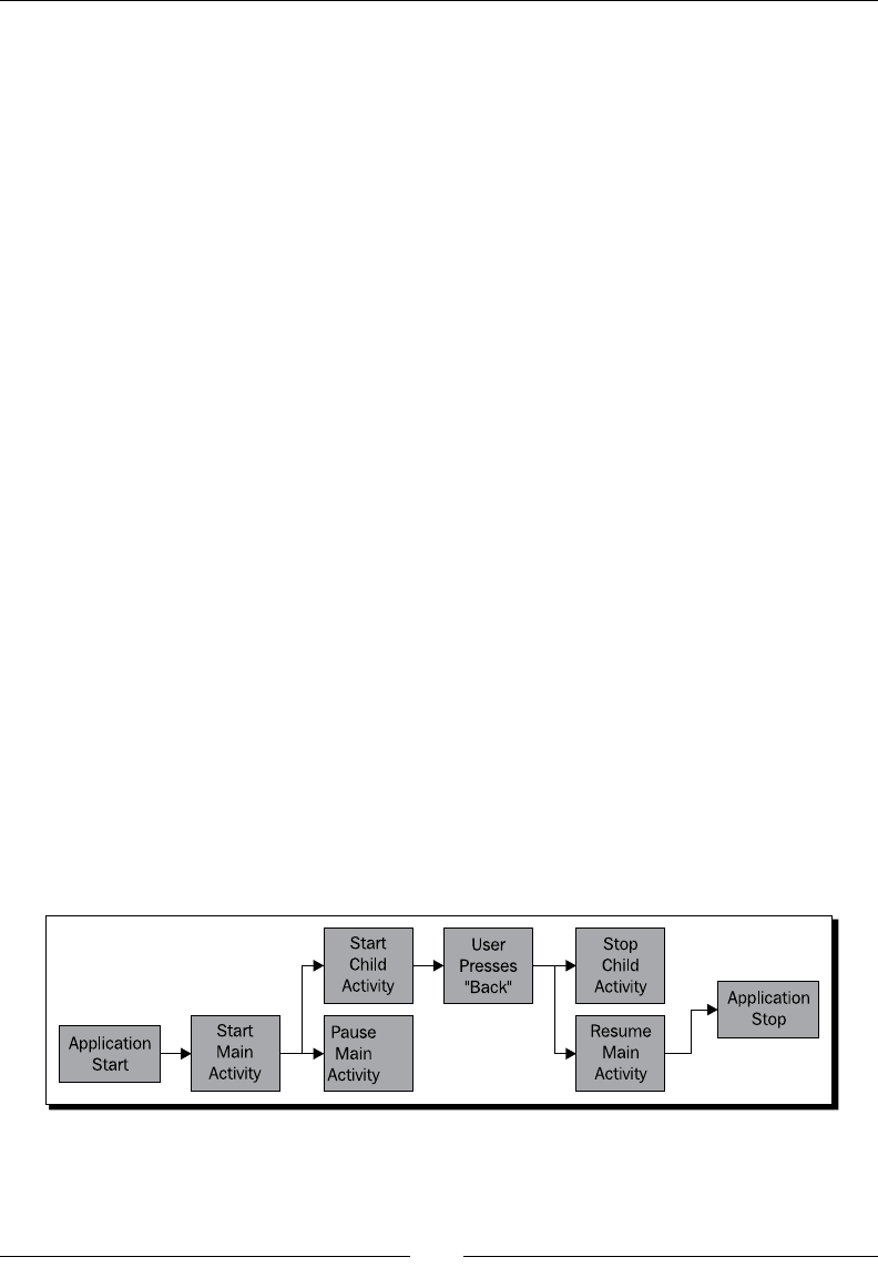
Leveraging Acvies and Intents
[ 104 ]
We've already encountered the "Acvity Stack" in Chapter 1, Developing a Simple Acvity
and Chapter 2, Presenng Data for Views where we constructed Intent objects to
launch specic Activity classes. When you used the hardware "Back" buon, you were
automacally taken to the previous Activity instance, no code needed (much like a
web-browser). For this chapter we'll be looking at:
The life cycle of an Activity object
Using the Bundle class to maintain applicaon state
Exploring the relaonship between an Intent and an Activity
Passing data into an Activity through an Intent
Exploring the Activity class
The life cycle of an Activity object is much more like a Java Applet than a normal
applicaon. It may be started, paused, resumed, paused again, killed, and then brought
back to life in a seemingly random order. Most Android devices have very good performance
specicaons. However, most of them appear underpowered when compared to the top-of-
the-range devices. For those devices that do have good specicaons, users tend to demand
a lot more from them than the cheaper devices. On a phone, you're never going to get away
from the fact that you have many applicaons and services sharing a very limited device.
An Activity may be garbage-collected any me it is not visible to the user. This means
it may be your applicaon that is running, but because the user is looking at a dierent
Activity, any non-visible or background Activity objects may be shut down or garbage-
collected in order to save memory. By default, the Android APIs will handle these shut down/
start up cycles elegantly by storing their state before a shut down, and restoring it when they
are re-created. A very simple diagram of the life cycle of an applicaon with two Activity
instances is shown in the following gure. When the "Main Acvity" is paused, it becomes
eligible for garbage-collecon by the system. If this happens, it will rst store its state in a
temporary locaon, restoring the state when it is brought back to the foreground.
Chapter 4
[ 105 ]
Storage of user interface state
If an Activity is stopped, all View objects that have an ID assigned
will aempt to store their state before they are made available for
garbage-collecon. However, this state is only stored for the lifeme of
the applicaon. When the applicaon is shut-down, this state is lost.
While it's possible to use the setContentView method over and over again to change
the content on the screen (much the way you might build a wizard interface with an AWT
CardLayout object), it's considered a very bad idea. You are eecvely trying to take the
control away from Android, which will always create problems for you. If for example, you
developed an applicaon with only one Activity class, and used mulple layout resources
or your own custom ViewGroup objects to represent dierent screens, you would also have
to take control of the hardware "Back" buon on the device in order to allow the user to
go backwards. Your applicaon is released in the Android market, and a few months later a
handset manufacturer decides to put a "Forward" buon onto their new phone (in the same
style as the "Forward" buon on a web-browser). The Android system would be patched to
handle this change to the device, but your applicaon would not be. As a result, your users
get frustrated with your applicaon because "it doesn't work properly".
Using Bundle objects
In the onCreate method of the Activity class, we've been accepng a Bundle parameter
named saveInstanceState, as you may have guessed. It's where state informaon is
stored between stops and starts of an Activity. Despite what it looks like, a Bundle object
is not a form of persistent storage. When the conguraon of a device context changes (for
example when the user selects a new language, or changes from "portrait" to "landscape"
mode), the current Activity is "restarted". For this to happen, Android requests the
Activity save its state in a Bundle object. It then shuts down and destroys the exisng
instance, and then creates a new instance of the Activity (with the new conguraon
parameters) with the Bundle that the state informaon was saved in.
The Bundle class is eecvely a Map<String, ?> containing any number of values. Since
Bundle objects are used to store short term state (that is, the blog post a user was busy
typing), they are mostly used to store the state of View objects. They have two major
advantages over standard Java serializaon in this regard:
You are forced to implement the storage of the object manually. This requires some
thought as to how the object will be stored, and what parts of it need to be stored.
For example, most of the me in a user interface, you don't need to store the layout
informaon, since that can be recreated from the layout le.
Being a key-value structure, a Bundle is more future-proof and exible than a
serialized object. You can leave out values that are set to their defaults, reducing
the size of the Bundle.
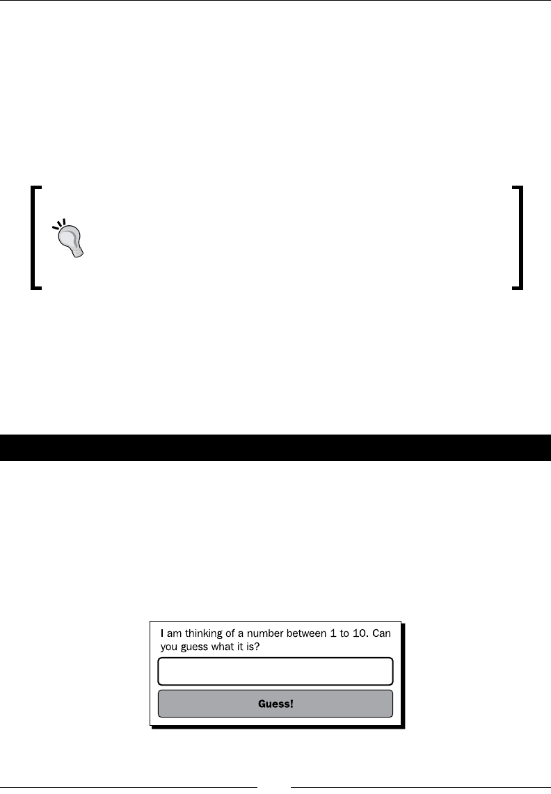
Leveraging Acvies and Intents
[ 106 ]
A Bundle object is also a type-safe structure. If you use the putString method, only then
getString or getCharSequence will work to retrieve the object. I strongly advise that
when using the get methods of Bundle, you should always provide a default value.
Before an Activity is paused by the Android system, the system requests that it save any
state informaon in a Bundle object. To do this, the onSaveInstanceState method will
be invoked on the Activity. This happens before the onPause method. In order to restore
the state of the Activity, the system will invoke the onCreate method with the saved
state Bundle.
Handling Acvity crashes
If an Activity class throws an uncaught excepon, the user will get
the dreaded Force Close dialog box. Android will aempt to recover
from these errors by terminang the Virtual Machine, and re-opening
the root acvity, providing a Bundle object with the last known state
from onSaveInstanceState.
The View class also has an onSaveInstanceState method, as well as a corresponding
onRestoreInstanceState method. As menoned earlier, the Activity class' default
funconality will aempt to save each View object with an ID within a Bundle. This is
another good reason to sck to XML layouts instead of building your own. Having a reference
to a View object is not enough for it to be saved and restored, and while you can assign
IDs in Java code, it cluers your user interface code even more.
Time for action – building an example game: "guess my number"
We want to build a simple example that will save and restore its state from a Bundle object.
For this example, we have a very simple "guess my number" game. The Activity object
picks a number between one and ten and challenges the user to guess it.
The basic user interface layout for this example will need a label telling the user what
to do, an input area for them to input their guess, and a buon to tell the applicaon
they wish to input a guess. The following diagram is a basic idea of how the user interface
should be structured:

Chapter 4
[ 107 ]
If the user were to get an SMS while playing this game, there's a strong chance that we will
lose the number he is trying to guess. For this reason we will store the number that he is
trying to guess in a Bundle object when the system asks us to save our state. We'll also need
to look for the stored number when starng up.
1. From a command-prompt, create a new project named GuessMyNumber:
android create project -n GuessMyNumber -p GuessMyNumber -k com.
packtpub.guessmynumber -a GuessActivity -t 3
2. Open the default res/layout/main.xml le in an editor or IDE.
3. Remove the default content within the LinearLayout element.
4. Add a new TextView to serve as a label, to tell the user what to do:
<TextView android:text=
"I'm thinking of a number between 1 and 10. Can you guess what
it is?"
android:layout_width="fill_parent"
android:layout_height="wrap_content"/>
5. Create a new EditText where the users will enter their guess. Use the
android:numeric aribute of TextView to enforce only integer input:
<EditText
android:id="@+id/number"
android:numeric="integer"
android:layout_width="fill_parent"
android:layout_height="wrap_content"/>
6. Add a Button that the users can click on to submit their guess:
<Button android:id="@+id/guess"
android:text="Guess!"
android:layout_width="fill_parent"
android:layout_height="wrap_content"/>
7. Now open the GuessActivity.java le in your editor or IDE.
8. Make the GuessActivity class implement OnClickListener:
public class GuessActivity
extends Activity implements OnClickListener {
9. Create a eld variable to store the number the user is supposed to guess:
private int number;

Leveraging Acvies and Intents
[ 108 ]
10. Create a ulity method to generate a random number between one and ten:
private static int random() {
return (int)(Math.random() * 9) + 1;
}
11. In the onCreate method, directly aer the call to super.onCreate, check
to make sure the Bundle passed in is not null:
if(savedInstanceState != null) {
12. If the Bundle isn't null, then aempt to fetch the stored Number from it:
number = savedInstanceState.getInt("Number", random());
13. If the Bundle is null, the Acvity is running as a new instance—generate
a random number:
else {
number = random();
}
14. Then setContentView to the main.xml layout resource:
setContentView(R.layout.main);
15. Find the Button object you declared in the main.xml layout resource:
Button button = (Button)findViewById(R.id.guess);
16. Set the Button object's OnClickListener to the GuessActivity object:
button.setOnClickListener(this);
17. Now override the onSaveInstanceState method:
protected void onSaveInstanceState(Bundle outState) {
18. Be sure to rst allow the default Activity behavior:
super.onSaveInstanceState(outState);
19. Then store the number variable in the Bundle:
outState.putInt("Number", number);
20. We need to override the onClick method to handle the user's guess:
public void onClick(View clicked) {
21. Find the EditText where the user enters the guessed number:
EditText input = (EditText)findViewById(R.id.number);

Chapter 4
[ 109 ]
22. Parse the current value of the EditText as an integer:
int value = Integer.parseInt(input.getText().toString());
23. If the number they guessed is too low, use a Toast to tell them:
if(value < number) {
Toast.makeText(this, "Too low", Toast.LENGTH_SHORT).show();
}
24. If the number they guessed is too high, again use a Toast to tell them:
else if(value > number) {
Toast.makeText(this, "Too high", Toast.LENGTH_SHORT).show();
}
25. If they successfully guessed the correct number, then congratulate them:
else {
Toast.makeText(
this,
"You got it! Try guess another one!",
Toast.LENGTH_SHORT).show();
26. Then generate a new number for the user to guess:
number = random();
}
The Toast class is used in the previous code to display the output messages for Too high,
Too low, and You got it! The Toast class is the perfect mechanism for displaying short
output messages, and they automacally disappear aer a few seconds. However they're
not suitable for long messages as the user has no control over them, and cannot leave the
message open or close it on command as they are enrely non-interacve.
What just happened
In the previous example, we listened for a call to onSaveInstanceState in order to record
the number that the user is supposed to guess. We also have the current guess which the
user most recently made, in the form of an EditText. Since we assigned an ID value to
EditText in the main.xml le, the call to super.onSaveInstanceState will handle
the storage of the EditText widget's exact state (potenally including "selecon" and
"focus" state).
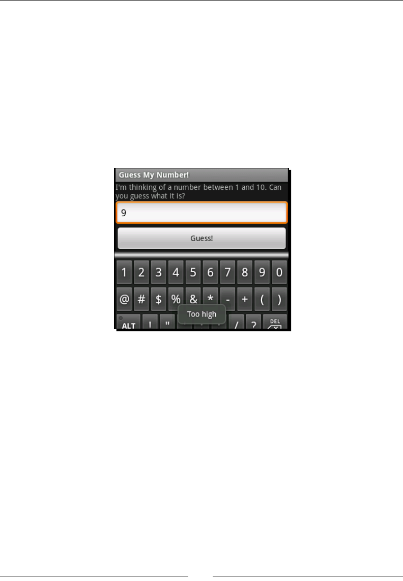
Leveraging Acvies and Intents
[ 110 ]
In the onCreate method, the example rst checks to make sure that the Bundle is not
null. If Android is aempng to create a new instance of the GuessActivity object, it
won't pass in any saved state. If however, we have a Bundle object, we invoke the Bundle.
getInt method to aempt to fetch our previously stored number value. We also pass in
a random() number as a second parameter. If the Bundle object (for whatever reason)
doesn't have a stored Number, it will return this random number, eliminang the need for
us to check such a condion.
As a quick side-note, the example made use of the android:numeric aribute of the
TextView class to enforce integer input on the EditText object. Switching to a numeric
view stops the user from entering anything except "valid" characters. It also aects the so-
keyboard. Instead of displaying the full keyboard, it will only display the numbers and symbols.
Creating and consuming intents
The Intent class is Android's primary method of "late binding". It's a form of very loose
coupling which allows you to specify an acon (along with some parameter data), while
not specifying how the acon should be carried out. For example, you may specify browse
to http:// www.packtpub.com/ using an Intent, but you don't need to specify how
Android should carry out this acon. It may use the default "browser" applicaon, or another
web browser the user has installed, or it may even ask the user how exactly they want to get
to http:// www.packtpub.com/. There are two primary types of Intent:
Explicit Intents
Implicit Intents

Chapter 4
[ 111 ]
So far we've only made use of explicit Intent objects, where we specify the exact class
we want to run. These are very important when switching from one Activity to another,
as your applicaon may depend on the exact implementaon of an Activity. An implicit
Intent is one where instead of specifying the exact class which we want to work with, we
include an abstract name for the acon we want carried out. Generally, an implicit Intent
will have much more informaon content, due to the following reasons:
To allow the system to make a good selecon of which component to interact with
Intent may point to a more generic structure than we would have built ourselves
and a more generic structure oen requires more informaon about how it is
expected to behave
Intent objects are what really make Android dierent from other (more tradional)
operang systems. They level the playing eld between applicaons, and allow the user
much more choice in how they want to run their phones. It's perfectly plausible for the
user to not just install a new web browser, but also a new menu, desktop, or even
dialler applicaon.
Each Activity instance holds onto the Intent object that started it. In Chapter 1,
Developing a Simple Acvity, we made use of the Activity.getIntent() method
to fetch some parameters from the Intent object, which in turn told us which queson
to ask the user.
Dening Intent actions
The rst thing looked at in an implicit Intent is its acon. The acon denes what the
Intent "does", but not how it does it, or what it does it to. The Intent class denes a long
series of constants which represent common acons. These common acons always have
some form of backing logic, which is generally dened by the phone system. Thus they are
always available to be used by an applicaon.
For example, you wanted to present the users with the dialler applicaon, so they could dial
a phone number and make a call, you would use an Intent with ACTION_DIAL:
startIntent(new Intent(Intent.ACTION_DIAL));
The acon value of an Intent is matched against one of the acons dened for
an Activity. An Activity may have any number of acons that it may perform,
and they're all specied as part of an applicaon's AndroidManifest.xml le. For
example, you wanted to dene an askQuestion acon and bind it to an Activity,
your AndroidManifest.xml le would contain an Activity entry which would look
something like this:
<activity
android:name=".AskQuestionActivity"

Leveraging Acvies and Intents
[ 112 ]
android:label="Ask Question">
<intent-filter>
<action android:name="questions.askQuestion"/>
<category android:name="android.intent.category.DEFAULT"/>
</intent-filter>
</activity>
An Activity may have any number of <intent-filter> elements, each dening a
dierent type of match to perform on an Intent. The Activity with the closest match
to any given Intent is chosen to perform the acon requested by the Intent object.
Passing data in an Intent
Presenng the user with the dialler applicaon in order to let them dial a phone number
is very nice, but what if we actually need them to dial a phone number? The Intent class
doesn't just work by using the acon, it also provides a default space for us to tell it what
we want the acon to be performed on. It's not brilliantly useful being able to open a web
browser without being able to tell the browser what URL to go to, is it?
The default data provided by an Intent is provided as a Uri object. The Uri can be made
to technically point to absolutely anything. For our earlier code snippet, we started the
dialler to let the user dial a phone number. How would we then tell the dialler: "Dial 555-
1234"? Simple, just take a look at the following code:
startActivity(new Intent(
Intent.ACTION_DIAL,
Uri.parse("tel://5551234")));
Adding extra data to an Intent
Somemes a Uri doesn't allow enough data to be specied. For these cases, the Intent
class provides you with a Map space of key-value pairs, called "extra" data. The methods for
accessing the extra data correspond to the methods in the Bundle class. Back in Chapter
1, Developing a Simple Acvity, we used the extra data to keep track of which queson we
were asking the user.
When dening generic Activity classes (such as le viewers), it's a good idea to work on
a three phase fall-back system when looking for operaonal data:
Any custom (non-standard) parameters can be passed in extra elds (and none of
them should be mandatory)
Inspect the data Uri to see what informaon you should be working with
If no data Uri is specied, fall-back gracefully to a logical default, and provide some
funconality to the user

Chapter 4
[ 113 ]
Have a go hero – generic questions and answers
Go back to the example queson and answer applicaon from Chapter 1, Developing a
Simple Acvity. Rework the QuestionActivity class to use the data Uri to specify the
queson ID (by name) instead of the extra parameters.
Also, allow for the full queson to be passed in using "extra" parameters—a parameter
Question for the queson text to ask the user, and a parameter Answers, specifying
a string array of possible answers to the given queson.
Using advanced Intent features
An Intent object is designed to indicate a single acon as requested by the user. It's a self-
contained request, and in some ways it is quite similar to an HTTP request, containing both,
the acon to carry out, and the resource upon which the acon should be carried out, and
any addional informaon that may be required.
In order to nd the Activity (service or broadcast receiver) that will handle an
Intent, the system makes use of intent-lters (as we discussed briey earlier). Each
intent-lter indicates a single type of acon that could be carried out by the Activity.
When two or more Activity implementaons match an Intent, the system sends out an
ACTION_PICK_ACTIVITY Intent to allow the user (or some automated system) to select
which of the Activity implementaons should be used to handle the Intent. The default
behavior is to ask the users which of the Activity implementaons they wish to use.
Getting data back from an Intent
An Intent is not always a one-way structure, some Intent acons will provide feedback.
A great example of this is Intent.ACTION_PICK. The Intent.ACTION_PICK acon is
a way to ask the user to "pick" or select some form of data (a common use would be to ask
the user to select a person or phone number from their contacts list).
When you need informaon back from an Intent, you use the startActivityForResult
method instead of the normal startActivity method. The startActivityForResult
method accepts two parameters, the Intent object to execute, and a useful int value
which will be passed back to you.
As menoned earlier, when another Activity is visible instead of yours, your Activity
is paused, and may even be stopped and garbage-collected. For this reason, the
startActivityForResult method returns immediately and you can generally assume
your Activity will be paused directly aer you return from your current event (passing
control back to the system).
Leveraging Acvies and Intents
[ 114 ]
In order to get informaon back out of the Intent you triggered, you will need to override
the onActivityResult method. The onActivityResult method is invoked every me
an Intent started with startActivityForResult returns some data to you. The rst
parameter passed back into the onActivityResult method is the same integer value
that you passed into the startActivityForResult method (allowing you to pass simple
parameters back).
Passing informaon to another Acvity
If you intend for an Activity implementaon to pass informaon
back to its caller, you can make use of the Activity.setResult
method to pass both, a result-code and an Intent object with your
response data.
Pop quiz
1. When does onCreate get passed a valid Bundle object?
a. Every me the Activity is created
b. When the applicaon stored informaon in the Bundle in a previous execuon
c. When the Acvity is being restarted due to conguraon changes, or a crash
2. When is the onSaveInstanceState method invoked?
a. Aer the onStop method
b. Before the onPause method
c. When the Activity is being restarted
d. Before the onDestroy method
3. A Bundle object will be stored unl:
a. The applicaon is closed
b. The Activity is no longer visible
c. The applicaon is uninstalled
Time for action – viewing phone book contacts
In this example we will delve a lile deeper into the workings of the Android system. We're
going to override the default "view contact" opon, providing our own Activity to view
contacts from the phonebook on the device. When the user tries to open a contact to e-mail
or call them, they will be presented with an opon to view the contact using our Activity
instead of the default one.
Downloa d f r o m W o w ! e B o o k < w w w.woweb o o k . c o m >

Chapter 4
[ 115 ]
1. Start by creang a new project from the command line:
android create project -n ContactViewer -p ContactViewer -k com.
packtpub.contactviewer -a ViewContactActivity -t 3
2. Open the res/layout/main.xml layout resource in an editor or IDE.
3. Remove the default content within the LinearLayout element.
4. Add a new TextView object to contain the contact's display name:
<TextView android:id="@+id/display_name"
android:textSize="23sp"
android:textStyle="bold"
android:gravity="center"
android:layout_width="fill_parent"
android:layout_height="wrap_content"/>
5. Then add a Button which will be used to "dial" the default phone number of the
displayed contact:
<Button android:id="@+id/phone_number"
android:layout_marginTop="5sp"
android:layout_width="fill_parent"
android:layout_height="wrap_content"/>
6. Open the ViewContactActivity.java source le in your editor or IDE.
7. Make ViewContactActivity implement OnClickListener:
public class ViewContactActivity
extends Activity implements OnClickListener {
8. Aer the setContentView(R.layout.main) in the onCreate method, nd the
TextView object you have created, to show the contact's name in:
TextView name = (TextView)findViewById(R.id.display_name);
9. Then nd the Button widget to display the phone number in:
Button number = (Button)findViewById(R.id.phone_number);
10. Now use the Activity.managedQuery method to query the contact's database
for the data Uri specied in our Intent:
Cursor c = managedQuery(
getIntent().getData(),
new String[]{
People.NAME,
People.NUMBER
},
null,

Leveraging Acvies and Intents
[ 116 ]
null,
null);
11. In a try {} finally{} block, tell the Cursor to moveToNext() and make sure it
does so (this works in exactly the same way as ResultSet.next()):
if(c.moveToNext()) {
12. Fetch and display the contact display name from the Cursor:
name.setText(c.getString(0));
13. Fetch and display the contact default phone number from the Cursor:
number.setText(c.getString(1));
14. In the finally{} block, close the Cursor:
finally {
c.close();
}
15. Now set the OnClickListener of the number Button to this:
number.setOnClickListener(this);
16. Override the onClick method:
public void onClick(View clicked) {
17. We know that the number Button is what was clicked (it's the only View with an
event-listener at this point). Cast the View parameter to a Button so that we can
use it:
Button btn = (Button)clicked;
18. Create an Intent object to dial the selected phone number:
Intent intent = new Intent(
Intent.ACTION_DIAL,
Uri.parse("tel://" + btn.getText()));
19. Use startActivity to open the dialler applicaon:
startActivity(intent);
20. Now open the AndroidManifest.xml le in your editor or IDE.
21. Before the declaraon of the <application> element, we need permission to
read the contacts list:
<uses-permission
android:name="android.permission.READ_CONTACTS" />
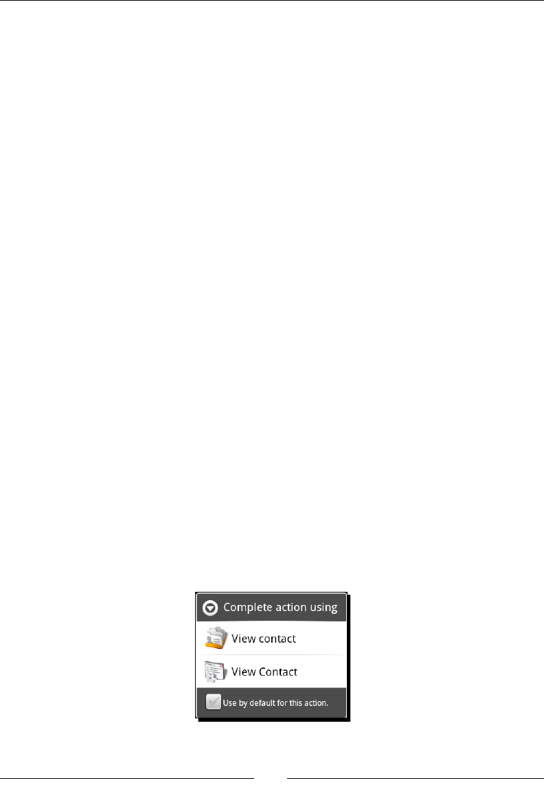
Chapter 4
[ 117 ]
22. Change the label of the ViewContactActivity to View Contact:
<activity
android:name=".ViewContactActivity"
android:label="View Contact">
23. Remove all of the default content inside the <intent-filter> element.
24. Declare an <action> type of ACTION_VIEW for this <intent-filter>:
<action android:name="android.intent.action.VIEW"/>
25. Set the <catagory> of this <intent-filter> to CATAGORY_DEFAULT:
<category android:name="android.intent.category.DEFAULT"/>
26. Add a <data> element to lter person entries (this is a MIME type):
<data
android:mimeType="vnd.android.cursor.item/person"
android:host="contacts" />
27. Add another <data> element to lter contact entries:
<data android:mimeType="vnd.android.cursor.item/contact"
android:host="com.android.contacts" />
When installed on a device, the preceding code will become an opon for opening
"Contacts" in the user's address book. As you can see, replacing part of the standard Android
framework is very simple, and allows more seamless integraon of applicaons with the
base system than is possible with a more convenonal applicaon architecture.
What just happened
If you install this applicaon on the emulator, you'll noce that in the launcher, there's no
icon to start it up. That's because this applicaon doesn't have a main entry point like all of
the others we've wrien thus far. Instead, if you open the "Contacts" applicaon, and then
click on one of the contacts in the address book, you'll be greeted by the following screen:

Leveraging Acvies and Intents
[ 118 ]
If you select the second icon, your new ViewContactActivity will be started in order to
view the selected contact. The user (as you can see) also has the ability to use your applicaon
in preference to the default (for as long as your applicaon remains available on the device).
Overriding a default behavior is a very important decision when developing a new
applicaon. Android makes it very easy to do, and as you can see, a third-party applicaon
can slot in almost seamlessly between two of the default applicaons. In a normal operang
system environment, you would need to write an enre "contacts manager", while in
Android you need only write the bits that interest you.
This is a part of your user interface design since you can use it to extend the funconality of
various default parts of the system. For example, if you wrote a chat applicaon, such as a
"Jabber" client, you could embed the client in the View contact Activity for each contact
in the user's address book that was linked with a Jabber ID. This would allow users to chat
with available contacts directly from their address book, instead of having to go to your
applicaon. You applicaon becomes a way for them to check a contact's status, and possibly
avoid a phone call enrely.
Summary
Implemenng an Activity at the correct granularity is an important part of your user
interface design process. Although it's not a graphical part directly, it denes how the
system will interact with your applicaon, and thus how the user will interact with it.
It's a good idea to keep implicit intents in mind when structuring how your Activity will be
started. Creang a generic Activity allows for other applicaons to integrate seamlessly with
your own, eecvely turning your new applicaon into a plaorm for other developers to work
with. An implicitly started Activity can be replaced or extended by another applicaon, or
it can be re-used in other applicaon. In both cases, the user becomes free to customize your
applicaon in much the same way that they can customize the wallpaper image or theme.
Always try and provide a single Activity implementaon for each acon the user might
want to take, don't make an Activity do too many things in the same screen. A very good
example of granularity is the "Contacts" applicaon—there's a contact list, contact viewer,
contact editor, and the dialler applicaon.
When working with tabbed interfaces (as we did in the previous chapter), it's possible
to specify the tab content as an Intent, eecvely embedding the Activity in your
applicaon. I would strongly urge you to consider doing exactly this when building a tabbed
user interface, since it allows each tab to be re-used by your applicaon far more easily, while
also allowing third-party developers to create extensions to your interface, one tab at a me.
So far we've only really worked with the LinearLayout class, and while it's a great base for
simple user interfaces, it's almost never enough. In the next chapter, we'll be looking at the
many other types of layouts that Android provides by default, exploring the way in which
each layout works, and how they can be used.
5
Developing Non-linear Layouts
Non-linear layouts are normally a completely fundamental subject of user
interface design. However, on a device with a small screen (as many Android
devices are), it doesn't always make sense. That said, Android devices can
be turned to landscape mode, where suddenly you have an abundance of
horizontal space, and limited vercal space. In these situaons (and as we'll
see, in many other situaons as well), you will want to work with a layout other
than the plain old LinearLayout structure we've worked with so far.
The real power of Android layouts comes from the same place as the power
of the old Java AWT LayoutManagers—by combining the dierent layout
classes with each other. For example, combining a FrameLayout with other
ViewGroup implementaons allows you to layer various parts of the user
interface on top of each other.
It's important to consider how your layout will act on screens of dierent sizes. While
Android does allow you to select dierent layouts based on the screen size of the device,
this means that you will have to maintain mulple layouts for the dierent screen sizes and
densies which your applicaon will encounter in the wild. As far as possible you should
make use of the tools that Android provides, and work with layouts that will scale according
to the size of the various View objects.
In this chapter, we'll look into the various other layout styles that Android provides us with
by default, and invesgate various alternave uses for each one of them. We'll also take a
closer look at how you specify parameters for dierent layouts, and how they can help in
usability, as opposed to simply pung your widgets in a parcular order.

Developing Non-linear Layouts
[ 120 ]
Time for action – creating a layouts example project
Before we walk through each of the layouts, we need a common project inside which we will
showcase each of them.
1. From a command prompt, create a new project named Layouts:
android create project -n Layouts -p Layouts -k com.packtpub.
layouts -a LayoutSelectorActivity -t 3
2. Delete the standard res/layout/main.xml layout resource le.
3. Open the res/values/strings.xml le in an editor or IDE.
4. Add a new <string-array> by the name of layouts to the le:
<string-array name="layouts">
5. Add the following items to the new <string-array> element:
<item>Frame Layout</item>
<item>Table Layout</item>
<item>Custom Layout</item>
<item>Relative Layout</item>
<item>Sliding Drawer</item>
6. Open the LayoutSelectorActivity source le in your editor or IDE.
7. Have the class inherit from ListActivity instead of Activity:
public class LayoutSelectorActivity extends ListActivity {
8. In the onCreate method, set the contents of your ListActivity you declared in
the strings.xml resource le to your layouts array:
setListAdapter(new ArrayAdapter<String>(
this,
android.R.layout.simple_list_item_1, Have the class
inherit from"
getResources().getStringArray(R.array.layouts)));
9. Override the onListItemClick method:
protected void onListItemClick(
ListView l,
View v,
int position,
long id) {

Chapter 5
[ 121 ]
10. Create a switch statement on the position parameter:
switch(position) {
11. Add a default clause (the only one for now) to let yourself know that you haven't
implemented an example for the selected item yet:
default:
Toast.makeText(
this,
"Example not yet implemented.",
Toast.LENGTH_SHORT).show();
What just happened?
The new project will serve as a basis for each of the examples in this chapter. For each layout
we work through, we'll build a new Activity that will become part of this applicaon.
Currently, the applicaon consists of only a menu for accessing each of the layout examples.
The idea as of now is to ll each one with something interesng.
In this chapter, we will explore not just the basic layouts, but also how they can be made
to interact with each other.
FrameLayout
The FrameLayout class anchors each of its widgets at the top-le corner of itself. This
means each child widget is drawn on top of the previous one. This can be used to simulate
a CardLayout from AWT by using View.setVisible to show one of the children while
hiding all the others (this is eecvely how TabHost works).
As FrameLayout actually paints all of its visible children, it can be used to layer the child
widgets on top of each other. It produces very strange eects in some cases, while in other
cases it can be amazingly useful. For example, darkening out all of the widgets except one
can be achieved by using a semi-transparent View object and a FrameLayout. The inacve
widgets are the rst layer in the FrameLayout, a semi-transparent View object is the
second, and the acve widgets are the third.
Common uses
The most common use of FrameLayout is probably in combinaon with TabHost—to hold
the content View objects for each tab. You can also use it to simulate a more desktop feel,
by layering widgets on top of each other. It can also be used very eecvely in games, to
display the in-game menu, or draw an animated background behind the game's main menu.

Developing Non-linear Layouts
[ 122 ]
By combining a FrameLayout object with widgets that also take up the enre screen,
you can make use of the gravity aribute to place objects more precisely on top of
other widgets. For this, you'll generally want each of the FrameLayout children to be a
ViewGroup of some sort, since they generally don't paint in a background unless told to
(leaving the lower layers visible).
A FrameLayout is also capable of displaying a foreground. While all View objects have
a background aribute, FrameLayout includes a foreground (which is also an oponal
Drawable). The foreground will be painted on top of all of the child widgets, allowing
a "frame" to be displayed.
Time for action – developing a FrameLayout example
To really understand what a FrameLayout does, and how it can be used, it's best to kick
it around a bit with an example. In this example, we'll use a FrameLayout to layer some
Button widgets on top of an ImageView, and show-and-hide a TextView message when
one of the buons is clicked.
For this example to work, you're going to need an image to serve as a background image.
I'm going to use a photo of one of my friends. As always, place your image in the res/
drawable directory, and try to use a PNG le.
1. Create a new layout resource le named res/layout/frame_layout.xml.
2. Declare the root element as a FrameLayout consuming all available space:
<FrameLayout
xmlns:android="http://schemas.android.com/apk/res/android"
android:layout_width="fill_parent"
android:layout_height="fill_parent">
3. Inside the FrameLayout, create an ImageView to serve as the background image.
It should scale to ll all the available space:
<ImageView android:src="@drawable/jaipal"
android:scaleType="centerCrop"
android:layout_width="fill_parent"
android:layout_height="fill_parent"/>
4. Now create a vercal LinearLayout where we will place two Button objects at
the boom of the screen:
<LinearLayout android:orientation="vertical"
android:gravity="bottom"
android:layout_width="fill_parent"
android:layout_height="fill_parent">

Chapter 5
[ 123 ]
5. Create a Button that we will use to toggle one of the child layers of our
FrameLayout (creang a dialog-like eect):
<Button android:text="Display Overlay"
android:id="@+id/overlay_button"
android:layout_width="fill_parent"
android:layout_height="wrap_content"/>
6. Create another Button to quit the demo and go back to the menu:
<Button android:text="Quit"
android:id="@+id/quit"
android:layout_marginTop="10sp"
android:layout_width="fill_parent"
android:layout_height="wrap_content"/>
7. Aer the </LinearLayout>, create a nal TextView element that we will show
and hide when the rst buon is clicked. By default it's hidden:
<TextView android:visibility="gone"
android:id="@+id/overlay"
android:textSize="18sp"
android:textStyle="bold"
android:textColor="#ffff843c"
android:text="This is a text overlay."
android:gravity="center|center_vertical"
android:layout_width="fill_parent"
android:layout_height="fill_parent"/>
8. Create a new FrameLayoutActivity Java class in the root package of your
project, and open the source le in your editor or IDE. The new class needs to
extend from Activity and implement the OnClickListener class (for events
from those two Button widgets):
public class FrameLayoutActivity
extends Activity implements OnClickListener {
9. Override the onCreate method:
protected void onCreate(Bundle savedInstanceState) {
10. Invoke the super.onCreate method to get the Activity code working:
super.onCreate(savedInstanceState);
11. Set the content layout to the frame_layout resource you just created:
setContentView(R.layout.frame_layout);

Developing Non-linear Layouts
[ 124 ]
12. Find the overlay Button widget you declared in the frame_layout resource le
and create a reference to it:
Button overlay = (Button)findViewById(R.id.overlay_button);
13. Set its OnClickListener to the new FrameLayoutActivity object:
overlay.setOnClickListener(this);
14. Find the quit Button widget:
Button quit = (Button)findViewById(R.id.quit);
15. Then set it's OnClickListener to the FrameLayoutActivity object:
quit.setOnClickListener(this);
16. The OnClickListener interface requires us to implement an onClick method
with the following signature:
public void onClick(View view) {
17. Create a switch statement on the ID of the View parameter:
switch(view.getId()) {
18. If the View clicked by the user widget is the overlay_button Button, then use
the following:
case R.id.overlay_button:
19. Fetch the overlay View object from the layout:
View display = findViewById(R.id.overlay);
20. Toggle its visibility according to its current state, then break from the switch:
display.setVisibility(
display.getVisibility() != View.VISIBLE
? View.VISIBLE
: View.GONE);
break;
21. If the View clicked by the user widget is the quit Button, then use the following:
case R.id.quit:
22. Invoke the finish() method, and break from the switch statement:
finish();
break;

Chapter 5
[ 125 ]
23. Open the LayoutSelectorActivity Java source in your editor or IDE.
24. In the onListItemClick method, create a new case in the switch statement,
for position value 0:
case 0:
25. Start the FrameLayoutActivity using an explicit Intent:
startActivity(new Intent(this, FrameLayoutActivity.class));
break;
26. Open the AndroidManifest.xml le in an editor or IDE.
27. Add the new FrameLayoutActivity to the manifest le:
<activity android:name=".FrameLayoutActivity"
android:label="Frame Layout Example"/>
What just happened?
The new FrameLayoutActivity makes use of a simple three layer FrameLayout. We
use an ImageView object to draw a nice background image, on top of which we placed our
two buons. While the third layer (the TextView widget) is invisible unl the top buon
is clicked, it's important to note that not only is the background of the top TextView
transparent, it also delegates click events to widgets that are technically underneath it
(the TextView has a widget and height that consumes the enre FrameLayout). This
will connue to work, even if the background of the TextView is opaque. It has more
to do with the fact that the TextView is not "clickable". If you would have added an
OnClickListener to the overlay TextView object, the buon underneath it would
have stopped working. This means you need to be careful how you layer widgets in a
FrameLayout (although so long as one widget doesn't take up the same space as another,
this won't become a problem for you).
In this example, we added a Quit buon to the layout, and used the finish() method to
close the Activity when the Button was clicked. You'll nd that you generally don't use
the finish() method directly since the user will mostly be moving forward through your
applicaon. If a user wants to go back, they will most oen use the hardware "Back" buon,
or press the hardware "Home" buon to exit your applicaon enrely.
A nal note on the above example—in the frame_layout.xml le, we declare the
overlay as a TextView widget. However, in the Java code we access it using the View
class instead of TextView. This is a simple case of decoupling. Unless you're working in
a performance-centric piece of code, it's a good idea to reference your layout widgets as
high up the class-tree as possible. This will allow you to modify your user interface much
more quickly later on. In this case, you could change the simple TextView to an enre
LinearLayout without the need to change the Java code at all.
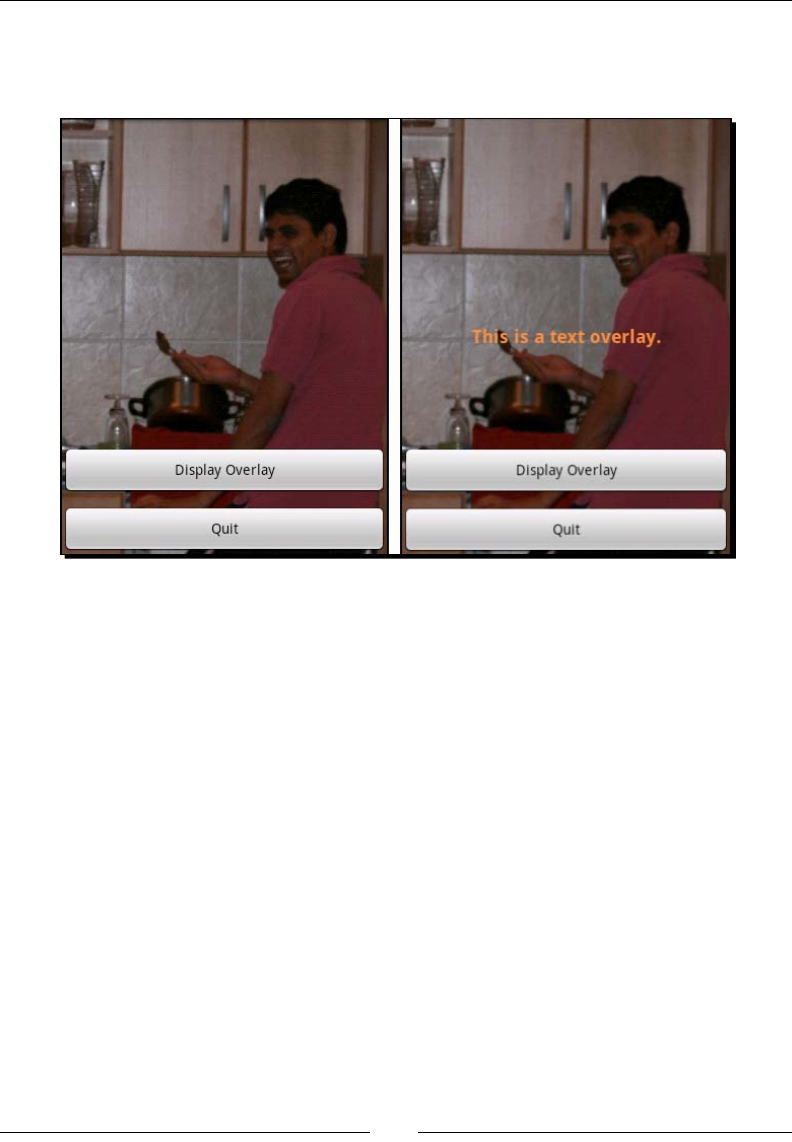
Developing Non-linear Layouts
[ 126 ]
Following are two screenshots of the FrameLayout example, with and without the
overlay TextView enabled. This sort of layout is perfect for use in a game menu or
a similar structure where you need to layer dierent widgets on top of each other.
Table Layout
The Table Layout arranges its children in a HTML-style grid. It's a bit like the AWT Grid
Layout class, but with much more exibility. Unlike most other layout classes in Android,
Table Layout uses its own specialized direct-child View class, named Table Row. The Table
Layout class also doesn't allow you to dene the number of rows or columns (making it far
more like an HTML <table> element). Instead, the number of rows and columns is calculated
by the number of widgets in the Table Layout and its Table Row children.
A cell in a Table Layout may consume any number of rows and columns, although the
default for a View placed inside a Table Row is to take up exactly a single table cell. However,
if you place a View as a direct child of a Table Layout, it will consume an enre row.
Table Layout is also a relave layout structure, which is vitally important when working with
Android devices. Being able to align everything based on grid lines allows your user interface to
scale from the lowest resoluon on a ny phone, to a high-density screen on a 7-inch tablet.

Chapter 5
[ 127 ]
The android:gravity aribute comes into play far more in a Table Layout than in
many of the other layout classes. What looks great on a small screen may look completely
dierent on a large screen, not due to the size of the screen, but instead due to the scaling of
the fonts used. Be careful, especially with the vercal alignment of labels and widgets. The
easiest way to start with this is to vercally center all of your table widgets, and work from
there. Be sure to test any table based layout on a variety of screen resoluons and sizes.
Common uses
Most commonly you'll nd yourself using a Table Layout to arrange input form. It's also
useful for laying out complex informaon, especially when making some View objects span
several rows and columns. The most important trait of Table Layout comes from the fact
that it aligns its cells in a very strict manner, and the fact that its a relave-size layout.
A Table Layout can also be used to achieve an eect similar to the AWT Border Layout
class. Generally, when sizing a Table Layout to t the enre screen, it becomes a very
dierent tool to a simple grid, allowing you to t a Scroll View in the middle of the
control widgets.
By using a Table Layout inside a FrameLayout, you can arrange a control View on top of
a content View (think of the controls in Google Maps). Also, try to bear in mind that unlike
an AWT GridLayout, the size of a View inside a TabelLayout is not aached to size of
the table-cell in which it is placed. By making use of the gravity aribute (and possibly a
layout margin), you can place a View object within the table-cell, leading to layouts that are
far more user-friendly.
Using TableLayout for a memory game
To demonstrate the TableLayout, I thought it would be fun to write a simple memory-card
game. You're presented with a grid (in the form of a TableLayout) of "cards" which you
can touch to eecvely turn over. You can then aempt to match all these cards, with the
contents that are displayed on the cards (you're only allowed to turn over two at a me). For
this example, you'll need some images to place on the cards (I've re-used the fruit icons from
the delivery example). In this applicaon, we'll also be creang a simple placeholder image,
in the form of an XML le.
To create the placeholder image, create a new XML resource in the res/drawable
directory, named line.xml. This will be a "shape" resource. Shape resources are very useful
for creang simple, scalable shapes. Also, shape resource les can make use of any color,
texture, or gradient which you can provide from your code.

Developing Non-linear Layouts
[ 128 ]
Copy the following code into the line.xml le in order to create the simple placeholder
image for our example:
<?xml version="1.0" encoding="UTF-8"?>
<shape xmlns:android="http://schemas.android.com/apk/res/android"
android:shape="line">
<stroke android:width="3dp"
android:color="#ff000000"/>
<padding android:left="1dp"
android:top="1dp"
android:right="1dp"
android:bottom="1dp"/>
</shape>
Time for action – developing a simple memory game
Unlike almost all previous example, we'll generate the layout enrely in Java code in this
game. The main reason for this is that the content is highly repeve, each cell containing
almost exactly the same widget. We use a TableLayout to create the grid, and display the
"cards" in ImageButton widgets. To encapsulate the individual card behavior, we create a
MemoryCard inner-class which holds a reference to the ImageButton it controls.
1. Create a new Java class in the root package of your project, and name it
TableLayoutActivity.
2. Make the new class extend Activity:
public class TableLayoutActivity extends Activity {
Declare and array of all the icon resources to use as card
images, there must be eight images resources declared in this
array:private static final int[] CARD_RESOURCES = new int[]{
R.drawable.apple,
R.drawable.banana,
R.drawable.blackberry,
// …
};
3. You'll need a mer in order to ip cards back over, so declare a Handler:
private final Handler handler = new Handler();
4. Declare an array of MemoryCard objects:
private MemoryCard[] cards;

Chapter 5
[ 129 ]
5. We either have one or two cards turned over (that we want to keep track of).
Declare a placeholder for the rst:
private MemoryCard visible = null;
6. If there are two cards turned over, but they don't match, we disable touch with a
simple boolean switch (our event listeners will check this):
private boolean touchEnabled = true;
7. Now declare an inner class named MemoryCard which implements the
OnClickListener interface:
private class MemoryCard implements OnClickListener {
8. The MemoryCard class holds a reference to an ImageButton:
private ImageButton button;
9. The MemoryCard class also has a value, which is a reference to the image resource
on its face:
private int faceImage;
10. Finally, a MemoryCard uses a boolean value to remember its state (whether the
face image, or the placeholder image is visible):
private boolean faceVisible = false;
11. Declare a constructor for the MemoryCard class, it only needs to take the resource
idener for the face image:
MemoryCard(int faceImage) {
12. Store the faceImage resource idener for later use:
this.faceImage = faceImage;
13. Create a new ImageButton object, using the TableLayoutActivity object as its
Context (which the ImageButton will use to load the images):
this.button = new ImageButton(TableLayoutActivity.this);
14. Set the size of the ImageButton to a xed 64 x 64 pixels:
this.button.setLayoutParams(new TableRow.LayoutParams(64, 64));
15. Set the scale-type so that icons are made to t into the ImageButton, then set the
image to the placeholder resource:
this.button.setScaleType(ScaleType.FIT_XY);
this.button.setImageResource(R.drawable.line);

Developing Non-linear Layouts
[ 130 ]
16. Assign the MemoryCard object as the OnClickListener of the
ImageButton object:
this.button.setOnClickListener(this);
17. For convenience later on, the MemoryCard needs a setFaceVisible method,
which will toggle between showing the placeholder and the faceImage resource:
void setFaceVisible(boolean faceVisible) {
this.faceVisible = faceVisible;
button.setImageResource(faceVisible
? faceImage
: R.drawable.line);
}
18. Implement the onClick method in the MemoryCard class:
public void onClick(View view) {
19. First, make sure that the face isn't currently visible (so we're turned down), and that
touch is enabled (and some other cards aren't about to be turned face-down again):
if(!faceVisible && touchEnabled) {
20. If these condions are met, we tell the TableLayoutActivity that we've been
touched and want to be turned face-up:
onMemoryCardUncovered(this);
21. Aer the MemoryCell inner class, create a simple ulity method in the
TableLayoutActivity to create an ordered array of MemoryCell objects with
a specic size:
private MemoryCard[] createMemoryCells(int count) {
22. When we create each of the MemoryCell objects, we create them in pairs, and
in the same sequence as was specied in our array of icon resources:
MemoryCard[] array = new MemoryCard[count];
for(int i = 0; i < count; i++) {
array[i] = new MemoryCard(CARD_RESOURCES[i / 2]);
}
23. When complete, return the new array of MemoryCell objects:
return array;
24. Now override the onCreate method:
protected void onCreate(Bundle savedInstanceState) {

Chapter 5
[ 131 ]
25. Invoke the Activity.onCreate method:
super.onCreate(savedInstanceState);
26. Now create a new TableLayout object, passing it the TableLayoutActivity
as a Context for loading styles and resources:
TableLayout table = new TableLayout(this);
27. By default, we create a four-by-four grid:
int size = 4;
cards = createMemoryCells(size * size);
28. Then we shue it to randomize the order:
Collections.shuffle(Arrays.asList(cards));
29. Create each of the required TableRow objects, and populate it with the
ImageButtons, created by the MemoryCard objects in the grid:
for(int y = 0; y < size; y++) {
TableRow row = new TableRow(this);
for(int x = 0; x < size; x++) {
row.addView(cards[(y * size) + x].button);
}
table.addView(row);
}
30. Set the Activity content view to the TableLayout object:
setContentView(table);
31. Now we write the onMemoryCardUncovered method, which is called by the
MemoryCard.onClick implementaon:
private void onMemoryCardUncovered(final MemoryCard cell) {
32. First, check to see if there is a currently visible MemoryCard, if not, the card
touched by the user is turned face-up and we remember it:
if(visible == null) {
visible = cell;
visible.setFaceVisible(true);
}
33. If there is already a face-up card, check to see if they have the same image. If the
images are the same, disable the ImageButton widgets so we ignore the events:
else if(visible.faceImage == cell.faceImage) {
cell.setFaceVisible(true);
cell.button.setEnabled(false);

Developing Non-linear Layouts
[ 132 ]
visible.button.setEnabled(false);
visible = null;
}
34. Finally, if the face images don't match, we turn the card touched by the user face-up
and ip our touchEnabled switch so that the MemoryCard objects will ignore all
other touch events for a second:
else {
cell.setFaceVisible(true);
touchEnabled = false;
35. Then we post a delayed message on our Handler, which will turn both cards
face-up again and re-enable touch events:
handler.postDelayed(new Runnable() {
public void run() {
cell.setFaceVisible(false);
visible.setFaceVisible(false);
visible = null;
touchEnabled = true;
}
}, 1000); // one second before we flip back over again
What just happened
In the previous example, it should be obvious to see why we wrote the layout code manually,
building it in an XML le would have been terribly repeve. You'll noce that the code
creates a TableRow object as the direct children of the TableLayout, just as we would
have in an XML le.
The onClick method of MemoryCard uses the touchEnabled switch to determine
whether or not to call onMemoryCardUncovered. However, neither does this stop the user
from pressing the ImageButton objects, nor does it stop the objects from responding to the
user (although they won't turn over). For a more user-friendly experience, it would be beer
to use the setClickable method on each of the enabled ImageButton objects, to stop
them completely from reacng to the user's touch.
When we create the ImageButton objects, we pre-size them at 64 x 64 pixels. While this
is ne for the big emulator screen, there are plenty of devices that wouldn't t the 4 x 4
grid of buons on the screen. I would recommend you use an XML resource to create the
ImageButton objects.
Downloa d f r o m W o w ! e B o o k < w w w.woweb o o k . c o m >
Chapter 5
[ 133 ]
The previous code uses setLayoutParams(new TableRow.LayoutParams(64,
64)); to set the size of the ImageButton objects. It's important to note that because
we are placing the ImageButton objects into a TableRow, their LayoutParams must
be of the type TableRow.LayoutParams. If you try changing to a generic ViewGroup.
LayoutParams, then the user interface won't layout (it'll just be blank). Following are two
screenshots of the working applicaon:
Have a go hero
The TableLayout example works great, but the locaon of the grid isn't great (on the top
le of the screen), and having it against a black background is quite dull. Time to make it
look great!
Start by using a FrameLayout to add a background image to the game. This will enhance
the overall appeal of the game by adding more color. You should also take this opportunity
to center the grid on the screen. Having it in the top le makes it look lopsided somehow.
You should also try removing the touchEnabled switch, instead using setClickable on
each of the ImageButton objects. This will stop them from providing a visual "press and
release" feedback when you're about to turn cards face-down.
AbsoluteLayout/Custom Layouts
Do not use AbsoluteLayout! AbsoluteLayout is Deprecated! That said, there are mes
when using the AbsoluteLayout class makes sense. So why shouldn't you use the
AbsoluteLayout class, and where should you use it? The answer to the rst queson is
very simple—all of the child widgets of an AbsoluteLayout have their locaons specied
exactly, they don't change size or locaon on dierent screens. It also makes your layout
almost impossible to re-use (for example, imporng it into another layout, or embedding
it into another applicaon).

Developing Non-linear Layouts
[ 134 ]
If you're going to work with an AbsoluteLayout, you should approach it in either one of
the following two ways:
1. Carefully build a separate layout XML for each dierent screen size.
2. Write your layout data in Java code instead of XML.
The rst is impraccal unless you specify that the applicaon only runs on specic devices,
and the layout cannot be used outside of your applicaon. The second opon however,
opens up the "right" way—write a custom layout manager. Since AbsoluteLayout requires
strict locaons, and doesn't allow easy interacon with the measuring of child View objects,
the best way to dene layouts that don't t well into any of the over layout classes is to
dene a custom layout in your own ViewGroup class.
Developing your own Layouts
Since AbsoluteLayout is deprecated, and yet many people seem to insist on using it, this
example will be to demonstrate not just how easy it is to write your own ViewGroup class
dening a new layout, but also how easy it is to then integrate that layout into a layout XML
resource. This will thus prove that there is no compelling reason to use an AbsoluteLayout
(unless it really makes sense).
Time for action – creating a custom layout
To really demonstrate the use of a custom layout, you need to try building something
unusual. In the following example, you'll put together a ViewGroup that arranges its
children in a nice circle. It's not a very brilliant layout, nor is it parcularly useful, but
circles are nice to look at, and it would provide useful negave space in the screen center
(which could be lled using a FrameLayout).
1. Create a new Java source le in the root package of the project named
CircleLayout.java, and open it in your editor or IDE.
2. Declare the CircleLayout as extending the ViewGroup class:
public class CircleLayout extends ViewGroup
3. Declare the three ViewGroup constructors and have them delegate directly to the
ViewGroup default constructors:
public CircleLayout(Context context) {
super(context);
}
// ...

Chapter 5
[ 135 ]
4. We'll need to know the largest number of pixels taken up by a child View object's
width, and the largest number of pixels taken up by a child View object's height.
To avoid unnecessary overhead, we take this opportunity to measure the child
View objects as well. Declare a ulity method named measureChildrenSizes to
perform these two operaons:
private int[] measureChildrenSizes(int sw, int sh) {
5. Declare an int to hold the maximum width and height we nd:
int maxWidth = 0;
int maxHeight = 0;
6. Create a for loop to iterate over each of the child View objects in this
CircleLayout object:
for(int i = 0; i < getChildCount(); i++) {
7. Declare a reference to View at the current index:
View child = getChildAt(i);
8. As a layout widget, your class will be responsible for seng the display size for all
of it's child widgets. In order to know a child widget's desired width and height, you
need to use the measureChild method in the ViewGroup class:
measureChild(child, sw, sh);
9. Test the width and height of the child View object against the maximum width and
height variables you created earlier:
maxWidth = Math.max(maxWidth, child.getMeasuredWidth());
maxHeight = Math.max(maxHeight, child.getMeasuredHeight());
10. At the end of the method, return an array containing the maximum width and
height found during the procedure:
return new int[]{maxWidth, maxHeight};
11. Implement the onLayout method of ViewGroup:
protected void onLayout(boolean changed,
int l, int t, int r, int b) {
12. Calculate the width and height of our available space:
int w = r – l;
int h = b - t;

Developing Non-linear Layouts
[ 136 ]
13. Declare a variable to hold the number of child View objects:
int count = getChildCount();
14. Perform the measurement of all child View objects against the amount of available
space:
int[] max = measureChildrenSizes(w, h);
15. Subtract the maximum width and height from the available space so that all the
child View objects will t on the screen:
w -= max[0];
h -= max[1];
16. Calculate the center point in the CircleLayout:
int cx = w / 2;
int cy = h / 2;
17. Create a for loop to iterate over each of the child View objects again:
for(int i = 0; i < count; i++) {
18. Declare a variable to hold the current child View object:
View child = getChildAt(i);
19. Calculate the x and y locaons of the child View object:
double v = 2 * Math.PI * i / count;
int x = l + (cx + (int)(Math.cos(v) * cx));
int y = t + (cy + (int)(Math.sin(v) * cy));
20. Invoke the layout method of the child View object with the calculated coordinates
in the circle:
child.layout(
x, y,
x + child.getMeasuredWidth(),
y + child.getMeasuredHeight());
What just happened?
The CircleLayout class is a very simple implementaon of a ViewGroup. Except for the
requested width and height of its children, it has no special aributes that can be used in an
XML resource. However, it will take noce of the sizing that you declare for its children, and
so the layout_width and layout_height aributes will work normally.
It's important to note that in order to make use of a custom View or ViewGroup from
a layout XML resource, you need to have all three default constructors overridden.
Chapter 5
[ 137 ]
The LayoutInflater will make use of one of these constructors to create
instances of your class. If the one it wants to use isn't in place, you will get the
dreaded Force Close dialog when you try and inate the layout XML le.
The CircleLayout has its own ulity method to handle the measuring of its child View
objects. Generally, a ViewGroup would use the ViewGroup.measureChildren ulity
method to see that all of its child View objects are measured before performing the actual
layout. However, we need to iterate over the list of child View objects in order to nd
the largest used width and height, so instead of performing the iteraon three mes, we
perform the measurements ourselves.
Using the CircleLayout
To make use of your custom ViewGroup implementaon, it's good to know that Android has
you covered as far as the XML layout resources are concerned. When you need to reference
a custom View or ViewGroup class from an XML layout resource, you simply use the full
class name instead of the simple class name. The following is a simple example of an XML
layout that uses the CircleLayout:
<com.packtpub.layouts.CircleLayout
xmlns:android="http://schemas.android.com/apk/res/android"
android:layout_width="fill_parent"
android:layout_height="fill_parent">
<Button android:text="Button1"
android:layout_width="wrap_content"
android:layout_height="wrap_content"/>
<Button android:text="Button2"
android:layout_width="wrap_content"
android:layout_height="wrap_content"/>
<!-- 10 Buttons in total works nicely
</com.packtpub.layouts.CircleLayout>
Time for action – nishing the CircleLayout example
We've got the CicleLayout implementaon, but we should really include it in
our "layouts" example now. To do that we'll need a layout resource XML le, a new
CircleLayoutActivity class. We also need to register the new Activity with
both, Android (in the manifest le), and with our LayoutSelectorActivity class
(in its event listener).

Developing Non-linear Layouts
[ 138 ]
1. Copy the preceding XML layout into a new le named res/layout/circle_
layout.xml. It works best with around ten widgets added as children of the
CircleLayout ViewGroup.
2. Create a new Java source le in the root package of your project named
CircleLayoutActivity.java. Open this in your editor or IDE.
3. CircleLayoutActivity must extend the Activity class:
public class CircleLayoutActivity extends Activity {
4. Override the onCreate method of Activity:
protected void onCreate(Bundle savedInstanceState) {
5. Invoke the super class:
super.onCreate(savedInstanceState);
6. Set the content view to the circle_layout layout resource:
setContentView(R.layout.circle_layout);
7. Open the AndroidManifest.xml le in your editor or IDE.
8. A er the TableLayoutActivity declaraon, declare the new
CircleLayoutActivity:
<activity android:name=".CircleLayoutActivity"
android:label="Circle Layout Example"/>
9. Open the LayoutSelectorActivity source le in your editor or IDE.
10. In the onListItemClick method, before the default case, add a new case
statement to start the CircleLayoutActivity:
case 2:
startActivity(new Intent(
this, CircleLayoutActivity.class));
break;
What just happened?
You now have a new Activity implementaon that uses your own customized
ViewGroup implementaon. Custom ViewGroup classes are not just useful when you have
a hard-to-express layout that the standard ViewGroup implementaons don't handle very
well. A custom ViewGroup is also an opon when the default ViewGroup implementaons
are too slow for a parcular structure that you want to implement.
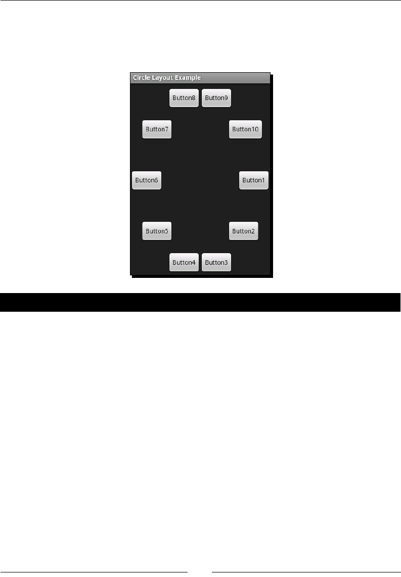
Chapter 5
[ 139 ]
The "layouts" example that you've been building in this chapter will now have a working
Custom Layout menu item. Click it and you'll be presented with the following screenshot.
Try adding widgets other than Button objects, and maybe even try throwing in a child
ViewGroup and see what happens.
Pop quiz
1. Layout generally happens in two phases, what's the rst phase called?
a. Pre-layout
b. Calculaon
c. Parent layout
d. Measurement
2. What do the four parameters of the layout method signify?
a. x, y, width, and height.
b. Le, top, right, and boom.
c. The size of the parent ViewGroup.
3. How can a custom ViewGroup implementaon read layout XML aributes?
a. They are injected into seers by the LayoutInflator.
b. They are loaded with the View.getAttribute method.
c. They read it from the AttributeSet object passed into the ViewGroup
constructor.
Developing Non-linear Layouts
[ 140 ]
RelativeLayout
The RelativeLayout class is arguably the most powerful layout that Android provides. It's
a relave layout, managing widgets of varying sizes, and aligning widgets against each other
instead of against their parent or grid-lines. In some ways, RelativeLayout has a striking
resemblance to the Swing GroupLayout class, although it is nowhere near as complex. Each
widget in a RelativeLayout is posioned against either another widget, or against its
parent (the RelativeLayout itself).
RelativeLayout calculates the locaon of each child in a single loop, so it relies strongly
on the order in which you specify the children. However, this doesn't mean that you must
specify the widgets in the order they are displayed on the screen. Due to the nature of a
RelativeLayout, the child widgets are oen declared and displayed in a dierent order.
This also requires that any user interface element used for aligning other widgets must have
an ID assigned to it. This includes even non-interacve user interface elements which would
normally not need an ID, must now be assigned one, even though they will never be used
outside of the layout.
Using a RelativeLayout is extremely exible, but may also require some careful planning.
As with any user interface, it helps enormously to draw the layout on paper rst. Once you
have a paper diagram, you can start to plan how you will build the layout according to the
rules specied by the RelativeLayout class.
Common uses
The uses of RelativeLayout are very similar to those of TableLayout. It's great for
drawing up forms and content views. However, RelativeLayout is not conned to the grid
paern of TableLayout, and can therefore create relaonships between widgets that are
physically far away from each other on the screen (that is, by aligning them with each other).
RelativeLayout posions and sizes a widget either according to other widgets in the
same RelativeLayout, and/or according to the boundaries of the RelativeLayout itself.
This means some widgets may be placed at the top of the screen, and you can align another
group of widgets at the boom of the screen, as shown in the following diagram.
Chapter 5
[ 141 ]
Integrating the RelativeLayout
When faced with a contact editor, a RelativeLayout is the perfect tool to produce an
easy-to-use user interface. For the next example, we build a very simple contact eding user
interface including an image of the user.
Time for action – creating a contact editor
This example requires that some of the user interface elements are declared out-of-order
(as discussed earlier). We'll also include Save and Cancel Button widgets at the boom of
the screen. This example goes back to declaring the user interface in a resource XML le
rather than wring it in Java code. For this example, you'll need a placeholder image for the
user's contact photo. A 64 x 64 pixel PNG le is about the right size to work with (I used a big
smiley image).
1. Start by creang a new XML layout le named res/layout/relative_layout.
xml. Open this le in your editor or IDE.
2. Declare the root element as a full-screen RelativeLayout:
<RelativeLayout
xmlns:android="http://schemas.android.com/apk/res/android"
android:layout_width="fill_parent"
android:layout_height="fill_parent">
3. Create an ImageButton that will have an icon of the user on it. The ImageButton
should be aligned to the top-le of the screen, and have a place-holder image in it:
<ImageButton android:src="@drawable/face"
android:id="@+id/photo"
android:layout_alignParentTop="true"
android:layout_alignParentLeft="true"
android:layout_width="wrap_content"
android:layout_height="wrap_content"/>
4. Add an EditText where the user can type a contact's name. Align this to the right
boom of the ImageButton:
<EditText android:text="Unknown"
android:id="@+id/contact_name"
android:layout_alignBottom="@id/photo"
android:layout_toRightOf="@id/photo"
android:layout_width="fill_parent"
android:layout_height="wrap_content"/>

Developing Non-linear Layouts
[ 142 ]
5. Now add a TextView to act as a label for the EditText widget. We align this to
the right of the ImageButton, but above the EditText:
<TextView android:text="Contact Name:"
android:id="@+id/contact_label"
android:layout_above="@id/contact_name"
android:layout_toRightOf="@id/photo"
android:layout_width="wrap_content"
android:layout_height="wrap_content"/>
6. We'll need an Edit Button to allow the user to edit the list of phone numbers for
the contact. Posion this on the right side of the screen, and below the EditText.
We add a margin at the top of this Button to give a logical separaon in the user
interface:
<Button android:id="@+id/edit_numbers"
android:text="Edit"
android:paddingLeft="20dp"
android:paddingRight="20dp"
android:layout_below="@id/contact_name"
android:layout_alignParentRight="true"
android:layout_marginTop="10dp"
android:layout_width="wrap_content"
android:layout_height="wrap_content"/>
7. Create a nice big TextView as a label to the phone numbers, which we will list
below the new TextView and Edit Button:
<TextView android:text="Contact Numbers:"
android:id="@+id/numbers_label"
android:textSize="20sp"
android:layout_alignBaseline="@id/edit_numbers"
android:layout_alignParentLeft="true"
android:layout_width="wrap_content"
android:layout_height="wrap_content"/>
8. Now create a TableLayout to hold a list of the contact person's phone numbers,
center-align this TableLayout in the RelativeLayout, and posion it below the
Contact Numbers label with a slight margin:
<TableLayout android:layout_below="@id/edit_numbers"
android:layout_marginTop="5dp"
android:layout_centerInParent="true"
android:layout_width="wrap_content"
android:layout_height="wrap_content">

Chapter 5
[ 143 ]
9. Add two TableRow elements with some dummy content to the TableLayout:
<TableRow>
<TextView android:text="Home"
android:layout_marginRight="20dp"/>
<TextView android:text="555-987-5678"/>
</TableRow>
<TableRow>
<TextView android:text="Mobile"
android:layout_marginRight="20dp"/>
<TextView android:text="555-345-7654"/>
</TableRow>
10. Create the Save Button posioned at the boom-le of the screen:
<Button android:text="Save"
android:id="@+id/save"
android:layout_alignParentLeft="true"
android:layout_alignParentBottom="true"
android:layout_width="100sp"
android:layout_height="wrap_content"/>
11. Create a Cancel Button posioned at the boom-right of the screen:
<Button android:text="Cancel"
android:id="@+id/cancel"
android:layout_alignParentRight="true"
android:layout_alignParentBottom="true"
android:layout_width="100sp"
android:layout_height="wrap_content"/>
What just happened
Many of the user interface elements in the previous example are declared in an order
that is contrary to the logical layout order, while others are posioned relave to the
RelativeLayout itself and can therefore be placed anywhere in the XML le.
The Contact Name label and editor are posioned relave to the "contact photo", which in
turn is relave to the screen (or RelativeLayout). However, because we want the label to
appear directly above the editor, we need to declare and posion the EditText element
before the TextView element.
The Contact Name EditText element uses a width of fill_parent, which in a
RelativeLayout simply lls the available horizontal space (or vercal space if it's used on
a widget's height). This is a useful feature when you want an element to simply consume
the rest of a "line", or span across the enre screen (that is, for a dividing line). In a
RelativeLayout you cannot use two layout aributes that conict with the same axis of
a widget. For example, you use the layout_toRightOf and layout_alignRight on the
same View widget.

Developing Non-linear Layouts
[ 144 ]
Time for action – integration with the layout example
The integraon of the RelativeLayout example is almost idencal to the integraon
of the custom CircleLayout example that you wrote earlier. Integraon will require a
new Activity implementaon, and then we need to register it with Android and the
LayoutSelectorActivity.
1. Create a new Java source le in the root package of the "layouts" example project,
named RelativeLayoutActivity.java. Open this in your editor or IDE.
2. The new RelativeLayoutActivity needs to extend the Activity class:
public class RelativeLayoutActivity extends Activity {
3. Override the onCreate method:
protected void onCreate(Bundle savedInstanceState) {
4. Invoke the super class to set up its state:
super.onCreate(savedInstanceState);
5. Set the content view of the new Activity to the relative_layout XML layout
resource created earlier:
setContentView(R.layout.relative_layout);
6. Open the AndroidManifest.xml le in your editor or IDE.
7. Register RelativeLayoutActivity aer CircleLayoutActivity:
<activity android:name=".RelativeLayoutActivity"
android:label="Relative Layout Example"/>
8. Open LayoutSelectorActivity Java source code in your editor or IDE.
9. In the onListItemClick method, declare a new case statement before the
default statement and start the new RelativeLayoutActivity:
case 3:
startActivity(new Intent(
this, RelativeLayoutActivity.class));
break;
Downloa d f r o m W o w ! e B o o k < w w w.woweb o o k . c o m >
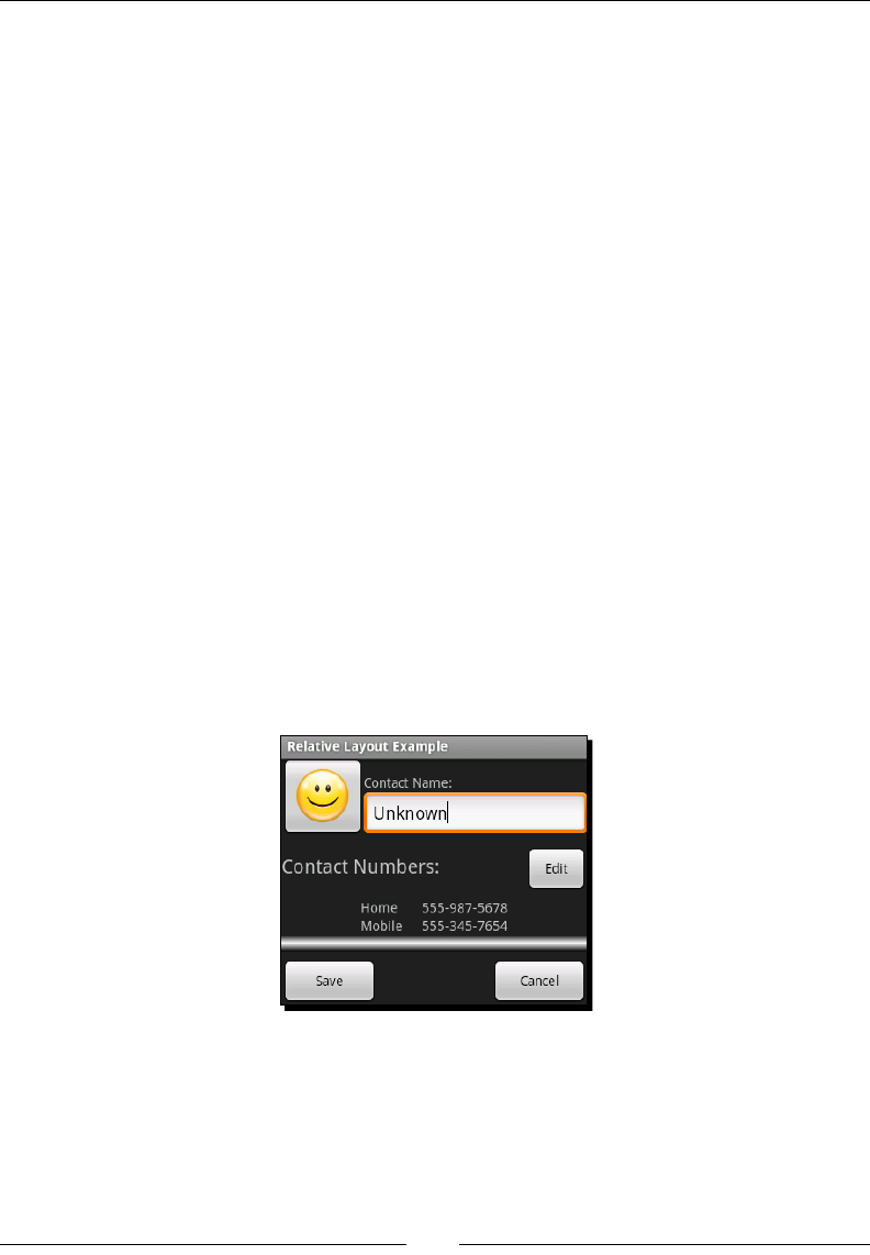
Chapter 5
[ 145 ]
What just happened?
Now that the RelativeLayoutActivity is integrated with the rest of the layout example,
you can re up the emulator and take a look at the screen you just built. As you can see in
the following screenshot, this design is much more user-friendly than most of the other
designs we've built so far. The main reason for this is the ability to group and align widgets
in ways that logically relate to each other, rather than being forced to conne to the
requirements of the chosen ViewGroup.
However, this exibility doesn't come without a price. The RelativeLayout structures
are far more easily broken than other ViewGroup implementaons, and in many cases
won't oer you much addional exibility. In the preceding example, we embedded a
TableLayout to display the list of contact numbers instead of displaying them directly
under the RelativeLayout element. Not only is TableLayout beer suited to this task,
but it also allows us to center-align the numbers as a single group instead of aligning them to
the le and right of the RelativeLayout.
RelativeLayout combined with either an embedded ScrollView or a FrameLayout is
a brilliant way of providing toolbars for more content-centric user interfaces. When you have
a media-centric user interface (with full-screen maps, video, photos, or something similar),
using a RelativeLayout to arrange the tool buons around the outside of the screen
and then placing the actual content behind it with a FrameLayout works extremely well
as can be seen in many Android applicaons such as Google Maps or the default browser
applicaon. This design also allows you to show or hide the tool buons based on the user's
interacon with the applicaon, giving them a beer view of the media content when they
are not interacng with the toolset.

Developing Non-linear Layouts
[ 146 ]
SlidingDrawer
If you've used an un-themed Android installaon (such as the emulator), or most themed
versions of Android, then you've used a SlidingDrawer. It's the widget that drives the
opening and closing of the launcher menu. While it is not exactly a layout in its own right,
a SlidingDrawer allows you to make a large number of lesser-used widgets very quickly
available to the user. This makes it an important widget to consider when developing a new
user interface.
Generally, it'll be a decision between using a menu and a SlidingDrawer. While a
menu is great for displaying acon items, a SlidingDrawer can display any content you
want. However, a SlidingDrawer also has some restricons on its use. For example, it
requires that you place it within a FrameLayout or RelativeLayout instance (of which
FrameLayout is far more typical) in order to funcon correctly.
A SlidingDrawer is in some ways a form of disclosure widget. It consists of a handle and
content. By default, only the handle is visible on the screen, unl the user touches or pulls
the handle to open the SlidingDrawer and display the content secon.
Common uses
The open/close content nature of the SlidingDrawer class makes it ideal for the
applicaon launcher in Android. By default, it is hidden away so the desktop is visible and
usable, unl you tap the handle in order to view the list of available applicaons.
This also makes SlidingDrawer a brilliant tool for building applicaons such as strategy
games. Instead of giving your user all the available build opons (for example), restrict the
default screen view to the key map elements. When they want to build something, or check
some status informaon, they can tap or drag open a SlidingDrawer from the boom of
the screen, revealing all the build/command opons.
Generally, when you have acons or informaon that the user won't need to interact oen
with, a SlidingDrawer is a great way to present it. It can also be opened and closed from
your Java code when key events that require the user's aenon occur.
The handle element of the SlidingDrawer is also a full View or ViewGroup, which
allows you to put status messages in it. Another common use of the slidingdrawer
widget is that the status bar at the top of most Android devices is oen implemented as a
SlidingDrawer. A summary is displayed on the handle when an event occurs, and the user
can drag open the content to view the complete details of the most recent events.
Chapter 5
[ 147 ]
Creating a SlidingDrawer example
To keep the SlidingDrawer example nice and simple, we're going to re-use the
CircleLayout example with one main modicaon—the background color needs to
change. If the background of a SlidingDrawer is not specically set, the background will be
transparent. Generally, this is undesirable since the content behind the open SlidingDrawer
widget is then visible, and interferes with the content of the SlidingDrawer.
Time for action – creating a SlidingDrawer
For this example, we'll be placing a SlidingDrawer widget on top of an image (I've
once again chosen a photo of one of my friends as my background). For the handle of the
SlidingDrawer, we'll make use of the line drawable XML le that was created for the
TableLayoutActivity. For the content of the SlidingDrawer, we'll make use of the
circle_layout resource.
1. Open the res/layout/circle_layout.xml le in your editor or IDE.
2. On the root element declaraon, set the background aribute to black:
<com.packtpub.layouts.CircleLayout
xmlns:android="http://schemas.android.com/apk/res/android"
android:background="#ff000000"
android:layout_width="fill_parent"
android:layout_height="fill_parent">
3. Create a new layout resource le named sliding_drawer.xml, and open this le
in your editor or IDE.
4. Declare the root element of this layout as a FrameLayout:
<FrameLayout
xmlns:android="http://schemas.android.com/apk/res/android"
android:layout_width="fill_parent"
android:layout_height="fill_parent">
5. Inside the FrameLayout, create an ImageView to contain the background image.
Remember to set the scale-type and size so the image lls the screen:
<ImageView android:src="@drawable/jaipal"
android:scaleType="centerCrop"
android:layout_width="fill_parent"
android:layout_height="fill_parent"/>

Developing Non-linear Layouts
[ 148 ]
6. Declare the SlidingDrawer widget. You'll need to forward-reference the handle
and content widgets since they don't exist yet:
<SlidingDrawer android:handle="@+id/handle"
android:content="@+id/content"
android:layout_width="fill_parent"
android:layout_height="fill_parent">
7. Inside the SlidingDrawer element, create an ImageView with the placeholder
line drawable resource that you created for the TableLayoutActivity earlier:
<ImageView android:id="@id/handle"
android:src="@drawable/line"
android:layout_width="fill_parent"
android:layout_height="12dp"/>
8. Also inside the SlidingDrawer element, include the circle_layout layout
resource, assigning its ID as "content":
<include android:id="@id/content"
layout="@layout/circle_layout"/>
What just happened?
You'll noce that in the previous example, the SlidingDrawer adds the ID references
to its handle and content widgets, while the widgets themselves appear to access these
IDs instead of declaring them:
<SlidingDrawer android:handle="@+id/handle"
android:content="@+id/content"
android:layout_width="fill_parent"
android:layout_height="fill_parent">
This is a side eect of how the SlidingDrawer class works. it needs the ID values before
it needs the widgets themselves. This technique is much like a forward-reference, except
the object is not technically created. The @+ syntax tells the resource compiler that we are
creang a new id, but not a new object. When we later declare the ImageView element
using the @id/handle value as its id, we are in fact referencing the value that was
generated when we declared the SlidingDrawer.
Time for action – sliding drawer integration
Now it's me to plug the SlidingDrawer example into the "layouts" example. This, like all
the other integraons, involves a new Activity, and registering the new Activity with
Android and LayoutSelectorActivity.

Chapter 5
[ 149 ]
1. Create a new Java source le in the root package of the "layouts" example project
named SlidingDrawerActivity.java. Open this in your editor or IDE.
2. The new SlidingDrawerActivity needs to extend the Activity class:
public class SlidingDrawerActivity extends Activity {
3. Override the onCreate method:
protected void onCreate(Bundle savedInstanceState) {
4. Invoke the super class to set up its state:
super.onCreate(savedInstanceState);
5. Set the content view of the new Activity to the sliding_drawer XML layout
resource created earlier:
setContentView(R.layout.sliding_drawer);
6. Open the AndroidManifest.xml le in your editor or IDE.
7. Register the SlidingDrawerActivity aer the RelativeLayoutActivity is
declared:
<activity android:name=".SlidingDrawerActivity"
android:label="Sliding Drawer Example"/>
8. Open the LayoutSelectorActivity Java source code in your editor or IDE.
9. In the onListItemClick method, declare a new case statement before the
default statement and start the new SlidingDrawerActivity:
case 3:
startActivity(new Intent(
this, SlidingDrawerActivity.class));
break;
What just happened?
You've just completed all of the layout examples in this chapter. The default condion in
your switch statement should never trigger again! The SlidingDrawer example is very
simple, but demonstrates well how versale this widget can be. If this example was (for
instance) a paint applicaon, the SlidingDrawer would be the perfect place to hide a list
of the more complex painng funcons available.
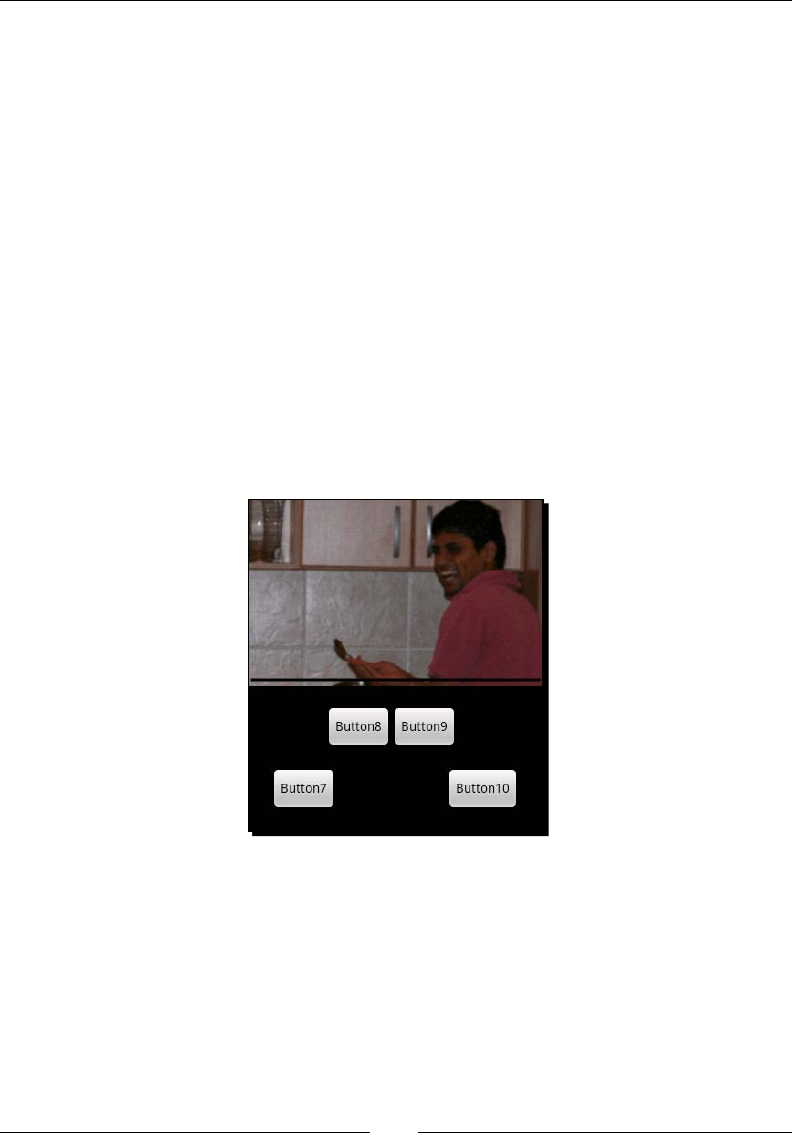
Developing Non-linear Layouts
[ 150 ]
The handle of this SlidingDrawer example is a simple ImageView, but it can be any View
or ViewGroup (a TableLayout, if you wanted). However, you want to avoid the handle
becoming interacve (that is, a Button or EditText widget). An interacve widget in the
handle will cause problems when the user touches it. Although the widget remains fully
funconal, and can be dragged up and down like a handle, touching it to start an interacon
will cause the SlidingDrawer to open or close itself. To stop this from happening, you
can oponally turn the "touch to toggle" opon of the SlidingDrawer o with the
allowSingleTap aribute:
<SlidingDrawer android:handle="@+id/handle"
android:content="@+id/content"
android:allowSingleTap="false"
android:layout_width="fill_parent"
android:layout_height="fill_parent">
That said, having an EditText (or similar) as a handle for a SlidingDrawer makes very
lile sense, and is likely to make your users rather irritated with you. As far as possible, you
should make sure that the handle of your SlidingDrawer widgets looks like something the
user can drag. The default handle of the launcher applicaon is a great example.
Summary
Working through the examples in this chapter should have given you a good look into
the layouts that are available by default in Android, as well as a look at how they are
implemented (and how new ones can be implemented when needed). In most cases, these
ViewGroup implementaons will serve any layout needs you have, but it remains important
to keep the following principals in mind when building Android layouts:

Chapter 5
[ 151 ]
Dierent devices have dierent size and resoluon screens
Use negave space (white space) and lines to separate groups of widgets
You will almost certainly need to modify the layout in the future
That last point is parcularly important when choosing to use the RelativeLayout class.
While it oers your far more power than the other implementaons, a badly put-together
RelativeLayout can be very dicult and me consuming to maintain.
In the coming chapter, we'll take a look at how capturing input, and the validaon of that
input should be taken as a user interface design decision. We'll also work through some
examples that can be used as a foundaon for future user interface developments.
6
Validating and Handling Input Data
Unfortunately, the validaon and handling of input in an applicaon is oen
an aerthought in the design process. These should be at the forefront of your
thoughts during the second round of dras for the user interface. A touchscreen
device oers many more opportunies to streamline the capturing of data from
the user, in many cases removing the need for sanitaon or validaon, while at
the same me massively improving the user's experience with the applicaon.
Android provides an excellent toolset to capture many dierent types of data from the user,
while also providing loose coupling between your applicaon components in the form of
Intent structures. By using several smaller Activity classes to capture data, while at the
same me abstracng the funconality to capture dierent types of input, you'll be able
to more easily reuse the input capturing Activity classes, not just within the applicaon,
but in other applicaons as well. Further, by registering the Activity correctly, you'll allow
other applicaons to override, or make use of your Activity implementaon, allowing the
users to select their preferred capturing mechanism.
Dealing with undesirable input
Oen applicaons require specic types of input from their users. An applicaon captures
input from its user in order for the user to tell it something about the world. This could be
anything, from what the user is looking for (that is, a search term), to something about the
users themselves (that is, their age). In most of these cases, the users can be guided in the
way they give the input using mechanisms, such as an auto-compleon box. However, if a
user can give you "undesirable" input, then somewhere along the line one of them will.
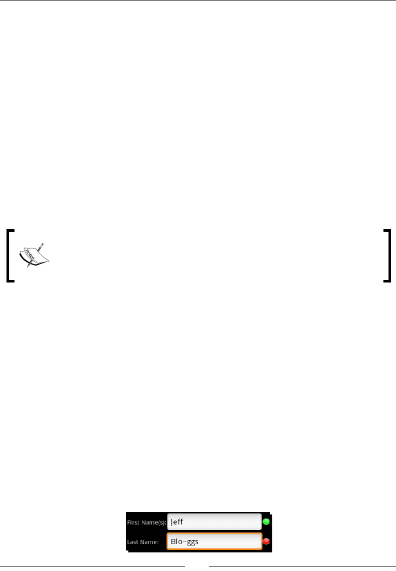
Validang and Handling Input Data
[ 154 ]
Undesirable input can be anything ranging from text where a number is expected, through to
a search term that yields no results. In both cases, you need to do three things:
1. Inform the user about the format you expect the data to be in
2. Let them know that they entered undesirable data
3. Let them re-enter the data
Correctly labeling input
Your rst defense against undesirable input from your users is to correctly label of an input
widget. This doesn't just mean, having a label that reads as follows:
Date of Birth (dd/mm/yy):
It means using the correct widget to capture the data. Your input widgets are a form of a
label, they indicate to the user what sort of data you expect them to enter. In many cases,
they can be used to stop the user from entering invalid data, or at least make it less likely.
Keep in mind the way that users expect things to work, and that they expect to
be able to select things quickly. If you need them to give your applicaon the
name of a country, don't use a Spinner and force them to scroll through a
seemingly endless list of names.
Signaling undesirable input
If the user does enter something unwanted or useless, you need to tell them, and fast! The
sooner you let the user know that they've given you something useless, the sooner they can
correct it and get back to using your applicaon.
A common mistake is to simply Toast the user when they press a Save or Submit buon.
While this is okay if you can only determine their mistake at that point, but you can almost
always gure it out beforehand.
Bear in mind that on a touchscreen device, while you have a "focused" widget, it doesn't
play the same role as on a desktop system, and the user isn't going to "tab" o the widget.
This means that as far as possible, your user interface should respond live to the user's
acons, not wait for them to do something else (that is, select another widget) before giving
them some feedback. If they do something that makes another form element invalid to use,
disable it. If they do something that makes a group of widgets invalid, hide the enre group
from them or put it on a dierent screen.

Chapter 6
[ 155 ]
Coloring and icons are both great ways to quickly tell the user they've got something wrong.
You can take the addional step of disabling any sort of Save, Next, or Submit buon when
you realize that some of the user's input is wrong. However, if you do disable such a buon,
ensure that it is clear which form element has undesirable data on it, and make sure it is on
their screen. A great alternave is to Toast the user when they select a Next buon, and
scroll to the invalid element.
Make use of background (or asynchronous) messages if you need to check the users' input
against some remote service. This will allow you to validate the user's content as they are using
the applicaon. It'll also allow you to signal that something is wrong without stopping them
from using the rest of the form. They can always come back to the invalid eld and correct it.
Recovering from undesirable input
Always ensure that xing a mistake is as painless as possible for the user. The more work
they have to do to correct a misspelled word (or similar), the more likely it is that they
will stop using the applicaon. The easiest way to recover from undesirable input (which
happens to t nicely with the above comments) is to tell the user about it before they have a
chance to move to another part of the process. However, this isn't always possible.
There are mes when you need to pop up a Please Wait dialog during a process that
will (generally as a side eect) validate the users input. In these cases, it's wise to use a
ProgressDialog so you don't move the user away from your current Activity during
this phase. This will have two important side eects:
You don't add unnecessary layers to the acvity stack
The input the user gave is sll available when you close the ProgressDialog
Giving users direct feedback
When accepng text or other keyboard input from the users, it's best to signal its validity
to the users while they are sll entering it. A common method is to use an ImageView to
the right of the EditText widget, and changing the image content to signal whether the
user has entered valid or invalid content. The image displayed in the ImageView can be set,
based on whether the input is currently valid or not. This gives the user a live view of the
validaon process. This mechanism also works well for signaling variable levels of validaon
(that is, when the input is not strictly valid or invalid, but rather good quality or undesirable
quality), such as in the case of a password input.
You can either make use of image icons, or simply use an Android drawable XML resource to
represent the validity (that is, green for valid, red for invalid). This also means that your icon
will scale to any size that you prescribe to it in your layout XML le.
Validang and Handling Input Data
[ 156 ]
Colors and icons
It's oen a good idea to use a non-color indicator to dierenate icons. Someone
who is color blind may nd it dicult or impossible to tell the dierence
between two icons unless you change the shape as well as the color. Having your
"valid" icon as a green circle, and your "invalid" icon as a red hexagon will make
your applicaon more usable.
In order to avoid cluering your screen with icons, you may want to display only the
validaon icon next to the eld the user is currently working with. It's a good idea however,
to make use of the INVISIBLE View state instead of GONE in order to avoid changing the
layout when the user changes the focus of the user interface. At the same me, please
ensure that validaon icons are the same size.
Avoiding invalid input entirely
Remember that with a mobile device, me is oen a constraint for the user. For this reason
(and for simple usability reasons) you should generally strive to avoid invalid input from your
users enrely. Android provides you with several mechanisms with which to do this, and
it's wise to make use of them at every opportunity. Generally, you will want to make use of
widgets that avoid validaon requirements. This is almost always an opon in Android, and
even when your requirements are more complex than simple type informaon, you can
generally customize the widget to stop the user from breaking your validaon rules.
Capturing date and time
As we've already discussed, when inpung date and me you should make use
of DatePicker and TimePicker widgets, or the DatePickerDialog and
TimePickerDialog to avoid the layout issues that the primive widgets introduce.
Avoid creang your own calendar widget unless it's a hard requirement of your
applicaon. You may not like how a DatePickerDialog looks, but users have
seen them in other Android applicaons and know how to use them. It's also
possible that these standard widgets are improved in future Android releases,
giving your applicaon an improvement with no work from your side.
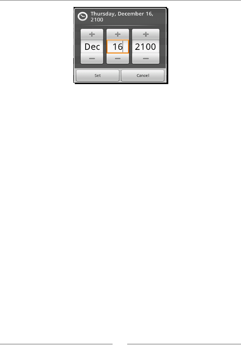
Chapter 6
[ 157 ]
You may nd that you need addional validaon for date and me inputs, especially when
capturing date or me ranges. For example, if you ask a user for a date of birth, the user
shouldn't be able to enter a eld that indicates any me later than "today" (unless it's an
expected date of birth). While the DatePicker class has an event listener which allows you
to listen for changes to its data (and DatePickerDialog implements this event listener),
you cannot use this event listener to cancel the change event.
Therefore, in order to Cancel the event, you need to change the input back to something
valid while the event is execung. This is a surprisingly simple trick in Android. Since the
events are executed on the same thread that does the painng, it allows you to change the
value before the invalid data is rendered on the screen. The following is a simple example
of a ValidatingDatePickerDialog which you can use in order to implement a simple
level of date validaon in your applicaon. Another such class could be easily wrien for
TimePickerDialog if you needed one.
public class ValidatingDatePickerDialog extends DatePickerDialog {
private int lastValidYear;
private int lastValidMonth;
private int lastValidDay;
private ValidationCallback callback = null;
public ValidatingDatePickerDialog(
final Context context,
final OnDateSetListener callBack,
final int year,
final int monthOfYear,
final int dayOfMonth) {
super(context, callBack, year, monthOfYear, dayOfMonth);
setValidData(year, monthOfYear, dayOfMonth);
}
protected void setValidData(
final int year,
Downloa d f r o m W o w ! e B o o k < w w w.woweb o o k . c o m >

Validang and Handling Input Data
[ 158 ]
final int monthOfYear,
final int dayOfMonth) {
lastValidYear = year;
lastValidMonth = monthOfYear;
lastValidDay = dayOfMonth;
}
@Override
public void onDateChanged(
final DatePicker view,
final int year,
final int month,
final int day) {
if(callback != null && !callback.isValid(year, month, day)) {
view.updateDate(
lastValidYear,
lastValidMonth,
lastValidDay);
} else {
super.onDateChanged(view, year, month, day);
setValidData(year, month, day);
}
}
public void setValidationCallback(
final ValidationCallback callback) {
this.callback = callback;
}
public ValidationCallback getValidationCallback() {
return callback;
}
public interface ValidationCallback {
boolean isValid(int year, int monthOfYear, int dayOfMonth);
}
}
This method of handling validaon can be used in most Android widgets that don't oer
implicit validaon of their events, and it oers a much beer user experience than giving
the user a Toast with the text Please enter a valid date of birth. It also avoids the need for
addional layers of validaon in your applicaon.

Chapter 6
[ 159 ]
Using spinners and ListView for selection
There are many mes when the user needs to select something from a list of possible values
in an applicaon. We've already discussed Spinner and ListView widgets in Chapter 2,
Presenng Data for Views. However, they oer several features that can be very useful when it
comes to validaon. They are implicitly validated widgets, that is, it's impossible for the user to
enter incorrect data since the possible values for input are dened by the applicaon. However,
what about when the set of valid items changes based on other user input, or some external
source of informaon? In these cases, several opons are available to you.
Changing the data set
The simplest method of stopping the user from selecng a value that is no longer valid is to
remove it from the data set. We've already done a similar thing in BurgerAdapter, in Chapter
2, Presenng Data for Views, where we modied the data set when the user touched certain
items. Modifying the data set of an AdapterView is a good idea because it "takes the opon
o the menu". However, it doesn't work well with the Spinner class, since, if the item is
removed o the screen, the user will be le wondering what happened to the item that was
there just a second ago (and may be concerned that they are going mad).
In order not to confuse or frustrate your users, you should only remove items from a
Spinner or ListView data set if the item will probably not be added back into the data set.
A good example of this requirement is a list of Wi-Fi networks available, or Bluetooth devices
within range. In both of these cases, the list of available items is dened by the environment.
The user will accept that the displayed opons are not always going to be available to them,
and new items may appear from me to me.
Disabling selections
An alternave and usually more user-friendly method of stopping certain items from being
selected is to disable them. You can make the ListView or Spinner ignore items by
overriding the isEnabled(int) method in the ListAdapter class. However, this method
will only disable the item at the event level, the item will sll appear as enabled (it's primary
purpose is to dene separator views).
In order to visually disable an item, you'll need to disable the View that the item is displayed
in. This is a very eecve way of telling the user, "You've changed something that has made
this item unavailable". Graphically disabling an item also lets the user know that it may
become available in the future.
Validang and Handling Input Data
[ 160 ]
Capturing text input
The most dicult inputs to work with are the various forms of text input. I nd that working
with a so keyboard may not be as quick as working with a hardware keyboard, but from a
development point of view it oers something that a hardware keyboard does not—exibility.
When I want to enter text into a eld, a so keyboard's state will indicate the type of input that
is valid for that eld. If I'm supposed to enter a phone number, the keyboard can display only
numbers, or even change into a dial pad. This not only indicates to me what I'm supposed to
do, but also stops me from inpung anything that would cause a validaon error.
The Android TextView (and thus the EditText) widgets provide you with a host of
dierent opons and methods by which you can dene complex validaon rules for text
input. Many of these opons are also understood by various so keyboards, allowing
them to display subsets of the full keyboard based on how the TextView widget has been
congured. Even if not fully understood by the so keyboard (or if a hardware keyboard
is in use), the rules of the specied opon must be adhered to. The easiest way to tell the
EditText what type of data you want it to capture is with the inputType XML aribute.
As you'll see from the inputType documentaon, all of its possible values are dierent
combinaons of the bit masks available in the android.view.inputmethod.InputType
interface. The opons available as values to the inputType aribute will cover most
cases where you need to capture a specic type of input. You can also create your
own, more complex input types by using the TextView.setRawInput or TextView.
setKeyboardListener methods.
Keyboard listeners
As far as possible, you should either use the input type or a standard
KeyListener to handle your text validaon. Wring a KeyListener is a
non-trivial task, and in some cases may see you implemenng a custom so
keyboard. A KeyListener in Android, which denes an input type other
than TYPE_NULL, may not have its listener events (onKeyDown, onKeyUp,
and onKeyOther) invoked at all if a so keyboard is present. The key events
of a KeyListener are only used to accept or reject events from a hardware
keyboard. Soware keyboards use the input type aribute of a TextView to
decide what funconality they should provide to the user.
Autocompleting text input
The Spinner and ListView widgets are great ways to ask your user to select from a
predened list of opons. However, both have a major aw in that they don't scale well to
very long lists. While the implementaon and performance are both very good, users just
don't like looking through massive lists of data. The standard way to solve this problem is to
provide an auto completed text input widget.
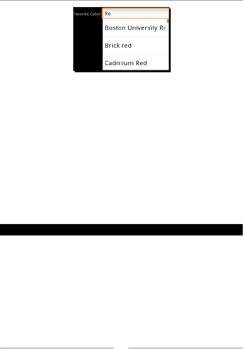
Chapter 6
[ 161 ]
Autocompleted input widgets are also oen used with a history of past opons that the user
has given, or to suggest possible ways the user may want to "complete" their input. The
Android AutoCompleteTextView widget is an EditText with autocompleon capabilies.
It uses a ListAdapter (which must also implement the Filterable interface) to nd and
display the list of possible suggesons to the user.
However, an AutoCompleteTextView has two major aws:
It's sll a TextView and the user is not forced to select one of the suggested items,
this means that its content must be validated separately.
The suggeson list is displayed directly below the widget, consuming a fair amount
of screen space. Combined with a so keyboard for input, the user interface may
become cluered or almost unusable on a small screen
Both of these issues can be solved by using the AutoCompleteTextView class carefully and
sparingly. They are brilliantly useful when you need a search box, URL input, or something
similar but they are oen not suitable for placing in the middle of the screen (they are best
placed at the top where they have plenty of space for the suggeson list).
Pop quiz
1. When does the onKeyDown event in KeyboardListener get invoked?
a. When a system-wide key down event is broadcast
b. Depends on whether the system has a hardware keyboard
c. When a hardware keyboard key is pressed
d. When one of the hardware interface control buons is pressed
2. When would you use a Toast to nofy the user of a validaon error?
a. When they make a mistake (that is, check a checkbox that shouldn't be checked)
b. Aer they tab o the invalid widget
c. Aer receiving a validaon error from an external service

Validang and Handling Input Data
[ 162 ]
3. In an IM (Instant Messaging) applicaon, if one of the user's contacts goes oine,
how do you update the ListView of contacts to reect this change?
a. Graphically disable the users icon in the ListView and move it to the boom
of the ListView
b. Remove the user from the ListView
c. Disable the users icon in the ListView
Building activities for results
There are mes when none of the default widgets in Android will fulll your input
requirements on their own, and you need some sort of composite input structure. In these
cases, you can either create a Dialog widget, or build a new Activity. Dialog widgets
are useful when their content is kept small (two or three lines of widgets at maximum)
because they visually remain on top of the current Activity. However, this means that
they consume addional resources (since their calling Activity cannot be swapped out
into the background), and because they have their own decoraons they don't have as much
available screen space to work on as an Activity.
In Chapter 4, Leveraging Acvies and Intents, we discussed the noon of Activity classes
that hand data back to their callers. This is a great technique to use when you need some
addional form of validaon or you want to isolate a parcular input widget (or group
of widgets). You can specify some result data in the Activity.setResult methods.
Generally, an Acitivity would just specify a success or failure result (using the RESULT_OK
and RESULT_CANCELLED constants). It's also possible to hand back data by populang an
Intent for the purpose:
Intent result = new Intent();
result.putExtra("paymentDetails", paymentDetails);
setResult(RESULT_OK, result);
The Intent data will be passed into the parent Activity object's onActivityResult
method when you invoke the finish() method, along with the result code.
Generic ltering search Activity
As discussed earlier in the chapter, there are mes where you have a predened list of
objects and you want your user to select one of them. The list is too large for the user to
scroll through (for example, a list of all the countries in the world), but it's also a dened list,
so you don't want them to be able to select free text.
Chapter 6
[ 163 ]
In this case, a lterable ListView is generally the best suited opon. While the ListView
class has ltering capabilies, it doesn't work very well (if at all) on devices without hardware
keyboards. For this reason, it's wise to make use of an EditText widget to allow the user to
lter the contents of the ListView.
This sort of requirement is a very common one, and so in this secon we'll look at building an
Activity that is almost enrely generic in its capability to lter and select data. This example
will provide two mechanisms for displaying the data to the user. One through a Cursor, and
another through a simple Object array. In both cases, the task of ltering the ListView is le
up to the ListAdapter implementaon, keeping the implementaon relavely simple.
Time for action – creating the ListItemSelectionActivity
This is a fairly large and somewhat complex example to work through, so I'll break it into
bite size chunks, each with a goal. The rst thing we want is an Acitivity class with a nice
looking layout. The layout we'll build is an EditText above a ListView, each one with an
ID that can be used by the Acitivity.
1. Create a new project to contain your ListItemSelectionActivity class:
android create project -n Selector -p Selector -k com.packtpub.
selector -a ListItemSelectionActivity -t 3
2. Open the res/layout/main.xml le in an editor or IDE.
3. Remove any of the default layout code.
4. Ensure that the root element is a LinearLayout consuming the available screen
space in the Activity:
<LinearLayout
xmlns:android="http://schemas.android.com/apk/res/android"
android:orientation="vertical"
android:layout_width="fill_parent"
android:layout_height="fill_parent">"
5. Inside the root element, declare an EditText with an ID of input and an
inputType of textFilter to indicate that it will lter another widget's content:
<EditText android:id="@+id/input"
android:inputType="textFilter"
android:layout_width="fill_parent"
android:layout_height="wrap_content"/>
6. Aer the EditText, we declare a ListView which consumes the remaining space:
<ListView android:id="@+id/list"
android:layout_width="fill_parent"
android:layout_height="fill_parent"/>
Validang and Handling Input Data
[ 164 ]
7. Open the ListItemSelectionActivity Java source le in an editor or IDE.
8. Declare a ListAdapter eld at the top of the class:
private ListAdapter adapter;
9. Aer the ListAdapter eld, declare a Filter eld:
private Filter filter;
10. In the onCreate method, make sure you are loading the main.xml as the content
view for the ListItemSelectionActivity:
setContentView(R.layout.main);
11. Then fetch the ListView declared in the XML le for our later use:
ListView list = (ListView)findViewById(R.id.list);
12. Finally, fetch the EditText declared in the XML le for our later use:
EditText input = (EditText)findViewById(R.id.input);
What just happened?
You've now got a skeleton of the ListItemSelectionActivity class. The applicaon will
be able to run at this point, presenng you with an empty ListView and an EditText. The
ListAdapter and Filter elds declared at the top of the class will be used in later stages
to hold the list informaon, and lter what is visible on the screen.
Time for action – creating an ArrayAdapter
The ListItemSelectionActivity class will accept list content from two dierent
sources. You can either specify a database query Uri that will be used to select two columns
from an external source, or you can specify an Object array as extra data in the Intent
object. For the next task, we'll write a private ulity method to create an ArrayAdapter
from the Intent object.
1. Open the ListItemSelectionActivity Java source le in your editor or IDE.
2. Declare a new ulity method to create a ListAdapter for Intent:
private ListAdapter createArrayAdapter(Intent intent) {
3. Fetch an Object array from the extra data in Intent:
Object[] data = (Object[])intent.getSerializableExtra("data");
Chapter 6
[ 165 ]
4. If the array is not null, and not empty, return a new ArrayAdapter object which
will display the contents of the array in the standard list item resources dened by
Android:
if(data != null && data.length > 0) {
return new ArrayAdapter<Object>(
this,
android.R.layout.simple_list_item_1,
data);
5. If the array is either null or empty, throw an IllegalArgumentException:
else {
throw new IllegalArgumentException(
"no list data specified in Intent: "
+ intent);
}
What just happened?
You just wrote a very basic ulity method to extract an Object array from an Intent, and
return it. The method throws an IllegalArgumentException if the array doesn't exist,
or if it's empty. This is a valid response since we will look for the array aer looking for a
database query. If we aren't given any data from outside, then this Activity cannot be
executed. It's useless to ask a user to select an item from a blank list.
Remember that it's intended that this Activity be started by another
Activity, not directly by the user through the applicaons menu. For that
reason, we want to give useful feedback to ourselves or other developers when
the Activity is not used in the way it's intended.
Time for action – creating the CursorAdapter
The CursorAdapter is much more complex to set up than the ArrayAdapter. For
one thing, we oer more opons with the CursorAdapter than we did with the
ArrayAdapter. Our CursorAdapter can be made to display either one or two line list
items, based on whether there are one or two columns specied. While the ArrayAdapter
includes some default ltering logic, we need to provide a lile more support for the
CursorAdapter.
1. To start with, we allow for two dierent column naming convenons to be used,
along with some defaults. Declare a ulity method to nd the expected column
names from the Intent:

Validang and Handling Input Data
[ 166 ]
private String getColumnName(
final Intent intent,
String primary,
String secondary,
String def) {
2. First, try and use the primary aribute name to get a column name:
String col = intent.getStringExtra(primary);
3. If the column name is null, try the secondary aribute name:
if(col == null) {
col = intent.getStringExtra(secondary);
}
4. If the column name is sll null, use the default value:
if(col == null) {
col = def;
}
5. return the column name:
return col;
6. Now, declare another ulity method that will create the actual CursorAdapter to
be used in the ListView:
private ListAdapter createCursorAdapter(Intent intent) {
7. Find the name of the rst column to be displayed:
final String line1 = getColumnName(intent, "name", "line1",
"name");
8. Find the name of the oponal second column to be displayed:
String line2 = getColumnName(
intent, "description", "line2", null);
9. We now have two possible paths—a single line list item, or a double line list item.
These are very similar in their construcon, so we declare some variables to hold
those values that are dierent between the two paths:
int listItemResource;
final String[] columns;
String[] displayColumns;
int[] textIds;
10. If the line2 column name has been specied, we use the following code:
if(line2 != null) {

Chapter 6
[ 167 ]
11. We will be using a two-line list item resource:
listItemResource = android.R.layout.two_line_list_item;
12. The database query needs to select the _id column, and both columns that were
specied in the Intent:
columns = new String[]{"_id", line1, line2};
13. However, the list items will only display the two specied columns:
displayColumns = new String[]{line1, line2};
14. The CursorAdapter needs to know the resource IDs of the TextView widgets
declared in the two_line_list_item resource:
textIds = new int[]{android.R.id.text1, android.R.id.text2};
15. If the second column name was not specied in the Intent, the ListView should
have single-line items:
else {
listItemResource = android.R.layout.simple_list_item_1;
16. We only need to request the _id column, and the single column name:
columns = new String[]{"_id", line1};
17. The items in the list should have the contents of the requested column in them:
displayColumns = new String[]{line1};
18. We don't need to tell the CursorAdapter which widget ID to look for in a single-
line list item resource:
textIds = null;
19. Aer the else clause, we will have the required variables populated. We can run
our inial database query and get the full list of data for presenng it to the user:
Cursor cursor = managedQuery(
intent.getData(),
columns,
null,
null,
line1);

Validang and Handling Input Data
[ 168 ]
20. We can now create the CursorAdapter to wrap the database Cursor object for
the ListView. We use the SimpleCursorAdapter implementaon:
CursorAdapter cursorAdapter = new SimpleCursorAdapter(
this,
listItemResource,
cursor,
displayColumns,
textIds);
21. In order for the user to lter the list, we need to give the CursorAdapter a
FilterQueryProvider. Declare the FilterQueryProvider as an anonymous
inner class:
cursorAdapter.setFilterQueryProvider(
new FilterQueryProvider() {
22. Inside the anonymous FilterQueryProvider, declare the runQuery method
which will be called each me the user types a key:
public Cursor runQuery(CharSequence constraint) {
23. We can return a managedQuery which simply performs an SQL LIKE on the rst
column that we are rendering in the ListView:
return managedQuery(
intent.getData(),
columns,
line1 + " LIKE ?",
new String[] {constraint.toString() + '%'},
line1);
24. Finally, the createCursorAdapter method can return the CursorAdapter:
return cursorAdapter;
What just happened?
This ulity method handles the creaon of the CursorAdapter for the me when a query
Uri is specied in our Intent. This structure allows ltering of very large data sets, since
it's (generally) built on top of the SQL Lite database. Its performance is directly related to the
structure of the database table it will query.
As a result of the potenally enormous size of a database query, the CursorAdapter classes
don't do any ltering of the data set themselves. Instead, you are required to implement the
FilterQueryProvider interface to create and run a new query for each change to the
lter. In the preceding example, we created a Cursor which is exactly the same as the default
Cursor, but we add selection and selectionArgs to the query. This LIKE clause will tell
SQL Lite to only return rows starng with the lter that the user has typed.

Chapter 6
[ 169 ]
Time for action – setting up the ListView
We now have implementaons to create both types of ListAdapter that this Activity can
lter. Now we need a ulity method to gure out which one to use, and return it; and then we
want to use the new ulity method to set the ListAdapter on the ListView widget.
1. Declare a new method to create the desired ListAdapter object:
protected ListAdapter createListAdapter() {
2. Fetch the Intent object that was used to start the Activity:
Intent intent = getIntent();
3. If the data Uri in the Intent is not null, return a CursorAdapter for the given
Intent. Otherwise, return an ArrayAdapter for the given Intent:
if(intent.getData() != null) {
return createCursorAdapter(intent);
else {
return createArrayAdapter(intent);
}
4. In the onCreate method, aer nding the two View objects from the layout, create
the desired ListAdapter with the new ulity method:
adapter = createListAdapter();
5. Assign the Filter eld to the Filter given by the ListAdapter:
filter = ((Filterable)adapter).getFilter();
6. Set the ListAdapter on the ListView:
list.setAdapter(adapter);
What just happened?
This code now references both the created ListAdapter object and the Filter that it
works with. You'll noce that if you run the applicaon now, you'll get a Force Close dialog
when you open it. That's because the code now requires some sort of data to populate
the ListView with. While not desirable for a normal applicaon, this is really a reusable
component which could be used in a variety of situaons.

Validang and Handling Input Data
[ 170 ]
Time for action – ltering the list
Although the code is all set up to display the list, and even to lter it, we haven't yet
aached the EditText box to the ListView, so typing in the EditText will have
absolutely no eect at the moment. We need to listen for changes to the EditText box,
and request that the ListView be ltered based on what is typed. This will involve the
ListItemSelectionActivity class listening for events on the EditText and then asking
the Filter object to narrow the available set of items.
1. The ListItemSelectionActivity should be made to implement the
TextWatcher interface:
public class ListItemSelectionActivity extends Activity
implements TextWatcher
2. Aer seng the ListAdapter on the ListView in the onCreate method, add
the ListItemSelectionActivity as a TextWatcher on the EditText widget:
input.addTextChangedListener(this);
3. You'll need to declare empty implementaons of the beforeTextChanged and
onTextChanged methods, since we're not really interested in these events:
public void beforeTextChanged(
CharSequence s,
int start,
int count,
int after) {
}
public void onTextChanged(
CharSequence s,
int start,
int count,
int after) {
}
4. Then declare the afterTextChanged method, which we are interested in:
public void afterTextChanged(Editable s) {
5. In the afterTextChanged method, we simply ask the Filter of the current
ListAdapter to lter the ListView:
filter.filter(s);
Chapter 6
[ 171 ]
What just happened?
The TextWatcher interface is used in order to track changes to a TextView widget.
Implementaons will be able to listen for any changes to the actual content of the
TextView, regardless of the source of the change. While the OnKeyListener and
KeyboardListener interfaces are mostly there to handle hardware keyboard events, the
TextWatcher handles changes from hardware keyboards, so keyboards, and even internal
calls to TextView.setText.
Time for action – returning the selection
The ListItemSelectionActivity can now be used to display a list of possible items, and
lter through them by typing in an EditText above the ListView. However, we have no
way of leng the user actually select one of the opons from the ListView in order to pass
it back to our parent Activity. This requires nothing more than a simple implementaon
of the OnItemClickListener interface.
1. The ListItemSelectionActivity class now needs to implement the
OnItemClickListener interface:
public class ListItemSelectionActivity extends Activity
implements TextWatcher, OnItemClickListener {
2. Aer registering as a TextWatcher in the onCreate method, register as an
OnItemClickListener on the ListView:
list.setOnItemClickListener(this);
3. Override the onItemClick method to listen for the user's selecon:
public void onItemClick(
AdapterView<?> parent,
View clicked,
int position,
long id) {
4. Create an empty Intent object to pass back to our parent Activity:
Intent data = new Intent();
5. If the ListAdapter is a CursorAdapter, the id passed into the onItemClick will
be the database _id column value for the selecon. Add this value to the Intent:
if(adapter instanceof CursorAdapter) {
data.putExtra("selection", id);
Downloa d f r o m W o w ! e B o o k < w w w.woweb o o k . c o m >

Validang and Handling Input Data
[ 172 ]
6. If the ListAdapter is not a CursorAdapter, we add the actual selected Object
to the Intent:
else {
data.putExtra(
"selection",
(Serializable)parent.getItemAtPosition(position));
}
7. Set the result code to RESULT_OK, and pass the Intent back:
setResult(RESULT_OK, data);
8. The user has made their selecon, so we're now nished with this part:
finish();
What just happened?
The ListItemSelectionActivity is now complete and ready for use. It oers much
the same funconality as an AutoCompleteTextView, except that being an independent
Activity, it oers the user a much larger list of suggesons, and the user must select an
item from the ListView instead of being able to simply type their input data.
Using the ListItemSelectionActivity
You will need to specify what data you want the user to select from, as part of the Intent
that starts a ListItemSelectionActivity. As already discussed, there are eecvely
two paths:
Pass in an array of some sort (which is perfect for use within your own applicaon)
Give it a database query Uri and the column names you want displayed (which is
great if you want to use it from another applicaon)
Since the ListItemSelectionActivity returns its selecon (and it's not much use if
it doesn't), you need to start it with the startActivityForResult method instead of
the normal startActivity method. If you want to pass it an array of String objects
to select from, you could use something similar to the following intent = new Intent(this,
ListItemSeleconAcvity.class):
intent.putExtra("data", new String[] {
"Blue",
"Green",
"Red",
// more colors
});
startActivityForResult(intent, 101);
Chapter 6
[ 173 ]
Given enough colors in the above data array, you would be presented with a
ListItemSelectionActivity screen which could be ltered for the user's desired color.
The following is a screenshot of how the resulng screen would look:
In order to receive the results back from the ListItemSelectionActivity, you will
need to listen for the results in the onActivityResult method (as discussed in Chapter 4,
Leveraging Acvies and Intents). If, for example, you simply wanted to Toast the result of
the conrmed selecon, you could use the following code:
@Override
protected void onActivityResult(
int requestCode,
int resultCode,
Intent data) {
super.onActivityResult(requestCode, resultCode, data);
if(requestCode == 101 && resultCode == RESULT_OK) {
Object obj = data.getSerializableExtra("selection");
Toast.makeText(
this,
String.valueOf(obj),
Toast.LENGTH_LONG).show();
}
}

Validang and Handling Input Data
[ 174 ]
Finally, how would you use a database query with the ListItemSelectionActivity?
This is amazingly easy to show, and is probably the most excing feature of the
ListItemSelectionActivity. The following code snippet will let the user select one of
the contacts from their phone book:
Intent intent = new Intent(
this,
ListItemSelectionActivity.class);
intent.setData(People.CONTENT_URI);
intent.putExtra("line1", People.NAME);
intent.putExtra("line2", People.NUMBER);
startActivityForResult(intent, 202);
Have a go hero!
The ListItemSelectionActivity can lter and select almost anything. Try building up a
list of all the countries in the world (many such lists are available online), and then create an
Activity which asks you to select one using a ListItemSelectionActivity.
Summary
How you accept input from your users, and how you validate that input plays a crucial part in
the overall experience your users will have with your applicaon. Soware should help the
users along and tell them what it expects at each step. This not only makes an applicaon
easier to use, but also much faster to work with.
Using the ListItemSelectionActivity, will oen help your users trawl through large
data sets, while protecng them from making a choice that they don't want to, or is invalid.
It's a very commonly used type of widget and is seen in many dierent applicaons (in various
forms). Android, at present, doesn't have a generic class to perform this job quite as easily.
In the next chapter, we'll start taking a look at a fairly modern form of user feedback:
animaon. Android has excellent support, not just for animang parts of your user
interface, but also for composing complex custom animaons. Animaon can play a vital
part in a user's enjoyment of an applicaon. This is not only because it looks great, but
also because it gives visual queues of what the applicaon is currently doing, and what
eect their acons are having.
7
Animating Widgets and Layouts
Animaons are an important element in the user interface design of a modern
applicaon. However, it's also easy to overuse animaons in your designs. A
general guideline for animaon use in a non-game applicaon is—only animate
user interacons and nocaons, and keep the duraon short so that it
doesn't impact the user's experience negavely. For a game, more animaon is
generally acceptable (or even expected).
So why animate user interacon and not (for example) the background of your applicaon?
For one thing, animang the background of an applicaon is distracng, and if you are trying
to capture or present important informaon to the user, it's unprofessional (no maer how
good it looks). Animaons are also very important in regards to nocaons. Movement
on the screen draws aenon, thus what would normally be a large pop-up dialog can be
replaced by a small animang icon. A perfect example of such an icon is the "downloading"
icon which is placed at the top le of the nocaon area of an Android device when the
Android Market applicaon is downloading new soware or updates.
Layout animaons and transions provide useful status informaon to the user. When using
a screen transion you tell your user what has just happened, or what is about to happen.
Dierent transions signify dierent events to your users, knowing what transion to use for
each dierent acvity will let your users know what kind of acon is about to be taken. Layout
animaons are an important part of your user feedback, leaving them out or using the wrong
one in the wrong place can leave your users irritated, or slightly confused ("change dazed").
Using the right animaons will improve user experience, and can even speed up their use of
the applicaon by giving them brief cues as to what they are expected to do next.

Animang Widgets and Layouts
[ 176 ]
In this chapter, there are two primary types of animaon which we will be looking at—
widget animaons and layout animaons. We'll look at the standard animaon structures
provided by Android, and we'll look at how to create new animaon types and extend the
exisng ones. We'll also be looking at ming and "good pracce" use of animaons, and
keeping users happy without slowing them down or distracng them.
Using standard Android animations
Any View or ViewGroup object in Android can have an animaon aached to it. Animaons
are generally dened as applicaon resources in an XML le, and Android provides a few
useful defaults in the android package. Android also includes several View classes which
are designed specically to handle animaons. With these classes you will nd that they
have layout aributes which allow you to set a parcular types of animaons that will be
used upon certain acons. However, animaons are generally not specied in a layout le,
instead they rely on the Java code to set and start Animation objects.
The main reason why animaons are not normally specied as part of the layout XML is very
simple—when should they run? Many animaons can be used as a response to user input,
leng the user know what's happening. Most animaons will in some way or the other be
triggered by a user's acon (unless they are there to serve as a nocaon). Thus you will
need to specify both—which animaon to run on a widget, and the signal about when the
animaon should run. The default Android animaons will begin animang immediately,
while other animaon structures may have a scheduled delay before they start.
Time for action – animating a news feed
We'll start o by creang a selector Activity and a simple NewsFeedActivity. In a news
feed, we'll animate the latest headlines "in and out" using a mer. For this example we'll be
working with some of the default animaons provided by Android and driving the process
mainly through the layout resources.
1. Create a new project to contain the animaon examples from this chapter, with a
main Activity named AnimationSelectionActivity:
android create project -n AnimationExamples -p AnimationExamples
-k com.packtpub.animations -a AnimationSelector -t 3
2. Open the res/layout/main.xml layout le in an editor or IDE.
3. Clear out the default content of the layout resource.

Chapter 7
[ 177 ]
4. Declare a vercal LinearLayout consuming all the available screen space:
<LinearLayout
xmlns:android="http://schemas.android.com/apk/res/android"
android:orientation="vertical"
android:layout_width="fill_parent"
android:layout_height="fill_parent">
5. Create a Button labeled News Feed to link to the rst animaon example:
<Button android:id="@+id/news_feed"
android:layout_width="fill_parent"
android:layout_height="wrap_content"
android:layout_marginBottom="10dip"
android:text="News Feed"/>
6. Create a new layout resource le named news.xml.
7. Declare a vercal LinearLayout containing all of the available screen space:
<LinearLayout
xmlns:android="http://schemas.android.com/apk/res/android"
android:orientation="vertical"
android:layout_width="fill_parent"
android:layout_height="fill_parent">"
8. Add a TextSwitcher object to the LinearLayout, specifying the "in" and "out"
animaons to the default "slide" animaons:
<TextSwitcher
android:id="@+id/news_feed"
android:inAnimation="@android:anim/slide_in_left"
android:outAnimation="@android:anim/slide_out_right"
android:layout_width="fill_parent"
android:layout_height="wrap_content"
android:text=""/>
9. Open the res/values/strings.xml le in an editor or IDE.
10. Declare a string-array named headlines with elements for some mock news
headlines:
<string-array name="headlines">
<item>Pwnies found to inhabit Mars</item>
<item>Geeks invent \"atoms\"</item>
<item>Politician found not lying!</item>
<!-- add some more items here if you like -->
</string-array>
11. In the generated root package, declare a new Java source le named
NewsFeedActivity.java.

Animang Widgets and Layouts
[ 178 ]
12. Register the NewsFeedActivity class in your AndroidManifest.xml le:
<activity android:name=".NewsFeedActivity" android:label="News
Feed" />
13. The new class should extend the Activity class and implement Runnable:
public class NewsFeedActivity
extends Activity implements Runnable {
14. Declare a Handler to be used as a ming structure for changing the headlines:
private final Handler handler = new Handler();
15. We need a reference to the TextSwitcher object:
private TextSwitcher newsFeed;
16. Declare a string-array to hold the mock headlines you added to the strings.xml
le:
private String[] headlines;
17. You'll also need to keep track of which headline is currently being displayed:
private int headlineIndex;
18. Override the onCreate method:
protected void onCreate(final Bundle savedInstanceState) {
19. Invoke the onCreate method of Activity:
super.onCreate(savedInstanceState);
20. Set the content view to the news layout resource:
setContentView(R.layout.news);
21. Store a reference to the headline string-array from the strings.xml applicaon
resource le:
headlines = getResources().getStringArray(R.array.headlines);
22. Find the TextSwitcher widget and assign it to the eld declared earlier:
newsFeed = (TextSwitcher)findViewById(R.id.news_feed);

Chapter 7
[ 179 ]
23. Set the ViewFactory of the TextSwitcher to a new anonymous class that will
create TextView objects when asked:
newsFeed.setFactory(new ViewFactory() {
public View makeView() {
return new TextView(NewsFeedActivity.this);
}
});
24. Override the onStart method:
protected void onStart() {
25. Invoke the onStart method of the Activity class:
super.onStart();
26. Reset the headlineIndex so that we start from the rst headline:
headlineIndex = 0;
27. Post the NewsFeedActivity as a delayed acon using the Handler:
handler.postDelayed(this, 3000);
28. Override the onStop method:
protected void onStop() {
29. Invoke the onStop method of the Activity class:
super.onStop();
30. Remove any pending calls to the NewsFeedActivity:
handler.removeCallbacks(this);
31. Implement the run method which we'll use to swap to the next headline:
public void run() {
32. Open a try block to swap the headline inside.
33. Use the TextSwitcher.setText method to swap to the next headline:
newsFeed.setText(headlines[headlineIndex++]);
34. If the headlineIndex is past the total number of headlines, reset the
headlineIndex to zero:
if(headlineIndex >= headlines.length) {
headlineIndex = 0;
}

Animang Widgets and Layouts
[ 180 ]
35. Close the try block, and add a finally block. In the finally block, post the
NewsFeedActivity back onto the Handler queue:
finally {
handler.postDelayed(this, 3000);
}
36. Open the auto generated AnimationSelector Java source in an editor or IDE.
37. The AnimationSelector class needs to implement OnClickListener:
public class AnimationSelector
extends Activity implements OnClickListener {
38. In the onCreate method, ensure that the content view is set to the main layout
resource created earlier:
setContentView(R.layout.main);
39. Find the declared Button and set its OnClickListener to this:
((Button)findViewById(R.id.news_feed)).
setOnClickListener(this);
40. Declare the onClick method:
public void onClick(final View view) {
41. Use a switch to determine which View was clicked:
switch(view.getId()) {
42. If it's the news feed Button, then use the following case:
case R.id.news_feed:
43. Start the NewsFeedActivity using a new Intent:
startActivity(new Intent(this, NewsFeedActivity.class));
44. Break from the switch statement, thus nishing the onClick method.
What just happened?
The TextSwitcher is an example of an animaon ulity View. In this case it's the perfect
structure to swap between the news headlines, displaying one headline at a me and
animang a transion between each of the texts. The TextSwitcher object creates two
TextView objects (using the anonymous ViewFactory class). When you use the setText
method, the TextSwitcher changes the text of the "o screen" TextView and animates a
transion between the "on screen" TextView and the "o screen" TextView (with the new
text content displayed).
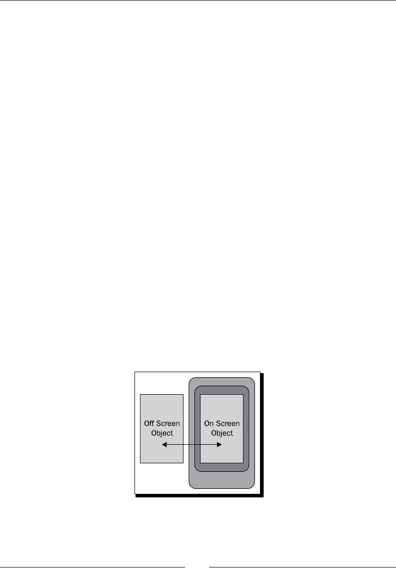
Chapter 7
[ 181 ]
The TextSwitcher class requires that you specify two animaon resources for it to work
with, in order to create its transion eect:
Animate text onto the screen
Animate text o the screen
In the previous case, we made use of the default slide_in_left and slide_out_right
animaons. Both of these are examples of translaon-based animaons due to the fact that
they actually alter the "on screen" posion of the TextView objects in order to create their
eect.
Using ipper and switcher widgets
The rst example of this chapter made use of the TextSwitcher class, an animang View
class in the standard Android API. There are several other animaon ulity classes, some of
which you may have encountered before (such as ImageSwitcher). Both TextSwitcher
and ImageSwitcher are related classes, and both inherit from the more generic
ViewSwitcher class.
The ViewSwitcher class is a generic animaon tool, and denes the ViewFactory
interface that we implemented anonymously in the previous example. A ViewSwitcher is
a ViewGroup with only two child View objects. One is displayed on the screen, while the
other is hidden. The getNext ulity method allows you to nd out which is the "o screen"
View object.
While you generally use a ViewFactory to populate a ViewSwitcher, you have the opon
to populate it manually. You could have populated the TextSwitcher in the example by
using the addView method that is inherited from ViewGroup.
Animang Widgets and Layouts
[ 182 ]
Using the ImageSwitcher and TextSwitcher implementations
The ImageSwitcher and TextSwitcher classes are specialized implementaons of the
ViewSwitcher that understand the type of View objects they contain. When you invoke
the setText method of the TextSwitcher object, it's much like invoking the following
code snippet on a ViewSwitcher containing two TextView children:
((TextView)switcher.getNext()).setText("Next text to display");
switcher.showNext();
TextSwitcher can be used to display content such as (as in the example) a news feed,
or as with the Android nocaon area, to display text content that doesn't t into a
single line. Displaying mulple lines in a TextSwitcher is parcularly eecve when the
animaon runs the text upwards, causing the text to appear to scroll upwards behind the
TextSwitcher object.
An ImageSwitcher is most commonly used in a gallery, slide show, or similar structure. You
could also use an ImageSwitcher to allow the user to select from a small list of images, for
example a short list of login avatars.
Have a go hero – populating the TextSwitcher
As an alternave to populang the TextSwitcher with a ViewFactory in the news feed
example, try populang it in the XML layout resource. Remember that it requires exactly two
TextView child widgets. If you get this right, try giving each of the two TextView objects
dierent font colors and styles.
Animating layout widgets
Using the animaon ulity widgets such as TextSwitcher and ImageSwitcher can allow
you to display much more informaon over me than you could t on the screen at a me.
ViewGroup objects can also be animated without any serious modicaon through the
LayoutAnimationController class. However, in this case, animaon needs to be added
in your Java code.
A LayoutAnimationController is best used to create "entry" or "exit" eects on a
ViewGroup as it appears or just before it disappears o the screen. The controller simply starts
a specied animaon on each of the View children of a specied ViewGroup. However, it
doesn't have to do it all at the same me, or in a sequenal order. You can easily congure a
LayoutAnimationController to leave a slight delay between the starng of an animaon
on each child widget, creang a staggered eect.
Chapter 7
[ 183 ]
If applied correctly to a LinearLayout, you could achieve a result similar to the one
illustrated in the following diagram:
Time for action – animating a GridView
The GridView class has its own LayoutAnimationController specically designed
to animate it in terms of rows and columns, allowing more complex eects than can be
achieved with a standard LayoutAnimationController. For this next part of the
"animaons" example we're going to build a lovely color selector out of a GridView. When
the selector rst appears on the screen, each color swatch will fade in, starng in the top le
corner and ending on the boom right corner.
1. Start by declaring a new Java source le in the root package of your project named
ColorAdapter.java, which will generate the color swatches for the GridView.
2. The ColorAdapter needs to extend BaseAdapter to take care of the boiler plate
Adapter requirements:
public class ColorAdapter extends BaseAdapter {
3. The ColorAdapter will be created with a specied number of rows and columns,
the same numbers which will be displayed on the GridView:
private final int rows;
private final int cols;
public ColorAdapter(int rows, int cols) {
this.rows = rows;
this.cols = cols;
}
4. The number of items that the ColorAdapter will provide is the number of rows
mulplied by the number of columns:
public int getCount()
return rows * cols;
}

Animang Widgets and Layouts
[ 184 ]
5. The ID of a color is the posion or index at which it's found:
public long getItemId(int pos) {
return pos;
}
6. We use a ulity method to compose the color from an index in the "list." For this
funcon we make use of the HSVtoRGB method in the Android Color class:
private int getColor(int pos) {
float h = (float)pos / (float)getCount();
return Color.HSVToColor(new float[]{h * 360f, 1f, 1f});
}
7. The item at an index in the Adapter model is returned as it's color value:
public Object getItem(int pos) {
return getColor(pos);
}
8. To create the color swatch View objects, we implement the getView method of
Adapter as usual:
public View getView(int pos, View reuse, ViewGroup parent) {
9. The View we return is going to be an ImageView object, so we either re-use the
one given by the parent widget, or create a new one:
ImageView view = reuse instanceof ImageView
? (ImageView)reuse
: new ImageView(parent.getContext());
10. We make use of the ColorDrawable class to ll the ImageView with the color
specied by our getColor ulity method:
view.setImageDrawable(new ColorDrawable(getColor(pos)));
11. The ImageView needs to have its android.widget.AbsListView.
LayoutParams set, and then it can be returned to the GridView for display:
view.setLayoutParams(new LayoutParams(16, 16));
return view;
12. Create a new XML layout resource le named res/layout/colors.xml to hold
the declaraon of the GridView that will act as the color selector.
13. The contents of the colors.xml layout le are just a single GridView widget:
<GridView
xmlns:android="http://schemas.android.com/apk/res/android"
android:id="@+id/colors"
Downloa d f r o m W o w ! e B o o k < w w w.woweb o o k . c o m >

Chapter 7
[ 185 ]
android:verticalSpacing="5dip"
android:horizontalSpacing="5dip"
android:stretchMode="columnWidth"
android:gravity="center"
android:layout_width="fill_parent"
android:layout_height="fill_parent" />
14. Dene another new Java source le in the root package of your
AnimationExamples project. Name this one ColorSelectorActivity.java.
15. The new class declaraon should extend Activity:
public class ColorSelectorActivity extends Activity {
16. Override the onCreate method as normal, and set the content view to the colors
XML layout resource you just wrote:
protected void onCreate(Bundle savedInstanceState) {
super.onCreate(savedInstanceState);
setContentView(R.layout.colors);
17. Now you can load the default Android "fade in" animaon using the handy
AnimationUtils class from the android.view.animation package:
Animation animation = AnimationUtils.loadAnimation(
this, android.R.anim.fade_in);
18. In order to animate the GridView correctly, you need to instanate a new
GridLayoutAnimationController object, passing it the "fade in" animaon:
GridLayoutAnimationController animationController =
new GridLayoutAnimationController(
animation, 0.2f, 0.2f);
19. Now look for the GridView which you have declared in the colors.xml le:
GridView view = (GridView)findViewById(R.id.colors);
20. Set the number of columns in the GridView to 10 (note that we didn't do this in
the XML layout resource as you normally would):
view.setNumColumns(10);
21. When you set the adapter of the GridView to a ColorAdapter, you also need to
know the number of columns, and the easiest way to do this is to keep both in Java:
view.setAdapter(new ColorAdapter(10, 10));
22. The view object is now ready for the GridLayoutAnimationController:
view.setLayoutAnimation(animationController);

Animang Widgets and Layouts
[ 186 ]
23. In order to start the animaon when the screen is displayed, we override the
onStart method. It is in here that we look up the GridView again and start the
animaon:
protected void onStart() {
super.onStart();
((GridView)findViewById(R.id.colors)).
getLayoutAnimation().start();
}
24. In order to integrate this new example with the other animaon examples, you'll
need to open the res/layout/main.xml le in an editor or IDE.
25. Add a new Button to the end of the LinearLayout, the one we'll use to start the
color selecon example:
<Button android:id="@+id/colors"
android:layout_width="fill_parent"
android:layout_height="wrap_content"
android:layout_marginBottom="10dip"
android:text="Color Selector" />
26. Open the AnimationSelector source le in your editor or IDE.
27. Aer seng the OnClickListener of the news_feed Button, nd and set the
OnClickListener of the new colors Button in the same way:
((Button)findViewById(R.id.colors)).setOnClickListener(this);
28. In the onClick method, aer the switch case for the news_feed Button,
add another switch case for the new colors Button, and start the
ColorSelectorActivity:
case R.id.colors:
startActivity(new Intent(this, ColorSelectorActivity.class));
break;
29. Open the AndroidManifest.xml le in your editor or IDE.
30. At the boom of the <application> secon, register the new
ColorSelectorActivity:
<activity android:name=".ColorSelectorActivity"
android:label="Your Favorite Color" />
What just happened?
The new example makes use of the GridLayoutAnimationController to start each "fade
in" animaon a fracon of a second aer the previous one started. This creates a uid animaon
eect of the color swatches appearing from the top-le to the boom-right of the screen.
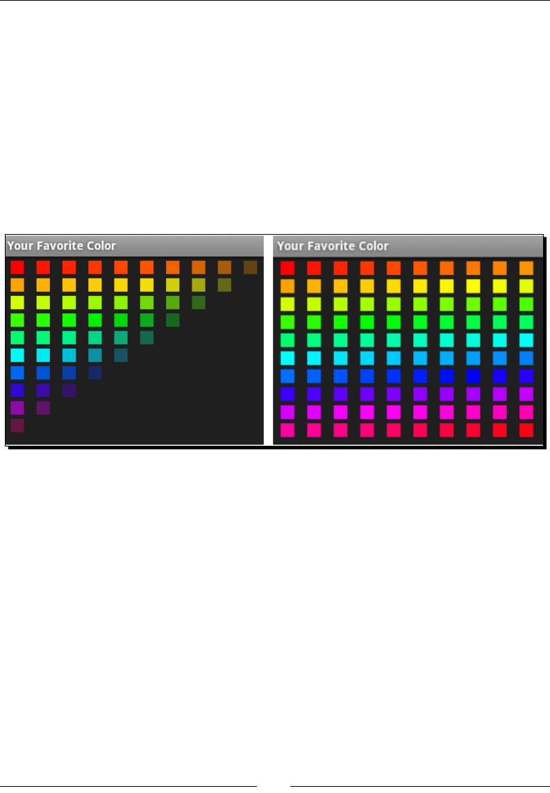
Chapter 7
[ 187 ]
When you instanate a GridLayoutAnimationController, it requires you to provide
the animaon and two parameters which indicate the amount of me between starng
animaons for the next row, or the next column. The delay given is not specied in a "direct"
me format, but instead by how long the given animaon takes to complete. In our case,
if the animaon took one second to complete, the delay between each animaon starng
would be 200 milliseconds, since the delay is specied as 0.2.
The fact that we animate the swatches just as this Activity becomes visible, eecvely
makes this a transion animaon, introducing the user to this new screen. For these types
of animaons, it's imperave to take as lile me as possible while sll giving a pleasing
introducon. When you run the new example you should get an animaon similar to the
ones illustrated in the following images:
Creating Custom Animations
So far we've explored using Android's stock animaons with the normal widgets, but what
about applying a custom animaon to a widget that isn't built for animaons? Android
includes support for four basic animaon types that can be applied to View objects:
Translate/Move
Rotate
Scale
Alpha/Transparency
These dierent animaon structures can be applied by themselves, or merged together in an
animaon set where any combinaon of the three can be run at the same me. By creang
an animaon with a delay me before it starts, you can create complex animaons by having
simple sets of animaons follow each other.
Animang Widgets and Layouts
[ 188 ]
Like so many things in Android, the easiest way to create your own custom animaons is
to dene it in a resource XML le. The elements in the animaon format used by Android
correspond directly to the classes in the android.animation.view package. An animaon
le can also reference animaons in other animaon resources, which makes it much easier
to compose complex animaons and re-use simple animaons.
Time for action – writing a custom animation
Wring a custom animaon is very simple, but not enrely intuive. For this secon you'll
dene a custom animaon which will increase the size of its animated widget by a factor of
ve, while at the same me fading it unl its enrely transparent.
1. Create a new XML resource le named res/anim/vanish.xml and open it in an
editor or IDE.
2. The root element of the animaon le will be an animaon set element:
<set xmlns:android="http://schemas.android.com/apk/res/android">
3. In the <set> element, declare an element to dene the scale up animaon:
<scale />
4. The duraon of the scale up animaon needs to be set as 300 milliseconds:
android:duration="300"
5. The animaon starts to scale from the original size:
android:fromXScale="1.0"
android:fromYScale="1.0"
6. The scale animaon needs to increase the size by a factor of 5.0:
android:toXScale="5.0"
android:toYScale="5.0"
7. We want the scale to expand from the center of the widget:
android:pivotX="50%"
android:pivotY="50%"
8. The last part of the <scale> element denes the acceleraon curve of the
animaon. Here we want the scale up to decelerate as it runs:
android:interpolator="@android:anim/decelerate_interpolator"
9. Next, dene a new element to handle the fade out part of the animaon:
<alpha />
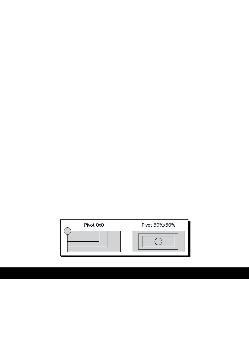
Chapter 7
[ 189 ]
10. The duraon of the fade out animaon is also 300 milliseconds:
android:duration="300"
11. We start with no transparency:
android:fromAlpha="1.0"
12. The fade out ends with a completely invisible widget:
android:toAlpha="0.0"
13. The fade out should accelerate as it runs, so we use an accelerate interpolator:
android:interpolator="@android:anim/accelerate_interpolator"
What just happened?
This is a relavely simple animaon set, but its eect is visually pleasing. Keeping the
animaon at 300 milliseconds is quick enough to not interfere with the user's interacon,
but just long enough to be seen in full by the user.
When dening animaons in an animaon <set> element, each non-set sub animaon
needs to have its duration dened. The <set> element has no concept of its own
duration. However, you can dene a single interpolator for the enre set to share.
The <scale> animaon will by default, scale the widget using the top-le corner as the
"pivot" point, causing the widget to grow to the right and downward, but not le and
upward. This causes a lopsided animaon which is not very appealing. In the preceding
example, the scale animaon runs with the pivot at the center of the animated widget.
Time for action – making a Button vanish
So how can we apply the nice shiny animaon to a Button object? The Button object
doesn't have an animaon aribute, and so you can't just reference it from the layout
resource le. What we want, is the animaon to run when the Button widget is clicked.
1. Create a new layout resource le named res/layout/vanish.xml and open in an
editor or IDE.

Animang Widgets and Layouts
[ 190 ]
2. At the root of the new layout, declare a RelativeLayout element:
<RelativeLayout
xmlns:android="http://schemas.android.com/apk/res/android"
android:layout_width="fill_parent"
android:layout_height="fill_parent">
3. The Button needs to be nice and large, and centered on the screen. For this we give
it some inner padding:
<Button android:id="@+id/vanish"
android:paddingTop="20dip"
android:paddingBottom="20dip"
android:paddingLeft="60dip"
android:paddingRight="60dip"
android:layout_centerInParent="true"
android:layout_width="wrap_content"
android:layout_height="wrap_content"
android:text="Vanish" />
4. Create a new Java source le in the root package of the AnimationExamples
project named VanishingButtonActivity.java.
5. The new class needs to extend Activity and implement the OnClickListener
interface:
public class VanishingButtonActivity extends Activity
implements OnClickListener {
6. Override the onCreate method and invoke the Activity.onCreate method to
perform the required Android setup:
protected void onCreate(Bundle savedInstanceState) {
super.onCreate(savedInstanceState);
7. Set the content view to the new vanish layout resource:
setContentView(R.layout.vanish);
8. Find the Button widget declared in the XML layout resource and set its
OnClickListener:
Button button = (Button)findViewById(R.id.vanish);
button.setOnClickListener(this);
9. Implement the onClick method of OnClickListener:
public void onClick(View clicked) {

Chapter 7
[ 191 ]
10. Load the Animation from the resource le:
Animation vanish = AnimationUtils.loadAnimation(
this, R.anim.vanish);
11. Start the Animation on the Button object:
findViewById(R.id.vanish).startAnimation(vanish);
12. Open the AndroidManifest.xml le in an editor or IDE.
13. Declare the VanishingButtonActivity at the end of the <application>
secon with a display label:
<activity android:name=".VanishingButtonActivity"
android:label="Vanishing Button" />
14. Open the res/layout/main.xml layout resource in your editor or IDE.
15. Add a new Button to the end of LinearLayout to acvate the
VanishingButtonActivity:
<Button android:id="@+id/vanish"
android:layout_width="fill_parent"
android:layout_height="wrap_content"
android:layout_marginBottom="10dip"
android:text="Vanishing Button" />
16. Open the AnimationSelector Java source le in your editor or IDE.
17. At the end of the onCreate method, fetch the new vanish Button from the
layout and set its OnClickListener:
((Button)findViewById(R.id.vanish)).setOnClickListener(this);
18. In the onClick method, add a new switch case to start the
VanishingButtonActivity:
case R.id.vanish:
startActivity(new Intent(
this, VanishingButtonActivity.class));
break;
What just happened?
The addion of the preceding example will display a single Button in the middle of the
screen. When clicked, the Button will be mutated by the vanish animaon for 300
milliseconds. When it is complete, the animaon won't have any eect on the Button
anymore. This is an important characterisc of animaons—when they are complete, the
widget they have animated is returned to its original state.
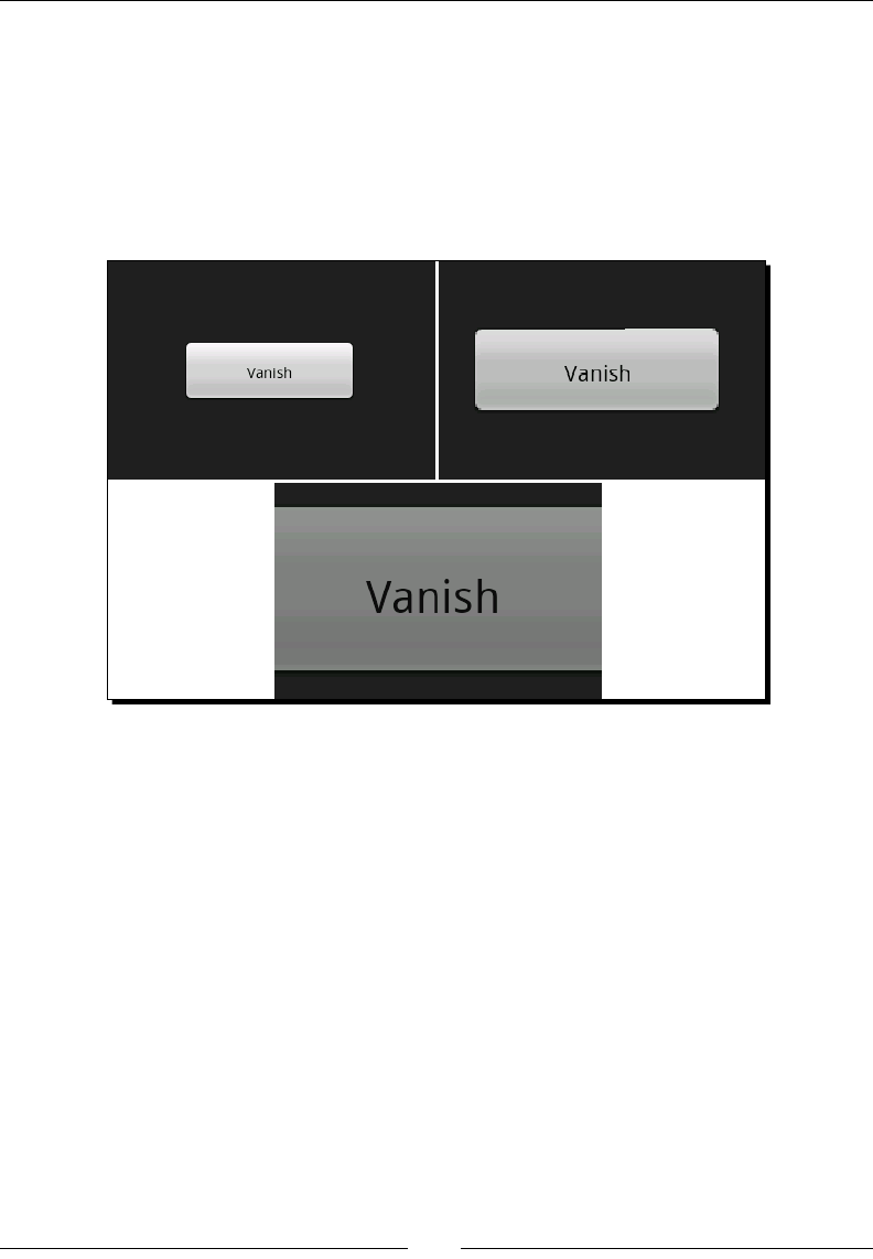
Animang Widgets and Layouts
[ 192 ]
It's also important to note that it's not the widget itself that is modied by an animaon, but
rather the state of the Canvas it's painted on. This is much the same concept as modifying
the state of Graphics or Graphics2D object in Java AWT, or Swing before a widget uses
the Graphics object to paint itself.
In the following images you can see the eect that animaon has on the Button when it's
clicked. The Button is actually re-painted for each frame in the animaon, and remains
enrely acve during that me.
Summary
In this chapter, we explored the various methods by which you can apply animaons to
various parts of your user interface. We explored how some widgets are designed to animate
themselves. Layouts can be animated for transions in and out of an Activity.
Several simple animaons are available by default in the Android resource, but ulmately
creang your own animaons and applying them to your user interface manually creates, by
far, the most visually appealing and user-friendly experience for your users.
Many applicaons on a mobile device need to present a large amount of informaon on the
screen, and present it in such a way that it can be easily absorbed. In the next chapter, we'll
explore user interface design with regards to presenng informaon to the user in a friendly
and useful manner. This allows users to access the informaon that they need as quickly as
possible, in a swi and easy manner, while not liming the informaon they have access to.
8
Designing Content-centric Activities
When you have a lot of data to display to the user, and you need a content
presentaon Activity. Generally, such types of Acvies turn out to be
content-centric. The main purpose of a content-centric Activity is to give the
user as much of the informaon as possible while not overwhelming them. This
is a common requirement of applicaons that perform some sort of search, or
present any type of specialized informaon.
Shopping and related e-commerce applicaons are an ideal example of a content-centric
applicaon. Much of the eort in the design is dedicated to displaying informaon about
the products on sale. If the users can't nd the informaon about a product they are looking
for, they will look somewhere else. For this reason, the product display must not only be
aracve and easy to use, but also provide as much informaon as possible, without being
crypc or cluered.
Another example of a content-centric layout is a user's prole page in a social-networking
applicaon. People generally have a lot to say about themselves, and if they don't, other
people will oen say a lot about them. These applicaons not only have a lot of informaon
to present to the user, but the informaon varies widely in terms of quality and relevance. Just
because one user thinks something is important, doesn't mean the next person will. In cases
like these, it's also very important to have an interface that can be customized to the user's
preferences (oen just by re-organizing the order in which informaon is displayed), and is also
able to draw the user's aenon to new informaon or areas they may nd interesng.

Designing Content-centric Acvies
[ 194 ]
A great example of a good way to draw a user's aenon is seen in a chat applicaon. If the
user has scrolled up, he/she is probably reading something that was said a few minutes ago.
If a new message arrives, it's very rude to just scroll them to the new message, since they
may well sll be reading it. An audio tone to nofy them of a new message is a common
opon, but will also draw others' aenon to the user (this is a mobile device aer all). The
best opon is a small animated icon at the boom of the screen, possibly color-coded to
tell the user the relevance of the message (if that is available). Such an icon could also be an
interacve element, allowing the user to touch it in order to automacally scroll to the most
recently posted message. This type of thinking is important when designing any applicaon,
but when building a content-centric Activity, pung some extra thought into your design
is even more crical.
In this chapter, we'll be exploring the dierent aspects to consider when displaying content
to the user, as well as dierent ways in which content screens can be developed. Specically,
we'll be exploring:
Thought process when designing content displays on Android
How users use and view content screens
Using the WebView class to display content
Building nave layouts for displaying content
Formang and styling text in Android
Drawing aenon to specic areas of the screen
Considering design options when displaying content on
an Android device
A content-centric Activity bears a strong resemblance to a web page, but has some
key design consideraons that people don't have in mind when creang a web page. For
example, a touchscreen device generally doesn't have a soware pointer, and so doesn't
have any concept of a "roll over". However, many web pages are built using cursor roll over
to drive everything from link highlighng to menus.
When designing a content-centric Activity, you'll want to consider carefully the aesthecs
of your design. The screen should avoid cluer since many elements may be interacve,
presenng the user with addional informaon when touched. At the same me, you should
aempt to minimize the need to scroll, especially horizontal scrolling. The need to keep
informaon concise is oen the movator to make more of the elements interacve. As
menoned in previous chapters, it's a good idea to consider using icons instead of text where
you can, and to organize the informaon in order of importance to the user.

Chapter 8
[ 195 ]
Also bear in mind that screen-sizes change. Some devices have a large number of pixels
(such as the various Android Tablets), while others have ny 3.5 inch screens. For this reason
it's important to consider that while some people will be able to see all of the presented
informaon on a single screen, others will be presented with three or four screens worth of
content for the same amount of informaon.
A web page is a great way to quickly and easily put together a content-centric layout when
working on an Android applicaon. It has the advantage of having great HTML and CSS
support from WebKit, and easy integraon with the rest of your applicaon. It can also be
handled by an exisng web-designer, or even just display a web page if your applicaon is
connected to a web-based system.
A web page is however constrained (to some degree) to the layout structures dictated in HTML
and CSS. While these are extremely exible at one level, HTML and CSS layout development
can also be a tedious and frustrang process even when only targeng a single rendering
engine (in Android's case: WebKit), if you are not used to building web-based systems. When it
comes to animaons and similar structures, you are further constrained by the performance of
the HTML rendering engine, whether using JavaScript or CSS3 animaons.
Considering user behavior
As with any type of user interface, it's important to understand your user behavior and how
they will interact with the screens you provide them with. In the context of large amount of
content informaon, it's important to understand both what informaon is important, and
how users will read and absorb that informaon.
While you may want to draw aenon to a selected piece of informaon (such as price),
running a looping animaon to change the color of that element will distract the user from
the other informaon on the screen. However, simply changing the font, placing the data
in a box, or changing the text color can also have the desired eect. It's also important to
consider how a user will interact with the screen. On a touchscreen device, users can and
will touch almost every part of the screen. They'll also drag items that look movable, and use
scroll gestures if the content appears to run over the screen length.
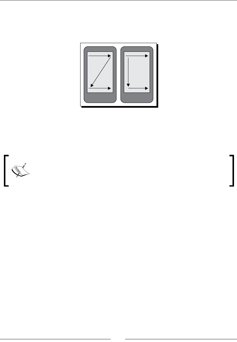
Designing Content-centric Acvies
[ 196 ]
Most people scan informaon in the same way. When a user is presented with a screen for
the rst me, or with lots of informaon on it, their minds approach reading the informaon
in more-or-less the same way. The following are illustraons of the various movement
paerns a user's eyes will follow when scanning for important informaon on the screen.
You'll generally want to make sure that important informaon is in the areas where one
arrow meets another. The most important area is the corner in which your user normally
starts reading. For most Western users, this is the top-le corner of the screen, while Asian
and Arab users will oen start at the top-right.
When designing a content screen, consider making the informaon in these
areas stand out a lile more than normal. This will create a "linger" me where
the users' eyes will generally focus on that area a lile longer than normal. This
is why we normally put a logo on the top-le of a web page.
Drawing user attention
Almost always, some informaon is more important than other informaon. You want your
user to be able to pick-out the important informaon as quickly as possible, and get on with
what they are doing. Once a person is familiar with your applicaon, they may well stop
reading the ne print altogether. This is a good thing, you're helping your users make beer
use of your applicaon by leng them get on with their lives.
When you need to draw aenon to specic informaon, such as a product's name or price,
it's a good idea to make use of the extensive opons provided by the TextView class. Simply
changing an item's color can make it stand out for the user. If you need to go further, consider
adding a shadow, or placing the content in a "highlight box". As we've already discussed in
Chapter 7, Animang Widgets and Layouts, animaons can also be used to draw aenon
to specic areas of the user interface. A simple "blink" animaon (consisng of a fade-out
followed by a fade-in animaon) can be used to draw the users' aenon to a change.
Chapter 8
[ 197 ]
A more specic example: money
If you are selling something to your user, and allowing them to choose between
dierent shipping methods and packaging opons, the total price will change
based on their selecons. Make sure that the total amount stands out by
rendering it in a bold font. When the price is updated, cycle through a series of
"intermediate" prices so that the total is graphically "counted up" or "counted
down" to its new value.
Think carefully about the widgets that you'll want to make use of in your user interface.
Instead of using the normal TextView, you may well want to place a piece of what would
normally be a single eld in a TextSwitcher (or something similar) to allow you to animate
a single word or value.
Displaying content with the WebView class
The WebView class (in the android.webkit package) is oen a logical choice for content-
centric designs and holds some very serious advantages over building the user interface
and a normal Android XML layout resource. The WebView class oers you a single point at
which you can place all of the content for a screen, and it handles all of its own history and
scrolling, making your code very simple to write.
When displaying content that requires complex layout and/or lots of text content (which
may require markup), the WebView class is a highly favorable opon. Having built-in support
for HTML and CSS mark up, it reduces the number of widgets that you'll need on the screen.
Given that Android makes use of Web-Kit as a rendering engine, you also have many CSS3
structures available (such as CSS animaons). Although the WebView is generally used for
browser like networked applicaons where hyperlinks are very important, you can just as
easily supply it with local content containing no links. You can also intercept link requests to
allow navigaon to other parts of your applicaon.
Generally when working with a WebView structure, you'll need some method by which you
can generate the content that you will be displaying. In contrast to building the user interface
in a layout resource, where you can simply ID the various View objects that you need to
inject dynamic content into. That said, a full template engine is oen much easier to work
with than a hybrid of XML layout and Java code, although the ease of implementaon is
strongly dependant on both the skills available to you and the type of informaon you need
to display on the screen.

Designing Content-centric Acvies
[ 198 ]
Using a WebView object
To work a bit with the WebView and give a more specic example on how it can be used to
present large amounts of content, we'll be building an Activity to display a food recipe on
the screen. For this example we'll be hard coding the actual recipe and the layout code to
generate the HTML. In pracce, you would want to make use of a template engine such as
Velocity/FreeMarker or XSLT to generate the HTML code.
Time for action – creating a recipe viewer application
You'll noce that the following example doesn't use an XML layout resource, but rather
creates the enre Activity in Java. In this example we use a Recipe object to generate
HTML code into a StringBuilder for display. It's a simple but eecve implementaon.
However, it requires that the Java code be modied if a change to the look and feel of the
recipe is required.
1. Create a new project to contain the recipe reader applicaon:
android create project -n RecipeViewer -p RecipeViewer -k com.
packtpub.viewrecipe -a ViewRecipeActivity -t 3
2. Create a new Ingredient.java source le in the root package of the new
applicaon to hold informaon for a single required ingredient, and open this new
le in your editor or IDE.
3. Declare elds for the name, amount, and unit required for a recipe:
private final String name;
private final double amount;
private final String unit;
4. Create a constructor to take the parameters and assign them to the elds:
public Ingredient(
String name,
double amount,
String unit) {
this.name = name;
this.amount = amount;
this.unit = unit;
}
5. Create a geer method for each of elds:
public double getAmount() {
return amount;
}
// . . .

Chapter 8
[ 199 ]
6. In the root package of the project, create a new source le named Recipe.java to
contain a single recipe, and open it in your editor or IDE.
7. Declare a eld for the name of the Recipe object:
private final String name;
8. Declare another eld to contain the list of ingredients required for this Recipe. We
store these as an array of Ingredient objects:
private final Ingredient[] ingredients;
9. Then declare an array of String objects that will contain the list of instrucons that
need to be followed for the Recipe:
private final String[] instructions;
10. Create a constructor to accept the eld data and assign it for storage:
public Recipe(
String name,
Ingredient[] ingredients,
String[] instructions) {
this.name = name;
this.ingredients = ingredients;
this.instructions = instructions;
}
11. Create a geer method for each of the three elds:
public Ingredient[] getIngredients() {
return ingredients;
}
// . . .
12. In this example the Recipe class is responsible for generang the HTML. Declare a
new method named toHtml:
public String toHtml() {
13. Create a DecimalFormat object to handle the formang of the volumes:
DecimalFormat format = new DecimalFormat("0.##");
14. Create a new StringBuilder object to build the HTML into:
StringBuilder s = new StringBuilder();
15. Append the HTML headers:
s.append("<html>").append("<body>");

Designing Content-centric Acvies
[ 200 ]
16. Append a rst-level header element with the name of the recipe:
s.append("<h1>").append(getName()).append("</h1>");
17. Append a second-level header element to open the ingredients secon:
s.append("<h2>You will need:</h2>");
18. Open an unordered list to list the ingredients required for the recipe:
s.append("<ul class=\"ingredients\">");
19. For each Ingredient object open a list item for the new ingredient:
for(Ingredient i : getIngredients()) {
s.append("<li>");
20. Append the amount of the ingredient to the StringBuilder aer formang it
with the DecimalFormat declared:
s.append(format.format(i.getAmount()));
21. Then append the measurement unit for the ingredient:
s.append(i.getUnit());
22. Now append the name of the ingredient to the StringBuilder, and close the
ingredient list item:
s.append(" - ").append(i.getName());
s.append("</li>");
23. Aer closing the for loop, close the unordered list:
s.append("</ul>");
24. Create a second-lever header opening the Instructions secon of the recipe:
s.append("<h2>Instructions:</h2>");
25. Open another unordered list to render the recipe instrucons into:
s.append("<ul class=\"instructions\">");
26. Use a for-each loop over the array of instrucons to render them into the unordered
list structure in the StringBuilder:
for(String i : getInstructions()) {
s.append("<li>").append(i).append("</li>");
}

Chapter 8
[ 201 ]
27. Close the unordered list, and HTML headers, returning the String contents of the
StringBuilder object:
s.append("</ul>");
s.append("</body>").append("</html>");
return s.toString();
28. Open the ViewRecipeActivity Java source code in your editor or IDE.
29. In the onCreate method, directly aer invoking super.onCreate, create a new
WebView object passing this to it as its Context:
WebView view = new WebView(this);
30. Set the WebView LayoutParams to take up all available screen space, since the
WebView (much like a ListView) has built-in scrolling capabilies:
view.setLayoutParams(new LayoutParams(
LayoutParams.FILL_PARENT,
LayoutParams.FILL_PARENT));
31. Create a Recipe object to display in the WebView, the full recipe is at the end of
this example secon:
Recipe recipe = new Recipe(
"Microwave Fudge",
// . . .
32. Load the HTML content generated by the Recipe object into the WebView:
view.loadData(recipe.toHtml(), "text/html", "UTF-8");
33. Set the content view of the Activity to the WebView object we created:
setContentView(view);
What just happened?
The recipe viewer example shows a simple structure which can be extended in many
dierent ways to present large amounts of informaon to the user in an easy-to-use format.
Thanks to the fact that WebView works with HTML, it makes presenng non-interacve lists
of informaon more appealing than working with a ListView or similar structures.
The loadData method used previously is limited in that it doesn't allow for your page to
easily reference external structures such as style sheets or images. You can work around this
limitaon by using the loadDataWithBaseURL method which works in much the same way,
but renders the page relave to a specied URL, which may be online or local on the device.

Designing Content-centric Acvies
[ 202 ]
The Recipe object is considered responsible for rendering its HTML, which works well in a
pure Java situaon. You could also pass the Recipe to a template engine, or use something
like a visitor paern to render the Recipe object as HTML code. The full code for the
Recipe object in the previous example is as follows:
Recipe recipe = new Recipe(
"Microwave Fudge",
new Ingredient[]{
new Ingredient("Condensed Milk", 385, "grams"),
new Ingredient("Sugar", 500, "grams"),
new Ingredient("Margarine", 125, "grams"),
new Ingredient("Vanilla Essence", 5, "ml")
},
new String[]{
"Combine the condensed milk, sugar and margarine "
+ "in a large microwave-proof bowl",
"Microwave for 2 minutes on full power",
"Remove from microwave and stir well",
"Microwave for additional 5 minutes on full power",
"Add the Vanilla essence and stir",
"Pour into a greased dish",
"Allow to cool",
"Cut into small squares"
});
An unfortunate side eect of using the WebView object is that it doesn't conform to the look
and feel of other widgets. It is for this reason it doesn't work well when you place it with
other widgets on the same screen. The end eect of the previous example is eecvely a
non-interacve web page which looks as follows:
Have a go hero – improving the look of the recipe viewer
The previous example generates a very simple HTML page and doesn't include any styling.
Including an inline CSS is a very simple operaon, and could even be done by reading the
styling content from an applicaon resource. Create a CSS, include it inline in the HTML page,
with rules such as:
Downloa d f r o m W o w ! e B o o k < w w w.woweb o o k . c o m >

Chapter 8
[ 203 ]
Color the background of rst-level header and second-level header elements
Change the font-color of the rst and second-level headers to white
Round the corners of the header elements by ve pixels
Change the list bullet to a square instead of a circle
Taking WebView further
The WebView class has signicant funconality that can be very useful when dealing with
content screens, for example, using hyperlinks to provide a show/hide disclosure secon
for less important content. This requires the use of JavaScript in the HTML page, at which
point it's strongly advisable that your applicaon use a template engine to produce the
HTML pages instead of generang them in Java code (as the Java code will quickly become
dicult to maintain).
The WebView class also allows your applicaon to interact with the JavaScript code on the
page using a very simple mechanism by which you can expose Java objects to the JavaScript
code. This is done with the addJavascriptInterface method. This allows the HTML
page to invoke acons on a Java object that you provide, eecvely allowing the page to take
control of a part of your applicaon. If your content screen needs to take a business acon,
such as Buy or Cancel, the required funconality can be exposed in a JavaScript interface
object. When the Book HTML element is selected by the user, the JavaScript in the page can
invoke the appInterface.buy(); method which you dened.
Another important feature to consider with the WebView class is the "zoom" controls. When
presenng your user with lots of informaon, it may be useful for the user to be able to
zoom in or out in order to make some elements easier to read. To enable the built-in zoom
controls of the WebView, you'll need to access the WebSettings object:
webView.getWebSettings().setBuiltInZoomControls(true);
The WebSettings object can be used to enable and disable a large number of other
features that are available in the WebKit browser component, and it's well worth reading
through the available documentaon.
The primary problem with the WebView class is its look and feel. Where an Android
applicaon with the default theme is light grey on a black background, the WebView class is
black on a white background, which makes the screens driven by a WebView stand out to the
user as though they are a separate applicaon.
The simplest way around the styling problem would appear to be to style the HTML pages
to look just like the rest of the applicaon. The problem is that some device manufacturers
have their own Android applicaon styling, so you can't really be sure what the rest of your
applicaon is going to look like. Changing the background and foreground of the HTML page
to be in line with the standard Android theme could well make it stand out against the rest of
your applicaon when run on manufacturer-themed devices.

Designing Content-centric Acvies
[ 204 ]
Pop quiz
1. What is the best way to render large object graphs to HTML for rendering
in a WebView?
a. Convert them to XML and run them through XSLT
b. Send them to an external web service to be rendered
c. Hard code the HTML generaon
d. With a simple template engine
2. How can you access external CSS and images with a WebView?
a. Use the loadDataWithBaseURL method
b. Specify the full URL path in the HTML page
c. Generate HTML code that includes the in line data
3. What rendering engine does Android use for WebView?
a. Gecko
b. MSIE/Trident
c. KHTML
d. WebKit
Creating relative layouts for content display
The WebView oers an easy way by which large amount of content can be displayed to the
user in an easy-to-read format. It also has many built-in features designed specically for
viewing content. However, it doesn't always oer the easy way out and oen doesn't allow
for funconality that other widgets provide out-of-the-box. The RelativeLayout class
provides much of the same layout funconality that the WebView class provides you with.
As we just discussed, the WebView stands out almost as though it were a separate
applicaon. Working with a RelativeLayout, you'll be populang your screen with
standard Android widgets, which in turn means that there will be no change in the look
and feel from one screen to the next. While WebView requires some form of template
engine (whether it be in an API or simply a StringBuilder as in the example), a
RelativeLayout can be declared in an applicaon resource as an XML le. Using a layout
le also means that the screen layout will be selected through the resource selecon
process, allowing for sophiscated customizaons that are dicult to achieve with the
WebView class and HTML code.

Chapter 8
[ 205 ]
Using a RelativeLayout in a way provides a form of template engine. By only giving IDs
to View objects that you will need to populate with data, you can populate the screen by
injecng the relevant content into these exposed objects. When we built the HTML-based
view, we needed to create header elements for the ingredients list and list of instrucons,
with a coded layout structure those headers would be loaded from within the layout le, or
from a string bundle resource.
When dealing with lists of informaon, which is a common requirement of a content layout,
you can provide the data in several dierent ways. You could use a ListView object, or you
could use an embedded LinearLayout to act as a list. When working with either of them, it's
advisable to have a layout resource that can be reused for each of the items in the list. Making
use of a ListView means you have an Adapter through which you can convert your data
objects into View objects that can be displayed on the screen. However, ListView objects
have various other constraints (such as the size of the contained items) and are best used when
the items they display are interacve in some way. If you need a non-interacve list (or grid) of
items, it's a good idea to follow the Adapter mechanism by creang a separate class that is
responsible for creang View objects based on your data objects.
Taking full advantage of RelativeLayout
RelativeLayout structures have the major advantage that they oer direct integraon
with the rest of your applicaon. They can also be more easily localized than an HTML page.
The event structures provided by a direct ViewGroup structure are more versale than
those provided by a WebView object via its specialized event listeners and JavaScript.
The XML layout structures also provide much the same eect as a template engine, avoiding
the need to import an external API such as an XSLT engine, a Java template engine, or hard
coding the HTML generaon. Standard Android Activity classes also have the built-
in Android animaon structures to work with. While the WebView class allows for CSS
animaons or could run JavaScript animaons, this requires re-layout of the HTML structure
for each frame in the animaon.
An Android Activity class implemenng the enre content screen also has the advantage
that it can load its external resources from the applicaon resource structure. This not only
allows you to do things such as localize your images more easily, but also means that all of
the resources are run through the resource compiler and as such can be opmized by the
Android tool chain. With a WebView you would need a base URL to load such resources
from, or be able to encode them inline in the HTML page.
Designing Content-centric Acvies
[ 206 ]
Considering Android layout constraints
There are some drawbacks to developing the enre content view as an Android layout. From
a skills point-of-view, only a developer can build and maintain the user interface. It also
means that any styling done to individual widgets must be managed by a developer. With a
WebView based layout, much of the creaon work on the layout could be handled by a web
developer and graphic designer.
Adding more widgets to your screen comes with another problem—
performance. Not only can larger, more complex layouts lead to a very slow user
experience, it can cause your Activity to crash enrely.
Keeping fewer widgets on the screen means that the interface will have less informaon for
the user to absorb in one hit, and will be easier to work with.
Layouts with either too much length, or too much depth will cause an applicaon to crash.
If you need to animate a single word in the middle of a sentence, you'll have to dene two
addional TextView widgets that will display the non-animated text on either side of the
animated word. This increases the length of your layout. If you also needed a horizontal
LinearLayout in which to place these three TextView objects, you would be increasing
the depth of your layout structure. By factoring in both of these constraints, you can imagine
how quickly you can run out of memory or processing power when it comes to layout
rendering. Each of the widgets must be measured for layout before being rendered. Each
measurement, layout step, or rendering step makes use of the language stack (by recursively
invoking methods) in order to make sure all of the widgets are correctly rendered at the
correct point on the screen (or not rendered if they are o screen). The soware stack size
in Android is limited, and each method call requires each of its parameters to be pushed
onto the stack for the invocaon. On top of that, all of the measurement informaon needs
to be stored in the heap space, which is another seriously limited resource on the Android
plaorm (by default the Dalvik VM only allocates 8 MB of heap space to begin with).
The following diagram illustrates the dierence between the length and depth of a layout
structure. The le screen illustrates a long layout, while the right screen illustrates
a deep layout:
Chapter 8
[ 207 ]
Styling TextView objects
At this point it's rather concerning to think about how you might make a single word in a
sentence bold, or give it a shadow. In the WebView it's as easy as adding a <span> element
with some special styling on it, but in a nave layout, wouldn't you need to add separate
TextView objects for each secon of the text? If this were so, you would be dramacally
limited in the amount of text you would be able to display to the user, since you would be
creang thousands of almost useless objects.
Fortunately, Android makes it very easy to mark up the text in all of its default widgets. Any
class that extends from TextView can handle text with style informaon or even images.
Generally the classes available in the android.text.style package can be used to style
sub-segments of the text strings you want to display.
In order to use these dierent styling structures, you will need to use a SpannableString
object. A SpannableString is a specialized type of Android string that keeps track of
styling informaon in relaon to a normal CharSequence of text that needs to be displayed.
There are several other similar classes (such as SpannableStringBuilder) which
handle easy modicaon of the text, and are thus suited to text that will be edited. For
our current purposes, a SpannableString is perfect, and much simpler to work with. A
SpannableString has a method that it's required to implement, based on the Spannable
interface—setSpan. The setSpan method allows you to add markup structures to the
SpannableString, which aect how a specic part of the text is rendered.
If we simply wanted to write the text There is nothing to fear! on the screen, you would
normally just use a TextView object with the specied string. What if we wanted to strike
the nothing out of that string? The way forward now is to use a StrikethroughSpan
object for characters 9 through 16. In this case, the string can't just be dened in the layout
le anymore, a SpannableString needs to be created in the Java code. The following is a
simple example of how this can be done, and what the resulng TextView would look like:
TextView fear = new TextView(this);
SpannableString string = new SpannableString(
"There is nothing to fear!");
string.setSpan(new StrikethroughSpan(), 9, 16, 0);
fear.setText(string);
The result of this lile snippet of Java code is a TextView widget displaying styled content
instead of a plain String, as shown in the following screenshot:
As you can see, using this type of markup is brilliantly eecve, and really quite easy to work
with. This sample is also very quick to execute when compared to the WebView rendering,
since it doesn't include any form of parsing.
Designing Content-centric Acvies
[ 208 ]
There are a few problems with the mechanism though. The most important one being the
index handling. In order to know when to start or stop a Span of markup rendering, you
need to specify the rst and last character that needs to be rendered with the given Span.
Not a problem unless you plan on changing your text, or even worse—internaonalizing it.
Fortunately, once again Android already has a built-in soluon, although it comes at the
expense of performance. You can convert almost any HTML text into a Spannable object
which can in turn be passed directly to any TextView object for rendering. The class to use
is the android.text.Html class, which includes ulity methods for parsing HTML code
into a Spannable object, and also for converng a Spannable object into a HTML code.
If you need to internaonalize strings that you plan on rendering with addional style
aributes, the Html class is probably the only sensible way to do it. It also has the added
advantage that the loading of images can be handled by your applicaon (through use of
the Html.ImageGetter interface). Addionally, the TextView will sll look and feel like a
normal Android widget, which enhances the users' experience.
Most HTML tags are handled by the Html class, but not quite all of them. For one thing—CSS
styles are ignored, so colors and borders are out of the queson. However, great styling is
sll possible, and at least you don't need to record the character index values somewhere in
an applicaon resource so that all of the styling lines up.
If you wanted to format some text in a Button label as bold, it's really easy to do with the
Html class. It's much quicker to just pass the result of the fromHtml method directly to the
TextView object. For example, the following code snippet would yield a Button object with
the word Hello in italic script, while the word World would have a bold weight to it:
Button button = new Button(this);
button.setText(Html.fromHtml("<i>Hello</i> <b>World!</b>"));
You can also specify HTML content in a layout resource XML le, and it will be parsed with
the Html class before being passed into the TextView object's setText method.
The above Java snippet creates a Button widget that would look as follows:
HTML tags can also be used to render mini-documents into a TextView object, and while
they carry their own styling, they also adhere to the styling of the TextView object. This
means that if you're looking for a soluon that's quicker to work with than a WebView for
carrying some stac text (and no hyperlinks), then a TextView can actually serve as a good
alternave. For example, consider the following code snippet:
Chapter 8
[ 209 ]
TextView text = new TextView(this);
text.setTextColor(0xff000000);
text.setBackgroundColor(0xffffffff);
text.setText(Html.fromHtml(
"<h1>Cows Love to Eat Grass</h1>"
+ "<p>Do not fear the Cow</p>"));
This will render the TextView with a rst-level header and a single-lined paragraph element.
Both of which will include some padding in order to space them apart from the other
elements on the screen. The resulng image should look quite familiar:
As you can see, a correctly styled TextView makes a great alternave to a WebView,
especially if you are ng it inline with a series of nave widgets. However, the black-on-
white styling does bring back the inconsistency problem. So unless you enre applicaon
follows this model, it's a beer idea to leave the styling as default.
If you are planning on using a TextView for longer content, it's important to consider some
addional factors:
Make sure that the user will be able to scroll if the text runs longer than the size of
their screen. This is easily done by placing the TextView in a ScrollView object.
If your text is very long, consider styling the content, either making the text brighter
white or working with a black on white background. While it is very inconsistent
with other Android applicaons, and other screens in your own applicaon, it is
much easier on the eyes and your users will thank you for that.
Consider allowing the user to change the font size with a long touch or a menu. If
their screen is low density, or they don't have perfect vision, you may be making
their lives a lile easier.
Pop quiz
1. If you need to display a non-interacve bullet point list, which of these is preferable?
a. A WebView with an unordered list
b. A specially styled ListView object
c. A TextView object with HTML content

Designing Content-centric Acvies
[ 210 ]
2. With regards to hyperlinks, you might use a WebView instead of a TextView
because:
a. TextView cannot handle hyper links
b. They look beer in a WebView
c. A WebView has built-in history management
3. A nave interface works beer for animaon intensive applicaons because:
a. You can use Android animaon resource les
b. The WebView class doesn't handle animaons
c. HTML animaons are more expensive to run
Time for action – developing specialized content views
In many situaons, you'll need a specic type of interacve logic that you would want to
reuse in many parts of your applicaon. On a content screen, some parts of the display will
need to be updated, driven by changes that are made to other parts of the display. This
is oen because while some area of the screen is giving the user informaon, the other
parts are capturing new data from them. Next, we'll build a simple widget responsible for
displaying an amount of money to the user. Its main reason for its existence is the fact that
it not only animates between changes, but also feeds back to the user whether the amount
has gone up or down by changing its color.
1. Create a new Java source le named AmountBox.java for the new class, and open
the new le in an editor or IDE.
2. The new class should extend the TextSwitcher class and implement the
ViewSwitcher.ViewFactory interface:
public class AmountBox extends TextSwitcher
implements ViewSwitcher.ViewFactory {
3. Declare a eld for the DecimalFormat to be used to render the amount:
private DecimalFormat format = new DecimalFormat("0.##");
Also declare a eld to store the current numeric value displayed:
private double amount;
4. Declare copies of the two constructors made available from the TextSwitcher
class in order to allow the LayoutInflator class to instanate the AmountBox
class from resource les:
public AmountBox(Context context, AttributeSet attrs) {
super(context, attrs);

Chapter 8
[ 211 ]
init();
}
public AmountBox(Context context) {
super(context);
init();
}
5. Declare the init() method to take care of "common constructor" requirements:
private void init() {
6. Set the "in" and "out" animaons to the fade animaons provided by Android:
setOutAnimation(getContext(), android.R.anim.fade_out);
setInAnimation(getContext(), android.R.anim.fade_in);
7. Next, set the ViewFactory to the AmountBox:
setFactory(this);
8. Finally, invoke setAmount(0) to ensure the displayed amount is specied:
setAmount(0);
9. Declare a seer method to allow overriding of the default DecimalFormat:
public void setFormat(DecimalFormat format) {
this.format = format;
}
10. Declare a geer method to allow easy access to the current numeric value:
public double getAmount() {
return amount;
}
11. Override the makeView() method from ViewFactory:
public View makeView() {
12. Create a new TextView object with the context given to this AmountBox:
TextView view = new TextView(getContext());
13. Specify a large text size since the amount will represent money, and then return the
TextView object for display:
view.setTextSize(18);
return view;
14. Now declare a seer method to allow the amount value to be changed:
public void setAmount(double value) {

Designing Content-centric Acvies
[ 212 ]
15. This method will change the color of the text, so declare a variable for the new text
color that will be displayed:
int color;
16. First check to see what color we should change the text to:
if(value < amount) {
color = 0xff00ff00;
} else if(value > amount) {
color = 0xffff0000;
} else {
return;
}
17. Fetch the o screen TextView object:
TextView offscreen = (TextView)getNextView();
18. Set the font color based on the change to the numeric value:
offscreen.setTextColor(color);
19. Render a shadow around the text in order to create a "halo" eect:
offscreen.setShadowLayer(3, 0, 0, color);
20. Set the text of the TextView to the new value:
offscreen.setText(format.format(value));
21. Display the o screen TextView and remember the new value:
showNext();
amount = value;
What just happened?
The AmountBox class is a great example of a small unit of content that needs to be updated.
This class provides informaon to the user, but also provides a form of feedback. When the
user does something which aects the amount displayed, the AmountBox reacts by updang
the font color to reect the direcon of the change—green for the amount going down, and
red for an amount going up.
The example makes use of the standard Android fade through animaons as discussed in
Chapter 7, Animang Widgets and Layouts. The speed of the animaons provides a great
cross fade eect between the two amounts. Noce that in the setAmount method, the
updang of the text content and switching the View objects is handled manually.
Chapter 8
[ 213 ]
You could potenally replace the offscreen.setText and showNext method calls with
a call to setText, but it's nice to see how it works under the hood. This method is also not
subject to future implementaon changes that may occur.
Developing an online music store
A great example of a content-centric layout is a music store built into a media player
applicaon. The ability to buy music directly from the media player is a massively user-
friendly feature, and also ts nicely with the way Android applicaons behave as "connected"
applicaons instead of purely oine systems. Android also makes it very easy to truly include
the shop as part of the applicaon instead of simply providing a link to an appropriate website.
Generally, users are more inclined to feel a sense of trust if they pick the Buy Music buon and
are not suddenly whisked o to their web browser. Having both online and oine parts of your
applicaon properly integrated can also go a long way for your sales stascs.
Buying music online is very dierent to purchasing it in a store. The availability of addional
informaon about the songs, arsts, or albums the user is looking at is part of the appeal.
For this reason, an online music store for a mobile device must be carefully designed to
provide as much informaon as possible without either cluering the screen, or detracng
from the fact that the user is there to purchase music. The feeling of integraon with the
applicaon also helps build trust with the user, so the look and feel is very important.
Another advantage of buying music online is you pay only for what you want to purchase.
For this the user interface needs to allow the user to select which tracks from an album
the users would like to purchase, and which they either don't want or plan to buy later.
Also, how do they know which ones they like? They also need to be able to play a sample
(whether it be me limited, or just a lower quality) of each track.
Designing the music store
To really illustrate how a content-centric design ts together, you need to build one. For this
example we'll be working through the design process, and then the implementaon of that
design. Since the design and its implementaon are the important parts here, we won't go
into building a funconal example. It'll really just be a prey screen.
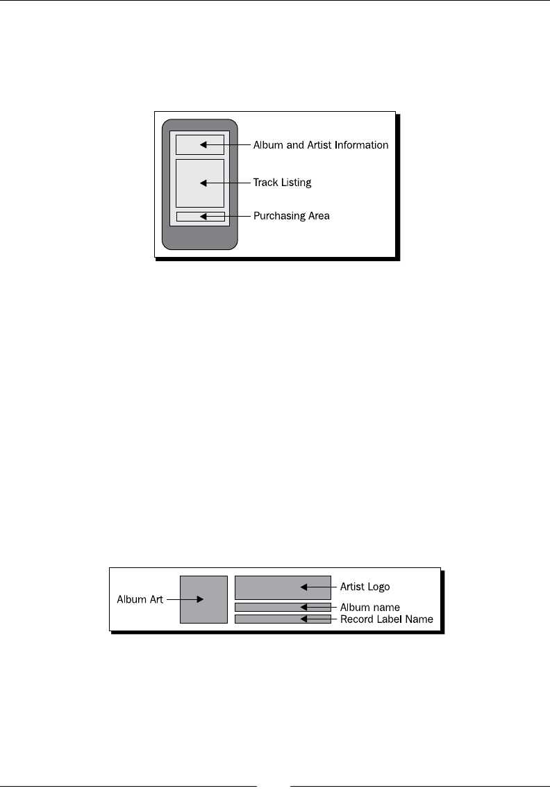
Designing Content-centric Acvies
[ 214 ]
To begin with, we need to have a basic user interface design. I nd it best to start with a
whiteboard or a piece of paper and a pen. While there are plenty of tools for drawing mock
screens out there, none of them really approach the user interface of a paper and pen. To
start o, we draw a high level wireframe of the overall screen design. This is simply a series
of boxes that will tell us what type of informaon to show in what parts of the screen.
In the diagram, we've divided the user interface into three parts:
Album and Arst Informaon area: This area displays the name and cover art of the
album the user is looking to buy
Track List area: In this area, users can listen to samples and select which tracks they
want to purchase
Purchasing Area: This area displays the total amount users will be paying, and also a
buon to buy their selected tracks
In the previous diagram, I've stuck to the size of the screen, but depending on the screen size
and number of tracks available, the user interface may need a scrollbar to be fully accessible.
The next bit of work is to look at each of the secons of the user interface that we've dened
and decide what widgets will go into each of them. Firstly we'll need to look at the album
and arst informaon. The album informaon will be displayed as the album cover artwork
and the album name. We'll include an image area for an arst logo, and also include a text
block with the name of the recording label.
A simple block diagram like this lets you visually consider the various elements. It also allows
you to start thinking about things such as font size, borders, and spacing. In the previous
diagram, we want the three elements on the right to be roughly the same size as the cover
art on the le. Unfortunately the Android RelativeLayout class doesn't currently allow us
to directly spulate this as a contract. The next element of the design we need to consider is
the track lisng box. For this, instead of drawing everything in the box, we'll focus on what a
single line will look like and what informaon it will contain.
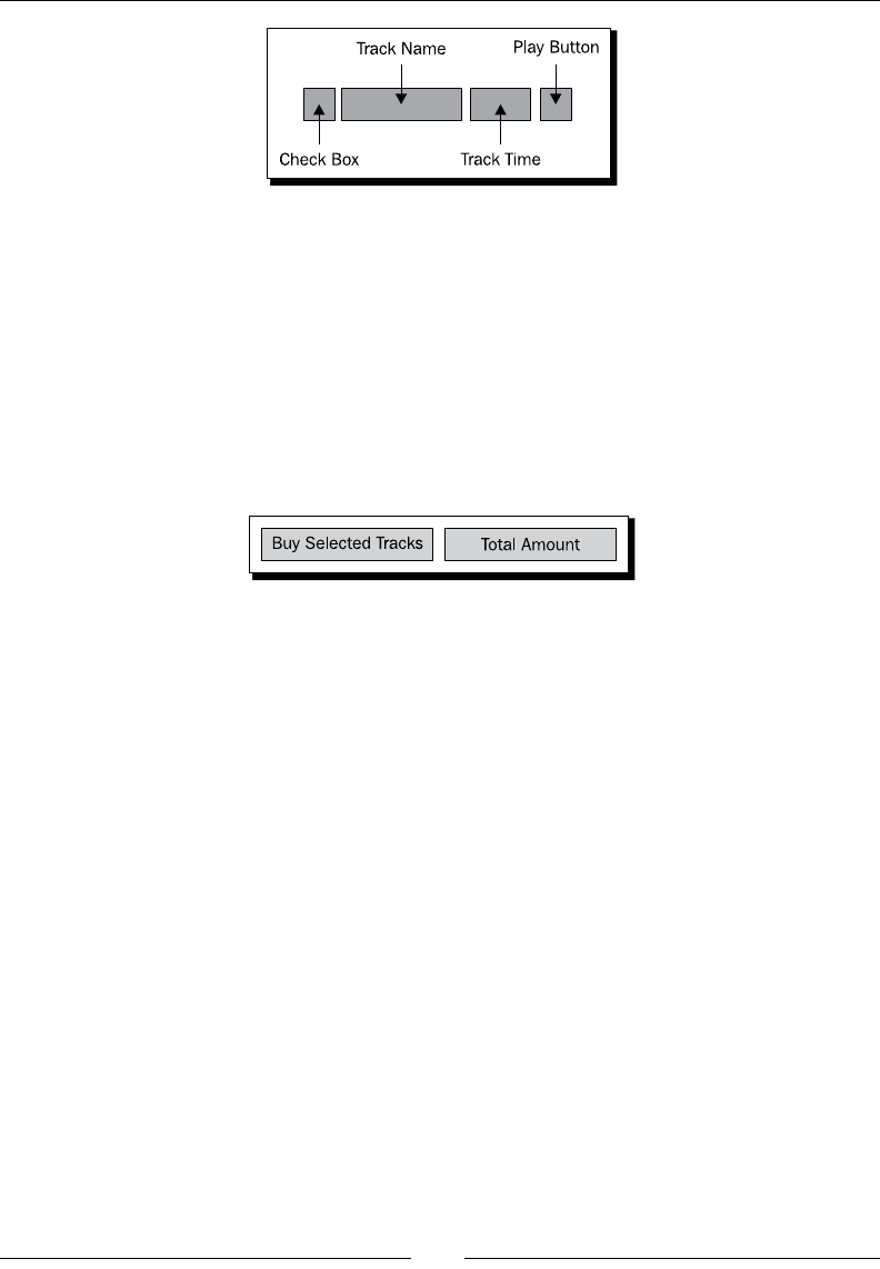
Chapter 8
[ 215 ]
The preceding structure is a very simple one line structure for displaying the details of a
single track. The CheckBox on the le can be used to select those tracks that the user wants
to purchase, while the buon on the right side can be used to play a sample of the given
track. The two buon-like elements on either side create a kind of framing for the plain text
elements in the middle of the line.
Finally, we need to consider how we plan on asking the user to send their money. This is a
very important part of the user interface, it needs to be obvious—the amount of money they
will be expected to pay. We also need to make it really easy for the user to actually make the
transacon, so a single Purchase or Buy Selected Tracks buon is needed.
The nal secon of the user interface simply has two widgets in it, one on the le for
purchasing, and the total amount the user is expected to pay on the right. For the le side
buon, we'll work with a simple Android Button widget, while on the right side we'll make
use of the new AmountBox wrien in the previous part of this chapter.
Developing the music store
We'll start with the new example by building a new series of model classes, but rst you'll
need to create a new project for our conceptual media player. To do this, run the following
command on a command line or console:
android create project -n PacktTunes -p PacktTunes -k com.packtpub.
packttunes -a ShopActivity -t 3
Aer creang the new project, copy the AmountBox source code into the root package
of the new project. You then need to create a class to contain the data for a single track.
This simply needs to have the name of the track and the duraon of the track stored as the
number of seconds. We'll also include ulity methods to calculate the minutes:seconds
values that we can use to display the duraon data.
public class Track {
private final String name;
private final int length;
Downloa d f r o m W o w ! e B o o k < w w w.woweb o o k . c o m >

Designing Content-centric Acvies
[ 216 ]
public Track(final String name, final int length) {
this.name = name;
this.length = length;
}
public String getName() {
return name;
}
public int getLength() {
return length;
}
public int getMinutes() {
return length / 60;
}
public int getSeconds() {
return length % 60;
}
}
The Track class is a very simple structure which could easily be parsed from XML or
deserialized from a binary stream. We also need another class to hold the informaon about
a single arst. While the following class is really nothing more than a form of data store, it
could easily be extended to store things like biography informaon if needed:
public class Artist {
private final Drawable logo;
private final String description;
public Artist(
final Drawable logo,
final String description) {
this.logo = logo;
this.description = description;
}
public String getDescription() {
return description;
}
public Drawable getLogo() {
return logo;
}
}

Chapter 8
[ 217 ]
Finally, on the data class front, we'll need a class for linking the two previous classes to a
single album. This class will be used as a single point which can be handed to an Activity.
Copy the following code into a new le named Album.java in the root package of your
project:
public class Album {
private final Drawable cover;
private final String name;
private final Artist artist;
private final String label;
private final Track[] tracks;
public Album(
final Drawable cover,
final String name,
final Artist artist,
final String label,
final Track... tracks) {
this.cover = cover;
this.name = name;
this.artist = artist;
this.label = label;
this.tracks = tracks;
}
public Drawable getCover() {
return cover;
}
public Artist getArtist() {
return artist;
}
public String getLabel() {
return label;
}
public String getName() {
return name;
}
public Track[] getTracks() {
return tracks;
}
}

Designing Content-centric Acvies
[ 218 ]
Time for action – building a track item
To get working on the new user interface, you'll need a few images. For this next secon,
you'll need an image for the play buons. The play image should be a simple "play" arrow,
the buon we place it in will provide a background and border. The lines in the list structure
will be placed into a TableLayout in order to align all of the sub-structures.
1. Create a new layout resource le in the res/layouts directory of the project, and
name the new le track.xml.
2. Declare the root element of the new le as a TableRow element consuming all of
the available width and only the required height:
<TableRow
xmlns:android="http://schemas.android.com/apk/res/android"
android:layout_width="fill_parent"
android:layout_height="wrap_content">
3. As the rst element of the TableRow, create a CheckBox the user can use to select
and unselect the tracks they want to buy:
<CheckBox android:id="@+id/selected"
android:checked="true"
android:layout_width="wrap_content"
android:layout_height="wrap_content"/>
4. Declare a TextView element to display the name of the track with a larger-than-
usual font, and a pure-white font color:
<TextView android:id="@+id/track_name"
android:textSize="16sp"
android:textColor="#ffffff"
android:layout_width="wrap_content"
android:layout_height="wrap_content"/>
5. Follow the track name TextView with another right-aligned TextView object to be
used to display the duraon of the track:
<TextView android:id="@+id/track_time"
android:gravity="right"
android:layout_width="wrap_content"
android:layout_height="wrap_content"/>
6. End the TableRow element with an ImageButton element, which can be used by
the user to sample the track before buying it:
<ImageButton android:id="@+id/play"
android:src="@drawable/play"
android:layout_width="wrap_content"
android:layout_height="wrap_content"/>
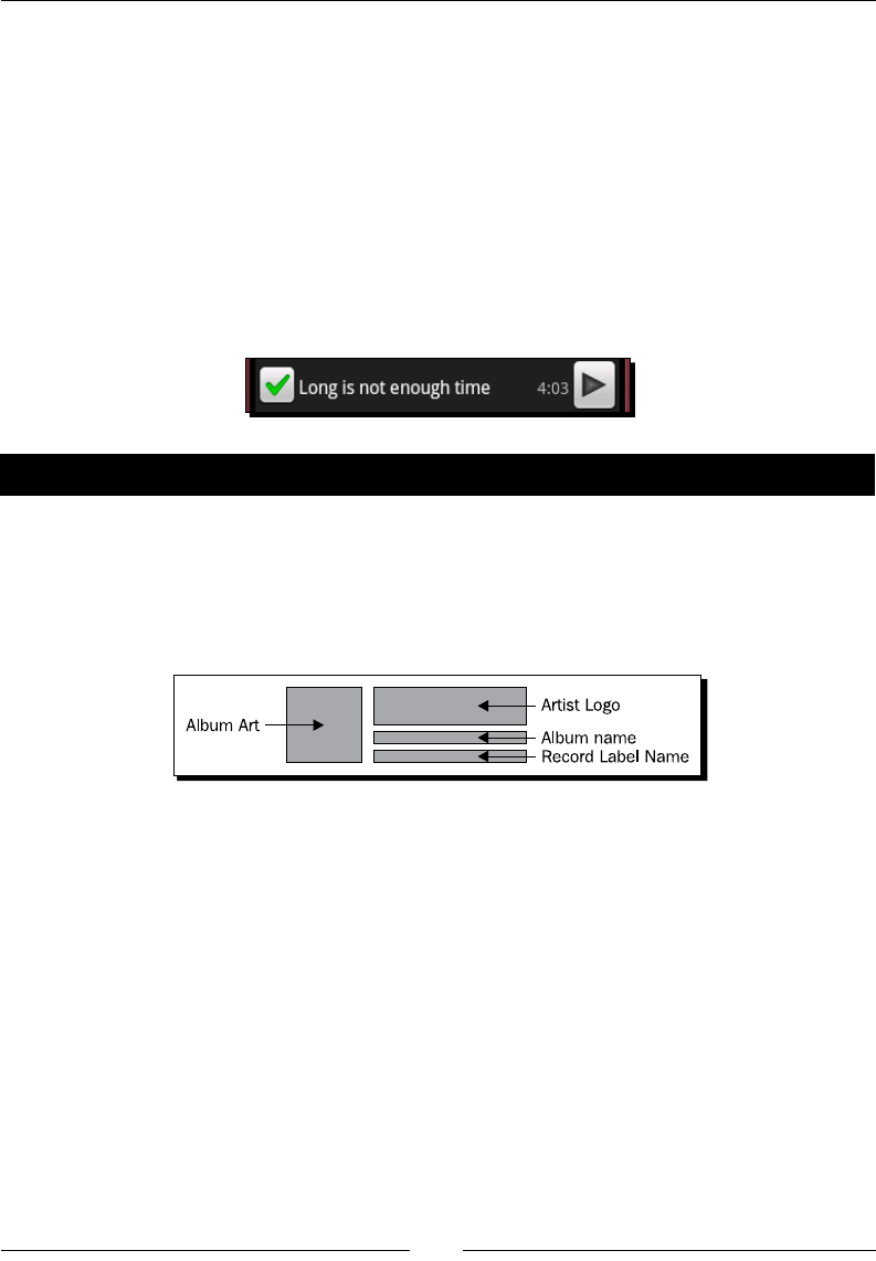
Chapter 8
[ 219 ]
What just happened
The above layout resource le will handle the layout of the track list items for the second
part of the user interface. We need to be able to create several of these structures to handle
all of the tracks available in an album. We wrap them in a TableRow element which when
placed in a TableLayout object, will automacally align each of its sub-elements with
those in the other rows.
Later, in the Java code we'll use the LayoutInflator to load this resource, populate it
with the name and duraon of a track, and then add it to a TableLayout object that we
will declare as part of the main user interface. Once this new item has been populated with
some data, it'll look something like the following screenshot:
Time for action – developing the main user interface layout
Having built the layout resource le that will become track items in a list later, we now need
to dene the remaining elements of this user interface. While this structure is relavely
simple, it's also very easily extended and has a few minor details that keep it looking really
good. It also needs some Java code in order to be correctly populated, but we'll get into that
aer we've nished with the resource le.
1. Create or open the res/layout/main.xml le in the new project.
2. The root element of the main layout needs to be a ScrollView in order to handle
the possibility that the interface runs longer than the available screen space. The
ScrollView should take up all available screen space:
<ScrollView
xmlns:android="http://schemas.android.com/apk/res/android"
android:layout_width="fill_parent"
android:layout_height="fill_parent">
3. As the only element to the ScrollView, declare a RelativeLayout which
consumes the available width, but only the required height. The RelativeLayout
should include some padding at the top and boom to provide a lile "breathing
room" so that its contents don't look to cramped:

Designing Content-centric Acvies
[ 220 ]
<RelativeLayout android:layout_width="fill_parent"
android:layout_height="wrap_content"
android:paddingTop="10dip"
android:paddingBottom="10dip">
4. The rst element of the RelativeLayout is the album art, a xed size ImageView
object that will t the album cover art in the available space:
<ImageView android:id="@+id/artwork"
android:scaleType="fitCenter"
android:gravity="left"
android:layout_alignParentTop="true"
android:layout_alignParentLeft="true"
android:layout_width="84dip"
android:layout_height="84dip"/>
5. The second element aer the album art is the arst's logo image, also an
ImageView. This element is required to center the logo in the available space:
<ImageView android:id="@+id/artist_logo"
android:adjustViewBounds="true"
android:scaleType="center"
android:layout_alignParentTop="true"
android:layout_toRightOf="@id/artwork"
android:layout_width="fill_parent"
android:layout_height="wrap_content"/>
6. Aer the arst's logo, we need a plain TextView object with some font styling to
hold the name of the album we're trying to sell. We'll place this below the arst's
logo in the user interface as per the image we saw earlier:
<TextView android:id="@+id/album_label"
android:gravity="center"
android:textSize="22dip"
android:textColor="#ffffff"
android:textStyle="bold"
android:layout_below="@id/artist_logo"
android:layout_toRightOf="@id/artwork"
android:layout_width="fill_parent"
android:layout_height="wrap_content"/>
7. Below the TextView with the album name, we have a small non-styled TextView
to hold the name of the record label under which the album is released:
<TextView android:id="@+id/record_label"
android:gravity="center"
android:layout_below="@id/album_label"
android:layout_toRightOf="@id/artwork"
android:layout_width="fill_parent"
android:layout_height="wrap_content"/>

Chapter 8
[ 221 ]
8. As promised, we follow these elements with a TableLayout which will hold the
available track informaon. We layout the TableLayout element against the album
art rather than the record label TextView:
<TableLayout android:id="@+id/track_listing"
android:stretchColumns="1"
android:layout_below="@id/artwork"
android:layout_width="fill_parent"
android:layout_height="wrap_content"/>
9. Underneath the track list, we start by placing the Buy Selected Tracks buon
element on the le side of the screen:
<Button android:id="@+id/purchase"
android:text="Buy Selected Tracks"
android:layout_below="@id/track_listing"
android:layout_alignParentLeft="true"
android:layout_width="wrap_content"
android:layout_height="wrap_content"/>
10. Finally, on the right side of the screen, we add our custom AmountBox widget
where we will tell the user how much they will be paying:
<com.packtpub.packttunes.AmountBox
android:id="@+id/purchase_amount"
android:layout_alignBaseline="@id/purchase"
android:layout_alignParentRight="true"
android:layout_width="wrap_content"
android:layout_height="wrap_content
What just happened?
In the preceding layout, each of the specied widgets has an important part to play by either
providing the user with informaon, or gathering new informaon from them. As far as
possible, we have given the user only the informaon that is important to them. The cover
art and arst's logo are oen the rst way people recognize a specic album, while the
name may well be a secondary recognion. The colors and shapes in the album cover art are
generally recognized faster by a person's brain than the text indicang the album's name.
All of the top elements: Cover art, arst logo, album name, and record label, could be
made into interacve elements, taking the user to screens with more informaon about
the selected element. The linked informaon could include reviews, discussion forums, and
rang widgets. Another great addion would be linking to music videos from the selected
album or arst (if there are some available).

Designing Content-centric Acvies
[ 222 ]
Also noce at the boom in our purchasing area. The AmountBox has been aligned with the
"baseline" of the purchase Button widget. In this case, it aligns the baseline of the text in
these two widgets, making them looked centered in relaon to each other, although it's an
aesthec centering rather than an exact computaon.
Time for action – developing the main user interface Java code
In order to put this example together enrely and have a working content-centric screen
(although only in the example sense), we need some Java code. This code will handle
populang the user interface layout with an Album object. For this next piece of code,
you'll need images for the cover art and for the arst's logo.
1. Open the ShopActivity Java source le in an editor or IDE.
2. In the onCreate method, ensure that the main.xml layout resource is being set as
the content view for the ShopActivity:
setContentView(R.layout.main);
3. Fetch the applicaon resources and invoke a new setAlbum method with the
contents of your favorite music album:
Resources resources = getResources();
setAlbum(new Album(
resources.getDrawable(R.drawable.album_art),
"The Android Quartet",
new Artist(resources.getDrawable(R.drawable.sherlock),
"Sherlock Peterson"),
"Green Records",
new Track("I was a robot", 208),
new Track("Long is not enough time", 243),
new Track("The rocket robot reel", 143),
new Track("I love by bits", 188)));
4. Declare the setAlbum method to accept an Album object:
private void setAlbum(Album album) {
5. Fetch the track_listing part of the user interface and use a new addTrackView
method to add each of the tracks to the display:
ViewGroup tracks = (ViewGroup)findViewById(R.id.track_listing);
for(Track t : album.getTracks()) {
addTrackView(tracks, t);
}

Chapter 8
[ 223 ]
6. Fetch the album cover art widget and set its content:
ImageView albumArt = (ImageView)findViewById(R.id.artwork);
albumArt.setImageDrawable(album.getCover());
7. Fetch the arst's logo widget and set its content:
ImageView artistLogo = (ImageView)findViewById(R.id.artist_logo);
artistLogo.setImageDrawable(album.getArtist().getLogo());
8. Fetch the album name widget and set its content:
TextView albumLabel = (TextView)findViewById(R.id.album_label);
albumLabel.setText(album.getName());
9. Fetch the record label widget and set its content:
TextView recordLabel =
(TextView)findViewById(R.id.record_label);
recordLabel.setText(album.getLabel());
10. Fetch the AmountBox widget and set its format to a money format before seng its
value to 1.99 mulplied by the number of tracks:
AmountBox amount =
(AmountBox)findViewById(R.id.purchase_amount);
amount.setFormat(new DecimalFormat("$ 0.##"));
11. Declare the addTrackView method and use it as it was used previously:
private void addTrackView(ViewGroup tracks, Track track) {
12. Use a LayoutInflator to inate the track layout resource:
LayoutInflater inflater = getLayoutInflater();
ViewGroup line = (ViewGroup)inflater.inflate(
R.layout.track,
tracks,
false);
13. Fetch the track name widget from the new ViewGroup and set its content:
TextView trackName =
(TextView)line.findViewById(R.id.track_name);
trackName.setText(track.getName());
14. Fetch the track duraon widget from the new ViewGroup, and create a
StringBuilder with which to display the track duraon:
TextView trackTime =
(TextView)line.findViewById(R.id.track_time);
StringBuilder builder = new StringBuilder();
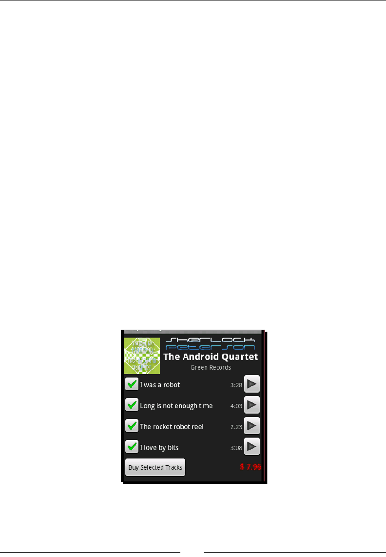
Designing Content-centric Acvies
[ 224 ]
15. Append the minutes and a separator to the StringBuilder:
builder.append(track.getMinutes());
builder.append(':');
16. If the number of seconds is less than 10, we need a prex '0' character:
if(track.getSeconds() < 10) {
builder.append('0');
}
17. Append the number of seconds in the duraon:
builder.append(track.getSeconds());
18. Set the text of the duraon widget and add the new line to the "tracks" list:
trackTime.setText(builder.toString());
tracks.addView(line);
What just happened?
The preceding Java code is enough to copy the data given in the Album object into the
user interface. Once on the screen, it looks like a simple music store page, but themed as
an Android applicaon. This provides much of the benet of a web page in terms of layout
structures and the easy maintenance that comes with an XML layout and at the same me
integrates enrely with whatever branding and styling may exist on the end user's device.
Once on the screen, the previous example will present you with something looking like the
following screenshot:
Chapter 8
[ 225 ]
Have a go hero – updating the total price
To really make the previous example feel more real, it needs to update the total amount at
the boom of the screen when the user selects or unselects tracks from the album lisng. It
should also disable the Buy Selected Tracks buon if there are no tracks selected.
Try adding an event listener to each of the CheckBox elements in the track layouts, and
keep a track of which are selected. For the total amount to display, mulply 1.99 with the
number of selected tracks.
Summary
In this chapter, we've delved into many important areas and techniques used when
presenng the user with lots of informaon or content. It's important to think through your
interfaces carefully before you start building them, but also try not to take up too much me
before you put ngers to the keyboard and start coding. Somemes having a simple user
interface up and running can tell you far more than your diagrams and mock-ups ever will
about how users will work with the screen.
We've completed an example of displaying recipes to the user with the WebView class,
demonstrang how easy it is to use HTML on the Android plaorm. We've also looked
at the nave alternave to an HTML view by building an online music store using a
RelativeLayout to display the content. With these two examples, we've compared the
dierences between the two mechanisms giving insight into where each can best be used.
Always consider your performance and user experience when deciding on how to display
your content. While a WebView may be more exible in some regards, allowing you to
change the content view depending on what content you are displaying, it may also lead to
inconsistencies and an irritated user. A RelativeLayout provides a more rigid structure,
and will also ensure a more consistent code base.
In the next chapter, we'll be looking in more detail at how you can go about adding more
style to your Android applicaon. We'll also look at how best to go about handling changes
to the device and conguraon (such as the changing language or a change from portrait to
landscape mode).
9
Styling Android Applications
Up to this point we've been working with the standard Android themes and
styling. From a consistency point of view, this is a very good thing, since
the applicaon will blend properly with the device's theming (if it has any).
However, there are mes when you need to be able to dene your own styling.
This styling may only apply to a single widget, or it may apply to the enre
applicaon. In any of these cases, you'll need to know what tools you have
available from Android in order to decide how best to approach the problem at
hand.
There is more to styling than just making your applicaon look good. Also, what you think
would look good, another person may hate. It's also about making the applicaon more
useful to your users. This may involve making sure that your applicaon looks right no maer
which language the user chooses. It may involve addional colors for some chosen widgets,
or it may simply involve implemenng a landscape layout for some key screens.
In the previous chapter, we looked at the overall choices that can be made when designing
certain screens of an applicaon. The chapter also looked at the idea of using WebView as
a container for content and widgets. One of the advantages of using a WebView is the fact
that you then have CSS at your disposal. As any web developer will tell you, using CSS makes
advanced styling very easy to do. However, Android has a collecon of styling tools built in as
well, with the ability to achieve many of the same eects as CSS and in some cases the ability
to do much more.
Styling Android Applicaons
[ 228 ]
Making a single buon on the screen appear to be dierent makes it stand out against all
of the other widgets. This helps draw aenon to the fact that it does something dierent
than anything else on the screen; it does something special. You may also want a rendered
line between two groups of widgets in order to inform the user that they have a logical
separaon. Much like trying to understand someone else's source code, geng to grips
with a new applicaon is geng to understand someone else's logic. Correctly styling your
applicaon can go a long way to helping the user understand what your thinking was when
building the applicaon, while also providing them with cues as to what they are expected
to do. If you need to provide instrucons on how the applicaon should be used, you have
failed in your eort to design and style the applicaon.
In this chapter, we'll be exploring how Android allows you to style the various widgets it
provides, and therefore how to adopt your own styles and themes. We'll also work through
examples where custom styling can be used to make the applicaon easier to use for the
user. We'll cover topics such as:
Dening styling resources
The dierent types of graphical resources that can be used for styling
Creang and using nine-patch images
Handling changes in the device conguraon at runme
Dening styles that are portable across dierent devices and screens
Working with style resources
The rst point of aack when dealing with Android styling is to understand how the style
values work. An applicaon has the ability to dene any number of styles, much like the
ability to dene strings and string arrays as resources. The style resources are used to dene
a series of defaults for certain user interface elements, in much the same way as a CSS rule
can dene styling aributes. The main dierence is that in Android, the styles can override
any XML aribute dened for a given widget class.
The following table gives a quick comparison of Android style resources and CSS stylesheets.
They have many common features, but behave quite dierently.
Android style resources CSS stylesheets
May apply to any XML aribute Have a purpose-dened set of aributes they can dene or alter
May inherit from a parent style Cascade together in order of denion to form complex styles
Must be explicitly applied to a View,
Activity, or Application
Are matched to document elements by their selector
Are dened as plain XML Dened using specialized grammar

Chapter 9
[ 229 ]
Android styles cascade in a manner similar to the way CSS rules do. However, the denion
of this cascading owes more to a Java class hierarchy. Each style may declare a parent style
from which it will inherit parameters. Once inherited, these parameters may be selecvely
overridden by the new style. It's always a good idea to have a parent style, as the device
manufacturer may have modied the defaults, allowing you to connue to t-in with the
rst-party soware installed on the users device while creang your own new styles.
A style declaraon cannot simply override the styles of all the available TextView objects.
Instead you must either import the style for a specied widget on the widget declaraon,
or reference the style in your manifest le as a theme, in order to apply either to a single
Activity or to your enre applicaon. For starters, we'll focus on simply building styles and
applying them to single widgets.
Styles, like dimensions, strings and string-arrays, are value resources. When creang a styling
element, you can place it in any XML le in the res/values directory (although it's best
to keep your resources separate and place the styles in a styles.xml le). Like all XML
resources in the values directory, the root element is expected to be <resources>, aer
which you will list your <style> elements. The following is a simple style that can be used
to style any TextView as a header:
<resources>
<style name="TitleStyle" parent="@android:style/TextAppearance">
<item name="android:textSize">25dip</item>
<item name="android:textColor">#ffffffff</item>
<item name="android:textStyle">bold</item>
<item name="android:gravity">center</item>
</style>
</resources>
The name aribute in the above <style> element is mandatory, while the parent aribute
oponally determines which style to use for the default items (in this case, the default
appearance of a TextView object). The following code snippet declares a TextView with
the TitleStyle we declared above as its style:
<TextView
style="@style/TitleStyle"
android:layout_width="fill_parent"
android:layout_height="wrap_content"
android:text="Header"/>
Noce the lack of the android namespace prex in the preceding example. Applying a style
eecvely happens at compile me, when the resources are converted into binary data for
packaging. When applying the addional aributes, any items declared on the <style> element
that are not available on the widget the style is being applied to, are simply ignored. This, in
theory, allows you to create more abstract styles and apply them to many dierent widgets.

Styling Android Applicaons
[ 230 ]
The TextView along with the TitleStyle applied, will render as follows:
Who Overrides Whom?
When applying a style to a widget, Acvity, or applicaon, it's important to know
the order of overrides. Each style overrides the style informaon of its parent (if
it has one), while each widget will override any style informaon from any styles
applied to it. This means that while you can apply an android:text style item
to a TextView object, it's generally not very useful since any android:text
aribute on the TextView will override the value specied in the style.
Using shape resources
It's all very ne and well being able to change the size and color of the fonts in a widget,
but what about fundamentally changing the way in which that widget is rendered? We've
already worked a lile bit with XML drawable objects, but there is much more that can be
done with them.
The work done so far with the XML drawable structures has been conned to pung default
images in widgets designed to have an image. However, all widgets in Android are designed
to have images. The background aribute of the View class allows you to pass in any
drawable resource, combined with style resources. This becomes a very powerful tool.
When a shape resource is loaded in Java code, it's returned as a Drawable object.
The shapes that are available to you are in the android.graphics.drawable.shapes
package, other than the Shape class which is the abstract class from which the other classes
in the package inherit. You reference these classes through XML les in the res/drawable
directory. However, unlike the layout XML resources, shapes are more limited:
You don't have direct access to the class aributes
You can only create a single shape per shape le
You cannot paint arbitrary paths (that is diagonal lines or bezier curves)
For all their limitaons however, shapes are extremely useful and important because:
They scale to the dimensions of the widget they are aached to
This makes them perfectly suited for creang borders and/or background structures
They also dierenate between the outline and ll of the shape
Downloa d f r o m W o w ! e B o o k < w w w.woweb o o k . c o m >

Chapter 9
[ 231 ]
How shapes behave
Each shape structure that you can dene behaves slightly dierently to each of the others, not
just in the way it's rendered, but also in what aributes apply to it. Since shape resources are
fairly limited in how complex they can become, they are also somewhat limited in their use.
Rendering lines
The line shape in Android is always a straight horizontal line, vercally centered in the
widget. Earlier we used the line shape as a placeholder image in the memory game.
However, a much more common use of the line shape is as a vercal separator. The line
shape is common when used with a ListView. A line shape doesn't allow for gradient lls,
so it is always a solid color (defaulng to black). However, the line shape does allow for the
full set of aributes in the stroke element to be used.
A simple white line can be dened in just a few lines, and will generally serve well as a separator
in a ListView or similar structure. The following code snippet is such a line denion:
<shape xmlns:android="http://schemas.android.com/apk/res/android"
android:shape="line">
<stroke android:width="1sp" android:color="#ffffffff"/>
</shape>
Time for action – drawing a broken line
All of the shapes dened in Android allow you to use the <stroke> element to dene a
doed or dashed line structure, but it's really best shown-o on the line element. If we
increase the width of the line and dene a dash paern with dash segments double the size
of the spacing, we get a line that looks much like a "cut" or "tear" line on a printed page. This
is a great way to make harder separators on a user-interface.
1. Create a new shape resource XML le in the res/drawable directory named
line.xml and open this le in an editor or IDE.
2. Declare the root element of the le as a line shape:
<shape xmlns:android="http://schemas.android.com/apk/res/android"
android:shape="line">
3. Declare a stroke element for the new line with a width of 3sp, a white color, a
dashGap of 5sp, and a dashWidth of 10sp:
<stroke android:width="3sp"
android:color="#ffffffff"
android:dashGap="5sp"
android:dashWidth="10sp" />
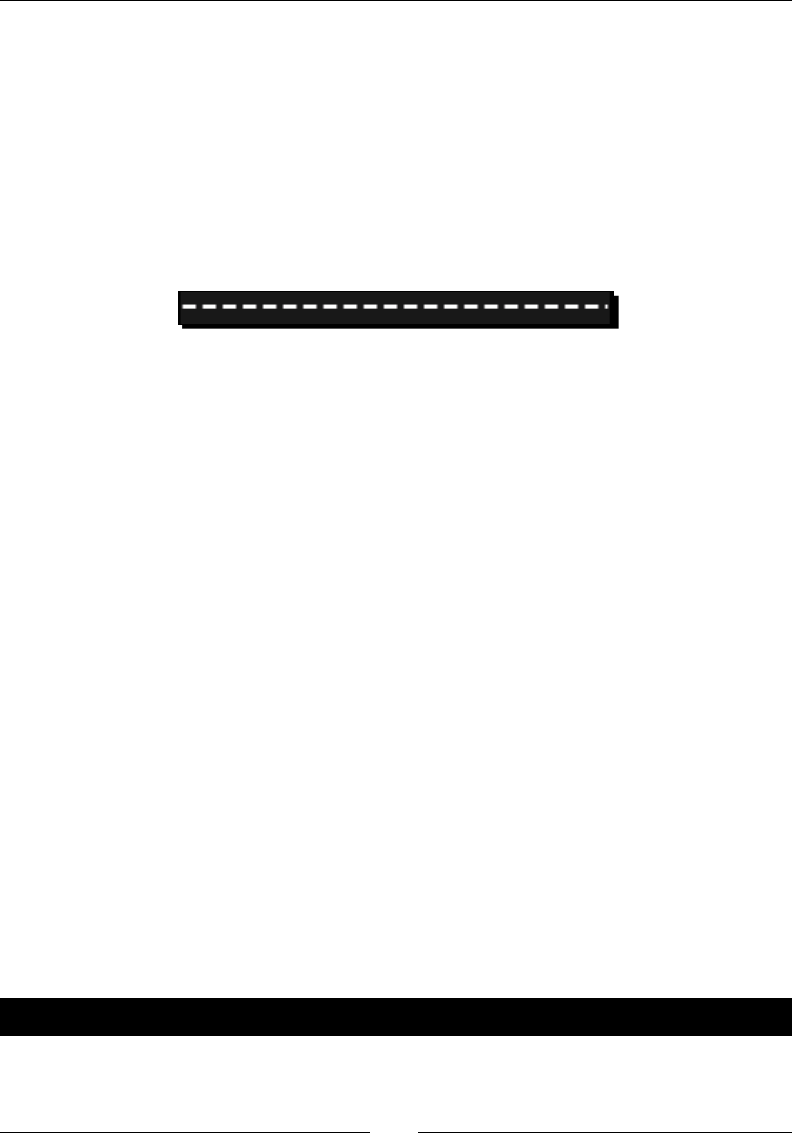
Styling Android Applicaons
[ 232 ]
4. Close the shape declaraon:
</shape>
What just happened?
The shape resource you just created will display a dashed line. The dashes in the line have a
spacing of exactly half the length of the dashes themselves. The sizes are set relave to the
user's preferred font size, so the dashes will grow and shrink according to the users preferences.
The following is a screenshot of this line running with the default emulator sengs:
Rendering rectangles
Rectangles are the most commonly used shape resource since View objects take up a
rectangular space on the screen (even if they don't use every pixel of that space). The
rectangle shape includes the ability to have rounded corners, where each corner may
oponally have a dierent radius.
With no addional style informaon, a basic rectangle declaraon will render a lled black
box with no visible outline. However, rectangles are beer suited to creang outlines which
can be used to either draw aenon to a single widget, or isolate a group of widgets from
all of the others on the screen. A simple white rectangle border can be built copying the
following code-snippet into a le named res/drawable/border.xml:
<shape xmlns:android="http://schemas.android.com/apk/res/android"
android:shape="rectangle">
<stroke android:width="2dip" android:color="#ffffffff" />
<padding android:top="8dip"
android:left="8dip"
android:bottom="8dip"
android:right="8dip" />
</shape>
The padding element in this shape will cause any View object it's used in to increase the
size of it's padding by 8dip. This will stop the contents of the widget from intersecng the
border rendered by the shape resource.
Time for action – creating a rounded border
A rectangular shape may also have its corners curved in order to make a rounded rectangle.
A rounded rectangle is useful for styling buons, or creang cleaner looking borders.

Chapter 9
[ 233 ]
1. Create a new shape resource XML le in the res/drawable directory named
rounded_border.xml and open this le in an editor or IDE.
2. Declare the root element of the le as a rectangle shape:
<shape xmlns:android="http://schemas.android.com/apk/res/android"
android:shape="rectangle">
3. Set the rectangle stroke to 2dip wide and white in color:
<stroke android:width="2dip" android:color="#ffffffff" />
4. Pad the rectangle with 8dip of empty space:
<padding android:top="8dip"
android:left="8dip"
android:bottom="8dip"
android:right="8dip" />
5. Curve the corners by 4dip:
<corners android:radius="4dip"/>
6. Close the shape declaraon:
</shape>
What just happened?
To apply the rounded border you just created to a View object, you have several dierent
opons available to you, the most simple of which is to apply it directly as a background. For
this, you would reference the shape as though it were any other image le in the drawable
directory. Earlier, we declared a TitleStyle and applied it to a TextView with the word
Header as its content. If you applied the new rounded_border to this TextView, the
TextView declaraon in the layout resource would look something more like this:
<TextView
style="@style/TitleStyle"
android:background="@drawable/rounded_border"
android:layout_width="fill_parent"
android:layout_height="wrap_content"
android:text="Header"/>
Alternavely, you could apply this border to the TitleStyle, which would then apply the
new border to every widget assigned the TitleStyle, which is rather ng for headers
and tle widgets:
<style name="TitleStyle" parent="@android:style/TextAppearance">
<item name="android:background">@drawable/rounded_border</item>

Styling Android Applicaons
[ 234 ]
<item name="android:textSize">25dip</item>
<item name="android:textColor">#ffffffff</item>
<item name="android:textStyle">bold</item>
<item name="android:gravity">center</item>
</style>
Either of these will result in the exact same rendering of the new widget. The implementaon
decision is really a maer of what you are trying to achieve. Styles are the best way to keep
commonality between dierent widgets that are used for the same purpose.
Using the above style on a TextView will result in a nice header widget that looks as follows:
Rendering ovals
The oval shape is exactly what the name implies—an ellipse. An oval is more limited in its
use than a rectangle, unless the widget drawing on top of it is best bordered by a circle or
ellipse, such as an analogue clock. That said, an oval, or rather a circle is a very useful shape
to use as an image in your user-interfaces. A perfect example is a symbol to inform the user
whether they are connected to the Internet or not, or whether a widget is valid or not. Using
an oval shape for such a purpose is exactly the same as using a bitmap. However, the oval
can be scaled according the users' preferences without any loss of quality, while you would
need several dierently-sized bitmap images to achieve a similar eect (even then, some of
the bitmaps would require scaling).
If we wanted an oval shape to represent an invalid widget (for example, to show that two
password entries don't match when the user is selecng a password), then it would be best
to color the oval in red. In the following code-snippet, we declare an oval shape as XML with
a grey border and a red ll:
<shape xmlns:android="http://schemas.android.com/apk/res/android"
android:shape="oval">
<solid android:color="#ffff0000"/>
<stroke android:width="1sp" android:color="#ffaaaaaa"/>
</shape>
In the preceding case, we use the <solid> element to ll the oval with a plain red color,
while using the <stroke> element to surround it with a thin grey outline. Also, noce the
lack of sizing on the shape elements. As previously stated, their dimensions are inherited
from the width they are placed in, either as a background, or in the case of an ImageView,
as the content of the widget. If you want to place this oval shape into an ImageView, you
would specify it in the src aribute, as follows:
Chapter 9
[ 235 ]
<ImageView
android:src="@drawable/oval"
android:layout_width="8dip"
android:layout_height="8dip"/>
The preceding code is about the right size for a validaon icon to sit next to a widget, while
scaling the icon up or down is as easy as changing the width and height of the ImageView. If
you use wrap_content as the size of the ImageView, it will be sized as zero-by-zero pixels,
and will eecvely vanish o the screen.
Following is a screenshot of four dierent sizes of the same oval, each scaled to double the
size of the previous (starng o with the 8x8 dip on the le):
Time for action – applying a gradient to an oval shape
The previous screenshot shows that while the oval looks okay, it's not going to be very
visually appealing when surrounded by the gradient painted widgets which make up the
default Android toolkit. In order to get the lile oval to t in nicely, it needs to look more like
a ball, which requires a simple radial gradient to be applied.
1. Create a new shape resource XML le in the res/drawable directory named ball.
xml and open this le in an editor or IDE.
2. Declare the root element of the le as an oval:
<shape xmlns:android="http://schemas.android.com/apk/res/android"
android:shape="oval">
3. Instead of declaring a solid color as the ll, declare a gradient ll starng with a
light grey and ending in red:
<gradient android:type="radial"
android:centerX="0.5"
android:centerY="0.25"
android:startColor="#ffff9999"
android:endColor="#ffff0000"
android:gradientRadius="8" />
Styling Android Applicaons
[ 236 ]
4. Dene the thin light grey outline of the oval in a stroke element:
<stroke android:width="1sp" android:color="#ffaaaaaa"/>
5. Close the shape declaraon:
</shape>
What just happened?
Unfortunately, the aected radius of a radial gradient doesn't scale with the rest of the
image, leaving a very small gradient area when you scale the image to large sizes. The
eect in this case is that while the smallest version of the image looks great, the larger
versions look terrible. At the me of wring this book, there is no direct way to work around
this limitaon. Instead, you will need to e the size of your oval shape to the size of the
ImageView if you want to use a radial gradient.
Rendering rings
The ring shape is also circular in its rendering, but serves a very dierent purpose to the
oval shape. While the oval shape's content area is everything inside the outline space, a ring
shape's content area is a circle.
The following diagram illustrates the logical dierence between the two shapes:
The ring shape also how two outlines, one on the outside and another on the inside (as
shown in the preceding diagram). Combine this with the ability to ll the ring's content area
with a gradient and you have the perfect shape to use for progress spinners (the default
Android indeterminate progress spinner it built with a ring).
Chapter 9
[ 237 ]
Time for action – rendering a spinner ring
By default, a shape will assume that it's being used as part of a LevelListDrawable, and
may not appear unless you disable this behavior. You do this by specifying the useLevel
aribute as false on the shape element. If you don't disable this funconality, the ring will
not render correctly, or at all.
1. Create a new shape resource XML le in the res/drawable directory named
spinner.xml and open this le in an editor or IDE.
2. Start the root element of the le as a ring shape:
<shape xmlns:android="http://schemas.android.com/apk/res/android"
android:shape="ring"
3. The ring shape requires its relave thickness to be set on the shape declaraon:
android:innerRadiusRatio="3.2"
android:thicknessRatio="5.333"
4. Finish the shape declaraon by turning o the useLevel funconality:
android:useLevel="false">
5. Declare a sweep gradient centered in the oval:
<gradient android:type="sweep"
android:useLevel="false"
android:startColor="#ffaaffff"
android:centerColor="#ff0000ff"
android:centerY="0.50"
android:endColor="#ff0000ff"/>
6. Outline the ring with a thin white border:
<stroke android:width="1sp" android:color="#ffffffff"/>
7. End the shape declaraon:
</shape>
What just happened
The sweep gradient is another form of radial gradient. Instead of extending out from the
center of the image, it sweeps in a circle like the hands of a clock.
Styling Android Applicaons
[ 238 ]
The image on the le-hand side is a rectangle lled with the sweep gradient; while the
image on the right-hand side is the ring shape. As you can see, the two eects are quite
dierent. The image on the right-hand side is based on the image used by Android 1.6 for the
indeterminate spinner.
Dening layers
So far, we've only dened shapes as single-element images. It's possible to combine these
shapes into more complex images. These images are combined together in layers, which is
a commonly used graphics structure. In Android, this is done with a layer-list structure.
A layer-list is not a type of shape, but it is a Drawable structure which means it can be
used in place of a normal bitmap image.
Layered image resources are not conned to being used with vector Drawable structures
such as the shapes we've already talked about. A layered Drawable object may also include
some layers that are bitmap images, or any other Drawable type that can be dened.
For each layer in a layer-list, you need to dene an <item> element. The item element
is used to declare oponal meta-informaon such as an ID for the layer (which can be used
to retrieve the Drawable object for that layer in your Java code). You can also declare
locaon osets or padding for the layer in the item element. While you can reference a layer
as an external Drawable resource, you are also able to inline the Drawable object inside
the <item> element, allowing you to compose various dierent Drawable structures in a
single le.
Sizing your layers
Only the rst <item> of a layer-list will be sized according to the widget
it's placed in. All other layers will be sized to their "natural" size. For a bitmap
image, this is the size it is rendered in. For a <shape> element, the natural
size is 0x0. In order to specify a natural size for a <shape>, you'll need to
give the <shape> a <size> child-element with an android:width and
android:height aribute.
If you wanted a two-layer image to act as a large green buon, you would probably declare
a layer for a grey rounded rectangle as a background, and another layer for a green oval to
look something like a light, or ball on top of the grey background. Such a layer-list could
look something similar to the following code-snippet:

Chapter 9
[ 239 ]
<layer-list xmlns:android="http://schemas.android.com/apk/res/
android">
<item>
<shape android:shape="rectangle" android:useLevel="false">
<stroke android:width="1dip" android:color="#ffffffff" />
<gradient android:type="linear"
android:angle="90"
android:startColor="#ffaaaaaa"
android:endColor="#ffcdcdcd" />
<padding android:top="8dip"
android:left="8dip"
android:bottom="8dip"
android:right="8dip" />
<corners android:radius="4dip" />
</shape>
</item>
<item>
<shape android:shape="oval" android:useLevel="false">
<size android:width="32dip" android:height="32dip" />
<gradient android:type="radial"
android:centerX="0.45"
android:centerY="0.25"
android:startColor="#ff1a4e1a"
android:endColor="#ff1ad049"
android:gradientRadius="32" />
</shape>
</item>
</layer-list>
In the preceding snippet, there are only shape layers, but you could easily add in a bitmap
layer by referencing the bitmap resource on the <item> element, as in the following
code snippet:
<item android:drawable="@drawable/checkmark"/>
Stretching using nine-patch images
There are mes when you want a border that is more than a simple line, for example, if
you want to add a shadow. On a web-page, you'll commonly nd various HTML tricks used
to insert eight or nine images into a box so that the content can be scaled while the border
remains intact. In Android, this technique is called a "nine-patch" image because it consists
of nine dierent parts. A nine-patch image in Android is handled specially when it's rendered
at sizes larger than its original size. In order to idenfy these images as special, they have a
.9.png extension (and must be valid PNG les).
Styling Android Applicaons
[ 240 ]
A nine-patch image combines a border and a background in a single image. The background
area will grow when the content becomes too large for the image, and the border areas of
the image will be scaled up so that no "holes" are le.
Conceptually, you can start o by thinking about a nine-patch image as shown in the
following diagram:
The arrows in the diagram indicate the conceptual "border" areas that will grow in size
according to the size of the center "content" area. The corners of a nine-patch image will be
enrely unaected by any scaling that takes place.
Creating nine-patch images
In order to create a nine-patch image, you'll need a decent image eding applicaon. I
personally make use of the GIMP applicaon (available for free at http://www.gimp.
org), although you may prefer to use another applicaon. Whatever applicaon you use, it
must be able to write out Portable Network Graphics (PNG) les, and should also be able
to zoom to fairly extreme levels. The enre data in a nine-patch image is actually encoded
into the image le, meaning there is no need for an XML le to tell Android what parts of the
image are border areas, and what parts must not be aected by scaling.
Unlike CSS boxes that appear on web pages, the size manipulaon done on a nine-patch
image in Android is nearest-neighbor scaling. Nearest-neighbor scaling doesn't aempt to
improve the quality of the scaled image in any way, the pixels simply become larger solid
blocks of color. While this works excellently for gradient content backgrounds (provided they
aren't forced to grow too large), it may cause your image to have some strange arfacts to
it. Since currently there is no color interpolaon performed during the scaling, some eects
may look rather strange when they are scaled. Scaling also takes longer than simple image
copying, so bear this in mind when sizing the image, it may need to get a lot larger than you
think. However, this also means that nine-patch images are far more exible than those you
might know from the Web.
Chapter 9
[ 241 ]
The following two images are scaled-up versions of the same 32x32 pixel nine-patch image:
The image on the le-hand side is the raw PNG le that can be used as a nine-patch
image. The image on the right-hand side is the same image with a part of it highlighted to
show which areas will be scaled. The top, boom-le, and right areas will be scaled only
horizontally or vercally, while the center area will be stretched to t the size of the content.
The following image is the same image being used as the background of a TextView object:
So, the black lines on the le-hand side and top of the image tell Android what parts of
the image to scale, but what do the lines on the right and boom signify? These two lines
determine where to place the content of the widget, much like the <padding> element in a
<shape> resource.
To get to grips with how your nine-patch image will be rendered and the possible ways it
can be scaled, Android provides you with a ulity in the tools directory of an Android SDK
installaon. The draw9patch ulity renders your nine-patch scaled to various shapes and
sizes, and allows you to eecvely debug the image before using it in your applicaon.
Using bitmap images in Android
Images are a major part of styling your applicaon. They are used for icons, borders,
backgrounds, logos, and many other purposes. Android does its best to make sure the
images you use as resources render as well as possible across the dierent types of screens
used on Android devices.
Android's automac handling of images if far from perfect. However, there are mes when
you will need several dierent variaons of the same image for your applicaon to look right
on all of the dierent devices.

Styling Android Applicaons
[ 242 ]
Handling different screen sizes
When working with any bitmap image in Android, it's very important to consider that your
applicaon will be run on a variety of dierent screens, both dierent sizes and densies.
When working on very large screens (such as those found on a laptop or tablet), you will want
to use larger images than you use on an extremely small screen. While nine-patch images go a
long way to keep things simple, they are sll scaled with a nearest-neighbor algorithm, and this
may start to show on a large screen with a larger font-size than you ancipated.
You can provide images of dierent sizes in your resources directory. For each screen
size, you can provide a dierent drawable directory. The resource loading tools will
automacally pick les from the directory that most closely matches the current device
conguraon. You don't need a copy of every resource in each of these directories, but only
the ones you want to provide a more suitable alternave for. The resource loader will fall
back on looser matching directories when it aempts to nd a resource le to load.
Android recognizes ve important parameters with regards to the size of a screen. While you
can specify parameters that relate to the exact number of pixels on the screen, this is not a
good idea as you won't easily be able to cater to all of the dierent screen sizes. Instead, it's
best to sck to the ve parameters that Android provides:
small
medium
large
long
notlong
The rst three parameters are directly related to the size of the screen, while the last two are
related to whether the screen is "tradional" (such as VGA) or has a "wide" (such as WVGA)
format. These parameters can be mixed together in various combinaons such as:
/res/drawable-small/
/res/drawable-medium-long/
/res/drawable-large-notlong/
The preceding examples are all valid resource directories that can be used to override le in the
normal drawable directory. You can't combine parameters that contradict each other, such as:
/res/drawable-small-large/
/res/drawable-long-notlong/
In the preceding cases, you will receive an error from the resource packaging tool. Whenever
you work with bitmap images, it's important to consider these size parameters, since some
devices have screens very dierent from the one that the emulator shows by default.
Downloa d f r o m W o w ! e B o o k < w w w.woweb o o k . c o m >
Chapter 9
[ 243 ]
Handling different screen densities
Screen density generally refers to the number of pixels packed into a given physical space
(that is, dots-per-inch or DPI). It also has a relaonship to the size of the pixels on the screen.
While most Android devices have medium or high-density screens, a large number of
cheaper devices make use of a relavely low-density screen.
Why does this aect nine-patch and bitmap images? The same reason it aects font
rendering—the lower the density, the worse an-aliasing and shadows look. The best way to
explain this is with images. In the following images, the one on the le is a simple rounded-
rectangle as it would appear on a high-density screen. The image on the right is similar to
how the same image would render on a low-density screen:
Although both are the same source image rendered at the same physical size, a reducon in
the number of pixels available makes the image look blocky on a low-density screen.
The following two images are taken from the boom-right corner, and enlarged to illustrate
in beer detail what happens:
Again, these images are congured to take up the same amount of physical space. If an image's
size is specied in screen-pixels, it will take up much more physical space on a low-density
screen. This is one of the reasons it's recommended that you size images in Android using the
"density-independent-pixels" (dp or dip) unit instead of the normal pixels (px) unit.
As with screen sizes, Android provides a series of conguraon parameters that can be used
to provide dierent resources for dierent screen densies. The parameters available for
selecng a screen-density can be mixed with those selecng based on the screen-size. The
following is a list of parameters Android makes available for resources to be provided based
on the screen-density of the current device:
Styling Android Applicaons
[ 244 ]
ldpi: Low-density screens (~120dpi)
mdpi: Medium-density screens (~160dpi)
hdpi: High-density screens (~260dpi)
nodpi: Special case
The nal "special case" can be used when you have a nine-patch image, or a bitmap image,
that you don't want scaled according to device density. Android, by default, will re-scale
an image in an aempt to keep the image's physical size as close to the intended size as
possible. An image in a nodpi directory will not be scaled automacally by Android, and will
be rendered on a pixel-for-pixel basis.
Dierent density icons
There are mes when a large high-resoluon icon does not scale down very well.
In these cases, it's oen a good idea to design enrely dierent icons for low-
density screens.
Handling conguration changes
When you provide Android with dierent resource directories relang to various possible
hardware conguraons, the resource loader will aempt to match the best resource les
for the device that your applicaon is running on. However, not all of the conguraon
parameters relate directly to the hardware, but instead describe the device state or some
soware conguraon parameter. Examples of these types of parameters are the device
language, network IDs, and device orientaon. These parameters may change while your
applicaon is running. The most common example being the device orientaon. Android has
a built-in mechanism to handle such changes for you, and for the most part you won't need
any special Java code to handle these changes. However, it is strongly desirable to at least
provide resource les for some of these parameters.
When a conguraon parameter changes, Android will store any of your Activity state in
a Bundle object, and then shut down the Activity. It will then start up a new instance of
the Activity object with the new conguraon parameters, and restore the state from the
Bundle object. All of the default Android widgets will store their current state before your
Activity is shut down by the system. This means you don't generally need to perform any
special handling for the conguraon changes.
Chapter 9
[ 245 ]
Providing landscape layouts
So far through the book, we've only built portrait layouts. Unlike a desktop or web system,
a mobile applicaon's orientaon by default is portrait (hence the conguraon parameters
long and notlong as opposed to wide and narrow). One of the great things about having
the Android plaorm is that an accelerometer is a required piece of hardware, which means
that your applicaon can respond to the orientaon of the device. Thanks to Android's
conguraon handling (as menoned previously), you, as a developer, don't need to do
anything except provide alternave landscape layout resources, assuming you don't build
major parts of your user interface in Java. In order to provide layouts which are specic to
either a portrait or a landscape orientaon, you place the specic versions of your layout's XML
resources in directories congured with the following resource conguraon parameters:
port: Portrait-specic layouts
land: Landscape-specic layouts
When the screen is longer vercally than horizontally (that is, portrait orientaon), using a
simple vercally-oriented LinearLayout to layout an input form makes quite a lot of sense.
Any input widgets you make use of will be posioned below their labels and so have more
horizontal space to display their data. The addional horizontal space allows for labels to
include more informaon as well.
The following diagram illustrates the dierence between these two layout concepts:
The layout method used on the right is very common in a web or desktop system, and will
work well on a mobile device if the size of the labels and input widgets are small enough.
When switching to a landscape orientaon, the dramac increase in horizontal space
coupled with the massive loss in vercal space makes the vercal LinearLayout a terrible
choice. If you are working with a simple input form, then a landscape layout should use
TableLayout or RelativeLayout to posion the labels on the same lines as the input
widgets they relate to.

Styling Android Applicaons
[ 246 ]
Providing text input on a landscape layout
When building your landscape layouts, you need to carefully consider what parts of the
user interface are most important. If your screen is being used to compose an e-mail or a
document, your landscape layout could be almost idencal to the portrait layout. However,
such a layout has a mostly hidden enemy: the soware keyboard. On a portrait layout, the
soware keyboard will conne itself to the boom of the screen and consume a relavely
small amount of space (about a quarter to one-third of the available screen space). On a
landscape layout however, the soware keyboard can consume as much as half of your
vercal screen space, making it very hard to build content-centric landscape layouts. If
your layout is strongly input-driven, it may make sense to either remove parts of your
user-interface when the orientaon is landscape, re-working your user interface so that
the soware keyboard won't get in the way.
Android does provide a series of conguraon parameters which will tell you about the
keyboard on the device on which your applicaon is running. It's a good idea to take all of
the possibilies into account when building your applicaon. The following is a short list of
the possible keyboard situaons that your applicaon may be faced with:
Soware Keyboard only
Hardware Keyboard
Hardware Keyboard available; Soware Keyboard in use
On top of these possibilies, devices with smaller screens will oen make use of a 12-key
keyboard instead of a full QWERTY keyboard. If this is a soware keyboard (which it oen is),
the keyboard may take as much as 80 percent of your available screen space. This problem
if oen handled by Android opening a "text input" screen when a text-input box is acvated
by the user. You can determine the dierent states of keyboard availability, and the type of
keyboard used, with the following conguraon parameters:
nokeys: Soware keyboard only
qwerty: A full hardware keyboard is available
12key: A 12-key hardware phone-keyboard is available
keysexposed: The user has a keyboard visible, whether it's hardware or soware
keyshidden: There isn't any keyboard currently visible
keyssoft: The user will use a soware keyboard (though it may not be visible)
When designing your screens, consider that the soware keyboard may take up to half
of your vercal space. Ensure that content areas will scroll, while vital widgets will always
remain visible on the screen. If a chat applicaon is simply wrapped in ScrollView, the
input EditView object may become invisible when the soware keyboard is visible. It's
important not just to consider how the screen will look, but how it will react to the changes
that your users will throw at it. Finally, it's vital to test how your screen will look and behave
with and without a soware keyboard.

Chapter 9
[ 247 ]
Altering screen content
One of the great advantages of the Android XML layout format is the decoupling it provides.
Portrait and landscape layouts are oen quite dierent from each other, and users may
individually nd a preferred orientaon from which to use your applicaon. A not-very-
common, but useful trick when designing the new layouts, is the ability to add or remove
"non-funconal" elements from the two dierent layouts.
In a simple example, you may want to abbreviate the text in labels for the portrait layout and
include some icons as graphical hints, while for the landscape layout, you may want icons
double the size and two-line labels, all on the same line as your input eld.
The following diagram illustrates this concept:
On the landscape layout in the preceding diagram, you could make use of an addional
TextView element for the sub-text on the label. Assuming your Java code doesn't look
for the addional TextView object, your applicaon will run perfectly. The ability to
alter the actual structure of the user interface, and not just its layout, is a very important
consideraon when designing alternave layouts for an Activity.
Summary
The look and feel of an applicaon is vital. A single change to color or font can make or break
a screen's usability. At the same me, over-styling an applicaon can make it feel out-of-
place on the user's device. An alien look and feel will drive users away from the applicaon
towards those that look and feel more familiar and comfortable to them.
Android provides an extremely powerful set of capabilies with the style resource structure.
When combined with the ability to place your graphics in resource les and override
the defaults, you can eecvely re-style any widget. Using styles also helps with the
maintenance of your applicaon as you will only need to change styling in the style resources
and not on each widget declaraon of a parcular style.
Keeping most of your widget graphics as <shape> resources will ensure the most consistent
look and feel possible for your applicaon. However, this is not always praccal. When you
need to provide bitmap resources, it's vital to provide dierent images for the various screen
sizes and densies the user may be working with.

Styling Android Applicaons
[ 248 ]
Styling an applicaon also includes the layout and the ability for the applicaon to adapt
to the device it's running on. Having a great idea is only half of an applicaon's appeal, its
styling and execuon are crical to its survival in the "wild". Aenon to detail is a powerful
tool that will draw users to your applicaon. Applicaons that "just work" are always favored
over those that require me and eort to work with.
Make use of the various screen-sizes and densies provided to you by the Android emulator
to ensure that your applicaon will look good on as many devices as possible. Don't forget
that many devices don't have hardware keyboards and that the soware keyboard can take
as much as half of your screen space.
In the next chapter, we'll be extending this styling knowledge into the overall design and
theming of an applicaon. We'll be building a styled applicaon with many of the provided
layouts and will be performing fairly extensive styling.
10
Building an Application Theme
Whether graphical styling or not, every applicaon has a theme. The theme of
an applicaon is what gives it a disnct appearance and logic.
When a person uses a mobile applicaon (which accounts for most Android devices), there
are some fundamental dierences in their behavior when compared to a desktop or laptop:
They oen have less me for the applicaon, and therefore less paence
They are oen focused enrely on a single applicaon at a me
Touchscreen devices encourage an almost tacle response
Android devices are diverse and run on almost everything including common mobile phones,
tablets, laptops, and a few desktop machines. An Android applicaon is expected to funcon
well in all of these environments, and the theme of the applicaon should be carefully
constructed to allow the user the best possible access to each of these devices.
The device interface forms a part of your applicaon theme. When using a mouse on a
desktop or laptop device, a user interface designed with only touchscreen in mind may
feel over-sized to a user (since all widgets need to be nger-sized). Contrary to this, an
applicaon designed for a mouse-driven system will normally include rollover eects, which
won't work properly on a touchscreen device. The only way to make sure your applicaon
works on all these dierent devices is to consider all of these environments when building
the screens of your applicaon.
Android itself denes a theme of sorts and as far as possible, applicaons built for the
Android plaorm should aempt to conform or extend this theme, rather than redene it.
This doesn't mean your applicaon must look and behave exactly the same way as all other
Android applicaons, but rather that your applicaon should be based on the underlying
principles that Android lays down.
Building an Applicaon Theme
[ 250 ]
Keep in mind that many of the device manufacturers dene addional parts to
the basic Android theme, and your applicaon should do the same.
In this chapter, we will examine the building of an applicaon, including the design of
the screens, their construcon, and their styling. We'll also examine how this applicaon
will interact with various dierent devices, making sure it looks right and funcons as the
user would expect it to. The applicaon we're going to build is a calculator, having both a
standard and a scienc calculator. The calculator will be styled to look more like a physical
calculator than a generic Android applicaon, and will change its funconality according to
the capabilies of the device it's running on. Overall, we'll be dening an applicaon with its
own, consistent theme.
Creating a basic calculator layout
The rst thing we need in order to build this project is a basic portrait layout for a standard
calculator. This basic layout will serve as the screen that the user will look at when they
rst start the applicaon. Given the nature of a calculator applicaon and how the user
perceives it, it's very important that the screen be simple and that the applicaon starts as
quickly as possible.
It's important that the calculator screen takes up all available space with
funconal components, in order to make itself as quick to use as possible (bigger
buons equals easier usage).
Pop quiz
1. When do layout resources become Java classes?
a. When the resource-processor is run
b. When the applicaon package is built
c. When the layout resource is loaded
d. Never
2. How do you reference widgets that are not dened by default in Android?
a. By using the full class name as an element name
b. By dening an XML namespace for the Java package
c. It's currently impossible
d. By specifying the Java package name in the the android:package aribute

Chapter 10
[ 251 ]
3. What is the default width and height of a View object?
a. The size of it's content
b. Zero-by-zero pixels
c. It depends on the ViewGroup it's placed in
d. The width of its parent and the height of its content
4. You write a layout resource as XML, what format is it stored in?
a. As raw XML text
b. Android binary XML
c. Layout specic binary format
d. Java classes
Designing a standard calculator
Before starng to build the calculator applicaon, it's a good idea to sketch out what it's
going to look like. This will also help you to decide how exactly to construct the screens.
Since a calculator is something that is both, a rather old invenon as well as something
people are very familiar with, it's important to sck to the most common design. If you
introduce a calculator that is too foreign to people, they may well not have the paence to
"get to know" your applicaon. New ideas are good (that is, slide keyboards), but the most
successful are those that are extensions of exisng ideas. Also, make it obvious to the user
how they work. The following is a block diagram of the standard calculator screen that we
will start building:
It's important that we maximize the use of the screen space, so we'll do our best to make
the buons as large as possible. Also, we want to space the buons slightly apart in order
to avoid the undesired buon from being pressed by the user. Since we only have a single
output area, we'll make sure that the display area is also suciently large.
Building an Applicaon Theme
[ 252 ]
The arrow in the display area will be an icon which will act as a Backspace buon, allowing the
user to delete unwanted content. It's always important to give the user a way to undo what
they have done. We'll use an icon similar to the one used in the dialer applicaon, which will
keep a feeling of overall consistency with the rest of the system. This also eecvely gives
us space for an addional buon. This user interface doesn't include the normal "memory"
funcons associated with many calculators. The basic screen is designed to be as simple as
possible, and we'll introduce more funconality as we develop the applicaon.
Time for action – building the standard calculator
The rst layout for the calculator will consist of a normal series of 0 to 9 buons with a
buon for the various basic arithmec operaons—add, subtract, mulply, and divide. It will
also have buons for equals and a buon for the decimal point. While this would be a very
easy screen to build in Java code, we'll build this example enrely as an XML resource. Since
this applicaon will have several dierent permutaons of the same screen, using layout
resource les with no Java code will make your life much easier.
1. Start by creang a new project for the calculator:
android create project -n Calculator -p Calculator -k com.
packtpub.calculator -a CalculatorActivity -t 3
2. Open the standard main layout le /res/layout/main.xml.
3. Remove the generated layout structure from the le.
4. Start by declaring a vercal LinearLayout as a root element to consume all the
available space on the screen:
<LinearLayout
xmlns:android="http://schemas.android.com/apk/res/android"
android:orientation="vertical"
android:layout_width="fill_parent"
android:layout_height="fill_parent">
5. Declare a RelativeLayout that will compose the display with the Delete or Cancel
buon that the user can use to remove unwanted input:
<RelativeLayout android:layout_width="fill_parent"
android:layout_height="wrap_content">
6. Use the standard Android input delete icon in an ImageView on the right side of the
RelativeLayout:
<ImageView android:id="@+id/delete"
android:src="@android:drawable/ic_input_delete"
android:layout_centerInParent="true"
android:layout_alignParentRight="true"

Chapter 10
[ 253 ]
android:layout_width="wrap_content"
android:layout_height="wrap_content"/>
7. On the le side of the RelativeLayout, create a TextView that will actually
display the numeric status of the calculator:
<TextView android:id="@+id/display"
android:text="0"
android:layout_alignParentTop="true"
android:layout_toLeftOf="@id/delete"
android:layout_width="fill_parent"
android:layout_height="wrap_content"/>
8. Inside the LinearLayout, declare a TableLayout that will be used to contain the
buon inputs for the simple calculator:
<TableLayout android:id="@+id/standard_functions"
android:layout_width="fill_parent"
android:layout_height="fill_parent"
android:layout_margin="0px"
android:stretchColumns="0,1,2,3">
9. The TableLayout will be made up of four TableRow objects. Declare the rst of
these with no margin and a layout_weight of 1:
<TableRow android:layout_margin="0px"
android:layout_weight="1">
10. The top-right Button object needs to be the plus sign, which we also use as the
name for the Button ID:
<Button android:id="@+id/plus"
android:text="+"/>
11. The next three Button objects on the rst row will be the numbers 1, 2, and 3.
These all need IDs as well:
<Button android:id="@+id/one"
android:text="1"/>
<Button android:id="@+id/two"
android:text="2"/>
<Button android:id="@+id/three"
android:text="3"/>
12. Connue to declare TableRow objects with buons in the order dened in the
block-diagram.
13. Open the CalculatorActivity.java source le in an editor or IDE.
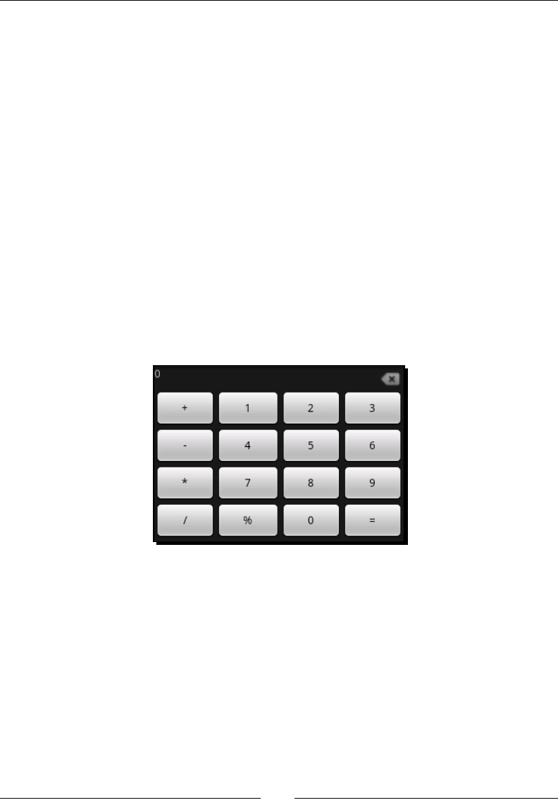
Building an Applicaon Theme
[ 254 ]
14. In the onCreate method, ensure that the content view of the Activity is set to
the main layout you've just dened:
setContentView(R.layout.main);
What just happened?
You should now have a basic user interface for a calculator; although it sll looks like a very
generic Android applicaon, but it's a start at the basic level. The user interface will need
styling work, including colorizaon and some font changes, but the basic structure is now
complete. The use of the RelativeLayout is to ensure that we can correctly posion the
delete icon to the right of the TextView, no maer what the size of the screen is.
In order for the buons to consume as much of the available space as possible, we tell the
TableLayout to stretch all of its columns. If the TableLayout doesn't stretch its columns,
then it will only consume as much horizontal space as its children require (eecvely the
same as wrap_content width). Although the TableLayout is told to consume all of the
vercal space as well, its children will be sized according to the amount of space they need,
which is why the buons don't take up all of the available screen space. The following image
is a screenshot of the basic calculator running in the emulator:
Building the calculator styling
We really want this calculator to look more like a real calculator, and for that we need to
apply some styling. The current theme of the calculator is enrely the standard Android
theme, and while it looks exactly like the rest of the Android system, it doesn't really suit this
applicaon. We want to style both the buons and the display area of the applicaon. We'll
dene style values in a resource le and relate to these in the layout XML le.
To start with, we'll dene a series of nine-patch images to create our own buon designs.
We need three dierent images for this purpose. The rst image is the "normal" state of the
buon, the second will be the "pressed" state of the buon, and nally, a "focused" state of
the buon.
Chapter 10
[ 255 ]
Pop Quiz
1. What are the black lines around the border of a nine-patch image for?
a. Hints to the system as to what parts of the image to copy
b. To indicate what parts of the image to scale and where to put the widget content
c. Denes what parts of the image contain meta-informaon
2. What formats may a nine-patch image be stored as?
a. JPEG, GIF, or PNG image le
b. An XML le with an embedded TIFF
c. A portable-network-graphic image
3. What does the draw9patch applicaon do?
a. Renders a nine-patch image in various shapes and sizes
b. It's an applicaon for drawing nine-patch images
c. Generates the meta-data for a nine-patch image as an XML le
Time for action – creating the button images
In order to build the buon images in this secon you will need to download "The GIMP"
(available at http://www.gimp.org). It's perfect for this sort of image creaon or
manipulaon and has the added advantage that it's open source.
1. Open "The Gimp", and select File | New to create a new image.
2. Change the width and height to 38x38 pixels.
3. Open the Advanced Opons and change the Fill With opon to Transparency so
that there is no background color.
4. To help with sizing, zoom in to about 800%.
5. Select the Rectangle tool in the top-le of the toolbox (the default keyboard
shortcut key is R).
6. Enable the Rounded Corners opon and set it to 5.
7. Enable the Fixed opon and select Size in the drop-down list.
8. Enter 36x36 as the xed size of the rectangle selecon.
9. Place the selecon box at the center of the image canvas and there should be a
one-pixel border between the selecon box and the edge of the image.
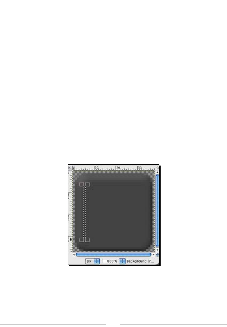
Building an Applicaon Theme
[ 256 ]
10. Double-click on the "Foreground color" (black by default) in the toolbox.
11. Enter 444444 in the Hex Notaon box of the color selector.
12. Close the color selector dialog box.
13. Select the Bucket Fill tool in the toolbox (the default keyboard shortcut is Shi-B).
14. Click inside the selecon box to ll it with the selected color.
15. Use the Select menu and click the None opon to remove the selecon box.
16. Select Filter | Decor | Add Bevel.
17. Change the Thickness opon to 3.
18. Uncheck the Work on Copy opon and select the Ok buon.
19. Select the Rectangle tool from the toolbox again.
20. Uncheck the Rounded Corners and Fixed opons.
21. Use the selecon tool to select a single pixel wide vercal box on the inside of the
"buon" shape, being careful to only select part of the content area of the buon,
avoiding the beveled border space:
22. By placing the cursor in the middle of the selecon box, drag the selecon horizontally
to the very edge of the of the image canvas (inside the one-pixel border).
23. Double-click on the "Foreground" rectangle again.
24. Reset the color to pure black.
Downloa d f r o m W o w ! e B o o k < w w w.woweb o o k . c o m >
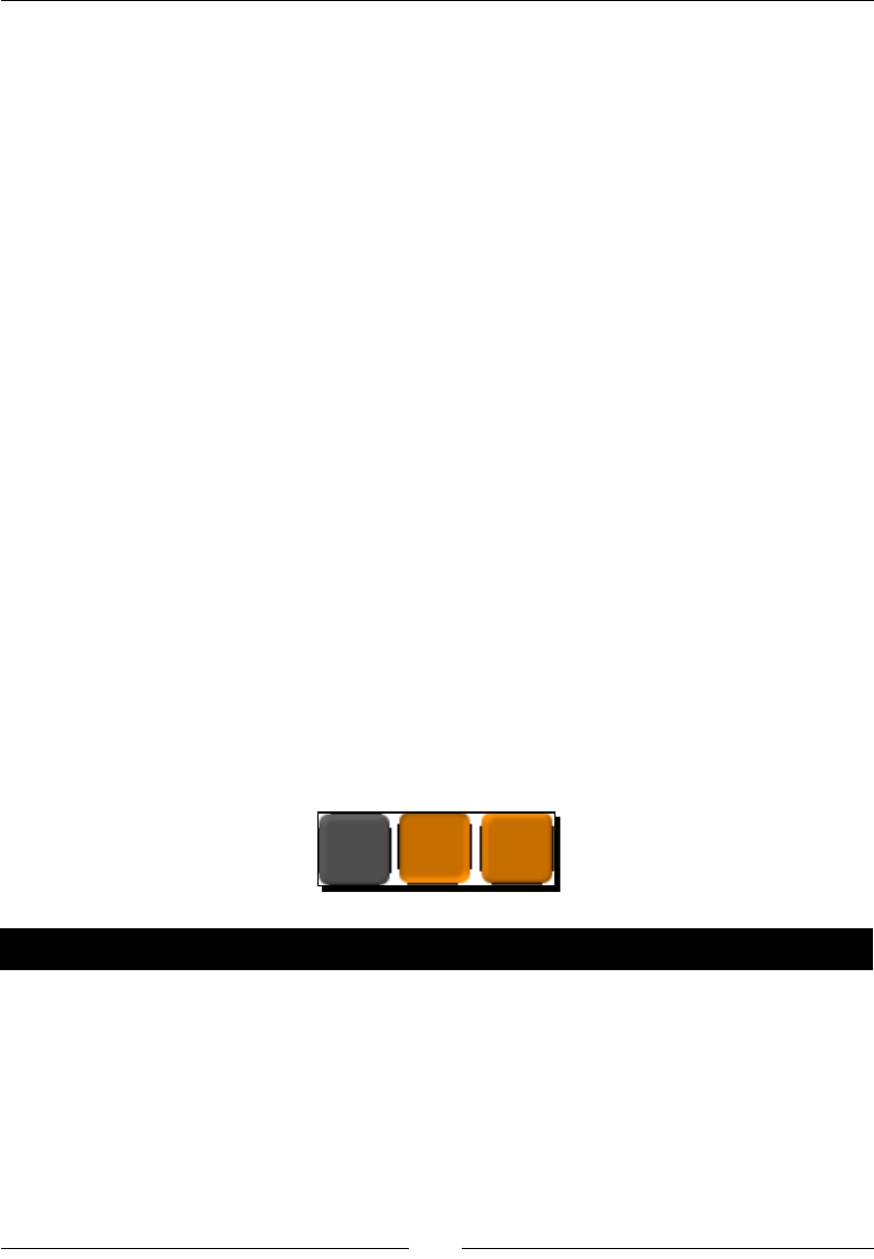
Chapter 10
[ 257 ]
25. Select the Bucket Fill opon.
26. Click inside the selecon box to create a single pixel wide, black vercal line down
the le-side of the image.
27. Create a similar vercal line on the right side of the image.
28. Create a horizontal single-pixel high black line at the top and boom of the image.
29. Save the image in your res/drawable directory as button.9.png, leaving the
PNG Opons as their defaults.
30. Repeat this exact process, changing the 444444 foreground color, as done in step
11, to c16400 and save the new image as button_focus.9.png.
By inverng the image with the Flip Tool (default keyboard shortcut Shi + F), you will create
the button_down.9.png image.
What just happened?
While there are many steps to building images, they are fundamentally very easy to create
with the right tool and a bit of experimentaon. If all you need is a simple buon or
something similar, then it's well worth nding a few tutorials on how to use "The GIMP" or a
similar tool. There are great tutorials online at the following links:
http://www.gimp.org/tutorials/
http://gimp-tutorials.net/
The images you have saved in the last secon should look like the following images that I
have created for my calculator applicaon:
Time for action – styling the calculator buttons
The next thing we need to do is use a selector-list and the nine-patch images you've just
created to style the calculator buons. We'll also be dening the buon styling in a resource
le so that we don't have to specify all of the styling for each of the buons. In order to
replace the standard buon with our image, we only need to replace its background with the
one we create for the purpose.
1. In the res/drawable directory, create a new XML le named button.xml and
open it in an editor.

Building an Applicaon Theme
[ 258 ]
2. Dene the root element of the le as a xed-size selector:
<selector
xmlns:android="http://schemas.android.com/apk/res/android"
android:constantSize="true"
android:variablePadding="false">
3. Create the pressed buon state, as the rst child of the selector:
<item android:state_pressed="true"
android:drawable="@drawable/button_down"/>
4. The second child of the selector should be the focused state:
<item android:state_focused="true"
android:drawable="@drawable/button_focus"/>
5. The nal selector child is generic, and is the normal state:
<item android:drawable="@drawable/button"/>
6. Create a new le named styles.xml in the res/values directory and open it in
an editor.
7. The root element of the styles.xml le should be a resources element with no
namespace declaraon (it's not needed in this le):
<resources>
8. Dene the rst style in the le as CalculatorButton with a parent style of the
default Android Button widget style:
<style name="CalculatorButton"
parent="@android:style/Widget.Button">
9. Set the text size to a nice large font and a light grey color:
<item name="android:textSize">30sp</item>
<item name="android:textColor">#ffcacaca</item>
10. Specify the background of the style as the new button drawable resource:
<item name="android:background">@drawable/button</item>
11. Create a two-pixel border around each of the Button widgets to create a lile bit of
spacing:
<item name="android:layout_margin">2dp</item>
12. Make sure the Button widgets consume all their available vercal space:
<item name="android:layout_height">fill_parent</item>
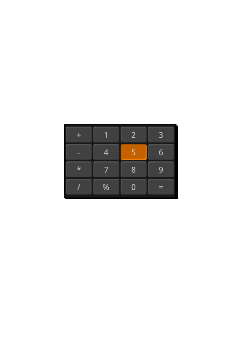
Chapter 10
[ 259 ]
13. Open the main.xml layout resource in an editor.
14. On each of the Button elements, add a style aribute to give them the styling you
just dened in the styles.xml le:
<Button style="@style/CalculatorButton"
android:id="@+id/multiply"
android:text="*"/>
What just happened?
We've just re-styled the Button objects for the calculator screen. The style is the child of
the standard Android Button widget. The new styling is mostly driven by the change of
the background image to the nine-patch image we created earlier. To work with the new
background image, we also specify a font color and size. The new calculator user interface
will look like the following screenshot when run:
In the original code, there was no margin around the buons specied, but in the new
code, we've added an explicit margin in the custom styling. Our nine-patch images have no
padding around the content area.
You'll noce that we style each of the Button widgets in the layout. As already menoned
in the previous chapter, the style aribute is not part of the Android resources namespace.
Unfortunately, Android doesn't currently allow us to style all widgets of a parcular class.
Instead, we are forced to either style each of the widgets individually, or style every widget
in an Activity or applicaon with the same styles. As part of the new Button styling,
we declared a drawable resource as a <selector> resource. As with the tab structures,
Button objects can be styled to use dierent drawable resources for their dierent states. In
this case, we specify background images for instances when the Button is focused, pressed,
or is in normal state. The styling only applies to the background image, since the background
of the new Button objects is the <selector> resource.
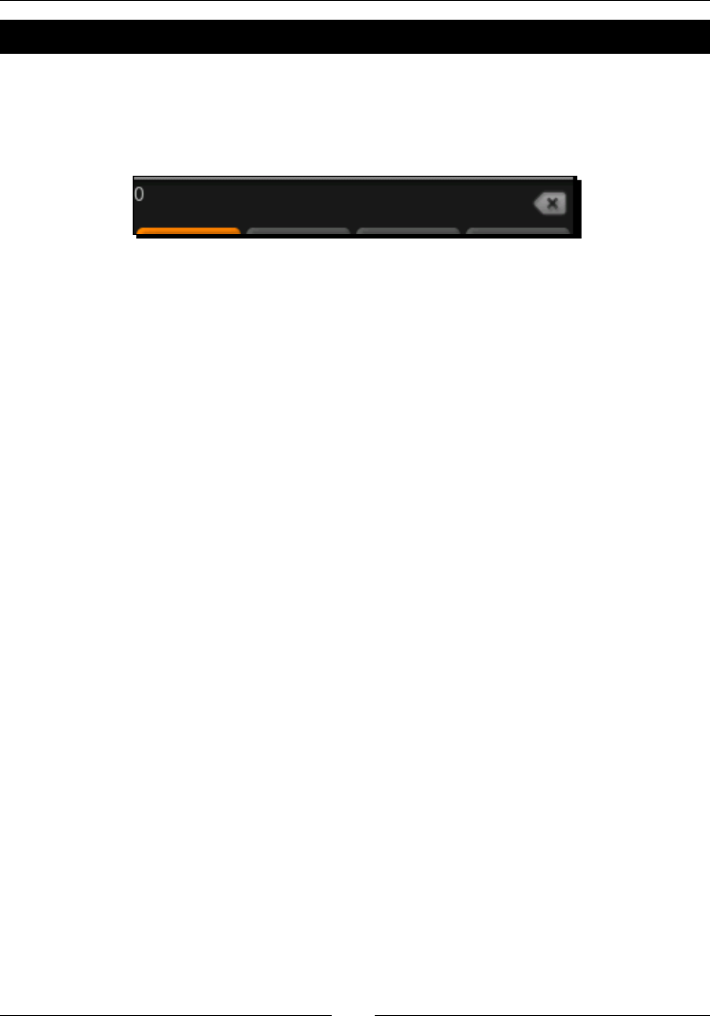
Building an Applicaon Theme
[ 260 ]
Time for action – styling the display
Currently, the numeric display really looks quite awful. That's mostly because we just don't
have any styling for it, and currently it's just a plain TextView object. We want the styling to
encompass both the TextView object and the ImageView. The display currently looks like
the following screenshot:
In order to x this display and bring its styling inline with our new Button styling, we'll create
two dierent styles. One to create a border and background around the TextView and
ImageView objects, and another to style the TextView widget with a more suitable font.
1. Create a new drawable resource le named display_background.xml and open
it in your editor or IDE.
2. The root of the display background needs to be a rectangle shape:
<shape
xmlns:android="http://schemas.android.com/apk/res/android"
android:shape="rectangle">
3. Declare some padding to inset the text and image:
<padding
android:top="5sp"
android:bottom="5sp"
android:left="15sp"
android:right="15sp"/>
4. Create a solid-grey background color for the rectangle:
<solid android:color="#ffcccccc"/>
5. Specify the stroke size and set its color to white:
<stroke android:width="2px"
android:color="#ffffffff"/>
6. Open the res/values/styles.xml le in your editor or IDE.
7. Add a new <style> item for the display wrapper, and name the new style
CalculatorDisplay with no parent style:
<style name="CalculatorDisplay">
Set the background as the display_background:<item
name="android:background">

Chapter 10
[ 261 ]
@drawable/display_background
</item>
8. Create a small margin underneath the display wrapper:
<item name="android:layout_marginBottom">25sp</item>
9. Add some padding above the display:
<item name="android:layout_marginTop">50sp</item>
10. Start a new <style> element with the name CalculatorTextDisplay, and the
parent style should be the standard TextView styling:
<style name="CalculatorTextDisplay"
parent="@android:style/TextAppearance">
11. In the new style, set font to 45 pixels, with black monospaced font:
<item name="android:typeface">monospace</item>
<item name="android:textSize">45sp</item>
<item name="android:textColor">#ff000000</item>
12. The text of the calculator display should be right-aligned, so we'll also specify the
gravity to apply to the TextView:
<item name="android:gravity">right</item>
13. Open the res/layout/main.xml le in your editor or IDE.
14. Specify the style of the RelativeLayout as CalculatorDisplay:
<RelativeLayout style="@style/CalculatorDisplay"
android:layout_width="fill_parent"
android:layout_height="wrap_content">
15. Set the style of the TextView for the display:
<TextView android:id="@+id/display"
style="@style/CalculatorTextDisplay"
android:text="0"
android:layout_alignParentTop="true"
android:layout_toLeftOf="@id/delete"
android:layout_width="fill_parent"
android:layout_height="wrap_content"/>
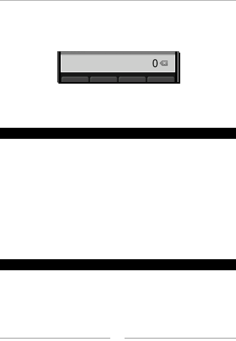
Building an Applicaon Theme
[ 262 ]
What just happened?
The new styling applies to the RelativeLayout that wraps around the TextView
object and the ImageView object. By styling this RelativeLayout, you eecvely join
the TextView and ImageView together as a single widget. If you look at the following
screenshot, you'll see how this works for your user:
The margin on top and below the TextView object will shrink the amount of available
space that can be used by the buons. On a long vercal space, the buons would normally
become long and look disproporonate, so by adding a margin to the display area, we help
keep the buons a more square shape.
Have a go hero – Adding calculator logic
Right now, what we've got is a great user interface for a simple calculator. However, it's
nothing more than a nice looking user interface. The next thing to do is to add some logic to
the works.
Here are the steps that need to be completed to have a funconal calculator:
1. Implement the OnClickListener interface and register it with each of the
Button widgets on the user interface.
2. Create a new Calculator class to handle the actual calculaons and store the non-
user-interface state of the calculator.
3. Use the StringBuilder class to implement the construcon and display of the
currently entered value.
4. Implement the basic calculaons using the double datatype in order to cater for
numbers with a decimal place.
Pop quiz
1. When selecng a resource string from a layout, how is the string selected?
a. Directly from the root values strings resources
b. From a strings.xml le in the same directory as the layout
c. From the values directory that is the closest match to the current
conguraon, and contains a string with the requested name

Chapter 10
[ 263 ]
d. From a values directory with the same selectors as the directory the layout
resource le was selected from
2. What is the correct lename to place a style resource in?
a. Any le in the values directory
b. styles.xml
c. values.xml
d. theme.xml
3. How is resource selecon in Java code dierent to resource selecon from an XML
resource le?
a. The Java resource selecon is faster
b. XML resources can only reference other resources with the same set of
conguraon qualiers as themselves
c. There are no signicant dierences
d. XML resources can only reference a subset of all the resource types.
Scientic landscape layout
The scienc layout for the calculator is not simply a case of more buons, because we want
this layout to be used when the device is in a landscape orientaon. This means we have
signicantly less vercal space, something the standard layout consumes lots of. To build
this new user interface, we'll not just be dening a new layout resource, but also addional
styling for the new layout.
The scienc layout also makes use of more complex text on its new buons. Some
mathemac funcons such as square root, or inverse cosine have a specic notaon that
should be used. In these cases, we'll need to make use of either HTML styling or special
characters. Fortunately, Android fully supports the UTF-8 character set, both in funconality
and font-rendering, making this process much easier.
Dening string resources for the scientic layout
For the scienc funcons, we'll dene the string content of each as a resource string. This
is parally in order to make them an independent part of the resource selecon process
(which is always recommended), but it's also to allow us to leverage the automac HTML
processing. If you make use of HTML in a string resource, that HTML will automacally
be parsed by the resource processor if accessed with the Resources.getText method,
instead of the usual Resources.getString method. This is exactly the way that the
TextView class loads its string resources, making it even more aracve to place your text-
content in a values resource le.

Building an Applicaon Theme
[ 264 ]
The following is the content of my strings.xml le in the values directory. You'll noce
that the HTML markup is HTML 3.2, and not HTML 4 based. This is because the Android
Html class doesn't handle HTML 4 markup, and the Html class is eecvely what is used to
load and string resource containing markup. Create a new resource le in the res/values
directory named strings.xml and copy the following code snippet into the new le:
<resources>
<string name="inverse">1/x</string>
<string name="square">
x<sup><font size="10">2</font></sup>
</string>
<string name="cube">
x<sup><font size="10">3</font></sup>
</string>
<string name="pow">
y<sup><font size="10">x</font></sup>
</string>
<string name="percent">%</string>
<string name="cos">cos</string>
<string name="sin">sin</string>
<string name="tan">tan</string>
<string name="log2">
log<sub><font size="10">2</font></sub>
</string>
<string name="log10">
log<sub><font size="10">10</font></sub>
</string>
<string name="acos">
cos<sup><font size="10">-1</font></sup>
</string>
<string name="asin">
sin<sup><font size="10">-1</font></sup>
</string>
<string name="atan">
tan<sup><font size="10">-1</font></sup>
</string>
<string name="log">log</string>
<string name="log1p">log1p</string>
<string name="e"><i>e</i></string>
<string name="pi">π</string>
<string name="random">rnd</string>
<string name="sqrt">√</string>
<string name="hyp">hyp</string>
</resources>
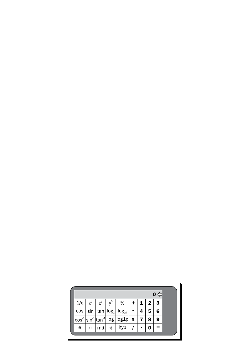
Chapter 10
[ 265 ]
The unicode hex values in the pi and sqrt string values are used to reference the unicode
characters for a lower case Greek Pi symbol, and the standard square root symbol.
Styling the scientic layout
The styles used in the standard calculator layout don't work very well for the scienc layout.
In order to change the styles for the scienc layout, you can add the new styling to a new
values directory for the landscape layout. Copy the following code snippet to a new le
named res/values-land/styles.xml:
<resources>
<style name="CalculatorDisplay">
<item name="android:background">
@drawable/display_background
</item>
</style>
<style name="ScientificButton" parent="style/CalculatorButton">
<item name="android:textSize">12sp</item>
</style>
</resources>
The rst style resource in the preceding snippet is used for the display area of the calculator.
As with the standard calculator, we use the display_background shape wrien earlier in
this chapter. We also dene a new style for the scienc buons. The scienc buons will
be exactly the same as the standard calculator buons, except with a much smaller font.
Since there are many more scienc buons than standard buons, the smaller font allows
us to comfortably t more of them on the screen.
Building the scientic layout
The scienc layout is comprised of the standard calculator buons on the right side of the
screen, with twenty addional buons on the le side of the screen. The addional buons
represent mathemacal funcons and constants, most of which can be found in the java.
lang.Math and java.lang.StrictMath classes. The following gure illustrates how we
want to layout the scienc calculator:
Building an Applicaon Theme
[ 266 ]
The eect of the new styles for the landscape layout on the calculator display will "remove"
the margin between the display and the buons. Since the landscape layout has less vercal
space, such padding is nothing more than a waste of space that should be used for the
buons in order to maintain a reasonable size.
Time for action – coding the scientic layout
The landscape layout is broken into various sub-layouts in order to maintain IDs for the two
individual funconal areas: Scienc funcons and standard funcons. Maintaining these
with their own ID values allows much easier detecon of the available funconality from
the Java code. Instead of the Java code deciding on the available funconality based on the
conguraon, it can use findViewById and test for null to check if the scienc funconality
is available. This is not unlike "capability tesng" in JavaScript (as apposed to inspecon).
1. Create a new resource directory named res/layout-land.
2. Create a new layout resource XML le in the layout-land directory named main.
xml and open this le in an editor or IDE.
3. Declare the root element of the new layout as a vercal LinearLayout consuming
all of the available screen space:
<LinearLayout
xmlns:android="http://schemas.android.com/apk/res/android"
android:orientation="vertical"
android:layout_width="fill_parent"
android:layout_height="fill_parent">
4. The rst element of the new layout is a RelativeLayout element to wrap the
TextView and ImageView that are used as the calculator display:
<RelativeLayout style="@style/CalculatorDisplay"
android:layout_width="fill_parent"
android:layout_height="wrap_content">
5. Copy the TextView and ImageView elements from the standard calculator layout
(res/layout/main.xml) as the two child elements of the RelativeLayout
declared previously:
<ImageView android:id="@+id/delete"
android:src="@android:drawable/ic_input_delete"
android:layout_centerInParent="true"
android:layout_alignParentRight="true"
android:layout_width="wrap_content"
android:layout_height="wrap_content"/>
<TextView android:id="@+id/display"
style="@style/CalculatorTextDisplay"
android:text="0"

Chapter 10
[ 267 ]
android:layout_alignParentTop="true"
android:layout_toLeftOf="@id/delete"
android:layout_width="fill_parent"
android:layout_height="wrap_content"/>
6. The second child element of the root LinearLayout is a horizontally-oriented
LinearLayout consuming the remainder of the screen space:
<LinearLayout android:orientation="horizontal"
android:layout_width="fill_parent"
android:layout_height="fill_parent">
7. Inside the new LinearLayout child, declare a new TableLayout to ll with the
scienc buons:
<TableLayout android:id="@+id/scientific_functions"
android:layout_width="wrap_content"
android:layout_height="fill_parent"
android:layout_marginRight="10dip">
8. Create a TableRow element inside the scientific_functions TableLayout,
to contain the rst row of scienc Button elements:
<TableRow android:layout_margin="0px"
android:layout_weight="1">
9. Declare the rst ve scienc funcons as Button elements inside the new
TableRow. The Button ID should be the same as the name of the resource string to
be used as the Button label:
<Button style="@style/ScientificButton"
android:id="@+id/inverse"
android:text="@string/inverse"/>
10. The rst row of scienc Button widgets contains inverse, square, cube, pow,
and percent.
11. Create a TableRow with the second row of scienc Button widgets containing
cos, sin, tan, log2, and log10.
12. The third scienc Button widgets in the third TableRow should be acos, asin,
atan, log, and log1p.
13. The fourth and nal TableRow of Button widgets should be e, pi, random, sqrt,
and hyp.
Downloa d f r o m W o w ! e B o o k < w w w.woweb o o k . c o m >
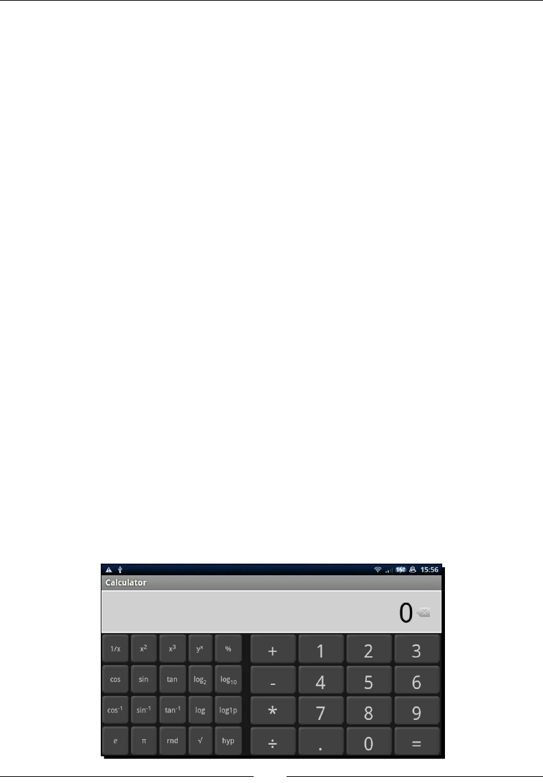
Building an Applicaon Theme
[ 268 ]
14. That is all of the scienc funcons, now create another TableLayout in the
LinearLayout child element for the standard funcons:
<TableLayout android:id="@+id/standard_functions"
android:layout_width="fill_parent"
android:layout_height="fill_parent"
android:layout_margin="0px"
android:stretchColumns="0,1,2,3">
15. Copy the contents of the standard_functions TableLayout in res/layout/
main.xml into the new TableLayout element.
What just happened?
In the preceding layout, we reuse much of the basics that we created in the standard
calculator layout, with the addion of a new TableLayout structure to contain the scienc
funcons. The new TableLayout is sized to a width of wrap_content and will only
consume the amount of horizontal space needed to t all of the Button widgets. The other
main dierence between the two TableLayout elements is that the scienc table doesn't
stretch its columns, since this would eecvely be the same as sizing it as fill_parent and
leaving no space for the standard funcons.
You'll also noce that among the string resources used to create the scienc Button labels,
those that use HTML markup, do so without using XML escape enes (such as < and >).
This is the main indicator to the resource compiler that a string resource contains markup and
should be consumed dierently. This usage requires that all HTML markup that is placed into a
string resource must both conform to the HTML 3.2 specicaon, and remain valid XML content.
In order to test the new landscape layout, you'll either need to dene an emulator device
with a landscape screen size, or run the applicaon on a physical device. Creang a virtual
device in the emulator can be done with the android applicaon in the tools directory of
your Android SDK installaon, the same tool used to create skeleton projects. The following
is a screenshot of the new layout running on a physical Android device:
Chapter 10
[ 269 ]
Have a go hero – using include in existing layouts
The preceding layout has several elements of the standard layout that it reuses. This is a
good me to extract these elements into their own layout les and then make use of the
include element to place them into the two specic layout resources. Informaon on
layout includes can be found in Chapter 5, Developing Non-Linear Layouts.
1. Create a display.xml layout resource to contain the RelativeLayout with the
calculator display, and include this at the appropriate point in the main.xml layout
resource les.
2. Create a standard_buttons.xml layout resource to contain the TableLayout
named standard_functions, and include this at the appropriate point in the
main.xml layout resource les.
Handling the Activity restart
When the device changes orientaon, the CalculatorActivity object on the screen is
restarted with the new orientaon. In this applicaon, the restart leads to a serious problem:
the state of the calculator is lost. As discussed in Chapter 4, Leveraging Acvies and Intents,
there are mes when you need to take control of your applicaon state in Android—saving it
before shutdown and restoring it when the Activity is started again.
You'll need to override the Activity.onSaveInstanceState method to store the
current state of your calculator in the provided Bundle. This Bundle object will be provided
to you in the onCreate method when being restarted due to a conguraon change. In your
onCreate method, check to make sure that the provided Bundle object is non-null before
restoring the save parameters from it.
Have a go hero – implementing the scientic calculation logic
The calculator should currently be able to funcon from the standard calculaon buons.
However, the new scienc funcons don't have any backing structures. Further, if you re-
orientate your device to change between scienc and standard layouts, any "in-progress"
calculaon will be lost.
The steps that need to be completed for the scienc calculaons to funcon as expected,
are as follows:
1. Implement the onSaveInstanceState to save the calculaon state to the
provided Bundle object.
2. Implement the onCreate method to restore the saved state from its provided
Bundle object (assuming one is given).
3. Add the funconality required to make the scienc Button widgets funcon as
expected, to the Calculator class you wrote earlier.

Building an Applicaon Theme
[ 270 ]
Supporting hardware keyboards
The calculator we developed here is now a great on-screen Android calculator applicaon,
with both the simple and scienc funconality you'd expect. However, if a device has
a hardware keyboard, the user will probably expect to be able to use it, which currently
they can't. Further, if the device lacks a touchscreen, clicking on-screen buons will quickly
become frustrang. We need to implement hardware keyboard support for the applicaon.
Implemenng the hardware keyboard handling code is only useful to you if you've done
the "Have a go Hero" secons and built a Calculator class to perform the required
funcons. In order to handle hardware keyboard events, you'll use the methods declared
in the KeyEvent.Callback interface. The Activity class implements the KeyEvent.
Callback interface already, and provides default handling for all of the methods. For our
handling of these key-events, we only need to override the onKeyDown method.
For this onKeyDown implementaon, it's a good idea to make sure that the key events are
coming from a hardware keyboard by checking the ags of the KeyEvent. It's also a good
idea to pass it to your parent class before processing it yourself. Finally, if you're working on
Android 2.0 (API-Level 5) or higher, you should check that the KeyEvent is not cancelled
before processing it (again this is one of the KeyEvent ags). The following is a code snippet
from my implementaon of the onKeyDown method:
@Override
public boolean onKeyDown(
final int keyCode,
final KeyEvent event) {
super.onKeyDown(keyCode, event);
boolean handled = false;
if((event.getFlags() & KeyEvent.FLAG_SOFT_KEYBOARD) == 0) {
switch(keyCode) {
case KeyEvent.KEYCODE_0:
calculator.zero();
handled = true;
break;
case KeyEvent.KEYCODE_1:
calculator.one();
handled = true;
break;
// Cases for each of the handles keys
}
display.setText(calculator.getCurrentDisplay());
}
Chapter 10
[ 271 ]
return handled;
}
The preceding code snippet invokes a method for each one of the dierent keys that can be
pressed on a hardware keyboard.
If your Android device doesn't have a hardware keyboard, you can test this code
using the emulator—your PC's keyboard, and the on-screen keyboard to the right
of the emulator display, are both classied as hardware keyboards by the emulator.
Adding in display animations
Currently, the applicaon has all the makings of a great calculator applicaon. However, the
display is currently just a simple TextView object. In order to improve the user experience,
we should make use of a ViewSwitcher object to swap the TextView out when the
calculator operaon is changed, or when the "equals" Button is pressed.
Time for action – animating the display
In order to build a nice slide-out-slide-in animaon for the calculator display, we'll need to
dene our own animaons and bind them to a ViewSwitcher object. This will also require
us to make changes to the Java code in order to handle the new mechanism. Since we don't
want the view to animate each me a new digit is typed, we will make direct changes to the
TextView currently on the screen.
1. Create a new XML resource le in the res/anim directory named slide_out_
top.xml, and open this in an editor or IDE.
2. Declare a y-translate animaon from 0% to 100% as the only element in the
animaon resource:
<translate
xmlns:android="http://schemas.android.com/apk/res/android"
android:fromYDelta="0%"
android:toYDelta="-100%"
android:duration="300"/>
3. Create a new XML resource le in the res/anim directory named slide_in_
bottom.xml, and open this le in an editor or IDE.

Building an Applicaon Theme
[ 272 ]
4. Declare a y-translate animaon from 100% to 0% as the only element in the
animaon resource:
<translate
xmlns:android="http://schemas.android.com/apk/res/android"
android:fromYDelta="100%"
android:toYDelta="0%"
android:duration="300"/>
5. Open either your display.xml le, or both of the main.xml les in your editor
of IDE, and which among them you should open will depend on whether you have
completed the "Have a go Hero – Layout Includes".
6. In the RelativeLayout used for the display, replace the TextView named
display with a ViewSwitcher element using the two new animaon resources:
<ViewSwitcher android:id="@+id/display"
android:inAnimation="@anim/slide_in_bottom"
android:outAnimation="@anim/slide_out_top"
android:layout_alignParentTop="true"
android:layout_toLeftOf="@id/delete"
android:layout_width="fill_parent"
android:layout_height="wrap_content">
7. As child elements to the ViewSwitcher, declare two TextView elements with the
CalculatorTextDisplay style:
<TextView style="@style/CalculatorTextDisplay"
android:text="0"
android:layout_width="fill_parent"
android:layout_height="wrap_content"/>
8. Both of the TextView elements will be idencal to each other.
What just happened?
The use of the ViewSwitcher for the display will cause any exisng Java code to crash,
since the Java code will be expecng the object to be a TextView of some sort. What you
need to do instead is update the display using the ViewSwitcher.getCurrentView,
instead of the ViewSwitcher itself.
When an operaon Button is used, for example, the mulply or equals Button, you'll
want to place the next display content on the ViewSwitcher.getNextView widget, and
then invoke the ViewSwitcher.showNext() method. The animaon of the number
disappearing upwards with the new content appearing from the boom of the display is a
simple, but explanatory animaon. It's also quite commonly used in calculator applicaons,
meaning the user will usually be comfortable with it.
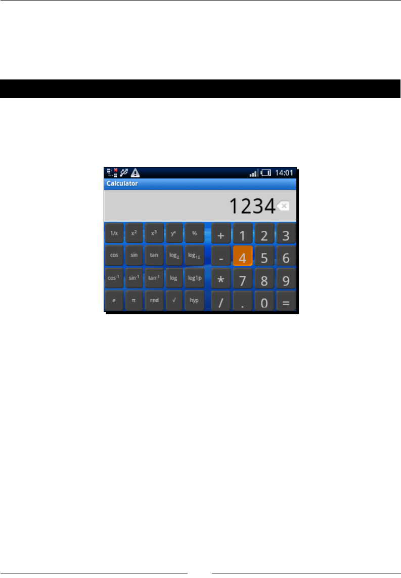
Chapter 10
[ 273 ]
In this applicaon's case, the animaon is more eye-candy than useful. However, if you
implemented a history-stack in the calculator, the animaon could be reversed when the
user presses the "back" Button. A history-stack in a calculator is a very useful structure
because it allows slight variaons of the same calculaons to be run over and over again.
Have a go hero – rounding off
This calculator applicaon is quite complete at this point. It's been styled, and has some nice
eye-candy and funcons as expected. It does have a few caveats, however—the scienc
calculaon layout doesn't work very well on small-screen devices. The following screenshot
is the applicaon running in scienc layout on a small-screen phone:
The preceding image also demonstrates how some devices theme applicaons. In order to
make sure the applicaon works well on all devices:
1. Dene a new values directory for small-screen devices.
2. Create a new styles.xml le in the directory with styles that have less margin and
padding than the defaults.
3. Reduce the size of the display font when on a small-screen device that has a
landscape orientaon.
This sort of rounding-o process will follow most successful Android applicaon projects.
It's a maer of trying the applicaon out on various dierent emulator conguraons and
devices, and then leveraging the resource-loaders to ensure the applicaon works well on as
many devices as possible.

Building an Applicaon Theme
[ 274 ]
Summary
Creang an applicaon theme is a key part of the success of a new applicaon, whether
running on Android, the desktop, or on the Web. We've explored how to make use of the
various tools that Android provides in order to keep an applicaon consistent in order to
keep it user-friendly.
An applicaon's theme, and its look and feel go far beyond the simple styling. The more you
personally use you applicaon, the more you will see places where a slightly dierent color,
or a transion animaon will make a dierence. Each of those small dierences is what
makes an applicaon truly user-friendly, because it makes the applicaon feel polished.
While running on hundreds of wildly dierent devices, Android makes it easy for developers
to keep their applicaons running as though they were built specically for that hardware.
The resource-loader system is one of the most key structures in Android, and not to leverage
it, can be suicidal to the applicaon.
I strongly recommend familiarizing yourself with exisng Android applicaons, as well as
applicaons on other mobile devices. Knowing how to drive a decent image-manipulaon
applicaon also goes a long way. Draw a diagram of each of your screens before your start
building them, and pencil and paper is oen the best way to get an idea about the user
interface, before you start coding.
Think carefully about where you can use the exisng Android icons and styles, and where
you will want to replace or extend them. You always want to keep your applicaon
consistent, but adding some ashy eye-candy is oen what makes an applicaon stand out
from the crowd.
With the combinaon of XML resources and the Java language, Android is a highly
compelling plaorm to design and code for. It's widely deployed and has excellent developer
support. There are dozens of hardware manufacturers producing Android devices, in all
shapes and sizes, and thousands of developers making applicaons.
In this book, we've worked on leveraging the Android plaorm to build applicaons that are
user-focused, easy to use, and good looking. The Android plaorm and the Android Markets
allow for a capve audience and great exposure for new ideas. From here on, you should
be able to add your own unique ideas and work to the Android ecosystem. Anything that
has been done can always be done beer, and anything that hasn't been done, has people
waing for it. Whether you're part of a team, or hacking away on the-next-big-thing in your
ac at night, the key to a successful applicaon is a great user-interface.
Pop quiz answers
Chapter 1
Layouts as XML es
Queson number Answers
1 b
2 d
3 c
Populating an activity
Queson number Answers
1 b
2 c
3 c
Pop quiz answers
[ 276 ]
Chapter 2
List views and adapters
Queson number Answers
1 c
2 a
3 c
Chapter 3
Gallery objects and ImageViews
Queson number Answers
1 c
2 b
3 a
Chapter 4
Intents & Activities
Queson number Answers
1 c
2 b
3 a
Downloa d f r o m W o w ! e B o o k < w w w.woweb o o k . c o m >
Appendix
[ 277 ]
Chapter 5.
Custom layouts
Queson number Answers
1 d
2 b
3 c
Chapter 6
Text input
Queson number Answers
1 c
2 c
3 a
Chapter 8
The WebView widget
Queson number Answers
1 d
2 b
3 d
WebView versus native layouts
Queson number Answers
1 a
2 c
3 c
Pop quiz answers
[ 278 ]
Chapter 10
Layout resources
Queson number Answers
1 d Hint:(they are loaded as objects, not compiled to classes)
2 d
3 c
Nine-Patch Images
Queson number Answers
1 b
2 c
3 a
Android resources
Queson number Answers
1 c
2 a
3 c
Index
Symbols
-a opon 13
-k opon 13
-n opon 13
<padding> element 241
-p opon 13
<scale> animaon 189
<set> element 189
<span> element 207
<string-array> element 120
<string-array> resource 41
<style> element 229
<table> element 126
A
AAPT 19
AbsoluteLayout 133, 134
ACTION_PICK_ACTIVITY Intent 113
acvies
building, for results 162
Acvity 11, 103, 104, 153
Acvity class
exploring 104, 105
Acvity class, exploring
about 104, 105
Bundle objects 105-110
Acvity crashes
handling 106
Acvity.getIntent() method 111
Acvity object
life cycle 104, 105
Acvity.onSaveInstanceState method 269
Acvity.setContentView method 73
Acvity.setResult method 114
Acvity Stack 103
Adapter implementaon 80
Adapter object 37
AdapterView
using 42
AdapterView class 37
AdapterView.getItemAtPosion(index) method
40
addional buons
adding, to screen layout 23, 24
addJavascriptInterface method 203
addView method 181
adjustViewBounds aribute 82
AmountBox class 212
Android
about 103, 153, 227
Acvity 11
basic calculator layout, creang 250-254
bitmap images, using in 241
broken line, drawing 231
calculator, styling 254
common dimensions, dening 25
complex layouts, creang 97
conguraon changes, handling 244
dierent screen sizes, handling 242
events, handling 34
FrameLayout class 68
GalleryAdapter, implemenng 80, 82
gradient, applying to oval shape 235, 236
Intent class 110
layers, dening 238, 239
layout constraints, considering 206
layouts example project, creang 120, 121
layouts, merging 97-99
lines, rendering 231
measurements 25

[ 280 ]
mulple-choice queson and answer
Acvity 11
nearest-neighbor scaling 240
nine-patch image 240, 241
ovals, rendering 234, 235
project structure, creang 12
QuesonAcvity, populang 29-31
rectangles, rendering 232
reservaon tab, building 86, 88
resource selecon qualiers 16-18
restaurant review applicaon, creang 68
ReviewAcvity, implemenng 72-74
rings, rendering 236
rounded border, creang 232-234
scienc landscape layout 263
screen densies, handling 243, 244
screen layout 15
shape resources, using 230
simple photo gallery, creang 78, 79
spinner ring, rendering 237, 238
style resources 228-230
switcher classes 75
TabAcvity, building 70-72
tab icons, creang 71, 72
android.animaon.view package 188
Android Asset Packaging Tool. See AAPT
Android calculator applicaon
hardware keyboards support, applying
for 270, 271
android:choiceMode aribute 38
Android emulator 15
android:entries aribute 42
android.graphics.drawable.shapes package 230
android:gravity aribute 127
AndroidManifest.xml 14
android package 176
Android project
about 12
layout, examining 14
Android SDK
about 13
seng up 12
URL, for downloading 12
Android style resources
about 228-230
and CSS stylesheets, dierences 228, 229
Android Tablets 195
android.text.style package 207
android.view.inputmethod.InputType interface
160
Android Virtual Device. See AVD
android.webkit package 197
android.widget package 39
Animaon objects 176
animaons
about 175, 176
uses 175
AnimaonSeleconAcvity 176
appInterface.buy(); method 203
applicaon signatures 15
ArrayAdapter
creang 164, 165
ArrayAdapter class 39
AsyncTask class 78
AutoCompleteTextView
aws 161
auto-compleon box 153
AVD 12
B
background aribute 122, 230
BaseAdapter 50
basic calculator layout
creang 250-254
bin folder 14
bitmap images
using, in Android 241
broken line
drawing 231
Bundle class 105
Bundle objects
about 269
using 106-110
Burger class 47
Burger item layout
creang 48, 49
Burger objects
presenng 50, 51
buon images
creang, for calculator 255-257
Buon object
about 189, 259
vanishing 189-191
Buon widgets 34

[ 281 ]
C
calculator
buon images, creang for 255-257
numeric display, styling 260, 262
styling 254
CalculatorAcvity object 269
calculator buons
styling 257-259
calculator display
slide-out-slide-in animaon, building
for 271, 272
calculator logic
adding 262
CardLayout 121
CHOICE_MODE_MULTIPLE 40
CHOICE_MODE_NONE 38, 42
CHOICE_MODE_SINGLE 39
choice modes, ListView class
about 38
CHOICE_MODE_MULTIPLE 40
CHOICE_MODE_NONE 38
CHOICE_MODE_SINGLE 39
CircleLayout
example 137, 138
using 137
CircleLayout class 136
ColorAdapter 183
common dimensions
dening 25
complex layouts
creang, with include tag 97
creang, with ViewStub 99
conguraon changes, handling
about 244
landscape layouts, providing 245
screen content, altering 247
text input, providing on landscape layout 246
consistency 67
contact editor
creang 141-143
content
displaying, relave layouts used 204, 205
displaying, with WebView class 197
content-centric Acvity
about 193, 194
user aenon, drawing for
informaon 196, 197
content-centric layout
about 193
online music store, developing 213-217
content display
design opons, considering for 194, 195
user behavior, considering for 195, 196
CSS style resources
and Android style resources,
dierences 228, 229
CursorAdapter
creang 165-168
custom adapters
creang 47
menu, creang for restaurant 47
custom animaon
creang 187
wring 188, 189
customized pizzas
ordering example 57, 58
custom layout
creang 134-136
D
data
geng, back from Intent 113, 114
lisng 38
passing, in Intent 112
selecng 38
data set
modifying 159
date
capturing 156-158
DatePickerDialog 156
DatePicker widget 67, 156
design opons
considering, for content display 194, 195
Dialog widgets 162
dots-per-inch. See DPI
DPI 243
draw9patch ulity 241
drawable directory 242
Drawable object 230

[ 282 ]
E
EditText widget 155
events
handling, in Android 34
ExpandableListAdapter
implementaons, creang 57
expandableListView class
using 56
explicit Intent 111
extra data
about 112
adding, to Intent 112
F
fast food menu
creang 41-43
feedback
providing, to users 155
nish() method 125, 162
footer widgets
about 40
adding, to ListView 40
Force Close dialog box 106
FourBucketsAcvity
creang 62, 63
FrameLayout
about 119, 121
example 122-125
uses 121, 122
FrameLayoutAcvity 125
FrameLayout class
about 68, 121
using 70
FrameLayout example
developing 122-125
fruit icon
creang 59, 60
fruit menu
building 61
G
GalleryAdapter
about 81
example 82
implemenng 80, 82
working 83, 84
Gallery class 80
gallery tab
building 79
generic widgets 67
gen folder 14
getCharSequence method 106
getNext ulity method 181
getQuesonID method 31
getQuesonIndex method 31
getString method 106
getViewGroup method 51
Gimp applicaon 240
gradient
applying, to oval shape 235, 236
GridLayoutAnimaonController 187
GridView
animang 183-186
icons, displaying in 60
GridView class
about 37, 58
using 58, 59
guess my number game 107-110
H
Handler class 78
hardware keyboards support
applying, for Android calculator
applicaon 270, 271
header widgets
about 40
adding, to ListView 40
HSVtoRGB method 184
I
icons
about 155
displaying, in GridView 60
ImageSwitcher
about 181, 182
uses 182
ImageView 155
ImageView.setImageBitmap method 82
implicit Intent 111

[ 283 ]
include tag
about 97
complex layouts, creang with 97
input
labeling, correctly 154
inputType XML aribute 160
install Ant target 15
Intent.ACTION_PICK acon 113
Intent acons
dening 111, 112
Intent class
about 110
data,geng back from 113, 114
data, passing in 112
extra data, adding to 112
Intent object 111, 113
interacve items
sizing 44
invalid input
avoiding 156
INVISIBLE View state 156
isEnabled(int) method 159
J
Jabber 118
Java Applet 104
java.text.SimpleDateFormat 88
K
KeyEvent.Callback interface 270
KeyListener 160
L
landscape layout
providing 245
text input, providing on 246
layer-list structure 238
layers
dening 238, 239
sizing 238
LayoutAnimaonController
about 183
uses 182
layout animaons 175
layout aribute 97
layout constraints
considering 206
layout_height aribute 136
LayoutInater 137
LayoutManagers 119
layouts
examining, for Android project 14
merging 97-99
LayoutSelectorAcvity 120
layouts example project
creang 120, 121
layout widgets
animang 182
layout_width aribute 136
layout XML le 16
layout XML format
limitaons 27
LinearLayout 119, 252
lines
rendering 231
list
ltering 170
ListAdapter
implemenng 43
restaurant list, improving 44-46
standard dimensions, dening 43, 44
ListAdapter object 38
ListItemSeleconAcvity
creang 163
using 172-174
ListView
creang 41
custom separators 52
footer widgets, adding to 40
header widgets, adding to 40
seng up 169
using, for selecons 159
ListView class
about 37, 38, 56
choice modes 38-40
ltering capabilies 163
ListView objects 52
ListView.setChoiceMode method 38
loadData method 201
loadDataWithBaseURL method 201

[ 284 ]
M
memory game
TableLayout, using for 127-133
menu
creang, for restaurant 47
mulple-choice queson and answer Acvity
example 11
mulple-choice queson applicaon
developing 46, 47
Mulple selecon mode. See CHOICE_MODE_
MULTIPLE
N
nearest-neighbor scaling 240
news feed
about 176
animang 177-180
NewsFeedAcvity 176
nine-patch images
about 240
creang 240, 241
non-linear layouts 119
No selecon mode. See CHOICE_MODE_NONE
numeric display
styling, for calculator 260, 262
O
onAcvityResult method 114
onCreate method 105, 110, 178
OnItemSelectedListener object 84
onKeyDown method 270
online music store
developing 213-217
track item, building 218, 219
user interface Java code, developing 222, 224
user interface layout, developing 219-221
onListItemClick method 120
onSaveInstanceState method 106, 109
onStop method 179
ovals
rendering 234, 235
oval shape
gradient, applying to 235, 236
P
padding dimension 44
phone book contacts
viewing 114-118
PNG 240
Portable Network Graphics. See PNG
posion parameter 121
ProgressDialog
using 155
project structure
creang 12
putString method 106
Q
queson acvity
seng up 18
space, adding for answers 21, 22
QuesonAcvity
populang 29-31
quesons
placing, on screen 32, 33
QWERTY keyboard 246
R
random() number 110
Recipe object 202
recipe viewer applicaon
creang 198-202
rectangles
about 232
rendering 232
RelaveLayout
about 140, 141
integrang, with layout example 144, 145
about 252, 254, 262
advantages 205
uses 140
RelaveLayoutAcvity 145
RelaveLayout class 140, 204
relave layouts
creang, for content display 204, 205
res directory 14
reservaon layout
implemenng 86, 88

[ 285 ]
reservaon tab
about 68
building 86, 88
inializing 89, 91
res folder 14
resource selecon qualiers, Android
about 16
keyboard status 18
language codes 17
MCC 17
MNC 17
night mode 17
region codes 17
screen aspect 17
screen density (DPI) 18
screen orientaon 17
screen size 17
Resources.getString method 263
Resources.getText method 263
restaurant list
improving 44-46
restaurant review applicaon
creang 68
roboc review project structure,
creang 68, 69
res/values directory 229
ReviewAcvity
implemenng 72-74
ReviewAcvity class
wring 72, 73
ReviewAcvity, implemenng
ReviewAcvity class, wring 72, 73
Review layout, creang 74, 75
Review layout
creang 74, 75
review tab
about 68
rings
rendering 236
roboc review project structure
creang 68, 69
rounded border
creang 232-234
S
saveInstanceState parameter 105
scienc calculaon logic
implemenng 269
scienc calculator layout
about 263
building 265, 266
coding 266-268
string resources, dening for 263, 265
styling 265
screen content
altering 247
screen density
about 243
handling 243, 244
screen layout
about 15
addional buons, adding to 23, 24
XML le 16
ScrollView 38
SeekBar
date, selecng 93-96
listening to 92
me, selecng 93-96
selecons
disabling 159
ListView, using for 159
returning 171, 172
spinners, using for 159
setContentView method 105
setSpan method 207
setText method 180, 182
shape resources
using 230
simple memory game
developing 128-133
simple photo gallery
creang 78, 79
gallery tab, building 79
Single selecon mode. See
CHOICE_MODE_SINGLE
slide_in_le animaon 181
slide_in_right animaon 181
slide-out-slide-in animaon
building, for calculator display 271, 272
Downloa d f r o m W o w ! e B o o k < w w w.woweb o o k . c o m >

[ 286 ]
SlidingDrawer
about 146
creang 147, 148
integrang, with layout example 148, 149
uses 146
SlidingDrawer example
creang 147
SpannableString 207
specialized content views
developing 210, 212
Spinner class
about 37, 64
using, for selecons 159
spinner ring
rendering 237, 238
src folder 14
standard calculator
designing 251-254
standard dimensions
dening 43, 44
startAcvityForResult method 113
startAcvity method 103
String.format method 92
string resources
dening, for scienc calculator
layout 263, 265
stroke element 231
style resources
working with 228-230
Swing Model 37
switcher classes
TextSwitcher, turning on 76, 78
working with 75
switcher widgets
using 181
T
TabAcvity
building 70-72
TabHost 121
tab icons
about 71, 72
creang 70-72
Table Layout
about 126, 127
uses 127
using, for memory game 127-133
TableLayout 253, 254
TableLayoutAcvity 128
Table Layout class 126
TableLayout object 219
tabs
separang 100
TabSpec object 73
text input
autocompleng 160, 161
capturing 160
providing, on landscape layout 246
TextSwitcher
about 75
about 180, 182
populang 182
uses 182
turning on 76, 78
TextSwitcher class 181
TextView
about 19
adding, to layout 19, 20
TextView class 196
TextView objects
about 241, 260
styling 207-209
TextView.setKeyboardListener method 160
TextView.setRawInput method 160
TextView widget 160
TextWatcher interface 171
TheBurgerPlaceAcvity class
creang 52
TheBurgerPlaceAcvity
implemenng 53
registering 54, 55
starng 54, 55
thumbnail widget
creang 80
me
capturing 156-158
TimePickerDialog 157 156
TimePicker widget 156
Toast class 109
tools directory 241
touchscreen device
touchscreen devices
about 153
icons 59

[ 287 ]
Track class 216
track item
building 218, 219
transions 175
U
undesirable input
about 154
dealing with 153
recovering from 155
signaling 154, 155
user aenon
drawing 196, 197
user behavior
considering, for content display 195, 196
user interface Java code
developing 222, 224
user interface layout
developing 219-221
users
feedback, providing to 155
V
ValidangDatePickerDialog 157
vanish animaon 191
Velocity/FreeMarker 198
View
about 19
populang 19, 20
View class 106
ViewContactAcvity 118
ViewFactory 181
ViewGroup
about 19
populang 19, 20
ViewGroup.measureChildren ulity 137
ViewGroup object 176
View object 176
View.setOnClickListener method 34
ViewStub class
about 99
complex layouts, creang with 99
using 99
ViewSwitcher class 181
ViewSwitcher object 271, 272
ViewSwitcher.showNext() method 272
W
WebKit 195
web page 195
WebSengs object 203
WebView 227
WebView class
about 197, 203
content, displaying with 197
working 203
WebView object
recipe viewer applicaon, creang 198-202
using 198
widgets
creang, dynamically 32-34
X
XML layout structures 205
XSLT 198

Thank you for buying
Android User Interface Development Beginner’s Guide
About Packt Publishing
Packt, pronounced 'packed', published its rst book "Mastering phpMyAdmin for Eecve
MySQL Management" in April 2004 and subsequently connued to specialize in publishing
highly focused books on specic technologies and soluons.
Our books and publicaons share the experiences of your fellow IT professionals in adapng
and customizing today's systems, applicaons, and frameworks. Our soluon based books
give you the knowledge and power to customize the soware and technologies you're
using to get the job done. Packt books are more specic and less general than the IT books
you have seen in the past. Our unique business model allows us to bring you more focused
informaon, giving you more of what you need to know, and less of what you don't.
Packt is a modern, yet unique publishing company, which focuses on producing quality,
cung-edge books for communies of developers, administrators, and newbies alike. For
more informaon, please visit our website: www.packtpub.com.
About Packt Open Source
In 2010, Packt launched two new brands, Packt Open Source and Packt Enterprise, in order
to connue its focus on specializaon. This book is part of the Packt Open Source brand,
home to books published on soware built around Open Source licences, and oering
informaon to anybody from advanced developers to budding web designers. The Open
Source brand also runs Packt's Open Source Royalty Scheme, by which Packt gives a royalty
to each Open Source project about whose soware a book is sold.
Writing for Packt
We welcome all inquiries from people who are interested in authoring. Book proposals
should be sent to author@packtpub.com. If your book idea is sll at an early stage and you
would like to discuss it rst before wring a formal book proposal, contact us; one of our
commissioning editors will get in touch with you.
We're not just looking for published authors; if you have strong technical skills but no wring
experience, our experienced editors can help you develop a wring career, or simply get
some addional reward for your experse.

Mobile Web Development
ISBN: 978-1-847193-43-8 Paperback: 236 pages
Building mobile websites, SMS and MMS messaging,
mobile payments, and automated voice call systems
with XHTML MP, WCSS, and mobile AJAX
1. Build mobile-friendly sites and applicaons
2. Adapt presentaon to dierent devices
3. Build mobile front ends to server-side applicaons
4. Use SMS and MMS and take mobile payments
5. Make applicaons respond to voice and
touchtone commands
6. Learn XHTML MP, WCSS, adaptaon, best pracces,
and mobile AJAX
Yahoo! User Interface Library 2.x Cookbook
ISBN: 978-1-849511-62-9 Paperback: 436 pages
Over 70 simple incredibly eecve recipes for taking
control of Yahoo! User Interface Library like a Pro
1. Easily develop feature-rich internet applicaons
to interact with the user using various built-in
components of YUI library
2. Simple and powerful recipes explaining how to use
and implement YUI 2.x components
3. Gain a thorough understanding of the YUI tools
4. Plenty of example code to help you improve your
coding and producvity with the YUI Library
5. Hands-on soluons that takes a praccal approach
to recipes
Please check www.PacktPub.com for information on our titles

Silverlight 4 User Interface Cookbook
ISBN: 978-1-847198-86-0 Paperback: 280 pages
Build and implement rich, standard-friendly user
interfaces with Silverlight and Expression Blend
1. The rst and only book to focus exclusively on
Silverlight UI development.
2. Have your applicaons stand out from the
crowd with leading, innovave, and friendly user
interfaces.
3. Detailed instrucons on how to implement specic
user interface paerns together with XAML and C#
(where needed) code, and explainaons that are
easy-to-understand and follow..
4. Real world projects which you can explore in detail
and make modicaons as you go.
jQuery UI 1.6: The User Interface Library for jQuery
ISBN: 978-1-847195-12-8 Paperback: 440 pages
Build highly interacve web applicaons with ready-
to-use widgets of the jQuery user interface library
1. Packed with examples and clear explanaons
to easily design elegant and powerful front-end
interfaces for your web applicaons
2. Organize your interfaces with reusable widgets like
accordions, date pickers, dialogs, sliders, tabs, and
more
3. Enhance the interacvity of your pages by making
elements drag and droppable, sortable, selectable,
and resizable
4. No experience of jQuery UI expected, but familiarity
with jQuery is required
Please check www.PacktPub.com for information on our titles
Downloa d f r o m W o w ! e B o o k < w w w.woweb o o k . c o m >
