Artisteer Artisteer4 User Manual
User Manual: manual pdf -FilePursuit
Open the PDF directly: View PDF ![]() .
.
Page Count: 217 [warning: Documents this large are best viewed by clicking the View PDF Link!]
- Table of Contents
- What is Artisteer?
- What’s New in Artisteer 4.0
- Artisteer GUI
- Downloading Artisteer
- Editions of Artisteer: Home&Academic vs. Standard
- System Requirements
- Installing Artisteer
- Activating the Software
- Creating a Template
- Home Tab
- Edit Tab
- Colors & Fonts Tab
- Layout Tab
- Content Tab
- Background Tab
- Sheet Tab
- Header Tab
- Menu Tab
- Blocks Tab
- Vertical Menu Tab
- Controls Tab
- Footer Tab
- CMS-Specific Features
- Glossary
Version 4.0

2
Artisteer4.0 | 2
Table of Contents
Table of Contents ............................................................................................................... 2
What is Artisteer? ............................................................................................................... 7
What’s New in Artisteer 4.0 ................................................................................................ 8
Artisteer GUI ...................................................................................................................... 9
Start-Up Dialog .............................................................................................................. 10
Preview Area ................................................................................................................. 11
Ribbon ........................................................................................................................... 14
Quick Access Toolbar ................................................................................................... 14
Panel Mode ................................................................................................................... 15
Pages /Posts Panel ....................................................................................................... 16
Export/Publish Menu ..................................................................................................... 20
File Menu ...................................................................................................................... 24
Downloading Artisteer ...................................................................................................... 27
Editions of Artisteer: Home&Academic vs. Standard ....................................................... 28
System Requirements ...................................................................................................... 29
Installing Artisteer ............................................................................................................. 30
Activating the Software ..................................................................................................... 31
Creating a Template ......................................................................................................... 32
Home Tab ........................................................................................................................ 34
The Export Options Dialog ............................................................................................ 36
Edit Tab ............................................................................................................................ 43
Clipboard, Font and Paragraph ..................................................................................... 43
Content Layout and Styling ........................................................................................... 44
Selecting a Content Style ........................................................................................... 46
Current Row ............................................................................................................... 55
All Pages .................................................................................................................... 55
Row and Cell Options ................................................................................................. 57
Advanced Row and Cell Options ................................................................................ 62
Gridlines ..................................................................................................................... 65

3
Artisteer4.0 | 3
Insert ............................................................................................................................. 67
Insert a Video ............................................................................................................. 71
Insert a Table ............................................................................................................. 73
Insert a Hyperlink ....................................................................................................... 75
Insert Controls ............................................................................................................ 76
Source HTML ................................................................................................................ 78
Slideshow ...................................................................................................................... 79
Colors & Fonts Tab .......................................................................................................... 84
Colors ............................................................................................................................ 84
Paints ............................................................................................................................ 86
Fill Color ........................................................................................................................ 88
Color Selector Dialog (More Colors) .............................................................................. 88
Fonts ............................................................................................................................. 91
Layout Tab ....................................................................................................................... 95
Design Layout ............................................................................................................... 95
Sheet Layout ................................................................................................................. 99
Colums .......................................................................................................................... 99
Blocks .......................................................................................................................... 100
Options ........................................................................................................................ 102
Content Tab ................................................................................................................... 106
Styling ......................................................................................................................... 106
Options ..................................................................................................................... 108
Style and Font ............................................................................................................. 110
Options ..................................................................................................................... 112
Paragraph ................................................................................................................... 113
Options ..................................................................................................................... 114
Metadata ..................................................................................................................... 114
Options ..................................................................................................................... 118
Background Tab ............................................................................................................. 119
Options ..................................................................................................................... 121
Sheet Tab ....................................................................................................................... 128

4
Artisteer4.0 | 4
Options ..................................................................................................................... 129
Header Tab .................................................................................................................... 133
Layout ......................................................................................................................... 133
Options ..................................................................................................................... 134
Background ................................................................................................................. 135
Options ..................................................................................................................... 136
Background Image ...................................................................................................... 138
Options ..................................................................................................................... 144
Insert ........................................................................................................................... 146
Options ..................................................................................................................... 147
Flash ........................................................................................................................... 149
Options ..................................................................................................................... 149
Slideshow .................................................................................................................... 151
Options ..................................................................................................................... 152
Menu Tab ....................................................................................................................... 155
Menu Layout ............................................................................................................... 155
Options ..................................................................................................................... 156
Menu Styles ................................................................................................................ 157
Menu ........................................................................................................................... 157
Options ..................................................................................................................... 158
Submenu ..................................................................................................................... 162
Options ..................................................................................................................... 164
Blocks Tab ..................................................................................................................... 168
Block Styles ................................................................................................................. 169
Styling ...................................................................................................................... 169
Background .............................................................................................................. 171
Header and Content ................................................................................................. 175
Block Content .............................................................................................................. 177
Options ..................................................................................................................... 178
Vertical Menu Tab .......................................................................................................... 180
Layout and Styles ........................................................................................................ 180

5
Artisteer4.0 | 5
Menu Area ................................................................................................................... 181
Options ..................................................................................................................... 182
Item ............................................................................................................................. 183
Options ..................................................................................................................... 184
Submenu ..................................................................................................................... 185
Options ..................................................................................................................... 185
Controls Tab ................................................................................................................... 187
Button Options ............................................................................................................ 188
Control Options ........................................................................................................... 191
Footer Tab ...................................................................................................................... 193
Layout ......................................................................................................................... 193
Footer Styles ............................................................................................................... 193
Options ........................................................................................................................ 194
CMS-Specific Features .................................................................................................. 196
Theme options for WordPress themes ........................................................................ 196
Importing Templates with Content to CMSs ................................................................ 199
Joomla ...................................................................................................................... 200
WordPress ............................................................................................................... 203
Drupal ....................................................................................................................... 205
DotNetNuke .............................................................................................................. 209
Blogger ..................................................................................................................... 211
Glossary ......................................................................................................................... 213
CMS ............................................................................................................................ 213
Blog ............................................................................................................................. 213
WordPress .................................................................................................................. 213
Joomla ......................................................................................................................... 214
Drupal .......................................................................................................................... 214
Visual Studio ............................................................................................................... 214
CodeCharge Studio ..................................................................................................... 214
Color Model ................................................................................................................. 214
HTML .......................................................................................................................... 216

6
Artisteer4.0 | 6
CSS ............................................................................................................................. 216
RGB ............................................................................................................................ 216
HSL ............................................................................................................................. 216
Silent Installation ......................................................................................................... 217
Responsive Web Design ............................................................................................. 217
SEO ............................................................................................................................. 217
WYSIWYG .................................................................................................................. 217
7
Artisteer4.0 | 7
What is Artisteer?
Artisteer is the first and only Web design automation product that instantly creates fantastic looking
Website and Blog templates. This powerful software can make YOU a professional Web designer of
Websites, WordPress themes and other blog templates. Artisteer lets you create fantastic looking
Website designs and templates in just minutes, without having to know anything about editing graphics
or HTML.
With Artisteer YOU immediately become a Web design expert, editing and slicing graphics, coding
XHTML and CSS, and creating CMS templates and WordPress themes - all in minutes, without
expensive software like Photoshop or Dreamweaver, and with little or no technical training required.
Use Artisteer to generate cool Web design ideas, adjust the generated designs using many included
elements, backgrounds, photo objects and buttons, create professional, tableless, cross browser
compatible and fully compliant HTML and CSS code, and export your design to create great looking
Web and Blog templates. Creating great designs has never been easier!
8
Artisteer4.0 | 8
What’s New in Artisteer 4.0
Here is a list of Artisteer 4.0 features. Please refer to Artisteer 4.0 Feature Overview for more
information.
GUI Changes:
• No More Different Types of Templates
• Panel Mode
• Content Suggestions
New Image Options:
• Lightbox Style
• Image Slide Show
• More Source Options
HTML5 and CSS3 Support
Footer Layout and Editing
New Header Designer with Visual Editing:
• Slide Show
• New Selector Tool
• Photo Collages
• Texture Masks
• Text Blocks
New Styling Options:
• Shadow Effect for Text
• New Radius Options for Rows and Cells
• Color options (Black and White Colors, and
Transparency Slider)
• Magazine-style Menus (Mega-menus)
• New Border Styles for Block Headers and
Menu Bar
Online Access to Flickr Images
Content Editing for All Templates
Google Web Fonts and Subsets
Plug-in SDK
9
Artisteer4.0 | 9
Artisteer GUI
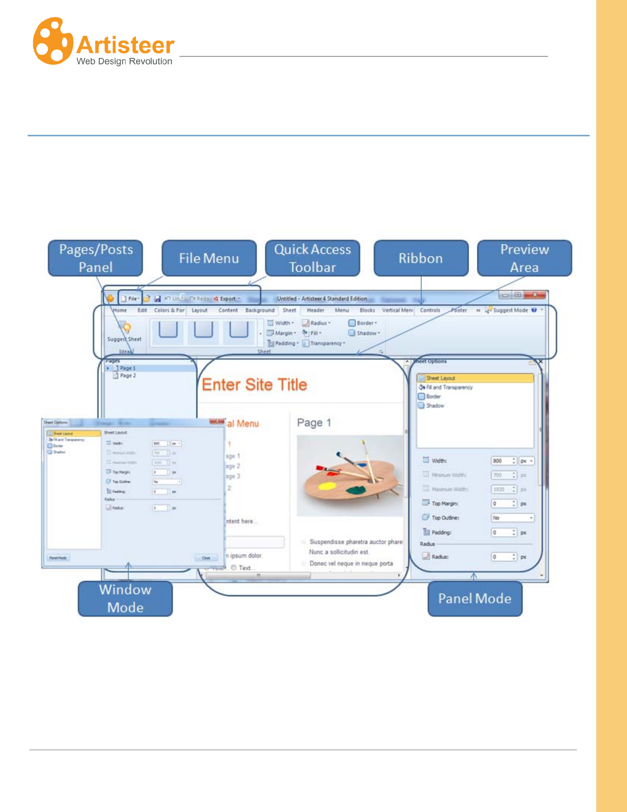
The Artisteer interface consists of File Menu, Quick Access Toolbar, Ribbon, Preview area, and
Pages/Posts Panel. Additional options can be displayed in Panel or Window Mode (highlighted on
the image below).
File Menu contains project options (New, Open, Save, Save As), template options (Export, Import
Preview in Browser), plug-in development, Activation settings, and About Artisteer dialog. You can
also adjust the GUI settings in Preferences or exit Artisteer.
10
Artisteer4.0 | 10
Quick Access Toolbar contains Open, Save, Undo, Redo, and Quick Export options.
Ribbon contains the designer’s tools.
Preview Area
Pages/Posts Panel is a part of preview area. It displays your website structure. You can also add,
delete, edit or rename pages and posts.
lets you see and edit your design using Preview Highlights
Panel Mode slides out in the Preview area. As you work in the Preview area, the panel options
change depending on which elements you’re working with (e.g. menu bar, header, images, etc.) so it’s
not necessary to go back and forth to change options from the Ribbon bar.
Window Mode The same options you can change in Panel Mode can also be changed from the
Ribbon bar.
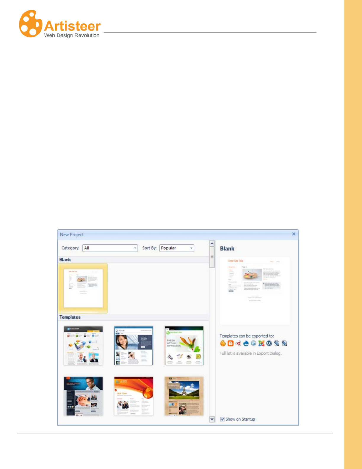
Start-Up Dialog
11
Artisteer4.0 | 11
Select a Blank project or one of the ready-made Templates. To disable the start up dialog uncheck
the ‘Show on Start up’ option. If the Start-up dialog is disabled the blank project will be opened
automatically on start-up.
Preview Area
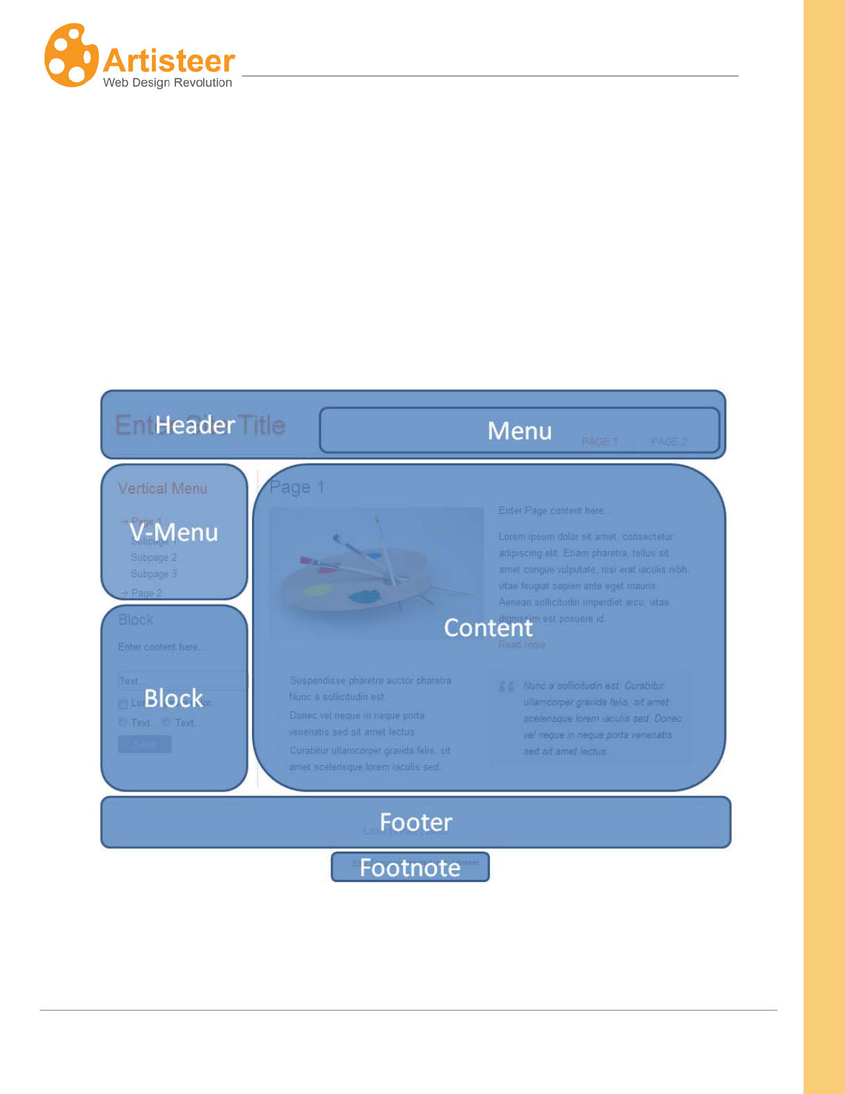
The Preview Area displays Artisteer template that consists of Header, Menu, Vertical Menu, Blocks,
Content area, and Footer. The options available for these layout elements are located in the
appropriate tabs on the Ribbon.
You can also use the Preview Area to edit the text and style of Header, Menu, Content, etc. Hover
over the layout element and select one of the icons or left-click the highlighted area to edit the text.
12
Artisteer4.0 | 12
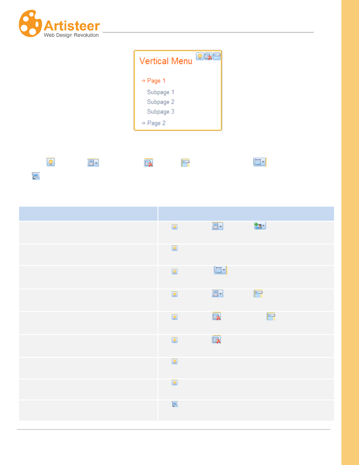
Over each layout element there is a mini toolbar with available features displayed as icons, such as
Suggest , Position , Delete Block , Pages , Width (Sheet only) , and Hide Article
Title . Some of these features may be absent depending on the type of Artisteer project you are
designing.
Layout Element
Mini Toolbar Features
Header
Suggest, Position, Add slide
Page Background
Suggest
Sheet
Suggest, Width
Menu
Suggest, Position, Pages
Vertical Menu
Suggest, Delete Block, Pages
Block
Suggest, Delete Block
Sidebar
Suggest
Content
Suggest
Page/ Block/ Article Title
Hide Title

13
Artisteer4.0 | 13
Footer
Suggest
Use the Suggest option to see some design ideas for a layout element. You can also cycle thru
suggestions on an element by holding the Ctrl key down while moving the mouse over the Preview
area. When you press the Ctrl key, the Suggest icon should appear over the element that is
highlighted. When you left-click the mouse, Artisteer will suggest a design idea and change the layout.
If you do not want the change, click the Undo button on the quick access toolbar. Otherwise, you can
ask for another suggestion just by holding the Ctrl key down and clicking the mouse. You can also use
the Suggest Mode in the top right corner of the program dialog to see some alternative Header,
Content and other template designs.
In the Preview area you can manage the Position of the Header and Menu. Hover the mouse over the
appropriate element and click the Position icon.
The Pages option helps to link pages and the appropriate horizontal and vertical menu items. Hover
the mouse over the menu, click the Pages icon and select the page you want to include, or exclude
from the menu.
WYSIWYG Editing
‘What You See Is What You Get’ (WYSIWYG) Editing is a simple and effective way to add new data to
a website. Click the highlighted text area, delete the sample text and then add/paste the new content.
14
Artisteer4.0 | 14
The website Headline, Slogan, Page Title, Articles/Posts, Blocks, and Footer text may be changed in
Artisteer. Horizontal and Vertical Menu item names may be altered in the Pages/Posts Panel.
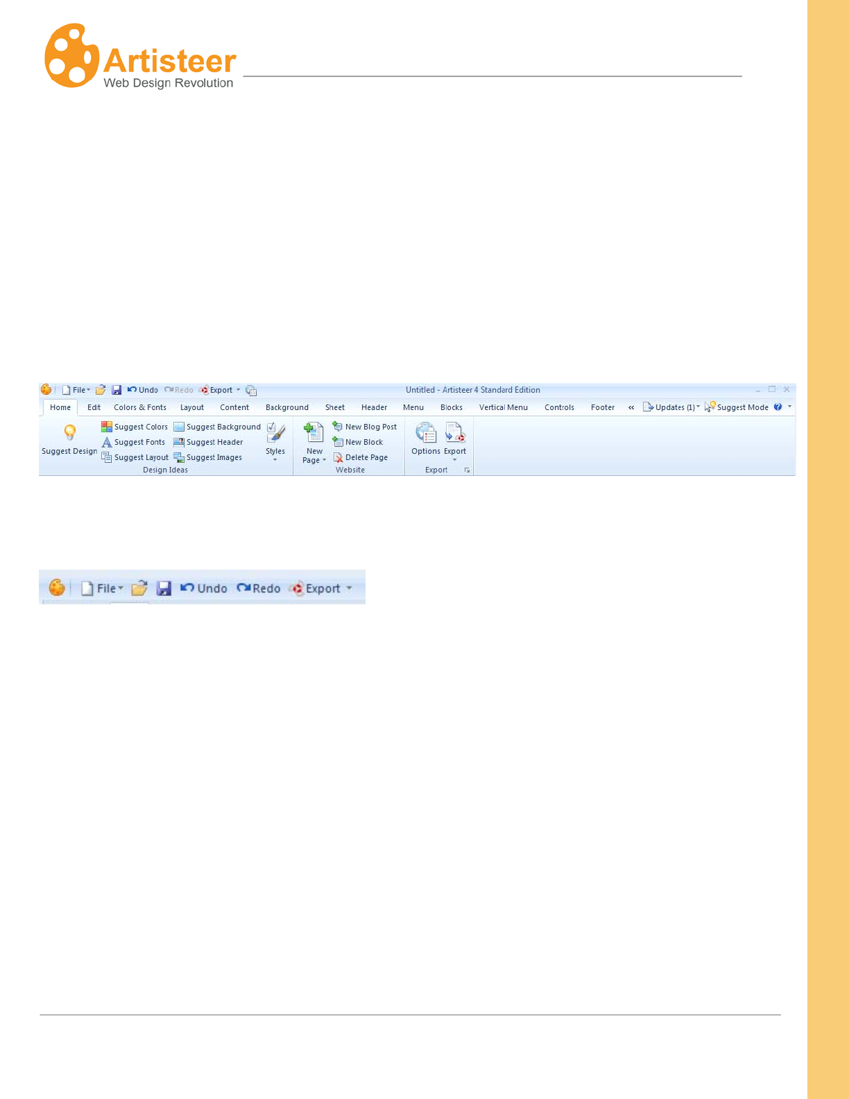
Ribbon
The Ribbon bar is divided into Tabs. The Tabs contain options for designing the whole template
(Home, Edit, Colors and Fonts, Layout) or its parts (Background, Sheet, Header, Menu, Content,
Blocks, Vertical Menu, Controls, Footer). Please refer to the appropriate section of this manual for
more information about the options available in each tab.
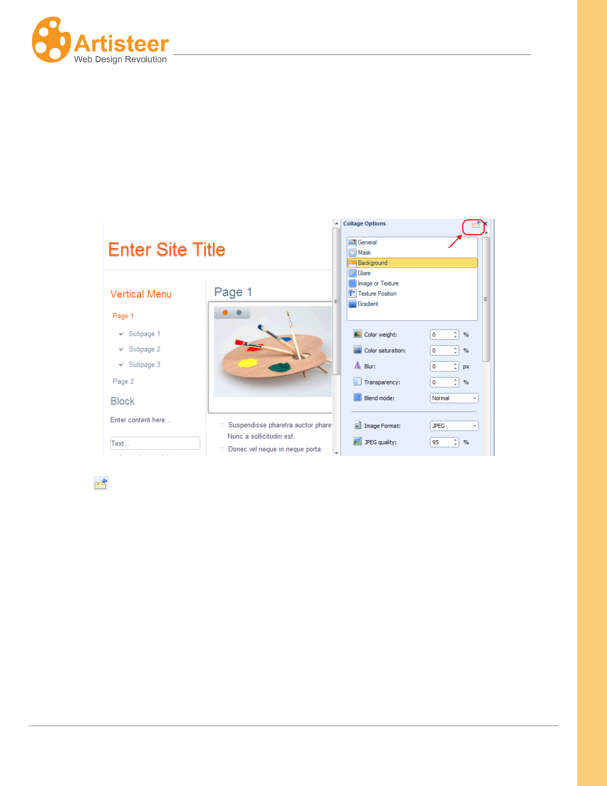
Quick Access Toolbar
The Quick Access Toolbar is a customizable toolbar which you can use to create one-click shortcuts to
frequently used commands, and quickly perform the most common tasks.
By default, the Artisteer Quick Access Toolbar contains the Open, Save, Undo, Redo and Export
commands, but you can customize the content of the toolbar by adding or removing items as you like.
To add a new item, right click on the desired command button in the Ribbon bar and select "Add to
Quick Access Toolbar" option.To remove an existing item, right click on the item in the Quick Access
Toolbar, and select "Remove from Quick Access Toolbar".
Note: Not all the commands located in the Ribbon bar can be added to the Quick Access Toolbar. For
some commands, the "Add to Quick Access Toolbar" option in the right click menu is disabled.
15
Artisteer4.0 | 15
Panel Mode
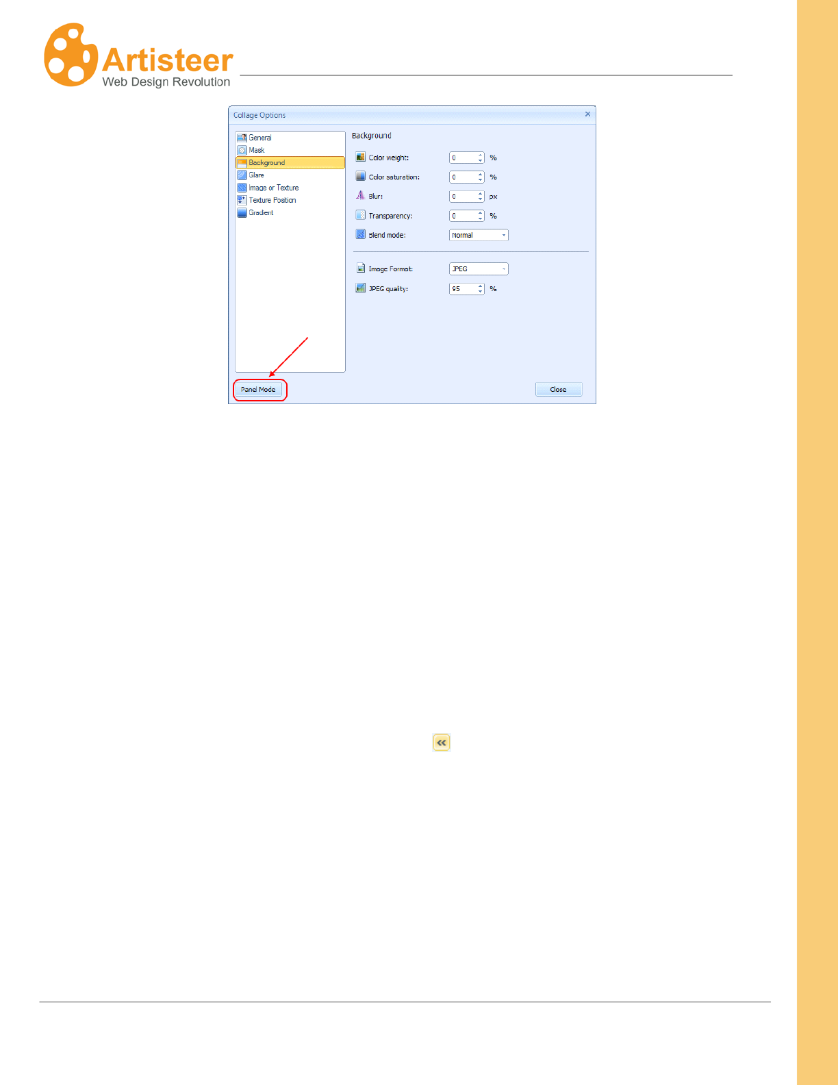
Most of your options can be set in a panel that slides out in the Preview area. With Panel mode you
don’t have to continually select the ribbon bar to open a dialog to change options. As you work in the
Preview area, the panel options change depending on which elements you’re working with (e.g. menu
bar, header, images, etc.).
Click on the Icon to turn off Panel Mode and display the options in a dialog window.
16
Artisteer4.0 | 16
Pages /Posts Panel
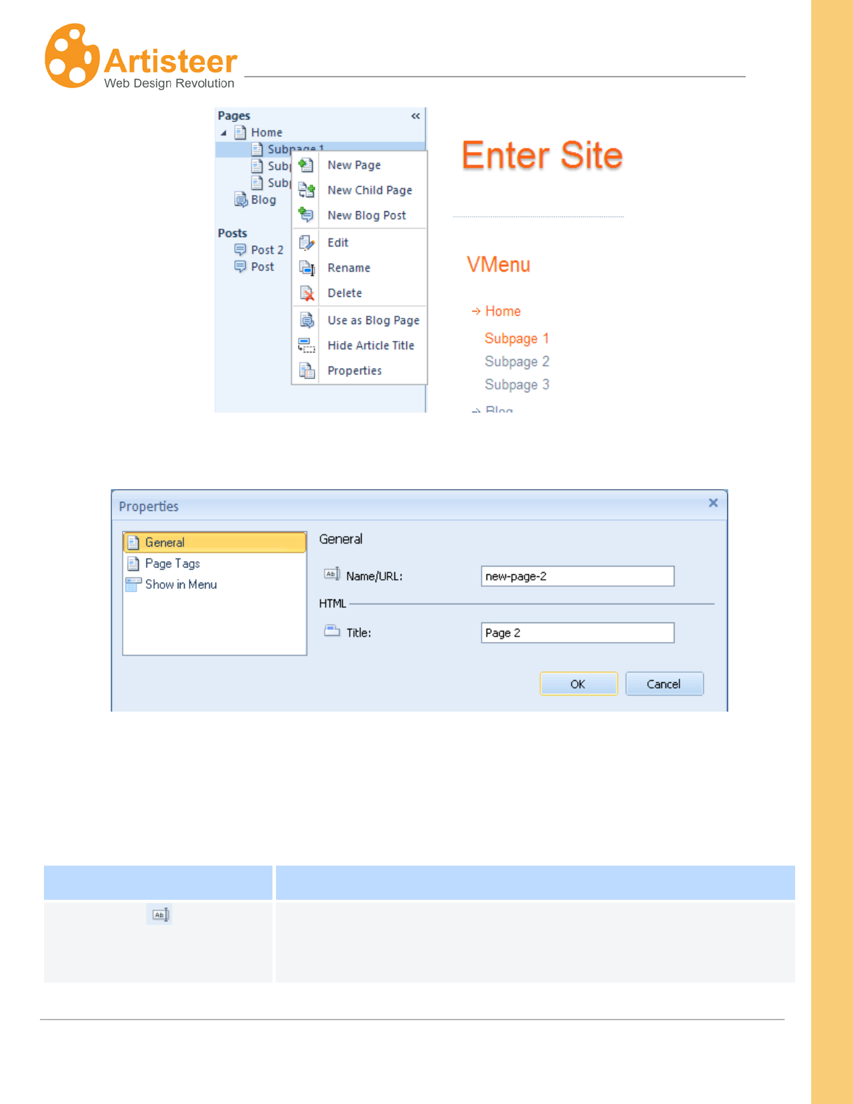
The Pages/Posts panel is located on the left side of the preview window. The folder in this panel is
your site map which shows you all of the pages and posts (‘articles’) have been created in your
project.
You can manage your pages and posts using the context-menu. For instance, right-click on a page or
post in the folder to display the context menu and then select one of the commands – New Page, New
Child Page, New Blog Post, Edit, Rename (F2), Delete, Use as Blog Page, Hide Article Title,
Properties.
You can hide the Pages/Post Panel by clicking on the icon in the upper right corner.
17
Artisteer4.0 | 17
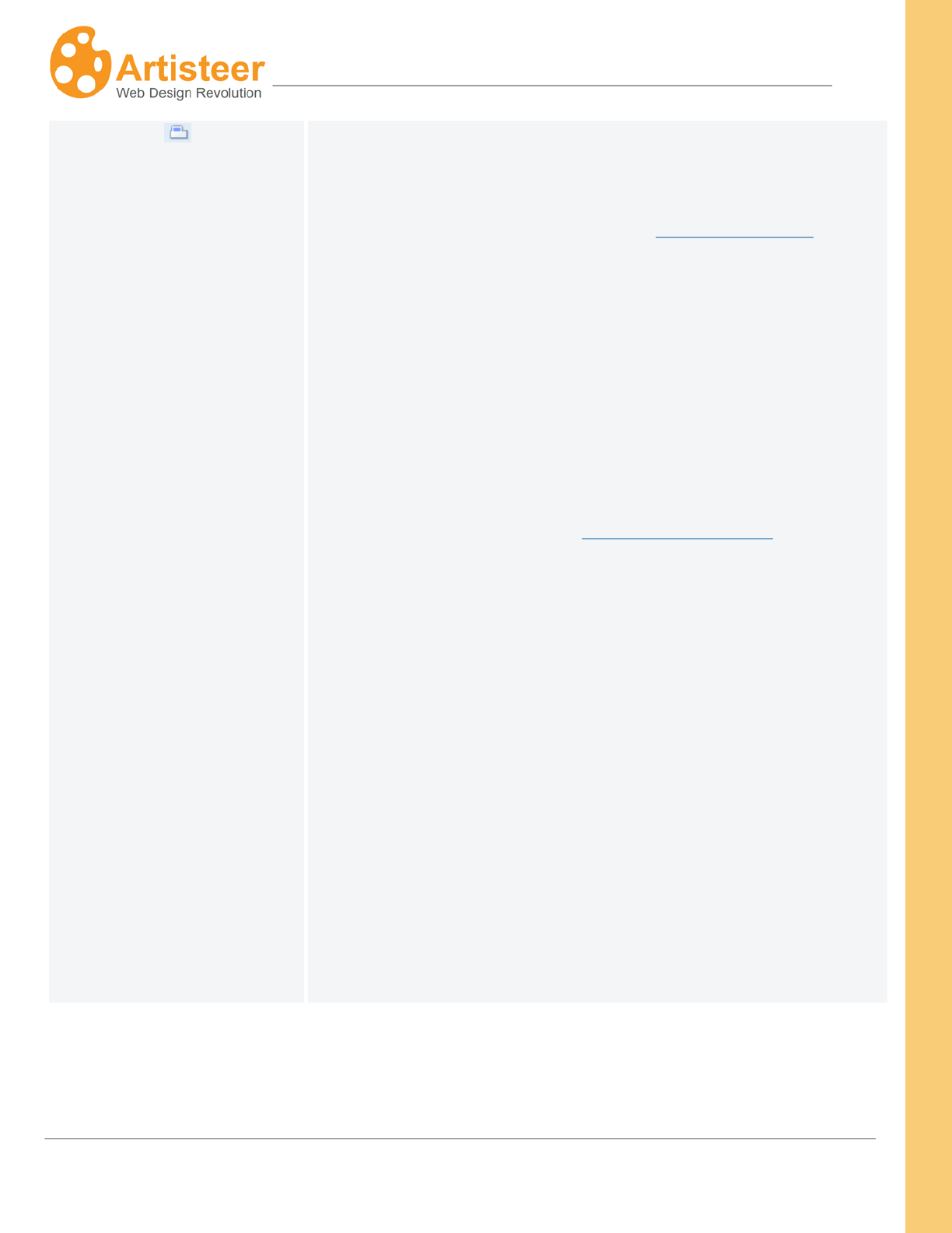
Page Properties
In the page properties you can define attributes of your page. Some of these are very important to
search engine optimization (SEO).
General
Option
Description
Name URL
Name of the web page. This is used in the URL to identify the page
on your website.
18
Artisteer4.0 | 18
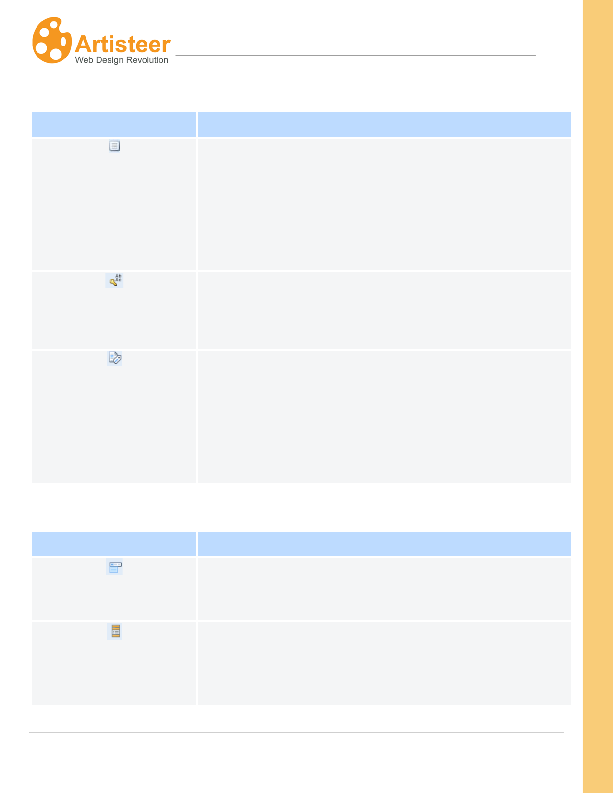
Title
HTML reference to your page. If the browser supports it, this is the
title of your page as it appears in the browser’s tabs or in your
favorites list if you bookmark the page. Note this is different from
the title that appears in the website map (Pages/Posts Panel). The
title in the website map is used in your horizontal and vertical menu
(if you have not changed the menu source).
By default, the menu sources for both horizontal and vertical menu
are the pages you create in Artisteer. The captions are from the
page titles in the site map.
In all of the built-in CMS templates, you can change the source for
both in the backend. You cannot edit the menu items directly in
Artisteer (unless you enable the Include Content Option).
If the menu source is ‘pages’, typically the Home item links to the
frontpage of your site. You don’t create or edit this in Artisteer. By
convention, the first item in the menu is the Home item. You can
define the caption for this. You can optionally decide to omit the
option entirely which means you can’t navigate to the frontpage from
the menu.
Both menus have ‘pages’ as the default menu source but typically
the vertical menu has a different set of navigation links.
This is all done by convention. You can always choose to change
the menus entirely by creating custom menus in the backend. The
important thing is that you create the ‘style’ for the menu in Artisteer
and the content in the backend.
19
Artisteer4.0 | 19
Page Tags
Option
Description
Description
Give a short description of the created page. Your description
becomes part of the meta tag, ‘description’, in the HTML code for
this page.
<meta name="description" content="this is my separator page
This is important to SEO.
" />
Keywords
Your keywords become part of the meta tag, ‘keywords’, in the
HTML code for this page.
<meta name="keywords" content="sepkeyword" />
Custom Meta Tags
Use this text box to add the HTML code to define additional meta
tags you want included. These are important to the search engine
rankings for your page.
<meta name=”author” content=”Bob Smith” />
<meta name=”contact” content=bsmith@robertsmith.us />
Show in Menu
Option
Description
Horizontal Menu
Check the box to have the page displayed in the Horizontal Menu or
uncheck the box to exclude it from the menu. You can also select
what pages to display in Menu.
Vertical Menu
Check the box to have the page displayed in the Vertical Menu or
uncheck the box to exclude it from the menu. Use the Pages in
Menu button to bring up a site map that you can also use to select
from.

20
Artisteer4.0 | 20
Export/Publish Menu
Templates and websites created in Artisteer can be either exported or published. When you export a
CMS template or a website template it is saved in a specified folder on your computer,
In Artisteer, you create content and style. When you export your design, Artisteer generates a format
for your content style so it can be used in your website. If your website is for a CMS like Wordpress or
Joomla, then the format created by Artisteer is a WordPress Theme, or Joomla template.
You can choose to publish your generated files using Artisteer. You can use Artisteer as an FTP client
to move files. You can also use a separate FTP client.
When you publish a CMS template or a website template it is uploaded to host server, such as
Blogger.com or Artisteer.net.
If you are developing an Artisteer plug-in you can also publish it to the Marketplace (see the Artisteer
developers’ page).
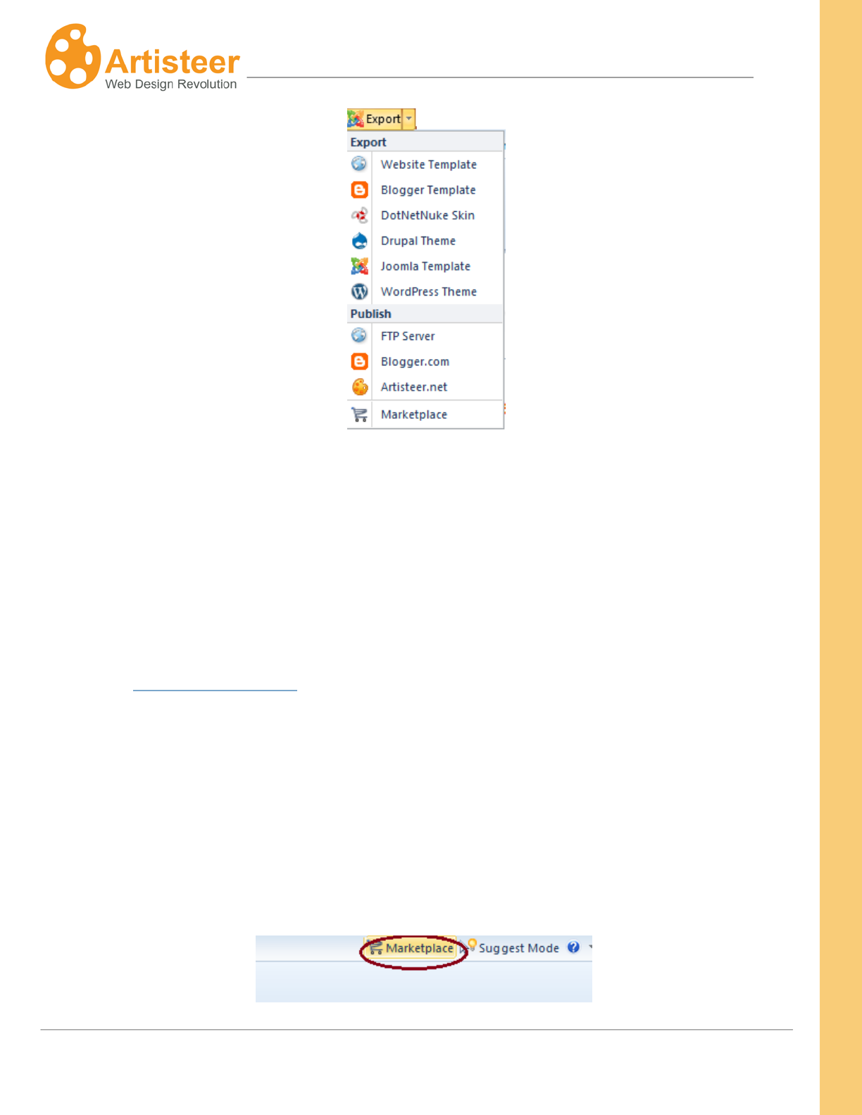
Exporting a template is a three-step procedure that involves:
1. Selecting the type of export in the Export menu
2. Specifying the template name and destination folder in the Export Dialog (you may need to
provide some other data, such as CMS version etc. depending on the type of export).
3. Configuring Export Options (this step is optional).
The Export menu can be accessed from the File Menu, from the Quick Access Toolbar or from the
Home tab on the Ribbon.
21
Artisteer4.0 | 21
Artisteer 4.0 templates can be exported to Joomla, WordPress, DotNetNuke, Drupal, and Blogger.
Note that exporting DotNetNuke skins with content is available only for version 6.
You can also export an HTML website to your local computer or publish it to an FTP server. Artisteer
provides an FTP client to make it easy to move your website files to a remote host server however you
can use any FTP client or service you want to move your files. Your hosting service should provide
you with instructions on how to configure your FTP client to use their server.
Refer to the Export Options Dialog section for more information about the available options for your
type of export.
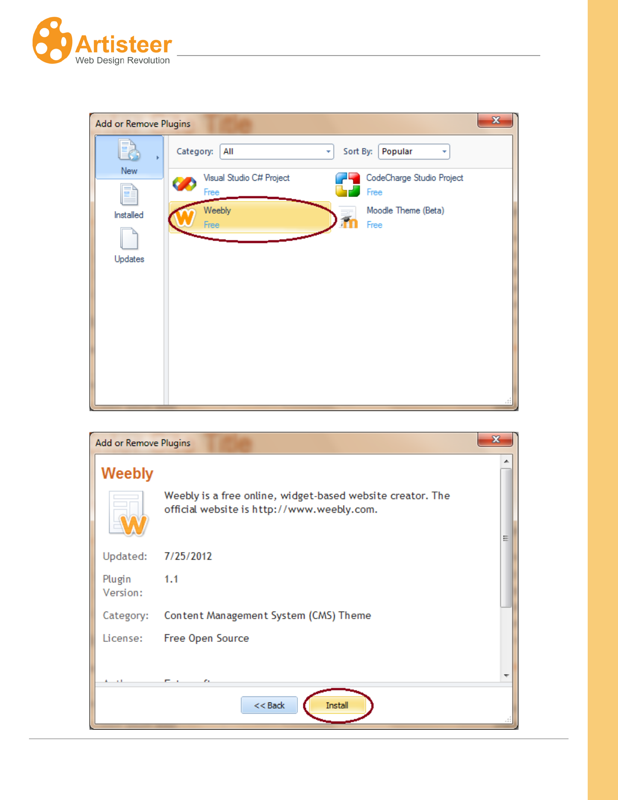
Other export plug-ins are available in the Artisteer Marketplace as free or commercial solutions
provided by the Artisteer developers’ community. The Moodle, Weebly, Codecharge Studio and Visual
Studio plug-ins are some of the free and available extensions. Whenever there is a newer version of
the plug-in an Updates link will appear in the top right corner of the Artisteer program dialog.
To install a plug-in, go to Marketplace (the link is located at the top right corner of the program dialog).
22
Artisteer4.0 | 22
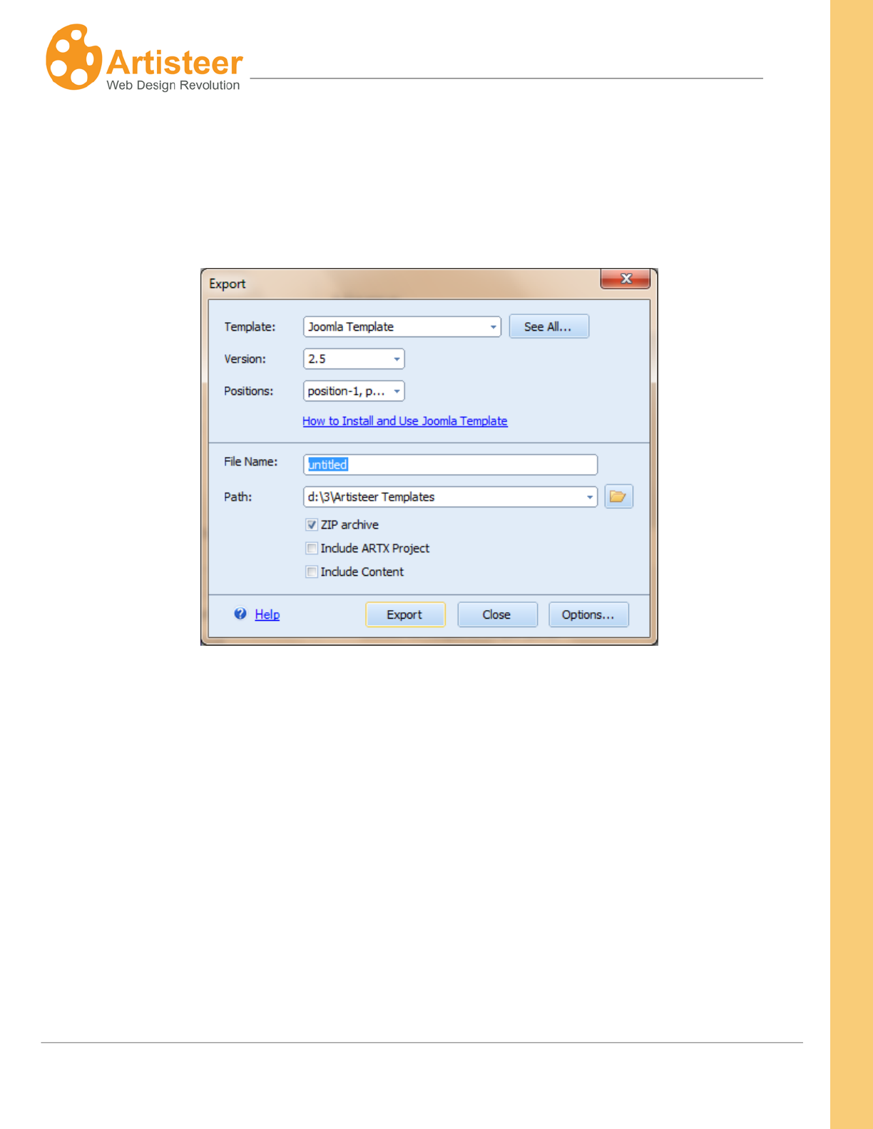
Click on the plug-in and select Install.
23
Artisteer4.0 | 23
When you install a new plug-in, the plug-in name will appear in the list of available export templates in
the Export dialog.
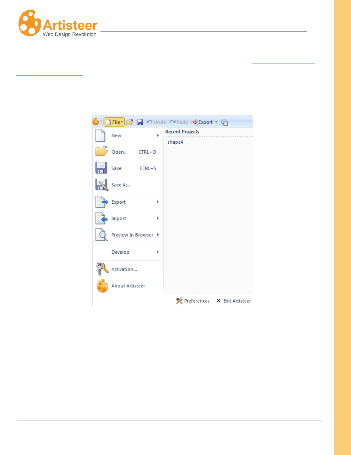
The Export dialog contains some basic options, such as Folder name, Path, Zip Archive, Include
ARTX project, Include Content as well as some additional options that appear in certain exports.
If you change your template after export, those changes may be overwritten the next time you export
your template.
You cannot import templates into Artisteer, even those that have been created by Artisteer. To make
changes to your template, you need the Artisteer project file.
If you sharing your project, or you just want to create a backup of your project, then use ‘Include
ARTX project’.
Artisteer has a default folder for your projects, but this may change if you are using resources (e.g.
images) from somewhere else.
24
Artisteer4.0 | 24
The Include Content feature allows you to export content to Joomla and other CMSs. For more
information about exporting content from Artisteer, please refer to the section Importing Templates
with Content to CMSs
File Menu
In the File menu you can manage Artisteer projects (New, Open, Save, Save As), export your
template, import content or design from an .artx project, preview the template in one of the popular
browsers, develop a plug-in as well as find general information about the version of Artisteer and your
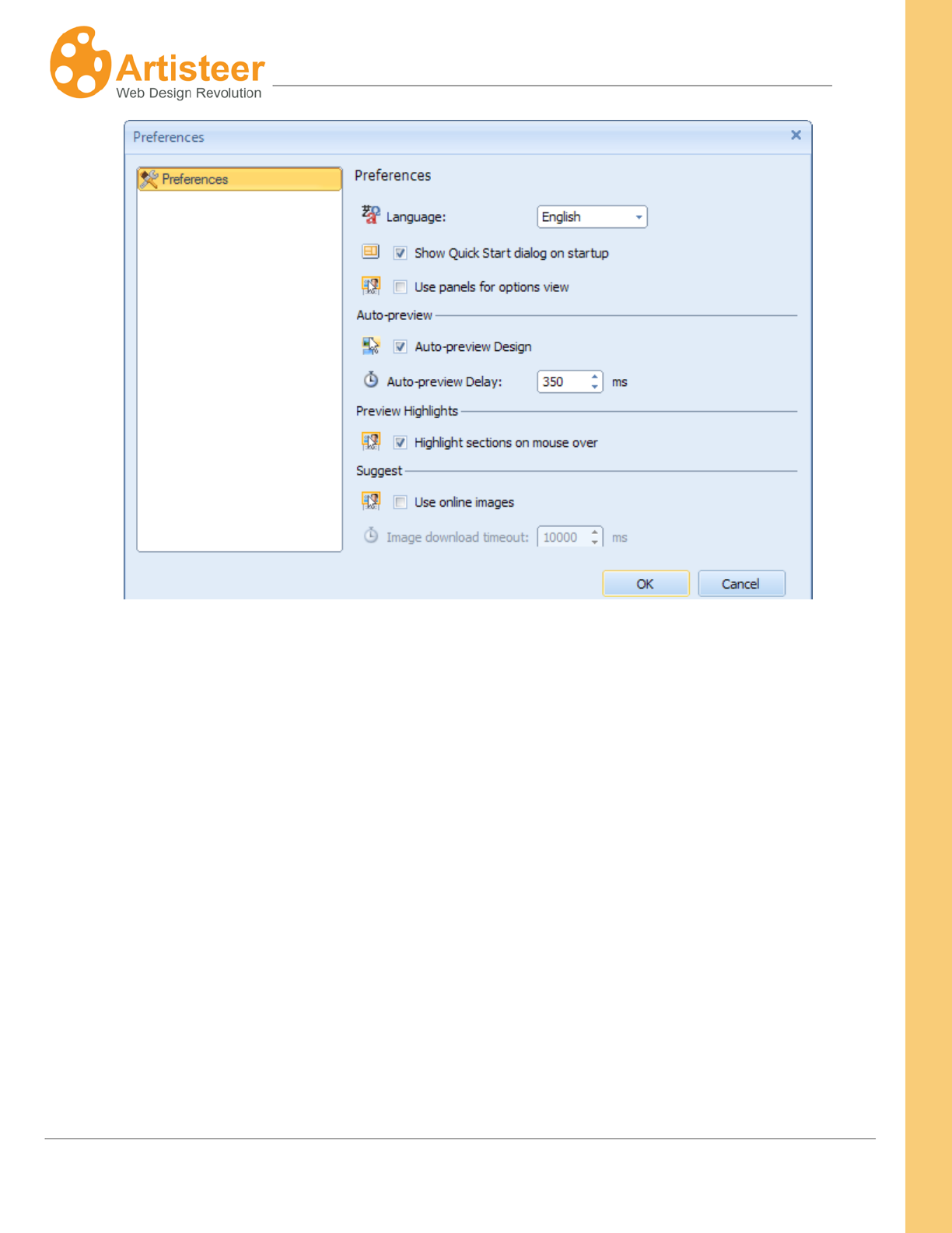
license key. The language of the Artisteer interface, start up and preview settings can be adjusted in
the Preferences dialog (at the bottom right corner of the file menu).
Please note that the Save/Save As option is disabled if you are using Artisteer in trial mode.

25
Artisteer4.0 | 25
Use the Export option to export or publish a template to one of the supported Content Management
Systems and solutions.
Use the Import
Use the
feature to import the design (colors, textures etc.) and/or content (pages, posts,
widgets etc.) from another .artx project.
Preview in Browser
Use the Develop option to create, debug, save a plug-in or deploy it to the Artisteer MarketPlace. You
can find the Quick Start Guide and other resources at
option to see how your website looks in different browsers. The preview
(e.g. Chrome) is available in the list of browsers if the browser is already installed on your computer.
the developers’ wiki page.
Enter your license key in the Activation window to activate Artisteer. For more information about
activation see Activating the Software.
Use the About Artisteer dialog when reporting a problem or asking a question in support.
Use the Preferences
• Language – select a language of the Artisteer interface
dialog to enable or disable the following options:
• Start-up dialog – this is the dialog you see when you start Artisteer without a project file
• Panel mode – preview the advanced options in the side panel
• Auto-preview Design – when you make ‘style’ changes in Artisteer, such as changing colors
etc., your changes will appear in the Preview area.
• Preview Highlights – when you move the mouse over content (e.g. a block in the sidebar, or a
post article) in the Preview area, Artisteer highlights the area with a border and displays special
icons you can use to manipulate the area (eg. Suggest icon). This can be distracting to some
users.
• Online images in Suggest – when you click Suggest, images from Flickr can appear in the
template.
26
Artisteer4.0 | 26
27
Artisteer4.0 | 27
Downloading Artisteer
You can download the Artisteer installation file from the official Artisteer Web site at
http://www.artisteer.com/?p=downloads, or http://www.artisteer.com/?p=news. Please choose the
release of Artisteer appropriate for the platform you will be using: PC or Mac. There are no functional
differences between the PC and Mac releases.
The software is provided with a free trial period that allows you to evaluate the product before
purchasing. During this period of time, Artisteer is fully functional and has all of its features available
for testing however you will not be able to save your Artisteer project. Also, you can export templates,
but all the templates and images generated with Artisteer will have watermarks on them until the
product is activated. The trial period is unlimited and you can activate the software at any time you
wish. Activation instructions are covered in the Activating the Software
With the ‘trial’ version of Artisteer you can also try Artisteer.net with the following restrictions:
chapter below.
Trial Version
Full Version
Free Disk Space 10 MB 200 MB
Artisteer Image Gallery
unavailble
available
Custom Domain
unavailable
available
The Usage of Blog
free 30 day trial*
unrestricted
After the 30 day trial, a notification will be sent to your e-mail, offering you to purchase Artisteer or
continue using the trial version within the next fourteen days. When this period expires, you will receive
another e-mail notification.
28
Artisteer4.0 | 28
Editions of Artisteer: Home&Academic vs.
Standard
There is only one platform release (Mac or PC) of the Artisteer software that you install on your
system, but the features available in Artisteer depend on the type of license you have purchased. If
you purchased the Standard edition, all features of Artisteer are available. If you purchased the Home
edition, there are certain templates you will not be able to export and you will not be able to set most of
the custom options available in the Standard edition. The following chart illustrates the differences
between both editions:
Version
Home&Academic
Edition Standard Edition
Free upgrades for 1 year
Design Suggestions
Design Features
Export as XHTML+CSS
Export as Wordpress Theme
Export as Blogger Template
Export as Joomla 1.5 – 2.5 Template
Export as Drupal 5/6/7 Theme
Export as DotNetNuke 4.9+ Skin
Additional Export Plug-ins(Plug-in Marketplace)
Plug-in Development Tools
Custom Values Dialogs/Panel Mode*
Library of Textures, Glares, and Gradients
Partial (75%)
Number of Color and Font Schemes
50+
70+
*Custom Values Dialogs/Panel Mode refers to additional customization options available in the Standard edition. Normally,
these appear with the icon in the bottom right corner of the command block on the Ribbon bar. Also, many submenus in
Artisteer have a More… selection or a specific item selection that allows you select advanced options (e.g. Font Options…,
Gradient Options…, etc.)

29
Artisteer4.0 | 29
System Requirements
Windows
• Intel® or AMD® processor 1500 Mhz or
faster
• 150 MB free disk space
• 1 GB of RAM
• Microsoft® Windows® XP, Windows
Vista® or Windows Seven®
• Microsoft .NET Framework 3.5
• It can be obtained from the Microsoft
website.
Mac
• Not supported
Browsers supported:
• Internet Explorer 9+(graceful gradation)
• Firefox 4.0+
• Opera 9+
• Safari 4.0+
• Google Chrome 10.0+
Standards supported:
• HTML 5
• CSS 3
• Section 508 (partially)
• PNG with transparency
Technologies supported:
• WordPress content management system
• Joomla (1.5 – 2.5) content management
system
• Drupal (5.x, 6.x, 7.x) content management
system
• Blogger
• DotNetNuke (5.x, 6.x)
• Artisteer.net
Export plug-ins supported:
• PHP Template
• Ebay Template
• CodeCharge Studio
• Visual Studio C# Project
• Visual Studio ASP.NET MVC3
• Weebly
• Moodle
30
Artisteer4.0 | 30
Installing Artisteer
This chapter describes how to install Artisteer on your computer.
Before you proceed, please make sure that your computer meets the requirements listed in the
System Requirements
• Log into Windows as a Power User, or assume the Primary Administrator role.
chapter.
• Double-click the installation file. This will launch a standard installation process.
• Select the language that you’d like to use during the installation. Click the Next button.
• Follow the instructions provided by the installation wizard.
• Carefully read the License Agreement. If you accept its terms, check "I Accept the terms of the
License Agreement" option and proceed to the next step. Otherwise, quit the installation.
• Select the destination folder where you want to install the product.
• Indicate whether you want to create shortcut icons on the desktop and Quick Launch panel.
• Click Install button to start the installation.
• Click Finish button when the installation is complete.
Artisteer supports silent installation. If you would like to install the software using silent installation,
please use /silent key to perform silent installation of Artisteer. This will run the installation process in
the background without displaying the installer dialogs, progress bars etc. Your installation query
should look similar to the following:
31
Artisteer4.0 | 31
Activating the Software
After you have purchased Artisteer you will receive a License Key by e-mail to be used to activate the
software. The type of license that you purchased determines the features that are available in
Artisteer (‘Home’ vs. ‘Standard’). The activation removes all restrictions in the trial version, such as
the watermarks, and automatically enables all of the features of Artisteer for the edition you have
purchased (‘Home’ vs. ‘Standard’).
The license key is associated with the Artisteer release, not the target platform. Even though the
installation file may be different, the license key is the same for both Mac and PC.
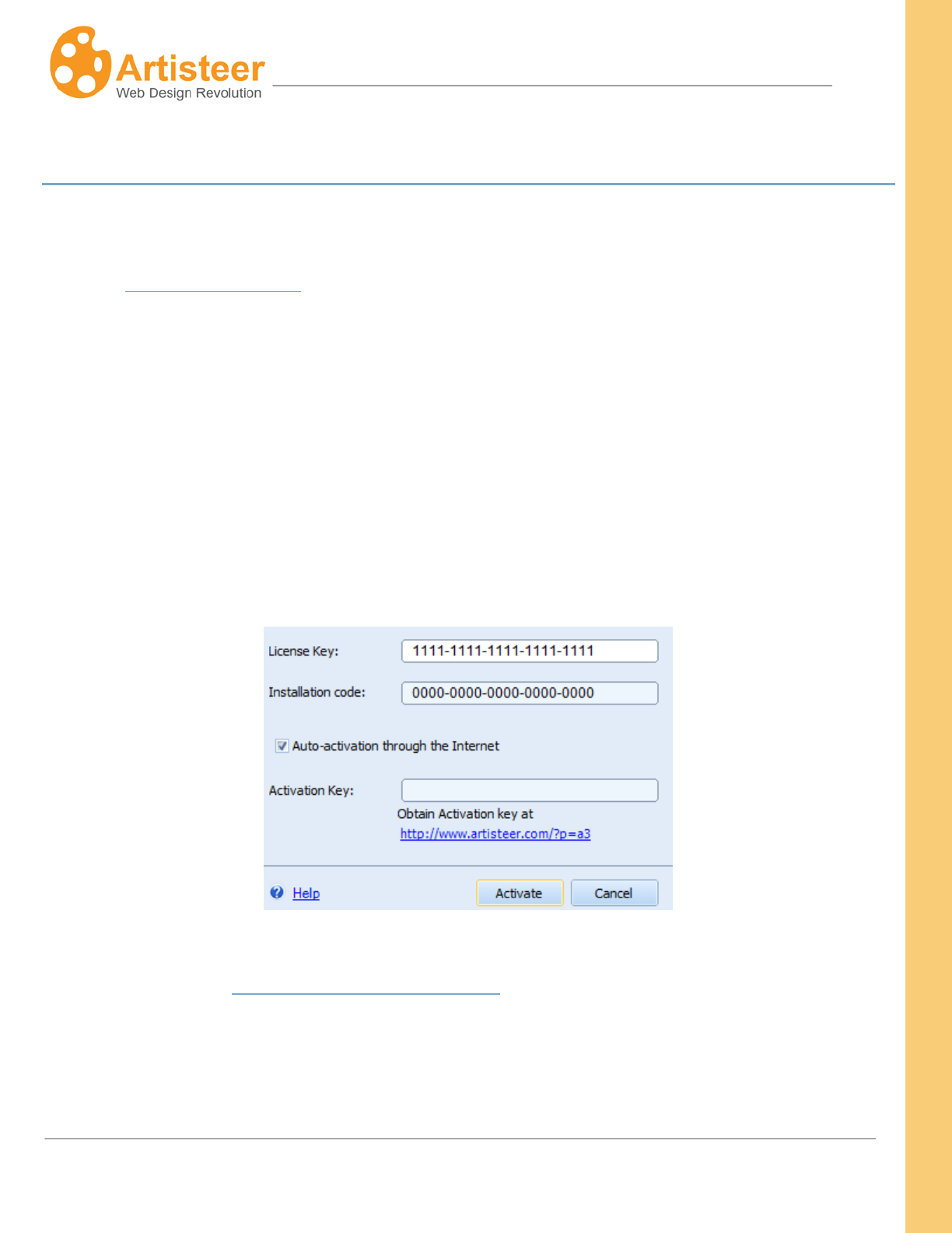
To activate Artisteer, select File
Artisteer Activation and enter your license key number in the first
box. If your computer is connected to the internet, check "Auto-activation through the internet" option
and click the Activate button. If successful, the software will connect to the Artisteer servers on the
internet, return an activation key, and automatically enable all of the features of Artisteer.
If you work off-line, use the following link to obtain an activation key from any other computer
connected to the web: http://www.artisteer.com/?p=a2. In this case, uncheck the "Auto-activation
through the internet" option and enter the activation key you obtained from the other computer.
32
Artisteer4.0 | 32
Creating a Template
Creating a template in Artisteer is as easy as 1-2-3!
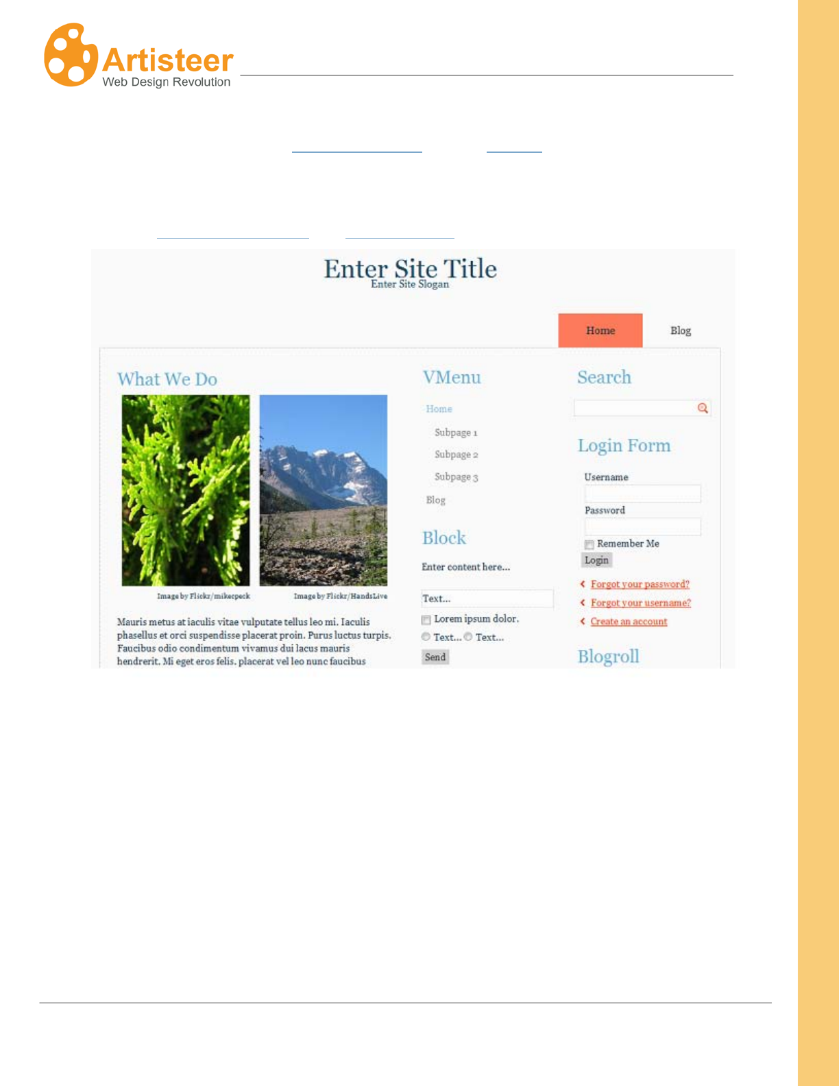
There are two parts to a template created by Artisteer, the Design and Content. The Design
describes how your web pages will look. It includes all of the style attributes like Color, and
Fonts and all of the rules that describe how elements are supposed to appear. Your Design
describes ‘how’ your web pages appear but not ‘what’ appears on the page. The ‘what’ is
defined by your Content. The Content is the Text, Images, Links etc. that communicate your
web page with your viewers.
Your templates always have a Design, but Content is sometimes optional. If you’re using a
Content Management System (CMS) like WordPress, Joomla, etc. the content of your pages
may exist in the backend of the CMS. Using Artisteer, you can create just a Design, or you
can optionally create all, or part of your Content in Artisteer and then later import your Content
in the backend.
1. Find the design you like. In most cases, nearly everything you need to do can be started by
clicking the Suggest Design button. This creates a random design that you can work with as-is,
or click the button again to see another design suggestion. When you find a good design idea
you may want to adjust some design elements like colors, fonts or backgrounds separately.
The corresponding “Suggest …” buttons will help you find what you want (see Home tab).
2. Customize the content. When you start from a blank project what you see initially are sample
Pages and Posts generated by Artisteer. If you’re using a CMS, you need to decide if you just
want to create a Design (i.e. create the Content elsewhere, such as in the backend), or if you
want to create all of your Content in Artisteer.
If you’re working with a CMS like Joomla, or WordPress, you need to decide if you just want to
create a Design (create all Content in the backend), or if you want to create all of your Content
in Artisteer. If you only want to create a Design, there’s no need to customize the sample
33
Artisteer4.0 | 33
Content. If you want to create the Content in Artisteer, you’ll need to change all the sample
Pages and Posts using the Pages/Post Panel and the Edit tab.
3.
Export your project as a WordPress theme, Website template or any other template format you
like (see Export/Publish Menu and Export Options).
34
Artisteer4.0 | 34
Home Tab
The Home tab is a great place to start designing your template. You can choose a website design,
modify a desgin, create content for your website and export the result. The tab contains all the
necessary options for creating a website.
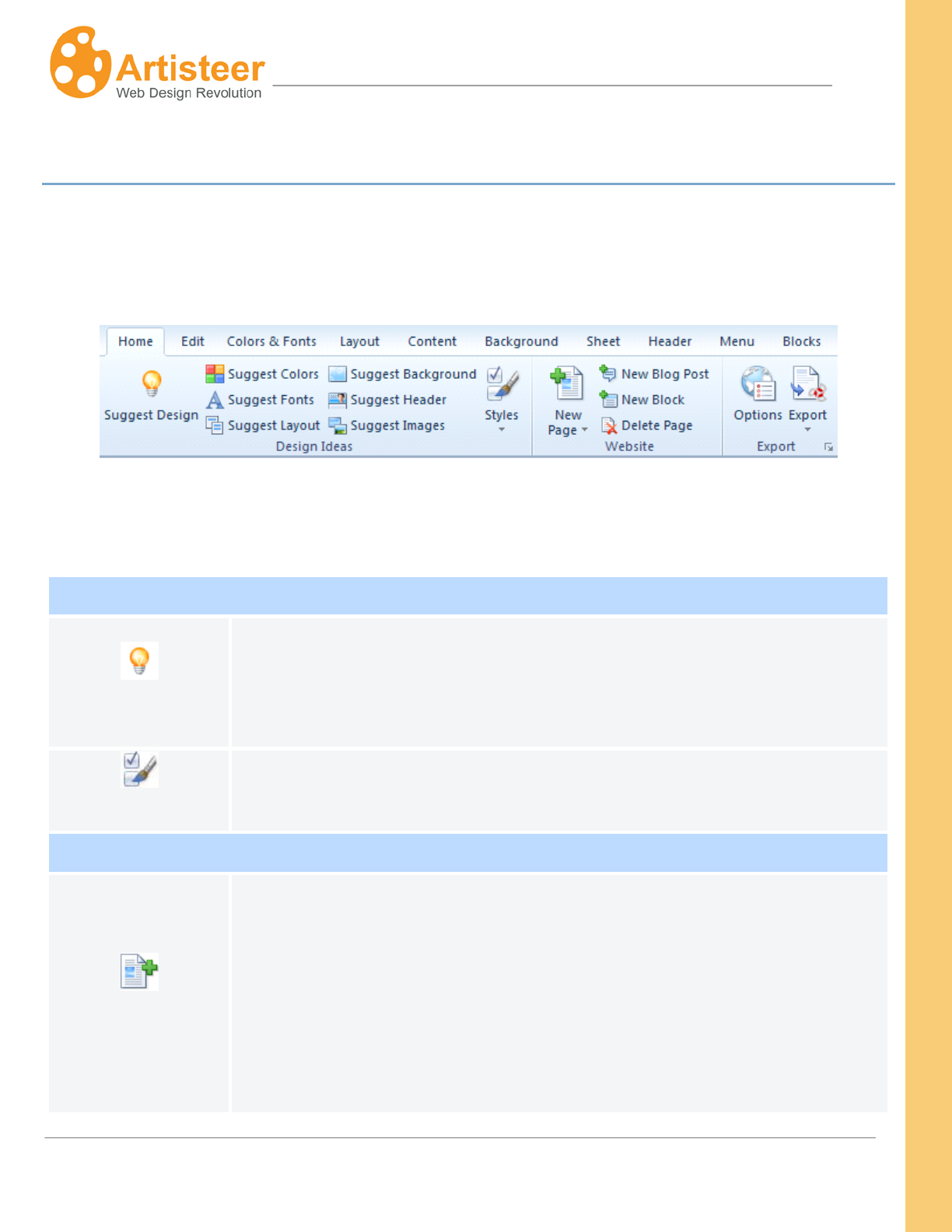
The features of the Home tab are arranged in three groups: Design Ideas, Website (adding content),
and Export. The following tables describe each group in more detail.
Design Ideas
Suggest…
The Suggest feature is best used at the beginning of your project. It allows
you to see the various designs possible and helps you determine which
styles and themes you like best. The Suggest option may be applied to the
whole template, or just parts of your template, such as Colors, and Fonts.
Styles
Use this option to narrow the range of options Artisteer will suggest.
Website (Adding Content)
New Page
Use these icons to add new pages, child pages, posts, and blocks
You can rename your new page by selecting the page title in the
Pages/Posts Panel and pressing F2.
. Click
the New Page icon to add a page or a child page. The Pages/Posts Panel
located at the left side of the Preview area displays a site map of your
website.
35
Artisteer4.0 | 35
When you click on any of the content areas in the Preview area, the Edit tab
features on the Ribbon bar should be automatically enabled. Use the Edit
features much like a WYSIWYG editor to change the content on your page.
New Blog Post
Use this option to add a new post article to your website. There are some
key differences between post articles and pages :
• Normally, post articles are listed on a special page called the
‘frontpage’, or ‘blog post’ page where the articles or excerpts of the
articles are listed.
• Viewers typically navigate the pages of your website using the
horizontal or vertical menu. Viewers typically navigate your post
articles using the ‘blog post’ page, and special links in the header and
footer of your posts. You define which links appear using
ContentMetadataIcons.
• Posts can be grouped and categorized using categories and/or tags
that you define and associate with the post. Posts can also be
grouped and navigated using other attributes such as Author, and date
the post was created, etc. This makes it easier for your viewers to find
the post articles they are interested in.
New Block
A new block appears in the sidebar.
Use the Edit tab and the Preview area to define the content of the block.
Use the Blocks tab to style the way you want the Sidebar to look.
Export
Options
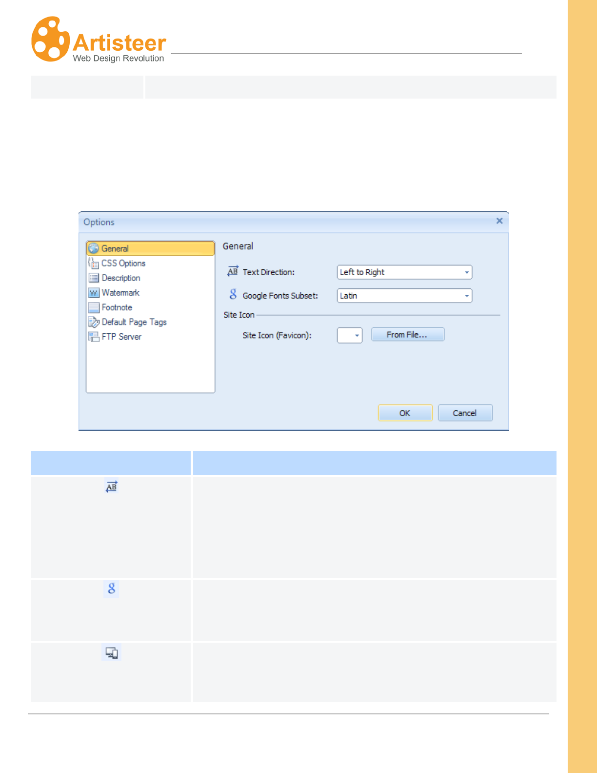
Adjust the Export Options: text direction, site icon, css prefixes and styles,
description, watermark, footnote, default page tags, etc. Additional options
may appear depending on the type of export (see The Export Options
Dialog). The current type of export is defined by the previously exported
template. So, if you export a WordPress template, then WordPress is your
current template type. If you export Joomla, then Joomla is the current type.
36
Artisteer4.0 | 36
Export
Use this option to export a template from your project.
The Export Options Dialog
To open the Export Options Dialog select Options in the Export group on the Home tab, press the
Options button in the Export dialog or navigate File > Export > Options.
General Tab
Text Direction
Specify the text/writing direction. Artisteer supports both Left to
Right and Right to Left directions. This determines not only how text
is displayed but also how text is inserted in Artisteer. The change of
text direction also affects the layout, e.g. if your sidebar is on the
left, it moves to the right.
Google Fonts Subsets
Subsets are scripts (Cyrillic, Latin, Greek etc.) provided by Google
Web Fonts. In Artisteer you can specify the Subset of the web font
for the language of your website.
Responsive Design
Enable or disable responsive design.
RWD makes the website adapt to the particular screen resolution by
37
Artisteer4.0 | 37
positioning the page, scaling the images, changing its layout for
comfortable scrolling and panning.
Artisteer uses the .responsive, .responsive-tablet, and .responsive-
phone device aware CSS classes as well as the a set of standards-
based technologies like fluid grids, flexible images, and CSS media
queries.
Responsive templates in Artisteer are designed for the optimal
viewing experience on desktops, tablets (Landscape and Portrait
Layouts) and smartphones (Landscape and Portrait Layouts). It was
not designed for specific devices and requires that the browser
(Firefox, Chrome, Opera, Safari, Internet Explorer etc.) of the device
supports HTML5+CCS3.
Please note, that foreground images, slideshow, and flash
animations in Header are disabled in responsive design. The layout
and menu also change, so a three -column layout may be
rearranged in two columns or even one column. The content does
not disappear, but is just pushed down.
The RWD is enabled by default in Artisteer. To check it, simply
preview your template in browser and resize the browser window.
You can also use various device emulators, like iPhone4 simulator
or iPad emulator for websites published on the web (with active url)
Site Icon
Choose a site icon from the gallery or insert a custom icon from a
file. Browsers that support ‘favicons’ will display this icon next to the
web address for your site in the browser’s address bar and/or the
browser’s bookmarks.
38
Artisteer4.0 | 38
CSS Options Tab
CSS prefix
The CSS prefix exists to avoid conflicts with CSS classes of 3rd-
party modules. The “art-“value is a default CSS prefix in Artisteer,
which may be modified. It may contain only alphanumeric symbols
and dashes (A-z, 0-9, “-”, “_”) and should start with an A-z letter.
Additional CSS styles
You can enter custom CSS styles here. They will be embedded in
the CSS stylesheet generated by Artisteer.
Description Tab
Description
Author Name
Identifies the name of a person or organization creating the
template.
Author URL
Provides a reference to the Author's website.
Template Version
Identifies the Version Number of the template.
Template URL
Specifies the location of the template on the web.
Tags
Specifies the keywords associated with the theme.
Description
Provides additional information about the theme.
39
Artisteer4.0 | 39
Watermark Tab
Description
Show Watermark
If checked, the Watermark Text will be repeated throughout the
page.
Watermark Text
The text to be displayed across the page when the "Show
Watermark" option is enabled.
Footnote Tab
Description
Include a backward link to
the author
When checked, the above-defined author name will be displayed at
the bottom of the page (in the Footnote) with a link using the name
of the Author and the Author’s URL address as defined in the
Description options above. If Author and Author’s URL is blank
(default), this does not appear.
Include a backward link to
the CMS and the Artisteer
When checked, the CMS name and “Artisteer” will appear at the
bottom of the page (in the Footnote). Uncheck this box if you do not
want this to appear.
Website Template Export Options
Default Page Tags
You can add a site description, keywords and custom meta tags for
more effective SEO. The information will be stored in the
appropriate meta tags inside the <head> tag. You can also add tags
for each page separately. These tags will override the default page
tags. To add tags to a particular page, right click the page in the
Pages/Posts panel and select Properties>Page Tags.
Description
Give a short description of the created page. Your description
becomes part of the meta tag, ‘description’, in the HTML code for
40
Artisteer4.0 | 40
this page.
<meta name="description" content="this is my separator page
This is important to SEO.
" />
Keywords
Your keywords become part of the meta tag, ‘keywords’, in the
HTML code for this page.
<meta name="keywords" content="sepkeyword
This is important to SEO.
" />
Custom Meta Tags
Use this text box to add the HTML code to define additional meta
tags you want included. These are important to the search engine
rankings for your page.
<meta name=”author” content=”Bob Smith” />
<meta name=”contact” content=bsmith@robertsmith.us />
FTP Server
Specify the FTP Protocol, Host, User Name, Password, and Remote
Directory. Complete these options if you plan to use the Artisteer
FTP client to move your static HTML website to a remote server (i.e.
if you are using your own hosting service). Your hosting service
should provide you the details for how to complete this dialog.
Note you do not need to complete this if you are hosting your
website on Artisteer.net.
Blogger Export Options
Show Blogger Navbar
Use this option to hide or show the blogger Navbar.
,
Define if ‘categories’, ‘pages’, or ‘archive should be used as the
source for the horizontal and/or vertical menu. ‘Pages’ are the static
41
Artisteer4.0 | 41
Horizontal Menu Source,
Vertical Menu Source
pages on your website. ‘Categories’ are arbitrary names you create
and use to organize your posts. ‘Archive’ refers to the dated post
archives.
, Home page menu
item (Show Home Item,
Home Item Caption)
Show Home Item determines if the caption should be shown.
Home Item Caption specifies the caption of the menu item pointing
to the home page.
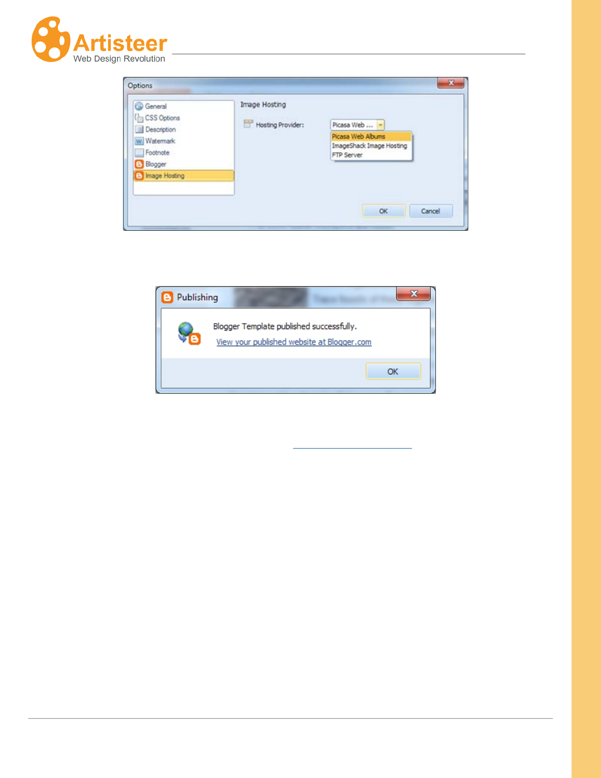
Image Hosting(Hosting
Provider)
You can choose a hosting provider for images: Picasa Web Albums,
ImageShack Image Hosting, or FTP server if you use another image
hosting service.
WordPress Export Options
Show Home Item
Normally, when viewers visit your site, the URL they use does not
reference a specific page. E.g. www.mysite.com The default page,
or frontpage for a Wordpress site is normally a list of your Post
articles. If you select this option, a menu item is added to your
horizontal menu bar so your viewers can always go back to this
page. If you unselect this option, the ‘Home’ item does not appear
so while viewers are on your site, they cannot select a choice on the
menu bar to navigate back to this page.
The horizontal menu bar normally consists of items that are links to
the pages of your site. The ‘Home’ option only applies to the default
frontpage, which is a list of your Posts. In the Reading settings in
Wordpress, you can change the frontpage to either a static page, or
a specific Post page. However, if you change the frontpage from the
default, the ‘Home’ option no longer applies (i.e. you will not see
your ‘Home’ option in the menu bar).
This option also appears in your Theme options in Wordpress. See
‘Theme options for Wordpress’ section below. Any settings in your
42
Artisteer4.0 | 42
Theme options override the same settings in your theme generated
from Artisteer. Also, your Theme options are shared for all of the
Artisteer themes you have installed. For example, if I unselect
‘Show Home Item’ in my Theme options, then it overrides this
setting in my exported theme, even if I uninstall, delete and reinstall
the theme.
Home Item Caption
Specifies the caption of the menu item pointing to the home page if
you have select ‘Show Home Item’ above.
DotNetNuke Export Options
DNN Version
Specify the version of DotNetNuke. Supported versions – 5x, 6x.
Please note that exporting content (Include Content option) is
compatible with version 6.x only.
Show Login Tab in Menu/
Show User Tab in Menu
Specify if you would like these items to appear as tabs in the
Horizontal Menu
43
Artisteer4.0 | 43
Edit Tab
Using the Ribbon bar options under the Edit tab and the Preview area of Artisteer, you can create and
edit your content in WYSIWYG mode. You can also add hyperlinks, images, video, tables and
buttons. You can also edit the source HTML for each content area. As you more the cursor over the
Sheet, the content areas you can edit are highlighted with a frame around them. Clicking any one of
these hightlighted areas enables the options on the Edit tab.
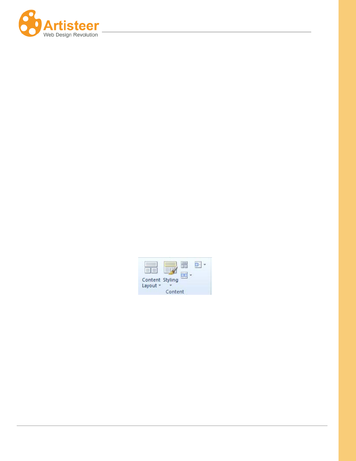
The Ribbon bar options are arranged in eight groups: Clipboard, Style and Font, Paragraph,
Content, Insert, Source, Slideshow.
Clipboard, Font and Paragraph
The Clipboard provides standard cut, copy, & paste options for embedding text in the content area.
Style and Font suggests basic typography settings such as font family, size, style, quotes and effects
to give the text a more professional look. The ‘font’ options apply only to the text you select within a
content area, not to all of the text in that portion of your page. The Paragraph
The ‘font’ and ‘paragraph’ options override the same settings you may have defined in your design.
That is, you can define the appearance of your content on your pages using the Content tab on the
ribbon bar. These changes are part of your design ‘style’ for the template. When you change the
settings in the Edit tab, you override the ‘style’ settings you defined elsewhere (e.g. Content tab). For
example, if you decided that all of your web page text should be ‘Red’ (ContentTextColor’red’),
any text you add directly to your pages or posts in the Preview area will be in ‘Red’. You can override
options let you adjust
bulleted lists, indentation and alignment. The ‘paragraph’ options apply to all the text in the content
area you selected, not just to any selected text.
44
Artisteer4.0 | 44
the ‘style’ however by selecting the text in the Preview area and then using the Edit tab to change the
color for the selected text (EditText Color’black’). When you override your design like this, your
changes become part of the Content for your page, not the design. This is important depending on
how you publish your content. For example, if you are building a web template for a CMS like Joomla,
you can choose to import the content you created in Artisteer when you install the template. If you
choose to install the template without your content, you won’t see the ‘style’ changes you made with
the Edit tab since the ‘style’ settings are embedded inline with your other content. This isn’t true of all
style changes you can do with the Edit tab. Many of the style changes you can make from the Edit tab
become part of your template design, not content. See the section ‘Source HTML’ below for more
information.
Content Layout and Styling
The Content area of your template is divided into Rows and Cells. The options of the Content group
let you control the layout and design of your text, images and other content. You can arrange the
content of your article in one Row, split it into multiple Cells, or divide the content into multiple Rows
and Cells.
When you create a new project, Artisteer generates some sample content for you so you can easily
see the layout of the page. You may notice that as you select different layouts, the text and images
are automatically moved to the new layout. If you reduce the number of Cells in your layout, you may
see some content disappear. The content is not deleted. If you add back more Cells or Rows to your
layout, the content will reappear automatically.
45
Artisteer4.0 | 45
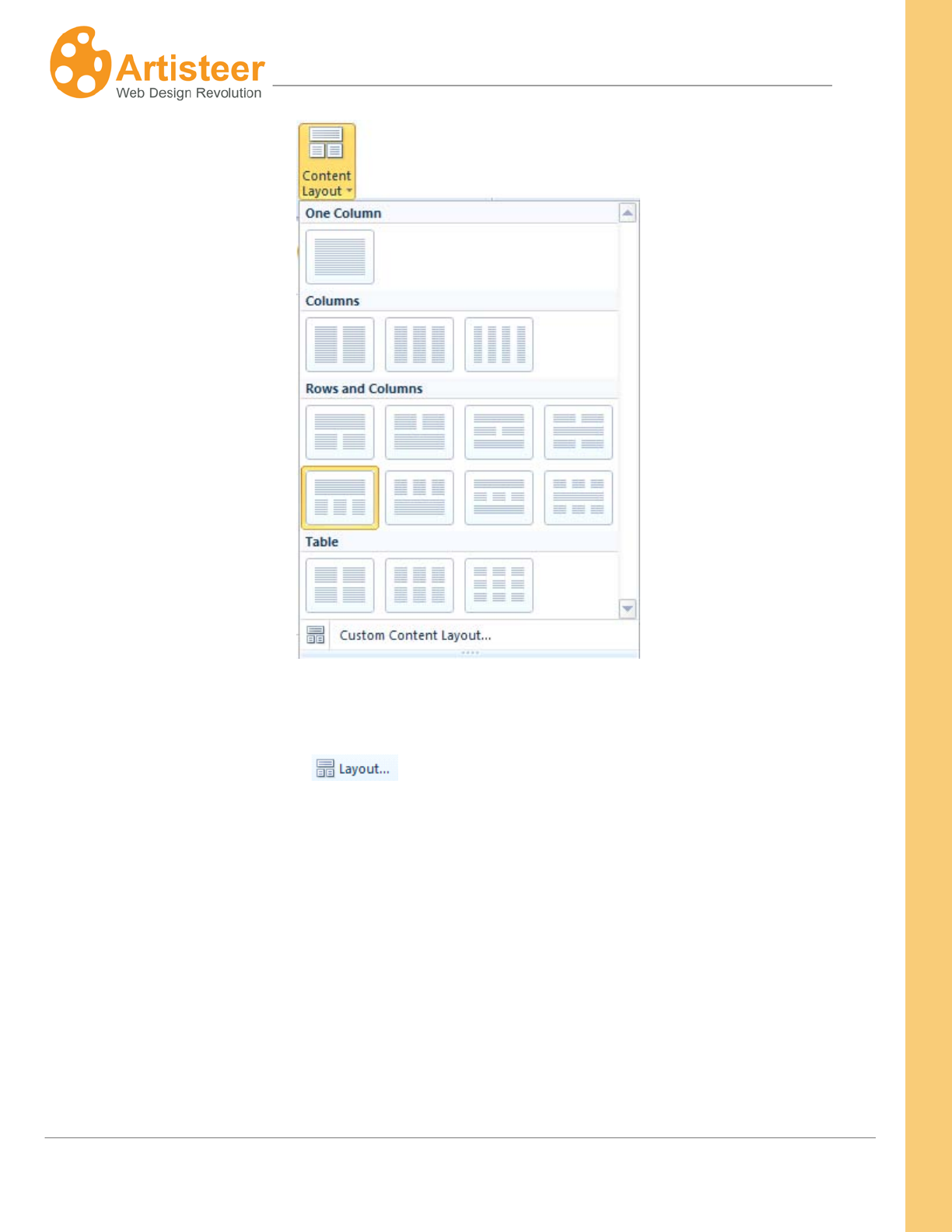
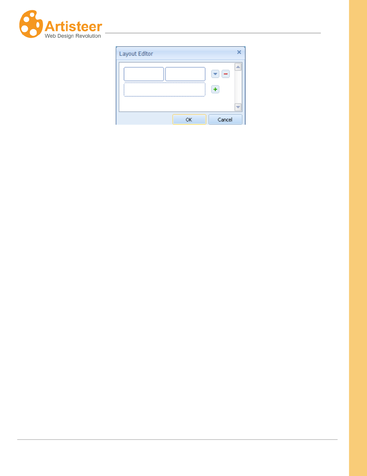
Along with choosing one of the variants suggested in the gallery you can create your own content
layout by selecting the Custom Content Layout option located at the bottom of the Content Layout
menu and in the Layout menu ( ). In the dialog box, click the ‘down arrow’ icon and choose
a Row layout. Click the “+” and “-“ icons to add or remove Rows. You can also customize each Row
by clicking on the Row and selecting one of the options shown to add or reduce the number of Cells in
each Row. Again, the content (e.g. text, images, etc.) in your Rows and Cells is automatically
adjusted to your new layout.
46
Artisteer4.0 | 46
Remember, your Content area is divided into Rows and Cells. Rows contain Cells. Every Row has at
least one Cell. When you select a Cell for editing, you are also selecting the Row where the Cell
occurs. When you click on any given Cell, Artisteer highlights the area by temporarily adding a frame
around the Cell. Make sure to look for this frame before you start making any changes.
Selecting a Content Style
Use the Styling tab to select a content style. Selecting a content style is optional. If you choose a
style, it only affects the current page, not all pages. By default, when you create a new project, the
content layout for the Home page always uses the first ‘basic’ style which is explained below.
The Styling tab
When you pick one of the thumbnails you’re choosing a set of style settings that are part of your
design. The content style defines which set of style attributes are part of your design, but not how they
appear. The style settings which define how they appear (e.g. borders) are configured with the ‘All
Pages’ option.
suggests various designs you can apply to the content, such as adding borders or
highlighting certain areas. The Styling options can be used as a shortcut to styling your page. That is,
there are many ways you can style your pages. For instance, you can style your Rows and Cells
individually, or you can select a content style, or you can select a content style and then change your
Rows and Cells individually. Selecting a Style from the thumbnails is easier than changing each Row
and Cell but as we explain below the style you select interrelates with other style settings, and
sometimes changes or resets other settings in Artisteer.

47
Artisteer4.0 | 47
The ‘All Pages’ options define the settings you want to apply to all of your web pages when a
complementary content style is selected (e.g. borders) for the page. You can override these options
by changing the Row and Cell options.
There are six style sets: Margin, Padding, Spacing, Radius, Border, and Highlight Color, so when you
select a thumbnail option you are selecting which style set is part of your design not how the style
appears. (Note, ‘Padding’ is an exception. Padding is the spacing between the edges of your Cell and
the content within the Cell. The ‘All Pages’ setting for padding applies to all Cells unless you override
it in the Cell options. That is, all of the content styles include ‘padding’. Also, some of the thumbnails
depict Separators. For the purposes of this manual, we don’t make any distinction between
Separators and Borders.)
For example, if you want borders around your Cells, you select one of the thumbnail images that
include borders.
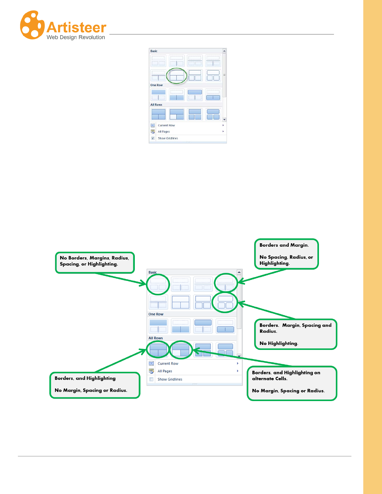
48
Artisteer4.0 | 48
Choosing this option however doesn’t define how the border appears. Use the ‘All Pages’ options to
decide how your borders should look. Note, for this style, the borders are around the Cells, not the
Rows. If you look at your Row options, no border is defined. If you look at each Cell, the options have
been changed automatically to include a border.
Here are some examples of what the thumbnails mean.
Selecting one of the content styles doesn’t affect the style settings (‘All Pages’). It only defines which
set of attributes are part of your design. For each set, the settings are defined in the ‘All Pages’

49
Artisteer4.0 | 49
options. For example, if you choose a thumbnail that includes a border, the weight, style, color, etc.
for the border is defined by the ‘All Pages’ options.
‘All Pages’ means that wherever you selected a content style, these are the settings that apply to the
style. Selecting a content style is optional and you decide the style, page by page. On any given
page, if you choose to create your design by changing Rows and Cells individually, the ‘All Pages’
options do not apply. If you choose a content style, then any of the ‘All Pages’ options that are
complementary to the style you selected apply to your content unless you override them by changing
the Rows or Cells. For instance, if you choose a style with borders then how you define borders in ‘All
Pages’ is how the borders appear.
The ‘All Pages’ options are completely independent of the content style you select. That is, you can
select a content style and then define the setting values (e.g. border), or you can define the setting
values, and then select a content style. However, you won’t see your changes unless you select
complementary options. That is, you won’t see a border unless you select both a style that includes
borders, and you define a border in the ‘All Pages’ options. Note, when you create a new Artisteer
project, there are default values assigned to ‘All Pages’ so normally you don’t need to define your style
settings before you select a content style.
As we mentioned before, when you select a content style, the Rows and Cells are changed to reflect
the style defined by ‘All Pages’. Which options change depends on the content style you select.
e.g. this style says “add a border around each Cell, add Margins and Spacing”.
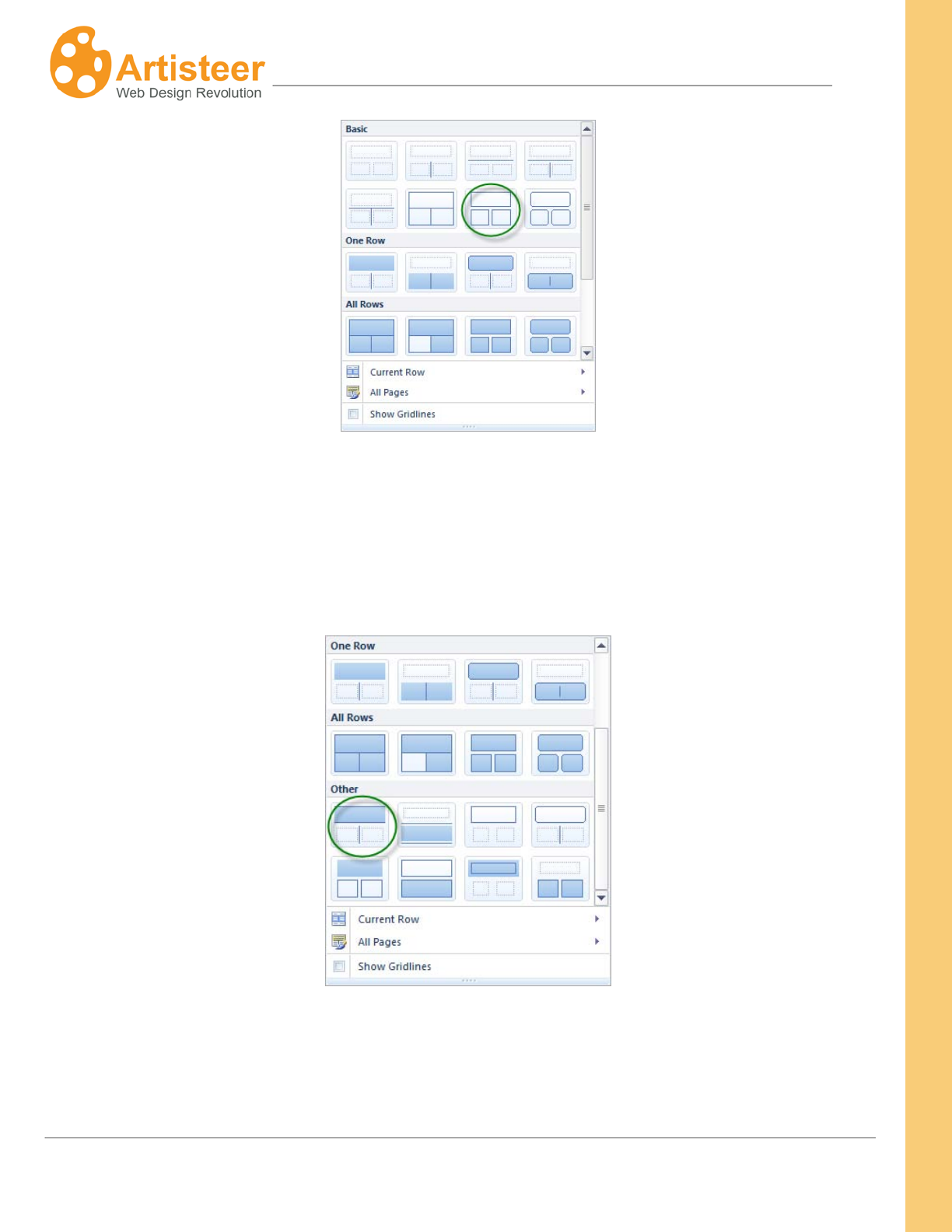
50
Artisteer4.0 | 50
This changes the Cell options for ‘border’, ‘Fill’ color (set to ‘no fill’), and Radius (no radius). It also
changes the Row options: Border (no border), Radius (no radius), ‘Fill’ color (set to ‘no fill’), Margin (to
add space between rows), and Spacing (to add spaces between Cells).
But, suppose you select this style:
This style changes the Row border options (‘top’ and ‘bottom’), not the Cell options. That is, the
border is defined by the Row, not the Cell.
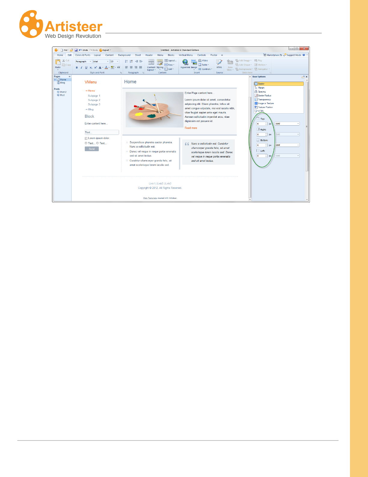
51
Artisteer4.0 | 51
Selecting a content style (either for the page, or ‘Current Row’) is also a way of resetting all of your
options but you need to use it with care since it also resets changes you may have made to your Rows
and Cells. For example, if you choose a style with borders then borders are added to all of the Cells
on your page. If you change the border appearance for a Cell, and then later select a content style
that does not have borders, this may eliminate any changes you made to the Cell. But, selecting a
content style does not affect the ‘All Pages’ options. These options define how the border is supposed
to appear when you select a content style with borders. Even if you select a different style without
borders, your ‘All Pages’ options are not changed.
Suppose you choose a content style with borders but no row margins or spacing.
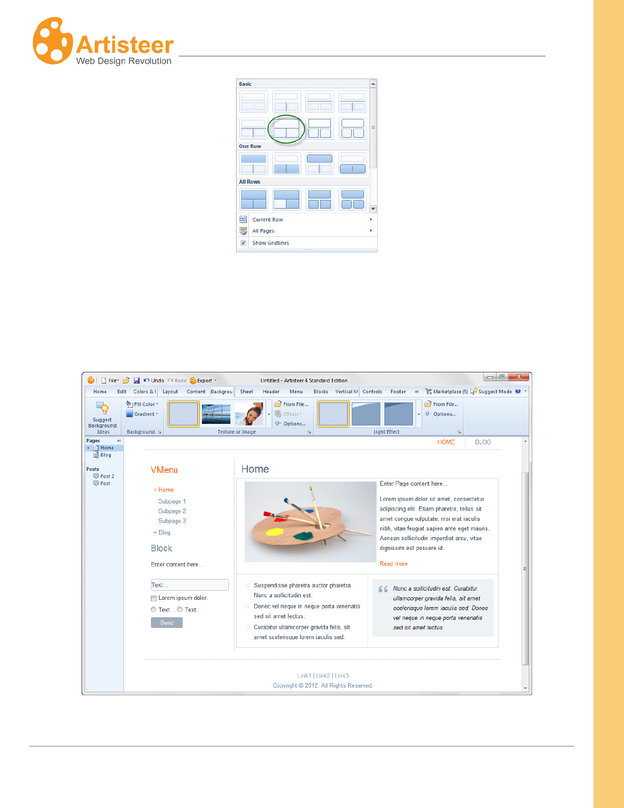
52
Artisteer4.0 | 52
By default the ‘All Pages’ options have a defined Margin (10px) and Spacing (10px), but you don’t see
this in the layout because the content style you selected does not include margin or spacing. Even
though these settings are a single value, think of each as a set of values which are either included or
excluded when you select a content style.
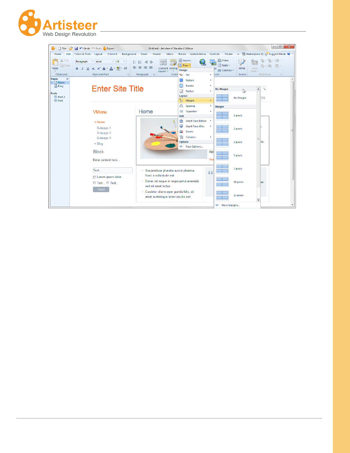
You can change the row margin and cell spacing using the Row options.
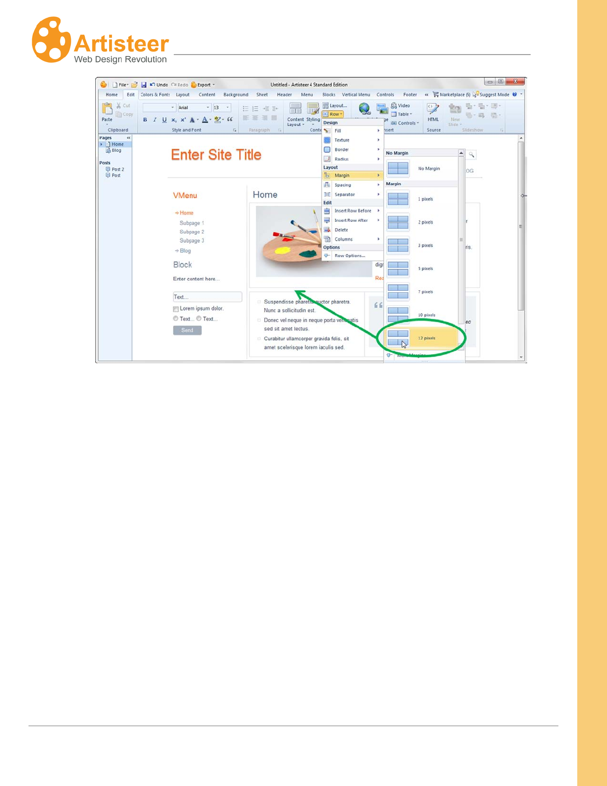
53
Artisteer4.0 | 53
But, if you go back to the Styling options and select the same exact style you started with, look what
happens to the Margin and Spacing. The Row Margin has been reset and now there is no margin
space between the first and second row.
54
Artisteer4.0 | 54
You may notice that once you select a content style, when you return to the Styling tab, Artisteer does
not show you the style you selected before. This is because after you select a content style you may
have completely changed the appearance of your page by changing any one of the other options (e.g.
Row and Cell). Therefore, the content style you selected before may not match your current design
(e.g. you selected a style with borders but then removed them, now the content style you selected
before doesn’t match the page). Remember, any time you select a content style, it resets the design
of your page so normally unless you want to deliberately reset your design, you choose a content style
at the beginning of your workflow, then refine your design by adjusting other options (e.g. ‘All Pages’,
Row, and Cell). You don’t select a content style again unless you want to reset your design.
55
Artisteer4.0 | 55
Current Row
The Styling option on the ribbon bar displays content styles for your whole page. When you only want
to select a style for a specific Row, select a style from the Current Row gallery. With respect to how
your styling options apply to the content, this is the same as selecting a content style for the page
except now it only applies to one Row. For example, as we mentioned before you have to define
complementary settings using the ‘All Pages’ options. If you select a content style for a Row that
includes borders, your borders won’t appear unless you also define a border under ‘All Pages’.
All Pages
The ‘All Pages’ option lets you define the style settings that apply if you select a content style for your
page, or Row (EditStylingChoose content style from gallery, or EditStylingCurrent
RowSelect from gallery). By default, the first ‘basic’ content style is selected for the Home page.
You won’t see the changes you make to ‘All Pages’ unless you select a content style that is
complementary to your settings. For instance, you won’t see any borders you define here unless you
select a content style that includes borders. These options can be overridden by changing the Row or
Cell style options. See ‘Selecting a Content Style’ above for more information.
Styling
All Pages
Margin
Use this to adjust the spacing between adjacent Rows. The larger
the margin, the more space between Rows.
This applies to all rows in the layout. This can be changed with the
Margin option on the Row element.
Padding
Use this to adjust the spacing around your content (e.g. text) within
a Cell. The cell and content (e.g. text) is reshaped to accommodate
the amount of spacing you want to reserve for your content. This
affects all Cells in the layout. None of the content styles
(EditStyling) include a specific ‘padding’ therefore this option
56
Artisteer4.0 | 56
applies to all cells. Whenever you create a new page, there is
always a default content style applied to your page, therefore this
option adjust all cells even if you don’t select a different style.
Spacing
Use this to adjust the spacing between Cells in the same Row. The
larger the ‘spacing’, the more space between Cells on the same
Row. Where there is only one Cell in a Row, this can be used to
add a margin between the edges of the Cell and the boundary of the
Row.
Radius
Use this to adjust the corners of the Row. The greater the radius,
the more rounded the corners will appear.
Note, like the other options, you have to select a content style that
includes ‘radius’ before you see this effect. That is, it doesn’t apply
just because you have a border. You have to select an appropriate
content style. This is different from changing the radius on a Row or
Cell, which changes the border irrespective of the content style.
Border
Use this to select the border thickness, color and style.
Sometimes this affects the Row borders and sometimes the Cell
borders; it depends on which content style you select.
Highlight Color
This is the color you want to apply to the background of a Cell to
highlight the Cell.
This sets the ‘fill’ color for the Row or Cell; which one depends on
the content style you select.
Unlike most places in Artisteer where you can select a color, there
isn’t a ‘no fill’ option since it wouldn’t make any sense to have a
transparent highlight color. However, remember, changing this
affects your Rows and Cells.
Remember, Rows contain Cells. Both have a background fill color.
57
Artisteer4.0 | 57
If the ‘fill’ color is ‘no fill’, it means that the background is
transparent. When you select a Highlight Color, this changes the
‘fill’ color. It is either set to the Highlight Color or it is set to ‘no fill’.
Of course afterwards you can refine the design by changing either
the Row and/or Cell.
Row and Cell Options
The Row
The content style defines some of the design elements that are part of your Rows and Cells (e.g.
defines which Rows and Cells appear to be highlighted). The ‘All Pages’ options define how those
design elements, like borders and highlight colors are supposed to appear
and Cell options provide additional design, layout and editing potential – you can insert a
texture (choose from the gallery or insert the texture from a graphic file), change the color,
transparency and borders, customize the margin, spacing, separator(s) and columns of the selected
rows, insert and delete rows, modify the width, padding and vertical alignment of the cells. Always
remember to select a Cell (which also selects a Row) in the Preview area you want to change before
making a selection.
Whenever you change an option for a Row or Cell, you are overriding whatever rule is defined by the
content style you selected. Once you make a change, you cannot unchange or unselect an option
(unless you use the ‘Undo’ action to undo your steps). Also, whenever you select a content style
(EditStyling), you reset any options you changed for a Row or Cell.
For example, suppose you define how your borders should look (EditStylingAll PagesBorder),
then you select a content style (EditStyling) that includes borders.
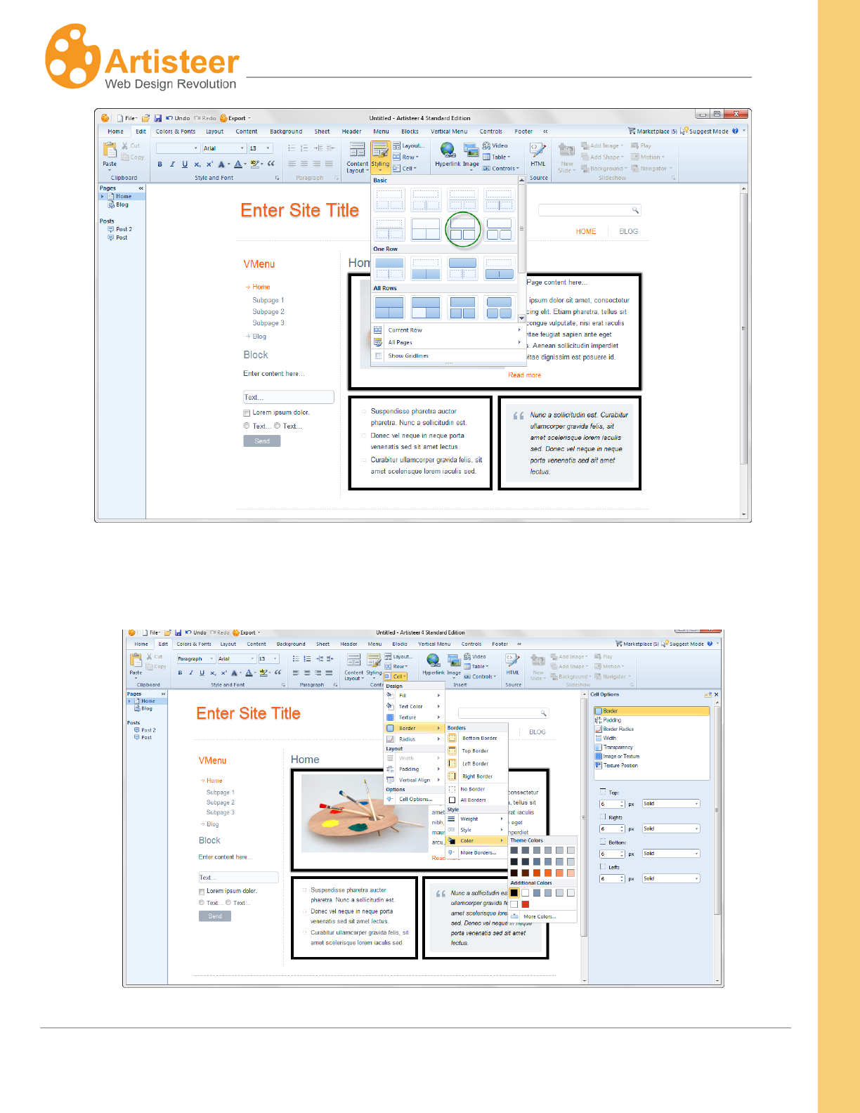
58
Artisteer4.0 | 58
The content style rule says “add a border around each Cell”. If you look at any given Cell, you’ll see
that the Cell options reflect this rule: 6px, solid, ‘black’, border.
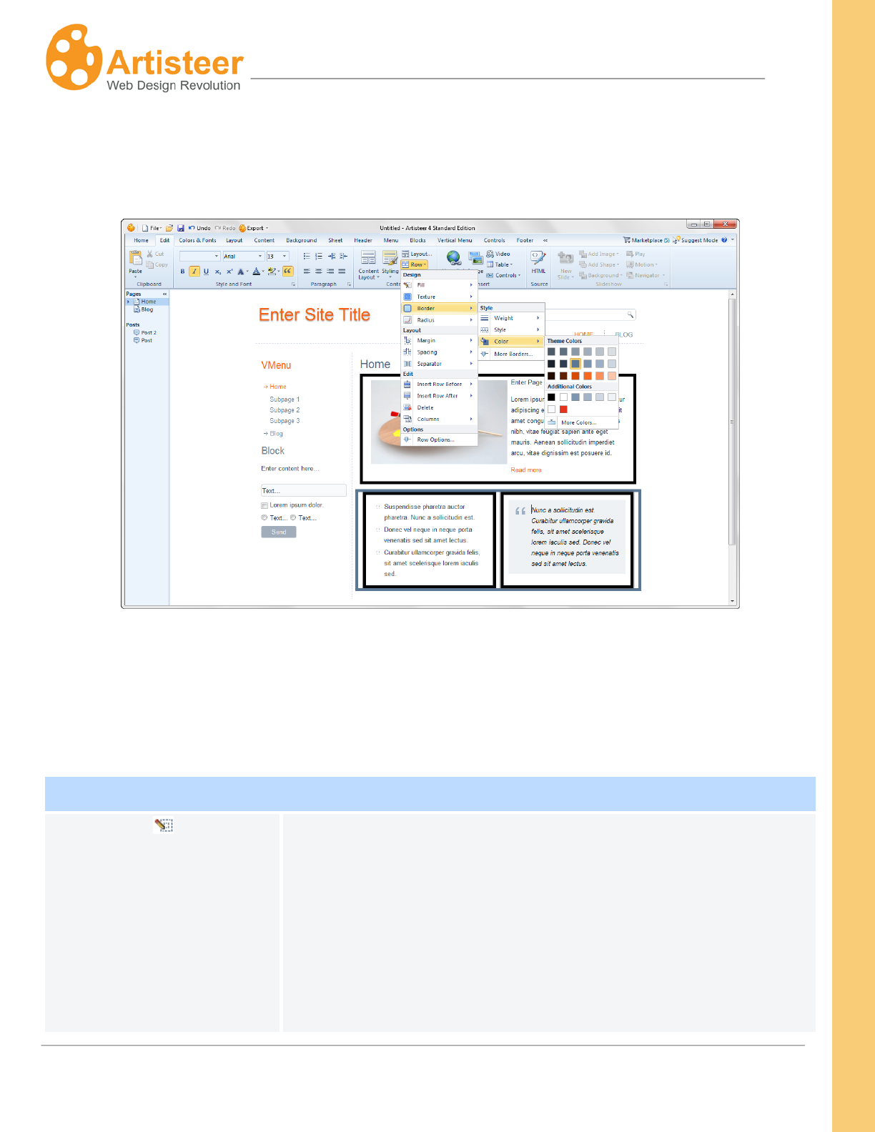
59
Artisteer4.0 | 59
Select the second row and change the Row border color. This adds a border around the second row
and since the Cells are spaced, some margin is added to both sides and now you see a separate
border around the Cells.
You can undo this action (Ctrl-Z, or Undo on the Quick Access Bar) but you can’t undo a selection that
has been saved. That is, you can’t say “remove this style rule for the Row and return the Row back to
what it looked like before”. You have to change the settings for the Row (e.g. remove the border), or
reselect a style (e.g. reselect the style with borders again) to reset the Row and Cell options.
Row
Fill
This is the color you want to use to fill in the background of the Row.
This option should be defined after selecting a content style since
any time you select a style, this may change the Fill color.
By default, your Rows and Cells have no Fill color (‘no fill’) which is
the same as 100% transparent. If you select a content style with
highlighted Cells, the Row fill color is set to ‘no fill’, un-highlighted
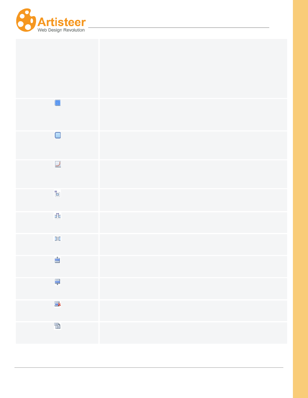
60
Artisteer4.0 | 60
Cells are set to ‘no fill’, and highlighted Cells are set to the Highlight
Color which is defined in the ‘All Pages’ options.
Note though, Rows contain Cells and so Cells are rendered last.
Unless you make the Cell transparent you may not see the Row
where they overlap.
Texture
Use this to add an image or texture to the Row background. The
way the texture appears depends on the color and transparency
against the Sheet underneath.
Border
Use this to select the thickness, style and color of the border around
the Row.
Radius
Use this to adjust the corners of the Row. The greater the radius,
the more rounded the corners will appear.
Margin
Use this to select the spacing between this Row and adjacent Rows.
Spacing
Use this to select the spacing between Cells within the Row.
Separator
Use this to add a separator line between Rows.
Insert Row Before
Add a row before the current Row.
Insert Row After
Add a row after the current row.
Delete
Delete the current row.
Columns
Use this to change the number of Cells in the current Row.
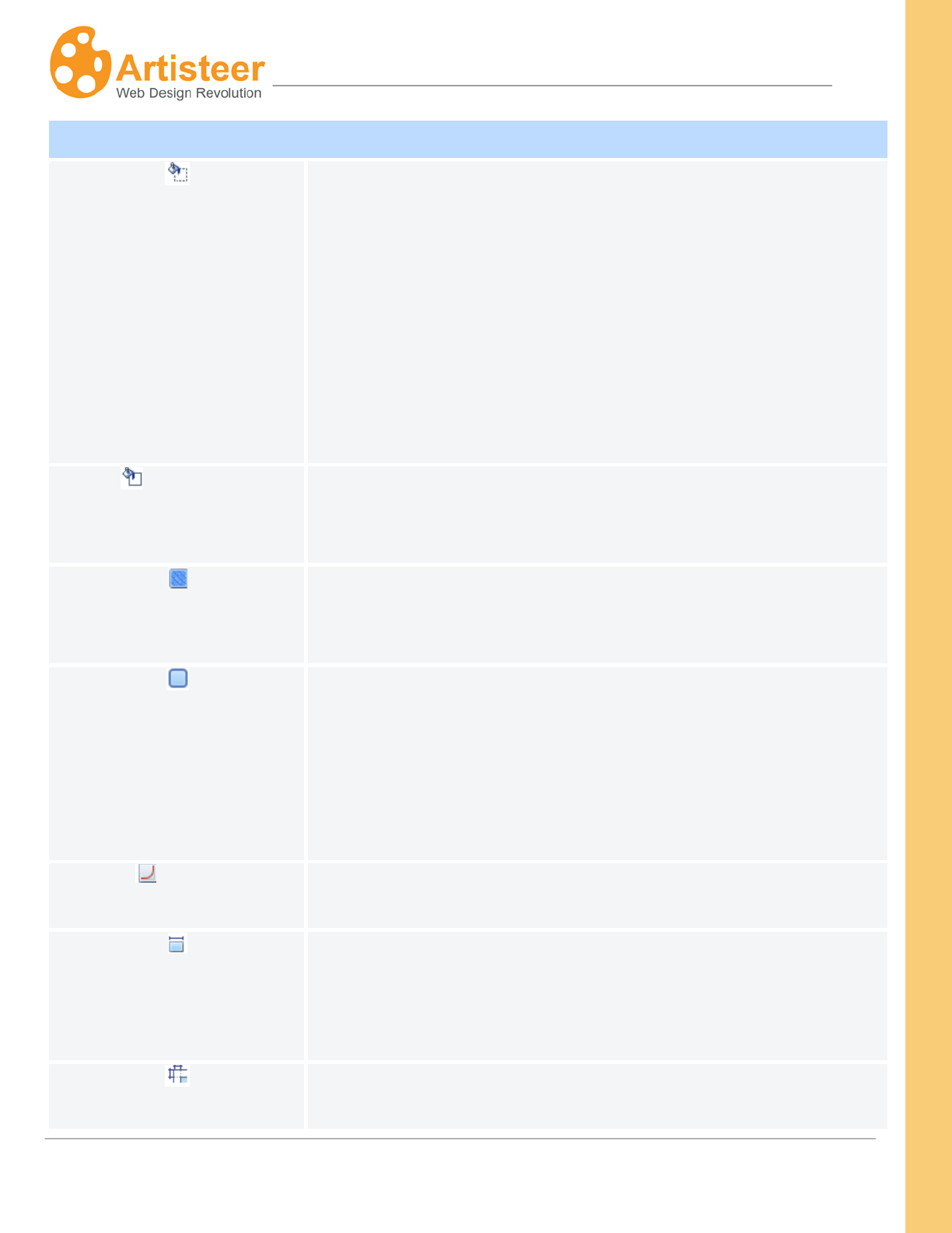
61
Artisteer4.0 | 61
Cell
Fill
This is the color you want to use to fill in the background of the Cell.
This option should be defined after selecting a content style since
any time you select a style, this may change the Fill color.
By default, your Rows and Cells have no Fill color (‘no fill’) which is
the same as 100% transparent. If you select a content style with
highlighted Cells, the Row fill color is set to ‘no fill’, un-highlighted
Cells are set to ‘no fill’, and highlighted Cells are set to the Highlight
Color which is defined in the ‘All Pages’ options.
Text Color
If your Cell contains any text, this overrides the text color for the
Cell. That is, it defines whatever style you created for Text with the
Content tab.
Texture
Use this to add an image or texture to the Cell background. The
way the texture appears depends on the color and transparency
against the Row underneath.
Border
This defines the thickness, style and color of the border around the
Cell. If you choose a ‘styling’ that includes borders, all of the cells
will have four borders. If you choose a ‘styling’ that uses separators
between columns, some Cells may have a left or right border. You
can use this option to add, delete, or change the borders around the
Cell area (i.e. top border, bottom border, etc.).
Radius
Use this to adjust the corners of the Cell. The greater the radius,
the more rounded the corners will appear.
Width
Sets the width of the Cell relative to the overall size of the Row.
E.g. %75 means the Cell width is ¾ the size of the whole Row.
Remember, the Row width depends on the Sheet width, the number
of columns in your layout and the width of the columns.
This controls the space around the content (e.g. text) in the Cell.
This may change the dimensions of the Cell as well as changing the
62
Artisteer4.0 | 62
Padding
other Cells in the Row.
Vertical Align
This aligns the content within the Cell (e.g. align to the top of the
Cell, align to the bottom, or centered). (Hint: this can be hard to
visualize if you already have content in the Cell. To better see how
this works, add some temporary blank text rows to an adjacent Cell
so the length of the all the Cells on the Row are extended. Then
add one or two lines to your selected Cell and adjust the alignment
with the Cell options.
Advanced Row and Cell Options
Under the Row and Cell tabs, if you select “Row options…” or “Cell options…” this will open dialogs
which you give more specific customization. For instance, if you define a border, the border applies to
all sides of the Row, but if you use these advanced Row options, you can change the appearance of
each side of the Row.
Normally you can also access these settings by selecting any of the ‘More…’ options (e.g. ‘More
borders…’).
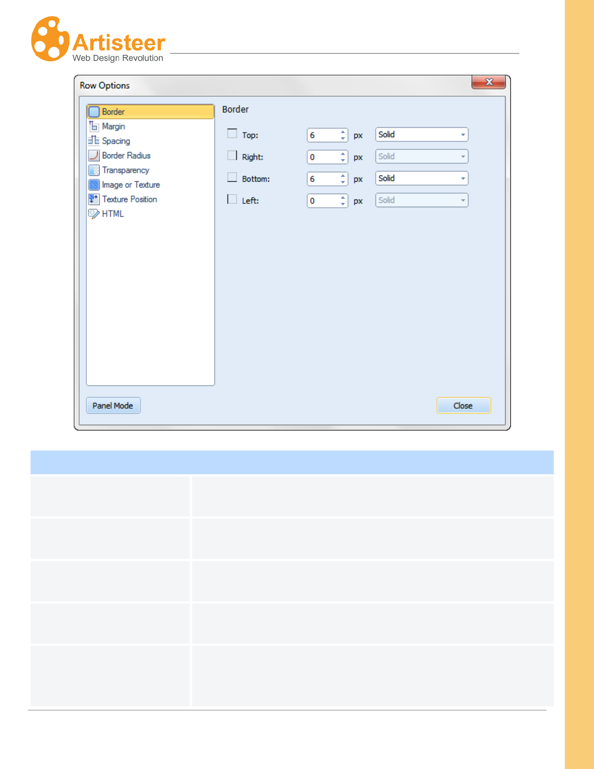
63
Artisteer4.0 | 63
Row Options
Border
Use this to individually adjust the edges of the Row (top, bottom, left
and right borders).
Margin
Use this to individually control the spacing around the edges of the
Row.
Spacing
Use this to change the horizontal and vertical spacing between Cells
in a Row.
Border Radius
Use this to change the corners of the borders. The higher the
radius, the more curved the corners will appear.
Transparency
Use this to define how opaque the Row should be relative to the
Sheet. If the Row ‘fill’ color is ‘no fill’, this is the same as 100%
transparent. Remember, Rows contain Cells so Cells are rendered
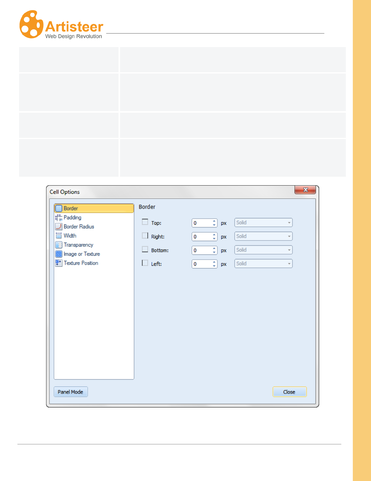
64
Artisteer4.0 | 64
after the Row; you may not see this effect unless you make the Cell
transparent.
Image or Texture
Use this to add an image or texture to the Cell background. The
way the texture appears depends on the color and transparency
against the Sheet underneath.
Texture Position
Use this to control how and where the texture is applied to the Row
background.
HTML
This lets you assign an HTML id to the Row element. This can be
useful, for instance, if you add Javascript or CSS to your template
and you need to refer to this specific Row.
65
Artisteer4.0 | 65
Cell Options
Border
Use this to individually adjust the edges of the Row (top, bottom, left
and right borders).
Padding
Use this to individually adjust the spacing around the content (e.g.
text, images, etc.) and the edges of the Cell.
Border Radius Use this to change the corners of the borders. The higher the
radius, the more curved the corners will appear.
Width
Sets the width of the Cell relative to the overall size of the Row.
E.g. %75 means the Cell width is ¾ the size of the whole Row.
Remember, the Row width depends on the Sheet width, the number
of columns in your layout and the width of the columns.
Transparency
Use this to define how opaque the Cell should be relative to the
Row underneath. If the Cell ‘fill’ color is ‘no fill’, this is the same as
100% transparent. Remember, Rows contain Cells so Cells are
rendered after the Row. If the Row is transparent, then this is
relative to the Sheet underneath the Row.
Image or Texture
Use this to add an image or texture to the Cell background. The
way the texture appears depends on the color and transparency
against the Row underneath.
Texture Position
Use this to control how and where the texture is applied to the Cell
background.
HTML
This lets you assign an HTML id to the Cell element. This can be
useful, for instance, if you add Javascript or CSS to your template
and you need to refer to this specific Cell.
Gridlines
The Show Gridlines option adds gridlines to the Preview area so you can see the organization of your
content better. The gridlines look like a set of dotted lines around the content on your page.
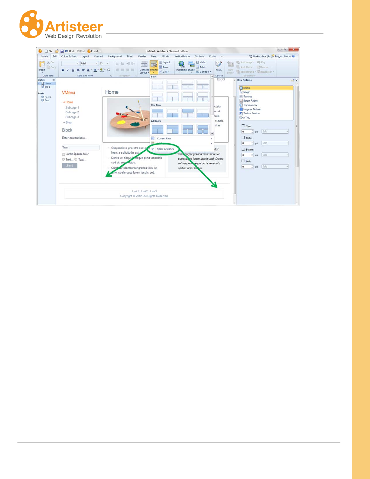
66
Artisteer4.0 | 66
The gridlines are not part of your webpages; they only appear in Artisteer. The gridlines are not the
same as borders though sometimes it can be difficult to tell the difference sometimes so you should
turn them off if you plan to add borders.
‘Show Gridlines’ is not the same as ‘View Gridlines’ for a Table element. Defining the content layout is
not the same as adding a Table, though visually it can be difficult to tell the difference. The content
layout is the physical division of your Content area. In any given Cell, you can also add a Table and
visually it may appear as if you are refining the content layout, but this is not the case. The Table is
part of the content you add to the content cell, just like text, images, etc. A Table has its own
dimensions. It can appear within a content Cell but it is not related in any way to the style options you
can define for the content Cell, such as defining the padding within the Cell. Like other design
elements, like text, you define the style (i.e. the look) of the Table using the Content tab. When you
add a Table to your content with the Edit tab, the table will appear with the table style you defined (e.g.
‘red’ border) but this is independent from your content layout. When you select one of the content
styling options, you are defining how the content Rows and Cells appear regardless of the content you
add later. (Hint: to make it visually easier to work with content layouts and tables, you should turn on
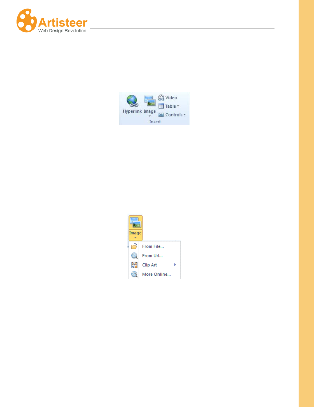
67
Artisteer4.0 | 67
gridlines for both the layout (EditStylingShow Gridlines), and any tables
(EditInsertTableView Gridlines)).
Insert
The Insert
To insert an image in your content area, position the cursor where you want the image to appear and
select the Image menu on the Edit tab. When prompted, select the image from your local computer,
from the Web, from the Clip Art gallery or from an online collection of free images uploaded to Flickr.
group on the Ribbon bar allows you to insert hyperlinks, images, video, tables and controls,
such as buttons, checkboxes, RSS etc. in your content area. Position the cursor where you want to
add the object, and then click on the appropriate icon to insert your content.
To add an image from the online gallery position the cursor in the content area, select More Online…,
and left click on the image in the gallery. You can narrow the search by entering key words, e.g.
‘sport’, ‘flowers’ in the search field.
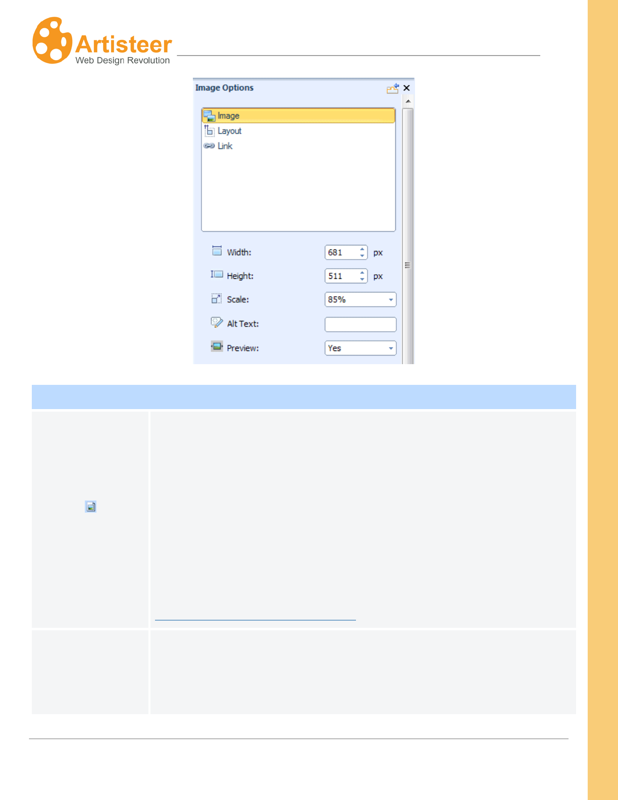
69
Artisteer4.0 | 69
Image Options
Source
Source filename for the image. When you add an image, either your own
file, or a picture from the gallery, the file is copied to the ‘images’ folder of
your website template. That is, when you export your HTML website, you
should find your image in the ‘images’ folder.
If you are using Artisteer.net, when you publish your website, the image is
copied to Artisteer.net and added to your media library. You can use these
images on your own websites and websites you develop for clients subject to
the following restriction:
http://www.artisteer.com/?p=faq#faq6
Width
When you insert an image, the dimensions are scaled to fit the content area.
This is the width of the image in px after insertion in the cell. If you change
the width, the image is scaled (i.e. ‘Height’ changes automatically) so the
image keeps the same aspect ratio.
70
Artisteer4.0 | 70
Height
This is the height of the image in px after insertion in the content cell. If you
change the height, the image is scaled keeping the same aspect ratio.
Scale
When you insert the image in the content cell, the image is scaled to fit the
area of the cell. If you change the scale, the width and height is changed to
keep the same aspect ratio.
Alt Text
Normally, when an image cannot be displayed (e.g. you disabled images in
your browser), the browser only displays an empty icon where the picture
would appear. ‘Alt Text’ is meant to provide a text clue to describe what
should have appeared at that position. Also, if the browser supports it, ‘Alt
Text’ is also displayed when you hover the mouse over the image.
Preview
When enabled, this option lets you preview the image in Lightbox style. Your
viewers can click on the image to see a larger version of the image overlaid
on top of your page. When you insert an image, Artisteer automatically adds
the class attribute “art-lightbox” to your <img/> tag to create a Lightbox style
for your image.
Layout Options
Position
• In Line with Text – The text does not wrap around the text.
• In Left – The image is positioned on the left and the text wraps around
the image on the right.
• In Right – The image is positioned on the right and the text wraps
around the image on the left.
Border
Use this to change the thickness of the border.
Margin
Use these options to add margin space around the image. Note, the amount
of space you can add on each side depends on the size of the content cell,
and adjacent cells. For example, normally you can add space above or
below the cells because the adjacent rows can be moved down without
affecting the appearance of the sheet. However, if you add space to the left
or right, adjacent cells may have to be shifted and/or resized. The maximum
area you can work with is based on the sheet width.
71
Artisteer4.0 | 71
Link Options
Address
URL address for the image. i.e. clicking on the image redirects the browser to
this address.
Target
Use this to determine what happens when your viewer clicks on the image:
e.g. Redirects the browser to a new window or tab, or the current window or
tab.
• _blank – Open in a new window or tab.
• _self – Open in the same frame as the image.
• _parent – Open in the parent frameset.
• _top – Open in the full body of the window, i.e. opens the link in the
current window.
Screen Tip
Text that appears when you hover the cursor over the image.
Insert a Video
To insert a video in the content area, position the cursor where you want the video to appear and
select the Video button in the Ribbon bar. This opens a dialog where you need to paste special
HTML code to ensure that the video appears embedded in the browser window and your viewers can
play the video. This is not done automatically by Artisteer because the code you need to embed the
video depends on the source of the video (e.g. youtube.com), the video type and version, other
characteristics of the actual video, and the browser you are using. The following section includes
examples of embedding video in your pages but it is beyond the scope of this manual to explain
everything about embedding media in your website.
First find the embed code that you need to insert the video. Typically, the source site will either have a
way of copying the embed code, or you can go to the video page and copy the HTML code from the
page source. For example, with www.youtube.com, depending on the video file source (e.g. flash
version), you can often right click the mouse on the image and select ‘Copy embed HTML’. Just make
sure that you are on a page where the video is embedded in the web page, and not a page where the
video is displayed as a thumbnail image (e.g. www.youtube.com).
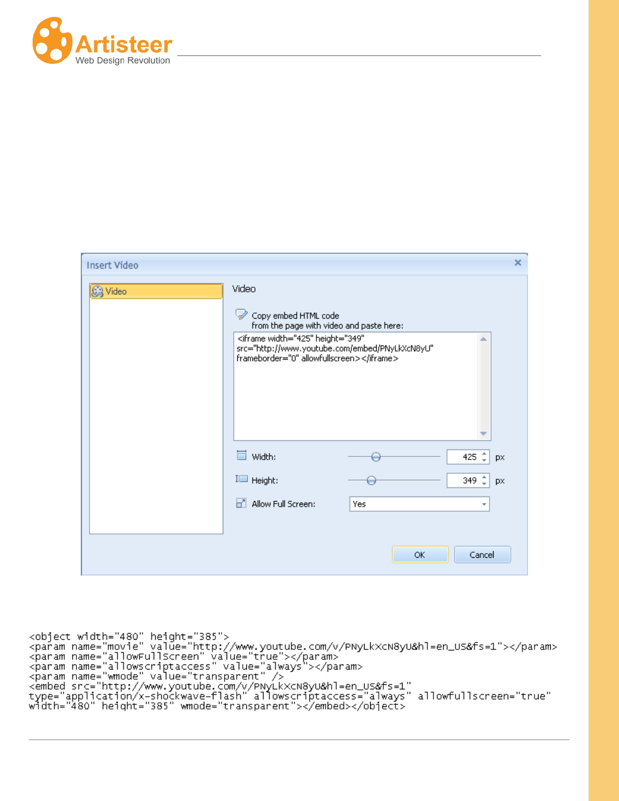
72
Artisteer4.0 | 72
Note, since you are working directly with the HTML source, you need to careful that the code that you
enter is valid for both the snippet of code you are inserting and within the context that the code is
inserted (e.g. the entire HTML source for the content area, or for the whole page). For example, if you
have poorly formatted code (e.g. missing an attribute, or tag, etc.), or if you insert the code somewhere
on the page where it would invalidate the other HTML code (e.g the code is added within a tag
definition), you will not get the results you expect.
Sometimes you may see embed code that uses the “object” tag:
73
Artisteer4.0 | 73
… or other times with an ‘embed’ tag:
Insert Video Options
Width
Supported values 1- 1473 px
Height
Supported values 1 -1500 px
Allow Full Screen
Yes/No – Allow your viewers to display the video in full screen mode vs only
within the dimensions you define in the page. This option is sometimes
turned off because in fullscreen mode, the browser toolbars are not visible
which can be confusing to beginner users not familiar with viewing videos in
fullscreen.
Insert a Table
To insert a table object in the content area, position the cursor where you would like the table to
appear and select the Table button on the Ribbon bar. The basic Table options include: inserting,
deleting & moving columns and rows, adjusting the border width and splitting cells. These options only
appear on the ribbon bar when you have selected the table in the preview area.
The advanced options contain Table (width, margin, cell padding) and Column (width) settings.
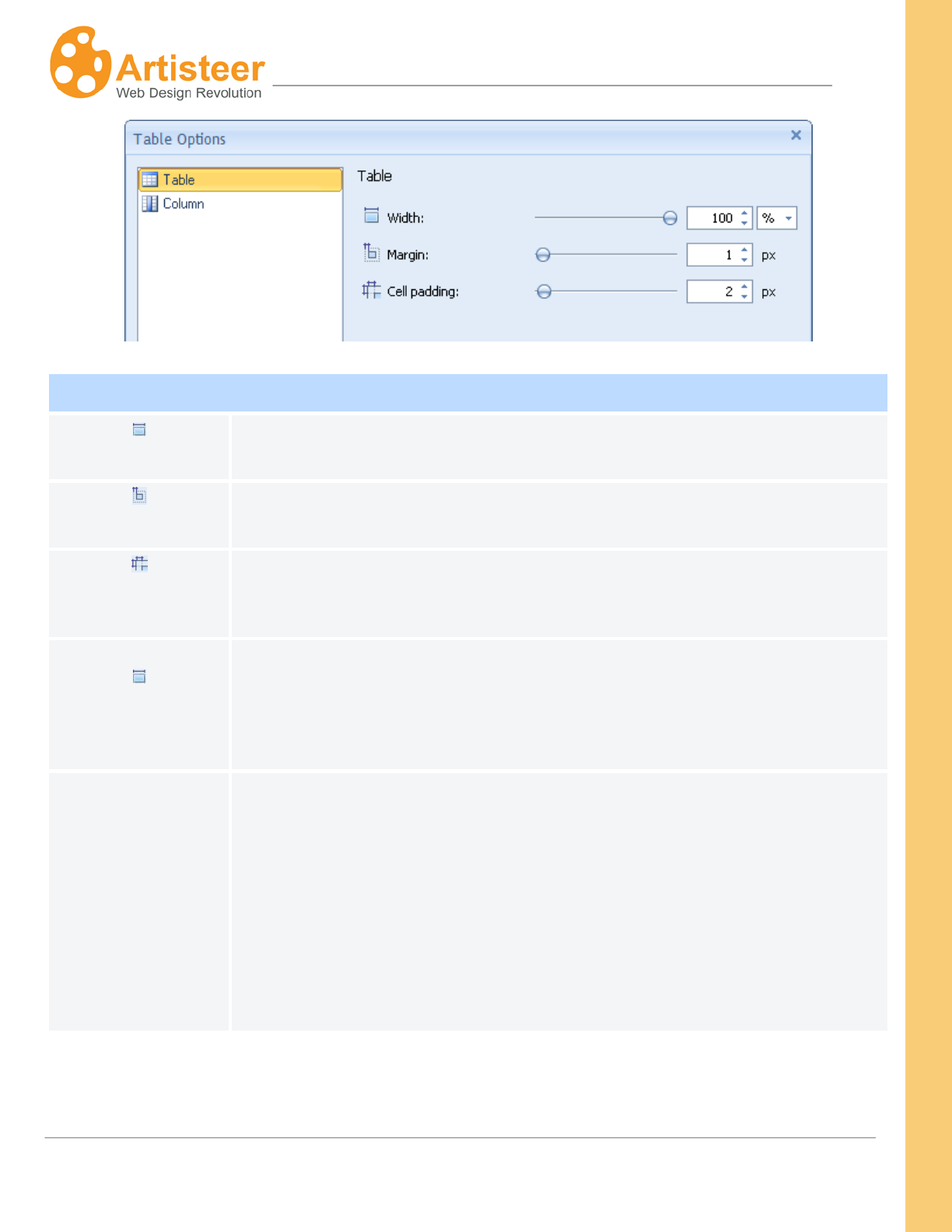
74
Artisteer4.0 | 74
Table Options
Table Width
Width of the table in pixels, or as a % of the width of the content cell where
the table appears.
Table Margin
Margin space around the table within the content cell where the table
appears.
Table Cell Padding
Space around any content (e.g. text) within a table cell.
Column Width
Column width of the selected column (where the cursor is) in pixels or as a
percentage of the total table width. Note, any content you have in the table
cells affects how you can set the spacing and dimensions for the table and
columns of the table.
Vertical Align
This aligns the content within the table cell (e.g. top aligned, bottom aligned,
or centered). (Hint: this can be hard to visualize if you don’t have any content
in your table. To better see how this works, add some temporary blank lines
to an adjacent cell so the length (height) of the all the cells on the row are
extended. Then add one or two lines of text to one cell and adjust the
aligment with the table options. With ‘top align’, the content should be
oriented from the top of the cell. With ‘bottom align’, the content should be
oriented to the bottom of the cell).
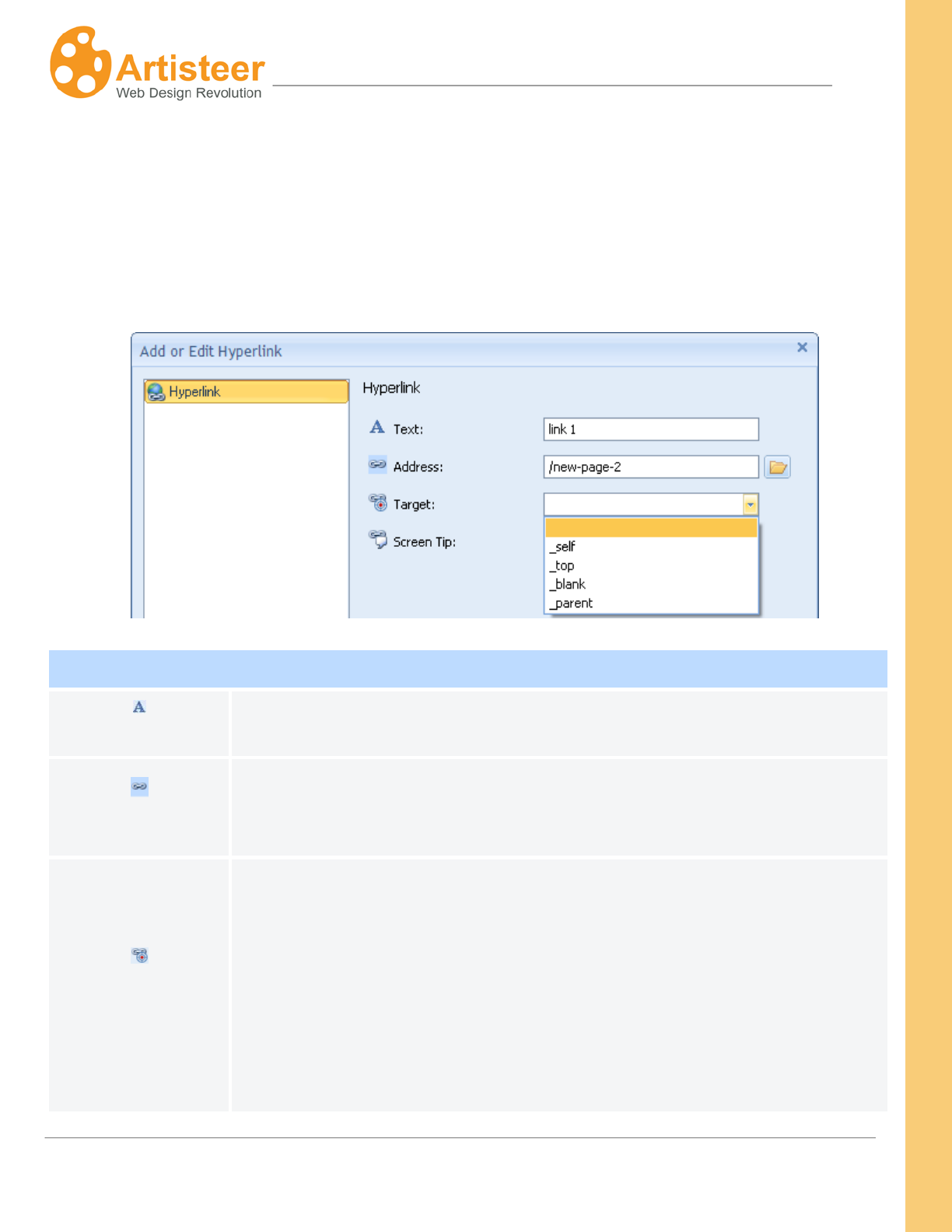
75
Artisteer4.0 | 75
Insert a Hyperlink
To insert a hyperlink in your content area, position the cursor where you want the link to occur, and
select the Hyperlink button on the Ribbon bar. Specify the link title (Text), Address, Target (optional),
and Screen Tip (optional). To change hyperlink options, right-click on the hyperlink and select
Hyperlink Options… from the context menu.
Add or Edit Hyperlink
Text This is how your hyperlink will appear on the page.
Address
Web address of the target link. # redirects the browser to the current page.
/<page name> redirects the browser to the page on your website. See
PagePropertiesname/URL.
Target
Use this to determine what happens when your viewer clicks on the
hyperlink: e.g. Redirects the browser to a new window or tab, or the current
window or tab.
• _blank – Open in a new window or tab.
• _self – Open in the same frame as the image.
• _parent – Open in the parent frameset.
• _top – Open in the full body of the window. i.e. opens the link in the
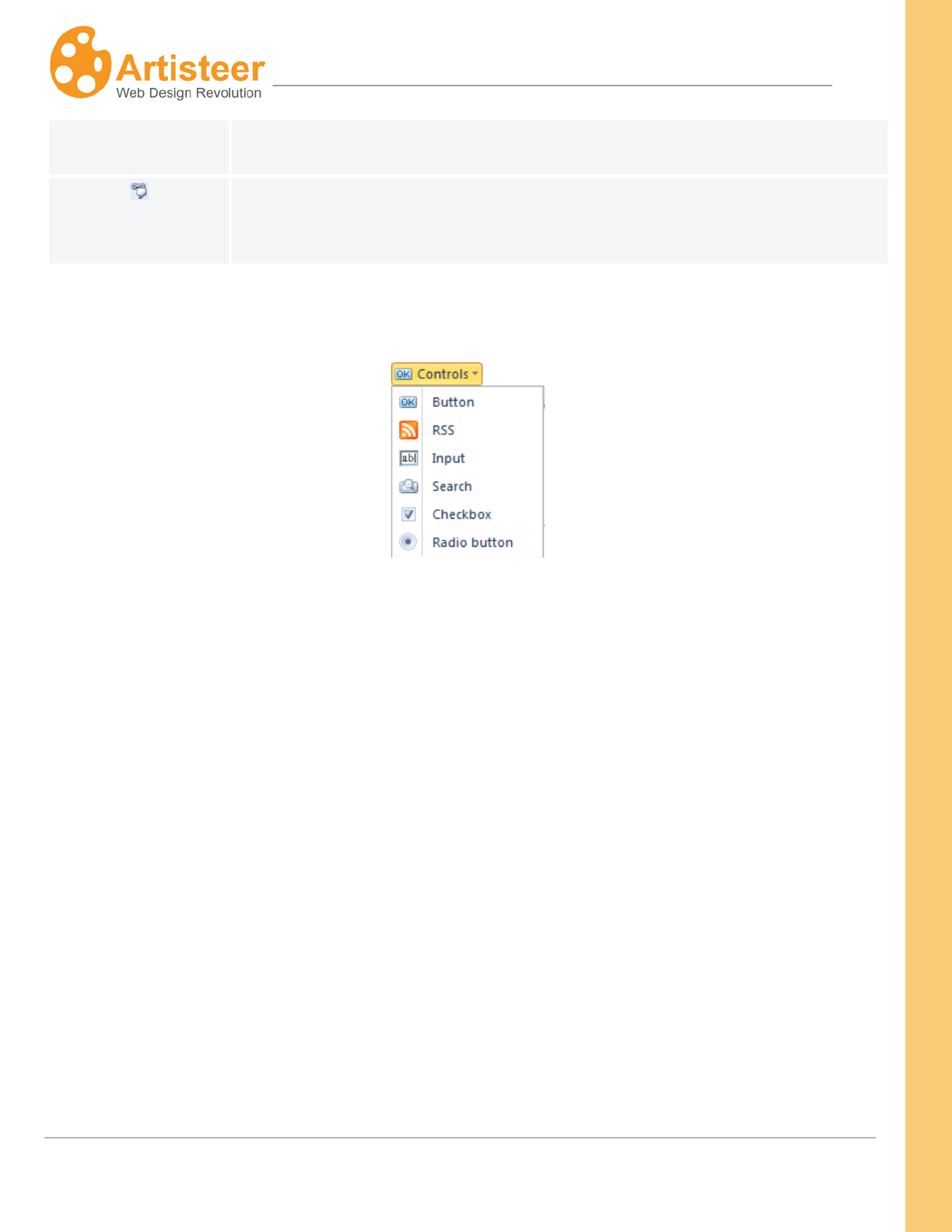
76
Artisteer4.0 | 76
current window.
Screen Tip
Text that appears when you hover the cursor over the hyperlink on the web
page.
Insert Controls
To insert controls in your content area, position the cursor where you want the button to occur and
select one of the controls on the Ribbon bar. All controls except RSS are standard HTML control
elements. Checkboxes, search boxes, input fields and radio buttons are usually paired with some
functionality on the server (e.g. plugin for search) and are not used independently like RSS and
buttons.
In the Edit tab for Button you can specify the link title (Text), Address, Target Frame, Screen Tip and
Access Key. For RSS specify title (Text), Address, Target Frame and Screen Tip. To insert an Input
field, a search field, a checkbox or Radio button simply position the cursor in the content area and
select the appropriate control on the Ribbon bar. The style of controls is adjusted in the Controls tab.
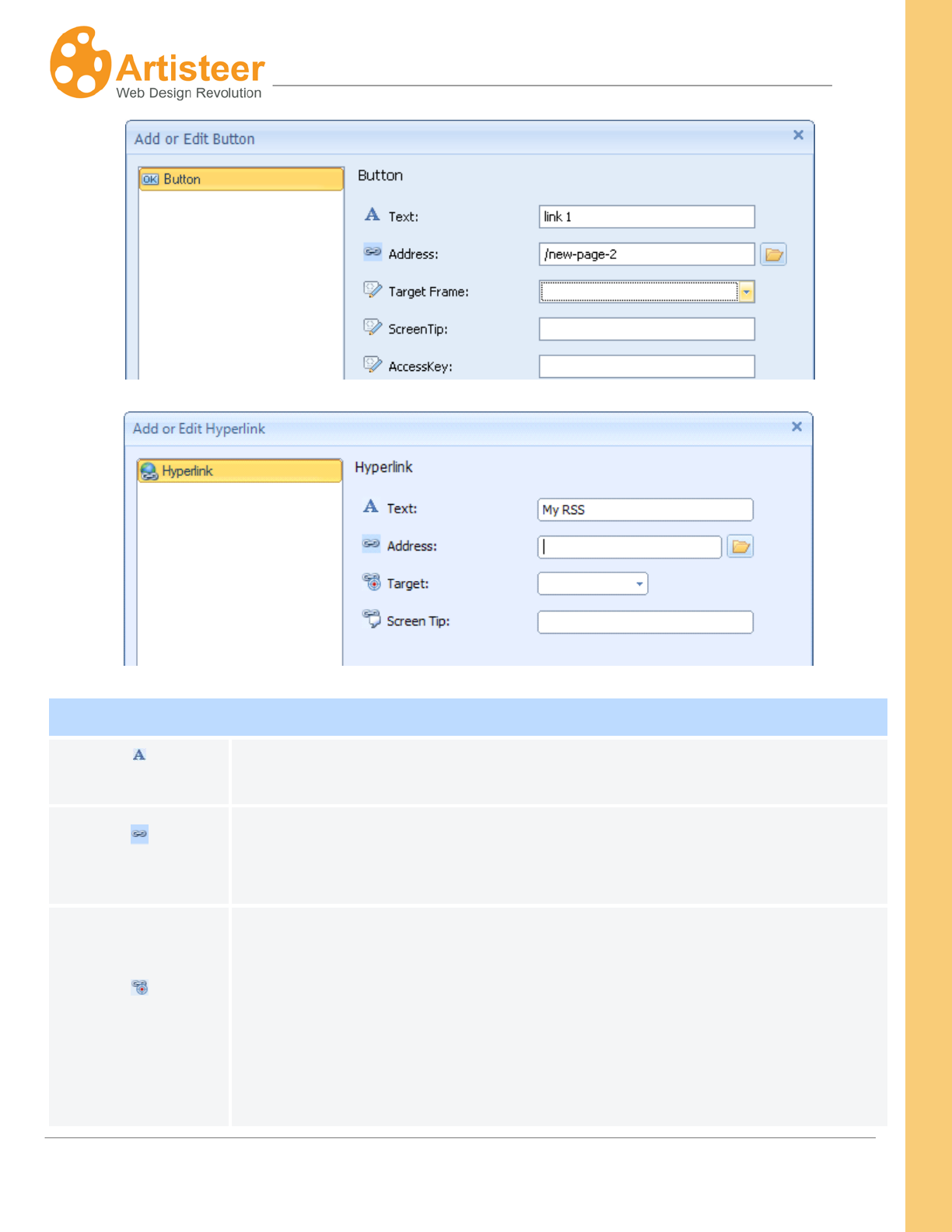
77
Artisteer4.0 | 77
Add or Edit Button
Text This is how your button appears.
Address
The target address link of the page directed by the button. If this page is
within your website, this should be specified as a filepath relative to your
website (e.g. /my-page, see PagePropertiesname/URL).
Target Frame
Use this to determine what happens when your viewer clicks on the button:
e.g. Redirects the browser to a new window or tab, or the current window or
tab.
• _blank – Open in a new window or tab.
• _self – Open in the same frame as the image.
• _parent – Open in the parent frameset.
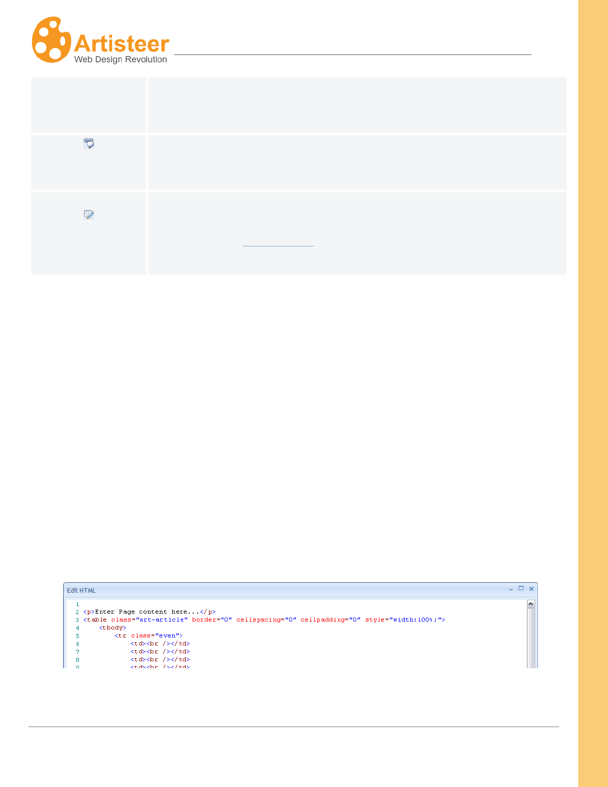
78
Artisteer4.0 | 78
• _top – Open in the full body of the window. i.e. opens the link in the
current window.
Screen Tip
Text that appears when you hover the cursor over the button on the web
page.
AccessKey
This is the HTML AccessKey attribute for a button. It is designed to
associate keys with particular buttons. For more information about this
attribute, refer to www.w3c.org. For example, for Chrome, if you enter ‘B’
here, your viewers can type Alt-B as a shortcut to selecting the button.
Source HTML
Sometimes it is useful to look at or edit the HTML for the content on your page, for instance, if you
would like to add custom HTML to blocks, content rows and cells or modify the footer content.
The HTML
Despite all of the options in Artisteer for designing your website, you may find it useful and necessary
to access and change the HTML source directly. For example, if you are adding an ‘embed’ code to
include a video on your web page, the options for controlling the video can only be done directly in the
code.
button on the Edit tab toolbar is used to edit the HTML source for the content area you
have selected on your page. Select a Cell in the content area with the mouse and then the HTML
Source icon on the Ribbon bar. This only displays the HTML source for the content area you selected
in the Preview area. You can also use the HTML editor for blocks and footer.
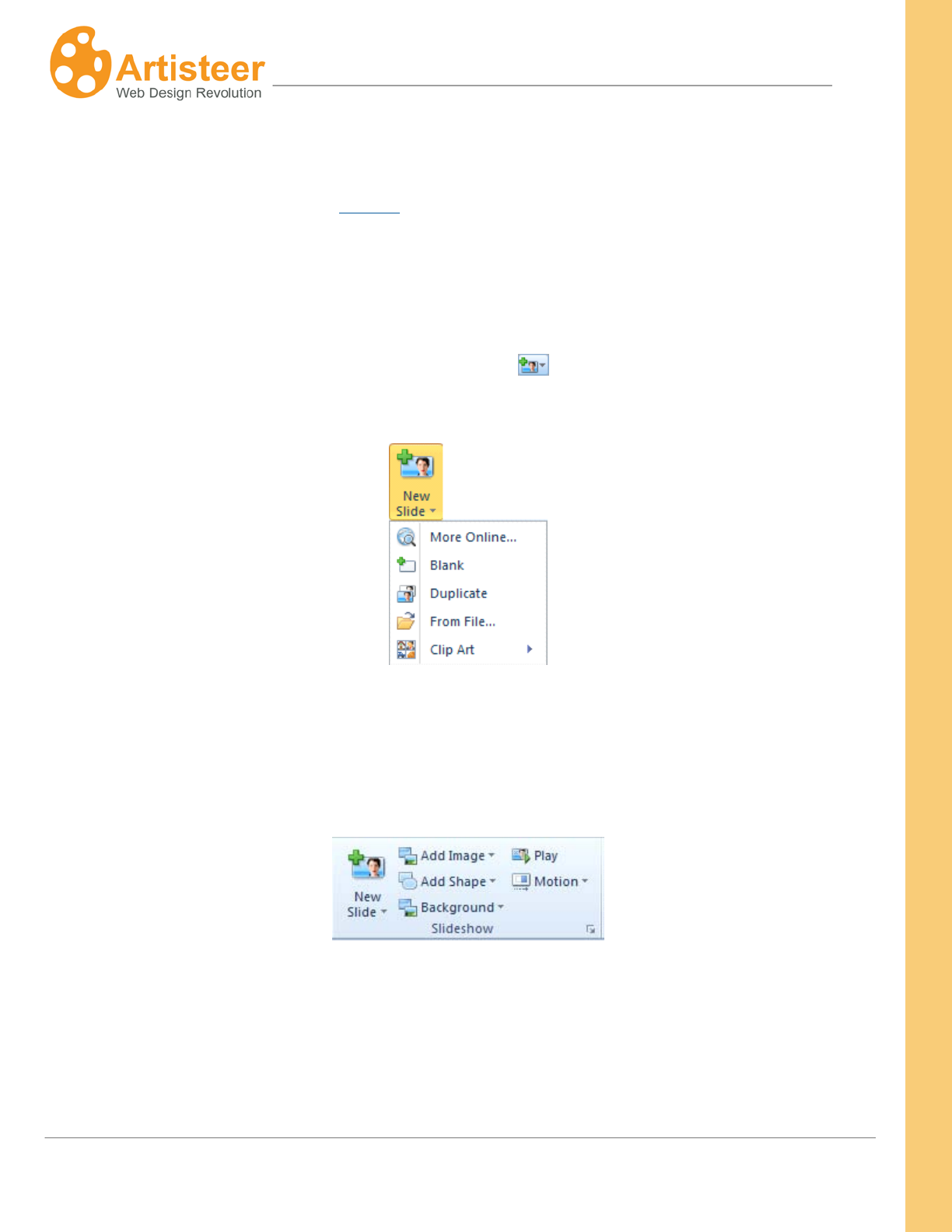
79
Artisteer4.0 | 79
Slideshow
You can create a slideshow in your Header or Content in Artisteer using the Slideshow options. In any
area of your page where you can add an image, you can define more than one image to occupy the
same display space and then when your page is rendered, you can direct the browser to transition
from one image to the next to create a slideshow. A slideshow only works with images so ordinarily
the options in the Slideshow category are disabled until you select an image in the content area. Once
you have selected an image, click on the New Slide icon in the top right corner of the image, or
switch to the Edit tab and select New Slide.
The new slide can be ‘blank’, it can be a copy of the first image (‘duplicate’), or a new image.
The following section describes the options you have to control how the Slideshow appears and plays
to your viewers.
Use Add Image to insert an image from a file, from on online collection or from the clip-art gallery. The
added image overlays the slide background or the underlying image. Drag and drop the image in the
where you want it positioned. The image height, scale rate and angle can be adjusted in the Photo
Object Options. The scale option helps to proportionally resize the image and the Angle option allows
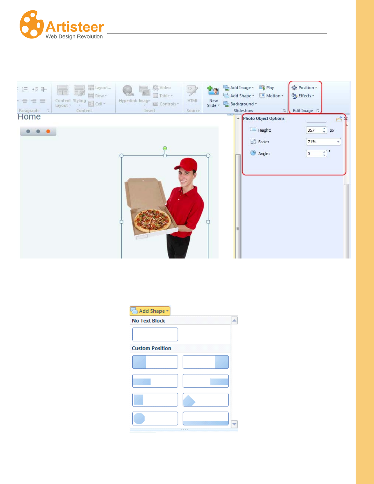
80
Artisteer4.0 | 80
you to rotate an object. Use the Position option to align an image and the Effects option to recolor an
image, add a shadow or flip an image.
Shape is a text box that is added to a slide when Add Shape is selected. You can use this option to
add text or add a design over the image.
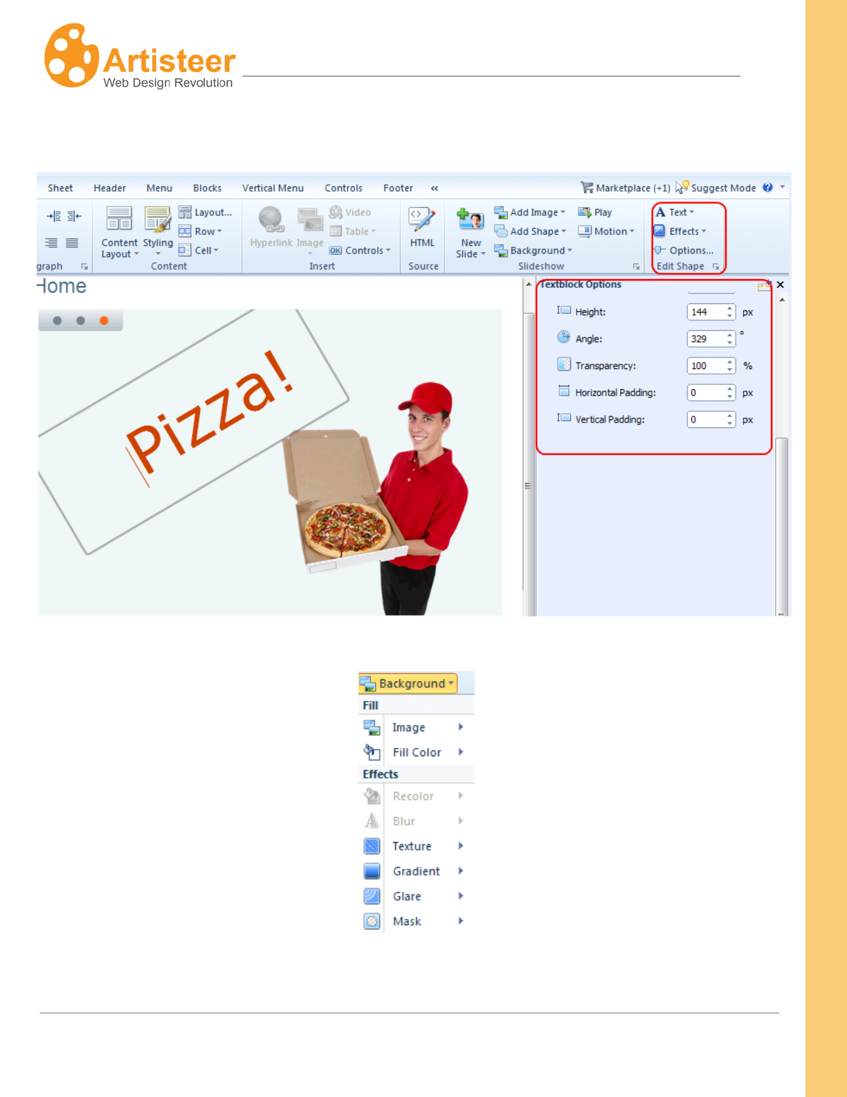
81
Artisteer4.0 | 81
Drag and drop the shape in the right location. Use the Edit Shape Options and Textblock options to
adjust the shape and text.
To edit the background go to Background options:
Use the Play option to run the slideshow. Use the Motion option to adjust the way the slides appear.
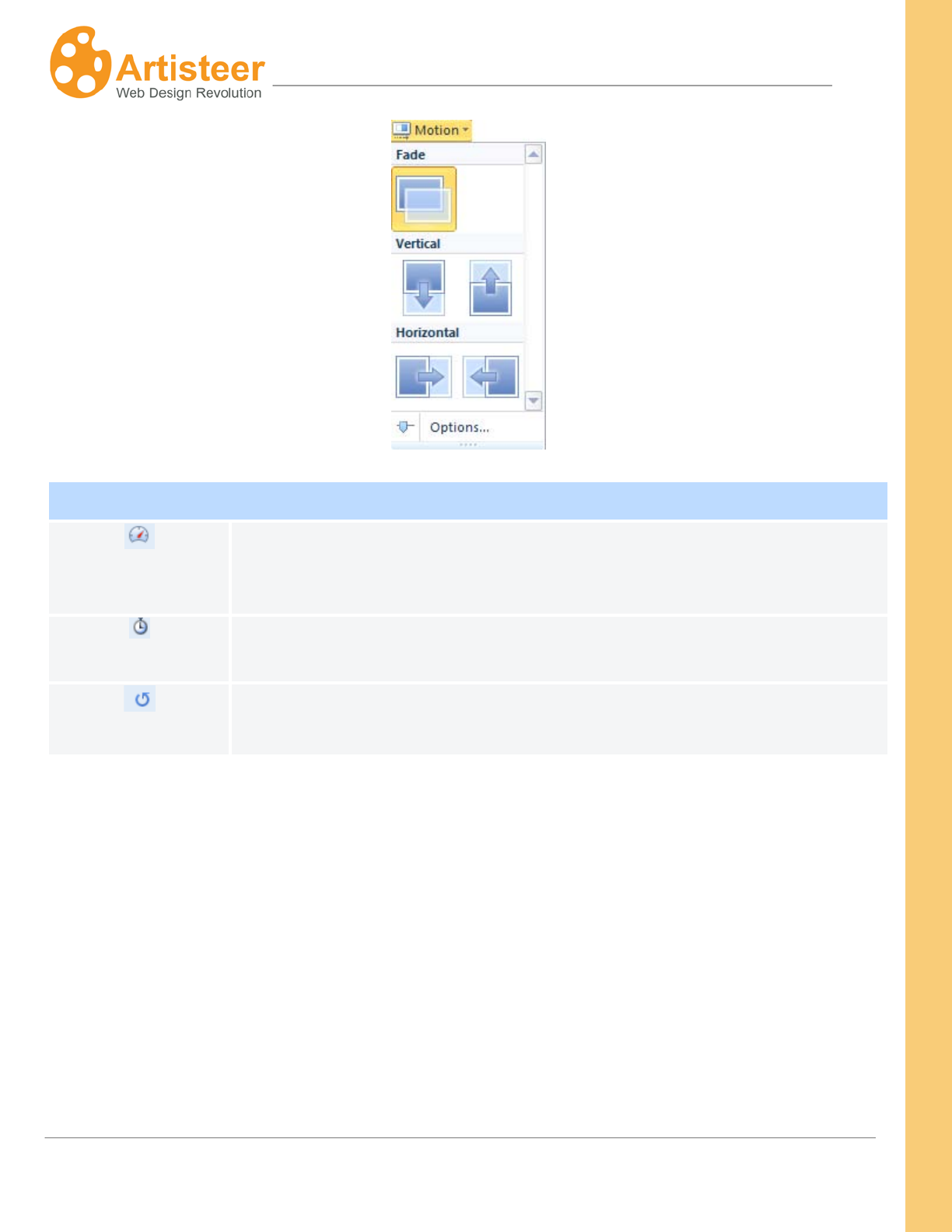
82
Artisteer4.0 | 82
Motion Options
Speed
Use this option to set the slideshow speed
Delay
The option allows to set how much time should pass before a slideshow
replays.
Repeat
The option activates or turns off slideshow replay.
83
Artisteer4.0 | 83
Collage Options
General Adjust the width and height of a slide/collage
Mask
Mask is one of the effects that overlays an image. Use this option to adjust
the mask parameters, such as Mask repeat, Position, Flip, Rotate and Scale.
Background
Use this option to adjust the background parameters, such as Color weight,
Color Saturation, Blur, Transparency, and Blend Mode. You can also set the
format of the background image (JPEG or PNG) and specify the JPEG image
quality.
Glare
Adjust Transparency, Blend Mode, Position, Fit and Scale parameters for
glare(s) in the slide images.
Image or Texture
Style an image or texture using Blend Mode, Transparency, Color Weight,
Color Saturation, and Contrast parameters.
Texture Position
Adjust the texture position using Scale, Texture Repeat, Position, Flip, and
Rotate parameters.
Gradient Set the contrast and angle of the gradient.
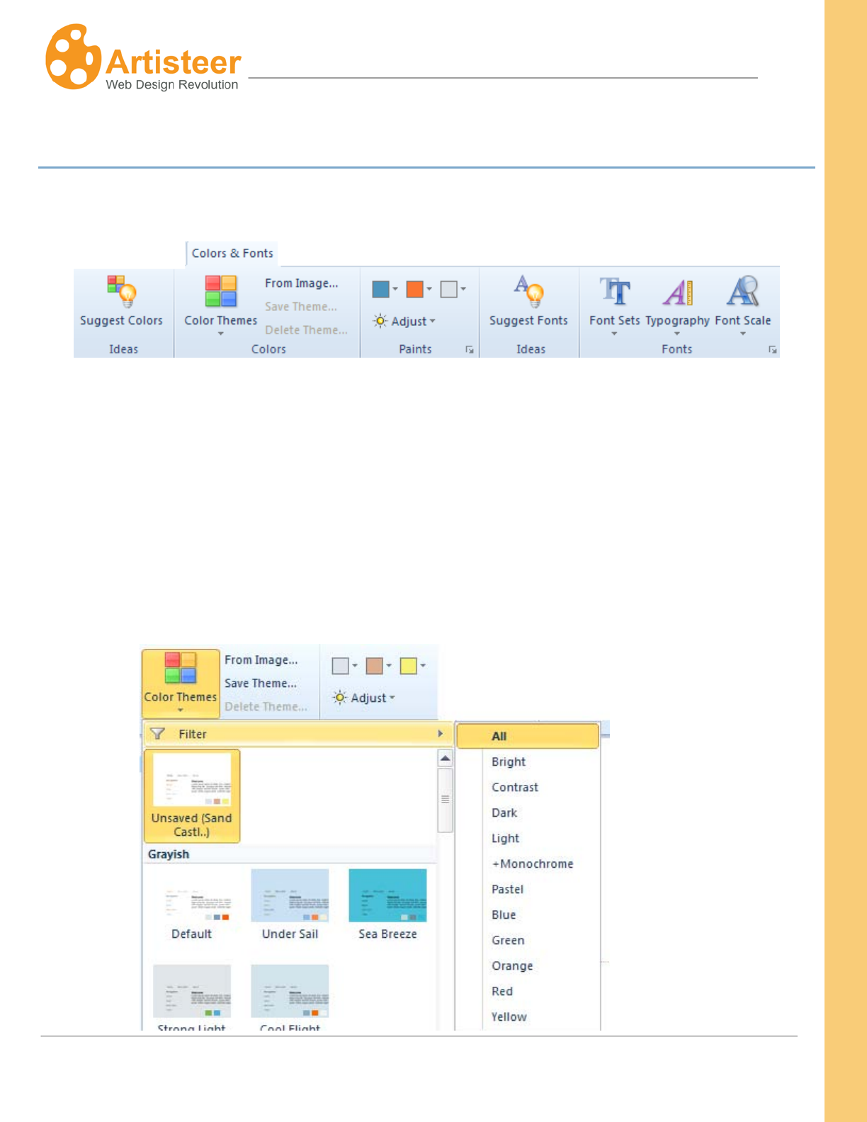
84
Artisteer4.0 | 84
Colors & Fonts Tab
The Color & Fonts tab provides the ability to change the colors and fonts of the template.
Colors
Click Suggest Colors
The design of each template is based on a
to see some ready-made color solutions for your template.
Color Theme. The Color Theme consists of three main
colors, named paints. All paints in a color theme are selected by professional web designers to
complement each other. Artisteer will suggest a gallery of Color Themes with preview thumbnails. You
can choose a Color Theme directly from the gallery or use Filter to select from a specific Color Theme

85
Artisteer4.0 | 85
group: New, Bright, Contrast, Dark, Light, Monochrome, Pastel, Blue, Green, Orange, Red, and
Yellow.
You may also create a custom color theme by adjusting the color in Paints, in the Adjust menu, in the
Color Selector dialog (click More Colors) or using the Fill
Click
option to adjust the color of a specific
layout element in tabs: Background, Sheet,Header, Menu, Content, Sidebar, Vertical Menu, Buttons
(See working with colors)
Save Theme to preserve the created color Theme. When you save a color theme it is added
automatically to the Artisteer Color Themes custom gallery, so you can use the color theme in other
Artisteer projects. Select Delete Theme to remove the theme from the Artisteer custom gallery.
Artisteer may help you define and apply the color theme for your website. Select the From Image
option and upload the image you would like to use as a basis for a new color theme. Artisteer will
attempt to create a color theme bases on the prevalent colors in your picture.
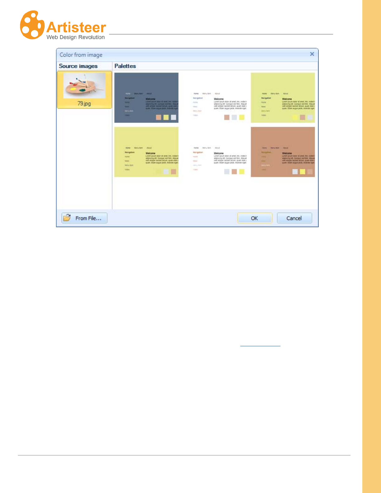
86
Artisteer4.0 | 86
Paints
The three main colors, which build a color theme, are called paints. The distribution of colors across
the template is unique in every generated template.
You can change the colors by clicking on separate paints and selecting the appropriate color from the
Main Color palette or from More Colors in the Color Selector dialog.
The Adjust option changes the luminosity and saturation (also see Color Model) of all paints, making
the colors lighter or darker, softer or with more contrast (Basic, Normal, Contrast, Pastel modes).
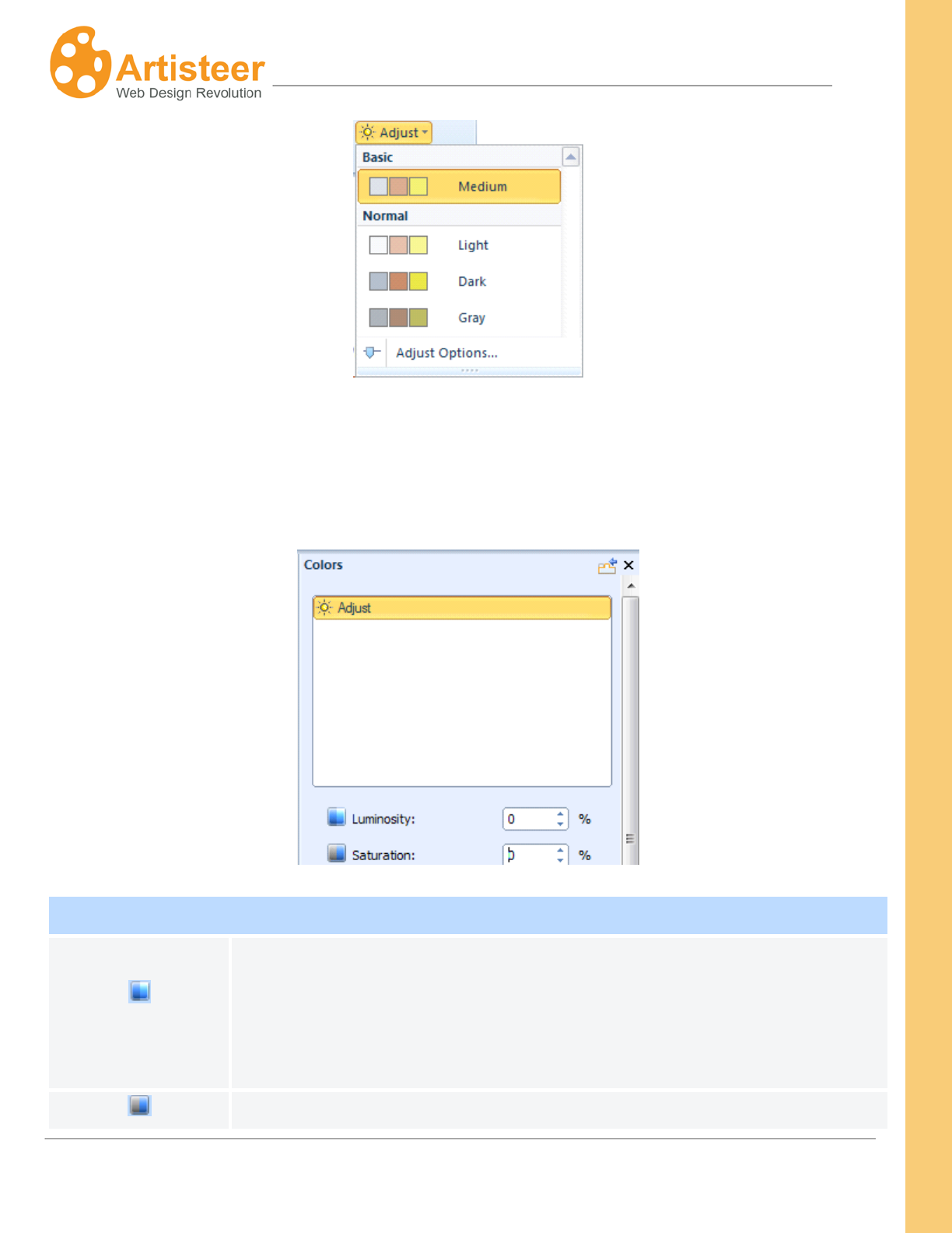
87
Artisteer4.0 | 87
Clicking on the “Adjust options…” will open the Colors option dialog where you can customize the
luminosity and saturation.
Enter the values or drag the sliders to the right or left to increase or decrease values.
Adjust Color Options
Luminosity
Set the color luminosity. Luminosity refers to the whiteness or intensity of a
color. Luminosity for any one color will range from pure white though to black.
The supported values are from -100% to 100%.Where 100% and -100% refer
to the highest and lowest of the RGB components.
Set the color saturation. Saturation refers to the amount of grey in a color,
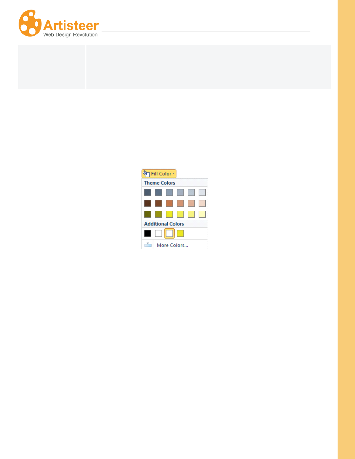
88
Artisteer4.0 | 88
Saturation
and determines how vivid it is.
The supported values are from -100% to 100%.Where 100% means a large
amount of the grey.
Fill Color
Colors of the design elements, such as Background, Sheet, and Menu may be adjusted in the tabs
with the help of the Fill Color option. The palette consists of Theme Colors, Custom Colors and More
Colors in the Color Selector dialog
Color Selector Dialog (More Colors)
The Color Selector dialog is displayed when you select the "More Colors…" button in one of the color
option dialogs.
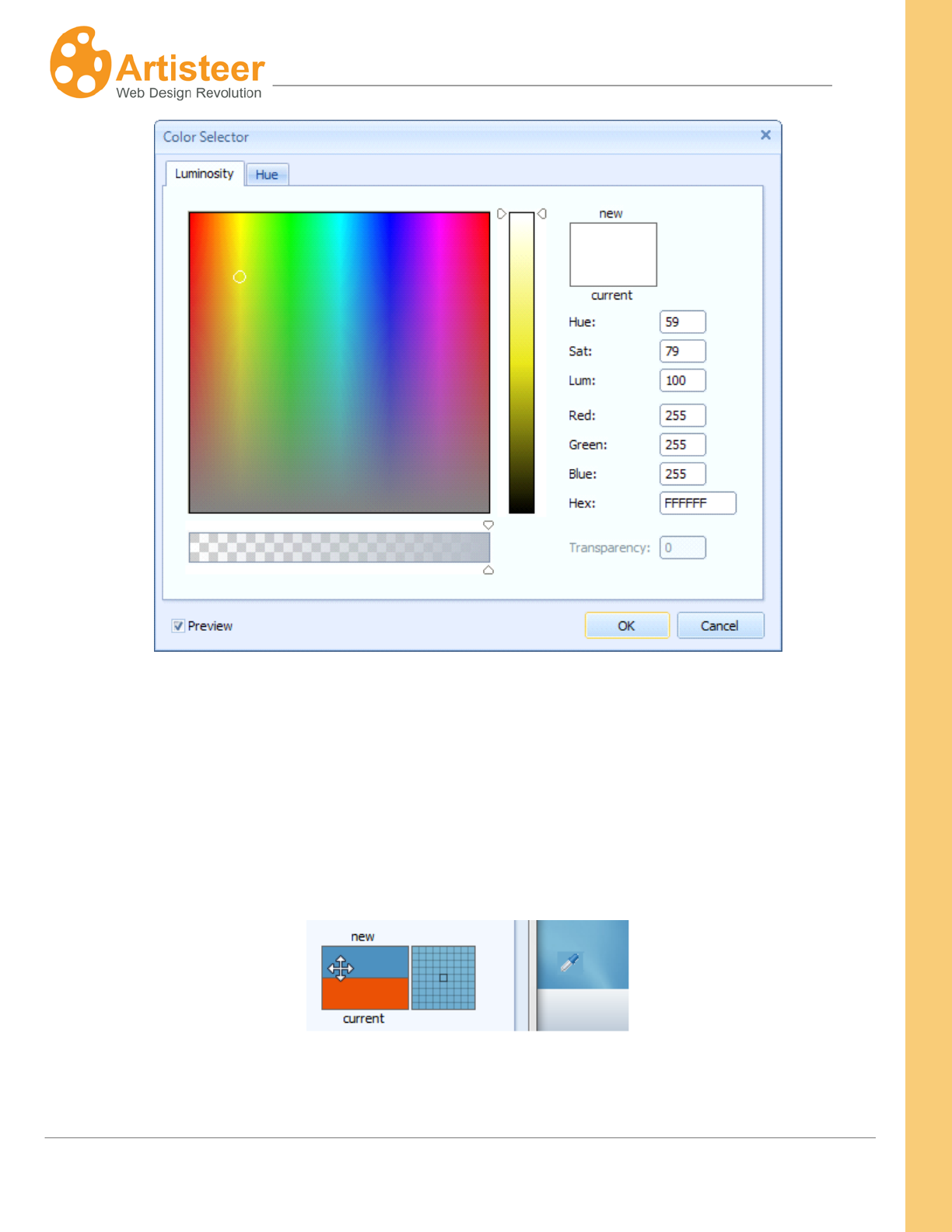
89
Artisteer4.0 | 89
The Color Selector dialog lets you select the desired color you want and adjust the hue, saturation,
and lightness of the color.
If you already have a color in your Artisteer template that you would like to use, instead of finding a
match using the Color Selector, you can select the color directly from the template using the Color
Picker tool. The Color Picker tool (i.e. eyedropper icon) appears automatically when you move the
cursor outside of the Color Selector dialog window.
You can move the tool over any area of your template (e.g. the Header), and select a particular spot
and color with the mouse. With the help of the Color Picker tool you can extract and apply the colors
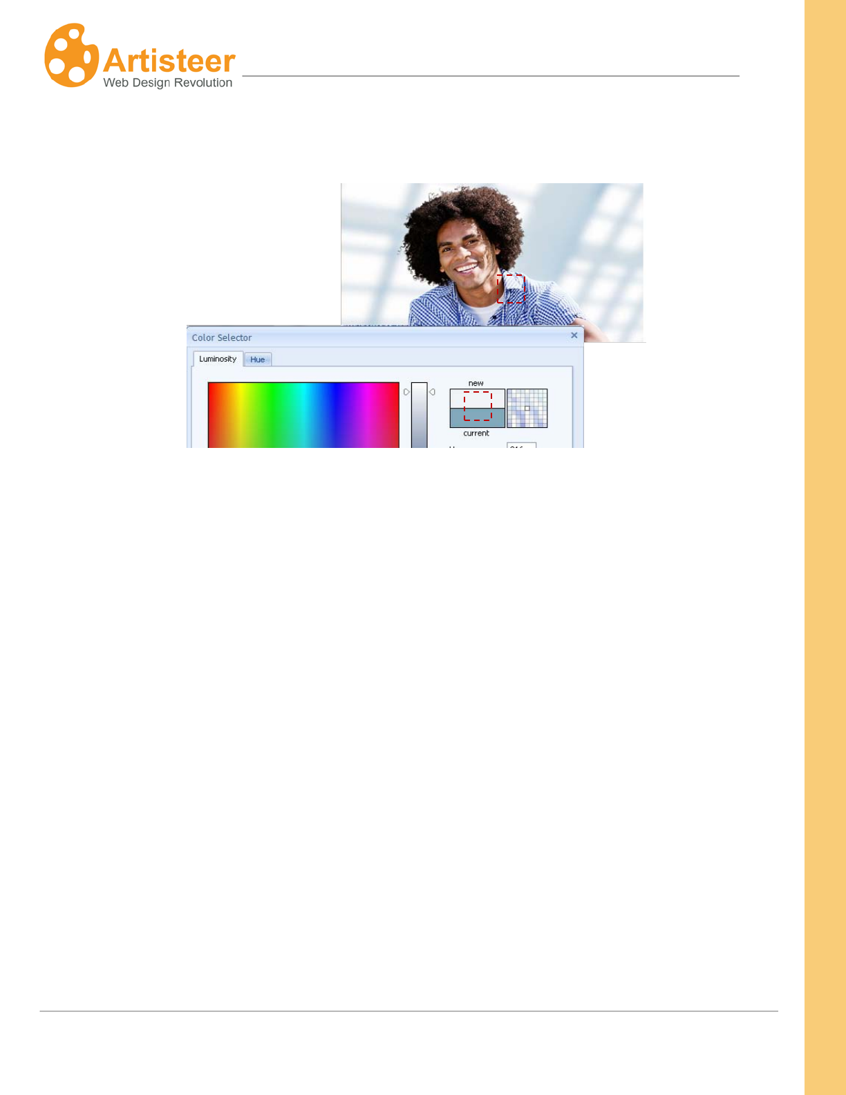
90
Artisteer4.0 | 90
from any part of your template. This is a simple technique you can use to accurately copy one color of
your template layout to another area, such as copying the color of your Header to your Sheet.
There are Luminosity and Hue tabs available in the dialog. Both tabs have a color selection area (color
palette) where you can move a slider until you are satisfied with the color.
On the Luminosity tab there is a special luminosity slider. This slider lets you increase or decrease
the brightness of the color from zero at the bottom to 100 at the top.
With the luminosity selected, you can go to the color palette and drag a small circle picker horizontally
and vertically to change the hue and saturation of the color respectively.
The Hue tab contains a separate Hue adjustment slider. Moving it all the way from red (at the bottom)
through orange, yellow, green, and blue up to purple allows you to select the desired hue of the color.
Having the Hue selected, you may also move a palette color picker from left to right and from top to
bottom to additionally set the saturation and luminosity values of the color. Saturation can vary from
0% (completely unsaturated) to 100% (completely saturated, pure color). Luminosity ranges from 0
(black) to 100% (white).
The values displayed in the right set of boxes will change to indicate the exact color settings. These
values can also be changed manually by directly entering values in the text boxes. It may be
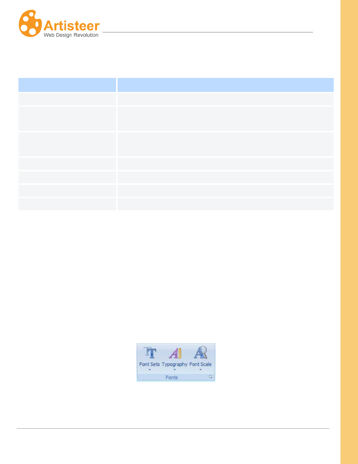
91
Artisteer4.0 | 91
convenient when you copy the exact color value from some other graphic software and want to use it
in Artisteer.
Option
Description
Hue
Hue value of the color ranged from 0° to 360°.
Sat
Saturation of the color ranged from 0% (completely desaturated) to
100% (fully saturated).
Lum
Luminosity of the color measured in percentage: from 0 (black) to
100% (white).
Red
Decimal value for red color.
Green
Decimal value for green color.
Blue
Decimal value for blue color.
Hex
A hexadecimal color code (usually used in HTML code).
You can also use the transparency slider at the bottom of the dialog to adjust the color thickness.
Note, transparency slider may be disabled for the template background, fonts and some other
elements that do not support transparency.
The Preview option makes it possible to see the page with the selected color applied to it. Ok and
Cancel buttons allow you to submit or discard the made changes.
Fonts
Select from a wide variety of font themes to match the overall look and content of the site.
The Fonts section includes such functions as Font Sets, Typography and Font Scale.
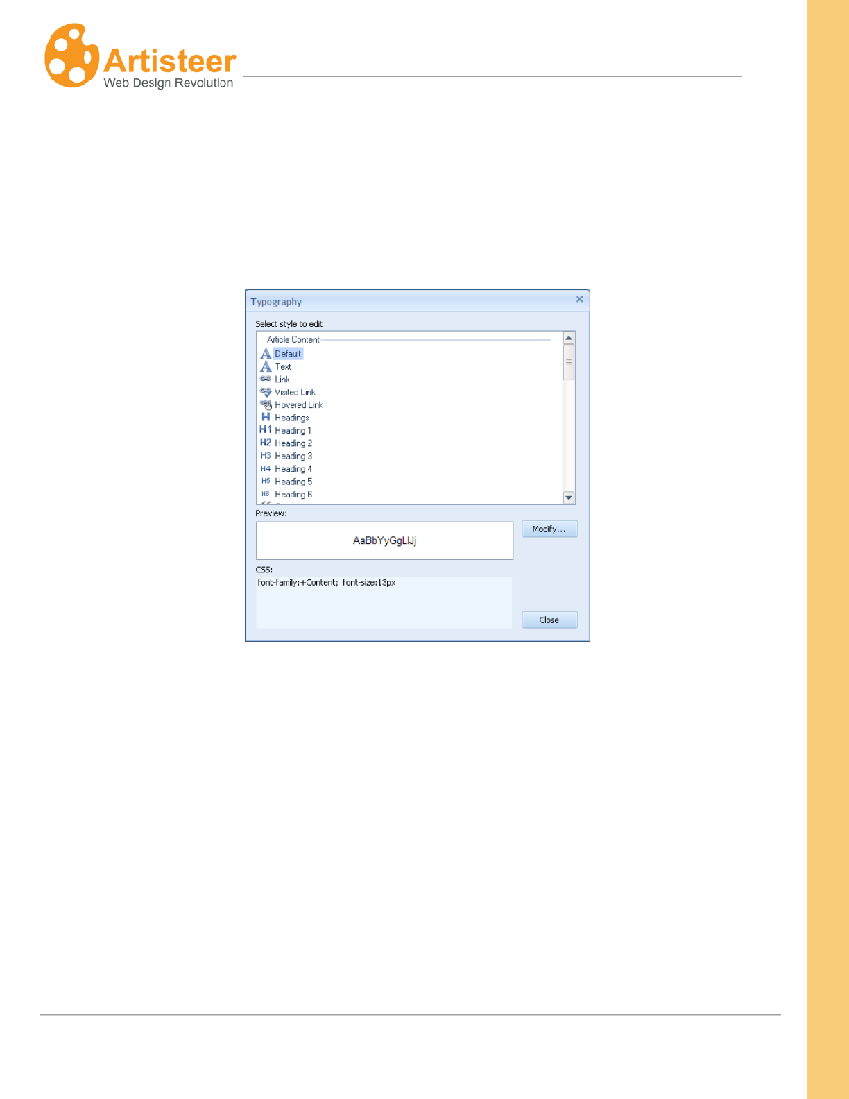
92
Artisteer4.0 | 92
Font Sets allows you to change the text and heading fonts. You can choose one of the Artisteer
standard font sets or create your own custom font scheme. Just click on the Edit Font Set… button in
the Font Sets list.
The Typography option allows you to select one of our typography styles or create your own custom
style design. Just click on the Edit Typography… button in the Typography list.
In the opened Typography dialog you can change any text object by selecting the object and clicking
the "Modify" button. The Modify dialog allows adjusting the following Font settings:
• Font Family
• Font Style
• Font Size (in pixels)
• Add or remove Effects
• Adjust Character Spacing
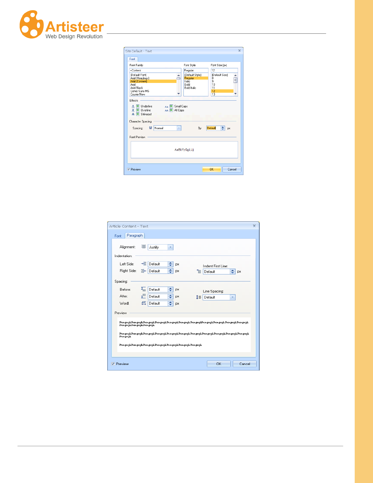
93
Artisteer4.0 | 93
For the Footer Text, Blocks Text, Article Headline Text and Article Header Text you can also modify
the Paragraph settings such as alignment, indentation and spacing.
The Font Scale option allows you to change the overall font scale. Using the Options… button, you
can define a custom font scale. This scales all of the text on your page based on the font size defined
for each text item.
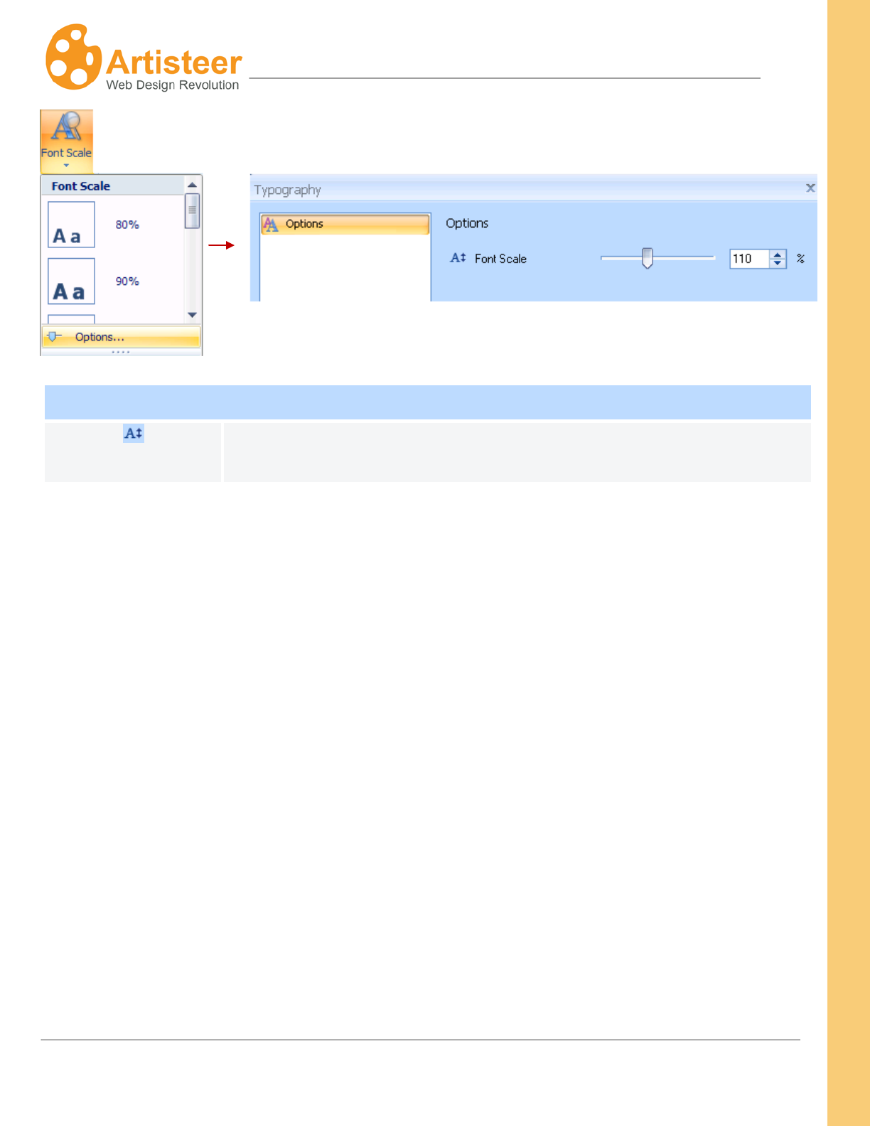
94
Artisteer4.0 | 94
Typography options
Font Scale
Set Font scale for all text. The supported values are from 50% to 200%.
200% is the biggest font scale value.
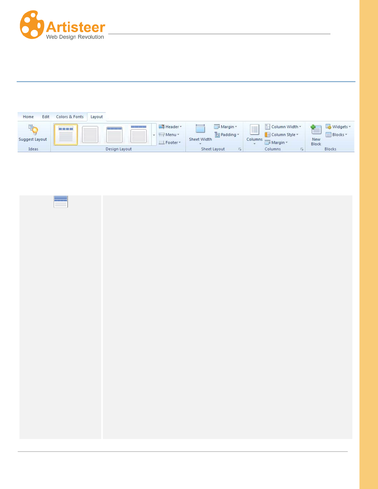
95
Artisteer4.0 | 95
Layout Tab
The layout tab is where you can quickly change the overall positioning of elements on the page.
Design Layout
Gallery
The Layout gallery provides a simplified way of selecting the layout of the
Header, and the Horizontal Menu bar. You can also select the style and
orientation of these elements using the options described below. (Note,
the gallery options do not include the Footer. If you want to change the
Footer area, use the group of Footer options described below.)
The gallery is divided up into several patterns:
Basic - no header and: no menu, or menu conjoined with the sheet, or
menu separated from the Sheet.
Fixed – header with or without the horizontal menu bar, either conjoined
or separated from the Sheet.
Outside – The menu and/or the header are separated from the Sheet.
Menu Inside Header – The menu appears inside the Header area and the
Header ‘has’, or ‘has not’ some margin space at the top.
Wide – The header and/or the menu are the same width as the page (as
opposed to the same width as the Sheet in other options). The Header
96
Artisteer4.0 | 96
area cannot have a defined width. It can only be the same size as the
Page or Sheet.
Transparent – the Header is displayed with 100% transparency with, or
without, a menu.
Overlapped – the Sheet is displayed overlapping the Header (using
negative margins)
Fixed or Fluid – This determines if the Sheet width is ‘fluid’ or ‘fixed’.
‘Fluid’ means that the width is a percentage of the browser’s window
width. As you resize the browser window, the Sheet width maintains a
defined percentage of the window width. You select the percentage in the
Sheet options (e.g. 55%). ‘Fixed’ means the Sheet has a specific size in
pixels.
If the Header and/or the Menu are inside the Sheet, then their size
depends on the Sheet width.
The Header and/or the Menu can be located inside or outside the Sheet
and have ‘Page width’ instead of ‘Sheet width’. When the same as the
Page width, the width is fluid. For instance, if you put the Header outside
(or inside) the Sheet but make the Header width the same as the Page,
the Header is fluid, since the browser window determines the width of the
Page.
Header
Sheet Width/ Page Width. This option regulates the width of the Header,
which may be either the size of the Sheet, or the size of the Page. If
‘Page width’, the Header width is fluid.
Position.You can also select one of the following header positions:
• Without Header – the template does not have a header.
• Outside Sheet – the header is displayed separately from the sheet.

97
Artisteer4.0 | 97
You can regulate the distance between the two by setting different
margin values.
• Inside Sheet – the header is displayed inside the sheet.
Margin. The Margin is the space above the Header. If the menu appears
above the Header, this can be used to define the space between the
Menu and the Header, otherwise, this is the space between the top of the
Header and the top of the page.
Select one of the top margin values (positive or negative) or set a custom
margin value using More Top Margins (-200 to 200 px). Setting the
margin to a negative value resizes the header area.
When the Header is inside the Sheet, the Margin option is disabled
because the Margin value needs to be defined for the Sheet, not the
Header. The Margin option is also disabled if the page has no Header.
To place the header at the top of the page and remove the rounded
corners of the outline, select No Outline.
Menu
Sheet Width/ Page Width. This option regulates the width of the Menu,
which may be set to the size of the Sheet, or the size of the Page
Position. You can also select one of the following Menu positions:
• Without Menu– the template does not have a Menu.
• Outside Sheet – the Menu is located above the sheet. You can
regulate the distance between the Menu and the Sheet by setting
different margin values.
• Inside Sheet – the Menu is attached to the Sheet.
• Inside Header – the Menu is embedded in the Header and located
at the top, or at the bottom of the Header.
Margin. The Margin is the space above the horizontal menu. Select one
98
Artisteer4.0 | 98
of the top margin values (positive or negative) or set a custom margin
value at More Top Margins (-200 to 200 px). A negative Margin value
respositions the Menu, which may cause the Menu to appear to overlap
the area above it (e.g. the Header).
The Margin option is disabled if the Menu is inside the Sheet since the
Margin value must be specified for the Sheet, not the Menu. The Margin
option is also disabled if the page has no Menu.
To set the margin to 0 and remove the rounded corners of the outline,
select No Outline.
Footer
Inside Sheet – The Footer is displayed as part of the Sheet with a margin
space reserved below the footer.
Sheet Width – The Footer is displayed attached to the Sheet and with the
same width as the Sheet but no margin space is reserved at the bottom of
the page.
Page Width – The Footer is displayed with the same width as the Page
and separated from the Sheet.
Margin. The Margin is the space reserved above the Footer. Select one
of the top margin values (positive or negative) or set a custom margin
value at More Top Margins (-200 to 200 px). A negative margin may
resize the Footer so it appears to overlap the Sheet. It may also cause
the Footer to overlap the contents on your page (e.g. text) that appears on
the Sheet.
To set the margin to 0, select No Outline.
99
Artisteer4.0 | 99
Sheet Layout
Sheet Width
Artisteer provides both Fixed and Fluid (absolute and relative) sheet
widths ranging from 600 - 1000px (60 - 100%). A custom sheet width may
also be specified using the More Sheet Widths option. A fixed Sheet
width means the Sheet is always this size. A ‘fluid’ sheet width means
that the width is a percentage of the browser windows area. If you resize
the browser window, the width of the Sheet will change so it always
displays a certain % of the width of the window.
Note, if you specify a layout option that places the Header and/or the
Menu inside the sheet, any settings you apply to the Sheet also apply to
those elements (e.g. Margin, Padding, etc).
Margin
Margin defines the space from the top of the page; the larger the margin,
the lower the Sheet appears relative to the top of the page. You can select
a margin from 0 to 50 px. A custom margin may also be specified using
the More Top Margins option.
Padding
Padding defines the blank space around the content of the Sheet.
Padding can be used to create a border of whitespace around your
content, which includes the Header and Menu if they are inside the Sheet.
You can select from 0 to 15 px. A custom padding may also be specified
using the More Paddings option.
Colums
Columns
Use the Columns option to define the number of columns of content on
the Sheet. You always have at least one column for the content of your
page (e.g. text and images). The only columns are used for the sidebars
(e.g. vertical menu, search, menu of links, etc). One column means a
page with no sidebars.

100
Artisteer4.0 |
100
Column width
Use the Column Width option to change the size of your sidebar columns.
If you only have 1 column, this option is disabled. You can choose
between one of the preset fixed, or fluid options, or a custom width (‘More
Widths…”). Fixed means the sidebar has a fixed px width. Fluid means
that the size of the sidebar is set to a % of the total content width within
the sheet (Hint: If the Sheet width is fixed, you will not see any changes
since the Sheet width does not change in size. However, if the Sheet
width is fluid, as the Sheet width is resized, so is the column width, if it is
also fluid.
Column Style
Use this option to define a style for the sidebars on your page. This
option is disabled if you only have one column.
Margin
Margin defines the space above the columns in the content area. A
Negative Margin may place the columns above the top of the content area
(i.e. overlapping the Header or Menu).
Blocks
, ,
New Block, Widgets,
Blocks
Use these options to add a new block to your sidebar, add a widget or
change the position of a block or widget.
New Block – This adds a new generic block to the sidebar. The first line
of text in the new block is the block name which you can change to
anything you want. To change the block name, click on the first line until
the yellow border appears.
Below the block name is the block content. To change the block content,

101
Artisteer4.0 |
101
click on the content area until the border appears. You can use the
options on the Edit tab to add any content you want.
Blocks – Use this to change the position of a block you have added, or to
delete a block. The names of the blocks are the same as the block titles
on your page.
Widgets – Use this to add or remove a Widget to your sidebar. A Widget
is a pre-defined block function. On the desktop, there are six types of
Widgets you can add: Vertical Menu, Search, Login Form, Blogroll,
Categories, and Archives
With a ‘new block’, you can add any content you want. For example, you
could define a block to display an image, or a list of links.
Except for Vertical Menu, you cannot edit the content for a widget block
except for the Widget title. You can change the style of the block but you
cannot edit the content, such as add/delete/change the text, links, etc.
And even with a Vertical Menu, you cannot define the menu items, or their
actions except to change which ‘pages’ of your website should appear in
the menu. If you are using Artisteer.net however, you can define a menu
in Artisteer.net and use that menu as the content for the Vertical Menu
you see on the desktop. When you republish your website, the content of
your project is synchronized with the content on Artisteer.net, so whatever
you defined for the Vertical Menu on the web will now appear on the
desktop.
102
Artisteer4.0 |
102
For example, if you add a ‘Categories’ widget, what you see in the
Preview area in Artisteer is a sample list of ‘categories’ that do not exist.
You cannot edit the block to change the links in the block. If you export
your project as an HTML website, your web page is rendered with this
sample list of links, but since the referenced content does not exist, this
widget is not very useful for static HTML websites (unless you edit the
HTML after you export your website). If however, you were using
Artisteer.net, you would instead see a list of ‘categories’ created for your
blog so the block would be very useful for navigating your website.
Options
The Layout tab also contains two dialogs for extra customization. These are Sheet Options within the
Sheet Layout menu and Layout Options within the Columns menu. You can access either of these
by clicking on the Custom Values icon.
The Sheet Options dialog is the same as selecting the Custom Values icon under the Sheet tab.
Please refer to the Sheet Tab section below for details about these options.
The Layout Options dialog can be accessed from the Columns menu and contains settings to adjust
columns, styling and glare.
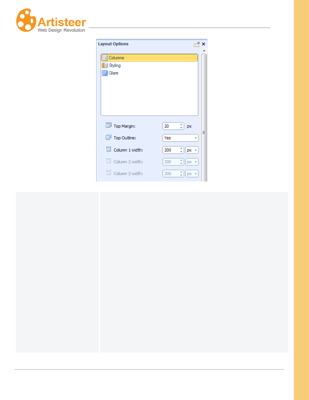
103
Artisteer4.0 |
103
Columns
Use the Columns option to adjust the dimensions and alignment of
the columns.
Top Margin – This is the space above your content columns (e.g.
between the horizontal menu and your content). A negative value
will display the columns overlapping the layout element above (e.g.
Header). This is disabled if the Header and Menu are outside the
Sheet.
Top Outline – This adds a radius (curved corners) to the layout
element above (e.g. Header) to highlight the separation of the two.
If you select ‘No’, no radius is applied and the two sections may
appear to be joined. Hint: this may be more visible if you
temporarily increase the radius of the Sheet. This is disabled if
there is no layout element above the columns in the Sheet. E.g. if
the Header is outside the Sheet. Also note, the radius applies to the
104
Artisteer4.0 |
104
Sheet, the Header, and the Menu. Applying the radius to one,
applies the same to the other even if they are not all on the Sheet.
But, the radius may be disabled for the Header and the Menu
depending on the position and orientation. E.g. if the Menu and
Header are in the Sheet but the Menu is above the Header, the
radius option is disabled for the Header because it is sandwiched
between the menu and the top of the Sheet on the page
background and therefore you cannot display it with rounded
corners.
The column width options refer to the sidebar, not your content
area. That is, you can resize the columns of your sidebar containing
blocks, but you cannot resize the column containing your page or
post content. Column 1, 2 and 3 depend on the number of columns
and orientation of your sidebar. The columns corresponding to the
sidebar positions are enabled, while the one column corresponding
to the content area is not. E.g. if you choose two columns with the
sidebar on the left, then the ‘Column 1 width’ option is enabled,
while the ‘Column 2’ and ‘Column 3’ options are disabled. Note, if
you make the width of any column too wide, this may cause other
layout elements or content to wrap around or overlap other areas
incorrectly.
Styling
Using the column style options you can control the transparency of
columns, change the color of borders, and adjust the weight and
style of separators (borders that separate columns)
Glare
This option is enabled if you have selected a sidebar style
(LayoutColumn Style) and added a Glare background.
Transparency – Control the transparency of the column and glare to
the Sheet. 100% means that the glare is not visible. As you
105
Artisteer4.0 |
105
reduce this, the glare should show thru.
Scale – Use this to scale the glare background image. E.g. if you
choose the particular glare from the gallery with large bubbles,
reducing the scale will reduce the size of the bubbles you see in the
background.
Blend mode
Set how the background color of the column and the background
glare are blended into each other. Hint: temporarily set the
transparency to 0 so you can view the effect better.
There are 3 options available:
Normal - No effect on the underlying layers.
Overlay - Blends the two layers together by changing the opacity,
darkness, and lightness of the top layer.
Soft Light - This blend mode lightens or darkens the image
depending on the color of the top layer. If the top layer's pixel is
dark, then the bottom layer's pixel is darkened. If the top layer's
pixel is light, then the bottom layer's pixel is lightened.
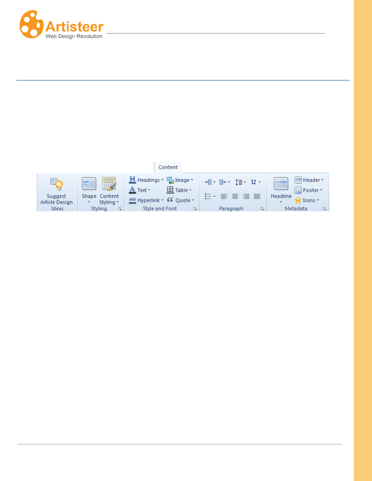
106
Artisteer4.0 |
106
Content Tab
If you refer to the Preview Area section (described earlier), the Content tab is used to style how your
article content will appear on your pages. In the Content tab you can find options to style text and
control the space around the text in the content area, as well as options to brighten up your article
content with styled images, quotes, and metadata. On the Ribbon bar there are several command
groups: Preview Image, Styling, Style and Font, Paragraph, and Metadata.
Styling
The styling options help to adjust the content area in general, while the other groups such as Style and
Font, Paragraph and Metadata focus on providing options for particular objects like headings, images,
article titles etc.
In the Shape group you can define the Article Content Shape (Blockless or in-Block), change some
style options:
‘In-Block’ means the article appears in a block area of the display with a border. The Shape button
can be used to change the appearance of the block. ‘Blockless’ means there is no block area. You
can select the margins around the article and the text spacing (padding) around the text in the article,
but border features and block features are not available. You choose the type of block by selecting the
Styling buttonShapeContent Shape from the Ribbon bar.
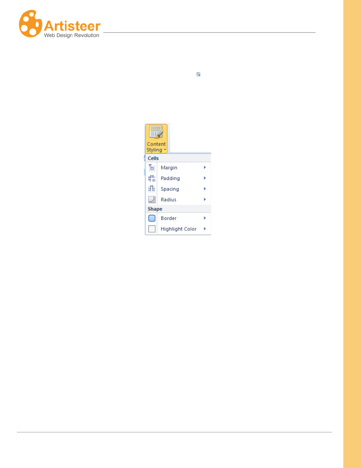
107
Artisteer4.0 |
107
If the default settings are not enough, you can use the Content Options dialog to customize the
settings. To open the Content Options dialog, click on the “More..” button, for example “More
Paddings…”, below any list, or select the Custom Values icon.
The Content Styling options help to adjust the margin, padding, spacing, radius, border and color of
the filled cells.
These options are the same as the All Pages Options under the Edit tab. Refer to the Edit tab section
above for a description of these options.
The style options apply to any content layout you add to the content area. Each static page, or post
article has one content area where you can add text, images, etc. The Content tab is used to style
how your content will appear on the page. The Edit tab is used to actually add content (e.g. text), and
the Content Layout options under the Edit tab are used to define the organization of your content in the
content area and how each part of the layout should appear (e.g. with or without borders, highlighted
or not, etc). The latter part is defined with the All Pages options under the Edit tab (EditContent
StylingAll Pages), or they can also be defined with the Content Styling options, but you will not see
these options unless you pick a content layout and styling that corresponds to these options. For
example, suppose you have several pages each with their own content layout. Some pages are
segmented with borders, some without, and some with highlighted panels. If you define a border and
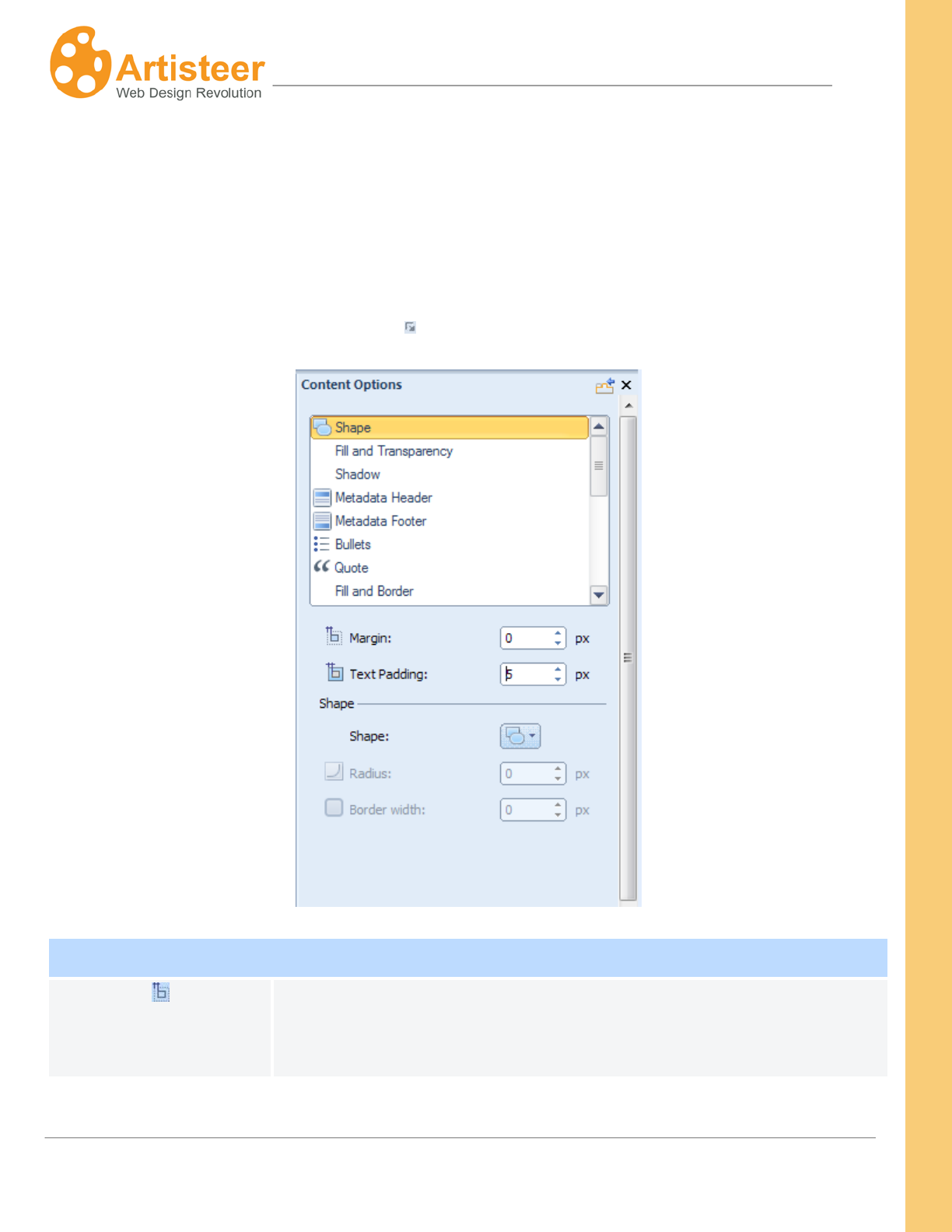
108
Artisteer4.0 |
108
hightlight with the Content Styling options, these attributes will apply only to those pages with a content
layout that includes borders and hightlight colors.
Options
To open the Content Options dialog, click on the “More..” button, for example “More Paddings…”,
below any list, or select the Custom Values icon.
Shape
Margin
Specify the Margin of the Article content in pixels. Supported values are:
0 – 50 pixels. The margin is the space around each Article content
area.
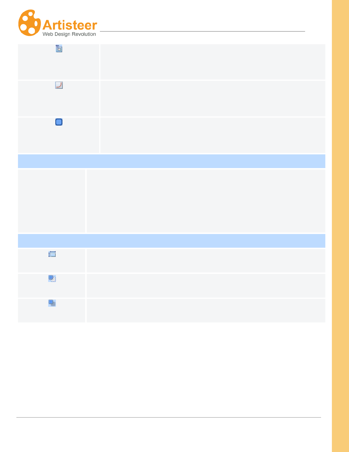
109
Artisteer4.0 |
109
Padding
Specify the Padding of the Article in pixels. Supported values: 0 – 50
pixels. The padding is the space around the content (e.g. images and
text) within each Article.
Radius
Specify the Corner Radius (curved corner) of the in-block content in
pixels. Supported values: 0 to 40 pixels. This is disabled if the shape
type is not ‘in-block’
Border
Width
Specify the Border Width of the in-block content in pixels. Supported
values: 0 to 10 pixels. 0 corresponds to “Without Border”. This is
disabled if the shape type is not ‘in-block’.
Fill and Transparency
Fill and
Transparency
Set the color, border color and transparency of the content block. The
supported values are from 0% to 100% where 0% means “without
transparency”. This is disabled if the shape type is not ‘in-block’.
Shadow
Size
Specify the Shadow Size of the Article block in pixels. Supported values: 0 –
20 pixels.
Opacity
Specify the Shadow Opacity of the Article Block. Supported values are: 0 to
100%.
Distance
Specify the Offset Distance of the shadow in pixels. Supported values: 0 –
20 pixels, where 0 indicates no offset.
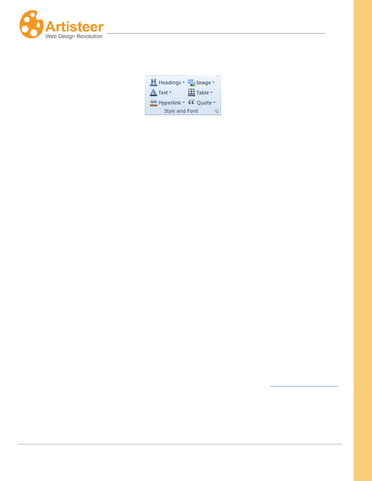
110
Artisteer4.0 |
110
Style and Font
Use this section to control the look of the following article elements:
• Headings
• Text
• Hyperlink
• Image
• Table
• Quote
You can change the font options, quote style, bullets image, table border settings or image border
settings to make your Article more unique.
If you do not selct the Include Content option the images in the articles are just placeholders for
images in your CMS. You decide if images you add later will have a border, and what the spacing
should be between the images and text.
Note, the style you define here applies to the content you add to your website. What you see in the
Preview area of Artisteer is some sample text and images. If you are creating a template for one of
the supported CMSs, like Joomla, or Wordpress, you will not see the effect of your selections until
after you add the content in the CMS. That is, in Artisteer you design how you want your content to
look, but you add the content in the CMS. However, in Artisteer 4.0 you can create some content in
Artisteer and then import it to your CMS using the Include Content option (see Export/Publish Menu). If
you create your content with the Edit tab you can see your design immediately. For example, if you
select all tables to have a Red border, when you add a table to your page with the Edit tab, it will
appear with a Red border(s).

111
Artisteer4.0 |
111
The selections you make here apply to all the pages and posts on your website. For example, if your
tables have a Red border, you can change them to be Black but you cannot define some pages to
have tables with Red borders and other pages with tables that have a Black border. If you want this
effect, you have to restyle the table for each page you want a different color than defined with the
Content options. You can add the table with an HTML encoded style (e.g. <table border=”2”
bordercolor=#336699…) directly in your content area (EditHTML Source), and/or also add a custom
CSS style (FileExportExport OptionsCSS Options).
The rest of this section describes each of the style options you can apply to the content of your pages.
When you create your content, either with a CMS, or Artisteer, these are the style attributes that will be
applied to each element.
Headings are HTML headings in your article text. When you create your content, all HTML editors
support Headings which are special text normally with a different font, or style to highlight that section
differently from the rest of the text. Headings are normally designated H1, H2, H3, etc. Artisteer
allows you to select the default color, font, size, font style and alignment associated with each of these
heading styles.
Text is the actual content of your pages and posts. You can adjust attributes such as color, font family,
size and style as well as adjust the font in the Font Options dialog.
Quote elements refer to quotations you might add to your article content. Like the other text elements,
you can select the default color, font, size, font styling, and alignment of your quoted text. Apart from
standard text settings, the Quote settings let you define a distance around the quotation (padding), put
the quote inside a filled block with borders, change the color of the block the quote appears in, and/or
select a quote image. You can also choose an Image from a variety of ready-made images, or insert
your own custom image, as well as change the color of the Quote image.
Table elements refer to HTML tables that you might include in your article content. You can select the
default border width, border style, and border color for tables you insert in your article content.
112
Artisteer4.0 |
112
Hyperlink elements refer to HTML hyperlinks that you might include in your article content. Like other
elements, you can select the color, font, size, and font styling applied to the hyperlink text. You can
also decide if the link should appear with an underline or not. You can define these features for each
of the states of the hyperlink. Link – normal, unselected appearance on the page. Visited Link –
appearance of the link after the link has been selected once. Hovered Link – appearance of the link
when the cursor is moved over the link on the page.
Options
Select the Custom Values icon to adjust the quote options in the the Content Options dialog or go to
the Font Options available in the Text and Quote menu to change the text settings of the articles or
quotes.
Quote
Padding
Specify the Padding of the Quote in pixels. Supported values: 0 – 50
pixels. The padding is the space around the quote.
Margin
Specify the top, right, bottom and left Margin of the quote in pixels.
Supported values are: 0 – 50 pixels.
Use the “Font Options…” dialog box to adjust the Font Family, Font Style, Font Size (in pixels), Text
Effects and Character Spacing
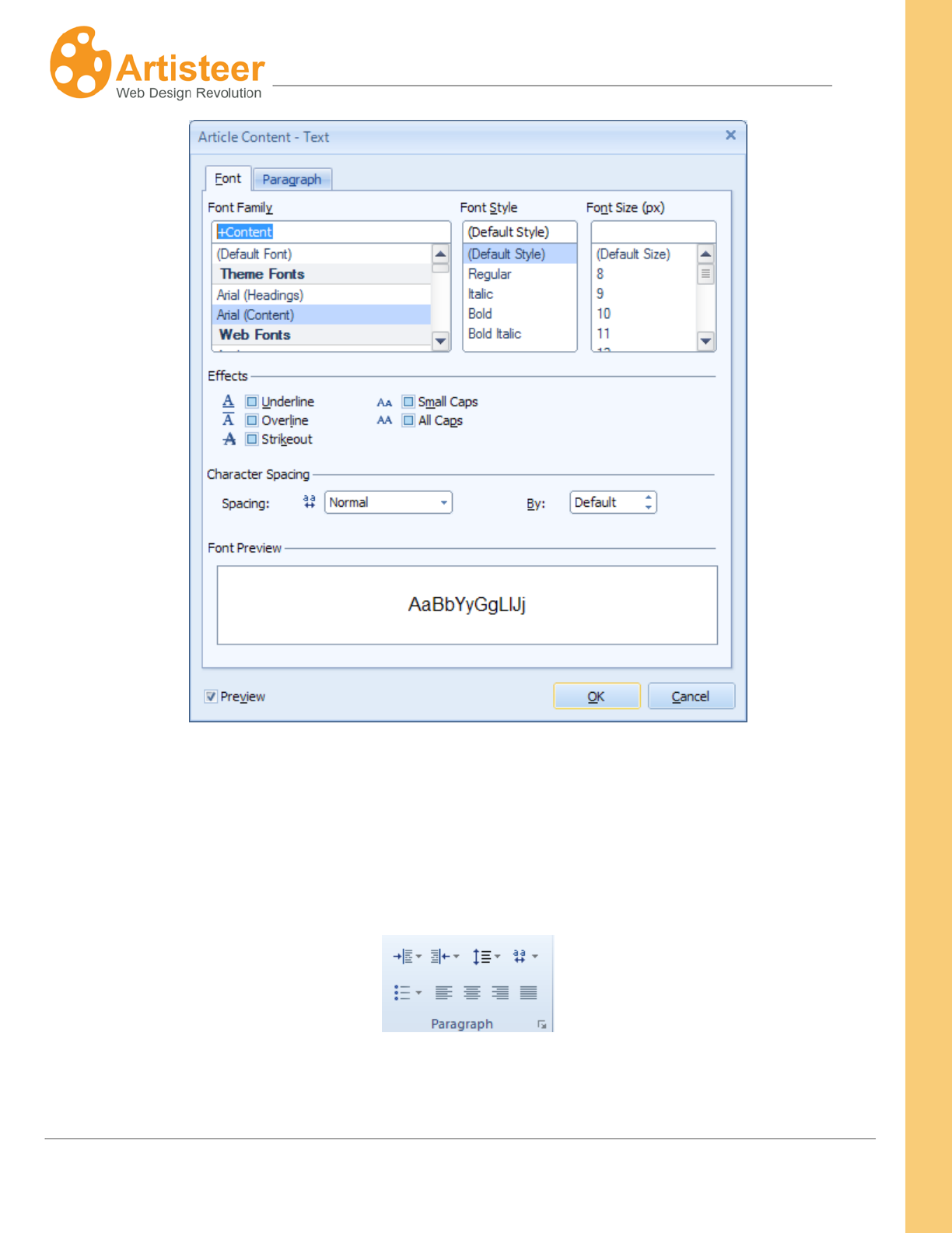
113
Artisteer4.0 |
113
Note: You can also modify the Paragraph settings including Alignment, Indentation and Spacing
Paragraph
Use these options to align the text of the articles and adjust the style of the bulleted lists.
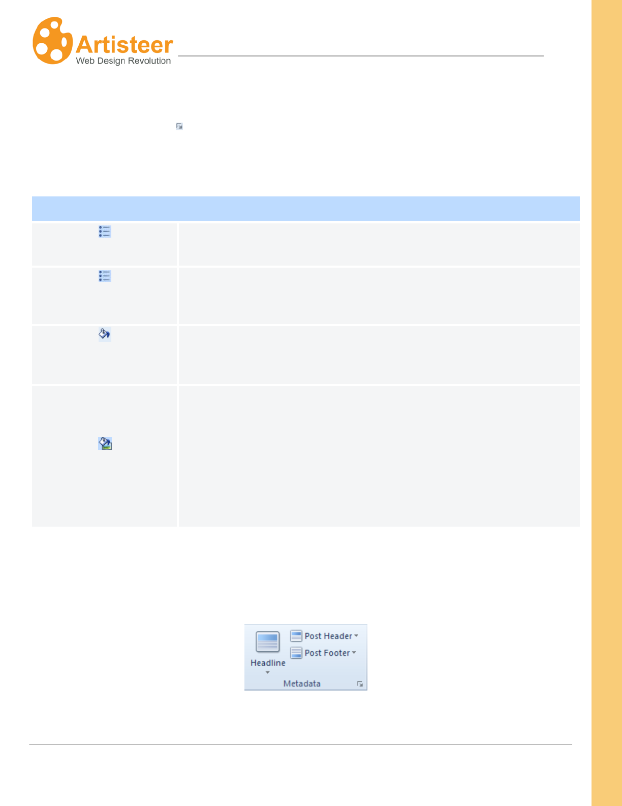
114
Artisteer4.0 |
114
Options
Select the Custom Values icon to adjust the bullets options in the the Content Options dialog or go
to the Font Options available in the Bullets menu to change the text settings of the text in the bulleted
lists.
Bullets
Offset
Specify the indent between the Bullet and the List Text. Supported
values: 0 – 20 pixels.
Use original size
Normally, Artisteer adjusts the size of the bullet image to fit the text. If
the option is set to Yes the original image size will be used. This
Fill
Use this option to change the color of the bullet image.
Recoloring
Specify whether the bullets should be re-colored.
Normally, bullets (not the List Text, which also has a color option) are
displayed in a default color. You can change the color of the bullet
image with BulletsImageColor. If this option is set to No, the bullet
image appears in the default color, otherwise, the bullet image appears
in the color you selected.
Metadata
Use these options to customize the headline, header, footer of your articles/posts.
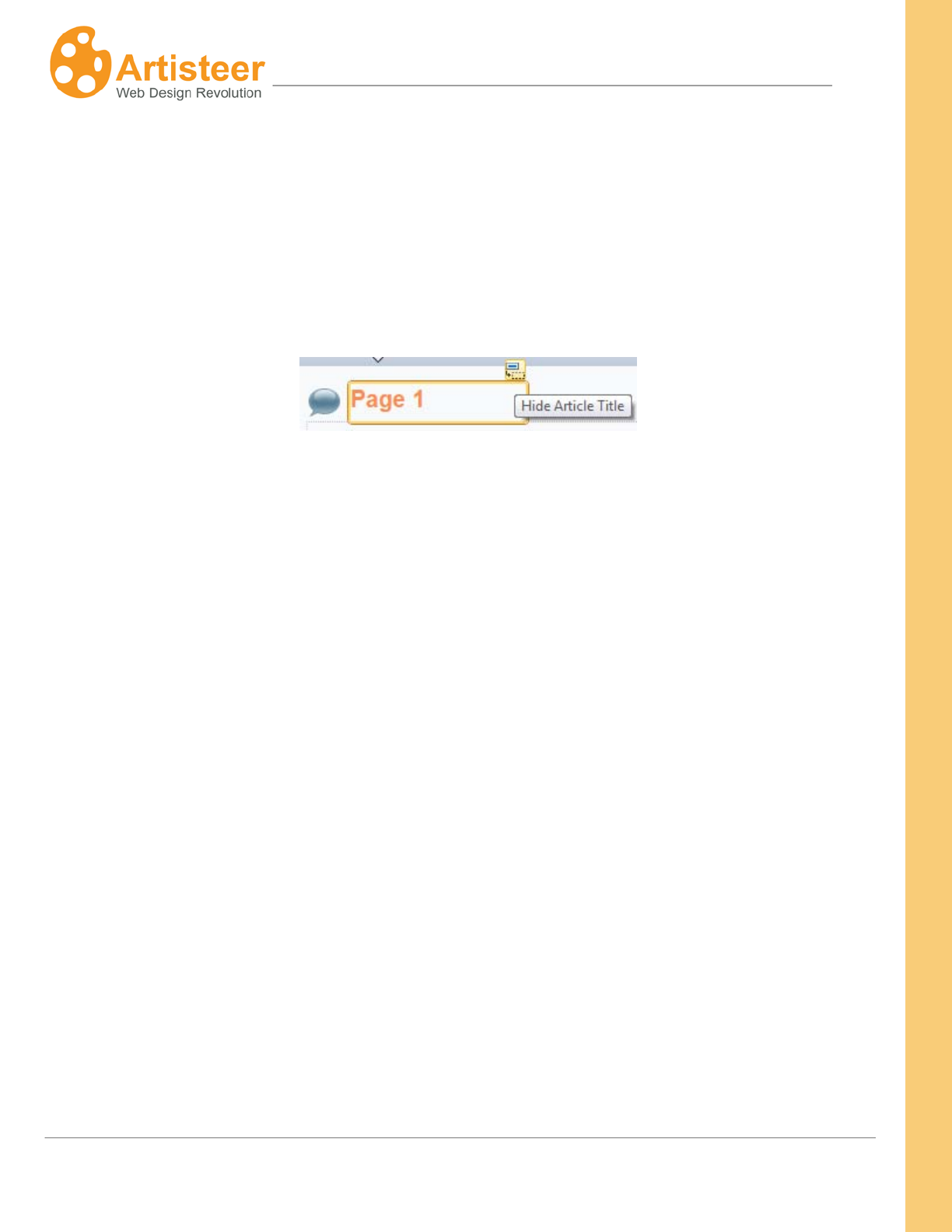
115
Artisteer4.0 |
115
To understand Metadata, it is important to understand the pages of your website. There are two types
of pages – static pages and post pages. When you create a new project in Artisteer, there is always
one static (Home) and one post page (Blog) created automatically.
A static page has a title (or ‘headline’), and some content but there are no links to other parts of your
website unless you add them to the content yourself. You can hide the headline using the Hide Article
Title icon.
The second type of page on your website is a post page. Post pages are common to all blog
websites. They look very similar to a static page, but differ in many different respects.
• A post page has a headline, but you cannot hide the text. This is because the headline is a
short synopsis of the post, which is often used when two, or more posts are listed on the same
page, or references to the posts are listed on the same page.
Posts also have a header and footer, which are metadata, or metadata links to related content.
Static pages only have a headline.
• A special page called the ‘frontend page’, or ‘blog post’ page is used to list the post articles on
your website. Your viewers can navigate to the post articles by clicking on the post header that
appears on the Blog Post page. Every post page is a separate page on your site.
Viewers (normally) navigate the static pages on your website using the horizontal or vertical
menu. Unless you create one yourself, there is no special page created to list the static pages
on your site.
• Post articles have metadata associated with the post content. Metadata refers to information
about the post article that is pertinent to the article while not necessarily related to the content of
the article. For example, the author, and date the article was written is useful information about
116
Artisteer4.0 |
116
the post since then you viewers know who wrote the article, find articles written by the same
author, and determine how ‘fresh’ the content is.
Static pages have no metadata. It is considered that with the content you add to a static page,
it is not important to know who authored the page, when the page was created, or otherwise
categorize the page.
Considering the differences then between a static page and post page, the options you can set in the
Metadata group apply to post articles, not static pages. The exception is the Headline options. You
can use these to style the headline text, and add an icon to appear next to the article headline. The
link options however, such as ‘Hovered’ and ‘Visited’ only apply to the post articles listed on the
frontend page (i.e. blog post page) since the headline is impressed as a hyperlink so viewers can
navigate to a specific post article.
The Header Header Layout and Footer
Use the
Footer Layout options let you select whether or not the
header/footer headline and metadata (e.g. date, author, etc.) are placed inside a block (i.e. panel). The
location inside the block allows controlling the border and color of the block. Without a block, these
options are not available. The Text option refers to any metadata included in the header or footer
(e.g. date). The Link options refer to any metadata links to related content (e.g. Author, Comments,
etc).
Icons
If you do not want a particular type of metadata to appear with the post, unselect the ‘Show …’ option.
For example, if you do not want the Author of the post to appear in the header, unselect ‘Show Author’.
This removes the Author link, and viewers will not be able to navigate to the articles written by the
same Author.
option inside the menus to display or not display an icon with the metadata, change the
color of icons (Color), select an icon from the gallery or insert custom icons from a file. You can select
the appropriate metadata icon from the list – Author, Date, Edit, Email, Pdf, Print, Data (Post Header),
Category, Comments, Tags (Post Footer).
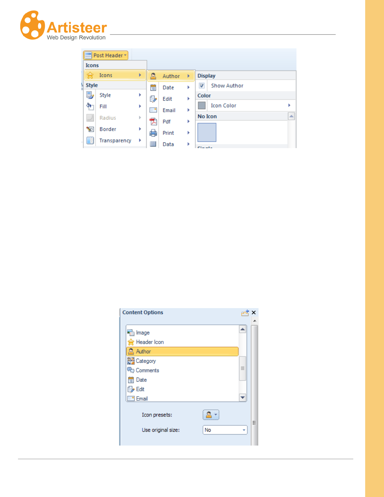
117
Artisteer4.0 |
117
It is important to note that the metadata is still there, but just not displayed in the header or footer. For
example, if you are hosting your website in Wordpress, you can elect to allow comments on the post
by your viewers. Each time a new comment is added, the comment text is saved with the post text. If
you, or another administrator, reviews and publishes the comment, then the comment text becomes
part of your post page. Normally if you include a ‘comments’ link in the footer, viewers can navigate to
the comments by using the link but if you omit the link, the comments are not deleted; they are still part
of the post.
By default Artisteer uses the original sizes of some icons. You can turn off/on this setting in the
Content Options dialog. Scroll down the list till you see the icon and set the Use Original Size option to
No/Yes.
118
Artisteer4.0 |
118
Options
Select the Custom Values icon to adjust the metadata options in the the Content Options dialog.
Metadata Header/Metadata Footer
Style
Select one of the suggested styles.
Transparency
Specify the Transparency of the metadata block. Supported values are: 0 to
100%.
Radius
Specify the Radius of the metadata block. This option is not available if you
have selected a Layout for the header or footer that does not include a block.
Border
Specify the top, right, bottom and left border of the metadata block (in px).
Select the border style: solid, dotted etc.
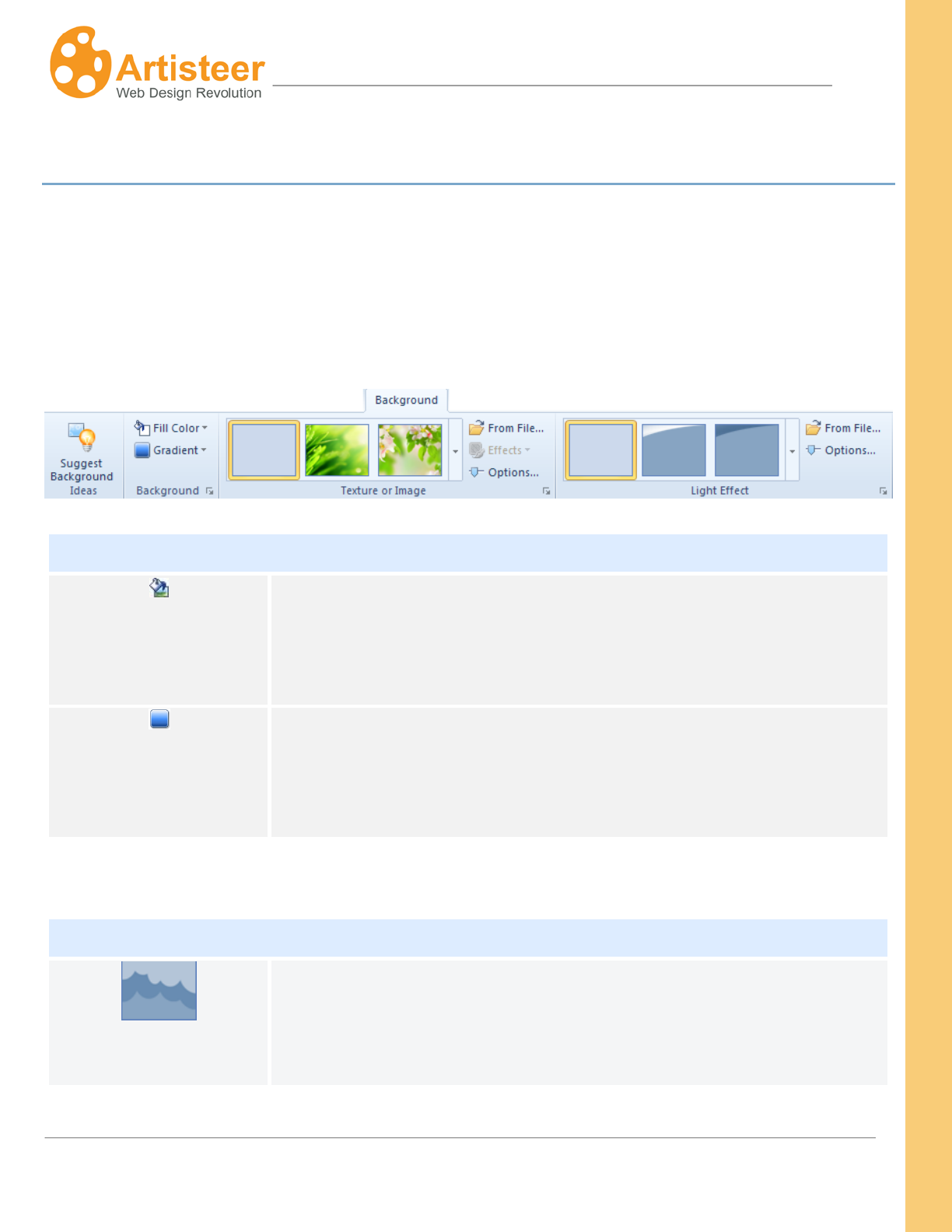
119
Artisteer4.0 |
119
Background Tab
The Background Tab manages the design of the area outside the active content of the web page (the
Sheet). Backgrounds are usually filled with colors, and they are often decorated with effects and
images. The Background Toolbar in Artisteer consists of four groups: Ideas, Background, Texture or
Image, and Light Effect. Each group has an additional dialog box for advanced customization. These
options provide a great deal of flexibility in designing your background.
Background
Fill Color
You can apply theme colors, custom colors, or pick up a color from any
spot on the template and add it to your custom color palette (color
picker). Your color selection can be enhanced with a gradient, texture or
light effect.
Gradient
Gradient produces smooth color transitions. The gallery offers different
gradients arranged according to the position, direction and character of
the color transition. You can adjust the extent of the transition and the
color contrast using the ‘Gradient Options…’ selection.
Texture or Image
Texture or Image
The Texture and Image Gallery offers different design patterns based on
the style, material, theme and position of images and textures.
Texture refers to a special graphic that represents a type of design. In

120
Artisteer4.0 |
120
Gallery
the gallery, there are many textures you can select from that are
‘colorless’. These are displayed in different shades of blue. Colorless
textures acquire the color of the background fill color. For example, if
your background is Red, when the texture is applied, the design will also
appear in Red with the same saturation as the original thumbnail in the
gallery.
In the gallery, there are also several images and textures in color; some
are designs and some are picture images. The color weight and
saturation for colored images and textures may be modified in the Page
Background Options (using the custom value dialog icon ).
From File…
Use this option to insert custom images or textures. Before pasting the
image, specify the image position and Blend Mode (explained below).
Effects
Use this option to select different color effects for the textured
background.
The effects you can apply depend on the texture or image.
If you are using a colored image, you can apply a color effect to change
or offset the pattern of colors in the image: e.g. tint, recolor, grayscale
If you are using a non-colored texture, you may or may not be able to
change the color effects. For example, if you select the ‘palm trees’ in
the Horizontal Floral group, you can invert the colors in the texture (you
are not really inverting the colors, as much as changing which shade of
color should be assigned to each area). But if you choose the second
horizontal bottom texture in the gallery, the ‘effects’ option is disabled;
you cannot invert colors for this texture.
With non-colored textures, you can invert the colors, or you choose a
two color layout. E.g. if you select the first Flowers texture, you can
121
Artisteer4.0 |
121
choose what color the flowers should be and what color the background
should be. The first color is the ‘fill’ color for the background, and the
second color is the one you select with the Color option from the ‘effects’
menu.
Options…
Select this to further customize the Texture Options. See the Page
Background Options below for an explanation of these selections.
Light Effect
Light Effect Gallery
The Light Effect Gallery offers various glares you can use to enhance
your design. You can further customize the Light Effect by selecting
‘Options’ (see Glare in the Page Background Options below). Hint: you
can visualize this better if you select no gradient and texture for the
background, use a lighter color, and set the transparency to 0 for the
background and glare.
From File…
Use this to insert a custom light effect from a file. Hint: the light effect
may also be an image, which may be useful if you want to overlay
another image on the page background.
Options…
See Glare in the Page Background Options below.
Options
The Page Background customization options may be entered from the Options button and from the
Custom Values icon.
122
Artisteer4.0 |
122
General
Scrolling
Set whether a background image is fixed or scrolls with the rest of the
page.
Scroll - When you resize the browser window, or scroll the window, the
Sheet and the background texture appear to move together.
Fixed – When you resize the browser window, or scroll the window, the
Sheet appears to move over a fixed background.
Fill Color
Select the appropriate color to fill the background
Glare
Presets
This option shows the options available in the Light Effect menu on the
Ribbon. You can make a quick change without leaving the Options panel.
Transparency
Set the glare transparency relative to the Page background. The supported
values are 0% to 100% where 0% means "without transparency". This
option is not available if “No Glare” is selected in the Light Effect gallery.
Scale
Increase or reduce the size of the light effect.
A ‘glare’ is a special type of texture pattern that emulates a lighting effect
like the rays of the sun, or light reflected from a surface. Scale simply
reduces the size of the graphic relative to the page background.
This option is not available if “No Glare” is selected in the Light Effect
gallery.
Align
Aligns the glare (lighter areas of the glare texture). Available options are
Left, Center, and Right. This option is not available if "No Glare" is selected
in the Light Effect gallery. Hint: you can visualize this better if you pick a
123
Artisteer4.0 |
123
glare with a light source on one side or the other of the image (e.g. mostly
on the left, or mostly on the right).
Flip
Create a mirror reflection of the glare in vertical or horizontal directions.
This option is not available when”No Glare” is selected in “Light Effect”
gallery.
Texture
Presets
This option shows the options available in the Texture or Image menu on
the Ribbon. You can make a quick change without leaving the Options
panel.
Blend Mode
Set how the background color and background texture/ image layers are
blended into each other.
Normal - No effect on the underlying layers.
Overlay - Blends the two layers together by changing the opacity,
darkness, and lightness of the top layer.
Soft Light - This blend mode lightens or darkens the image depending on
the color of the top layer. If the top layer's pixel is dark, then the bottom
layer's pixel is darkened. If the top layer's pixel is light, then the bottom
layer's pixel is lightened.
This option is not available if “No Texture” is selected in the "Texture or
Image" gallery.
124
Artisteer4.0 |
124
Transparency
Set the texture transparency relative to the background. The supported
values are from 0 to 100%, where 0% means “without transparency”. This
option is not available if “No Texture” is selected in the “Texture or Image”
gallery
Color Weight
Recolor the image or texture so that it assumes the fill color for the
background. The weight determines what percentage the background
fill color should have when blended with the texture color. For example,
suppose your color background is Red, and you choose the ‘balloons’
texture from the New Color Holiday group in the texture gallery, where the
balloons are in various colors. When you increase the color weight, the
balloons will acquire more and more of a reddish shade. That is,
whatever color saturation the balloons currently have is blended with
‘Red’, and how much ‘Red’ makes up the final color depends on the color
weight. At 100%, the balloons are all some sort of reddish shade. How
Red they appears depends on the original color saturation of the image
(e.g. if pure Green, then it would be pure Red).
This is only available for textures that have color. Most of the textures in
the texture gallery have no color (i.e. the textures that are shaded in
blue). These textures automatically take on the color of the background.
If you select one of non-color textures, the Color Weight option is
disabled.
Contrast
Make the lighter areas of the image/texture lighter and the darker areas,
darker, thus increasing the contrast of the image/texture and making it
more visible. Hint: this effect is more visible if you select a texture where
the contrasts are more pronounced (e.g. one of the textures from the
Large group in the texture gallery).
125
Artisteer4.0 |
125
Color Saturation
Use this to control how saturated the background ‘fill’ color should be
when blended with the colors in the texture. Use this with the color
weight option above. The color weight determines what percentage the
background fill color should have when blended with the texture color.
The color saturation determines how saturated the fill color should be
when blended; i.e. how much gray is in the color. 0% means all of the
color has been replaced. %100 percent means that all of the gray has
been removed.
For example, suppose your color background is Red, you set the color
weight to 100%, and you choose the ‘balloons’ texture from the New
Color Holiday group in the texture gallery. When you increase the color
saturation, the Red color will become more saturated (i.e. the balloons
will appear more red), while reducing the color saturation will gradually
remove the color until the color is gray (i.e. the balloons are gray). The
final appearance depends on the color saturation and luminosity of the
colors in the original image.
Hint: set the color weight to %100. This setting only affects the ‘fill’ color
when it is blended with the image. If the color weight is 0, then no Red is
added to the image, therefore how saturated the ‘Red’ fill color is doesn’t
matter.
This is only available for textures that have color. Most of the textures in
the texture gallery have no color (i.e. the textures that are shaded in
blue). These textures automatically take on the color of the background.
If you select one of non-color textures, the Color Saturation option is
disabled.
126
Artisteer4.0 |
126
Texture Position
Scale
Reduce or enlarge the image/texture on the background. When the
image is set to more than 100%, the image is stretched beyond its
original size. This option is not available when”No Texture” is selected
in “Image or Texture” gallery.
Texture Repeat
Use this to set how your custom background texture or image will be
repeated. Use this if your custom texture or image is not the same size
as the background.
Fill - The background image will be repeated vertically and horizontally
until it fills the entire background area.
Horizontally (Default) - The background image will be repeated
horizontally until it fills the width of the background area.
Vertically - The background image will be repeated vertically until it fills
the length of the background area.
No repeat - The background-image will be displayed only once.
This option is not available when”No Texture” is selected in the “Image or
Texture” gallery.
Position
Use this to set the starting position of your custom background texture or
image. This option is not available when”No Texture” is selected in
“Image or Texture” gallery.
Flip
Create a mirror reflection of the image/texture in vertical or horizontal
directions. This option is not available when”No Texture” is selected in
“Image or Texture” gallery.
Rotate
Rotate the image/texture 90 degrees clockwise (CW) or
counterclockwise (CCW). This option is not available when”No Texture”
is selected in “Image or Texture” gallery.
127
Artisteer4.0 |
127
Gradient
esets
This option shows the options available in the Gradient menu on the
Ribbon. You can make a quick change without leaving the Options
panel.
Height
Set the height for the selected gradient. The supported values are
from 1 to 1200 pixels. This option is not available if "No Gradient"
has been selected from the Gradient gallery.
The height determines the extent of the transition relative to the
background of the page. A small value means the transition, starting
from the top, is fairly rapid and only covers a small area. A large
value means the transition extends over a longer area of the
background.
Contrast
Increase or decrease the luminosity of the initial and final colors of
the gradient.
The smaller the value, the less contrast between the top and bottom
of the transition. Conversely, the larger the value, the greater the
contrast.
This option is not available if “No Gradient” has been selected in the
Gradient gallery.
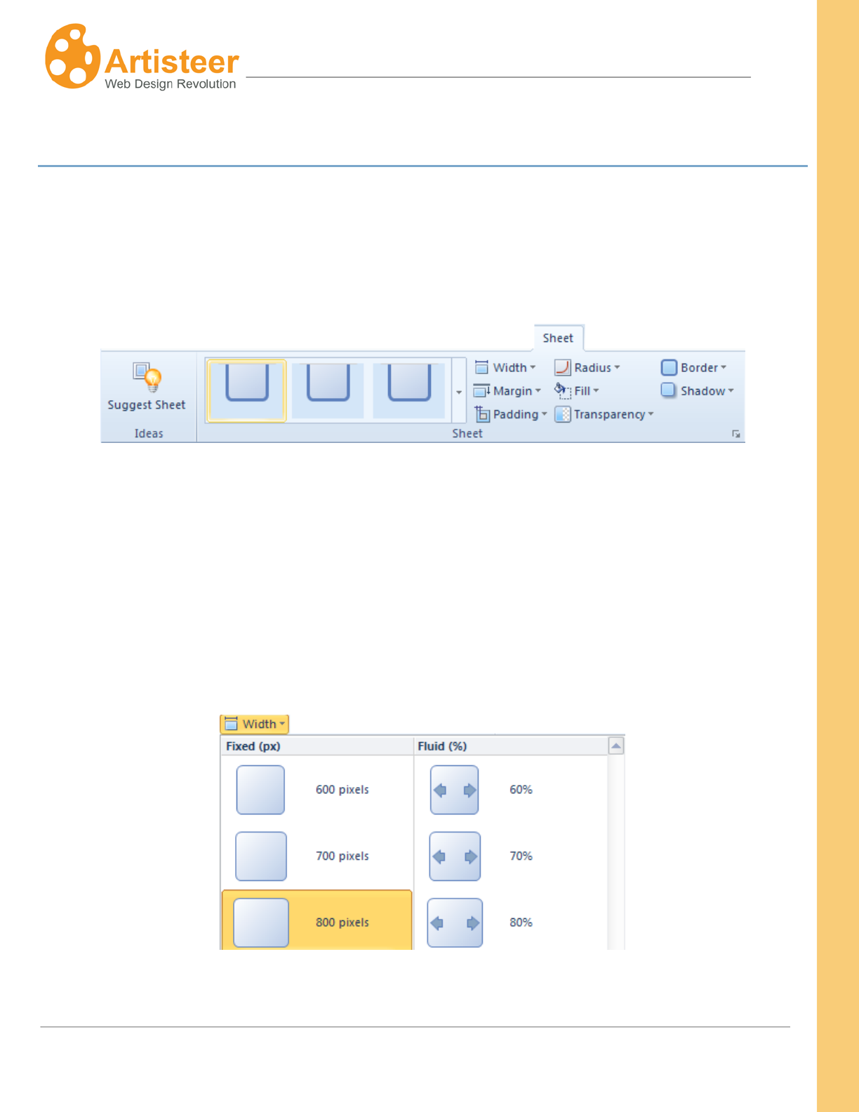
128
Artisteer4.0 |
128
Sheet Tab
Use the Sheet tab to change the overall positioning and look of the Sheet area on the page. For
example, you might prefer a sheet with rounded edges instead of square edges. Or you may want to
move the sheet down a bit from the top of the page, add a shadow effect, or change the width of the
borders, or change the background transparency, or the color of the sheet.
The Ribbon options are arranged into one group called Sheet. The group includes a Gallery
You can choose between a
with quick
style templates and options to manage width, margin, padding, radius, shadow, color, transparency
and border. Hint: If you use the gallery, it can be difficult to distinguish between the thumbnail
depictions of the settings. Just move the cursor over one of the gallery settings and wait. The Preview
area will show you what the Sheet will look like if you select that option.
fixed or fluid Sheet width. Fluid means the sheet width is a percentage
of the display area in the browser.
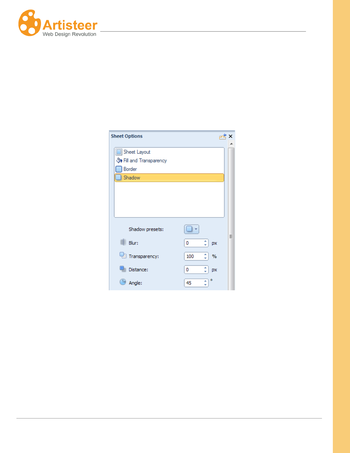
129
Artisteer4.0 |
129
Options
The sheet options can be customized by clicking on the appropriate button in the option list. For
example, if you want to change the Padding value click on the More Paddings… button.
Use the Sheet Options panel to edit the design of the sheet. Change the Layout, Fill and
Transparency, Border and Shadow parameters to achieve the desired result.
Layout parameters include the width of the sheet and its borders, the top margin and top outline (the
top round corners), padding within the sheet, and the corner radius values (curved corners). If you use
a fluid Sheet width, there are additional settings: Minimum Width and Maximum Width. You can set
custom transparency and color values for the sheet background within the Fill and Transparency
options. Border parameters include width (px), style (solid, dotted etc.), color and transparency values.
Shadow parameters control the size, angle and opacity of the shadow as well as its distance from the
sheet borders. Enter the values or drag the sliders to the left or right to decrease or increase the
option values.
130
Artisteer4.0 |
130
Layout
Width
Set the Sheet width in pixels, or a percent of the screen width. Supported
values: 200px, or 20% (the minimum width) –1500px, or 100% (the
maximum sheet width).
Minimum Width
(Fluid Sheet width only)
Use this to set the minimum width that a fluid sheet can be resized.
Supported values: 300 - 800 px
A fluid sheet width maintains a certain percentage of the browser
window’s width. When you resize the window, the sheet is resized to
maintain the same percentage of area. When the Sheet is resized, the
content within the sheet might also be resized. This may change the
orientation of the content in undesirable ways. To prevent this, you can
set the minimum width that the Sheet can be resized. When the window
is resized, the Sheet will only be resized to this miniumum amount and
then afterwards, the Sheet area is truncated. Note, the fluid % and the
minimum width should be set consistently; otherwise, you may not get
the results you expected. For example, if you set the width to 20% but
you set the minimum width to 800 px, the values are inconsistent since
you are not likely to have a Sheet that is both 800px wide and also
occupies 20% of the window. To avoid this problem, select a % width
first, then using the Preview area as a guide to select a minimum width
that is narrower than the original fluid width. If you need to select a
Maximum Width, then pick a number that is wider than the original fluid
width.
Maximum Width
(Fluid Sheet width only)
Use this to set the maximum width that a fluid sheet can be resized.
Supported values: 800 - 1920 px
See also Minimum Width above.
Top Margin
Margin defines the distance of the sheet to the top of the page, or the
131
Artisteer4.0 |
131
bottom of the layout element above it (e.g. Header or Menu that is
outside the Sheet – see Layout options).
Top Outline
When turned, Top Outline rounds off the top corners (i.e. applies the
radius). When turned off, the corners are squared (i.e. does not apply
the radius). When the Top Margin is 0, the Sheet appears to be joined to
the top of the page, or the layout element above it (e.g. Header or
Menu). When joined, using a radius to round the corners helps
differentiate and highlight where the Sheet top is located.
Padding
Set the padding for the sheet content in pixels. Supported values: 0 px to
50 px, where 0 px means no padding. Padding is the space between the
content (e.g. text and images) and the edges of the Sheet.
Radius
Set the shape of the corners of the sheet (corner radius) in pixels.
Supported values: 0 px – 200 px, where 0 px is equivalent to “No
Radius”.
If there is no margin above the Sheet (SheetMarginNo Outline), the
top edges will always be squared no matter what you set the radius to,
but the bottom corners will be curved.
Note, the Menu, Header, and Sheet all share the same Radius value (i.e.
corner type). Changing the radius for one, changes it for all.
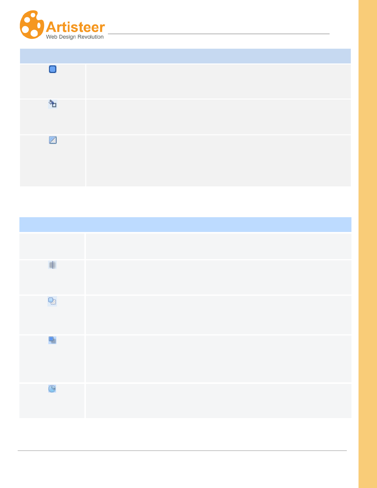
132
Artisteer4.0 |
132
Fill and Transparency
Border Width
Set the border width for the sheet in pixels. Supported values are: 0 px – 20
px, where 0 px is equivalent to “No Border”.
Color
Select the border color from Theme Colors list, the Additional Colors list or
from the Custom Colors menu.
Transparency
Set the sheet transparency. Supported values are: 0% to 100%, where 0% is
equivalent to “No transparency”. Note, the Sheet transparency also affects the
border and shadow (even though you may set the shadow transparency to
‘none’)
Shadow
Presets
This option shows the options available in the Shadow menu on the Ribbon.
You can make a quick change without leaving the Options panel.
Blur
Set the shadow size for the sheet’s shadow in pixels. Supported values are
from 0 px to 50 px, where 0 px means “without shadow”.
Transparency
Set the transparency for the sheet’s shadow. Supported values range from 0%
(fully transparent) to 100% (fully opaque). Note, if the shadow is completely
transparent, you won’t see it no matter what you choose for the other settings.
Distance
Set the shadow offset in pixels. Supported values: 0 px – 60 px, where 0
means "no offset".
Angle
Set the shadow’s offset direction.
The supported values are from -180° to 180°.
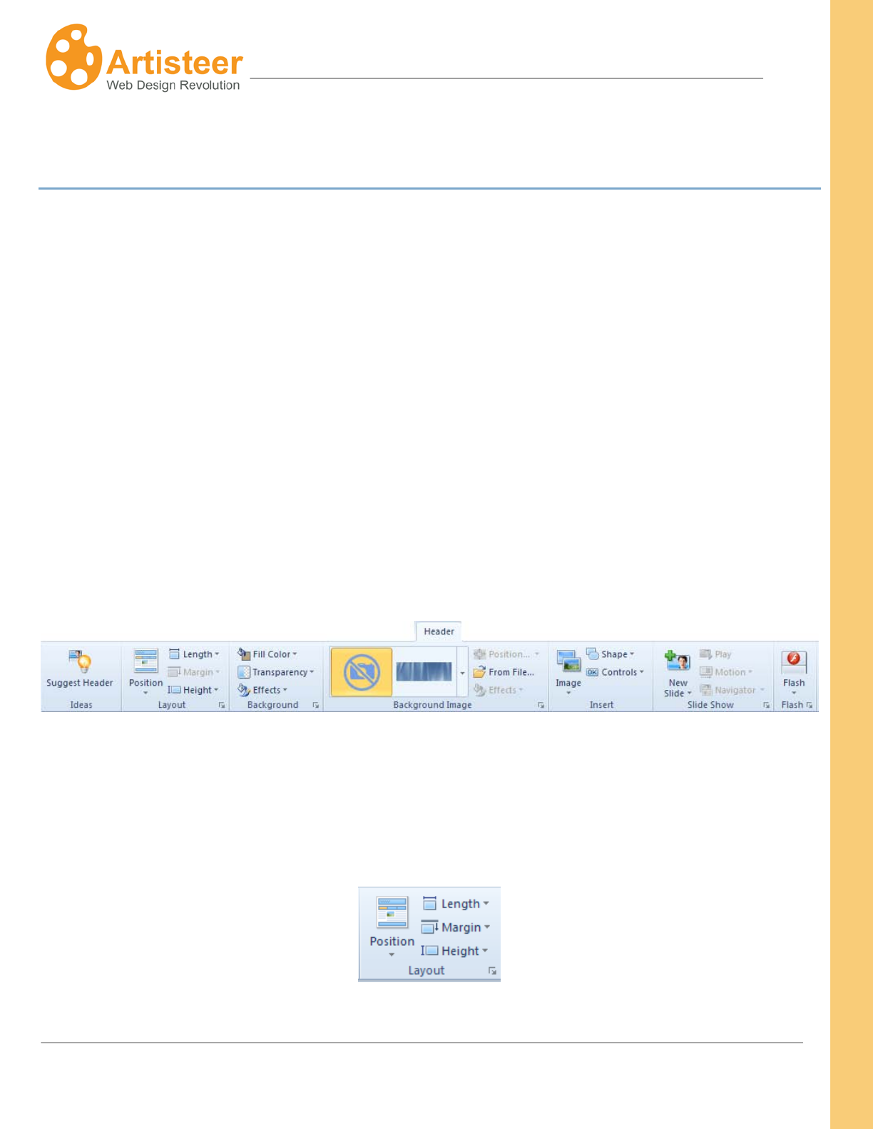
133
Artisteer4.0 |
133
Header Tab
The Header is a layout object displayed at the top of every page of your site. The Header has several
layers which are combined to create one image.
• Headline and Slogan text.
• Header design: coloring, transparency, texture, gradients and glares.
• Background image.
• Foreground photo or image.
• Flash animation or video.
• Shape with textbox.
The Header may also include several slides that make up a slide show.
The Header Tab controls all aspects of the Header. The options are divided into the following groups:
Layout, Background, Background Image, Insert, Slide Show, and Flash.
Layout
This command group includes features, which help to control the position of the Header on the page,
and the size of the Header.
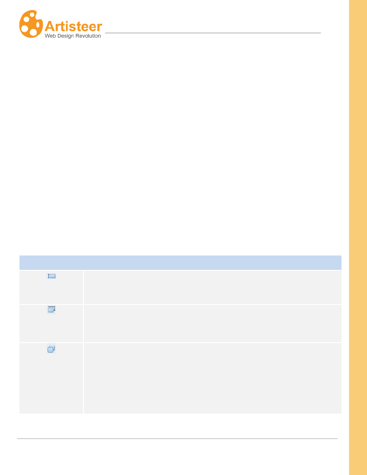
134
Artisteer4.0 |
134
Position. Assign the position of the Header: outside Sheet, inside Sheet, without Header (i.e. the page
has no header)
Length. Set the Header width to either the size of the Sheet (Sheet Width), or the size of the Page
(Page Width).
Margin. Define the distance of the Header from the top of the page, or from the bottom of the Menu (if
it is above the Header). If the Header is inside the Sheet, and the menu is below the Header, this
option is disabled; adjust the space above the Header using the Sheet margin instead.
Height. Set the height of the header from 100 to 300 px. A Custom Height is available if you select
More Heights… (see Options).
Options
Custom layout options can be configured for the Header using the General tab on the Header Options
panel.
General
Height
Set the height (length) of the Header as it appears on the page. Note, this is
independent of the position of the Header relative to the menu, sheet, or page.
Top Margin
This is the space between the Header and the top of the page, or bottom of the
menu (if it exists). When the Top Margin is 0, the Header appears to be
joined to the top of the page. See Margin above.
Top Outline
When turned on, Top Outline rounds off the top corners (i.e. applies the
radius). Using Top Outline and a radius to round the corners helps
differentiate the Header from the rest of the Page.
This option is only available when the Header is positioned outside the Sheet
since otherwise the Header is part of the Sheet and therefore you need to

135
Artisteer4.0 |
135
configure this with the Sheet options.
When turned off, the corners are squared (i.e. does not apply the radius).
A negative margin will display the Header overlapping top of the page (i.e.
truncates the top of the Header).
Background
Within the Background option group you can control the background color, transparency and add
effects such as textures, glares, shadow, gradient, mask and round corners.
The Fill Color option provides a choice of colors for the background. You can select a color theme,
pick a color from the custom palette, or add your own custom color with More Colors.
You can add transparency to the header by selecting a value from the list or adjusting the
transparency in the Transparency options. The transparency rate ranges from 0 to 100%.
The Effects option is used to adjust the basic design:
Note, the radius and the shadow, if specified are shared between the Sheet, Header, and Menu
regardless of their position and orientation. i.e. you cannot specify one type of rounded corners for the
Sheet, and a different type of corners for the Header. Similarly, if the Sheet has no Shadow, this
option is disabled. In most cases, changing the setting for one (e.g. Header), also changes it for the
others (e.g. Sheet), however there may be situations where an option is disabled for one but not the
other (e.g. if the Header and Menu are both inside the sheet but the Header is sandwiched between
the Menu and the top of the Sheet, the radius is disabled for Header, but not Sheet).
Radius - Set the shape of the corners of the Radius (corner radius) in pixels.
136
Artisteer4.0 |
136
Shadow – Change the shadow effect for the Header, Sheet and Menu. This option is disabled if the
Sheet does not have a shadow.
Texture – Select a texture or insert a texture from a file. See Background Texture options above for
more details about textures. Hint: You can use any type of graphic file for a Texture.
Gradient – Add a light transition effect to the Header. See Background Gradient options above for
more details about gradients.
Glare – Add a glare effect to the Header. See Background Glare options above for more details about
glare effects.
Options
The basic settings of the Header Background can be adjusted in the Background tab of the Header
options panel.
Other options of extra customization appear when pressing the … Options button in the Effects menu.
For more information about the radius and shadow options, please switch to the Sheet Options
section.
Depending on the selected image, some background options may be disabled.
Background
Color Weight
Use this to adjust the percentage of color the Header fill color (Header
Fill
Color) will have when blended with the rest of the Header.
Color Saturation
Use this to adjest the color saturation (amount of gray in the color) of the
Header fill color (HeaderFill Color) when it is blended with the rest of the
Header.
137
Artisteer4.0 |
137
Blur
Set the blur radius ranging from 0 to 30 pixels. The Blur effect averages all
pixels within the specified radius; a larger radius leads to more blurring.
Hint: The blur effect is useful if you want to add a depth of field to your
Header. That is, when the image is blurred the other layout elements, like
text, foreground image, etc., are not so they attract more focus.
Transparency
Specify the background transparency value.
Blend Mode
Use this to control how the ‘fill’ color of the Header is blended with the
background image. This option is enabled only for background images with
no color, such as 'Abstract' backgrounds in the gallery.
Supported values are:
Softlight – Decreases the light effect of the image by decreasing the contrast
between the lighter and darker areas. Default.
Overlay – Increases the light effect of the image by increasing the contrast
between the lighter and darker areas.
Image Format and
JPEG Quality
Choose between JPEG or PNG formats for the exported image.
When you export your website or template, this determines the image format
for the file created. This may, or may not affect the performance of your
website. For example, the second control, JPEG Quality, sets a quality level
for JPEG compression. The range goes from 0 to 100%. Better image quality
results in a larger file size, but a larger size also means it takes longer to
render and return your web page. If performance is critical, you need to
adjust these options to select an appropriate trade-off between size and
image quality.
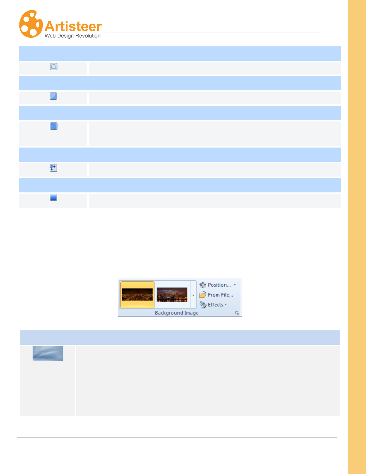
138
Artisteer4.0 |
138
Mask
Adjust the mask repeat, position, flip, rotate and scale parameters.
Glare
Specify the transparency, blend mode, position and size parameters.
Image or Texture
Use the blend mode, transparency, color weight, color saturation and contrast
options.
Texture Position
Adjust scale, texture repeat, position, flip and rotate parameters.
Gradient
Use the contrast and angle options.
Background Image
The Background Image features help you find a suitable background image, locate it on the Header,
and enhance it with various design effects.
Background Image
Background
Image
Use this option to select a background image for the Header. The gallery has
various themes and styles to choose from: Abstract, Color Abstract, Wind Glass,
Nature, Color Textile, City, Landscape, and Clouds.
You can also add your own background image from a file. When you insert a
background image from a file, you have 3 options that determine how, and what
139
Artisteer4.0 |
139
portion of the image is displayed in the Header:
“Resize header to image” – This will resize the width and height of the Header so
it has the same dimensions as the image; i.e. either shrink or enlarge the
Header.
The Header does not have its own width setting. The Header width is either the
same width as the Sheet or the Page. When the Header width is resized to the
width of the image, it also changes the Sheet width. Similarly, if the Sheet width
was fluid before, the Sheet is changed to a fixed size. After you have added the
image, if you make the Sheet width fluid again, the image is now “resized to fit
the Header” (see below).
If the Header width is the same as the Page width, the height of the image is
cropped to fit the height of the Header. The width of the image is unchanged,
however the sides of the Header are filled in where the Page area is wider than
the image. For example, suppose the width of the image is 800px, but the Page
is resized until it is 1000px. The image will be centered over the Header, but
then filled in on both sides to cover the areas of the Header where the image
doesn’t appear (100px on each side).
When you add a custom image, it must be within a minimum and maximum width
(500-1500 px), and a minimum and maximum height (50-500 px). When any
image is outside that range, this option is disabled; i.e. you cannot resize the
Header to fit the image.
When you resize the Header to the image, the header area acquires a new
dimension. When you first insert your image, you can see the effect of the
option you select if you make the selection and then wait a moment for the
Preview area to be updated. If you accept the changes however, you may not be
able to return to a previous design unless you step thru undoing each of your
changes. That is, the options using the Position tool may not work the same as
140
Artisteer4.0 |
140
when you first inserted the image. For example, suppose you enlarge your
Header to fit the image. If you accept your changes then use the Position tool
and select ‘Use original size’ you will not see any changes in the Preview area.
This is because the change to the Header size has already been made, and now
the Header is the same size as the image. If you want to see the image
displayed with the Header before the Header was resized, you need to undo your
change (or resize the Header) to start over.
“Resize image to Header” – The image is scaled and cropped to fit the
dimensions of the Header, whether the image is larger by height, or width, or
both.
This can be useful if you are using a fluid sheet width, since the image will scale
as the Header becomes larger or smaller.
“Use Original size” – If the image is smaller, either by height, width, or both, the
image is centered on the Header. Where the image is larger, the image is
cropped to fit the dimension of the Header. For example, suppose the Header is
800px wide by 300px high. If you add a 600x150 image, the image is centered in
the middle of the Header. If you add a 900x150 image, the image is cropped by
width, but centered by height. If you add a 600x400 image, the image is
centered by width, but cropped by height.
Position
Use this tool to reorient the background image with the Header.
What you see in the position tool is the original image, with an overlay that shows
you what part of the image will be displayed in the Header. In the example
below, the image is larger than the header so what you see in the center of the
window is that portion of the image that will be displayed.
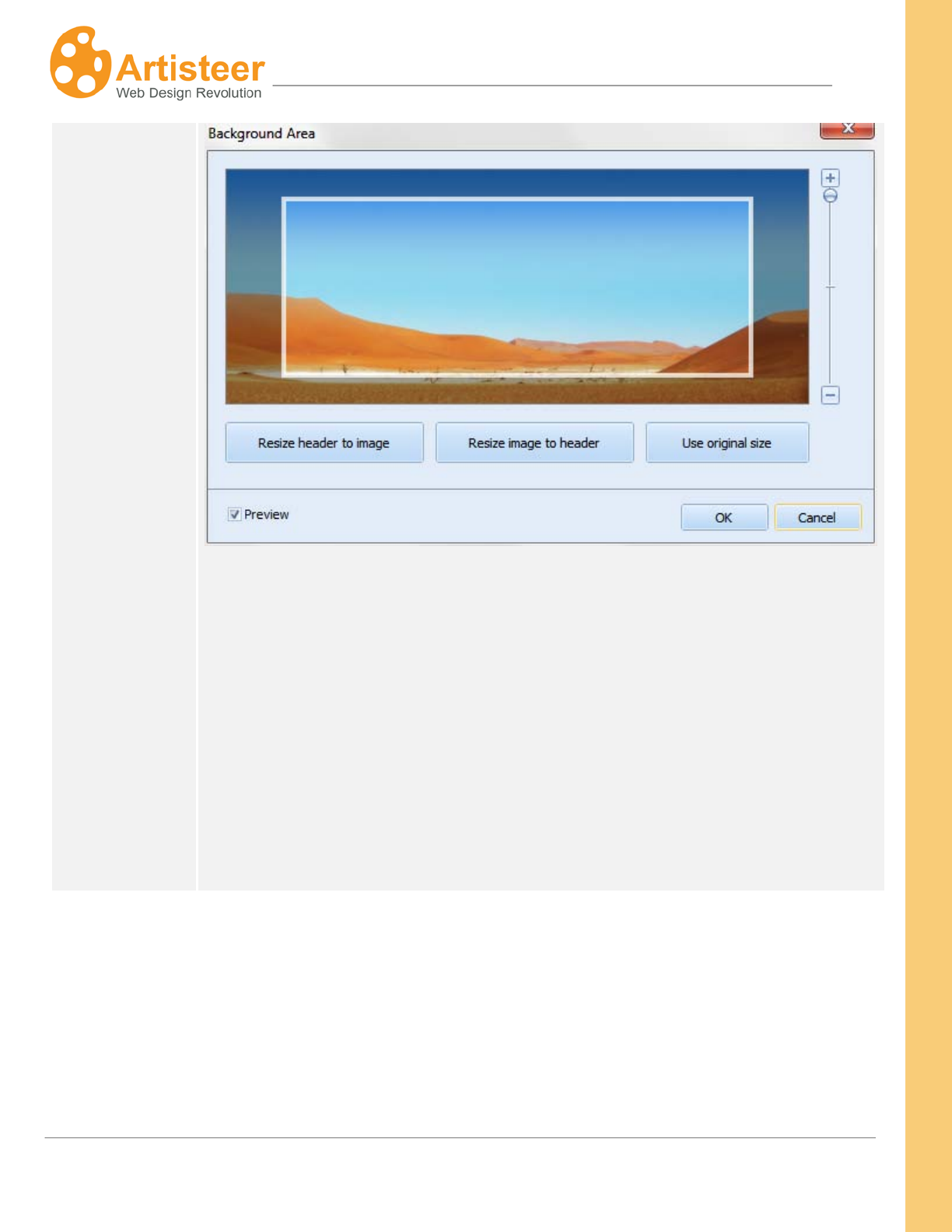
141
Artisteer4.0 |
141
You can drag&drop the overlay area over different portions of the image until the
portion of the image you want is in the header. Hint: you can’t move the overlay
beyond the borders of the image. For instance, suppose you want to remove
some of the the ‘blue sky’ in the image above. You cannot do this with the
Position tool, but you can use the tool as a guide to cropping the image in
another tool, such as Micosoft’s Paint.
The image below was also inserted using ‘Use original size’ but now the original
image dimensions are smaller than the Header area.
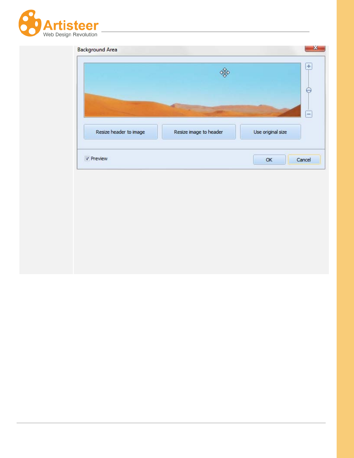
142
Artisteer4.0 |
142
Since the image is smaller than the Header, the Position tool shows the entire
image since the image will fit entirely in the Header area.
The alignment slider to the right of the image can be used to scale the Header
overlay and align the Header with the image to display whatever portion of the
image you want to display. For example, if we use the first example above and
use the slider to scale the size of the overlay area like this:
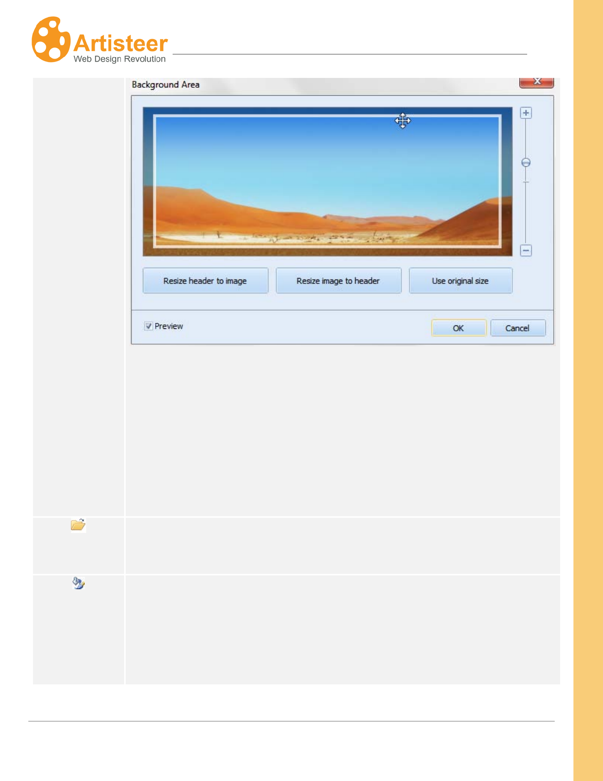
143
Artisteer4.0 |
143
The Header area appears to get larger but not actually. The Header dimensions
stay the same, but Artisteer crops and scales more of the image that appears in
the Header. You could use the slider to scale the size to the same size as the
image, which would be equivalent to inserting the image with the ‘resize image to
header’ option. Conversely, if you originally inserted the image with ‘resize
image’, and then scaled the Header overlay to as small as it could appear, this
would be equivalent to the ‘use original size’ option.
From File…
Use this option to insert custom background files.
Effects
Use the effects option to recolor the image, or add a ‘blur’ effect.
Recolor:
The ‘fill’ color for the Header is blended with the colors of the image. The options
you select from are where a different color weight and color saturation are
144
Artisteer4.0 |
144
applied to the ‘fill’ color before blending with the image.
• No Effect – No color weight or color saturation is applied to the
image.
• Tint – Choose from options where color weight is increased for the
Header ‘fill’ color but the saturation is the same. For example, if the
fill color is Red, then the choices of the gallery are different images
with more and more reddish ‘tint’.
• Recolor – Choose from options where the color weight is %100 but
the saturation is different. For example, if the fill color is Red, then
the choices of the gallery are images where all the colors have
been replaced by Red but the saturation (amount of gray) is
different.
• Greyscale – The color saturation is 0. All of color in the image has
been replaced by gray (i.e. the image now appears in gray with
different levels of brightness).
Options
The Background Image options such as Recolor and Blur can be also adjusted in the Background tab
of the Header Options panel.
Background
Color Weight
Use this to adjust the percentage of color the Header fill color (Header
Fill
Color) will have when blended with the rest of the Header. See color weight
for Texture options above for more information about color weight.
Use this to adjest the color saturation (amount of gray in the color) of the
Header fill color (HeaderFill Color) when it is blended with the rest of the
145
Artisteer4.0 |
145
Color Saturation
Header. See color saturation for Texture options above for more
information about color saturation.
Blur
Set the blur radius ranging from 0 to 30 pixels. The Blur effect averages all
pixels within the specified radius; a larger radius leads to more blurring.
Hint: The blur effect is useful if you want to add a depth of field to your
Header. That is, when the image is blurred the other layout elements, like
text, foreground image, etc., are not so they attract more focus.
Transparency
Specify the background transparency value.
Blend Mode
Use this to control how the ‘fill’ color of the Header is blended with the
background image. This option is enabled only for background images with
no color, such as 'Abstract' backgrounds in the gallery.
Supported values are:
Softlight – Decreases the light effect of the image by decreasing the contrast
between the lighter and darker areas. Default.
Overlay – Increases the light effect of the image by increasing the contrast
between the lighter and darker areas.
Image Format and
JPEG Quality
Choose between JPEG or PNG formats for the exported image.
When you export your website or template, this determines the image format
for the file created. This may, or may not affect the performance of your
website. For example, the second control, JPEG Quality, sets a quality level
for JPEG compression. The range goes from 0 to 100%. Better image quality
results in a larger file size, but a larger size also means it takes longer to
render and return your web page. If performance is critical, you need to
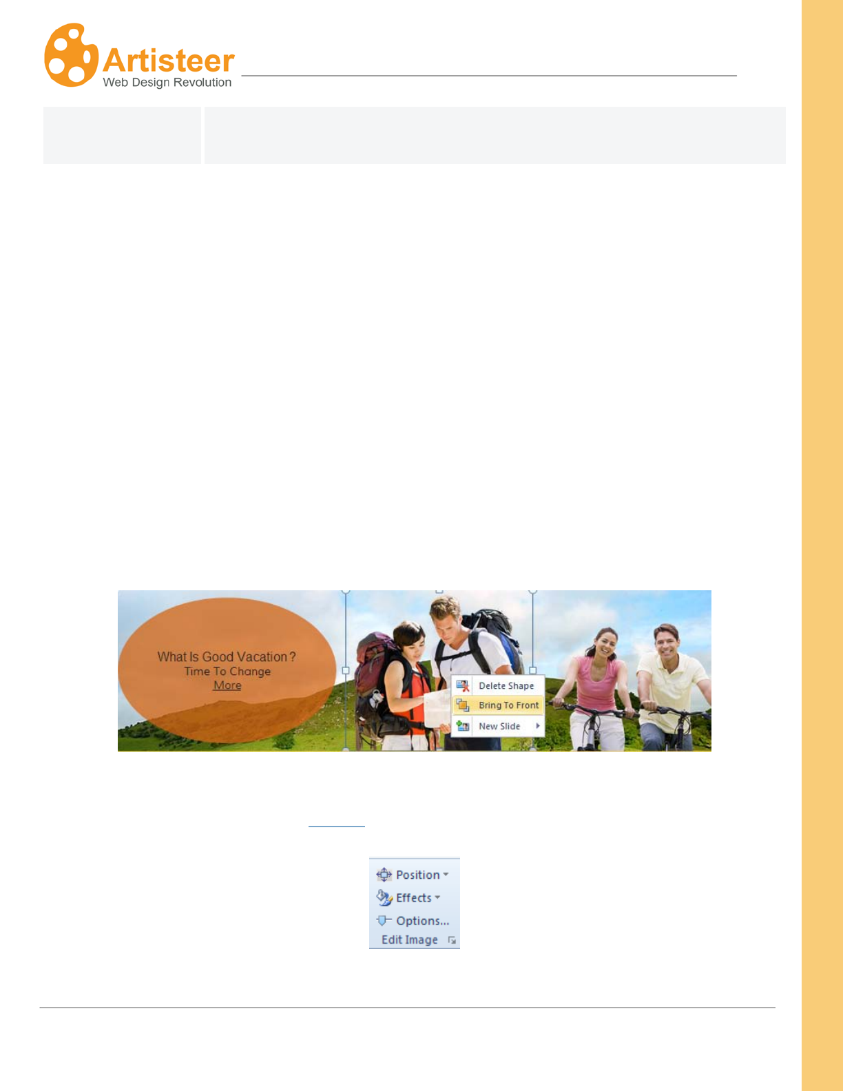
146
Artisteer4.0 |
146
adjust these options to select an appropriate trade-off between size and
image quality.
Insert
Use this option group to add a photo, shape, or controls such as headline, slogan, search box or RSS
to your Header. You can choose from the gallery of professional images with many different types of
subjects, insert your own custom photo or find more free images in the online gallery using the More
Online… feature.
The Image menu allows to add an image object to the Header. You can select a professional photo
from a gallery grouped by subject: Business, Communication, Teens, Music, Education, Travel etc.,
insert your custom photo or browse the Artisteer online image gallery using the More Online… option.
You can insert several images and arrange them by dragging and dropping them in the right position,
rotating or resizing them. You can also place an image on top of others by selecting the Bring to
Front/Send to Back Option:
Use the Edit Image options to align the image, add an effect such as recolor, shadow or flip or go to
Options for extra customization (see Options > Photo Object Options).
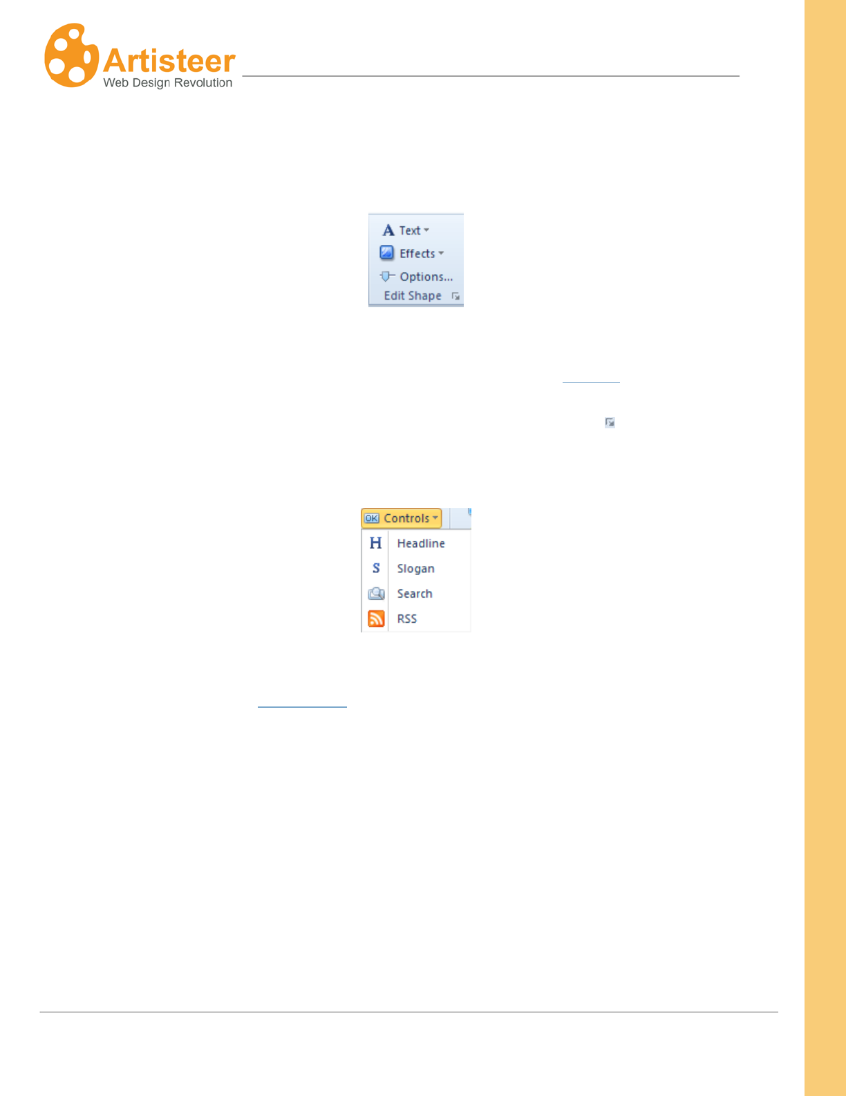
147
Artisteer4.0 |
147
The Shape option allows to add one of the suggested shapes. Drag and drop or rotate the shape to
find the right position. You can also click on the shape area to add some text or activate the Edit
Shape options that will appear at the right side of the Ribbon bar.
Use these options to style the text and adjust the shape area adding effects such as Fill Color,
Transparency, Texture, Gradient, Glare, Mask, Align and Padding (see Options > Textblock Options).
For extra customization click the Options button or select the Custom Values icon.
The Controls option allows to insert Headline, Slogan, Search widget or an Rss button.
Use the Edit Shape options to adjust the Headline and Slogan. The design of the Search widget and
RSS button is adjusted in the Controls tab.
Options
The additional Image and Shape options can be accessed by selecting a Custom Values icon on the
Edit Image or Edit Shape option groups.
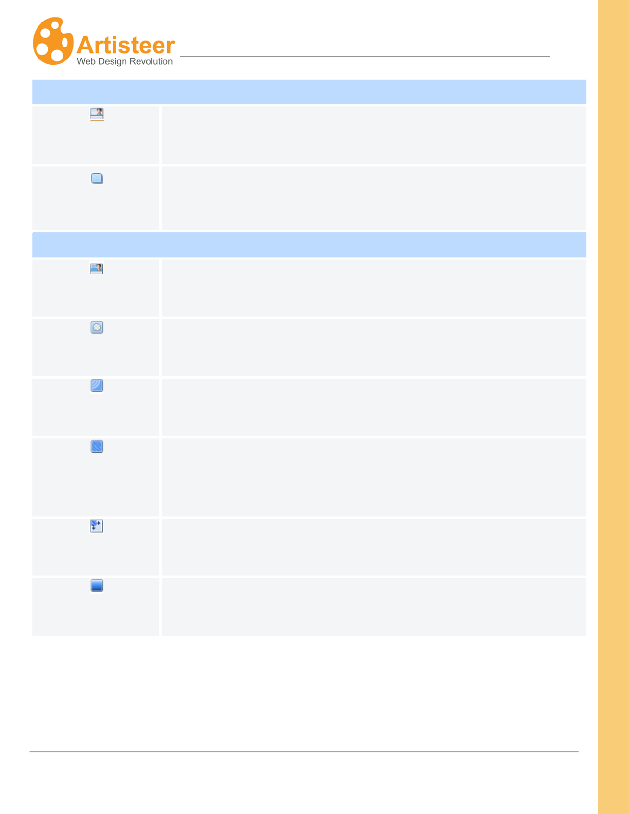
148
Artisteer4.0 |
148
Photo Object Options
General
Specify the size (width and height) of the image, scale an image to save the
original proportions or rotate an image using the Angle option.
Shadow
This option is enabled when the Shadow effect is selected in the Effects
menu of the Edit Image command group. Specify the size, transparency,
distance and angle values of the shadow.
Textblock Options
General
Specify the size (width and height), angle, transparency, horizontal and
vertical padding of the shape.
Mask
Adjust the mask repeat (horizontally, vertically, no repeat), position, flip,
rotate and scale options.
Glare
Control the transparency, blend mode, position and size of the glare.
Image or
Texture
Adjust the blend mode, transparency, color weight, color saturation and
contrast of the image or texture.
Texture Position
Manage the sacale, text repeat, position, flip and rotate options.
Gradient
Specify the contrast and angle parameters.
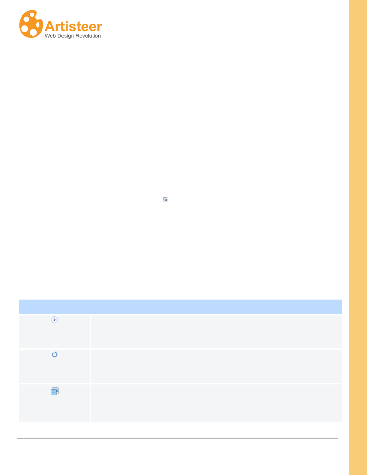
149
Artisteer4.0 |
149
Flash
Flash animations can make your web pages more appealing by visually enhancing the page.
Transparent Flash is light, unobtrusive and produces an extraordinary Web 2.0 effect.
Select a Flash animation from the gallery of ready-made videos or insert your own custom .swf file.
Use the Position option to resize the Header area to the size of your Flash video, resize the Flash
video area to the size of your Header area, or use the original Flash video size. You can also regulate
the Flash size with the slider located at the right side of the dialog box.
Use the Align option to position the flash video in the center or in the left/right side of the Header.
Press the Options button or a Custom Values icon for extra customization.
Options
Options help to manage the play mode, visual mode, speed, and quality of Flash videos. You can also
use custom parameters to manually modify the Flash video.
Some properties may be disabled depending on the Flash realization.
Flash
Auto-play
Select “yes” to have the image played automatically and “no” to enable
another play mode
Repeat
Select “yes” to loop the Flash or “no” to let it play once
Mode
Select one of three modes: Transparent, Opaque or Window. In Transparent
mode, the background of the HTML page shows through all transparent
portions of the movie. This option can slow animation performance. In
150
Artisteer4.0 |
150
Opaque mode, the movie hides everything on the page behind it. In Window
mode, the movie plays in its own rectangular window on a web page
Transparency
Specify the transparency of the Flash movie from 0 to 100%
Speed
Specify the speed of the Flash movie with a slider from 50 to 150%
Quality
Select the quality type: best, high, medium, low
Variables
Enter custom parameters to modify how the Flash file is played. E.g. var
1=value1; var 2=value 2
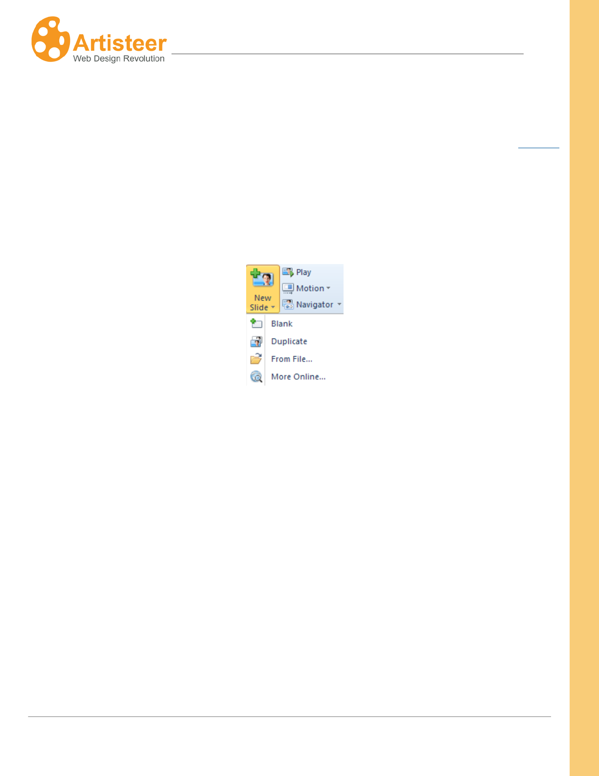
151
Artisteer4.0 |
151
Slideshow
Slide Show Headers are popular and attractive. You can create a slideshow in your Header or Content
in Artisteer using the Slideshow options. Now you do not need to master Flash to create a live header
and your visitors do not need to download a flash player to view your website.
To create a slide show, right click the header area and select New Slide. You can also use the New
Slide menu on the Header Tab.
In the New Slide Menu you select what kind of slide you would like to add to header.
Blank slides do not contain images, shapes, textures etc. but repeat the header design. For example, if
the Header is green, half transparent with round edges and a shade, the blank slide is also green, half
transparent, and also has round edges.
Duplicate slides copy the parent slide. This option is useful when you need two or more slides that look
alike.
Using the From File option you can upload an image from your computer and the More Online option
provides a gallery with free images that you can add as slide background.
To watch the slideshow press the Play button.
In the Motion menu you can adjust how each slide appears. Select Fade, Vetrical or Horizontal effect
to see the slides fade in and out, slide out from the top, bottom, or from the right or left side of the
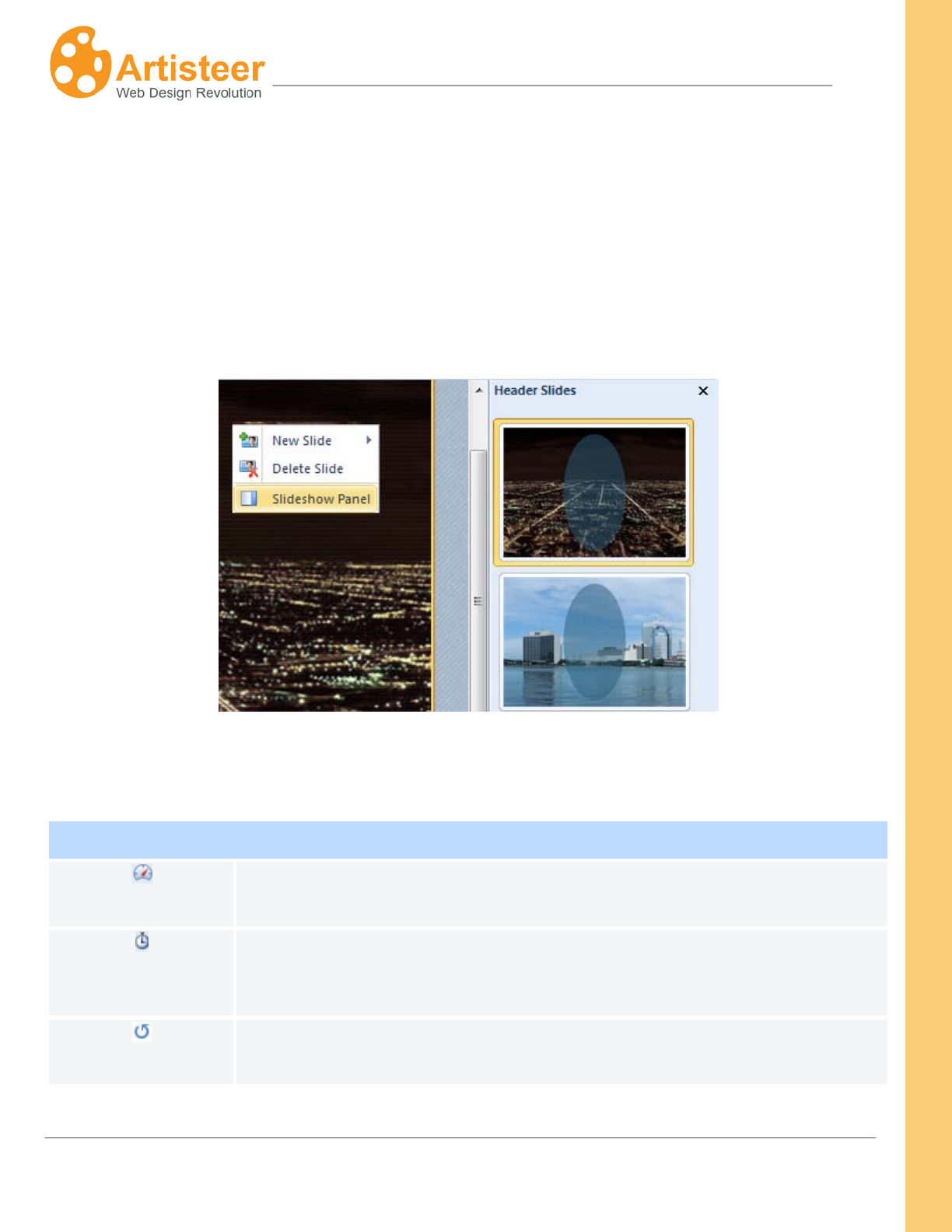
152
Artisteer4.0 |
152
header. Select Options to set the speed and delay values, and to enable or disable the slide show
repeat option.
When a header consists of two or more slides the slides are shown as bullets in the navigator. You
can adjust the navigator design and position using the Navigator menu. For extra customization press
the Options button that opens the Navigator menu in the side panel.
Right click the header area and select Slideshow Panel to enable the thumbnail preview.
Options
Slideshow
Speed
Specify the speed of the slide show with a slider from 100 to 1500 ms
Delay
Use the delay option to control how much time should pass before the next
slide is displayed. Available values: 1 - 10 s.
Repeat
Select “yes” to loop the slide show or “no” to let it play once
153
Artisteer4.0 |
153
Clicking the “Font Options…” button opens the Header Logo Name/Slogan dialog where you can
adjust the Font Settings such as the Font Family, Font Style, Font Size (in pixels), Effects, and
Character Spacing.
Navigator
Area
Specify the color, border color, border width, transparency, gradient and
contrast of the navigator area.
Item
Set the size (width, height), shape (radius) and distance (spacing) of bullets.
Passive
Specify the color, border color, border width, transparency, gradient and
contrast of the bullets which are not being displayed at the moment.
Active
Specify the color, border color, border width, transparency, gradient and
contrast of the bullet which is being displayed at the moment.
Hovered
Specify the color, border color, border width, transparency, gradient and
contrast of the bullet which is hovered.

154
Artisteer4.0 |
154
The list of fonts you see in Artisteer are based on the installed fonts for your system. Artisteer does
not support embedded fonts so you should pick fonts that are most likely to be on a wide range of
systems. Web-safe fonts are an industry recognized set of fonts that are most commonly available on
most computer systems. You can find a list of ‘web-safe fonts’ from many sources on the web.
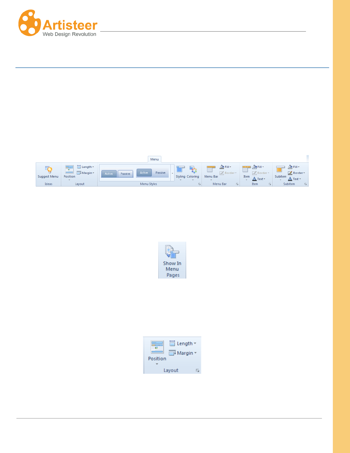
155
Artisteer4.0 |
155
Menu Tab
The Menu tab is used to control the position and design of the horizontal menu. The tab also includes
tools for managing the design of menu items and subitems. As always, you select the appropriate level
of customization using either the fully automated suggested design, or manually, using the
customization options on the Ribbon bar or in the …Options panel. Artisteer supports three of the most
popular Web 2.0 menu styles: classical (with separators), tabbed and buttons. You can regulate the
margins and text alignment as well as add effects such as texture, gradient, and transparency.
The Menu options include an extra option: Show In Menu Pages. By default in Artisteer the menu
items for the horizontal menu bar are the top-level pages of your website but you can change which
pages appear in the menu using the ‘Show In Menu Pages’ option.
Menu Layout
The Menu Layout helps to find the appropriate position, length and top margin.
Note: Artisteer supports only one horizontal menu, and adding more menu items than can fit across
the page will have unpredictable results.
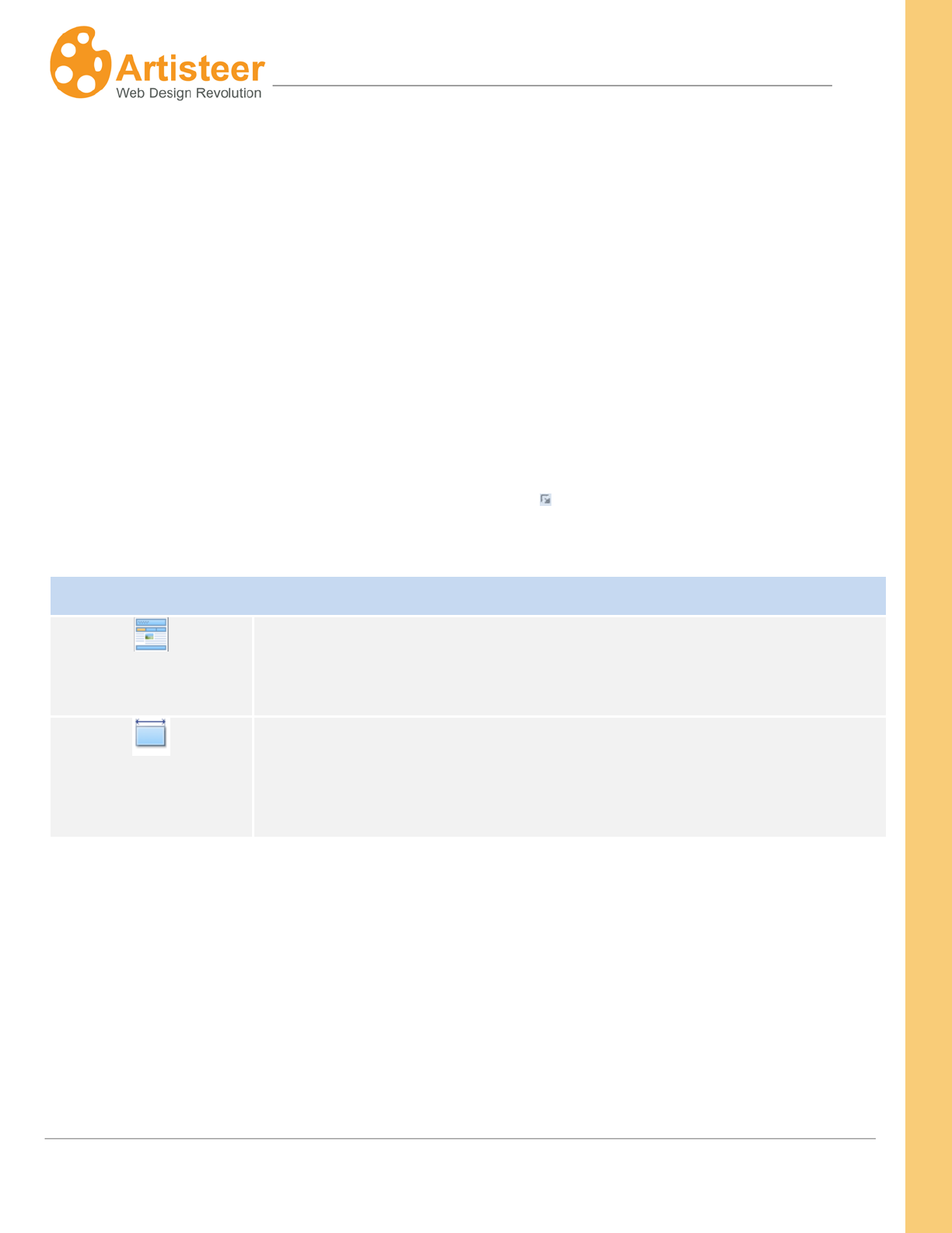
156
Artisteer4.0 |
156
The Position option suggests two position types: Inside Sheet and Outside Sheet. The menu located
inside the Sheet may be placed above and below the Header. If you select ‘Without Menu’, this
removes the horizontal menu from your pages.
Use the Length option to to make the menu fit the sheet (Sheet Width) or the page (Page Width).
Use the Margin option to set the distance from the top element. Positive top margin values range from
0 to 50 px; you can also select a negative margin of either –20 or -10 px value. The top margin can
also be adjusted in the Layout Options panel. Click More Margins to open the options.
Options
You can also these options by selecting the Custom Values icon in the Layout or Menu Styles
command group on the Ribbon bar.
Layout
Top Margin
Use this option to set the distance from the top element. Positive top
margin values range from 0 to 200 px; negative margin values range
from–200 to 0 px.
Top Outline
The Top Outline feature enables or disables the rounded menu corners of
the menu.
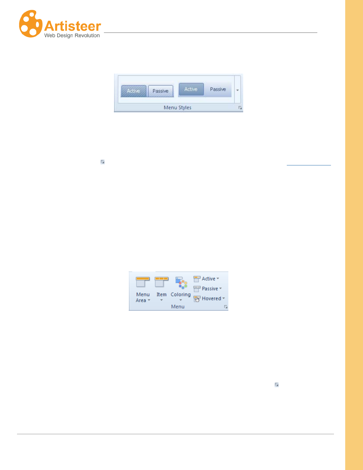
157
Artisteer4.0 |
157
Menu Styles
The Menu Styles group provides a gallery with ready-made Horizontal Menu styles. Select a
Horizontal Menu and use it as it is or customize the menu style in the Menu and Submenu groups.
Select the Custom Values icon for extra customization in the …Options panel (See Menu Options
below)
Menu
Refine the horizontal menu further by adjusting the styles of menu area and items. The styling options
are available inside the Menu Area, Item, Active, Passive and Hovered lists.
Use the Menu Area list to select a color, transparency value, border color and style, and effects such
as texture and/or gradient, radius and shadow for the menu background. You can choose one of the
suggested textures or insert a custom texture.
You may access the advanced settings in the Menu Options panel by selecting More Radiuses, More
Borders or clicking Gradient, Shadow Options, or by selecting the Custom Values icon. Texture
options are also located within the Texture and Texture Position tabs of the Menu Options dialog.
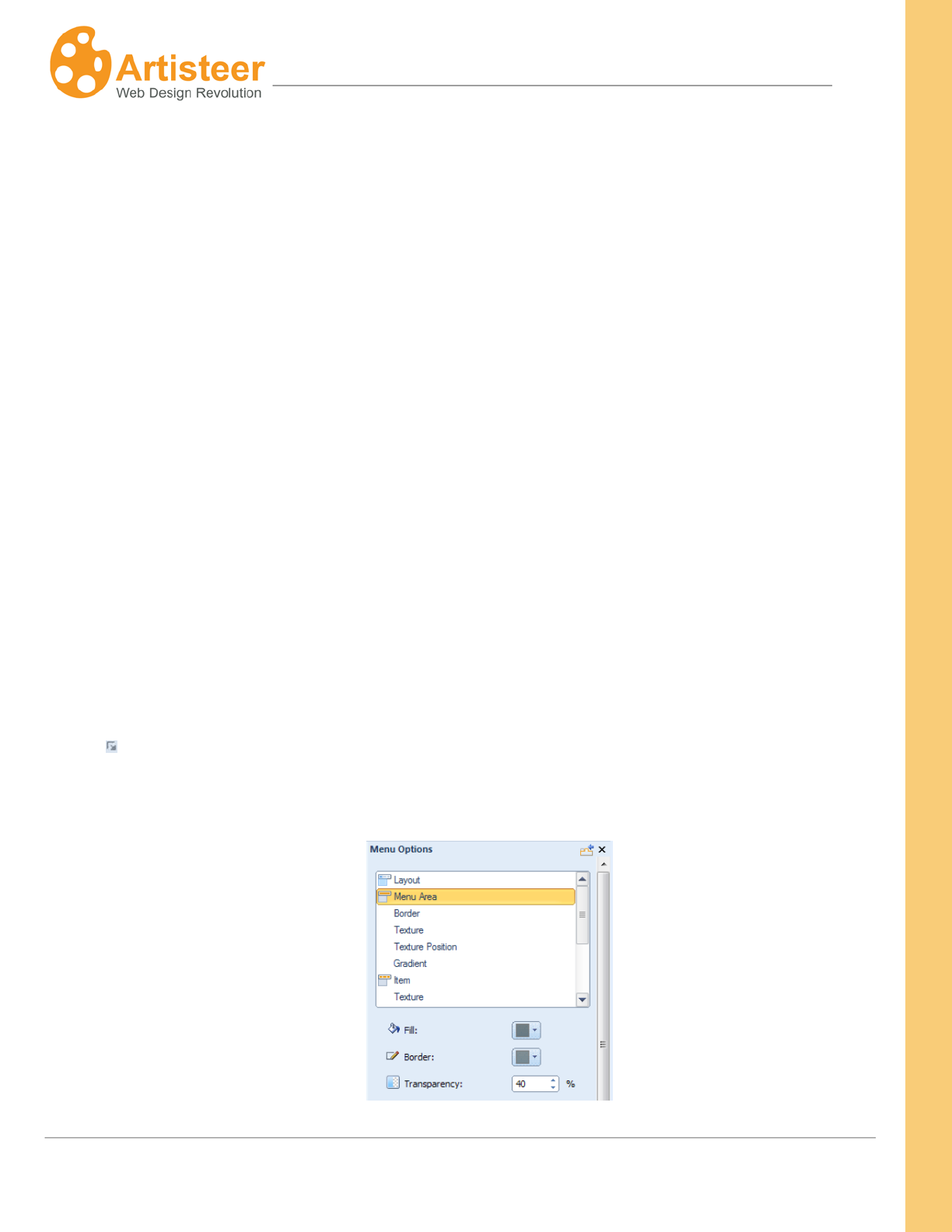
158
Artisteer4.0 |
158
Within the Item area of the Menu group you can set the shape, border and layout of menu items, add
effects such as texture and gradient, and adjust the style of the menu item text.
Artisteer supports three most popular Web 2.0 menu item shapes: classic rectangular with separators,
tabbed and buttons. The size of menu items can be adjusted by selecting the appropriate icon in the
list. The menu area size changes depending on the size of menu items. You can also control the
distance between the items, select a separator, set a margin value and align the menu item text (Item
> Layout). Besides, you can apply a Google Web font, theme font and one of the web safe fonts for the
menu item text (Item> Font Options > Font Family >Google Web Fonts).
The style parameters of the active, passive and hovered menu items can be configured in the
appropriate list within the Menu group. You can control the color, texture, gradient, border color,
transparency, text color and also enable or disable the underline of menu items.
Use the Coloring option to select a color scheme for the menu area, and the colors of the active and
passive menu items.
Options
To open the Menu Options click the More… or …Options buttons on the Ribbon or select a Custom
Values icon under the Menu group.
The Menu Options are arranged into several tabs on the Menu Options panel.
159
Artisteer4.0 |
159
Menu Area
Fill, Border Color,
Transparency
Select one of the theme colors, additional clolors or use a custom color for the
menu area and border. Set the transparency value: 0 – 100 % (fully
transparent)
Border
Top, Right,
Bottom, Left
Specify the weight and style (solid, dotted etc.) of the top, right, bottom, and
left borders.
Texture (Menu Area and Item)
Presets
Use this option to change the texture without leaving the Menu Option panel.
Blend Mode
Specify the way the colors of the texture and background blend.
Supported values are:
Softlight – Decreases the light effect of the image by decreasing the contrast
between the lighter and darker areas. Default.
Overlay – Increases the light effect of the image by increasing the contrast
between the lighter and darker areas.
Transparency
Set the texture transparency value: 0 -100 %
Color Weight
Use this to adjust the percentage of color the Menu Area fill color will have
when blended with the texture. .
Use this to adjest the color saturation (amount of gray in the color) of the
160
Artisteer4.0 |
160
Color Saturation
Menu Area fill color when it is blended with the texture.
Mask Mode
Enable or disable the mask mode and specify whether a mask should appear
along with the texture.
Contrast
Adjust the contrast of the texture and background
Smart Invert
Enables or disables the swap of the ornament and background colors of the
texture
Texture Position (Menu Area and Item)
Scale
The scale option allows to increase or descrease the texture saving the
original proportions. The scale values range from 10 % to 130 %
Texture repeat
The Texture repeat option controls the way the texture populates the menu
area. Choose from Fill, Horizontally, or Vertically modes or disable the Texture
Repeat option.
Position
Specify the texture position: Top Left, Center Left, Bottom Left.
Flip
Use the Flip option to get a mirror reflection of the texture. Supported values:
None, Vertical, Horizontal.
Rotate
Rotate the texture 90 degrees clockwise or counterclockwise, or disable the
Rotate option.
Gradient (Menu Area and Item)
Contrast
Specify the contrast between the starting and ending colors in the item
gradient. Supported values: -100 (solid color) to 100% (the most contrast
gradient).
161
Artisteer4.0 |
161
Item
Horizontal padding
Specify the horizontal distance between the Item Text and Item Borders.
Supported values: 0 – 50 pixels.
Vertical padding
Specify the top and bottom padding of the Menu Items. Supported values: 0 –
50 pixels.
Radius
Specify the Corner Radius (shape) of the Menu Item. Supported values: 0 -
100%.
Layout
Specify the Horizontal Margin, Vertical Margin, Item Distance and Border
Width of menu items.
Separator
Presets
Use this option to change the separator without leaving the Menu Options
panel.
Fill
Select the color of the separator. Supported colors: Theme Colors, Additional
Colors, Custom Color (More Colors…)
Shape and Coloring
Shape
Adjust the shape of items: Classic, Tabbed, Buttons.
Coloring
Use this option to select a color scheme for the menu area, and the colors of
the active and passive menu items.
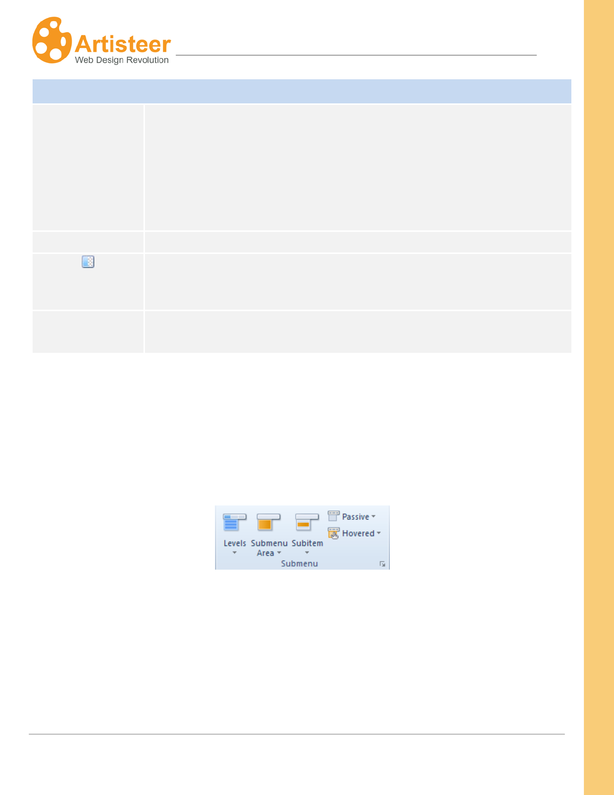
162
Artisteer4.0 |
162
Active, Passive, Hovered
Fill
Select the color of the active, passive, hovered item
Passive – state of the item when not selected.
Active – state of the item when selected.
Hovered – state of the item when the mouse cursor is hovering over the item
Border
Select the border color of the active, passive, hovered item
Transparency
Specify the transparency value: 0 – 100 %
Text
Adjust the item text color and style (regular, italic, bold, bold italic) and enable
or disable the text underline.
Submenu
This section provides the ability to control the appearance of items in the submenus that appear when
you select a menu from the menu bar.
You can adjust the following options:
• Enable or disable Multi-level menu (Levels option)
• Style of the Submenu Area
• Style the Subitems
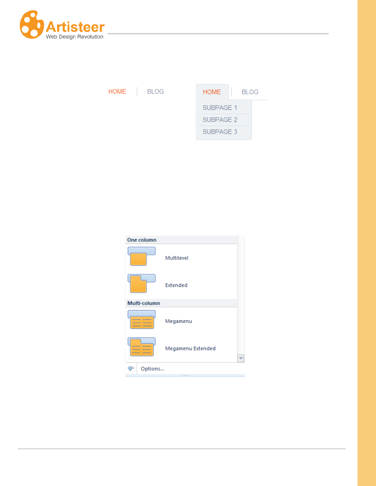
163
Artisteer4.0 |
163
The Levels option provides a choice of multilevel menus. A multilevel menu displays a list of menu sub
items. You can also select No Submenu if you would like a one level-menu with menu items only.
One-Level Menu Multilevel Menu
Multilevel menus are arranged into one-column and multi-column layouts. A menu with multi-column
layout is called Megamenu. You can select a simple or extended menu style. A simple Multilevel and
Megamenu style displays a list of sub items in a separate submenu area while in the extended style
the submenu area encloses the menu item.
Click Options… to open the Submenu Options and adjust how the submenu appears in smaller screen
resolutions, for example on mobile devices.
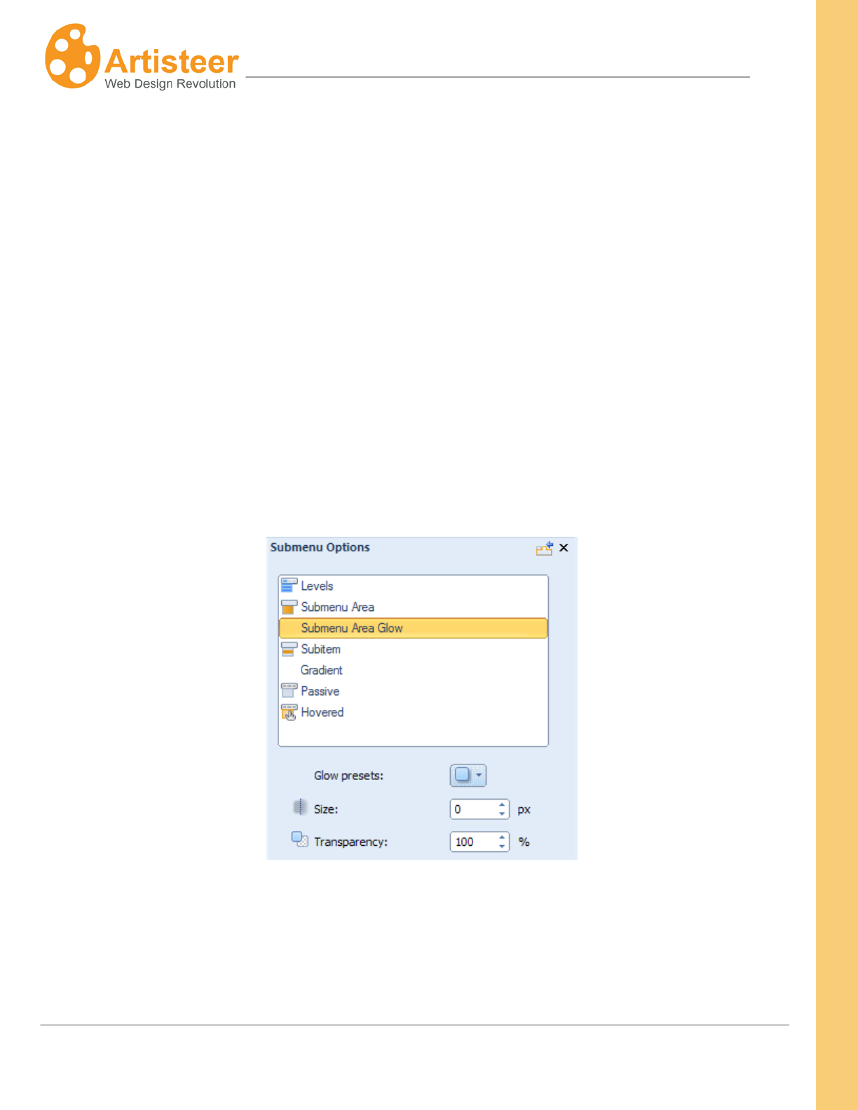
164
Artisteer4.0 |
164
In the Submenu Area list of options you can adjust the shape, radius (rounded corners), top margin,
padding, color, transparency, border weight, color and style and add the glow effect.
In the Subitem menu the available options are size, radius, border weight, border style, distance,
separator, gradient, and font options.
You can also adjust the style of the passive and hovered subitem states in separate lists. Use the
color, gradient, border color, transparency, text color and underline options to enhance the style of
subitems.
Options
If the default settings don't meet your needs, use the Menu Options panel to adjust the option settings.
Please note: The options are disabled if No Subitems is selected in the Levels list.
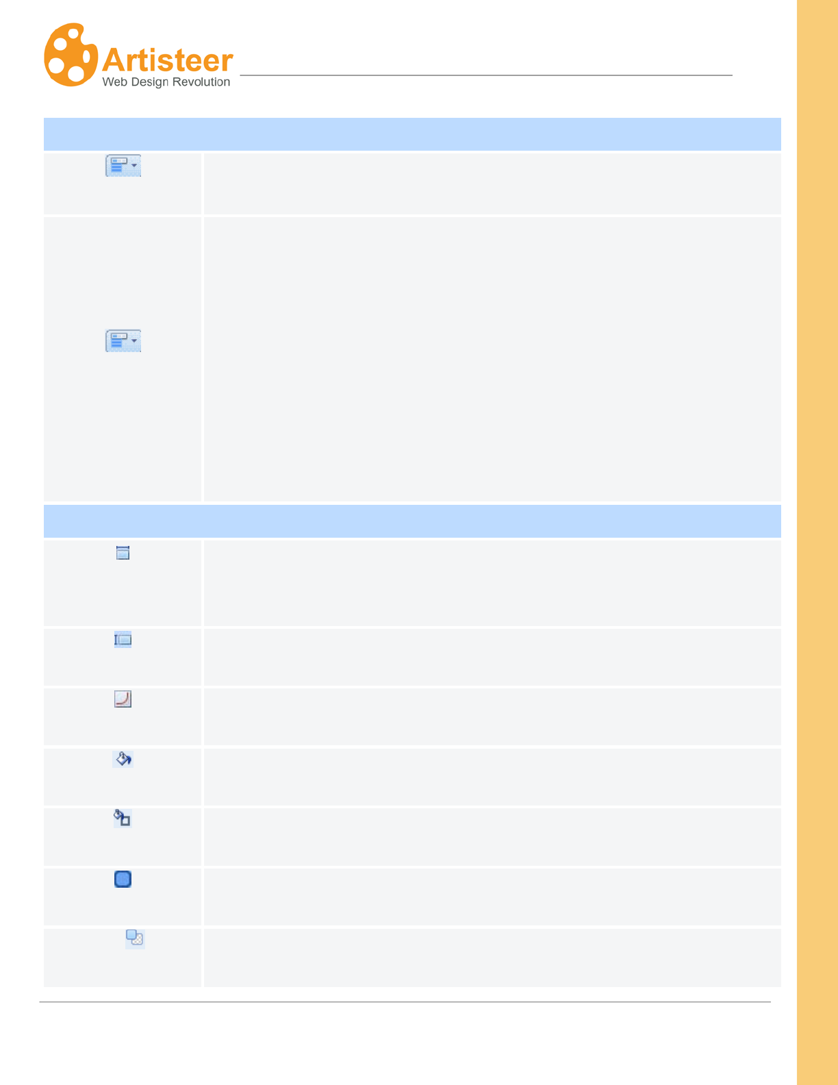
165
Artisteer4.0 |
165
Levels
Levels
Use this option to change the display of subitems without leaving the
Submenu Options panel.
Responsive Levels
Adjust how the submenu appears in smaller screen resolutions, for example
on mobile devices. Supported styles: One Level, Expand with reload, All
Open.
“One Level” implies that subitems are not shown in the horizontal menu.
“All open ”. If the screen width is 480 px or less, the subitems are displayed
under the menu items
“Expand with reload” suggests that clicking a parent item opens up a list with
subitems and loads the parent item page if the screen width is 480 px or less.
Submenu Area
Submenu Top
Margin
Specify the distance from the menu, in pixels. Supported values: 0 – 100
pixels.
Padding
Specify the spacing around the submenu area. Supported values: 0 – 30
pixels.
Radius
Select the radius of the rounded corners: 0 – 15 px
Fill
Specify the fill color of the submenu area
Border Color
Specify the border color of the submenu area
Border
Specify the border width: 0 – 5 px.
Transparency
Specify the transparency value: 0 – 100 %.
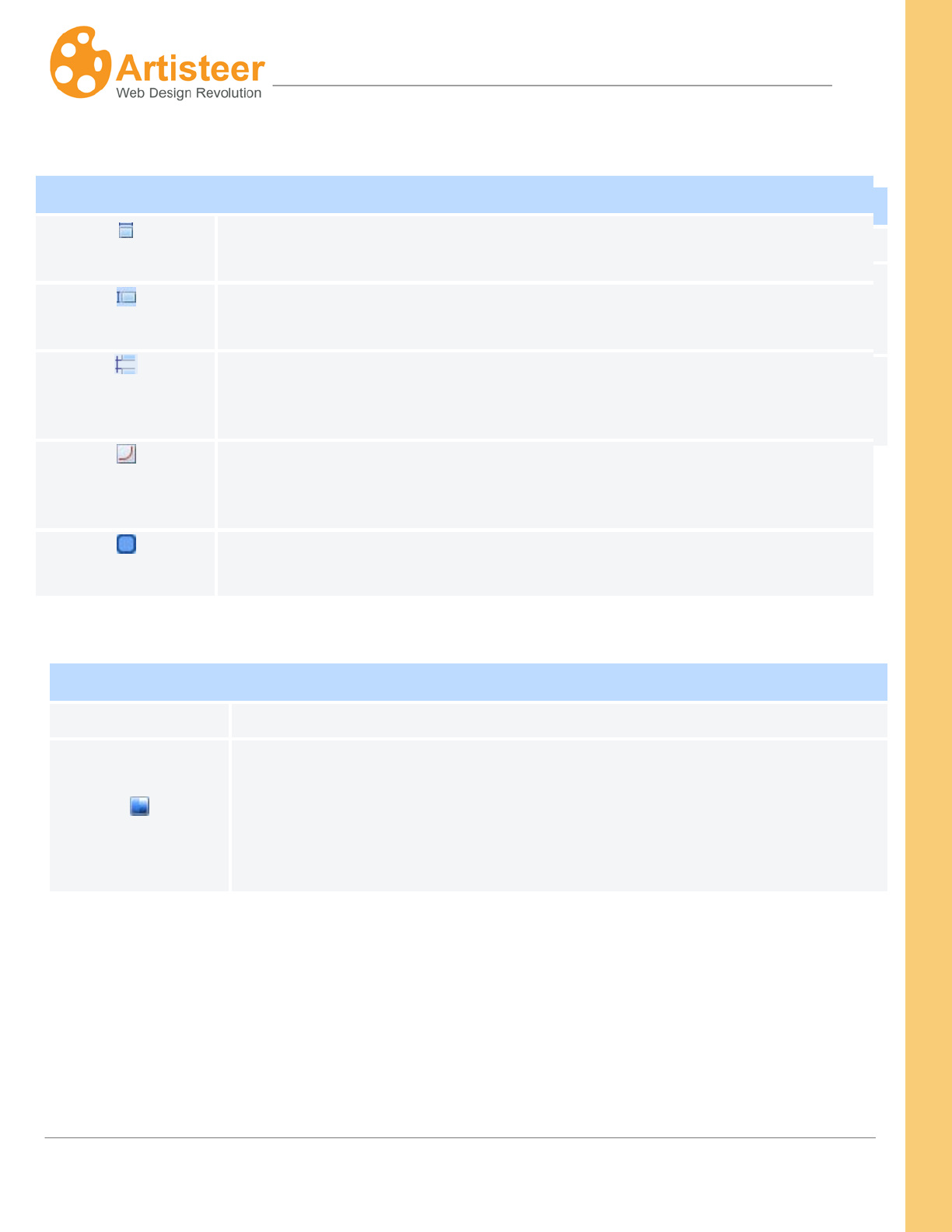
166
Artisteer4.0 |
166
Submenu Area Glow
Presets
Change the glow without leaving the Options panel
Size
Specify the glow size in pixels.
Transparency
Specify the transparency value: 0 – 100 %.
Subitem
Horizontal Padding
Specify the horizontal padding in the Subitem drop-down list, in pixels.
Supported values: 0 – 50 pixels.
Vertical Padding
Specify the top and bottom padding of the Menu Subitems. Supported
values: 0 – 50 pixels.
Distance
Adjust the distance between the subitems: 0 – 50 px.
Radius
Select the radius of the rounded corners: 0 – 15 px.
Border Width
Specify the width of the Subitem Borders. Supported values: 0 – 10 pixels.
Gradient
Presets
Change the gradient without leaving the Options panel.
Gradient contrast
Specify the contrast between the starting and ending colors in the Subitem
Gradient. Supported values: -100 (solid color) to 100% (the most contrast
gradient).
This option is disabled if you have not selected a gradient for the subitem.
167
Artisteer4.0 |
167
Passive/Hovered
Fill
Specify the fill color of the passive, hovered subitems.
Border
Specify the border color of the passive, hovered subitems.
Text
Specify the text color, enable or disable text underline.
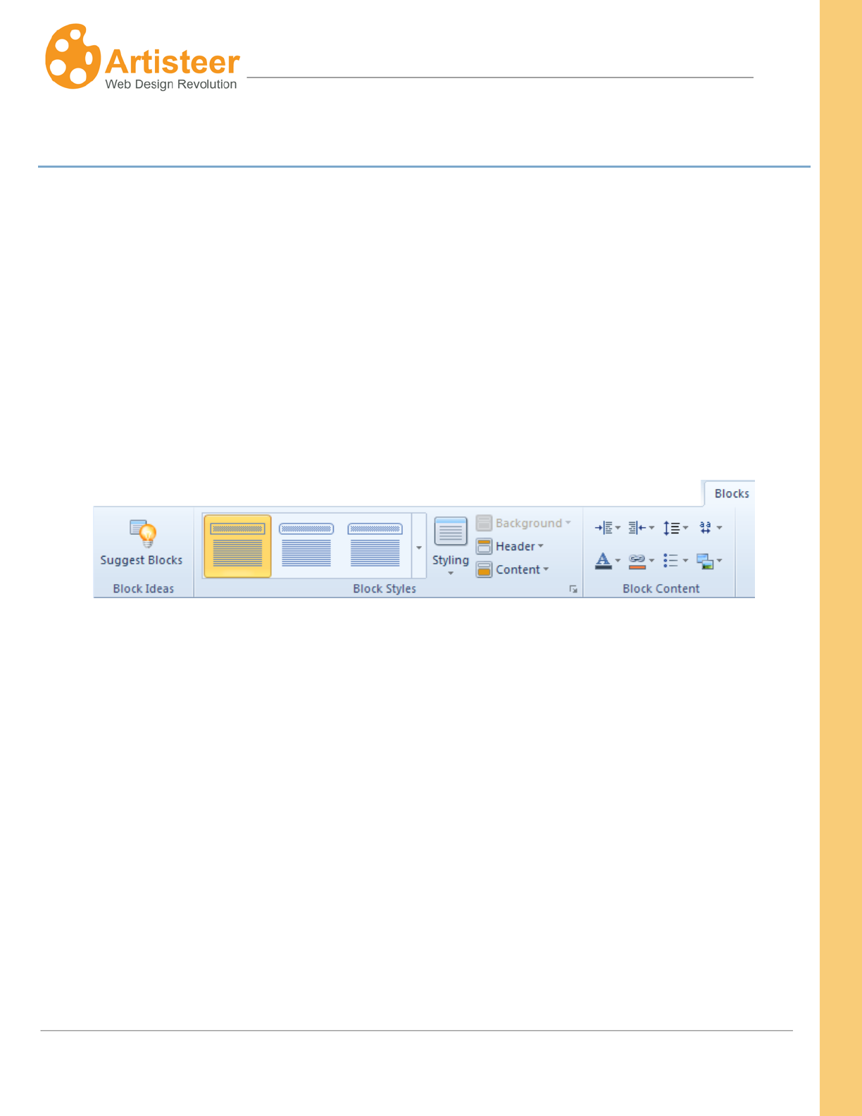
168
Artisteer4.0 |
168
Blocks Tab
Blocks present additional content that is usually located around the main content area. Things located
in the blocks include links, bookmarks, search fields, and the overall postings of the page. Blocks and
Vertical menu build the sidebar – a vertical strip at the right or left side from the main content.
In Artisteer you can select from a range of block styles, adjust the radius, block spacing and distance
(Styling), arrange, manage and style the block background, header and content. The block style
applies to all blocks on your website.
The options of the Blocks tab are united in three groups: Block Ideas, Block Styles and Block Content.
Let us look at them in more detail.
169
Artisteer4.0 |
169
Block Styles
Styling
The Styling option provides the ability to change block spacing, alter the distance between blocks, or
make the blocks more rounded by changing the radius value.
Block Styles
Gallery
You can choose a block style from the gallery. There are three major groups;
Simple, With Header and Without Header. The thumbnails give a basic idea
of the block design.
Styling
Radius – specify how round the corners of blocks should be (select a px
value from the list or set your custom value at More radiuses)
Block Spacing is the space around the block, which separates blocks and the
main content. Select a px value from the list or set your custom value at
More Spacings
Distance is the space between the block header and block content. Select a
px value from the list or set your custom value at More Distances.
Background
Specify the Inner padding value, adjust the color, border weight/color and
transparency of the background, add texture/insert from file, gradient and
shadow.
Header
Style the text, add an icon, fill the block header background with color, adjust
the border, add transparency, texture and/or gradient.
Content
Adjust the text padding, fill the block content background with color, adjust
the border, add transparency, texture and/or gradient.
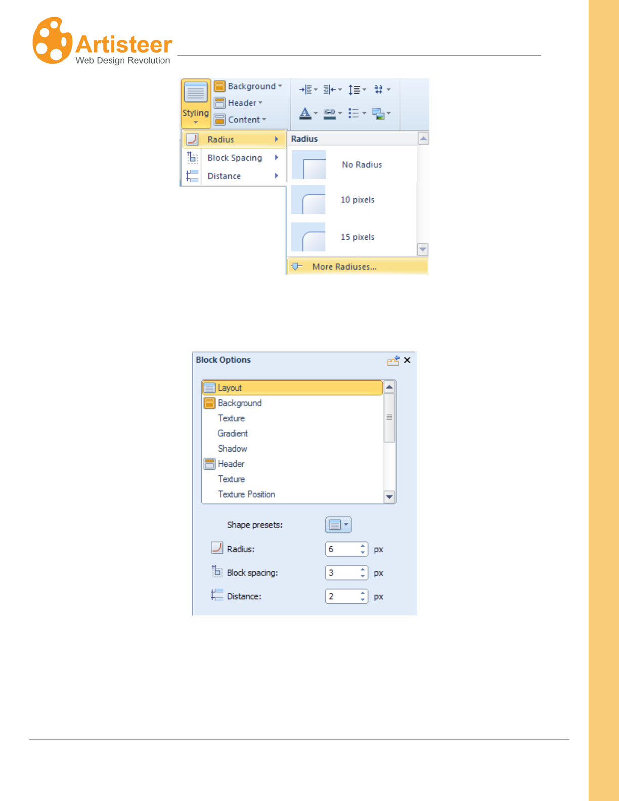
170
Artisteer4.0 |
170
Clicking on the “More….” buttons in Styling lists will open the Block Options panel where you can
adjust the layout options.
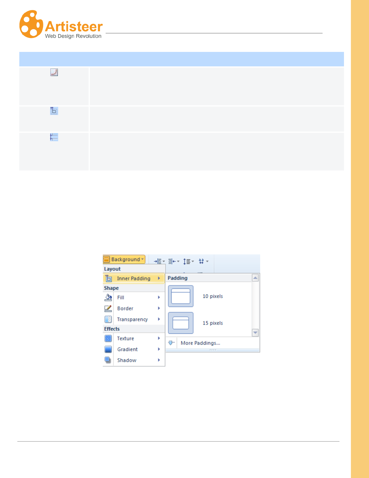
171
Artisteer4.0 |
171
Background
The Background option is active if the block style selected includes a border around the entire sidebar.
You can change the inner padding, background color, border and transparency of the blocks, as well
as add different Effects to your blocks.
Clicking on the “More……” buttons will open a Block options dialog:
Layout
Radius
Specify the Radius of Block Corners (shape). Supported values: 0 to 40
pixels. This option is not available if you have selected a block style that has
no border.
Block spacing
Specify the Spacing around blocks in pixels. Supported values: 0 – 40 pixels.
Distance
Specify the vertical distance between the Header and Body sections of the
Block. This option is not available if you have selected a block style without
borders around one or more sidebar items in a sidebar with a border.
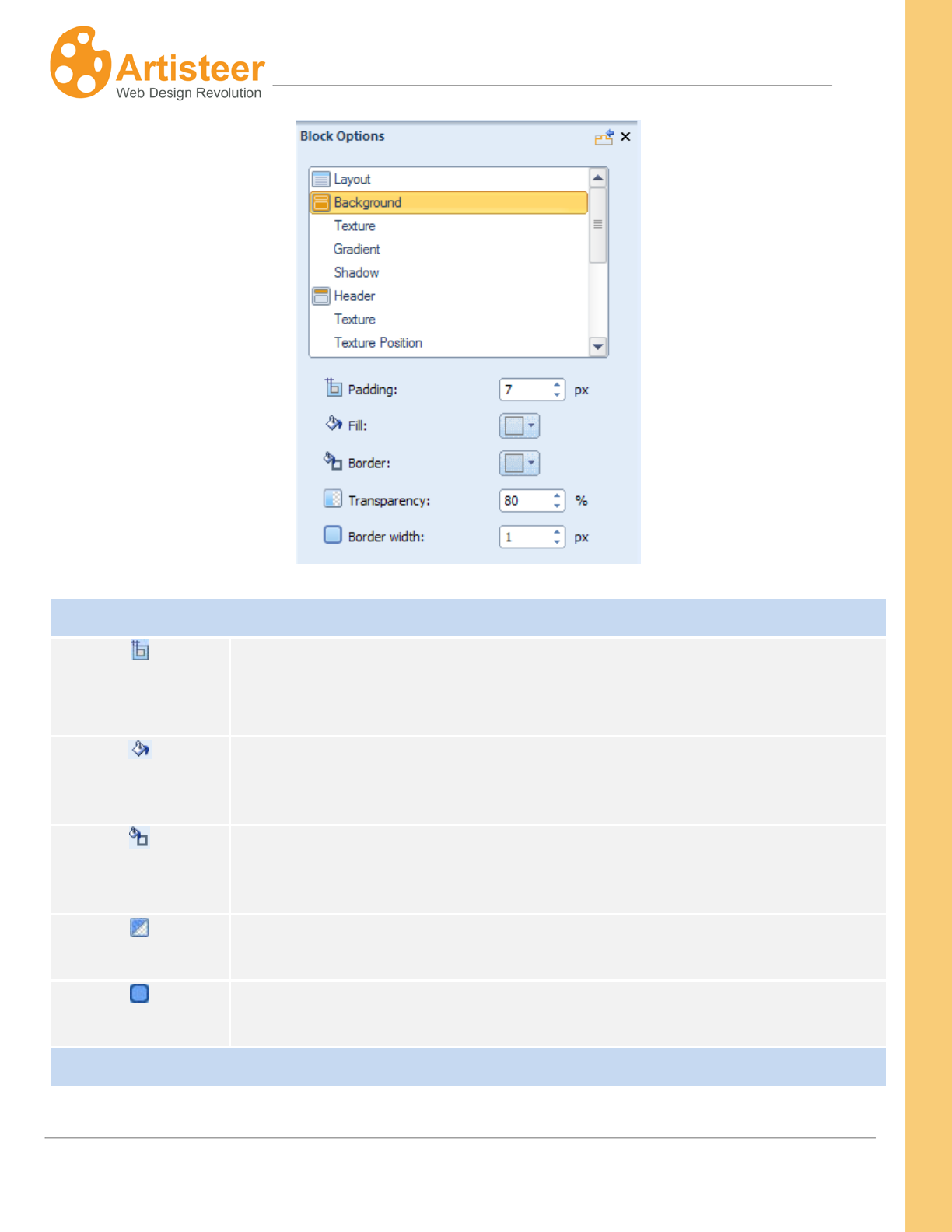
172
Artisteer4.0 |
172
Background
Padding
Specify the space between the outer borders of the Block and the content
area within the Block. Supported values: 0 – 50 pixels. This option is not
available if you have not selected a block style.
Fill
Specify the color of the block background
Border Color
Specify the border color of the block background
Transparency
Specify the Transparency of the Background. Supported values: 0 (fully
opaque) – 100% (fully invisible).
Border width
Specify the Block Border width. Supported values: 0 – 10 pixels. This option
is not available if you have not selected a block style.
Texture
173
Artisteer4.0 |
173
Transparency
Specify the Transparency of the Background. Supported values: 0 (fully
opaque) – 100% (fully invisible).
Blend mode
Specify how the Texture blends with the underlying layer of the block.
Options:
· Normal - No effect on the underlying layers.
· Soft Light - Lightens or darkens the image depending on the color of
the Texture Image.
· Overlay - Blends the layers together by changing the opacity,
darkness, and lightness of the Texture Image.
Color Weight
Set the amount of the Base Color applied to the header image. The Base
Color for the header is selected under Background Effects Color.
Supported values are from 0% to 100%.
Color Saturation
Specify the Base Color Intensity. The values range from 0 (completely
desaturated, grey) to 100% (completely saturated, full color intensity).
Supported values are from 0% to 100%.
Gradient
Presets
Change the gradient without leaving the Options panel.
Gradient contrast
Specify the luminance difference between the starting and ending colors of
the gradient. Supported values: -100 (solid color) to 100% (the most contrast
gradient).
This option is not available if you have not selected a gradient (Blocks
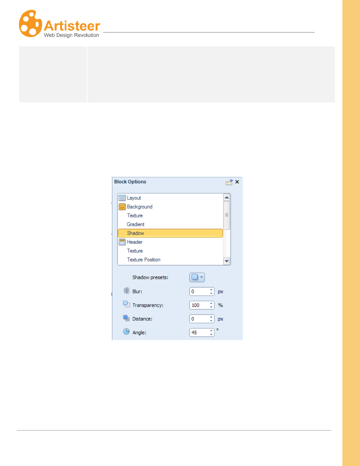
174
Artisteer4.0 |
174
Block Styles
Background
Gradient).
If you select a template with a shadow effect, the Shadow option will provide the ability to change size,
angle and opacity of the block shadow as well as indicate the distance between the shadow and the
block borders.
Just click on the “More Shadow…” button in the Background Effects Shadow list.
Specify the shadow options. The options are disabled for no-block styles selected in the "Block Styles"
list.
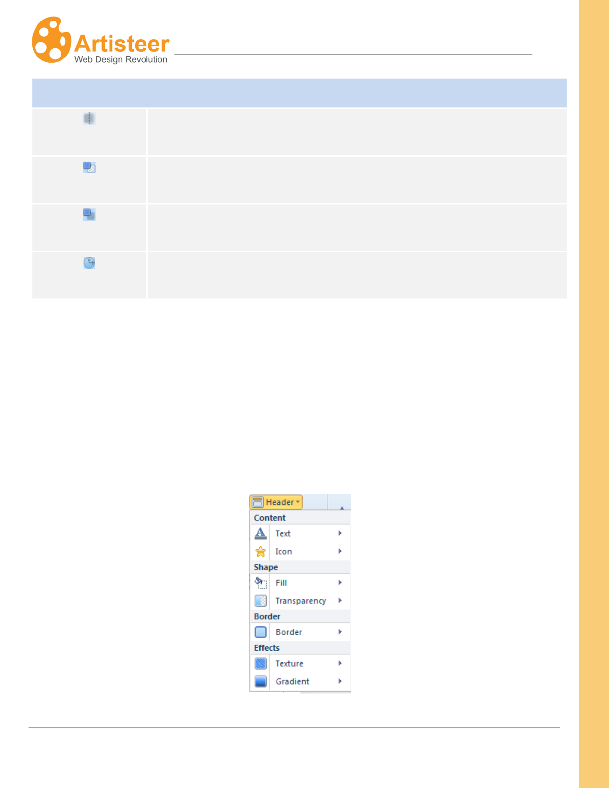
175
Artisteer4.0 |
175
Shadow
Blur Specify the Shadow size. Supported values: 0 – 20 pixels.
Transparency
Specify the Shadow Opacity. Supported values: 0 (fully transparent) – 100%
(fully opaque).
Distance Specify the Shadow Offset in pixels. Supported values: 0 – 20 pixels.
Angle
Specify the Shadow Angle starting from the edges of the block. Supported
values: -180° to 180°.
Header and Content
Using the Ribbon allows you to adjust the font, icon, and shape of the Block Headers. You can also
enhance the design by adding a texture and a gradient, or by inserting a custom texture or a custom
icon image.
The Ribbon for content are similar to those for the Header. You can adjust the design of the content
shape and add visual effects. The unique feature of Block Content is control over text padding.
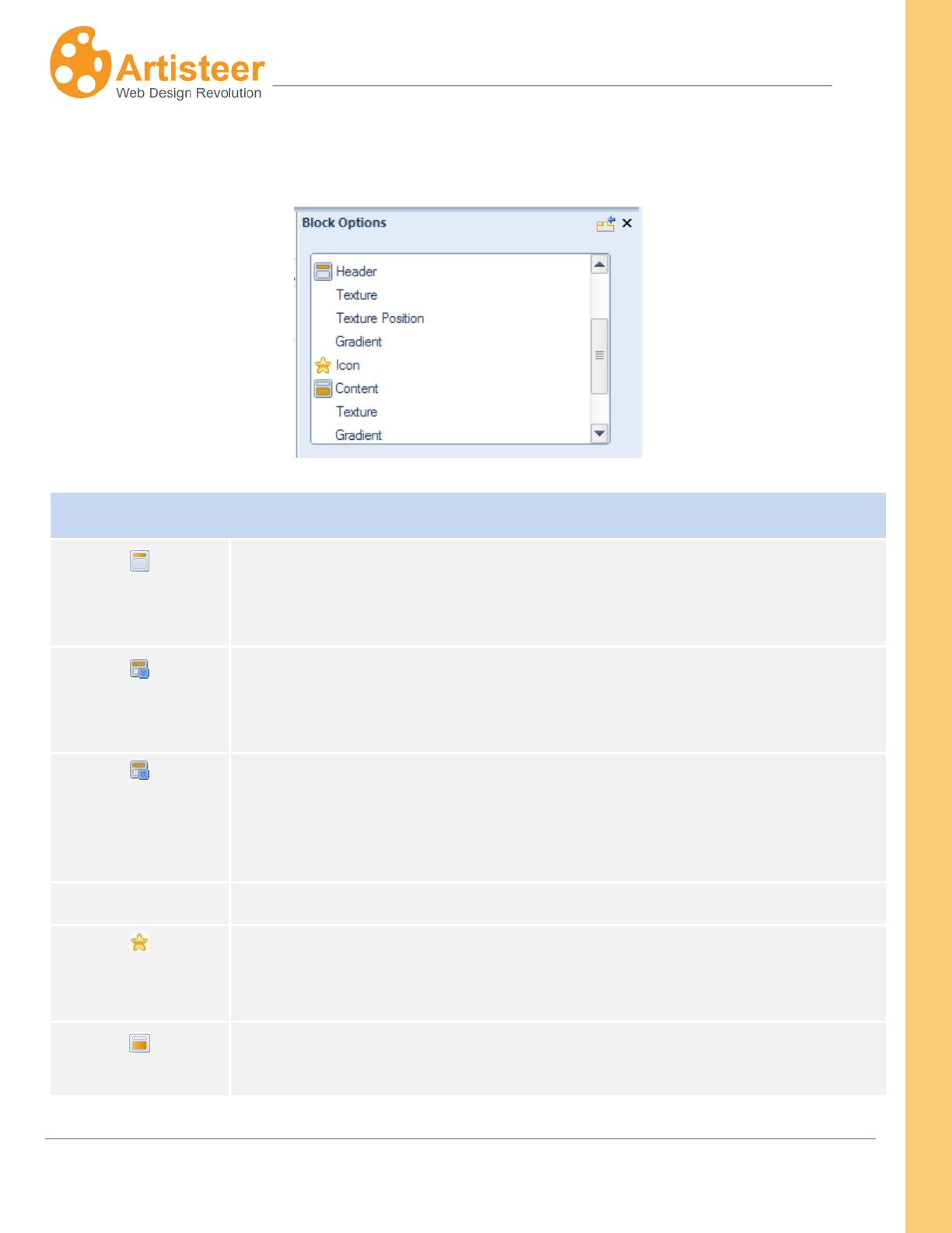
176
Artisteer4.0 |
176
Clicking on the “Texture Options…” or “Gradient Options…” in the appropriate list will open the Block
Option dialog where you can adjust the settings.
Block Header and Content
Header
Specify the value of the Vertical Padding (0 -25 px), the Background color
and Border color, Transparency (0 – 100%), Text Styling, and the Width of
the Block Header Border (0 – 10 px). and Transparency (0 – 100%).
Header Texture
Within this section you can adjust the Transparency (0-100%), Blend Mode
(overlay, softlight, normal), Color Weight, Color Saturation, Contrast, and
Smart Invert.
Header Texture
Position
This section contains the following settings: Scale (10 – 130%), Texture
Repeat (fill/horizontally/vertically), Position (top left / center left/bottom left),
Flip (vertical/horizontal), and Rotate (CW 90/CCW 90).
Gradient
Specify the Gradient Contrast (-100 – 100 %)
Icon
Change the icon, enable/disable the use of the original icon size, and specify
the Offset value (0-20 px).
The Options for Block Content include Padding (0 – 50 px), Fill, Border Color,
Transparency and Border Width (0 -10 px). The Texture and Gradient options
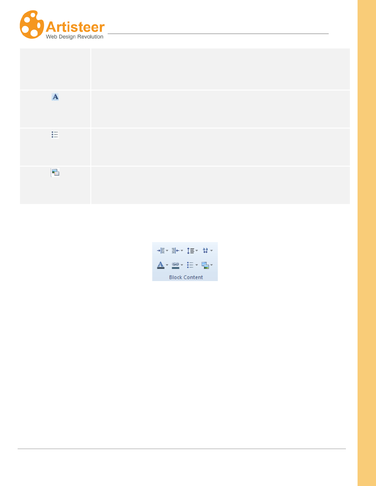
177
Artisteer4.0 |
177
Content, Texture,
Gradient
include: Blend Mode, Transparency (0 (fully opaque) to 100% (fully
transparent)), Color Weight, Color Saturation, and Gradient Contrast (-100
(solid color) to 100%).
Text and Hyperlink
Adjust the Color, Font Family, Size, Style and Alignment of the content and
hyperlinks.
Bullets
Change the bullet icon using the Presets option, adjust the Offset (0-20 px),
enable/disable Recoloring and the use of the original bullet image size.
Image
Adjust the Border Width and Margin of the Images in block content
Block Content
Within the Ribbon you can apply the following font options:
• Margin Left
• Margin Right
• Line Spacing
• Character Spacing
• Font Options
• Link Options
• Bullets
• Image Options
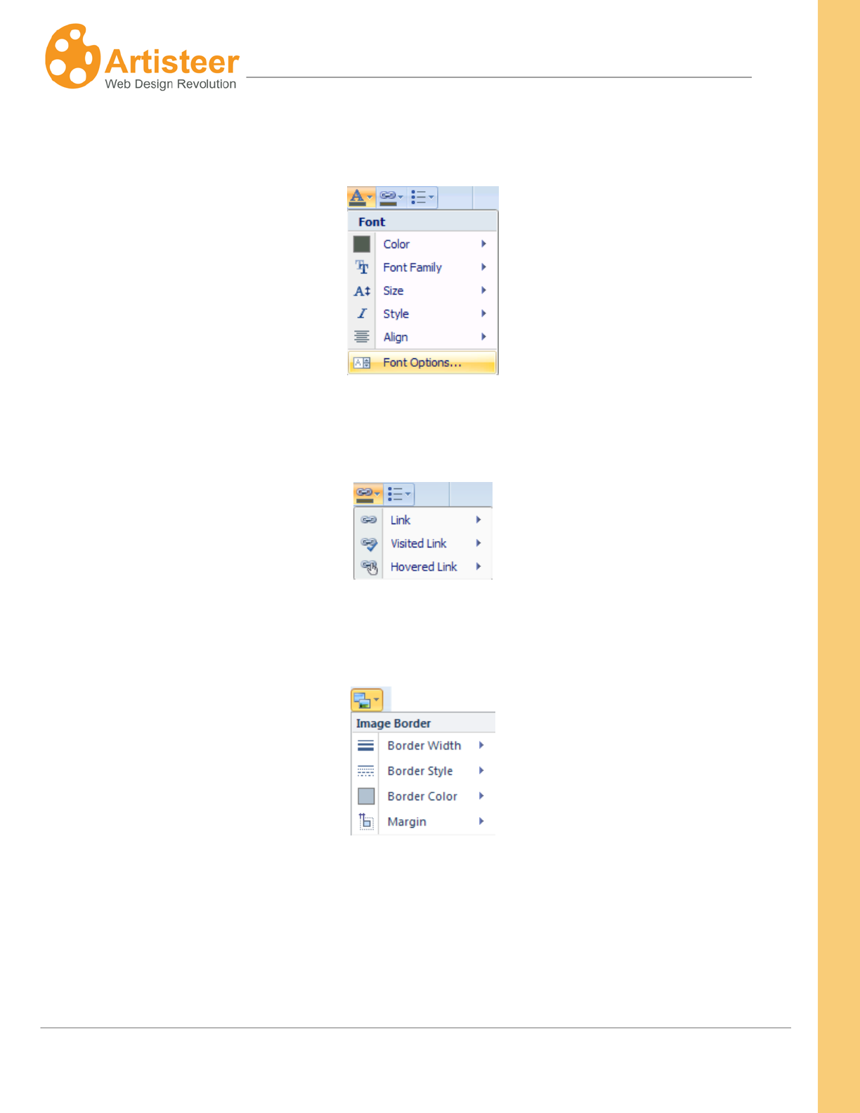
178
Artisteer4.0 |
178
The Font settings allow you to modify the font color, font family, font size, font style, and text
alignment:
You can also use the standard font settings to design how hyperlinks appear and create variants for
visited and hovered links:
The Image settings allow you to adjust the margin around the image, and design the appearance of
the image border.
Options
Clicking on the “Font Options…” button will open the Article Content-Text options dialog where you
can adjust such Font Settings as:
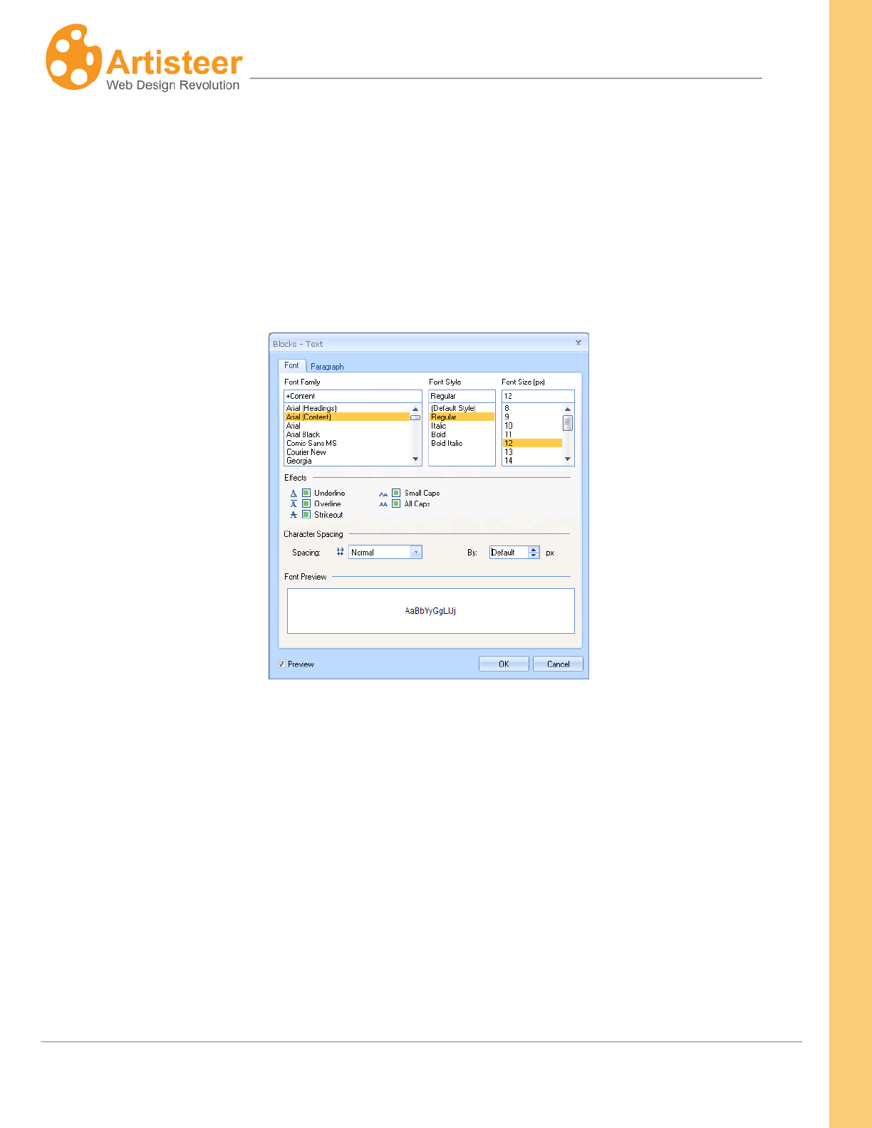
179
Artisteer4.0 |
179
• Font Family
• Font Style
• Font Size (in pixels)
• Effects
• Character Spacing
And the Paragraph settings like Alignment, Indentation and Spacing.
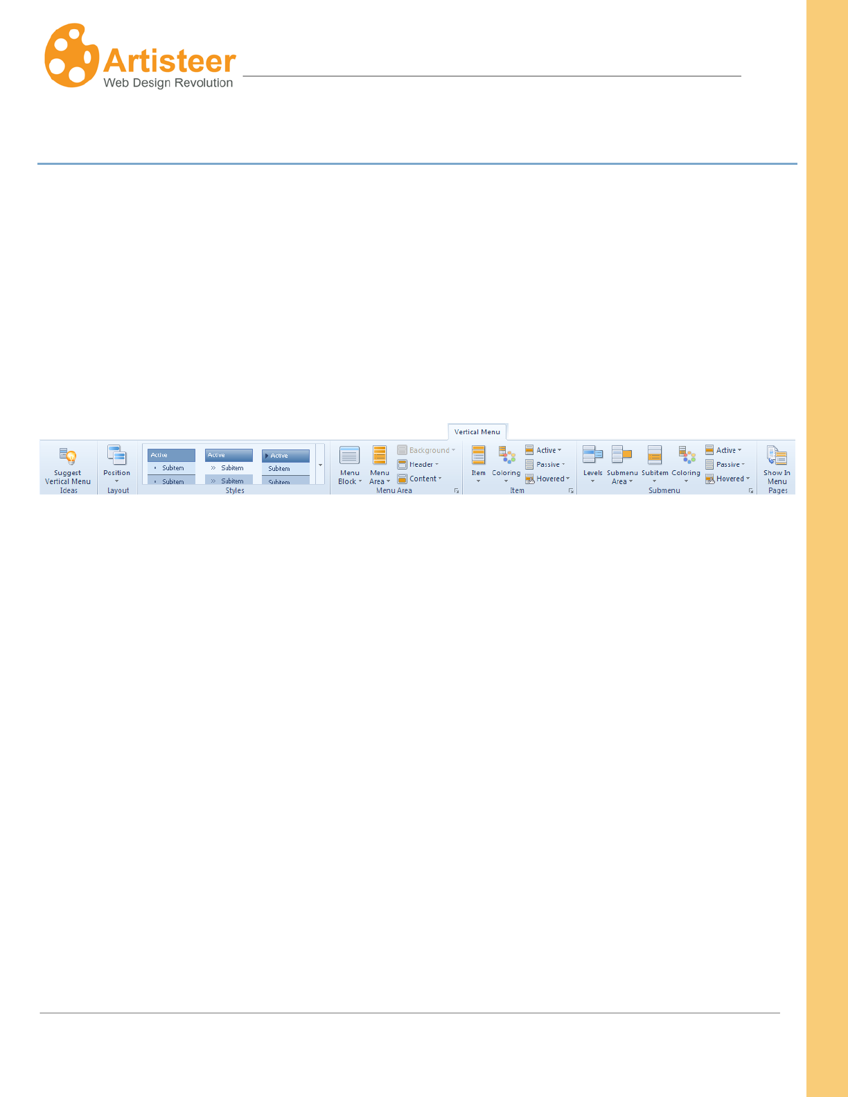
180
Artisteer4.0 |
180
Vertical Menu Tab
Both Vertical and Horizontal Menus are the elements of navigation and design. Vertical Menus are
usually located at the top of the right, or left sidebar (column). Designing Vertical Menus is a creative
task. Artisteer provides many settings, which are arranged on the Ribbon bar in five main groups:
Layout, Styles, Menu Area, Item, and Submenu.
The Ideas group includes the Suggest Vetical Menu option. Use this option to see some of the
possible V-menu designs. The Pages group also includes the Show In Menu option. Use this option to
select which pages should be displayed in menu.
Layout and Styles
The options of these sections provide the ability to select the position of the Vertical Menu in the
general layout of the page as well as to select one of the most popular vertical menu styles. Open the
Position list to choose the appropriate place for your Vertical Menu and look through the Styles
gallery to find the type of Vertical Menu you prefer.
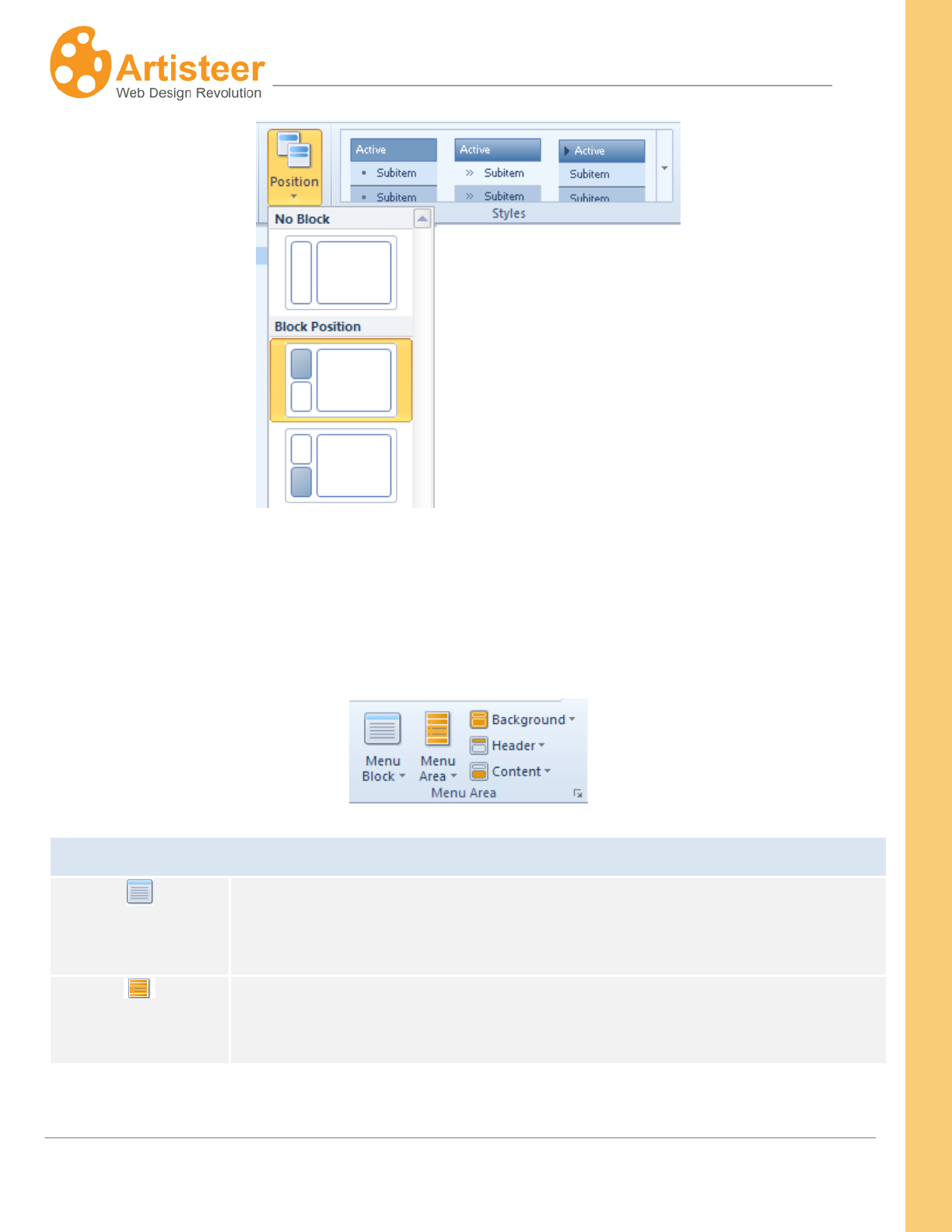
181
Artisteer4.0 |
181
Menu Area
Using the Menu Area options, you can adjust the color and shape of the Menu Bar, add such effects
as texture, gradient and shadow, and manage the design of the vertical menu Header and Content.
Menu Bar
Menu Block
Contains menu block layouts. The layouts are arranged into three groups:
Simple, With header, Without Header. The layout you select determines
which other options are available to style the menu.
Menu Area
Select the appropriate Margin, Radius and/or Distance.
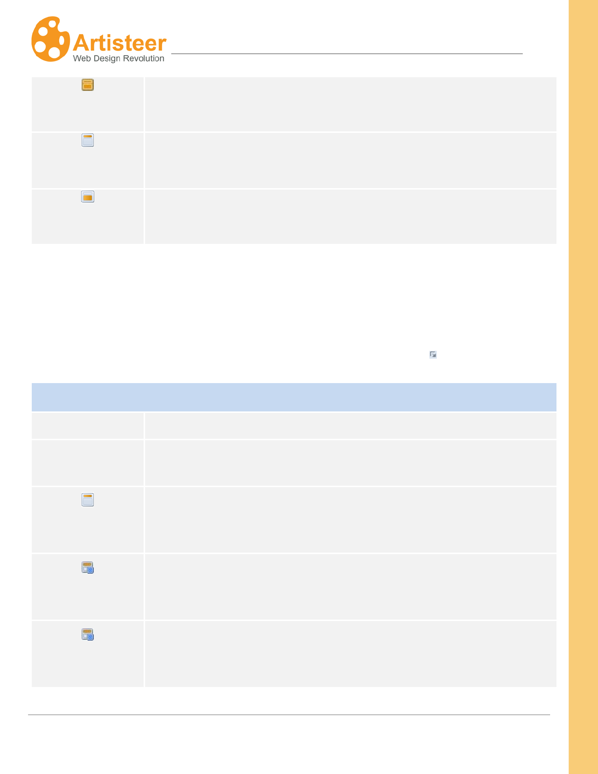
182
Artisteer4.0 |
182
Background
Adjust the Inner Padding, Shape (color, border, transparency), and add visual
effects (texture, gradient, shadow).
Header
Adjust the Content (text, icon), Shape (color, border, transparency) and add
visual effects (texture, gradient).
Content
Adjust the Content (text padding), Shape (color, border, transparency) and
add visual effects (texture, gradient).
Options
The Options for Background, Header, and Content are similar to those you can specify for other blocks
in the sidebar. For a detailed description of the Options see the previous section on Sidebar and
Block Styles. You can access the Options by clicking on the Custom Values icon.
Block Options for Vertical Menu
Layout
Specify the Radius, Margin and Distance values.
Background
Adjust the background of the Vertical Menu and set the Gradient, Texture
and Shadow values.
Header
Specify the value of the Vertical Padding (0 -25 px), the Background color
and Border color, Transparency (0 – 100%), Text Styling, and the Width of
the Block Header Border (0 – 10 px) and Transparency (0 – 100%).
Header Texture
Within this section you can adjust the Transparency (0 -100%), Blend Mode
(overlay, softlight, normal), Color Weight, Color Saturation, Contrast, and
Smart Invert.
Header Texture
This section contains the following settings: Scale (10 – 130%), Texture
Repeat (fill/horizontally/vertically), Position (top left / center left/bottom left),
Flip (vertical/horizontal), and Rotate (CW 90/CCW 90).
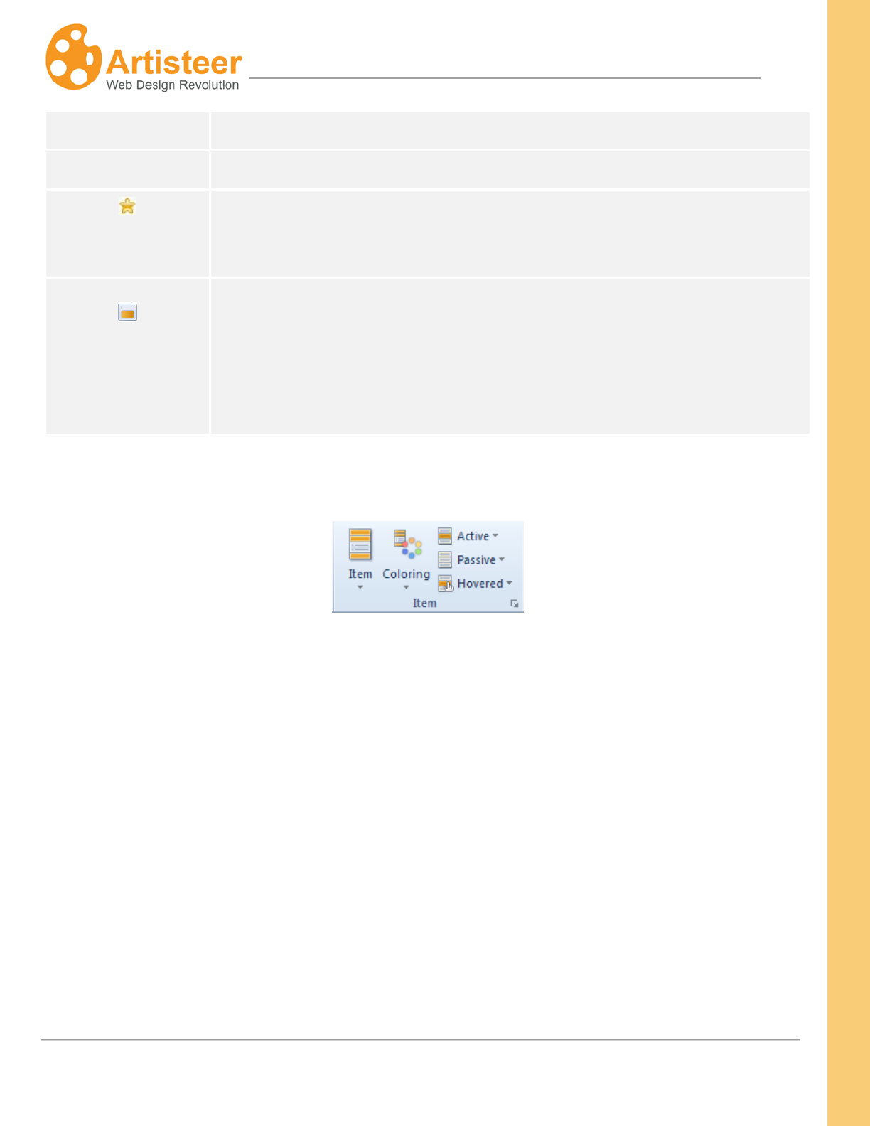
183
Artisteer4.0 |
183
Position
Gradient Specify the Gradient Contrast (-100 – 100 %)
Icon
Change the icon, enable/disable the use of the original icon size, and specify
the Offset value (0-20 px).
Content, Texture,
Gradient
The Options for Block Content include Padding (0 – 50 px), Fill, Border Color,
Transparency and Border Width (0 -10 px). The Texture and Gradient options
include: Blend Mode, Transparency (0 (fully opaque) to 100% (fully
transparent)), Color Weight, Color Saturation, and Gradient Contrast (-100
(solid color) to 100%).
Item
Menu Item options let you adjust the design of the menu item’s shape (shape, distance, height,
radius), border (border weight, border style), and content (icon, separator) as well as to add visual
effects (texture, gradient, shadow) and style the text (font family, size, style). Icons and separators add
zest to your design while standard Fill, Border and Text
A
options are for adding finishing touches.
Coloring
You can adjust the design of the Active, Passive and Hovered items by modifying the Fill (fill, texture,
gradient), Border Color, Transparency and Text (text color, underline) options.
scheme, that helps highlight the difference between active, passive and hovered items in
the menu.
184
Artisteer4.0 |
184
Options
The Menu Item options of the Vertical Menu are similar to those of the Horizontal Menu. Select the
Custom Values Icon to enter the panel of advanced customization.
Menu Options for Vertical Menu
Item: Texture,
Texture Position,
Gradient
Specify the Height, Distance and Radius values. Adjust the Texture, Texture
position and Gradient Options (see Backround Options).
Border
Adjust the Border Width (0 – 5 px) and Style (solid, dotted, dashed, double,
groove, ridge, inset, outset).
Shadow
Use the Shadow options: Size, Transparency, Distance, and Angle. The
Shadow options are active only when a shadow is added.
Icon
Change the icon, specify the Offset value (distance between the image and
the subitem text, from 0 – 20 px), and adjust the icon Fill color of the passive,
active and hovered subitems.
Coloring
Change a color scheme of the Subitems without leaving the Options panel.
Active, Passive,
Hovered
Adjust the background color, the border color, the transparency and text color
of the Active, passive and hovered subitems; enable or disable the Underline
option.
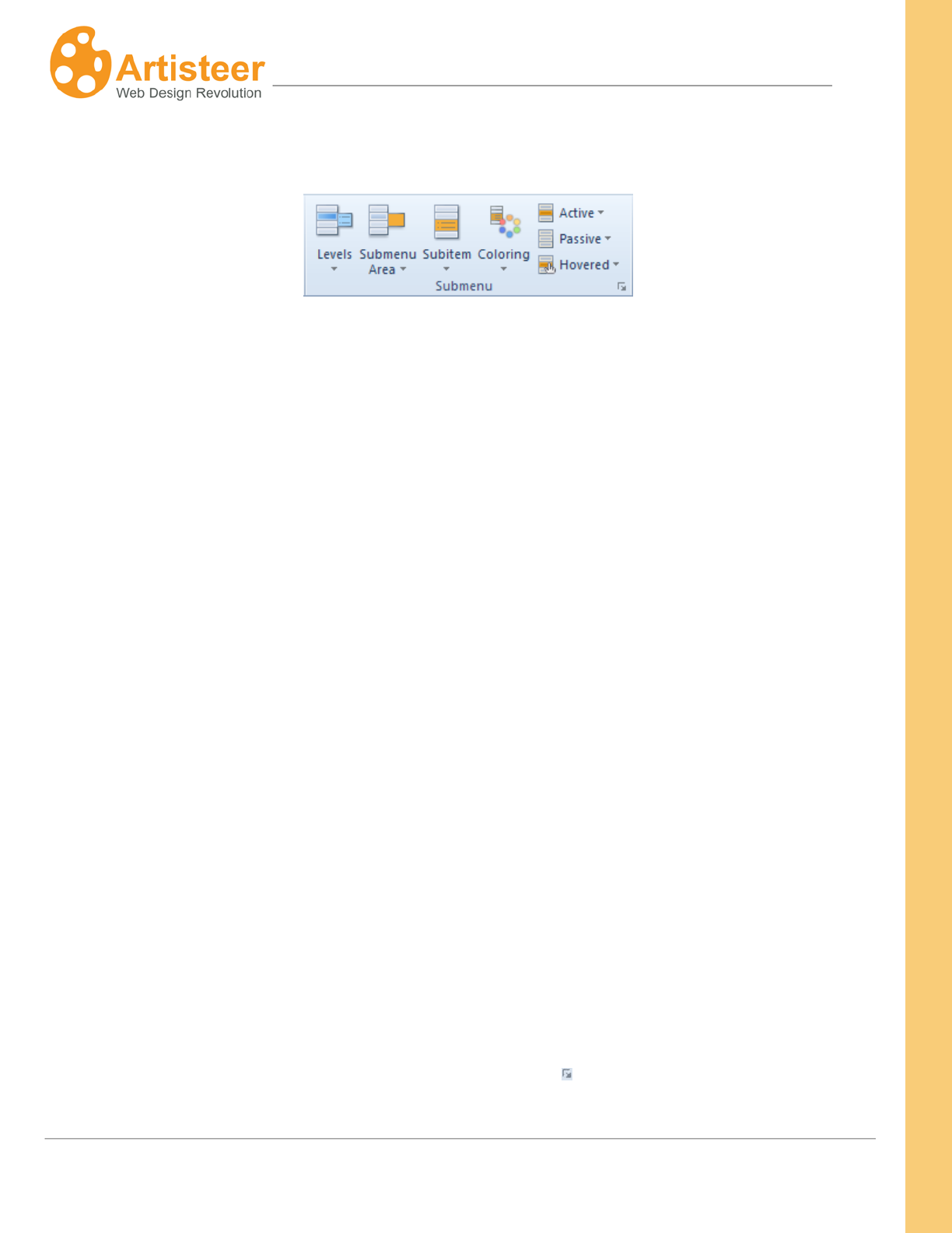
185
Artisteer4.0 |
185
Submenu
The Ribbon bar options for Submenu are very similar to that for Items. There are settings for adjusting
the shape (vertical offset, height, and distance), content (icon, separator) and effects (gradient) of
subitems.
The appearance and design of the Submenu Area is adjusted in a separate menu using the shape
(size, shape, radius), fill (fill, transparency), border (color, weight, style), and effects (shadow) options.
One of the most important design options for subitems is the way they are opened. You can adjust the
dynamics of subitems by opening Levels and selecting one of the following options: “One Level”
(subitems are not displayed), “Expand with Reload” (clicking a parent item opens up a list with
subitems and loads the parent item page), “Expand on Click” (clicking a parent item opens up a list
with subitems but does not load the parent item page), “Expand on Hover” (hovering a parent item
opens up a list with subitems but does not load the parent item page), “Popup on Hover” (a subitem list
expands to the right of a parent item on hovering a parent item) or “All Open” (all subitems are shown
in the menu).
A Coloring
You can also adjust the design of the Active, Passive and Hovered subitems by modifying the Fill (fill,
gradient), Border Color, Transparency and Text (text color, underline) options.
scheme helps highlight the difference between active, passive and hovered subitems in
the menu.
Options
You can access the Options by clicking on the Custom Values icon.
186
Artisteer4.0 |
186
Submenu Options
Levels
Apply one of the appropriate Subitem display modes: “One Level” (subitems
are not displayed), “Expand with Reload” (clicking a parent item opens up a
list with subitems and loads the parent item page), “Expand on Click” (clicking
a parent item opens up a list with subitems but does not load the parent item
page), “Expand on Hover” (hovering a parent item opens up a list with
subitems but does not load the parent item page), “Popup on Hover” (a
subitem list expands to the right of a parent item on hovering a parent item)
or “All Open” (all subitems are shown in the menu).
Submenu Area,
Shadow
Adjust the Size (0 – 15 px), Border, Radius, Fill and Transparency options of
the Submenu Area. Use the Shadow options: Size, Transparency, Distance,
and Angle. The Shadow options are active only when a shadow is added.
Subitem, Gradient
Specify the value of the Vertical Offseteight (height of the submenu, from 16 -
50 px), Distance (distance between subitems, from 0 - 50 px), Radius and
Border Width. Adjust the Gradient Contrast. The Gradient options are active
only when a gradient is added.
Separator Specify the Width and Color of the Separator.
Icon
Change the icon, specify the Offset value (distance between the image and
the subitem text, from 0 – 20 px), and adjust the icon Fill color of the passive,
active and hovered subitems.
Coloring Change a color scheme of the Subitems without leaving the Options panel.
Active, Passive,
Hovered
Adjust the background color, the border color and text color of the Active,
passive and hovered subitems; enable or disable the Underline option.
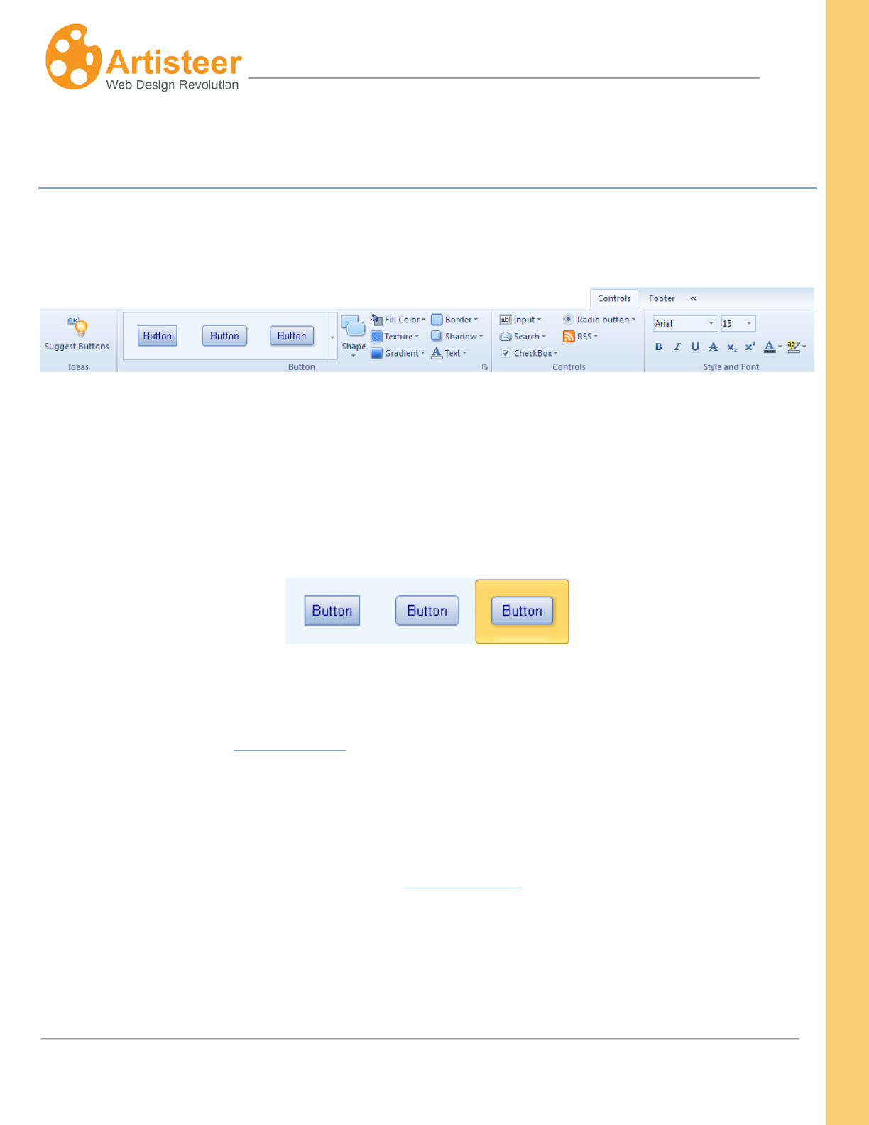
187
Artisteer4.0 |
187
Controls Tab
Use the Controls tab to change the shape and style of buttons, input fields, search boxes, check
boxes, radio buttons, and RSS links on your website.
The options on the Controls tab are arranged into four groups: Ideas, Button, Controls, Style and Font.
Click the Suggest Buttons on the Ideas group to some of the possible button designs.
Select from a wide variety of button styles from the gallery on the Button group. You can choose
buttons with more rounded corners, something in between, or completely rectangular in shape.
The Button section also allows you to change the parameters of such button style options as Shape,
Color, Texture, Gradient, Border, Shadow, and Text. Click the Custom Values icon for more options in
the …Options panel (see Button Options).
In the Controls group you select the style of controls that were added in the Edit tab. The style
galleries are available for input fields, search boxes, check boxes, radio buttons, and RSS links. You
can select an RSS icon from the gallery or insert a custom icon from file. Select More Options… for
extra customization in the …Options panel (see Control Options).
The Style and Font group provides text styling options for the inserted controls. The options are
disabled when no controls are added in the Edit tab.
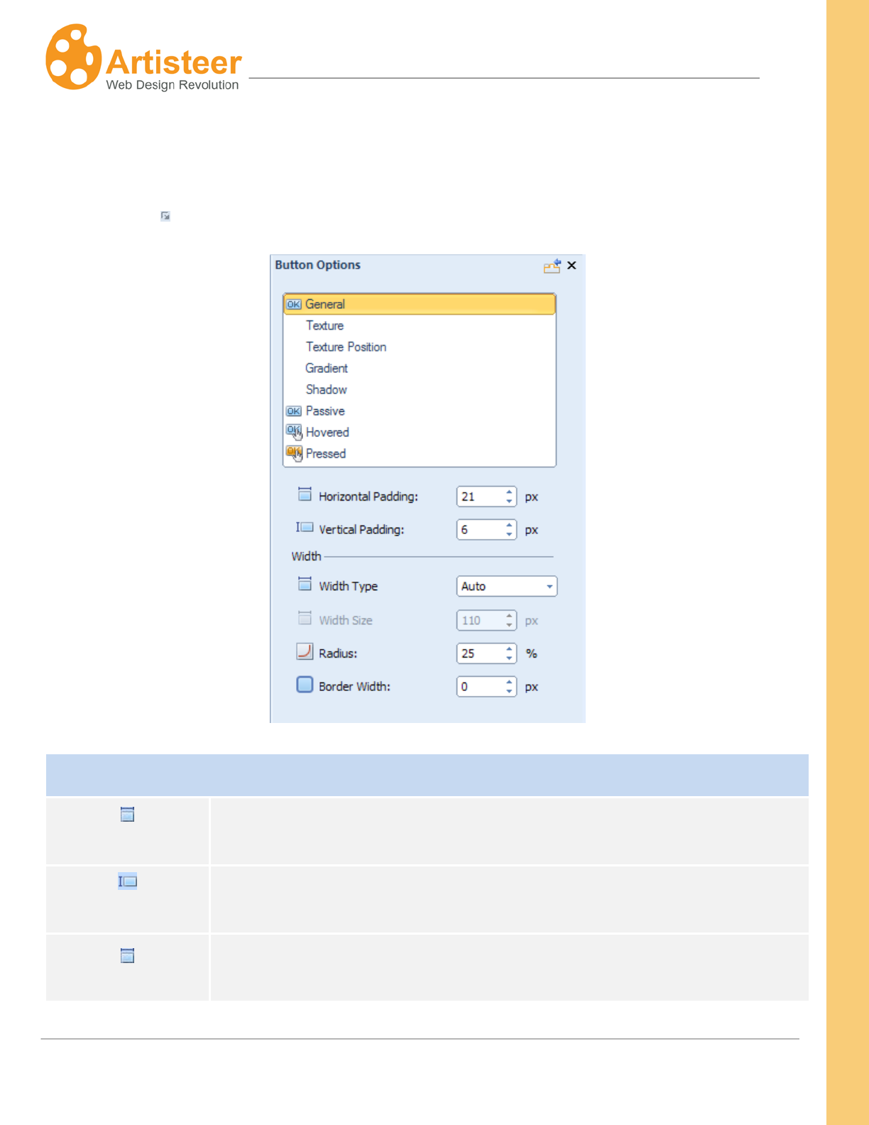
188
Artisteer4.0 |
188
Button Options
Artisteer provides a wide variety of Button options you can use to customize your buttons. Select the
Custom Values icon under the Button group to open the panel.
Button
Horizontal padding
Specify the horizontal distance between the Button Caption and Button
Borders. Supported values: 0 – 50 pixels.
Vertical padding
Specify the vertical distance between the Button Caption and Button Borders.
Supported values: 0 – 50 pixels.
Specify the Width Type (auto or fixed) and/or Width Size (when fixed width
type). Width Size values range from 0 to 200 px.
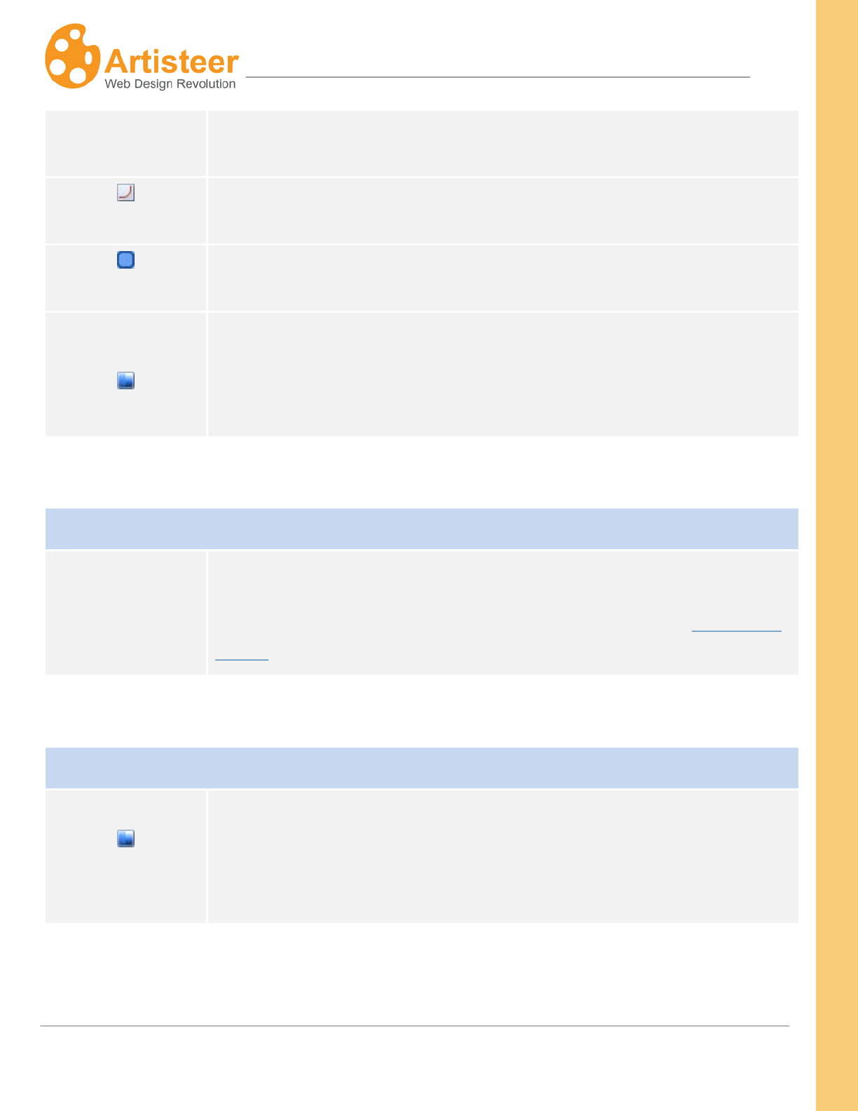
189
Artisteer4.0 |
189
Width Type, Width
Size
Radius Specify the Button Corners. Supported values: 0 – 100%.
Border width Specify the Width of the Button Borders. Supported values: 0 – 10 pixels.
Gradient contrast
Specify the Contrast between the starting and ending colors in the button
gradient. Supported values: -100 (solid color) to 100% (the most contrast
gradient). This option is not available unless you have selected a button
gradient.
Texture, Texture Position
Texture, Texture
Position
The Texture settings are very similar to the same options you can set for the
page background. For detailed information on Texture settings see the
subsections for Texture Options and Texture Position under the Background
section described above.
Gradient
Gradient contrast
Specify the Contrast between the starting and ending colors in the button
gradient. Supported values: -100 (solid color) to 100% (the most contrast
gradient). This option is not available unless you have selected a button
gradient.
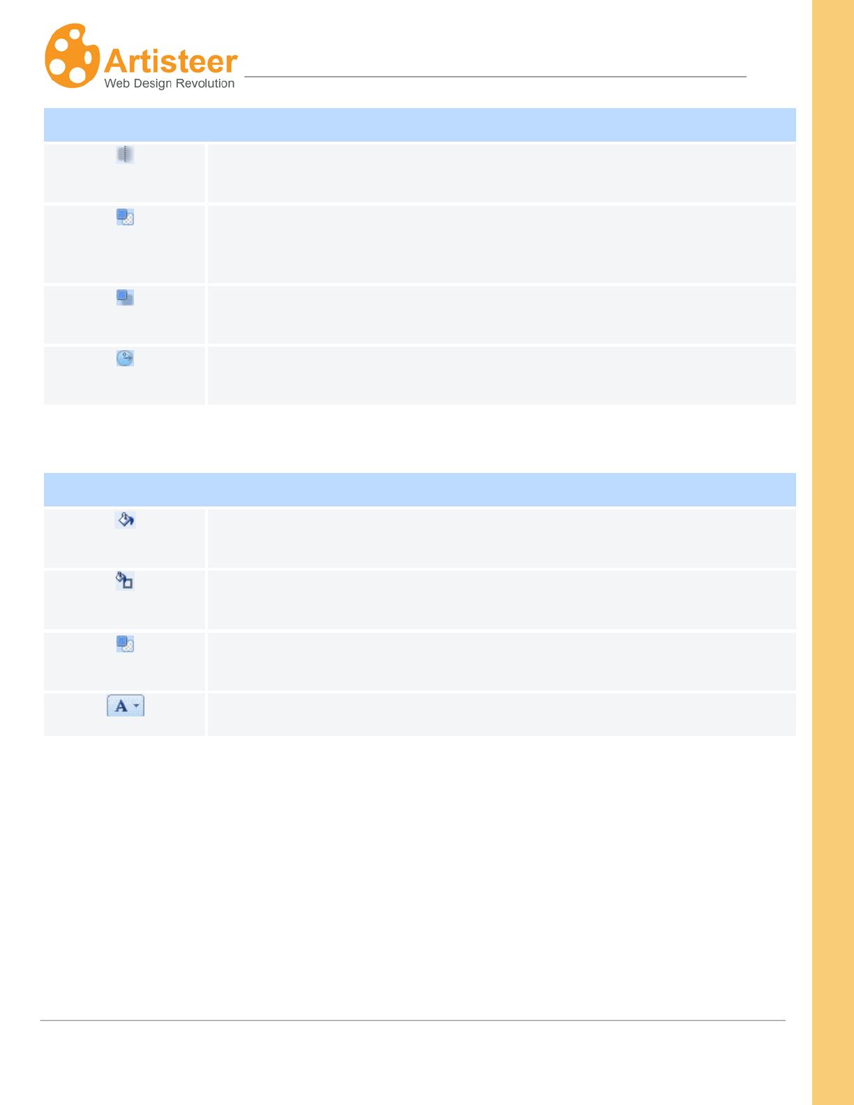
190
Artisteer4.0 |
190
Shadow
Blur
Specify the Blur Size of the shadow. Supported values: 0 – 20 pixels.
Transparency
Specify the Shadow
Transparency. Supported values: 0 (fully transparent) to 100% (fully opaque).
Distance
Specify the Shadow Offset in pixels. Supported values: 0 – 20 pixels.
Angle
Specify the Angle at which the shadow is cast from the button. Supported
values: -180° to 180°.
Passive, Hovered, Pressed
Fill
Specify the fill color of the passive, hovered and pressed buttons.
Border
Specify the border color of the passive, hovered and pressed buttons.
Transparency
Specify the transparency value of the passive, hovered and pressed buttons.
Text
Specify the text color, and style of the passive, hovered and pressed buttons
To finish the Button design you can change the overall Fill of the Buttons, or change the Text settings.
The Text option allows you to change the color of Buttons and Hovered Buttons, as well as, adjust
Font settings.
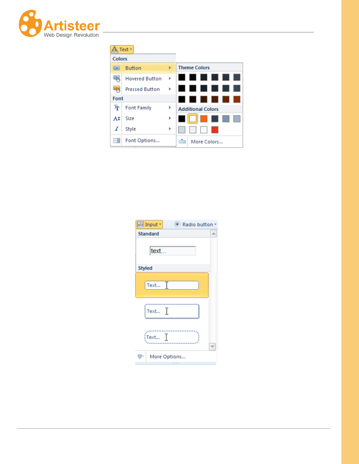
191
Artisteer4.0 |
191
Control Options
The Control options appear in the Options panel when you select More Options in the Input, Search,
CheckBox, Radio button, and RSS list.
192
Artisteer4.0 |
192
Options
Input Options
Adjust the Width, Vertical Offset, Radius and Text style in the Input section.
Also modify Gradient, Border, Shadow and Error styles in the appropriate
sections.
Search Options
Specify the Width, Height, Radius and Text parameters in the Search Control
section. Adjust the Icon, Border, Gradient and Shadow options in the
appropriate sections.
CheckBox Options
Specify the Icon, Shape and Text parameters in the CheckBox section.
Adjust the Color, Transparency and Border of the Pressed, Hovered and
Passive styles. Modify the Gradient and Shadow options in the appropriate
sections.
Radio Button
Options
Specify the Icon, Shape and Text parameters in the RadioButton section.
Adjust the Color, Transparency and Border of the Pressed, Hovered and
Passive styles. Modify the Gradient and Shadow options in the appropriate
sections.
RSS
Change the RSS icon (Presets) and adjust the icon size using the Scale
option.
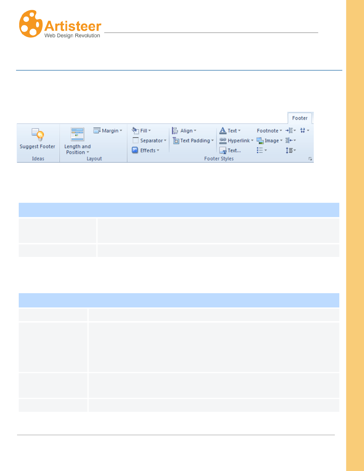
193
Artisteer4.0 |
193
Footer Tab
The Footer tab is used to specify the style of the footer at the bottom of the page. The options are
arranged in two groups: Layout and Footer Styles. Let us look at each group in more detail.
Layout
Layout
Length and Position
Select on of the suggested footer layouts: Inside Sheet, Sheet Width, and
Page Width.
Margin
Select No Outline, or assign a positive/negative margin value.
Footer Styles
Shadow
Fill
Fill the footer with color and specify the transparency rate (if needed)
Separator
Separator is a horizontal border line between the Content and the Footer. To
remove the separator, navigate SeparatorWeight No Separator. Select
the Weight, Style and Color options to change the appearance of the
separator.
Effects
Select a texture or a gradient from the list, insert a texture from file, and
manage the texture and gradient options (see Footer > Options)
Align
Align the footer text (right side,centered, left side)
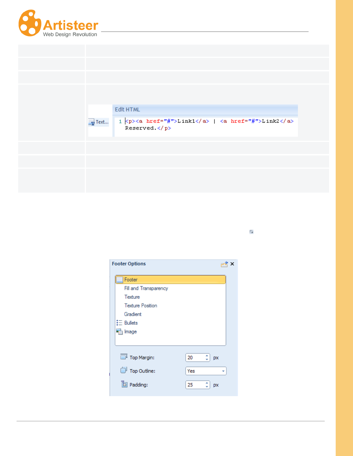
194
Artisteer4.0 |
194
Text Padding
Select a value that reflects the space around the footer text
Text font
Adjust the text font style
Hyperlink
Define the font style for the active/passive links,visited links and hovered links
Text (HTML editor)
Change the footer text in the opened HTML Editor dialog
Footnote
Select a color for the footer text and footer link
Image
Adjust the image border and margin
Text
Specify the text and paragraph style settings, such as right margin, left
margin, line spacing and character spacing. Adjust the bullets icon and style.
Options
You can access the Options for the footer by clicking on the Custom Values icon. The Options
include Footer, Texture, Gradient, Bullets and Image options.

195
Artisteer4.0 |
195
Footer Options
Footer
The Footer
options have the following settings: Top Margin (- 200 – 200 px),
Top Outline, Padding (0 - 50 px),
Fill and
Transparency
Adjust the footer background color (Fill) and Transparency (0 – 100 %), the
Weight (0 – 20 px), Style (solid, dotted etc.), Color and Transparency settings
of the separator.
Texture, Texture
Position
The Texture settings are very similar to the same options you can set for the
page background. For detailed information on Texture settings see the
subsections for Texture Options and Texture Position under the Background
section described above.options (see Footer > Options)
Gradient
Change the gradient (Presets) or adjust the Gradient Contrast (-100 – 100%).
Bullets
If your footer text contains bulleted list, you can assign an offset to bullets as
well as enable/disable the recolor option. With enabled recolor option the
grayscale bullets gain color that fits the footer style. You can also adjust the
color of the bullets and change the bullet icon (Presets).
Image
Set Margin (0-40 px), Border Width (0-10 px) and Color values.
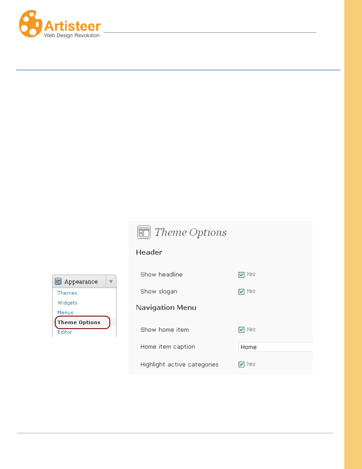
196
Artisteer4.0 |
196
CMS-Specific Features
Theme options for WordPress themes
Theme options are the extra settings designed for additional customization of the the installed Artisteer
4.0+ WordPress themes.The options are embedded in the Appearance bar and help to adjust the
header, navigation menu, posts, featured image, excerpt, pages, comments, sidebars, footer,
advertisement and headings(SEO).
These options override any similar Export options (e.g. Show Home Item) you set on the desktop
before you exported your theme. These options are also shared among all the Artisteer themes you
install so even if you delete the theme in Wordpress, when you reinstall the theme, these options still
override any Export options in your theme. See ‘Wordpress Export Options’ above for more details.
197
Artisteer4.0 |
197
Theme Options
Header
Enable or disable the display of Headline and/or Slogan by ticking the checkbox.
Enable or disable the use the “Clickable Header” option, adjust the header link.
Navigation
Menu
Home menu item: Enable or disable the display of the Home menu item and/or edit
the caption of the Home menu item.
Categories: enable or disable the highlight of active categories.
Long menu items: trim the long menu items and subitems by specifying the
maximum number of characters that can be displayed. If the whole word cannot be
displayed, it will be automatically replaced with dots.The default character limit of
menu items is 45, and for subitems this value is 40 characters. You can edit the
character limit by typing custom values.If the saved options appeared to be
inappropriate, you can always return to the deault settings by clicking the Reset to
Default button.
Default menu source: select either pages or categories as a menu source.
Posts
The Post options allow you to display the navigation links at the top or at the bottom
of the post pages and single posts. You can also trim the long navigation links by
specifying the limit of characters.
Featured Image
You can use a featured image as thumbnail and specify its appropriate width and
height parameters. The auto thumbnail option is also available (thumbnails are
generated by using the first image from the post gallery).
Excerpt
You can choose auto post excerpts (when neither more-tag nor post excerpt is
used) or manually specify the excerpt length (number of words) and the Excerpt
balance. The default number of words, which make up auto excepts, is 40.
The Except Balance helps to avoid the undesired split of short posts that are slightly
beyond the Except size. The default except balance value is 5 words, and you can

198
Artisteer4.0 |
198
change it to a custom value.
The Except Tag Filter blocks the display of certain tags that you don’t want to see
on your posts pages. The default list of allowed tags does not include the <img>
tag, so the images are not displayed in posts on the posts pages. Edit the list of
allowed tags to expand or reduce the tag filter.
Pages
The Pages options help to configure the 404 page (Page is not found). If a visitor
tried to open a link, and the post was deleted, you can enable the “Show random
posts on 404 page” or “Show tags on 404 page” option, type the title of posts/tags
and suggest the visitors other ways to view the blog.
Comments
You can enable or disable the display of the “Leave a comment” link and you can
also block the use of smilies in comments.
Sidebars
You can apply a block style, a post style or a simple text style to sidebars. Separate
styles can be assigned to primary sidebar, secondary sidebar, top sidebars, bottom
sidebars, header and footer sidebars.
Footer
You can edit the Footer HTML content. The following ShortTags are available:
[year], [top], [rss], [login-link], [blog-title], [xhtml],
[css].
Advertisement Use the
[ad]
short code to insert 1- 5 ads into posts, text widgets or footer.
Example:[ad code=4 align=center]
Headings for
the posts page
The heading types of the headline, slogan, article and widgets on the posts page
are arranged by default as <H1>, <H2>, <H2>, and <H3> tags. You can
customize each heading by assigning <H1-H6> tags or a <div> tag. <H1 – H6>
tags are generally used for high rank headings and the <div> tag will be analyzed by
SEO agents as plain content.
Headings for
the single post
or page
You can customize each heading (headline, slogan, article and widgets tags) by
assigning <H1-H6> tags or a <div> tag.

199
Artisteer4.0 |
199
Importing Templates with Content to CMSs
Starting from Artisteer 4.0 Beta you can create templates with content and import them into your CMS.
Artisteer now supports importing content to Joomla, WordPress, Drupal, Blogger and DotNetNuke 6. In
this section explains how to import content into your CMS and adjust the modules and menus, so the
template in your CMS looks the same as a template in Artisteer template.
This option may be useful if you create a website or blog from scratch and want to export some
content along with design. In Artisteer you can now add pages, posts and blocks and populate them
with content.You can use different content layouts, e.g. a multi-cell layout and then export content to
your CMS. Artisteer does not have restrictions as for the number of pages that can be created, so you
can create as many pages and posts as you want by copying & pasting or typing the new content.
The content imported from Artisteer is just added to the previous content created with a CMS and does
not replace the latter. So, you will not need to recover or restore the previous content.
Content cannot be imported from CMS products into Artisteer. Content is exported when “Include
Content” is turned on.
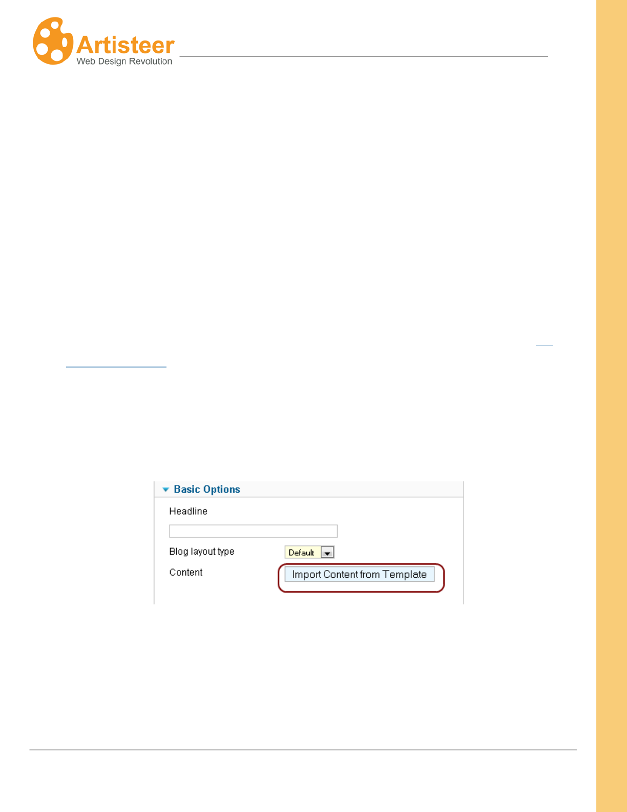
200
Artisteer4.0 |
200
Joomla
To export the template:
1. In Artisteer navigate File→ Export→Joomla Template
2. In the Export window select Joomla 2.5, specify the template name and path and check Zip
Archive and Include Content.
3. Go to Options and check if you need to adjust some of them, click Export.
To install the template in Joomla 2.5:
4. Go to Extensions→ Extension Manager and upload the template archive.
5. Navigate Template Manager, find the template in the list and put a star next to it to make it the
default template (for more information about installing and using Joomla emplates see the
Artisteer wiki page).
Now the template is installed and set as default. The content has not been installed though. To install
content:
1. Open your template in Template Manager, and click Install under the Basic Options.
The content imported from Artisteer does not delete pages and articles that were created in
Joomla or other CMS. New pages and posts are just added in the Article Manager. The content
previously imported with Artisteer will be replaced, so it is recommended that the previously
imported content is backed up.
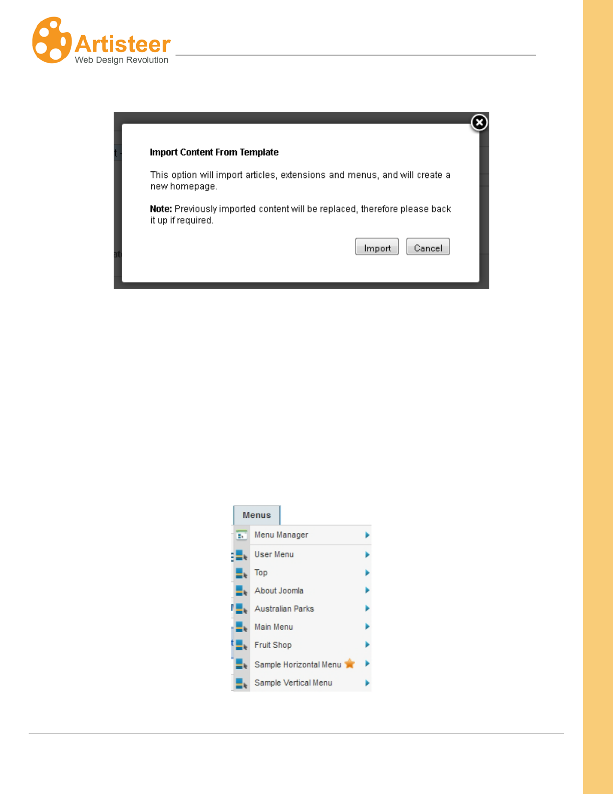
201
Artisteer4.0 |
201
2. Click Import.
Artisteer assigns special categories for exported pages and posts. All the exported pages are included
in the “Articles” category and posts/articles come as parts of “Featured” category. You can change
categories and edit the article in Joomla. The featured category in Joomla is usually assigned to
articles which are published on the Home page. While content is being installed Artisteer creates an
additional Home page, which is set as default. This page has Artisteer articles set as featured.
Besides, an additional Sample horizontal menu and Sample vertical menu are added to Menu
manager from Artisteer when the content is installed.
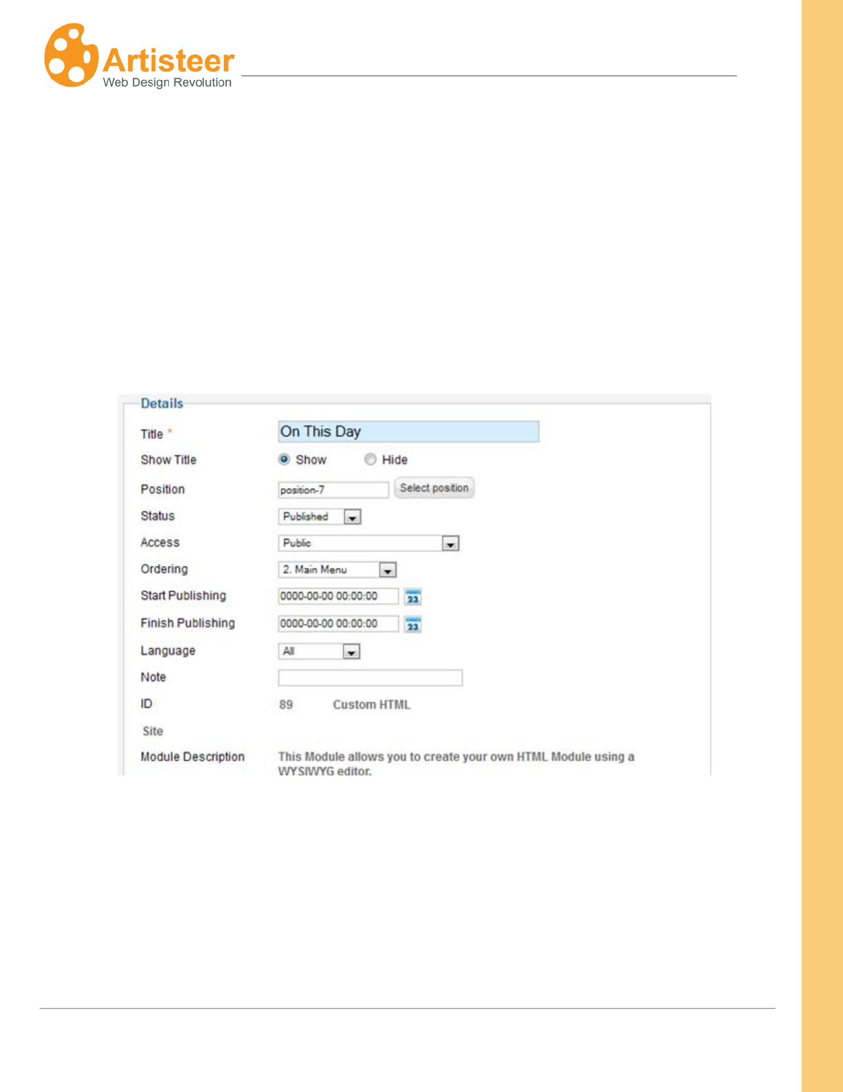
202
Artisteer4.0 |
202
If you would like to turn off the pages with content exported by Artisteer, simply select another menu
and home page.
1. Go to Administration→ Menus→ e.g Main menu
2. Check the Home menu item and select the Home star above
3. Select Publish
The modules, which were installed on all pages, are disabled on pages with imported content.
Modules that populate sidebar are assigned to certain positions. Due to this the Artisteer blocks with
content are located at the same position in Joomla as in Artisteer.
The content layout in Artisteer is also repeated in Joomla. When you create a certain content layout for
some pages in Artisteer (Edit→ Content Layout) it is converted to HTML mark up, which applies to
Joomla when content is being installed.
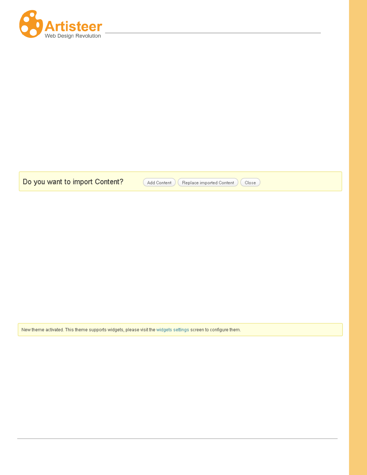
203
Artisteer4.0 |
203
WordPress
To export and install the template:
1. In Artisteer go to Export dialog, select WordPress Theme and Include Content.
2. Navigate Appearance→ Themes→ Manage Themes
3. Find the exported template in the list and click Activate. You can also install a theme by
uploading a theme archive.
When the template is activated the following message appears:
If you import content for the first time, click Add Content. The content from Artisteer will be added to
Wordpress. If you have decided to edit the articles in Artisteer project after exporting the template, you
can re-export the template and select Replace Imported Content. The previously imported content will
be deleted and the new content will be added instead.
If you preview the website right after importing content, you may see a mix of different menus and
widgets. This happens because Artisteer widgets do not disable other widgets like it happens in
Joomla but they are just added to existing widgets in WordPress. Therefore right after the content is
installed the widget settings are opened.
Now you can remove some of the widgets you do not need on the page. If the widgets are displayed
correctly, just skip this part and configure the menu.
The widgets can be disabled by selecting Edit→ Inactive widgets→ Save Widget.
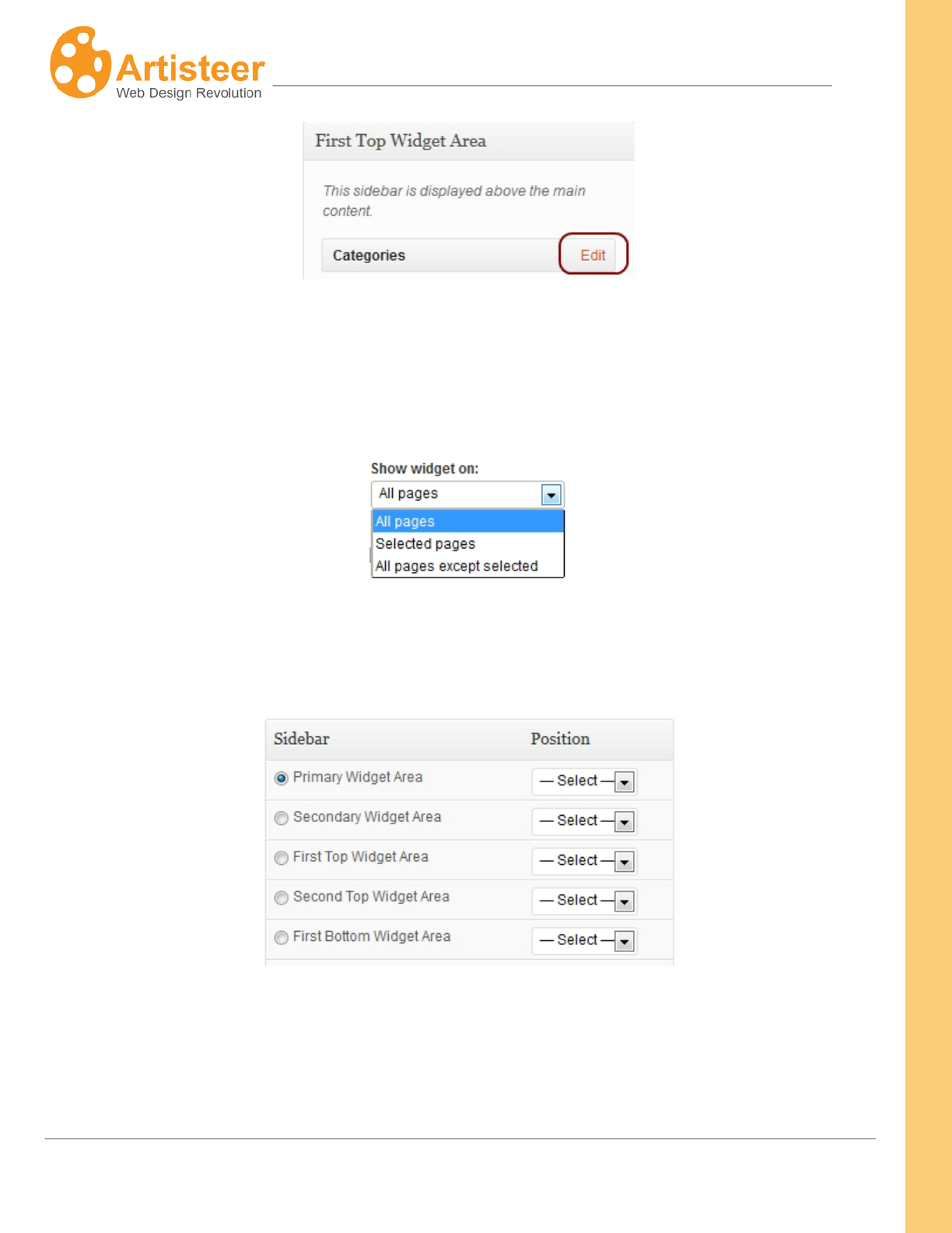
204
Artisteer4.0 |
204
You can also choose to display the widget on all pages except the selected page or specify the ids of
pages, where the widget is displayed.
To move a widget to another widget position, scroll a bit and specify the right position, e.g. Primary
Widget Area.
You can also select the appropriate widget appearance: as the rest of sidebar, as a block, as a post or
as simple text.
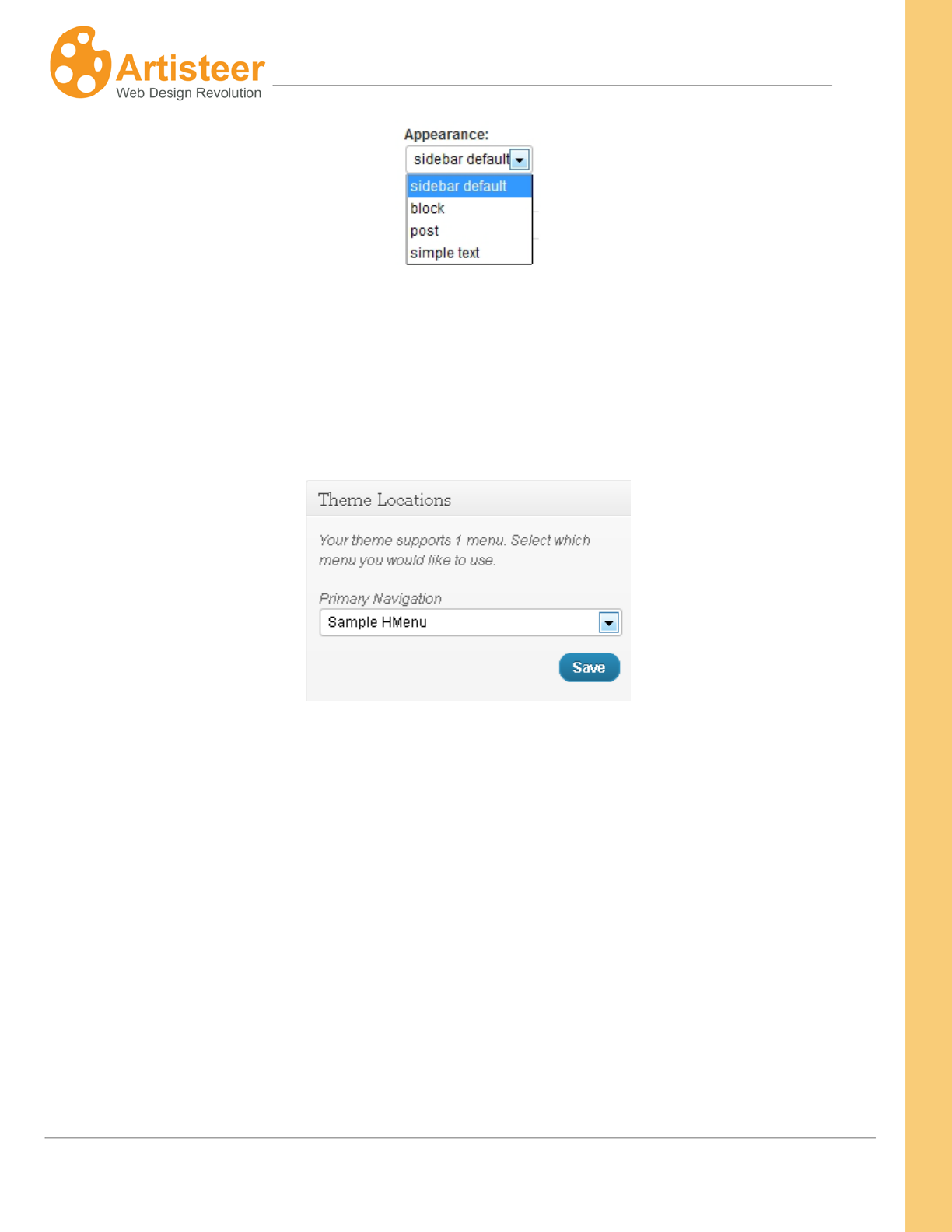
205
Artisteer4.0 |
205
When the widgets are configured, the template looks as in Artisteer except for menu which needs to
be activated. To activate the menu exported from Artisteer navigate Appearance>Menus> Theme
Locations and select Sample HMenu as Primary Navigation
Voila! The exported template looks the same as in Artisteer.
Drupal
To export a Drupal theme with content:
1. Open the export window in Artisteer, select Drupal, and specify the Drupal version, the theme
name and the path to your theme under /themes/.
2. Tick off Include Sample Data and press Export.
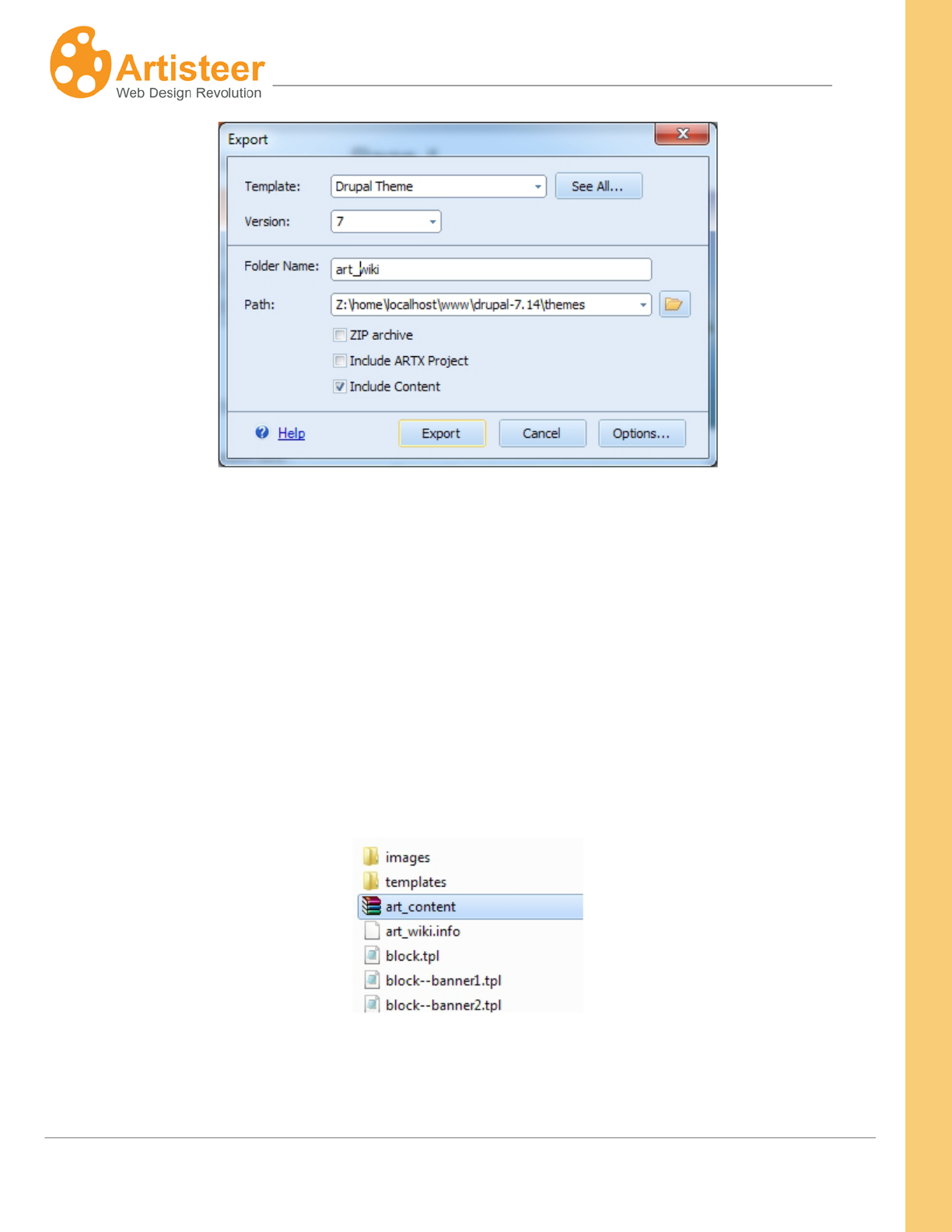
206
Artisteer4.0 |
206
To install the theme:
3. Login to Drupal 7.14 Administration
4. Open Appearance, find and enable the template.
This is a standard procedure to export a theme from Artisteer and install it in Drupal.
Installing content will require additional steps. After export the content is archived and stored in your
theme as the art_content.zip file.
To add content to your website you should install the art_content.zip as a module in Drupal and when
the module is enabled – import the content. Please, follow the steps below:
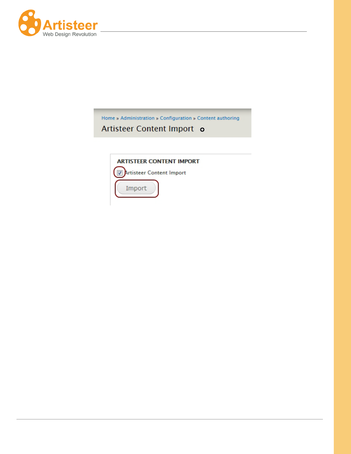
207
Artisteer4.0 |
207
Drupal 7.14
1. Go to Modules→ Install new module (http://your_site/admin/modules)
2. Browse for your_theme/art_content.zip and install the art_content module
3. Go to Configuration→ Content Authoring→ Artisteer Content Import and import the content
For Drupal 6, please follow the next steps:
1. Go to Build→ Modules→ Install new module.
2. Browse for your_theme/art_content.zip and install the art_content module
3. Go to Configuration→ Content Authoring→ Artisteer Content Import and import content.
Some blocks may not appear on your website after import.
To enable blocks and menus:
1. Navigate Structure→ Blocks
2. Scroll down to the bottom of the page and assign the appropriate regions to blocks and menus.
If you would like to remove some blocks, select None.
3. Configure the region settings for each particular block or menu by selecting Configure→ Region
Settings→ your_theme→ e.g. right sidebar
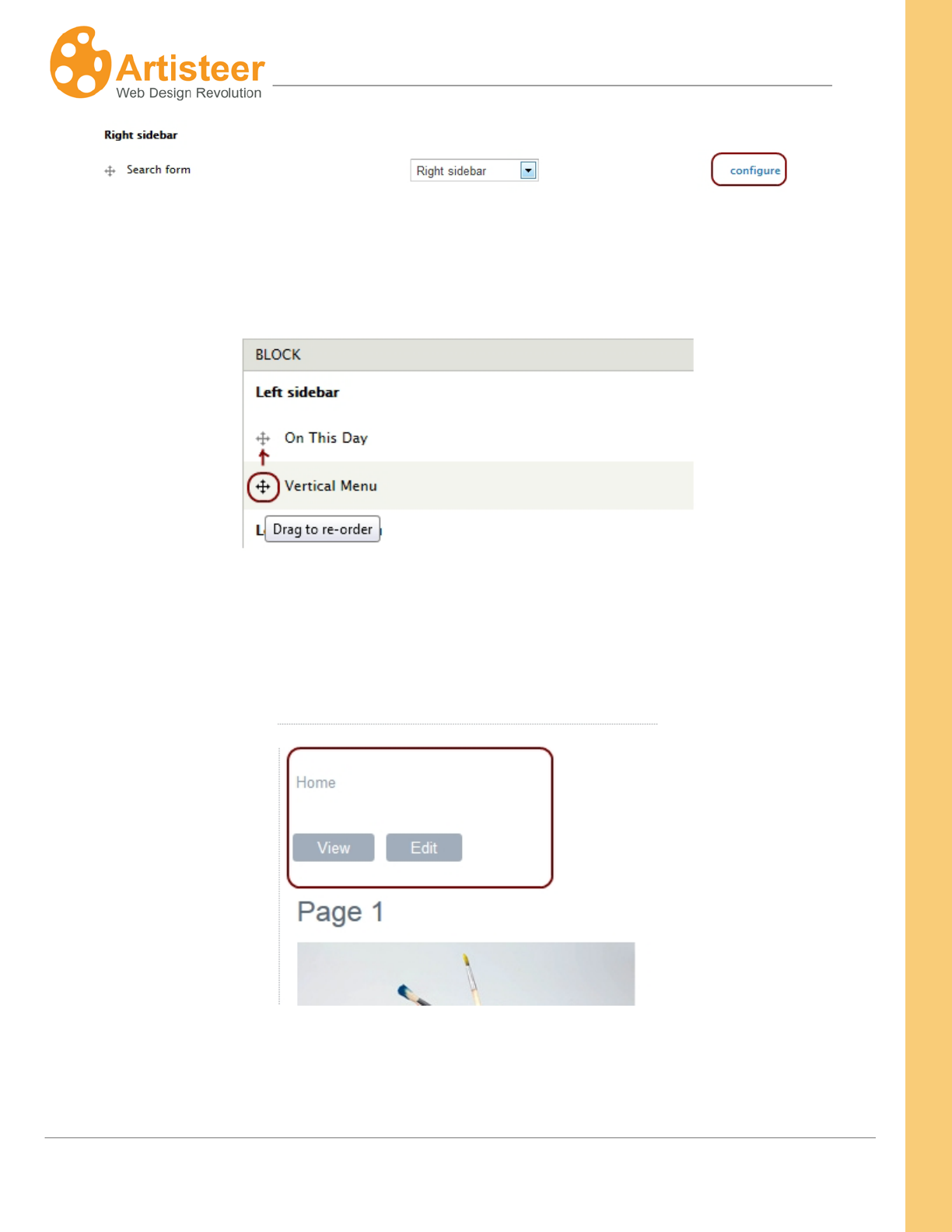
208
Artisteer4.0 |
208
4. Save the changes by pressing Save blocks.
You can also arrange the blocks by dragging and dropping them in the right location.
However, you need to specify the region for Main page content block before arranging the blocks in
sidebar.
You may also need to delete breadcrumbs that are present on all Drupal pages by default.
There are several ways to remove breadcrumbs. One of the easiest ways is to include the custom
CSS in Artisteer Export Options before exporting the template. If you have already exported the
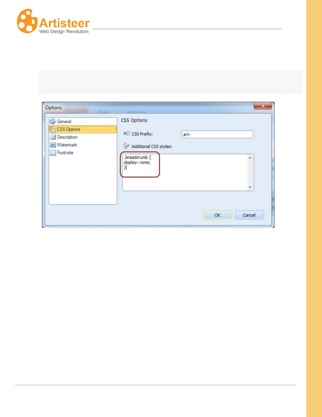
209
Artisteer4.0 |
209
template, you may just open your theme folder, and add the following code in the bottom of the
style.css file:
.breadcrumb
{
display: none;
}
DotNetNuke
Before importing content you will need to export the skin from Artisteer and install it in DNN.
1. In Artisteer Export window choose DotNetNuke, select version 6,
2. Pick Include ZIP Archive and Include Content. Note that Artisteer allows importing content only
to DotNeNuke 6.
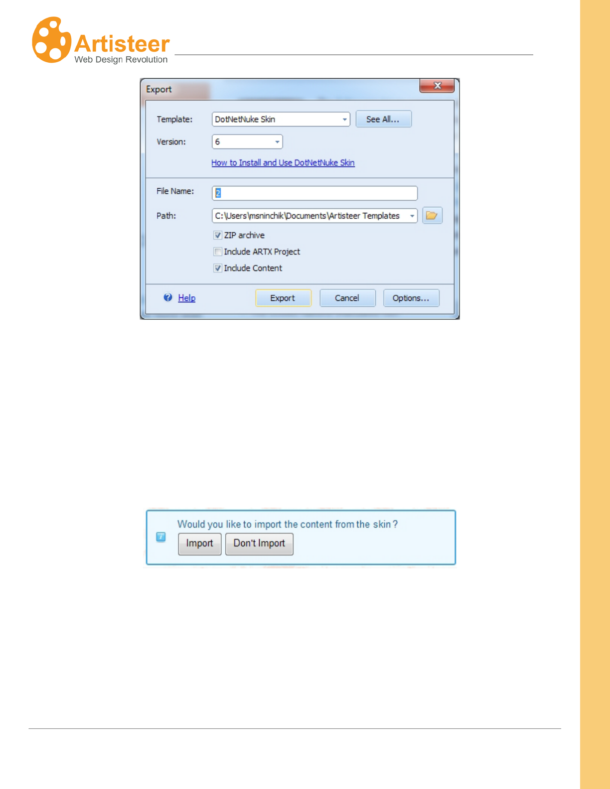
210
Artisteer4.0 |
210
To install a template:
3. Login to your website,
4. Go to Admin→ Extensions→ Manage→ Install Extension Wizard and upload the skin.
5. When the skin is installed go to Admin>Skins and in the Skin Editor select the Skin and
Container.
When skin and container are applied the import content message appears:
Pages and blocks are exported to DNN automatically, so you will not have to add blocks as modules.
Your skin in DNN will look the same as in Artisteer.
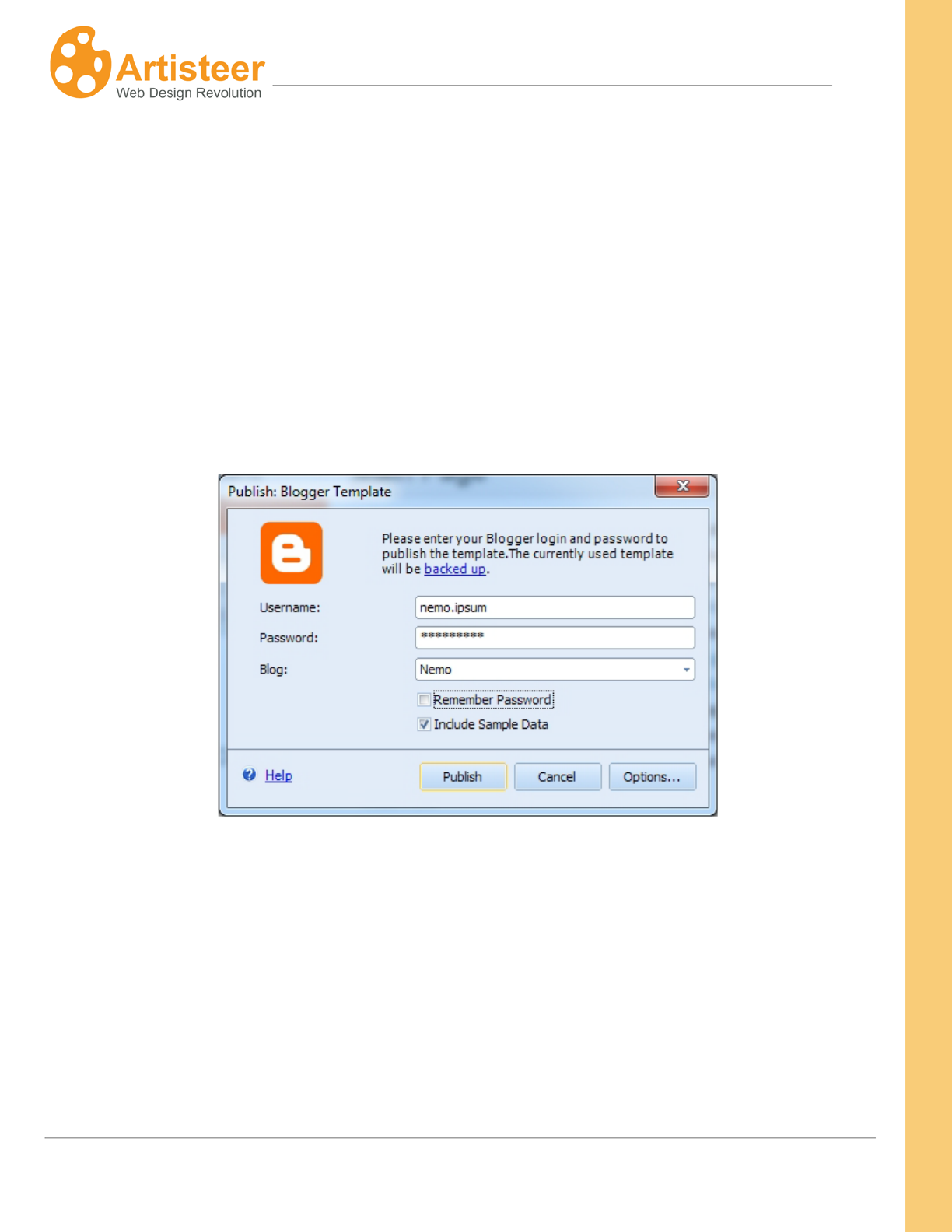
211
Artisteer4.0 |
211
Blogger
Publishing or exporting a Blogger template with content is a standard procedure that repeats the same
steps as publishing any template in general.
1. First you go to Artisteer Export Dialog and select Blogger template.
2. Check Include Content and click Publish or Export. If you need to adjust the menu source,
disable the Home page item in menu, edit the Home caption or disable the display of Navbar,
please go to Options before publishing.
For publishing please fill in your login and password in the appropriate field and check Include Content
By default your images will be uploaded to Picasa. You can change this setting in Options→ Image
Hosting:

213
Artisteer4.0 |
213
Glossary
CMS
A Content Management System (CMS) is a software application designed to create, edit, publish and
manage Website content using a simple browser-based interface. The content may include text,
photos, electronic documents, music, video and other type of computer files.
CMSs usually provide a number of ready-made solutions and standard templates for most common
applications.
The main advantage of a CMS is that it requires almost no technical skills or knowledge to create the
website and manage its content.
Blog
A blog (short for "Web log") is a special type of Web site with a series of entries usually posted to a
single page in reverse-chronological order.
Blogs are often maintained by an individual and represent the personality of the author, provide diary-
type commentary, links to articles on other Web sites, descriptions of different events and social
issues, or include other material such as graphics or video.
WordPress
WordPress is an open source blog publishing application, an advanced blogging tool with a focus on
aesthetics, web standards, and usability. The official WordPress website is http://wordpress.org.

214
Artisteer4.0 |
214
Joomla
Joomla is a free open source content management system written in PHP. It is used for publishing and
managing content on the web and intranets and allows you to build powerful online applications.
The official Joomla website is http://www.joomla.org.
Drupal
Drupal is a free software package that allows an individual or a community of users to easily publish,
manage and organize a wide variety of content on a website. It is an open-source project written in
PHP and distributed under the GPL. The official Drupal website is http://drupal.org.
Visual Studio
Visual Studio is an integrated development environment (IDE) from Microsoft. The official website is
http://www.microsoft.com/visualstudio/en-us/default.mspx.
CodeCharge Studio
CodeCharge Studio (CCS) is a Rapid Web Application Development Tool from YesSoftware. CCS
can be used to visually create dynamic database-driven Web applications. The official company
website is http://www.yessoftware.com.
Color Model
The colors on computer monitors are made up of varying amounts of red, green and blue base colors.
Depending on how much you take from each base color, you can create any of the colors which a
monitor can display. For example, a mix of red and green produces the yellow color, a mix of red and
blue – magenta and so forth. Mixing all three base colors with full intensity produces the white color
while the absence of all the color components returns black.
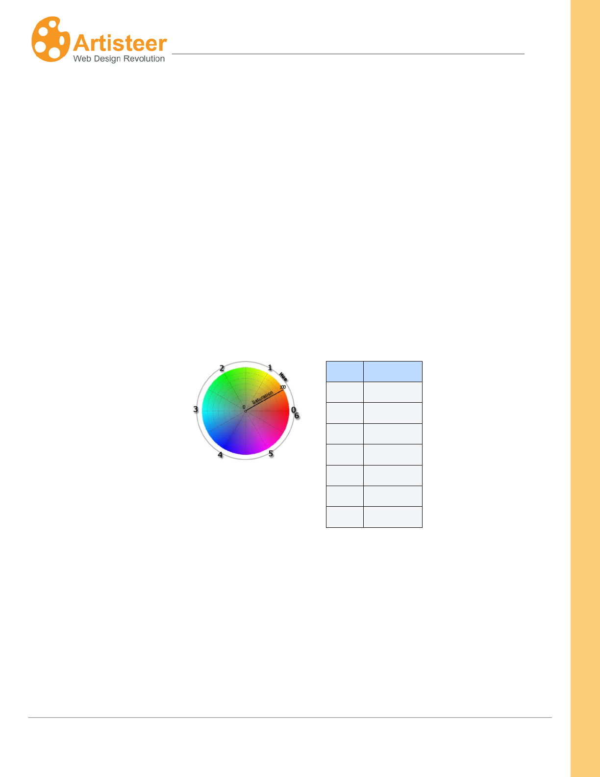
215
Artisteer4.0 |
215
The values for red, green, and blue base colors are usually specified using a scale from 0–255
(decimal), where 255 represents 100% intensity of the color.
RGB is a convenient color model for computer graphics because the human visual system works in a
similar way. However human perception does not see colors as triplets of numbers: red, green and
blue. Instead it is more convenient to describe colors as made up of hue, saturation and lightness (or
luminosity). This HSL scheme defines colors more naturally and can be visualized as a cylinder whose
central axis ranges from black at the bottom to white at the top with neutral colors between them. The
angle around the axis corresponds to “hue”. The distance from the axis corresponds to “saturation”,
and the distance along the axis corresponds to “lightness”, or “luminosity”.
Hue specifies a pure, spectral color. It is measured as a location on the color wheel, expressed as a
degree between 0° and 360°. In common use, hue is identified by the name of the color such as red,
orange, or green.
Hue
Color
0
red
1
yellow
2
green
3
cyan
4
blue
5
magenta
6
red
Saturation is the purity of the color. It represents the amount of grey in proportion to the hue,
measured as a percentage from 0% (grey with no hue at all) to 100% (fully saturated color). On the
standard color wheel, saturation increases from the center to the edge.
Luminosity (Lightness): is the relative lightness or darkness of the color, usually measured as a
percentage from 0% (black) to 100% (white).

216
Artisteer4.0 |
216
Artisteer allows you to work with both HSL and RGB color schemes. The desired color can be
specified in the Color Selector dialog.
HTML
HyperText Markup Language (HTML) is the predominant markup language for Web pages, which
provides a set of markup symbols or codes to specify the structure of documents for retrieval across
the Internet using Web browser programs. HTML is written in the form of tags, surrounded by angle
brackets. The document can contain links, headings, paragraphs, lists, and text supplemented with
interactive forms, embedded images, and other objects.
CSS
Cascading Style Sheets (CSS) is a style language that defines the presentation of a document written
in a markup language. CSS controls the overall layout, text size, style, formatting and other design
properties to let developers separate content from design.
RGB
RGB stands for the three primary colors of light - Red, Green, and Blue. The combination of these
colors in different proportions produces any color in the visible spectrum. RGB system is used for
representing colors on computer display. See also Color Model.
HSL
HSL stands for Hue, Saturation, and Lightness. It is a method for describing colors as they are
perceived by a human eye. HSL is considered a more intuitive way of dealing with color than RGB.
Hue corresponds to the actual color, saturation corresponds to the intensity, and luminosity
corresponds to lightness of the color. See also Color Model.

217
Artisteer4.0 |
217
Silent Installation
Silent (or quiet) installation is one which does not display any indication of its progress and does not
require user interaction.
Responsive Web Design
Responsive Web Design or RWD is an approach to web design in which a designer intends to provide
an optimal viewing experience—easy reading and navigation with a minimum of resizing, panning, and
scrolling—across a wide range of devices (from desktop computer monitors to mobile phones).
SEO
SEO (Search Engine Optimization) is the process of improving the visibility of a website or a web
page in a search engine's "natural" or un-paid ("organic" or "algorithmic") search results. In general,
the earlier (or higher ranked on the search results page), and more frequently a site appears in the
search results list, the more visitors it will receive from the search engine's users. SEO may target
different kinds of search, including image search, local search, video search, academic search, news
search and industry-specific vertical search engines.
WYSIWYG
WYSIWYG is an acronym for What You See Is What You Get. The term is used to describe a system
in which content (text and graphics) displayed onscreen during editing appears in a form closely
corresponding to its appearance when printed or displayed as a finished product, which might be a
printed document, web page, or slide presentation.
