Baedeker Style Guide F18
Baedeker-Style-Guide-F18
User Manual:
Open the PDF directly: View PDF ![]() .
.
Page Count: 11

Baedeker
2018Style Guide
Welcome to
the Baedeker
Layout Staff.
Hi, layout designers,
I am excited and honored to take up the reins
from the ever-organized, talented, and capable
Jack Davidson—who did a wonderful job as
creative director for the past couple years. And
why are you here? You care about travel writing
and photography, and you understand the value
of bringing global stories to NYU in magazine
format. As a designer, you understand that visual
consistency and attention to detail can make or
break the success of a publication, and that quality
design work is just as important as well-written
copy and beautiful photos. You are surrounded
by like-minded people, and I hope you’re looking
forward to diving into the work we do!
We will have several team get-togethers
throughout the semester, to discuss the visual
direction of the magazine, critique/collaborate
on each other’s spreads, and simply to bond as a
group. Because of this, and also so you can easily
communicate with me and your fellow designers,
you will need to be set up on our workplace
messaging platform, Slack. Using Slack will also
allow us to collaborate remotely, sharing ideas
and layout sketches.
Sam Winslow
Creative Director
2
2 Welcome
3 Baedeker Is
4 Layout
6 Colors
7 Images
8 Type

Baedeker is:
The purpose of this style guide is to create a visual
identity for Baedeker. Like choosing a tone of voice
in writing, design guidelines convey and enhance
the message of a publication. So, in developing a
visual style for our magazine, we must first take a
look at its broader themes.
Globally conscious
We will be using a variety of design elements of
international origin
Rooted in historical tradition
We will be following time-honored best practices of
design, acknowledging the long-standing prestige of
the Baedeker name
Narrative and instructional
We will augment the ability of the editorial content
to tell a story
3
Layout
4
Grids
I recommend using a 3-column or 2-column grid
with 1-pica gutter spacing. To make this simple
and allow you flexibility as the designer, I will
give you a 6-column template. While you may
break from this grid, you must have a good
reason for doing so.
Alignment
Use guides on your spread. If you have objects
offset from one another, do so by more than
1 pica so that it looks intentional and not like
a printing error.
Bleed
If you wish to have objects on the page edge, you
must extend them off the page to the bleed line (in
red). This is to ensure no undesired white space
appears when the pages are cut by the printer.
You will be given a base
template to work from which
has the appropriate page size,
margins, and bleed settings.
Units for measurement are
picas and points.
If you have questions about setting up your grid,
or about layout in general, please do not hesitate
to contact me or ask questions in the Slack channel.
I am always free to chat. If you are simply feeling
stuck, pick up a professional magazine and take a
look at their layouts.
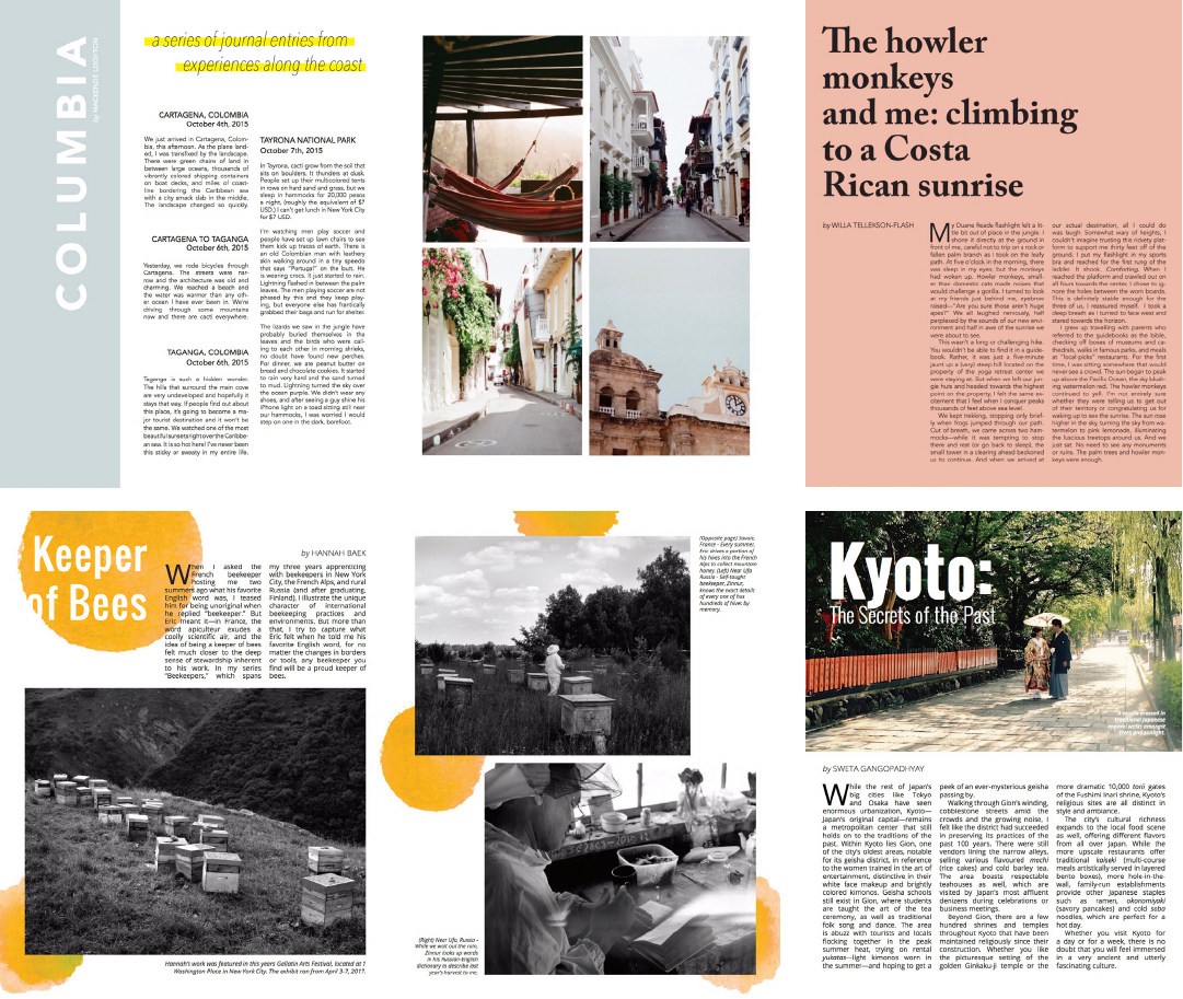
Past Editions:
Layouts that Work
5
Colors
6
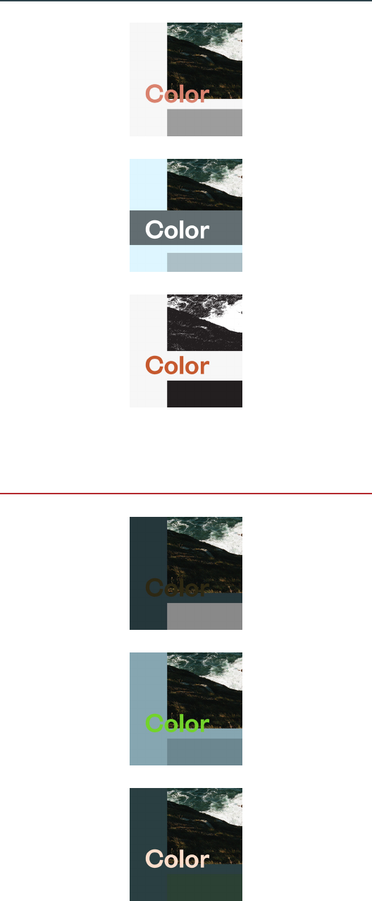
Baedeker does not have an established color
palette—this is to make sure that the colors used
in photographs remain the primary focus, and to
allow you greater creative freedom as the designer.
That being said, we have high-level guidelines in
place to ensure a cohesive theme:
• Pick colors that are harmonious with the
message of a piece and are compatible with
the photography on a spread.
• Use a balanced, high-contrast color palette for
legibility and interest. Avoid using colors that
are very similar but do not quite match.
• Do not feel obligated to use vivid colors in
your spread if it does not match the piece.
There is nothing against using only black,
white, and shades of grey.
Technical information to note:
• All colors in print design should be CMYK.
• To use white, use the default [Paper]
color swatch
• To use black, use the [Black] color swatch.
Do not use [Registration] for any reason.
Guidelines for the use of color for Type and
Images are in the sections to follow.
Lack of contrast
makes this title
hard to read
Unfitting colors
call unnecessary
attention and fight
with photography
Lack of contrast
makes this color
block disappear
Color complements
the tone of the
photo and provides
enough contrast
Good color
blocking and a
monochromatic
color scheme
Single, clean color
adds interest to
a page with plain
illustration
Bad
Good
Images
7
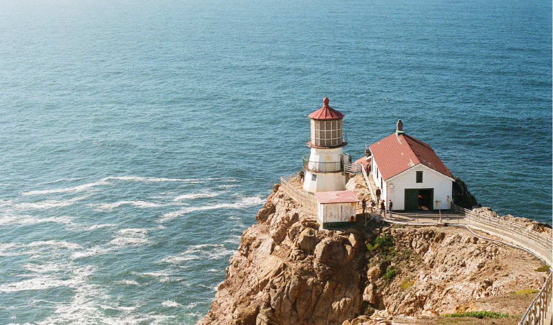
Contributors who submit photographs
intend their photos to look as they were shot.
To respect their work, follow these guidelines
for spreads with photographs:
• Do not alter the colors of photos without
consulting Photo Editor or Creative Director.
If you have concerns about the quality of an
image, don’t hesitate to reach out to us.
• Do not stretch, flip, or rotate photos to fit a
design. Image resolution (Effective PPI)
should always be 300 or higher.
Most spreads will include text and photos, or
photos with captions. Occasionally, a spread will
be text-only, in which case you, our illustrator,
and I will work together to decide if an illustration
or infographic will be required.

Type
Type is extremely important
in magazines. Your reader will
decide whether to read or skim
over the spread you design in a
matter of seconds—making this
decision based on every aspect of
the layout: form, color, negative
space. Design should always
provoke an action, and in our
case, the desired action is that
the reader reads and engages
with the article. So, headlines
must grab attention, body text
must be easy to read.
The typefaces, and
how they reflect the
identity of Baedeker
The font families we will use
draw on international and
historical influences, and were
created for use in print, unlike
the typefaces used in years
prior which were contemporary
and intended for digital media.
By using robust, time-tested,
legible fonts, we pay homage to
Baedeker’s history of providing
guidance and inspiring awe.
Founders
Founders
Founders
Founders
Founders
Founders
Founders
Founders
Primary
Tiempos Text
Tiempos Headline
Secondary
Founders Grotesk
Tiempos
Tiempos
Tiempos
Tiempos
Tiempos
Tiempos
8
Founders Grotesk Regular/Semibold
12/13 (12 pt size, 13 pt leading)
lowercase, Regular weight for “by”
UPPERCASE, Semibold weight for name
9
Type:
General Guidelines
Body copy
Drop cap
Pull quotes
Byline
Photo captions
Tiempos Text Regular
10/13 (10 pt size, 13 pt leading)
First line indent: 1p0
Justified with last line aligned left
Hyphenated
Tiempos Headline Light
3-line
Kerning between dropcap
& body text: 75
Tiempos Headline Light
20/26 (20 pt size, 26 pt leading)
Founders Grotesk Regular/Semibold
10/13 (10 pt size, 13 pt leading)
Punctuation in Regular weight
Do not create a caption numbering system;
use standard clockwise captioning instead.
by FRANK OCEAN
That’s a pretty big trunk on
my Lincoln town car, ain’t
it? Big enough to take these
broken hearts and put ‘em in it.
Now I’m driving around on the
boulevard, trunk bleeding, and
every time the cops pull me over,
they never see them. And I’ve got
this black suit on, roaming around
like I’m ready for a funeral. Five
more miles ‘til the road runs out.
Got some pretty good beats on
this 808 CD, yeah, memory seats
I’m sitting on stay heated. I would
have put tints on my windows, but
what’s the difference, if I feel like a
ghost (no Swayze) ever since I lost
my baby?
I’m about to drive
in the ocean. Kick
off my shoes and
swim good.
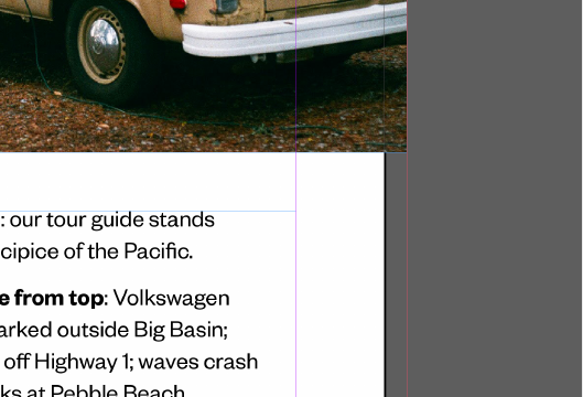
Left page: our tour guide stands
on the precipice of the Pacific.
Clockwise from top: Volkswagen
camper parked outside Big Basin;
redwoods off Highway 1; waves crash
on the rocks at Pebble Beach.
For Tiempos, use Text faces below 20pt, use
Headline faces at or above 20pt. Body copy and
bylines should always be black or white, depending
on the lightness of the background.
byline
kern after dropcap
drop cap
body
pull quote
photo captions
10
Type:
Headline Fonts
Founders Grotesk Lt.
Founders Grotesk Lt.
Founders Grotesk Md.
Founders Grotesk Md.
Akzidenz Grotesk
Condensed A Medium
AKZIDENZ GROTESK
CONDENSED A MEDIUM
Akzidenz Grotesk
Condensed A Medium
AKZIDENZ GROTESK
CONDENSED A MEDIUM
I recommend setting the tracking to 40 or higher
if using Akzidenz Grotesk Condensed A.
AKZIDENZ GROT
EXTENDED REG.
AKZIDENZ GROT
EXTENDED REG.
AKZIDENZ GROT
EXTENDED MED.
AKZIDENZ GROT
EXTENDED MED.
Akzidenz Grotesk Extended is to be used sparingly,
on a case-by-case basis.
Tiempos Headline Lt.
Tiempos Headline Lt.
Tiempos Headline Reg.
Tiempos Headline Reg.
This year, we are cutting the clutter and sticking
to a small handful of robust headline treatments
in an effort to bring the magazine together into
a cohesive whole. For headlines and subheads,
please use only what you see below.

Now,
let’s make
a magazine.
