Bootstrap 4 Quick Guide
User Manual:
Open the PDF directly: View PDF  .
.
Page Count: 24
Previous Page Next Page
Bootstrap 4 - Quick GuideBootstrap 4 - Quick Guide
Bootstrap 4 - Quick Guide
Advertisements
Bootstrap 4 - OverviewBootstrap 4 - Overview
Bootstrap 4 - Overview
Bootstrap 4 is a powerful and popular mobile first front-end framework for building
responsive mobile first sites on the web. It is a latest version of Bootstrap , which uses
HTML, CSS and JavaScript.
The last stable release of Bootstrap v3.3.7 was in July 2016 and in August 2017, Bootstrap
4.0.0 beta version released.
It contains mobile first styles throughout the entire library, instead of using them in
the separate files.
With just the knowledge of HTML and CSS anyone can get started with Bootstrap.
Also the Bootstrap official site has a good documentation.
It is supported by all popular browsers and its responsive CSS adjusts to Desktops,
Tablets and Mobiles.
Provides a clean and uniform solution for building an interface for developers.
It contains beautiful and functional built-in components which are easy to
customize.
It is an open source and provides web based customization.
What is Bootstrap 4?What is Bootstrap 4?
What is Bootstrap 4?
HistoryHistory
History
Why to use Bootstrap?Why to use Bootstrap?
Why to use Bootstrap?
Bootstrap 4 is a latest version of Bootstrap 3, who's source CSS files are converted into
SCSS. It uses the flex modal for grid system and supports all the latest browsers.
However, it supports Internet Explorer 9+ and iOS 7+ and dropped support for IE 8 and
lesser versions, iOS 6 and lesser versions. For more information on difference between
Bootstrap 3 and Bootstrap 4, checkout this chapter .
Bootstrap 4 - Environment SetupBootstrap 4 - Environment Setup
Bootstrap 4 - Environment Setup
You can start using Bootstrap 4 in your website by including it from CDN(Content Delivery
Network) or downloading from getbootstrap.com.
The Bootstrap 4 can be used in the website by including it from Content Delivery
Network .
Use the below compiled Bootstrap's CDN of CSS and JS in your project.
<!-- Compiled and Minified Bootstrap CSS -->
<link rel = "stylesheet"
href = "https://maxcdn.bootstrapcdn.com/bootstrap/4.0.0/css/bootstrap.min.css"
integrity = "sha384-Gn5384xqQ1aoWXA+058RXPxPg6fy4IWvTNh0E263XmFcJlSAwiGgFAW/dAiS6JXm"
crossorigin = "anonymous">
<!-- jQuery Library -->
<script src = "https://code.jquery.com/jquery-3.2.1.slim.min.js"
integrity = "sha384-KJ3o2DKtIkvYIK3UENzmM7KCkRr/rE9/Qpg6aAZGJwFDMVNA/GpGFF93hXpG5KkN"
crossorigin = "anonymous">
</script>
<!-- Popper -->
<script src = "https://cdnjs.cloudflare.com/ajax/libs/popper.js/1.12.9/umd/popper.min.js"
integrity = "sha384-ApNbgh9B+Y1QKtv3Rn7W3mgPxhU9K/ScQsAP7hUibX39j7fakFPskvXusvfa0b4Q"
crossorigin = "anonymous">
</script>
<!-- Compiled and Minified Bootstrap JavaScript -->
<script src = "https://maxcdn.bootstrapcdn.com/bootstrap/4.0.0/js/bootstrap.min.js"
integrity = "sha384-JZR6Spejh4U02d8jOt6vLEHfe/JQGiRRSQQxSfFWpi1MquVdAyjUar5+76PVCmYl"
crossorigin = "anonymous">
</script>
Include the CDN versions of jQuery and Popper.js (Bootstrap 4 uses jQuery and Popper.js
to make use of JavaScript components such as modals, tooltips, popovers etc) before the
minified Bootstrap JavaScript, if you are using the compiled version of JavaScript.
Following are some components, which require jQuery −
Used for closable alerts
Bootstrap 3 v/s Bootstrap 4Bootstrap 3 v/s Bootstrap 4
Bootstrap 3 v/s Bootstrap 4
Using CDNUsing CDN
Using CDN
Toggle the states by using buttons and checkboxes/radio buttons and collapse for
toggling content
Carousel for slides, controls, and indicators
Dropdowns (uses the Popper.js for perfect positioning)
Open and close the Modals
For collapsing the Navbar
Tooltips and popovers (uses the Popper.js for perfect positioning)
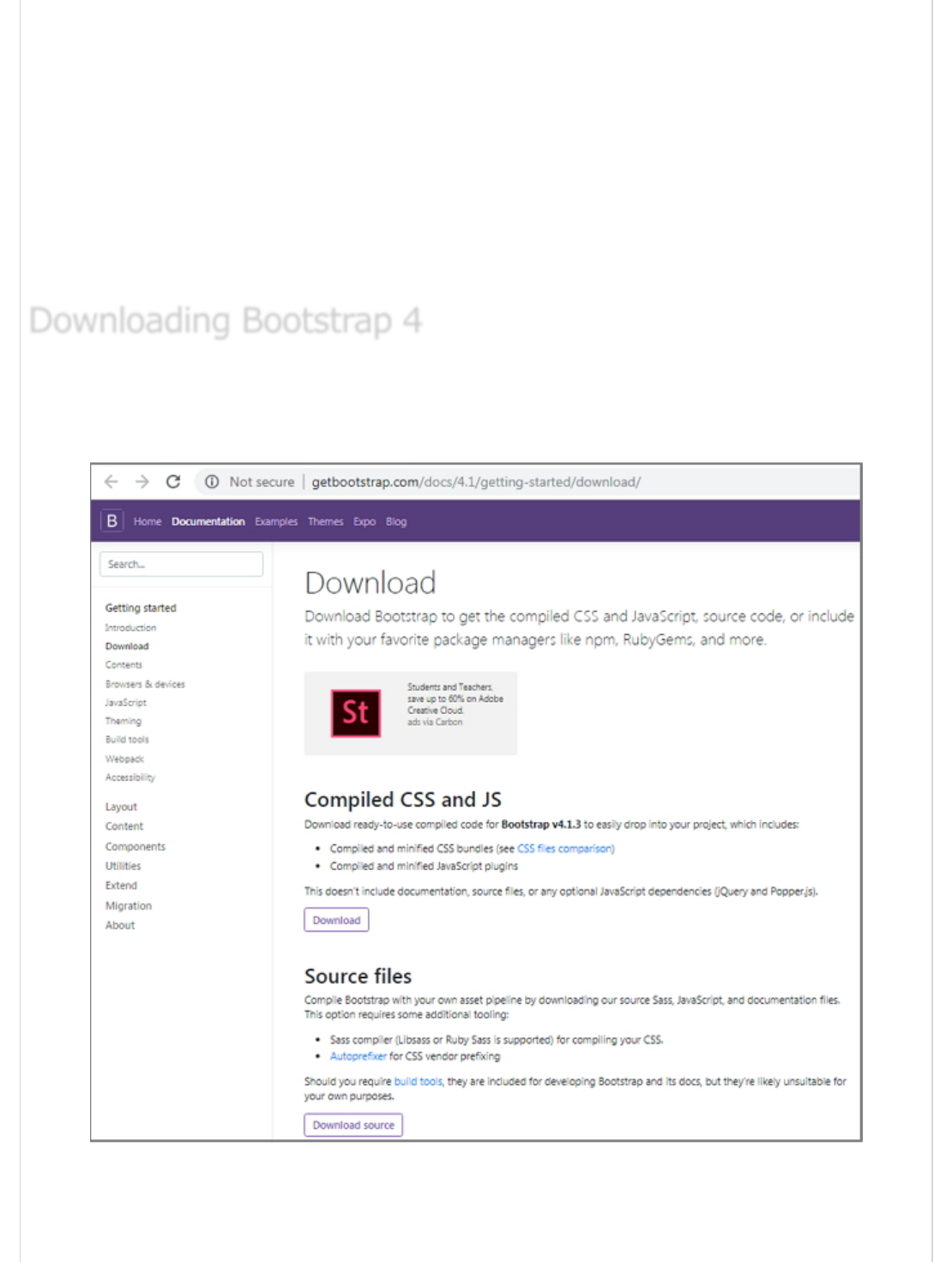
You can download the Bootstrap 4 from https://getbootstrap.com/docs/4.1/getting-
started/download/ . When you click on this link, you will get to see a screen as shown
below −
Here you can see two buttons −
Download − Clicking this, you can download the precompiled and minified
versions of Bootstrap's CSS and JavaScript. No documentation or original source
Downloading Bootstrap 4Downloading Bootstrap 4
Downloading Bootstrap 4

code files are included.
Download Source − Clicking this, you can get the latest Bootstrap SCSS,
JavaScript source code and documentation files.
For better understanding and ease of use, we shall use precompiled version of Bootstrap
throughout the tutorial. As the files are complied and minified, you don't have to bother
every time including separate files for individual functionality.
Once the compiled version Bootstrap 4 is downloaded, extract the ZIP file, and you will see
the following file/directory structure −
As you can see, there are compiled CSS and JS (bootstrap.*), as well as compiled and
minified CSS and JS (bootstrap.min.*).
File StructureFile Structure
File Structure
Precompiled Bootstrap 4Precompiled Bootstrap 4
Precompiled Bootstrap 4
Bootstrap 4 Source CodeBootstrap 4 Source Code
Bootstrap 4 Source Code
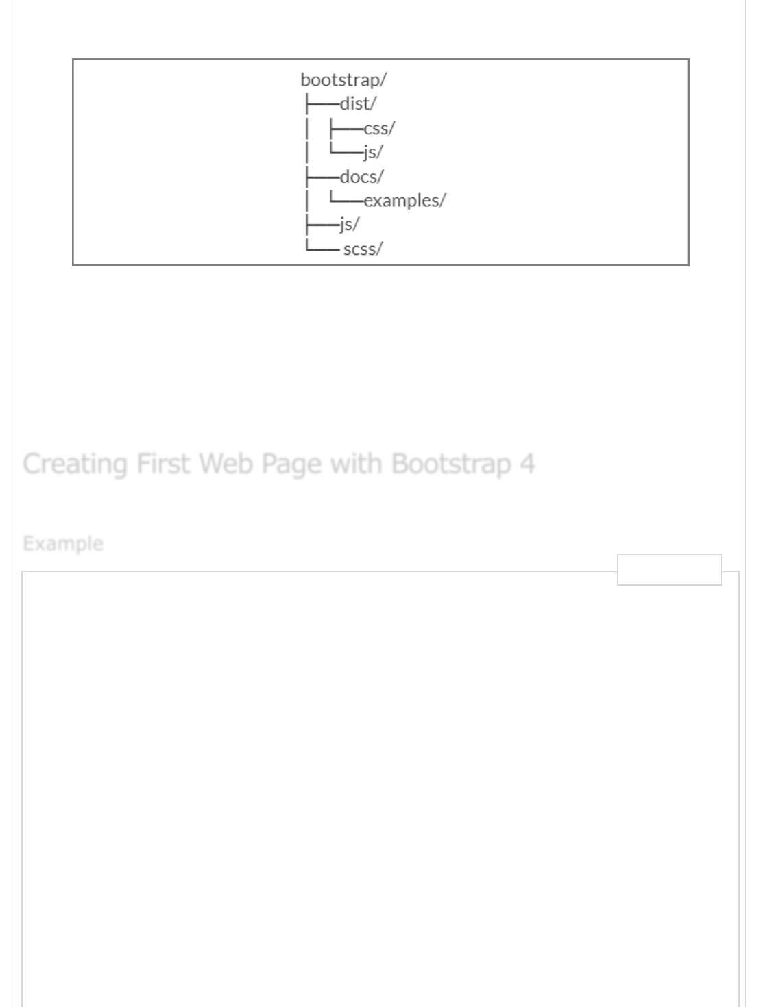
If you have downloaded the Bootstrap 4 source code, then the file structure would be as
follows −
The files under js/ and scss/ are the source code for Bootstrap CSS and JavaScript.
The dist/ folder include everything listed in the precompiled download section
above.
The docs/examples/, includes source code for Bootstrap documentation and
examples of Bootstrap usage.
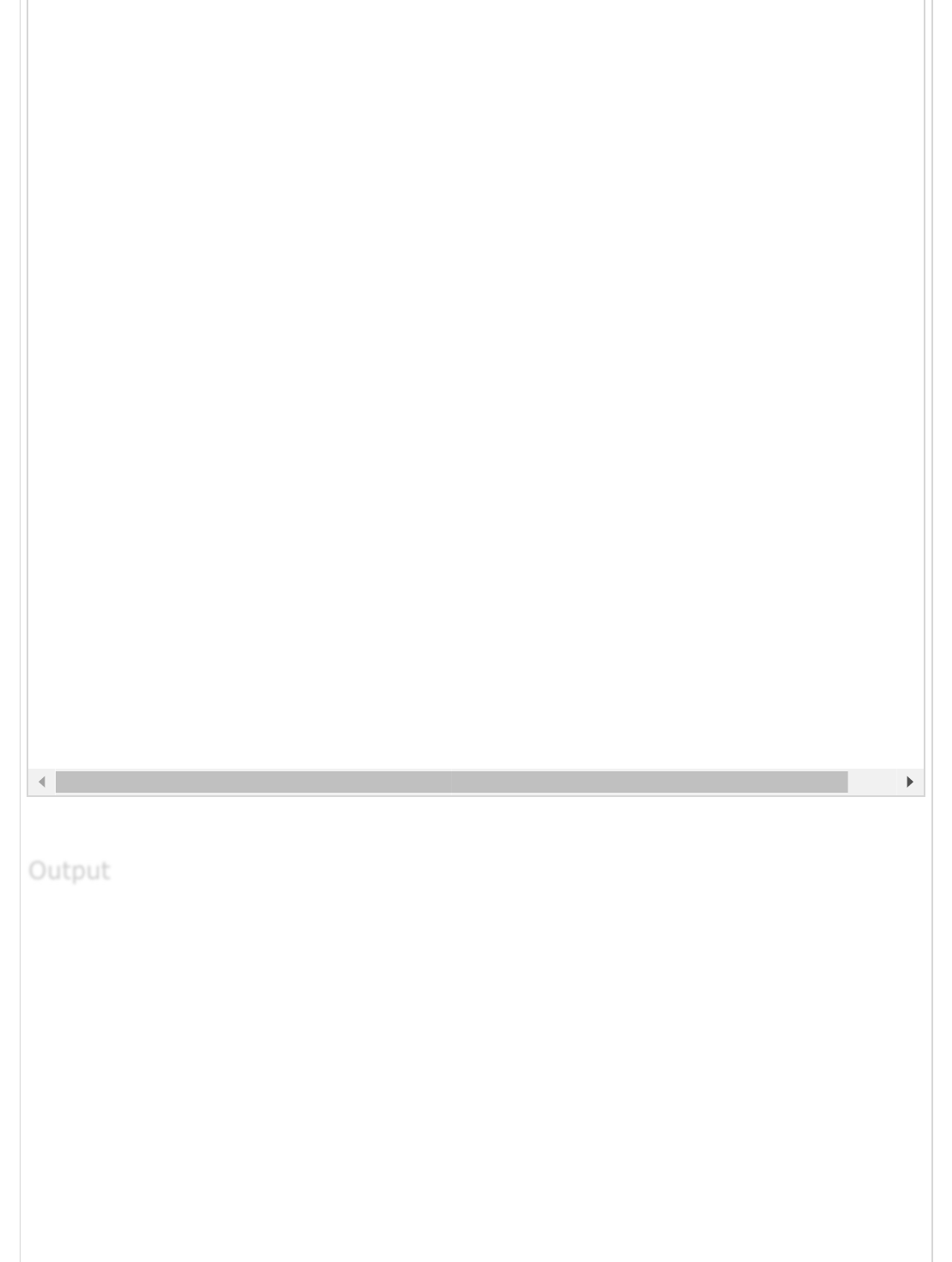
The below example specifies simple web page of Bootstrap 4 −
<html lang = "en">
<head>
<!-- Meta tags -->
<meta charset = "utf-8">
<meta name = "viewport" content = "width=device-width, initial-scale = 1, shrink-to-fit = n
<!-- Bootstrap CSS -->
<link rel = "stylesheet"
href = "https://stackpath.bootstrapcdn.com/bootstrap/4.1.3/css/bootstrap.min.css"
integrity =" sha384-MCw98/SFnGE8fJT3GXwEOngsV7Zt27NXFoaoApmYm81iuXoPkFOJwJ8ERdknLPMO"
crossorigin = "anonymous">
<title>Bootstrap 4 Example</title>
</head>
<body>
<h2>Hello, world!!! Welcome to Tutorialspoint...</h2>
<!-- jQuery first, then Popper.js, then Bootstrap JS -->
<script src = "https://code.jquery.com/jquery-3.3.1.slim.min.js"
integrity = "sha384-q8i/X+965DzO0rT7abK41JStQIAqVgRVzpbzo5smXKp4YfRvH+8abtTE1Pi6jizo"
crossorigin = "anonymous">
</script>
<script src = "https://cdnjs.cloudflare.com/ajax/libs/popper.js/1.14.3/umd/popper.min.js"
integrity = "sha384-ZMP7rVo3mIykV+2+9J3UJ46jBk0WLaUAdn689aCwoqbBJiSnjAK/l8WvCWPIPm49"
Creating First Web Page with Bootstrap 4Creating First Web Page with Bootstrap 4
Creating First Web Page with Bootstrap 4
ExampleExample
Example
Live Demo

It will produce the following result −
Hello, world!!! Welcome to Tutorialspoint...
Bootstrap 4 - LayoutBootstrap 4 - Layout
Bootstrap 4 - Layout
Bootstrap 4 uses container classes to wrap the page's contents. It contains two container
classes −
.container − It represents a fixed width container.
.container-fluid − It represents a full width container.
The .container class is used to wrap the page content with fixed width and content can be
placed in the center easily by using the .container class as shown below.
<div class = "container">
...
</div>
The below example specifies a simple web page with fixed width container −
crossorigin = "anonymous">
</script>
<script src = "https://stackpath.bootstrapcdn.com/bootstrap/4.1.3/js/bootstrap.min.js"
integrity = "sha384-ChfqqxuZUCnJSK3+MXmPNIyE6ZbWh2IMqE241rYiqJxyMiZ6OW/JmZQ5stwEULTy"
crossorigin = "anonymous">
</script>
</body>
</html>
<html lang = "en">
<head>
<!-- Meta tags -->
<meta charset = "utf-8">
<meta name = "viewport" content = "width = device-width, initial-scale = 1, shrink-to-fit =
<!-- Bootstrap CSS -->
<link rel = "stylesheet"
href = "https://stackpath.bootstrapcdn.com/bootstrap/4.1.3/css/bootstrap.min.css"
integrity = "sha384-MCw98/SFnGE8fJT3GXwEOngsV7Zt27NXFoaoApmYm81iuXoPkFOJwJ8ERdknLPMO"
OutputOutput
Output
ContainerContainer
Container
ExampleExample
Example
Live Demo
It will produce the following result −
crossorigin = "anonymous">
<title>Bootstrap 4 Example</title>
<style>
.container {
background: #a52c644a;
text-align: center;
padding-top: 100px;
padding-bottom: 100px;
}
</style>
</head>
<body>
<div class = "container">
<h2>Fixed Width Container</h2>
This is a simple web page with fixed width container by using
<code>.container</code> class.
</div>
<!-- jQuery first, then Popper.js, then Bootstrap JS -->
<script src = "https://code.jquery.com/jquery-3.3.1.slim.min.js"
integrity = "sha384-q8i/X+965DzO0rT7abK41JStQIAqVgRVzpbzo5smXKp4YfRvH+8abtTE1Pi6jizo"
crossorigin = "anonymous">
</script>
<script src = "https://cdnjs.cloudflare.com/ajax/libs/popper.js/1.14.3/umd/popper.min.js"
integrity = "sha384-ZMP7rVo3mIykV+2+9J3UJ46jBk0WLaUAdn689aCwoqbBJiSnjAK/l8WvCWPIPm49"
crossorigin = "anonymous">
</script>
<script src = "https://stackpath.bootstrapcdn.com/bootstrap/4.1.3/js/bootstrap.min.js"
integrity = "sha384-ChfqqxuZUCnJSK3+MXmPNIyE6ZbWh2IMqE241rYiqJxyMiZ6OW/JmZQ5stwEULTy"
crossorigin = "anonymous">
</script>
</body>
</html>
OutputOutput
Output
Fixed Width Container
This is a simple web page with fixed width container by using .conta
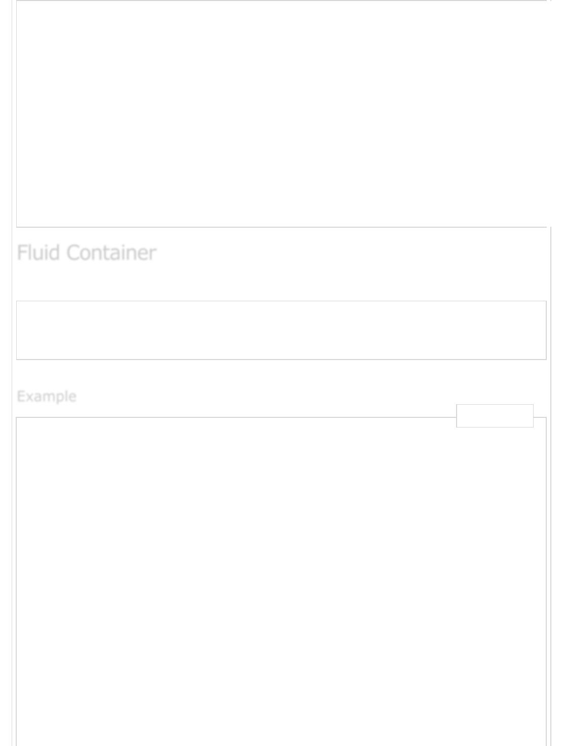
You can create a full width container by using the .container-fluid class as shown below.
<div class = "container-fluid">
...
</div>
The below example specifies a simple web page with full width container −
<html lang = "en">
<head>
<!-- Meta tags -->
<meta charset = "utf-8">
<meta name = "viewport" content = "width = device-width, initial-scale = 1, shrink-to-fit =
<!-- Bootstrap CSS -->
<link rel = "stylesheet"
href = "https://stackpath.bootstrapcdn.com/bootstrap/4.1.3/css/bootstrap.min.css"
integrity = "sha384-MCw98/SFnGE8fJT3GXwEOngsV7Zt27NXFoaoApmYm81iuXoPkFOJwJ8ERdknLPMO"
crossorigin = "anonymous">
<title>Bootstrap 4 Example</title>
<style>
.container-fluid {
background: #a52c644a;
text-align: center;
padding-top: 100px;
padding-bottom: 100px;
}
</style>
</head>
<body>
<div class = "container-fluid">
<h2>Full Width Container</h2>
This is a simple web page with full width container by using
Fluid ContainerFluid Container
Fluid Container
ExampleExample
Example
Live Demo
It will produce the following result −
Full Width Container
This is a simple web page with full width container by using .containe
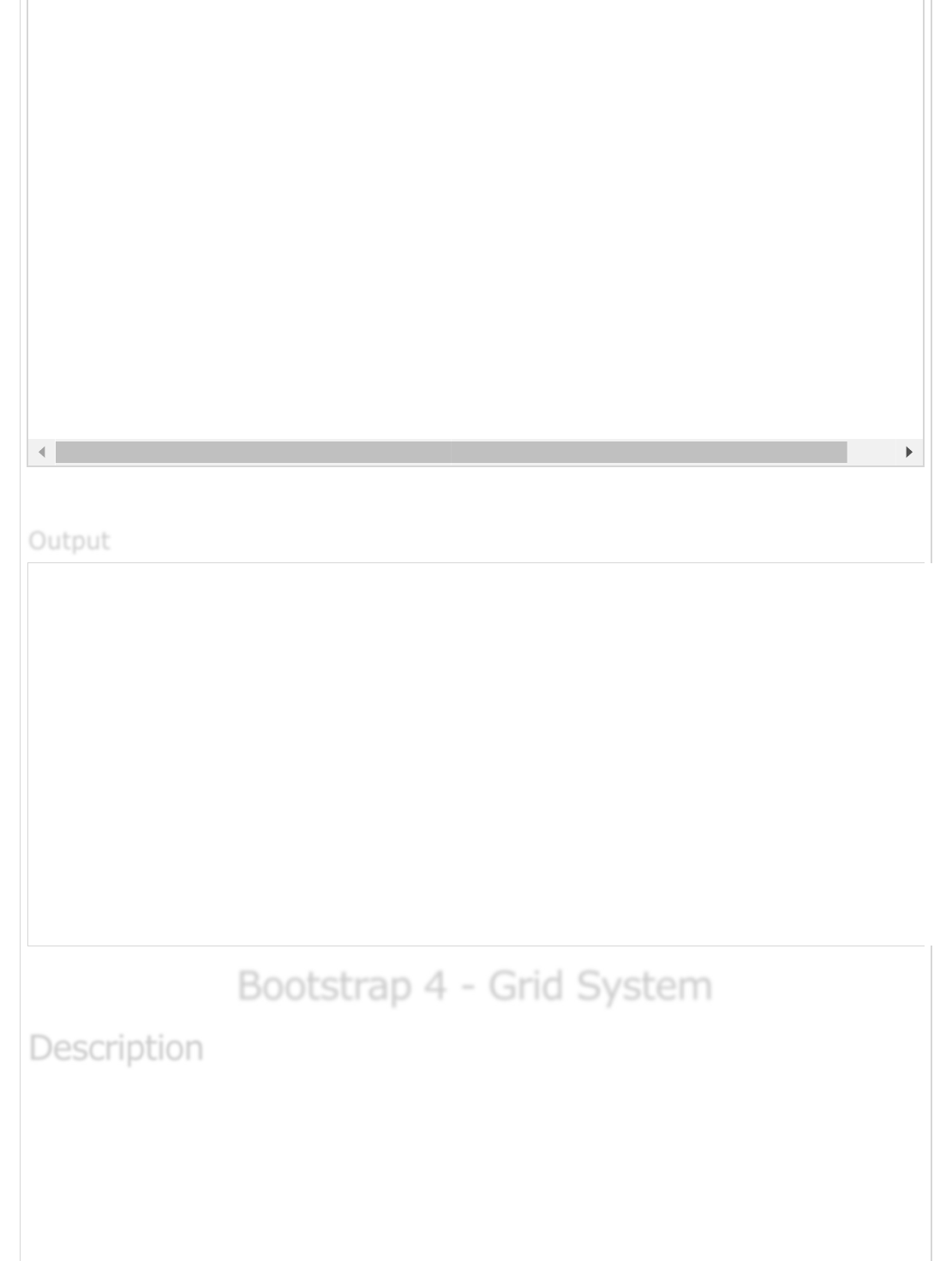
Bootstrap 4 - Grid SystemBootstrap 4 - Grid System
Bootstrap 4 - Grid System
Bootstrap 4 grid system built with flexbox which is fully responsive and scales up to 12
columns (according to the size of device) by creating layout with rows and columns across
the page. It provides responsive, mobile first fluid grid system which scales the columns as
the device or viewport size increases.
<code>.container-fluid</code> class.
</div>
<!-- jQuery first, then Popper.js, then Bootstrap JS -->
<script src = "https://code.jquery.com/jquery-3.3.1.slim.min.js"
integrity = "sha384-q8i/X+965DzO0rT7abK41JStQIAqVgRVzpbzo5smXKp4YfRvH+8abtTE1Pi6jizo"
crossorigin = "anonymous">
</script>
<script src = "https://cdnjs.cloudflare.com/ajax/libs/popper.js/1.14.3/umd/popper.min.js"
integrity =" sha384-ZMP7rVo3mIykV+2+9J3UJ46jBk0WLaUAdn689aCwoqbBJiSnjAK/l8WvCWPIPm49"
crossorigin = "anonymous">
</script>
<script src = "https://stackpath.bootstrapcdn.com/bootstrap/4.1.3/js/bootstrap.min.js"
integrity = "sha384-ChfqqxuZUCnJSK3+MXmPNIyE6ZbWh2IMqE241rYiqJxyMiZ6OW/JmZQ5stwEULTy"
crossorigin = "anonymous">
</script>
</body>
</html>
OutputOutput
Output
DescriptionDescription
Description
Rows must be placed within a .container class for proper alignment and padding.
For responsive width use .container class and for fixed width across all viewport,
use the .container-fluid class.
Use rows to create horizontal groups of columns.
Content should be placed within the columns, and only columns may be the
immediate children of rows.
Columns contain padding for controlling the space between them.
If you place more than 12 columns in a row, then the columns will be placed in a
new line.
Columns create gaps between column content via padding. Therefore, you can
remove the margin from rows and padding from columns with .no-gutters class on
the row.
You can make grid system responsive by using five grid breakpoints such as extra
small, small, medium, large, and extra large.
Predefined grid classes like .col-4 are available for quickly making grid layouts.
LESS mixins can also be used for more semantic layouts.
The following table summarizes aspects of how Bootstrap 4 grid system works across
multiple devices −
Extra
small
devices
(<576px)
Small devices
(≥576px)
Medium
devices
(≥768px)
Large devices
(≥992px)
Extra Large
devices
(≥1200px)
Grid
behavior
Horizontal
at all times
Collapsed to
start,
horizontal
above
breakpoints
Collapsed to
start,
horizontal
above
breakpoints
Collapsed to
start,
horizontal
above
breakpoints
Collapsed to
start, horizontal
above
breakpoints
Max
container
width
None
(auto)
540px 720px 960px 1140px
Class
classes
.col- .col-sm- .col-md- .col-lg- .col-xl-
Working of Grid SystemWorking of Grid System
Working of Grid System
Grid OptionsGrid Options
Grid Options
# of
columns
12 12 12 12 12
Gutter
width
30px
(15px on
each side
of a
column)
30px
(15px on
each side of a
column)
30px
(15px on
each side of a
column)
30px
(15px on
each side of a
column)
30px
(15px on
each side of a
column)
Nestable Yes Yes Yes Yes Yes
Column
ordering
Yes Yes Yes Yes Yes
Following is basic structure of Bootstrap 4 grid −
<div class = "container">
<div class = "row">
<div class = "col-*-*"></div>
<div class = "col-*-*"></div>
</div>
<div class = "row">
<div class = "col-*-*"></div>
<div class = "col-*-*"></div>
<div class = "col-*-*"></div>
</div>
<div class = "row">...</div>
</div>
Following is an example of Bootstrap 4 grid system −
<html lang = "en">
<head>
<!-- Meta tags -->
<meta charset = "utf-8">
<meta name = "viewport" content = "width = device-width, initial-scale = 1, shrink-to-fit =
<!-- Bootstrap CSS -->
<link rel = "stylesheet"
href = "https://stackpath.bootstrapcdn.com/bootstrap/4.1.3/css/bootstrap.min.css"
integrity = "sha384-MCw98/SFnGE8fJT3GXwEOngsV7Zt27NXFoaoApmYm81iuXoPkFOJwJ8ERdknLPMO"
crossorigin = "anonymous">
<title>Bootstrap 4 Example</title>
Basic Grid StructureBasic Grid Structure
Basic Grid Structure
Example of Grid SystemExample of Grid System
Example of Grid System
ExampleExample
Example
Live Demo

</style>
.grid_system div[class^="col"] {
border: 1px solid white;
background: #e4dcdc;
text-align: center;
padding-top: 5px;
padding-bottom: 5px
}
</style>
</head>
<body>
<div class = "grid_system">
<div class = "row">
<div class = "col-sm-1">.col-sm-1</div>
<div class = "col-sm-1">.col-sm-1</div>
<div class = "col-sm-1">.col-sm-1</div>
<div class = "col-sm-1">.col-sm-1</div>
<div class = "col-sm-1">.col-sm-1</div>
<div class = "col-sm-1">.col-sm-1</div>
<div class = "col-sm-1">.col-sm-1</div>
<div class = "col-sm-1">.col-sm-1</div>
<div class = "col-sm-1">.col-sm-1</div>
<div class = "col-sm-1">.col-sm-1</div>
<div class = "col-sm-1">.col-sm-1</div>
<div class = "col-sm-1">.col-sm-1</div>
</div>
<div class = "row">
<div class = "col-sm-3">.col-sm-3</div>
<div class = "col-sm-3">.col-sm-3</div>
<div class = "col-sm-3">.col-sm-3</div>
<div class = "col-sm-3">.col-sm-3</div>
</div>
<div class = "row">
<div class = "col-sm-4">.col-sm-4</div>
<div class = "col-sm-4">.col-sm-4</div>
<div class = "col-sm-4">.col-sm-4</div>
</div>
<div class = "row">
<div class =" col-sm-3">.col-sm-3</div>
<div class = "col-sm-3">.col-sm-3</div>
<div class = "col-sm-6">.col-sm-6</div>
</div>
<div class = "row">
<div class = "col-sm-5">.col-sm-5</div>
<div class = "col-sm-7">.col-sm-7</div>
</div>
<div class = "row">
<div class = "col-sm-6">.col-sm-6</div>
<div class = "col-sm-6">.col-sm-6</div>
</div>
<div class = "row">
<div class = "col-sm-12">.col-sm-12</div>
</div>
</div>
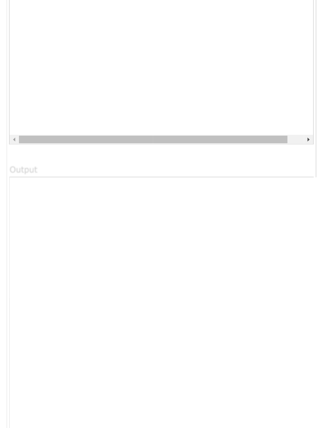
It will produce the following result −
.col-
sm-1
.col-
sm-1
.col-
sm-1
.col-
sm-1
.col-
sm-1
.col-
sm-1
.col-
sm-1
.col-
sm-1
.
s
.col-sm-3 .col-sm-3 .col-sm-3
.col-sm-4 .col-sm-4
.col-sm-3 .col-sm-3
.col-sm-5 .co
.col-sm-6
.col-sm-12
<!-- jQuery first, then Popper.js, then Bootstrap JS -->
<script src = "https://code.jquery.com/jquery-3.3.1.slim.min.js"
integrity = "sha384-q8i/X+965DzO0rT7abK41JStQIAqVgRVzpbzo5smXKp4YfRvH+8abtTE1Pi6jizo"
crossorigin = "anonymous">
</script>
<script src = "https://cdnjs.cloudflare.com/ajax/libs/popper.js/1.14.3/umd/popper.min.js"
integrity = "sha384-ZMP7rVo3mIykV+2+9J3UJ46jBk0WLaUAdn689aCwoqbBJiSnjAK/l8WvCWPIPm49"
crossorigin = "anonymous">
</script>
<script src = "https://stackpath.bootstrapcdn.com/bootstrap/4.1.3/js/bootstrap.min.js"
integrity = "sha384-ChfqqxuZUCnJSK3+MXmPNIyE6ZbWh2IMqE241rYiqJxyMiZ6OW/JmZQ5stwEULTy"
crossorigin = "anonymous">
</script>
</body>
</html>
OutputOutput
Output
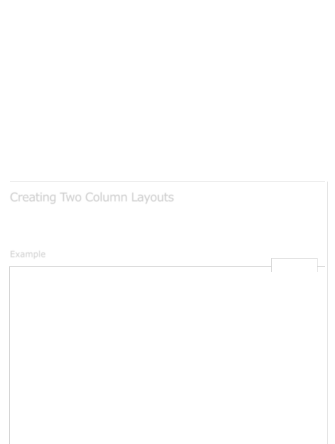
The following example describes creating two column layouts for small, medium and large
devices. On small devices such as mobile phones, columns will automatically become
horizontal as default.
<html lang = "en">
<head>
<!-- Meta tags -->
<meta charset = "utf-8">
<meta name = "viewport" content = "width = device-width, initial-scale = 1, shrink-to-fit =
<!-- Bootstrap CSS -->
<link rel = "stylesheet" href = "https://stackpath.bootstrapcdn.com/bootstrap/4.1.3/css/boo
integrity = "sha384-MCw98/SFnGE8fJT3GXwEOngsV7Zt27NXFoaoApmYm81iuXoPkFOJwJ8ERdknLPMO"
crossorigin = "anonymous">
<title>Bootstrap 4 Example</title>
</head>
<body>
<div class = "grid_system">
<div class = "row">
<div class = "col-sm-6">.col-sm-6</div>
<div class = "col-sm-6">.col-sm-6</div>
</div>
<div class = "row">
<div class = "col-sm-7">.col-sm-7</div>
<div class = "col-sm-5">.col-sm-5</div>
</div>
Creating Two Column LayoutsCreating Two Column Layouts
Creating Two Column Layouts
ExampleExample
Example
Live Demo
It will produce the following result −
.col-sm-6
.col-sm-7
.col-sm-4 .col-sm-8
.col-sm-9
<div class = "row">
<div class = "col-sm-4">.col-sm-4</div>
<div class = "col-sm-8">.col-sm-8</div>
</div>
<div class = "row">
<div class = "col-sm-9">.col-sm-9</div>
<div class = "col-sm-3">.col-sm-3</div>
</div>
</div>
<!-- jQuery first, then Popper.js, then Bootstrap JS -->
<script src = "https://code.jquery.com/jquery-3.3.1.slim.min.js"
integrity = "sha384-q8i/X+965DzO0rT7abK41JStQIAqVgRVzpbzo5smXKp4YfRvH+8abtTE1Pi6jizo"
crossorigin = "anonymous">
</script>
<script src = "https://cdnjs.cloudflare.com/ajax/libs/popper.js/1.14.3/umd/popper.min.js"
integrity = "sha384-ZMP7rVo3mIykV+2+9J3UJ46jBk0WLaUAdn689aCwoqbBJiSnjAK/l8WvCWPIPm49"
crossorigin = "anonymous">
</script>
<script src = "https://stackpath.bootstrapcdn.com/bootstrap/4.1.3/js/bootstrap.min.js"
integrity = "sha384-ChfqqxuZUCnJSK3+MXmPNIyE6ZbWh2IMqE241rYiqJxyMiZ6OW/JmZQ5stwEULTy"
crossorigin = "anonymous">
</script>
</body>
</html>
OutputOutput
Output
Creating Three Column LayoutsCreating Three Column Layouts
Creating Three Column Layouts
The following example describes creating three column layouts for medium and large
devices. If the screen resolution is more than or equal to 992 pixels, then it will display in
landscape mode in tablets and as usual, it will display in portrait mode.
<html lang = "en">
<head>
<!-- Meta tags -->
<meta charset = "utf-8">
<meta name = "viewport" content = "width = device-width, initial-scale = 1, shrink-to-fit =
<!-- Bootstrap CSS -->
<link rel = " stylesheet" href = " https://stackpath.bootstrapcdn.com/bootstrap/4.1.3/css/b
integrity = "sha384-MCw98/SFnGE8fJT3GXwEOngsV7Zt27NXFoaoApmYm81iuXoPkFOJwJ8ERdknLPMO"
crossorigin = "anonymous">
<title>Bootstrap 4 Example</title>
</head>
<body>
<div class = "grid_system">
<div class = "row">
<div class = "col-sm-4">.col-sm-4</div>
<div class = "col-sm-4">.col-sm-4</div>
<div class = "col-sm-4">.col-sm-4</div>
</div>
<div class = "row">
<div class = "col-sm-3">.col-sm-3</div>
<div class = "col-sm-4">.col-sm-4</div>
<div class = "col-sm-5">.col-sm-5</div>
</div>
<div class = "row">
<div class = "col-sm-2">.col-sm-2</div>
<div class = "col-sm-8">.col-sm-8</div>
<div class = "col-sm-2">.col-sm-2</div>
</div>
<div class = "row">
<div class = "col-sm-2">.col-sm-2</div>
<div class = "col-sm-3">.col-sm-3</div>
<div class = "col-sm-7">.col-sm-7</div>
</div>
</div>
<!-- jQuery first, then Popper.js, then Bootstrap JS -->
<script src = "https://code.jquery.com/jquery-3.3.1.slim.min.js"
integrity = "sha384-q8i/X+965DzO0rT7abK41JStQIAqVgRVzpbzo5smXKp4YfRvH+8abtTE1Pi6jizo"
crossorigin = "anonymous">
</script>
<script src = "https://cdnjs.cloudflare.com/ajax/libs/popper.js/1.14.3/umd/popper.min.js"
integrity = "sha384-ZMP7rVo3mIykV+2+9J3UJ46jBk0WLaUAdn689aCwoqbBJiSnjAK/l8WvCWPIPm49"
crossorigin = "anonymous">
</script>
<script src = "https://stackpath.bootstrapcdn.com/bootstrap/4.1.3/js/bootstrap.min.js"
integrity = "sha384-ChfqqxuZUCnJSK3+MXmPNIyE6ZbWh2IMqE241rYiqJxyMiZ6OW/JmZQ5stwEULTy"
ExampleExample
Example
Live Demo

It will produce the following result −
.col-sm-4 .col-sm-4
.col-sm-3 .col-sm-4
.col-sm-2 .col-sm-8
.col-sm-2 .col-sm-3 .co
Bootstrap 4 - ContentBootstrap 4 - Content
Bootstrap 4 - Content
Bootstrap 4 uses collection of content methods for displaying the text, blocks of code,
responsive images, data in a tabular format etc on the web page.
The following table lists down the content methods which you can use to manipulate the
Bootstrap 4 −
S.No. Methods & Description
1Typography
The typography feature creates headings, paragraphs, lists and other inline
elements.
crossorigin = "anonymous">
</script>
</body>
</html>
OutputOutput
Output
DescriptionDescription
Description
2
Code
It is used to display inline and multiline blocks of code in the document.
3
Images
Bootstrap 4 provides support for images by using <img> tag.
4
Tables
Tables are used for displaying the data in a tabular format.
5
Figures
The figure element specifies the content along with related images with an
optional caption.
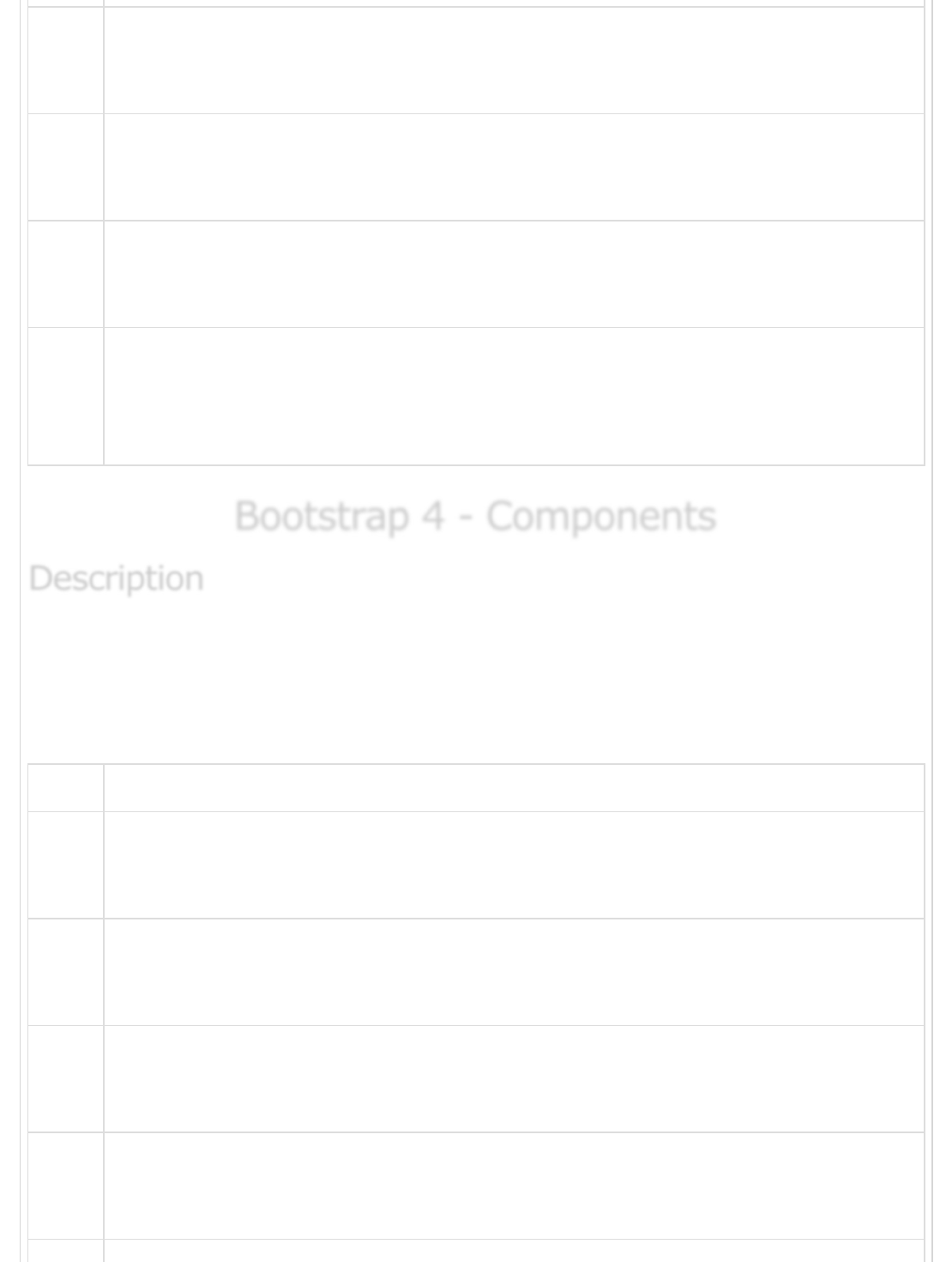
Bootstrap 4 - ComponentsBootstrap 4 - Components
Bootstrap 4 - Components
Bootstrap 4 uses collection of content methods for displaying the text, blocks of code,
responsive images, data in a tabular format etc on the web page.
The following table lists down the content methods which you can use to manipulate the
Bootstrap 4 −
S.No. Methods & Description
1
Alerts
The alert component specifies the predefined message for user actions.
2
Badges
Badges are used to highlight the additional information to the content.
3
Breadcrumb
It is used to show hierarchy-based information for a site.
4
Buttons
Bootstrap provides clickable button to put content such as text and images.
DescriptionDescription
Description
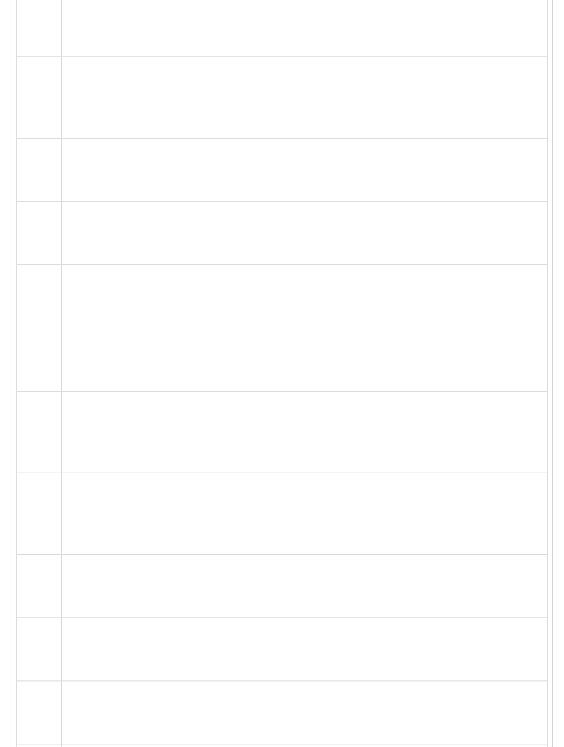
5Button group
Button groups allow multiple buttons to be stacked together on a single line.
6
Cards
Card is a content container which displays a bordered box with some padding
around it.
7
Carousel
Carousel is a flexible, responsive way to add a slider to your site.
8
Collapse
It is used to show or hide the content.
9
Dropdowns
Dropdown menus can be used for displaying links in a list format.
10
Forms
The form element is used to collect input from user.
11
Input group
Using input groups you can easily prepend and append text or buttons to the
text-based inputs.
12
Jumbotron
It increases the size of headings and adds a lot of margin for landing page
content.
13
Modal
Modal is a child window that is layered over its parent window.
14
Navs
Bootstrap provides navigation items for your site in a horizontal menu.
15
Navbar
Navbar provides navigation headers for your application or site.
16 Pagination
Pagination is used to divide the related content across multiple pages.
17
Popovers
Popover is similar to tooltip, offering an extended view complete with a heading.
18
Progress
Progress bar shows progress of a process with stacked bars, animated
backgrounds, and text labels.
19
Scrollspy
Scrollspy is used to indicate currently active link in the menu based on scroll
position.
20
Tooltips
Tooltips are useful when you need to describe a link.
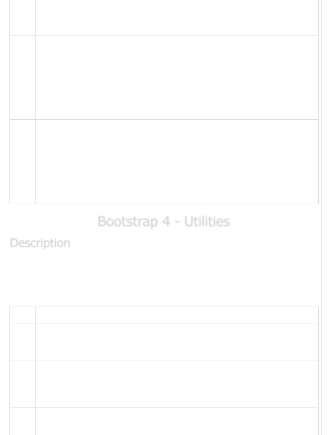
Bootstrap 4 - UtilitiesBootstrap 4 - Utilities
Bootstrap 4 - Utilities
Bootstrap 4 uses collection of utilities for displaying borders, text color, embeding video etc
on the web page.
The following table lists down the utilities types which you can use to manipulate the
Bootstrap 4 −
S.No. Methods & Description
1
Borders
Border utility provides style, color and radius of an element's border.
2
Clearfix and Close Icon
Clearfix is used to clear the floated content and close icon for dismissing the
content.
3Colors
DescriptionDescription
Description
Use the contextual classes to change the color of text, link and background color
of an element.
4
Embed
It is used to embed the video in a page by using <iframe> element.
5
Float
It is used to float an element to left or right side.
6
Shadows and Spacing
Shadow utility adds shadow to the elements and spacing utility provides margin
or padding values to an element.
7
Sizing
You can make the size of an element wide or tall by using width and height
utilities.
8
Text
Bootstrap provides text utilities to control text alignment, transform, weight and
more.
9
Flex
Flex utility can be used to manage the layout, alignment, grid columns,
navigation and other components of the page.
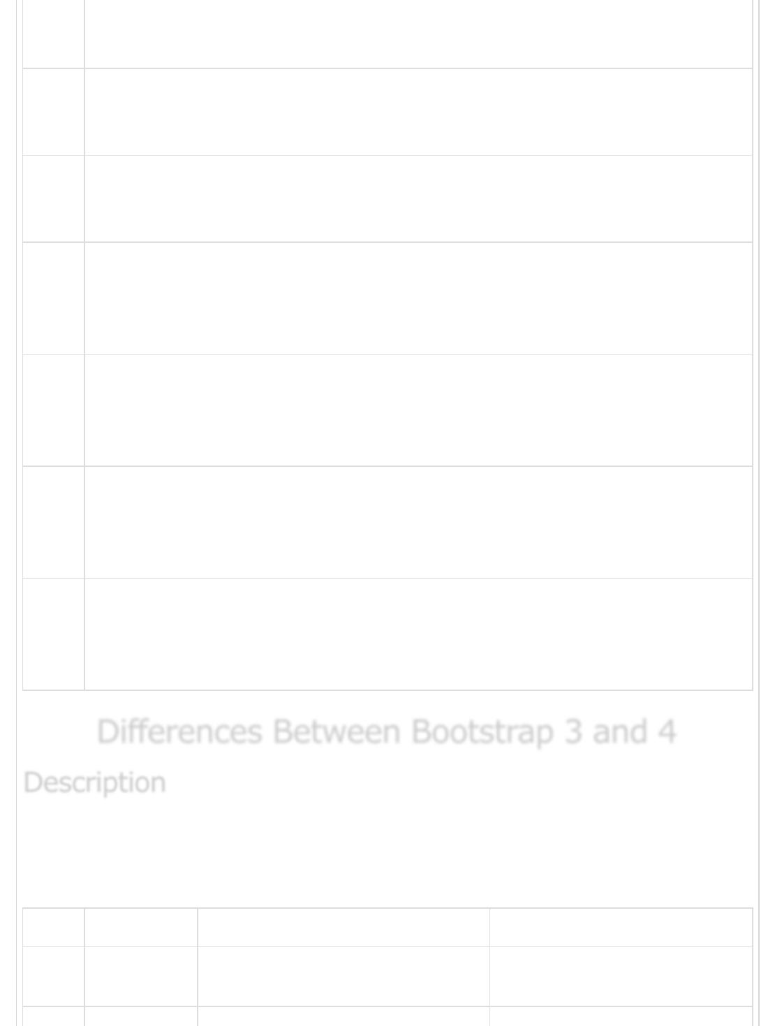
Differences Between Bootstrap 3 and 4Differences Between Bootstrap 3 and 4
Differences Between Bootstrap 3 and 4
Bootstrap is a powerful and popular mobile first front-end framework for building
responsive mobile first sites on the web by using HTML, CSS and JS framework.
The following table shows differences in Bootstrap 3 and Bootstrap 4 −
S.No. Component Bootstrap 3 Bootstrap 4
1CSS source
files
LESS SCSS
DescriptionDescription
Description
2 Grid System 4 tier grid system (xs, sm, md, lg) 5 tier grid system (xs, sm, md,
lg, xl)
3 CSS Unit px rem
4 Font Size 14px 16px
5Dropdown
Structure
Created with <ul> and <li> Created with <ul> or <div>
6Offsetting
Columns
col-md-offset-4 offset-md-4
7 Images .img-responsive class .img-fluid class
8Tables Add .table-responsive class to
parent <div> element
Add .table-responsive class to
<table> element
9 Glyphicons Supported Not Supported
10
Media
Objects
Uses classes for media objects, such
as .media, .media-body, .media-
object, .media-heading, .media-
right, .media-left, .media-list and
.media-body
Uses just .media class for media
objects.
11 Dark/inverse
Tables
Not supported Uses .table-dark class to make
dark/inverse tables
12
Checkboxes
and Radio
Buttons
Displays the checkboxes and radio
buttons by using .radio, .radio-
inline, .checkbox, or .checkbox-
inline classes
Displays the checkboxes and
radio buttons by using .form-
check, .form-check-label, .form-
check-input, or .form-check-
inline classes
13
Form
Control Size
Increase or decrease size of an input
control by using .input-lg and .input-
sm classes
Increase or decrease size of an
input control by using .form-
control-lg and .form-control-sm
classes
14 Help Text Display the help text by using .help-
block class
Display the help text by using
.form-text class
15
Styles Uses the .btn-default and .btn-info
classes on buttons
Uses the .btn-secondary, .btn-
light and .btn-dark classes on
buttons and dropped the .btn-
default class.
16 Outline
Buttons
Not Supported Style the buttons with outline
color by using .btn-outline-*
class
Previous Page Next Page
17
Button Sizes The .btn-xs class is available Available only .btn-sm and .btn-
lg classes and dropped the .btn-
xs class
18 Menu
Headers
Use .dropdown-header class to the li
tag
Use .dropdown-header class to
h1 - h2 tags
19 Dividers Use the .divider class in the li
element
Use the .dropdown-divider class
in the div element
20
Fixed
Navbars
Fix the navbar to top or bottom by
using .navbar-fixed-top and .navbar-
fixed-bottom classes
Fix the navbar to top or bottom
by using .fixed-top and .fixed-
bottom classes
21 Pagers Align the pages by using .previous
and .next classes
Not supported
22 Jumbotron
Full Width
It does not uses .jumbotron-fluid
class on full-width jumbotrons
It uses .jumbotron-fluid class for
full-width jumbotrons
23 Carousel
Item
Uses .item class for carousel items. Uses .carousel-item class for
carousel items.
24
Wells,
Panels and
Thumbnails
Supported Not supported. Use cards
instead
25 Inline Navs It doesn't include .nav-inline class Display the navs as inline by
using the .nav-inline class
Advertisements