CAT L1.4 BUSINESS MATHEMATICS Study Manual
User Manual:
Open the PDF directly: View PDF ![]() .
.
Page Count: 529 [warning: Documents this large are best viewed by clicking the View PDF Link!]
- BM CAT Study Manual Cover Contents and Syllabus RO'Neill 2 08 12
- BM CAT Study Manual Unit 1-3 RO'Neill 2 08 12
- BM CAT Study Manual Unit 4 RO'Neill 2 08 12
- BM CAT Study Manual Unit 5-6 RO'Neill 2 08 12
- BM CAT Study Manual Unit 7-8 RO'Neill 2 08 12
- BM CAT Study Manual Unit 9 RO'Neill 2 08 12
- Option 2
- Option 1
- You are receiving these returns and only investing RWF10000 so your Net Present Value is
- RWF10773.20 - RWF10000 = RWF773.20.
- Since the NPV is positive, you must be receiving more than 10% on the investment.
- What rate of return is the investment yielding?
- 11%, 12%, 18%??
- The rate of return the investment is yielding is called the Internal Rate of Return.
- This is perfect because it is a negative number which is roughly the same as the positive number done earlier.
- The Internal Rate of Return is then estimated by drawing the following diagram:
- Regression and Correlation
- Break-even Analysis
- Break-even Chart
- Fixed, Variable and Marginal Costs
- Introduction
- BM CAT Study Manual Unit 10 RO'Neill 2 08 12
- BM CAT Study Manual Unit 11 RO'Neill 2 08 12
- BM CAT Study Manual Unit 12-13 RO'Neill 2 08 12
- BM CAT Study Manual Unit 14 RO'Neill 2 08 12
- BM CAT Study Manual Unit 15 RO'Neill 2 08 12
- BM CAT Study Manual Unit 16 RO'Neill 2 08 12

INSIDE COVER – BLANK

Page 1
© iCPAR
All rights reserved.
The text of this publication, or any part thereof, may not be reproduced or transmitted in any form
or by any means, electronic or mechanical, including photocopying, recording, storage in an
information retrieval system, or otherwise, without prior permission of the publisher.
Whilst every effort has been made to ensure that the contents of this book are accurate, no
responsibility for loss occasioned to any person acting or refraining from action as a result of any
material in this publication can be accepted by the publisher or authors. In addition to this, the
authors and publishers accept no legal responsibility or liability for any errors or omissions in
relation to the contents of this book.
INSTITUTE OF
CERTIFIED PUBLIC ACCOUNTANTS
OF
RWANDA
Level 1
L1.4 BUSINESS MATHEMATICS
First Edition 2012
This study manual has been fully revised and updated
in accordance with the current syllabus.
It has been developed in consultation with experienced lecturers.

Page 2
BLANK
Page 3
CONTENTS
Study
Unit
Title Page
Introduction to the Course
1: PROBABILITY
11
Estimating Probabilities
13
Types of Event
17
The Two Laws of Probability
19
Tree Diagrams
29
Binomial Distribution
39
Poisson Distribution
41
Venn diagrams
43
2: COLLECTION OF DATA
45
Collection of Data
47
Types of Data
49
Requirements of Statistical Data
51
Methods of Collecting Data
53
Interviewing
57
Designing the Questionnaire
59
Choice of Method
65
Pareto Distribution and the “80:20” Rule
67
3: TABULATION & GROUPING OF DATA
69
Introduction to Classification & Tabulation of Data
71
Forms of Tabulation
75
Secondary Statistical Tabulation
79
Rules for Tabulation
81
Sources of Data & Presentation Methods
85
4: GRAPHICAL REPRESENTATION OF INFORMATION
93
Introduction to Frequency Distributions
95
Preparation of Frequency Distributions
97
Cumulative Frequency Distributions
103
Relative Frequency Distributions
105
Graphical Representation of Frequency Distributions
107
Introduction to Other Types of Data Presentation
117
Pictograms
119
Pie Charts
123
Bar Charts
125
General Rules for Graphical Presentation
129
The Lorenz Curve
131
Page 4
Study
Unit
Title Page
5: AVERAGES OR MEASURES OF LOCATION
137
The Need for Measures of Location
139
The Arithmetic Mean
141
The Mode
153
The Median
159
6: MEASURES OF DISPERSION
165
Introduction to Dispersion
167
The Range
169
The Quartile Deviation, Deciles and Percentiles
171
The Standard Deviation
177
The Coefficient of Variation
183
Skewness
185
Averages & Measures of Dispersion
189
7: THE NORMAL DISTRIBUTION
203
Introduction
205
The Normal Distribution
207
Calculations Using Tables of the Normal Distribution
209
8: INDEX NUMBERS
215
The Basic Idea
217
Building Up an Index Number
219
Weighted Index Numbers
223
Formulae
229
Quantity or Volume Index Numbers
231
The Chain-Base Method
237
Deflation of Time Series
239
9: PERCENTAGES & RATIOS, SIMPLE & COMPOUND INTEREST,
DISCOUNTED CASH FLOW
245
Percentages
247
Ratios
249
Simple Interest
253
Compound Interest
257
Introduction to Discounted Cash Flow Problems
263
Two Basic DCF Methods
273
Introduction to Financial Mathematics
283
Manipulation of Inequalities
325
10: CORRELATION
327
General
329
Scatter Diagrams
331
The Correlation Coefficient
337
Rank Correlation
343
11: LINEAR REGRESSION
351
Introduction
353
Regression Lines
355
Use of Regression
361
Connection between Correlation and Regression
363
Page 5
Study
Unit
Title Page
12: TIME SERIES ANALYSIS I
365
Introduction
367
Structure of a Time Series
369
Calculation of Component Factors for the Additive Model
375
13: TIME SERIES ANALYSIS II
387
Forecasting
389
The Z Chart
393
Summary
395
14: LINEAR PROGRAMMING
397
The Graphical Method
399
The Graphical Method Using Simultaneous Equations
417
Sensitivity Analysis (graphical)
423
The Principles of the Simplex Method
433
Sensitivity Analysis (simplex)
447
Using Computer Packages
455
Using Linear Programming
459
15: RISK AND UNCERTAINTY
463
Risk & Uncertainty
465
Allowing for Uncertainty
467
Probabilities and Expected Value
471
Decision Rules
475
Decision Trees
481
The value of information
491
Sensitivity Analysis
503
Simulation Models
505
16: SPREADSHEETS
509
Origins of Spreadsheets
511
Modern Spreadsheets
513
Concepts
515
How Spreadsheets work
521
Users of Spreadsheets
523
Advantages & Disadvantages of Spreadsheets
525
Spreadsheets in Today’s Climate
527

Page 6
BLANK
Page 7
Stage: Level 1
Subject Title: L1.4 Business Mathematics
Aim
The aim of this subject is to provide students with the tools and techniques to understand the
mathematics associated with managing business operations. Probability and risk play an
important role in developing business strategy. Preparing forecasts and establishing the
relationships between variables are an integral part of budgeting and planning. Financial
mathematics provides an introduction to interest rates and annuities and to investment
appraisals for projects. Preparing graphs and tables in summarised formats and using
spreadsheets are important in both the calculation of data and the presentation of information
to users.
Learning Objectives:
On successful completion of this subject students should be able to show:
• Demonstrate the use of basic mathematics and solve equations and inequalities
• Calculate probability and demonstrate the use of probability where risk and
uncertainty exists
• Apply techniques for summarising and analysing data
• Calculate correlation coefficient for bivariate data and apply techniques for simple
regression
• Demonstrate forecasting techniques and prepare forecasts
• Calculate present and future values of cash flows and apply financial mathematical
techniques
• Apply spreadsheets to calculate and present data
Page 8
Syllabus:
1. Basic Mathematics
• Use of formulae, including negative powers as in the formulae for the learning
curve
• Order of operations in formulae, including brackets, powers and roots
• Percentages and ratios
• Rounding of numbers
• Basic algebraic techniques and solution of equations, including simultaneous
equations and quadratic equations
• Graphs of linear and quadratic equations
• Manipulation of inequalities
2. Probability
• Probability and its relationship with proportion and per cent
• Addition and multiplication rules of probability theory
• Venn diagrams
• Expected values and expected value tables
• Risk and uncertainty
3. Summarising and Analysing Data
• Data and information
• Tabulation of data
• Graphs, charts and diagrams: scatter diagrams, histograms, bar charts and ogives.
• Summary measures of central tendency and dispersion for both grouped and
ungrouped data
• Frequency distributions
• Normal distribution
• Pareto distribution and the “80:20” rule
• Index numbers
Page 9
4. Relationships between variables
• Scatter diagrams
• Correlation co-efficient: Spearman’s rank correlation coefficient and Pearson’s
correlation coefficient
• Simple linear regression
5. Forecasting
• Time series analysis – graphical analysis
• Trends in time series – graphs, moving averages and linear regressions
• Seasonal variations using both additive and multiplicative models
• Forecasting and its limitations
6. Financial Mathematics
• Simple and compound interest
• Present value(including using formulae and tables)
• Annuities and perpetuities
• Loans and Mortgages
• Sinking funds and savings funds
• Discounting to find net present value (NPV) and internal rate of return (IRR)
• Interpretation of NPV and IRR
Page 10
7. Spreadsheets
• Features and functions of commonly used spreadsheet software, workbook,
worksheet, rows, columns, cells, data, text, formulae, formatting, printing, graphs and
macros.
• Advantages and disadvantages of spreadsheet software, when compared to manual
analysis and other types of software application packages
• Use of spreadsheet software in the day to day work: budgeting, forecasting, reporting
performance, variance analysis, what-if analysis, discounted cash flow calculations

Page 11
STUDY UNIT 1
Probability
Contents
Unit
Title
Page
A.
Estimating Probabilities
13
Introduction
13
Theoretical Probabilities
14
Empirical Probabilities
15
B.
Types of Event
17
C.
The Two Laws of Probability
19
Addition Law for Mutually Exclusive Events
19
Addition Law for a Complete List of Mutually Exclusive Events
20
Addition Law for Non-Mutually-Exclusive Events
Multiplication Law for Independent Events
Distinguishing the Laws
D.
Tree Diagrams
29
Examples
29
E.
Binomial Distribution
39
F.
Poisson Distribution
41
G.
Venn Diagrams
43
Page 12
BLANK

Page 13
A. ESTIMATING PROBABILITIES
Introduction
Suppose someone tells you “there is a 50-50 chance that we will be able to deliver your order
on Friday”. This statement means something intuitively, even though when Friday arrives
there are only two outcomes. Either the order will be delivered or it will not. Statements like
this are trying to put probabilities or chances on uncertain events.
Probability is measured on a scale between 0 and 1. Any event which is impossible has a
probability of 0, and any event which is certain to occur has a probability of 1. For example,
the probability that the sun will not rise tomorrow is 0; the probability that a light bulb will
fail sooner or later is 1. For uncertain events, the probability of occurrence is somewhere
between 0 and 1. The 50-50 chance mentioned above is equivalent to a probability of 0.5.
Try to estimate probabilities for the following events. Remember that events which are more
likely to occur than not have probabilities which are greater than 0.5, and the more certain
they are the closer the probabilities are to 1. Similarly, events which are more likely not to
occur have probabilities which are less than 0.5. The probabilities get closer to 0 as the events
get more unlikely.
(a) The probability that a coin will fall heads when tossed.
(b) The probability that it will snow next Christmas.
(c) The probability that sales for your company will reach record levels next year.
(d) The probability that your car will not break down on your next journey.
(e) The probability that the throw of a dice will show a six.
Page 14
The probabilities are as follows:
(a) The probability of heads is 0.5.
(b) This probability is quite low. It is somewhere between 0 and 0.1.
(c) You can answer this one yourself.
(d) This depends on how frequently your car is serviced. For a reliable car it should be
greater than 0.99.
(e) The probability of a six is 1/6 or 0.167.
Theoretical Probabilities
Sometimes probabilities can be specified by considering the physical aspects of the situation.
For example, consider the tossing of a coin. What is the probability that it will fall heads?
There are two sides to a coin. There is no reason to favour either side as a coin is
symmetrical. Therefore the probability of heads, which we call P(H) is:
P(H) = 0.5.
Another example is throwing a dice. A dice has six sides. Again, assuming it is not weighted
in favour of any of the sides, there is no reason to favour one side rather than another.
Therefore the probability of a six showing uppermost, P(6), is:
P(6) = 1/6 = 0.167.
Page 15
As a third and final example, imagine a box containing 100 beads of which 23 are black and
77 white. If we pick one bead out of the box at random (blindfold and with the box well
shaken up) what is the probability that we will draw a black bead? We have 23 chances out of
100, so the probability is:
(or P = 0.23)
Probabilities of this kind, where we can assess them from our prior knowledge of the
situation, are also called “a priori” probabilities.
In general terms, we can say that if an event E can happen in h ways out of a total of n
possible equally likely ways, then the probability of that event occurring (called a success) is
given by:
P(E) =
=
Empirical Probabilities
Often it is not possible to give a theoretical probability of an event. For example, what is the
probability that an item on a production line will fail a quality control test? This question can
be answered either by measuring the probability in a test situation (i.e. empirically) or by
relying on previous results. If 100 items are taken from the production line and tested, then:
Probability of failure P(F) =
So, if 5 items actually fail the
test
23
–––
100
h
–––
n
Number of possible ways of E occurring
----------------------------------------------------
Total number of possible outcomes
Number of items which fail
----------------------------------------------------
Total number of items tested
Page 16
P(F) = = 0.05.
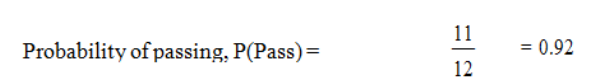
Sometimes it is not possible to set up an experiment to calculate an empirical probability. For
example, what are your chances of passing a particular examination? You cannot sit a series
of examinations to answer this. Previous results must be used. If you have taken 12
examinations in the past, and failed only one, you might estimate:
5
------
100

Page 17
B. TYPES OF EVENT
There are five types of event:
• Mutually exclusive
• Non-mutually-exclusive
• Independent
• Dependent or non-independent
• Complementary.
(a) Mutually Exclusive Events
If two events are mutually exclusive then the occurrence of one event precludes the
possibility of the other occurring. For example, the two sides of a coin are mutually exclusive
since, on the throw of the coin, “heads” automatically rules out the possibility of “tails”. On
the throw of a dice, a six excludes all other possibilities. In fact, all the sides of a dice are
mutually exclusive; the occurrence of any one of them as the top face automatically excludes
any of the others.
(b) Non-Mutually-Exclusive Events
These are events which can occur
. For example, in a pack of playing cards hearts and queens are non-mutually-exclusive since
there is one card, the queen of hearts, which is both a heart and a queen and so satisfies both
criteria for success.
(c) Independent Events
These are events which are not mutually exclusive and where the occurrence of one event
does not affect the occurrence of the other. For example, the tossing of a coin in no way
affects the result of the next toss of the coin; each toss has an independent outcome.
Page 18
(d) Dependent or Non-Independent Events
These are situations where the outcome of one event is dependent on another event. The
probability of a car owner being able to drive to work in his car is dependent on him being
able to start the car. The probability of him being able to drive to work given that the car
starts is a conditional probability and
P(Drive to work|Car starts)
where the vertical line is a shorthand way of writing “given that”.
(e) Complementary Events
An event either occurs or it does not occur, i.e. we are certain that one or other of these
situations holds.
For example, if we throw a dice and denote the event where a six is uppermost by A, and the
event where either a one, two, three, four or five is uppermost by Ā (or not A) then A and Ā
are complementary, i.e. they are mutually exclusive with a total probability of 1. Thus:
P(A) + P(Ā) = 1.
This relationship between complementary events is useful as it is often easier to find the
probability of an event not occurring than to find the probability that it does occur. Using the
above formula, we can always find P(A) by subtracting P(Ā) from 1.
Page 19
C. THE TWO LAWS OF PROBABILITY
Addition Law for Mutually Exclusive Events
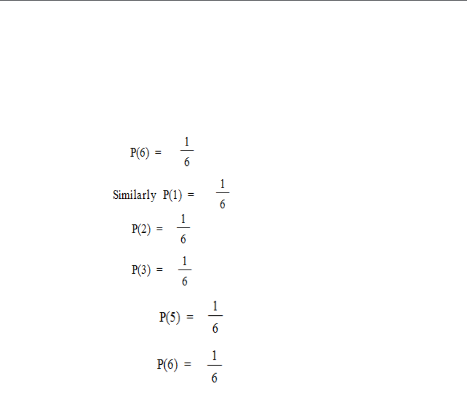
Consider again the example of throwing a dice. You will remember that
What is the chance of getting 1, 2 or 3?
From the symmetry of the dice you can see that P(1 or 2 or 3) = 0.5. But also, from the
equations shown above you can see that
P(1) + P(2) + P(3) = 1/6 + 1/6 + 1/6 = 0.5.
This illustrates that
Page 20
P(1 or 2 or 3) = P(1) + P(2) + P(3)
This result is a general one and it is called the addition law of probabilities for mutually
exclusive events. It is used to calculate the probability of one of any group of mutually
exclusive events. It is stated more generally as:
P(A or B or ... or N) = P(A) + P(B) + ... + P(N)
where A, B ... N are mutually exclusive events.
Addition Law for a Complete List of Mutually Exclusive
Events
(a) If all possible mutually exclusive events are listed, then it is certain that one of these
outcomes will occur. For example, when the dice is tossed there must be one number
showing afterwards.
P(1 or 2 or 3 or 4 or 5 or 6) = 1.
Using the addition law for mutually exclusive events, this can also be stated as
P(1) + P(2) + P(3) + P(4) + P(5) + P(6) = 1.
Again this is a general rule. The sum of the probabilities of a complete list of mutually
exclusive events will always be 1.
Page 21
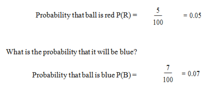
Example
An urn contains 100 coloured balls. Five of these are red, seven are blue and the rest are
white. One ball is to be drawn at random from the urn.
What is the probability that it will be red?
What is the probability that it will be red or blue?
P(R or B) = P(R) + P(B) = 0.05 + 0.07 = 0.12.
This result uses the addition law for mutually exclusive events since a ball cannot be both
blue and red.
What is the probability that it will be white?
The ball must be either red or blue or white. This is a complete list of mutually exclusive
possibilities.
Therefore P(R) + P(B) + P(W) = 1
P(W) = 1 – P(R) – P(B)
= 1 – 0.05- 0.07
= 0.88
Page 22
Addition Law for Non-Mutually-Exclusive Events
Events which are non-mutually-exclusive are, by definition, capable of occurring together.
The addition law can still be used but the probability of the events occurring together must be
deducted:
P(A or B or both) = P(A) + P(B) – P(A and B).
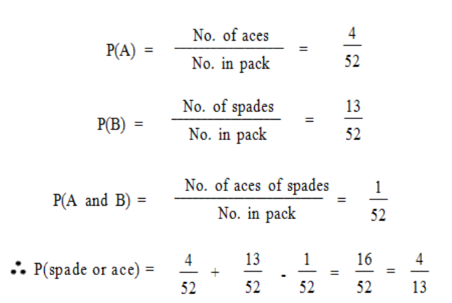
Examples
(a) If one card is drawn from a pack of 52 playing cards, what is the probability: (i) that it
is either a spade or an ace; (ii) that it is either a spade or the ace of diamonds?
(i) Let event B be “the card is a spade”. Let event A be “the card is an ace”.
We require P(spade or ace [or both]) = P(A or B)
= P(A) + P(B) – P(A and B)
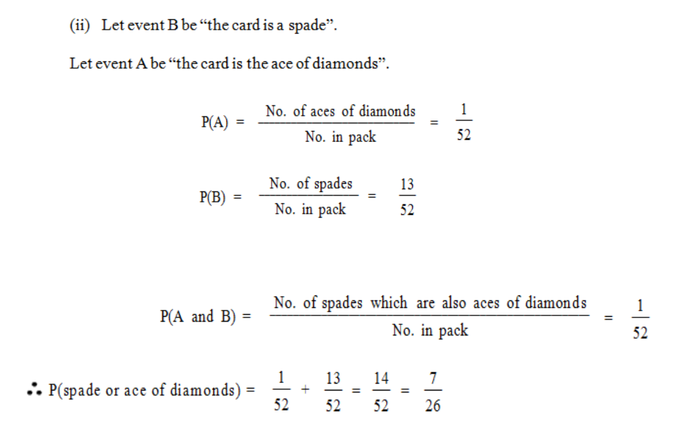
Page 23
(b) At a local shop 50% of customers buy unwrapped bread and 60% buy wrapped bread.
What proportion of customers buy at least one kind of bread if 20% buy both wrapped
and unwrapped bread?
Let S represent all the customers.
Let T represent those customers buying unwrapped bread.
Let W represent those customers buying wrapped bread.
P(buy at least one kind of bread) = P(buy wrapped or unwrapped or both)
= P(T or W)
= P(T) + P(W) – P(T and W)
= 0.5 + 0.6 – 0.2
= 0.9
Page 24
So, 9/10 of the customers buy at least one kind of bread.
Multiplication Law for Independent Events
Consider an item on a production line. This item could be defective or acceptable. These two
possibilities are mutually exclusive and represent a complete list of alternatives. Assume that:
Probability that it is defective, P(D) = 0.2
Probability that it is acceptable, P(A) = 0.8.
Now consider another facet of these items. There is a system for checking them, but only
every tenth item is checked. This is shown as:
Probability that it is checked P(C) = 0.1
Probability that it is not checked P(N) = 0.9.
Again these two possibilities are mutually exclusive and they represent a complete list of
alternatives. An item is either checked or it is not.
Consider the possibility that an individual item is both defective and not checked. These two
events can obviously both occur together so they are not mutually exclusive. They are,
however, independent. That is to say, whether an item is defective or acceptable does not
affect the probability of it being tested.
There are also other kinds of independent events. If you toss a coin once and then again a
second time, the outcome of the second test is independent of the results of the first one. The
Page 25
results of any third or subsequent test are also independent of any previous results. The
probability of heads on any test is 0.5 even if all the previous tests have resulted in heads.
To work out the probability of two independent events both happening, you use the
multiplication law. This can be stated as:
P(A and B) = P(A) x P(B) if A and B are independent events.
Again this result is true for any number of independent events.
So P(A and B and ... and N) = P(A) x P(B) x ... x P(N).
Consider the example above. For any item:
Probability that it is defective, P(D) = 0.2
Probability that it is acceptable, P(A) = 0.8
Probability that it is checked, P(C) = 0.1
Probability that it is not checked, P(N) = 0.9.
Using the multiplication law to calculate the probability that an item is both defective and not
checked
P(D and N) = 0.2 x 0.9 = 0.18.
The probabilities of the other combinations of independent events can also be calculated.
P(D and C) = 0.2 x 0.1 = 0.02
P(A and N) = 0.8 x 0.9 = 0.72
P(A and C) = 0.8 x 0.1 = 0.08.
Page 26
Examples
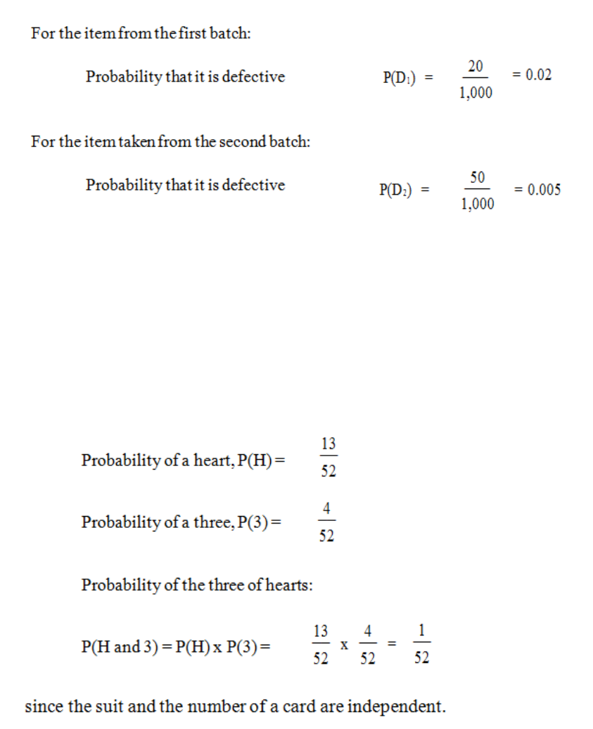
a) A machine produces two batches of items. The first batch contains 1,000 items of
which 20 are damaged. The second batch contains 10,000 items of which 50 are
damaged. If one item is taken from each batch, what it the probability that both items
are defective?
Since these two probabilities are independent
P(D1 and D2) = P(D1) x P(D2) = 0.02 x 0.005 = 0.0001.
b) A card is drawn at random from a well shuffled pack of playing cards. What is the
probability that the card is a heart? What is the probability that the card is a three?
What is the probability that the card is the three of hearts?
Page 27
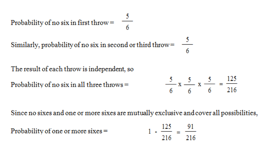
c) A dice is thrown three times. What is the probability of one or more sixes in these
three throws?
Distinguishing the Laws
Although the above laws of probability are not complicated, you must think carefully and
clearly when using them. Remember that events must be mutually exclusive before you can
use the addition law, and they must be independent before you can use the multiplication law.
Another matter about which you must be careful is the listing of equally likely outcomes. Be
sure that you list all of them. For example, we can list the possible results of tossing two
coins, namely:
First Coin Second Coin
Heads Heads
Tails Heads
Heads Tails
Tails Tails
There are four equally likely outcomes. Do not make the mistake of saying, for example, that
there are only two outcomes (both heads or not both heads); you must list all the possible
outcomes. (In this case “not both heads” can result in three different ways, so the probability
of this result will be higher than “both heads”.)
Page 28
In this example, the probability that there will be one heads and one tails (heads - tails, or
tails - heads) is 0.5. This is a case of the addition law at work, the probability of heads - tails (
1/4 ) plus the probability of tails - heads ( 1/4 ). Putting it another way, the probability of
different faces is equal to the probability of the same faces - in both cases1/2.

Page 29
D. TREE DIAGRAMS
A compound experiment, i.e. one with more than one component part, may be regarded as a
sequence of similar experiments. For example, the rolling of two dice can be considered as
the rolling of one followed by the rolling of the other; and the tossing of four coins can be
thought of as tossing one after the other. A tree diagram enables us to construct an exhaustive
list of mutually exclusive outcomes of a compound experiment.
Furthermore, a tree diagram gives us a pictorial representation of probability.
By exhaustive, we mean that every possible outcome is considered.
By mutually exclusive we mean, as before, that if one of the outcomes of the compound
experiment occurs then the others cannot.
Examples
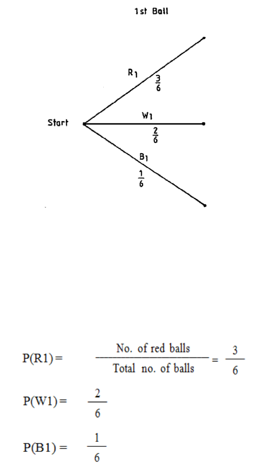
a) The concept can be illustrated using the example of a bag containing five red and
three white billiard balls. If two are selected at random without replacement, what is
the probability that one of each colour is drawn?
We can represent this as a tree diagram as in Figure 1.
N.B. R indicates red ball
W indicates white ball.
Probabilities at each stage are shown alongside the branches of the tree.
Figure 1.1
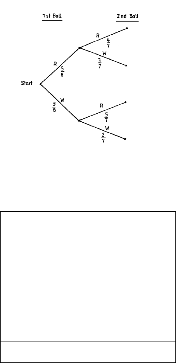
Page 30
Table 1.1
Outcome
Probability
5
4
20
------ x ----- = –––
8
7
56
5
3
15
----- x ----- = –––
8
7
56
3
5
15
----- x ----- = –––
8
7
56
3
2
6
------ x ----- = –––
8
7
56
Total
1
RR
RW
WR
WW

Page 31
We work from left to right in the tree diagram. At the start we take a ball from the bag. This
ball is either red or white so we draw two branches labelled R and W, corresponding to the
two possibilities. We then also write on the branch the probability of the outcome of this
simple experiment being along that branch.
We then consider drawing a second ball from the bag. Whether we draw a red or a white ball
the first time, we can still draw a red or a white ball the second time, so we mark in the two
possibilities at the end of each of the two branches of our existing tree diagram. We can then
see that there are four different mutually exclusive outcomes possible, namely RR, RW, WR
and WW. We enter on these second branches the conditional probabilities associated with
them.
Thus, on the uppermost branch in the diagram we must insert the probability of
obtaining a second red ball given that the first was red. This probability is 4/7 as there are
only seven balls left in the bag, of which four are red. Similarly for the other branches.
Each complete branch from start to tip represents one possible outcome of the compound
experiment and each of the branches is mutually exclusive. To obtain the probability of a
particular outcome of the compound experiment occurring, we multiply the probabilities
along the different sections of the branch, using the general multiplication law for
probabilities.
We thus obtain the probabilities shown in Table 1.1. The sum of the probabilities should add
up to 1, as we know one or other of these mutually exclusive outcomes is certain to happen.
Page 32
b) A bag contains three red balls, two white balls and one blue ball. Two balls are drawn
at random (without replacement). Find the probability that:
i. Both white balls are drawn.
ii. The blue ball is not drawn.
iii. A red then a white are drawn.
iv. A red and a white are drawn.
To solve this problem, let us build up a tree diagram.
Figure 1.2
The first ball drawn has a subscript of 1, e.g. red first = R1. The second ball drawn has a
subscript of 2.
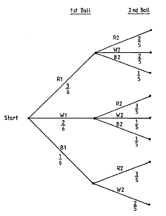
Page 33
Note there is only one blue ball in the bag, so if we picked a blue ball first then we can have
only a red or a white second ball. Also, whatever colour is chosen first, there are only five
balls left as we do not have replacement
Figure 1.3
Page 34
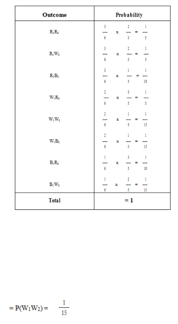
We can now list all the possible outcomes, with their associated probabilities:
Table 1.2
It is possible to read off the probabilities we require from Table 1.2.
(i) Probability that both white balls are drawn:
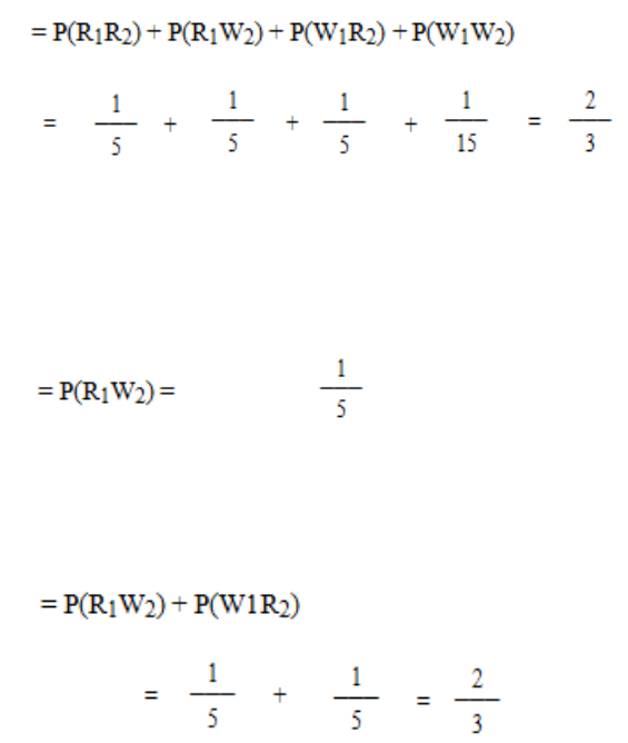
Page 35
(ii) Probability the blue ball is not drawn:
Probability that a red then a white are drawn:
Probability that a red and a white are drawn:
c) A couple go on having children, to a maximum of four, until they have a son. Draw a
tree diagram to find the possible families’ size and calculate the probability that they
have a son.
We assume that any one child is equally likely to be a boy or a girl, i.e. P(B) = P(G) = 1/2 .
Note that once they have produced a son, they do not have any more children. The tree
diagram will be as in Figure 1.4.

Page 36
Figure 1.4
Table 1.3
Possible Families
Probability
1
1 Boy
––
2
1
1
1 Girl, 1 Boy
( –– ) 2 = ––
2
4
1
1
2 Girls, 1 Boy
( –– ) 3 = ––
2
8
1
1
3 Girls, 1 Boy
( –– ) 4 = ––
2
16
1
1
4 Girls
( –– ) 4 = ––
2
16
Total
= 1
Page 37
Probability they have a son is therefore:
Page 38
BLANK

Page 39
E. BINOMIAL DISTRIBUTION
The binomial distribution can be used to describe the likely outcome of events for discrete
variables which:
(a) Have only two possible outcomes; and
(b) Are independent.
Suppose we are conducting a questionnaire. The Binomial distribution might be used to
analyse the results if the only two responses to a question are ‘yes’ or ‘no’ and if the response
to one question (eg, ‘yes’) does not influence the likely response to any other question (ie
‘yes’ and ‘no’).
Put rather more formally, the Binomial distribution occurs when there are n independent trials
(or tests) with the probability of ‘success’ or ‘failure’ in each trial (or test) being constant.
Let p = the probability of ‘success’
Let q = the probability of ‘failure’
Then q = 1 – p
For example, if we toss an unbiased coin ten times, we might wish to find the probability of
getting four heads! Here n = 10, p (head) = 0.5, q (tail) = 0.5 and q = 1 – p.
The probability of obtaining r ‘successes’ in ‘n’ trials (tests) is given by the following
formula:
!)!(
!
rrn
n
C
rn
−
=
where C is the number of combinations.
The probability of getting exactly four heads out of ten tosses of an unbiased coin, can
therefore be solved as:
P(4) = 10C40.540.56
now
210
1234
78910
!4)!410(
!10
410 =
×××
×××
=
−
=C
so P(4) = 210 x (0.5)4 x (0.5)6

Page 40
P(4) = 210 x 0.625 x 0.015625
P(4) = 0.2051
In other words the probability of getting exactly four heads out of ten tosses of an unbiased
coin is 0.2051 or 20.51%.
It may be useful to state the formulae for finding all the possible probabilities of obtaining r
successes in n trials.
Where P(r) = nCrprqn-r
And r = 0, 1, 2, 3, ….n
then, from our knowledge of combinations
P(O) = qn
P(1) = npq n-1
P(2) = n (n-1)P2qn-2
2x1
P(3) = n(n-1) (n-2) p3qn-3
3x2x1
P(4) = n(n-1)(n-2)(n-3) p4qn-4
4x3x2x1
P (n-2) = n(n-1) pn-2q2
2x1
P (n-1) = npn-1q
P(n) = pn

Page 41
F. POISSON DISTRIBUTION
Introduction
The poisson distribution may be regarded as a special case of the binomial distribution. As
with the Binomial distribution, the Poisson distribution can be used where there are only two
possible outcomes:-
1. Success (p)
2. Failure (q)
These events are independent. The Poisson distribution is usually used where n is very large
but p is very small, and where the mean np is constant and typically < 5. As p is very small
(p < 0.1 and often much less), then the chance of the event occurring is extremely low. The
Poisson distribution is therefore typically used for unlikely events such as accidents, strikes
etc.
The Poisson distribution is also used to solve problems where events tend to occur at random,
such as incoming phone calls, passenger arrivals at a terminal etc.
Whereas the formula for solving Binomial problems uses the probabilities, for both “success”
(p) and “failure” (q), the formula for solving Poisson problems only uses the probabilities for
“success” (p).
If µ is the mean, it is possible to show that the probability of r successes is given by the
formula:
P(r) = e-µµr
r!
where e = exponential constant = 2.7183
µ = mean number of successes = np
n = number of trails
p = probability of “success”
r = number of successes
If we substitute r = 0, 1, 2, 3, 4, 5…. in this formula we obtain the following expressions:
P (O) = e-µ
P (1) = µe-u
P (2) = µ2e-µ
2 x 1
P (3) = µ3e-µ

Page 42
3x2x1
P (4) = µ4e-µ
4x3x2x1
P (5) = µ5e-µ
5x4x3x2x1
In questions you are either given the mean µ or you have to find µ from the information
given, which is usually data for n and p; µ is then obtained from the relationship µ = np.
You have to be able to work out e raised to a negative power.
e-3 is the same as 1 so you can simply work this out using 1
e3 2.71833
Alternatively, many calculators have a key marked ex. The easiest way to find e-3 on your
calculator is to enter 3, press +/- key, press e key, and you should obtain 0.049787. If your
calculator does not have an e key but has an xy key, enter 2.7813, press xy key, enter 3, press
+/- key, then press = key; you should obtain 0.049786.
Page 43
G. VENN DIAGRAMS
Definition:
Venn diagrams or set diagrams are diagrams that show all possible logical relations between
a finite collection of sets.
A Venn diagram is constructed with a collection of simple closed curves drawn in a plane.
The “principle of these diagrams is that classes (or sets) be represented by regions in such
relation to one another that all the possible logical relations of these classes can be indicated
in the same diagram. That is, the diagram initially leaves room for any possible relation of
the classes, and the actual or given relation, can then be specified by indication that some
particular region is nor or is not null”
Venn diagrams normally comprise overlapping circles. The interior of the circle
symbolically represents the elements of the set, while the exterior represents elements that are
not members of the set.
For example: in a two-set Venn diagram, one circle may represent the group of all wooden
objects, while another circle may represent the set of all tables. The overlapping area or
intersection would then represent the set of all wooden tables.
Venn Diagram that shows the intersections of the Greek, Latin and Russian alphabets (upper
case letters)

Page 44
BLANK

Page 45
STUDY UNIT 2
Collection of Data
Contents
Unit
Title
Page
A.
Collection of Data - Preliminary Considerations
47
Exact Definition of the Problem
47
Definition of the Units
47
Scope of the Enquiry
47
Accuracy of the Data
48
B.
Types of Data
49
Primary and Secondary Data
49
Quantitative/Qualitative Categorisation
49
Continuous/Discrete Categorisation
49
C.
Requirements of Statistical Data
51
Homogeneity
51
Completeness
51
Accurate Definition
52
Uniformity
52
D.
Methods of Collecting Data
53
Published Statistics
53
Personal Investigation/Interview
54
Delegated Personal Investigation/Interview
54
Questionnaire
54
E.
Interviewing
57
Advantages of Interviewing
57
Disadvantages of Interviewing
57
F.
Designing the Questionnaire
59
Principles
59
An Example
60
G.
Choice of Method
65
H.
Pareto Distribution and the “80:20” Rule
67
Page 46
BLANK

Page 47
A. COLLECTION OF DATA - PRELIMINARY
CONSIDERATIONS
Even before the collection of data starts, there are some important points to consider when
planning a statistical investigation. Shortly I will give you a list of these together with a few
notes on each; some of them you may think obvious or trivial, but do not neglect to learn
them because they are very often the points which are overlooked. Furthermore, examiners
like to have lists as complete as possible when they ask for them!
What, then, are these preliminary matters?
Exact Definition of the Problem
This is necessary in order to ensure that nothing important is omitted from the enquiry, and
that effort is not wasted by collecting irrelevant data. The problem as originally put to the
statistician is often of a very general type and it needs to be specified precisely before work
can begin.
Definition of the Units
The results must appear in comparable units for any analysis to be valid. If the analysis is
going to involve comparisons, then the data must all be in the same units. It is no use just
asking for “output” from several factories - some may give their answers in numbers of items,
some in weight of items, some in number of inspected batches and so on.
Scope of the Enquiry
No investigation should be got under way without defining the field to be covered. Are we
interested in all departments of our business, or only some? Are we to concern ourselves with
our own business only, or with others of the same kind?
Page 48
Accuracy of the Data
To what degree of accuracy is data to be recorded? For example, are ages of individuals to be
given to the nearest year or to the nearest month or as the number of completed years? If
some of the data is to come from measurements, then the accuracy of the measuring
instrument will determine the accuracy of the results. The degree of precision required in an
estimate might affect the amount of data we need to collect. In general, the more precisely we
wish to estimate a value, the more readings we need to take.

Page 49
B. TYPES OF DATA
Primary and Secondary Data
In its strictest sense, primary data is data which is both original and has been obtained in
order to solve the specific problem in hand. Primary data is therefore raw data and has to be
classified and processed using appropriate statistical methods in order to reach a solution to
the problem.
Secondary data is any data other than primary data. Thus it includes any data which has been
subject to the processes of classification or tabulation or which has resulted from the
application of statistical methods to primary data, and all published statistics.
Quantitative/Qualitative Categorisation
Variables may be either quantitative or qualitative. Quantitative variables, to which we shall
restrict discussion here, are those for which observations are numerical in nature. Qualitative
variables have non-numeric observations, such as colour of hair, although, of course, each
possible non-numeric value may be associated with a numeric frequency.
Continuous/Discrete Categorisation
Variables may be either continuous or discrete. A continuous variable may take any value
between two stated limits (which may possibly be minus and plus infinity). Height, for
example, is a continuous variable, because a person’s height may (with appropriately accurate
equipment) be measured to any minute fraction of a millimetre. A discrete variable, however,
can take only certain values occurring at intervals between stated limits. For most (but not all)
discrete variables, these interval values are the set of integers (whole numbers).
For example, if the variable is the number of children per family, then the only possible
values are 0, 1, 2, ... etc. because it is impossible to have other than a whole number of
children. However, in Ireland, shoe sizes are stated in half-units, and so here we have an
example of a discrete variable which can take the values 1, 11/2, 2, 21/2, etc.

Page 50
BLANK

Page 51
C. REQUIREMENTS OF STATISTICAL DATA
Having decided upon the preliminary matters about the investigation, the statistician must
look in more detail at the actual data to be collected. The desirable qualities of statistical data
are the following:
– Homogeneity
– Completeness
– Accurate definition
– Uniformity.
Homogeneity
The data must be in properly comparable units. “Five houses” means little since five
dwelling houses are very different from five ancestral castles. Houses cannot be compared
unless they are of a similar size or value. If the data is found not to be homogeneous, there
are two methods of adjustment possible.
a) Break down the group into smaller component groups which are homogeneous and
study them separately.
b) Standardise the data. Use units such as “output per man-hour” to compare the output
of two factories of very different size. Alternatively, determine a relationship between
the different units so that all may be expressed in terms of one; in food consumption
surveys, for example, a child may be considered equal to half an adult.
Completeness
Great care must be taken to ensure that no important aspect is omitted from the enquiry.
Page 52
Accurate Definition
Each term used in an investigation must be carefully defined; it is so easy to be slack about
this and to run into trouble. For example, the term “accident” may mean quite different things
to the injured party, the police and the insurance company! Watch out also, when using other
people’s statistics, for changes in definition. Laws may, for example, alter the definition of an
“indictable offence” or of an “unemployed person”.
Uniformity
The circumstances of the data must remain the same throughout the whole investigation. It is
no use, for example, comparing the average age of workers in an industry at two different
times if the age structure has changed markedly. Likewise, it is not much use comparing a
firm’s profits at two different times if the working capital has changed.

Page 53
D. METHODS OF COLLECTING DATA
When all the foregoing matters have been dealt with, we come to the question of how to
collect the data we require. The methods usually available are as follows:
– Use of published statistics
– Personal investigation/interview
– Delegated personal investigation/interview
– Questionnaire.
Published Statistics
Sometimes we may be attempting to solve a problem that does not require us to collect new
information, but only to reassemble and reanalyse data which has already been collected by
someone else for some other purpose.
We can often make good use of the great amount of statistical data published by
governments, the United Nations, nationalised industries, chambers of trade and commerce
and so on. When using this method, it is particularly important to be clear on the definition of
terms and units and on the accuracy of the data. The source must be reliable and the
information up-to-date.
This type of data is sometimes referred to as secondary data in that the investigator himself
has not been responsible for collecting it and it thus came to him “second-hand”. By contrast,
data which has been collected by the investigator for the particular survey in hand is called
primary data.
The information you require may not be found in one source but parts may appear in several
different sources. Although the search through these may be time-consuming, it can lead to
data being obtained relatively cheaply and this is one of the advantages of this type of data
collection. Of course, the disadvantage is that you could spend a considerable amount of time
looking for information which may not be available.
Another disadvantage of using data from published sources is that the definitions used for
variables and units may not be the same as those you wish to use. It is sometimes difficult to
establish the definitions from published information, but, before using the data, you must
establish what it represent
Page 54
Personal Investigation/Interview
In this method the investigator collects the data himself. The field he can cover is, naturally,
limited. The method has the advantage that the data will be collected in a uniform manner
and with the subsequent analysis in mind. There is sometimes a danger to be guarded against
though, namely that the investigator may be tempted to select data that accords with some of
his preconceived notions.
The personal investigation method is also useful if a pilot survey is carried out prior to the
main survey, as personal investigation will reveal the problems that are likely to occur.
Delegated Personal Investigation/Interview
When the field to be covered is extensive, the task of collecting information may be too great
for one person. Then a team of selected and trained investigators or interviewers may be
used. The people employed should be properly trained and informed of the purposes of the
investigation; their instructions must be very carefully prepared to ensure that the results are
in accordance with the “requirements” described in the previous section of this study unit. If
there are many investigators, personal biases may tend to cancel out.
Care in allocating the duties to the investigators can reduce the risks of bias. For example, if
you are investigating the public attitude to a new drug in two towns, do not put investigator A
to explore town X and investigator B to explore town Y, because any difference that is
revealed might be due to the towns being different, or it might be due to different personal
biases on the part of the two investigators. In such a case, you would try to get both people to
do part of each town.
Questionnaire
In some enquiries the data consists of information which must be supplied by a large number
of people. Then a very convenient way to collect the data is to issue questionnaire forms to
the people concerned and ask them to fill in the answers to a set of printed questions. This
method is usually cheaper than delegated personal investigation and can cover a wider field.
A carefully thought-out questionnaire is often also used in the previous methods of
investigation in order to reduce the effect of personal bias.
Page 55
The distribution and collection of questionnaires by post suffers from two main drawbacks:
a) The forms are completed by people who may be unaware of some of the requirements
and who may place different interpretations on the questions - even the most carefully
worded ones!
b) There may be a large number of forms not returned, and these may be mainly by
people who are not interested in the subject or who are hostile to the enquiry. The
result is that we end up with completed forms only from a certain kind of person and
thus have a biased sample.
It is essential to include a reply-paid envelope to encourage people to respond.
If the forms are distributed and collected by interviewers, a greater response is likely and
queries can be answered. This is the method used, for example, in the Population Census.
Care must be taken, however, that the interviewers do not lead respondents in any way.
Page 56
BLANK

Page 57
E. INTERVIEWING
Advantages of Interviewing
There are many advantages of using interviewers in order to collect information.
The major one is that a large amount of data can be collected relatively quickly and cheaply.
If you have selected the respondents properly and trained the interviewers thoroughly, then
there should be few problems with the collection of the data.
This method has the added advantage of being very versatile since a good interviewer can
adapt the interview to the needs of the respondent. Similarly, if the answers given to the
questions are not clear, then the interviewer can ask the respondent to elaborate on them.
When this is necessary, the interviewer must be very careful not to lead the respondent into
altering rather than clarifying the original answers. The technique for dealing with this
problem must be tackled at the training stage.
This “face-to-face” technique will usually produce a high response rate. The response rate is
determined by the proportion of interviews that are successful.
Another advantage of this method of collecting data is that with a well-designed
questionnaire it is possible to ask a large number of short questions of the respondent in one
interview. This naturally means that the cost per question is lower than in any other method.
Disadvantages of Interviewing
Probably the biggest disadvantage of this method of collecting data is that the use of a large
number of interviewers leads to a loss of direct control by the planners of the survey.
Mistakes in selecting interviewers and any inadequacy of the training programme may not be
recognised until the interpretative stage of the survey is reached. This highlights the need to
train interviewers correctly. It is particularly important to ensure that all interviewers ask
questions in a similar manner. Even with the best will in the world, it is possible that an
inexperienced interviewer, just by changing the tone of his or her voice, may give a different
emphasis to a question than was originally intended.
In spite of these difficulties, this method of data collection is widely used as questions can be
answered cheaply and quickly and, given the correct approach, the technique can achieve
high response rates.
Page 58
BLANK

Page 59
F. DESIGNING THE QUESTIONNAIRE
Principles
A "questionnaire" can be defined as "a formulated series of questions, an interrogatory" and
this is precisely what it is. For a statistical enquiry, the questionnaire consists of a sheet (or
possibly sheets) of paper on which there is a list of questions the answers to which will form
the data to be analysed. When we talk about the "questionnaire method" of collecting data,
we usually have in mind that the questionnaires are sent out by post or are delivered at
people’s homes or offices and left for them to complete. In fact, however, the method is very
often used as a tool in the personal investigation methods already described.
The principles to be observed when designing a questionnaire are as follows:
a) Keep it as short as possible, consistent with getting the right results.
b) Explain the purpose of the investigation so as to encourage people to give the
answers.
c) Individual questions should be as short and simple as possible.
d) If possible, only short and definite answers like "Yes", "No", or a number of some
sort should be called for.
e) Questions should be capable of only one interpretation.
f) There should be a clear logic in the order in which the questions are asked.
g) There should be no leading questions which suggest the preferred answer.
h) The layout should allow easy transfer for computer input.
i) Where possible, use the "alternative answer" system in which the respondent has to
choose between several specified answers.
j) The respondent should be assured that the answers will be treated confidentially and
that the truth will not be used to his or her detriment.
k) No calculations should be required of the respondent.
The above principles should always be applied when designing a questionnaire and, in
addition, you should understand them well enough to be able to remember them all if you are
asked for them in an examination question. They are principles and not rigid rules - often one
has to go against some of them in order to get the right information. Governments can often
ignore these principles because they can make the completion of the questionnaire
compulsory by law, but other investigators must follow the rules as far as practicable in order

Page 60
to make the questionnaire as easy to complete as possible - otherwise they will receive no
replies.
An Example
An actual example of a self-completion questionnaire (Figure 7) is now shown as used by an
educational establishment in a research survey. Note that, as the questionnaire is incorporated
in this booklet, it does not give a true format. In practice, the questionnaire was not spread
over so many pages.
Figure 2.1
Page 61
Figure 2.2
Page 62
Figure 2.3

Page 63
Figure 2.4
Page 64
BLANK

Page 65
G. CHOICE OF METHOD
Choice is difficult between the various methods, as the type of information required will
often determine the method of collection. If the data is easily obtained by automatic methods
or can be observed by the human eye without a great deal of trouble, then the choice is easy.
The problem comes when it is necessary to obtain information by questioning respondents.
The best guide is to ask yourself whether the information you want requires an attitude or
opinion or whether it can be acquired from short yes/no type or similar simple answers. If it is
the former, then it is best to use an interviewer to get the information; if the latter type of data
is required, then a postal questionnaire would be more useful.
Do not forget to check published sources first to see if the information can be found from
data collected for another survey.
Another yardstick worth using is time. If the data must be collected quickly, then use an
interviewer and a short simple questionnaire. However, if time is less important than cost,
then use a postal questionnaire, since this method may take a long time to collect relatively
limited data, but is cheap.
Sometimes a question in the examination paper is devoted to this subject. The tendency is for
the question to state the type of information required and ask you to describe the appropriate
method of data collection giving reasons for your choice.
More commonly, specific definitions and explanations of various terms, such as interviewer
bias, are contained in multi-part questions.
Page 66
BLANK

Page 67
H. PARETO DISTRIBUTION AND THE “80:20” RULE
The Pareto distribution, named after the Italian economist Vilfredo Pareto, is a power law
probability distribution that coincides with social, scientific, geophysical, actuarial, and many
other types of observable phenomena.
Probability density function
Pareto Type I probability density functions for various α (labeled "k") with xm = 1. The horizontal axis is the x
parameter. As α → ∞ the distribution approaches δ(x − xm) where δ is the Dirac delta function
Cumulative distribution function
Pareto Type I cumulative distribution functions for various α(labeled "k") with xm = 1. The
horizontal axis is the x parameter.
Page 68
The “80:20 law”, according to which 20% of all people receive 80% of all income, and 20%
of the most affluent 20% receive 80% of that 80%, and so on, holds precisely when the
Pareto index is a=log4(5) = log (5)/log(4), approximately 1.1161.
Project managers know that 20% of the work consumes 80% of their time and resources.
You can apply the 80/20 rule to almost anything, from science of management to the physical
world.
80% of your sales will come from 20% of your sales staff. 20% of your staff will cause 80%
of your problems, but another 20% of your staff will provide 80% of your production. It
works both ways.
The value of the Pareto Principle for a manager is that it reminds you to focus on the 20%
that matters. Of the things you do during your day, only 20% really matter. Those 20%
produce 80% of your results. Identify and focus on those things.

Page 69
STUDY UNIT 3
Tabulation and Grouping of Data
Contents
Unit
Title
Page
A.
Introduction to Classification and Tabulation of Data
71
Example
71
B.
Forms of Tabulation
75
Simple Tabulation
75
Complex Tabulation
76
C.
Secondary Statistical Tabulation
79
D.
Rules for Tabulation
81
The Rules
81
An Example of Tabulation
82
E.
Sources of Data & Presentation Methods
85
Source, nature, application and use
85
Role of statistics in business analysis and decision making
86
Numerical data
90
Page 70
BLANK

Page 71
A. INTRODUCTION TO CLASSIFICATION AND
TABULATION OF DATA
Having completed the survey and collected the data, we need to organise it so that we can
extract useful information and then present our results. The information will very often
consist of a mass of figures in no very special order. For example, we may have a card index
of the 3,000 workers in a large factory; the cards are probably kept in alphabetical order of
names, but they will contain a large amount of other data such as wage rates, age, sex, type of
work, technical qualifications and so on. If we are required to present to the factory
management a statement about the age structure of the labour force (both male and female),
then the alphabetical arrangement does not help us, and no one could possibly gain any idea
about the topic from merely looking through the cards as they are. What is needed is to
classify the cards according to the age and sex of the worker and then present the results of
the classification as a tabulation. The data in its original form, before classification, is usually
known as “raw data”.
Example
We cannot, of course, give here an example involving 3,000 cards, but you ought now to
follow this “shortened version” involving only a small number of items.
a) Raw Data
15 cards in alphabetical order:
Ayim, L. Mr 39 years
Balewa, W. Mrs 20 “
Buhari, A. Mr 22 “
Boro, W. Miss 22 “
Chahine, S. Miss 32 “
Diop, T. Mr 30 “
Diya, C. Mrs 37 “
Eze, D. Mr 33 “
Egwu, R. Mr 45 “
Gowon, J. Mrs 42 “
Gaxa, F. Miss 24 “
Gueye, W. Mr 27 “
Jalloh, J. Miss 28 “
Jaja, J. Mr 44 “
Jang, L. Mr 39 “
Page 72
b) Classification
(i) According to Sex
Ayim, L. Mr 39 years Balewa, W. Mrs 20 years
Buhari, A. Mr 22 “ Boro, W. Miss 22 “
Diop, T. Mr 30 “ Chahine, S. Miss 32 “
Eze, D. Mr 33 “ Diya. C. Mrs 37 “
Egwu, R. Mr 45 “ Gowon, J. Mrs 42 “
Gueye, W. Mr 27 “ Gaxa, F. Miss 24 “
Jaja, J. Mr 44 “ Jalloh, J. Miss 28 “
Jang, L. Mr 39 “
(ii) According to Age (in Groups)
Balewa, W. Mrs 20 years Ayim, L. Mr 39 years
Buhari, A. Mr 22 “ Chahine, S. Miss 32 “
Boro, W. Miss 22 “ Diop, T. Mr 30 “
Gaxa, F. Miss 24 “ Diya, C. Mrs 37 “
Gueye, W. Mr 27 “ Eze, D. Mr 33 “
Jalloh, J. Miss 28 “ Jang, L. Mr 39 “
Egwu, R. Mr 45 years
Gowon, J. Mrs 42 “
Jaja, J. Mr 44 “
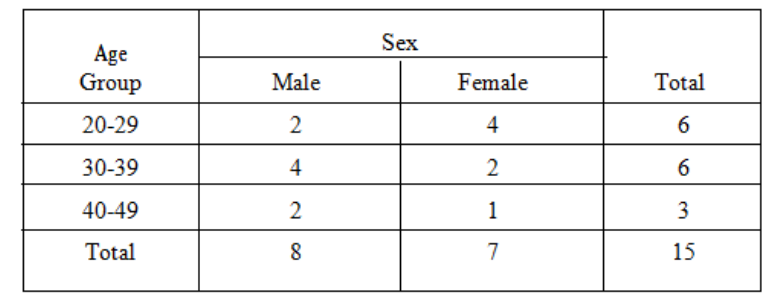
Page 73
c) Tabulation
The number of cards in each group, after classification, is counted and the results presented in
a table.
Table 3.2
You should look through this example again to make quite sure that you understand what has
been done.
You are now in a position to appreciate the purpose behind classification and tabulation - it is
to condense an unwieldy mass of raw data to manageable proportions and then to present the
results in a readily understandable form. Be sure that you appreciate this point, because
examination questions involving tabulation often begin with a first part which asks, "What
is the object of the tabulation of statistical data?", or words to that effect.

Page 74
BLANK
Page 75
B FORMS OF TABULATION
We classify the process of tabulation into Simple Tabulation and Complex or Matrix
Tabulation.
Simple Tabulation
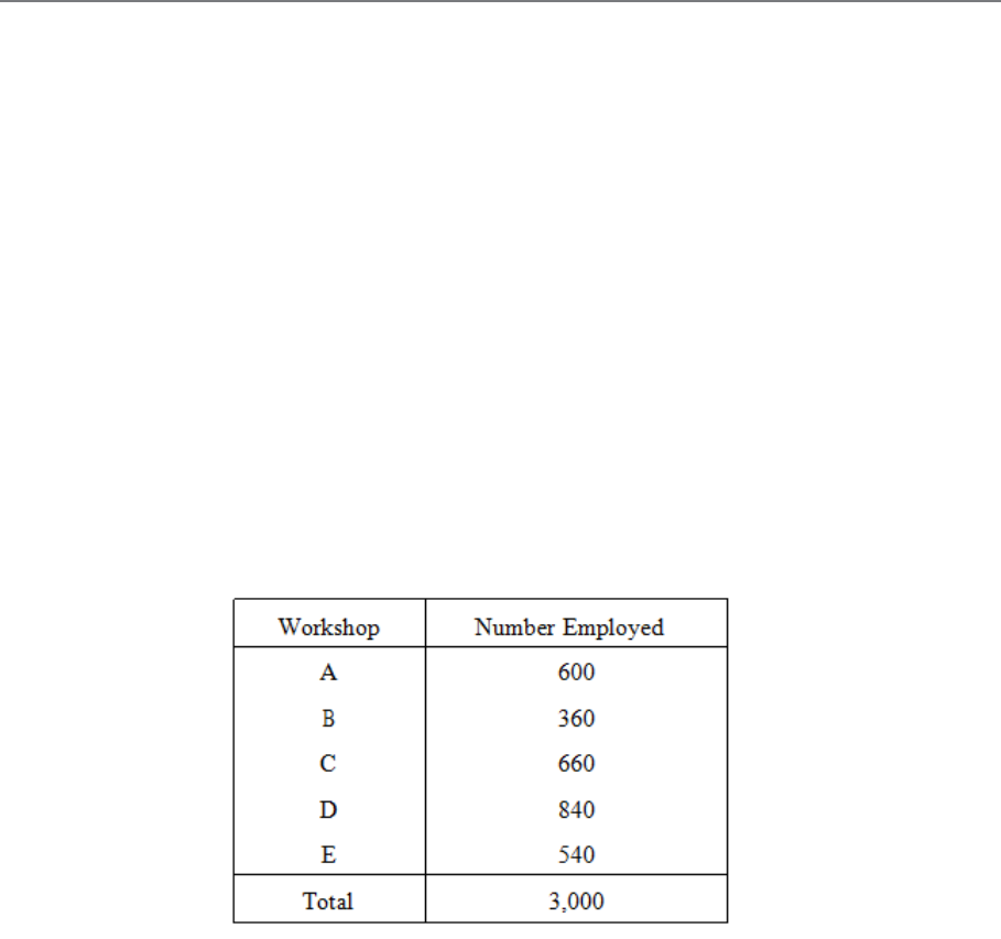
This covers only one aspect of the set of figures. The idea is best conveyed by an example.
Consider the card index mentioned earlier; each card may carry the name of the workshop in
which the person works. A question as to how the labour force is distributed can be answered
by sorting the cards and preparing a simple table thus:
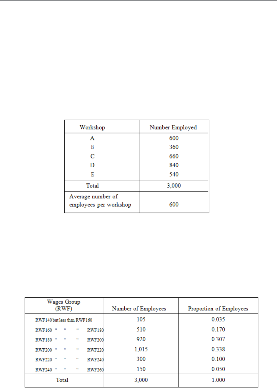
Table 3.3
Another question might have been, "What is the wage distribution in the works?", and the
answer can be given in another simple table (see Table 3.4).
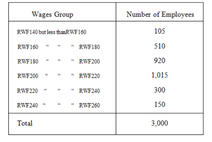
Page 76
Table 3.4
Note that such simple tables do not tell us very much - although it may be enough for the
question of the moment.
Complex Tabulation
This deals with two or more aspects of a problem at the same time. In the problem just
studied, it is very likely that the two questions would be asked at the same time, and we could
present the answers in a complex table or matrix.
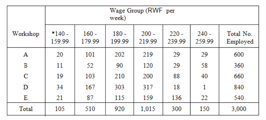
Page 77
Table 3.5
Note *140 - 159.99 is the same as "140 but less than 160" and similarly for the other
columns.
This table is much more informative than are the two simple tables, but it is more
complicated. We could have divided the groups further into, say, male and female workers, or
into age groups. In a later part of this study unit I will give you a list of the rules you should
try to follow in compiling statistical tables, and at the end of that list you will find a table
relating to our 3,000 workers, which you should study as you read the rules.
Page 78
BLANK
Page 79
C. SECONDARY STATISTICAL TABULATION
So far, our tables have merely classified the already available figures, the primary statistics,
but we can go further than this and do some simple calculations to produce other figures,
secondary statistics. As an example, take the first simple table illustrated above, and calculate
how many employees there are on average per workshop. This is obtained by dividing the
total (3,000) by the number of shops (5), and the table appears thus:
Table 3.6
This average is a "secondary statistic". For another example, we may take the second simple
table given above and calculate the proportion of workers in each wage group, thus:
Table 3.7
Page 80
These proportions are "secondary statistics". In commercial and business statistics, it is more
usual to use percentages than proportions; in the above tables these would be 3.5%, 17%,
30.7%, 33.8%, 10% and 5%.
Secondary statistics are not, of course, confined to simple tables, they are used in complex
tables too, as in this example:
The percentage columns and the average line show secondary statistics. All the other figures
are primary statistics.
Note carefully that percentages cannot be added or averaged to get the percentage of a
total or of an average. You must work out such percentages on the totals or averages
themselves.
Another danger in the use of percentages has to be watched, and that is that you must not
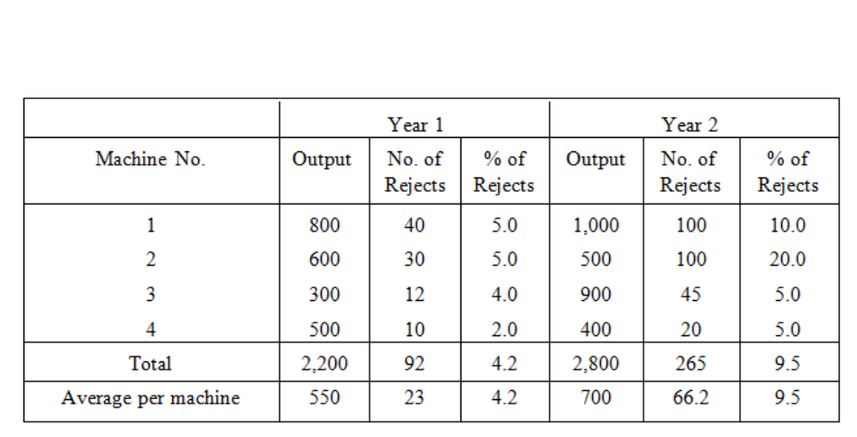
forget the size of the original numbers. Take, for example, the case of two doctors dealing
with a certain disease. One doctor has only one patient and he cures him - 100% success! The
other doctor has 100 patients of whom he cures 80 - only 80% success! You can see how very
unfair it would be on the hard-working second doctor to compare the percentages alone.
Table 3.8: Inspection Results for a Factory
Product in Two Successive Years
Page 81
D. RULES FOR TABULATION
The Rules
There are no absolute rules for drawing up statistical tables, but there are a few general
principles which, if borne in mind, will help you to present your data in the best possible way.
Here they are:
a) Try not to include too many features in any one table (say, not more than four or five)
as otherwise it becomes rather clumsy. It is better to use two or more separate tables.
b) Each table should have a clear and concise title to indicate its purpose.
c) It should be very clear what units are being used in the table (tonnes, RWF, people,
RWF000, etc.).
d) Blank spaces and long numbers should be avoided, the latter by a sensible degree of
approximation.
e) Columns should be numbered to facilitate reference.
f) Try to have some order to the table, using, for example, size, time, geographical
location or alphabetical order.
g) Figures to be compared or contrasted should be placed as close together as possible.
h) Percentages should be pleased near to the numbers on which they are based.
i) Rule the tables neatly - scribbled tables with freehand lines nearly always result in
mistakes and are difficulty to follow. However, it is useful to draw a rough sketch first
so that you can choose the best layout and decide on the widths of the columns.
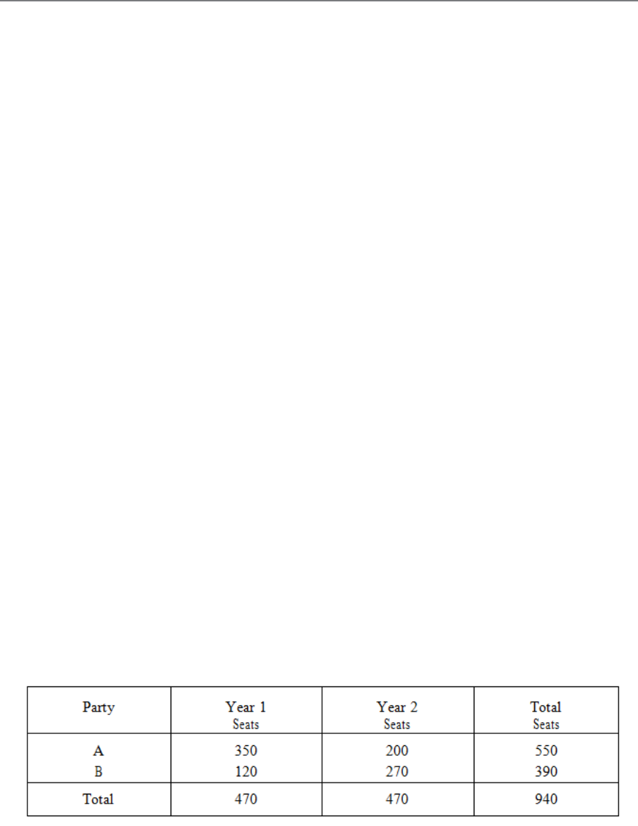
j) Insert totals where these are meaningful, but avoid "nonsense totals". Ask yourself
what the total will tell you before you decide to include it. An example of such a
"nonsense total" is given in the following table:
Table 3.9 : Election Results
Page 82
The totals (470) at the foot of the two columns make sense because they tell us the total
number of seats being contested, but the totals in the final column (550, 390, 940) are
"nonsense totals" for they tell us nothing of value.
k) If numbers need to be totalled, try to place them in a column rather than along a row
for easier computation.
l) If you need to emphasise particular numbers, then underlining, significant spacing or
heavy type can be used. If data is lacking in a particular instance, then insert an
asterisk (*) in the empty space and give the reasons for the lack of data in a footnote.
m) Footnotes can also be used to indicate, for example, the source of secondary data, a
change in the way the data has been recorded, or any special circumstances which
make the data seem odd.
An Example of Tabulation
It is not always possible to obey all of these rules on any one occasion, and there may be
times when you have a good reason for disregarding some of them. But only do so if the
reason is really good - not just to save you the bother of thinking! Study now the layout of the
following table (based on our previous example of 3,000 workpeople) and check through the
list of rules to see how they have been applied.
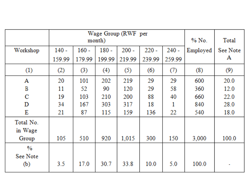
Table 3.10: ABC & Co. Wage Structure of Labour Force Numbers
of Persons in Specified Categories
Page 83
Note (a) Total no. employed in workshop as a percentage of the total workforce.
Note (b) Total no. in wage group as a percentage of the total workforce.
Table 3.10 can be called a "twofold" table as the workforce is broken down by wage and
workshop.
Page 84
BLANK

Page 85
E. SOURCES OF DATA AND PRESENTATION
METHODS
Sources, nature, application and use:
Sources
Data is generally found through research or as the result of a survey. Data which is found
from a survey is called primary data; it is data which is collected for a particular reason or
research project. For example, if your firm wished to establish how much money tourists
spend on cultural events when they come to Rwanda or how long a particular process takes
on average to complete in a factory. In this case the data will be taken in raw form, i.e. lots of
figures and then analysed by grouping the data into more manageable groups. The other
source of data is secondary data. This is data which is already available (government
statistics, company reports etc). As a business person you can take these figures and use them
for whatever purpose you require.
Nature of data.
Data is classified according to the type of data it is. The classifications are as follows:
Categorical data: example: Do you currently own any stocks or bonds? Yes No
This type of data is generally plotted using a bar chart or pie chart.
Numerical data: This is usually divided into discrete or continuous data.
How many cars do you own? This is discrete data. This is data that arises from a counting
process.
How tall are you? This is continuous data. This is data that arises from a measuring process.
Or the figures cannot be measured precisely. For example: clock in times of the workers in a
particular shift: 8:23; 8:14; 8:16....
Whether data is discrete or continuous will determine the most appropriate method of
presentation.
Page 86
Descriptive
statistics
collecting
presenting
analysing
Precaution in use.
As a business person it is important that you are cautions when reading data and statistics. In
order to draw intelligent and logical conclusions from data you need to understand the
various meanings of statistical terms.
Role of statistics in business analysis and decision making.
In the business world, statistics has four important applications:
– To summarise business data
– To draw conclusions from that data
– To make reliable forecasts about business activities
– To improve business processes.
The field of statistics is generally divided into two areas.
Figure 3.1
Descriptive statistics allows
you to create different tables
and charts to summarise data.
It also provides statistical
measures such as the mean,
median, mode, standard
deviation etc to describe
different characteristics of the
data

Page 87
Inferential
statistics
sampling
estimation
from
sample
informed
opinion
Figure 3.2
Improving business processes involves using managerial approaches that focus on quality
improvements such as Six Sigma. These approaches are data driven and use statistical
method to develop these models.
– Presentation of data, use of bar charts, histograms, pie charts, graphs, tables,
frequency distributions, cumulative distributions, Ogives.
– Their uses and interpretations.
If you look at any magazine or newspaper article, TV show, election campaign etc you will
see many different charts depicting anything from the most popular holiday destination to the
gain in company profits. The nice thing about studying statistics is that once you understand
the concepts the theory remains the same for all situations and you can easily apply your
knowledge to whatever situation you are in.
Tables and charts for categorical data:
When you have categorical data, you tally responses into categories and then present the
frequency or percentage in each category in tables and charts.
The summary table indicates the frequency, amount or percentage of items in each category,
so that you can differentiate between the categories.
Supposing a questionnaire asked people how they preferred to do their banking:
Drawing conclusions about
your data is the fundamental
point of inferential statistics.
Using these methods allows the
researcher to draw conclusions
based on data rather than on
intuition.
Page 88
Table 3.11
Banking preference
frequency
percentage
In bank
200
20
ATM
250
25
Telephone
97
10
internet
450
45
Total
997
100
The above information could be illustrated using a bar chart
Figure 3.3
0
50
100
150
200
250
300
350
400
450
500
In bank ATM Telephone Internet
Page 89
Or a pie chart
Figure 3.4
A simple line chart is usually used for time series data, where data is given over time.
The price of an average mobile homes over the past 3 years
Table 3.12
Year
Price RWF
2008
RWF350 000
2009
RWF252 000
2010
RWF190 000
Sales
In bank
ATM
Telephone
Internet
Page 90
Raw data Grouped
Illustrated
using histogram,
ogive.
Figure 3.5
The above graphs are used for categorical data.
Numerical Data
Numerical data is generally used more in statistics. The process in which numerical data is
processed is as follows.
Figure 3.6
0
50000
100000
150000
200000
250000
300000
350000
400000
2008 2009 2010
Page 91
The Histogram:
The histogram is like a bar chart but for numerical data. The important thing to remember
about the histogram is that the area under the histogram represents or is proportionate to the
frequencies. If you are drawing a histogram for data where the class widths are all the same
then it is very easy. If however one class width is bigger or narrower than the others an
adjustment must be made to ensure that the area of the bar is proportionate to the frequency.
Page 92
BLANK

Page 93
STUDY UNIT 4
Graphical Representation of Information
Contents
Unit
Title
Page
A.
Introduction to Frequency Distributions
95
Example
95
B.
Preparation of Frequency Distributions
97
Simple Frequency Distribution
97
Grouped Frequency Distribution
97
Choice of Class Interval
99
C.
Cumulative Frequency Distributions
103
D.
Relative Frequency Distributions
105
E.
Graphical Representation of Frequency Distributions
107
Frequency Dot Diagram
107
Frequency Bar Chart
108
Frequency Polygon
109
Histogram
110
The Ogive
114
F.
Introduction to Other Types of Data Presentation
117
G.
Pictograms
119
Introduction
119
Limited Form
120
Accurate Form
121
H.
Pie Charts
123
I.
Bar Charts
125
Component Bar Chart
125
Horizontal Bar Chart
127
J.
General Rules for Graphical Presentation
129
Page 94
Unit
Title
Page
K.
The Lorenz Curve
131
Purpose
131
Stages in Construction of a Lorenz Curve
133
Interpretation of the Curve
135
Other Uses
136
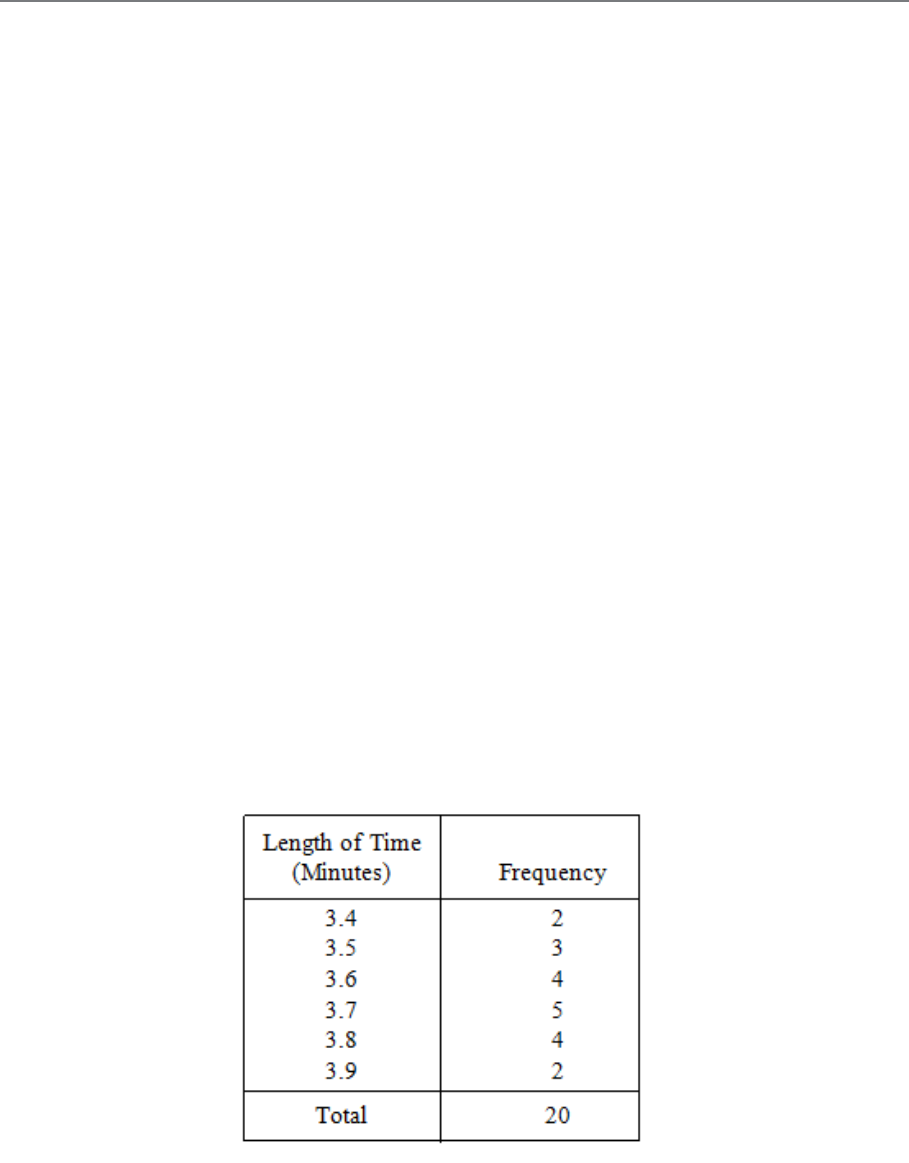
Page 95
A. INTRODUCTION TO FREQUENCY
DISTRIBUTIONS
A frequency distribution is a tabulation which shows the number of times (i.e. the frequency)
each different value occurs. Refer back to Study Unit 2 and make sure you understand the
difference between "attributes" (or qualitative variables) and "variables" (or quantitative
variables); the term "frequency distribution" is usually confined to the case of variables.
Example
The following figures are the times (in minutes) taken by a shop-floor worker to perform a
given repetitive task on 20 specified occasions during the working day:
3.5 3.8 3.8 3.4 3.6
3.6 3.8 3.9 3.7 3.5
3.4 3.7 3.6 3.8 3.6
3.7 3.7 3.7 3.5 3.9
If we now assemble and tabulate these figures, we obtain a frequency distribution (see Table
4.1).
Table 4.1

Page 96
BLANK
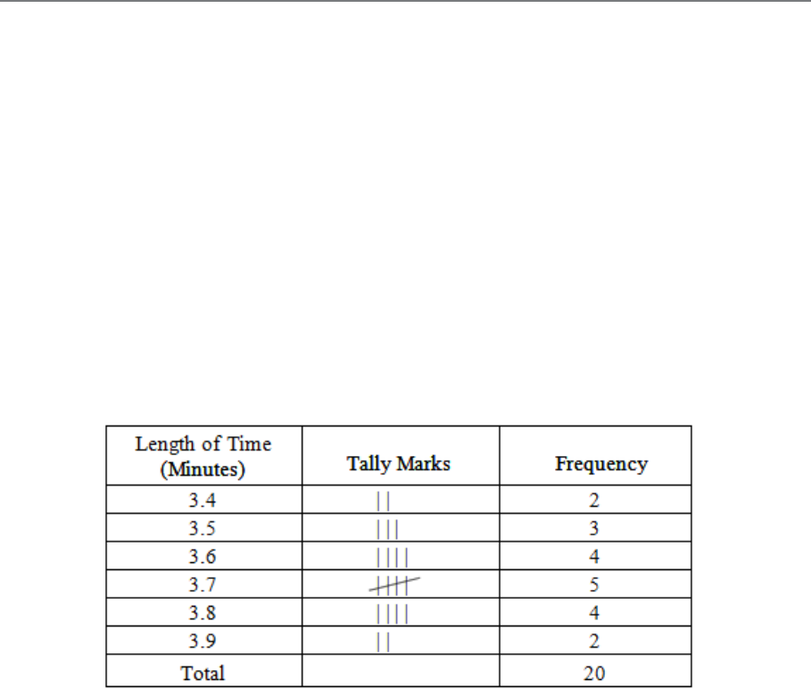
Page 97
B. PREPARATION OF FREQUENCY
DISTRIBUTIONS
Simple Frequency Distribution
A useful way of preparing a frequency distribution from raw data is to go through the records
as they stand and mark off the items by the "tally mark" or "five-bar gate" method. First look
at the figures to see the highest and lowest values so as to decide the range to be covered and
then prepare a blank table.
Now mark the items on your table by means of a tally mark. To illustrate the procedure, the
following table shows the state of the work after all 20 items have been entered.
Table 4.2
Grouped Frequency Distribution
Sometimes the data is so extensive that a simple frequency distribution is too cumbersome
and, perhaps, uninformative. Then we make use of a "grouped frequency distribution".
In this case, the "length of time" column consists not of separate values but of groups of
values (see Table 4.3).
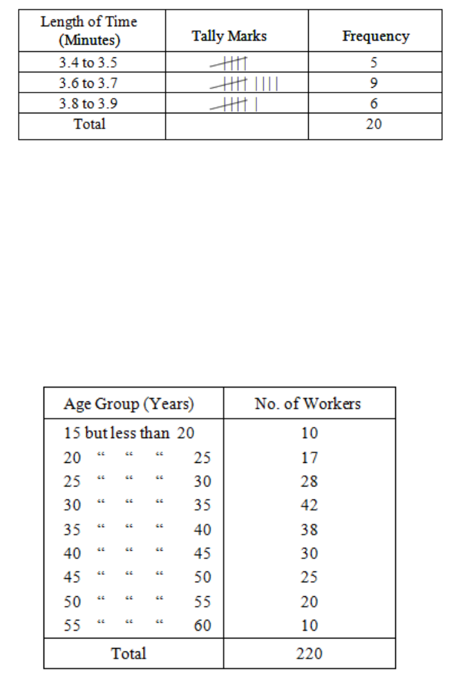
Page 98
Table 4.3
Grouped frequency distributions are only needed when there is a large number of values and,
in practice, would not have been required for the small amount of data in our example. Table
4.4 shows a grouped frequency distribution used in a more realistic situation, when an
ungrouped table would not have been of much use.
The various groups (e.g. "25 but less than 30") are called "classes" and the range of values
covered by a class (e.g. five years in this example) is called the "class interval".
The number of items in each class (e.g. 28 in the 25 to 30 class) is called the "class
frequency" and the total number of items (in this example, 220) is called the "total
frequency". As stated before, frequency distributions are usually only considered in
Table 4.4: Age Distribution of Workers in an
Office
Page 99
connection with variables and not with attributes, and you will sometimes come across the
term "variate" used to mean the variable in a frequency distribution. The variate in our last
example is "age of worker", and in the previous example the variate was "length of time".
The term "class boundary" is used to denote the dividing line between adjacent classes, so in
the age group example the class boundaries are 15, 20, 25, .... years. In the length of time
example, as grouped earlier in this section, the class boundaries are 3.35, 3.55, 3.75, 3.95
minutes. This needs some explanation. As the original readings were given correct to one
decimal place, we assume that is the precision to which they were measured. If we had had a
more precise stopwatch, the times could have been measured more precisely. In the first
group of 3.4 to 3.5 are put times which could in fact be anywhere between 3.35 and 3.55 if
we had been able to measure them more precisely. A time such as 3.57 minutes would not
have been in this group as it equals 3.6 minutes when corrected to one decimal place and it
goes in the 3.6 to 3.7 group.
Another term, "class limits", is used to stand for the lowest and highest values that can
actually occur in a class. In the age group example, these would be 15 years and 19 years 364
days for the first class, 20 years and 24 years 364 days for the second class and so on,
assuming that the ages were measured correct to the nearest day below. In the length of time
example, the class limits are 3.4 and 3.5 minutes for the first class and 3.6 and 3.7 minutes for
the second class.
You should make yourself quite familiar with these terms, and with others which we will
encounter later, because they are all used freely by examiners and you will not be able to
answer questions if you don’t know what the questioner means!
Choice of Class Interval
When compiling a frequency distribution you should, if possible, make the length of the class
interval equal for all classes so that fair comparison can be made between one class and
another. Sometimes, however, this rule has to be broken (official publications often lump
together the last few classes into one so as to save paper and printing costs) and then, before
we use the information, it is as well to make the classes comparable by calculating a column
showing "frequency per interval of so much", as in this example for some wage statistics:
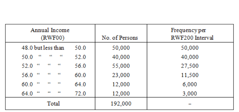
Page 100
Notice that the intervals in the first column are:
200, 200, 400, 400, 400, 800.
These intervals let you see how the last column was compiled.
A superficial look at the original table (first two columns only) might have suggested that the
most frequent incomes were at the middle of the scale, because of the appearance of the
figure 55,000. But this apparent preponderance of the middle class is due solely to the change
in the length of the class interval, and column three shows that, in fact, the most frequent
incomes are at the bottom end of the scale, i.e. the top of the table.
You should remember that the purpose of compiling a grouped frequency distribution is to
make sense of an otherwise troublesome mass of figures. It follows, therefore, that we do not
want to have too many groups or we will be little better off; nor do we want too few groups
or we will fail to see the significant features of the distribution. As a practical guide, you will
find that somewhere between about five and 20 groups will usually be suitable.
When compiling grouped frequency distributions, we occasionally run into trouble because
some of our values lie exactly on the dividing line between two classes and we wonder which
class to put them into. For example, in the age distribution given earlier in Table 24, if we
Table 4.5
Page 101
have someone aged exactly 40 years, do we put him into the "35-40" group or into the "40-
45" group? There are two possible solutions to this problem:
a) Describe the classes as "x but less than y" as we have done in Table 24, and then there
can be no doubt.
b) Where an observation falls exactly on a class boundary, allocate half an item to each
of the adjacent classes. This may result in some frequencies having half units, but this
is not a serious drawback in practice.
The first of these two procedures is the one to be preferred.

Page 102
BLANK
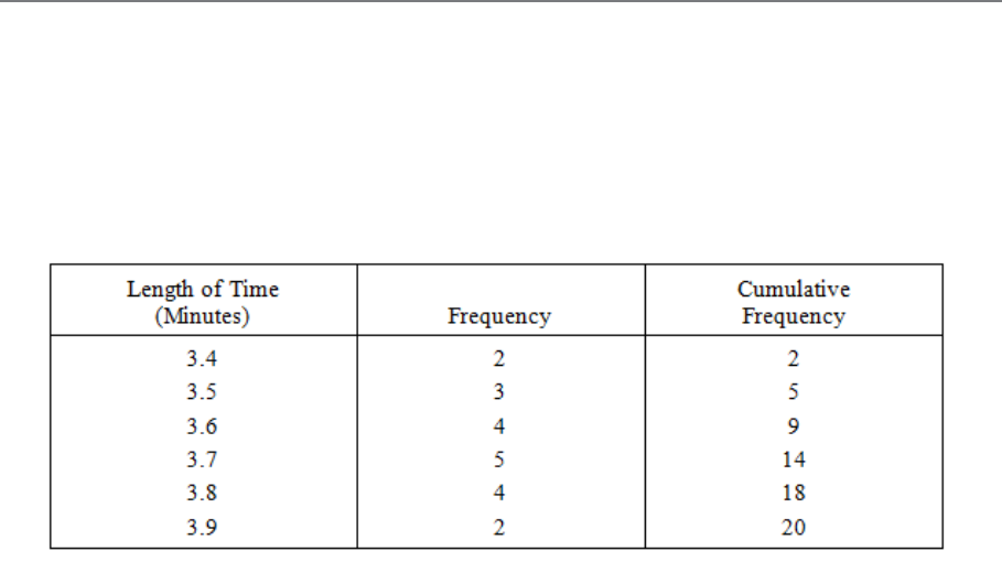
Page 103
C. CUMULATIVE FREQUENCY DISTRIBUTIONS
Very often we are not especially interested in the separate class frequencies, but in the
number of items above or below a certain value. When this is the case, we form a cumulative
frequency distribution as illustrated in column three of the following table:
The cumulative frequency tells us the number of items equal to or less than the specified
value, and it is formed by the successive addition of the separate frequencies. A cumulative
frequency column may also be formed for a grouped distribution.
The above example gives us the number of items "less than" a certain amount, but we may
wish to know, for example, the number of persons having more than some quantity. This can
easily be done by doing the cumulative additions from the bottom of the table instead of the
top, and as an exercise you should now compile the "more than" cumulative frequency
column in the above example.
Table 4.6

Page 104
BLANK
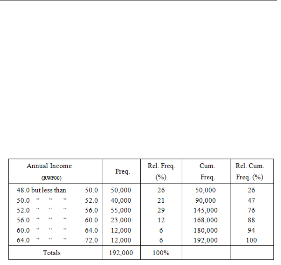
Page 105
D. RELATIVE FREQUENCY DISTRIBUTIONS
All the frequency distributions which we have looked at so far in this study unit have had
their class frequencies expressed simply as numbers of items. However, remember that
proportions or percentages are useful secondary statistics. When the frequency in each class
of a frequency distribution is given as a proportion or percentage of the total frequency, the
result is known as a "relative frequency distribution" and the separate proportions or
percentages are the "relative frequencies". The total relative frequency is, of course, always
1.0 (or 100%). Cumulative relative frequency distributions may be compiled in the same way
as ordinary cumulative frequency distributions.
As an example, the distribution used in Table 4.5 is now set out as a relative frequency
distribution for you to study.
This example is in the "less than" form, and you should now compile the "more than" form in
the same way as you did for the non-relative distribution.
Table 4.7

Page 106
BLANK

Page 107
E. GRAPHICAL REPRESENTATION OF
FREQUENCY DISTRIBUTIONS
Tabulated frequency distributions are sometimes more readily understood if represented by a
diagram. Graphs and charts are normally much superior to tables (especially lengthy complex
tables) for showing general states and trends, but they cannot usually be used for accurate
analysis of data. The methods of presenting frequency distributions graphically are as
follows:
– Frequency dot diagram
– Frequency bar chart
– Frequency polygon
– Histogram
– Ogive.
We will now examine each of these in turn.
Frequency Dot Diagram
This is a simple form of graphical representation for the frequency distribution of a discrete
variate. A horizontal scale is used for the variate and a vertical scale for the frequency. Above
each value on the variate scale we mark a dot for each occasion on which that value occurs.
Thus, a frequency dot diagram of the distribution of times taken to complete a given task,
which we have used in this study unit, would look like Figure 4.1.
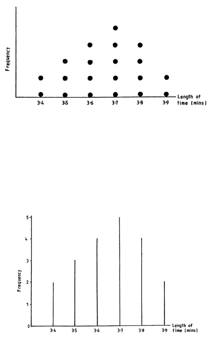
Page 108
Frequency Bar Chart
We can avoid the business of marking every dot in such a diagram by drawing instead a
vertical line the length of which represents the number of dots which should be there. The
frequency dot diagram in Figure 4.1 now becomes a frequency bar chart, as in Figure 4.2.
Figure 4.1: Frequency Dot Diagram to Show Length of Time Taken
by Operator to Complete a Given Task
Figure 4.2: Frequency Bar Chart
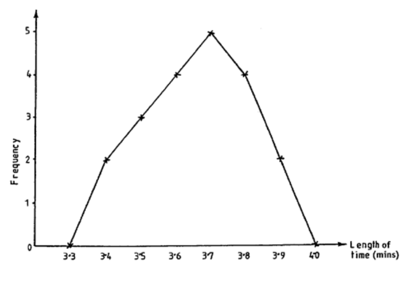
Page 109
Frequency Polygon
Instead of drawing vertical bars as we do for a frequency bar chart, we could merely mark the
position of the top end of each bar and then join up these points with straight lines. When we
do this, the result is a frequency polygon, as in Figure 4.3.
Note that we have added two fictitious classes at each end of the distribution, i.e. we have
marked in groups with zero frequency at 3.3 and 4.0.
This is done to ensure that the area enclosed by the polygon and the horizontal axis is the
same as the area under the corresponding histogram which we shall consider in the next
section.
These three kinds of diagram are all commonly used as a means of making frequency
distributions more readily comprehensible. They are mostly used in those cases where the
variate is discrete and where the values are not grouped. Sometimes frequency bar charts
and polygons are used with grouped data by drawing the vertical line (or marking its top end)
at the centre point of the group.
Figure 4.3: Frequency Polygon
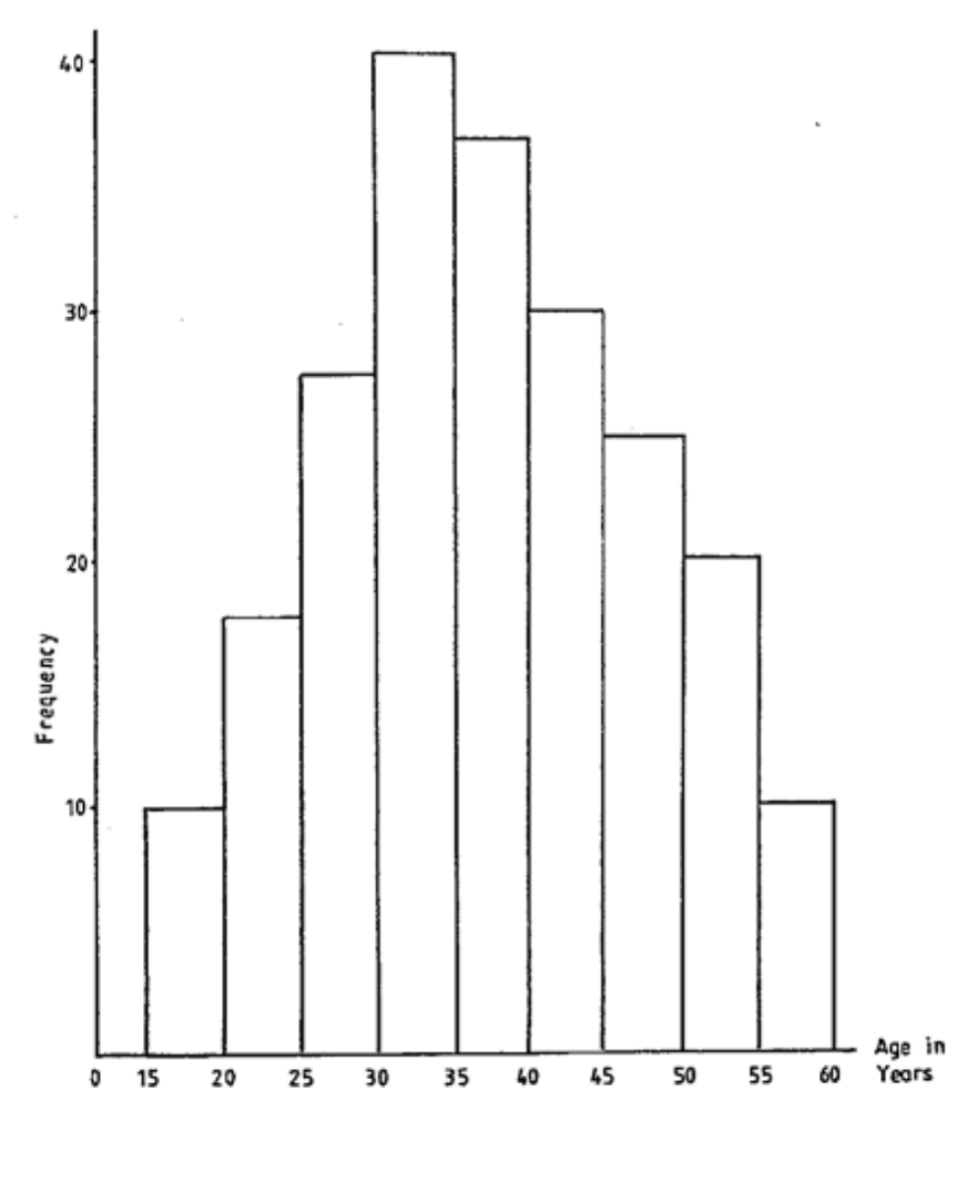
Page 110
Histogram
This is the best way of graphing a grouped frequency distribution. It is of great practical
importance and is also a favourite topic among examiners. Refer back now to the grouped
distribution given earlier in Table 4.4 (ages of office workers) and then study Figure 4.5.
Figure 4.5: Histogram
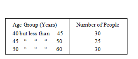
Page 111
We call this kind of diagram a "histogram". The frequency in each group is represented by a
rectangle and - this is a very important point - it is the AREA of the rectangle, not its
height, which represents the frequency.
When the lengths of the class intervals are all equal, then the heights of the rectangles
represent the frequencies in the same way as do the areas (this is why the vertical scale has
been marked in this diagram); if, however, the lengths of the class intervals are not all equal,
you must remember that the heights of the rectangles have to be adjusted to give the correct
areas. Do not stop at this point if you have not quite grasped the idea, because it will become
clearer as you read on.
Look once again at the histogram of ages given in Figure 4.5 and note particularly how it
illustrates the fact that the frequency falls off towards the higher age groups - any form of
graph which did not reveal this fact would be misleading. Now let us imagine that the
original table had NOT used equal class intervals but, for some reason or other, had given the
last few groups as:
The last two groups have been lumped together as one. A WRONG form of histogram, using
heights instead of areas, would look like Figure 4.6.
Table 4.8
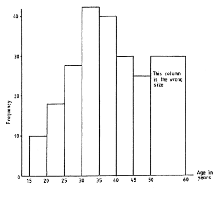
Page 112
Now, this clearly gives an entirely wrong impression of the distribution with respect to the
higher age groups. In the correct form of the histogram, the height of the last group (50-60)
would be halved because the class interval is double all the other class intervals. The
histogram in Figure 4.7 gives the right impression of the falling off of frequency in the higher
age groups. I have labelled the vertical axis "Frequency density per 5-year interval" as five
years is the "standard" interval on which we have based the heights of our rectangles.
Figure 4.6
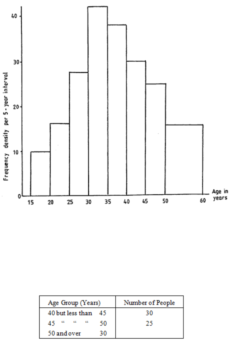
Page 113
Often it happens, in published statistics, that the last group in a frequency table is not
completely specified. The last few groups may look as in Table 4.9:
Figure 4.7
Table 4.9
Page 114
How do we draw the last group on the histogram?
If the last group has a very small frequency compared with the total frequency (say, less than
about 1% or 2%) then nothing much is lost by leaving it off the histogram altogether. If the
last group has a larger frequency than about 1% or 2%, then you should try to judge from the
general shape of the histogram how many class intervals to spread the last frequency over in
order not to create a false impression of the extent of the distribution. In the example given,
you would probably spread the last 30 people over two or three class intervals but it is often
simpler to assume that an open-ended class has the same length as its neighbour. Whatever
procedure you adopt, the important thing in an examination paper is to state clearly what you
have done and why. A distribution of the kind we have just discussed is called an "open-
ended" distribution.
The Ogive
This is the name given to the graph of the cumulative frequency. It can be drawn in either the
"less than" or the "or more" form, but the "less than" form is the usual one. Ogives for two of
the distributions already considered in this study unit are now given as examples; Figure 4.8
is for ungrouped data and Figure 4.9 is for grouped data.
Study these two diagrams so that you are quite sure that you know how to draw them. There
is only one point which you might be tempted to overlook in the case of the grouped
distribution - the points are plotted at the ends of the class intervals and NOT at the centre
point. Look at the example and see how the 168,000 is plotted against the upper end of the
56-60 group and not against the mid-point, 58. If we had been plotting an "or more" ogive,
the plotting would have to have been against the lower end of the group.
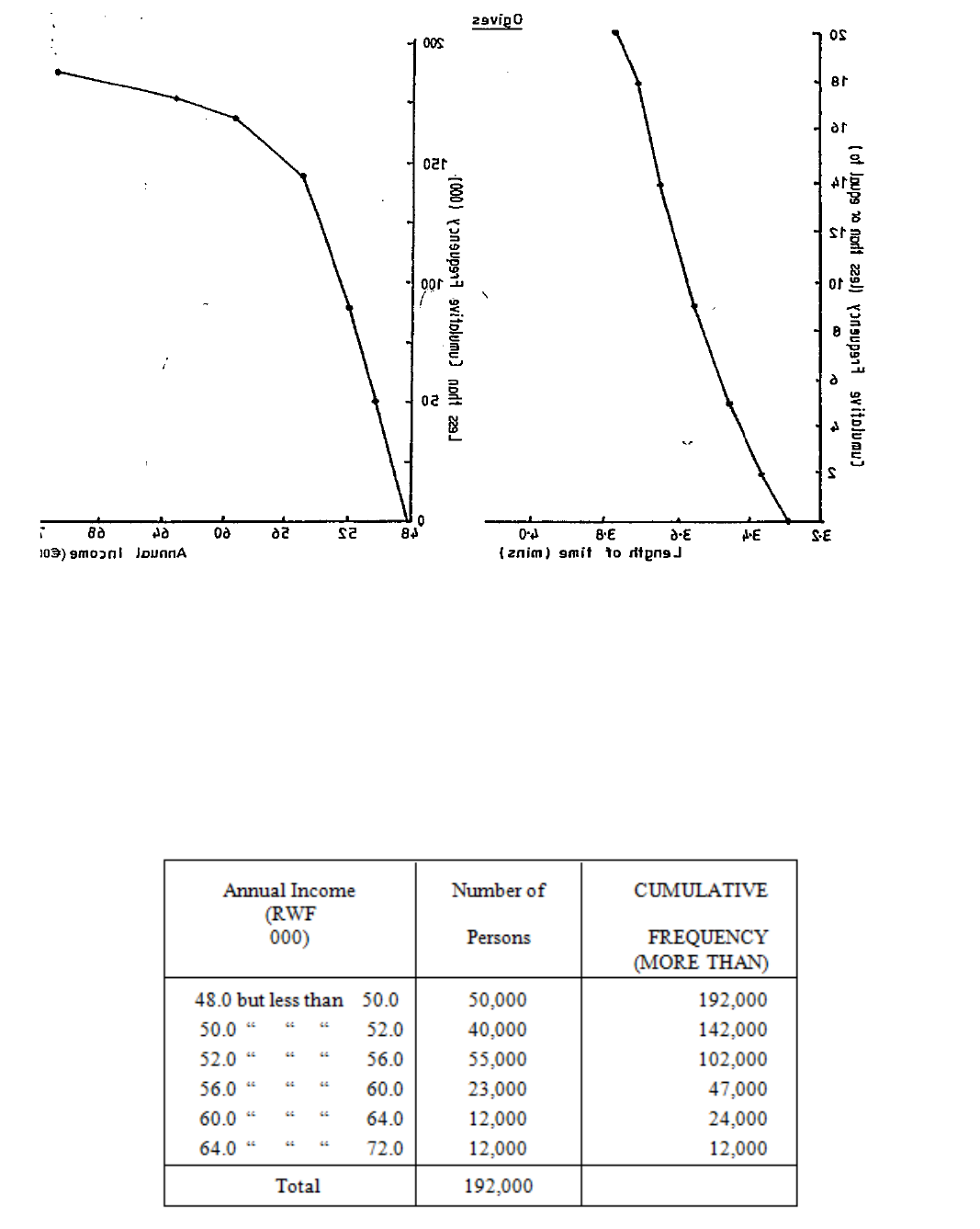
Page 115
As an example of an "or more" ogive, we will compile the cumulative frequency of our
example from Section B, which for convenience is repeated below with the "more than"
cumulative frequency:
Figure 4.8
Figure 4.9
Table 4.10
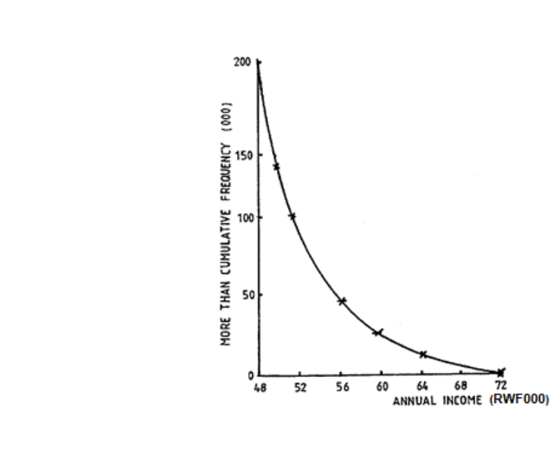
Page 116
Check that you see how the plotting has been made against the lower end of the group and
notice how the ogive has a reversed shape.
In each of Figures 4.9 and 4.10 we have added a fictitious group of zero frequency at one end
of the distribution.
It is common practice to call the cumulative frequency graph a cumulative frequency polygon
if the points are joined by straight lines, and a cumulative frequency curve if the points are
joined by a smooth curve.
(N.B. Unless you are told otherwise, always compile a "less than" cumulative frequency.)
All of these diagrams, of course, may be drawn from the original figures or on the basis of
relative frequencies. In more advanced statistical work the latter are used almost exclusively
and you should practise using relative frequencies whenever possible.
Figure 4.10
The ogive now appears as shown in Figure 4.10

Page 117
F. INTRODUCTION TO OTHER TYPES OF DATA
PRESENTATION
The graphs we have seen so far in this study unit are all based on frequency distributions.
Next we shall discuss several common graphical presentations that are designed more for the
lay reader than someone with statistical knowledge. You will certainly have seen some
examples of them used in the mass media of newspapers and television.

Page 118
BLANK
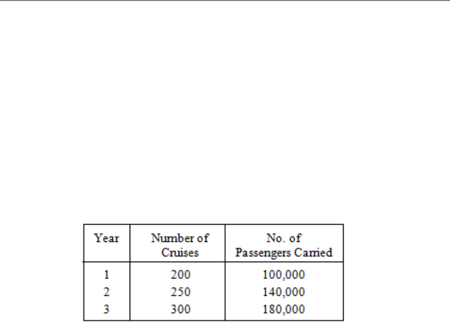
Page 119
G. PICTOGRAMS
Introduction
This is the simplest method of presenting information visually. These diagrams are variously
called "pictograms", "ideograms", "picturegrams" or "isotypes" - the words all refer to the
same thing. Their use is confined to the simplified presentation of statistical data for the
general public. Pictograms consist of simple pictures which represent quantities. There are
two types and these are illustrated in the following examples. The data we will use is shown
in Table 4.11.
Table 4.11: Cruises Organised by a Shipping Line Between Year
1 and Year 3
Page 120
Limited Form
a) We could represent the number of cruises by ships of varying size, as in Figure 4.11.
b) Although these diagrams show that the number of cruises has increased each year,
they can give false impressions of the actual increases. The reader can become
confused as to whether the quantity is represented by the length or height of the
pictograms, their area on the paper, or the volume of the object they represent. It is
difficult to judge what increase has taken place. Sometimes you will find pictograms
in which the sizes shown are actually WRONG in relation to the real increases. To
avoid confusion, I recommend that you use the style of diagram shown in Figure 4.12.
Figure 4.11: Number of Cruises Years 1-3
(Source: Table 4.11)
Page 121
Accurate Form
Each matchstick man is the same height and represents 20,000 passengers, so there can be no
confusion over size.
These diagrams have no purpose other than generally presenting statistics in a simple way.
Look at Figure 4.13.
Figure 4.12: Passengers Carried Years 1-3
(Source: Table 4.11)
Figure 4.13: Imports of Crude Oil
Page 122
Here it is difficult to represent a quantity less than 10m barrels, e.g. does "[" represent 0.2m
or 0.3m barrels?
Page 123
H. PIE CHARTS
These diagrams, known also as circular diagrams, are used to show the manner in which
various components add up to a total. Like pictograms, they are only used to display very
simple information to non-expert readers. They are popular in computer graphics.
An example will show what the pie chart is. Suppose that we wish to illustrate the sales of
gas in Rwanda in a certain year. The figures are shown in Table 4.12.
The figures are illustrated in the pie chart or circular diagram in Figure 4.14.
Table 4.12: Gas Sales in Rwanda in One Year
Figure 4.14: Example of a Pie Chart (Gas Sales in Rwanda)
(Source: Table 4.12)
Page 124
c) Construct the diagram by means of a pair of compasses and a protractor. Don’t
overlook this point, because examiners dislike inaccurate and roughly drawn
diagrams.
d) Label the diagram clearly, using a separate "legend" or "key" if necessary. (A key is
illustrated in Figure 21.)
e) If you have the choice, don’t use a diagram of this kind with more than four or five
component parts.
Note: The actual number of therms can be inserted on each sector as it is not possible to read
this exactly from the diagram itself.
The main use of a pie chart is to show the relationship each component part bears to the
whole. They are sometimes used side by side to provide comparisons, but this is not really to
be recommended, unless the whole diagram in each case represents exactly the same total
amount, as other diagrams (such as bar charts, which we discuss next) are much clearer.
However, in examinations you may be asked specifically to prepare such pie charts.
Page 125
J. BAR CHARTS
We have already met one kind of bar chart in the course of our studies of frequency
distributions, namely the frequency bar chart. A "bar" is simply another name for a thick line.
In a frequency bar chart the bars represent, by their length, the frequencies of different values
of the variate. The idea of a bar chart can, however, be extended beyond the field of
frequency distributions, and we will now illustrate a number of the types of bar chart in
common use. I say "illustrate" because there are no rigid and fixed types, but only general
ideas which are best studied by means of examples. You can supplement the examples in this
study unit by looking at the commercial pages of newspapers and magazines.
Component Bar Chart
This first type of bar chart serves the same purpose as a circular diagram and, for that reason,
is sometimes called a "component bar diagram" (see Figure 4.15).
Figure 4.15: Component Bar Chart Showing Cost
of Production of ZYX Co. Ltd
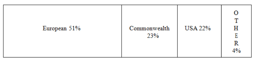
Page 126
Note that the lengths of the components represent the amounts, and that the components are
drawn in the same order so as to facilitate comparison. These bar charts are preferable to
circular diagrams because:
a) They are easily read, even when there are many components.
b) They are more easily drawn.
c) It is easier to compare several bars side by side than several circles.
Bar charts with vertical bars are sometimes called "column charts" to distinguish them from
those in which the bars are horizontal (see Figure 4.16).
Figure 4.16 is also an example of a percentage component bar chart, i.e. the information is
expressed in percentages rather than in actual numbers of visitors.
If you compare several percentage component bar charts, you must be careful. Each bar chart
will be the same length, as they each represent 100%, but they will not necessarily represent
the same actual quantities, e.g. 50% might have been 1 million, whereas in another year it
may have been nearer to 4 million and in another to 8 million.
Figure 4.16: Horizontal Bar Chart of Visitors
Arriving in Rwanda in One Year
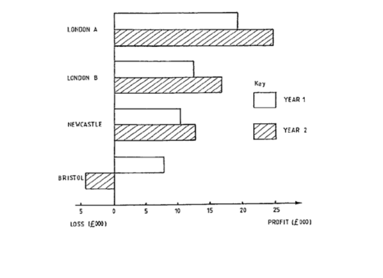
Page 127
Horizontal Bar Chart
A typical case of presentation by a horizontal bar chart is shown in Figure 4.17. Note how a
loss is shown by drawing the bar on the other side of the zero line.
Pie charts and bar charts are especially useful for "categorical" variables as well as for
numerical variables. The example in Figure 4.17 shows a categorical variable, i.e. the
different branches form the different categories, whereas in Figure 4.15 we have a numerical
variable, namely, time. Figure 4.17 is also an example of a multiple or compound bar chart as
there is more than one bar for each category.
Figure 4.17: Horizontal Bar Chart for the So and So Company Ltd to
Show Profits Made by Branches in Year 1 and Year 2

Page 128
BLANK
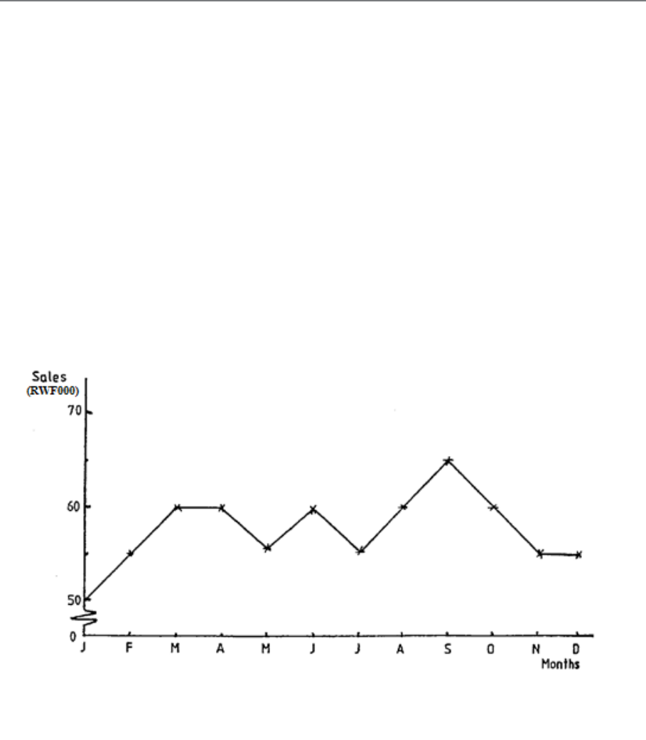
Page 129
K. GENERAL RULES FOR GRAPHICAL
PRESENTATION
There are a number of general rules which must be borne in mind when planning and using
graphical methods:
a) Graphs and charts must be given clear but brief titles.
b) The axes of graphs must be clearly labelled, and the scales of values clearly marked.
c) Diagrams should be accompanied by the original data, or at least by a reference to the
source of the data.
d) Avoid excessive detail, as this defeats the object of diagrams.
e) Wherever necessary, guidelines should be inserted to facilitate reading.
f) Try to include the origins of scales. Obeying this rule sometimes leads to rather a
waste of paper space. In such a case the graph could be "broken" as shown in Figure
4.18, but take care not to distort the graph by over-emphasising small variations.
Figure 4.18
Page 130
BLANK

Page 131
L. THE LORENZ CURVE
Purpose
One of the problems which frequently confronts the statistician working in economics or
industry is that of CONCENTRATION. Suppose that, in a business employing 100 men, the
total weekly wages bill is RWF10,000 and that every one of the 100 men gets RWF100; there
is then an equal distribution of wages and there is no concentration. Suppose now that, in
another business employing 100 men and having a total weekly wages bill of RWF10,000,
there are 12 highly skilled experts getting RWF320 each and 88 unskilled workers getting
RWF70 each. The wages are not now equally distributed and there is some concentration of
wages in the hands of the skilled experts. These experts number 12 out of 100 people (i.e.
they constitute 12% of the labour force); their share of the total wages bill is 12 x RWF320
(i.e. RWF3,840) out of RWF10,000, which is 38.4%. We can therefore say that 38.4% of the
firm’s wages is concentrated in the hands of only 12% of its employees.
In the example just discussed there were only two groups, the skilled and the unskilled. In a
more realistic case, however, there would be a larger number of groups of people with
different wages, as in the following example:
Wages Group (RWF) Number of People Total Wages (RWF)
0 - 80 205 10,250
80 - 120 200 22,000
120 - 160 35 4,900
160 - 200 30 5,700
200 - 240 20 4,400
240 - 280 10 2,500
500 49,750
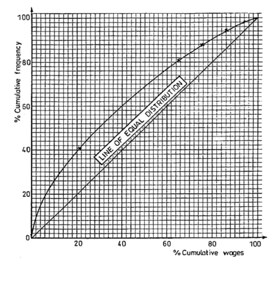
Page 132
Obviously when we have such a set of figures, the best way to present them is to graph them,
which I have done in Figure 4.19. Such a graph is called a LORENZ CURVE. (The next
section shows how we obtain this graph.)
Figure 4.19: Lorenz Curve
Page 133
Stages in Construction of a Lorenz Curve
a) Draw up a table giving:
(i) the cumulative frequency;
(ii) the percentage cumulative frequency;
(iii)the cumulative wages total;
(iv) the percentage cumulative wages total.
b) On graph paper draw scales of 0-100% on both the horizontal and vertical axes. The
scales should be the same on both axes.
c) Plot the cumulative percentage frequency against the cumulative percentage wages
total and join up the points with a smooth curve. Remember that 0% of the employees
earn 0% of the total wages so that the curve will always go through the origin.
d) Draw in the 45∞ diagonal. Note that, if the wages had been equally distributed, i.e.
50% of the people had earned 50% of the total wages, etc., the Lorenz curve would
have been this diagonal line.
The graph is shown in Figure 4.19.
Table 4.13
Page 134
Sometimes you will be given the wages bill as a grouped frequency distribution alone,
without the total wages for each group being specified. Consider the following set of figures:
Wages Group (RWF) No. of People
0 - 40 600
40 - 80 250
80 - 120 100
120 - 160 30
160 - 200 20
1,000
As we do not know the actual wage of each person, the total amount of money involved in
each group is estimated by multiplying the number of people in the group by the mid-value of
the group; for example, the total amount of money in the "RWF40-RWF80" group is 250 x
RWF60 = RWF15,000. The construction of the table and the Lorenz curve then follows as
before. Try working out the percentages for yourself first and then check your answers with
the following table. Your graph should look like Figure 4.20.
Table 4.14
Page 135
Interpretation of the Curve
From Figure 4.20 we can read directly the share of the wages paid to any given percentage of
employees:
a) 50% of the employees earn 22% of the total wages, so we can deduce that the other
50%, i.e. the more highly paid employees, earn 78% of the total wages.
b) 90% of the employees earn 70% of the total wages, so 10% of the employees must
earn 30% of the total wages.
c) 95% of the employees earn 83% of the total wages, so 5% of the employees earn 17%
of the total wages.
Figure 4.20: Lorenz Curve
Page 136
Other Uses
Although usually used to show the concentration of wealth (incomes, property ownership,
etc.), Lorenz curves can also be employed to show concentration of any other feature. For
example, the largest proportion of a country’s output of a particular commodity may be
produced by only a small proportion of the total number of factories, and this fact can be
illustrated by a Lorenz curve.
Concentration of wealth or productivity, etc. may become more or less as time goes on. A
series of Lorenz curves on one graph will show up such a state of affairs. In some countries,
in recent years, there has been a tendency for incomes to be more equally distributed. A
Lorenz curve reveals this because the curves for successive years lie nearer to the straight
diagonal.

Page 137
STUDY UNIT 5
Averages or Measures of Location
Contents
Unit
Title
Page
A.
The Need for Measures of Location
139
B.
The Arithmetic Mean
141
Introduction
141
The Mean of a Simple Frequency Distribution
142
The Mean of a Grouped Frequency Distribution
144
Simplified Calculation
145
Characteristics of the Arithmetic Mean
151
C.
The Mode
153
Mode of a Simple Frequency Distribution
153
Mode of a Grouped Frequency Distribution
154
Characteristics of the Mode
155
D.
The Median
159
Introduction
159
Median of a Simple Frequency Distribution
160
Median of a Grouped Frequency Distribution
160
Characteristics of the Median
163

Page 138
BLANK
Page 139
A. THE NEED FOR MEASURES OF LOCATION
We looked at frequency distributions in detail in the previous study unit and you should, by
means of a quick revision, make sure that you have understood them before proceeding.
A frequency distribution may be used to give us concise information about its variate, but
more often, we will wish to compare two or more distributions. Consider, for example, the
distribution of the weights of eggs from two different breeds of poultry (which is a topic in
which you would be interested if you were the statistician in an egg marketing company).
Having weighed a large number of eggs from each breed, we would have compiled frequency
distributions and graphed the results. The two frequency polygons might well look something
like Figure 5.1.
Examining these distributions you will see that they look alike except for one thing - they are
located on different parts of the scale. In this case the distributions overlap and, although
some eggs from Breed A are of less weight than some eggs from Breed B, eggs from Breed A
are, in general, heavier than those from Breed B.
Figure 5.1
Page 140
Remember that one of the objects of statistical analysis is to condense unwieldy data so as to
make it more readily understood. The drawing of frequency curves has enabled us to make an
important general statement concerning the relative egg weights of the two breeds of poultry,
but we would now like to take the matter further and calculate some figure which will serve
to indicate the general level of the variable under discussion. In everyday life we commonly
use such a figure when we talk about the "average" value of something or other. We might
have said, in reference to the two kinds of egg, that those from Breed A had a higher average
weight than those from Breed B. Distributions with different averages indicate that there is a
different general level of the variate in the two groups. The single value which we use to
describe the general level of the variate is called a "measure of location" or a "measure of
central tendency" or, more commonly, an average.
There are three such measures with which you need to be familiar:
− The arithmetic mean
− The mode
− The median.

Page 141
B. THE ARITHMETIC MEAN
Introduction
This is what we normally think of as the "average" of a set of values. It is obtained by adding
together all the values and then dividing the total by the number of values involved. Take, for
example, the following set of values which are the heights, in inches, of seven men:
Man Height (ins)
A 74
B 63
C 64
D 71
E 71
F 66
G 74
Total 483
The arithmetic mean of these heights is 483 ÷ 7 = 69 ins. Notice that some values occur more
than once, but we still add them all.
At this point we must introduce a little algebra. We don’t always want to specify what
particular items we are discussing (heights, egg weights, wages, etc.) and so, for general
discussion, we use, as you will recall from algebra, some general letter, usually x. Also, we
indicate the sum of a number of x’s by Σ (sigma).
Thus, in our example, we may write:
Σx = 483
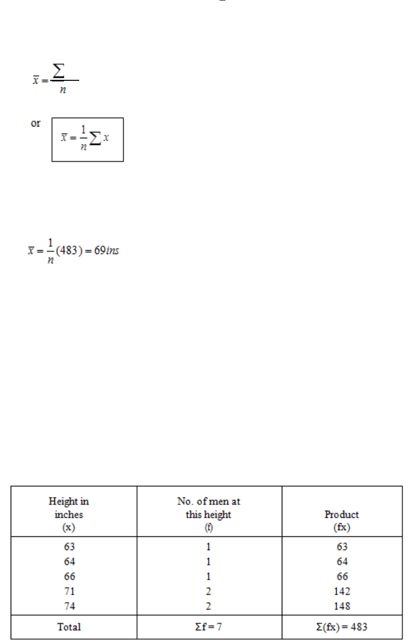
Page 142
We indicate the arithmetic mean by the symbol
x
(called "x bar") and the number of items
by the letter n. The calculation of the arithmetic mean can be described by formula thus:
The last one is customary in statistical work. Applying it to the example above, we have:
You will often find the arithmetic mean simply referred to as "the mean" when there is no
chance of confusion with other means (which we are not concerned with here).
The Mean of a Simple Frequency Distribution
When there are many items (i.e. when n is large) the arithmetic can be eased somewhat by
forming a frequency distribution, like this:
Table 5.1
X
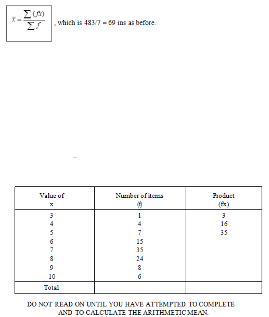
Page 143
Table 5.2
Indicating the frequency of each value by the letter f, you can see that Sf = n and that, when
the x’s are not all the separate values but only the different ones, the formula becomes:
Of course, with only seven items it would not be necessary, in practice, to use this method,
but if we had a much larger number of items the method would save a lot of additions.
QUESTION FOR PRACTICE
a) Consider now Table 5.2. Complete the (fx) column and calculate the value of the
arithmetic mean,
x
.
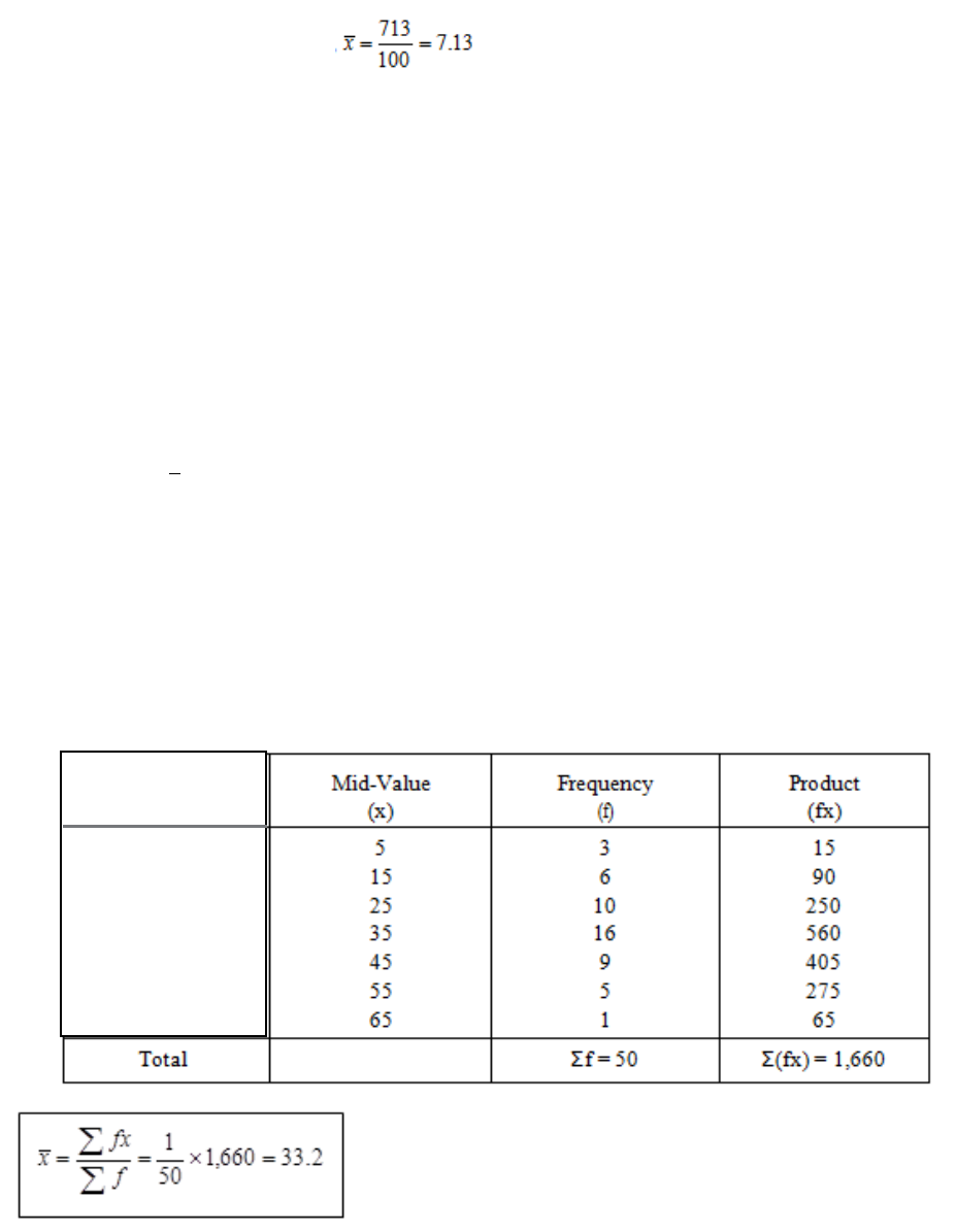
Page 144
You should have obtained the following answers:
The total number of items, ∑f = 100
The total product, ∑(fx) = 713
The arithmetic mean,
Make sure that you understand this study unit so far. Revise it if necessary, before going on
to the next paragraph. It is most important that you do not get muddled about calculating
arithmetic means.
The Mean of a Grouped Frequency Distribution
Suppose now that you have a grouped frequency distribution. In this case, you will
remember, we do not know the actual individual values, only the groups in which they lie.
How, then, can we calculate the arithmetic mean? The answer is that we cannot calculate the
exact value of
x
, but we can make an approximation sufficiently accurate for most statistical
purposes. We do this by assuming that all the values in any group are equal to the mid-point
of that group.
The procedure is very similar to that for a simple frequency distribution (which is why I
Provided that Σf is not less than about 50 and that the number of groups is not less than about
12, the arithmetic mean thus calculated is sufficiently accurate for all practical purposes.
Table 5.3
Group
0 ‹ 10
10 ‹ 20
20 ‹ 30
30 ‹ 40
40 ‹ 50
50 ‹ 60
60 ‹ 70

Page 145
There is one pitfall to be avoided when using this method; if all the groups should not have
the same class interval, be sure that you get the correct mid-values! The following is part of a
table with varying class intervals, to illustrate the point:
You will remember that in discussing the drawing of histograms we had to deal with the case
where the last group was not exactly specified. The same rules for drawing the histogram
apply to the calculation of the arithmetic mean.
Simplified Calculation
It is possible to simplify the arithmetic still further by the following two devices:
a) Work from an assumed mean in the middle of one convenient class.
b) Work in class intervals instead of in the original units.
Let us consider device (a). If you go back to our earlier examples you will discover after
some arithmetic that if you add up the differences in value between each reading and the true
mean, then these differences add up to zero.
Group
Mid Value (x)
0
‹
10
5
10
‹
20
15
20
‹
40
30
40
‹
60
50
60
‹
100
80
Table 5.4
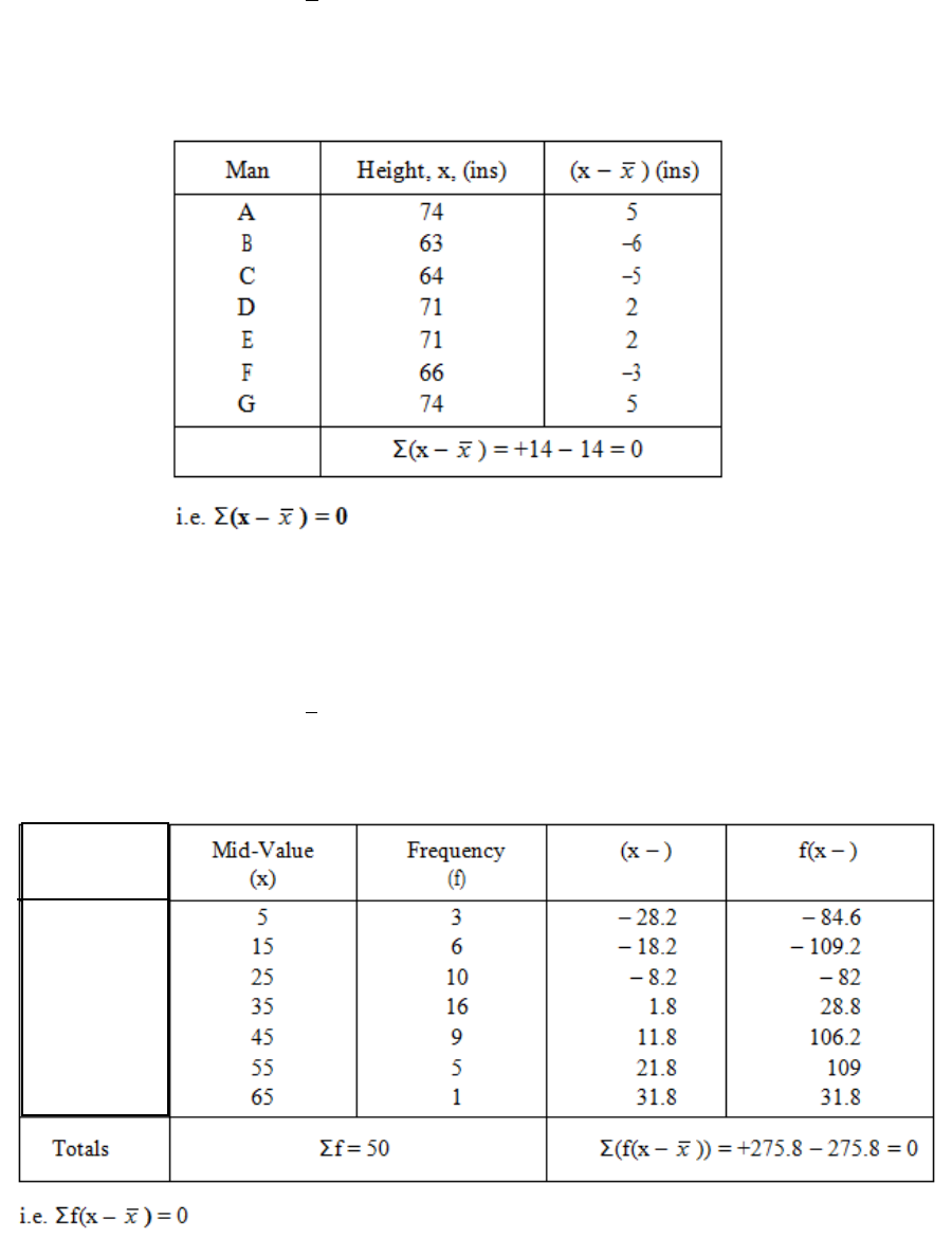
Page 146
Take first the height distribution discussed at the start of Section B:
x
= 69 ins
Secondly, consider the grouped frequency distribution given earlier in this section:
x
= 33.2
Table 5.5
Table 5.6
Group
0 ‹ 10
10 ‹ 20
20 ‹ 30
30 ‹ 40
40 ‹ 50
50 ‹ 60
60 ‹ 70
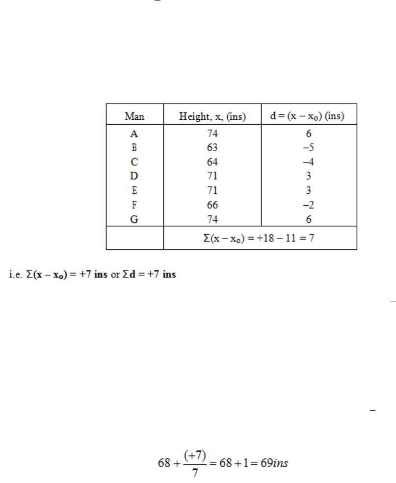
Page 147
If we take any value other than
x
and follow the same procedure, the sum of the differences
(sometimes called deviations) will not be zero. In our first example, let us assume the mean to
be 68 ins and label the assumed mean xo. The differences between each reading and this
assumed value are:
We make use of this property and we use this method as a "short-cut" for finding
x
. Firstly,
we have to choose some value of x as an assumed mean. We try to choose it near to where
we think the true mean, x, will lie, and we always choose it as the mid-point of one of the
groups when we are involved with a grouped frequency distribution. In the above example,
the total deviation, d, does not equal zero, so 68 cannot be the true mean. As the total
deviation is positive, we must have UNDERESTIMATED in our choice of xo, so the true
mean is higher than 68. As there are seven readings, we need to adjust xo upwards by one
seventh of the total deviation, i.e. by (+7)/7 = +1. Therefore the true value of
x
is:
We know this to be the correct answer from our earlier work.
Let us now illustrate the "short-cut" method for the grouped frequency distribution. We shall
take xo as 35 as this is the mid-value in the centre of the distribution.
Table 5.7
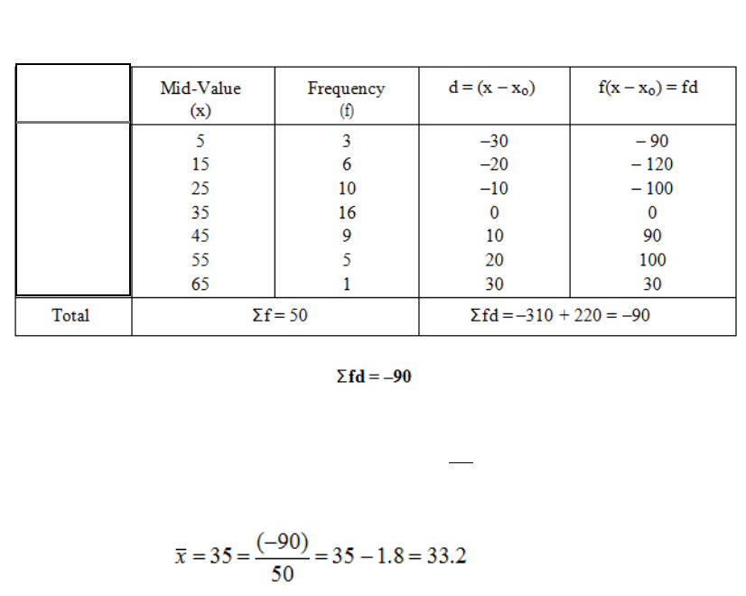
Page 148
This time we must have OVERESTIMATED xo, as the total deviation, Σfd, is negative. As
there are 50 readings altogether, the true mean must be
50
1
th of the (-90) lower than 35, i.e.
which is as we found previously.
Device (b) can be used with a grouped frequency distribution to work in units of the class
interval instead of in the original units. In the fourth column of Table 43, you can see that all
the deviations are multiples of 10, so we could have worked in units of 10 throughout and
then compensated for this at the end of the calculation.
Let us repeat the calculation using this method. The result (with xo = 35) is:
Table 5.8
Group
0 ‹ 10
10 ‹ 20
20 ‹ 30
30 ‹ 40
40 ‹ 50
50 ‹ 60
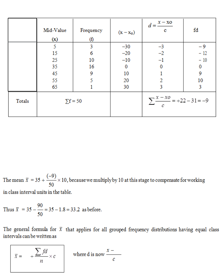
Page 149
The symbol used for the length of the class interval is c, but you may also come across the
symbol i used for this purpose.
Table 5.9
Group
0 ‹ 10
10 ‹ 20
20 ‹ 30
30 ‹ 40
40 ‹ 50
50 ‹ 60
60 ‹ 70
xo
xo
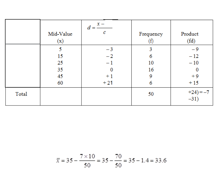
Page 150
As we mentioned at an earlier stage, you have to be very careful if the class intervals are
unequal, because you can only use one such interval as your working unit. Table 5.10 shows
you how to deal with this situation.
The assumed mean is 35, as before, and the working unit is a class interval of 10. Notice how
d for the last group is worked out; the mid-point is 60, which is 21/2 times 10 above the
assumed mean. The required arithmetic mean is, therefore:
We have reached a slightly different figure from before because of the error introduced by the
coarser grouping in the "50-70" region.
The method just described is of great importance both in work day statistics and in
examinations. By using it correctly, you can often do the calculations for very complicated-
looking distributions by using mental arithmetic and pencil and paper.
With the advent of electronic calculators, the time saving on calculations of the arithmetic
mean is not great, but this method is still preferable because:
• The numbers involved are smaller and thus you are less likely to make slips in
arithmetic.
• The method can be extended to enable us to find easily the standard deviation of a
frequency distribution.
Table 5.10
Group
0 ‹ 10
10 ‹ 20
20 ‹ 30
30 ‹ 40
40 ‹ 50
50 ‹ 60
60 ‹ 70
xo
Page 151
Characteristics of the Arithmetic Mean
There are a number of characteristics of the arithmetic mean which you must know and
understand. Apart from helping you to understand the topic more thoroughly, the following
are the points which an examiner expects to see when he or she asks for "brief notes" on the
arithmetic mean:
a) It is not necessary to know the value of every item in order to calculate the arithmetic
mean. Only the total and the number of items are needed. For example, if you know
the total wages bill and the number of employees, you can calculate the arithmetic
mean wage without knowing the wages of each person.
b) It is fully representative because it is based on all, and not only some, of the items in
the distribution.
c) One or two extreme values can make the arithmetic mean somewhat unreal by their
influence on it. For example, if a millionaire came to live in a country village, the
inclusion of his income in the arithmetic mean for the village would make the place
seem very much better off than it really was!
d) The arithmetic mean is reasonably easy to calculate and to understand.
e) In more advanced statistical work it has the advantage of being amenable to algebraic
manipulation.
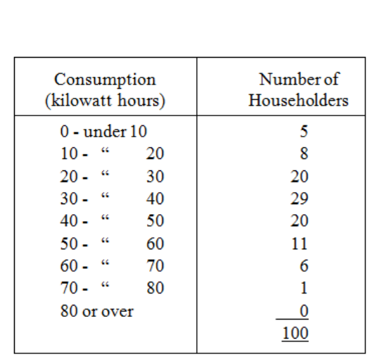
Page 152
QUESTION FOR PRACTICE
1) Table 5.11 shows the consumption of electricity of 100 householders during a
particular week. Calculate the arithmetic mean consumption of the 100 householders.
Table 5.11
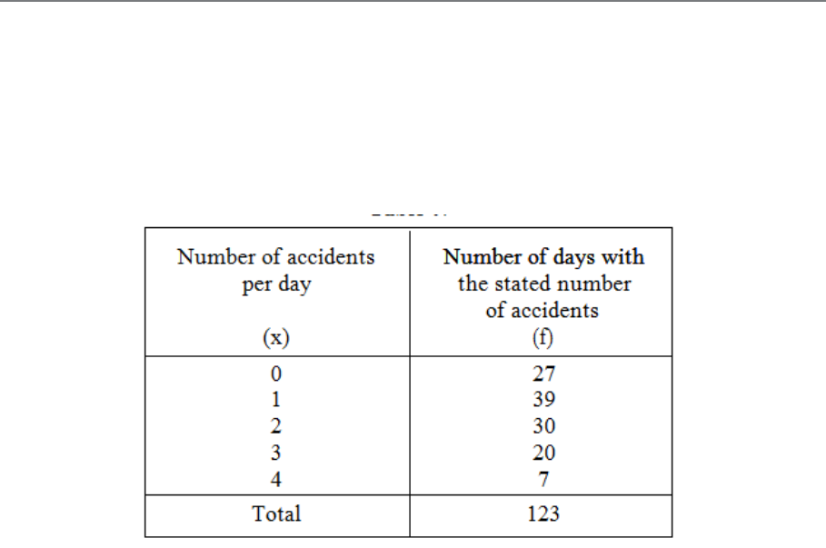
Page 153
C. THE MODE
Mode of a Simple Frequency Distribution
The first alternative to the mean which we will discuss is the mode. This is the name given to
the most frequently occurring value. Look at the following frequency distribution:
In this case the most frequently occurring value is 1 (it occurred 39 times) and so the mode of
this distribution is 1. Note that the mode, like the mean, is a value of the variate, x, not the
frequency of that value. A common error is to say that the mode of the above distribution is
39. THIS IS WRONG. The mode is 1. Watch out, and do not fall into this trap!
For comparison, calculate the arithmetic mean of the distribution: it works out at 1.52. The
mode is used in those cases where it is essential for the measure of location to be an actually
occurring value. An example is the case of a survey carried out by a clothing store to
determine what size of garment to stock in the greatest quantity. Now, the average size of
garment in demand might turn out to be, let us say, 9.3724, which is not an actually occurring
value and doesn’t help us to answer our problem. However, the mode of the distribution
obtained from the survey would be an actual value (perhaps size 8) and it would provide the
answer to the problem.
Table 5.12
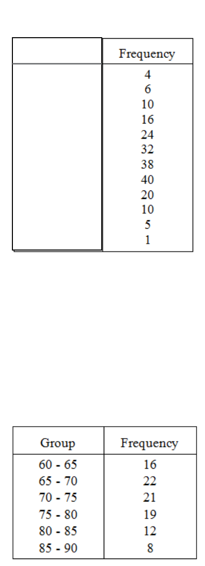
Page 154
Mode of a Grouped Frequency Distribution
When the data is given in the form of a grouped frequency distribution, it is not quite so
easy to determine the mode. What, you might ask, is the mode of the following distribution?
All we can really say is that "70 ‹ 80" is the modal group (the group with the largest
frequency). You may be tempted to say that the mode is 75, but this is not true, nor even a
useful approximation in most cases. The reason is that the modal group depends on the
method of grouping, which can be chosen quite arbitrarily to suit our convenience. The
distribution could have been set out with class intervals of five instead of 10, and would then
have appeared as follows (only the middle part is shown, to illustrate the point):
Table 5.13
Table 5.14
Group
0 ‹ 10
10 ‹ 20
20 ‹ 30
30 ‹ 40
40 ‹ 50
50 ‹ 60
60 ‹ 70
70 ‹ 80
80 ‹ 90
90 ‹ 100
100 ‹ 110
110 ‹ 120
Page 155
The modal group is now "65-70". Likewise, we will get different modal groups if the
grouping is by 15 or by 20 or by any other class interval, and so the mid-point of the modal
group is not a good way of estimating the mode.
In practical work, this determination of the modal group is usually sufficient, but examination
papers occasionally ask for the mode to be determined from a grouped distribution.
A number of procedures based on the frequencies in the groups adjacent to the modal group
can be used, and I will now describe one procedure. You should note, however, that these
procedures are only mathematical devices for finding the MOST LIKELY position of the
mode; it is not possible to calculate an exact and true value in a grouped distribution.
We saw that the modal group of our original distribution was "70-80". Now examine the
groups on each side of the modal group; the group below (i.e. 60-70) has a frequency of 38,
and the one above (i.e. 80-90) has a frequency of 20. This suggests to us that the mode may
be some way towards the lower end of the modal group rather than at the centre. A graphical
method for estimating the mode is shown in Figure 5.2.
This method can be used when the distribution has equal class intervals. Draw that part of the
histogram which covers the modal class and the adjacent classes on either side.
Draw in the diagonals AB and CD as shown in Figure 5.2. From the point of intersection
draw a vertical line downwards. Where this line crosses the horizontal axis is the mode. In
our example the mode is just less than 71.
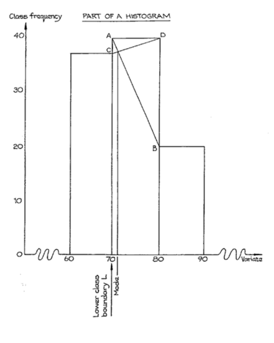
Page 156
Figure 5.2
Page 157
Characteristics of the Mode
Some of the characteristics of the mode are worth noting as you may well be asked to
compare them with those of the arithmetic mean.
a) The mode is very easy to find with ungrouped distributions, since no calculation is
required.
b) It can only be determined roughly with grouped distributions.
c) It is not affected by the occurrence of extreme values.
d) Unlike the arithmetic mean, it is not based on all the items in the distribution, but only
on those near its value.
e) In ungrouped distributions the mode is an actually occurring value.
f) It is not amenable to the algebraic manipulation needed in advanced statistical work.
g) It is not unique, i.e. there can be more than one mode. For example, in the set of
numbers, 6, 7, 7, 7, 8, 8, 9, 10, 10, 10, 12, 13, there are two modes, namely 7 and 10.
This set of numbers would be referred to as having a bimodal distribution.
h) The mode may not exist. For example, in the set of numbers 7, 8, 10, 11, 12, each
number occurs only once so this distribution has no mode.

Page 158
BLANK

Page 159
D. THE MEDIAN
Introduction
The desirable feature of any measure of location is that it should be near the middle of the
distribution to which it refers. Now, if a value is near the middle of the distribution, then we
expect about half of the distribution to have larger values, and the other half to have smaller
values. This suggests to us that a possible measure of location might be that value which is
such that exactly half (i.e. 50%) of the distribution has larger values and exactly half has
lower values. The value which so divides the distribution into equal parts is called the
MEDIAN. Look at the following set of values:
6, 7, 7, 8, 8, 9, 10, 10, 10, 12, 13
The total of these eleven numbers is 100 and the arithmetic mean is therefore 100/11 = 9.091,
while the mode is 10 because that is the number which occurs most often (three times). The
median, however, is 9 because there are five values above and five values below 9. Our first
rule for determining the median is therefore as follows:
Arrange all the values in order of magnitude and the median is then the middle value.
Note that all the values are to be used: even though some of them may be repeated, they must
all be put separately into the list. In the example just dealt with, it was easy to pick out the
middle value because there was an odd number of values. But what if there is an even
number? Then, by convention, the median is taken to be the arithmetic mean of the two
values in the middle. For example, take the following set of values:
6, 7, 7, 8, 8, 9, 10, 10, 11, 12
The two values in the middle are 8 and 9, so that the median is 8.5
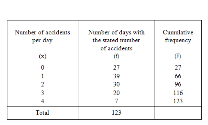
Page 160
Median of a Simple Frequency Distribution
Statistical data, of course, is rarely in such small groups and, as you have already learned, we
usually deal with frequency distributions. How, then do we find the median if our data is in
the form of a distribution?
Let us take the example of the frequency distribution of accidents already used in discussing
the mode. The total number of values is 123 and so when those values are arranged in order
of magnitude, the median will be the 62nd item because that will be the middle item. To see
what the value of the 62nd item will be, let us again draw up the distribution:
You can see from the last column that, if we were to list all the separate values in order, the
first 27 would all be 0s and from then up to the 66th would be 1s; it follows therefore that the
62nd item would be a 1 and that the median of this distribution is 1.
Median of a Grouped Frequency Distribution
The final problem connected with the median is how to find it when our data is in the form of
a grouped distribution. The solution to the problem, as you might expect, is very similar to
the solution for an ungrouped distribution; we halve the total frequency and then find, from
the cumulative frequency column, the corresponding value of the variate.
Table 5.15

Page 161
Because a grouped frequency distribution nearly always has a large total frequency, and
because we do not know the exact values of the items in each group, it is not necessary to
find the two middle items when the total frequency is even: just halve the total frequency and
use the answer (whether it is a whole number or not) for the subsequent calculation.
The total frequency is 206 and therefore the median is the 103rd item which, from the
cumulative frequency column, must lie in the 60-70 group. But exactly where in the 60-70
group? Well, there are 92 items before we get to that group and we need the 103rd item, so
we obviously need to move into that group by 11 items. Altogether in our 60-70 group there
are 38 items so we need to move 11/38 of the way into that group, that is 11/38 of 10 above
60. Our median is therefore
60 + 110/38 = 60 + 2.89 = 62.89.
The use of the cumulative frequency distribution will, no doubt, remind you of its graphical
representation, the ogive. In practice, a convenient way to find the median of a grouped
distribution is to draw the ogive and then, against a cumulative frequency of half the total
frequency, to read off the median. In our example the median would be read against 103 on
the cumulative frequency scale (see Figure 5.3). If the ogive is drawn with relative
frequencies, then the median is always read off against 50%.
Table 5.16
Group
0 ‹ 10
10 ‹ 20
20 ‹ 30
30 ‹ 40
40 ‹ 50
50 ‹ 60
60 ‹ 70
70 ‹ 80
80 ‹ 90
90 ‹ 100
100 ‹ 110
110 ‹ 120
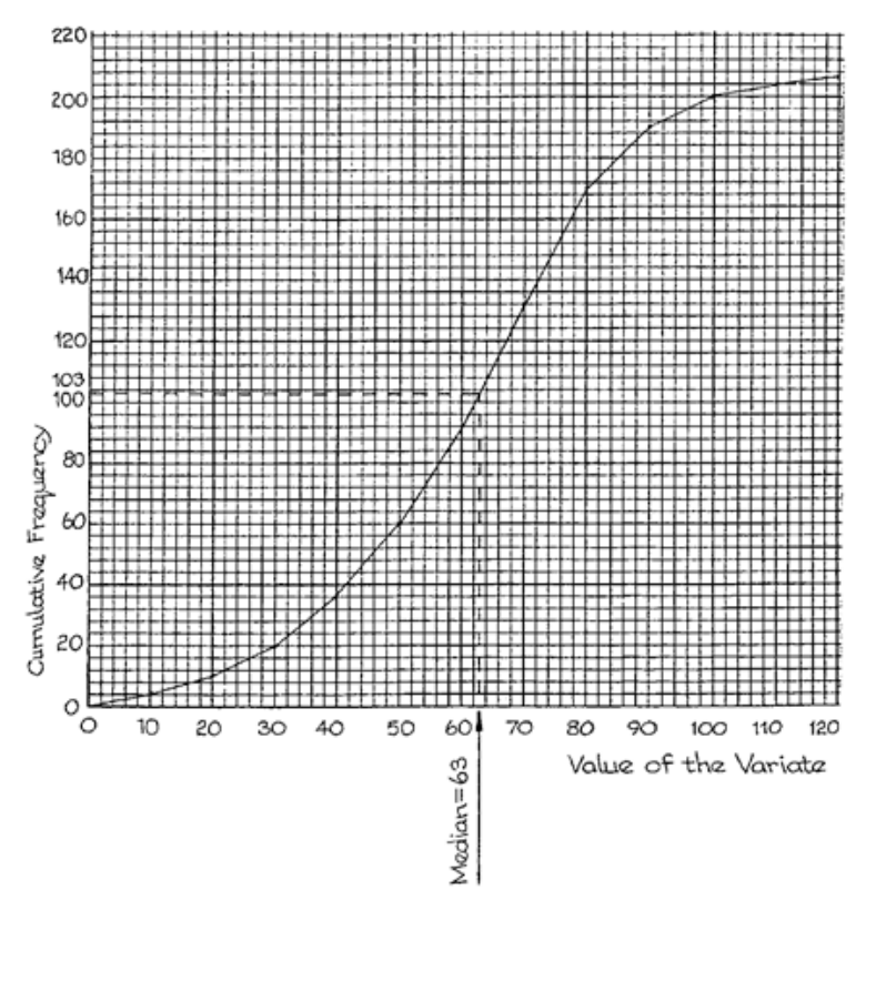
Page 162
Figure 5.3
Page 163
Characteristics of the Median
Characteristic features of the median, which you should compare with those of the mean and
the mode, are as follows:
a) It is fairly easily obtained in most cases, and is readily understood as being the "half-
way point".
b) It is less affected by extreme values than the mean. The millionaire in the country
village might alter considerably the mean income of the village but he would have
almost no effect at all on the median.
c) It can be obtained without actually having all the values. If, for example, we want to
know the median height of a group of 21 men, we do not have to measure the height
of every single one; it is only necessary to stand the men in order of their heights and
then only the middle one (No. 11) need be measured, for his height will be the median
height. The median is thus of value when we have open-ended classes at the edges of
the distribution as its calculation does not depend on the precise values of the variate
in these classes, whereas the value of the arithmetic mean does.
d) The median is not very amenable to further algebraic manipulation.

Page 164
BLANK

Page 165
STUDY UNIT 6
Measures of Dispersion
Contents
Unit
Title
Page
A.
Introduction to Dispersion
167
B.
The Range
169
C.
The Quartile Deviation, Deciles and Percentiles
171
The Quartile Deviation
171
Calculation of the Quartile Deviation
173
Deciles and Percentiles
175
D.
The Standard Deviation
177
The Variance
177
Standard Deviation of a Simple Frequency Distribution
178
Standard Deviation of a Grouped Frequency Distribution
178
Characteristics of the Standard Deviation
181
E.
The Coefficient of Variation
183
F.
Skewness
185
G.
Averages & Measures of Dispersion
189
Measures of Central Tendency and Dispersion
189
The mean and Standard Deviation
192
The Standard Deviation
194
The Median and the Quartiles
196
The Mode
199
Dispersion and Skewness
202

Page 166
BLANK
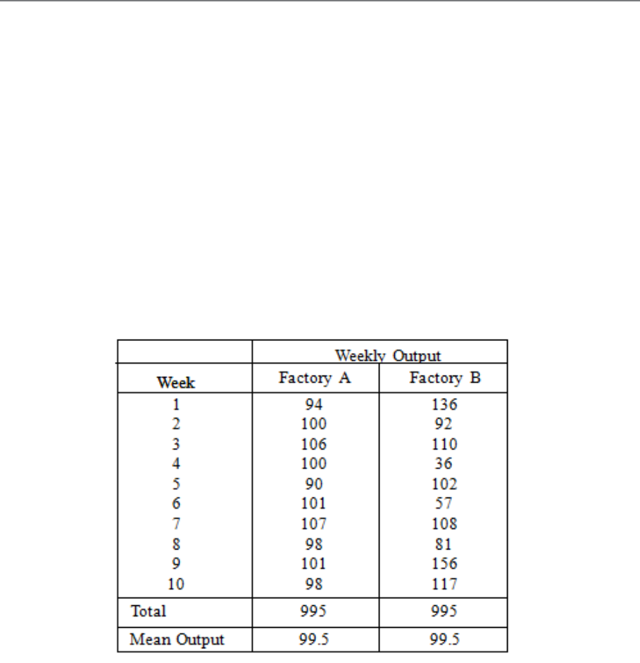
Page 167
A. INTRODUCTION TO DISPERSION
In order to get an idea of the general level of values in a frequency distribution, we have
studied the various measures of location that are available. However, the figures
which go to make up a distribution may all be very close to the central value, or they may
be widely dispersed about it, e.g. the mean of 49 and 51 is 50, but the mean of 0 and 100 is
also 50! You can see, therefore, that two distributions may have the same mean but the
individual values may be spread about the mean in vastly different ways.
When applying statistical methods to practical problems, a knowledge of this spread
(which we call "dispersion" or "variation") is of great importance. Examine the figures in
the following table:
Although the two factories have the same mean output, they are very different in their
week-to-week consistency. Factory A achieves its mean production with only very little
variation from week to week, whereas Factory B achieves the same mean by erratic ups-
and-downs from week to week. This example shows that a mean (or other measure of
location) does not, by itself, tell the whole story and we therefore need to supplement it with
a "measure of dispersion".
Table 6.1
Page 168
As was the case with measures of location, there are several different measures of dispersion
in use by statisticians. Each has its own particular merits and demerits, which will be
discussed later. The measures in common use are:
− Range
− Quartile deviation
− Mean deviation
− Standard deviation
−
We will discuss three of these here.

Page 169
B. THE RANGE
This is the simplest measure of dispersion; it is simply the difference between the
largest and the smallest. In the example just given, we can see that the lowest weekly
output for Factory A was 90 and the highest was 107; the range is therefore 17. For Factory
B the range is 156 – 36 = 120. The larger range for Factory B shows that it performs less
consistently than Factory A.
The advantage of the range as a measure of the dispersion of a distribution is that it is very
easy to calculate and its meaning is easy to understand. For these reasons it is used a great
deal in industrial quality control work. Its disadvantage is that it is based on only two of the
individual values and takes no account of all those in between. As a result, one or
two extreme results can make it quite unrepresentative. Consequently, the range is not
much used except in the case just mentioned.

Page 170
BLANK

Page 171
C. THE QUARTILE DEVIATION, DECILES AND
PERCENTILES
The Quartile Deviation
This measure of dispersion is sometimes called the "semi-interquartile range". To understand
it, you must cast your mind back to the method of obtaining the median from the ogive. The
median, you remember, is the value which divides the total frequency into two halves. The
values which divide the total frequency into quarters are called quartiles and they can also
be found from the ogive, as shown in Figure 6.1.
Figure 6.1
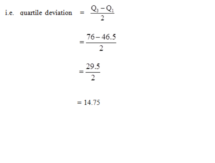
Page 172
––––
This is the same ogive that we drew earlier when finding the median of the grouped
frequency distribution featured in Section D of the previous study unit.
You will notice that we have added the relative cumulative frequency scale to the right of
the graph. 100% corresponds to 206, i.e. the total frequency. It is then easy to read off the
values of the variate corresponding to 25%, 50% and 75% of the cumulative frequency,
giving the lower quartile (Q1), the median and the upper quartile (Q3) respectively.
Q1 = 46.5
Median = 63 (as found previously)
Q3 = 76
The difference between the two quartiles is the interquartile range and half of the
difference is the semi-interquartile range or quartile deviation:
Alternatively, you can work out 25% of the total frequency, i.e. 206 = 51.5and 75% of
4
the total frequency, i.e. 154.5, and read from the ogive the values of the variate
corresponding to 51.5 and 154.5 on the cumulative frequency scale (i.e. the left-hand
scale). The end result is the same.
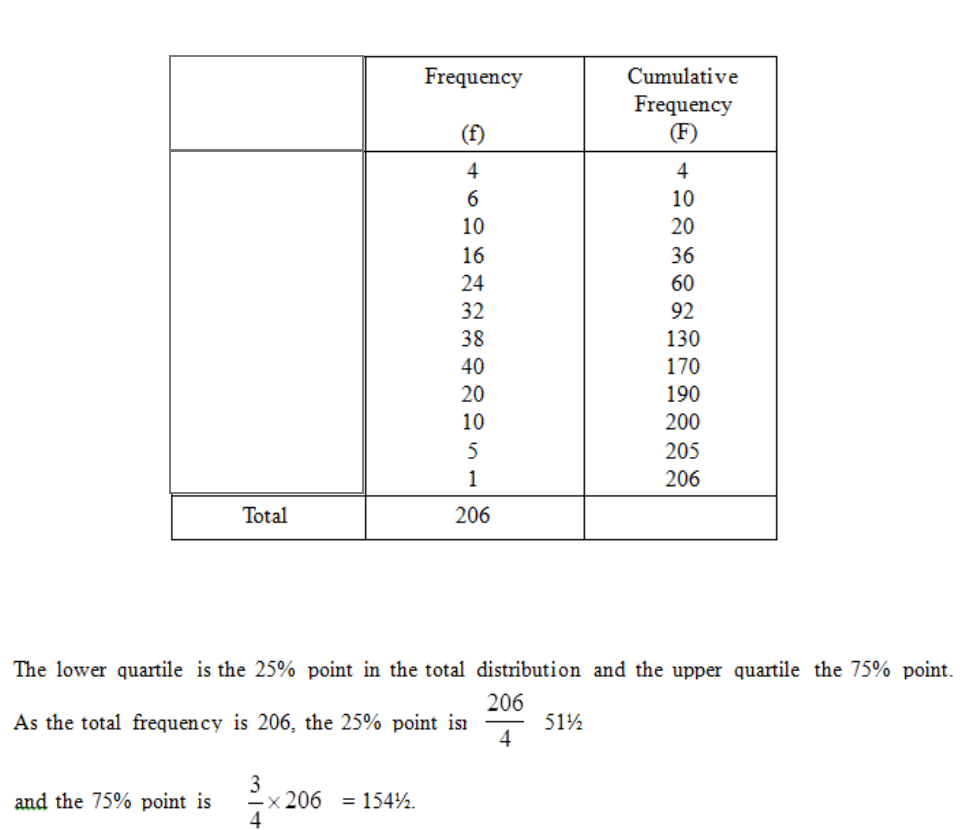
Page 173
Calculation of the Quartile Deviation
The quartile deviation is not difficult to calculate and some examination questions may
specifically ask for it to be calculated, in which case a graphical method is not acceptable.
Graphical methods are never quite as accurate as calculations.
We shall again use the same example.
The table of values is reproduced for convenience:
We can make the calculations in exactly the same manner as we used for calculating the
median - we saw this in Section D of the previous study unit.
Table 6.2
Group
0 ‹ 10
10 ‹ 20
20 ‹ 30
30 ‹ 40
40 ‹ 50
50 ‹ 60
60 ‹ 70
70 ‹ 80
80 ‹ 90
90 ‹ 100
100 ‹ 110
110 ‹ 120
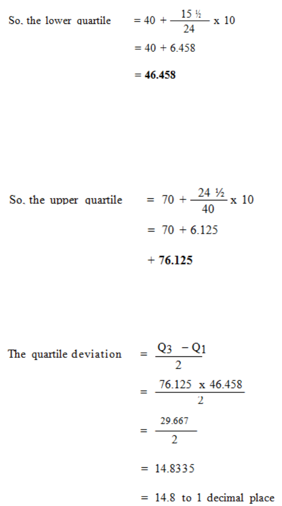
Page 174
Looking at Table 6.2, the 51½th item comes in the 40-50 group and will be the (51½ – 36) =
15½th item within it.
Similarly, the upper quartile will be the 154th item which is in the 70-80 group and is the
(154 – 130) = 24th item within it.
Remember that the units of the quartiles and of the median are the same as those of the
variate.
The quartile deviation is unaffected by an occasional extreme value. It is not based,
however, on the actual value of all the items in the distribution and to this extent it is less
representative than the standard deviation. In general, when a median is the appropriate
measure of location then the quartile deviation should be used as the measure of
dispersion.
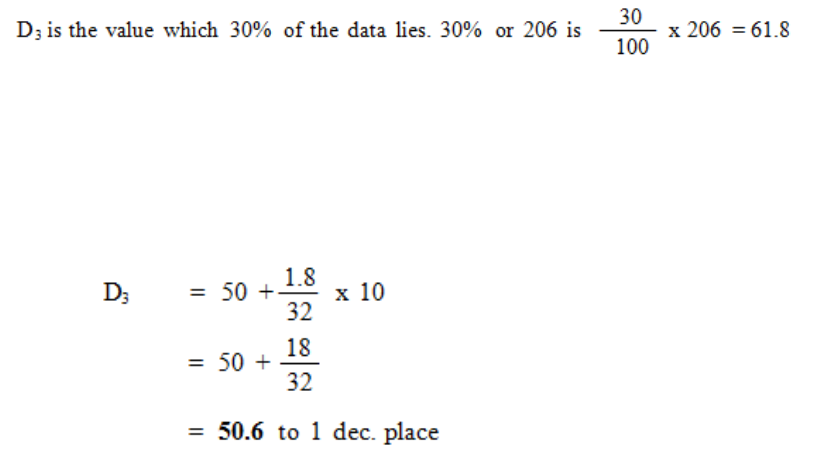
Page 175
Deciles and Percentiles
It is sometimes convenient, particularly when dealing with wages and employment
statistics, to consider values similar to the quartiles but which divide the distribution more
finely. Such partition values are deciles and percentiles. From their names you will
probably have guessed that the deciles are the values which divide the total frequency into
tenths and the percentiles are the values which divide the total frequency into hundredths.
Obviously it is only meaningful to consider such values when we have a large total
frequency.
The deciles are labelled D1, D2 ... D9: the second decile D2, for example, is the value below
which 20% of the data lies and the sixth decile D6 is the value below which 60% of the data
lies.
The percentiles are labelled P1, P2 ... P99 and, for example, P5 is the value below which 5%
of the data lies and P64 is the value below which 64% of the data lies.
Using the same example as above, let us calculate, as an illustration, the third decile D3.
The method follows exactly the same principles as the calculation of the median and
quartiles.
so we are looking for the value of the 61.8th item. A glance at the cumulative frequency
column shows that the 61.8th item lies in the 50-60 group, and is the (61.8 – 60) = 1.8th
item within it.
So,
Therefore 30% of our data lies below 50.6.
Page 176
We could also have found this result graphically; again check that you agree with the
calculation by reading D3 from the graph. You will see that the calculation method enables
us to give a more precise answer than is obtainable graphically.
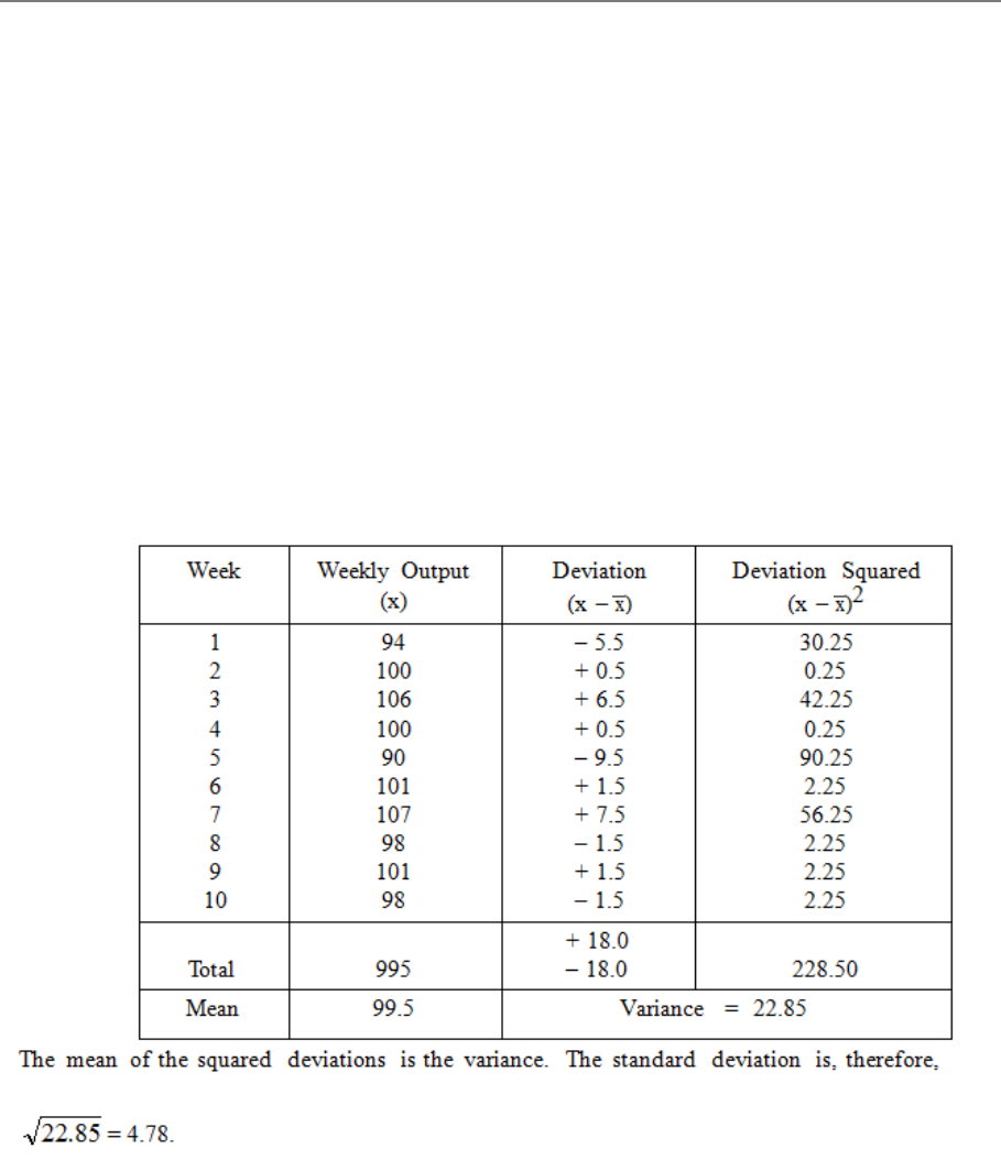
Page 177
D. THE STANDARD DEVIATION
Most important of the measures of dispersion is the standard deviation. Except for the use
of the range in statistical quality control and the use of the quartile deviation in wages
statistics, the standard deviation is used almost exclusively in statistical practice. It is
defined as the square root of the variance and so we need to know how to calculate the
variance first.
The Variance
We start by finding the deviations from the mean, and then squaring them, which
removes the negative signs in a mathematically acceptable fashion, thus:
Table 6.3
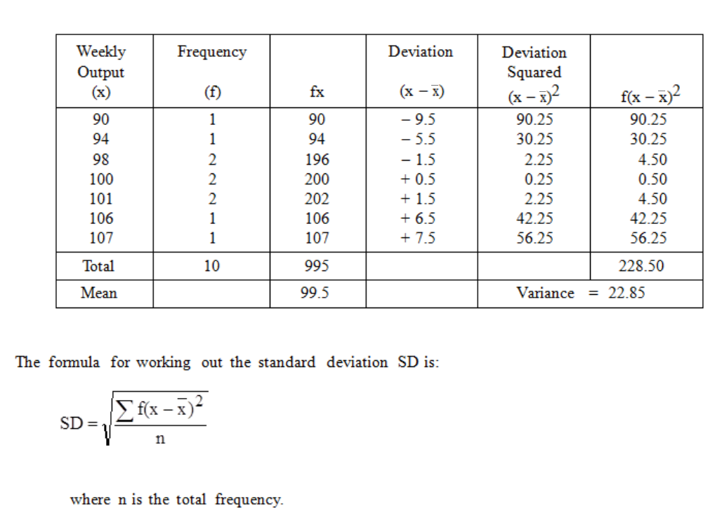
Page 178
Standard Deviation of a Simple Frequency Distribution
If the data had been given as a frequency distribution (as is often the case) then only the
different values would appear in the "x" column and we would have to remember to
multiply each result by its frequency:
Standard Deviation of a Grouped Frequency Distribution
When we come to the problem of finding the standard deviation of a grouped frequency
distribution, we again assume that all the readings in a given group fall at the mid-point of
the group, so we can find the arithmetic mean as before. Let us use the following
distribution, with the mean deviation,
x = 41.7.
Table 6.4
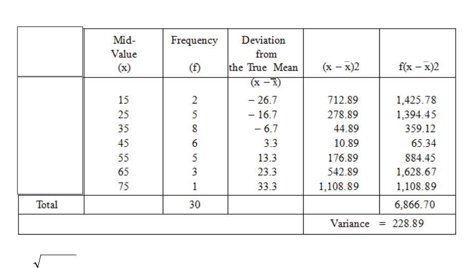
Page 179
SD =
89.228
= 15.13
The arithmetic is rather tedious even with an electronic calculator, but we can extend the
"short-cut" method which we used for finding the arithmetic mean of a distribution, to
find the standard deviation as well. In that method we:
− Worked from an assumed mean.
− Worked in class intervals.
− Applied a correction to the assumed mean.
Table 6.5
Class
10 ‹ 20
20 ‹ 30
30 ‹ 40
40 ‹ 50
50 ‹ 60
60 ‹ 70
70 ‹ 80
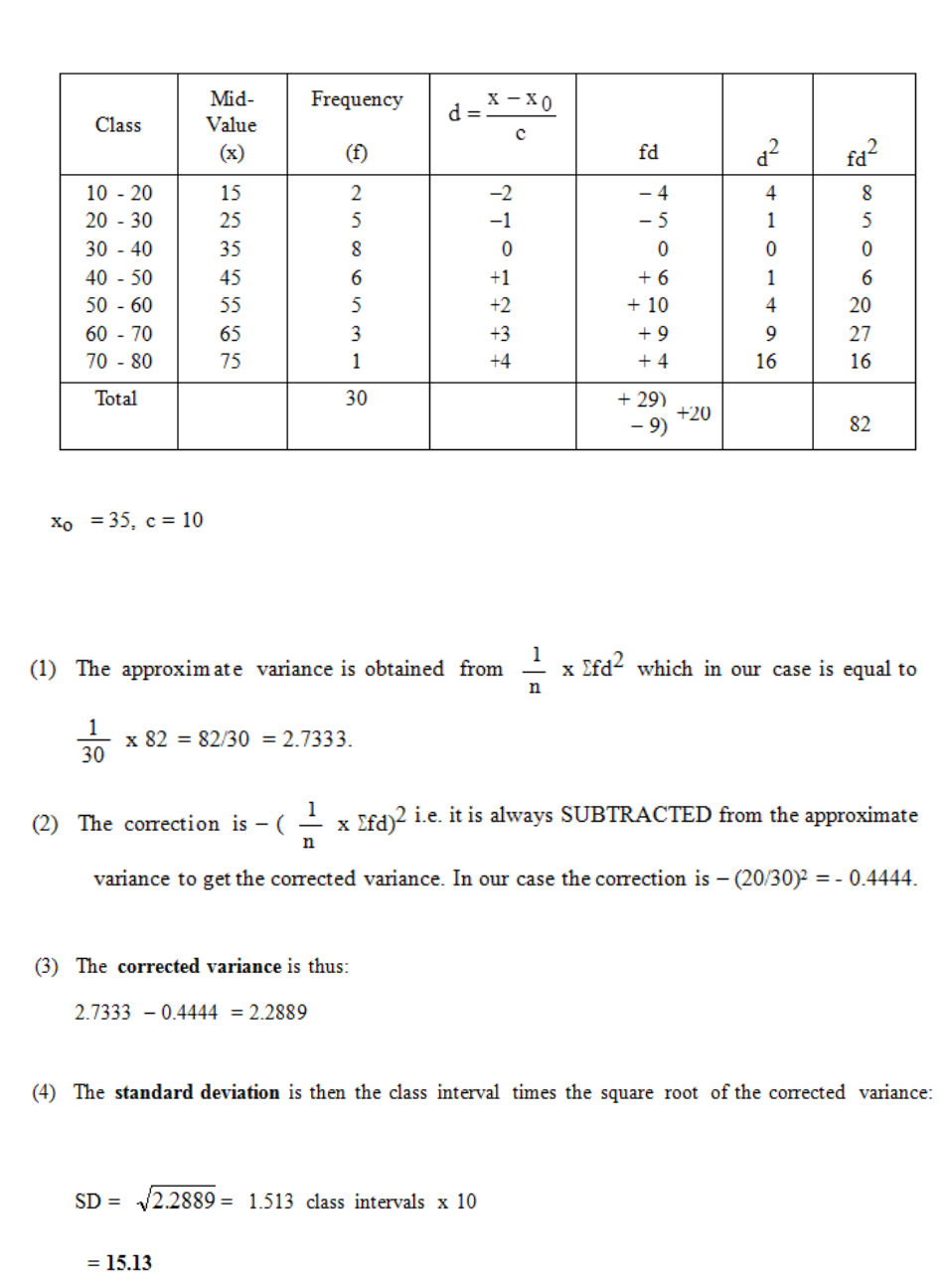
Page 180
Table 6.6 shows you how to work out the standard deviation.
The standard deviation is calculated in four steps from this table, as follows:
Table 6.6
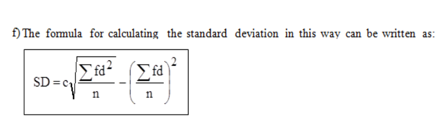
Page 181
This may seem a little complicated, but if you work through the example a few times, it will
all fall into place. Remember the following points:
a) Work from an assumed mean at the mid-point of any convenient class.
b) The correction is always subtracted from the approximate variance.
c) As you are working in class intervals, it is necessary to multiply by the class interval
as the last step.
d) The correction factor is the same as that used for the "short-cut" calculation of the
mean, but for the SD it has to be squared.
e) The column for d2 may be omitted since fd2 = fd multiplied by d. But do not omit
it until you have really grasped the principles involved.
f)
g) The assumed mean should be chosen from a group with the most common interval
and c will be that interval. If the intervals vary too much, we revert to the basic
formula.
Characteristics of the Standard Deviation
In spite of the apparently complicated method of calculation, the standard deviation is the
measure of dispersion used in all but the very simplest of statistical studies. It is based on
all of the individual items, it gives slightly more emphasis to the larger deviations but does
not ignore the smaller ones and, most important, it can be treated mathematically in more
advanced statistics.

Page 182
BLANK
Page 183
E. THE COEFFICIENT OF VARIATION
Suppose that we are comparing the profits earned by two businesses. One of them may
be a fairly large business with average monthly profits of RWF50,000, while the other
may be a small firm with average monthly profits of only RWF2,000. Clearly, the general
level of profits is very different in the two cases, but what about the month-by-month
variability? We will compare the two firms as to their variability by calculating the two
standard deviations; let us suppose that they both come to RWF500. Now, RWF500 is a
much more significant amount in relation to the small firm than it is in relation to the large
firm so that, although they have the same standard deviations, it would be unrealistic to say
that the two businesses are equally consistent in their month-to-month earnings of
profits. To overcome the difficulty, we express the SD as a percentage of the mean in each
case and we call the result the "coefficient of variation".
Applying the idea to the figures which we have just quoted, we get coefficients of variation
(usually indicated in formulae by V or CV) as follows:
This shows that, relatively speaking, the small firm is more erratic in its earnings than the
large firm.
Note that although a standard deviation has the same units as the variate, the coefficient of
variation is a ratio and thus has no units.
Another application of the coefficient of variation comes when we try to compare
distributions the data of which are in different units as, for example, when we try to
compare a French business with an American business. To avoid the trouble of converting
the dollars to euro (or vice versa) we can calculate the coefficients of variation in each case
and thus obtain comparable measures of dispersion.

Page 184
BLANK
Page 185
F. SKEWNESS
When the items in a distribution are dispersed equally on each side of the mean, we say
that the distribution is symmetrical. Figure 6.2 shows two symmetrical distributions.
When the items are not symmetrically dispersed on each side of the mean, we say that the
distribution is skew or asymmetric.
A distribution which has a tail drawn out to the right is said to be positively skew, while one
with a tail to the left, is negatively skew. Two distributions may have the same mean and the
same standard deviation but they may be differently skewed. This will be obvious if you
look at one of the skew distributions in Figure 6.3 and then look at the same one through
from the other side of the paper!
Figure 6.2
Figure 6.3
Page 186
What, then, does skewness tell us? It tells us that we are to expect a few unusually high
values in a positively skew distribution or a few unusually low values in a negatively skew
distribution.
If a distribution is symmetrical, the mean, mode and median all occur at the same point, i.e.
right in the middle. But in a skew distribution the mean and the median lie somewhere along
the side of the "tail", although the mode is still at the point where the curve is highest.
The more skewed the distribution, the greater the distance from the mode to the mean
and the median, but these two are always in the same order; working outwards from the
mode, the median comes first and then the mean - see Figure 6.4.
For most distributions, except for those with very long tails, the following
relationship holds approximately:
Mean – Mode = 3(Mean – Median)
Figure 6.4
Page 187
The more skew the distribution, the more spread out are these three measures of location,
and so we can use the amount of this spread to measure the amount of skewness. The most
usual way of doing this is to calculate:
You are expected to use one of these formulae when an examiner asks for the
skewness (or "coefficient of skewness", as some of them call it) of a distribution. When
you do the calculation, remember to get the correct sign (+ or –) when subtracting the mode
or median from the mean and then you will get negative answers from negatively skew
distributions, and positive answers for positively skew distributions. The value of the
coefficient of skewness is between –3 and +3, although values below –1 and above +1 are
rare and indicate very skewed distributions.
Examples of variates with positive skew distributions include size of incomes of a large
group of workers, size of households, length of service in an organisation, and age of a
workforce. Negative skew distributions occur less frequently. One such example is the age at
death for the adult population in Rwanda.

Page 188
BLANK

Page 189
The Arithmetic Mean (usually called the
mean).
The Median
The Mode.
G. AVERAGES AND MEASURES OF DISPERSION
Measures of Central Tendency and Dispersion
• Averages and variations for ungrouped and grouped data.
• Special cases such as the Harmonic mean and the geometric mean
In the last section we described data using graphs, histograms and Ogives mainly for grouped
numerical data. Sometimes we do not want a graph; we want one figure to describe the data.
One such figure is called the average. There are three different averages, all summarise the
data with just one figure but each one has a different interpretation.
When describing data the most obvious way and the most common way is to get an average
figure. If I said the average amount of alcohol consumed by Rwandan women is 2.6 units per
week then how useful is this information? Usually averages on their own are not much use;
you also need a measure of how spread out the data is. We will deal with the spread of the
data later.
If you take the following 11 results. Each of the figures represents a student’s results.
x
= 10, 55, 65, 30, 89, 5, 87, 60, 55, 37, 35.
Figure 6.5

Page 190
What is the average mark?
From the above example concerning student’s results, the mean figure is less than the median
figure so if you wished to give the impression to your boss that the results were good you
would use the median as the average rather than the mean. In business therefore when quoted
an average number you need to be aware which one is being used.
The range = largest number – smallest number = 89 – 5 = 84 gives an idea of how spread out
the data is. This is a useful figure if trying to analyse what the mean is saying. In this case it
would show that the spread of results was very wide and that perhaps it might be better to
divide the class or put on extra classes in future. Remember that the statistics only give you
the information; it is up to you to interpret them. Usually in order to interpret them correctly
you need to delve into the data more and maybe do some further qualitative research.
Question
A random sample of 5 weeks showed that a cruise agency received
the following number of weekly specials to the Caribbean:
20 73 75 80 82
(a) Compute the mean, median and mode
(b) Which measure of central tendency best describes the data?

Page 191
Different
AVERAGES
ARITHMETIC
MEAN
MEDIAN
Mode
What is the best average, if any, to use in each of the following situations? Justify each
of your answers.
(a) To establish a typical wage to be used by an employer in wage negotiations for a small
company of 300 employees, a few of whom are very highly paid specialists.
(b) To determine the height to construct a bridge (not a draw bridge) where the distribution of
the heights of all ships which would pass under is known and is skewed to the right.
There are THREE different measures of AVEARGE, and three different measures of
dispersion. Once you know the mean and the standard deviation you can tell much more
about the data than if you have the average only.
Figure 6.6

Page 192
Measures
of
dispersion
Standard
deviation
quartile
deviation
None
associated
with the
mode
The Mean and Standard Deviation.
This is very important.
The mean of grouped data is more complex than for raw data because you do not have the
raw figures in front of you, they have already been grouped. To find the mean therefore you
need to find the midpoint of each group and then apply the following formula:
Mean =
∑
∑
f
fx
where x represents the midpoint of each class and f represents the frequency
of that class. Note that if you are given an open ended class then you must decide yourself
what that the mid- point is. The midpoint between 5 <10 = 7.5. The midpoint of a class <10
you could say is 5 or 8 or whatever you want below 10, it depends on what you decide is the
lower bound of the class.
If you need to get the midpoint of a class 36<56 the easiest way is to add 36+56 and divide
by 2 = 46.
Like all maths you just need to understand one example and then all the others follow the
same pattern. You do need to understand what you are doing though because in your exam
Figure 6.7
Page 193
you may get a question which has a slight trick and you need to be confident enough to figure
out the approach necessary to continue.
Using the example we had in the last section on statistics grades, we will now work out the
average grade.
Results f X Mid point fx
0 but less than 20
8
10
80
20 but less than 30
9
25
225
30 but less than 40
11
35
385
40 but less than 50 14 45 630
50 but less than 60
11
55
605
60 but less than 70
10
65
650
70 but less than 80
9
75
675
80 but less than 90
6
85
510
90 but less than 100
2
95
190
Total 80 3950
The mean score from the grouped data is given by the letter
38.49
80
3950 === ∑
∑f
fx
µ
The Do-It-Better Manufacturing Company operates a shift loading system whereby 60
employees work a range of hours depending on company demands. The following data was
collected:
Hours worked No. of employees
16 < 20 1
20 < 24 2
24 < 28 3
28 < 32 11
32 < 36 14
36 < 40 12
40 < 44 9
44 < 48 5
48 < 52 3
Table 6.6
Table 6.7
Page 194
The Standard Deviation
The next thing to estimate is the standard deviation. This is one figure which gives an
indication of how spread out the data is. In the above example the number of hours worked is
between 16 and 52 which is not that spread out so the standard deviate should be about 7( a
rule of thumb is that 3 standard deviations should bring you from the mean to the highest or
lowest figure in the data set). The mean here is 36, so if we take 36-16 = 20 and divide by 3
we get 7 approx., or we could take 52-36 =16 /3 =5.3. So we take the bigger figure. However
this is just a simple estimate and not sufficient for your exam. For your exam you need to
apply the formula so you need to be able to work through it.
S.D =
( )X X
n
−
∑
2
S.D =
f X X
f
( )−
∑∑
2
We will work through an example for finding the standard deviation for raw data first:
Find the standard deviation of the following 5 numbers:
X= 10, 20, 30, 40, 50.
The mean is 30.
Using the table below: The standard deviation equals:
5
1000
=
14.14200
=
Mid pt Mean Deviations
X
10 30 -20 400
20 30 -10 100
30 30 0 0
40 30 10 100
50 30 20 400
1000
Raw data
Grouped
data
2
)( XX −
X
XX −
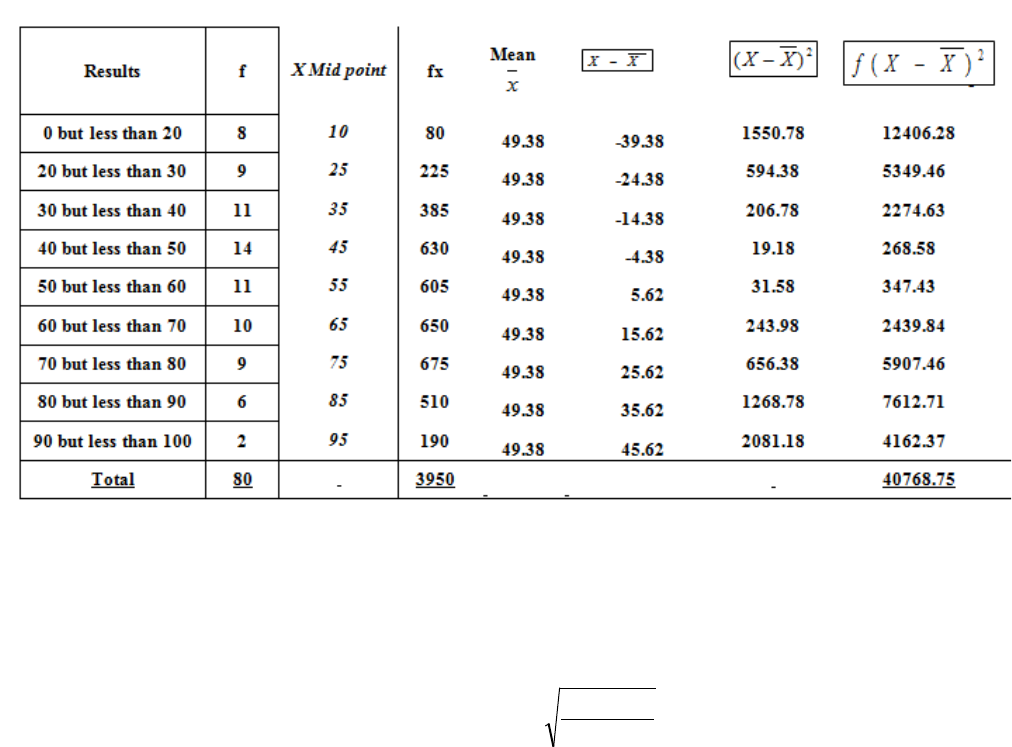
Page 195
To work out the standard deviation for the grouped data using the example of the statistics
score we use the formula for the grouped data which is nearly the same as for the raw data
except you need to take into account the frequency with which each group score occurs.
To work out the standard deviation you continue using the same table as before. Look at the
headings on each column. It follows the formula. You need to practice this.
So the standard deviation for the statistics scores is: 57.22
80
75.40768 =
Table 6.8
Page 196
The Median and the Quartiles.
The median is the figure where half the values of the data set lie below this figure & half
above. In a class of students the median age would be the age of the person where half the
class is younger than this person and half older. It is the age of the middle aged student.
If you had a class of 11 students, to find the median age, you would line up all the students
starting with the youngest to the oldest. You would then count up to the middle person, the 5th
one along, ask them their age and that is the median age.
∆ ∆ ∆ ∆ ∆ ∆ ∆ ∆ ∆ ∆ ∆
To find the median of raw data you need to firstly rank the figures from smallest to highest
and then choose the middle figure.
For grouped data it is not as easy to rank the data because you don’t have single figures you
have groups. There is a formula which can be used or the median can be found from the
ogive. From the ogive, you go to the half way point on the vertical axis (if this is already in
percentages then up to 50%) and then read the median off the horizontal axis.
If we use the data from the example of the statistics results we used before, you will
remember we drew the ogive from the following data:
Less than
Cumulative
frequency
Percentage
cumulative
frequency.
20
8
10
30
17
21.25
40
28
35
50
42
52.5
60
53
66.25
70
63
78.75
80
72
90
90
78
97.5
100
80
100
Table 6.9
Page 197
0
20
40
60
80
100
120
020 40 60 80 100 120
Percentage cumulative frequency.
Percentage cumulative
frequency.
Marks
%
We can read the median off this and we can also read the quartiles. The median is read by
going up to 50% on the vertical axis and the reading the mark off the horizontal axis. In the
above example it is approximately 48 marks.
Using the formula we can also get the median: the formula is:
Median =
m
m
m
mc
f
F
N
L
−
+−1
2
Figure 6.8

Page 198
To use the formula you take the data in its frequency distribution as follows
Median = 40+
10
14
2840
−
= 40+ (
14
12
) 10
= 40+8.57
=48.57
The quartiles can be found also from the ogive or using a similar formula to that above.
Quartile 1 measures the mark below which 25% of the class got (33) and quartile 3 represents
the mark below which 75% of the class got (68). These can be read off the ogive at the 25%
mark and the 75% mark.
The interquartile range is found using the formula
13 QQ −
. This indicates the spread about the
median. The semi-interquartile range (which is similar to the standard deviation) is the
interquartile range divided by 2.
Results
Frequency
0 but less than 20
8
20 but less than 30
9
30 but less than 40
11
(Cumulative 28)
40 but less than 50
14
50 but less than 60
11
60 but less than 70
10
70 but less than 80
9
80 but less than 90
6
90 but less than 100
2
Total
80
Table 6.10
Page 199
0
20
40
60
80
100
120
050 100 150
Percentage cumulative frequency.
Percentage cumulative
frequency.
Marks
%
For data which is normally distributed the median should lie half way between the two
quartiles, if the data is skewed to the right then the median will be closed to quartile 1. Why?
Percentiles are found in the same way as quartiles, the 10% percentile would be found by
going up 10% of the vertical axis, etc.
The Mode
There is no measure of dispersion associated with the mode.
The mode is the most frequently occurring figure in a data set. There is often no mode
particularly with continuous data or there could be a few modes. For raw data you find the
mode by looking at the data as before, or by doing a tally.
For grouped data you can estimate the mode from a histogram by finding the class with the
highest frequency and then estimating.
Figure 6.9

Page 200
Formula for the mode:
Mode =
C
D
L.
D
D
21
1
+
+
To calculate the mode:
1) Determine the modal class, the class with the highest frequency
2) Find
1
D
= difference between the largest frequency and the frequency immediately
preceding it.
3) Find
2
D
= difference between the largest frequency and the frequency immediately
following it.
C= modal class width.
• Measures of dispersion- range, variance, standard deviation, co-efficient of
variation.
The range is explained earlier it is found crudely by taking the highest figure in the data set
and subtracting the lowest figure.
The variance is very similar to the standard deviation and measures the spread of the data. If I
had two different classes and the mean result in both classes was the same, but the variance
was higher in class B then results in class B were more spread out. The variance is found by
getting the standard deviation and squaring it.
The standard deviation is done already.
The co-efficient of variation is used to establish which of two sets of data is relatively more
variable.
For example, take two companies ABC and CBA. You are given the following information
about their share price and the standard deviation of share price over the past year.

Page 201
Mean
Standard deviation
Co efficient of
variation( CV)
ABC
1.2
.8
.67
CBA
1.6
.9
.56
CV =
Mean
Deviation Standard
So CBA shares are relatively less variable.
The Harmonic mean: The harmonic mean is used in particular circumstances namely when
data consists of a set of rates such as prices, speed or productivity.
The formula for this is:
Harmonic mean is: 𝑛
∑1
𝑥
The Geometric mean: This is used to average proportional increases.
An example will illustrate the use of this and the application of the formula:
It is known that the price of a product has increased by 5%2% 11% and 15% in four
successive years.
The GM is:
4
4
367.1
15.111.102.105.1 xxx
= 1.081
Table 6.11
Page 202
Dispersion and Skewness:
The normal distribution is used frequently in statistics. It is not skewed and the mean, median
and the mode will all have the same value. So for normally distributed data it does not matter
which measure of average you use as they are all the same.
Data which is skewed looks like this:
Figure 6.10
Figure 6.11

Page 203
STUDY UNIT 7
The Normal Distribution
Contents
Unit
Title
Page
A.
Introduction
205
B.
The Normal Distribution
207
C.
Calculations Using Tables of the Normal Distribution
209
Tables of the Normal Distribution
209
Using the Symmetry of the Normal Distribution
211
Further Probability Calculations
212
Example
213
Page 204
BLANK
Page 205
A. INTRODUCTION
In Study Unit 4, Section E of this module, we considered various graphical ways of
representing a frequency distribution. We considered a frequency dot diagram, a bar chart, a
polygon and a frequency histogram. For a typical histogram, see Figure 7.1. You will
immediately get the impression from this diagram that the values in the centre are much more
likely to occur than those at either extreme.
Consider now a continuous variable in which you have been able to make a very large
number of observations. You could compile a frequency distribution and then draw a
frequency bar chart with a very large number of bars, or a histogram with a very large
number of narrow groups. Your diagrams might look something like those in Figure 7.2.
Figure 7.1
Figure 7.2
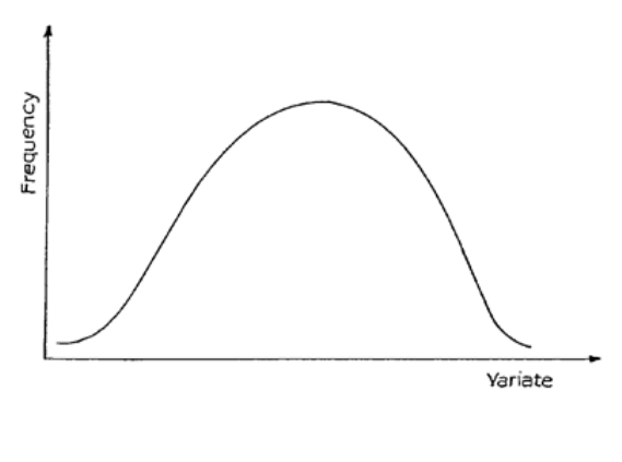
Page 206
If you now imagine that these diagrams relate to relative frequency distribution and that a
smooth curve is drawn through the tops of the bars or rectangles, you will arrive at the idea of
a frequency curve.
Most of the distributions which we get in practice can be thought of as approximations to
distributions which we would get if we could go on and get an infinite total frequency;
similarly, frequency bar charts and histograms are approximations to the frequency curves
which we would get if we had a sufficiently large total frequency. In this course, from now
onwards, when we wish to illustrate frequency distributions without giving actual figures, we
will do so by drawing the frequency curve, as in Figure 7.3.
Figure 7.3
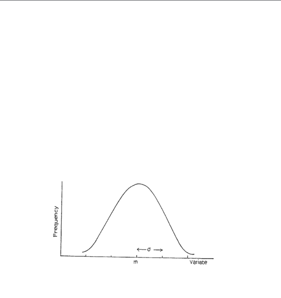
Page 207
B. THE NORMAL DISTRIBUTION
The "Normal" or "Gaussian" distribution is probably the most important distribution in the
whole of statistical theory. It was discovered in the early 18th century, because it seemed to
represent accurately the random variation shown by natural phenomena. For example:
− heights of adult men from one race
− weights of a species of animals
− the distribution of IQ levels in children of a certain age
− weights of items packaged by a particular packing machine
− life expectancy of light bulbs
A typical shape is shown in Figure 7.4. You will see that it has a central peak (i.e. it is
unimodal) and that it is symmetrical about this centre.
The mean of this distribution is shown as m on the diagram, and is located at the centre. The
standard deviation, which is usually denoted by s, is also shown.
There are some interesting properties which these curves exhibit, which allow us to carry out
calculations on them. For distributions of this approximate shape, we find that 68% of the
observations are within ±1 standard deviation of the mean, and 95% are within ±2 standard
deviations of the mean. For the normal distribution, these figures are exact. See Figure 7.5.
Figure 7.4
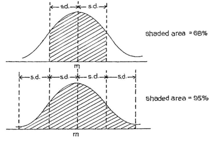
Page 208
These figures can be expressed as probabilities. For example, if an observation x comes from
a normal distribution with mean m and standard deviation s, the probability that x is between
(m – s) and (m + s) is:
P(m – σ < x < m + σ) = 0.68
Also P(m – 2σ < x < m + 2σ) = 0.95
Figure 7.5
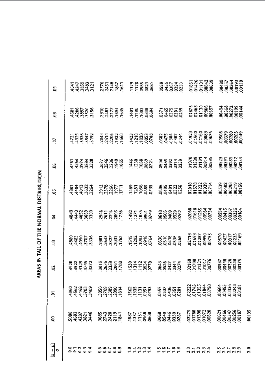
Page 209
C. CALCULATIONS USING TABLES OF THE
NORMAL DISTRIBUTION
Tables of the Normal Distribution
Tables exist which allow you to calculate the probability of an observation being within any
range, not just (m – s) to (m + s) and (m – 2s) to (m + 2s). We show here a set of tables
giving the proportion of the area under various parts of the curve of a normal distribution.
Table 7.1
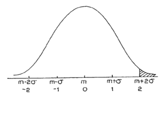
Page 210
The figure given in the tables is the proportion of the area in one tail of the distribution. The
area under a section of the curve represents the proportion of observations of that size. For
example, the shaded area shown in Figure 48 represents the chance of an observation being
greater than m + 2s. The vertical line which defines this area is at m + 2s. Looking up the
value 2 in the table gives:
P(x > m + 2σ) = 0.02275
which is just over 2%.
Similarly, P(x > m + 1σ) is found by looking up the value 1 in the tables. This gives:
P(x > m + 1σ) = 0.1587
which is nearly 16%.
You can extract any value from P(x > m) to P(x > m + 3σ) from the tables. This means that
you can find the area in the tail of the normal distribution wherever the vertical line is drawn
on the diagram.
Figure 7.6
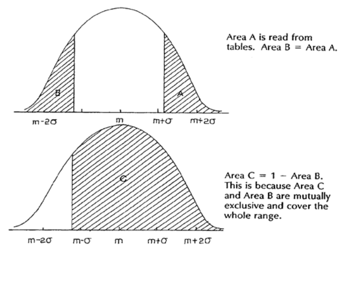
Page 211
Using the Symmetry of the Normal Distribution
Negative distances from the mean are not shown in the tables. Since the distribution is
symmetrical, it is easy to calculate these.
P(x < m – 5σ) = P(x > m + 5σ)
So P(x > m – 5σ) = 1 – P(x < m – 5σ)
This is illustrated in Figure 7.7.
Figure 7.7
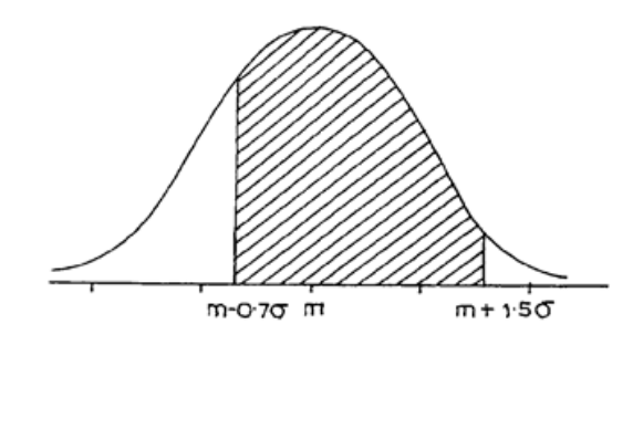
Page 212
Further Probability Calculations
It is possible to calculate the probability of an observation being in the shaded area shown in
Figure 7.8, using values from the tables. This represents the probability that x is between m –
0.7σ and m + 1.5σ
i.e. P(m – 0.7σ < x < m + 1.5σ).
First find P(x > m + 1.5σ) = 0.0668 from the tables.
Then find P(x < m – 0.7σ) or P(x > m + 0.7σ)
= 0.2420 since the distribution is symmetrical.
The proportion of the area under the curve which is shaded in Figure 7.8 is 1 – 0.0668 –
0.2420 or 0.6912.
Hence P(m – 0.7σ < x < m + 1.5σ) = 0.6912.
Figure 7.8
Page 213
Example
A production line produces items with a mean weight of 70 grams and a standard deviation of
2 grams. Assuming that the items come from a normal distribution, find the probability that
an item will weigh 65 grams or less.
65 grams is 5 grams below the mean.
Since the standard deviation is 2 grams, this is 2.5 standard deviations below the mean.
Let x be the weight of an individual item.
P(x < 65) = P(x < m – 2.5σ)
= P(x > m = 2.5σ)
= 0.00621 from the tables.
Now find the probability that an item will weigh between 69 and 72 grams.
69 grams is 0.5 standard deviations below the mean, and 72 grams is 1 standard deviation
above the mean.
Therefore find P(m – 0.5σ < x < m + σ).
P(x > m + σ) = 0.1587
P(x < m – 0.5σ) = P(x > m + 0.5σ) = 0.3085.
So, P(m – 0.5σ < x < m + σ) = 1 – 0.1587 – 0.3085
or P(69 < x < 72) = 0.5328

Page 214
BLANK

Page 215
STUDY UNIT 8
Index Numbers
Contents
Unit
Title
Page
A.
The Basic Idea
217
B.
Building Up an Index Number
219
Introduction
219
Simple Index
219
Price Relatives
221
C.
Weighted Index Numbers (Laspeyres and Paasche Indices)
223
Weighted Aggregative Index Numbers
223
Weighted Price-Relative Index Numbers
226
D.
Formulae
229
E.
Quantity or Volume Index Numbers
231
Worked Example
231
F.
The Chain-Base Method
237
Example 1
237
Example 2
237
G.
Deflation of Time Series
239
What do we Mean by Deflation?
240
Changing the Index Base-Year
241
An Example
242

Page 216
BLANK
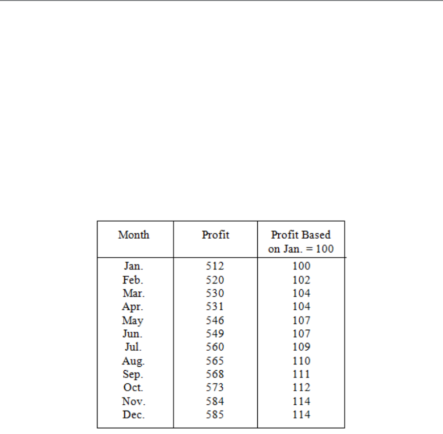
Page 217
A. THE BASIC IDEA
Table 9.1 shows the monthly profits of Firm X for a period of one year. We could plot profits
against time (i.e. each month) and draw a graph. However, if we are interested in changes in
profits rather than in the actual level of profits, we can use one month’s figures, say January,
as standard and express all the others as percentages of this standard.
Because we are dealing with percentages, we use a standard figure of 100.
In Table 9.1, the right-hand column shows January set to the standard figure of 100 and all
the other profit values set to percentages of this standard.
The percentage figures in the right-hand column are called index numbers of profits and, in
this case, January is known as the base month against which all others are compared.
The essentials of an index number then are that it illustrates changes by expressing the items
in a time series as percentages of the item at a chosen base period.
Table 9.1: Monthly Profits of Firm X

Page 218
BLANK

Page 219
B. BUILDING UP AN INDEX NUMBER
Introduction
In commercial and economic affairs (and in some others, too) there are some very important
quantities which are too complex to be measured directly; such things, for example, as the
"level of industrial production" or the "cost of living". These are real enough things, but they
are made up of a very large number of component parts, all affecting the main issue in
different ways or to different extents. The index number notion is especially suited to dealing
with such matters.
You should note that an index number is sometimes called an index (plural: indices).

Page 220
Simple Index
Index numbers make a comparison between a value (quantity or price) in the current period
and the corresponding value in a base period. All calculations are given in percentages
without the % sign.
Index number = Value x 100
Base Value
Example:
A litre of milk cost 800rwf in January 1995, 890rwf in 1998, 930rwf in 2000 and 960rwf in 2003
The milk price index in 1998 with 1995 as base is
890 X 100 = 111.25
800

Page 221
Price Relatives
We can get round this problem by using the ratio of prices of a given item rather than the
actual prices themselves. The price of a pint of milk in Year 10 as a percentage of its price in
Year 1 is 420.0 and is called the price relative for milk in Year 10 (Year 1 = 100).
Similarly, we can work out price relatives for the other items.
(Remember, all we are doing is making the current price into a percentage of the base year
price.)
From these price relatives we can now construct another index number called the mean of
relatives index, which is just the arithmetic mean of the price relatives, i.e.
Mean of relatives index number for year 10 (Year 1 = 100)
Table 9.3
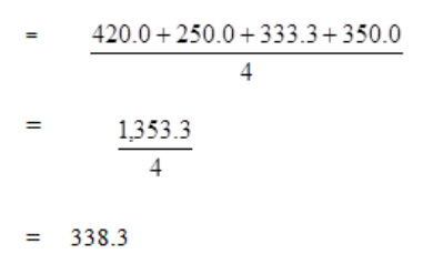
Page 222
In other words, on this basis, prices in general appear to have risen 238% over the given
period.
Another advantage of this price-relative type of index number is that the prices of all the
commodities do not have to be in the same unit, although the prices of each individual item
must be in the same units. This is a useful feature if you are dealing with results from
different countries.

Page 223
C. WEIGHTED INDEX NUMBERS (LASPEYRES AND
PAASCHE INDICES)
You may think that the mean of relatives index is still not very satisfactory, in that all items
are treated as of equal importance and no account has been taken of the different quantities of
the items consumed. For instance, the average family is much more concerned about a 5c
increase in the price of a loaf of bread than a 10c increase in the price of a drum of pepper, as
far more bread is consumed than pepper.
If you look back at Table 9.2, you will see that we are, in fact, given the average weekly
consumption of each item in Year 1 and Year 10. You can see that the consumption pattern,
as well as the prices, has changed over the 10-year period. We are interested in calculating an
index for prices, so we have to be careful not to over-emphasise the increase in prices by
incorporating the changes in consumption.
Weighted Aggregative Index Numbers
We can adopt either of two approaches:
a) We can consider the consumption pattern in Year 1 as "typical" and:
(i) work out the total expenditure on the four items in Year 1; then,
(ii) work out what the total expenditure would have been in Year 10 if the family had
consumed at Year 1 levels; and finally,
(iii)express the sum in (ii) as a percentage of (i) to form an index number.
This index is called a base-weighted aggregative index and in our example we work as
follows:
Year 1 values are (Year 1 consumption x Year 1 prices)
Year 10 values are (Year 1 consumption x Year 10 prices)
In other words, we assume the consumption has not changed, only the prices.
The resulting table of values is:
Table 9.4
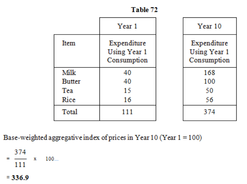
Page 224
This type of index, where the weights are derived from quantities or values consumed in the
base period, is known as a Laspeyres index, after the 19th century economist of that name.
The main defect of a Laspeyres index is that the weights become out-of-date as the pattern of
demand changes. A Laspeyres index tends to overstate the change in prices, as it takes no
account of the fall in consumption when prices rise.
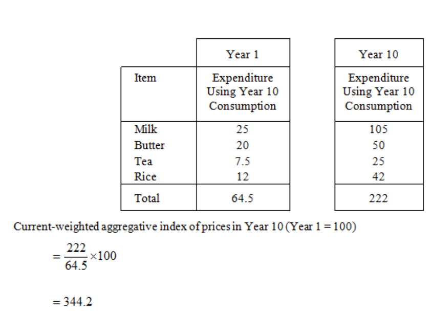
Page 225
b) The alternative method is to regard Year 10 as typical and to work all the figures as
before, except that this time assume Year 10 consumption in Year 1.
This index is called the current-weighted aggregative index. For our example we
have:
This type of index, where the weights are derived from quantities or values consumed in the
current period, is known as a Paasche index after the 19th-century economist of that name.
The main defect of a Paasche index is that new weights have to be ascertained each time the
index is calculated, and this involves time-consuming and expensive survey work. A Paasche
index tends to understate the changes in prices, as most people tend to buy less of those
commodities which have gone up in price.
Table 9.5
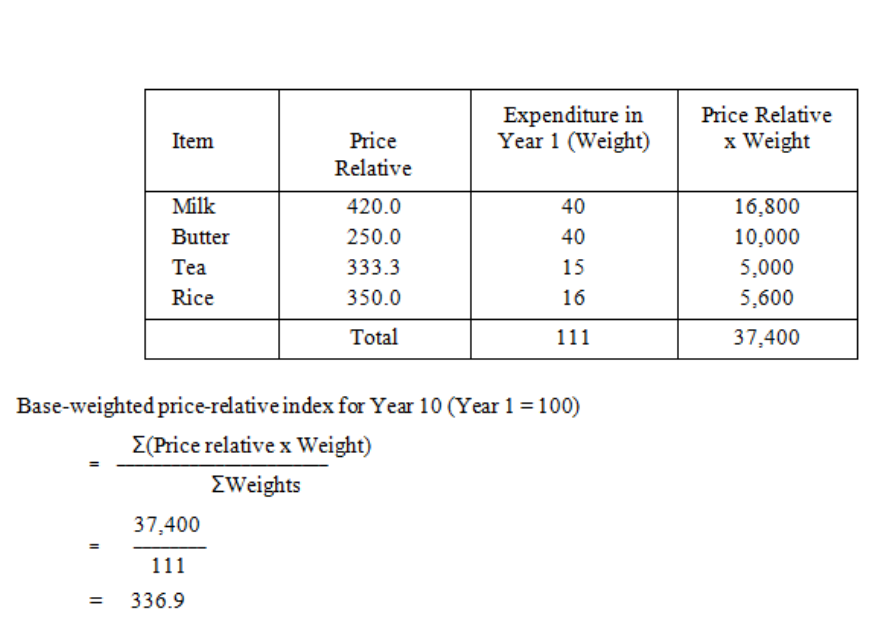
Page 226
Weighted Price-Relative Index Numbers
We can also form base-weighted or current-weighted price-relative index numbers. As
before, we work out the price relatives for each commodity and as we now want to take into
account the relative importance of each item in the family budget, we use as weight the actual
expenditure on each item. The expenditure is used rather than the quantities consumed, to
avoid exaggeration of variations arising from the change in consumption pattern rather than
the change in price
a) Base-Weighted Price-Relative Index Number (Laspeyres)
Table 9.6
RWF
(RWF)
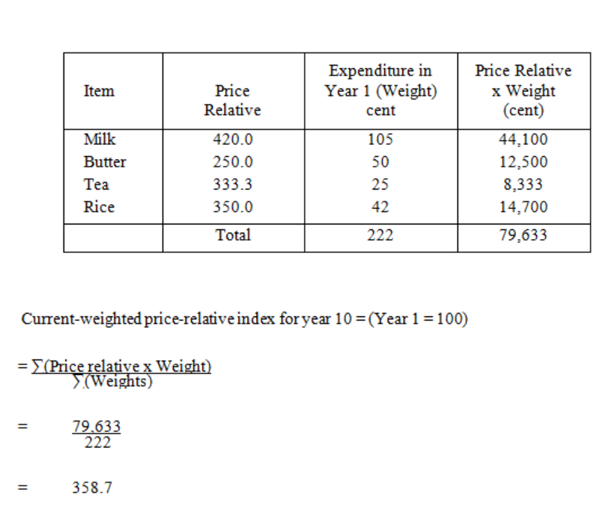
Page 227
b) Current-Weighted Price-Relative Index Number (Paasche)
Table 9.7

Page 228
BLANK
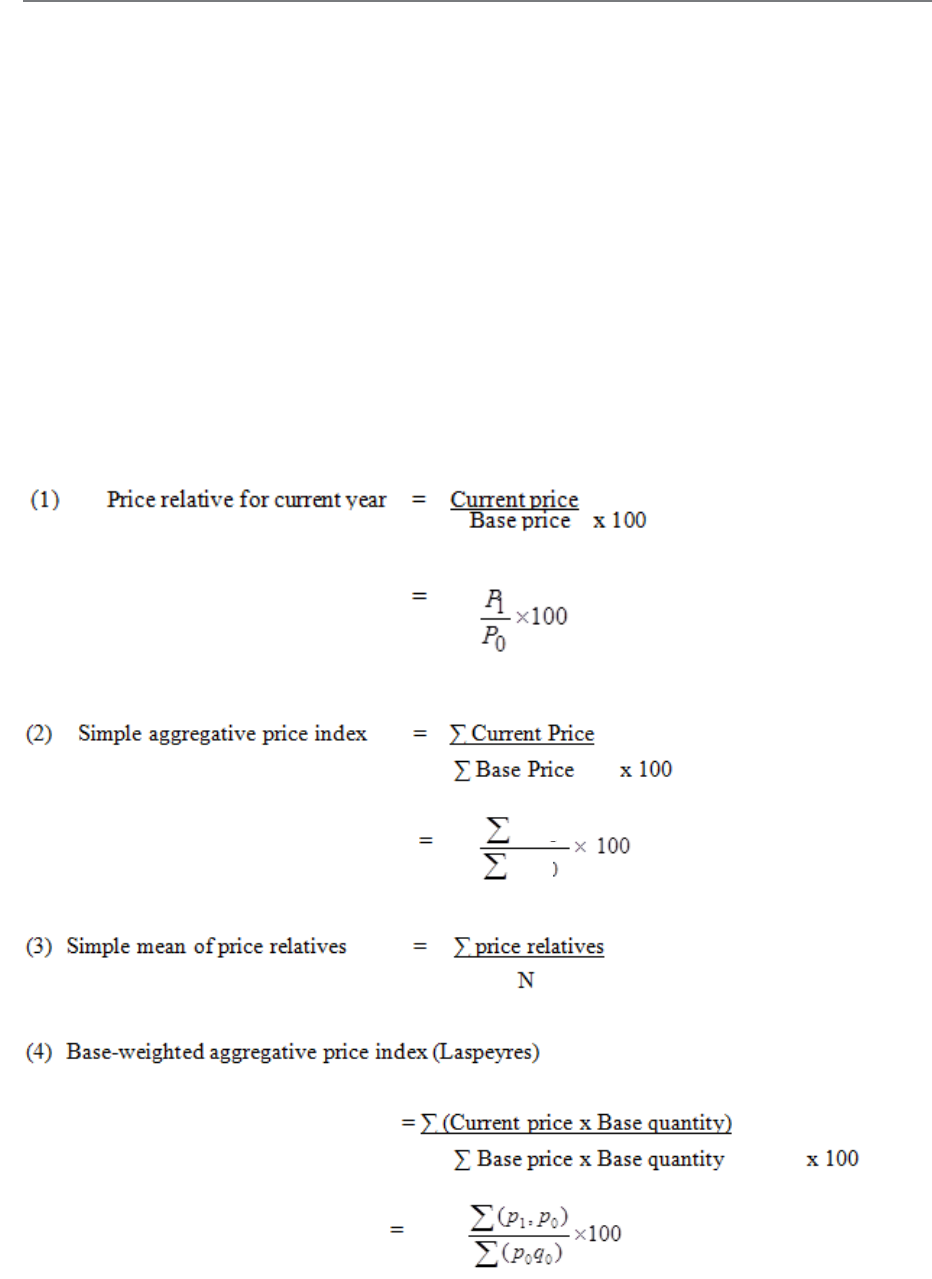
Page 229
D. FORMULAE
It will be useful at this stage to summarise our results so far by using formulae.
We use the normal notation:
po = base year price
p1 = current year price
qo = base year quantity
q1 = current year quantity
n = number of commodities considered.
We have the following results:
P0
P1
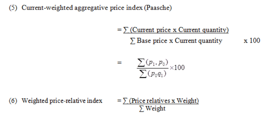
Page 230
In (6), for a base-weighted price-relative index use (base price x base quantity) as the weight.
And, for a current-weighted price-relative index, use (current price x current quantity) as the
weight.
In trying to remember these it is probably simplest to memorise the price-relative, Laspeyres
and Paasche formulae and to deduce the others from their descriptive names.

Page 231
E. QUANTITY OR VOLUME INDEX NUMBERS
You must not think that we are always concerned with price indices. Often we are interested
in volume or quantity indices as, for instance, in the Index of Industrial production which
seeks to measure the changes in volume of output in a whole range of industries over a period
of time. We can calculate such quantity index numbers in exactly the same sort of way as we
dealt with the price indices, for example:
Quantity relative of a commodity in current year relative to base year
=
Base-weighted aggregative quantity index (Laspeyres)
=
Base-weighted quantity-relative index (Paasche)
=
NB. There is no need to memorise these as they are really the same formulae with quantity
substituted for price.
q
1
x 100
q2
∑
(q
1
p
1
)
x 100
∑
(q2p1)
∑
(
q1
x 100
)
(p0q0)
q
0
∑ (p
0
q
0
)
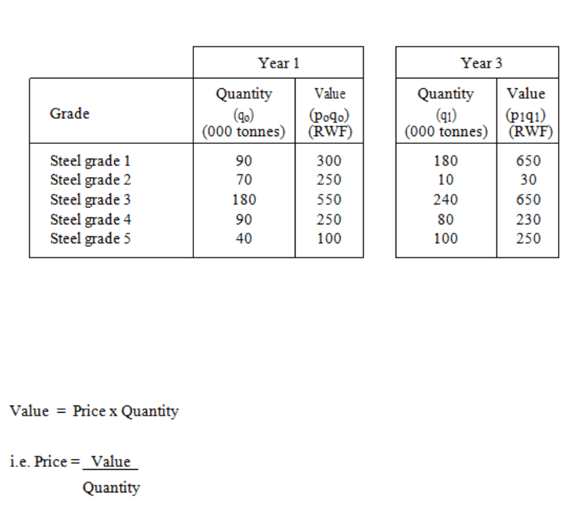
Page 232
Notes
a) The price of a commodity is now used as the weight for an aggregative quantity index
and the expenditure on that commodity is used as the weight for a quantity-relative
index.
b) It is usual, if we are considering the situation from a producer’s point of view rather
than the consumer’s, to call the index numbers volume indices and Σ(poqo), for
example, will be the total value of production in the base year.
c) Remember that for any commodity at any one time:
Value = Price x Volume (producer’s view)
Expenditure = Price x Quantity (consumer’s view).
Worked Example
Table 9.8 shows Rwanda imports of steel from Kenya. Calculate a base-weighted price
Laspeyres index for all types of steel for Year 3 (Year 1 = 100).
As we are asked for a price index, we must first calculate the price per tonne for each grade
of steel using:
Table 9.8
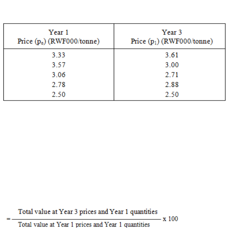
Page 233
We have now to decide whether to use an aggregative index or a price-relative index. We are
asked to find a base-weighted index. Interestingly, we should obtain the same answer
whichever method we choose. However, there is less calculation involved in this particular
example if we choose an aggregative type, so this is the one we shall work first; we will try
the other later.
Base-weighted aggregative price index for Year 3 (Year 1 = 100)
We have the Year 1 values in column two of Table 9.8 so we need only sum that column to
get the denominator of the expression: RWF1,450 million pounds.
The numerator is the sum of the product of column one (q0) in Table 9.8 and column two (p1)
in Table 9.9.
Table 9.9
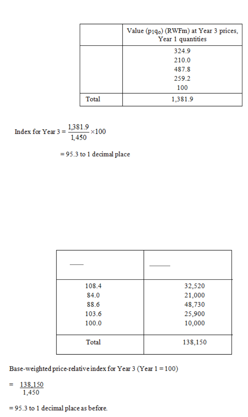
Page 234
Therefore, there was an overall decrease in prices of 4.7% over the period Year 1 to Year 3.
You can check that using the price-relative method gives the same results. You will need a
column for the price relatives and a column for the price relatives weighted with the base-
year values.
p
1
x 100
p
0
p
1
(p0q0) x 100
p
0
Table 9.10
Table 9.11
Page 235
You will see that this must be so by simplifying the base-weighted price-relative formula.
There is not an equivalent rule for the current-weighted indices though.
You will see that in index number calculations you will have lots of multiplication and
division to do. It is time-consuming to have to use logs at every stage, so if you do have a
calculator, particularly one with a memory, it will be of great benefit.

Page 236
BLANK

Page 237
F. THE CHAIN-BASE METHOD
In the chain-base method, the index for the current period is based on the last (i.e. the
immediately preceding) period.
For example, if we are calculating an index for 2003, we use 2002 as the base year; then,
when we come to calculate the index for 2004, we use 2003 as the base year; and so on. This
system has the advantage that it is always up-to-date and it is easy to introduce new items or
delete old ones gradually without much upset to the reliability of the index. Its disadvantage
is that it cannot be used for making comparisons over long periods of time, as we are simply
comparing each year with the immediately preceding year.
If we do need to make long-term comparisons when a chain-base index number is in use, then
it is necessary to convert the indices from a chain base to a fixed base. The method of
working is shown in the following two examples.
Example 1
The indices for Years 1, 2, 3, (Year 0 as base = 100) are:
Year 0 100
Year 1 104
Year 2 104
Year 3 109
We are required to convert these to a chain-base set of indices. The Year 0 index remains the
same at 100: the Year 1 index (based on Year 0) is still 104: the Year 2 index (based on Year
1) is 100 because the two years have the same index; and the Year 3 index (based on Year 2)
is (109 x 100)/104 = 105.
Example 2
The following indices were arrived at by a chain-base method. Convert them to Year 5 as a
fixed base.
Year 5 100
Page 238
Year 6 106
Year 7 110
Year 8 95
Year 9 100
The Year 5 index remains at 100; the Year 6 index (based on Year 5) remains at 106; the
Year 7 index (based on Year 6) is 110 and therefore the Year 7 index will always be 110/100
of the Year 6 index, no matter what base is used.. Now, the Year 6 index (based on Year 5) is
106, and so the Year 7 index (based on Year 5) is (110 x 106)/100 = 116.6. Similarly, the
Year 8 index will be 95/100 of the Year 7 index, no matter what base is used. And so the
Year 8 index (based on Year 5) is (95 x 116.6)/100 = 110.8. The Year 9 index (based on Year
8) is 100 and therefore there is no change from Year 8 to Year 9: the Year 9 index (based on
Year 5) is consequently the same as the Year 8 index (based on Year 5), namely 110.8.

Page 239
G. DEFLATION OF TIME SERIES
These days we are all very familiar with the term "inflation", as it impinges directly on our
own lives to a greater or lesser extent, depending upon the country we live in.
We make such remarks as, "Things cost twice as much now as they did ten years ago!", "We
will need at least a 10% wage rise to keep up with inflation!", and, "I don’t know where my
money is going, everything costs so much nowadays".
We are, of course, referring to the effects of a positive cost of living index. I am sure you will
not remember a time when the cost of living actually fell.
A static index from one year to the next indicates no inflation and although in Rwanda we
managed a 6% index figure not too long ago, we have not had a 0% index for many many
years. There has therefore always, to all intents and purposes, been some degree of inflation
in the economy.
As all workers naturally want at least to maintain their standard of living, they look for
annual wage rises at least equal to the cost of living rise, measured by the index. Very often,
they negotiate clauses into their wage agreements specifying a cost of living increase, or
inflation-proof clause, without being specific or trying to anticipate the figure.
For the purposes of the examination, we are interested in how these vague statements can be
measured. What we do is relate values backwards in the same manner as with indices.
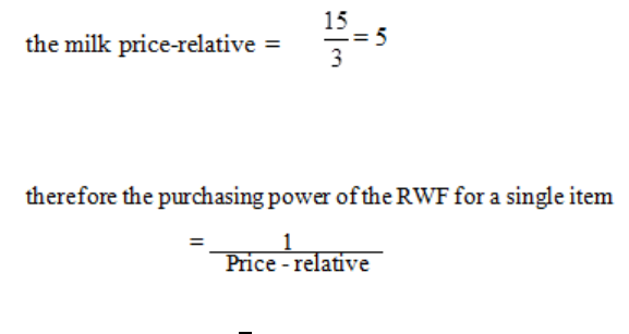
Page 240
What do we Mean by Deflation?
Let us look at some more statements.
1) "Compared to 1960, the RWF in your pocket in 1979 was worth .40RWF."
2) "As far as food is concerned it was worth only .35RWF."
3) "As far as milk is concerned it was worth only .20RWF."
These statements say that in 1979 you got:
(1) 40% (2) 35% (3) 20%
as much spending power with your RWF on these items, as you did in 1960.
In each of these statements a change in prices has been expressed in terms of a so-called
change in the value of the RWF.
When we are dealing with a single commodity such as milk, we can see easily how the
"value" of the RWF is obtained. In 1960 the price of a pint of milk was .03RWF. In 1979 the
price of a pint of milk was .15RWF, hence the purchasing power of the "milk" RWF in 1979
was a fifth of its purchasing power in 1960. In general, the purchasing power of the RWF for
a single item is the reciprocal of the appropriate price relative written as a proportion, not as a
percentage.
In our example:
= RWF 1
5
= RWF 0.20
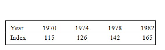
Page 241
When we are dealing with a group of commodities such as food or with the whole range of
goods and services, the purchasing power of the RWF is worked out as the reciprocal of an
appropriate price index number, again expressed as a proportion, i.e. the index of the food
group in the CPI (Consumer Price Index) or the CPI itself.
Another way of looking at the problem is to consider the effect of increased prices on wages.
A wage earner is more concerned with how much his or her wage will buy than the absolute
amount he or she earns. To calculate "real" wages we divide the cash wages by an appropriate
price index, expressed as a proportion, i.e. we are seeing the effect of rising prices on every
Rwandan Franc in the pocket. This process is known as deflating. In principle it is easy
enough but it is often difficult to find an appropriate index to use. For example, the CPI
excludes expenditure on income tax, Social Insurance contributions, etc. which also affect the
wage earner’s purchasing power.
Changing the Index Base-Year
To convert indices from an earlier to a later base year, divide all the indices by the index for
the new base year. This is really a variation on the technique of chain-based indices except
that we relate to one particular year rather than continuing to roll forward.
We also multiply by 100 to regain percentage values.
The following indices have a base year of 1965 = 100:
We will now convert to base year 1970 = 100 by dividing each index by 115 (1970’s index)
and multiplying by 100. You will immediately notice that the 1970 index becomes 100 as
intended.
Table 9.12
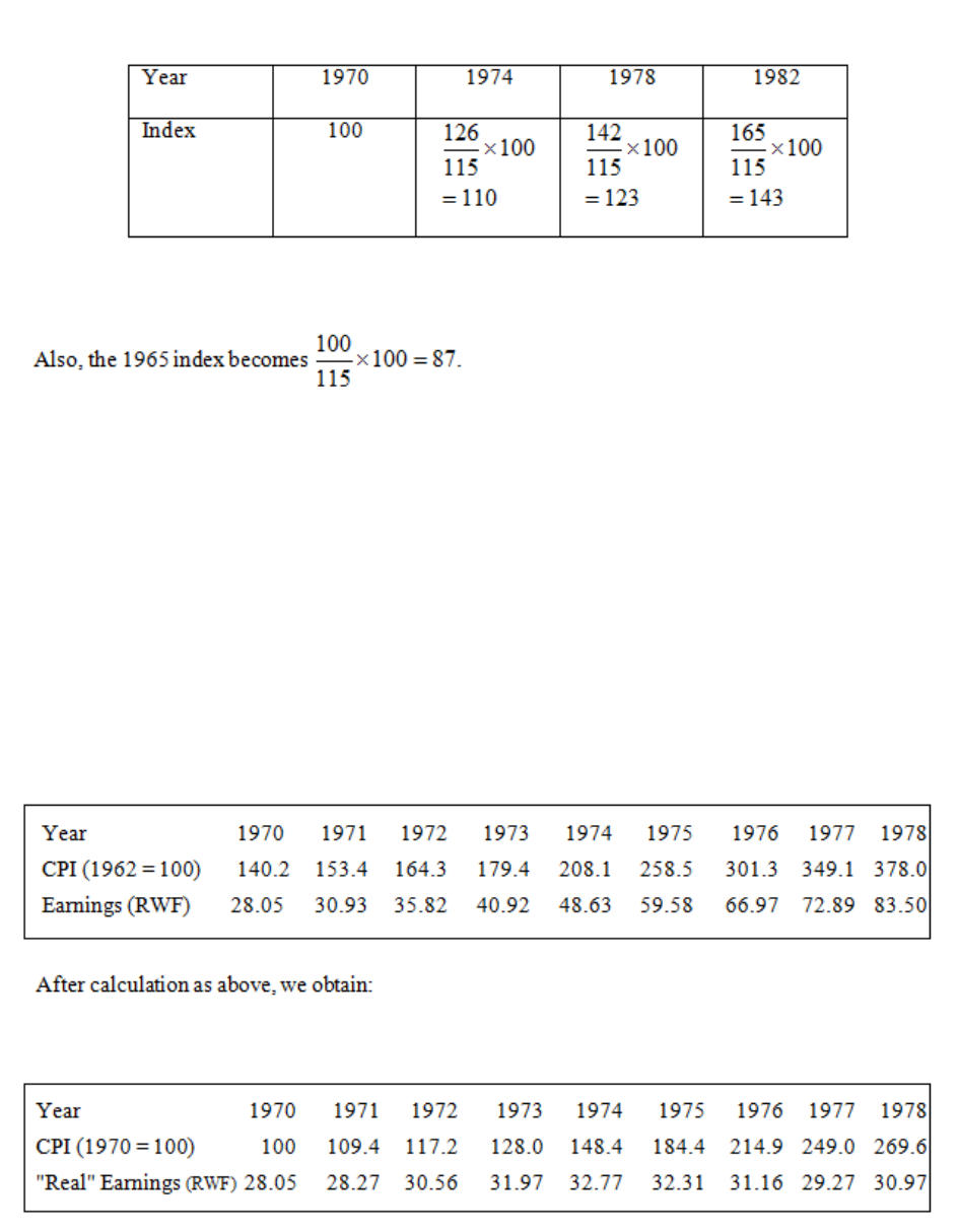
Page 242
Example
Table 9.14 shows the average weekly earnings of male workers (aged 21 and over) during the
years 1970-78. Also shown is the value of the CPI for these years with 1962 as base period.
Determine the "real" average weekly earnings over the period 1970-78.
Table 9.13
Table 9.14
Table 9.15
Page 243
We thus see that, although from 1970 to 1978 the average weekly earnings had apparently
jumped by RWF55.45, i.e. increased by almost 200%, the "real" purchasing power had
increased by RWF2.92 or 10%.
With the increase in inflation in recent years, the public at large has become more aware of
index numbers, e.g. index-linked pensions, savings, insurance premiums, etc. However, the
public does not realise that index numbers are of necessity imperfect measures the values of
which can be manipulated by changes in base year or by changes in the weighting system.
For pensions, the decision has to be made whether to link them with earnings or with prices,
and if with earnings the earnings of whom: manual workers, all workers, workers in the same
industry? With house insurance premiums, is the index used to be based on the estimated
market value of the house or on the cost of clearing the site and rebuilding the house? There
is increasing discussion on these matters so do be on the look-out for such articles and relate
them to your own knowledge of how index numbers are constructed.
Page 244
BLANK

Page 245
STUDY UNIT 9
Percentages and Ratios, Simple and Compound Interest,
Discounted Cash Flow
Contents
Unit
Title
Page
A.
Percentages
247
B.
Ratios
249
Introduction
249
To Reduce the Ratio to its Lowest Terms
250
Divide a Quantity According to a Given Ratio
251
C.
Simple Interest
253
D.
Compound Interest
257
Definition
257
Compound Interest Formula
258
Additional Investment
260
E.
Introduction to Discounted Cash Flow Problems
263
Classification of Investment Problems
263
Basis of the Method
263
Information Required
264
Importance of "Present Value"
265
Procedure
270
F.
Two Basic DCF Methods
273
Yield (Internal Rate of Return) Method
273
Net Present Value (NPV) Method
278
NPV Method and Yield Method Contrasted
278
How to Use the NPV Method
280
Allowance for Risk and Uncertainty
281
Page 246
Unit
Title
Page
G.
Introduction to Financial Mathematics
283
Simple and compound interest
283
Annual percentage rate (APR)
283
Depreciation – Straight Line and Reducing Balance
284
Net Present Value and Internal Rate of Return
285
Annuities, Mortgages, Amortization, Sinking Funds
288
Formula Sheet
292
Break-even Analysis
295
Fixed, variable and marginal costs
302
Calculus
318
H.
Manipulation of Inequalities
325
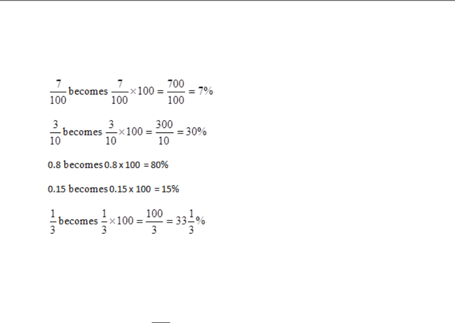
Page 247
A. PERCENTAGES
A percentage is really a fraction where the denominator is 100, and we use the symbol %. To
convert a fraction or a decimal to a percentage, simply multiply by 100.
To find the percentage of a number, we simply convert the percentage to a fraction and
multiply:
8% OF RWF10,000 =
=×10000
100
8
RWF800
Page 248
BLANK

Page 249
B. RATIOS
Introduction
A ratio is another form of fraction just like a percentage, decimal or common fraction. It is a
relationship between two numbers or two like values. Consider the following situation
concerning a small town:
Employed 3,000
Unemployed 1,000
Total workforce 4,000 (available for employment)
This can be expressed in several ways:
¼ of the workforce is unemployed (fraction)
25% of the workforce is unemployed (percentage)
0.25 of the workforce is unemployed (decimal)
The same situation can also be expressed as a ratio. A ratio could say that 1 out of 4 of the
workforce was unemployed, or alternatively, for every person unemployed, 3 persons were
employed.
A special symbol is used for expressing a ratio. The colon sign (:) indicates the important
relationship. Thus in terms of the foregoing example, the relationship is 1:4 or 1:3 depending
on whether you wish to say:
"1 in every 4 is unemployed" or
"For every 1 unemployed, 3 are working".
Another way of expressing a ratio is by using the word "per":
30 kilometres per hour
60 words per minute

Page 250
20 kilometres per day
2 inches per week
3 doses per day
5 meetings per year
Ratios are a particularly important part of the language of business and are used to express
important relationships.
If you intend to proceed to more advanced accounting studies, a thorough understanding of
ratios at this stage will provide a useful foundation for the systematic analysis of accounting
information.
To Reduce the Ratio to its Lowest Terms
Put the first figure over the second figure and cancel the resulting fraction. Then re-express as
a ratio in the form numerator : denominator, for example:
Calculate the ratio of 17 to 85.
5
1
85
17
=
The ratio of 17 to 85 is therefore 1:5 or 1 in 5.
Of course the ratio could be stated as 17:85 but by dividing 85 by 17 it is reduced to
the lowest possible terms, and therefore made more manageable.
The ratio of 38:171 is better stated as 2:9.
It is important to realise that in its original state, the relationship between the two numbers is
not incorrect. But by reducing the terms the relationship becomes a much easier one to
follow. This can be seen from the following example:
What is the relationship of 411 to 137?

Page 251
It could be correctly stated as 411:137 but see how much more meaningful the
relationship is after the terms have been reduced.
3
137
411 =
The ratio is therefore 3:1.
Divide a Quantity According to a Given Ratio
Add the terms of the ratio to find the total number of parts. Find what fraction each term of
the ratio is to the whole. Divide the total quantity into parts according to the fraction. Here
again, this is much simpler when actual figures are introduced:
a) RWF60 has to be divided between 2 brothers in the ratio of 1:2. Ascertain the share of
each brother.
Total number of parts = 1 + 2 = 3
therefore one brother gets RWF20 (one part), the other RWF40 (two parts).
b) 80 books have to be divided between 4 libraries in the proportions 2:3:5:6. What does
each library receive? Total no. of parts = 2 + 3 + 5 + 6 = 16
Therefore:
library 1 gets 2 x 5 = 10 books
library 2 gets 3 x 5 = 15 books
library 3 gets 5 x 5 = 25 books and
library 4 gets 6 x 5 = 30 books
80
= RWF20 = one part
= 5 = one part
Page 252
BLANK
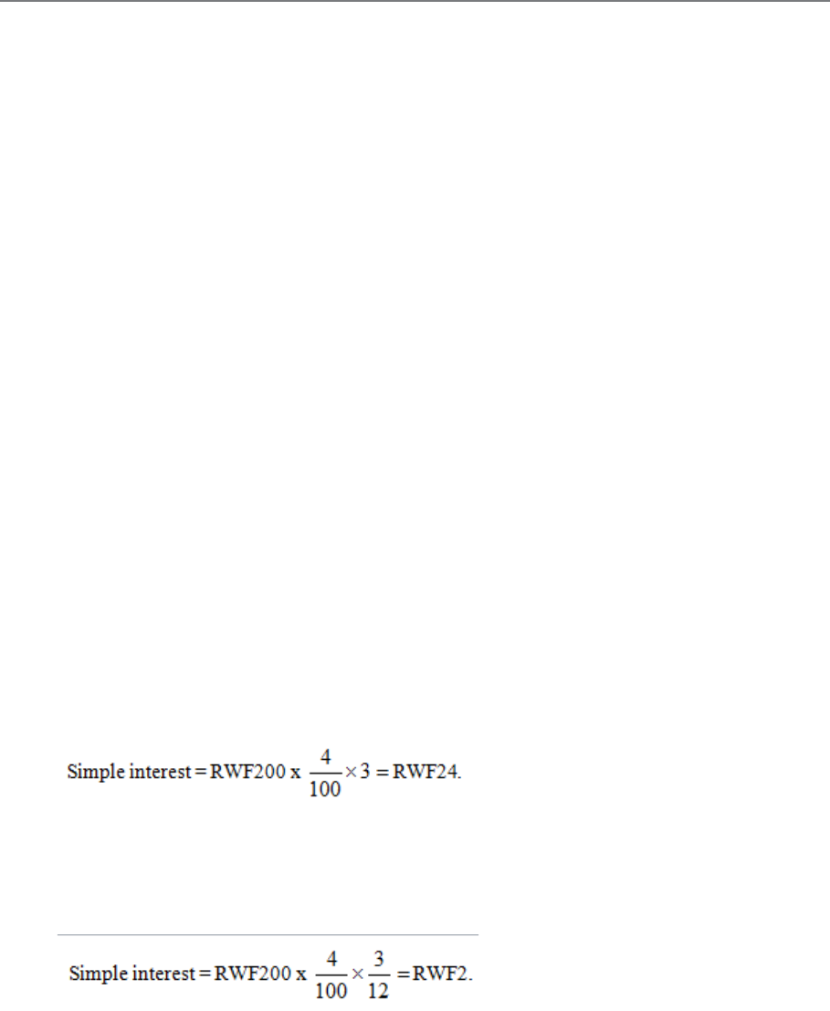
Page 253
C. SIMPLE INTEREST
Interest (I) is a charge for the use of money for a specific time. This charge is usually
expressed as a percentage called the rate per cent per annum. Three factors determine the
amount of interest:
a) The sum of money on which the interest is payable; this is known as the principal
(P).
b) The rate (R).
c) The length of time (Y) for which the money is borrowed.
When the interest due is added to the principal, the sum is called the amount (A), which is
the amount to be repaid.
Simple interest is interest reckoned on a fixed principal. Simple interest is, therefore, the
same for each year, and the total is found by multiplying the interest for one year by the
number of years.
Examples
a) Find the simple interest on RWF200 for 3 years at 4% per annum.
b) Find the simple interest on RWF200 for 3 months at 4% per annum.
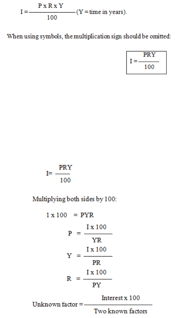
Page 254
To calculate the simple interest on a sum of money lent for a given time at a given rate per
cent per annum, the following formula is used:
(You should memorise this formula.)
You can use this formula to solve any problem in which we are required to find the principal,
rate, time or interest. There are four quantities involved, so given any three, we can find the
other one.
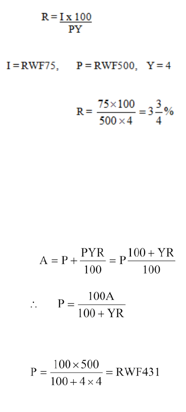
Page 255
When you are working examples always:
− State the formula.
− Give the value to be substituted.
− See that the numbers you use are in the correct units.
− Remember to write the correct unit against the answer, not just a number only.
Examples
a) At what rate of simple interest will RWF500 earn RWF75 in 4 years?
b) What sum of money will amount to RWF500 in 4 years at 4% per annum simple
interest?
A=500, Y=4, R=4
Page 256
BLANK
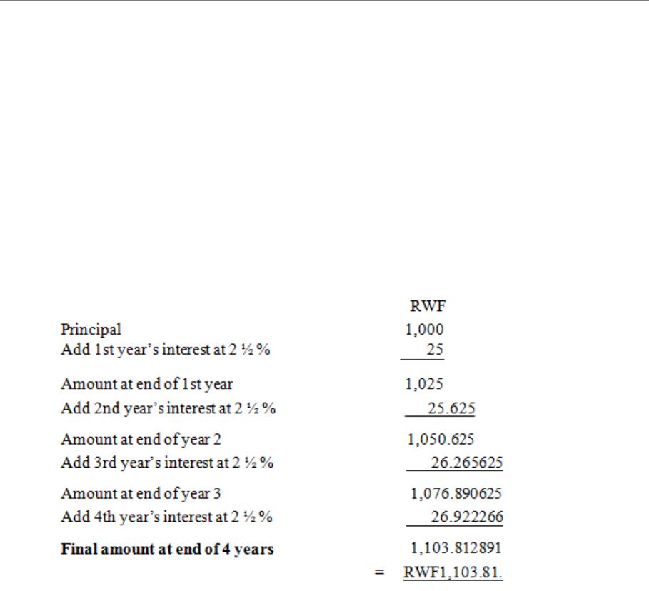
Page 257
D. COMPOUND INTEREST
Definition
In compound interest, the interest due is added to the principal at stated intervals, and interest
is reckoned on this increased principal for the next period, and so on, the principal being
increased at each period by the amount of interest then due.
Example
Find the compound interest and the simple interest on RWF1,000 invested at 2 ½ % per
annum for 4 years.
a)
Therefore, compound interest
= Final amount - Principal
= RWF1,103.81 - RWF1,000
= RWF103.81.
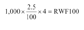
Page 258
b) The simple interest on RWF1,000 at 2 ½ % per annum over 4 years is RWF25 per
annum (always constant) or RWF100,
Now work through the above example by yourself to ensure that you fully understand the
principle involved, and then answer the following question.
Compound Interest Formula
If P is the principal, and if r is the rate of interest on RWF1 for 1 year, then the interest on P
for 1 year is P x r, written as Pr.
At the end of the first year the interest is added to the principal; therefore the new principal =
P + Pr or P(1 + r).
At the end of the second year the interest on the new principal, i.e. P(1 + r), is P(1 + r) x r or
Pr(1 + r).
The principal at the end of the second year is now P(1 + r) + Pr(1 + r). This can be written as
(P + Pr) (1 + r) which equals P(1 + r)2.
You will see that the new principal at the end of n years is equal to P(1 + r)n, and we therefore
have the formula for the evaluation of compound interest, which is:
A = P(1 + r)n
Where A = Final amount
P = Original sum invested
r = Rate of interest per annum on RWF1
n = Number of years.
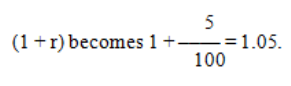
Page 259
Remember that r is the rate of interest on RWF1 for 1 year. Therefore, if the question refers
to a rate of interest of 5 per RWF per annum,
You must become accustomed to thinking in these terms, so that visualising the formula
becomes automatic. Learn the formula by heart. Say it to yourself over and over again until it
is firmly imprinted on your mind.
Now that you have learned and understood the formula A = P(1 + r)n, it is evident that the
real problem lies in the evaluation of (1 + r)n. This is most conveniently done by the use of a
calculator or by logarithms, especially when n is large. It is usual to use seven-figure
logarithms, as four-figure tables are not sufficiently accurate for compound interest
calculations. However, with the time constraints that examinations impose, a calculator is
preferable.
Example
Calculate the compound interest to the nearest cent on RWF1,000 for 2 years at 6% per
annum, interest being calculated each six months.
In this case, n is the number of six-month periods (not years) and we must adjust the interest
rate accordingly; so 6% p.a. = 3% per half year.
A = P(1 + r)n
= 1,000 (1.03)4
= 1,000 (1.03 x 1.03 x 1.03 x 1.03)
= 1,000 x 1.12550881
= 1,125.50881
= RWF1,125.51
Page 260
Therefore, Compound interest = A - P
= RWF1,125.51 - RWF1,000
= RWF125.51 to the nearest RWF.
Having worked carefully through the preceding examples, try to answer the following
question.
Additional Investment
Suppose that you decide to invest RWF2,000 at the beginning of a particular year and that
you add RWF100 to this investment at the end of each year. If interest is compounded at 9%
per annum, then we can deduce:
The amount invested at the end of the first year is
RWF2,000(1 + 0.09) + RWF100.
The amount invested at the end of the second year is
RWF2,000(1 + 0.09)2 + RWF100(1 + 0.09) + 100.
The amount invested at the end of the nth year is
RWF2,000(1 + 0.09)n + RWF100(1 + 0.09)n-1 + RWF100(1 + 0.09)n-2 + ... +
RWF100(1 + 0.09) + RWF100.
Ignoring the first term on the right-hand side, the other terms can be written:
RWF100 + RWF100(1 + 0.09) + + RWF100(1 + 0.09)n-2
+ RWF100(1 + 0.09)n-1
Page 261
This expression is called a geometric progression. The first term is 100 and each successive
term is multiplied by (1 + 0.09). This factor of (1 + 0.09) is called the "common ratio". There
is a formula for the sum of such expressions. In this case it is:
Supposing we wish to know the amount invested after 3 years, then we put n = 3.
In general, if an amount P is invested at the beginning of a year and a further amount a is
invested at the end of each year, then the sum, S, invested after n years is:
Page 262
We have not attempted to prove that this formula is correct, but have simply stated it. Any
proof is outside the scope of this course, but can be found in books, if you are sufficiently
interested.

Page 263
E. INTRODUCTION TO DISCOUNTED CASH
FLOW PROBLEMS
If a business is to continue earning profit, its management should always be alive to the need
to replace or augment fixed assets. This usually involves investing money (capital
expenditure) for long periods. The longer the period the greater is the uncertainty and,
therefore, the risk involved. With the advent of automation, machinery, equipment and other
fixed assets have tended to become more complex and costly. Careful selection of projects
has never been so important. One method of selecting the most profitable investments
follows.
These techniques do not replace judgement and the other qualities required for making
decisions. However, it is true to say that the more information available, the better able a
manager is to understand a problem and reach a rational decision.
Classification of Investment Problems
Capital investment problems may be classified into the following types, and each is amenable
to discounted cash flow analysis.
a) The replacement of, or improvement in, existing assets by more efficient plant and
equipment (often measured by the estimated cost savings).
b) The expansion of business facilities to produce and market new products (measured
by the forecast of additional profitability against the proposed capital investment).
c) Decisions regarding the choice between alternatives where there is more than one way
of achieving the desired result.
d) Decisions whether to purchase or lease assets.
Basis of the Method
The method is based on the criterion that the total present value of all increments of income
from a project should, when calculated at a suitable rate of return on capital, be at least
sufficient to cover the total capital cost. It takes account of the fact that the earlier the return
the more valuable it is, for it can be invested to earn further income meanwhile.
Page 264
By deciding on a satisfactory rate of return for a business, this can then be applied to several
projects over their total life to see which gives the best present cash value.
For any capital investment to be worthwhile, it must give a return sufficient to cover the
initial cost and also a fair income on the investment. The rate which will be regarded as "fair
income" will vary with different types of business, but as a general rule it should certainly be
higher than could be obtained by an equivalent investment in shares.
Information Required
To make use of DCF we must have accurate information on a number of points. The method
can only be as accurate as the information which is supplied.
The following are necessary as a basis for calculation:
a) Estimated cash expenditure on the capital project.
b) Estimated cash expenditure over each year.
c) Estimated receipts each year, including scrap or sale value, if any, at the end of the
asset’s life.
d) The life of the asset.
e) The rate of return expected (in some cases you will be given a figure for "cost of
capital" and you can easily use this rate in the same way to see whether the
investment is justified).
The cash flow each year is the actual amount of cash which the business receives or pays
each year in respect of the particular project or asset (a net figure is used). This represents the
difference between (c) and (b).
Clearly the receipts and expenditures may occur at irregular intervals throughout the year, but
calculations on this basis would be excessively complicated for problems such as may arise in
your examination. So, unless you are told otherwise, you can assume that the net receipt or
expenditure for the year occurs at the end of the relevant year
Page 265
Importance of "Present Value"
Before we proceed to a detailed examination of the method used by DCF there is one
important concept which you need to understand - the idea of present value.
Let us take a businessman who is buying a machine. It will give him, let us say, an output
worth RWF100 at the end of the first year, and the same at the end of each successive year.
He must bear this in mind when buying the machine which costs, say, RWF1,000. But he
must pay out the RWF1,000 now. His income, on the other hand, is not worth its full value
now, because it will be a year before he will receive the first RWF100, two years before he
will receive the second RWF100, and so on. So if we think of the present value of the income
which he is to receive, the first RWF100 is really worth less than RWF100 now, and the
second RWF100 is worth less still. In fact, the present value of each increment of RWF100 is
the sum now which, at compound interest, will represent RWF100 when the sum falls due.
This can easily be calculated, or ascertained from specially prepared present value tables,
which take account of time and of varying interest rates (see Tables (a)-(d)).
These tables are easily used. We can see, for example, that if we assume a cost of capital of
7%, RWF1 in two years’ time is worth RWF0.8734 now. This is the sum which would grow
to RWF1 in two years at compound interest of 7%. Thus we have established the present
value of RWF1 in two years’ time, discounted at compound interest of 7%.
We can now look again at the businessman and his machine. We will assume the cost of
capital is also 7%. The present value of the first year’s income (received at the end of the
year, for the purposes of this example) is 100 x RWF0.9346 and the present value of the
second year’s income is 100 x RWF0.8734. The same method can be used for succeeding
years in the same way.
An extract from the present value tables will usually be given with examination questions
requiring calculations.
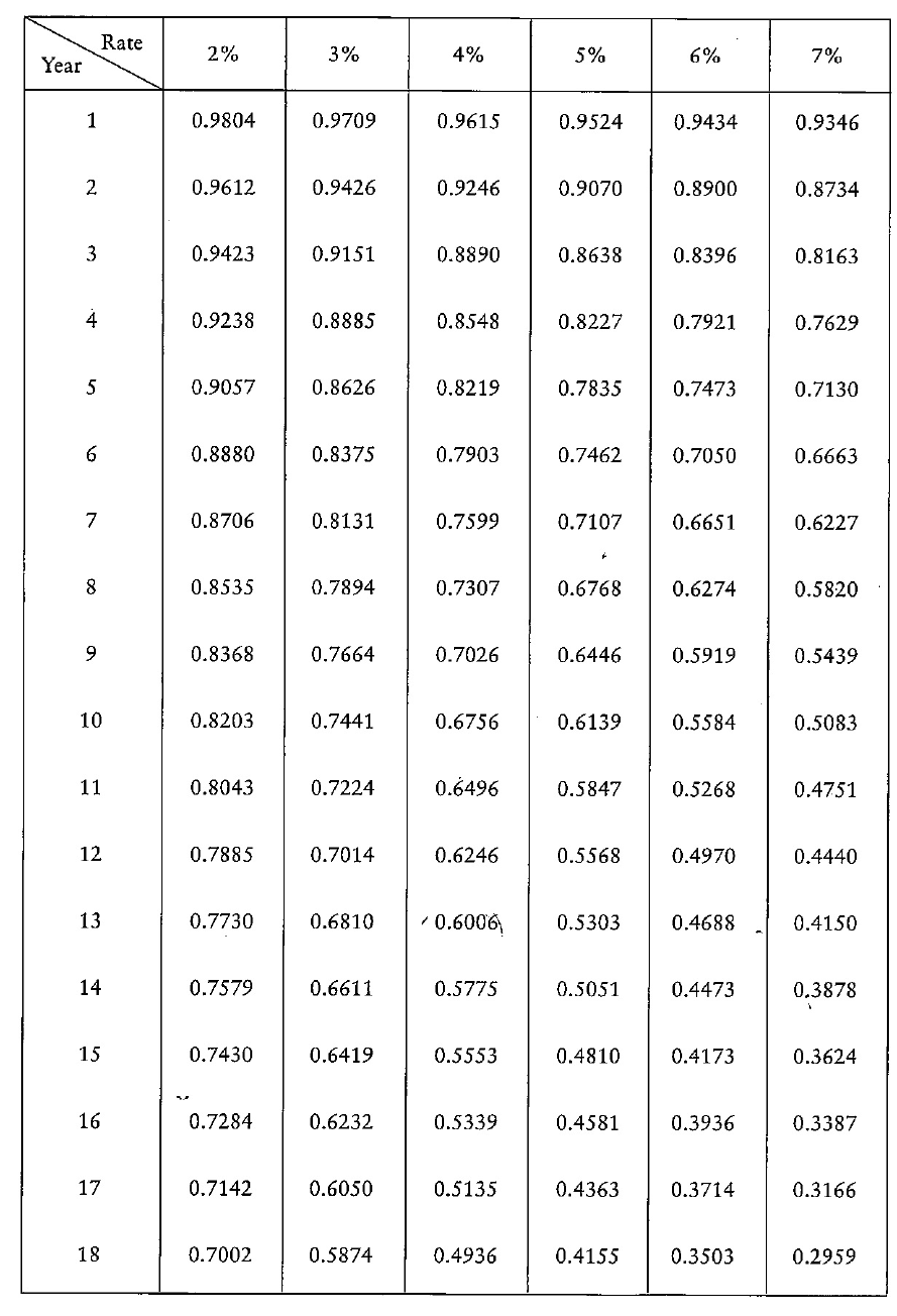
Page 266
Table 10.1: Present Value of RWF 1 (to 4 sig. figs)
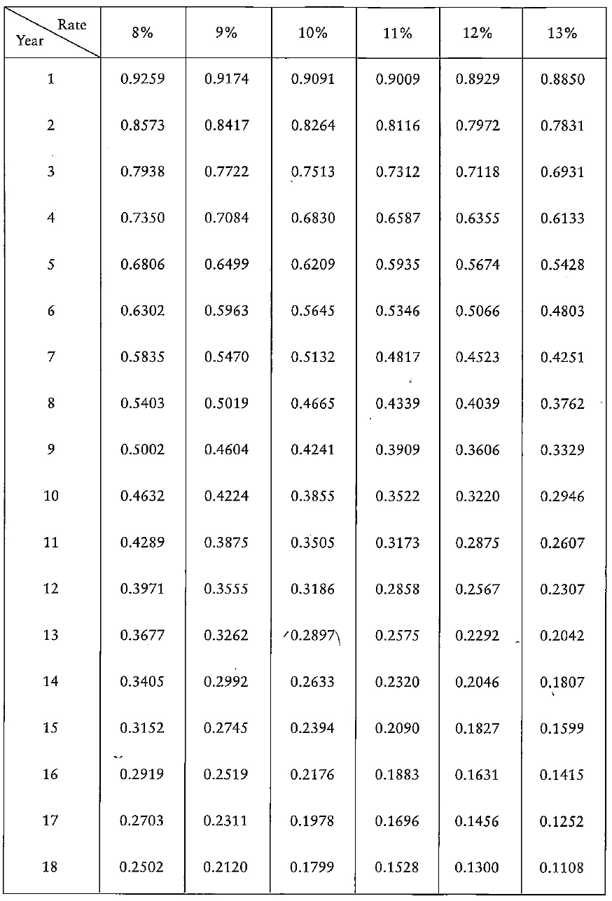
Page 267
Table 10.2: Present Value of RWF 1 (to 4 sig. figs) (Contd)
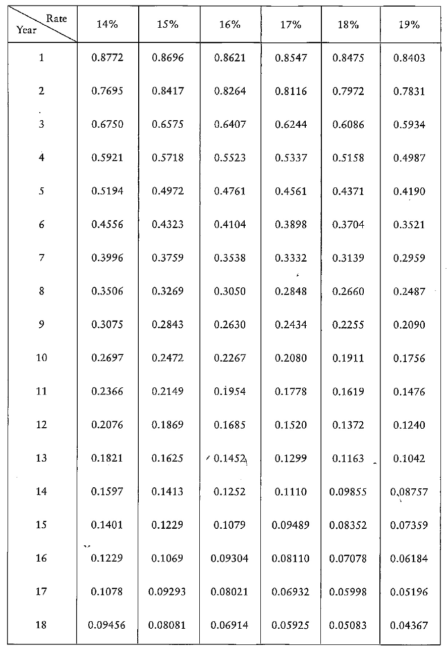
Page 268
Table 10.3: Present Value of RWF 1 (to 4 sig. figs) (Contd)
Page 269
Table 10.4: Present Value of RWF 1 (to 4 sig. figs) (Contd)
Page 270
Procedure
Since our DCF appraisal will be carried out before the beginning of a project, we shall have
to reduce each of the net receipts/expenditures for future years to a present value. This is
"discounting" the cash flow, which gives DCF its name, and it is usually done by means of
tables, an extract of which you have already seen. You should remember, incidentally, that at
the very start of a project the capital expenditure itself may be made, so that at that point
there may be a substantial "negative" present value, since money has been paid out and
nothing received. If all the present values of the years of the life of the investment (including
the original cost) are added together, the result will be the net present value. This is known as
the NPV and is a vital factor, because if it is positive it shows that the discounted receipts are
greater than expenditures on the project, so that at that rate of interest the project is proving
more remunerative than the stated interest rate. The greater the NPV the greater the
advantages of investing in the project rather than leaving the money at the stated rate of
interest. But if the NPV is a minus quantity, it shows that the project is giving less return than
would be obtained by investing the money at that rate of interest.
A practical example will probably be helpful at this point.
Example
A businessman is considering the purchase of a machine costing RWF1,000, which has a life
of 3 years. He calculates that during each year it will provide a net receipt of RWF300; it will
also have a final scrap value of RWF200. Alternatively, he could invest his RWF1,000 at 6%.
Which course would be more advantageous?
First we must work out the cash flow:
Receipts Payments Net Receipts
Year 0 Nil RWF1,000 - RWF1,000
Year 1 RWF300 Nil + RWF300
Year 2 RWF300 Nil + RWF300
Year 3 RWF500 Nil + RWF500
Page 271
(Remember that the scrap value will count as a receipt at the end of the third year.)
But the businessman could be earning 6% interest instead; so this is the cost of his capital,
and we must now discount these figures to find the present value. We can use the extract
from the tables which we have already seen.
Net Receipts Discount Factor Present Factor
Year 0 - RWF1,000 1.0000 - RWF1,000.00
Year 1 + RWF300 0.9434 + RWF283.02
Year 2 + RWF300 0.8900 + RWF267.00
Year 3 + RWF500 0.8396 + RWF419.80
Net present value - RWF30.18
As we have seen above, a negative NPV means that the investment is not profitable at that
rate of interest. So the businessman would lose by putting his money into the machine. The
best advice is for him to invest at 6%.
Page 272
BLANK

Page 273
F. TWO BASIC DCF METHODS
You have now seen a simple example of how DCF is used, and you already have a basic
knowledge of the principles which the technique employs. There are two different ways of
using DCF - the yield (or rate of return) method, and the net present value method, which was
used in the above example.
The important point to remember is that both these methods give identical results. The
difference between them is simply the way they are used in practice, as each provides an
easier way of solving its own particular type of problem.
As you will shortly see, the yield method involves a certain amount of trial-and-error
calculation. Questions on either type are possible, and you must be able to distinguish
between the methods and to decide which is called for in a particular set of circumstances.
In both types of calculation there is the same need for accurate information as to cash flow,
which includes the initial cost of a project, its net income or outgoings for each year of its
life, and the final scrap value of any machinery.
Yield (Internal Rate of Return) Method
This method is used to find the yield, or rate of return, on a particular investment. By "yield"
we mean the percentage of profit per year of its life in relation to the capital employed. In
other words, we must allow for repayment of capital before we consider income as being
profit for this purpose. The profit may vary over the years of the life of a project, and so may
the capital employed, so an average figure needs to be produced.
DCF, by its very nature, takes all these factors into account.
The primary use of the method is to evaluate a particular investment possibility against a
guideline for yield which has been laid down by the company concerned. For example, a
company may rule that investment may only be undertaken if a 10% yield is obtainable. We
then have to see whether the yield on the desired investment measures up to this criterion. In
another case, a company may simply wish to know what rate of return is obtainable from a
Page 274
particular investment; thus, if a rate of 9% is obtainable, and the company’s cost of capital is
estimated at 7%, it is worth its while to undertake the investment.
What we are trying to find in assessing the figures for a project is the yield which its profits
give in relation to its cost. We want to find the exact rate at which it would be breaking even,
i.e. the rate at which discounted future cash flow will exactly equal the present cost, giving an
NPV of 0. Thus if the rate of return is found to be 8%, this is the rate at which it is equally
profitable to undertake the investment or not to undertake it; the NPV is 0. Having found this
rate, we know that if the cost of capital is above 8%, the investment will be unprofitable,
whereas if it is less than 8%, the investment will show a profit. We thus reach the important
conclusion that once we have assembled all the information about a project, the yield, or rate
of return, will be the rate which, when used to discount future increments of income, will
give an NPV of 0. We shall then know that we have found the correct yield.
You should ensure that you know exactly how and when to use the method, as practical
questions are very much more likely than theoretical ones in the examination.
a) When to Use the Yield Method
This is not a difficult problem, because you will use the method whenever you require to
know the rate of return, or yield, which certain increments of income represent on capital
employed. You must judge carefully from any DCF question whether this is what you need to
know.
b) How to Use the Yield Method
The calculation is largely dependent on trial and error. When you use this method, you know
already that you are trying to find the rate which, when used to discount the various
increments of income, will give an NPV of 0. You can do this only by trying out a number of
different rates until you hit on the correct result. A positive NPV means that the rate being
tried is lower than the real rate; conversely, a negative NPV means that too high a rate is
being used. So you need to work the problem out as many times as is necessary to hit on the
appropriate rate for obtaining the NPV of 0. If this process is done sensibly, for simple
problems such as those which we are going to encounter, it should not take many steps to hit
upon the right result. Watch out for any instructions concerning "rounding" of yields - for
example, "to the nearest ½ %".
Page 275
Example
A businessman is considering investment in a project with a life of 3 years, which will bring a
net income in the first, second and third years of RWF800, RWF1,000 and RWF1,200
respectively. The initial cost is RWF2,500 and there will be no rebate from scrap values at the
end of the period. He wishes to know, to the nearest 1%, the yield which this would
represent. Using the present value tables given earlier, make the necessary calculation.
We must begin by choosing a possible rate, and testing to see how near this is. Let us try 7%.
Referring to the tables, we reach the following results:
A positive NPV, as we have seen, means that we have taken too low a rate for our attempt.
Let us try 10% instead:
Table 10.5
Table 10.6
Page 276
This time we have obtained a negative NPV so our rate of 10% must be too high. We now
know that the rate must be between 7% and 10%. Only a proper calculation can give us the
true answer, but having obtained a positive NPV for 7% and a negative NPV for 10%, the
approximate rate can be ascertained by interpolation using the formula:
X)(Y
ba
a
XRate −
+
+=
where:
X = Lower rate of interest used
Y = Higher rate of interest used
a = Difference between the present values of the outflow and the inflow at X%
b = Difference between the present values of the outflow and the inflow at Y%
We can extend the trial and error technique as follows.
+ RWF100 is further from zero than - RWF44
so, 7% is further from zero NPV than 10%.
So we shall try 9%.
Clearly, since we are working to the nearest 1% we are not going to get any closer than this.
However, if you have time available, there is no reason why you should not check the next
nearest rate (in this case, 8%) just to check that you already have the nearest one.
Table 10.7
Page 277
So the yield from this investment would be 9%.
Alternatively, interpolation may be performed graphically rather than by calculation, as
shown in Figure 10.1. The discount rate is on the horizontal axis and the net present value on
the vertical axis. For each of the two discount rates, 7% and 10%, we plot the corresponding
net present value. We join the two points with a ruled line. The net present value is zero
where this line crosses the horizontal axis. The discount rate at this point is the required
internal rate of return. From Figure 10.1 we see that the rate is 9% correct to the nearest 1%,
and this confirms the result of the calculation.
Figure 10.8
Page 278
Net Present Value (NPV) Method
The NPV method is probably more widely used than the yield method, and its particular
value is in comparing two or more possible investments between which a choice must be
made. If a company insists on a minimum yield from investments of, say, 10%, we could
check each potential project by the yield method to find out whether it measures up to this.
But if there are several projects each of which yields above this figure, we still have to find
some way of choosing between them if we cannot afford to undertake all of them.
At first sight the obvious choice would be that which offered the highest yield. Unfortunately
this would not necessarily be the best choice, because a project with a lower yield might have
a much longer life, and so might give a greater profit.
However, we can solve the problem in practice by comparing the net present values of
projects instead of their yields. The higher the NPV of a project or group of projects, the
greater is its value and the profits it will bring.
We must remember that in some instances the cost of capital will be higher for one project
than for another. For example, a company which manufactures goods may well be able to
borrow more cheaply for its normal trade than it could if it decided to take part in some more
speculative process. So each project may need to be assessed at a different rate in accordance
with its cost of capital. This does not present any particular problems for DCF.
NPV Method and Yield Method Contrasted
You should now be able to see the important difference between the NPV method and the
yield method. In the yield method we were trying to find the yield of a project by discovering
the rate at which future income must be discounted to obtain a fixed NPV of 0. In the NPV
method we already know the discounting rate for each project (it will be the same as the cost
of capital) and the factor which we are now trying to find for each project is its NPV. The
project with the highest NPV will be the most profitable in the long run, even though its yield
may be lower than other projects.
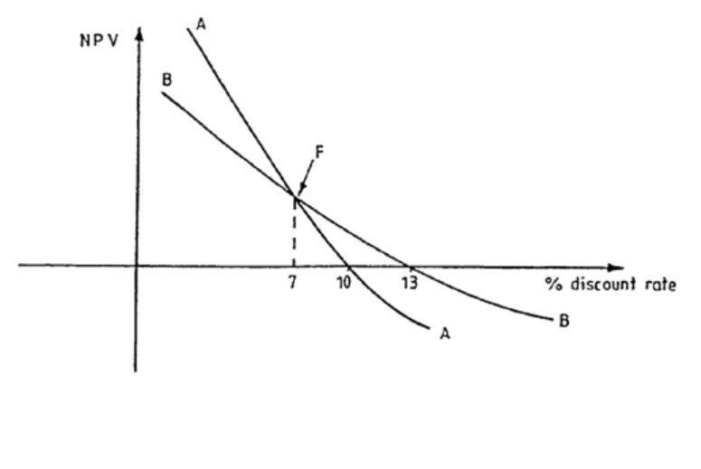
Page 279
So you can see that comparison of projects by NPV may give a different result from
comparison by yields. You must decide for each particular problem which method is
appropriate for it.
Consider Figure 10.9, which shows the NPV profiles of two competing projects, AA and BB.
From the graph, the yield of project AA is 10% and that of project BB is 13%. The NPV of
project AA is greater than that of project BB for discount rates of 0-7%, but at rates greater
than 7% the NPV of project BB is greater than that of project AA.
If the company’s cost of capital is 7% or less, then project AA will be preferred on an NPV
basis, while project BB will be preferred on the basis of the higher yield.
If the company’s cost of capital is greater than 7%, project BB will be preferred on both an
NPV and yield basis.
The point F, at which the NPV profiles intersect, is called the Fisherian point, after the
eminent economist, Irving Fisher. The patterns of cash flows which bring about a Fisherian
point can be identified as follows:
a) Where project life-spans vary considerably.
b) Where the cash flows of one project begin at low levels and increase, whilst those of
the other begin high and decrease. The discounting process bites more deeply into
cash flows in later years because of compounding effects, whereas earlier cash flows
are not so severely hit.
Figure 10.9
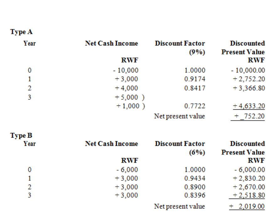
Page 280
How to Use the NPV Method
We must first assemble the cash flow figures for each project. Then, carry out the discounting
process on each annual net figure at the appropriate rate for that project, and calculate and
compare the NPVs of the projects. As we have seen, that with the highest NPV will be the
most profitable.
Example
The ABC Engineering Co. are trying to decide which of the two available types of machine
tool to buy. Type A costs RWF10,000 and the net annual income from the first 3 years of its
life will be RWF3,000, RWF4,000 and RWF5,000 respectively. At the end of this period it
will be worthless except for scrap value of RWF1,000. To buy a Type A tool, the company
would need to borrow from a finance group at 9%. Type B will last for three years too, but
will give a constant net annual cash inflow of RWF3,000. It costs RWF6,000 but credit can
be obtained from its manufacturer at 6% interest. It has no ultimate scrap value. Which
investment would be the more profitable?
Table 10.10
Page 281
Thus we can see that Type B has a far higher NPV and this will be the better investment.
Allowance for Risk and Uncertainty
All investments are subject to risk. In general terms, we mean normal business risk, i.e. not
that the investment plans will collapse completely as a total write-off, but that unforeseen
factors will emerge, such as new legislation, changes in fashion, etc. which make the original
estimates of costs and sales, etc. no longer valid. There are two accepted methods for
incorporating risk into a capital investment appraisal:
a) Inclusion of a Risk Premium in the Discount Rate
The inclusion of a risk premium in the discount rate means that if the normal discount rate to
be used were, say, 12%, then an additional amount, say 4%, might be allowed to cover for
risk, making a 16% discount rate in total. The premium to be added is largely arrived at by
subjective rather than objective measurement, and is correspondingly weak. As we have seen
also, higher discount rates "bite" more savagely at the more distant cash flows, so that two
projects, one short and one long in life-span, would be treated differently for risk by this
method.
b) Attaching Probabilities to Cash Flows
With the first method we effectively looked at the project "normally" - with our usual
discount rate and in a "least favourable" position, by requiring the project to provide a higher
return to cover risk. We can, in fact, refine this method further by attaching individual
probabilities to each cash inflow and outflow, rather than a once-off blanket cover by upping
the discount rate.
Page 282
BLANK

Page 283
G. INTRODUCTION TO FINANCIAL MATHS
The following are the areas which we cover in this section.
Simple and compound interest, annual percentage rate (APR), depreciation (straight line and
reducing balance), discounting, present value and investment appraisal, Annuities, mortgages,
amortization, sinking funds.
In this area the letter i and r both stand for the interest rate. The interest rate is often referred
to in financial maths as: the discount rate, the cost of capital, the rate of return.
Simple and Compound Interest
If you invest RWF100 in a bank at 10% interest then after one year it will be worth
100(1+10%) =100(1.1) = RWF110.........The 10% is written as a decimal.
The interest here is RWF10.
If this RWF110 is left in the bank another year at 10%, then the simple interest is again
RWF10 as in this case no interest is given on the previous interest earned. However,
compound interest would be calculated by finding 110(1.1) =121.
The simple interest over 2 years is RWF20. The compound interest is RWF21.
The formula to work out the amount in your bank account after n years at r% is
Amount S = P (1+r)
n
In above example S = 100(1.1)
2
= 121.
Annual percentage rate (APR)
In the above example, we assumed interest was added or compounded annually, however
sometimes interest may accrue ever six months (twice a year) or over 3 months (4 times per
year). (This would of course be better for the customer).
If interest is at 10% per annum we call this the nominal rate, however if it is compounded
every six months then the actual return is greater than 10%. We call the rate you are actually
getting on your investment the effective rate or actual percentage rate (APR).
Page 284
Example
the nominal rate of interest is 10% but interest is being compounded six-monthly. This
means that interest is being charged at 5% per six months. Thus RWF100 invested would be
worth 100(1.05)
2
= 110.25 after 1 year so the effective rate is 10.25% and not 10%.
The APR of a nominal rate of 12% compounded quarterly = 12/4 = 3% per quarter =
4
03.
=12.55%.
Depreciation: Straight line and reducing balance.
Depreciation is an allowance made in estimates, valuations or balance sheets, normally for
“wear and tear”. There are two techniques for calculating depreciation:
− Straight line or equal instalment depreciation &
− Reducing balance depreciation.
Straight line: if a machine is to depreciate from RWF2500 to RWF500 over 5 years then
annual depreciation would be RWF2500-500 = RWF2000/5 = RWF400.
Reducing balance depreciation: remember in compounding we increased an initial
investment by (1+r)
n
, in depreciation we do a similar process in reverse.
For example, RWF2550 depreciated by 15% equals RWF2550(1-0.15) = RWF2550(.85) =
RWF2167.50.
Also if RWF2550 was successively depreciated over four time periods by 15% the final
depreciated value would be RWF2550(.85)
4
= RWF1331.12.

Page 285
Net Present Value and Internal Rate of Return
This topic describes the technique of present value and how it can be applied to future cash
flows in order to find their worth in today’s money terms.
If I invest RWF100 in the bank today at 10% annual interest, then after 1 year I would have
RWF110.
Looking at this in reverse, if you were due to inherit RWF110 in 1 year, and the interest rate
in the bank is 10%, how much is this money worth now. In other words, how much would
you need to put in the bank today in order to have RWF110 in one year? Ans: RWF100
The Present Value of RWF110 in one year’s time at 10% interest is RWF100.
This is found by taking
RWF110/1.1 = RWF110x1/1.1 = RWF110 x .9090=RWF100
The NPV method of investment appraisal takes into account the “time value of money”. In
order to assess an investment where the money earned on the investment is spread over many
years the approach taken is to bring all future money amounts back to the present.
Supposing you were given the following investment options; you give me RWF10000 to
invest on your behalf. I tell you that I have two different areas where I could invest your
money. The return on each is given below:
Year
Option 1 Option 2
1
RWF4000
RWF2000
2
RWF5000
RWF9000
3
RWF4000
RWF2500
Table 10.11
Page 286
Which option would you choose?
Year
Option 1
Discount value
Present Value
1
RWF4000
.9090
RWF3636
2
RWF5000
.8264
RWF4132
3
RWF4000
.7513
RWF3005.2
The amount you would need to invest today
@ 10% to have the returns indicated in
column 1 is the sum of the present values
RWF10773.2
You are receiving these returns and only investing RWF10000 so your Net Present Value is
RWF10773.20 - RWF10000 = RWF773.20.
Since the NPV is positive, you must be receiving more than 10% on the investment.
The above problem is usually written as follows:
Year
Option 1
Discount value
Present Value
0
(RWF10000)
1
(RWF10000)
1
RWF4000
.9090
RWF3636
2
RWF5000
.8264
RWF4132
3
RWF4000
.7513
RWF3005.2
NPV
+ RWF773.2
Table 10.12
Table 10.13

Page 287
Looking at investment 1 above although with the positive NPV we know that the investment is
offering a rate above the discount rate of 10%, we do not know the actual return on the investment.
The Internal rate of Return gives us this figure.
What rate of return is the investment yielding?
11%, 12%, 18%??
The rate of return the investment is yielding is called the Internal Rate of Return.
If I told you the internal rate of return was 16 % and you found the NPV using 16% what
NPV would you expect to get?
The easiest way to find the internal rate of return is to find the NPV using two different
discount rates. If the original NPV was positive use a higher rate the second time you
discount.
Using option one above we already found the NPV at 10% was RWF773.2. This is positive
so we will use a higher discount rate now. You can choose whatever one you want;
Let’s use 20%
Year
Option 1
Discount value
Present Value
0
(RWF10000)
1
(RWF10000)
1
RWF4000
.8333
3333.20
2
RWF5000
.6944
3472
3
RWF4000
.5787
2314.8
NPV
-880
This is perfect because it is a negative number which is roughly the same as the positive
number done earlier.
Table 10.14

Page 288
The Internal Rate of Return is then estimated by drawing the following diagram:
Formula: Internal Rate of Return.
68.14
)880(2.773
10*)880(20*2.773
21
1221
=
−−
−−
=
−
−
NN
rNrN
20
880
10
2.773
2
2
1
1
=
−=
=
=
r
N
r
N
Annuities, Mortgages, Amortization, Sinking funds.
This topic deals with various techniques associated with fixed payments (or receipts) over
time, otherwise known as annuities.
An annuity is a sequence of fixed equal payments (or receipts) made over uniform time
intervals. Some examples are monthly salaries, insurance premiums, mortgage repayments,
hire-purchase agreements.
Annuities are used in all areas of business and commerce. Loans are normally repaid with an
annuity, investment funds are made up to meet fixed future commitments for example asset
replacement, by the payment of an annuity. Perpetual annuities can be purchased with a
single lump-sum payment to enhance pensions.
Annuities may be paid
− At the end of payment intervals(an ordinary annuity) or
− At the beginning of a payment interval (a due annuity)
There are just 2 formulae you need here:
Accrued amount (compound interest) A = P (1+i)
n

Page 289
Sum of the first n terms of an annuity
r
ra
Sn
n
)1)1(( −+
= This formula is used if an equal
amount is lodged over many years.
Amortization of a debt.
If an amount of money is borrowed over a period of time, one way of repaying the debt is by
paying an amortization annuity. This consists of a regular annuity in which each payment
accounts for both repayment of capital and interest. The debt is said to be amortized if this
method is used. Many of the loans issued for houses are like this. This is known as a
repayment mortgage.
The standard question is: given the amount borrowed P, with interest of r%, what must the
annual payments be A, in order to pay off (amortize) the debt in a certain number of years.
The easiest way to do this is with an “Amortization Schedule”.
An amortization schedule is a specification, period by period (normally year by year) of the
state of the debt. It is usual to show for each year:
a) Amount of debt outstanding at the beginning of the year.
b) Interest paid
c) Annual payment
d) Amount of principle repaid.
Example:
A debt of RWF5000 with interest of 5% compounded every 6 months is amortized by equal
semi-annual payments over the next three years.
a) Find the value of each payment
b) Construct an amortization schedule.

Page 290
a) Making a standard time period of 6 months, the interest rate is 2.5% with n=6 time
periods.
P=5000; n=6; r=0.025 (1+i) =1.025.
Thus 5000 = A
+++++
65432
)025.1(
1
)025.1(
1
)025.1(
1
)025.1(
1
)025.1(
1
025.1
1
=A (0.97561+0.95181+0.92860+0.90595+0.88385+0.86230)
= A (5.50812)
A =
75.907
50812.5
5000 RWF=
b) The amortization schedule is given below:
6 month
period
Outstanding
debt
Interest paid
Payment made
Principal
repaid
1
5000
125
907.75
782.75
2
4217.25
105.43
907.75
802.32
3
3414.93
85.37
907.75
822.38
4
2592.55
64.81
907.75
842.94
5
1749.61
43.74
907.75
864.01
6
855.6
22.14
907.75
885.61
balance
0.01
Table 10.15

Page 291
Sinking fund
Sinking funds are commonly used for the following purposes:
(i) Repayment of debt
(ii) To provide funds to purchase a new asset when the existing asset is fully depreciated.
Dept repayment using a sinking fund:
Here, a debt is incurred over a fixed period of time, subject to a given interest rate. A sinking
fund must be set up to mature to the outstanding amount of the debt.
For example: if RWF25000 is borrowed over 3 years at 12% compounded, the value of the
outstanding debt at the end of the third year, will be RWF25000 (1.12)
3
=RWF35123.20.
If money can be invested at 9.5%, we need to find the value of the annuity, A, which must be
paid into the fund in order that it matures to RWF35125.20. Assuming that payments into the
fund are in arrears, we need:
35123.20 = A (1.095)
2
+A (1.095) + A
35123.2=A (3.2940)
A =
78.10662
2940.3
2.35123 =

Page 292
Formula Sheet
[Unless stated otherwise, all symbols have their usual meanings]
Central tendency
Arithmetic Mean
ΧΣ
=x
n
For raw data
X
=
∑
∑
fx
f for grouped data
Probability and Statistics
P (A AND B) = P (A). P (B|A) P (A OR B) = P (A) + P (B) – P (A AND B)
Binomial Distribution: P(r) = nCr pr (1- p)n-r
Poisson distribution: P(r) =
!r
r
e
µ
µ
−
where μ is the average no. of occurrences = n.p
Normal Distribution:
σ
µ−
=x
z
Normal Approximation to the Binomial Distribution:
)1( pnp −=
σ
and μ = n.p
Standard Error
n
x
σ
σ
=
Confidence intervals: xc
zx
σµ
±=
n
PP
c
zpP
)1( −
±=

Page 293
Chi - Square formula
χ
22
=−
∑( )O E
E
Where O is observed data
E is expected data.
Future and present values
Future value A = P (1+ r)n where A is the amount in n years time and r is the fractional
interest rate
Present value of future amount A is
n
r
A)1( +
;
If an amount P is invested at the beginning of a year and a further amount "a" is invested at
the end of each year, then the sum, S, invested after n years is:
r
r
arPS n
n1)1(
)1( −+
++=
Internal Rate of Return.
NN
rNrN
21
1221
−
−
Where N = Net present value, r = Discount rate.
Page 294
Regression and Correlation
If the least squares regression line of y on x is given by the equation y = a + bx, then
22
()
n xy x y
nx x
yx
nn
b
ab
−
−
∑ ∑∑
=∑∑
∑∑
= −
And the product moment correlation coefficient is:
2222
() ()
n xy x y
nx x ny y
r
−
−−
∑ ∑∑
=∑∑ ∑∑
Indices
Laspeyres Price Index L=
100
00
0
x
qp
qp
n
∑
∑
Paasche Price Index P=
100
0
x
qp
qp
n
nn
∑
∑

Page 295
Break-even Analysis
For any business there is a certain level of sales at which there is neither a profit nor a loss,
i.e. the total income and the total costs are equal. This point is known as the break-even
point. It is very easy to calculate, and it can also be found by drawing a graph called a break-
even chart.
Calculation of Break-Even Point – Example
As shown in the last unit, you must be able to layout a marginal cost statement before doing
Break Even formulas.
Marginal Cost Statement
Sales
x
- Variable Cost
(x)
= Contribution
x
- Fixed Costs
(x)
= Profit/Loss
xx
Let us assume that the organising committee of a dinner have set the selling price at
RWF8.40 per ticket. They have agreed with a firm of caterers that the meal would be
supplied at a cost of RWF5.40 per person. The other main items of expense to be considered
are the costs of the premises and orchestra which will amount to RWF80 and RWF100
respectively. The variable cost in this example is the cost of catering, and the fixed costs are
the amounts for premises and orchestra.
The first step in the calculations is to establish the amount of contribution per ticket.
Contribution
RWF
Price of ticket (sales value) 8.40
Less Catering cost (marginal cost) 5.40
Contribution 3.00
Now that this has been established, we can evaluate the fixed expenses involved.

Page 296
Fixed Costs
RWF
Hire of premises 80
Orchestra fee 100
Total fixed expenses RWF180
The organisers know that for each ticket they sell, they will obtain a contribution of RWF3
towards the fixed costs of RWF180. Clearly it is only necessary to divide RWF180 by
RWF3 to establish the number of contributions which are needed to break even on the
function. The break-even point is therefore 60, i.e. if 60 tickets are sold there will be neither
a profit nor a loss on the function. Any tickets sold in excess of 60 will provide a profit of
RWF3 each.
Formulae
The general formula for finding the break-even point in volume is:
Fixed costs
Contribution per unit
(this is, of course, exactly what we did in the example).
If the break-even point is required in terms of sales value, rather than sales volume, the
formula that should be used is as follows:
Break-even point =
Fixed costs
C/ s ratio
The C/s ratio is
Contribution
Sales
× 100.
For example, the contribution earned by selling one unit of Product A at a selling price of
RWF10 is RWF4.

Page 297
C/s ratio =
10
4
RWF
RWF
× 100 = 40%
In our example of the dinner-dance, the break-even point in revenue would be:
40.8
3
180
rwf
rwf
= RWF504
The committee would know that all costs (both variable and fixed) would be exactly covered
by revenue when sales revenue earned equals RWF504. At this point no profit nor loss
would be received.
Suppose the committee were organising the dinner in order to raise money for charity, and
they had decided in advance that the function would be cancelled unless at least RWF120
profit would be made. They would obviously want to know how many tickets they would
have to sell to achieve this target.
Now, the RWF3 contribution from each ticket has to cover not only the fixed costs of
RWF180, but also the desired profit of RWF120, making a total of RWF300. Clearly they
will have to sell 100 tickets (RWF300 divided by RWF3).
To state this in general terms:
Volume of sales needed to achieve a given profit =
Fixed costs + Desired profit
Contribution per unit
Suppose the committee actually sold 110 tickets. Then they have sold 50 more than the
number needed to break even. We say they have a margin of safety of 50 units, or of
RWF420 (50 × RWF8.40), i.e.
Margin of safety = Sales achieved – Sales needed to break even.
The margin of safety is defined as the excess of normal or actual sales over sales at break-
even point.

Page 298
It may be expressed in terms of sales volume or sales revenue.
Margin of safety is very often expressed in percentage terms:
Sales achieved Sales needed to break even
Sales achieved
−
× 100%
i.e. the dinner committee have a percentage margin of safety of 50/110 × 100% = 45%.
The significance of margin of safety is that it indicates the amount by which sales could fall
before a firm would cease to make a profit. Thus, if a firm expects to sell 2,000 units, and
calculates that this would give it a margin of safety of 10%, then it will still make a profit if
its sales are at least 1,800 units (2,000 – 10% of 2,000), but if its forecasts are more than
10% out, then it will make a loss.
The profit for a given level of output is given by the formula:
(Output × Contribution per unit) – Fixed costs.
It should not, however, be necessary for you to memorise this formula, since when you have
understood the basic principles of marginal costing, you should be able to work out the profit
from first principles.
Consider again our example of the dinner. What would be the profit if they sold (a) 200
tickets (b) RWF840 worth of tickets?
a) We already know that the contribution per ticket is RWF3.
Therefore, if they sell 200 tickets, total contribution is 200 × RWF3 = RWF600.
Out of this, the fixed costs of RWF180 must be covered: anything remaining is profit.

Page 299
Therefore profit = RWF420. (Check: 200 tickets is 140 more than the number needed
to break even. The first 60 tickets sold cover the fixed costs; the remaining 140 show a
profit of RWF3 per unit. Therefore profit = 140 × RWF3 = RWF420, as before.)
b) RWF840 worth of tickets is 100 tickets, since they are RWF8.40 each.
RWF
Total contribution on 100 tickets = 300
Less fixed costs 180
Profit RWF120
Break-even Chart
Information Required
a) Sales Revenue
When we are drawing a break-even chart for a single product, it is a simple matter to
calculate the total sales revenue which would be received at various outputs.
As an example let us take the following figures:
Output (units) Sales revenue (RWF)
0 0
2,500 10,000
5,000 20,000
7,500 30,000
10,000 40,000
b) Fixed Costs
We must establish which elements of cost are fixed in nature. The fixed element of any
semi-variable costs must also be taken into account.
Let us assume that the fixed expenses total RWF8,000.
Page 300
c) Variable Costs
The variable elements of cost must be assessed at varying levels of output.
Output (units) Variable costs (RWF)
0 0
2,500 5,000
5,000 10,000
7,500 15,000
10,000 20,000
Plotting the Graph
The graph is drawn with level of output (or sales value) represented along the horizontal axis
and costs/revenues up the vertical axis. The following are the stages in the construction of
the graph:
a) Plot the sales line from the above figures.
b) Plot the fixed expenses line. This line will be parallel to the horizontal axis.
c) Plot the total expenses line. This is done by adding the fixed expenses of RWF8,000
to each of the variable costs above.
d) The break-even point (often abbreviated to BEP) is represented by the meeting of the
sales revenue line and the total cost line. If a vertical line is drawn from this point to
meet the horizontal axis, the break-even point in terms of units of output will be
found.
The graph is illustrated in Figure 10.16
Note that, although we have information available for four levels of output besides zero, one
level is sufficient to draw the chart, provided we can assume that sales and costs will lie on
straight lines. We can plot the single revenue point and join it to the origin (the point where
there is no output and therefore no revenue). We can plot the single cost point and join it to
the point where output is zero and total cost = fixed cost.
Page 301
In this case, the break-even point is at 4,000 units, or a revenue of RWF16,000 (sales are at
RWF4 per unit).
This can be checked by calculation:
Sales revenue = RWF4 per unit
Variable costs = RWF2 per unit
∴ Contribution = RWF2 per unit
Fixed costs = RWF8,000
Break-even point =
Fixed costs
Contribution per unit
= 4,000 units.
Figure 10.16
Page 302
Break-even Chart for More Than One Product
Because we were looking at one product only in the above example, we were able to plot
“volume of output” and straight lines were obtained for both sales revenue and costs. If we
wish to take into account more than one product, it is necessary to plot “level of activity”
instead of volume of output. This would be expressed as a percentage of the normal level of
activity, and would take into account the mix of products at different levels of activity.
Even so, the break-even chart is not a very satisfactory form of presentation when we are
concerned with more than one product: a better graph, the profit-volume graph, is discussed
in the next study unit. The problem with the break-even chart is that we should find that,
because of the different mixes of products at the different activity levels, the points plotted
for sales revenue and variable costs would not lie on a straight line.
Fixed, Variable and Marginal Costs
Introduction
Costs can be divided either into direct and indirect costs, or variable and fixed costs.
Direct costs are variable, that is the total cost varies in direct proportion to output. If, for
instance, it requires RWF10 worth of material to make one item it will require RWF20 worth
to make two items and RWF100 worth to make ten items and so on.
Overhead costs, however, may be either fixed, variable or semi-variable.
Fixed Cost
A fixed cost is one which can vary with the passage of time but, within limits, tends to
remain fixed irrespective of the variations in the level of output. All fixed costs are overhead.
Examples of fixed overhead are: executive salaries, rent, rates and depreciation.
A graph showing the relationship of total fixed cost to output appears in Figure 10.4.
Page 303
Figure 10.17
Please note the words “within limits” in the above description of fixed costs. Sometimes this
is referred to as the “relevant range”, that is the range of activity level within which fixed
costs (and variable costs) behave in a linear fashion.
Suppose an organisation rents a factory. The yearly rent is the same no matter what the
output of the factory is. If business expands sufficiently, however, it may be that a second
factory is required and a large increase in rent will follow. Fixed costs would then be as in
Figure 10.5.
Figure 10.18
A cost with this type of graph is known as a step function cost for obvious reasons.
Page 304
Variable Cost
This is a cost which tends to follow (in the short term) the level of activity in a business.
As already stated, direct costs are by their nature variable. Examples of variable overhead
are: repairs and maintenance of machinery; electric power used in the factory;
consumable stores used in the factory.
The graph of a variable cost is shown in Figure 10.6.
Figure 10.19
Semi-Variable (or Semi-Fixed) Cost
This is a cost containing both fixed and variable elements, and which is thus partly affected
by fluctuations in the level of activity.
For examination purposes, semi-variable costs usually have to be separated into their fixed
and variable components. This can be done if data is given for two different levels of output.
Example
At output 2,000 units, costs are RWF12,000.
At output 3,000 units, costs are RWF17,000.
Therefore for an extra 1,000 units of output, an extra RWF5,000 costs have been incurred.
This is entirely a variable cost, so the variable component of cost is RWF5 per unit.
Therefore at the 2,000 units level, the total variable cost will be RWF10,000. Since the total
cost at this level is RWF12,000, the fixed component must be RWF2,000. You can check
Page 305
that a fixed component of RWF2,000 and a variable component of RWF5 per unit gives the
right total cost for 3,000 units.
Step Cost
Example
Rent can be a step cost in certain situations where accommodation requirements increase as
output levels get higher.
A Step Cost
Many items of cost are a fixed cost in nature within certain levels of activity.
Semi-Variable Costs
This is a cost containing both fixed and variable components and which is thus partly affected
by fluctuations in the level of activity (CIMA official DFN).
Figure 10.20
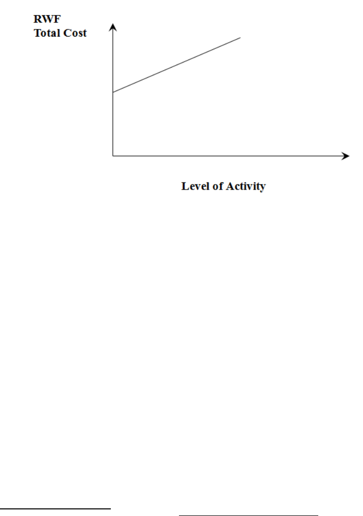
Page 306
Example
Running a Car
− Fixed Cost is Road Tax and insurance.
− Variable cost is petrol, repairs, oil, tyres-all of these depend on the number of miles
travelled throughout the year.
A method of splitting semi-variable costs is the High – Low method.
High – Low method
Firstly, examine records of cost from previous period. Then pick a period with the highest
activity level and the period with the lowest level of activity.
• Total Cost of high activity level minus total cost of low activity level will equal variable
cost of difference in activity levels.
• Fixed Costs are determined by substitution
Example of High - Low Method
Highest level 10,000 units, cost of RWF4,000
Lowest Level activity level 2,000 units cost of RWF1,600
Variable Cost Element: (RWF4,000 - RWF1,600)
10,000 units – 2,000 units
Figure 10.21

Page 307
= 2,400
8,000
∴ = .30rwf per unit
Fixed Cost (under high level figure)
RWF4,000 – (10,000 x .30rwf)
= RWF1,000
Scattergraphs
Information about two variables that are considered to be related in some way can be plotted
on a scattergraph. This is simply a graph on which historical data can be plotted. For cost
behaviour analysis, the scattergraph would be used to record cost against output level for a
large number of recorded “pairs” of data.
Then by plotting cost level against activity level on a scattergraph, the shape of the resulting
figure might indicate whether or not a relationship exists.
In such a scattergraph, the y axis represents cost and the x axis represents the output or
activity level.
One advantage of the scattergraph is that it is possible to see quite easily if the points indicate
that a relationship exists between the variables, i.e. to see if any correlation exists between
them.
Positive correlation exists where the values of the variables increase together (for example,
when the volume of output increases, total costs increase).
Negative correlation exists where one variable increases and the other decreases in value
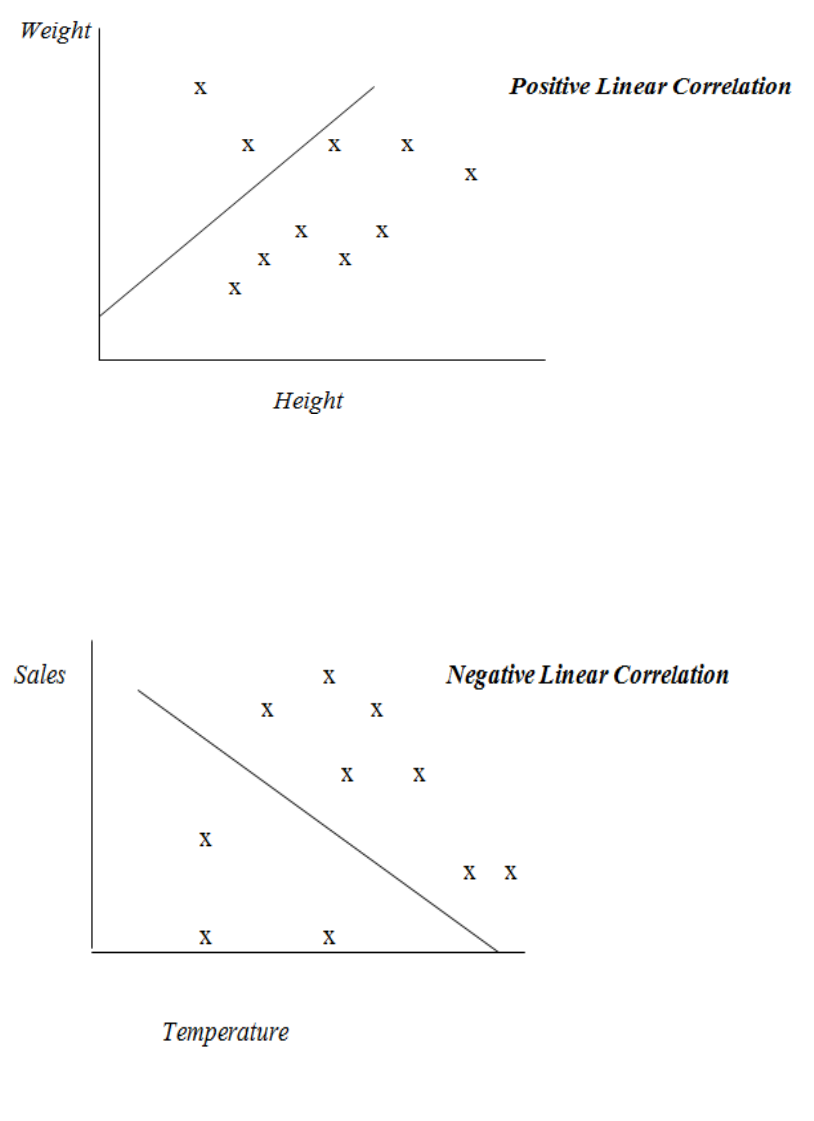
Page 308
Some illustrations:
1) Weight and height in humans
2) Sales of Scarves and temperature
Figure 10.22
Figure 10.23
Page 309
3) Sugar Imports and Mining Production
A scattergraph can be used to make an estimate of fixed and variable costs, by drawing a
“line of best fit” through the band of points on the scattergraph, which best represents all the
plotted points.
The above diagrams contain the line of best fit. These lines have been drawn using
judgement. This is a major disadvantage, as drawing the line “by eye”. If there is a large
amount of scatter, different people may draw different lines.
Thus, as a technique, it is only suitable where the amount of scatter is small or where the
degree of accuracy of the prediction is not critical.
However, it does have an advantage over the high-low method in that all points on the graph
are considered, not just the high and low point.
Figure 10.24

Page 310
Regression Analysis
This is a technically superior way to identify the “slope” of the line. It is also known as
“Least Squares Regression”. This statistical method is used to predict a linear relationship
between two variables. It uses all past data (not just the high and low points) to calculate the
line of best fit.
The equation of the regression line of y on x is of the form:
y = a + bx
In other words, if we are trying to predict the cost (y) from an activity (x), it is necessary to
calculate the values of a and b from given pairs of data for x and y. The following formulae
are used:
a = Σy - bΣx
n n
b = nΣxy - ΣxΣy
nΣx2 – (Σx)2
where “n” is the number of pairs of x and y values. (The symbol “Σ” means ‘the sum of’)
Thus, in order to calculate “a”, it is necessary to calculate “b” first.

Page 311
Example
The following is the output of a factory and the cost of production over the last 5 months:
Output (‘000 units)
Cost (RWF’000)
January
20
82
February
16
70
March
24
90
April
22
85
May
18
73
(i) Determine a formula to show the expected level of costs for any given volume of
output
(ii) Prepare a budget for total costs if output is 27,000 units
Table 10.25

Page 312
Solution:
Let x = output
Let y = costs
n = 5 (5 pairs of x & y values)
Construct a table as follows: (in ‘000)
b = nΣxy - ΣxΣy = 5(8,104) – (100)(400)
nΣx2 – (Σx)2 5(2,040) – (100)2
b = 2.60
a = Σy - bΣx = 400 – 2.6(100)
n n 5 5
a = 28 (or 28,000)
x
y
xy
x2
y2
20
82
1,640
400
6,724
16
70
1,120
256
4,900
24
90
2,160
576
8,100
22
85
1,870
484
7,225
18
73
1,314
324
5,329
Σx = 100
Σy = 400
Σxy = 8,104
Σx2 = 2,040
Σy2 = 32,278
Table 10.26
Page 313
Thus, the formula for any given level of output is:
y = RWF28,000 + RWF2.60x
where
y = total cost (in RWF’000)
x = output (in ‘000 units)
If output is 27,000 units, then total cost (y) will be:
y = RWF28,000 + RWF2.60(27,000)
y = RWF98,200
The Linear Assumption of Cost Behaviour
1. Cost are assumed to be either fixed, variable or semi-variable within a normal range of
output.
2. Fixed and variable costs can be estimated with degrees of probable accuracy. Certain
methods maybe used to access this (High-Low method).
3. Costs will rise in a straight line/linear fashion as the activity increases.
Accountants – V’s Economist Model
RWF
Total Cost
Activity
Economists Cost Lines Curvilinear
Accountants Cost Line is Linear (Straight)
Figure 10.27
Page 314
Assumptions of Above Diagram
The accountants state that the linear assumption of cost behaviour is linear because:
1) The linear cost (straight line) is only used in practice within normal ranges of output
‘Relevant Range of Activity’.
The term ‘Relevant Range’ is used to refer to the output range at which the firm expects
to be operating in the future.
2) It is easier to understand than Economists’ cost line.
3) The fixed and variable costs are easier to use.
4) The relevant range and the costs estimated by the economists and the accountants will
not be very different.
Factors Affecting the Activity Level
1) The economic environment.
2) The individual firm – its staff, their motivation and industrial relations.
3) The ability and talent of management.
4) The workforce (unskilled, semi-skilled and highly skilled).
5) The capacity of machines.
6) The availability of raw material.
Page 315
Cost Behaviour and Decision Making
Factors to Consider:
1) Future plans for the company.
2) Current competition to the company.
3) Should the selling price of a single unit be reduced in order to attract more customers.
4) Should sale staff be on a fixed salary or on a basic wage with bonus/commission.
5) Is a new machine required for current year.
6) Will the company make the product internally or buy it.
For all of the above factors, management must estimate costs at all levels and evaluate
different courses of action. Management must take all eventualities into account when
making decisions for the company.
Example of things management would need to know is fixed costs do not generally change as
a result of a decision unless the company have to rent an additional building for a new job
etc.
Cost Variability and Inflation
Care must be taken in interpreting cost data over a period of time if there is inflation. It may
appear that costs have risen relative to output, but this may be purely because of inflation
rather than because the amount of resources used has increased.
If a cost index, such as the Retail Price Index, is available the effects of inflation can be
eliminated and the true cost behaviour pattern revealed.
It is essential for the index selected to be relevant to the company; if one of the many Central
Statistical Office indices is not appropriate, it may be possible for the company to construct
one from its own data.
Consider the following example, which deals with the relationship between production output
and the total costs of a single-product company, taken over a period of four years:
Year Output Total Costs
(tonnes) RWF
1 2,700 10,400
2 3,100 11,760
3 3,700 14,880
4 4,400 20,700
Page 316
Suppose that we have the above information, together with the cost indices as follows:
Year Cost Index
1 100
2 105
3 120
4 150
5 175 (estimated)
If our estimated output for Year 5 is 5,000 tonnes, how may we calculate the estimated total
costs?
First, we have to convert the costs of the four years’ production to Year 1 cost levels, by
applying the indices as follows:
Conversion Cost at
Year Actual Cost Factor Year 1 Level
RWF RWF
1 10,400 1 10,400
2 11,760 100/105 11,200
3 14,880 100/120 12,400
4 20,700 100/150 13,800
Secondly, we must split the adjusted costs into their fixed and variable elements. This is
done by examining the difference or movement between any two years, for example:
Production Adjusted Cost
Year 1 2,700 tonnes RWF10,400
Year 4 4,400 tonnes RWF13,800
We observe that an increase of 1,700 tonnes gives a rise in costs of RWF3,400. The variable
cost is therefore RWF2 per tonne.
Page 317
Now by deducting the variable cost from the adjusted cost in any year, we can ascertain the
level of fixed cost. For example, in Year 4, the variable cost @ RWF2 per tonne would be
4,400 × RWF2 = RWF8,800. If we deduct this figure from the total adjusted cost
RWF13,800, we are left with the fixed cost total of RWF13,800 – RWF8,800 = RWF5,000.
This fixed cost is, of course, expressed in terms of Year 1 cost level. In real terms, the fixed
costs (those costs which do not vary with changes in volume) will increase over the four years
in proportion to the cost index.
We now see that the yearly total costs, adjusted to Year 1 cost levels, may be split into the
fixed and variable elements as follows:
Production Fixed Variable Total
Year (tonnes) RWF @ RWF2 tonne RWF
1 2,700 5,000 5,400 10,400
2 3,100 5,000 6,200 11,200
3 3,700 5,000 7,400 12,400
4 4,400 5,000 8,800 13,800
5 (est’d) 5,000 5,000 10,000 15,000
Finally, by applying the cost index for each year to the total costs at Year 1 cost levels, we
may complete our forecast:
Total Cost at
Year Year 1 Levels Cost Index Actual Cost
RWF RWF
1 10,400 100 10,400
2 11,200 105 11,760
3 12,400 120 14,880
4 13,800 150 20,700
5 (est’d) 15,000 175 26,250
Page 318
Limitations
This forecast of RWF26,250 for the total costs in Year 5 is, of course, subject to many
limitations. The method of calculation assumes that all costs are either absolutely fixed or are
variable in direct proportion to the volume of production. In practice, as we have seen, it is
usually found that “fixed” costs will tend to rise slightly in steps, while the variable costs will
usually rise less steeply at the higher levels of output, because of the economies of scale.
Also, our forecast will only be as accurate as our forecast of the cost index for Year 5. This is
as difficult to predict as the Retail Price Index, which is influenced by changes in the price of
each item in the “shopping basket”.
The analysis of cost behaviour in this way is thus useful as a guide to management, provided
we remember that:
a) It assumes a linear (or “straight line”) relationship between volume and cost.
b) Costs will be influenced by many other factors, such as new production methods or new
plant.
c) Inflation will have a varying effect on different items of cost.
This subject of cost behaviour is fundamental to many aspects of cost accounting.
Calculus
Introduction
Calculus is the study of change. It constitutes a major part of modern mathematics education.
It has two major branches:-
1) Differential Calculus
2) Integral Calculus

Page 319
Differential calculus
Tangent line at (x, f(x)). The derivative f′(x) of a curve at a point is the slope (rise over run) of
the line tangent to that curve at that point.
Differential calculus is the study of the definition, properties, and applications of the
derivative of a function. The process of finding the derivative is called differentiation.
Given a function and a point in the domain, the derivative at that point is a way of encoding
the small-scale behavior of the function near that point. By finding the derivative of a
function at every point in its domain, it is possible to produce a new function, called the
derivative function or just the derivative of the original function. In mathematical terms the
derivative is a linear operator which inputs a function and outputs a second function. This is
more abstract than many of the processes studied in elementary algebra, where functions
usually input a number and output another number. For example, if the doubling function is
given the input three, then it outputs six, and if the squaring function is given the input three,
then it outputs nine. The derivative, however, can take the squaring function as an input. This
means that the derivative takes all the information of the squaring function—such as that two
is sent to four, three is sent to nine, four is sent to sixteen, and so on—and uses this
information to produce another function. (The function it produces turns out to be the
doubling function.)
The most common symbol for a derivative is an apostrophe-like mark called prime. Thus, the
derivative of the function of f is f′, pronounced "f prime." For instance, if f(x) = x2 is the
squaring function, then f′(x) = 2x is its derivative, the doubling function.
Figure 10.28
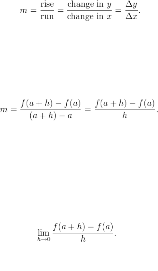
Page 320
If the input of the function represents time, then the derivative represents change with respect
to time. For example, if f is a function that takes a time as input and gives the position of a
ball at that time as output, then the derivative of f is how the position is changing in time, that
is, it is the velocity of the ball.
If a function is linear (that is, if the graph of the function is a straight line), then the function
can be written as y = mx + b, where x is the independent variable, y is the dependent variable,
b is the y-intercept, and:
This gives an exact value for the slope of a straight line. If the graph of the function is not a
straight line, however, then the change in y divided by the change in x varies. Derivatives
give an exact meaning to the notion of change in output with respect to change in input. To
be concrete, let f be a function, and fix a point a in the domain of f. (a, f(a)) is a point on the
graph of the function. If h is a number close to zero, then a + h is a number close to a.
Therefore (a + h, f(a + h)) is close to (a, f(a)). The slope between these two points is
This expression is called a difference quotient. A line through two points on a curve is
called a secant line, so m is the slope of the secant line between (a, f(a)) and (a + h, f(a + h)).
The secant line is only an approximation to the behavior of the function at the point a because
it does not account for what happens between a and a + h. It is not possible to discover the
behavior at a by setting h to zero because this would require dividing by zero, which is
impossible. The derivative is defined by taking the limit as h tends to zero, meaning that it
considers the behavior of f for all small values of h and extracts a consistent value for the case
when h equals zero:
Geometrically, the derivative is the slope of the tangent line to the graph of f at a. The tangent
line is a limit of secant lines just as the derivative is a limit of difference quotients. For this
reason, the derivative is sometimes called the slope of the function f.
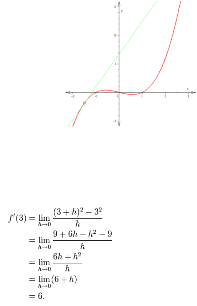
Page 321
Here is a particular example, the derivative of the squaring function at the input 3. Let f(x) =
x2 be the squaring function.
The derivative f′(x) of a curve at a point is the slope of the line tangent to that curve at that
point. This slope is determined by considering the limiting value of the slopes of secant lines.
Here the function involved is f(x) = x3 − x. The tangent line which passes through the point
(−3/2, −15/8) has a slope of 23/4. Note that the vertical and horizontal scales in this image
are different.
The slope of tangent line to the squaring function at the point (3,9) is 6, that is to say, it is
going up six times as fast as it is going to the right. The limit process just described can be
performed for any point in the domain of the squaring function. This defines the derivative
function of the squaring function, or just the derivative of the squaring function for short. A
similar computation to the one above shows that the derivative of the squaring function is the
doubling function.
Figure 10.29
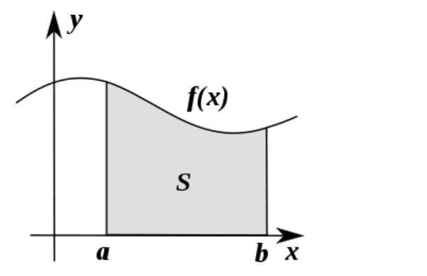
Page 322
Integral calculus
Integral calculus is the study of the definitions, properties, and applications of two related
concepts, the indefinite integral and the definite integral. The process of finding the value of
an integral is called integration. Integral calculus studies two related linear operators.
The indefinite integral is the antiderivative, the inverse operation to the derivative. F is an
indefinite integral of f when f is a derivative of F. (This use of lower- and upper-case letters
for a function and its indefinite integral is common in calculus.)
The definite integral inputs a function and outputs a number, which gives the algebraic sum
of areas between the graph of the input and the x-axis. The technical definition of the definite
integral is the limit of a sum of areas of rectangles, called a Riemann sum.
A motivating example is the distances travelled in a given time.
Distance = Speed x Time
If the speed is constant, only multiplication is needed, but if the speed changes, then we need
a more powerful method of finding the distance. One such method is to approximate the
distance travelled by breaking up the time into many short intervals of time, then multiplying
the time elapsed in each interval by one of the speeds in that interval, and then taking the sum
(a Riemann sum) of the approximate distance travelled in each interval. The basic idea is
that if only a short time elapses, then the speed will stay more or less the same. However, a
Riemann sum only gives an approximation of the distance traveled. We must take the limit of
all such Riemann sums to find the exact distance traveled.
Figure 10.30
Page 323
Integration can be thought of as measuring the area under a curve, defined by f(x), between
two points (here a and b).
If f(x) in the diagram on the left represents speed as it varies over time, the distance traveled
(between the times represented by a and b) is the area of the shaded region s.
To approximate that area, an intuitive method would be to divide up the distance between a
and b into a number of equal segments, the length of each segment represented by the symbol
Δx. For each small segment, we can choose one value of the function f(x). Call that value h.
Then the area of the rectangle with base Δx and height h gives the distance (time Δx
multiplied by speed h) traveled in that segment. Associated with each segment is the average
value of the function above it, f(x)=h. The sum of all such rectangles gives an approximation
of the area between the axis and the curve, which is an approximation of the total distance
traveled. A smaller value for Δx will give more rectangles and in most cases a better
approximation, but for an exact answer we need to take a limit as Δx approaches zero.
The symbol of integration is , an elongated S (the S stands for "sum"). The definite
integral is written as:
and is read "the integral from a to b of f-of-x with respect to x." The Leibniz notation dx is
intended to suggest dividing the area under the curve into an infinite number of rectangles, so
that their width Δx becomes the infinitesimally small dx. In a formulation of the calculus
based on limits, the notation
is to be understood as an operator that takes a function as an input and gives a number, the
area, as an output; dx is not a number, and is not being multiplied by f(x).
The indefinite integral, or antiderivative, is written:
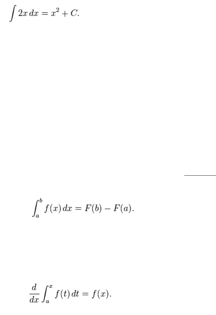
Page 324
Functions differing by only a constant have the same derivative, and therefore the
antiderivative of a given function is actually a family of functions differing only by a
constant. Since the derivative of the function y = x² + C, where C is any constant, is y′ = 2x,
the antiderivative of the latter is given by:
An undetermined constant like C in the antiderivative is known as a constant of integration.
Fundamental theorem
The fundamental theorem of calculus states that differentiation and integration are inverse
operations. More precisely, it relates the values of antiderivatives to definite integrals.
Because it is usually easier to compute an antiderivative than to apply the definition of a
definite integral, the Fundamental Theorem of Calculus provides a practical way of
computing definite integrals. It can also be interpreted as a precise statement of the fact that
differentiation is the inverse of integration.
The Fundamental Theorem of Calculus states: If a function f is continuous on the interval [a,
b] and if F is a function whose derivative is f on the interval (a, b), then
Furthermore, for every x in the interval (a, b),
Page 325
H. MANIPULATION OF INEQUALITIES
Inequalities are mathematical expressions involving the symbols >, < ,≥ and ≤. To solve an
inequality means to find a range, or ranges, of values that an unknown x can take and still
satisfy the inequality.
Inequalities can be manipulated like equations and follow very similar rules but there is one
important exception.
If you add the same number to both sides of an inequality, the inequality remains true.
If you subtract the same number from both sides of the inequality, the inequality remains
true.
If you multiply or divide both sides of an inequality by the same positive number, the
inequality remains true.
Quadratic Equations
A general quadratic equation can be written in the form
Ax2+Bx +c = 0
where x represents a variable or an unknown, and a,b and c are constants with a≠0. (If a = 0,
the equation is a linear equation.)
The constants a,b and c are called respectively, the quadratic coefficient, the linear coefficient
and the constant term or free term.
Quadratic formula
A quadratic equation with real or complex coefficients has two solutions, called roots. These
two solutions may or may not be distinct, and they may or may not be real.
Having
the roots are given by the quadratic formula
Page 326
where the symbol "±" indicates that both
are solutions of the quadratic equation.
In mathematics, simultaneous equations are a set of equations containing multiple variables.
This set is often referred to as a system of equations. A solution to a system of equations is a
particular specification of the values of all variables that simultaneously satisfies all of the
equations. To find a solution, the solver needs to use the provided equations to find the exact
value of each variable. Generally, the solver uses either a graphical method, the matrix
method, the substitution method, or the elimination method. Some textbooks refer to the
elimination method as the addition method, since it involves adding equations (or constant
multiples of the said equations) to one another, as detailed later in this article.
This is a set of linear equations, also known as a linear system of equations:
Solving this involves subtracting x + y = 6 from 2x + y = 8 (using the elimination method) to
remove the y-variable, then simplifying the resulting equation to find the value of x, then
substituting the x-value into either equation to find y.
The solution of this system is:
which can also be written as an ordered pair (2, 4), representing on a graph the coordinates of
the point of intersection of the two lines represented by the equations.

Page 327
STUDY UNIT 10
Correlation
Contents
Unit
Title
Page
A.
General
329
B.
Scatter Diagram
331
Examples of Correlation
331
Degrees of Correlation
333
Different Types of Correlation
335
C.
The Correlation Coefficient
337
General
337
Formula
338
Characteristics of a Correlation Coefficient
339
Significance of the Correlation Coefficient
339
Note on the Computation of r
340
D.
Rank Correlation
343
General
343
Relationship between Ranked Variates
343
Ranked Correlation Coefficients
346
Tied Ranks
348

Page 328
BLANK

Page 329
A. GENERAL
When studying frequency distributions, we were always handling only one variable, e.g.
height or weight. Having learned how to solve problems involving only one variable, we
should now discover how to solve problems involving two variables at the same time.
If we are comparing the weekly takings of two or more firms, we are dealing with only one
variable, that of takings; if we are comparing the weekly profits of two or more firms, we are
dealing with only one variable, that of profits. But if we are trying to assess, for one firm (or a
group of firms), whether there is any relationship between takings and profits, then we are
dealing with two variables, i.e. takings and profits.

Page 330
BLANK
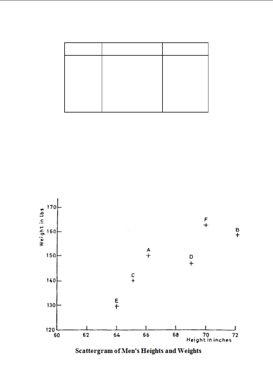
Page 331
B. SCATTER DIAGRAMS
Examples of Correlation
A scatter diagram or scattergram is the name given to the method of representing these
figures graphically. On the diagram, the horizontal scale represents one of the variables (let's
say height) while the other (vertical) scale represents the other variable (weight). Each pair
of measurements is represented by one point on the diagram, as shown in Figure 11.1:
Man
Height (ins)
Weight (lb)
A
66
150
B
72
159
C
65
138
D
69
145
E
64
128
F
70
165
Table 11.1
Figure 11.1
Page 332
Make sure that you understand how to plot the points on a scatter diagram, noting especially
that:
− Each point represents a PAIR of corresponding values.
− The two scales relate to the two variables under discussion.
The term scatter diagram or scattergram comes from the scattered appearance of the points on
the chart.
Examining the scatter diagram of heights and weights, you can see that it shows up the fact
that, by and large, tall men are heavier than short men. This shows that some relationship
exists between men's heights and weights. We express this in statistical terms by saying that
the two variables, height and weight are CORRELATED. Figure 11.2 shows another example
of a pair of correlated variables (each point represents one production batch):
Figure 11.2
Page 333
Here you see that, in general, it costs more to produce material with a low impurity content
than it does to produce material with a high impurity content. However, you should note that
correlation does not necessarily mean an exact relationship, for we know that, while tall men
are usually heavy, there are exceptions, and it is most unlikely that several men of the same
height will have exactly the same weight!
Degrees of Correlation
In order to generalise our discussion, and to avoid having to refer to particular examples such
as height and weight or impurity and cost, we will refer to our two variables as x and y. On
scatter diagrams, the horizontal scale is always the x scale and the vertical scale is always the
y scale. There are three degrees of correlation which may be observed on a scatter diagram.
The two variables may be:
a) Perfectly Correlated
When the points on the diagram all lie exactly on a straight line (Figure 11.3):
Figure 11.3
Page 334
b) Uncorrelated
When the points on the diagram appear to be randomly scattered about, with no suggestion of
any relationship (Figure 11.4):
c) Partly Correlated
When the points lie scattered in such a way that, although they do not lie exactly on a straight
line, they do display a general tendency to be clustered around such a line (Figure 11.5):
Figure 11.4
Figure 11.5
Page 335
Different Types of Correlation
There is a further distinction between correlations of the height/weight type and those of the
impurity/cost type. In the first case, high values of the x variable are associated with high
values of the y variable, while low values of x are associated with low values of y. On the
scatter diagram (Figure 11.6 (a)), the points have the appearance of clustering about a line
which slopes up to the right. Such correlation is called POSITIVE or DIRECT correlation.
In the other case (like the impurity/cost relationship) high values of the x variable are
associated with low values of the y variable and vice versa; on the scatter diagram (Figure
11.6 (b)) the approximate line slopes down to the right. This correlation is said to be
NEGATIVE or INVERSE.
a) Linear Correlation
The correlation is said to be linear when the relationship between the two variables is linear.
In other words all the points can be represented by straight lines. For example, the correlation
Page 336
between car ownership and family income may be linear as car ownership is related in a
linear fashion to family income.
b) Non-linear Correlation
Non-linear correlation is outside the scope of this course but it is possible that you could be
required to define it in an examination question. It occurs when the relationship between the
two variables is non-linear. An example is the correlation between the yield of a crop, like
carrots, and rainfall. As rainfall increases so does the yield of the crop of carrots, but if
rainfall is too large the crop will rot and yield will fall. Therefore, the relationship between
carrot production and rainfall is non-linear.
Page 337
C. THE CORRELATION COEFFICIENT
General
If the points on a scatter diagram all lie very close to a straight line, then the correlation
between the two variables is stronger than it is if the points lie fairly widely scattered away
from the line.
To measure the strength, or intensity, of the correlation in a particular case, we calculate a
LINEAR CORRELATION COEFFICIENT, which we indicate by the small letter r. In
textbooks and examination papers you will sometimes find this referred to as Pearson's
Product Moment Coefficient of Linear Correlation, after the English statistician who invented
it. It is also known as the product-moment correlation coefficient.
For an illustration of the method used to calculate the correlation coefficient, suppose we are
given the following pairs of values of x and y:
Table 11.2
We shall plot these on a scatter diagram so that we can make some qualitative assessment of
the type of correlation present (Figure 11.7). We see from the scatter diagram that some
negative correlation
Scatter Diagram
6
x
10
14
7
12
5
y
5
3
5
2
7
8
Figure 11.7
Page 338
Formula
The formula for Pearson's product-moment correlation coefficient is:
( )
( )
( )
( )
222
2yynxxn
yxxyn
r∑∑∑ ∑
∑ ∑ ∑
−−
−
=
n is the number of pairs of readings. It is a good idea to set out the calculation in tabular form.
This result (r = -0.88) shows that x and y are negatively correlated.
x
y
x
2
y
2
xy
10
5
100
25
50
14
3
196
9
42
7
5
49
25
35
12
2
144
4
24
5
7
25
49
35
6
8
36
64
48
Σx = 54
Σy = 30
Σx
2
=550
Σy
2
= l76
Σxy = 234
Table 11.3
Page 339
Characteristics of a Correlation Coefficient
We know what the + and - signs of the correlation coefficient tell us: that the relationship is
positive (increase of x goes with increase of y) or negative (increase of x goes with decrease
of y). But what does the actual numerical value mean? Note the following points:
a) The correlation coefficient is always between -1 and +1 inclusive. If you get a
numerical value bigger than 1, then you've made a mistake!
b) A correlation coefficient of -1.0 occurs when there is PERFECT NEGATIVE
CORRELATION, i.e. all the points lie EXACTLY on a straight line sloping down
from left to right.
c) A correlation of O occurs when there is NO CORRELATION.
d) A correlation of +1.0 occurs when there is PERFECT POSITIVE CORRELATION,
i.e. all the points lie EXACTLY on a straight line sloping upwards from left to right.
e) A correlation of between O and ± 1.0. indicates that the variables are PARTLY
CORRELATED. This means that there is a relationship between the variables but that
the results have also been affected by other factors.
In our example (r = -0.88), we see that the two variables are quite strongly negatively
correlated. If the values of r had been, say, -0.224, we should have said that the variables
were only slightly negatively correlated. For the time being, this kind of interpretation is all
that you need consider.
Significance of the Correlation Coefficient
Correlation analysis has been applied to data from many business fields and has often proved
to be extremely useful. For example, it has helped to locate the rich oil fields in the North Sea
and also helps the stockbroker to select the best shares in which to put his clients' money.
Like many other areas of statistical analysis, correlation analysis is usually applied to sample
data. Thus the coefficient, like other statistics derived from samples, must be examined to see
how far they can be used to make generalised statements about the population from which the
samples were drawn. Significance tests for the correlation coefficient are possible to make,
but they are beyond the scope of this course, although you should be aware that they exist.
Page 340
We must be wary of accepting a high correlation coefficient without studying what it means.
Just because the correlation coefficient says there is some form of association, we should not
accept it without some other supporting evidence. We must also be wary of drawing
conclusions from data that does not contain many pairs of observations. Since the sample size
is used to calculate the coefficient, it will influence the result and, whilst there are no hard
and fast rules to apply, it may well be that a correlation of 0.8 from 30 pairs of observations is
a more reliable statistic than 0.9 from 6 pairs.
Another useful statistic is r2 (r squared); this is called the coefficient of discrimination and
may be regarded as the percentage of the variable in y directly attributable to the variation in
x. Therefore, if you have a correlation coefficient of 0.8, you can say that approximately 64
per cent (0.82) of the variation in y is explained by variations in x. This figure is known as
the explained variation whilst the balance of 36% is termed the unexplained variation.
Unless this unexplained variation is small there may be other causes than the variable x
which explain the variation in y, e.g. y may be influenced by other variables or the
relationship may be non-linear.
In conclusion, then, the coefficient of linear correlation tells you only part of the nature of the
relationship between the variables; it shows that such a relationship exists. You have to
interpret the coefficient and use it to deduce the form and find the significance of the
association between the variables x and y.
Note on the Computation of r
Often the values of x and y are quite large and the arithmetic involved in calculating r
becomes tedious. To simplify the arithmetic and hence reduce the likelihood of numerical
slips, it is worth noting the following points:
a) We can take any constant amount off every value of x
b) We can take any constant amount off every value of y
c) We can divide or multiply every value of x by a constant amount
d) We can divide or multiply every value of y by a constant amount
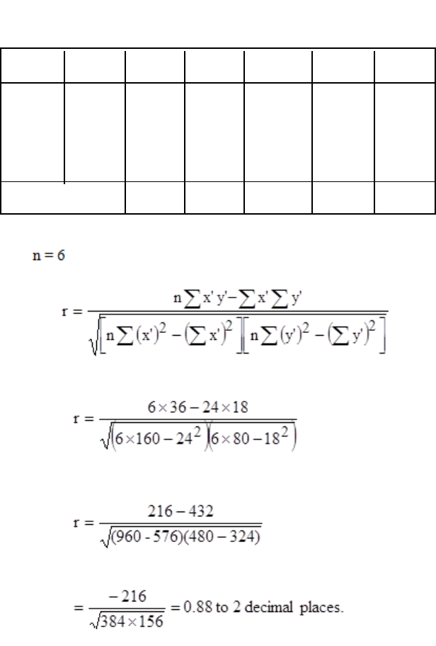
Page 341
all without altering the value of r. This also means that the value of r is independent of the
units in which x and y are measured.
Let's consider the above example as an illustration. We shall take 5 off all the x values and 2
off all the y values to demonstrate that the value of r is unaffected. We call the new x and y
values, x' (xdash) and y' respectively:
Thus the result is identical and the numbers involved in the calculation are smaller, taken
overall
x'y'
x
y
x
y'
(x')
2
(y')
2
10
5
5
3
25
9
15
14
3
9
1
81
1
9
7
5
2
3
4
9
6
12
2
7
0
49
0
0
5
7
0
5
0
25
0
24
18
160
80
36
Totals
Table 11.4

Page 342
BLANK
Page 343
D. RANK CORRELATION
General
Sometimes, instead of having actual measurements, we only have a record of the order in
which items are placed. Examples of such a situation are:
a) We may arrange a group of people in order of their heights, without actually
measuring them. We could call the tallest No.l, the next tallest No. 2, and so on.
b) The results of an examination may show only the order of passing, without the actual
marks; the highest-marked candidate being No. 1, the next highest being No. 2, and so
on.
Data which is thus arranged in order of merit or magnitude is said to be RANKED.
Relationship between Ranked Variates
Consider, as an example, the case of eight students who have taken the same two
examinations, one in Mathematics and one in French. We have not been told the actual marks
obtained in the examination, but we have been given the relative position (i.e. the RANK) of
each student in each subject:
Relative Position
Student
French
Mathematics
A
8
6
B
5
5
C
3
4
D
6
7
E
7
8
F
2
1
G
1
3
H
4
2
Table 11.5
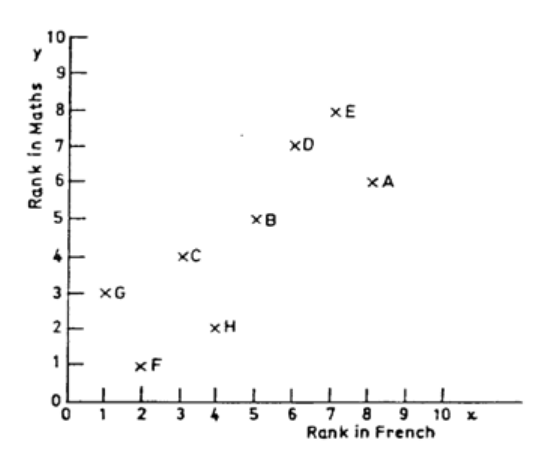
Page 344
We see from this table of ranks that student F was top in Mathematics but only second in
French. Student G was top of the class in French, student E was bottom of the class (rank 8)
in Mathematics, and so on.
A question which naturally arises is, "Is there any relationship between the students'
performances in the two subjects?" This question can be put into statistical terms by asking:
"Is there any correlation between the students' ranks in Mathematics and their ranks in
French?" The answer to the question will fall into one of the following three categories:
a) No correlation: no connection between performance in the Mathematics examination
and performance in the French examination.
b) Positive correlation: students who do well in one of the subjects will, generally
speaking, do well in the other.
c) Negative correlation: students who do well in one of the subjects will, generally
speaking, do poorly in the other.
We will start our analysis by drawing the scatter diagram as in Figure 11.8. It does not matter
which subject we call x and which y.
Figure 11.8: Scatter Diagram of Students' Results
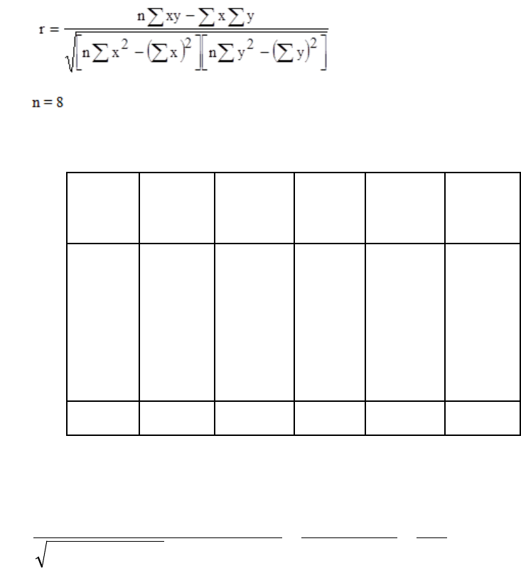
Page 345
The general impression given by the scatter diagram is that there is positive correlation. To
find out how strong this correlation is, we calculate the correlation coefficient:
Rank in
Rank in
x
2
y
2
Student
French
Maths
xy
(X)
(y)
A
8
6
64
36
48
B
5
5
25
25
25
C
3
4
9
16
12
D
6
7
36
49
42
E
7
8
49
64
56
F
2
1
4
1
2
G
1
3
1
9
3
H
4
2
16
4
8
Total
36
36
204
204
196
[ ][ ]
81.0
336
272
296,1632,1
296,1568,1
)36(2048)36(2048
)36(1968
22
2==
−
−
=
−×−×
−×
=r
Table 11.6
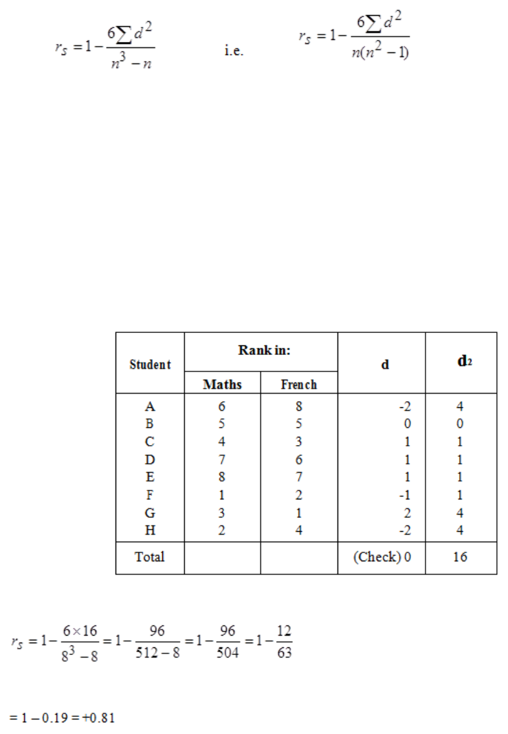
Page 346
Ranked Correlation Coefficients
With ranked variates, there are simpler methods of calculating a correlation coefficient.
a) Spearman's Rank Correlation Coefficient
This is usually denoted by the letter rs. Its formula is:
In some books you may find R or the Greek letter ρ (pronounced 'roe') used instead of rS but
you will recognise Spearman's coefficient by its formula.
In this formula, d is the difference between the two ranks for any one item, and n is the
number of items involved. In the above example, n = 8. You can follow the calculation of rs
in the following table:
Table 11.7
Page 347
When there is perfect agreement between the ranks of the two variates, then all the values of
d will be 0 and so the rank correlation coefficient will be +1.0. When there is complete
disagreement between the ranks, the values of d will be at their maximum and the rank
correlation coefficient is -1.0.
b) Kendall's Rank Correlation Coefficient
This is usually denoted by the Greek letter τ (pronounced 'taw'). It does not give exactly the
same answer as Spearman's method. Its formula is:
)1(
2
1−
=
nn
S
τ
where, as before, n is the number of pairs of observations. S is referred to as the score of the
ranks. To work out the score, we first arrange the students in order of their French ranks. We
then consider for each student in turn whether the differences in French rankings between
him and students lower down the list have the same signs as the differences in their
Mathematics rankings. If the signs are the same, a pair of students is said to be concordant.
If the signs are different, the pair is discordant. The score, S, is (nc - nd) where nc is the total
number of concordant pairs and nd is the total number of discordant pairs. It is easiest to set
out the calculation in a table:
Rank in:
Student
n
c
n
d
n
c
-n
d
French
Mathematics
G
1
3
5
2
3
F
2
1
6
0
6
C
3
4
4
1
3
H
4
2
4
0
4
B
5
5
3
0
3
D
6
7
1
1
0
E
7
8
0
1
–1
A
8
6
0
0
0
Total
18
Table 11.8

Page 348
Compared with Student G, whose French rank is 1, all other French ranks have a higher
numerical value. Students G's Maths rank is 3, however, so there are 5 Maths ranks with a
higher numerical value and 2 with a lower numerical value. Thus nc = 5 and nd = 2. Similarly,
for Student F, all French ranks below him in the table have higher numerical values and so do
all the Maths ranks so nc = 6 and nd =0. nc and nd are found similarly for the other students.
Each student should be compared only with those lower down the table, so that each pair of
French and Maths rankings is considered once only.
64.0
56
36
78
2
1
18 ==
××
=
τ
This value, being relatively large and positive, again shows a tendency for a high mark in
French to be associated with a high mark in Maths, although the agreement is not perfect.
Tied Ranks
Sometimes it is not possible to distinguish between the ranks of two or more items. For
example, two students may get the same mark in an examination and so they have the same
rank. Or, two or more people in a group may be the same height. In such a case, we give all
the equal ones an average rank and then carry on as if we had given them different ranks.
You will see what this means by studying the following examples:
a) First two equal out of eight
1½ 1½ 3 4 5 6 7 8
Average of 1&2
b) Three equal out of nine, but not at the ends of the list
1 2 3 5 5 5 7 8 9
Average of 1 4,5 & 6
Page 349
c) Last two equal out of eight
1 2 3 4 5 6 7½ 7½
Average of 7 & 8
d) Last four equal out of eleven
1 2 3 4 5 6 7 9½ 9½ 9½ 9½
Average of 8, 9, 10 & 11
Strictly speaking, a rank correlation coefficient should not be used in these cases without
making some adjustment for tied ranks. But the formula for the adjustments are a little
complex and are outside the scope of this course. The best way for you to deal with tied ranks
in practice is to calculate the ordinary (Pearson's) correlation coefficient. If, in an
examination, you are specifically asked to calculate a rank correlation coefficient when there
are tied ranks, then of course you must do so; but you might reasonably add a note to your
answer to say that, because of the existence of tied ranks, the calculated coefficient is only an
approximation, although probably a good one.
Final note: Rank correlation coefficients may be used when the actual observations (and not
just their rankings) are available. We first work out the rankings for each set of data and then
calculate Spearman's or Kendall's coefficient as above. This procedure is appropriate when
we require an approximate value for the correlation coefficient. Pearson's method using the
actual observations is to be preferred in this case, however, so calculate a rank correlation
coefficient only if an examination question specifically instructs you to do so.
Page 350
BLANK

Page 351
STUDY UNIT 11
Linear Regression
Contents
Unit
Title
Page
A.
Introduction
353
B.
Regression Lines
355
Nature of Regression lines
355
Graphical Method
356
Mathematical Method
357
C.
Use of Regression
361
D.
Connection between Correlation and Regression
363
Page 352
BLANK
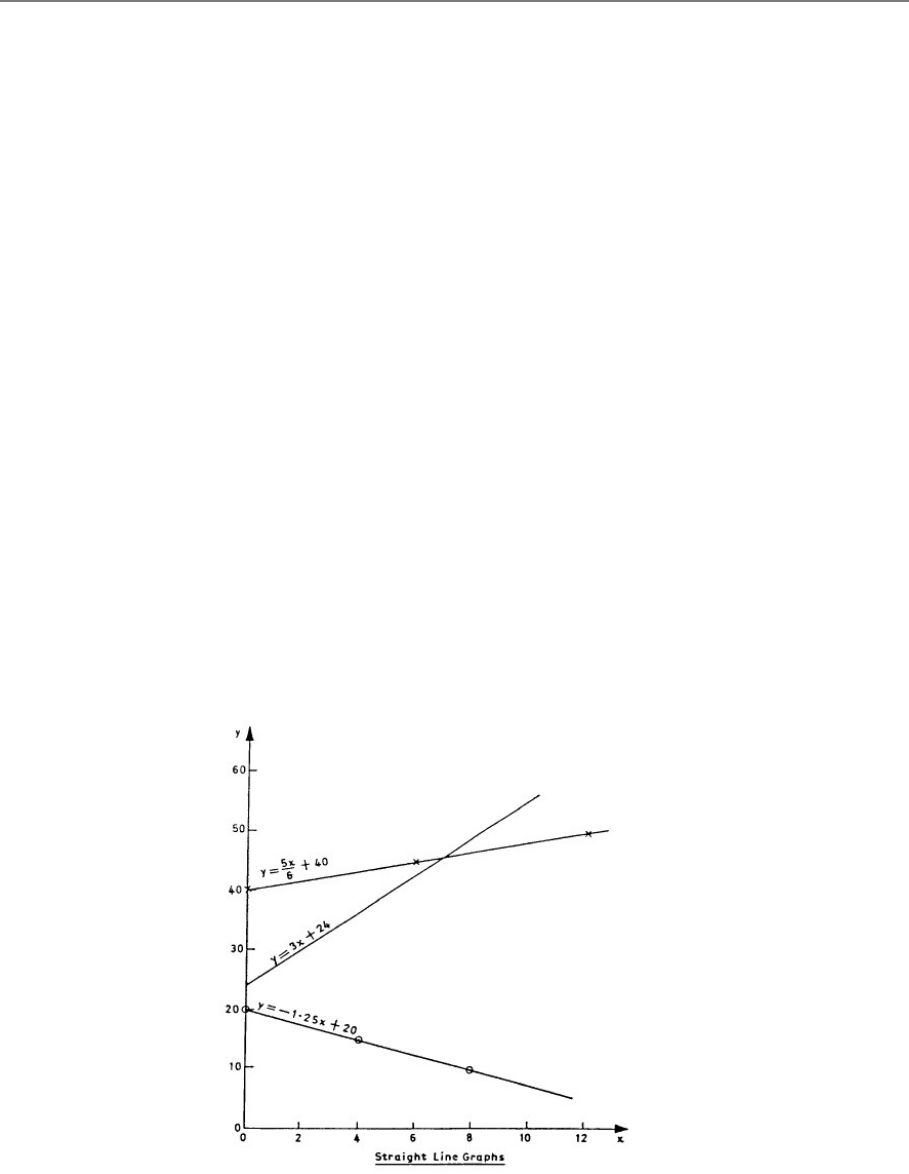
Page 353
A. INTRODUCTION
We've seen how the correlation coefficient measures the degree of relationship between two
variates.With perfect correlation (r = +1.0 or r = -1.0), the points of the scatter diagram all lie
exactly on a straightline. It is sometimes the case that two variates are perfectly related in
some way such that the points would lie exactly on a line, but not a straight line. In such a
case r would not be 1.0. This is a most important point to bear in mind when you have
calculated a correlation coefficient; the value may be small, but the reason may be that the
correlation exists in some form other than a straight line.
The correlation coefficient tells us the extent to which the two variates are linearly related,
but it does not tell us how to find the particular straight line which represents the relationship.
The problem of determining which straight line best fits the points of a particular scatter
diagram comes under the heading of LINEAR REGRESSION analysis.
Remember that a straight-line graph can always be used to represent an equation of the form
y = mx+ c. In such an equation, y and x are the variables while m and c are the constants.
Figure 8.1 shows a few examples of straight-line graphs for different values of m and c. Note
the following important features of these linear graphs:
− The value of c is always the value of y corresponding to x = 0.
− The value of m represents the gradient or slope of the line. It tells us the number of
units change in y per unit change in x. Larger values of m mean steeper slopes.
Figure 12.1
Page 354
− Negative values of the gradient, m, mean that the line slopes downwards to the right;
positive values of the gradient, m, mean that the line slopes upwards to the right.
So long as the equation linking the variables y and x is of the form y = mx + c, it is always
possible to represent it graphically by a straight line. Likewise, if the graph of the relationship
between y and x is a straight line, then it is always possible to express that relationship as an
equation of the form y=mx+c.
Often in regression work the letters a and b are used instead of c and m, i.e. the regression
line is written as y = a + bx. You should be prepared to meet both forms.
If the graph relating y and x is NOT a straight line, then a more complicated equation would
be needed. Conversely, if the equation is NOT of the form y = mx + c (if, for example, it
contains terms like x2 or log x) then its graph would be a curve, not a straight line.
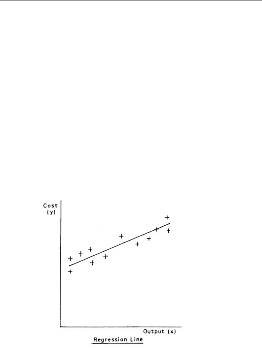
Page 355
B. REGRESSION LINES
Nature of Regression Lines
When we have a scatter diagram whose points suggest a straight-line relationship (though not
an exact one), and a correlation coefficient which supports the suggestion (say, r equal to
more than about 0.4 or 0.5), we interpret this by saying that there is a linear relationship
between the two variables but there are other factors (including errors of measurement and
observation) which operate to give us a scatter of points around the line instead of exactly on
it.
In order to determine the relationship between y and x, we need to know what straight line to
draw through the collection of points on the scatter diagram. It will not go through all the
points, but will lie somewhere in the midst of the collection of points and it will slope in the
direction suggested by the points. Such a line is called a REGRESSION LINE.
In Figure 12.2 x is the monthly output of a factory and y is the total monthly costs of the
factory; the scatter diagram is based on last year's records. The line which we draw through
the points is obviously the one which we think best fits the situation, and statisticians often
refer to regression lines as lines of best fit. Our problem is how to draw the best line.
Figure 12.2
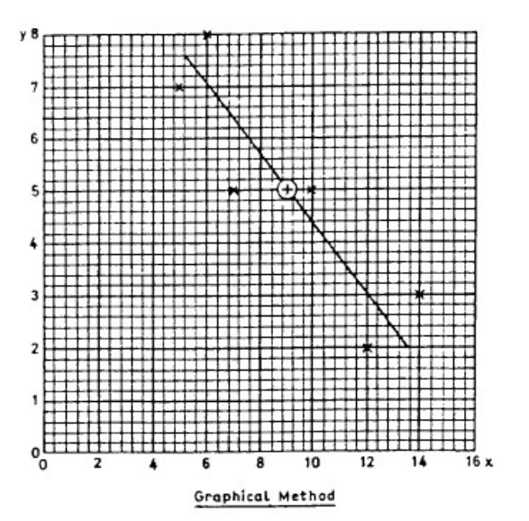
Page 356
There are two methods available - a graphical method and a mathematical method.
Graphical Method
It can be proved mathematically (but you don't need to know how!) that the regression line
must pass through the point representing the arithmetic means of the two variables. The
graphical method makes use of this fact, and the procedure is as follows:
a) Calculate the means and of the two variables.
b) Plot the point corresponding to this pair of values on the scatter diagram.
c) Using a ruler, draw a straight line through the point you have just plotted and lying, as
evenly as you can judge, among the other points on the diagram.
In Figure 12.3 the above procedure was followed using the data from the section on the
correlation coefficient in the previous study unit. If someone else (you, for example) were to
do it, you might well get a line of a slightly different slope, but it would still go through the
point of the means (marked +).
Figure 12.3
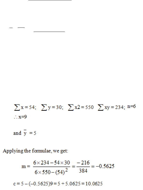
Page 357
Quite obviously, this method is not exact (no graphical methods are) but it is often sufficient
for practical purposes. The stronger the correlation, the more reliable this method is, and with
perfect correlation there will be little or no error involved.
Mathematical Method
A more exact method of determining the regression line is to find mathematically the values
of the constants m and c in the question y = mx + c, and this can be done very easily. This
method is called the least squares method, as the line we obtain is that which minimises the
sum of the squares of the vertical deviations of the points from the line. The equation of
the least squares line is:
y = mx + c although this is sometimes written as y = a + bx
We will now apply these formulae to the example we used when talking about the correlation
coefficient. If you look back at the last study unit you will see that we had the following
figures:
where m =
∑ ∑
∑ ∑ ∑
−
−
22 x)(xn
yxxyn
c =
y
-
mx
or
n
xmy
∑ ∑
−
n = number of pairs of readings.
Page 358
m and c are termed the regression coefficients (and m also represents the gradient, as
previously stated). The equation for the regression line in this case is therefore:
y = 10.0625 - 0.5625x
To draw this line on the scatter diagram, choose two values of x, one towards the left of the
diagram and one towards the right. Calculate y for each of these values of x, plot the two
points and join them up with a straight line. If you have done the calculations correctly, the
line will pass through the (
y,x
) point.
For drawing the regression line, we will choose values of x which are convenient, e.g. x = 0
and x =16. The corresponding values of y are:
For x = 0, y = 10.0625 - O = 10.0625
For x = 16, y = 10.0625 -16(0.5625) = 10.0625 - 9.0
= 1.0625
The two points marked . are shown in the scatter diagram in Figure 8.4, together with the
individual points (x), the regression line (drawn as an unbroken line) and the mean point (+).
Figure 12.4
Page 359
The regression line which we have drawn, and the equation which we have determined,
represent the regression of y upon x. We could, by interchanging x and y, have obtained the
regression of x on y. This would produce a different line and a different equation. This latter
line is shown in Figure 8.4 by a broken line. The question naturally arises, "Which regression
line should be used?". The statistician arrives at the answer by some fairly complicated
reasoning but, for our purposes, the answer may be summed up as follows:
a) Always use the regression of y on x. That is, use the method described in detail above,
putting y on the vertical axis and x on the horizontal axis.
b) If you intend to use the regression line to predict one thing from another, then the
thing you want to predict is treated as y; the other thing is x. For example, if you wish
to use the regression line (or its equation) to predict costs from specified outputs, then
the outputs will be the x and the costs will be the y.
c) If the regression is not to be used for prediction, then the x should be the variate
whose value is known more reliably.
Page 360
BLANK

Page 361
C. USE OF REGRESSION
The main use of a regression line is to calculate values of the dependent variable not observed
in the data set. Take as our example that of employees' heights with a regression equation of
y = 2.87(x) - 345.33 where x is height. Of the 12 people measured and weighed there was
nobody of height 181 cm; therefore, if we wanted to know the weight of somebody of this
height, it would be impossible to read it from the data available. However, by assuming that a
linear relationship exists between weight and height it is possible, by using the regression
equation, to calculate an estimate of the weight:
x = 181 y = 2.87(181) – 345.33
= 174.14 Ib
Therefore the estimated weight of somebody of height 181 cm is 174.14 Ib.
Since the value of x (181 cm) lies within the observed range of x from the 12 people, we
say that we have estimated the value of y by interpolation.
However, if we wish to use a regression equation to forecast a result from values which are
outside the range of observations from which the line is calculated, we have to consider
carefully the validity of the estimate obtained. This use of the regression line is called
extrapolation and we have to assume that the same linear relationship will exist for
observations beyond those from which it has been formulated. For example, say we want to
estimate the weight of somebody whose height is 194 cm, this value is outside the range of
the 12 people measured but y can still be calculated as:
x = 194 ∴ y = 2.87(194) – 345.33
y = 211.45 lb
This result seems reasonable, but common sense suggests that values of x much smaller than
160 cm or much larger than 186 cm would be rather improbable.
Sometimes this assumption of the same linear relationship is incorrect, as the factors that
influenced the two variables may not remain constant outside the range from which the
regression equation is formed, or some extra factor may be introduced.
Consider the relationship between time and the average working wage; if a regression line
calculated from data that is collected during years where inflation is very low is used to
Page 362
estimate the wage for years of high inflation, the predicted figure will be much lower than the
actual figure, i.e. the change in inflation will change the relationship between the variables.
This emphasises that extrapolation gives reliable results only for values close to the ends of
the observed range.

Page 363
D. CONNECTION BETWEEN CORRELATION AND
REGRESSION
The degree of correlation between two variables is a good guide to the likely accuracy of the
estimates made from the regression equation. If the correlation is high then the estimates are
likely to be reasonably accurate, and if the correlation is low then the estimates will be poor
as the unexplained variation is then high.
You must remember that both the regression equations and the correlation coefficient are
calculated from the same data, so both of them must be used with caution when estimates are
predicted for values outside the range of the observations, i.e. when values are predicted by
extrapolation or the correlation coefficient is assumed to remain constant under these
conditions. Also remember that the values calculated for both correlation and regression are
influenced by the number of pairs of observations used. So results obtained from a large
sample are more reliable than those from a small sample.
Questions on correlation and regression are frequently set in examinations and they are also
in practical use in many business areas. Therefore a thorough knowledge of both topics is
important.
Page 364
BLANK

Page 365
STUDY UNIT 12
Time Series Analysis I
Contents
Unit
Title
Page
A.
Introduction
367
B.
Structure of a Time Series
369
Trend
371
Seasonal Variations
372
Cyclical Fluctuations
373
Irregular or Random Fluctuations
374
Summary
374
C.
Calculation of Component Factors for the Additive Model
375
Trend
375
Seasonal Variation
382
Deseasonalised Data and Residual
385
Page 366
BLANK

Page 367
A. INTRODUCTION
Businesses and governments use statistical analysis of information collected at regular
intervals over extensive periods of time to plan future policies. For example, sales values or
unemployment levels recorded at yearly, quarterly or monthly intervals are examined in an
attempt to predict their future behaviour. Such sets of values observed at regular intervals
over a period of time are called time series.
The analysis of this data is a complex problem as many variable factors may influence the
changes. The first step is to plot the observations on a scattergram, which differs from those
we have considered previously, as the points are evenly spaced on the time axis in the order
in which they are observed, and the time variable is always the independent variable. This
scattergram gives us a good visual guide to the actual changes but is very little help in
showing the component factors causing these changes or in predicting future movements of
the dependent variable.
Statisticians have constructed a number of mathematical models to describe the behaviour of
time series, and several of these will be discussed in this study unit and the next.
Page 368
BLANK
Page 369
B. STRUCTURE OF A TIME SERIES
These models assume that the changes are caused by the variation of four main factors dealt
with below they differ in the relationship between these factors. It will be easier to understand
the theory in detail if we relate it to a simple time series so that we can see the calculations
necessary at each stage.
Consider a factory employing a number of people in producing a particular commodity, say
thermometers. Naturally, at such a factory during the course of a year some employees will
be absent for various reasons. The following table shows the number of days lost through
sickness over the last five years. Each year has been broken down into four quarters of three
months. We have assumed that the number of employees at the factory remained constant
over the five years.
Table 13.1
We will begin by plotting the scattergram for the data, as shown in Figure 13.2.
The scattergram of a time series is often called a historigram. (Do not confuse this with a
histogram, which is a type of bar chart.) Note the following characteristics of a historigram:
Page 370
a) It is usual to join the points by straight lines. The only function of these lines is to
help your eyes to see the pattern formed by the points.
b) Intermediate values of the variables cannot be read from the historigram.
c) A historigram is simpler than other scattergrams since no time value can have more
than one corresponding value of the dependent variable.
d) Every historigram will look similar to this, but a careful study of the change of pattern
over time will suggest which model should be used for analysis.
Figure 13.2
There are four factors that influence the changes in a time series - trend, seasonal variations,
cyclical fluctuations, irregular or random fluctuations. Now we will consider each in turn.
Page 371
Trend
This is the change in general level over the whole time period and is often referred to as the
secular trend. You can see in Figure 9.1 that the trend is definitely upwards, in spite of the
obvious fluctuations from one quarter to the next.
A trend can thus be defined as a clear tendency for the time series data to travel in a
particular direction in spite of other large and small fluctuations. An example of a linear
trend is shown in Figure 13.3. There are numerous instances of a trend, for example the
amount of money collected from Rwandan taxpayers is always increasing; therefore any time
series describing income from tax would show an upward trend.
Figure 13.3
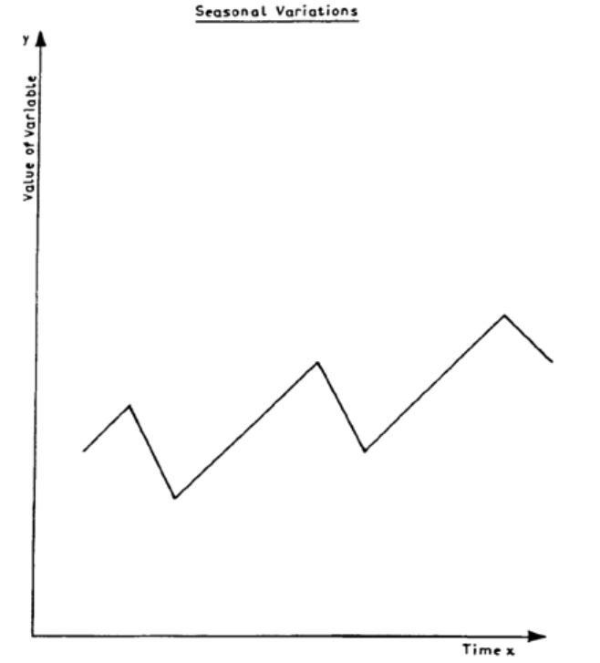
Page 372
Seasonal Variations
These are variations which are repeated over relatively short periods of time. Those most
frequently observed are associated with the seasons of the year, e.g. ice-cream sales tend to
rise during the summer months and fall during the winter months. You can see in our
example of employees' sickness that more people are sick during the winter than in the
summer.
If you can establish the variation throughout the year then this seasonal variation is likely to
be similar from one year to the next, so that it would be possible to allow for it when
estimating values of the variable in other parts of the time series. The usefulness of being able
to calculate seasonal variation is obvious as, for example, it allows ice-cream manufacturers
to alter their production schedules to meet these seasonal changes. Figure 13.4 shows a
typical seasonal variation that could apply to the examples above.
Figure 13.4

Page 373
Cyclical Fluctuations
These are long-term but fairly regular variations. They are difficult to observe unless you
have access to data over an extensive period of time during which external conditions have
remained relatively constant. For example, it is well known in the textile trade that there is a
cycle of about three years, during which time demand varies from high to low. This is similar
to the phenomena known as the trade cycle which many economists say exists in the trading
pattern of most countries but for which there is no generally accepted explanation.
Figure 13.5 shows how such a cyclical fluctuation would relate to an upward trend. In our
example on sickness, a cyclical fluctuation could be caused by, say, a two-year cycle for
people suffering from influenza.
Figure 13.5
Page 374
As this type is difficult to determine, it is often considered with the final (fourth) element, and
the two together are called the residual variation.
Irregular or Random Fluctuations
Careful examination of Figure 9.1 shows that there are other relatively small irregularities
which we have not accounted for and which do not seem to have any easily seen pattern. We
call these irregular or random fluctuations and they may be due to errors of observation or to
some one-off external influence which is difficult to isolate or predict. In our example there
may have been a measles epidemic in 19.5, but it would be extremely difficult to predict
when and if such an epidemic would occur again.
Summary
To sum up, a time series (Y) can be considered as a combination of the following four
factors:
Trend (T)
Seasonal variation (S)
Cyclical fluctuation (C)
Irregular fluctuations (I)
It is possible for the relationship between these factors and the time series to be expressed in
a number of ways through the use of different mathematical models. We are now going to
look in detail at the additive model and in the next study unit we will cover briefly the
multiplicative and logarithmic models. The additive model can be expressed by the equation:
Time Series = Trend + Seasonal Variation + Cyclical
Fluctuations + Random Fluctuations
i.e. Y=T+S+C+I
Usually the cyclical and random fluctuations are put together and called the 'residual' (R),
i.e. Y=T+S+R

Page 375
C. CALCULATION OF COMPONENT FACTORS
FOR THE ADDITIVE MODEL
Trend
The most important factor of a time series is the trend, and before deciding on the method
to be used in finding it, we must decide whether the conditions that have influenced the series
have remained stable over time. For example, if you have to consider the production of some
commodity and want to establish the trend, you should first decide if there has been any
significant change in conditions affecting the level of production, such as a sudden and
considerable growth in the national economy. If there has, you must consider breaking the
time series into sections over which the conditions have remained stable.
Having decided the time period you will analyse, you can use any one of the following
methods to find the trend. The basic idea behind most of these methods is to average out the
three other factors of variation so that you are left with the long-term trend.
a) Graphical Method
Once you have plotted the historigram of the time series, it is possible to draw in by eye a line
through the points to represent the trend. The result is likely to vary considerably from person
to person, unless the plotted points lie very near to a straight line, so it is not a satisfactory
method.
b) Semi-Averages Method
This is a simple method which involves very little arithmetic. The time period is divided into
equal parts, and the arithmetic means of the values of the dependent variable in each half are
calculated. These means are then plotted at the quarter and three-quarters position of the time
series. The line adjoining these two points represents the trend of the series. Note that this
line will pass through the overall mean of the values of the dependent variable. In our
example which consists of five years of data, the midpoint of the whole series is mid-way
between quarter 2 and quarter 3 of 19.4.
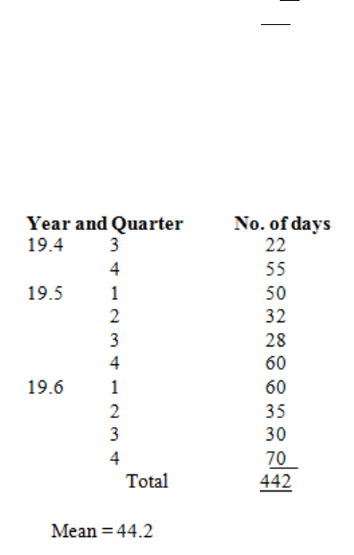
Page 376
For the mean of the first half:
Year and Quarter
No of days
19.2
1
30
2
20
3
15
4
35
19.3
1
40
2
25
3
18
4
45
19.4
1
45
2
30
Total
303
Mean = 30.3
Table 13.6
For the mean of the second half:
Table 13.7
These values are plotted on the historigram in Figure 13.8. You will notice that 30.3 days, as
it is the mean for the first half, is plotted halfway between quarters 1 and 2 of 19.3, and
likewise 44.2 days is plotted halfway between quarters 3 and 4 of 19.5. The trend line is then
drawn between these two points and it can be extrapolated beyond these points as shown by
the dotted line.
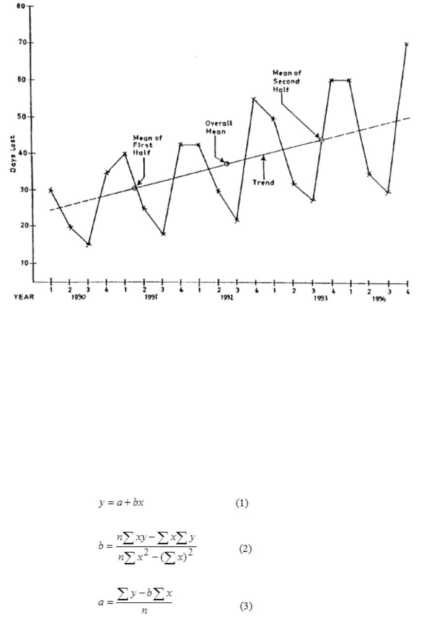
Page 377
If there is an odd number of observations in the time series, the middle observation is ignored
and the means of the observations on each side of it are calculated.
Figure 13.8
c) Least Squares Method
The trend line is calculated using the formula in Study Unit 8 Section B. In fact the trend line
is the regression line of y on x where y is the dependent variable and x is the time variable.
Since in a time series the observations are always recorded at equally-spaced time intervals,
we can represent x by the first n positive integers, where n is the number of observations. We
never calculate the other regression line in time series analysis as it has no significance. Thus
the equation of the trend is:
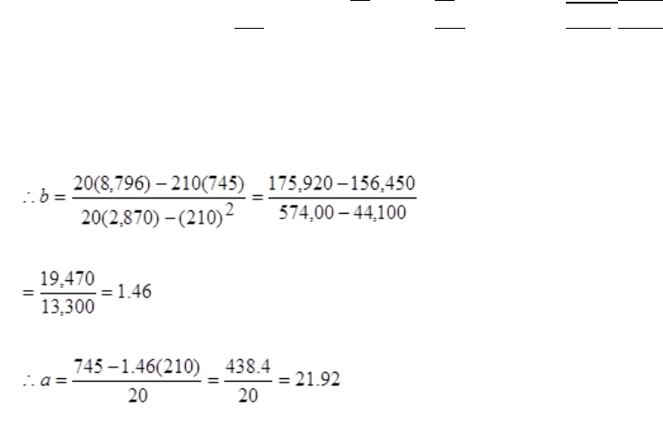
Page 378
Using the data given in our earlier example we set up a table of calculations as follows:
So the equation of the trend line is:
y = 21.92 + 1.46x
Year
Quarter
x
Days Lost y
x2
xy
19.2
1
1
30
1
30
2
2
20
4
40
3
3
15
9
45
4
4
35
16
140
19.3
1
5
40
25
200
2
6
25
36
150
3
7
18
49
126
4
8
45
64
360
19.4
1
9
45
81
405
2
10
30
100
300
3
11
22
121
242
4
12
55
144
660
19.5
1
13
50
169
650
2
14
32
196
448
3
15
28
225
420
4
16
60
256
960
19.6
1
17
60
289
1,020
2
18
35
324
630
3
19
30
361
570
4
20
70
400
1,400
Σ = 210
745
2,870
8,796
n = 20
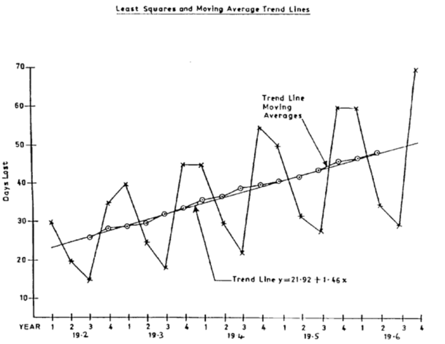
Page 379
where y is the number of days lost owing to sickness and x is the number given to the quarter
required. We can now draw the line represented by this equation on the time series
historigram as shown in Figure 9.6. This method uses all the available information, but it
suffers from the same limitations as other regression lines if it is used for prediction by
extrapolation.
Figure 13.9
d) Moving Averages Method
So far, the methods we have discussed for finding trends have resulted in a straight line, but
the actual trend may be a curve or a series of straight segments. The method of moving
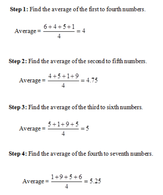
Page 380
averages gives a way of calculating and plotting on the historigram a trend point
corresponding to each observed point. These points are calculated by averaging a number of
consecutive values of the dependent variable so that variations in individual observations are
reduced. The number of consecutive values selected will depend on the length of the short-
term or seasonal variation shown on the historigram.
The method of calculating a set of moving averages is illustrated by the following simple
example. Consider the seven numbers 6, 4, 5,1, 9, 5, 6 and take the number of time periods
covered by the fluctuations to be four as in quarterly figures, then a moving average of order
four is needed.
Hence the moving averages of order 4 are 4, 4.75, 5, 5.25. For monthly data a moving
average of order 12 would be needed; for daily data the order would be 7, and so on.
Page 381
Using the data of the earlier example, we calculate the trend values and plot them on Figure
13.9 so that we can compare the two trend lines. The table of calculations follows:
Table 13.10
The trend is given correct to one decimal place as this is the greatest accuracy justified by the
accuracy of the data. Notice how the table of calculations is set out, with the numbers in
columns (4) and (5) placed midway between two quarterly readings. This is because we
were averaging over an even number of values, so the moving average would have to be
plotted in this position on the historigram and would not correspond to any particular quarter.
Thus it is necessary to add column (6) which gives the mean of successive pairs of moving
averages and these numbers are the trend values plotted. (The values in column (6) are often
called the centred moving averages.)
Year
Quarter
Days Lost
4-Quarter
Moving
Trend
Total
Average
(1)
(2)
(3)
(4)
(5)
(6)
19.2
1
30
2
20
100
25
3
15
26.3
110
27.5
4
35
28.1
115
28.75
19.3
1
40
29.1
118
29.5
2
25
30.8
128
32.0
3
18
32.6
133
33.25
4
45
33.9
138
34.5
19.4
1
45
35.0
142
35.5
2
30
36.8
152
38.0
3
22
38.6
157
39.25
4
55
39.5
159
39.75
19.5
1
50
40.5
165
41.25
2
32
41.9
170
42.5
3
28
43.8
180
45.0
4
60
45.4
183
45.75
Page 382
If we were calculating a moving average with an odd number of values it would not be
necessary to carry out this final stage as the moving averages would be centred on an actual
observation and so would be the trend values, e.g. daily observation over a number of weeks
or data with a short-term cycle of an odd number of years.
The main advantage of this method is that the trend values take into account the immediate
changes in external factors which the trend lines, using the previous two methods, are unable
to do. However, this method has three disadvantages:
(i) The trend line cannot be found for the whole of the time series. As you can see from
our example, there are no trend values for quarters at the beginning and end of the
series.
(ii) Problems can be encountered in deciding the order number, i.e. the period of
fluctuation. Unless the seasonal or cyclical movement is definite and clear cut, the
moving method of deriving the trend may yield a rather unsatisfactory line.
(iii)Since the trend is calculated as a simple arithmetic mean it can be unduly influenced
by a few extreme values.
Seasonal Variation
As we are assuming in this study unit that the additive model is satisfactory, once we have
found the trend by one of the methods described in the previous section we can find the value
of the remaining factors for each value of the dependent variable from the equation for the
additive model by subtraction:
i.e. Y = T + S + C + I
so Y – T = S + C + I = S + R
(C + I = R since we cannot usually separate C and l)
Page 383
Column (5) of the following table shows the value of this difference for all the quarters from
19.2 quarter 3 to 19.6 quarter 2.
Table 13.11
One of the assumptions we make for the additive model is that the seasonal variations are the
same for corresponding quarters in each year. You can see that this is not the case in column
(5) except that for each year the first and fourth quarters give a positive result and the second
and third a negative one. The variation must be caused by the residual (R), and this factor can
be eliminated by calculating the adjusted average for each quarter as shown in the next table:
Year
Quarter
Days Lost (Y)
Trend (T)
Y -T
(1)
(2)
(3)
(4)
(5)
19.2
3
15
26.3
–11.3
4
35
28. 1
6.9
19.3
1
40
29.1
10.9
2
25
30.8
–5.8
3
18
32.6
–14.6
4
45
33.9
11.1
19.4
1
45
35.0
10.0
2
30
36.8
–6.8
3
22
38.6
–16.6
4
55
39.5
15.5
19.5
1
50
40.5
9.5
2
32
41.9
–9.9
3
28
43.8
–15.8
4
60
45.4
14.6
19.6
1
60
46.0
14.0
2
35
47.5
–12.5

Page 384
Table 13.12
The average fluctuations should add up to zero, but as you can see in the example above,
because of rounding errors they do not; therefore a minor adjustment is carried out in the last
row. This is done by subtracting a quarter of the total outstanding from each average (in this
case 0.25 of - 0.3 = -0.075).
Therefore the values 11.2, –8.7, –14.5 and 12.1 (all correct to 1 dp) are the seasonal
fluctuations of the four quarters for the time series of days lost through sickness at a factory.
Year
1st Qtr
2nd Qtr
3rd Qtr
4th Qtr
19.2
-
-
–11.3
6.9
19.3
10.9
–5.8
–14.6
11.1
19.4
10.0
–6.8
–16.6
15.5
19.5
9.5
–9.9
–15.8
14.6
19.6
14.0
–12.5
-
-
Total
44.4
–35.0
–58.3
48.1
Average
11.1
-8.8
–14.6
12.0
(-0.3)
Adjusted
Average
11.175
–8.725
–14.525
12.075
Page 385
Deseasonalised Data and Residual
The remaining results that are needed for this analysis are the deseasonalised values (Y - S)
and the residuals (Y - S -T). These are shown in columns (4) and (6) of the following table:
Table 13.13
As you can see, there is no pattern to the residuals but they are fairly small, i.e. they can be
considered as random errors of observation and rounding, though they may contain a
systematic cyclic element.
In the next study unit we will look at other time series models and methods used to forecast
future values in the series.
Year and
Days Lost
Seasonal
Deseasonal
Trend
Residual
Qtr
Adjustment
ised Data
(Y)
(S)
(Y-S)
(T)
R = Y -S -T
(1)
(2)
(3)
(4)
(5)
(6)
19.2
3
15
–14.5
29.5
26.3
3.2
4
35
12.1
22.9
28.1
–5.2
19.3
1
40
11.2
28.8
29.1
–0.3
2
25
–8.7
33.7
30.7
3.0
3
18
–14.5
32.5
32.6
–0.1
4
45
12.1
32.9
33.9
–1.0
19.4
1
45
11.2
33.8
35.0
–1.2
2
30
–8.7
38.7
36.7
2.0
3
22
–14.5
36.5
38.6
–2.1
4
55
12.1
42.9
39.5
3 4
19.5
1
50
11.2
38.8
40.5
–1.7
2
32
–8.7
40.7
41.9
–1.2
3
28
–14.5
42.5
43.7
–1.2
4
60
12.1
47.9
45.4
2.5
19.6
1
60
11.2
48.8
46.0
2.8
2
35
–8.7
43.7
47.5
–3.8
Page 386
BLANK

Page 387
STUDY UNIT 13
Time Series Analysis II
Contents Page
Unit
Title
Page
A.
Forecasting
389
Assumptions
389
Methods of Forecasting
389
B.
The Z Chart
393
C.
Summary
395
Page 388
BLANK

Page 389
A. FORECASTING
Assumptions
The reason for isolating the trend within a time series is to be able to make a prediction of its
future values and thus estimate the movement of the time series. Before looking at the various
methods available to carry out this process, we must state two assumptions that must be made
when forecasting:
a) That Conditions Remain Stable
Those conditions and factors which were apparent during the period over which the trend was
calculated must be assumed to be unchanged over the period for which the forecast is made.
If they do change, then the trend is likely to change with them, thus making any predictions
inaccurate, e.g. forecasts of savings trends based on given interest rates will not be correct if
there is a sudden change either up or down in these rates.
b) That Extra Factors Will Not Arise
It is sometimes the case that, when trends are predicted beyond the limits of the data from
which they are calculated, extra factors will arise which influence the trend. For example,
there is a limit to the number of washing machines that can be sold within a country. This
capacity is a factor that must be considered when making projections of the future sales of
washing machines. Therefore, in forecasting from a time series it must be assumed that such
extra factors will not arise.
These assumptions are similar to those mentioned when we looked at the extrapolation of a
regression line.
Methods of Forecasting
There are two main methods of forecasting, although both are primarily concerned with
short-term forecasts because the assumptions mentioned previously will break down
gradually for periods of longer than about a year.
Page 390
a) Moving Averages Method
This method involves extending the moving average trend line drawn on the historigram
of the time series. The trend line is extended by assuming that the gradient remains the
same as that calculated from the data. The further forward you extend it, the more
unreliable becomes the forecast.
When you have read the required trend value from the graph, the appropriate seasonal
fluctuation is added to this and allowance is made for the residual variation. For example,
consider the premium bond sales in the United Kingdom shown in Figure 14.1. On this
figure the moving average trend line stops at the second quarter of 19.6. If this line is
extrapolated with the same gradient to the first quarter of 19.7 then:
19.71st Qtr Trend = 750
This is multiplied by the seasonal variation as it is a multiplicative model, i.e. 750x1.49 =
1,118, and the residual variation which varied by as much as + 18% is added to this.
Therefore the final short-term estimate for the sales of premium bonds for the first quarter
of 19.7 is RWF1,118,000 ± RWF201,000.
Although fairly easy to calculate, this forecast, like all others, must be treated with
caution, because it is based on the value of the trend calculated for the second quarter of
19.6, so if this happens to be an especially high or low value then it would influence the
trend, and thus the forecast, considerably.
b) Least Squares Method
If the line of best fit, y = a + bx, is used as the trend line and drawn on a historigram, it
can be extended to give an estimate of the trend. Preferably the required value of x can be
substituted in the equation to give the trend value. The seasonal fluctuation and residual
variations must be added as in (a).
Using the results of the example from the previous study unit involving days lost through
sickness at a factory, the trend line was:
y = 21.92 + 1.46x
where x took all the integer values between 1 and 20. ,
Page 391
Now suppose we want to estimate the number of days lost in the first quarter of 19.7, i.e.
when x = 21. The value of the trend would be:
y = 21.92 + 1.46(21)
= 52.58
= 53 days
(This result could also be read from the graph in Figure 13.9)
To this must be added, as it is an additive model, the seasonal fluctuation for a first
quarter, which was about 11 days, making a total of 64 days. The residual variation for
this series was a maximum of + 5 days. Therefore the forecast for days lost through
sickness for the first quarter of 19.7 is between 59 and 69 days.
This forecast again is not entirely reliable, as the trend is depicted by one straight line of a
fixed gradient. It is a useful method for short-term forecasting, although like the previous
method it becomes more unreliable the further the forecast is extended into the future.
There are no hard and fast rules to adopt when it comes to choosing a forecast method. Do
not think that the more complicated the method the better the forecast. It is often the case that
the simpler, more easily understood methods produce better forecasts, especially when you
consider the amount of effort expended in making these forecasts. Remember that, whatever
the method used for the forecast, it is only an educated guess as to future values.
Page 392
BLANK

Page 393
B. THE Z-CHART
We will conclude this study unit with a short description of a particular type of chart which
plots a time series, called a Z-Chart. It is basically a means of showing three sets of data
relating to the performance of an organisation over time. The three sets of data are plotted on
the same chart and should be kept up-to-date. The graphs are:
a) The plot of the current data, be it monthly, quarterly or daily.
b) The cumulative plot of the current data.
c) The moving total plot of the data.
It is often used to keep senior management informed of business developments. As an
example we will plot a Z-Chart for the sales of premium bonds in 19.5 using the data of the
table below with the sales broken down into months. the table also shows the cumulative
monthly sales and the moving annual totals. Note that the scale used for (a) is shown on the
right of the chart and is twice that used for (b) and (c) so that the fluctuations in monthly sales
show up more clearly. This is a device often used so that the chart is not too large.
Year
Month
Sales
Cumulative Sales
Moving Annual Total
1,240
19.5
Jan
150
150
1,290
Feb
350
500
1,460
Mar
300
800
1,640
Apr
100
900
1,670
May
150
1,050
1,730
June
150
1,200
1,830
July
120
1,320
1,890
Aug
120
1,440
1,940
Sept
100
1,540
1,990
Oct
300
1,840
2,140
Nov
400
2,240
2,340
Dec
200
2,440
2,440
Figure 14.1
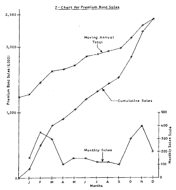
Page 394
These totals are presented in Figure 10.2. It is called a Z-Chart because the position of the
three graphs on the chart makes it look like the letter Z.
This is a useful chart because management can see at a glance how production is progressing
from one month to the next. It is also possible to compare the current year's performance with
a set target or with the same periods in previous years.
Figure 14.2

Page 395
C. SUMMARY
In this study unit and the previous one we discussed the main models used to analyse time
series. We began by identifying the various factors into which a time series may be divided in
order to use these models, and went on to show how to separate a time series into these
constituent factors. This is an important subject and you should particularly note the
following points:
− Set out all calculations systematically in tables.
− The layout of the table used for calculation of centred moving averages is very
important for all models.
You must learn thoroughly the method of calculating and adjusting seasonal variations for all
models.
Page 396
BLANK

Page 397
STUDY UNIT 14
Linear Programming
Contents
Unit
Title
Page
A.
The Graphical Method
399
B.
The Graphical Method Using Simultaneous Equations
417
C.
Sensitivity Analysis (graphical)
423
D.
The Principles of the Simplex Method
433
E.
Sensitivity Analysis (simplex)
447
F.
Using Computer Packages
455
G.
Using Linear Programming
459
Page 398
BLANK

Page 399
A. THE GRAPHICAL METHOD
The graphical method of linear programming is used for problems involving two products.
Formulating the problem
Let us suppose that WX manufactures two products, A and B. Both products pass through
two production departments, mixing and shaping. The organisation's objective is to maximise
contribution to fixed costs.
Product A is sold for RWF1.50 whereas product B is priced at RWF2.00. There is unlimited
demand for product A but demand for B is limited to 13,000 units per annum. The machine
hours available in each department are restricted to 2,400 per annum. Other relevant data are
as follows.
Machine hours required Mixing Shaping
Hrs Hrs
Product A 0.06 0.04
Product B 0.08 0.12
Variable cost per unit RWF
Product A 1.30
Product B 1.70
Page 400
Before we work through the steps involved in solving this constraints problem using the
graphical approach to linear programming, it is worth reading the CIMA Official
Terminology definition of linear programming to get a glimpse of what we will be doing.
Linear programming is 'The use of a series of linear equations to construct a mathematical
model. The objective is to obtain an optimal solution to a complex operational problem,
which may involve the production of a number of products in an environment in which there
are many constraints'.
What are the constraints in the situation facing WX?
(i) Machine hours in each department
(ii) Labour hours in each department
(iii)Sales demand for product B
(iv) Selling price of product A
A. and (iii)
B. only
C. and (iv)
D. (i), (ii) and (iii)
The correct answer is A. There is no restriction on the availability of labour hours. Selling
price cannot be a constraint.
The steps in the graphical method are as follows.
− Define variables.
− Establish objective function.
− Establish constraints.
− Draw a graph of the constraints.
− Establish the feasible region.
− Determine the optimal product mix.
Let's start solving WX's problem.
Page 401
Step 1
Define variables
What are the quantities that WX can vary? Obviously not the number of machine hours or the
demand for product B. The only things which it can vary are the number of units of each type
of product produced. It is those numbers which the company has to determine in such a way
as to obtain the maximum possible profit. Our variables (which are usually products being
produced) will therefore be as follows.
Let x = number of units of product A produced.
Let y = number of units of product B produced.
Step 2
Establish objective function
The objective function is a quantified statement of the aim of a resource allocation decision.
We now need to introduce the question of contribution or profit. We know that the
contribution on each type of product is as follows.
RWF per unit
Product A RWF(1.50 – 1.30) = 0.20
Product B RWF(2.00 – 1.70) = 0.30
The objective of the company is to maximise contribution and so the objective
function to be maximised is as follows.
Contribution (C) = 0.2x + 0.3y
Step 3
Establish constraints
A constraint is 'An activity, resource or policy that limits the ability to achieve objectives'.
The value of the objective function (the maximum contribution achievable from
producing products A and B) is limited by the constraints facing WX, however. To
Page 402
incorporate this into the problem we need to translate the constraints into inequalities
involving the variables defined in Step 1. An inequality is an equation taking the form
'greater than or equal to' or 'less than or equal to'.
a) Consider the mixing department machine hours constraint.
(i) Each unit of product A requires 0.06 hours of machine time. Producing five
units therefore requires 5 x 0.06 hours of machine time and, more generally,
producing x units will require 0.06x hours.
(ii) Likewise producing y units of product B will require 0.08y hours.
(iii)The total machine hours needed in the mixing department to make x units of
product A and y units of product B is 0.06x + 0.08y.
(iv) We know that this cannot be greater than 2,400 hours and so we arrive at the
following inequality.
0.06x + 0.08y
≤
2,400
How can the constraint facing the shaping department be written as an inequality?
A. 0.4x + 0.012y
≤
2,400
B. 0.04x + 0.12y
≤
2,400
C. 0.4x + 0.012y
≤
2,400
D. 0.04x + 0.12y
≤
2,400
The correct answer is B. The constraint has to be a 'less than equal to' inequality, because the
amount of resource used (0.04x + 0.12y) has to be 'less than equal to' the amount available of
2,400 hours.
b) The final inequality is easier to obtain. The number of units of product B produced
and sold is y but this has to be less than or equal to 13,000. Our inequality is therefore
as follows.
y
≤
13,000
Page 403
c) We also need to add non-negativity constraints (x ≥ 0, y ≥ 0) since negative numbers
of products cannot be produced. (Linear programming is simply a mathematical tool
and so there is nothing in this method which guarantees that the answer will 'make
sense'. An unprofitable product may produce an answer which is negative. This is
mathematically correct but nonsense in operational terms. Always remember to
include the non-negativity constraints. The examiner will not appreciate 'impossible'
solutions.)
The problem has now been reduced to the following four inequalities and one equation.
Maximise contribution (C) = 0.2x + 0.3y, subject to the following constraints:
0.06x + 0.08y
≤
2,400
0.04x + 0.12y
≤
2,400
0
≤
y
≤
13,000
0
≤
x
Question
An organisation makes two products, X and Y. Product X has a contribution of RWF124 per
unit and product Y RWF80 per unit. Both products pass through two departments for
processing and the times in minutes per unit are as follows.
Product X Product Y
Department 1 150 90
Department 2 100 120
Currently there is a maximum of 225 hours per week available in department 1 and 200 hours
in department 2. The organisation can sell all it can produce of X but EACEAC quotas
restrict the sale of Y to a maximum of 75 units per week. The organisation, which wishes to
maximise contribution, currently makes and sells 30 units of X and 75 units of Y per week.
Required
Assume x and y are the number of units of X and Y produced per week. Formulate a linear
programming model of this problem, filling in the blanks in (a) and (b) below.
Page 404
a) The objective function is to maximise weekly contribution, given by C =…………..
b) The constraints are:
Department 1 ……………………. EAC quota …………………….
Department 2 ……………………. Non-negativity …………………….
Answer
a) The objective function is to maximise weekly contribution, given by C = 124x + 80y.
b) The constraints are:
Department 1 150x + 90y
≤
225 x 60 minutes
Department 2 100x + 120y
≤
200 x 60 minutes
EAC quota y
≤
75
Non-negativity x, y ≥ 0
These constraints can be simplified to:
Department 1 15x + 9y
≤
1,350
Department 2 10x + 12y
≤
1,200
EAC quota y
≤
75
Non-negativity x, y ≥ 0
Graphing the problem
A graphical solution is only possible when there are two variables in the problem. One
variable is represented by the x axis of the graph and one by the y axis. Since non-negative
values are not usually allowed, the graph shows only zero and positive values of x and y.
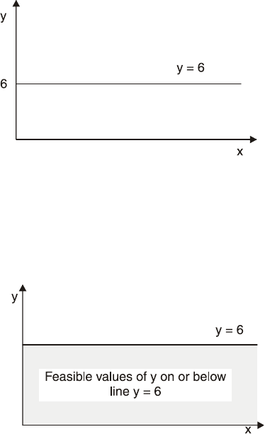
Page 405
Graphing equations and constraints
A linear equation with one or two variables is shown as a straight line on a graph. Thus y = 6
would be shown as follows.
If the problem included a constraint that y could not exceed 6, the inequality y
≤
6 would be
represented by the shaded area of the graph below.
The equation 4x + 3y = 24 is also a straight line on a graph. To draw any straight line, we
need only to plot two points and join them up. The easiest points to plot are the following.
− x = 0 (in this example, if x = 0, 3y = 24, y = 8)
− y = 0 (in this example, if y = 0, 4x = 24, x = 6)
By plotting the points, (0, 8) and (6, 0) on a graph, and joining them up, we have the line for
4x + 3y = 24.
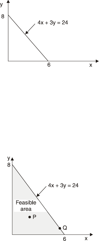
Page 406
Any combination of values for x and y on the line satisfies the equation. Thus at a point
where x = 3 and y = 4, 4x + 3y = 24. Similarly, at a point where x = 4.5 and y = 2, 4x + 3y =
24.
If we had a constraint 4x + 3y
≤
24, any combined value of x and y within the shaded area
below (on or below the line) would satisfy the constraint.
Consider point P which has coordinates of (2, 2). Here 4x + 3y = 14, which is less than 24;
and at point Q where x = 5½, y = 2/3, 4x + 3y = 24. Both P and Q lie within the feasible area
or feasible region. A feasible area enclosed on all sides may also be called a feasible polygon.
A feasible region is 'The area contained within all of the constraint lines shown on a
graphical depiction of a linear programming problem. All feasible combinations of output are
contained within or located on the boundaries of the feasible region'.
When there are several constraints, the feasible area of combinations of values of x and y
must be an area where all the inequalities are satisfied. Thus, if y
≤
6 and 4x + 3y
≤
24 the
feasible area would be the shaded area in the following graph.

Page 407
a) (Point R (x = 0.75, y = 7) is not in the feasible area because although it satisfies the
inequality 4x + 3y
≤
24, it does not satisfy y
≤
6.
b) Point T (x = 5, y = 6) is not in the feasible area, because although it satisfies the
inequality y
≤
6, it does not satisfy 4x + 3y
≤
24.
c) Point S (x = 1.5, y = 6) satisfies both inequalities and lies just on the boundary of the
feasible area since y = 6 exactly, and 4x + 3y = 24. Point S is thus at the intersection
of the two lines.
Similarly, if y ≥ 6 and 4x + 3y ≥ 24 but x is
≤
6, the feasible area would be the shaded area in
the graph below.
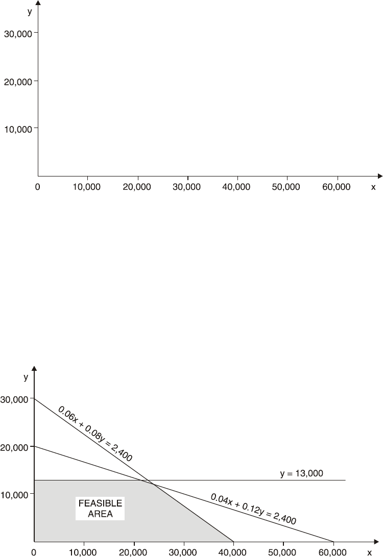
Page 408
Question
Draw the feasible region which arises from the constraints facing WX on the graph below.
Answer
If 0.06x + 0.08y = 2,400, then if x = 0, y = 30,000 and if y = 0, x = 40,000.
If 0.04x + 0.12y = 2,400, then if x = 0, y = 20,000 and if y = 0, x = 60,000.
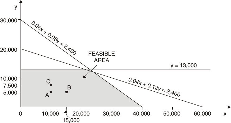
Page 409
Finding the optimum allocation of resources
The optimal solution can be found by 'sliding the iso-contribution (or profit) line out'.
Having found the feasible region (which includes all the possible solutions to the problem)
we need to find which of these possible solutions is 'best' or optimal in the sense that it yields
the maximum possible contribution.
Look at the feasible region of the problem faced by WX (see the solution to the question
above). Even in such a simple problem as this, there are a great many possible solution points
within the feasible area. Even to write them all down would be a time-consuming process and
also an unnecessary one, as we shall see.
Here is the graph of WX's problem.
a) Consider point A at which 10,000 units of product A and 5,000 units of product B are
being manufactured. This will yield a contribution of (10,000 x RWF0.20) + (5,000 x
RWF0.30) = RWF3,500.
b) We would clearly get more contribution at point B, where the same number of units of
product B are being produced but where the number of units of product A has
increased by 5,000.
c) We would also get more contribution at point C where the number of units of product
A is the same but 2,500 more units of product B are being produced.
This argument suggests that the 'best' solution is going to be at a point on the edge of the
feasible area rather than in the middle of it.
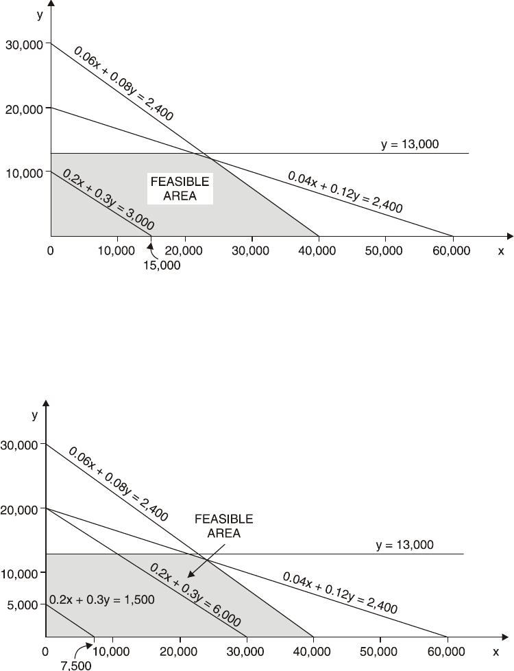
Page 410
This still leaves us with quite a few points to look at but there is a way in which we can
narrow down still further the likely points at which the best solution will be found. Suppose
that WX wishes to earn contribution of RWF3,000. The company could sell the following
combinations of the two products.
a) 15,000 units of A, no B.
b) No A, 10,000 units of B.
c) A suitable mix of the two, such as 7,500 A and 5,000 B.
The possible combinations required to earn contribution of RWF3,000 could be shown by the
straight line 0.2x + 0.3y = 3,000.
Likewise for profits of RWF6,000 and RWF1,500, lines of 0.2x + 0.3y = 6,000 and 0.2x +
0.3y = 1,500 could be drawn showing the combination of the two products which would
achieve contribution of RWF6,000 or RWF1,500.
Page 411
The contribution lines are all parallel. (They are called iso-contribution lines, 'iso' meaning
equal.) A similar line drawn for any other total contribution would also be parallel to the
three lines shown here. Bigger contribution is shown by lines further from the origin (0.2x +
0.3y = 6,000), smaller contribution by lines closer to the origin (0.2x + 0.3y = 1,500). As WX
tries to increase possible contribution, we need to 'slide' any contribution line outwards from
the origin, while always keeping it parallel to the other contribution lines.
As we do this there will come a point at which, if we were to move the contribution line out
any further, it would cease to lie in the feasible region. Greater contribution could not be
achieved, because of the constraints. In our example concerning WX this will happen, as you
should test for yourself, where the contribution line just passes through the intersection of
0.06x + 0.08y = 2,400 and 0.04x + 0.12y = 2,400 (at coordinates (24,000, 12,000)). The point
(24,000, 12,000) will therefore give us the optimal allocation of resources (to produce 24,000
units of A and 12,000 units of B).
We can usefully summarise the graphical approach to linear programming as follows.
Step 1 Define variables. Step 4 Graph the problem.
Step 2 Establish objective function. Step 5 Define feasible area.
Step 3 Establish constraints. Step 6 Determine optimal solution.
Example: the graphical solution with a twist
This example shows that it is not always necessarily easy to identify the decision variables in
a problem.
DCC operates a small plant for the manufacture of two joint chemical products X and Y. The
production of these chemicals requires two raw materials, A and B, which cost RWF5 and
RWF8 per litre respectively. The maximum available supply per week is 2,700 litres of A and
2,000 litres of B.
The plant can operate using either of two processes, which have differing operating costs and
raw materials requirements for the production of X and Y, as follows.

Page 412
Process Raw materials consumed Output Cost
Litres per processing hour Litres per hour RWF per hour
A B X Y
1 20 10 15 20 500
2 30 20 20 10 230
The plant can run for 120 hours per week in total, but for safety reasons, process 2 cannot be
operated for more than 80 hours per week.
X sells for RWF18 per litre, Y for RWF24 per litre.
Formulate a linear programming model, and then solve it, to determine how the plant should
be operated each week.
Solution
Step 1 Define variables
You might decide that there are two decision variables in the problem, the quantity of X and
the quantity of Y to make each week. If so, begin by letting these be x and y respectively.
You might also readily recognise that the aim should be to maximise the total weekly
contribution, and so the objective function should be expressed in terms of maximising the
total contribution from X and Y.
The contribution per litre from X and Y cannot be calculated because the operating costs are
expressed in terms of processing hours.
Process 1
Process 2
RWF per
hour
RWF per
hour
RWF per
hour
RWF per
hour
Costs:
Material A
100
150
Material B
80
160
Operating cost
500
230
680
540
Revenue:
X (15 × RWF18)
270
(20 ×
RWF18)
360
Y (20 × RWF24)
480
(10 ×
RWF24)
240
750
600
Contribution
70
60
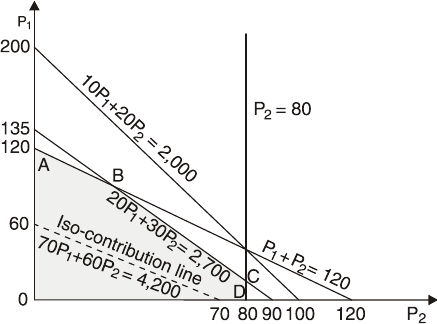
Page 413
The decision variables should be processing hours in each process, rather than litres of X and
Y. If we let the processing hours per week for process 1 be P1 and the processing hours per
week for process 2 be P2 we can now formulate an objective function, and constraints, as
follows.
Step 2 Establish objective function
Maximise 70P1 + 60P2 (total contribution) subject to the constraints below
Step 3 Establish constraints
20P1 + 30P2 ≤ 2,700 (material A supply)
10P1 + 20P2 ≤ 2,000 (material B supply)
P2 ≤ 80 (maximum time for P2)
P1 + P2 ≤ 120 (total maximum time)
P1, P2 ≥ 0
Step 4 Graph the problem
The graphical solution looks like this.
Page 414
Step 5 Define feasible area
The material B constraint is not critical, and the feasible area for a solution is shown as
ABCDO on the graph.
Step 6 Determine optimal solution
The optimal solution, determined using the iso-contribution line 70P1 + 60P2 = 4,200, is at
point A, where P1 = 120 and P2 = 0.
Production would be (120 x 15) 1,800 litres of X and (120 x 20) 2,400 litres of Y.
Total contribution would be (120 x RWF70) = RWF8,400 per week.
Question
On 20 days of every month GS makes two products, the Crete and the Corfu. Production is
carried out in three departments – tanning, plunging and watering. Relevant information is as
follows.
Crete Corfu
Contribution per unit RWF75 RWF50
Minutes in tanning department per unit 10 12
Minutes in plunging department per unit 15 10
Minutes in watering department per unit 6 15
Maximum monthly sales (due to government quota restrictions) 3,500 4,000
Tanning Plunging Watering
Number of employees 7 10 5
Hours at work per day per employee 7 6 10
Number of idle hours per day per employee 0.5 1 0.25
Page 415
Due to union restrictions, employees cannot be at work for longer than the hours detailed
above.
Use the graphical method of linear programming to determine the optimum monthly
production of Cretes and Corfus and the monthly contribution if GS's objective is to
maximise contribution.
Answer
Calculate the number of productive hours worked in each department each month
Number of employees x number of productive hours worked each day x number of days each
month.
Tanning = 7 x (7 – 0.5) x 20 = 910 hours
Plunging = 10 x (6 – 1) x 20 = 1,000 hours
Watering = 5 x (10 – 0.25) x 20 = 975 hours
Step 1 Define variables
Let the number of Cretes produced each month = x and the number of Corfus produced each
month = y.
Step 2 Establish objective function
The contribution is RWF75 per Crete and RWF50 per Corfu. The objective function is
therefore maximise C = 75x + 50y subject to the constraints below.
Step 3 Establish constraints
Tanning x/6 + y/5 ≤ 910
Plunging x/4 + y/6 ≤ 1,000
Watering x/10 + y/4 ≤ 975
Monthly sales units x ≤ 3,500, y ≤ 4,000
Non negativity x ≥ 0, y ≥ 0
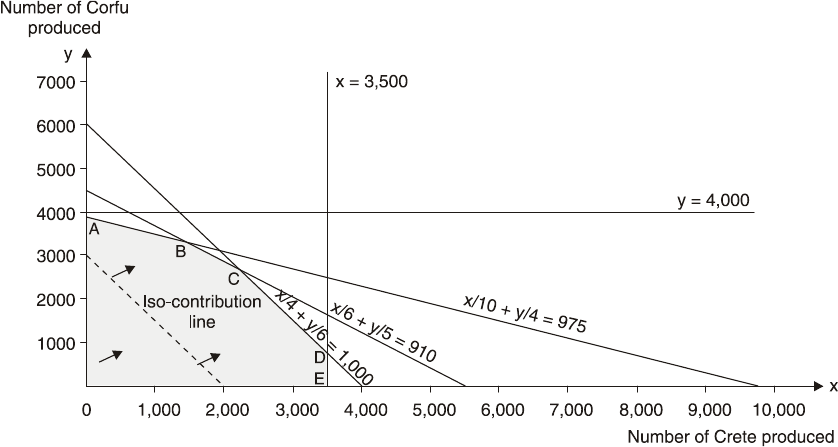
Page 416
Step 4 Graph the problem
The problem can be solved using the following graph which includes a sample contribution
line 75x + 50y = 150,000.
Step 5 Define the feasible area
The feasible region for a solution is OABCDE.
Step 6 Determine the optimal solution
Moving the sample contribution line across the feasible region it can be seen that the
optimum solution is at any point along the line x/4 + y/6 = 1,000 between C and D (as the
sample contribution line has the same gradient as the plunging constraint). The coordinates of
point C are (2,175, 2,737.5) while those of point D are (3,500, 750).
The contribution from any of these solutions is RWF((75 x 3,500) + (50 x 750)) =
RWF300,000 (using the coordinates of D).

Page 417
B. THE GRAPHICAL METHOD USING
SIMULTANEOUS EQUATIONS
Instead of a 'sliding the contribution line out' approach, simultaneous equations can be used to
determine the optimal allocation of resources, as shown in the following example.
The optimal solution can also be found using simultaneous equations.
Example: using simultaneous equations
An organisation manufactures plastic-covered steel fencing in two qualities: standard and
heavy gauge. Both products pass through the same processes involving steel forming and
plastic bonding.
The standard gauge sells at RWF15 a roll and the heavy gauge at RWF20 a roll. There is an
unlimited market for the standard gauge but outlets for the heavy gauge are limited to 13,000
rolls a year. The factory operations of each process are limited to 2,400 hours a year. Other
relevant data is given below.
Variable costs per roll
Direct Material Direct Wages Direct Expense
RWF RWF RWF
Standard 5 7 1
Heavy 7 8 2
Processing hours per 100 roll
Steel Forming Plastic Bonding
Hours Hours
Standard 6 4
Heavy 8 12
Calculate the allocation of resources and hence the production mix which will maximise total
contribution.
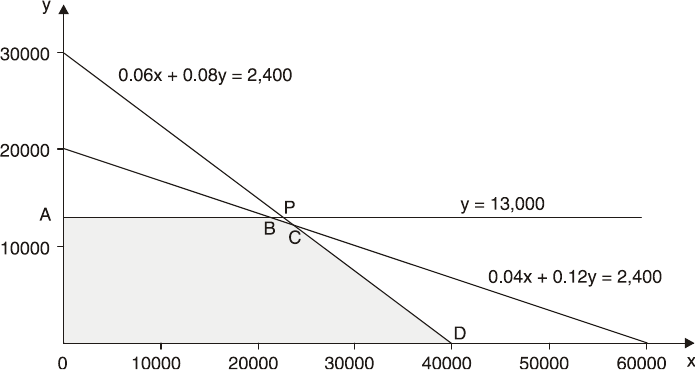
Page 418
Solution
Step 1 Define variables
Let the number of rolls of standard gauge to be produced be x and the number of rolls of
heavy gauge be y.
Step 2 Establish objective function
Standard gauge produces a contribution of RWF2 per roll (RWF15 – RWF(5 + 7 + 1)) and
heavy gauge a contribution of RWF3 (RWF20 – RWF(7 + 8 + 2)).
Therefore the objective is to maximise contribution (C) = 2x + 3y subject to the constraints
below.
Step 3 Establish constraints
The constraints are as follows.
0.06x + 0.08y ≤ 2,400 (steel forming hours)
0.04x + 0.12y ≤ 2,400 (plastic bonding hours)
y ≤ 13,000 (demand for heavy gauge)
x, y ≥ 0 (non-negativity)
Step 4 Graph problem
The graph of the problem can now be drawn.
Page 419
Step 5 Define feasible area
The combinations of x and y that satisfy all three constraints are represented by the area
OABCD.
Step 6 Determine optimal solution
Which combination will maximise contribution? Obviously, the more units of x and y, the
bigger the contribution will be, and the optimal solution will be at point B, C or D. It will not
be at A, since at A, y = 13,000 and x = 0, whereas at B, y = 13,000 (the same) and x is greater
than zero.
Using simultaneous equations to calculate the value of x and y at each of points B, C
and D, and then working out total contribution at each point from this, we can establish the
contribution-maximising product mix.
Point B
y = 13,000 (1)
0.04x + 0.12y = 2,400 (2)
0.12y = 1,560 (3) ((1) x 0.12)
0.04x = 840 (4) ((2) – (3))
x = 21,000 (5)
Total contribution = (21,000 x RWF2) + (13,000 x RWF3) = RWF81,000.
Point C
0.06x + 0.08y = 2,400 (1)
0.04x + 0.12y = 2,400 (2)
0.12x + 0.16y = 4,800 (3) ((1) x 2)
0.12x + 0.36y = 7,200 (4) ((2) x 3)
0.2y = 2,400 (5) ((4) – (3))
y = 12,000 (6)
Page 420
0.06x + 960 = 2,400 (7) (substitute in (1))
x = 24,000 (8)
Total contribution = (24,000 x RWF2) + (12,000 x RWF3) = RWF84,000.
Point D
Total contribution = 40,000 x RWF2 = RWF80,000.
Comparing B, C and D, we can see that contribution is maximised at C, by making 24,000
rolls of standard gauge and 12,000 rolls of heavy gauge, to earn a contribution of
RWF84,000.
Slack and surplus
Slack occurs when maximum availability of a resource is not used. Surplus occurs when
more than a minimum requirement is used.
If, at the optimal solution, the resource used equals the resource available there is no spare
capacity of a resource and so there is no slack.
If a resource which has a maximum availability is not binding at the optimal solution, there
will be slack.
In the example above, the optimal solution is x = 24,000, y = 12,000.
If we substitute these values into the inequalities representing the constraints, we can
determine whether the constraints are binding or whether there is slack.
Steel forming hours: (0.06 x 24,000) + (0.08 x 12,000) = 2,400 = availability
Constraint is binding.
Plastic bonding hours: (0.04 x 24,000) + (0.12 x 12,000) = 2,400 = availability
Constraint is binding.
Demand: Demand of 12,000 ≤ maximum demand of 13,000
There is slack.
Page 421
Note that because we had already determined the optimal solution to be at the intersection of
the steel forming hours and plastic bonding hours constraints, we knew that they were
binding!
If a minimum quantity of a resource must be used and, at the optimal solution, more than that
quantity is used, there is a surplus on the minimum requirement.
For example, suppose in a particular scenario a minimum of 8,000 grade A labour hours had
to be worked in the production of products x and y, such that (say) 3x + 2y 8,000. If
10,000 hours are used to produce the optimal solution, there is a surplus of 2,000 hours.
We will be looking at this form of constraint in the next section.

Page 422
BLANK

Page 423
C. SENSITIVITY ANALYSIS
Once a graphical linear programming solution has been found, it should be possible to
provide further information by interpreting the graph more fully to see what would happen if
certain values in the scenario were to change.
a) What if the contribution from one product was RWF1 lower than expected?
b) What if the sales price of another product was raised by RWF2?
c) What would happen if less or more of a limiting factor were available, such as
material?
Sensitivity analysis with linear programming can be carried out in one of two ways.
a) By considering the value of each limiting factor or binding resource constraint
b) By considering sale prices (or the contribution per unit)
Limiting factor sensitivity analysis
We use the shadow price to carry out sensitivity analysis on the availability of a limiting
factor.
Shadow prices
The shadow price of a resource which is a limiting factor on production is the amount by
which total contribution would fall if the organisation were deprived of one unit of the
resource. The shadow price also indicates the amount by which total contribution would rise
if the organisation were able to obtain one extra unit of the resource, provided that the
resource remains an effective constraint on production and provided also that the extra unit of
resource can be obtained at its normal variable cost.
Question
Choose the correct words from those highlighted.
Page 424
A shadow price is the increase/decrease in contribution/revenue created by the availability
of an extra unit of a resource/limiting resource at its original cost/a premium price.
Answer
The correct answer is: A shadow price is the increase in contribution created by the
availability of an extra unit of a limiting resource at its original cost.
So in terms of linear programming, the shadow price is the extra contribution or profit that
may be earned by relaxing by one unit a binding resource constraint.
Suppose the availability of materials is a binding constraint. If one extra kilogram becomes
available so that an alternative production mix becomes optimal, with a resulting increase
over the original production mix contribution of RWF2, the shadow price of a kilogram of
material is RWF2.
Note, however, that this increase in contribution of RWF2 per extra kilogram of material
made available is calculated on the assumption that the extra kilogram would cost the normal
variable amount.
Note the following points.
a) The shadow price therefore represents the maximum premium above the basic rate
that an organisation should be willing to pay for one extra unit of a resource.
b) Since shadow prices indicate the effect of a one unit change in a constraint, they
provide a measure of the sensitivity of the result.
c) The shadow price of a constraint that is not binding at the optimal solution is zero.
d) Shadow prices are only valid for a small range before the constraint becomes non-
binding or different resources become critical.
Depending on the resource in question, shadow prices enable management to make better
informed decisions about the payment of overtime premiums, bonuses, premiums on small
orders of raw materials and so on.

Page 425
Calculating shadow prices
In the earlier example of WX, the availability of time in both departments are limiting factors
because both are used up fully in the optimal product mix. Let us therefore calculate the
effect if one extra hour of shaping department machine time was made available so that 2,401
hours were available.
The new optimal product mix would be at the intersection of the two constraint lines 0.06x +
0.08y = 2,400 and 0.04x + 0.12y = 2,401.
Solution by simultaneous equations gives x = 23,980 and y = 12,015.
(You should solve the problem yourself if you are doubtful about the derivation of the
solution.)
Contribution per unit Total Contribution
Product Units RWF RWF
A 23,980 0.20 4,796.0
B 12,015 0.30 3,604.5
8,400.5
Contribution in original problem
((24,000 x RWF0.20) + (12,000 x RWF0.30)) 8,400.0
Increase in contribution from one extra hour of shaping time 0.5
The shadow price of an hour of machining time in the shaping department is therefore
RWF0.50.
The shadow price of a limiting factor also shows by how much contribution would fall if the
availability of a limiting resource fell by one unit. The shadow price (also called dual price)
of an hour of machine time in the shaping department would again be calculated as
RWF0.50. This is the opportunity cost of deciding to put an hour of shaping department time
to an alternative use.
We can now make the following points.
a) The management of WX should be prepared to pay up to RWF0.50 extra per hour (ie
RWF0.50 over and above the normal price) of shaping department machine time to
obtain more machine hours.

Page 426
b) This value of machine time only applies as long as shaping machine time is a limiting
factor. If more and more machine hours become available, there will eventually be so
much machine time that it is no longer a limiting factor.
Question
What is the shadow price of one hour of machine time in the mixing department?
A. RWF3
B. RWF7
C. RWF10.50
D. RWF1,193
Answer
The correct answer is A.
If we assume one less hour of machine time in the mixing department is available, the new
optimal solution is at the intersection of 0.06x + 0.08y = 2,399 and 0.04x + 0.12y = 2,400
Solution by simultaneous equations gives x = 23,970, y = 12,010
Contribution per unit Total Contribution
Product Units RWF RWF
A 23,970 0.20 4,794
B 12,010 0.30 3,603
8,397
Contribution in original problem 8,400
Reduction in contribution 3
Therefore shadow price of one hour of machine time in the mixing department is RWF3.
Page 427
Ranges for limiting factors
We can calculate how many hours will be available before machine time in the shaping
department ceases to be a limiting factor.
As more hours become available the constraint line moves out away from the origin. It
ceases to be a limiting factor when it passes through the intersection of the sales constraint
and the mixing department machine time constraint which is at the point (22,667, 13,000).
So, if x = 22,667 and y = 13,000, our new constraint would be 0.04x + 0.12y = H (hours)
where H = (0.04 x 22,667) + (0.12 x 13,000) = 2,466.68 hours.
The shadow price of shaping department machine time is therefore RWF0.50 but only up to a
maximum supply of 2,466.68 hours (that is 66.68 hours more than the original 2,400 hours).
Extra availability of machine time above 2,466.68 hours would not have any use, and the two
limiting factors would become sales demand for product B and machine time in the mixing
department.
Sales price sensitivity analysis
Sales price sensitivity analysis is carried out by changing the slope of the 'iso-contribution'
line.
The optimal solution in our WX example was to make 24,000 units of product A and 12,000
units of product B. Would this solution change if the unit sales price of A increased by
10RWF?
The contribution would increase to 0.3x + 0.3y (in place of 0.2x + 0.3y). The iso-contribution
lines would now have a steeper slope than previously, parallel (for example) to 0.3x + 0.3y =
3,000.
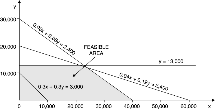
Page 428
If you were to place a ruler along the iso-contribution line and move it away from the origin
as usual, you would find its last point within the feasible region was the point (40,000, 0).
Therefore if the sales price of A is raised by 10p, WX's contribution-maximising product mix
would be to produce 40,000 units of A and none of B.
Example: sensitivity analysis
SW makes two products, X and Y, which each earn a contribution of RWF8 per unit. Each
unit of X requires four labour hours and three machine hours. Each unit of Y requires three
labour hours and five machine hours.
Total weekly capacity is 1,200 labour hours and 1,725 machine hours. There is a standing
weekly order for 100 units of X which must be met. In addition, for technical reasons, it is
necessary to produce at least twice as many units of Y as units of X.
a) Determine the contribution-maximising production plan each week.
b) Calculate the shadow price of the following.
(i) Machine hours
(ii) Labour hours
(iii)The minimum weekly demand for X of 100 units
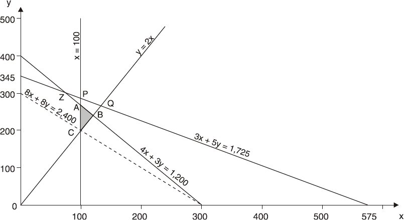
Page 429
Solution (a): production plan
The linear programming problem may be formulated as follows.
Step 1 Define variables
Let x = number of units of X produced and y = number of units of Y produced.
Step 2 Establish objective function
Maximise contribution (c) = 8x + 8y subject to the constraints below.
Step 3 Establish constraints
4x + 3y ≤ 1,200 (labour hours)
3x + 5y ≤ 1,725 (machine hours)
x ≥ 100 (minimum demand)
y ≥ 2x (technical constraint)
y ≥ 0 (non-negativity)
Step 4 Graph the problem
The graph of this problem would be drawn as follows, using 8x + 8y = 2,400 as an iso-
contribution line.

Page 430
Step 5 Establish feasible polygon
The feasible polygon is ABC. Using the slope of the iso-contribution line, we can measure
that the contribution-maximising point is point A.
Step 6 Determine optimal solution
At point A, the effective constraints are x = 100 and 4x + 3y = 1,200.
∴If x = 100, (4 x 100) + 3y = 1,200
∴3y = 1,200 – 400 and so y = 2662/3
It is important to be aware that in linear programming, the optimal solution is likely to give
values to the decision variables which are in fractions of a unit. In this example, contribution
will be maximised by making 2662/3units of Y.
Contribution
RWF
Make 100 units of X 800.00
2662/3 units of Y 2,133.33
Total weekly contribution 2,933.33
Solution (b): sensitivity analysis
(i) Machine hours are not fully utilised in the optimal solution. 100 units of X and 2662/3
units of Y need (300 + 1,333.33) = 1,633.33 machine hours, leaving 91.67 machine
hours unused. Machine hours, not being an effective constraint in the optimal
solution, have a shadow price of RWF0. Obtaining one extra machine hour would add
nothing to the contribution.
(ii) The shadow price of labour hours would be obtained by calculating the total weekly
contribution if the labour hours constraint were 1,201 hours. It should be possible to
Page 431
see fairly easily that the new optimal solution would be where x = 100 and 4x + 3y =
1,201. Therefore x = 100, y = 267 and total weekly contribution would be (100 + 267)
x RWF8 = RWF2,936.
Since contribution with 1,200 labour hours as the constraint was RWF2,933.33, the
shadow price of labour hours is RWF(2,936 – 2,933.33) = RWF2.67 per hour. This is
the amount by which total contribution would rise if one extra labour hour per week
were made available.
Note that there is a limitation to the number of extra labour hours that could be used
to earn extra contribution. As more and more labour hours are added, the constraint
line will move further and further away from the origin. For example if we added 800
labour hours capacity each week, the constraint 4x + 3y ≤ (1,200 + 800) (ie 4x + 3y ≤
2,000) would be so much further away from the origin that it would no longer be an
effective constraint. Machine hours would now help to impose limitations on
production, and the profit-maximising output would be at point P on the graph.
Labour hours could only be added to earn more contribution up to point P, after which
they would cease to be an effective constraint. At point P, x = 100 and 3x + 5y =
1,725. Therefore y = 285.
The labour hours required to make 100 units of X and 285 units of Y are (4 x 100) +
(3 x 285) = 1,255 hours, which is 55 hours more than the initial constraint limit.
Total contribution at point P = (100 + 285) x RWF8 = RWF3,080. Since total
contribution at point A, where labour hours were limited to 1,200 hours, was
RWF2,933.33, the extra contribution from the 55 extra labour hours would be
RWF(3,080 – 2,933.33)/55 = RWF2.67 per hour (as calculated previously).
Thus, the shadow price of labour hours is RWF2.67 per hour, for a maximum of 55
extra hours per week, after which additional labour hours would add nothing to the
weekly contribution.
(iii)The shadow price of the minimum weekly demand for X may be obtained by
calculating the weekly contribution if the minimum demand is reduced by one unit to
99, so that x ≥ 99, given no change in the other original constraints in the problem.
The new optimal solution would occur where x = 99 and 4x + 3y = 1,200. Therefore y
= 268.
Total contribution per week when x = 99 and y = 268 is (99 + 268) x RWF8 =
RWF2,936. Since the contribution when x ≥ 100 was RWF2,933.33, the shadow price
of the minimum demand for X is RWF(2,936 – 2,933.33) = RWF2.67 per unit. In
Page 432
other words, by reducing the minimum demand for X, the weekly contribution can be
raised by RWF2.67 for each unit by which the minimum demand is reduced below
100 per week.
As with the constraint on labour hours, this shadow price is only applicable up to a
certain amount. If you refer back to the graph of the problem, you should be able to
see that if the minimum constraint on X is reduced beyond point Z, it will cease to be
an effective constraint in the optimal solution, because at point Z the machine hours
limitation will begin to apply.
Question
By how many units per week can the minimum demand be reduced before the shadow price
of RWF2.67 per unit referred to above ceases to apply?
A. 300 units
B. 100 units
C. 75 units
D. 25 units
Answer
The correct answer is D.
At point Z: 4x + 3y = 1,200 ……. (1)
3x + 5y = 1,725 ……. (2)
Multiply (1) by 3 12x + 9y = 3,600 ……. (3)
Multiply (2) by 4 12x + 20y = 6,900 ……. (4)
Subtract (3) from (4) 11y = 3,300
y = 300
Substituting in (1) 4x + 900 = 1,200
4x = 300
x = 75
The shadow price of the minimum demand for X is RWF2.67 per unit demanded, but only up
to a total reduction in the minimum demand of (100 – 75) = 25 units per week.

Page 433
D. THE PRINCIPLES OF THE SIMPLEX METHOD
The simplex method is a method of solving linear programming problems with two or more
decision variables.
The formulation of the problem using the simplex method is similar to that required when
the graphical method is used but slack variables must be incorporated into the constraints
and the objective function.
General points about the simplex method
A slack variable represents the amount of a constraint that is unused.
In any feasible solution, if a problem involves n constraints and m variables (decision plus
slack), n variables will have a positive value and (m–n) variables will have a value of zero.
Feasible solutions to a problem are shown in a tableau.
Before introducing an example to explain the technique, we will make a few introductory
points. Don't worry if you get confused, working through the example will make things
clearer.
a) The simplex method involves testing one feasible solution after another, in a
succession of tables or tableaux, until the optimal solution is found. It can be used for
problems with any number of decision variables, from two upwards.
b) In addition to the decision variables, the method introduces additional variables,
known as slack variables or surplus variables. There will be one slack (or surplus)
variable for each constraint in the problem (excluding non-negativity constraints).
For example, if a linear programming problem has three decision variables and four
constraints, there will be four slack variables. With the three decision variables, there
will therefore be a total of seven variables and four constraints in the problem.
c) The technique is a repetitive, step-by-step process, with each step having the
following purposes.
(i) To establish a feasible solution (in other words, a feasible combination of
decision variable values and slack variable values) and the value of the
objective function for that solution.
Page 434
(ii) To establish whether that particular solution is one that optimises the value
of the objective function.
d) Each feasible solution is tested by drawing up a matrix or tableau with the following
rows and columns.
(i) One row per constraint, plus a solution row
(ii) One column per decision variable and per slack variable, plus a
solution column
e) Every variable, whether a decision variable, slack variable or surplus variable, must
be ≥ 0 in any feasible solution.
f) A feature of the simplex method is that if there are n constraints, there will be n
variables with a value greater than 0 in any feasible solution. Thus, if there are seven
variables in a problem, and four constraints, there will be four variables with a
positive value in the solution, and three variables with a value equal to 0.
Keep these points in mind as we work through an example.
Example: the simplex method
An organisation produces and sells two products, X and Y. Relevant information is as
follows.
Materials Labour Machine time Contribution per unit
units hours hours RWF
X, per unit 5 1 3 20
Y, per unit 2 3 2 16
Total available,
each week 3,000 1,750 2,100
Page 435
Use the simplex method to determine the profit-maximising product mix.
Formulating the problem
We have just two decision variables in this problem, but we can still use the simplex method
to solve it.
Step 1 Define variables
Let x be the number of units of X that should be produced and sold.
Let y be the number of units of Y that should be produced and sold.
Step 2 Establish objective function
Maximum contribution (C) = 20x + 16y subject to the constraints below.
Step 3 Establish constraints
The constraints are as follows.
Materials 5x + 2y ≤ 3,000 Machine time 3x + 2y ≤ 2,100
Labour x + 3y ≤ 1,750 Non-negativity x ≥ 0, y ≥ 0
Step 4 Introduce slack variables
Begin by turning each constraint (ignoring the non-negativity constraints now) into an
equation. This is done by introducing slack variables.
Let a be the quantity of unused materials, b be the number of unused labour hours and c be
the number of unused machine hours.
Page 436
Slack variable. ‘Amount of each resource which will be unused if a specific linear
programming solution is implemented.’
Question
A problem to be solved using linear programming has three decision variables, six constraints
(including two non-negativity constraints) and one objective function.
How many slack variables will be required if the simplex method is used?
A. 3
B. 4
C. 5
D. 6
Answer
The correct answer is B.
A slack variable is required for each constraint (ignoring non-negativity constraints). There
are 6 – 2 = 4 such constraints.
We can now express the original constraints as equations.
5x + 2y + a = 3,000
x + 3y + b = 1,750
3x + 2y + c = 2,100
The slack variables a, b and c will be equal to 0 in the final solution only if the combined
production of X and Y uses up all the available materials, labour hours and machine hours.
Step 5 Values of variables – non-negative or zero?
In this example, there are five variables (x, y, a, b and c) and three equations, and so in any
feasible solution that is tested, three variables will have a non-negative value (since there are
three equations) which means that two variables will have a value of zero.
Page 437
Question
A problem to be solved using linear programming has seven variables and four equations
based on the original constraints.
How many variables will have a value of zero in any feasible solution determined using the
simplex method?
A. 7
B. 5
C. 4
D. 3
Answer
The correct answer is D.
Four variables will have a non-negative value (since there are four equations), which means
that 7 – 4 = 3 variables will have a value of zero.
Step 6 Express objective function as an equation
It is usual to express the objective function as an equation with the right hand side equal to
zero. In order to keep the problem consistent, the slack (or surplus) variables are inserted into
the objective function equation, but as the quantities they represent should have no effect on
the objective function they are given zero coefficients. In our example, the objective function
will be expressed as follows.
Maximise contribution (C) given by C – 20x – 16y + 0a + 0b + 0c = 0.
Drawing up the initial tableau and testing the initial feasible
solution
We begin by testing a solution that all the decision variables have a zero value, and all the
slack variables have a non-negative value.
Obviously, this is not going to be the optimal solution, but it gives us a starting point from
which we can develop other feasible solutions.

Page 438
Simplex tableaux can be drawn in several different ways, and if you are asked to interpret a
given tableau in an examination question, you may need to adapt your understanding of the
tableau format in this Study Text to the format in the question. The following points apply to
all tableaux, however.
a) There should be a column for each variable and also a solution column.
b) It helps to add a further column on the left, to indicate the variable which is in the
solution to which the corresponding value in the solution column relates.
c) There is a row for each equation in the problem, and a solution row.
Here is the initial matrix for our problem. Information on how it has been derived is given
below.
a) The figures in each row correspond with the coefficients of the variables in each of
the initial constraints. The bottom row or solution row holds the coefficients of the
objective function. For example the materials constraint 5x + 2y + a = 3,000 gives us
the first row, 5 (number of x's), 2 (number of y's), 1 (number of a's), then zeros in the
b and c columns (since these do not feature in the constraint equation) and finally
3,000 in the solution column.
b) The variables in the solution are a, b and c (the unused resources).
(i) The value of each variable is shown in the solution column. We are testing a
solution that all decision variables have a zero value, so there is no production and
hence no resources are used. The total resource available is therefore unused.
(ii) The column values for each variable in the solution are as follows.
– 1 in the variable's own solution row
– 0 in every other row, including the solution row.
Variables in solution
x
y
a
b
c
Solution
A
5
2
1
0
0
3,000
B
1
3
0
1
0
1,750
C
3
2
0
0
1
2,100
Solution
–20
–16
0
0
0
0
Page 439
c) The contribution per unit obtainable from x and y is given in the solution row. These
are the dual prices or shadow prices of the products X and Y. The minus signs are of
no particular significance, except that in the solution given here they have the
following meanings.
(i) A minus shadow price indicates that the value of the objective function can be
increased by the amount of the shadow price per unit of the variable that is
introduced into the solution, given no change in the current objective function or
existing constraints.
(ii) A positive shadow price indicates the amount by which the value of the objective
function would be decreased per unit of the variable introduced into the solution,
given no change in the current objective function or the existing constraints.
Interpreting the tableau and testing for improvement
We can see that the solution is testing a = 3,000, b = 1,750 and c = 2,100, contribution = 0.
The co-efficients for the variables not in this solution, x and y, are the dual prices or shadow
prices of these variables, given the solution being tested. A negative value to a dual price
means that the objective function can be increased; therefore the solution in the tableau is not
the optimal solution.
The shadow prices in the initial solution (tableau) indicate the following.
a) The profit would be increased by RWF20 for every extra unit of x produced (because
the shadow price of x is RWF20 per unit).
b) Similarly, the profit would be increased by RWF16 for every extra unit of y produced
(because its shadow price is RWF16 per unit).
Since the solution is not optimal, the contribution may be improved by introducing either x or
y into the solution.
The next step
The next step is to test another feasible solution. We do this by introducing one variable into
the solution, in the place of one variable that is now removed. In our example, we introduce x
or y in place of a, b or c.
The simplex technique continues in this way, producing a feasible solution in each successive
tableau, until the optimal solution is reached.

Page 440
Interpreting the final tableau
If the shadow prices on the bottom (solution) row of a tableau are all positive, the tableau
shows the optimal solution.
− The solution column shows the optimal production levels and the units of unused
resource.
− The figure at the bottom of the solution column/right-hand side of the solution row
shows the value of the objective function.
− The figures in the solution row indicate the shadow prices of resources.
After a number of iterations, the following tableau is produced.
This can be interpreted as follows.
a) The solution in this tableau is the optimal one, because the shadow prices on the
bottom row are all positive.
b) The optimal solution is to make and sell 400 units of X and 450 units of Y, to earn a
contribution of RWF15,200.
c) The solution will leave 100 units of material unused, but will use up all available
labour and machine time.
d) The shadow price of labour time (b) is RWF1.1428 per hour, which indicates the
amount by which contribution could be increased if more labour time could be made
available at its normal variable cost.
Variables in solution
x
y
a
b
c
Solution
column
X 1 0 0 –
0.2857
0.4286 400
A 0 0 1 0.5714 –
1.8571
100
y 0 1 0 0.4286 –
0.1429
450
Solution row 0 0 0 1.1428 6.2858 15,200
Page 441
e) The shadow price of machine time (c) is RWF6.2858 per hour, which indicates the
amount by which contribution could be increased if more machine time could be
made available, at its normal variable cost.
f) The shadow price of materials is nil, because there are 100 units of unused materials
in the solution.
Question
TDS manufactures two products, X and Y, which earn a contribution of RWF8 and RWF14
per unit respectively. At current selling prices, there is no limit to sales demand for Y, but
maximum demand for X would be 1,200 units. The company aims to maximise its annual
profits, and fixed costs are RWF15,000 per annum.
In the year to 30 June 20X2, the company expects to have a limited availability of resources
and estimates of availability are as follows.
Skilled labour maximum 9,000 hours
Machine time maximum 4,000 hours
Material M maximum 1,000 tonnes
The usage of these resources per unit of product are as follows.
X Y
Skilled labour time 3 hours 4 hours
Machine time 1 hour 2 hours
Material M ½ tonne ¼ tonne
a) Formulate the problem using the simplex method of linear programming.
b) Determine how many variables will have a positive value and how many a value of
zero in any feasible solution.
Page 442
Answer
a) The linear programming problem would be formulated as follows.
Define variables
Let x and y be the number of units made and sold of product X and product Y respectively.
Establish objective function
Maximise contribution (C) = 8x + 14y subject to the constraints below.
Establish constraints
3x + 4y ≤ 9,000 (skilled labour)*
x + 2y ≤ 4,000 (machine time)
0.5x + 0.25y ≤ 1,000 (material M)
x ≤ 1,200 (demand for X)
x, y ≥ 0
* This constraint is that skilled labour hours cannot exceed 9,000 hours, and since a unit of X
needs 3 hours and a unit of Y needs 4 hours, 3x + 4y cannot exceed 9,000. The other
constraints are formulated in a similar way.
Introduce slack variables
Introduce a slack variable into each constraint, to turn the inequality into an equation.
Let a = the number of unused skilled labour hours
b = the number of unused machine hours
c = the number of unused tonnes of material M
d = the amount by which demand for X falls short of 1,200 units
Then
3x + 4y + a = 9,000 (labour hours)
x + 2y + b = 4,000 (machine hours)

Page 443
0.5x + 0.25y + c = 1,000 (tonnes of M)
x + d = 1,200 (demand for X)
and maximise contribution (C) given by C – 8x – 14y + 0a + 0b + 0c + 0d = 0
b) There are six variables (x, y, a, b, c, d) and four equations. In any feasible solution
four variables will have a non-negative value (as there are four equations), while two
variables will have a value of zero.
Question
The final tableau to the problem in Question: formulation of problem is shown below.
Answer
There is a column in the tableau for every variable, including the slack variables, but the
important parts of the tableau are the 'variables in the solution' column, the solution row, and
the solution column. These tell us a number of things.
Identifying the variables in the solution
The variables in the solution are x, y, c and d. It follows that a and b have zero values. To be
the variable in the solution on a particular row of the table, a value of 1 must appear in the
column for that variable, with zero values in every other row of that column. For example, x
Variables in the
solution
x
y
a
b
c
d
Solution
column
x 1 0 0 –2 0 0 1,000
y 0 1 –0.5 1.5 0 0 1,500
c 0 0 –0.375 0.625 1 0 125
d 0 0 –1 2 0 1 200
Solution row 0 0 1 5 0 0 29,000
Page 444
is the variable in the solution for the row which has 1 in the x column. There are zeros in
every other row in the x column.
The value of the variables
The solution column gives the value of each variable.
x 1,000 (units made of X)
y 1,500 (units made of Y)
c 125 (unused material M)
d 200 (amount below the 1,200 maximum of demand for X)
This means that contribution will be maximised by making and selling 1,000 units of X and
1,500 units of Y. This will leave 125 unused tonnes of material M, and production and sales
of X will be 200 units below the limit of sales demand. Since a and b are both zero, there is
no unused labour and machine time; in other words, all the available labour and machine
hours will be fully utilised.
The total contribution
The value of the objective function – here, the total contribution – is in both the solution row
and the solution column. Here it is RWF29,000.
Shadow prices
The solution row gives the shadow prices of each variable. Here, the shadow price of a is
RWF1 per labour hour and that for b is RWF5 per machine hour.
This means that if more labour hours could be made available at their normal variable cost
per hour, total contribution could be increased by RWF1 per extra labour hour. Similarly, if
more machine time could be made available, at its normal variable cost, total. Here is the
final tableau of a problem involving the production of products X and Y solved using the
simplex method of linear programming.
Page 445
Variables in solution x y a b c d e Solution
column
x
1
0
–2.0
0
3.0
0
0
550
y 0 1 –0.8 0 0.5 0 0 720
b 0 0 1.5 1 1.0 0 0 95
d 0 0 0.7 0 –1.1 1 0 50
e 0 0 2.0 0 1.8 0 1 104
Solution row 0 0 7.0 0 4.0 0 0 14,110
Draw a ring around the column or row which shows the variables in the solution.
Answer
Variables in solution
x
y
a
b
c
d
e
Solution
column
x 1 0 –2.0 0 3.0 0 0 550
y 0 1 –0.8 0 0.5 0 0 720
b 0 0 1.5 1 1.0 0 0 95
d 0 0 0.7 0 –1.1 1 0 50
e
0
0
2.0
0
1.8
0
1
104
Solution row
0
0
7.0
0
4.0
0
0
14,110
To be a variable in the solution, a value of 1 must appear in the column for the variable, with
zero values in every other row. Refer to the tableau in Question: identification of variables.
What is the profit-maximising product mix?
A. Make 95 units of B, 50 units of D and 104 units of E
B. Make 550 units of X and 720 units of Y
C. Make 4 units of C and 7 units of A
D. None of the above
The correct answer is B. The answer can be found in the solution column in the rows for x
and y.
Page 446
Question
Refer to the tableau in Question: identification of variables. Suppose that variables a to e refer
to the unused quantity of resources A to E.
Fill in the blank in the sentence below.
............. units of resource A will be unused.
Answer
The correct answer is that 0 units of A will be unused. A has a zero value in the solution
column and so resource A is fully used.
Question
Refer to the tableau in Question: identification of variables. The shadow price of resource C
is RWF3. True or false?
Answer
The correct answer is RWF4, so the statement is false.
The solution row gives the shadow price of each variable.

Page 447
E. SENSITIVITY ANALYSIS
You might be asked to carry out some sensitivity analysis on a simplex tableau giving the
optimal solution to a linear programming problem. This could involve the following.
a) Testing how the optimal solution would change if there were either more or less of a
scarce resource.
b) Testing whether it would be worthwhile obtaining more of a scarce resource by
paying a premium for the additional resources, for example by paying an overtime
premium for extra labour hours, or by paying a supplier a higher price for extra raw
materials.
The effect of having more or less of a scarce resource
Sensitivity analysis can be applied to the final tableau to determine the effect of having more
or less of a scarce resource (indicated by figures in the column for the resource's slack
variable).
The optimal solution to a linear programming problem is based on the assumption that the
constraints are known with certainty, and fixed in quantity. Sensitivity analysis enables us to
test how the solution would alter if the quantity of a scarce resource (the size of a constraint)
were to change.
Example: the effect of having more or less of a scarce resource
Return to our previous examplein which both labour hours and machine hours are fully used.
How would the solution change if more labour hours (variable b) were available?
Solution
The simplex tableau, and in particular the figures in the b column, provide the following
information for each extra labour hour that is available.
a) The contribution would increase by RWF1.1428
b) The value of x would fall by 0.2857 units
c) The value of a (unused materials) would increase by 0.5714 units
d) The value of y would increase by 0.4286 units
Page 448
In other words, we would be able to make 0.4286 units of Y extra, to earn contribution of (x
RWF16) RWF6.8576, but we would make 0.2857 units less of X and so lose contribution of
(x RWF20) RWF5.714, leaving a net increase in contribution of RWF(6.8576 – 5.714) =
RWF1.1436. Allowing for rounding errors of RWF0.0008, this is the figure already given
above for the increase in contribution.
Since x = 400 in the optimal tableau, and extra labour hours would lead to a reduction of
0.2857 units of x, there is a limit to the number of extra labour hours that would earn an extra
RWF1.1428. This limit is calculated as 400/0.2857 = 1,400 extra labour hours.
In other words, the shadow price of RWF1.1428 per hour for labour is only valid for about
1,400 extra labour hours on top of the given constraint in the initial problem, which was
1,750 hours, (that is up to a total limit of 3,150 hours).
If there were fewer labour hours available, the same sort of analysis would apply, but in
reverse.
a) The contribution would fall by RWF1.1428 per hour unavailable
b) The value of x would increase by 0.2857 units
c) The value of a would fall by 0.5714 units
d) The value of y would fall by 0.4286 units
Example: obtaining extra resources at a premium on cost
Sensitivity analysis can also be applied to test whether or not it would be worthwhile to
obtain more of a scarce resource by paying a premium for additional supplies (only if the
shadow price is greater than the additional cost).
Suppose we are given the following additional information about our example.
a) The normal variable cost of labour hours (variable b) is RWF4 per hour, but extra
labour hours could be worked in overtime, when the rate of pay would be time-and-a-
half.
b) The normal variable cost of machine time is RWF1.50 per hour, but some extra
machine time could be made available by renting another machine for 40 hours per
week, at a rental cost of RWF160. Variable running costs of this machine would be
RWF1.50 per hour.

Page 449
Would it be worth obtaining the extra resources?
Solution
We know that the shadow price of labour hours is RWF1.1428 and of machine hours is
RWF6.2858. We can therefore deduce the following.
a) Paying an overtime premium of RWF2 per hour for labour would not be worthwhile,
because the extra contribution of RWF1.1428 per hour would be more than offset by
the cost of the premium, leaving the company worse off by RWF0.8572 per hour
worked in overtime.
b) Renting the extra machine would be worthwhile, but only by RWF91.43 (which is
perhaps too small an amount to bother with).
RWF
Extra contribution from 40 hours of machine time (x RWF6.2858) 251.43
Rental cost 160.00
Net increase in profit 91.43
Note that the variable running costs do not enter into this calculation since they are identical
to the normal variable costs of machine time. We are concerned here only with the
additional costs.
Question
An organisation manufactures three products, tanks, trays and tubs, each of which passes
through three processes, X, Y and Z.
Process hours per unit Total process
Process Tanks Trays Tubs hours available
X 5 2 4 12,000
Y 4 5 6 24,000
Z 3 5 4 18,000
The contribution to profit of each product are RWF2 for each tank, RWF3 per tray and
RWF4 per tub.
Page 450
Required
Fill in the blanks in (a) and (b) below, which relate to the formulation of the above data
into a simplex linear programming model. Use the following notation.
Let a be the number of units of tanks produced
b be the number of units of trays produced
c be the number of units of tubs produced
x = quantity of unused process X hours
y = quantity of unused process Y hours
z = quantity of unused process Z hours
a) Maximise contribution (C) given by …………………………. subject to the
following constraints in (b).
b) …………………………. (process X hours)
…………………………. (process Y hours)
…………………………. (process Z hours)
Answer
a) C is given by C – 2a – 3b – 4c + 0x + 0y + 0z
b) Constraint for process X hours: 5a + 2b + 4c + x = 12,000
Constraint for process Y hours: 4a + 5b + 6c + y = 24,000
Constraint for process Z hours: 3a + 5b + 4c + z = 18,000
Question
The final simplex tableau, based on the data in the question above, looks like this.

Page 451
Required
a) Determine how many of each product should be produced and the maximum
contribution. Calculate how much slack time, if any, is available in the processes.
b) Explain how your solution would vary if an extra 3,000 hours of process X time could
be made available.
c) Describe what would happen to the production schedule and budgeted contribution if
an order were received for 300 units of tanks which the company felt that it had to
accept, because of the importance of the customer. Ignore the increase of process X
time in part (b) above.
Answer
a) Contribution is maximised at RWF14,000 by making 2,000 units of tubs and 2,000
units of trays. No tanks would be made.
There will be 2,000 slack hours in process Y. Process X and process Z hours will be fully
utilised.
b) The shadow price of process X time is RWF0.667 per hour, and for every extra hour
of process X time that can be made available (at its normal variable cost), the
production quantities could be altered in such a way that the following would happen.
(i) Contribution would go up by RWF0.667 per extra process X hour used.
(ii) c (the quantity of tubs) would go up by 0.417 units.
(iii)b (the quantity of trays) would go down by 0.333 units.
(iv) y (unused process Y time) would fall by 0.833 hours.
This is only true up to the point where so many extra process X hours have been made
available that either b or y reaches 0 in value. This will be at the following points.
(i) For y, after
2, 000
0.833
= 2,400 extra process X hours
Variables in
solution
a b c x y z Solution
column
c 1.583 0 1 0.417 0 –0.167 2,000
y
–2.167
0
0
–0.833
1
–0.667
2,000
b –0.667 1 0 –0.333 0 0.333 2,000
Solution row 2.333 0 0 0.667 0 0.333 14,000

Page 452
(ii) For b, after
2, 000
0.333
= 6,000 extra process X hours
2,400 is the lowest of these two limits.
The shadow price is therefore valid only for up to 2,400 extra process X hours, so that the full
3,000 available would not be required.
The new optimal solution would therefore be to make and sell the following.
c 2,000 + (2,400 x 0.417) = 3,000 units
b 2,000 – (2,400 x 0.333) = 1,200 units
These would require a total of 14,400 hours in process X, 24,000 hours in process Y and
18,000 hours in process Z.
Contribution would be as follows.
RWF
Tubs 3,000 x RWF4 12,000
Trays 1,200 x RWF3 3,600
15,600
Contribution in initial solution 14,000
Increase in contribution (2,400 x RWF0.667) 1,600
c) Going back to the original solution, if an order is received for 300 units of tanks, the
production schedule would be re-arranged so that for each unit of tank made the
following would happen.
(i) Contribution would fall by RWF2.333.
(ii) 1.583 units less of tubs (variable c) would be made.
(iii)0.667 units more of trays (variable b) would be made.
(iv) Unused process Y time would increase by 2.167 hours.

Page 453
The new production and contribution budget would be as follows.
Process X Process Y Process Z
Product
time
time
time
Contribution
Units
Hours
Hours
Hours
RWF
Tanks (a)
300
1,500
1,200
900
600
Trays (b)
2,200*
4,400
11,000
11,000
6,600
Tubs (c)
1,525**
6,100
9,150
6,100
6,100
12,000
21,350
18,000
13,300
The contribution is RWF700 lower than in the original optimal solution (which represents
300 tanks x RWF2.333).
Unused process Y time is 2,650 hours, which is 650 more than in the original solution (which
represents 300 x 2.167)
Page 454
BLANK

Page 455
F. USING COMPUTER PACKAGES
Spreadsheet packages can be used to solve linear programming problems.
− The slack/surplus columns provide information about the slack values of ≤
constraints and the surplus values of any constraints.
− The worth column shows the positive shadow price of resources.
− The relative loss shows by how much contribution (usually) would fall if extra units
of particular decision variables were produced.
Nowadays, modern spreadsheet packages can be used to solve linear programming problems.
Suppose an organisation produces three products, X and Y and Z, subject to four constraints
(1, 2, 3, 4).
a) Constraints 1 and 2 are 'less than or equal to' resource constraints.
b) Constraint 3 provides a limit on the number of X that can be produced.
c) Constraint 4 is a 'greater than or equal to' constraint and provides for a minimum
number of Z to be produced (400).
The organisation wishes to maximise contribution.
Typical output from a spreadsheet package for such a problem is shown below.
Objective function (c)
137,500
Variable Value Relative loss
x
475.000
0.000
y
0.000
105.000
z
610.000
0.000
Constraint
Slack/surplus
Worth
1
17.000
0.000
2
0.000
290.000
3
0.000
1,150.000
4
210.000
0.000
Page 456
Interpretation
a) Total optimal contribution (c) will be RWF137,500.
b) The variable and value columns mean that x = 475, y = 0 and z = 610.
To maximise contribution, 475 units of X and 610 units of Z should therefore be produced.
No units of Y should be produced.
c) The constraint and slack/surplus columns provide information about the slack values
of 'less than or equal to' constraints and the surplus values for any 'greater than or
equal to' constraints.
(i) Constraint 1 is a 'less than or equal to' resource constraint. The slack is 17 and so
17 units of resource 1 will be unused in the optimal solution.
(ii) Constraint 2 is a 'less than or equal to' resource constraint. The slack is zero,
indicating that all available resource 2 will be used in the optimal solution.
(iii)Constraint 3 provides a limit on x. The slack is zero, showing that the limit has
been met.
(iv) Constraint 4 provides for a minimum z. The surplus is 210, meaning 400 + 210 =
610 units of Z are made.
d) Worth. This column shows the positive shadow price of resources (the amount that
contribution (or, in general terms, c) alters if the availability of the resource is
changed by one unit).
(i) Contribution would increase by RWF290 if one extra unit of resource 2 were
made available.
(ii) Contribution would increase by RWF1,150 if the limit on the minimum number of
Z to be produced altered by 1.
(iii)Resource 1 has a worth of 0 because 17 units of the resource are unused in the
optimal solution.
In general, any constraint with a slack of zero has a positive worth figure, while any
constraint with a positive slack figure will have a worth of zero.
e) Relative loss. This indicates that if one unit of Y were produced, total contribution (or
generally c) would fall by RWF105. A relative loss of RWF105 would therefore be
made for every unit of Y made. Units of Y should only be made if unit contribution of
Y increases by RWF105.
Page 457
X and Z have relative losses of zero, indicating that they should be made.
In general, only those decision variables with a relative loss of zero will have a positive
value in the optimal solution.
Page 458
BLANK

Page 459
G. USING LINEAR PROGRAMMING
There are a number of assumptions and practical difficulties in the use of linear
programming.
Further assumptions
In addition, there are further assumptions if we are dealing with product mix decisions
involving several limiting factors.
a) The total amount available of each scarce resource is known with accuracy.
b) There is no interdependence between the demand for the different products or
services, so that there is a completely free choice in the product or service mix
without having to consider the consequences for demand or selling prices per unit.
In spite of these assumptions, linear programming is a useful technique in practice. Some
statistical studies have been carried out suggesting that linear cost functions do apply over
fairly wide ranges of output, and so the assumptions underlying linear programming may be
valid.
Uses of linear programming
a) Budgeting. If scarce resources are ignored when a budget is prepared, the budget is
unattainable and is of little use for planning and control. When there is more than one
scarce resource, linear programming can be used to identify the most profitable use of
resources.
b) Calculation of relevant costs. The calculation of relevant costs is essential for
decision making. The relevant cost of a scarce resource is calculated as acquisition
cost of the resource plus opportunity cost. When more than one scarce resource
exists, the opportunity cost (or shadow price) should be established using linear
programming techniques.
c) Selling different products. Suppose that an organisation faced with resource
constraints manufactures products X and Y and linear programming has been used to
determine the shadow prices of the scarce resources. If the organisation now wishes to
manufacture and sell a modified version of product X (Z), requiring inputs of the
scarce resources, the relevant costs of these scarce resources can be determined (see
Page 460
above) to ascertain whether the production of X and Y should be restricted in order to
produce Z
d) Maximum payment for additional scarce resources. This use of shadow prices has
been covered in this chapter.
e) Control. Opportunity costs are also important for cost control: standard costing can
be improved by incorporating opportunity costs into variance calculations. For
example, adverse material usage variances can be an indication of material wastage.
Such variances should be valued at the standard cost of the material plus the
opportunity cost of the loss of one scarce unit of material. Such an approach
highlights the true cost of the inefficient use of scarce resources and encourages
managers of responsibility centres to pay special attention to the control of scarce
factors of production. For organisations using an optimised production technology
(OPT) strategy, this approach is particularly useful because variances arising from
bottleneck operations will be reported in terms of opportunity cost rather than
purchase cost.
f) Capital budgeting. Linear programming can be used to determine the combination of
investment proposals that should be selected if investment funds are restricted in more
than one period.
Practical difficulties with using linear programming
Difficulties with applying the linear programming technique in practice include the
following.
a) It may be difficult to identify which resources are likely to be in short supply and
what the amount of their availability will be.
With linear programming, the profit-maximising product mix and the shadow price of each
limiting factor depend on the total estimated availability of each scarce resource. So it is not
sufficient to know that labour hours and machine hours will be in short supply, it is also
necessary to guess how many labour hours and machine hours will be available. Estimates of
future availability will inevitably be prone to inaccuracy and any such inaccuracies will
invalidate the profit-maximising product mix derived from the use of linear programming.
Page 461
b) Management may not make product mix decisions which are profit-maximising.
They may be more concerned to develop a production/sales plan which has the
following features.
(i) Realistic
(ii) Acceptable to the individual managers throughout the organisation
(iii)Acceptable to the rest of the workforce
(iv) Promises a 'satisfactory' profit and accounting return
In other words, management might look for a satisfactory product mix which achieves a
satisfactory return, sales revenue and market share whilst at the same time plans operations
and targets of achievement which employees can accept as realistic, not too demanding and
unreasonable, and not too threatening to their job security.
If a 'satisfactory' output decision is adopted, the product mix or service mix recommended
by the linear programming (profit-maximising) technique will inevitably be 'watered
down', amended or ignored.
c) The assumption of linearity may be totally invalid except over smaller ranges.
For example, in a profit maximisation problem, it may well be found that there are
substantial changes in unit variable costs arising from increasing or decreasing returns
to scale.
d) The linear programming model is essentially static and is therefore not really suitable
for analysing in detail the effects of changes in the various parameters, for example
over time.
e) In some circumstances, a practical solution derived from a linear programming model
may be of limited use as, for example, where the variables may only take on integer
values. A solution must then be found by a combination of rounding up and trial and
error.
f) The shadow price of a scarce resource only applies up to a certain limit.
Page 462
BLANK

Page 463
STUDY UNIT 15
Risk and Uncertainty
Contents
Unit
Title
Page
A.
Risk & Uncertainty
465
B.
Allowing for Uncertainty
467
C.
Probabilities and Expected Value
471
D.
Decision Rules
475
E.
Decision Trees
481
F.
The Value of Information
491
G.
Sensitivity Analysis
503
H.
Simulation Models
505
Page 464
BLANK

Page 465
A. RISK AND UNCERTAINTY
An example of a risky situation is one in which we can say that there is a 70% probability
that returns from a project will be in excess of RWF100,000 but a 30% probability that
returns will be less than RWF100,000. If we cannot predict an outcome or assign
probabilities, we are faced with an uncertain situation.
Risk involves situations or events which may or may not occur, but whose probability of
occurrence can be calculated statistically and the frequency of their occurrence predicted
from past records. Thus insurance deals with risk.
Uncertain events are those whose outcome cannot be predicted with statistical confidence.
In everyday usage the terms risk and uncertainty are not clearly distinguished. If you are
asked for a definition, do not make the mistake of believing that the latter is a more extreme
version of the former. It is not a question of degree, it is a question of whether or not
sufficient information is available to allow the lack of certainty to be quantified. As a rule,
however, the terms are used interchangeably.
Risk preference
People may be risk seekers, risk neutral or risk averse.
A risk seeker is a decision maker who is interested in the best outcomes no matter how small
the chance that they may occur.
A decision maker is risk neutral if he is concerned with what will be the most likely
outcome.
A risk averse decision maker acts on the assumption that the worst outcome might occur.
This has clear implications for managers and organisations. A risk seeking manager working
for an organisation that is characteristically risk averse is likely to make decisions that are not
congruent with the goals of the organisation. There may be a role for the management
accountant here, who could be instructed to present decision-making information in such a
way as to ensure that the manager considers all the possibilities, including the worst.
Page 466
BLANK

Page 467
B. ALLOWING FOR UNCERTAINTY
Management accounting directs its attention towards the future and the future is uncertain.
For this reason a number of methods of taking uncertainty into consideration have evolved.
Research techniques to reduce uncertainty
Market research can be used to reduce uncertainty.
Market research is the systematic process of gathering, analysing and reporting data about
markets to investigate, describe, measure, understand or explain a situation or problem facing
a company or organisation.
Market research involves tackling problems. The assumption is that these problems can be
solved, no matter how complex the issues are, if the researcher follows a line of enquiry in a
systematic way, without losing sight of the main objectives. Gathering and analysing all the
facts will ultimately lead to better decision making.
The role of market research
In the last 20 years or so market research has become a much more widespread activity.
Organisations – in the private sector, the public sector and the not-for-profit sector – rely on
research to inform and improve their planning and decision making.
Market research enables organisations to understand the needs and opinions of their
customers and other stakeholders. Armed with this knowledge they are able to make better
quality decisions and provide better products and better services.
Thus, research influences what is provided and the way it is provided. It reduces uncertainty
and monitors performance. A management team which possesses accurate information
relating to the marketplace will be in a strong position to make the best decisions in an
increasingly competitive world.
Decision-makers need data to reduce uncertainty and risk when planning for the future and
to monitor business performance. Market researchers provide the data that helps them to do
this.
Page 468
Types of data collected
Data can be either primary (collected at first hand from a sample of respondents), or
secondary (collected from previous surveys, other published facts and opinions, or from
experts). Secondary research is also known as desk research, because it can be carried out
from one's desk.
More importantly for research practice and analysis, data can be either quantitative or
qualitative.
Quantitative data usually deals with numbers and typically provides the decision maker with
information about how many customers, competitors etc act in a certain way. Quantitative
data can, for example, tell the researcher what people need or consume, or where, when and
how people buy goods or consumer services.
Qualitative data tells us why consumers think/buy or act the way they do. Qualitative data is
used in consumer insight (eg understanding what makes consumers prefer one brand to
another), media awareness (eg how much of an advertisement is noticed by the public), new
product development studies and for many other reasons.
Qualitative research has as its specific purpose the uncovering and understanding of thought
and opinion. It is carried out on relatively small samples and unstructured or semi-structured
techniques, such as individual in depth interviews and group discussions (also known as
focus groups), are used.
Conservatism
This approach simply involves estimating outcomes in a conservative manner in order to
provide a built-in safety factor.
However, the method fails to consider explicitly a range of outcomes and, by concentrating
only on conservative figures, may also fail to consider the expected or most likely outcomes.
Conservatism is associated with risk aversion and prudence (in the general sense of the
word). In spite of its shortcomings it is probably the most widely used method in practice.
Page 469
Worst/most likely/best outcome estimates
A more scientific version of conservatism is to measure the most likely outcome from a
decision, and the worst and best possible outcomes. This will show the full range of possible
outcomes from a decision, and might help managers to reject certain alternatives because the
worst possible outcome might involve an unacceptable amount of loss. This requires the
preparation of pay-off tables.
Pay-off tables
Pay-off tables identify and record all possible outcomes (or pay-offs) in situations where
the action taken affects the outcomes.
Example: worst/best possible outcomes
Omelette Co is trying to set the sales price for one of its products. Three prices are under
consideration, and expected sales volumes and costs are as follows.
Which price should be chosen?
Price per unit
RWF4
RWF4.30
RWF4.40
Expected sales volume (units)
Best possible
16,000
14,000
12,500
Most likely
14,000
12,500
12,000
Worst possible
10,000
8,000
6,000
Page 470
Solution
Here we need to prepare a pay-off table showing pay-offs (contribution) dependant on
different levels of demand and different selling prices.
Price per unit
RWF4
RWF4.30
RWF4.40
Contribution per unit
RWF2
RWF2.30
RWF2.40
Total contribution towards fixed costs RWF RWF RWF
Best possible
32,000
32,200
30,000
Most likely
28,000
28,750
28,800
Worst possible
20,000
18,400
14,400
a) The highest contribution based on most likely sales volume would be at a price of
RWF4.40 but arguably a price of RWF4.30 would be much better than RWF4.40,
since the most likely profit is almost as good, the worst possible profit is not as bad,
and the best possible profit is better.
b) However, only a price of RWF4 guarantees that the company would not make a loss,
even if the worst possible outcome occurs. (Fixed costs of RWF20,000 would just be
covered.) A risk adverse management might therefore prefer a price of RWF4 to
either of the other two prices.

Page 471
C. PROBABILITIES AND EXPECTED VALUES
Expected values indicate what an outcome is likely to be in the long term with repetition.
Fortunately, many business transactions do occur over and over again.
Although the outcome of a decision may not be certain, there is some likelihood that
probabilities could be assigned to the various possible outcomes from an analysis of previous
experience.
Expected values
Where probabilities are assigned to different outcomes we can evaluate the worth of a
decision as the expected value, or weighted average, of these outcomes. The principle is that
when there are a number of alternative decisions, each with a range of possible outcomes, the
optimum decision will be the one which gives the highest expected value.
Example: expected values
Suppose a manager has to choose between mutually exclusive options A and B, and the
probable outcomes of each option are as follows.
Option A
Option B
Probability
Profit
Probability
Profit
RWF
RWF
0.8
5,000
0.1
(2,000)
0.2
6,000
0.2
5,000
0.6
7,000
0.1
8,000
The expected value (EV) of profit of each option would be measured as follows.
Page 472
_____________Option A____________ _____________Option B____________
Prob Profit EV of profit Prob Profit EV of profit
RWF RWF RWF RWF
0.8 x 5,000 = 4,000 0.1 x (2,000) = (200)
0.2 x 6,000 = 1,200 0.2 x 5,000 = 1,000
EV = 5,200 0.6 x 7,000 = 4,200
0.1 x 8,000 = 800
EV = 5,800
In this example, since it offers a higher EV of profit, option B would be selected in
preference to A, unless further risk analysis is carried out.
Question
A manager has to choose between mutually exclusive options C and D and the probable
outcomes of each option are as follows.
Both options will produce an income of RWF30,000. Which should be chosen?
Answer
Option C. Do the workings yourself in the way illustrated above. Note that the probabilities
are for costs not profits.
Option C
Option D
Probability
Cost
Probability
Cost
RWF
RWF
0.29
15,000
0.03
14,000
0.54
20,000
0.30
17,000
0.17
30,000
0.35
21,000
0.32
24,000
Page 473
Limitations of expected values
The preference for B over A on the basis of expected value is marred by the fact that A's
worst possible outcome is a profit of RWF5,000, whereas B might incur a loss of RWF2,000
(although there is a 70% chance that profits would be RWF7,000 or more, which would be
more than the best profits from option A).
Since the decision must be made once only between A and B, the expected value of profit
(which is merely a weighted average of all possible outcomes) has severe limitations as a
decision rule by which to judge preference. The expected value will never actually occur.
Expected values are used to support a risk-neutral attitude. A risk-neutral decision maker
will ignore any variability in the range of possible outcomes and be concerned only with the
expected value of outcomes.
Expected values are more valuable as a guide to decision making where they refer to
outcomes which will occur many times over. Examples would include the probability that so
many customers per day will buy a can of baked beans, the probability that a customer
services assistant will receive so many phone calls per hour, and so on.
Page 474
BLANK

Page 475
D. DECISION RULES
The 'play it safe' basis for decision making is referred to as the maximin basis. This is short
for 'maximise the minimum achievable profit'.
A basis for making decisions by looking for the best outcome is known as the maximax
basis, short for 'maximise the maximum achievable profit'.
The ‘opportunity loss’ basis for decision making is known as minimax regret.
The maximin decision rule
The maximin decision rule suggests that a decision maker should select the alternative that
offers the least unattractive worst outcome. This would mean choosing the alternative that
maximises the minimum profits.
Suppose a businessman is trying to decide which of three mutually exclusive projects to
undertake. Each of the projects could lead to varying net profit under three possible scenarios.
The maximin decision rule suggests that he should select the 'smallest worst result' that could
happen. This is the decision criterion that managers should 'play safe' and either minimise
their losses or costs, or else go for the decision which gives the higher minimum profits. If he
selects project D the worst result is a loss of 20. The worst results for E and F are profits of
10 and 60 respectively. The best worst outcome is 60 and project F would therefore be
selected (because this is a better 'worst possible' than either D or E).
Criticisms of maximin
a) It is defensive and conservative, being a safety first principle of avoiding the worst
outcomes without taking into account opportunities for maximising profits.
b) It ignores the probability of each different outcome taking place.
Profits
Project
D
E
F
I
100
80
60
Scenarios
II
90
120
85
III
(20)
10
85
Page 476
Maximax
The maximax criterion looks at the best possible results. Maximax means 'maximise the
maximum profit'.
Using the information in Section 4.1 above, the maximum profit for D is 100, for E is 120
and for F is 85.
Project E would be chosen if the maximax rule is followed.
Criticisms of maximax
a) It ignores probabilities.
b) It is over-optimistic.
Question
A company is considering which one of three alternative courses of action, A, B and C to
take. The profit or loss from each choice depends on which one of four economic
circumstances, I, II, III or IV will apply. The possible profits and losses, in thousands of
Rwandan francs, are given in the following payoff table. Losses are shown as negative
figures.
Required
State which action would be selected using each of the maximax and maximin criteria.
Answer
a) The best possible outcomes are as follows.
Action
A
B
C
I
70
60
70
Circumstance
II
–10
20
–5
III
80
0
50
IV
60
100
115

Page 477
A (circumstance III): 80
B (circumstance IV): 100
C (circumstance IV): 115
As 115 is the highest of these three figures, action C would be chosen using the maximax
criterion.
b) The worst possible outcomes are as follows.
A (circumstance II): –10
B (circumstance III): 0
C (circumstance II): –5
The best of these figures is 0 (neither a profit nor a loss), so action B would be chosen using
the maximin criterion.
Minimax regret rule
The minimax regret rule aims to minimise the regret from making the wrong decision.
Regret is the opportunity lost through making the wrong decision.
We first consider the extreme to which we might come to regret an action we had chosen.
Regret for any combination of action and circumstances = Profit for best action in
those circumstances – Profit for the action actually chosen in those circumstances
The minimax regret decision rule is that the decision option selected should be the one which
minimises the maximum potential regret for any of the possible outcomes.
Using the example in Section 4.1, a table of regrets can be compiled as follows.
Project
D
E
F
I
0
20*
40**
Scenario
II
30***
0
35
III
105
75
0
Maximum regret
105
75
40
Page 478
The lowest of maximum regrets is 40 with project F so project F would be selected if the
minimax regret rule is used.
Contribution tables
Questions requiring application of the decision rules often incorporate a number of variables,
each with a range of possible values. For example these variables might be:
− Unit price and associated level of demand
− Unit variable cost
Each variable might have, for example, three possible values.
Before being asked to use the decision rules, exam questions could ask you to work out
contribution for each of the possible outcomes. (Alternatively profit figures could be
required if you are given information about fixed costs.)
The number of possible outcomes = number of values of variable 1 x number of values of
variable 2 x number of values of variable 3 etc
So, for example, if there are two variables, each with three possible values, there are 3 x 3 =
9 outcomes.
Perhaps the easiest way to see how to draw up contribution tables is to look at an example.
Example: contribution tables and the decision rules
Suppose the budgeted demand for product X will be 11,500 units if the price RWF10, 8,500
units if the price is RWF12 and 5,000 units if the price is RWF14. Variable costs are
estimated at either RWF4, RWF5, or RWF6 per unit. A decision needs to be made on the
price to be charged.
Here is a contribution table showing the budgeted contribution for each of the nine possible
outcomes.
Page 479
Demand
Price
Variable cost
Unit contribution
Total contribution
RWF
RWF
RWF
RWF'000
11,500
10
4
6
69.0
11,500
10
5
5
57.5
11,500
10
6
4
46.0
8,500
12
4
8
68.0
8,500
12
5
7
59.5
8,500
12
6
6
51.0
5,000
14
4
10
50.0
5,000
14
5
9
45.0
5,000
14
6
8
40.0
Once the table has been drawn up, the decision rules can be applied.
Solution
Maximin
We need to maximise the minimum contribution.
Demand/price Minimum contribution
11,500/RWF10 RWF46,000
8,500/RWF12 RWF51,000
5,000/RWF14 RWF40,000
Set a price of RWF12.
Maximax
We need to maximise the maximum contribution.
Demand/price Maximum contribution
11,500/RWF10 RWF69,000
8,000/RWF12 RWF68,000
5,000/RWF14 RWF50,000
Set a price of RWF10.
Minimax regret
Page 480
We need to minimise the maximum regret (lost contribution) of making the wrong decision.
Variable cost Price
RWF RWF10 RWF12 RWF14
4 – RWF1,000 RWF19,000
5 RWF2,000 – RWF14,500
6 RWF5,000 – RWF11,000
Minimax regret RWF5,000 RWF1,000 RWF19,000
Minimax regret strategy (price of RWF12) is that which minimises the maximum regret
(RWF1,000).
Sample working
At a variable cost of RWF4, the best strategy would be a price of RWF10. Choosing a price
of RWF12 would mean lost contribution of RWF69,000 – RWF68,000, while choosing a
price of RWF14 would mean lost contribution of RWF69,000 – RWF50,000.

Page 481
E. DECISION TREES
Decision trees are diagrams which illustrate the choices and possible outcomes of a decision.
Rollback analysis evaluates the EV of each decision option. You have to work from right to
left and calculate Evs at each outcome point.
A probability problem such as ‘what is the probability of throwing a six with one throw of a
dice? Is fairly straightforward and can be solved using the basic principles of probability.
More complex probability questions, although solvable using the basic principles, require a
clear logical approach to ensure that all possible choices and outcomes of a decision are taken
into consideration.
Decision trees are a useful means of interpreting such probability problems.
A decision tree is a pictorial method of showing a sequence of interrelated decisions and
their expected outcomes. Decision trees can incorporate both the probabilities of, and values
of, expected outcomes, and are used in decision-making
Exactly how does the use of a decision tree permit a clear and logical approach?
− All the possible choices that can be made are shown as branches on the tree.
− All the possible outcomes of each choice are shown as subsidiary branches on the
tree.
Constructing a decision tree.
There are two stages in preparing a decision tree.
− Drawing the tree itself to show all the choices and outcomes
− Putting in the numbers (the probabilities, outcome values and EVs)
Every decision tree starts from a decision point with the decision options that are currently
being considered.

Page 482
a) It helps to identify the decision point, and any subsequent decision points in the tree,
with a symbol. Here, we shall use a square shape.
b) There should be a line, or branch, for each option or alternative
It is conventional to draw decision trees from left to right ,and so a decision tree will start
as follows.
The square is the decision point, and A, B, C, and D represent four alternatives from which
a choice must be made (such as buy a new machine with cash, hire a machine, continue to use
existing machine, raise a loan to buy a machine).
If the outcome from any choice is certain, the branch of the decision tree for that
alternative is complete.
If the outcome of a particular choice is uncertain, the various possible outcomes must be
shown.
We show the various possible outcomes on a decision tree by inserting an outcome point on
the branch of the tree. Each possible outcome is then shown as a subsidiary branch, coming
out from the outcome point. The probability of each outcome occurring should be written on
the branch of the tree which represents that outcome.
To distinguish decision points from outcome points, a circle will be used as the symbol for
an outcome point.

Page 483
In the example above, there are two choices facing the decision-maker, A and B. The
outcome if A is chosen is known with certainly, but if B is chosen, there are two possible
outcomes, high sales (0.6 probability) or low sales (0.4 probability).
When several outcomes are possible, it is usually simpler to show two or more stage of
outcome points on the decision tree.
Example: Several possible outcomes
A company can choose to launch a new product XYZ or not. If the product is launched,
expected sales and expected unit costs might be as follows.
Sales
Units costs
Units
Probability
RWF
Probability
10,000
0.8
6
0.7
15,000
0.2
8
0.3
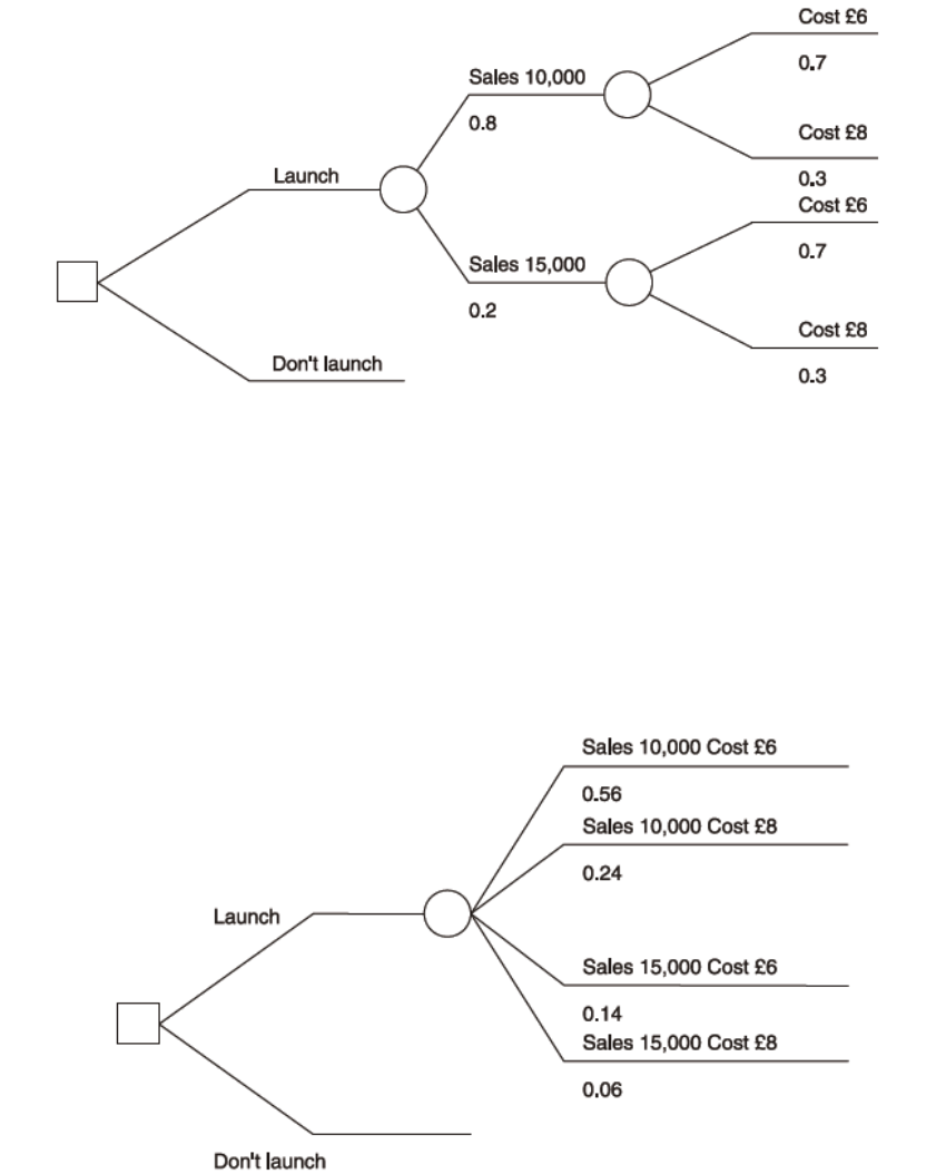
Page 484
a) The decision tree could be drawn as follows.
b) The layout shown above will usually be easier to use than the alternative way of
drawing the tree, which is as follows.

Page 485
Sometimes, a decision take now will lead to other decisions to be taken in the future.
When this situation arises, the decision tree can be drawn as a two –stage tree, as follows.
In this tree, either a choice between A and B or else a choice between C and D will be make,
depending on the outcome which occurs after choosing X.
The decision tree should be in chronological order from left to right. When there are two-
stage decision trees, the first decision in time should be drawn on the left.
Example: A decision tree
Beethoven has a new wonder product, the vylin, of which it expects great things. At the
moment the company has two courses of action open to it, to test market the product or
abandon it.
If the company test markets it, the cost will be RWF100,000 and the market response could
be positive or negative with probabilities of 0.060 and 0.40.
If the response is positive the company could either abandon the product or market if full
scale.
If it markets the vylin full scale, the outcome might be low, medium or high demand, and the
respective net gains/(losses) would be (200) , 200 or 1,000 in units of RWF1,000 (the result
could range from a net loss of RWF200,000 to a gain of RWF1,000,000). These outcomes
have probabilities of 0.20, 0.50 and 0.30 respectively.
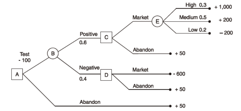
Page 486
If the result of the test marketing is negative and the company goes ahead and markets the
product estimated losses would be RWF600,000.
If , at any point, the company abandon the product, there would be a net gain of RWF50,000
from the sale of scrap. All the financial values have been discounted to the present.
Required
a) Draw a decision tree
b) Include figures for cost, loss or profit on the appropriate branches of the tree.
Solution
The starting point for the tree is to establish what decision has to be made now. What are the
options?
a) To test market
b) To abandon
The outcome of the ‘abandon’ option is known with certainty. There are two possible
outcomes of the option to test market, positive response and negative response.
Depending on the outcome of the test marketing, another decision will then be made, to
abandon the product or to go ahead.

Page 487
Evaluating the decision with a decision tree
Rollback analysis evaluates the V or each decision option. You have to work from right to
left and calculate EVs at each outcome point.
The EV of each decision option can be evaluated, using the decision tree to help with keeping
the logic on track. The basic rules are as follows.
a) We start on the right hand side of the tree and work back towards the left hand side
and the current decision under consideration . This is sometimes known as the
‘rollback’ technique or ‘rollback analysis’
b) Working from right to left, we calculate the EV of revenue, cost contribution or
profit at each outcome point on the tree
In the above example, the right-hand-most outcome point is pint E, and EV is as follows.
Profit
Probability
x
p
px
RWF’000
RWF’000
High
1,000
0.3
300
Medium
200
0.5
100
Low
(200)
0.2
(40)
EV
360
This is the EV of the decision to market the product if the test shows positive response. It
may help you to write the EV on the decision tree itself, at the appropriate outcome point
(point E).
a) At decision point C, the choice is as follows.
(i) Market, EV = +360 (the EV at point E)
(ii) Abandon, value = + 50
The choice would be to market the product, and so the V at decision point C is +360
Page 488
b) At decision point D, the choice is as follows.
(i) Market, value = -600
(ii) Abandon , value =+ 50
The choice would be to abandon, and so the EV at decision point D is +50
The second stage decisions have therefore been made. If the original decision is to test
market, the company will market the product if the test shows positive customer response,
and will abandon the product if the test results are negative.
The evaluation of the decision tree is completed as follows.
a) Calculate the EV at outcome point B.
0.6 x 360 (Ev at C)
+ 0.4 x 50 (EV at D)
= 216 + 20 = 236
b) Compare the options at point A, which are as follows
(i) Test: EV =EV at B minus test marketing cost = 236 -100=136
(ii) Abandon: Value = 50
The choice would be to test market the product, because it has a higher EV of profit
Page 489
Question
Consider the following diagram
If a decision maker wished to maximise the value of the outcome, which options should
be selected?
A. Option 2 and option 7
B. Option 3
C. Option 1 and option 4
D. Option 2, option 6 and option 8
Answer
The correct answer is A.
The various outcomes must be evaluated using expected values.
EV at point B: (0.75x 10,000) + (0.25x8,000) = 9,500
EV at point D: (0.6 x 20,000) + (0.4 x ((4,000) = 10,400
EV at point C: choice between 10,400 and 11,000
EV at point A : Choice between B (9,500), C (10,400 or 11,000) and choice 3 (9,000).
If we are trying to maximise the figure, option 2 and the option 7 are chosen to give 11,000.
Page 490
Evaluating decisions by using decision trees has a number of limitations.
a) The time value of money may not be taken into account.
b) Decision trees are not very suitable for use in complex situations.
c) The outcome with the highest EV may have the greatest risks attached to it. Managers
may be reluctant to take risks which may lead to loses.
d) The probabilities associated with different branches of the ‘tree’ are likely to be
estimates, and possibly unreliable or inaccurate.

Page 491
F. THE VALUE OF INFORMATION
Perfect information is guaranteed to predict the future with 100% accuracy. Imperfect
information is better than no information at all but could be wrong in its prediction of the
future.
The value of perfect information is the difference between the EV of profit with perfect
information and the EV of profit without perfect information.
Perfect information removes all doubt and uncertainty from a decision, and enables
managers to make decisions with complete confidence that they have selected the optimum
course of action.
The value of perfect information.
Step 1
If we do not have perfect information and we must choose between two or more decision
options we would select the decision option which offers the highest EV of profit. This option
will not be the best decision under all circumstances. There will be some probability that
what was really the best option will not have been selected, given the way actual events turn
out.
Step 2
With perfect information, the best decision option will always be selected. The profits from
the decision will depend on the future circumstances which are predicted by the information
nevertheless, the EV of profit with perfect information should be higher than the EV of profit
without the information.
Step 3
The value of perfect information is the difference between these two EVs

Page 492
Example : the value of perfect information
The management of Ivor Ore must choose whether to go ahead with either of two mutually
exclusive projects, A and B. The expected profits are as follows.
Profit if there is strong demand Profit/(loss) if there is weak demand
Option A RWF4,000 RWF(1,000)
Option B RWF1,500 RWF500
Probability of demand 0.3 0.7
Required
a) Ascertain what the decision would be, based on expected values, if no information
about demand wee available.
b) Calculate the value of perfect information about demand.
Solution
Step 1
If there were no information to help with the decision, the project with the higher EV of profit
would be selected.
Project B would be selected
This is clearly the better option if demand turns out to be weak. However, if demand were to
turn out to be strong, project A would be more profitable. There is a 30% chance that this
could happen.
Probability
Project A
Project B
Profit
EV
Profit
EV
RWF
RWF
RWF
RWF
0.3
4,000
1,200
1,500
450
0.7
(1,000)
(700)
500
350
500
800

Page 493
Step 2
Perfect information will indicate for certain whether demand will be weak or strong. If
demand is forecast ‘weak’ project B would be selected. If demand is forecast as ‘strong’ ,
project A would be selected, and perfect information would improve the profit from
RWF1,500, which would have been earned by selecting B, to RWF4,000
Forecast
Project
demand
Probability
chosen
Profit
EV of profit
RWF
RWF
Weak
0.7
B
500
350
Strong
0.3
A
4,000
1,200
EV of profit with perfect information
1,550
Step 3
RWF
EV of profit without perfect information (ie if project B is always chosen) 800
EV of profit with perfect information 1,550
750
Provided that the information does not cost more than RWF750 to collect, it would be worth
having.
Question
WL must decide at what level to market a new product, the urk. The urk can be sold
nationally, within a single sales region (where demand is likely to be relatively strong) or
within a single area. The decision is complicated by uncertainty about the general strength of
consumer demand for the product, and the following conditional profit table has been
constructed.

Page 494
Weak Demand
Moderate
Strong
RWF
RWF
RWF
Market
Nationally (A)
(4,000)
2,000
10,000
In one region (b)
0
3,500
4,000
In one area (C)
1,000
1,500
2,000
Probability
0.3
0.5
0.2
Required
Option B should be selected, based on EVs of profit. True or False?
Answer
The correct answer is option B and so the statement is true.
Without perfect information, the option with the highest EV of profit will be chosen.
Probability Option A
Profit
(National)
EV
Option B
Profit
(Regional)
EV
Option C
Profit
EV
RWF
RWF
RWF
RWF
RWF
RWF
0.3
(4,000)
(1,200)
0
0
1,000
300
0.5
2,000
1,000
3,500
1,750
1,500
750
0.2
10,000
2,000
4,000
800
2,000
400
1,800
2,550
1,450
Marketing regionally (option B) has the highest EV of profit, and would be selected.
Question
Use the information in your answer to the question above (Decision based on EV of profit)

Page 495
Required
Calculate the value of perfect information about the state of demand.
Answer
The correct answer is RWF1,500.
If perfect information about the state of consumer demand were available, option A would be
preferred if the forecast demand is strong and option C would be preferred if the forecast
demand is weak.
Probability
Choice
Profit
EV of profit
RWF
RWF
Weak
0.3
C
1,000
300
Moderate
0.5
B
3,500
1,750
Strong
0.2
A
10,000
2,000
EV of profit with perfect information
4,050
EV of profit, selecting option B
2,550
Value of perfect information
1,500
Page 496
Perfect information and decision trees
When the option exists to obtain information, the decision can be shown, like any other
decision, in the form of a decision tree, as follows. We will suppose, for illustration, that the
cost of obtaining perfect information is RWF400.
The
decision would be to obtain perfect information, since the EV of profit is RWF4,050 -
RWF400 = RWF3,650.
You should check carefully that you understand the logic of this decision and that you can
identify how the EVs at outcome boxes 1, 2, 3 and 4 have been calculated.
The value of imperfect information
There is one serious drawback to the technique we have just looked at: in practice, useful
information is never perfect unless the person providing it is the sole source of the
uncertainty. Market research findings or information from pilot tests and so on are likely to
be reasonably accurate, but they can still be wrong: they provide imperfect information. It is
possible, however, to arrive at an assessment of how much it would be worth paying for

Page 497
such imperfect information, given that we have a rough indication of how right or
wrong it is likely to be.
Suppose we are considering the sex and hair colour of people in a given group or population
consisting of 70% men and 30% women. We have established the probabilities of hair
colourings as follows:
Men Women
Brown 0.60 0.35
Blonde 0.35 0.55
Red 0.05 0.10
This shows, for example, that 5% of men in such a sample have red hair. These probabilities
of sex and hair colouring might be referred to as prior probabilities.
Posterior probabilities consider the situation in reverse or retrospect, so that we can ask the
question: ‘Given that a person taken at random from the population is brown-haired what is
the probability that the person is male (or female)?’
The information can be presented in a table. Let’s suppose that the population consists of
1,000 people.
Male Female Total
Brown 420 (W3) 105 (W4) 525 (W5)
Blonde 245 165 410
Red 35 30 65
700 (W1) 300 (W2) 1,000
Workings
1 1,000 x 70%
2 1,000 – 700
3 700 x 60% (the other two values in the column being calculated in a similar way)
Page 498
4 300 x 35% (the other two values in the column being calculated in a similar way)
5 420 +105 (the other two values in the column being calculated in a similar way)
∴ P (Person selected is a male, given that that person is brown-haired) = 420/525 = 0.8
Example: The value of imperfect information
Suppose that the Small Oil Company (SOC) is trying to decide whether or not to drill on a
particular site. The chief engineer has assessed the probability that there will be oil, based on
vast experience, as 20% and the probability that there won’t be oil as 80%.
It is possible for the SOC to hire a firm of international consultants to carry out a complete
survey of the site. SOC has used the firm many times before and has estimated that if there
really is oil, there is a 95% chance that the report will be favourable, but if there is no oil,
there is only a 10% chance that the report will indicate there is oil.
Required
Determine whether drilling should occur.
Solution
Read the information given carefully. We are given three sets of probabilities.
a) The probability that there will be oil (0.2) or there will not be (0.8). These outcomes
are mutually exclusive.
b) The probability that, If there is oil, the report will say there is oil (0.95) or say there is
no oil (0.05)
c) The probability that, if there is no oil, the report will say there is oil (0.1) or say there
is no oil (0.9).
Both (b) and (c) describe conditional events, since the existence of oil or otherwise influences
the chances of the survey report being correct.
SOC, meanwhile faces a number of choices which we can show as a decision tree.

Page 499
We must now calculate the probabilities of the following outcomes.
− The information will say ‘oil’ or ‘no oil’
− The information will be right or wrong if it says ‘oil’
− The information will be right or wrong if it says ‘no oil’
If you check the information given in the problem, you will find that these probabilities are
not given.
a) We are told that the engineer has assessed that there is a 20% chance of oil and an
80% chance of no oil (ignoring information entirely). These are the prior
probabilities of future possible outcomes.
b) The probabilities that there will be oil or no oil once the information has been
obtained are posterior probabilities.
Step 1
We can tabulate the various probabilities as percentages.
Oil
No Oil
Total
Survey
Oil
19
(w2)
8
(w3)
27
(w4)
Result:
No oil
1
72
73
Total
20
(w1)
80
100
Page 500
Workings
1 The engineer estimates 20% probability of oil and 80% of no oil.
2. If there is oil, ie. in 20 cases out of 100, the survey will say so in 95% of these cases,
i.e. in 20 x0.95 =19 cases. The 1 below the 19 is obtained by subtraction.
3. In the 80 per 100 cases where there is in fact no oil, the survey will wrongly say that
there is oil 10% of the time; ie 80x 0.10 = 8 cases. The 72 below the 8 is obtained by
subtraction.
4. The horizontal totals are given by addition.
Step 2
We can now provide all the probabilities needed to complete the tree.
P (survey will say there is oil) = 27/100 = 0.27
P (survey will say there is no oil) = 73/100 =0.73
If survey says oil P (there is oil) =19/27 =0.704
P (there is no oil) = 8/27 =0.296 (or 1-0.704)
If survey says no oil P (there is oil) = 1/73 =0.014
P (there is no oil) =72/73 =0.986 (or 1-0.014)
Step 3
We can now go on to complete the decision tree. Let us make the following assumptions.
− The cost of drilling is RWF10m.
− The value of the benefits if oil is found is RWF70m, giving a net ‘profit’ of RWF60m
− The cost of obtaining information from the consultants would be RWF3m.
An assumption is made that the decision maker will take whichever decision the information
indicates is the best. If the information says ‘oil’, the company will drill and if the
information says ‘no oil’ it will not drill.
Page 501
The information is ‘no oil’@, so the company won’t drill, regardless of whether there really
is oil or not.
Step 4
We can now perform rollback analysis.
RWFm
EV at point 2 = 0.704xRWF60m 42.24
0.296x(RWF10m) (2.96)
+39.28
Page 502
RWFm
EV at point 2 = 0.27xRWF39.28m 10.61
0.73xRWF0 0.00
+10.61
Step 5
There are three choices EV
a) Do not obtain information and do not drill RWFO
b) Do not obtain information and drill +RWF4million
c) Obtain information first, decide about drilling later (RWF(10.61m – 3m)
+7.61million
The decision should be to obtain the information from a survey first.
Step 6
The value of the imperfect information is the difference between (b) and (c) , RWF3.61
million.

Page 503
G. SENSITIVITY ANALYSIS
Sensitivity analysis can be used in any situation so long as the relationships between the key
variables can be established. Typically this involves changing the value of a variable and
seeing how the results are affected.
Approaches to sensitivity analysis
Sensitivity analysis is a term used to describe any technique whereby decision options are
tested for their vulnerability to changes in any 'variable' such as expected sales volume, sales
price per unit, material costs, or labour costs.
Here are three useful approaches to sensitivity analysis.
a) To estimate by how much costs and revenues would need to differ from their
estimated values before the decision would change.
b) To estimate whether a decision would change if estimated costs were x% higher than
estimated, or estimated revenues y% lower than estimated.
c) To estimate by how much costs and/or revenues would need to differ from their
estimated values before the decision maker would be indifferent between two
options.
The essence of the approach, therefore, is to carry out the calculations with one set of values
for the variables and then substitute other possible values for the variables to see how this
affects the overall outcome.
a) From your studies of information technology you may recognise this as what if
analysis that can be carried out using a spreadsheet.
b) From your studies of linear programming you may remember that sensitivity analysis
can be carried out to determine over which ranges the various constraints have an
impact on the optimum solution.
c) Flexible budgeting can also be a form of sensitivity analysis.

Page 504
Example: sensitivity analysis
Sensivite has estimated the following sales and profits for a new product which it may launch
on to the market.
RWF RWF
Sales (2,000 units) 4,000
Variable costs: materials 2,000
labour 1,000
3,000
Contribution 1,000
Less incremental fixed costs 800
Profit 200
Required
Analyse the sensitivity of the project.
Solution
a) If incremental fixed costs are more than 25% above estimate, the project would make
a loss.
b) If unit costs of materials are more than 10% above estimate, the project would make
a loss.
c) Similarly, the project would be sensitive to an increase in unit labour costs of more
than RWF200, which is 20% above estimate, or else to a drop in the unit selling price
of more than 5%.
d) The margin of safety, given a breakeven point of 1,600 units, is (400/2,000) x 100%
= 20%.
Management would then be able to judge more clearly whether the product is likely to be
profitable. The items to which profitability is most sensitive in this example are the selling
price (5%) and material costs (10%). Sensitivity analysis can help to concentrate
management attention on the most important factors.

Page 505
H. SIMULATION MODELS
Simulation models can be used to deal with decision problems involving a number of
uncertain variables. Random numbers are used to assign values to the variables.
One of the chief problems encountered in decision making is the uncertainty of the future.
Where only a few factors are involved, probability analysis and expected value calculations
can be used to find the most likely outcome of a decision. Often, however, in real life, there
are so many uncertain variables that this approach does not give a true impression of
possible variations in outcome.
To get an idea of what will happen in real life one possibility is to use a simulation model in
which the values and the variables are selected at random. Obviously this is a situation
ideally suited to a computer (large volume of data, random number generation).
The term 'simulation' model is often used more specifically to refer to modelling which
makes use of random numbers. This is the 'Monte Carlo' method of simulation. In the
business environment it can, for example, be used to examine inventory, queuing, scheduling
and forecasting problems.
Random numbers are allocated to each possible value of the uncertain variable in proportion
to the probabilities, so that a probability of 0.1 gets 10% of the total numbers to be assigned.
These random numbers are used to assign values to the variables.

Page 506
Example: simulation and spreadsheets
A supermarket sells a product for which the daily demand varies. An analysis of daily
demand over a period of about a year shows the following probability distribution.
Demand per day Probability
Units
35 0.10
36 0.20
37 0.25
38 0.30
39 0.08
40 0.07
1.00
To develop a simulation model in which one of the variables is daily demand, we would
assign a group of numbers to each value for daily demand. The probabilities are stated to
two decimal places, and so there must be 100 random numbers in total, 00 – 99 (we use 00-99
rather than 1-100 so that we can use two-digit random numbers.) Random numbers are
assigned in proportion to the probabilities, so that a probability of 0.1 gets 10% of the total
numbers to be assigned, that is 10 numbers: 0, 1, 2, 3, 4, 5, 6, 7, 8 and 9.
The assignments would therefore be as follows.
Demand per day Probability Numbers assigned
Units
35 0.10 00 – 09
36 0.20 10 – 29
37 0.25 30 – 54
38 0.30 55 – 84
39 0.08 85 – 92
40 0.07 93 – 99
Page 507
When the simulation model is run, random numbers will be generated to derive values for
daily demand. For example, if the model is used to simulate demand over a ten day period,
the random numbers generated might be as follows.
19007174604721296802
The model would then assign values to the demand per day as follows.
Day Random number Demand
Units
1 19 36
2 00 35
3 71 38
4 74 38
5 60 38
6 47 37
7 21 36
8 29 36
9 68 38
10 02 35
You might notice that on none of the ten days is the demand 39 or 40 units, because the
random numbers generated did not include any value in the range 85 – 99. When a simulation
model is used, there must be a long enough run to give a good representation of the system
and all its potential variations.
Page 508
Uses of simulation
In the supermarket example above, the supermarket would use the information to minimise
inventory holding without risking running out of the product. This will reduce costs but avoid
lost sales and profit.
A supermarket can also use this technique to estimate queues with predicted length of waiting
time determining the number of staff required.

Page 509
STUDY UNIT 16
Spreadsheets
Contents
Unit
Title
Page
A.
Origins of Spreadsheets
511
B.
Modern Spreadsheets
513
C.
Concepts
515
D.
How Spreadsheets work
521
E.
Users of Spreadsheets
523
F.
Advantages & Disadvantages of Spreadsheets
525
G.
Spreadsheets in Today’s Climate
527

Page 510
BLANK

Page 511
A. ORIGINS OF SPREADSHEETS
Computer spreadsheets copy the format of paper-based sheets that have been used by
accountants and bookkeepers for years. Users of electronic spreadsheets are able to base
displayed numbers on formulas. Microsoft first developed the common graphical interface,
well known to modern spreadsheet users.
A spreadsheet is a computer application with tools that increase the user’s productivity in
capturing, analysing and sharing tabular data sets. It displays multiple cells usually in a two-
dimensional matrix or grid consisting of rows and columns. Each cell contains alphanumeric
text, numeric values or formulas. A formula defines how the content of that cell is to be
calculated from the contents of any other cell (or combination of cells) each time any cell is
updated.
Spreadsheets developed as computerized simulations of paper accounting worksheets. They
boost productivity because of their ability to re-calculate the entire sheet automatically after a
change to a single cell is made (which was a manual process in the days of paper ledgers).
Spreadsheets have now replaced paper-based systems throughout the business world.
Although they were first developed for accounting or bookkeeping tasks, they now are used
extensively in any context where tabular lists are built, sorted, and shared.

Page 512
BLANK

Page 513
B. MODERN SPREADSHEETS
A modern spreadsheet file consists of multiple worksheets that make up one workbook. A
cell in one sheet is adept of referencing cells on other, different sheets, whether within the
same workbook or even, in some cases, in different workbooks.
Spreadsheets share many principles and qualities of databases, but spreadsheets and databases
are not the same thing. A Spreadsheet is essentially just one table, whereas a database is a
collection of many tables with machine-readable semantic relationships between them.

Page 514
BLANK

Page 515
C. CONCEPTS
The main concepts are those of a grid of cells, called sheet, with either raw data, called
values, or formulas in the cells. Formulas say how to mechanically compute new values from
existing values. Values are generally numbers, but can be also pure text, dates. Months etc.
Extensions of these concepts include logical spreadsheets. Various tools for programming
Sheets, visualizing data, remotely connecting sheets, displaying cells dependencies, etc. are
commonly provided.
Cells
A “cell” can be thought of as a box for holding a datum. A single cell is usually referenced
by its column and row.
An array of cells is called a “sheet” or “worksheet”. It is equivalent to an array of variables
in a conventional computer program. In most implementations, many worksheets may be
located within a single spreadsheet. A worksheet is simply a subset of the spreadsheet
divided for the sake of clarity. Functionally, the spreadsheet operates as a whole and all cells
operate as global variables within the spreadsheet.
A cell may contain a value or a formula, or it may simply be left empty. By convention,
formulas usually begin with = sign.
Values
A value can be entered from the computer keyboard by directly typing into the cell itself.
Alternatively, a value can be based on a formula, which might perform a calculation, display
the current date or time, or retrieve external data such as a stock quote or a database value.
Page 516
Automatic recalculation
This optional feature eliminates the need to manually request the spreadsheet program to
recalculate values
Real-time update
This feature refers to updating a cell’s contents periodically when its value is derived froman
external source – such as a cell in another “remote” spreadsheet. For shared, web-based
spreadsheets, it applies to “immediately” updating cells that have been altered by another
user. All dependent cells have to be updated also.
Locked cell
Once entered, selected cells can optionally be “locked” to prevent accidental overwriting.
Typically this would apply to cells containing formulas but might be applicable to cells
containing “constants” such as a kilogram/pounds conversion factor. Even though individual
cells are marked as locked, the spreadsheet data are not protected until the feature is activated
in the file preferences.
Data format
A cell or range can optionally be defined to specify how the value is displayed. The default
display is usually set by its initial content if not specifically previously set, so for
example“23.06.2012” or 23rd June 2012 would default to the cell format of “date”.
Some cell formats such as “numeric” or “currency” can also specify the number of decimal
places. This can allow invalid operations resulting in inconsistent results without warning.
Page 517
Cell formatting
Depending on the capability of the spreadsheet application, each cell can be separately
formatted using the attributes of either the content (point size, colour, bold or italic) or the
cell (border thickness, background shading, colour). To aid the readability of a spreadsheet,
cell formatting may be conditionally applied to data – for example, a negative number may be
displayed in red.
A cell’s formatting does not typically affect its content and depending on how cells are
referenced or copied to other worksheets or applications, the formatting may not be carried
with the content.
Named cells
In most implementations, a cell, or group of cells in a column or row, can be “named”
enabling the user to refer to those cells by a name rather than by a grid reference. Names
must be unique within the spreadsheeet, but when using multiple sheets in a spreadsheet file,
an identically named cell range on each sheet can be used if it is distinguished by adding the
sheet name.
Cell Reference
Most cell references indicate another cell in the same spreadsheet, but a cell reference can
also refer to a cell in a different sheet within the same spreadsheet, or to a cell in another
spreadsheet entirely, or to a value from a remote application.
Page 518
Cell Ranges
Reference to a range of cells is typically of the form (A1:A6) which specifies all the cells in
the range A1 through to A6. A formula such as “=sum(A1:A6)” would add all the cells
specified and put the result in the cell containing the formula itself.
Formulas
A formula identifies the calculation needed to place the result in the cell it is contained
within.
A cell containing a formula therefore has two display components; the formula itself and the
resulting value. The formula is normally only shown when the cell is selected by “clicking”
the mouse over a particular cell; otherwise it contains the result of the calculation.
A formula assigns values to a cell or range of cells.
Functions
Spreadsheets usually contain a number of supplied functions, such as arithmetic operations,
for example summations, averages, trigonometric functions, statistical functions. There is
often a provision for user-defined functions. Programs can be written that pull information
from the worksheet, perform some calculations, and report the results back to the worksheet.
Charts
Many spreadsheet applications permit charts, graphs or histograms to be generated from
specified groups of cells which are dynamically re-built as cell contents change.
Thegenerated graphic component can either be embedded within the current sheet or added as
a separate object.
Page 519
End User Development
Spreadsheets are a popular End-use development tool. EUD denotes activities or methodsin
which people who are not professional developers create automatic behaviour and complex
data objects without significant knowledge of a programming language. Many people find it
easier to perform calculations in speadsheets than by writing the same sequential program.
Macros
A “macro” can be defined as a rule or pattern that specifies how a certain input sequence
should be mapped to a replacement input sequence according to a defined procedure. Macros
enable a programmer to code reuse or even design domain-specific languages. Keyboard
Macros and mouse macros allow short sequences of keystrokes and mouse actions to be
transformed into other, usually more time-consuming, sequences of keystrokes and mouse
actions. In this way frequently used or repetitive sequences of keystrokes and mouse
movements can be automated. Separate programs for creating these macros are known as
macro recorders.
Graphs
A graph or chart is a diagrammatical illustration of a set of data. If the graph is uploaded as
an image file, it can be placed within articles just like any other image.
Graphs must be accurate and convey information efficiently. They should be viewable at
different computer screen resolutions.
Eg’s of graphs – Pie Chart, Bar graph
Page 520
Formatting
The list below outlines what is required in formatting documents:-
• Set margins and page set up
• Set page and line numbers
• Set page and section breaks
• Set tables, lists columns
• Set up table of contents, index and tables of figures
• Cross references, captions and bookmarks
• Footnotes and endnotes
• Styles and Reusing Formatting
• Autosummarise
What-if Analysis
What-if analysis is the process of changing the values in cells to see how those changes will
affect the outcome of formulas on the worksheet.
3 kinds of what-if analysis tools:-
• Scenarios
• Data tables
• Goal seek
Discounted Cash flows
Discounted cash flow analysis can be done with spreadsheets. The following steps are
required:-
• Project unlevered FCFs (free cash flow)
• Choose a discount rate
• Calculate the TV (terminal value)
• Calculate the enterprise value by discounting the projected UFCFs (unlevered free
cash flow)and TV(terminal value) to net present value
• Calculate the equity value by subtracting net debt from EV (enterprise value)
• Review the results

Page 521
D. HOW SPREADSHEETS WORK
Computer models of mathematical data, such as budgets, are usually done using a spreadsheet
application that processes and performs calculations on the data entered by the user. For example, a
computer model of a supermarket’s budget might show that the supermarket will run out of money
before the end of the week/month/year.
A spreadsheet apprears as a grid, each row has its own number and each column its own reference, for
example M12 means column M, row 12.
It is also possible to refer to a range of cells collectively, ie B4:B24 includes B4,B24 and all of the
cells in-between.
Cells can contain numbers, text or formulae.
Example Spreadsheet
A stationery shop uses a mobile shop to sell stationery to customers who live in the countryside
Daily Sales
A
B
C
D
E
3
Product
Code
Description
of
Stationery
Numbers
sold
Price RWF
Sales RWF
4
0147EH
Pens
6
1000
6,000
5
0148BN
Copy books
3
1500
4,500
6
0145EG
Stapler
1
3000
3,000
7
0777BN
Desk Tidy
1
1200
1,200
8
0778CN
Desk Punch
1
1700
1,700
9
0147VB
Lever Arch
files
8
1450
11,600
10
0148PP
Dividers
2
2300
4,600
11
0523YU
Paper
10
5000
50,000
12
0512PO
Coloured
Paper
2
7000
14,000
13
Total 96,600
There are a number of formulae in the above spreadsheet but they are hidden, only the results are
displayed.
Page 522
Formulae
The formula in cells E4 to E12 works out the total value of sales for each item. It does this by
multiplying the number sold by the individual price.
The formula for columns C & D = (C4*D4) = 6 X1000 = 6000
Cell 13 contains a formula that calculates the total value of the sales column. The formulae used is
=sum(E4:E12). This formula includes cells E4,E12 and all of the cells in-between. You could write
it =E4+E5+E6+E7+E8+E9+E10+E11+E12 which will give the same result but is overly complicated
and leaves more room for errors.

Page 523
E. USERS OF SPREADSHEETS
Accountants
Accountants need to keep track of all the money coming into the business and all of the payments
going out. They need to be able to calculate profits and forecast how well they think the business
will do during the next year. They also need to calculate wages of all the staff each month.
Teachers
Teachers can use spreadsheets to keep track of marks given for homework and recording examination
results and also for registers.
Engineers
Engineers need to perform thousands of calculations when designing bridges, buildings, aeroplanes,
cars etc.
Sales People
Sales people use spreadsheets to keep a record of the items they sell, the profit made on each item and
more importantly, the commission they have earned.
Scientists
Scientists need to be able to keep track of their results from experiments. They use spreadsheets to
help them analyse what happened with the experiment and also to predict what might happen if they
were to change one variable.
Supermarkets
Supermarkets use spreadsheets to keep a record of finances, ie sales, losses and money spent. They
also use spreadsheets to work out queuing times and what are the best number of checkouts to have
open at any one time during the day.
Anyone can find use for spreadsheets. Spreadsheets are useful in budgets, accounting, graphing and a
lot of clerical work. People from all occupations and vocations can benefit from using spreadsheets.

Page 524
BLANK

Page 525
F. ADVANTAGES AND DISADVANTAGES OF
SPREADSHEETS
Advantages
• Using spreadsheets you can see all the data at once and when you change any data all
computations can be instantly updated with the change
• You can organise information within spreadsheets
• Spreadsheets assist with calculations
• With spreadsheets you can correct the wrong entry and recalculate
• With spreadsheeets you can email and print copies
• Spreadsheets can assist in many tasks with accuracy and speed.
• The main advantage of spreadsheets is when complex mathematical calculations need to be
carried out on large amounts of numerical data. It’s a powerful complex calculator.
Disadvantages
• Spreadsheets have significant reliability problems. Research studies estimate that roughly
94% of spreadsheets deployed in the field contain errors, and 5.2% of cells in unaudited
spreadsheets contain errors.
• Lack of auditing and revision control. This makes it difficult to determine who changed what
and when. This can cause problems with regulatory compliance. Lack of revision control
greatly increases the risk of errors due to the inability to track, isolate and test changes made
to a document.
• Lack of security. Generally if one has permission to open a spreadsheet, one has permission
to modify any part of it.
• It is easy for someone to introduce an error, either accidently or intentionally, by entering
information in the wrong place or expressing dependencies among cells.
• Trying to manage the sheer volume of spreadsheets which sometimes exists within an
organisation without proper security, audit trails, the unintentional introduction of errors and
other items listed above can be overwhelming.

Page 526
BLANK

Page 527
G. SPREADSHEETS IN TODAY’S CLIMATE
In preparing forecasts, spreadsheets can be used to automatically generate future values that are based
on existing data, or to automatically generate extrapolated values that are based on linear trend or
growth trend calculations.
Whether at the office or at home, drawing and maintaining budgets is important. Not only will you be
focused and be able to pursue your financial objects clearly with a budget, but you can compare your
actual versus planned performance. You can easily prepare a detailed budget with spreadsheets. The
calculations can easily be done by entering appropriate formulas and getting the totals and differences.
Spreadsheets can be used to prepare cash flow analysis for watching and predicting likely income and
expenditure to keep on track with financial affairs of your office or home.
Similarly you may easily predict changes in values such as effects of a price change on costs,
discounts and profit. A fixed table can be prepared to show these changes but more significantly the
figures could be changed from time to time to reflect new situations with same formulas in place.
Many businesses use spreadsheets to calculate balance sheets, profit and loss accounts and cash
books.
Spreadsheets can be used for bank reconciliations, calculate job costs, taxes, schedule payments,
forecast profits and control stocks. In all these tasks the spreadsheet proves a very important tool in
simplifying the computation process and production of results.
Spreadsheets can be used to record, present and analyse the results of polls, surveys and research.
With the advancements in technology especially mobile phones, you can do all that while on the road
and getting the results immediately.
What began as simply a rows and columns format of showing numerical data soon grew into a
computerized method of maintaining mathematical information, eventually including the capability to
perform complex formulaic operations and data retention. Nowadays, spreadsheets often play a
prominent role in corporate operations, and can be used as the basis for graphs in presentations and
scenario prediction calculations.
Spreadsheets seem to upgrade and grow appropriately to accommodate new needs and features.
Spreadsheets can be dynamically altered and discussed in a workgroup of various people around the
globe. The power of the spreadsheet is limited only by the creativity of its user, and his or her ability
to enter, modify and present numbers in meaningfuly beneficial ways.
