CHARTrunner 3.6 User Guide
User Manual: CHARTrunner 3.6 User Guide user guide pdf - FTP File Search (19/20)
Open the PDF directly: View PDF ![]() .
.
Page Count: 368 [warning: Documents this large are best viewed by clicking the View PDF Link!]
- PQ Systems copyright notice
- Welcome
- Installing CHARTrunner
- Getting started
- Tutorial
- Data and chart types
- Basic chart definition
- Multi-charts and Workspaces
- Customizing a chart definition
- Measurement control charts
- Attributes control charts
- Cusum control charts
- Short-run control charts
- Types of short-run control charts
- Limits/Targets tab - short-run charts
- Control limits sub-tab - short-run charts
- Short-run targets sub-tab - short-run charts
- Chart options sub-tab - short-run charts
- X-axis Y-axis sub-tab - short-run charts
- Extra lines sub-tab - short-run charts
- Chart data display sub-tab - short run charts
- Rare event control charts
- Pareto charts
- Histogram charts
- Box and whisker charts
- Multi-line charts
- Scatter diagram charts
- Titles tab - applies to all charts
- Misc. tab - applies to all charts
- Advanced row selection
- Applying an extra line to specific subgroups
- Understanding the data order concept
- Using charts
- Displaying charts
- Controlling the chart display window
- Charts that scroll
- Other chart display menus
- Editing and copying chart definitions
- Editing and copying chart styles
- Deleting charts and chart styles
- Using annotations on charts
- Control limits
- What are control limits?
- What are temporary control limits?
- Editing existing control limits
- Disable (hide) control limits
- Delete control limits - from the chart display
- Delete control limits - from the chart definition form
- To compute a new set of saved control limits
- The control limits dialog
- Using control charts and control limits
- Lloyd Nelson limits option
- Printing charts
- Saving charts and sharing them with others
- Linking to chart or dashboard images using Microsoft PowerPoint or Word
- Publishing charts
- Using styles to control the look of your charts
- Out-of-control tests
- Dashboards
- Cpk Advisor Analysis
- OOC Summary
- System settings
- CHARTrunner viewer
- Appendix A: Formulas used by CHARTrunner
- Appendix B: CHARTrunner command line arguments
- Appendix C: Tips and troubleshooting
- Online information
- CHARTrunner performance tip
- Comma and decimal separators
- Time on the charts
- Defining the advanced tab's week option - what is a week?
- Filter to exclude outliers
- Filter for missing values as an identifier
- Close data source after drawing chart
- Microsoft Access data source
- Microsoft Excel data source
- Getting to Excel data via the ADO;OLE DB provider
- Column to use for order by does not allow you to select anything
- Using the LIKE operator in a filter or SQL expression
- Accessing charts using windows explorer
- Accessing dashboards using windows explorer
- Appendix D: Data sources
- Contact technical support if you need help connecting to your data
- Using Excel data
- General rules for setting up Excel sheets for use with CHARTrunner
- Using ODBC data sources
- The DSN method of using ODBC
- The DSN-less method of using ODBC
- Using ADO;OLE DB data sources
- Using ADO to connect to an XML recordset
- Using Text or CSV data
- Using FoxPro data
- Using Paradox 3 data
- Using Minitab data
- Using Lotus Notes databases
- Using Oracle databases
- Using SQL Server databases
- Charting from data on the clipboard
- Appendix E: Out-of-control tests and codes
- Index

User's Guide
CHARTrunner
Version 3.6
Copyright © 2006-2011 Productivity-Quality Systems, Inc. Productivity-Quality Systems, Inc. is also
known as PQ Systems, Inc.
All rights reserved. Printed in the United States of America. No part of this document may be reproduced,
stored in a retrieval system, or transmitted, in any form by any means, electronic, mechanical,
photocopying, recording, or otherwise, without the prior written permission of Productivity-Quality
Systems, Inc.
The software contains proprietary information of Productivity-Quality Systems, Inc.; it is provided under a
license agreement containing restrictions on use and disclosure and is also protected by copyright law.
Reverse engineering of the software is prohibited.
Due to continued product development this information may change without notice. The information and
intellectual property contained herein is confidential between Productivity-Quality Systems, Inc. and the
client and remains the exclusive property of Productivity-Quality Systems, Inc. If you find any problems in
the documentation, please report them to us in writing. Productivity-Quality Systems, Inc. makes no
warranties, express or implied, concerning the system, including all warranties of merchantability and
fitness for a particular purpose. No part of this publication may be reproduced, stored in a retrieval
system, or transmitted in any form or by any means, electronic, mechanical, photocopying, recording or
otherwise without the prior written permission of PQ Systems.
CHARTrunner is a trademark of Productivity-Quality Systems, Inc.
GAGEpack is a trademark of Productivity-Quality Systems, Inc.
SQCpack is a trademark of Productivity-Quality Systems, Inc.
PORTspy is a trademark of Productivity-Quality Systems, Inc.
MEASUREspy is a trademark of Productivity-Quality Systems, Inc.
DOEpack is a trademark of Productivity-Quality Systems, Inc.
Total Quality Transformation is a trademark of QIP, Inc. and Productivity-Quality Systems, Inc.
TQT is a trademark of QIP, Inc., and PQ Systems, Inc.
AuthorIT™ is a trademark of AuthorIT Software Corporation Ltd.
Microsoft Word, Microsoft Office, Windows®, Window 95™, Window 98™, Windows NT®, and
MS-DOS™ are trademarks of the Microsoft Corporation.
All other brand and product names are trademarks or registered trademarks of their respective
owners.
This document was created using AuthorIT™, Total Document Creation (see AuthorIT Home -
http://www.author-it.com).
PQ Systems copyright notice

i
Contents
Welcome _________________________________________________________________________ 1
What's new in CHARTrunner 3.6 ...................................................................................................... 2
About your CHARTrunner documentation ......................................................................................... 3
About PQ Systems ............................................................................................................................ 4
How to contact PQ Systems .............................................................................................................. 5
Technical support .............................................................................................................................. 6
Maintenance support agreement ....................................................................................................... 6
PQ Systems End-User License Agreement for
Per-Computer or Concurrent-User License Model ............................................................................ 7
Request for new features .................................................................................................................. 9
Installing CHARTrunner ___________________________________________________________ 11
Hardware and software requirements ............................................................................................. 11
Using the installation README file ................................................................................................. 11
Installing CHARTrunner ................................................................................................................... 12
Upgrading from a prior version of CHARTrunner ............................................................................ 13
Chart definition files ................................................................................................................... 13
Style definition files ................................................................................................................... 13
Steps for migrating to CHARTrunner 3.6 .................................................................................. 14
Getting started ___________________________________________________________________ 15
New CHARTrunner users ................................................................................................................ 15
Why CHARTrunner? ........................................................................................................................ 16
Starting CHARTrunner .................................................................................................................... 16
The CHARTrunner definitions list .................................................................................................... 16
Chart definition form ........................................................................................................................ 17
Step 1: Chart name/type tab ..................................................................................................... 17
Step 2: Data source tab ............................................................................................................ 19
Step 3: Data definition tab ......................................................................................................... 20
Titles tab .................................................................................................................................... 21
Misc. tab .................................................................................................................................... 22
All other tabs ............................................................................................................................. 22
Multi-chart and chart workspace forms............................................................................................ 23
Chart style form ............................................................................................................................... 24
Saving chart, workspace, and style definitions ................................................................................ 24
Getting help ..................................................................................................................................... 25
Exiting CHARTrunner ...................................................................................................................... 25
Tutorial _________________________________________________________________________ 27
Lesson 1 - Set the working folder .................................................................................................... 27
Lesson 2 - Define a chart definition ................................................................................................. 29

ii Contents
Copyright © 2011
Lesson 3 - display and customize the chart .................................................................................... 37
To scroll through the data ......................................................................................................... 38
To close the chart display ......................................................................................................... 39
Editing the chart definition or style ............................................................................................ 39
Create a set of control limits on the chart ................................................................................. 39
To add an annotation to the chart ............................................................................................. 42
Data and chart types ______________________________________________________________ 45
Variables data .................................................................................................................................. 45
Measurement control charts ............................................................................................................ 46
X-bar and range ........................................................................................................................ 47
X-bar and sigma ........................................................................................................................ 48
Median....................................................................................................................................... 49
Individuals and moving range ................................................................................................... 50
Individuals and moving sigma ................................................................................................... 51
Moving average and moving range ........................................................................................... 52
Cusum ....................................................................................................................................... 54
Three-way control ..................................................................................................................... 55
Attributes data .................................................................................................................................. 56
Count (attributes) control charts ...................................................................................................... 57
p-chart ....................................................................................................................................... 57
np-chart ..................................................................................................................................... 58
c-chart ....................................................................................................................................... 59
u-chart ....................................................................................................................................... 60
p’ chart (p prime chart) .............................................................................................................. 61
np’-chart (np prime chart) .......................................................................................................... 62
c’ chart (c prime chart) .............................................................................................................. 63
u' chart (u prime chart) .............................................................................................................. 64
Pareto data ...................................................................................................................................... 65
Pareto charts - category data .......................................................................................................... 66
Pareto - bar chart ...................................................................................................................... 66
Pareto – column chart ............................................................................................................... 67
Pareto - pie ................................................................................................................................ 68
Pareto – stacked bars ............................................................................................................... 69
Pareto – stacked columns ......................................................................................................... 70
When do you use Pareto charts? .............................................................................................. 70
Distribution and capability analysis.................................................................................................. 71
Histogram .................................................................................................................................. 71
Capability analysis ........................................................................................................................... 72
Line charts ....................................................................................................................................... 73
Run chart ................................................................................................................................... 73
Multi-line charts ......................................................................................................................... 74
Scatter diagrams ....................................................................................................................... 75
Advanced charts .............................................................................................................................. 76
Box and whisker ........................................................................................................................ 76
Short-run SPC ................................................................................................................................. 77
Short-run chart types ................................................................................................................. 77
Difference chart vs. zed chart ................................................................................................... 78
Rare event control charts ................................................................................................................ 79
t-chart ........................................................................................................................................ 79
g-chart ....................................................................................................................................... 80

Contents iii
Copyright © 2011
Basic chart definition _____________________________________________________________ 81
Database concepts .......................................................................................................................... 81
Basic chart definition concepts ........................................................................................................ 82
Step 1: Chart name/type tab ............................................................................................................ 83
Step 2: Data source tab ................................................................................................................... 84
If You Select Microsoft Access, Microsoft Excel, text file,
Dbase, or Lotus 123 as the type of data source ....................................................................... 86
If you select ODBC as the type of data source ......................................................................... 87
If you select ADO as the type of data source ........................................................................... 89
Step 3: Data definition tab ............................................................................................................... 91
Filtering chart data ........................................................................................................................... 97
Query parameters ............................................................................................................................ 99
Custom query ................................................................................................................................ 102
Multi-charts and Workspaces ______________________________________________________ 103
Multi-charts (multiple charts on one page) .................................................................................... 103
Workspaces (dealing with multiple charts) .................................................................................... 108
Customizing a chart definition _____________________________________________________ 113
Measurement control charts .......................................................................................................... 113
Types of measurement control charts ..................................................................................... 114
Limits/specs tab - measurement charts .................................................................................. 115
Control chart tab - measurement charts ................................................................................. 117
Attributes control charts ................................................................................................................. 125
Limits tab - attributes charts .................................................................................................... 126
Step 1: Chart name/type tab - attributes chart ........................................................................ 128
Data definition tab - attributes chart ........................................................................................ 129
Control chart tab - attributes charts ......................................................................................... 129
Cusum control charts ..................................................................................................................... 138
Cusum chart tab ...................................................................................................................... 139
Control chart tab - cusum charts ............................................................................................. 140
Chart options sub-tab - cusum charts ..................................................................................... 140
X-axis Y-axis sub-tab - cusum charts ..................................................................................... 142
Chart data display sub-tab - cusum charts ............................................................................. 144
Short-run control charts ................................................................................................................. 145
Types of short-run control charts ............................................................................................ 145
Limits/Targets tab - short-run charts ....................................................................................... 146
Control limits sub-tab - short-run charts .................................................................................. 147
Short-run targets sub-tab - short-run charts ........................................................................... 149
Chart options sub-tab - short-run charts ................................................................................. 150
X-axis Y-axis sub-tab - short-run charts .................................................................................. 153
Extra lines sub-tab - short-run charts ...................................................................................... 155
Chart data display sub-tab - short run charts .......................................................................... 157
Rare event control charts .............................................................................................................. 158
Types of rare event control charts .......................................................................................... 158
Describing the rare event ........................................................................................................ 159
Step 1: Chart name/type tab ................................................................................................... 160
Control chart tab – rare event control chart ............................................................................ 160
Extra lines sub-tab - rare event control chart charts ............................................................... 161
Pareto charts ................................................................................................................................. 162
Pareto tab - pareto charts ....................................................................................................... 163

iv Contents
Copyright © 2011
Histogram charts............................................................................................................................ 166
Histogram tab - histogram charts ............................................................................................ 166
General sub-tab - histogram charts ........................................................................................ 167
Descriptive stats sub-tab - histogram charts ........................................................................... 169
Capability stats sub-tab - histogram charts ............................................................................. 171
X-Y Axis sub-tab - histogram charts ....................................................................................... 174
Stat columns sub-tab - histogram charts ................................................................................ 175
Specifications tab - histogram charts ...................................................................................... 176
Box and whisker charts ................................................................................................................. 177
Box and whisker tab - box and whisker charts ....................................................................... 177
Chart options sub-tab - box and whisker charts ..................................................................... 177
X-axis Y-axis sub-tab - box and whisker charts ...................................................................... 179
Extra lines sub-tab - box and whisker charts .......................................................................... 180
Chart data display sub-tab - box and whisker charts .............................................................. 182
Specifications tab - box and whisker charts ............................................................................ 183
Multi-line charts.............................................................................................................................. 183
Multi-line chart tab - multi-line charts ...................................................................................... 184
Chart options sub-tab - multi-line charts ................................................................................. 184
X-axis Y-axis sub-tab - multi-line charts .................................................................................. 185
Extra lines sub-tab - multi-line charts ...................................................................................... 187
Chart data display sub-tab - multi-line charts.......................................................................... 189
Specifications tab - multi-line charts ....................................................................................... 191
Scatter diagram charts .................................................................................................................. 192
Scatter diagram tab ................................................................................................................. 192
Titles tab - applies to all charts ...................................................................................................... 194
Chart title codes - titles tab ..................................................................................................... 196
Misc. tab - applies to all charts ...................................................................................................... 199
Other sub-tab - misc. tab - applies to all charts ...................................................................... 199
Image file defaults sub-tab - misc. tab - applies to all charts .................................................. 200
Web page defaults sub-tab - misc. tab - applies to all charts ................................................. 201
Advanced row selection ................................................................................................................. 203
How it works ............................................................................................................................ 203
Advanced row selection steps ................................................................................................ 204
Advanced row selection example 1 ........................................................................................ 206
Advanced row selection example 2 ........................................................................................ 208
Advanced row selection example 3 ........................................................................................ 210
Applying an extra line to specific subgroups ................................................................................. 212
Understanding the data order concept .......................................................................................... 214
Using charts ____________________________________________________________________ 215
Displaying charts ........................................................................................................................... 215
Controlling the chart display window ............................................................................................. 216
Charts that scroll ............................................................................................................................ 217
Other chart display menus ............................................................................................................. 218
Editing and copying chart definitions ............................................................................................. 220
Different methods to edit a chart definition ............................................................................. 220
Copying a chart definition........................................................................................................ 221
Editing and copying chart styles .................................................................................................... 222
Different methods to edit a chart style .................................................................................... 223
Copy a chart style ................................................................................................................... 223
Deleting charts and chart styles .................................................................................................... 223
Using annotations on charts .......................................................................................................... 223
Add an annotation to a chart ................................................................................................... 224
Line options ............................................................................................................................. 225
Text options ............................................................................................................................. 225

Contents v
Copyright © 2011
Box options ............................................................................................................................. 225
Moving and sizing an annotation ............................................................................................ 226
Deleting annotations ............................................................................................................... 226
The annotation list ................................................................................................................... 226
Control limits .................................................................................................................................. 226
What are control limits?........................................................................................................... 227
What are temporary control limits? ......................................................................................... 227
Editing existing control limits ................................................................................................... 227
Disable (hide) control limits ..................................................................................................... 227
Delete control limits - from the chart display ........................................................................... 227
Delete control limits - from the chart definition form ............................................................... 228
To compute a new set of saved control limits ......................................................................... 229
The control limits dialog .......................................................................................................... 232
Using control charts and control limits .................................................................................... 233
Lloyd Nelson limits option ....................................................................................................... 235
Printing charts ................................................................................................................................ 236
Saving charts and sharing them with others ................................................................................. 238
Save chart as image dialog ..................................................................................................... 239
Save chart as web page dialog ............................................................................................... 240
Send chart as e-mail dialog .................................................................................................... 242
Linking to chart or dashboard images using Microsoft PowerPoint or Word ................................ 244
Publishing charts ........................................................................................................................... 245
Using a local share as a chart image repository ..................................................................... 246
Publishing charts on the Internet ............................................................................................ 246
The CHARTrunner software development kit ......................................................................... 246
Using styles to control the look of your charts ............................................................................... 247
What is a chart style? .............................................................................................................. 247
Selecting a style for a chart ..................................................................................................... 248
The chart style editor ............................................................................................................... 249
Out-of-control tests ........................................................................................................................ 251
Test rule syntax ....................................................................................................................... 251
The Swed Eisenhart run test rules .......................................................................................... 255
Out-of-control data markers .................................................................................................... 255
To specify out-of-control tests ................................................................................................. 256
Dashboards ____________________________________________________________________ 259
Introduction to dashboards ............................................................................................................ 260
The basic steps of creating and using dashboards ....................................................................... 263
Working with dashboard definitions ............................................................................................... 263
What type of image file should I use?............................................................................................ 264
Dashboard definition ...................................................................................................................... 265
Indicator definition.......................................................................................................................... 266
Indicator tab - indicator definition ................................................................................................... 267
Scale tab - indicator definition ....................................................................................................... 271
CHARTrunner chart tab - indicator definition ................................................................................ 273
Cpk Advisor Analysis ____________________________________________________________ 275
Introduction to Cpk Advisor Analysis ............................................................................................. 275
The basics steps to create a Cpk Advisor Analysis ....................................................................... 276
How the Cpk Advisor Analysis works ............................................................................................ 277

vi Contents
Copyright © 2011
OOC Summary __________________________________________________________________ 279
Introduction to OOC Summary ...................................................................................................... 279
Displaying the OOC Summary form .............................................................................................. 280
OOC Summary form settings ........................................................................................................ 281
System settings _________________________________________________________________ 283
Menu functions (for the main window) right-click context menus .................................................. 283
File menu functions ....................................................................................................................... 283
Edit menu functions ....................................................................................................................... 284
View menu functions ..................................................................................................................... 284
Setup menu functions .................................................................................................................... 284
Chart styles .................................................................................................................................... 285
Creating new styles ................................................................................................................. 285
Chart colors ............................................................................................................................. 286
Patterns ................................................................................................................................... 286
Lines ........................................................................................................................................ 287
Font options ............................................................................................................................ 287
Angle ....................................................................................................................................... 288
Data markers ........................................................................................................................... 288
Modifying styles ....................................................................................................................... 289
Copying styles ......................................................................................................................... 289
Deleting styles ......................................................................................................................... 289
CHARTrunner file extensions ........................................................................................................ 290
CST file extensions ................................................................................................................. 291
ADO data source templates .......................................................................................................... 292
Preferences ................................................................................................................................... 293
General tab ............................................................................................................................. 294
E-mail setup tab ...................................................................................................................... 297
Files and folders tab ................................................................................................................ 298
Roaming license administration ..................................................................................................... 300
CHARTrunner viewer _____________________________________________________________ 303
The CHARTrunner viewer program ............................................................................................... 303
Sample clipCHARTs ...................................................................................................................... 304
Using clipCHARTs via windows explorer ...................................................................................... 305
Appendix A: Formulas used by CHARTrunner _______________________________________ 307
Appendix B: CHARTrunner command line arguments _________________________________ 309
CHARTrunner command line arguments ...................................................................................... 309
Example command line usage ...................................................................................................... 311
Example text file containing command arguments ........................................................................ 312

Contents vii
Copyright © 2011
Appendix C: Tips and troubleshooting ______________________________________________ 313
Online information.......................................................................................................................... 313
CHARTrunner performance tip ...................................................................................................... 313
Comma and decimal separators .................................................................................................... 314
Time on the charts ......................................................................................................................... 314
Defining the advanced tab's week option - what is a week? ......................................................... 314
Filter to exclude outliers ................................................................................................................. 315
Filter for missing values as an identifier ........................................................................................ 315
Close data source after drawing chart ........................................................................................... 316
Microsoft Access data source ........................................................................................................ 316
Microsoft Excel data source .......................................................................................................... 317
Getting to Excel data via the ADO;OLE DB provider .................................................................... 317
Column to use for order by does not allow you to select anything ................................................ 318
Using the LIKE operator in a filter or SQL expression................................................................... 319
Accessing charts using windows explorer ..................................................................................... 320
Accessing dashboards using windows explorer ............................................................................ 321
Appendix D: Data sources ________________________________________________________ 323
Contact technical support if you need help connecting to your data ............................................. 323
Using Excel data ............................................................................................................................ 324
General rules for setting up Excel sheets for use with CHARTrunner .......................................... 332
Using ODBC data sources ............................................................................................................ 333
The DSN method of using ODBC .................................................................................................. 333
The DSN-less method of using ODBC .......................................................................................... 334
Using ADO;OLE DB data sources ................................................................................................. 334
Using ADO to connect to an XML recordset ................................................................................. 335
Using Text or CSV data ................................................................................................................. 336
Using FoxPro data ......................................................................................................................... 337
Using Paradox 3 data .................................................................................................................... 337
Using Minitab data ......................................................................................................................... 338
Using Lotus Notes databases ........................................................................................................ 338
Using Oracle databases ................................................................................................................ 339
Using SQL Server databases ........................................................................................................ 339
Charting from data on the clipboard .............................................................................................. 340
Appendix E: Out-of-control tests and codes _________________________________________ 343
AIAG .............................................................................................................................................. 343
AT&T .............................................................................................................................................. 344
Duncan .......................................................................................................................................... 344
Gitlow attributes ............................................................................................................................. 344
Gitlow variables ............................................................................................................................. 345
Hughes .......................................................................................................................................... 345
Juran .............................................................................................................................................. 346
Shewhart ........................................................................................................................................ 346
SQCpack ....................................................................................................................................... 346
Western ......................................................................................................................................... 347
Swed Eisenhart run chart tests (1% risk) ...................................................................................... 347
Swed Eisenhart run chart tests (5% risk) ...................................................................................... 348
Health basic ................................................................................................................................... 348
Health extended............................................................................................................................. 349
Health advanced ............................................................................................................................ 349

1
CHARTrunner provides an SPC charting solution for data stored virtually anywhere. Use it to chart and
analyze data that is stored in Excel, Access, SQL server, Oracle, text files, and other data sources.
In This Chapter
What's new in CHARTrunner 3.6 .....................................................................2
About your CHARTrunner documentation .......................................................3
About PQ Systems ...........................................................................................4
How to contact PQ Systems ............................................................................5
Technical support .............................................................................................6
Maintenance support agreement .....................................................................6
PQ Systems End-User License Agreement for Per-Computer or Concurrent-
User License Model .........................................................................................7
Request for new features .................................................................................9
CHAPTER 1
Welcome

2 CHARTrunner User's Guide
Copyright © 2011
What's new in CHARTrunner 3.6
Four new attribute control chart types for data that is overly dispersed
New control charts for count or classification (attribute) data were added. These are the P', C', U', and NP'
charts. The trailing apostrophe denotes these as "prime." For example, P' is named a "P prime" chart.
These charts are almost equivalent to their more traditional counterparts – the P, C, U, and NP charts. In
some cases, when the data is overly dispersed, traditional control limit calculations result in limits that do
not accurately reflect the process. For the prime charts, a different algorithm is used to compute more
meaningful and useful control limits.
New statistical test for over dispersion for attribute control charts
If you are using a P, C, U, or NP chart, and the limits do not seem applicable, you may want to test your
data for over dispersion. This new test helps you decide if you should instead use a P', C', U', or NP'
chart.
New chart type: Stacked Bar, available as a Pareto chart option
For any of your Pareto charts which show a set of bar carts or a set of column charts, a new option allows
you to visualize these as stacked bar charts.
New option for multiple y-axis scales on multi-line charts
CHARTrunner has the ability to draw charts with multiple data lines. Think of each data line as a run
chart. This new feature allows you to have a y-axis for each of up to ten data lines. This makes
interpreting multi-line charts much clearer and allows you to more easily compare values that are plotted
on differing scales.
Expanded legend options on multi-line charts
To go along with the new multiple y-axis features, the legend options for multi-line charts have been
expanded and improved.
Median line option for T chart and G chart
These control charts for rare events can be made more informative with the addition of a median line.
This is now an option and the default behavior for health care users.
Select from three user types preferences: general, health or manufacturing
CHARTrunner is being used by people in a variety of industries. Different industries use differing
practices for SPC charting. This feature provides for three types of users: Health, Manufacturing, and
General. When you select a user type, various default setting are changed so that charts you create are
in line with your industry's practices. New sample charts are provided specific to each type of user.
Lloyd Nelson control limit option defaulted for all applicable charts for healthcare users
The Lloyd Nelson option customizes the way out-of-control points are used when calculating control limits
on some control chart types. This has become an important customization for healthcare users. We now
default this to "true" for healthcare users.
Welcome 3
Copyright © 2011
New out-of-control test rule set specifically for healthcare applications
We have added a set of out-of-control test rules named "API Health." This set of out-of-control test rules
is recommended by the API group for healthcare users by: "Associates for Process Improvement." This
group has experience in quality improvement within healthcare.
Improved terminology for chart categories
Different industries have different lexicons. Some chart category names have been changed to make
them more recognizable among different customer types: healthcare, manufacturing, or general.
About your CHARTrunner documentation
CHARTrunner documentation includes the following:
• User Guide - The PDF document can be printed to create a hard-copy of the CHARTrunner
documentation.
On-line Help - Provides descriptions of the application's commands and windows. It is displayed when
you select a help option from the Help Menu, or press F1, or when you click on the green question mark
button . For more information, see the topic Getting help.
• Quality Advisor - Provides an overview of using SQC tools. It explains SQC terminology and issues.
The Quality Advisor is an on-line help file that you can open from the Help Menu.

4 CHARTrunner User's Guide
Copyright © 2011
About PQ Systems
For more than 20 years, PQ Systems, Inc. has been dedicated to helping customers continuously
improve their organizations. We are a full service quality management firm offering a comprehensive
network of products and services designed to help all industries improve quality and comply with
standards. PQ Systems provides the expertise, training, and software tools necessary to assist
organizations through every step of the quality process. Our highly-regarded products have made us a
leader in the industry, but our commitment to customer service and support keeps customers coming
back.
Software
SQCpack® EZ combines powerful SPC techniques such as variables, attributes, and Pareto charting with
flexibility and ease of use.
GAGEpack® EZ builds a complete database of an unlimited number of measurement devices, instruments,
and gages from which users can generate a variety of reports. It supports ISO 9000, QS-9000, ISO/TS
16949-2002, ISO/IEC 17025, and other standards.
CHARTrunner® draws SPC charts and performs statistical analysis using data that resides in other
applications such as Microsoft Excel and Access.
DOEpack® is easy-to-use software that guides you through a logical, step-by-step process for planning,
designing, implementing, and interpreting effective experimental designs.
Quality Workbench helps organizations keep day-to-day control over their quality systems in order to
comply with ISO 9000 and other standards. It features document control, audits, nonconformities,
customer care, and internet viewing modules.
Training & Consulting
Our consultants and trainers have extensive knowledge and experience in the areas of SPC, continuous
improvement, ISO 9000, QS-9000, and trainer and leadership development in a wide variety of industries
and organizations. In addition to customized in-house training, we offer public seminars.
K-12 Process and Tools Training helps transform mountains of data into real information that will help bring
genuine, long lasting improvement to K-12 schools and shows how tools for planning, problem-solving,
data gathering, and analysis work within the PDSA cycle.
Training Tools
SPC Workout is an interactive multimedia training course on CD-ROM. It provides effective step-by-step
instruction on how to implement and apply SPC.
Six Sigma Start-Up is an interactive multimedia course on CD-ROM that provides an introductory course on
the principles and practices of Six Sigma.
Gage Mentor is an interactive multimedia training course on CD-ROM. It provides effective metrology
training for operators, engineers, and quality personnel.
FMEA Investigator is a step-by-step interactive multimedia training course on CD-ROM that provides
effective instructions on how to conduct both design and process FMEAs.

Welcome 5
Copyright © 2011
Total Quality Transformation® (TQT®) offers step-by-step help in facilitating quality improvement in
organizations. Materials include Practical Tools for Continuous Improvement, Practical Tools for
Healthcare Quality, Foundations for Leaders, Foundations of Quality, Team Skills, System Alignment
Guide, System Improvement Guide, and Strategic Quality Planning Guide. TQT is part of the
Transformation of American Industry training project, which has been used in a variety of manufacturing
and service organizations since 1984.
How to contact PQ Systems
PQ Systems invites your questions and comments about our products and services.
Sales Phone: 1-800-777-3020 or 937-885-2255
Sales E-mail: sales@pqsystems.com
PQ Systems, Inc.
210 B East Spring Valley Road
Dayton, OH 45458
Call Sales for:
• General information to help you decide to purchase or evaluate the
software
• To place an order or check the status of an order
You can send a fax to either Sales or Technical Support at 937-885-2252. To ensure that your fax is
delivered quickly to the right department, please send it to Attn: Sales or Attn: Technical Support.
World Wide Web URL
http://www.pqsystems.com (http://www.pqsystems.com)
International offices
U.K. PQ Systems Europe Ltd.
Ryeground House, Ryeground Lane
Freshfield, Formby, Merseyside L37 7EQ
England
Tel. 01704 871465
Fax 01704-875189
Australia PQ Systems Pty. Ltd.
Level 6 Peninsula Centre
435-437 Nepean Highway
Frankston, Victoria 3199 Australia
Tel. 03-9770-1960
Fax 03-9770-1995

6 CHARTrunner User's Guide
Copyright © 2011
Technical support
Phone: 1-800-777-5060 or 937-885-2255
E-mail: support@pqsystems.com
Call our experienced technical support team. Our experts can answer questions about software problems,
data analysis, and applications.
Before you call, please follow these steps to help our technical advisors answer your questions quickly:
1. Have your license/serial number ready. It is listed in the About dialog box. You can access this dialog
box by selecting Help > About from the menu.
2. Be at your computer, if possible.
3. Review the topic for which you have a question in the User Guide and On-line Help.
Maintenance support agreement
The product comes with an initial year of maintenance. After that, you must renew your product
maintenance in order to ensure your continued access to the following great benefits:
1. Free software updates via download or CDROM - The product continues to evolve with suggestions from
customers like you. Renewing your maintenance plan gives you access to 12 months of updates that
include new features, improved usability, and compliance with the latest regulations from ISO 9000,
JCAHO, FDA, and other regulatory bodies.
http://www.pqsystems.com/support/SoftwareUpdates.php
(http://www.pqsystems.com/support/SoftwareUpdates.php)
2. Access to our legendary technical support - Our legendary support has kept customers coming back for
more than 20 years. Renewing your maintenance plan will provide you access to our professional
support staff. You have access to software and statistical application help via the phone, and in North
America the number is toll-free.
3. Free subscription to Quality eLine - Quality eLine is our highly-acclaimed monthly electronic newsletter
offering tips and techniques to enhance your software use and make your day-to-day work easier.
Quality eLine includes Professor Cleary’s renowned and always-entertaining Quality Quiz. Renewing
product maintenance will ensure that you don’t miss a monthly issue.
http://www.pqsystems.com/eline/ (http://www.pqsystems.com/eline/)
4. Peace of mind - If your team depends on the product for its improvement charting, having a guaranteed
direct line of contact to a committed support team offers priceless peace of mind, especially during an
audit or survey. Renewing ensures that the privileges of product maintenance continue uninterrupted.
Contact PQ Systems to renew your maintenance support agreement.

Welcome 7
Copyright © 2011
PQ Systems End-User License Agreement for
Per-Computer or Concurrent-User License Model
This End-User License Agreement ("EULA") is a legal agreement between you (either an individual or a
single entity) and PQ Systems, Inc. for the PQ Systems software that accompanies this EULA, which
includes computer software and may include associated media, printed materials, "online" or electronic
documentation, and Internet-based services ("Software"). An amendment or addendum to this EULA may
accompany the software. YOU AGREE TO BE BOUND BY THE TERMS OF THIS EULA BY
INSTALLING, COPYING, OR OTHERWISE USING THE SOFTWARE. IF YOU DO NOT AGREE, DO
NOT INSTALL, COPY, OR USE THE SOFTWARE; YOU MAY RETURN IT TO YOUR PLACE OF
PURCHASE FOR A FULL REFUND, IF APPLICABLE.
License
The Software may be licensed under the Per-Computer or the Concurrent-User license model.
Per-computer License Model - Under the per-computer license model, PQ Systems grants to you a
nonexclusive right to install and use the Software on a single computer that is owned or controlled by you.
You must purchase a registered per-computer license for each computer on which the Software is
installed. If you use the Software through a network, you must still obtain individual licenses for the
Software to cover each individual computer that will execute the Software through the network. For
instance, if ten different computers will use the Software, each computer must have its own registered
license, regardless of whether the Software is used at different times or concurrently.
Special provisions for using the per-computer license model in a terminal server environment - Windows
Terminal Server, Windows Terminal Services, and various Citrix products are technologies that allow
users from a variety of remote client devices to concurrently execute the Software that has been installed
on a Windows server. All of these technologies are referred to as a terminal server environment under
which the following licensing restrictions apply. A per-computer license must be purchased for each
'device' that 'runs' the Software. 'Device' encompasses client hardware devices, computers, workstations,
terminals, or other digital electronic or analog devices that enable an end user to run the Software. To
'run,' or 'running,' the Software means using, accessing, displaying, running, or installing the Software,
regardless of the medium of access to the product.
Concurrent-User License Model - Under the concurrent-user license model, PQ Systems grants to you a
nonexclusive right to install the Software on multiple networked computers that are owned or controlled
by you, and to concurrently use the Software, such that at any time, the total number of concurrent users
of the Software is equal to or less than the number of concurrent users purchased by you. You agree to
run a single instance of the PQ Systems' License Manager software within your network in order to limit
usage of the Software such that no more than the purchased number of users can concurrently run the
Software. You may install the PQ Systems' License Manager software on a backup computer to use only
in the event that the primary computer fails. Any attempt to concurrently run more than one instance of
the PQ Systems' License Manager, or by any other means to concurrently run more than the purchased
number of users, is in violation of this license and may result in termination of this license agreement.
License term
The term of this license may be perpetual or may be purchased in fixed units of time on a subscription
basis.
Perpetual Term - A perpetual license term does not expire.

8 CHARTrunner User's Guide
Copyright © 2011
Subscription Term - A subscription license term expires at the end of the time period purchased by you.
The Software will not function after the end of the purchased time period.
Evaluation period
Subject to the terms of this agreement, you are permitted to use the Software for evaluation purposes
without charge during the evaluation period. If you want to use the Software after the evaluation period,
then a license must be purchased. The evaluation period may vary from one PQ Systems product to
another, but in no case does the evaluation period extend beyond 90 days from the first use of the
Software.
Unregistered use of the Software after the evaluation period is in violation of U.S. and international
copyright laws.
Product-specific provisions
CHARTrunner – This EULA does not apply when CHARTrunner software components, such as those
documented in the CHARTrunner Software Developer Kit (SDK), are used by the server side of a client-
server application. In that case, a different type of CHARTrunner license must be purchased. Contact PQ
Systems for further information.
Further explanation of copyright-law provisions
You may not otherwise modify, alter, adapt, merge, decompile, or reverse-engineer the Software and you
may not remove or obscure PQ Systems' copyright or trademark notices.
Per-computer License Model - You may transfer all of your rights to use the Software to another
computer, provided that you transfer to that computer (or destroy) all of the Software provided in this
package, together with all copies, tangible or intangible, including copies in RAM or installed on a disk, as
well as backup copies. Remember, once you transfer the Software, it may be used only on the single
computer to which it is transferred. Except as stated in this paragraph, you may not otherwise transfer,
rent, lease, sublicense, timeshare, or lend the Software. Your use of the Software is limited to acts that
are essential steps in the use of the Software on your computer as described in the documentation.
Concurrent-User License Model - You may not transfer, rent, lease, sublicense, timeshare, or lend the
Software. Your use of the Software is limited to acts that are essential steps in the use of the Software on
your computer as described in the documentation. You may not use any means that permits more than
the purchased number of users to concurrently use the Software.
Subscription Term - You may not use any means that permits the Software to run after the end of the
purchased time period.
Electronic communications
The Software may from time to time transmit data to and from PQ Systems servers via the internet. This
information transfer may be used to notify you when newer versions of the Software are available, for
verifying license compliance, or for other purposes. PQ Systems will not collect any personally identifiable
information from your computer during this process.
Governing law and general provisions

Welcome 9
Copyright © 2011
This license statement shall be construed, interpreted, and governed by the laws of the State of Ohio,
USA. If any provision of this statement is found void or unenforceable, it will not affect the validity of the
balance of this statement, which shall remain valid and enforceable according to its terms. If any remedy
provided is determined to have failed of its essential purpose, all limitations of liability and exclusions of
damages set forth in the Limited Warranty shall remain in full force and effect. This statement may be
modified only in writing signed by you and an authorized representative of PQ Systems, Inc. Use,
duplication, or disclosure by the US Government of computer software and documentation in this
package shall be subject to the restricted rights applicable to commercial computer software (under
DFARS 52.227-7013). All rights not specifically granted in this statement are reserved by PQ Systems,
Inc.
Disclaimer of warranty
THIS SOFTWARE AND THE ACCOMPANYING FILES ARE SOLD “AS IS” AND WITHOUT
WARRANTIES AS TO PERFORMANCE OR MERCHANTABILITY OR ANY OTHER WARRANTIES
WHETHER EXPRESSED OR IMPLIED. Because of the various hardware and software environments
into which the Software may be put, NO WARRANTY OF FITNESS FOR A PARTICULAR PURPOSE IS
OFFERED.
Good data processing procedure dictates that any program be thoroughly tested with non-critical data
before relying on it. The user must assume the entire risk of using the Software. ANY LIABILITY OF THE
SELLER WILL BE LIMITED EXCLUSIVELY TO PRODUCT REPLACEMENT OR REFUND OF
PURCHASE PRICE.
PQ SYSTEMS, INC.
Corporate Headquarters: 210 B East Spring Valley Road, Dayton, Ohio 45458, USA, (937) 885-2255,
http://www.pqsystems.com. International Offices: Australia 03-9770-1960, The United Kingdom
(01704)871465.
All PQ Systems products are trademarks of Productivity-Quality Systems, Inc., Copyright (c) 1998-2008
Productivity-Quality Systems, Inc.
All rights reserved.
Request for new features
PQ Systems wants to provide you with software that meets your quality needs. To do this, we need your
input. If there is a feature, function, or operation that you would like to see in a future version of the
software, please contact Technical Support by e-mail at support@pqsystems.com or by phone at 1-800-
777-5060 or 937-885-2255.

10 CHARTrunner User's Guide
Copyright © 2011

11
In This Chapter
Hardware and software requirements ........................................................... 11
Using the installation README file ............................................................... 11
Installing CHARTrunner ................................................................................ 11
Upgrading from a prior version of CHARTrunner.......................................... 12
Hardware and software requirements
You need the following to run CHARTrunner:
• Pentium PC with sufficient memory.
• Generally speaking, the more memory the better your experience will be. If you are running Windows
XP, PQ Systems recommends 256 MB at an absolute minimum, and 512 MB (or more) is better.
• At least 200 MB of free disk space.
• Windows 98, 2000, Windows NT, Windows XP, or Windows Vista.
Using the installation README file
We strive to continuously improve our software and occasionally make changes that affect the look or use
of CHARTrunner. We are not always able to include this information in the documentation that you
receive with the product. Instead, PQ Systems includes this information in a ReadMe.htm file. To open
the ReadMe.htm file, double-click on the ReadMe icon in the CHARTrunner 3.6 area of the Start menu.
CHAPTER 2
Installing CHARTrunner

12 CHARTrunner User's Guide
Copyright © 2011
Installing CHARTrunner
To install CHARTrunner:
1. Put the Quality Suite CD in your CD drive and close the drive. The CD should launch automatically. If
it does not:
a) Open the Start Menu and select Run.
b) In the Run form, type the letter of your CD drive, followed by a colon, backslash, and setup. For
example, if your Quality Suite CD is in your D drive, you would type D:\setup.
c) Click the OK button.
2. From the introduction screen, click on >> or press the PageDown key. From the Quality Suite Main
Menu, select Install Products.
3. From the Quality Suite Software screen, click on CHARTrunner. Follow on-screen installation
instructions to complete the install.

Installing CHARTrunner 13
Copyright © 2011
Upgrading from a prior version of CHARTrunner
You should not install CHARTrunner 3.6 into the same folder where a previous version of CHARTrunner
has been installed.
You can safely install multiple versions of CHARTrunner on the same computer. This allows you to try out
the new features of CHARTrunner 3.6 without having to uninstall your prior version. However, please
understand that your CHARTrunner license does not permit you to install or run a prior version of
CHARTrunner on any computer other than the single licensed computer.
Chart definition files
When you edit a chart definition that was created in a version 1.7 or earlier, CHARTrunner 3.6 saves the
ChartName.CRF, MultiChartName.CRM, or WorkspaceName.CRW chart definition file in the new format
(which is not compatible with 1.7 or earlier versions). The prior version of the chart definition file is saved
with a .BAK file extension, e.g. ChartName.CRF.BAK, in case you need to recover it for use with the prior-
version of CHARTrunner.
If a 2.5 or higher chart definition is edited and saved by 3.6, the original definition file will not be saved
with a .BAK file extension.
If a Trend line is created in a chart definition using 3.6, and the chart definition is subsequently edited by
2.5, the Trend line will be converted to an "Extra line" with a y-axis value of zero. Thus, you should avoid
editing a 3.6 chart definition that contains a Trend line using CHARTrunner 2.5.
Style definition files
Prior to CHARTrunner 2.0, all style definition files (these are typically located in the Styles folder) had a
.CST file extension. Starting in CHARTrunner 2.0 (and higher), the following extensions are used
depending on the type of chart the style is used with:
• Control Chart Style.CSC
• Histogram Chart Style.CSH
• Pareto Chart Style.CSP.
When you edit a style definition that was created in a prior version and now has the new 2.0 file
extension, CHARTrunner 2.0 does not save a .BAK copy of the prior version style file. The assumption is
made that if you have gone to the trouble of renaming the file extension to the 2.0 (and higher) naming
scheme, then that style will be used exclusively with CHARTrunner 2.0 (and higher).

14 CHARTrunner User's Guide
Copyright © 2011
Steps for migrating to CHARTrunner 3.6
Follow these steps to migrate your existing chart and style definitions to CHARTrunner 3.6. If you are not
comfortable with using Windows Explorer to copy and rename files, then contact Technical Support at PQ
Systems, and they will assist you.
1. Copy your prior-version chart definitions to a new folder that will be used exclusively by
CHARTrunner 3.6 users so that, when CHARTrunner 3.6 saves changes in the new 3.6 chart
definition file format, you do not break the chart definition for prior versions of CHARTrunner. Omit
this step if you do not need to support prior versions of CHARTrunner.
2. If in your prior version of CHARTrunner you have customized any of the style definitions that look like
Default*.CST or have created one or more new style definitions, then copy these from the Styles
folder of the prior version of CHARTrunner into the Styles folder of CHARTrunner 3.6 (typically this is
C:\Program Files\PQ System\CHARTrunner 3.6\Styles). If you copied any of the Default*.CST style
files, you will need to first rename or delete the 3.6 version of that style. Then rename each of these
.CST style files so that they have the appropriate .CSC, .CSH, or .CSP file extension according to the
type of style definition.

15
The following topics illustrate key CHARTrunner forms and provides information on menu functions,
program settings, and navigating through the software.
In This Chapter
New CHARTrunner users ............................................................................. 15
Why CHARTrunner? ..................................................................................... 16
Starting CHARTrunner .................................................................................. 16
The CHARTrunner definitions list ................................................................. 16
Chart definition form ...................................................................................... 17
Multi-chart and chart workspace forms ......................................................... 23
Chart style form ............................................................................................. 24
Saving chart, workspace, and style definitions ............................................. 24
Getting help ................................................................................................... 25
Exiting CHARTrunner .................................................................................... 25
New CHARTrunner users
New users are encouraged to read Getting started (on page 15) and Tutorial (on page 27) to gain
familiarity with the basic concepts of using CHARTrunner.
We want your first experience with CHARTrunner to be a good one. If you are a new user, or even if you
are just evaluating a trial of CHARTrunner, you can contact PQ Systems for a guided tour of
CHARTrunner. To arrange a tour contact the nearest office.
Location Contact Information
United States Call: 1-800-777-5060 or 937-885-2255
E-mail: support@pqsystems.com
Europe Call: 01704 871465
E-mail: tech@pqsys.demon.co.uk
Australia Call: 03-9770-1960
E-mail: support@pqsystems.com.au
CHAPTER 3
Getting started

16 CHARTrunner User's Guide
Copyright © 2011
Why CHARTrunner?
CHARTrunner is designed for organizations that want to perform statistical process control analysis on
data already stored in a database or spreadsheet applications. Use it to monitor and improve systems
throughout an organization from sales to production to customer service. Working with data from Access,
dBASE, Excel, FoxPro, Paradox, and text files or through ODBC links or ADO;OLE DB database drivers,
CHARTrunner calculates statistics and produces control charts, Pareto diagrams, capability indices,
scatter diagrams, histograms, multi-line charts, dashboards, and more. CHARTrunner helps identify
process problems quickly and provides the tools for prioritizing them. It provides on line answers to your
SPC questions including chart selection and interpretation.
Starting CHARTrunner
To start CHARTrunner, click on the Start Menu and select CHARTrunner. This action is likely to be found
under Start > Programs > CHARTrunner 3.6 > CHARTrunner 3.6.
The CHARTrunner definitions list
When you start CHARTrunner, the first window that you see is the main window that displays the
CHARTrunner definitions list. This form shows the current working folder and all of the CHARTrunner
definitions found within the working folder.

Getting started 17
Copyright © 2011
Click on a button along the left side of the form to select the type of definition to display in the list. Click on
a tab above the list to select either the chart definitions list or the style definitions list.
Quick Search - When you press a key on the keyboard, the selection cursor in the definitions list will
advance to the new definition name that begins with that key.
Chart definition form
The chart definition form is used to create and define charts. It consists of a series of tabs, briefly
described below. For detailed information on the Chart Definition form and its tabs, please refer to
Charting Data. The Chart Definition form is displayed when you select the edit, copy, or new chart
definition functions.
Step 1: Chart name/type tab
The Step 1: Chart name/type tab, shown below, allows you to assign a chart name, description, chart type,
chart style, and refresh interval for your chart.

18 CHARTrunner User's Guide
Copyright © 2011
Field Name Description
Chart Name Enter the name for this chart. The name you enter will be used as the file
name of the chart definition, so the following characters ? :”/\<>*| are not
allowed, since they cannot be used in a file name. If you change the name of
an existing chart definition, you will be asked if you want to retain the chart
definition with the old name. You may search for a chart based upon the
chart's name. This is a required field.
Chart Style Select a chart style name from the drop-down menu. The chart style defines
many of the visual “look-and-feel” aspects of the chart (such as the chart
background color). See Using styles to control the look of your chart for
more information about chart styles.
Description The description is used to provide additional information about the chart.
Because the description can be displayed in the CHARTrunner definitions list,
a chart description may help to locate charts more easily. You may search for
a chart based upon the chart description. This is an optional field.
Refresh interval
(blank - none) The refresh option will redraw a displayed chart at the specified interval. If
data is added frequently, set a refresh interval to keep the chart current. A
refresh interval may be set for a chart or multi-chart. Leave this field blank if
you do not want the chart to automatically refresh. Set this to the desired
number of seconds if you want the chart automatically to refresh while it is
displayed. Each time the refresh interval passes, the chart will be re-
displayed, reflecting any new data that may have arrived since the last
refresh.
NOTE: Be careful not to set the refresh interval too short. For example, if you
add new data to the underlying database once every 30 minutes, there is
really no need to set the refresh interval to 10 seconds. This makes the
computer do unnecessary work to re-query the database and re-draw the
chart. One use for the refresh interval is to monitor a chart in one location
based on data that is being collected in some other location. For example, in
showing data that is being collected during a manufacturing process.
Chart categories
and Chart type Specify the category and type of chart that you want. When you select a chart
type, the Sample chart image shows you a representation of what the chart
will look like. For descriptions of available chart types, please refer to Data
and chart types. For information on chart-specific settings, please refer to
Customizing a chart definition (on page 113).
When you have finished with the Step 1: Chart name/type tab, the next step is to tell CHARTrunner how to
connect to the database or data file for the chart by clicking the Step 2: Data source tab.
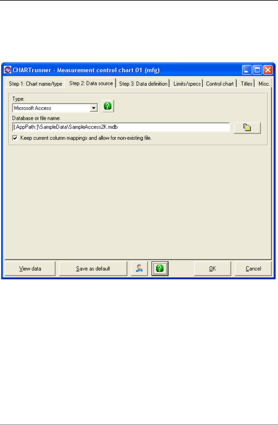
Getting started 19
Copyright © 2011
Step 2: Data source tab
Use the Step 2: Data source tab to select the type of database, spreadsheet, or text file and specify the
source file path and name. For ODBC and ADO;OLE DB sources, this form also prompts for user name,
password, and a connection string.
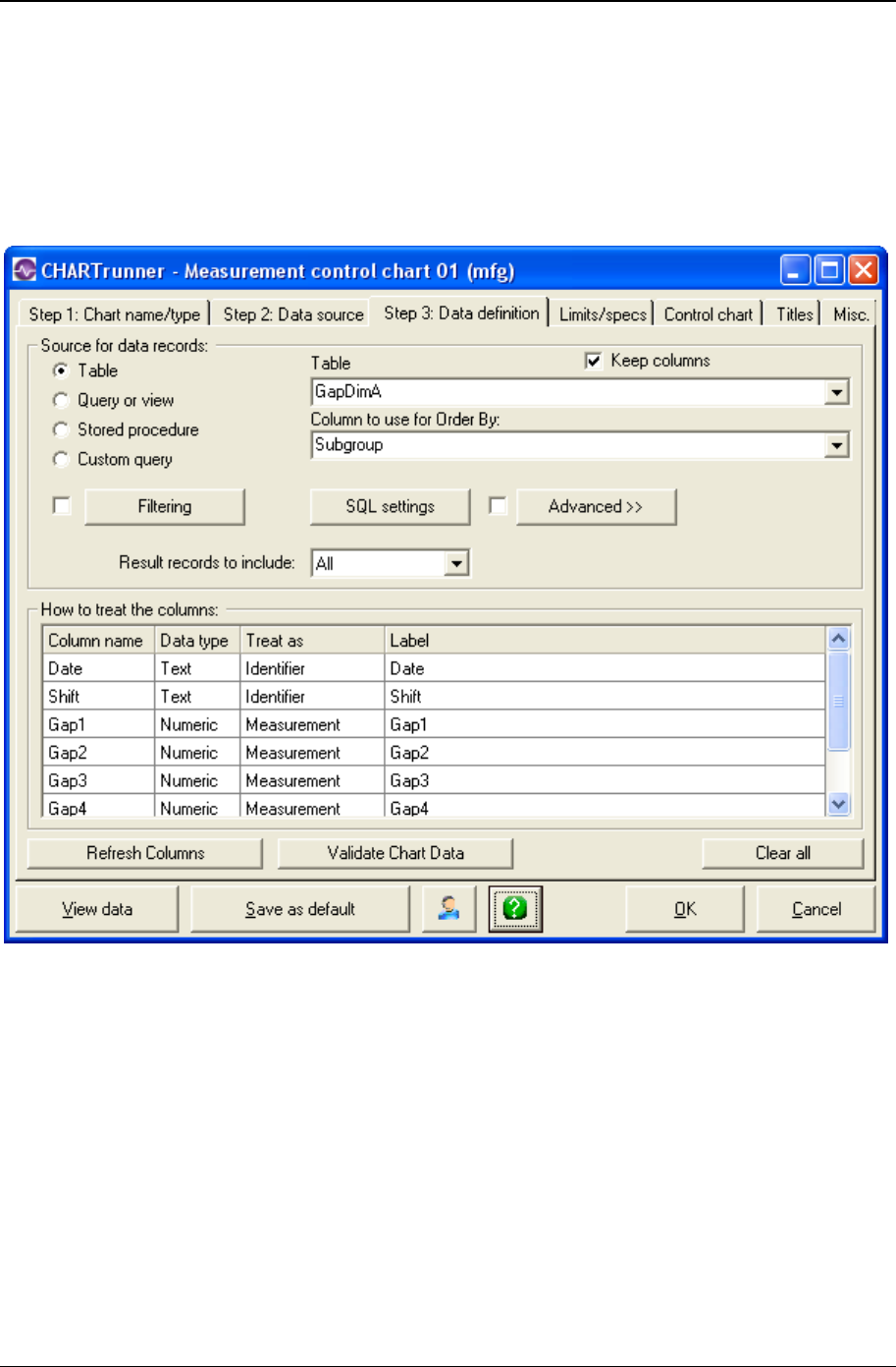
20 CHARTrunner User's Guide
Copyright © 2011
Step 3: Data definition tab
Settings in the Step 3: Data definition tab tell CHARTrunner where to find and how to handle data within the
source file. This tab deals with questions such as: Is the data stored in a table or a query in the database?
Or, do you want to create a custom query? Which columns of data should be included on the chart?
Which can be ignored? Which are identifiers? Data filters and advanced row selection are set on this tab
as well.
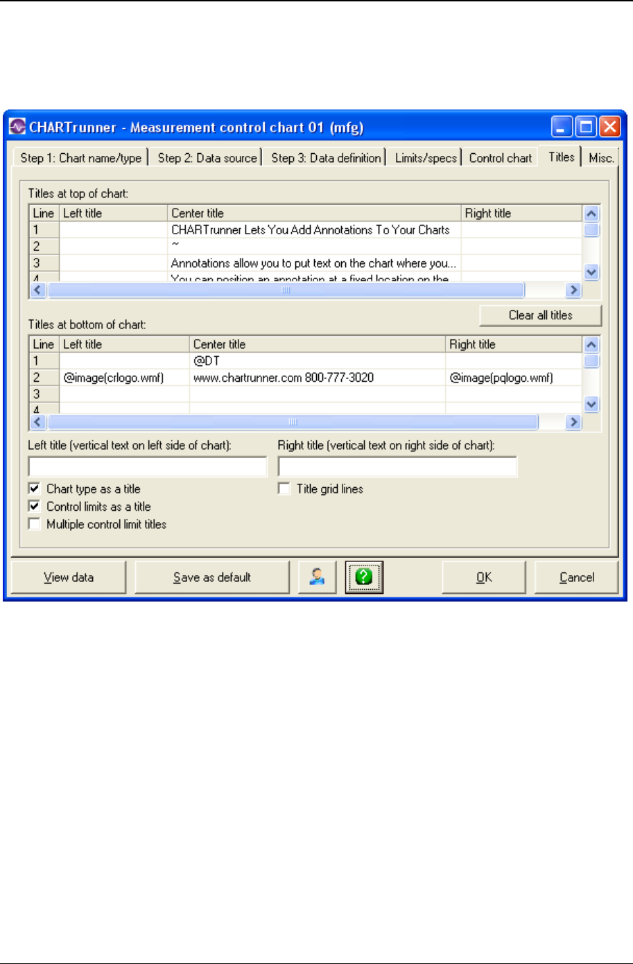
Getting started 21
Copyright © 2011
Titles tab
The Titles tab is used to enter titles that will be displayed on the chart.
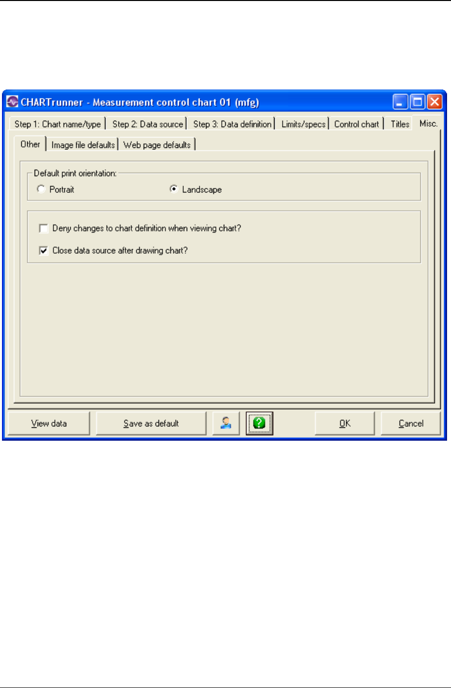
22 CHARTrunner User's Guide
Copyright © 2011
Misc. tab
The Misc. tab is used to set the printer orientation, default parameters for chart image files, and default
parameters for creating a chart's Web page.
All other tabs
All other tabs on the chart definition form are chart specific and will be discussed in Customizing a chart
definition (on page 113).
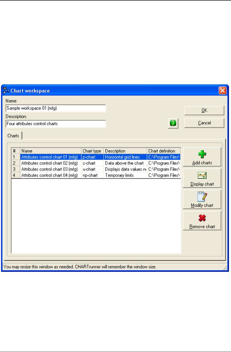
Getting started 23
Copyright © 2011
Multi-chart and chart workspace forms
The Multi-chart function lets you view several charts on a single page or screen. You can mix and match
charts from different source chart definitions.
A Chart workspace is a collection of two or more regular charts designed to be viewed or printed together.
However, each chart will appear in its own window or be printed on its own page.
The forms for setting up Multi-charts and Chart workspaces are virtually the same. Use these forms to
add, delete, or modify charts that will be displayed in a Multi-chart or Chart workspace.
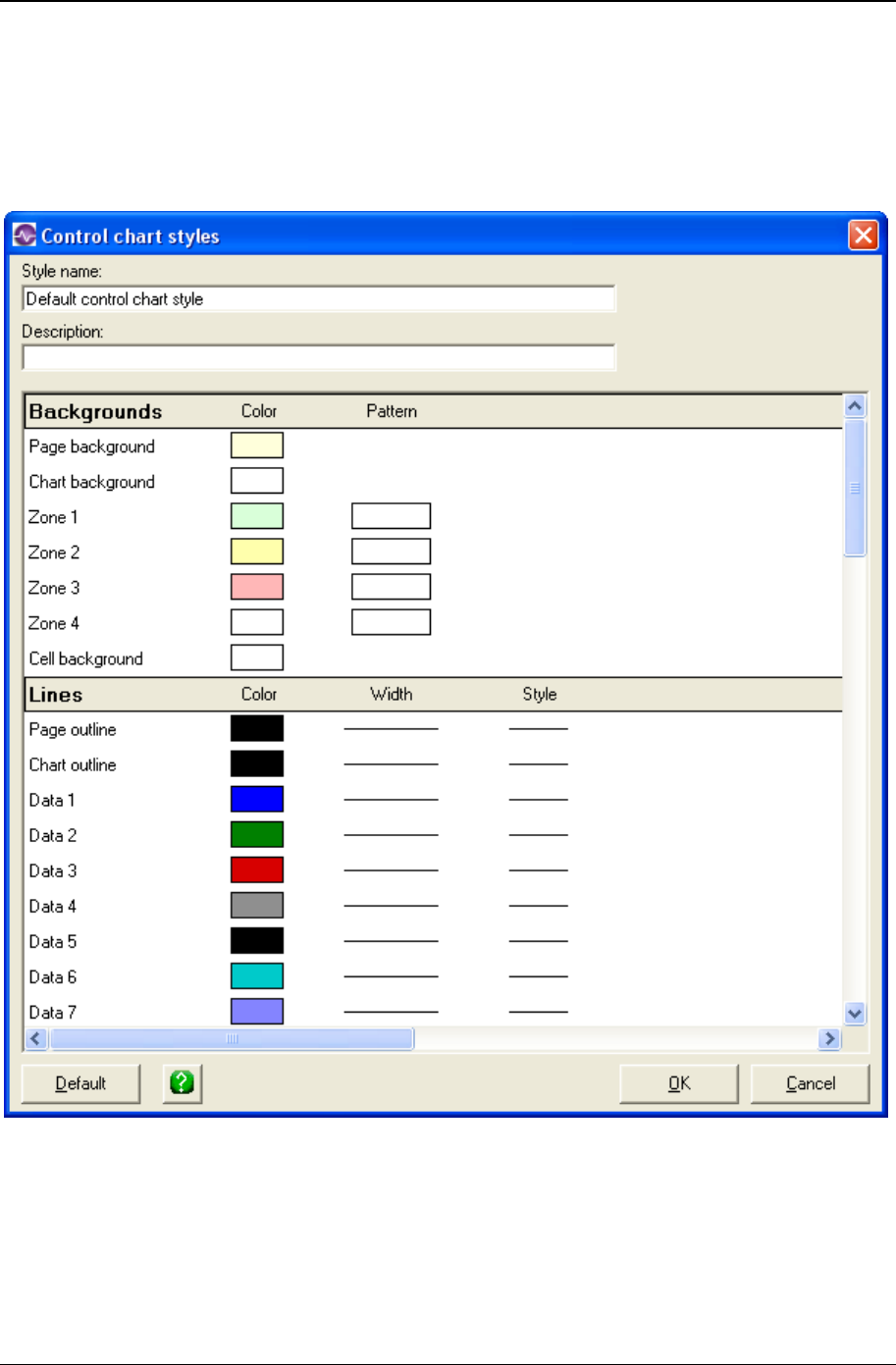
24 CHARTrunner User's Guide
Copyright © 2011
Chart style form
This Control chart styles form is displayed when you select New or Edit chart style. Depending on the
chart type, you can use the properties of a style definition to set colors, data markers, line styles, and
fonts.
Saving chart, workspace, and style definitions
CHARTrunner automatically saves your settings when you create or modify a definition and click the OK
button to close the editor.

Getting started 25
Copyright © 2011
Getting help
CHARTrunner offers several help options:
• On-line Help - On-line help is a quick way to find answers to your questions about CHARTrunner while
working in the program. To access help for a specific form within the program, press the F1
key or click the green question mark button . For general help, open the Help menu and select
Contents.
• Tool tips - If you hold the mouse pointer over an icon, a pop-up help message will appear. Move the
mouse away from the icon to clear the message.
• Quality Advisor - The on-line SQC Quality Advisor provides answers to commonly asked questions
about SPC. To open the SQC Quality Advisor, open the Help menu and select Quality Advisor.
• README file - This file contains updated information on CHARTrunner.
Technical Support - Our technical support team will be happy to answer your questions. For free technical
support, call 1-800-777-5060 or submit your questions to support@pqsystems.com
(http://www.support@pqsystems.com). Our fax number is 1-937-885-2252. Customers of our England
office can call 01704 871465 or fax to 01704 875189. Customers of our Australian office can call 03-
9770-1960 or fax to 03-9770-1995.
Exiting CHARTrunner
To exit CHARTrunner press the Alt+F4 keys or open the File menu and select Exit.

26 CHARTrunner User's Guide
Copyright © 2011
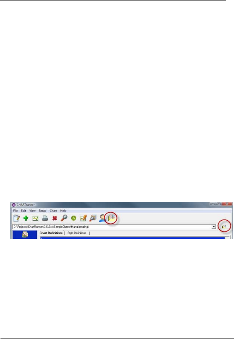
27
This brief walk-through introduces you to a few of the key features of CHARTrunner. It is designed to get
you started with a minimal amount of setup. To get the most from this tutorial, complete the topics in
order.
In This Chapter
Lesson 1 - Set the working folder ................................................................. 27
Lesson 2 - Define a chart definition .............................................................. 29
Lesson 3 - display and customize the chart .................................................. 36
Lesson 1 - Set the working folder
CHARTrunner can store your chart and dashboard definitions in one or more folders on your local or
network disk. The folder that CHARTrunner uses to display the list of available definitions is called the
working folder. For the walk-through, we will use the ...\SampleCharts\Manufacturing folder that was
installed with CHARTrunner.
Click on either of the buttons shown highlighted below to open the Browse for Folder dialog. Or, open the
File menu and select Set folder containing charts. Or, press the Ctrl-W hotkey. Or, select from a list of
recently used folders by clicking on the field that displays the current working folder.
CHAPTER 4
Tutorial
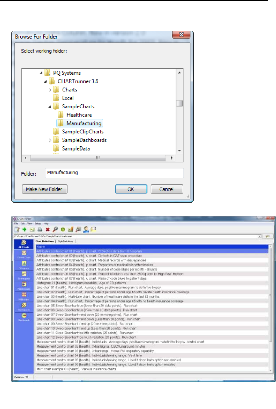
28 CHARTrunner User's Guide
Copyright © 2011
1. In the Browse for Folder window, select the “C:\Program Files\PQ Systems\CHARTrunner
3.6\SampleCharts\Manufacturing” folder, as shown below, and click on the OK button.
2. CHARTrunner displays the definitions found in the working folder as shown below.
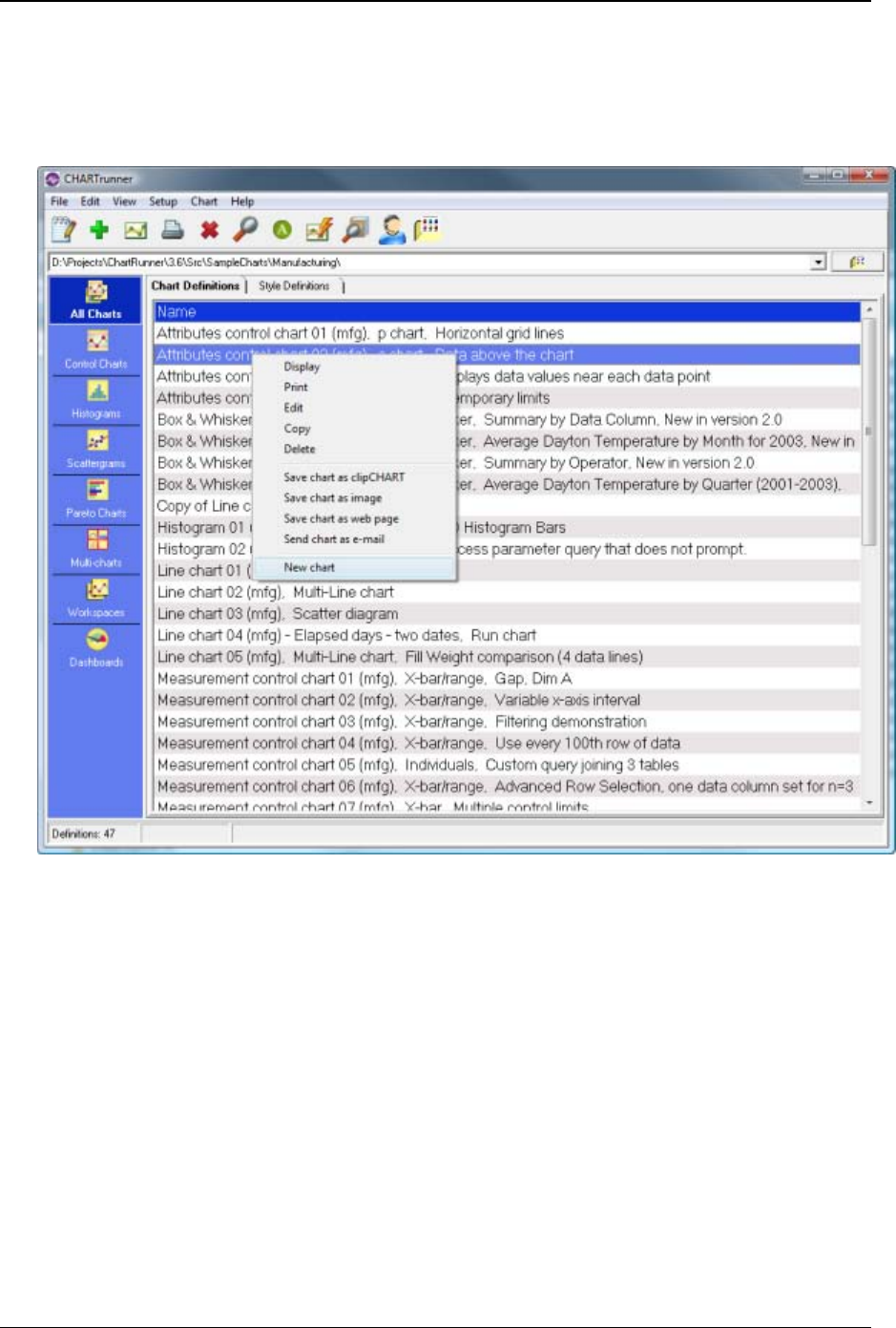
Tutorial 29
Copyright © 2011
Lesson 2 - Define a chart definition
1. Right click on a chart definition in the list and select New chart from the pop-up menu. Or, click on
the New chart icon (the one that looks like a green plus sign) on the toolbar.
2. The chart definition form will open, and the Step 1: Chart name/type tab will be displayed. In the Chart
name field, enter WT-chart as shown below.
3. By default CHARTrunner selects an X-bar/range as the type of chart to be displayed, and that is the
chart type we will use for this walk-through. But you could select a different type of chart at this point
in creating a new chart.
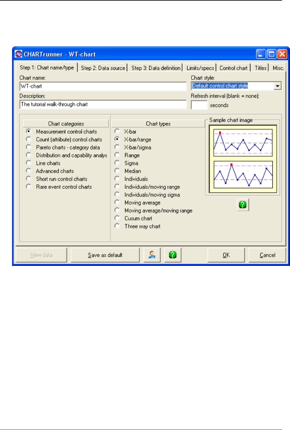
30 CHARTrunner User's Guide
Copyright © 2011
4. Notice that the Chart style drop-down menu automatically contains Default Control Chart Style. The
named chart style definition that you specify determines many of the visual properties of the chart,
such as the colors and fonts used by the chart. You can create your own style definitions, but for now
we will use the Default Control Chart Style.
5. Click on the Step 2: Data Source tab, where you will tell CHARTrunner what data source to use for your
chart.
6. From the Type drop-down menu, select Microsoft Access.
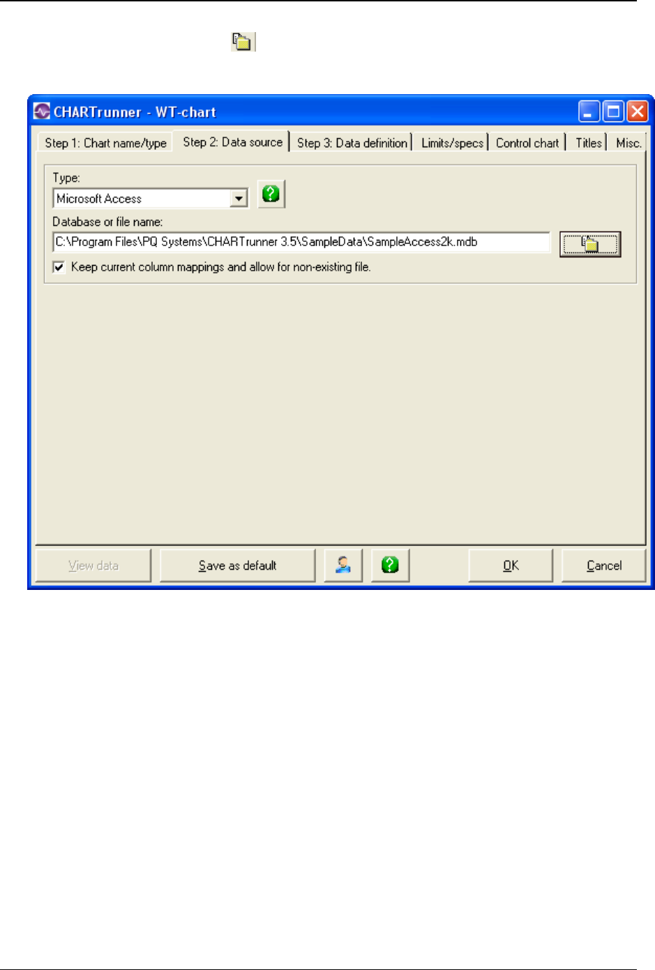
Tutorial 31
Copyright © 2011
7. Click on the Browse for file button to select the Microsoft Access database file to use. Select the
“C:\Program Files\PQ Systems\CHARTrunner3.6\SampleData\SampleAccess2k.mdb” file. If
CHARTrunner was installed into a different target folder, you must adjust the file location accordingly.
8. Click on the Step 3: Data definition tab, where you will specify the data to be used for the chart.
9. Select Table as the Source for data records.
10. From the Table drop-down menu, select the DailyProduction table.
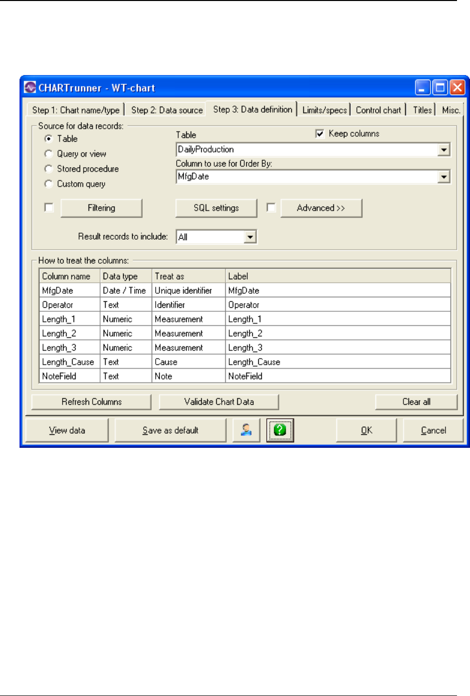
32 CHARTrunner User's Guide
Copyright © 2011
11. From the Column to use for Order By drop-down menu, select MfgDate. For a control chart, it is a good
idea to always specify the order for the chart's data. Some data source providers can vary the order
of the data from one run to another if no order has been specified, and this can result in a different
looking control chart each time the chart is rendered.

Tutorial 33
Copyright © 2011
12. After you select a Table, Query or view, Stored procedure, or Custom query, the How to treat the
columns grid will list the data columns that are available to you. You must tell CHARTrunner in the
Treat as column how to handle the data in each column.
To specify the Treat as for a column:
a. Click on the Treat as field.
b. Click on the down arrow to open the drop-down list. Select Treat as options from that list as
shown below.
Column Treat As
Key Ignore
MfgDate Unique Identifier
Operator Identifier
Length_1 Measurement
Length_2 Measurement
Length_3 Measurement
Length_cause Cause
Width_1 Ignore
Width_cause Ignore
NoreField Note
CAUTION! If you return to the Step 3: Data definition tab another time, columns that were not mapped will
not be listed. To list these columns, click on the Refresh button.
13. Click on the Limits/specs tab.
14. Select Use temporary limits computed from data in the chart.
15. Click on the Control chart tab. There are four sub-tabs where you specify the options you desire for this
chart.
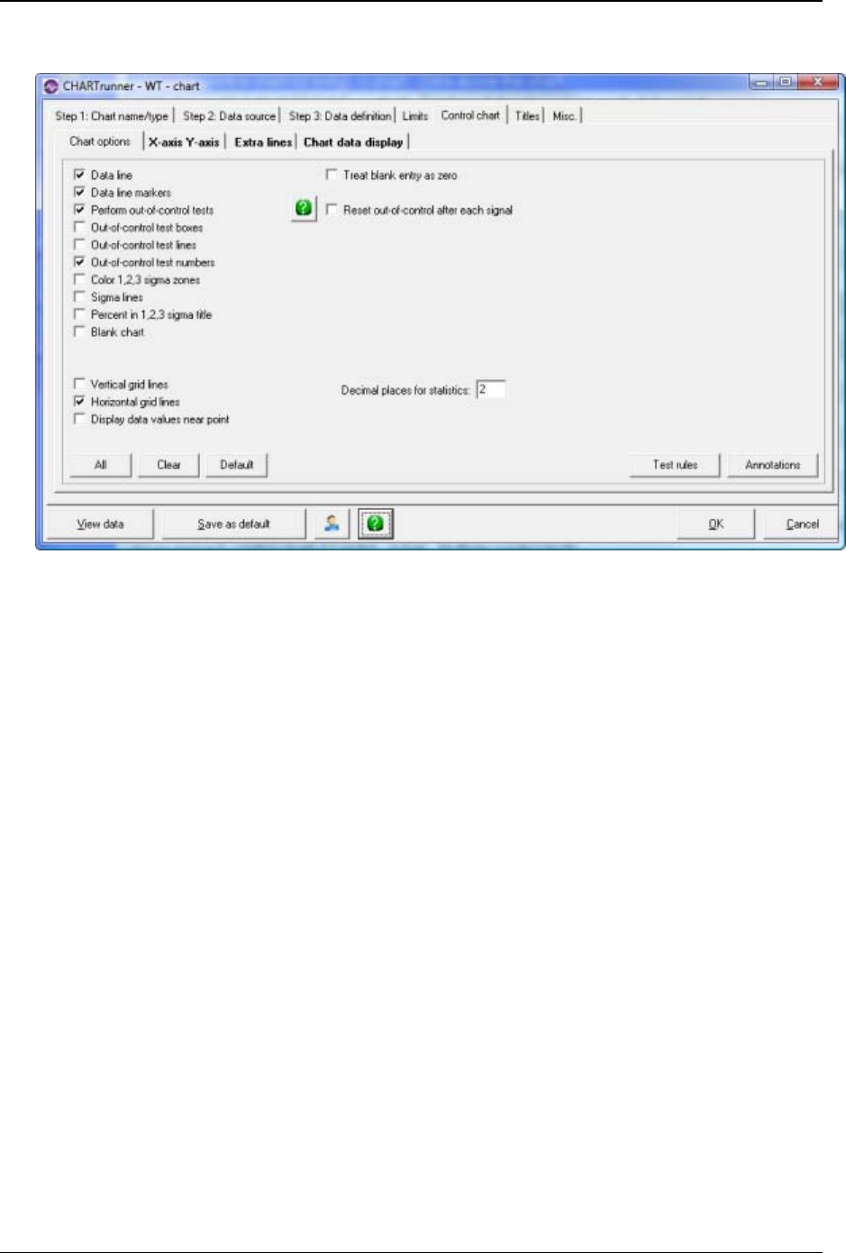
34 CHARTrunner User's Guide
Copyright © 2011
16. Select the options as shown on the next illustration.
17. Click on the X-axis Y-axis tab within the Control chart tab.
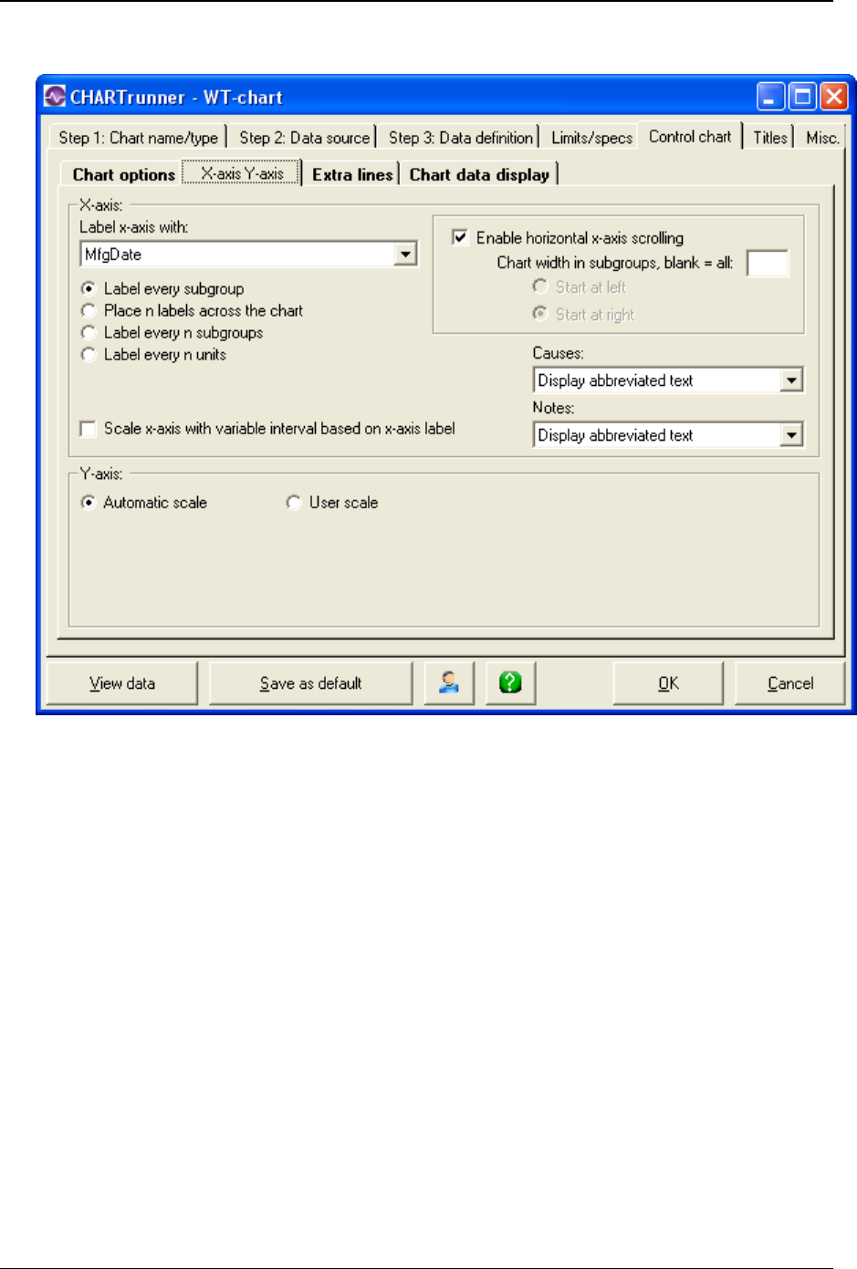
Tutorial 35
Copyright © 2011
18. Set the options as shown in the next illustration.
19. Click on the Titles tab.
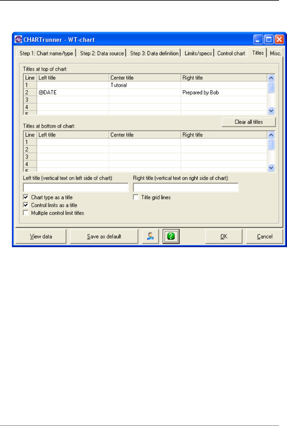
36 CHARTrunner User's Guide
Copyright © 2011
20. Enter the titles as shown on the graphic below by double-clicking on a title cell and entering the
desired text. You can use your own name in the “Prepared by” title.
21. Click on the OK button to save the chart definition.

Tutorial 37
Copyright © 2011
Lesson 3 - display and customize the chart
To display the new chart:
1. In the CHARTrunner definitions list, right-click on the chart named WT-chart.
2. Select Display from the pop-up menu. The chart will be displayed in a window similar to that shown
below.
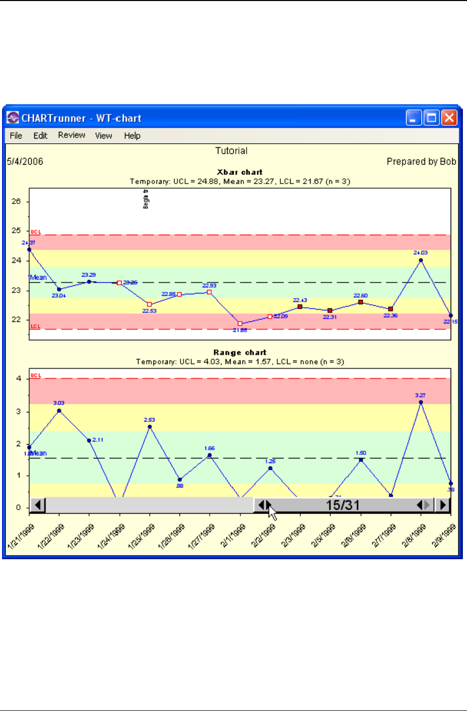
38 CHARTrunner User's Guide
Copyright © 2011
To scroll through the data
Move the cursor to the bottom of the chart and pause. The horizontal scroll bar will appear above the x-
axis as illustrated below. If not, verify that Enable horizontal x-axis scrolling is selected on the X-axis Y-axis
sub-tab of the Control chart tab.
Click on the scroll bar arrows to scroll the chart right or left across the chart's data. In the example shown
above, the scroll bar has been used to reduce the number of subgroups being displayed on the chart from
31 subgroups to 15 subgroups.
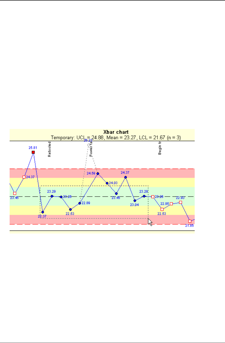
Tutorial 39
Copyright © 2011
To close the chart display
Click on the X in the upper right corner of the chart window or select File > Close on the menu or press
Alt+F4.
Editing the chart definition or style
Right-click on the control chart and select Edit chart definition or Edit chart style. Make the desired changes
and click on the OK button. Note that when you close the chart display window, you will be asked if you
want to save any changes that were made to the definition while the chart was displayed.
Create a set of control limits on the chart
1. Click on or near a data point and, holding the mouse button down, drag the mouse pointer to select
about 10 data points as illustrated below. The dotted selection rectangle shows you which data points
are currently selected. The mouse pointer must stay within the boundaries of the chart.
Release the mouse button when the desired data points have been selected and the selected data
points will be highlighted.
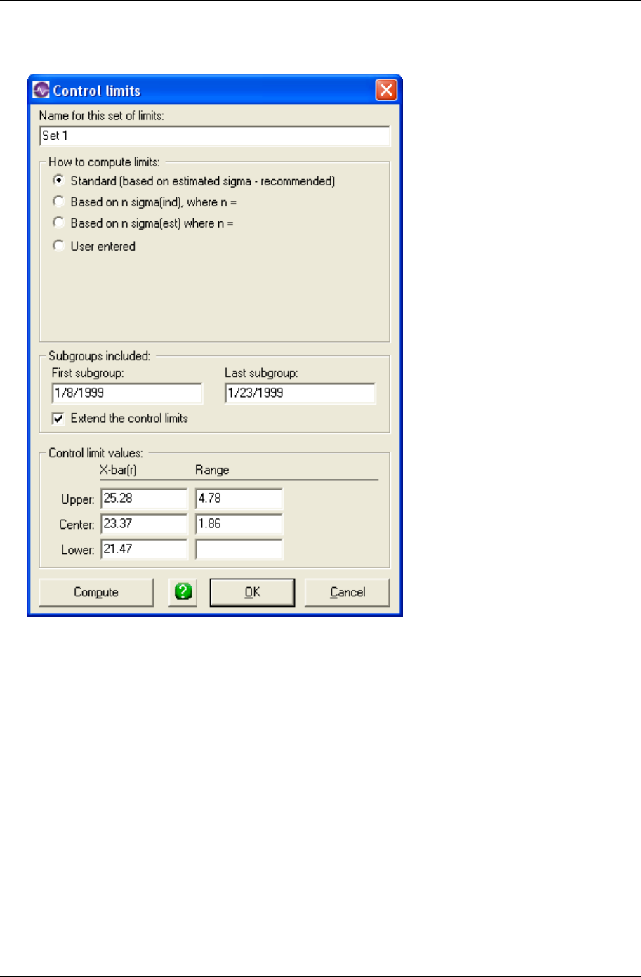
40 CHARTrunner User's Guide
Copyright © 2011
2. Right-click on the selected area. From the pop-up men, select Compute limits. The Control limits form
will open, as illustrated below.
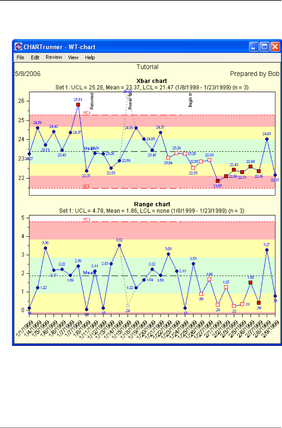
Tutorial 41
Copyright © 2011
Each set of limits has a name; the default for this set is “Set 1.” You can assign a different name if you
want to. The Standard method for computing limits is recommended. Click on the OK button to save this
set of limits. The chart now shows the “Set 1” limits that you created, as illustrated below.
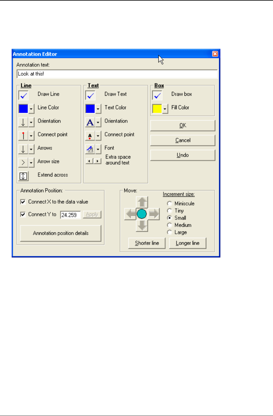
42 CHARTrunner User's Guide
Copyright © 2011
To add an annotation to the chart
1. Right-click on the chart display window at the place where you want the annotation to appear and
select Add annotation from the pop-up menu. The chart annotation form will open, as illustrated below.
2. Type “Look at this!” in the Annotation text field.
3. Set the options for Line, Text, Box, and Annotation Position as desired for the annotation. There are
many options to choose from, so experiment to become familiar with how each option affects the
annotation. As you change an option on the Annotation Editor, the annotation displayed on the chart
updates to reflect the change. You may need to reposition the annotation form by left-clicking and
dragging the title bar of the Annotation Editor, so that you can see how the parameter changes affect
the annotation.
The Connect X to the data option attaches the annotation to the x-axis position of the data point so that
as the data point moves across the chart, so does the annotation. In order to use this feature, one of
the data source columns must be “treated as” the Unique Identifier on the Step 3: Data definition tab.
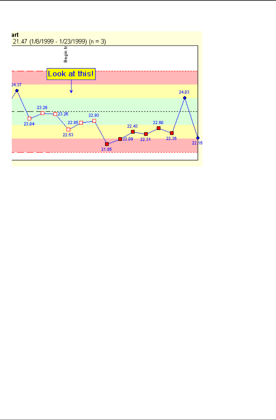
Tutorial 43
Copyright © 2011
4. Click the OK button to save your changes. The new annotation will be displayed on the chart, as
illustrated below.

44 CHARTrunner User's Guide
Copyright © 2011

45
CHARTrunner provides tools for analyzing variables, attributes, Pareto, and other types of data. The
following topics examine key data types and analytical tools, so that you can select the best one for your
data. Note, however, that the topics do not describe all possible applications of CHARTrunner's charts.
In This Chapter
Variables data ............................................................................................... 45
Measurement control charts.......................................................................... 46
Attributes data ............................................................................................... 56
Count (attributes) control charts .................................................................... 57
Pareto data .................................................................................................... 65
Pareto charts - category data ........................................................................ 66
Distribution and capability analysis ............................................................... 71
Capability analysis ........................................................................................ 72
Line charts ..................................................................................................... 73
Advanced charts ........................................................................................... 76
Short-run SPC ............................................................................................... 77
Rare event control charts .............................................................................. 79
Variables data
What is variables data?
Variables data is data that is collected through measurements, such as length, time, diameter, strength,
weight, temperature, density, thickness, or height. Variables data offers the advantage of choice in the
degree of accuracy required. For example, you can measure an item to the nearest centimeter, millimeter,
or micron.
What Charts are used for analyzing variables data?
CHARTrunner offers control charts, histograms, multi-line charts, scatter diagrams, and run charts for
analyzing variables data. Use variables control charts to determine if a process is predictable or to see
how changes affect the process. Use histograms to analyze the distribution of data from a stable process.
Use histograms with capability analysis to determine the capability and/or performance of the system.
Use run charts for a quick look at a system's direction or when you do not have enough data for
conventional control chart analysis.
CHAPTER 5
Data and chart types

46 CHARTrunner User's Guide
Copyright © 2011
Measurement control charts
Variables data is usually analyzed in pairs of charts that present data in terms of location or central
tendency and spread. Location, usually the top chart, shows data in relation to the process average. It is
presented in X-bar or individuals charts. Spread, usually reflected in the bottom chart, looks at piece-by-
piece variation. Range (R), sigma (S), or moving range charts are used to illustrate process spread.
Because the median chart shows each observation, it illustrates both process spread and location.
Another aspect of these variables control charts is that the subgroup size is typically constant.
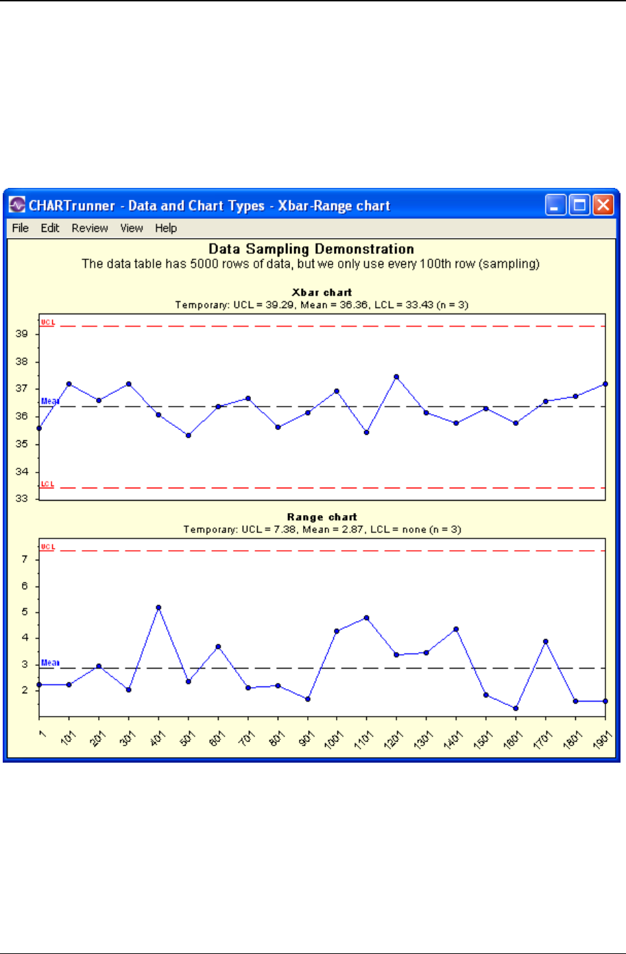
Data and chart types 47
Copyright © 2011
X-bar and range
X-bar and range (R) charts create a picture of a process over time. This chart pair is used with data that
has a subgroup size of two or more. The X-bar chart, on top, illustrates variation between subgroups.
Each data point on the X-bar chart shows the average of each subgroup of data.
The range chart, on the bottom, illustrates variation within a subgroup. Data points on the range chart
show the range for each subgroup.
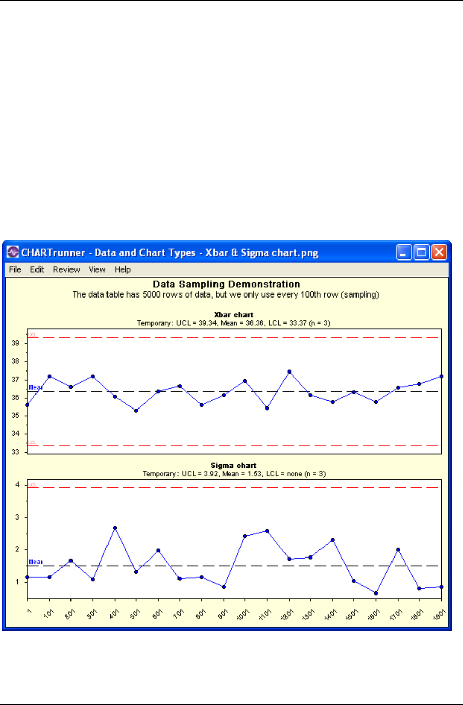
48 CHARTrunner User's Guide
Copyright © 2011
When do you use X-bar and R charts?
Use X-bar and R charts:
• When you want to see if your process is stable and predictable
• When you want to see how planned change affects the process
• When the time order of the subgroups is preserved
• When you have collected data in subgroups larger than one.
X-bar and sigma
The X-bar and sigma (S) chart is a variation of the X-bar and range (R) chart. Again, the X-bar chart (top)
shows the average or mean of each subgroup of data. Instead of range, however, the lower chart shows
the standard deviation of each subgroup. This chart combination is generally used when the subgroup
size is large, for example, eleven or more observations per subgroup.
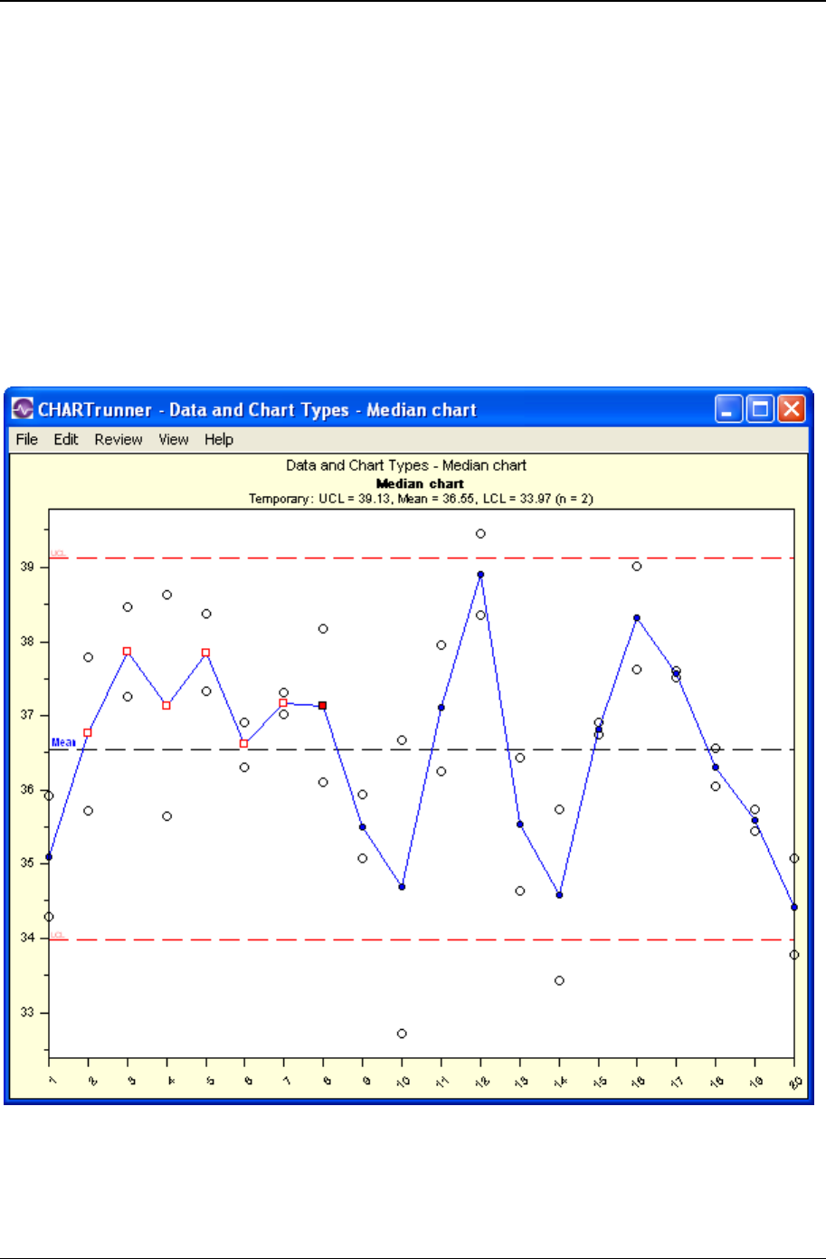
Data and chart types 49
Copyright © 2011
When do you Use X-bar and S charts?
Use X-bar and S charts:
• When you want to see if your process is stable and predictable
• When you want to see how planned change affects the process
• When the time order of the subgroups is preserved
• When you have collected data with a subgroup size of eleven or more.
Median
A median chart is a special purpose variation of the X-bar chart. It uses the median or middle value of a
subgroup to show the system's central location. It shows all the individual observations of each subgroup.

50 CHARTrunner User's Guide
Copyright © 2011
When do you use median charts?
Use median charts:
• When you want to see if a process is stable and predictable
• When you want to see how planned change affects the process
• When the time order of the subgroups is preserved
• When you want to see all the individual data points on the chart
• When you have collected data in subgroups larger than one.
Individuals and moving range
Individuals (X) and moving range (MR) chart combination is a variation of the X-bar and R chart. It is used
with subgroups containing one observation. The X chart, on top, shows individual data values. The MR
chart, on the bottom, creates ranges by finding the difference between consecutive data values. It uses
absolute values, thus avoiding negative moving range values.
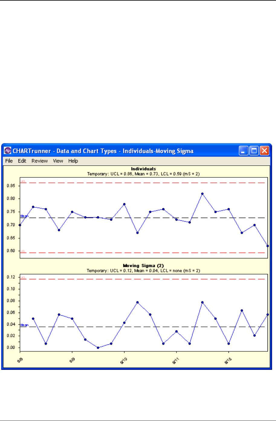
Data and chart types 51
Copyright © 2011
When do you use individuals and moving range charts?
Use individuals and moving range charts:
• When you want to see if your process is stable and predictable
• When you want to see how planned change affects the process
• When the time order of the subgroups is preserved
• When you have collected data in subgroups of one.
Individuals and moving sigma
Individuals (X) and moving sigma (MS) chart combination is a variation of the X-bar and sigma chart. It is
used with subgroups containing one observation. The individuals chart, on top, shows individual data
points. The MS chart, on the bottom, creates sigma by calculating the standard deviation between
consecutive data values.
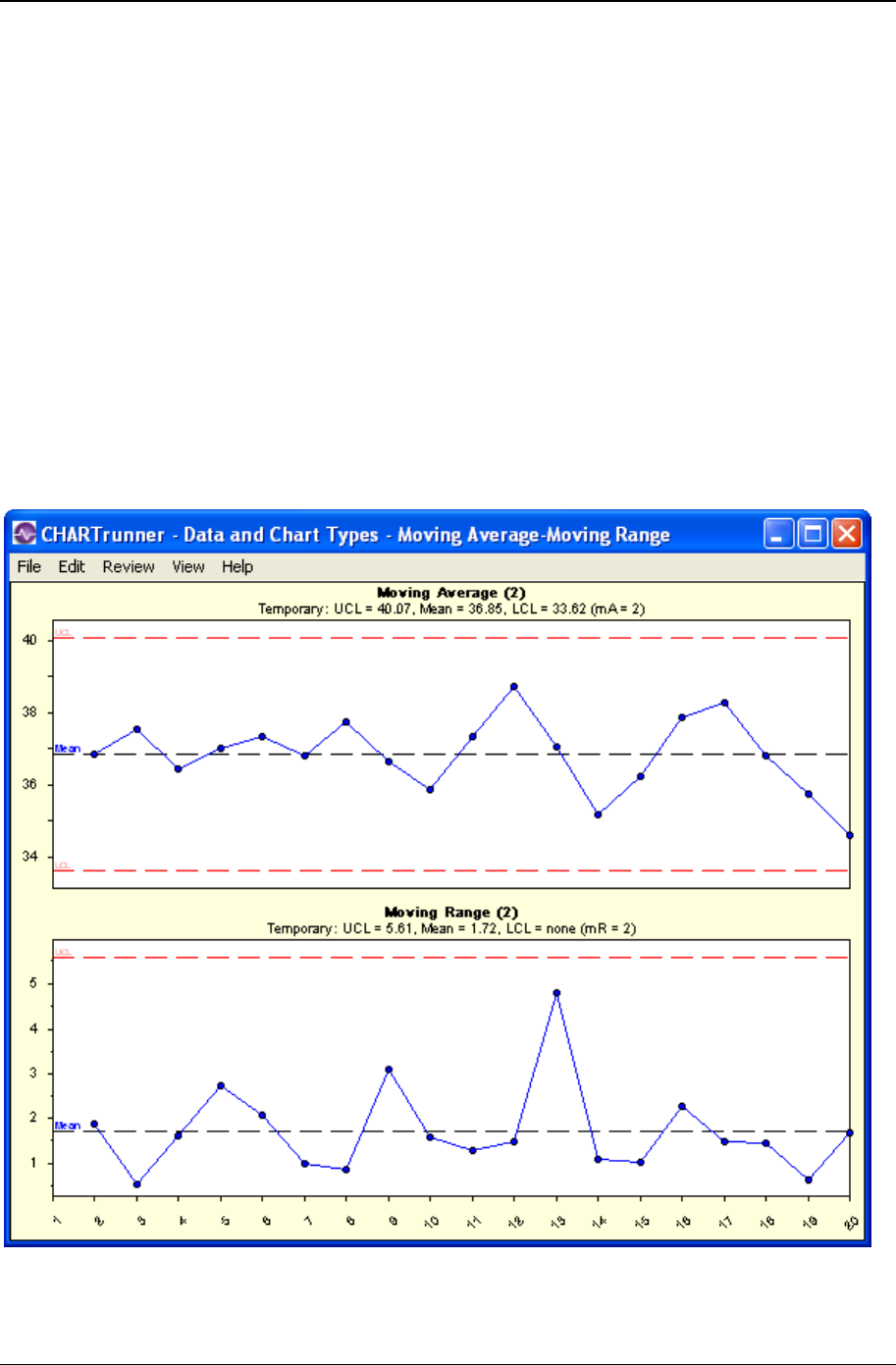
52 CHARTrunner User's Guide
Copyright © 2011
When do you use individuals and moving sigma charts?
Use individuals and moving sigma charts:
• When you want to see if your process is stable and predictable
• When you want to see how planned change affects the process
• When the time order of the subgroups is preserved
• When you have collected data in subgroups of one.
Moving average and moving range
Moving average is a smoothing technique for time series data. It averages out the short-term fluctuations
in the system and concentrates on long-term trends. Moving averages work much the same as moving
ranges work on the individual and moving range chart. These charts are used with subgroups containing
one observation, but, instead of plotting the individual values, you plot an average of two or more
observations. This hides minor (yet frequent) variation between individual readings and shows how the
system is running over time.

Data and chart types 53
Copyright © 2011
When do you use moving average and moving range charts?
Use moving average and moving range charts:
• When you want to see if your process is stable and predictable
• When you want to see how planned change affects the process
• When the time order of the subgroups is preserved
• When you have collected data in subgroups of one
• When the process changes slowly relative to how often samples are collected
• When the individual data values are subject to considerable variation.
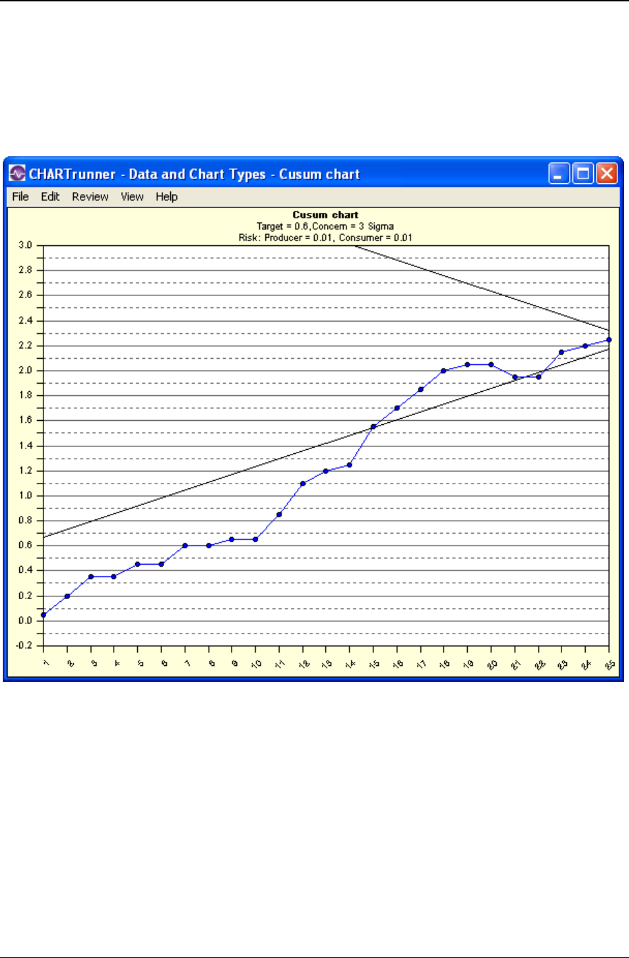
54 CHARTrunner User's Guide
Copyright © 2011
Cusum
Cusum is an advanced analysis that uses current and historical data to detect small shifts in the process
average. Cusum stands for cumulative sum of deviations from the target and treats past and present data
equally. Studying cumulative sums rather than subgroup averages emphasizes ongoing changes in the
process mean.
When do you use a cusum chart?
Use a cusum chart:
• When you want to see if your process is stable and predictable
• When even a slight variation can result in waste and product deficiency
• When you want to see how a planned change affects the process
• When the time order is preserved.
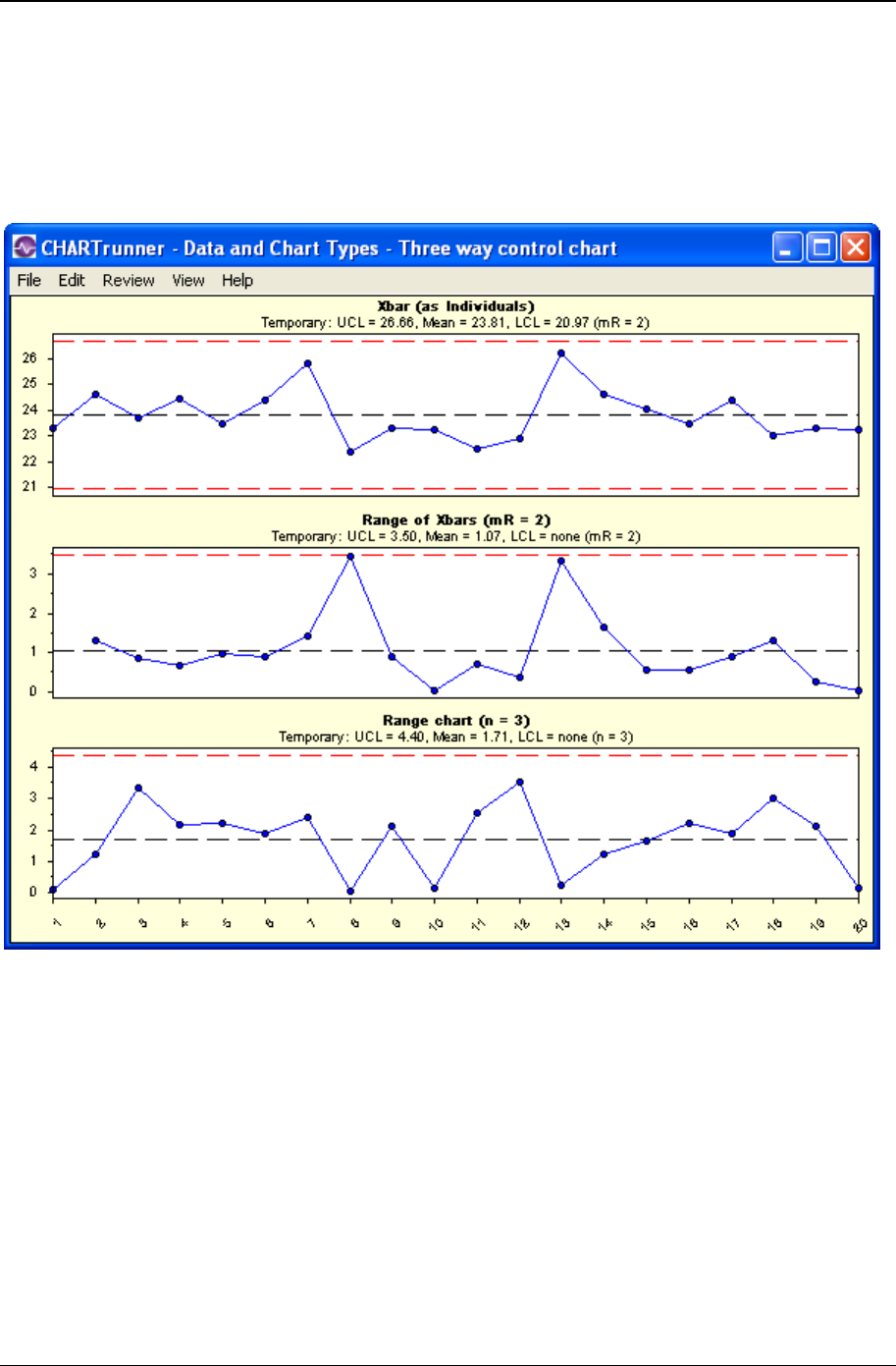
Data and chart types 55
Copyright © 2011
Three-way control
The three-way control chart estimates the process standard deviation using a moving range of subgroup
averages. As shown below, a three-way control chart consists of a chart of subgroup means (Xbar), a
moving range chart of the subgroup means (Range of Xbars), and a chart of subgroup ranges (Range
chart).
When do you use three-way control charts?
Use three-way control charts:
• When you want to see if your process is stable and predictable
• When you want to see how planned change affects the process
• When the time order of the subgroups is preserved
• When you have collected data in subgroups larger than one
• When each data subgroup you collect is almost identical to the previous subgroup. This is known as
auto-correlated data.

56 CHARTrunner User's Guide
Copyright © 2011
Attributes data
What is Attributes data?
Attributes data is data that can be classified and counted. There are two types of attributes data:
nonconformities and nonconforming.
Nonconformities data refers to defects or occurrences that should not be present but are. It also refers to
any characteristics that should be present but are not. Dents, scratches, bubbles, and missing buttons are
examples of nonconformities.
Nonconforming data is a count of defective units. It is often described as go/no go, pass/fail, or yes/no,
since there are only two possible outcomes to any given check. It also refers to a count of defectives or
rejects. For example, a light bulb either works or it does not. You can track either the number failing or the
number passing.
What charts are used to analyze Attributes data?
CHARTrunner offers two control charts for each type of attributes data. For nonconforming units, these
are p-charts and np-charts. For nonconformities, these are u-charts and c-charts.
In addition to the four standard of attributes charts, (p, c, u, and np) CHARTrunner offers p', c', u' and np'
control chart. The ending apostrophe denotes these are variations on the basic chart. The apostrophe
can be pronounced as "prime" so the p' chart is verbalized as a "p prime chart."
The p', c', u', and np' charts are used in the same applications as their traditional counterparts. However,
the prime charts use a different method of computing control limits. They are used when your data is
overly dispersed. With overly dispersed data the traditional method of computing control limits is not
adequate. For these charts, the data is first transformed, limits are computed, and then the limit values
are normalized back to charting values. To know if you should use these chart types, look for the Test for
over dispersion button on the data definition tab – for a p, np, c, or u chart. This test will tell you if your
data warrants use of these "prime" charts.
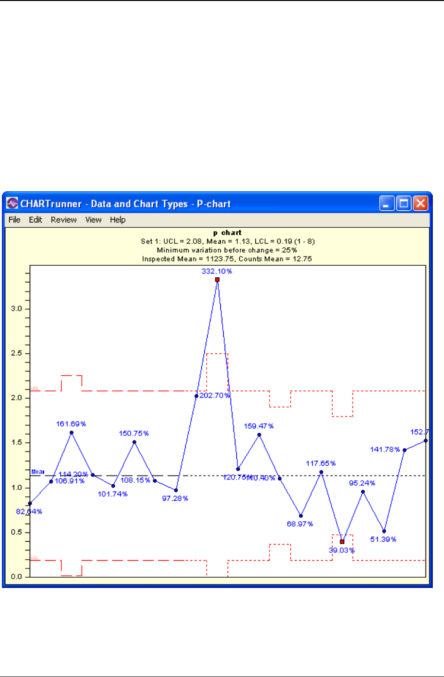
Data and chart types 57
Copyright © 2011
Count (attributes) control charts
p-chart
A p-chart shows how a process changes over time. However, instead of using the actual count of
nonconforming units, p-charts use a proportion of the nonconforming items, since the subgroup size may
vary. Subgroup sizes that vary more than 25 percent from the average subgroup size may require special
handling of the control limits.
CHARTrunner can perform special calculations to adjust the control limits accordingly and then plot the
proportions.
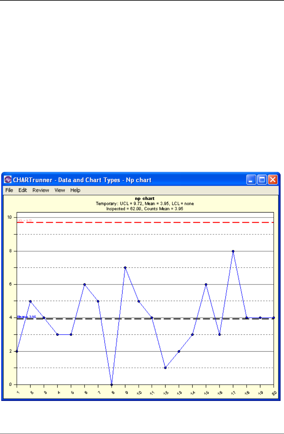
58 CHARTrunner User's Guide
Copyright © 2011
When do you use p-charts?
Use p-charts:
• When you want to see if your process is stable and predictable
• When you want to see how a planned change affects the process
• When you are counting nonconforming units
• When the time order of the subgroups is preserved
• When the subgroup size can vary.
np-chart
An np-chart is an attributes control chart used with data collected in subgroups that are the same size.
Np-charts show how the process, measured by the number of nonconforming items it produces, changes
over time. The process attributes (or characteristic) is always described in a yes/no, pass/fail, or go/no go
form. For example, the number of incomplete accident reports in a constant daily sample of five would be
analyzed on an np-chart. Np-charts are used to determine if the process is stable and predictable, as well
as to monitor the effects of process improvement theories.
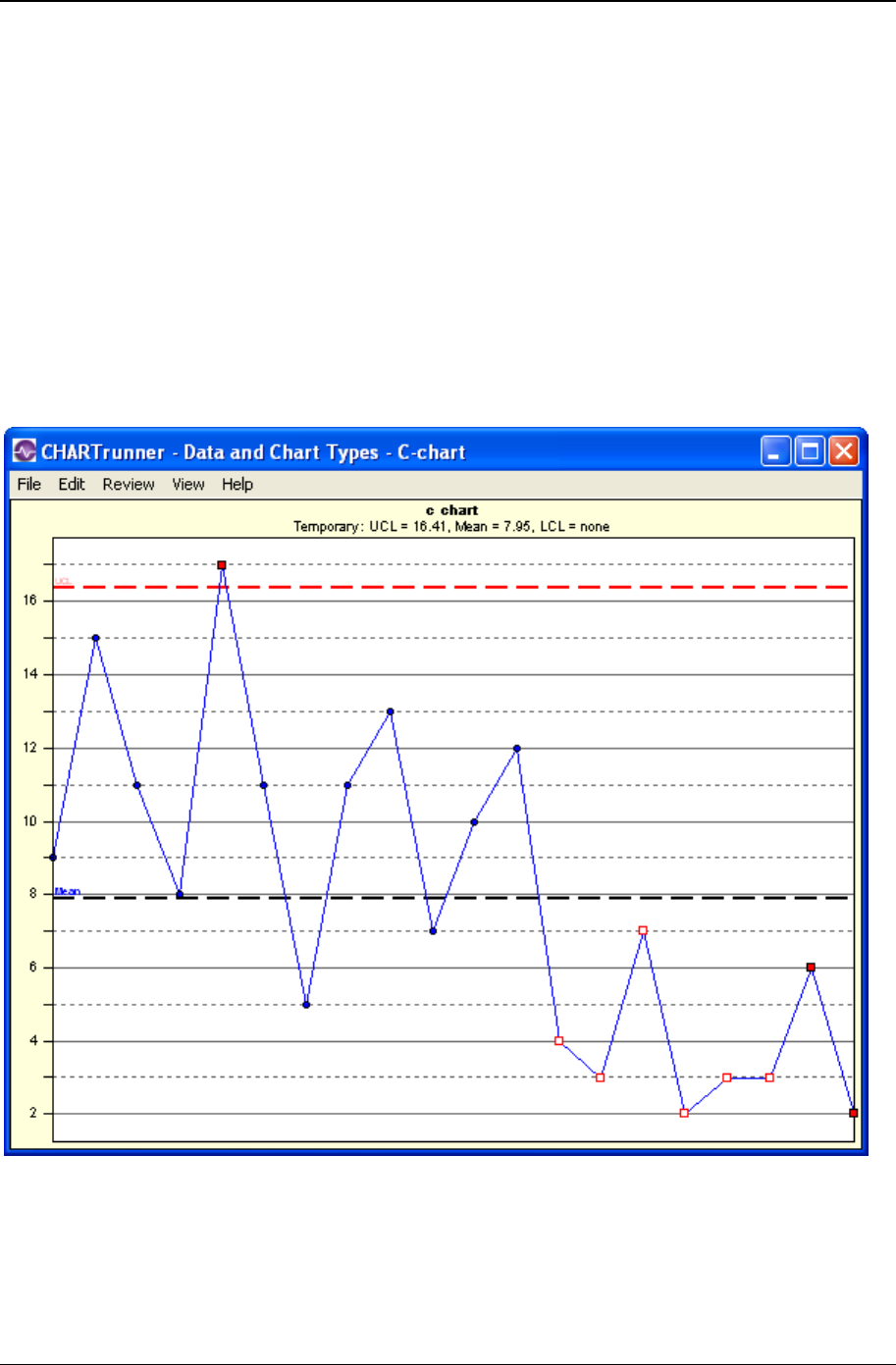
Data and chart types 59
Copyright © 2011
When do you use np-charts?
• When you want to see if your process is stable and predictable
• When you want to see how a planned change affects the process
• When you are counting nonconforming units
• When the time order of the subgroups is preserved
• When the subgroup size is constant.
c-chart
C-charts show process changes over time by looking at the number of nonconformities the process
produces. For c-charts, the subgroup size must be constant. C-charts show the actual number of
nonconformities per subgroup.
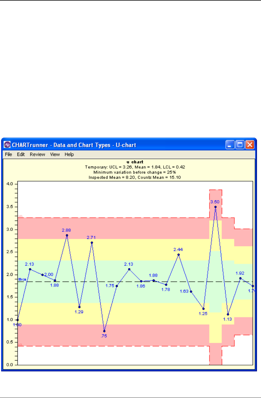
60 CHARTrunner User's Guide
Copyright © 2011
When do you use c-charts?
• When you want to see if your process is stable and predictable
• When you want to see how a planned change affects the process
• When the data is a count of nonconformities
• When the time order of the subgroups is preserved
• When the subgroup size is constant.
u-chart
U-charts show process changes over time by looking at the number of nonconformities the process
produces. The subgroup size can vary; therefore, u-charts show the number of nonconformities in
proportion to the subgroup size. Subgroups that vary more than 25 percent from the average subgroup
size may require special handling of the control limits. CHARTrunner can perform special calculations to
adjust the control limits accordingly and then plot the proportions for you.
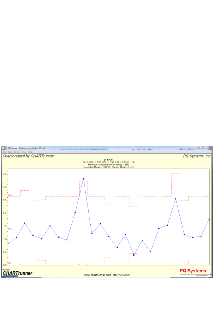
Data and chart types 61
Copyright © 2011
When do you use u-charts?
• When you want to see if a process is stable and predictable
• When you want to see how a planned change affects the process
• When the data is a count of nonconformities
• When the time order of the subgroups is preserved
• When the subgroup size can vary.
p’ chart (p prime chart)
A p' chart shows how a process changes over time. However, instead of using the actual count of
nonconforming units, p' charts use a proportion of the nonconforming items, since the subgroup size may
vary. Subgroup sizes that vary more than 25 percent from the average subgroup size may require special
handling of the control limits.
Control limits for a p' chart are computed by first doing a data transform. The p' chart should be used in
situations where a p-chart is normally used but evidence of over dispersion in the data has been
confirmed.
CHARTrunner can perform special calculations to adjust the control limits accordingly and then plot the
proportions.
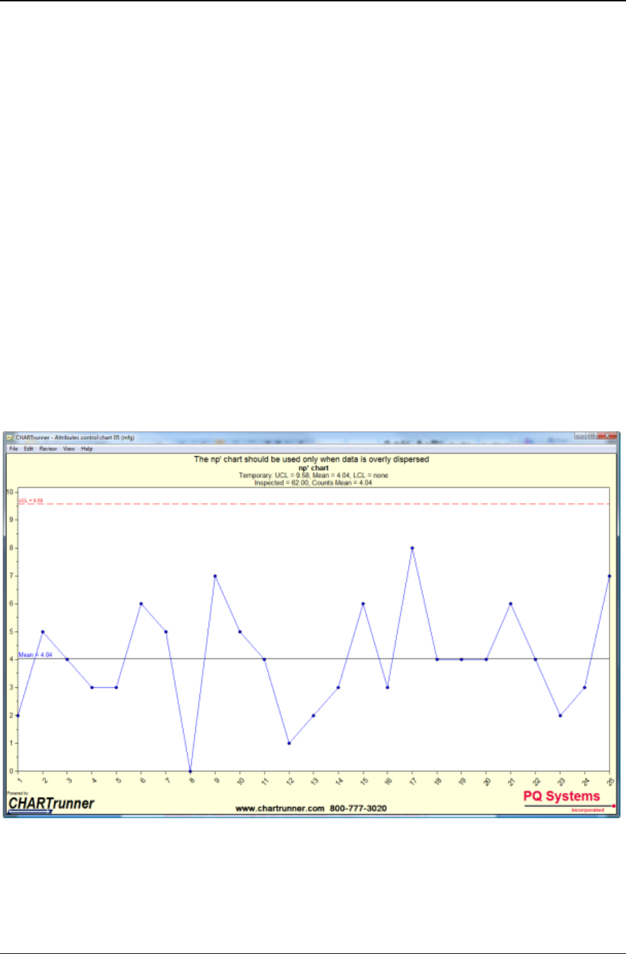
62 CHARTrunner User's Guide
Copyright © 2011
When do you use p'-charts?
• When you want to see if your process is stable and predictable
• When you want to see how a planned change affects the process
• When you are counting nonconforming units
• When the time order of the subgroups is preserved
• When the subgroup size can vary
• When there is evidence of over dispersion in your data.
np’-chart (np prime chart)
An np' chart is an attributes control chart used with data collected in subgroups that are the same size.
Np' charts show how the process, measured by the number of nonconforming items it produces, changes
over time. The process attributes (or characteristic) is always described in a yes/no, pass/fail, or go/no go
form. For example, the number of incomplete accident reports in a constant daily sample of five would be
analyzed using an np' chart. Np' charts are used to determine if the process is stable and predictable, as
well as to monitor the effects of process improvement theories.
Control limits for an np' chart are computed by first doing a data transform. The np' chart should be used
in situations where an np chart is normally used but evidence of over dispersion in the data has been
confirmed.
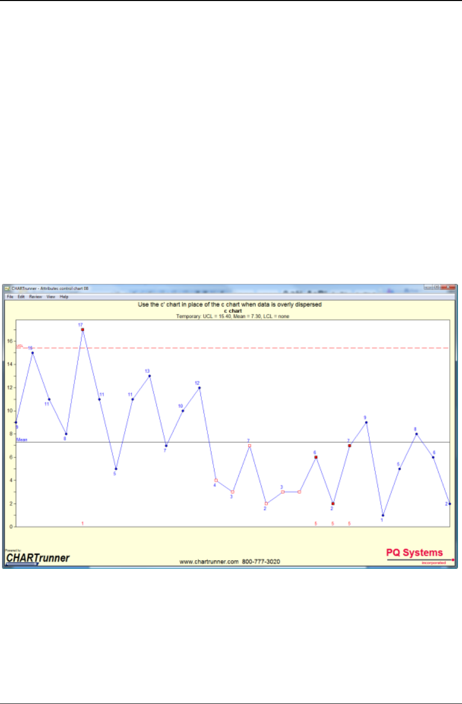
Data and chart types 63
Copyright © 2011
When do you use np'-charts?
• When you want to see if your process is stable and predictable
• When you want to see how a planned change affects the process
• When you are counting nonconforming units
• When the time order of the subgroups is preserved
• When the subgroup size is constant.
• When there is evidence of over dispersion in your data
c’ chart (c prime chart)
C' charts show process changes over time by looking at the number of nonconformities the process
produces. For c' charts, the subgroup size must be constant. C' charts show the actual number of
nonconformities per subgroup.
Control limits for the c' chart are computed by first doing a data transform. The c' chart should be used in
situations where the c-chart is normally used but evidence of over dispersion in the data has been
confirmed.
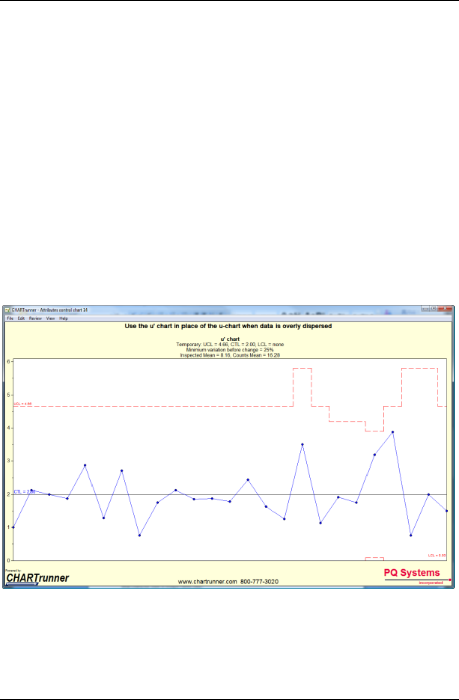
64 CHARTrunner User's Guide
Copyright © 2011
When do you use c' charts?
• When you want to see if your process is stable and predictable
• When you want to see how a planned change affects the process
• When the data is a count of nonconformities
• When the time order of the subgroups is preserved
• When the subgroup size is constant
• When there is evidence of over dispersion in the data.
u' chart (u prime chart)
U' charts show process changes over time by looking at the number of nonconformities the process
produces. The subgroup size can vary; therefore, u' charts show the number of nonconformities in
proportion to the subgroup size. Subgroups that vary more than 25 percent from the average subgroup
size may require special handling of the control limits. CHARTrunner can perform special calculations to
adjust the control limits accordingly and then plot the proportions for you.
Control limits for a u' chart are computed by first doing a data transform. The u' chart should be used in
situations where a u-chart is normally used but evidence of over dispersion in the data has been
confirmed.

Data and chart types 65
Copyright © 2011
When do you use u' charts?
• When you want to see if a process is stable and predictable
• When you want to see how a planned change affects the process
• When the data is a count of nonconformities
• When the time order of the subgroups is preserved
• When the subgroup size can vary
• When there is evidence of over dispersion in the data.
Pareto data
What is Pareto Data?
Pareto data counts items in various categories. It is used to rank the categories in decreasing order of
occurrence. Based on the twentieth-century principle developed by Italian economist Vilfredo Pareto, it is
the law of the significant few versus the trivial many. The significant few cause 80 percent of the
problem(s), while the trivial many make up about 20 percent of problem(s).
What charts are used to analyze Pareto data?
Pareto diagrams are used to analyze Pareto data. Usually a Pareto diagram is a simple bar chart.
However, CHARTrunner also allows you to display count data in a pie chart.
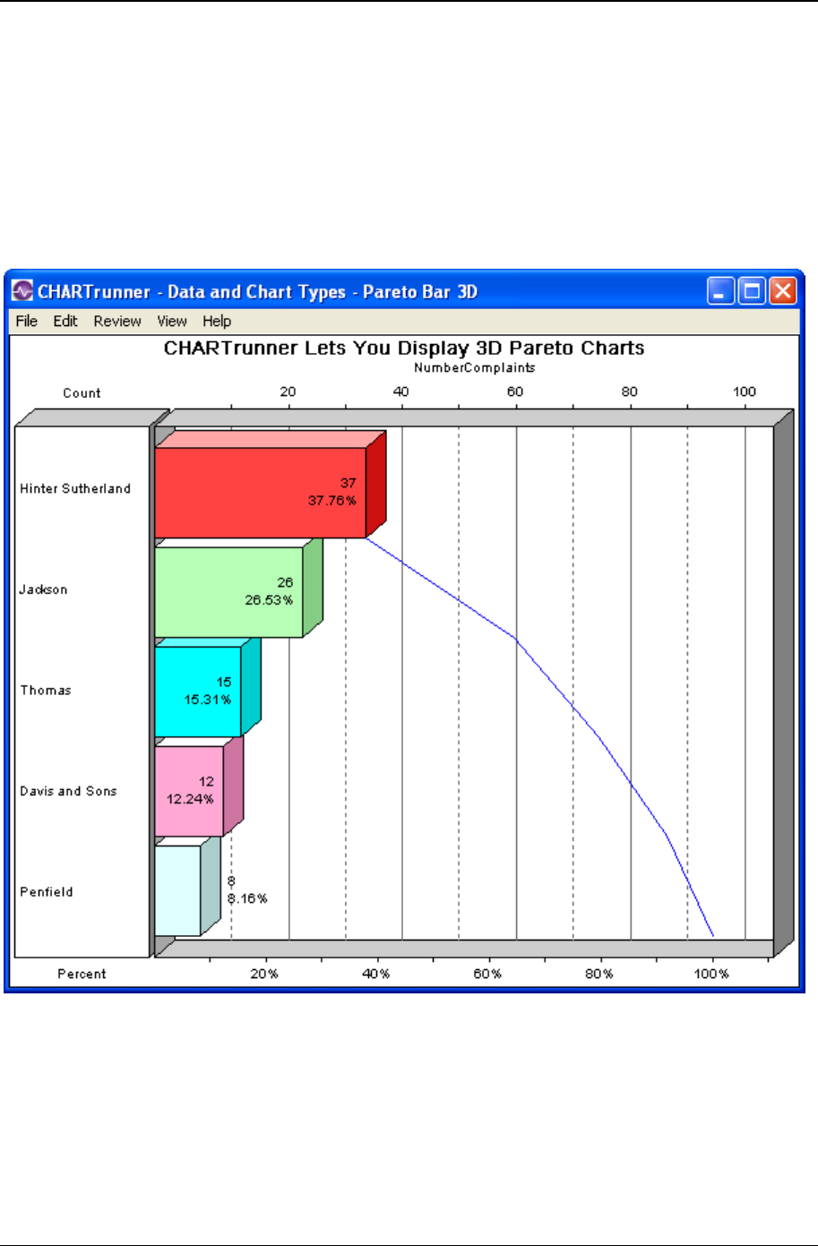
66 CHARTrunner User's Guide
Copyright © 2011
Pareto charts - category data
Pareto - bar chart
A Pareto chart is a sample bar chart. Each bar represents a count of items that fall into a category or
classification. The bars are typically rank ordered so that that the bar with the highest value is shown first.
Bar charts have the bars oriented horizontally as shown below.
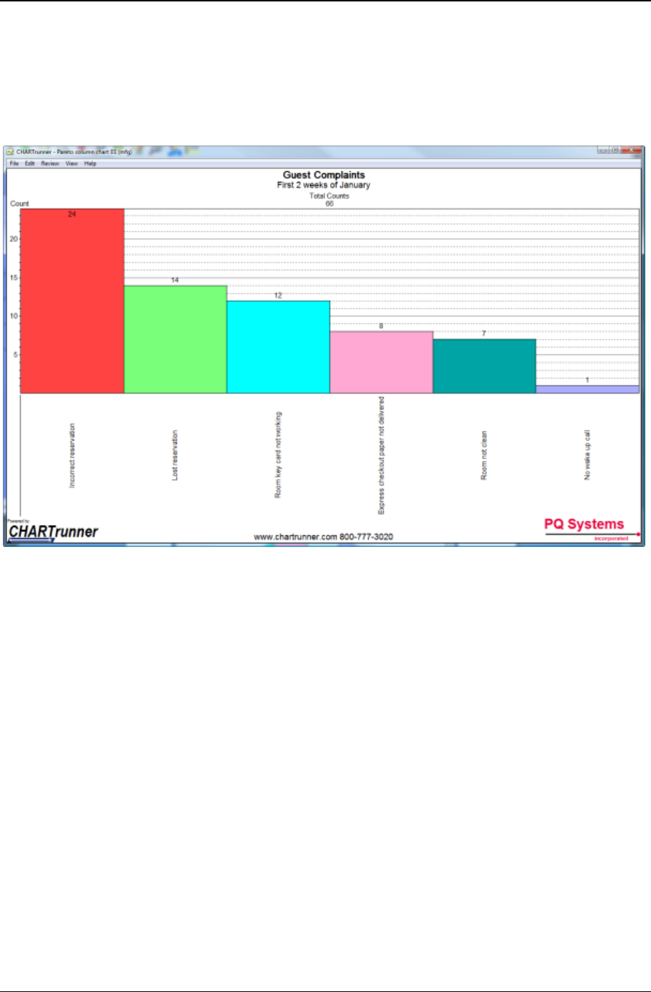
Data and chart types 67
Copyright © 2011
Pareto – column chart
A Pareto chart is a sample bar chart. Each bar represents a count of items that fall into a category or
classification. The bars are typically rank ordered so that that the bar with the highest value is shown first.
Column charts have the bars oriented vertically as shown below.
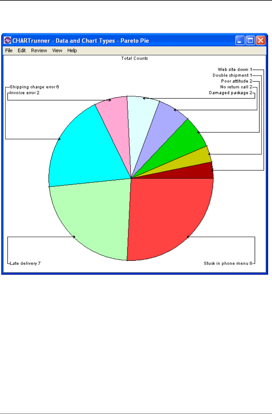
68 CHARTrunner User's Guide
Copyright © 2011
Pareto - pie
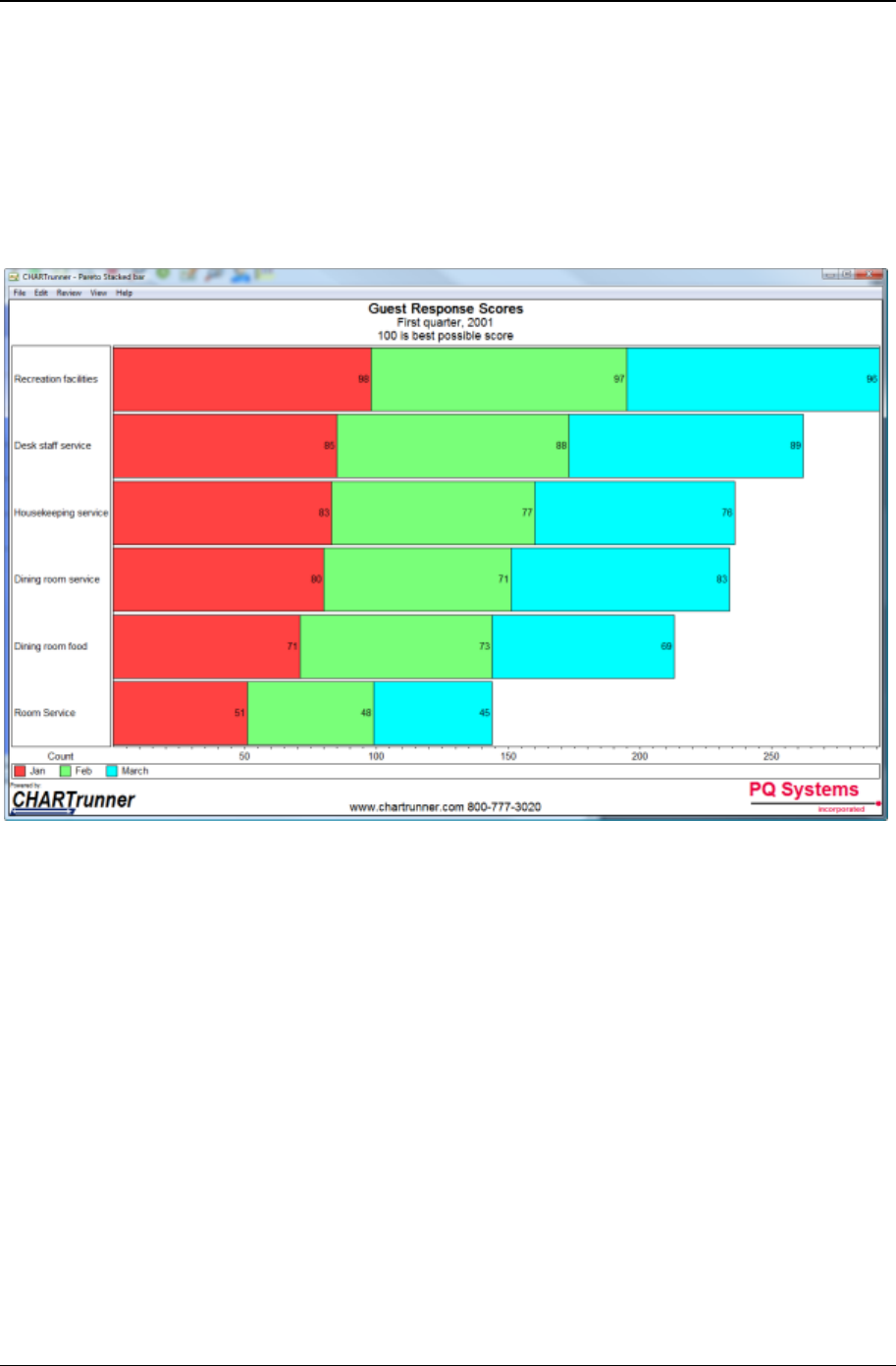
Data and chart types 69
Copyright © 2011
Pareto – stacked bars
A Pareto chart is a sample bar chart. Each bar represents a count of things that fall into a category or
classification. The bars are typically rank ordered so that that the bar with the highest value is shown first.
When using a stacked bar option on a Pareto chart, each "bar" can be made up multiple "sub bars." This
is an option when you map multiple count columns or when you map a group by column that results in
each category being made up of sub-categories. When the stack bars option is used with a bar chart, the
bars will be horizontal as shown below.
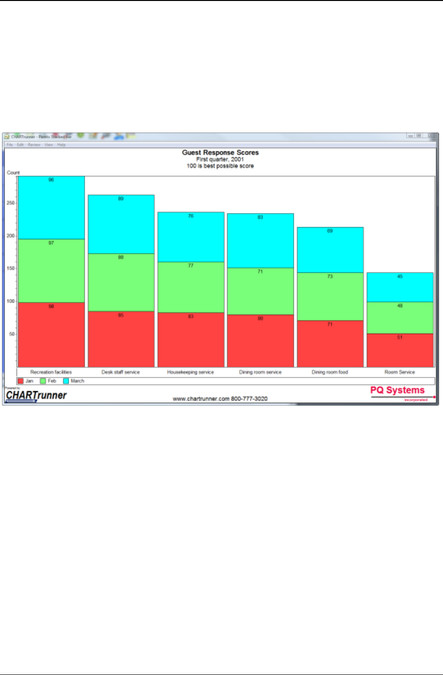
70 CHARTrunner User's Guide
Copyright © 2011
Pareto – stacked columns
A Pareto chart is a sample bar chart. Each bar represents a count of things that fall into a category or
classification. The bars are typically rank ordered so that that the bar with the highest value is shown first.
When using a stacked bar option on a Pareto chart, each "bar" can be made up multiple "sub bars." This
is an option when you map multiple count columns or when you map a group by column that results in
each category being made up of sub-categories. When the stacked bars option is used with a column
chart, the bars will be vertical as shown below.
When do you use Pareto charts?
• When your data can be arranged into categories
• When the rank of each category is important.
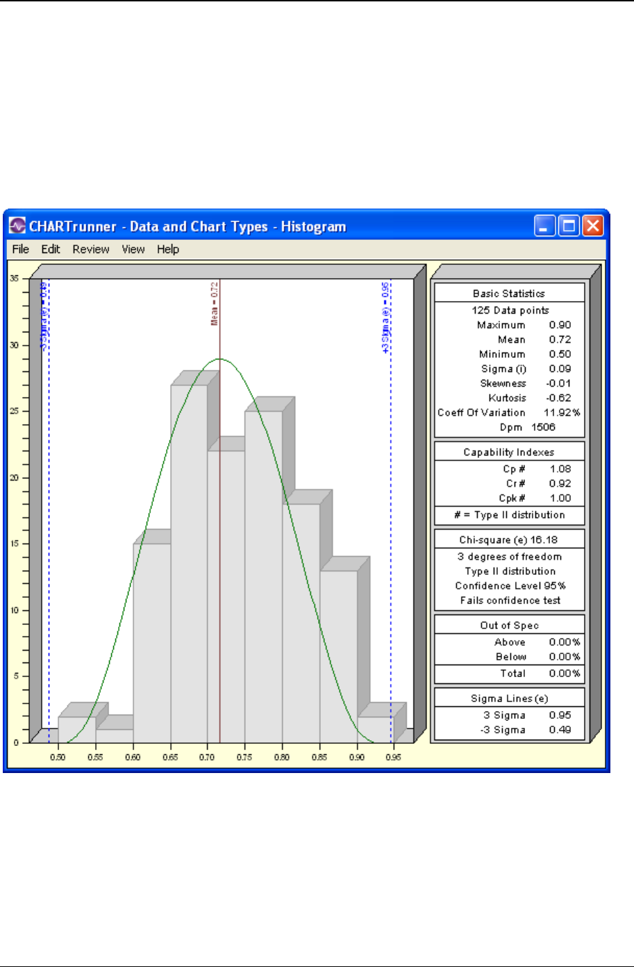
Data and chart types 71
Copyright © 2011
Distribution and capability analysis
Histogram
Histograms are bar charts that show how raw data is distributed. They show basic information such as
central location (mean), width of spread (range or standard deviation), and shape. CHARTrunner allows
you to select descriptive statistics, such as skewness and kurtosis, for histograms.
When do you use a histogram?
Use a histogram:
• When you want to visualize the central location, shape, and spread of data
• When the process is stable, and you want to predict future behavior.

72 CHARTrunner User's Guide
Copyright © 2011
Capability analysis
Capability analysis is a set of statistical calculations performed on a set of data in order to determine the
capability of the system. The capability of the system refers to the ability of that system to perform with
respect to its specification limits. A system is said to be capable if it is producing 100 percent within
specification limits.
CHARTrunner offers the following capability indices. Please refer to the Quality Advisor for a detailed
description of each index and what you can learn from it. You can also refer to Appendix A for the
formulas. CHARTrunner capability indices include:
Cp Cpm Pp
Cpk Cpu Ppk
Cr Cpl Pr
When do you use capability analysis?
Use capability analysis:
• When the system is stable
• When the individual values of the variables data are normally distributed
• If the system does not follow the normal distribution, you may want to choose “assume the distribution
is non-normal” when creating a histogram in CHARTrunner.
• When you want to know how the system performs in relation to the specification limits.
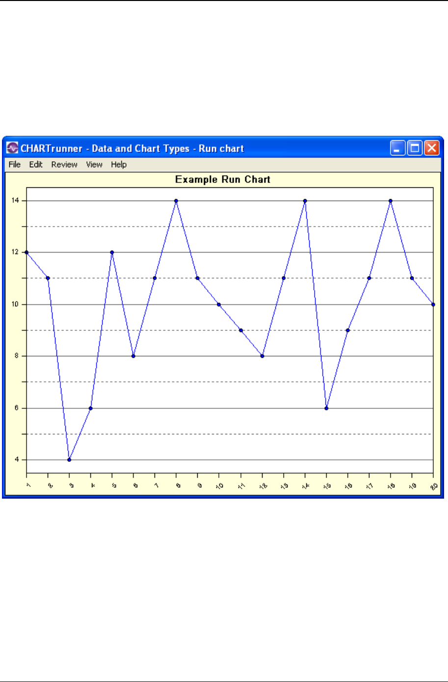
Data and chart types 73
Copyright © 2011
Line charts
Run chart
Run charts are line graphs of individual data points plotted over time. They are used to look for patterns
or trends in the data.
When do you use run charts?
Use run charts:
• When data is collected over time
• When the time order has been preserved
• When you want a quick test of process performance
• When you do not have enough data for conventional control chart analysis.
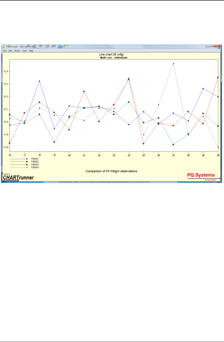
74 CHARTrunner User's Guide
Copyright © 2011
Multi-line charts
A multi-line chart is used to look for trends across different characteristics or related data sets. You can
display up to 10 data lines.
When do you use multi-line charts?
Use multi-line charts when you want to compare data from different factors on the same chart.
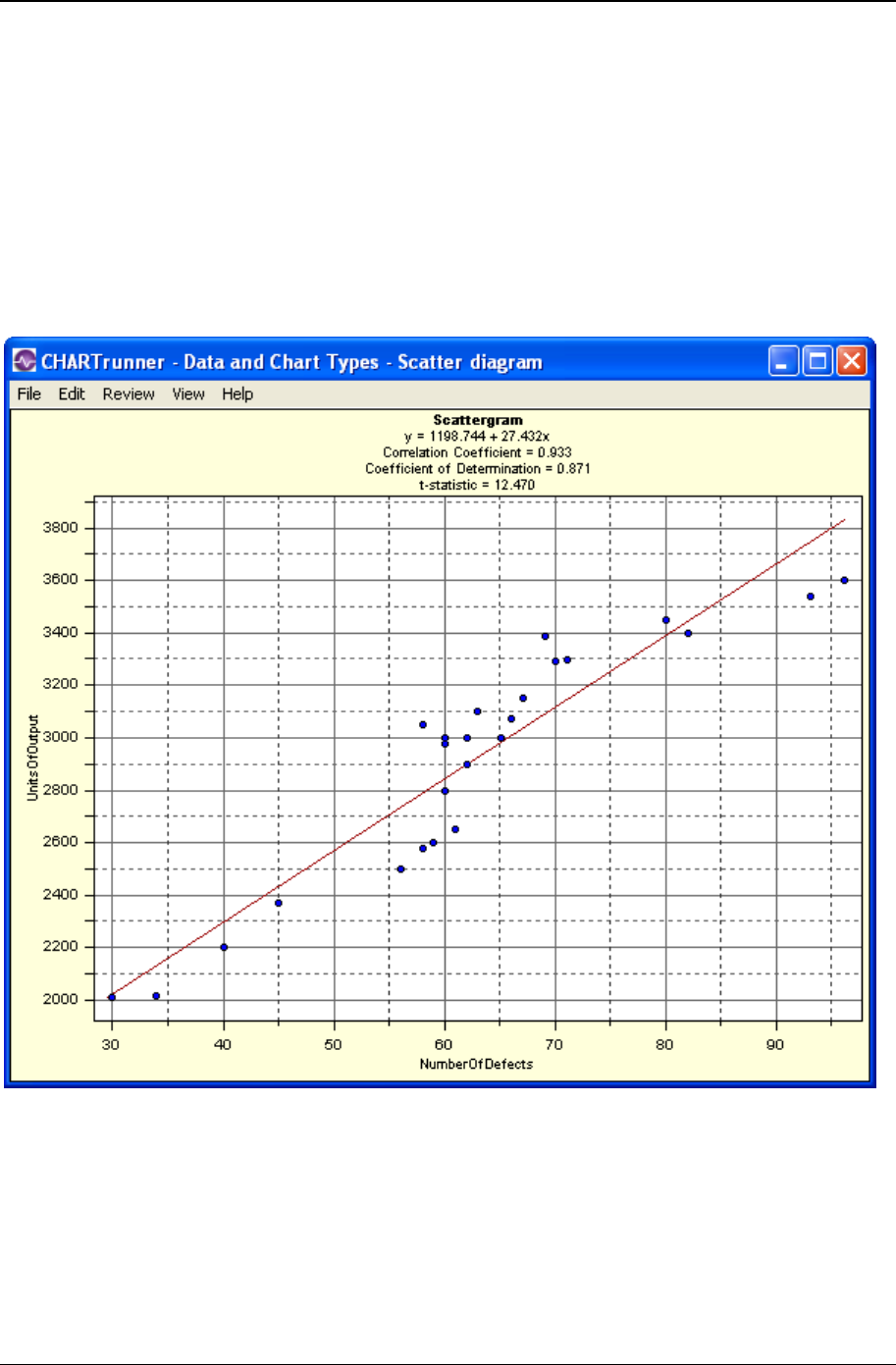
Data and chart types 75
Copyright © 2011
Scatter diagrams
They are graphs that show the plotted values of the factors with each point on the graph representing a
pair of measures. One factor is plotted on the horizontal axis and the other on the vertical. The purpose of
the scatter diagram is to identify whether the factors are related as indicated by the pattern formed by the
plotted values. If a relationship does exist, the factors are correlated.
If they are positively related, the values will fall on a line trending upward and have a correlation
coefficient (r) = 1.0. If the factors are negatively related, the values will tend to fall on a line trending
downward and have a correlation coefficient = -1.0. A correlation coefficient = 0 implies that there is no
linear relationship.
When do you use scatter diagrams?
Use scatter diagrams when you suspect the performance of one factor is related to the performance of
another factor.
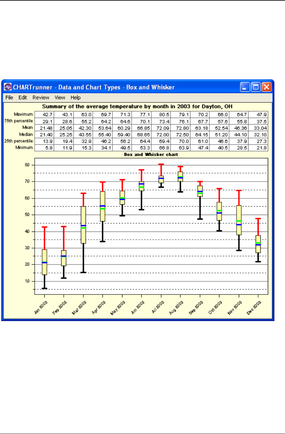
76 CHARTrunner User's Guide
Copyright © 2011
Advanced charts
Box and whisker
A box and whisker chart summarizes several different measurements in a single graphical display.
When do you use box and whisker charts?
Use box and whisker charts:
• When you want to visually compare different sets of related data
• When you want to visually compare both the range and the central
location of multiple related data sets.
Data and chart types 77
Copyright © 2011
Short-run SPC
In some applications, control charts are not practical. One example of this is manufacturing operations
where small lots of many different products are produced. Since each product has different specifications,
monitoring this with traditional control charts can be cumbersome.
In Short-run SPC, special control charts allow you to chart differences from a target value. Sometimes the
absolute difference from target is plotted. In other cases a normalized difference from target is plotted.
The idea is that a zero difference from target is good and any deviation away from zero is bad.
A common example used to demonstrate short-run SPC is that of a machine set up to cut bar stock into
different lengths. The operator may cut 6-inch bars for an hour and then switch to 12-inch bars for a few
hours. Rather than keep one control chart for 6-inch bars and a different chart for 12-inch bars, short-run
SPC allows the operator to monitor 6-inch, 12-inch, and any other size bars all on a single chart. You
might think of the chart as monitoring “How well are we cutting bars?” rather than “How well are we
cutting 6-inch bars?”
For short-run SPC, CHARTrunner uses techniques described in Short Run SPC, Donald J. Wheeler,
PhD, SPC Press. 1991.
Short-run chart types
Here is a complete list of the short-run chart types. Notice that your options differ based on subgroup size
of one vs. subgroup size larger than one.
Subgroup size is 1 Subgroup size greater than 1
Difference from target, moving range Difference from target (X-bar), range
Zed, W Zed bar, W
Zed*, W* Zed bar*, W*
Mean ranges Mean ranges
The mean ranges chart is unique to short-run SPC. It will help you decide which type of chart you need
for your specific data set. Consider these two scenarios:
1. Scenario 1
• You are making products that have similar target values and similar variation around the mean. In our
example, the 6-inch bars and 9-inch bars might qualify as similar.
2. Scenario 2
• You are making products where both the target values and the variations are very different. For
example, the first product might have a target of 675 and vary from 650 to 700. The second product
might have a target of 1.1 and vary between .98 and 1.3.

78 CHARTrunner User's Guide
Copyright © 2011
The important question is how different are your products in terms of the mean and the variation? If your
products are similar, you will use the difference chart. (There is an interesting sentence!) If your products
are not similar, you will use the zed charts.
If you display a mean ranges chart and all the points (products) fall within the control limits, use a
difference from target chart.
If you display a mean ranges chart and points are outside the control limits, select one of the zed charts.
Difference chart vs. zed chart
A difference chart is plotting the difference from target in absolute units. A zed chart takes the difference
from target, normalizes this difference in units of sigma, and plots this normalized value as the difference.
PQ Systems' Practical Tools for Continuous Improvement provides more details about the types of data
and tools for analysis. It also provides detailed information on tools for planning, problem-solving, and
interpreting control charts. Contact the PQ Sales Group for more information.
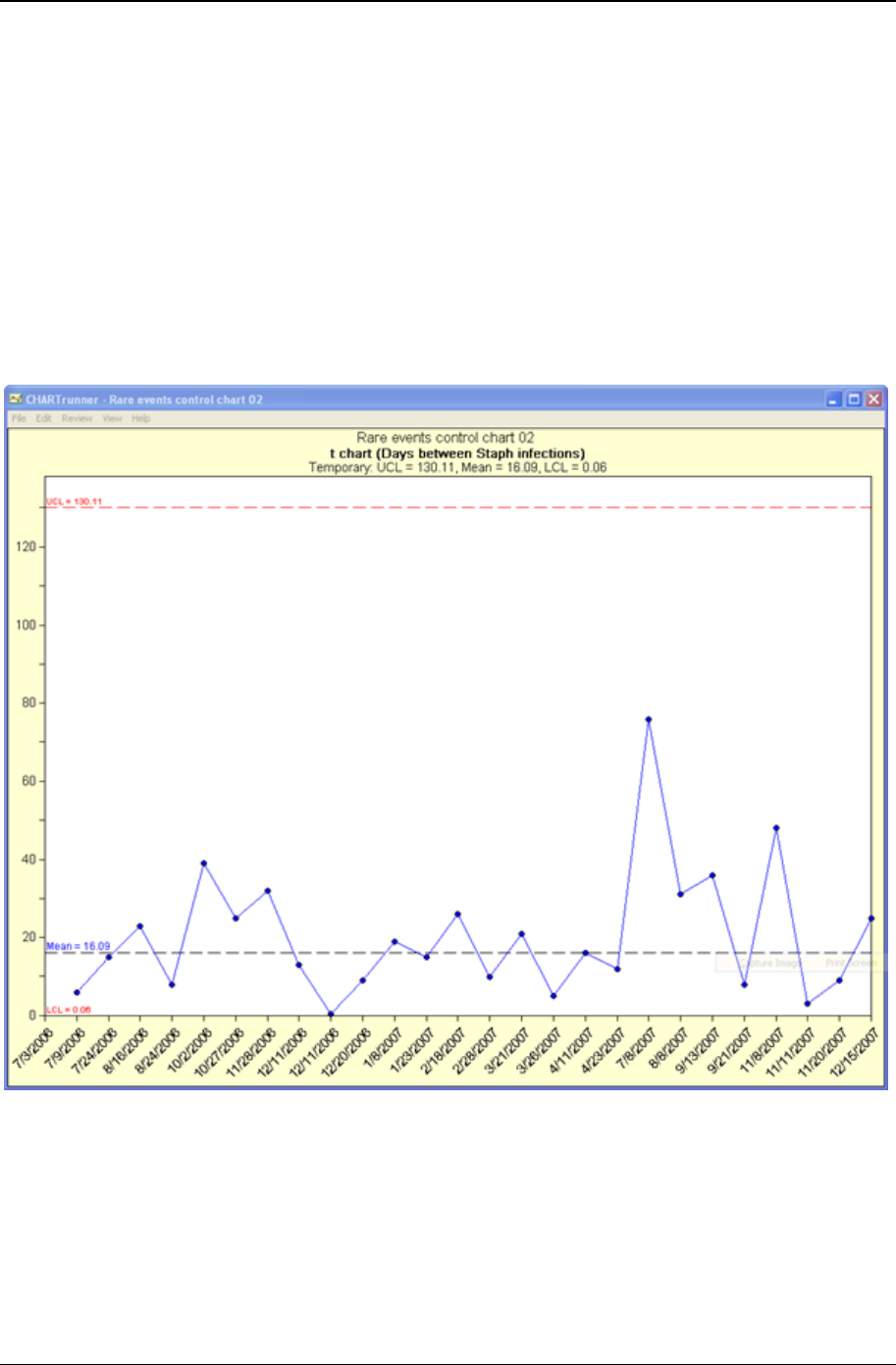
Data and chart types 79
Copyright © 2011
Rare event control charts
t-chart
The t-chart creates a picture of a process over time. The units being plotted are time values. Each point
on the chart represents an amount of time that has passed since a prior occurrence of some rare event.
The time units might be hours, days, weeks, months, etc. For example, a chart might plot the number of
days between infection outbreaks at a hospital. Alternatively, it could plot the same information as the
number of weeks between infection outbreaks. A traditional plot of this data will contain many points at
zero and an occasional point at one. The benefit of the t-chart is visualizing this data in traditional control
chart form. The formulas for t-chart control limits are different to account for this type of data.
When do you use a t-chart?
• When you want to see if the process is stable and predictable
• When you want to see how a planned change affects the process
• When you are tracking the passage of time between relatively rare events
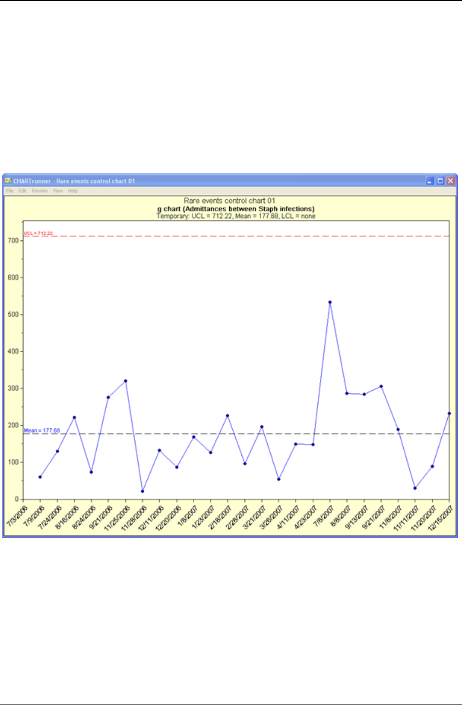
80 CHARTrunner User's Guide
Copyright © 2011
g-chart
The g-chart creates a picture of a process over time. Each point represents some number of units that
have been “produced” between occurrences of some relatively rare event. For example, in a production
setting, where parts are produced daily, you may have occasionally power outages. A g-chart might be
use to look at the number of units (products) produced between power outages. The units produced can
be almost anything. For example, you might look at the number of invoices printed, the number of
customers served, or the number of patients seen, between the occurrences of some event. A traditional
plot of data like this is not conducive to control chart interpretation. The benefit of the g-chart is visualizing
this data in traditional control chart form. The formulas for g-chart control limits are different to account for
this type of data.
When do you use a g-chart?
• When you want to see if the process is stable and predictable
• When you want to see how a planned change affects the process
• When you are tracking the number of units produced between rare events

81
In This Chapter
Database concepts ....................................................................................... 81
Basic chart definition concepts ..................................................................... 82
Step 1: Chart name/type tab ......................................................................... 83
Step 2: Data source tab ................................................................................ 84
Step 3: Data definition tab ............................................................................. 91
Filtering chart data ........................................................................................ 97
Query parameters ......................................................................................... 99
Custom query .............................................................................................. 102
Database concepts
Since CHARTrunner uses data stored in databases, it might be helpful to review some basic database
terms and concepts.
Databases are used to store a wide variety of information. Most databases manage this information in
one or more tables. A table usually has a name and contains one or more fields (sometimes called
columns) of information. Database tables contain rows that are also called records. Tables can be quite
large and often contain thousands of rows of information.
Some information does not fit neatly into a single table. For example, in most order entry systems, a
single order may contain several distinct items. In this case, it does not make sense to put the customer
information for the order in the same table as all the items in the order (as it would be duplicated).
Instead, the information is stored in two tables that are linked by a common column such as Order
Number. In this way, a single row in the Order table is related to or linked to multiple rows in the Order
Detail table.
People who use the information in database tables often want to work with a subset of the rows within a
table, for example, all orders that come from Kentucky. Instead of looking through thousands of records
from each state, users can do a query to see a table that contains only the Kentucky records.
Queries are like questions that we ask the database; the answer looks like an ordinary table, but it is
really a subset of the rows in the table. Most databases allow you to remember and reuse queries. In this
case, refer to the name of the query as if it were a regular table. Queries that are saved in the database
are sometimes called views or stored procedures.
CHAPTER 6
Basic chart definition

82 CHARTrunner User's Guide
Copyright © 2011
Basic chart definition concepts
Charts are created with the Chart definition form. This form consists of a series of tabs. The first three
tabs, Step 1: Chart name/type, Step 2: Data source, and Step 3: Data definition are used to specify the
chart type and to select the data for the chart. These three tabs are used for every type of chart definition.
The remaining tabs are used for titles, control and specification limits, and chart-specific options such as
x-axis and y-axis labels.
Basic steps to create a new chart definition:
Right-click on a chart in the CHARTrunner definitions list and select New chart from the pop-up menu. The
chart definition form will open. Or click on the New definition icon on the toolbar, . Or open the File
menu and select New definition.
1. On the Step 1: Chart name/type tab, define the chart name and type. (See Step 1: Chart name/type tab
(on page 17).)
2. On the Step 2: Data source tab, define how to connect to your database or data file. (See Step 2: Data
source tab (on page 84).)
3. On the Step 3: Data definition tab, define what data to use and how to treat the data columns. (See Step
3: Data Definition tab (on page 91).)
4. Using the other tabs, you can customize your chart by choosing specific settings for the type of chart
you have selected.
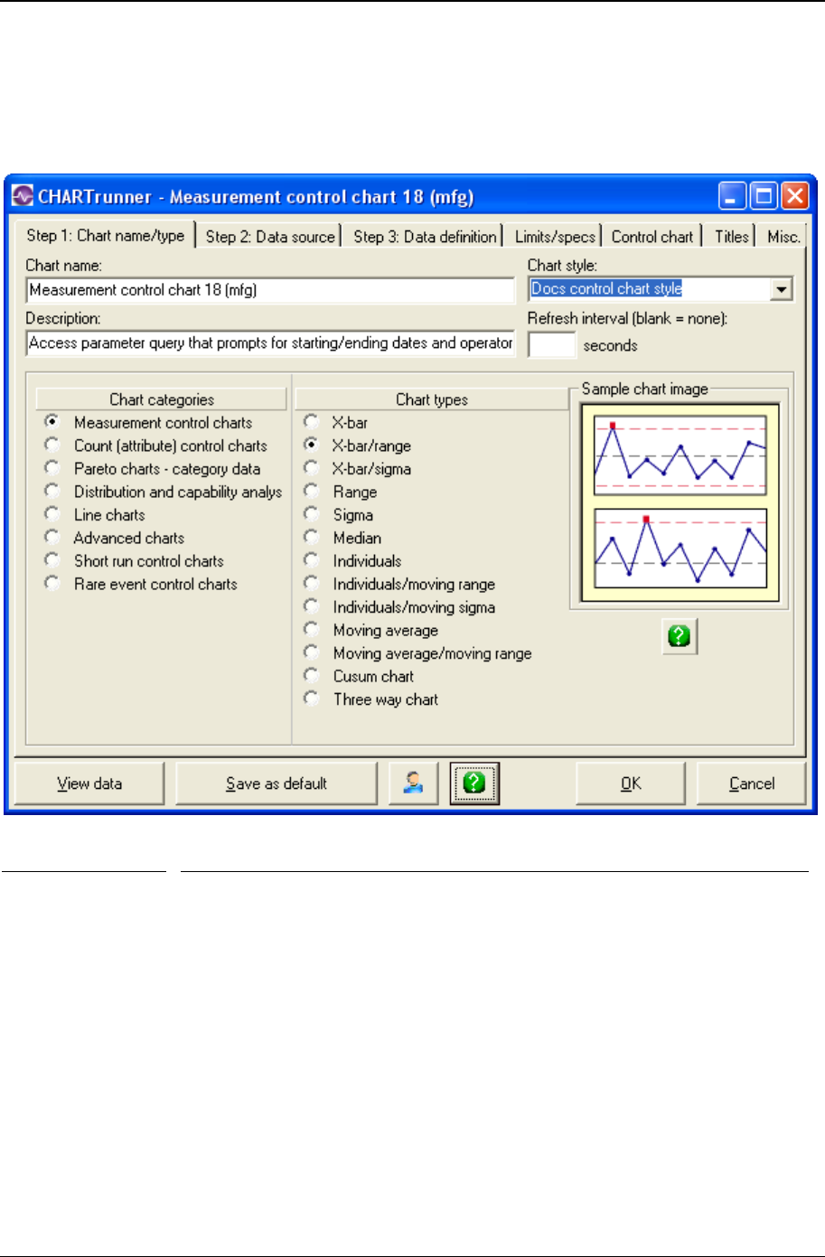
Basic chart definition 83
Copyright © 2011
Step 1: Chart name/type tab
The Step 1: Chart name/type tab, shown below, allows you to assign a chart name, description, chart type,
chart style, and refresh interval for your chart.
Field Name Description
Chart Name Enter the name for this chart. The name you enter will be used as the file
name of the chart definition, so the following characters ? :”/\<>*| are not
allowed, since they cannot be used in a file name. If you change the name of
an existing chart definition, you will be asked if you want to retain the chart
definition with the old name. You may search for a chart based upon the
chart's name. This is a required field.
Chart Style Select a chart style name from the drop-down menu. The chart style defines
many of the visual “look-and-feel” aspects of the chart (such as the chart
background color). See Using styles to control the look of your chart for
more information about chart styles.
Description The description is used to provide additional information about the chart.
Because the description can be displayed in the CHARTrunner definitions list,
a chart description may help to locate charts more easily. You may search for
a chart based upon the chart description. This is an optional field.
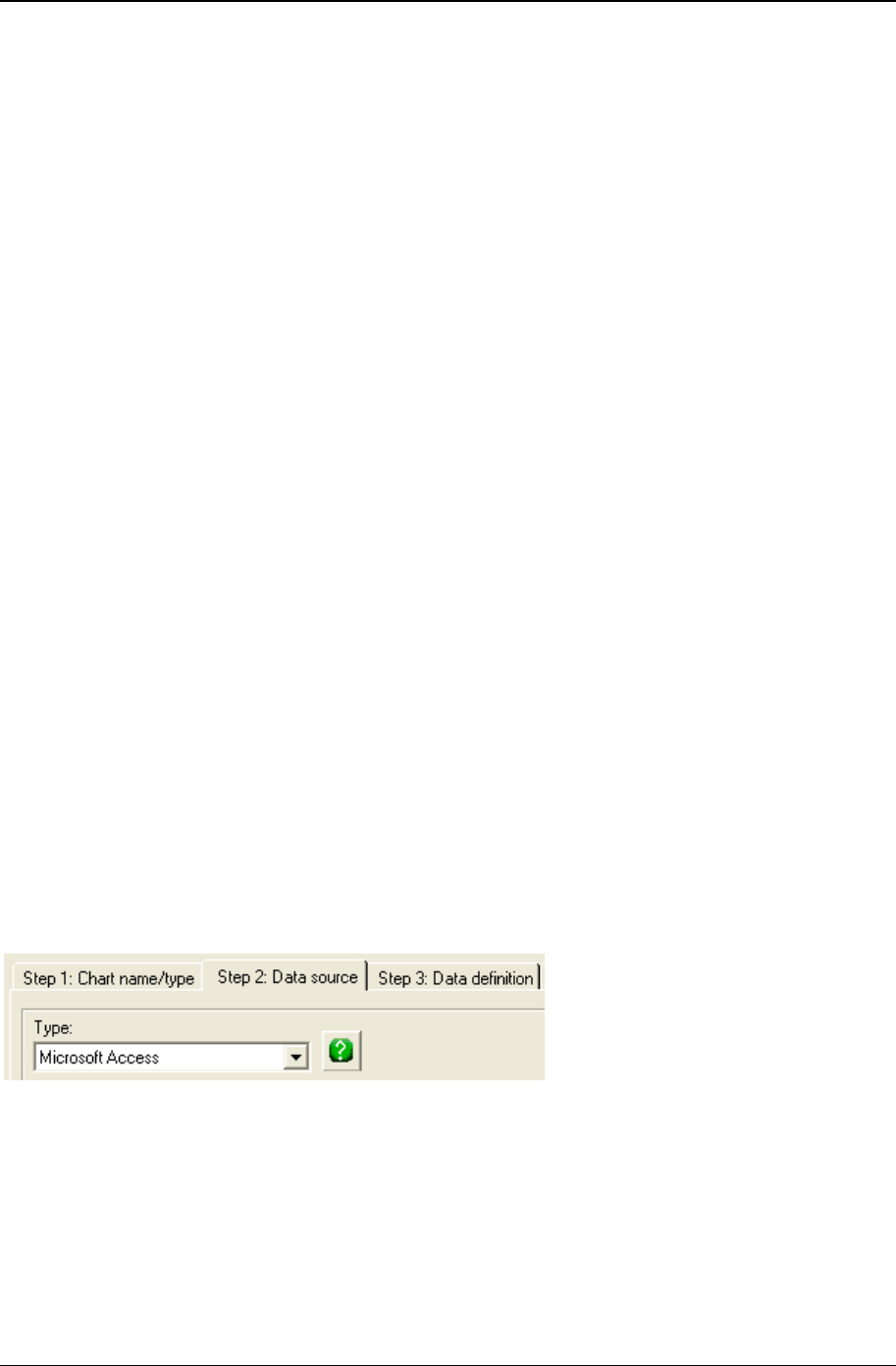
84 CHARTrunner User's Guide
Copyright © 2011
Refresh interval
(blank - none) The refresh option will redraw a displayed chart at the specified interval. If
data is added frequently, set a refresh interval to keep the chart current. A
refresh interval may be set for a chart or multi-chart. Leave this field blank if
you do not want the chart to automatically refresh. Set this to the desired
number of seconds if you want the chart automatically to refresh while it is
displayed. Each time the refresh interval passes, the chart will be re-
displayed, reflecting any new data that may have arrived since the last
refresh.
NOTE: Be careful not to set the refresh interval too short. For example, if you
add new data to the underlying database once every 30 minutes, there is
really no need to set the refresh interval to 10 seconds. This makes the
computer do unnecessary work to re-query the database and re-draw the
chart. One use for the refresh interval is to monitor a chart in one location
based on data that is being collected in some other location. For example, in
showing data that is being collected during a manufacturing process.
Chart categories
and Chart type Specify the category and type of chart that you want. When you select a chart
type, the Sample chart image shows you a representation of what the chart
will look like. For descriptions of available chart types, please refer to Data
and chart types. For information on chart-specific settings, please refer to
Customizing a chart definition (on page 113).
When you have finished with the Step 1: Chart name/type tab, the next step is to tell CHARTrunner how to
connect to the database or data file for the chart by clicking the Step 2: Data source tab.
Step 2: Data source tab
The information on the Step 2: Data source tab tells CHARTrunner how to connect to your database or data
file in order to fetch the data to be charted.
When you are finished specifying the properties of the Step 2: Data source tab, you can proceed to the
Step 3: Data definition tab to select data to be used for the chart. See the topic Step 3: Data definition tab
for more information.
The first choice you must make on the Step 2: Data source tab is the Type of data source or access method
you want to use.
The fields on the Step 2: Data source tab rearrange themselves depending on the Type of data source you
specify. There are three basic data access methods to choose from. Later in this topic, a sample Step 2:
Data source tab is shown for each of these three methods.
1. Your data source is Microsoft Access (with no password), Microsoft Excel, a text file, Paradox, dBase or
Lotus 123. These data sources fetch data directly from a data or database file on the computer's disk.
The underlying data retrieval technology used by this method is Microsoft Data Access Objects
(DAO).

Basic chart definition 85
Copyright © 2011
2. ADO;OLE DB provider – Your data source has an ADO or OLE DB provider. That's a fancy way of
saying that someone has written data access software that conforms to the OLE DB specification for
your particular data source. The major client-server databases, such as SQL Server and Oracle, have
an ADO;OLE DB data provider. The underlying data retrieval technology used by this method is
Microsoft ActiveX Data Objects (ADO). Given the choice between using an ODBC driver or an
ADO;OLE DB provider, typically the best results are obtained by using the ADO;OLE DB provider.
Please refer to Appendix D, Data Sources, for more information on using ADO;OLE DB to fetch data
from specific data sources.
3. ODBC; Open database connectivity - Your data source has an ODBC driver. That's a fancy way of saying
that someone has written data access software that conforms to the ODBC specification for your
particular data source. The major client-server databases like SQL Server and Oracle have an ODBC
driver. FoxPro data is also accessible via an ODBC driver. The underlying data retrieval technology
used by this method is Microsoft Open Database Connectivity (ODBC). Given the choice between
using an ODBC driver or an ADO;OLE DB provider, typically the best results are obtained by using
the ADO;OLE DB provider. Please refer to Appendix D, Data Sources, for more information on using
ODBC to fetch data from specific data sources.
• Type - Select the type of data source or access method from the drop-down menu. Your choices are:
Microsoft Access – If the Access database requires a database or workgroup password, please
refer to Appendix D, Data Sources, for more information.
Microsoft Excel
Text file
Paradox
dBase
Lotus 123 (wk1)
Lotus 123 (wk3)
Lotus 123 (wk4)
ODBC; Open database connectivity
ADO; XML record set – Select this to have CHARTrunner fetch XML chart data from a Web site.
See Appendix D, Data sources, for more information on using this method.
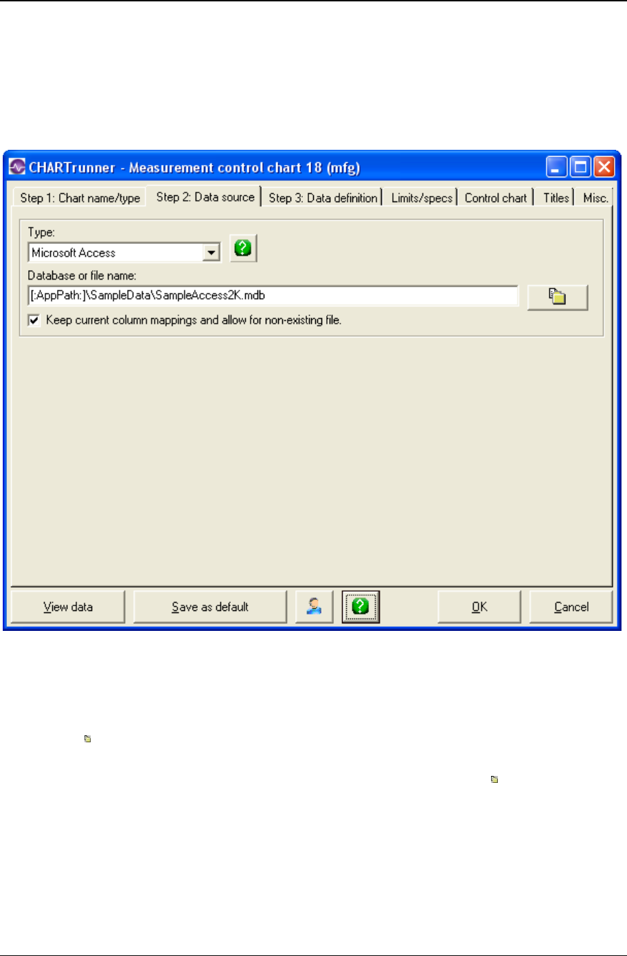
86 CHARTrunner User's Guide
Copyright © 2011
If You Select Microsoft Access, Microsoft Excel, text file,
Dbase, or Lotus 123 as the type of data source
The Step 2: Data source tab shown below is used for a file-based data source, such as Microsoft Access or
Excel, where you tell CHARTrunner the location of the data file on the computer's disk.
• Database or file name – This field is used when your data source comes from a disk file or folder. The
field is not visible when the data Type is ADO or ODBC. You may use [:AppPath:] as part of the file or
folder specification; this gets expanded to be the full path to the folder where CHARTrunner is
installed. Your entry in this field depends on the type of data source as explained below.
• For Access, Excel and Lotus 123: – Enter the directory and data file name in the Database or file name field.
Click the button to open the file selection dialog.
• For dBase, Paradox, and text files – Enter only the folder (or directory) where the data files are located.
You will select the specific data file on the Step 3: Data definition tab. Click the button to open the
folder selection dialog.
• Keep current column mapping and allow for non-existing file – This field allows you to change the data
source without losing the How to treat the columns settings that are defined on the Step 3: Data definition
tab. This feature is useful if you need to switch between identical databases and retain the same
column Treat As definitions.
Why allow for a non-existent data file? You might need this:
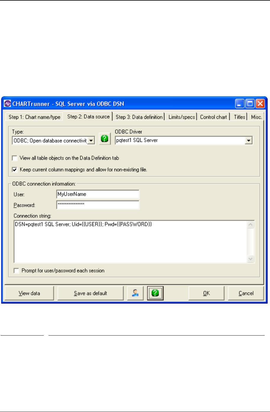
Basic chart definition 87
Copyright © 2011
a) If you are creating a chart definition for a data file that is not available to you. For example,
you may want to set up a chart for someone else who will be able to access the specified data file.
b) If you are a CHARTrunner-e user and want to set up a chart definition for a data file not available
to your computer; use this feature to enter the path of a file or folder that is available to the
CHARTrunner-e server.
You must specify an appropriate “Connection string” for the ODBC driver you want to use.
If you select ODBC as the type of data source
When you select ODBC; Open database Connectivity as the Type, the Step 2: Data source tab looks like the
example shown above. You can provide the following ODBC connection information:
Field Description
ODBC Driver You can select the ODBC “Data Source Name” you want to use from this drop-
down list. This list contains the ODBC “Data Source Names” (DSN) that have
been defined on your computer. The Windows Control Panel is used to set up
ODBC data sources on your computer. When you select a DSN name from the
drop-down list, a default connection string of the form
“DSN=SelectedOdbcName;” will be entered for you. Selecting from the ODBC
Driver drop-down list is optional because you can always manually enter the
required connection string.

88 CHARTrunner User's Guide
Copyright © 2011
View all table
objects on the
Data Definition
tab
When CHARTrunner builds the list of available tables and views on the Step 3:
Data definition tab, it limits the list to show only the most commonly used
database objects. With some data sources (such as Oracle and SQL Server),
select this option to expand the list to include all available database objects, not
just the most commonly used ones.
Keep current
column
mapping and
allow for non-
existing file
This field allows you to change the data source without losing the How to treat the
columns settings that are defined on the Step 3: Data definition tab. This feature
is useful if you need to switch between identical databases and retain the same
column Treat As definitions.
Why keep the current column mapping? You might need this:
• If you are creating a chart definition for a data source that is not available to
you. For example, you may want to set up a chart for someone else who will
be able to access the specified data source.
• If you are a CHARTrunner-e user and want to set up a chart definition for a
data source that is not available to your computer. Use this feature to enter
the connection string that is appropriate for the CHARTrunner-e server.
User Enter a valid user login name for the data source. The name you enter here will
be substituted into the Connection string wherever {{USER}} appears in the string
(as shown in the figure above). Alternatively, you may enter the user login name
directly into the Connection string (e.g., Uid=MyUserName), in which case you
would not enter the user name here.
Password Enter the password for the data source. The password you enter here will be
substituted into the Connection string wherever {{PASSWORD}} appears in the string
(as shown in the figure above). Alternatively, you may enter the password directly
into the Connection string (e.g. Pwd=MySecretPassword), in which case you would
not enter the password here. It is recommended that you use the Password field so
that the password is not stored in plain text in the chart definition file.
Connection
string If you selected the driver name from the ODBC Driver drop-down list, a default
connection string was created for you. Edit the connection string as appropriate
for your ODBC data source.
Prompt for
user/password
each session
Select this if you want CHARTrunner to prompt for the user login name and
password each time the chart initially opens the data source.
For more information on using specific ODBC data sources, see Appendix D, Data sources.
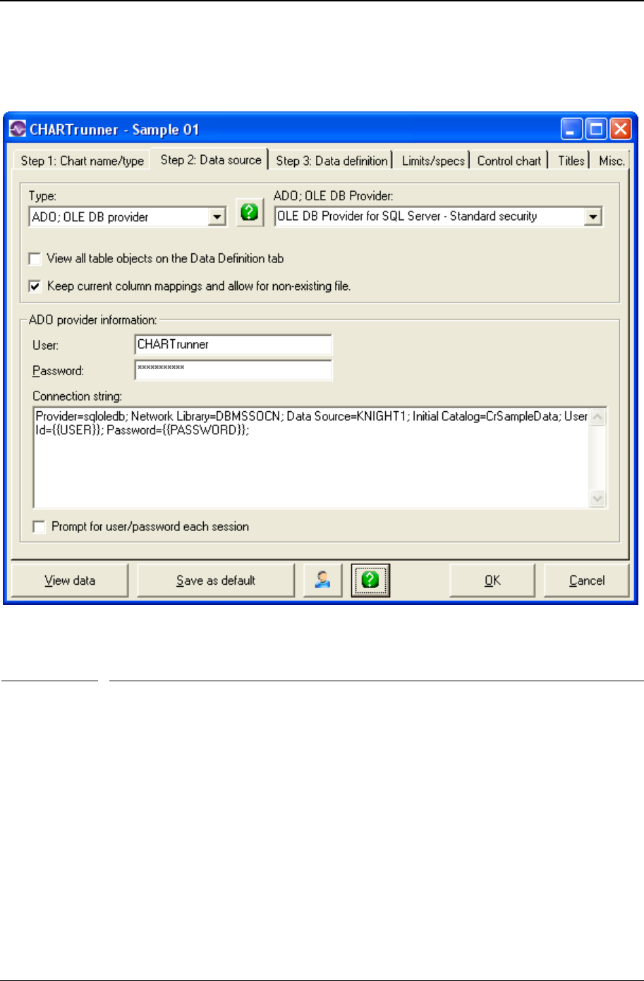
Basic chart definition 89
Copyright © 2011
If you select ADO as the type of data source
You must specify an appropriate Connection string for the ADO provider that you want to use.
When you select ADO;OLE DB provider as the Type, the Step 2: Data source tab looks like the example
shown above. You can provide the following ADO connection information:
Field Description
ADO;OLE DB
Provider You can select a connection string template for the ADO provider you want to use by
selecting from the drop-down list. A default template for that provider's connection
string will be placed in the connection string field. But you will still need to edit the
connection string to provide information that is specific to your situation. Selecting
from the ADO;OLE DB Provider drop-down list is optional because you can always
manually enter the required connection string.
View all table
objects on the
Data Definition
tab
When CHARTrunner builds the list of available tables and views on the Step 3: Data
definition tab, it limits the list to show only the most commonly used database
objects. With some data sources (such as Oracle and SQL Server), select this option
to expand the list to include all available database objects, not just the most
commonly used ones.
Keep current
column
mapping and
allow for non-
This field allows you to change the data source without losing the How to treat the
columns settings that are defined on the Step 3: Data definition tab. This feature is
useful if you need to switch between identical databases and retain the same column

90 CHARTrunner User's Guide
Copyright © 2011
existing file
Treat As definitions.
Why keep the current column mapping? You might need this:
• If you are creating a chart definition for a data source that is not available to you.
For example, you may want to set up a chart for someone else who will be able
to access the specified data source.
• If you are a CHARTrunner-e user and want to set up a chart definition for a data
source that is not available to your computer, use this feature to enter the
connection string that is appropriate for the CHARTrunner-e server.
User Enter a valid user login name for the data source. The name you enter here will be
substituted into the Connection string wherever {{USER}} appears in the string (as
shown in the figure above). Alternatively, you may enter the user login name directly
into the Connection string (e.g., Uid=MyUserName), in which case you would not enter
the user name here.
Password Enter the password for the data source. The password you enter here will be
substituted into the Connection string wherever {{PASSWORD}} appears in the string (as
shown in the figure above). Alternatively, you may enter the password directly into
the Connection string (e.g., Pwd=MySecretPassword), in which case you would not
enter the password here. It is recommended that you use the Password field so that
the password is not stored in plain text in the chart definition file.
Connection
string If you selected the driver name from the ADO;OLE DB Provider drop-down list, a default
connection string was created for you. Edit the connection string as appropriate for
your ADO provider.
Prompt for
user/password
each session
Select this if you want CHARTrunner to prompt for the user login name and
password each time the chart initially opens the data source.
For more information on using specific ADO data sources, see Appendix D, Data Sources.
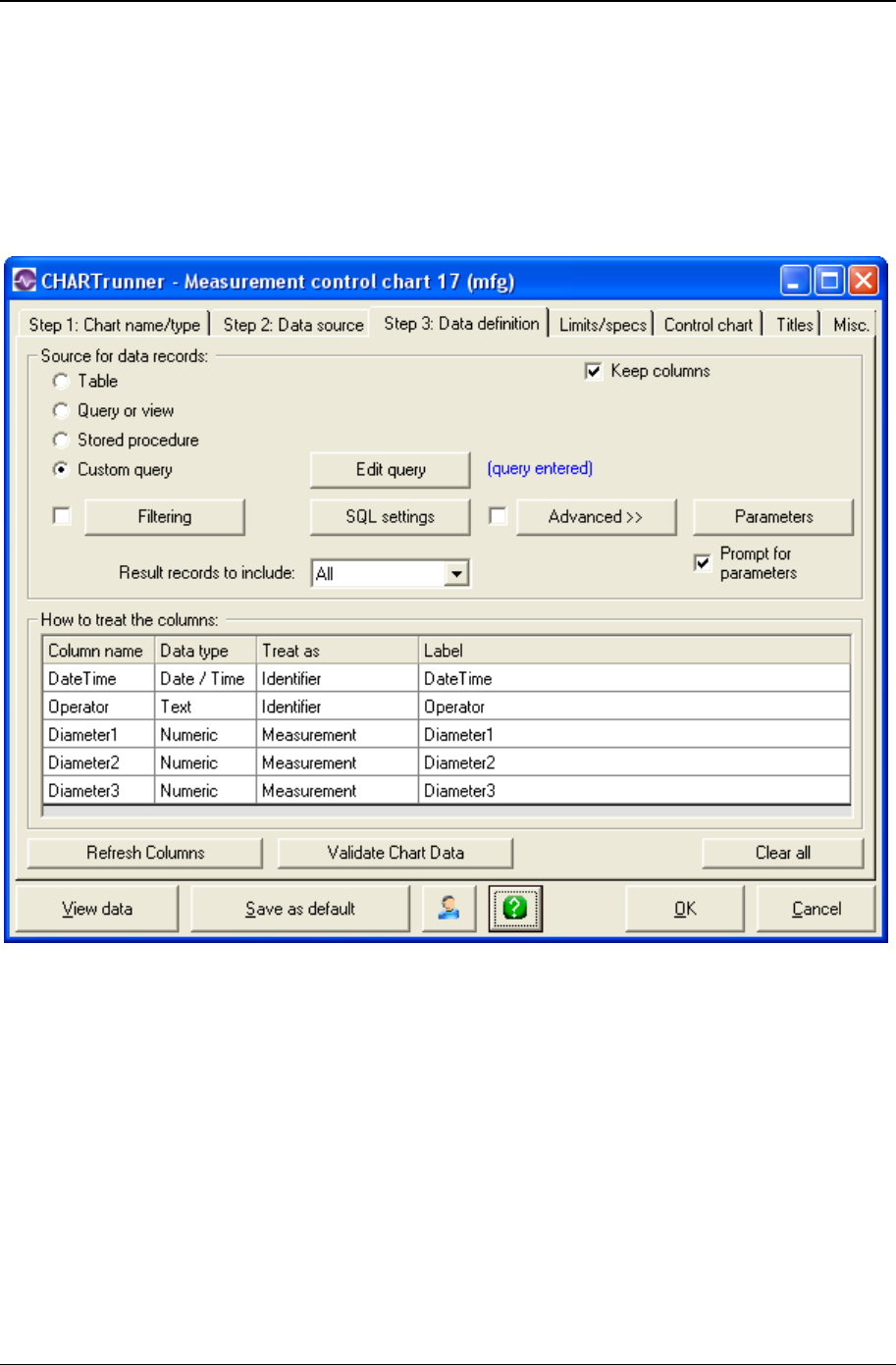
Basic chart definition 91
Copyright © 2011
Step 3: Data definition tab
The Step 3: Data definition tab is where you tell CHARTrunner whether to fetch data from a table, query or
view, stored procedure, or custom SQL query. You can specify how the data will be ordered (for a table),
how to filter records, set up Advanced Row Selection to perform sampling or grouping of the data rows, and
how to treat the data source columns. When using a stored procedure that accepts input parameters, you
can specify the input values to be passed into the stored procedure.
• Source for data records – Select one of the following four sources of data records:
• Table – This option tells CHARTrunner to get the records for this chart from a named table in the data
source.

92 CHARTrunner User's Guide
Copyright © 2011
For databases such as Access, SQL Server and Oracle, the tables found in the database will
be listed in the Table drop-down list. Select the table that contains the data for the chart.
If you chose Microsoft Excel on the Step 2:Data source tab, the Table drop-down list contains
the worksheets and named regions found in the Excel file. Select the worksheet or named
region that contains the data for the chart.
If you chose Text File on the Step 2: Data source tab, the Table drop-down list contains the
text files found in the folder you specified. Only files with a .TXT file extension are listed.
Select the text file that contains the data for the chart.
If you chose dBase or Paradox on the Step 2: Data source tab, the Table drop-down list
contains the table files found in the folder you specified. Select the table that contains the data
for the chart.
Column to use for Order By – When you choose Table, you should also specify the column that
you want to use to establish the order of the records from the table. This entry is not required;
however, with most relational databases, it is difficult to know exactly what order the records
will have if you do not make this selection. Thus, it is highly recommended that you specify the
column name to use in ordering the table data. The resulting data records will be ordered in
ascending order.
• Query or view – This option allows you to use queries that have already been defined in the database
as a source of records for this chart. If you select this option, the queries found in the database will be
listed in the Query drop-down list box. Note that some databases call these queries and others call
them views. Your database may not have any pre-defined queries, so it is possible the drop-down list
box will be empty. These queries are created and saved using your database program. It is a good
idea to treat one of the columns from the query or view as the Unique identifier to facilitate using
multiple control limits or attaching annotations to subgroups.
Query (drop-down list) – The queries or views found in the database will be listed in the Query
drop-down list. Select the name of the query or view that fetches the data for the chart. The
order of the data records will be determined by the definition of the query or view.
• Stored procedure – This option is very similar to the Query or view option. A stored procedure can specify
a series of database commands that are processed in order to fetch the data records. In addition, you
can pass input parameters into a stored procedure in order to have some control over the rows that
are returned. Stored procedures are created and saved using your database program. If nothing is
listed in this field, either your database does not support stored procedures or these procedures have
not been defined. It is a good idea to treat one of the columns from the stored procedure as the
Unique identifier to facilitate using multiple control limits or attaching annotations to subgroups.
Stored procedure (drop-down list) – The stored procedures found in the database will be listed in
the Stored procedure drop-down list. Select the name of the stored procedure that fetches the
data for the chart. The order of the data records will be determined by the definition of the
stored procedure.
• Custom query – If you select this option, the Edit Query button appears, allowing you to enter your own
SQL statement to query the database. Using this option requires knowledge of both SQL and the
structure of the database that you are accessing. See Custom query (on page 102) for more
information. It is a good idea to treat one of the columns from the stored procedure as the Unique
identifier to facilitate using multiple control limits or attaching annotations to subgroups. The order of
the data records will be determined by the ORDER BY clause of the custom query.
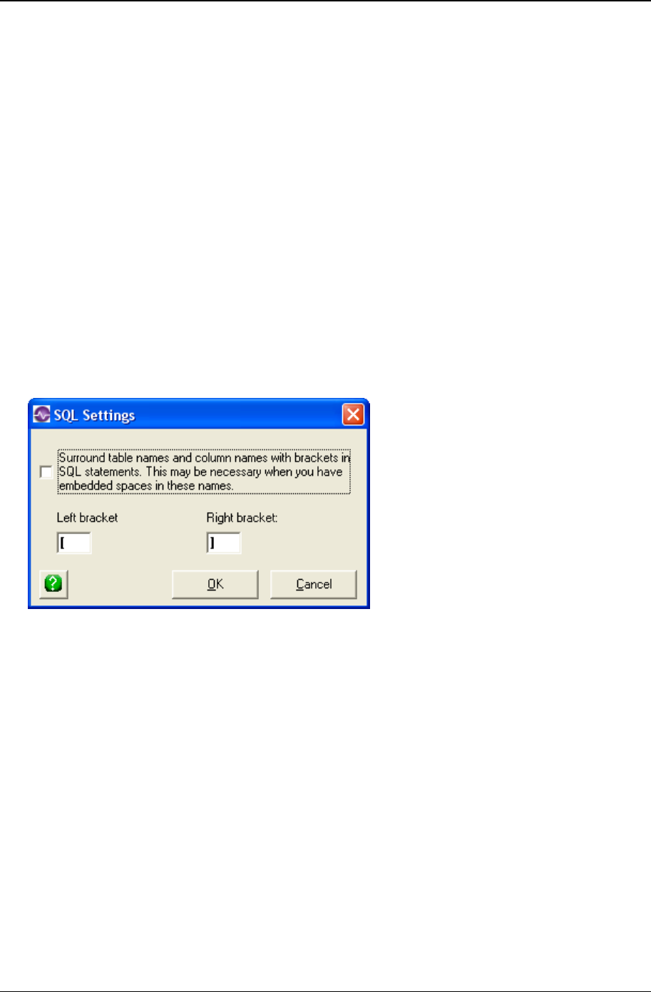
Basic chart definition 93
Copyright © 2011
• Edit Query – Click this button to open an editor that allows you to edit your custom query. Because
SQL is powerful and flexible, it can also be complicated. A complete description of SQL is beyond the
scope of this user guide. If you have trouble with SQL, refer to one of the resources listed in the topic
“SQL Query.”
NOTE: The Custom query is a powerful feature; care must be taken to form a correct SQL statement
that does not unintentionally result in thousands of records being returned. Or, worse yet, results in
the modification or deletion of data.
• Keep columns – If this is checked, you can change the Source for data records selection and/or change
the name of the table, query/view, or stored procedure without losing your existing How to treat the
columns settings. If this field is unchecked and you change any of these fields, the How to treat the
columns settings will be cleared.
• Filtering – The Filtering button and check box allow you to filter the data from your data source so that
only those rows that “pass through the filter” are considered for your chart. If a filter is defined, is it
active only when a check mark appears in the check box. See the Filtering chart data topic for more
information.
• SQL settings – Some databases allow embedded spaces in the names of objects, such as tables and
columns. As a result, these names must be enclosed in special characters in order to avoid database
query errors. Click the SQL settings button to specify whether or not to enclose these names with the
indicated special characters. Note that for an Oracle database you always want to leave this feature
turned off; i.e., not checked.
• Surround table names … – Select this option to surround table names and column names with the
bracket characters specified by the Left bracket and Right bracket fields. This is typically used when a
table or column name contains one or more embedded spaces as part of the name, and is required in
that situation for text files, Microsoft Access, Excel, and SQL Server. Other types of data source, such
as Oracle, do not use this option.
• Left bracket – Enter the left bracket character to use. For text files, Microsoft Access, Excel, and SQL
Server, you must use the “[“ character.
• Right bracket – Enter the right bracket character to use. For text files, Microsoft Access, Excel, and
SQL Server, you must use the “]“ character.
NOTE: If you get an error while trying to fetch data that resides in a text file, an Excel worksheet, an
Access database, or SQL Server, click on the SQL Settings button. The Surround table names and column
names with brackets option should be selected. If not, select it and click the OK button.

94 CHARTrunner User's Guide
Copyright © 2011
• Advanced>> – Click this button to open the Advanced Row Selection dialog, which allows you either to
sample or group the rows from your data source. For more information, see Advanced row
selection.
• Parameters – Some databases, such as Access, SQL Server, and Oracle, allow you to define queries
or stored procedures that require you to provide one or more input parameters so that the proper data
is selected. In addition, you can specify a Custom Parameter in the SQL of a custom query. If the
Parameters button is visible this means that your data source allows you to provide values for these
query parameters. See Query Parameters for more information.
• Results records to include – Use this field to specify which data points should be used. Options are All,
First N, or Last N. If you select First N or Last N, enter a value for N in the field provided.
CHARTrunner processes this setting after it processes Filtering and Advanced Row Selection
settings. If, for example, a filter is set to include only 8:00 am data, and Result records to include is set
at Last N=100, CHARTrunner would first separate 8:00 am data. Then, it would pull out the last 100
of the 8:00 am filtered data points. Likewise, if Advanced Row Selection is used to group the data into
days and Result records to include is set to Last 30, then the chart will show the last 30 days' worth of
data, not the last 30 rows of the original data.
How to treat the columns – This is where you tell CHARTrunner how to treat each column (or field) from your
data source. After you have specified a table, stored procedure, query or view, or custom query, the grid
at the bottom of the form will list information about the columns found in the data source. This grid
consists of 4 columns: Column name, Data type, Treat as, and Label. The Treat as column provides a
drop-down list of options you can set for each data column. The options available on this list depend on
the chart type. Use the Treat as column to specify how you want CHARTrunner to handle each field of
data that you want to chart. This grid consists of the following four columns:
• Column name – The column (or field) name found in the data source is displayed in this column.
• Data type – The type of data stored in this column of the data source is shown here.
• Treat as – This column provides a drop-down list of options you can set for each column of the data
source. The options available in this list depend upon the chart type. Use the Treat as column to
specify how you want CHARTrunner to handle each field of data that you want to chart. Each option
type is discussed below.
• Label - Use the Label column to specify how each data source column will be labeled in the grid-
above-the-chart or the web page data table.
NOTE: Depending on the chart type that you select, CHARTrunner expects certain columns to be
defined. For example, to do an X-bar chart, you must treat at least 2 columns from your data as
measurements. An individual chart requires only one column to be treated as a measurement. To do
a Pareto chart, you must designate at least one of your data columns as categories. For a scatter
diagram, both a dependent variable and an independent variable column must be specified.
CHARTrunner will warn you if the required column mappings are not present for the selected chart
type.
The following options are available for the Treat as column:
• Ignore – (default value) This tells CHARTrunner to ignore the column for this chart.
• Identifier – This makes the column available for use in labeling the chart or identifying each subgroup.

Basic chart definition 95
Copyright © 2011
• Unique identifier – Select Unique identifier if the column contains a unique value for every row in the
data set. Only one column can be mapped as the Unique identifier. Having a Unique identifier column
allows you to attach a chart annotation to a particular subgroup on the chart. It also allows control
limits to be able to “remember” the range of data over which they were calculated when the data
comes from a Query or view, Stored procedure, or Custom query. Being able to “remember” the range of
data over which each limit was calculated is important when multiple control limits are displayed on
the chart because it allows each set of limits to be positioned at the proper location along the x-axis.
When Query or view, Stored procedure, or Custom query is used, CHARTrunner makes the assumption
that the underlying order of the data is specified by the column that you select as the Unique
identifier.
• Upper spec – If the upper specification for what you are measuring is contained in the data source, you
may treat the column as an Upper spec. Note that there is only one number that can be the Upper
spec. If your data selection returns an Upper spec value in every data row, only the last non-NULL
value encountered will be used as the Upper spec.
• Target spec – If the target or nominal specification for what you are measuring is contained in the data
source, you may treat the column as a Target spec. Note that there is only one number that can be
the Target. If your data selection returns a target value in every data row, only the last non-NULL
value encountered will be used as the Target.
• Lower spec – If the lower specification for what you are measuring is contained in the data source, you
may treat the column as a Lower spec. Note that there is only one number that can be the Lower
spec. If your data selection returns a Lower spec value in every data row, only the last non-NULL
value encountered will be used as the Lower spec.
NOTE: Additional information on fetching specification values from the data source:
If the Upper, Target, and Lower specifications are contained in a different table from the
data, then you will have to use a custom query, query or view, or stored procedure in
order to join your data table with your specifications table in order to use the Target spec,
Upper spec, and Lower spec Treat as options.
When a specification value is entered on the Limits/specs tab, and the same specification is
fetched from the data source, the value fetched from the data source takes precedence
and is used on the chart. For example, if the target spec is defined as 10.0 on the
Limits/specs tab, and Target spec is specified for a data source column that contains 9.0 in
row 1, NULL in rows 2 - 28, 9.5 in row 29, and NULL in row 30, then 9.5 will be the target
spec value that is used for the chart.
Measurement – (variables charts only) This tells CHARTrunner that the column contains
measurements that you are interested in charting. If you mark three columns as
Measurement, then the subgroup size (if you are making a control chart) will be three.
Number inspected – (attributes charts only) This tells CHARTrunner that the column contains a
number inspected count that is used for attributes control charts.
Count – Tells CHARTrunner that the column contains counts that can be used for attributes
control charts and Pareto charts.
Cause – For control chart definitions, you may define one of your columns as an assignable
cause. This means that the column contains information that might explain unusual conditions
that will cause data to be excluded from the chart and from certain calculations, such as
computing control limits. You can choose to display cause information on the chart on the X-
axis Y-axis sub-tab.
Note – This tells CHARTrunner to treat the column as a note. Notes are textual information that
may explain some aspect of the data being charted. You can choose to display note
information on the chart on the X-axis Y-axis sub-tab.

96 CHARTrunner User's Guide
Copyright © 2011
Categories – (Pareto charts only) When you are creating Pareto charts, you will normally
designate one of your data columns as categories. Usually, this will be a text column and all
the unique entries in the column will form the categories for your Pareto chart.
Group by – (Pareto charts only) Use Group by to create multiple Pareto charts based on
groups formed by this column.
Independent variable – (scatter diagram only) When doing a scatter diagram, you must define
one of your data columns as the independent variable (x-axis).
Dependent variable – (scatter diagram only) When doing a scatter diagram, you must define one
of your data columns as the dependent variable (y-axis).
Data 1 to Data 10 – (Multi-line chart) When defining a multi-line chart (a run chart with up to 10
data lines), you will use these settings to describe which columns from your data source will
be used for each of the lines on the Multi-line chart.
Percent – (attributes charts only) When defining a p-chart, if your data source has already
calculated a percent, map the column as percent, where you would normally map a “count”
column.
Ratio – (attributes charts only) When defining a u-chart, if your data source has already
calculated a ratio, map the column as ratio - where you normally would map a “count” column.
Product– (Short-run SPC charts only) When defining short-run SPC charts, you have the option
to treat a column as a product. When you are measuring many different products, this allows
you to specify a column containing the product name or product type. A Product is similar to
an identifier. However, in short-run SPC there is generally a target specification associated
with each product. For example, you may have a short-run SPC chart looking at 4-inch bars
and 8-inch bars being cut on the same machine. In this case the Product column (in your
data) could contain either “4-inch” or “8-inch.” Depending on which Product you are
measuring, the target will be either 8 or 4. Think of a Product as an identifier with a Target
spec attached.
• Clear all – Click this button to clear all of your How to treat the columns choices.
• Refresh columns – When you edit an existing chart definition, CHARTrunner does not automatically
fetch information about the data source columns, and does not display the columns that were marked
as Ignored. Click this button to make CHARTrunner get current information about the columns
available in the data source. This is useful if you copied a chart definition and want to map different
data columns.
NOTE: If you are defining charts for use with CHARTrunner-e and the data source is not accessible to
the computer that is used to set up the chart definition, do not click on the Refresh columns button.
• Validate chart data – Click on the Validate chart data button to confirm that CHARTrunner can use the
data as mapped. If the data is not valid, you will get a message explaining why CHARTrunner cannot
validate the data. Click the OK button to close the message box.
• View data – To confirm the results of your column mapping, click on View Data. The View Data window
displays (300 rows maximum) the data that will be used for your chart. Click the OK button to close
the window.
• Save as default – Click this button to save the current chart definition as the default chart. When you
create a new chart definition, the properties of the default chart are used as the “starting point” for the
new chart.
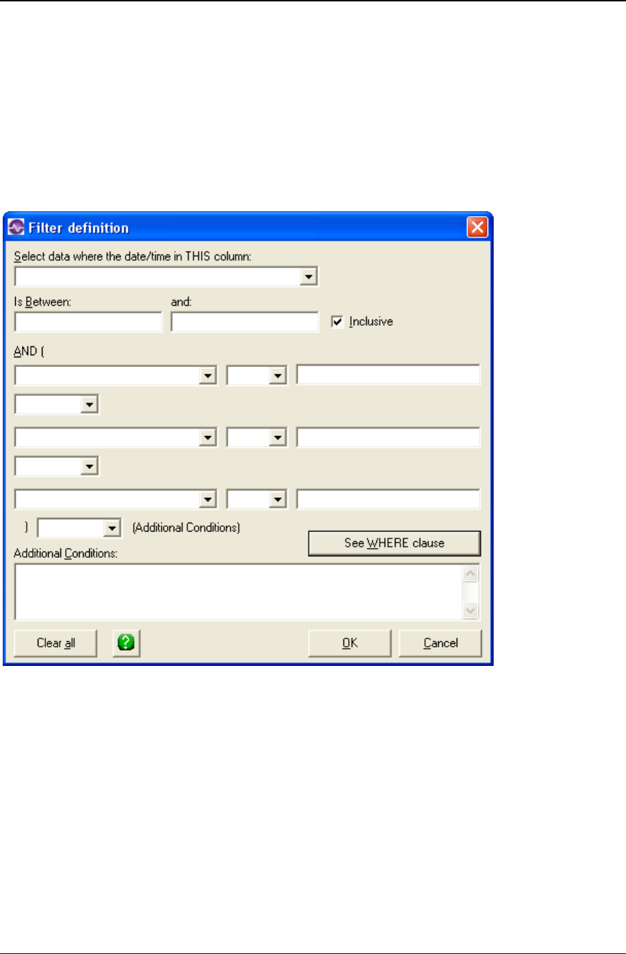
Basic chart definition 97
Copyright © 2011
Filtering chart data
The Filtering button and check box on the Step 3: Data definition tab allow you to filter the data from your
data source so that only those rows of data that “pass through the filter” are considered for your chart. If
the chart definition includes a filter definition, then either “Filter defined, not used,” or “Filter in use” will
appear in blue below the Filtering button.
When you click on the Filtering button on the Step 3: Data definition tab, the filter definition form will open
as shown below.
• Select data where the date/time in THIS column
If your data source includes a date/time column and you want to filter based on that column, then
select the column name from the drop-down list. This is an optional field.
If you selected a date/time column name, then enter a date/time range in the Is between: and and:
fields. To include the dates selected, Inclusive must be selected.
NOTE: Some databases require delimiters for date values. Consult the documentation for your
database to determine which delimiters are required. Microsoft Access, for example, requires #
delimiters to query dates in the US date format and 'delimiters for the international date formats. US-
formatted dates would be entered as #10/18/2000#. An international date would entered as
'18/10/2000'.

98 CHARTrunner User's Guide
Copyright © 2011
If the date range is the only filtering criterion, click the OK button. If not, enter additional conditions in the
comparison fields between the AND (and). To do this:
1. Select a column name from the drop-down menu.
2. Specify the type of comparison. Options are:
= Equal to
< Less than
> Greater than
< > Inclusive
> = Greater than or equal to
> = Less than or equal to
LIKE Similar to
3. In the third field, enter the data on which you want to make this comparison. See the illustration on
the previous page for an example.
4. For additional filtering, select AND or OR from the drop-down menu and repeat Steps A - C.
5. Use the Additional conditions field if you have more than three arguments. You must enter a valid SQL
SELECT “WHERE” clause.
• See WHERE clause – Click this button to see the filter conditions that you have entered as they will
be used in a SQL SELECT “WHERE” clause. To review the filter clause, click on the See WHERE
clause button. Click the OK button to close the window.

Basic chart definition 99
Copyright © 2011
Query parameters
Databases such as SQL Server and Oracle allow you to define stored procedures that require input
parameters, such as a date range. Similarly, Microsoft Access allows you to define queries with input
parameters. Other data sources, such as Excel, text files, and databases that use the Microsoft Jet
database engine allow you to specify query parameters in the WHERE clause of the SELECT statement
in a custom query. CHARTrunner can generate charts for any of these situations.
In addition, you can specify one or more Custom Parameters as part of the SQL SELECT statement in a
custom query. The Custom Parameters feature can be used for any data source. Consider the SELECT
statement shown below, where two Custom Parameters are used, one to specify which table to use and
the other to specify the minimum ID value.
SELECT * from {{Table name}} WHERE ID >= {{Minimum ID}} ORDER BY ID
When CHARTrunner examines the custom query shown above, it treats anything enclosed by {{ and }} as
the name of a Custom Parameter that can be dealt with via the Parameters button on the Step 3: Data
definition tab. As CHARTrunner fetches the data for the chart, it substitutes the appropriate Custom
Parameter value in place of {{Table name}} and {{Minimum ID}}. For example, if the value of the Table
name parameter is MyFineTable and the value of the Minimum ID parameter is 10, then the query that is
actually passed to the database engine is:
SELECT * from MyFineTable WHERE ID >= 10 ORDER BY ID
Consider what happens while you are in the process of defining the chart definition that uses the query
shown above. When you click the OK button on the Custom query editor window, CHARTrunner adds the
Table name and Minimum ID parameters to its list of parameters used by the chart. When CHARTrunner
adds a new parameter, it defaults the parameter's value to be the NULL value. Then CHARTrunner
attempts to verify that the custom query you have entered is valid by passing the query to the database
engine to see if it reports any errors. But, when NULL is substituted in place of {{Table name}} and
{{Minimum ID}}, the resulting query (shown below) is not a valid query:
SELECT * from NULL WHERE ID >= NULL ORDER BY ID
When CHARTrunner detects an error in a custom query that has one or more Custom Parameters, it will
automatically display the “Query parameters” window that allows you to assign valid values to your query
parameters.
To chart data that requires parameter input:
1. On the Step 3: Data definition tab, specify a source for data records: Query or view, Stored
procedure, or Custom query.
2. Select a Query or Stored procedure from the drop-down menu or click on the Enter query button to
enter a Custom query.
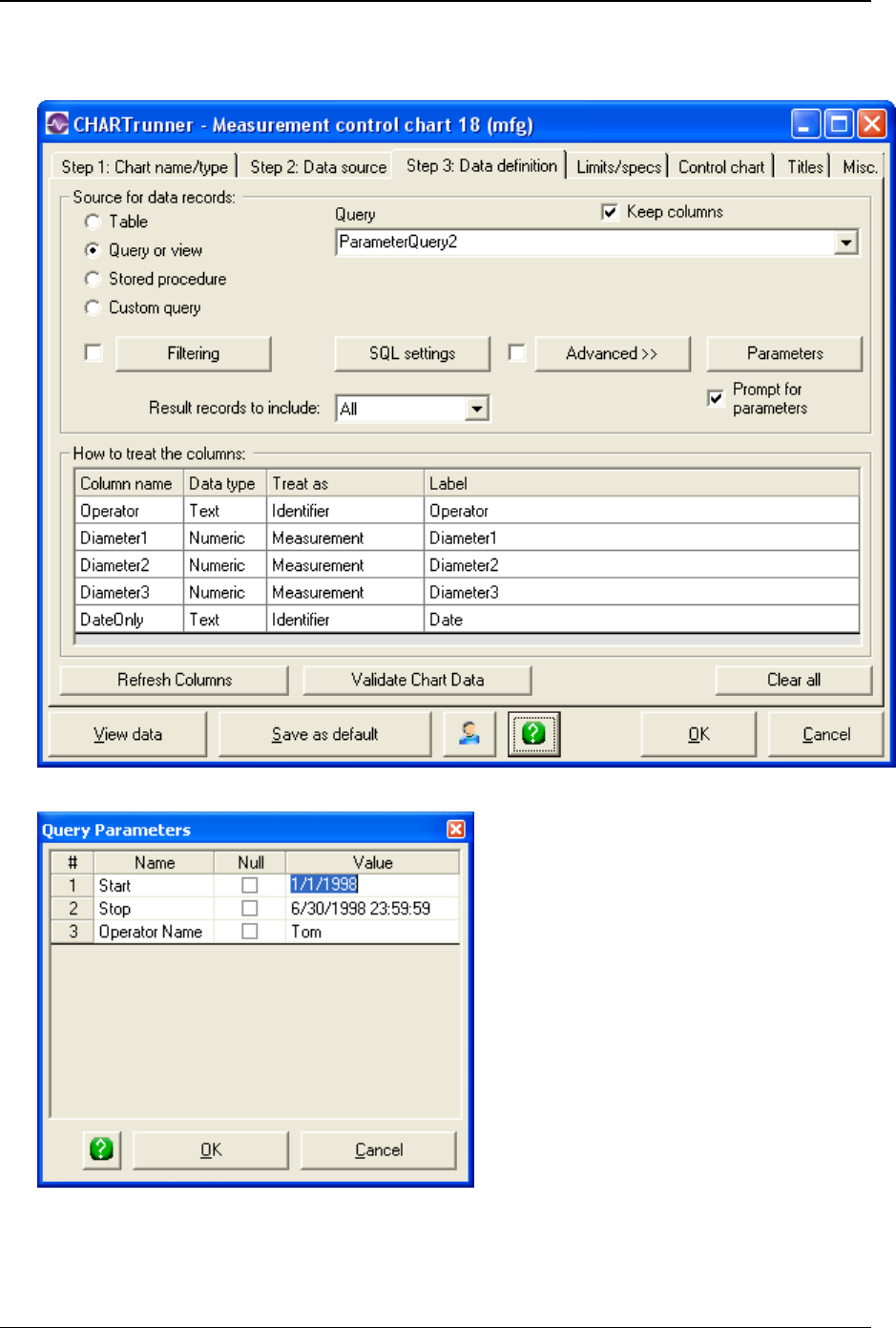
100 CHARTrunner User's Guide
Copyright © 2011
3. If the data source requires input parameters, CHARTrunner will display the Parameters button and a
Prompt for parameters check box on the Step 3: Data definition tab, as shown below.
4. Click on the Parameters button to display the Query Parameters form.
5. In the figure shown, a stored procedure has been defined that requires three input parameters: Start,
Stop, and Operator Name. The chart definition has been set up so that 1/1/1998 is the default starting
date, 6/30/1998 23:59:59 is the default ending date, and Sam is the default operator.
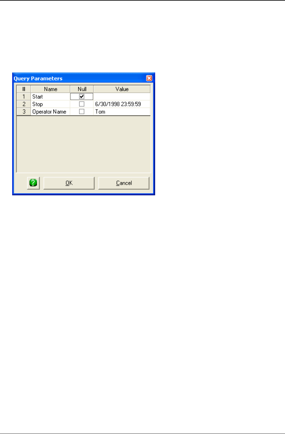
Basic chart definition 101
Copyright © 2011
6. If Prompt for parameters is unchecked, CHARTrunner will use the default parameters to retrieve data.
If Prompt for parameters is checked, CHARTrunner will display the Query Parameters form so you can
change the parameter values as needed.
7. Click the OK button to save the default parameters.
To pass the Null value into a query parameter, check the Null checkbox as shown below. If Null is
selected for a parameter, you will not be able to enter a value for that parameter.

102 CHARTrunner User's Guide
Copyright © 2011
Custom query
By selecting Custom query in the Step 3: Data definition tab, the user can supply an SQL query to fetch the
chart's data.
Queries take the form of SQL statements. SQL stands for structured query language, a standard way of
asking a database for information. Some queries are quite simple and use only a single table, as in the
following example:
SELECT MfgDate, Length_1, Length_2, Length_3 FROM DailyProduction
Some queries are more complicated and use a WHERE clause to ask for a subset of the data, as in this
example:
SELECT * FROM DailyProduction WHERE MfgDate > '1/1/1999' and MfgDate < '1/31/1999'
The * in this example means that I want ALL the columns from the table.
When you need to query information from two or more tables, you must create a slightly more complex
query called a join query. This type of query allows you to take advantage of multiple tables that are
linked or related.
Here is an example of a join query that can be used with Microsoft Access:
SELECT * FROM Orders INNER JOIN Customers ON Orders.CustomerNumber =
Customers.CustomerNumber
This query joins the Customers and Orders tables. The resulting table contains all the columns from both
tables in what looks like a single table.
Because SQL is powerful and flexible, it can also be complicated. Teaching SQL is beyond the scope of
this document; however, the key point as it relates to CHARTrunner is that any SQL query from a
database can be the data source for a CHARTrunner chart. For more information on SQL, try a Web site
such as http://www.w3schools.com/sql/ (http://www.w3schools.com/sql/) or http://
www.sqlcourse.com/ (http://www.w3schools.com/sql/) or a reference book such as Philip J. Pratt's A
Guide to SQL, 1995, Boyd & Fraser Pub Co. or Martin Gruber's Understanding SQL, 1990, Sybex.

103
In This Chapter
Multi-charts (multiple charts on one page) .................................................. 103
Workspaces (dealing with multiple charts) .................................................. 108
Multi-charts (multiple charts on one page)
A multi-chart is a chart that acts as a container for one or more regular charts. Multi-charts are used when
you need to see more than one chart displayed in the same window or printed on the same page. On the
CHARTrunner definitions list, all of the multi-charts in the current chart folder are shown in the list as
shown below:
CHAPTER 7
Multi-charts and Workspaces
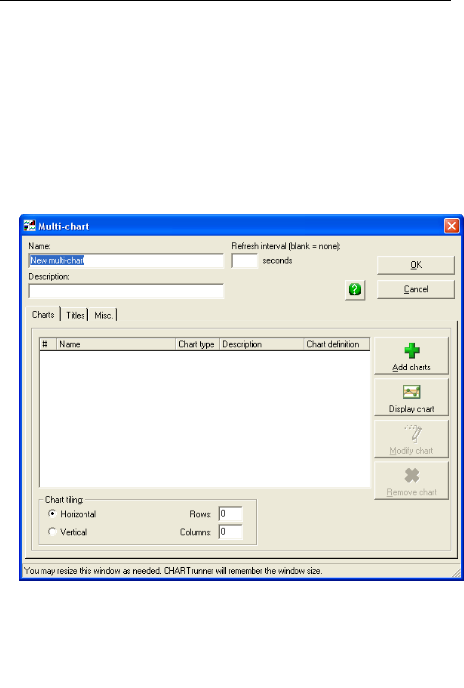
104 CHARTrunner User's Guide
Copyright © 2011
• Print a multi-chart – To print a multi-chart, right-click on the chart in the CHARTrunner definitions list
and select one of the printing options. With a multi-chart, you have these two options for printing:
1. Print (1 page) – Print all the child charts on a single printer page.
2. Print (1 page per chart) – Print each child chart on a separate printer page.
• Display a multi-chart – To display a multi-chart, right-click on the chart in the CHARTrunner definitions
list and select Display. While a multi-chart is displayed, you may right-click on a child chart and select
the Zoom In or Zoom Out option. These options allow you to toggle between viewing the entire multi-
chart and viewing just one child chart.
• Edit a multi-chart – To make changes to an existing multi-chart, right-click on the chart in the
CHARTrunner definitions list and select Edit. This will display the multi-chart definition form and allow
you to edit the chart definition and save your changes.
• Create a new multi-chart – To create a new multi-chart, right-click in the Multi-charts section of the
CHARTrunner definitions list and select New multi-chart. The new multi-chart definition form will
appear.
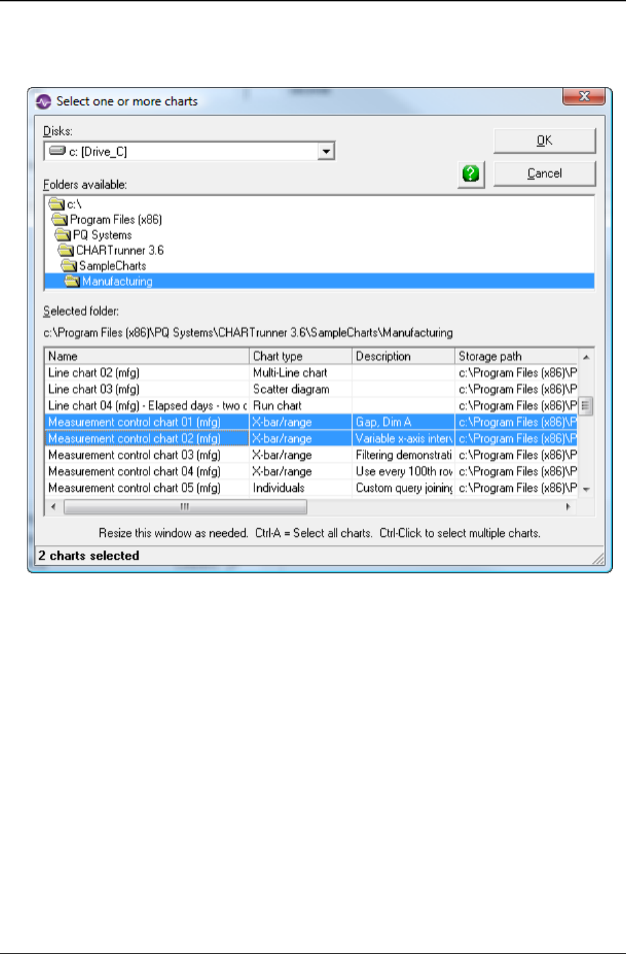
Multi-charts and Workspaces 105
Copyright © 2011
Enter a name and description for the new multi-chart. Use the Add charts button to select from the list
of regular charts for each chart that you want to include on the multi-chart. In the example below, two
charts have been selected.
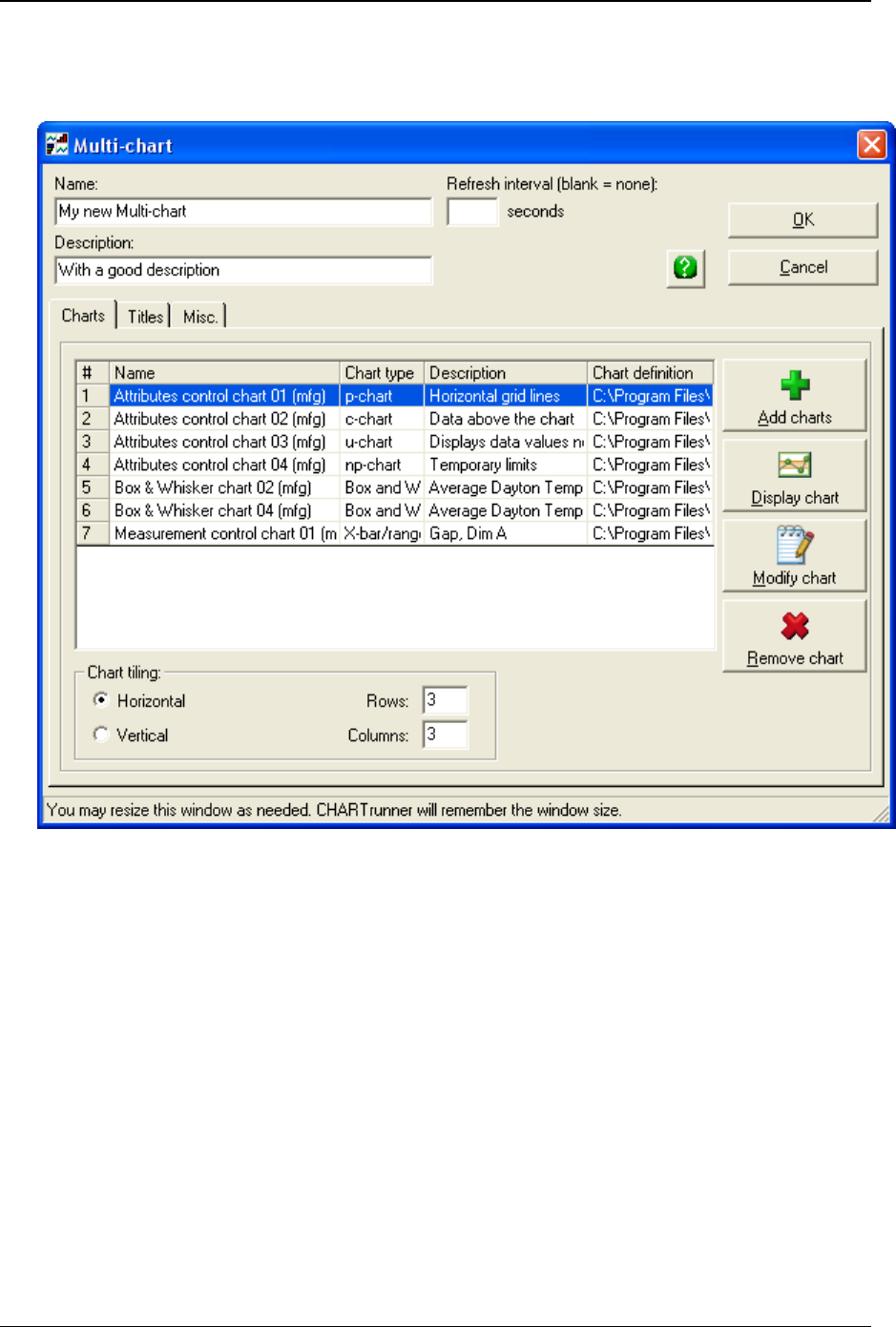
106 CHARTrunner User's Guide
Copyright © 2011
You may select as many charts as you like; however, legibility can suffer when you place too many
charts in a multi-chart. Charts may be selected from any chart folder that contains charts. You may
select multiple charts by holding down the Shift or the Control key and selecting charts with the mouse.
Once you have named your multi-chart and selected the charts you want to include, the multi-chart
definition form will look similar to the sample shown above.
• Name – Enter the name for the chart definition.
• Description – Enter the description of the chart.
• Refresh interval – Enter the interval in seconds for the displayed chart to automatically perform a
refresh in order to chart new data. Leave this field blank if you do not want the chart to automatically
refresh.
• Chart tiling – This section describes how the child charts will be arranged in a grid when the Multi-chart
is rendered.
Horizontal – Select this option for the child charts to tile left-to-right and up-to-down.
Vertical – Select this option for the child charts to tile up-to-down and left-to-right.
Rows – Specify the number of rows to allocate for the child charts to tile into.
Columns – Specify the number of columns to allocate for the child charts to tile into.
• Add charts – Click this button to open the Select one or more charts window where you can select the
child charts to be added to the multi-chart.

Multi-charts and Workspaces 107
Copyright © 2011
• Display chart – Click this button to display the currently selected child chart in the list of child charts.
• Modify chart – Click this button to edit the currently selected child chart in the list of child charts.
• Remove chart – Click this button to remove the currently selected child chart from the list of child
charts. The child chart definition is not changed in any way; it is simply removed from the list of child
charts for this multi-chart.
Use the Titles tab to set up chart titles the same way you do for all charts. For more information about this
tab, see Titles tab - applies to all charts (on page 194).
The Misc. tab allows you to set print orientation, image defaults, and Web page defaults. For more
information about this tab, see Misc. tab – Applies to all charts.
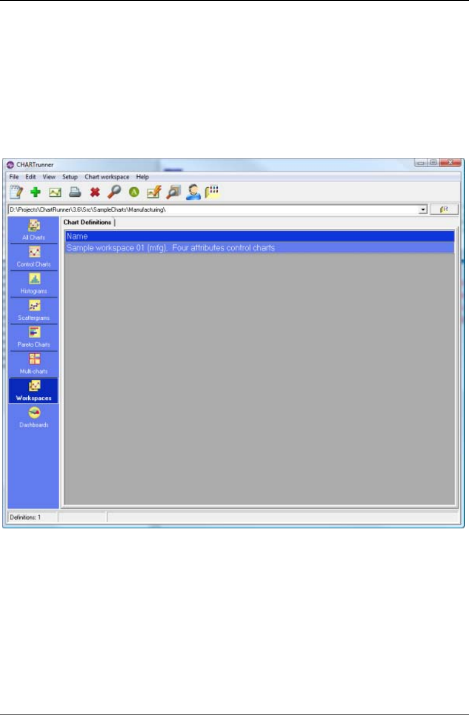
108 CHARTrunner User's Guide
Copyright © 2011
Workspaces (dealing with multiple charts)
A workspace is a chart that acts as a container for one or more member charts (a member chart cannot
be another workspace). Workspaces are useful when you have two or more related charts that you work
with at the same time. For example, imagine that you have six charts that you print and take to the Friday
quality meeting. By putting these six charts into a workspace, you can print them all with a single
command. Similarly, you can generate chart images from all six charts with a single command. On the
CHARTrunner definitions list, all of the workspaces in the current chart folder are shown in the Chart
workspaces section as shown below:

Multi-charts and Workspaces 109
Copyright © 2011
• Print a workspace – To print workspace, right-click on the workspace in the CHARTrunner definitions
list and select Print. Each chart in the workspace will be printed on its own page.
• Display a workspace – You may display a chart workspace the same way you display any chart.
However, each chart within the workspace will be displayed in its own window. If your workspace
contains a large number of charts, you may want to avoid displaying it as the screen can become
cluttered and it may take the computer a long time to display all the charts. To display the workspace,
right-click on the chart in the CHARTrunner definitions list and select Display.
• Chart review and workspaces – If your workspace contains multiple charts, you can review each member
chart in the workspace via a single chart display window. Right-click on the workspace in the
CHARTrunner definitions list and select Chart Review, which causes the first chart in the workspace
to be displayed. Use the chart review keys Ctrl-Home, Ctrl-End, PageDown and PageUp to navigate
back and forth among the charts in the workspace.
• Chart slideshow – Use the Review > Slideshow pull-down menu while reviewing a member chart to
start a slideshow where each chart in the workspace is displayed in a round-robin fashion at the
specified interval.
• Workspace batch operations – Several right-click menu choices allow you to perform a useful task on
every member chart contained in the workspace. These commands all appear on the right-click menu
when you have a workspace selected in the CHARTrunner definitions list.
• Save chart as clipCHART – Save the workspace as a clipCHART.
• Save all charts as image to default folder – Use this command to generate chart images from each chart in
the workspace. The chart images will be stored where the chart definition is set to store them. This
location is set on the chart definition form, on the Misc. tab, under Image file defaults.
• Save all charts as image to specified folder – Use this command to generate chart images from each chart
in the workspace. You will be prompted for the folder into which the chart images will be saved.
• Save all charts as Web pages to default folder – Use this command to generate a Web page for each chart
in the workspace. The Web pages will be stored where the chart definition is set to store them. This
location is set on the chart definition form, on the Misc. tab under Web page defaults.
• Save all charts as Web pages to specified folder – Use this command to generate a Web page for each
chart in the workspace. You will be prompted for the folder into which these Web pages will be saved.
• Send all charts as e-mail – Use this command to generate each chart in the workspace as an image,
attach the images to an e-mail, and send the e-mail to one or more recipients. You will be prompted
for e-mail addresses and other information related to the e-mail message.
• Edit a workspace – To make changes to an existing workspace, right-click on the workspace in the
CHARTrunner definitions list and select Edit. The workspace definition form will appear to allow you to
edit the workspace definition and save your changes.

110 CHARTrunner User's Guide
Copyright © 2011
• Create a new workspace – To create a new workspace, right- click in the Chart workspaces section of
the CHARTrunner definitions list and select New chart workspace. The new chart workspace definition
form will appear as shown below:

Multi-charts and Workspaces 111
Copyright © 2011
Enter a name and description for the new workspace. Use the Add charts button to select from the list
each member chart that you want to include in the workspace. In the example below, six charts are
about to be selected.
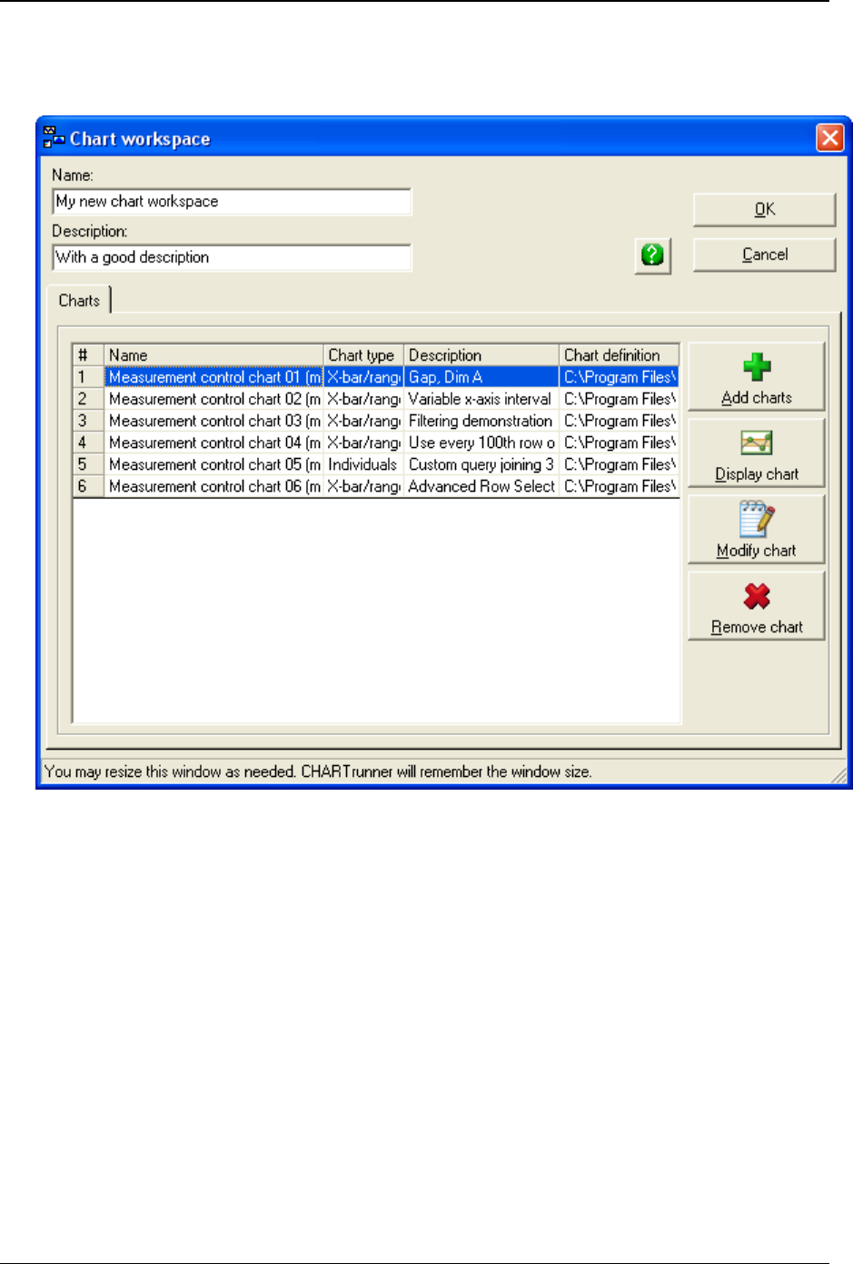
112 CHARTrunner User's Guide
Copyright © 2011
You may select as many charts as you like. Charts may be selected from any chart folder that
contains charts. You may select multiple charts by holding down the Shift or the Control key and
selecting charts with the mouse.
Once you have named your workspace and selected the member charts you want to include, the
workspace definition form will look similar to the sample shown above.
Name – Enter the name for the chart definition.
Description – Enter the description of the chart.
Add charts – Click this button to open the Select one or more charts window where you can
select the member charts to be added to the workspace.
Display chart – Click this button to display the currently selected member chart in the list of
member charts.
Modify chart – Click this button to edit the currently selected member chart in the list of member
charts.
Remove chart – Click this button to remove the currently selected member chart from the list of
member charts. The child chart definition is not changed in any way; it is simply removed from
the list of member charts for this workspace.

113
In This Chapter
Measurement control charts........................................................................ 113
Attributes control charts .............................................................................. 125
Cusum control charts .................................................................................. 138
Short-run control charts ............................................................................... 145
Rare event control charts ............................................................................ 158
Pareto charts ............................................................................................... 162
Histogram charts ......................................................................................... 166
Box and whisker charts ............................................................................... 177
Multi-line charts ........................................................................................... 183
Scatter diagram charts ................................................................................ 192
Titles tab - applies to all charts ................................................................... 194
Misc. tab - applies to all charts .................................................................... 199
Advanced row selection .............................................................................. 203
Applying an extra line to specific subgroups ............................................... 212
Understanding the data order concept ........................................................ 214
Measurement control charts
A measurement (or variables) control chart plots characteristics of your process that can be measured
and expressed numerically, such as width, height, and thickness.
CHAPTER 8
Customizing a chart definition

114 CHARTrunner User's Guide
Copyright © 2011
Types of measurement control charts
Chart type options for measurement charts are shown below:
• X-bar
• X-bar/range
• X-bar/sigma
• Range
• Sigma
• Median
• Individuals
• Individuals/moving range
• Individuals/moving sigma
• Moving average
• Moving average/moving range
• Cusum chart
• Three-way chart.
When you select a measurement control chart, the following tabs allow you to customize your chart:
Limits/specs tab (see "Limits/specs tab - measurement charts" on page 115)
Control chart tab (see "Control chart tab - measurement charts" on page 117)
Chart options sub-tab (see "Chart options sub-tab - measurement charts" on page 117)
X-axis Y-axis sub-tab (see "X-axis Y-axis sub-tab - measurement charts" on page 120)
Extra lines sub-tab (see "Extra lines sub-tab - measurement charts" on page 122)
Chart data display sub-tab (see "Chart data display sub-tab - measurement charts" on page 124)
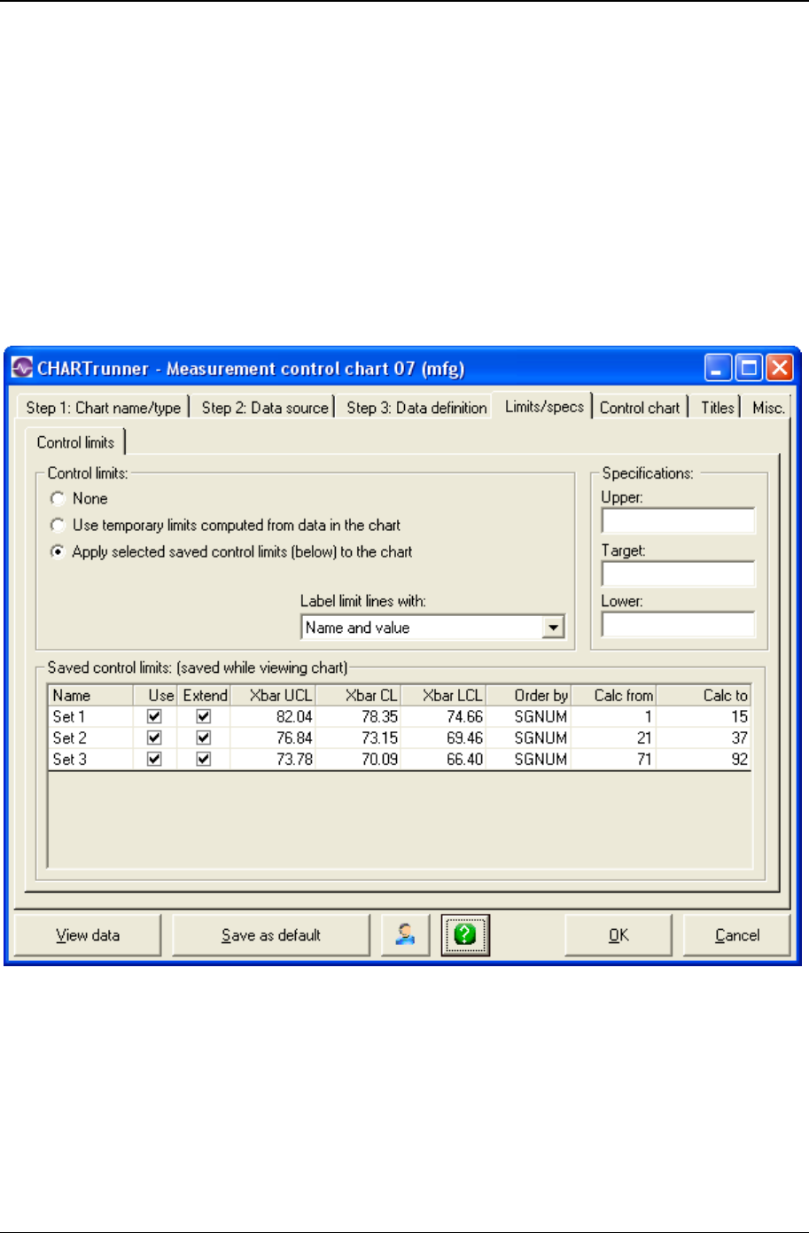
Customizing a chart definition 115
Copyright © 2011
Limits/specs tab - measurement charts
Control limit lines on a control chart are used as a basis for judging whether variation in data on a chart is
due to special or common causes. The limits are calculated from data collected from the system under
observation. CHARTrunner allows you to calculate a set of control limits by highlighting a set of data
(subgroups) on a chart and selecting Compute limits via the right-click menu. Control limits are not
specifications nor are they arbitrary limits set by customers or management.
Specifications are boundaries, usually set by management, engineering, or customers, within which a
system must operate. They are sometimes called engineering tolerances.
The Control limits sub-tab allows you to select your control limit options and enter the specification limits
for the process that the chart represents.

116 CHARTrunner User's Guide
Copyright © 2011
Control Limits
• None – No control limits are used on the chart.
• Use temporary limits computed from the data in the chart – CHARTrunner will calculate control limits based
on all the data that you have selected for the chart, except for data that has a special cause. In
general, this is not the best option to use.
• Apply selected saved control limits (below) to the chart – The chart will use the limits saved for this chart
(shown in the Saved control limits table) that have a check mark in the Use column.
• Use the Lloyd Nelson limits option – This option is visible only for Individuals and Individuals/Moving
Range control charts. Any control limits, including temporary limits, that are created or calculated
when this option is selected will be calculated using the Lloyd Nelson (see "Lloyd Nelson limits
option" on page 235) rules.
• Label limit lines with – Select one of the following options for labeling the limit lines:
• Nothing
• Name
• Value
• Name and value.
NOTE: Control limits can be calculated, edited, and saved from the chart display window. Control limits
that have been saved in the display window appear in the Saved control limits table of this tab.
• Saved control limits table (saved while viewing chart) - Each set of control limits that have been
computed on the chart display window are shown in this table.
• Name – The name given to the set of control limits when the limits were computed on the chart display
window.
• Use – Place a check mark to cause this set of limits to be used on this chart.
• Extend – Place a check mark to cause the limit lines for this set of limits to be extended to the next
adjacent limit set on the chart, or to the edge of the chart if there is no adjacent limit set.
• Order by – This specifies how the chart's data was ordered when the limit set was calculated. Limit
sets are displayed on the chart only when the current order of the chart's data is the same as when
the limit set was calculated. If no data order was specified for the chart's data when the limit set was
calculated, this will be blank, and the Calc from and Calc to will be in terms of relative subgroup
number. For more information on how the data order column is determined see Understanding the
data order concept.
• Calc from – Specifies the leftmost boundary of the chart data that was selected when the limit set was
calculated. If the Order by is blank, the Calc from will be in terms of relative subgroup number.
• Calc to – Specifies the rightmost boundary of the chart data that was selected when the limit set was
calculated. If the Order by is blank, the Calc to will be in terms of relative subgroup number.
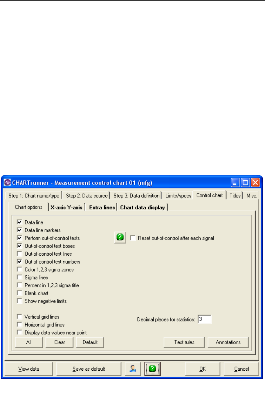
Customizing a chart definition 117
Copyright © 2011
Specifications
• Enter values for Upper and Lower specifications and the Target (sometimes called the Nominal) value
for the process. The specifications are optional. If your process has only one Upper or Lower
specification, enter that value in the appropriate field and leave the other Upper or Lower field blank.
NOTE: When a specification value is entered on the Limits/specs tab, and the same specification is
fetched from the data source using the Treat as field on the Step 3: Data definition tab, then the value
fetched from the data source takes precedence. For example, if the target spec is defined as 10.0 on
the Limits/specs tab, and the target spec is fetched from a data source column that contains 9.0 in row
1, NULL in rows 2 - 28, 9.5 in row 29, and NULL in row 30, then 9.5 will be the target spec value that
is used for the chart.
Control chart tab - measurement charts
Use this tab to customize the chart display.
Chart options sub-tab - measurement charts
Use this tab to customize the chart display. Click the All button to select all chart options. Click the Clear
button to unselect all chart options. Click the Default button to select the default options.

118 CHARTrunner User's Guide
Copyright © 2011
The following options may be specified on the Chart options sub-tab:
• Data line – Enable this to draw the line connecting data points.
• Data line markers – Enable this to display the marker for each data point.
• Perform out-of-control tests – Enable this to perform out-of-control testing for the chart using the current
set of test rules. Test rules can be defined on a per-chart-definition basis, or one set of test rules can
be applied to all charts. Use Setup > Preferences > “Use the same out-of-control tests for all charts”
to enable or disable using the same set of test rules for all charts. Use Setup > “Out-of-control tests”
to specify which set of test rules is used when the same set of rules is applied to all charts.
• Out-of-control test boxes – Draws a box around a set of out-of-control points. The box will be labeled
with the test that failed.
• Out-of-control test lines – Draws a line near the top of the chart for each test that has at least one
failure. The line is labeled with the test that failed. Using test lines rather than test boxes can be
useful when test boxes make the chart look too crowded.
• Out-of-control test numbers – Labels the chart with a numeric code for each out-of-control test that
failed. The numeric code corresponds to the position of the test in the set of test rules that is used for
the chart. See the discussion above for Perform out-of-control tests to determine which set of test rules
is in effect for the chart.
• Reset out-of-control after each signal – If this option is enabled, the out-of-control test engine will reset
itself after each primary out-of-control point on the chart. This results in the rules for testing
subsequent points being applied as though the subsequent points are in a new series. It is
recommended that this option NOT be enabled unless you really want this behavior.
• Color 1,2,3 sigma zones – Shows the 1, 2, and 3 sigma zones in different colors on the chart. The three
sigma zones are determined by dividing the region between the control limit and the center line into
three equal regions. Thus, if you are using 3.0 sigma limits, then these zones will correspond to 1.0,
2.0, and 3.0 sigma.
• Sigma lines – Shows lines at the 1, 2, and 3 sigma zone boundaries. This is similar to Color 1,2,3 sigma
zones, but instead of coloring the zones, only a boundary line between each zone is shown.
• Percent in 1,2,3 sigma title – Shows in the titles area the percentage of data points within the 1, 2, and 3
sigma zones.
• Blank chart – Enable this option to draw a blank chart that has no chart data displayed. This feature is
used to print a blank chart form for plotting data manually.
• Show negative limits – Enable this to display negative limits on the chart. If your process can have data
values that fall below zero, you should enable this option.
• Vertical grid lines – Enable this to show vertical grid lines on the chart.
• Horizontal grid lines – Enable this to show horizontal grid lines on the chart.
• Display data values near point – Enable this to place a small label showing the data value next to each
data point on the chart.
• Subgroups in moving range – Enter the number of data points to use for the moving range, moving
sigma, or moving average calculation. This field is visible only for individuals data, which means that
on the Step 3: Data definition tab, you have mapped only one data column as a measurement. The
recommended value is 2.
• Decimal places for statistics – Specifies how many decimal places to display for calculated statistics.
• Annotations – Click this button to open a window that displays the annotations that are attached to this
chart. This allows you to remove annotations from the chart. Sometimes, when an annotation is
attached to a subgroup that no longer appears on the chart, this is the only way to delete the
annotation from the chart definition.
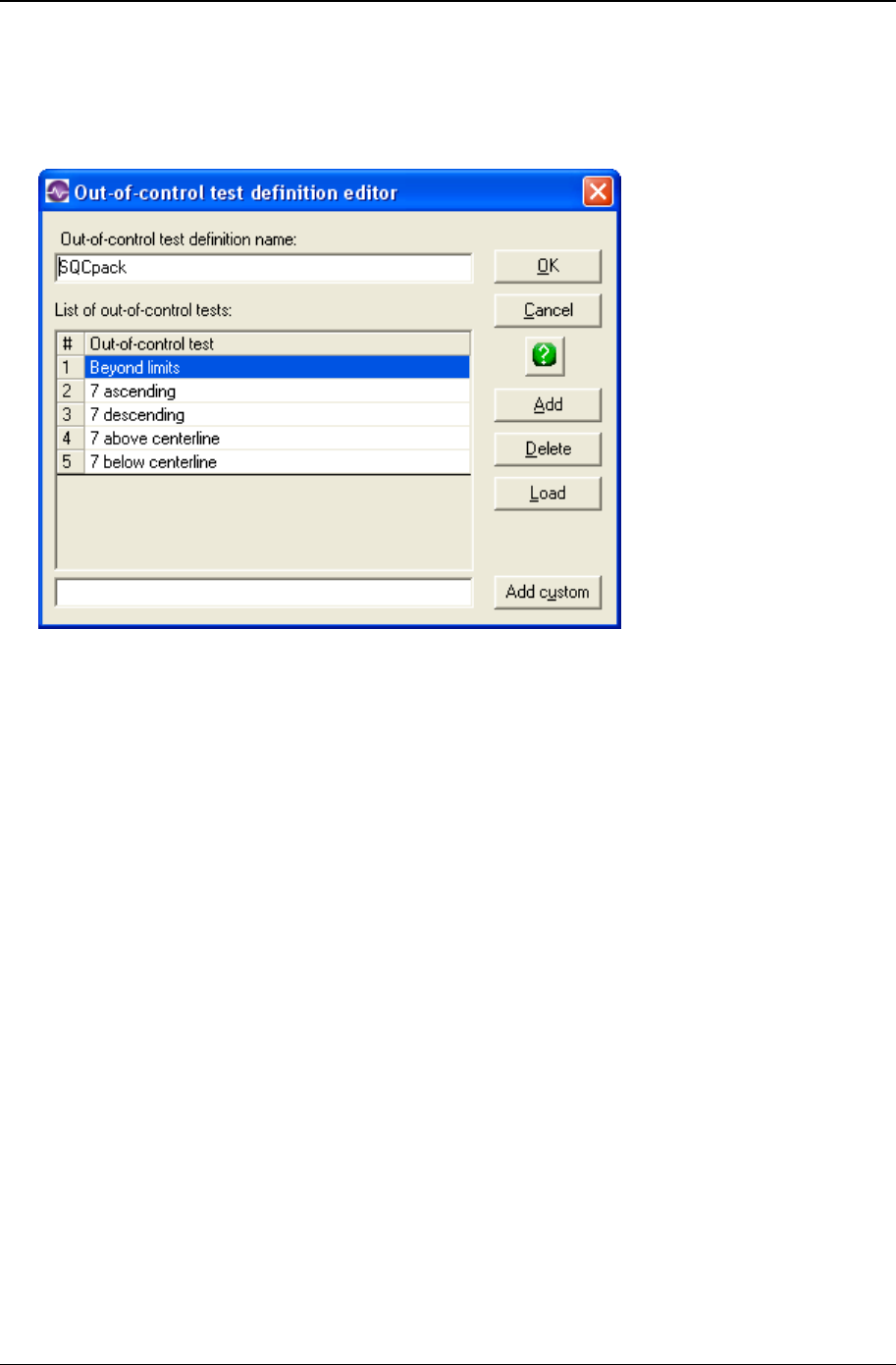
Customizing a chart definition 119
Copyright © 2011
• Test rules – Click the Test rules button to open the Out-of-control test definition editor window shown
below, which allows you to define the out-of-control tests that are stored in this chart definition. See
the discussion above for Perform out-of-control tests to determine whether this set of test rules is used
for evaluating out-of-control conditions for this chart, or whether one set of rules is applied to all
charts.
• Enter a name in the Out-of-control test definition name field to identify this set of out-of-control test rules.
• Click on the Add button to add a predefined test rule. The Select an out-of-control test window opens
to display the predefined test rules you may select from. Highlight the test rule or rules you desire to
use (select multiple rules with Ctrl-Click) and click the OK button.
• Click on the Add custom button to add the custom rule you entered in the field to the left of the button
into the list of rules.
• Added rules are placed below the currently selected row in the list. Arrange the order of the test rules
by clicking and dragging the rule number with the mouse.
• Click on the Load button to load an existing set of rules that have been defined in Setup > “Out-of-
control tests” into the list. The loaded set of rules will replace any rules currently in the list.
• Highlight a test rule in the list and click the Delete button to remove the rule from the list.

120 CHARTrunner User's Guide
Copyright © 2011
X-axis Y-axis sub-tab - measurement charts
Here you define the options that determine how CHARTrunner labels the X-axis (the horizontal axis) and
establishes the scaling for the Y-axis (the vertical axis).
X-axis
• In the Label x-axis with field, select a label option from the drop-down menu. The default value is
Nothing. Other options are Numbers and specific identifier fields. Identifier fields in this menu are
those mapped in the Step 3: Data definition tab. Select the option you want.
• Select an option to determine the number and type of labels you want to appear on the chart's X-axis.
Options are:
• Label every subgroup – Displays a label on each subgroup or data point. For charts with a large number
of data points, this option may cause the labels to overlap.
• Place n labels across the chart – Displays only the number of labels that you specify across the chart.
Enter the number of labels in the n = field.
• Label every n subgroups – Displays a label on every nth subgroup or data point. - Label every n units –
Displays a label on every nth unit. This option is available only if you have selected a date/time field
for the Label x-axis with option. If you select this option, you must specify the units, such as Days,
Months, or Quarters in the units = field and the number of time units in the n = field.

Customizing a chart definition 121
Copyright © 2011
• If you want to Scale x-axis with variable interval based on x-axis label, select this option. It tells the chart to
set the spacing between the data points on the chart to reflect where each data point falls along the
timeline (or number line) established by the identifier used to label the X-axis. This option is available
only when the X-axis is labeled with a date/time or numeric identifier, and the data source is ordered
by the identifier used to label the X-axis.
NOTE: How is the order of the data source determined? On the Step 3: Data definition tab, when the
data source is a “Table,” the Column to use for Order By field determines the order of the data. When
a “Query or view,” “Stored procedure,” or “Custom query” is used as the data source, it is assumed
that the data is ordered by the “Unique identifier” column.
• Select Enable horizontal x-axis scrolling if you want the ability to scroll the chart through the data points
using the mouse. The Chart width in subgroups field specifies the number of data points to display
across the chart. Specify whether the chart initially displays the specified number of data points from
the beginning of the data source (Start at left) or from the end of the data source (Start at right). When
the mouse hovers near the X-axis, a slider bar will appear that allows you to scroll through the data or
change the displayed chart width in data points.
• Causes and Notes – If you want causes and/or notes to be indicated on the chart, make a selection
from the respective drop-down menus. Your options are:
• Display nothing
• Do not display the cause or note (default).
• Display a single letter indication – The letter C will be used for a cause, and the letter N will be used
for a note.
• Display abbreviated text – A short portion of the cause or note text will be displayed on the chart.
• Display full text – The full text of the cause or note will be displayed on the chart.
Y-axis
• Automatic scale – Select this for CHARTrunner to determine the appropriate values for scaling the Y-
axis.
• User scale – Select this to specify the Max, Min, and Increment values to use for scaling the Y-axis. If you
leave a field blank, CHARTrunner will automatically select an appropriate value.

122 CHARTrunner User's Guide
Copyright © 2011
Extra lines sub-tab - measurement charts
Here you define the extra lines you want to appear on the chart. You can define as many extra lines as
you desire.
To define a new line, click the Type column and choose from the following list of line types:
Extra line – You must enter the Y-axis value for the line in the Value column.
• Mean line
• Median line
• Mode line
• Trend line – A simple linear regression line will be drawn.
• Upper spec line
• Target spec line
• Lower spec line.
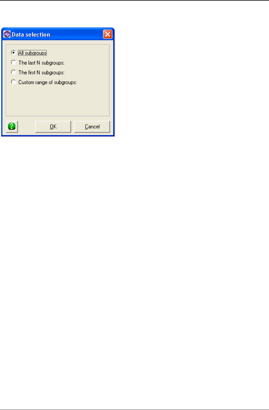
Customizing a chart definition 123
Copyright © 2011
Enter in the Line label column the text you want to label the line with.
When you click in the Apply to column, you can choose from the options shown above to determine what
subgroups (or data points) the extra line will be applied to. See Applying an extra line to specific
subgroups for more information on applying the extra line to a specific range of subgroups.
• Label with – You can specify to label the extra line with:
• Nothing
• Name
• Value
• Name and value
• Which chart? – Specify 1, 2, or 3 to indicate which sub-chart on the chart the extra line applies to.
• Style : Color – Click here to open the color dialog to choose the color for the extra line.
• Style : Width – Specify the width of the extra line as Regular, Wide, or Thick.
• Style : Style – Select from the drop-down list to specify the line style for the extra line.
Right-click on a row in the extra-lines grid to delete that extra-line from the list.

124 CHARTrunner User's Guide
Copyright © 2011
Chart data display sub-tab - measurement charts
Here you define what information you want to appear in these areas:
• In the "Data above the chart" grid that appears above the chart.
• Place a check mark in the Above Chart? column for each row of identifiers, data, or statistics that you
want to appear above the chart.
• In the "Chart data" table when a chart is saved as a Web page.
• Place a check mark in the Web Table? column for each row that you want to appear in the "Chart
data" table of the Web page.
• The "Chart data" table of the Web page is a grid that is displayed below the chart on the Web page. It
displays information in a similar fashion to the "Data above the chart" grid. One of the advantages is
that this data can be highlighted and copied whereas the data appearing in the grid above the chart
on a Web page cannot, as it is simply an image.
• The "Chart data" table of the Web page is a grid that is displayed below the chart on the Web page. It
displays information in a similar fashion to the "Data above the chart" grid. One of the advantages is
that this data can be highlighted and copied, while the data appearing in the grid above the chart on a
Web page cannot, as it is simply an image.
• For more information on saving charts as web pages, see the topics Save chart as web page dialog
and Web page defaults sub-tab - misc. tab - applies to all charts.

Customizing a chart definition 125
Copyright © 2011
Edit the contents of the Label column if you want to change the text that appears for an identifier, data
value, or statistic.
Place a check mark in the Show identifier values field to display identifier values in the “Data above the
chart” grid.
Place a check mark in the Show data values field to display data values in the “Data above the chart” grid.
Place a check mark in the Show statistic values field to display statistic values in the “Data above the chart”
grid.
The Maximum data length field is used to limit the length of text that appears in each cell of the "Data above
the chart" grid. Leave this blank unless you want to apply a length limit. Typically you enter a value here
to prevent long identifier text from overwhelming a cell. Note that the decimal point in a numeric value will
count as one character. For example, in order to display the entire value of 38.49 you would need to enter
a maximum data length of 5.
If Maximum data length is used, it will truncate any value entered that is longer than the maximum data
length textbox. This will display a value that could potentially be misconstrued. For example, if the date
value was 11/07/2008 and the maximum data length was set to 5, the date would appear as "11/07"
which could be misconstrued as November, 2007. Also, if your data spans across several years, entering
a maximum data length will often truncate the years from the end of the date, making it difficult to interpret
the data.
Attributes control charts
A measurement (or variables) control chart plots characteristics of your process that can be measured
and expressed numerically, such as width, height, and thickness. If you cannot represent a quality
characteristic numerically, or if it is impractical to do so, then often you resort to using a quality
characteristic to sort or classify an item that is inspected into one of two buckets.
An example of classifying into buckets would be designating units as “conforming units” or
“nonconforming units.” Another example would be assigning units into either “defective” or “non-defective”
buckets. Quality characteristics of this type are called attributes.
Attributes data is data that can be classified and counted. There are two types of attributes data:
1. Nonconformities – Counts of defects per item or group of items, and counts of defective items.
2. Nonconforming – For example, yes/no, good/bad, pass/fail, and go/no go.
An attributes control chart can be one of the following four types:
• p-chart – An attributes control chart that plots the percentage of items possessing a characteristic of
interest. The subgroup size may vary for this type of chart.
• np-chart – An attributes control chart that plots the number of items that are defective or possess a
characteristic of interest. The subgroup size must remain constant for this type of chart.
• c-chart – An attributes control chart that is used to monitor the number of nonconformities, such as
defects per subgroup. The subgroup size must remain constant for this type of chart.
• u-chart – An attributes control chart that is used to monitor the number of nonconformities per unit,
such as defects per item. The subgroup size may vary for this type of chart.
If your data is overly dispersed, use these versions of the attribute control charts:
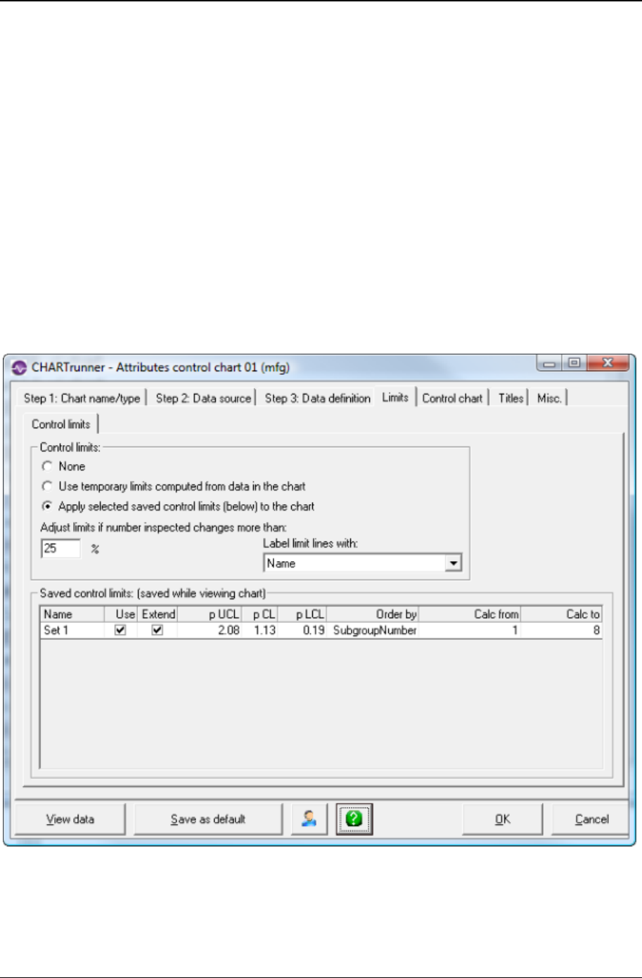
126 CHARTrunner User's Guide
Copyright © 2011
• p' chart (p prime chart)
• np' chart (np prime chart)
• c' chart (c prime chart)
• u' chart (u prime chart)
Test your data for over dispersion on the data definition tab for a p, c, np, or u chart. Once you define
your data columns, click the button Test for over dispersion. If your data is overly dispersed, use the
prime version of one of these attribute control charts.
Limits tab - attributes charts
Control limit lines on a control chart are used as a basis for judging whether variation in data on a chart is
due to special or common causes. The limits are calculated from data collected from the system under
observation. CHARTrunner allows you to calculate a set of control limits by highlighting a set of data
(subgroups) on a chart and selecting Compute limits via the right-click menu. Control limits are not
specifications nor are they arbitrary limits set by customers or management.

Customizing a chart definition 127
Copyright © 2011
Control Limits
• None - No control limits are used on the chart.
• Use temporary limits computed from the data in the chart - CHARTrunner will calculate control limits based
on all the data that you have selected for the chart, except for data that has a special cause. In
general, this is not the best option to use.
• Apply selected saved control limits (below) to the chart - The chart will use the limits saved for this chart
(shown in the Saved control limits table) that have a check mark in the Use column.
• Adjust Limits If Number Inspected Changes More Than - Specify the percentage of change for the "Number
inspected" that will cause the control limits to be adjusted. When doing p-charts and u-charts, your
"Number inspected" often varies. For example, one month you may have data for 150 patients and
the next month you may have data for 190 patients. The "Number inspected" is used to calculate the
upper and lower control limits. If you always have the same "Number inspected," the control limit lines
are straight. In other words, they are the same for every subgroup. However, if your "Number
inspected" varies each month, control limits that never change can be misleading. The software
allows you to decide when control limits should be adjusted because the "Number inspected" has
changed. If you enter 25%, then control limits will be adjusted for any subgroup where the "Number
inspected" changes (from the average Number inspected) by 25 percent or more. The higher you
make this number, the less likely it will be that your chart has the adjusted (stair step) control limits.
• Label Limit Lines With: - Select one of the following options for labeling the limit lines:
• Nothing
• Name
• Value
• Name and value
NOTE: Control limits can be calculated, edited, and saved from the chart display window. Control limits
that have been saved in the display window appear in the Saved control limits table of this tab.
• Saved Control Limits Table (Saved While Viewing Chart) - Each set of control limits that have been
computed on the chart display window are shown in this table.
• Name - The name given to the set of control limits when the limits were computed on the chart display
window.
• Use - Place a check mark to cause this set of limits to be used on this chart.
• Extend - Place a check mark to cause the limit lines for this set of limits to be extended to the next
adjacent limit set on the chart, or to the edge of the chart if there is no adjacent limit set.
• Order by - This specifies how the chart's data was ordered when the limit set was calculated. Limit sets
are displayed on the chart only when the current order of the chart's data is the same as when the
limit set was calculated. If no data order was specified for the chart's data when the limit set was
calculated, this will be blank; and the Calc from and Calc to will be in terms of relative subgroup
number. For more information on how the data order column is determined, see Understanding the
data order concept.
• Calc from - Specifies the leftmost boundary of the chart data that was selected when the limit set was
calculated. If the Order by is blank, the Calc from will be in terms of relative subgroup number.
• Calc to - Specifies the rightmost boundary of the chart data that was selected when the limit set was
calculated. If the Order by is blank, the Calc to will be in terms of relative subgroup number.
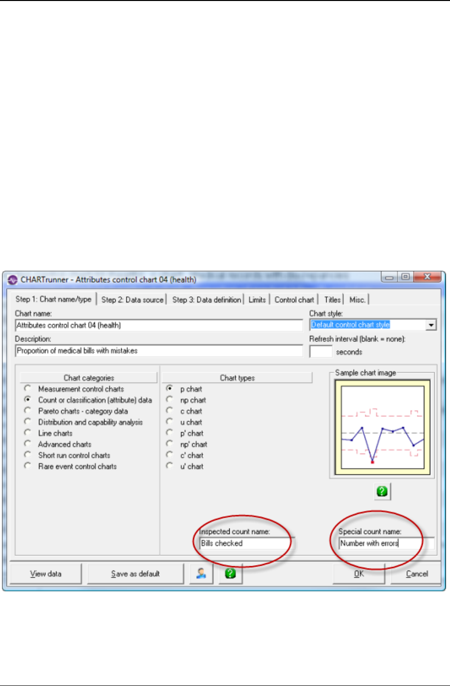
128 CHARTrunner User's Guide
Copyright © 2011
Step 1: Chart name/type tab - attributes chart
For attributes control charts, you have the option of entering text for names which get used in the chart
type title. You make the chart type title visible by checking a box on the Titles tab. When you enter text for
these names it will be used in the chart type title. For example, on a p-chart, you might enter the
following:
• Inspected count name: bills checked
• Special count name: number with errors
This will cause the chart-type title to read like this:
p chart (Number with errors / Bills checked)
This can make the chart more clear and allows you to express either a positive or negative metric based
on what you are charting.
Depending on the type of attributes chart selected, (p, np, c, or u) you will be able enter one or both of
these names. If you leave these optional names blank, the chart type title will contain only the chart type;
for example – p chart.
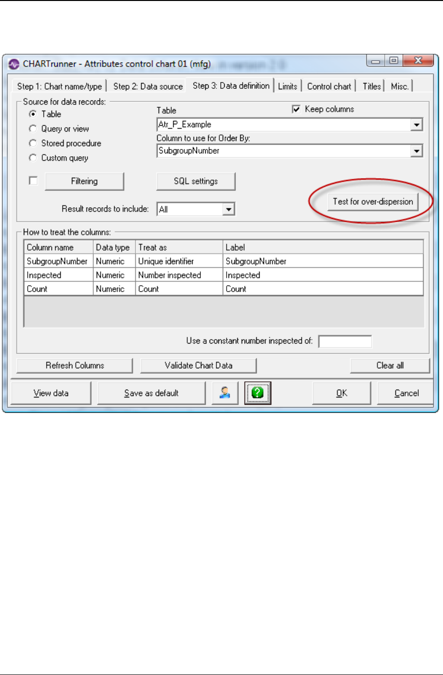
Customizing a chart definition 129
Copyright © 2011
Data definition tab - attributes chart
The data definition tab is discussed elsewhere. However, for attributes control charts there is an
additional button named Test for over-dispersion. Click this button to test your data. A message will be
displayed telling you if the data for this chart is overly dispersed. If the data is overly dispersed, consider
changing the chart type to the prime version of the chart. For example, rather than a p-chart, select a p'
chart. Rather than a u-chart select a u' chart.
Control chart tab - attributes charts
Use this tab to customize the chart display.
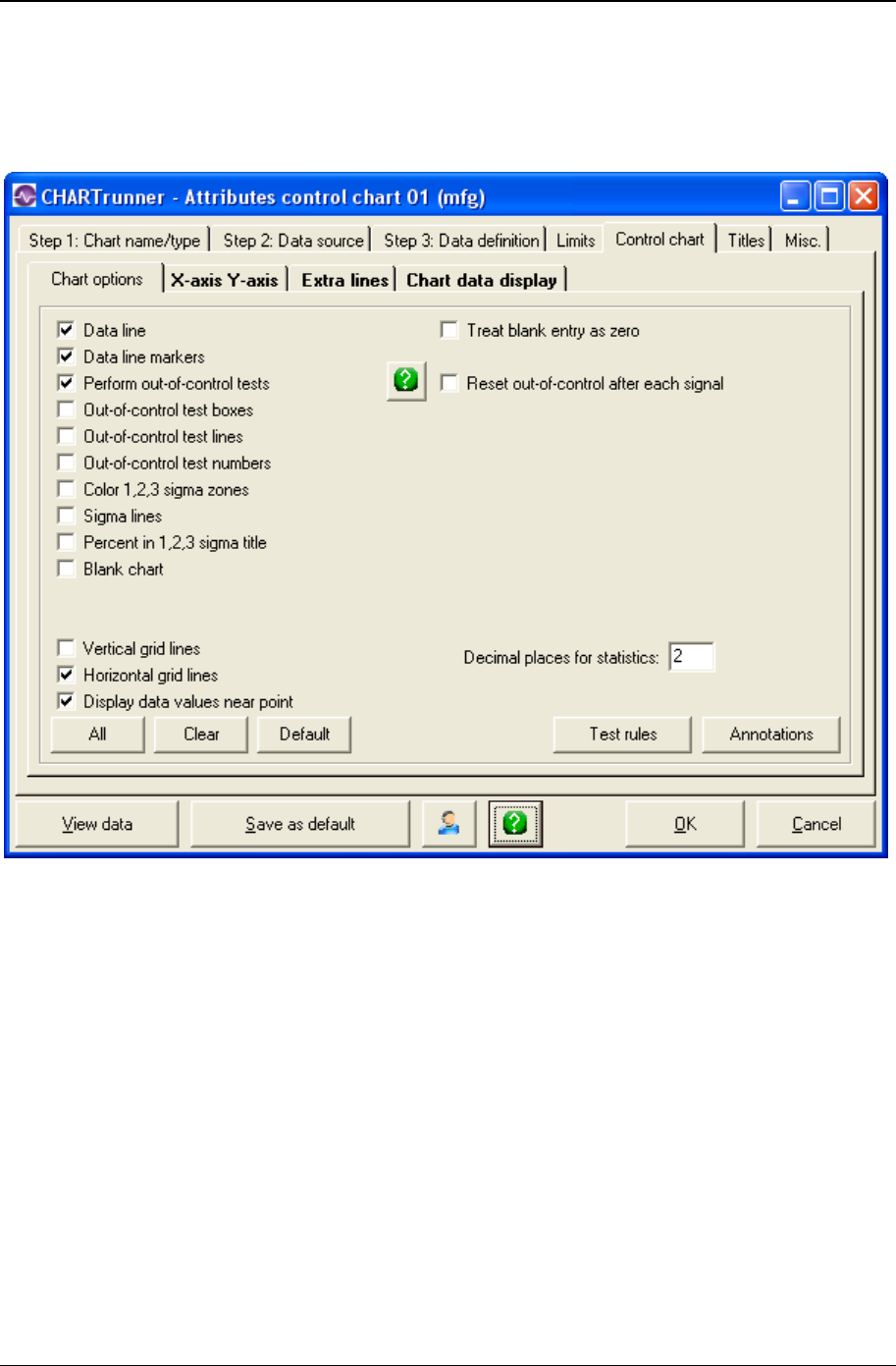
130 CHARTrunner User's Guide
Copyright © 2011
Chart options - sub-tab attributes charts
Use this tab to customize the chart display. Click the All button to select all chart options. Click the Clear
button to unselect all chart options. Click the Default button to select the default options.
The following options may be specified on the Chart options sub-tab:
• Data line – Enable this to draw the line connecting data points.
• Data line markers – Enable this to display the marker for each data point.
• Perform out-of-control tests – Enable this to perform out-of-control testing for the chart using the current
set of test rules. Test rules can be defined on a per-chart-definition basis, or one set of test rules can
be applied to all charts. Use Setup > Preferences > “Use the same out-of-control tests for all charts”
to enable or disable using the same set of test rules for all charts. Use Setup > “Out-of-control tests”
to specify which set of test rules is used when the same set of rules is applied to all charts.
• Out-of-control test boxes – Draws a box around a set of out-of-control points. The box will be labeled
with the test that failed.
• Out-of-control test lines – Draws a line near the top of the chart for each test that has at least one
failure. The line is labeled with the test that failed. Using test lines rather than test boxes can be
useful when test boxes make the chart look too crowded.

Customizing a chart definition 131
Copyright © 2011
• Out-of-control test numbers – Labels the chart with a numeric code for each out-of-control test that
failed. The numeric code corresponds to the position of the test in the set of test rules that is used for
the chart. See the discussion above for Perform out-of-control tests to determine which set of test rules
is in effect for the chart.
• Reset out-of-control after each signal – If this option is enabled, the out-of-control test engine will reset
itself after each primary out-of-control point on the chart. This results in the rules for testing
subsequent points being applied as though the subsequent points are in a new series. It is
recommended that this option NOT be enabled unless you really want this behavior.
• Color 1,2,3 sigma zones – Shows the 1, 2, and 3 sigma zones in different colors on the chart. The three
sigma zones are determined by dividing the region between the control limit and the center line into
three equal regions. Thus, if you are using 3.0 sigma limits, then these zones will correspond to 1.0,
2.0, and 3.0 sigma.
• Sigma lines – Shows lines at the 1, 2, and 3 sigma zone boundaries. This is similar to Color 1,2,3 sigma
zones, but instead of coloring the zones, only a boundary line between each zone is shown.
• Percent in 1,2,3 sigma title – Shows in the titles area the percentage of data points within the 1, 2, and 3
sigma zones.
• Blank chart – Enable this option to draw a blank chart that has no chart data displayed. This feature is
used to print a blank chart form for plotting data manually.
• Vertical grid lines – Enable this to show vertical grid lines on the chart.
• Horizontal grid lines – Enable this to show horizontal grid lines on the chart.
• Display data values near point – Enable this to place a small label showing the data value next to each
data point on the chart.
• Treat blank entry as zero – Enable this to treat a blank data value as zero.
• Decimal places for statistics – Specifies how many decimal places to display for calculated statistics.
• Annotations – Click this button to open a window that displays the annotations that are attached to this
chart. This allows you to remove annotations from the chart. When an annotation is attached to a
subgroup that no longer appears on the chart, this is sometimes the only way to delete the annotation
from the chart definition.
• Test rules – Click the Test rules button to open the Out-of-control test definition editor window shown
below, which allows you to define the out-of-control tests that are stored in this chart definition. See
the discussion above for Perform out-of-control tests to determine whether this set of test rules is used
for evaluating out-of-control conditions for this chart, or whether one set of rules is applied to all
charts.

132 CHARTrunner User's Guide
Copyright © 2011
• Enter a name in the Out-of-control test definition name field to identify this set of out-of-control test rules.
• Click on the Add button to add a predefined test rule. The Select an out-of-control test window opens to
display the predefined test rules you may select from. Highlight the test rule or rules you desire to use
(select multiple rules with Ctrl-Click) and click the OK button.
• Click on the Add custom button to add the custom rule you entered in the field to the left of the Add
custom button into the list of rules.
• Added rules are placed below the currently selected row in the list. Arrange the order of the test rules
by clicking and dragging the rule number with the mouse.
• Click on the Load button to load an existing set of rules that have been defined in Setup > “Out-of-
control tests” into the list. The loaded set of rules will replace any rules currently in the list.
• Highlight a test rule in the list and click the Delete button to remove the rule from the list.
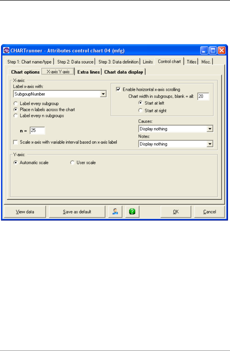
Customizing a chart definition 133
Copyright © 2011
X-axis Y-axis - sub-tab attributes charts
Here you define the options that determine how CHARTrunner labels the X-axis (the horizontal axis) and
establishes the scaling for the Y-axis (the vertical axis).
X-axis
• In the Label x-axis with field, select a label option from the drop-down menu. The default value is
Nothing. Other options are Numbers and specific identifier fields. Identifier fields in this menu are
those mapped in the Step 3: Data definition tab. Select the option you want.
• Select an option to determine the number and type of labels you want to appear on the chart's X-axis.
Options are:
• Label every subgroup – Displays a label on each subgroup or data point. For charts with a large number
of data points, this option may cause the labels to overlap.
• Place n labels across the chart – Displays only the number of labels that you specify across the chart.
Enter the number of labels in the n = field.
• Label every n subgroups – Displays a label on every nth subgroup or data point.
• Label every n units – Displays a label on every nth unit. This option is available only if you have
selected a date/time field for the Label x-axis with option. If you select this option, you must specify the
units – such as Days, Months, or Quarters – in the units = field, and the number of time units in the n =
field.

134 CHARTrunner User's Guide
Copyright © 2011
• If you want to Scale x-axis with variable interval based on x-axis label, select this option. It tells the chart to
set the spacing between the data points on the chart to reflect where each data point falls along the
timeline (or number line) established by the identifier used to label the X-axis. This option is available
only when the X-axis is labeled with a date/time or numeric identifier, and the data source is ordered
by the identifier used to label the X-axis.
NOTE: How is the order of the data source determined? On the Step 3: Data definition tab, when the
data source is a “Table” the Column to use for Order By field determines the order of the data. When a
“Query or view,” “Stored procedure,” or “Custom query” is used as the data source, it is assumed that
the data is ordered by the “Unique identifier” column.
• Select Enable horizontal x-axis scrolling if you want the ability to scroll the chart through the data points
using the mouse. The Chart width in subgroups field specifies the number of data points to display
across the chart. Specify whether the chart initially displays the specified number of data points from
the beginning of the data source (Start at left) or from the end of the data source (Start at right). When
the mouse hovers near the X-axis, a slider bar will appear that allows you to scroll through the data or
change the displayed chart width in data points.
• Causes and Notes – If you want causes and/or notes to be indicated on the chart, make a selection
from the respective drop-down menus. Your options are:
• Display nothing – Do not display the cause or note (default)
• Display a single letter indication – The letter C will be used for a cause, and the letter N will be used for a
note.
• Display abbreviated text – A short portion of the cause or note text will be displayed on the chart.
• Display full text – The full text of the cause or note will be displayed on the chart.
Y-axis
• Automatic scale – Select this for CHARTrunner to determine the appropriate values for scaling the Y-
axis.
• User scale – Select this to specify the Max, Min, and Increment values to use for scaling the Y-axis. If you
leave a field blank, CHARTrunner will automatically select an appropriate value.

Customizing a chart definition 135
Copyright © 2011
Extra lines sub-tab - attributes charts
Here you define the extra lines you want to appear on the chart. You can define as many extra lines as
you desire.
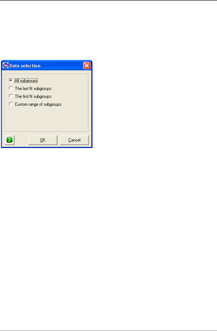
136 CHARTrunner User's Guide
Copyright © 2011
To define a new line, click the Type column and choose from the list of line types.
Extra line – You must enter the Y-axis value for the line in the Value column.
• Mean line
• Trend line – A simple linear regression line will be drawn.
Enter in the Line label column the text with which you want to label the line.
When you click in the Apply to column, you can choose from the options shown above to determine what
subgroups (or data points) the extra line will be applied to. See Applying an extra line to specific
subgroups for more information on applying the extra line to a specific range of subgroups.
• Label with – You can specify to label the extra line with:
• Nothing
• Name
• Value
• Name and value
• Which chart? – Specify 1, 2, or 3 to indicate which sub-chart on the chart the extra line applies to.
• Style : Color – Click here to open the color dialog to choose the color for the extra line.
• Style : Width – Specify the width of the extra line as Regular, Wide, or Thick.
• Style : Style – Select from the drop-down list to specify the line style for the extra line.
Right-click on a row in the extra-lines grid to delete that extra line from the list.
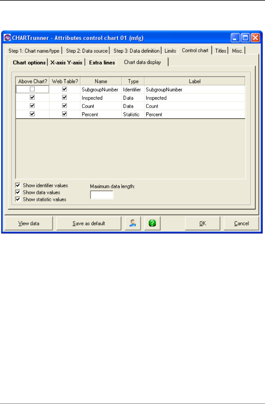
Customizing a chart definition 137
Copyright © 2011
Chart data display sub-tab - attributes charts
Here you define what information you want to appear in these areas:
• In the “Data above the chart” grid that appears above the chart.
• Place a check mark in the Above Chart? column for each row of identifiers, data, or statistics that you
want to appear above the chart.
• In the “Chart data” table when a chart is saved as a Web page.
• Place a check mark in the Web Table? column for each row that you want to appear in the “Chart data”
table of the Web page.
• The “Chart data” table of the Web page is a grid that is displayed below the chart on the Web page. It
displays information in a similar fashion to the “Data above the chart” grid. One of the advantages is
that this data can be highlighted and copied whereas the data appearing in the grid above the chart
on a Web page cannot, as it is simply an image.
• For more information on saving charts as web pages, see the topics Save chart as web page dialog
and Web page defaults sub-tab - misc. tab - applies to all charts.

138 CHARTrunner User's Guide
Copyright © 2011
The Maximum data length field is used to limit the length of text that appears in each cell of the “Data above
the chart” grid. Leave this blank unless you want to apply a length limit. Typically, you enter a value here
to prevent long identifier text from overwhelming a cell. Note that the decimal point in a numeric value will
count as one character. For example, in order to display the entire value of 38.49, you would need to
enter a maximum data length of 5.
If Maximum data length is used it will truncate any value entered that is longer than the maximum data
length textbox. This will display a value that could potentially be misconstrued. For example, if the date
value was 11/07/2008 and the maximum data length was set to 5, the date would appear as “11/07”
which could be misconstrued as November, 2007. Also, if your data spans across several years, entering
a maximum data length will often truncate the years from the end of the date, making it difficult to interpret
the data.
Cusum control charts
Cusum (cumulative sum) charts, while not as intuitive and simple to operate as Shewhart charts, have
been shown to be more efficient in detecting small shifts in the mean of a process.
A visual procedure, known as the V-Mask, is used to determine whether a process is out of control. A V-
Mask is an overlay shape in the form of a V on its side that is superimposed on the graph of the
cumulative sums. The origin point of the V-Mask is placed on top of the latest cumulative sum point and
past points are examined to see if any fall above or below the sides of the V. As long as all the previous
points lie between the sides of the V, the process is in control. Otherwise (even if one point lies outside),
the process is suspected of being out of control.
The Cusum chart (see "Cusum chart tab" on page 139) and Control chart (see "Control chart tab -
cusum charts" on page 140) tabs allow you to customize your Cusum chart.
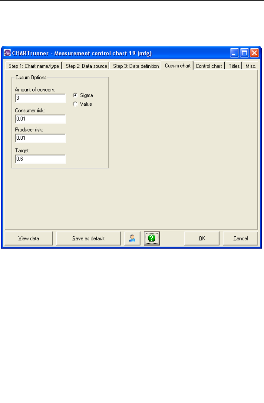
Customizing a chart definition 139
Copyright © 2011
Cusum chart tab
This tab, shown below, allows you to set the options that are specific to a Cusum chart.
• Amount of concern – Enter a value for the amount of concern. This is the amount of shift in the process
average for CHARTrunner to consider when constructing the V-mask. It is the distance by which the
values are to move before they show as out-of-control. The number you enter in this field can be
either the standard deviation or a measurement value. Type the number and select either Sigma or
Value.
• Sigma – Select this radio button when the Amount of concern is expressed as the number of standard
deviations or sigmas.
• Value – Select this radio button when the Amount of concern is expressed as measurement values.
• Consumer risk – Enter the percentage of consumer's risk. The consumer's risk is the probability that
the process will shift by the level of concern and not be detected as out of control by the chart (Type II
error). This is generally a value between .01 and .05.
• Producer risk – Enter the percentage of producer's risk. Producer's risk is the probability that the
process will indicate that the process is out of control when it is in control (Type I error). This is
generally a value between .01 and .05.
• Target – Enter the target value in this field. The calculation of Cusum requires a reference or target
value. This may be the actual process average or the target value for the process. Cusums are the
sums of the deviations from this value.

140 CHARTrunner User's Guide
Copyright © 2011
Control chart tab - cusum charts
The following sub-tabs of the Control chart tab allow you to customize various aspects of your Cusum
chart:
• Chart options (see "Chart options sub-tab - cusum charts" on page 140)
• X-axis Y-axis (see "X-axis Y-axis sub-tab - cusum charts" on page 142)
• Chart Data Display.
Chart options sub-tab - cusum charts
Use this tab to customize the chart display. Click the All button to select all chart options. Click the Clear
button to unselect all chart options. Click the Default button to select the default options.

Customizing a chart definition 141
Copyright © 2011
The following options may be specified on the Chart options sub-tab:
• Data line – Enable this to draw the line connecting data points.
• Data line markers – Enable this to display the marker for each data point.
• Blank chart – Enable this option to draw a blank chart that has no chart data displayed. This feature is
used to print a blank chart form for plotting data manually.
• Show negative limits – Enable this to display negative limits on the chart. If your process can have data
values that fall below zero, you should enable this option.
• Vertical grid lines – Enable this to show vertical grid lines on the chart.
• Horizontal grid lines – Enable this to show horizontal grid lines on the chart.
• Display data values near point – Enable this to place a small label showing the data value next to each
data point on the chart.
• Decimal places for statistics – Specifies how many decimal places to display for calculated statistics.
• Annotations – Click this button to open a window that displays the annotations that are attached to this
chart. This allows you to remove annotations from the chart. When an annotation is attached to a
subgroup that no longer appears on the chart, this is sometimes the only way to delete the annotation
from the chart definition.
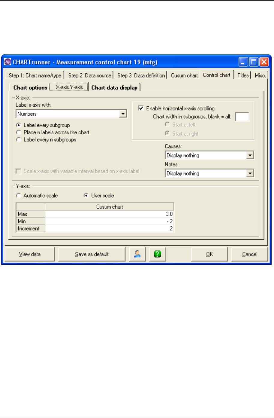
142 CHARTrunner User's Guide
Copyright © 2011
X-axis Y-axis sub-tab - cusum charts
Here you define the options that determine how CHARTrunner labels the X-axis (the horizontal axis) and
establishes the scaling for the Y-axis (the vertical axis):
X-axis
• In the Label x-axis with field, select a label option from the drop-down menu. The default value is
Nothing. Other options are Numbers and specific identifier fields. Identifier fields in this menu are
those mapped in the Step 3: Data definition tab. Select the option you want.
• Select an option to determine the number and type of labels you want to appear on the chart's X-axis.
Options are:
• Label every subgroup – Displays a label on each subgroup or data point. For charts with a large number
of data points, this option may cause the labels to overlap. -
• Place n labels across the chart – Displays only the number of labels that you specify across the chart.
Enter the number of labels in the n = field.
• Label every n subgroups – Displays a label on every nth subgroup or data point.
• Label every n units – Displays a label on every nth unit. This option is available only if you have
selected a date/time field for the Label x-axis with option. If you select this option, you must specify the
units, such as Days, Months, or Quarters in the units = field and the number of time units in the n =
field.

Customizing a chart definition 143
Copyright © 2011
• Scale x-axis with variable interval based on x-axis label – This option is disabled for Cusum charts.
• Select Enable horizontal x-axis scrolling if you want the ability to scroll the chart through the data
points using the mouse. The Chart width in subgroups field specifies the number of data points to
display across the chart. Specify whether the chart initially displays the specified number of data
points from the beginning of the data source (Start at left) or from the end of the data source (Start at
right). When the mouse hovers near the X-axis, a slider bar will appear that allows you to scroll
through the data or change the displayed chart width in data points.
• Causes and Notes – If you want causes and/or notes to be indicated on the chart, make a selection
from the respective drop-down menus. Your options are:
• Display nothing
• Do not display the cause or note (default).
• Display a single letter indication – The letter C will be used for a cause, and the letter N will be used for a
note.
• Display abbreviated text – A short portion of the cause or note text will be displayed on the chart.
• Display full text – The full text of the cause or note will be displayed on the chart.
Y-axis
• Automatic scale – Select this for CHARTrunner to determine the appropriate values for scaling the Y-
axis.
• User scale – Select this to specify the Max, Min, and Increment values to use for scaling the Y-axis. If you
leave a field blank, CHARTrunner will automatically select an appropriate value.
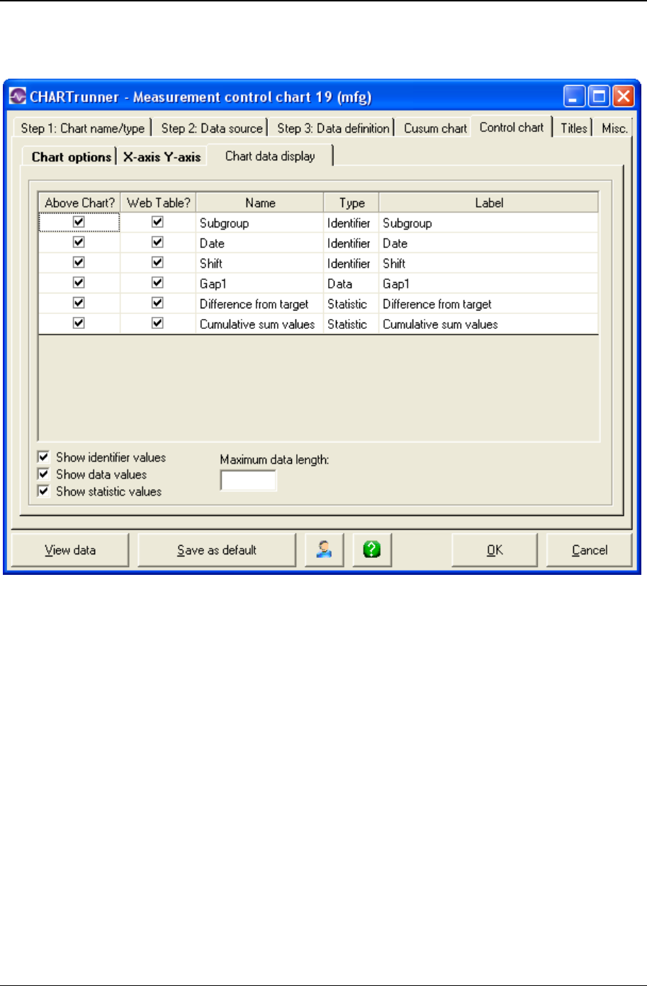
144 CHARTrunner User's Guide
Copyright © 2011
Chart data display sub-tab - cusum charts
Here you define what information you want to appear in these areas:
• In the "Data above the chart" grid that appears above the chart.
• Place a check mark in the Above Chart? column for each row of identifiers, data, or statistics that you
want to appear above the chart.
• In the "Chart data" table when a chart is saved as a Web page.
Place a check mark in the Web Table? column for each row that you want to appear in the "Chart data"
table of the Web page.
• The "Chart data" table of the Web page is a grid that is displayed below the chart on the Web page. It
displays information in a similar fashion to the "Data above the chart" grid. One of the advantages is
that this data can be highlighted and copied, while the data appearing in the grid above the chart on a
Web page cannot, as it is simply an image.
• For more information on saving charts as web pages, see the topics Save chart as web page dialog
and Web page defaults sub-tab - misc. tab - applies to all charts.

Customizing a chart definition 145
Copyright © 2011
Edit the contents of the Label column if you want to change the text that appears for an identifier, data
value, or statistic.
Place a check mark in the Show identifier values field to display identifier values in the "Data above the
chart" grid.
Place a check mark in the Show data values field to display data values in the "Data above the chart"
grid.
Place a check mark in the Show statistic values field to display statistic values in the "Data above the
chart" grid.
The Maximum data length field is used to limit the length of text that appears in each cell of the "Data
above the chart" grid. Leave this blank unless you want to apply a length limit. Typically you enter a value
here to prevent long identifier text from overwhelming a cell. Note that the decimal point in a numeric
value will count as one character. For example, in order to display the entire value of 38.49, you would
need to enter a maximum data length of 5.
If Maximum data length is used, it will truncate any value entered that is longer than the maximum data
length textbox. This will display a value that could potentially be misconstrued. For example, if the date
value was 11/07/2008 and the maximum data length was set to 5, the date would appear as "11/07"
which could be misconstrued as November, 2007. Also, if your data spans across several years, entering
a maximum data length will often truncate the years from the end of the date, making it difficult to interpret
the data.
Short-run control charts
Short-run control charts use special statistical methods that allow you to monitor processes that cannot
be monitored using traditional statistical process control techniques. Whether you make only one part per
run; small runs of many similar parts; or large, complex parts over a long period of time, short-run charts
provide an effective way to realize all the benefits of statistical process control.
Types of short-run control charts
Chart type options for short-run charts are shown below:
• Differences from target, moving range
• Zed, W
• Zed*, W*
• Differences from target (X-bar), range Zed bar, W
• Zed bar*, W*
• Mean ranges.
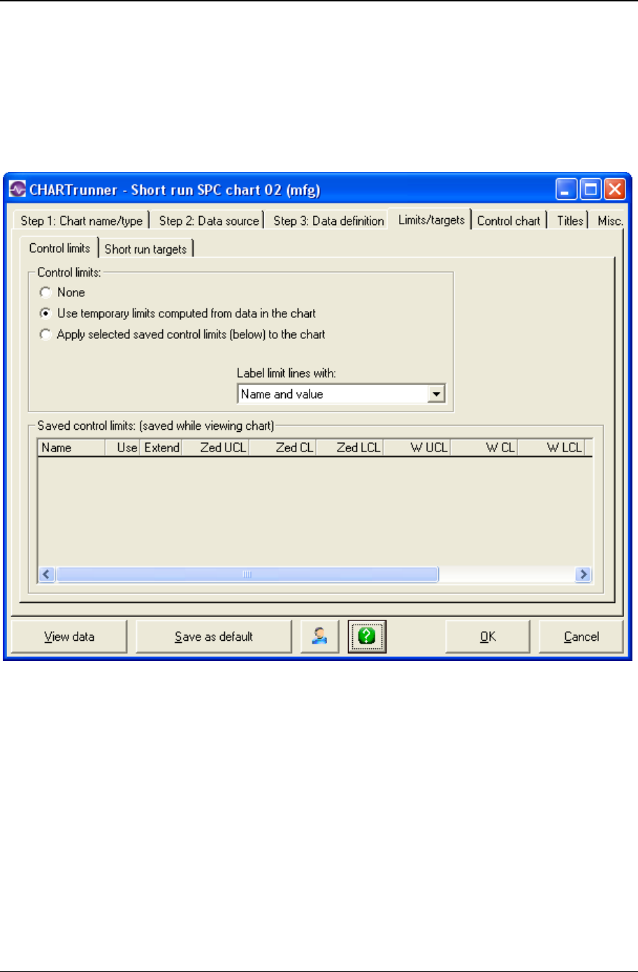
146 CHARTrunner User's Guide
Copyright © 2011
Limits/Targets tab - short-run charts
The following sub-tabs of the Limits/Targets tab allow you to customize these aspects of your short-run
chart:
• Control limits
• Short-run targets.
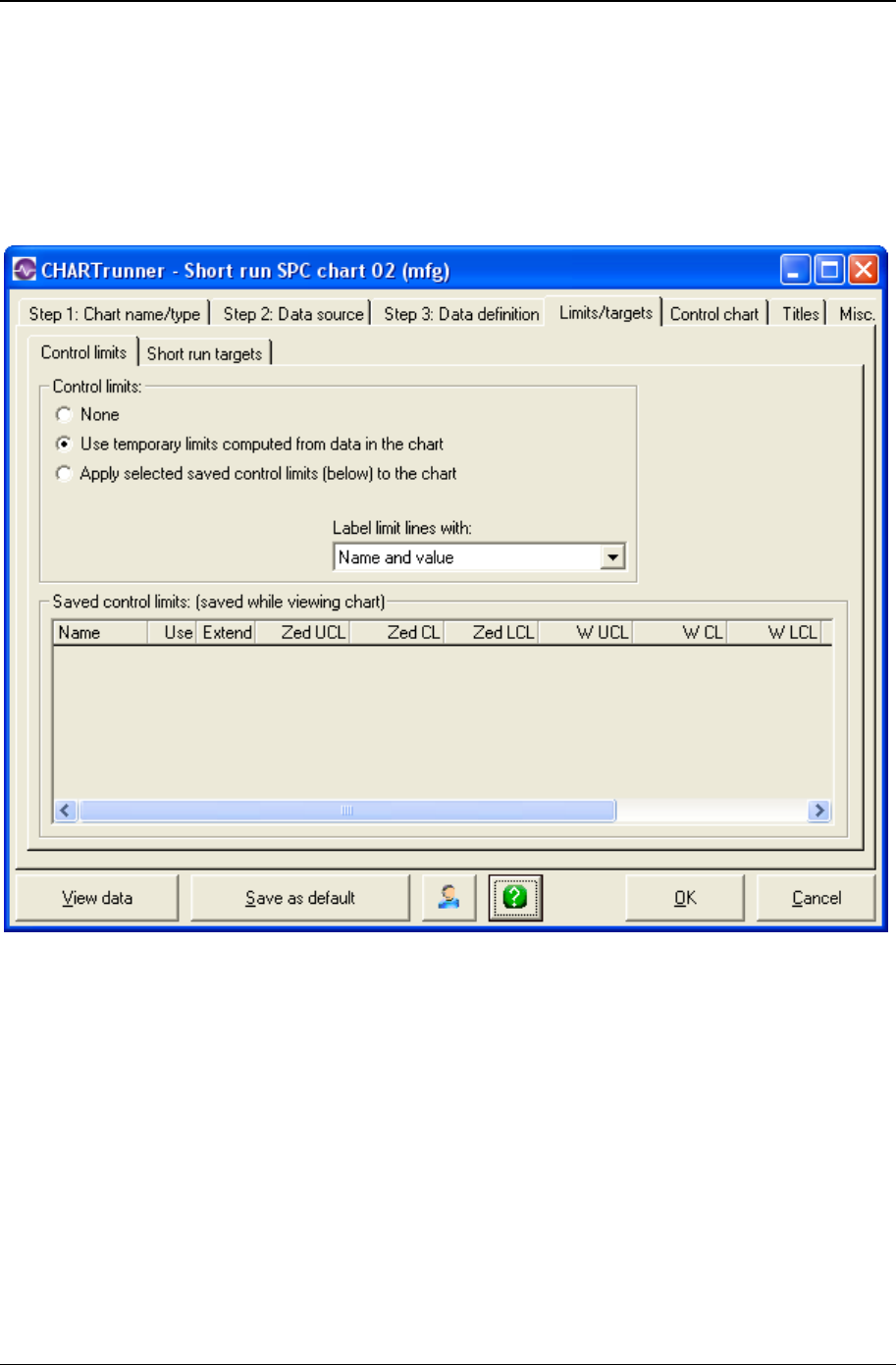
Customizing a chart definition 147
Copyright © 2011
Control limits sub-tab - short-run charts
Control limit lines on a control chart are used as a basis for judging whether variation in data on a chart is
due to special or common causes. The limits are calculated from data collected from the system under
observation. CHARTrunner allows you to calculate a set of control limits by highlighting a set of data
(subgroups) on a chart and selecting Compute limits via the right-click menu. Control limits are not
specifications nor are they arbitrary limits set by customers or management.
Control Limits
• None - No control limits are used on the chart.
• Use temporary limits computed from the data in the chart - CHARTrunner will calculate control limits based
on all the data that you have selected for the chart, except for data that has a special cause. In
general, this is not the best option to use.
• Apply selected saved control limits (below) to the chart - The chart will use the limits saved for this chart
(shown in the Saved control limits table) that have a check mark in the Use column.
• Label limit lines with:
• Nothing
• Name
• Value

148 CHARTrunner User's Guide
Copyright © 2011
• Name and value
NOTE: Control limits can be calculated, edited, and saved from the chart display window. Control limits
that have been saved in the display window appear in the Saved control limits table of this sub-tab.
• Saved Control Limits Table (Saved While Viewing Chart) - Each set of control limits that have been
computed on the chart display window are shown in this table.
• Name - The name given to the set of control limits when the limits were computed on the chart display
window.
• Use - Place a check mark to cause this set of limits to be used on this chart.
• Extend - Place a check mark to cause the limit lines for this set of limits to be extended to the next
adjacent limit set on the chart, or to the edge of the chart if there is no adjacent limit set.
• Order by - This specifies how the chart's data was ordered when the limit set was calculated. Limit sets
are displayed on the chart only when the current order of the chart's data is the same as when the
limit set was calculated. If no data order was specified for the chart's data when the limit set was
calculated, this will be blank; and the Calc from and Calc to will be in terms of relative subgroup
number. For more information on how the data order column is determined see Understanding the
data order concept.
• Calc from - Specifies the leftmost boundary of the chart data that was selected when the limit set was
calculated. If the Order by is blank, the Calc from will be in terms of relative subgroup number.
• Calc to - Specifies the rightmost boundary of the chart data that was selected when the limit set was
calculated. If the Order by is blank, the Calc to will be in terms of relative subgroup number.

Customizing a chart definition 149
Copyright © 2011
Short-run targets sub-tab - short-run charts
A short-run chart needs the target value for each product that is produced. The target values can come
from the data source, or they can be entered in the chart definition.
• Case sensitive product names – Select this option if your product names differ in case, e.g., “Product A”
and “Product a” are two different product names.
• Target values from database – Select this option to fetch target values from the data source, in which
case you must map one column on the Step 3: Data definition tab as the Target column.
• User entered target values – Select this option to enter the target value for each product name in the
grid. The product names you enter will be matched against the names from the Product column on the
Step 3: Data definition tab. You can right-click on one or more selected rows of the grid to delete the
rows. Use Shift-click or Ctrl-click to select multiple rows.
• Product – Enter the product name.
• Target value – Enter the target value for the product name.
• Get products from data source – Click this button to populate the Product column of the grid with the
product names that are found in the Product column of the data source.

150 CHARTrunner User's Guide
Copyright © 2011
Chart options sub-tab - short-run charts
Use this sub-tab to customize the chart display. Click the All button to select all chart options. Click the
Clear button to unselect all chart options. Click the Default button to select the default options.
The following options may be specified on the Chart options sub-tab:
• Data line – Enable this to draw the line connecting data points.
• Data line markers – Enable this to display the marker for each data point.
• Perform out-of-control tests – Enable this to perform out-of-control testing for the chart, using the current
set of test rules. Test rules can be defined on a per-chart-definition basis, or one set of test rules can
be applied to all charts. Use Setup > Preferences > “Use the same out-of-control tests for all charts”
to enable or disable using the same set of test rules for all charts. Use Setup > “Out-of-control tests”
to specify which set of test rules is used when the same set of rules is applied to all charts.
• Out-of-control test boxes – Draws a box around a set of out-of-control points. The box will be labeled
with the test that failed.
• Out-of-control test lines – Draws a line near the top of the chart for each test that has at least one
failure. The line is labeled with the test that failed. Using test lines rather than test boxes can be
useful when test boxes make the chart look too crowded.

Customizing a chart definition 151
Copyright © 2011
• Out-of-control test numbers – Labels the chart with a numeric code for each out-of-control test that has
failed. The numeric code corresponds to the position of the test in the set of test rules that is used for
the chart. See the discussion above for Perform out-of-control tests to determine which set of test rules
is in effect for the chart.
• Reset out-of-control after each signal – If this option is enabled, the out-of-control test engine will reset
itself after each primary out-of-control point on the chart. This results in the rules for testing
subsequent points being applied as though the subsequent points are in a new series. It is
recommended that this option NOT be enabled unless you really want this behavior.
• Color 1,2,3 sigma zones – Shows the 1, 2, and 3 sigma zones in different colors on the chart. The three
sigma zones are determined by dividing the region between the control limit and the center line into
three equal regions. Thus, if you are using 3.0 sigma limits, then these zones will correspond to 1.0,
2.0, and 3.0 sigma.
• Sigma lines – Shows lines at the 1, 2, and 3 sigma zone boundaries. This is similar to Color 1,2,3 sigma
zones, but instead of coloring the zones, only a boundary line between each zone is shown.
• Percent in 1,2,3 sigma title – Shows in the titles area the percentage of data points within the 1, 2, and 3
sigma zones.
• Blank chart – Enable this option to draw a blank chart that has no chart data displayed. This feature is
used to print a blank chart form for plotting data manually.
• Show negative limits – Enable this to display negative limits on the chart. If your process can have data
values that fall below zero, you should enable this option.
• Vertical grid lines – Enable this to show vertical grid lines on the chart.
• Horizontal grid lines – Enable this to show horizontal grid lines on the chart.
• Display data values near point – Enable this to place a small label showing the data value next to each
data point on the chart.
• Subgroups in moving range – Enter the number of data points to use for the moving range, moving
sigma, or moving average calculation. This field is visible only for individuals data, which means that
on the Step 3: Data definition tab, you have mapped only one data column as a measurement. The
recommended value is 2.
• Decimal places for statistics – Specifies how many decimal places to display for calculated statistics.
• Annotations – Click this button to open a window that displays the annotations that are attached to this
chart. This allows you to remove annotations from the chart. Sometimes, when an annotation is
attached to a subgroup that no longer appears on the chart, this is the only way to delete the
annotation from the chart definition.
• Test rules – Click the Test rules button to open the Out-of-control test definition editor window shown
below. This allows you to define the out-of-control tests that are stored in this chart definition. See the
discussion above for Perform out-of-control tests to determine whether this set of test rules is used for
evaluating out-of-control conditions for this chart, or whether one set of rules is applied to all charts.
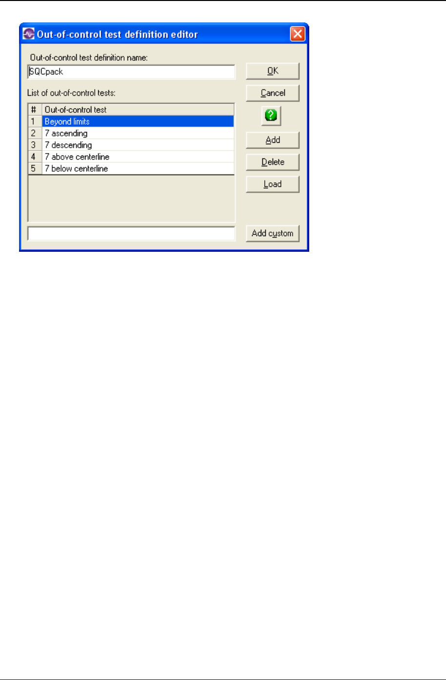
152 CHARTrunner User's Guide
Copyright © 2011
• Enter a name in the Out-of-control test definition name field to identify this set of out-of-control test rules.
• Click on the Add button to add a predefined test rule. The Select an out-of-control test window opens to
display the predefined test rules from which you may select. Highlight the test rule or rules you desire
to use (select multiple rules with Ctrl-click) and click the OK button.
• Click on the Add custom button to add the custom rule you entered in the field to the left of the Add
custom button into the list of rules.
• Added rules are placed below the currently selected row in the list. Arrange the order of the test rules
by clicking and dragging the rule number with the mouse.
• Click on the Load button to load an existing set of rules that have been defined in Setup > “Out-of-
control tests” into the list. The loaded set of rules will replace any rules currently in the list.
• Highlight a test rule in the list and click the Delete button to remove the rule from the list.
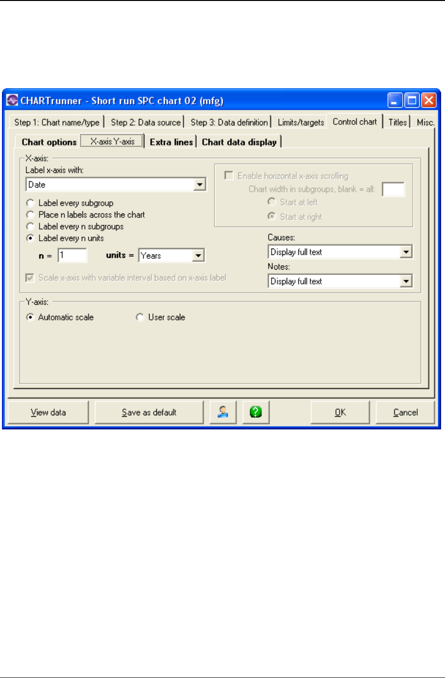
Customizing a chart definition 153
Copyright © 2011
X-axis Y-axis sub-tab - short-run charts
Here you define the options that determine how CHARTrunner labels the X-axis (the horizontal axis) and
establishes the scaling for the Y-axis (the vertical axis):
X-axis
• In the Label x-axis with field, select a label option from the drop-down menu. The default value is
Nothing. Other options are Numbers and specific identifier fields. Identifier fields in this menu are
those mapped in the Step 3: Data definition tab. Select the option you want.
• Select an option to determine the number and type of labels you want to appear on the chart's X-axis.
Options are:
• Label every subgroup – Displays a label on each subgroup or data point. For charts with a large number
of data points, this option may cause the labels to overlap.
• Place n labels across the chart – Displays only the number of labels that you specify across the chart.
Enter the number of labels in the n = field.
• Label every n subgroups – Displays a label on every nth subgroup or data point.
• Label every n units – Displays a label on every nth unit. This option is available only if you have
selected a date/time field for the Label x-axis with option. If you select this option, you must specify the
units, such as Days, Months, or Quarters in the units = field and the number of time units in the n =
field.

154 CHARTrunner User's Guide
Copyright © 2011
• If you want to Scale x-axis with variable interval based on x-axis label, select this option. It tells the chart to
set the spacing between the data points on the chart to reflect where each data point falls along the
timeline (or number line) established by the identifier used to label the X-axis. This option is available
only when the X-axis is labeled with a date/time or numeric identifier, and the data source is ordered
by the identifier used to label the X-axis.
NOTE: How is the order of the data source determined? On the Step 3: Data definition tab, when the
data source is a “Table” the Column to use for Order By field determines the order of the data. When a
“Query or view,” “Stored procedure,” or “Custom query” is used as the data source, it is assumed that
the data is ordered by the “Unique identifier” column.
• Select Enable horizontal x-axis scrolling if you want the ability to scroll the chart through the data points
using the mouse. The Chart width in subgroups field specifies the number of data points to display
across the chart. Specify whether the chart initially displays the specified number of data points from
the beginning of the data source (Start at left) or from the end of the data source (Start at right). When
the mouse hovers near the X-axis, a slider bar will appear that allows you to scroll through the data or
change the displayed chart width in data points.
• Causes and Notes – If you want causes and/or notes to be indicated on the chart, make a selection
from the respective drop-down menus. Your options are:
• Display nothing - Do not display the cause or note (default)
• Display a single letter indication – The letter C will be used for a cause, and the letter N will be used for a
note.
• Display abbreviated text – A short portion of the cause or note text will be displayed on the chart.
• Display full text – The full text of the cause or note will be displayed on the chart.
Y-axis
• Automatic scale – Select this for CHARTrunner to determine the appropriate values for scaling the Y-
axis.
• User scale – Select this to specify the Max, Min, and Increment values to use for scaling the Y-axis. If you
leave a field blank, CHARTrunner will automatically select an appropriate value.
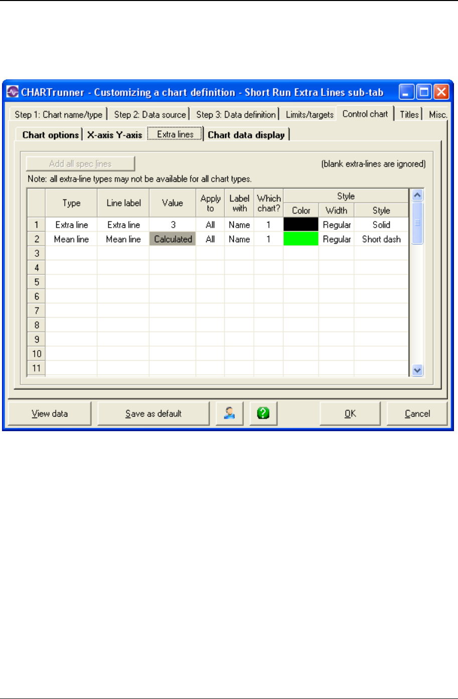
Customizing a chart definition 155
Copyright © 2011
Extra lines sub-tab - short-run charts
Here you define the extra lines you want to appear on the chart
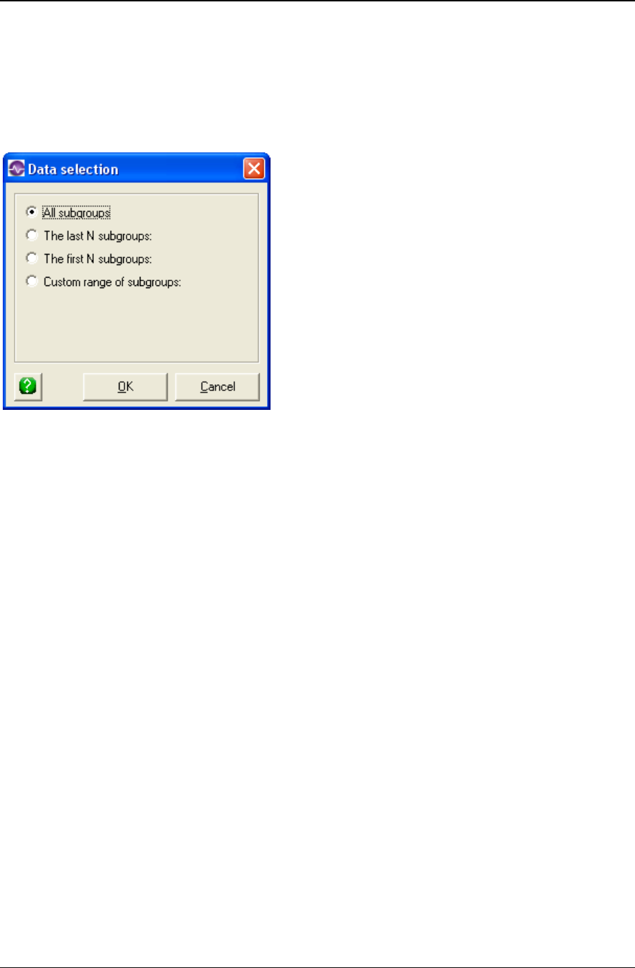
156 CHARTrunner User's Guide
Copyright © 2011
To define a new line, click the Type column and choose from the list of line types.
Extra line – You must enter the Y-axis value for the line in the Value column.
• Mean line
Enter in the Line label column the text you want to label the line with.
When you click in the Apply to column, you can choose from the options shown above to determine what
subgroups (or data points) the extra line will be applied to. See Applying an extra line to specific
subgroups for more information on applying the extra line to a specific range of subgroups.
• Label with – You can specify to label the extra line with:
• Nothing
• Name
• Value
• Name and value
• Which chart? – Specify 1 or 2 to indicate which sub-chart on the chart the extra line applies to.
• Style : Color – Click here to open the color dialog to choose the color for the extra line.
• Style : Width – Specify the width of the extra line as Regular, Wide, or Thick.
• Style : Style – Select from the drop-down list to specify the line style for the extra line.
Right-click on a row in the extra-lines grid to delete that extra line from the list.
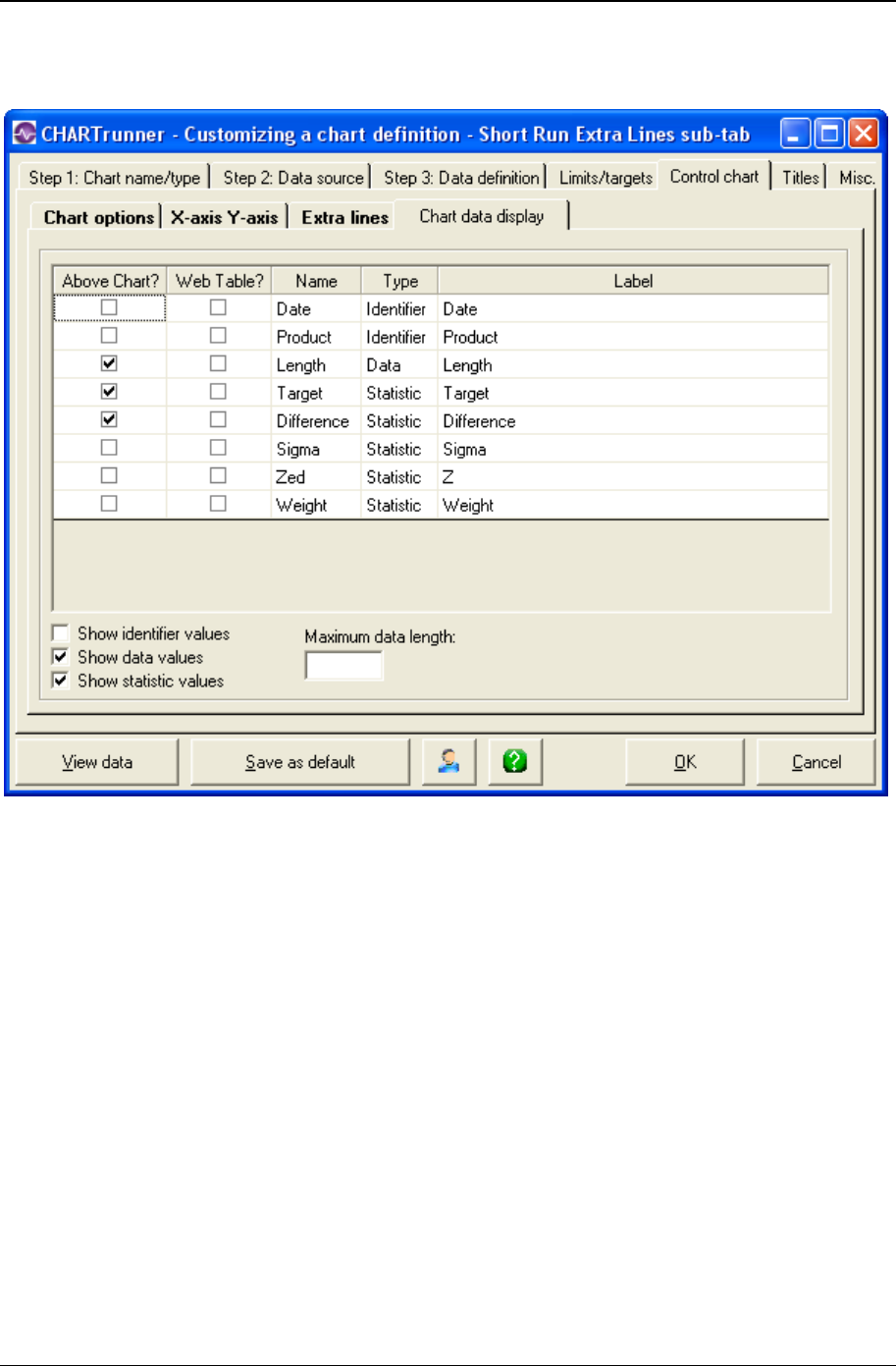
Customizing a chart definition 157
Copyright © 2011
Chart data display sub-tab - short run charts
Here you define what information you want to appear in these areas:
• In the "Data above the chart" grid that appears above the chart.
• Place a check mark in the Above Chart? column for each row of identifiers, data, or statistics that you
want to appear above the chart.
• In the "Chart data" table when a chart is saved as a Web page.
• Place a check mark in the Web Table? column for each row that you want to appear in the "Chart
data" table of the Web page.
• The "Chart data" table of the Web page is a grid that is displayed below the chart on the Web page. It
displays information in a similar fashion to the "Data above the chart" grid. One of the advantages is
that this data can be highlighted and copied, while the data appearing in the grid above the chart on a
Web page cannot, as it is simply an image.
• For more information on saving charts as web pages, see the topics Save chart as web page dialog
and Web page defaults sub-tab - misc. tab - applies to all charts.

158 CHARTrunner User's Guide
Copyright © 2011
Edit the contents of the Label column if you want to change the text that appears for an identifier, data
value, or statistic.
Place a check mark in the Show identifier values field to display identifier values in the "Data above the
chart" grid.
Place a check mark in the Show data values field to display data values in the "Data above the chart"
grid.
Place a check mark in the Show statistic values field to display statistic values in the "Data above the
chart" grid.
The Maximum data length field is used to limit the length of text that appears in each cell of the "Data
above the chart" grid. Leave this blank unless you want to apply a length limit. Typically you enter a value
here to prevent long identifier text from overwhelming a cell. Note that the decimal point in a numeric
value will count as one character. For example, in order to display the entire value of 38.49 you would
need to enter a maximum data length of 5.
If Maximum data length is used, it will truncate any value entered that is longer than the maximum data
length textbox. This will display a value that could potentially be misconstrued. For example, if the date
value was 11/07/2008 and the maximum data length was set to 5, the date would appear as "11/07"
which could be misconstrued as November, 2007. Also, if your data spans across several years, entering
a maximum data length will often truncate the years from the end of the date, making it difficult to interpret
the data.
Rare event control charts
Control charts for rare events allow you to use control charting techniques when the process you are
monitoring does not produce many data points. For example, say you want to monitor the number of
times you have a power failure. This does not happen very often. A traditional control chart will show lots
of days with a zero data point and an occasional day with a one data point. The chart is not very
interesting, but more importantly, it does not give you a sense of what is happening. Is there more or less
variation? Rare event control charts solve this problem by monitoring the amount of time or the number of
units between rare events.
Types of rare event control charts
There are two types of control charts for rare events:
• t-chart – Use this to monitor the amount of time that passes between rare events. Time might be
measured in minutes, hours, days, months, etc.
• g-chart – Use this to monitor a number of units that get produced between rare events. The units can
be things like the number of customers served, the number parts manufactured, the number of orders
processed, or the number of patients admitted.
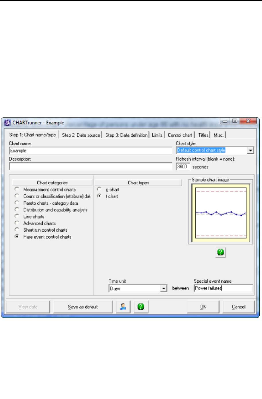
Customizing a chart definition 159
Copyright © 2011
Describing the rare event
When you create a t-chart or a g-chart, you have two additional fields, on the chart type/name tab, where
you may describe the rare event being charted. The fields are optional. The text you type in these fields
will be used in the chart type title that appears above the chart. This title becomes the general description
of what the chart is showing.
For a t-chart, you may provide these two fields:
• Time unit: Select from the drop-down list one of the options minutes, hours, days, etc.
• Special event name: This is where you name the rare event you are monitoring.
For example, if your time unit is ‘Days’ and your special event name is ‘Power failures,’ then the chart
type title will look like this:
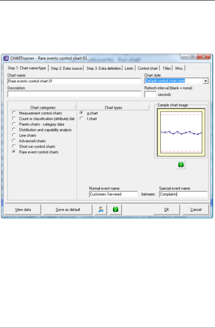
160 CHARTrunner User's Guide
Copyright © 2011
For a g-chart, you may provide these two fields.
• Normal event name: This is where you name the units you are counting between each rare event.
• Special event name: This is where you name the rare event you are monitoring.
For example, if your Normal event name is ‘Customers Served’ and your Special event name is
‘Complaints’ then the chart type title will look like this:
Step 1: Chart name/type tab
When you create a new chart, on the Step 1: Chart name/type tab, select the category named Rare event
control charts. This will make the t-chart and g-chart options visible under Chart types. Once you select t-
chart or g-chart, enter your descriptions in the fields near the bottom of the Chart types section of this tab.
Control chart tab – rare event control chart
Use this tab to customize the chart display; use the sub tabs to adjust various settings.
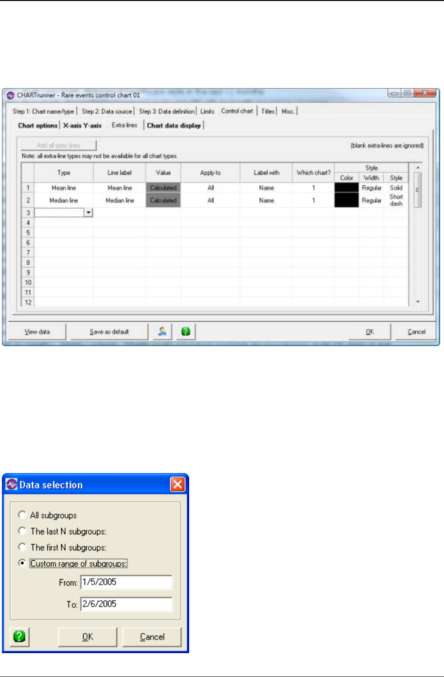
Customizing a chart definition 161
Copyright © 2011
Extra lines sub-tab - rare event control chart charts
Here you define the extra lines you want to appear on the chart. You can define as many extra lines as
you desire.
To define a new line, click the Type column and choose from the list of line types.
Extra line – You must enter the Y-axis value for the line in the Value column.
• Mean line
• Median line – A horizontal line will be drawn at the calculated median (for all values used in the chart).
• Trend line – A simple linear regression line will be drawn.
Enter in the Line label column the text with which you want to label the line.

162 CHARTrunner User's Guide
Copyright © 2011
When you click in the Apply to column, you can choose from the options shown above to determine what
subgroups (or data points) the extra line will be applied to. See Applying an extra line to specific
subgroups for more information on applying the extra line to a specific range of subgroups.
• Label with – You can specify to label the extra line with:
• Nothing
• Name
• Value
• Name and value
• Which chart? – Specify 1, 2, or 3 to indicate which sub-chart on the chart the extra line applies to.
• Style : Color – Click here to open the color dialog to choose the color for the extra line.
• Style : Width – Specify the width of the extra line as Regular, Wide, or Thick.
• Style : Style – Select from the drop-down list to specify the line style for the extra line.
To delete an extra line from the list: right click and then select Delete from the context menu.
Pareto charts
A Pareto chart is a simple bar chart that ranks related measures in order of occurrence. (In addition to bar
charts, CHARTrunner also lets you create pie charts.) The principle was developed by Vilfredo Pareto, an
Italian economist and sociologist who conducted a study in Europe in the early 1900s on wealth and
poverty. He found that wealth was concentrated in the hands of the few and poverty in the hands of the
many. The principle is based on the unequal distribution of things in the universe. It is the law of the
“significant few versus the trivial many.” The significant few things will generally make up 80% of the
whole, while the trivial many will make up about 20%.
The purpose of a Pareto chart is to separate the significant aspects of a problem from the trivial ones. By
graphically separating the aspects of a problem, a team will know where to direct its improvement efforts.
Reducing the largest bars identified in the diagram will do more for overall improvement than reducing the
smaller ones.
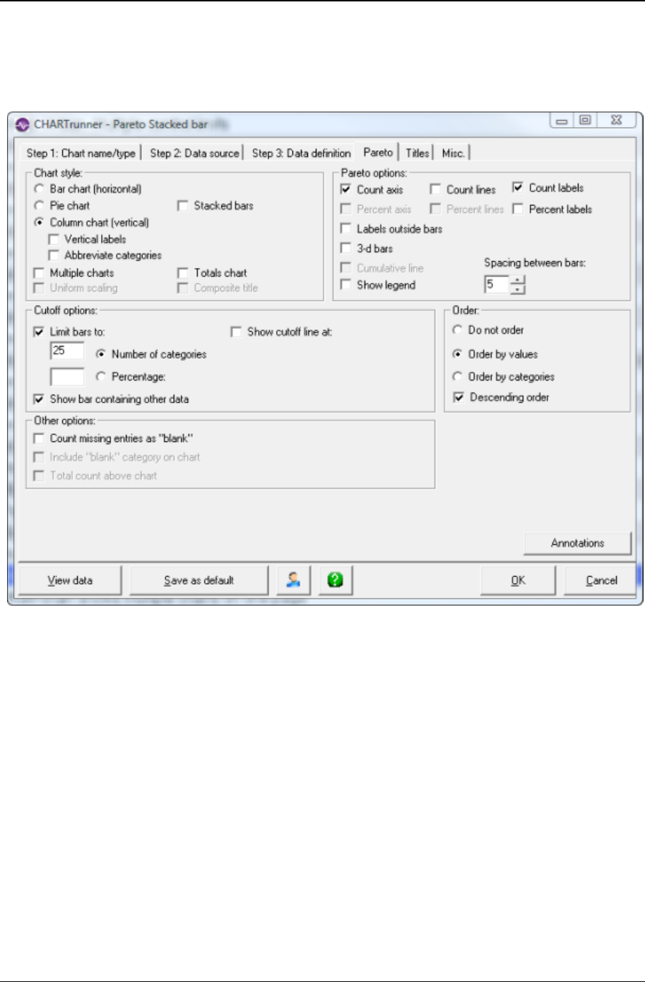
Customizing a chart definition 163
Copyright © 2011
Pareto tab - pareto charts
The Pareto tab allows you to customize many features of your bar or pie charts.
Chart Style
The next three options allow you to select the type of Pareto chart to create:
• Bar chart (horizontal) – Create a bar chart with horizontal bars.
• Pie chart – Create a pie chart.
• Column chart (vertical) – Create a bar chart with vertical bars. You can select one of the following
options to adjust how the category bars are labeled. This can be helpful if the labels along the bottom
of the chart collide with each other.
• Vertical labels – The category labels are drawn vertically rather than horizontally.
• Abbreviate categories – The category labels are drawn horizontally but are abbreviated to require less
space.
Multiple detail charts – You have the option of drawing or summarizing multiple detail charts or stacked
bars if on the Step 3: Data definition tab you specified one of the following two situations:
1. A Group by column. Each detail chart would consist only of data having the same Group by column
value.

164 CHARTrunner User's Guide
Copyright © 2011
2. A Categories column along with multiple Count columns. Each detail chart would consist only of data
from one Count column.
When multiple detail charts are possible, the following variations on the resulting chart are possible:
1. Multiple charts only is selected. Each detail chart is shown separately on the chart.
2. Totals chart only is selected. A single Totals chart that shows a summary of the data from the detail
charts is shown.
3. Both Multiple charts and Totals chart are selected. Each detail chart is shown separately, plus the
Totals chart is shown as well.
4. Neither Multiple charts nor Totals chart is selected. This results in a single chart with multiple sets of
detail bars representing each of the detail charts. This option is not available for Pie charts.
5. Stacked bars (new in 3.6)
• Multiple charts – Select this option to display each detail chart separately on the chart. This option is
enabled only if multiple detail charts is possible.
• Uniform scaling – Select this option to use the same category scaling for the bars of each detail chart.
This option is not enabled for Pie charts. This option is enabled only when Multiple charts is selected.
• Totals chart – Select this option to display a Totals chart that shows a summary of the data from the
detail charts.
• Composite title – When this option is selected, the chart title reflects the range of titles from the multiple
detail charts. For example, if the detail chart titles are “January,” “February,” and “March,” then the
composite title would be “January – March.” This option is enabled only in these two situations:
• When the Multiple charts and Totals chart options are selected. If Composite title is selected, the Totals
chart title reflects the range of the detail charts. Otherwise, the Totals chart has a title of “Total
Counts.”
• When multiple detail charts are possible and the Multiple charts option is not selected. If Composite title
is selected, the chart title reflects the range of the detail charts, even though the detail charts are not
displayed.
• Stacked bars – An alternative to multiple detail charts is stacked bars. This option is available only
when multiple detail charts are possible. Note that you must select either stacked bars or multiple
charts – you may not select both on the same chart. Select this option when you want a single chart –
where each bar is made up of 'sub bars.'
Pareto Options
These options allow you to customize the look of the chart:
• Cumulative line – Select this option to draw a cumulative line. (Enabled if either Bar or Column chart is
selected)
• Label with counts – Select this option to label each bar or slice with the number of counts.
• Count lines – Select this option to draw lines across the chart from the major tick marks along the
count axis. (Enabled if Label with counts is selected)
• Label with percents – Select this option to label each bar or slice with the percentage of the total counts
for that bar or slice.
• Percent lines – Select this option to draw lines across the chart from the major tick marks along the
percentage axis. (Enabled if Label with percents is selected)
• Legend – Select this option to draw a legend on the chart. (Enabled if Pie chart is selected)
• Text outside pie – Select this option to draw labels outside of the pie. (Enabled if Pie chart is selected)

Customizing a chart definition 165
Copyright © 2011
• Label outside – Select this option to draw labels outside of the bars. (Enabled if either Bar or Column
chart is selected)
• 3-d bars – Select this option to draw 3-dimensional bars. (Enabled if either Bar or Column chart is
selected)
• Spacing between bars – Enter the spacing between the bars of a bar or column Pareto chart. The
specified number is in percentage.
Cutoff Options
Cutoff options let you take advantage of the Pareto principle and display a chart showing the categories
occurring most frequently. This function is useful if you have a large number of categories and want to
look only at the top percent or top number of categories. Depending on whether you have selected the pie
or bar/column chart type, some of the options in this frame will say “pie” or “bar.”
• Limit bars/slices to – Select this option to limit the number of bars or pie slices to the specified Number of
categories or Percentage.
• Show cutoff line at – The cutoff line displays a line on the chart at the specified location (Number of
categories or Percentage). For example, if you set up the chart to show a cutoff line at 25%, the chart will
draw a line indicating the top 25% of counts.
• Number of categories – Select this option to display no more than the specified number of bars or pie
slices on the chart.
• Percentage – Select this option to display enough bars or pie slices to represent the specified
percentage of the counts.
• Show bar/slice containing other data – Select this option to display an Other bar or pie slice that
represents the data from the categories that were “cut off” from the chart. This option is enabled only
when Limit bars/slices to is selected.
Order
The order options let you specify the order of the bars or pie slices on the chart.
• Do not order – Select this option to impose no order.
• Order by values – Select this option to order the bars or pie slices based upon the value of each bar or
pie slice.
• Order by categories – Select this option to order the bars or pie slices based upon the category label.
• Descending order – Select this option to specify descending order for Order by values or Order by
categories. If this option is not selected, then ascending order is used.
Other Options
• Count missing entries as “blank” – Select this option if you want missing data to be counted as the
(blank) category. For instance, assume that on the Step 3: Data definition tab you mapped a single
column of data as the Categories column, and there are 5 rows within that column that have missing
data; then the (blank) category will have a value of 5 counts.
NOTE: In database terminology, the data is considered to be missing if it contains the Null value,
contains zero length text, or results in zero length text when the data field is converted to text.
• Include “blank” category on chart – Select this option to include the (blank) category as a bar or pie slice
on the chart.
• Total count above chart – Select this option to include the total count in the title area above the chart. If
Multiple charts is selected, the total count will be shown above each detail chart. If Count missing entries
as “blank” is selected, the total count will distinguish between blank and non-blank counts.

166 CHARTrunner User's Guide
Copyright © 2011
Histogram charts
A histogram is a bar chart that represents the frequency distribution of data. The height of each bar
corresponds to the number of items in the class or cell. The width of each bar represents a measurement
interval. The histogram shows basic information such as central location, shape, and spread of the data
being examined.
Histogram tab - histogram charts
The following sub-tabs allow you to customize histogram charts:
• General (see "General sub-tab - histogram charts" on page 167)
• Descriptive stats (see "Descriptive stats sub-tab - histogram charts" on page 169)
• Capability stats (see "Capability stats sub-tab - histogram charts" on page 171)
• X-Y Axis (see "X-Y Axis sub-tab - histogram charts" on page 174)
• Stat columns (see "Stat columns sub-tab - histogram charts" on page 175).
In addition, the Specifications (see "Specifications tab - histogram charts" on page 176) tab is where you
enter the Target (or Nominal) value, the Upper specification and/or the Lower specification values. These
values are used in calculating many histogram statistics and may be displayed as lines on the histogram
chart.
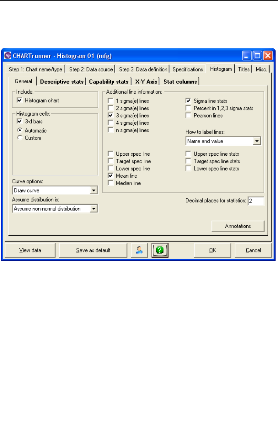
Customizing a chart definition 167
Copyright © 2011
General sub-tab - histogram charts
The General sub-tab allows you to customize many features of your histogram chart, as explained below.
• Histogram chart – Select this option to include the histogram bar chart itself on the chart. Do not select
this option if you want only the histogram statistics to appear on the chart.
• Curve options – Select from the drop-down list to specify an option for drawing the distribution curve on
the histogram chart:
• Draw curve – Always draw the distribution curve.
• Do not draw curve – Never draw the distribution curve.
• Draw curve if it fits distribution – Draw the distribution curve only if the chart's data matches the curve
type specified by Assume distribution is.
• Assume distribution is – Select from the drop-down list to specify the type of distribution curve to
assume the chart's data follows:
• Assume normal distribution
• Assume that the chart data follows the normal distribution.
• Assume non-normal distribution
• Assume that the chart data does not follow the normal distribution.

168 CHARTrunner User's Guide
Copyright © 2011
• Decimal places for statistics – Specifies how many decimal places to display for calculated statistics.
• Annotations – Click this button to open a window that displays the annotations that are attached to this
chart. This allows you to remove annotations from the chart.
Histogram Cells
• 3-d bars – Select this option to draw 3-dimensional bars.
• Automatic – Select this option to have CHARTrunner automatically calculate the Cell start, Cell width,
and Number of cells parameters.
• Custom – Select this option to manually specify the Cell start, Cell width, and Number of cells
parameters.
• Cell start – This specifies the X-axis value of the left edge of the leftmost bar on the histogram.
• Cell width – This specifies the width of each bar on the histogram.
• Number of cells – This specifies the number of bars on the histogram.
When specifying Custom histogram cells, you must specify one of the following combinations:
1. The Number of cells only.
2. The Cell start and Cell width.
3. All three settings: Cell start, Cell width, and Number of cells.
Additional Line Information
To draw additional lines on the histogram, click on the line options you want. Sigma calculations for these
lines will be either estimated or actual sigma, depending on whether you select Capability or Performance
on the Descriptive stats sub-tab. For instance, the option to draw 1 sigma lines will appear as “1 sigma(e)
lines” for Capability stats and “1 sigma(i) lines” for Performance stats.
• 1 sigma(e) lines – Select this option to draw 1 sigma lines.
• 2 sigma(e) lines – Select this option to draw 2 sigma lines.
• 3 sigma(e) lines – Select this option to draw 3 sigma lines.
• 4 sigma(e) lines – Select this option to draw 4 sigma lines.
• n sigma(e) lines – Select this option to draw n sigma lines. Specify the number of sigma for the lines in
the n = field.
• Upper spec line – Select this option to draw the upper specification line.
• Target spec line – Select this option to draw the target specification line.
• Lower spec line – Select this option to draw the lower specification line.
• Mean line – Select this option to draw the mean line.
• Median line – Select this option to draw the median line.
• Sigma line stats – Select this option to include (on the right side of the chart) information about the
sigma line(s) you have selected.
• Percent in 1,2,3 sigma stats – Select this option to include (on the right side of the chart) information
about the percentage of the data points that fall within 1, 2, and 3 sigma.
• How to label lines – Select one of the following options for labeling the lines on the chart:
• Nothing
• Name
• Value
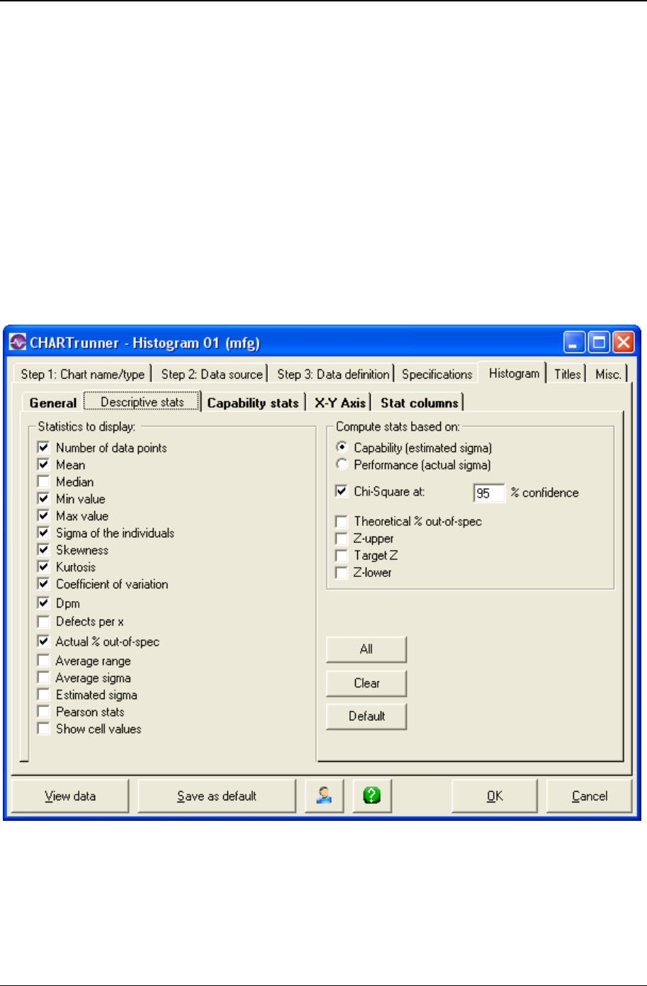
Customizing a chart definition 169
Copyright © 2011
• Name and value
• Upper spec line stats – Select this option to include (on the right side of the chart) information about the
upper specification line.
• Target spec line stats – Select this option to include (on the right side of the chart) information about the
target specification line.
• Lower spec line stats – Select this option to include (on the right side of the chart) information about the
lower specification line.
Descriptive stats sub-tab - histogram charts
The Descriptive stats sub-tab allows you to select the general statistics that you want to display on the
histogram and the type of sigma that you want to use in the calculations. Formulas for these statistics can
be found in the Formulas section of the Appendix, or in the online Quality Advisor
(http://www.qualityadvisor.com (http://www.qualityadvisor.com)).

170 CHARTrunner User's Guide
Copyright © 2011
• Statistics To Display - Select an option to include (on the right side of the chart) information about the
selected statistic.
• Compute Stats Based On
• Capability (estimated sigma) – Select this option to use estimated sigma in the statistic calculations such
as the sigma lines on the histogram, + / - x sigma values, Theoretical % out of spec, Chi-Square
value, the curve on the histogram (if drawn), and the defects per million (Dpm). Estimated sigma is an
estimate of the standard deviation calculated by dividing the average range by the tabular constant d2
(R-bar/d2). In addition, the estimated sigma is always used to calculate Cpk, Cp, Cpu, Cpl, and Cr.
• Performance (actual sigma) – Select this option to use sigma of the individuals in the statistic calculations
such as the sigma lines on the histogram, + / - x sigma values, Theoretical % out of spec, Chi-Square
value, the curve on the histogram (if drawn), and the defects per million (Dpm). Sigma of the
individuals is standard deviation calculated from the individual data values in a data set. It is also
known as actual or calculated sigma. In addition, the actual sigma is always used to calculate Ppk,
Pp, Ppu, Ppl, and Pr.
• Chi-Square at – Select this option to include (on the right side of the chart) the Chi-Square analysis at
the specified % of confidence. Chi-square is a test statistic used to determine if the distribution of the
data can be accepted as not statistically different from the theoretical distribution (normal or non-
normal).
• Theoretical % out-of-spec – This shows how much data is estimated to be outside the specification(s)
based on the theoretical distribution specified (normal or not-normal).
• Z-upper – This is used to determine how many standard deviations exist between the mean and the
upper specification. It is calculated by subtracting mean from the upper specification and dividing this
by the standard deviation. This value is then used in the calculation of the Theoretical % above the
upper specification.
• Target Z – This is used as a measure to track improvements to being on the target specification. It is
calculated by subtracting the target specification from the mean and dividing this by the standard
deviation.
• Z-lower – This is used to determine how many standard deviations exist between the mean and the
lower specification. It is calculated by subtracting the lower specification from the mean and dividing
this by the standard deviation. This value is then used in the calculation of the Theoretical % below
the lower specification.
• All – Click this button to select all options.
• Clear – Click this button to un-select all options.
• Default – Click this button to select the default set of options.
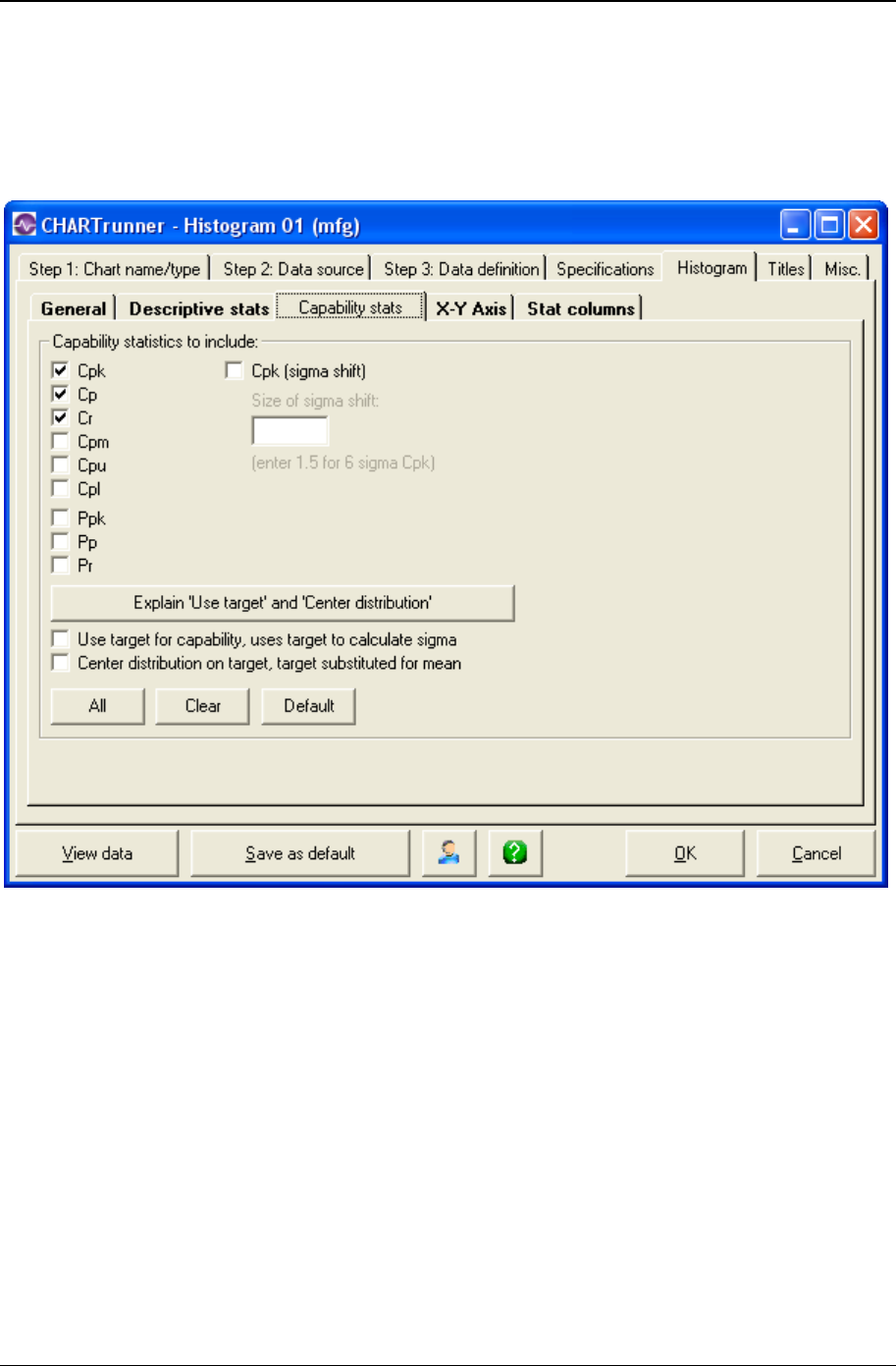
Customizing a chart definition 171
Copyright © 2011
Capability stats sub-tab - histogram charts
The Capability stats sub-tab allows you to specify the capability statistics you want to include on the chart.
Formulas for these statistics can be found in the Formulas section of the Appendix, or in the online
Quality Advisor (http://www.qualityadvisor.com (http://www.qualityadvisor.com)).
Capability statistics to include
Select an option to include (on the right side of the chart) the capability statistic.
• Cpk – The Cpk capability index tells how well a system can meet one or two-sided specifications. Cpk
calculations use estimated sigma (R-Bar/d2) and, therefore, show the system's, “potential” to meet
specifications. Since it takes the location of the process average into account, the process does not
need to be centered on the target value for this index in order to be useful.
If Cpk is 1.0, the system is expected to produce at least 99.73% of its output within specifications. The
larger the Cpk, the smaller the variation in the process output and the higher the percentage of output
that can be expected to lie within the specifications. If Cpk is between 0 and 1.0, less than 99.73% of
all process output is expected to meet specifications. Cpk should be used in conjunction with the Cp
index. Cpk and Cp will be equal when the process average is centered between the upper and lower
specifications. If they are not equal, the smaller the difference between these indices, the more
centered the process.

172 CHARTrunner User's Guide
Copyright © 2011
• Cpk (sigma shift) – This is used to simulate the changes to Cpk, if the process average changes by x.x
sigma values to the closest specification. X.x is the user-entered number of sigmas and should not be
large enough to cause the process to center on the other side of the nominal value (center of the
specification). Instead of looking at the Cpk in the traditional sense as a static number, you can
simulate what the effect on Cpk would be by a shift in the process average.
• Cp – The Cp index is used to summarize a system's ability to meet two-sided specifications (upper
and lower). Like Cpk, it uses estimated sigma and therefore shows the system's potential to meet the
specifications. However, it ignores the process average and focuses on the spread. If the system is
not centered within the specifications, Cp alone may be misleading. When there is a one-sided
specification, Cp will be calculated the same as Cpk.
• Cr – The Cr capability ratio is used to summarize the estimated spread of the system compared to the
spread of the specifications (upper and lower). The lower the Cr value, the smaller the output spread.
Cr does not consider process centering. When the Cr value is multiplied by 100, the result shows the
percent of the specifications that are being used by the variation in the process. Cr is calculated using
an estimated sigma and is the reciprocal of Cp. In other words, Cr = 1 / Cp.
• Cpm – The Cpm index indicates how well the system can produce within specifications. Its calculation
is similar to Cp, except that sigma is calculated using the target value instead of the mean. The larger
the Cpm, the larger will be the percentage of the output that meets specifications.
• Cpu – The Cpu index compares the variation in the process to the upper specification. The estimated
standard deviation is used to calculate Cpu. A Cpu greater than 1 indicates the process is capable of
meeting the upper specification.
• Cpl – The Cpl index compares the variation in the process to the lower specification. The estimated
standard deviation is used to calculate Cpl. A Cpl greater than 1 indicates the process is capable of
meeting the lower specification.
• Ppk – The Ppk index of process performance tells how well a system is meeting one-or two-sided
specifications. Ppk calculations use actual sigma (sigma of the individuals), and shows how the
system is actually running when compared to the specifications. This index also takes into account
how well the process is centered within the specifications. If Ppk is 1.0, the system is expected to
produce at least 99.73% of its output within specifications. The larger the Ppk, the smaller the
variation in the process output and the higher the percentage of output that can be expected to lie
within the specifications. Ppk should be used in conjunction with the Pp index. Ppk and Pp will be
equal when the process average is centered between the upper and lower specifications. If they are
not equal, the smaller the difference between these indices, the closer the process is to being
centered.
• Pp – The Pp index is used to summarize a system's performance in meeting two-sided specifications
(upper and lower). Like Ppk, it uses actual sigma (sigma of the individuals), and shows how the
system is actually running when compared to the specifications. However, it ignores the process
average and focuses on the spread. If the system is not centered within the specifications, Pp alone
may be misleading. The higher the Pp value, the smaller the spread of the system's output compared
with the spread of the specifications. Pp is a measure of spread only. A process with a narrow spread
(a high Pp) may not meet customer needs if it is not centered within the specifications. Pp should be
used in conjunction with Ppk to account for both spread and centering. Pp and Ppk will be equal
when the process is centered between the upper and lower specifications. If they are not equal, the
smaller the difference between these indices, the more centered the process is. When there is a one-
sided specification, Pp will be calculated the same as Ppk.
• Pr – The Pr performance ratio is used to summarize the actual spread of the system compared to the
spread of the specifications (upper and lower). The lower the Pr value, the smaller the output spread.
Pr does not consider process centering. When the Pr value is multiplied by 100, the result shows the
percent of the specifications that are being used by the variation in the process. Pr is calculated using
the actual sigma (sigma of the individuals) and is the reciprocal of Pp. In other words, Pr = 1 / Pp.
• Explain 'Use target' and 'Center distribution' – Click this button to open the help for an explanation of the
Use target for capability and Center distribution on target options.

Customizing a chart definition 173
Copyright © 2011
NOTE: CHARTrunner offers the following two choices for using target values in calculating capability:
1. Use target for capability, uses target to calculate sigma
2. Center distribution on target, target substituted for mean
You can select 1, 2, or neither. If you do not select either of these options, CHARTrunner will
calculate capability statistics normally.
• Use target for capability, uses target to calculate sigma – CHARTrunner will use the target for capability
instead of the mean to calculate actual sigma. Think of this sigma as sigma(t), although some texts
refer to it as sigma(cpm). When this option is selected, capability statistics affected will be noted as
such on the histogram:
• Cpk(t)
• Cp(t).
The statistics display will include a note that reads:
• (t) = uses target to calculate sigma.
• Center distribution on target, target substituted for mean – CHARTrunner will substitute the target for the
mean in all of the capability statistics. When this option is selected, any of the capability statistics
affected will be noted as such on the histogram:
• Cpk(t)
• Cp(t).
The statistics display will include a note that reads:
• (*) = distribution center on target
Which sigma to use?
Estimated sigma and the related capability indices (Cp, Cpk, and Cr) are used to measure the potential
capability of a system to meet customer needs. Use it when you want to analyze a system's potential
performance. Actual or calculated sigma (sigma of the individuals) and the related indices (Pp, Ppk, and
Pr) are used to measure the actual ability of a system to meet customer needs. Use these calculations
when you want to measure a system's actual process performance. For more information on the
capability and performance indices, visit http://www.qualityadvisor.com
(http://www.qualityadvisor.com).
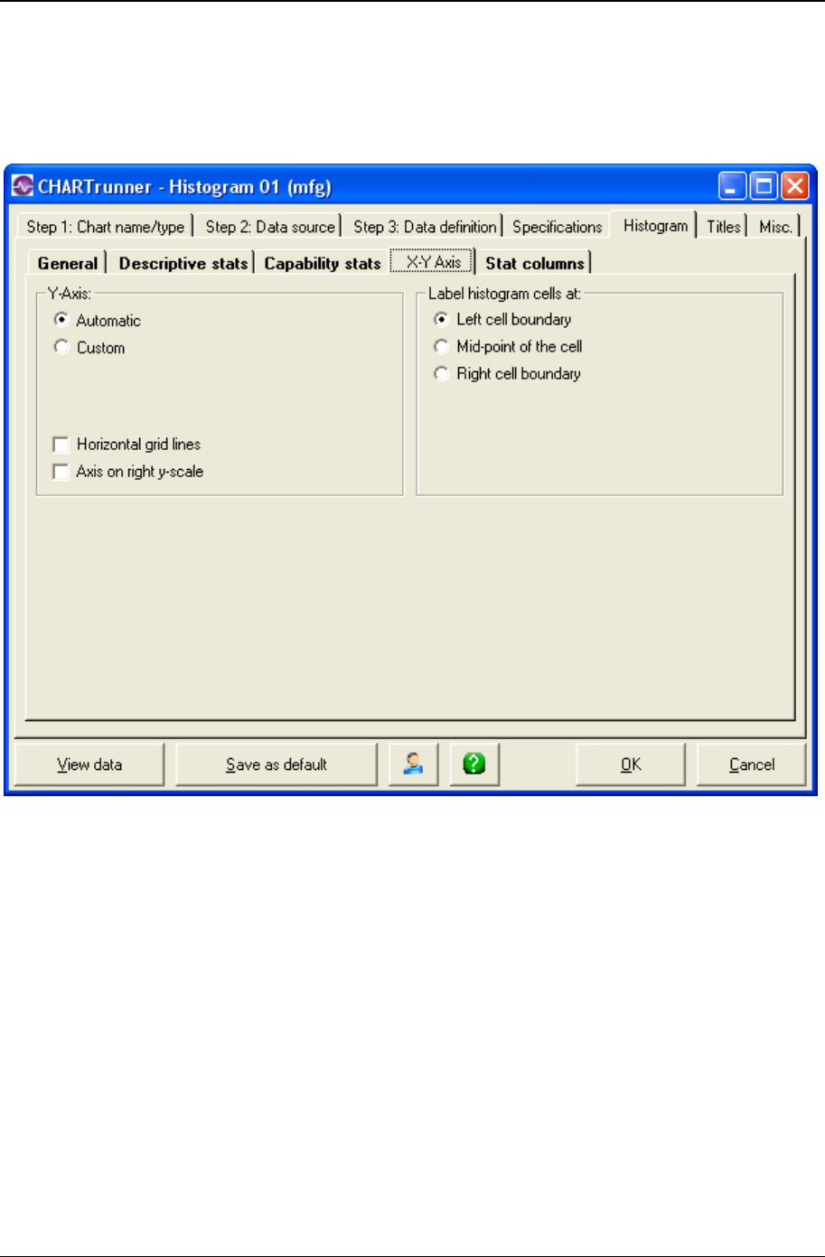
174 CHARTrunner User's Guide
Copyright © 2011
X-Y Axis sub-tab - histogram charts
Here you define options for the X-axis (the horizontal axis) and the Y-axis (the vertical axis) of the
histogram:
Y-axis
• Automatic – Select this option to allow the software to automatically set the Y-axis scaling values. For
histograms, the Y-axis represents a count of the number of data values falling into various cells or
bars of the histogram. As a count, it always starts at zero.
• Custom – Select this option if you want to define the maximum value used on the Y-axis scale. This
can be useful if you want to force two histograms to have the same Y-axis so they may be visually
compared.
• Max – If you select Custom, enter the maximum value for the Y-axis here. Remember that the Y-axis
on a histogram starts at zero.
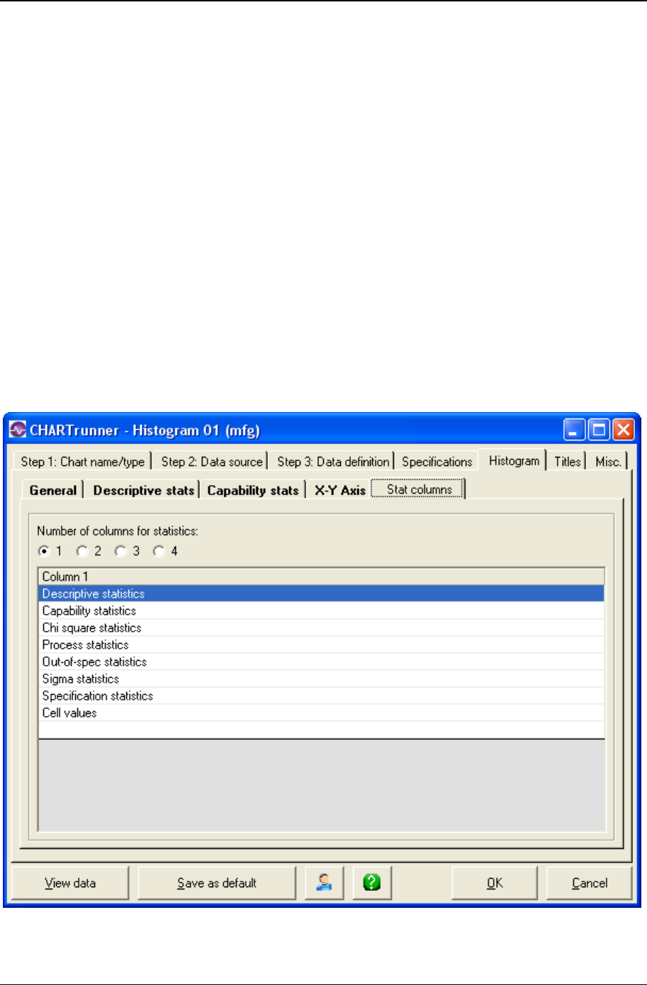
Customizing a chart definition 175
Copyright © 2011
• Horizontal grid lines – Enable this option to have horizontal lines appear across the histogram. This
allows you to line up a histogram bar with the Y-axis scale.
• Axis on right y-scale – Enable this option to duplicate the Y-axis scale on the right side of the plot area
of the histogram.
Label Histogram Cell At
Each cell or bar on a histogram represents a range of data values as depicted on the X-axis. The first bar
might show numbers between 5 and 8, and the second bar might show numbers above 8 up to 11, etc.
You have the following three options for where (along this range of values) to place the label for each
histogram cell.
• Left cell boundary
• Mid-point of the cell
• Right cell boundary.
Stat columns sub-tab - histogram charts
Along with the graphical histogram, CHARTrunner displays various statistics to describe the underlying
data set. These statistics appear in one or more columns to the right of the histogram chart.

176 CHARTrunner User's Guide
Copyright © 2011
Use the Stat columns tab to describe how many columns of statistics you want and also to arrange the
different groups of statistics among the columns. Select the appropriate Number of columns for statistics to
set the number of columns. Use your mouse to drag-and-drop the named statistics groups into the
columns where you want them to appear.
Specifications tab - histogram charts
Specifications are boundaries, usually set by management, engineering, or customers, within which a
system must operate. They are sometimes called engineering tolerances.
Enter values for Upper and Lower specifications and the Target (sometimes called the Nominal) value for
the process. The specifications are optional; however, there are many histogram statistics that depend on
one or more of these values. If your process has only one upper or lower specification, enter that value in
the appropriate field and leave the other Upper or Lower field blank.
NOTE: When a specification value is entered on the Limits/specs tab, and the same specification is fetched
from the data source using the Treat as field on the Step 3: Data definition tab, then the value fetched from
the data source takes precedence. For example, if the target spec is defined as 10.0 on the Limits/specs
tab, and the target spec is fetched from a data source column that contains 9.0 in row 1, NULL in rows 2 -
28, 9.5 in row 29, and NULL in row 30, then 9.5 will be the target spec value that is used for the chart.

Customizing a chart definition 177
Copyright © 2011
Box and whisker charts
A box and whisker chart is a floating bar chart where each bar (i.e., each box) represents a set of data.
The minimum, maximum, range, 25th percentile, and 75th percentile of the data set are represented by
the box and its whiskers. The whiskers are lines that extend vertically up and down from the box.
Box and whisker tab (see "Box and whisker tab - box and whisker charts" on page 177)
Box and whisker tab - box and whisker charts
The following sub-tabs allow you to customize box and whisker charts.
Chart options sub-tab - box and whisker charts
The Chart options sub-tab allows you to make selections affecting the overall appearance of the box and
whisker chart.

178 CHARTrunner User's Guide
Copyright © 2011
Box and Whisker Chart
• Median line across boxes – Enable this if you want a horizontal line drawn across the box at the median
of the data set.
• Mean line across boxes – Enable this if you want a horizontal line drawn across the box at the mean of
the data set.
• Horizontal line at min and max (whiskers) – Enable this if you want a horizontal line drawn at the end of
each whisker line.
How to Form Boxes
• One box per data column – If you enable this option, the box and whisker chart will contain one box for
each column you have mapped as a Data column on the Step 3: Data definition tab. For example, if
your data source has columns January, February, and March, and you treat each of these three
columns as Data, the resulting box and whisker chart will have three boxes – one for each of the
three data columns you treated as Data.
• Boxes created from one or more rows of all data columns – Enable this option if you want to form boxes
based on some grouping of your data rows. For example, say you have 100 rows of data that cover
March through June. If one of your columns contains the Date, you may set up the chart so that you
will get four boxes; one each for March, April, May, and June.
NOTE: Selecting this option requires that you define your row grouping using the advanced row selection
button on the Step 3: Data definition tab.
Horizontal Grid Lines
Enable this option to have horizontal grid lines displayed across the chart.
Decimal Places for Statistics
Set the number of decimals you want displayed. This setting affects the optional data grid which may
appear above the chart.
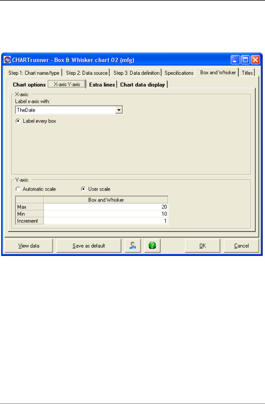
Customizing a chart definition 179
Copyright © 2011
X-axis Y-axis sub-tab - box and whisker charts
Here you define the options that determine how CHARTrunner labels the X-axis (the horizontal axis) and
establishes the scaling for the Y-axis (the vertical axis).
X-axis
• In the Label x-axis with field, select a label option from the drop-down menu. The default value is
Nothing. Other options are Numbers and specific identifier fields. Identifier fields in this menu are
those mapped in the Step 3: Data definition tab. Select the option you want.
• Label every subgroup – Box and whisker charts always label every box (or subgroup) on the chart.
• Scale x-axis with variable interval based on x-axis label – This option is not available for a box and whisker
chart.
Y-axis
• Automatic scale – Select this for CHARTrunner to determine the appropriate values for scaling the Y-
axis.
• User scale – Select this to specify the Max, Min, and Increment values to use for scaling the Y-axis. If you
leave a field blank, CHARTrunner will automatically select an appropriate value.

180 CHARTrunner User's Guide
Copyright © 2011
Extra lines sub-tab - box and whisker charts
Here you define the extra lines you want to appear on the chart. You can define as many extra lines as
you desire.
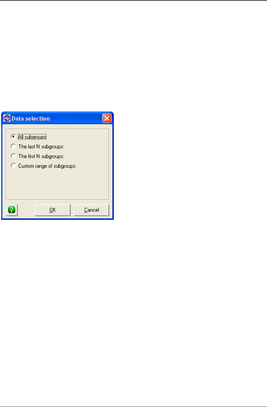
Customizing a chart definition 181
Copyright © 2011
To define a new line, click the Type column and choose from the list of line types.
Extra line – You must enter the Y-axis value for the line in the Value column.
• Mean line
• Median line
• Mode line
• Upper spec line
• Target spec line
• Lower spec line
Enter in the Line label column the text you want to label the line with.
When you click in the Apply to column, you can choose from the options shown above to determine what
subgroups (or data points) the extra line will be applied to. See Applying an extra line to specific
subgroups for more information on applying the extra line to a specific range of subgroups.
• Label with – You can specify to label the extra line with:
• Nothing
• Name
• Value
• Name and value
• Which chart? – Sub-chart 1 is the only choice for a Box and Whisker chart.
• Style : Color – Click here to open the color dialog to choose the color for the extra line.
• Style : Width – Specify the width of the extra line as Regular, Wide, or Thick.
• Style : Style – Select from the drop-down list to specify the line style for the extra line.
Right-click on a row in the extra-lines grid to delete that extra-line from the list.
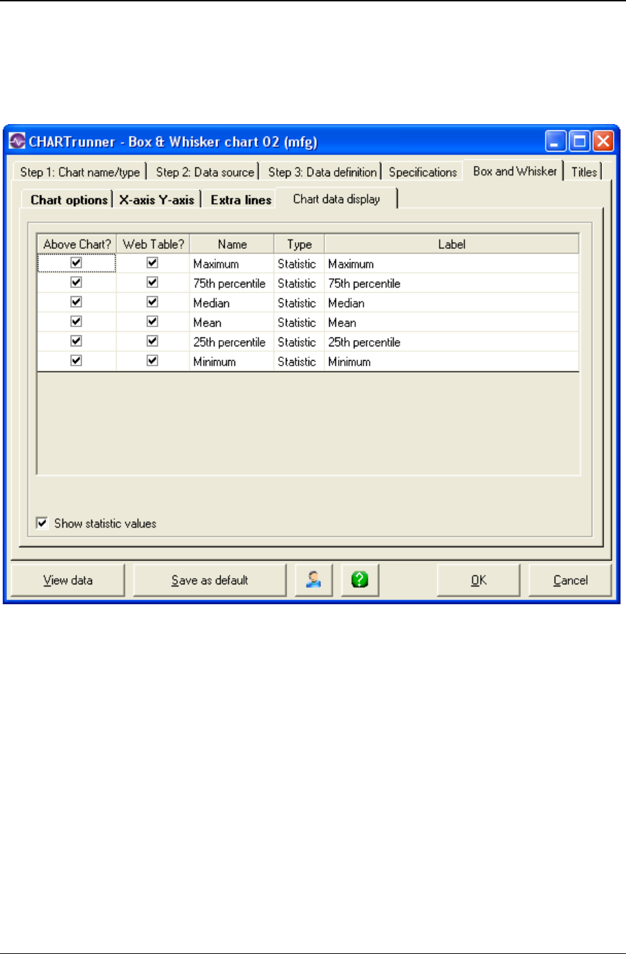
182 CHARTrunner User's Guide
Copyright © 2011
Chart data display sub-tab - box and whisker charts
The Chart options sub-tab allows you to make selections affecting the overall appearance of the box and
whisker chart.
Unlike some of the other chart types, the box and whisker chart do not show identifier columns or data
columns in the grid.
Here you define what information you want to appear in these areas:
• In the “Data above the chart” grid that appears above the chart. Place a check mark in the Above
Chart? column for each row of statistics that you want to appear above the chart.
• The “Chart data” table of the Web page is a grid that is displayed below the chart on the Web page. It
displays information in a similar fashion to the “Data above the chart” grid. One of the advantages is
that this data can be highlighted and copied whereas the data appearing in the grid above the chart
on a Web page cannot, as it is simply an image.
• For more information on saving charts as web pages, see the topics Save chart as web page dialog
and Web page defaults sub-tab - misc. tab- applies to all charts.
• "Edit the contents of the Label column if you want to change the text that appears for an identifier,
data value, or statistic.
• Place a check mark in the Show statistic values field to display statistic values in the “Data above the
chart” grid.
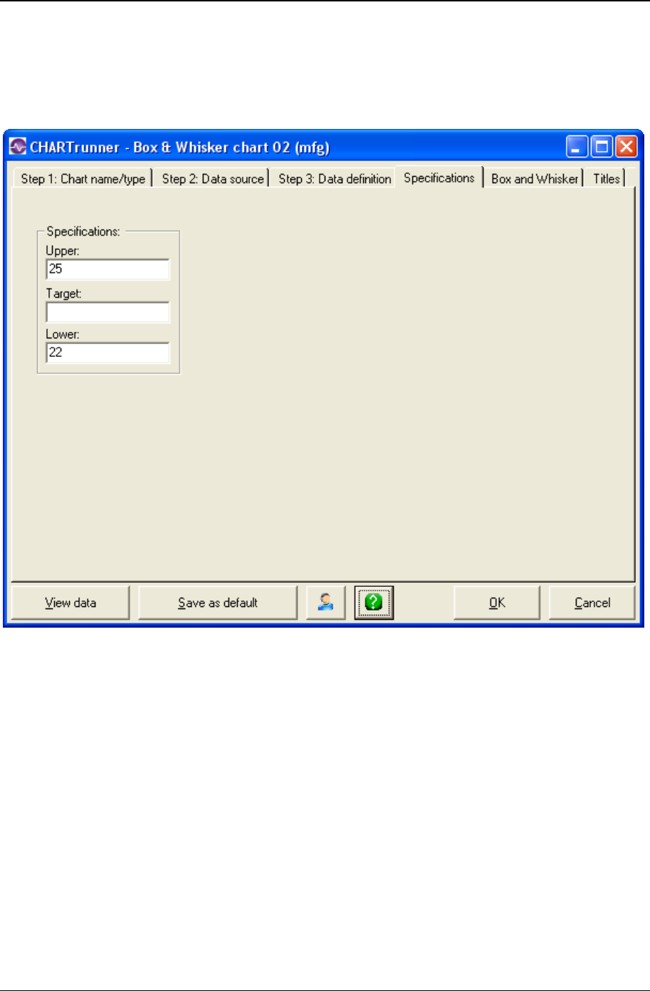
Customizing a chart definition 183
Copyright © 2011
Specifications tab - box and whisker charts
Specifications are boundaries, usually set by management, engineering, or customers, within which a
system must operate. They are sometimes called engineering tolerances.
Enter values for Upper and Lower specifications and the Target (sometimes called the Nominal) value for
the process. The specifications are optional. If your process has only one upper or lower specification,
enter that value in the appropriate field and leave the other Upper or Lower field blank.
NOTE: When a specification value is entered on the Limits/specs tab, and the same specification is fetched
from the data source using the Treat as field on the Step 3: Data definition tab, then the value fetched from
the data source takes precedence. For example, if the target spec is defined as 10.0 on the Limits/specs
tab, and the target spec is fetched from a data source column that contains 9.0 in row 1, NULL in rows 2 -
28, 9.5 in row 29, and NULL in row 30, then 9.5 will be the target spec value that is used for the chart.
Multi-line charts
A multi-line chart can show up to 10 different data lines on one chart. Each line represents different data.
Think of it as multiple run charts plotted in the same plot area.
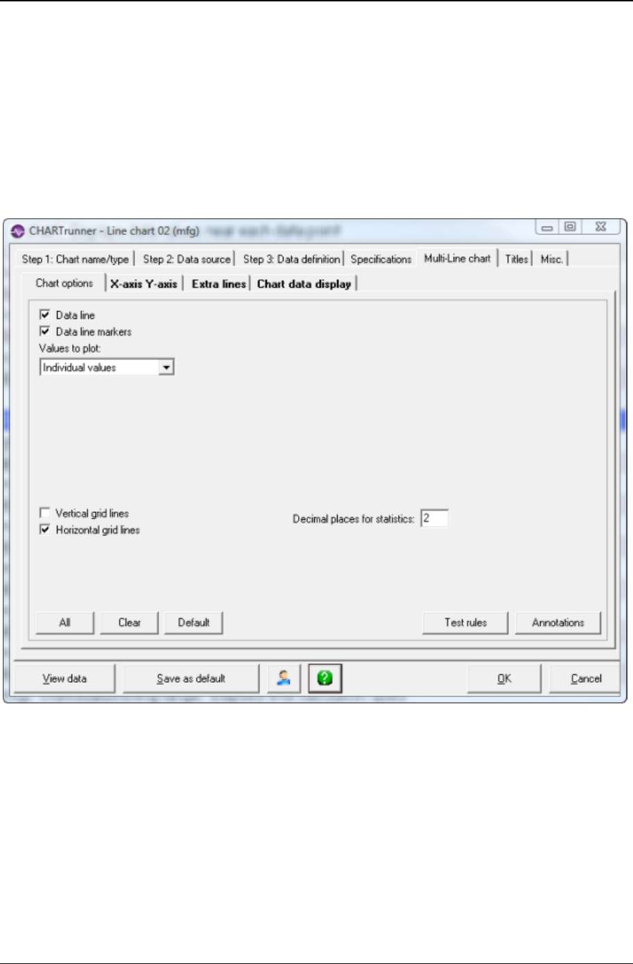
184 CHARTrunner User's Guide
Copyright © 2011
Multi-line chart tab - multi-line charts
The following sub-tabs allow you to customize multi-line charts.
Chart options sub-tab - multi-line charts
The Chart options sub-tab allows you to select general options affecting the appearance of the multi-line
chart.
• Data line – Enable this option to display a line connecting each plotted point.
• Data line markers – Enable this option to have a data marker displayed where each point is plotted.
• Values to plot:
• Depending on how you specified Treat as for the data source columns on the Step 3: Data definition
tab, you may plot Individual values (the most common option) or calculated statistics such as Average
values, Range values, or Sigma values.
• You will have the option to plot Average values, Range values, or Sigma values only if you have mapped
multiple data source columns to the same numbered data line. For example, if Data 1 has been used
three times on the Step 3: Data definition tab, then each point on line 1 of the chart could be the
range of the data values from these three columns that are treated as Data 1.

Customizing a chart definition 185
Copyright © 2011
• Vertical grid lines – Enable this option to display vertical grid lines on the chart.
• Horizontal grid lines – Enable this option to display horizontal grid lines on the chart.
• Decimal places for statistics – Set the number of decimals you want to display with data in the optional
grid above chart. Set this up on the Chart data display tab.
X-axis Y-axis sub-tab - multi-line charts
Here you define the options that determine how CHARTrunner labels the X-axis (the horizontal axis) and
establishes the scaling for the Y-axis (the vertical axis).
X-axis
• In the Label x-axis with field, select a label option from the drop-down menu. The default value is
Nothing. Other options are Numbers and specific identifier fields. Identifier fields in this menu are
those mapped in the Step 3: Data definition tab. Select the option you want.
• Select an option to determine the number and type of labels that you want to appear on the chart's X-
axis. Options are:
• Label every subgroup – Displays a label on each subgroup or data point. For charts with a large number
of data points, this option may cause the labels to overlap.
• Place n labels across the chart – Displays only the number of labels that you specify across the chart.
Enter the number of labels in the n = field.

186 CHARTrunner User's Guide
Copyright © 2011
• Label every n subgroups – Displays a label on every nth subgroup or data point.
• Label every n units – Displays a label on every nth unit. This option is available only if you have
selected a date/time field for the Label x-axis with option. If you select this option, you must specify the
units, such as Days, Months, or Quarters in the units = field and the number of time units in the n =
field.
• If you want to Scale x-axis with variable interval based on x-axis label, select this option. It tells the chart to
set the spacing between the data points on the chart to reflect where each data point falls along the
timeline (or number line) established by the identifier used to label the X-axis. This option is available
only when the X-axis is labeled with a date/time or numeric identifier, and the data source is ordered
by the identifier used to label the X-axis.
NOTE: How is the order of the data source determined? On the Step 3: Data definition tab, when the
data source is a “Table” the Column to use for Order By field determines the order of the data. When
a “Query or view,” “Stored procedure,” or “Custom query” is used as the data source, it is assumed
that the data is ordered by the “Unique identifier” column.
• Select Enable horizontal x-axis scrolling if you want the ability to scroll the chart through the data points
using the mouse. The Chart width in subgroups field specifies the number of data points to display
across the chart. Specify whether the chart initially displays the specified number of data points from
the beginning of the data source (Start at left) or from the end of the data source (Start at right). When
the mouse hovers near the X-axis, a slider bar will appear that allows you to scroll through the data or
change the displayed chart width in data points.
Y-axis
• Automatic scale – Select this for CHARTrunner to determine the appropriate values for scaling the Y-
axis.
• User scale – Select this to specify the Max, Min, and Increment values to use for scaling the Y-axis. If you
leave a field blank, CHARTrunner will automatically select an appropriate value. Note that if you are
using multiple y-axis scales – you can provide custom scale values independently for each data line.
• Show multiple y-axes – Select this option to show multiple y-axis scales. One scale for each data line in
the chart.
• Legend style – Select an option for how a legend will be displayed:
• (none) - Do not display any legend
• Minimal – Display a minimal legend in the lower left corner that shows only the markers and color
associated with each data line.
• Horizontal – Show a legend where the data line names are displayed horizontally across the bottom of
the chart.
• Vertical – Show a legend where the data line names are displayed vertically near the bottom of their
associated y-axis scale.
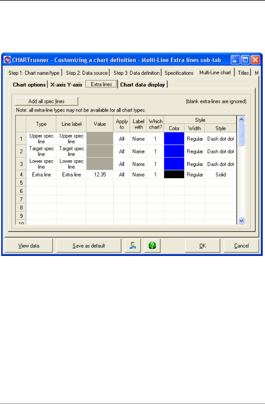
Customizing a chart definition 187
Copyright © 2011
Extra lines sub-tab - multi-line charts
Here you define the extra lines you want to appear on the chart. You can define as many extra lines as
you desire.
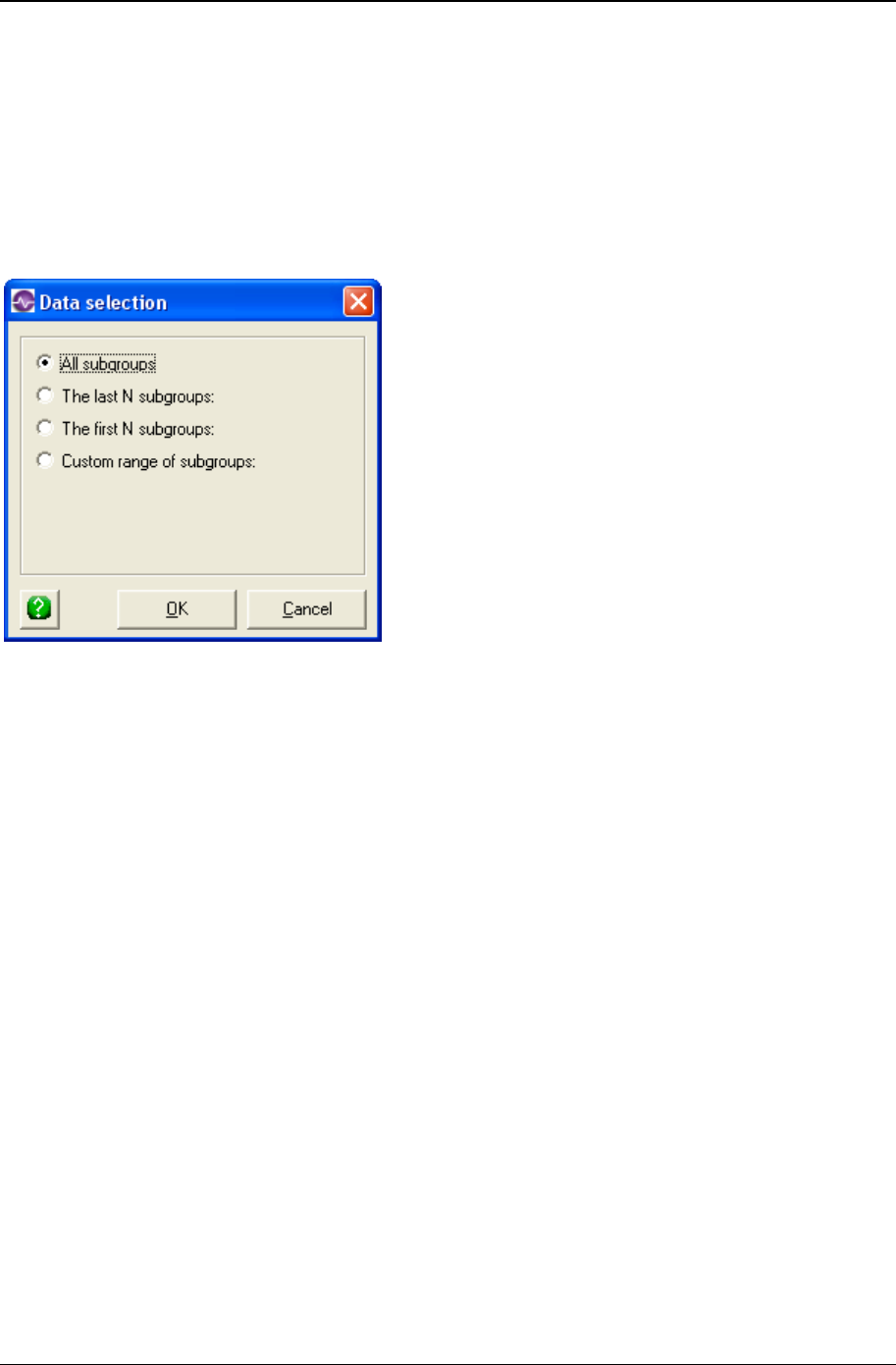
188 CHARTrunner User's Guide
Copyright © 2011
To define a new line, click the Type column and choose from the list of line types.
Extra line – You must enter the Y-axis value for the line in the Value column.
• Upper spec line
• Target spec line
• Lower spec line
Enter in the Line label column the text you want to label the line with.
When you click in the Apply to column, you can choose from the options shown above to determine what
subgroups (or data points) the extra line will be applied to. See Applying an extra line to specific
subgroups for more information on applying the extra line to a specific range of subgroups.
• Label with – You can specify to label the extra line with:
• Nothing
• Name
• Value
• Name and value
• Which chart? – Sub-chart 1 is the only choice for a Multi-line chart.
• Style : Color – Click here to open the color dialog to choose the color for the extra line.
• Style : Width – Specify the width of the extra line as Regular, Wide, or Thick.
• Style : Style – Select from the drop-down list to specify the line style for the extra line.
Right-click on a row in the extra-lines grid to delete that extra-line from the list.
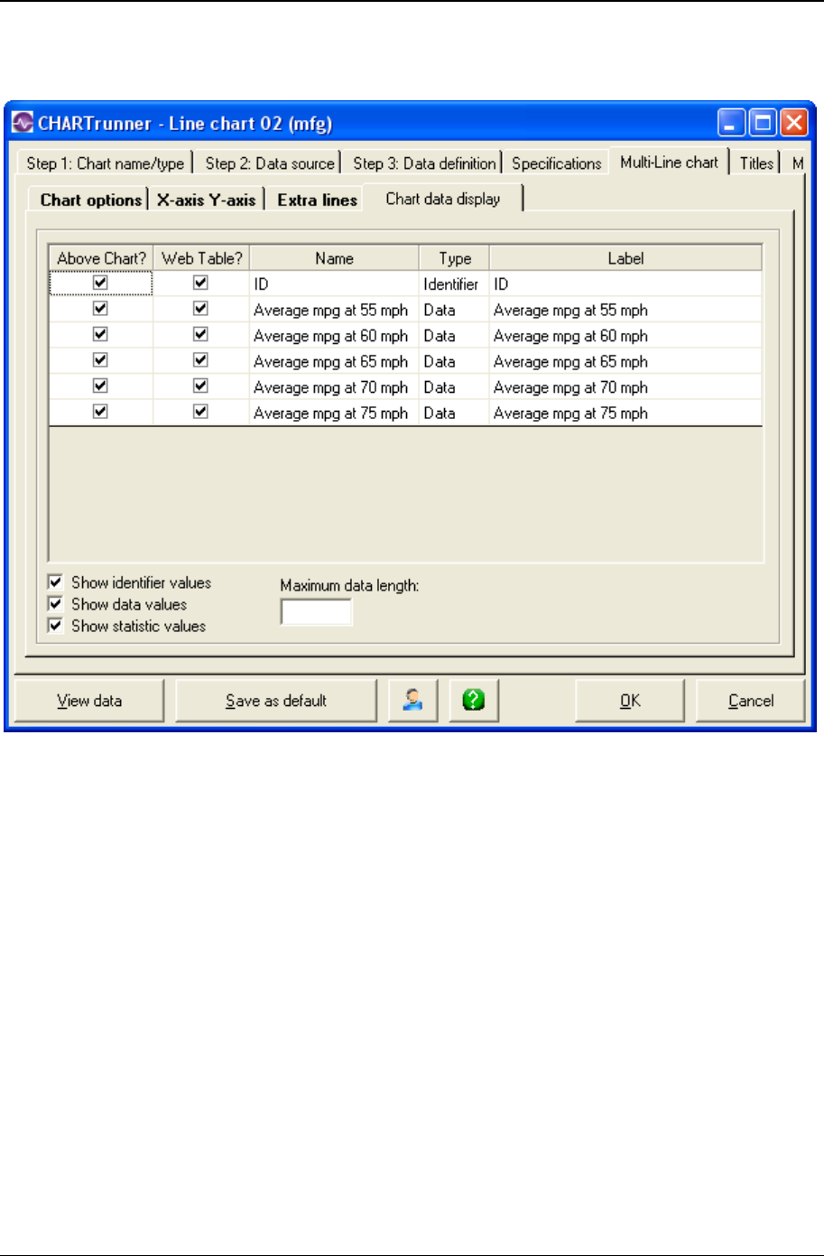
Customizing a chart definition 189
Copyright © 2011
Chart data display sub-tab - multi-line charts
Here you define what information you want to appear in these areas:
• In the "Data above the chart" grid that appears above the chart.
Place a check mark in the Above Chart? column for each row of identifiers, data, or statistics that you
want to appear above the chart.
• In the "Chart data" table when a chart is saved as a Web page.
Place a check mark in the Web Table? column for each row that you want to appear in the "Chart data"
table of the Web page.
• The "Chart data" table of the Web page is a grid that is displayed below the chart on the Web page. It
displays information in a similar fashion to the "Data above the chart" grid. One of the advantages is
that this data can be highlighted and copied whereas the data appearing in the grid above the chart
on a Web page cannot, as it is simply an image.
• For more information on saving charts as web pages, see the topics Save chart as web page dialog
and Web page defaults sub-tab - misc. tab - applies to all charts.

190 CHARTrunner User's Guide
Copyright © 2011
Edit the contents of the Label column if you want to change the text that appears for an identifier, data
value, or statistic.
Place a check mark in the Show identifier values field to display identifier values in the "Data above the
chart" grid.
Place a check mark in the Show data values field to display data values in the "Data above the chart"
grid.
Place a check mark in the Show statistic values field to display statistic values in the "Data above the
chart" grid.
The Maximum data length field is used to limit the length of text that appears in each cell of the "Data
above the chart" grid. Leave this blank unless you want to apply a length limit. Typically you enter a value
here to prevent long identifier text from overwhelming a cell. Note that the decimal point in a numeric
value will count as one character. For example, in order to display the entire value of 38.49 you would
need to enter a maximum data length of 5.
If Maximum data length is used it will truncate any value entered that is longer than the maximum data
length textbox. This will display a value that could potentially be misconstrued. For example, if the date
value was 11/07/2008 and the maximum data length was set to 5, the date would appear as "11/07"
which could be misconstrued as November, 2007. Also, if your data spans across several years, entering
a maximum data length will often truncate the years from the end of the date, making it difficult to interpret
the data.

Customizing a chart definition 191
Copyright © 2011
Specifications tab - multi-line charts
Specifications are boundaries, usually set by management, engineering, or customers, within which a
system must operate. They are sometimes called engineering tolerances.
Enter values for Upper and Lower specifications and the Target (sometimes called the Nominal) value for
the process. The specifications are optional. If your process has only one upper or lower specification,
enter that value in the appropriate field and leave the other upper or lower field blank.
NOTE: When a specification value is entered on the Limits/specs tab, and the same specification is fetched
from the data source using the Treat as field on the Step 3: Data definition tab, then the value fetched from
the data source takes precedence. For example, if the target spec is defined as 10.0 on the Limits/specs
tab, and the target spec is fetched from a data source column that contains 9.0 in row 1, NULL in rows 2 -
28, 9.5 in row 29, and NULL in row 30, then 9.5 will be the target spec value that is used for the chart.
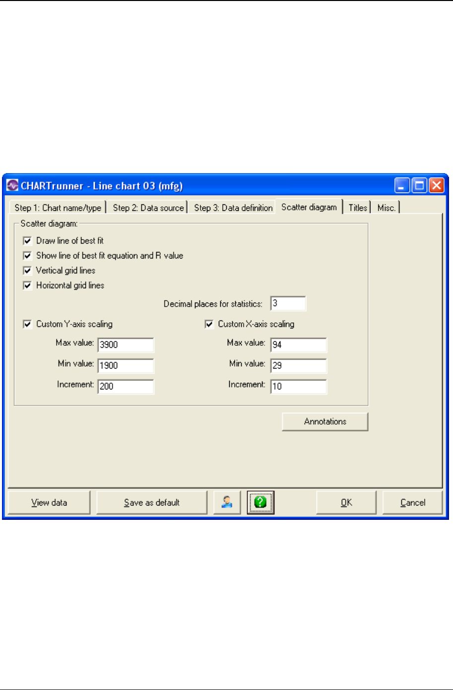
192 CHARTrunner User's Guide
Copyright © 2011
Scatter diagram charts
A scatter diagram is a specialized line chart used to explore the relationship between two variables.
These are known as the dependant variable and the independent variable. They are usually mapped to
two columns in the data source. A statistical technique named simple linear regression is used to create a
line of best fit and plot the line on a chart. The chart represents one variable on the X-axis (horizontal)
and the other variable on the Y-axis (vertical).
Scatter diagram tab

Customizing a chart definition 193
Copyright © 2011
• Draw line of best fit – Enable this option to have the line of best fit displayed on the chart. Without this
line, you will only see the data point markers.
• Show line of best fit equation and R value – Enable this option to display the line of best fit equation and
the relevant statistics as titles above the plot area of the chart.
• Vertical grid lines – Enable this item to display vertical grid lines on the chart.
• Horizontal grid lines – Enable this item to display horizontal grid lines on the chart.
• Decimal places for statistics – Set the number of decimals to display in the optional statistics which may
appear above the chart.
• Custom Y-axis scaling – Enable this option if you want to set your own values for Y-axis scaling – the
vertical scale. If you do not enable this option, the software will automatically select an appropriate
scale.
• Max value – Enter the maximum Y-axis value to display
• Min value – Enter the minimum Y-axis value to display
• Increment – Enter an increment for Y-axis tick marks
• Custom X-axis scaling –
• Max value – Enter the maximum X-axis value to display
• Min value – Enter the minimum X-axis value to display
• Increment – Enter an increment for X-axis tick mark
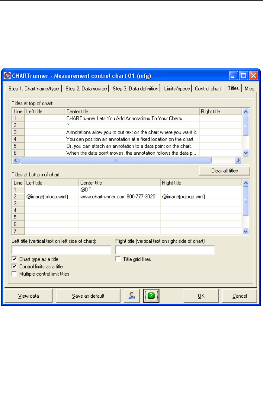
194 CHARTrunner User's Guide
Copyright © 2011
Titles tab - applies to all charts
For every chart type, you have the same options for placing titles on the chart. You may place up to 10
rows of titles above the chart and up to 10 rows of titles below the chart. You may enter a left, center, and
right title for each row. Additionally, a left title and a right title may be entered; these will appear as vertical
text on either side of the chart.
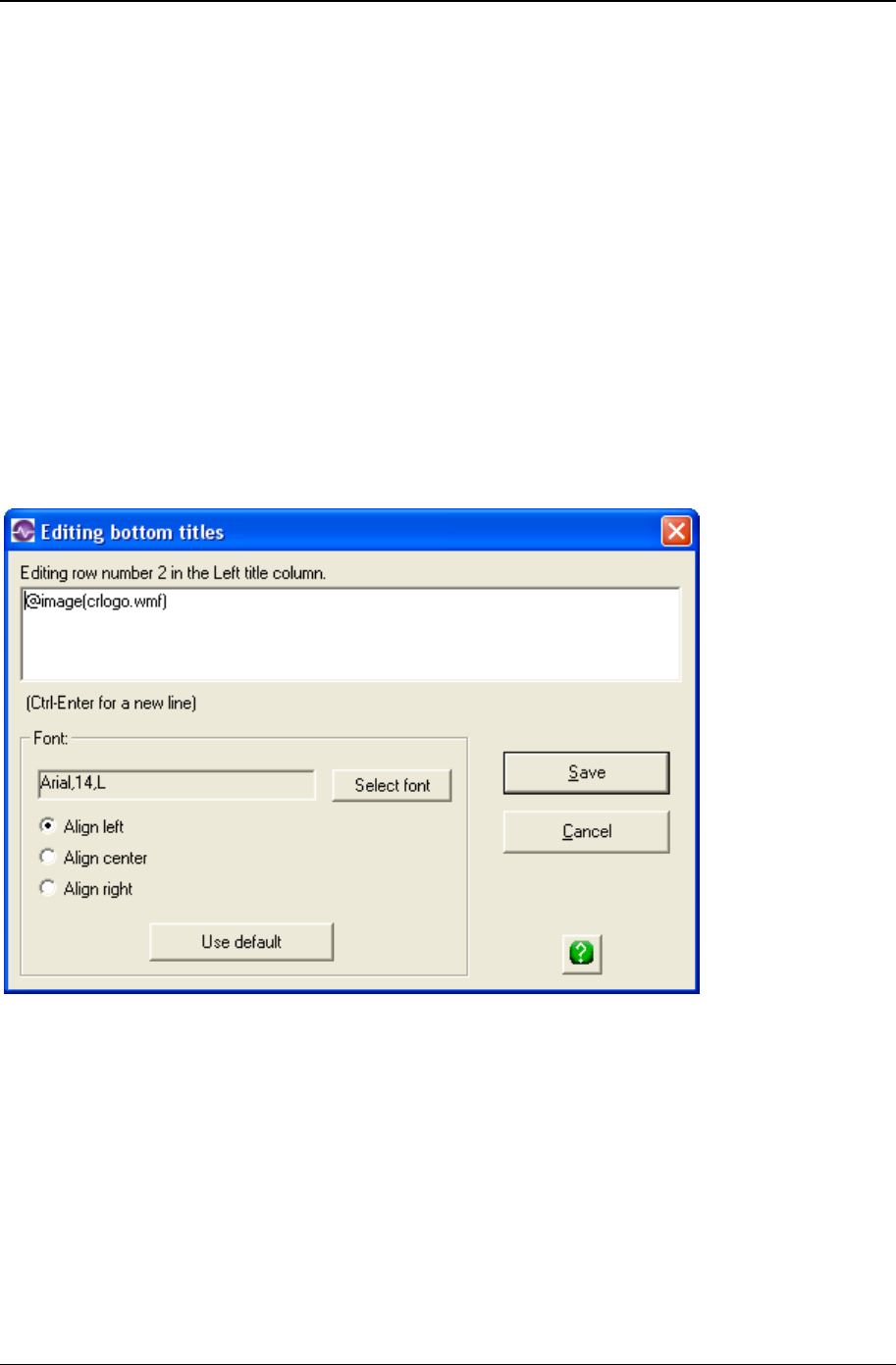
Customizing a chart definition 195
Copyright © 2011
To enter a title in any position, double click in that position either in the Titles at the top of the chart grid or
in the Titles at bottom of the chart grid. This will display a pop-up dialog box where you may type in the
text and select font options for the title. Use this same double-click gesture to modify an existing title.
• Left title (vertical text on left side of chart) – Enter text for a title that will appear vertically to the left of the
plot area.
• Right title (vertical text on right side of chart) – Enter text for a title that will appear vertically to the right of
the plot area.
• Chart type as a title – Enable this option to display a title above the plot area which describes the type of
chart.
• Control limits as a title – On any control chart, enable this option to have the control limits displayed as
a title above the plot area.
• Multiple control limit titles – On control charts that display multiple sets of control limits, enable this
option if you want each set of control limits displayed as titles above the plot area.
• Title grid lines – Enable this option if you want the titles both above and below the chart to be displayed
with grid lines separating the rows and columns.
When you double-click to enter or edit any chart title, the following form will be displayed:
Enter the text of your title, select your font options, and then click on the Save button.
Enter the tilde character (~) by itself in a title to create a blank title at that position.
You may use any of the applicable chart title codes in the text of a title. For example, the title shown
above uses the @IMAGE title code. See the topic Chart title codes - titles tab (on page 196) for more
information

196 CHARTrunner User's Guide
Copyright © 2011
Chart title codes - titles tab
You may insert various title codes into all chart titles. These codes allow the software to substitute an
appropriate value whenever the chart is rendered. The simplest example is the @D title code. If you place
this in a chart title, today's date will replace the @D, when the chart is generated. So a chart title that is
entered like this:
Chart generated on @D
Will be displayed on the chart as:
Chart generated on 07/05/2007
Title codes can be used to save time while defining charts. For example, if you want the chart name to
appear as a chart title, you could manually type in the chart name as a title. However, if you make a copy
of the chart or change the name of the chart, the chart title will have to be manually edited. If you use the
@CTN title code – then the chart can be copied and renamed and will always display the appropriate
chart name.
The @IMAGE(FilePath,PctWidth) title code displays the image file specified by ‘FilePath’. The desired
width of the displayed image is specified as a percentage of the chart width by ‘PctWidth’. The aspect
ratio of the image will be maintained as it is resized in order to fit within the specified width of the chart. If
the image file specified by ‘FilePath’ cannot be found using the specified path, then CHARTrunner will try
to find the image file in the current chart folder, and if that fails, it looks in the SysData folder. The
following image file types are supported: BMP, JPG, JPEG, PNG, WMF and EMF. In general the best
results are obtained with WMF or EMF since this type of image file can be resized without loss of quality,
although it can be challenging to properly create WMF or EMF image files.
List of chart title codes
@AIS Actual percent within specifications
@AOOS Actual percent out of specifications
@CBAR Count mean or c-bar
@CONAME Company name
@CNM Column names treated as Measurement
@CP Cp
@CPK Cpk
@CPL Cpl
@CPM Cpm
@CPU Cpu
@CR Cr
@CTD, @CHART_DESC Chart description
@CTF, @CHART_FILE Filename for chart
@CTN, @CHART_NAME Chart name
@CTR,
@CHART_REFRESH Chart refresh interval
@CVAR Coefficient of variation statistic

Customizing a chart definition 197
Copyright © 2011
@CVAR Coefficient of variation
@D, @DATE Current date
@DPM Defects per million
@DSC, @DATA_CONNECT ADO or ODBC connection string
@DSF, @DATA_FILE Filename for file-based data source (full path)
@DSN, @DATA_NAME ADO or ODBC data source name
@DSO, @DATA_ORDER Column name by which data is ordered
@DST, @DATA_TABLE Data table name
@DT, @DATETIME Current date and time
@ESIGMAR Estimated sigma based on range
@ESIGMAS Estimated sigma based on sigma
@FN Filename for file-based data source (filename and
extension only)
@IMAGE(FilePath,PctWidth) Display image file
@IMEAN Mean of number inspected
@KURT Kurtosis value of the data
@LSL Lower specification value
@MAX Maximum
@MEAN Mean of the data
@MEANRANGE Mean range
@MEDIAN Median of the data
@MIN Minimum
@MOV Number of subgroups in moving average/range
@NDP Number of data points
@NPBAR Proportion mean or Np-bar
@NUMBARS Number of bars (Pareto)
@NUMENTRIES Number of entries (Pareto)
@OOC List of out-of-control test rules
@PBAR Percent mean or p-bar
@PP Pp
@PPK Ppk
@PR Pr
@{{QUERYPARAMETERNA
ME}} The value of the query parameter whose name is
"QueryParameterName"
@!SGF, @!FILTER Current filter – even if not currently enabled
@SGF, @FILTER Current filter – only if it is enabled
@SGS, @SCOPE What records are being used? All, First n, Last n

198 CHARTrunner User's Guide
Copyright © 2011
@SIGMA Sigma of the data
@SKEW Skewness of the data
@SOURCEFILEDATE Date on the source data file (if using a file-based
data source)
@SQL SQL Select statement used to retrieve the data
@T, @TIME Current time
@TIS Theoretical percent within specifications
@TOOS Theoretical percent out of specifications
@TOTALCOUNT Total count of data points on a Pareto chart. If
multiple
Pareto charts are displayed it will be the total count
of all the charts.
@TSL, @TS Target (or Nominal) value
@UBAR Ratio mean or U-bar
@USL Upper specification value
@WHERE Where clause of SQL select statement
@ZLOW Z-lower
@ZTARG Z-target
@ZUP Z-upper
NOTE: Not all statistical title substitutions will have meaning for all chart types. For example, let's say that
you put @CPK in a title of a Pareto chart. Since there is no context for calculating Cpk in a Pareto chart,
the @CPK will be rendered in the title as nothing (i.e., zero length text), rather than as the computed Cpk
statistic. This holds true for all title codes that are inappropriate for the current chart context.
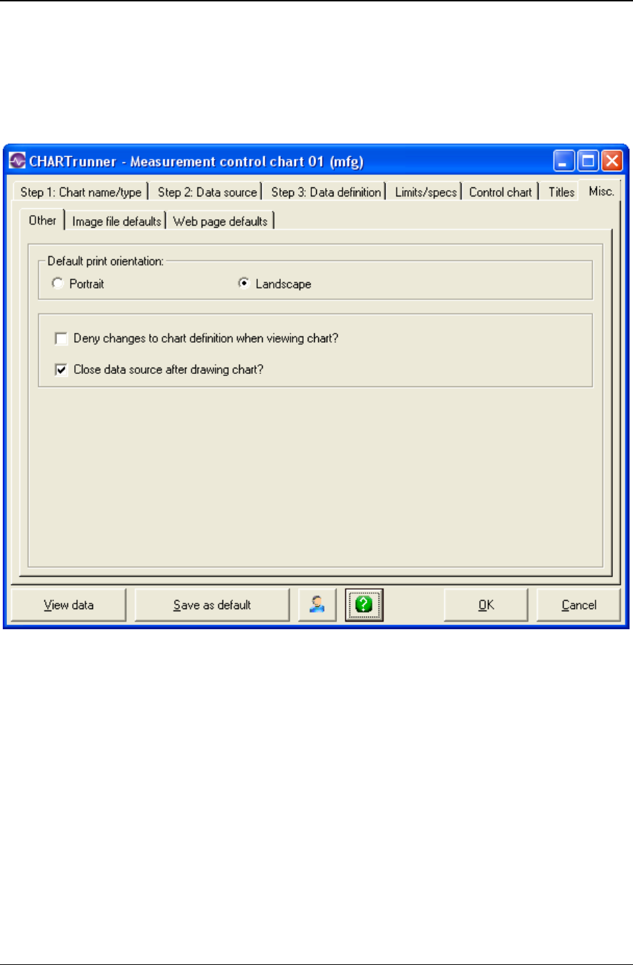
Customizing a chart definition 199
Copyright © 2011
Misc. tab - applies to all charts
Other sub-tab - misc. tab - applies to all charts
• Default print orientation: Portrait – Enable this option so that charts default to being printed in portrait
orientation. Note this can be overridden at chart print time.
• Default print orientation: Landscape – Enable this option to have charts default to being printed in
landscape orientation. Note this can be overridden at chart print time.
• Deny changes to chart definition when viewing chart? – Enable this option if you do not want viewers of the
chart to have the Edit/Chart definition option from the chart display form.
• Close date source after drawing chart? – Enable this option to ensure that after the chart is displayed, the
software closes the connection to the underlying data source. It is recommended that this option be
enabled in order to avoid problems with charts consuming scarce database connections or holding a
data source open and thus causing problems with other users who are using the data source.
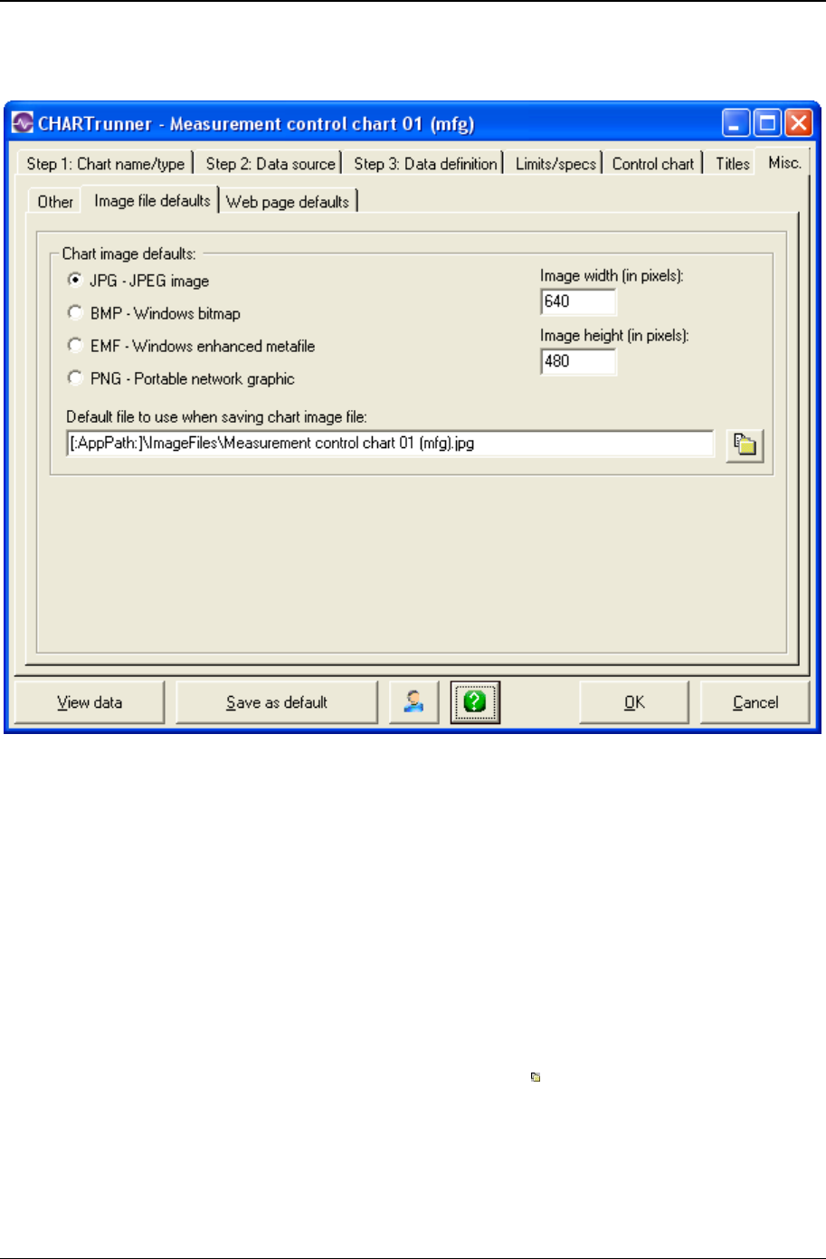
200 CHARTrunner User's Guide
Copyright © 2011
Image file defaults sub-tab - misc. tab - applies to all charts
• Chart image defaults
• Select one of the following as the default image file format:
JPG-JPEG image – The ubiquitous JPEG image format is very popular. The quality of the JPEG
image is determined by the JPG image quality setting under the Setup > Preferences >
General pull-down menu on the CHARTrunner main form.
BMP-Windows bitmap – This results in large image files. Use this only when you have a specific
need to do so.
EMF-Windows enhanced metafile – This is a good choice when the image will be inserted into
another application, such as Word or PowerPoint, and then resized to fit the available space.
PNG-Portable network graphic – This is a good choice since it does not result in loss of image
quality as JPEG does, and is typically smaller than a JPEG image.
• Default file to use when saving chart image file – Enter a file name for the default location where the chart
image will be saved when you Save chart as image. Click the button to open the file selection
dialog. You can use {{CHART_NAME}} as part of the chart image file name, such as
C:\ChartImages\{{CHART_NAME}}.png. When the chart image file is created, the current chart
definition name will be substituted in place of {{CHART_NAME}}.
• Image width (in pixels) – Enter a number for the default width in pixels of the chart image.
• Image height (in pixels) – Enter a number for the default height in pixels of the chart image.

Customizing a chart definition 201
Copyright © 2011
Web page defaults sub-tab - misc. tab - applies to all charts
Any chart may be saved as a Web page. Use this tab to select settings which affect saving the chart as a
Web page.
When saving a chart as a Web page, an image file and an HTML Web page file will be created in the
output folder. The format of the Web page is determined by the Web page template file that you specify. If
you do not specify a template file, then CHARTrunner will use the Default-WebTemplate.htm file that is
located in the SysData folder. Feel free to customize the supplied DefaultWebTemplate.htm (after you
save a backup copy of the file – just in case you need it), or use it as a starting point to create your own
customized template file(s).
You can customize DefaultWebTemplate.htm or any other template file using the HTML editor (or text
editor) of your choice.
The following macro substitutions are performed each time the template file is processed into the chart's
Web page:
• {{CHART_IMAGEFILE}} – This is replaced by the Web page's image filename, such as “Sample 01.png.”
This typically is used in an image tag, such as <IMG SRC=”{{CHART_IMAGEFILE}}” ALT=”Chart
Image”>.
• <!--CHART_IMG_TAG--> – This is replaced by a completed <IMG> tag that will place the chart image at
that point in the HTML of the template file. If you embed spaces in this macro, it will not be
recognized.
• <!--DATA_TABLE--> – The Web page's chart data table will be rendered wherever <!--DATA_TABLE-->
appears in the HTML of the template file. Multiple chart data tables will be created for a Multi-chart
containing multiple child charts. If you embed spaces in this macro, it will not be recognized.
• Title Codes – Any title code in the template will be expanded in the output. For example,
DefaultWebTemplate.htm uses the @CHART_NAME title code to display the chart's name. See
Chart title codes - titles tab (on page 196) for a complete list of available title codes.
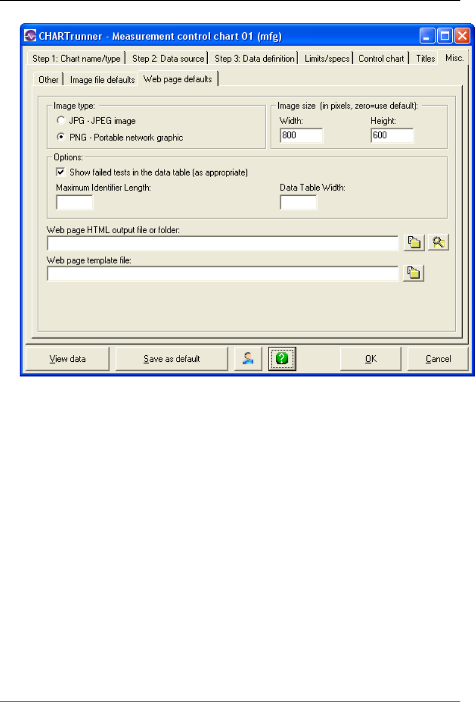
202 CHARTrunner User's Guide
Copyright © 2011
• Image type
• Select the type of image file to create for the Web page.
JPG-JPEG image – Enable this to generate the image as a .jpg file.
PNG-Portable network graphic – Enable this to generate the image as a .png file. Since PNG files
compress the image with no loss of detail, you might prefer this setting.
• Image size (in pixels, zero=use default)
• Width – Enter a number for the width in pixels of the Web page's chart image. If zero is entered, the
image width specified on the Image file defaults sub-tab will be used.
• Height – Enter a number for the height in pixels of the Web page's chart image. If zero is entered, the
image height specified on the Image file defaults sub-tab will be used.
• Options
• Show failed tests in the data table (as appropriate) – Enable this option to have each out-of-control
condition shown in the Web page's data table.
• Maximum identifier length – If you are including a data table as part of the Web page, enter a value here
for the maximum identifier length. This will truncate identifiers to this maximum length, which can
make the table more readable when long identifiers are present.

Customizing a chart definition 203
Copyright © 2011
• Data table width – If the chart template includes a data table in the output Web page, this setting affects
how wide the table will be. Leave this blank to allow the Web browser to set the table width. Enter a
number to specify the table width in pixels. Or, enter a percentage to specify that the table should be
some percentage of the Web page's width. For example, if you enter 75%, the data table will
consume 75% of the width of your browser window. If you enter 500, the data table with be 500 pixels
wide.
• Web page HTML output file or folder – If you specify only a folder, then the output Web page HTML file
will be created in the specified folder and will use the chart name as the basis for the output Web
page file name. Any embedded spaces in the chart name will be replaced by the underscore
character. Or, you can specify the full path to the HTML Web page file to be created. Click the
button to open the folder selection dialog, or the button to open the file selection dialog.
• Web page template file – The format of the output Web page is determined by the Web page template
file that you specify here. If you do not specify a template file, then CHARTrunner will use the
DefaultWebTemplate.htm file that is located in the SysData folder. Click the button to open the file
selection dialog.
Advanced row selection
The following chart types support Advanced Row Selection:
1. Measurement control charts and run charts - Both “Sample rows” and “Group rows” can be useful for
these types of charts
2. Measurement histograms - You can use “Sample rows” to look at a subset of the available data. There is
no benefit from using “Group rows,” since all observations from all subgroups are considered “in total”
for a histogram.
3. Box and whisker charts - You typically use “Group rows” to create the “subgroup” that is evaluated for
each box on the chart.
How it works
CHARTrunner sees your data source as rows of data, where the columns that make up these rows are
determined by how you “Treat as” the data source columns on the Step 3: Data definition tab. If you do not
enable Advanced Row Selection, then the data values from each row of the data source are used to create
each subgroup. In other words, you get one subgroup per row. For all charts other than histograms, each
subgroup is used to generate one data point on the chart. When Advanced Row Selection is enabled, you
have more flexibility in how data source rows are selected and processed into subgroups for the chart.
There are two modes of operation using this feature:
1. Sample rows –Instead of using every row (or record) returned by the data source, you can “sample” the
rows so that the chart uses a subset of the available rows. For example, the chart might use every
15th row of data, or it might use the first 5 rows out of every 100 rows of data.
2. Group rows –This method “groups together” contiguous rows and uses all the data points in the group
to form a single subgroup. You can use a date/time column from your data source to form a subgroup
for each unit of time such as day, week, or month. For example, if you group by week, then 500 rows
of data that covers a 10 week period will result in 10 subgroups where each subgroup represents a
week of data.
One use of “Group rows” is to form subgroups based on one column of data. When you have
individuals data in one column, but want to look at the data as subgroups containing more than one
observation per subgroup (such as a sample size of 3), you can do that by using “Group rows” mode.
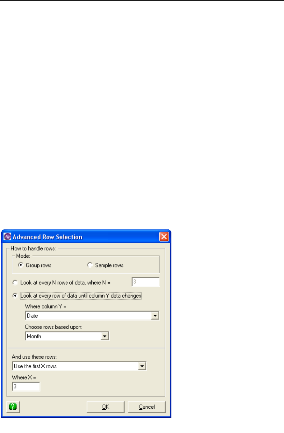
204 CHARTrunner User's Guide
Copyright © 2011
Advanced row selection steps
Here are the steps that Advanced Row Selection takes to create the subgroups that are processed when
creating a chart:
1. CHARTrunner forms a “set of contiguous rows” from the data source. It seems natural to refer to this
as a group of rows, but in order to avoid confusion with the “Group rows” mode of operation, these
rows will be referred to as a rowset. Since contiguous rows will be “clumped together” into rowsets,
the data order (how the data is sorted) is important. For more information on how the data order
column is determined see Understanding the data order concept.
2. When Look at every N rows of data, where N= is selected, each rowset is composed of the next specified
N number of contiguous rows. The last rowset will be composed of fewer than N rows if the data
source does not contain a multiple of N rows.
3. When Look at every row of data until column Y data changes is selected, each rowset is composed of the
next set of contiguous rows having the same value for the specified “Column Y.” This is explained in
more detail below.
4. The rows contained in each rowset are filtered to determine which ones are passed along for
subsequent processing. The options are to Use all the rows, Use the first X rows, or Use the last X rows in
the rowset.
5. When Group rows is the operating mode, all of the data values contained in each filtered rowset are
used to form a subgroup for the chart. In other words, there will be one subgroup per rowset.
6. When Sample rows is the operating mode, each row in the filtered rowset is used to form a subgroup
for the chart. In other words, there will be one subgroup per row from the filtered rowset..
Click the Advanced>> button on the Step 3: Data definition tab of the chart definition form to open the
Advanced Row Selection dialog box shown below.

Customizing a chart definition 205
Copyright © 2011
• Mode
• Group rows – Select this option when you want to “group together” the data from multiple rows in your
data source to form a single subgroup. In this case, all of the data values from each rowset will be
“grouped together” to form a single subgroup.
• Sample rows – Select this option when you want to use a subset of the available rows from the data
source. The “sampled rows” will always create one subgroup per “sampled row.” In other words, while
you might not use every row from the data source, each row that you do use will result in one
subgroup for the chart.
The next two options determine how CHARTrunner selects the contiguous rows that are placed into a
rowset.
• Look at every N rows of data, where N= - Select this option to enter the number N of contiguous rows that
will be placed into each rowset.
• Look at every row of data until column Y data changes – Select this option when you want to use the
contents of the Where column Y = column (we refer to this as the ColumnY column) in your data source
to establish how each rowset is formed. In this case the data source must be ordered (or sorted) by
the ColumnY column. Whenever the value of the ColumnY column changes, a new rowset will be
formed. If the ColumnY column is a date/time column, then you can form rowsets by units of time such
as Day, Week, or Month as specified by the Choose rows based upon field.
• Where column Y = – Enter the name of the data source column (we refer to this as the ColumnY column)
that will be watched in order to form rowsets. Whenever the value of this column changes, a new
rowset will be formed.
• Choose rows based upon – When ColumnY is a date/time column, you can select the units of time over
which the rowsets are formed. Select one of these options:
Blank – Choose the blank option to form a new rowset whenever the value of the ColumnY
column changes.
Minute – Form a new rowset whenever the value of the ColumnY column changes by a minute.
Hour – Form a new rowset whenever the value of the ColumnY column changes by an hour.
Day – Form a new rowset whenever the value of the ColumnY column changes by a day.
Week – Form a new rowset whenever the value of the ColumnY column changes by a week.
Month – Form a new rowset whenever the value of the ColumnY column changes by a month.
Quarter – Form a new rowset whenever the value of the ColumnY column changes by a quarter.
Year – Form a new rowset whenever the value of the ColumnY column changes by a year.
• And use these rows: – The rows contained in each rowset are filtered to determine which ones are
passed along for subsequent processing. The filtering options are:
• Use the first X rows – Select this to use the first X rows from each rowset. Enter the value for X in the
Where X = field.
• Use the last X rows – Select this to use the last X rows from each rowset. Enter the value for X in the
Where X = field.
• Use all the rows – Select this to use all the rows from each rowset.
The rows from each rowset that remain based upon the And use these rows choice will either be “grouped
together” to form a subgroup when Group rows is chosen, or each row will be used to form a subgroup
when Sample rows is chosen.
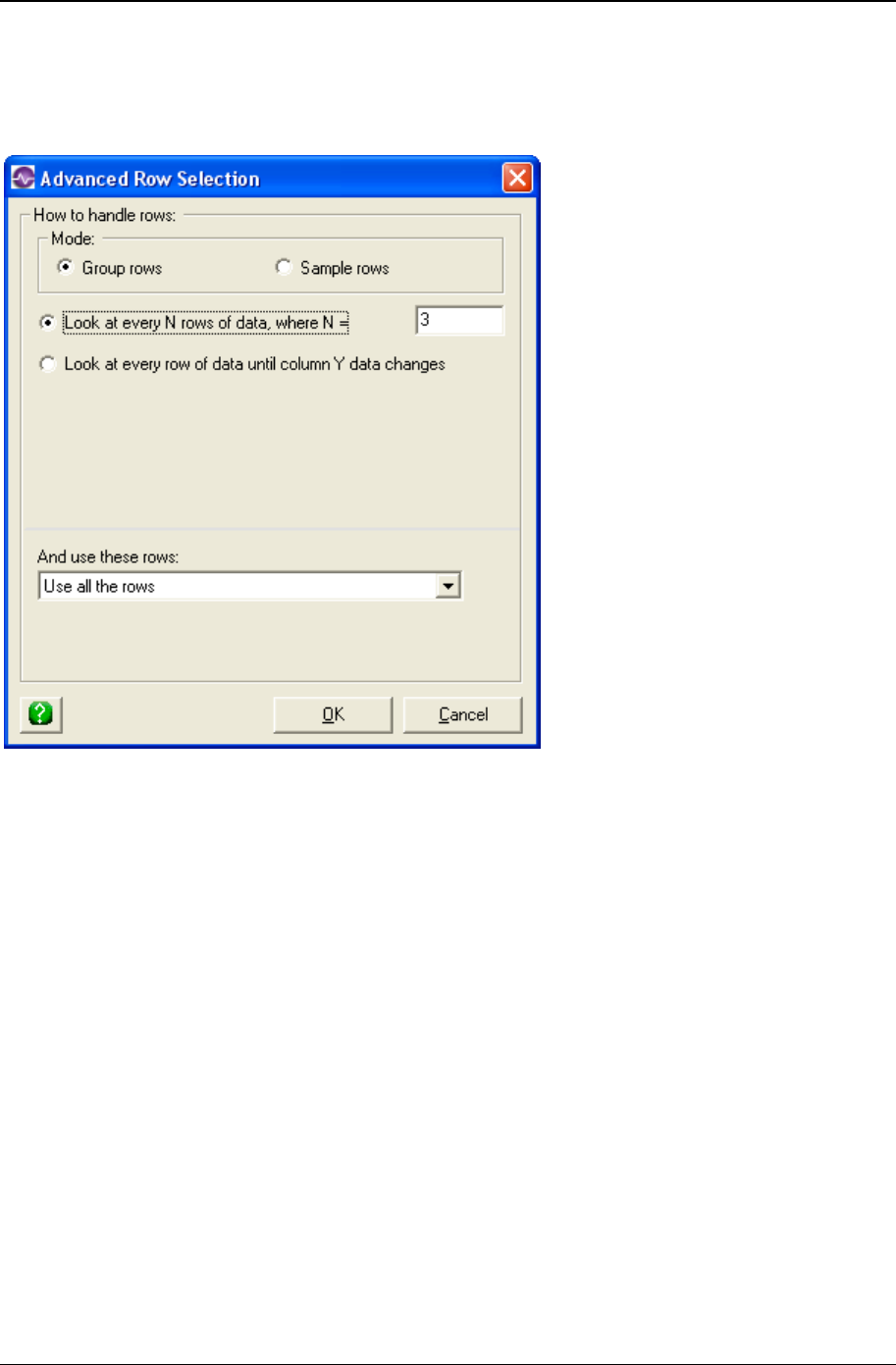
206 CHARTrunner User's Guide
Copyright © 2011
Advanced row selection example 1
In this example the Advanced Row Selection settings are set up as follows.
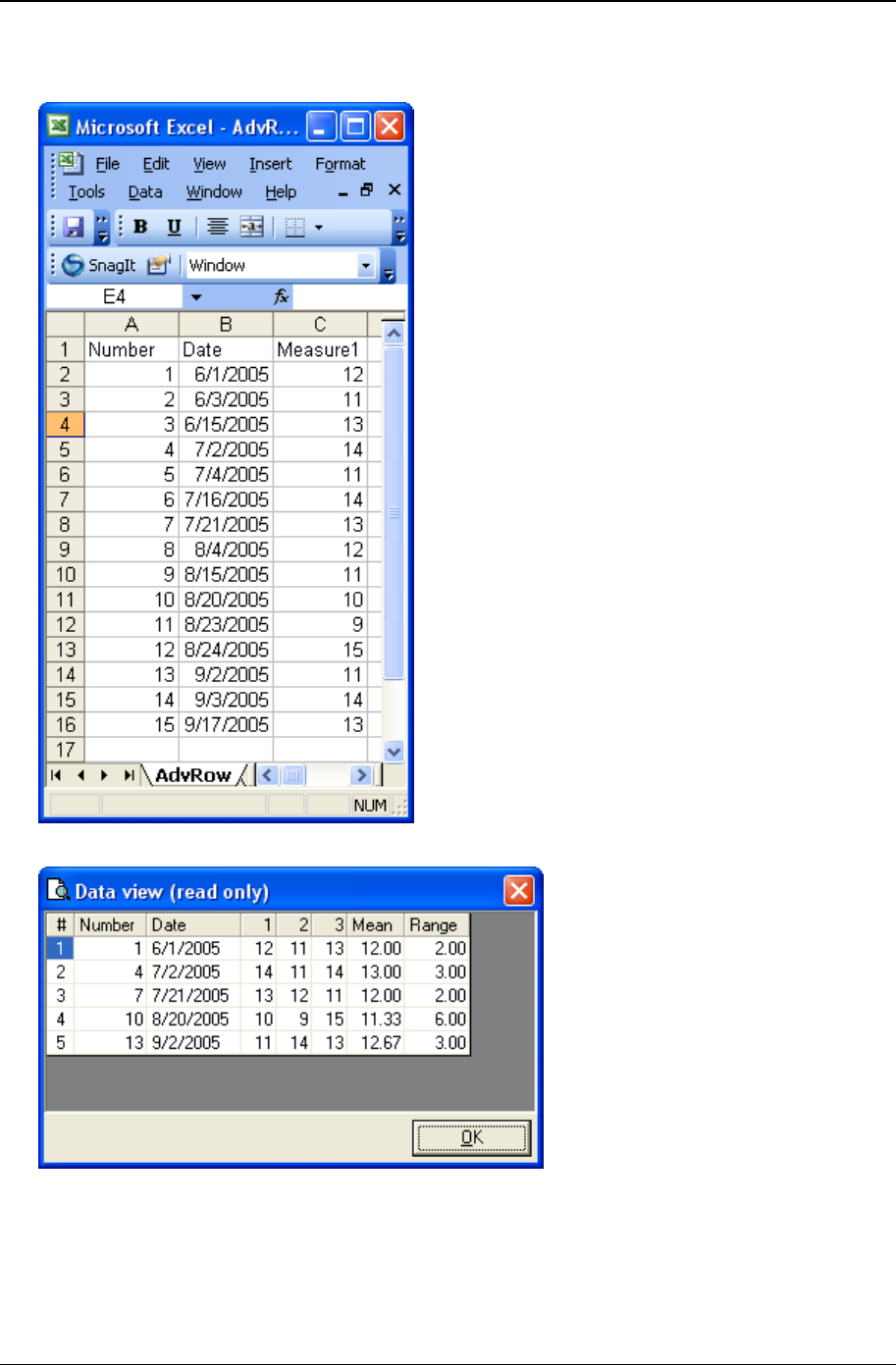
Customizing a chart definition 207
Copyright © 2011
• Raw data – The raw data from the data source is shown below. Notice that there is a single column of
observations in the Measure1 column.
• Data that gets charted – Shown below is the “View chart data” for the resulting chart.
In this example, each three rows of raw data are “grouped together” to form one subgroup. Each
subgroup will create one data point on the chart. The resulting X-bar chart will have 5 data points where
each data point is the Mean of the three observations.

208 CHARTrunner User's Guide
Copyright © 2011
Advanced row selection example 2
In this example, the Advanced Row Selection settings are set up as follows.
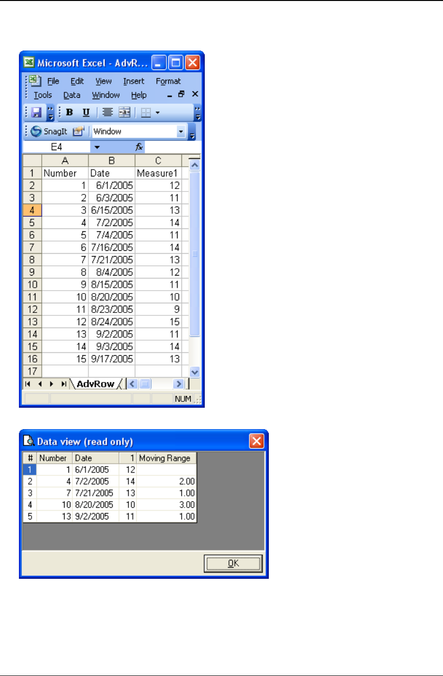
Customizing a chart definition 209
Copyright © 2011
• Raw data – The raw data from the data source is shown below. Notice that there is a single column of
observations in the Measure1 column.
• Data that gets charted – Shown below is the “View chart data” for the resulting chart.
In this example, we are sampling by plotting data only from every third row of the raw data. The
individuals chart will contain 5 data points. When you have a large data table, sampling may give you a
less cluttered chart. Just be aware that you are looking at a sample and not all of the data.
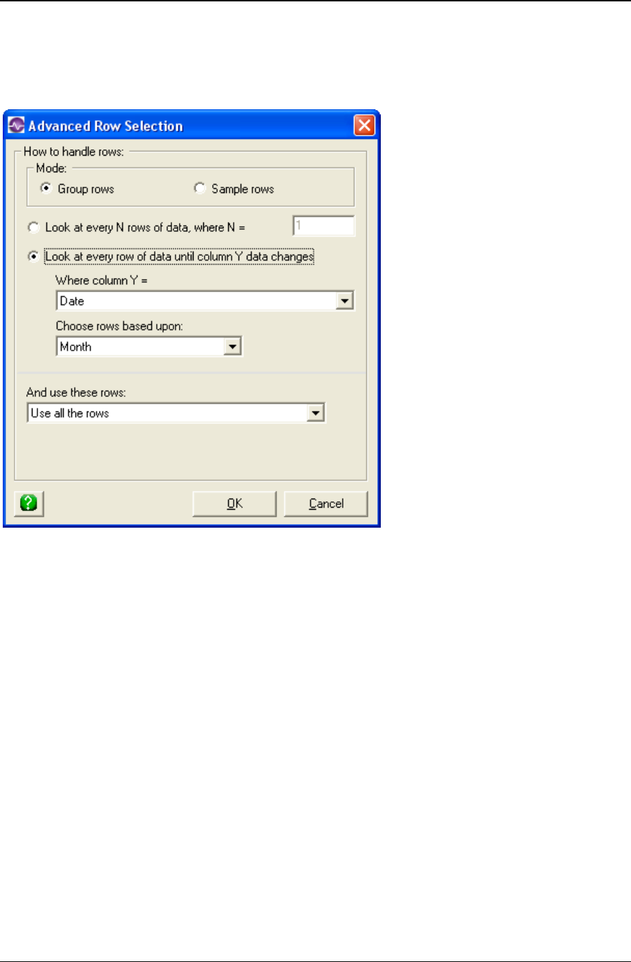
210 CHARTrunner User's Guide
Copyright © 2011
Advanced row selection example 3
In this example, the Advanced Row Selection settings are set up as follows.
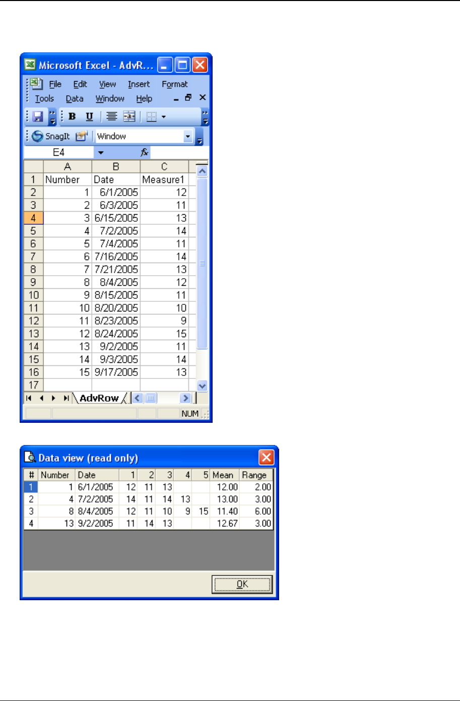
Customizing a chart definition 211
Copyright © 2011
• Raw data – The raw data from the data source is shown below. Notice that there is a single column of
observations in the Measure1 column.
• Data that gets charted – Shown below is the “View chart data” for the resulting chart.
In this example we are grouping the rows of individuals data to form subgroups based on the contents of
the Date column. Notice that each row in the results table can have a different number of observations
based on how may raw data rows fell into a particular month. Since the subgroup size is potentially
different for each month, the control limits on the X-bar chart will be adjusted accordingly.
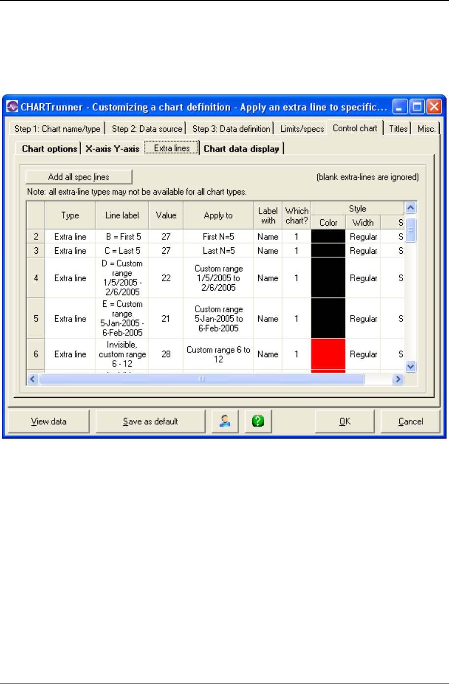
212 CHARTrunner User's Guide
Copyright © 2011
Applying an extra line to specific subgroups
Many types of charts allow you to add extra lines to the chart. The extra line is defined on the Extra lines
tab, as shown below.

Customizing a chart definition 213
Copyright © 2011
When you click in the Apply to column of an extra line, you can choose from the options shown below to
determine what subgroups (or data points) the extra line will be applied to.
• All subgroups – The extra line will be applied to all of the subgroups on the chart.
• The last N subgroups – The extra line will be applied to the last N subgroups on the chart.
• The first N subgroups – The extra line will be applied to the first N subgroups on the chart.
• Custom range of subgroups – The extra line will be applied “from” and “to” the subgroups on the chart
whose “data order” column value is between the specified From and To values (inclusive). If no “data
order” column is available, the From and To values are assumed to specify the relative subgroup
number, where the first subgroup on the left side of the chart is relative subgroup number 1, the next
subgroup is 2, and so on. For more information on how the data order column is determined see
Understanding the data order concept.
• From – Specify the “From” value in terms of the “data order” for the chart. If the specified “From” value
is not compatible with the “data order” column’s values, the extra line will not be displayed on the
chart.
• To – Specify the “To” value in terms of the “data order” for the chart. If the specified “To” value is not
compatible with the “data order” column’s values, the extra line will not be displayed on the chart.
Any extra line having a From or To value that is not compatible with the “data order” column type will
not be displayed on the chart.
1. If the “data order” column is of type Date / Time and contains date values, then the From and To
values need to specify a date, such as “1/5/2005” or “5-Jan-2005”.
2. If the “data order” column is of type Date / Time and contains date and time values, then the From and
To values need to specify a date and time, such as “1/5/2005 08:00:00”.
3. If the “data order” column is of type Numeric, then the From and To values need to specify an
appropriate number.
4. If the “data order” column is of type Text, then the From and To values need to specify an appropriate
text value. It can be challenging to get the desired results in this case.
Example: On the Extra lines tab of the chart definition shown above, the “data order” column has a data
type of Date / Time, thus the extra lines defined on lines 4 and 5 will be displayed on the chart and the extra
line defined on line 6 will not be displayed. This is because CHARTrunner interprets “1/5/2005” and “5-
Jan-2005” as values that are compatible with a Date / Time, but “6” is not interpreted as a date.

214 CHARTrunner User's Guide
Copyright © 2011
Understanding the data order concept
When CHARTrunner applies a control limit or an extra line to a specific range of subgroups the concept of
the “data order” becomes important. The “from” and “to” subgroups for the limit or extra line are specified
in terms of the value of the “data order” column.
The “data order” column is determined as follows:
• For a Table data source the "data order" column is the column specified by Column to use for Order By
on the Step 3: Data definition tab.
• For a non-Table data source (i.e. Query or View, Stored procedure or Custom query) the "data order"
column is assumed to be the column marked as the Unique Identifier on the Step 3: Data definition tab.
Each control limit saves the “data order” column name that was in effect when that limit was calculated.
When the chart is drawn only those control limits whose “data order” column name matches the current
“data order” will be considered.

215
In This Chapter
Displaying charts ......................................................................................... 215
Controlling the chart display window ........................................................... 216
Charts that scroll ......................................................................................... 217
Other chart display menus .......................................................................... 218
Editing and copying chart definitions .......................................................... 220
Editing and copying chart styles ................................................................. 222
Deleting charts and chart styles .................................................................. 223
Using annotations on charts........................................................................ 223
Control limits ............................................................................................... 226
Printing charts ............................................................................................. 236
Saving charts and sharing them with others ............................................... 238
Linking to chart or dashboard images using Microsoft PowerPoint or Word244
Publishing charts ......................................................................................... 245
Using styles to control the look of your charts ............................................ 247
Out-of-control tests ...................................................................................... 251
Displaying charts
Different methods to display an existing chart:
• Toolbar – When a chart is selected in the CHARTrunner definitions list, click on the Display the chart
button in the toolbar to display the chart.
• Double-click – Double-click on a chart in the CHARTrunner definitions list, and the chart will be
displayed (or edited). Note that under Setup > Preferences, you may configure CHARTrunner so that
double-click will either edit the chart or display the chart.
• Pull-down menu – When a chart is highlighted in the CHARTrunner definitions list, select the Chart >
Display pull-down menu to display the chart.
• Right-click menu – You may right-click on a chart in the CHARTrunner definitions list to bring up a
context menu (sometimes called a right-click menu). Select Display from the context menu to display
the chart.
• Command line arguments – Any chart may be displayed by passing command line arguments into
CHARTrunner when the program is started. This can be done by creating a shortcut that starts
CHARTrunner with the desired command line arguments when the shortcut is opened. CHARTrunner
command line arguments are documented in the appendix.
• Chart review – This allows you to easily navigate and to display other charts in the current working
folder or workspace. For a workspace, you must select Chart Review from the right-click or pull-down
menu in order to start reviewing the first chart in the workspace. While you are viewing a chart, use
the following keys to display the other charts in the folder or workspace:
• PgDn – Display the next chart in the folder or workspace.
CHAPTER 9
Using charts

216 CHARTrunner User's Guide
Copyright © 2011
• PgUp – Display the previous chart in the folder or workspace.
• Ctrl-Home – Display the first chart in the folder or workspace.
• Ctrl-End – Display the last chart in the folder or workspace.
• Chart slideshow – This is similar to Chart review, but CHARTrunner will automatically cycle to the next
chart after a specified number of seconds. When the end of the chart list is reached, the slideshow
restarts at the top of the chart list and continues until the slideshow is canceled or the chart window is
closed. To start a slideshow, first display a chart from the current working folder. For a workspace,
select Chart Review from the right-click or pull-down menu in order to display the first chart in the
workspace. Next, select Review > Slideshow from the pull-down menu (or press F6) and specify how
many seconds each chart should be displayed before cycling to the next chart. To stop the slideshow,
press Esc (which closes the chart display window) or select the Review > Slideshow pull-down menu
and click Cancel.
Controlling the chart display window
While viewing any chart, you have the following options for closing the chart window:
• File > Close – Select File > Close from the pull-down menu to close the current chart display window.
• File > Close all charts – When multiple chart windows are displayed, select this menu option to close all
displayed chart windows.
• Windows Close button – You can close a chart window by clicking on the Windows close button. This is
the X icon in the upper right corner of the window – in Windows XP this icon is red.
While viewing any chart, you have the following options for resizing the chart window:
• Minimize – Use the Windows minimize button to minimize a chart into your Windows toolbar area. This
button appears in the upper right corner of the window.
• Maximize – Use the Windows maximize button to make the chart window expand to fill your entire
display area. This button appears in the upper right corner of the window.
• Restore down – When a chart is maximized, use the Windows restore down button to restore the chart to
the previous non-maximized window size. This button appears in the upper right corner of the window
when the chart display is already maximized.
• Resize or reposition – As you resize a chart window or move it into different positions on the screen,
this information is retained in the chart definition. The next time you display the chart, it will be
positioned and sized as it was when it was last displayed. If you do not have sufficient rights to make
changes to the chart definition file, then CHARTrunner will be unable to update the size and position
information for the chart.
The chart display may be refreshed to reflect new data in the following ways:
• Manual refresh – While viewing any chart, use the pull-down menu for Edit > Refresh chart (or press
F5) to redisplay the chart. This will display the chart with new data that may have been saved since
the chart was originally displayed.
• Automatic refresh – On the chart definition form for all charts, there is a setting for Refresh interval. If
this is blank, the chart will not refresh automatically. You may set this to the desired number of
seconds, so that whenever the chart is displayed, it will automatically refresh at this interval.
• Displaying subgroup data via mouse hover – Select View > Enable mouse hover information menu on the chart
display window to enable mouse hover information. When this option is selected and you let the
mouse cursor hover near a data point on the chart, a popup window appears with summary
information about that data point. Press the F9 key to toggle mouse hover information on or off.

Using charts 217
Copyright © 2011
Charts that scroll
In some cases, your chart may contain too many data points to easily view and interpret all at once. For
example, on many control charts, once you have more than about 100 data points on the chart, detecting
small shifts and unusual patterns becomes more difficult. In this situation, a scrolling chart may be used.
The following chart types support scrolling: measurement control charts, count control charts, short-run
SPC charts, run charts, and multi-line charts.
The following settings, which are found on the X-axis Y-axis sub-tab of the chart definition form, affect
horizontal scrolling:
• Enable horizontal X-axis scrolling – Select this option to allow the scroll bar to appear when the mouse
hovers over the horizontal (X-axis) line at the bottom of the plot area.
• Chart width in subgroups – Set this to the initial number of subgroups that you want the chart to display,
i.e., the slice width. For example, if your data source results in 100 subgroups, you could set this to
25 so that you will view a slice of the 100 subgroups that is 25 subgroups wide. The next option
determines whether to initially display the first (leftmost) or last (rightmost) slice of subgroups.
• Start at left or Start at right – Select whether to initially display the first (leftmost) or last (rightmost) slice
of subgroups. For example, assume your data source provides 100 subgroups and have your Chart
width in subgroups set to 25. If you select Start at right, when the chart is first displayed, it will show
subgroups 75 to 100.
Scrolling a chart with the scroll bar – While the chart is displayed, use the scroll bar to move the chart
slice to the left or right, or change the current width of the chart slice. To minimize visual clutter on the
chart, the scroll bar is visible only when the mouse pointer hovers over the horizontal axis line at the
bottom of the plot area. If you move the mouse pointer away from this area, the scroll bar will disappear
after a slight pause. While the scroll bar is visible, you can scroll the displayed slice back and forth across
the chart's data. Additionally, you can use the scroll bar to dynamically change the slice width of the
scrolling window. Click on the arrows at the left and right edge of the X-axis to scroll the chart to the left or
right by one subgroup per click. Position the mouse pointer on the scroll bar and use left-click to drag the
bar, which results in scrolling the chart by larger increments. Click on the slice size buttons at each end of
the scroll bar to increase or decrease the current slice size of the chart.
Below is an example of a chart with the scroll bar activated. In this case the chart slice width is displaying
20 subgroups out of the 100 possible subgroups that resulted from the chart's data source:
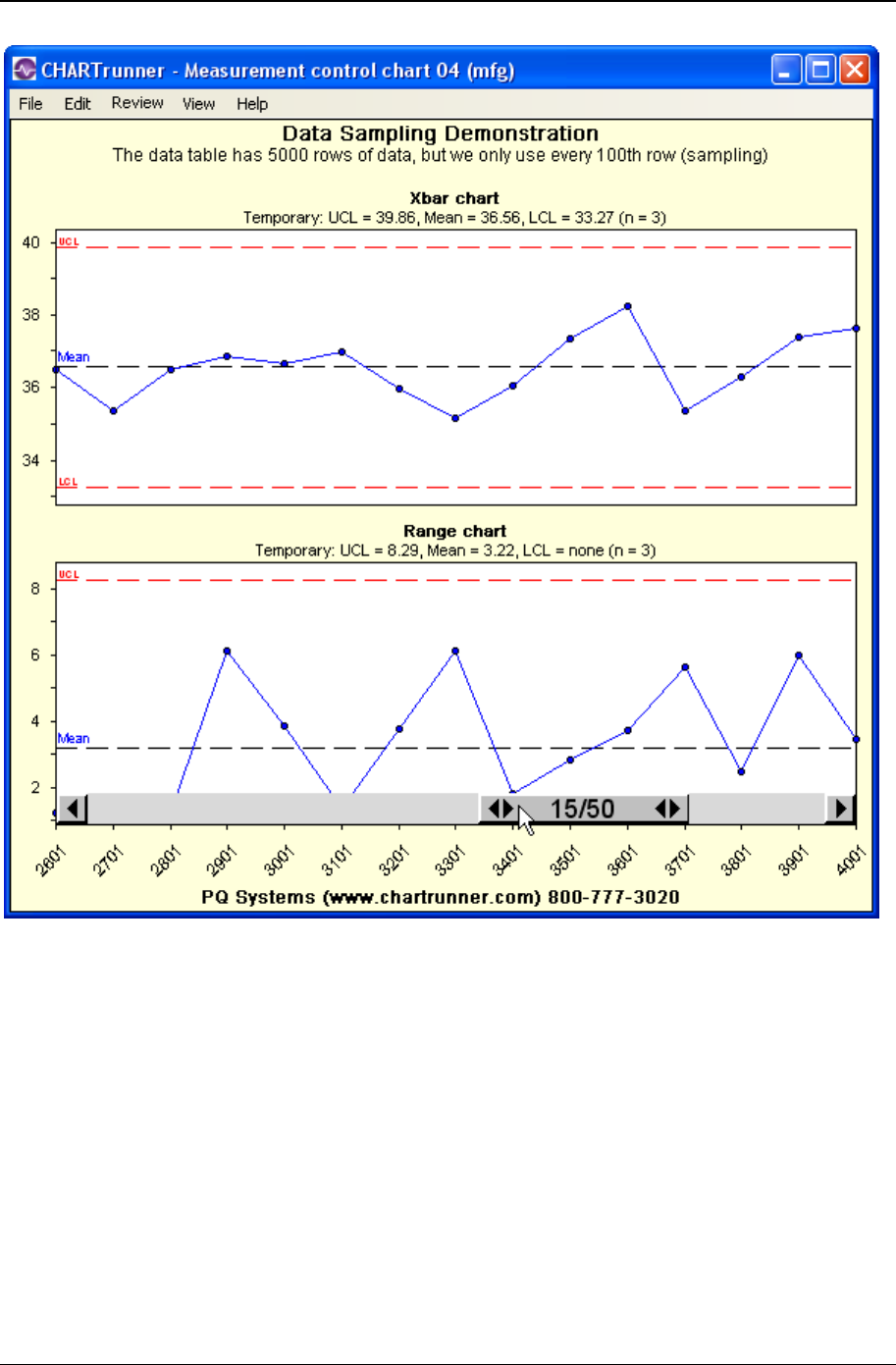
218 CHARTrunner User's Guide
Copyright © 2011
Other chart display menus
• View > Chart always on top – Use this menu option to ensure that the chart window will always be
displayed in front of other windows on the screen. This option toggles on and off each time you make
the selection.
• View > Test rules – Any control chart may be set up to use out-of-control testing rules. These rules
determine which points are marked as out-of-control on the chart. CHARTrunner allows you to define
custom rules or use standard rules on each chart. Select this menu option to display a list of the rules
that are defined in the chart definition for the current chart.
NOTE: The out-of-control testing rules that you view here – i.e., the ones defined in the chart definition
– may not actually be the rules that are used when the chart is drawn. In Setup > Out-of-control tests,
you can choose to apply a single “active” set of test rules to all control charts, regardless of the test
rules that may be defined in each chart definition.

Using charts 219
Copyright © 2011
• Right-click chart context menus - While viewing any chart, you have the option of right-clicking with the
mouse to display a context menu. The choices in this menu will vary based on the type of chart you
are viewing and where you click on the chart. For example, when viewing a control chart, this menu
will contain options for computing control limits; and when viewing a Pareto chart, the control limit
options will not be available. If you right-click on or near an annotation, you will have options to delete
or edit the annotation. If you right-click where there is no annotation, these options will not be
available.
• Context Menus related to annotations - See the topic Using annotations on charts for more detailed
information about using annotations.
• Add annotation – Select this option to add an annotation to your chart. This will display the annotation
form, which allows you to add text and line annotations to the chart. The initial position of the
annotation will be near the right-click point on the chart.
• Edit annotation – When you right-click near an existing annotation, this option will display the
annotation form and allow you to make changes to the existing annotation.
• Delete annotation – When you right-click near an existing annotation, this option allows you to delete
the annotation.
• Annotation list – When you right-click in the plot area while viewing a chart that has annotations, this
option will display a listing of all of the annotations that have been saved in the chart definition.
• Context menus related to chart data
• View chart data – Select this option to display a grid showing the data being used by the current chart.
This data has been processed for the chart and contains information beyond the raw data. For
example, the subgroup observations, means (averages), and ranges will be shown when the current
chart is an X-bar and Range chart. If Advanced row selection is enabled, the displayed subgroup
observations will reflect that processing. For a Pareto chart, you will see the categories and counts
behind the chart.
• View data source records – Select this option to display a grid showing the unprocessed data records
that come from your data source. Note the data shown on this grid is based upon how you specified
Treat as for the data source columns on the Step 3: Data definition tab of the chart definition form.
This option is available only when Close data source after drawing chart is not selected on the Misc >
Other sub-tab of the chart definition
• Other context menus on the chart form
• Clear selected subgroups – On control charts you may select a subgroup by clicking on the data point.
You may select multiple subgroups by clicking-and-dragging a rectangle through the plot area. When
you do this, one or more subgroups will be highlighted visually with a vertical band. Select this option
to clear the highlight from the chart.
• View highlighted subgroup information – When a subgroup (one data point) is selected, it will be
highlighted with a vertical band. Use this option to display information about the selected subgroup.
The raw data, calculated statistics, and information about out-of-control conditions will be displayed.
• Compute limits – This option is available only on control charts. You must select a range of subgroups
on the chart before this option will be available. To select subgroups, use your mouse to click-and-
drag a rectangle through the plot area. The rectangle should include the subgroups you want to use
for computing the control limits. See the Control limits (on page 226) topic for further information.
• Disable (hide) limits – This option is available only when you right-click near a control limit line or control
limit title for a set of control limits which you have previously computed. Control limits have names,
and the menu choice will include the control limit name. For example, the menu choice might be
Disable (hide) limits: Set 1. In this case the name of the control limit is Set 1. Select this option to hide
the specified set of limits from the current chart display. Note that the limits will not be deleted from
the chart definition; rather, they will be marked so as not to be used by the chart.

220 CHARTrunner User's Guide
Copyright © 2011
• Delete limits – Select this option to delete a set of control limits both from the current chart display and
from the chart definition. This option is available only when you right-click near a control limit line or
control limit title for a set of limits you have previously computed and saved.
Editing and copying chart definitions
Once you create and save a chart, you may occasionally need to change something about the chart. To
do this, you will use the same chart definition form that you used to create the chart. Make your changes
and click the OK button to save the updated chart definition.
Different methods to edit a chart definition
• Toolbar – When a chart is highlighted on the CHARTrunner definitions list, click on the Edit button in
the toolbar to edit the chart.
• Pull-down menu – When a chart is highlighted in the CHARTrunner definitions list, select the Chart >
Edit pull-down menu to edit the chart.
• Right-click menu – You may right-click on a chart in the CHARTrunner definitions list to bring up a
context menu (sometimes called a right-click menu). Select Edit from the context menu to edit the
chart.
• Double-click – Double-click on a chart in the CHARTrunner definitions list, and the chart will be edited
(or displayed). Note that under Setup > Preferences you may configure CHARTrunner so that double-
click will either edit the chart or display the chart.
• From the chart display form – While viewing any chart, you can open the chart definition form using one
of these three methods: (1) right-click on the chart and select Edit chart definition, (2) use the Edit >
Edit chart definition pull-down menu, or (3) press Ctrl-D. Make your changes and click the OK
button to apply the changes and redisplay the chart. Note that these changes will be saved to the disk
only if you elect to save them when you close the chart window. This allows you to experiment
visually with changes before you save the changes to the chart definition file on the disk.

Using charts 221
Copyright © 2011
Copying a chart definition
You may need to create several charts that are similar. Perhaps each chart uses a different data column
in the same spreadsheet. Perhaps each chart uses the same data but looks at a different range of dates.
To help with this, create your first chart. Be sure to save this chart with all settings and titles that will be
the same on subsequent charts. For additional charts, use the copy command. This allows the first chart
to act as a template for all the charts that follow.
• To copy a chart – Create and save the chart that you wish to copy from. In the CHARTrunner definitions
list, use the mouse to right-click on the chart you wish to copy from and select Copy from the context
menu. The chart definition form will open, and it will contain a copy of the original chart, but with a
new name. Change the chart name (if desired) and make any other changes; then click the OK
button to save the copied chart.
• Copying a chart and @ title substitutions – There are several title substitution options that you may use in
the titles for a chart. For example, entering @CTN in a chart title will cause the chart name to be
displayed in that position. Using these titles substitutions can save time when you are copying a chart
definition. If you manually type in the chart name as a chart title, then when you copy the chart you
will have to manually update the “chart name” title. However, using the @CTN option will eliminate
this step.
• Copy to experiment – If you want to experiment with changing a chart but you do not want to damage
the original chart definition, make a copy of the chart and do your experimenting with the copy.
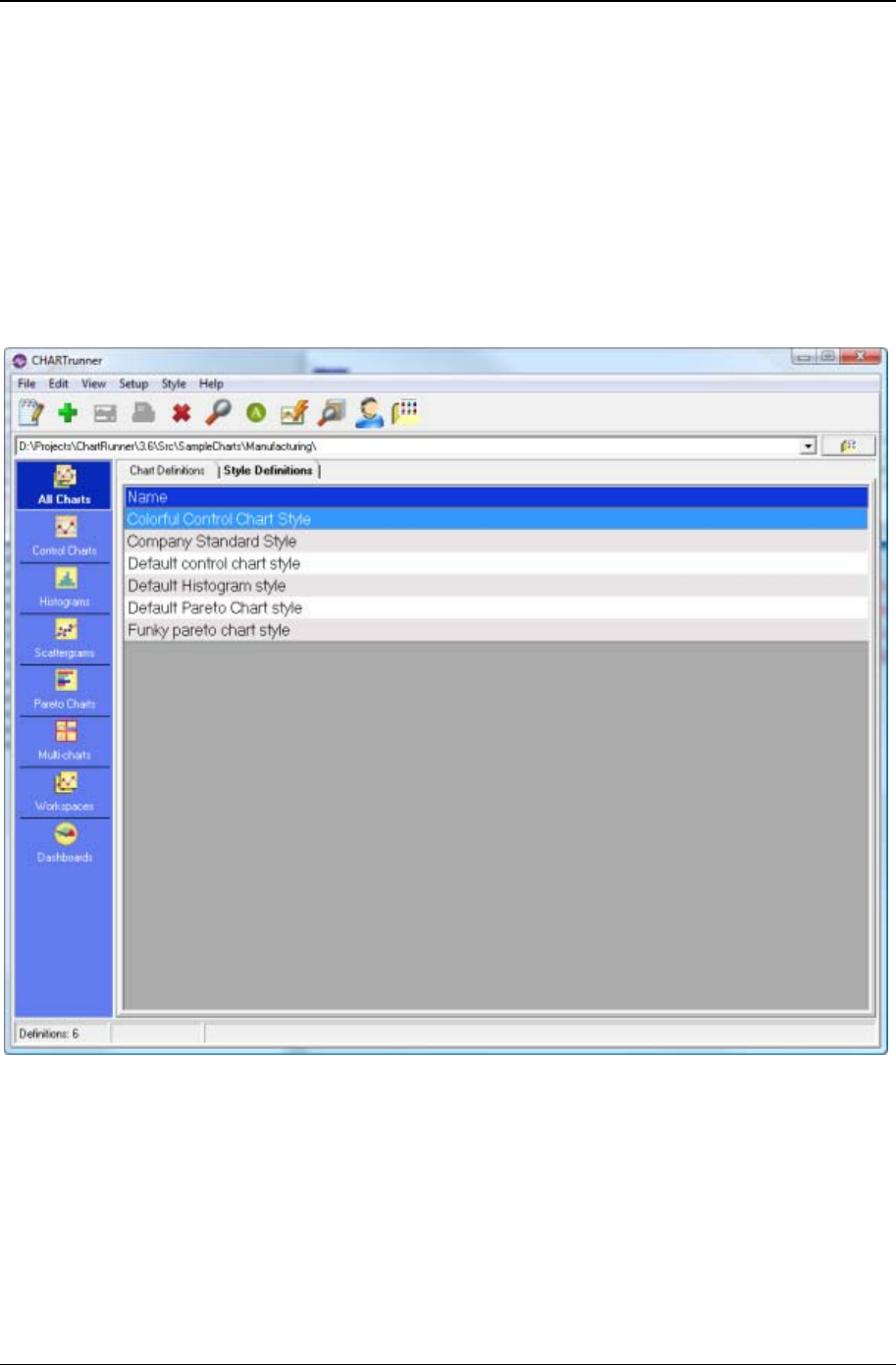
222 CHARTrunner User's Guide
Copyright © 2011
Editing and copying chart styles
All CHARTrunner charts have a setting for Chart Style. A chart style is a named collection of settings that
affect the appearance of a chart. A style contains information like chart background color, line colors, line
styles, and fonts to use when rendering the chart. On the Step 1: Chart name/type tab of the chart
definition form, you may select the chart style you wish to use on the chart.
As shown below, the available chart styles are listed on the Style Definitions tab. In the CHARTrunner
definitions list, the available chart styles are definitions list. There are three types of chart styles: Control
chart, Histogram chart, and Pareto chart. When CHARTrunner is installed, a default style of each type is
available. These default styles may not be deleted. You may create as many new styles as you need.

Using charts 223
Copyright © 2011
Different methods to edit a chart style
Note that when you change something in a chart style, this change will be visible in every chart that uses
this named style definition. Many different charts can and often do use the same chart style. See the topic
Chart style form (on page 24) for more details.
• Toolbar – When a chart style is highlighted in the CHARTrunner definitions list, click on the Edit button
in the toolbar to edit the chart style.
• Pull-down menu – When a chart style is highlighted in the CHARTrunner definitions list, select the Style
> Edit pull-down menu to edit the style.
• Right-click menu – You may right-click on a chart style in the CHARTrunner definitions list to bring up a
context menu (sometimes called a right-click menu). Select Edit from the context menu to edit the
chart style.
• From the chart display form – While viewing any chart, right-click on the chart and select Edit chart style,
or use the Edit > Edit chart style pull-down menu. The chart style editor will open. Make your changes
and click the OK button – the displayed chart will be refreshed to use the edited style definition. You
will be asked to confirm whether to save the style definition change to the disk because other charts
(not currently visible) could be affected by your style changes.
Copy a chart style
If you want a new chart style that is similar to one you already have, use the option to copy an existing
chart style.
• To copy a chart style – In the CHARTrunner definitions list, right-click on the chart style you wish to copy
and select the Copy command. The chart style editor will open with a copy of the existing style. Enter
a new name for the style, make your style changes, and then click the OK button to save the new
style. The newly created chart style name will now be available in the drop-down list for chart style on
the chart definition form.
Deleting charts and chart styles
If you no longer need a chart definition or a chart style, use one of the following options to delete it:
• Delete to the recycle bin – Click once to select a chart or style definition in the CHARTrunner
definitions list. Press the Delete key on your keyboard or click the X button in the toolbar. You will be
asked to confirm the deletion. If you answer Yes, the definition will be deleted to the recycle bin. The
recycle bin allows you to restore the chart or style definition file at a later date.
• Permanently delete – Click once to select a chart or style definition in the CHARTrunner definitions
list. Hold down the Shift key. Press the Delete key on your keyboard or click the X button in the toolbar.
You will be asked to confirm the deletion. If you answer Yes, the definition will be permanently
deleted.
Using annotations on charts
One way to add meaning to a chart is with annotations. Annotations may be placed on the plot area of
most chart types. The simplest annotation is text used to explain some aspect of the chart. Lines, arrows,
and boxes may also be used to enhance the annotation.
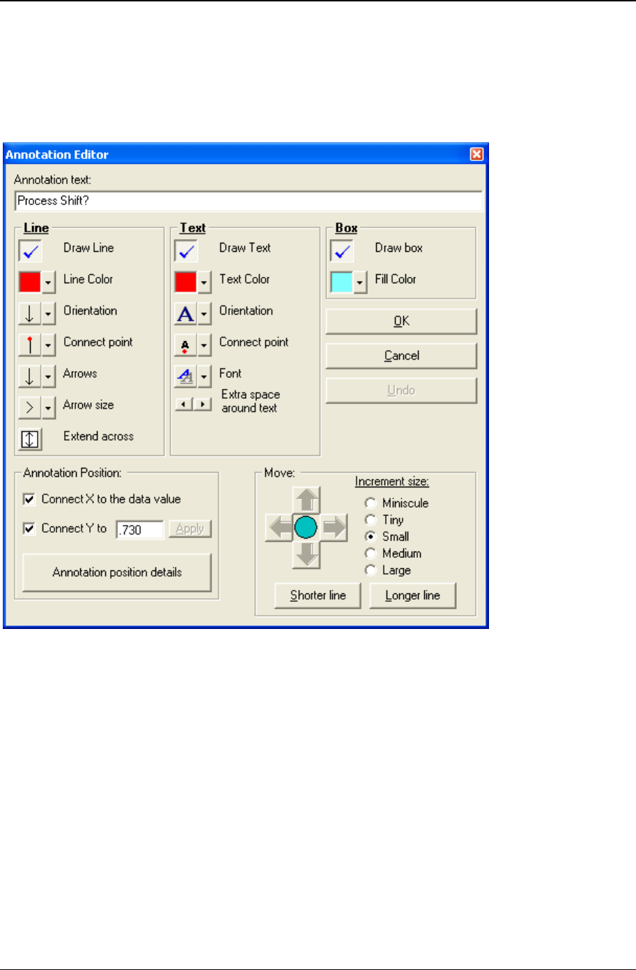
224 CHARTrunner User's Guide
Copyright © 2011
Add an annotation to a chart
While viewing any chart, use your mouse to right-click in the plot area near the spot where you want the
annotation placed. When the context menu is displayed, select Add annotation. The annotation editor will
be displayed as shown below.
The annotation editor allows you to customize the three pieces of an annotation: (1) a line, (2) the text,
and (3) a box that may be drawn around the text. It also allows you to position the annotation and
optionally connect it to your data in various ways.

Using charts 225
Copyright © 2011
Line options
• Draw Line – Enable this check box if you want your annotation to include a line.
• Line Color – Use this to select a color for your line.
• Orientation - Use this to decide if your line will be horizontal or vertical. If your line contains the optional
arrows, use this setting to set which way they point.
• Connect point – Use this to select the point along the line where the annotation is connected to the line.
• Arrows – Use this to select which arrows, if any, will be placed on the line. You may have no arrows,
one on either end, or one on both ends of the line.
• Extend across – Use this option to extend the line for this annotation across the plot area. This allows
you to place either a vertical or horizontal line across the plot area at a specific location. This setting
is affected by the Orientation property of the line.
Text options
• Draw Text – Enable this checkbox if you want the text of your annotation to appear on the chart. In
some cases, you may want only the line to show.
• Text Color – Use this to select the color for your annotation text.
• Orientation – Use this to select vertical or horizontal text and also the direction in which the text will
flow.
• Connect point – Use this to select the position, with respect to the text, where the line will be connected
to the text.
• Font – Use this to select font settings for the annotation text.
• Extra space around text – Use this to increase (right arrow) or decrease (left arrow) the amount of space
between the annotation text and the optional box that may surround the text.
Box options
• Draw box – Enable this check box if you want the text of your annotation to be surrounded by an
outline.
• Fill color – If you are using a box around your annotation text, use this option to set the background
color inside the box.

226 CHARTrunner User's Guide
Copyright © 2011
Moving and sizing an annotation
Use the options under Move to adjust where your annotation is placed in the plot area and the length of
the annotation line. Click the arrow buttons to move the annotation. The size of the move for each click is
determined by the Increment size option you have selected. Use the Longer line and Shorter line buttons to
change the length of your annotation line. The Increment size option also affects the line length buttons.
Annotation Position – You can connect the annotation to the data, or position the annotation at a fixed
location on the chart.
• Connect X to the data – Select this option if you want to connect the annotation to the Unique identifier
value for the data point. This option is available only when a data source column is treated as the
Unique identifier. When this option is not selected, the annotation is connected at a fixed percentage
relative to the plot area width.
• Connect Y to the data – Select this option if you want to connect the vertical position of the annotation to
the specified Y-axis value. When this option is not selected, the annotation is connected at a fixed
percentage relative to the plot area height.
• Annotation position details – Click this button for more details on how the annotation is positioned and
“Connected to the data” on the chart.
Deleting annotations
To delete an annotation from a chart, first right-click on the annotation to display the context menu. Select
Delete annotation from the menu. If you do not see the Delete annotation option, it might be because you did
not right-click on or near the annotation. The menu option is available only if there is an annotation near
where you right-click.
The annotation list
If a chart has annotations, you view all the annotations in a list. This can be helpful if you are trying to
delete an annotation that is near several other annotations. Using the list, you can be sure to delete the
correct annotation. Sometimes an annotation will no longer be displayed on the chart because it was
attached to data that is no longer shown on the chart. You can use the list to delete these orphaned
annotations.
• To display the annotation list – Right-click in the plot area while viewing a chart. Select the Annotation list
option. This will display a listing of all of the annotations that have been saved in the chart definition.
Select an annotation and click Remove to delete that annotation.
Control limits
Control limits are used on several chart types. Measurement, count, and short-run SPC control charts all
use control limits. Control limit formulas vary by chart type. However, the general concept of control limits
is the same for all. The following topics discuss how to use control limits in CHARTrunner. The
information applies equally to all control chart types supported in CHARTrunner.

Using charts 227
Copyright © 2011
What are control limits?
Control limits are sometimes called the voice of the process because they are computed based on data
from some process. A set of control limits consists of three numbers calculated from data: (1) an upper
control limit, (2) a lower control limit, and ( 3) a mean or centerline. You might think of control limits as a
model of your process. The model tells you where the process is centered (the mean) and how much the
process typically varies (upper limit and lower limit). Limits are displayed on a control chart as three
horizontal lines (upper, center, lower) and act as a visual comparison for the main data line of the chart.
What are temporary control limits?
When you first display a new control chart, it will have 'temporary' control limits. You will see the word
temporary in the control limits title above the chart. Temporary limits are computed and displayed
automatically. They are based on all of the data for the chart, even if you are viewing only a slice of the
subgroups available for the chart due to setting the Chart width in subgroups property of the chart definition.
They are called temporary because they re-calculate each time the chart is rendered. If new data has
arrived since the last time the chart was rendered, the limit values may change because different data is
used. Temporary limits are helpful on new charts but should not be used for the long term.
Editing existing control limits
If you want to change an existing set of control limits, follow these steps:
1. Display the chart.
2. Right-click on a control limit line or on a control limit title.
3. Select Edit limits from the context menu.
4. The control limit dialog will be displayed.
5. Make your changes and click the OK button to apply the changes to the chart.
Disable (hide) control limits
Follow these steps to remove a set of control limits from the chart display:
1. Right-click on a control limit line or a control limit title.
2. Select Disable (Hide) limits from the context menu.
3. The chart will be re-displayed without that set of control limits. Note that this does not remove the
limits from the chart definition file – it just hides the limit from being displayed on the chart.
Delete control limits - from the chart display
Follow these steps to delete a set of control limits while viewing a chart:
1. Right-click on a control limit line or a control limit title.
2. Select Delete limits from file from the context menu.

228 CHARTrunner User's Guide
Copyright © 2011
3. The chart will be re-displayed without these limits, and they will be deleted from the chart definition
file.
Delete control limits - from the chart definition form
Follow these steps to delete a set of limits while viewing the chart definition form:
1. Click on the Limits/specs tab of the chart definition form.
2. In the control limits grid, click once to select a row containing control limits.
3. Press the Delete key on your keyboard.
4. Click on Yes to confirm the control limit deletion.
5. Click the OK button to save the chart definition.
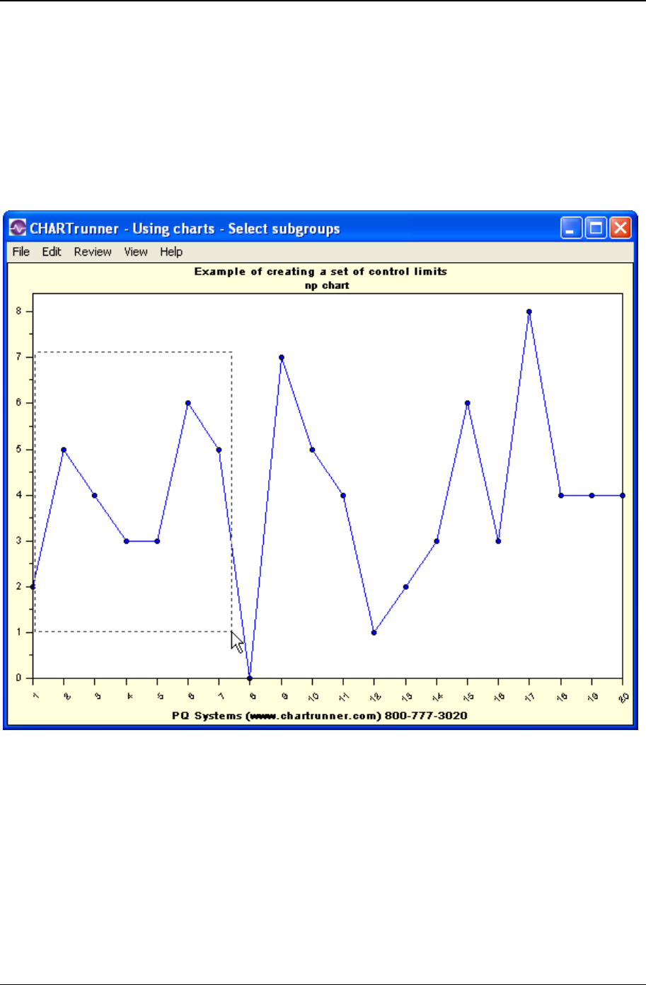
Using charts 229
Copyright © 2011
To compute a new set of saved control limits
To compute a new set of saved control limits, the first step is to display the control chart. Next, select the
subgroups (the data points) that you want to use to compute the limits. These subgroups represent the
voice of the process that will be compared against to determine if the process model changes. You can
select all of the data on the chart or a subset of the data. To select data points, left-click and drag a
rectangle through the plot area of the chart using the mouse.
In the example below, subgroups 1 to 7 are in the process of being selected:
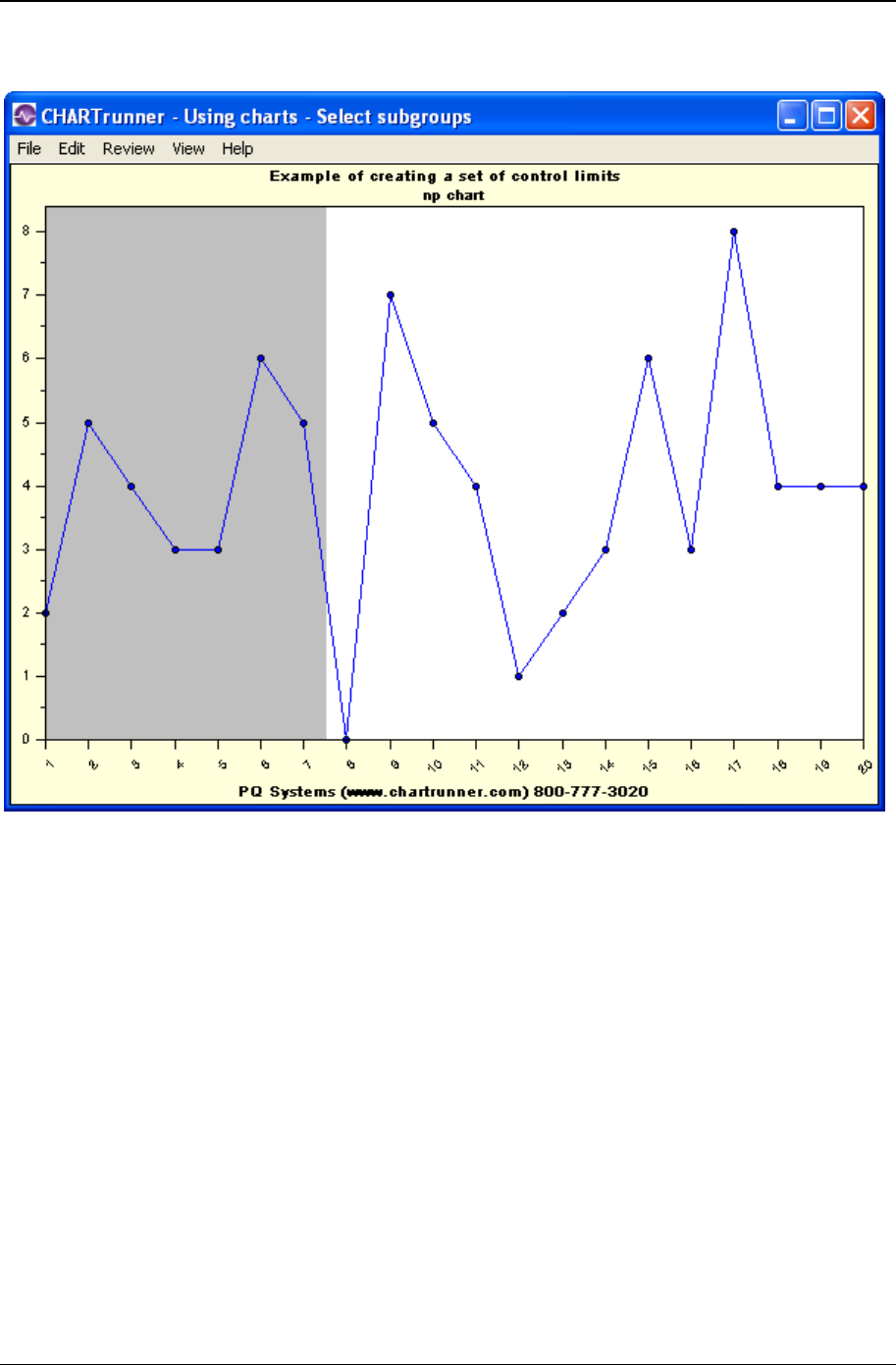
230 CHARTrunner User's Guide
Copyright © 2011
When you release the mouse button, the selected subgroups will be highlighted as shown below:

Using charts 231
Copyright © 2011
Next, right-click on the chart to display the context menu. Select Compute limits from the context menu. If
this is not an option on your menu, it might be that you have not selected subgroups or the current chart
is not a control chart.

232 CHARTrunner User's Guide
Copyright © 2011
The Compute limits choice will display the control limits dialog box shown below:
The control limits dialog
• Name for this set of limits – Each saved set of control limits has a name. If you use a chart over a period
of time, you may end up with several sets of control limits. Use the default names provided (Set 1, Set
2, etc.) or enter a meaningful name, such as "January 2004."
• How to compute limits – You have the following options for how control limits will be computed. If you
have any doubt about which option to use, always select the Standard option.
• Standard (based on estimated sigma - recommended) – Enable this option to compute limits using the most
standard formula. This will use the mean plus or minus 3 sigma. For a measurement chart, sigma is
estimated based on the range.
• Based on n sigma, where n= [Attributes chart] – Most control limits are computed based on the mean plus
or minus 3 sigma. If you want to use a value other than 3, enable this option.
• Based on n sigma (ind) where n= [Measurement chart] – Most control limits are computed based on the
mean plus or minus 3 estimated sigma. If you need to use actual sigma or you want to use a value
other than 3, enable this option.

Using charts 233
Copyright © 2011
• Based on n sigma (est) where n= [Measurement chart] – Most control limits are computed based on the
mean plus or minus 3 estimated sigma. If you want to use a value other than 3, but still want to use
estimated sigma, enable this option.
• User entered – In some cases you may already know the proper control limit values and want to use
these values. Enable this option to enter your own control limit information. Depending on the chart
type, the limit information you must enter will vary.
• Subgroups included – In this section the First subgroup and the Last subgroup, which you selected back
on the chart, are shown. You may adjust these values so the limits will be based on a different range
of subgroups. For a Table data source, the first and last subgroups are specified in terms of the Order
By column; if no Order By column is specified, these are specified in terms of relative subgroup
number. For a non-Table data source (Query or view, Stored procedure, or Custom query), the first
and last subgroups are specified in terms of the Unique identifier column; if no Unique identifier is
specified, these are specified in terms of relative subgroup number.
• Extend the control limits – Check this box if you want this set of control limits extended beyond the
subgroups used to compute them. For example, you might start a control chart where the first set of
limits is computed on the first 25 subgroups. This set of limits is then extended across any new data
that arrives. The line style used for the control limit lines will distinguish extended limits.
• Control limit values – Control limit values are shown here. Depending on the chart type, you will see
different labels. For chart types that show two charts, like an X-bar and Range chart, there will be a
set of control limit values for each type of chart.
If you make changes on the control limit dialog box, use the Compute button to compute new limits values
based on your changes.
Click the OK button to have your control limits applied to the chart. When you close the chart, you will be
asked if you want to save your changes. If you answer Yes, your control limits will be saved in the chart
definition and displayed the next time you view the chart.
Using control charts and control limits
When using control charts and control limits, you are faced with many decisions. When should I compute
limits? What data should I use to compute limits? When should I adjust the limits? How many sets of
control limits should I use? These questions become easier to answer when you keep in mind the
purpose of using control charts:
Why use control charts? Control charts are designed to minimize two common errors:
1. Adjusting a process when it would be better to leave it alone.
2. Not adjusting the process when it might be improved by intervention.
Control charts minimize these errors by helping you distinguish between two types of variation:
1. Normal or natural variation inherent in all processes.
2. Exceptional or assignable cause variation.

234 CHARTrunner User's Guide
Copyright © 2011
On a control chart, assignable cause variation shows up as out-of-control conditions. In CHARTrunner,
these typically are square, red data markers. Points outside the control limits, trends, runs, and unusual
patterns will cause out-of-control conditions.
A control chart that has no out-of-control conditions represents a process that is said to be in control. The
process is predictable. It will continue to produce the same mean and variation around the mean unless
something causes a change to the process model.
A control chart that does have out-of-control conditions represents a process that is said to be out-of-
control, unstable, or not predictable. There is assignable cause variation present. If you study the
process, you can probably find reasons or causes for the out-of-control conditions.
One recipe for using control charts
Create and display the initial control chart. It will be displayed with temporary control limits. Ideally, you
will have at least 25 points on the chart, but this is not an absolute requirement. There is no need to look
at thousands of data points at this early stage.
If there are out-of-control conditions on the chart, study each one, looking for the reason or the assignable
cause. For any assignable cause you discover, do your best to remove it from the process – ensure that it
will not happen again. Once assignable causes have been removed, display the same control chart using
newer data. Repeat the process of looking for out-of-control conditions and removing assignable causes
until you get a control chart with no out-of-control conditions.
Once you have removed assignable causes, calculate a set of control limits using the most recent 25 to
100 subgroups (just a guideline). Check the option to extend these control limits. Set up the control chart
to always display the last 25 to 50 subgroups. At this point you can use the control chart for ongoing
monitoring of the process. When you see an out-of-control condition, it means that some assignable
cause is present. This should be investigated and understood. Steps should be taken to ensure it does
not happen again.
Once your process is in control, it is also predictable. You can assume that the output of the process will
remain consistent unless some significant change occurs. If the output of the process is in control, but not
meeting customer needs in some area of quality, then the system must be changed in some way. Better
equipment, better training, improved inputs, improved procedures: something will have to be changed
because the control chart is telling you that the process is stable.
The control chart mindset
Control charts are designed to look at data over time. They answer questions such as the following: Is the
process getting better over time? Is the process getting worse over time? Is the process stable? They are
part of a continuous improvement approach. A control chart is not something you do at the end of the
year to summarize performance; rather it is a tool to help you keep thinking about the process, and how
to make it better, all the time.
Key Measures
All organizations produce data. There are numerous opportunities to make control charts from this
mountain of data. Control charts should be used on important measures; measures that have a
perceptible and useful impact on some aspect of quality or performance.

Using charts 235
Copyright © 2011
Lloyd Nelson limits option
CHARTrunner offers a feature known as the Lloyd Nelson limits option, designed to render individuals
control charts more effective in identifying special causes by using common cause variation ONLY to
estimate sigma for the individual limits. Any moving range values that lie above this Upper Control Limit
for the Moving Range are removed from the calculation thus using only common cause variation to
estimate sigma for limits on the X chart. The MR range chart is typically not displayed since the sample-
to-sample variation is already graphically displayed in the X chart.
This procedure was suggested by Lloyd Nelson in the Technical Aids section of the Journal of Quality
Technology (Vol. 14, No. 3, Pg. 172, July 1982). Nelson points out that a moving range that is out of
control because of a sudden increase in what is being measured leads to an increase in the value of the
moving range , which would then include variation from both special and common cause variation.
This, in turn, inflates control limits:
As a result, control limits would be wider than they would otherwise be, making it more difficult to identify
assignable causes for individual values.
The feature was added to the software program as a result of a suggestion by Lloyd Provost and his
colleagues at Associates in Process Improvement (API), who supported the development of the Lloyd
Nelson limits option. Lloyd Provost, Cliff Norman and Jane Norman worked with Gordon Constable of PQ
Systems to implement this option. In addition, Byron Murray and Sandy Murray of CT Concepts utilize this
methodology in their practice.
The Lloyd Nelson limits option is specified on the Limits/specs tab of the measurement control chart
definition.

236 CHARTrunner User's Guide
Copyright © 2011
Printing charts
CHARTrunner allows you to select a printer that will be used by default whenever you print a chart. You
always have the option to select a different printer from the Windows printer dialog when you print, but the
CHARTrunner printer will be selected by default.
To select the CHARTrunner printer
On the main form of CHARTrunner, select the File > CHARTrunner printer pull-down menu. The following
dialog will be displayed:
Select the printer you will use most often and then click the OK button to save your settings.
Print a chart from the chartrunner chart list
To print a chart from the CHARTrunner chart list, follow these steps:
1. Right-click on the chart in the list and select Print.
2. The Windows printer dialog box will be displayed. Make any needed changes.
3. Click the OK button to send the chart to the printer.
Print a chart from the chart display
To print any chart that you are currently viewing, follow these steps:
1. Select File > Print from the pull-down menu, or
2. Right-click on the chart and select Print.
3. The Windows printer dialog box will be displayed. Make any needed changes.
4. Click the OK button to send your chart to the printer.

Using charts 237
Copyright © 2011
Printer properties
Whenever you print a chart, you will have the option to click on the Properties button of the Windows
printer dialog. This allows you to change properties specific to your printer. A common example is that
you may select either Portrait or Landscape page orientation.
Chart definition settings that affect printing
On the Misc. tab of the chart definition form for every chart, there is a setting for Default print orientation.
When you select either Portrait or Landscape for a chart, this will be used later when you print the chart
as the default page orientation. You always have the option to override this default at the time you print
the chart.

238 CHARTrunner User's Guide
Copyright © 2011
Saving charts and sharing them with others
A useful feature of CHARTrunner is the ability to define a chart once and then use it often. Each time you
generate the chart, it reflects current data from the data source. The chart represents a snapshot of the
underlying process. You may want to make these snapshots available to other people. CHARTrunner
provides several methods which allow you to share charts with others.
• Copy chart to the clipboard – While viewing any chart, you may copy the chart image to the Windows
clipboard and then paste it into another application such as Microsoft Word or Microsoft PowerPoint.
On the chart display form, select Edit > Copy chart to clipboard from the pull-down menu. You may
copy the chart to the clipboard either as a bitmap or a metafile. Use the metafile for best image quality
when you might need to resize the image in the target program. Once the chart has been copied to
the clipboard, switch to the other application and use the Edit > Paste pull-down menu to paste the
chart image. Remember that you have copied and pasted a snapshot of the chart as it looks right
now; if new chart data becomes available in the future, the pasted chart image will not update to
reflect the new data.
• Save chart as image – You may save any chart as an image file by using the Save chart as image right-
click menu on the CHARTrunner definitions list or the File > Save chart as image pull-down menu on the
chart display form. The following image formats are supported: JPG (JPEG), EMF (Windows
Enhanced Metafile), BMP (Bitmap), and PNG (Portable Network Graphics). On the chart definition
form under Misc > Image file defaults, you may select the default image type you want to use when
saving the chart as an image file. The default image type can be overridden when the image file is
created. For more details, see the Save chart as image dialog topic.
• Save chart as Web page – You may save any chart as an HTML Web page which contains an image of
the chart and optionally a table of the chart's data. Use either the Save chart as Web page right-click
menu on the CHARTrunner definitions list, or the File > Save chart as Web page pull-down menu on
the chart display form. A dialog box will be displayed where you can make selections to create the
Web page. For more details, see the Save chart as Web page dialog topic.
• Send chart as e-mail – You may send any chart as an attachment in an e-mail message. This can be
done using either the Send chart as e-mail right-click menu on the CHARTrunner definitions list or the
File > Send chart as e-mail pull-down menu on the chart display form. A dialog box is displayed
where you make selections to send the e-mail. For more details, see the Send chart as e-mail
dialog topic.
• Save chart as clipCHART – A clipCHART is a special type of CHARTrunner file (with a .CCF file
extension) that contains both a snapshot of the current chart data and a chart definition. To save a
chart as a clipCHART, use either the Save chart as clipCHART right-click menu on the CHARTrunner
definitions list or the File > Save chart as clipCHART pull-down menu on the chart display form.
CHARTrunner must be installed in order to view a clipCHART. Viewing a clipCHART allows another
user to change chart settings and ask various what if questions with your chart. To open a
clipCHART, run the clipCHART viewer program that is installed with CHARTrunner, or double-click
the clipCHART file.

Using charts 239
Copyright © 2011
Save chart as image dialog
When you select the option to Save chart as image, the following dialog will be displayed. Select the desired
options and click the OK button to create the chart image file.
• Image type – Select one of the following image file formats:
• JPG-JPEG image – The ubiquitous JPEG image format is very popular. The quality of the JPEG image
is determined by the JPG image quality setting under the Setup > Preferences > General pull-down
menu on the CHARTrunner main form.
• BMP-Windows bitmap – This results in large image files. Use this only when you have a specific need to
do so.
• EMF-Windows enhanced metafile – This is a good choice when the image will be inserted into another
application, such as Word or PowerPoint, and then resized to fit the available space.
• PNG-Portable network graphic – This is a good choice since it does not result in loss of image quality as
JPEG does, and is typically smaller than a JPEG image.
• Image size (in pixels, zero=use default)
• Width – Enter a number for the width in pixels of the chart image. If zero is entered, the default image
width specified by the chart definition is used.
• Height – Enter a number for the height in pixels of the chart image. If zero is entered, the default
image width specified by the chart definition is used.
• Image file – Enter the location where the chart image will be saved. Click the .
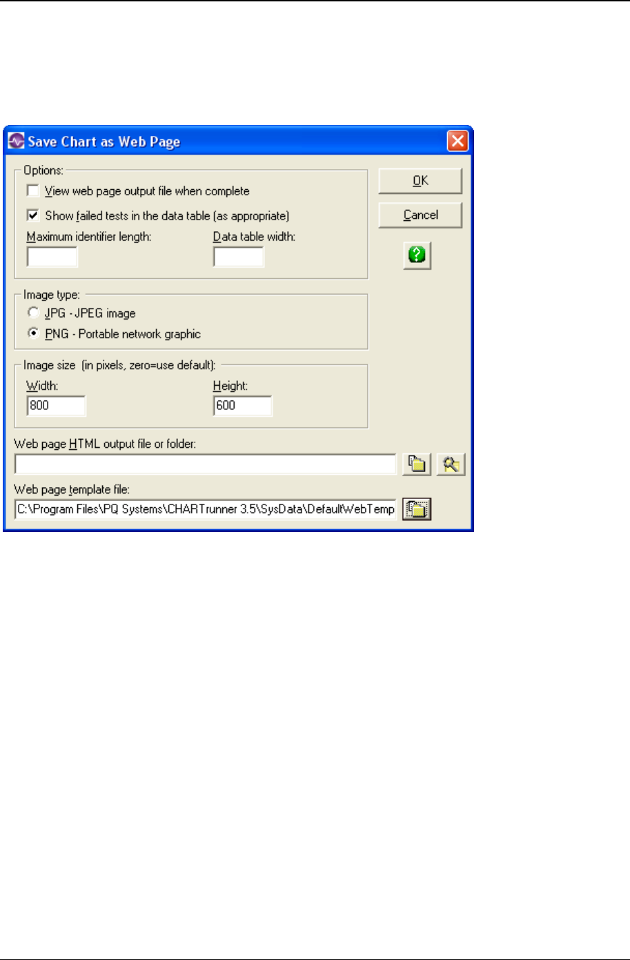
240 CHARTrunner User's Guide
Copyright © 2011
Save chart as web page dialog
When you select the option to Save chart as Web page, the following dialog will be displayed. Select the
desired options and click the OK button to create the Web page.

Using charts 241
Copyright © 2011
• View Web page output file when complete – Enable this box if you would like to view the Web page, using
your Web browser, after it has been generated.
• Show failed tests in the data table – Enable this option to have each out-of-control condition shown in the
Web page's data table.
• Maximum identifier length – If you are including a data table as part of the Web page, enter a value here
for the maximum identifier length. This will truncate identifiers to this maximum length, which can
make the table more readable when long identifiers are present.
• Data table width – If you include a data table in the Web page, this setting affects how wide the table
will be. Leave this blank to allow the Web browser to set the table width. Enter a number to specify
the table width in pixels. Alternatively, enter a percentage to specify that the table should be some
percentage of the Web page's width. For example, if you enter 75%, the data table will consume 75%
of the width of your browser window. If you enter 500, the data table will be 500 pixels wide.
• Image type – Select either JPG or PNG for the type of image to use for the chart that will be displayed
as part of the Web page. PNG usually gives better image quality.
• Image size, width and height – Enter values here to determine the size of the chart image (in pixels)
within the Web page. Enter zeros if you want to use the image size properties saved with the chart
definition.
• Web page HTML output file or folder – If you specify only a folder, then the output Web page HTML file
will be created in the specified folder and will use the chart name as the basis for the Web page file
name. Any embedded spaces in the chart name will be replaced by the underscore character. Or, you
can specify the full path to the HTML Web page file to be created. Click the button to open the folder
selection dialog, or the button to open the file selection dialog.
• Web page template file – The format of the output Web page is determined by the Web page template
file that you specify here. If you do not specify a template file, then CHARTrunner will use the
DefaultWebTemplate.htm file that is located in the SysData folder. Click the button to open the file
selection dialog.
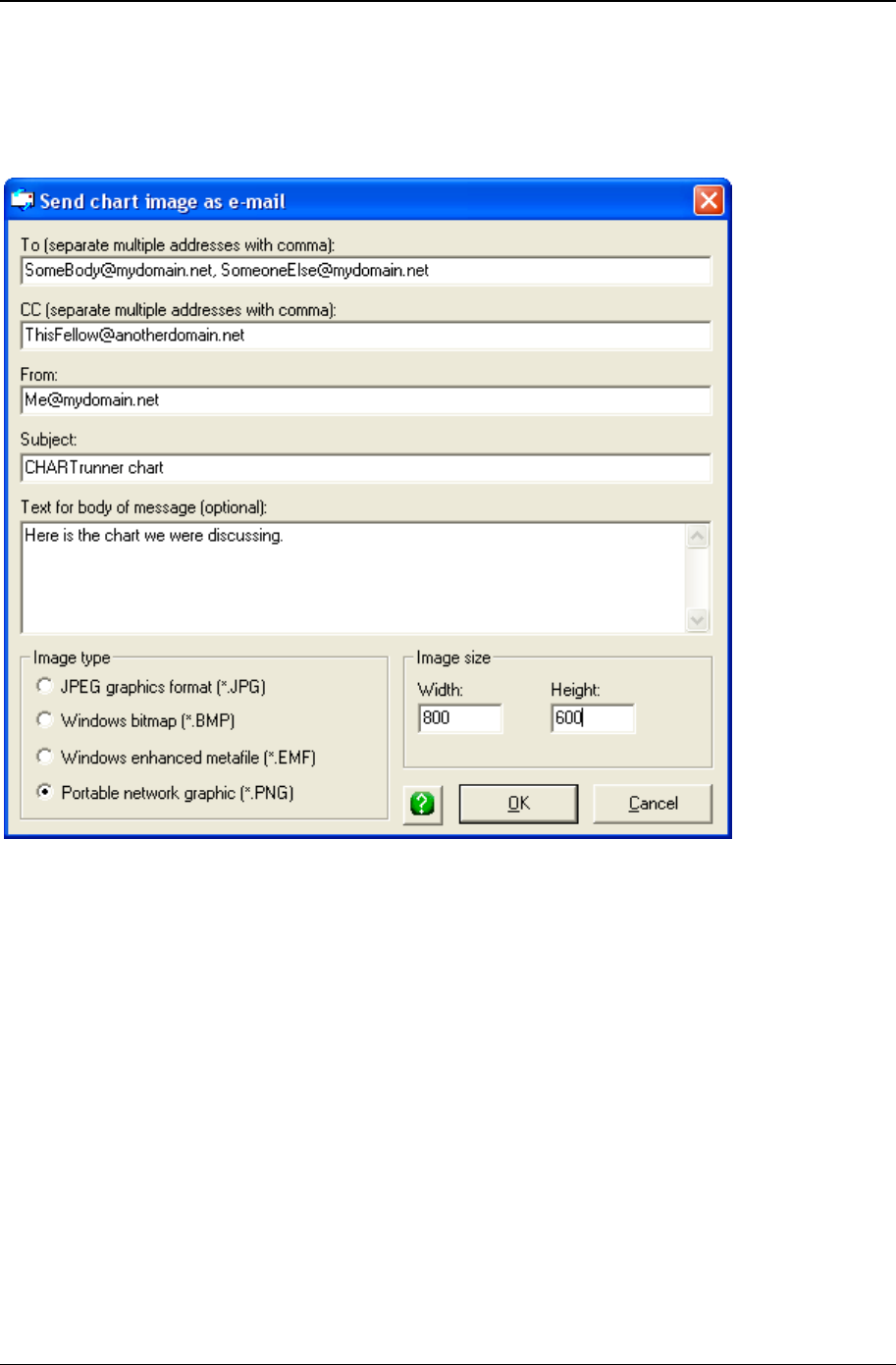
242 CHARTrunner User's Guide
Copyright © 2011
Send chart as e-mail dialog
When you select the option to Send chart as e-mail, the following dialog will be displayed. Select the desired
options and click the OK button to send the e-mail.

Using charts 243
Copyright © 2011
• To – Enter the destination e-mail address. If you are sending to multiple recipients, separate each
address with a comma. For example: SomeBody@mydomain.net, SomeoneElse@mydomain.net.
• CC – If you want to carbon-copy other users, enter their e-mail addresses here. If you are sending to
multiple recipients, separate each address with a comma.
• From – Enter your e-mail address here. This will appear to the recipient as the sender's e-mail
address.
• Subject – Enter a subject line for this e-mail.
• Text – Enter the (optional) text you wish to appear in the body of the e-mail message.
• Image type – Select the type of graphic image file you want to create and attach to the e-mail. PNG
usually gives better image quality.
• Image size – Enter the width and height (in pixels) of the chart image file that will be attached to the e-
mail.
When you click the OK button, the chart is generated as an image file and the image file is added as an
attachment to the e-mail message. The e-mail message will be sent to the addresses you specified in the
To: or CC: fields.
If you get an error when you select Send chart as e-mail, or if the e-mail is not sent, you may have to
configure CHARTrunner for your e-mail system. This is done on the main form by selecting the Setup >
Preferences > E-mail setup pull-down menu.

244 CHARTrunner User's Guide
Copyright © 2011
Linking to chart or dashboard images using
Microsoft PowerPoint or Word
You may want to always use the most recently created version of your CHARTrunner chart or dashboard
images in your PowerPoint presentation or Word document. If you use the Copy-to-clipboard and Paste-
into-document method of getting the image into PowerPoint or Word, the image in the document will not
update when the image file on disk is updated. However, if you follow these instructions and link the
image, your PowerPoint presentation or Word document will always show the most recently created
CHARTrunner chart and dashboard images.
Start the process by saving the required dashboard indicators or charts as images. You may save any
chart as an image file by using the right-click menu on the CHARTrunner definitions list or the File > Save
chart as image pull-down menu on the chart display form. The following image formats are supported: JPG
(JPEG), EMF (Windows Enhanced Metafile), BMP (Bitmap), and PNG (Portable Network Graphics). On
the chart definition form under the Misc > Image file defaults sub-tab, you may select the default image type
you want to use when saving the chart as an image file. The default image type can be overridden when
the image file is created. For more details, see Save chart as image dialog.
The key is to link each image into your document rather than to insert the image. Select the Insert >
Picture > From File pull-down menu in PowerPoint or Word, navigate to the folder containing the image,
such as C:\Charts\Presentation1, select the appropriate image file, such as MyChart1.emf, and finally
select Link to File from the selection button at the lower right of the Insert Picture window.
NOTE: You must select the Down-Arrow next to Insert and then select Link to File.
Updating dashboard images in a folder
You can easily update many dashboard images for a presentation using this technique.
Right-click on the dashboard definition in the CHARTrunner definitions list that contains images for your
presentation and select Update all indicator images in specified folder.
Specify the folder that contains the presentation document and the image files used by that document,
such as:
C:\Charts\Presentation1
CHARTrunner will update all images files found in the specified folder if the image file name corresponds
to an indicator name in the dashboard, and the image type is EMF or PNG. The width and height of the
image will be maintained.
Using a workspace to update many chart images
You can easily update many chart images for a presentation using this technique.
Create a CHARTrunner chart workspace that contains all of the charts that are to be displayed in your
presentation. Give the workspace the same name as your presentation to aid in keeping track of which
workspace goes with which presentation.
Whenever you want to generate new images (that reflect the most recent data) for your presentation,
right-click on the appropriate workspace in CHARTrunner and select Save all charts as image to specified
folder. Save the images to the folder that contains the presentation document and the image files used by
that document, such as:

Using charts 245
Copyright © 2011
C:\Charts\Presentation1
While you can use any of CHARTrunner's image types in PowerPoint or Word, it is suggested that you
use EMF (Windows Enhanced Metafile) images. This type of image resizes well to fit the space allocated
to it in the presentation. An image size of 800 x 600 is a good default size for your EMF images.
PowerPoint linking tips
When you link to an image file, PowerPoint stores the full path to the image file, such as C:\Charts\
Presentation1\Chart1.emf. If you attempt to use the PowerPoint slideshow on a computer where
C:\Charts\ Presentation1\Chart1.emf does not exist, PowerPoint will be unable to display the linked
image. The solution is to store a relative path to the image file, such as Chart1.emf, and keep the images
and PowerPoint PPT file in the same folder. Unfortunately, PowerPoint does not have a built-in means of
converting these full image paths to relative paths. Fortunately, the free demo of PPTools FixLinks utility
will do this for you. Get this helpful utility at http://www.rdpslides.com/pptools/fixlinks/index.html.
If you want to send your PowerPoint presentation to someone else, for example as an e-mail attachment,
how might you do that? You can try using one of the following methods:
• Zip the contents of the folder containing the image files and the PowerPoint PPT file into a zip archive
file. Tell the recipient to unzip the archive into an empty folder and open the PowerPoint PPT file. If
you used relative paths (via FixLinks) then it does not matter what folder the recipient unzips into.
Otherwise, the recipient must unzip to the exact same drive and folder path as was used on the
sending computer.
• In PowerPoint use File > Save As to save the presentation as a file type that is easily transported to
another computer. You can save as a “Single File Web Page” that creates a single .MHT file that can
be displayed in Internet Explorer. Or you can save each slide as an image and send the slide image
files.
• If you have the ability to create a PDF, such as via Adobe Acrobat, then create a PDF version of the
presentation and send that.
Publishing charts
In some situations, you may want to make chart images available to a wider audience. The previous
section discussed the mechanics of creating chart images and saving charts as Web pages. The
following topics address options for making these images available to other users on the network.

246 CHARTrunner User's Guide
Copyright © 2011
Using a local share as a chart image repository
Many organizations have shared disk drives that are available to network users. Each workstation on the
network can be set up with access to various network shares. One way to make your charts visible to
others is to save chart images into shared folders. You may need to check with your local information
technology staff to arrange for a common place to put chart images so that those who need to view them
have the appropriate access.
For example, you might designate Q:\CrCharts\ as a standard place where CHARTrunner images are
generated. When you select Save chart as image, you would select Q:\CrCharts\ as the destination folder for
your chart image. Anyone who wants to view your chart images may browse to and display them by
double-clicking on the file in Windows Explorer. Note that these are snapshots. The chart owner would
occasionally need to generate new images to keep the images in the folder current.
The same approach will work for charts that are saved as Web pages. The user would double-click on the
desired Web page file, and the Web page would be displayed in their Web browser.
Note that generating chart images and chart Web pages can be automated using command line
parameters. When combined with a scheduled task, these images might be generated automatically
every morning at 3:00 am.
Publishing charts on the Internet
If you want people outside your immediate local area network to see your CHARTrunner charts, you can
publish chart images or Web pages on a Web server using a public (visible on the Internet) or a private
(intranet) company Web site. The principles are the same as above. First, a network folder that is being
published on your Web site must be designated. Next, CHARTrunner is used to generate chart images or
chart Web pages into that network folder. Finally, any user with a browser and access to the appropriate
Web site will be able to browse to and view your chart images.
If you want a turnkey solution to publishing your charts on a Web site, consider using CHARTrunner-e.
For more information on CHARTrunner-e, please visit http://www.chartrunner.com/cre.
(http://www.chartrunner.com/cre)
The CHARTrunner software development kit
Many CHARTrunner functions can be controlled programmatically via the Software Development Kit
(SDK). For more information, visit http://www.chartrunner.com/sdk (http://www.chartrunner.com/sdk).

Using charts 247
Copyright © 2011
Using styles to control the look of your charts
What is a chart style?
All regular (i.e., not a Multi-chart or a Workspace) charts have a setting for Chart style. A chart style is a
named collection of settings that affect the visual appearance of a chart, such as chart background color,
line colors, line styles, and fonts.
In the CHARTrunner definitions list, the chart styles appear under the Style Definitions tab, as shown in the
figure above. There are three types of chart styles: Control chart styles, Histogram chart styles, and
Pareto chart styles. CHARTrunner provides a default style for each of these three categories of charts.
The default styles may not be deleted, although you can modify the settings of a default style. You can
create as many new styles as you need.
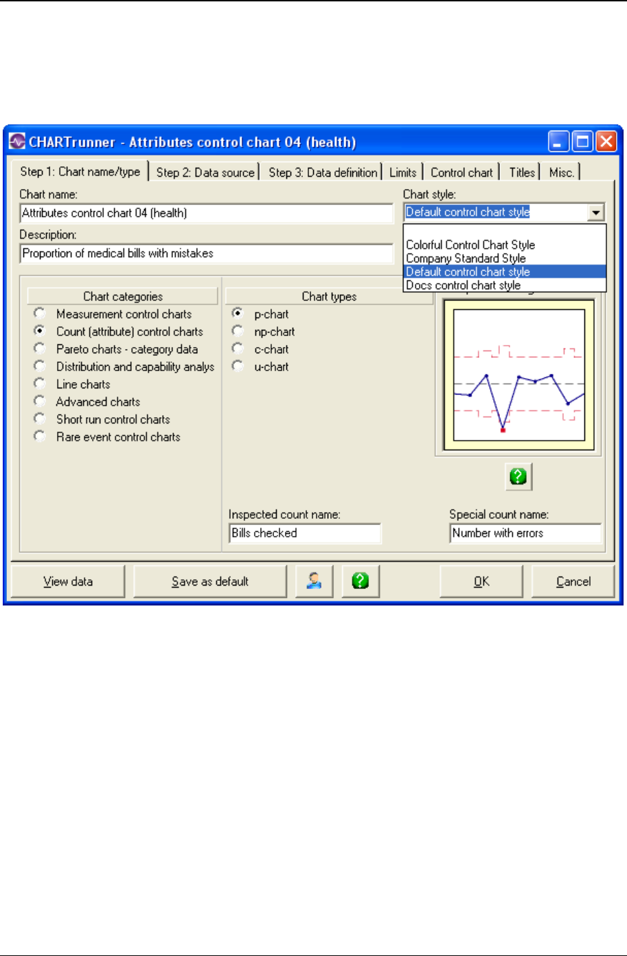
248 CHARTrunner User's Guide
Copyright © 2011
Selecting a style for a chart
The chart style name is selected from the Chart style drop-down list on the Step 1: Chart name/type tab
of the chart definition form, as shown below:
The style names in the Chart style drop-down list are based on the chart style definitions that are found in
the CHARTrunner Styles folder on your computer, plus any style definitions that are found in the current
working chart folder. When a chart is rendered, if the named chart style cannot be found, then the default
chart style for that type of chart will be used instead.
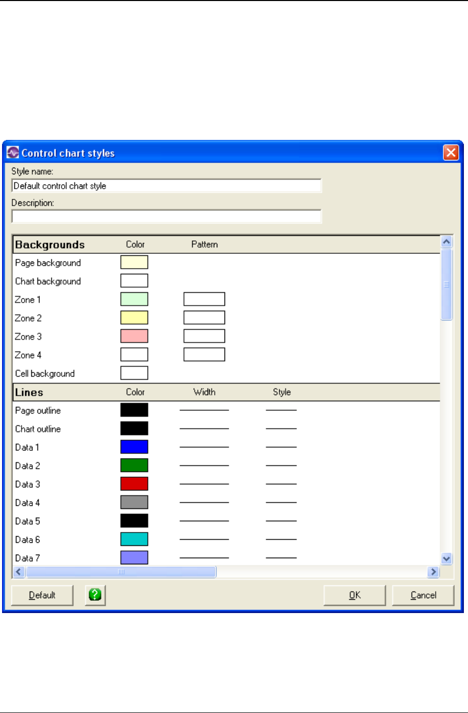
Using charts 249
Copyright © 2011
The chart style editor
You may edit a chart style by right-clicking on it in the CHARTrunner definitions list and selecting Edit.
Also, while you are viewing a chart, you may right-click on the chart and select Edit chart style, or select the
Edit > Edit chart style pull-down menu, or press Ctrl-T. In any case, the chart style editor will open to allow
you to modify the settings of the chart style. The contents of the style editor will vary based on which type
of chart style you are editing (i.e., Control chart style, Histogram chart style, or Pareto chart style). An
example of the style editor for a control chart style is shown below:
There are many style settings that you can change. Notice the scroll bar; you may have to scroll vertically
to find the specific style setting that you want to change. The style settings are organized into the
following categories:
• Background colors

250 CHARTrunner User's Guide
Copyright © 2011
• Lines
• Fonts
• Markers.
• To change a style setting. Click on any style setting that you wish to change. Additional dialogs will
prompt you for a selection such as a color, font, line style, or marker size. Once you have made your
changes, click the OK button to save the chart style. Any charts that use that chart style will reflect
your changes the next time they are rendered.
• Experimenting with style setting changes. In order to become familiar with what effect a particular
style setting change has on the appearance of a chart, it is helpful to connect a test chart to a test
style, and experiment by making changes to the test style in order to see the resulting visual effect on
the chart. The following steps can be used:
1. If you do not have a test style to use, then create one, or make a copy of an existing style. Let's
assume the test style is named “Test Chart Style.”
2. If you do not have a test chart that you want to use, then create one, or make a copy of an existing
chart. Edit the test chart definition and set the Chart style drop-down list to “Test Chart Style.”
3. Display the test chart.
4. While the chart is displayed, open the style editor by pressing Ctrl-T (or by using the various menu
choices to open the style editor).
5. Change a style setting, then click the OK button to close the style editor. You will be asked whether to
“Save the style definition so that the changes will be applied to any charts that use this style in the
future?” Your answer determines whether the style setting change you have just made is saved to the
style definition file on the disk (if you select Yes), or just retained in memory for use with the currently
displayed chart (if you select No). Since you are using a test style definition, select the Yes button.
However, if the chart had been using the default chart style, and you changed the Chart background
setting to hot pink (just to see what it would look like), you would probably want to select the No
button.
6. Notice how the visual appearance of the chart changed as a result of the style setting change you
made.
7. Repeat the process by going back to Step 4 and making additional style changes.
• Local style definitions versus per-chart-folder style definitions. Style definitions are normally stored on
your computer in the CHARTrunner Styles folder (typically C:\Program Files\PQ
Systems\CHARTrunner 3.6\Styles). If you keep chart definitions in a network folder so that they are
accessible by multiple users, you may run into the situation where a chart has a different visual style
when it is displayed on different computers because the style definition that is used by the chart is
different on each of the computers. You could ensure that each computer where CHARTrunner is
installed has the same style definitions (but that could be difficult to maintain). Alternatively, you can
copy (using Windows Explorer) any style definition files needed by the charts directly into the chart
folder. CHARTrunner will use the style definition that is found in the chart folder before it will use a
style definition by the same name in the local computer's CHARTrunner Styles folder. When a style
name is preceded by “>” in the definitions list, that indicates the style definition file is located in the
chart folder, rather than in the CHARTrunner Styles folder.

Using charts 251
Copyright © 2011
Out-of-control tests
Out-of-control (OOC) tests are criteria used to interpret a control chart for process stability. For example,
tests might look for points out of control, consecutive points above or below the centerline, or two of three
points beyond two sigma.
Each control chart specifies in the chart definition the out-of-control tests that will be used by that chart.
However, you can specify in Setup > Preferences to use one master set of out-of-control tests for all your
charts.
Refer to Appendix E: Out-of-control Tests And Codes for information on the out-of-control test definitions
that are provided with CHARTrunner.
Test rule syntax
The out-of-control test rules follow the syntax shown below.
Test rule keywords are shown in CAPITAL LETTERS below, but CHARTrunner is not sensitive to case,
so you may use either upper or lower case.
Optional parameters are shown in lower case.
m
ALTERNATING a r
m
INCREASING (See Note 1 and
Note 3 below) o i a r
m
DECREASING (See Note 2
and Note 3 below) o i a r
m
BEYOND LIMITS i a r
m
BEYOND SPECS i a r
m
BEYOND n SIGMA i a r
m
WITHIN LIMITS i a r
m
WITHIN SPECS i a r
m
WITHIN n SIGMA i a r
m
BELOW LOWER LIMIT i a r
m
BELOW LOWER SPEC i a r
m
BELOW CENTER LINE i a r
m
BELOW TARGET i a r
m
BELOW MEDIAN i a r
m
BELOW n SIGMA i a r
m
BELOW n i a r
m
ABOVE UPPER SPEC i a r
m
ABOVE UPPER LIMIT i a r
m
ABOVE CENTER LINE i a r

252 CHARTrunner User's Guide
Copyright © 2011
m
ABOVE TARGET i a r
m
ABOVE MEDIAN i a r
m
ABOVE n SIGMA i a r
m
ABOVE n i a r
SWED EISENHART TOO
LITTLE VARIATION b
SWED EISENHART TOO
MUCH VARIATION b
SWED EISENHART RUN
SWED EISENHART TREND
NOTE 1: ASCENDING can be used in place of INCREASING.
NOTE 2: DESCENDING can be used in place of DECREASING.
NOTE 3: See the "ASCENDING or DESCENDING trend test rules" section below to learn how the rules for
trend testing are applied.
Where the optional parameters are:
m represents “how many points”
(the numeric constants shown below are representative; you can specify any number):
Nothing
1
1 POINT
2
2 POINTS
2 of 3
2 of 3 POINTS
2 out of 3
2 out of 3 POINTS
a represents an expression in parentheses of these forms:
(N < constant)
(N > constant)
(N <= constant)
(N >= constant)
N represents “the number of subgroups of data.” Other letters have no meaning, but are not critiqued.
r represents which chart type the test applies to:
Nothing (applies to all chart types)
Any combination of:
[XBAR]

Using charts 253
Copyright © 2011
[INDIVIDUALS]
[MEDIAN]
[RANGE]
[SIGMA]
[ATTRIBUTES]
[RUN]
[DIFFERENCE]
[DIFFERENCERANGE]
[ZED]
[ZED*]
[ZEDWEIGHT]
[ZED*WEIGHT]
[XBARASINDIVIDUALS]
[RANGEOFXBARS]
[NOUSE] (This allows specifying a Test, but not using it)
o represents:
Nothing
ONLY
i represents:
Nothing
INCLUSIVE
n represents:
Nothing
Numeric constant like 4
b represents:
Nothing (defaults to 1% risk)
(1% risk)
(5% risk)
• Custom test rules – You can specify a custom test if you need one that is not provided in
CHARTrunner's list of predefined tests. In general, you can change the numeric part of a rule, as long
as the rule still makes sense. For instance, you could customize the predefined rule “4 of 10 below 2
sigma” so that it becomes “6 of 11 below 2 sigma.” But if you specify “6 of 5 below 2 sigma,” that
would not be accepted because it does not make sense.
• ASCENDING or DESCENDING trend test rules – Trend testing (also called run testing) is performed
as follows.
The following rules are used to evaluate a control chart for the presence of a run of ascending or
descending data values:
1. Two or more consecutive and identical values do not start a run, unless the INCLUSIVE modifier
is used, in which case the last consecutive and identical value will start the run.

254 CHARTrunner User's Guide
Copyright © 2011
2. The optional ONLY test qualifier – Two or more identical data values in the middle of a run can be
treated in two different ways:
When the ONLY qualifier is used, such as "7 ASCENDING ONLY," two or more identical values in the
middle of a run will break the run.
When the ONLY qualifier is not used, such as "7 ASCENDING," two or more identical values
in the middle of a run will be counted as part of the run.
1. The optional INCLUSIVE test qualifier – When the INCLUSIVE qualifier is used, such as "7
ASCENDING INCLUSIVE," the value before the first value in the run is included in the run. When
the INCLUSIVE qualifier is not used, such as "7 ASCENDING," the value before the first value in
the run is not included in the run.
Consider the following data values that are to be tested for an ASCENDING trend.
8, 8, 8, 10, 11, 12, 12, 12, 15, 17, 18, 20, 16
The following ASCENDING runs are present depending on whether the optional INCLUSIVE and/or
ONLY qualifier is used:
ASCENDING (10, 11, 12, 12, 12, 15, 17, 18, 20)
ASCENDING INCLUSIVE (8, 10, 11, 12, 12, 12, 15, 17, 18, 20)
ASCENDING ONLY (10, 11, 12) and (15, 17, 18, 20)
ASCENDING ONLY INCLUSIVE (8, 10, 11, 12) and (12, 15, 17, 18, 20)
If you are using the "7 ASCENDING" test then an out-of-control signal would be triggered due to the
run (10, 11, 12, 12, 12, 15, 17, 18, 20) which is a trend of nine. In this case, the six values (10, 11, 12,
12, 12, 15) at the start of the run contribute to the trend, but they do not fail the test, and thus appear
with hollow red markers on the chart. Only the last three values (17, 18, 20) actually fail the test,
which creates an out-of-control signal, and thus these values appear with solid red markers on the
chart.
If you are using the "7 ASCENDING INCLUSIVE" test then an out-of-control signal would be triggered
due to the run (8, 10, 11, 12, 12, 12, 15, 17, 18, 20) which is a trend of ten. In this case, the six values
(8, 10, 11, 12, 12, 12) at the start of the run contribute to the trend, but they do not fail the "7
ASCENDING" test, and thus appear with hollow red markers on the chart. Only the last four values
(15, 17, 18, 20) actually fail the test, which creates an out-of-control signal, and thus these values
appear with solid red markers on the chart.
If you are using the "7 ASCENDING ONLY" or "7 ASCENDING ONLY INCLUSIVE" test then no out-
of-control signal would be triggered.
• The INCLUSIVE test rule qualifier – The optional INCLUSIVE test rule qualifier can be used in two
contexts:
• In a trend test rule such as "7 ASCENDING INCLUSIVE". See "ASCENDING or DESCENDING trend
test rules" above to learn about this usage of INCLUSIVE.
• In a test rule where the chart value is compared to a number. When INCLUSIVE is used it means to
generate an out-of-control signal when the chart value equals the comparison number.
For example, consider the test rule "ABOVE TARGET INCLUSIVE". When INCLUSIVE is used,
an out-of-control signal is triggered when the chart value is greater than or equal to (>=) the target
value. When INCLUSIVE is not used, e.g. "ABOVE TARGET", an out-of-control signal is triggered
when the chart value is greater than (>) the target value.
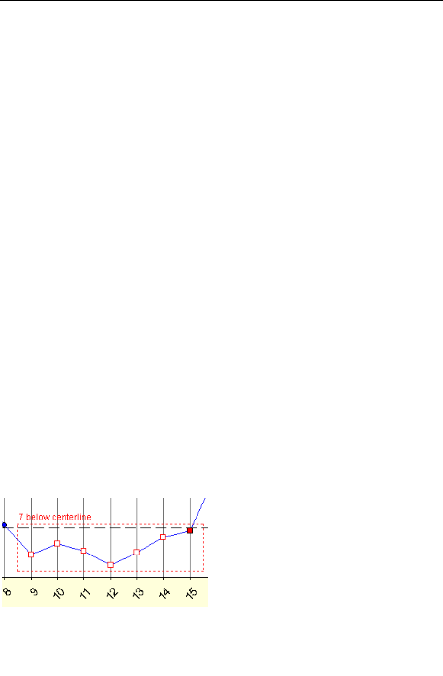
Using charts 255
Copyright © 2011
• The “(N operator constant)” test qualifier – The optional parameter "a" that may be used with some
test rules allows you to append an expression like (N >= 20) to a test rule. For example, in the test “7
ascending only (n>=20),” the constant value of 20 refers to the number of subgroups that are
“available for consideration” by the chart, so that the test will be applied to the chart only if the number
of subgroups “available for consideration” by the chart is greater than or equal to 20 subgroups. What
determines the number of subgroups that are “available for consideration” by the chart? Consider the
following example. Assume that the data source returns 100 rows of data, and since you are not
using Advanced Row Selection, the 100 rows of data will result in 100 subgroups that potentially can
be charted. On the Step 3: Data definition tab of the chart definition, if the Result records to include field
specifies “Last N = 30” or “First N = 30,” then only 30 subgroups out of the 100 subgroups are “available for
consideration” by the chart. However, if the Result records to include field specifies “All” subgroups, then all
100 subgroups are “available for consideration” by the chart. While the chart is displayed, you can
use the slider bar to adjust the number of subgroups currently displayed by the chart, or you can edit
the chart definition and on the X-axis Y-axis sub-tab select Enable horizontal x-axis scrolling and specify
the chart width. But neither of these has any effect on the number of subgroups that are “available for
consideration” by the chart.
The Swed Eisenhart run test rules
The Swed Eisenhart rules are used only on run charts. To determine if a point violates one of the rules, a
lookup table is used. The lookup table is based on the number of data points on the chart and the number
of runs present. When a data point violates a rule, it is displayed using the “OOC data” marker style that
is defined by the style definition used by the chart.
The tests that are named 'too much variation' and 'too little variation' use two different lookup tables.
These tables are calculated differently, based on the risk of failing the run test for random patterns of
data. One table is based on a 1% risk, and one table is based on a 5% risk. This is why CHARTrunner
offers both a 1% and a 5% version of the Swed Eisenhart tests.
If you have any doubt about which set to use, select the 1% tests. Different practitioners have different
preferences for how sensitive they want these tests to be. For example, Bob Lloyd prefers the tests based
on 1% risk where Lloyd Provost recommends the tests based on 5% risk.
Out-of-control data markers
CHARTrunner flags data points that fail the out-of-control test conditions by using the “OOC data” marker
style that is defined by the style definition used by each chart. In the figure shown below, the square data
marker is used as the “OOC data” marker.
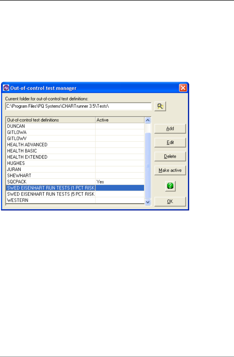
256 CHARTrunner User's Guide
Copyright © 2011
As shown in the figure above, points that contribute to a test failure, but are not actually failed points, are
displayed using a hollow “OOC data” marker. Points that actually fail a test are displayed using a solid
“OOC data” marker.
To specify out-of-control tests
Use the Setup > Out-of-control tests menu on the main CHARTrunner window. The Out-of-control test
manager form will open, as shown below, and display the out-of-control test definitions found in the
specified folder.
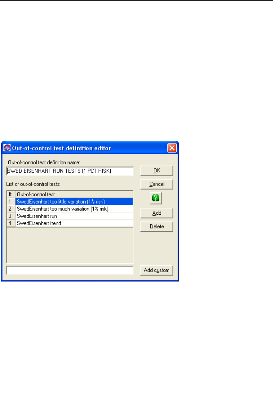
Using charts 257
Copyright © 2011
• Set folder – This allows you to specify the location of the folder where the Out-of-control test definition
files is located. By default this points to CHARTrunner's SysData folder. You might choose to keep a
common set of Out-of-control test definition files on a network share instead.
• Add – This allows you to add a new out-of-control test definition. The Out-of-control test definition
editor window shown below will open.
• Edit – This allows you to edit the currently highlighted out-of-control test definition. The Out-of-control
test definition editor window shown below will open.
• Delete – This allows you to delete the currently highlighted out-of-control test definition.
• Make active – This allows you to specify the currently highlighted out-of-control test definition as the
active one. In Setup > Preferences, if you specify to Use the same out-of-control tests for all charts, then
the active out-of-control test definition will be used on all control charts (the tests defined in the chart
definition will not be used). If Use the same out-of-control tests for all charts is not specified, the active set
of out-of-control tests will be used as the default for any new chart definitions, as well as for older
chart definitions that did not contain “per-chart” out-of-control tests.
When the Add or Edit button is clicked, the following “Out-of-control tests editor” opens:

258 CHARTrunner User's Guide
Copyright © 2011
Out-of-control test definition name – Enter the name to identify this out-of-control test definition.
Add – Click this button to add a predefined test rule. The Select an out-of-control test window (shown
below) opens to display the predefined test rules you may select from. Highlight the test rule or rules you
desire to use (select multiple rules with Ctrl-Click) and click the OK button. Added rules are placed below
the currently selected row in the list. Arrange the order of the test rules by clicking and dragging the rule
number with the mouse.
• Delete – Highlight a test rule in the list and click the Delete button to remove the test from the list.
• Add custom – Click this button to add the custom test you entered in the field to the left of the Add
custom button into the list of test.

259
In This Chapter
Introduction to dashboards.......................................................................... 260
The basic steps of creating and using dashboards .................................... 263
Working with dashboard definitions ............................................................ 263
What type of image file should I use? ......................................................... 264
Dashboard definition ................................................................................... 265
Indicator definition ....................................................................................... 266
Indicator tab - indicator definition ................................................................ 267
Scale tab - indicator definition ..................................................................... 271
CHARTrunner chart tab - indicator definition .............................................. 273
CHAPTER 10
Dashboards
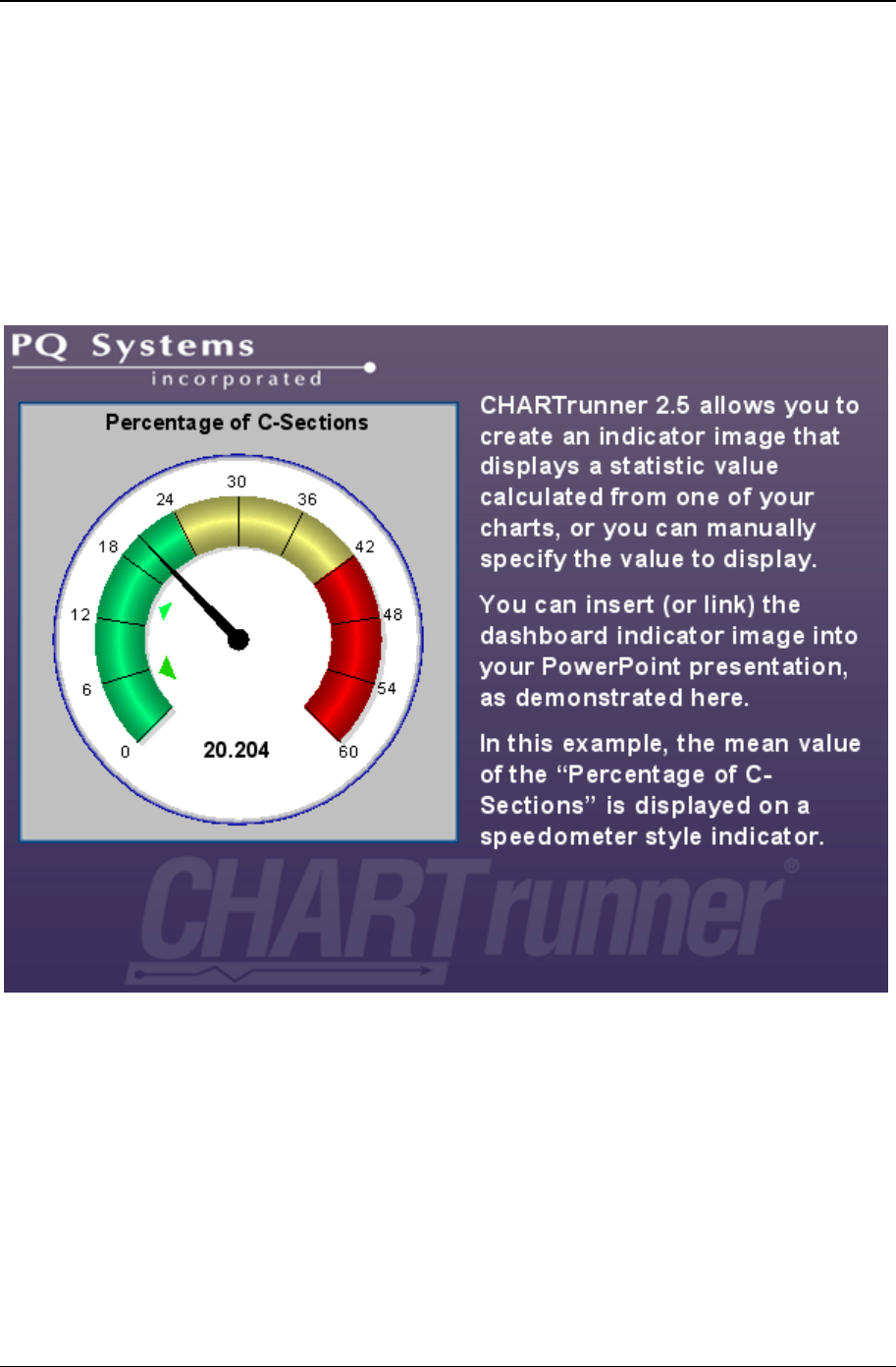
260 CHARTrunner User's Guide
Copyright © 2011
Introduction to dashboards
CHARTrunner users sometimes need to present statistical information about their business processes to
an audience that may not be familiar or comfortable with interpreting statistical process control charts.
Charts present a lot of meaningful information about a process. In the best case scenario, persons who
are involved in understanding and improving processes within the company would use charts. But there
can be times when a less complex presentation of key process metrics is useful.
One way of presenting this process information is via a dashboard presentation, such as is illustrated by
the following slide from one of the sample PowerPoint presentations that come with CHARTrunner.
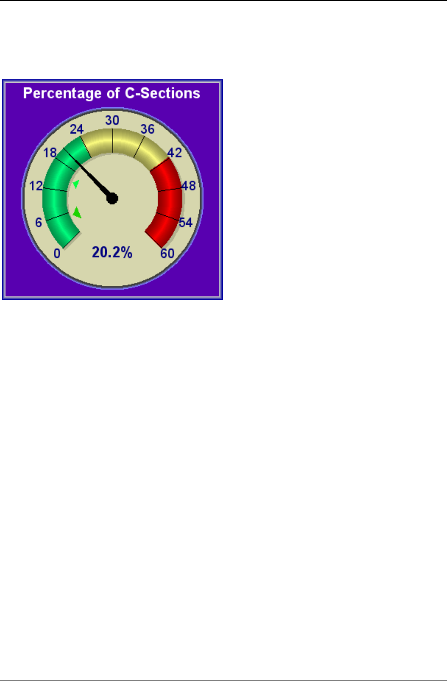
Dashboards 261
Copyright © 2011
CHARTrunner allows you to create dashboard indicators in the style of a speedometer (as shown above).
In this example, the “Percentage of C-Sections” mean value is currently 20.204 percent. The goal of 15
percent is shown by the light green pointer, and the stretch goal of 5 percent is shown by the larger dark
green pointer.
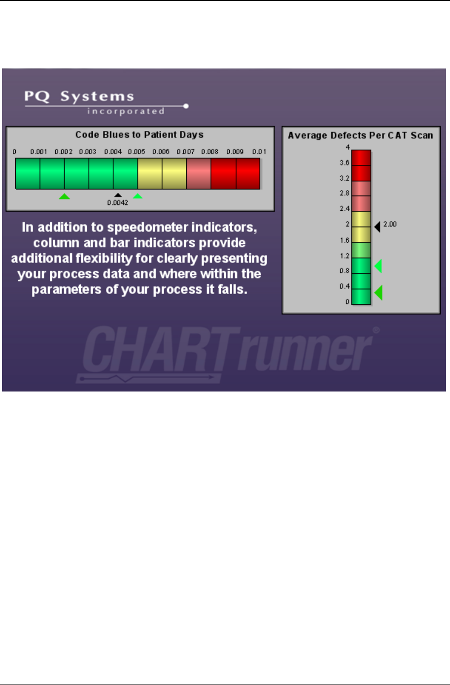
262 CHARTrunner User's Guide
Copyright © 2011
You can customize the size, colors, borders, fonts, and title of each indicator. The speedometer indicator
shown above has been customized to have a more colorful appearance than it did in the preceding
sample PowerPoint slide.
In addition to speedometer indicators, CHARTrunner allows you to create indicators in the style of a
vertical or horizontal bar graph (as shown above). You choose the indicator style that best presents
information about your process.
Your indicators will be saved as image files. You use these indicator images to create visually appealing
dashboard presentations using PowerPoint, Word, web pages, or any other presentation medium that
allows you to insert or link your indicator images into the presentation.

Dashboards 263
Copyright © 2011
The basic steps of creating and using
dashboards
Here are the basic steps you will follow to create and use CHARTrunner dashboards:
• Define your dashboard - Create your dashboard definition in CHARTrunner. Each named dashboard
definition contains one or more indicator definitions. Each indicator definition describes the properties
of a single dashboard indicator (speedometer, vertical bar or horizontal bar). Typically you will group
similar indicators together into one dashboard definition. For example, you might put the fifteen
indicators used in your monthly presentation to the board of directors in a dashboard definition called
“Monthly Board Presentation.”
• Update indicator values - Prior to creating or updating the indicator images for your presentation, you
should ensure that the process value displayed by each indicator, and the goal pointer(s) on each
indicator, accurately reflect the current state and goals of each process. Each indicator definition can
be associated with a CHARTrunner chart definition, and the indicator value can be calculated from a
statistic associated with the chart. It is very easy to update the calculated statistic value for each
indicator in the dashboard. Just right-click on the dashboard in the CHARTrunner definition list and
select Update indicator values from chart statistic. CHARTrunner will open the associated chart definition
for each indicator, calculate the requested statistic value, and update the display value for the
indicator.
• Generate new indicator images – You can easily generate a set of indicator images to use in your
presentation. Just right-click on the dashboard in the CHARTrunner definition list and save the new
indicator images into the folder that you specify.
• Use the new indicator images in your dashboard presentation – This can be a very easy step if you are using
a presentation tool such as Word or PowerPoint that allows you to link rather than insert your indicator
images into the presentation. Linked images are not physically stored in the presentation document.
Thus whenever you update the images, the presentation uses the new images without any further
work on your part. For more information on using linked images with PowerPoint, see Linking to
Chart or Dashboard Images Using Microsoft PowerPoint or Word (on page 244).
Working with dashboard definitions
You may use these means of working with a dashboard definition:
• Toolbar – When a dashboard is selected in the CHARTrunner definitions list, you may perform the
following operations using the toolbar:
• Click on the Edit the selected definition button in the toolbar to edit the dashboard definition.
• Click on the New definition button in the toolbar to create a new dashboard definition.
• Click on the Display the selected definition button in the toolbar to display each indicator defined by
the dashboard.
• Click on the Delete the selected definition button in the toolbar to delete the dashboard definition.

264 CHARTrunner User's Guide
Copyright © 2011
• Double-click – Double-click on a dashboard definition in the CHARTrunner definitions list, and the
dashboard will either be displayed or opened for editing. Under Setup > Preferences you tell
CHARTrunner which action to take when a definition is double-clicked.
• Right-click menu – You may right-click on a dashboard in the CHARTrunner definitions list to bring up a
context menu (sometimes called a right-click menu) with these menu choices:
• Display – Display each indicator defined by the selected dashboard. You may cycle through the
available indicator images by using the arrow keys or by clicking on the navigation buttons at the
bottom of the display window.
• Edit – Edit the selected dashboard definition.
• Copy – Make a copy of the selected dashboard definition and then edit the copied definition.
• Delete – Delete the selected dashboard definition.
• Save all indicators as images to specified folder – Create an image file for each indicator defined by the
dashboard definition. CHARTrunner will ask you to specify the folder into which to save the indicator
images. You must also specify what type of image to create (EMF or PNG). You have the option to
create each image using the size in pixels defined by each indicator definition, or you can override
that and generate all the indicator images using the height and width that you specify.
• Update all indicator images in specified folder – Update an existing image file for each indicator defined by
the selected dashboard definition. CHARTrunner will ask you to specify the folder that contains the
indicator images to be updated. You do not specify the type of image file or the image size, because
CHARTrunner gets that information from the image files that are already in the folder. In order for an
image to be updated, it must be an EMF or PNG image, and the image filename must match the
indicator name.
• Update indicator values from chart statistic – CHARTrunner will open the associated chart definition
for each indicator in the selected dashboard definition, calculate the specified statistic value, and
update the display value for the indicator. Indicator definitions that have the Only permit manual update
of the statistic value from chart option selected will not be updated.
• New dashboard – Create a new dashboard definition.
• Pull-down menu – When a dashboard is highlighted in the CHARTrunner definitions list you may select
options from the Dashboard menu. The available options are identical to those described above for
the right-click menu.
What type of image file should I use?
You have the option of creating an indicator image file as either an EMF or PNG image. Select an image
type based upon the following criteria:
a EMF (Enhanced MetaFile) – EMF images resize in your presentation tool much better than PNG images
do. Therefore, unless your target presentation is a web page, we recommend that you use EMF
images.
b PNG (Portable Network Graphics) – Web browsers such as Internet Explorer or Firefox do not work well
with EMF images, so use PNG images for your browser-based presentations.
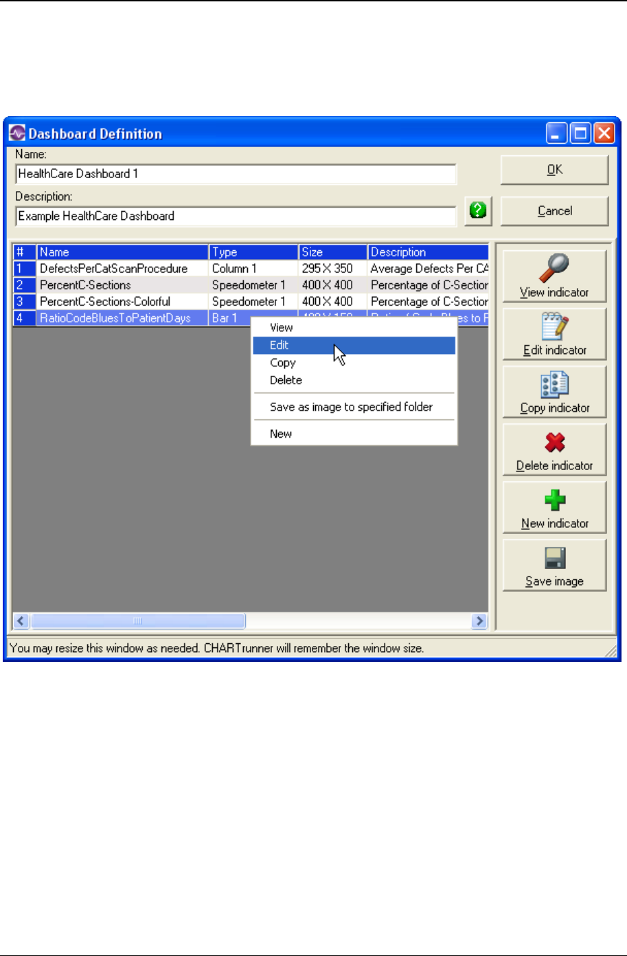
Dashboards 265
Copyright © 2011
Dashboard definition
The following form is used to view and change the properties of a dashboard definition.
• Name – Enter the name that identifies the dashboard definition. This is the name that is displayed in
the CHARTrunner definitions list.
• Description – Enter a description for this dashboard definition.
• Indicators Grid - The grid displays the name and other information about each indicator definition that is
defined in this dashboard definition.
• Name – The name of the indicator definition.
• Type – The type or style of indicator: speedometer, vertical bar or horizontal bar.
• Size – The default width and height of the indicator when it is saved as an image file.
• Description – The description of the indicator.
• Chart Definition – The full path to the associated chart definition for the indicator.

266 CHARTrunner User's Guide
Copyright © 2011
You may right-click on a row of the indicators grid, as shown in the figure above, and get a context menu
with the following choices. The actions available via these context menu choices are also available using
the buttons on the right side of the form.
• View – Display a sample of the selected indicator image.
• Edit – Edit the selected indicator definition.
• Copy – Make a copy of the selected indicator definition and then edit the copied definition.
• Delete – Delete the selected indicator definition.
• Save as image to specified folder – Create an image file for the selected indicator. CHARTrunner will ask
you to specify the folder into which to save the indicator image. You must also specify what type of
image to create (EMF or PNG). You have the option to create the image using the size in pixels
defined by the indicator definition, or you can override that and generate the indicator image using the
height and width that you specify.
• New – Create a new indicator definition.
Indicator definition
The three tabs of the dashboard indicator definition form are used to view and change the properties of
an indicator definition. A sample indicator image is displayed on the right side of the form. This image
updates as the properties of the indicator are changed.
These fields are always visible no matter which tab is selected:
• Name – Enter the name that identifies the indicator. The name you specify here may contain only
characters that are legal for a file name since this name determines the file name of the indicator
graphic image file.
• Description – Enter a description for this indicator.
• Show indicator actual size – Select this option display the sample indicator image using the actual height
and width in pixels. If this option is not selected, the sample image will be scaled to fill as much of the
form as is possible given the current size and aspect ratio of the form. You may resize the form using
the standard Windows technique of dragging a corner of the window with the mouse.
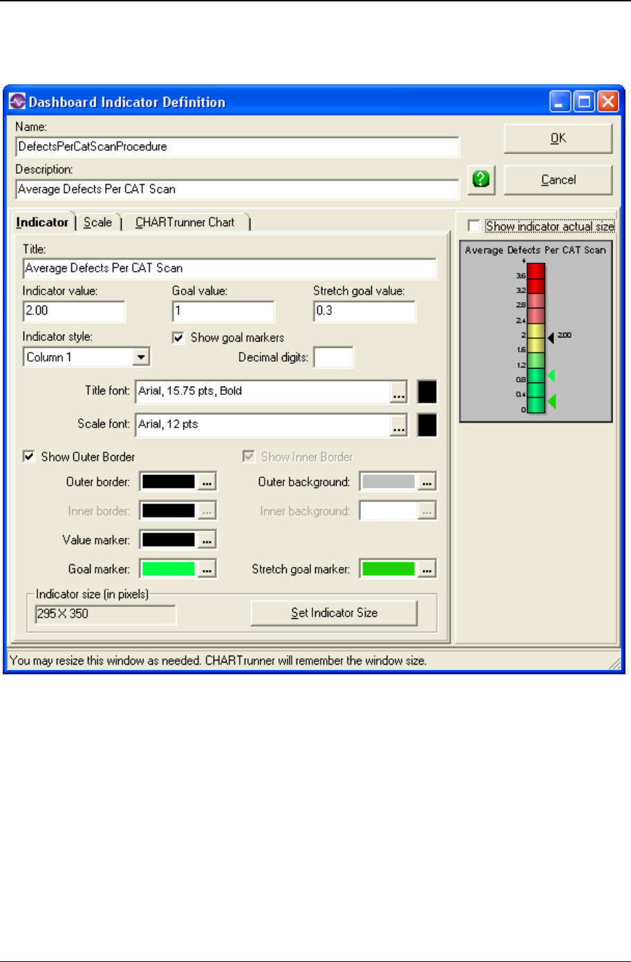
Dashboards 267
Copyright © 2011
Indicator tab - indicator definition

268 CHARTrunner User's Guide
Copyright © 2011
• Title – The optional title text to be displayed above the indicator.
• Indicator value – The numeric “indicator value” to be displayed by the indicator. If no value is entered,
the indicator will not display a value. This field and the Indicator statistic value field on the CHARTrunner
Chart tab both display and allow you to change the “indicator value”.
• Goal value – The numeric value to be displayed by the goal marker. If no value is entered, or Show goal
markers is not selected, the goal marker will not be shown on the indicator.
• Stretch goal value – The numeric value to be displayed by the stretch goal marker. If no value is
entered, or Show goal markers is not selected, the stretch goal marker will not be shown on the
indicator.
• Show goal markers – Select this option to enable displaying the goal and stretch goal markers on the
indicator.
• Indicator style – Specifies the visual style of the indicator:
• Bar 1
• Column 1
• Speedometer 1

Dashboards 269
Copyright © 2011
• Decimal digits – Specify the number of decimal digits to display for the indicator value label. Leave this
blank if you want the maximum available number of decimal digits to be displayed.
• Title font – Specify the font properties and color used for the title font. This font is also used for the
label associated with the indicator value.
• Scale font – Specify the font properties and color used for labeling the scale values.
• Show Outer Border – Specify whether or not to draw the outer border.
• Show Inner Border – Specify whether or not to draw the inner border. The inner border is used only for
the speedometer indicator.
• Outer border (color) – Specify the color of the outer border.
• Outer background (color) – Specify the color of the outer background area of the indicator.
• Inner border (color) – Specify the color of the inner border. The inner border is used only for the
speedometer indicator.
• Inner background (color) – Specify the color of the inner background area of the indicator. The inner
background is used only for the speedometer indicator.
• Value marker (color) – Specify the color of the marker used to indicate the current value of the
indicator.
• Goal marker (color) – Specify the color of the goal marker.
• Stretch goal marker (color) – Specify the color of the stretch goal marker.
• Indicator size (in pixels) –The current width and height (in pixels) of the indicator is displayed Click the
Set Indicator Size button to change the size.
• Set Indicator Size – Click this button to set the current height and width of the indicator. The following
Set Dashboard Indicator Size window will open. Drag the lower-right corner of the window, using the
mouse to visually adjust the size of the indicator. Or, enter the size you want in the width and height
fields at the lower-left. Click the Set button to apply the changed size to the indicator. Press the Esc
key, or click the close button in the upper-right corner, to close the window without changing the
indicator size.
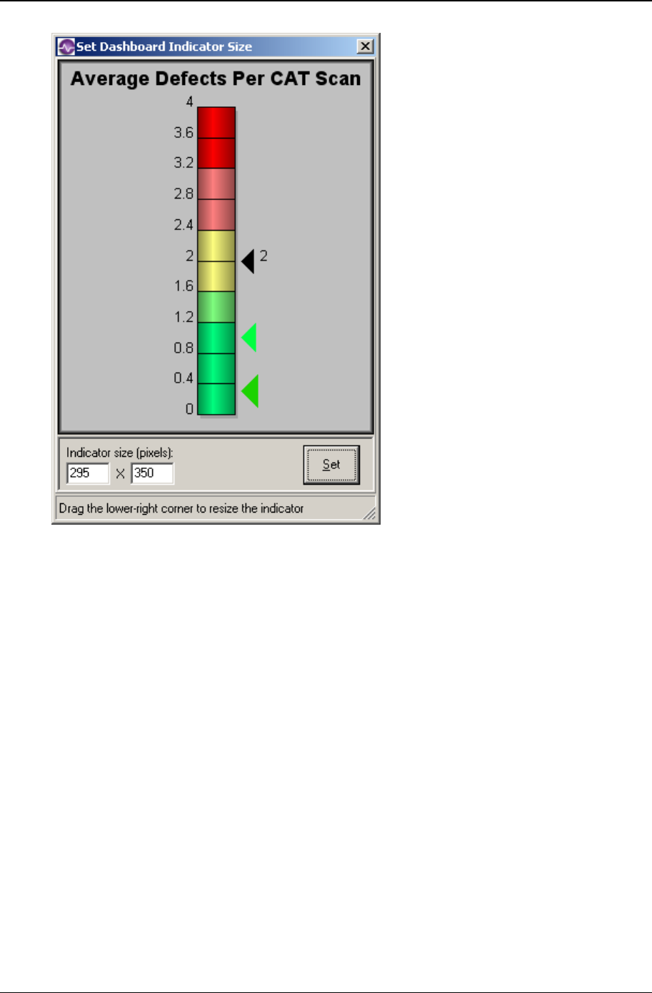
270 CHARTrunner User's Guide
Copyright © 2011
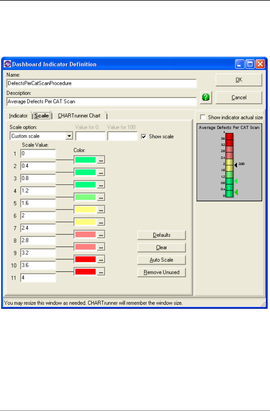
Dashboards 271
Copyright © 2011
Scale tab - indicator definition
This tab allows you to specify the color and value assigned to each segment of the indicator. You can
specify up to ten segments, but you can use fewer than ten segments if you so desire.
• Scale option – Select from one of these scaling options:
• Custom scale – The “indicator value” is used directly, without any transformation.
Percentage scale – The Indicator value, Goal value and Stretch goal value are transformed into a
percentage between Value for 0 and Value for 100, and the calculated percentage value is displayed
by the indicator. The percentage calculation formula is:
Percent = 100 * ((DataValue – ValueFor0) / (ValueFor100 – ValueFor0))
• Value for 0 – Specify the data value that corresponds to zero percent.
• Value for 100 – Specify the data value that corresponds to 100 percent.
272 CHARTrunner User's Guide
Copyright © 2011
• Show scale – Select this option to show the scale value for each segment of the indicator. The first and
last scale values are always shown, regardless of whether this option is selected or not.
• Scale Value – Specify the scale value assigned to each segment of the indicator. You can specify up to
ten segments, but you can use fewer than ten segments if you so desire.
• Color – Specify the color assigned to each segment of the indicator. Click to open the color
selection dialog. When the color rectangle has focus, press Ctrl-C to copy the current color to the
clipboard. Afterwards, you may click on a different color rectangle and press Ctrl-V to paste the color
from the clipboard. This technique allows you to quickly assign the same color to multiple color slots.
You may press the Delete key to set the color to white.
• Defaults – Click to assign default scale and color values to the indicator segments.
• Clear – Click to clear all scale value fields, and assign white as the color for all segments.
• Auto Scale – Click to have CHARTrunner automatically assign scale values to empty slots that are
bounded by a lower and upper value. The following examples illustrate how this works:
Before 0 10
After 0 2.5 5.0 7.5 10
Before 100 500
After 100 180 260 340 420 500
Before 0.0 1.0
After 0.0 0.1 0.2 0.3 0.4 0.5 0.6 0.7 0.8 0.9 1.0
• Remove Unused – Click to remove the first empty scale value slot. Subsequent value and color slots
are moved to fill in the removed slot. The following example shows what happens after this button is
clicked twice.
Before 0.0 0.1 0.2 0.5 0.6 0.7 0.8 0.9 1.0
After 0.0 0.1 0.2 0.5 0.6 0.7 0.8 0.9 1.0
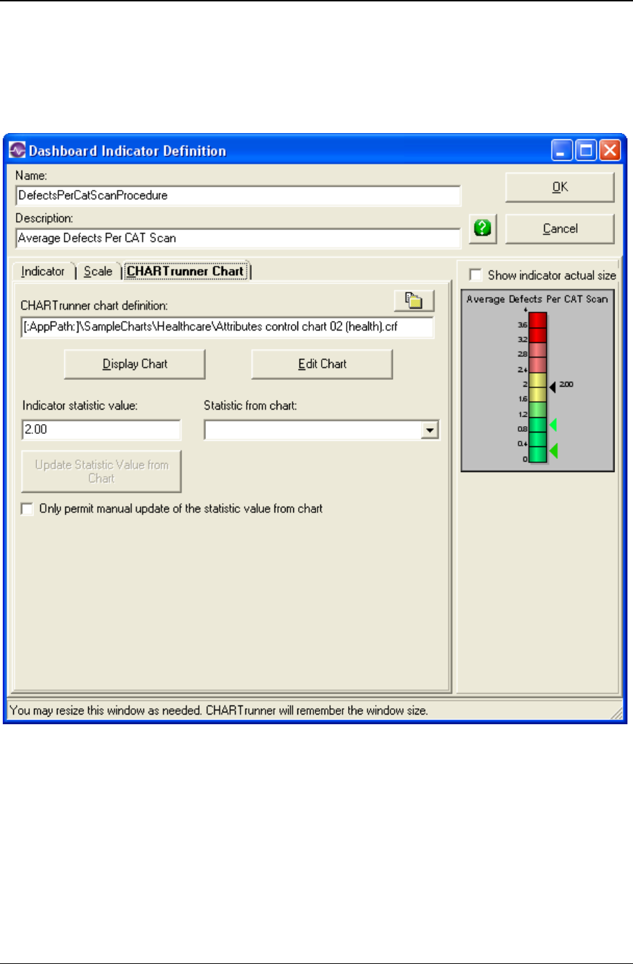
Dashboards 273
Copyright © 2011
CHARTrunner chart tab - indicator definition
This tab allows you to specify the associated CHARTrunner chart for the indicator and the statistic value
to be calculated from the associated chart.

274 CHARTrunner User's Guide
Copyright © 2011
• CHARTrunner chart definition – Specify the full or relative path to the associated chart definition file.
Click the file selection button to open the file selection dialog. In the example shown above, the
full path to the definition file is specified. And, the [:AppPath:] macro is used to specify the folder
where CHARTrunner is installed. If only the relative path “Attributes control chart 02 (health).crf” had
been specified, then CHARTrunner would look in the current working folder for that chart definition.
• Display Chart – Click this button to display the associated chart in a new window.
• Edit Chart – Click this button to edit the associated chart definition.
• Indicator statistic value – The numeric “indicator value” to be displayed by the indicator. If no value is
entered, the indicator will not display a value. This field and the Indicator value field on the Indicator tab
both display and allow you to change the “indicator value”.
• Statistic from chart – Specify the statistic value that you want to compute from the associated chart
definition.
• Update Statistic Value from Chart – Click this button to have CHARTrunner open the associated chart
definition, calculate the statistic value specified by Statistic from chart, and ask you whether or not to
place the newly calculated statistic value in the Indicator statistic value field.
• Only permit manual update of the statistic value from chart – Select this option to prevent this indicator
definition from having its statistic value calculated and updated when the user chooses Update indicator
values from chart statistic on the dashboard definition form.

275
In This Chapter
Introduction to Cpk Advisor Analysis .......................................................... 275
The basics steps to create a Cpk Advisor Analysis .................................... 276
How the Cpk Advisor Analysis works .......................................................... 277
Introduction to Cpk Advisor Analysis
For any histogram you create in CHARTrunner you may generate a Cpk Advisor Analysis. This analysis
explains the capability statistics in an easy-to-read text form. Reading the analysis can help you interpret
and understand the various and potentially confusing capability statistics.
CHAPTER 11
Cpk Advisor Analysis
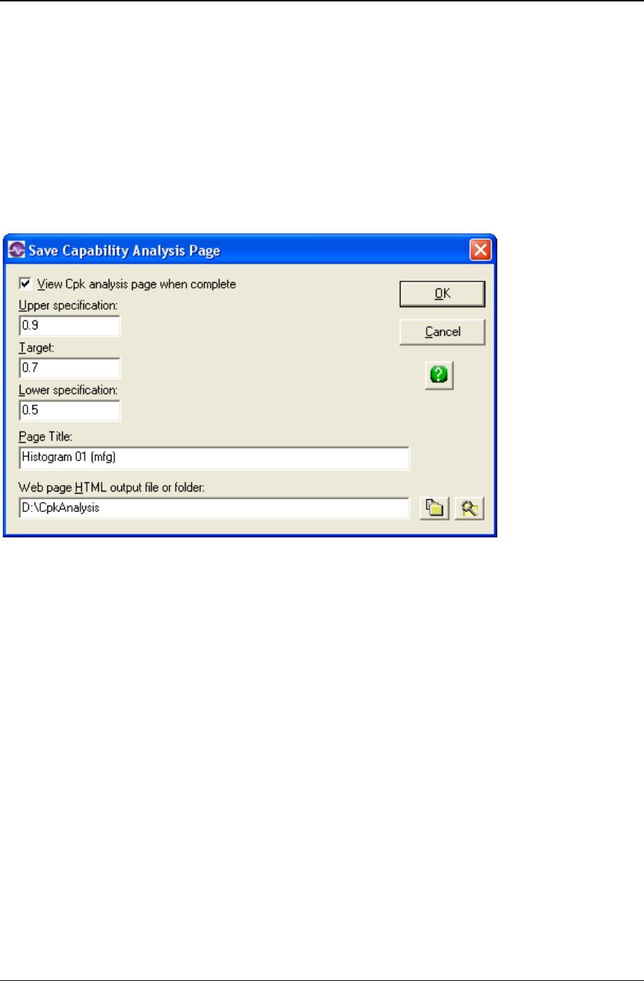
276 CHARTrunner User's Guide
Copyright © 2011
The basics steps to create a Cpk Advisor
Analysis
There are two ways to begin when viewing the Cpk Advisor Analysis. The first is to display any histogram
chart and then select File/Save Cpk Advisor Analysis from the pull-down menu. The second way is to
right-click on any histogram definition on the main form. When the right-click menu is displayed, select
Save Cpk Advisor Analysis.
When you make the menu selection, the following form will be displayed:
You may change settings on this form and then click OK to display the Cpk Advisor Analysis. Following is
an overview of the settings:
• View Cpk analysis page when complete – The output from a Cpk analysis is an HTML file on the disk.
Check this box if you want to launch your Internet browser and view the results. Leave the box
unchecked if you only want to generate the file.
• Upper specification – Enter the upper specification for this analysis. If the chart definition already has an
upper specification defined, it will be displayed. However, you may override this to do what if analysis.
• Target – Enter the target specification for this analysis. If the chart definition already has a Target
specification defined, it will be displayed. However, you may override this to do what if analysis.
• Lower specification – Enter the upper specification for this analysis. If the chart definition already has a
lower specification defined it will be displayed. However, you may override this to do what if analysis.
To compute the capability statistics requires at least one of the upper or lower specifications, or both,
to be entered.
• Page Title – Enter text that you would like to appear at the top of the Cpk Advisor Analysis page.
• Web page HTML output file or folder – Use the buttons at the right to browse for either a folder or a
specific file where you want the Cpk Advisor Analysis to be saved. If you specify only a folder, the
chart definition’s file name will be used as the file name; it will have .htm as a file extension.

Cpk Advisor Analysis 277
Copyright © 2011
How the Cpk Advisor Analysis works
The output from a Cpk Advisor Analysis is a web page file (.htm file). When you click OK to view the
analysis, your web browser will be launched. It will display the contents of the Cpk Advisor Analysis
output file.
To create the output file, the software uses one of several template files. These templates are stored in
the \SysData folder under the folder where you installed CHARTrunner. The main template is named
CpkWebTemplate.htm and there are some template fragments that are also used. They have names like
CpkDetails1.txt, CpkDetails2.txt, etc.
Depending on the statistics that get calculated, the output file will be based on the main template and one
of the template fragments.
You may customize the main template. For example, you could put your company logo in the page. Be
sure to make a backup copy of the original before you begin making changes.
Note that a Cpk Advisor Analysis can also be generated by a command line parameter.

278 CHARTrunner User's Guide
Copyright © 2011

279
In This Chapter
Introduction to OOC Summary .................................................................... 279
Displaying the OOC Summary form ............................................................ 280
OOC Summary form settings ...................................................................... 281
Introduction to OOC Summary
OOC stands for out-of-control. The OOC Summary feature allows you to scan many different control
charts, count the number of out-of-control conditions in each chart, and then view them in a ranked list.
Double clicking on a chart in the list displays the underlying chart.
The benefit of using OOC Summary is that you look only at the control charts that actually need attention.
Imagine that you have 50 important control charts. Most of the time, they are stable and in-control;
occasionally, some of them show a few out-of-control conditions. Rather than look at them all to find the
few that need attention, OOC Summary allows you to zero in on the problems and then get on with your
work.
CHAPTER 12
OOC Summary
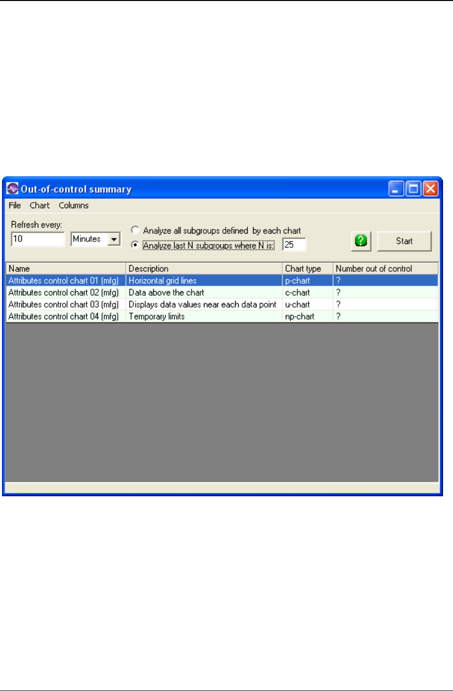
280 CHARTrunner User's Guide
Copyright © 2011
Displaying the OOC Summary form
OOC Summary works on a chart workspace. A chart workspace is just a named collection of charts. If
you do not already have a workspace, you must create one. Give it a good name, include all the control
charts you want to evaluate, and then save it.
On the main form, be sure the list of charts is set either to All charts or Workspaces. Use the buttons on
the left to control what shows in the list.
Click once to select your workspace. Next, right click to display the context menu, then select Display out-
of-control summary from the menu. The out-of-control summary form will be displayed:

OOC Summary 281
Copyright © 2011
OOC Summary form settings
When the form is first displayed, it shows your charts in the same order they are in the workspace. Under
the column named Number out-of-control you will see question marks. Once the charts are evaluated,
you will see numbers in place of the question marks. Note that you may resize each column displayed in
this form. CHARTrunner will remember your preferences and show them with the new size from now on.
• Refresh every – The out-of-control summary form can be set to refresh the list of charts every so often.
This is useful in situations where you have a regular flow of data into the data sources underlying the
charts in your workspace. Enter a number here. For example, to refresh every hour, enter a ‘1’.
• Time units – Select from the drop-down list the time units for your refresh interval; minutes, hours, etc.
• Analyze - Select the Analyze option you prefer. If you want to look at the number of data rows as
defined by the chart, select Analyze data rows defined by each chart. If you want each chart in the
workspace to look back the same number of rows, then select Analyze Last N rows where N is and
then be sure to enter a value for N.
NOTE: you may leave the Refresh every and Time units empty if you do not want to use the automatic
refresh option.
• Start – Click this button to have the OOC Summary evaluate and rank your charts. If you are using a
refresh interval, then the list will be evaluated and resorted at each interval until you close the window
or click the Stop button.
Once OOC Summary has evaluated the charts in your workspace, it will reorder them so the charts
having the highest number of out-of-control conditions are the top of the list.
At any time you may view the actual chart by double clicking on it in the list or selecting Chart > Display
from the menu. When you close the chart, the OOC Summary form will still be visible.

282 CHARTrunner User's Guide
Copyright © 2011

283
In This Chapter
Menu functions (for the main window) right-click context menus ............... 283
File menu functions ..................................................................................... 283
Edit menu functions ..................................................................................... 284
View menu functions ................................................................................... 284
Setup menu functions ................................................................................. 284
Chart styles ................................................................................................. 285
CHARTrunner file extensions...................................................................... 289
ADO data source templates ........................................................................ 292
Preferences ................................................................................................. 293
Roaming license administration .................................................................. 300
Menu functions (for the main window) right-click
context menus
Right-click on any item in the CHARTrunner definitions list to open a pop-up context menu listing menu
choices appropriate for that item.
File menu functions
The File menu functions are:
• Edit definition – This opens the definition editor for the currently selected definition in the
CHARTrunner definitions list.
• New definition – This creates a new chart, dashboard or style definition, depending on which section of
the CHARTrunner definitions list is currently selected.
• CHARTrunner printer – This allows you to specify the printer to be used by default for printing charts.
You can also specify the printer margins used by CHARTrunner.
• Set folder containing charts – This allows you to specify the folder you want to set as the current working
folder. The chart and dashboard definitions displayed in the CHARTrunner definitions list are the ones
that are found in the current working folder.
• Exit – Select Exit to close CHARTrunner.
CHAPTER 13
System settings

284 CHARTrunner User's Guide
Copyright © 2011
Edit menu functions
The Edit menu functions are:
• Find – This allows you to search for a chart definition in the CHARTrunner definitions list. Enter a
search word or phrase in the Find What field. Specify whether to search in the chart's Name and/or
Description fields. To search for the complete word or phrase only, select Find Whole Word Only. To
search for the word or phrase as typed, select Match Case. The shortcut for Find is Ctrl-F.
• Find Next – This allows you to repeat a search that was established using Find. The shortcut for Find
Next is F3.
• ADO Data source templates – This allows you to manage your ADO Data source templates. See ADO
Data source templates (see "If you select ADO as the type of data source" on page 89) topics for
more information.
View menu functions
The View menu functions are:
• Toolbar – Select this to toggle whether the toolbar is visible or not.
• Small icons – Select this to use small toolbar icons.
• Large icons – Select this to use large toolbar icons.
• Tool tips – This determines whether or not tool tip messages are displayed when the mouse pointer
hovers over an area where a tool tip has been defined. You can turn on tool tip messages if you find
them to be helpful, or turn them off if they distract you.
• Font – This allows you to specify the font and size used in the CHARTrunner definitions list.
• Refresh – This allows you to update the list of definitions shown in the CHARTrunner definitions list.
The shortcut for Refresh is F5.
• Chart from clipboard – This allows you to chart data that is currently residing on the Windows clipboard.
For more information see Charting from data on the clipboard.
Setup menu functions
The Setup menu functions are:
• Out-of-control tests – This allows you to manage your out-of-control test definitions. See the Out-of-
control Tests topic for more information.
• Language – This allows you to select a different language for CHARTrunner. Contact PQ Systems for
more information about the availability of languages other than English.
• Preferences – This allows you to specify various preferences that affect the way CHARTrunner
operates. See the Preferences topic for more information.
• Recent folder options – This allows you to specify the number of “recently used folders” that
CHARTrunner remembers. You can also clear the list of recently used folders.
Roaming concurrent-user license – This allows you to check in or out a roaming license. This menu
choice is visible only when CHARTrunner is licensed under the concurrent-user license model. Click for
more information http://www.pqsystems.com/concurrent on the new concurrent-user licensing model.
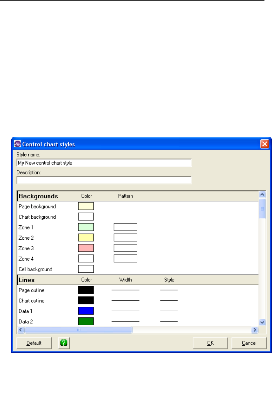
System settings 285
Copyright © 2011
Chart styles
Chart styles contain chart color, font, line, and data marker settings. CHARTrunner allows users to create
an unlimited number of chart style definitions for each chart type, for example a different style for each
customer or product line.
Creating new styles
To create a new style:
1. On the System section of the CHARTrunner Tree, right-click on the type of chart for which you want
to create a new style definition.
2. Select New Style from the pop-up menu. The Chart style definition editor will open.
3. Enter a style name (required) and Description (optional) for this style definition.
4. Make desired changes to the default settings. Instructions for each type of chart element will be
described in the topics that follow.
5. Click the OK button to save your settings.

286 CHARTrunner User's Guide
Copyright © 2011
NOTE: Styles are normally saved in the Styles folder. However, if you use CHARTrunner-e, you may want
to copy a style to the working folder. If a chart style in the working folder has the same name as a chart
style in the Styles folder, the style in the working folder will be used. Also, if a style in the working folder
has the same name as the chart definition (CRF) file, and the chart definition does not specify a chart
style, CHARTrunner will use the style with the same name as the chart.
Chart colors
You can set the color for the page and chart backgrounds, fonts, sigma zones, lines, and data markers.
To select a color:
1. Click on the Color field. The Color form will open.
2. Click on the color that you want to use for this chart element and click the OK button.
Patterns
You can select a pattern for the page and chart backgrounds, and sigma zones. To select a pattern:
1. Click on the Pattern field. The Pattern form will open.
2. Click on the pattern that you want to use for this chart element. The pop-up menu will close.

System settings 287
Copyright © 2011
Lines
In addition to line color, you can set line width and style.
To change line width:
1. In the Lines width column, click on the line that you want to edit. A pop-up menu will show the
available line widths.
2. Click on the width that you want. The pop-up menu will close.
To change the line style:
1. In the Lines style column, click on the line that you want to edit. A pop-up menu will show the
available line styles.
2. Click on the width that you want. The pop-up menu will close.
Font options
In addition to font color, you can select a font face, size, and style. For some chart text, you can specify
Alignment or angle.
1. To change the font face or size, click in the Name or Size column for the title or label that you want to
edit.
2. Select a font, font style, and font size for the selected chart property. Then, click the OK button to
close the Font form.
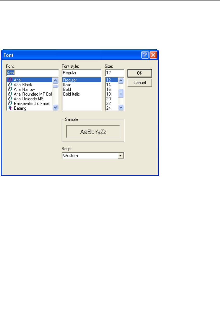
288 CHARTrunner User's Guide
Copyright © 2011
To make a title or label bold:
• Click on the Bold font style.
To make a title or label italic:
• Click on the Italic font style.
Angle
You can adjust the X-axis label's angle to prevent labels from overlapping on a crowded chart.
• Click on the Angle field and scroll up or down to find the desired angle. You can also type the angle
into this field.
Data markers
You can set the style and size of data markers.
Marker style
1. Click in the Style column for the marker that you want to edit. A pop-up menu will show the available
marker styles.
2. Click on the style that you want. The pop-up menu will close.
NOTE: Data markers are the same color as the data line. However, you can set marker colors for caused
and out-of-control subgroups, and for the median charts, the median data point.

System settings 289
Copyright © 2011
Marker size
• Click in the Size column for the marker that you want to edit and scroll up or down to find the desired
size.
Modifying styles
To modify an existing chart style:
1. In the CHARTrunner definitions list, right-click on the name of the chart style that you want to modify.
2. Select Edit from the pop-up menu. This opens the Chart style form.
3. Make desired changes.
4. Click on the OK button.
You can also access the Edit function through the Style Menu.
Copying styles
To copy a chart style:
1. In the CHARTrunner definitions list, right-click on the name of the chart style that you want to copy.
2. Select Copy from the pop-up menu. This opens the Chart style form.
3. Enter a name for the copied style and click on the OK button.
You can also access the Copy function through the Style Menu.
Deleting styles
To delete a chart style:
1. In the CHARTrunner definitions list, right-click on the name of the chart style that you want to delete.
2. Select Delete from the pop-up menu. You will be prompted to confirm the delete. Click on the Yes
button.
You can also access the Delete function through the Style Menu.

290 CHARTrunner User's Guide
Copyright © 2011
CHARTrunner file extensions
CHARTrunner uses the following file extensions:
Dashboard definition CRD
Chart definition CRF
Multi-chart definition CRM
Control chart style definition CSC
Histogram style definition CSH
Pareto style definition CSP
Workspace definition CRW
Out-of-control tests definition OOC
Pre-2.0 version style definition CST

System settings 291
Copyright © 2011
CST file extensions
All Pre-2.0 version styles used CST as the file extension. The new 2.0 (and higher) version replaces CST
file extension with three new file extensions (CSC, CSH, CSP) for better control and organization.
The chart definition refers to the style definition to be used for that chart by “style name” only. In other
words, there is no information about what folder the style will be found in and no information about what
file extension the style will have.
When CHARTrunner is told to fetch the style definition that is named by a chart definition, here are the
rules it follows to determine what style definition to actually use:
Rule 1
If no style name has been specified, use the style definition in the chart folder having the same name as
the chart definition, if it exists. This is the “per-chart” style definition. If a (.CSC, .CSP, or .CSH as
appropriate) style definition is found, then use it. Else, if a .CST (pre-2.0) style definition is found, then
use it (no check is made to assure that the .CST style actually contains the appropriate type of style
definition). If the user edits the style while the chart is displayed and a .CST style is being used, when the
style is saved, it will be saved with the appropriate (.CSC, .CSP, or .CSH) style extension.
Rule 2
If a style name has been specified and it specifies the full path to the style definition, use it. This "full path"
mode is used only in specialized cases (such as SDK programming), because the "Edit Chart Definition"
user interface does not allow the user to enter the path to the style definition.
Rule 3
If a style name has been specified, assume the style definition is found in the current chart folder. If a
(.CSC, .CSP, or .CSH as appropriate) style definition is found, use it. Else, if a .CST (pre-2.0) style
definition is found, use it (no check is made to assure that the .CST style actually contains the appropriate
style definition) - this is done so that if someone points CHARTrunner 2.0 (and higher) to a chart folder
containing pre-2.0 charts and styles and one or more charts are using a “per-chart” style definition, the old
“per-chart” style will be used.
Rule 4
If a style name has been specified and it was not found by Rule 3 in the chart folder, assume the style
definition (.CSC, .CSP, or .CSH as appropriate) exists in the Styles folder. In normal use most styles will
live and be found in the Styles folder because most users are not aware that leaving the style name blank
in the chart definition invokes “per-chart” style mode.
Final Rule. If the style definition specified by the chart definition cannot be found, the “Default” chart style
will be used. If the “Default” chart style cannot be found, then an “internal program default” chart style
definition is used.
The definitions list on the main form does not show any .CST style definitions - it displays only .CSC,
.CSP, or .CSH style definitions. If a user has upgraded from a prior version of CHARTrunner and wants to
copy the old style definitions into the 3.6 installation Styles folder, it is up to the user to rename the style
definition files to have the appropriate .CSC, .CSP, or .CSH file extension.
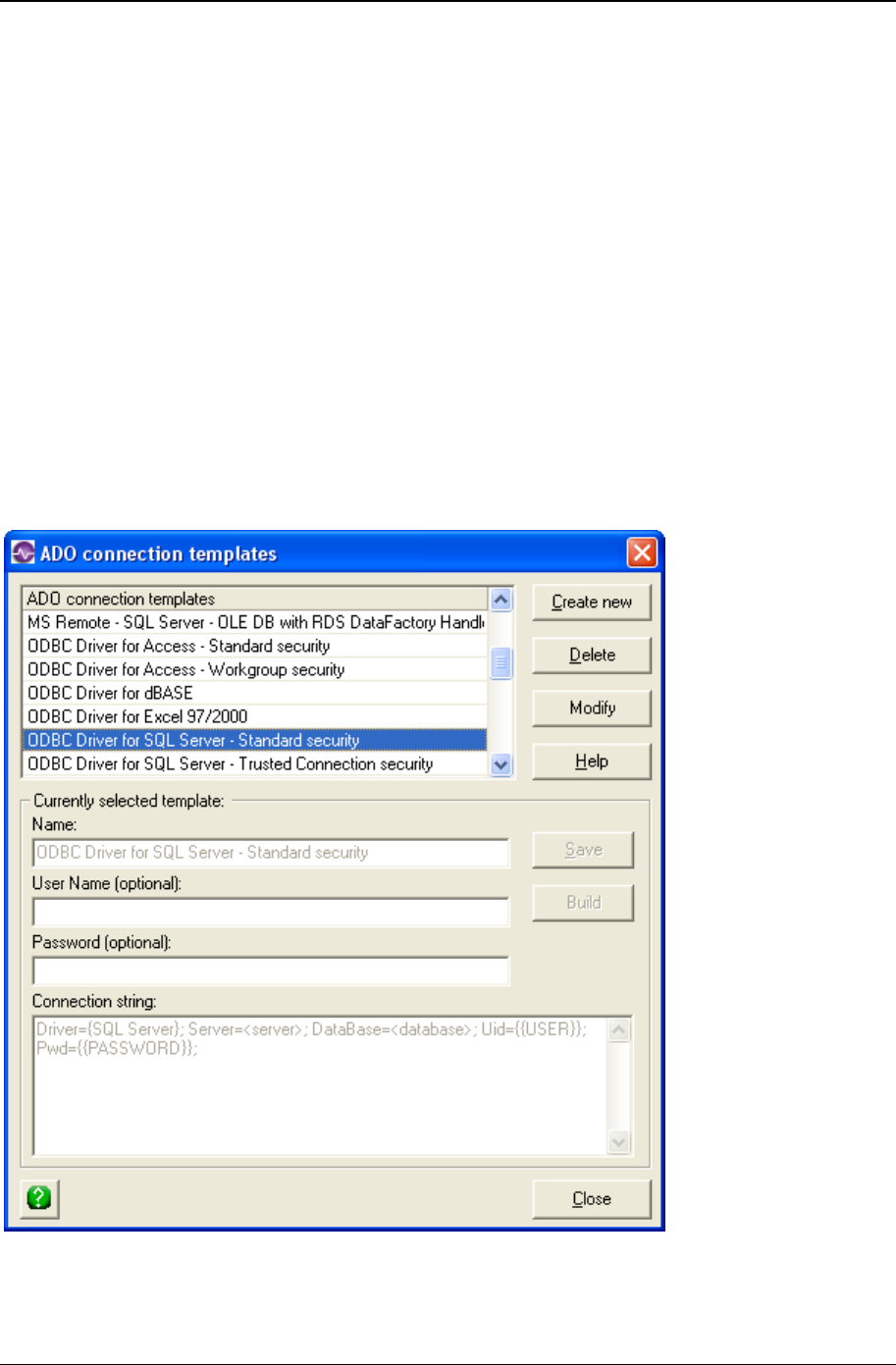
292 CHARTrunner User's Guide
Copyright © 2011
ADO data source templates
One of the ways CHARTrunner can get to data for creating charts is via ADO. ADO stands for ActiveX
Data Objects. This Microsoft technology allows for access to a wide variety of data sources. If you have
data in SQL Server or Oracle, you may want to access this data for CHARTrunner charts via ADO.
On the Step 2: Data Source tab of the chart definition form, you must enter information into the Connection
string field in order to use a specific ADO data source. To make the job of specifying the connection string
for a given ADO provider easier, CHARTrunner keeps a list of ADO data source templates that can be
selected via the ADO;OLE DB Provider drop-down list. When a selection is made from the ADO;OLE DB
Provider drop-down list, the Connection string field will be updated with a prototype connection string for
the selected ADO provider. A selection from the ADO;OLE DB Provider drop-down list is not required
when defining a chart. Instead, you can type in the necessary information directly into the Connection string
field.
The ADO connection templates are stored in the Ado.ini file located in CHARTrunner's SysData folder.
To create, modify, and save an ADO template, select Edit > ADO data source templates from the menu,
and the following form opens.

System settings 293
Copyright © 2011
The form shown above allows you to add new templates, change existing templates, or delete templates.
It you add a new template, it will then be available as one of the selections in the ADO;OLE DB Provider
drop-down list on Step 2: Data Source tab of the chart definition form.
• Create New – Click this button to create a new ADO connection template. Enter the information for the
new template in the fields of the Currently selected template frame.
• Delete – Click this button to delete the currently selected ADO connection template.
• Modify – Click this button to edit the currently selected ADO connection template in the fields of the
Currently selected template frame.
• Currently selected template – This frame contains the following fields and buttons:
• Save – Click this button to save the information you have entered in the fields of the Currently selected
template frame.
• Build – Click this button to open the Windows “Data Link Properties” window from which you can build
a connection string for the ADO;OLE DB provider that you select.
• Name – The name of the template.
• User Name (optional) – If the ADO provider requires a user name in order to authenticate with the
database, you can optionally enter it here. The name you enter here will be placed in the User field on
the Step 2: Data source tab. When the data source is opened, the contents of the User field will be
substituted into the connection string in place of {{USER}}.
• Password (optional) – If the ADO provider requires a password in order to authenticate with the
database, you can optionally enter it here. The password you enter here will be placed in the
Password field on the Step 2: Data source tab. When the data source is opened, the contents of the
Password field will be substituted into the connection string in place of {{ PASSWORD }}.
• Connection string – Enter the connection string to be used with this template. A connection string
consists of multiple pieces of information where each piece is separated by a semicolon. Depending
on your specific data source, this string can take on many forms.
Preferences
To set CHARTrunner preferences, select the Setup > Preferences menu on the main form.
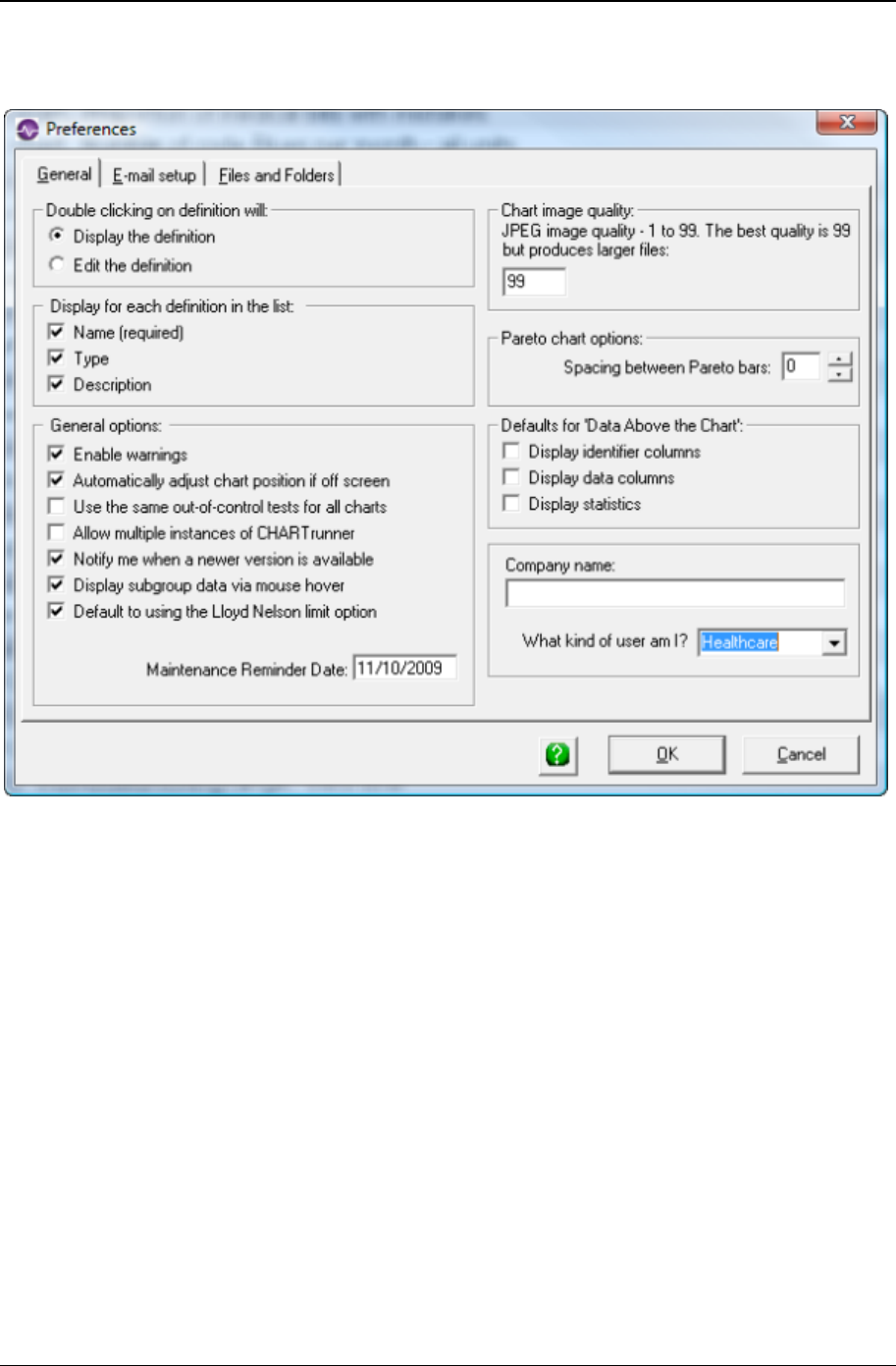
294 CHARTrunner User's Guide
Copyright © 2011
General tab
• Double clicking on chart definition will – This option allows you to specify what will happen when you
double-click on a chart definition listed in the CHARTrunner definitions list.
• Display the definition – The definition will be displayed in a new window.
• Edit definition – The definition editor will open so that you can edit the definition.
• Display for each definition in the list – This option allows you to specify what information will be displayed
about each definition in the CHARTrunner definitions list.
• Name (required) – The definition is always displayed.
• Chart type – Select this option to display the definition type.
• Description – Select this option to display the definition description.
• General options – Select from the following options:
• Enable warnings – Select this option to have CHARTrunner warn you about missing or improper
parameters in definitions. It is recommended that you select this option.
• Automatically adjust chart position if off screen – Each time a chart display window is closed,
CHARTrunner automatically stores the size and position of the chart window in the chart definition. If
the last person to view a chart had the display window.

System settings 295
Copyright © 2011
• Use the same out-of-control tests for all charts – When this is selected, the out-of-control test rules defined
by the Active test definition under Setup > Out-of-control tests is applied to all control charts. When
this is not selected, the out-of-control test rules defined in each control chart definition are used for
that chart.
• Allow multiple instances of CHARTrunner – When this is selected you may start multiple instances of
CHARTrunner, i.e. you may have more than one CHARTrunner main window on your desktop. When
this is not selected, you will not be permitted to start a second instance of CHARTrunner.
• Notify me when a newer version is available –Select this option to have CHARTrunner periodically check
via the Internet for a newer version. When a newer version is detected, you will be notified.
• Use Automatically check for product updates –Select this option to have CHARTrunner periodically check
via the Internet for a newer version. When a newer version is detected, you will be notified.
• Display subgroup data via mouse hover – Select this option to specify the default state for the View >
“Enable mouse hover information” menu on the chart display window. When this option is selected
and a chart display windows opens, when you let the mouse cursor hover near a data point on the
chart, a pop-up window appears with summary information about that data point.
• Chart image quality
• JPEG image quality – When a chart is saved as a JPEG image file, the number you enter here
determines the compression level that is used in creating the JPEG image. The higher the number,
the better resolution the image will have, but at the expense of larger image file size. You can
experiment with different image quality numbers to determine the best tradeoff for your situation.
• Pareto chart options
• Spacing between Pareto bars – Specify the default spacing between the bars of a Pareto chart (in terms
of percentage) for a new chart. Starting with CHARTrunner 2.0, the Pareto bar spacing is a property
of the chart definition, so each Pareto chart can specify the spacing that looks best for that chart.
When a new Pareto chart is created or a pre-2.0 chart definition is used, the number you enter here
will be used as the Pareto bar spacing.
• Defaults for 'Data Above the Chart' – These options determine whether a new chart defaults to displaying
the specified information in the 'Data Above the Chart' grid. This grid is configured on the “Chart data
display” sub-tab of the “Control chart” tab in the chart definition editor.
• Display identifier columns – Select this option to automatically display columns that are mapped as
Identifier or Unique Identifier.
• Display data columns – Select this option to automatically display columns that are mapped as chart
data, such as Measurement, Data, Data 1 through Data 10, etc.
• Display statistics – Select this option to automatically display calculated statistics.
• Company name – Enter the company name that will be displayed by the @CONAME chart title code.
• What kind of user am I? – Select the type of user that best describes your use of CHARTrunner. Your
choices are:
• Healthcare
• Manufacturing
• General

296 CHARTrunner User's Guide
Copyright © 2011
Depending on the type of user you select, these changes will be made to how CHARTrunner operates:
• The list of sample charts you see will be changed. This will happened because the default working
folder for sample charts will be changed.
• Some new chart defaults will be altered to reflect industry practices:
• For Healthcare:
Lloyd Nelson option is selected by default for new individuals charts, new t-charts, and new g-
charts.
The active set of out-of-control test rules will be the Health API rules. See Setup > Out-of-
control tests. These will be the default out-of-control test rules applied to new charts.
An extra line – the median line – will automatically be added to new t-charts and new g-charts.
• For manufacturing and general:
Lloyd Nelson option is not selected by default for new control charts.
The active set of out-of-control test rules will be the SQCpack rules. See Setup > Out-of-
control tests. These will be the default out-of-control test rules applied to new charts.
No extra lines are automatically added to new charts.
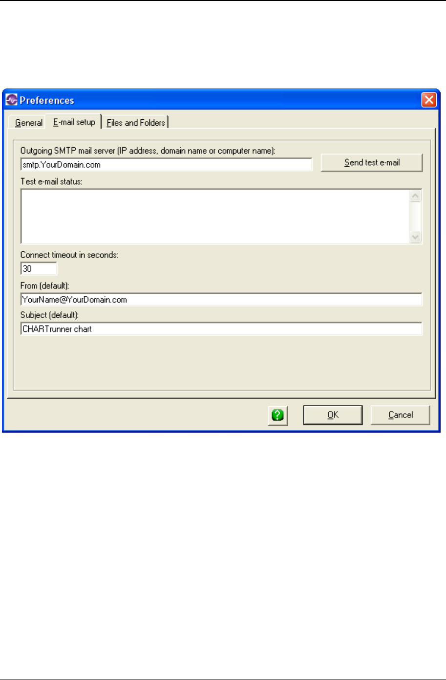
System settings 297
Copyright © 2011
E-mail setup tab
CHARTrunner allows you to send a chart as an e-mail. On this tab, you specify the information
CHARTrunner needs to send an e-mail message.
• Outgoing SMTP mail server – CHARTrunner needs to know the IP address (a number like
192.168.0.100) of the SMTP mail server that will be used to deliver e-mail. Instead of entering the IP
address, you can use a domain name, such as smtp.mydomain.com, as long as a DNS server is
available to translate the specified domain name into an IP address. Or, you can enter the computer
name of the SMTP server if a WINS server is available to translate the computer name to an IP
address. Check with your IT department to find out what SMTP server is available and how to specify
its IP address.
• Send test e-mail – Click this button to have CHARTrunner attempt to send a test e-mail message using
the SMTP mail server you have specified. The Test e-mail status shows the SMTP commands and
responses between CHARTrunner and the SMTP server, and may prove helpful in diagnosing a
communications problem.
• Connect timeout in seconds – Enter the amount of time in seconds that CHARTrunner waits while
attempting to establish communications with the SMTP server.
• From (default) – Enter the default From address for e-mails sent from CHARTrunner.
• Subject (default) – Enter the default Subject line for e-mails sent from CHARTrunner.
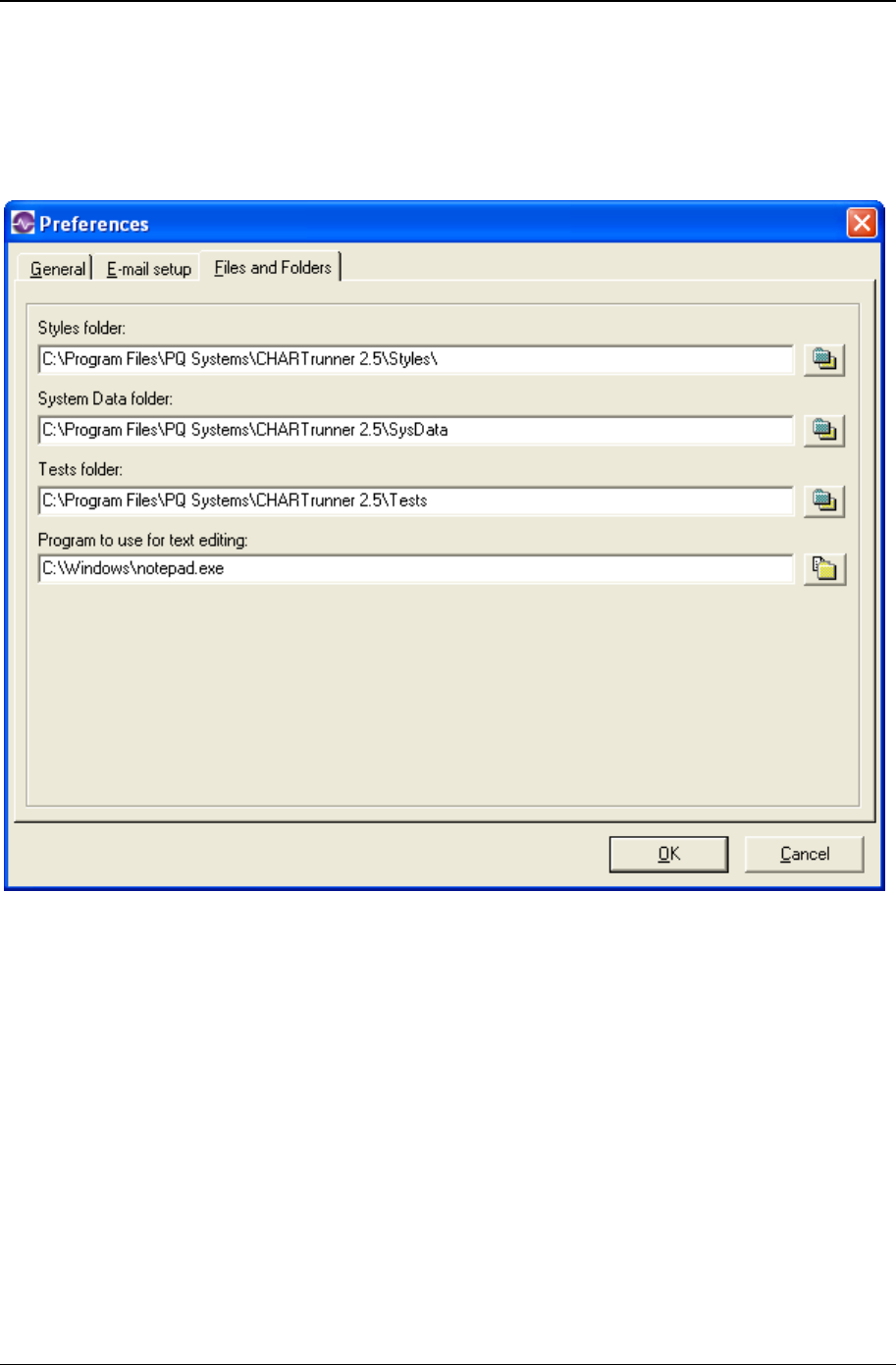
298 CHARTrunner User's Guide
Copyright © 2011
Files and folders tab
On this tab, you tell CHARTrunner what folder to use for style definitions, system data files such as the
default chart definition, and test definitions. You also specify what text editor to use when CHARTrunner
opens a definition file in a text editor.

System settings 299
Copyright © 2011
• Styles folder – Click the button to open the folder selection dialog and select the folder where style
definitions are saved. If you are on a network and desire to share a common set of style definitions
among a group of users, select a folder on a network share and ask your system administrator to
assign the appropriate file access rights.
• System Data folder – Click the button to open the folder selection dialog and select the folder where
CHARTrunner system data files are saved. If you are on a network and desire to share a common set
of system data files among a group of users, select a folder on a network share and ask your system
administrator to assign the appropriate file access rights. The CHARTrunner system data folder
contains Default.crf, the default chart definition that specifies the initial conditions for a new chart
definition.
• Tests folder – Click the button to open the folder selection dialog and select the folder where test
definitions are saved. If you are on a network and desire to share a common set of test definitions
among a group of users, select a folder on a network share and ask your system administrator to
assign the appropriate file access rights. Test definitions contain the test rules for specifying out-of-
control conditions on control charts.
• Program to use for text editing – Click the button to open the file selection dialog and select the text
editor you want to use with CHARTrunner. You can typically use C:\Windows\Notepad.exe if you
have no other preference. Once an editor has been specified, you can open the highlighted chart,
dashboard, or style definition in the text editor by pressing Shift-F12 when the definition is selected in
the definitions list.
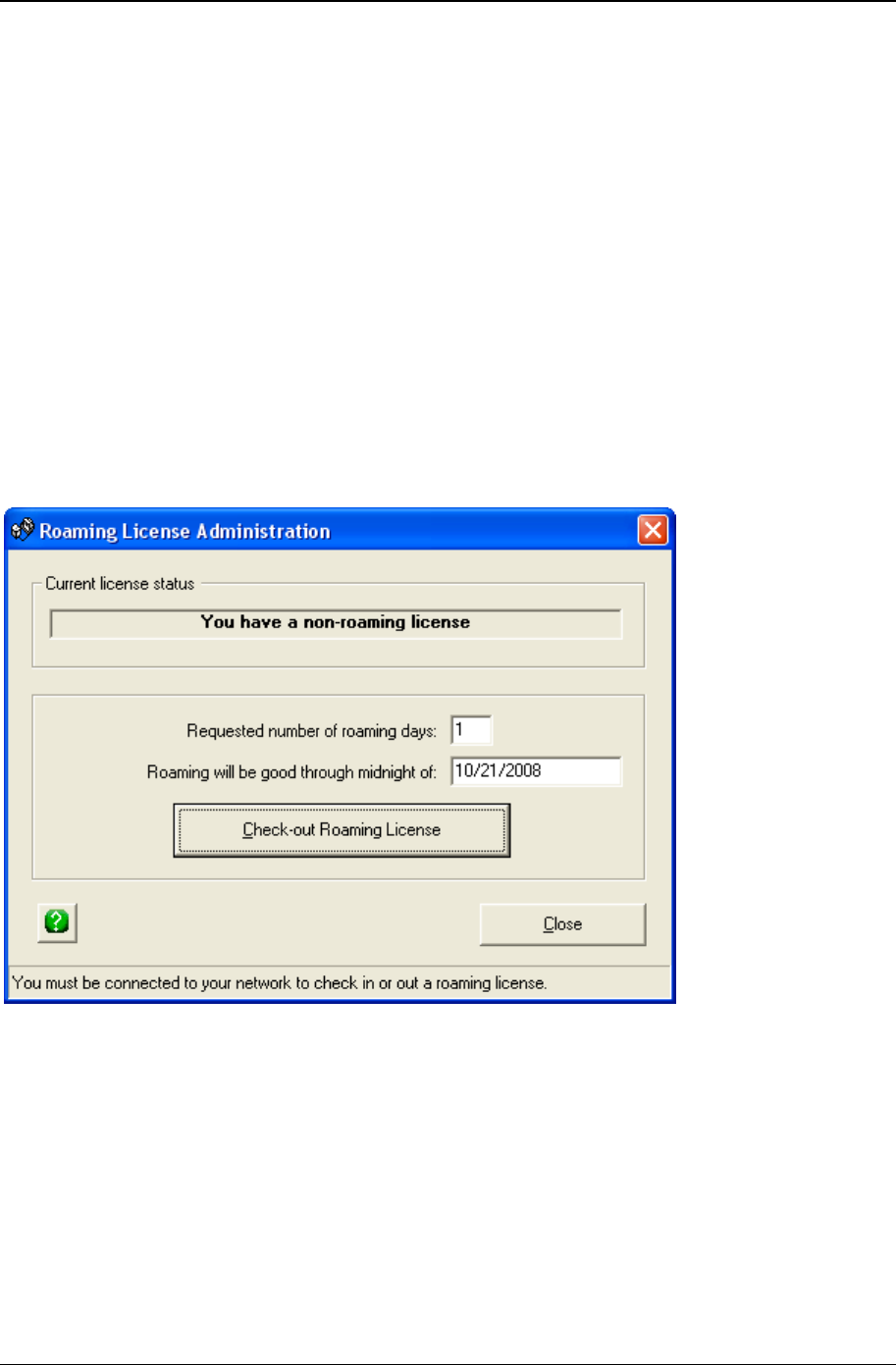
300 CHARTrunner User's Guide
Copyright © 2011
Roaming license administration
When the software is licensed using the concurrent-user (http://www.pqsystems.com/concurrent) license
model, the software program contacts the PQ Systems License Manager (PQLM) each time it is started,
in order to verify that a concurrent-user license is available. PQLM is installed on a computer in your
internal network. Thus, for normal operation, users must be connected to their internal network, in order
to allow them to start the software after PQLM has been contacted.
It is possible to check out a roaming license that allows users to open the software even when they are
disconnected from their internal network. Such a roaming license can be checked out and allocated for
exclusive use during a check-out period specified by the user.
To check in or out a roaming license, select SETUP/ROAMING CONCURRENT-USER LICENSE from the main form. This
menu choice will not be visible unless the concurrent-user license model is being used.
Checking in or out a roaming license requires that the user is connected to the internal network so that
PQLM can be contacted. Roaming licenses are not permitted when running under terminal services or
Citrix.
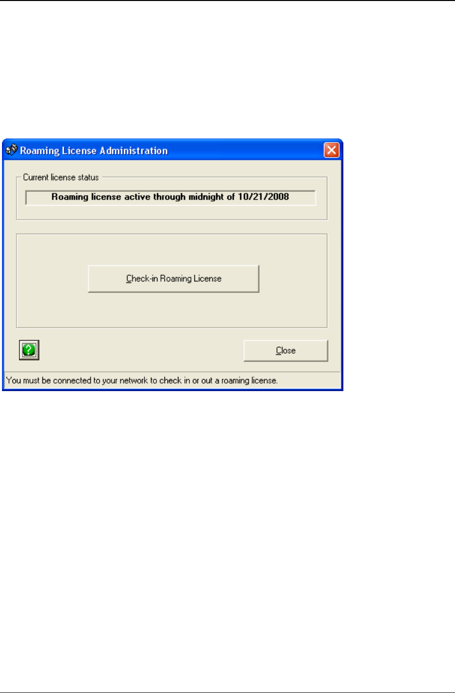
System settings 301
Copyright © 2011
The form shown above is used to check-out a roaming license. Specify the requested number of days
that you will need the roaming license. As you change the number of days, the date will change to show
you when the roaming license will expire. Click the button to check-out a roaming license. If you attempt
to check-out a roaming license for too many days you will get a warning message, so request fewer days.
A roaming license is allocated exclusively for use on the computer on which it was checked out, so it
should be checked in after the user has completed "off-the-network" use of the software, and is once
again connected to the internal network. This will enable other users in the organization to use the
concurrent-user license.
The form shown above is used to check-in a roaming license.

302 CHARTrunner User's Guide
Copyright © 2011

303
In This Chapter
The CHARTrunner viewer program ............................................................ 303
Sample clipCHARTs ................................................................................... 304
Using clipCHARTs via windows explorer .................................................... 305
The CHARTrunner viewer program
To start CHARTrunner Viewer:
• Click on the Start Menu and select CHARTrunner. This will likely be found under Start, Programs, PQ
Systems, CHARTrunner 3.6, CHARTrunner Viewer 3.6.
When you start CHARTrunner Viewer, the first form that you see is the CHARTrunner Viewer Tree. This
form shows the clipCHARTs found in the working folder.
CHAPTER 14
CHARTrunner viewer
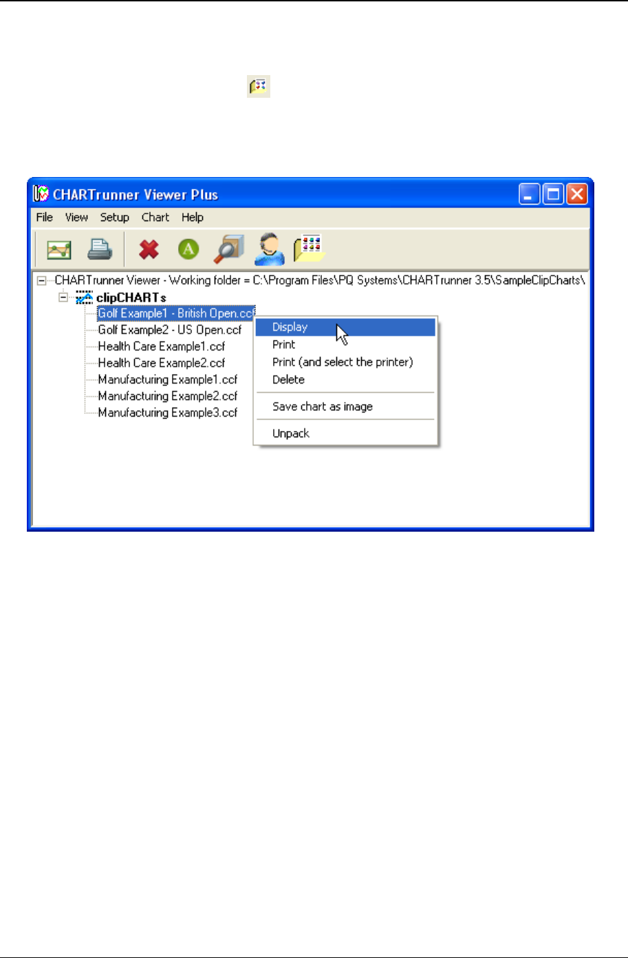
304 CHARTrunner User's Guide
Copyright © 2011
Using the CHARTrunner Viewer program is similar to using CHARTrunner.
• Set folder containing clipCHARTs – Right-click on the current working folder and select Set working folder
from the pop-up menu. Or, click the button on the toolbar. Or, open the File menu and select Set
folder containing clipCHARTs. Or, press Ctrl-W. The tree will update with the clipCHART files found in
the specified working folder.
• Operations on clipCHARTs – Right-click on a clipCHART and the a context menu appears as shown in
the figure below (these choices are also available via the Chart menu):
• Display – Display the selected clipCHART in a new chart display window. You may edit the chart
definition and style definition to change the appearance of the chart while it is displayed, but your
changes will not be saved back into the clipCHART file.
• Print – Print the selected clipCHART to the default Windows printer.
• Print (and select the printer) – Print the selected clipCHART to the Windows printer that you select.
• Delete – Delete the selected clipCHART file to the Recycle Bin. Hold down the Shift key prior to
clicking on Delete to permanently delete the clipCHART file.
• Save chart as image – Save the selected clipCHART as an image file. You can control the type, size,
and location of the resulting image file.
• Unpack – Unpack the selected clipCHART into the folder that you specify. The resulting files include
the chart definition file (*.CRF), an Access database that contains the chart's data (*.MDB), and the
chart style definition file (*.CR?). You can use these unpacked files with CHARTrunner.
Sample clipCHARTs
Some sample clipCHART files are installed in the SampleClipChart folder that is part of the CHARTrunner
installation. This folder is typically C:\Program Files\PQ Systems\CHARTrunner 3.6\SampleClipCharts.

CHARTrunner viewer 305
Copyright © 2011
Using clipCHARTs via windows explorer
You may use Windows Explorer to perform operations on clipCHART files. When you right-click on a
clipCHART file using Windows Explorer, you may select from the following context menu choices:
• Display Chart – Display the selected clipCHART in a new chart display window. You may edit the chart
definition and style definition to change the appearance of the chart while it is displayed, but your
changes will not be saved back into the clipCHART file.
• Create Image – Save the selected clipCHART as an image file. You can control the type, size, and
location of the resulting image file.
• Print to default printer – Print the selected clipCHART to the default Windows printer.
• Print – Print the selected clipCHART to the Windows printer that you select.
• Unpack – Unpack the selected clipCHART into the folder that you specify. The resulting files include
the chart definition file (*.CRF), an Access database that contains the chart's data (*.MDB), and the
chart style definition file (*.CR?). You can use these unpacked files with CHARTrunner.

306 CHARTrunner User's Guide
Copyright © 2011

307
Information about the formulas used by CHARTrunner is available by clicking the Help > Formulas
reference menu selection.
CHAPTER 15
Appendix A: Formulas used by
CHARTrunner

308 CHARTrunner User's Guide
Copyright © 2011

309
In This Chapter
Example command line usage .................................................................... 309
Example text file containing command arguments ..................................... 312
CHARTrunner command line arguments
CHARTrunner allows users to employ command line arguments to perform common tasks such as
displaying or printing a specific chart.
To view a summary of the available command line arguments, simply run CrCmdLine25.exe without any
arguments. This can be accomplished by double-clicking CrCmdLine25.exe from Windows Explorer.
Command line arguments can be run from the command prompt, the Start Menu's Run function, or from a
shortcut. Type CrCmdLine25.exe, followed by as many command arguments as needed. If you want to
run several arguments, you can create a text command file as demonstrated below and use the /@
[CommandFile] argument.
Arguments can be delimited with either a backslash (/) or a dash (-). However, you must use the same
delimiter throughout.
The following are options for the command line. The [ChartPath] notation represents a full path to a
CHARTrunner chart definition file, e.g., C:\Charts\MyChart.crf. The [DefPath] notation represents a full
path to a CHARTrunner chart or dashboard definition file. The [DashboardPath] notation represents a full
path to a CHARTrunner dashboard definition file. The [FolderName] notation represents a full path to a
folder, e.g., C:\Charts. The [OutputSpec] notation represents a full path to a folder, e.g., C:\Charts.
/A [ChartPath] Save the specified histogram chart as a Cpk
analysis web page. You must use /O or /S prior to
/A in order to specify the output filename or folder.
If you specify only a folder the chart name will be
used to create the filename. If /Q appears before /A
the operation will be interactive.
/C [ChartPath] Create a clipCHART of the specified chart.
/D [DefPath] Display in a window the specified chart.
CHAPTER 16
Appendix B: CHARTrunner command
line arguments

310 CHARTrunner User's Guide
Copyright © 2011
/E [ChartPath]|… E-mail the chart image of the specified chart. The
parameters shown below, separated by the |
character, can be supplied. Only the parameters
shown in bold are required. For readability, a space
has been used on each side of the | character, but
these extra spaces are optional.
/E ChartFile | FromAddress | ToAddress | CcAddress |
Subject | Message | ImageWidth | ImageHeight |
ImageType
/F [FolderName] Set the current chart folder to the specified folder.
/G [DefPath] Create an out-of-control summary file for the
specified workspace. You must use /O or /S prior
to /G in order to specify the output filename. If the
output file has an extension of XLS an Excel file
will be created; otherwise a text file will be created.
You may optionally include a positive integer after
[DefPath] to specify the “Last N” subgroups to
analyze on each chart.
For example, the following command analyzes the
last 10 subgroups of each chart in workspace
Ws1.crw and writes the summary to
C:\Temp\Ooc.xls:
/O C:\Temp\Ooc.xls /G C:\Charts\Ws1.crw 10
/I [DefPath] Create an image of the specified chart. For a
dashboard, save all indicator images to the folder
specified by /O.
/J DefPath [LastN] [START] Display the Out-of-control summary window for the
workspace specified by DefPath. Optionally include
a positive integer after DefPath to specify the "Last
N" subgroups to analyze on each chart. Optionally
include the word START to cause the "Start" button
to be automatically pressed.
/K MIN | MAX | NORM Set the window state of the main form.
MIN=minimized, MAX=maximized, NORM=normal.
Has no effect in CrCmdLine36.exe.
/M [DefPath] Modify (edit) the specified chart, dashboard or style
definition.
/O [OutputSpec] Specify the output filename or folder (used with /C,
/I, and /W). See /S for the “sticky” version.
/P [ChartPath] Print the specified chart.
/Q Use prior to /P to select a printer or prior to /A, /E
or /I for interaction with the user.
/R Enable Chart “Review.”
/S [OutputSpec] Specify the “sticky” output folder (used with /C and
/I). This option is equivalent to /O, except it is
“sticky” and applies to subsequent commands until
another /O or /S is encountered.

Appendix B: CHARTrunner command line arguments 311
Copyright © 2011
/T [ImageFileType] Specify the graphics image file format. Options are
JPG, PNG, BMP, or EMF (used with /I). For a
dashboard indicator, the allowable options are
PNG or EMF.
/U [DashboardPath] Applies only to a dashboard definition. Update all
indicator images in the folder specified by /O. Only
those images of type EMF or PNG with a filename
that matches an indicator name in the dashboard
will be updated.
/V Display error messages.
/W [ChartPath] Save the specified chart as a Web page. Use /O
prior to /W in order to override the output
information specified by the chart definition.
/X Exit from CHARTrunner. Typically this is the last
argument on a command line or the last command
in a command file.
/ Y [DashboardPath] Applies only to a dashboard definition. Update all
indicator values by recalculating the chart statistic.
Only those indicators that have an associated chart
definition, and have not been marked as “Only
permit manual update of the statistic value from
chart,” will be updated.
/@ [CommandFile] If you are using a text file for multiple arguments,
use this command to read the text file specified by
[CommandFile], and process each command line
contained therein. The text file can include lines
that are blank or commented out with semicolons
(;).
/ H or /? Help for command line parameters. Displays a list
of the supported command line parameters
Example command line usage
“C:\Program Files\PQ Systems\CHARTrunner 3.6\CrCmdLine36.exe” /D
C:\MyChart.crf
“C:\Program Files\PQ Systems\CHARTrunner 3.6\CrCmdLine36.exe” /@
C:\CHARTrunnerCommands.txt

312 CHARTrunner User's Guide
Copyright © 2011
Example text file containing command
arguments
; CHARTrunnerCommands.txt
; Display the chart.
/D C:\MyChart.crf
; E-mail the chart to Fred for his review.
/E C:\MyChart.crf | barney@bedrock.org | fred@bedrock.org
; E-mail the chart as a 640x480 PNG to Wilma for her review.
/E C:\MyChart.crf|barney@bedrock.org| wilma@bedrock.org||||640|480|PNG
; Save a PNG image of the chart into our Web site.
/T PNG /O C:\InetPub\wwwroot\ChartImages /I C:\MyChart.crf
; Save the chart as a Web page into our Web site.
/O C:\InetPub\wwwroot\Charts /W C:\MyChart.crf
; Print the chart to CHARTrunner's default printer.
/P C:\MyChart.crf
; Create an out-of-control summary spreadsheet that evaluates the last
; 15 subgroups of each chart in the workspace.
/O C:\Temp\Ooc.xls /G C:\Charts\Ws1.crw 15
; Perform "Update indicator values from chart statistic" on Dashboard1.
/Y C:\Work\Dashboard1.crd
; Perform "Save all indicators as images to specified folder" on Dashboard1.
/T EMF /O "C:\Work\Images" /I C:\Work\Dashboard1.crd
; Perform "Update indicator values from chart statistic" on Dashboard2.
/Y C:\Work\Dashboard2.crd
; Perform "Save all indicators as images to specified folder" on Dashboard2.
/T EMF /O "C:\Work\Images" /I C:\Work\Dashboard2.crd

313
In This Chapter
Online information ....................................................................................... 313
CHARTrunner performance tip ................................................................... 313
Comma and decimal separators ................................................................. 314
Time on the charts ...................................................................................... 314
Defining the advanced tab's week option - what is a week? ...................... 314
Filter to exclude outliers .............................................................................. 315
Filter for missing values as an identifier ...................................................... 315
Close data source after drawing chart ........................................................ 316
Microsoft Access data source ..................................................................... 316
Microsoft Excel data source ........................................................................ 317
Getting to Excel data via the ADO;OLE DB provider .................................. 317
Column to use for order by does not allow you to select anything ............. 318
Using the LIKE operator in a filter or SQL expression ................................ 318
Accessing charts using windows explorer .................................................. 320
Accessing dashboards using windows explorer ......................................... 321
Online information
Visit the PQ Systems knowledge base for the latest information:
http://www.pqsystems.com/kb/ (http://www.pqsystems.com/kb/)
CHARTrunner performance tip
If you define a CHARTrunner chart that will end up including a large amount of data, the performance can
be improved by minimizing the number of columns that you “map” on the Step 3: Data definition tab.
For example, if you are creating a histogram from a single column of data, do not map a bunch of
identifier columns unless you want these identifiers to appear when the chart is saved as a web page.
Also, defining a filter like “Operator=Sam” does NOT require that you map the 'Operator' column as an
identifier.
CHAPTER 17
Appendix C: Tips and troubleshooting

314 CHARTrunner User's Guide
Copyright © 2011
Comma and decimal separators
In the Windows control panel, under Regional settings, users have an option to set the character to be
used as the decimal separator when displaying numbers. In most countries this is set to the standard
decimal point. In some countries, however, this is set to a comma. For example:
75.66 most common
75,66 some countries
CHARTrunner has implemented code to support these differences. When a CHARTrunner file is saved,
one entry in the file remembers what the decimal separator was when the file was saved. Each time a
CHARTrunner file is read, the current Windows setting for the decimal character is compared to the
setting stored in the CHARTrunner file. If there are differences, all numbers are reformatted to account for
the current Windows setting.
This ensures that a user in a comma-based country can open and use the sample charts even though
they were created in a decimal-point-based country. This will also allow the same CHARTrunner file to be
used
Time on the charts
Time on charts will be displayed as AM / PM or military (24-hour clock), depending on the regional
settings.
You can format your source application to display the time in the format you want, but when
CHARTrunner draws the chart it uses your Regional settings from the Control Panel.
The Time style in the control panel can be hh:mm:ss or HH:mm:ss. The upper case HH indicates military
time.
Defining the advanced tab's week option - what
is a week?
In the Advanced row selection form, if you select the option Look at every row of data until column Y changes
and specify a date column for column Y, the optional field Form subgroups based upon will appear.
One of the Form subgroups options is Week. CHARTrunner starts a week on Monday and ends on the
following Sunday at midnight.
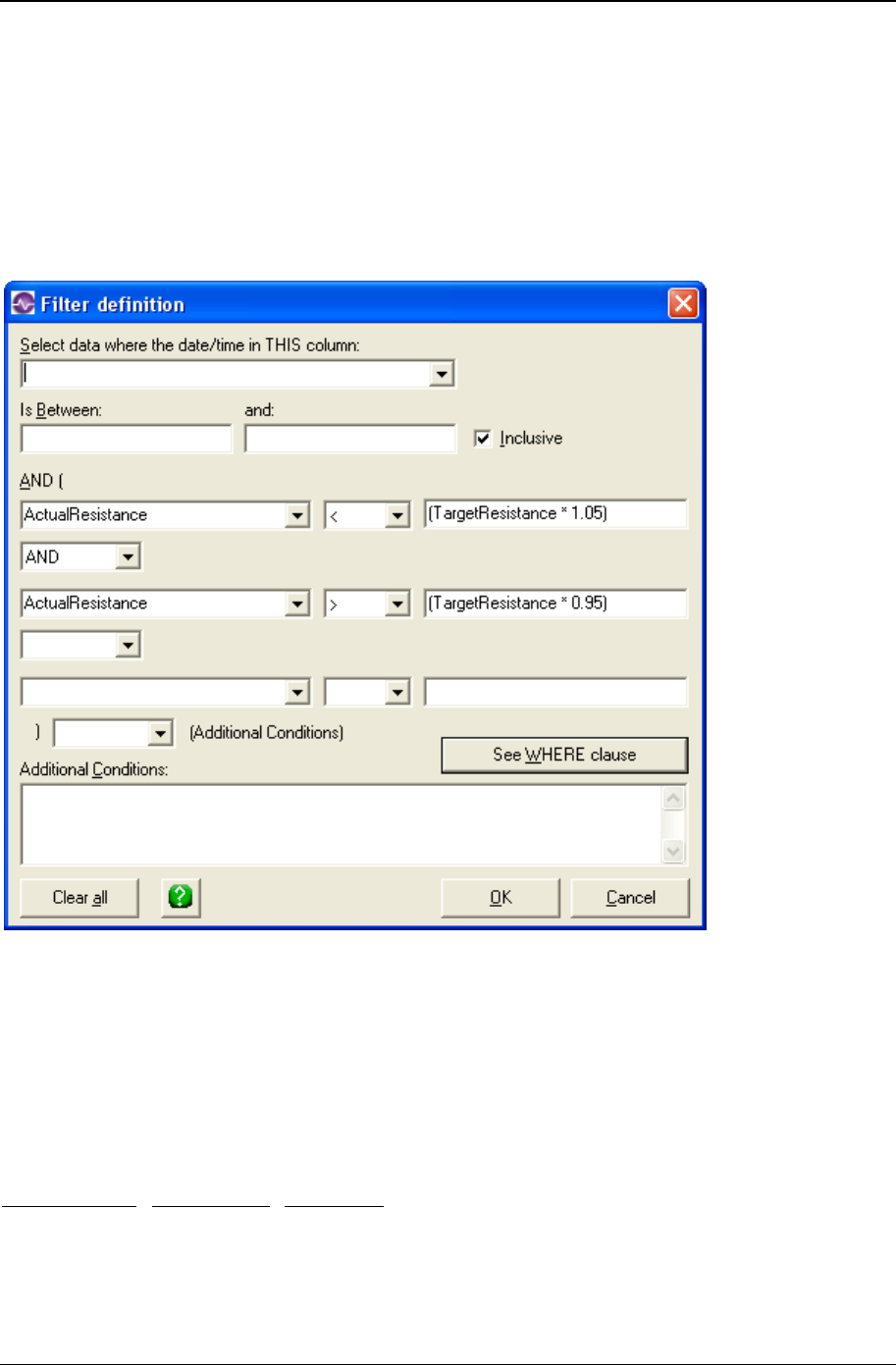
Appendix C: Tips and troubleshooting 315
Copyright © 2011
Filter to exclude outliers
You can create a filter that excludes outlying data points.
To do this, your source data should have both a target value column and an actual value column.
For the example filter, shown below, the source file had a column for target resistance and one for actual
resistance. This filter eliminates data points that are more than 5% away from the target value.
Filter for missing values as an identifier
If you have null values (or a missing value in an identifier field), you may want to filter so that only the null
/ missing values are included in the result.
For example, the data might look like this:
Date Data Defect
1/1/00 10
1/2/00 12
1/3/00 18

316 CHARTrunner User's Guide
Copyright © 2011
1/4/00 15 Yes
1/5/00 12
1/6/00 14
1/7/00 17
1/8/00 13 Yes
1/9/00 14
To chart only the values where the “Defect” column is blank, use a filter and type in the “Additional
Conditions:” area the following:
(Defect) is null Note the space between “is” and “null”
Close data source after drawing chart
Although CHARTrunner opens all data sources for read-only access, some data sources may lock in a
manner that prevents other users from opening the data source once CHARTrunner has displayed the
chart. CHARTrunner version 1.1.183 or higher allows CHARTrunner to close the data source after the
chart has been drawn and thus circumvent this problem. Later versions of CHARTrunner by default
create new chart definitions with the Close data source after drawing chart option enabled. When this
option is enabled, CHARTrunner will open the data source only long enough to get the chart data and will
then close the connection to the data source.
To enable this option:
1. Modify the chart definition.
2. Click on the Misc tab.
3. Click on the Close data source after drawing chart option so that the check box is checked.
4. Click on the OK button to save the change.
Microsoft Access data source
If Microsoft Access is being used to add new data to the Access database, then ensure that the database
is not opened by Microsoft Access in exclusive mode. When Microsoft Access opens the database, if the
Exclusive box is checked, then CHARTrunner is not able to see the new data.

Appendix C: Tips and troubleshooting 317
Copyright © 2011
Microsoft Excel data source
Under some circumstances, you may experience problems when using Microsoft Excel to open or edit a
workbook file at the same time that CHARTrunner is using that same workbook file. The issues discussed
here do not apply to CHARTrunner-XL.
This issue can be influenced by many factors, such as which program (CHARTrunner or Excel) is first
used to open the workbook.
Here is a typical problem: You open the workbook .XLS file (that is not in “shared workbook” mode) using
Excel. Then in CHARTrunner, you display a chart that fetches its data from the same workbook (it does
not matter whether the chart definition has “Close data source after drawing chart” checked or not). Next,
you close Excel via File > Exit. Finally, in Windows Explorer you double-click on the workbook file; the
program will attempt to open the workbook in Excel. However, instead of successfully opening the
workbook, the Excel window appears and then freezes or locks up, and the contents of the workbook
never appear in the Excel window. In order to recover from this situation, you must exit from both
CHARTrunner and Excel. Oddly, this problem does not occur if instead of opening the workbook via
Windows Explorer, you start Excel and then open the workbook.
Another typical problem occurs when your open CHARTrunner chart does not see changes that you
make to the worksheet using Excel. In this scenario, you have the workbook open in Excel, make
changes to existing data, or add new data, and save the changes to the workbook, but the open
CHARTrunner chart does not reflect those changes when the chart is refreshed (either by pressing F5 to
manually refresh the chart, or the chart automatically refreshes itself due to the “Refresh interval”
specified in the chart definition).
Here are some steps you can take to fix these types of problems:
1. In Excel, mark the workbook as “Shared” so that Excel is more tolerant of concurrent access to the
workbook by both Excel and CHARTrunner. By default, Excel workbooks are not created in “shared”
mode. In order to place an open workbook in “shared” mode, click on Tools > “Share Workbook…”
and put a check in the box to “Allow changes by more than one user at the same time.”
2. In CHARTrunner, ensure that the “Close data source after drawing chart” checkbox is checked on the
“Misc” tab of the chart definition.
If you still experience a problem after implementing the two steps mentioned above, then try using an
alternate data access type to get to your Excel data. CHARTrunner can get to Excel data via two different
data access methods by specifying on the “Step 2: Data source” tab of the chart definition a “Type” of
either:
1. “Microsoft Excel” (which uses DAO/Jet).
2. “ADO;OLE DB provider” along with the “OLE DB Provider for Microsoft Jet - Excel 97/2000”
connection string (which uses ADO/Jet). See below for more details.
Getting to Excel data via the ADO;OLE DB
provider
You can use ADO to get to Excel data as follows:
1. Edit the CHARTrunner chart definition and select the Step 2: Data source tab.

318 CHARTrunner User's Guide
Copyright © 2011
2. In the Type field, select ADO;OLE DB provider
3. In the ADO;OLE DB Provider field, select:
OLE DB provider for Microsoft Jet - Excel 97/2000
4. In the Connection String edit the supplied template to specify the full path to the Excel workbook file, for
example:
Provider=MicrosoftJetOLEDB.4.0;Data
Source=C:\MyData\MyWorkbook.xls;
Extended Properties=”Excel 8.0;HDR=Yes;”
You will need to enter the full path to your Excel workbook file in place of the
C:\MyData\MyWorkbook.xls as shown in the example above.
Notice that if you use ADO and draw the chart first, you may not be able to open the worksheet using
Microsoft Excel. You may need to first open the worksheet using Microsoft Excel and then draw the chart
in CHARTrunner.
Column to use for order by does not allow you to
select anything
When editing a chart definition file that points to an Excel spreadsheet, the Column to use for Order By
(on the Step 3: Data definition tab) may not show any entries in the drop-down choice list.
Select Refresh to display identifiers in the Order By field.
Appendix C: Tips and troubleshooting 319
Copyright © 2011
Using the LIKE operator in a filter or SQL
expression
You can use the LIKE operator to find values in a field that match the pattern you specify. The syntax
looks like this,
expression LIKE ‘pattern’
For pattern, you can specify the complete value (such as LIKE ‘Smith’), or you can use wildcard characters
to find a range of values (for example, LIKE ‘S%’).
In the filter definition editor that may be opened by clicking the Filtering button on the Step 3: Data definition
tab of the chart definition; you may specify the LIKE operator. In that case you should enter the ‘pattern’ in
the field to the right of the LIKE operator.
Unfortunately, the wildcard characters that you may specify can vary from one database to the next. You
may have to consult the documentation for your database vendor to determine what wildcard characters
are supported. However, the following information may be sufficient:
Microsoft JET database engine – The JET database engine is used when you specify on the Step 2: Data
source tab of the chart definition a data source Type of Microsoft Access, Microsoft Excel, Text File, or any
other selection that doesn’t begin with “ADO…” or “ODBC…”. In this case, the following wildcard rules
apply:
The following example matches data that begins with the letter P followed by any letter between A
and F and three digits:
LIKE ‘P[A-F]###’
The following table shows how you can use LIKE to test for different patterns.
Kind of match Pattern Match (returns True) No match (returns False)
Multiple characters a*a aa, aBa, aBBBa aBC
*ab* abc, AABB, Xab aZb, bac
Special character a[*]a a*a aaa
Multiple characters ab* abcdefg, abc cab, aab
Single character a?a aaa, a3a, aBa aBBBa
Single digit a#a a0a, a1a, a2a aaa, a10a
Range of characters [a-z] f, p, j 2, &
Outside a range [!a-z] 9, &, % b, a
Not a digit [!0-9] A, a, &, ~ 0, 1, 9
Combined a[!b-m]# An9, az0, a99 abc, aj0
320 CHARTrunner User's Guide
Copyright © 2011
• Microsoft SQL Server database engine – The following table describes the permissible wildcard
patterns for use with Transact-SQL.
Wildcard Character Description Example
% Any string of zero or more
characters. WHERE title LIKE '%computer%' finds all
book titles with the word 'computer'
anywhere in the book title.
_ (underscore) Any single character. WHERE fname LIKE '_ean' finds all four-
letter first names that end with ean
(Dean, Sean, and so on).
[ ] Any single character within
the specified range ([a-f]) or
set ([abcdef]).
WHERE lname LIKE '[C-P]arsen' finds
author last names ending with arsen and
beginning with any single character
between C and P, for example Carsen,
Larsen, Karsen, and so on.
[^] Any single character not
within the specified range
([^a-f]) or set ([^abcdef]).
WHERE lname LIKE 'de[^l]%' all author
last names beginning with de and where
the following letter is not l.
• Database engines that follow the ANSI/ISO SQL-92 standard – The following table describes the
permissible wildcard patterns for use with a SQL-92 compliant database engine.
Wildcard Character Description Example
% Any string of zero or more
characters. WHERE title LIKE '%computer%' finds all
book titles with the word 'computer'
anywhere in the book title.
_ (underscore) Any single character. WHERE fname LIKE '_ean' finds all four-
letter first names that end with ean
(Dean, Sean, and so on).
Accessing charts using windows explorer
Some chart functions are available through Windows Explorer. When you right-click on a CRF, CRM, or
CRW file, a pop-up menu will appear with these choices:
• Display (Chart, Multi-chart, or Chart Workspace, depending on the file extension)
• Create clipChart
• Create image
• Create image with prompt (this option allows you to specify file type, size, and name)
• Modify chart
• Print chart
• Send chart as e-mail
• Create Web page.

Appendix C: Tips and troubleshooting 321
Copyright © 2011
Accessing dashboards using windows explorer
Some dashboard functions are available through Windows Explorer. When you right-click on a CRD file, a
pop-up menu will appear with these choices:
• Display
• Edit
• Save all indicators as images to folder
• Update all indicator images in folder
• Update indicator values.

322 CHARTrunner User's Guide
Copyright © 2011

323
In This Chapter
Contact technical support if you need help connecting to your data .......... 323
Using Excel data ......................................................................................... 324
General rules for setting up Excel sheets for use with CHARTrunner ........ 332
Using ODBC data sources .......................................................................... 333
The DSN method of using ODBC ............................................................... 333
The DSN-less method of using ODBC ........................................................ 334
Using ADO;OLE DB data sources .............................................................. 334
Using ADO to connect to an XML recordset ............................................... 335
Using Text or CSV data .............................................................................. 336
Using FoxPro data ...................................................................................... 336
Using Paradox 3 data .................................................................................. 337
Using Minitab data ...................................................................................... 338
Using Lotus Notes databases ..................................................................... 338
Using Oracle databases .............................................................................. 339
Using SQL Server databases...................................................................... 339
Charting from data on the clipboard ............................................................ 340
Contact technical support if you need help
connecting to your data
A good source of information on using CHARTrunner with different data sources is the PQ Systems
Knowledgebase at:
http://pqsystems.com/kb/ (http://pqsystems.com/kb/)
http://www.pqsystems.com/kb/activekb/categories/CHARTrunner/CR+Data+Source/
(http://www.pqsystems.com/kb/activekb/categories/CHARTrunner/CR+Data+Source/)
If you find that you are stuck and cannot figure out how to successfully connect to your data source,
please contact PQ Systems technical support. We cover a lot of situations in this appendix, but it is
impossible to cover all variations for all data sources.
CHAPTER 18
Appendix D: Data sources

324 CHARTrunner User's Guide
Copyright © 2011
Using Excel data
CHARTrunner allows you to create charts using data from a variety of sources. However, CHARTrunner
thinks about data with a database metaphor. In a database, a table contains many rows (or records) of
data. Each row will have the same fields (or columns). For example, if row 1 contains name, address, and
ZIP code, then rows 2, 3, 4, etc. will also contain name, address, and ZIP code. Spreadsheets allow such
flexibility in arranging data that this assumption of all rows being alike is often not valid.
CHARTrunner treats a spreadsheet like this: the spreadsheet itself (the .xls file) is seen as the database,
and each worksheet within the sheet (i.e., Sheet1, Sheet2, etc.) is seen as tables. Additionally, if you
have created named regions within the spreadsheet, CHARTrunner will see these as tables.
CHARTrunner will have the easiest time with a spreadsheet formatted like this:
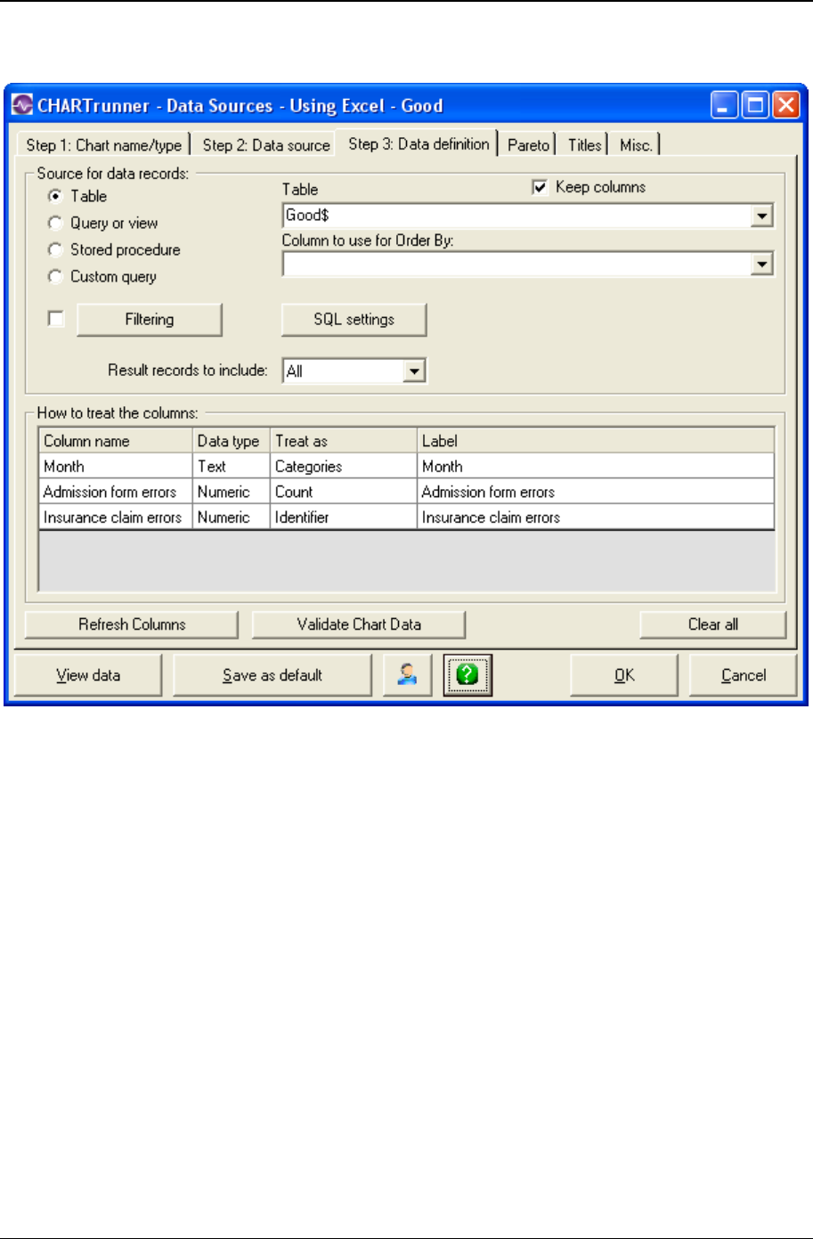
Appendix D: Data sources 325
Copyright © 2011
This is how the CHARTrunner Step 3: Data definition tab might look for this data:
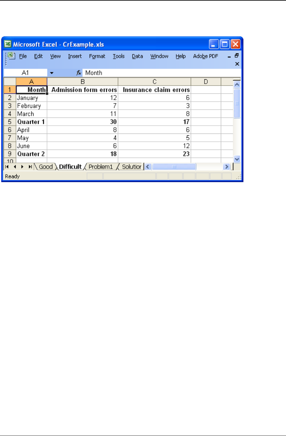
326 CHARTrunner User's Guide
Copyright © 2011
CHARTrunner can understand this data easily. The rows are alike, there is a single row for column
headings, there are no blank rows between the data, and no extra rows appear above or below.

Appendix D: Data sources 327
Copyright © 2011
Shown above is a worksheet that may give CHARTrunner some difficulty:
CHARTrunner will be able to make a chart using this data. However, since the rows summarizing Quarter
1 and Quarter 2 are different from the raw data in the other rows, the chart may not give the results you
expect. In other words, the quarterly totals will be seen as data points just like all the monthly values
found in the other rows. One way to avoid this problem is to separate the quarterly totals onto a different
sheet within the workbook. This way, CHARTrunner can look at the raw data using the familiar database
metaphor it is based upon.
Shown below is one possible chart from the previous data. Note that including Quarter 1 and Quarter 2
may not result in the desired outcome:

328 CHARTrunner User's Guide
Copyright © 2011
Shown below is another example of a problematic worksheet and how you can set this up in
CHARTrunner:
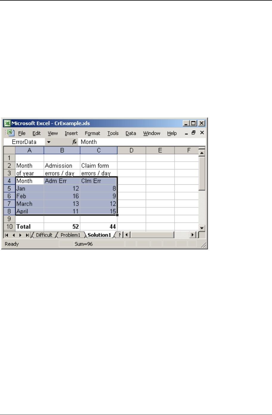
Appendix D: Data sources 329
Copyright © 2011
The Step 3: Data definition tab shown above corresponds to the Problem1 tab of the worksheet shown
above it.
Note that CHARTrunner uses the first row containing text as the column name. The problem will occur
when you attempt to display this chart. The data in the second row of the spreadsheet contains text, and
yet CHARTrunner is expecting numbers. Specifically, this is true for the Admission errors / day column. A
general rule for CHARTrunner is that if the column contains numbers – such as counts or measurements
– there should be no cells in the entire column containing text except the very first row. The next example
shows one way to solve this problem without reorganizing your sheet.
In the previous example, the worksheet caused problems for CHARTrunner because of the multi-row
column headings and also because of the intervening blank rows. To solve the problem, highlight the
cells containing only the data and give them a name in Excel. This is done in Excel with the Insert >
Name > Define menu.

330 CHARTrunner User's Guide
Copyright © 2011
To make this worksheet more useful for CHARTrunner, two things have been changed. First, column
names have been added to row 4 to describe the data in a single row. Second, the highlighted region has
been given the name ErrorData within Excel.
Now, within CHARTrunner, the Step 3:Data definition tab looks as shown below. Notice that the table name
used is ErrorData. CHARTrunner treats named regions within a workbook as if they were named tables in
a database. Also note that the column names we defined in row 4 show up under Column name on the Step
3:Data definition tab.

Appendix D: Data sources 331
Copyright © 2011
Using the technique of defining a named region in Excel allows you to chart only the specific data you
define in that named region. Additionally, CHARTrunner will not be confused by extra text either above or
below the named region.
The named region technique mentioned in the previous example can be used in many different situations.
For example, here is another worksheet containing data that is summarized on a quarterly basis.
Use Excel to name the first region as Quarter1Data (as shown above) and the second region as
Quarter2Data. Once you save the Excel workbook, these two named regions will be available as tables in
CHARTrunner. This allows you to create two different charts: one for each quarter.
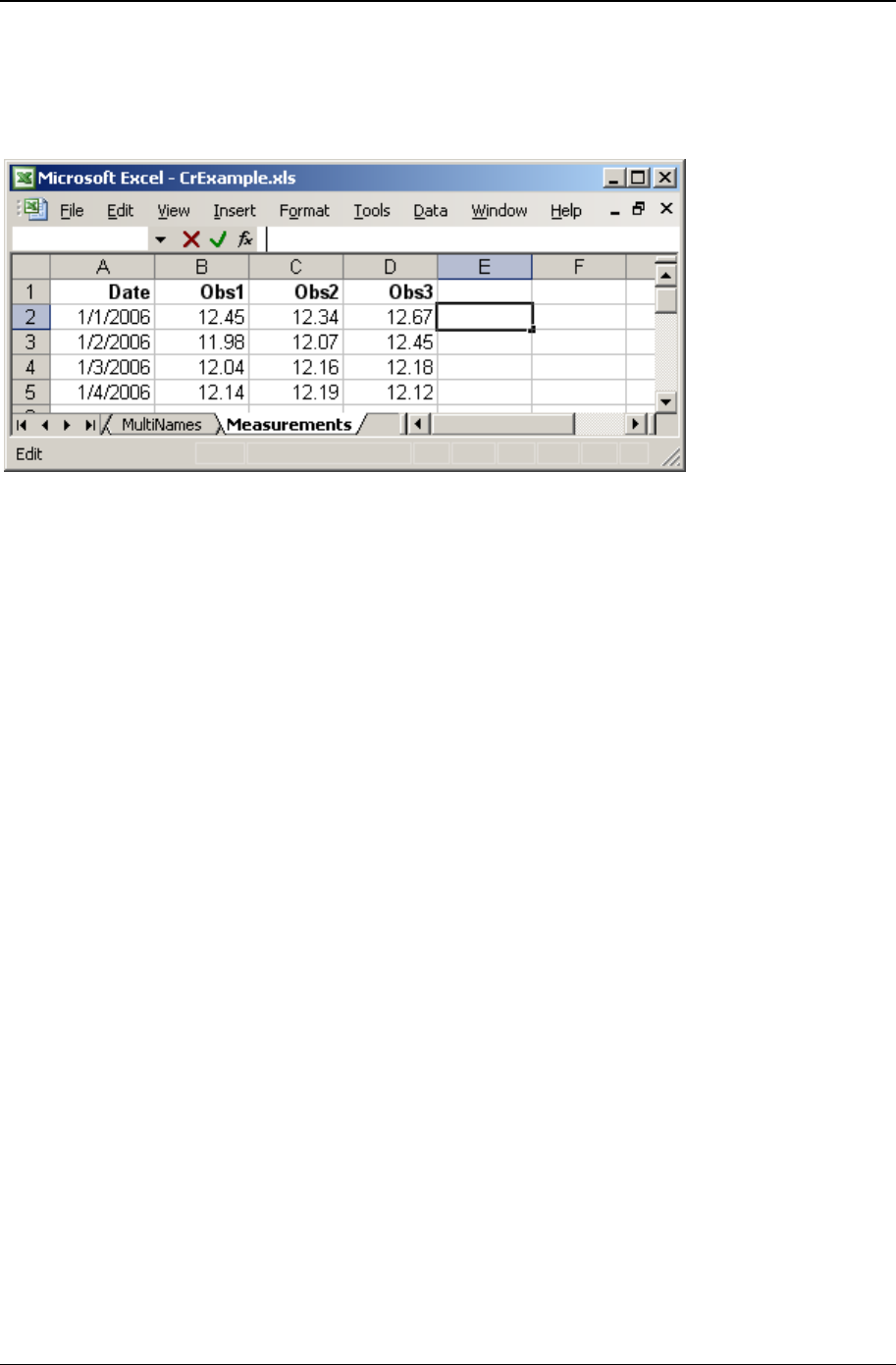
332 CHARTrunner User's Guide
Copyright © 2011
For X-bar charts and other charts that use data grouped into samples or subgroups, CHARTrunner
expects to find one data column for each observation in the subgroup. For example, in the following
worksheet, treating the three data columns (Obs1, Obs2 and Obs3) as Measurements will result in a chart
where the subgroup size is 3 (n=3).
General rules for setting up Excel sheets for use
with CHARTrunner
1. Separate the raw data from the summary data. If you currently have summary data in the midst of
your raw data, put the raw data on one worksheet within Excel and do the summarizing on a different
worksheet (tab) within the same workbook.
2. Have a single row for column headings and leave no blank rows between the column headings and
the raw data.
3. Do not use the space above or below your raw data for other spreadsheet data. Instead, move that
information off to the side of the raw data range OR put it on a different worksheet within the
workbook. If you must put other spreadsheet data below your raw data, highlight your raw data and
create a “Named Region” so that CHARTrunner can use only the raw data contained in this region
and ignore the other spreadsheet data below your raw data.
4. Do not mix data types within the same column if it is a column you want to use in CHARTrunner. For
example, do not have a cell containing text in the middle of a column where all the other values are
numbers.
5. Try to keep the raw data contiguous. Avoid intervening blank rows in the midst of the raw data.
6. Arrange your data so it goes down the worksheet rather than across the worksheet. In other words,
as you add new data, you should be adding new rows rather than adding new columns.
7. Although CHARTrunner can handle long column names, your charts and data definition forms will
look better and be less confusing if you name your spreadsheet columns with relatively short names.
8. Always have column names. If you do not, the first row of your raw data will be ignored as it will be
used to provide the column names.
9. If you have data in columns A, B, and C and you are charting data only from column A, be aware that
CHARTrunner will use the number of rows that it finds in the column that contains the most rows. For
example, if column A contains 25 rows of data, but column B contains 50 rows of data, when you
chart column A, the chart will have 25 blank rows at the end of the data. This may cause unexpected
results. The way around this problem is to use Named regions as described above.

Appendix D: Data sources 333
Copyright © 2011
Using ODBC data sources
ODBC (Open Database Connectivity) is a Microsoft data access standard that many software vendors
use to provide access to their data files or databases.
Many software vendors who support the ODBC standard have their ODBC drivers available for download
from their Web sites.
CHARTrunner supports using ODBC via the DSN or DSN-less methods. Of the two, PQ recommends the
DSN-less method, if it can be used, because your chart definition does not depend upon a DSN name
that must be defined on each computer where that chart is rendered.
The DSN method of using ODBC
When you select ODBC; Open database connectivity as the Type on the Step 2: Data source tab, you are
using the DSN method. The ODBC Driver drop-down list will contain a list of the ODBC “Data Source
Names” (DSN) that have been defined on the computer. The contents of the ODBC Driver drop-down list
will vary on each PC based on which ODBC drivers have been installed and what DSN's have been
defined.
To configure ODBC DSN's, follow these steps:
1. Click on the Windows Start menu.
2. Select Settings; then select Control Panel from the menu.
3. When Control Panel is displayed, select Data Sources (ODBC).
4. Use the ODBC Data Source Administrator program to add/modify/delete the ODBC DSN's that are
defined on the computer. The next time you start CHARTrunner, the current list of ODBC DSN's will
be displayed in the ODBC Driver drop-down list.
Please note that not all computers ship with all ODBC drivers. If you are trying to access data in some
proprietary software or database system, you may have to obtain and install the appropriate ODBC
drivers from the software vendor. You will need to do this before you follow the steps above to set up a
DSN.
Once you select an ODBC DSN, a connection string similar to that shown below will appear in the
Connection string field:
DSN=MyDsnName; UID={{USER}}; PWD={{PASSWORD}};
The connection string may or may not include the “UID={{USER}}; PWD={{PASSWORD}};” portion, which
is used when your database system requires you to log in with a user name and password. If your
database does not require this, you may omit this portion of the connection string. You may also omit the
UID and PWD when the user and password information was provided when the DSN was configured.

334 CHARTrunner User's Guide
Copyright © 2011
The DSN-less method of using ODBC
Instead of selecting ODBC; Open database connectivity as the Type on the Step 2: Data source tab, you
must select ADO;OLE DB provider. This probably seems somewhat counter-intuitive, but what we are
going to do is have ADO talk to the ODBC driver in a special way that gets around the need to define a
DSN on the computer.
Select a provider that looks like “ODBC Driver for …” from the ADO;OLE DB Provider drop-down list. Edit
the supplied connection string as appropriate for your situation. See the instructions under the topic
“Using ADO;OLE DB data sources.”
Good Connection String Resource – If you need information on the proper format of the connection string
for a specific case, refer to Carl Prothman's excellent site which has many examples of ADO;OLE DB and
ODBC connection strings.
http://www.carlprothman.net/Default.aspx?tabid=81
(http://www.carlprothman.net/Default.aspx?tabid=81)
Using ADO;OLE DB data sources
ADO stands for ActiveX Data Objects. This is a Microsoft standard that many software vendors support
as a way to provide access to their application data.
If you select ADO;OLE DB provider as the Type on the Step 2: Data source tab, the ADO;OLE DB
Provider drop-down list will appear. The contents of this list are determined by the ADO.INI file, which is
installed in CHARTrunner's SysData folder. The ADO.INI file contains many standard ADO connection
string templates. However, using CHARTrunner, you may add additional templates to the list by using the
Edit > ADO Data source templates menu on the CHARTrunner main form.
When you select an OLE DB provider from the drop-down list, a default connection string template will
appear in the Connection string field. Please note that the connection string template is in the correct
general form for the selected data source, but you will probably have to edit the connection string to
handle your specific situation.
For example, the following connection string is the template for connection to a – SQL Server database:
Provider=sqloledb; Data Source=SERVER_NAME; Initial Catalog=DATABASE_NAME; Integrated
Security=SSPI;
You must edit this connection string and replace SERVER_NAME and DATABASE_NAME with
information that is specific to your site, such as:
Provider=sqloledb; Data Source=SQLServer12; Initial Catalog= ProductionDB; Integrated Security=SSPI;
Good Connection String Resource - If you need information on the proper format of the connection string
for a specific case, refer to Carl Prothman's excellent site which has many examples of ADO;OLE DB and
ODBC connection strings.
http://www.carlprothman.net/Default.aspx?tabid=81
(http://www.carlprothman.net/Default.aspx?tabid=81)

Appendix D: Data sources 335
Copyright © 2011
Using ADO to connect to an XML recordset
ADO stands for ActiveX Data Objects. This is a Microsoft standard that many software vendors support
as a way to provide access to their application data. CHARTrunner uses ADO to connect to many
different types of data sources.
An ADO recordset may be saved (or persisted) as an XML recordset, and an XML recordset can be
“read” by ADO and turned back into a standard ADO recordset. XML stands for Extensible Markup
Language. An XML recordset saved as an XML file is simply a text file that contains all the information
about the data source, such as column names, column types, and all the data values from the rows and
columns of the recordset.
CHARTrunner 2.0 and above allows you to use an XML recordset as the data source for a chart by
selecting ADO; XML recordset as the Type on the Step 2: Data source tab of the chart definition. Then
you enter the URL that will be used to fetch the XML recordset as a Custom query on the Step 3: Data
definition tab. For example, the following URL simply returns the file Data1.xml, which is a persisted ADO
recordset,
http://www.chartrunner.com/Webdata/Data1.xml (http://www.chartrunner.com/webdata/Data1.xml)
You can use a Web server (HTTP or HTTPS) or an FTP server, and CHARTrunner will fetch the XML
recordset via the Internet (or your intranet) and draw a chart based on the data contained in the XML
recordset.
Here are some possible scenarios of how XML recordsets could be used with CHARTrunner.
• Periodically update XML recordset files on a server – In this scenario you would periodically update one or
more XML recordset files on the server so that the files contain the most recent data available. You
could periodically, as a “scheduled task,” run a script that updates the XML recordset files.
• Dynamically generate the XML recordset – In this scenario you would use an ASP or ASP.NET Web page
to fetch the chart data, persist the ADO recordset as an XML stream, and return the XML recordset to
CHARTrunner. This method allows you to pass query parameters to the URL so that you could, for
example, fetch data only between specific starting and ending dates. If you turn “Prompt for
parameters” on in the chart definition, then CHARTrunner would prompt you to enter the starting and
ending dates before it fetches the data and draws the chart. An example of this technique is included
in cr_xml_recordset.zip.
Download the following ZIP archive which contains some sample charts that fetch data via the ADO; XML
recordset data access method, plus an example ASP Web page that demonstrates how to dynamically
query a database and return the results of the query as an XML record-set.
http://www.chartrunner.com/Webdata/cr_xml_recordset.zip
(http://www.chartrunner.com/webdata/cr_xml_recordset.zip)

336 CHARTrunner User's Guide
Copyright © 2011
Using Text or CSV data
You can use a suitably formatted text file as a data source with CHARTrunner.
A text file where each column of data is separated by a comma character is sometimes called a CSV
(Comma Separated Values) data file.
Here are some tips for using a text file as a data source.
• On the Step 2: Data source tab:
• Set the Type to Text File.
• Specify the folder where the text file is located using the Database or file name field.
• On the Step 3: Data definition tab:
• Typically you will select Table as the Source for data records. Then in the Table drop-down list you will
select the name of the text file you want to use. Any embedded period characters in the file name will
be replaced with the “#” character, so the file TextData.txt will appear as TextData#txt in the drop-
down list.
If you select Custom query as the Source for data records you must specify the text file name in place
of the table name in your SQL SELECT statement. Any embedded period characters in the file
name must be replaced with the “#” character. For instance, if the text file name is TextData.txt,
then the custom query might look like this:
SELECT * FROM [TextData1#txt]
• CHARTrunner uses the JET 4.0 database engine to fetch data from a text file data source. By default,
JET expects the first row of data to contain the column (or field) names, and each column of data to
be separated from the next by the comma character, such as is shown by the following data:
Date,Value1,Value2,Value3
1/1/2000,11.6,12.8,12.4
1/2/2000,12.3,12.1,11.9
1/3/2000,15.6,12.3,12.4
• If the format of the data in the text file does not have the field names in the first row, or the columns
are not separated by the comma character, then CHARTrunner will be unable to read the data file. In
that case refer to the following knowledgebase article for assistance:
http://www.pqsystems.com/kb/activekb/questions/21/
http://www.pqsystems.com/kb/activekb/questions/21/

Appendix D: Data sources 337
Copyright © 2011
Using FoxPro data
To use FoxPro 2.0, 2.5, 2.6, or 3.0 data within CHARTrunner, you must follow these steps:
1. On the Step 2: Data source tab, set the Type to ADO;OLE DB Provider.
2. In the ADO;OLE DB Provider field, select ODBC Driver for Visual FoxPro - Without database
container from the drop-down list.
3. Edit the Connection string so that it looks like this:
Provider=MSDASQL.1;Persist Security Info=False;Extended
Properties=”Driver={Microsoft Visual FoxPro Driver};
SourceType=DBF; SourceDb=X:\XXXXXX\XXXXX;
Exclusive=No;”
Change X:\XXXXXX\XXXXX to be the location of the folder where the FoxPro table *.DBF files are
located.
4. Go to the Step 3: Data definition tab and select a FoxPro table from the Table drop-down list.
5. Click on SQL Settings and be sure to uncheck the Use brackets setting. If you do not do this, when you
try to draw the chart, you will get the following error message: “Item cannot be found in the collection
corresponding to the requested name or ordinal.”
Using Paradox 3 data
Paradox 3 databases usually require you to use the “Custom query” option. Selecting “Table” with
Paradox 3 databases will give you an error. If you have both the Paradox table AND the primary key
table, you might be able to use the “table” option. For example, if you have a Paradox 3.6 table named:
MyData.PD
There should also be a file named:
MyData.PX
This is the “primary key” for the table. Without this .PX file, you will have to use the “Custom Query” option
in CHARTrunner and enter a SELECT statement like this:
SELECT * FROM MyData
The errors you might see are:
“Collating sequence not supported by the operating system”
or
“Operation not supported on a Paradox table with no primary key”

338 CHARTrunner User's Guide
Copyright © 2011
Using Minitab data
CHARTrunner can chart data that is stored in Minitab files.
By default, Minitab stores data in Projects .MPJ and Worksheets .MTW; but by using the following steps,
you can store data in other formats. To do this:
1. While in Minitab, open the File Menu and select Save Current Worksheet As.
2. Select a file type, such as Excel.
3. When creating the chart in CHARTrunner, you would use Excel as the Data Source.
Using Lotus Notes databases
Following is a brief description for creating a DSN for users to connect to Lotus Notes (*.nsf) databases
with CHARTrunner.
To create a DSN to connect Lotus Notes (*.nsf) databases with CHARTrunner:
1. You must have one of the following:
Designer clients:
• Lotus Notes (full client) 4.5x, or
• Lotus Notes Designer for Domino 4.6x, or
• Domino Designer 5.0
Lotus Desktop License:
• Lotus Notes Desktop License 4.6x, or
• Lotus Notes 5.0
Lotus Server:
• Lotus Domino Mail Server 4.6x, or
• Lotus Domino R5 Mail Server, or
• Lotus Domino R5 Application Server
2. You must have NotesSQL 2.06 loaded onto your PC. This can be downloaded from www.lotus.com.
To use notes databases
1. Set up a System DSN to connect to the Notes database you want to use.
2. In CHARTrunner, set the Data source type on the Step 2: Data Source Tab to ODBC: Open
Database Connectivity.
3. The System DSN you have just created will appear in the ODBC Driver List combo box. Select this
DSN and continue setting up the chart definition.

Appendix D: Data sources 339
Copyright © 2011
Using Oracle databases
Please refer to the Knowledgebase articles that deal with using Oracle as a CHARTrunner data source.
In particular, these are good reference articles:
http://www.pqsystems.com/kb/activekb/questions/17/
(http://www.pqsystems.com/kb/activekb/questions/17/)
http://www.pqsystems.com/kb/activekb/questions/23/
(http://www.pqsystems.com/kb/activekb/questions/23/)
Using SQL Server databases
Please refer to the Knowledgebase articles that deal with using SQL Server as a CHARTrunner data
source.
In particular, these are good reference articles:
http://www.pqsystems.com/kb/activekb/questions/18/
(http://www.pqsystems.com/kb/activekb/questions/18/)
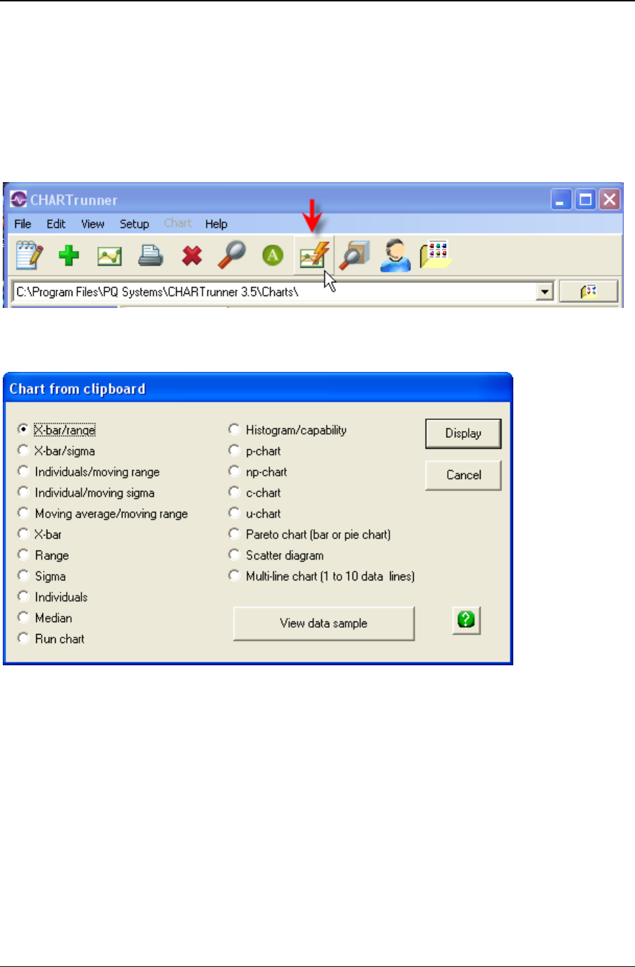
340 CHARTrunner User's Guide
Copyright © 2011
Charting from data on the clipboard
CHARTrunner can create charts from data that is stored on the Windows clipboard.
You must copy the data to be charted to the clipboard. In many applications, such as Microsoft Excel, you
simply select the data of interest and then click Edit > Copy, or press the Ctrl-C key, and the selected
data is copied to the clipboard.
After the data to be charted has been copied to the clipboard, click on the toolbar icon (indicated by the
mouse pointer) shown above, or select View > Chart from clipboard. The Chart from clipboard window
shown below will open.
Select the type of chart that you want to display.
Click on the View data sample button to view a sample of the data that CHARTrunner finds on the clipboard.
Click the Display button to display the specified chart from the clipboard data.
Tips for charting from the clipboard
CHARTrunner expects data to be separated by either the comma character or the tab character. Data
that is copied to the clipboard from Excel is separated by the tab character.
CHARTrunner makes a best guess of how to treat each column of data that it finds on the clipboard. It
may be necessary for you to edit the definition of the displayed chart and on the Step 3: Data definition tab
manually set the Treat as for each column of data.

Appendix D: Data sources 341
Copyright © 2011
Do not include column headings in the data that is copied to the clipboard. CHARTrunner expects that all
of the information on the clipboard is actually chartable data. The first non-blank cell in each column of
data is examined to determine if it contains a number, a date, or text. When you include column headings,
CHARTrunner thinks that each column contains text data.

342 CHARTrunner User's Guide
Copyright © 2011

343
The software includes a number of pre-defined out-of-control test definitions. On a control chart, out-of-
control conditions may be labeled with a number. Which out-of-control conditions these numbers
represent depends on which test definition you are using. This appendix includes a reference to the
number codes and their corresponding test.
NOTE: If you have modified a test definition or are using a custom test definition, note that the tests codes
are numbered in the order in which the test parameters appear on the Out-of-control test form.
In This Chapter
AIAG ............................................................................................................ 343
AT&T ........................................................................................................... 344
Duncan ........................................................................................................ 344
Gitlow attributes .......................................................................................... 344
Gitlow variables ........................................................................................... 345
Hughes ........................................................................................................ 345
Juran ........................................................................................................... 346
Shewhart ..................................................................................................... 346
SQCpack ..................................................................................................... 346
Western ....................................................................................................... 347
Swed Eisenhart run chart tests (1% risk) .................................................... 347
Swed Eisenhart run chart tests (5% risk) .................................................... 347
Health basic ................................................................................................ 348
Health extended .......................................................................................... 349
Health advanced ......................................................................................... 349
Health API ................................................................................................... 350
AIAG
Code Test
1 Beyond Limits
2 7 ascending
3 7 descending
4 7 above centerline
5 7 below centerline
CHAPTER 19
Appendix E: Out-of-control tests and
codes

344 CHARTrunner User's Guide
Copyright © 2011
AT&T
Code Test
1 2 of 3 above 2 sigma
2 2 of 3 below 2 sigma
3 4 of 5 below 1 sigma
4 4 of 5 below 1 sigma
5 Beyond limits
6 8 above centerline
7 8 below centerline
Duncan
Code Test
1 2 of 3 above 2 sigma
2 2 of 3 below 2 sigma
3 4 of 5 below 1 sigma
4 4 of 5 above 1 sigma
5 Beyond limits
6 8 above centerline
7 8 below centerline
Gitlow attributes
Code Test
1 Beyond limits
2 8 ascending
3 8 descending

Appendix E: Out-of-control tests and codes 345
Copyright © 2011
Gitlow variables
Code Test
1 2 of 3 above 2 sigma
2 8 ascending
3 8 descending
4 4 of 5 above 1 sigma
5 Beyond limits
6 8 above centerline
7 8 below centerline
Hughes
Code Test
1 2 of 3 above 2 sigma
2 2 of 3 below 2 sigma
3 3 of 7 above 2 sigma
4 4 of 10 above 2 sigma
5 4 of 10 below 2 sigma
6 3 of 7 below 2 sigma
7 Beyond limits
8 7 ascending
9 7 descending
10 7 above centerline
11 7 below centerline
12 10 of 11 above centerline
13 10 of 11 below centerline
14 12 of 14 above centerline
15 12 of 14 below centerline

346 CHARTrunner User's Guide
Copyright © 2011
Juran
Code Test
1 2 of 3 above 2 sigma
2 2 of 3 below 2 sigma
3 4 of 5 below 1 sigma
4 4 of 5 above 1 sigma
5 Beyond limits
6 6 ascending
7 6 descending
8 9 above centerline
9 9 below centerline
10 8 beyond 1 sigma
Shewhart
Code Test
1 2 of 3 above 2 sigma
2 2 of 3 below 2 sigma
3 4 of 5 below 1 sigma
4 4 of 5 above 1 sigma
5 Beyond limits
6 8 above centerline
7 8 below centerline
SQCpack
Code Test
1 Beyond limits
2 7 ascending
3 7 descending
4 7 above centerline
5 7 below centerline

Appendix E: Out-of-control tests and codes 347
Copyright © 2011
Western
Code Test
1 4 of 5 beyond 1 sigma
2 2 of 3 beyond 2 sigma
3 Beyond limits
4 8 above centerline
5 8 below centerline
Swed Eisenhart run chart tests (1% risk)
Code Test
1 SwedEisenhart too little variation (1% risk)
2 SwedEisenhart too much variation (1% risk)
3 SwedEisenhart run
4 SwedEisenhart trend
NOTE: The Swed Eisenhart tests are generally applied only to run charts. These are often used in
healthcare applications, and they are described in the book Improving Healthcare with Control Charts by
Raymond G. Carey, Ph.D.
To determine if a point violates one of the rules, a lookup table is used. The lookup table is based on the
number of data points on the chart and the number of runs present. When a data point violates a rule, it is
displayed using the “OOC data” marker style that is defined by the style definition used by the chart.
The tests that are named too much variation and too little variation use two different lookup tables. These
tables are calculated differently based on the risk of failing the run test for random patterns of data. One
table is based on a 1% risk, and the other table is based on a 5% risk. This is why CHARTrunner offers
both a 1% and a 5% version of the Swed Eisenhart tests.
If you have any doubt about which set to use, select the 1% tests. Different practitioners have different
preferences for how sensitive they want these tests to be. For example, Robert Lloyd prefers the tests
based on 1% risk while Lloyd Provost recommends the tests be based on 5% risk.

348 CHARTrunner User's Guide
Copyright © 2011
Swed Eisenhart run chart tests (5% risk)
Code Test
1 SwedEisenhart too little variation (5% risk)
2 SwedEisenhart too much variation (5% risk)
3 SwedEisenhart run
4 SwedEisenhart trend
NOTE: The Swed Eisenhart tests are generally applied only to run charts. These are often used in
healthcare applications, and they are described in the book Improving Healthcare with Control Charts by
Raymond G. Carey, Ph.D.
To determine whether a point violates one of the rules, a lookup table is used. The lookup table is based
on the number of data points on the chart and the number of runs present. When a data point violates a
rule, it is displayed using the “OOC data” marker style that is defined by the style definition used by the
chart.
The tests that are named too much variation and too little variation use two different lookup tables. These
tables are calculated differently based on the risk of failing the run test for random patterns of data. One
table is based on a 1% risk, and the other table is based on a 5% risk. This is why CHARTrunner offers
both a 1% and a 5% version of the Swed Eisenhart tests.
If you have any doubt about which set to use, select the 1% tests. Different practitioners have different
preferences for how sensitive they want these tests to be. For example, Robert Lloyd prefers the tests
based on 1% risk while Lloyd Provost recommends the tests be based on 5% risk.
Health basic
Code Test
1 1 beyond limits
2 6 ascending (n<20)
3 6 descending (n<20)
4 7 ascending only (n>=20)
5 7 descending only (n>=20)
6 8 above centerline
7 8 below centerline
From Quality Health Care by Robert Lloyd page 210 – 216

Appendix E: Out-of-control tests and codes 349
Copyright © 2011
Health extended
Code Test
1 1 beyond limits
2 6 ascending (n<20)
3 6 descending (n<20)
4 7 ascending only (n>=20)
5 7 descending only (n>=20)
6 8 above centerline
7 8 below centerline
8 2 of 3 above 2 sigma
9 2 of 3 below 2 sigma
10 4 of 5 above 1 sigma
11 4 of 5 below 1 sigma
From Quality Health Care by Robert Lloyd page 210 – 216
Health advanced
Code Test
1 1 beyond limits
2 6 ascending (n<20)
3 6 descending (n<20)
4 7 ascending only (n>=20)
5 7 descending only (n>=20)
6 8 above centerline
7 8 below centerline
8 2 of 3 above 2 sigma
9 2 of 3 below 2 sigma
10 4 of 5 above 1 sigma
11 4 of 5 below 1 sigma
12 15 within sigma
13 8 beyond 1 sigma
14 14 alternating
From Quality Health Care by Robert Lloyd page 210 – 216

350 CHARTrunner User's Guide
Copyright © 2011
Health API
Code Test
1 1 beyond limits
2 2 of 3 beyond 2 sigma
3 6 ascending inclusive
4 6 descending inclusive
5 8 above centerline
6 8 below centerline
7 15 within 1 sigma
Recommend by Associates in Process Improvement

351
A
About PQ Systems • 4
About your CHARTrunner documentation • 3
Accessing charts using windows explorer • 320
Accessing dashboards using windows explorer • 321
Add an annotation to a chart • 224
ADO data source templates • 292
Advanced charts • 76
Advanced row selection • 94, 203
Advanced row selection example 1 • 206
Advanced row selection example 2 • 208
Advanced row selection example 3 • 210
Advanced row selection steps • 204
AIAG • 343
All other tabs • 22
Angle • 288
Appendix A
Formulas used by CHARTrunner • 307
Appendix B
CHARTrunner command line arguments • 309
Appendix C
Tips and troubleshooting • 313
Appendix D
Data sources • 85, 88, 90, 323
Appendix E
Out-of-control tests and codes • 343
Applying an extra line to specific subgroups • 123, 136, 156, 162, 181, 188, 212
AT&T • 344
Attributes control charts • 125
Attributes data • 56
B
Basic chart definition • 81
Basic chart definition concepts • 82
Box and whisker • 76
Box and whisker charts • 177
Box and whisker tab - box and whisker charts • 177
Box options • 225
C
c’ chart (c prime chart) • 63
Index

352 Index
Copyright © 2011
Capability analysis • 72
Capability stats sub-tab - histogram charts • 166, 171
c-chart • 59
Chart colors • 286
Chart data display sub-tab - attributes charts • 137
Chart data display sub-tab - box and whisker charts • 182
Chart data display sub-tab - cusum charts • 140, 144
Chart data display sub-tab - measurement charts • 114, 124
Chart data display sub-tab - multi-line charts • 189
Chart data display sub-tab - short run charts • 157
Chart definition files • 13
Chart definition form • 17
Chart options - sub-tab attributes charts • 130
Chart options sub-tab - box and whisker charts • 177
Chart options sub-tab - cusum charts • 140
Chart options sub-tab - measurement charts • 114, 117
Chart options sub-tab - multi-line charts • 184
Chart options sub-tab - short-run charts • 150
Chart style form • 24, 223
Chart styles • 285
Chart title codes - titles tab • 195, 196, 201
Charting from data on the clipboard • 17, 284, 340
CHARTrunner chart tab - indicator definition • 273
CHARTrunner file extensions • 290
CHARTrunner performance tip • 313
CHARTrunner viewer • 303
Charts that scroll • 217
Close data source after drawing chart • 316
Column to use for order by does not allow you to select anything • 318
Comma and decimal separators • 314
Contact technical support if you need help connecting to your data • 323
Control chart tab - attributes charts • 129
Control chart tab - cusum charts • 138, 140
Control chart tab - measurement charts • 114, 117
Control chart tab – rare event control chart • 160
Control limits • 219, 226
Control limits sub-tab - short-run charts • 147
Controlling the chart display window • 216
Copy a chart style • 223
Copying a chart definition • 221
Copying styles • 289
Count (attributes) control charts • 57
Cpk Advisor Analysis • 275
Create a set of control limits on the chart • 39
Creating new styles • 285
CST file extensions • 291
Custom query • 92, 102
Customizing a chart definition • 18, 22, 84, 113
Cusum • 54
Cusum chart tab • 138, 139
Cusum control charts • 138

Index 353
Copyright © 2011
D
Dashboard definition • 265
Dashboards • 259
Data and chart types • 45
Data definition tab - attributes chart • 129
Data markers • 288
Database concepts • 81
Defining the advanced tab's week option - what is a week? • 314
Delete control limits - from the chart definition form • 228
Delete control limits - from the chart display • 227
Deleting annotations • 226
Deleting charts and chart styles • 223
Deleting styles • 289
Describing the rare event • 159
Descriptive stats sub-tab - histogram charts • 166, 169
Difference chart vs. zed chart • 78
Different methods to edit a chart definition • 220
Different methods to edit a chart style • 223
Disable (hide) control limits • 227
Displaying charts • 215
Displaying the OOC Summary form • 280
Distribution and capability analysis • 71
Duncan • 344
E
Edit menu functions • 284
Editing and copying chart definitions • 220
Editing and copying chart styles • 222
Editing existing control limits • 227
Editing the chart definition or style • 39
E-mail setup tab • 297
Example command line usage • 311
Example text file containing command arguments • 312
Exiting CHARTrunner • 25
Extra lines sub-tab - attributes charts • 135
Extra lines sub-tab - box and whisker charts • 180
Extra lines sub-tab - measurement charts • 114, 122
Extra lines sub-tab - multi-line charts • 187
Extra lines sub-tab - rare event control chart charts • 161
Extra lines sub-tab - short-run charts • 155
F
File menu functions • 283
Files and folders tab • 298
Filter for missing values as an identifier • 315
Filter to exclude outliers • 315
Filtering chart data • 93, 97
Font options • 287

354 Index
Copyright © 2011
G
g-chart • 80
General rules for setting up Excel sheets for use with CHARTrunner • 332
General sub-tab - histogram charts • 166, 167
General tab • 294
Getting help • 3, 25
Getting started • 15
Gitlow attributes • 344
Gitlow variables • 345
H
Hardware and software requirements • 11
Health advanced • 349
Health API • 350
Health basic • 348
Health extended • 349
Histogram • 71
Histogram charts • 166
Histogram tab - histogram charts • 166
How it works • 203
How the Cpk Advisor Analysis works • 277
How to contact PQ Systems • 5
Hughes • 345
I
If you select ADO as the type of data source • 89, 284
If You Select Microsoft Access, Microsoft Excel, text file, Dbase, or Lotus 123 as the type of data source
• 86
If you select ODBC as the type of data source • 87
Image file defaults sub-tab - misc. tab - applies to all charts • 200
Indicator definition • 266
Indicator tab - indicator definition • 267
Individuals and moving range • 50
Individuals and moving sigma • 51
Installing CHARTrunner • 11, 12
Introduction to Cpk Advisor Analysis • 275
Introduction to dashboards • 260
Introduction to OOC Summary • 279
J
Juran • 346
L
Lesson 1 - Set the working folder • 27
Lesson 2 - Define a chart definition • 29
Lesson 3 - display and customize the chart • 37
Limits tab - attributes charts • 126

Index 355
Copyright © 2011
Limits/specs tab - measurement charts • 114, 115
Limits/Targets tab - short-run charts • 146
Line charts • 73
Line options • 225
Lines • 287
Linking to chart or dashboard images using Microsoft PowerPoint or Word • 244, 263
Lloyd Nelson limits option • 116, 235
M
Maintenance support agreement • 6
Marker size • 289
Marker style • 288
Measurement control charts • 46, 113
Median • 49
Menu functions (for the main window) right-click context menus • 283
Microsoft Access data source • 316
Microsoft Excel data source • 317
Misc. tab • 22
Misc. tab - applies to all charts • 199
Modifying styles • 289
Moving and sizing an annotation • 226
Moving average and moving range • 52
Multi-chart and chart workspace forms • 23
Multi-charts (multiple charts on one page) • 103
Multi-charts and Workspaces • 103
Multi-line chart tab - multi-line charts • 184
Multi-line charts • 74, 183
N
New CHARTrunner users • 15
np’-chart (np prime chart) • 62
np-chart • 58
O
Using ADO • 334
Getting to Excel data via the ADO • 317
Online information • 313
OOC Summary • 279
OOC Summary form settings • 281
Other chart display menus • 218
Other sub-tab - misc. tab - applies to all charts • 199
Out-of-control data markers • 255
Out-of-control tests • 251, 284
P
p’ chart (p prime chart) • 61
Pareto - bar chart • 66
Pareto – column chart • 67

356 Index
Copyright © 2011
Pareto - pie • 68
Pareto – stacked bars • 69
Pareto – stacked columns • 70
Pareto charts • 162
Pareto charts - category data • 66
Pareto data • 65
Pareto tab - pareto charts • 163
Patterns • 286
p-chart • 57
PQ Systems copyright notice • ii
PQ Systems End-User License Agreement for Per-Computer or Concurrent-User License Model • 7
Preferences • 284, 293
Printing charts • 236
Publishing charts • 245
Publishing charts on the Internet • 246
Q
Query parameters • 94, 99
R
Rare event control charts • 79, 158
Request for new features • 9
Roaming license administration • 300
Run chart • 73
S
Sample clipCHARTs • 304
Save chart as image dialog • 124, 144, 157, 189, 238, 239, 244
Save chart as web page dialog • 137, 182, 238, 240
Saving chart, workspace, and style definitions • 24
Saving charts and sharing them with others • 238
Scale tab - indicator definition • 271
Scatter diagram charts • 192
Scatter diagram tab • 192
Scatter diagrams • 75
Selecting a style for a chart • 248
Send chart as e-mail dialog • 238, 242
Setup menu functions • 284
Shewhart • 346
Short-run chart types • 77
Short-run control charts • 145
Short-run SPC • 77
Short-run targets sub-tab - short-run charts • 149
Specifications tab - box and whisker charts • 183
Specifications tab - histogram charts • 166, 176
Specifications tab - multi-line charts • 191
SQCpack • 346
Starting CHARTrunner • 16
Stat columns sub-tab - histogram charts • 166, 175

Index 357
Copyright © 2011
Step 1
Chart name/type tab • 17, 82, 83, 160
Chart name/type tab - attributes chart • 128
Step 2
Data source tab • 19, 82, 84
Step 3
Data definition tab • 20, 82, 84, 91
Steps for migrating to CHARTrunner 3.6 • 14
Style definition files • 13
Swed Eisenhart run chart tests (1% risk) • 347
Swed Eisenhart run chart tests (5% risk) • 348
System settings • 283
T
t-chart • 79
Technical support • 6
Test rule syntax • 251
Text options • 225
The annotation list • 226
The basic steps of creating and using dashboards • 263
The basics steps to create a Cpk Advisor Analysis • 276
The chart style editor • 249
The CHARTrunner definitions list • 16
The CHARTrunner software development kit • 246
The CHARTrunner viewer program • 303
The control limits dialog • 232
The DSN method of using ODBC • 333
The DSN-less method of using ODBC • 334
The Swed Eisenhart run test rules • 255
Three-way control • 55
Time on the charts • 314
Titles tab • 21
Titles tab - applies to all charts • 107, 194
To add an annotation to the chart • 42
To close the chart display • 39
To compute a new set of saved control limits • 229
To scroll through the data • 38
To specify out-of-control tests • 256
Tutorial • 15, 27
Types of measurement control charts • 114
Types of rare event control charts • 158
Types of short-run control charts • 145
U
u' chart (u prime chart) • 64
u-chart • 60
Understanding the data order concept • 116, 127, 148, 204, 213, 214
Upgrading from a prior version of CHARTrunner • 13
Using a local share as a chart image repository • 246
Using ADO to connect to an XML recordset • 335

358 Index
Copyright © 2011
Using annotations on charts • 219, 223
Using charts • 215
Using clipCHARTs via windows explorer • 305
Using control charts and control limits • 233
Using Excel data • 324
Using FoxPro data • 337
Using Lotus Notes databases • 338
Using Minitab data • 338
Using ODBC data sources • 333
Using Oracle databases • 339
Using Paradox 3 data • 337
Using SQL Server databases • 339
Using styles to control the look of your charts • 18, 83, 247
Using Text or CSV data • 336
Using the installation README file • 11
Using the LIKE operator in a filter or SQL expression • 319
V
Variables data • 45
View menu functions • 284
W
Web page defaults sub-tab - misc. tab - applies to all charts • 124, 137, 144, 157, 182, 189, 201
Welcome • 1
Western • 347
What are control limits? • 227
What are temporary control limits? • 227
What is a chart style? • 247
What type of image file should I use? • 264
What's new in CHARTrunner 3.6 • 2
When do you use Pareto charts? • 70
Why CHARTrunner? • 16
Working with dashboard definitions • 263
Workspaces (dealing with multiple charts) • 108
X
X-axis Y-axis - sub-tab attributes charts • 133
X-axis Y-axis sub-tab - box and whisker charts • 179
X-axis Y-axis sub-tab - cusum charts • 140, 142
X-axis Y-axis sub-tab - measurement charts • 114, 120
X-axis Y-axis sub-tab - multi-line charts • 185
X-axis Y-axis sub-tab - short-run charts • 153
X-bar and range • 47
X-bar and sigma • 48
X-Y Axis sub-tab - histogram charts • 166, 174
