CSS The Missing Manual 2nd Edition
User Manual:
Open the PDF directly: View PDF  .
.
Page Count: 560 [warning: Documents this large are best viewed by clicking the View PDF Link!]
- Table of Contents
- The Missing Credits
- Introduction
- Rethinking HTML for CSS
- Creating Styles and Style Sheets
- Selectors: Identifying What to Style
- Saving Time with Style Inheritance
- Managing Multiple Styles: The Cascade
- Formatting Text
- Margins, Padding, and Borders
- Adding Graphics to Web Pages
- Sprucing Up Your Site’s Navigation
- Formatting Tables and Forms
- Introducing CSS Layout
- Building Float-Based Layouts
- Positioning Elements on a Web Page
- CSS for the Printed Page
- Improving Your CSS Habits
- CSS 3: CSS on the Edge
- CSS Property Reference
- CSS Values
- Text Properties
- color (inherited)
- font (inherited)
- font-family (inherited)
- font-size (inherited)
- font-style (inherited)
- font-variant (inherited)
- font-weight (inherited)
- letter-spacing (inherited)
- line-height (inherited)
- text-align (inherited)
- text-decoration
- text-indent (inherited)
- text-transform (inherited)
- vertical-align
- white-space
- word-spacing (inherited)
- List Properties
- Padding, Borders, and Margins
- border
- border-top, border-right, border-bottom, border-left
- border-color
- border-top-color, border-right-color, border-bottom-color, border-left-color
- border-style
- border-top-style, border-right-style, border-bottom-style, border-left-style
- border-width
- border-top-width, border-right-width, border-bottom- width, border-left-width
- outline
- outline-color
- outline-style
- outline-width
- padding
- padding-top
- padding-right
- padding-bottom
- padding-left
- margin
- margin-top
- margin-right
- margin-bottom
- margin-left
- Backgrounds
- Page Layout Properties
- Table Properties
- Miscellaneous Properties
- CSS in Dreamweaver CS4
- CSS Resources
- Index
Download at Boykma.Com

CSS
The book that
should have been
in the box®
THE MISSING MANUAL
Download at Boykma.Com

Download at Boykma.Com
CSS
THE
MISSING
MANUAL
®
Second Edition
David Sawyer McFarland
Beijing •Cambridge •Farnham •Köln •Sebastopol •Taipei •Tokyo
Download at Boykma.Com

CSS: The Missing Manual, Second Edition
by David Sawyer McFarland
Copyright © 2009 David Sawyer McFarland. All rights reserved.
Printed in the United States of America.
Published by O’Reilly Media, Inc., 1005 Gravenstein Highway North, Sebastopol, CA 95472.
O’Reilly books may be purchased for educational, business, or sales promotional use. Online editions are
also available for most titles (safari.oreilly.com). For more information, contact our corporate/institutional
sales department: (800) 998-9938 or corporate@oreilly.com.
Printing History:
August 2006: First Edition.
August 2009: Second Edition.
Nutshell Handbook, the Nutshell Handbook logo, the O’Reilly logo, and “The book that should have been
in the box” are registered trademarks of O’Reilly Media, Inc. CSS: The Missing Manual, The Missing Manual
logo, Pogue Press, and the Pogue Press logo are trademarks of O’Reilly Media, Inc.
Many of the designations used by manufacturers and sellers to distinguish their products are claimed as
trademarks. Where those designations appear in this book, and O’Reilly Media, Inc. was aware of a
trademark claim, the designations have been printed in caps or initial caps.
While every precaution has been taken in the preparation of this book, the publisher and author(s) assume
no responsibility for errors or omissions, or for damages resulting from the use of the information
contained herein.
This book uses RepKover™
, a durable and flexible lay-flat binding.
ISBN: 978-0-596-80244-8
[M]
Download at Boykma.Com

v
Table of Contents
The Missing Credits .................................................................................xiii
Introduction................................................................................................. 1
Part One: CSS Basics
Chapter 1: Rethinking HTML for CSS...................................................... 17
HTML: Past and Present .......................................................................................................................... 17
HTML Past: Whatever Looked Good ............................................................................................... 18
HTML Present: Scaffolding for CSS ................................................................................................. 19
Writing HTML for CSS .............................................................................................................................. 20
Think Structure ................................................................................................................................... 20
Two New HTML Tags to Learn ......................................................................................................... 20
HTML to Forget .................................................................................................................................. 22
Tips to Guide Your Way .................................................................................................................... 23
The Importance of the Doctype ............................................................................................................. 26
Getting the Most out of Internet Explorer 8 ......................................................................................... 28
Chapter 2: Creating Styles and Style Sheets .......................................... 31
Anatomy of a Style ................................................................................................................................... 31
Understanding Style Sheets .................................................................................................................... 34
Internal or External—How to Choose ..............................................................................................34
Internal Style Sheets ................................................................................................................................ 35
External Style Sheets ................................................................................................................................ 36
Linking a Style Sheet Using HTML ................................................................................................... 37
Linking a Style Sheet Using CSS ...................................................................................................... 38
Download at Boykma.Com

vi CSS: The Missing Manual
Tutorial: Creating Your First Styles ........................................................................................................ 39
Creating an Inline Style ..................................................................................................................... 39
Creating an Internal Style Sheet ...................................................................................................... 40
Creating an External Style Sheet ...................................................................................................... 43
Chapter 3: Selectors: Identifying What to Style.....................................49
Tag Selectors: Page-Wide Styling ........................................................................................................... 50
Class Selectors: Pinpoint Control ........................................................................................................... 51
ID Selectors: Specific Page Elements ..................................................................................................... 53
Styling Groups of Tags ............................................................................................................................. 55
Constructing Group Selectors .......................................................................................................... 56
The Universal Selector (Asterisk) ..................................................................................................... 56
Styling Tags Within Tags .......................................................................................................................... 57
The HTML Family Tree ...................................................................................................................... 57
Building Descendent Selectors ......................................................................................................... 58
Pseudo-Classes and Pseudo-Elements .................................................................................................. 61
Styles for Links ................................................................................................................................... 61
Styling Paragraph Parts ..................................................................................................................... 62
More Pseudo-Classes and -Elements .............................................................................................. 62
Advanced Selectors .................................................................................................................................. 65
Child Selectors .................................................................................................................................... 66
Adjacent Siblings ................................................................................................................................ 66
Attribute Selectors .............................................................................................................................. 67
Tutorial: Selector Sampler ....................................................................................................................... 70
Creating a Group Selector ................................................................................................................ 72
Creating and Applying a Class Selector ..........................................................................................73
Creating a Descendent Selector ....................................................................................................... 76
Creating and Applying an ID Selector ............................................................................................. 77
Finishing Touches .............................................................................................................................. 79
Chapter 4: Saving Time with Style Inheritance...................................... 81
What Is Inheritance? ................................................................................................................................ 81
How Inheritance Streamlines Style Sheets ........................................................................................... 83
The Limits of Inheritance ......................................................................................................................... 83
Tutorial: Inheritance ................................................................................................................................. 85
A Basic Example: One Level of Inheritance .................................................................................... 85
Using Inheritance to Restyle an Entire Page .................................................................................. 86
Inheritance Inaction ........................................................................................................................... 89
Chapter 5: Managing Multiple Styles: The Cascade .............................. 91
How Styles Cascade ................................................................................................................................. 92
Inherited Styles Accumulate ............................................................................................................. 92
Nearest Ancestor Wins ...................................................................................................................... 93
The Directly Applied Style Wins ....................................................................................................... 93
One Tag, Many Styles ........................................................................................................................ 94
Download at Boykma.Com

Table of Contents vii
Specificity: Which Style Wins .................................................................................................................. 96
The Tiebreaker: Last Style Wins ....................................................................................................... 97
Controlling the Cascade .......................................................................................................................... 99
Changing the Specificity ................................................................................................................... 99
Selective Overriding ........................................................................................................................ 100
Starting with a Clean Slate ............................................................................................................. 101
Tutorial: The Cascade in Action ........................................................................................................... 103
Resetting CSS and Styling from Scratch ........................................................................................ 103
Creating a Hybrid Style ................................................................................................................... 105
Overcoming Conflicts ...................................................................................................................... 106
Part Two: Applied CSS
Chapter 6: Formatting Text .....................................................................113
Formatting Text ...................................................................................................................................... 113
Choosing a Font ............................................................................................................................... 115
Adding Color to Text ....................................................................................................................... 118
Changing Font Size ................................................................................................................................ 119
Using Pixels ....................................................................................................................................... 120
Using Keywords, Percentages, and Ems ....................................................................................... 121
Formatting Words and Letters ............................................................................................................. 124
Italicizing and Bolding ..................................................................................................................... 124
Capitalizing ....................................................................................................................................... 125
Decorating ........................................................................................................................................ 125
Letter and Word Spacing ................................................................................................................ 127
Formatting Entire Paragraphs .............................................................................................................. 128
Adjusting the Space Between Lines .............................................................................................. 128
Aligning Text ..................................................................................................................................... 130
Indenting the First Line and Removing Margins ......................................................................... 130
Formatting the First Letter or First Line of a Paragraph ............................................................. 132
Styling Lists .............................................................................................................................................. 134
Types of Lists .................................................................................................................................... 134
Positioning Bullets and Numbers .................................................................................................. 135
Graphic Bullets ................................................................................................................................. 137
Tutorial: Text Formatting in Action ...................................................................................................... 138
Setting Up the Page ......................................................................................................................... 138
Formatting the Headings and Paragraphs ................................................................................... 140
Formatting Lists ................................................................................................................................ 143
Fine-Tuning with Classes ................................................................................................................ 144
Adding the Finishing Touches ........................................................................................................ 146
Download at Boykma.Com

viii CSS: The Missing Manual
Chapter 7: Margins, Padding, and Borders.......................................... 151
Understanding the Box Model ..............................................................................................................151
Control Space with Margins and Padding .......................................................................................... 153
Margin and Padding Shorthand ....................................................................................................155
Colliding Margins .............................................................................................................................155
Removing Space with Negative Margins ......................................................................................156
Displaying Inline and Block-Level Boxes ......................................................................................158
Adding Borders ....................................................................................................................................... 160
Border Property Shorthand ............................................................................................................ 161
Formatting Individual Borders ....................................................................................................... 162
Coloring the Background ...................................................................................................................... 164
Determining Height and Width ............................................................................................................ 164
Calculating a Box’s Actual Width and Height ...............................................................................165
Controlling the Tap with the Overflow Property .........................................................................167
Wrap Content with Floating Elements ................................................................................................. 169
Backgrounds, Borders, and Floats .................................................................................................172
Stopping the Float ............................................................................................................................ 172
Tutorial: Margins, Backgrounds, and Borders .................................................................................... 175
Controlling Page Margins and Backgrounds ................................................................................ 175
Adjusting the Space Around Tags .................................................................................................. 178
Building a Sidebar ............................................................................................................................ 181
Fixing the Browser Bugs .................................................................................................................. 184
Going Further ................................................................................................................................... 186
Chapter 8: Adding Graphics to Web Pages .......................................... 187
CSS and the <img> Tag ......................................................................................................................... 187
Background Images ...............................................................................................................................188
Controlling Repetition ............................................................................................................................ 193
Positioning a Background Image .........................................................................................................194
Keywords ..........................................................................................................................................194
Precise Values ................................................................................................................................... 196
Percentage Values ............................................................................................................................ 197
Fixing an Image in Place .................................................................................................................199
Using Background Property Shorthand ..............................................................................................199
Tutorial: Enhancing Images .................................................................................................................. 201
Framing an Image ............................................................................................................................ 202
Adding a Caption ............................................................................................................................. 203
Tutorial: Creating a Photo Gallery ....................................................................................................... 206
Adding Drop Shadows ....................................................................................................................210
Tutorial: Using Background Images ..................................................................................................... 213
Adding an Image to the Page Background ................................................................................... 214
Replacing Borders with Graphics ................................................................................................... 216
Using Graphics for Bulleted Lists ................................................................................................... 218
Giving the Sidebar Personality ....................................................................................................... 219
Going Further ................................................................................................................................... 223
Download at Boykma.Com

Table of Contents ix
Chapter 9: Sprucing Up Your Site’s Navigation....................................225
Selecting Which Links to Style .............................................................................................................. 225
Understanding Link States .............................................................................................................. 226
Targeting Particular Links ............................................................................................................... 227
Styling Links ............................................................................................................................................ 228
Underlining Links ............................................................................................................................. 229
Creating a Button ............................................................................................................................. 231
Using Graphics ................................................................................................................................. 233
Building Navigation Bars ....................................................................................................................... 235
Using Unordered Lists ..................................................................................................................... 235
Vertical Navigation Bars .................................................................................................................. 236
Horizontal Navigation Bars ............................................................................................................ 238
Advanced Link Techniques ................................................................................................................... 244
Big Clickable Buttons ....................................................................................................................... 244
CSS-Style Preloading Rollovers ...................................................................................................... 246
Sliding Doors .................................................................................................................................... 248
Styling Particular Types of Links .................................................................................................... 250
Tutorial: Styling Links ............................................................................................................................ 252
Basic Link Formatting ...................................................................................................................... 252
Adding a Background Image to a Link ......................................................................................... 255
Highlighting Different Links ............................................................................................................ 256
Tutorial: Creating a Navigation Bar ..................................................................................................... 258
Adding Rollovers and Creating “You Are Here” Links ................................................................ 262
Fixing the IE Bugs ............................................................................................................................. 265
From Vertical to Horizontal ............................................................................................................ 266
Chapter 10: Formatting Tables
and Forms ......................................................................................... 271
Using Tables the Right Way .................................................................................................................. 271
Styling Tables .......................................................................................................................................... 273
Adding Padding ................................................................................................................................ 274
Adjusting Vertical and Horizontal Alignment ............................................................................... 274
Creating Borders .............................................................................................................................. 276
Styling Rows and Columns ............................................................................................................. 277
Styling Forms .......................................................................................................................................... 279
HTML Form Elements ...................................................................................................................... 280
Laying Out Forms Using CSS ......................................................................................................... 283
Tutorial: Styling a Table ......................................................................................................................... 284
Tutorial: Styling a Form ......................................................................................................................... 290
Download at Boykma.Com
xCSS: The Missing Manual
Part Three: CSS Page Layout
Chapter 11: Introducing CSS Layout .....................................................299
Types of Web Page Layouts .................................................................................................................. 299
How CSS Layout Works .........................................................................................................................301
The Mighty <div> Tag ......................................................................................................................302
Techniques for CSS Layout ............................................................................................................. 303
Layout Strategies .................................................................................................................................... 304
Start with Your Content ................................................................................................................... 304
Mock Up Your Design ..................................................................................................................... 305
Identify the Boxes ............................................................................................................................ 305
Go with the Flow ..............................................................................................................................306
Remember Background Images .................................................................................................... 306
Pieces of a Puzzle ............................................................................................................................. 308
Layering Elements ............................................................................................................................308
Don’t Forget Margins and Padding ...............................................................................................309
Chapter 12: Building Float-Based Layouts ........................................... 311
Applying Floats to Your Layouts .......................................................................................................... 315
Floating All Columns ....................................................................................................................... 315
Floats Within Floats ......................................................................................................................... 317
Using Negative Margins to Position Elements ............................................................................. 318
Overcoming Float Problems ................................................................................................................. 323
Clearing and Containing Floats ...................................................................................................... 323
Creating Full-Height Columns ........................................................................................................ 328
Preventing Float Drops .................................................................................................................... 330
Handling Internet Explorer 6 Bugs ....................................................................................................... 333
Double-Margin Bug ......................................................................................................................... 333
3-Pixel Gaps ...................................................................................................................................... 335
Other IE Problems ............................................................................................................................ 337
Tutorial: Multiple-Column Layouts ......................................................................................................338
Structuring the HTML ...................................................................................................................... 338
Creating the Layout Styles .............................................................................................................. 339
Adding Another Column ................................................................................................................. 340
Adding a “Faux Column” ................................................................................................................342
Fixing the Width ............................................................................................................................... 344
Tutorial: Negative Margin Layout ........................................................................................................ 345
Centering a Layout .......................................................................................................................... 345
Floating the Columns ......................................................................................................................349
Final Adjustments ............................................................................................................................ 352
Download at Boykma.Com

Table of Contents xi
Chapter 13: Positioning Elements on a Web Page...............................355
How Positioning Properties Work ........................................................................................................ 356
Setting Positioning Values .............................................................................................................. 358
When Absolute Positioning Is Relative ......................................................................................... 360
When (and Where) to Use Relative Positioning .......................................................................... 363
Stacking Elements ............................................................................................................................ 365
Hiding Parts of a Page ..................................................................................................................... 367
Powerful Positioning Strategies ............................................................................................................ 367
Positioning Within an Element ....................................................................................................... 369
Breaking an Element Out of the Box ............................................................................................. 370
Using CSS Positioning for Page Layout ......................................................................................... 371
Creating CSS-Style Frames Using Fixed Positioning ................................................................... 375
Tutorial: Positioning Page Elements .................................................................................................... 380
Enhancing a Page Banner ............................................................................................................... 380
Adding a Caption to a Photo .......................................................................................................... 384
Laying Out the Page ........................................................................................................................ 387
Part Four: Advanced CSS
Chapter 14: CSS for the Printed Page...................................................395
How Media Style Sheets Work ............................................................................................................. 395
How to Add Media Style Sheets ........................................................................................................... 398
Specifying the Media Type for an External Style Sheet .............................................................. 398
Specifying the Media Type Within a Style Sheet ......................................................................... 398
Creating Print Style Sheets .................................................................................................................... 399
Using !important to Override Onscreen Styling .......................................................................... 400
Reworking Text Styles ..................................................................................................................... 400
Styling Backgrounds for Print ........................................................................................................ 402
Hiding Unwanted Page Areas ........................................................................................................ 403
Adding Page Breaks for Printing .................................................................................................... 405
Tutorial: Building a Print Style Sheet ................................................................................................... 406
Remove Unneeded Page Elements ............................................................................................... 406
Adjusting the Layout ....................................................................................................................... 409
Reformatting the Text ...................................................................................................................... 411
Displaying URLs ............................................................................................................................... 412
Chapter 15: Improving Your
CSS Habits..........................................................................................415
Adding Comments ................................................................................................................................. 415
Organizing Styles and Style Sheets ...................................................................................................... 416
Name Styles Clearly ........................................................................................................................ 417
Use Multiple Classes to Save Time ................................................................................................ 418
Organize Styles by Grouping ......................................................................................................... 420
Using Multiple Style Sheets ............................................................................................................ 421
Download at Boykma.Com

xii CSS: The Missing Manual
Eliminating Browser Style Interference ............................................................................................... 423
Using Descendent Selectors ..................................................................................................................427
Compartmentalize Your Pages ...................................................................................................... 428
Identify the Body .............................................................................................................................. 429
Managing Internet Explorer Hacks ...................................................................................................... 432
Design for Contemporary Browsers First ..................................................................................... 433
Isolate CSS for IE with Conditional Comments ............................................................................433
Chapter 16: CSS 3: CSS on the Edge......................................................437
An Overview of CSS 3 ............................................................................................................................ 438
CSS 3 Selectors .......................................................................................................................................439
Child Selectors .................................................................................................................................. 439
Type Selectors ..................................................................................................................................441
Opacity .....................................................................................................................................................443
RGBA Color ............................................................................................................................................. 445
Simulating RGBA in Internet Explorer ........................................................................................... 446
Text Shadow ............................................................................................................................................ 448
Font Freedom ......................................................................................................................................... 450
Generated Content ................................................................................................................................. 452
Part Five: Appendixes
Appendix A: CSS Property Reference ...................................................459
Appendix B: CSS in Dreamweaver CS4 ................................................487
Appendix C: CSS Resources ....................................................................517
Index ........................................................................................................525
Download at Boykma.Com

xiii
CSS: The Missing Manual, eMatter Edition
Copyright © 2009 O’Reilly & Associates, Inc. All rights reserved.
The Missing Credits
About the Author
David Sawyer McFarland is president of Sawyer McFarland Media,
Inc., a Web development and training company in Portland, Ore-
gon. He’s been building Web sites since 1995, when he designed his
first website: an online magazine for communication professionals.
He’s served as the webmaster at the University of California at Ber-
keley and the Berkeley Multimedia Research Center, and he has
helped build, design, and program websites for numerous clients
including Macworld.com.
In addition to building websites, David is also a writer, trainer, and instructor. He’s
taught web design at the UC Berkeley Graduate School of Journalism, the Center
for Electronic Art, the Academy of Art College, Ex’Pressions Center for New
Media, and the Art Institute of Portland. He currently teaches in the Multimedia
Program at Portland State University. He’s written articles about web design for
Practical Web Design,Macworld magazine and CreativePro.com.
David is also the author of Dreamweaver: The Missing Manual, and JavaScript: The
Missing Manual.
He welcomes feedback about this book by email: missing@sawmac.com. (If you’re
seeking technical help, however, please refer to the sources listed in Appendix C.)
About the Creative Team
Nan Barber (editor) has worked with the Missing Manual series since the previous
millennium. She lives in Massachusetts with her husband and G4 Macintosh.
Email: nanbarber@oreilly.com.
Nellie McKesson (production editor) lives in Brighton, Mass., where she spends
her free time playing with her band Dr. & Mrs. Van der Trampp (http://myspace.
com/drmrsvandertrampp) and making t-shirts for her friends (http://
mattsaundersbynellie.etsy.com). Email: nellie@oreilly.com.
Marcia Simmons (copy editor) is a writer and editor living in the San Francisco
Bay Area. In addition to covering technology and cocktail culture, she has a per-
sonal blog at www.smartkitty.org.
Angela Howard (indexer) has been indexing for over 10 years, mostly for com-
puter books, but occasionally for books on other topics such as travel, alternative
medicine, and leopard geckos. She lives in California with her husband, daughter,
and two cats.
Download at Boykma.Com

CSS: The Missing Manual, eMatter Edition
Copyright © 2009 O’Reilly & Associates, Inc. All rights reserved.
xiv CSS: The Missing Manual
Tony Ruscoe (technical reviewer) is a web developer living in Sheffield, England.
His first computer programs were written in Sinclair BASIC on his ZX Spectrum in
the mid-1980s. He’s been developing websites and web applications using a variety of
programming technologies and techniques since 1997. He currently maintains his
personal website (http://ruscoe.net) and a site dedicated to researching his surname
(http://ruscoe.name).
Christopher Schmitt (technical reviewer) is author of numerous web design and
digital imaging books, including the CSS Cookbook and has also written for New
Architect magazine, and the websites A List Apart, Digital Web, and Web Refer-
ence. Christopher is the founder of Heat Vision, a small new media publishing and
design firm and an award-winning web designer. He is co-lead of the Adobe Task
Force for the Web Standards Project (WaSP). In addition, he chairs AIGA’s In
Control Web Design Workshop Conference. Web: www.christopherschmitt.com.
Acknowledgements
Many thanks to all those who helped with this book, including my students, who
always help me see complex concepts through beginners’ eyes. Thanks to my tech-
nical editors, Christopher Schmitt and Tony Ruscoe, who saved me from any
embarrassing mistakes, and Zoe Gillenwater whose valuable advice for the first
edition of this book lives on. Also, we all owe a big debt of gratitude to the many
web designers who have broken new ground by using CSS in creative ways, and
shared their discoveries with the web design community.
Finally, thanks to David Pogue whose unflagging enthusiasm and endurance is
inspiring; Nan Barber for refining my writing, fixing my mistakes and keeping me
on track; my wife, Scholle, for her love and support; my son, Graham, who sug-
gested that I’d get this book done a lot faster if I just typed “Blah, blah, blah, blah,
BOO!” for each chapter; my wonderful daughter, Kate, whose smile is always a
great pick-me-up; and to my family: Mom, Doug, Mary, David, Marisa, Tessa,
Phyllis, Les, Del, Patricia, and Mike.
—David Sawyer McFarland
Download at Boykma.Com

CSS: The Missing Manual, eMatter Edition
Copyright © 2009 O’Reilly & Associates, Inc. All rights reserved.
The Missing Credits xv
The Missing Manual Series
Missing Manuals are witty, superbly written guides to computer products that
don’t come with printed manuals (which is just about all of them). Each book fea-
tures a handcrafted index; cross-references to specific pages (not just chapters);
and RepKover, a detached-spine binding that lets the book lie perfectly flat with-
out the assistance of weights or cinder blocks.
Recent and upcoming titles include:
Access 2007: The Missing Manual by Matthew MacDonald
AppleScript: The Missing Manual by Adam Goldstein
AppleWorks 6: The Missing Manual by Jim Elferdink and David Reynolds
Creating a Web Site: The Missing Manual by Matthew MacDonald
David Pogue’s Digital Photography: The Missing Manual by David Pogue
Dreamweaver 8: The Missing Manual by David Sawyer McFarland
Dreamweaver CS3: The Missing Manual by David Sawyer McFarland
Dreamweaver CS4: The Missing Manual by David Sawyer McFarland
eBay: The Missing Manual by Nancy Conner
Excel 2003: The Missing Manual by Matthew MacDonald
Excel 2007: The Missing Manual by Matthew MacDonald
Facebook: The Missing Manual by E.A. Vander Veer
Google SketchUp: The Missing Manual by Chris Grover
FileMaker Pro 9: The Missing Manual by Geoff Coffey and Susan Prosser
FileMaker Pro 10: The Missing Manual by Susan Prosser and Geoff Coffey
Flash 8: The Missing Manual by E.A. Vander Veer
Flash CS3: The Missing Manual by E.A. Vander Veer and Chris Grover
Flash CS4: The Missing Manual by Chris Grover with E.A. Vander Veer
FrontPage 2003: The Missing Manual by Jessica Mantaro
Google Apps: The Missing Manual by Nancy Conner
The Internet: The Missing Manual by David Pogue and J.D. Biersdorfer
iMovie 6 & iDVD: The Missing Manual by David Pogue
iMovie ’08 & iDVD: The Missing Manual by David Pogue
iMovie ’09 & iDVD: The Missing Manual by David Pogue and Aaron Miller
Download at Boykma.Com

CSS: The Missing Manual, eMatter Edition
Copyright © 2009 O’Reilly & Associates, Inc. All rights reserved.
xvi CSS: The Missing Manual
iPhone: The Missing Manual, Second Edition by David Pogue
iPhoto ’08: The Missing Manual by David Pogue
iPhoto ’09: The Missing Manual by David Pogue and J.D. Biersdorfer
iPod: The Missing Manual, Seventh Edition by J.D. Biersdorfer and David Pogue
JavaScript: The Missing Manual by David Sawyer McFarland
Living Green: The Missing Manual by Nancy Conner
Mac OS X: The Missing Manual, Tiger Edition by David Pogue
Mac OS X: The Missing Manual, Leopard Edition by David Pogue
Microsoft Project 2007: The Missing Manual by Bonnie Biafore
Netbooks: The Missing Manual by J.D. Biersdorfer
Office 2004 for Macintosh: The Missing Manual by Mark H. Walker and Franklin
Tessler
Office 2007: The Missing Manual by Chris Grover, Matthew MacDonald, and E.A.
Vander Veer
Office 2008 for Macintosh: The Missing Manual by Jim Elferdink
Palm Pre: The Missing Manual by Ed Baig
PCs: The Missing Manual by Andy Rathbone
Photoshop Elements 7: The Missing Manual by Barbara Brundage
Photoshop Elements 6 for Mac: The Missing Manual by Barbara Brundage
PowerPoint 2007: The Missing Manual by E.A. Vander Veer
QuickBase: The Missing Manual by Nancy Conner
QuickBooks 2009: The Missing Manual by Bonnie Biafore
QuickBooks 2010: The Missing Manual by Bonnie Biafore
Quicken 2008: The Missing Manual by Bonnie Biafore
Quicken 2009: The Missing Manual by Bonnie Biafore
Switching to the Mac: The Missing Manual, Tiger Edition by David Pogue and
Adam Goldstein
Switching to the Mac: The Missing Manual, Leopard Edition by David Pogue
Wikipedia: The Missing Manual by John Broughton
Windows XP Home Edition: The Missing Manual, Second Edition by David Pogue
Download at Boykma.Com

CSS: The Missing Manual, eMatter Edition
Copyright © 2009 O’Reilly & Associates, Inc. All rights reserved.
The Missing Credits xvii
Windows XP Pro: The Missing Manual, Second Edition by David Pogue, Craig
Zacker, and Linda Zacker
Windows Vista: The Missing Manual by David Pogue
Windows Vista for Starters: The Missing Manual by David Pogue
Word 2007: The Missing Manual by Chris Grover
Your Body: The Missing Manual by Matthew MacDonald
Your Brain: The Missing Manual by Matthew MacDonald
Download at Boykma.Com

CSS: The Missing Manual, eMatter Edition
Copyright © 2009 O’Reilly & Associates, Inc. All rights reserved.
Download at Boykma.Com

1
Introduction
Cascading Style Sheets—CSS for short—give you creative control over the layout
and design of your web pages. Using them, you can dress up your text with eye–
catching headings, drop caps, and borders, just like the ones you see in glossy mag-
azines. You can also arrange images with precision, create columns and banners,
and highlight your text links with dynamic rollover effects.
Anything that can do all that must be pretty complicated, right? Au contraire! The
purpose of CSS is to streamline the process of styling web pages. In the next few
pages, you’ll learn about the basics of CSS. In Chapter 1, you’ll get right to work
creating a CSS-powered web page.
How CSS Works
If you’ve used styles in word processing programs like Microsoft Word or page lay-
out programs like Adobe InDesign, CSS will feel familiar. A style is simply a rule
describing how to format a particular portion of a web page. A style sheet is a set of
these styles.
CSS works with HTML, but it’s not HTML. It’s a different language altogether.
While HTML provides structure to a document by organizing information into
headers, paragraphs, bulleted lists, and so on, CSS works hand-in-hand with the
web browser to make HTML look good.
For example, you might use HTML to turn a phrase into a top-level heading, indi-
cating that it introduces the content on the rest of the page. However, you’d use
CSS to format that heading with, say, big and bold red type and position it 50 pixels
from the left edge of the window. CSS is all about changing—and improving—the
appearance of the HTML.
Download at Boykma.Com

2CSS: The Missing Manual
Introduction
You can also create styles specifically for working with images. For instance, a style can
align an image along the right edge of a web page, surround the image with a colorful
border, and place a 50-pixel margin between the image and the surrounding text.
Once you’ve created a style, you can apply it to text, images, headings, or other ele-
ments on a page. For example, you can select a paragraph of text and apply a style
to instantly change the text’s size, color, and font. You can also create styles for
specific HTML tags, so, for example, all first-level headings (<h1> tags) in your
site are displayed in the same style, no matter where they appear.
The Benefits of CSS
Before CSS, web designers were limited to the layout and styling options of HTML.
And if you surfed the Web in 1995, then you understand the emphasis on limited.
HTML still forms the foundation of all pages on the World Wide Web, but it’s
simply not a design tool. Sure, HTML provides basic formatting options for text,
images, tables, and other web page elements, and patient, meticulous webmasters
can make pages look pretty good using only HTML. But the result is often slug-
gish web pages laden with clunky code.
CSS, in contrast, offers the following advantages:
• Style sheets offer far more formatting choices than HTML. With CSS, you can
format paragraphs as they appear in a magazine or newspaper (the first line
indented and no space between each paragraph, for example) and control the
leading (the space between lines of type in a paragraph).
• When you use CSS to add a background image to a page, you get to decide
whether and how it tiles (repeats). HTML can’t even begin to do that.
• Even better, CSS styles take up much less space than HTML’s formatting
options, such as the much-hated <font> tag. You can usually trim a lot of kilo-
bytes from text-heavy web pages using CSS. As a result, your pages look great
and load faster.
• Style sheets also make updating your site easier. You can collect all of your styles
into a single external style sheet that’s linked to every page in your site. Then,
when you edit a style, that change immediately ripples through your site wher-
ever that style appears. You can completely change the appearance of a site just
by editing a single style sheet.
Note: HTML is so long in the tooth design-wise that the World Wide Web Consortium (W3C), the orga-
nization responsible for defining standards for the Web, has already deprecated (phased out) many HTML
formatting tags (the <font> tag, for example). (For a list of other obsolete tags, see www.codehelp.co.uk/
html/deprecated.html.)
Download at Boykma.Com

Introduction 3
Introduction
What You Need to Know
This book assumes you’ve already got some knowledge of HTML (and maybe
some CSS experience as well). Perhaps you’ve built a site or two (or at least a page
or two) and have some familiarity with the sea of tags—<html>, <p>, <h1>,
<table>, and so on—that make up the Hypertext Markup Language. CSS can’t do
anything without HTML, so to move forward you need to know how to create a
web page using basic HTML.
If you’ve used HTML in the past to create web pages, but feel like your knowledge
is a bit rusty, the next section provides a basic refresher.
Tip: If you’re just getting your feet wet learning HTML, then check out these free online tutorials: HTML
Dog (www.htmldog.com/guides/htmlbeginner/) and W3Schools (www.w3schools.com/html/). If you’re a
printed page fan, then you may want to pick up a copy of Creating a Web Site: The Missing Manual, Sec-
ond Edition or Head First HTML with CSS & XHTML (O’Reilly).
HTML: The Barebones Structure
HTML (Hypertext Markup Language) uses simple commands called tags to define the
various parts of a web page. For example, this HTML code creates a simple web page:
<!DOCTYPE HTML PUBLIC "-//W3C//DTD HTML 4.01//EN" "http://www.w3.org/TR/
html4/strict.dtd">
<html>
<head>
<title>Hey, I am the title of this web page</title>
</head>
<body>
<p>Hey, I am a paragraph on this web page.</p>
</body>
</html>
It may not be exciting, but this example has all the basic elements a web page
needs. You’ll notice something called a DOCTYPE declaration at the very begin-
ning of the code, followed by html (between brackets), a head, a body, and some
stuff—the actual page contents—inside the body, ending in a final </html>.
How HTML Tags Work
In this simple example, as in the HTML code of any web page you look at, you’ll
notice that most commands appear in pairs that surround a block of text or other
commands. Sandwiched between brackets, these tags are instructions that tell a
web browser how to display the web page. Tags are the “markup” part of the
Hypertext Markup Language.
Download at Boykma.Com

4CSS: The Missing Manual
Introduction
The starting (opening) tag of each pair tells the browser where the instruction
begins, and the ending tag tells it where the instruction ends. Ending or closing tags
always include a forward slash (/) after the first bracket symbol (<).
For a web page to work, you must include at least these four elements:
• The first line of a web page is the DOCTYPE declaration, which isn’t actually an
HTML tag. Instead, this line tells the web browser what type of HTML the page
uses. There are several different types of HTML, including the XML-based
XHTML (discussed in the next section). You can leave out the DOCTYPE
declaration, but your web site will look worse for it. As you’ll learn on page 26,
having a doctype is an important requirement to make sure your CSS designs
work in all browsers.
• The <html> tag appears once at the beginning of a web page and again (with
an added slash) at the end. This tag tells a web browser that the information
contained in this document is written in HTML, as opposed to some other lan-
guage. All of the contents of a page, including other tags, appear between the
opening and closing <html> tags.
If you were to think of a web page as a tree, the <html> tag would be its roots.
Springing from the trunk are two branches that represent the two main parts of
any web page: the head and the body.
• The web page’s head, surrounded by opening and closing <head> tags, con-
tains the title of the page. It may also provide other, invisible information (such
as search keywords) that browsers and search engines can exploit.
In addition, the head can contain information that the web browser uses to dis-
play the web page and add interactivity. You put Cascading Style Sheets, for
example, in the head of the document. You can also declare JavaScript scripts,
functions, and variables in the head.
• The body, as set apart by its surrounding <body> tags, contains all the content
that appears inside a browser window—headlines, text, pictures, and so on.
Within the <body> tag, you commonly find tags like these:
• You tell a web browser where a paragraph of text begins with a <p> (opening
paragraph tag), and where it ends with a </p> (closing paragraph tag).
• The <strong> tag emphasizes text. When you surround some text with it and its
partner tag, </strong>, you get boldface type. The HTML snippet <strong> Warn-
ing!</strong> tells a web browser to strongly emphasize the word “Warning!”
Download at Boykma.Com

Introduction 5
Introduction
• The <a> tag, or anchor tag, creates a hyperlink in a web page. When clicked, a
hyperlink—or link—can lead anywhere on the Web. You tell the browser where
the link points by putting a web address inside the <a> tags. For instance, you
can type <a href="http://www.missingmanuals.com/">Click here!</a>.
The browser knows that when your visitor clicks the words “Click here!” it should
go to the Missing Manual website. The href part of the tag is called an attribute,
and the URL (the Uniform Resource Locator or web address) is the value. In this
example, http://www.missingmanuals.com is the value of the href attribute.
XHTML: HTML for the New Era?
Newcomers continually vie for the web language throne. HTML 4.01, which was
created in the last century (granted, that’s just 10 years ago), has had its detractors.
HTML has always been a somewhat sloppy language that allows, among other
things, uppercase, lowercase, or mixed case letters in tags (<body> and <BODY>
are both correct, for example), and permits unclosed tags (so you can use a single
<p> tag without the closing </p> to create a paragraph). While this flexibility may
make page writing easier, it also makes life more difficult for web browsers, PDAs,
and other places you may want to display your pages.
Enter XHTML 1.0—an improved form of HTML that’s coming into widespread
use. If you’re used to using HTML, don’t worry—XHTML isn’t a revolutionary
new language that takes years to learn. It’s basically HTML, but was created as an
XML-based language. Like HTML, XML is a tag-based language that lets you orga-
nize data in a clear, easy-to-understand way so different computers, operating sys-
tems, and programs can quickly and easily exchange data. However, unlike HTML,
XML isn’t limited to a handful of tags. In fact, XML provides a set of rules for
defining your own tags. In addition to forming the basis of XHTML, XML can cre-
ate everything from RSS feeds to iTunes playlists and then some.
The hot debate is whether HTML 4.01 or XHTML 1.0 is the best approach. Judging
by some of the online discussions, you’d think HTML and XHTML are com-
pletely different languages, which they aren’t. You can build snazzy and functional
websites with HTML 4.01 now, and they’ll continue to work for years in the future.
If you continue using HTML, be sure to follow the guidelines in Chapter 1. In par-
ticular, you must give your HTML page the correct doctype (page 26), or your CSS
will fall apart in certain browsers. Also, you must validate your page (page 24) to
ensure there aren’t any typos or other mistakes that can mess up how your HTML
displays. You need to do those same things for XHTML, but XHTML is stricter in
that it enforces rules that make sure the page works. For example, HTML doesn’t
absolutely require a doctype; XHTML does.
Download at Boykma.Com

6CSS: The Missing Manual
Introduction
Tip: If you really want to delve into the innards of XHTML, then check out W3 Schools’ XHTML Tutorial at
www.w3schools.com/xhtml/default.asp.
The HTML page on page 3 would look like this in XHTML:
<!DOCTYPE html PUBLIC "-//W3C//DTD XHTML 1.0 Transitional//EN"
"http://www.w3.org/TR/xhtml1/DTD/xhtml1-transitional.dtd">
<html xmlns="http://www.w3.org/1999/xhtml">
<head>
<title>Hey, I am the title of this web page.</title>
<meta http-equiv="Content-Type" content="text/html; charset="utf-8" />
</head>
<body>
<p>Hey, I am some body text on this web page. </p>
</body>
</html>
As you can see, this code looks a lot like HTML. To make an XHTML file comply
with XML, however, there are a few strict rules to keep in mind:
•Begin the page with a document type (DOCTYPE) declaration. That’s the first
two lines in the code above. You saw a doctype in the HTML example, but if
you look closely, you’ll see that the exact code is a bit different—in this case
specifying a type of XHTML called XHTML 1.0 Transitional. You’ll learn much
more about document types—and their importance to CSS—in Chapter 1.
•Tags and tag attributes must be lowercase. Unlike with HTML, typing the tag
<BODY> is a no-no; when you’re writing XHTML, capitalized tags aren’t
invited to the party.
•Quotation marks are required for tag attributes. For example, a link written
like this: <a href=http://www.missingmanuals.com> is valid in HTML, but
won’t work in XHTML. You have to enclose the value of the href property in
double quotes: <a href="http://www.missingmanuals.com">.
•All tags (even empty tags) must be closed. To create a paragraph in XHTML,
for example, you must begin with <p> and end with </p>. Trouble is, some
tags don’t come in pairs. These tags, called empty tags, have no closing tag. The
line break tag is one example. To close an empty tag in XHTML, include a space
and a forward slash at the end of the tag, like this: <br />.
Download at Boykma.Com

Introduction 7
Introduction
HTML 5: The Wheel Turns Again
The future of the Web stretches beyond XML and XHTML. In fact, when this
book’s first edition was published in 2006, the World Wide Web Consortium
(W3C) was busy working on XHTML 2—a new, more powerful version of
XHTML that looked like it would completely change how web designers created
web pages. Unfortunately, that was just the problem: It was beginning to look like
you had to have a Computer Science degree just to create a web page. As it turns
out, since most of the browser creators such as Mozilla (Firefox) and Apple
(Safari) said they simply weren’t going to build browsers to work with XHTML 2,
the W3C changed course and formed a group to develop yet another new stan-
dard—HTML 5.
That’s right. HTML will rule once again…but not until sometime like 2022 (hon-
est!). In other words, you don’t really have to worry about learning new HTML or
XHTML for a while.
In the meantime, feel free to use either HTML 4.01 or XHTML 1.0. All browsers
understand them, so if you can create a web page with those, you’re good to go. In
the next chapter, you’ll learn some ways to make your HTML (or XHTML) better
for working with CSS.
Software for CSS
To create web pages made up of HTML and CSS, you need nothing more than a
basic text editor like Notepad (Windows) or Text Edit (Mac). But after typing a
few hundred lines of HTML and CSS, you may want to try a program better suited
to working with web pages. This section lists some common programs; some of
them are free, and some you have to buy.
Note: There are literally hundreds of tools that can help you create web pages, so the following isn’t a com-
plete list. Think of it as a greatest-hits tour of the most popular programs that CSS fans are using today.
Free Programs
There are plenty of free programs out there for editing web pages and style sheets.
If you’re still using Notepad or Text Edit, then give one of these a try. Here’s a
short list to get you started:
•jEdit (Windows, Mac, Linux; http://jedit.org). This free, Java-based text editor
works on almost any computer and includes many features that you’d find in
commercial text editors, like syntax highlighting for CSS.
•Notepad++ (Windows; http://notepad-plus.sourceforge.net/). A lot of people
swear by this fast text editor. It even has built-in features that make it ideal for
writing HTML and CSS, like syntax highlighting—color coding tags and special
keywords to make it easier to identify the page’s HTML and CSS elements.
Download at Boykma.Com

8CSS: The Missing Manual
Introduction
•HTML-Kit (Windows; www.chami.com/html-kit/). This powerful HTML/
XHTML editor includes lots of useful features like the ability to preview a web
page directly in the program (so you don’t have to switch back and forth
between browser and editor), shortcuts for adding HTML tags, and a lot more.
•TextWrangler (Mac; www.barebones.com/products/textwrangler/). This free soft-
ware is actually a pared-down version of BBEdit, the sophisticated, well-known
Mac text editor. TextWrangler doesn’t have all of BBEdit’s built-in HTML-
tools, but it does include syntax highlighting, FTP (so you can upload files to a
web server), and more.
Commercial Software
Commercial website development programs range from inexpensive text editors to
complete website construction tools with all the bells and whistles:
•EditPlus (Windows; www.editplus.com) is an inexpensive ($35) text editor that
includes syntax highlighting, FTP, auto-complete, and other wrist-saving features.
•skEdit (Mac; www.skti.org) is an inexpensive ($35) web page editor, complete
with FTP/SFTP, code hints, and other useful features.
•Coda (Mac; www.panic.com/coda/) is a full-featured web development toolkit
($99). It includes a text editor, page preview, FTP/SFTP, and graphic CSS-creating
tools for creating CSS.
•Dreamweaver (Mac and Windows; www.adobe.com/products/dreamweaver/)isa
visual web page editor ($399.) It lets you see how your page looks in a web
browser. The program also includes a powerful text-editor and excellent CSS
creation and management tools. Check out Dreamweaver CS4: The Missing
Manual for the full skinny on how to use this powerful program.
•Expression Web 2 (Windows; www.microsoft.com/expression) is Microsoft’s
newest entry in the web design field ($299). It replaces FrontPage and includes
many professional web design tools, including excellent CSS tools.
Note: The various types of software discussed in this section are general-purpose programs that let you
edit both HTML/XHTML and CSS. With them, you need to learn only one program for your web develop-
ment needs. But if you already have a beloved HTML/XHTML editor that doesn’t do CSS, then you may
want to check out one of the CSS-specific editing programs covered in Appendix CSS Resources.
About This Book
The World Wide Web is really easy to use. After all, grandmothers in Boise and
first graders in Tallahassee log onto the Web every day. Unfortunately, the rules
that govern how the Web works aren’t so easy to understand. The computer scien-
tists and other techie types who write the official documentation aren’t interested
in explaining their concepts to the average Joe (or Joanne). Just check out www.w3.
org/TR/CSS21/ to get a taste of the technical mumbo-jumbo these geeks speak.
Download at Boykma.Com
Introduction 9
Introduction
There’s no manual for Cascading Style Sheets. People just learning CSS often don’t
know where to begin. And CSS’s finer points can trip up even seasoned web pros.
The purpose of this book, then, is to serve as the manual that should have come
with CSS. In this book’s pages, you’ll find step-by-step instructions for using CSS
to create beautiful web pages.
CSS: The Missing Manual is designed to help readers at every technical level. To get
the most out of this book, you should know a sampling of HTML and maybe even
CSS. So if you’ve never built a web page before, then check out the tutorial that starts
on page 39. The primary discussions in these chapters are written for advanced-
beginners or intermediates. But if you’re new to building web pages, special boxes
called “Up to Speed” provide the introductory information you need to understand
the topic at hand. If you’re an advanced web page jockey, on the other hand, then
keep your eye out for similar boxes called “Power Users’ Clinic.” They offer more
technical tips, tricks, and shortcuts for the experienced computer fan.
Note: This book periodically recommends other CSS books, covering topics that are too specialized or
tangential for a manual. Sometimes the recommended titles are from Missing Manual series publisher
O’Reilly—but not always. If there’s a great book out there that’s not part of the O’Reilly family, we’ll let you
know about it.
UP TO SPEED
The Different Flavors of CSS
Like operating systems and iPods, CSS spins off new ver-
sions continuously (well, not as frequently as iPod models).
CSS 1, introduced in 1996, laid the groundwork for Cascad-
ing Style Sheets. The basic structure of a style, the selector
concept (Chapter 3), and most of the CSS properties in this
book were all in that very first version.
CSS 2 added new features, including the ability to target
your CSS to different printers, monitors, and other devices
(page 395). CSS 2 also added new selectors and the ability
to precisely position elements on a web page.
This book completely covers CSS 2.1, which is the current
accepted standard. It incorporates all of CSS 1, adds several
new properties, and corrects a few problems with the CSS
2 guidelines.
CSS 2.1 isn’t a radical change from version 2, and most web
browsers have adapted to the new rules just fine, thank
you. (A notable exception is Internet Explorer 6 for Win-
dows—that’s why you’ll find helpful workarounds for deal-
ing with browser differences sprinkled throughout this
book. Thankfully, Internet Explorer 7 fixed most of the hair-
pulling bugs of its predecessor, and Internet Explorer 8
finally follows almost all CSS 2.1 rules correctly.)
CSS 3 is just around the corner. Although the W3C still has to
finalize this standard, some web browsers are already adopt-
ing a few of its new guidelines and features. Safari’s ability to
add multiple images to the background of a single element,
for example, is thanks to CSS 3. In fact, enough CSS 3 is trick-
ling into current web browsers that, there’s a whole chapter
dedicated to the subject (Chapter 16). One good resource for
following the constant evolution of CSS 3 is the CSS3.info site
(www.css3.info).
Download at Boykma.Com

10 CSS: The Missing Manual
Introduction
About the Outline
CSS: The Missing Manual is divided into four parts, each containing several chapters:
•Part One: CSS Basics, shows you how to create style sheets and provides an
overview of key CSS concepts, like inheritance, selectors, and the cascade. Along
the way, you’ll learn the best HTML/XHTML writing practices when working
with CSS. Four tutorials reinforce the part’s main concepts and give you a good
taste of the power of CSS.
•Part Two: Applied CSS, takes you into the real world of web design. You’ll learn
the most important CSS properties and how to use them to format text, create
useful navigation tools, and enhance your page with graphics. This section also
provides advice on how to make web pages look better when printed and how
to make attractive tables and forms.
•Part Three: CSS Page Layout, helps you with one of the most confusing, but
most rewarding, aspects of CSS: controlling the placement of elements on a
page. You’ll learn how to create common designs (like 2- and 3-column lay-
outs) and how to add sidebars. You’ll also learn about floats and positioning—
two common CSS techniques for controlling page layout.
•Part Four: Advanced CSS, teaches you how to make web pages look good when
printed and covers advanced techniques for using CSS more effectively and effi-
ciently. You’ll also see where the future of CSS is headed and learn about some
cutting edge CSS 3 that you can start using today (at least in some browsers).
•Part Five: Appendixes, provides three sets of resources. The CSS Property Ref-
erence summarizes each CSS Property in small, easy-to-digest chunks so you
can casually brush-up on what you already know or quickly learn about other
useful CSS properties that you may not remember. The last two appendices
cover tools and resources for creating and using CSS, from how to create CSS in
Dreamweaver to lists of helpful websites and books.
Living Examples
This book is designed to get your work onto the Web faster and more profession-
ally. It’s only natural, then, that half the value of this book lies on the Web.
As you read the book’s chapters, you’ll encounter a number of living examples—
step-by-step tutorials that you can build yourself, using raw materials (like graph-
ics and half-completed web pages) that you can download from www.sawmac.com/
css2e/. You may not gain very much by simply reading these step-by-step lessons
while relaxing in your porch hammock. But if you take the time to work through
them at the computer, you’ll discover that these tutorials give you insight into the
way professional designers build web pages.
You’ll also find, in this book’s lessons, the URLs of the finished pages, so that you
can compare your work with the final result. In other words, you won’t just see
pictures of how the web pages should look; you’ll find the actual, working web
pages on the Internet.
Download at Boykma.Com

Introduction 11
Introduction
About MissingManuals.com
At http://missingmanuals.com, you’ll find articles, tips, and updates to CSS: The
Missing Manual. In fact, we invite and encourage you to submit such corrections
and updates yourself. In an effort to keep the book as up-to-date and accurate as
possible, each time we print more copies of this book, we’ll make any confirmed
corrections you’ve suggested. We’ll also note such changes on the website, so that
you can mark important corrections into your own copy of the book, if you like.
(Go to http://missingmanuals.com/feedback, choose the book’s name from the pop-
up menu, and then click Go to see the changes.)
Also on our Feedback page, you can get expert answers to questions that come to
you while reading this book, write a book review, and find groups for folks who
share your interest in CSS.
We’d love to hear your suggestions for new books in the Missing Manual line.
There’s a place for that on missingmanuals.com, too. And while you’re online, you
can also register this book at www.oreilly.com (you can jump directly to the regis-
tration page by going here: http://tinyurl.com/yo82k3). Registering means we can
send you updates about this book, and you’ll be eligible for special offers like dis-
counts on future editions of CSS: The Missing Manual.
The Very Basics
To use this book, and indeed to use a computer, you need to know a few basics.
You should be familiar with these terms and concepts:
•Clicking. This book gives you three kinds of instructions that require you to use
your computer’s mouse or trackpad. To click means to point the arrow cursor at
something on the screen and then—without moving the cursor at all—to press
and release the clicker button on the mouse (or laptop trackpad). A right-click
is the same thing using the right mouse button. (On a Mac, press Control as
you click if you don’t have a right mouse button.)
•Todouble-click means to click twice in rapid succession, again without moving
the cursor at all. And to drag means to move the cursor while pressing the button.
When you’re told to c-click something on the Mac, or Ctrl-click something on
a PC, you click while pressing the cor Ctrl key (both of which are near the
space bar).
•Menus. The menus are the words at the top of your screen or window: File, Edit,
and so on. Click one to make a list of commands appear, as though they’re writ-
ten on a window shade you’ve just pulled down. This book assumes that you
know how to open a program, surf the Web, and download files. You should
know how to use the Start menu (Windows) or the Dock or amenu (Mac), as
well as the Control Panel (Windows) or System Preferences (Mac OS X).
Download at Boykma.Com

12 CSS: The Missing Manual
Introduction
•Keyboard shortcuts. Every time you take your hand off the keyboard to move the
mouse, you lose time and potentially disrupt your creative flow. That’s why many
experienced computer fans use keystroke combinations instead of menu com-
mands wherever possible. When you see a shortcut like Ctrl+S (c-S) (which
saves changes to the current document), it’s telling you to hold down the Ctrl or
c key, and, while it’s down, type the letter S, and then release both keys.
If you’ve mastered this much information, you have all the technical background
you need to enjoy CSS: The Missing Manual.
About ➝ These ➝ Arrows
Throughout this book, and throughout the Missing Manual series, you’ll find sen-
tences like this one: “Open the System ➝Library ➝Fonts folder.” That’s shorthand
for a much longer instruction that directs you to open three nested folders in
sequence, like this: “On your hard drive, you’ll find a folder called System. Open that.
Inside the System folder window is a folder called Library; double-click it to open it.
Inside that folder is yet another one called Fonts. Double-click to open it, too.”
Similarly, this kind of arrow shorthand helps to simplify the business of choosing
commands in menus, as shown in Figure I-1.
Figure I-1:
In this book, arrow notations help simplify
menu instructions. For example, View ➝
Text Size ➝ Increase is a more compact
way of saying, “From the View menu,
choose Text Size; from the submenu that
then appears, choose Increase.
Download at Boykma.Com

Introduction 13
Introduction
Safari® Books Online
When you see a Safari® Books Online icon on the cover of your
favorite technology book, that means the book is available
online through the O’Reilly Network Safari Bookshelf.
Safari offers a solution that’s better than e-Books. It’s a virtual library that lets you
easily search thousands of top tech books, cut and paste code samples, download
chapters, and find quick answers when you need the most accurate, current infor-
mation. Try it free at http://my.safaribooksonline.com.
Download at Boykma.Com

Download at Boykma.Com


Download at Boykma.Com
17
Chapter 1
chapter
1
Rethinking HTML
for CSS
To get the most out of CSS, your HTML code needs to provide a solid, well-built
foundation. This chapter shows you how to write better, more CSS-friendly
HTML. The good news is that when you use CSS throughout your site, HTML
actually becomes easier to write. You no longer need to worry about trying to turn
HTML into the design maven it was never intended to be. Instead, CSS offers most
of the graphic design touches you’ll likely ever want, and HTML pages written to
work with CSS are easier to create since they require less code and less typing.
They’ll also download faster—a welcome bonus your site’s visitors will appreciate
(see Figure 1-1).
HTML: Past and Present
As discussed in the Introduction, HTML (or XHTML) provides the foundation for
every page you encounter on the World Wide Web. When you add CSS into the
mix, the way you use HTML changes. Say goodbye to repurposing awkward
HTML tags merely to achieve certain visual effects. Some HTML tags and
attributes—like the <font> tag—you can forget completely.
Note: Throughout this chapter, everything you read about HTML applies equally to XHTML. There are
almost as many variants of HTML and XHTML as there are colors in the rainbow, though, and in the end
you must pick a type and make sure your web page identifies which one you’re using. Otherwise, your vis-
itors’ browsers may gunk up your painstakingly crafted page. You’ll learn how to tell CSS which flavor of
HTML/ XHTML you’re using later in this chapter.
Download at Boykma.Com

18 CSS: The Missing Manual
HTML: Past and
Present
HTML Past: Whatever Looked Good
When a bunch of scientists created the Web to help share and keep track of techni-
cal documentation, nobody called in the graphic designers. All the scientists
needed HTML to do was structure information for easy comprehension. For
example, the <h1> tag indicates an important headline, while the <h2> tag repre-
sents a lesser heading, usually a subheading of the <h1> tag. Another favorite, the
<ol> (ordered list) tag, creates a numbered list for things like “Top 10 reasons not
to play with jellyfish.”
Figure 1-1:
CSS-driven web design
makes writing HTML
easier. The two designs
pictured here look
similar, but the top page
is styled completely with
CSS, while the bottom
page uses only HTML.
The size of the HTML file
for the top page is only
4k, while the HTML-only
page is nearly 4 times
that size at 14k. The
HTML-only approach
requires a lot more code
to achieve nearly the
same visual effects: 213
lines of HTML code
compared with 71 lines
for the CSS version.
Download at Boykma.Com

Chapter 1: Rethinking HTML for CSS 19
HTML: Past and
Present
But as soon as people besides scientists started using HTML, they wanted their web
pages to look good. So web designers started to use tags to control appearance
rather than structure information. For example, you can use the <blockquote> tag
(intended for material that’s quoted from another source) on any text that you
want to indent a little bit. You can use heading tags to make any text bigger and
bolder—regardless of whether it functions as a heading.
In an even more elaborate workaround, designers learned how to use the <table>
tag to create columns of text and accurately place pictures and text on a page.
Unfortunately, since that tag was intended to display spreadsheet-like data—
research results, train schedules, and so on—designers had to get creative by using
the <table> tag in unusual ways, sometimes nesting a table within a table within a
table to make their pages look good.
Meanwhile, browser makers introduced new tags and attributes for the specific
purpose of making a page look better. The <font> tag, for example, lets you spec-
ify a font color, typeface, and one of seven different sizes. (If you’re keeping score
at home, that’s about 100 fewer sizes than you can get with, say, Microsoft Word.)
Finally, when designers couldn’t get exactly what they wanted, they often resorted to
using graphics. For example, they’d create a large graphic to capture the exact font
and layout for web page elements and then slice the Photoshop files into smaller files
and piece them back together inside tables to recreate the original design.
While all of the above techniques—using tags in creative ways, taking advantage of
design-specific tag attributes, and making extensive use of graphics—provide
design control over your pages, they also add a lot of additional HTML code (and
more wrinkles to your forehead than a lifetime in the sun).
HTML Present: Scaffolding for CSS
No matter what content your web page holds—the fishing season calendar, driv-
ing directions to the nearest IKEA, or pictures from your kid’s birthday party—it’s
the page’s design that makes it look like either a professional enterprise or a part-
timer’s hobby. Good design enhances the message of your site, helps visitors find
what they’re looking for, and determines how the rest of the world sees your website.
That’s why web designers went through the contortions described in the previous
section to force HTML to look good. By taking on those design duties, CSS lets
HTML go back to doing what it does best—structure content.
Using HTML to control the look of text and other web page elements is obsolete.
Don’t worry if HTML’s <h1> tag is too big for your taste or bulleted lists aren’t
spaced just right. You can take care of that later using CSS. Instead, think of
HTML as a method of adding structure to the content you want up on the Web.
Use HTML to organize your content and CSS to make that content look great.
Download at Boykma.Com

20 CSS: The Missing Manual
Writing HTML for
CSS
Writing HTML for CSS
If you’re new to web design, you may need some helpful hints to guide your forays
into HTML (and to steer clear of well-intentioned, but out-of-date HTML tech-
niques). Or if you’ve been building web pages for a while, you may have picked up
a few bad HTML-writing habits that you’re better off forgetting. The rest of this
chapter introduces you to some HTML writing habits that will make your mother
proud—and help you get the most out of CSS.
Think Structure
HTML adds meaning to text by logically dividing it and identifying the role that
text plays on the page: For example, the <h1> tag is the most important introduc-
tion to a page’s content. Other headers let you divide the content into other, less
important, but related sections. Just like the book you’re holding, for example, a
web page should have a logical structure. Each chapter in this book has a title
(think <h1>) and several sections (think <h2>), which in turn contain smaller
subsections. Imagine how much harder it would be to read these pages if every
word just ran together as one long paragraph.
Note: For a good resource on HTML/XHTML check out HTML & XHTML: The Definitive Guide by Chuck
Musciano and Bill Kennedy (O’Reilly), or visit www.w3schools.com for online HTML and XHTML tutorials.
For a quick list of all available HTML and XHTML tags, visit www.w3schools.com/tags/.
HTML provides many other tags besides headers for marking up content to iden-
tify its role on the page. (After all, the M in HTML stands for markup.) Among the
most popular are the <p> tag for paragraphs of text and the <ul> tag for creating
bulleted (non-numbered) lists. Lesser-known tags can indicate very specific types
of content, like <abbr> for abbreviations and <code> for computer code.
When writing HTML for CSS, use a tag that comes close to matching the role the
content plays in the page, not the way it looks (see Figure 1-2). For example, a
bunch of links in a navigation bar isn’t really a headline, and it isn’t a regular para-
graph of text. It’s most like a bulleted list of options, so the <ul> tag is a good
choice. If you’re saying, “But items in a bulleted list are stacked vertically one on
top of the other, and I want a horizontal navigation bar where each link sits next to
the previous link,” don’t worry. With CSS magic you can convert a vertical list of
links into a stylish horizontal navigation bar as described in Chapter 9.
Two New HTML Tags to Learn
HTML’s motley assortment of tags doesn’t cover the wide range of content you’ll
probably add to a page. Sure, <code> is great for marking up computer program
code, but most folks would find a <recipe> tag handier. Too bad there isn’t one.
Fortunately, HTML provides two generic tags that let you better identify content,
and, in the process, provide “handles” that let you attach CSS styles to different
elements on a page.
Download at Boykma.Com

Chapter 1: Rethinking HTML for CSS 21
Writing HTML for
CSS
Figure 1-2:
Old School, New School. Before CSS,
designers had to resort to the <font>
tag and other extra HTML to achieve
certain visual effects (top). You can
achieve the same look (and often a
better one) with a lot less HTML code
(bottom). In addition, using CSS for
formatting frees you up to write HTML
that follows the logical structure of the
page’s content.
GEM IN THE ROUGH
Simple HTML Is Search Engine Friendly
Once you take the mental leap of picturing HTML as the
way to structure a document’s content, and CSS as the tool
for making that content look good, you’ll discover addi-
tional benefits to writing lean, mean HTML. For one thing,
you may boost your search-engine ranking as determined
by sites like Google, Yahoo, and MSN. That’s because when
search engines crawl the Web, indexing the content on
websites, they must go through all the HTML on a page to
discover the actual content. The old HTML way of using
special tags (like <font>) and lots of tables to design a page
gets in the way of a search engine’s job. In fact, some search
engines stop reading a page’s HTML after a certain number
of characters. When you use a lot of HTML just for design,
the search engine may miss important content on the page
or even fail to rank it at all.
By contrast, simple, structured HTML is easy for a search
engine to read and index. Using an <h1> tag to indicate the
most important topic of the page (as opposed to just mak-
ing the text big and bold) is smart strategy: Search engines
give greater weight to the contents inside that tag while
indexing the page.
To see Google’s suggestions for building search-friendly
websites, visit www.google.com/webmasters/guidelines.
html.
For tips on writing HTML that can help your search-engine
rankings visit www.digital-web.com/articles/seo_and_
your_web_site/.
<p>
<strong>
<font color="#0066FF" size="5" face="Verdana,
Arial, Helvetica, sans-serif">Urban Agrarian
Lifestyle</font></strong>
<br />
<font color="#FF3300" size="4" face="Georgia,
Times New Roman, Times, serif">
<em>
<strong>A Revolution in Indoor Agriculture
<br /></strong></em></font>
Lorem ipsum dolor sit amet...</p>
<h1>The Urban Agrarian Lifestyle</h1>
<h2>A Revolution in Indoor Agriculture</h2>
<p>Lorem ipsum dolor sit amet...</p>
Download at Boykma.Com

22 CSS: The Missing Manual
Writing HTML for
CSS
The <div> tag and the <span> tag are like empty vessels that you fill with content. A
div is a block, meaning it has a line break before it and after it, while a span appears
inline, as part of a paragraph. Otherwise, divs and spans have no inherent visual
properties, so you can use CSS to make them look any way you want. The <div> (for
division) tag indicates any discrete block of content, much like a paragraph or a head-
line. But more often it’s used to group any number of other elements, so you can
insert a headline, a bunch of paragraphs, and a bulleted list inside a single <div>
block. The <div> tag is a great way to subdivide a page into logical areas, like a ban-
ner, footer, sidebar, and so on. Using CSS, you can later position each area to create
sophisticated page layouts (a topic that’s covered in Part 3 of this book).
The <span> tag is used for inline elements; that is, words or phrases that appear
inside of a larger paragraph or heading. Treat it just like other inline HTML tags
such as the <a> tag (for adding a link to some text in a paragraph) or the <strong>
tag (for emphasizing a word in a paragraph). For example, you could use a <span>
tag to indicate the name of a company, and then use CSS to highlight the name
using a different font, color, and so on. Here’s an example of those tags in action,
complete with a sneak peek of a couple of attributes—id and class—frequently
used to attach styles to parts of a page.
<div id="footer">
<p>Copyright 2006, <span class="bizName">CosmoFarmer.com</span></p>
<p>Call customer service at 555-555-5501 for more information</p>
</div>
This brief introduction isn’t the last you’ll see of these tags. They’re used fre-
quently in CSS-heavy web pages, and in this book you’ll learn how to use them in
combination with CSS to gain creative control over your web pages (see the box on
page 54).
HTML to Forget
CSS lets you write simpler HTML for one big reason: You can stop using a bunch
of tags and attributes that only make a page better looking. The <font> tag is the
most glaring example. Its sole purpose is to add a color, size and font to text. It
doesn’t do anything to make the structure of the page more understandable.
Here’s a list of tags and attributes you can easily replace with CSS:
• Ditch <font> for controlling the display of text. CSS does a much better job
with text. (See Chapter 6 for text-formatting techniques.)
• Stop using <b> and <i> to make text bold and italic. CSS can make any tag
bold or italic, so you don’t need these formatting-specific tags. However, if you
want to really emphasize a word or phrase, then use the <strong> tag (browsers
display <strong> text as bold anyway). For slightly less emphasis, use the <em>
tag (browsers italicize content inside this tag).
Download at Boykma.Com

Chapter 1: Rethinking HTML for CSS 23
Writing HTML for
CSS
Note: To italicize a publication’s title, the <cite> tag kills two birds with one stone. It puts the title in italics
and tags it as a cited work for search engines’ benefit. This one’s a keeper.
• Skip the <table> tag for page layout. Use it only to display tabular information like
spreadsheets, schedules, and charts. As you’ll see in Part 3 of this book, you can do
all your layout with CSS for much less time and code than the table-tag tango.
• Eliminate the awkward <body> tag attributes that enhance only the presenta-
tion of the content: background, bgcolor, text, link, alink, and vlink set colors
and images for the page, text, and links. CSS gets the job done better (see
Chapter 7 and Chapter 8 for CSS equivalents of these attributes). Also trash the
browser-specific attributes used to set margins for a page: leftmargin, topmar-
gin, marginwidth, marginheight. CSS handles page margins easily (see
Chapter 7).
• Don’t abuse the <br> tag. If you grew up using the <br> tag (<br /> in
XHTML) to insert a line break without creating a new paragraph, then you’re in
for a treat. (Browsers automatically—and sometimes infuriatingly—insert a bit
of space between paragraphs, including between headers and <p> tags. In the
past, designers used elaborate workarounds to avoid paragraph spacing they
didn’t want, like replacing a single <p> tag with a bunch of line breaks and
using a <font> tag to make the first line of the paragraph look like a headline.)
Using CSS’s margin controls you can easily set the amount of space you want to
see between paragraphs, headers, and other block-level elements.
Note: In the next chapter, you’ll learn about a technique called a “CSS Reset” which eliminates the gaps
browsers normally insert between paragraphs and other tags (see page 102).
As a general rule, adding attributes to tags that set colors, borders, background
images, or alignment—including attributes that let you format a table’s colors,
backgrounds, and borders—is pure old-school HTML. So is using alignment prop-
erties to position images and center text in paragraphs and table cells. Instead, look
to CSS to control text placement (see page 130), borders (page 160), backgrounds
(page 164), and image alignment (page 187).
Tips to Guide Your Way
It’s always good to have a map for getting the lay of the land. If you’re still not sure
how to use HTML to create well-structured web pages, then here are a few tips to
get you started:
• Use only one <h1> tag per page, and use it to identify the main topic of the
page. Think of it as a chapter title: You only put one title per chapter. Using
<h1> correctly has the added benefit of helping the page get properly indexed
by search engines (see the box on page 21).
Download at Boykma.Com
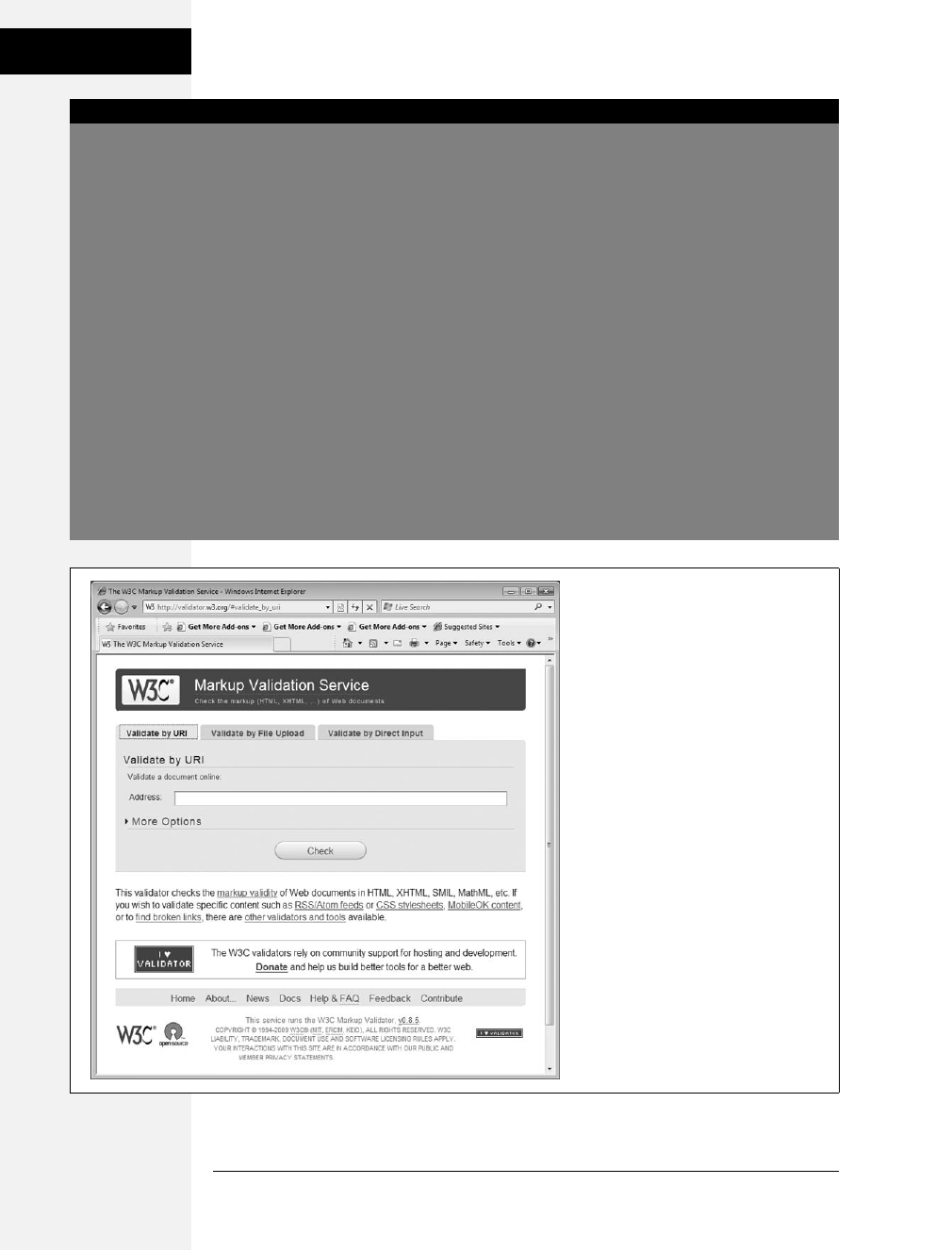
24 CSS: The Missing Manual
Writing HTML for
CSS
UP TO SPEED
Validate Your Web Pages
HTML follows certain rules: For example, the <html> tag
wraps around the other tags on a page, and the <title> tag
needs to appear within the <head> tag. XHTML provides an
even more strict set of rules to follow. It’s easy to forget
these rules or simply make a typo. Incorrect (or invalid,as
the geeks would say) HTML causes problems like making
your page look different in different web browsers. More
importantly, you can’t create valid CSS with invalid HTML.
Fortunately, there are tools for checking whether the HTML
in your web pages is correctly written.
The easiest way to check—that is, validate—your pages is on
the W3C’s website at http://validator.w3.org/ (see
Figure 1-3). Get the Web Developer extension for Firefox
(http://chrispederick.com/work/web-developer); it pro-
vides a quick way to test a page in the W3C validator.
The W3C, or World Wide Web Consortium, is the organiza-
tion responsible for determining the standards for many of
the technologies and languages of the Web, including
HTML, XHTML, and XML.
If the W3C validator finds any errors in your page, it tells
you what those errors are. If you use Firefox, you can down-
load an extension that lets you validate a web page directly
in that browser, without having to visit the W3C site. It can
even attempt to fix any problems it encounters. You can get
the extension here: http://users.skynet.be/mgueury/
mozilla/. A similar tool is available for the Safari browser as
well: www.zappatic.net/safaritidy/.
Figure 1-3:
The W3C HTML validator located at
http://validator.w3.org lets you quickly
make sure the HTML in a page is sound.
You can point the validator to an already
existing page on the Web, upload an
HTML file from your computer, or just
type or paste the HTML of a web page
into a form box and then click the
Check button.
Download at Boykma.Com

Chapter 1: Rethinking HTML for CSS 25
Writing HTML for
CSS
• Use headings to indicate the relative importance of text. Again, think outline.
When two headings have equal importance in the topic of your page, use the
same level header on both. If one is less important or a subtopic of the other, then
use the next level header. For example, follow an <h2> with an <h3> tag (see
Figure 1-4). In general, it’s good to use headings in order and try not to skip head-
ing numbers. For example, don’t follow an <h2> tag with an <h5> tag.
• Use the <p> tag for paragraphs of text.
• Use unordered lists when you’ve got a list of several related items, such as navi-
gation links, headlines, or a set of tips like these.
• Use numbered lists to indicate steps in a process or define the order of a set of
items. The tutorials in this book (see page 143) are a good example, as is a list of
rankings like “Top 10 websites popular with monks.”
• To create a glossary of terms and their definitions or descriptions, use the <dl>
(definition list) tag in conjunction with the <dt> (definition term) and <dd>
(definition description) tags. (For an example of how to use this combo, visit
www.w3schools.com/tags/tryit.asp?filename=tryhtml_list_definition.)
• If you want to include a quotation like a snippet of text from another web-
site, a movie review, or just some wise saying of your grandfather’s, try the
<blockquote> tag for long passages or the <q> tag for one-liners.
• Take advantage of obscure tags like the <cite> tag for referencing a book title,
newspaper article, or website, and the <address> tag to identify and supply
contact information for the author of a page (great for a copyright notice).
Figure 1-4:
Use the headline tags (<h1>, <h2>, and so on) as you
would if you were outlining a school report: Put them in
order of importance, beginning with an <h1> tag, which
should shout “Listen up! This is what this whole page
is about.”
<h1>
<h2>
<h3>
<h3>
Download at Boykma.Com

26 CSS: The Missing Manual
The Importance of
the Doctype
• As explained in full on page 22, steer clear of any tag or attribute aimed just at
changing the appearance of a text or image. CSS, as you’ll see, can do it all.
• When there just isn’t an HTML tag that fits the bill, but you want to identify an
element on a page or a bunch of elements on a page so you can apply a distinc-
tive look, use the <div> and <span> tags (see page 26). You’ll get more advice
on how to use these in later chapters (for example, page 312).
• Don’t overuse <div> tags. Some web designers think all they need are <div>
tags, ignoring tags that might be more appropriate. For example, to create a
navigation bar, you could add a <div> tag to a page and fill it with a bunch of
links. A better approach would be to use a bulleted list (<ul> tag). After all, a
navigation bar is really just a list of links.
• Remember to close tags. The opening <p> tag needs its partner in crime (the
closing </p> tag), as do all other tags, except the few self-closers like <br> and
<img> (<br /> and <img /> in XHTML).
• Validate your pages with the W3C validator (see Figure 1-3 and the box on page
24). Poorly written or typo-ridden HTML causes many weird browser errors.
The Importance of the Doctype
As discussed in the box on page 24, HTML follows certain rules—these rules are
contained in a Document Type Definition file, otherwise known as a DTD. A DTD
is an XML document that explains what tags, attributes, and values are valid for a
particular type of HTML. And for each version of HTML, there’s a corresponding
DTD. By now you may be asking, “But what’s all this got to do with CSS?”
Everything—if you want your web pages to appear correctly and consistently in web
browsers. You tell a web browser which version of HTML or XHTML you’re using
by including what’s called a doctype declaration at the beginning of a web page. This
doctype declaration is the first line in the HTML file, and not only defines what ver-
sion of HTML you’re using (such as HTML 4.01 Transitional) but also points to the
appropriate DTD file on the Web. When you mistype the doctype declaration, you
can throw most browsers into an altered state called quirks mode.
Quirks mode is browser manufacturers’ attempt to make their software behave like
browsers did circa 1999 (in the Netscape 4 and Internet Explorer 5 days). If a mod-
ern browser encounters a page that’s missing the correct doctype, then it thinks
“Gee, this page must have been written a long time ago, in an HTML editor far, far
away. I’ll pretend I’m a really old browser and display the page just as one of those
buggy old browsers would display it.” That’s why, without a correct doctype, your
lovingly CSS-styled web pages may not look as they should, according to current
standards. If you unwittingly view your web page in quirks mode when checking it
in a browser, you may end up trying to fix display problems that are related to an
incorrect doctype and not the incorrect use of HTML or CSS.
Download at Boykma.Com

Chapter 1: Rethinking HTML for CSS 27
The Importance of
the Doctype
Note: For more (read: technical) information on quirks mode, visit www.quirksmode.org/css/
quirksmode.html and http://hsivonen.iki.fi/doctype/.
Fortunately, it’s easy to get the doctype correct. All you need to know is what ver-
sion of HTML you’re using. In all likelihood, you’re already creating web pages
using HTML 4. You may even use XHTML for your websites (see page 5).
The most popular versions of HTML and XHTML these days are HTML 4.01
Transitional and XHTML 1.0 Transitional. These types of HTML still let you use
presentational tags like the <font> tag, thereby providing a transition from older
HTML to the newer, stricter types of HTML and XHTML. Although it’s best not
to use these tags at all, they still work in the Transitional versions, so you can phase
out these older tags at your own pace. In the strict versions of HTML and XHTML,
some older tags don’t work at all.
Note: In general, the strict versions of both HTML and XHTML disallow tags and attributes aimed at mak-
ing a page look good, like the <font> tag and a paragraph’s center attribute. They also disallow a number
of once-popular properties like a link’s target property, which lets you make a link open in a new window.
If you’re using HTML 4.01 Transitional, type the following doctype declaration at
the very beginning of every page you create:
<!DOCTYPE HTML PUBLIC "-//W3C//DTD HTML 4.01 Transitional//EN" "http://www.
w3.org/TR/html4/loose.dtd">
The doctype declaration for XHTML 1.0 Transitional is similar, but it points to a
different DTD. It’s also necessary to add a little code to the opening <html> tag
that’s used to identify the file’s XML type—in this case, it’s XHTML—like this:
<!DOCTYPE html PUBLIC "-//W3C//DTD XHTML 1.0 Transitional//EN" "http://www.
w3.org/TR/xhtml1/DTD/xhtml1-transitional.dtd">
<html xmlns="http://www.w3.org/1999/xhtml">
Note: If you’re using frames for your web pages, then you need to use a doctype intended for framesets.
See the W3C site for a list of proper doctypes: www.w3.org/QA/2002/04/valid-dtd-list.html.
If this entire discussion is making your head ache and your eyes slowly shut, just
make sure you use the proper doctype listed above, and always make it the first line
of your HTML file (before even the opening <html> tag). Also it’s easy to make a
typo in this long-winded bit of code, so always make sure you validate the page (see
the box on page 36) to make sure your doctype is correct. In fact, it’s a good idea to
have a blank HTML page with the proper doctype somewhere on your computer, so
you can make a copy of it whenever you need to create a new web page. In the tuto-
rial files available from www.sawmac.com/css2e, you’ll find four basic HTML files—
one for each of the four main doctypes in use on the Web today.
Download at Boykma.Com

28 CSS: The Missing Manual
Getting the Most
out of Internet
Explorer 8
Note: Most visual web page tools like Dreamweaver and Expression Web automatically add a doctype
declaration whenever you create a new web page, and many HTML-savvy text editors have shortcuts for
adding doctypes.
Getting the Most out of Internet Explorer 8
Thanks to Microsoft’s auto-update feature, the new Internet Explorer 8 has gained
a healthy share of the browser market. Fortunately for web designers, IE 8 is the
most standards-compliant version of the browser yet. It fixes the bugs that have
plagued IE 6 and even IE 7, and works almost perfectly with version 2.1 of CSS.
That means your carefully crafted web designs should look nearly the same in IE 8,
Firefox, Safari, and Opera with little or no tinkering. As you’ll read later in this
book (for example, pages 184 and 223), you can’t say the same about IE 6 or IE 7,
which require some browser-specific code to make many designs look right.
However, IE 8 is sort of like a chameleon: It can take on the appearance of a differ-
ent version. If you’re not careful, it may not display your web pages the way you
want it to. For example, and most importantly, you must include a proper doc-
type. As mentioned in the previous section, without a doctype, browsers switch
into quirks mode. Well, when IE 8 goes into quirks mode, it tries to replicate the
look of IE 5 (!?).
But wait—there’s more! IE 8 can also pretend to be IE 7. When someone viewing
your site in IE 8 clicks a “compatibility view” button, IE 8 goes into IE 7 mode, dis-
playing pages without IE 8’s full CSS 2.1 goodness. The same thing happens if
Microsoft puts your website onto its Compatibility View List—a list of sites that
Microsoft has determined look better in IE 7 than in IE 8. If you’re designing a site
using the guidelines in this book, you won’t want IE 8 to act like IE 7…ever.
Fortunately, there’s a way to tell IE 8 to stop all this nonsense and just be IE 8.
Adding a single META tag to a web page instructs IE 8 to ignore Compatibility
View and the Compatibility View List and always display the page using its most
standards-compliant mode:
<meta http-equiv="X-UA-Compatible" content="IE=edge" />
Put this instruction in the page’s <head> section (below the <title> tag is a good
place). This tag will work for future versions of IE, too: The “IE=edge” part of the
tag will instruct versions of Internet Explorer that are released after IE 8 to also dis-
play web pages in their standard mode. Unfortunately, you must do this on every
page of your site.
Now that your HTML ship is steering in the right direction, it’s time to jump into
the fun stuff (and the reason you bought this book): Cascading Style Sheets.
Download at Boykma.Com
Chapter 1: Rethinking HTML for CSS 29
Getting the Most
out of Internet
Explorer 8
UP TO SPEED
Cross Browser Testing
There are a lot of web browsers out there. If you use Win-
dows, you automatically get Internet Explorer and can
install additional browsers like Firefox, Safari, Opera, or
Google’s Chrome. On a Mac, you can stick with the already-
installed Safari browser, or run Firefox 3 or Chrome 1.
While the very latest browsers are mostly comparable when
displaying CSS-driven web pages, you can’t say the same
for IE 6, which is still in widespread use. Even IE 7 has its
share of peculiarities.
To really make sure your sites work for the largest audience,
you need a way to test your designs in as wide a range of
browsers as possible. Here are a few techniques:
Windows. Normally, Windows computers can only run
one version of IE. In other words, you can’t test in IE 6, IE 7,
and IE 8 on the same computer. Well, normally you can’t,
but thanks to a nifty little program named IETester, you can
actually see what a web page looks like in IE 5.5, IE 6, IE 7,
and IE 8, all running side-by-side at the same time. Down-
load this great program from www.my-debugbar.com/
wiki/IETester/HomePage.
You should also install the other major browsers on your
computer: Firefox, Safari, Opera, and Chrome. Fortunately,
you don’t necessarily need a Mac for testing, since Apple’s
browser—Safari—is also available for Windows.
Mac. Testing is a bit trickier for Mac people. You have to
test in Internet Explorer—it’s still the most used browser in
the world, and the display problems in IE 6 and IE 7 mean
that your painstakingly crafted design might look great for
you, but fall apart in IE. You have a few options: First, you can
buy (or borrow) a Windows machine; second, if you have
an Intel Mac you can install Windows using Apple’s Boot
Camp software (www.apple.com/macosx/features/
bootcamp.html); a third option is to install virtualization
software like VMWare Fusion or Parallels Desktop on your
Mac. This software lets you run a virtual Windows machine,
side-by-side with the Mac OS. You can jump between Mac
and Windows to test in various browsers in both operating
systems. It’s the most efficient testing technique for Mac
users. Both Boot Camp and virtualization software require
a copy of the Windows OS.
Everyone. Another option that works for both Windows and
Macs and doesn’t require installing extra software is one of
the many cross-browser testing services that let see what
your pages look like in many different operating systems and
browsers. Most of these are commercial services that cost
money. Litmus (http://litmusapp.com/) takes screenshots of
your pages in a ton of different browsers; CrossBrowserTest-
ing.com (www.crossbrowsertesting.com) lets you remotely
view another computer—in other words, you can actually
interact with a Windows machine, running Internet Explorer
8, 7, and 6, plus Firefox and Safari. This scheme not only lets
you test the visual design, but also lets you interact with the
page and test how your JavaScript programming works in
that browser. One of the original services, Browsercam
(www.browsercam.com), offers a wide range of services
including both screenshots (like Litmus) and remote access
to real computers (like CrossBrowserTesting).
Download at Boykma.Com

Download at Boykma.Com
31
Chapter 2
chapter
2
Creating Styles and
Style Sheets
Even the most complex and beautiful websites, like the one in Figure 2-1, start
with a single CSS style. As you add multiple styles and style sheets, you can develop
fully formed websites that inspire designers and amaze visitors. Whether you’re a
CSS novice or a Style Sheet Samurai, you need to obey a few basic rules about how
to create styles and style sheets. In this chapter you’ll start at square one, learning
the basics of creating and using styles and style sheets.
Tip: Some people learn better by doing rather than reading. If you’d like to try your hand at creating
styles and style sheets first and then come back here to read up on what you just did, then turn to page
39 for a hands-on tutorial.
Anatomy of a Style
A single style defining the look of one element on a page is a pretty basic beast. It’s
essentially just a rule that tells a web browser how to format something on a web
page—turn a headline blue, draw a red border around a photo, or create a 150-
pixel-wide sidebar box to hold a list of links. If a style could talk it would say some-
thing like, “Hey Browser, make this look like that.” A style is, in fact, made up of
two elements: the web page element that the browser formats (the selector) and the
actual formatting instructions (the declaration block). For example, a selector can
be a headline, a paragraph of text, a photo, and so on. Declaration blocks can turn
that text blue, add a red border around a paragraph, position the photo in the center
of the page—the possibilities are endless.
Download at Boykma.Com
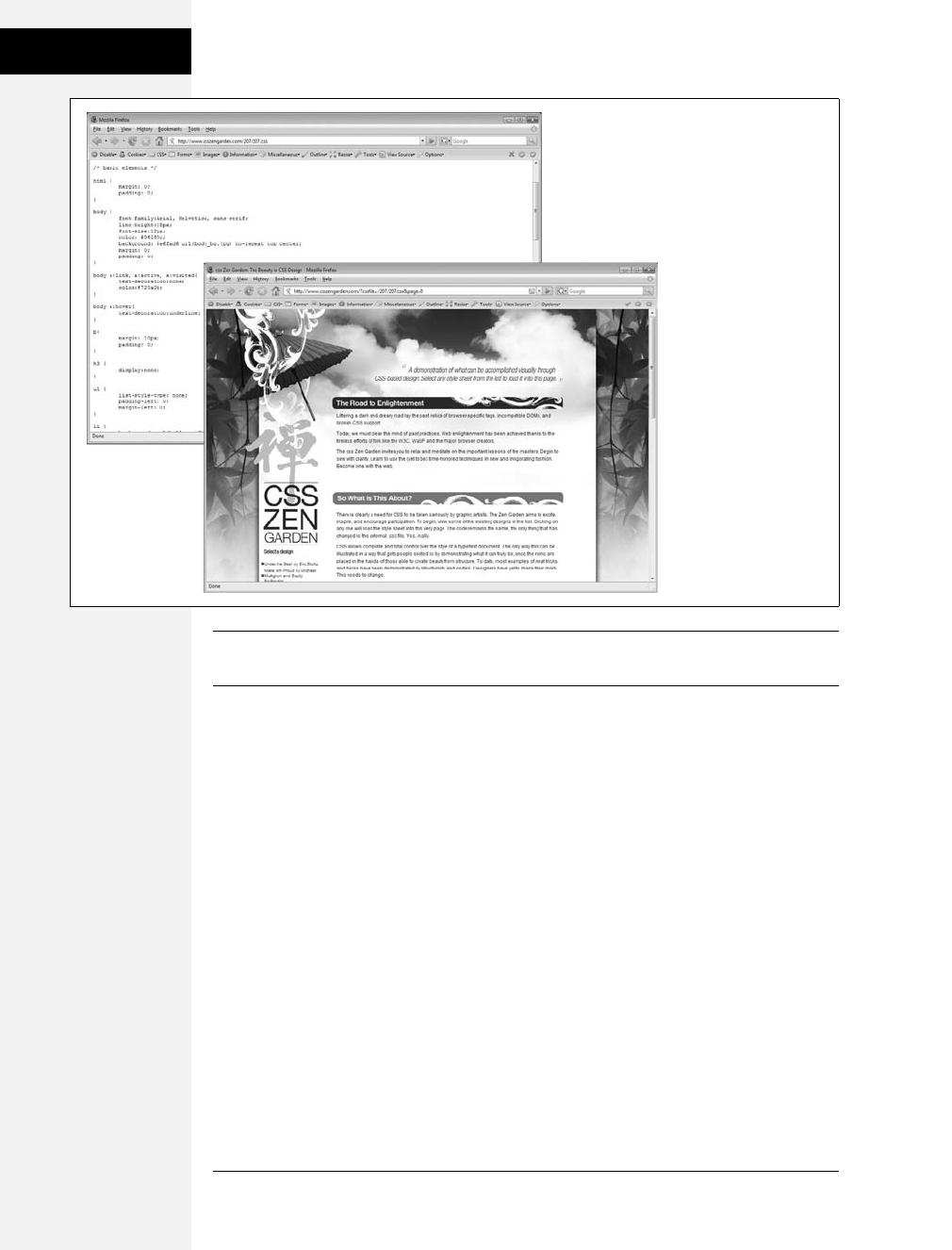
32 CSS: The Missing Manual
Anatomy of a Style
Note: Technical types often follow the lead of the W3C and call CSS styles rules. This book uses the
terms “style” and “rule” interchangeably.
Of course, CSS styles can’t communicate in nice clear English like the previous
paragraph. They have their own language. For example, to set a standard font color
and font size for all paragraphs on a web page, you’d write the following:
p { color: red; font-size: 1.5em; }
This style simply says, “Make the text in all paragraphs—marked with <p> tags—
red and 1.5 ems tall.” (An em is a unit of measurement that’s based on a browser’s
normal text size. More on that in Chapter 6.) As Figure 2-2 illustrates, even a simple
style like this example contains several elements:
•Selector. As described earlier, the selector tells a web browser which element or
elements on a page to style—like a headline, paragraph, image, or link. In
Figure 2-2, the selector (p) refers to the <p> tag. This selector makes web
browsers format all <p> tags using the formatting directions in this style. With
the wide range of selectors that CSS offers and a little creativity, you’ll master
your pages’ formatting. (The next chapter covers selectors in depth.)
Figure 2-1:
Every CSS-driven web
page starts with a single
CSS style. Here, a basic
style (left) sets the
groundwork for the body
of the entire page (right).
Download at Boykma.Com
Chapter 2: Creating Styles and Style Sheets 33
Anatomy of a Style
•Declaration Block. The code following the selector includes all the formatting
options you want to apply to the selector. The block begins with an opening
brace ({) and ends with a closing brace (}).
•Declaration. Between the opening and closing braces of a declaration block, you
add one or more declarations, or formatting instructions. Every declaration has
two parts, a property and a value, and ends with a semicolon.
•Property. CSS offers a wide range of formatting options, called properties. A
property is a word—or a few hyphenated words—indicating a certain style
effect. Most properties have straightforward names like font-size, margin-top,
and text-align. For example, the background-color property sets—you guessed
it—a background color. You’ll learn about oodles of CSS properties through-
out this book.
Tip: Appendix A has a handy glossary of CSS properties.
•Value. Finally, you get to express your creative genius by assigning a value to a
CSS property—by making a background blue, red, purple, or chartreuse, for
example. As upcoming chapters explain, different CSS properties require spe-
cific types of values—a color (like red, or #FF0000), a length (like 18px, 200%,
or 5em), an URL (like images/background.gif), or a specific keyword (like top,
center, or bottom).
You don’t need to write a style on a single line, as pictured in Figure 2-2. Many
styles have multiple formatting properties, so you can make them easier to read by
breaking them up into multiple lines. For example, you may want to put the selec-
tor and opening brace on the first line, each declaration on its own line, and the
closing brace by itself on the last line, like so:
p {
color: red;
font-size: 1.5em;
}
Figure 2-2:
A style (or rule) is made of two main parts: a
selector, which tells web browsers what to
format, and a declaration block, which lists
the formatting instructions that the browsers
use to style the selector.
p { color:red; font-size:1.5em; }
Declaration Declaration
Declaration block
Property Value Property Value
Selector
Download at Boykma.Com

34 CSS: The Missing Manual
Understanding Style
Sheets
Web browsers ignore spaces and tabs, so feel free to add them to make your CSS
more readable. For example, it’s helpful to indent properties, with either a tab or a
couple of spaces, to visibly separate the selector from the declarations, making it
easy to tell which is which. In addition, putting one space between the colon and
the property value is optional but adds to the readability of the style. In fact, you
can put as much white space between the two as you want. For example, color:red,
color: red, and color: red all work.
Note: Don’t forget to end each property/value pair with a semicolon:
color: red;
Leaving off that semicolon can trip up browsers, breaking your style sheet and ruining the look of your
web page. Don’t worry, this mistake is very common—just make sure you use a CSS validator, as described
in the box on the next page.
Understanding Style Sheets
Of course, a single style won’t transform a web page into a work of art. It may make
your paragraphs red, but to infuse your websites with great design, you need many
different styles. A collection of CSS styles comprises a style sheet. A style sheet can be
one of two types—internal or external, depending on whether the style information
is located in the web page itself or in a separate file linked to the web page.
Internal or External—How to Choose
Most of the time, external style sheets are the way to go, since they make building
web pages easier and updating websites faster. An external style sheet collects all
your style information in a single file that you then link to a web page with just a
single line of code. You can attach the same external style sheet to every page in
your website, providing a unified design. It also makes a complete site makeover as
easy as editing a single text file.
On the receiving end, external style sheets help web pages load faster. When you
use an external style sheet, your web pages can contain only basic HTML—no
byte-hogging HTML tables or <font> tags and no internal CSS style code. Further-
more, when a web browser downloads an external style sheet, it stores the file on
your visitor’s computer (in a behind-the-scenes folder called a cache) for quick
access. When your visitor hops to other pages on the site that use the same exter-
nal style sheet, there’s no need for the browser to download the style sheet again.
The browser simply downloads the requested HTML file and pulls the external
style sheet from its cache—a significant savings in download time.
Note: When you’re working on your website and previewing it in a browser, the cache can work against
you. See the box on page 35 for a workaround.
Download at Boykma.Com
Chapter 2: Creating Styles and Style Sheets 35
Internal Style
Sheets
Internal Style Sheets
An internal style sheet is a collection of styles that’s part of the web page’s code. It
always appears between opening and closing HTML <style> tags in the page’s
<head> portion. Here’s an example:
<style type="text/css">
h1 {
color: #FF7643;
font-family: Arial;
}
p {
color: red;
font-size: 1.5em;
}
</style>
</head>
<body>
<!-- The rest of your page follows... -->
Note: You can place the <style> tag and its styles after the <title> tag in the head of the page, but web
designers usually place them right before the closing </head> tag as shown here. If you also use Java-
Script in your pages, add the JavaScript code after the style sheet. Many JavaScript programs rely on CSS,
so by adding your CSS first, you can make sure the JavaScript program has all the information it needs to
get its job done.
WORKAROUND WORKSHOP
Don’t Get Caught in the Cache
A browser’s cache is a great speed-boost for Web surfers.
Whenever the cache downloads and stores a frequently
used file—like an external CSS file or an image—it saves pre-
cious moments traveling the relatively sluggish highways of
the Internet. Instead of re-downloading the next time it
needs the same file, the browser can go straight to the new
stuff—like a yet-to-be-viewed page or graphic.
But what’s good for your visitors isn’t always good for you.
Because the web browser caches and recalls downloaded
external CSS files, you can often get tripped up as you work
on a site design. Say you’re working on a page that uses an
external style sheet, and you preview the page in a browser.
Something doesn’t look quite right, so you return to your
web editor and change the external CSS file. When you
return to the web browser and reload the page, the change
you just made doesn’t appear! You’ve just been caught by
the cache. When you reload a web page, browsers don’t
always reload the external style sheet, so you may not be
seeing the latest and greatest version of your styles.
To get around this snafu, you can force reload a page
(which also reloads all linked files) by pressing the Ctrl (c)
key and clicking the browser’s Reload button; Ctrl+F5 also
works on Windows for Internet Explorer; and Ctrl+Shift+R
(c-Shift-R) is Firefox’s keyboard shortcut.
Download at Boykma.Com
36 CSS: The Missing Manual
External Style
Sheets
The <style> tag is HTML, not CSS. But its job is to tell the web browser that the
information contained within the tags is CSS code and not HTML. Creating an
internal style sheet is as simple as typing one or more styles between the <style> tags.
Internal style sheets are easy to add to a web page and provide an immediate visual
boost to your HTML. But they aren’t the most efficient method for designing an
entire website composed of many web pages. For one thing, you need to copy and
paste the internal style sheet into each page of your site—a time-consuming chore
that adds bandwidth-hogging code to each page.
But internal style sheets are even more of a hassle when you want to update the
look of a site. For example, say you want to change the <h1> tag, which you origi-
nally decided should appear as large, green, bold type. But now you want small,
blue type in the Courier typeface. Using internal style sheets, you’d need to edit
every page. Who has that kind of time? Fortunately, there’s a simple solution to
this dilemma—external style sheets.
Note: It’s also possible (though rarely advisable) to add styling information to an individual HTML tag
without using a style sheet. The tutorial on page 39 shows you how to perform that maneuver using an
inline style.
External Style Sheets
An external style sheet is nothing more than a text file containing all your CSS
rules. It never contains any HTML code—so don’t include the <style> tag. In
addition, always end the file name with the extension .css. You can name the file
whatever you like, but it pays to be descriptive. Use global.css, site.css,ormain.css,
for example, to indicate a style sheet used by every page on the site, or use form.css
to name a file containing styles used to make a web form look good.
UP TO SPEED
Validate Your CSS
Just as you should make sure you’ve correctly written the
HTML in your web pages using the W3C HTML validator
(see the box on page 24), you should also check your CSS
code to make sure it’s kosher. The W3C provides an online
tool for CSS checking as well: http://jigsaw.w3.org/css-
validator/. It operates just like the HTML validator: You can
type the URL of a web page (or even just the address to an
external CSS file), upload a CSS file, or copy and paste CSS
code into a web form and submit it for validation.
It’s easy to make a typo when writing CSS, and one small mis-
take can throw all of your carefully planned designs out of
whack. When your CSS-infused web page doesn’t look as you
expect, a simple CSS error may be the cause. The W3C CSS val-
idator is a good first stop when troubleshooting your designs.
You can also do a quick check using Firefox. Load the page
that has the CSS you want to check and choose Tools ➝
Error Console. Click the Warnings button, and you’ll see
listed any CSS code that Firefox doesn’t understand.
Download at Boykma.Com

Chapter 2: Creating Styles and Style Sheets 37
External Style
Sheets
Tip: If you have a page with an internal style sheet but want to use an external style sheet, then just cut
all of the code between the <style> tags (without the tags themselves). Then create a new text file and
paste the CSS into the file. Save the file with a .css extension—global.css, for example—and link it to your
page, using one of the techniques described next.
Once you create an external style sheet, you must connect it to the web page you
wish to format. You can attach a style sheet to a web page using HTML’s <link>
tag or CSS’s own @import directive—a command that basically does the same
thing as the link tag. All current web browsers treat these two techniques the same,
and both let you attach style sheets to a web page, so choosing one is mostly a mat-
ter of preference.
Note: The @import directive can do one thing the <link> tag can’t: attach external style sheets to an
external style sheet. This advanced technique is discussed on page 38.
Linking a Style Sheet Using HTML
The most common method of adding an external style sheet to a web page is to use
the HTML <link> tag. You write the tag slightly differently depending on whether
you’re using HTML or XHTML. For example, here’s HTML:
<link rel="stylesheet" type="text/css" href="css/global.css">
Here’s XHTML:
<link rel="stylesheet" type="text/css" href="css/global.css" />
The only difference is how you end the tag. The link tag is an empty element, since
it has only an opening tag and no matching, closing </link> tag. In XHTML, you
need to add a closing slash (like this: />) to terminate the tag; HTML doesn’t
require the extra slash.
Otherwise, the link tag is the same in HTML and XHTML and requires three
attributes:
•rel="stylesheet" indicates the type of link—in this case, a link to a style sheet.
•type="text/css" lets the browser know what kind of data to expect—a text file,
containing CSS.
•href points to the location of the external CSS file on the site. The value of this
property is a URL and will vary depending on where you keep your CSS file. It
works the same as the src attribute you use when adding an image to a page or
the href attribute of a link pointing to another page.
Tip: You can attach multiple style sheets to a web page by adding multiple <link> tags, each pointing to
a different style sheet file. This technique is a great way to organize your CSS styles, as you can see in
Chapter 15.
Download at Boykma.Com

38 CSS: The Missing Manual
External Style
Sheets
Linking a Style Sheet Using CSS
CSS includes a built-in way to add external style sheets—the @import directive.
You add the directive inside of an HTML <style> tag, like so:
<style type="text/css">
@import url(css/global.css);
</style>
Unlike HTML’s <link> tag, @import is part of the CSS language and has some
definite un-HTML-like qualities:
• To make the connection to the external CSS file, you use url instead of href and
enclose the path in parentheses. So in this example, css/global.css is the path to
the external CSS file. Quotes around the URL are optional, so url(css/global.css)
and url("css/global.css") both work.
• As with the <link> tag, you can include multiple external style sheets using
more than one @import:
<style type="text/css">
@import url(css/global.css);
@import url(css/forms.css);
</style>
• You can add regular CSS styles after the @import directives if you want to create a
rule that applies just to that one page, but still use the site’s global design rules
to format the rest of the page.
Note: You’ll learn how rules interact and how you can create a rule that overrides other rules on page
100. You can even create an external CSS file that contains only @import directives linking to other exter-
nal style sheets, a technique often used to help organize your styles (see page 398).
Here’s an example:
<style type="text/css">
@import url(css/global.css);
@import url(css/forms.css);
p { color:red; }
</style>
Technically, you should place all the @import lines before any CSS rules, as shown
here, but it’s okay if you forget. Web browsers are supposed to ignore any style sheets
you import after a CSS rule, but all current web browsers ignore that restriction.
Which to use? Although both methods work, the <link> tag is more common. In a
few cases, using the @import technique can slow your style sheets’ download speed
(visit www.stevesouders.com/blog/2009/04/09/dont-use-import/ to find out when
this can happen and why). So, if you don’t have a strong preference for either, just
use the <link> method described on page 44.
Download at Boykma.Com

Chapter 2: Creating Styles and Style Sheets 39
Tutorial: Creating
Your First Styles
Tutorial: Creating Your First Styles
The rest of this chapter takes you through the basic steps for adding inline styles,
writing CSS rules, and creating internal and external style sheets. As you work
through this book, you’ll work through various CSS designs, from simple design
elements to complete CSS-enabled web page layouts. To get started, download the
tutorial files located on the book’s companion website at www.sawmac.com/css2e/.
Click the tutorial link and download the Zip archive containing the files (detailed
instructions for unzipping the files are on the website as well). Each chapter’s files
are in a separate folder, named 02 (for chapter 2), 03 (for chapter 3), and so on.
Next, launch your favorite web page editing software, whether it’s a simple text edi-
tor, like Notepad or TextEdit, or a visually oriented program, like Dreamweaver or
Microsoft Expression Web (for information on selecting an editor, see page 7).
Note: If you use Dreamweaver, check out Appendix B to learn how to use that program to create styles
and style sheets. Dreamweaver, along with many other HTML-editing programs, also lets you work on the
raw HTML code by switching to Code View. Give that a shot for this tutorial.
Creating an Inline Style
When you type a CSS rule (like the ones described on page 31) directly into a page’s
HTML, you’re creating an inline style. Inline styles offer none of the time-and band-
width-saving benefits of style sheets, so the pros hardly ever use them. Still, in a
pinch, if you absolutely must change the styling on a single element on a single page,
then you may want to resort to an inline style. (For example, when creating HTML-
formatted email messages, it’s usually best to use inline styles. That’s the only way to
get CSS to work in Gmail, for instance.) And if you do, you at least want the style to
work properly. The important thing is to carefully place the style within the tag you
want to format. Here’s an example that shows you exactly how to do it:
1. In your web page editing program, open the file 02 ➝basic.html.
This simple-but-elegant XHTML file contains a couple of different headings, a
few paragraphs, and a copyright notice inside an <address> tag. You’ll start by
creating an inline style for the <h1> tag.
2. Click inside the opening <h1> tag and type style="color: #C7AA8D;".
The tag should look like this:
<h1 style="color: #C7AA8D;">
The style attribute is HTML, not CSS, so you use the equals sign after it and
enclose all of the CSS code inside quotes. Only the stuff inside the quotes is CSS.
In this case, you’ve added a property named color—which affects the color of
text—and you’ve set that property to #C7AA8D (a hexadecimal code for defin-
ing a color that’s grayish/brown). You’ll learn more about coloring text on page
118. The colon separates the property name from the property value that you
want. Next you’ll check the results in a web browser.
Download at Boykma.Com

40 CSS: The Missing Manual
Tutorial: Creating
Your First Styles
3. Open the basic.html page in a web browser.
For example, start up your favorite web browser and choose File ➝Open File
(or press Ctrl-O [c-O] and select the basic.html file in the 02 tutorial folder
from your computer. (Or just drag the file from the desktop—or wherever
you’ve saved the tutorial files—into an open browser window.) Many HTML
editors also include a “Preview in Browser” function, which, with a simple key-
board shortcut or menu option, opens the page in a web browser. It’s worth
checking your program’s manual to see if it includes this timesaving feature.
When you view the page in a browser, the headline is now a dusty brown. Inline
styles can include more than one CSS property. You’ll add another property next.
4. Return to your HTML editor, click after the semicolon following #C7AA8D
and type font-size: 3em;.
The semicolon separates two different property settings. The <h1> tag should
look like this:
<h1 style="color: #C7AA8D; font-size: 3em;">
5. Preview the page in a web browser. For example, click your browser window’s
Reload button (but make sure you’ve saved the XHTML file first).
The headline is now massive in size. And you’ve had a taste of how labor-inten-
sive inline styles are. Making all the <h1> headings on a page look like this one
could take days of typing and add acres of HTML code.
6. Return to your page editor and delete the entire style property, which returns
the heading tag back to its normal <h1>.
Next, you’ll create a style sheet within a web page. (You’ll find a finished version
of this part of the tutorial in the 02_finished folder in a file named inline.html.)
Creating an Internal Style Sheet
A better approach than inline styles is using a style sheet that contains multiple
CSS rules to control multiple elements of a page. In this section, you’ll create a
style that affects all top-level headings in one swoop. This single rule automatically
formats every <h1> tag on the page.
1. With the file basic.html open in your text editor, click directly after the closing
</title> tag. Then hit Enter (Return) and type <style type="text/css">.
The HTML should now look like the following (the stuff you’ve added is in bold):
<title>CSS:The Missing Manual -- Chapter 2</title>
<style type="text/css">
</head>
Download at Boykma.Com

Chapter 2: Creating Styles and Style Sheets 41
Tutorial: Creating
Your First Styles
The opening <style> tag marks the beginning of the style sheet. It’s always a
good idea to close a tag right after you type the opening tag, since it’s so easy to
forget this step once you jump into writing your CSS. In this case, you’ll close
the <style> tag before adding any CSS.
2. Press Enter twice and type </style>.
Now, you’ll add a CSS selector that marks the beginning of your first style.
3. Click between the opening and closing <style> tags and type h1 { .
The h1 indicates the tag to which the web browser should apply the upcoming
style.
The weird bracket thingy after the h1 is called an opening brace, and it marks
the beginning of the CSS properties for this style. In other words, it says, “The
fun stuff comes right after me.” As with closing tags, it’s a good idea to type the
closing brace of a style before actually adding any style properties.
4. Press Enter twice and type a single closing brace: } .
As the partner of the opening brace you typed in the last step, this brace’s job is
to tell the web browser, “This particular CSS rule ends here.” Now time for the
fun stuff.
5. Click in the empty line between the two braces. Hit the Tab key, and type color:
#C7AA8D;.
You’ve typed the same style property as the inline version—color—and set it to
#C7AA8D. As explained in the note on page 34, the final semicolon marks the
end of the property declaration.
Note: Technically, you don’t have to put the style property on its own line, but it’s a good idea. With one
property per line, it’s a lot easier to quickly scan a style sheet and see all the properties for each style. Also,
the tab is another helpful visual organizing technique (you can also insert a few spaces instead). The
indentation makes it easy to discern all of your rules at a glance, since the selectors (like h1 here) line up
along the left edge, with the properties spaced a bit out of the way.
6. Press Enter again and add three additional properties, like so:
font-size: 3em;
font-family: "Arial Black", Arial, sans-serif;
margin: 0;
Make sure you don’t leave off the semicolon at the end of each line, otherwise
the CSS won’t display correctly in a browser.
Each of these properties adds a different visual effect to the headline. The first
two assign a size and font to the text, while the third removes space from
around the headline. Part 2 of this book covers all these properties in detail.
Download at Boykma.Com

42 CSS: The Missing Manual
Tutorial: Creating
Your First Styles
Congratulations—you’ve just created an internal style sheet. The code you’ve
added should look like the bolded text:
<title>Basic Web Page</title>
<style type="text/css">
h1 {
color: #C7AA8D;
font-size: 3em;
font-family: "Arial Black", Arial, sans-serif;
margin: 0;
}
</style>
</head>
7. Save the page and preview it in a web browser.
You can preview the page by opening it in a web browser as described in step 3
on page 40, or, if the page is still open in a browser window, then just click the
Reload button.
Next you’ll add another style.
Note: Always remember to add the closing </style> tag at the end of an internal style sheet. When you
don’t, a web browser displays the CSS style code followed by a completely unformatted web page—or no
web page at all.
8. Back in your text editing program, click after the closing brace of the h1 style
you just created, press Enter, and then add the following rule:
p {
color: #616161;
line-height: 150%;
margin-top: 10px;
margin-left: 80px;
}
This rule formats every paragraph on the page. Don’t worry too much right
now about what each of these CSS properties is doing. Later chapters cover
these properties in depth. For now, just practice typing the code correctly and
get a feel for how to add CSS to a page.
9. Preview the page in a browser.
The page is starting to shape up and should look like Figure 2-3. You can see
what stylistic direction the page is headed in. You can see a completed version
of this tutorial by opening the internal.html file in the 02_finished folder.
The process you’ve just worked through is CSS in a nutshell: Start with an HTML
page, add a style sheet, and create CSS rules to make the page look great. In the next
part of this tutorial, you’ll see how to work more efficiently using external style sheets.
Download at Boykma.Com
Chapter 2: Creating Styles and Style Sheets 43
Tutorial: Creating
Your First Styles
Creating an External Style Sheet
Since it groups all of your styles at the top of the page, an internal style sheet is a lot
easier to create and maintain than the inline style you created a few pages ago.
Also, an internal style sheet lets you format any number of instances of a tag on a
page, like every <p> tag by typing one simple rule. But an external style sheet gets
even better—it can store all of the styles for an entire website. Editing one style in
the external style sheet updates the whole site. In this section, you’ll take the styles
you created in the previous section and put them in an external style sheet.
1. In your text editing program, create a new file and save it as main.css in the
same folder as the web page you’ve been working on.
External style sheet files end with the extension .css. The file name main.css
indicates that the styles contained in the file apply throughout the site. (But you
can use any file name you like, as long as it ends with the .css extension.)
Start by adding a new style to the style sheet.
2. Type the following rule into the main.css file:
body {
background-color: #CDE6FF;
background-image: url(images/bg_body.png);
background-repeat: repeat-x;
padding-top: 100px;
}
Figure 2-3:
CSS easily formats text in
creative ways, letting you
change fonts, text colors,
font sizes, and a lot more
as you’ll see in “Creating
an External Style Sheet”
below.
Download at Boykma.Com

44 CSS: The Missing Manual
Tutorial: Creating
Your First Styles
This rule applies to the body tag—the tag that holds all the content visible in a
web browser window—and adds a background image to the page. Unlike a sim-
ilar property in HTML, the CSS background-image property can display the
graphic in many different ways—in this case, tiled horizontally across the top of
the page. You can read more about background image properties on page 188.
This style also adds a color to the page’s background and scoots its contents
down 100 pixels from the top of the browser window. When you preview the
page, you’ll see that this extra space moves the headline out of the way of the
background graphic.
Instead of recreating the work you did earlier, just copy the styles you created in
the previous section and paste them into this style sheet.
3. Open the basic.html page that you’ve been working on and copy all of the text
inside the <style> tags. (Don’t copy the <style> tags themselves.)
Copy the style information the same way you’d copy any text. For example,
choose Edit ➝ Copy or press Ctrl-C (c-C).
4. In the main.css file, paste the style information by selecting Edit ➝Paste or
pressing Ctrl-V (c-V).
An external style sheet never contains any HTML—that’s why you didn’t copy
the <style> tags.
5. Save main.css.
Now you just need to clean up your old file and link the new style sheet to it.
6. Return to the basic.html file in your text editor and delete the <style> tags and
all of the CSS rules you typed in earlier.
You no longer need these styles, since they’re in the external style sheet you’re
about to attach.
7. In the space where the styles used to be (between the closing </title> tag and
the closing </head> tag) type the following:
<link href="main.css" rel="stylesheet" type="text/css" />
The <link> tag is one way to attach a style sheet to a page; another option is the
CSS @import directive, as discussed on page 38. The link tag specifies the loca-
tion of the external style sheet. (You can read up on the two other attributes—
rel and type—on page 37.)
Note: In this example, the style sheet file is in the same folder as the web page, so using the file’s name
for the href value provides a simple “document-relative” path. If it were in a different folder from the page,
then the path would be a bit more complicated. In either case, you’d use a document- or root-relative
path to indicate where the file is. The routine is the same as when you create a link to a web page or set a
path to an image file when using the HTML <img> tag. (For a brief primer on document- and root-rela-
tive links visit: www.communitymx.com/content/article.cfm?cid=230AD.)
Download at Boykma.Com

Chapter 2: Creating Styles and Style Sheets 45
Tutorial: Creating
Your First Styles
8. Save the file and preview it in a web browser.
It should look similar to the page in step 9 on page 42, with the addition of a
blue background and a silhouetted image of grass and flowers at the top of the
page (thanks to the CSS you added in step 2). The CSS rules in this external
style sheet are the same as the ones from the internal style sheet; they’re just
located in a different place. To demonstrate how useful it can be to keep your
styles in their own external file, you’ll attach the style sheet to another web page.
Note: If the web page doesn’t have any formatting (for example, the top headline isn’t big, bold, and
dusty brown), then you’ve probably mistyped the code from step 6 or saved the main.css file in a folder
other than the one where the basic.html file is. In this case, just move the main.css into the same folder.
9. Open the file 02 ➝another_page.html.
This page contains some of the same HTML tags—h1, h2, p, and so on—as the
other web page you’ve been working on.
10. Click after the closing </title> tag and press Enter (Return).
You’ll now link to the style sheet.
11. Type the same <link> tag you did in step 7.
The web page code should look like this (the code you just typed appears in bold):
<title>Another Page</title>
<link href="main.css" rel="stylesheet" type="text/css" />
</head>
12. Save the page and preview it in a web browser.
Ta-da! Just one line of code added to the web page is enough to instantly trans-
form its appearance. To demonstrate how easy it is to update an external style
sheet, you’ll do so by editing one style and adding another.
13. Open the main.css file and add the CSS declaration font-family: “Palatino
Linotype”, Baskerville, serif; at the beginning of the p style.
The code should look like this (the bold text is what you’ve just added):
p {
font-family: "Palatino Linotype", Baskerville, serif;
color: #616161;
line-height: 150%;
margin-top: 10px;
margin-left: 80px;
}
Last but not least, create a new rule for the h2 tag.
Download at Boykma.Com

46 CSS: The Missing Manual
Tutorial: Creating
Your First Styles
14. Click at the end of the p style’s closing }, press Enter, and add the following rule:
h2 {
color: #B1967C;
font-weight: normal;
font-family: "Palatino Linotype", Baskerville, serif;
font-size: 2.2em;
border-bottom: 2px white solid;
background: url(images/bullet_flower.png) no-repeat;
padding: 0 0 2px 80px;
margin: 0;
}
Some of these CSS properties you’ve encountered already. Some are new—like
the border-bottom property for adding a line underneath the headline. And
some—like the background property—provide a shortcut for combining several
different properties—in this case, the background-image, and background-
repeat—into a single property. Don’t worry about the specifics of these proper-
ties, you’ll learn them all in great detail in upcoming chapters (Chapter 6 covers
font properties; Chapter 8 covers backgrounds; Chapter 7 covers padding and
margins).
The styles you’ve created so far affect mainly tags—the h1, h2, and p—and they
affect every instance of those tags. In other words, the p style you created for-
mats every single paragraph on the page. If you want to target just one para-
graph, you need to use a different kind of style.
15. Click at the end of the h2 style’s closing }, press Enter, and add the following rule:
.intro {
color: #6A94CC;
font-family: Arial, Helvetica, sans-serif;
font-size: 1.2em;
margin-left: 0;
margin-bottom: 25px;
}
If you preview the basic.html page in a web browser, you’ll see that this new
style has no effect…yet. This type of style, called a class selector, formats only the
specific tags you apply the class to. In order for this new style to work, you need
to edit some HTML.
Download at Boykma.Com
Chapter 2: Creating Styles and Style Sheets 47
Tutorial: Creating
Your First Styles
16. Save the file main.css and switch to the basic.html file in your text editor.
Locate the opening <p> tag following the <h1> tag and add class="intro" so
the opening tag looks like this:
<p class="intro">
You don’t have to add a period before the word intro as you did when you cre-
ated the style in step 15 (you’ll learn why in the next chapter). This little extra
HTML applies the style to the first paragraph (and only that one paragraph).
Repeat this step for the another_page.html file—in other words add
class="intro" to the first <p> tag on that page.
17. Save all the files and preview both the basic.html and another_page.html files in
a web browser. Figure 2-4 shows the completed another_page.html file.
Notice that the appearance of both pages changes, based on the simple edits you
made to the CSS file. Close your eyes and imagine your website has a thousand
pages. Aaaahhhhhhh, the power. (You’ll find a completed version of this tuto-
rial in the 02_finished folder.)
Figure 2-4:
Using an external style
sheet, you can update an
entire site’s worth of web
pages by editing a single
CSS file. In addition, by
moving all of the CSS
code out of an HTML
document and into a
separate file, you cut
down on the file size of
your web pages so they
load faster.
Download at Boykma.Com

Download at Boykma.Com
49
Chapter 3
chapter
3
Selectors: Identifying
What to Style
Every CSS style has two basic parts: a selector and a declaration block. (And if that’s
news to you, go back and read the previous chapter.) The declaration block carries
the formatting properties—text color, font size, and so on—but that’s just the pretty
stuff. The magic of CSS lies in those first few characters at the beginning of every
rule—the selector. By telling CSS what you want it to format (see Figure 3-1), the
selector gives you full control of your page’s appearance. If you’re into sweeping gen-
eralizations, then you can use a selector that applies to many elements on a page at
once. But if you’re a little more detail oriented (OK, a lot more), other selectors let
you single out one specific item or a collection of similar items. CSS selectors give
you a lot of power: This chapter shows you how to use them.
Note: If you’d rather get some hands-on experience before studying the ins and outs of CSS selectors,
then jump to the tutorial in the next section on page 70.
Figure 3-1:
The first part of a style, the selector, indicates the
element or elements of a page to format. In this
case, h1 stands for “every heading 1, or <h1>, tag
on this page.”
h1 {
font-family: Arial, sans-serif;
color: #CCCCFF;
}
Download at Boykma.Com
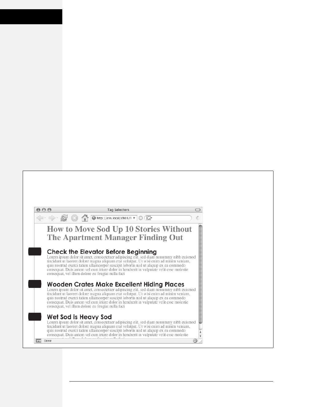
50 CSS: The Missing Manual
Tag Selectors: Page-
Wide Styling
Tag Selectors: Page-Wide Styling
Tag selectors—sometimes called type or element selectors—are extremely efficient
styling tools, since they apply to every occurrence of an HTML tag on a web page.
With them, you can make sweeping design changes to a page with very little effort.
For example, when you want to format every paragraph of text on a page using the
same font, color, and size, you merely create a style using p(as in the <p> tag) as the
selector. In essence, a tag selector redefines how a browser displays a particular tag.
Prior to CSS, in order to format text, you had to wrap that text in a <font> tag. To
add the same look to every paragraph on a page, you often had to use the <font>
tag multiple times. This process was a lot of work and required a lot of HTML,
making pages slower to download and more time-consuming to update. With tag
selectors, you don’t actually have to do anything to the HTML—just create the
CSS rule, and let the browser do the rest.
Tag selectors are easy to spot in a CSS rule, since they bear the exact same name as
the tag they style—p, h1, table, img, and so on. For example, in Figure 3-2, the h2
selector (top) applies some font styling to all <h2> tags on a web page (bottom).
Figure 3-2:
A tag selector affects
every instance of the tag
on the page. This page
has three <h2> tags
(indicated by the black
labels at the left edge of
the browser window). A
single CSS style with a
selector of h2 controls the
presentation of every
<h2> tag on the page.
h2
h2
h2
h2 {
font-family:"Century Gothic", "Gill Sans", sans-serif;
color:#000000;
margin-bottom:0;
}
Download at Boykma.Com

Chapter 3: Selectors: Identifying What to Style 51
Class Selectors:
Pinpoint Control
Note: As Figure 3-2 makes clear, tag selectors don’t get the less than (<) and greater than (>) symbols
that surround HTML tags. So when you’re writing a rule for the <p> tag, for example, just type the tag’s
name—p.
Tag selectors have their downsides, however. What if you want some paragraphs to
look different from other paragraphs? A simple tag selector won’t do, since it
doesn’t provide enough information for a web browser to identify the difference
between the <p> tags you want to highlight in purple, bold, and large type from
the <p> tags you want to leave with normal, black text. Fortunately, CSS provides
several ways to solve this problem—the most straightforward method is called a
class selector.
Class Selectors: Pinpoint Control
When you want to give one or more elements a look that’s different from related
tags on a page—for example, give one or two images on a page a red border while
leaving the majority of other images unstyled—you can use a class selector. If
you’re familiar with styles in word-processing programs like Microsoft Word, then
class selectors will feel familiar. You create a class selector by giving it a name and
then applying it to just the HTML tags you wish to format. For example, you can
create a class style named .copyright and then apply it only to a paragraph contain-
ing copyright information, without affecting any other paragraphs.
Class selectors also let you pinpoint an exact element on a page, regardless of its
tag. Say you want to format a word or two inside of a paragraph, for example. In
this case, you don’t want the entire <p> tag affected, just a single phrase inside it.
You can use a class selector to indicate just those words. You can even use a class
selector to apply the same formatting to multiple elements that have different
HTML tags. For example, you can give one paragraph and one second-level heading
the same styling—perhaps a color and a font you’ve selected to highlight special
information, as shown in Figure 3-3. Unlike tag selectors, which limit you to the
existing HTML tags on the page, you can create as many class selectors as you like
and put them anywhere you want.
Note: When you want to apply a class selector to just a few words contained inside another tag (like the
middle paragraph in Figure 3-3), you need a little help from the <span> tag (page 26). See the box on
page 54 for more detail.
You’ve probably noticed the period that starts every class selector’s name—such as
.copyright and .special. It’s one of a few rules to keep in mind when naming a class:
• All class selector names must begin with a period. That’s how web browsers
spot a class selector in the style sheet.
• CSS permits only letters, numbers, hyphens, and underscores in class names.
Download at Boykma.Com
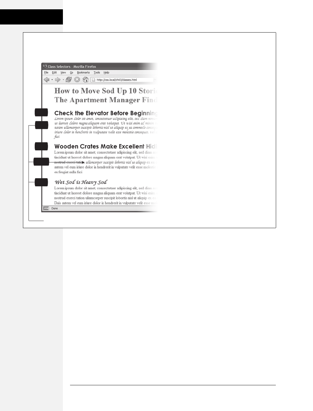
52 CSS: The Missing Manual
Class Selectors:
Pinpoint Control
• After the period, the name must always start with a letter. For example, .9lives
isn’t a valid class name, but .crazy8 is. You can have classes named .copy-right
and .banner_image, but not .-bad or ._as_bad.
• Class names are case sensitive. For example, CSS considers .SIDEBAR and .side-
bar two different classes.
Apart from the name, you create class styles exactly like tag styles. After the class
name, simply slap on a declaration block containing all of the styling you desire:
.special {
color:#FF0000;
font-family:"Monotype Corsiva";
}
Because tag styles apply across the board to all tags on a web page, you merely have
to define them in the head of the page: The HTML tags that make them work are
already in place. The extra freedom you get with class styles, though, comes with a
little more work. Using class selectors is a two-step process. After you create a class
rule, you must then indicate where you want to apply that formatting. To do so,
you add a class attribute to the HTML tag you wish to style.
Figure 3-3:
Class selectors let you make highly targeted design
changes. For example, you can stylize one instance of
an <h2> heading (“Wet Sod is Heavy Sod”). The class
selector .special tells the browser to apply the style to
just that single <h2> tag. Once you’ve created a class
selector, you can use it on other tags, like the top
paragraph on this page.
class=”special”
h2
h2
.special {
color:#FF0000;
font-family:"Monotype Corsiva";
}
h2
p
span
Download at Boykma.Com
Chapter 3: Selectors: Identifying What to Style 53
ID Selectors:
Specific Page
Elements
Say you create a class .special that you’ll use to highlight particular page elements.
To add this style to a paragraph, add a class attribute to the <p> tag, like so:
<p class="special">
Note: In the HTML, as part of the class attribute, you don’t put a period before the class name. The
period is only required for the class selector name in a style sheet.
When a web browser encounters this tag, it knows to apply the formatting rules
contained in the .special style to the paragraph. You can also apply class formatting
to only part of a paragraph or heading by adding a <span> tag, as described in the
box below.
Once you create a class style, you can apply it to just about any tag on the page. In
fact, you can apply the same class to different tags, so you can create a .special style
with a specific font and color and apply it to <h2>, <p>, and <ul> tags. Although
they give you almost limitless formatting possibilities, classes aren’t always the
right tool when using CSS for laying out a page. Enter the ID selector, which lets
you designate a formatting rule for one specific use on a page, as described next.
ID Selectors: Specific Page Elements
CSS reserves the ID selector for identifying a unique part of a page, like a banner,
navigation bar, or the main content area. Just like a class selector, you create an ID
by giving it a name in CSS, and then you apply it by adding the ID to your page’s
HTML code. So what’s the difference? As explained in the box on page 55, ID
selectors have some specific uses in JavaScript-based or very lengthy web pages.
Otherwise, compelling reasons to use IDs over classes are few.
When deciding whether to use a class or an ID, follow these rules of thumb:
• To use a style several times on a page, you must use classes. For example, when
you have more than one photo on your page, use a class selector to apply styl-
ing—like a border—to each <img> tag you wish to style.
• Use IDs to identify sections that occur only once per page. CSS-based layouts
often use ID selectors to identify the unique parts of a web page, like a sidebar
or footer. Part 3 shows you how to use this technique.
• Consider using an ID selector to sidestep style conflicts, since web browsers give
ID selectors priority over class selectors. For example, when a browser encounters
two styles that apply to the same tag but specify different background colors,
the ID’s background color wins. (See page 92 for more on this topic.)
Note: Although you should apply only a single ID to a single HTML tag, a browser won’t blow up or set
off alarm bells if you apply the same ID to two or more tags on the same page. In fact, most browsers will
apply the CSS from an ID style correctly in this case. However, your HTML won’t validate (see page 26),
and your web designer friends may stop talking to you.
Download at Boykma.Com
54 CSS: The Missing Manual
ID Selectors:
Specific Page
Elements
Should you decide to use an ID selector, creating one is easy. Just as a period indi-
cates the name of a class selector, a pound or hash symbol identifies an ID style.
Otherwise, follow the exact same naming rules used for classes (page 51). This
example provides a background color and a width and height for the element:
#banner {
background: #CC0000;
height: 300px;
width: 720px;
}
GEM IN THE ROUGH
Divs and Spans
Chapter 1 introduced you to <div> and <span>, two
generic HTML tags that you can bend to your CSS wishes.
When there’s no HTML tag that exactly delineates where
you want to put a class or ID style you’ve created, use a
<div> or <span> to fill in the gaps.
The div tag identifies a logical division of the page, like a
banner, navigation bar, sidebar, or footer. You can also use
it to surround any element that takes up a chunk of the
page, including headings, bulleted lists, or paragraphs.
(Programmer types call these block-level elements because
they form a complete “block” of content, with line breaks
before and after them.) The <div> tag works just like a para-
graph tag: Type the opening <div>, add some text, a photo,
or some other content inside it, and then end it with the
closing </div>.
The div tag has the unique ability to contain several block-
level elements, making it a great way to group tags that are
logically related such as the logo and navigation bar in a
page’s banner or a series of news stories that compose a
sidebar. Once grouped in this way, you can apply specific
formatting to just the tags inside the particular div or move
the entire div-tagged chunk of content into a particular
area, such as the right side of the browser window (CSS can
help you control the visual layout of your pages in this man-
ner, as described in Part 3 of this book).
For example, say you added a photo to a web page; the
photo also has a caption that accompanies it. You could
wrap a <div> tag (with a class applied to it) around the
photo and the caption to group both elements together:
<div class="photo">
<img src="holidays.jpg"
alt="Penguins getting frisky"/>
<p>Mom, dad and me on our yearly trip
to Antarctica.</p>
</div>
Depending on what you put in the declaration block, the .
photo class can add a decorative border, background color,
and so on to both photo and caption. Part 3 of this book
shows you even more powerful ways to use <div> tags—
including nested divs.
A <span> tag, on the other hand, lets you apply a class or
ID style to just part of a tag. You can place <span> tags
around individual words and phrases (often called inline
elements) within paragraphs to format them indepen-
dently. Here, a class called .companyName styles the inline
elements “CosmoFarmer.com,” “Disney,” and “ESPN”:
<p>Welcome to <span class="companyName">
CosmoFarmer.com</span>, the parent
company of such well-known corporations
as <span class="companyName">Disney
</span> and <span class="companyName">
ESPN</span>...well, not really.</p>
Download at Boykma.Com
Chapter 3: Selectors: Identifying What to Style 55
Styling Groups of
Tags
Applying IDs in HTML is similar to applying classes but uses a different attribute
named, logically enough, id. For example, to indicate that the last paragraph of a
page is that page’s one and only copyright notice, you can create an ID style named
#copyright and add it to that paragraph’s tag:
<p id="copyright">
Note: As with class styles, you use the # symbol only when naming the style in the style sheet. You leave
the # off when using the ID’s name as part of an HTML tag: <div id="banner">.
Styling Groups of Tags
Sometimes you need a quick way to apply the same formatting to several different
elements. For example, maybe you’d like all the headers on a page to share the
same color and font. Creating a separate style for each header—h1, h2, h3, h4, and
so on—is way too much work, and if you later want to change the color of all of
the headers, then you have six different styles to update. A better approach is to use
agroup selector. Group selectors let you apply a style to multiple selectors at the
same time.
POWER USERS’ CLINIC
Proper IDs
ID selectors have a few powers that class selectors lack.
These benefits actually have nothing to do with CSS, so you
may never need an ID. But if you’re curious:
• JavaScript programming utilizes ID selectors to
locate and manipulate parts of a page. For example,
programmers often apply an ID to a form element
like a text box for collecting a visitor’s name. The ID
lets JavaScript access that form element and work its
magic—like making sure the field isn’t empty when
the visitor clicks Submit.
• IDs also let you link to a specific part of a page, mak-
ing long web pages quicker to navigate. If you have an
alphabetic glossary of terms, then you can use an ID
selector to create links to the letters of the alphabet.
When your visitors click “R,” they jump immediately to
all the “R” words on the page. You don’t actually
need to create any CSS for this—it works purely with
HTML. First, add an ID attribute to the spot on the
page you wish to link to. For example, in a glossary
you can add an h2 tag with a letter from the alpha-
bet followed by the glossary listings—perhaps in a
definition list or a series of paragraphs. Just add an
appropriate ID to each of those h2 tags: <h2
id="R">R</h2>. To create the link in HTML, add the
pound symbol and the ID name to the end of the
URL, followed by the ID name—index.html#R. This
link points directly to an element with the ID of #R
on the page index.html. (When used this way, the ID
behaves just like a named anchor—<a name="R">
R</a>—in HTML.)
Download at Boykma.Com

56 CSS: The Missing Manual
Styling Groups of
Tags
Constructing Group Selectors
To work with selectors as a group, simply create a list of selectors separated by
commas. So to style all of the heading tags with the same color, you can create the
following rule:
h1, h2, h3, h4, h5, h6 { color: #F1CD33; }
This example consists of only tag selectors, but you can use any valid selector (or
combination of selector types) in a group selector. For example, here’s a selector
that applies the same font color to the <h1> tag, the <p> tag, any tag styled with
the .copyright class, and the tag with the #banner ID.
h1, p, .copyright, #banner { color: #F1CD33; }
Tip: If you want a bunch of page elements to share some but not all of the same formatting properties,
then you can create a group selector with the shared formatting options and also create individual rules
with unique formatting for each individual element. In other words, two (or more) different styles can for-
mat the same tag. The ability to use multiple styles to format a single element is a powerful CSS feature.
See Chapter 5 for details.
The Universal Selector (Asterisk)
Think of a group selector as shorthand for applying the same style properties to
several different page elements. CSS also gives you a sort of über group selector—
the universal selector. An asterisk (*) is universal selector shorthand for selecting
every single tag.
For example, say you want all the tags on your page to appear in bold type. Your
group selector might look something like the following:
a, p, img, h1, h2, h3, h4, h5 ...yadda yadda... { font-weight: bold; }
The asterisk, however, is a much shorter way to tell CSS to select all HTML tags on
the page:
* { font-weight: bold; }
You can even use the universal selector as part of a descendent selector, so you can
apply a style to all of the tags that descend from a particular page element. For
example, #banner * selects every tag inside the page element to which you’ve
applied the #banner ID. (You’ll read about descendent selectors next.)
Since the universal selector doesn’t specify any particular type of tag, it’s hard to
predict its effect on an entire website’s worth of pages all composed of a variety of
different HTML tags. To format many different page elements, web page gurus rely
on inheritance—a CSS trait discussed in depth in the next chapter.
Download at Boykma.Com

Chapter 3: Selectors: Identifying What to Style 57
Styling Tags Within
Tags
Styling Tags Within Tags
Choosing whether to style your page with tag selectors or class selectors is a
tradeoff. Tag selectors are fast and easy, but they make every occurrence of a tag
look the same, which is fine—if you want every <h2> on your page to look exactly
like all the rest. Class and ID selectors give you the flexibility to style individual
page elements independently, but creating a new CSS style just to change one
heading’s font takes a heck of a lot more work—and HTML code. What you need
is a way to combine the ease of tag selectors with the precision of classes and IDs.
CSS has just the thing—descendent selectors.
You use descendent selectors to format a whole bunch of tags in a similar manner
(just like tag selectors), but only when they’re in a particular part of a web page. It’s
like saying, “Hey you <a> tags in the navigation bar, listen up. I’ve got some format-
ting for you. All you other <a> tags, just move along; there’s nothing to see here.”
Descendent selectors let you format a tag based on its relationship to other tags. To
understand how it works, you need to delve a little bit more deeply into HTML.
On the bright side, the concepts underlying descendent selectors help you under-
stand several other selector types, too, as discussed later in this chapter.
Note: Descendent selectors can be confusing at first, but they’re among the most important techniques
for efficiently and accurately applying CSS. Take the time to master them.
The HTML Family Tree
The HTML that forms any web page is akin to a family tree, where the HTML tags
represent various family members. The first HTML tag you use on a page—the
<html> tag—is like the grandpappy of all other tags. The <html> tag surrounds
the <head> tag and the <body> tag, which makes <html> the ancestor of both.
Similarly, a tag inside of another tag is a descendent. The <title> tag in the follow-
ing example is the <head> tag’s descendent:
<html>
<head>
<title>A Simple Document</title>
</head>
<body>
<h1>Header</h1>
<p>A paragraph of <strong>important</strong>text.</p>
</body>
</html>
You can turn the above HTML code into a diagram, like Figure 3-4, showing the
relationships between the page’s tags. First there’s the <html> tag; it’s divided into
two sections represented by the <head> and <body> tags. Those two tags contain
other tags that in turn may contain other tags. By seeing which tags appear inside
which other tags, you can diagram any web page.
Download at Boykma.Com
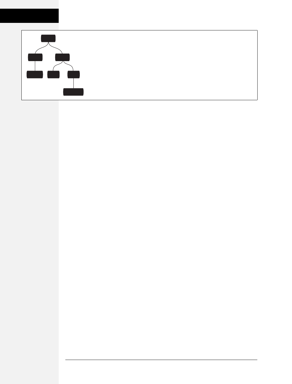
58 CSS: The Missing Manual
Styling Tags Within
Tags
Tree diagrams help you figure out how CSS sees the relationship of one element on
a page to another. Many of the selectors in this chapter, including descendent
selectors, rely on these relationships. The most important relationships are:
•Ancestor. As explained at the beginning of this chapter, an HTML tag that
wraps around another tag is its ancestor. In Figure 3-4, the <html> tag is an
ancestor of all other tags, while the <body> tag is an ancestor for all of the tags
inside of it—the <h1>, <p>, and <strong> tags.
•Descendent. A tag inside one or more tags is a descendent. In Figure 3-4, the
<body> tag is a descendent of the <html> tag, while the <p> tag is a descen-
dent of both the <body> and <html> tags.
•Parent. A parent tag is the closest ancestor of another tag. In Figure 3-4, a par-
ent is the first tag directly connected to and above another tag. Thus, the
<html> tag is the parent of the <head> and <body> tags, but of no other tags.
And, in this diagram, the <p> tag is the parent of the <strong> tag.
•Child. A tag that’s directly enclosed by another tag is a child. In Figure 3-4, both
the <h1> and <p> tags are children of the <body> tag, but the <strong> tag
isn’t—since that tag is directly wrapped inside the <p> tag.
•Sibling. Tags that are children of the same tag are called siblings, just like broth-
ers and sisters. In an HTML diagram, sibling tags are next to each other and
connected to the same parent. In Figure 3-4, the <head> and <body> tags are
siblings, as are the <h1> and <p> tags.
Thankfully, that’s where CSS draws the line with this family metaphor, so you
don’t have to worry about aunts, uncles, or cousins. (Though rumor has it CSS 10
will include in-laws.)
Building Descendent Selectors
Descendent selectors let you take advantage of the HTML family tree by format-
ting tags differently when they appear inside certain other tags or styles. For example,
say you have an <h1> tag on your web page, and you want to emphasize a word
within that heading with the <strong> tag. The trouble is, most browsers display
Figure 3-4:
HTML consists of nested tags—tags within tags within even more tags. The relationship
between these tags—how they’re nested within each other—forms a kind of family tree.
html
body
ph1
strong
head
title
Download at Boykma.Com
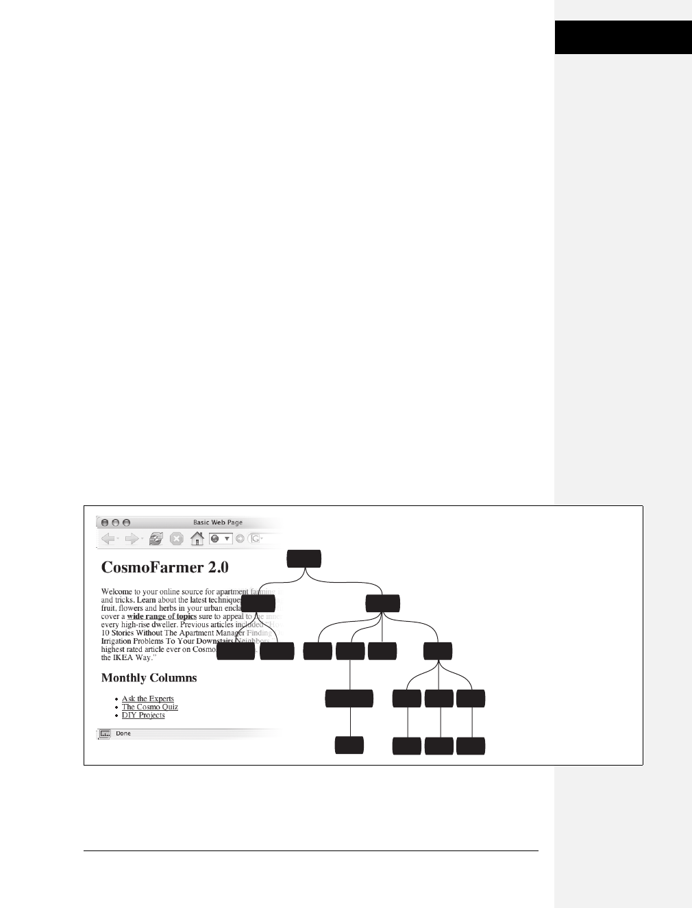
Chapter 3: Selectors: Identifying What to Style 59
Styling Tags Within
Tags
both heading tags and the <strong> tag in bold, so anyone viewing the page can’t
see any difference between the emphasized word and the other words in the head-
line. Creating a tag selector to change the <strong> tag’s color and make it stand
out from the headline isn’t much of a solution: You end up changing the color of
every <strong> tag on the page, like it or not. A descendent selector lets you do
what you really want—change the color of the <strong> tag only when it appears
inside of an <h1> tag.
The solution to the <h1> and <strong> dilemma looks like this:
h1 strong { color: red; }
Here any <strong> tag inside an h1 is red, but other instances of the <strong> tag
on the page aren’t affected. You could achieve the same result by creating a class
style—.strongHeader, for example—but you’d then have to edit the HTML by add-
ing class="strongHeader" to the <strong> tag inside the header. The descendent
selector approach adds no HTML and no more work beyond creating the style!
Descendent selectors style elements that are nested inside other elements, follow-
ing the exact same pattern of ancestors and descendents as the tags in the HTML
family tree. You create a descendent selector by tacking together selectors accord-
ing to the part of the family tree you want to format, with the most senior ancestor
on the left and the actual tag you’re targeting on the far right. For example, in
Figure 3-5, notice the three links (the <a> tag) inside of bulleted list items and
another link inside of a paragraph. To format the bulleted links differently than the
other links on the page, you can create the following descendent selector:
li a { font-family: Arial; }
Figure 3-5:
This simple tree diagram
(right) represents the structure
of the web page pictured to
the left. Every tag on a web
page is a descendent of the
<html> tag, since <html>
wraps around them all. A tag
can descend from multiple
tags. For example, the first <a>
tag listed in this diagram is a
descendent of the <strong>,
<p>, <body>, and <html> tags.
html
head body
h2ptitle link h1 ul
strong li li li
a a a
a
a
Download at Boykma.Com

60 CSS: The Missing Manual
Styling Tags Within
Tags
This rule says, “Format all links (a) that appear inside a list item (li) by using the
Arial font.” A descendent selector can contain more than just two elements. The
following are all valid selectors for the <a> tags inside of the bulleted lists in
Figure 3-5:
ul li a
body li a
html li a
html body ul li a
Note: While, in general, it’s best to write as short a descendent selector as possible, one reason you
would tack on additional descendent selectors is if you’ve written several different rules that simulta-
neously format a tag. Formatting instructions from a long-winded descendent selector can override simple
class or tag styles. More on that in the next chapter.
These four selectors—all of which do the same thing—demonstrate that you don’t
have to describe the entire lineage of the tag you want to format. For instance, in
the second example—body li a—ul isn’t needed. This selector works as long as
there’s an <a> tag that’s a descendent (somewhere up the line) of an <li> tag
(which is also a descendent of the <body> tag). This selector can just as easily
apply to an <a> that’s inside an <em> tag, that’s inside a <strong> tag, that’s
inside an <li> tag, and so on.
You’re not limited to just tag selectors, either. You can build complex descendent
selectors combining different types of selectors. For example, suppose you want
your links to appear in yellow only when they’re in introductory paragraphs
(which you’ve designated with a class style named intro). The following selector
does the trick:
p.intro a { color: yellow; }
Quick translation: Apply this style to every link (a) that’s a descendent of a para-
graph (p) that has the intro class applied to it. Note that there’s no space between p
and .intro, which tells CSS that the intro class must be applied specifically to the
<p> tag (<p class="intro">) for this style to work.
If you add a space, you get a different effect:
p .intro a { color: yellow; }
This seemingly slight variation selects an <a> tag inside of any tag styled with the .
intro class, which is itself a descendent of a <p> tag.
Leaving off the ancestor tag name (in this case the p) provides a more flexible style:
.intro a {color: yellow; }
This selector indicates any <a> tag inside of any other tag—<div>, <h1>, <table>,
and so on—with the .intro class applied to it.
Download at Boykma.Com

Chapter 3: Selectors: Identifying What to Style 61
Pseudo-Classes and
Pseudo-Elements
Descendent selectors are very powerful weapons in your CSS arsenal. You can find
many more powerful ways to use them throughout this book, and Chapter 15
includes a section devoted to effective techniques using descendent selectors.
Pseudo-Classes and Pseudo-Elements
Sometimes you need to select parts of a web page that don’t have tags per se, but
are nonetheless easy to identify, like the first line of a paragraph or a link as you
move your mouse over it. CSS gives you a handful of selectors for these doohickeys—
pseudo-classes and pseudo-elements.
Styles for Links
Four pseudo-classes let you format links in four different states based on how a
visitor has interacted with that link. They identify when a link is in one of the fol-
lowing four states:
•a:link selects any link that your guest hasn’t visited yet, while the mouse isn’t
hovering over or clicking it. This style is your regular, unused web link.
•a:visited is a link that your visitor has clicked before, according to the web
browser’s history. You can style this type of link differently than a regular link
to tell your visitor, “Hey, you’ve been there already!”
•a:hover lets you change the look of a link as your visitor passes the mouse over
it. The rollover effects you can create aren’t just for fun—they can provide use-
ful visual feedback for buttons on a navigation bar.
You can also use the :hover pseudo-class on elements other than links. For exam-
ple, you can use it to highlight text in a <p> or <div> when your guests mouse
over it. In that case, instead of using a:hover (which is for links) to add a hover
effect, you can create a style named p:hover to create a specific effect when some-
one mouses over any paragraph. If you just want to style tags with a specific class
of highlight applied to them, then create a style named .highlight:hover.
Note: In Internet Explorer 6 and earlier, :hover works only on links. For a JavaScript workaround, see the
box on page 64. (If IE 7 isn’t in standards mode (page 26)—that is, the page is missing the proper doc-
type—it also won’t obey :hover on anything but links.)
•a:active lets you determine how a link looks as your visitor clicks. In other
words, it covers the brief nanosecond when someone’s pressing the mouse but-
ton, before releasing it.
Chapter 9 shows you how to design links using these selectors to help your visitors
click their way around your site.
Download at Boykma.Com

62 CSS: The Missing Manual
Pseudo-Classes and
Pseudo-Elements
Note: You can live a long, productive life without reading about the selectors in the next few sections.
Many web designers never use them. The selectors you’ve learned so far—tag, class, ID, descendent,
group, and so on—let you build absolutely beautiful, functional, and easily maintained websites. If you’re
ready for the fun stuff—designing web pages—then skip to the tutorial on page 70. You can always finish
reading this discussion some cold, rainy night by the fire.
Styling Paragraph Parts
The typographic features that make books and magazines look cool, elegant, and
polished didn’t exist in the early web era. (After all, when did scientists ever worry
about looking cool?) CSS provides two pseudo-elements—:first-letter and :first-
line—that give your web pages the design finesse that print has enjoyed for centuries.
The :first-letter pseudo-element lets you create a drop cap—an initial letter that
jumps out from the rest of the paragraph with bigger or bolder font formatting, as
at the beginning of a book chapter.
Styling the :first-line of a paragraph in a different color keeps your reader’s eye mov-
ing and makes text appear appealing and fresh. (If you’re intrigued, Chapter 6 is all
about formatting text, and page 133 covers these two pseudo-elements in depth.)
More Pseudo-Classes and -Elements
The CSS guidelines define several powerful pseudo-class and -element selectors
besides the ones covered so far. Unfortunately, the still-common Internet Explorer
6 doesn’t recognize them. So most web surfers can’t appreciate any design ele-
ments you create with these selectors (at least until they upgrade to IE 8 or switch
to Firefox or Safari—or trade in their PCs for Macs). Meanwhile, you can work
around this problem using JavaScript, as described in the box on page 64.
:before
The :before pseudo-element does something no other selector can: It lets you add
content preceding a given element. For example, say you wanted to put “HOT
TIP!” before certain paragraphs to make them stand out, like the boxes in this
book that say “UP TO SPEED” and “POWER USERS’ CLINIC.” Instead of typing
that text in your page’s HTML, you can let the :before selector do it for you. This
approach not only saves on code, but also if you decide to change the message
from “HOT TIP!” to, say, “Things to know,” then you can change every page on
your site with one quick change to your style sheet. (The downside is that this spe-
cial message is invisible to browsers that don’t understand CSS or don’t under-
stand the :before selector.)
First, create a class (.tip, say) and apply it to the paragraphs that you want to pre-
cede with the message, like so: <p class="tip">. Then, add your message text to the
style sheet:
p.tip:before {content: "HOT TIP!" }
Download at Boykma.Com
Chapter 3: Selectors: Identifying What to Style 63
Pseudo-Classes and
Pseudo-Elements
Whenever a browser encounters the .tip class in a <p> tag, it dutifully inserts the
text “HOT TIP!” just before the paragraph.
The technical term for text you add with this selector is generated content, since
web browsers create (generate) it on the fly. In the page’s HTML source code, this
material doesn’t exist. Whether you realize it or not, browsers generate their own
content all the time, like the bullets in bulleted lists and numbers in ordered lists. If
you want, you can even use the :before selector to define how a browser displays its
bullets and numbers for lists.
Neither IE 6 nor IE 7 understand the CSS content property, so you probably won’t
see wide use of the :before or :after (discussed next) pseudo-elements. However,
Internet Explorer 8 and all other major browsers do, so you’ll find full instructions
for using it on page 484 in Chapter 16.
FREQUENTLY ASKED QUESTION
Should I Care About IE 6?
If you’re a web designer, you’ve probably got the latest ver-
sion of Firefox, Opera, Safari, or Internet Explorer on your
computer. Unfortunately, a surprising number of the world’s
web surfers still use IE 6 (otherwise known as the bane of
web design). According to Net Applications, a company that
tracks browser usage, around 17% of people still were using
IE 6 in May 2009 (http://marketshare.hitslink.com/browser-
market-share.aspx?qprid=0). While that percentage will con-
tinue to drop, IE 6 will still be around for a while.
Some people don’t like to upgrade their software, so they
still use IE 6 even though better options exist. Still other
people are limited by their corporate IT setups and, at least
at work, don’t have an option to upgrade. So like it or not,
unless you’re building websites visited only by the techni-
cally savvy who upgrade their browsers frequently, you
should still keep an eye on IE 6 as you build your sites.
There are some crippling IE 6 bugs that can completely
destroy the look of your site for that web browser—in some
cases even hiding content or making it impossible to read
the web page. You’ll want to fix those kinds of bugs, and this
book describes how to overcome the most devastating
bugs in IE 6 (and 7).
But that doesn’t mean that your site has to look exactly the
same in IE 6 (or even in every other web browser). Due to
the slight (and sometimes not so slight) differences between
browsers, you’ll often find at least some small visual differ-
ence between how a web page looks in Firefox versus Safari
or IE. That’s life as a web designer.
Your main goal should be to make sure that everyone has
access to your site’s content: If IE 6 users can get to your
content, view it, read it, or download it without any hassles,
then you’ve done your job. After that, you can worry about
how much you want your site to match across browsers.
You can do lots of cool things with CSS that IE 6 just doesn’t
understand. For example, the :focus selector (page 65) lets
you change the style of a text box in a form when a visitor
tabs into that field—that’s a cool way to highlight an input
field. But IE 6 and 7 don’t understand that selector. You can
use JavaScript to fix some of that (see the box on page 64),
but you can also ignore those kinds of differences. Even if
someone visiting your site with IE 6 can’t see a highlighted
text field, he can still effectively use your site and fill out that
form. Feel free to explore some more advanced CSS fea-
tures that work in the newest web browsers. In other words,
if your site looks fine and works for IE 6, but looks even bet-
ter in IE 8, Firefox, Safari, and Opera, there’s no harm in
exploring the coolest effects CSS has to offer. (Chapter 16
discusses some of the latest cutting-edge CSS features and
techniques.)
Download at Boykma.Com
64 CSS: The Missing Manual
Pseudo-Classes and
Pseudo-Elements
:after
Exactly like the :before selector, the :after pseudo-element adds generated con-
tent—but after the element, not before. You can use this selector, for example, to
add closing quotation marks (”) after quoted material.
:first-child
Going back to the HTML family tree analogy for a moment, recall what a child tag
is: any tag directly enclosed by another tag. (For example, in Figure 3-5, <h1>,
<p>, <h2>, and <ul> are all children of the <body> tag.) The :first-child pseudo-
element lets you select and format just the first of however many children an
element may have.
A <ul> tag, for example, which creates a bulleted list, can have many list items as
children. (In Figure 3-5, the <ul> tag has three <li> children.) To format just the
first list item (in boldface), you can write this rule:
li:first-child { font-weight: bold; }
Because the :first-child selector includes only the name of the child element, never
the parent, this style formats any <li> tag that’s the first child of any other tag, not
just <ul>. List items always fall within lists, so you know the selector li:first-child
affects all lists on the page—unordered or ordered. With other tags, however, the
POWER USERS’ CLINIC
Getting Internet Explorer 6 Up to Speed
Internet Explorer 6 is old, and it doesn’t recognize the latest
(and even not so latest) CSS techniques. But you don’t have
to give up all the cool selectors discussed on these pages,
such as :before, :after, and :hover. Believe it or not, with a
little help from JavaScript and several pioneering and stub-
born programmers before you, you can write scripts that
teach IE how to handle these types of selectors.
For example, CSSHOVER teaches Internet Explorer 6 for
Windows what to do with the :focus (below) and :hover
selectors (when applied to elements other than links). You
can read about and download this quick, simple script at
www.xs4all.nl/~peterned/csshover.html. This nifty bit of
JavaScript simplifies the creation of CSS-based drop-down
navigation menus. You can read about these menus at http:
//sperling.com/examples/menuh.
In addition, you can use the jQuery JavaScript library (www.
jquery.com) to essentially make IE 6 understand any CSS
selector. The trick is to create two styles: one using the
advanced selector that IE 7, Firefox, and other browsers
understand; and another style, a class style, with the same
CSS properties. You can then use jQuery to dynamically
apply the class in IE 6. One of jQuery’s fabulous powers is
the ability to select any element on a page using a CSS
selector and then applying a class to that element.
The advantage to using advanced selectors—like the
attribute selector described on page 67—is that you don’t
have to do anything to your HTML to get it to work. For
example, you don’t need to add a class to a whole bunch of
HTML tags. By using jQuery and a little programming, you
can get the same ease of use for IE 6 as well. You can read
more about this technique at http://somedirection.com/
2007/06/10/using-jquery-to-avoid-classitis-in-ie6.
Download at Boykma.Com

Chapter 3: Selectors: Identifying What to Style 65
Advanced Selectors
:first-child selector gets a little tricky. For example, in Figure 3-5, the selector p:
first-child would have no effect at all, since the <p> tag is a child of the <body>
tag, but it isn’t the first child—the <h1> tag is.
Since the HTML parent-child relations can change each time you edit a web page,
it’s hard to predict how the :first-child selector will behave as you develop your
website. Also, this selector doesn’t work at all in Internet Explorer 6 or earlier ver-
sions—another reason to avoid it unless you’ve got a really good use for it.
:focus
The :focus pseudo-class works much like the :hover pseudo-class. While :hover
applies when a visitor mouses over a link, :focus applies when the visitor does
something to indicate her attention to a web page element—usually by clicking or
tabbing into it. In programmery lingo, when a visitor clicks in a text box on a web
form, she puts the focus on that text box. That click is a web designer’s only clue as
to where the visitor is focusing her attention.
The :focus selector is mostly useful for giving your visitor feedback, like changing
the background color of a text box to indicate where he’s about to type. (Single-
line text fields, password fields, and multi-line <textarea> boxes are common targets
for the :focus selector.) This style, for example, adds a light yellow color to any text
box a visitor clicks or tabs into:
input:focus { background-color: #FFFFCC; }
The :focus selector applies only while the element’s in focus. When a visitor tabs
into another text field or clicks anywhere else on the page, she takes the focus—
and the CSS properties—away from the text box. Unfortunately, neither IE 6 nor
IE 7 understand the :focus selector, but you can still use it to add visual interest or
highlight form fields for other browsers. (IE 6 and 7 won’t know what they’re miss-
ing, and you don’t have to tell them.)
Tip: Learning how to write selectors can sometimes feel like learning hieroglyphics. To translate a selec-
tor into straightforward language, visit the Selectoracle at http://gallery.theopalgroup.com/selectoracle.
This great resource lets you type in a selector and spits out a clear description of which page elements on
a page the style affects.
Advanced Selectors
The CSS 2 guidelines provide a few more powerful selectors that give you even finer
control over web page styling. Like some of the selectors you’ve seen previously, the
selectors in this section don’t work in Windows Internet Explorer 6 and earlier. (But
you can try the JavaScript workaround in the box on the previous page.)
Download at Boykma.Com
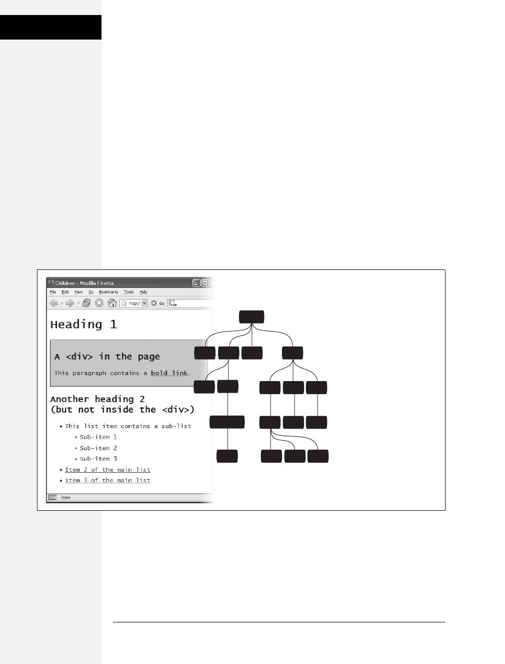
66 CSS: The Missing Manual
Advanced Selectors
Child Selectors
Similar to the descendent selectors described earlier in this chapter, CSS lets you
format the children of another tag with a child selector. The child selector uses an
additional symbol—an angle bracket (>) to indicate the relationship between the
two elements. For example, the selector body > h1 selects any <h1> tag that’s a
child of the <body> tag.
Unlike a descendent selector, which applies to all descendents of a tag (children,
grandchildren, and so on), the child selector lets you specify which child of which
parent you mean. For example, in Figure 3-6, there are two <h2> tags. Using a
plain old descendent selector—body h2—selects both <h2> tags. Even though both
<h2> tags are inside of the <body> tag, only the second one is a child of the
<body> tag. The first <h2> is directly inside of a <div> tag, so its parent is <div>.
Since the two <h2> tags have different parents, you can use a child selector to get
at them individually. To select only the second <h2> tag, your child selector looks
like this: body > h2. If you want the first <h2> tag, then you must use this child
selector instead: div > h2.
Adjacent Siblings
Parent-child relationships aren’t the only ones in the HTML family tree. Some-
times you need to select a tag based not on its parent tag but on its surrounding
siblings—the tags that share a common parent. A tag that appears immediately
after another tag in HTML is called an adjacent sibling. In Figure 3-6, the <div> tag
is the adjacent sibling of the <h1> tag, the <p> tag is the adjacent sibling of the
<h2> tag, and so on.
Figure 3-6:
The diagram (right) shows the
relationship between HTML
tags (left).
h2divh1 ul
strong
li li li
ul a a
a
h2
li li li
body
p
Download at Boykma.Com
Chapter 3: Selectors: Identifying What to Style 67
Advanced Selectors
Using an adjacent sibling selector, you can, for example, give the first paragraph
after each heading different formatting from the paragraphs that follow. Suppose
you want to remove the margin that appears above that <p> tag so that it sits right
below the heading without any gap. Or perhaps you want to give the paragraph a
distinct color and font size, like a little introductory statement.
The adjacent sibling selector uses a plus sign (+) to join one element to the next. So
to select every paragraph following each <h2> tag, use this selector: h2+p(spaces
are optional, so h2+p works as well). The last element in the selector (p, in this case)
is what gets the formatting, but only when it’s directly after its brother <h2>.
Attribute Selectors
CSS provides a way to format a tag based on any attributes it has. For example, say
you want to place borders around the images on your page—but only around the
important photos. You don’t want to include your logo, buttons, and other little
doodads that also have an <img> tag. Fortunately, you realize that you’ve given all
the photos descriptions using the title attribute, which means you can use an
attribute selector to identify just the important images.
FREQUENTLY ASKED QUESTION
Making Lists Look Great
When would I ever use a child selector? Just from reading
this chapter, I already know enough selectors to get at just
about any page element, so why learn another?
There’s one design challenge where child selectors can’t be
beat—and it comes up in more websites than you think. Any
time you have an unordered list with one or more unordered
lists nested inside (as in Figure 3-6), you can use child selec-
tors to visually organize these categories and subcategories
of information. You can format the first level of list items one
way, and the second level of list items another way. Content
presented in this manner looks neat, professional, and read-
able (and your visitors will love you for it).
First, create a class style for the outermost nested level in
your list and call it, say, .mainList. For this top level, you
might use a sans-serif font, a little larger than your other
text, perhaps in bold or a different color. Subsequent categories
can be smaller, in a serif font like Times for easiest reading.
When you have a lot of text, styling each subcategory level
a bit differently helps visually orient your visitors in the
material.
Apply the .mainList class style to the first <ul> tag: <ul
class="mainList">. Then use a child selector (ul.mainList >
li) to select just the first set of list items, and add your
desired text styling for the first subcategory. This styling
applies only to the <li> tags that are children of the <ul> tag
with the .mainList style applied to it. The child <li> tags of
any subsequent nested <ul> tags are unaffected, so you
can style them independently with the proper child selec-
tors. For example, to style the <li> tags of the first nested
list, use this selector ul.mainList > li > ul > li. (A descendent
selector like ul li, by contrast, selects the list items of all
unordered lists on the page—nested ones and all.)
Download at Boykma.Com

68 CSS: The Missing Manual
Advanced Selectors
Tip: The HTML title attribute is a great way to add tooltips (pop-up messages) to links and images on a
page. It’s also one way to inform search engines about the useful information on a web page. Learn more
about it at http://webdesign.about.com/od/htmltags/a/aa101005.htm.
With attribute selectors, you can single out tags that have a particular property. For
example, here’s how to select all <img> tags with a title attribute:
img[title]
The first part of the selector is the name of the tag (img) while the attribute’s name
goes in brackets: [title].
CSS doesn’t limit attribute selectors to tag names: You can combine them with
classes, too. For example, .photo[title] selects every element with the .photo class
style and an HTML title attribute.
To get more specific, you can select elements that not only share a particular
attribute but also have an exact value set for that attribute. For example, when you
want to highlight links that point to a particular URL, create an eye-catching
attribute selector, like so:
a[href="http://www.cosmofarmer.com"]{ color:red; font-weight:bold; }
Adding a value to an attribute selector is very useful when working with forms.
Many form elements have the same tag, even if they look and act differently. The
checkbox, text box, Submit button, and other form fields all share the <input> tag.
The type attribute’s value is what gives the field its form and function. For example,
<input type="text"> creates a text box, and <input type="checkbox"> creates a
checkbox.
To select just text boxes in a form, for example, use this selector:
input[type="text"]
The attribute selector is very versatile. It lets you not only find tags that have a spe-
cific value for an attribute (for example, find all form fields with a type of checkbox)
but even select elements with an attribute value that begins with, ends with, or con-
tains a specific value. While this might sound like overkill, it’s actually quite handy.
For example, suppose you want to create a specific style to highlight external links
(links that point outside of your own website) to indicate, “Hey, you’ll leave this
site if you click this.” Assuming you don’t use absolute links to link to any pages in
your own site, you can assume that any external link begins with http://—the first
part of any absolute link.
If that’s the case, the selector would look like this:
a[href^="http://"]
Download at Boykma.Com

Chapter 3: Selectors: Identifying What to Style 69
Advanced Selectors
The ^= translates to “begins with,” so you can use this selector to format any link
that begins with http://. You can use it to style a link that points to http://www.
google.com as well as a link to http://www.sawmac.com. In other words, it selects
any external link.
Note: This selector won’t work for any secure connections over SSL—in other words any links that begin
with https://. To create a style that affects those as well, you could create a group selector (page 56) like this:
a[href^="http://"], a[href^="https://"]
Similarly, there are times when you want to select an element with an attribute that
ends in a specific value. Again, links are handy for this task. Say you want to add a
little document icon next to any links that point to a PDF file. Since PDF docu-
ments end in .pdf, you know a link pointing to one of those files will end in .pdf—
for example, <a href="download_instructions.pdf">. So to select just those types of
links, you’d create a selector like this:
a[href$=".pdf"]
The full style might look something like this:
a[href$=".pdf"] {
background-image: url(doc_icon.png) no-repeat;
padding-left: 15px;
};
Don’t worry too much about the particular properties in this style—you’ll learn
about padding on page 153 and background-images on page 188. Just pay atten-
tion to that cool selector: $= translates to “ends with.” You can use this selector to
format links that point to Word docs ([a href$=".doc"]), movies ([a href$=".mov"]),
and so on.
Finally, you can even select elements with attributes that contain another value. For
example, say you like to highlight photos of your employees throughout the site. You
might want all of those photos to have a common style, like a thick green border and
a gray background. One way to do this is to create a class style—.headshot, for exam-
ple—and manually add a class attribute to the appropriate <img> tags. However, if
you name the photos consistently, then there’s a faster method.
For example, say you name each of those images with the word headshot in them—
for example mcfarland_headshot.png, mccord_headshot.jpg, headshot_albert.jpg, and
so on. Each of these files has the word headshot somewhere in the file, so the src
attribute of the <img> tag used to insert each image also contains the word head-
shot. You can create a selector for just those images like this:
img[src*="headshot"]
This translates to “select all images whose src attribute has the word headshot
somewhere in it.” It’s a simple, elegant way to format just those images.
Download at Boykma.Com
70 CSS: The Missing Manual
Tutorial: Selector
Sampler
Internet Explorer 6, of course, doesn’t understand attribute selectors, so use them
only if the missing style won’t drastically affect how IE 6 displays the page. In many
cases, you can use attribute selectors just to add a little eye-candy for those with
modern browsers.
Note: The CSS 3 guidelines promise even more variations on selectors. Chapter 16 covers some of the
most promising selectors (and ones that you’ll actually find in real web browsers).
Tutorial: Selector Sampler
In the rest of this chapter, you’ll create a variety of selector types and see how each
affects a web page. This tutorial starts with the basic selector types and then moves
on to more advanced styles.
To get started, you need to download the tutorial files located on this book’s com-
panion website at www.sawmac.com/css2e/. Click the tutorial link and download
the files. All of the files are enclosed in a ZIP archive, so you’ll need to unzip them
first. (Detailed instructions for unzipping the files are on the website.) The files for
this tutorial are contained inside the folder named 03.
1. Open selector_basics.html in your favorite text editor.
This page is made of very basic HTML tags. The most exciting thing about it is
the graphic banner (see Figure 3-7). But you’ll liven things up in this tutorial.
You’ll start by adding an internal style sheet to this file.
INDIGNANTLY ASKED QUESTION
Keeping It Internal
Hey, what’s up with the internal style sheet in this tutorial?
Chapter 2 recommends using external style sheets for a
bunch of reasons.
Think you’re pretty smart, eh? Yes, external style sheets usu-
ally make for faster, more efficient websites, for all the rea-
sons mentioned in Chapter 2. However, internal style
sheets make your life easier when you’re designing a single
page at a time, as in this tutorial. You get to work in just one
web page file instead of flipping back and forth between the
external style sheet file and the web page.
Furthermore, you can preview your results without con-
stantly refreshing your browser’s cache; flip back to the box
on page 35 for more on that quirkiness.
Many hotshot web designers like to begin their designs with
an internal style sheet, since it’s faster and avoids any prob-
lems with all that cache nonsense. Here’s their secret: Once
they’ve perfected their design, they simply cut the code
from the internal style sheet, paste it into an external style
sheet, and then link the style sheet to their site’s pages as
described on page 34.
Download at Boykma.Com
Chapter 3: Selectors: Identifying What to Style 71
Tutorial: Selector
Sampler
2. Click directly after the closing </title> tag, hit Enter (Return) and type <style
type="text/css">. Press Enter twice and then type </style>.
These are the opening and closing style tags—it’s a good idea to type both tags
at the same time, so you don’t accidentally forget to add the closing </style>
tag. Together, these two tags tell a web browser that the information between
them is Cascading Style Sheet instructions. The HTML should now look like
this (the stuff you added is in bold):
<title>Selector Basics</title>
<style type="text/css">
</style>
</head>
Type selectors—such as the tag selector you’re about to create—are the most
basic type of selector. (If you completed the tutorial in the last chapter, you’ve
already created a few.)
Figure 3-7:
Plain HTML looks cold
and monotonous in a
web browser. But with a
little CSS, you can turn
drab (left) into fab
(Figure 3-10) in 31
easy steps.
Download at Boykma.Com

72 CSS: The Missing Manual
Tutorial: Selector
Sampler
3. Click between the opening and closing style tags you just added and type p{,
hit return twice and type the closing }.
As mentioned on page 41, it’s a good idea to always add the closing brace
immediately after typing the opening brace, just so you don’t forget. To create a
tag selector, simply use the name of the HTML tag you wish to format. This
style applies to all paragraphs of text within <p> tags.
4. Click between the style’s opening and closing braces({})andaddthefollow-
ing four CSS properties to supply the style’s formatting—color, size, font, and
left indent:
p {
color: #505050;
font-size: 1em;
font-family: "Helvetica Neue", Arial, Helvetica, sans-serif;
margin-left: 100px;
}
Press Enter to place each CSS property on its own line. It’s also a good idea to
visually organize your CSS code by indenting each property with the Tab key.
Note: These property names and their values may look unfamiliar. For now, just type them as is. You’ll
learn what 1em and 100px mean, along with all the ins and outs of text-formatting properties, in
Chapter 6.
Your style sheet is complete. Time for a look-see.
5. Open the page in a web browser to preview your work.
Unless you tinker with the preference settings, most browsers display black text in
a standard serif font like Times. If your CSS style works properly, then you should
see seven indented paragraphs in a sans-serif font in a darkish gray color.
Creating a Group Selector
Sometimes you’ll want several different elements on a page to share the same look.
For instance, you may want all your headings to have the same font and color for a
consistent style. Instead of creating separate styles and duplicating the same prop-
erty settings for each tag—<h1>, <h2>, and so on—you can group the tags
together into a single selector.
1. Return to your text editor and the selector_basics.html file.
You’ll add a new style below the <p> tag style you just created.
Download at Boykma.Com
Chapter 3: Selectors: Identifying What to Style 73
Tutorial: Selector
Sampler
2. Click at the end of the closing brace of the tag selector, press Enter to start a
new line, and then type h1, h2, h3 { .
As explained earlier in this chapter, a group selector is simply a list of selectors
separated by commas. This rule applies the same formatting, which you’ll add
next, to all <h1>, <h2>, and <h3> tags on the page.
3. Hit Enter, and then add five CSS properties:
color: #BD8100;
font-family: Baskerville, "Palatino Linotype", Times, serif;
border-top: 2px solid #86A100;
padding-top: 7px;
padding-left: 100px;
There’s a lot going on here, but basically you’re setting the color and font type
for the headlines, adding a border line above the headlines for visual interest,
and controlling the top and left spacing using the padding property. In a nut-
shell, this property adds space from the edges of an element without affecting a
background or border—in other words, you’re scooting the headline text in
from the left and down from the top without moving the border line that spans
the entire page.
4. Finally, hit Enter, and then type the closing brace to complete this style. It
should look like this:
h1, h2, h3 {
color: #BD8100;
font-family: Baskerville, "Palatino Linotype", Times, serif;
border-top: 2px solid #86A100;
padding-top: 7px;
padding-left: 100px;
}
5. Save the file, and preview it in a web browser.
The <h1> heading near the top of the page and the <h2> and <h3> headings
lower on the page all have the same font and font color as well as green border
along their tops (see Figure 3-8).
Creating and Applying a Class Selector
Tag selectors are quick and efficient, but they’re a bit indiscriminate in how they
style a page. What if you want to style a single <p> tag differently than all the other
<p> tags on a page? A class selector is the answer.
1. Return to your text editor and the selector_basics.html file.
Add a new style below the group selector style you just created.
Download at Boykma.Com

74 CSS: The Missing Manual
Tutorial: Selector
Sampler
2. Click at the end of the closing brace of the h1, h2, h3 selector, press Enter
(Return), and then type .note { .
This style’s name, note, indicates its purpose: to highlight paragraphs that con-
tain extra bits of information for your site’s visitors. Once you create a class
style, you can apply it wherever these notes appear—like the second paragraph,
in this case.
Figure 3-8:
A simple tag selector can
completely transform the
appearance of every
instance of a tag, making
quick work of styling all
the paragraphs of text on
a page. And in this case a
group selector does even
more by formatting every
instance of three different
headline tags!
Download at Boykma.Com

Chapter 3: Selectors: Identifying What to Style 75
Tutorial: Selector
Sampler
3. Hit Enter, and then add the following list of properties to the style:
color: #333;
border: 2px dashed #BD8110;
background-color: #FBF8A9;
margin-top: 25px;
margin-bottom: 35px;
padding: 20px;
Most of these properties should look familiar by now, but the background-color
property may be new to you. Logically enough, it adds a color to the back-
ground of the element.
4. Finally, complete the style by pressing Enter and typing the closing brace. The
completed class style should look like this:
.note {
color: #333;
border: 2px dashed #BD8110;
background-color: #FBF8A9;
margin-top: 25px;
margin-bottom: 35px;
padding: 20px;
}
If you preview the page now, you see no changes. Unlike tag selectors, class
selectors don’t have any affect on a web page until you apply the style in the
HTML code.
5. In the page’s HTML, there are two <p> tags that begin with the word “Note”
inside <strong> tags.
To apply a class style to a tag, simply add a class attribute, followed by the class
selector’s name—in this case, the note style you just created.
6. Click just after the “p” in the first <p> tag, and then type a space followed
by class="note". The HTML should now look like this (what you just typed
is in bold):
<p class="note"><strong>NOTE:</strong> Ut enim ad
Be sure not to type class=".note". In CSS, the period is necessary to indicate a
class style name; in HTML, it’s verboten. Repeat this step for the second para-
graph (it’s just above the <h3> tag with the text “Not Me!”).
Note: There’s no reason you can’t add this class to other tags as well, not just the <p> tag. If you hap-
pen to want to apply this formatting to an <h2> tag, for example, then your HTML would look like this:
<h2 class="note">.
Download at Boykma.Com
76 CSS: The Missing Manual
Tutorial: Selector
Sampler
7. Save and preview the web page in a browser.
The two note paragraphs are nicely highlighted on the page (see Figure 3-9).
Note: If your page doesn’t look like Figure 3-9, then you may have mistyped the name of a property or
its value. Double-check your code with the steps on pages 71–73. Also, make sure to end each declara-
tion—property:value combination—with a semicolon and conclude the style with a closing brace at the very
end. When your style is not working correctly, missing semicolons and closing braces are frequent culprits.
Creating a Descendent Selector
On the selectors_basics.html page, you applied the note class to two paragraphs.
Each of those paragraphs begins with the word “Note:” in bold—actually the word
is wrapped inside the HTML <strong> tag, which all browsers display as bolded
text. But what if you want to format those bolded words in bright orange? You
could create a tag style for the <strong> tag, but that would affect all <strong> tags
on the page, and you only want to change the strong tag inside those note boxes.
One solution would be to create a class style—.noteText, for example—and apply it
to each of the <strong> tags inside the note boxes. But that’s work, and you might
forget to apply the class if you have a lot of pages with those notes.
Figure 3-9:
You can make detailed
formatting changes with
class selectors. A class
style gives selected
paragraphs different
formatting from all other
paragraphs on the page.
The distinctive note box
pictured here uses a class
style to stand out from
the crowd.
Download at Boykma.Com

Chapter 3: Selectors: Identifying What to Style 77
Tutorial: Selector
Sampler
A better method is to create a descendent selector (page 57), which targets only the
<strong> tag when it’s inside one of these note boxes. Fortunately, that’s easy to do.
1. Return to your text editor and the selector_basics.html file. Create a new empty
line for the descendent selector style.
If you just completed the previous steps, click after the closing brace of the .note
style, and then hit Enter (Return).
2. Type .note strong {
The last tag in the selector—strong—is the element you ultimately want to for-
mat. In this case, the style formats the <strong> tag only when it’s inside
another tag with the class note applied to it. It has no effect on <strong> tags
inside other paragraphs, lists, or heading tags, for example.
3. Hit Enter, type color: #FC6512;, and then hit Enter (Return) again to create
another blank line. Finish the style by typing the closing brace character.
The finished style should look like this:
.note strong {
color: #FC6512;
}
4. Save the page and preview it in a web browser.
The word “Note:” should appear in orange in each of the note boxes on the page.
Descendent selectors are among the most powerful CSS tools. Professional web
designers use them extensively to target particular tags without littering the HTML
with CSS classes. This book uses them routinely, and you can learn a lot more
about descendent selectors in Chapter 15.
Creating and Applying an ID Selector
You can apply class selectors to multiple elements on a page. For example, earlier
you created a .note class style and applied it to two paragraphs, but you could apply
it to even more paragraphs (or even other tags) if you wanted to. ID selectors look
and act just like classes, but you can apply an ID only once per page. Web design-
ers frequently use ID selectors to indicate unique sections of a page, as explained
on page 53.
In this exercise, you’ll create a style that sets a specific width for a web page’s con-
tent, centers it in the middle of the browser window and adds a decorative back-
ground image to the page. You’ll apply the ID to the page’s <body> tag to indicate
a unique page design.
1. Return to your text editor and the selector_basics.html file.
You’ll add a new style below the .note strong class style you created before.
Download at Boykma.Com

78 CSS: The Missing Manual
Tutorial: Selector
Sampler
2. Click after the previous style’s closing bracket (}), hit Enter (Return) to create a
new line, and then type #article { .
ID selectors always begin with the pound symbol (#). The style’s name indi-
cates which type of page this is—it’s common on websites to have different
designs for different types of web pages. For example, the home page will look
different from a page advertising a product, which may look different from a
page with the text of a blog post. In this case, you’re going to identify this page
as an “article” (as in a newspaper) by creating and applying an ID to the
<body> tag.
3. Hit Enter again, and then type:
background-color: #FDF8AB;
background-image: url(images/bg_page.png);
background-repeat: repeat-y;
background-position: center top;
padding: 0;
margin: 0 auto;
width: 760px;
There are a lot of properties here, but basically you’re adding a color to the page,
inserting an image in the background (and controlling how it’s positioned),
removing space around the browser window’s edges, setting a fixed width for the
page’s content, and centering everything in the middle of the page.
4. Finish the style by typing the closing brace. The whole thing should look
like this:
#article {
background-color: #FDF8AB;
background-image: url(images/bg_page.png);
background-repeat: repeat-y;
background-position: center top;
padding: 0;
margin: 0 auto;
width: 760px;
}
Just as with a class, this style doesn’t do anything until you apply it to the page.
So you’ll add an ID attribute to the page’s HTML, indicating where you want
the ID style to apply.
5. Find the page’s opening <body> tag and add id="article" so that the tag looks
like this (your changes are in bold):
<body id="article">
Download at Boykma.Com

Chapter 3: Selectors: Identifying What to Style 79
Tutorial: Selector
Sampler
Now the <body> tag reflects the formatting defined in the #article style. As with
all things CSS, there are many ways to arrive at the same destination: You can
instead use a class style and apply it to the <body> tag (as long as you don’t
apply it more than once on the page). You can even create a plain body element
style with the same formatting properties as long as all the other pages on your
site share these same formatting choices. But in this case, you’re using an ID
selector since the point of this style—identifying the type of page—is in keep-
ing with the general notion of ID selectors.
6. Save the page, and preview it in a browser.
Everything on the page, the logo and all of the text, now have a set width and
float in the center of the browser window. Even if you resize the browser win-
dow—try it!—the content remains centered. In addition, a drop shadow
appears on either side of the content, thanks to the handy background-image
property (you’ll learn about that cool property in depth on page 188).
Finishing Touches
For fun, you’ll add one more advanced style—an adjacent sibling selector discussed
on page 66—to format the paragraph immediately following the first headline on the
page. (You can achieve the same effect by creating a class style and applying it to that
paragraph, but the adjacent sibling selector requires no changes to your HTML.)
1. Return to your text editor and the selector_basics.html file. Create a new empty
line for a new style.
If you just completed the previous steps, click after the closing brace of the
#article style, and then hit Enter (Return).
2. Type h1+p { .
This style will apply to any paragraph that immediately follows an <h1> tag—in
other words, the first paragraph after the top headline on the page. It won’t
apply to the second or any subsequent paragraphs. This selector provides an
easy way to create a unique look for an introductory paragraph to set it off visu-
ally and highlight the beginning of an article.
3. Hit Enter, and then add the following list of properties to the style:
color: #FF6600;
font-size: 1.2em;
line-height: 140%;
margin-top: 20px;
Here you’re changing the font color and size as well as adding a bit of space
above the paragraph. The line-height property (which you’ll read about on page
128) controls the space between lines in a paragraph (also know as leading).
Download at Boykma.Com
80 CSS: The Missing Manual
Tutorial: Selector
Sampler
4. Finally, complete the style by pressing Enter and typing the closing brace. The
completed class style should look like this:
h1+p {
color: #FF6600;
font-size: 1.2em;
line-height: 140%;
margin-top: 20px;
}
If you preview the page now, you’ll see that the top paragraph is orange and the
text is larger and there’s more space between each line of text (see Figure 3-10).
If you actually deleted this paragraph in the HTML, you’d see that the remain-
ing paragraph would suddenly be orange with larger text, since it would be the
new adjacent sibling of the <h1> tag.
Note: Internet Explorer 6 doesn’t understand adjacent sibling selectors, so in that browser, the first para-
graph will look just like all the others on the page.
And there you have it: a quick tour through various selector types. You’ll get famil-
iar with all of these selectors (and more) as you go through the tutorials later in the
book, but by now, you should be getting a hang for the different types and why
you’d use one over the other.
Note: You can see a completed version of the page you’ve just created in the 03_finished folder.
Figure 3-10:
The page has really come
together. The set width, the
drop shadow effect, and the
typographic details have
really improved the look of
the boring HTML page you
started with.
Download at Boykma.Com
81
Chapter 4
chapter
4
Saving Time with Style
Inheritance
Children inherit traits from their parents—eye color, height, male-pattern bald-
ness, and so on. Sometimes, we inherit traits from more distant ancestors, like
grandparents or great-grandparents. As you saw in the previous chapter, the meta-
phor of family relations is part of the structure of HTML as well. And just like
humans, HTML tags can inherit CSS properties from their ancestors.
What Is Inheritance?
In a nutshell, inheritance is the process by which some CSS properties applied to
one tag are passed on to nested tags. For example, a <p> tag is always nested inside
of the <body> tag, so properties applied to the <body> tag get inherited by the
<p> tag. Say you created a CSS tag style (page 50) for the <body> tag that sets the
color property to a dark red. Tags that are descendents of the <body> tag—that is,
the ones inside the <body> tag—will inherit that color property. That means that
any text in those tags—<h1>, <h2>, <p>, whatever—will appear in that same
dark red color.
Inheritance works through multiple generations as well. If a tag like the <em> or
<strong> tag appears inside of a <p> tag, then the <em> and the <strong> tags
also inherit properties from any style applied to the <body> tag.
Note: As discussed in Chapter 3, any tag inside of another tag is a descendent of that tag. So a <p> tag inside
the <body> tag is a descendent of the <body>, while the <body> tag is an ancestor of the <p> tag. Descen-
dents (think kids and grandchildren) inherit properties from ancestors (think parents and grandparents).
Download at Boykma.Com
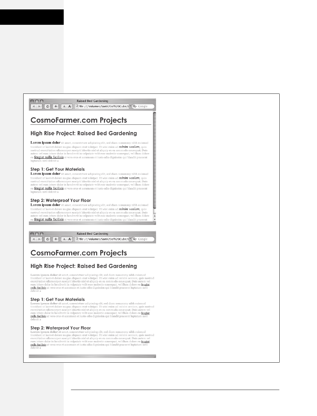
82 CSS: The Missing Manual
What Is
Inheritance?
Although this sounds a bit confusing, inheritance is a really big time saver. Imag-
ine if no properties were passed onto nested tags and you had a paragraph that
contained other tags like the <em> tag to emphasize text or the <a> tag to add a
link. If you created a style that made the paragraph purple, 24px tall, using the
Arial font, it would be weird if all the text inside the <em> tag reverted to its regu-
lar, “browser boring” style (see Figure 4-1). You’d then have to create another style
to format the <em> tag to match the appearance of the <p> tag. What a drag.
Figure 4-1:
Inheritance lets tags copy properties from the tags that
surround them.
Top: The paragraph tag is set with a specific font-family,
size, and color. The tags inside each paragraph inherit
those properties so they look like the rest of the
paragraph.
Bottom: If inheritance didn’t exist, the same page would
look like this figure. Notice how the strong, em, and a
tags inside the paragraph retain the font-family, size,
and color defined by the browser. To make them look
like the rest of the paragraph, you’d have to create
additional styles—a big waste of time.
Download at Boykma.Com

Chapter 4: Saving Time with Style Inheritance 83
The Limits of
Inheritance
Inheritance doesn’t just apply to tag styles. It works with any type of style; so when
you apply a class style (see page 51) to a tag, any tags inside that tag inherit proper-
ties from the styled tag. Same holds true for ID styles, descendent selectors, and the
other types of styles discussed in Chapter 3.
How Inheritance Streamlines Style Sheets
You can use inheritance to your advantage to streamline your style sheets. Say you
want all the text on a page to use the same font. Instead of creating styles for each
tag, simply create a tag style for the <body> tag. (Or create a class style and apply it
to the <body> tag.) In the style, specify the font you wish to use, and all of the tags
on the page inherit the font: body { font-family: Arial, Helvetica, sans-serif; }. Fast
and easy.
You can also use inheritance to apply style properties to a section of a page. For
example, like many web designers, you may use the <div> tag (page 26) to define
an area of a page like a banner, sidebar, or footer. By applying a style to a <div>
tag, you can specify particular CSS properties for all of the tags inside just that sec-
tion of the page. If you want all the text in a sidebar to be the same color, you’d
create a style setting the color property, and then apply it to the <div>. Any <p>,
<h1>, or other tags inside the <div> inherit the same font color.
Note: You’ll find lots more uses for the <div> tag when laying out a page using CSS in Part 3.
The Limits of Inheritance
Inheritance isn’t all-powerful. Many CSS properties don’t pass down to descen-
dent tags at all. For example, the border property (which lets you draw a box
around an element) isn’t inherited, and with good reason. If it were, then every tag
inside an element with the border property would also have a border around it. For
example, if you added a border to the <body> tag, then every bulleted list would
also have a box around it, and each bulleted item in the list would also have a border
(Figure 4-2).
Note: There’s a complete list of CSS properties in Appendix A, CSS Property Reference, including details
on which ones get inherited.
Here are examples of times when inheritance doesn’t strictly apply:
• As a general rule, properties that affect the placement of elements on the page
or the margins, background colors, and borders of elements aren’t inherited.
Download at Boykma.Com
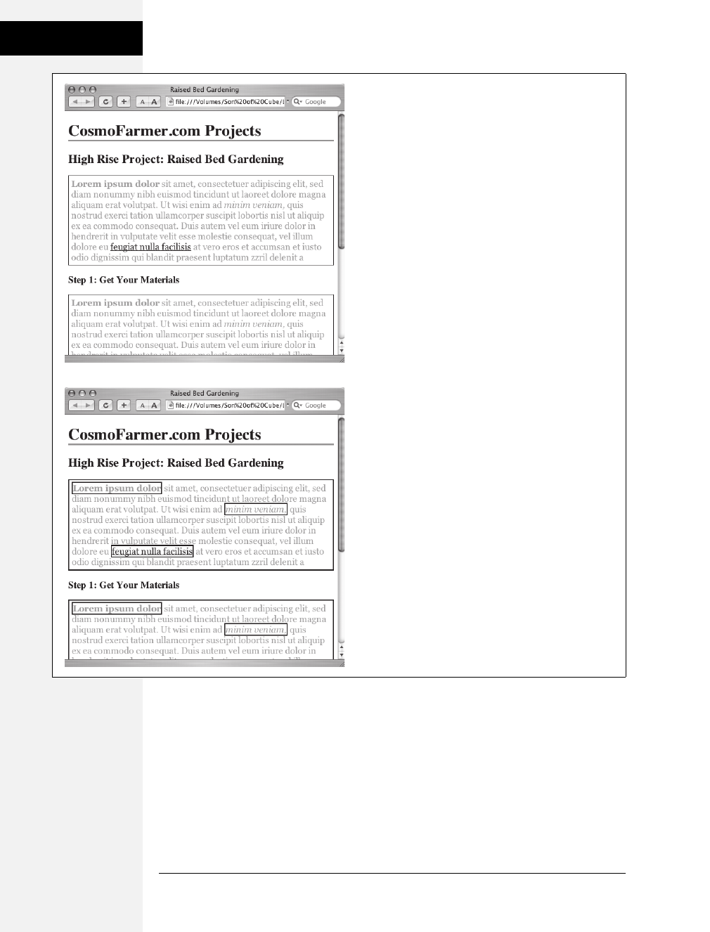
84 CSS: The Missing Manual
The Limits of
Inheritance
• Web browsers use their own inherent styles to format various tags: Headings
are big and bold, links are blue, and so on. When you define a font-size for the
text on a page and apply it to the <body> tag, headings still appear larger than
paragraphs, and <h1> tags are still larger than <h2> tags. It’s the same when
you apply a font color to the <body>; the links on the page still appear in good
old-fashioned, web-browser blue.
Figure 4-2:
Fortunately, not all properties are inherited. The border
applied to the paragraphs at top isn’t inherited by the
tags inside those paragraphs. If they were, you’d end up
with an unattractive mess of boxes within boxes within
boxes (bottom).
Download at Boykma.Com
Chapter 4: Saving Time with Style Inheritance 85
Tutorial:
Inheritance
Note: It’s usually a good idea to eliminate these built-in browser styles—it’ll make designing sites that work
consistently among different browsers easier. In the next chapter, on page 102, you’ll learn how to do that.
• When styles conflict, the more specific style wins out. In other words, when
you’ve specifically applied CSS properties to an element—like specifying the
font size for an unordered list—and those properties conflict with any inher-
ited properties—like a font-size set for the <body> tag—the browser uses the
font size applied to the <ul> tag.
Note: These types of conflicts between styles are very common, and the rules for how a browser deals
with them are called the cascade. You’ll learn about that in the next chapter.
Tutorial: Inheritance
In this three-part tutorial, you’ll see how inheritance works. First, you’ll create a
simple tag selector and watch it pass its characteristics on to nested tags. Then,
you’ll create a class style that uses inheritance to alter the formatting of an entire
page. Finally, you’ll see where CSS makes some welcome exceptions to the inherit-
ance rule.
To get started, you need to download the tutorial files located on this book’s com-
panion website at www.sawmac.com/css2e. Click the tutorial link and download the
files. All of the files are enclosed in a Zip archive, so you’ll need to unzip them first.
(Detailed instructions for unzipping the files are on the website.) The files for this
tutorial are contained in the folder named 04.
A Basic Example: One Level of Inheritance
To see how inheritance works, start by adding a single tag style and see how it
affects the tags nested inside. The next two parts of this tutorial will build upon
your work here, so save the file when you’re done.
1. Open the file inheritance.html in your favorite text editor.
Now add an internal style sheet to this file.
Note: In general, it’s better to use external style sheets for a website, for reasons discussed in Chapter 2
(page 34). But sometimes it’s easier to start your CSS-based design in an internal style sheet, as in this
example, and turn it into an external style sheet later.
2. Click directly after the closing </title> tag. Hit Enter (Return), and then type
<style type="text/css">. Press Enter twice, and type the closing tag—</style>—
to indicate the end of the style sheet.
These tags mark the area where CSS instructions go.
Now, you’ll create a style that applies to all <p> tags.
Download at Boykma.Com

86 CSS: The Missing Manual
Tutorial:
Inheritance
3. Click in the empty line between the opening and closing <style> tags and type
p { . Hit Enter twice and type the closing brace: } .
You’ve created a tag selector that applies to all <p> tags on the page.
4. Click between the two braces and type color: #FF6600;. The completed style
should look like this:
p {
color: #FF6600;
}
As you’ve seen in the previous tutorials, the color property sets the color of text.
Your style sheet is complete.
5. Open the page in a web browser to preview your work.
The color of the page’s four paragraphs has changed from black to orange (see
Figure 4-3).
But notice how this <p> tag style affects other tags: Tags inside of the <p> tag also
change color. For example, the text inside the <em> and <strong> tags inside each
paragraph also changes to orange while maintaining its italic and bold formatting.
This kind of behavior makes a lot of sense. After all, when you set the color of text
in a paragraph, you expect all the text in the paragraph—regardless of any other
tags inside that paragraph—to be the same color.
Without inheritance, creating style sheets would be very labor intensive. If the
<em>, <a>, and <strong> tags didn’t inherit the color property from the <p> tag
selector, then you’d have to create additional styles—perhaps descendent selectors
like p em and p strong—to correctly format the text.
Using Inheritance to Restyle an Entire Page
Inheritance works with class styles as well—any tag with any kind of style applied
to it passes CSS properties to its descendents. With that in mind, you can use
inheritance to make quick, sweeping changes to an entire page.
1. Return to your text editor and the inheritance.html file.
You’ll add a new style below the <p> tag style you created.
2. Click at the end of the closing brace of the p selector. Press Enter (Return) to
create a new line, and then type .pageStyle { . Hit Enter twice, and type the clos-
ing brace: } .
You’re about to create a new class style that you’ll apply to the body tag.
3. Click between the two braces, and then add the following list of properties to
the style:
font-family: "Helvetica Neue", Arial, Helvetica, sans-serif;
font-size: 18px;
Download at Boykma.Com

Chapter 4: Saving Time with Style Inheritance 87
Tutorial:
Inheritance
color: #BD8100;
width: 900px;
margin: 0 auto;
The whole thing should look like this:
.pageStyle {
font-family: "Helvetica Neue", Arial, Helvetica, sans-serif;
font-size: 18px;
color: #BD8100;
width: 900px;
margin: 0 auto;
}
This completed class style sets a font, font-size, and color. It also sets a width
and centers the style on the page (you saw this trick in the previous tutorial on
page 78 for creating a fixed, centered area for a page’s content).
Figure 4-3:
Inheritance in action!
Tags inside of a styled
tag—the bold, italicized
text—display the same
color applied to the <p>
tag surrounding them.
Download at Boykma.Com
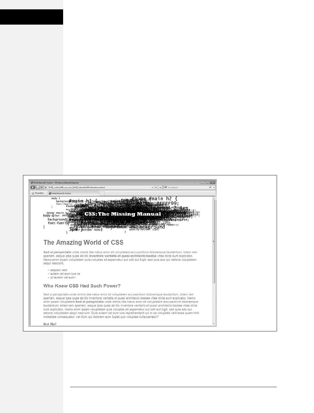
88 CSS: The Missing Manual
Tutorial:
Inheritance
4. Find the opening <body> tag (just a couple lines below the style you just cre-
ated), and then type class="pageStyle".
The tag should now look like this: <body class="pageStyle">. It applies the class
to the body tag. Thanks to inheritance, all tags inside of the body tag (which are
also all the tags visible inside a browser window) inherit this style’s properties
and therefore use the same font.
5. Save and preview the web page in a browser.
As you can see in Figure 4-4, your class style has created a seamless, consistent
appearance throughout all text in the body of the page. Both headings and para-
graphs inside the <body> tag have taken on the new font styling.
The page as a whole looks great, but now look more closely: The color change
affected only the headings and the bulleted list on the page, and even though the
style specified an exact font-size, the headline text is a different size than the para-
graphs. How did CSS know that you didn’t want your headings to be the same 18-pixel
size as the body text? And why didn’t the nested <p> tags inherit your new color
styling from the <body> tag?
Figure 4-4:
A style applied to the
body tag passes its
properties onto all the
tags you see in the web
browser, making it easy
to apply global
formatting effects to
a page.
Download at Boykma.Com

Chapter 4: Saving Time with Style Inheritance 89
Tutorial:
Inheritance
Note: Why use a class—pageStyle—instead of a tag style—body—to redefine the look of the page? Well, in
this case, a tag style would work fine. But, applying a class (or ID) to the <body> tag is a great way to
customize the look of different pages on your site. For example, if all pages on your site share the same
external style sheet (page 36), a body tag style would apply to the <body> tag of every page on your site.
But by creating different classes (or IDs) you can create a different style for the <body> tag for different
sections of the site or different types of pages.
You’re seeing the “cascading” aspect of Cascading Style Sheets in action. In this
example, your <p> tags have two color styles in conflict—the <p> tag style you
created on page 86 and the class style you created here. When styles collide, the
browser has to pick one. As discussed on page 96, the browser uses the more spe-
cific styling—the color you assigned explicitly for <p> tag. You’ll learn much more
about the rules of the cascade in the next chapter.
Inheritance Inaction
Inheritance doesn’t always apply, and that isn’t necessarily a bad thing. For some
properties, inheritance would have a negative effect on a page’s appearance. You’ll
see another example of inheritance in action in the final section of this tutorial.
Margins, padding, and borders (among other properties) don’t get inherited by
descendent tags—and you wouldn’t want them to, as you’ll see in this example.
1. Return to your text editor and the inheritance.html file.
You’ll expand on the p tag style you just created.
2. Locate the pstyle, click at the end of the color property (color : #FF6600;), and
then press Enter (Return) to create a new line.
You’ll indent the paragraphs on the page by adding a left margin.
3. Add three properties to the style so that it looks like this:
p {
color: #FF6600;
margin-left: 50px;
margin-left: 50px;
padding-left: 20px;
border-left: solid 25px #BD8100;
}
The margin-left property indents the paragraph 50 pixels from the left; the pad-
ding property indents the paragraph text 20 pixels from the border.
Download at Boykma.Com
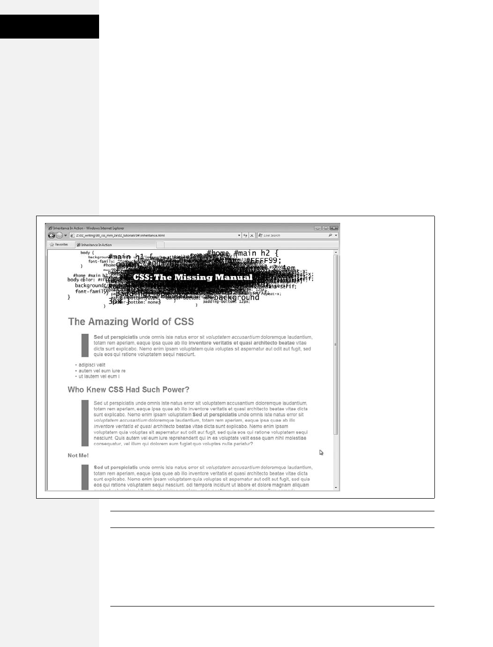
90 CSS: The Missing Manual
Tutorial:
Inheritance
4. Save the file and preview it in a web browser.
Notice that all of the <p> tags are indented 50px from the left edge of the
browser window and that they each have a thick brown border on the left.
However, the tags inside the <p> tag (for example, the <em> tag) don’t have
any additional indentation or border (see Figure 4-5). This behavior makes
sense: It would look weird if there were an additional 50px of space to the left of
each <em> and each <strong> tag inside of a paragraph!
To see what would happen if those properties were inherited, edit the p selector
so that it looks like this: p, p *, which makes it into a group selector (page 56).
The first part is just the p selector you already created. The second part—p *—
means “select all tags inside of a p tag and apply this style to them.” (The *, or
universal selector, is described on page 56.)
Note: You can find a completed version of the page you created in this tutorial in the 04_finished folder.
Figure 4-5:
While most properties
are inherited (like font
color), there are plenty—
like margins, padding
and borders—that don’t
pass on to nested tags.
The CSS Property
Reference in Appendix A
indicates which
properties are and are
not inherited.
Download at Boykma.Com
91
Chapter 5
chapter
5
Managing Multiple
Styles: The Cascade
As you create increasingly complex style sheets, you’ll sometimes wonder why a par-
ticular element on a page looks the way it does. CSS’s inheritance feature, as dis-
cussed in the previous chapter, creates the possibility that any tag on a page is
potentially affected by any of the tags that wrap around it. For example, the <body>
tag can pass properties on to a paragraph, and a paragraph may pass its own format-
ting instructions on to a link within the paragraph. In other words, that link can
inherit CSS properties from both the <body> and the <p> tag—essentially creating a
kind of Frankenstyle that combines parts of two different CSS styles.
Then there are times when styles collide—the same CSS property is defined in
multiple styles, all applying to a particular element on the page (for example, a
<p> tag style in an external style sheet and another <p> tag style in an internal
style sheet). When that happens, you can see some pretty weird stuff, like text that
appears bright blue, even though you specifically applied a class style with the text
color set to red. Fortunately, there’s actually a system at work: a basic CSS mecha-
nism known as the cascade, which governs how styles interact and which styles get
precedence when there’s a conflict.
Note: This chapter deals with issues that arise when you build complex style sheets that rely on inherit-
ance and more sophisticated types of selectors like descendent selectors (page 54). The rules are all pretty
logical, but they’re about as fun to master as the tax code. If that’s got your spirits sagging, consider skip-
ping the details and doing the tutorial on page 103 to get a taste of what the cascade is and why it matters.
Or jump right to the next chapter which explores fun and visually exciting ways to format text. You can
always return to this chapter later, after you’ve mastered the basics of CSS.
Download at Boykma.Com
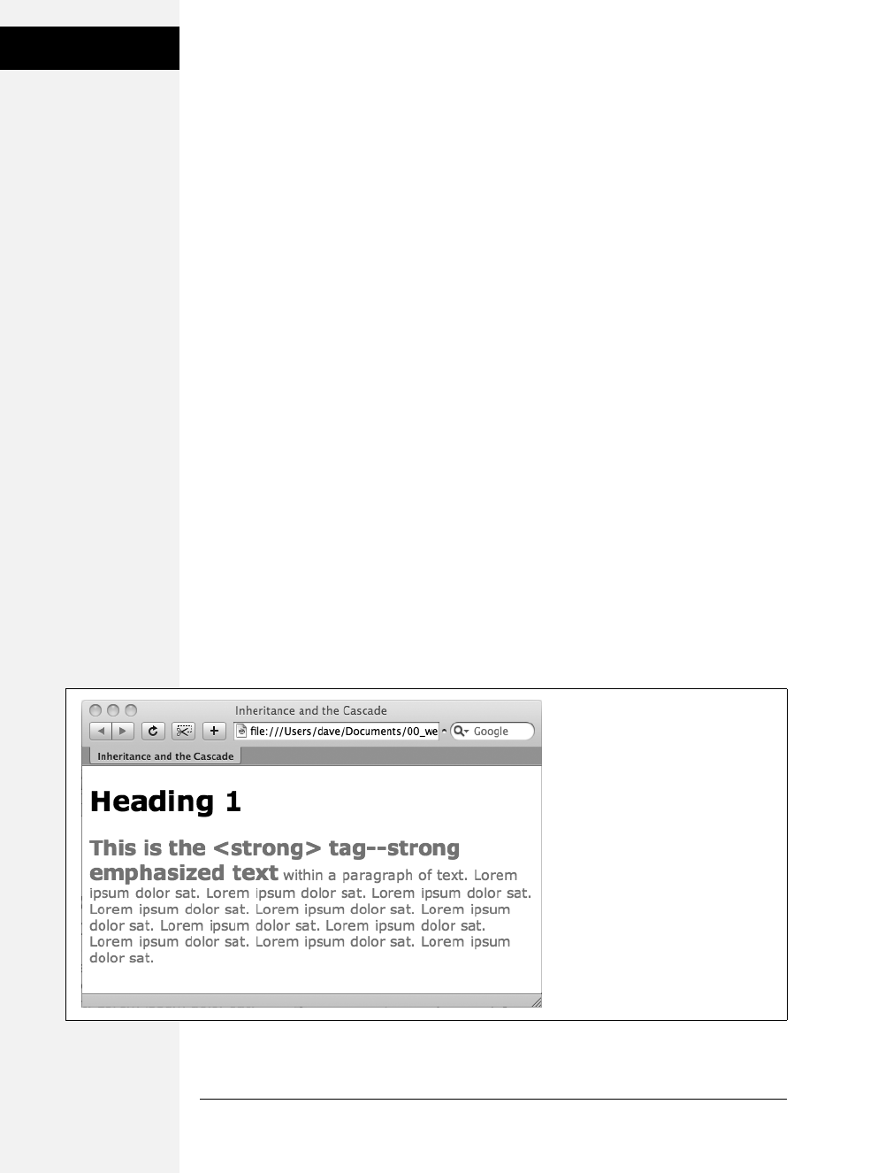
92 CSS: The Missing Manual
How Styles Cascade
How Styles Cascade
The cascade is a set of rules for determining which style properties get applied to an
element. It specifies how a web browser should handle multiple styles that apply to
the same tag and what to do when CSS properties conflict. Style conflicts happen
in two cases: through inheritance when the same property is inherited from multi-
ple ancestors, and when one or more styles apply to the same element (maybe a
<p> tag style in an external style sheet and another <p> tag style in an internal
style sheet).
Inherited Styles Accumulate
As you’ll read in the last chapter, CSS inheritance ensures that related elements—
like all the words inside a paragraph, even those inside a link or another tag—share
similar formatting. It spares you from creating specific styles for each tag on a
page. But since one tag can inherit properties from any ancestor tag—a link, for
example, inheriting the same font as its parent <p> tag—determining why a par-
ticular tag is formatted one way can be a bit tricky. Imagine a font family applied
to the <body> tag, a font size applied to a <p> tag, and a font color applied to an
<a> tag. Any <a> tag inside of a paragraph would inherit the font from the body
and the size from the paragraph. In other words, the inherited styles combine to
form a hybrid style.
The page shown in Figure 5-1 has three styles: one for the <body>, one for the
<p> tag, and one for the <strong> tag. The CSS looks like this:
body { font-family: Verdana, Arial, Helvetica, sans-serif; }
p { color: #F30; }
strong { font-size: 24px; }
Figure 5-1:
Thanks to inheritance, it’s possible for
multiple styles to affect the
appearance of one tag. Here the
<strong> tag has a specific color, font
family, and font size, even though only
a single property is applied directly to
that tag. The other two formatting
options were inherited from the tag’s
ancestors: the <body> and the
<p> tags.
Download at Boykma.Com

Chapter 5: Managing Multiple Styles: The Cascade 93
How Styles Cascade
The <strong> tag is nested inside a paragraph, which is inside the <body> tag.
That <strong> tag inherits from both of its ancestors, so it inherits the font-family
property from the body and the color property from its parent paragraph. In addi-
tion, the <strong> tag has a bit of CSS applied directly to it—a 24px font size. The
final appearance of the tag is a combination of all three styles. In other words, the
<strong> tag appears exactly as if you’d created a style like this:
strong {
font-family: Verdana, Arial, Helvetica, sans-serif;
color: #F30;
font-size: 24px;
}
Nearest Ancestor Wins
In the previous example, various inherited and applied tags smoothly combined to
create an overall formatting package. But what happens when inherited CSS prop-
erties conflict? Think about a page where you’ve set the font color for both the
body and paragraph tags. Now imagine that within one paragraph, there’s a
<strong> tag. Which color gets applied to text inside the <strong> tag? The color
inherited from the body or the paragraph? Ladies and gentleman, we have a win-
ner: the paragraph. That’s because the web browser obeys the style that’s closest to
the tag in question.
In this example, any properties inherited from the <body> tag are rather generic.
They apply to all tags. A style applied to a <p> tag, on the other hand, is much more
narrowly defined. Its properties apply only to <p> tags and the tags inside them.
In a nutshell, if a tag doesn’t have a specific style applied to it, then, in the case of
any conflicts from inherited properties, the nearest ancestor wins (see Figure 5-2,
number 1).
Here’s one more example, just to make sure the concept sinks in. If a CSS style
defining the color of text were applied to a <table> tag, and another style defining
adifferent text color were applied to a <td> tag inside that table, then tags inside
that table cell (<td>) such as a paragraph, headline, or unordered list would use
the color from the <td> style, since it’s the closest ancestor.
The Directly Applied Style Wins
Taking the “nearest ancestor” rule to its logical conclusion, there’s one style that
always becomes king of the CSS family tree—any style applied directly to a given
tag. Suppose a font color is set for the body, paragraph, and strong tags. The para-
graph style is more specific than the body style, but the style applied to the
<strong> tag is more specific than either one. It formats the <strong> tags and
only the <strong> tags, overriding any conflicting properties inherited from the
other tags (see Figure 5-2, number 2). In other words, properties from a style spe-
cifically applied to a tag beat out any inherited properties.
Download at Boykma.Com
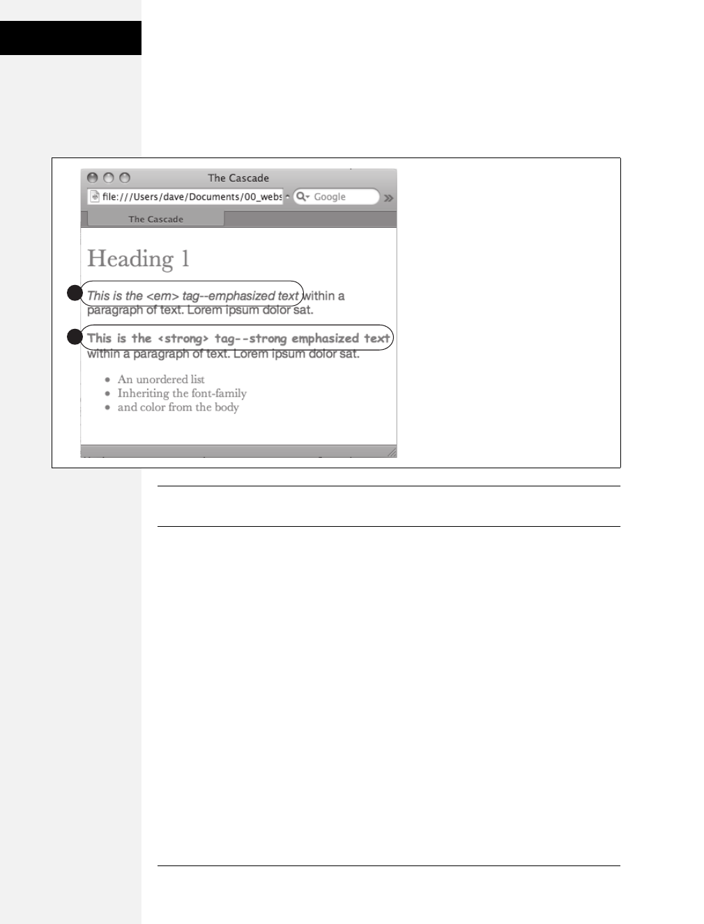
94 CSS: The Missing Manual
How Styles Cascade
This rule explains why some inherited properties don’t appear to inherit. A link
inside a paragraph whose text is red still appears browser-link blue. That’s because
browsers have their own predefined style for the <a> tag, so an inherited text color
won’t apply.
Note: You can learn how to overcome preset styles for the <a> tag and change link colors to your heart’s
content. See page 228.
One Tag, Many Styles
Inheritance is one way that a tag can be affected by multiple styles. But it’s also
possible to have multiple styles apply directly to a given tag. For example, say you
have an external style sheet with a <p> tag style and attach it to a page that has an
internal style sheet that also includes a <p> tag style. And just to make things really
interesting, one of the <p> tags on the page has a class style applied to it. So for
that one tag, three different styles directly format it. Which style—or styles—
should the browser obey?
The answer: It depends. Based on the types of styles and the order in which they’re
created, a browser may apply one or more of them at once. Here are a few situa-
tions in which multiple styles can apply to the same tag:
•The tag has both a tag selector and a class style applied to it. For example, a tag
style for the <h2> tag, a class style named .leadHeadline and this HTML: <h2
class="leadHeadline">Your Future Revealed!</h2>. Both styles apply to this
<h2> tag.
Figure 5-2:
Here’s how web browsers figure out which
properties to display when inherited
properties conflict: The <em> tag in the first
paragraph (1) inherits the font family and
color from both the <body> tag and the
paragraph. But since the body and
paragraph have different fonts and colors
applied to them, the <em> tag uses the font
and color specified for its closest ancestor—
the <p> tag. When a style applies directly to
a tag—the font-family and color are specified
for the <strong> tag (2)—browsers ignore
conflicting inherited properties.
1
2
Download at Boykma.Com

Chapter 5: Managing Multiple Styles: The Cascade 95
How Styles Cascade
Note: Hold onto your hat if you’re worried about what happens when these multiple styles conflict;
details to follow.
•The same style name appears more than once in the style sheet. There could be a
group selector (page 56), like .leadHeadline, .secondaryHeadline, .newsHeadline,
and the class style .leadHeadline in the same style sheet. Both of these rules
define how any element with a class of leadHeadline looks.
•A tag has both a class and an ID style applied to it. Maybe it’s an ID named
#banner, a class named .news, and this HTML: <div id="banner" class="news">.
Properties from both the banner and news styles apply to this <div> tag.
•There’s more than one style sheet containing the same style name attached to a
page. The same-named styles can arrive in an external style sheet via @import
or link and an internal style sheet.
•There are complex selectors targeting the same tag. This situation is common
when you use descendent selectors (page 57). For example, say you have a div
tag in a page (like this: <div id="mainContent">), and inside the div is a para-
graph with a class applied to it: <p class="byline">. The following selectors
apply to this paragraph:
#mainContent p
#mainContent .byline
p.byline
.byline
If more than one style applies to a particular element, then a web browser com-
bines the properties of all those styles, as long as they don’t conflict. An example will
make this concept clearer. Imagine you have a paragraph that lists the name of the
web page’s author, including a link to his email address. The HTML might look
like this:
<p class="byline">Written by <a href="mailto:jean@cosmofarmer.com">JeanGraine
de Pomme</a></p>
Meanwhile, the page’s style sheet has three styles that format the link:
a { color: #6378df; }
p a { font-weight: bold; }
.byline a { text-decoration: none; }
The first style turns all <a> tags powder blue; the second style makes all <a> tags
that appear inside a <p> tag bold; and the third style removes the underline from
any links that appear inside an element with the byline class applied to it.
Download at Boykma.Com

96 CSS: The Missing Manual
Specificity: Which
Style Wins
All three styles apply to that very popular <a> tag, but since none of the properties
are the same, there are no conflicts between the rules. The situation is similar to
the inheritance example (page 92): the styles combine to make one überstyle con-
taining all three properties, so this particular link appears powder blue, bold, and
underline-free.
Note: Your head will really start to ache when you realize that this particular link’s formatting can also be
affected by inherited properties. For example, it would inherit any font family that’s applied to the para-
graph. A few tools can help sort out what’s going on in the cascade. (See the box on page 98.)
Specificity: Which Style Wins
The previous example is pretty straightforward. But what if the three styles listed
on page 92 each had a different font specified for the font-family property? Which
of the three fonts would a web browser pay attention to?
As you know if you’ve been reading carefully so far, the cascade provides a set of
rules that helps a web browser sort out any property conflicts; namely, properties
from the most specific style win. But as with the styles listed on page 92, sometimes it’s
not clear which style is most specific. Thankfully, CSS provides a formula for deter-
mining a style’s specificity that’s based on a value assigned to the style’s selector—a
tag selector, class selector, ID selector, and so on. Here’s how the system works:
• A tag selector is worth 1 point.
• A class selector is worth 10 points.
• An ID selector is worth 100 points.
• An inline style (page 39) is worth 1,000 points.
Note: The math involved in calculating specificity is actually a bit more complicated than described here.
But this formula works in all but the weirdest cases. To read how web browsers actually calculate specific-
ity visit www.w3.org/TR/CSS21/cascade.html#specificity.
The bigger the number, the greater the specificity. So say you create the following
three styles:
• a tag style for the <img> tag ( specificity = 1)
• a class style named .highlight (specificity = 10)
• an ID style named #logo (specificity = 100)
Then, say your web page has this HTML: <img id="logo" class="highlight"
src="logo.gif" />. If you define the same property—such as the border property—
in all three styles, then the value from the ID style (#logo) always wins out.
Download at Boykma.Com
Chapter 5: Managing Multiple Styles: The Cascade 97
Specificity: Which
Style Wins
Note: A pseudo-element (like :first-child for example) is treated like a tag selector and is worth 1 point. A
pseudo-class (:link, for example) is treated like a class and is worth 10 points. (See page 62 for the deal on
these pseudo-things.)
Since descendent selectors are composed of several selectors—#content p, or h2
strong, for example—the math gets a bit more complicated. The specificity of a
descendent selector is the total value of all of the selectors listed (see Figure 5-3).
Note: Inherited properties don’t have any specificity. So even if a tag inherits properties from a style with
a large specificity—like #banner—those properties will always be overridden by a style that directly applies
to the tag.
The Tiebreaker: Last Style Wins
It’s possible for two styles with conflicting properties to have the same specificity.
(“Oh brother, when will it end?” Soon, comrade, soon. The tutorial is coming up.)
A specificity tie can occur when you have the same selector defined in two loca-
tions. You may have a <p> tag selector defined in an internal style sheet and an
external style sheet. Or two different styles may simply have equal specificity val-
ues. In case of a tie, the style appearing last in the style sheet wins.
Here’s a tricky example using the following HTML:
<p class="byline">Written by <a class="email" href="mailto:jean@cosmofarmer.
com">Jean Graine de Pomme</a></p>
In the style sheet for the page containing the above paragraph and link, you have
two styles:
p .email { color: blue; }
.byline a { color: red; }
Figure 5-3:
When more than one style applies
to a tag, a web browser must
determine which style should “win
out” in case style properties
conflicts. In CSS, a style’s
importance is known as specificity
and is determined by the type of
selectors used when creating the
style. Each type of selector has a
different value, and when multiple
selector types appear in one style—
for example the descendent
selector #banner p—the values of
all the selectors used are added up.
selector id class tag total
p 0 0 1 1
.byline 0 1 0 10
p.byline 0 1 1 11
#banner 1 0 0 100
#banner p 1 0 1 101
#banner .byline 1 1 0 110
a:link 0 1 1 11
p:first-line 0 0 2 2
h2 strong 0 0 2 2
#wrapper #content .byline a:hover 2 2 1 221
Download at Boykma.Com
98 CSS: The Missing Manual
Specificity: Which
Style Wins
Both styles have a specificity of 11 (10 for a class name and 1 for a tag selector) and
both apply to the <a> tag. The two styles are tied. Which color does the browser
use to color the link in the above paragraph? Answer: Red, since it’s the second
(and last) style in the sheet.
Now suppose that the style sheet looked like this instead:
p .email { color: blue; }
.byline a { color: red; }
In this case, the link would be red. Since .byline a appears after p .email in the style
sheet, its properties win out.
What happens if you’ve got conflicting rules in an external and an internal style
sheet? In that case, the placement of your style sheets (within your HTML file)
becomes very important. If you first add an internal style sheet using the <style> tag
(page 34) and then attach an external style sheet farther down in the HTML using the
<link> tag (page 36), then the style from the external style sheet wins. (In effect, it’s
the same principle at work that you just finished reading about: The style appearing
last wins.) The bottom line: Be consistent in how you place external style sheets. It’s
best to list any external style sheets first, and then include any internal styles.
Note: Any external style sheets attached with the @import rule have to appear before internal styles
within a <style> tag. See page 34 for more information on external and internal style sheets.
FREQUENTLY ASKED QUESTION
Get a Little Help
My head hurts from all of this. Isn’t there some tool I can
use to help me figure out how the cascade is affecting my
web page?
Trying to figure out all the ins and outs of inherited proper-
ties and conflicting styles confuses many folks at first. Fur-
thermore, doing the math to figure out a style’s specificity
isn’t even your average web designer’s idea of fun, espe-
cially when there are large style sheets with lots of descen-
dent selectors.
Fortunately, you have a few tools that can figure the cas-
cade out for you. Dreamweaver (www.adobe.com)
includes a helpful CSS panel. A glance at it tells you which
styles apply to any selected element and the end result of
the cascade. In other words, you get an element’s ultimate
list of applied properties—its “Frankenstyle.”
Then there’s the free Firefox extension, View Formatted
Source (https://addons.mozilla.org/extensions/moreinfo.
php?application=firefox&id=697). It lets you view which
styles apply to a particular element (though it doesn’t show
you any of the inherited styles).
Finally there’s Apple’s web browser, Safari, for both Mac
and Windows. A Web Inspector feature provides a wealth
of information about a web page, its CSS, and the effect of
the cascade on the page’s tags. You just need to turn on the
“Show Develop Menu” option under the Advanced tab of
the Preferences window. For more information on using
the Web Inspector, visit http://tinyurl.com/web-inspector.
Download at Boykma.Com
Chapter 5: Managing Multiple Styles: The Cascade 99
Controlling the
Cascade
Controlling the Cascade
As you can see, the more CSS styles you create, the greater the potential for for-
matting snafus. For example, you may create a class style specifying a particular
font and font size, but when you apply the style to a paragraph, nothing happens!
This kind of problem is usually related to the cascade. Even though you may think
that directly applying a class to a tag should apply the class’s formatting proper-
ties, it may not if there’s a style with greater specificity.
You have a couple of options for dealing with this kind of problem. First, you can
use !important (as described in the box above) to make sure a property always
applies. The !important approach is a bit heavy handed, though, since it’s hard to
predict that you’ll never, ever, want to overrule an !important property someday.
Read on for two other cascade-tweaking solutions.
Changing the Specificity
The top picture in Figure 5-4 is an example of a specific tag style losing out in the
cascade game. Fortunately, most of the time, you can easily change the specificity
of one of the conflicting styles and save !important for real emergencies. In
Figure 5-4 (top), two styles format the first paragraph. The class style—.intro—
isn’t as specific as the #sidebar p style, so .intro’s properties don’t get applied to the
paragraph. To increase the specificity of the class, add the ID name to the style:
#sidebar .intro.
Note: If you’re into math, the #sidebar p style has a specificity of 101 (100 for the ID, and 1 for the tag
selector), while the .intro style has a specificity of 10 (10 points for a class selector). Since 101 is greater
than 10, #sidebar p takes precedence. Changing .intro to #sidebar .intro changes its specificity to 110.
GEM IN THE ROUGH
Overruling Specificity
CSS provides a way of overruling specificity entirely. You
can use this trick when you absolutely, positively want to
make sure that a particular property can’t be overridden by
a more specific style. Simply insert !important after any
property to shield it from specificity-based overrides.
For example, consider the two following styles:
#nav a { color: red; }
a { color: teal !important; }
Normally, a link inside an element with the ID of #nav
would be colored red since the #nav a style is much more
specific than the a tag style.
However, including !important after a property value
means that specific property always wins. So in the above
example, all links on the page—including those inside an
element with the #nav id—are teal.
Note that you apply !important to an individual property,
not an entire style. Finally, when two styles both have
!important applied to the same property, the more specific
style’s !important rule wins.
Internet Explorer 6 and earlier sometimes has trouble with
!important rules and occasionally completely ignores them.
Download at Boykma.Com
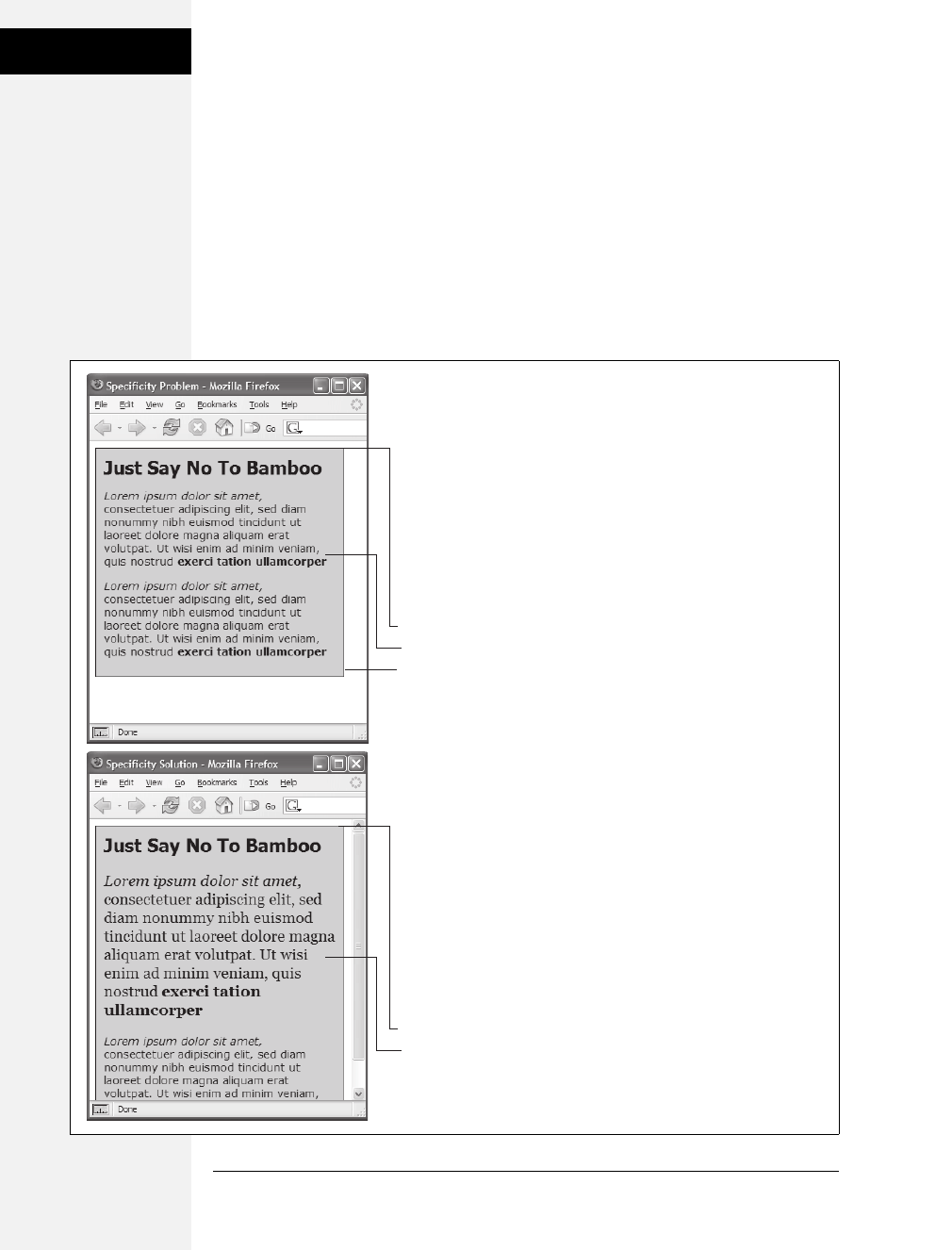
100 CSS: The Missing Manual
Controlling the
Cascade
Selective Overriding
You can also fine-tune your design by selectively overriding styles on certain pages.
Say you’ve created an external style sheet named global.css that you’ve attached to
each page in your site. This file contains the general look and feel for your site—
the font and color of <h1> tags, how form elements should look, and so on. But
maybe on your home page, you want the <h1> tag to look slightly different than
the rest of the site—bolder and bigger, perhaps. Or the paragraph text should be
smaller on the home page, so you can wedge in more information. In other words,
you still want to use most of the styles from the global.css file, but you simply want
to override a few properties for some of the tags (<h1>, <p>, and so on).
Figure 5-4:
Even though a class is
applied to a specific tag—
like the first paragraph in
the top image—its
properties may not always
have an effect. In this case,
the paragraph is inside a
<div> tag with an ID of
#sidebar, so the descendent
selector #sidebar p is more
specific than the .intro class.
The solution: Make the
.intro class more specific by
adding the ID before it—
#sidebar p.intro—as in the
bottom example.
#sidebar p {
font-family: Verdana;
font-size: .9em;
}
.intro {
font-family: Georgia;
font-size: 1.25em;
}
<div id=”sidebar”>
<p class=”intro”>
</div>
#sidebar p {
font-family: Verdana;
font-size: .9em;
}
#sidebar .intro {
font-family: Georgia;
font-size: 1.25em;
}
<div id=”sidebar”>
<p class=”intro”>
</div>
Download at Boykma.Com

Chapter 5: Managing Multiple Styles: The Cascade 101
Controlling the
Cascade
One approach is to simply create an internal style sheet listing the styles that you
want to override. Maybe the global.css file has the following rule:
h1 {
font-family: Arial, Helvetica, sans-serif;
font-size: 24px;
color: #000;
}
You want the <h1> tag on the home page to be bigger and red. So just add the fol-
lowing style in an internal style sheet on the home page:
h1 {
font-size: 36px;
color: red;
}
In this case, the <h1> tag on the home page would use the font Arial (from the
external style sheet) but would be red and 36 pixels tall (from the internal style).
Tip: Make sure you attach the external style sheet before the internal style sheet in the <head> section of
the HTML. This ensures that the styles from the internal style sheet win out in cases where the specificity
of two styles are the same, as explained on page 96.
Another approach would be to create one more external style sheet—home.css for
example—that you attach to the home page in addition to the global.css style sheet.
The home.css file would contain the style names and properties that you want to
overrule from the global.css file. For this to work, you need to make sure the home.
css file appears after the global.css file in the HTML, like so:
<link rel="stylesheet" type="text/css" href="css/global.css" />
<link rel="stylesheet" type="text/css" href="css/home.css" />
Tip: Another way to fine-tune designs on a page-by-page basis is to use different ID names for the <body>
tag of different types of pages—for example #review, #story, #home—and then create descendent selectors
to change the way tags on these types of pages look. This technique is discussed on page 77.
Starting with a Clean Slate
As discussed on page 84, browsers apply their own styles to tags: for example,
<h1> tags are bigger than <h2> tags, and both are bold, while paragraph text is
smaller and isn’t bold; links are blue and underlined; and bulleted lists are
indented. There’s nothing in the HTML standard that defines any of this format-
ting: Web browsers just add this formatting to make basic HTML more readable.
However, even though browsers treat all tags roughly the same, they don’t treat
them identically.
Download at Boykma.Com

102 CSS: The Missing Manual
Controlling the
Cascade
For example, Safari and Firefox use the padding property to indent bulleted lists,
but Internet Explorer uses the margin property. Likewise, you’ll find subtle differ-
ences in the size of tags across browsers and an altogether confusing use of margins
among the most common web browsers. Because of these inconsistencies, you can
run into problems where, for instance, Firefox adds a top margin, while Internet
Explorer doesn’t. These types of problems aren’t your fault—they stem from dif-
ferences in the built-in browser styles.
To avoid cross-browser inconsistencies, it’s a good idea to start a style sheet with a
clean slate. In other words, erase the built-in browser formatting and supply your
own. The concept of erasing browser styling is called CSS reset. This section gives
you a working introduction.
In particular, there’s a core set of styles you should include at the top of your style
sheets. These styles set a baseline for properties that commonly are treated differ-
ently across browsers.
Here’s a bare-bones CSS reset:
html, body, h1, h2, h3, h4, h5, h6, p, ol, ul, li, pre, code, address,
variable, form, fieldset, blockquote {
padding: 0;
margin: 0;
font-size: 100%;
font-weight: normal;
}
ol {
margin-left: 1.4em;
list-style: decimal;
}
ul {
margin-left: 1.4em;
list-style:square;
}
img {
border: 0;
}
The first style is a very long group selector (page 56) that takes the most common
tags and “zeros” them out—removing all the padding and margins, setting their
base text size to 100% and removing bold text formatting. This step makes your
tags look pretty much identical (see Figure 5-5), but that’s the point—you want to
start at zero and then add your own formatting so that all browsers apply a consis-
tent look to your HTML.
Download at Boykma.Com

Chapter 5: Managing Multiple Styles: The Cascade 103
Tutorial: The
Cascade in Action
Note: You don’t have to type all this code yourself. You’ll find a file named reset.css in the 05 tutorial
folder at www.sawmac.com/css2e that contains a basic CSS reset file. Just copy the styles from this file and
paste them into your own style sheets. A more comprehensive CSS reset (discussed on page 423) is avail-
able in the Chapter 15 tutorial files inside the 15 folder.
The second and third styles (the ol and ul tag styles), set a consistent left margin
and style (page 143 introduces list styling), and the last style removes a border that
some browsers add to images that are links.
Tutorial: The Cascade in Action
In this tutorial, you’ll see how styles interact and how they can sometimes conflict
to create unexpected results. First, you’ll look at a basic page that has the CSS reset
styles mentioned above plus a couple of other styles that provide some simple lay-
out. Then, you’ll create two styles and see how some properties are inherited and
how others are overruled by the cascade. Then, you’ll see how inheritance affects
tags on a page and how a browser resolves any CSS conflicts. Finally, you’ll learn
how to troubleshoot problems created by the cascade.
To get started, you need to download the tutorial files located on this book’s com-
panion website at www.sawmac.com/css2e. Click the tutorial link and download the
files. All of the files are enclosed in a Zip archive, so you’ll need to unzip them first.
(Go to the website for detailed instructions on unzipping the files.) The files for
this tutorial are contained inside the folder named 05.
Resetting CSS and Styling from Scratch
First, take a look at the page you’ll be working on.
1. In a web browser, open the file named cascade.html located in the 05 tutorial
folder (see Figure 5-5).
The page doesn’t look like much—two columns, one with a blue background
and a lot of same-looking text. There are a few styles already applied to this file,
so open the CSS up in a text editor and have a look.
2. Using your favorite text or web page editor, open the file main.css located in
the 05 folder.
This file is the external style sheet that the cascade.html file uses. It has six styles
already in it—the first four are the CSS reset styles discussed on the previous page.
They eliminate the basic browser styles, which is why all of the text currently looks
the same. You’ll create your own styles to make this page look great soon).
Download at Boykma.Com
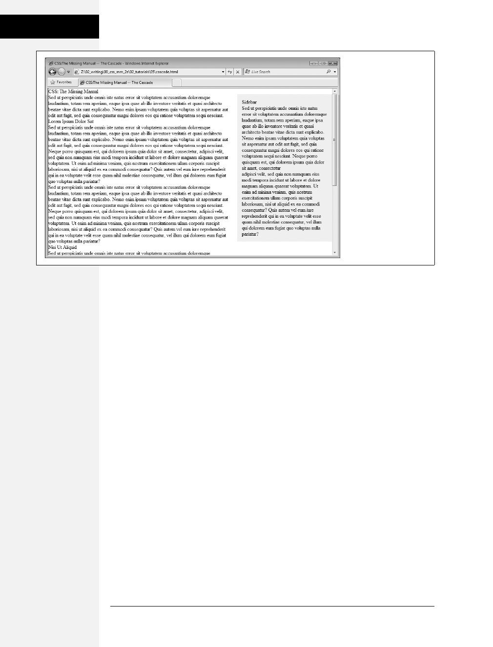
104 CSS: The Missing Manual
Tutorial: The
Cascade in Action
The last two styles—the ID styles #main and #sidebar—create the two columns
you saw in Figure 5-1. The HTML is divided into two <div> tags, each with its
own ID. The ID styles here essentially position the two divs so they appear side-
by-side as columns. (You’ll learn exactly how ID styles work when you get into
CSS layout in depth, starting in Chapter 10.)
You’ll first add a couple of styles to improve the page’s basic appearance and its
top headline.
3. In the main.css file, add these two styles at the bottom of the style sheet following
the last } of the #sidebar style:
body {
color: #B1967C;
font-family: "Palatino Linotype", Baskerville, serif;
padding-top: 100px;
background: #CDE6FF url(images/bg_body.png) repeat-x;
width: 800px;
margin: 0 auto;
}
h1 {
font-size: 3em;
font-family: "Arial Black", Arial, sans-serif;
}
Figure 5-5:
The basic “CSS reset”
styles on this page
eliminate the subtle
differences in how
different browsers
display basic HTML tags.
They also eliminate any
difference between how
the tags look. Your job is
to take this empty canvas
and style the tags so they
look the way you want
them to.
Download at Boykma.Com

Chapter 5: Managing Multiple Styles: The Cascade 105
Tutorial: The
Cascade in Action
The first style adds a background image and color to the page, and also sets a
fixed width for the page. If you save this file and preview the cascade.html file in
a web browser (see Figure 5-6), you’ll notice that these attributes aren’t inher-
ited by the other tags—the same image, for example, isn’t repeated behind the
heading or paragraph tags.
The font family and color properties, on the other hand, are inherited, so other
tags on the page now use that font and have a brownish color. However, you’ll
see that although the top headline is the same color as the other text on the
page, it uses a different font—here’s the cascade in action. The h1 tag style
doesn’t have a color assigned to it, so that heading inherits the brown color
applied to the body tag. But, since the h1 tag style specifies a font family, it over-
rides the inherited font from the body tag style.
Creating a Hybrid Style
In this example, you’ll create two styles. One style formats all the second level
headlines of the page; and another, more specific style reformats just those head-
ings in the larger, main column of the page.
1. In the main.css file, add the following style to the end of the style sheet:
h2 {
font-size: 2.2em;
color: #AFC3D6;
margin-bottom: 5px;
}
Figure 5-6:
Inheritance and the
cascade in action: the
<h1> tag at the top of
this page inherits its font
color from the body tag
style, but gets its size and
font family from the
specific h1 tag style.
Download at Boykma.Com

106 CSS: The Missing Manual
Tutorial: The
Cascade in Action
This style simply changes the text color and increases the size of the h2 tag and
adds a little bit of space below it. If you view the file in a web browser, you’ll see
that the h2 tags in the main column and the one h2 tag in the right sidebar now
look alike.
Next, you’ll create a style to just format the second-level headlines in the main
column.
2. Return to your web page editor and the main.css file, click directly after the end
of the new <h2> tag style, and press Enter (Return) to create an empty line.
Add the following style:
#main h2 {
color: #E8A064;
border-bottom: 2px white solid;
background: url(images/bullet_flower.png) no-repeat;
padding: 0 0 2px 80px;
}
You’ve just created a descendent selector (page 57) that formats all <h2> tags
that appear inside of a tag with an ID of #main applied to it. The two columns
of text on this page are enclosed in <div> tags with different ID names applied
to them. The larger, left-hand column has the ID #main, so this particular style
will only apply to the <h2> tags in that div.
This style is similar to the one you created in the tutorial for Chapter 2 in step
14 on page 46—it adds an underline and a simple flower icon to the headline.
This style also specifies an orange color for the text.
3. Preview the page once again in a web browser (see Figure 5-7).
You’ll notice that all of the heading 2 tags (the two in the main column and one
in the sidebar) are the same size, but the two in the main column also have the
underline and flower icon.
Because the #main h2 style is more specific than the simple h2 style, if there are
any conflicts between the two styles—the color property, in this case—the
#main h2 properties win out. So, although the second-level headlines in the
main column get a blue text color from the h2 style, the orange color from the
more specific #main h2 style wins out.
However, since the #main h2 style doesn’t specify a font size or bottom margin,
the headlines in the main column get those properties from the h2 style.
Overcoming Conflicts
Because of how CSS properties sometimes conflict when several styles apply to the
same tag, you’ll sometimes find your pages don’t look exactly as you planned.
Download at Boykma.Com

Chapter 5: Managing Multiple Styles: The Cascade 107
Tutorial: The
Cascade in Action
When that happens you’ll need to do a little work to find out why, and rejigger your
CSS selectors to make sure the cascade is working to produce the results you want.
1. Return to your web page editor and the main.css file.
You’ll now create a new style to format just the paragraphs in the main column
of the page.
2. Add the following style to the end of the style sheet:
#main p {
color: #616161;
font-family: "Palatino Linotype", Baskerville, serif;
font-size: 1.1em;
line-height: 150%;
margin-bottom: 10px;
margin-left: 80px;
}
This style changes the color, size, and font of the text, spreads the lines of text
out (the line-height property) and adjusts the bottom and left margins of the
paragraphs.
The page would look better if you highlighted the paragraph immediately follow-
ing the headline—making it bigger and bolder can help make a more powerful
message. The easiest way to style just that one paragraph is to create a class style
and apply it to that paragraph.
Figure 5-7:
A tale of two styles: both
the h2 and #main h2
styles apply to the
second-level headlines in
the left column of this
page. However, the
#main h2 style applies to
just those headlines
inside the main (left)
column. Also, since that
style is more powerful
than the basic h2 tag
style, it overrides any
conflicts between the two
styles, in this case, using
an orange text color
instead of the blue color
of the h2 tag style.
Download at Boykma.Com
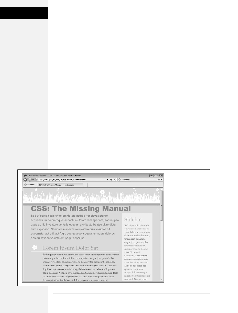
108 CSS: The Missing Manual
Tutorial: The
Cascade in Action
3. Add one last style to the end of the style sheet:
.intro {
color: #6A94CC;
font-family: Arial, Helvetica, sans-serif;
font-size: 1.2em;
margin-left: 0;
margin-bottom: 25px;
}
This style changes the color, font, and size, and adjusts the margins a bit. All
you have to do is apply the class to the HTML.
4. Open the cascade.html file in your web page editor. Locate the <p> tag that
appears after <h1>CSS: The Missing Manual</h1> and directly below <div
id="main">, and then add the following class attribute:
<p class="intro">
5. Preview the page in a web browser.
And…the paragraph is completely unchanged. What gives? Following the rules of
the cascade, .intro is a basic class selector, while the #main p is a descendent selec-
tor composed of both an ID and a tag name. These add up to create a more spe-
cific style, so its style properties overrule any conflict between it and the .intro style.
In order to make the .intro style work, you need to give it a little juice by making
its selector more powerful.
Figure 5-8:
Even in a simple page
like this one, with just a
handful of styles, the look
of any one tag is often a
combination of
properties from
various styles.
Download at Boykma.Com

Chapter 5: Managing Multiple Styles: The Cascade 109
Tutorial: The
Cascade in Action
6. Return to the main.css file in your web page editor and change the name of the
style from .intro to #main .intro.
Now you have a descendent selector composed of an ID and a class. This style
is more specific than #main p, and its properties override those in any less
specific style.
7. Preview the page in a web browser.
Voila! The paragraph changes to blue, with bigger text, a different font, and no left
margin. If you didn’t have a clear understanding of the cascade, you’d be scratch-
ing your head wondering why that class style didn’t work the first time around.
In this and the previous four chapters, you’ve covered the basics of CSS. Now, in
Part 2, it’s time to take that knowledge and apply it to real design challenges, mak-
ing web pages look great.
Download at Boykma.Com

Download at Boykma.Com


Download at Boykma.Com
113
Chapter 6
chapter
6
Formatting Text
Most websites still rely on words to get their messages across. Sure, people like to
look at photos, movie clips, and Flash animations, but it’s the reading material that
keeps ’em coming back. People are hungry for Facebook updates, news, gossip,
how-to articles, recipes, FAQs, jokes, information lists, and even 140 character
tweets. With CSS, you can—and should—make your headlines and body text grab
a visitor’s attention as compellingly as any photo.
CSS offers a powerful array of text-formatting options, which let you assign fonts,
color, sizes, line spacing, and many other properties that can add visual impact to
headlines, bulleted lists, and regular old paragraphs of text (see Figure 6-1). This
chapter reveals all, and then finishes up with a tutorial where you can practice
assembling CSS text styles and put them to work on an actual web page.
Formatting Text
The first thing you can do to make text on your website look more exciting is to
apply different fonts to headlines, paragraphs, and other written elements on your
pages. To apply a font to a CSS style, you use the font-family property:
font-family: Arial;
Note: In real life, when you put a CSS property into action, you must, of course, include all the other neces-
sities of a complete style declaration block and style sheet, as described in Chapter 2: p { font-family: Arial; },
for example. When you see examples like font-family: Arial;, remember that’s just the property in isola-
tion, distilled down for your book-reading benefit.
Download at Boykma.Com
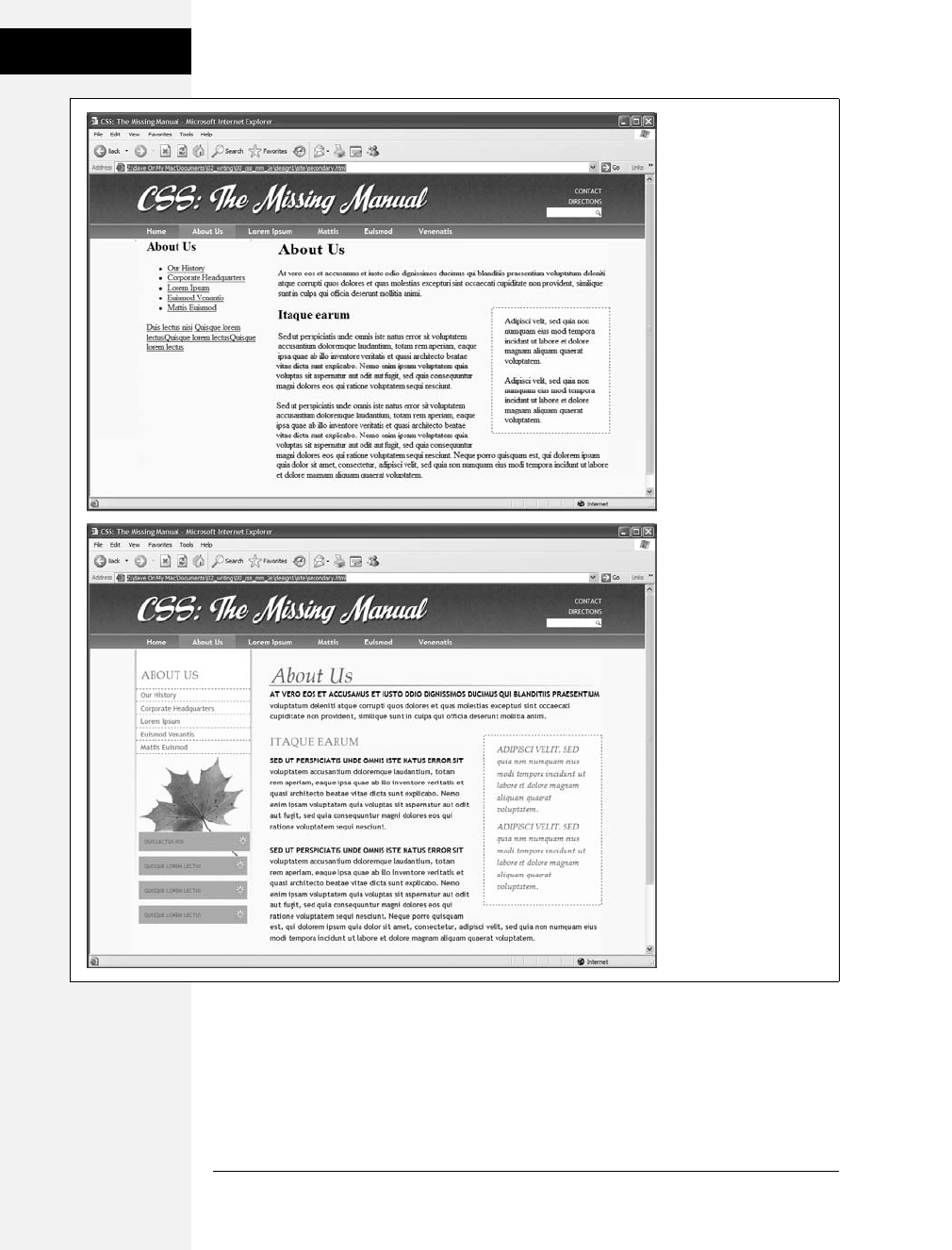
114 CSS: The Missing Manual
Formatting Text
Figure 6-1:
Why settle for boring and
drab text (top), when you
can make your headlines
scream and your text
sing with a few simple
CSS properties (bottom)?
Download at Boykma.Com

Chapter 6: Formatting Text 115
Formatting Text
Choosing a Font
Choose a font that makes your text eye-catching (especially if it’s a headline) and
readable (especially if it’s main body text), as discussed in the figure on the previ-
ous page. Unfortunately, you can’t use just any font you want. Well, actually you
can use any font you want, but it won’t show up on a viewer’s computer unless
she’s installed the same font on her system. So that handcrafted font you pur-
chased from the small font boutique in Nome Alaska won’t do you any good on
the Web—unless each person viewing your site has also bought and installed that
font. Otherwise, your visitors’ web browsers will show your text in a default font,
which is usually some version of Times.
Note: For one cutting edge method of using any font you’d like there’s Cufon: http://wiki.github.com/
sorccu/cufon/about. This JavaScript-based solution lets you convert one of your fonts into a file that you can
then use to replace HTML text. Although the technology behind Cufon is complex, it’s quite easy to use.
One solution is to specify the font you’d like to use, as well as a couple of back-up
choices. If your viewer’s computer has your first-choice font, then that’s what she’ll
see. But when the first font isn’t installed, the browser looks down the list until it
finds a font that is. The idea is to specify a list of similar-looking fonts that are
common to a variety of operating systems, like so:
font-family: Arial, Helvetica, sans-serif;
In this example, a web browser first looks to see if the Arial font is installed; if it is,
then that font is used; if not, the browser next looks for Helvetica, and if that isn’t
installed, then it finally settles for a generic font—sans-serif. When you list a
generic font type (like sans-serif or serif), the viewer’s browser gets to choose the
actual font. But at least you can define its basic character.
Also, if the font’s name is made up of more than one word, you must enclose it in
quote marks:
font-family: "Times New Roman", Times, serif;
Here are some commonly used combinations organized by the type of font,
including a generic font type at the end of each list.
Serif fonts
Serif fonts are best for long passages of text, as it’s widely believed that the serifs—
those tiny “feet” at the end of a letter’s main strokes—gently lead the eye from let-
ter to letter, making text easier to read. Examples of serif fonts are Times, Times
New Roman, Georgia, and the font in the main body paragraphs of this book.
• “Times New Roman”, Times, serif
• Georgia, “Times New Roman”, Times, serif
Download at Boykma.Com

116 CSS: The Missing Manual
Formatting Text
• Baskerville, “Palatino Linotype”, Times, serif
• “Hoefler Text”, Garamond, Times, serif
Examples of these fonts are in Figure 6-2.
Sans-serif fonts
Sans-serif fonts are often used for headlines, thanks to their clean and simple
appearance. Examples of sans-serif fonts include Arial, Helvetica, Verdana, and
Formata, which you can see in the gray boxes in this book.
• Arial, Helvetica, sans-serif
• Verdana, Arial, Helvetica, sans-serif
• Geneva, Arial, Helvetica, sans-serif
• Tahoma, “Lucida Grande”, Arial, sans-serif
• “Trebuchet MS”, Arial, Helvetica, sans-serif
• “Century Gothic”, “Gill Sans”, Arial, sans-serif
Examples of these sans-serif fonts are in Figure 6-3.
Figure 6-2:
Fonts don’t always
display the same on
Windows (left) and Macs
(right). The two systems
come with different built-
in fonts. In addition, anti-
aliasing, which makes
onscreen text look
smoother, is better on the
Mac than on Windows. If
you’re on Windows and
want better looking type
on your own computer,
you can turn on
Microsoft’s Clear Type
technology: www.
microsoft.com/
typography/cleartype.
Download at Boykma.Com
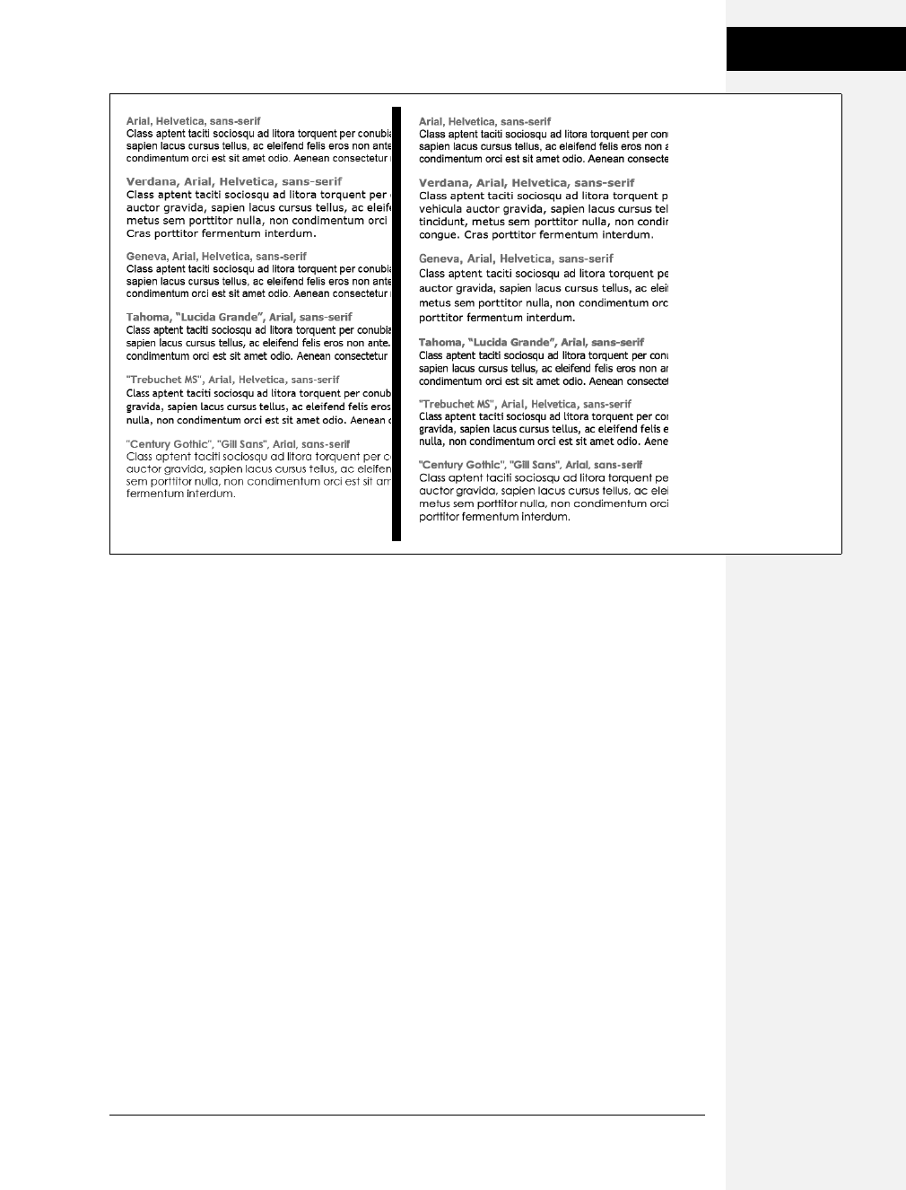
Chapter 6: Formatting Text 117
Formatting Text
Monospaced and fun fonts
Monospaced fonts are often used to display computer code (like the CSS snippets
you see throughout this book). Each letter in a monospaced font is the same width
(these were traditionally used on typewriters to line up data into tidy columns).
• “Courier New”, Courier, monospace
• “Lucida Console”, Monaco, monospace
• “Copperplate Light”, “Copperplate Gothic Light”, serif
• “Marker Felt”, “Comic Sans MS”, fantasy
Examples of these font lists are pictured in Figure 6-4.
Additional fonts to consider
There are literally thousands of fonts, and every operating system ships with many
more fonts than are listed here. However, here are a few fonts that are very com-
mon on both Macs and PCs, so you might want to give them a go:
• Arial Black
• Arial Narrow
• Impact
Figure 6-3:
Windows (left) and Mac
(right). Some people
believe that you should
use only sans-serif fonts
on web pages because
they think the delicate
decorative strokes of serif
fonts don’t display well
on the coarse resolution
of a computer screen. In
the end, your aesthetic
judgment is your best
guide. Pick the types of
fonts you think look best.
Download at Boykma.Com
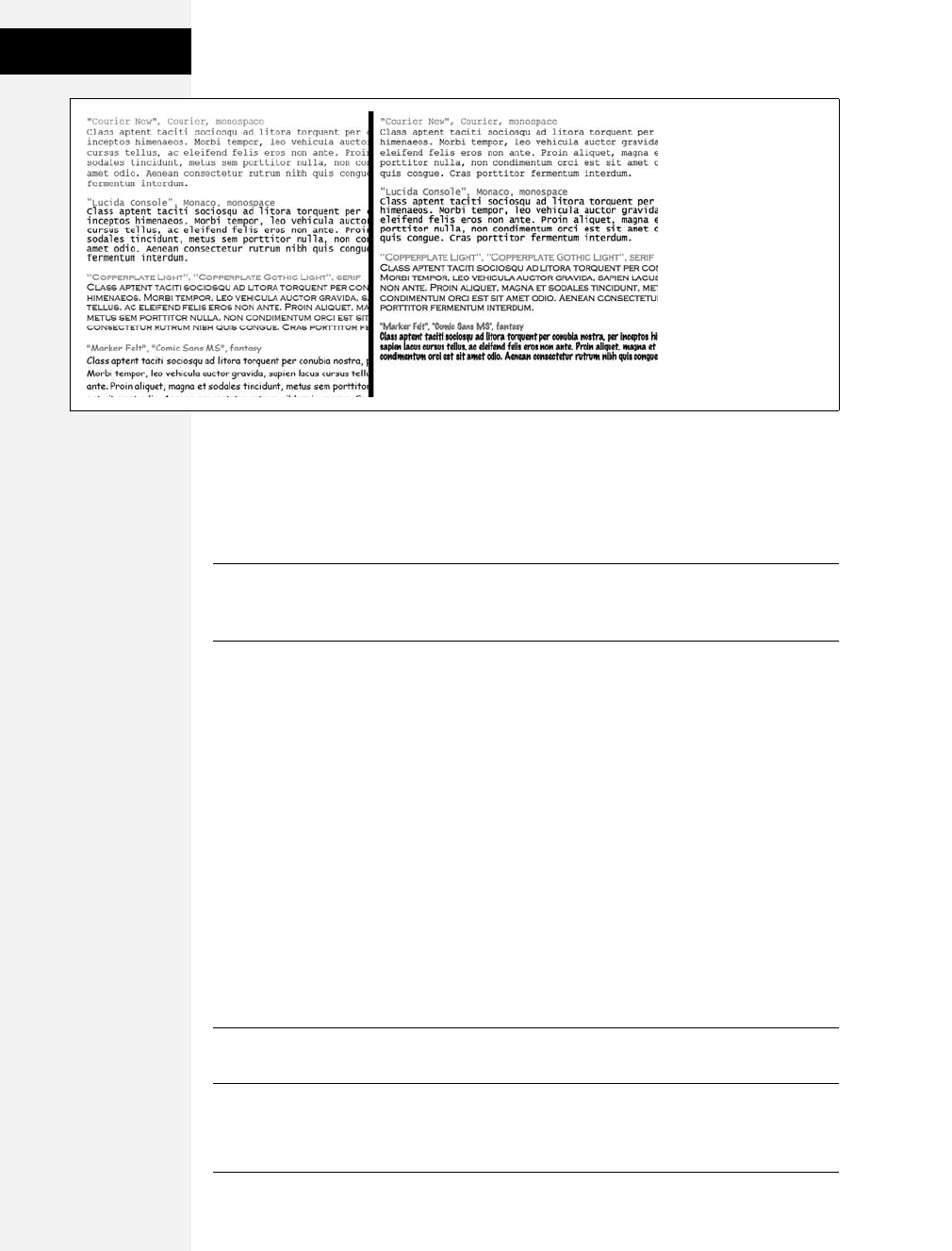
118 CSS: The Missing Manual
Formatting Text
Be careful with Arial Black and Impact: They only have a single weight and don’t
include an italic version. Accordingly, if you use these fonts make sure to set the
font-weight and the font-style (coming up on page 125) to normal. Otherwise, if the
text is bolded or italicized, the browser will make its best (read: ugly) guess at what
the text should look like.
Tip: You can find a lot more information on which fonts are installed on which systems, including Macs,
Windows, and Linux, at www.codestyle.org/css/font-family. For another good resource for thinking out-
side the normal set of web fonts, visit http://unitinteractive.com/blog/2008/06/26/better-css-font-stacks.
Adding Color to Text
Black-and-white is great for Casablanca and Woody Allen films, but when it comes
to text, a nice skyline blue looks much sharper and classier than drab black. Coloring
your text with CSS is easy. In fact, you’ve used the color property in a few tutorials
already. You have several different ways to define the exact color you want, but they
all follow the same basic structure. You type color: followed by a color value:
color: #3E8988;
In this example, the color value is a hexadecimal number indicating a muted shade
of teal (more in a moment on what hexadecimal is).
Every graphics program from Fireworks to Photoshop to the GIMP lets you select
a color using hexadecimal or RGB values. Also, the color pickers built into Win-
dows and Macs let you use a color wheel or palette to select the perfect color and
translate it into a hexadecimal or RGB value.
Note: If your color design sense needs some help, you can find lots of attractive, coordinated collections
of colors as well as great color-related resources at www.colourlovers.com.
Figure 6-4:
Windows (left) and Mac
(right). Courier is the
most common
monospaced font, but
you’re far from limited to
it. Lucida Console is very
common on Windows
and Macs, and Monaco is
installed on every Mac.
Download at Boykma.Com

Chapter 6: Formatting Text 119
Changing Font Size
Hexadecimal color notation
The most common color system used by web designers is hexadecimal notation. A
color value—like #6600FF—actually contains three hexadecimal numbers—in this
example 66, 00, FF—each of which specify an amount of red, green, and blue,
respectively. As in the RGB color system described next, the final color value is a
blend of the amounts of red, green, and blue specified by these numbers.
Tip: You can shorten the hexadecimal numbers to just three characters if each set contains the same two
numbers. For example, shorten #6600FF to #60F, or #FFFFFF to #FFF.
RGB
You can also use the RGB—red, green, blue—method familiar in computer graph-
ics programs. The color value consists of three numbers representing either per-
centages (0–100 percent) or numbers between 0–255 for each hue (red, green, and
blue). So when you want to set the text color to white (perhaps to set it off from an
ominous dark page background), you can use this:
color: rgb(100%,100%,100%);
or
color: rgb(255,255,255);
Note: If all these numbers and digits have your head spinning, then you can always fall back on the classic
HTML color keywords. (Just don’t expect your site to win any awards for originality.) There are 17 colors—
aqua, black, blue, fuchsia, gray, green, lime, maroon, navy, olive, orange, purple, red, silver, teal, white, and
yellow. In CSS, you add them to your style like so: color: fuchsia;.
Changing Font Size
Varying the size of text on a web page is a great way to create visual interest and
direct your visitors’ attention to important areas of a page. Headlines in large type
sizes capture your attention, while copyright notices displayed in small type subtly
recede from prominence.
The font-size property sets text size. It’s always followed by a unit of measurement,
like so:
font-size: 1em;
The value and unit you specify for the font size (in this example, 1em) determine
the size of the text. CSS offers a dizzying selection of sizing units: keywords, ems,
exs, pixels, percentages, picas, points, even inches, centimeters, and millimeters.
Download at Boykma.Com
120 CSS: The Missing Manual
Changing Font Size
Units of measurement commonly used with printed materials—picas, points,
inches, and so on—don’t work well on web pages because you can’t predict how
they’ll look from one monitor to the next. But you may have occasion to use
points when creating style sheets for printer-friendly pages, as described on page
399. Only a few of the measurement units—pixels, keywords, ems, and percent-
ages—make sense when you’re sizing text for a computer monitor. The rest of this
section explains how they work.
Using Pixels
Varying pixel values are the easiest to understand, since they’re completely inde-
pendent from any browser settings. When you specify, for example, a 36-pixel font
size for an <h1> tag, the web browser displays text that’s 36 pixels tall, period. Web
designers cherish pixel values because they provide consistent text sizes across dif-
ferent types of computers and browsers. (Well, not all web designers. See the box
below for one limitation of pixel sizing.)
To set a pixel value for the font-size property, type a number followed by the
abbreviation px:
font-size: 36px;
Note: Don’t include a space between the number and the unit type. For example, 36px is correct, but
36 px isn’t.
FREQUENTLY ASKED QUESTION
One Problem with Pixels
It sounds like pixel values give me complete control over
text size. Why bother using any other kind of text-sizing
value?
Unfortunately, in Internet Explorer 6 (and earlier) for Win-
dows, there’s one serious limitation to pixel text sizes: The
viewer gets no control over text size. Some people—espe-
cially those with limited eyesight—use IE’s View ➝Text Size
command to pump up text to a size that’s easier to read.
However, IE won’t resize any text that’s sized with a pixel
value. IE adheres to what the designer wants, with no con-
cern for the person behind the wheel of the browser.
Whether or not to use pixel values is something of a holy war
in web design circles. Many web developers believe pixel-
sized text creates an accessibility issue. That is, it potentially
limits access to your site for people with disabilities.
Versions of Internet Explorer after IE 6, like most other web
browsers currently available, do let you resize pixel-sized
text. Actually, those browsers are following the trend of
page zooming—instead of just enlarging text, you actually
can zoom into the page, enlarging the entire page: images,
text, and all. As IE 8 becomes more popular, you’ll be able
to use pixel values without worrying about the limitations of
IE 6.
Meanwhile, the best you can do is consider your audience.
If you’re creating a site that’s aimed at places where older
browsers may still be in use, then use one of the resizable
text options like keywords, ems, or percentages. Anywhere
you’re likely to find a combination of older computers and
people with special needs, make accessibility more of a pri-
ority.
Download at Boykma.Com

Chapter 6: Formatting Text 121
Changing Font Size
Using Keywords, Percentages, and Ems
Three ways of sizing text with CSS—keywords, percentages, and ems—work by
either adding to or subtracting from the text size already on the viewer’s browser
screen. In other words, if you don’t specify a text size using CSS, a web browser
falls back on its pre-programmed settings. In most browsers, text inside a non-
header tag is displayed 16 pixels tall—that’s called the base text size.
Web surfers can adjust their browsers by pumping up or dropping down that base
size. In Internet Explorer, for example, you can choose View ➝Text Size and select
an option such as Larger or Smaller to adjust the text size on the screen; in Firefox
2, it’s View ➝Text Size ➝Increase (or Decrease); in Firefox 3, it’s View ➝Zoom;
and in Safari the menu options are View ➝Make Text Smaller and View ➝Make
Text Bigger.
When you resize text with CSS, the browser takes the base text size (whether it’s
the original 16 pixels or some other size the viewer ordered) and adjusts it up or
down according to your keyword, em, or percentage value.
Keywords
CSS provides seven keywords which let you assign a size that’s relative to the base
text size: xx-small, x-small, small, medium, large, x-large, and xx-large. The CSS
looks like this:
font-size: large;
The medium option is the same as the browser’s base font size. Each of the other
options decreases or increases the size by a different factor. In other words, while
each size change is supposed to be a consistent increase or decrease from the previ-
ous size, it isn’t. Basically xx-small is the equivalent of 9 pixels (assuming you
haven’t adjusted the base font size in your browser); x-small is 10 pixels, small is 13
pixels, large is 18 pixels; x-large is 24 pixels, and xx-large is 32 pixels.
Keywords are pretty limited: You have only seven choices. When you want more
control over the size of your text, turn to one of the other font-sizing options dis-
cussed next.
Percentages
Like keywords, percentage values adjust text in relationship to the font size defined
by the browser, but they give you much finer control than just large, x-large, and so
on. Every browser has a pre-programmed base text size, which in most browsers is
16 pixels. You can adjust this base size in your browser’s preferences. Whatever
setting has been chosen, the base text size for a particular browser is equivalent to
100 percent. In other words, for most browsers, setting the CSS percentage to 100
percent is the same as setting it to 16 pixels.
Download at Boykma.Com
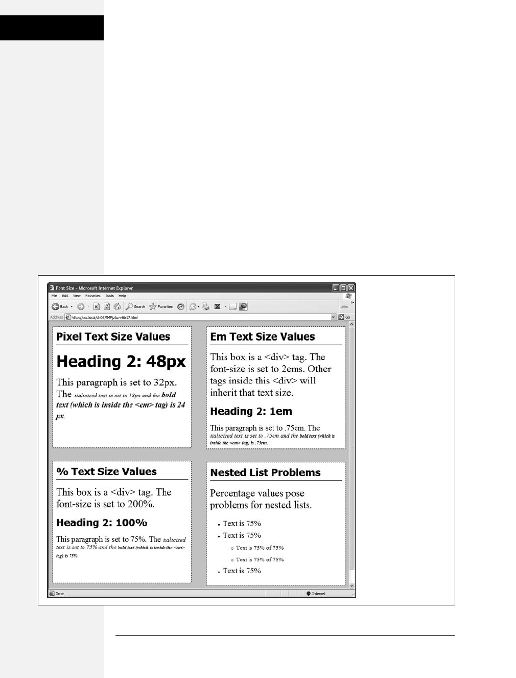
122 CSS: The Missing Manual
Changing Font Size
Say you want to make a particular headline appear two times the size of average
text on a page. You simply set the font size to 200 percent, like so:
font-size: 200%;
Or, when you want the text to be slightly smaller than the default size, use a value
like 90 percent to shrink the font size down a bit.
The above examples are pretty straightforward, but here’s where it gets a little
tricky: Font size is an inherited property (see Chapter 4), meaning that any tags
inside of a tag that has a font size specified inherit that font size. So the exact size of
100 percent can change if a tag inherits a font-size value.
For example, at the lower left of Figure 6-5, there’s a <div> tag that has its font size
set to 200 percent. That’s two times the browser’s base text size, or 32 pixels. All
tags inside that <div> inherit that text size and use it as the basis for calculating
their text sizes. In other words, for tags inside that <div>, 100 percent is 32 pixels.
So the <h1> tag inside the <div> that has a font size of 100 percent displays at two
times the base-text size for the page, or 32 pixels.
Figure 6-5:
The three most common
units for sizing text:
pixels, ems, and
percentages. Watch out
for inherited text sizes
when using ems or
percentages, as
explained on the
opposite page. If you
notice that some text on
a page looks unusually
large or small, then check
to see if the offending
text isn’t inside a tag that
inherits a font size from
another tag.
Download at Boykma.Com
Chapter 6: Formatting Text 123
Changing Font Size
Ems
Once you understand percentages, you know everything you need to understand
ems. The two work exactly the same way, but many web designers use ems because
of its roots in typography.
The word em comes from the world of printed (as in paper) typography, where it
refers to the size of a capital letter M for a particular font. As it’s worked its way
into the Web world, an em in CSS no longer means the same thing as in typogra-
phy. Think of it as referring to the base text size. That is, a value of 1em means the
same thing as a value of 100 percent, as described in the previous section. You can
even say it the opposite way: A percentage value is just an em multiplied by 100: .
5em is 50 percent, .75em is 75 percent, 3em is 300 percent, and so on.
For example, this CSS does the exact same thing as font-size: 200%;.
font-size: 2em;
Note: As with pixel values, there’s no space between the number and the word em. Also, even if you
specify more than one em, you never add an s to the end: 2.5em, never 2.5ems.
When it comes to inheritance, ems also work just like percentage values. See the
upper right of Figure 6-5 for an example. The bottom paragraph is set to .75em,
which, since the <p> tag inherits the 2em (32 pixel) setting from the <div> tag,
works out to .75 ×32, or 24 pixels. Inside the <p> tag are two other tags that also
have a font-size setting of .75em. The innermost tag, a <strong> tag, is set to .75em
or, in essence, 75 percent of its inherited size. There’s a lot of math to this one: 32
pixels (inherited from the <div> tag) ×75 (inherited from the <p> tag) ×.75
(inherited from the <em> tag) ×.75 (the <strong> tag’s own font size). The result
of this brainteaser is a text size of roughly 14 pixels.
Note: Internet Explorer 6 and earlier sometimes has problems displaying text when only em units are
used. You have two ways around this: Either stick with percentage values or set the font size for the body
of the page to a percentage and then use em units to size other text. For some mysterious reason, this
trick seems to fix the bugs in IE 6.
WORKAROUND WORKSHOP
Untangling the Nest
Inherited font-size values can cause problems for nested
lists. (See the bottom-right square of Figure 6-5.) If you cre-
ate a style like ul { font-size: 75% }, then a nested list, which
is a <ul> tag inside of another <ul> tag, is set to 75 percent
of 75 percent—making the text in the nested list smaller
than the rest of the list.
To get around this conundrum, create an additional
descendent selector style (page 57) like this: ul ul {font-
size: 100%}. This style sets any ul tag inside of a ul to 100
percent: in other words, 100 percent of the surrounding ul
tag’s font size. In this example, it keeps any nested lists to
75 percent.
Download at Boykma.Com

124 CSS: The Missing Manual
Formatting Words
and Letters
Tip: You can make type stand out on a page in many different ways. Making certain words larger than oth-
ers or making some text darker, lighter, or brighter visually sets them apart from the surrounding text. Con-
trast is one of the most important principles of good graphic design; it can help highlight important
messages, guide a reader’s eye around a page, and generally make understanding a page easier. For a quick
overview of typographic contrast, check out this page: www.creativepro.com/story/feature/19877.html.
Formatting Words and Letters
Although you’ll spend a lot of time fine-tuning the color, size, and fonts of the text
on your web pages, CSS also lets you apply other common text-formatting proper-
ties (like bold and italics) as well as some less common ones (like small caps and
letter spacing).
Note: CSS lets you combine multiple text properties, but don’t get carried away. Too much busy format-
ting makes your page harder to read. Worst of all, your hard work loses its impact.
Italicizing and Bolding
Web browsers display type inside the <em> and <i> tags in italicized type and text
inside the <strong>, <b>, <th> (table header), and header tags (<h1>, and so on)
in bold type. But you can control these settings yourself—either turn off bold for a
headline or italicize text that normally isn’t—using the font-style and font-weight
properties.
To italicize text, add this to a style:
font-style: italic;
Alternatively, you can make sure text isn’t italicized, like so:
font-style: normal;
Note: The font-style property actually has a third option—oblique—which works identically to italic.
The font-weight property lets you make text bold or not. In fact, according to the
rules of CSS, you can actually specify nine numeric values (100–900) to choose
subtle gradations of boldness (from super-extra-heavy [900] to nearly-invisible-
light [100]). Of course, the fonts you use must have nine different weights for these
values to have any visible effect for your website’s visitors. And since there aren’t
any fonts that work this way with web browsers yet, you have far fewer options for
this property to worry about. So, for now, to make text bold:
font-weight: bold;
And to make text un-bold:
font-weight: normal;
Download at Boykma.Com

Chapter 6: Formatting Text 125
Formatting Words
and Letters
Note: Since headlines are already displayed as bold type, you may want to find another way of highlight-
ing a word or words that are strongly emphasized or bolded inside a headline. Here’s one way:
h1 strong { color: #3399FF; }
This descendent selector changes the color of any <strong> tags (usually displayed as bold) that appear
inside a <h1> tag.
Capitalizing
Capitalizing text is pretty easy—just hit the caps lock key and start typing, right?
But what if you want to capitalize every heading on a page, and the text you’ve
copied and pasted from a Word document is lowercase? Rather than retyping the
headline, turn to the CSS text-transform property. With it, you can make text all
uppercase, all lowercase, or even capitalize the first letter of each word (for titles
and headlines). Here’s an example:
text-transform: uppercase;
For the other two options, just use lowercase or capitalize.
Because this property is inherited, a tag that’s nested inside a tag with text-transform
applied to it gets the same uppercase, lowercase, or capitalized value. To tell CSS
not to change the case of text, use the none value:
text-transform: none;
Small caps
For more typographic sophistication, you can also turn to the font-variant property,
which lets you set type as small-caps. In small cap style, lowercase letters appear as
slightly downsized capital letters, like so: POMP AND CIRCUMSTANCE. While difficult
to read for long stretches of text, small caps lend your page an old-world, bookish
gravitas when used on headlines and captions. To create small-cap text:
font-variant: small-caps;
Decorating
CSS also provides the text-decoration property to add various enhancements to
text. With it, you can add lines over, under, or through the text (see Figure 6-6), or
for real giggles you can make the text blink like a No Vacancy sign. Use the text-
decoration property by adding one or more of the following keywords: underline,
overline, line-through, or blink. For example, to underline text:
text-decoration: underline;
You can also combine multiple keywords for multiple effects. Here’s how to add a
line over and under some text:
text-decoration: underline overline;
Download at Boykma.Com
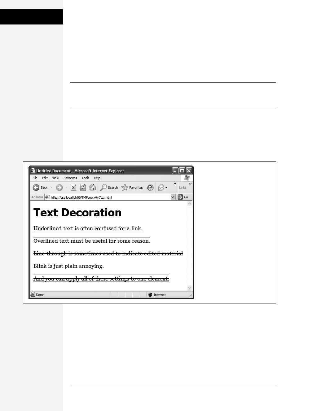
126 CSS: The Missing Manual
Formatting Words
and Letters
But just because you can add these not-so-decorative decorations to text, doesn’t
mean you should. For one thing, anyone who’s used the Web for any length of
time instinctively associates any underlined text with a link and tries to click it. So
it’s not a good idea to underline words that aren’t part of a link. And blink is like a
neon sign flashing “Amateur! Amateur! Amateur!” (On top of that most browsers
don’t make text blink, even if you ask for it.)
Note: You can get a similar effect to underlining and overlining by adding a border to the bottom or top
of an element (see page 160). The big advantage of borders is that you can control their placement, size,
and color to create a more attractive design that doesn’t look like a link.
The overline option simply draws a line above text, while line-through draws a line
right through the center of text. Some designers use this strike-through effect to
indicate an edit on a page where text has been removed from the original manu-
script. Coupled with the a:visited selector, you can also create a cool effect where
previously visited links are crossed out like a shopping list.
Finally, you can turn off all decorations by using the none keyword like this:
text-decoration: none;
Why do you need a text-decoration property that removes decorations? The most
common example is removing the line that appears under a link. (See page 229.)
Figure 6-6:
The text-decoration property in
action. If this is what the people at
CSS headquarters call “decorations,”
you’d best not ask for their design
help on your next home remodel.
Download at Boykma.Com
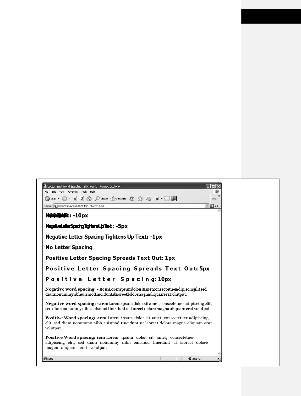
Chapter 6: Formatting Text 127
Formatting Words
and Letters
Letter and Word Spacing
Another way to make text stand out from the crowd is to adjust the space that
appears between letters or words (see Figure 6-7). Reducing the space between let-
ters using the CSS letter-spacing property can tighten up headlines, making them
seem even bolder and heavier while fitting more letters on a single line. Con-
versely, increasing the space can give headlines a calmer, more majestic quality. To
reduce the space between letters, you use a negative value like this:
letter-spacing: -1px;
A positive value adds space between letters:
letter-spacing: 10px;
Likewise, you can open up space (or remove space) between words using the
word-spacing property. This property makes the space wider (or narrower) with-
out actually affecting the words themselves:
word-spacing: 2px;
With either of these properties, you can use any type of measurement you’d use for
text sizing—pixels, ems, percentages—with either positive or negative values.
Figure 6-7:
Use word and letter
spacing judiciously. Too
much or too little of
either can make text
difficult if not impossible
to read.
Download at Boykma.Com
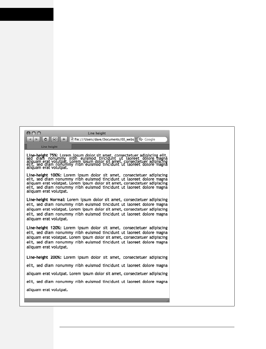
128 CSS: The Missing Manual
Formatting Entire
Paragraphs
Unless you’re going for some really far-out design effect—in other words, totally
unreadable text—keep your values small. Too high a negative value, and letters
and words overlap. To keep the message of your site clear and legible, use both let-
ter and word spacing with care.
Formatting Entire Paragraphs
Some CSS properties apply to chunks of text rather than individual words. You can
use the properties in this section on complete paragraphs, headlines, and so on.
Adjusting the Space Between Lines
In addition to changing the space between words and letters, CSS lets you adjust
the space between lines of text using the line-height property. The bigger the line
height, the more space that appears between each line of text (see Figure 6-8).
Figure 6-8:
The line-height property lets you
spread a paragraph’s lines apart
or bring them closer together.
The normal setting is equivalent
to 120 percent, so a smaller
percentage tightens up the lines
(top), while a larger percentage
pushes them apart (bottom).
Download at Boykma.Com

Chapter 6: Formatting Text 129
Formatting Entire
Paragraphs
Line spacing by pixel, em, or percentage
Just as with the font-size property, you can use pixels, ems, or percentages to set the
size of line height:
line-height: 150%;
In general, percentages or ems are better than pixels, because they change accord-
ing to, and along with, the text’s font-size property. If you set the line height to 10
pixels and then later adjust the font size to something much larger (like 36 pixels),
because the line height remains at 10 pixels, your lines then overlap. However,
using a percentage (150 percent, say) means the line-height spacing adjusts propor-
tionally whenever you change the font-size value.
The normal line-height setting for a browser is 120 percent. So, when you want to
tighten up the line spacing, use a value less than 120 percent. To spread lines apart,
use a value greater than 120 percent.
Note: To determine the amount of space that appears between lines of text, a web browser subtracts the
font size from the line height. The result—called leading—is the amount of space between lines in a para-
graph. Say the font size is 12 pixels, and the line height (set to 150 percent) works out to 18 pixels. 18
minus 12 equals 6 pixels, so the browser adds 6 pixels of space between each line.
Line spacing by number
CSS offers one other measurement method specific to line height, which is simply
a number. You write it like this:
line-height: 1.5;
There’s no unit (like em or px) after this value. The browser multiplies this num-
ber by the font size to determine the line height. So if the text is 1em and the
line-height value is 1.5, then the calculated line height is 1.5em. In most cases,
the effect is no different from specifying a value of 1.5em or 150 percent. But
sometimes this multiplication factor comes in handy, especially since nested tags
inherit the line-height value of their parents.
For example, say you set the line-height property of the <body> tag to 150 percent.
All tags inside the page would inherit that value. However, it’s not the percentage
that’s inherited; it’s the calculated line height. So, say the font size for the page is set
to 10 pixels; 150 percent of 10 is 15 pixels. Every tag would inherit a line height of 15
pixels, not 150 percent. So if you happened to have a paragraph with large, 36 pixel
text, then its line height—15 pixels—would be much smaller than the text, making
the lines squish together in a hard-to-read mess.
In this example, instead of using a line-height of 150 percent applied to the
<body> tag, you could have all tags share the same basic proportional line-height
by setting the line-height to 1.5. Every tag, instead of inheriting a precise pixel
value for line height, simply multiplies its font size by 1.5. So in the above example
of a paragraph with 36-pixel text, the line height would be 1.5 ×36 or 54 pixels.
Download at Boykma.Com

130 CSS: The Missing Manual
Formatting Entire
Paragraphs
Aligning Text
One of the quickest ways to change the look of a web page is with paragraph align-
ment. Using the text-align property, you can center a paragraph on a page, align
the text along its left or right edge, or justify both left and right edges (like the
paragraphs in this book). Normally, text on a page is left aligned, but you may
want to center headlines to give them a formal look. Languages that read from
right to left, like Hebrew and Arabic, require right-alignment. To change the align-
ment of text, use any of the following keywords—left, right, justify, center:
text-align: center;
Justified text looks great on a printed page—mainly because the fine resolution pos-
sible with printing allows for small adjustments in spacing and because most pro-
grams used to layout printed material can hyphenate long words (thus attempting to
equally distribute the number of characters per line). This prevents large, unsightly
gaps or rivers of white space flowing through the paragraphs. Web pages are limited
to much coarser spacing because of the generally low resolution of monitors and
because web browsers don’t know how to hyphenate long words. So when you use
the justify option, the space between words can vary significantly from line to line,
making the text harder to read. When you want to use the justify option on your web
pages, test it thoroughly to make sure the text is attractive and readable.
Indenting the First Line and Removing Margins
In many books, the first line of each paragraph is indented. This first-line indent
marks the beginning of a paragraph when there are no spaces separating para-
graphs. On the Web, however, paragraphs don’t have indents but are instead sepa-
rated by a bit of space—like the paragraphs in this book.
If you have a hankering to make your web pages look less like other web pages and
more like a handsomely printed book, take advantage of the CSS text-indent and
margin properties. With them, you can add a first-line indent and remove (or
increase) the margins that appear at the beginning and ends of paragraphs.
First-line indents
You can use pixel and em values to set the first-line indent like this:
text-indent: 25px;
or
text-indent: 5em;
Download at Boykma.Com
Chapter 6: Formatting Text 131
Formatting Entire
Paragraphs
A pixel value is an absolute measurement—a precise number of pixels—while an
em value specifies the number of letters (based on the current font size) you want
to indent.
Tip: You can use negative text-indent values to create what’s called a hanging indent, where the first line
starts further to the left than the other lines in the paragraph. (Think of it as “hanging” off the left edge.)
You can also use a percentage value, but with the text-indent property, percentages
take on a different meaning than you’ve seen before. In this case, percentages
aren’t related to the font size; they’re related to the width of the element contain-
ing the paragraph. For example, if the text-indent is set to 50 percent, and a para-
graph spans the entire width of the web browser window, then the first line of the
paragraph starts half the way across the screen. If you resize the window, both the
width of the paragraph and its indent change. (You’ll learn more about percent-
ages and how they work with the width of elements on page 121.)
POWER USERS’ CLINIC
Shorthand Method for Text Formatting
Writing one text property after another gets tiring, espe-
cially when you want to use several different text properties
at once. Fortunately, CSS offers a shorthand property called
font, which lets you combine the following properties into
a single line: font-style (page 125), font-variant (page 125),
font-weight (page 124), font-size (page 119), line-height
(page 128) and font-family (page 113). For example, the
declaration font: italic bold small-caps 18px/150% Arial,
Helvetica, sans-serif; creates bold, italicized type in small
caps, using 18px Arial (or Helvetica or sans-serif) with a line
height of 150 percent. Keep these rules in mind:
• You don’t have to include every one of these prop-
erties, but you must include the font size and font
family: font: 1.5em Georgia, Times, serif;.
• Use a single space between each property value.
You use a comma only to separate fonts in a list like
this: Arial, Helvetica, sans-serif.
• When specifying the line height, add a slash after
the font size followed by the line-height value, like
this: 1.5em/150% or 24px/37px.
• The last two properties must be font-size (or font-
size/line-height) followed by font-family, in that
order. All the other properties may be written in any
order. For example both font: italic bold small-caps
1.5em Arial; and font: bold small-caps italic 1.5em
Arial; are the same.
Finally, omitting a value from the list is the same as setting
that value to normal. Say you created a <p> tag style that
formatted all paragraphs in bold, italics, and small caps with
a line height of 2000 percent (not that you’d actually do
that). If you then created a class style named, say, .special-
Paragraph with the following font declaration font: 1.5em
Arial; and applied it to one paragraph on the page, then
that paragraph would not inherit the italics, bold, small
caps, or line height. Omitting those four values in the .spe-
cialParagraph style is the same as writing this: font: normal
normal normal 1.5em/normal Arial/;.
Download at Boykma.Com

132 CSS: The Missing Manual
Formatting Entire
Paragraphs
Controlling margins between paragraphs
Many designers hate the space that every browser throws in between paragraphs.
Before CSS, there was nothing you could do about it. Fortunately, you can now tap
into the margin-top and margin-bottom properties to remove (or, if you wish,
expand) that gap. To totally eliminate a top and bottom margin, write this:
margin-top: 0;
margin-bottom: 0;
To eliminate the gaps between all paragraphs on a page, create a style like this:
p {
margin-top: 0;
margin-bottom: 0;
}
As with text-indent, you can use pixel or em values to set the value of the margins.
You can also use percentages, but as with text-indent, the percentage is related to
the width of the paragraph’s containing element. Because it’s confusing to calcu-
late the space above and below a paragraph based on its width, it’s easier to stick
with either em or pixel values.
Note: Because not all browsers treat the top and bottom margin of headlines and paragraphs consis-
tently, it’s often a good idea to simply zero out (that is, eliminate) all margins at the beginning of a style
sheet. To see how this works, turn to page 102.
For a special effect, you can assign a negative value to a top or bottom margin. For
example a –10px top margin moves the paragraph up 10 pixels, perhaps even visu-
ally overlapping the page element above it. (See step 4 on page 147 of the tutorial
for an example.)
Formatting the First Letter or First Line of a Paragraph
CSS also provides a way of formatting just a part of a paragraph using the :first-let-
ter and :first-line pseudo-elements (see Figure 6-9). Technically, these aren’t CSS
properties, but types of selectors that determine what part of a paragraph CSS
properties should apply to. With the :first-letter pseudo-element, you can create an
initial capital letter to simulate the look of a hand-lettered manuscript. To make
the first letter of each paragraph bold and red you could write this style:
p:first-letter {
font-weight: bold;
color: red;
}
To be more selective and format just the first letter of a particular paragraph, you
can apply a class style to the paragraph—.intro, for example:
<p class="intro">Text for the introductory paragaph goes here...</p>
Download at Boykma.Com
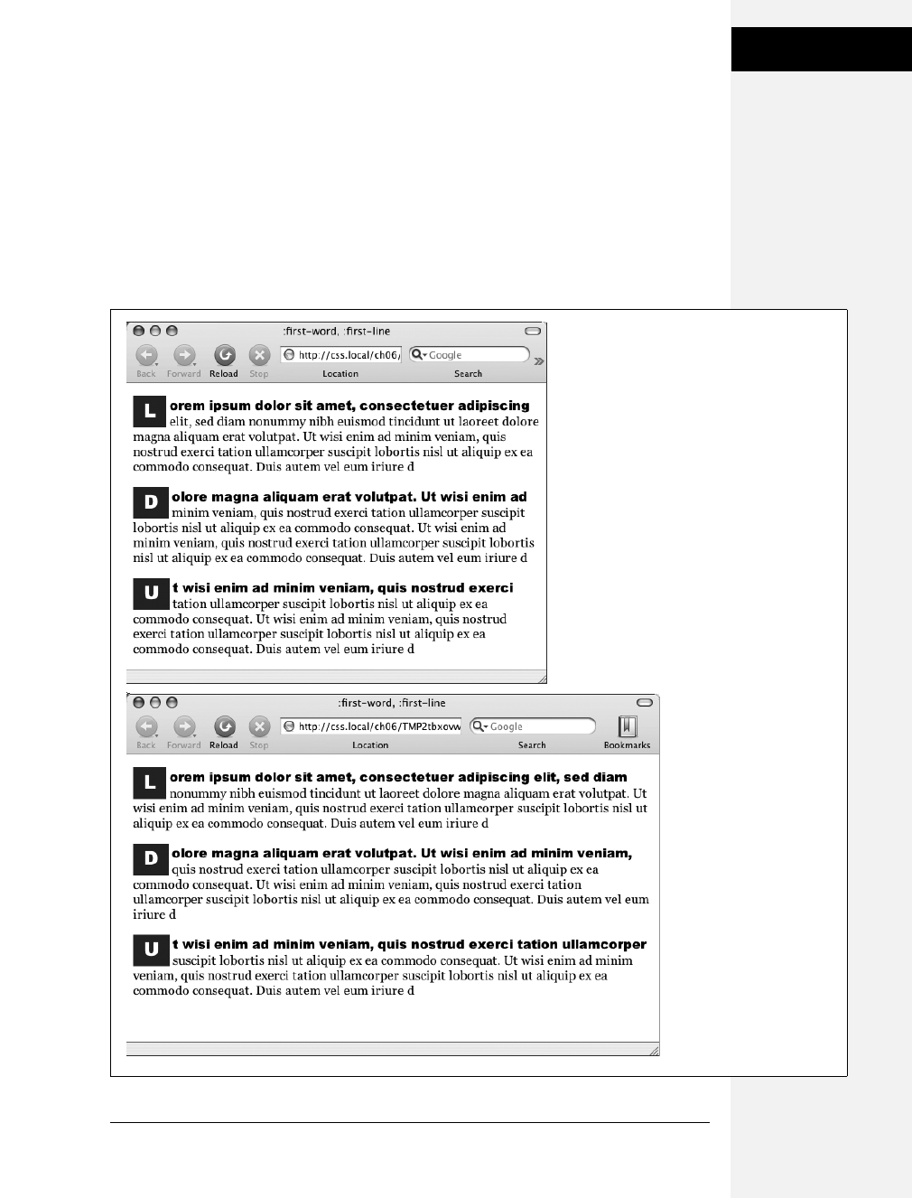
Chapter 6: Formatting Text 133
Formatting Entire
Paragraphs
Then you could create a style with a name like this: .intro:first-letter.
The :first-line pseudo-element formats the initial line of a paragraph. You can
apply this to any block of text like a heading (h2:first-line) or paragraph (p:first-
line). As with :first-letter, you can apply a class to just one paragraph and format
only the first line of that paragraph. Say you wanted to capitalize every letter in the
first line of the first paragraph of a page. Apply a class to the HTML of the first
paragraph—<p class="intro">—and then create a style like this:
.intro:first-line { text-transform: uppercase; }
Figure 6-9:
The :first-letter pseudo-
element formats the first
letter of the styled
element, like the “initial
caps” to the left. The
:first-line selector, on the
other hand, styles the
first line of a paragraph.
Even if your guest resizes
the window (bottom), the
browser still styles every
word that appears on a
paragraph’s first line.
Download at Boykma.Com

134 CSS: The Missing Manual
Styling Lists
Note: For some strange reason, the Safari web browser doesn’t understand the text-transform property
(page 125) when it’s used with the :first-line pseudo-element. In other words, you can’t use CSS to capital-
ize the letters of a paragraph’s first line in Safari.
Styling Lists
The <ul> and <ol> tags create bulleted and numbered lists, like lists of related items
or numbered steps. But you don’t always want to settle for the way web browsers
automatically format those lists. You may want to swap in a more attractive bullet,
use letters instead of numbers, or even completely eliminate the bullets or numbers.
Types of Lists
Most web browsers display unordered lists (<ul> tags) using round bullets, and
numbered lists (<ol> tags) using…well…numbers. With CSS, you can choose
from among three types of bullets—disc (a solid round bullet), circle (a hollow
round bullet), or square (a solid square). There are also six different numbering
schemes—decimal, decimal-leading-zero, upper-alpha, lower-alpha, upper-roman,
or lower-roman (see Figure 6-10). You select all these options using the list-style-
type property, like so:
list-style-type: square;
or
list-style-type: upper-alpha;
Figure 6-10:
Many web browsers display the
decimal and decimal-leading-
zero options identically. Firefox
and other Mozilla-based
browsers like Camino (pictured
here) correctly display the
decimal-leading-zero setting by
adding a 0 before single digit-
numbers—01, for example.
Internet Explorer 6 and 7,
however, don’t recognize either
the decimal-leading-zero or
lower-greek options.
Download at Boykma.Com

Chapter 6: Formatting Text 135
Styling Lists
Note: If you feel like rushing a fraternity or sorority, you can also replace numbers with Greek letters—α,
β,γ—using the lower-greek option.
Most of the time, you use this property on a style that’s formatting an <ol> or
<ul> tag. Typical examples include an ol or ul tag style—ul { list-style-type: square; }—
or a class you’re applying to one of those tags. However, you can also apply the
property to an individual list item (<li> tag) as well. You can even apply different
types of bullet styles to items within the same list. For example, you can create a
style for a <ul> tag that sets the bullets to square, but then create a class named
.circle that changes the bullet type to circle, like this:
.circle { list-style-type: circle; }
You can then apply the class to every other item in the list to create an alternating
pattern of square and circular bullets:
<ul>
<li>Item 1</li>
<li class="circle">Item 2</li>
<li>Item 3</li>
<li class="circle">Item 4</li>
</ul>
At times you’ll want to completely hide bullets, like when you’d rather use your
own graphic bullets (see page 137). Also, when a site’s navigation bar is a list of
links, you can use an <ul> list, but hide its bullets (see the example on page 235).
To turn off the bullets, use the keyword none:
list-style-type: none;
Positioning Bullets and Numbers
Web browsers usually display bullets or numbers hanging to the left of the list
item’s text (Figure 6-11, left). With CSS, you can control the position of the bullet
(somewhat) using the list-style-position property. You can either have the bullet
appear outside of the text (the way browsers normally display bullets) or inside the
text block itself (Figure 6-11, right):
list-style-position: outside;
or
list-style-position: inside;
Tip: You can adjust the space between the bullet and its text—increase or decrease that gap—by using
the padding-left property (see page 153). To use it, you create a style that applies to the <li> tags. This
technique works only if you set the list-style-position property to the outside option (or don’t use list-
style-position at all).
Download at Boykma.Com
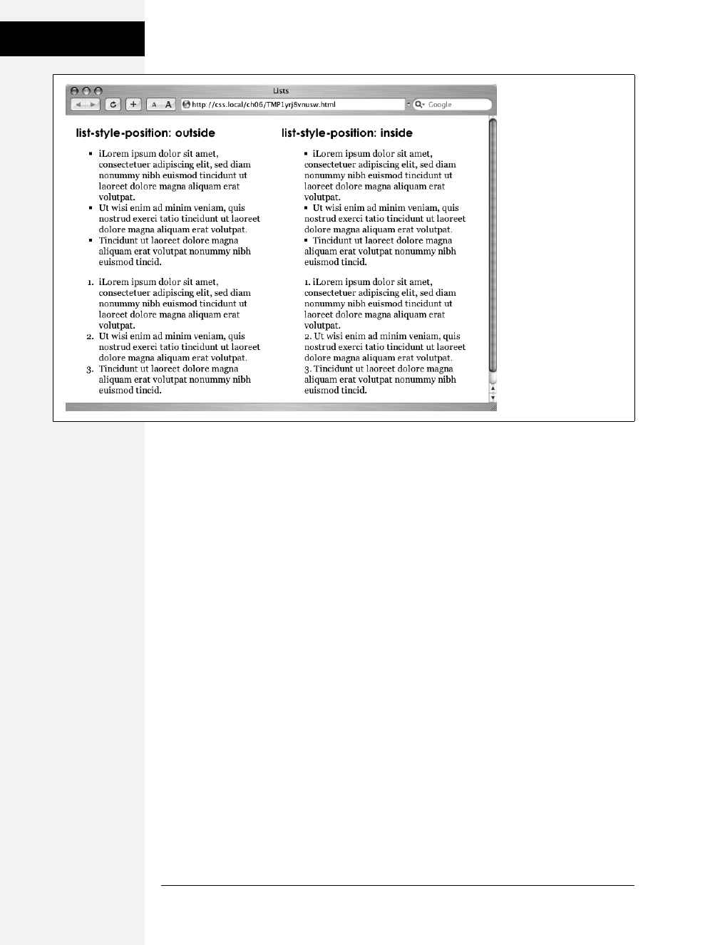
136 CSS: The Missing Manual
Styling Lists
In addition, if you don’t like how web browsers indent a list from the left edge,
then you can remove that space by setting both the margin-left and padding-left
properties to 0 for the list. To remove the indent from all lists, you could create
this group selector:
ul, ol {
padding-left: 0;
margin-left: 0;
}
Or, you could create a class style with those properties and apply it to a particular
<ul> or <ol> tag. The reason you need to set both the padding and margin prop-
erties is that some browsers use padding (Firefox, Mozilla, Safari) and some use
margin (Internet Explorer) to control the indent. (You’ll learn more about the
margin and padding properties in the next chapter.)
Browsers normally display one bulleted item directly above another, but you can
add space between list items using the margin-top or margin-bottom properties on
the particular list items. These properties work for spacing list items exactly the
same way they work for spacing paragraphs, as explained on page 132. You just
need to make sure that the style applies to the <li> tags by creating a class style and
applying it individually to each <li> tag. Or, better yet, create an <li> tag style or
descendent selector. The style should not apply to the <ul> or <ol> tag. Adding
margins to the top or bottom of those tags simply increases the space between the
entire list and the paragraphs above or below it—not the space between each item
in the list.
Figure 6-11:
Using the list-style-
position property, you
can control the position
of bullets and numbers in
a list. The outside option
(left) emphasizes the
“listness” of your list. Use
the inside option (right) if
you need to maximize
the width of your list.
Download at Boykma.Com

Chapter 6: Formatting Text 137
Styling Lists
Graphic Bullets
If you’re not happy with squares and circles for your bullets, create your own.
Using an image-editing program like Photoshop or Fireworks, you can quickly
create colorful and interesting bullets. Clip art collections and most symbol fonts
(like Webdings) provide great inspiration.
Tip: You can also find many examples of bullets on the Web. Go to www.stylegala.com/features/
bulletmadness/ to find over 200 free bullet icons, or check out this page listing loads of sites with free
icons and bullets: www.cssjuice.com/38-free-icon-checkpoints/.
The CSS list-style-image property lets you specify a path to a graphic on your site,
much as you’d specify a file when adding an image to a page using the src attribute
of the HTML <img> tag. You use the property like this:
list-style-image: url(images/bullet.gif);
The term url and the parentheses are required. The part inside the parentheses—
images/bullet.gif in this example—is the path to the graphic. Notice that, unlike
HTML, you don’t use quotation marks around the path.
FREQUENTLY ASKED QUESTION
Customizing List Bullets and Numbers
I’d like the numbers in my numbered lists to be bold and
red instead of boring old black. How do I customize bullets
and numbers?
CSS gives you a few ways to customize the markers that
appear before list items. For bullets, you can use your own
graphics, as described above. You have two other tech-
niques available: one that’s labor intensive, but works on
most browsers, and one that’s super geeky, cutting edge,
and doesn’t work on Internet Explorer 7 or earlier.
First, the labor-intensive way. Say you want the numbers in
an ordered list to be red and bold, but the text to be plain,
unbolded black. Create a style that applies to the list—like a
class style you apply to the <ol> or <li> tags—with a text
color of red and the font weight set to bold. At this point,
everything in the list—text included—is red and bold.
Next, create a class style—.regularList, for example—that
sets the font color to black and font weight to normal (that
is, not bold). Then (and this is the tedious part), wrap a
<span> tag around the text in each list item and apply the
class style to it. For example: <li><span class="regularL-
ist">Item 1</span></li>. Now the bullets are bold and red
and the text is black and normal. Unfortunately, you have
to add that <span> to every list item!
The cool, “I’m so CSS-savvy,” way is to use what’s called
generated content. Basically, generated content is just stuff
that isn’t actually typed on the page but is added by the web
browser when it displays the page. A good example is bul-
lets themselves. You don’t type bullet characters when you
create a list; the browser adds them for you. With CSS, you
can have a browser add content, and even style that con-
tent, before each <li> tag. You’ll learn about generated con-
tent on page 452.
Download at Boykma.Com

138 CSS: The Missing Manual
Tutorial: Text
Formatting in Action
Note: When specifying a graphic in an external style sheet, the path to the image is relative to the style
sheet file, not the web page. You’ll learn more about how this works in the box on page 192, as you start
to use images with CSS.
While the list-style-image property lets you use a graphic for a bullet, it doesn’t pro-
vide any control over its placement. The bullet may appear too far above or below
the line, requiring you to tweak the bullet graphic until you get it just right. A better
approach—one you’ll learn in Chapter 8—is to use the background-image property.
That property lets you very accurately place a graphic for your bulleted lists.
Note: As with the font property (see the box on page 131), there’s a shorthand method of specifying list
properties. The list-style property can include a value for each of the other list properties—list-style-image,
list-style-position, and list-style-type. For example, ul { list-style: circle inside; } would format unordered
lists with the hollow circle bullet on the inside position. When you include both a style type and style
image—list-style: circle url(images/bullet.gif) inside;—web browsers use the style type circle in this exam-
ple—if the graphic can’t be found.
Tutorial: Text Formatting in Action
In this tutorial, you’ll gussy up headlines, lists, and paragraphs of text using CSS’s
powerful formatting options.
To get started, you need to download the tutorial files located on this book’s com-
panion website at www.sawmac.com/css2e/. Click the tutorial link and download
the files. All of the files are enclosed in a ZIP archive, so you’ll need to unzip them
first. (Go to the website for detailed instructions on unzipping the files.) The files
for this tutorial are contained inside the folder named 06.
Setting Up the Page
First, you’ll get your style sheet started and add styles to format the body text.
1. Launch your web browser and open the file 06 ➝text.html (see Figure 6-12).
It’s not much to look at—just a collection of headlines, paragraphs and a lone
bulleted list—but you’ll turn it into something far better looking.
2. Open the file text.html in your favorite text editor.
Start by adding an internal style sheet to this file. (Yes, external style sheets are
better, but it’s perfectly OK to start your design with an internal sheet. See the
box on page 70.)
Download at Boykma.Com
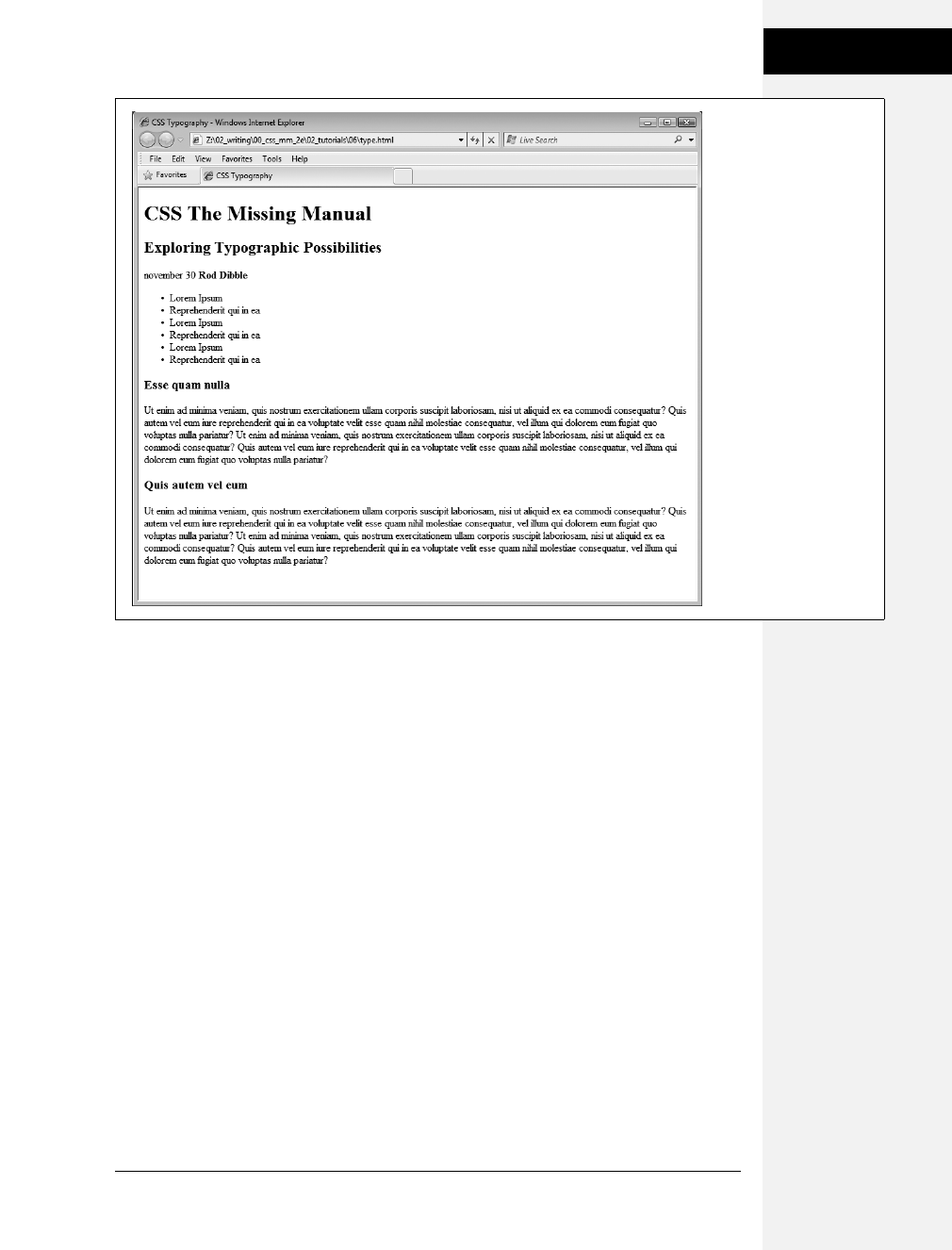
Chapter 6: Formatting Text 139
Tutorial: Text
Formatting in Action
3. In the <head> of the web page, click directly after the <title> tag. Hit Enter
(Return), and then type <style type="text/css">. Press Enter twice and type
</style>.
Now that the basic style tags are in place, you’ll add the CSS reset discussed on
page 192. Instead of typing it all out, you’ll just copy and paste the CSS from an
external style sheet.
4. Open the file reset.css. Copy all of the code from that file and paste it between
the opening and closing <style> tags you added in the previous step.
If you preview the text.html file in a web browser now, you’ll see that the text
looks nearly the same—in other words, all of the basic HTML formatting the
browser applied has been removed, so you can start with a clean slate.
Next, you’ll create a style that defines some general properties for all text on
the page.
5. Press Enter and type body { .
This is a basic tag selector that applies to the <body> tag. As discussed in
Chapter 4, other tags inherit the properties of this tag. You can set up some
basic text characteristics like font, color, and font size for later tags to use as
their starting point.
Figure 6-12:
The page begins with
nothing but basic,
drab, HTML.
Download at Boykma.Com

140 CSS: The Missing Manual
Tutorial: Text
Formatting in Action
6. Press Enter again, and then add the following three properties:
color: #002D4B;
font-family: Arial, Helvetica, sans-serif;
font-size: 62.5%;
These three instructions set the color of the text to a dark blue, the font to Arial
(or one of 2 others depending on which font is installed—see page 115), and the
font size to 62.5 percent.
Note: Why set the page’s base font to 62.5 percent? It just so happens that 62.5 percent times 16 pixels
(the normal size of text in most web browsers) equals 10 pixels. With 10 pixels as a starting point, it’s easy
to compute what other text sizes will look like on the screen. For example, 1.5em would be 1.5 ×10 or 15
pixels. 2em is 20 pixels, and so on—easy multiples of ten. For more on this interesting discovery and more
font-sizing strategies, visit http://clagnut.com/blog/348/.
7. Complete this style by pressing Enter, and typing a closing bracket to mark the
end of the style.
At this point, your completed style should look like this:
body {
color: #002D4B;
font-family: Arial, Helvetica, sans-serif;
font-size: 62.5%;
}
Your style sheet is complete.
8. Save the page, and open it in a web browser to preview your work.
The text on the page changes color and font…it also gets really small. Don’t
worry, that’s the 62.5 percent font size you set in step 6. That’s just the starting
point for all text, and you’ll easily increase the size of text by defining em sizes
for the other tags.
Formatting the Headings and Paragraphs
Now that the basic text formatting is done, it’s time to refine the presentation of
the headlines and paragraphs.
1. Return to your text editor and the text.html file. Click at the end of the closing
brace of the body tag selector in the internal style sheet, press Enter (Return)
to create a new line, and then type #main h1 { .
This is a descendent selector (page 57). It provides more specific direction than a
basic HTML tag selector. In this case, the selector tells the web browser “apply
the following formatting to any <h1> tag inside another tag with the ID name
main.” If you look at the page’s HTML, you’ll see that there’s a <div> tag with
an ID of main (<div id="main">). As you’ll learn later, it’s very common in
Download at Boykma.Com

Chapter 6: Formatting Text 141
Tutorial: Text
Formatting in Action
CSS-based designs to group HTML tags inside of <div> tags. You can then
position individual div tags to create columns and other complex page layouts.
It’s also common to use descendent selectors like this one to pinpoint your for-
matting choices by affecting just the tags in certain areas of the page.
2. Hit Enter, and then type these three CSS properties:
color: #FF6600;
font-family: "Arial Black", Arial, Helvetica, sans-serif;
font-size: 4em;
You’ve just changed the color of the <h1> tag as well as the font. You’ve also set
the font size to 4em, which for most browsers (unless the visitor has tweaked his
browser’s font settings) comes out to 40 pixels tall. That’s all thanks to the 62.5
percent size you set for the body back at step 6. That smooth move made the
base font size 10 pixels tall, so 4 ×10 comes out to 40 pixels.
3. Finally, complete this style by hitting Enter and typing the closing brace.
The completed style should look like this:
#main h1 {
color: #FF6600;
font-family: "Arial Black", Arial, Helvetica, sans-serif;
font-size: 4em;
}
4. Save the file, and preview it in a web browser.
Next, spruce up the appearance of the other headings and paragraphs.
5. Return to your text editor and the text.html file. Click after the closing brace of
the h1 tag , hit Enter, and add the following two styles:
#main h2 {
font: bold 3.5em "Hoefler Text", Garamond, Times, serif;
border-bottom: 1px solid #002D4B;
margin-top: 25px;
}
Here you have another descendent selector that only applies to <h2> tags inside
another tag with the ID main (you’re probably getting the hang of these now).
The font property used here is shorthand that combines the more long-winded
font-weight, font-size, and font-family (see the box on page 131). In other words,
this one line makes the headline bold, 3.5ems tall, and specifies a font.
In addition, this style adds a decorative border below the headline and a bit of
space between the headline and the tag above it (in other words, it adds some
space between the “CSS The Missing Manual” and the “Exploring Typographic
Possibilities” headlines). You’ll read more about borders on page 160, and mar-
gins in the next chapter.
Time to tackle more headlines.
Download at Boykma.Com

142 CSS: The Missing Manual
Tutorial: Text
Formatting in Action
6. Add another style below the one you added in the last step:
#main h3 {
color: #F60;
font-size: 1.9em;
font-weight: bold;
text-transform: uppercase;
margin-top: 25px;
margin-bottom: 10px;
}
This style dishes out some of the usual formatting—color, size, boldness—and
also uses the text-transform property (page 125) to make all of the text in the
<h3> headlines uppercase. Finally, it adds a bit of space above and below the
headlines using the margin properties.
Next, you’ll improve the look of the paragraphs.
7. Add one more style to the page:
#main p {
font-size: 1.5em;
line-height: 150%;
margin-left: 150px;
margin-right: 50px;
margin-bottom: 10px;
}
This style introduces the line-height property, which sets the spacing between
lines. A percentage of 150 adds a little more space between lines in a paragraph
than you’d normally see in a web browser. This extra breathing room gives the
text a lighter, airier quality and makes the sentences a little easier to read (but
only if you speak Latin).
The style also increases the font size to 1.5em (15 pixels for most browsers) and
indents the paragraph from the left and right edges of the page. You’ll notice
that there’s a lot of typing going on for the margin properties—fortunately, as
you’ll read on page 155 in the next chapter, there’s a margin shortcut property
that requires much less typing to control the four margins of an element.
Time to try out a more advanced selector type
8. Add the following style to your style sheet:
#main p:first-line {
font-weight: bold;
color: #999;
}
The :first-line pseudo-element (page 62) affects just the first line of a paragraph.
In this case, just the first line of text for each of the paragraphs inside the main
div will be bold and gray.
Download at Boykma.Com
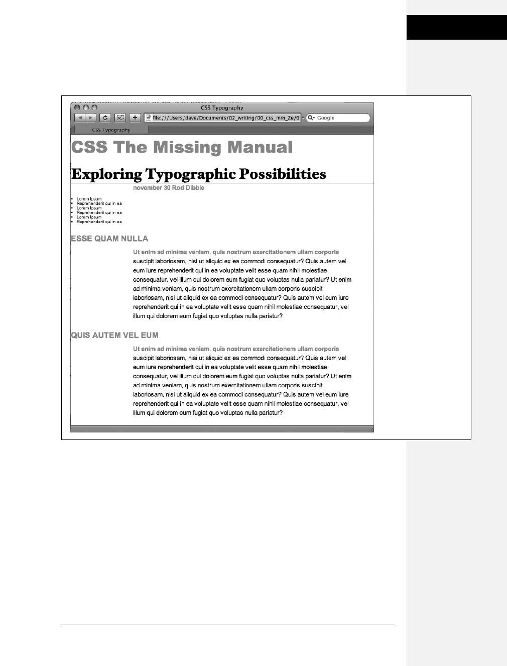
Chapter 6: Formatting Text 143
Tutorial: Text
Formatting in Action
9. Save the page and open it in a web browser to preview your work.
At this point, the page should look like Figure 6-13.
Formatting Lists
This page has a single bulleted list. The plan is to move the list over to the right
edge of the page and have the text following it wrap around it. CSS makes this little
trick easy.
1. Return to your text editor and the text.html file. Add the following style at the
end of the page’s internal style sheet:
#main ul {
margin: 50px 0 25px 50px;
width: 150px;
float: right;
}
Figure 6-13:
The page is starting to
come together. The
headlines, paragraphs,
and basic text settings
are in place. Depending
on which fonts you have
on your computer, you
may notice slight
differences between your
design and the one
pictured here.
Specifically, if you’re on
Windows, the “Exploring
Typographic Possibilities”
headline will use either
Garamond or Arial. This
screenshot, taken on a
Mac, uses the “Hoefler
Text” font family
specified in step 5 on
page 141.
Download at Boykma.Com

144 CSS: The Missing Manual
Tutorial: Text
Formatting in Action
When formatting lists, you’ll usually create styles for two different elements: the
list itself (either the <ul> tag for bulleted lists or the <ol> tag for numbered lists)
and the individual list items (the <li> tag). This style controls the entire list.
There are a few things happening in this style. First, the margin property uses
the shorthand method. This one line sets all four margins around the list,
replacing the four individual margin properties (margin-top, margin-right, and
so on). The four values are order like this: top, right, bottom, left. So for this
style, 50 pixels of space gets added above the list, 0 space on the right, 25 pixels
on the bottom, and 50 pixels on the left.
The width property (discussed in detail on page 164) makes the entire list 150
pixels wide. If any particular list item has more text than will fit within that
space, it wraps to another line. The float property is the real magic—in this case,
float: right means move the list over to the right edge of the page. This property
also causes the text following the list to wrap around the left side of the list. It’s
a cool trick, and you’ll learn a lot more about floats on page 169.
You’ll control the look of the individual list items next.
2. Add one more style to the internal style sheet in the text.html file:
#main li {
color: #207EBF;
font-size: 1.5em;
margin-bottom: 7px;
}
Nothing new here: just changing the color and size and adding space below
each list item. Time to check out your progress.
Note: If you want to add space between list items, you need to add top or bottom margins to the <li>
tag. Adding margins to the <ul> or <ol> tags simply adds space around the entire list.
3. Save the page and preview it in a web browser.
The page should now look like Figure 6-14.
Fine-Tuning with Classes
Sometimes you want even more control over how a style is applied. For example, while
you might want most paragraphs in one section of the page to look the same, you
might also want one or two paragraphs to have their own unique look. In this tutorial,
the paragraph of text near the top of the page—“November 30 Rod Dibble”—contains
Download at Boykma.Com
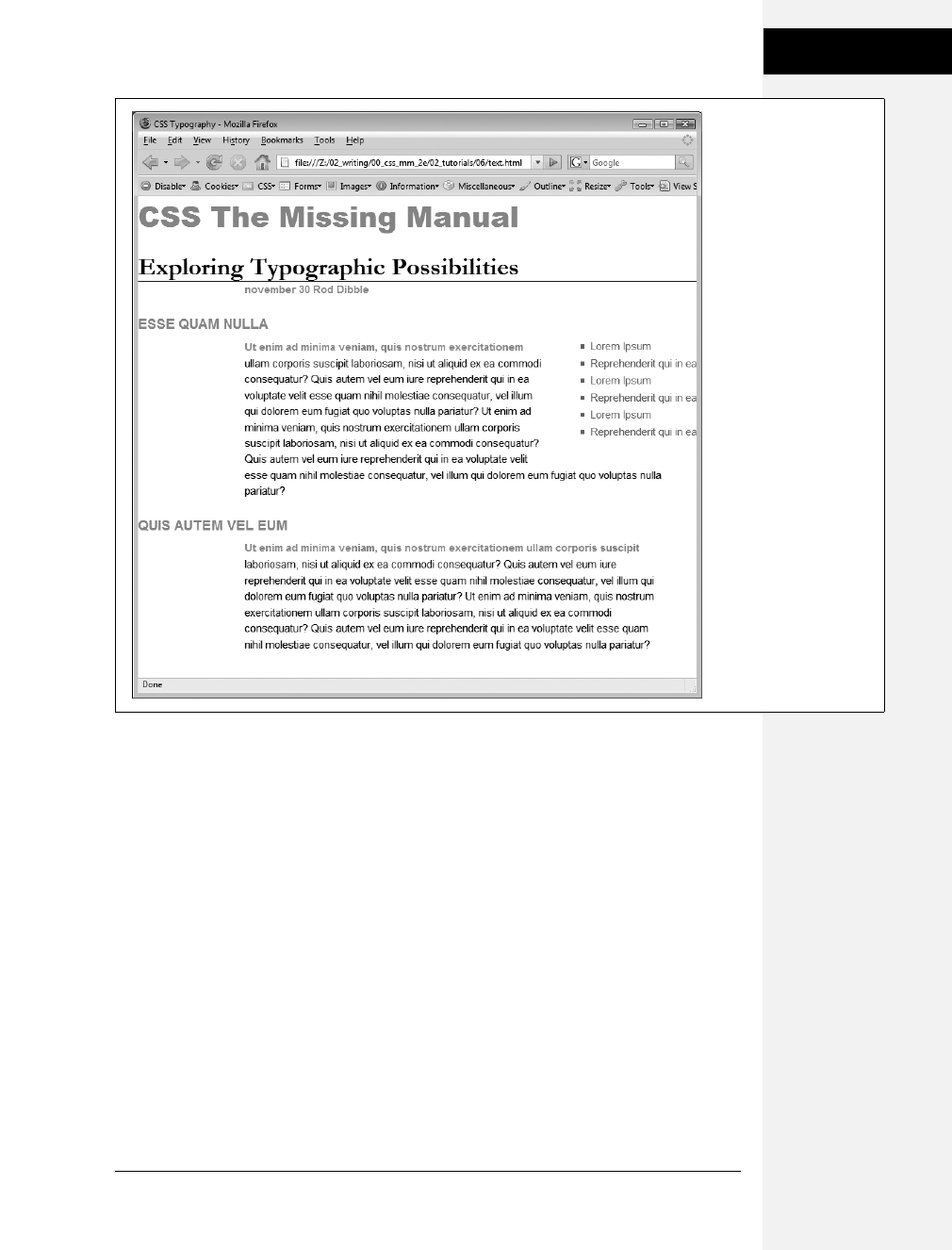
Chapter 6: Formatting Text 145
Tutorial: Text
Formatting in Action
some unique information—a publication date and author. You want it stand out from
the other paragraphs, so you’ll add a class to the HTML and create a class style.
1. Locate the HTML for that paragraph —<p>november 30 <strong>Rod Dib-
ble</strong></p>—and add class="byline" to the opening <p> tag. The
HTML should look like this:
<p class="byline">november 30 <strong>Rod Dibble</strong></p>
Now it’s a simple matter of creating a class style that overrides the generic for-
matting of the other paragraphs on the page.
2. In the internal style sheet near the top of the page, add a style for that paragraph:
#main .byline {
color: #999999;
font-size: 1.6em;
margin: 5px 0 25px 50px;
}
Figure 6-14:
The float property gives
you some interesting
design options. In this
case, the bulleted list is
floated to the right edge
of the page. In fact the
float property is so
useful, you’ll see that it’s
the main ingredient of
CSS-based layouts, like
the ones you’ll learn
about in Chapter 11.
Download at Boykma.Com

146 CSS: The Missing Manual
Tutorial: Text
Formatting in Action
This style tweaks the color, size, and placement of just that one paragraph. Note
that if you’d just named that style .byline—a basic class selector—it wouldn’t
work. Thanks to the rules of the cascade described in the last chapter, .byline is
less specific (less powerful) than the #main p style you created in step 7 on page
142, so it wouldn’t be able to override the color, size, and margins specified by
#main p. However, #main .byline is more specific and successfully formats that
top paragraph.
That paragraph still needs some work. It would be great if the name stood out
more. The HTML in this case provides just the hook you need.
3. Add another style to the style sheet:
#main .byline strong {
color: #207EBF;
text-transform: uppercase;
margin-left: 5px;
}
If you look at the HTML in step 1 above, you’ll see that the name—Rod Dib-
ble—is inside a <strong> tag. The <strong> tag is used to emphasize text and
mark it as important. But that doesn’t mean you have to let it be bold, the way
web browsers normally display that tag. Instead, this descendent selector tar-
gets the <strong> tag but only when it appears inside another tag with the
class .byline, and only if all of that is inside yet another tag with the ID main—
whew, that’s pretty specific.
This style turns the text blue, makes it uppercase and adds a bit of space on the
left side (nudging the name over just a bit from the “November 30” text).
Adding the Finishing Touches
For the last bit of design, you’ll incorporate a few design touches that format the
page and that main div so they both look better. Then you’ll finish up with a cool
bit of text formatting.
1. Return to your text editor and the text.html file.
First, you’ll add a background color and image to the page.
2. Locate the body style near the top of the internal style sheet and add one new
property so that it looks like this (changes are in bold):
body {
font-size: 62.5%;
font-family: Arial, Helvetica, sans-serif;
color: #002D4B;
background: #E1EEFD url(images/bg_body.png) repeat-x;
}
Download at Boykma.Com

Chapter 6: Formatting Text 147
Tutorial: Text
Formatting in Action
The background property is a powerful tool for any web designer. You’ve
already used it a couple of times in earlier tutorials; it lets you add color and
insert and control the placement of an image to the background of any tag.
You’ll learn the ins and outs of this property on page 164, but for now this line
changes the background color of the page to light blue and adds a dark blue
stripe to the top of the page.
Next you’ll spruce up the main div.
3. Add another style in between the body style and the #main h1 style:
#main {
width: 740px;
margin: 0 auto;
padding: 0 10px;
border: 4px solid white;
background: transparent url(images/bg_banner.jpg) no-repeat;
}
In other words, click after the closing } for the body style, hit Enter and type the
code above. You don’t necessarily have to put the style in that spot for it to
work, but for organizational purposes putting the style that controls the div
before the other styles that format tags inside that div seems to make sense.
Note: You’ll learn strategies for organizing your style sheets on page 421.
The width property sets an overall width of this div (and the content inside it),
essentially turning this page into a 740-pixel-wide document. The margin prop-
erty values here—0 auto—put 0 pixels of space above and below the div and set
the left and right margins to auto, which centers the div in the middle of the
browser window. The padding property adds space inside the box, pushing con-
tent inside the div away from the border line. Finally, you’ve placed an image
into the background of the div.
Those last two styles didn’t have anything to do with text formatting, but if you
preview the page, you’ll see that they make it look a lot better…except for those
two top headlines. The first headline isn’t bold enough, and the second should
fall below the newly added graphic.
4. Add one last style right after the #main h1 style:
#main h1 strong {
font-size: 150px;
color: white;
line-height: 1em;
margin-right: -1.25em;
}
Download at Boykma.Com

148 CSS: The Missing Manual
Tutorial: Text
Formatting in Action
The HTML for the headline looks like this:
<h1><strong>CSS</strong> The Missing Manual</h1>
The “CSS” is enclosed inside <strong> tags, so this descendent selector formats
only that text (in that sense, it’s like the style you added in step 3 on page 147 that
took advantage of a <strong> tag embedded within a paragraph). The text size is
pumped way up, it’s color changed, and line height is adjusted so that it fits inside
the top of the page. You’ll notice that the line height is set to 1em—as you read on
page 22, an em is based on the current font size of the element, so in this case the
line height will translate to 150 pixels—that’s the font size of this style.
The one cool trick is the margin-right property, which is set to a negative value:
–1.25em. Since a positive margin pushes elements away, a negative margin actu-
ally pulls elements on top of each other. In this case, the rest of the text in the
headline—“The Missing Manual”—is scooted over 1.25 em, which is 1.25 times
the font size (150 pixels), on top of the “CSS” text.
Note: Negative margins are perfectly legal (although tricky) CSS. They’re even used for some pretty
advanced CSS layout, as described on page 318.
5. Save the file and preview it in a web browser.
It should look like Figure 6-14. You can compare your work to the finished text.
html page located in the 06_finished folder.
Congratulations! You’ve explored many of the text formatting properties offered
by CSS, and turned ho-hum HTML into an attractive, attention-getting design. In
the next chapter, you’ll explore graphics, borders, margins, and other powerful
CSS design options offered by CSS.
Download at Boykma.Com

Chapter 6: Formatting Text 149
Tutorial: Text
Formatting in Action
Figure 6-15:
With a little CSS, you can
turn plain text into a
powerful design
statement that helps
guide readers through
the information on
your site.
Download at Boykma.Com

Download at Boykma.Com

151
Chapter 7
chapter
7
Margins, Padding, and
Borders
Every HTML tag is surrounded by a world of properties that affect how the tag
appears in a web browser. Some properties—like borders and background col-
ors—are immediately obvious to the naked eye. Others, though, are invisible—like
padding and margin. They provide a bit of empty space on one or more sides of a
tag. By understanding how these properties work, you can create attractive col-
umns and decorative sidebars and control the space around them (what designers
call white space) so your pages look less cluttered, lighter, and more professional.
Taken together, the CSS properties discussed in this chapter make up one of the
most important concepts in CSS—the box model.
Understanding the Box Model
You probably think of letters, words, and sentences when you think of a para-
graph or headline. You also probably think of a photo, logo, or other picture when
you think of the <img> tag. But a web browser treats these (and all other) tags as
little boxes. To a browser, any tag is a box with something inside it—text, an image,
or even other tags containing other things, as illustrated in Figure 7-1.
Surrounding the content are different properties that make up the box:
•padding is the space between the content and the content’s border. Padding is
what separates a photo from the border that frames the photo.
•border is the line that’s drawn around each edge of the box. You can have a
border around all four sides, on just a single side, or any combination of sides.
Download at Boykma.Com

152 CSS: The Missing Manual
Understanding the
Box Model
•background-color fills the space inside the border, including the padding area.
•margin is what separates one tag from another. The space that commonly
appears between the tops and bottoms of paragraphs of text on a web page, for
example, is the margin.
For a given tag, you can use any or all of these properties in combination. You can
set just a margin for a tag or add a border, margins, and padding. Or you can have
a border and margin but no padding, and so on. If you don’t adjust any of these
properties, then you’ll end up with the browser’s settings, which you may or may
not like. For example, while browsers usually don’t apply either padding or bor-
ders to any tags on a page, some tags like headings and paragraphs have a preset
top and bottom margin.
Figure 7-1:
The CSS box model includes the content
inside a tag (for example, several sentences of
text) plus padding, borders, and margins. The
area within the border, which includes the
content and padding, may also have a
background color. Actually, the background
color is drawn underneath the border, so
when you assign a dashed or dotted border,
the background color appears in the gaps
between the dots or dashes.
content
top margin
top border
top padding
left
padding
left
border
left
margin
right
padding
right
margin
right
border
bottom padding
bottom border
bottom margin
border
padding
margin
content
Download at Boykma.Com
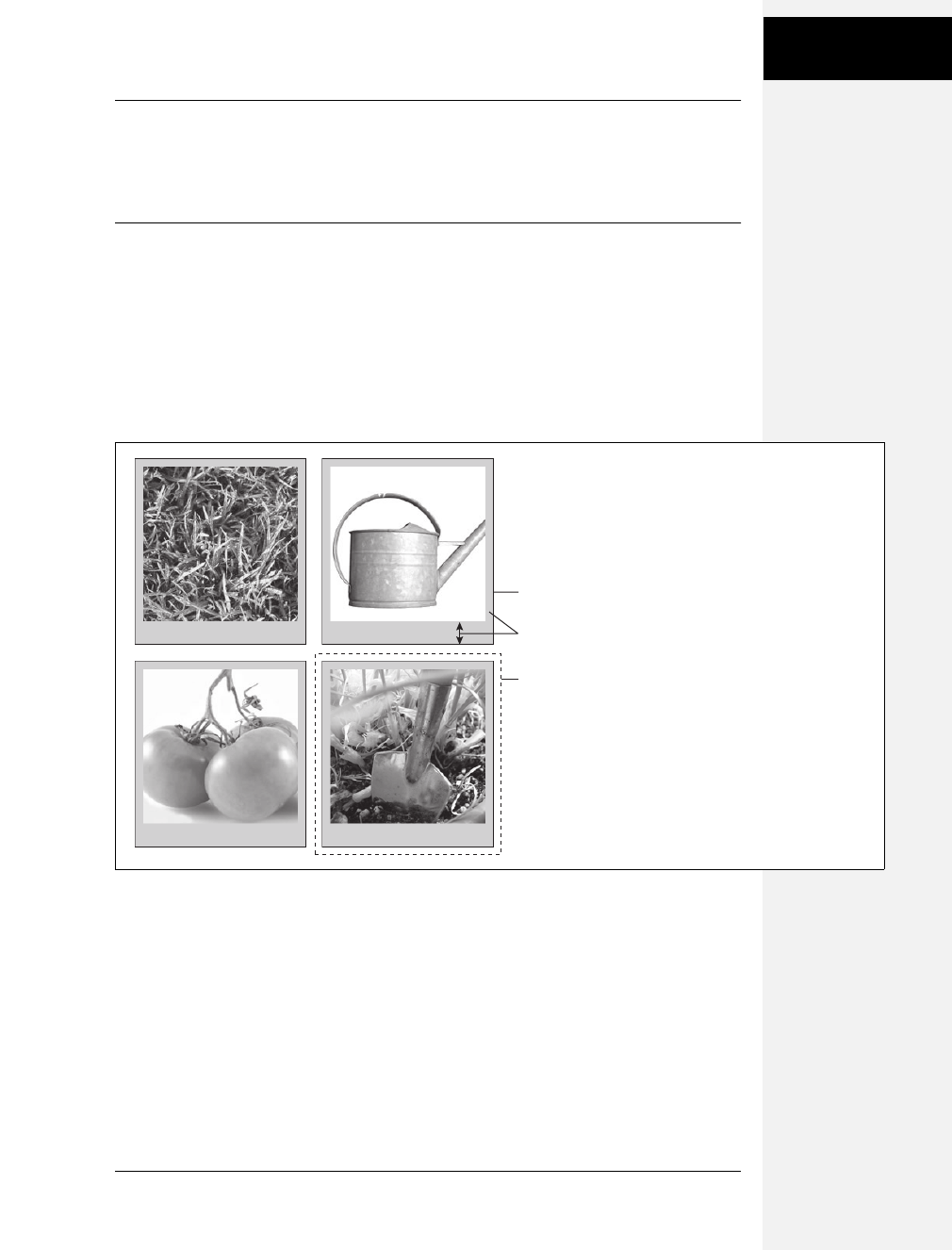
Chapter 7: Margins, Padding, and Borders 153
Control Space with
Margins and
Padding
Note: As discussed on page 423, because different browsers apply different amounts of padding and
margin to the same tags, it’s best to “zero-out” padding and margin values for all tags. In other words, use
a set of simple styles—called a CSS reset—to remove padding and margin from HTML tags. Then, when
you create additional styles that add margin and padding, you can be assured that you’ll have a consistent
cross-browser presentation.
Control Space with Margins and Padding
Both margins and padding add space around content. You use these properties to
separate one element from another—for example, to add space between a left-
hand navigation menu and the main page content on the right—or to inject some
white space between content and a border. You may want to move the border away
from the edge of a photo (see Figure 7-2).
Padding and margin function similarly, and unless you apply a border or back-
ground color, you can’t really tell whether the space between two tags is caused by
padding or by a margin. But if you have a border around an element or a back-
ground behind it, then the visual difference between the two properties is significant.
Padding adds space between the content, and the border and keeps the content
from appearing cramped inside the box, while margins add white space (often
called a gutter) between elements giving the overall look of the page a lighter
appearance.
Figure 7-2:
Each photo on this page has a 10-pixel
margin, so the gap separating two photos is
20 pixels. Padding separates the images from
their borders and exposes a gray background
color. You can set the border, margin, and
padding independently for each edge. Notice
the larger padding applied to the bottom edge
of each photo.
border
padding
margin
Download at Boykma.Com
154 CSS: The Missing Manual
Control Space with
Margins and
Padding
You can control each side of the margin or padding for an element independently.
Four properties control margin edges: margin-top, margin-right, margin-bottom,
and margin-left. Similarly, four properties control padding: padding-top, padding-
right, padding-bottom, and padding-left. You can use any valid CSS measurement
to define the size of a margin or padding, like so:
margin-right: 20px;
padding-top: 3em;
margin-left: 10%;
Pixels and ems are commonly used and act just as they do with text (see page 120).
A 20-pixel margin adds 20 pixels of space, and 3ems of padding adds space equal
to 3 times the font size of the styled element. You can also use percentage values,
but they’re tricky. (See the box below for the details.)
Note: To remove all the space for a margin or padding, use 0 (margin-top: 0 or padding-bottom: 0, for
example). To remove space around all four edges of the browser window—to let a banner or logo or other
page element butt right up to the edge without a gap—give the body tag a margin of 0 and a padding of 0:
margin: 0; padding 0;.
POWER USERS’ CLINIC
Margins, Padding, and Percentages
When you use percentages, web browsers calculate the
amount of space based on the width of the containing ele-
ment. On a simple web page, the containing element is the
body of the page, and it fills the browser window. In this
case, the percentage value is based on the width of the
browser window at any given time. Say the window is 760
pixels wide. In that case, a 10 percent left margin adds 76
pixels of space to the left edge of the styled element. But if
you resize the browser window, then that value changes.
Narrowing the browser window to 600 pixels changes the
margin to 60 pixels (10 percent of 600).
However, the containing element isn’t always the width of
the browser window. As you’ll see in later chapters, when
you create more sophisticated layouts, you can introduce
new elements that help organize your page.
You may want to add a <div> tag to a page in order to
group related content into a sidebar area. (You’ll see an
example of this in the tutorial on page 181.) That sidebar
might have a specified width of 300 pixels. Tags inside the
sidebar consider the <div> tag their containing element. So
a tag in the sidebar with a right margin of 10 percent will
have 30 pixels of empty space to its right.
To make matters more confusing, top and bottom percent-
age values are calculated based on the width of the contain-
ing element, not its height. So a 20 percent top margin is 20
percent of the width of the styled tag’s container.
Download at Boykma.Com

Chapter 7: Margins, Padding, and Borders 155
Control Space with
Margins and
Padding
Margin and Padding Shorthand
You’ll frequently want to set all four sides of a style’s margin or padding. But typ-
ing out all four properties (margin-right, margin-left, and so on) for each style gets
tedious. Fear not: You can use the shortcut properties named margin and padding
to set all four properties quickly:
margin: 0 10px 10px 20px;
padding: 10px 5px 5px 10px;
Note: If the value used in a CSS property is 0, then you don’t need to add a unit of measurement. For
example, just type margin: 0; instead of margin: 0px;.
The order in which you specify the four values is important. It must be top, right,
bottom, and left. If you get it wrong, you’ll be in trouble. In fact, the easiest way to
keep the order straight is to remember to stay out of TRouBLe—top, right, bot-
tom, and left.
If you want to use the same value for all four sides, it’s even easier—just use a single
value. If you want to remove margins from all <h1> tags, you can write this style:
h1 {
margin: 0;
}
Similarly, use shorthand to add the same amount of space between some content
and its border:
padding: 10px;
Note: When you’re using the same value for both top and bottom and another value for both left and
right, you can use two values. margin: 0 2em; sets the top and bottom margins to 0 and the left and right
margins to 2ems.
Colliding Margins
When it comes to CSS, two plus two doesn’t always equal four. You could run into
some bizarre math when the bottom margin of one element touches the top
margin of another. Instead of adding the two margins together, a web browser
applies the larger of the two margins (Figure 7-3, top). Say the bottom margin of
an unordered list is set to 30 pixels, and the top margin of a paragraph following
the list is 20 pixels. Instead of adding the two values to create 50 pixels of space
between the list and the paragraph, a web browser uses the largest margin—in this
case 30 pixels. If you don’t want this to happen, then use top or bottom padding
instead (Figure 7-3, bottom).
Download at Boykma.Com
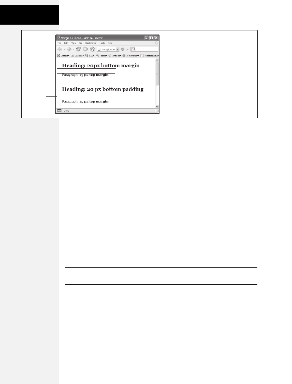
156 CSS: The Missing Manual
Control Space with
Margins and
Padding
Things get even weirder when one element’s inside another element. This situation
can lead to some head-scratching behavior. For example, say you add a “warning”
box to a page (like a <div> tag to hold a warning message inside it). You add a 20
pixel top and bottom margin to separate the warning box from the heading above
it and the paragraph of text below it. So far so good.
But say you insert a heading inside the warning box, and to put a little room
between it and the top and bottom of the div, you set the heading’s margin to 10
pixels. You may think you’re adding 10 pixels of space between the heading and
the top and bottom of the div, but you’d be wrong (Figure 7-4, left). Instead, the
margin appears above the div. In this case, it doesn’t matter how large a margin
you apply to the headline—the margin still appears above the div.
Note: In the lingo of CSS, this phenomenon is known as “collapsing margins,” meaning two margins
actually become one.
You have two ways around this problem: Either add a small amount of padding
around the <div> tag or add a border to it. Since border and padding sit between
the two margins, the margins no longer touch, and the headline has a little breath-
ing room (Figure 7-4, right).
Note: Horizontal (left and right) margins and margins between floating elements don’t collapse in this way.
Absolutely and relatively positioned elements—which you’ll learn about in Chapter 13—don’t collapse either.
Removing Space with Negative Margins
Most measurements in CSS have to be a positive value—after all what would text
that’s negative 20 pixels tall (or short) look like? Padding also has to be a positive
value. But CSS allows for many creative techniques using negative margins.
Figure 7-3:
When two vertical margins meet, the smaller
one collapses. Although the top headline has a
bottom margin of 20 pixels, and the paragraph
has a top margin of 15 pixels, a web browser
adds only 20 pixels of space between the two
elements. To get the full 35 pixels’ worth of
space that you want, use padding instead of
margins, as shown in the bottom headline. Here,
the heading has 20 pixels of bottom padding.
Those 20 pixels get added to the 15-pixel top
margin of the paragraph to form a 35-pixel gap.
2
0 pixels
35 pixels
Download at Boykma.Com
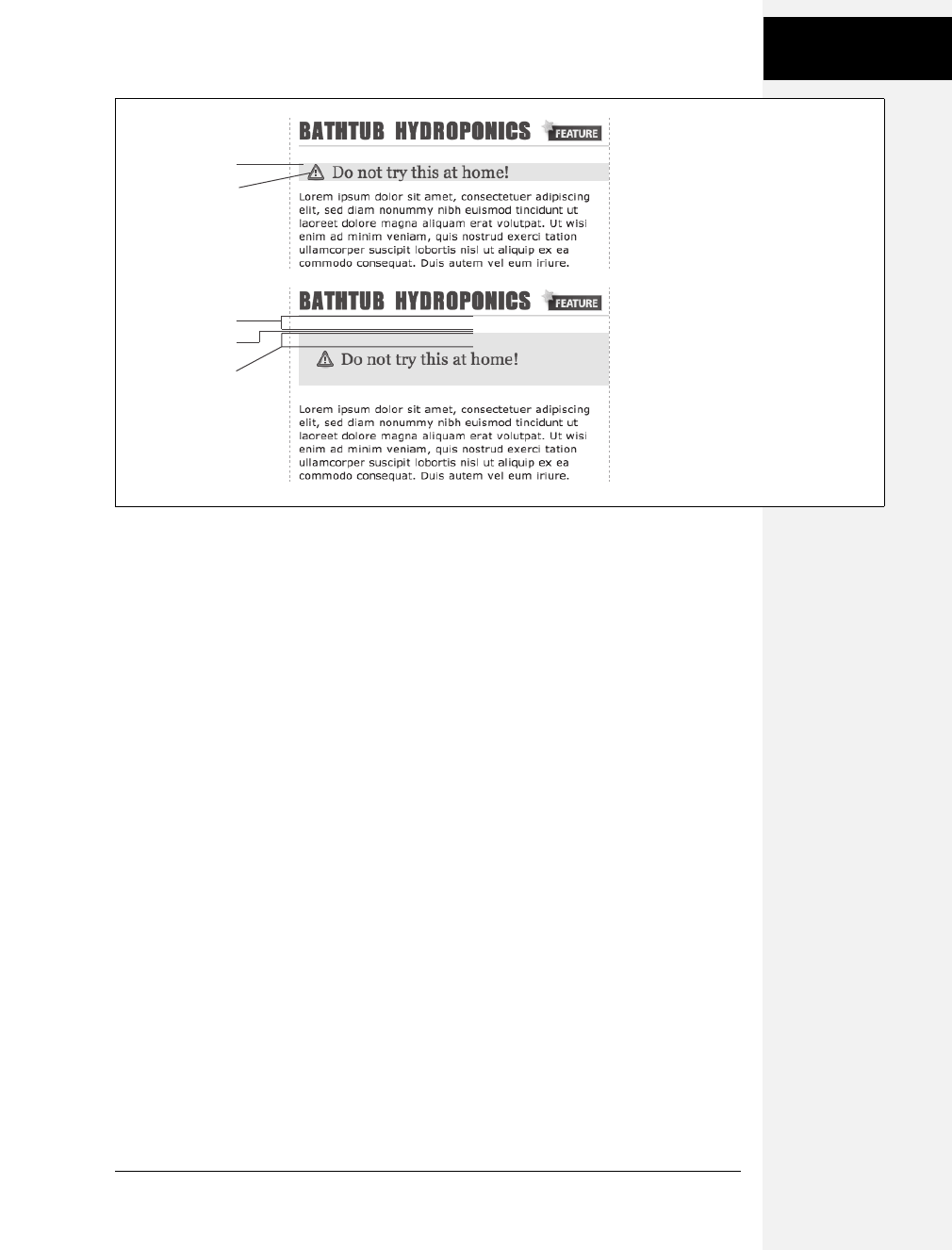
Chapter 7: Margins, Padding, and Borders 157
Control Space with
Margins and
Padding
Instead of adding space between a tag and elements around it, a negative margin
removes space. So you can have a paragraph of text overlap a headline, poke out
of its containing element (a sidebar or other layout <div>), or even disappear off
an edge of the browser window. And, hey, you can even do something useful
with negative margins.
Even when you set the margins between two headlines to 0, there’s still a little
space between the text of the headlines (thanks to the text’s line height, as
described on page 128 in the last chapter). That’s usually a good thing, since it’s
hard to read sentences that bunch together and touch. But, used in moderation,
tightening the space between two headlines can produce some interesting effects.
The second headline of Figure 7-5 (the one that begins “Raise Tuna”) has a top
margin of –10px applied to it. This moves the headline up 10 pixels so it slightly
overlaps the space occupied by the headline above it. Also, the left and right bor-
ders of the “Extra! Extra!” headline actually touch the letters of the larger headline.
You can also use a negative margin to simulate negative padding. In the third
headline of Figure 7-5, the one that begins with “The Extraordinary Technique,” a
line appears directly under the text. This line is actually the top border for the para-
graph that follows. (You’ll learn how to add borders on page 160.) But because
that paragraph has a negative top margin, the border moves up and under the
headline. Notice how the descending tail for the letter Q in the headline actually
hangs below the border. Since padding—the space between content (like that letter
Q) and a border—can’t be negative, you can’t move a bottom border up over text
or any other content. But you get the same effect by applying a border to the fol-
lowing element and using a negative margin to move it up.
Figure 7-4:
Holy shrinking margins Batman!
Top: Whenever vertical margins touch,
even when one element is inside
another element (like the <h2> tag
inside this div), the margins collapse.
Bottom: To solve this dilemma, add a
little padding or a border around the
containing element (1 pixel of bottom
padding on the <div>, in this case).
<div>
<h1>
2
0 pixel margin
2
0 pixel margin
1 pixel padding
Download at Boykma.Com
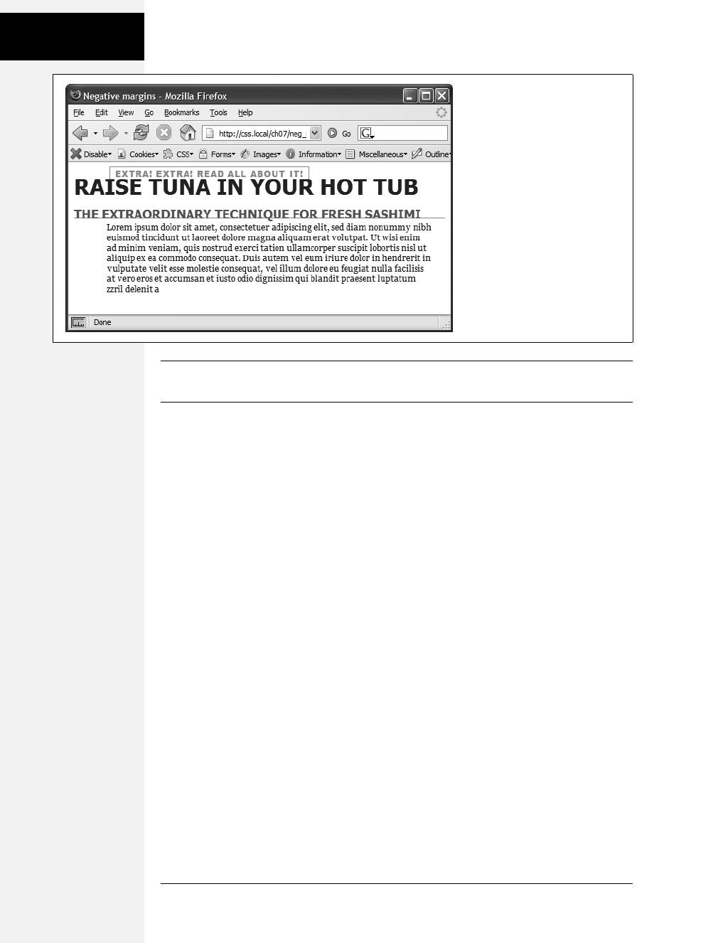
158 CSS: The Missing Manual
Control Space with
Margins and
Padding
Tip: You can actually use a negative top margin on the paragraph or a negative bottom margin on the
headline. Both have the same effect of moving the paragraph up close to the headline.
Displaying Inline and Block-Level Boxes
Although web browsers treat every tag as a kind of box, not all boxes are alike. CSS
has two different types of boxes—block boxes and inline boxes—that correspond to
the two types of tags—block-level and inline tags.
Ablock-level tag creates a break before and after it. The <p> tag, for example, creates
a block that’s separated from tags above and below. Headlines, <div> tags, tables
and lists are other examples of block-level tags.
Inline tags don’t create a break before or after them. They appear on the same line
as the content and tags beside them. The <strong> tag is an inline tag. A word for-
matted with this tag happily sits next to other text—even text wrapped in other
inline tags like <em>. In fact, it would look pretty weird if you emphasized a single
word in the middle of a paragraph with the <strong> tag and that word suddenly
appeared on its own line by itself. Other inline tags are <img> for adding images,
<a> for creating links, and the various tags used to create form fields.
In most cases, CSS works the same for inline boxes and block boxes. You can style
the font, color, and background and add borders to both types of boxes. However,
when it comes to margins and padding, browsers treat inline boxes differently.
While you can add space to the left or right of an inline element using either left or
right padding or left or right margins, you can’t increase the height of the inline
element with top or bottom padding or margins. In the top paragraph in
Figure 7-6, the inline element is styled with borders, a background color, and 20
pixels of margin on all four sides. But the browser only adds space to the left and
right sides of the inline element.
Figure 7-5:
In this example, to make the last
paragraph’s top border look like
it’s actually the bottom border for
the headline above it, add a little
padding to the paragraph. Around
5 pixels of top padding moves the
paragraph down from the border,
while 4ems of left padding indents
the paragraph’s text, still allowing
the top border to extend to the
left edge.
Download at Boykma.Com
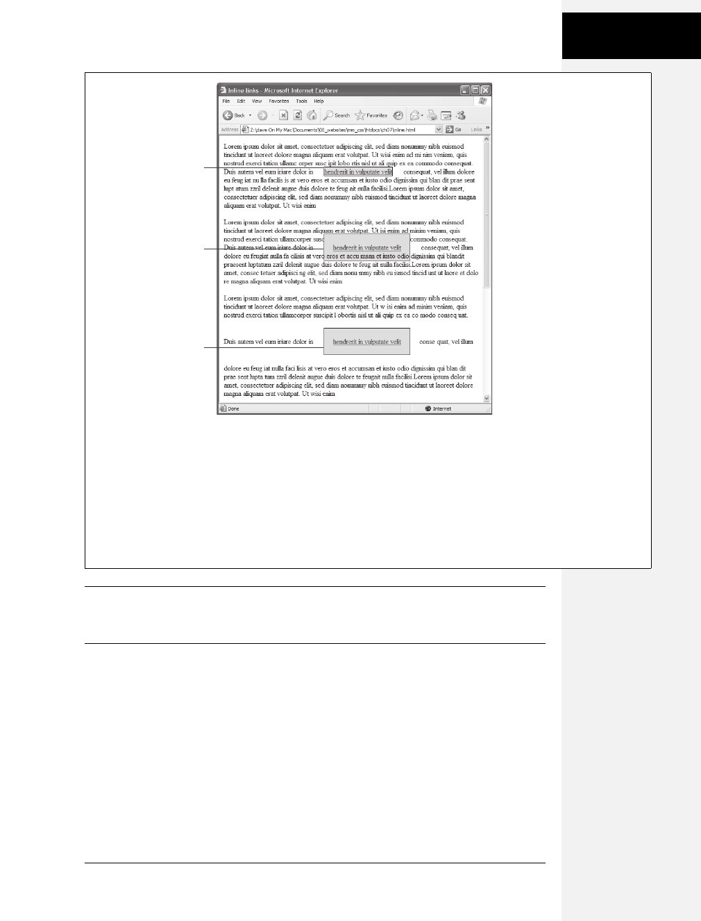
Chapter 7: Margins, Padding, and Borders 159
Control Space with
Margins and
Padding
Note: One exception to the rule that inline elements don’t get taller when padding or margin are added
is the <img> tag (even though it’s an inline tag). Web browsers correctly expand the height of the image’s
box to accommodate any padding and margins you add.
At times, you may wish an inline element behaved more like a block-level element
and vice versa. Bulleted lists present each item as its own block—each list item is
stacked above the next. Or, you may want to change that behavior so the list items
appear side by side, all on a single line, as in a navigation bar (you can see an
example of one on page 238 in Chapter 9). Finally, you may want to treat an inline
element like a block-level element. Maybe you want an image embedded in a para-
graph to be on its own line, with space above and below.
Figure 7-6:
Adding top or bottom margins
and padding doesn’t make an
inline element any taller, so
you can run into some weird
formatting. In the middle
paragraph, the background
and borders of a link overlap
the text above and below. The
background appears on top of
the line before the styled inline
text, but underneath the line
following it because the
browser treats each line as if
it’s stacked on top of the
previous line. Normally, that
isn’t a problem since lines of
text don’t usually overlap. If
you want top and bottom
margins and padding to work
for an inline element you can
use the display:inline-block
instruction (bottom). This
leaves the item inline, but
treats it like a box so padding,
margins, borders, and width
and height are all applied
(and obeyed). This even works
in Internet Explorer 6 and 7,
but only for normally inline
elements like links, <strong>,
<em>, and <span> tags; you
should also add vertical-align:
middle so that IE 6 and 7
display the inline block the
same as other browsers.
20 pixel
margins
20 pixel
margins
and
20 pixel
padding
display: inline-block;
vertical-align: middle;
padding: 20px;
margin: 20px;
Download at Boykma.Com

160 CSS: The Missing Manual
Adding Borders
Fortunately, CSS includes a property that lets you do just that—the display prop-
erty. With it, you can make a block-level element act like an inline element:
display: inline;
Or you can make an inline element, like an image or link, behave like a block-level
element:
display: block;
Note: The display property has a myriad of possible options, most of which don’t work in all browsers.
The inline-block value works in current browsers (see Figure 7-6). Another value, none, works in most
browsers and has many uses. It does one simple thing—completely hides the styled element so it doesn’t
appear in a web browser. With a dab of JavaScript programming, you can make an element hidden in this
way instantly become visible, simply by changing its display back to either inline or block. You can even
make an element with a display of none suddenly appear using CSS: You’ll see an example of that on
page 477. Finally, a few other values for the display property are recognized by IE 8, Firefox, Safari, and
Opera and provide one way to create CSS-based layout. This advanced technique is discussed in the box
on page 453.
Adding Borders
A border is simply a line that runs around an element. As shown back in
Figure 7-1, it sits between any padding and margins you set. A border around
every edge can frame an image or mark the boundaries of a banner or other page
element. But borders don’t necessarily have to create a full box around your content.
While you can add a border to all four edges, you can just as easily add a border to
just the bottom or any combination of sides. This flexibility lets you add design
elements that don’t necessarily feel like a border. For example, add a border to the
left of an element, make it around 1em thick, and it looks like a square bullet. A
single border under a paragraph can function just like the <hr> (horizontal rule)
by providing a visual separator between sections of a page.
You control three different properties of each border: color, width, and style. The color
can be a hexadecimal number, a keyword, or an RGB value, just like with text (see
page 118). A border’s width is the thickness of the line used to draw the border. You
can use any CSS measurement type (except percentages) or the keywords thin,
medium, and thick. The most common and easily understood method is simply pixels.
Finally, the style controls the type of line drawn. There are many different styles,
and some look very different from browser to browser, as you can see in Figure 7-7
You specify the style with a keyword. For example solid draws a solid line and
dashed creates a line made up of dashes. CSS offers these styles: solid, dotted,
dashed, double, groove, ridge, inset, outset, none, and hidden. (None and hidden work
the same way: They remove the border entirely. The none value is useful for turn-
ing off a single border. See the example on page 163.)
Download at Boykma.Com
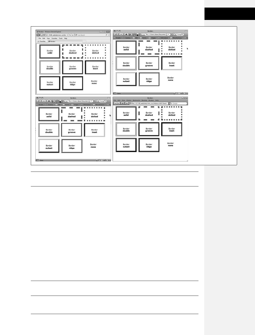
Chapter 7: Margins, Padding, and Borders 161
Adding Borders
Note: In Windows Internet Explorer version 6 and earlier, a 1-pixel dotted border looks just like a 1-pixel
dashed border.
Border Property Shorthand
If you’ve ever seen a list of the different border properties available in CSS, you
may think borders are really complex. After all, there are 20 different border prop-
erties, which you’ll meet in the following sections, plus a couple that apply to
tables. But all these properties are merely variations on a theme that provide differ-
ent ways of controlling the same three properties—color, width, and style—for
each of the four borders. The most basic and straightforward property is border,
which simply adds four borders:
border: 4px solid #F00;
The above style creates a solid, red, 4-pixel border. You can use this property to
create a basic frame around a picture, navigation bar, or other item that you want
to appear as a self-contained box.
Note: The order in which you write the properties doesn’t matter. border: 4px solid #F00; works as well
as border: #F00 solid 4px;.
Figure 7-7:
The appearance of
border styles can vary
greatly from browser to
browser. The browsers
pictured here are Internet
Explorer 8 for Windows
(top left), Firefox 3 for
Mac (top right), Opera 9
for Mac (bottom left),
and Safari 3 for Windows
(bottom right). Internet
Explorer 6 and 7 display
borders the same as IE 8
in this image.
Download at Boykma.Com

162 CSS: The Missing Manual
Adding Borders
Formatting Individual Borders
You can control each border individually using the appropriate property: border-top,
border-bottom, border-left, or border-right. These properties work just like the regular
border property, but they control just one side. The following property declaration
adds a 2-pixel, red, dashed line below the style:
border-bottom: 2px dashed red;
You can combine the border property with one of the edge-specific properties like
border-left to define the basic box for the entire style but customize a single bor-
der. Say you want the top, left, and right sides of a paragraph to have the same type
of border, but you want the bottom border to look slightly different. You can write
four lines of CSS, like this:
border-top: 2px solid black;
border-left: 2px solid black;
border-right: 2px solid black;
border-bottom: 4px dashed #333;
Or, you can achieve the same effect as the previous four lines of CSS with just
two lines:
border: 2px solid black;
border-bottom: 4px dashed #333;
The first line of code defines the basic look of all four borders, and the second line
redefines just the look of the bottom border. Not only is it easier to write two lines
of CSS instead of four, but it also makes changing the style easier. If you want to
change the color of the top, left, and right borders to red, then you only have to
edit a single line, instead of three:
border: 2px solid red;
border-bottom: 4px dashed #333;
When you use this shortcut method—defining the basic look of all four borders
using the border property and then overriding the look of a single border with one
of the edge-specific properties like border-left—it’s crucial that you write the code
in a specific order. The more general, global border setting must come first, and
the edge-specific setting second, like so:
border: 2px solid black;
border-bottom: 4px dashed #333;
Because the border-bottom property appears second, it overrides the setting of the
border property. If the border-bottom line came before the border property, then it
would be cancelled out by the border property, and all four borders would be iden-
tical. The last property listed can overrule any related properties listed above it.
This behavior is an example of the CSS cascade you read about in Chapter 5.
Download at Boykma.Com

Chapter 7: Margins, Padding, and Borders 163
Adding Borders
You can also use this shortcut method to turn off the display of a single border
with the none keyword. Say you want to put a border around three sides of a style
(top, left, and bottom) but no border on the last side (right). Just two lines of code
get you the look you’re after:
border: 2px inset #FFCC33;
border-right: none;
The ability to subtly tweak the different sides of each border is the reason there are
so many different border properties. The remaining 15 properties let you define
individual colors, styles, and widths for the border and for each border side. For
example, you could rewrite border: 2px double #FFCC33; like this:
border-width: 2px;
border-style: double;
border-color: #FFCC33;
Since you’re using three lines of code instead of one, you’ll probably want to avoid
this method. However, each border edge has its own set of three properties, which
are helpful for overriding just one border property for a single border edge. The
right border has these three properties: border-right-width, border-right-style, and
border-right-color. The left, top, and bottom borders have similarly named proper-
ties—border-left-width, border-left-style, and so on.
You can change the width of just a single border like this: border-right-width: 4px;.
One nice thing about this approach is that if you later decide the border should be
solid, you need to edit only the generic border property by changing dashed to solid.
In addition, you can specify individual values for each side of the border using the
border-width,border-style, and border-color properties. For example, border-width:
10px 5px 15px 13px; applies four different widths to each (top, right, bottom, and
left) side.
Imagine that you want to have a 2-pixel, dashed border around the four edges of a
style, but you want each border to be a different color. (Perhaps you’re doing a
website for kids.) Here’s a quick way to do that:
border: 2px dashed;
border-color: green yellow red blue;
This set of rules creates a 2-pixel dashed border around all four edges, while making
the top edge green, the right edge yellow, the bottom edge red, and the left edge blue.
Note: You usually add padding whenever you use borders. Padding provides space between the border
and any content, such as text, images, or other tags. Unless you want to put a border around an image,
borderlines usually sit too close to the content without padding.
Download at Boykma.Com

164 CSS: The Missing Manual
Coloring the
Background
Coloring the Background
It’s a cinch to add a background to an entire page, an individual headline, or any
other page element. Use the background-color property followed by any of the valid
color choices described on page 119. If you want, add a shockingly bright green to
the background of a page with this line of code:
body { background-color: #6DDA3F; }
Alternatively, you can create a class style named, say, .review with the background-
color property defined, and then apply the class to the body tag in the HTML, like
so: <body class="review">.
Note: You can also place an image in the background of a page and control that image’s placement in
many different ways. You’ll explore that in the next chapter.
Background colors come in handy for creating many different visual effects. You
can create a bold-looking headline by setting its background to a dark color and its
text to a light color. Background colors are also a great way to set off part of a page
like a navigation bar, banner, or sidebar.
Note: When you use background colors and borders, keep the following in mind: If the border style is
either dotted or dashed (see Figure 7-7), the background color shows in the empty spaces between the
dots or dashes. In other words, web browsers actually paint the background color under the borderline.
Determining Height and Width
Two other CSS properties that form part of the CSS box model are useful for
assigning dimensions to an object, such as a table, column, banner, or sidebar. The
height and width properties assign a height and width to the content area of a style.
You’ll use these properties often when building the kinds of CSS layouts described
in Part 3 of this book, but they’re also useful for more basic design chores like
assigning the width of a table, creating a simple sidebar, or creating a gallery of
thumbnail images (like the one described in the steps on page 206).
Adding these properties to a style is very easy. Just type the property followed by
any of the CSS measurement systems you’ve already encountered. For example:
width: 300px;
width: 30%;
height: 20em;
Pixels are, well, pixels. They’re simple to understand and easy to use. They also cre-
ate an exact width or height that doesn’t change. An em is the same as the text size
for the styled element. Say you set the text size to 24px; an em for that style is 24px,
so if you set the width to 2em, then it would be 2 ×24 or 48 pixels. If you don’t set
a text size in the style, the em is based on the inherited text size (see page 123).
Download at Boykma.Com

Chapter 7: Margins, Padding, and Borders 165
Determining Height
and Width
For the width property, percentage values are based on the percentage of the width
of the style’s containing element. If you set the width of a headline to 75 percent
and that headline isn’t inside any other elements with a set width, then the head-
line will be 75 percent of the width of the browser window. If the visitor adjusts the
size of his browser, then the width of the headline will change. However, if the
headline is contained inside a <div> (maybe to create a column) that’s 200 pixels
wide, the width of that headline will be 150 pixels. Percentage values for the height
property work similarly, but are based on the containing element’s height, instead
of width.
Calculating a Box’s Actual Width and Height
While the width and height properties seem pretty straightforward, there are a few
nuances that often throw people for a loop. First of all, there’s a difference between
the value you set for a style’s width and height and the amount of space that a web
browser actually uses to display the style’s box. The width and height properties set
the width and height of the content area of the style—the place where the text,
images, or other nested tags sit. (See Figure 7-1 for a refresher on where the con-
tent area sits within the overall box model.) The actual width—that is, the amount
of screen real estate given by the web browser—is the total of the widths of the
margins, borders, padding, and width properties, as illustrated in Figure 7-8.
Say you’ve set the following properties:
width: 100px;
padding: 15px;
border-width: 5px;
margin: 10px;
When the width property is set, you always know how much room is allocated just
for your content—the words and images that fill the space—regardless of any
other properties you may set. You don’t need to do any math, because the value of
the width property is the room for your content (in the above example, 100 pixels).
Of course, you do have to perform a little math when you’re trying to figure out
exactly how much space an element will take up on a web page. In the above example,
GEM IN THE ROUGH
Minimum and Maximum
CSS also offers a few other properties related to height and
width: min-height, min-width, max-height, and max-width.
These properties let you set a minimum width or height—
meaning the element must be at least that width or height—
or a maximum width or height. The element can’t be wider
or taller than a set amount.
These properties are useful in the flexible layouts described
in Chapter 12, since they let you keep your design within a
reasonable space for either very small monitors or very
large monitors. Unfortunately, Internet Explorer 6 and ear-
lier doesn’t understand these properties. C’est la guerre.
You can read more about these properties in the box on
page 320.
Download at Boykma.Com

166 CSS: The Missing Manual
Determining Height
and Width
the width that a web browser allocates for the style’s box is 160 pixels: 20 pixels for
the left and right margins, 10 pixels for the left and right borders, 30 pixels for the
left and right padding, and 100 pixels for the width. (And versions of Internet
Explorer for Windows older than version 6 get the whole thing wrong—see the
note on page 167—forcing you to do a little extra work for those browsers.)
The general rule of thumb for setting heights on page elements is don’t! A lot of
budding CSS designers try to set heights on everything in an attempt to get pixel-
perfect control. But unless you’re totally sure of the exact dimensions of the con-
tent inside a tag, you can run into some unwanted results (see Figure 7-9). In
this example, a pull-quote box used to highlight an interesting comment from an
article has a set width and height of 100 pixels. When more text than fits into the
100 pixel height is added to the box, its contents (in all browsers but IE 6) spill
out the bottom. Even if you make sure that the text you put inside a box with a
fixed height fits, if a visitor increases the font size in her browser, the text might
resize to a height larger than the box.
In other words, the height property is useful for controlling the height of a div con-
taining images, for example, because you can correctly determine the height of the
images; but, if you use the height for elements that have text, make sure to not only
test your pages in the major browsers, but also to test the page with different font
sizes by increasing the font size in the web browser.
Figure 7-8:
Calculate the actual width of a styled
element’s box by adding up its margins,
borders, padding, and width properties.
The height occupied on the screen by the
element is calculated in the same way—
the total of the height property, the top
and bottom margins, the top and bottom
borders, and the top and bottom padding.
width property
displayed width in browser
width 100px
left padding 15px
right padding 15px
left border 5px
right border 5px
left margin 10px
right margin 10px
total width 160px
Download at Boykma.Com
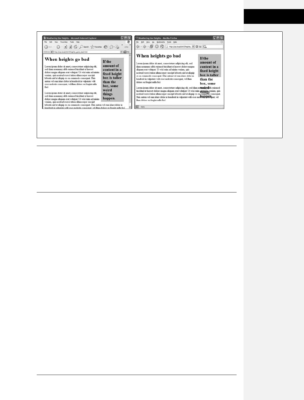
Chapter 7: Margins, Padding, and Borders 167
Determining Height
and Width
Note: Internet Explorer 5 gets the whole width thing wrong. It uses the CSS width property to define the
total width including margins, padding, and borders, resulting in page elements that are much thinner
than in other browsers. The problem also crops up in IE 6 or IE 7 in quirks mode (see page 26). Since IE 5
is all but dead, you probably won’t have to worry about it. But if you have a time machine and plan on
going back 10 years to amaze the world with your futuristic CSS design skills, you can learn about the IE 5
“box model problem” at http://reference.sitepoint.com/css/ie5boxmodel.
Controlling the Tap with the Overflow Property
When the content inside a styled tag is larger than the style’s defined width and
height, some weird things happen. As shown in Figure 7-9, IE 6 just lets the box
expand to fit the larger content, while other browsers let the content spill out of
the box (past the borders and often over other content).
Fortunately, you can control what a browser should do in this situation with the
overflow property. Overflow accepts four keywords that control how content that
overflows the edges of a box should be displayed:
•visible. This option is what browsers do normally. It’s the same as not setting
the property at all (Figure 7-10, top).
•scroll. Lets you add scroll bars (Figure 7-10, middle). It creates a kind of mini-
browser window in your page and looks similar to old-school HTML frames, or
the HTML <iframe> tag. You can use scroll to provide a lot of content in a
small amount of space. Unfortunately, scroll bars always appear when you use
this option, even if the content fits within the box.
•auto. To make scroll bars optional, use the auto option. It does the same thing
as scroll but adds scroll bars only when needed.
Figure 7-9:
Depending on the
browser you’re using, the
content in a box will
display in one of two
ways if it’s taller than the
box’s set height. Internet
Explorer 6 (left) and
earlier for Windows will
simply expand the box to
fit the content. But other
browsers, like Firefox
(right) and Internet
Explorer 7, keep the box
the same height and spill
the content out and
below the edges.
Download at Boykma.Com
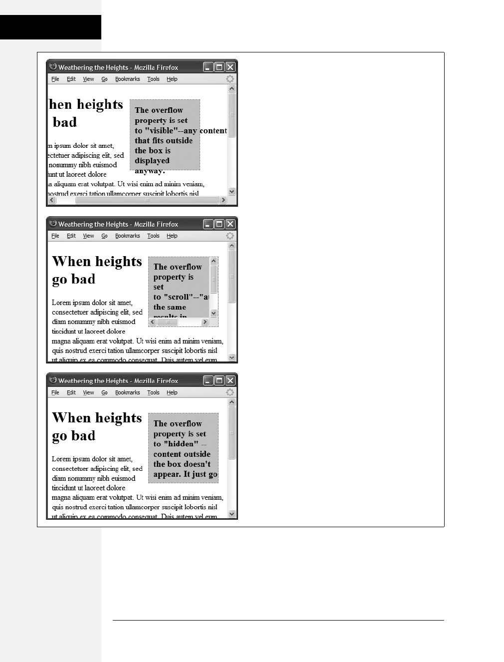
168 CSS: The Missing Manual
Determining Height
and Width
•hidden. Hides any content that extends outside the box (Figure 7-10, bottom).
This option is a bit dangerous, since it can make some content disappear from
the page. But it comes in handy for solving some IE browser bugs (see the box
on the next page) and is a useful trick for float-based layouts.
Figure 7-10:
The overflow property gives you three basic ways to deal
with text that doesn’t fit inside a box: visible displays the
content anyway (top); scroll and auto add scroll bars
(middle); and hidden just doesn’t show anything that
doesn’t fit (bottom).
Download at Boykma.Com
Chapter 7: Margins, Padding, and Borders 169
Wrap Content with
Floating Elements
Wrap Content with Floating Elements
HTML normally flows from the top of the browser window down to the bot-
tom, one headline, paragraph, or block-level element on top of another. This
word-processor-like display is visually boring (Figure 7-11, top), but with CSS,
you’re far from stuck with it. You’ll learn lots of new methods for arranging
items on a web page in Part 3, but you can spice up your pages plenty with one
little CSS property—float.
The float property moves an element to either the left or right. In the process, con-
tent below the floated element moves up and wraps around the float (Figure 7-11,
bottom). Floating elements are ideal for moving supplemental information out of
the way of the main text of a page. Images can move to either edge, letting text
wrap elegantly around them. Similarly, you can shuttle a sidebar of related infor-
mation and links off to one side.
BROWSER BUG
Special Rules for IE 6
Dealing with the surprisingly inconsistent ways different
browsers display pages is the bane of every web designer.
What looks great in Internet Explorer may fall completely
apart in Firefox or vice versa. Throughout this book you’ll
find tips on browser management and ways to overcome
the worst browser bugs. Not surprisingly, Internet Explorer
6, which is over eight years old, is plagued by many display
problems. For example, IE 6 has trouble displaying float-
based layouts, as you’ll see in Chapter 12.
To overcome these bugs, you frequently have to send prop-
erties and values to IE that are different than the ones used
by other browsers. To that end, there’s an easy way to cre-
ate CSS styles that apply only to IE 6 and earlier—the star
html hack. In this method, you begin the style with the fol-
lowing: * html. If you want to have an h1 tag style that
applies only to IE 6 and earlier, then name the style * html
h1. All other browsers see the style as a descendent selector
that doesn’t make any sense, so they promptly ignore it.
You can use the star html hack to override some setting
from a style that other (better) browsers display properly
but IE gets wrong. In that case, apply the * html hack after
the correct style. Say you create a class style named .side-
bar that creates an attractive sidebar box for news and site
navigation links. Due to a weird bug in IE, the sidebar may
appear three pixels off to the left or right (see page 335). To
counteract this snafu, you can add this IE-only special fix
after the regular .sidebar style:
* html .sidebar { margin-left: -3px }
You’ll see the * html hack in a couple of places in this book
(like this chapter’s tutorial on page 186). You’ll learn other
techniques for managing Internet Explorer in Chapter 15.
Internet Explorer 7 and 8 don’t understand the * html hack,
so it’ll ignore these types of styles. Fortunately, these brows-
ers have fixed many of the bugs that plagued earlier ver-
sions of the browser so the fixes supplied by * html styles
aren’t usually needed for that browser. Regardless, you’ll
learn a technique on page 433 that will let you send specific
styles to any version of Internet Explorer.
Download at Boykma.Com
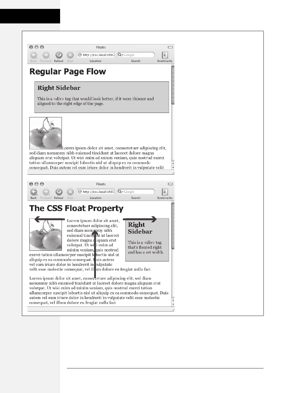
170 CSS: The Missing Manual
Wrap Content with
Floating Elements
Figure 7-11:
The regular flow of HTML is left to right,
top to bottom, with one block-level
element—headline, paragraph, <div>, and
so on—stacked on top of the next. By
letting you break up this uniformity, the
float property is one of the most powerful
and useful tools that CSS offers. Its uses
range from simply moving an image to
one side of a paragraph to providing
complete layout control over banners,
sidebars, navigation bars, and other
page elements.
Download at Boykma.Com

Chapter 7: Margins, Padding, and Borders 171
Wrap Content with
Floating Elements
While you can use floats in some complex (and confusing) ways, as you’ll see in
Chapter 12, the basic property is very simple. It takes one of three keywords, left,
right, or none, like so:
float: left;
•left. Slides the styled element to the left, while content below wraps around the
right side of the element.
•right. Slides the element to the right.
•none. Turns off the float and returns the object to its normal position.
Note: Floating an image is similar to setting the <img> tag’s align attribute to either left or right. That lit-
tle bit of HTML is deprecated, so use the CSS float property instead.
Floated elements move to the left or right edge of their containing element. In some
cases, this just means that the element moves to the left or right edge of the
browser window. However if you float an element that’s inside another tag with a
set width or position on a web page, then the float will go to the left or right edge
of that tag—the floated element’s “container.” For example, you may have a box
on the page that’s 300 pixels wide and is itself floated to the right edge of the
browser window. Inside that box, you’ve got an image that floats to the left. That
image slides to the left edge of that 300-pixel-wide box—not the left edge of the
browser window.
You can even use the float property with an inline element, such as the <img> tag.
In fact, floating a photo to the left or right using CSS is a very common use of the
float property. A web browser treats a floated inline element just like a block-level
element, so you don’t run into the problems with padding and margin that nor-
mally trouble inline elements (see page 158).
You can also float a block-level element like a headline or paragraph. A common
technique is to float a <div> tag containing other HTML tags and page content to
create a kind of containing box. In this way, you can create sidebars, pull quotes,
and other self-contained page elements. (You’ll see an example of this in this chap-
ter’s tutorial.) When you float block-level elements, you should also set the width
property for that element (in fact, CSS rules require setting the width for floated
elements for all tags except images). This way, you can control how much horizon-
tal space the block takes up and how much space is available for the content below
it to move up and wrap around the block.
Note: The source order—the order in which you write your HTML—has a big impact on the display of
floated elements. The HTML for the floated tag must appear before the HTML of any content that wraps
around the floated element. Say you’ve created a web page composed of an <h1> tag followed by a <p>
tag. Toward the end of that <p> tag, you’ve also inserted a photo using the <img> tag. If you float that
photo to the right, say, then the <h1> tag and most of the content inside that <p> tag will still appear
above the photo; only content that follows the <img> tag will wrap around the left side of the image.
Download at Boykma.Com
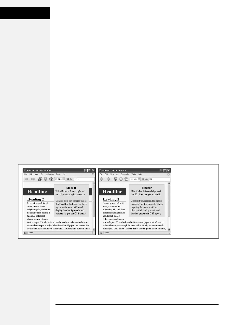
172 CSS: The Missing Manual
Wrap Content with
Floating Elements
Backgrounds, Borders, and Floats
To the consternation of many web designers, backgrounds and borders don’t react
to floated elements the same way as content does. Say you float an element—a
sidebar for example—to the right. The content below the sidebar moves up and
wraps around it, just as it should. But if that content has a background or border
set on it, then that background or border actually appears underneath the floated
sidebar (Figure 7-12, left). In essence, a web browser wraps the text around the
float, but not the border or background. Believe it or not, this is absolutely kosher
and how (according to the rules) it’s supposed to work. Of course, you may not
want to follow these rules; you might want to have the border or background stop
when it reaches the floated element (Figure 7-12, right). With a little CSS magic,
you can do it.
First, you need to add one rule to the style that has background or borders running
underneath the float. Once you locate the style, add this line: overflow: hidden;. The
overflow property (discussed in more detail on page 326) makes any background or
border that extends underneath the float disappear. (This trick doesn’t work for all
browsers, though. See the box on the next page.)
Another approach is to add a borderline around the floated element; when you
make the borderline thick enough and match its color to the background color of
the page, the border looks just like empty space—even though it’s covering and
hiding the background color and borderlines that are extending below it.
Stopping the Float
Sometimes you need a way to tell a tag to ignore a floated element. You may have a
copyright notice that should always appear at the bottom of the browser window.
If you have a particularly tall sidebar that’s floated to the left side of the page, the
copyright notice might actually be drawn up the page and wrap around the float.
Instead of appearing at the bottom of the page, the copyright is sitting up the page
next to the sidebar. You want the copyright notice part of your page to refuse to
wrap around the floated element and instead drop below it.
Figure 7-12:
In this example, there’s
an <h1> tag with a
background color and an
<h2> tag with a border
(left). Adding overflow:
hidden; to the style for
the <h1> tag (right)
prevents the headline
from appearing under
the floating element
(sidebar).
Download at Boykma.Com

Chapter 7: Margins, Padding, and Borders 173
Wrap Content with
Floating Elements
Other problems occur when you have several floated items close together. If the
floated items aren’t very wide, they float up and next to each other, and if they’re
of varying heights they can get into an unattractive logjam (see Figure 7-13, top).
In this case, the floated elements shouldn’t float next to each other. CSS provides
the clear property for just these types of problems.
The clear property instructs an element to not wrap around a floated item. By clearing
an element, you essentially force it to drop down below the floated item. Also, you
can control which type of float (left or right) is cleared or force a style to simply
ignore both types of floats.
The clear property accepts the following options:
•left. The style will drop below elements that are floated left but will still wrap
around right-floated objects.
•right. Forces a drop below right-floated objects but still wraps around left-
floated objects.
•both. Forces a drop below both left- and right-floated elements.
•none. Turns off clearing altogether. In other words, it makes an item wrap
around both left- and right-floated objects, which is how web browsers nor-
mally work.
In the case of a copyright notice that must appear at the bottom of the page, you’d
want it to clear both left- and right-floated objects—it should always be below
other content, and should never wrap to the left or right of any other item. Here’s
a class style that would do just that:
.copyright {
clear: both;
}
BROWSER BUG
When overflow: hidden Fails
The overflow: hidden property prevents backgrounds and
borders from awkwardly running under floating elements
(Figure 7-13). But nothing’s ever that simple in the world of
web browsers. While this one line of code works for Inter-
net Explorer 7, Firefox, Camino, and Safari, it doesn’t work
reliably in versions of Opera before 9, and Internet Explorer
5 and 6 for Windows just ignore it.
Alas there’s no apparent fix for Opera 8 and earlier (it works
fine in Opera 9), but there’s something you can do for IE 5
and 6. For those browsers, you need to add one additional
rule: zoom: 1;.
This is a Microsoft-only property that lets you enlarge or
zoom into an element on a page. In this case, though, it’s
just a weird way to force IE 5 and 6 to stop a border or back-
ground from extending underneath the floated element.
(For more detail on why this zoom thing works, see the box
on page 338.)
You may want to put the IE-specific zoom rule in an IE-only
style. You can even put it in a completely separate IE-only
external style sheet.
You’ll also find an example of this problem and its solution
in the tutorial starting on page 174.
Download at Boykma.Com
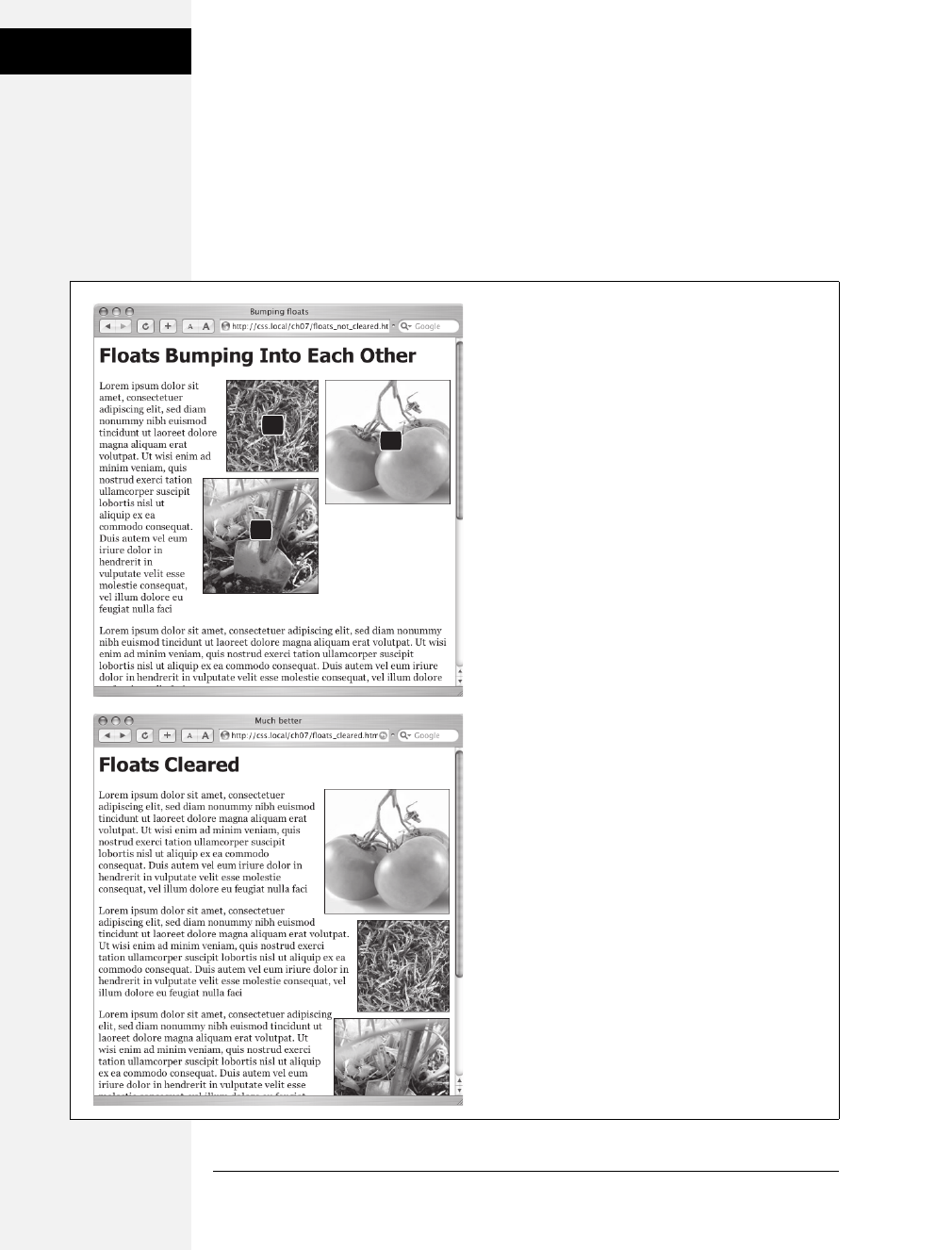
174 CSS: The Missing Manual
Wrap Content with
Floating Elements
Figure 7-13 shows how the clear property can prevent floated items of varying
heights from clumping together. All three photos in that figure have a right float
applied to them. In the top figure, the photo of the tomatoes (1) is the first image
on the page and appears at the far right edge. The second image (2) obeys the float
set on the first image and wraps up to the left of it. The last photo (3) is too wide to
sit next to the second photo (2) but still tries to wrap around both (1) and (2). It
gets stuck in the process.
Figure 7-13:
Top: Sometimes you don’t want an element to wrap
around a floated object.
Bottom: Applying the clear property (in this case
clear: right;) to each image prevents them from sitting
next to each other. The clear applied to photo (2)
prevents it from wrapping up next to image (1).
Applying clear: right to photo (3) forces it to appear
below photo (2).
1
2
3
Download at Boykma.Com
Chapter 7: Margins, Padding, and Borders 175
Tutorial: Margins,
Backgrounds, and
Borders
Using clear: right; on the images prevents the photos from sitting next to each
other (Figure 7-13, bottom). The clear applied to the second photo prevents it
from wrapping up next to the first image, while the last image’s right clear prop-
erty forces it to appear below the second image.
Note: This business of left floats, right floats, and how to clear them sounds complicated—and it is. This
section gives you a basic introduction. You’ll see the subject again in Chapter 12 and eventually learn how
to use floats in more sophisticated ways.
Tutorial: Margins, Backgrounds, and Borders
In this tutorial, you’ll explore elements of the CSS box model, adjust the spacing
around objects on a page, add colorful borders to items on a page, and control the
size and flow of page elements.
To get started, you need to download the tutorial files located on this book’s com-
panion website at www.sawmac.com/css2e/. Click the tutorial link and download
the files. (All of the files are enclosed in a Zip archive. See detailed instructions for
unzipping the files on the website.) The files for this tutorial are contained inside
the 07 folder.
Controlling Page Margins and Backgrounds
You’ll start with a very basic HTML file containing an internal style sheet with a
basic CSS reset style. It’s not much to look at right now (see Figure 7-14).
Note: For a sneak preview of the final result, check out Figure 7-17.
1. In your favorite text editor, open 07 ➝sidebar.html.
There’s already an internal style sheet added to this page containing a single
group selector. This selector is the most important style in the CSS reset style
sheet. It basically removes all margins, padding, font size, and font weight from
the most common block-level elements and eliminates many of the cross-
browser display problems you’ll encounter related to these properties.
At a bare minimum, you should always include this style in every style sheet you
create. Within this style, the most important properties are the margin and pad-
ding settings. There’s enough cross-browser-related weirdness related to those
two properties that you should always zero these out and start fresh. You’ll start
with something simple: a background color.
Download at Boykma.Com

176 CSS: The Missing Manual
Tutorial: Margins,
Backgrounds, and
Borders
2. In the internal style sheet, click directly after the CSS comment /* end reset
styles */ and add a tag selector style:
html {
background-color: #FDF8AB;
}
This style adds a light yellow background color to the page. If you want to color
the background of a web page, you can add the background-color property to
either the <html> tag or the <body> tag. Next, you’ll add some margins, bor-
ders, and other properties to the <body> tag.
3. Add another style to the internal style sheet:
body {
background-color: #FFF;
border: 3px solid #85A110;
}
This style adds a white background color to the <body> tag and a 3-pixel green
border. Because the <body> tag sits inside the <html> tag, a web browser con-
siders it to be “on top” of the <html> tag, so the white background will cover
the yellow color you added in the previous step. Next you’ll give the body tag a
width and adjust its padding and margins.
Tip: Normally if you add a background color property to the <body> tag, that color fills the entire
browser window; however if you also add a background color to the <html> tag, the body’s background
color only fills the area with content. To see this in action, just preview the web page after step 3 above;
then delete the html tag style, and preview the page again. A weird, but useful bit of CSS trivia.
4. Edit the body style you just created by adding five new properties (changes are
in bold):
body {
background-color: #FFF;
border: 3px solid #85A110;
width: 760px;
margin-top: 20px;
margin-left: auto;
margin-right: auto;
padding: 15px;
}
The width property constrains the body so that it’s just 760 pixels wide: if a visi-
tor’s browser window is wider than 760 pixels, then he’ll see the background
color from the html style, and a 760-pixel box with the white background of the
body tag.
Download at Boykma.Com
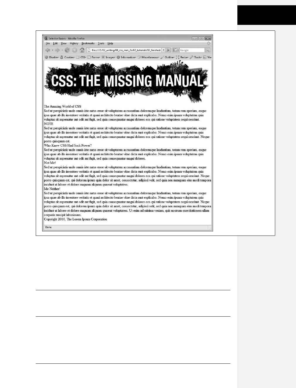
Chapter 7: Margins, Padding, and Borders 177
Tutorial: Margins,
Backgrounds, and
Borders
The margin-top property adds 20 pixels of space from the browser windows top
edge—nudging the body tag down just a bit; while the left and right margin set-
tings center the body in the middle of the browser window. “Auto” is just
another way of telling a browser, “You figure it out,” and since that auto value
is applied to both the left and right margins, a browser simply provides equal
space on the left and right side.
Note: You could also have used the margin shorthand property (page 155) to condense those three
lines of margin settings to just one like this:
margin: 20px auto 0 auto;
Finally, to keep the content inside the <body> from touching the border line, 15
pixels of space are added to the inside of the body using the padding property—in
other words the image and text is indented 15 pixels from all four edges.
Your style sheet is pretty far along, and you’re ready to check the page.
Figure 7-14:
This web page is barebones
HTML, with a single style
that removes much of the
built-in web browser styling.
It’ll look a lot better with a
box model makeover.
Download at Boykma.Com

178 CSS: The Missing Manual
Tutorial: Margins,
Backgrounds, and
Borders
5. Save the file and preview the page in a web browser.
You should see a white box with an image, a bunch of text, and a green outline
floating in a sea of yellow (see Figure 7-15). The text needs some loving atten-
tion. You’ll take care of that next.
Adjusting the Space Around Tags
Since the CSS reset style pretty much stripped the text on this page of all format-
ting, you’ll need to create styles to make the headings and paragraphs look great.
You’ll start with the <h1> tag at the top of the page.
1. Return to your text editor and the sidebar.html file. Click at the end of the closing
brace of the body tag selector, press Enter (Return) to create a new line, and
then add the following style:
h1 {
font-size: 44px;
font-family: Georgia, "Times New Roman", Times, serif;
letter-spacing: 1px;
color: #85A110;
text-transform: uppercase;
}
Figure 7-15:
Setting the left and right
margins to auto for any
element with a set width
centers it. In this case,
setting a width for the
body and adding margin-
left: auto and margin-
right:auto places it smack
dab in the center of the
browser window.
Unfortunately, there’s no
easy way to center an
element vertically (with
equal space above and
below it) using CSS.
There are a few tricks
that crafty designers
have come up with,
though. If you’re after
vertically centered
elements check out www.
student.oulu.fi/~laurirai/
www/css/middle/ and
www.search-this.com/
2008/05/15/easy-vertical-
centering-with-css/.
Download at Boykma.Com

Chapter 7: Margins, Padding, and Borders 179
Tutorial: Margins,
Backgrounds, and
Borders
This style uses many of the text-formatting properties discussed in the previous
chapter—the top headline is 44 pixels tall and all uppercase, uses the Georgia
font, and has a green color, with a little space between each letter. The real fun
is adding a background color to really highlight the headline.
Tip: Save the page and preview it in a web browser after each step in this tutorial. That way you’ll get a
better understanding of how these CSS properties affect the elements they format.
2. Add one new property to the h1 tag style so that it looks like this (changes
in bold):
h1 {
font-size: 44px;
font-family: Georgia, "Times New Roman", Times, serif;
letter-spacing: 1px;
color: #85A110;
text-transform: uppercase;
background-color: #E2EBB4;
}
If you preview the page now, you’ll see that the headline has a light green back-
ground. When applied to a block-level element like a headline, the background
fills the entire horizontal space available (in other words, the color doesn’t just
sit behind the text “The Amazing World of CSS” but extends all the way to the
right edge of the box).
The headline text is a little cramped—the “T” that begins the headline touches
the edge of the background. With a little padding, you can fix this.
3. Add another property to the h1 tag style so that it looks like this (changes in
bold):
h1 {
font-size: 44px;
font-family: Georgia, "Times New Roman", Times, serif;
letter-spacing: 1px;
color: #85A110;
text-transform: uppercase;
background-color: #E2EBB4;
padding: 5px 15px 2px 15px;
}
The padding shorthand property provides a concise way to add padding around
all four sides of the content—in this case 5 pixels of space are added above the
text, 15 pixels to the right, 2 pixels to the bottom, and 15 pixels to the left.
Download at Boykma.Com

180 CSS: The Missing Manual
Tutorial: Margins,
Backgrounds, and
Borders
There’s one other problem with the headline: Because of the padding added to
the body tag (see step 4 on page 176), the headline is indented 15 pixels from
the left and right edges of the green border surrounding the body. The headline
would look better if it touched the green border. No problem; negative margins
to the rescue.
4. Add one last property to the h1 tag style so that it looks like this (changes in
bold):
h1 {
font-size: 44px;
font-family: Georgia, "Times New Roman", Times, serif;
letter-spacing: 1px;
color: #85A110;
text-transform: uppercase;
background-color: #E2EBB4;
padding: 5px 15px 2px 15px;
margin: 0 -15px 20px -15px;
}
Here, the margin shorthand sets the top margin to 0, the right margin to –15
pixels, bottom margin to 20 pixels, and the left margin to –15 pixels. The bot-
tom margin just adds a bit of space between the headline and the paragraph that
follows. The next trick is the use of negative values for the left and right mar-
gins. As mentioned on page 156, you can assign a negative margin to any ele-
ment. This property pulls the element out toward the direction of the margin—
in this case, the headline extends 15 pixels to the left and 15 pixels to the right,
actually expanding the headline and pulling it out over the body tag’s padding.
5. Now, you’ll add some formatting of the <h2> tags. Add the following style
after the h1 tag style:
h2 {
font-size: 24px ;
font-family: "Arial Narrow", Arial, Helvetica, sans-serif;
color: #F96B18;
border-top: 2px dotted #8DA516;
border-bottom: 2px dotted #8DA516;
padding-top: 5px;
padding-bottom: 5px;
margin: 15px 0 5px 0;
}
This style adds some basic text formatting and a dotted border above and below
the headline. To add a bit of space between the headline text and the lines, it
puts a small bit of padding at the top and bottom. Finally, the margin property
adds 15 pixels above the headline and 5 pixels below it.
Download at Boykma.Com
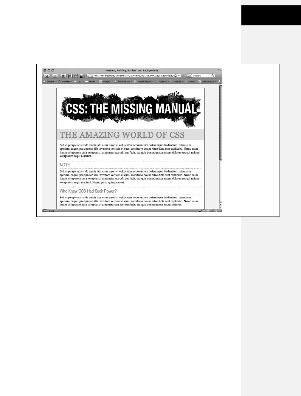
Chapter 7: Margins, Padding, and Borders 181
Tutorial: Margins,
Backgrounds, and
Borders
6. Save the file and preview the page in a web browser.
The headlines are looking good (see Figure 7-16). Next, you’ll create a sidebar
on the right side of the page.
Building a Sidebar
Sidebars are common elements in most types of print publications like magazines,
books, and newspapers. They compartmentalize and highlight small chunks of
information like a resource list, contact information, or a related anecdote. But to
be effective, sidebars shouldn’t interrupt the flow of the main story. They should,
like the name says, sit unobtrusively off to one side, which you can easily make
happen with CSS.
1. Return to your text editor and the sidebar.html file.
First, you must isolate the region of the page that makes up the sidebar. The
<div> tag is the perfect tool. You can enclose any amount of HTML into its
own self-contained chunk by wrapping it in a <div> tag.
2. Click before the first <h2> tag (the one with the “NOTE” headline). Then type
<div class="sidebar">, and press Enter (Return).
This HTML marks the beginning of the sidebar and applies a class to it. You’ll
create the .sidebar class style soon, but first you need to indicate the end of the
sidebar by closing the <div>.
Figure 7-16:
With just a few styles,
you can add background
colors, control margins
throughout the page, and
adjust the space between
headlines and
paragraphs.
Download at Boykma.Com

182 CSS: The Missing Manual
Tutorial: Margins,
Backgrounds, and
Borders
3. Click after the closing </p> tag that immediately follows the <h2> tag (this is
the </p> that appears just before <h2>Who Knew CSS Had Such Power?</h2>.
Press Enter, and then type </div>.
You’ve just wrapped a headline and paragraph inside a <div> tag. Next, you’ll
create a style for it.
4. In the page’s style sheet, add the following style below the <h2> style you
created earlier:
.sidebar {
width: 30%;
float: right;
margin: 10px;
}
This style sets the width of the content area (where the text appears) to 30 per-
cent. You don’t have to use an absolute value like pixels for widths. In this case,
the sidebar’s width is 30 percent of the width of the container. The float prop-
erty moves the sidebar to the right side of the box, and the margin property
adds 10 pixels of space around the sidebar.
If you preview the page in a browser, you’ll see that the basic shape and place-
ment of the sidebar are set, but there’s one problem: The borders from the
<h2> tags appear underneath the box. Even though the floated sidebar moves
the text of the headlines out of the way, floats don’t displace borders or back-
grounds. Those just appear right under the floated sidebar. One way to fix this
problem is to simply add a background color to the sidebar, so you can’t see the
h2 borders. (There’s another technique, as well, which you’ll use in step 8 on
page 184.)
5. Add another property to the .sidebar style so it looks like this (changes in bold):
.sidebar {
width: 30%;
float: right;
margin: 10px;
background-color: #FAEBC7;
padding: 10px 20px;
}
This property adds a light orangish color to the sidebar and indents the text
from the sidebar’s edges so it won’t touch the borders you’re about to add.
Download at Boykma.Com

Chapter 7: Margins, Padding, and Borders 183
Tutorial: Margins,
Backgrounds, and
Borders
6. Finally, add two more properties to the .sidebar style so it looks like this
(changes in bold):
.sidebar {
width: 30%;
float: right;
margin: 10px;
background-color: #FAEBC7;
padding: 10px 20px;
border: 1px dotted #FC6512;
border-top: 20px solid #FC6512;
}
Here’s an example of the handy technique described on page 162. If you want
most of the borders around an element to be the same, you can first define a
border for all four edges—in this case a 1 pixel, dotted, orange line around
the entire sidebar—and then supply new border properties for the specific
edges you want changed—in this example, the top border will be 20 pixels tall
and solid. This technique lets you use just two lines of CSS code instead of
four (border-top, border-bottom, border-left, and border-right).
The headline inside the sidebar doesn’t look quite right. It uses the same prop-
erties as the other <h2> tags (because of the h2 tag style you created in step 5).
The border is distracting and the top margin pushes the headline down too
much from the top of the sidebar. Fortunately, you can use a descendent selec-
tor to override those properties.
7. After the .sidebar style, in the internal style sheet, add a descendent selector:
.sidebar h2 {
border: none;
margin-top: 0;
padding: 0;
}
Because of the .sidebar, this style is more powerful—that is, it has greater specific-
ity as described on page 96—than the basic h2 style. It erases the border from the
original h2 tag style, along with the top margin and all of the padding. However,
since this style doesn’t have a font size, color or font family, those properties
from the h2 style still apply—it’s the cascade in action!
The page is looking good, but the borders on the h2 tags still run up to and
behind the sidebar. That just doesn’t look good, but you can fix it easily.
Download at Boykma.Com

184 CSS: The Missing Manual
Tutorial: Margins,
Backgrounds, and
Borders
8. Locate the h2 style and add the overflow property, like so:
h2 {
font-size: 24px ;
font-family: "Arial Narrow", Arial, Helvetica, sans-serif;
color: #F96B18;
border-top: 2px dotted #8DA516;
border-bottom: 2px dotted #8DA516;
padding-top: 5px;
padding-bottom: 5px;
margin: 15px 0 5px 0;
overflow: hidden;
}
Setting the overflow property to hidden hides the borders that pass beyond the
headline text and under the floating element. (Unfortunately, Internet Explorer
6 doesn’t get it and still displays the borders underneath the sidebar. But you’ll
fix that in the next section.)
9. Save the file and preview the web page in a browser.
The page should look like Figure 7-17.
Unfortunately, the page doesn’t look like Figure 7-17 in Internet Explorer 6 for
Windows. A couple of bugs in that browser affect the page’s appearance for the
worse. Read on for the fixes.
Fixing the Browser Bugs
While the sidebar.html file looks just fine in Internet Explorer 7 and 8, earlier ver-
sions of that browser don’t display the page correctly. If you have access to Inter-
net Explorer 6, check it out. You’ll see the problems.
For one thing, the border under the two <h2> headlines travels underneath the
sidebar. In step 8 above, you used the overflow property to fix this problem in most
browsers, but you need something else to get IE 6 straightened out. In addition,
the margin around the sidebar is noticeably larger on the right.
Note: If you don’t have access to check for yourself, just trust that problems are there and use this sec-
tion to learn how to fix them for the sake of your visitors who are stuck with IE 6.
You’ll tackle the first bug, the overextended borders, first:
1. Return to your text editor and the sidebar.html file.
You just have to add one property to the h2 tag style—it has no effect on other
browsers, but it knocks some sense into IE 6.
Download at Boykma.Com
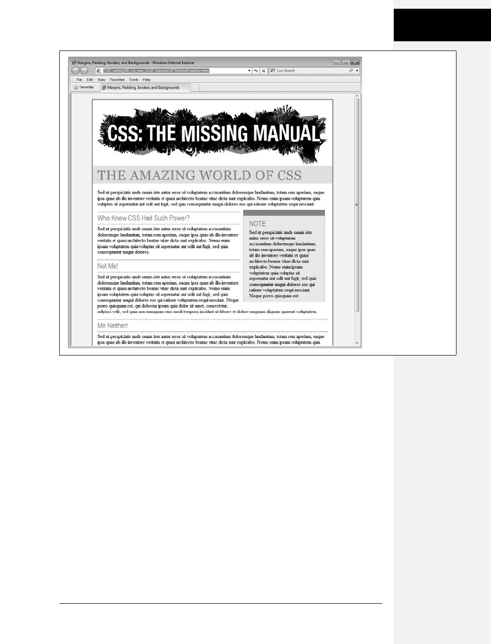
Chapter 7: Margins, Padding, and Borders 185
Tutorial: Margins,
Backgrounds, and
Borders
2. Add this new style to the end of the sidebar.html page’s style sheet:
h2 {
font-size: 24px ;
font-family: "Arial Narrow", Arial, Helvetica, sans-serif;
color: #F96B18;
border-top: 2px dotted #8DA516;
border-bottom: 2px dotted #8DA516;
padding-top: 5px;
padding-bottom: 5px;
margin: 15px 0 5px 0;
overflow: hidden;
zoom: 1;
}
Zoom isn’t an official CSS property. It’s a Microsoft-only property meant to
enlarge an element on a page. That’s not why you’re using it here, though. In
this case, the zoom property prevents the border from extending under the float
in IE 6. It fixes the border bug—albeit in a completely arcane way. (See the box
on page 173 for more details on this browser voodoo.)
Figure 7-17:
A handful of CSS styles
add design elegance to
ho-hum HTML. Notice
how the floated sidebar
both attracts attention
and moves it out of the
way of the main body
of text.
Download at Boykma.Com

186 CSS: The Missing Manual
Tutorial: Margins,
Backgrounds, and
Borders
Next problem: The double-margin bug that’s causing that extra space on the
right side of the sidebar. Since this bug affects just IE 6, you’ll create a * html
style for the sidebar. (As described in the box on page 169, * html hides the
rest of this selector—.sidebar—from all browsers except IE 6 for Windows
and earlier.)
3. Add this style to your style sheet:
* html .sidebar {
display: inline;
}
This use of the display property is another nonsensical bit of CSS. But it does
the job: It tricks IE into removing the extra right margin.
4. Save the file and preview the page in Internet Explorer 6.
The page should now look like Figure 7-17 in that browser as well. Dealing with
these browser bugs is an unfortunate reality for every web developer. You’ll
learn solutions (also known as hacks) to particular bugs throughout this book.
Also, in Chapter 15, you’ll learn even more strategies for dealing with hacks
used to fix Internet Explorer browser bugs.
The solution is in the sidebar_finished.html file inside the 07_finished folder.
Going Further
To try out your newfound skills, try this exercise on your own: Create a p tag style
to add some pizzazz to the paragraphs on the page—try out some margin settings,
font color, and so on. Next, create a class style for formatting the copyright notice
that appears at the bottom of the sidebar.html page (called, say, .copyright). In this
style, add a border above the copyright notice, change its text color, shrink its font
size, and change the type to uppercase. (Hint: Use the text-transform property dis-
cussed in on page 125.) After you’ve created the style, add the appropriate class
attribute to the <p> tag in the HTML.
Download at Boykma.Com

187
Chapter 8
chapter
8
Adding Graphics to
Web Pages
No matter how much you gussy up your text or fiddle with borders and mar-
gins, nothing affects the appearance of your site more than the images you add
to it. And once again, CSS gives you more image control than HTML ever
dreamed of. You can work with graphics in CSS on two fronts: the <img> tag
and the background-image property (which lets you place an image in the back-
ground of any tag on a page).
This chapter delves into some of the creative ways you can deploy images with
CSS. The best way to learn how to use graphics in CSS is to see them in action, so
this chapter has three—count ’em, three—tutorials. By creating a photo gallery
web page and using images for overall page styling, you’ll be an image-slinging pro
in no time.
CSS and the <img> Tag
The venerable <img> tag has been the workhorse of photo-heavy websites since
the beginning of the World Wide Web. Even sites without photos use it to add
logos, navigation buttons, and illustrations. While CSS doesn’t have any proper-
ties specifically aimed at formatting images, you can take advantage of the CSS
properties you’ve already learned to enhance your site’s graphics. For example, the
border property is a quick and simple way to frame an image or unify the look of a
gallery of photos. Here’s a rundown of the CSS properties most commonly used
with images:
•Borders. Use one of the many border properties (page 160) to frame an image.
You’ll see an example of this in the tutorial on page 206. Since each border side
can be a different color, style, and width, you’ve got lots of creative options.
Download at Boykma.Com

188 CSS: The Missing Manual
Background Images
•Padding. The padding property (page 153) adds space between a border and an
image. By putting a little breathing room between a photo and its frame, pad-
ding simulates the fiberboard mat that’s used in traditional picture frames to
surround and offset the image. And by setting a background color, you can
even change the color of the “mat.”
•Float. Floating an image moves it to either the left or right edge of the page,
or—if the image is contained in another layout element such as a sidebar—to
the left or right edge of the image’s containing element. Text and other page ele-
ments then wrap around the image. You can even float multiple images to cre-
ate a flexible, multi-row image gallery. You’ll see an example of this technique
in the tutorial on page 206.
•Margins. To add space between an image and other page content, use the margin
property. When you float an image, the text that wraps around it is usually
uncomfortably close to the image. Adding a left margin (for right-floated
images) or right margin (for left-floated images) adds space between text and
the graphic.
In most cases, you won’t create a style for the <img> tag itself. Formatting this tag
is using too broad a brush, since it formats all images on your page—even those
with very different functions, such as the logo, navigation buttons, photos, and
even graphic ads. You wouldn’t, after all, want the same black frame around all of
those images. Instead, you should use a class style, such as .galleryImage or .logo, to
apply the style selectively.
Another approach is to use a descendent selector to target images grouped together
in one section of a page. If you have a gallery of photos, you can place all of the
photos inside a <div> tag with an ID name of gallery, and then create a style for just
the images inside that <div>, like this: #gallery img.
Background Images
The background-image property is the key to making visually stunning websites.
Learn how to use it and its cousin properties, and you can make your site stand
head and shoulders above the rest. For an example of the power of background
images, check out www.csszengarden.com (Figure 8-1). The HTML for both the
pages shown here is exactly the same; the visual differences are accomplished by
using different background images. How’s that for CSS power?
If you’ve built a few websites, you’ve probably used an image for the background
of a page—perhaps a small graphic that repeats in the background of the browser
window creating a (hopefully) subtle pattern. That time-honored HTML method
used the <body> tag’s background attribute. But CSS does the same job better.
Note: In the next few pages, you’ll meet three background image properties by learning the individual CSS
code for each one. Later in the chapter, you’ll learn a shorthand method that’ll save you a lot of typing.
Download at Boykma.Com

Chapter 8: Adding Graphics to Web Pages 189
Background Images
Figure 8-1:
CSSzengarden.com
showcases the power of
Cascading Style Sheets
by demonstrating how
you can transform a
single HTML file into two
utterly different looking
pages with the help of
CSS. The real secret to
making each of the
wonderful designs look
unique is the extensive
use of background
images. (In fact, when
you look at these pages’
HTML code, you’ll see
there isn’t a single <img>
tag in it.)
Download at Boykma.Com
190 CSS: The Missing Manual
Background Images
UP TO SPEED
GIFs, JPEGs, and PNGs: The Graphics of the Web
Computer graphics come in hundreds of different file for-
mats, with a mind-numbing assortment of acronyms: JPEG,
GIF, TIFF, PICT, BMP, EPS, and so on.
Fortunately, graphics on the Web are a bit simpler. Today’s
web browsers only work with three graphics formats: GIF,
JPEG, and PNG, each of which provides good compression.
Through clever computer manipulation, compression
reduces the graphic’s file size so it can travel more rapidly
across the Internet. Which you choose depends on the
image you wish to add to your page.
GIF (Graphics Interchange Format) files provide good com-
pression for images that have areas of solid color: logos,
text, simple banners, and so on. GIFs also offer single-color
transparency, meaning that you can make one color in the
graphic disappear, permitting the background of a web
page to show through part of the image. In addition, GIFs
can include simple animations.
A GIF image can contain a maximum of only 256 shades,
however, which generally makes photos look posterized
(patchy and unrealistically colored, like a poster). In other
words, that radiant sunset photo you took with your digital
camera won’t look so good as a GIF. (If you don’t need to
animate an image, the PNG8 format discussed below is a
better choice than GIF.)
JPEG (Joint Photographic Experts Group) graphics, on the
other hand, pick up where GIFs leave off. JPEG graphics can
contain millions of different colors, making them ideal for
photos. Not only do JPEGs do a better job on photos, they
also compress multicolored images much better than GIFs,
because the JPEG compression algorithm considers how
the human eye perceives different adjacent color values.
When your graphics software saves a JPEG file, it runs a
complex color analysis to lower the amount of data
required to accurately represent the image. On the down-
side, JPEG compression makes text and large areas of solid
color look blotchy.
Finally, the PNG (Portable Network Graphics) format
includes the best features of GIFs and JPEGs, but you need
to know which version of PNG to use for which situation.
PNG8 is basically a replacement for GIF. Like GIF, it offers
256 colors and basic one-color transparency. However,
PNG8 usually compresses images to a slightly smaller file
size than GIF, so PNG8 images download a tiny bit faster
than the same image saved in the GIF format.
PNG24 and PNG32 (also known as “PNG24 with alpha
transparency”) offer the expanded color palette of JPEG
images, without any loss of quality. This means that photos
saved as PNG24 or PNG32 tend to be higher quality than
JPEGs. But before you jump on the PNG bandwagon, JPEG
images do offer very good quality and a much smaller file
size than either PNG24 or PNG32. In general, JPEG is a bet-
ter choice for photos and other images that include lots of
colors.
Finally PNG32 offers one feature that no other format does:
256 levels of transparency (also called alpha transparency),
which means that you can actually see the background of a
web page through a drop shadow on a graphic, or even
make a graphic that has 50 percent opacity (meaning you
can see through it) to create a ghostly translucent effect.
Unfortunately, Internet Explorer 6 for Windows doesn’t
properly display PNG32’s 256 levels of transparency:
Instead of making the transparent areas see-through, IE6
replaces these areas with a hideous blue background.
(There are several JavaScript based techniques—see http://
24ways.org/2007/supersleight-transparent-png-in-ie6, for
example—that can help IE 6 display PNG transparency cor-
rectly.) Fortunately, Internet Explorer 7 and 8 can handle
PNG transparency, as can Firefox, Safari, and Opera.
Download at Boykma.Com
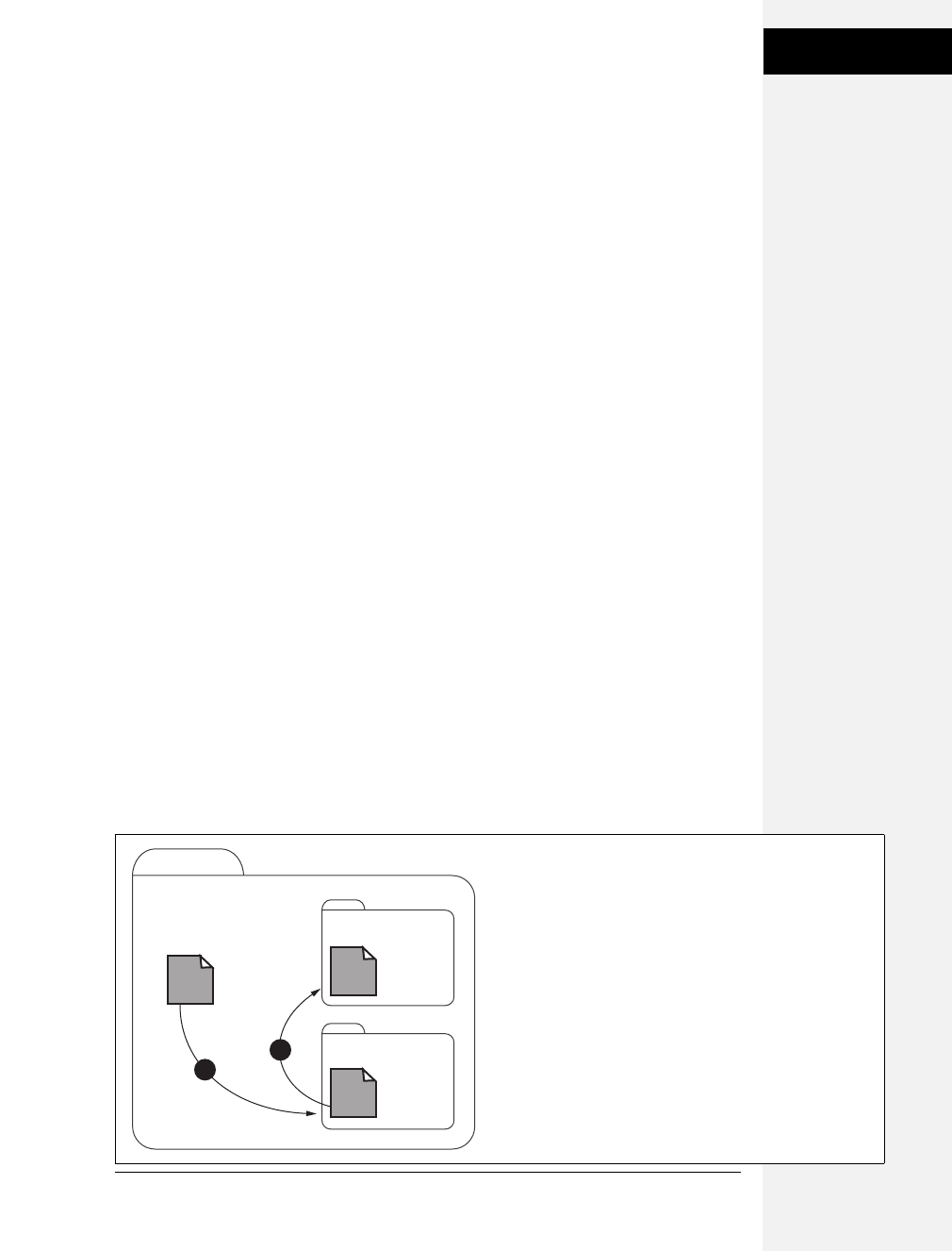
Chapter 8: Adding Graphics to Web Pages 191
Background Images
The background-image property adds a graphic to the background of an element.
To put an image in the background of a web page, you can create a style for the
<body> tag:
body {
background-image: url(images/bg.gif);
}
The property takes one value: the keyword url, followed by a path to the graphic file
enclosed in parentheses. You can use an absolute URL like this—url(http://www.
cosmofarmer.com/image/bg.gif)—or a document- or root-relative path like these:
url(../ images/bg.gif) /* document-relative */
url(/images/bg.gif) /* root-relative */
As explained in the box on the previous page, document-relative paths provide
directions in relation to the style sheet file, not the HTML page you’re styling.
These will be one and the same, of course, if you’re using an internal style sheet,
but you need to keep this point in mind if you’re using an external style sheet. Say
you’ve got a folder named styles (containing the site’s style sheets) and a folder
named images (holding the site’s images). Both these folders are located in the
site’s main folder along with the home page (Figure 8-2). When a visitor views the
home page, the external style sheet is also loaded (step 1 in Figure 8-2). Now, say
the external style sheet includes a style for the <body> tag with the background
image property set to use the graphic file bg.gif in the images folder. The docu-
ment-relative path would lead from the style sheet to the graphic (step 2 in
Figure 8-2). In other words, the style would look like this:
body {
background-image: url(../images/bg.gif);
}
This path breaks down like this: ../ means “go up one level” (that is, up to the
folder containing the styles folder); images/ means “go to the images folder,” and
bg.gif specifies that file.
Figure 8-2:
Document-relative paths are calculated in relation to the style
sheet, not the web page being styled.
site root
images folder
styles folder
home page
bg.gif
styles.css
2
1
Download at Boykma.Com
192 CSS: The Missing Manual
Background Images
In the examples so far, the path isn’t enclosed in quotes as in HTML, but quotes
are fine, too. In CSS, all three of the following code lines are kosher:
background-image: url(images/bg.gif);
background-image: url("images/bg.gif");
background-image: url('images/bg.gif');
UP TO SPEED
URL Types
In CSS, you need to specify a URL when you add a back-
ground image or attach an external style sheet using the
@import method (page 398). A URL or Uniform Resource
Locator is a path to a file located on the Web. There are
three types of paths: absolute path, root-relative path, and
document-relative path. All three simply indicate where a
web browser can find a particular file (like another web
page, a graphic, or an external style sheet).
An absolute path is like a postal address—it contains all the
information needed for a web browser located anywhere in
the world to find the file. An absolute path includes http://,
the hostname, and the folder and name of the file. For exam-
ple: http://www.cosmofarmer.com/images/bluegrass.jpg.
Aroot-relative path indicates where a file is located relative
to a site’s top-level folder—the site’s root folder. A root-rel-
ative path doesn’t include http:// or the domain name. It
begins with a / (slash) indicating the root folder of the site
(the folder the home page is in). For example /images/
bluegrass.jpg indicates that the file bluegrass.jpg is located
inside a folder named images, which is itself located in the
site’s top-level folder. An easy way to create a root-relative
path is to take an absolute path and strip off the http:// and
the host name.
Adocument-relative path specifies the path from the cur-
rent document to the file. When it comes to a style sheet,
this means the path from the style sheet to the specified
file, not the path from the current web page to the file.
Here are some tips on which type to use:
• If you’re pointing to a file that’s not on the same
server as the style sheet, you must use an absolute
path. It’s the only type that can point to another
website.
• Root-relative paths are good for images stored on
your own site. Since they always start at the root
folder, you can move the style sheet around without
affecting the path from the root to the image on the
site. However, they’re difficult to use when first build-
ing your designs: You can’t preview root-relative paths
unless you’re viewing your web pages through a web
server—either your web server out on the Internet or a
web server you’ve set up on your own computer for
testing purposes. In other words, if you’re just open-
ing a web page off your computer using the browser’s
File ➝Open command, then you won’t see any
images placed using root-relative paths.
• Document-relative paths are the best when you’re
designing on your own computer without the aid of
a web server. You can create your CSS files and then
review them in a web browser simply by opening a
web page stored on your hard drive. These pages
will work fine when you move them to your actual,
living, breathing website on the Internet, but you’ll
have to re-write the URLs to the images if you move
the style sheet to another location on the server.
Download at Boykma.Com
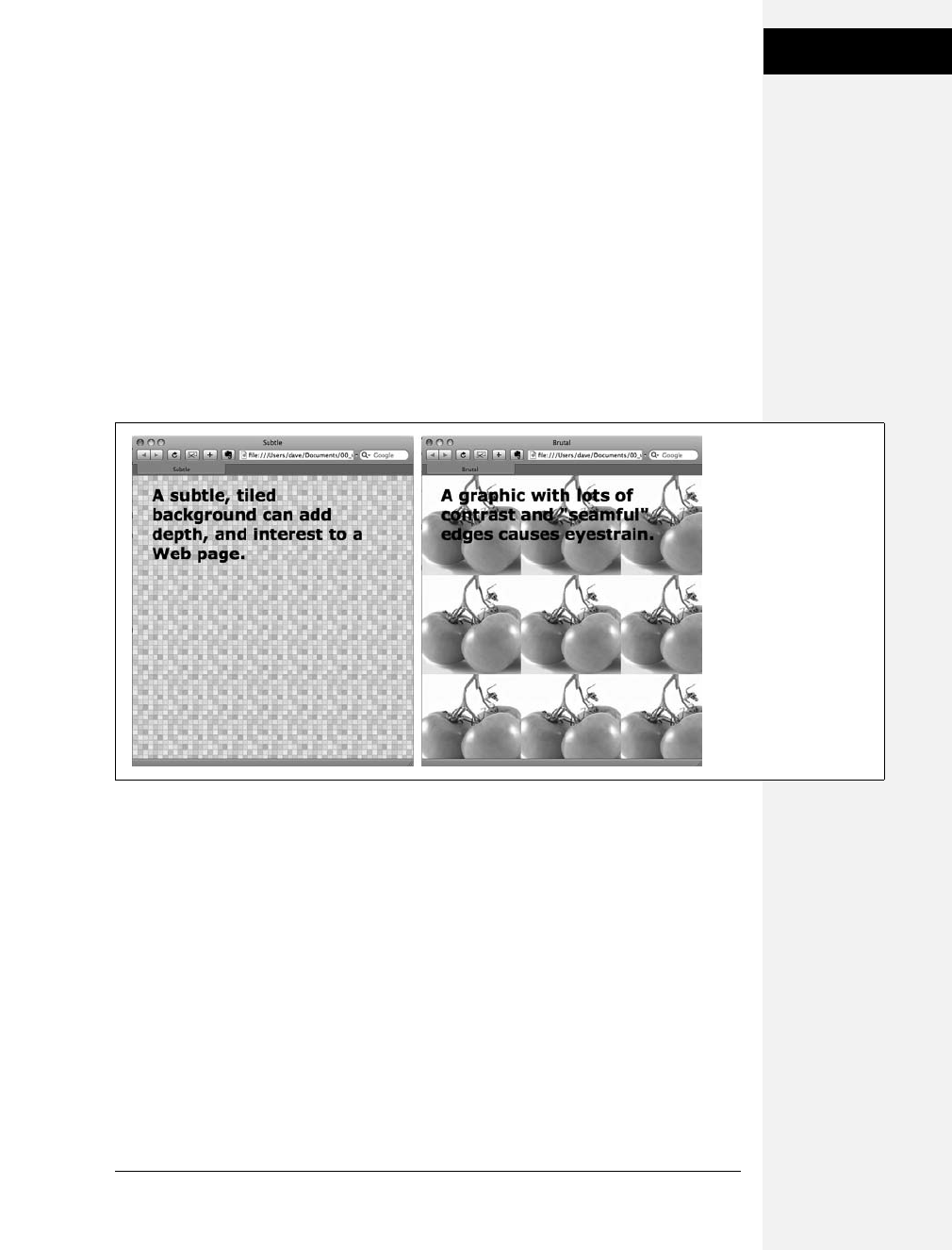
Chapter 8: Adding Graphics to Web Pages 193
Controlling
Repetition
Controlling Repetition
One problem with the old HTML background attribute is that the graphic always
tiles, filling up the entire background of a web page. (Not only that, it’s being
phased out from current HTML standards.) Fortunately, CSS gives you far greater
control. Using the background-repeat property you can specify how (or if at all) an
image tiles:
background-repeat: no-repeat;
The property accepts four values: repeat, no-repeat, repeat-x, and repeat-y:
•repeat is the normal setting for background images that you want to display
from left to right and top to bottom until the entire space is filled with a graphic
(Figure 8-3).
•no-repeat displays the image a single time, without tiling or repetition. It’s a
very common option, and you’ll frequently use it when placing images into the
background of tags other than the body. You can use it to place a logo in the
upper corner of a page or to use custom graphics for bullets in lists, to name a
couple. (You’ll see the bullet example in action in the tutorial on page 218.) In
another example, you’ll use it at the top of a <div> tag to create a rounded edge
at the top of a box (page 219).
•repeat-x repeats an image horizontally along the x-axis (the horizontal width of
the page, if your geometry is rusty). It’s perfect for adding a graphical banner to
the top of a web page (Figure 8-4, left) or a decorative border along the top or
bottom of a headline. (See page 214 in the tutorial for an example of this effect.)
•repeat-y repeats an image vertically along the y-axis (the vertical length of the
page). You can use this setting to add a graphic sidebar to a page (Figure 8-4, right)
or to add a repeating drop shadow to either side of a page element (like a sidebar).
Figure 8-3:
Be careful when tiling
images in the
background of a web
page. Choose an image
without a lot of contrast
that tiles seamlessly
(left). An image with too
much contrast (right),
makes text hard to read.
Download at Boykma.Com
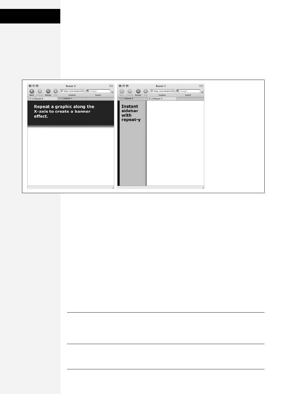
194 CSS: The Missing Manual
Positioning a
Background Image
Positioning a Background Image
Placing and tiling a background image is just half the fun. With the background-
position property, CSS lets you control the exact placement of an image in a number
of ways. You can specify both the horizontal and vertical starting points for a
graphic in three ways—keywords, exact values, and percentages.
Keywords
You get two sets of keywords to work with. One controls the three horizontal posi-
tions—left, center, right—and the other controls the three vertical positions—top,
center, bottom (Figure 8-5). Suppose you want to place a graphic directly in the
middle of a web page. You can create a style like this:
body {
background-image: url(bg_page.jpg);
background-repeat: no-repeat;
background-position: center center;
}
To move that graphic to the top-right corner, just change the background position
to this:
background-position: right top;
Note: If you’ve decided to tile an image (by setting background-repeat to one of the values listed in the
previous section), then the background-position property controls the starting point of the first tile. So, for
example, if you use the repeat option, you’ll still see the entire background filled by the image. It’s just that
the position of the first tile changes based on which background-position setting you used.
Figure 8-4:
Add graphic backgrounds
to the banners and
sidebars of a page by
taking advantage of the
tiling control offered by
the repeat-x (left) and
repeat-y (right) options.
Download at Boykma.Com

Chapter 8: Adding Graphics to Web Pages 195
Positioning a
Background Image
Keywords are really useful when you want to create vertical or horizontal banners.
If you wanted a graphic that’s centered on a page and tiled downwards in order to
create a backdrop for content (Figure 8-6, left), then you’d create a style like this:
body {
background-image: url(background.jpg);
background-repeat: repeat-y;
background-position: center top;
}
Likewise, using the bottom, center, or top keywords you can position a horizontally
repeating image using repeat-x (Figure 8-4, left) in a particular place on the page
(or within a styled element). Use the technique shown on the right side of
Figure 8-6, to position a line under headlines in the tutorial on page 217.
Figure 8-5:
You can use keywords to position an image
in the background. The order in which you
specify the keywords doesn’t matter—top
center and center top both have the
same effect.
left center
center center
center center
center bottom
right center
center top
Figure 8-6:
Use the background-
position property when
tiling an image either
vertically (left) or
horizontally (right). In the
left image, the graphic is
a wide white box with
drop shadows on the left
and right edges. The
page’s background color
is gray, so the text of the
page looks like it’s on a
white piece of paper
floating above the
screen.
Download at Boykma.Com
196 CSS: The Missing Manual
Positioning a
Background Image
Tip: You can actually add a background image to both the <html> and <body> tags. If you tile both
images horizontally and place <body> tag’s image at the top and the <html> tag’s image on the bottom,
you can achieve the effect of two stripes cutting across the top and bottom of the page—no matter how
tall the page is. And it works in all current browsers, even IE 6!
Precise Values
You can also position background images using pixel values or ems. You use two
values: one to indicate the distance between the image’s left edge and the con-
tainer’s left edge, and another to specify the distance between the image’s top edge
and the style’s top edge. (Put another way, the first value controls the horizontal
position, the second value controls the vertical position.)
Say you want custom bullets for a list. If you add a background image to the <li>
tag, the bullets often don’t line up exactly (see Figure 8-7, top). So you can just
nudge the bullets into place using the background-position property (Figure 8-7,
bottom). If the list would look better with, say, the bullets 5 pixels farther to the
right and 8 pixels farther down, then add this declaration to the style defining the
background image:
background-position: 5px 8px;
You can’t specify distances from the bottom or right using pixel or em measure-
ments, so if you want to make sure an image is placed in the exact bottom right
corner of the page or a styled element, then use keywords (bottom right) or per-
centages, as discussed next. However, you can use negative values to move an
image off the right edge or above the top edge, hiding that portion of the image
from view. You may want to use negative values to crop out part of a picture. Or, if
the background image has lots of extra white space at the top or left edge, you can
use negative values to eliminate that extra space.
BROWSER BUG
Bottoming Out
When displaying an image in the background of a web
page, most browsers don’t always vertically position the
image in the way you’d expect. For example, if you set the
vertical position to bottom, the image doesn’t always
appear at the bottom of the browser window. This happens
when the content on a page is shorter than the browser
window is tall.
If the web page has only a couple of paragraphs of text and
it’s displayed on a really large monitor, most browsers treat
the “bottom” as the bottom of the last paragraph, not the
bottom of the browser window. If you run into this annoy-
ance, then just add this style to your style sheet: html {
height: 100%; }. (Internet Explorer 7 and earlier doesn’t
have this problem.)
Download at Boykma.Com
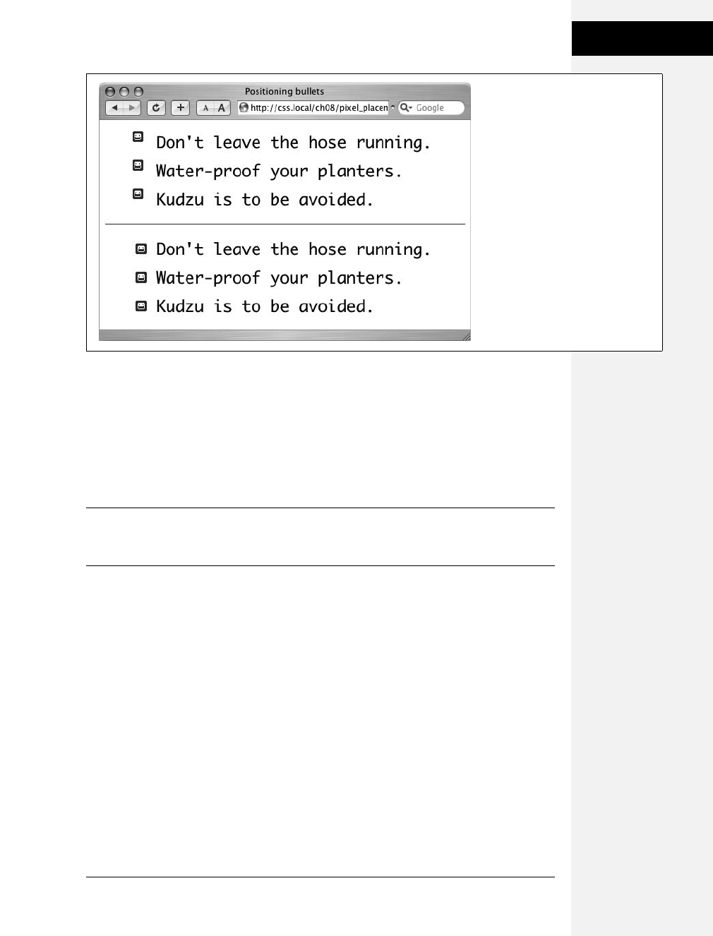
Chapter 8: Adding Graphics to Web Pages 197
Positioning a
Background Image
Percentage Values
Finally, you can use percentage values to position a background image. Using per-
centages in this manner is tricky, and if you can achieve the effect you’re after with
the keyword or precise values discussed previously, then use them. But you have to
use percentages to position an element in a spot that’s proportional to the width of
an element. For example, if you want to place a graphic three-quarters of the way
across a headline and you don’t know the width of the element.
Note: Percentage values are also useful for a little trick often used with float-based layouts to give left
and right sidebars background colors or graphics that span the entire height of a web page (see the Note
on page 311).
As with pixel or em values, you supply two percentages: one to indicate the horizon-
tal position and the second to indicate the vertical position. What the percentage is
measuring is a little tricky. In a nutshell, a percentage value aligns the specified per-
centage of the image with the same percentage of the styled element. What?
The best way to understand how percentage values work is to look at a few examples.
To position an image in the middle of a page (like the one shown in the center of
Figure 8-8) you’d write this:
background-position:50% 50%;
This declaration places the point on the image that’s 50 percent from its left edge
directly on top of the point that’s 50 percent from the left edge of the page (or
whatever element you’ve styled with the background image). The declaration also
aligns the point on the image that’s 50 percent from its top with the point that’s 50
percent from the top edge of the page or styled element. In other words, the center
Figure 8-7:
Using custom images for bullets
sometimes requires careful
positioning, so that the bullet graphic
appears the correct distance from,
and perfectly centered on, the list
item’s text.
Download at Boykma.Com
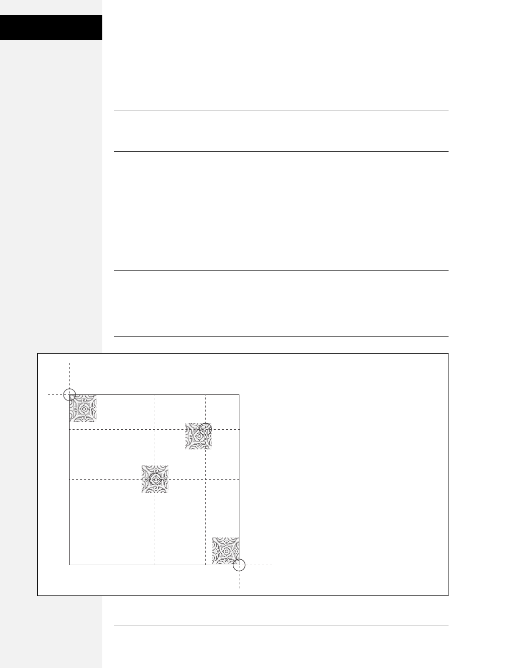
198 CSS: The Missing Manual
Positioning a
Background Image
of the image is aligned with the center of the element. This means that, when using
percentages, the exact point on the image that’s being aligned can be a moving tar-
get. (That’s because your styled element’s positioning percentages can change if
your visitors resize their browsers.)
Note: Positioning an image vertically in the background of a page using percentages won’t necessarily
put the image in the correct spot if the page content doesn’t fill the entire height of the browser window.
See the box on page 196 for the solution to this problem.
As with pixel and em values, you can specify negative percentage values, though the
results can be hard to predict. You can also mix and match pixel/em values with per-
centage values. For example, to place an image that’s 5 pixels from the element’s left
edge, but placed in the middle of the element’s height, you could use this:
background-position: 5px 50%;
Avoid mixing percentages or pixels/ems with keywords: top 50px, for example.
Some browsers can handle this combination, but some can’t.
Note: Although background images can raise the visual quality of your web pages, they usually don’t
show up if your visitor prints the page. Most browsers can print out the backgrounds, but it usually
requires extra work on your visitor’s part. If you plan to have your visitors print pages from your site, then
you may want to keep using the <img> tag to insert mission-critical images like your site logo or a map to
your store.
Figure 8-8:
Each of the four images pictured here have
been positioned on this web page
(represented by the large black box) using
percentage values. When using percentage
values, first identify the “anchor point” on
the image: 50 percent 50 percent, for
example, is the center of the middle image.
Next, identify the 50/50 point on the page
itself: again, that would be directly in the
center of the page. That spot is where the
image’s anchor point gets placed. The three
other images are all positioned in the
same way.
0% 0%
100% 100%
50% 50%
80% 20%
Download at Boykma.Com

Chapter 8: Adding Graphics to Web Pages 199
Using Background
Property Shorthand
Fixing an Image in Place
Normally, if there’s a background image on a web page and the visitor has to scroll
down to see more of the page, the background image scrolls as well. As a result,
any pattern in the background of the page appears to move along with the text.
Furthermore, when you have a nonrepeating image in the background, it can
potentially scroll off the top of the page out of view. If you’ve placed the site’s logo
or a watermark graphic in the background of the page, then you may not want it to
disappear when visitors scroll.
The CSS solution to such dilemmas is the background-attachment property. It has
two options—scroll and fixed. Scroll is the normal web browser behavior; that is, it
scrolls the background image along with the text and other page content. Fixed,
however, keeps the image in place in the background (see Figure 8-9). So if you
want to place your company’s logo in the upper-left corner of the web page, and
keep it there even if the viewer scrolls, then you can create a style like this:
body {
background-image: url(images/logo.gif);
background-repeat: no-repeat;
background-attachment: fixed;
}
The fixed option is also very nice when using a repeating, tiled background. When
you have to scroll, the page’s text disappears off the top, but the background
doesn’t move: The page content appears to float gracefully above the background.
Note: CSS lets you “fix” the background image for a style applied to any element, not just the <body>
tag. However, the Windows versions of Internet Explorer 6 and earlier only understand the background-
attachment property when used with a style applied to the <body> tag.
Using Background Property Shorthand
As you can see from the examples in the previous section, to really take control
of background images you need to harness the power of several different back-
ground properties. But typing out background-image, background-attachment,
and so on again and again can really take its toll on your hands. But there’s an
easier way—the background shorthand property.
You can actually bundle all the background properties (including the background-
color property you learned about last chapter) into a single line of streamlined CSS.
Simply type background followed by the values for background-color, background-
image, background-attachment, and background-position. The following style sets
the background to white and adds a nonrepeating fixed background image smack
dab in the middle of the page:
body {
background: #FFF url(bullseye.gif) scroll center center no-repeat;
}
Download at Boykma.Com
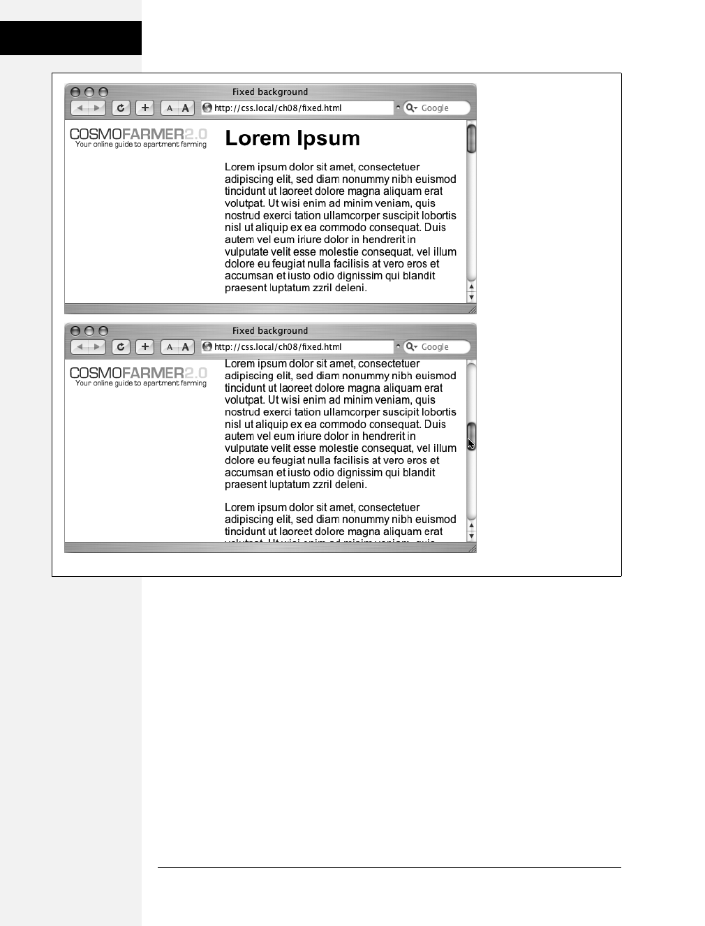
200 CSS: The Missing Manual
Using Background
Property Shorthand
You don’t need to specify all of the property values either. You can use one or any
combination of them. For example: background: yellow is the equivalent of background-
color: yellow. Any property value you leave out simply reverts to its normal behavior, so
say you specified only an image:
background: url(image/bullseye.gif);
That’s the equivalent of this:
background: url(image/bullseye.gif) fixed left top repeat;
Because the background property is so much faster to type, and it achieves all the
same ends as its long-winded siblings, use it liberally when adding background
images (and colors) to your styles.
Figure 8-9:
Looking for a way to nail
down a site logo (like the
CosmoFarmer 2.0 image)
so that when viewers scroll
down the page the logo
stays in place? Using the
fixed option for the
background-attachment
property, you can lock a
background image in place.
That way, even if the page
is very long and the visitor
has to scroll down, the
image remains visible on
the web page (bottom).
Download at Boykma.Com

Chapter 8: Adding Graphics to Web Pages 201
Tutorial: Enhancing
Images
Tutorial: Enhancing Images
A photo gallery is a perfect example of an eye-catching web page. This tutorial
brings together a variety of image styling techniques. You’ll format images with
frames and captions, create a photo gallery that’s flexible enough to look great in a
variety of window sizes, and use background images to create professional-looking
drop shadows.
To get started, you need to download the tutorial files located on this book’s com-
panion website at www.sawmac.com/css2e/. Click the tutorial link and download
the files. All of the files are enclosed in a Zip archive, so you need to unzip them
first. (There are detailed instructions on the website.) The files for this tutorial are
in the 08 folder.
FREQUENTLY ASKED QUESTION
Finding Free Imagery
I’m not an artist. I can’t draw, can’t paint, don’t even own
a digital camera. Where can I find artwork for my site?
Thank goodness for the Web. It’s the one-stop shop for cre-
ative geniuses who couldn’t paint themselves into a corner
if they tried. There are plenty of pay-to-download sites for
stock photos and illustrations, but there are also quite a few
completely free options. For photos, check out Morgue File
(www.morguefile.com), which despite the grisly name has
many wonderful photos supplied free of charge by people
who love to take pictures. Stock.xchng (www.sxc.hu) is yet
another excellent photographic resource. Open Photo
(http://openphoto.net/gallery/browse.html) also supplies
images based on Creative Commons licenses, and you can
use the search engine on the Creative Commons website to
find images (and video and music) that can be used in per-
sonal and commercial projects: http://search.
creativecommons.org. In addition, you can use Flickr
(www.flickr.com/creativecommons) and Picasa Web
Albums (http://picasaweb.google.com) to search for
images that have a Creative Commons license applied to
them. (Although they don’t cost money, not all photos on
these sites can be used in commercial projects. Make sure
you read the fine print for any photo you wish to use.)
If you’re looking for bullets to add to lists, icons to super-
charge your navigation bar, or patterns to fill the screen,
there are plenty of sites to choose from. Bullet Madness
(www.stylegala.com/features/bulletmadness) offers 200
bullets including variations on the common arrow, circle,
and square as well as more detailed bullets representing
software icons, iPods, folders, and more. Some Random
Dude (no, really; that’s the name of the website) offers a set
of 121 icons free of charge: www.somerandomdude.net/
srdprojects/sanscons. And if you’re looking for interesting
tiling patterns, check out the patterns on these sites: Colour-
Lovers.com (www.colourlovers.com/patterns), Pattern4u
(www.kollermedia.at/pattern4u), and Squidfingers (http://
squidfingers.com/patterns). Or make your own tiled back-
grounds with these online pattern creators: BgPatterns
(http://bgpatterns.com), Stripe Generator 2.0 (www.
stripegenerator.com), and PatternCooler (www.
patterncooler.com).
Download at Boykma.Com
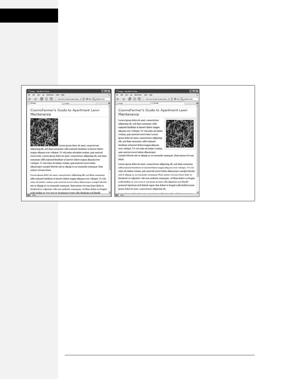
202 CSS: The Missing Manual
Tutorial: Enhancing
Images
Framing an Image
1. Launch a web browser and open the file 08 ➝image_ex ➝image.html.
You’ll be working on a basic web page from the fictional (just in case you
thought it was real) website CosmoFarmer.com (Figure 8-10). In this case,
there’s already an external style sheet attached to the page, adding some basic
text formatting.
2. Open the file styles.css in the image_ex folder in your favorite text editor.
This file is the external style sheet used by the image.html file. You’ll start by
adding a class style to this stylesheet, then applying a class to the <img> tag in
the HTML file.
3. Scroll to the bottom of the file and then type the following:
img.figure {
}
The selector img.figure targets any <img> tag with the figure class applied to it.
You’ll use this to selectively format only the images you want. (You could also
just name the style .figure—the only difference is that that style would then
apply to any tag with the class figure, not just images.)
4. Add float and margin properties to the style you just created, like so:
float: right;
margin-left: 10px;
margin-bottom: 10px;
Figure 8-10:
Before and after—CSS,
that is. If you rely just on
HTML, images take up
lots of space (left). With a
little CSS (right) you can
nicely frame an image
and move it out of
the way.
Download at Boykma.Com

Chapter 8: Adding Graphics to Web Pages 203
Tutorial: Enhancing
Images
The right float moves the image to the right side of the page, letting the text move
up and wrap around the photo’s left edge. The left and bottom margins give the
photo a little breathing room and move it away from the text. Next, you’ll add a
border and some padding to make the image look more like a real snapshot.
5. Add border and padding, so that the finished style looks like this:
img.figure {
float: right;
margin-left: 10px;
margin-bottom: 10px;
border: 1px solid #666;
padding: 10px;
}
If you save this file and then preview the web page right now, you won’t see a
change, since the class style has no effect until you’ve added the class to a tag.
6. Save and close the styles.css file and open the image.html file. Locate the <img>
tag and add class="figure" so the tag looks like this:
<img src="../
images/grass.jpg" alt="Apartment Grass" width="200" height="200"
class="figure">
Now that image takes on all of the formatting properties you defined for the .
figure class style.
7. Preview the page in a web browser. It should look like the right image in
Figure 8-10.
You can find the completed version of this exercise, image.html in the 08_finished ➝
image_ex folder.
A picture may be worth a thousand words, but sometimes you still need a few
words to explain a picture. So in the next part of this tutorial, you’ll add a caption
below the photo.
Adding a Caption
You’ll frequently want to add a caption to an image or photo to provide more
information about the subject, where the photo was taken, and so on. Instead of
just floating the image, as you did in the previous exercise, you want the caption
text to float as well. The best way to float both is to wrap the image and the text in
a container—a <div> tag—that’s floated as a single unit. This method keeps the
photo and its related text together. If you decide later that you want to change their
layout—perhaps float them to the left—no problem: You simply change the for-
matting for the entire container.
1. In a text editor, open the file 08 ➝caption_ex ➝caption.html.
Begin by adding a little HTML to create the container.
Download at Boykma.Com

204 CSS: The Missing Manual
Tutorial: Enhancing
Images
2. Locate the <img> tag in the code, and add <div class="figure"> before that tag.
This marks the beginning of the container. Now close the <div> to indicate the
end of the container.
3. Find the closing </p> tag of the paragraph directly after the image and type
</div>. The code should now look like this:
<div class="figure">
<img src="../
images/grass.jpg" alt="Creeping Bentgrass"
height="200"/>
<p>Figure 1: Creeping Bentgrass is best suited for outdoor use and should
be avoided by the indoor farmer.</p>
</div>
As with the previous tutorial, you’ll edit an existing external style sheet (styles.
css) that’s linked to this web page.
4. Open the file 08 ➝caption_ex ➝ styles.css.
Because this is an external style sheet, you’ll notice there’s no <style> tag. That
tag is necessary only for internal style sheets.
5. Scroll to the bottom of the file and add the following style to the end:
.figure img {
border: 1px solid #666;
padding: 10px;
}
This descendent selector affects any <img> tag inside any other tag with the fig-
ure class applied to it—in this case, the <div> you just added. Since you’re
using a descendent selector here (and in step 7), you don’t need to add a class to
the <img> tag. As a result, you save a little typing, cut down on HTML code,
and make the page load faster for your site’s visitors.
Next, you’ll format the <div> so that it floats the photo and caption text to the
right edge of the page.
6. Add this style to the styles.css file:
.figure {
float: right;
width: 222px;
margin: 15px 10px 5px 10px;
}
Download at Boykma.Com

Chapter 8: Adding Graphics to Web Pages 205
Tutorial: Enhancing
Images
You’ve already used the float: right property in the previous tutorial, and the
margin adds a little white space around all four edges of the <div>. But what’s
the width for, you ask? Although the photo has a set width (200 pixels; see step
3) the caption paragraph doesn’t. When you don’t set a width, the paragraph
makes the <div> expand wider than the photo. In this case, you want the cap-
tion to be just as wide as the photo and its frame.
The 222 pixels comes from a little math used to calculate the entire area taken
up by the photo on the page: While the photo is only 200 pixels wide, the 10
pixels of left and right padding as well as the image’s 1-pixel left border and 1-
pixel right border make the entire width of the photo equal to 222 pixels from
border to border. Next, spruce up the look of the caption text.
7. Add the following style to the styles.css style sheet:
.figure p {
font: bold 1em/normal Verdana, Arial, Helvetica, sans-serif;
color: #333;
text-align: center;
}
This style uses some of the properties you learned about in Chapter 6 to create a
center-aligned, bold, and gray caption using the Verdana font. Fortunately, the
font shorthand property in the first line lets you roll four different properties
into a single style declaration.
Again, you’re taking advantage of a descendent selector (.figure p) to target just
the caption paragraph. To make the caption stand out even more, add a back-
ground color and border.
8. Add three properties to the .figure p style, like so:
.figure p {
font: bold 1em/normal Verdana, Arial, Helvetica, sans-serif;
color: #333;
text-align: center;
background-color: #e6f3ff;
border: 1px dashed #666;
padding: 5px;
}
The purpose of the background-color, border, and padding properties should be
clear—to create a colored box around the caption. Now it’s time to preview
your work.
9. Save both the caption.html and styles.css files and preview the caption.html file
in a web browser.
(Now you see one reason why it’s easier to develop a design using an internal
style sheet—you need to work in and save only one file instead of two.)
Download at Boykma.Com

206 CSS: The Missing Manual
Tutorial: Creating a
Photo Gallery
The page looks great: The photo and caption float to the right, and the caption
stands out boldly. There’s one small problem, though: If you look at the left and
right edges of the paragraph, you’ll notice they’re indented slightly and aren’t as
wide as the photo. Here’s an example of one of the many head-scratching situa-
tions you’ll find as you work with CSS.
In this case, you’ve run into a problem with the cascade. The caption text is
inside a <p> tag, and, as it happens, there’s a tag style for the <p> tag in the
styles.css file. When you look at that style, you see it sets margins—10 pixels
on the top and bottom and 8 pixels on the left and right. You want to over-
ride those margins, and you can do so by adding new margins to a more spe-
cific style. (See “Specificity: Which Style Wins” on page 96 for a discussion of
specificity and the cascade.) Fortunately, you already have a more specific
style—.figure p—so you need only add margins to that style to override the
margins from the more generic p style.
10. Add a margin property to the .figure p style, like so:
.figure p {
font: bold 1em/normal Verdana, Arial, Helvetica, sans-serif;
color: #333;
text-align: center;
background-color: #e6f3ff;
border: 1px dashed #666;
padding: 5px;
margin: 10px 0 0 0;
}
This removes margins on all sides of the caption except the top, which adds 10
pixels of space between the caption and the photo above.
11. Save the caption.html and styles.css files. Preview caption.html file in a web
browser.
The page should now look like Figure 8-11 (You can find a completed version
of this page in the 08_finished ➝caption_ex folder.)
Tutorial: Creating a Photo Gallery
Folks used to rely on the HTML <table> tag to create rows and columns for hold-
ing the pictures in a photo gallery. But you can achieve the same effect with a little
CSS and far less HTML.
1. Open the file 08 ➝gallery_ex ➝ gallery.html.
First, a quick review of the HTML used to construct the photo gallery. The page
contains nine photos and photo captions. Each photo and caption is contained
Download at Boykma.Com

Chapter 8: Adding Graphics to Web Pages 207
Tutorial: Creating a
Photo Gallery
in a <div> with a class named figure applied to it. This <div> functions just like
the similar <div> used in the previous exercise for adding a caption. The photo
itself is contained in another <div> with a class of photo:
<div class="figure">
<div class="photo">
<img src="../ images/dandelion.jpg" alt="Dandelion" height="200"
width="200"/>
</div>
<p>Figure 6: The dandelion: scourge of the apartment farmer. </p>
</div>
Note: That second <div> will come in handy for the next exercise, when you learn to add drop shadows
to the photos.
Figure 8-11:
With the use of a
containing <div>, a right
float, and a little style, it’s
easy to add captions
to photos.
Download at Boykma.Com

208 CSS: The Missing Manual
Tutorial: Creating a
Photo Gallery
2. Locate the <link> tag near the top of the file, place your cursor after that tag,
and then press Enter (Return) to create a new blank line.
The <link> tag attaches an external style sheet containing some basic formatting.
3. Add an internal style sheet. Then add two new styles, as follows:
<style type="text/css">
.photo img {
border: 1px solid #666;
background-color: #FFF;
padding: 4px;
}
.figure p {
font: 1.1em/normal Arial, Helvetica, sans-serif;
text-align: center;
margin: 10px 0 0 0;
}
</style>
These two styles add a border to each image in the gallery, and set the font,
alignment, and margins of the captions. They use descendent selectors to target
just the images and paragraphs inside the gallery.
All of the images and captions are themselves wrapped in one <div> with an ID
of gallery, since enclosing the group of photos in another <div> provides even
more formatting options. You could set a specific width for the gallery or add a
border around it. But that enclosing <div> also provides another way to target
the photos and paragraphs using descendent selectors. For example, #gallery
img and #gallery p are also valid descendent selectors in this case. The main dif-
ference between the two approaches is the specificity of the styles (see page 96).
Because #gallery img is more specific than .photo img, its formatting options
override the .photo img style.
Next, place the photos side by side.
Note: When you insert the internal style sheet, make sure to place it in the page’s head section, between
the link tag and the closing </head> tag.
4. Add the following style to the internal style sheet you just created:
.figure {
float: left;
width: 210px;
margin: 0 10px 10px 10px;
}
Download at Boykma.Com
Chapter 8: Adding Graphics to Web Pages 209
Tutorial: Creating a
Photo Gallery
This style floats each photo/caption pair to the left. In effect, it places the photos
side-by-side until there’s no more room in the row. The browser then drops the
next photos down a row, until all of the photos are displayed one row on top of
the next. The width is the total width of the photo plus padding and borders. In
this example, it’s 200 pixels for the photo, 8 pixels for left and right padding,
and 2 pixels for left and right borders.
Note: In this fictitious photo gallery, each picture is the same width. In the real world, you may have pic-
tures of varying sizes. See the box below for a trick that lets you arrange rows of pictures of different
widths. Using different height images won’t work (as you’ll see in step 5). When you’ve got images with
differing heights, stick with HTML tables (or you can use the advanced, doesn’t-apply-to-all-browsers tech-
nique described in the tip on page 210).
5. Save the file and preview the gallery.html page in a web browser. It should look
like the left image in Figure 8-12.
Adjust the width of your browser window to make it thinner and wider and watch
how the images reflow into the space. Aha—something’s not quite right. The sec-
ond row of images has two empty spaces where photos should be. This problem
occurs because the caption for the second image on the first line is taller than the
other captions on the line. Images that jump down to another row bump into that
caption and can’t get by it. (You can read more about this float property snafu on
page 324.) Fortunately, there’s a simple fix to this dilemma.
POWER USERS’ CLINIC
When One Width Doesn’t Fit All
It’s a breeze to set up a photo gallery—like the one in this
tutorial—when the photos are conveniently all the same
width. But what if you have photos of differing widths? One
solution is to create a style for each different width and
apply the style to the <div> with the figure class. (That’s
tons of work, so it would pay to do some photo editing
work to standardize your photos to just a handful of differ-
ent widths first.)
You can take advantage of CSS’s ability to apply two classes
to one tag like this: <div class="figure w300">. This <div>
tag has both the figure and w300 class styles applied to it.
Then create a class style, for example .w300, and set the
width to the width of the image (in this case, 300) plus 10
to cover the padding and borders: .w300 { width: 310 }. For
this trick to work, you must either remove the width setting
on the .figure style or add the .w300 style after the .figure
style in the style sheet. Here’s why: The two width defini-
tions conflict (one’s 210 the other’s 300), so the browser
has to break the tie using the cascade (see Chapter 5).
Since .figure and .w300 have the same specificity, the one
that’s defined last in the style sheet wins.
Download at Boykma.Com

210 CSS: The Missing Manual
Tutorial: Creating a
Photo Gallery
Tip: There is a way to avoid that weird display problem noted in step 5, as well as create a gallery than
can handle different height images. Instead of using the float property, you can use display: inline-block
on the .figure style. This will treat each image/caption pair as a block (a box with height and width) but
also as an inline element (so the blocks can sit side-by-side). In addition, you can use the vertical-align
property to make the picture tops align. The .figure style from step 4 could then be rewritten like this:
.figure {
display: inline-block;
vertical-align: top;
width: 210px;
margin: 0 10px 10px 10px;
}
The downside to this very simple and useful technique: It won’t work in IE 6, IE 7, or Firefox 2. Hey, but at
least it works in everything else, including IE 8!
6. Return to your text editor and the gallery.html file. Locate the .figure p style
and add a height to it. The finished style should look like this:
.figure p {
font: 1.1em/normal Arial, Helvetica, sans-serif;
text-align: center;
margin: 10px 0 0 0;
height: 5em;
}
Adding this property sets a uniform height for each caption. In this case, it’s tall
enough to accomodate the lines of caption text. (If you needed more text, you’d
just increase the height.)
Note: You don’t need the height property if you’re sure each floated element is the same height. This
could happen if you don’t have captions and all of the photos are the same height, or if each caption has
the same number of lines of text.
7. Save the file and preview the page in a web browser. See the right side of
Figure 8-12.
If you resize the browser window, the gallery reformats itself. With a wider win-
dow you can fit four or even five images on a row, but if you make it smaller
you’ll see only one or two images per row.
Adding Drop Shadows
Your gallery looks good, but you can make it even more impressive. Adding drop
shadows under each photo lends the page an illusion of depth and a realistic 3-D
quality. But before you fire up Photoshop, you’ll be glad to know there’s no need
to add individual drop shadows. Instead, you can make CSS automatically add a
shadow to any image you want.
Download at Boykma.Com

Chapter 8: Adding Graphics to Web Pages 211
Tutorial: Creating a
Photo Gallery
Note: CSS 3 provides a new CSS property—box-shadow—which can automatically add drop shadows to
any style. It’s cool, customizable, and easy to use, but only works in a few browsers. You can read about it
on page 449.
First you need a drop shadow graphic—just an image with fuzzy right and bottom
black edges. There’s one in the 08 ➝gallery_ex folder, but you can make your own
in Photoshop, Fireworks, or any other image editing program that has a blur or
drop shadow filter. (In Fireworks, for example, you’d create a white box and apply
the drop shadow filter to it. Then save the file in PNG8 format.)
1. In a text editor, open the gallery.html file you completed in the previous exercise.
First, add a background image to the <div> tag that surrounds each image.
2. Add this style to the gallery page’s internal style sheet:
.photo {
background: url(drop_shadow.gif) right bottom no-repeat;
}
This .photo style adds a background image—drop_shadow.gif—to the lower-right
corner of the photo <div>. The no-repeat value means the graphic won’t tile.
If you preview the page now, you won’t see much. That’s because the drop
shadow appears in the background. On top is the photo itself, which you styled
in step 3 on page 208 to have a white background, a black border, and 4 pixels
of padding. What you need is a way to reveal that background image.
Figure 8-12:
Floating elements next to
each other is one way to
simulate the column and
row appearance of a
table. But it doesn’t work
well if the elements are
of varying heights (left).
Using the height property
can help you enforce
equal heights and make
sure elements line up
correctly (right).
Download at Boykma.Com

212 CSS: The Missing Manual
Tutorial: Creating a
Photo Gallery
One clever technique pioneered by Richard Rutter (www.clagnut.com)isto
move the image up and to the left a little—essentially moving it outside of its
containing <div> tag. CSS provides a mechanism known as positioning that lets
you control the exact placement of an element. You’ll learn more about posi-
tioning in Chapter 13, but for now you need to add only three properties to the
.photo img style you created in step 3 on page 208 to reveal the drop shadow.
Note: Negative margins are another way to achieve the drop shadow shift. For details, see http://
1976design.com/blog/archive/2003/11/14/shadows.
3. Locate the .photo img style, and add three positioning properties, like so:
.photo img {
border: 1px solid #666;
background-color: #FFF;
padding: 4px;
position: relative;
top: -5px;
left:-5px;
}
In a nutshell, these three properties simply move the photo up and to the left 5
pixels, exposing the underlying drop shadow graphic of the <div>. In fact, the
very reason for using the <div> to contain the photo here is to provide an ele-
ment to hold the drop shadow image.
4. Save the file and preview the page. It should look like Figure 8-13.
Each image has its own drop-shadow, and you didn’t even have to open Photoshop!
Note: The graphic you used here is around 375 ×375 pixels, so it accommodates images only up to that
size. You can use this same technique for larger images, but you’ll need to create your own drop shadow.
You can use this drop-shadow method on any graphic, not just those inside a gal-
lery. The key is surrounding the <img> tag with a container <div>, applying a
drop shadow graphic to that <div>, and offsetting the <img> tag with negative top
and left placement. Use this same effect to add a drop shadow to any box element,
such as a sidebar or pull quote.
You can find a completed version of this tutorial in the 08_finished ➝gallery_ex
folder.
Note: You may have noticed that the drop shadows you just created have abrupt left and top endings.
They don’t fade like actual drop shadows. To learn how to create more sophisticated drop shadows, check
out www.alistapart.com/articles/cssdrop2 and www.ploughdeep.com/onionskin.
Download at Boykma.Com
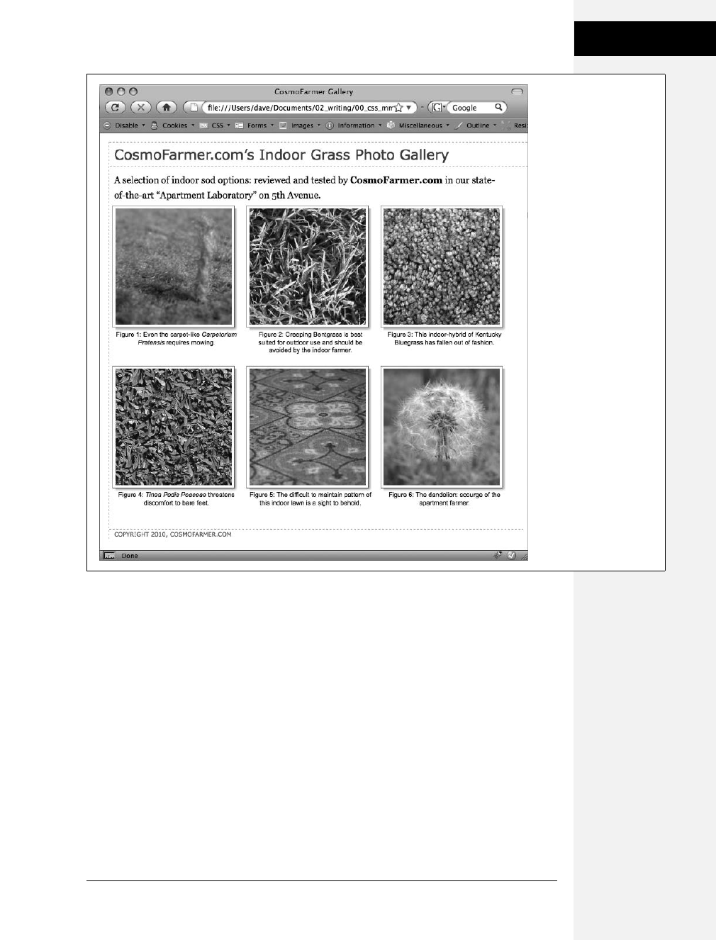
Chapter 8: Adding Graphics to Web Pages 213
Tutorial: Using
Background Images
Tutorial: Using Background Images
The CSS background-image property is the secret weapon of modern web design. It
can turn a ho-hum, text-heavy web page into a dazzling swirl of imagery (see
Figure 8-14). Since you can use it to add an image to the background of any
HTML tag, the designs you can create are limited only by your imagination. The
drop shadow example in the previous tutorial is just one example of creative back-
ground image use. Other common background image frills include applying a page
background and adding custom bullets to unordered lists. You’ll explore some of
these common tasks in this tutorial.
Figure 8-13:
Adding drop shadows to
photos gives a page a 3-
D look and increases the
visual appeal of any
photo gallery.
Fortunately, using CSS
you can easily add a
drop shadow to any
picture without even
touching Photoshop.
Download at Boykma.Com

214 CSS: The Missing Manual
Tutorial: Using
Background Images
Adding an Image to the Page Background
Whether it’s an intricate pattern, a logo, or a full-screen photograph, images appear in
the background of many a web page. In fact, adding an image to the background of a
page is probably the most common application of the background-image property.
1. In your text editor, open the file 08 ➝bg_ex ➝bg_images.html.
This page is a basic two-column layout: a very simple page, with some text for-
matted on a white background (Figure 8-14, top). To start, you’ll add a back-
ground image to the page. The page has an external style sheet with the basic
formatting, but so you don’t have to wade through all the styles in that file,
you’ll add an internal style sheet for the steps in this tutorial.
2. Click between the opening and closing <style> tags. Add the following style:
body {
background-image: url(images/bg_page.png);
background-repeat: repeat-x;
background-color: #FFF;
}
The first line of code points to the image—bg_page.png—you want to display
on the page. The file is stored in the images folder. This graphic is a gradient
that starts as light blue at the top and fades to white at the bottom. The graphic
isn’t as tall as the page content, so without further instructions, it would tile
over and over across and down the page. At a certain point down the page, that
light blue would reappear and fade once again downward to white. To prevent
this unsightly snafu, you’ve set the background-repeat property so that the image
tiles from left to right in order to fit any width of browser window, but doesn’t
tile down the page. The last line of code sets the page’s background color to
match the end of the gradient, so the image fades seamlessly into the page’s
background color.
Note: Using background property shorthand, you can condense the three lines of code from step 2 into
a single line of CSS: background: #FFF url(images/bg_page.png) repeat-x.
3. Save the file and preview it in a web browser.
The background graphic’s blue gradient drips down the page. Not bad looking,
but the blue also appears in the text’s background. You can make the text pop
by giving its background a different color.
4. Return to your text editor and the bg_images.html file. Add another style for
the <div> containing the content of the page:
#wrapper {
background-color: #FFF;
}
Download at Boykma.Com
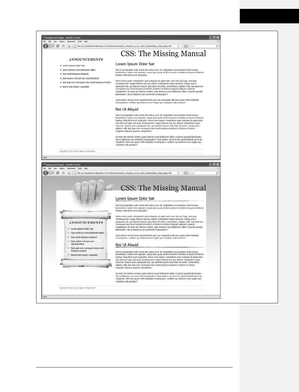
Chapter 8: Adding Graphics to Web Pages 215
Tutorial: Using
Background Images
The wrapper div is a fixed width, centered in the middle of the page, containing
all of the page’s text. This style gives it a white background, but with the help of
an image, you can do better than that.
Figure 8-14:
Using background
images, you can make an
already well-organized
page (top) look much
spiffier (bottom). Since
you can add images to
the background of any
tag on a page, the
possible placement of
graphics on a page are
nearly limitless.
Download at Boykma.Com

216 CSS: The Missing Manual
Tutorial: Using
Background Images
5. Edit the style you created in step 4 by adding a background image:
#wrapper {
background-color: #FFF;
background-image: url(images/bg_main.jpg);
background-position: top left;
background-repeat: no-repeat;
}
These three lines of code add a background image to the top left of the <div>;
the no-repeat option for the background-repeat property means the image only
appears a single time. If you save the file and preview it in a web browser, you’ll
now see the picture of a hand acting like it’s holding the page. Very cool. The
only problem is the text is too far up, covering up the image. You’ll next push
down the big, top headline and the left sidebar.
6. Add two more styles to the internal style sheet:
#banner {
margin-top: 48px;
}
#announcement {
margin-top: 115px;
}
The first line just adds a bit of padding pushes down the banner containing the
headline until it just tops the touch of the white page, while the second style
moves the left sidebar down enough to clear the picture of the hand. The page
should now look like Figure 8-15.
Replacing Borders with Graphics
The border property is a useful tool in your design arsenal, but the limited num-
ber of border styles CSS offers can get boring. A hand-drawn line with a little tex-
ture would catch your visitors’ attention better than a plain, straight one. You can
skip the border property and add any kind of line you want as a background
image—easy as pie. In this part of the tutorial, you’ll replace the underline below
each <h2> tag in the main text area with a custom graphic that looks like a hand-
drawn line.
1. Return to your text editor and the bg_images.html file. Add a style for the
<h2> tags inside the main <div> tag:
#main h2 {
background-image: url(images/underline.png)
background-repeat: no-repeat;
}
The background-image property specifies which graphic to use in the back-
ground of <h2> tags inside an tag with an ID of main; while the no-repeat value
makes sure graphic only appears a single time.
Download at Boykma.Com
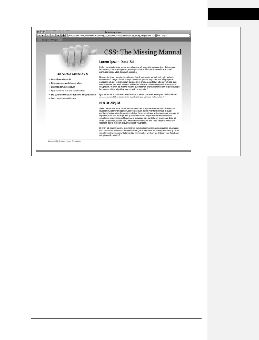
Chapter 8: Adding Graphics to Web Pages 217
Tutorial: Using
Background Images
If you preview the file now, you’ll see that the underline doesn’t exactly line up.
In fact, it isn’t under at all. It’s above the headlines!
2. Add the following style declaration to the #main h2 style below the background-
repeat property:
background-position: left bottom;
You’ve changed the graphic’s starting location so it appears at the left edge and
bottom of the <h2> tags. If you preview the page now, though, you may not
notice much improvement. The underline runs into the headline text.
But there’s an easy fix. Since the bottom value used here puts the graphic at the
bottom of the block created by the <h2> tag, you need only to increase the
overall height of the block to move the line down a bit. You’ll do this with a little
bottom padding.
3. Edit the #main h2 style one last time, so that it looks like this:
#main h2 {
background-image: url(images/underline.png);
background-repeat: no-repeat;
background-position: left bottom;
padding-bottom: 7px;
}
Figure 8-15:
CSS lets you combine a
background color and a
background image,
which comes in really
handy in this example.
The main text area has a
white background color
that helps separate the
text from the fading
gradation in the page’s
background. In addition,
a graphic of a hand
holding a piece of paper
adds depth to the design.
Download at Boykma.Com

218 CSS: The Missing Manual
Tutorial: Using
Background Images
Padding, as you’ll recall from, is the space between the border (the edge of the
background as well) and the content. It also increases the overall height of the
box—in this case by adding 7 pixels of bottom padding. Now, the line graphic is
placed at the bottom of the h2 block, but in the empty space created by the bot-
tom padding.
4. Save the file and preview the page in a web browser.
Each <h2> tag has the hand-drawn underline. Next you’ll tackle the sidebar
box, making it look a little less boxy and jazzing up the bulleted lists.
Using Graphics for Bulleted Lists
The average bullet used for unordered lists is a black dot—not very inspiring. But you
can use the background-image property to replace those drab bullets with any image
you want. The first step is to hide the bullets that normally appear beside list items.
1. Return to your text editor and the sidebar.html page. And add a style for
formatting the list items in the left sidebar.
#announcement li {
list-style: none;
}
The bulleted list is inside a <div> with an ID of announcement, so this descendent
selector targets just the list items (<li> tags) inside that div. The style removes
the bullet. Now add the graphic.
Note: You can just as well apply list-style: none; to a style affecting the <ul> or <ol> tags to remove bullets
from each list item.
2. Add the following two properties to the #announcement li style:
background-image: url(images/bullet.png);
background-repeat: no-repeat;
You’ve seen these two properties before. They add an image to the background
and turn off repeating so that the graphic appears only once.
If you preview the page, you’ll see that the bullets currently overlap the list text
and the list items are a little jammed together (Figure 8-16, left). A little pad-
ding and margin will fix this.
3. Add two more properties to the #announcement li style:
padding-left: 25px;
margin-bottom: 10px;
The left padding adds empty space, effectively moving the text out of the way in
order to display the new bullet icon. The bottom margin adds just a bit of
breathing room between each list item (Figure 8-16, middle).
Download at Boykma.Com
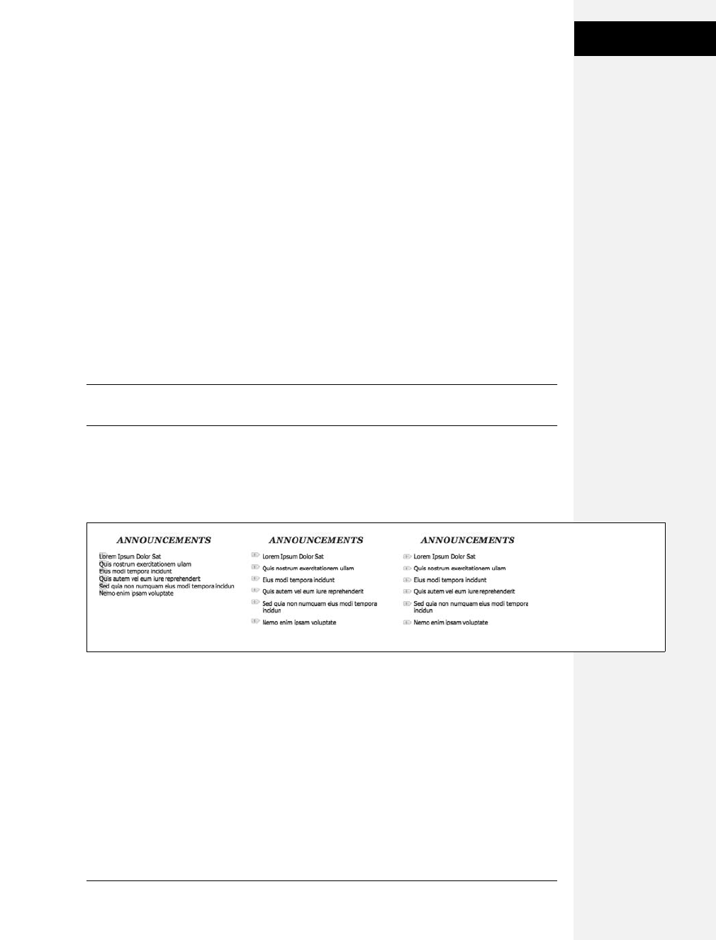
Chapter 8: Adding Graphics to Web Pages 219
Tutorial: Using
Background Images
There’s just one final flaw. The bullet image is a tad too high on the line, causing
the tip of the icon to stick out too far above the text. But you can easily fix that
with the background-position property.
4. Finish this style by adding background-position: 0px 4px;. The completed style
should look like this:
#announcement li {
list-style: none;
background-image: url(images/bullet.png);
background-repeat: no-repeat;
background-position: 0 4px;
padding-left: 25px;
margin-bottom: 10px;
}
This last style declaration positions the bullet icon to the far left (that’s the 0)
and 4 pixels from the top (4px) of the list item. It moves the icon down just a
smidgen, enough to make the bullet look perfect.
Note: As discussed on page 138, this kind of exact positioning is precisely why you should use the back-
ground property instead of the list-style-image property for adding graphic bullets to your lists.
5. Save the file and preview the page in your browser.
The list should now have 3-D tabs with red exclamation marks instead of dreary
black circles (Figure 8-16, right).
Giving the Sidebar Personality
At this point, the sidebar looks pretty good. The text is nicely formatted, and the
bullets look great, but the sidebar gets a little lost in the sea of white. Adding a
background image can make the sidebar stand out in a whimsical way. You could
use a single image—the scroll image pictured in the bottom image of
Figure 8-14—in the background of the <div> tag, but in order to make sure the
text fit exactly on the scroll, you’d have to limit the amount of content you put in
the sidebar—too much text and it won’t fit on top of the single image; too little,
and there will be too much empty space on the graphic.
Figure 8-16:
Replacing regular black
bullets with your own
graphics is easy. Just a
few extra steps ensure
the bullets and text are
placed in the correct
location.
Download at Boykma.Com
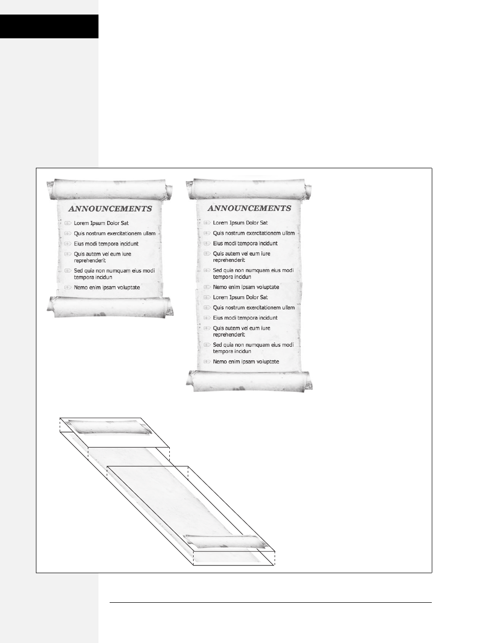
220 CSS: The Missing Manual
Tutorial: Using
Background Images
A more flexible approach would let the image grow as the sidebar acquires more
content (see Figure 8-17, top). Fortunately, this little trick isn’t so hard—it just
requires three different images and three different styles. In this example, there’s
one <div> with the ID announcement—that’s the sidebar—and it contains an
<h2> tag (with the text “Announcements”) and a bulleted list (a <ul> tag). Basi-
cally, you attach the top of the image to an HTML element at the top of the sidebar
(the <h2> tag in this example), the bottom of the image to the last HTML element
of the sidebar (the <ul> tag), and an image that tiles vertically in the <div> that
creates the sidebar (see Figure 8-17, bottom).
Figure 8-17:
Sometimes there’s more than
one way to skin a web page.
Many of the pages you see
every day may look like a
unified whole, but are actually
composed of many images
placed strategically in the
background of multiple tags.
<div id=”announcement”>
<h2>
<ul class=”last”>
Download at Boykma.Com

Chapter 8: Adding Graphics to Web Pages 221
Tutorial: Using
Background Images
1. Return to your text editor and the bg_images.html file. Locate the
#announcement style you added in step 6 on page 216 and add one additional
property:
#announcement {
background: url(images/scroll_middle.jpg) repeat-y center top;
margin-top: 115px;
}
This line adds a background image to the <div> tag that scrolls vertically
(repeat-y) and centers the image in the div. The image tiles seamlessly so that as
the div gets taller, the background image appears to grow. But, if you preview
the page now, you’ll see that the bulleted list sticks out on the both the left and
right sides of the sidebar image. To make the bulleted list fit on the scroll, you
need to add some left and right margin.
2. Locate the #announcement li style you created earlier and add two properties
to the end so that it looks like this:
#announcement li {
list-style: none;
background-image: url(images/bullet.png);
background-repeat: no-repeat;
background-position: 0 4px;
padding-left: 25px;
margin-bottom: 10px;
margin-left: 30px;
margin-right: 40px;
}
These properties move both the left and right edges of each bulleted item in
enough to clear the edges of the background image. Next, you’ll add the top of
the scroll by placing a background image behind the <h2> tag in the sidebar.
3. At the bottom of the internal style sheet, add the following descendent selector
style for the sidebar’s <h2> tag:
#announcement h2 {
background: url(images/scroll_top.jpg) no-repeat center top;
}
Here an image is only placed a single time in the center and top of the tag. But if
you preview the page right now, it doesn’t look quite right (see Figure 8-18).
You can’t see the entire scroll top, and the heading text overlaps it in an unreal-
istic way. Basically, the <h2> tag isn’t tall enough to display all of the graphic.
Also, you need to add some space above the text to push it down below the
graphic. The padding property comes to the rescue.
Download at Boykma.Com

222 CSS: The Missing Manual
Tutorial: Using
Background Images
4. Edit the style you added in the last step so it looks like this:
#announcement h2 {
background: url(images/scroll_top.jpg) no-repeat;
padding-top: 70px;
}
The 70 pixels of top padding does two things: pushes the text down to clear the
scroll’s top edge and makes the <h2> element tall enough to display the entire
image. In fact, the text, “Announcements” isn’t actually sitting on top of the
style’s background image at all—it’s sitting on top of the background image
placed on the <div>.
Note: The technique used here is for a fixed-width box. That means if you change the width of the side-
bar, you’ll need to recreate the graphics at the same width to match. For a few techniques that let you cre-
ate rounded corners with more flexibility—and require more CSS and HTML code—visit these pages:
www.vertexwerks.com/tests/sidebox/
www.sperling.com/examples/box/
Next, you need to add the bottom image to the <ul> tag. But first, you’ll modify
the HTML a bit.
5. Locate the <ul> tag (it’s below the <div id="announcements"> and <h2> tag)
and add class="last":
<div id="announcement">
<h2>Announcements</h2>
<ul class="last">
Why add a class? As pictured in Figure 8-17, the bottom image (the end of the
scroll) must be attached to the last tag in the sidebar; that’s how the image
appears at the bottom of the scroll. Now, you could just create a style like
#announcement ul, which will work in this case, but if you ever want to remove
the bulleted list and replace it with paragraphs of text, you’ll need to recreate
the style. If you use a class and create a style like #announcement .last, then
Figure 8-18:
If you can’t see all of a background image (the top of the scroll here),
then the element isn’t big enough. You can add padding to make
room for the entire image.
Download at Boykma.Com

Chapter 8: Adding Graphics to Web Pages 223
Tutorial: Using
Background Images
whenever you change the HTML in the sidebar, you just add class="last" to the
last tag in the sidebar. (You can do the same for the <h2> tag. For example, you
can create a class named #announcement .first and add class="first" to which
every tag comes first inside the <div>.)
6. In the page’s internal style sheet, add one last style:
#announcement .last {
background: url(images/scroll_bottom.jpg) no-repeat center bottom;
padding-bottom: 65px;
}
Like the other styles in this part of the tutorial, here you’re adding a single
image to the background of an element. However in this case, the image is
being placed at the bottom of the <ul> tag. Since there are quite a few list items,
the <ul> tag is actually pretty tall—taller than the background image—so you
need to place it at the bottom of the tag, in order for it to appear at the bottom
of the <div>.
7. Save the file and preview it in a web browser.
The sidebar should look like the bottom image of Figure 8-14…unless you’re
using IE 6 or IE 7. In those browsers, you don’t actually see anything except the
tiled background—no headline, no bullets, and no top and bottom parts of the
scroll. Behold another IE browser bug. It’s a variant of the “peekaboo” bug
described on page 173. Thankfully, this bug has been fixed in IE 8, and there’s a
way to fix it for IE 6 and IE 7.
8. Return to the bg_images.html file and add zoom: 1 to #announcement style in
the internal style sheet. The final version should look like this:
#announcement {
background: url(images/scroll_middle.jpg) repeat-y center top;
margin-top: 115px;
zoom: 1;
}
This weird, IE-only property adds what’s called layout, which ends up fixing this
problem and many just like it. It’s a bit of CSS voodoo that shouldn’t really do
anything…but it does (gotta love web design). You’ll learn more about layout
and using the zoom property to fix IE bugs on page 173.
Going Further
The page is done, but for an extra challenge take the internal style sheet you incor-
porated in this tutorial and move it into the external style sheet—styles.css—that’s
attached to this page. One way is to simply cut the styles from the internal style
sheet and paste them into the external style sheet. However, in some cases, the
same style name appears in both style sheets (the external style sheet, for example,
has a #announcement style used to provide the layout information for the sidebar).
Download at Boykma.Com

224 CSS: The Missing Manual
Tutorial: Using
Background Images
Try to end up with an external style sheet that doesn’t repeat style names—you can
do this by copying the properties from the internal style sheet (for example, copy the
properties for #announcement) and pasting them into the appropriate style in the
external style sheet (for example, pasting the properties into the #announcement style
in the styles.css file).
You’ll find finished examples of this tutorial—both the finished, two style sheet
version and the single external style sheet version—in the folder 08_finished/bg_ex
and 08_finished/bg_ex_further folders.
Download at Boykma.Com
225
Chapter 9
chapter
9
Sprucing Up Your Site’s
Navigation
It’s safe to say that without links there’d be no Web. The ability to be on one page,
then click something onscreen and suddenly see a page on a computer half a world
away is what makes the Web so useful. Links are also how your visitors navigate
their way around your website. That’s why web designers agonize over making
their links look good and work properly.
In this chapter, you’ll learn how to style links to make them stand out from other
text. You can also make your links provide visual cues so your site’s visitors can see
where they are—and where they’ve been. You’ll learn how to use CSS to create
onscreen buttons and navigation bars just like the pros use. And in the tutorial sec-
tion, you’ll get some hands-on experience creating a full set of navigation features
that work in all browsers.
Selecting Which Links to Style
As always in CSS, you have to select something before you can style it. For links,
you need to tell CSS not only what you want to style, but also when you want that
style to apply. Web browsers keep track of how a visitor interacts with links, and
then displays that link differently depending on the link’s status, or state. When
you use a CSS link selector, you can target a specific link state as well.
Download at Boykma.Com

226 CSS: The Missing Manual
Selecting Which
Links to Style
Understanding Link States
Most browsers recognize four basic link states: an unvisited link, a link that’s been
visited already (meaning the URL is stored in the browser’s history), a link that the
visitor’s mouse is poised over, and a link that’s being clicked. As described in
Chapter 3 (page 61), CSS gives you four pseudo-class selectors to accompany these
states—:link, :visited, :hover, and :active. Using them, you can apply different for-
matting to each state, so there’s no doubt in your visitor’s mind whether he’s been
there or done that.
Note: Internet Explorer 8, Firefox, Safari, and Opera also recognize a pseudo-class called :focus. Links get
:focus when mouse-averse visitors use the keyboard to tab to them. This pseudo-class is also fun to use
with form text fields, as you’ll see on page 295.
Suppose you want to change the text color for an unvisited link from boring
browser blue to vivid orange. Add this style:
a:link { color: #F60; }
Once someone has clicked that link, its state changes to visited, and its color
changes to the purple used by most browsers. To change that color to deep red, use
this style:
a:visited { color: #900; }
Tip: When you want to provide a style that applies to all link states—for example, use the same font and
font size for all link states—then style the HTML <a> tag by creating a generic aselector. You can then use
the specific link state styles—a:visited, for example—to change the color or in some other way customize
the look of just that state.
The :hover pseudo-class offers many creative possibilities. (You’ll learn quite a few
later in this chapter.) It lets you completely alter the look of a link when a visitor
moves her mouse over it. If you’ve used cumbersome JavaScript to make graphic
buttons change when a mouse hovers over them, you’ll love being able to create
the same effect with CSS alone. But to start with a simple example, this style
changes the color of a link as a mouse passes over it:
a:hover { color: #F33; }
Tip: Be careful when adding CSS properties to the :hover pseudo-class. Properties that change the size of
the hovered element might affect other elements around it. For example, if you increase the font size of a
hovered text link, when you mouse over the link, the text will grow, pushing other elements out of the
way. The effect can be jarring.
Download at Boykma.Com
Chapter 9: Sprucing Up Your Site’s Navigation 227
Selecting Which
Links to Style
And finally, for those obsessive-compulsive designers who leave no design stone
unturned, you can even change the look of a link for the few milliseconds when a
visitor is actually clicking it. Here’s how:
a:active {color: #B2F511; }
In most cases, you’ll include at least :link, :visited:, and :hover styles in your style
sheets for maximum design control. But for that to work, you must specify the
links in a particular order: link, visited, hover, and active. Use this easy mnemonic
to remember it: LoVe/HAte. So here’s the proper way to add all four link styles:
a:link { color: #F60; }
a:visited { color: #900; }
a:hover { color: #F33; }
a:active {color: #B2F511; }
If you change the order, the hover and active states won’t work. For example, if
you put a:hover before a:link and a:visited, then the color change won’t take effect
when hovering.
Note: Why does the order matter? That would be thanks to our friend the cascade (see Chapter 5). All
those styles have the same specificity, so the order in which they appear in the code determines the style
that wins out. A link can be both unvisited and hovered over. So if the a:link style comes last in the code,
then it wins, and the color from a:hover never gets applied.
Targeting Particular Links
The styles in the previous section are basic atag styles. They target certain link
states, but they style all links on a page. What if you want to style some links one
way and some links another way? A simple solution is to apply a class to particular
link tags. Say you have a bunch of links within the body of an article, some of
which point to sites that you want to highlight (for example, links to websites
belonging to your friends, business associates, or sponsors). You may want to
identify these links so people know they’re special and are more likely to click
them. In this case, you can apply a class to these external links, like this:
<a href="http://www.hydroponicsonline.com" class="sponsor">Visit this great
resource</a>
To style this link in its own way, you’d create styles like this:
a.sponsor:link { color: #F60; }
a.sponsor:visited { color: #900; }
a.sponsor:hover { color: #F33; }
a.sponsor:active {color: #B2F511; }
Download at Boykma.Com

228 CSS: The Missing Manual
Styling Links
Leaving off the a and only specifying the class works too:
.sponsor:link { color: #F60; }
.sponsor:visited { color: #900; }
.sponsor:hover { color: #F33; }
.sponsor:active {color: #B2F511; }
Now only those links with a class of “sponsor” will get this formatting.
Note: These examples change only the links’ color, but that’s just to make it simple for demonstration
purposes. You can use any CSS property to format links. As you’ll see in the next section, you have lots of
creative ways to style links.
Grouping links with descendent selectors
If a bunch of links appear together in one area of a page, you can also save time by
using descendent selectors. Say you have five links that lead to the main sections of
your site. They represent your main navigation bar, and so you want to give them a
distinctive look. Just wrap those links in a <div> tag and apply a class or ID to it
like this: <div id="mainNav">. Now you have an easy way to identify and format
just those links:
#mainNav a:link { color: #F60; }
#mainNav a:visited { color: #900; }
#mainNav a:hover { color: #F33; }
#mainNav a:active {color: #B2F511; }
Using descendent selectors, it’s easy to style links differently for different areas of a
web page. (See page 427 in Chapter 15 for a thorough discussion of the power of
descendent selectors.)
Tip: It’s very common to use bulleted lists to present links (you’ll see an example of this technique on
page 235). In this, case you can add an ID or class to the <ul> tag for the list—<ul id="mainNav">, for
example—then create descendent selectors like #mainNav a:link to style them.
Styling Links
Now that you know how to create a selector that targets links, how should you
style them? Any way you want! There aren’t any CSS properties intended just for
links. You have full access to all CSS properties, so you’re limited only by your
imagination. Just make sure your links look like links. Not that they need to be
blue and underlined, but links must look different from non-link text so visitors
know they can click them.
Download at Boykma.Com

Chapter 9: Sprucing Up Your Site’s Navigation 229
Styling Links
If you make a link look like a button—adding a border, including a background,
and making it change color when moused over—most people will understand they
can click it. Likewise, links that appear in long passages of text should look clearly
distinct. You can make links stand out by bolding the text, keeping the traditional
underline, coloring the background, or adding a hover style. You can even add a
graphic (like an arrow) that provides a clear visual cue that clicking the text takes
you somewhere else.
Tip: Unless you set an <img> tag’s border attribute to 0, web browsers usually add a border around linked
images. To prevent this from happening, add this basic style to your style sheets: img { border: none; }.
Underlining Links
Since the beginning of the Web, vibrant blue, underlined text has signaled, “Click
here to go there.” But that underline and color are often the first two things a
designer wants to change. Underlines are such a common way to mark a link that
they’re boring. (See #1 in Figure 9-1). Fortunately, you can do several things to
eliminate or improve on the standard underline, while still ensuring that your links
are identifiable:
•Remove the underline entirely. To eliminate the regular underline, use the text-
decoration property and the none value:
a {text-decoration: none;}
Of course, removing the underline completely can confuse your visitors. Unless
you provide other visual cues, your links look exactly the same as all the other
text (#2 in Figure 9-1). So if you go this route, then make sure you highlight the
links in some other way, like making link text bold (#3 in Figure 9-1), coloring
the background, adding an informative graphic (page 230), or making the link
look like a button (page 231).
•Underline when mousing over. Some designers remove underlines for all links,
highlight them in some other way, and then add the underlines back when the
visitor moves his mouse over the link, as shown in #4 in Figure 9-1. To do so,
simply remove the underline for links, and then reintroduce it using the :hover
pseudo-class:
a {
text-decoration: none;
background-color: #F00;
}
a:hover {
background-color: transparent;
text-decoration: underline;
}
Download at Boykma.Com
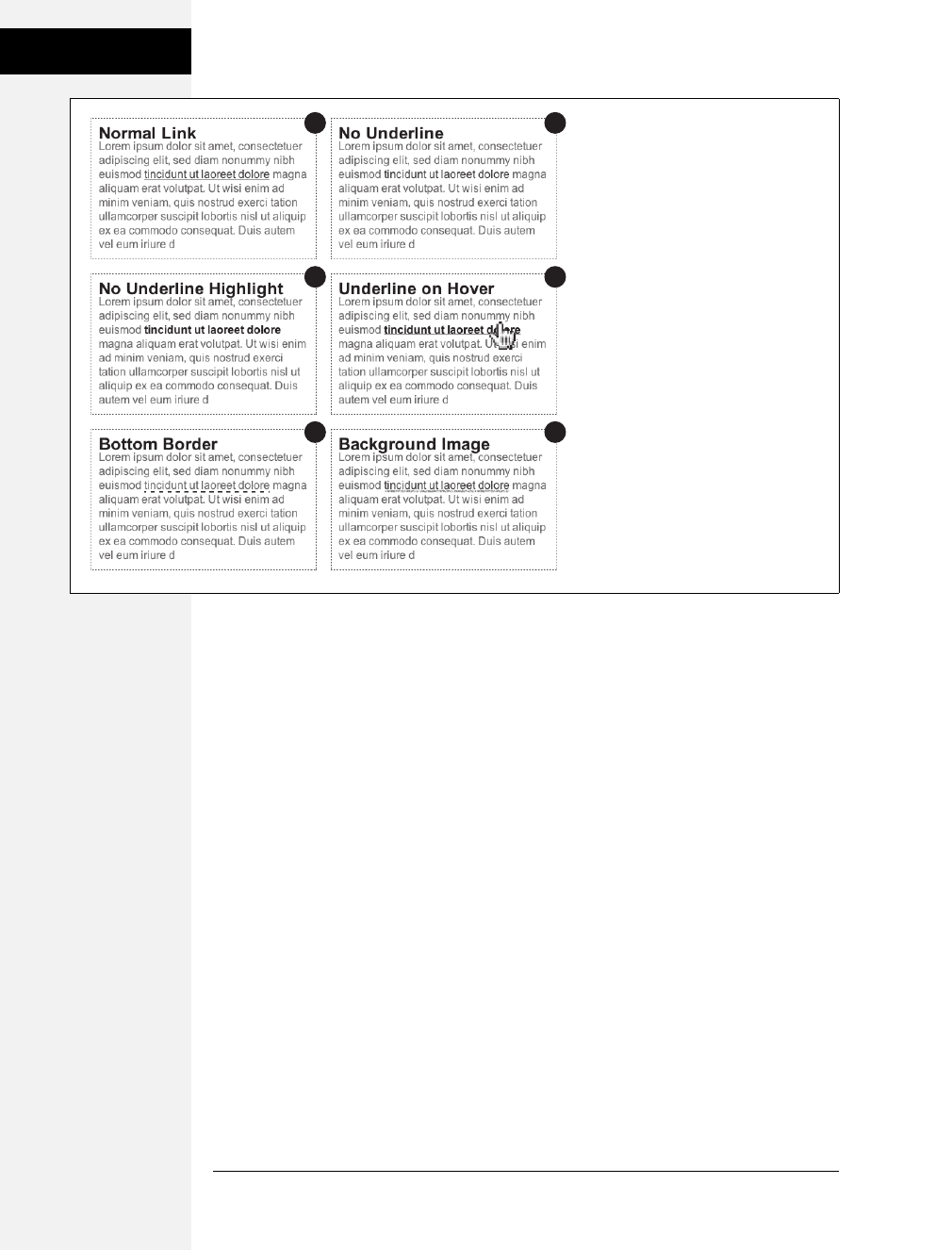
230 CSS: The Missing Manual
Styling Links
•Use a bottom border. You can’t control the color, width, or style of a regular
link underline. It’s always a solid, 1-pixel line in the same color as the link text.
For greater variety, use the border-bottom property instead, like #5 in Figure 9-1.
Hiding the normal underline and adding a dashed-line border looks like this:
a {
text-decoration: none;
border-bottom: dashed 2px #9F3;
}
You can alter the style, width, and color of the border. To put more space
between the text and the border, use the padding property.
•Use a background image. You can customize the look of links even further by
using a graphical line. For example, #6 in Figure 9-1 uses a graphic that looks like
a hand-drawn line. There’s a similar technique for underlining headlines in the
Chapter 8 tutorial (page 216). Start by creating an underline graphic using a pro-
gram like Fireworks or Photoshop, which have brush tools that simulate the look
of a crayon, felt-tip marker, or whatever. Next, create a style for the link that
Figure 9-1:
You have plenty of ways to make the
boring line (1) under links more
exciting. Start by removing the line
entirely (2, 3, 4). Better yet, create a
more stylized line by using the border
property (5) or a background image (6).
21
43
65
Download at Boykma.Com

Chapter 9: Sprucing Up Your Site’s Navigation 231
Styling Links
removes the normal underline and adds a background image. Make sure the
graphic repeats horizontally and is positioned at the bottom of the link. You may
also need to add a little bottom padding to position the line. Here’s an example:
a {
text-decoration: none;
background: url(images/underline.gif) repeat-x left bottom;
padding-bottom: 5px;
}
It’s best to use this technique for short, one- to-three-word links, since if the
link runs longer than a single line, then Windows Internet Explorer 6 and 7 add
the graphic to only the bottom of the last line (IE 8 gets it right).
Creating a Button
You can also make links look like the buttons in the dialog boxes and toolbars you
see in computer programs. Buttons look great in navigation bars, but you can also
use them for any small (one- or two-word) links on your pages. Your main allies in
this task are the border, background-color, and padding properties. With them, it’s
easy to create a wide range of boxy-looking buttons (see Figure 9-2).
Say you added a class to a link that you’d like to style as a button: <a link="stale.html"
class="button">Free Donuts Here!</a>. To add a basic black outline around this link
(like the top-left image in Figure 9-2), you’d create this style:
a.button {
border: solid 1px #000;
}
You can get fancier by adding a background color as well, like so:
a.button {
border: solid 1px #000;
background-color: #333;
}
Note: In these examples, both a.button or .button would work for style names. In the case of a.button,
the style only applies to <a> tags with the class button, while .button applies to any tag with that class
name. If you want to make sure the style only applies to a particular tag, then add the tag name to the
beginning. Adding the tag name is also a helpful reminder when looking over your CSS code—it provides a
valuable clue as to what the style is intended to format. When you see a.button, it’s clear that the style is
aimed at particular links.
Download at Boykma.Com
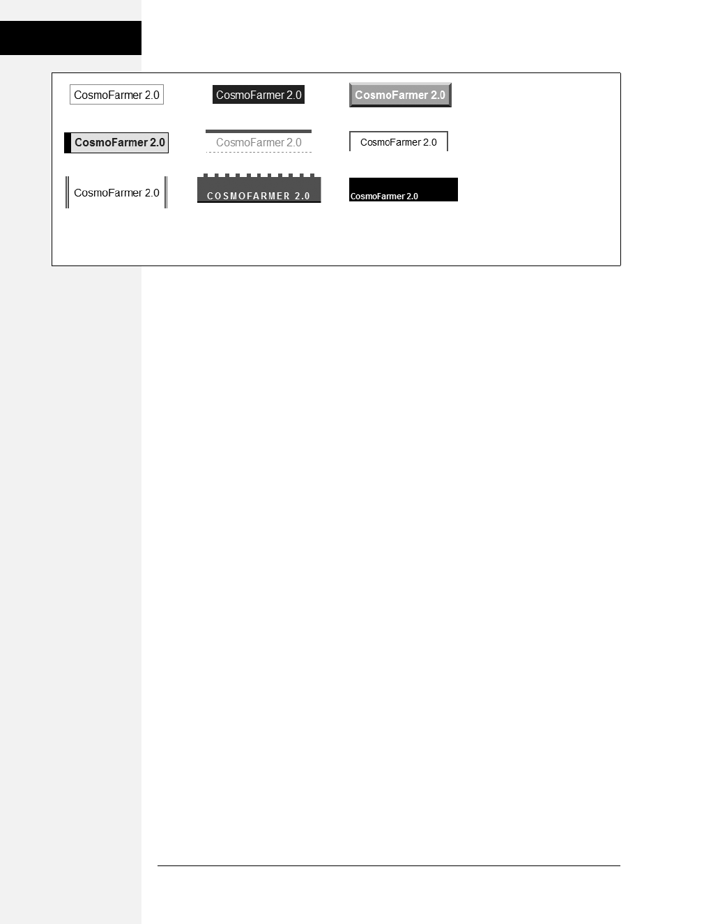
232 CSS: The Missing Manual
Styling Links
Mind you, all four borders don’t need to be the same width, type, or color. You
don’t even have to have four borders. One common design technique is to add a
beveled look to a button using four different border colors, as shown at top right
in Figure 9-2. Creating the beveled look isn’t difficult, but you need to remember
what makes something look three-dimensional—the light source. Imagine a light
shining on one of the four sides; that side is the lightest, while the side opposite is
the darkest (since the raised button is blocking the light and putting that side into
a “shadow”). The other two sides should have shades in between the “lit” and
“shadow” borders. Here’s the CSS used to create the beveled design in the top-
right corner of Figure 9-2:
a.button {
background: #B1B1B1;
color: #FFF;
font-weight: bold;
border-width: 4px;
border-style: solid;
border-top-color: #DFDFDF;
border-right-color: #666;
border-bottom-color: #333;
border-left-color: #858585;
}
Keep in mind that you can (and probably should) create a :hover state for your
buttons as well. That way, your buttons can react when a visitor moves her mouse
over the link, providing useful visual feedback. In the case of a beveled button,
reversing the various colors—make a dark background lighter, a light border
darker, and so on—is very effective.
Figure 9-2:
Use the border,background,
and padding properties to turn
a link into an obviously
clickable button. Simply adding
a border (top left) can be
enough to get the point across.
Or you can create more
sophisticated-looking buttons
by combining different borders
of varying colors, styles, and
widths with the background-
color property (page 164).
Download at Boykma.Com
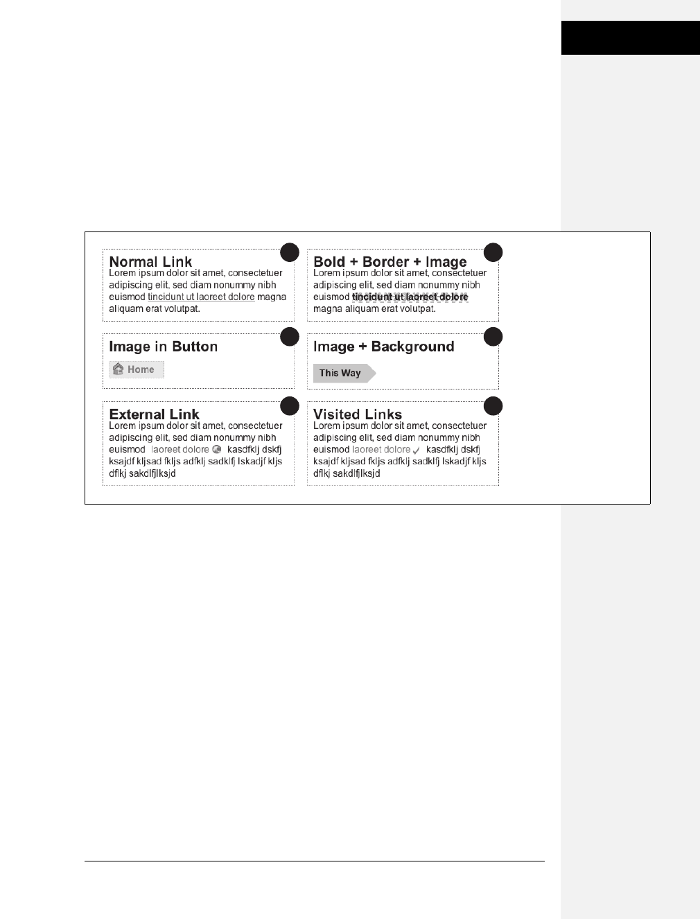
Chapter 9: Sprucing Up Your Site’s Navigation 233
Styling Links
Using Graphics
Adding graphics to links is one of the easiest and most visually exciting ways to
spruce up your site’s navigation. There are any number of possible techniques
and designs, but none of the good ones involve an HTML <img> tag. Instead,
you can easily add attractive and informative imagery to any link using the CSS
background-image property. You can see several examples in Figure 9-3. (You’ll
also learn more advanced techniques for using images to create graphical but-
tons and rollovers starting on page 246.)
If you need a refresher on background-image and related properties, flip back to
page 188. Meanwhile, here are a few things to keep in mind when you use images
with links:
•Don’t forget no-repeat. Normally a background graphic tiles repeatedly in the
background. With many graphics, that effect looks awful for links (see #2,
Figure 9-3). Unless you’re using a subtle pattern like a gradient fill, remember
to set the repeat option to stop the tiling like this: background-repeat: no-repeat;.
•Control placement with background-position. To place an image accurately in
the background, use the background-position property (page 194). When you
want to place an image on the far-right edge of a link but centered vertically on
the line, use this CSS: background-position: right center.
For more accurate placement, use a specific value such as pixels or ems. These
units of measurement make it easy to scoot a graphic a couple of pixels away
from the left edge of the link. By combining these units with a percentage value,
you can easily center a graphic vertically within a link but place it an exact
amount away from the left edge: background-position: 10px 50%;.
Figure 9-3:
Even a simple graphic can
enliven a link and make its
purpose clearer. A globe
icon (5) is one way to
indicate an external link,
while a checkmark (6) can
instantly let a visitor know
that he’s been there,
done that.
21
43
65
Download at Boykma.Com

234 CSS: The Missing Manual
Styling Links
Tip: In positioning background images, the first value is the horizontal placement (left to right); the sec-
ond is vertical placement (top to bottom).
Unfortunately, there’s no way to exactly place an image from the right or bottom
edges. So if you want to move an image in from the right edge a bit, then you have
two options: First, in your image-editing program, you can add empty space to
the right edge of the graphic. The amount of empty space you add should be
equivalent to how much you want to indent that graphic from the right. Once
you’ve created the graphic, use the background-position property to place the
graphic on the right edge of the element: for example, background-position: right
top;. Or you can use percentage values: background-position: 90% 75%; places the
point that lies 90 percent from the left edge of the image on top of the point 90
percent from the left edge of the styled element. As you can imagine, this method
doesn’t provide complete accuracy, so you’ll need to experiment a little. (See page
475 for more on how percentage positioning works.)
•Padding gives you room. If you’re using an image or icon to mark a link (like
#3, #5, and #6 in Figure 9-3), then make sure to add padding on the side the
image is on to move the link text out of the way. For instance, the third example
in Figure 9-3 has 30 pixels of left padding to prevent the word “Home” from
overlapping the picture of the house, while a little right padding makes room
for the globe and checkmark in #5 and #6.
Note: Since the <a> tag is an inline element, adding top and bottom padding (or, for that matter, top
and bottom margins) has no effect. See page 158 for the reason why. You can, however, turn a link into a
block-level element so that it can accept top and bottom padding and margins. You’ll see this technique
later in this chapter.
•Use the pseudo-classes. Don’t forget the :hover and :visited pseudo-classes. They
can add great dynamic effects and provide helpful feedback about your links.
You can swap in a different background graphic for any of these pseudo-classes.
So you could, for example, have a dim light bulb graphic in the background of a
normal link but change that graphic to a lit bulb when the mouse travels over it.
Or don’t use a graphic for the background of unvisited links, but once they’re
visited add a checkmark graphic to clearly identify their used status (see #6 in
Figure 9-3).
Should you decide to use a graphic for a link’s :hover state, keep in mind that
browsers don’t download the graphic until your visitor’s mouse actually hovers
over the link, so there’ll be a noticeable delay before the graphic appears. Once
the graphic is downloaded, however, the delay goes away. See page 246 for a
technique to prevent this awkward problem.
Download at Boykma.Com
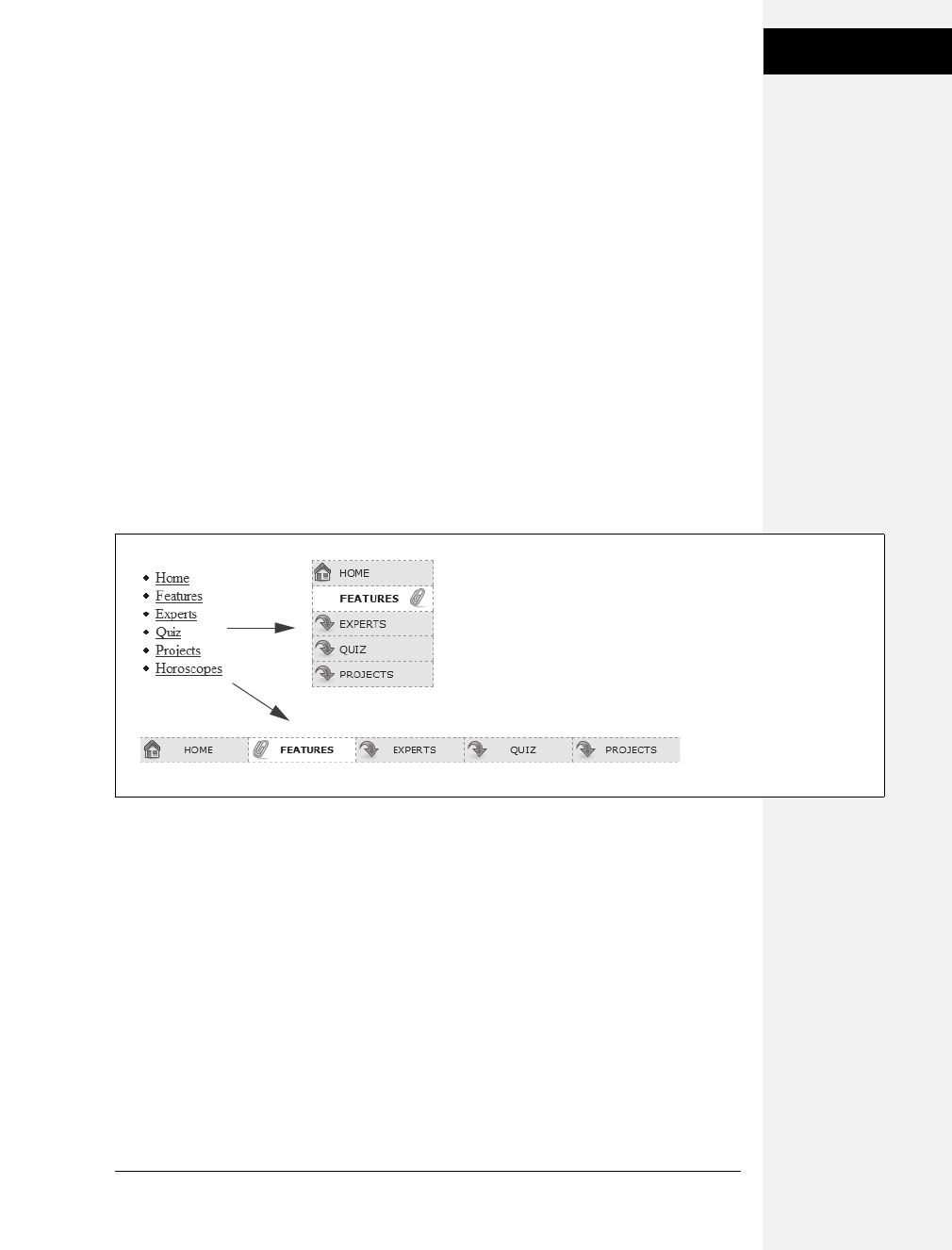
Chapter 9: Sprucing Up Your Site’s Navigation 235
Building Navigation
Bars
Building Navigation Bars
Every site needs good navigation features to guide visitors to the information
they’re after—and help them find their way back. Most sites are organized in sec-
tions, such as Products, Contact Info, Corporate Blog, and so on. This structure
lets visitors know what information to expect and where they can find it. Much of
the time, you find links to a site’s principal sections in a navigation bar. CSS makes
it easy to create a great-looking navigation bar, rollover effects and all.
Using Unordered Lists
At heart, a navigation bar is nothing more than a bunch of links. More specifically,
it’s actually a list of the different sections of a site. Back in Chapter 1, you learned
HTML’s mission is to provide meaningful structure to your content. Accordingly,
you should always use a tag that’s appropriate to the meaning of that content. For
a list of items, that’s the <ul> or unordered list tag—the same one you use to create
bulleted lists. It doesn’t matter whether you want your list to have no bullets or to
stretch horizontally across the top of the page: You can do all that by styling the
<ul> tag with CSS. Figure 9-4 shows an example.
The HTML for a nav bar is straightforward. There’s a single link inside each indi-
vidual list item. Also, you need a way to style just that unordered list. (You don’t
want actual lists of items to look like navigation bars.) Applying a class or id to the
<ul> tag is a good approach:
<ul class="nav">
<li><a href="index.html">Home</a></li>
<li><a href="news.html">News</a></li>
<li><a href="reviews.html">Reviews</a></li>
</ul>
Figure 9-4:
Using CSS, you can bend
ordinary HTML <ul> tags to
your will and turn them into
either vertical or horizontal
navigation bars. To
paraphrase a classic movie
line, “We don’t need no
stinkin’ bullets.”
Download at Boykma.Com

236 CSS: The Missing Manual
Building Navigation
Bars
The CSS varies a bit depending on whether you want a horizontal of vertical navi-
gation bar. In either case, you need to do two things:
•Remove the bullets. Unless the navigation bar is supposed to look like a bulleted
list, remove the bullets by setting the list-style-type property to none:
ul.nav {
list-style-type: none;
}
•Eliminate padding and margins. Since browsers indent list items from the left,
you need to remove this added space as well. Some browsers do the indenting
using padding, and others use margin, so you need to set both to 0:
ul.nav {
list-style-type: none;
padding-left: 0;
margin-left: 0;
}
These two steps essentially make each list item look like any plain old block-level
element, such as a paragraph or headline (except that a browser doesn’t insert
margins between list items). At this point, you can begin styling the links. If you
want a vertical navigation bar, read on; for horizontal nav bars, see page 238.
Vertical Navigation Bars
A vertical navigation bar is just a bunch of links stacked one on top of the next.
Removing the bullets, left margin, and padding (as explained in the previous sec-
tion) gets you most of the way there, but you need to know a few additional tricks
to get things looking right:
1. Display the link as a block.
Since the <a> tag is an inline element, it’s only as wide as the content inside it.
Buttons with different length text (like Home and Our Products) are different
widths. The staggered appearance of different width buttons stacked on top of
each other doesn’t look good, as you can see in #1 in Figure 9-5. In addition,
top and bottom padding and margins have no effect on inline elements. To get
around these limitations, style the link as a block element:
ul.nav a {
display: block;
}
The block value not only makes each button the same width, but it also makes
the entire area of the link clickable. That way, when your visitors click areas
where there’s no link text (like the padding around the link), they still trigger
the link. (Internet Explorer 6 and earlier has problems with this technique, so
look for the fix on page 238.)
Download at Boykma.Com
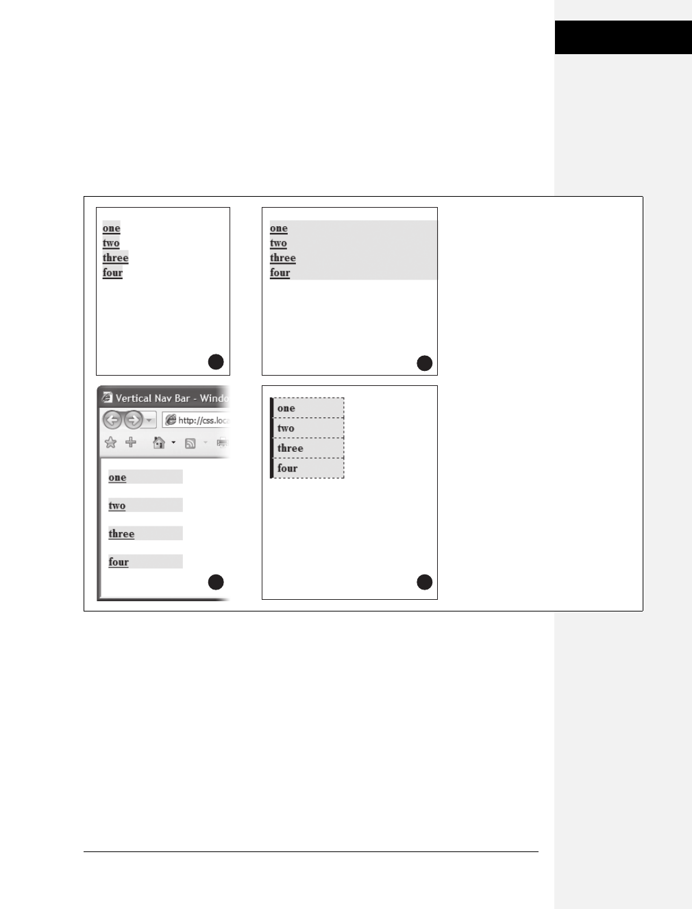
Chapter 9: Sprucing Up Your Site’s Navigation 237
Building Navigation
Bars
2. Constrain the width of the buttons.
Making links block-level elements also means they’re as wide as the tag they’re
nested in. So when they’re just sitting in a page, those links stretch the width of
the browser window (see #2 in Figure 9-5). You have several ways to make them
a little narrower. First you can just set the width of the <a> tag. If you want
each button to be 8 ems wide, for example, then add that to the width property:
ul.nav a {
display: block;
width: 8em;
}
Setting a width for any of the tags that wrap around those links—such as the
<li> or <ul> tags—also works.
If the button text occupies only one line, you can also center the text vertically
so there’s equal space above and below the link text. Just add a height to the link
and set its line-height property to the same value: a { height: 1.25em; line-height:
1.25em; }.
Figure 9-5:
In just four easy steps you can turn an
unordered list of links into an attractive
navigation bar.
2
1
43
Download at Boykma.Com

238 CSS: The Missing Manual
Building Navigation
Bars
Note: You may not need to set an explicit width if the nav bar is inside a page layout element that itself
has a width. As you’ll read in Part 3, it’s easy to create a sidebar that hugs the left (or right) edge of a page.
The sidebar has a set width, so plopping the unordered list nav bar inside it automatically constrains the
width of the buttons.
Unfortunately, when you don’t set an explicit width for the <a> tag, Internet
Explorer 6 and earlier has a couple of problems with these links. First, IE 6 dis-
plays large gaps between each link (see #3 in Figure 9-5).
In addition, another IE 6 bug appears whenever you set a link to display as a
block. Even though other browsers make the entire block area clickable, IE 6 still
limits clicking to just the text inside the link—in other words, if you add a
hover effect, to make the background color of a button light up, for example, in
IE 6 the background only lights up when you mouse over the text, not over the
empty area of the button.
Fortunately, these two problems are easy to fix. In fact, if you set an explicit
width on the <a> tags in the nav bar, then you’ve already taken care of this IE
bug. Skip the next step.
3. Fix the Internet Explorer 6 bug.
To remove this space and make the entire area clickable, add the IE-only
property of zoom to the link:
ul.nav a { zoom: 1; }
You can read more about this little trick in the box on page 338, but basically,
you can solve many IE 6 (and some IE 7 bugs) simply by adding zoom: 1 to an
element. There’s no CSS-based reason for it—just a way to change how IE ren-
ders page elements.
Adding the zoom property won’t affect any other browsers—they simply ignore
any CSS they don’t understand. You could hide this style from other browser if
you wanted to by using either the * html hack discussed on page 335—for exam-
ple, * html ul.nav a { zoom: 1 ; }. Alternatively, you can put this kind of invalid
CSS code into IE-only style sheets using the IE conditional comments tech-
nique discussed on page 433.
Now that all this busywork is out of the way, you can style the buttons to your
heart’s content. Add padding, background colors, margins, images, or whatever
tickles your artistic fancy. If you want to spread the buttons out so they don’t
touch, then add a bottom (or top) margin to each link.
Horizontal Navigation Bars
CSS lets you turn a set of stacked list items into a side-by-side presentation of links,
like the one shown back in Figure 9-4. This section shows you two common ways
to create a horizontal navigation bar from a list. The first—using the display: inline
property—is easy, but it can’t create equal-size buttons. If a uniform look is what
you crave, then turn to the floated <ul> method described on page 241.
Download at Boykma.Com
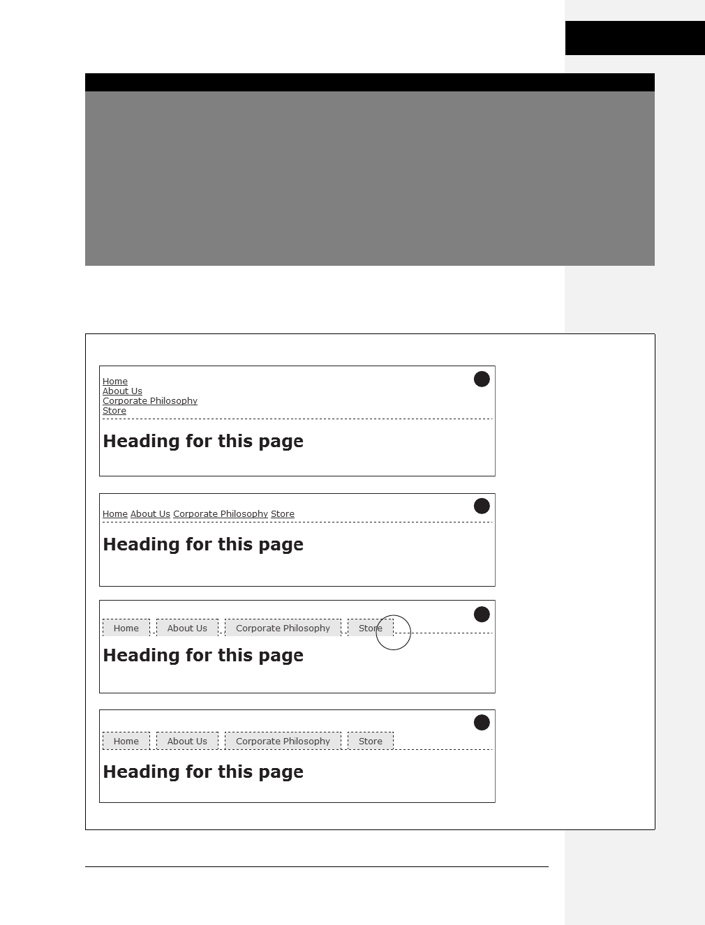
Chapter 9: Sprucing Up Your Site’s Navigation 239
Building Navigation
Bars
Whichever method you use, start by removing the bullets and left space from the
<ul> tag, as illustrated in #1 in Figure 9-6.
WORKAROUND WORKSHOP
When Borders Bump
If the buttons in your nav bar touch and you apply a border
around each link, then the borders double up. In other
words, the bottom border from one button touches the top
border of the next button.
To get around this, add the border to only the top of each
link. That way, you’ll get just one border line where the bot-
tom from each button touches the top from the next.
This workaround, however, leaves the entire nav bar bor-
derless below the last link. To fix that problem, you can
either create a class with the correct bottom border style
and apply it to the last link, or better yet, add a bottom bor-
der to the <ul> tag that encloses the nav bar. (You’ll see this
trick in action in this chapter’s tutorial, on page 261.)
Figure 9-6:
Creating a horizontal menu
from an unordered list of links
requires just a few steps. When
you use the inline setting for
each list item, though, you
must set top and bottom
padding on the <ul> tag to
prevent the buttons from
overflowing the <ul> tag’s
background or overlapping its
borders (circled in #3).
2
1
4
3
Download at Boykma.Com

240 CSS: The Missing Manual
Building Navigation
Bars
Using display: inline
The simplest method of creating a horizontal navigation bar involves changing the
display property of the list items from block to inline. It’s easy to do using CSS.
1. Make the list items inline elements.
Inline elements don’t create a line break before or after them as block-level
elements do. Setting the display property of the <li> tags to inline makes them
appear one beside the other (see #2 in Figure 9-6).
ul.nav li { display: inline; }
You need to make sure you don’t have too many buttons, though. If they won’t
all fit side by side, some will drop down below the first row.
2. Style the links.
You can remove the underline beneath the links and add a border around them
instead. You can also add background color or a background image to provide
visual depth. Add padding if you need more room around each link’s text. If
you want some space between each button, then apply a right margin. The fol-
lowing style gives links a button-like appearance, as shown in #3 and #4 in
Figure 9-6:
ul.nav a {
border: 1px dashed #000;
border-bottom: none;
padding: 5px 15px 5px 15px;
margin-right: 5px;
background-color: #EAEAEA;
text-decoration: none;
color: #333;
}
Note: When you use the inline method to create a horizontal nav bar, don’t set the links’ display prop-
erty to block. If you do, then each link will appear one on top of the other and span the entire width of the
page (or entire width of the list’s containing block).
3. Add top and bottom padding to the <ul> tag.
Because <a> tags are inline elements, adding top and bottom padding doesn’t
actually increase the height of a link. Instead, that padding just causes borders
and backgrounds on links to overlap elements above and below the link, like the
example shown way back in Figure 7-6. In Internet Explorer, the padding can
also make top borders on your links disappear. In this case, the <a> tag’s pad-
ding is also making the border on the bottom of the <ul> tag appear a little
above and behind the links (circled in image #3 in Figure 9-6).
Download at Boykma.Com

Chapter 9: Sprucing Up Your Site’s Navigation 241
Building Navigation
Bars
The solution is to add padding to the <ul> tag, which creates space to accom-
modate the links’ overflowing backgrounds and borders. For the <ul> tag’s bottom
padding, use the same value as the link’s bottom padding. To determine the
<ul> tag’s top padding value, add 1 pixel to the link’s top padding. (If you’re
using ems, just make sure the <ul> tag’s top padding is greater than the top
padding used for the link.) For example, the <ul> tag style to accompany the
links in step 2 would look like this:
ul.nav {
margin-left: 0;
list-style: none;
padding-left: 0;
padding-top: 6px;
padding-bottom: 5px;
border-bottom: 1px dashed #000;
}
As you can see in #4 in Figure 9-6, the bottom padding lets the bottom border
of a <ul> fit in place nicely. One problem with this approach is that there’s
always a gap between each button, so if you want buttons whose sides touch,
then you need to float the links or set a negative right margin on them. Read on
for another solution.
Note: To make this horizontal nav bar appear in the center of the page, add text-align: center; to the
<ul> tag’s style.
Using floats for horizontal navigation
Although the display: inline technique for creating a horizontal nav bar is simple, it
has one fundamental flaw: There’s no way to create equally sized buttons. Setting a
width on either the <li> or <a> tags has no effect, because they’re inline elements.
To get around this problem, you need to use a little trickier solution—floats.
Note: Nav bars made up of floated elements are hard to center horizontally in the middle of a page.
When you need to do that, the inline method described on the previous page is better.
1. Float the list items.
Adding a left float to the <li> tags removes them from the normal top-down
flow of elements:
ul.nav li { float: left; }
The floated list items (along with their enclosed links) slide right next to each
other, just like the images in the photo gallery tutorial on page 208. (You can
just as easily float them right if you want those buttons to align to the right edge
of the screen or containing sidebar.)
Download at Boykma.Com
242 CSS: The Missing Manual
Building Navigation
Bars
2. Add display: block to the links.
Links are inline elements, so width values (as well as top and bottom padding
and margins) don’t apply to them. Making a browser display the links as block
elements lets you set an exact width for the button and add a comfortable
amount of white space above and below each link:
ul.nav a { display: block; }
3. Style the links.
Add background colors, borders, and so on. This part of the process is identical
to step 2 on page 240.
4. Add a width.
If you want the nav buttons to have identical widths, set a width for the <a> tag.
When you set the width property, it’s a good idea to use em units because they
scale. That way, the link text won’t get bigger than the buttons if a visitor
increases the browser’s font size. The exact width you use depends on how
much text is in each button. Obviously for a link like Corporate Philosophy, you
need a wider button.
If you want each button to be simply the width of the text inside, don’t set a width.
You can, however, adding left and right padding to give the text some breathing room.
Tip: To center the text in the middle of the button, add text-align: center; to the links’ style.
FREQUENTLY ASKED QUESTION
Pop-up Menus
How do I create those cool pop-up menus that display a
submenu of links when someone rolls his mouse over a
button?
Navigation bars that have multiple levels of menus that pop
up or slide out are extremely popular. They’re a perfect way
to cram a lot of link options into a compact navigation bar.
You can create them in a couple of ways.
First, there’s the CSS-only approach. One popular dropdown
menu technique is called Son of Suckerfish. (The earlier ver-
sion was called Suckerfish.) You can learn about both here:
www.htmldog.com/articles/suckerfish/dropdowns.
As for creating a multi-level, horizontal drop-down menu,
there’s a nice easy tutorial at: www.tanfa.co.uk/css/
examples/menu/tutorial-h.asp.
The same site provides a tutorial for creating vertical menus
with pop-out submenus: www.tanfa.co.uk/css/examples/
menu/tutorial-v.asp.
If you’re not the do-it-yourself type (of course you are,
you’re reading this book), or if you’re just in a hurry, you
can use the free Pure CSS Menu generator—a wizard-like
web page that produces the necessary HTML and CSS for
you: http://purecssmenu.com.
The one disadvantage to the CSS approach is that the sub-
menus disappear instantly if your visitor’s mouse strays.
You can hope that all your visitors have excellent reflexes,
or you can try a different approach: Use CSS to style the
buttons and JavaScript to control the actions of the sub-
menus. (Another benefit of JavaScript is that you can add
cool animation effects to your menus.)
For a very simple JavaScript menu try the “jQuery Simple Drop
Down Menu plugin” (http://javascript-array.com/scripts/
jquery_simple_drop_down_menu). Just the basics, but it
works well. A more powerful JavaScript-driven menu system is
Superfish. You can read about it and download the necessary
files from http://users.tpg.com.au/j_birch/plugins/superfish.
Download at Boykma.Com

Chapter 9: Sprucing Up Your Site’s Navigation 243
Building Navigation
Bars
5. Add overflow: hidden to the <ul> tag style.
If it has a border, background color, or image, you should need to “contain the
float”—that is, the floated list items inside the <ul> will appear to pop out of
the bottom of the list (and outside the <ul> tags border or background color).
ul.nav {
overflow: hidden;
}
Finally, Internet Explorer 6 isn’t too happy with this, so it simply ignores this
instruction, unless you coax it.
6. Add zoom: 1 for IE 6:
ul.nav {
overflow: hidden;
zoom: 1;
}
See step 3 on page 238, for a brief rundown on this bit of magic.
Here are the styles required to create the navigation bar pictured in Figure 9-7.
Notice that the buttons are the same width, and the button text is centered.
ul.nav {
margin-left: 0px;
padding-left: 0px;
list-style: none;
border-bottom: 1px dashed #000;
overflow: hidden;
zoom: 1;
}
ul.nav li {
float: left;
}
ul.nav a {
width: 12em;
display: block;
border: 1px dashed #000;
border-bottom: none;
padding: 5px;
margin-right: 5px;
background-color: #EAEAEA;
text-decoration:none;
color: #333;
text-align: center;
}
Download at Boykma.Com

244 CSS: The Missing Manual
Advanced Link
Techniques
Advanced Link Techniques
If you’ve mastered the basic :hover principle and know how to add a background image
to a link, you’re probably hungry for more elaborate ways to spruce up your site’s navi-
gation. In the following sections, you’ll meet a few of the most popular techniques.
Big Clickable Buttons
The :hover pseudo-class is a great way to add an interactive feel to a web page. But
what if you want to highlight an area that’s bigger than just a two-word navigation
link? Suppose you have a list of news stories in a sidebar. Each item includes the
title on one line, followed by a paragraph summary of the story. And suppose you
want to highlight the area around both title and summary when a visitor mouses
over them (see Figure 9-8).
Fortunately, Internet Explorer 7 and above, Firefox, Safari, Chrome, and Opera all
understand the :hover pseudo-class when applied to all kinds of elements, not just
links. So if you want to highlight a paragraph when the mouse moves across it, you
can do so like this:
p:hover { background-color: yellow;}
Figure 9-7:
Floating list items let you
create equal width
buttons for a navigation
bar like this one. You can
see the actual CSS that
created this bar on the
facing page.
FREQUENTLY ASKED QUESTION
Where to Get Navigation Bar Help
I’ve never made a nav bar before, but I really want my site
to have one. I just don’t think I can put it all together on my
own. Is there something that walks me through the whole
process for the first time?
Yes. In fact, there’s a tutorial in this very chapter that shows
you step by step how to create a navigation bar. Just flip to
page 240.
Online, you can find tutorials, plus tools that do some of the
work for you.
For more information on turning ordinary lists into extraor-
dinary navigation elements, visit the step-by-step list tuto-
rial at: http://css.maxdesign.com.au/listutorial.
You can also find loads of cool list-based navigation designs
at http://css.maxdesign.com.au/listamatic.
If you want to create tabs for your navigation (like the ones
at the top of every Amazon.com page), check out the
resources on this page: http://css-discuss.incutio.com/
?page=ListTabs.
Finally, if you just don’t want to bother creating your own,
then try the List-O-Matic wizard at www.accessify.com/
tools-and-wizards/developer-tools/list-o-matic. This site is
for certain information, like fonts and colors, and can create
the CSS you need for list-based navigation. It even lets you
create submenus (a.k.a drop-down menus).
Download at Boykma.Com
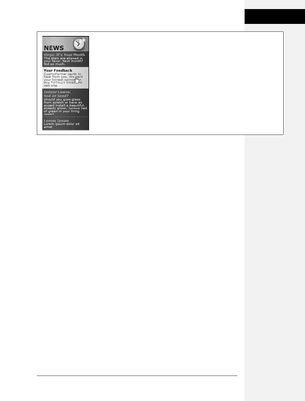
Chapter 9: Sprucing Up Your Site’s Navigation 245
Advanced Link
Techniques
Look ma, no link! You can even apply hover effects to larger regions, like a div
containing headlines, photos, and text paragraphs. So, if each news item in a page’s
sidebar is wrapped in a <div> tag and has a class of newsItem applied to it, this
style changes the background color of each:
.newsItem:hover { background-color: #333; }
Sadly, Internet Explorer 6 (and earlier) doesn’t understand this style at all. That
browser can display a hover effect only when it’s applied to a link. And since the
link tag is an inline element, you can’t (at least according to the rules of HTML)
wrap it around a block-level element. So you can’t wrap both the headline of a
story and the paragraph summary in the same link—exactly what you need to do
to make both the title and summary change appearance when hovered over.
You’re not out of luck, though. You just need to apply a little creative thinking.
Don’t put the title and summary into separate tags. Instead, keep them together in
the link and use CSS to make the title look like a headline. Here’s an example of
marking up some HTML to achieve this effect. This snippet represents a single list
item inside an unordered list:
<li class="story">
<a href="virgo.html"><span class="title">Virgo: It's Your Month!</span>
The stars are aligned in your favor. Next month? Not so much.</a>
</li>
In this case, both the title and summary are together inside the link, so you can
highlight both with the same style:
li.story a:hover {
background-image: url(highlight.gif);
}
Figure 9-8:
Give your visitors a big target. With a little clever CSS, you can make what looks like a headline
and a paragraph behave like one giant button.
Download at Boykma.Com

246 CSS: The Missing Manual
Advanced Link
Techniques
In HTML, the story title (“Virgo, It’s Your Month!”) is wrapped in a <span> tag.
You can make text look like a block-level headline with just a few simple rules:
.story span.title {
display: block;
text-weight: bold;
font-size: 150%;
}
The key here is the block value, which makes the browser treat the text inside the
span like its own headline with a line break before and after. Now, even though the
title and summary look like they’re separate block-level tags, they’re still just part
of the same inline <a> tag.
Note: You can also use JavaScript to create a better, more flexible, “big link.” You can find a tutorial at
www.creativepro.com/article/view-source-make-your-links-unforgettable.
CSS-Style Preloading Rollovers
In the bad old days, making a graphical link change to another graphic when
moused over required JavaScript. With CSS, you can achieve similar effects with
the :hover pseudo-class and a background image. However, there’s one problem
with the CSS method: Unless your visitor has already downloaded the rollover
graphic, there’s a noticeable delay while the browser sucks down the new graphic
and displays it. The delay happens only the first time the visitor hovers over the
link, but still, waiting for graphics to load is very 20th century.
The JavaScript solution can avoid this problem thanks to a technique called pre-
loading which automatically downloads the rollover graphic well before it’s
needed. But CSS doesn’t give you that option, so you need to enlist another clever
maneuver called CSS Sprites (it was originally called the Pixy method), which uti-
lizes a single graphic to create different states for the same button.
Note: To read about the original Pixy method (the predecessor to what you’re about to learn), visit http:/
/wellstyled.com/css-nopreload-rollovers.html. The evolved CSS Sprites method is now used widely by
companies like Yahoo and Google, not just for rollover effects but to optimize the download speed of
websites. You can read more about that at www.mezzoblue.com/archives/2009/01/27/sprite_optim.
Here’s how to implement the method:
1. In your favorite image-editing program, create one image with different versions
of the button.
You might create a regular state, a rollover state, and maybe even a “you are
here” state. Place the images one on top of the other, with the regular link image
on top and the rollover image below.
Download at Boykma.Com

Chapter 9: Sprucing Up Your Site’s Navigation 247
Advanced Link
Techniques
2. Measure the distances from the top of the entire graphic to the top of each
image.
In Figure 9-9 (top) the rollover image’s top edge is 39 pixels from the top of the
graphic.
3. Create a CSS style for the regular link. Include the image in the background
and place it at the left top of the style (Figure 9-9, middle).
Your style may look something like this:
a { background: #E7E7E7 url(images/pixy.png) no-repeat left top; }
4. Create the :hover style.
Here’s the trick: Use the background-position property to shift the graphic
upwards, so the first image disappears and the rollover image becomes visible
(Figure 9-9, bottom).
a:hover { background-position: 0 -39px; }
Besides preventing the dreaded download delay, this technique helps you keep
your navigation graphics organized in a single file.
Tip: CSS gives you other ways to preload the image. You can place the image into the background of an ele-
ment that’s covered by another element. Say your site’s logo appears in the top-left corner of the web page.
You could place the rollover image in the top-left corner of the page’s background: body { background:
url(rollover.gif) no-repeat left top; }. When the page loads, the rollover graphic is sitting in the background of
the page, but your visitors won’t see it because it’s covered by the logo. Another method is to place the roll-
over image inside a <div> that you position off the page using CSS positioning (see page 367). In either case,
the browser downloads the image and the CSS rollover won’t have any delays.
Figure 9-9:
Using the CSS Sprites method, you can avoid an
annoying delay while the browser downloads a
rollover image for the first time. By combining all
of the different link state graphics into a single
image, you can display a different state simply
by adjusting the positioning of the
background image.
39 pixels
background-position: 0 0;
background-position: 0 -39px;
Download at Boykma.Com

248 CSS: The Missing Manual
Advanced Link
Techniques
Note: Some websites take this technique to the extreme. Yahoo, Amazon, and Google (among many
others) often put together dozens of little images into a single file and display only the portion of the file
containing the desired button. You can see an example from Amazon here: www.flickr.com/photos/
mezzoblue/3217540317.
On a more manageable level, the website of one well-known designer uses a single graphic to manage
the 15 different buttons on her navigation bar. You can read about her technique at http://veerle.duoh.
com/index.php/blog/comments/the_xhtml_css_template_phase_of_my_new_blog_part_2. You can also see
this technique in action in this chapter’s tutorial, in step 8 on page 260.
Sliding Doors
Ever since Amazon popularized them years back, tabbed navigation buttons have
become one of the most common ways to highlight the organization of a site. With
good reason, too: Selecting a tab to open a new “folder” of information is a
metaphor everyone recognizes. You have many ways to create tab buttons. Most
basically, you can use border and background colors around links to create a tab
appearance (see Figure 9-7). This technique uses just CSS—no images.
But using graphics can really add depth and visual interest to your buttons. One
common method is to create a tab made up of a single graphic—text added to a
button graphic in a graphics program like Photoshop or Fireworks. However,
updating a bunch of button images every time you change your site’s navigation
can get old quick. Furthermore, having different graphics for each button slows
down the loading time of your site.
A slicker technique is to put a tab graphic in the background of each link and use
regular HTML for the text. That way, updating your site’s navigation is a simple
matter of updating some text in a web page. Even someone with zero Photoshop
experience can manage it. The only time a single graphic for a tab doesn’t work
well is when the text on each link varies in length. If one tab reads “Store,” and the
other reads “Contact Us Today!” the Store tab suffers from empty space and the
Contact tab looks a little cramped (see #1 in Figure 9-10).
What you need in that case is a way to have the tab graphic shrink-wrap itself
around the link text. Luckily, designer Douglas Bowman has come up with a cre-
ative technique that does just that. Dubbed the Sliding Doors method, it involves
creating one very wide and tall tab graphic in your image editing program (#2 in
Figure 9-10), and then slicing that image into two graphic files (#3 in Figure 9-10).
The very thin graphic is the left edge of the tab. It should be only wide enough to
reveal the sloping left edge of the tab. The second graphic is very wide—wider than
you imagine any tab on the page would ever get—and forms the tab’s main body
and right edge.
Note: Douglas Bowman’s Sliding Doors technique is a classic in CSS design. You can find his original
article at the A List Apart website: www.alistapart.com/articles/slidingdoors. There’s also a follow-up arti-
cle covering more advanced techniques at www.alistapart.com/articles/slidingdoors2.
Download at Boykma.Com
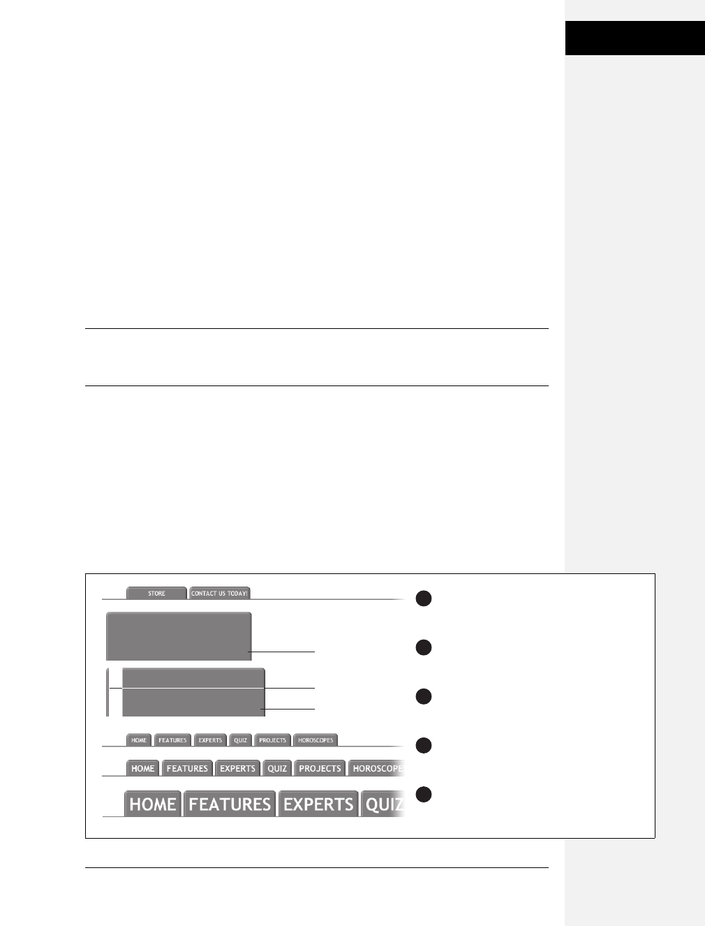
Chapter 9: Sprucing Up Your Site’s Navigation 249
Advanced Link
Techniques
Now here’s the tricky part. Since a tag can have only one background image, you
need to apply the graphics as backgrounds to two different tags. Start by creating
an unordered list and turning it into a horizontal navigation bar as described on
page 238. At this point, each <a> tag is nested inside one <li> tag, so you’ve got
two tags to play with.
First, add the wide background image to the <li> tag and place it at the top-right
corner of the tag. Do that by adding the following property to the style formatting
for that button’s <li> tag:
background: url(images/right_tab.gif) no-repeat right top;
The Sliding Doors technique capitalizes on the fact that a background image never
extends outside of the box created by its tag. In other words, even though this
image is really, really wide and tall, you won’t see any part of the graphic that
extends outside the region of the <li> tag—either below it or outside its left edge.
Note: If you like this technique, but aren’t good at using Photoshop to create graphics, you can pick up
free tab designs at www.exploding-boy.com/2005/12/15/free-css-navigation-designs and www.exploding-
boy.com/2005/12/21/more-free-css-navigation-menu-designs.
Next, place the thin, left-hand graphic in the top-left background of the <a> tag by
adding this property to the style for the link:
background: url(images/left_tab.gif) no-repeat left top;
Because the <a> tag is nested inside of the <li> tag, its background appears above
the <li> tag’s background. That left side tab graphic sits on top of the really wide
tab graphic, creating the illusion of a single graphic. At this point, type whatever
text you want for each link, in the process expanding the <li> tag and exposing
more of the extra-wide graphic (see #4 in Figure 9-10).
Figure 9-10:
With the Sliding Doors method, you can add
graphical tabs to any link. By using oversized
graphics (3) that are taller and wider than
the largest tab, you can make sure that your
tabs look right even when visitors pump up
the size of their text (5).
2
1
4
3
5
oversized button
<a> (left image)
<li> (right image)
Download at Boykma.Com

250 CSS: The Missing Manual
Advanced Link
Techniques
Note: You can find a web page with an example of the Sliding Doors technique in the tutorial files for
this chapter. The file is located in the 09 ➝sliding_doors folder.
Styling Particular Types of Links
Web designers link to all sorts of things: other web pages on their sites, web
pages on other sites, Adobe Acrobat files, Word documents, and Zip archive
files, to name a few. To help guide your site’s visitors, you might want to supply
clues to let them know where a link leads before they click it. Advanced selectors
are a great way to do just that. Although this technique uses selectors from CSS 3
(the next, as yet-to-be-finished CSS standard) almost all browsers currently
understand these selectors.
Note: Internet Explorer 6 doesn’t understand these selectors (of course). However, the market share of that
browser continues to plummet (as of this writing less than 17 percent), and you can still use this technique
without harming the usability of your site. The majority of visitors will get the enhanced presentation, while IE
6 users will get the regular view of the site.
Links to other websites
You can easily create a style that identifies links to other websites using an attribute
selector. As you read on page 67, attribute selectors let you style HTML tags that
have a particular attribute—for example, an <img> tag with the alt attribute set to
Our Company. You can also style tags whose attributes begin with certain values.
Any link that points outside your site must be an absolute URL (see page 192),
meaning it must begin with http://—for example, http://www.yahoo.com. So to create
a style that only affects links using an absolute URL, you use this selector:
a[href^='http://']
The ^= translates to “begins with,” so this selector matches links like <a href="http://
www.google.com/">, <a href="http://www.sawmac.com/missing/css2e/">, and so on.
You could style these any way you’d like, but one common technique is to add a
small image next to the link—an icon indicating an external link. You’ll see this in
action on page 255 of this chapter’s tutorial.
If you happen to use absolute links to point to other pages in your site, then you’ll
need to add another style to “turn off” the styling—otherwise, you’ll end up high-
lighting those links as external links, when in reality they’re just links within your
site. This second style just uses a more detailed version of the selector listed above.
For example, if your site is located at www.mysite.com, then you can create a selec-
tor that applies to those links like this: a[href^='http://www.mysite.com']. Putting
Download at Boykma.Com

Chapter 9: Sprucing Up Your Site’s Navigation 251
Advanced Link
Techniques
this all together, if you want to add a globe icon next to external links, but not for
links within your site, you can create these two styles:
a[href^='http://'] {
background: url(images/globe.png) no-repeat center right;
padding-right: 15px;
}
a[href^='http://www.mysite.com'] {
background: none;
padding-right: 0;
}
Note: If you want to get really fancy with your CSS, you can combine the attribute selector with the CSS 3
:not( ) selector to create a single style that will affect all absolute URLs except ones pointing to your own site:
a[href^='http://']:not(a[href^='http://www.mysite.com'])
This crazy-looking selector translates to “select all links that begin with http://, but not the ones that begin
with http://www.mysite.com.” The downside of this technique is that no version of Internet Explorer (not
even 8) understands the :not( ) selector, so pretty much the majority of the web surfing population won’t
see any affect from this style.
Email links
Email links are another special kind of link. Normally, email links look just like any
other link—blue and underlined. However, they don’t act like any other link. Click-
ing one launches a visitor’s email program, and some people find starting up a new
program while browsing a website really distracting, so let ’em know it’s for email.
The same basic technique described for external links above applies. Since all email
links begin with mailto:, you can create a selector like the following to create a style
to format just email links:
a[href^='mailto:']
You’ll see an example of this in action in the tutorial on page 255.
Links to specific types of files
Some links point to files, not other web pages. You often see a company’s annual
report up online as a downloadable PDF file or a Zip archive of files (like the tuto-
rials for this book) on a website. Links to those types of files usually force the
browser to download the file to the visitor’s computer, or, for PDF files, launch a
plug-in that lets you view the file within the browser. It can be a real drag to click a
link, only to find out that it’s actually started a 100MB download!
Download at Boykma.Com

252 CSS: The Missing Manual
Tutorial: Styling
Links
You can identify specific file types in much the same way as external links or email
links. But instead of looking for specific information at the beginning of the link’s
URL, you can find it at the end. For example, a link to a PDF document might look
like this <a href="annual_report.pdf">, while a link to a ZIP archive could look like
this: <a href="tutorials.zip">. In each case, the specific file type is identified by an
extension at the end of the URL—.pdf or .zip.
CSS 3 provides an attribute selector that lets you find attributes that end with specific
information. So to create a style for links to PDF files, use this selector:
a[href$='.pdf']
$= means “ends in,” so this selector means select all links whose href attribute ends
in .pdf. You can create similar styles for other types of files as well:
a[href$='.zip'] /* zip archive */
a[href$='.doc'] /* Word document */
You’ll see examples of this technique in the tutorial on page 258.
Tutorial: Styling Links
In this tutorial, you’ll style links in a variety of ways, like adding rollovers and
background graphics.
To get started, download the tutorial files from this book’s companion website at www.
sawmac.com/css2e. Click the tutorial link and download the files. All the files are
enclosed in a Zip archive, so you need to unzip them first. (You’ll find detailed instruc-
tions on the website.) The files for this tutorial are contained inside the 09 folder.
Basic Link Formatting
1. Launch a web browser and open the file 09 ➝links ➝links.html.
This page contains a variety of links (circled in Figure 9-11) that point to other
pages on the site, links to pages on other websites, and an email address. Start
by changing the color of the links on this page.
2. Open links.html in a text editor and place your cursor between the opening
and closing <style> tags.
The page already has an external style sheet attached to it with some basic
formatting, plus the <style> tags for an internal style sheet.
Note: As you’ve done before (page 70), you’ll put the styles for this exercise into an internal style sheet
for easy coding and previewing. When done, it’s best to move the styles to an external style sheet.
Download at Boykma.Com

Chapter 9: Sprucing Up Your Site’s Navigation 253
Tutorial: Styling
Links
3. Add a new style to the internal style sheet:
<style type="text/css">
a {
color: #207EBF;
}
</style>
This style is about as generic as it gets. It will apply to all <a> tag on the page.
It’s a good place to start, since it sets up the overall look of links for the page.
You’ll add more styles that will let you pinpoint links in specific areas of the
page. Now, time to remove that boring old underline beneath the link.
4. Add text-decoration: none; to the style you just created.
This removes the underline, but also makes the link less visible on the page.
Remember you should always do something to make links stand out and seem
clickable to your site’s visitors.
Figure 9-11:
Here’s a basic web page
with links in their standard
browser configuration—
underlined and blue (or
purple, if they’re links to
previously visited pages). In
this case, some links point to
other pages on the site,
some point to other sites,
and one is an email address.
In this tutorial, you’ll style
each of these links
differently.
Download at Boykma.Com

254 CSS: The Missing Manual
Tutorial: Styling
Links
5. Add font-weight: bold; to the a style.
Now links appear in bold (other text may appear bold, too). Next you’ll replace
the underline, but you’ll do it a bit more creatively, using a border instead of
the text-decoration property.
6. Add a border declaration to the style, so it looks like this:
a {
color: #207EBF;
text-decoration: none;
font-weight: bold;
border-bottom: 2px solid #F60;
}
The links really stand out, and using a border instead of the normal underline
applied to links lets you change the line’s color, size, and style (Figure 9-12,
left). Now you’ll change the look of visited links.
7. Add a :visited pseudo-class style for visited links:
a:visited {
color: #6E97BF;
}
This style changes the look of visited links to a lighter, grayer shade of the main
link color—a subtle way to draw attention away from an already visited page. If
you preview the page, click one of the links (try one in the middle part of the
page) and then return to the links.html page. You should see the link get lighter
in color. You’ll also notice that it stays bold and continues to have the orange
underline you assigned to the a style in step 6. That’s the cascade in action
(chapter 5)—the a:visited style is more specific than a plain a selector, so its
color property overrides the color assigned by the a style.
Time to take it a step further by adding a rollover effect, so the link’s back-
ground changes color when the mouse moves over it.
8. Add a :hover pseudo-class style to the style sheet:
a:hover {
color: #FFF;
background-color: #6E97BF;
border-bottom-color: #6E97BF;
}
This pseudo-class applies only when the mouse is over the link. The interactive
quality of rollovers lets visitors know the link does something (Figure 9-12).
Download at Boykma.Com

Chapter 9: Sprucing Up Your Site’s Navigation 255
Tutorial: Styling
Links
Adding a Background Image to a Link
The email link at the bottom of the page remains unaffected by the styles you’ve
created so far (Figure 9-13, top). That’s fine—you have other plans for that mailto
link. Since it points to an email address, clicking it doesn’t take a visitor to another
page, but instead launches an email program. To provide a visual cue emphasizing
this point, you’ll add a cute little email icon.
1. Add a descendent selector to the internal style sheet of the links.html file:
#legal a {
color: #666666;
border: none;
background: url(images/email.gif) no-repeat left center;
}
The email link’s inside a <p> tag with an ID of legal, so this style affects only
this link, and the color declaration makes it gray. The border: none setting
removes the underline defined by the a style you created in step 6—you’re
going for a subtle look here. The background property adds an image on the left
edge of the link. Finally, the no-repeat value forces the graphic to appear just a
single time. Trouble is, the graphic lies directly underneath the link, so it’s hard
to read the text (circled in the middle image in Figure 9-13).
2. Add 20 pixels of left padding to the #legal a style you just created:
padding-left: 20px;
Remember that padding adjusts the space between content and its border. So
adding some left padding moves the text over 20 pixels but leaves the back-
ground in place. One last touch: move the entire link a little away from the
copyright notice.
3. Add 10 pixels of left margin to the style, so it finally ends up like this:
#legal a {
color: #666666;
border: none;
background: url(images/email.gif) no-repeat left center;
padding-left: 20px;
margin-left: 10px;
}
Figure 9-12:
With a couple of styles, you can change the look of any link. With the :hover pseudo-class,
you can even switch to a different style when the mouse moves over the link.
Download at Boykma.Com
256 CSS: The Missing Manual
Tutorial: Styling
Links
This small visual adjustment makes it clear that the icon is related to the link
and not part of the copyright notice (Figure 9-13, bottom).
Tip: You can also use an advanced attribute selector, as described on page 69, to highlight all email links
this way. You’ll see those selectors used in the next section.
Highlighting Different Links
At times you may want to indicate that a link points to another website. In this
way, you can give your visitors a visual clue that there’s additional information
elsewhere on the Internet or warn them that they’ll exit your site if they click the
link. Also, you may want to identify links that point to downloadable files or other
non-web-page documents.
On the web page you’re working on, the right-hand “Resources” sidebar contains
different types of links that you’ll highlight with icons—a different icon for each
type of link. First, you’ll set up a basic style that applies to all of those links.
1. Add this style to the links.html internal style sheet:
#resources a {
border-bottom: none;
}
Figure 9-13:
Just a few subtle touches
can help make a link’s
purpose obvious. In this
case, a plain link (top)
becomes clearly identifiable
as an email link (bottom).
Download at Boykma.Com

Chapter 9: Sprucing Up Your Site’s Navigation 257
Tutorial: Styling
Links
Since all of the links you want to format are inside a <div> with the ID
resources, the descendent selector #resources a, targets just those links. This style
gets rid of the underline that the generic link style added (step 6 on page 254
added).
Next, you’ll add an icon next to external links.
2. Add another style at the end of the links.html internal style sheet:
a[href^='http://'] {
background: url(images/globe.png) no-repeat right top;
}
This style uses the advanced attribute selector discussed on page 69. Basically, it
targets any link that begins with http://. As with the email link style you created
earlier, this style adds a background image. It places the image at the right side
of the link.
Note: In this section, you’re using advanced attribute selectors to style the different links in the page’s
sidebar. Most browsers understand these styles—with the exception of IE 6. If you want to create simi-
lar styles that work with IE 6, your best bet is to use class styles—.externalLink, for example—and then
manually apply class names to links that point outside your site: <a class="externalLink" href="http://
www.twitter.com">. This method will take a lot of work, however, since you need to add classes to
each type of link—external, PDF files, Word docs, and so on. Unless you client or boss demands it, it’s
better to be forward-looking and use these CSS 3 selectors—the dwindling community of IE 6 users will
still be able to click the links, they just won’t see the icons.
However, this style has a similar problem as the email link style—the image sits
underneath the link’s text. Fortunately, the solution is the same—just add some
padding to move the image out of the way of the text. In this case, though,
instead of adding left padding, you’ll add right padding (since the icon appears
on the right side of the link). In addition, since every link in the resources box
will have a similarly sized icon, you can save some code by adding the padding
to the #resources a style you created in step 1.
3. Edit the #resources a style so that it looks like this:
#resources a {
border-bottom: none;
padding-right: 22px;
}
If you save the page and preview it in a web browser, you’ll see small globe icons
to the right of the bottom two links in the sidebar. Time to format the other links.
Download at Boykma.Com
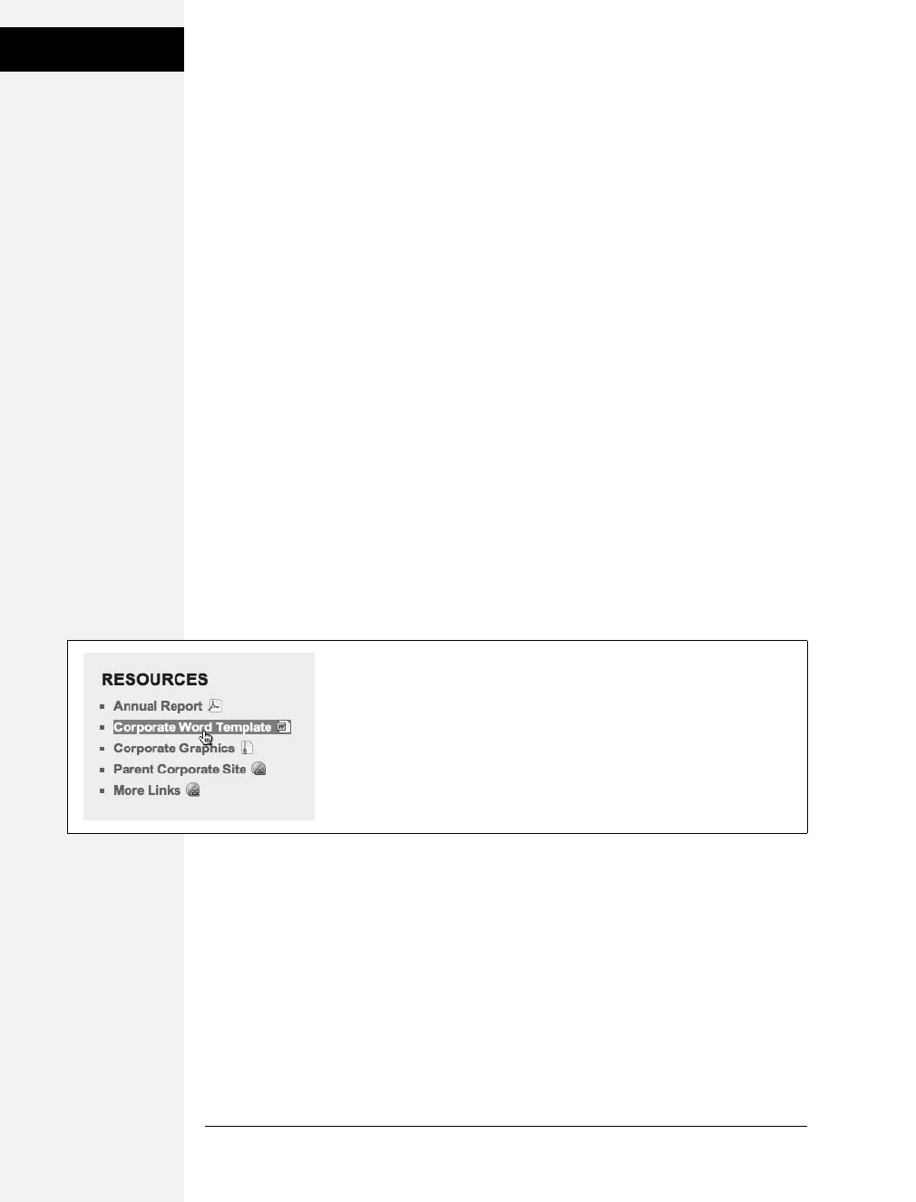
258 CSS: The Missing Manual
Tutorial: Creating a
Navigation Bar
4. Add three more styles to the internal style sheet:
a[href$='.pdf'] {
background: url(images/acrobat.png) no-repeat right top;
}
a[href$='.zip'] {
background: url(images/zip.png) no-repeat right top;
}
a[href$='.doc'] {
background: url(images/word.png) no-repeat right top;
}
These three styles look at how the href attribute ends; identifies links to either
Adobe Acrobat files (.pdf), Zip archives (.zip), or Word documents (.doc); and
assigns a different icon in each case.
5. Finally, add a hover state for the resources links:
#resources a:hover {
color: #FFF;
background-color: #6E97BF;
}
This style both changes the color of the text and adds a background color (see
Figure 9-14).
You can find a finished version of this tutorial in the 09_finished/links/links.html file.
Tutorial: Creating a Navigation Bar
In this exercise you’ll turn a plain old list of links into a spectacular navigation bar,
complete with rollover effects and a “You are here” button effect.
1. In a text editor, open 09 ➝ nav_bar ➝nav_bar.html.
As you can see, there’s not much to this file yet. There’s an internal style sheet
with the basic “reset styles” discussed on page 102, and one rule setting up some
basic properties for the <body> tag. The HTML consists of an unordered list with
six links. It looks like example one in Figure 9-15. Your first step is to add some
HTML so you can target your CSS to format the links in this list.
Figure 9-14:
Using advanced attribute selectors, you can easily identify and style different
types of links—external links, links to PDF files, Words docs, and Zip files.
Download at Boykma.Com
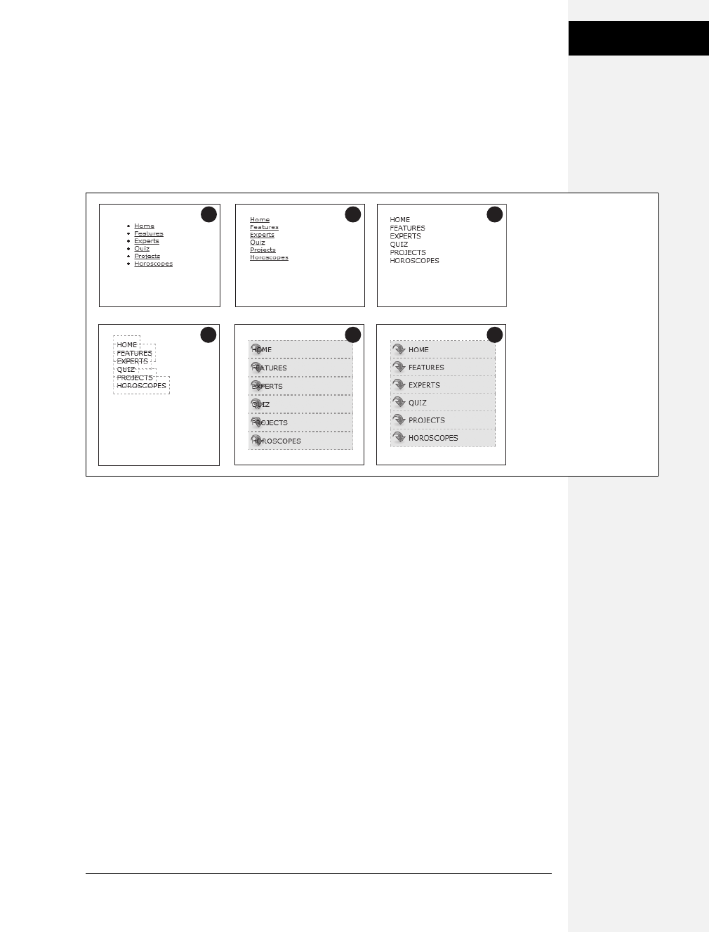
Chapter 9: Sprucing Up Your Site’s Navigation 259
Tutorial: Creating a
Navigation Bar
2. Locate the opening <ul> tag and add id="mainNav" to it, so it looks like this:
<ul id="mainNav">
The ID attribute identifies this list as the main navigation area. Use this ID to
build descendent selectors to format only these links—and not just any old link
on the page.
3. Below the body style in the internal style sheet, add a new style:
#mainNav {
margin: 0;
padding: 0;
list-style: none;
}
This style applies only to a tag with an ID of mainNav—in this case, the <ul>
tag. It removes the indent and bullets that browsers apply to unordered lists, as
shown in #2 in Figure 9-15. Next, you’ll start formatting the links.
4. Add a descendent selector to format the links in the list:
#mainNav a {
color: #000;
font-size: 11px;
text-transform: uppercase;
text-decoration: none;
}
This style defines the basic text formatting for the links. It sets the color and
font size, makes all letters uppercase, and removes the line usually found under-
neath links (# 3 in Figure 9-15). Now start making the links look like buttons.
Figure 9-15:
While it may feel like a lot of
steps, transforming a plain
unordered list of links into a
sophisticated navigation bar
requires only a few styles.
21
4
3
65
Download at Boykma.Com

260 CSS: The Missing Manual
Tutorial: Creating a
Navigation Bar
5. To the #mainNav a style, add the following border and padding properties:
border: 1px dashed #999;
padding: 7px 5px;
If you preview the file now, you’ll see a few problems (#4 in Figure 9-15): The
borders overlap and the boxes aren’t the same width. That’s because the <a> tag
is an inline element, so the width of the box is just as wide as the text in the link.
In addition, top and bottom padding don’t add any height to inline boxes, so
the borders overlap. (See page 158 for a discussion of inline boxes.) You can fix
these problems by changing how a browser displays these links.
6. Add display: block; to the #mainNav a style.
You’ve changed the basic display of the <a> tag so that it acts like a paragraph
or other block-level element, with the links neatly stacked one on top of the
other. The only problem now is that they also extend the full length of the
browser window—a little too wide for a button. You can fix this by constrain-
ing the width of the <ul> tag’s style.
Note: If you preview the page in Internet Explorer 6 or earlier, you’ll notice a gap between each nav button.
Remain calm. You’ll fix this bug in step 1 on page 265.
7. In the internal style sheet, locate the #mainNav style and add width: 175px;
to it.
With the list’s width now set to 175 pixels, the links still expand, but they’re
limited to the width of their container (the <ul> tag). In many cases, you’ll have
a list of links inside some layout element (like a sidebar) that already has a set
width, so you’ll be able to skip this step. (You’ll learn how to add sidebars in
Part 3.)
Now for the fun part.
8. Add background properties to the #mainNav a style, like so:
#mainNav a {
color: #000;
font-size: 11px;
text-transform: uppercase;
text-decoration: none;
border: 1px dashed #999;
padding: 7px 5px;
display: block;
background-color: #E7E7E7;
background-image: url(images/nav.png);
background-repeat: no-repeat;
background-position: 0 2px;
}
Download at Boykma.Com

Chapter 9: Sprucing Up Your Site’s Navigation 261
Tutorial: Creating a
Navigation Bar
These lines add a gray background color to the links and a nonrepeating image
at the left edge of each button (#5 in Figure 9-15). You still have a couple of
things to fix: The link text overlaps the icon, and the border between each but-
ton is 2 pixels thick. (Technically, the borders are still just 1 pixel thick, but the
bottom and top borders of adjoining links are creating a 2-pixel line.)
Tip: Using the background shorthand property you can write the code in step 8 like this: background:
#E7E7E7 url(images/nav.png) no-repeat 0 2px;.
9. Remove the bottom border and adjust the padding for the #mainNav a style,
so it looks like this:
#mainNav a {
color: #000;
font-size: 11px;
text-transform: uppercase;
text-decoration: none;
border: 1px dashed #999;
border-bottom: none;
padding: 7px 5px 7px 30px;
display: block;
background-color: #E7E7E7;
background-image: url(images/nav.png);
background-repeat: no-repeat;
background-position: 0 2px;
}
The text of each link sits clear of the icon and the borders look great…except
for one thing. The last link’s bottom border is now gone. (Sometimes CSS feels
like two steps forward, one step back!) But you have a few ways to fix this snafu.
One way is to create a class style with the proper border-bottom setting and then
apply it to just that last link. But it would be easier to apply a bottom border to
the <ul> tag containing the list of links. (Since there’s no padding on that tag,
there’s no space separating the top of the <ul> from the top of that first link.)
10. Add a bottom border to the #mainNav style so that it looks like this:
#mainNav {
margin: 0;
padding: 0;
list-style: none;
width: 175px;
border-bottom: 1px dashed #999;
}
There you have it: A basic navigation bar using borders, padding, background
color and images (#6 in Figure 9-15).
Download at Boykma.Com
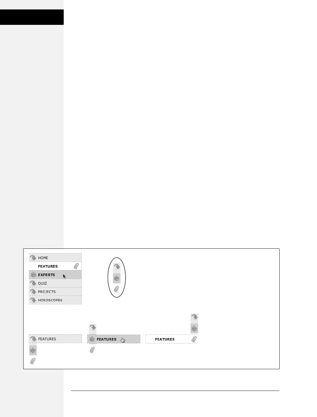
262 CSS: The Missing Manual
Tutorial: Creating a
Navigation Bar
Adding Rollovers and Creating “You Are Here” Links
Now it’s time to add some interactive and advanced features to this nav bar. First,
you’ll add a rollover effect to the buttons in your main navigation bar. That way,
the buttons change to show your visitor which button she’s about to click.
It’s also considerate to let your visitor know which page of your site she’s on. Using
the same HTML nav bar you already have, you can make this bit of interactivity
happen automatically. You simply make the button’s format change to match the
page’s section. Sounds simple, but it does require a little planning and setup, as
you’ll see in the following steps.
The rollover effect is easy, so get that out of the way first:
1. In the nav_bar.html file, add the following style to the end of the style sheet:
#mainNav a:hover {
font-weight: bold;
background-color: #B2F511;
background-position: 3px 50%;
}
This style sets the button’s hover state. It makes the text inside the button bold,
and changes the background color to a vibrant green. In addition, it uses the
CSS Sprites technique discussed on page 246. The same image is used as in step
8 on page 260—however, that image actually holds three different icons (see
Figure 9-16). In this case, the image is centered within the button, displaying
the middle icon in the file.
Now, moving the mouse over any of the buttons instantly changes its look.
(Open the page in your web browser and try it yourself.)
Figure 9-16:
With some basic CSS, it’s easy to
create interactive rollover effects for
navigation buttons. You can even
automatically highlight the section
of the site in which the current page
is located. To speed up the
download of your navigation bar
graphics, you can use the CSS
Sprites method described on page
246. Basically you use one image
(circled at top right) and adjust its
position for different states of each
button (bottom row).
Download at Boykma.Com

Chapter 9: Sprucing Up Your Site’s Navigation 263
Tutorial: Creating a
Navigation Bar
Next, make your navigation bar more informative by highlighting the button
that matches the section in which the page is located. To do so, you need to
identify two things in the nav bar’s HTML: the section a page belongs to and the
section each link points to. For this example, assume that the page you’re work-
ing on is the home page.
Note: Alternatively, you can create a class style that changes the appearance of a link and apply it to the
link representing the page’s section. For a horoscope page, you’d apply the class to the Horoscope link in
the nav bar: <a href="/horoscopes/" class="u_r_here">Horoscopes</a>.
2. Locate the <body> tag, and then add id="home", like so:
<body id="home">
Now that you know what section this page belongs to, you can use a descen-
dent selector to create special CSS rules that apply only to tags on pages within
the Features section. Next, you need to identify the section each link applies to,
which you accomplish by adding some IDs to those links.
3. In the nav bar’s HTML code, locate the Features link, and then add
id="homeLink" so the tag looks like this:
<a href="/index.html" id="homeLink">Home</a>
This ID uniquely identifies this link, providing the information you need to cre-
ate a style that applies only to that link.
You need to ID the other links in the navigation bar as well.
4. Repeat step 4 for each of the other links using the following IDs: featureLink,
expertLink, quizLink, projectLink, and horoscopeLink .
You’re done with the HTML part of this exercise. Now it’s time to create some
CSS. Because you’ve ID’d the page and the link, it’s easy to create a descendent
selector to highlight the Features link.
5. Add another style to the page’s style sheet:
#home #homeLink {
background-color: #FFFFFF;
background-position: 97% 100%;
padding-right: 15px;
padding-left: 30px;
font-weight: bold;
}
You’ve seen all these properties before. Again, you’re using the CSS Sprites
method to adjust the position of the background image. This time, the image is
moved over to the right 97 percent (that is, the point 97 percent across the
Download at Boykma.Com

264 CSS: The Missing Manual
Tutorial: Creating a
Navigation Bar
image is matched up with the point 97 percent across the button), and the bot-
tom of the image is placed at the bottom of the button. In other words, it dis-
plays the icon at the bottom of the image (see Figure 9-16). See page 197 for a
discussion of how percentage values work with background-images.
The most interesting part is the selector—#home #homeLink. It’s a very specific
selector that applies only to a link with an ID of homeLink that’s also inside a
<body> tag with an ID of home. If you change the ID of the page to quiz, for
example, the link to the Home page is no longer highlighted.
Preview the page in a browser to see the effect: The Home link now has a white
background and a paperclip icon. To make this work for the other links, you
need to expand this selector a little…OK, make that a lot.
6. Edit the selector for the style you just added, like so:
#home #homeLink,
#feature #featureLink,
#expert #expertLink,
#quiz #quizLink,
#project #projectLink,
#horoscope #horoscopeLink {
background-color: #FFFFFF;
background-position: 97% 100%;
padding-right: 15px;
padding-left: 30px;
font-weight: bold;
}
Yes, that’s a lot of CSS. But your set-up work here has a big payoff. This style
now applies to every link in the nav bar, but only under certain conditions,
which is exactly how you want it to behave. When you change the id attribute of
the <body> tag to quiz, the link to the Quiz gets highlighted instead of the link
to the Features section. Time to take your work for a test drive.
Note: This long-winded selector is an example of the group selector discussed on page 56.
7. Change the id attribute of the <body> tag to feature like this:
<body id="feature">
Preview the page, and wham! The Feature link is now highlighted with a white
background and a paperclip icon (Figure 9-16). The secret at this point is to just
change the ID in the <body> tag to indicate which section of the site a page belongs
to. For a horoscope page, change the id to id="horoscope" in the <body> tag.
Download at Boykma.Com
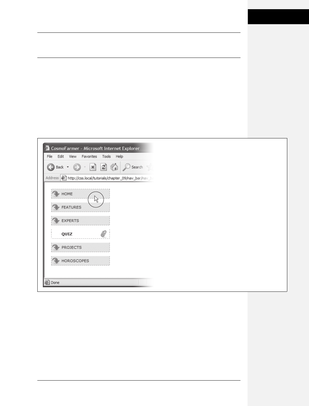
Chapter 9: Sprucing Up Your Site’s Navigation 265
Tutorial: Creating a
Navigation Bar
Note: Ready to take this design further? Try adding a rollover effect to complement the style you created
in step 6. (Hint: Use the :hover pseudo-class as part of the selector like this: #quiz #quizLink:hover.) Also
try adding a different graphic for the Home link. (You have a home.png file in the images folder to use.)
Fixing the IE Bugs
What would a CSS tutorial be if there weren’t any Internet Explorer bugs to fix?
Unfortunately, the navigation bar doesn’t work quite right in Internet Explorer 6
or earlier (it’s fine in IE 7 and 8). First, an annoying gap appears between each but-
ton. In addition, only the text—not the entire area of the button—is clickable
(Figure 9-17). In other browsers, moving the mouse over any part of the back-
ground (including the empty space to the right of the link text) highlights the link.
Fortunately, the fix is simple.
1. Edit the #mainNav a style by adding zoom: 1. The final style should look
like this:
#mainNav a {
text-decoration: none;
color: #000000;
font-size: 11px;
text-transform: uppercase;
border: 1px dashed #999999;
Figure 9-17:
Internet Explorer has some problems with the
navigation bar at this point. It adds space between
each link and will highlight a link only if the cursor
(circled) is directly over the text link.
Download at Boykma.Com

266 CSS: The Missing Manual
Tutorial: Creating a
Navigation Bar
border-bottom: none;
padding: 7px 5px 7px 30px;
display: block;
background-color: #E7E7E7;
background-image: url(images/nav.png);
background-repeat: no-repeat;
background-position: 0 2px;
zoom: 1;
}
As discussed in the box on page 73, this weird little bit of code is enough to fix IE 6.
Go figure.
2. If you have Internet Explorer 6, preview the page in it.
The navigation bar should now work as well in that browser as it does in more
savvy browsers like Internet Explorer 8, Firefox, Opera, and Safari.
To see the completed version of this navigation bar, see the file 09_finished ➝
nav_bar ➝ nav_bar_vertical.html.
Note: In many cases, when creating specific styles targeted to just Internet Explorer, it’s a good idea to
isolate them from your other styles. Not that they’re contagious, but they usually include nonsense CSS
that for weird reasons smoothes out IE kinks. You don’t want to read your style sheet later and get con-
fused about why you included some bizarre CSS. In fact, the preferred method is to put IE-only styles in
external style sheets and attach them using Microsoft’s conditional comments feature. Get the full story on
page 433.
From Vertical to Horizontal
Suppose you want a horizontal navigation bar that sits at the top of the page. No
problem—you did most of the hard work in the last part of this tutorial. Just
modify that page a little to spread the buttons along a single line. (You’ll use the
nav_bar.html file you just completed, so if you want to keep the vertical nav bar,
then save a copy of the file before proceeding.)
1. Make sure you’ve completed all the steps above to create the vertical naviga-
tion bar, and have the file nav_bar.html open in your text editor.
Now you’ll see how easy it is to change the orientation of a navigation bar. Start
by cleaning up some of the work you already did. You need to remove the width
you set for the <ul> tag in step 6 on page 243. That width prevented the nav but-
tons from spanning the entire length of the page. But since the <ul> needs to
spread out much wider to contain the side-by-side buttons, this width has to go.
2. Find the #mainNav style, and then remove the width: 175px; declaration.
And now it’s time for the big secret of vertical nav bars—placing the buttons
side by side.
Download at Boykma.Com
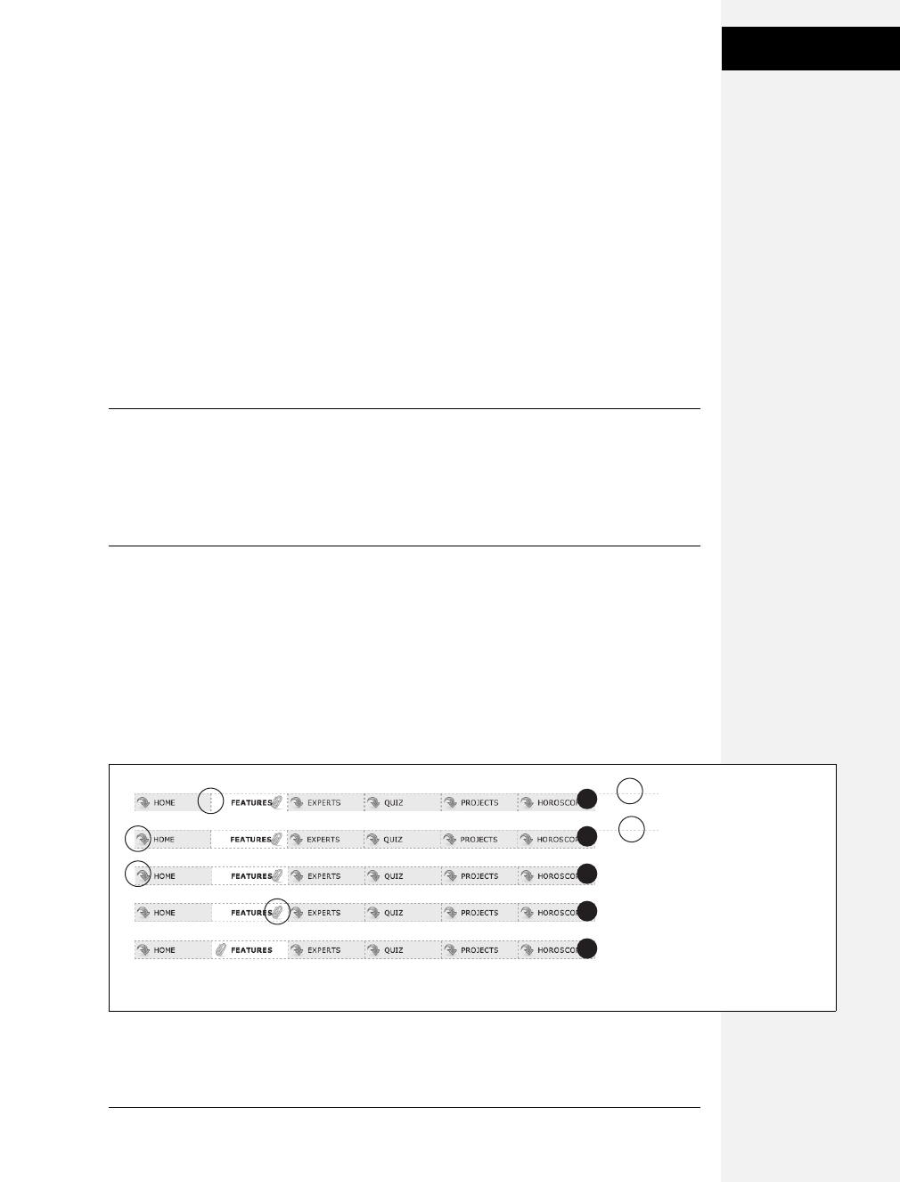
Chapter 9: Sprucing Up Your Site’s Navigation 267
Tutorial: Creating a
Navigation Bar
3. Add a new style to your style sheet (directly below the #mainNav style is a
good spot):
#mainNav li {
float: left;
width: 12em;
}
This style applies to the <li> tag (the list items that hold each link). The first
declaration floats the tag to the left. In this way, each <li> tag attempts to wrap
around to the right side of the previous <li> tag. (You saw the same effect in the
photo gallery tutorial on page 206.) Also, setting the width of the <li> tag
defines the width of each button. Here, a value of 12ems provides enough space
to contain the longest link name—Horoscopes. When you’re working with
longer links, you need to increase this value.
Tip: Using an em value for the width of the buttons used to be considered a best practice among web
designers, since em values adjust to changes in the browsers font size. So if a visitor chose to increase the
font size, the em-width button would also grow in size. However, most web browsers these days use a
“page zoom” feature, so that when you enlarge the text, you’re actually enlarging the entire page—zooming
in—so even buttons and other elements whose widths are defined in pixels, grow in size. So nowadays,
you see more designers using pixel values for everything.
If you preview the page now, you’ll see the basics are complete. All that’s left are
some cosmetic enhancements (see the circled areas of #1 in Figure 9-18). First,
the bottom border you created in step 10 on page 261 runs the entire length of
the <ul> tag—wider than the navigation buttons themselves. Even stranger,
that bottom border is no longer on the bottom—it’s on top of the navigation
buttons! In addition, since the buttons sit side by side, their left and right bor-
ders combine to make a 2-pixel border between each button. You’ll fix that
problem now.
Figure 9-18:
Changing a vertical stack
of navigation buttons into
the much shorter, side-
by-side format of a
horizontal navigation bar
only takes a couple of
steps. Most of your effort
involves tweaking styles
for cosmetic
considerations such as
borders and background
image placement.
2
1
4
3
5
Download at Boykma.Com

268 CSS: The Missing Manual
Tutorial: Creating a
Navigation Bar
4. In the #mainNav a style change border-bottom: none; to border-left: none;.
This change removes the left border so that the borders don’t double up
between buttons and at the same time adds a border to the bottom of each but-
ton. But that <ul> tag’s bottom border is still on top of the buttons, and now
the nav bar is missing a border on the far left button (see circled areas of #2 in
Figure 9-18). No problem—just change the border on the <ul> tag.
5. Locate the #mainNav style and change border-bottom: 1px dashed #999999; to
border-left: 1px dashed #999999;.
If you preview the page now, you’ll see that the border above the buttons is
gone, but there’s still no left border (#3 in Figure 9-18). You’re witnessing one
of the complications of using floats. That is, floating the list items removes them
from the normal flow of the document, so web browsers no longer see them as
part of the <ul> tag, and the <ul> tag shrinks down to nearly no height—that’s
the reason the ul’s bottom border appeared on top as well. (If this whole sce-
nario sounds confusing, it is. That’s why there’s an entire section of Chapter 12
dedicated to dealing with the issue—see page 323 for the details.)
Fortunately, while the problem is complex, the solution is simple. Add one CSS
property to the bulleted list.
6. Add two properties to the end of the #mainNav style (changes are in bold):
#mainNav {
margin: 0;
padding: 0;
list-style: none;
border-left: 1px dashed #999999;
overflow: hidden;
zoom: 1; /* for IE 6 */
}
The overflow: hidden forces the unordered list to expand. Why does this prop-
erty work? See the detailed coverage on page 326. The zoom: 1 is for your old
nemesis, Internet Explorer 6.
Finally, that paperclip aligned to the right edge of the “You are here” button looks
funny (#4 in Figure 9-18). You’ll switch its position to the left edge of the button.
Download at Boykma.Com

Chapter 9: Sprucing Up Your Site’s Navigation 269
Tutorial: Creating a
Navigation Bar
7. Locate the “You are here” style you created in step 6 on page 264. (It’s the one
with the crazy, long-winded selector.) Change its background position from
97% 100% to 3px 100%. The style should now look like this:
#home #homeLink,
#feature #featureLink,
#expert #experLink,
#quiz #quizLink,
#project #projectLink,
#horoscope #horoscopeLink
{
background-color: #FFFFFF;
background-position: 3px 100%;
padding-right: 15px;
padding-left: 30px;
font-weight: bold;
}
Preview the page, and you’ll find a fully functional horizontal navigation bar
(#5 in Figure 9-18). And guess what? It works perfectly even in Internet
Explorer 6.
To see the finished version, open the file 09_finished ➝nav_bar ➝nav_ bar_
horizontal.html.
Note: You may want to center the text inside each button. If so, you need to do two things: Add text-align:
center; to the #mainNav a style and adjust that style’s left-padding until the text looks absolutely centered.
Download at Boykma.Com

Download at Boykma.Com

271
Chapter 10
chapter
10
Formatting Tables
and Forms
The formatting powers of CSS go way beyond text, images, and links. You can
make tables of information like schedules, sports scores, and music playlists easier
to read by adding borders, backgrounds, and other visual enhancements. Simi-
larly, you can use CSS to organize the elements of a form to help your visitors
through the process of ordering items, signing up for your newsletter, or using
your latest web application.
This chapter shows you how to display tables and forms with HTML and how to
lay out and style them using CSS. In two tutorials at the end of the chapter, you’ll
create a table and a form, using the tricks you’ve learned along the way.
Using Tables the Right Way
HTML tables have seen a lot of use in the short history of the Web. Originally
created to display data in a spreadsheet-like format, tables became a popular lay-
out tool. Faced with HTML’s limitations, designers got creative and used table
rows and columns to position page elements like banner headlines and sidebars.
As you’ll see in Part 3 of this book, CSS does a much better job of laying out web
pages. You can concentrate on using (and formatting) tables for their original
purpose—displaying data (Figure 10-1).
Download at Boykma.Com

272 CSS: The Missing Manual
Using Tables the
Right Way
HTML (and XHTML) has a surprising number of tags dedicated to table building.
This chunk of HTML creates the very simple table pictured in Figure 10-2.
<table>
<caption align="bottom">
Table 1: CosmoFarmer.com's Indoor Mower Roundup
</caption>
<colgroup>
<col id="brand" />
<col id="price" />
<col id="power" />
</colgroup>
<thead>
<tr>
<th scope="col">Brand</th>
<th scope="col">Price</th>
<th scope="col">Power Source</th>
</tr>
</thead>
Figure 10-1:
You can do all of your
page layout and design
with CSS and use tables
for what they were
intended—displaying
rows and columns of
information. CSS created
the attractive fonts,
borders, and background
colors in this table about
indoor lawn mowers, but
the underlying structure
is all thanks to HTML.
Download at Boykma.Com

Chapter 10: Formatting Tables and Forms 273
Styling Tables
<tbody>
<tr>
<td>Chinook Push-o-matic Indoor Mower</td>
<td>$247.00</td>
<td>Mechanical</td>
</tr>
<tr>
<td>Sampson Deluxe Apartment Mower</td>
<td>$370.00</td>
<td>Mechanical</td>
</tr>
</tbody>
</table>
Even with only three rows and three columns, the table uses nine unique HTML
tags: <table>, <caption>, <colgroup>, <col>, <thead>, <tbody> <tr>, <th>, and
<td>. In general, more HTML isn’t a good thing, but a table’s various tags give you
lots of useful hooks to hang CSS styles on. The headers of each column—the <th>
tags—can look different from other table cells if you create a <th> tag style. This
saves you the hassle of having to create lots of classes—like .tableHeader—and then
apply them by hand to individual table cells. In the next section, you’ll see exam-
ples of how you can use these different tags to your advantage.
Note: For an in-depth article on the HTML used to create tables, visit www.456bereastreet.com/archive/
200410/bring_on_the_tables.
Styling Tables
You can use many of the CSS properties you’ve read about to dress up the appear-
ance of a table and its contents. The color property, for example, sets a table’s text
color, just like anywhere else. You’ll find a few properties, however, that are partic-
ularly useful with tables, as well as a couple aimed specifically at formatting tables.
Figure 10-2:
Data tables, like this one, usually
have headers created with the <th>
tag. Header cells announce what
type of information appears in a
row or column. Price tells you that
you’ll find the cost of each lawn
mower listed in the cells below. The
actual data presented in a table is
enclosed in <td> tags.
<th>
<td>
border
padding
Download at Boykma.Com

274 CSS: The Missing Manual
Styling Tables
Because tables are composed of several HTML tags, it helps to know which tag to
apply a particular CSS property to. Applying padding to a <table> tag has no
effect. The next few sections cover CSS properties for formatting tables and which
HTML tags they get along with.
Adding Padding
As you read on page 153, padding is the space between an element’s border and its
content. You can use padding to provide a little space between the edges of a para-
graph’s text and its border. When it comes to tables, the borders are the edges of a
cell, so padding adds space around any content you’ve placed inside of a table cell
(see Figure 10-2). It works a lot like the <table> tag’s cellpadding attribute, with the
added benefit that you can individually control space between a cell’s content and
each of its four edges.
You apply padding to either a table header or a table cell tag, but not to the <table>
tag itself. So, to add 10 pixels of space to the inside of all table cells, you’d use this style:
td, th { padding: 10px; }
You can also control the spacing separately for each edge. To add 10 pixels of space
to the top of each table data cell, 3 pixels to the bottom of that cell, and 5 pixels on
both the left and right sides, create this style:
td {
padding-top: 10px;
padding-right: 5px;
padding-bottom: 3px;
padding-left: 5px;
}
Or, use the padding shortcut property:
td {
padding: 10px 5px 3px 5px;
}
Tip: If you place an image into a table cell using the <img> tag and notice that there’s unwanted space
below the image, then set its display property to block. For more information, see http://developer.
mozilla.org/en/docs/Images,_Tables,_and_Mysterious_Gaps.
Adjusting Vertical and Horizontal Alignment
To control where content is positioned within a table cell, use the text-align and
vertical-align properties.
Download at Boykma.Com
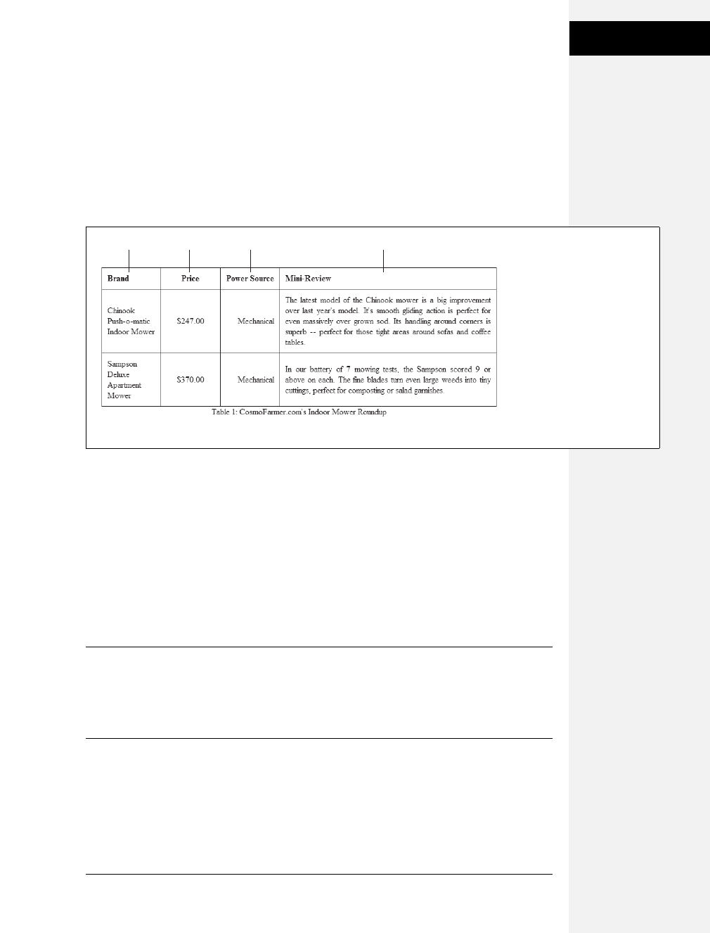
Chapter 10: Formatting Tables and Forms 275
Styling Tables
Text-align controls horizontal positioning and can be set to left, right, center, and
justify (see Figure 10-3). It’s an inherited property. (See Chapter 4 for more on
inheritance.) When you want to right align the contents of all table cells, create a
style like this:
table { text-align: right; }
This property comes in handy with <th> tags, since browsers usually center align
them. A simple style like th { text-align: left; } makes table headers align with table cells.
Table cells have a height as well. web browsers normally align content vertically in
the middle of a table cell (see the middle example in Figure 10-4). You can control
this behavior using the vertical-align property. Use one of these four values: top,
baseline, middle, or bottom. Top pushes content to the top of the cell, middle
centers content, and bottom pushes the bottom of the content to the bottom of the
cell. Baseline works just like top, except the browser aligns the baseline of the first
line of text in each cell in a row (Figure 10-4). (Unless you’re a real perfectionist,
you won’t even notice the subtlety of the baseline option. More importantly, nei-
ther will your visitors.) Unlike text-align, the vertical-align property isn’t inherited,
so you can use it only on styles that apply directly to <th> and <td> tags.
Note: So far, the table formatting you’ve learned applies to all your tables. When you want to style indi-
vidual tables (or table cells), change the selector you use. To apply a special design to a certain table, give
it a class name—<table class="stocks">—and create descendent selectors like .stocks td, or .stocks th to
uniquely format individual cells. If you want to style a particular cell differently than other cells in a table,
then apply a class to the tag—<td class="subtotal">—and create a class style to format that cell.
Figure 10-3:
When applied to table cells,
the CSS text-align property
works like the <td> tag’s align
attribute. Use the CSS
approach, however, since it
lets you store the style
information in an external
style sheet. That way, if you
decide you need to change
alignment in your table cells
from right to left, then you
need to update only the
external style sheet, not
10,000 individual <td> tags.
left center right justified
Download at Boykma.Com
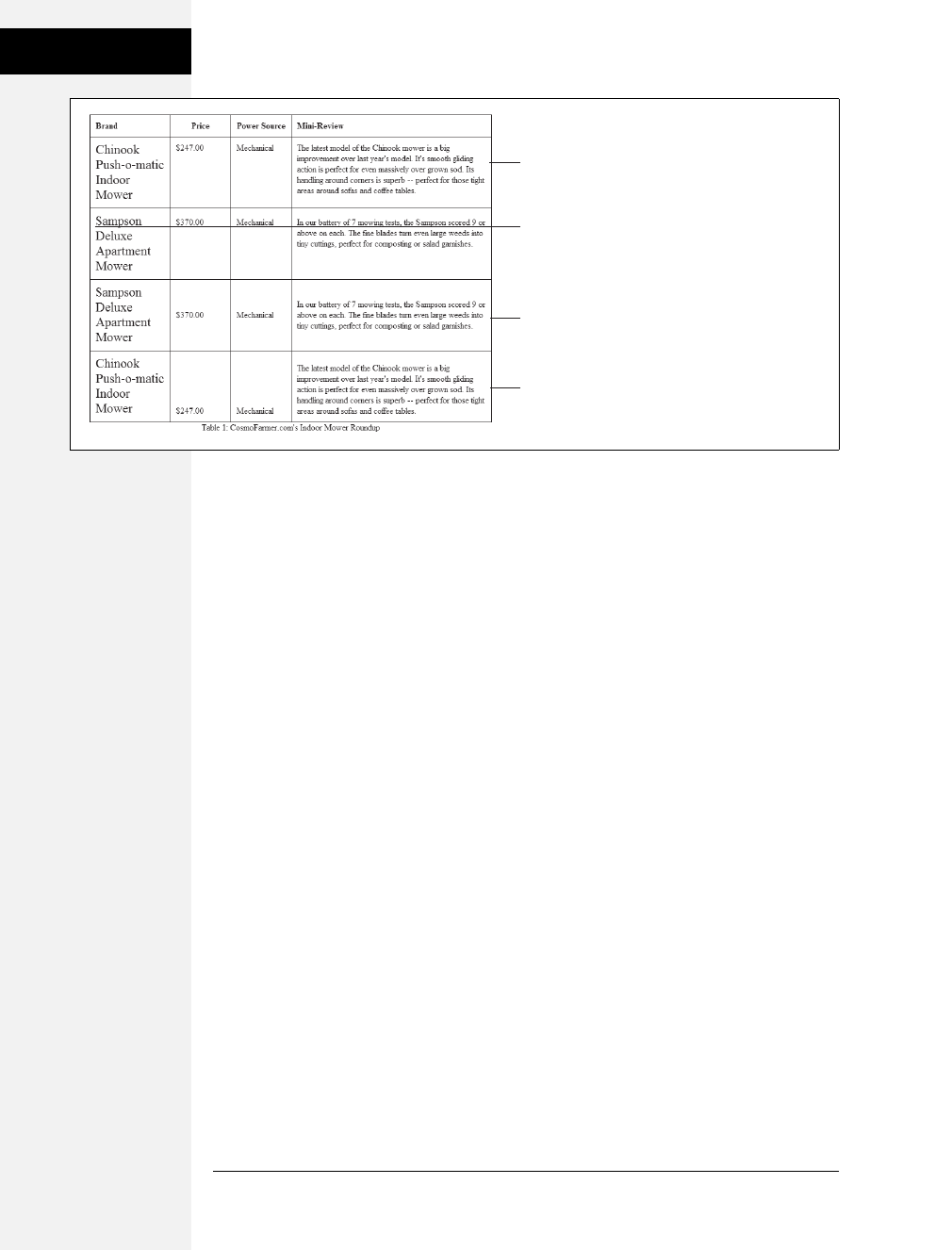
276 CSS: The Missing Manual
Styling Tables
Creating Borders
The CSS border property (page 160) works pretty much the same with tables as
with other elements, but you need to keep a couple of things in mind. First, apply-
ing a border to a style that formats the <table> tag outlines just the table, not any
of the individual cells. Second, applying borders to cells (td { border: 1px solid
black; }) leaves you with a visual gap between cells, as shown in Figure 10-5, top.
To gain control of how borders appear, you need to understand the <table> tag’s
cellspacing attribute and the CSS border-collapse property.
•Controlling the space between table cells. Unless instructed otherwise, brows-
ers separate table cells by a couple of pixels. This gap is really noticeable when
you apply a border to table cells. CSS 2.1 gives you the border-spacing property
to control this space, but since Internet Explorer 7 and earlier doesn’t recognize
border-spacing, you’re better off using the <table> tag’s cellspacing attribute
for now. Here’s the HTML to insert 10 pixels of space between each cell:
<table cellspacing="10">. (Setting the value to 0 eliminates the space entirely,
but if you want to do that, then use the CSS border-collapse property, dis-
cussed next.)
•Eliminating double borders. Even if you eliminate the cell spacing of a table, bor-
ders applied to table cells double up. That is, the bottom border of one cell adds
to the top border of the under-hanging cell, creating a line that’s twice as thick as
the border setting (Figure 10-5, middle). The best way to eliminate this (and elim-
inate cell spacing at the same time) is to use the border-collapse property. It
accepts two values—separate and collapse. The separate option is normally how
tables are displayed, with the cell spaces and doubled borders. Collapsing a table’s
borders eliminates the gaps and doubled borders (Figure 10-5, bottom). Apply
the collapse value to a style formatting a table, like so:
table { border-collapse: collapse; }
Figure 10-4:
The vertical-align property is the CSS
equivalent of the <td> tag’s valign
attribute. When padding is applied to
a cell, the content never actually aligns
to the bottom or top border lines:
There’s always a gap equal to the
padding setting. You can control the
size of the padding (see page 154).
top
baseline
middle
bottom
Download at Boykma.Com
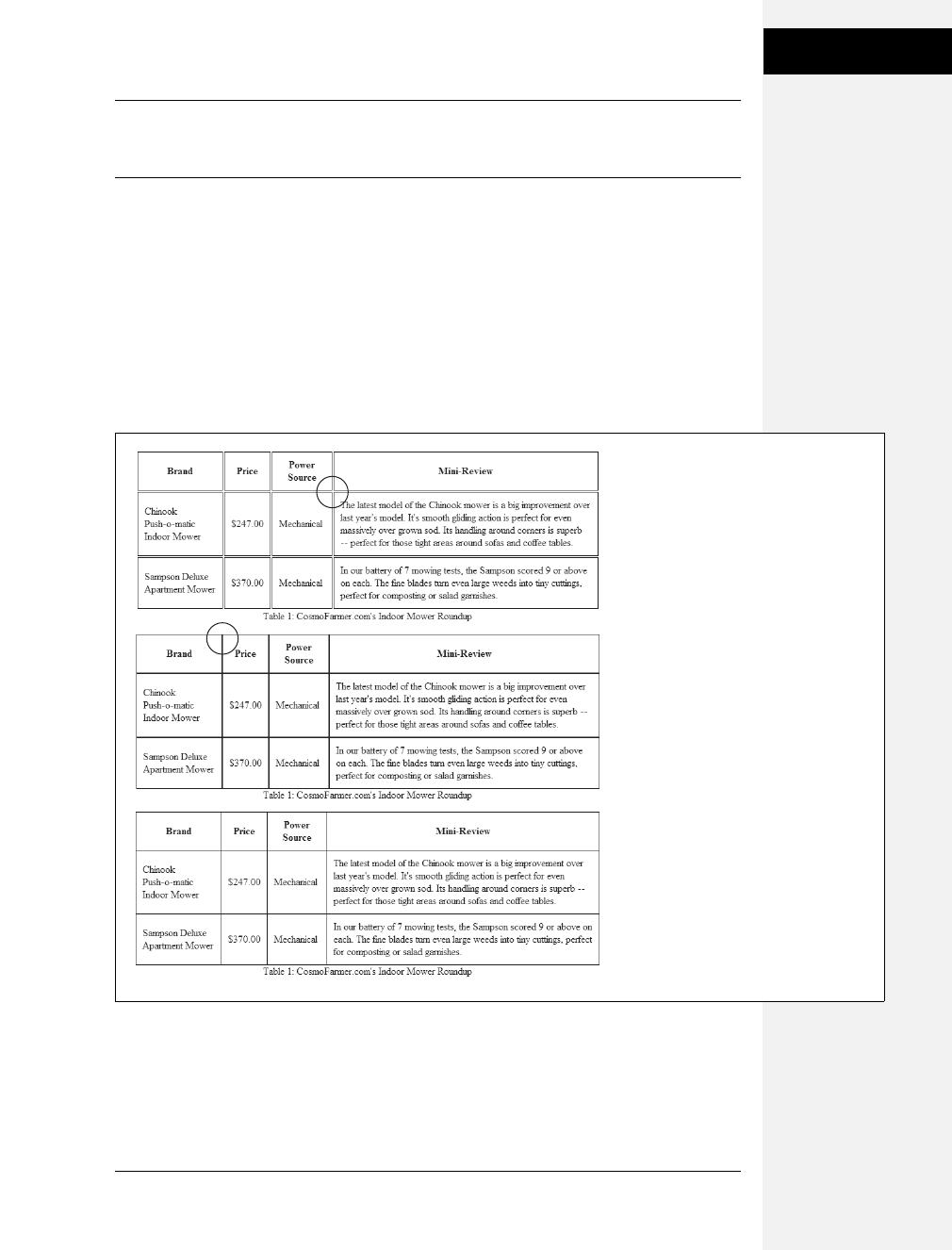
Chapter 10: Formatting Tables and Forms 277
Styling Tables
Note: HTML tags that are used to build tables include attributes that accomplish a lot of the same tasks
as CSS. The border attribute can add a border to the table and each cell. You should avoid these
attributes: CSS can do a much better job with less code.
Styling Rows and Columns
Adding stripes, like the ones in Figure 10-6, is a common table design technique.
By alternating the appearance of every other row of data, you make it easier for
people to spot the data in each row. Unfortunately, CSS (at least at this point)
doesn’t offer a way to say, “Hey browser, make every other row look this way!” The
basic solution is to apply a class (like <tr class="odd">) to every other row, and
then create a style to format that row:
.odd { background-color: red; }
Figure 10-5:
Browsers normally insert space between
each table cell. (You probably won’t
notice this extra space unless you’ve
added a border, as shown here, at top.) If
you use the <table> tag’s cellspacing
attribute to remove the extra space,
you’re left with double border lines where
adjoining borders touch (middle). The
border-collapse property solves both
dilemmas (bottom).
Download at Boykma.Com
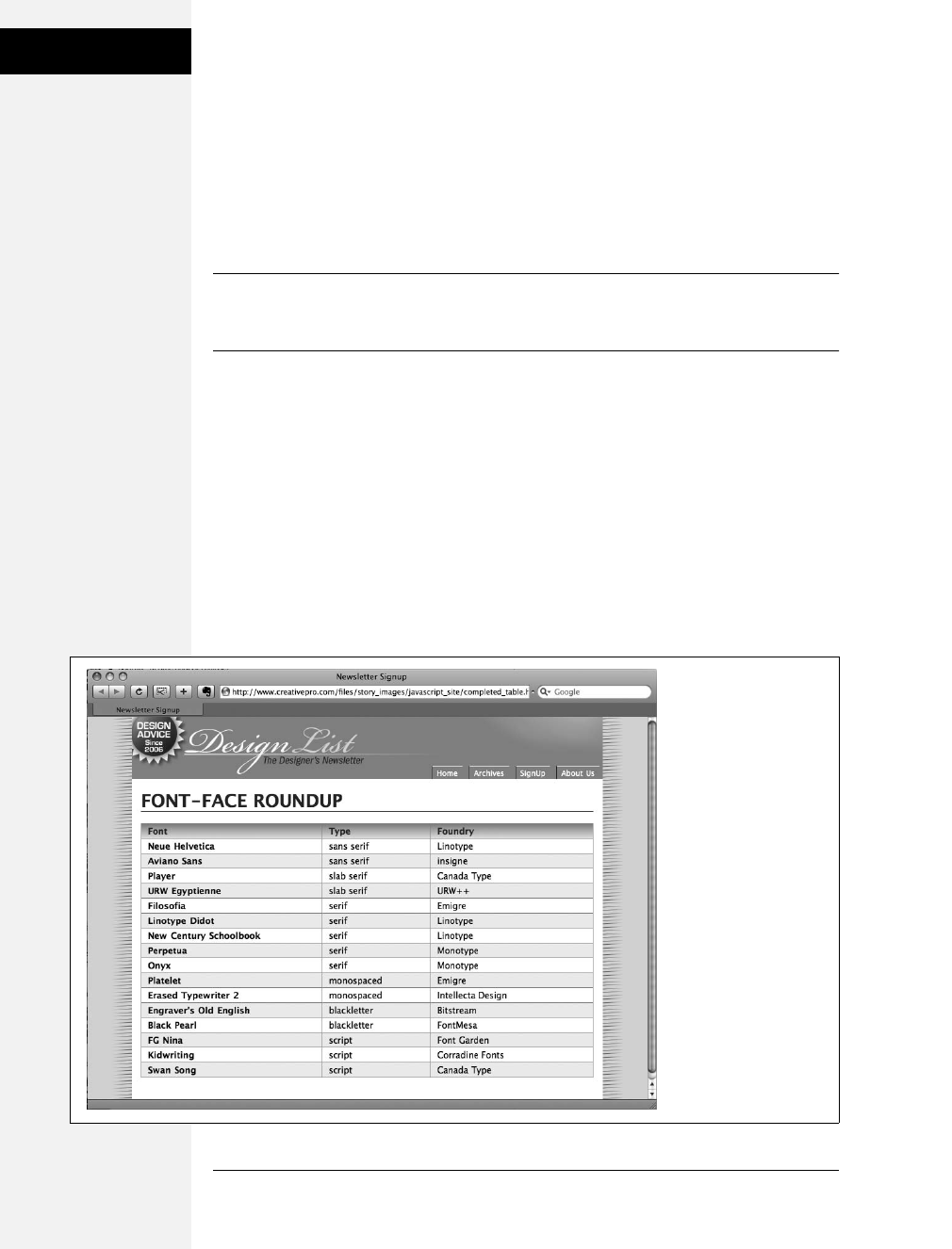
278 CSS: The Missing Manual
Styling Tables
You’re not limited to colors either. You can use background images (see page 188)
to create more sophisticated looks like the slight gradation in the table header row
of Figure 10-6. (You’ll see a similar example of this in the tutorial on page 288.)
You can use a descendent selector to target cells in that row as well. This technique
is great for when you style all of the cells in one column with their own class and
look: <td class="price">, for example. To create a unique look for that cell when it
appears in an odd row, create a style with this selector: .odd .price.
Tip: For a quicker, CSS 3 solution to striping tables see page 440. This technique only works in some
browsers, so another technique, that works for all browsers is to use JavaScript to quickly stripe tables.
Check out www.creativepro.com/article/view-source-javascript-designers for the details.
Formatting columns is a bit trickier. HTML provides the <colgroup> and <col>
tags to indicate groups of columns and individual columns, respectively. You
include one <col> tag for each column in the table and can identify them with
either a class or ID. (See the HTML code on page 272.) Only two sets of proper-
ties work on these tags: width and the background properties (background-color,
background-image, and so on). But they can come in mighty handy. When you
want to set the width of all of the cells in a column, you can skip any HTML
attributes and just style the column using a style applied to the <col> tag. For
example, say you have this bit of HTML: <col id="price">. You can add this style
to a stylesheet to set the width of each cell in that column to 200 pixels:
#price { width: 200px; }
Figure 10-6:
Alternating the
background color from
row to row in a table
makes it easier to quickly
identify the data for
each row.
Download at Boykma.Com

Chapter 10: Formatting Tables and Forms 279
Styling Forms
Likewise, the <colgroup> tag groups several columns together. When you set a
width for that tag, a web browser automatically applies the specified width to each
column in the group. A table displaying airline schedules might have several col-
umns displaying the different dates a plane travels from Boston to Chicago. You
can use <colgroup> to organize those columns and apply an ID to the tag to iden-
tify it: <colgroup id="dates">. Then, to set each date column to a set width of
10ems, you can create this style:
#dates{ width: 10em; }
Even though the width property here applies to the <colgroup> tag, a browser
actually applies the value—10em—to each column in the group.
To highlight a column, you can use the background properties. Again, assume you
have a <col> tag with an ID of price applied to it:
#price { background-color: #F33; }
Keep in mind, however, that backgrounds for columns appear under table cells, so
if you set a background color or image for <td> or <th> tags, then a column’s
background won’t be visible.
Styling Forms
Web forms are the primary way visitors interact with a website. By supplying
information on a form, you can join a mailing list, search a database of products,
update your personal profile on MySpace, or order that Star Wars Lego set you’ve
had your eye on.
There’s no reason your forms need to look like all the others on the Internet. With a
little CSS, you can style form fields to share the same formatting as other site elements
like fonts, background colors, and margins. There aren’t any CSS properties specific to
forms, but you can apply just about any property in this book to a form element.
The results, however, can be mixed (see Figure 10-7). Browsers vary widely in how
they handle the styling of form elements. Safari 2 and earlier limits styling to only a
few form elements like text fields and the <fieldset> and <legend> tags. It won’t let
you change the look of buttons, checkboxes, radio buttons, or pull-down menus.
Even Internet Explorer and Firefox may display the same form elements differ-
ently. The next section tells you which properties work best with which form tags
and also lists which browsers interpret them properly.
Download at Boykma.Com
280 CSS: The Missing Manual
Styling Forms
HTML Form Elements
A variety of HTML tags help you build forms. You can format some of them (like
text fields) more successfully than others (submit buttons). Here are a few com-
mon form tags and the types of properties they get along with:
•Fieldset. The <fieldset> tag groups related form questions. Most browsers do a
good job of displaying background colors, background images, and borders for
this tag. However, Internet Explorer lets the background flow up and over the
top line of the fieldset. (Look at the top of the middle image in Figure 10-7, left
column.) Padding places space from the edges of the fieldset to the content
inside it. (Although Internet Explorer unfortunately ignores top padding, you
can simulate it by adding a top margin to the first element inside the fieldset.)
Tip: Matt Heerema has found a way to prevent Internet Explorer from adding a background above a
fieldset’s top borderline. Read about it at www.mattheerema.com/archive/getting-fieldset-backgrounds-
and-legends-to-behave-in-ie.
•Legend. The <legend> tag follows the HTML for the <fieldset> tag and pro-
vides a label for the group of fields. The legend appears vertically centered on
the top borderline of a fieldset. If the form elements for collecting a shipping
address appear inside the fieldset, you might add a legend like this: <legend>
Shipping Address</legend>. You can use CSS to change the <legend> tag’s font
properties, add background colors and images, and add your own borders.
•Text fields. The <input type="text"> (<input type="text" /> in XHTML),
<input type="password"> (<input type="password" />), and the <textarea>
tags create text boxes on a form. These tags give you the most consistent cross-
browser CSS control. You can change the font size, font family, color, and other
text properties for text boxes, as well as add borders and background colors. IE,
Firefox, and Opera also let you add background images to text boxes; Safari 2.0
doesn’t. You can set the width of these fields using the CSS width property.
However, only the <textarea> tag obeys the height property.
UP TO SPEED
Staying True to Form
Quite apart from the varying browser support for CSS-
styled forms (page 283), there are good reasons to tread
lightly when altering the look of universally recognized
interface elements like Submit buttons and pull-down
menus. Most web surfers are already very familiar with how
forms look and work. The generic look of a Submit button
is the same from site to site. When people see it, they
instantly know what that button does and how to use it. If
you alter the look of a form too much, you may make it
harder for visitors to fill out your form correctly.
Adding a dotted border to a form field can turn an easily
recognizable text field into an easily skipped box. (See the
examples at bottom right and bottom center of Figure 10-7.)
If that text box is intended to capture email addresses for
your newsletter, you may lose a few visitors who skip right
over it. At the very least, make sure people can recognize
the forms on your sites as forms.
Download at Boykma.Com
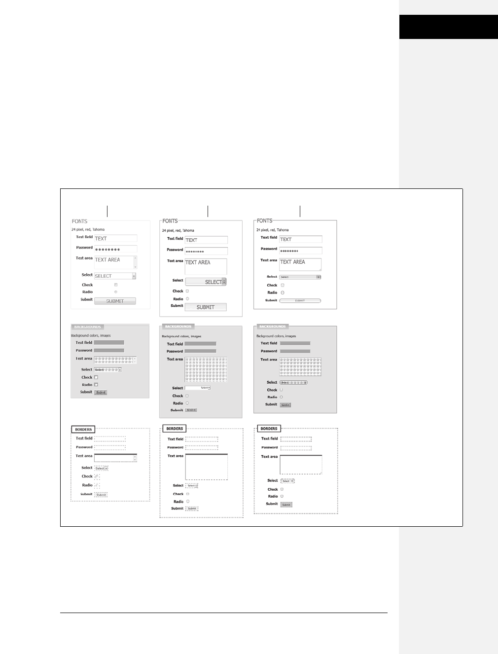
Chapter 10: Formatting Tables and Forms 281
Styling Forms
•Buttons. Form buttons—like <input type="submit"> (<input type="submit" />)—
let your visitors submit a form, reset its contents, or set off some other action to
occur. While Safari 2.0 and earlier doesn’t recognize formatting of these ele-
ments, other browsers let you go wild with text formatting, borders, and back-
grounds. You can also align the button’s text to left, middle, or right using the
text-align property.
•Drop-down menus. Drop-down menus created by the <select> tag also give
you a fair amount of styling control. Safari 2.0 limits you to font family, color,
and size, while most other browsers also let you set background color, image,
and borders.
Figure 10-7:
Browsers vary in how they
handle the styling of form
fields. Safari has historically
had the strongest “keep your
hands off my user interface”
policy, but with Safari 3 (right),
Apple seems to be loosening
up a bit—only a few form
elements like the fonts in a
drop-down menu can’t be
styled in Safari. Internet
Explorer (left) and Firefox
(center) are more tolerant, but
there are significant differences
between them. Internet
Explorer applies background
colors and borders to
checkboxes and radio buttons,
while Firefox doesn’t. The best
you can do is design your
forms carefully and not expect
them to look the same on
every browser.
Internet Explorer 8 Firefox 3 Safari 3
Download at Boykma.Com
282 CSS: The Missing Manual
Styling Forms
Note: For more on the wide variety of browser results you get when applying CSS to form elements, visit
www.456bereastreet.com/archive/200701/styling_form_controls_with_css_revisited. And if you have a
day to kill, you might check www.webformelements.com from the obsessive-compulsive web designer
Christopher Schmitt. On that site, you can find 3,520 screen shots of a form elements displayed on Mac,
Windows, and a wide variety of web browsers. Finally, you can download a free chapter from the CSS
Cookbook, by Christopher Schmitt that includes 164, that’s right, 164 pages of form styling information
and samples: http://oreilly.com/catalog/9780596527419/appendixd/appd.pdf.
•Checkboxes and radio buttons. Most browsers don’t allow formatting of these
elements. Opera, however, lets you set a background color that appears inside
the box or button. Internet Explorer adds a background color around the box or
button. Because browsers vary widely in how they treat these elements, it’s best
to leave them alone.
POWER USERS’ CLINIC
Attribute: The Ultimate Form Field Selector
When it comes to styling forms, tag styles just don’t cut the
mustard. After all, text boxes, radio buttons, checkboxes,
password fields, and buttons all share the same HTML tag—
<input>. While a width of 200 pixels makes sense for a text-
box, you probably don’t want your checkboxes to be that
big, so you can’t use the <input> tag to format width. For
now, the most cross-browser-friendly way of formatting
only text fields would be to add a class name to each text
field—like <input type="text" class="textfield"
name="email" />—and then create a class style to format it.
However, you can take advantage of a more advanced CSS
selector—the attribute selector—to fine-tune your form styl-
ing without resorting to classes.
An attribute selector targets an HTML tag based on one of
the tag’s attributes. The type attribute is responsible for
determining what kind of form element the <input> tag
produces. The type value for a form text field is text. To cre-
ate a style that makes the background color of all single-line
text fields blue, you’d create this selector and style:
input[type="text"] { background-color:
blue; }
Changing text in the above example to submit creates a
style for submit buttons only, and so on.
Since Internet Explorer 7 and 8, Firefox, Safari, Chrome, and
Opera understand attribute selectors, you can start using
them today if you want. The downside is that Internet
Explorer 6 users won’t see your finely styled form elements.
If that’s not a problem—for example, your boss uses IE 8, or
you’re just adding some eye candy that doesn’t affect your
form’s usability—feel free to experiment with these very
useful selectors.
Attribute selectors aren’t just for form elements either. You can
use an attribute selector to style any tag with a particular
attribute. Here’s the selector for styling links that point to http:/
/www.cosmofarmer.com/:a[href="http://www.cosmofarmer.
com"].
CSS 3 promises even more elaborate attribute selectors,
including the ability to select attributes that start with a par-
ticular value (like http://) or which end with a particular
value (like .jpg or .pdf). See page 439 for more details and
examples.
Download at Boykma.Com
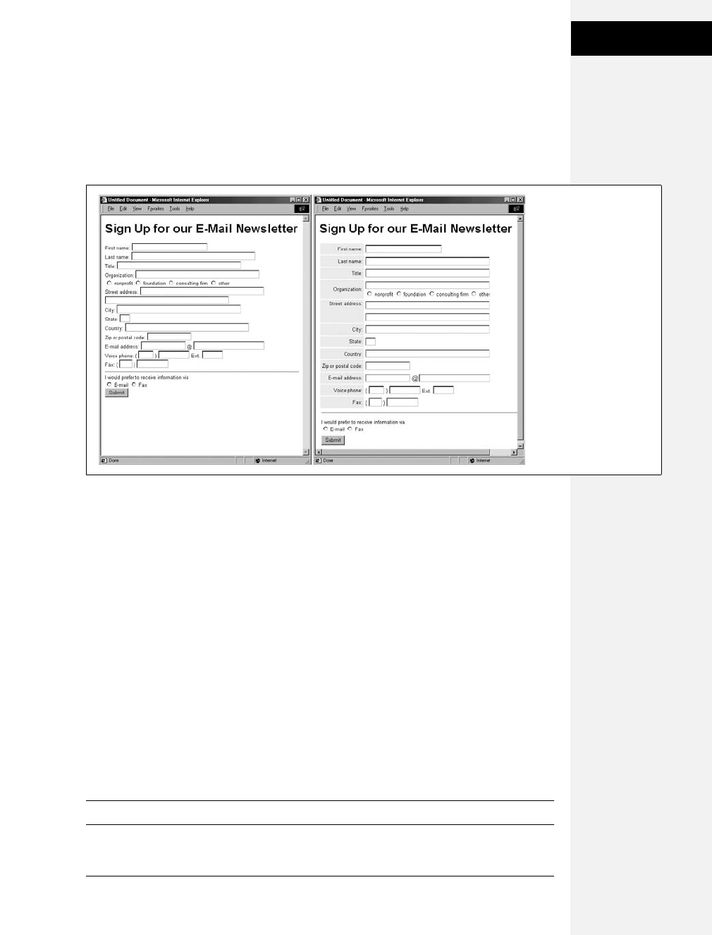
Chapter 10: Formatting Tables and Forms 283
Styling Forms
Laying Out Forms Using CSS
All it takes to create a form is adding a bunch of labels and other form elements to
a web page. Visually, though, you may end up with a chaotic mess (see Figure 10-8,
left). Forms usually look best when the questions and form fields are organized
into columns (Figure 10-8, right).
You can achieve this effect in a couple of ways. The easiest approach is with an
HTML table. Although form labels and fields aren’t strictly table data, they lend
themselves beautifully to a row/column format. Just put your labels (“First Name,”
“Phone Number,” and so on) in one column and form fields in a second column.
Using CSS, you can also create a two-column form like Figure 10-8 (with the
added benefit of less HTML code). Here’s the basic approach:
1. Wrap each label in a tag.
The obvious choice for a tag is <label>, since it’s designed to identify form labels.
But you can’t always use <label> tags for all labels. Radio buttons usually have a
question like “What’s your favorite color?” followed by separate <label> tags for
each button. So what tag do you use for the question? In this case, you must resort
to wrapping the question in a <span> tag: <span>What’s your favorite
color?</span>. Then add a class to each of these tags—<span class="label">—and
also add the class to just those <label> tags you want to appear in the left-hand
column (in Figure 10-8, that would be the labels for “First name,” “Last name,”
and so on, but not the <label> tags for the radio buttons).
Note: Visit www.htmldog.com/guides/htmladvanced/forms for a quick overview on the <label> tag.
Figure 10-8:
The different shapes and
sizes of text boxes, radio
buttons, and other form
objects don’t naturally
align well with text, often
causing an ungainly
zigzag pattern. This form
isn’t just ugly; it’s hard to
read (left). The solution is
to organize your forms
into columns (right),
using either an HTML
table or CSS styles.
Download at Boykma.Com

284 CSS: The Missing Manual
Tutorial: Styling a
Table
2. Float and set a width for the labels.
The secret to this technique lies in creating a style that floats the labels to the left
and sets a width for them. The width value should provide enough space to
accommodate the entire label on one line if possible. You can create a class style
that looks something like this:
.label {
float: left;
width: 20em;
}
The width and float turn the labels into little evenly sized blocks and let the
content that follows—the form field—wrap on the right side of the label.
3. Adjust the style.
Just a couple more enhancements complete the job. You want to align the label
text to the right, so each label appears next to each form field. Also, adding a clear:
left property clears the floats (page 172), so that the labels fall one below the other
instead of wrapping continuously. Finally, by adding a little bit of right margin,
you can create a nice gutter of white space between the labels and form fields.
.label {
float: left;
width: 20em;
text-align: right;
clear: left;
margin-right; 15px;
}
At this point, you’ve got yourself a simple, neat form. You can make other
enhancements if you wish, like making the labels bold and a different color. The
tutorial that starts on page 292 provides a step-by-step example of this technique.
Note: If you’re looking for inspiration (and cool styling tricks) for formatting web forms visit this showcase
of CSS-based form designs www.smashingmagazine.com/2006/11/11/css-based-forms-modern-solutions.
Tutorial: Styling a Table
HTML is great for building tables, but you need CSS to give them style. As you can
see on page 272, it takes quite a bit of HTML to construct a simple table. Lucky for
you, this book comes with a prebuilt HTML table for you to practice your CSS on.
In this tutorial, you’ll format the table’s rows, columns, and cells, and give it an
attractive font and background color.
Download at Boykma.Com
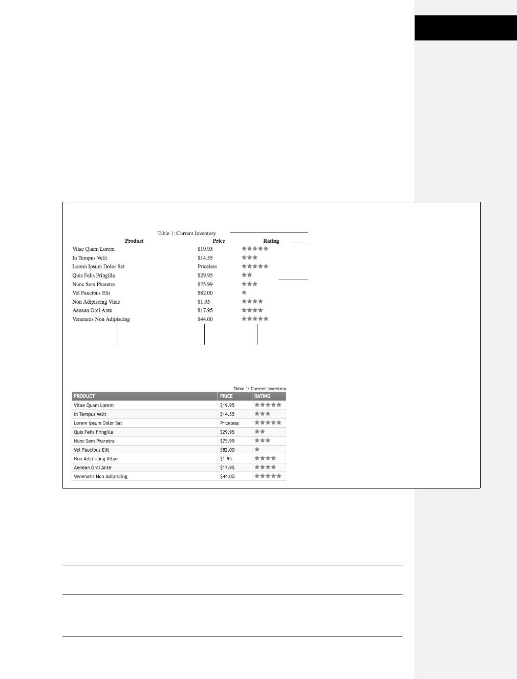
Chapter 10: Formatting Tables and Forms 285
Tutorial: Styling a
Table
To get started, download the tutorial files located on this book’s companion website
at www.sawmac.com/css2e/. Click the tutorial link and download the files. All the files
are enclosed in a ZIP archive, so you need to unzip them first. (Go to the website for
detailed instructions.) The files for this tutorial are in the 10 ➝table folder.
1. Launch a web browser and open the file 10 ➝table ➝table.html.
This page contains a simple HTML table. It has a caption, a row of table head-
ers, and nine rows of data contained in table cells (Figure 10-9). In addition, the
<col> tag is used three times to identify the three columns of data. As you’ll see
in a bit, <col> is a handy tag to style, since it will let you set the width of all cells
in a column.
2. Open table.html in a text editor.
You’ll start by creating a style that sets the table’s width and text font. This table
has an ID of inventory applied to it, so you can use an ID selector to format just
this one table.
Note: There’s already an external style sheet attached to this page, but you’ll add your new styles to an
internal style sheet.
Figure 10-9:
Formatting a table with
borders, background colors,
and other CSS properties not
only makes a drab HTML table
(top) look great, but also
makes the table’s data easier
to read (bottom).
<caption>
<th>
(table headers)
<table id=”inventory”>
<td>
(table cells)
<col id=”product”> <col id=”price”> <col id=”rating”>
Download at Boykma.Com

286 CSS: The Missing Manual
Tutorial: Styling a
Table
3. Click between the opening and closing <style> tags, and then add the follow-
ing style:
#inventory {
font-family: "Trebuchet MS", Arial, Helvetica, sans-serif;
width: 100%;
}
Unless you set the width of a table, it grows and shrinks to fit the size of the
content inside it. In this case, you’ve set a 100 percent width, so the table
stretches to fit the entire width of its containing <div>. (In this case, it’s the area
of the page containing the headline “Welcome to the Lorem Ipsum Store” and
the table itself.) Setting the font family in the <table> uses inheritance to give all
of the tags inside the table the same font—<caption>, table headers (<th>),
table cells (<td>), and so on.
Next you’ll style the table’s caption.
4. Add another style below the table style you just created:
#inventory caption {
text-align: right;
font-size: 1.3em;
padding-top: 25px;
}
This descendent selector only affects the <caption> tag that appears inside
another tag with the ID of inventory (that’s the <table> on this page). A <caption>
tag indicates what a table is about. In this case, it shouldn’t be the focus of
attention, so you’ve kept the text small and moved it to the right edge, out of
the way. The padding-top property adds some space above the caption, moving
the caption (and table) a bit farther below the headline.
Tip: When you have a caption on a table, and you want to move the caption and table further down
from the element above it, only use padding on the <caption> tag. The margin property won’t work for
some strange reason: If you add a top margin to the <table> tag, Firefox actually inserts the space
between the caption and the table proper, while other browsers add the space above the caption. If you
try to add margin to the top of the <caption>, Firefox gets it right, IE ignores it, and Safari adds the space
between the caption and the table. The only reliable method is to use top padding on the <caption> tag.
When you read information across a table row, it’s easy to lose track of which
row you’re looking at. Good visual guides are essential. Adding borders around
the cells, which you’ll do next, visually delineates the information.
5. Add the following group style to the internal style sheet:
#inventory td, #inventory th {
font-size: 1.4em;
border: 1px solid #DDB575;
}
Download at Boykma.Com

Chapter 10: Formatting Tables and Forms 287
Tutorial: Styling a
Table
This group selector formats the table header (<th>) and table cell (<td>) tags of
this table with larger type and draws a border around each header and each cell.
Browsers normally insert space between each cell, so at this point there are
small gaps between the borders (Figure 10-10, circled). Between the gaps and
the borders, the whole table looks too boxy. You’ll fix that next.
6. Add the border-collapse property to the table style you created in step 3 so that
it looks like this:
#inventory {
font-family: "Trebuchet MS", Arial, Helvetica, sans-serif;
width: 100%;
border-collapse: collapse;
}
The border-collapse property removes the spacing between cells. It also merges
borders that touch, which prevents thick, unattractive borders. Without border-
collapse, the bottom border of a table header and the top border of the table cell
would double up to make a 2-pixel border.
If you preview the table now, you’ll see the data is better organized visually, but
the information in each cell looks a little cramped. Add some padding to fix that.
7. Add padding to the group selector you created in step 5:
#inventory td, #inventory th {
font-size: 1.4em;
border: 1px solid #DDB575;
padding: 3px 7px 2px 7px;
}
While the top, table-header row stands out because of its boldface text, there are a
few things you can do to make it stand out even more and improve its appearance.
8. Create a new style below the #inventory td, #inventory th style for formatting
just table head cells:
#inventory th {
text-transform:uppercase;
text-align: left;
padding-top: 5px;
padding-bottom: 4px;
}
This style is a perfect example of effective cascading. The group selector td, th
defines common formatting properties between the two types of cells. By intro-
ducing this th-only style, you can further tweak the look of just the table headers.
For example, the padding-top and padding-bottom settings here override those
same settings defined in the selector in step 7. However, since you don’t override
Download at Boykma.Com

288 CSS: The Missing Manual
Tutorial: Styling a
Table
the left or right padding settings, the <th> tags will retain the 7 pixels of left and
right padding defined in step 7. This style also turns all of the text to uppercase
and aligns it to the left edge of the table cell.
The table headers still don’t have enough oomph, and the table seems to recede
into the background of the page. A background graphic can provide the neces-
sary boost.
9. Edit the th style by adding a background image and changing the text color:
#inventory th {
text-transform:uppercase;
text-align: left;
padding-top: 5px;
padding-bottom: 4px;
background: url(images/bg_th.png) no-repeat left top;
color: #FFF;
}
In this case, the graphic introduces a subtle top-down gradient while a white
borderline at the top and left edges of the image contrasts nicely with the darker
top and left borders around the cells, giving the cells a 3-D look.
Figure 10-10:
A browser’s normal
display of a table inserts
space between each cell
(top). It also lets borders
double up where cells
touch. Setting the border-
collapse property to
collapse solves both
problems (bottom).
Download at Boykma.Com
Chapter 10: Formatting Tables and Forms 289
Tutorial: Styling a
Table
Note: By the way, you could just as easily set the background color of these cells to achieve a similar effect.
When tables have lots of data stuffed into many rows and columns, it’s some-
times hard to quickly identify which data belongs to each row. One solution
designers use is to alternate the color of every other row in a table. You create
this effect with a class style that you apply to every other table row.
10. Add one more style to the web page’s internal style sheet:
#inventory tr.alt td {
background-color: #FFF;
}
This complex descendent selector basically says, “Apply the following format-
ting to every <td> tag that’s inside a <tr> tag that has the class alt applied to it
and only when both of those are inside another tag with the ID of inventory.”
The style itself will turn the background of the cells to white, but in order for it
to work, you must first apply the class alt to every other row.
11. In the page’s HTML, look for the <tr> tag that precedes the <td> containing
“Vitae Quam Lorem.” Add class="alt" to that <tr> tag, like so:
<tr class="alt">
<td>Vitae Quam Lorem</td>
You’ll need to do this with every second row after this one as well. (Manually
tagging each alternating row can be tedious, especially if you frequently add or
reorder table rows. For an automated approach to striping table rows using a
little JavaScript programming, see the Tip on page 278.)
12. Repeat step 11 for every other <tr> tag.
You’ll probably want to check the page in a browser after you add the class to
each <tr>, just to make sure you’re correctly locating every other table row.
Finally, you’ll adjust the width of the cells that fall under the Price and Rating
columns. One technique is to meticulously add class names to those cells and
create a class style with a set width. A better approach, however, is to take
advantage of the <col> tag, which lets you assign a class or ID to a column’s
worth of cells. As you can see in Figure 10-9, those two columns have an ID of
price and rating. You can easily set the width for these two columns with one
group selector.
13. Add one more style to the web page’s internal style sheet:
#price, #rating {
width: 100px;
}
Download at Boykma.Com

290 CSS: The Missing Manual
Tutorial: Styling a
Form
Now those two columns are each 100 pixels wide. Finally, the table looks great
in all browsers…well almost. In IE 6, the table drops down on the page. When
the table’s width is set to 100 percent, IE 6 actually makes the table a little bit
larger than its container, which in turn forces the table to drop down below the
left sidebar. This all-too-common problem is called a float drop, and you’ll learn
more about it on page 330. But for now, a simple solution is to just make the
table slightly smaller than 100 percent.
14. Edit the ID style #inventory, used to format the table, by changing the width to
98 percent, like this:
#inventory {
font-family: "Trebuchet MS", Arial, Helvetica, sans-serif;
width: 98%;
border-collapse: collapse;
}
Now the table is just a tad thinner than its container and fits fine in IE 6. (If you
simply can’t stand the table being thinner in other browsers, you could use an
IE 6–specific style to only set the width to 98 percent for that one browser—see
page 433 for more on that trick.)
Preview the page in a web browser to see the results. Your page should look like
the bottom image in Figure 10-9. You’ll also find the completed exercise in the
10_finished ➝ table folder.
Tutorial: Styling a Form
This tutorial gives you some practice using CSS to organize a form and make it
more attractive. If you open 10 ➝form ➝form.html in a web browser, then you’ll
see it contains a simple form for subscribing to fictitious website, CosmoFarmer.com
(Figure 10-11). The form asks several questions and uses a variety of form ele-
ments for input, including text boxes, radio buttons, and a pull-down menu.
As subscription forms go, it looks fine, but a little bland. In the steps on the follow-
ing pages, you’ll spruce up the fonts, line up the questions and boxes better, and
add a few other improvements.
1. Open the file form.html in a text editor.
There’s already an external style sheet attached to this page, but you’ll add your
new styles to an internal style sheet. Start by bringing down the size of the type
in the form.
Download at Boykma.Com
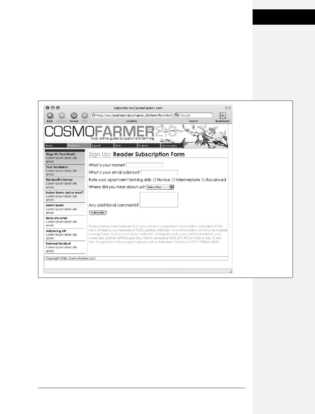
Chapter 10: Formatting Tables and Forms 291
Tutorial: Styling a
Form
2. Click between the opening and closing <style> tags, and then add the follow-
ing style:
#subForm {
font-size: .8em;
}
The subscription form has an ID of subForm applied to it, so this style sets the
text size for all text between the <form> tags.
Time to work on the layout. To better align the form elements, you’ll create the
appearance of two columns, one for the questions (labels) and another for the
answers (form fields).
3. Add another style to the internal style sheet:
#subForm .label {
float: left;
width: 230px;
}
Figure 10-11:
While the HTML <table>
tag is a common way to
organize the questions of
a form, you can also use
CSS to make a
disorganized jumble of
labels and form fields
(like the ones pictured
here) and make a form’s
layout clearer and more
attractive.
Download at Boykma.Com

292 CSS: The Missing Manual
Tutorial: Styling a
Form
This descendent selector identifies any element with a class of .label within
this form. The style sets a width of 230 pixels and floats the element to the
left. Remember the float property lets you move elements to one side or the
other of a containing block. It has the added benefit of letting you set a width
and force elements that follow the style to wrap around it. As a result, when
you apply this style to each of the questions in the form, you create an even-
width column. But in order to see the effect, you must first apply the class to
the appropriate page elements.
4. In the page’s HTML, locate this code <label for="name"> and add
class="label", so the tag looks like this:
<label for="name" class="label">
You must do the same for each question in the form, so…
5. Repeat step 5 for the following pieces of HTML code: <label for="email">,
<label for="refer">, <label for="comments">.
There’s one additional question on the form—“Rate your apartment farming
skills.” It isn’t inside a label tag, since its purpose is to introduce a series of radio
buttons, each of which has its own label. You need to add a <span> tag to this
text so you can apply the label style to it.
6. Find the text Rate your apartment farming skills, and then wrap it in a <span>
tag with a class of label, like so:
<span class="label">Rate your apartment farming skills</span>
Now the questions appear to be in a single column (Figure 10-12, top). But
they’d look better if they stood out more and lined up with the corresponding
form fields.
7. Edit the #subForm .label style you created in step 4, so it looks like this:
#subForm .label {
float: left;
width: 230px;
margin-right: 10px;
text-align: right;
font-weight: bold;
}
Preview the page in a web browser. The form should look like the bottom image
in Figure 10-12.
There’s one last step for these labels. Because they’re floated to the left, if the
text runs more than one line, the question that follows will also try to wrap
around to the right. Fix that by applying the clear property.
Download at Boykma.Com
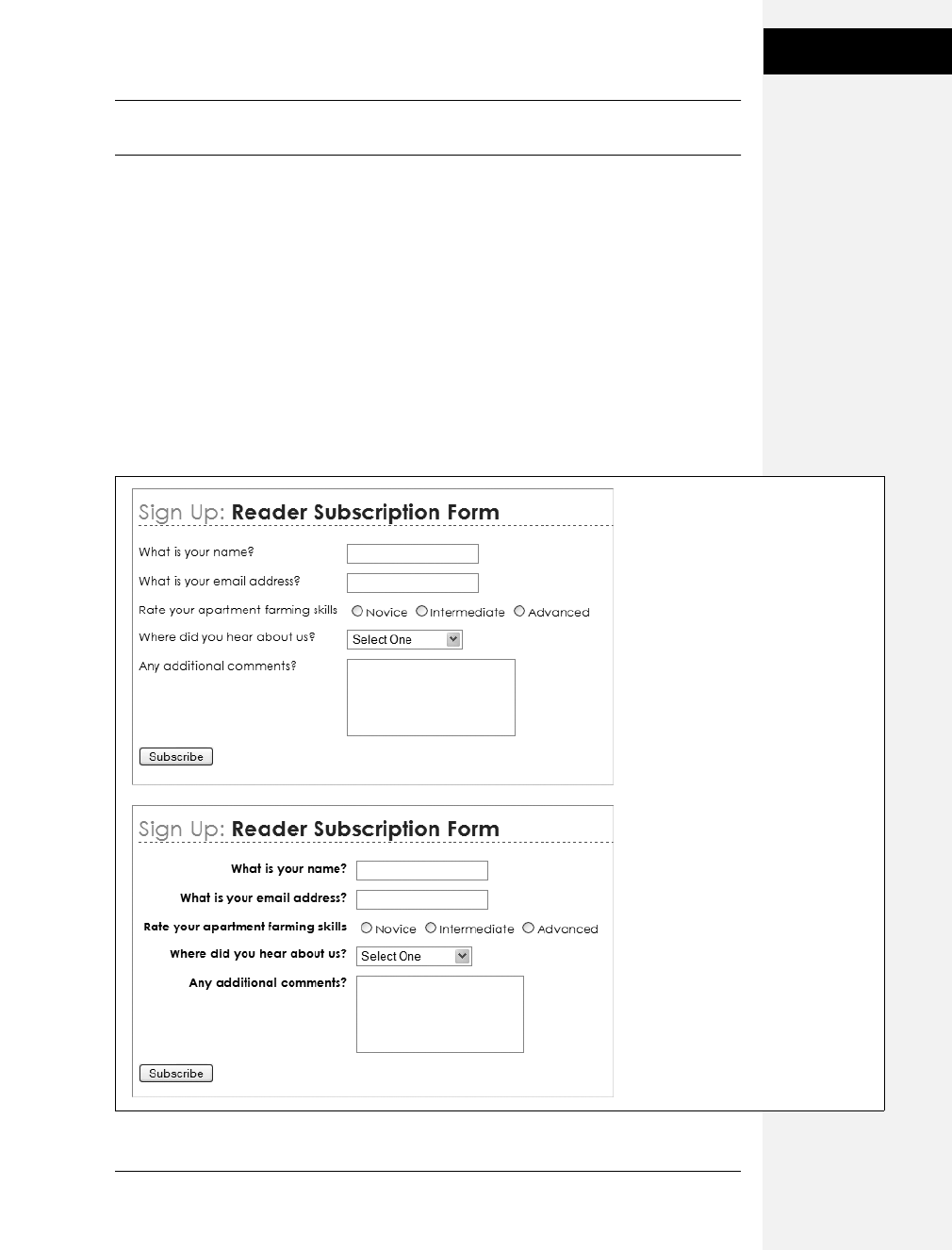
Chapter 10: Formatting Tables and Forms 293
Tutorial: Styling a
Form
Note: You can see a similar problem illustrated in Figure 7-12. See page 172 for more detail on clearing
floats.
8. Add a clear property to the #subForm .label style:
#subForm .label {
float: left;
width: 230px;
margin-right: 10px;
text-align: right;
font-weight: bold;
clear: left;
}
The form is shaping up, but that Subscribe button looks out of place over at the
left edge. You’ll align it with the other form elements next.
Figure 10-12:
Sometimes small and subtle changes
can make a form more readable.
Making the questions on the form
bold and aligning them with their
corresponding form elements (bottom
figure) immediately improves the look
of the form.
Download at Boykma.Com

294 CSS: The Missing Manual
Tutorial: Styling a
Form
9. Add another style to the internal style sheet.
#subscribe {
margin-left: 240px;
}
The <input> tag that creates this Subscribe button has an ID of subscribe
already applied to it, so this style indents the button 240 pixels to match the
width and right margin of the #subForm .label style.
Most browsers let you style buttons in other ways, too, so…
10. Edit the Subscribe button style by adding a background color and font to the
style you just created:
#subscribe {
margin-left: 240px;
background-color: #CBD893;
font-family: "Century Gothic", "Gill Sans", Arial, sans-serif;
}
You can even change the font used in a pull-down menu.
11. Add a style for the form’s select menu:
#refer {
font-family: "Century Gothic", "Gill Sans", Arial, sans-serif;
}
There! You’ve got the text labels and Subscribe button looking great, but why
stop there? Time to jazz up the form fields. Begin by changing their font and
background colors.
12. Create a new group selector for styling the three text boxes in the form:
#name, #email, #comments {
background-color: #FBEF99;
font-family: "Lucida Console", Monaco, monospace;
font-size: .9em;
}
This group style gives the text boxes (each of which has its own ID applied to it) a
light yellow background color and sets a new size and font for text visitors to type
into them. The boxes look a little narrow, and they also appear a little low com-
pared with their labels at right. Fixing these two problems with CSS is a snap:
Download at Boykma.Com
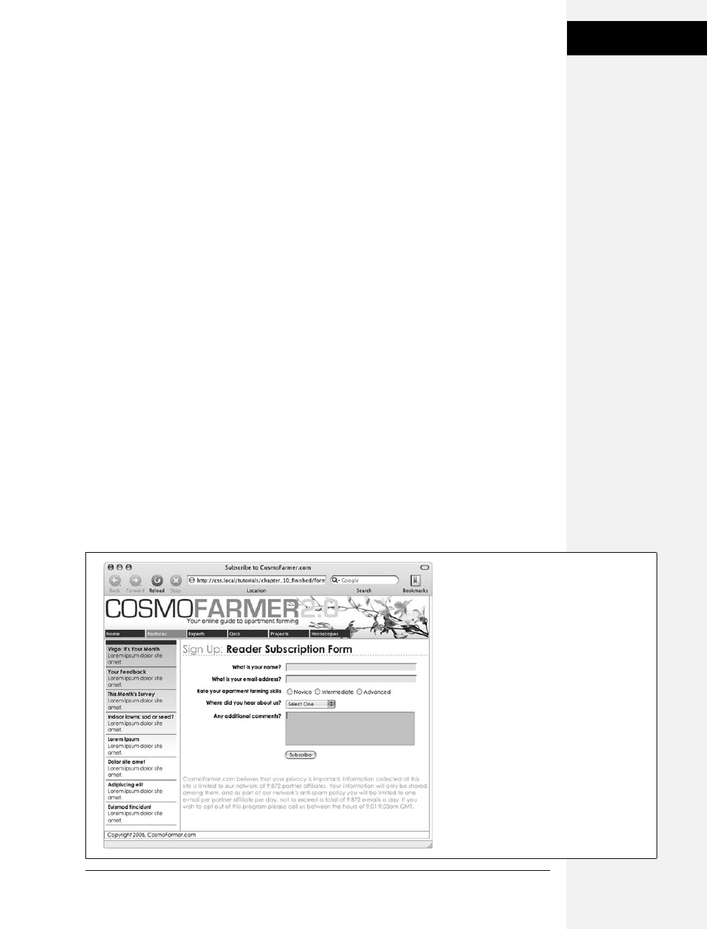
Chapter 10: Formatting Tables and Forms 295
Tutorial: Styling a
Form
13. Edit the style you just created by setting a width and altering the top margin:
#name, #email, #comments {
background-color: #FBEF99;
font-family: "Lucida Console", Monaco, monospace;
font-size: .9em;
width: 300px;
margin-top: -2px;
}
You can make your form easier for your visitors to fill out by highlighting the
active form element with the special :focus pseudo-class (page 64). You’ll add
that in the next step.
14. At the end of the internal style sheet, add one last style for the pull-down menu
and the three text fields:
#name:focus,
#email:focus,
#comments:focus,
#refer:focus
{
background-color: #FDD041;
}
The :focus pseudo-class works only in Internet Explorer 8, Firefox, Safari, and
Opera, but since it doesn’t do IE 7 or IE 6 people any harm, adding a :focus style
is a fun enhancement.
Preview the page in a web browser. It should now look like Figure 10-13 You can
find a completed version of this tutorial in the 10_finished ➝form folder.
Figure 10-13:
Using the :focus pseudo-class, you can make
your forms more interactive by highlighting
form fields the visitor uses. Here, you can see
you’re about to type into the Comments field
because of its darker background color.
Download at Boykma.Com

Download at Boykma.Com


Download at Boykma.Com

299
Chapter 11
chapter
11
Introducing CSS Layout
CSS leads a double life. As great as it is for formatting text, navigation bars, images,
and other bits of a web page, its truly awesome power comes when you’re ready to
lay out entire web pages. While HTML normally displays onscreen content from
top to bottom, with one block-level element stacked after another, CSS lets you
create side-by-side columns and position images or text anywhere on the page
(even layered on top of other page elements), so you can create much more visu-
ally interesting web pages.
There’s a lot to CSS layout. The next two chapters cover two of the most important
CSS techniques in detail. This chapter provides a brief overview of the principles
behind CSS layout and a handful of useful guidelines for approaching your own
layout challenges.
Types of Web Page Layouts
Being a web designer means dealing with the unknown. What kind of browsers do
your visitors use? Do they have the latest Flash Player plug-in installed? But perhaps
the biggest issue designers face is creating attractive designs for different display
sizes. Monitors vary in size and resolution: from 15-inch, 640 ×480 pixel note-
book displays to 30-inch monstrosities displaying, oh, about 5,000,000 ×4,300,000
pixels. Not to mention the petite displays on mobile phones.
Web layouts offer several basic approaches to this problem. Nearly every page
design you see falls into one of two types—fixed width or liquid. Fixed-width
designs give you the most control over how your design looks but can inconve-
nience some of your visitors. Folks with really small monitors have to scroll to the
Download at Boykma.Com

300 CSS: The Missing Manual
Types of Web Page
Layouts
right to see everything, and those with large monitors end up with wasted space
that could be showing more of your excellent content. Liquid designs, which grow
or shrink to fit browser windows, make controlling the design more challenging
but offer the most effective use of the browser window. An elastic design combines
some advantages of both.
•Fixed Width. Many designers prefer the consistency of a set width, like the page
in Figure 11-1, top. Regardless of the browser window’s width, the page con-
tent’s width remains the same. In some cases, the design clings to the left edge
of the browser window, or, more commonly, it’s centered in the middle. With
the fixed-width approach, you don’t have to worry about what happens to your
design on a very wide (or small) monitor.
Many fixed-width designs are below 1,000 pixels wide, letting the window and
the space taken up by scrollbars and other parts of the browsers “chrome” fit
within a 1024 ×768 pixel monitor. A very common width is 960 pixels. The
great majority of websites are a fixed width.
Note: For examples of fixed-width designs, visit www.alistapart.com,www.espn.com, or www.nytimes.com.
•Liquid. Sometimes it’s easier to roll with the tide instead of fighting it. A liquid
design adjusts to fit the browser’s width—whatever it may be. Your page gets
wider or narrower as your visitor resizes the window (Figure 11-1, middle).
While this type of design makes the best use of the available browser window
real estate, it’s more challenging to make sure your design looks good at differ-
ent window sizes. On very large monitors, these types of designs can look ridic-
ulously wide, creating very long, difficult to read lines of text.
Note: For an example of a liquid layout, check out http://maps.google.com.
•Elastic. An elastic design is really just a fixed-width design with a twist—type
size flexibility. With this kind of design, you define the page’s width using em
values. An em changes size when the browser’s font size changes, so the design’s
width is ultimately based on the browser’s base font size (page 121). By chang-
ing the browser’s font size, you can change the width of the page and the ele-
ments on it. It’s kind of like zooming into the design (Figure 11-1, bottom).
Elastic designs are losing favor these days in large part because the newest ver-
sions of the most popular browsers have replaced the normal “increase text size”
command with a “page zoom” command. For example, in Internet Explorer 8,
Firefox 3, Safari 4, Opera, and Chrome, pressing Ctrl-+ enlarges everything on the
page (pretty much the same effect you get with an elastic design).
In the tutorials at the end of next chapter, you’ll create a fixed-width design and a
liquid design.
Download at Boykma.Com
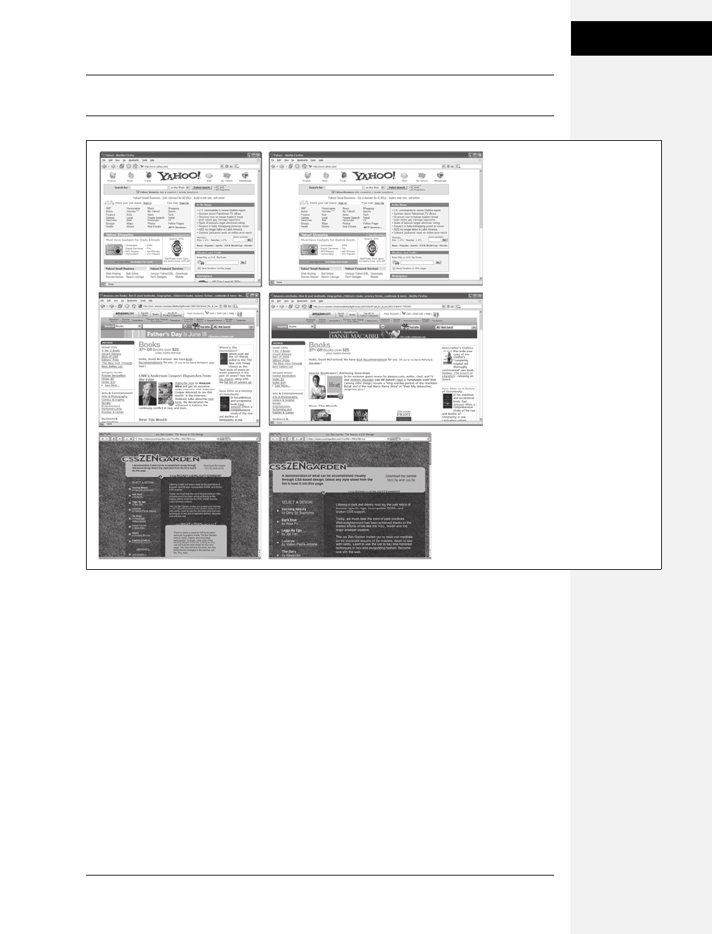
Chapter 11: Introducing CSS Layout 301
How CSS Layout
Works
Note: The max-width and min-width properties offer a compromise between fixed and liquid designs.
See the box on page 320.
How CSS Layout Works
As discussed in Chapter 1, in the early days of the Web, HTML’s limitations forced
designers to develop clever ways to make their websites look good. The most common
tool was the <table> tag, which was originally intended to create a spreadsheet-like
display of information composed of rows and columns of data. Designers used
HTML tables to build a kind of scaffolding for organizing a page’s contents (see
Figure 11-2). But because the <table> tag wasn’t meant for layout, designers often
had to manipulate the tag in unusual ways—like placing a table inside the cell of
another table—just to get the effect they wanted. This method was a lot of work,
added a bunch of extra HTML code, and made it very difficult to modify the
design later. But before CSS, that’s all web designers had.
Figure 11-1:
You have several ways to
deal with the uncertain
widths of web browser
windows and browser font
sizes. You can simply
ignore the fact that your
site’s visitors have different
resolution monitors and
force a single, unchanging
width for your page (top),
or create a liquid design
that flows to fill whatever
width window it
encounters (middle). An
elastic design (bottom)
changes width only when
the font size—not the
window width—changes.
Fixed
Liquid
Elastic
Download at Boykma.Com

302 CSS: The Missing Manual
How CSS Layout
Works
If you’re a longtime <table> tag jockey, you need to develop a new mindset when
you begin to use CSS for layout. First, forget about rows and columns—that
notion is important only when working with tables. In table-based layout, you
took your HTML and put it into individual table cells. Each cell acted like a box on
the page holding a headline, an image, text, or a combination.
CSS has a rough equivalent of a table cell—the <div> tag. As with table cells, a
<div> tag is a container for content that you want to position in one area of the
page. In addition, as you’ll see, CSS designs often nest a div inside another div,
much like you’d nest tables within tables to get certain effects—but the CSS
method uses a lot less HTML code.
The Mighty <div> Tag
Web page layout involves putting chunks of content into different regions of the
page. With CSS, the element most commonly used for organizing content is the
<div> tag. As you read on page 22, the <div> tag is an HTML element that has no
inherent formatting properties (besides the fact that browsers treat the tag as a
block with a line break before and after it). Instead, it’s used to mark a logical
grouping of elements or a division on the page.
You’ll typically wrap a <div> tag around a chunk of HTML that belongs together.
The elements comprising the logo and navigation bar in Figure 11-3 occupy the
top of the page, so it makes sense to wrap a <div> tag around them. At the very
least, you would include <div> tags for all the major regions of your page, such as
the banner, main content area, sidebar, footer, and so on. But it’s also possible to
wrap a <div> tag around one or more additional divs. One common technique is
to wrap the HTML inside the <body> tag in a <div>. Then you can set some basic
page properties by applying CSS to that wrapper <div>. You can set an overall
width for the page’s content, set left and right margins, center all of the page’s con-
tent in the middle of the screen, and add a background color or image to the main
column of content.
Figure 11-2:
Building a complex page
design (left) using the
<table> tag involves
tricks like nesting tables
within tables, merging
adjacent cells, and
propping open cells with
invisible spacer images.
It’s like building a rigid
scaffolding (right), and
changing the design of a
page requires tearing
down the scaffolding and
building a new one.
Download at Boykma.Com
Chapter 11: Introducing CSS Layout 303
How CSS Layout
Works
Once you’ve got your <div> tags in place, add either a class or ID to each one,
which becomes your handle for styling each <div> separately. For parts of the page
that appear only once and form the basic building blocks of the page, designers
usually use an ID. The <div> tag for a page’s banner area might look like this:
< div id="banner">. You can use an ID only once per page, so when you have an
element that appears multiple times, use a class instead. If you have several divs
that position photos and their captions, for example, then wrap those tags in a div
and add a class like this: <div class="photo">. (For more on knowing when to use a
div, read the box below.)
Once you have the divs in place and have accurately identified them with IDs or
class names, you can then create CSS styles to position those <divs> on the page
using either floats (Chapter 12) or absolute positioning (Chapter 13).
Techniques for CSS Layout
At this point in the evolution of CSS, layout comes in two flavors—floats and absolute
positioning. The vast majority of web pages use the CSS float property for layout.
You’ve already encountered this seemingly simple property in Chapter 8, where
the float property was introduced as a way of positioning an image within a col-
umn of text by either floating the image to the left or right side. The same concept
applies to divs: By setting the width on a div and floating it to the left or right, you
WORD TO THE WISE
A Delicate Balancing Act
Although divs are critical to CSS layout, don’t go crazy pelt-
ing your page with divs. A common trap is to believe you
must wrap everything on a web page in a <div> tag. Say
your main navigation bar is an unordered list of links (like
the one described on page 235). Because it’s an important
element, you may be tempted to wrap a <div> around it:
<div id="mainNav"><ul>…</ul></div>.
But there’s no reason to add a <div> when the <ul> tag is
just as handy. As long as the <ul> contains the main navi-
gation bar links, you can simply add your ID style to that
tag: <ul id="mainNav">. An additional <div> is just unnec-
essary code.
Likewise, it doesn’t make sense to use a <div> when
another, more logical HTML tag is at hand. For example, say
you want to add a pull quote to a long passage of text—a
box aligned to the right edge of the page displaying an
exciting quote pulled from the page. In this case, you can
skip an extra <div> and simply use the HTML <blockquote>
tag. You can position the blockquote tag using the float
property as discussed in the next chapter.
That said, don’t be afraid of divs either. Adding a few extra
divs to a page is not going to substantially change the file
size or slow the page’s download speed. If a div helps you
get the job done, and no other HTML tag makes sense, then
by all means use a div. Also, a div is the only way to go
when you want to group a bunch of different HTML tags
into a cohesive unit. In fact, it’s not at all uncommon to see
one <div> surround one or more other divs.
The basic rule of thumb is you should try to keep the
amount of HTML on a page down to a minimum, but use
as much HTML as is needed. If adding a few divs makes
sense for the design—go for it.
Download at Boykma.Com

304 CSS: The Missing Manual
Layout Strategies
can create a column (the text following the div ends up wrapping around the
floated div as if it were another column). By using the float property with multiple
divs, you’re able to achieve multi-column layouts. Taking this technique further,
you can quickly create complex, multicolumn layouts by placing floated divs
within floated divs.
Absolute positioning lets you place an element anywhere on the page with pixel-
level accuracy. You can place an element 100 pixels from the top edge of the
browser window and 15 pixels in from the left edge, for example. Page layout pro-
grams like InDesign and Quark Xpress work this way. Unfortunately, the fluid
nature of web pages and some of the weird characteristics of absolute positioning
make it difficult to achieve total layout control with this technique. As you’ll read
in Chapter 13, it is possible to lay out a page using absolute positioning, but, in
general, this technique is better suited to smaller tasks like positioning a logo in a
particular location of the page.
Don’t worry if this sounds rather abstract right now, you’ll see all of these tech-
niques in action in the next two chapters.
Note: There are a couple of other ways to do CSS layout as well, but they’re limited to Internet Explorer 8,
Firefox, Safari, and other current browsers. In other words, these other techniques won’t work for the vast
majority of web surfers on IE 6 and 7. However, we do introduce these up-and-coming techniques on
page 439 in Chapter 16.
Layout Strategies
Web page layout with CSS is more of an art than a science; there’s no one formula to
follow for marking up your content with HTML and creating your CSS. What works
for one design might not for another. Though that might not be a comforting
thought—“Hey, I bought this book to learn this darn stuff”—CSS layout is some-
thing you’ll learn through experience, learning how the different CSS properties
work (especially floats and absolute positioning), reading about different layout tech-
niques, following tutorials like the ones in the next two chapters, and lots of practice.
However, there are definitely some strategies you can adopt as you approach CSS
layout. These are more like guidelines than hard or fast rules, but as you begin to
see your projects through the initial visual design, start with these tips in mind.
Start with Your Content
Many designers like to jump right into the good stuff—colors, fonts, icons, and
images. But beginning with the visual design is putting the cart before the horse.
The most important elements of a web page are the contents: headlines, para-
graphs of text, stunning photographs, navigational links, Flash movies, and such
Download at Boykma.Com

Chapter 11: Introducing CSS Layout 305
Layout Strategies
are what people will come to your site for. They want to read, learn, and experi-
ence what your site has to offer. Content is king, so you think of what you want to
say before you tackle how it should look. After all, it won’t do you much good to
create a fantastic, 3-D looking sidebar box if you don’t have anything meaningful
to put in that box.
In addition, a page’s message should dictate its design. If you decide that your
home page needs to sell the services of your company and highlight the excellent
customer service you offer, you might decide that a large photo of your friendly
staff is important, as well as a quote from a satisfied customer. Since both of these
elements are important to the page’s message, you can craft the visual message by
making both the picture and the quote prominent and compelling.
Mock Up Your Design
Even if you feel more comfortable hand-coding HTML and CSS in your favorite
text editor than drawing in a graphics program, avoid starting with code. It’s fairly
easy to use a graphics program like Photoshop, Illustrator, or Fireworks to create a
visual design. These programs give you the freedom to explore different colors,
fonts, images, and positioning without spending the time required to code the
HTML and CSS. You can experiment rapidly with new design ideas until you hit
upon something you love.
If you’re not a wiz with graphics programs, even just drawing boxes to indicate dif-
ferent placement of page elements can help you refine your thinking about how
the page should be laid out. It’s a lot easier to change a two-column design to a
four-column design by resizing boxes in Illustrator than by rewriting HTML and
CSS. Even simple pencil and paper sketches are a great way to get a feel for where
content should go, how big it should be, and the general color tone (light or dark).
Tip: Yahoo offers a free Stencil Kit (http://developer.yahoo.com/ypatterns/wireframes) that you can use
in Illustrator, Visio, OmniGraffle, and other graphics programs to create web page mockups. The supplied
user interface elements, like buttons, form fields, windows, and navigation buttons, can make sketching
out a page layout as simple as dragging and dropping icons.
Identify the Boxes
Once you’ve created a visual mockup, it’s time to think of how to create the HTML
markup and CSS to achieve your design goal. This process usually involves envi-
sioning the different structural units of a page and identifying elements that look
like individual boxes. For example, in Figure 11-3, there are quite a few elements
that look like boxes: most obviously the three announcement boxes near the bottom
(marked as A in Figure 11-3). Each box is usually a good candidate for a separate
<div> tag (unless there’s a more appropriate HTML tag, as discussed in the box on
page 303).
Download at Boykma.Com

306 CSS: The Missing Manual
Layout Strategies
Often a visual clue in your mockup can help you decide if a div is needed. For
example, a border line drawn around a headline and several paragraphs of text
indicates you’ll need to surround that group of HTML tags with a <div> tag that
has a border applied to it.
In addition, whenever you see chunks of text sitting side by side (like the three
chunks of content in the footer in Figure 11-3), you know you’ll need to have each
group in its own div tag—HTML tags don’t usually sit side by side, so you have to
use some layout mojo (like the float technique covered in the next chapter) to
make that happen.
It’s also common to group divs that sit side by side in columns within another div.
For example, in the bottom half of Figure 11-3 you can see the basic set of <div>
tags that provide the page’s structure. The “news” and “footer” divs are containers
for their own set of divs. While this isn’t always a necessity, it can provide flexibil-
ity. For example, you can reduce the main area (the photo of the hand and the
tagline) in width and move the news div to the right side to form its own column.
The news items could then be stacked on top of each other rather than sitting side
by side.
Go with the Flow
Tags don’t normally sit side by side or layer on top of each other. Normally,
HTML tags act pretty much like text in a word-processing program: filling the
entire width of the page and flowing from top to bottom. Each block level tag—
headline, paragraph, bulleted list, and so on—stacks on top of the next block level
tag. Since that’s the “business as usual” approach of HTML tags, you usually don’t
have to do any kind of positioning if you plan on stacking one div on the next.
For example, in Figure 11-3, four divs—“banner,” “main,” “news,” and “footer”—
span the entire width of their container (the <body> tag) and sit one on top of the
other. Because this is the normal way block-level tags work, you don’t need to do
anything special with the CSS for those four divs to stack on top of each other.
Remember Background Images
You’ve no doubt seen tiled images filling a web page’s background, or subtle gradi-
ents adding depth to a banner. But the background-image property (page 188) pro-
vides another way to add photos to a page without resorting to the <img> tag. Not
only does putting an image into the background of an existing HTML tag save the few
bytes of data required by the <img> tag, but it also simplifies some layout challenges.
For example, in Figure 11-3, the central image of the hands holding the Chia Pet
(B) is actually just a background image. This makes placing another div—the one
with the tagline “Compassionate care…” (C) really easy, since it’s just sitting on
top of the background of its parent div. Likewise, the picture of the doctor lower
right of the page is just a background image placed in that div—adding some right
padding pushes the text in that div out of the way of the photo.
Download at Boykma.Com

Chapter 11: Introducing CSS Layout 307
Layout Strategies
Figure 11-3:
Correctly putting together
the HTML necessary to
convert a Photoshop
mockup into HTML and CSS
reality involves seeing the
underlying structure and
wrapping related groups of
HTML within <div> tags.
Sometimes, it can take a lot
of divs to make a design
come to life.
<div id=”banner”>
<div id=”main”>
<div id=”signup”>
<div id=”footer”>
<div id=”testimony”> <div id=”contact”> <div id=
“location”>
<div id=”news”>
<div id=”news1”> <div id=”news2”> <div id=”news3”>
<div id=”tag”>
A A A
B
C
padding-left:585px
padding-top:100px
Download at Boykma.Com

308 CSS: The Missing Manual
Layout Strategies
Note: There are downsides to using photos in the background of divs (or any HTML tag). First, web
browsers usually don’t print backgrounds—so if you’ve got a page with a map containing driving direc-
tions to your business, insert the map with the <img> tag and not as a background image. Likewise,
search engines don’t search CSS, so if you think the image can help attract traffic to your site, use an
<img> tag and include a descriptive alt attribute.
Pieces of a Puzzle
This tip can be filed under “creative problem solving” or “if I stare at this design
long enough I’ll come up with some crazy solution.” Often, what looks like a sin-
gle, unified whole is actually composed of multiple pieces. For example, in the
tutorial in Chapter 8, a sidebar that looked like a paper scroll was actually con-
structed of three background images in three separate HTML tags (see Figure 8-17).
Likewise, the “sliding doors” trick discussed on page 248 uses a similar technique
to piece together a single, flexible tab (see Figure 9-10).
You can see a simple example of this in Figure 11-3, even though at first glance it
looks like one big white box full of content. Actually there are four stacked divs,
each with a white background. So, if you’re having trouble seeing how to put
together one large element on a page—a very large graphic, a rainbow that spans
several columns, or just a solid background color that appears to span multiple
areas of a page—think about how you could achieve the same look breaking the
large unit into smaller pieces that are joined like parts in a jigsaw puzzle.
Layering Elements
If you’re a Photoshop, Illustrator, or Fireworks fan, you’re probably used to the
notion of layers. Layers let you create separate canvases that float on top of each
other to build one unified image. In these programs, it’s easy to make a logo float
on top of a headline of text, or place a photo over another photo. If you want a
web page that has this kind of effect, you have a couple of choices.
Often the easiest way to layer something on top of a photo is to put the image into
the background of another tag (see the tip on the previous page). Because the
background image is behind the tag, anything inside that tag—text, another
photo—will sit on top of the photo.
But what if you want to layer a photo on top of some text? In that case, you’ll turn
to the only CSS property that lets you layer elements—the position property. You’ll
learn all about that property in Chapter 13, since to position something on top of
something else requires absolute positioning.
Download at Boykma.Com

Chapter 11: Introducing CSS Layout 309
Layout Strategies
Don’t Forget Margins and Padding
Finally, sometimes the simplest solution is the best. You don’t always need fancy
CSS to move a page element into place. Remember that padding and margins
(page 153) are just empty space, and by using those properties you can move ele-
ments around the page. For example, the tagline box (C in Figure 11-3) is posi-
tioned simply by setting the top and left padding of the parent div. As you can see
in the diagram in the bottom half of Figure 11-3, the tagline is placed inside
another div (<div id="main">). That div doesn’t actually have any content besides
the tagline—the photo is just a background image—so adding padding moves the
tagline div down and to the right.
Download at Boykma.Com

Download at Boykma.Com

311
Chapter 12
chapter
12
Building Float-Based
Layouts
Float-based layouts take advantage of the float property to position elements side
by side and create columns on a web page. As described in Chapter 7 (page 169),
you can use this property to create a wrap-around effect for, say, a photograph, but
when you apply it to a <div> tag, float becomes a powerful page-layout tool. The
float property moves a page element to one side of the page (or other containing
block). Any HTML that appears below the floated element moves up on the page
and wraps around the float.
The float property accepts one of three different values—left, right, and none. To
move an image to the right side of the page, you could create this class style and
apply it to the <img> tag:
.floatRight { float: right; }
The same property applied to a <div> tag full of content can also create a sidebar:
#sidebar {
float: left;
width: 170px;
}
Figure 12-1 shows these two styles in action.
Download at Boykma.Com
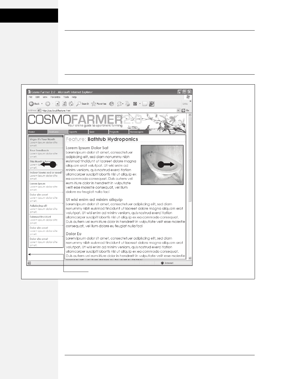
312 CSS: The Missing Manual
Building Float-
Based Layouts
Note: The none value turns off any floating and positions the element like a normal, unfloated element.
It’s useful only for overriding a float that’s already applied to an element. You may have an element with a
particular class such as “sidebar” applied to it, with that element floating to the right. But on one page you
may want an element with that class to not float, but to be placed within the flow of the page, like this
Note box. By creating a more specific CSS selector (see page 96) with float: none, you can prevent that
element from floating.
A simple two-column design like Figure 12-1 requires just a few steps:
1. Wrap each column in a <div> tag with an ID or class attribute.
In Figure 12-1, the news items listed in the left sidebar are wrapped in one <div>
—<div id="news">—and the main content in another div—<div id="main">.
Figure 12-1:
You can use the float
property to lay out a web
page with multiple columns.
On this page, a block of
content is floated to the left
edge. The sidebar has a set
width, but the main content
doesn’t, which makes this
design a liquid layout (page
300). The main section of the
page simply expands to fill
the width of the browser
window. In the upper right,
the bathtub photo is floated
to the right.
left margin
R
L
Download at Boykma.Com

Chapter 12: Building Float-Based Layouts 313
Building Float-
Based Layouts
2. Float the sidebar <div> either right or left.
When you work with floats, the source order (the order in which you add
HTML to a file) is important. The HTML for the floated element must appear
before the HTML for the element that wraps around it.
Figure 12-2 shows three two-column layouts. The diagrams on the left side
show the page’s HTML source order: A <div> for the banner, followed by a
<div> for the sidebar, and, lastly, a <div> for the main content. On the right
side, you see the actual page layout. The sidebar comes before the main content
in the HTML so it can float either left (top, bottom) or right (middle).
3. Set a width for the floated sidebar.
Unless you’re floating an image with a predefined width, you should always give
your floats a width. This way, you create a set size for the floated element, let-
ting the browser make room for other content to wrap into position.
The width could be a fixed size like 170px or 10em. You can also use percent-
ages for a flexible design that’s based on the width of the browser window. (See
page 120 for more about the pros and cons of the different measurement units.)
If the sidebar is 20 percent wide, and the browser window is 700 pixels wide,
then the sidebar will be 140 pixels wide. But if your visitor resizes the window to
1000 pixels, then the sidebar grows to 200 pixels. Fixed-width sidebars are easier
to design for, since you don’t have to consider all the different widths the sidebar
might stretch to. However, percentages let you maintain the same proportions
between the two columns, which can be more visually pleasing.
Note: When the overall page design is a fixed width (as described in the box on page 154), percentage
width values for the sidebar are based on the fixed-width containing element. The width isn’t based on the
window size and won’t change when the browser window changes size.
4. Add a left margin to the main content.
If the sidebar is shorter than the other content on the page, the text from the main
column wraps underneath the sidebar, ruining the look of two side-by-side col-
umns (see Figure 12-16 for an example). Adding a left margin that’s equal to or
greater than the width of the sidebar indents the main content of the page, creating
the illusion of a second column:
#main { margin-left: 180px; }
By the way, it’s usually a good idea to make the left margin a little bigger than
the width of the sidebar: This creates some empty space—a white gutter—
between the two elements. So, when you use percentages to set the width of the
sidebar, use a slightly larger percentage value for the left margin.
Download at Boykma.Com
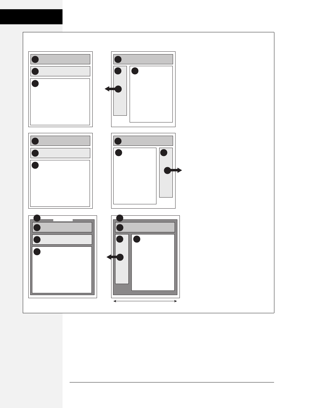
314 CSS: The Missing Manual
Building Float-
Based Layouts
Avoid setting a width for the main content div. It’s not necessary, since brows-
ers simply expand it to fit the available space. Even if you want a fixed-width
design, you don’t need to set a width for the main content div, as you’ll see in
the next section.
Figure 12-2:
Creating a two-column layout is a simple
matter of floating a <div> tag to the left
(top). To make a sidebar move from the
left to right side of the page (middle), just
change the sidebar’s CSS styling to float:
right. You don’t need to make any other
changes to your CSS or HTML.
2
1
3
2
3
1
3
1 1
3
banner
sidebar
main content
sidebar
main content
L
2
banner
3
2
R
3
2
1
4
2
4
1
banner
wrapper
sidebar
main content
L
3
width: 960px
HTML Source Order CSS Layout
Download at Boykma.Com
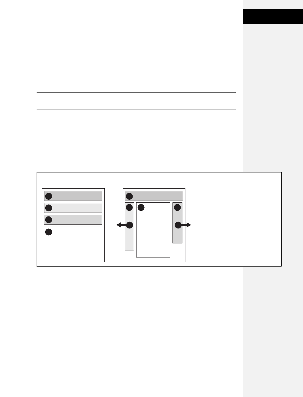
Chapter 12: Building Float-Based Layouts 315
Applying Floats to
Your Layouts
Applying Floats to Your Layouts
Now that you’ve learned a basic two-column liquid layout, you can adapt it in
countless ways. Converting it into a fixed-width layout is a snap. Simply wrap all
the tags within the page’s body inside another <div> (like <div id="wrapper">).
Then, create a style for that new container element that has a set width, such as 960
pixels (see Figure 12-2, bottom). That width setting constrains everything inside
the container box.
Tip: It’s also possible to create a fixed-width page without resorting to the extra wrapper div: set a width
on the <body> tag. You already saw an example of this technique in the tutorial on page 176.
Expanding it into a three-column design isn’t difficult, either (Figure 12-3). First,
add another <div> between the two columns and float it to the right. Then add a
right margin to the middle column, so that if the text in the middle column runs
longer than the new right sidebar, it won’t wrap underneath the sidebar.
The rest of this section explores more CSS layout techniques that use float-based
layouts.
Floating All Columns
It’s perfectly possible to float every column, not just the left and right sidebars. You
could float the first sidebar to the left, the middle column to the left, and the right
sidebar to the right, as shown in Figure 12-2, top. This approach lets you put more
than three columns in your design. You can float four or more columns, as long as
there’s room for all the floats to fit side by side.
When you float all columns in a design, you need to pay close attention to the
widths of each column. If the total width of all the columns is less than the space
available—for example, if the browser window is smaller or the columns are placed
inside another <div> with a set width—then the last column drops down below
the others. (You can read a solution to this dropping float problem on page 330.)
Figure 12-3:
A three-column design uses the same
concepts used to create a two-column
design. In this case, you float both the left
and right sidebars and add both left and
right margins to the center column. The
left-hand diagram shows the order of the
HTML; the right side shows what the web
page looks like.
2
1
4
3
1
4 3
banner
left sidebar
right sidebar
main content
banner
L R
2
HTML Source Order CSS Layout
Download at Boykma.Com
316 CSS: The Missing Manual
Applying Floats to
Your Layouts
In addition, floating more than just the sidebars lets you change the order of your
divs in the HTML. Take, for example, the left diagram in Figure 12-3, which shows
the order of the <div> tags for that page. Because of the way floated elements
work, they must appear before any content that wraps around them, so in this
example, the main content area must go after the sidebars.
The order of the <div> tags in the HTML may not seem like a big deal until you
try to browse the web page without CSS, which is the case for many alternative
browsers, including screen readers that read a page’s content aloud to visually
impaired visitors. Without CSS, all the sidebar material (which often includes nav-
igational elements, ads, or other information that’s not relevant to the main topic
of the page) appears before the content the visitor came to read in the first place.
The inconvenience of having to scroll past the same sidebar content on each page
will turn off some visitors. Furthermore, your page is less accessible to vision-
impaired visitors, who have to listen to their screen readers read off a long list of
links and ads before coming to any real information.
And if that doesn’t sway you, you’ve got the search engines to worry about. Most
search engines limit the amount of HTML they read when searching a site. On a
particularly long web page, they simply stop at a certain point—possibly missing
important content that should be indexed by the search engine. Also, most search
engines give greater value to the HTML near the beginning of the file. So if you’re
worried about getting good placement in search engine results, it’s in your best
interest to make sure the important content is as close as possible to the top of the
page’s HTML code. Finally, floating every column also avoids a 3-pixel bug that
affects Internet Explorer 6 and earlier (see page 335).
UP TO SPEED
You Don’t Have to Reinvent the Wheel
If terms like liquid layout and containing element sound a
little intimidating, don’t give up. First of all, the tutorials
beginning on page 318 walk you step by step through the
process of laying out web pages with CSS. But there’s no
law saying you have to create your own CSS layouts from
scratch. On the Web, you’ll find plenty of pre-built and
tested designs you can make your own. The Layout Gala
site offers 40 different CSS designs that work in most com-
mon browsers, including Internet Explorer 5 (http://blog.
html.it/layoutgala/). The designs are just basic skeletons
consisting of <div> tags and the CSS that positions them. All
you need to do is fill them with your own design touches
like font styling and imagery. If you’re into choice, Jacob
Meyers offers 224 different layouts for you to choose from
at http://layouts.ironmyers.com.
There are also quite a few layout generators—online tools
that let you customize basic requirements like the number
of columns you want, whether you’re after a liquid or fixed
layout, and so on. The Grid System Generator (www.
gridsystemgenerator.com) lets you define the width of the
page, how many columns you’d like and the margin
between columns. You can then download HTML and CSS
files with the code created for you. At www.pagecolumn.
com, you’ll find a similar tool that provides different types
of layouts including liquid and fixed-width layouts.
Download at Boykma.Com
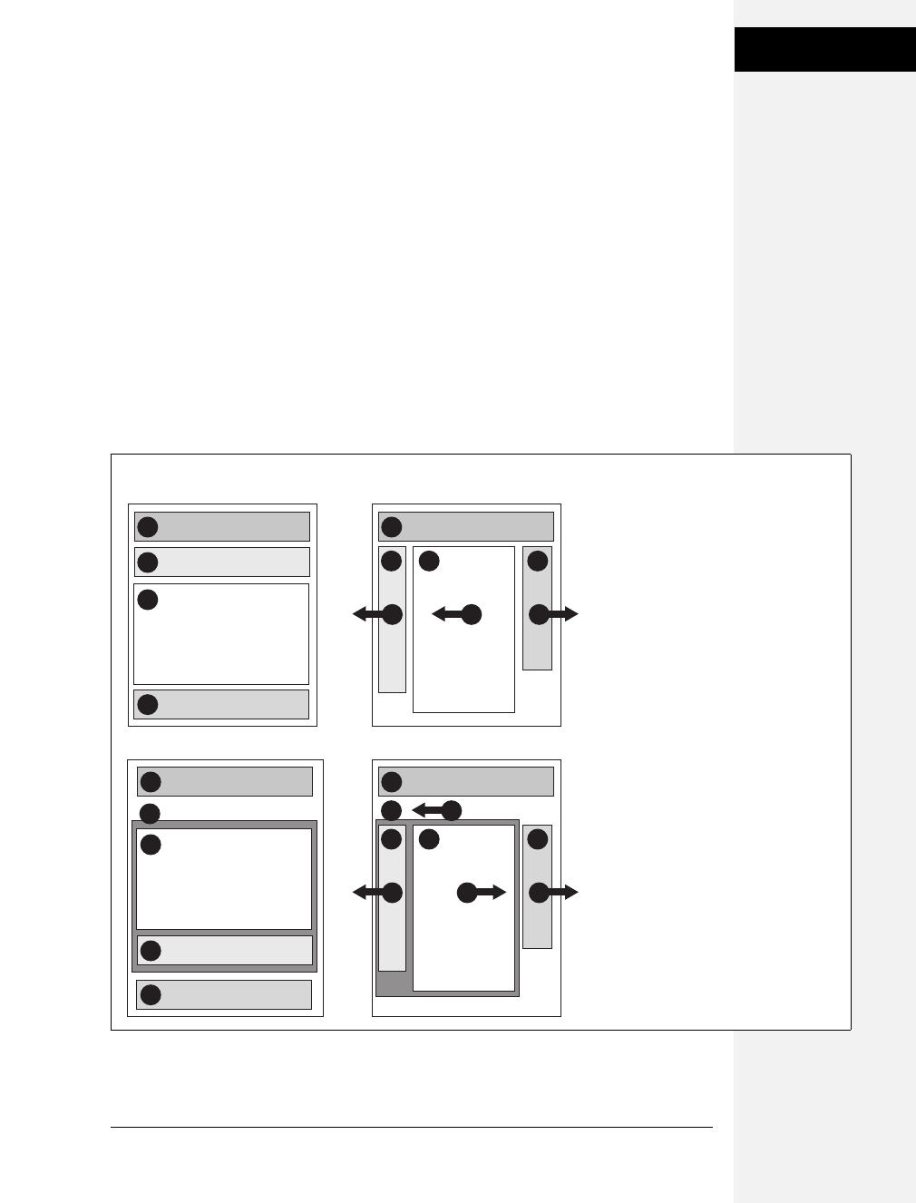
Chapter 12: Building Float-Based Layouts 317
Applying Floats to
Your Layouts
In the top-left diagram in Figure 12-4, the main content’s HTML is between the
left and right sidebars, which is better than having it after both sidebars. You can
even put the main content before both sidebars’ HTML by wrapping the main con-
tent and left sidebar in one <div>, floating that <div> left, and then floating the
main content right and the left sidebar right within that <div> (Figure 12-4, bot-
tom). Voilà—the main column’s HTML falls before the other <div> tags.
Floats Within Floats
The bottom diagram in Figure 12-4 illustrates another useful technique—floating
elements within floats. Imagine that the main content (3) and the left sidebar (4)
divs didn’t exist, and only the column wrapper (2) and the right sidebar (5) were
left. You’d have just a basic two-column design, with one column floated left and
another floated right. In fact, it’s still a two-column design even with the two divs
(3 and 4) placed back inside the column-wrapper div. The difference is that the left
column is itself divided into two columns.
Figure 12-4:
There’s more than one way to float a
page. CSS’s flexibility provides many ways
to create a multi-column layout. Using
different methods of floating, you can
easily change the source order of the
HTML for the page, as you can see in the
diagrams at left. Right-side diagrams
represent final web page layout.
2
1 1
43
banner
left sidebar
4right sidebar
3
main content
banner
L L R
2
4
1 1
53
banner
left sidebar
column wrapper
5right sidebar
3
main content
banner
L L RR
4
2
2L
HTML Source Order CSS Layout
Download at Boykma.Com

318 CSS: The Missing Manual
Applying Floats to
Your Layouts
Although this arrangement is a bit confusing, it’s also helpful in a number of
instances. First, it lets you add columns within a column. The three-column lay-
out at the top of Figure 12-5 shows a small Tips box in the middle column that
also has two columns inside it. By nesting floats inside floats, you can create some
very complex designs.
In addition, when you have just a couple of floated elements divided into columns
with additional floated elements, it’s easier to calculate the widths of page ele-
ments. That’s a good thing when you need to control float drops (page 330) and
other problems that occur when columns get too wide.
Using Negative Margins to Position Elements
While the last section provided a few techniques that let you reorder the HTML for
each column in a design, there’s an even more advanced technique that gives you
complete control over the placement of your columns. By using negative margins,
you can put your <div> tags in any order you wish in your HTML, and then posi-
tion them in a different order onscreen—thereby keeping your pages accessible to
screen readers, text browsers, and search engines. In addition, since you don’t need
to worry about the source order, you can always change the design of a page—
maybe float the main column to the far right and the two sidebars to the left—
without having to change the HTML of the page. Be warned, though, this method
involves math and some mind-bending uses of CSS. You can live a healthy, happy
life using just the float methods presented earlier in this chapter. But if you’re up
for some adventure, read on. (The tutorial also presents a hands-on demonstra-
tion of this method, starting on page 338.)
Note: The technique described on these pages works only for fixed-width layouts, where you know the
exact width of each column. For another method that achieves the same results with a liquid layout
(where you don’t know the exact width of the middle column), visit www.alistapart.com/articles/holygrail.
Also, you’ll find a completely liquid design using negative margins—all columns change width with the
browser window—described in the book Flexible Web Design by Zoe Mickley Gillenwater (New Riders).
Here’s how to lay out a page using negative margins:
1. Add a wrapper <div> around all of the page content.
This step provides a container for setting a fixed width for all of the content on
the page and gives you an easy way to make the banner, columns, and footer the
same width.
2. Set a width for the wrapper <div>.
Create a style for the wrapper div that gives it a set width. For example, 960 pix-
els is a typical size that accommodates visitors with 1024 ×768 pixel monitors.
Download at Boykma.Com
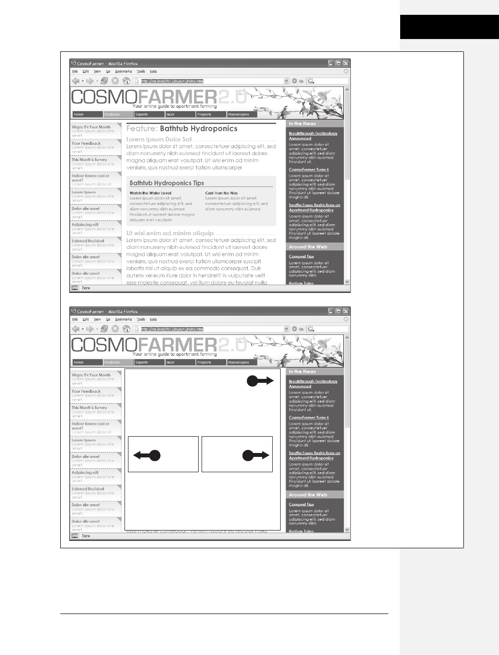
Chapter 12: Building Float-Based Layouts 319
Applying Floats to
Your Layouts
Figure 12-5:
Top: Create columns within
columns by floating elements
inside another floated
element. In the middle
column, the Tips box provides
a simple two-column note
that adds visual interest to
the page.
Bottom: It doesn’t matter
which direction the container
is floated (in this instance, to
the right)—you simply float the
two additional columns left
and right.
R
L R
Download at Boykma.Com
320 CSS: The Missing Manual
Applying Floats to
Your Layouts
3. Wrap each column in a <div> tag with an ID or class attribute.
This part of the process is the same as creating any float-based layout. It defines
the basic layout blocks (Figure 12-6, top left).
4. Float the divs for each column.
You must float each of the columns in your design. When you float them all to
the left, they sit side by side. Another option is to float the left sidebar and main
content left and the right sidebar right. (Since all columns are enclosed in the
wrapper <div> from step 1, the right sidebar stays close to the central column.)
Note: If you’re not using a wrapper div, as described in step 1, then you must float the right sidebar left.
Otherwise, it clings to the right edge of the browser window, potentially creating a large empty space
between the right sidebar and the main content.
POWER USERS’ CLINIC
Finding the Middle Ground
The two types of layouts—fixed-width and liquid—have their
pluses and minuses. A fixed-width design gives you a lot of
control and lets you make sure that your layout looks exactly
the same even on different-sized monitors. However, on a
particularly small monitor, a fixed-width page may force your
visitor to scroll horizontally to view the whole page. On a
really wide monitor, your lovely fixed-width design may look
like a small sliver in a sea of empty space.
Liquid layouts solve these problems, but have their own
limitations as well. On a small screen, a liquid layout may
contract so much that the design falls apart. And on a really
wide screen, your design may stretch so far that your visi-
tors get eye cramps trying to read 30-inch-wide lines of text.
Several CSS properties aim to solve this problem: min-width,
min-height, max-width, and max-height. The min- properties
instruct a browser to make an element at least as wide or tall
as the specified value. You can apply min-width to the
<body> tag to control the total width of the page’s content,
like so: body { min-width: 760px; }. If a visitor expands his
browser window to 1000 pixels, the page content stretches to
fit the space. However, if he makes the window 500 pixels,
then the content remains 760 pixels wide and the browser
adds horizontal scrollbars. The min-height property does the
same thing, but for an element’s height.
On the other hand, the max- properties limit an element to
a maximum size. The styled element can get smaller than
that value, but never larger. With them, you can make sure
your pages don’t get too wide to be unreadable. Say you
create a style for the <body> tag with this property: max-
width: 1200px. Now, if a visitor expands her browser win-
dow to 1800 pixels wide (on her unbelievably expensive
30-inch monitor), the page content doesn’t sprawl all over
the screen, but remains 1200 pixels wide. Max-height does
the same thing, but for the height of a style.
By combining the two properties, you can create a style that
expands and contracts only within set dimensions, so your
design never gets too small or too big:
body {
min-width: 760px;
max-width: 1200px;
}
The only problem with these otherwise useful properties:
Internet Explorer 6 and earlier ignores them completely. If
you’re feeling adventurous, there’s a JavaScript technique
that dynamically changes the dimensions of web page ele-
ments based on the size of the browser window: www.
doxdesk.com/software/js/minmax.html.
Download at Boykma.Com

Chapter 12: Building Float-Based Layouts 321
Applying Floats to
Your Layouts
5. Set widths for each column.
You should always specify a width for a floated element. Depending on your
design, you can also add padding, margins, and borders. Keep in mind, though,
that the total width of the three columns in the browser window is the sum of
the CSS width property values and the left and right margins, padding, and borders
for each column. Yep, here’s where the math comes in. If you’re not careful, the
total width of the columns may exceed the width provided by the wrapper
<div>, causing the dreaded float drop (see page 330).
Note: The width property doesn’t define the total width that an element takes up onscreen. Margins,
padding, and borders count, too. If this stuff doesn’t sound familiar, then read page 151 to brush up on
the CSS box model theory.
6. Add a left margin to the main column.
Here’s where the negative-margin technique differs from the layout methods
described earlier in this chapter. The left margin should equal the space required
for the left sidebar. If the left sidebar is 160 pixels wide, then set the left margin
of the main column to 160 pixels: margin-left: 160px. The top-right diagram in
Figure 12-6 shows the page so far. The crosshatched area to the left of the main
column (3) represents that column’s left margin.
Or, say the left sidebar is 160 pixels wide and you want 10 pixels of space
between it and the main content. In that case, add 10 pixels to the main col-
umn’s left margin: margin-left: 170px.
Finally, when the left sidebar has padding and borders, you need to factor those
in as well. Suppose the left sidebar is 160 pixels wide, has a 2-pixel right border
and 10 pixels of left and right padding, and you want 10 pixels of space between
it and the main column. Add all of these together to get the left margin value for
the main column. So, 160 (width value) + 2 (right border) + 10 (left padding) +
10 (right padding) + 10 (gutter between sidebar and main column) = 192 pixels
(margin-left: 192px).
7. Apply a negative margin to the left sidebar <div>.
At this point, the left sidebar is floated to the left, but since it comes after the
main column in the HTML’s source order, it appears on the right edge of the
main column (Figure 12-6, top right). To get it into position, use a negative
margin, which—believe it or not—pulls the sidebar clear across the main col-
umn to the left edge of the page. The only trick is figuring out what that nega-
tive margin value should be to move the sidebar the exact distance required to
position it at the left side of the page. In other words, the left margin must equal
the distance from the right edge of the main column to the left edge of the
wrapper <div>.
Download at Boykma.Com
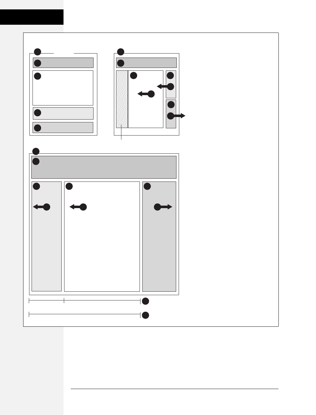
322 CSS: The Missing Manual
Applying Floats to
Your Layouts
Figure 12-6:
Yes, Virginia, you can put three divs in
any order in your HTML (top left) and
position them in any order on the screen
(bottom). The secret is using negative
margins to pull an element that appears
later in the HTML over and past an
element that precedes it. In the top-right
diagram, notice that the left sidebar (4)
floats next to the main content column
(3); adding a negative margin to the left
sidebar pulls it into position on the left
edge of the page. To make room for that
left sidebar, you also add a positive left
margin to the middle columns (indicated
by the crosshatched box on the
top-right diagram).
4
2
1
2
1
5
3
banner
wrapper
left sidebar
5right sidebar
3
main content
L
4
2
1
3
L
left margin width
negative left margin
L
4
L
5
main content
3
left sidebar
4
R
R
left margin
HTML Source Order CSS Layout
Download at Boykma.Com

Chapter 12: Building Float-Based Layouts 323
Overcoming Float
Problems
To determine that value, add the main column’s width, left and right margins,
left and right padding, and left and right borders. Say the main column is 400
pixels wide, has a 1 pixel border around it, has 10 pixels of left padding and 15
pixels of right padding, and has a 192 pixels left margin to accommodate the left
sidebar. Just add the values together to get the left sidebar’s left-margin value:
400+1+1+10+15+192 = 619. Then add a left margin to the style formatting the
left sidebar, but make its value negative: left-margin: –619px;. The minus sign is
the critical piece that makes the whole thing work.
8. Fix the Internet Explorer bugs.
When you use negative margins, Internet Explorer 6 and earlier exhibits a weird
bug—the double-margin bug. In this case, IE doubles the left margin applied to
the main column, totally disrupting the design. The fix is to add display: inline
to the style formatting the main column. (Read more about the double-margin
bug on page 333.)
Once you get past the math, the negative margin approach rewards you with flexi-
bility. If you want to swap the sidebars so the left sidebar moves to the right and
right sidebar moves to the left, then simply swap the styles for those two divs. In
other words, set the first sidebar to float right and the second sidebar to float left
using a negative left margin. You’ll see negative margins in action in the tutorial on
page 350.
Overcoming Float Problems
As you get more adventurous with CSS, you’ll probably encounter—like many
web designers before you—some of the weird intricacies of working with floats.
This section describes a few common problems and their solutions. (And if you
ever stumble upon a problem not listed here, you can always take it to one of the
online forums or discussion lists in Appendix C.)
Note: When it comes to designing pages that work in Internet Explorer 6, there are even more potential
pitfalls. So many, in fact, that this chapter has a separate section dedicated to dealing with that one
browser. See page 333.
Clearing and Containing Floats
Floats are powerful design tools because they let content flow around them. Floating
a photo lets text below it move up and wrap around the image (Figure 12-1). When
you’re creating float-based column designs, though, sometimes you don’t want con-
tent to move up and next to a floated element. For example, you frequently want to
keep copyright notices, contact information, or other housekeeping details at the
bottom of your web page, below all other content.
Download at Boykma.Com

324 CSS: The Missing Manual
Overcoming Float
Problems
In the two- and three-column designs you’ve seen so far, if the main column is
shorter than either of the floated sidebar columns, a footer can move up and
around the left floated column (Figure 12-7, left). To make the footer stay down
below the sidebars, you can use the clear property (page 173). This property pre-
vents an element from wrapping around floats. You can make an element drop
below a left-floated object (clear: left;) or a right floated object (clear: right;). For
footers and other items that need to appear at the bottom of the page, you should
clear both left and right floats, like this:
#footer { clear: both; }
Another problem occurs when you float one or more elements inside a non-floated
containing tag like a <div> tag. When the floated element is taller than the other
content inside the div, it sticks out of the bottom of the enclosing element. This snafu
is especially noticeable if that tag has a background or border. The top of the web
page in Figure 12-8 shows a <div> tag that has an <h1> tag and two columns cre-
ated by floating two divs. The background and border, which appear only around the
<h1> tag, are actually applied to the entire enclosing <div>, including the area where
the two columns are. However, since the columns are floated, they pop out of the
bottom instead of expanding the borders of the box.
Note: For a good explanation of why floated elements can break outside of their containing blocks, read
www.complexspiral.com/publications/containing-floats.
A similar problem happens in the bottom example in Figure 12-8. In this case,
each image is floated left inside a containing <div> that has a border. Because the
images are taller than their boxes, they pop out of the bottom. Unfortunately, this
example is even worse than the previous one, because each image causes the image
below it to wrap to the right, creating an ugly staggered effect.
Figure 12-7:
You don’t always want an
item to wrap around a
floated element (left).
Copyright notices and
other material that
belongs at the bottom of
a page usually need to
clear any floats they
encounter. To achieve
this, use the clear
property for the copyright
notice to force it to the
bottom of the page below
any floated elements.
Download at Boykma.Com
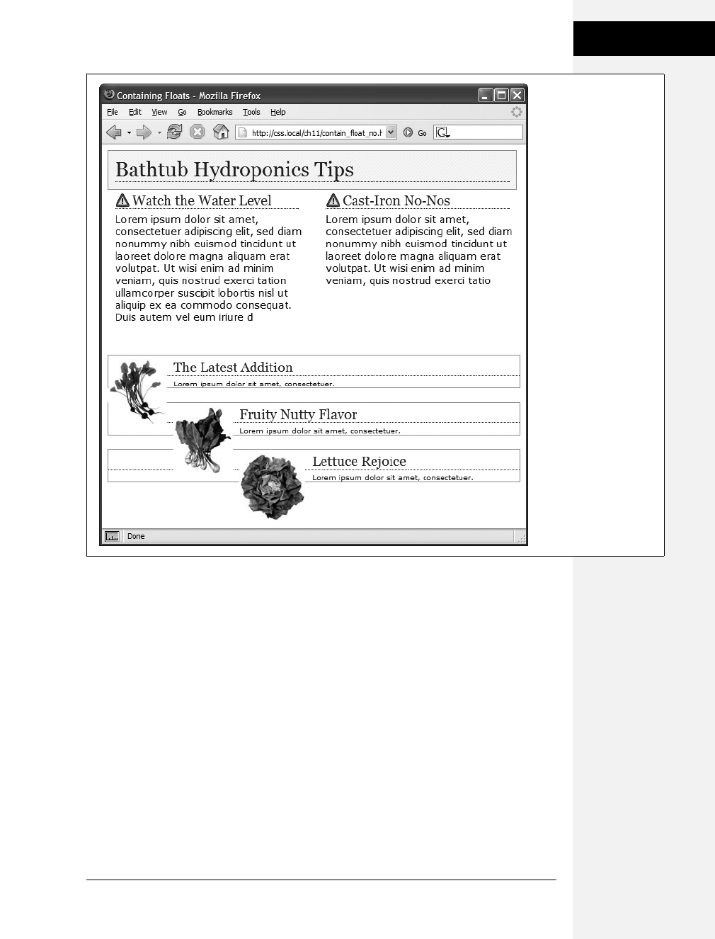
Chapter 12: Building Float-Based Layouts 325
Overcoming Float
Problems
You have many ways to tackle the problem of these renegade floating elements.
We’ll cover all of these techniques below, because it’s good to have more than one
solution under your belt.
•Add a clearing element at the bottom of the containing div. This solution is the
most straightforward. Simply add a tag—like a line break or horizontal rule—as
the last item in the <div> containing the floated element (that is, right before
the closing </div> tag). Then use the clear property to force that extra tag below
the float. This trick makes the enclosing div expand, revealing its background
and border. You can add a line break—<br> (HTML) or <br /> (XHTML)—
before the closing </div> tag and add a class to it: <br class="clear"/>. Then create
a style for it, like this:
br.clear { clear: both; }
The problem with this technique is that it adds extra HTML.
Figure 12-8:
A floated element can
escape its containing
<div> if it’s taller than
the container itself. If the
containing tag includes a
background or border,
then the escaping
elements can look like
they’re not even part of
the container (top of
page). In addition, a
floated element can
bump into other
elements—including
other floats, thereby
creating a “stair-
stepped” effect (bottom
of page) instead of the
nicely stacked boxes in
Figure 12-9.
Download at Boykma.Com

326 CSS: The Missing Manual
Overcoming Float
Problems
•Float the containing element. An easier way is to just float the <div> containing
the floated elements as well. A floated container <div> expands to fully contain
any floated elements inside it. In Figure 12-9, top, the <div> containing the
heading and two floated columns is floated to the left of the page. In the pro-
cess, its entire box—background and borders—expands to fit everything inside
it, including the floated elements. Strange, but true.
If you go this route, make sure you add a clear property to whatever element
follows the floated container to make sure the following element drops below
the container.
•Use overflow:hidden.Another common technique is to add the following two
properties to a style for the containing block:
overflow: hidden;
zoom: 1;
The overflow:hidden property is just another one of those weird CSS things: It
forces the containing block to expand and contain the floated elements. The
zoom:1 is just for Internet Explorer 6 (and earlier)—it won’t affect any other
browser. If you want you can put this property into a separate style sheet using
IE conditional comments described on page 433. (The whole zoom:1 weirdness
is described in the box on page 173.)
In general, this technique works very well. However, if you have any absolutely
positioned elements (see page 356) inside the container, they may not show up.
You can get into this situation if you have a drop-down menu inside another
tag and the drop-downs, when they appear, are supposed to appear outside the
container element. If that’s the case, use one of the other methods described on
these pages.
•Use the “easy clearing method.” With this technique, created by Tony Aslett of
CssCreator.com and the folks behind PositionIsEverything.com, you add just a few
styles and a class name to the <div> tag containing the floated element. Of course,
the name “easy clearing method” is a bit of a misnomer, since the CSS behind it is
anything but easy. You must add three different styles to your style sheet: One
applies to Firefox, Safari, Internet Explorer 8, and other modern browsers; another
style applies to IE 7 and earlier. The whole shebang looks like this:
.clear:after {
content: ".";
display: block;
height: 0;
font-size: 0;
clear: both;
visibility: hidden;
}
.clear {
zoom:1;
}
Download at Boykma.Com

Chapter 12: Building Float-Based Layouts 327
Overcoming Float
Problems
The last two styles make IE 5, 6, and 7 “have layout” as described in the box on
page 338.
Once you’ve added these styles to a style sheet, you simply add the class name to
the div containing the escaping floats: <div class="clear">. See the bottom of
Figure 12-9. This technique is very reliable; however, unlike the previous two
techniques, you do have to add extra HTML to the page.
Note: The zoom property makes your page flunk the CSS validator check. To get around that, you can
put this rule (along with any other IE-only styles) into an external style sheet and attach it to your web
pages using any of the tricks described in Chapter 15 (page 421).
Figure 12-9:
Don’t let a float escape!
You have several ways to
make floated elements
stay inside the borders
and backgrounds of their
containing tag. Two
methods are pictured
here, though any of the
four discussed would
produce the same results.
Floating the container
works (top), as does a
special combination of
CSS—affectionately called
the “easy clearing
method” (bottom). Both
methods result in borders
and backgrounds that
surround the container
and the floats inside.
Download at Boykma.Com
328 CSS: The Missing Manual
Overcoming Float
Problems
Creating Full-Height Columns
HTML tables aren’t great for web page layout for several reasons. They add lots of
code, are difficult to update, and don’t work well on alternative browsers like those
used by cellphones. But tables have one thing going for them in the layout depart-
ment—the ability to create columns of equal height. Equal-height columns let you
add a background color or graphic to one column and have it fill the entire height
of the page. The backgrounds of the two sidebars in the top image of Figure 12-10
fill the screen height, creating solid, bold stripes on either side of the page.
CSS floats, on the other hand, fall a bit short in this regard. Table cells in a row are
always the same height, which isn’t true of divs. The height of a float is usually dic-
tated by the content inside it. When there’s not a lot of content, the float is not
very tall. Since a background image or background color fills only the float, you
can end up with solid-colored columns that stop short of the page bottom, as in
the circled areas in Figure 12-10, bottom.
As with most problems related to CSS, there’s a workaround. The secret is to add
background images to a tag that wraps around the stubby sidebar and the other
columns on the page. Say your HTML has two <div> tags that contain the content
for a left sidebar and the page’s main content:
<div id="sidebar">Sidebar content here</div>
<div id="main">Main content for page, this column has a lot of text and is
much taller than the sidebar.</div>
The sidebar <div> is floated to the left edge of the page and has a width of 170 pixels.
Because there’s less content in the sidebar, it’s shorter than the main text. Suppose
you wrap that HTML in a wrapper <div> tag, like so:
<div id="wrapper">
<div id="sidebar">Sidebar content here</div>
<div id="main">Main content for page, this column has a lot of text and is
much taller than the sidebar.</div>
</div>
That outer div grows to be as tall as the tallest element inside it, so even if the #main div
is very tall, that wrapper div will be just as tall. Here’s the magic: Create a style for the
wrapper <div> with a background image the width of the sidebar, in the background
color you want for the sidebar. That way, if the background image tiles vertically, it
forms a solid bar the height of the wrapper <div> (Figure 12-10, top).
#wrapper { background: url (images/col_bg.gif) repeat-y left top; }
Web browsers display that background image directly under the sidebar, creating the
illusion that the sidebar has a background color. In essence, you create a “faux col-
umn” in the words of Dan Cederholm, the fellow who first publicized this technique.
Download at Boykma.Com
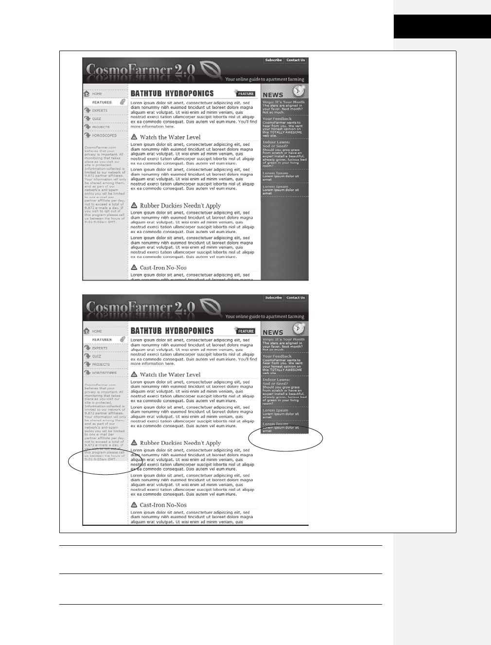
Chapter 12: Building Float-Based Layouts 329
Overcoming Float
Problems
Note: You’re not limited to solid colors either. Since you’re using an image anyway, you can make a dec-
orative pattern that tiles seamlessly down the left side of the page.
Figure 12-10:
Full-height columns with bold
background colors are a common
design technique. The left and right
sidebars (top) show how solid
backgrounds can help visually define
the different areas of a page. When a
sidebar’s background stops abruptly
(circled at bottom), you get extra
white space that’s both distracting
and unappealing.
Download at Boykma.Com

330 CSS: The Missing Manual
Overcoming Float
Problems
Reproducing this result for two columns is just a little more involved. First, add
two wrapper divs:
<div id="wrapper1">
<div id="wrapper2">
<div id="sidebar1">Sidebar content here</div>
<div id="sidebar2">Second sidebar</div>
<div id="main">Main content for page, this column has a lot of text and is
much taller than the two sidebars.</div>
</div>
</div>
Note: If the wrapper and each column are all fixed widths, you can create this “faux column” look for
both the left and right columns with just a single image and wrapper div. Just make the graphic as wide as
the wrapper, with the left side of the graphic being the color and width of the left sidebar, the right side of
the graphic the color and width of the right sidebar, and the center part of the graphic matching the back-
ground color of the center column.
If the first sidebar appears on the left side of the page and the second sidebar
appears on the right side, you create two styles. Apply one style to the first wrap-
per <div> tag to add a background to the left sidebar; apply one to the second
wrapper <div> to add a background to the right sidebar (Figure 12-11, bottom).
#wrapper1 { background: url(images/col1_bg.gif) repeat-y left top; }
#wrapper2 { background: url(images/col2_bg.gif) repeat-y right top; }
When adding a background image to the right-hand column, make sure you posi-
tion the background image in the top right of the second wrapper, so that it falls
underneath the second sidebar on the right side of the page.
Note: If you use percentages to define the width of columns, then it’s more difficult to create the illusion
of full-height columns using graphics. But it’s not impossible. To learn how, go to www.communitymx.
com/content/article.cfm?page=1&cid=AFC58.
Preventing Float Drops
Suddenly, one of your columns simply drops down below the others (Figure 12-12,
top). It looks like there’s plenty of room for all the columns to coexist perfectly
side by side, but they just don’t. You’ve got the dreaded float drop.
A floated column drops down because there’s not enough room to fit it. Be careful
if you set widths for each column. If the available space in the browser window (or
the containing block in a fixed-width design) is less than the total widths of the
columns, then you’re asking for a float drop. Also, keep the CSS box model in
mind: As discussed in the box on page 154, the width of an element displayed in
the browser window isn’t the same as its width property. The displayed width of
Download at Boykma.Com

Chapter 12: Building Float-Based Layouts 331
Overcoming Float
Problems
any element is a combination of its width, left and right border sizes, left and right
padding, and left and right margins. For the columns to fit, the browser window
(or containing block) must accommodate the combined total of all those widths.
Take, for example, the simple three-column layout in Figure 12-12. As you can see
in the top example, the three columns don’t fit. Here’s a breakdown of the math
behind the problem:
•Wrapper div. A fixed-width wrapper <div> tag encloses the entire design. Its
width property is set to 760 pixels, so all three columns can’t total more than that.
•Sidebar 1 (left side). Its width is 150 pixels, but it also has 10 pixels of padding,
making its total onscreen width 170 pixels. (150 + 10 pixels of left padding + 10
pixels of right padding.)
•Main content. The main content <div> is 390 pixels wide, with a 1-pixel border
and 15 pixels of left and right margin for a total width of 422 pixels. (You may
need a calculator for this one: 390 + 1 [left border] +1 [right border] + 15 [left
margin] + 15 [right margin].)
•Sidebar 2 (right side). This element has a width property set to 150 pixels, with
10 pixels of left and 10 pixels of right padding: 170 pixels, just like Sidebar 1.
Figure 12-11:
You sometimes need to think
outside the tag for creative
solutions to CSS problems. To get
full-height backgrounds behind
floated columns, you need to
resort to some extra <div> tags
that wrap around all of the main
columns of text. These divs grow to
be the height of the tallest column
in the group. By adding
background images to these
wrapper divs, you create the
appearance of equal-height
columns.
#wrapper {
background-image: url(column_bg.gif);
background-repeat: repeat-y;
background-position: left top;
}
#wrapper1
#wrapper2
L
LR
Download at Boykma.Com
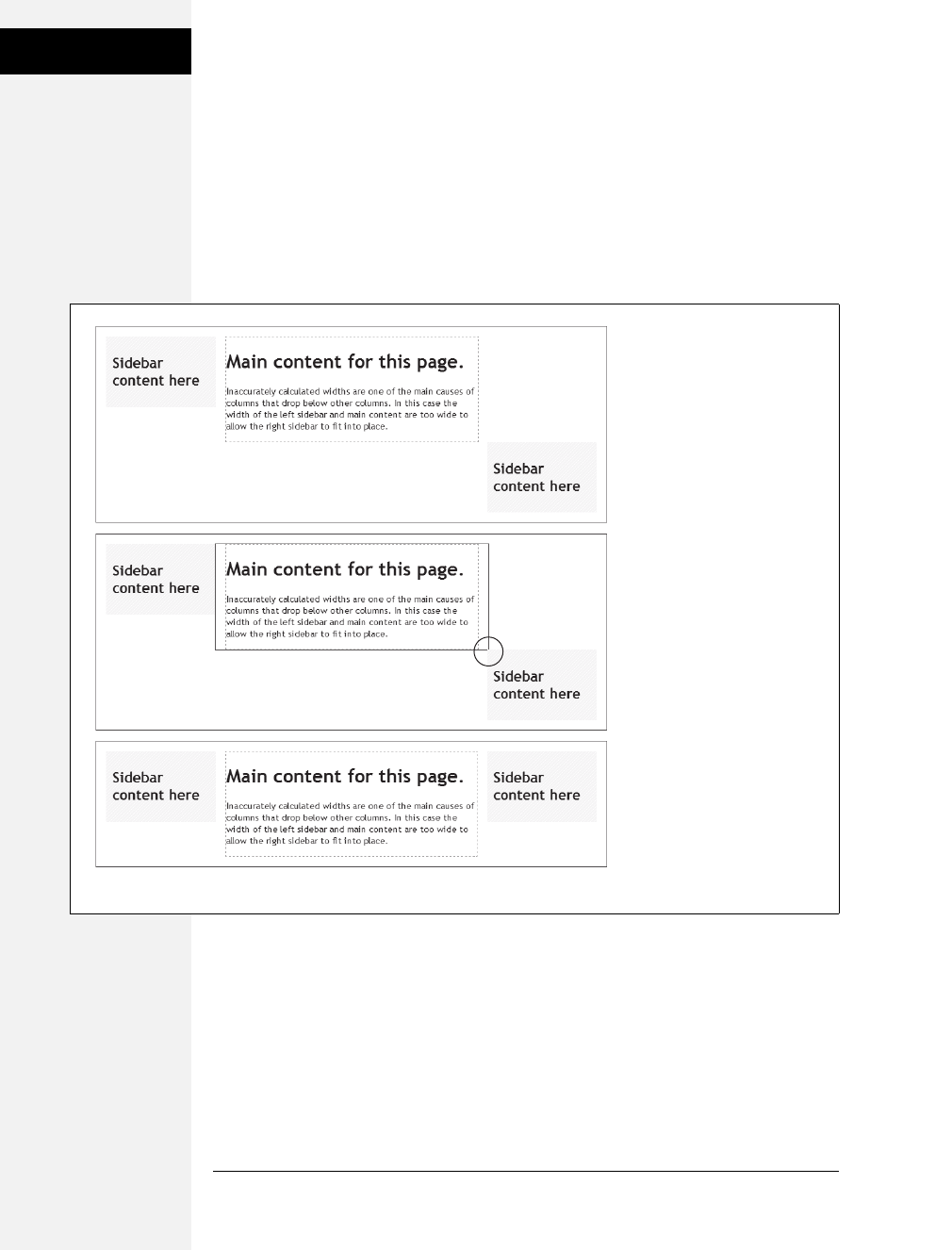
332 CSS: The Missing Manual
Overcoming Float
Problems
The actual widths of each element add up to a grand total of 762 pixels. That’s two
pixels more than the width of the wrapper <div>. The middle image of
Figure 12-12 shows an outline around the main content <div> indicating its total
width plus margins. Just those measly two extra pixels of width (circled) are
enough to cause a column to drop down. The solution: Remove 2 pixels of space
from any of the elements. Changing the main content div’s left and right margins
from 15 to 14 pixels buys you the extra room needed for all three columns to fit
side by side (bottom).
While miscalculated column widths are the most common cause of dropping
floats, they’re not the only cause. Here are a few other culprits:
•Rounding errors in percentage widths. Be careful when setting widths in per-
centages. Browsers sometimes make mistakes when calculating the actual number
of pixels needed to display something on the screen. That is, they can round
numbers up, making elements slightly too large for the available space. So err
on the side of caution and make your percentage widths total slightly less than
100 percent.
Figure 12-12:
It takes only a single pixel or
two to ruin a design. When the
width of floated elements are
just a hair wider than their
containing block (like a <div>
with a set width, or even the
browser window itself), the last
floated element drops below the
others (top). The actual width of
an element combines many CSS
properties. In the middle image,
the outline around the main
content area shows that it’s a
tad too wide to allow the right
sidebar to fit (circled). Adjusting
any of the elements by
removing a bit of width,
padding, or margins can solve
the problem (bottom).
Download at Boykma.Com

Chapter 12: Building Float-Based Layouts 333
Handling Internet
Explorer 6 Bugs
•Internet Explorer 6’s double-margin bug. Under some conditions, Internet
Explorer 6 and earlier doubles the margin applied to a floated element, making
the element wider than in other browsers. When you have a float drop occurring
only in IE 6 or earlier, this bug may be the culprit. See below for a solution.
•Internet Explorer 6’s 3-pixel gap. Sometimes IE 6 and earlier adds an extra 3
pixels to the side of a float. Again, if you see a float drop only in IE, then this
bug could be the reason. See page 335 for an explanation and solution.
•Italic text. IE 6 strikes again (noticing a theme here?) If a floated element con-
tains italicized text, then IE 6 sometimes makes the float wider. When there’s a
float drop and italics inside the float, check to see if the problem is happening in
all browsers or only IE. For a solution, you can remove any italics from the side-
bar or add overflow: hidden to the style formatting the sidebar.
Bottom line: Float drops are always caused by not enough room to hold all of the
columns. Rather than striving to use every last pixel of onscreen space, give all your
elements a little more wiggle room. Get in the habit of making the overall column
widths a bit smaller than necessary, and you’ll spend less time troubleshooting
float drops.
Handling Internet Explorer 6 Bugs
Internet Explorer 6 has a long history of CSS bugs, especially (and unfortunately)
when it comes to float-based layouts. These bugs can affect the placement of floats
and the overall width allotted to floated elements. If you’re lucky, you may just get
a slightly annoying difference in how your web page looks in Internet Explorer ver-
sus other browsers. At worst, these bugs can cause significant display problems like
the float drops discussed in the previous section. This section tells you the most
common problems and how to get around them.
Note: See the box on page 63 to decide how much you need to be worried about Internet Explorer 6.
Double-Margin Bug
Internet Explorer 6 and earlier sometimes doubles the size of a margin you’ve
applied to a floated element. The problem occurs only when the margin is in the
same direction as the float—a left margin on a left-floated element or a right margin
on a right-floated element. In Figure 12-13, there’s a left-floated sidebar holding
the site’s navigation. To add a bit of space between it and the left edge of the
browser window, the sidebar has a left margin of 10 pixels.
Most browsers, including Internet Explorer 7 and 8, Safari, and Firefox
(Figure 12-13, top), add the requested 10 pixels of space. However, Internet
Explorer 6 (bottom) doubles that margin to 20 pixels. Even with relatively small
margins like 10 pixels, the visual difference is significant. Furthermore, if the lay-
out is very tight, with precisely measured floated elements sitting side by side, then
the doubled margin can easily trigger a float drop (page 330).
Download at Boykma.Com
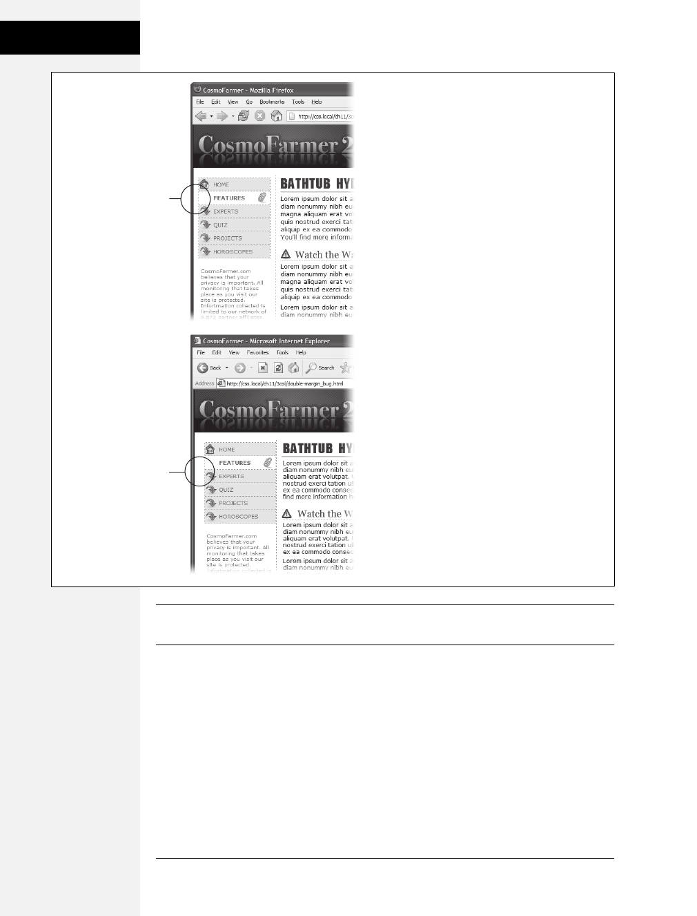
334 CSS: The Missing Manual
Handling Internet
Explorer 6 Bugs
Note: This margin doubling happens only when the element’s margin touches the edge of its containing
block. So when an element is floated left against another left-floated element, its left margin won’t double.
The solution is simple: Add display:inline; to the CSS style for the floated element:
#sidebar {
float: left;
margin-left: 10px;
width: 160px;
display: inline;
}
Figure 12-13:
A 10-pixel left margin applied to a left-floated element
should, in theory anyway, indent the float 10 pixels
from the left edge of the page. Firefox (above) gets it
right. But IE 6 (bottom) incorrectly doubles that
margin. By adding 20 pixels to the left edge of the
sidebar, IE 6 significantly changes the page’s
appearance.
#sidebar {
float: left;
margin-left: 10px;
width: 160px;
}
10 pixels
20 pixels
Download at Boykma.Com

Chapter 12: Building Float-Based Layouts 335
Handling Internet
Explorer 6 Bugs
In this case, the display property doesn’t do anything except fix IE’s bug. In fact, the
only reason it’s there is to force the sidebar element to “have layout,” as described in
the box on page 338, so you can alternatively use zoom:1 instead of display:inline.
Floated elements are always block-level elements, and changing a style’s display to
inline won’t alter that. (See page 160 for more on the display property.) However,
even though this added style declaration doesn’t adversely affect any other browsers,
you may want to put it in an IE-only style using the * html hack:
#sidebar {
float: left;
margin-left: 10px;
width: 160px;
}
* html #sidebar {
display: inline;
}
Note: Internet Explorer’s conditional comments feature provides an even better way to isolate IE-only
styles than the * html hack. An external style sheet attached to a page using a conditional comment is read
only by Internet Explorer; it’s ignored by all other browsers. See page 433 for the details.
3-Pixel Gaps
Internet Explorer 6 and earlier inserts an additional three pixels of space between a
floated column and a non-floated column. The exact placement of that gap
depends on a couple of conditions:
•The non-floated column doesn’t have a set width or height. If the column next
to the float doesn’t have any dimensions defined, then you’ll see a 3-pixel
indent between the edge of the column and the text inside that column. This
space appears only along the float, so when the float ends, the text moves back
to the left edge of the column (Figure 12-14).
In this case, the best solution is to live with it. The extra indent isn’t terribly dis-
tracting and doesn’t do anything else weird to the page. But if the perfectionist
in you can’t let go of this bug, you can fix it by doing what’s known as “adding
layout” to the non-floated element, as described in the box on page 338. Add an
IE 6–only style for that column:
* html #mainColumn { zoom: 1; }
The downside to fixing this bug is that it triggers the bug discussed next. (See
what you get for being a perfectionist?)
Download at Boykma.Com
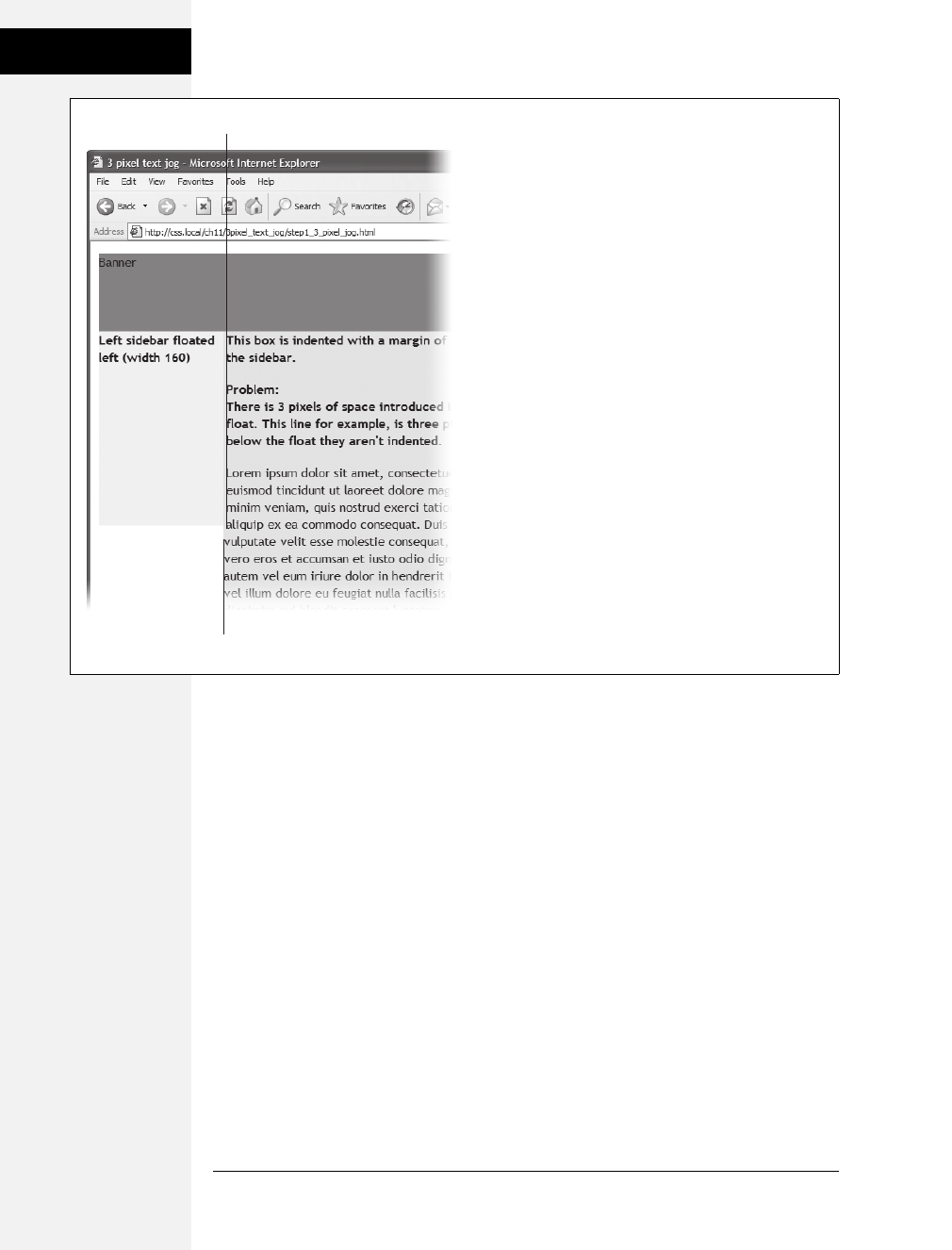
336 CSS: The Missing Manual
Handling Internet
Explorer 6 Bugs
•The non-floated column has a set width or height. When the column next to
the float has a set layout dimension (like height in the previous example),
another 3-pixel error appears—a small gap between the two columns
(Figure 12-15, left). This bug is more serious than the one in Figure 12-14, since
this 3-pixel gap can force the second column to drop below the floated element
(Figure 12-15, right).
The solution to this problem is two-fold. First, you must eliminate the left margin
of the non-floated column (but for IE 6 and earlier only):
* html #mainColumn { margin-left: 0; }
Then, you must set the right margin for the floated column to –3 pixels. This
pulls the non-floated column back into position:
* html #sidebar { margin-right: -3px; }
In any normal browser, these styles make no sense. Some determined CSS
experts (with time on their hands, apparently) came up with them to make IE
behave. For more info on this phenomenon, check out www.
positioniseverything.net/explorer/threepxtest.html.
Figure 12-14:
On this page, the left-hand sidebar is floated left, while the
central column isn’t floated at all. A left margin on the
central column indents it far enough to the left so that it
won’t wrap around the bottom of the sidebar. (This
technique is described on page 315.) Unfortunately,
Internet Explorer 6 and earlier also adds a small indent to
the text in the non-floated column.
3-pixel indent
No indent after float
Download at Boykma.Com
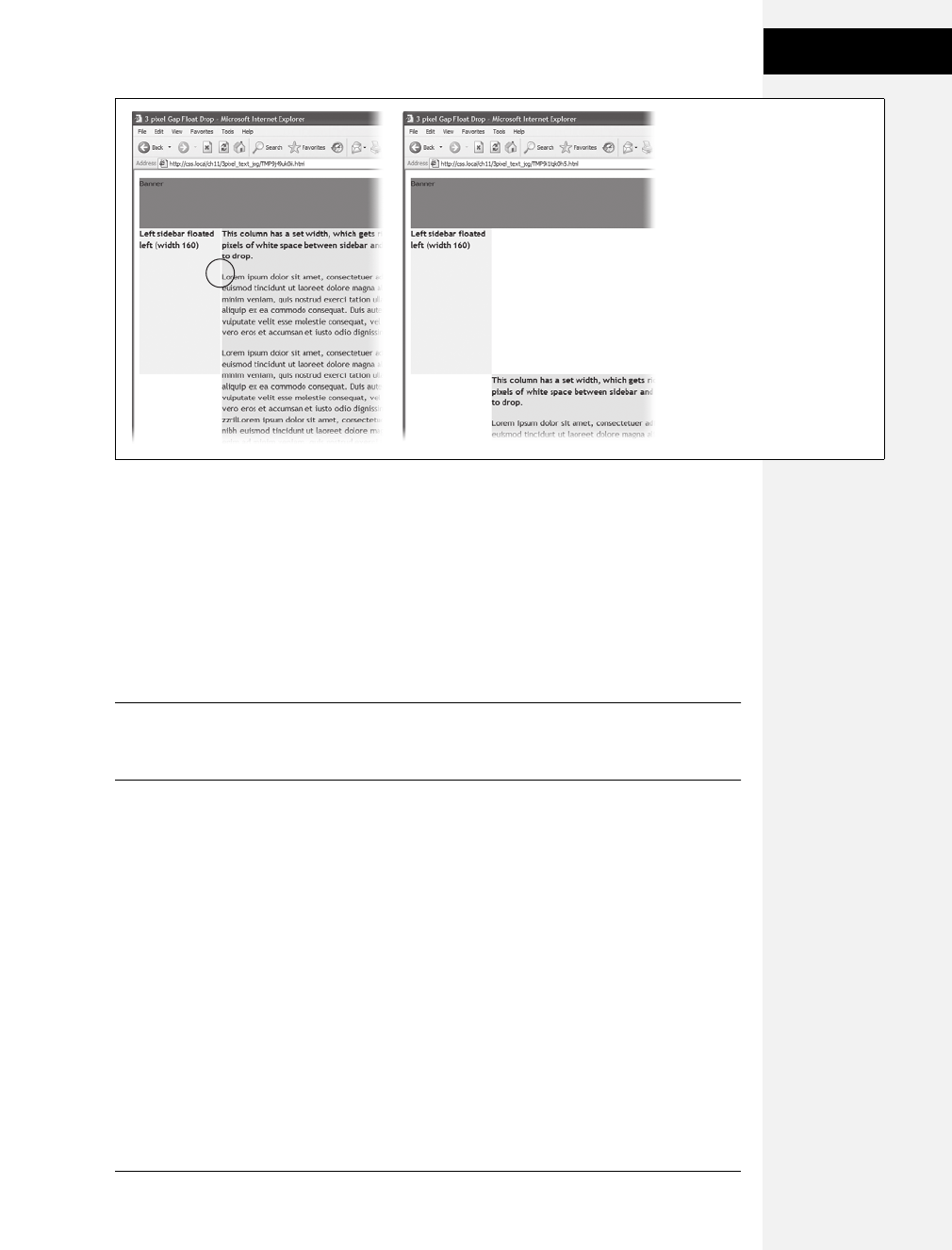
Chapter 12: Building Float-Based Layouts 337
Handling Internet
Explorer 6 Bugs
Another option is to float all of the columns. In the examples pictured in
Figure 12-14 and Figure 12-15, removing any left margins from the non-floated
column and floating it either left or right eliminates both 3-pixel problems:
#mainColumn {
float: left;
}
This solution seems quick, but it adds a little more complexity, since you have to
manage yet another float in the design.
Note: While a lot of bugs were fixed when IE 7 came out, that browser still has a few. You can read
about them at http://css-discuss.incutio.com/?page=IE7. Fortunately, IE 8, which is quickly replacing IE 7,
works very well with CSS.
Other IE Problems
A few more bugs plague float-based layouts in Internet Explorer 6. Many of them
are so rare you may never come across them in your web design projects. But just
in case, here are a couple of weird things that can happen when viewing a page in
IE 6 or earlier.
•If the bottom part of a floated element just disappears, it may be the guillotine
bug. For information on the cause and solution (which fortunately has nothing
to do with sharp, dangerous objects), visit www.positioniseverything.net/
explorer/guillotine.html.
•Content inside a floated element doesn’t appear, but sometimes reappears if
you resize the browser window or scroll. This oddity is aptly called the peek-a-
boo bug. Learn about it at www.positioniseverything.net/explorer/peekaboo.html.
Figure 12-15:
Internet Explorer 6 often has
trouble with floats. If, for
example, a single column is
floated left and another non-
floated column with a set
width wraps around the float,
IE 6 and earlier inject a 3-
pixel gap between the two
columns (left). For designs
that have precisely
determined widths, that gap
can add just enough space to
force a column to drop below
the floated element (right).
Download at Boykma.Com
338 CSS: The Missing Manual
Tutorial: Multiple-
Column Layouts
Tutorial: Multiple-Column Layouts
In this tutorial, you’ll create a multi-column, float-based layout. In the process,
you’ll create two- and three-column liquid designs, as well as a fixed-width design.
To get started, download the tutorial files located on this book’s companion website
at www.sawmac.com/css2e/. Click the tutorial link and download the files. All the files
are in a ZIP archive, so you need to unzip them first. (Find detailed instructions on
the website.) The files for this tutorial are in the 12 ➝layout1 folder.
Structuring the HTML
The first step in creating a CSS-based layout is identifying the different layout ele-
ments on the page. You do this by wrapping chunks of HTML inside of <div> tags,
each of which represents a different part of the page.
POWER USERS’ CLINIC
Got Layout?
As you’ve probably gathered by now, Internet Explorer 6
has a long history of browser bugs. Some basic CSS that
looks fine in Internet Explorer 8, Firefox, or Safari crumbles
in Internet Explorer 6. Fortunately, IE 6 is dwindling in pop-
ularity (see the box on page 63), but it’s not gone yet. As it
turns out, you can fix many IE bugs by switching on a spe-
cial IE-only property known as layout. This isn’t a CSS con-
cept, nor does it have anything to do with the rules of
HTML. It’s just a concept built into Internet Explorer (ver-
sions 7 and earlier) by the engineers who created IE. As far
as IE is concerned, each page element either has layout or
it doesn’t.
In IE, floats, list items, and absolutely positioned elements
display differently depending on whether or not they have
layout. In the Chapter 9 (page 265), you saw how IE 6
doesn’t make the entire area of a link clickable when the
link is set to display as a block. You can fix that problem by
creating an IE 6–only style like this:
* html .nav a { zoom: 1; }
The point of that style isn’t really to zoom into the links.
Zoom is an IE-only property that’s intended to let you zoom
into a page element (using JavaScript), but zoom also trig-
gers layout in IE 6. For reasons known only to Microsoft
(and the extraterrestrials), switching on layout makes IE
treat the entire area of block-level links as clickable. Zoom
isn’t the only property that switches on layout in IE. Several
other (real) CSS properties also give an element layout:
position: absolute; float: left; float: right; display: inline-
table; any width value, and any height value.
Zoom is a good choice because it doesn’t mean anything to
other browsers (unlike real CSS properties like width and
height), and so Safari, Firfox, and so on just happily ignore
it. That means you can use zoom anywhere you need to fix
an IE bug by “adding layout” to an element without fear of
messing up the page in other browsers. The downside of
using this property is that it isn’t valid CSS, so it won’t pass
W3C validation (see the box on page 36).
Internet Explorer 7 (as of this writing) still has a few bugs
you have to fix by adding layout. Any of the properties listed
above add layout to an element in IE 7, as will the following:
min-width, max-width, min-height, and max-height (see
the box on page 320).
Throughout this book, you use layout to overcome many
different IE bugs. For an in-depth (so deep, you may need
a life preserver) discussion of the topic, go to www.
satzansatz.de/cssd/onhavinglayout.html. Microsoft offers
a friendly introduction at http://msdn.microsoft.com/en-us/
library/bb250481(VS.85).aspx.
Download at Boykma.Com

Chapter 12: Building Float-Based Layouts 339
Tutorial: Multiple-
Column Layouts
1. Open the start.html file in a text editor and click in the empty line following
the HTML comment: <!--sidebar goes here-->.
As you can see, some of the HTML work is already done: Currently, there’s a
banner and footer. Before you create any styles, you need to add the structure
and content for the page. You’ll next add the <div> tag for the left sidebar.
2. Add an opening <div> for the sidebar: <div id="sidebar">. Then press Enter
(Return) to create a new, empty line.
If you were creating a web page from scratch, at this point you’d add the HTML
for the page’s sidebar, perhaps a list of articles on the site, links to related web-
sites, and so on. In this case, the HTML is already taken care of. The code for an
unordered list of links is waiting for you in another file. You just need to copy
and paste it into this page.
3. Open the file sidebar.txt, copy all of the contents, and then return to the start.
html file. Paste the HTML after the <div> tag you created in step 2.
The HTML for the sidebar is nearly complete. You just need to close the <div> tag.
4. Immediately after the code you just pasted, type </div>.
You’ve just added the first layout element on the page. In a little bit you’ll
style this HTML so that it looks like a column. But first, you need to add some
more content.
5. Place your cursor in the empty line after this HTML comment: <!--main content
goes here-->, and then type <div id="main">.
This div holds the page’s main content. You’ll get that HTML from another file, too.
6. Open the file story.txt, copy all of the contents, return to the start.html file, and
then paste the code after the <div> tag you just created. Add the closing </ div>
tag exactly as in step 4.
That’s all the HTML you need to create your design. Now it’s time to turn your
attention to building the CSS.
Creating the Layout Styles
If you preview the page now, you’ll see that the banner, navigation buttons, and text
are already styled. That’s because this page has an external style sheet attached to it
with some basic formatting. Next, you’ll create styles to format the page’s columns.
1. In your text editor, click in the empty space directly before the closing </head>
tag near the top of the file. Type <style type="text/css">, and then hit Enter
(Return).
This code is the opening tag for an internal style sheet. As with the other tutori-
als in this book, you’ll create your styles in an internal style sheet, which makes
creating and testing your styles easier. Once you’re done, you should move the
styles into an external style sheet, as described on page 37.
Download at Boykma.Com

340 CSS: The Missing Manual
Tutorial: Multiple-
Column Layouts
2. Add a style for the sidebar element, like so:
#sidebar {
float: left;
width: 160px;
margin-top: 10px;
}
This class style floats the sidebar div to the left of the page, gives it a width of
160 pixels, and adds a bit of space to separate the sidebar from the banner
above. The width property is important in this style: Unless you’re floating an
image that has a set width, you should always set a width for a floated element.
Otherwise, the browser sets the width based on the content inside the float,
leading to inconsistent results.
3. Press Enter, and then type </style> to finish the internal style sheet. Preview
the page in a web browser.
The sidebar now forms a left-hand column…sort of. When the text in the main
column reaches the bottom of the sidebar, it wraps around the bottom of the
sidebar, as shown in Figure 12-16. While that’s normally how floats work, it’s
not what you want in this case. To make the main body text appear like a col-
umn of its own, you have to add enough left margin to indent the main text
beyond the right edge of the sidebar.
4. Create a style for the second column:
#main {
margin-left: 180px;
}
Since the sidebar is 160 pixels wide, a margin of 180 pixels indents the main
content an additional 20 pixels, creating a gutter between the two columns. This
additional white space not only makes the text easier to read, but also makes the
page look better.
Preview the page now, and you’ll see you’ve got yourself a two-column layout.
Adding Another Column
As you can see, a two-column design isn’t hard. Adding a third column so you can
treat your visitors to even more information isn’t any harder. In fact, the steps are
quite similar to the previous part of this tutorial.
1. Open the file secondary.txt. Copy all the HTML from that file, and then return
to the start.html file.
The HTML for this next column goes between the page’s two divs.
Download at Boykma.Com
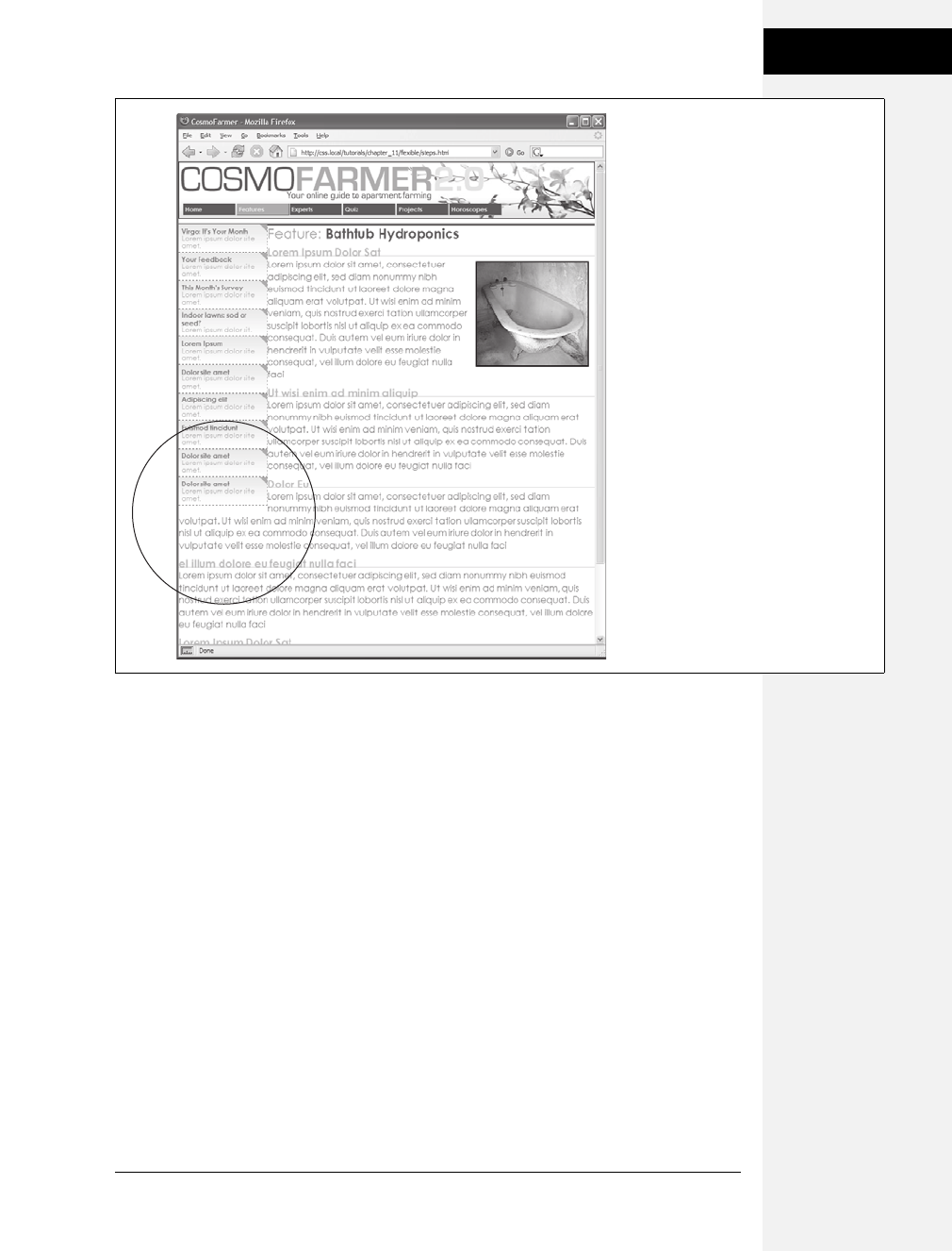
Chapter 12: Building Float-Based Layouts 341
Tutorial: Multiple-
Column Layouts
2. Click just after the closing </div> for the sidebar element (right before the
HTML comment <!--main content goes here-->). Then press Enter to create an
empty line.
It’s often hard to find the right closing </div> when you use a lot of divs to
structure a page. That’s why HTML comments—like this one—can really help
you identify and keep track of the HTML in your page.
3. Type <div id="secondary">, press Enter, and then paste the HTML you copied
in step 1. Hit Enter again, and then type </div>.
When you close the <div> tag, you’ve completed the HTML for the page’s third
column. Start styling it next.
4. Below the #main style you created in step 4 on the previous page, add a new
style to the internal style sheet:
#secondary {
float: right;
width: 180px;
}
Figure 12-16:
A floated element doesn’t actually create
a column on the page. It merely displaces
any content that wraps around it, up to
the point where the float ends (circled).
After that, the content flows back to its
normal position underneath the float.
Download at Boykma.Com

342 CSS: The Missing Manual
Tutorial: Multiple-
Column Layouts
You’re floating this column to the right side of the page to flank the main con-
tent with sidebars on either side. The problem with the first column
(Figure 12-16) appears here as well—the main content wraps underneath this
new sidebar. To fix it, add a right margin to the #main style.
5. Edit the #main style so that it looks like this:
#main {
margin-left: 180px;
margin-right: 200px;
}
Now the page is a full, three-column layout. Test the page in a browser. When
you resize the window, you’ll see that the page adjusts to fit the window.
Note: In this design, the left and right sidebars are a fixed width, so even when you make the browser
window much larger, they stay the same size. You can make those columns change width as well, simply
by setting their widths to percentage values and changing the #main style’s left and right margins to per-
centages as well.
That new column you just added doesn’t look very good, so polish it up in the
next section.
Adding a “Faux Column”
The right sidebar doesn’t stand out enough visually. You’ll fix that with a dark
background color and some text formatting.
1. Edit the #secondary style you created earlier by adding a dark background
color. The complete style should look like this:
#secondary {
float: right;
width: 180px;
background-color: #294E56;
}
Now the right sidebar’s background color really stands out, but the text, which
is also dark, doesn’t.
2. Add another style to the bottom of the internal style sheet to make all the text
in this sidebar white:
#secondary * {
color: #FFF;
}
This style takes advantage of the universal selector (page 56). It essentially says,
“Set the text color for every tag inside #secondary to white.” It’s a shorthand way
of creating what would normally be a very long group selector: #secondary h1,
#secondary h2, #secondary p, #secondary a, and so on.
Download at Boykma.Com
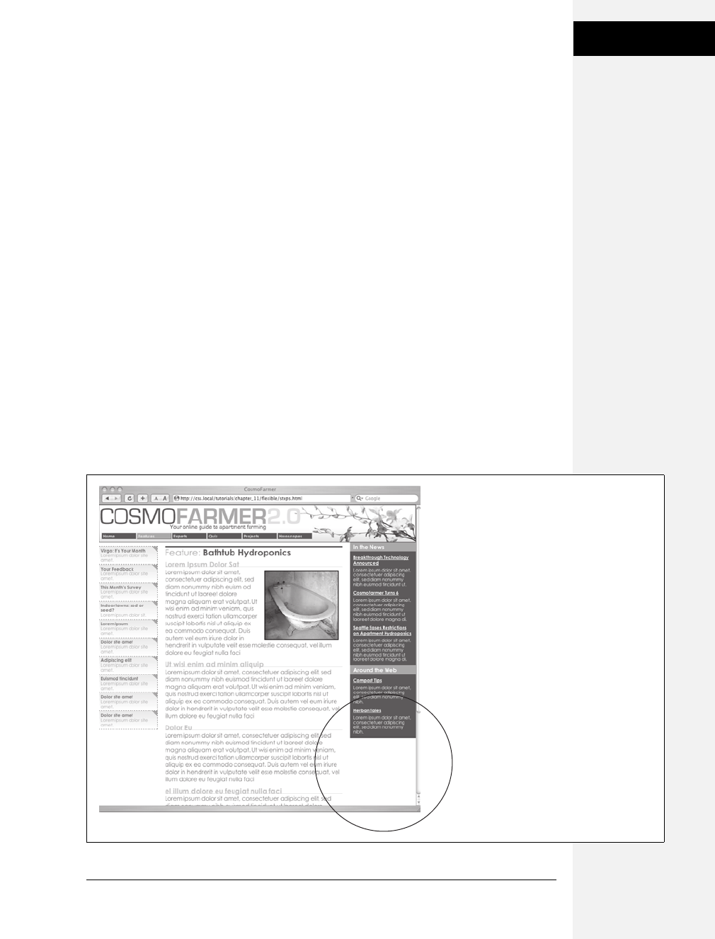
Chapter 12: Building Float-Based Layouts 343
Tutorial: Multiple-
Column Layouts
Next, you’ll create a few styles to help adjust the font size, margins, and other
display properties of the text.
3. Add the following styles to the internal style sheet:
#secondary h3 {
font-size: 1.5em;
background: #73AFB7;
padding: 3px 5px 3px 10px;
}
#secondary h4 {
font-size: 1.2em;
margin: 10px 10px 5px 10px;
}
#secondary p {
font-size: 1.2em;
margin: 3px 10px 10px 10px;
line-height: 110%;
}
Each of these styles adjusts the font size for the different text tags used in the
sidebar. In addition, you’ve added a background color to the headings that
introduce each section in the sidebar. If you preview the page in a web browser
now, it should look like Figure 12-17.
Figure 12-17:
One of the biggest challenges with CSS
layouts is making columns of equal
height. In this example, the right-hand
sidebar has a dark background that
would look much better if it extended
down the page. However, since there’s
more content in the middle section of the
page, the right sidebar’s background
stops short (circled). Using a background
image (instead of the background-color
property) is the answer.
Download at Boykma.Com

344 CSS: The Missing Manual
Tutorial: Multiple-
Column Layouts
Note: The #secondary style—the one that defines the layout of this sidebar—has no padding added. But
the text doesn’t bump right up to the edges of the sidebar because the other styles add space between
the edges of the sidebar and the text inside. Specifically, the padding in the h3 style and the margins in the
h4 and pstyles add the needed space, which has one benefit. Without padding on the sidebar, you can
make the background color of the main headers in the sidebar (“In the News” and “Around the Web”)
span the entire width of the sidebar.
The sidebar presents one more hurdle—its background color stops short of the
bottom of the page. Things would look much better if that dark color extended
all the way down the window’s right side.
The background color on the right sidebar needs a little help. To extend the
color so that it fits the entire height of the page you need to put a graphic in the
background of the page itself and tile it vertically, so no matter how tall the page
gets, the background image stays visible.
4. Add a body tag style to the top of the internal style sheet:
body {
background: url(images/bg/bg_column.gif) repeat-y right top;
}
The bg_column.gif file is a simple, solid color graphic that’s the same width as
the right sidebar. The repeat-y property makes the graphic tile up and down
only, and the right value places the graphic on the right edge of the page.
Fixing the Width
Currently, the page is a liquid design (page 300), meaning that it expands to fill the
entire width of the browser window. But say you’d rather have the page stay the
same width all the time—because you hate how it looks on cinema display moni-
tors, or you don’t like what happens to the design when the browser window is
shrunk too small. Changing a liquid design to a fixed-width design is easy. Start by
adding a little more HTML.
1. Directly after the opening <body> tag (<body id="feature">) add a new <div> tag:
<div id="wrapper">
You’re wrapping the entire page inside a div, which you’ll use to control the
page’s width. You need to make sure that tag is closed.
2. Add the closing </div> just before the closing </body> tag:
</div>
</body>
Now that there’s a div surrounding all of the content on this page, you can control
the page’s width by setting a width for this tag.
Download at Boykma.Com

Chapter 12: Building Float-Based Layouts 345
Tutorial: Negative
Margin Layout
3. Just below the body tag style you created earlier, add a style that defines a set
width for the new div:
#wrapper {
width: 760px;
}
Preview the page in a browser, and you’ll see that the banner, footer, and other
content on the page stays locked at 760 pixels. However, the image that adds the
background to the right sidebar jumps around depending on the width of the
browser window. That’s because that graphic is aligned in relation to the right
edge of the window. To fix this, just place the graphic as a background on the
#wrapper instead.
4. Delete the body style you created in step 4 on the previous page. Add the back-
ground declaration to the #wrapper style, so it looks like this:
#wrapper {
width: 760px;
background: url(images/bg/bg_column.gif) repeat-y right top;
}
Preview the page in a browser. It should now look like Figure 12-18.
There’s a completed version of this tutorial in the 12_finished/layout1/ folder.
Tutorial: Negative Margin Layout
In this tutorial, you’ll explore how to create a multi-column, float-based layout
using the negative margin technique discussed on page 318. Download the files as
described for the previous tutorial. The files for this tutorial are contained inside
the folder named 12 ➝layout2.
Centering a Layout
Unlike the last exercise, all the HTML is already in place for this page. All you have
to do is add CSS to create the layout. There are six major sections to the page, each
enclosed in a <div> tag with an ID applied.
1. In a text editor, open the 12 ➝ layout2 ➝start.html file.
Figure 12-19 shows the basic structure of the HTML (left) and the final result
you’re aiming for (right). Currently, the divs just stack one on top of the other,
because you haven’t added any CSS layout—yet.
Begin by creating a fixed-width layout and centering it in the middle of the
browser window.
Download at Boykma.Com
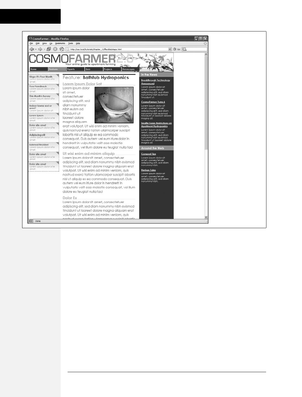
346 CSS: The Missing Manual
Tutorial: Negative
Margin Layout
2. In the <head> region of the HTML, place your cursor between the opening
and closing <style> tags.
There’s already an external style sheet attached to the page, with most of the visual
formatting in it. You’ll add the layout styles to this internal style sheet, which you
can always move to an external style sheet later as described on page 37.
3. Add a new style for the wrapper div:
#wrapper {
border-right: 2px solid #000000;
border-left: 2px solid #000000;
background: #FFFFFF url(images/column_bg.png) repeat-y right top;
}
These declarations add a border to either side of the page and place a back-
ground image in the right side of the div. The image tiles vertically down the
page and provides the background for the right sidebar in the final design. This
setup is an example of the faux column technique described on page 342.
Figure 12-18:
Turning a liquid design
into a fixed-width design
is simply a matter of
wrapping all the HTML
inside the <body> tag in
a new <div> tag and then
creating a style that sets
the width of the div. If
you’d prefer to have the
fixed design centered in
the middle of the browser
window, see the next
tutorial.
Download at Boykma.Com
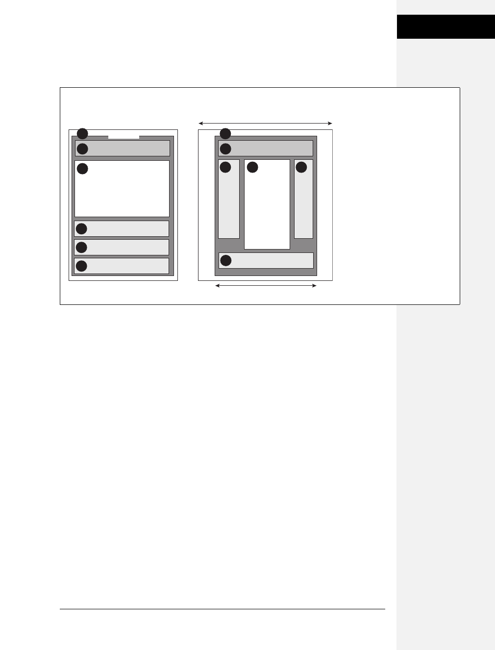
Chapter 12: Building Float-Based Layouts 347
Tutorial: Negative
Margin Layout
Because the wrapper div encloses the other tags on the page, setting its width
defines the width for the entire page (Figure 12-19).
4. Edit the #wrapper style you just created. Add a width and left and right mar-
gins so the style looks like this:
#wrapper {
width: 760px;
margin-right: auto;
margin-left: auto;
border-right: 2px solid #000000;
border-left: 2px solid #000000;
background: #FFFFFF url(images/column_bg.png) repeat-y right top;
}
The width property sets the overall width of the page content to 760 pixels. To
center the wrapper div, set the left and right margins to auto. The auto value tells
the browser that it should calculate the margins automatically. Also, since the
value is applied to both left and right margins, the browser should split the differ-
ence between the two margins. In other words, the browser adds the same
amount of space on either side of the wrapper div, whatever the window’s width.
Preview the page now in a web browser. Resize the browser window, and you’ll
see that the page stays centered in the middle of the window. But you can still
improve on the page’s looks.
Figure 12-19:
These diagrams illustrate where the
page begins (left) and where it
ends (right). Currently, the page is
just a series of <div> tags enclosed
by one wrapper <div> tag. By
setting a width for the wrapper and
adjusting its left and right margins,
you create a design that floats in
the middle of the browser window.
4
2
1
3
2
3
1
#banner
#wrapper
#news
5#mainNav
66
#legal
#main
5 4
width: 760px
browser window
HTML Source Order CSS Layout
Download at Boykma.Com
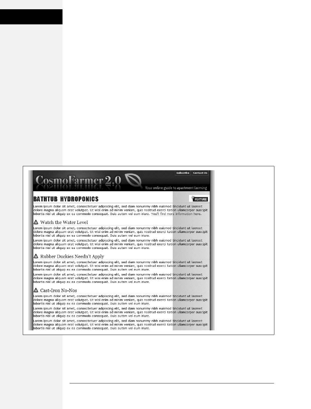
348 CSS: The Missing Manual
Tutorial: Negative
Margin Layout
5. At the beginning of the internal style sheet, add a new style for the <body> tag:
body {
margin: 0;
padding: 0;
background: #E6E6E6 url(images/page_bg.png) repeat-y center top;
}
The first two declarations eliminate any space around the page content, allowing
the wrapper div to freely touch the edges of the browser window. The back-
ground property is where the real fun is. First, it changes the page’s background
to a sophisticated gray (#E6E6E6). Second, it adds a graphic and tiles it verti-
cally from page top all the way to the bottom. The center value places the
graphic in the middle of the window. That way, no matter how wide the window,
the graphic stays centered. The graphic itself is slightly wider than the 760 pix-
els of the wrapper div and has a shadow effect on both the right and left sides.
This gives the appearance that the wrapper is floating above the page, as shown
in Figure 12-20.
Figure 12-20:
Placing an image
centered in the
background of a page’s
<body> tag creates the
illusion of a drop shadow
underneath the page’s
contents.
Download at Boykma.Com

Chapter 12: Building Float-Based Layouts 349
Tutorial: Negative
Margin Layout
Floating the Columns
Now it’s time to create the three columns of this design. In the left diagram of
Figure 12-19, notice the HTML for the main div containing the page’s main content
appears before the HTML for either the left sidebar with an ID of mainNav or right
sidebar with an ID of news. A couple of factors make this design different from the
basic float layout you created in the previous tutorial. First, since the HTML for
the main div comes first, you have to float it to make the sidebars wrap around
either side of it. Second, the main div appears in the middle, between the two sidebars.
Normally, that kind of arrangement isn’t possible. But you’ll cleverly use negative
margins (page 318) to make it work.
1. Add a style to the internal style sheet for the main div:
#main {
float: left;
width: 419px;
padding-left: 10px;
border-left: 1px dashed #999999;
}
So far, this style is pretty basic. It positions the div at the left edge of the wrap-
per div, sets its width, adds a left border, and adds a little space between the text
and the border. You’ll position the news div next.
2. Add another style to position the right sidebar:
#news {
float: right;
width: 160px;
}
Lastly, you need to position the nav sidebar.
3. Add one more style to the internal style sheet:
#nav {
float: left;
width: 160px;
}
The page should look like Figure 12-21. Sure enough, there are three side-by-
side columns, but they’re not in the right order. The large column on the left
belongs in the middle.
Here’s where the negative margins come in. The basic process goes like this: First,
you want to add enough left margin to the main column to push it into its final
location in the middle of the page. Then, you need to add enough negative mar-
gin to the navigation sidebar to pull it over to the left of the main content area.
Download at Boykma.Com
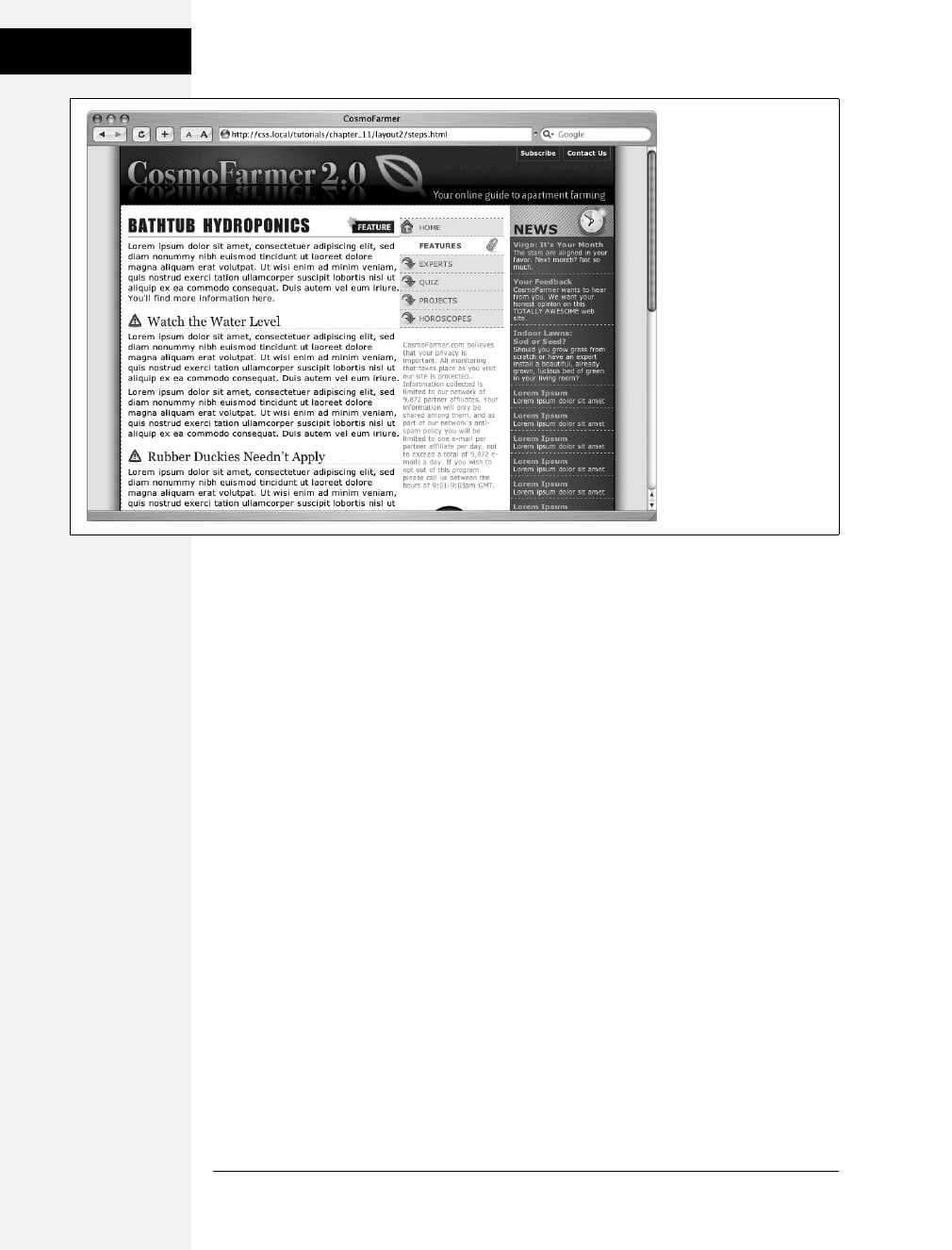
350 CSS: The Missing Manual
Tutorial: Negative
Margin Layout
4. In the #main style, add margin-left: 160px;:
#main {
float: left;
width: 419px;
margin-left: 160px;
padding-left: 10px;
border-left: 1px dashed #999999;
}
Back in step 3, the nav div (which is supposed to be the far left column) is 160
pixels, just like you used for the left margin. By indenting the main div 160 pixels,
you’ve made room for the nav sidebar.
5. Add a negative left margin to the #nav style so that it looks like this:
#nav {
float: left;
width: 160px;
margin-left: -590px;
}
Here’s the story behind the –590 pixel value: Currently, the nav div and main
div are both floated left. But because the nav div’s HTML comes after that of the
main div, it can float only as far left as the right edge of the main div. In order
for the nav div to get to the left edge of the wrapper, it has to move all the way
from the right edge of the main div to the left edge of the wrapper. In other
words, it has to travel left the same distance (in pixels) from the left edge of the
wrapper to the right edge of the main div.
Figure 12-21:
Normally, the placement
of floated elements is
completely dependent on
the order of their HTML
in the source code of the
HTML file. The large,
main content (left) is first
in the source code, so it
doesn’t appear between
the two sidebars. But you
can change that with
negative margins.
Download at Boykma.Com
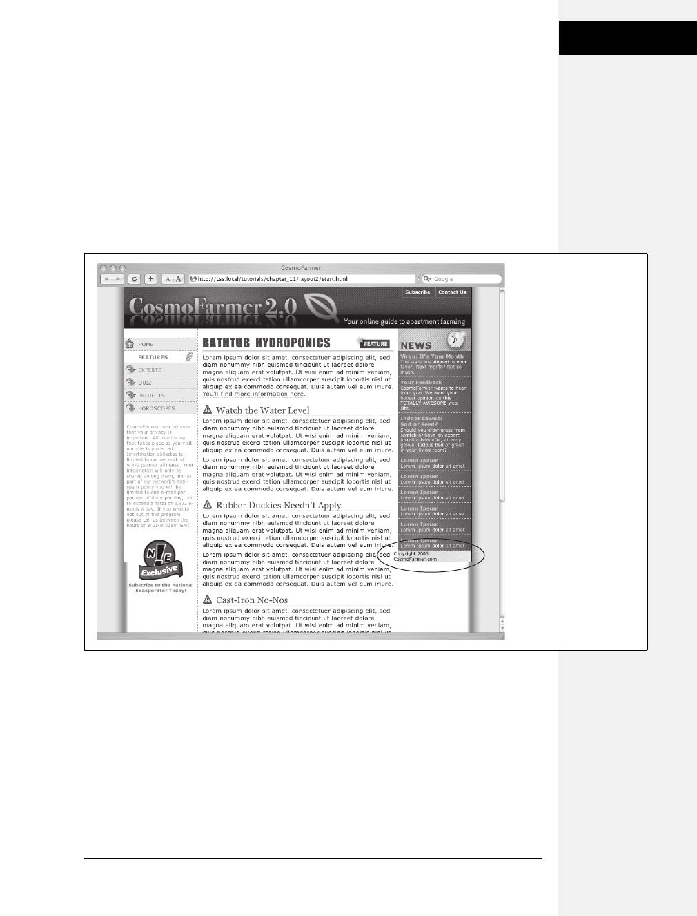
Chapter 12: Building Float-Based Layouts 351
Tutorial: Negative
Margin Layout
The right edge of the main div is the grand total of its width, left and right margins,
left and right padding, and left and right border. That is, 160 (left margin) + 10 (left
padding) + 1 (left border) + 419 (width) = 590 pixels. So, giving the nav div a left
margin of –590 pixels moves it over and past the main div, and into position.
Preview the page in a web browser, and you’ll see something like Figure 12-22.
It works if you use Firefox or Safari. It’s a different story with Internet Explorer
6. In that browser, you’ll see a large empty space to the left of the middle col-
umn and no navigation bar anywhere in sight. That’s the nasty double margin
bug in action (page 333). Because the main div is floated left and it has a left
margin, IE 6 doubles the margin, ruining the layout. Luckily, there’s an easy fix.
6. Add display: inline to the #main style:
#main {
display: inline;
float: left;
width: 419px;
margin-left: 160px;
padding-left: 10px;
border-left: 1px dashed #999999;
}
Now if you preview the page in IE 6, everything works fine (Figure 12-22).
Figure 12-22:
Using negative margins,
you can place columns in
any order on the page.
Doing so requires floating
all of the columns, which
can cause problems for
content that comes after
the columns, like the
copyright notice (circled).
That element tries to wrap
around the floats, and in
the process it gets
crammed into a corner
rather than positioned at
the bottom of the page. To
fix it, add clear: both to the
copyright notice’s style.
Download at Boykma.Com

352 CSS: The Missing Manual
Tutorial: Negative
Margin Layout
Final Adjustments
The next couple of steps demonstrate how flexible CSS layout really is. First, you’ll
take care of the copyright notice that should appear at the bottom of the page.
Currently, it’s caught up in all of that floating stuff. It needs to clear the floats to
get into position.
1. At the end of the internal style sheet, add one last style:
#legal {
clear: both;
margin-right: 160px;
padding: 5px 5px 160px 20px;
border-top: 1px dashed #999999;
font-weight: bold;
color: #666666;
}
This style applies a variety of formatting rules to the copyright notice. The most
important is the clear declaration, which drops the copyright below all of the
floats. The right margin pushes the copyright notice away from the right side-
bar, so the top border (also defined in this style) doesn’t overlap the back-
ground graphic.
The page is basically done, and as a reward, you get to do one last thing to dem-
onstrate how cool CSS really is. Think you can swap the two sidebars so that the
news appears on the left and the navigation on the right? It’s easier than it
sounds—just a couple of changes to two styles.
2. Edit the #nav style by removing the negative margin and changing its float
value from left to right. The finished style should look like this:
#nav {
float: right;
width: 160px;
}
The navigation bar moves to the right side. Now move the news to the left.
3. In the #news style, add margin-left: –590px and set the float to left like this:
#news {
float: left;
width: 160px;
margin-left: -590px;
}
Download at Boykma.Com
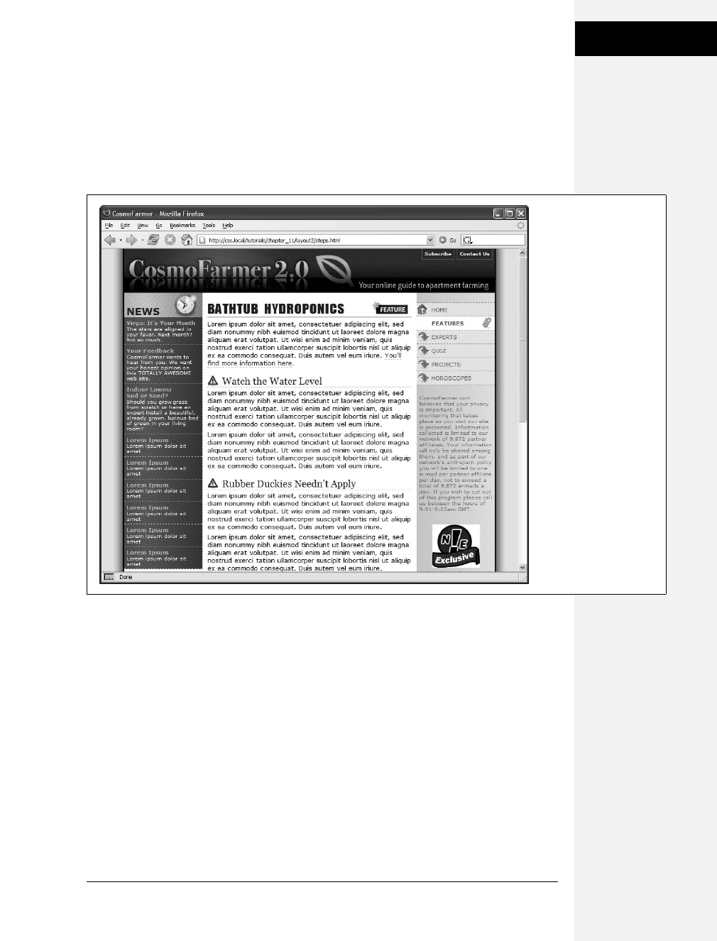
Chapter 12: Building Float-Based Layouts 353
Tutorial: Negative
Margin Layout
Save the page and preview it in a web browser (Figure 12-23). The columns
have swapped with no messy HTML changes. All you did was swap the two
styles. If you want to take this a bit further, you can move the background
graphic applied to the wrapper from the right to the left and switch the border
that appears on the left edge of the main content div to its right edge so that it
butts up against the navigation div.
Figure 12-23:
CSS’s flexibility is one of
its biggest benefits. By
changing just a few CSS
styles, you can move
elements to completely
different areas of a page.
In this case, swapping
two styles made the left
and right sidebars switch
position—without any
changes to the HTML.
Download at Boykma.Com

Download at Boykma.Com

355
Chapter 13
chapter
13
Positioning Elements
on a Web Page
When the World Wide Web Consortium introduced CSS Positioning, some
designers understandably thought they could make web pages look just like print
documents created in programs like PageMaker, InDesign, or Quark XPress. With
just a couple of CSS properties, CSS Positioning lets you position an element in a
precise location on a page—say 100 pixels from the top of the page and 200 pixels
from the left edge. The pixel-accurate placement possible with CSS-P (as it was
called way back when) seemed to promise that, at last, you could design a page
simply by putting a photo here, a headline there, and so on.
Unfortunately, the level of control designers expected from CSS-P never materialized.
There have always been differences in how various browsers display CSS posi-
tioned elements. But, even more fundamentally, the Web doesn’t work like a
printed brochure, magazine, or book. Web pages are much more fluid than
printed pages. Once a magazine rolls off the press, readers can’t change the page
size or font size. About the only way they can change the look of the magazine is to
spill coffee on it.
Web visitors, on the other hand, can tinker with your handcrafted presentation.
They can increase their browsers’ font size, potentially making text spill out of pre-
cisely placed and sized layout elements. But the news isn’t all bad: As long as you
don’t try to dictate the exact width, height, and position of every design element,
you’ll find CSS’s positioning properties powerful and helpful. You can use these
properties to make a text caption appear on top of a photo, create multicolumn
page layouts, place a logo anywhere on the page, and much more.
Download at Boykma.Com

356 CSS: The Missing Manual
How Positioning
Properties Work
How Positioning Properties Work
The CSS position property lets you control how and where a web browser displays
particular elements. Using position, you can, for example, place a sidebar anywhere
you wish on a page or make sure a navigation bar at the top of the page stays in place
even when visitors scroll down the page. CSS offers four types of positioning:
•Absolute. Absolute positioning lets you determine an element’s location by
specifying a left, right, top, or bottom position in pixels, ems, or percentages.
(See Chapter 6 for more on picking between the different units of measure-
ment.) You can place a box 20 pixels from the top and 200 pixels from the left
edge of the page, as shown in Figure 13-1, middle. (More in a moment on how
you actually code these instructions.)
In addition, absolutely positioned elements are completely detached from the flow
of the page as determined by the HTML code. In other words, other things on the
page don’t even know the absolutely positioned element exists. They can even dis-
appear completely underneath absolutely positioned items, if you’re not careful.
Note: Don’t try to apply both the float property and any type of positioning other than static (explained
below) or relative to the same style. Float and absolute or fixed positioning can’t work together on the
same element.
•Relative. A relatively positioned element is placed relative to its current posi-
tion in the HTML flow. So, for example, setting a top value of 20 pixels and left
value of 200 pixels on a relatively positioned headline moves that headline 20
pixels down and 200 pixels from the left from wherever it would normally appear.
Unlike with absolute positioning, other page elements accommodate the old
HTML placement of a relatively positioned element. Accordingly, moving an
element with relative positioning leaves a “hole” where the element would have
been. Look at the dark strip in the bottom image of Figure 13-1. That strip is
where the relatively positioned box would have appeared, before it was given
orders to move. The main benefit of relative positioning isn’t to move an ele-
ment, but to set a new point of reference for absolutely positioned elements that
are nested inside it. (More on that brain-bending concept on page 360.)
•Fixed. A fixed element is locked into place on the screen. It does the same thing
as the fixed value for the background-attachment property (page 199). When a
visitor scrolls the page, fixed elements remain onscreen as paragraphs and head-
lines, while photos disappear off the top of the browser window.
Fixed elements are a great way to create a fixed sidebar or replicate the effect of
HTML frames, where only a certain portion (frame) of the page scrolls. You can
read about how to create this effect on page 375.
Note: Internet Explorer 6 (and earlier versions) doesn’t understand the fixed setting and ignores it.
Download at Boykma.Com
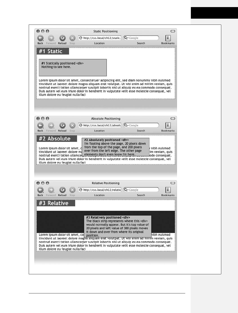
Chapter 13: Positioning Elements on a Web Page 357
How Positioning
Properties Work
Figure 13-1:
CSS offers several ways
to affect an element’s
placement on a web
page. The static option,
top, is the way browsers
have presented content
since the beginning of
the Web. They simply
display the HTML in top-
to-bottom order.
Absolute positioning
(middle) removes an
element from the page
flow, placing it on top of
the page, sometimes
overlapping other
content. Relative
positioning (bottom)
places an element
relative to where it
would normally appear
on the page and leaves
a hole (the dark
background here)
where that element
would’ve been without
relative positioning.
Download at Boykma.Com

358 CSS: The Missing Manual
How Positioning
Properties Work
•Static positioning simply means the content follows the normal top-down flow
of HTML (see Figure 13-1, top). Why would you want to assign an element
static positioning? The short answer: You probably never will.
To change the positioning of any element, simply use the position property fol-
lowed by one of the four keywords: absolute, relative, fixed, static. To create an
absolutely positioned element, add this property to a style:
position: absolute;
Static is the normal positioning method, so unless you’re overriding a previously
created style that already has a position of absolute, relative or fixed, you won’t
need to specify that. In addition, static elements don’t obey any of the positioning
values discussed next.
Setting a positioning value is usually just part of the battle. To actually place an ele-
ment somewhere on a page, you need to master the various positioning properties.
Setting Positioning Values
The display area of a web browser window—also called the viewport—has top,
bottom, left, and right edges. Each of the four edges has a corresponding CSS
property: top, bottom, left, and right. But you don’t need to specify values for all
four edges. Two are usually enough to place an item on the page. You can, if
you want, place an element 10ems from the left edge of the page and 20ems
from the top.
Note: Internet Explorer 6 sometimes misplaces elements that are positioned with the bottom or right
properties. See the box on page 365.
To specify the distance from an edge of a page to the corresponding edge of the
element, use any of the valid CSS measurements—pixels, ems, percentages, and so
on. You can also use negative values for positioning like left: –10px; to move an ele-
ment partly off the page (or off another element) for visual effect, as you’ll see later
in this chapter (page 370).
After the position property, you list two properties (top, bottom, left, or right). If
you want the element to take up less than the available width (to make a thin side-
bar, for example), then you can set the width property. To place a page’s banner in
an exact position from the top and left edges of the browser window, create a style
like this:
#banner {
position: absolute;
left: 100px;
top: 50px;
width: 760px;
}
This style places the banner as pictured in Figure 13-2, top.
Download at Boykma.Com
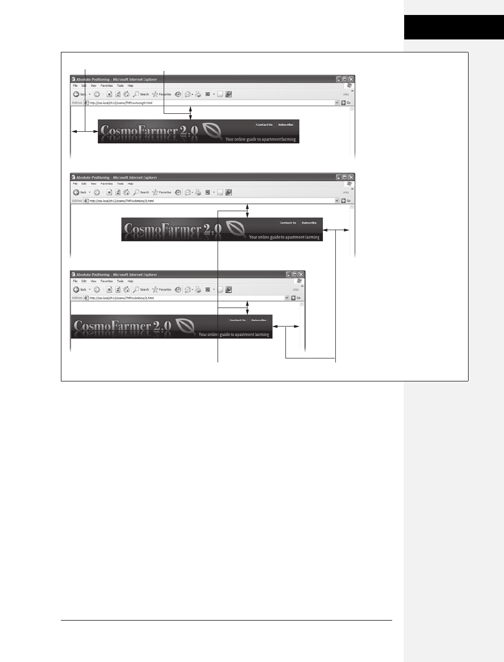
Chapter 13: Positioning Elements on a Web Page 359
How Positioning
Properties Work
Here’s another example: placing an element so it always remains a fixed distance
from the right side of the browser. When you use the right property, the browser
measures the distance from the right edge of the browser window to the right edge
of the element (Figure 13-2, middle). To position the banner 100 pixels from the
right edge of the window, you’d create the same style as above, but simply replace
left with right:
#banner {
position: absolute;
right: 100px;
top: 50px;
width: 760px;
}
Since the position is calculated based on the right edge of the browser window,
adjusting the size of the window automatically repositions the banner, as you can see
in Figure 13-2, bottom. Although the banner moves, the distance from the right edge
of the element to the right edge of the browser window remains the same.
Figure 13-2:
One useful aspect of absolute
positioning is the ability to
place an item relative to the
right edge of the browser
window (middle). Even when
the width of the browser
changes, the distance from
the right edge of the window
to the right edge of the
positioned element stays the
same (bottom).
top: 50px
top: 50px
left: 100px
ri
g
ht: 100px
Download at Boykma.Com

360 CSS: The Missing Manual
How Positioning
Properties Work
Technically, you can specify both left and right position properties as well as both
top and bottom and let a browser determine the width and height of the element.
Say you want a central block of text positioned 100 pixels from the top of the win-
dow and 100 pixels from both the left and right edges of the window. To position
the block, you can use an absolutely positioned style that sets the top, left, and right
properties to 100 pixels. In a browser window, the left edge of the box starts 100
pixels from the left edge of the window, and the right edge extends to 100 pixels
from the right edge (Figure 13-3, top). The exact width of the box, then, depends
on how wide the browser window is. A wider window makes a wider box; a thin-
ner window, a thinner box. The left and right positions, however, remain the same.
Unfortunately, though, Internet Explorer 6 (and earlier) doesn’t get this right (see
Figure 13-3, bottom). That browser displays the left position correctly, but simply
ignores any right value. So until IE 6 isn’t around anymore, you’re better off stick-
ing with either left or right and using the width property to specify the width of an
absolutely positioned element.
The width and height properties, which you learned about in Chapter 7, work
exactly the same way for positioned elements. To place a 50 ×50 pixel gray box in
the top-right corner of the browser window, create this style:
.box {
position: absolute;
right: 0;
top: 0;
width: 50px;
height: 50px;
background-color: #333;
}
The same caveat mentioned on page 165 applies here as well: Be careful with setting
heights on elements. Unless you’re styling a graphic with a set height, you can’t be sure
how tall any given element will be on a page. You might define a sidebar to be 200 pix-
els tall, but if you end up adding enough words and pictures to make the sidebar taller
than 200 pixels, then you end up with content spilling out of the sidebar. Even if you’re
sure the content fits, a visitor can always pump up the size of her browser’s font, creat-
ing text that’s large enough to spill out of the box. Furthermore, when you specify a
width and height in a style and the contents inside the styled element are wider or
taller, strange things can happen. (See the box on page 173 for a discussion of how to
use the CSS overflow property to control this situation.)
When Absolute Positioning Is Relative
So far, this chapter has talked about positioning an element in an exact location in
the browser window. However, absolute positioning doesn’t always work that way.
Download at Boykma.Com
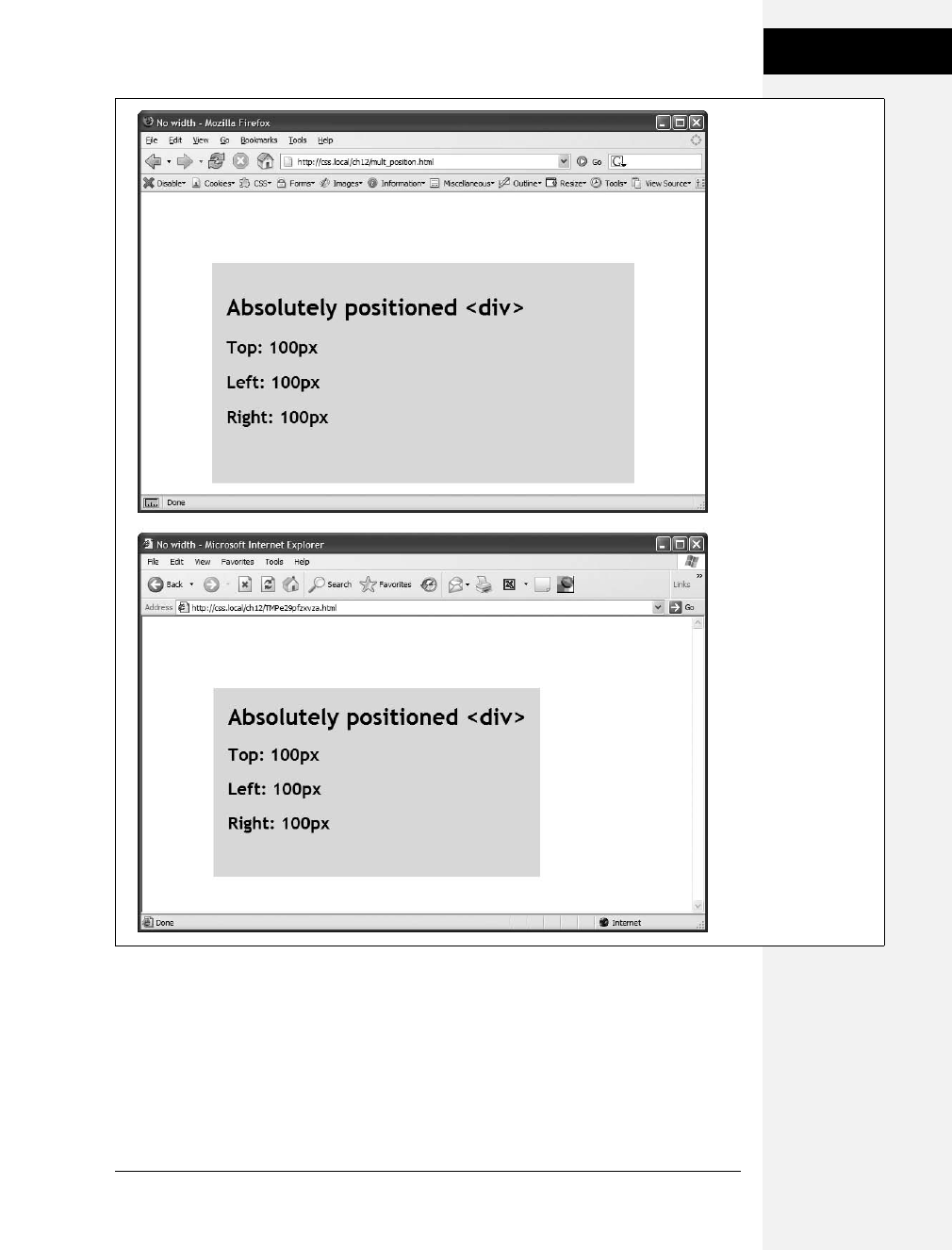
Chapter 13: Positioning Elements on a Web Page 361
How Positioning
Properties Work
In fact, an absolutely positioned element is actually placed relative to the bound-
aries of its closest positioned ancestor. Simply put, if you’ve already created an ele-
ment with absolute positioning (say a <div> tag that appears 100 pixels down from
the top of the browser window), then any absolutely positioned elements with
HTML inside that <div> tag are positioned relative to the div’s top, bottom, left,
and right edges.
Figure 13-3:
Working with absolute
positioning can be
tricky. In this case, given
just left and right
positions, Firefox
correctly calculates the
width of the gray box
(top). Internet Explorer
6, however, doesn’t
follow the same rules. It
ignores the right value
and sets the width of
the box based on the
width of its contents.
Download at Boykma.Com
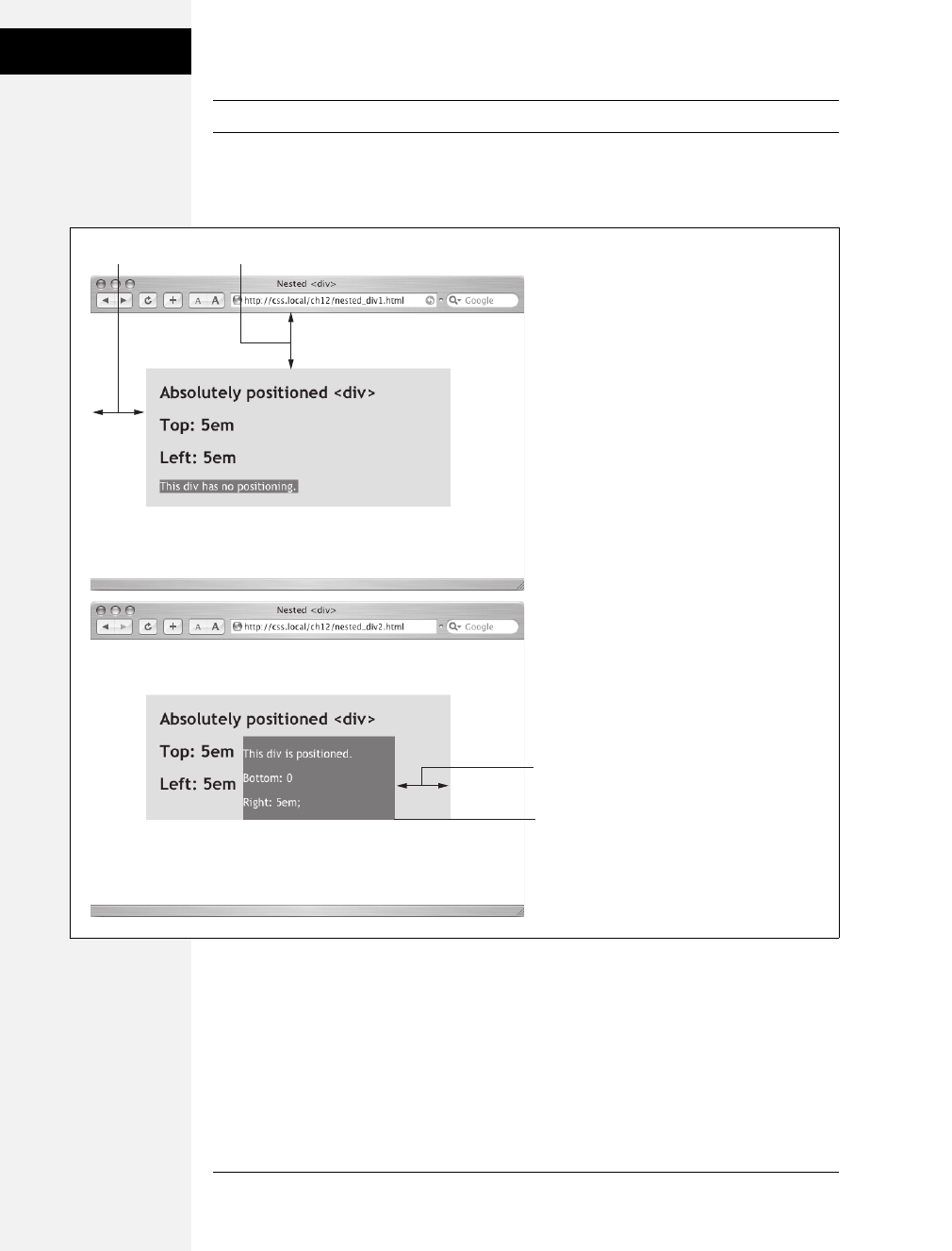
362 CSS: The Missing Manual
How Positioning
Properties Work
Note: If all this talk of parents and ancestors doesn’t ring a bell, then turn to page 57 for a refresher.
In the top image of Figure 13-4, the light gray box is absolutely positioned 5ems
from the top and left edges of the browser window.
There’s also a <div> tag nested inside that box. Applying absolute positioning to
that <div> positions it relative to its absolutely positioned parent. Setting a bottom
position of 0doesn’t put the box at the bottom of the screen; it places the box at
the bottom of its parent. Likewise, a right position for that nested <div> refers to
the right of the edge of its parent (Figure 13-4, bottom).
Figure 13-4:
You can place an element
relative to the browser window
(top) or relative to a positioned
ancestor (bottom).
top: 5em
bottom: 0
left: 5em
right: 5em
Download at Boykma.Com

Chapter 13: Positioning Elements on a Web Page 363
How Positioning
Properties Work
Whenever you use absolute positioning to place an element on the page, the exact
position depends upon the positioning of any other tags the styled element is
nested in. Here are the rules in a nutshell:
•A tag is positioned relative to the browser window if it has an absolute position
and it’s not inside any other tag that has absolute, relative, or fixed positioning
applied to it.
•A tag is positioned relative to the edges of another element if it’s inside another
tag with absolute, relative, or fixed positioning.
When (and Where) to Use Relative Positioning
You get one big benefit from placing an element relative to another tag: If that tag
moves, the positioned element moves along with it. Say you place an image inside
an <h1> tag, and you want the image to appear on the right edge of that <h1> tag.
If you simply position the image in an exact spot in the browser window on the left
edge of the <h1> tag, you’re taking your chances. If the <h1> moves, the abso-
lutely positioned image stays glued to its assigned spot. Instead, what you want to
do is position the image relative to the <h1> tag, so that when the headline moves,
the image moves with it (bottom two images in Figure 13-5).
Note: Use the background-image property (see page 188) to place an image into the background of an
<h1> tag. But if the graphic is taller than the <h1> tag, or you want the graphic to appear outside the
boundaries of the headline (see the example third from the top in Figure 13-5), then use the relative posi-
tioning technique described here.
You could use the position property’s relative value to place the image, but that has
drawbacks, too. When you set an element’s position to relative and then place it—
maybe using the left and top properties—the element moves the set amount from
where it would normally appear in the flow of the HTML. In other words, it moves
relative to its current position. In the process, it leaves a big hole where it would’ve
been if you hadn’t positioned it at all (Figure 13-1, bottom). Usually that’s not
what you want.
A better way to use relative positioning is to create a new positioning context for
nested tags. For instance, the <h1> tag in the example at the beginning of this sec-
tion is an ancestor of the <img> tag inside it. By setting the position of the <h1>
tag to relative, any absolute positioning you apply to the <img> tag is relative to
the four edges of the <h1> tag, not the browser window. Here’s what the CSS
looks like:
h1 { position: relative; }
h1 img {
position: absolute;
top: 0;
right: 0;
}
Download at Boykma.Com
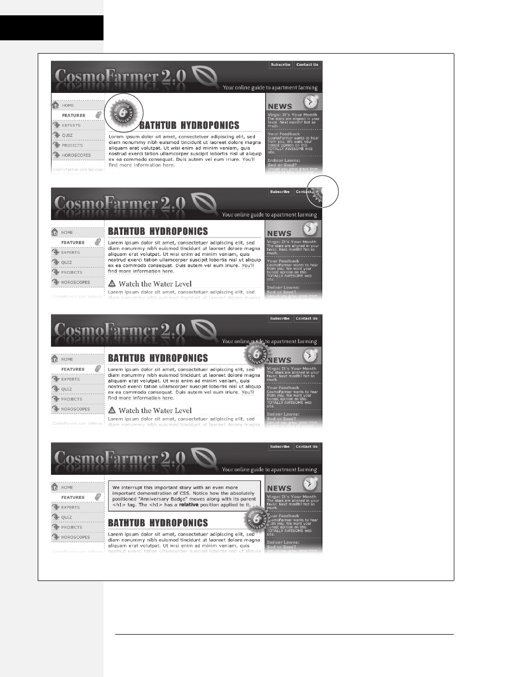
364 CSS: The Missing Manual
How Positioning
Properties Work
Figure 13-5:
Top: A graphical button
(circled) is placed inside an
<h1> tag.
Second from top: Adding
absolute positioning to the
button—right: -35px; top: -
35px;—moves it outside of the
<h1> tag area and places it in
the top-right corner of the
browser window (circled). (In
fact, it’s placed a little outside
of the browser window thanks
to the negative positioning
values.)
Third from top: Adding
position: relative to the <h1>
creates a new positioning
context for the <img> tag. The
same top and right values
move the <img> tag to the
<h1> tag’s top-right corner.
Bottom: When you move the
heading down the page, the
graphic goes along for
the ride.
Download at Boykma.Com
Chapter 13: Positioning Elements on a Web Page 365
How Positioning
Properties Work
Setting the image’s top and right properties to 0places the image in the upper-right
corner of the headline—not the browser window.
In CSS, the term relative doesn’t exactly mean the same thing as in the real world.
After all, if you want to place the <img> tag relative to the <h1> tag, your first
instinct may be to set the image’s position to relative. In fact, the item that you
want to position—the image—gets an absolute position, while the element you
want to position the element relative to—the headline—gets a setting of relative.
Think of the relative value as meaning “relative to me.” When you apply relative
positioning to a tag, it means “all positioned elements inside of me should be posi-
tioned relative to my location.”
Note: Because you’ll often use relative positioning merely to set up a new positioning context for nested
tags, you don’t even need to use the left, top, bottom, or right settings with it. The <h1> tag has position:
relative, but no left, top, right, or bottom values.
Stacking Elements
As you can see in Figure 13-6, absolutely positioned elements sit “above” your web
page and can even reside on top of (or underneath) other positioned elements.
This stacking of elements takes place on what’s called the z-index. If you’re familiar
with the concept of layers in Photoshop, Fireworks, or Adobe InDesign, then you
know how the z-index works: It represents the order in which positioned elements
are stacked on top of the page.
BROWSER BUG
IE Forgets Its Place
Sometimes, you’ll use the bottom and right positioning
properties to place something at a page’s lower-right corner
or to put something in a low corner of another element. Say
you want to place a Contact Us link in the lower-left corner
of a banner. If the style for the banner has either absolute
or relative positioning and you position the link absolutely,
then most browsers position the link relative to the ban-
ner’s edges, as they should.
But not Internet Explorer 6 and earlier. Seemingly straight-
forward properties like bottom and right can confound this
ornery browser. IE sometimes continues to use the bottom
and right edges of the web page as a reference, so you’ll
end up with a positioned element way lower or further to
the right than you expected.
Like many other IE bugs, this one has been fixed in Internet
Explorer 7 and later.
The fix is to give the containing element (the element you
want to position something relative to, like the banner in
this example) a special IE-only property known as layout.
If you use the bottom or right properties on an absolutely
positioned element, and IE places that element in a differ-
ent location than other browsers, turn to page 333 in
Chapter 12 and apply one of the solutions described there.
You’ll see examples of this problem (and its solution)
throughout this chapter.
Download at Boykma.Com
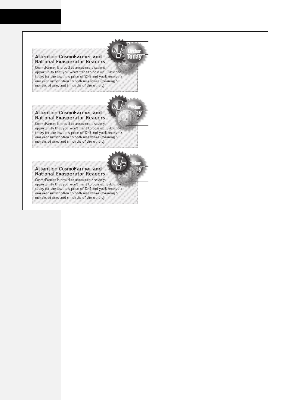
366 CSS: The Missing Manual
How Positioning
Properties Work
To put it another way, think of a web page as a piece of paper and an absolutely
positioned element like a sticky note. Whenever you add an absolutely positioned
element to a page, it’s like slapping a sticky note on it. Of course, when you add a
sticky note, you run the risk of covering up anything written on the page below.
Normally, the stacking order of positioned elements follows their order in the
page’s HTML code. On a page with two absolutely positioned <div> tags, the
<div> tag that comes second in the HTML appears above the other <div>. But you
can control the order in which positioned elements stack up using the CSS z-index
property. The property gets a numeric value, like this:
z-index: 3;
The larger the value, the closer to the top of the stack an element appears. Say you
have three absolutely positioned images, and parts of each image overlap. The one
with the larger z-index appears on top of the others (see Figure 13-6, top). When
you change the z-index of one or more images, you change their stacking order
(Figure 13-6, middle).
Figure 13-6:
When you use z-index to control how
positioned elements are stacked, parent
elements define the stacking order for
their children. In the top two examples,
the text box isn’t positioned, so it shares
the z-index of the page itself, which has a
z-index value of 0. So the buttons in
those two text boxes are stacked relative
to and above the page. But the text box
in the bottom image has an absolute
position and a z-index of 1000. This
containing <div> becomes the starting
point for stacking the images inside it. So
even though the div’s z-index is 1000, its
nested children (with lower z-index
values) appear on top of it, while the text
box itself, sits above the page.
z-index: 1
z-index: 2
z-index: 3
z-index: 3
z-index: 1
z-index: 2
z-index: 200
z-index: 1000
z-index: 300
z-index: 100
Download at Boykma.Com

Chapter 13: Positioning Elements on a Web Page 367
Powerful
Positioning
Strategies
Note: It’s perfectly OK to have gaps in z-index values. In other words, 10, 20, 30 does the exact same
things as 1, 2, 3. In fact, spreading out the numerical values gives you room to insert more items into the
stack later. And, when you want to make sure nothing ever appears on top of a positioned element, give it
a really large z-index, like this: z-index: 10000;. But don’t get too carried away: Firefox can only handle a
maximum z-index of 2147483647.
Hiding Parts of a Page
Another CSS property often used with absolutely positioned elements is visibility,
which lets you hide part of a page (or show a hidden part). Say you want a label to
pop into view over an image when a visitor mouses over it. You make the caption
invisible when the page first loads (visibility: hidden), and switch to visible (visibility:
visible) when the mouse moves over it. Figure 13-7 shows an example.
The visibility property’s hidden value is similar to the display property’s none value
(see the note on page 160), but there’s a fundamental difference. When you set an
element’s display property to none, it literally disappears from the page without a
trace. However, setting the visibility property to hidden prevents the browser from
displaying the element’s contents, but leaves an empty hole where the element would
have been. When applied to absolutely positioned elements that are already removed
from the flow of the page, visibility: hidden and display: none behave identically.
The most common way to switch an element from hidden to displayed and back
again is with JavaScript. But you don’t have to learn JavaScript programming to
use the visibility property (or, for that matter, the display property). You can use
the :hover pseudo-class (see page 367) to make an invisible element visible.
Note: For a basic CSS method of adding pop-up tool tips—additional information that appears when
someone mouses over a link—check out: http://psacake.com/web/jl.asp. You also have many JavaScript
options to choose from: the jQuery Tooltip plug-in is a full-featured and easy-to-use JavaScript tooltip
based on the jQuery framework: http://bassistance.de/jquery-plugins/jquery-plugin-tooltip.
Powerful Positioning Strategies
As explained at the beginning of this chapter, you can run into trouble when you
try to use CSS positioning to place every element on a page. Because it’s impossible
to predict all possible combinations of browsers and settings your visitors will use,
CSS-controlled positioning works best as a tactical weapon. Use it sparingly to
provide exact placement for specific elements.
In this section, you’ll learn how to use absolute positioning to add small but visually
important details to your page design, how to absolutely position certain layout
elements, and how to cement important page elements in place while the rest of
the content scrolls.
Download at Boykma.Com
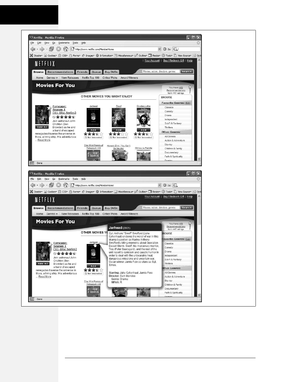
368 CSS: The Missing Manual
Powerful
Positioning
Strategies
Figure 13-7:
The visibility property is
useful for hiding part of
a page that you later
want to reveal. The top
image shows movie
listings. Moving the
mouse over one of the
images makes a
previously invisible pop-
up message appear.
Programmers usually
use JavaScript to create
this kind of effect, but
you can use the CSS
:hover pseudo-class to
make an invisible
element visible when
a visitor mouses over
a link.
Download at Boykma.Com

Chapter 13: Positioning Elements on a Web Page 369
Powerful
Positioning
Strategies
Positioning Within an Element
One of the most effective ways to use positioning is to place small items relative to
other elements on a page. Absolute positioning can simulate the kind of right
alignment you get with floats. In the first example in Figure 13-8, the date on the
top headline is a bit overbearing, but with CSS you can reformat it and move it to
the right edge of the bottom headline.
In order to style the date separately from the rest of the headline, you need to
enclose the date in an HTML tag. The <span> tag (page 54) is a popular choice for
applying a class to a chunk of inline text to style it independently from the rest of a
paragraph.
<h1><span class="date">Nov. 10, 2006</span> CosmoFarmer Bought By Google</h1>
Now it’s a matter of creating the styles. First, you need to give the containing ele-
ment—in this example, the <h1> tag—a relative position value. Then, apply an
absolute position to the item you wish to place—the date. Here’s the CSS for the
bottom image in #1 of Figure 13-8:
h1 {
position: relative;
width: 100%;
border-bottom: 1px dashed #999999;
}
h1 span.date {
position: absolute;
bottom: 0;
right: 0;
font-size: .5em;
background-color: #E9E9E9;
color: black;
padding: 2px 7px 0 7px;
}
Some of the properties listed above, like border-bottom, are just for looks. The crucial
properties are bolded: position, bottom, and right. Once you give the headline a rel-
ative position, you can position the <span> containing the date in the lower-right
corner of the headline by setting both the bottom and right properties to 0.
Note: Internet Explorer 6 and earlier can get the placement of an element wrong when you use the bottom
or right properties. In this example, the width: 100%; declaration in the h1 tag style fixes the problem, as
discussed in the box on page 338.
Download at Boykma.Com
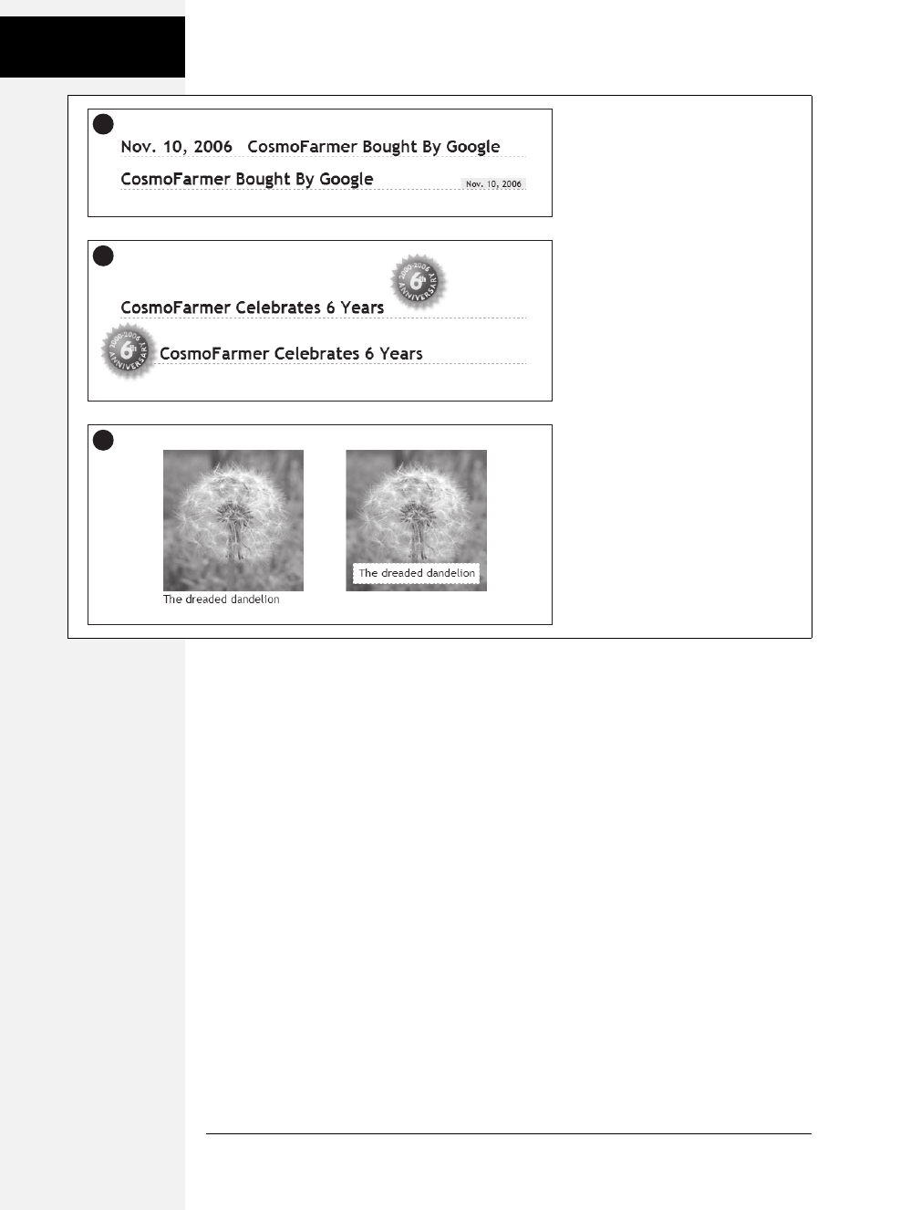
370 CSS: The Missing Manual
Powerful
Positioning
Strategies
Breaking an Element Out of the Box
You can also use positioning to make an item appear to poke out of another ele-
ment. In the second example in Figure 13-8, the top image shows a headline with a
graphic. That is, the <img> tag is placed inside the <h1> tag as part of the head-
line. Using absolute positioning and negative top and left property values moves
the image to the headline’s left and pushes it out beyond the top and left edges.
Here’s the CSS that produces that example:
h1 {
position: relative;
margin-top: 35px;
padding-left: 55px;
border-bottom: 1px dashed #999999;
}
h1 img {
position: absolute;
top: -30px;
left: -30px;
}
Figure 13-8:
Absolute positioning is perfect for
simple design details like placing a date
in the lower-right corner of a headline
(top), punching an image out of its
containing block (middle), or placing a
caption directly on top of a photo
(bottom). (You’ll learn the caption trick
in the tutorial on page 384.)
1
3
2
Download at Boykma.Com

Chapter 13: Positioning Elements on a Web Page 371
Powerful
Positioning
Strategies
The basic concept is the same as the previous example, but with a few additions.
First, the image’s top and left values are negative, so the graphic actually appears 30
pixels above the top of the headline and 30 pixels to the left of the headline’s left
edge. Be careful when you use negative values. They can position an element par-
tially (or entirely) off a page or make the element cover other content on the page.
To prevent a negatively positioned element from sticking out of the browser win-
dow, add enough margin or padding to either the body element or the enclosing,
relatively positioned tag—the <h1> tag in this example. The extra margin pro-
vides enough space for the protruding image. In this case, to prevent the image
from overlapping any content above the headline, add a significant top margin.
The left padding of 55 pixels also moves the text of the headline out from under
the absolutely positioned image.
As in the previous example, Internet Explorer is ready to make trouble. What’s
worse, adding width: 100% doesn’t even fix things this time. Since there’s padding
on the <h1> tag, setting its width to 100 percent actually makes the <h1> wider
than 100 percent of the page (see page 165 for the reason why). There’s a solution,
but it uses a nonstandard CSS property—zoom. Simply add zoom: 1 to the <h1>
tag style:
h1 {
position: relative;
margin-top: 35px;
padding-left: 55px;
border-bottom: 1px dashed #999999;
zoom: 1;
}
Note: The zoom property doesn’t cause harm in other browsers, although it prevents your CSS from vali-
dating correctly (page 36). You can use Internet Explorer’s conditional comments to hide the nonstandard
property, as discussed on page 433. An even better solution is to create a separate external style sheet just
for IE (see page 421).
Using CSS Positioning for Page Layout
As mentioned on page 363, trying to position every last element on a page in exact
spots in a browser window is usually an exercise in frustration. Using absolute
positioning judiciously, you can build many standard web page layouts (like the
ones you saw in the last chapter). This section shows you how to build a three-column,
fluid layout using absolute positioning. The page will have a banner, left and right
sidebars, a main content area, and a footer for copyright notices.
Note: This section teaches you a generic approach to absolute positioning that you can apply to almost
any page layout. For a real hands-on exercise in creating a layout with absolute positioning, turn to the
tutorial on page 380.
Download at Boykma.Com
372 CSS: The Missing Manual
Powerful
Positioning
Strategies
Whenever you use absolute positioning, keep this rule of thumb firmly in mind:
Don’t try to position everything. To achieve a good layout, you usually have to use
absolute positioning on only a couple of page elements.
Here’s a simple technique you can use to figure out which elements need positioning.
Say you want to build a three-column design, like Figure 13-9, right. First, study
how the different sections of the page follow the normal HTML flow, without any
CSS positioning (Figure 13-9, left). Then, for each layout element on your page,
ask yourself, “Would this be in the right place if I didn’t position it at all?”
Here’s a walk through the page elements in the left image of Figure 13-9:
•The banner. The banner (1) is at the top of the page. That’s right where you
want it, so it doesn’t require absolute positioning. You can use a combination of
margins and padding to scoot the content around a little (maybe add some
white space above or to the left of the banner).
•The content wrapper. This <div> is a special element that holds all other ele-
ments on the page (2). Since it holds the page’s contents, just ask yourself
whether you want the contents to appear below the banner. You do, so you
don’t need to apply absolute positioning here either.
Note: This content wrapper’s role in life is to help you position page elements—like the sidebars—within
it. See step 3 on the next page.
•The main content. The main part of the page is also directly under the banner
(3). You’ll have to indent it on the left and right sides to make room for the
sidebars, but you don’t need absolute positioning to do that.
Figure 13-9:
The left diagram demonstrates how to divide the
HTML of a page up into sections, each wrapped in
a <div> tag with a unique ID. The right diagram
shows the final, three-column layout and the types
of positioning required: relative positioning for the
content wrapper div (R); absolute positioning to
place the left and right sidebars correctly (AP).
Finally, the main content area needs a little left
and right margin to keep it from being covered by
the sidebars (arrows).
1banner
4left sidebar
5right sidebar
3
main content
content wrapper
6footer
2
1
54 3
6
AP AP
2R
HTML Source Order CSS Layout
Download at Boykma.Com

Chapter 13: Positioning Elements on a Web Page 373
Powerful
Positioning
Strategies
•The left sidebar. In Figure 13-9, left, it appears way down the page underneath
the main content (4). Is that where it should be? Definitely not, so this section
needs absolute positioning.
•The right sidebar. Instead of appearing on the right as its name implies, this one
(5) appears way down the page below the left sidebar. Here again, you need
absolute positioning to put this element in its rightful place—under the banner
and on the right side of the page.
•The footer. In the left image, the footer appears at the bottom of the page (6)—
just where you want it, so no need for any special positioning.
Note: It’s usually a bad idea to use absolute positioning to place a footer at the bottom of the browser
window. If the page’s content runs longer than the height of the browser window, then the footer scrolls
along with—and rides on top of—other page elements when your visitor scrolls. A better solution is fixed
positioning, as described on page 356.
Now that you know how to decide where to use CSS positioning in your design,
here’s an overview of the process for building a three-column layout:
1. Add <div> tags for each section of the page.
These tags let you divide the page’s content into different layout containers for
the banner, sidebar, and so on. As with float layouts discussed in the previous
chapter, you’ll add IDs to these container divs so you can create specific CSS
styles to format each part of the page (like <div id="banner">).
The left image in Figure 13-9 shows the order in which the different <div> tags
for a three-column layout appear in the HTML. One nice thing about absolute
positioning is that you don’t have to worry (as you do with float layouts) about
the order of the <div> tags in the HTML. The HTML for any absolutely posi-
tioned element can appear anywhere in the flow of the file—directly after the
opening <body> tag, just before the closing </body> tag, or somewhere in
between. It’s the positioning properties that determine where an absolutely posi-
tioned element appears onscreen, not its place in the HTML.
2. Wrap all the HTML for the main content, sidebars, and footer in another
<div> tag.
This <div> (Figure 13-9, #2) gathers all of those content sections in one wrap-
per. Add an ID to the tag so you can style it (<div id="contentWrapper">, for
example). This <div> provides a context for positioning the sidebars, as you’ll
see next.
3. Give the wrapper <div> a relative position.
Use the position property and the relative value to create a style like this:
#contentWrapper { position: relative; }
Download at Boykma.Com

374 CSS: The Missing Manual
Powerful
Positioning
Strategies
Remember, if you don’t supply a top, left, bottom, or right value for a relatively
positioned element, then it appears where it normally would—in this case,
directly below the banner. The relative position does change the positioning of
elements inside the <div>. Now when you use absolute positioning to place the
sidebars—that’s the next step—you can set top values relative to the wrapper,
not the browser window. That way, if you add more content to the banner and
make it taller, the wrapper <div> and everything inside it moves neatly down
the page. Without the <div>, your sidebars would be placed relative to the top
of the browser window and you’d have to adjust their top values to accommo-
date the change.
4. Apply absolute positioning and set widths on the sidebars.
Since all other content on the page fits fine where it is, you need to position
only the sidebars. Since you’re positioning the sidebars relative to the wrapper
<div> that you set up in step 3, you can simply use top and left positions of 0for
the left sidebar and top and right positions of 0 for the right sidebar.
#leftSidebar {
position: absolute;
left: 0;
top: 0;
width: 175px;
}
#rightSidebar {
position: absolute;
right: 0;
top: 0;
width: 180px;
}
The widths constrain the sidebar boxes. When you don’t set a width, the side-
bars expand to fill as much space as possible, leaving no room for the page’s
main content.
Note: You can also adjust the top, right, and left values to your liking. If the left sidebar would look a little
better indented a bit from the left and top of the wrapper, then change the left and top values to, say,
10px, .9em, or whatever value looks good to you.
5. Adjust margins on the main content.
Since the left and right sidebars have absolute positioning, they’re removed
from the flow of the page. The main content doesn’t even know they exist, so it
simply goes about its business and flows right under them. But since the main
content is in the right place on the page—below the banner—you don’t need to
reposition it. All you have to do is scoot it in a bit from the left and right edges
to clear the sidebars.
Download at Boykma.Com

Chapter 13: Positioning Elements on a Web Page 375
Powerful
Positioning
Strategies
To do so, apply left and right margins to the main content <div>. Set the value
of each margin to equal or greater than the sidebar’s width:
#mainContent {
margin-left: 185px;
margin-right: 190px;
}
In this code, the margins are slightly larger than the widths of each sidebar. It’s
usually a good idea to increase the margins a little so that there’s some visual
space between the different elements of the page.
Handsome though it is, this layout has an Achilles’ heel. Whenever you use
absolutely positioned columns (like these sidebars), the columns can poten-
tially grow to cover up part of a footer or other lower HTML elements (see
Figure 13-10). Unlike with float-based layouts, where you can clear an element
and force it to appear below a floated column, CSS gives you no way to clear the
bottom of a positioned column. The best you can do is find a workaround, as in
the next step.
6. If necessary, add margins to the footer to prevent the sidebars from covering it up.
Your other option: just make sure that any absolutely positioned columns are
never taller than the main content. When the main content is long enough, it
pushes the footer down below the columns, and you avoid the problem.
Tip: If you like to live on the edge of web innovation, you can try a JavaScript solution to this problem:
www.shauninman.com/plete/2006/05/clearance-position-inline-absolute.php.
You can modify this basic page layout technique in any number of ways. Remove
the right sidebar and eliminate the right-margin on the main content <div>, and
you’ve got a two-column layout. Or eliminate the left sidebar instead to create a
two-column layout, but with the thinner column on the right. You can also use
this basic design in a fixed-width layout. Just set a width for the banner and a
width for the content wrapper <div> like this:
#banner, #contentWrapper { width: 760px; }
Creating CSS-Style Frames Using Fixed Positioning
Since most web pages are longer than one screen, you may want to keep some page
element constantly visible—like a navigation panel, search box, or your site logo.
HTML frames were once the only way to keep important fixtures handy as other
content scrolled out of sight. But HTML frames have major drawbacks. Since each
frame contains a separate web page file, you have to create several HTML files to
make one complete web page (called a frameset). Not only are framesets time con-
suming for the designer, they also make your site hard for search engines to search.
And HTML framesets can also wreak havoc for visitors who use screen readers due
to vision problems or those who want to print pages from your site.
Download at Boykma.Com
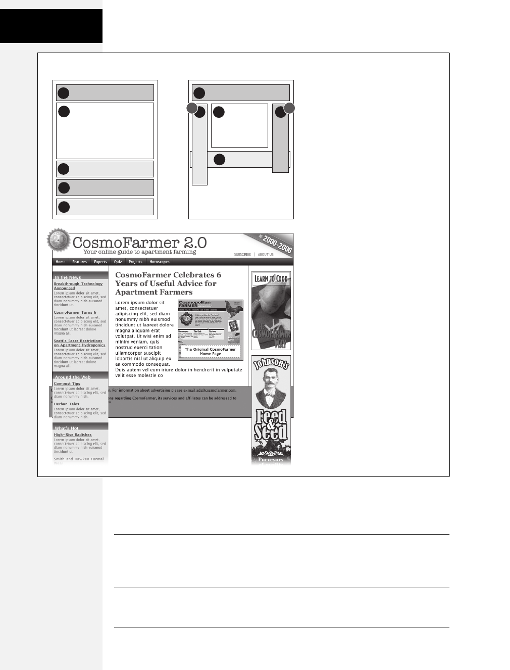
376 CSS: The Missing Manual
Powerful
Positioning
Strategies
Nevertheless, the idea behind frames is still useful, so CSS offers a positioning
value that lets you achieve the visual appearance of frames with less work. You can
see a page created using the fixed value in Figure 13-11.
Note: Fixed positioning doesn’t work with Internet Explorer 6 or earlier. However, with just a little extra
CSS (described in step 5 on page 375), you can make the page look fine in IE 6 (although the “fixed” ele-
ments end up scrolling along with everything else). And since Internet Explorer 7 and later do recognize
fixed positioning, you can use this technique and get similar results for almost all of your site’s visitors.
Figure 13-10:
If an absolutely positioned column is
longer than any statically positioned
content that needs to appear underneath
the column, overlap ensues. An easy fix in
this case is to indent the footer just as you
did the main content area (see step 6 in on
page 375).
5
1
43 2
AP AP
1banner
3left sidebar
4right sidebar
2
main content
5footer
HTML Source Order CSS Layout
Download at Boykma.Com

Chapter 13: Positioning Elements on a Web Page 377
Powerful
Positioning
Strategies
Fixed positioning works much like absolute positioning in that you use the left,
top, right, or bottom properties to place the element. Also like absolutely posi-
tioned elements, fixed positioning removes an element from the flow of the
HTML. It floats above other parts of the page, which simply ignore it.
Here’s how you can build the kind of page pictured in Figure 13-11, which has a
fixed banner, sidebar and footer, and a scrollable main content area:
1. Add <div> tags with ID attributes for each section of the page.
You can have four main <div> tags with IDs like banner, sidebar, main, and
footer (Figure 13-12). The order in which you place these tags in the HTML
doesn’t matter. Like absolute positioning, fixed positioning lets you place ele-
ments on a page regardless of their HTML order.
Figure 13-11:
Revisit the Web of yesteryear, but
with a lot less code. Using the
position property’s fixed value, you
can emulate the look of HTML frames
by fixing some elements in place but
still letting visitors scroll through the
content of a very long web page. The
scrollbar (circled) moves only the
large text area; the top and bottom
banners and the sidebar stay fixed.
Figure 13-12:
With fixed positioning, you can lock any number of page elements in place,
so they’re always in view when your visitor scrolls. In this example, the
header (1), sidebar (3), and footer (4) are fixed while the content in the
main area of the page (2) is free to scroll.
1
3
4
2#main
#banner
#sidebar
#footer
CSS Layout
Download at Boykma.Com

378 CSS: The Missing Manual
Powerful
Positioning
Strategies
Note: One exception: In order for the page to look normal for Internet Explorer 6 folks, the HTML for the
footer should appear below the HTML for the main content area, as you’ll see in step 5.
2. Add your material to each <div>.
In general, use the fixed divs for stuff a visitor should always have access to in
the areas you wish to be locked in place. In this example, the banner, sidebar,
and footer contain the site logo, global site navigation, and copyright notices.
The main content goes into the remaining <div> tag. Don’t add too much
information to a fixed <div>, however. If a fixed sidebar is taller than the visi-
tor’s browser window, he won’t be able to see the entire sidebar. And since fixed
elements don’t scroll, there’ll be no way (short of buying a bigger monitor) for
that visitor to see the sidebar content that doesn’t fit in his browser window.
3. Create styles for all fixed elements.
The left, right, top, and bottom values are relative to the browser window, so
just determine where on the screen you’d like them to go and plug in the values.
Specify a width for the elements as well.
Note: Unlike absolute positioning, fixed positioning is always relative to the browser window, even when
an element with fixed positioning is placed inside another tag with relative or absolute positioning.
The styles to position the elements numbered 1, 3, and 4 in Figure 13-12 look
like this:
#banner {
position: fixed;
left: 0;
top: 0;
width: 100%
}
#sidebar {
position: fixed;
left: 0;
top: 110px;
width: 175px;
}
#footer {
position: fixed;
bottom: 0;
left: 0;
width: 100%;
}
Download at Boykma.Com

Chapter 13: Positioning Elements on a Web Page 379
Powerful
Positioning
Strategies
4. Create the style for the scrollable content area.
Since fixed-positioning elements are removed from the flow of the HTML,
other tags on the page have no idea the fixed position elements are there. So, the
<div> tag with the page’s main content, for example, appears underneath the
fixed items. The main task for this style is to use margins to move the contents
clear of those areas. (The concept is the same as for absolutely positioned lay-
outs, as discussed on page 365.)
#main {
margin-left: 190px;
margin-top: 110px;
}
5. Fix the layout for Internet Explorer 6 and earlier.
IE 6 doesn’t understand fixed positioning. It treats fixed elements like static ele-
ments, in that it doesn’t try to place them in exact spots on the page. Depending
on how you’ve ordered your HTML, in IE 6 your page may just look weird,
with big margins between the banner and sidebar or worse—the navigation bar
and banner may end up below the main content.
The trick is to tell IE 6 to treat the fixed elements like absolutely positioned ele-
ments, which takes those elements out of the flow of the page and places them
in their rightful places in the browser window.
* html #banner { position: absolute; }
* html #sidebar { position: absolute; }
Note: These styles use the * html hack to hide their properties from browsers other than IE 6 and earlier
(see the box on page 169). You can also use IE’s conditional comments (page 433).
You’ll notice that the #footer style isn’t listed. You don’t want to position the
footer absolutely—otherwise it’ll travel up the browser window when scrolled,
sitting directly on top of the other scrolling content.
In this case, it’s best to have the footer appear at the bottom of the page and
scroll up into view, just as any unpositioned footer would. (That’s why, as men-
tioned in step 1, you should put the HTML for the footer below the HTML for
the main content so it appears at the bottom of the page in IE 6.)
This technique doesn’t make IE 6 handle fixed positioning correctly, but it at
least places the banner and sidebar in their proper places when the page loads.
When someone using IE 6 scrolls the page, the banner and sidebar scroll off the
top of the window like other content. In other words, in IE 6 your page works
like any ordinary web page, and in IE 7 or 8, Firefox, Safari, and Opera it works
even better.
Download at Boykma.Com
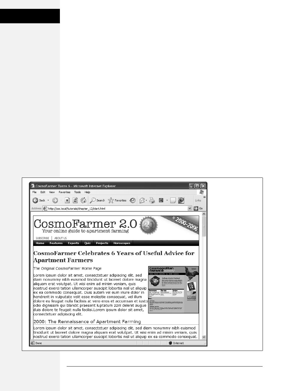
380 CSS: The Missing Manual
Tutorial: Positioning
Page Elements
Tutorial: Positioning Page Elements
This tutorial lets you explore a few different ways to use absolute positioning, like
creating a three-column layout, positioning items within a banner, and adding
captions on top of photos. Unlike the previous chapter, where you wrapped
chunks of HTML in <div> tags and added ID or class names to them, in these
exercises most of the HTML work has already been done for you. You can focus on
honing your new CSS skills.
To get started, download the tutorial files located on this book’s companion web-
site at www.sawmac.com/css2e/.
Enhancing a Page Banner
First, you’ll make some small but visually important changes to a page banner.
You’ll create styles that refer to HTML tags with IDs or classes applied to them.
(Again, that part has been taken care of for you.)
1. Launch a web browser and open the file 13 ➝index.html.
On this CosmoFarmer.com web page (Figure 13-13), start by repositioning
several parts of the banner.
Figure 13-13:
This page has it all—
banner, nav bar, main
story area, sidebar links,
and ads. But there’s not
much visual structure.
Just normal, static HTML
with everything running
from top to bottom of
the page. You can make
it more readable by
organizing the contents
into columns.
Download at Boykma.Com

Chapter 13: Positioning Elements on a Web Page 381
Tutorial: Positioning
Page Elements
2. Open the index.html file in a text editor. Place your cursor between the opening
and closing <style> tags.
Along with the <style> tags for an internal style sheet, the page already has an
attached external style sheet with some basic formatting. Start by moving the
small CosmoFarmer 2.0 badge to the left side of the banner. To help break up
the boxy look that’s typical of CSS designs, break this graphic out of the ban-
ner’s borders, so it looks like a slapped-on sticker.
3. In the internal style sheet, add this new style:
#banner #badge {
position: absolute;
left: -18px;
top: -18px;
}
The graphic is inside of a <div> with an ID of banner, and the graphic itself has
an ID of badge. This style positions the top left corner of the graphic 18 pixels to
the left and 18 pixels above the top of the page.
Preview the page now, and you’ll see a couple of problems. First, the graphic
hangs off the edge of the page but you really want it to hang off the edge of the
banner area. You’ll tackle that problem now.
4. Add this style above the one you just created:
#banner {
position: relative;
}
It’s good practice to place the CSS code for styles that control a general section
of a page (like this #banner style) above the code for styles that format just parts
of that section (like the style you created in step 3). Also, grouping styles for
related sections makes it easier to find styles when you need to analyze or edit a
page’s CSS. In this case, the #banner style goes first in the internal style sheet
because it applies to a large chunk of HTML. But you should keep the #banner
#badge style near it as you add more styles to the page. (You can read more
about techniques for organizing your CSS on page 416.)
The #banner style creates a new positioning context for any nested tags. In other
words, the relative setting makes any other positioned elements inside this tag
place themselves relative to the edges of the banner. This change in positioning
shifts the placement of the style you created in step 3. Now it’s 18 pixels above
and to the left of the banner box. The badge still hangs off the page just a little
bit, so you’ll add some margins around the page to accommodate the graphic.
Download at Boykma.Com
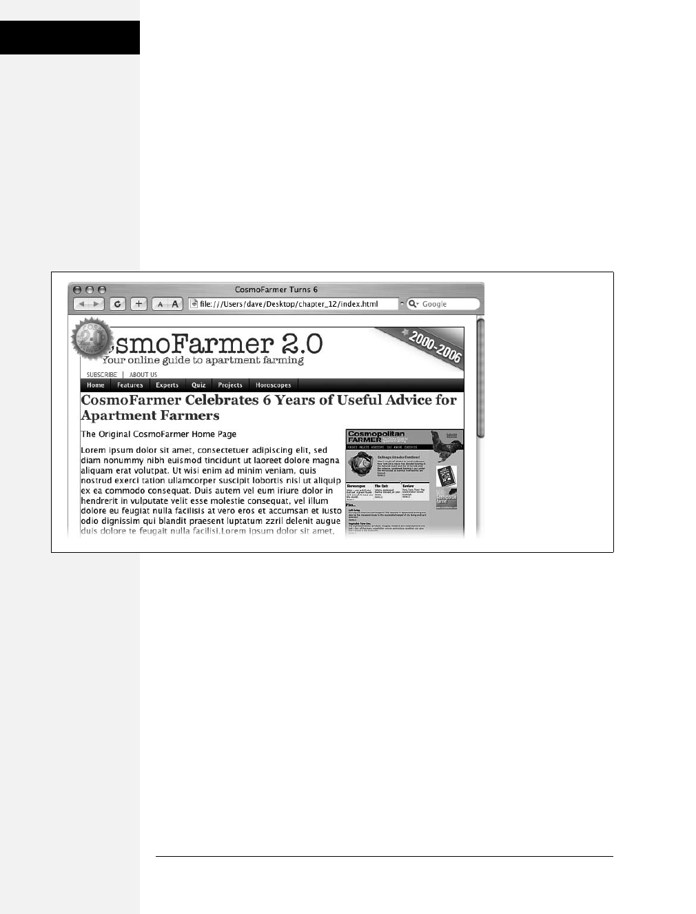
382 CSS: The Missing Manual
Tutorial: Positioning
Page Elements
5. Add a style for the body tag. Place it in the internal style sheet above the other
two styles you created:
body {
margin: 20px;
}
This margin adds enough space around the edges of the page so the entire
graphic is visible (Figure 13-14). But now you have another problem—the
CosmoFarmer logo is partially hidden underneath the badge. Overlapping ele-
ments is one of the hazards of absolute positioning. In this case, you can fix the
problem by adding a little margin to the logo.
6. Add a new style for the logo to the internal style sheet. Place it below the other
styles you’ve created so far:
#banner #logo {
margin-left: 60px;
}
Like the badge graphic, the logo already has an ID applied to it—logo. This style
moves the logo far enough to the left so that it’s out of the way of the absolutely
positioned graphic. However, a weird thing happens if you view this in Internet
Explorer 6 and 7: When you mouse over the navigation bar, the logo jumps
back to where it was before. Huh? Fortunately, the problem is easily fixed.
Figure 13-14:
Making a graphic break
out of a box, like the
CosmoFarmer badge in
the upper-left corner of
this banner, is a cinch
with absolute
positioning. By crossing
over the borderlines of
the banner, the graphic
helps soften the boxy
look of the rest of the
banner and lends
dynamic energy to
the design.
Download at Boykma.Com

Chapter 13: Positioning Elements on a Web Page 383
Tutorial: Positioning
Page Elements
7. Edit the #banner #logo style you just created by changing its positioning to relative:
#banner #logo {
margin-left: 60px;
position: relative;
}
Adding relative positioning doesn’t actually move the logo anywhere—that would
happen only if you added a left, top, right, or bottom value. For reasons known
only to Microsoft, though, it knocks IE upside the head and makes it behave.
The banner is looking good so far, but the two links—Subscribe and About Us—
look awkward sandwiched between the logo and the nav bar. There’s plenty of
space in the right side of the banner, so you’ll move them there. (The links are
actually an unordered list that gets its formatting from the page’s external style
sheet. See page 235 for details on how to turn an unordered list into a horizon-
tal navigation bar.)
8. Add this new style to the bottom of the internal style sheet:
#banner ul {
position: absolute;
right: 60px;
bottom: 5px;
}
This style is a descendent selector that targets unordered lists inside the ban-
ner. (There’s just one list in this case.) Since the <ul> is absolutely positioned,
it’s removed from the flow of the page, letting the nav bar scoot up just under
the banner.
Also, remember this tag is inside the banner, which you earlier set to a relative
position. Accordingly, the Subscribe and About Us links are positioned relative
to the tag. They’re placed an exact amount from the right and bottom edges of
the banner…unless you’re viewing this in—you guessed it—Internet Explorer 6
or earlier. As discussed on page 379, IE 6 has problems positioning elements
using the bottom coordinates of relatively positioned elements (like this ban-
ner). It ends up using the bottom coordinates of the entire page. Luckily, the fix
is easy.
Note: If you’re following along in IE 6, you can actually see the links in IE 6 if you scroll down to the very
bottom of the web page.
9. Edit the #banner style you created in step 4 and add zoom: 1;.
#banner {
position: relative;
zoom: 1;
}
Download at Boykma.Com
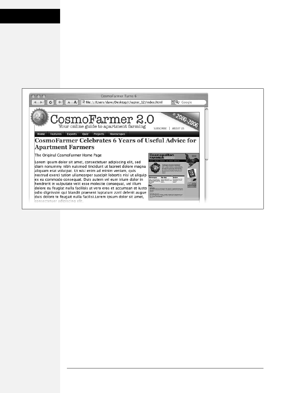
384 CSS: The Missing Manual
Tutorial: Positioning
Page Elements
These lines are more nonsense code that all browsers except Internet Explorer
just ignore (see the box on page 173 for the details).
10. Preview the page in a web browser.
The finished banner should look like Figure 13-15. This exercise is a good
example of using absolute positioning to achieve small, subtle changes that add
a lot to a page’s visual appeal.
Adding a Caption to a Photo
In Chapter 8, you learned one way to add a caption to a photo (page 203). In the
examples from that chapter, the captions sat underneath the photos, which is what
you want most of the time. But someday, you may want to add a caption directly
on a photo, like the subtitles TV news shows love to display across the lower third
of the screen.
1. Open index.html in your text editor.
Notice the graphic of the original CosmoFarmer home page. Currently it’s
aligned to the right using the align attribute of the <img> tag, but that’s so 2001.
You’ll align it using CSS instead, but first you need to edit some HTML.
2. Locate the <img> tag that inserts the graphic old_home.jpg, and then delete the
HTML code align="right".
Here’s what the entire tag looks like. You want to remove the part that’s bolded:
<img src="images/old_home.jpg" alt="The Original Cosmo Home Page"
height="186" align="right" />
Figure 13-15:
Absolute positioning is a
big help in placing small
elements like the
Subscribe and About Us
links in the right of the
banner. Unlike floats,
the exact position of the
links in the HTML code
isn’t important, giving
you a lot of layout
flexibility. You can
achieve the same effect
without absolute
positioning, but it would
be harder.
Download at Boykma.Com

Chapter 13: Positioning Elements on a Web Page 385
Tutorial: Positioning
Page Elements
Now that you’ve gotten rid of the old HTML, you need to create a container—a
<div> tag—to hold the CSS for both the image and its caption.
3. Immediately before the <img> tag, add <div class="figure">. After the closing
</p> of the caption (which appears right after the <img> tag), add the closing
</div>. When you’re done, the HTML should look like this:
<div class="figure">
<img src="images/old_home.jpg" alt="The Original Cosmo Home Page"
height="186"/>
<p>The Original CosmoFarmer Home Page</p>
</div>
All the code for the photo and caption are in one box that you can align and
format as a unit.
4. Create a style to format the newly added <div>:
#main .figure {
float: right;
width: 200px;
margin-bottom: 2px;
margin-left: 10px;
}
The properties in this style should be old news by now (especially if you read
Chapter 8). This style aligns the box to the right edge of the page, and the bot-
tom and left margins add a little space between the photo box and the text that
wraps around it.
The plan is to move the caption paragraph out of the normal flow of the page
and place it on top of the photo. To do so, you’ll position the caption relative to
the edges of the photo. However, since the <img> tag is self-closing (meaning it
doesn’t have both an opening and closing tag), you must position the caption
relative to another element. Here’s another use of the figure <div> you just
added—to provide the positioning context for the caption.
5. Add position: relative to the style you just created:
#main .figure {
float: right;
width: 200px;
margin-bottom: 2px;
margin-left: 10px;
position: relative;
}
Now you can position the caption relative to the <div>, which for all intents
and purposes is the same as positioning it relative to the photo.
Download at Boykma.Com

386 CSS: The Missing Manual
Tutorial: Positioning
Page Elements
6. Add a new style after the #main .figure style you created in the last step:
#main .figure p {
position: absolute;
width: 168px;
left: 10px;
bottom: 10px;
background-color: #FFF;
}
This new style positions the paragraph 10 pixels from the bottom and 10 pixels
from the left edge of the <div> tag. The width property constrains the para-
graph so it doesn’t span across the entire photo, and background-color makes
the text legible. All that’s left are a few formatting details to improve the look of
the caption.
7. Edit the style you just created, so that it looks like this:
#main .figure p {
position: absolute;
width: 168px;
left: 10px;
bottom: 10px;
background-color: #FFF;
border: 1px dashed #666666;
font-size: 13px;
font-weight: bold;
text-align: center;
padding: 5px;
margin: 0;
}
You need to attend to one small detail. It’s something you may never notice,
but some browsers position the caption just a few pixels lower than other
browsers. (To see for yourself, check the page out in IE and then in Firefox.)
Browsers position inline elements (like images) differently relative to the base-
line of other elements around them (page 158). At any rate, the fix is simple:
Using CSS, force the image to display as a block-level element.
8. Add one more style to the internal style sheet:
#main .figure img {
display: block;
}
Preview the page. The caption should appear centered across the lower portion
of the photo, as in Figure 13-16.
Download at Boykma.Com
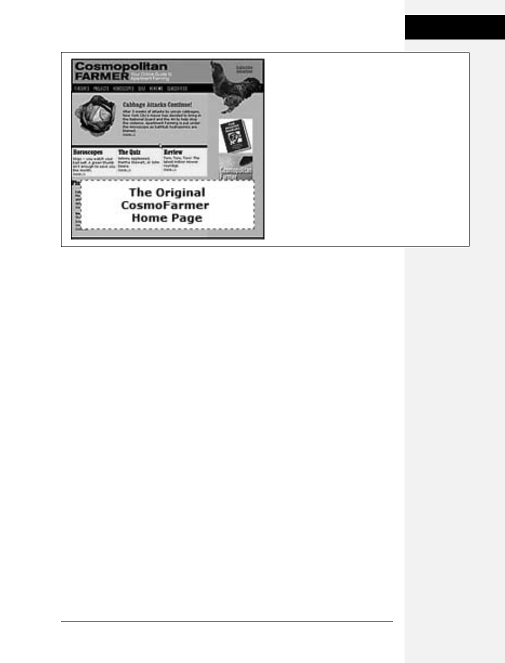
Chapter 13: Positioning Elements on a Web Page 387
Tutorial: Positioning
Page Elements
Laying Out the Page
Now it’s time to turn your attention to the structure of this page. As it is now, you
need to scroll down the page to read the latest news in the sidebar and scroll even
farther to see the ads. (Advertisers hate that.) In this section, you’ll use absolute
positioning to create a three-column flexible layout that brings all content up to
the top of the page (and keeps your sponsors from canceling their accounts).
Before you get started, get an overview of the page structure—see Figure 13-17.
Each section of the page is wrapped in its own <div> tag, with an appropriate ID
applied. The page’s main contents, sidebar, ads, and copyright notice are enclosed
in a <div> with the ID contentWrapper (#4 in Figure 13-17). All of the tags in the
page’s body are wrapped in a <div> with an ID of wrapper (1). That may seem like
a lot of <div> tags, but they each serve an important purpose.
Your mission is to arrange the three <divs> (sidebar, main, and adverts) into three
columns. You need to use absolute positioning on only two elements—the sidebar
and the advertising section (see #6 and #7 in Figure 13-17). You’ll take them out of
the normal flow of the page (where they appear near the bottom) and stick them at
the left and right edges of the page just below the banner. Absolute positioning also
causes those elements to float above the page, and on top of the main content area
(see #5). To make room for the sidebars, you have to add a little margin to the left
and right of the main area.
1. Create a style for the <div> tag that encloses the main contents of the page (#3
in Figure 13-17). Add it as the last style in the internal style sheet:
#contentWrapper {
clear: both;
position: relative;
}
Figure 13-16:
Only absolute positioning lets you layer one element on top
of another, like the caption on top of this photo.
Download at Boykma.Com
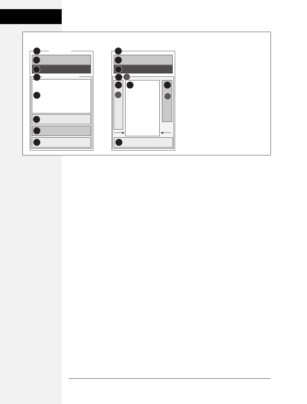
388 CSS: The Missing Manual
Tutorial: Positioning
Page Elements
The clear property helps the #contentWrapper clear the navigation bar, which
was created using a left float. (As explained on page 323, you should always
clear elements that need to appear under a float.)
The position property comes in handy for placing the sidebars. Setting its value
to relative lets you position both sidebars relative to the four edges of the con-
tent wrapper, not the four edges of the browser window. (See step 3 on page 373
for more on why this is useful.)
2. Create a style for the left sidebar, placing the CSS code under the style you
created in step 1:
#sidebar {
position: absolute;
}
This style takes the sidebar out of the normal flow of the page, but it doesn’t yet
position it anywhere. It’s still near the bottom of the page, but if you view it in a
browser, you’ll see it’s floating on top of the advertisements. To position it, use
the top and left properties.
3. Add top and left properties to the style you just created by:
#sidebar {
position: absolute;
top: 15px;
left: 0;
}
Figure 13-17:
The secret to absolutely positioned layouts—
less is more. Using the minimum amount of
positioning to get the job done isn’t only less
work, it also creates less troubleshooting for
different browsers. You usually need to
position only a couple of elements to create
a basic page layout. Use padding or
margins to handle other spacing issues (like
moving an item a few pixels to the left).
2
76
2#banner
3 3
#mainNav
6#sidebar
7#adverts
5
4 4
#main
5
8#copyright 8
AP AP
R
#contentWrapper
1#wrapper 1
HTML Source Order CSS Layout
Download at Boykma.Com

Chapter 13: Positioning Elements on a Web Page 389
Tutorial: Positioning
Page Elements
Since this sidebar is positioned relative to the content wrapper <div>, a left
position of 0places it flush with the left edge. The top value is determined by
aesthetic judgment (otherwise known as trial and error). A top value of 0would
make the sidebar touch the bottom of the nav bar; the 15 pixels of space bring
the sidebar’s top more in line with the story headline.
One thing is missing: Most of the time when you position something, you also
want to give it a width. That’s true in this case, since at this point the sidebar
spreads almost across the entire page, covering nearly all of the content.
4. Add a width to the #sidebar style.
The final style looks like this:
#sidebar {
position: absolute;
top: 15px;
left: 0;
width: 170px;
}
Next, repeat the process to position the advertising area of the page.
5. Add an #adverts style to the bottom of the style sheet:
#adverts {
position: absolute;
top: 15px;
right: 5px;
width: 125px;
}
This style works just like the one for the sidebar, except that you place the ads rel-
ative to the right edge of the page. That works much better than trying to put the
ads at some point relative to the left edge of the page. When you specify a right
value, the ads always stay the same distance from the right edge of the content
wrapper. If you change the width of the browser window, the ads stay in position.
At this point, the page should look like Figure 13-18, with both the sidebar and
ads covering the main story of the page. Adjust that main area’s margins to pre-
vent this overlap.
6. Below the #adverts style you just created, add a style for the main story area of
the page:
#main {
margin-left: 170px;
margin-right: 135px;
}
This #main style indents the main story area so that it clears the left and right
sidebars. Now just a few design enhancements remain.
Download at Boykma.Com
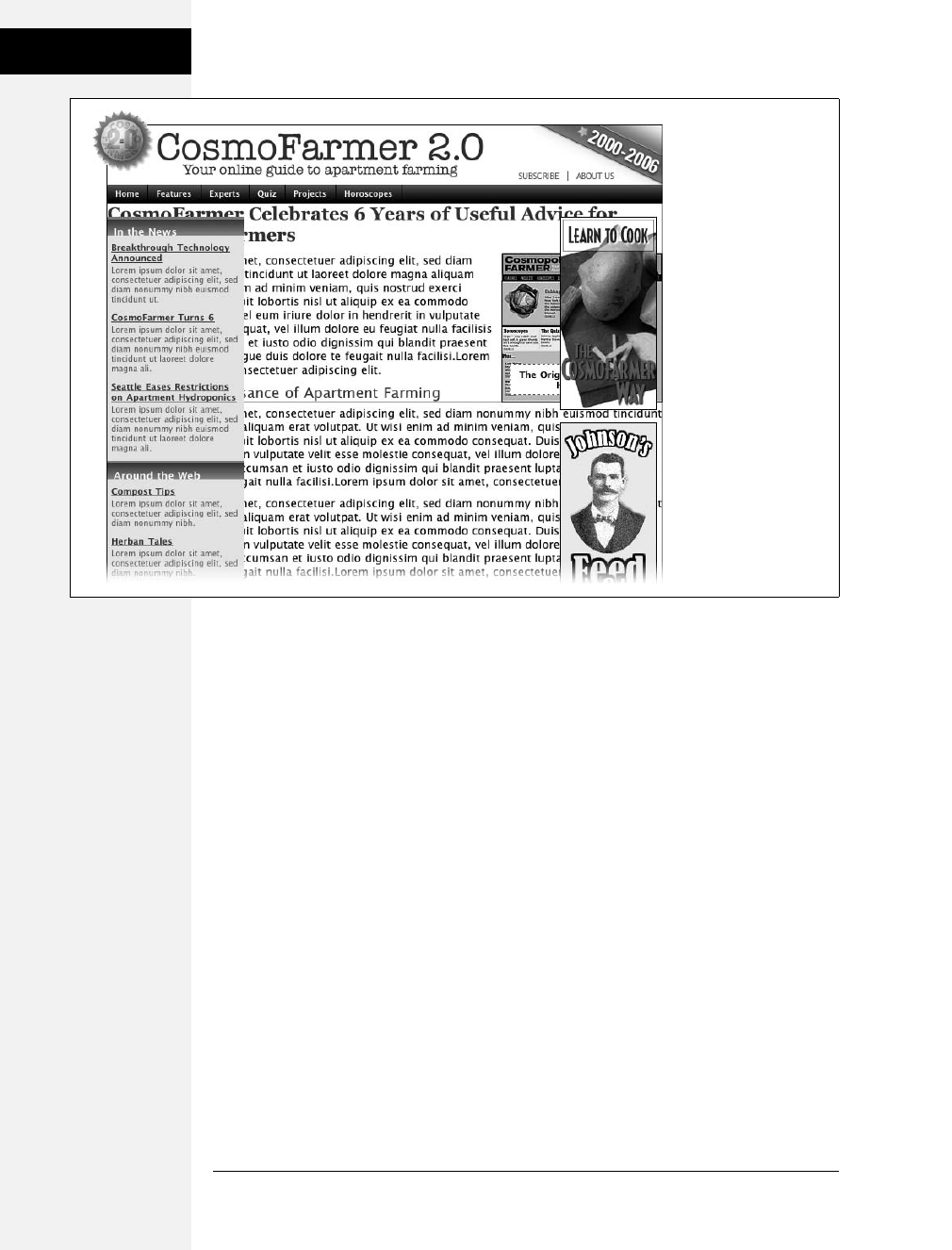
390 CSS: The Missing Manual
Tutorial: Positioning
Page Elements
7. Add some padding and borders to the #main style:
#main {
margin-left: 170px;
margin-right: 135px;
padding: 0 15px 15px 20px;
border: 1px solid #666666;
border-top: none;
border-bottom: none;
}
The padding adds some space inside of the div, so the text doesn’t touch the
sidebars or the bottom of the div. You can actually achieve the same thing by
increasing the left and right margins from the previous step, but this way you
also get to add a nice border to the left and right edges of the div, helping to
visually divide the three columns.
Notice the little productivity shortcut in this style. First, the border style declara-
tion sets up a border on all four edges of the div; next, the last two declarations
turn off the border at the top and bottom. You can achieve the exact same effect
with two style declarations (border-left and border-right), but then you’d have to
repeat the values (1px solid #666666). If you want to change the color, thick-
ness, or style of both borders, then you have to edit two properties. This way,
only one declaration takes care of both the left and right borders.
Figure 13-18:
Absolute positioning
can pose some
problems. Since
absolutely positioned
elements (like the two
sidebars here) float on
top of the page,
separate from the main
flow of the HTML, they
can cover up and hide
other elements.
Download at Boykma.Com
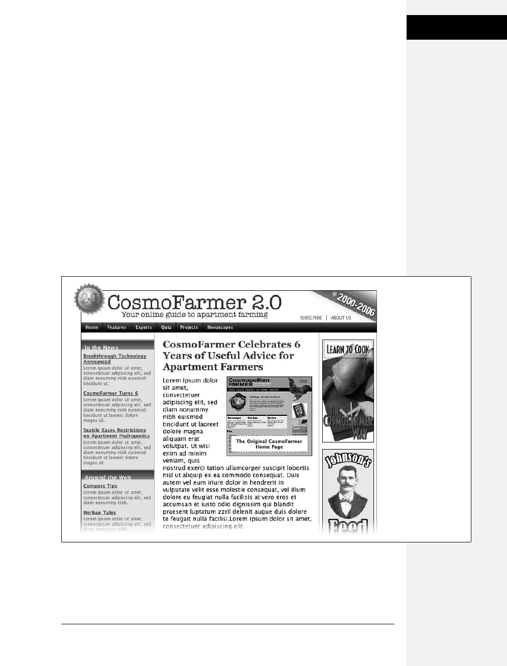
Chapter 13: Positioning Elements on a Web Page 391
Tutorial: Positioning
Page Elements
The layout is nearly complete. There’s just one last thing: When you preview
the page in IE 6, you see the left sidebar is off by a lot—185 pixels too far to the
right to be exact! Yep, another IE bug. Fortunately, there’s an easy fix. To make
the left sidebar line up and fly right (#4 in Figure 13-17), give its containing
<div> tag that mysterious IE-only property known as layout (see the box on
page 338).
8. Add a width to the #contentWrapper style:
#contentWrapper {
position: relative;
clear: both;
width: 100%;
}
The page now falls correctly into three columns (Figure 13-19), with fewer steps
than the modifications you made to the banner. Preview the page in a web
browser and expand the browser window. You’ll see the page’s flexible design
lets it fit any width window.
Figure 13-19:
Building a flexible,
three-column design
with absolute
positioning requires just
a few steps, but the
basic concept breaks
down to this: Position
the two outer columns,
and indent the left and
right margins of the
middle column.
Download at Boykma.Com

392 CSS: The Missing Manual
Tutorial: Positioning
Page Elements
If fixed-width designs are your cup of tea, the basic structure of this page makes
it easy to set a fixed width. Just set a width for the <div> that wraps all of the
other tags on the page (#1 in Figure 13-17) like this:
#wrapper {
width: 760px;
margin: 0 auto;
}
The margin property here, centers the layout in the middle of the page. If you
prefer to have the layout hug the left side of the browser window, just leave the
margin property out.
A completed version of this tutorial is in the 13_finished folder.
Download at Boykma.Com


Download at Boykma.Com

395
Chapter 14
chapter
14
CSS for the Printed
Page
Not everyone likes to sit in front of a computer and read. More and more, web
surfers are printing out pages for offline reading. Plenty of folks enjoy websites
while sitting at the dinner table, on a train, or lying on the grass in a park on a
sunny day. Printing out a receipt after making an online purchase is common as
well. So what becomes of your carefully crafted designs when the ink hits the
paper? White text on a black background can waste gallons of toner, and some
browsers may not even print the background. Do visitors really need to see your
site’s navigation bar on the printed page? Probably not.
Web designers used to solve this dilemma by creating separate printer-friendly ver-
sions of their sites—essentially creating a duplicate site formatted just for printing.
Not only is that a lot more work than building one version of the site, it also means
changing multiple files each time a page needs editing. Fortunately, CSS offers a bet-
ter way—the ability to make a page look one way when displayed on a screen and a
different way when printed (see Figure 14-1). The secret? Media style sheets.
How Media Style Sheets Work
The creators of CSS were pretty thorough when they envisioned all the different
ways people might view websites. They knew while most people view the Web
using a computer and monitor, sometimes people want to print out a page. In
addition, new web surfing devices like mobile phones, handhelds, and televisions
have their own unique requirements when it comes to web design.
Download at Boykma.Com

396 CSS: The Missing Manual
How Media Style
Sheets Work
To accommodate these different methods of surfing, CSS lets you create styles and
style sheets that specifically target a particular media type. CSS recognizes 10 differ-
ent media types: all, braille, embossed, handheld, print, projection, screen, speech, tty,
and tv. The browser applies the style sheet only when that media type is active. In
other words, the browser can apply one style sheet for the screen and a different
one when printing. Many of these media types are for very specialized applications
like a Braille reader for the blind, a speech reader (for those who want or need to
hear a page in spoken form), or a teletype machine. Most of these types don’t yet
work in the real world, as there are no devices programmed to understand them.
You should be aware, however, of three: all, screen, and print.
•All applies to every type of device. When a style or style sheet applies to all
media types, every device accessing the page uses those same styles. Printers and
monitors alike attempt to format the page the same way. (Styles actually work
this way already when you embed them in the page or link them from an exter-
nal style sheet, so you don’t need to specify “all media types” when adding a
style sheet to a page.)
•Screen styles display only on a monitor. When you specify the screen media
type, the browser ignores those styles when it prints the page. This media type
lets you isolate styles that look good on screen but awful on paper, like white
text on a black background.
•Print styles apply only when the page is printed. Print styles let you create styles
that use printer-friendly font sizes, colors, graphics, and so on.
Note: The Opera web browser understands the projection media type when it’s in Full Screen mode. For
a tutorial on this cool feature, visit www.opera.com/support/tutorials/operashow/.
One approach is to build styles with your monitor in mind first, and then attach
them using one of the methods described below (methods like internal or exter-
nal, linked or imported). At the outset, these styles work for both the monitor and
the printer. Then, you create a style sheet that applies only when printing. It over-
rides any of the main styles that negatively affect the look of the page when printed.
You’ll learn this technique starting on page 399. Alternatively, you can create two
different media style sheets—one for screen and the other for print—and attach
them to your web pages, as described next.
Tip: Another popular technique is to create three style sheets: one for the printer, one for the screen, and
a third with styles that should appear both on a monitor and when printed. You specify the media types
for the printer and screen style sheets and attach the third, shared set of styles as you would normally (see
page 398).
Download at Boykma.Com
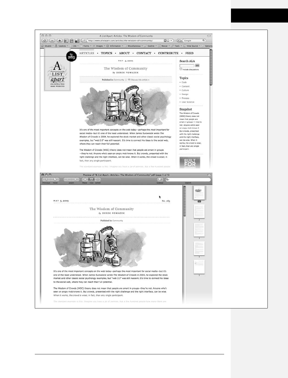
Chapter 14: CSS for the Printed Page 397
How Media Style
Sheets Work
Figure 14-1:
Using a printer style
sheet can save paper,
ink, and frustration by
letting visitors print just
the information they’re
after and leave unneeded
extras on the monitor. In
this example, a page
from the great web
development site, A List
Apart, looks nice
onscreen (top) and
simple, clean, and
informative when printed
(bottom). Notice how the
printed version expands
to fill the entire width of
the page and leaves
off logo, navigation,
and ads.
Download at Boykma.Com

398 CSS: The Missing Manual
How to Add Media
Style Sheets
How to Add Media Style Sheets
Media style sheets are simply CSS style sheets: They can be either internal or external.
However, when you want a web browser to apply the styles for only a particular
device such as a screen or printer, you need to add the style sheet to your web page
in a slightly different way than usual.
Specifying the Media Type for an External Style Sheet
To attach an external style sheet while specifying a particular media type, use the
<link> tag with a media attribute. To link a style sheet that should be used only for
printing, add this HTML to your web page:
<link rel="stylesheet" type="text/css" media="print" href="print.css"/>
Note: Technically, the rules of CSS also let you define a media type when using the @import method of
attaching an external style sheet (see page 38), like so: @import url(print.css) print;. But since Internet
Explorer refuses to understand this code, you should avoid using it.
If you don’t specify any media, a web browser assumes you’re targeting all media,
so it uses the style sheet for screen display, printing, and so on. In addition, you
can specify multiple media types by separating them with commas. A linked exter-
nal style sheet targeting multiple media might look like:
<link rel="stylesheet" type="text/css" media="screen, projection, handheld"
href="screen.css"/>
You probably won’t need to specify more than one until browsers start recognizing
multiple media types.
Tip: When you build and test printer style sheets, leave off the media="print" attribute and turn off any
screen-only style sheets. For example, change media="screen" to media="speech". This technique lets you
view the page in a web browser but have it display as if it were formatted for a printer. Once the printer style
sheet looks good, make sure to set its media type to print and turn on any screen-only style sheets.
Specifying the Media Type Within a Style Sheet
You can also include media-specific styles directly inside a style sheet using the
@media directive. Maybe you want to add a couple of print-specific styles to an
internal style sheet. Or perhaps you’d like to keep all your styles in a single exter-
nal style sheet and just add a few printer-only styles. You can do so using the
@media directive, like so:
@media print {
/* put your styles for the printer in here */
}
Download at Boykma.Com
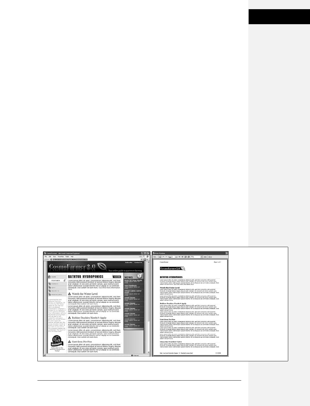
Chapter 14: CSS for the Printed Page 399
Creating Print Style
Sheets
Be careful to include that closing brace (on the last line), otherwise the directive
won’t work. Here’s an example of using @media to include two printer-only styles:
@media print {
h1 {
font-size: 24pt;
}
p {
font-size: 12pt;
}
}
Technically, it doesn’t really matter whether you put all styles in a single file and
use the @media method or put media-specific styles in their own external style
sheets (like screen.css, and printer.css). Putting all your printer-only styles in their
own external style sheet named something like printer.css makes it a lot easier to
find and edit styles for print only.
Creating Print Style Sheets
First, see how pages on your site print before embarking on a print-specific rede-
sign. Often, all the information on a web page prints without problems, so you
may not have to add a printer style sheet to your site. But in some cases, especially
when using heavy doses of CSS, pages look awful printed. For example, since web
browsers don’t print background images unless instructed to, you might end up
with large blank spaces where those background images were. But even if a page
looks the same in print as it does on the screen, you have many ways to improve
the quality of the printed version by adding custom printer-only styles (see
Figure 14-2).
Figure 14-2:
When printing a web
page, you really don’t
need navigation links or
information that’s not
related to the topic at
hand. With a printer style
sheet, you can eliminate
sidebars, navigation
bars, and other content
designed for web
browsing (left). The
result is a simply
formatted document—
perfect for printing
(right).
Download at Boykma.Com

400 CSS: The Missing Manual
Creating Print Style
Sheets
Tip: A quick way to see how a page will print without wasting a lot of paper and toner is to use your
browser’s Print Preview command. On Windows this is usually available from a web browser’s File ➝Print
Preview menu. On Macs, you usually first choose File ➝Print, and then click Preview in the window that
appears. Using Print Preview you can check to see whether a page is too wide to fit on one page and see
where page breaks occur.
Using !important to Override Onscreen Styling
As mentioned earlier, it’s often useful to create a style sheet without specifying a
media type (or by using media="all"). When you’re ready to define some print-
specific rules, you can just create a separate style sheet to override any styles that
don’t look good in print.
Say you’ve got an <h1> tag that’s styled to appear blue onscreen, and you’ve also
chosen rules controlling letter spacing, font weight, and text alignment. If the only
thing you want to change for your printed pages is to use black rather than blue,
then you don’t need to create a new style with a whole new set of properties. Just
create a main style sheet that applies in both cases and a print style sheet that over-
rides the blue color for the <h1> tag.
One problem with this approach is that you need to make sure the printer styles
actually do override the main style sheet. To do this successfully, you have to care-
fully manage the cascade. As discussed in Chapter 5, styles can interact in complex
ways: Several styles may apply to the same element, and those styles’ CSS properties
can merge and override each other. There’s a surefire way to make sure one prop-
erty trumps all others—the !important declaration.
When you add !important after the value in a CSS declaration, that particular
property overrides any conflicts with other styles. Add this rule to a print style
sheet to ensure that all <h1> tags print black:
h1 {
color: #000 !important ;
}
This h1 style overrides even more specific styles, including #main h1, h1.title, or
#wrapper #main h1 from the main style sheet.
Reworking Text Styles
You may not necessarily want to have text look the same onscreen as it does in
print. A good place to start when creating a printer style sheet is by modifying the
font-size and color properties. Using pixel sizes for text doesn’t mean much to a
printer. Should it print 12-pixel type as 12 dots? If you’ve got a 600 DPI printer,
that text will be illegibly small. And while bright green text may look good
onscreen, it may come out a difficult-to-read pale gray when printed.
Download at Boykma.Com

Chapter 14: CSS for the Printed Page 401
Creating Print Style
Sheets
Pixels and ems (page 120) make sense for onscreen text, but the measurement of
choice for printing is points. Points are how Word and other word-processing pro-
grams measure font sizes, and they’re what printers expect. In practice, most web
browsers translate pixel and ems to something more printer friendly anyway. The base
onscreen font size for most browsers—16-pixels—prints out as 12 points. But there’s
no consistent way to predict how every browser will resize text, so for maximum print-
ing control, set the font size specifically to points in your print style sheets.
To make all paragraphs print in 12-point type (a common size for printing), use
the following rule:
p {
font-size: 12pt;
}
Note: As with ems, you don’t add an ‘s’ when setting the font to a point size: 12pt not 12pts.
Likewise, screen colors don’t often translate well when printed on a black-and-white
laser printer. Crisp black text on white paper is much easier to read, for instance,
than light gray letters. What’s more, as you’ll see in the next section, white text on a
black background—though very legible onscreen—often doesn’t print well. To make
text most readable on paper, it’s a good idea to make all text print black. To make all
paragraph text black, add this style to your print style sheet:
p {
color: #000;
}
As mentioned on the previous page, if your print style sheet competes with styles
from another attached style sheet, then use !important to make sure your printer
styles win:
p {
font-size: 12pt !important;
color: #000 !important;
}
To make sure all text on a page prints black, use the universal selector (page 56)
and !important to create a single style that formats every tag with black text:
* { color: #000 !important }
Of course, this advice applies only if your site is printed out in black and white. If
you think most visitors to your site use color printers, then you may want to leave
all the text color in or change the colors to be even more vibrant when printed.
Download at Boykma.Com
402 CSS: The Missing Manual
Creating Print Style
Sheets
Styling Backgrounds for Print
Adding background images and colors to navigation buttons, sidebars, and other
page elements adds contrast and visual appeal to your web pages. But you can’t be
sure if the background will come through when those pages are printed. Because
colored backgrounds eat up printer ink and toner, most web browsers don’t nor-
mally print them, and most web surfers don’t turn on backgrounds for printing
even if their browser has this feature.
In addition, even if the background does print, it may compete with any text that
overlaps it. This is especially true if the text contrasts strongly with a colorful back-
ground on a monitor but blends into the background when printed on a black-and-
white printer.
Note: White text on a black background used to pose the biggest problem—your visitor would end up
with a blank white page. Fortunately, most current web browsers have the smarts to change white text to
black (or gray) when printing without backgrounds.
Removing background elements
The easiest way to take care of backgrounds is to simply remove them in your print
style sheet. Say you reverse out a headline so that the text is white and the back-
ground is a dark color. If the style that creates that effect is named .headHighlight,
then duplicate the style name in your print-only style sheet, like this:
.headHighlight {
color: #000;
background: #FFF;
}
This style sets the background to white—the color of the paper. In addition, to get
crisp printed text, this style sets the font color to black.
GEM IN THE ROUGH
Two Birds with One Stone
You can use the background-color property to set a back-
ground color to white like this: background-color: white.
You get the same effect using the background shorthand
method: background: white. Remember that the back-
ground property (page 199) can also specify a background
image, how the image repeats, and its position.
But when you leave out any values using the shorthand
method, the web browser resets to its normal value.
In other words, by omitting a background image value, the
browser sets that value to its normal setting—none. So a
declaration like background: white; not only sets the back-
ground color to white but also removes any background
images. By using the background shorthand property, you
kill two birds—setting a white background and removing
images—with very little code.
Download at Boykma.Com

Chapter 14: CSS for the Printed Page 403
Creating Print Style
Sheets
Leaving background elements in
If you don’t want to get rid of the background, you can leave it in and hope that
visitors set their browsers to print them. If you leave background elements in your
print style sheet and text appears on top of them, then make sure the text is legible
with the backgrounds on and off.
Another thing to consider when using background images: Do you need the image
to print out? Say you place a company’s logo as a background image of a <div> tag
used for the banner of a page. Because the logo is in the background, it may not
print. Your company or client may not be happy when every page printed from
their site lacks a logo. In this case, you’ve got a few options. You can insert the logo
as a regular <img> tag instead of a background image. This technique works, but
what if the logo looks great on a full-color monitor but no good at all when
printed on a black-and-white printer? Another technique is to leave the logo in as a
background image and add another, more printer-friendly logo using the <img>
tag. You then hide that <img> tag onscreen but show the printer-friendly logo
when printed. Here’s how:
1. Add the <img> tag to your HTML in the spot where you want it to appear
when printed:
<img src="logo.png" height="100" width="100" id="logo" />
2. Then, in the main style sheet (the one that applies when the page is displayed
on screen), add a style that hides that image:
#logo { display: none; }
3. In the print style sheet, add one last style to display the image:
#logo { display: inline; }
Now that logo won’t appear on screen, but will when printed.
Tip: If you want to be absolutely sure that a background image prints, there’s another tricky CSS
workaround for overcoming a browser’s reluctance to print background images. You can find it here: http:
//web-graphics.com/mtarchive/001703.php.
Hiding Unwanted Page Areas
Web pages are often loaded with informational and navigational aids like naviga-
tion bars, sidebars full of helpful links, search boxes, and so on. These elements are
great for surfing the Web, but don’t do much good on a piece of paper. Your web
pages may also contain ads, movies, and other doodads that people don’t like to
waste expensive ink and toner on. You can do your visitors a favor by stripping
these onscreen frills out of the content they really want to print.
Download at Boykma.Com

404 CSS: The Missing Manual
Creating Print Style
Sheets
As you learned in of the third part of this book, one way to lay out a page is to
wrap <div> tags around different layout elements—banner, main navigation, con-
tent, copyright notice, and so on. By styling each <div> using floats or absolute
positioning, you can place various page elements right where you want them. You
can use that same structure to create a print-only style sheet that hides unwanted
elements using the display property.
By setting the display value to none, you can make a web browser remove a styled
element from a page. So to prevent a sidebar from printing, simply redefine that
style in a print style sheet and set its display property to none:
#sidebar {
display: none;
}
POWER USERS’ CLINIC
Revealing Links in Print
Imagine a coworker hands you a printout of a fascinating
article she found on the Web. You’re reading along and
come to this passage: “And that’s when I found the secret
to eternal life here.” The underline tells you there’s a click-
able link that reveals the secret. But on a piece of paper, of
course, you have no way to follow where the link leads.
To prevent this conundrum on your own pages, you can
make linked URLs print along with the rest of the text:
“secret to eternal life here (http://www.pyramind_scam.
com).” Using an advanced selector—:after—and an
advanced CSS property called content, you can print text
that doesn’t appear onscreen at the end of a styled ele-
ment. Unfortunately, the :after selector and content prop-
erty trick doesn’t work in Internet Explorer 7 or earlier. But
it does work in Internet Explorer 8, Firefox, Safari, and
Opera, so you can at least spell out URLs for the benefit of
visitors using those browsers.
To do so, add a style to the print style sheet that prints the
URL after each link.
You can even add other text items like parentheses to make
it look better:
a:after {
content: " (" attr(href) ") ";
}
However, this CSS doesn’t distinguish between external or
internal links, so it also prints unhelpful document-relative
links to other pages on the same site: “Visit the home page
(../../index.html).” Using an advanced attribute selector
(page 67), you can force the style to print only absolute
URLs (the ones that begin with http://), like so:
a[href^="http://"]:after {
content: " (" attr(href) ") ";
}
Fortunately, even though this technique uses yet-to-be-
finalized CSS 3 rules, all browsers that understand the :after
selector and content property understand this advanced
attribute selector.
If you use root-relative links on your site, you can use
another technique to print the correct, full URLs. See this
article for more information: www.alistapart.com/articles/
goingtoprint.
Download at Boykma.Com

Chapter 14: CSS for the Printed Page 405
Creating Print Style
Sheets
For most pages, you want the print style sheet to display only the most basic infor-
mational elements—like the logo, the main content, and a copyright notice—and
hide everything else. You can easily hide multiple elements with a group selector,
like so:
#banner, #mainNav, #sidebar, #ads, #newsLinks {
display: none;
}
Remember, these styles go into your print style sheet, not the main style sheet. Other-
wise, you’d never see the navigation, banner, or other important areas of your page
onscreen. However, at times you might want to hide something from your main
style sheet and reveal it only when printed.
Say you place your site’s logo as a background image inside the banner area of a
page. You may want to do this to have text or links appear on top of an empty area
of the logo graphic. You (or your boss or client) certainly want the logo to appear
on any printed pages, but since not all browsers print background images, you can’t
be sure the logo will appear when printed. One solution is to insert an <img> tag
containing a modified, printer-friendly version of the logo graphic; add an ID to the
image; create an ID style in the main style sheet with the display property set to
none; and then set the display property for the same ID style in the print style sheet
to block. Voilà! The logo appears only when printed.
Adding Page Breaks for Printing
Version 2.1 of the Cascading Style Sheet standard includes many CSS properties
aimed at better formatting a printed web page: from setting the orientation of the
page to defining margins and paper size. (You can see the full list at www.w3.org/
TR/CSS21/page.html.) Unfortunately, today’s web browsers recognize very few of
these print styles.
Two widely recognized properties are page-break-before and page-break-after.
Page-break before tells a browser to insert a page break before a given style. Say
you want certain headings to always appear at the top of a page, like titles for dif-
ferent sections of a long document (see Figure 14-3). You can add page-break-
before: always to the style used to format those headings. Likewise, to make an
element appear as the last item on a printed page add page-break-after: always to
that element’s style.
The page-break-before property is also useful for large graphics, since some browsers
let images print across two pages, making it a little tough to see the whole image at
once. If you have one page with three paragraphs of text followed by the image,
then the browser prints part of the image on one page and the other part on a sec-
ond page. You don’t want your visitors to need cellophane tape to piece your
image back together, so use the page-break-before property to make the image print
on a new page, where it all fits.
Download at Boykma.Com
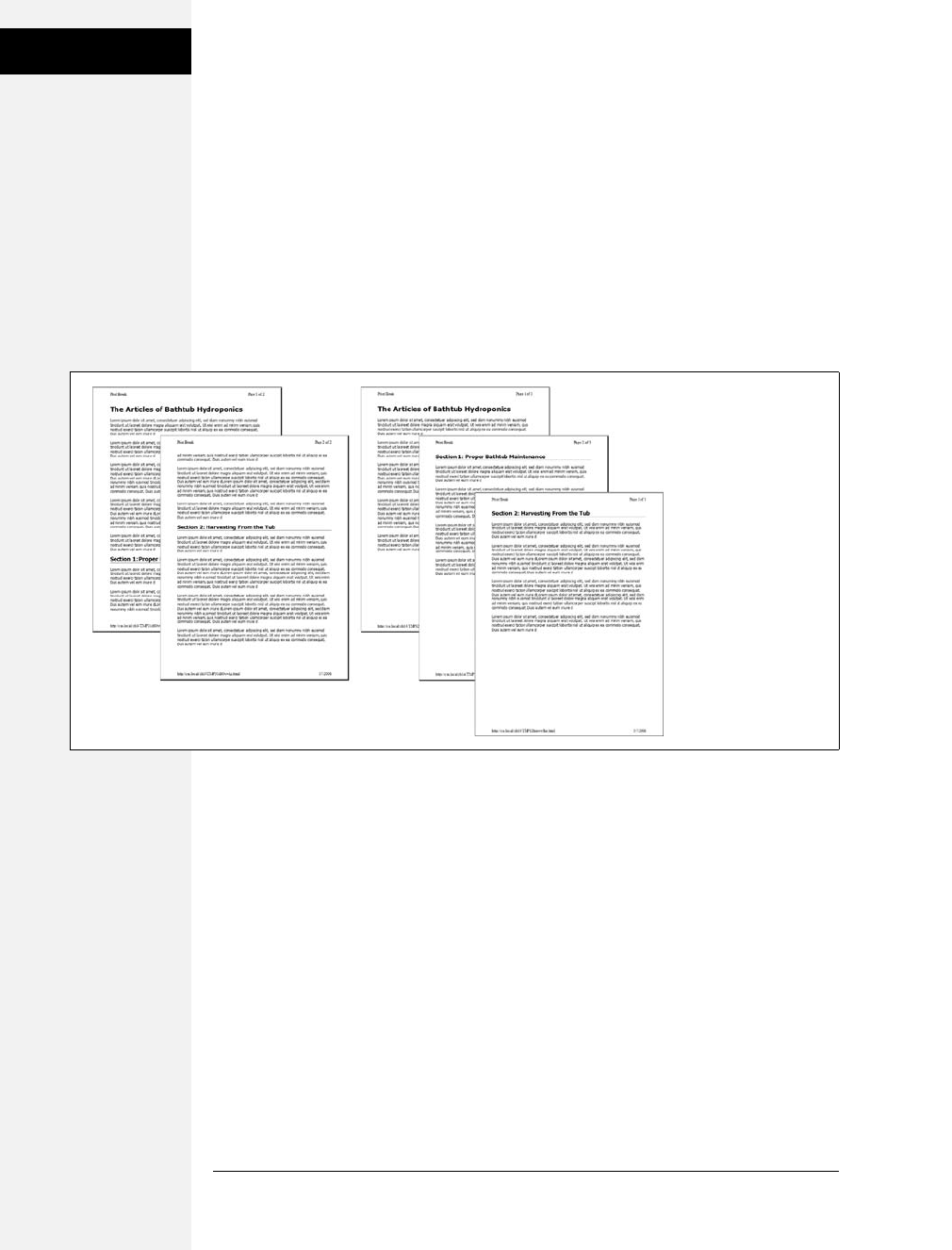
406 CSS: The Missing Manual
Tutorial: Building a
Print Style Sheet
Here’s a quick way to take advantage of these properties. Create two class styles
named something like .break_after and .break_before, like so:
.break_before { page-break-before: always; }
.break_after { page-break-after: always; }
You can then selectively apply these styles to the elements that should print at the
top—or bottom—of a page. If you want a particular heading to print at the top of
a page, then use a style like this: <h1 class="break_before">. Even if the element
already has a class applied to it, you can add an additional class like this: <h1
class="sectionTitle break_before">. (You’ll learn about this useful technique in the
next chapter on page 418.)
Tutorial: Building a Print Style Sheet
In this tutorial, you’ll create a print style sheet. To make the printed version of a
web page look better, you’ll add styles that remove unwanted page elements and
backgrounds, change text formatting, and print the URLs attached to any links on
the page.
To get started, download the tutorial files from this book’s companion website at
www.sawmac.com/css2e/. Click the tutorial link, and then download the files. All of
the files are in a Zip archive, so you need to unzip them first. (You’ll find detailed
instructions on the website.) The files for this tutorial are in the 14 folder.
Remove Unneeded Page Elements
To get started, you first need to understand how the page is laid out so you can
decide which elements you want printed.
Figure 14-3:
Normally when printing
a web page, a browser
breaks the content into
multiple pages to fit as
much content on each
page as possible (left).
But if you want to put
page breaks in more
attractive and logical
places, then use the
page-break-before
property (right).
Download at Boykma.Com

Chapter 14: CSS for the Printed Page 407
Tutorial: Building a
Print Style Sheet
1. Launch a web browser and open 14 ➝print.html.
This web page is a float-based layout consisting of several <div> tags (see
Figure 14-4). In all likelihood, anyone printing this page is most interested in
the main content—the large central body of text. Printing the navigation bar
and sidebar is just a waste of toner, so your print style sheet should hide these
parts of the page.
2. In a text editor, create a new file named print.css and save it along with the
main style sheet in the css folder inside the 14 folder.
In your new print style sheet, the first order of business is to hide the naviga-
tion bar and other parts of the page that you don’t want to print.
3. Using the display property, create a new group selector that hides the navigation
elements and sidebar, like so:
#sidebar, #navWrapper, #footerNav {
display: none;
}
With the display property set to none, web browsers hide those elements so they
won’t print. But first you need to attach this external style sheet to your web
page so browsers can find it.
4. In your text editor, open 14 ➝print.html.
This page already has an attached style sheet—main.css. This external style sheet
provides all of the formatting for the page when it’s displayed in a browser.
Also, since the style sheet is attached using the <link> tag with no media
attribute specified, it applies when the page is printed as well. Your print style
sheet, then, needs to override any styles from the main.css file that won’t look
good in print. The first step in that process is attaching the print style sheet after
the main.css file in the html of this page.
5. Locate the <link> tag in the head of the page used to attach the global.css file.
Insert a blank line after that tag, and then add the following:
<link href="css/print.css" rel="stylesheet" type="text/css" media="print" />
If properties from two styles with the same name conflict, the properties from
the style sheet last linked on the page wins, so this <link> must go after the other
<link>. That way, if the main.css file has a class named .copyright that creates
white, 10-pixel type on a black background, you can create another style named
.copyright in the print style sheet with black, 12-point type on a white back-
ground. Even though the two styles share the same name, the properties from
the print style sheet win because it’s the last one linked. (See page 96 for more
detail on this cascading rule.)
Download at Boykma.Com
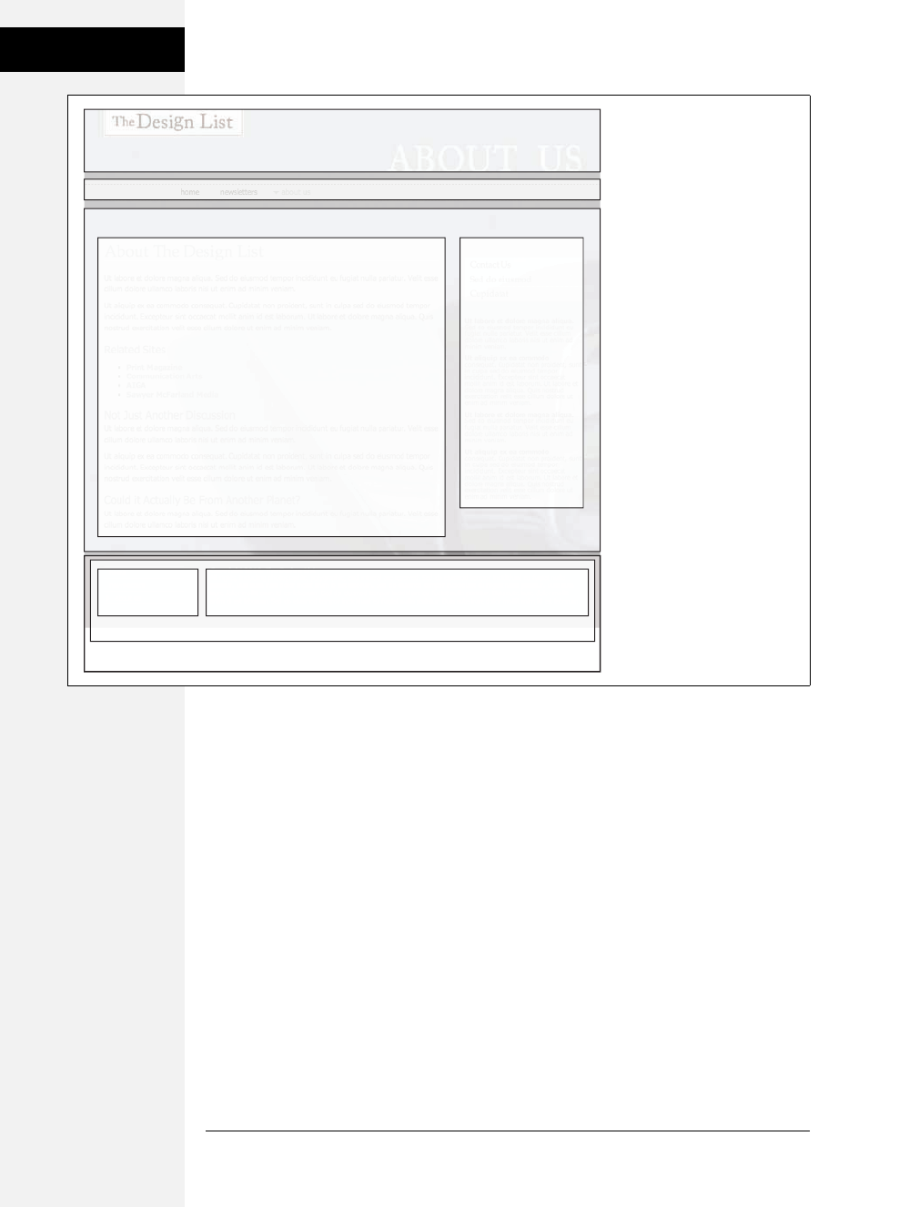
408 CSS: The Missing Manual
Tutorial: Building a
Print Style Sheet
6. Save the print.css and print.html files, and then preview print.html in a web
browser.
The page should look no different than it did in step 1 above. That’s because
you haven’t printed it yet. You can see the effect of the print style sheet by using
your browser’s Print Preview command.
7. If you’re using Windows, choose File ➝Print Preview. Mac fans should choose
File ➝ Print, and then, in the Print window that appears, click the Preview button.
In the Print Preview window, you’ll see that the right sidebar and navigation
have disappeared. But the design still doesn’t look that great. The main content
doesn’t fill the page as it should. You’ll fix that—and a few other things—next.
Figure 14-4:
CSS layout lets you control the
placement of elements on a
page. When printing a page,
some elements are better off
not appearing at all. The
banner, sidebar, and
navigation elements don’t add
useful information to a printed
document.
#banner
#sidebar#main
#footerWrapper
#footer
#navWrapper
#mainWrapper
#footerNav #footerMain
Download at Boykma.Com

Chapter 14: CSS for the Printed Page 409
Tutorial: Building a
Print Style Sheet
Adjusting the Layout
Currently, the main content and the footer copyright notice don’t fit the printed
page correctly: The main content stops short of the right edge of the page, while
the copyright is indented from the left edge. Both would look better if they filled
the entire printable area.
Two styles are currently controlling the layout. In Figure 14-4, you can see that the
page is divided into several areas, each created with a separate <div> tag. The
#mainWrapper and #footer are both used to center and set a width of 900 pixels for
the main content area and the footer area. In addition, the #main style has a set
width, while the #footerMain style has a left margin. Since you don’t know what
size paper this page might be printed on, you should get rid of all widths and
remove any margins.
1. Return to your text editor and the print.css file. Add one new group style to
remove widths and margins of the areas of the page that will be printed:
#banner, #mainWrapper, #footer, #main {
width: auto;
margin: 0;
padding: 0;
}
The first declaration—width:auto—affects several areas of the page. It overrides
the 900-pixel width setting for the main text and footer in the main.css file and
leaves the exact width up to the web browser. Auto simply lets the <div> fill the
entire available width, so no matter the paper size—letter, A4, or whatever—the
content fills the width of the printed page. The two other declarations, margin
and padding, remove any space around these divs.
The copyright content, contained inside a <div> with the ID footerMain,
doesn’t have a set width, but it does have a left margin—that indent will look
strange when printed, so you should get rid of it.
2. Add another style to the print.css style sheet:
#footerMain {
margin: 0;
}
While you’ve hidden the right sidebar, which is positioned using a float, the
main content is still floated—it doesn’t have to be for the printed page.
3. Add another style to the print.css style sheet:
#main {
float: none;
}
Download at Boykma.Com

410 CSS: The Missing Manual
Tutorial: Building a
Print Style Sheet
Other problems can arise when printing a float-based layout. As described on
page 326, floated elements can pop out of the bottom of their containers, pre-
venting backgrounds and borders from showing properly. One solution: add
the declaration overflow: hidden; to the containing block’s style. However, hiding
overflowing content can sometimes cause printed material to not show up. So,
you need to turn that off for two styles:
4. Add another style to the print.css style sheet:
#mainWrapper, #footer {
overflow: visible;
}
This style ensures that content inside those two divs is fully displayed.
There are also a few background colors and images sprinkled throughout the
page. Sometimes background images and colors print out, but often they don’t.
It all depends on the browser and the visitor’s settings. Some browsers don’t
print background elements at all; others can print them but give folks the
option of turning them on or off. Printing backgrounds is useful when it’s
important for the printed page to look just like the screen version. But when
you have backgrounds that would only be a distraction and a waste of ink, do
your visitors a favor and disable them.
5. Add another style to the print.css style sheet:
html, body, #banner, #footerWrapper {
background: #FFF;
}
When viewed onscreen, this page has various background colors and images.
The banner, for example, has a background image for the “About Us” tag and
the footer area has a purple background color. This style sets the background
color of the page and banner to white and removes the graphic. (See page 402
for the story on why the background image disappears as well.)
The banner area containing the site logo also doesn’t look very good in print.
That area is too tall, since it was expanded to hold a background image that
won’t appear in print. So you’ll adjust the height—and while you’re at it, you’ll
improve the overall look of this top section by centering the logo and adding
lines above and below it.
6. Add a new style to the print.css file:
#banner {
height: auto;
text-align: center;
border-bottom: 2pt solid #000;
border-top: 2pt solid #000;
padding: 10pt 0;
margin-bottom: 15pt;
}
Download at Boykma.Com

Chapter 14: CSS for the Printed Page 411
Tutorial: Building a
Print Style Sheet
The first property eliminates the height of the banner, letting it size itself based
on the content of the <div>. In other words, it will just be as tall as the logo
graphic inside it. The text-align property centers the logo for a refined, classic
look. The border settings add lines above and below the logo, while the pad-
ding adds space between the logo and the borders. Note these styles use pt
(points), since that’s a more normal way of measuring items for print.
Feel free to save this file, preview the print.html file in a web browser, and use
the Print Preview function to see how the printed version’s coming along.
Reformatting the Text
While colored text and pixel-sized fonts may work on the screen, laser printers
understand point sizes better. Also, solid black text looks better on white paper. In
this section, you’ll adjust the text accordingly to look better in print.
1. In the print.css file, add the following CSS rule:
* {
color: #000000 !important;
}
This style is the CSS equivalent of a sledgehammer. It essentially tells every tag
to use black text no matter what. The * (universal selector) is a quick way of
specifying a style for every single element on a page, while the !important decla-
ration cancels out any conflicts caused by the cascade. So even though * isn’t a
very specific style, the color property here trumps the same property in much
more specific styles like #main h1 or #nav #mainNav a.
Next you’ll set new font sizes for the text.
2. Add the following three styles:
h1 {
font-size: 30pt !important;
}
h2 {
font-size: 16pt !important;
}
p, li {
font-size: 11pt !important;
}
These styles make each of these tags use a more printer-friendly font size. The
addition of !important makes these sizes always apply to those tags regardless of
any style conflicts with the main.css style sheet.
Note: In this case, h1, h2, p, and li are the only tags that print from the print.html page. Your pages may
require you to redefine text sizes for other tags like blockquote, other headlines and so on.
Download at Boykma.Com

412 CSS: The Missing Manual
Tutorial: Building a
Print Style Sheet
Just for fun, add a couple of styles to change the font size of the copyright notice
and add a borderline above it.
3. Add the following two styles:
#footerMain {
margin-top: 15pt;
border-top: 1pt solid #000;
padding-top: 5pt;
}
#footerMain p {
font-size: 9pt !important;
}
The CSS properties in these styles should all be old hat by now. They adjust
space above the footer, add a borderline, add some space between the border
and the copyright, and make the copyright notice text smaller. Notice the
!important declaration in the #footerMain p style. You need to add this because
the pstyle from step 2 has !important as well. Because #footerMain p has greater
specificity (see page 96 for more on this concept) than p, its !important declara-
tion wins out.
Displaying URLs
For a final flourish, you’ll add one more style that prints the URL next to the text
of each link on the page. That way, the onscreen text “Click here to find out more”
will print as “Click here to find out more (http://www.outmore.com)” so anyone
reading the printed version can visit the site referenced by the link. This technique
uses some advanced CSS that Internet Explorer 6 and 7 doesn’t understand, but it
doesn’t do any harm in those browsers, either. And it is a great enhancement for
visitors who print from your site with IE 8, Firefox and Safari.
1. Add one last style to the print.css style sheet:
a:after {
content: " (" attr(href) ") ";
}
In the content: line, this style adds the URL (the attr(href) part) at the end of
each link (the a:after part).
2. Save the print.css file. In your browser, open cosmo.html and print it.
The printed page should look something like Figure 14-5—a simple, barebones,
just-the-facts page.
You’ll find a completed version of the page in the 14_finished folder.
Download at Boykma.Com
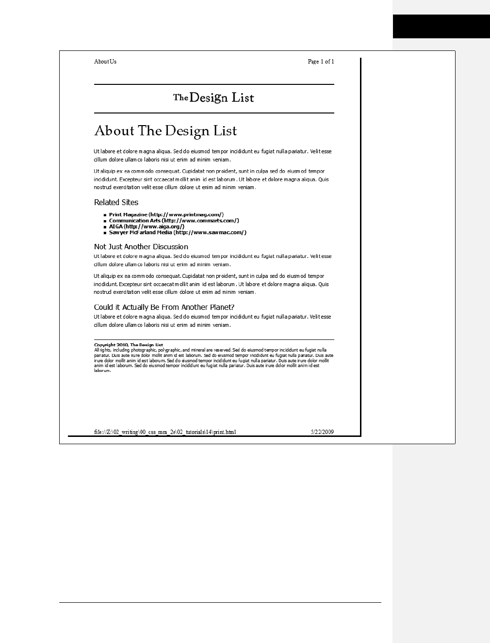
Chapter 14: CSS for the Printed Page 413
Tutorial: Building a
Print Style Sheet
Figure 14-5:
Its looks aren’t much to
write home about, but
this page’s simplicity
makes it perfect for
printing. It’ll earn you the
appreciation of visitors
who are looking for a
clean presentation of the
facts, free from
navigation buttons, ads,
and toner-wasting
background images.
Download at Boykma.Com

Download at Boykma.Com

415
Chapter 15
chapter
15
Improving Your
CSS Habits
At this point, we’ve covered most aspects of Cascading Style Sheets. With the addition
of CSS-based layout, which you learned about in Part 3, you’re now an unstoppable
web-designing machine. But even after you’ve mastered all the properties CSS
offers, nailed those annoying browser bugs, and learned great tricks for producing
beautiful web pages, you can still stand to learn a few techniques that’ll make your
CSS easier to create, use, and maintain.
This chapter covers some recommendations for creating and using CSS. None of
them count as “must know” CSS essentials, but they can make your CSS work go
faster, leading to less frustration and greater productivity.
Adding Comments
When it’s time to edit a style sheet weeks, months, or even years after creating it,
you may find yourself wondering, “Why did I create that style? What does it do?”
As with any project, when building a website, you should keep notes of what you
did and why. Fortunately, you don’t need a pad of paper to do this. You can
embed your notes right into your style sheets using CSS comments.
A CSS comment is simply a note contained within two sets of characters, /* and */.
As with HTML comments, CSS comments aren’t read or acted on by a web
browser, but they do let you add helpful reminders to your style sheets. Say you
created a style intended to solve an Internet Explorer bug:
* html .imageFloat {
display: inline;
}
Download at Boykma.Com
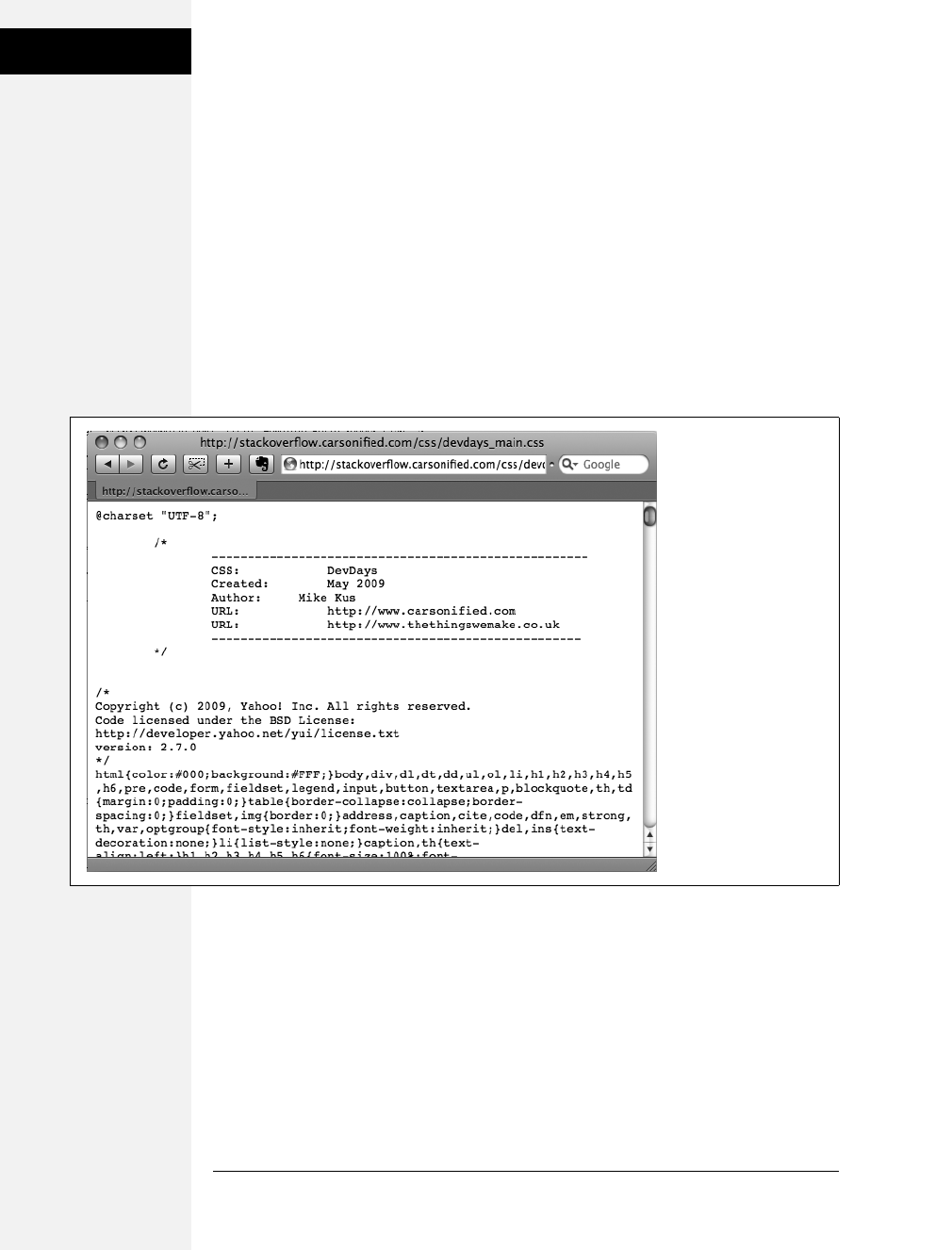
416 CSS: The Missing Manual
Organizing Styles
and Style Sheets
At the time you wrote the style, you knew what you were doing, but will you still
remember three months later? Add a comment and it’ll be easy for you or some-
one else who needs to work on the site to figure out what the style does and why it
was created:
/* Fix IE 6 double-margin bug */
* html .imageFloat {
display: inline;
}
If you have a lot to say, comments can span multiple lines as well. Just begin with /*,
type all the comments you’d like, then end with */. This is handy when adding
background information at the beginning of a style sheet, as pictured in
Figure 15-1.
Organizing Styles and Style Sheets
You’ve learned a lot in this book about creating styles and style sheets. But when
you’re designing a site that’s meant to last, you can incorporate a few other steps to
help you out in the future. The day will come when you need to change the look of the
site, tweak a particular style, or hand off your hard work to someone else who’ll be in
charge. In addition to leaving notes for yourself and others, a little planning and orga-
nization within your CSS will make things go more smoothly down the road.
Figure 15-1:
CSS comments can help
you identify your styles
for later editing. You can
also use them to provide
helpful introductory
information that lets you
keep track of the version
of the site or style sheets,
add copyright
information, and identify
yourself as the CSS
master behind it all.
Download at Boykma.Com

Chapter 15: Improving Your CSS Habits 417
Organizing Styles
and Style Sheets
Name Styles Clearly
You’ve already learned the technical aspects of naming different types of selec-
tors—class selectors begin with a . (period) to identify the styles as a class, and ID
styles begin with the # symbol. In addition, the names you give IDs and classes
must begin with a letter and can’t contain symbols like &, *, or !. But beyond those
requirements, following some rules of thumb can help you keep track of your
styles and work more efficiently:
Name styles by purpose not appearance
It’s tempting to use a name like .redhighlight when creating a style to format eye-
catching, fire-engine-red text. But what if you (or your boss or your client) decide
that orange, blue, or chartreuse look better? Let’s face it: a style named .redhigh-
light that’s actually chartreuse is confusing. It’s better to use a name that describes
the purpose of the style. For example if that “red” highlight is intended to indicate
an error that a visitor made while filling out a form, then use the name .error.
When the style needs to alert the visitor of some important information, a name
like .alert would work. Either way, changing the color or other formatting options
of the style won’t cause confusion, since the style’s still intended to point out an
error or alert the visitor—regardless of its color.
Don’t use names based on position
For the same reason you avoid naming styles by appearance, you should avoid
naming them by position. Sometimes a name like #leftSidebar seems like an obvi-
ous choice—“I want all this stuff in a box placed at the left edge of the page!” But
it’s possible that you (or someone else) will want the left sidebar moved to the
right, top, or even bottom of the page. All of a sudden, the name #leftSidebar
makes no sense at all. A name more appropriate to the purpose of that sidebar—
like #news, #events, #secondaryContent, #mainNav—serves to identify the sidebar
no matter where it gets moved. The names you’ve see so far in this book—#gal-
lery, .figure, .banner, #wrapper and so on—follow this convention.
The temptation is to use names like #header and #footer (for elements that always
appear at the top or bottom of the page,for example) since they’re so easily under-
stood, but you can often find names that are better at identifying the content of an
element—for example, #branding instead of #header. On the other hand, some-
times using a name with position information does make sense. For example, say
you wanted to create two styles, one for floating an image to the left side of a page
and another for floating an image to the right side. Since these styles exist solely to
place an image to the left or right, using that information in the style names makes
sense. So .floatLeft and .floatRight are perfectly legitimate names.
Download at Boykma.Com

418 CSS: The Missing Manual
Organizing Styles
and Style Sheets
Avoid cryptic names
Names like .s, #s1, and #s2 may save you a few keystrokes and make your files a bit
smaller, but they can cause trouble when you need to update your site. You could
end up scratching your head, wondering what all those weird styles are for. Be suc-
cinct, but clear: .sidebar, #copyright, and #banner don’t take all that much typing,
and their purpose is immediately obvious.
Note: For more tips on naming styles, check out www.stuffandnonsense.co.uk/archives/whats_in_a_name_
pt2.html. You can also learn a lot from checking out the naming conventions used on other sites. The Web
Developer’s Toolbar, discussed in the box in on page 424, gives you a quick way to reveal the style names.
Use Multiple Classes to Save Time
Often, two or more items on a web page share many similar formatting properties.
You may want to use the same border styles to create a frame around a bunch of
images on a page. But there may be some formatting differences between those
items as well. Maybe you want some images to float to the left and have a right
margin, while some photos float to the right and have a left margin (Figure 15-2).
The most obvious solution is to create two class styles, each having the same bor-
der properties but different float and margin properties. You then apply one class
to the images that should float left and another to the images that should float
right. But what if you need to update the border style for all of these images? You’ll
need to edit two styles, and if you forget one, the images on one side of the page
will all have the wrong frames!
Figure 15-2:
Top: The page as
originally
formatted.
Bottom: In this
case, both photos
have the same
style applied to
them, thus
creating the
border effect. The
left image, in
addition, has
another class style
applied, causing it
to float left; the
right image also
has a second class
applied to it
floating that photo
to the right.
Download at Boykma.Com

Chapter 15: Improving Your CSS Habits 419
Organizing Styles
and Style Sheets
There’s a trick that works in all browsers that not all designers take advantage of—
multiple classes applied to the same tag. This just means that when you use the class
attribute for a tag, you add two (or more) class names like this: <div class="note
alert">. In this example, the <div> tag receives formatting instructions from both
the .note style and the .alert style.
Say you want to use the same border style for a group of images, but some of the
images you want floating left and others you want floating right. You’d approach
the problem like this:
1. Create a class style that includes the formatting properties shared by all the
images.
This style could be called .imgFrame and have a 2-pixel, solid black border
around all four edges.
2. Create two additional class styles, one for the left floated images and another
for the right floated images.
For example, .floatLeft and .floatRight. One style would include properties
unique to one set of images (floated left with a small right margin), while the
other style includes properties specific to the second group of images.
3. Apply both classes to each tag, like so:
<img src="photo1.jpg" height="100" class="imgFrame floatLeft" />
or
<img src="photo1.jpg" height="100" class="imgFrame floatRight" / >
At this point, two classes apply to each tag, and the web browser combines the
style information for each class to format the tag. Now if you want to change
the border style, then simply edit one style—.imgFrame—to update the borders
around both the left and right floated images.
Note: You can list more than two classes with this method; just make sure to add a space between each
class name.
This technique is useful when you need to tweak only a couple of properties of one
element, while leaving other similarly formatted items unchanged. You may want a
generic sidebar design that floats a sidebar to the right, adds creative background
images, and includes carefully styled typography. You can use this style through-
out your site, but the width of that sidebar varies in several instances. Perhaps it’s
300 pixels wide on some pages and 200 pixels wide on others. In this case, create a
single class style (like .sidebar) with the basic sidebar formatting and separate
classes for defining just the width of the sidebar—for example, .w300 and .w200.
Then apply two classes to each sidebar: <div class="sidebar w300">.
Download at Boykma.Com

420 CSS: The Missing Manual
Organizing Styles
and Style Sheets
Organize Styles by Grouping
Adding one style after another is a common way to build a style sheet. But after a
while, what was once a simple collection of five styles has ballooned into a massive
150-style CSS file. At that point, quickly finding the one style you need to change is
like looking for a needle in a haystack. (Of course, haystacks don’t have a Find
command, but you get the point.) If you organize your styles from the get-go,
you’ll make your life a lot easier in the long run. There are no hard and fast rules
for how to group styles together, but here are two common methods:
•Group styles that apply to related parts of a page. Group all the rules that apply
to text, graphics, and links in the banner of a page in one place. Then group the
rules that style the main navigation in another, and the styles for the main con-
tent in yet another.
•Group styles with a related purpose. Put all the styles for layout in one group,
the styles for typography in another, the styles for links in yet another group,
and so on.
Using comments to separate style groups
Whatever approach you take, make sure to use CSS comments to introduce each
grouping of styles. Say you collected all the styles that control the layout of your
pages into one place in a style sheet. Introduce that collection with a comment like
this:
/* *** Layout *** */
or
/* --------------------------
Layout
--------------------------- */
As long as you begin with /* and end with */, you can use whatever frilly combina-
tion of asterisks, dashes, or symbols you’d like to help make those comments easy
to spot. You’ll find as many variations on this as there are web designers. If you’re
looking for inspiration, then check out how these sites comment their style sheets:
www.wired.com,www.mezzoblue.com, and http://keikibulls.com. (Use the Web
Developer’s Toolbar described in the box on page 424 to help you peek at other
designers’ style sheets.)
Tip: For a method of naming comments that makes it easy to find a particular section of a style sheet
you’re editing, check out www.stopdesign.com/log/2005/05/03/css-tip-flags.html.
Download at Boykma.Com

Chapter 15: Improving Your CSS Habits 421
Organizing Styles
and Style Sheets
Using Multiple Style Sheets
As you read in Chapter 14, you can create different style sheets for different types
of displays—maybe one for a screen and another for a printer. But you may also
want to have multiple onscreen style sheets, purely for organizational purposes.
This takes the basic concept from the previous section—grouping related styles—
one step further. When a style sheet becomes so big that it’s difficult to find and
edit styles, it may be time to create separate style sheets that each serve an individ-
ual function. You can put styles used to format forms in one style sheet, styles used
for layout in another, styles that determine the color of things in a third, another
style sheet for keeping your Internet Explorer hacks, and so on. Keep the number
of separate files reasonable since having, say, 30 external CSS files to weed through
may not save time at all.
At first glance, it may seem like you’ll end up with more code in each web page,
since you’ll have that many more external style sheets to link to or import—one
line of code for each file. Ah, but there’s a better approach: Create a single external
style sheet that uses the @import directive to include multiple style sheets.
Figure 15-3 illustrates the concept.
Here’s how to set up this type of arrangement:
1. Create external style sheets to format the different types of elements of your site.
For example a color.css file with styles that control the color of the site, a forms.css
file that controls form formatting, a layout.css file for layout control, and a
main.css file that covers everything else (see the right side of Figure 15-3).
Figure 15-3:
Let a single
external style
sheet serve as
gatekeeper for
your site’s CSS.
Each HTML page
in the site can link
to a single CSS file
(base.css in this
example). The
HTML never has
to change, even if
you want to add
or remove
additional
external style
sheets. Just
update the base.
css file by adding
or removing
@import
directives.
Download at Boykma.Com

422 CSS: The Missing Manual
Organizing Styles
and Style Sheets
Note: These suggestions are just a few possibilities. Organize your styles and style sheets in whatever
way seems most logical and works best for you. For more suggestions, check out this article on modular
CSS design: www.contentwithstyle.co.uk/content/modular-css.
2. Create an external style sheet and import each of the style sheets you created in
step 1.
You can name this file base.css, global.css, site.css, or something generic like that.
This CSS file won’t contain any rules. Instead use the @import directive to
attach the other style sheets like this:
@import url(main.css);
@import url(layout.css);
@import url(color.css);
@import url(forms.css);
That’s the only code that needs to be in the file, though you may add some
comments with a version number, site name, and so on to help identify this file.
Note: For a better way to attach an “IE-only” style sheet, see page 433.
3. Finally, attach the style sheet from step 2 to the HTML pages of your site using
either the <link> tag or the @import method. (See page 37 for more on using
these methods.) For example:
<link rel="stylesheet" href="base.css" type="text/css" />
Now, when a web page loads, the browser loads base.css, which in turn tells the
browser to load the four other style sheets.
It may feel like there’s a whole lot of loading going on here, but once the browser
has downloaded those files and stored them in its cache, it won’t have to retrieve
them over the Internet again. (See the box on the next page.)
There’s another benefit to using a single external style sheet to load several other
style sheets: If you decide later to further divide your styles into additional styles
sheets, then you won’t have to muck around with the HTML of your site. Instead,
just add one more @import directive to that gatekeeper style sheet (see step 2). If
you decide to take all the styles related to type out of the main.css file and put them
in their own type.css file, then you won’t need to touch the web pages on your site.
Simply open the style sheet with all of the @import directives in it and add one
more: @import url(type.css).
This arrangement also lets you have some fun with your site by swapping in different
style sheets for temporary design changes. Say you decide to change the color of
your site for the day, month, or season. If you’ve already put the main color-defining
styles into a separate color.css file, then you can create another file (like summer_
fun.css) with a different set of colors. Then, in the gatekeeper file, change the
@import directive for the color.css file to load the new color style file (for example,
@import url(summer_fun.css)).
Download at Boykma.Com
Chapter 15: Improving Your CSS Habits 423
Eliminating Browser
Style Interference
Eliminating Browser Style Interference
When you view a web page that hasn’t been “CSS-ified” in a web browser, HTML
tags already have some minimal formatting: headings are bold, the <h1> tag is big-
ger than other text, links are underlined and blue, and so on. In some cases, differ-
ent web browsers apply slightly different formatting to each of these elements. You
may experience some frustrating “it almost looks the same in Internet Explorer and
Firefox and Safari” moments.
Note: Firefox actually uses a CSS style sheet to format HTML tags. To see it on a Mac, locate the Firefox
application file, right-click it and then select “Show package contents.” Then navigate to Contents ➝MacOS
➝res and open the html.css file in a text editing program. In Windows, you’ll find that file at C:\Program
Files\Mozilla Firefox\res\html.css. As you can see, it takes a lot of styles to make regular HTML look boring.
POWER USERS’ CLINIC
A Pain in the Cache
The web browser’s cache is usually every website owner’s
friend. As discussed on page 35, the cache makes sure fre-
quent visitors to your site don’t have to download the same
file over and over again, which would slow down their
experience and increase your web hosting bills. However,
the cache can be a pain when it’s time to update your site’s
appearance. For example, if all of the pages in your site ref-
erence an external style sheet named main.css, then visitors
to your site will cache that file. However, when you update
that file with all new styles and a completely new look and
feel for your site, previous visitors to your site may continue
to access the old style sheet from their hard drive instead of
the new main.css file you’ve updated.
Eventually, a visitor’s cache will clear and they’ll get the new
CSS file, but you have one simple way to defeat the cache—
by updating the <link> tag on each HTML page. Normally a
<link> tag to an external style sheet looks like this:
<link rel="stylesheet" type="text/css"
href="main.css">
However, if you add a query string after the name of the .
css file (for example, main.css?v=1), then a web browser
will see the file as main.css?v=1 and not just main.css. If
you change the number after the v= whenever you change
the external style sheet, then browsers consider that a new
file and will download the external style sheet from the web
server instead of using the cached site.
For example, suppose when you launch your site, the main.css
file is the first version of the site’s CSS. You can then use this
link:
<link rel="stylesheet" type="text/css"
href="main.css?v=1">
Then when you update the main.css file, you change the
<link> to this:
<link rel="stylesheet" type="text/css"
href="main.css?v=2">
The web browser considers this different from the cached
version of the main.css file and downloads the file from the
web server. In reality, the ?v=1 doesn’t do anything—it
doesn’t affect how your web server works, for example. It’s
a way of telling a web browser to redownload the file.
The downside of this technique is that you must update the
<link> tag for every HTML file on your site. If you’re com-
fortable with PHP, there’s a more automated way to handle
this problem: http://ikeif.net/2009/03/27/stop-caching-
files-php-function.
Download at Boykma.Com
424 CSS: The Missing Manual
Eliminating Browser
Style Interference
POWER USERS’ CLINIC
The Web Developer’s Toolbar
Web designers have to stay on top of a lot of things: HTML,
CSS, links, graphics, forms, and so on. Troubleshooting
problems with any of these items can sometimes be a real
challenge. The Web Developer’s Toolbar (http://
chrispederick.com/work/webdeveloper), created by Chris
Pederick, is a Firefox extension that’s like the Swiss Army
knife of web design (see Figure 15-4). If you don’t have
Firefox, you should install it for this toolbar alone (www.
mozilla.com/firefox).
Download the extension, install it, and spend a little time
with the different options. You have many features avail-
able to you, but here are a few worth noting:
•Choose CSS ➝View CSS, and you’ll see all of the
styles for the current page, even styles imported
from multiple style sheets. If you’ve ever been to a
website and wondered, “How’d they do that?” this
tool gives you a free backstage tour.
•Choose CSS ➝Edit CSS, and you can edit the
styles of the current web page. This doesn’t do any
permanent damage to the real web page, but it does
let you tweak a page’s styles and immediately see
the results.
• The Information menu provides a wealth of detailed,
and often geeky, under-the-hood details. The Display
Block Size option displays the dimensions of block-
level elements such as tables and divs. Display Ele-
ment Information provides info on any element you
hover over (including HTML attributes, CSS proper-
ties, and its position on the page). And Display Id &
Class Details is a great way to see the names of styles
applied to tags on the page. Use it to see how other
sites name their <div> tags.
• The Tools menu gives you access to online tools for
validating HTML and CSS, and even checking links.
These tools work only for pages that are online, not
ones you’re currently working with on your computer.
Microsoft offers a similar tool for Internet Explorer. You can
find it by visiting www.microsoft.com and entering IE Devel-
oper Toolbar in the search box.
Figure 15-4:
The Web Developer’s
Extension is a must-have
tool for any web designer.
This Firefox extension lets
you view the styles of any
site on the Web, identify
the structure of a page’s
HTML, find out more
information on how any
element on a page is
styled, validate a page and
its CSS in one easy
operation, and even edit
the CSS of a page and see
how the changes you
make affect the
appearance of the page.
Download at Boykma.Com
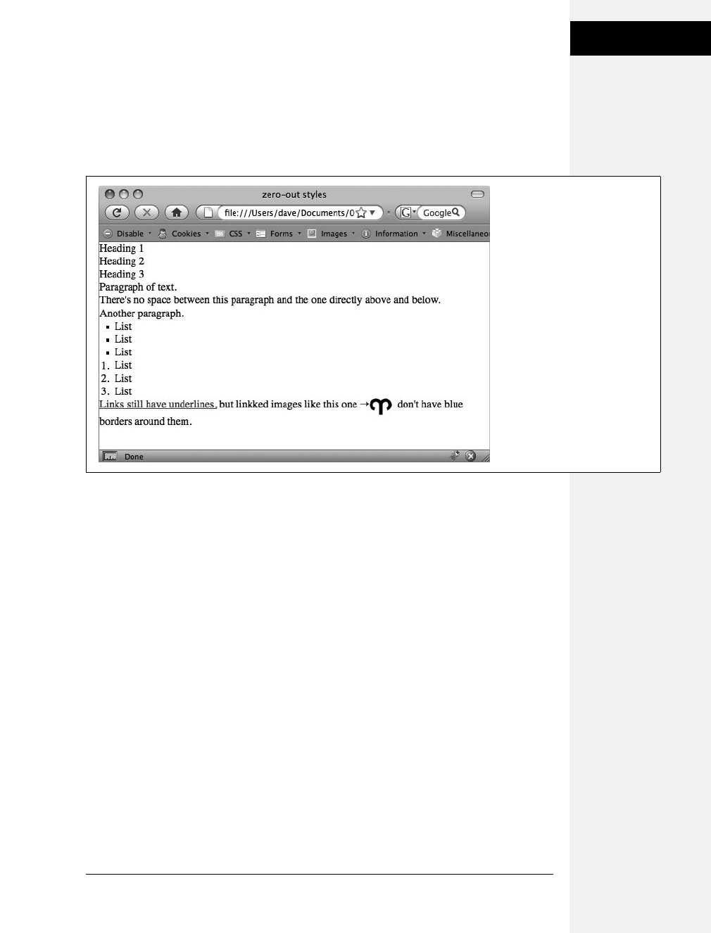
Chapter 15: Improving Your CSS Habits 425
Eliminating Browser
Style Interference
As discussed on page 102, to deal with these browser differences, it’s a good idea to
“zero out” the formatting for commonly used tags so your audience can see the
beautiful styling you worked so hard to create (see Figure 15-5). All you have to do
is set up some basic styles at the beginning of your style sheet that remove the
offensive formatting.
Here are some things you may want to do to make browsers stop meddling with
your designs:
•Remove padding and margins. Browsers add top and bottom margins to most
block-level elements—the familiar space that appears between <p> tags, for
example. This can cause some weird display issues like when the exact margin
amount is inconsistently applied across browsers. A better approach is to
remove padding and margins from the block-level tags you use, and then pur-
posely add the amount you want by creating new styles.
•Apply consistent font sizes. While text inside a <p> tag is displayed as 1em,
web browsers apply different sizes to other tags. You can force all tags to be 1em
to begin with, and then create additional styles with specific font sizes for the
different tags. That way, you stand a much better chance of getting consistent
font sizes across browsers.
•Improve table borders and create consistent table cells. As you read on page
276, applying a border to of a table cell usually creates an unpleasant gap
between cell borders and doubles up the borders between cells. You should get
rid of both the space and the extra borders. In addition, the <th> and <td> tag
are given different alignments and font weights.
Figure 15-5:
Doesn’t look like much, and
that’s the point! Eliminate
browser display differences by
“zeroing out” the normal
browser styles. Then create your
own—and better—styles to add
margins, padding, and font sizes
that are consistent across
browsers.
Download at Boykma.Com

426 CSS: The Missing Manual
Eliminating Browser
Style Interference
•Remove borders from linked images. Internet Explorer, Firefox, and other
browsers add a colored border around any image inside of a link. If you’re like
most people, you find this border both unattractive and unnecessary. Remove it
and start fresh.
•Set consistent list indents and bullet types. Different browsers indent bulleted
and numbered lists in different ways, and you’ll even find the type of bullet used
can vary between browsers. It’s good to set a consistent indent and bullet type.
•Remove quote marks from quoted material. If you ever use the <q> tag to
identify a quote (<q>To err is human</q> for example), then you may have
notice that some browsers (Firefox, Safari) automatically add quote marks (' ')
around the quote and some (Internet Explorer 6 and 7) don’t. And even within
the browsers that do add quote marks, the type of mark added varies; for exam-
ple, IE 8 inserts single quotes (' '), while Firefox adds double quotes (" "). For a
consistent presentation, it’s best to remove these quote marks.
To put these ideas into action, here are a few basic styles you can add at the beginning
of your style sheet:
html, body, h1, h2, h3, h4, h5, h6, p, ol, ul, li, pre, code, address,
variable, form, fieldset, blockquote {
padding: 0;
margin: 0;
font-size: 100%;
font-weight: normal;
}
table {
border-collapse: collapse;
border-spacing: 0;
}
td, th, caption {
font-weight: normal;
text-align: left;
}
img, fieldset {
border: 0;
}
ol {
padding-left: 1.4em;
list-style: decimal;
}
ul {
padding-left: 1.4em;
list-style:square;
}
q:before, q:after {
content:'';
}
Download at Boykma.Com

Chapter 15: Improving Your CSS Habits 427
Using Descendent
Selectors
The first two styles here are group selectors that apply the same formatting to every
one of the tags listed. Add these styles to the beginning of your style sheet, and
then, further down the style sheet, override them on a case-by-case basis. After
zeroing out the margins and font-size for the <h1> tag, you may want to give the
<h1> tag a specific top margin value and font size. Just add another style, like so:
h1 {
margin-top: 5px;
font-size: 2.5em;
}
Thanks to the cascade (see Chapter 5), as long as this h1 style appears in the style
sheet after the group selector (the reset style that removes the margins and changes
the font size), the new values take precedence.
You’ll find the file reset.css in the 15 folder inside the tutorials folder. Just copy the
code from that file into your own style sheets.
Note: Web luminary Tantek Celic is often credited with introducing the very useful technique of undoing
the standard web browser formatting of HTML. You can see his basic set of undo styles at http://tantek.
com/log/2004/undohtml.css.
Using Descendent Selectors
Classes and IDs are great for marking specific tags for styling. For example, you
can add a class to a paragraph—<p class="intro">—and pinpoint just that one
paragraph with its own look as determined by the .intro class style. Trouble is, it’s
so easy to add a class or ID to a tag, lots of designers tend to add classes and IDs to
everything (well, almost everything). The pros even have a diagnosis for this dis-
ease—classistis. Adding a class to every tag is not only a waste of your time, it also
makes your HTML slower to download. Most important, there’s a better way to
exert pinpoint control over your tags without resorting to too many classes or
IDs—descendent selectors.
Descendent selectors are a powerful tool for efficient website building. As dis-
cussed in Chapter 3, they let you pinpoint the tags you want to style with greater
accuracy than tag styles, with less work than class styles. Most of the time you want
to format all the links in a navigation bar the same way, but that doesn’t mean you
want to format all of the links in the entire page the same way. What you need is a
way to say (in CSS), “Format only the links in the nav bar this way”—without hav-
ing to apply a class style to each of those links. In other words, you need the ability
to format the same HTML in different ways depending on where it’s located—and
that’s exactly what descendent selectors offer (see Figure 15-6).
Download at Boykma.Com
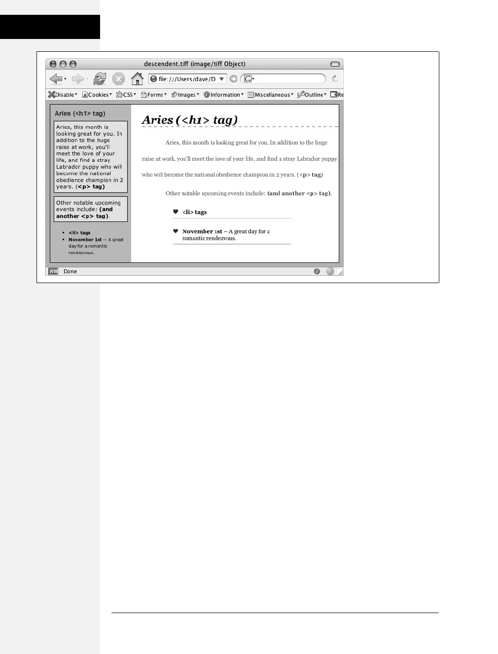
428 CSS: The Missing Manual
Using Descendent
Selectors
Compartmentalize Your Pages
One of your biggest allies in using descendent selectors effectively is the <div> tag.
Since this HTML tag lets you create logical divisions in a page, you can use it to
identify different layout elements like a banner, a sidebar, a column of text, and so
on. As discussed on page 302, you can organize the content of your page into dif-
ferent areas by wrapping HTML in a <div> tag.
Group the title of a story and a list of links used to navigate the story’s pages
like this:
<div>
<h2>The CosmoFarmer Revolution</h2>
<ul>
<li><a href="page1.html">Page 1</a></li>
<li><a href="page2.html">Page 2</a></li>
<li><a href="page3.html">Page 3</a></li>
</ul>
</div>
After adding the <div>, identify it for CSS purposes with either a class or ID
attribute: <div class="pullQuote"> or <div id="banner">. When you want to
include the same type of layout element more than once on a page—multiple pull
quotes in a single story perhaps—use a class. For regions that appear only once per
page—like the banner—an ID is the common choice.
Figure 15-6:
The same HTML was
pasted into both the left
sidebar and the larger
right area of this web
page. By using
descendent selectors,
identical HTML tags
(<h1>, <p>, <ul>, and
<li>) are formatted
differently based solely
on where they’re located
on the page.
Download at Boykma.Com

Chapter 15: Improving Your CSS Habits 429
Using Descendent
Selectors
Suppose the list of links in the HTML above appears twice on a page—at the
beginning of the text and at the end. You’d apply a class to it like this:
<div class="storyNav">
<h2>The CosmoFarmer Revolution</h2>
<ul>
<li><a href="page1.html">Page 1</a></li>
<li><a href="page2.html">Page 2</a></li>
<li><a href="page3.html">Page 3</a></li>
</ul>
</div>
Note: You don’t always need to add a <div> tag to style a group of elements. If the HTML above had
only an unordered list of links and didn’t include the <h2> tag, then you could just as easily skip the <div>
tag and simply add a class to the unordered list: <ul class="storyNav">.
Once you identify each <div> on a page, it becomes very easy to use a descendent
selector to target tags inside a particular <div>. Say you want to create a unique
look for each of the links in the above HTML. You’d create a descendent selector
like this:
.storyNav a {
color: red;
background-color: #ccc;
}
Now links will appear as red text on a light gray background, but only when they
appear inside another tag with the storyNav class applied to it. Best of all, if you
want to add another link (like page4.html) to this list, then you don’t have to lift a
finger to format it like the other links. The browser handles all of that automati-
cally when it applies the descendent selector.
Formatting other tags inside that <div> is a simple matter of creating a descen-
dent selector that begins with the class name—.storyNav, for instance—followed
by a space and the tag you want to style. To format the <h2> that appears inside
the <div>, create the descendent selector .storyNav h2.
Identify the Body
Because descendent selectors provide such specific targeting of styles, you can easily
create styles that not only apply to one particular area of a page, but also apply only to
particular types of pages on your site. Say you want to style the <h1> tag differently on
the home page than on other pages of the site. An easy way to distinguish <h1> tags
on the home page is to add a class or ID to the <body> tag of the home page:
<body id="home">
or
<body class="home">
Download at Boykma.Com

430 CSS: The Missing Manual
Using Descendent
Selectors
You can style the <h1> tag on the home page using a descendent selector: #home
h1 (if you’re using an ID) or .home h1 (if you’re using a class). With this tech-
nique, you can create entirely different looks for any tag on any particular page of
your site. One approach is to identify the section of the site each page is in. Say
your site is divided into four sections—news, events, articles, and links. On each
page within a section, add either a class or ID to the <body> tag. So each page in
the news section might have the following HTML: <body class="news">, while
pages in the events section would have <body class="events">.
Note: Another common CSS technique is to use a class to identify the type of layout you want for a par-
ticular page (like a one-, two-, or three-column design).
One great use for identifying a page’s section in the site is to highlight that sec-
tion’s button in a navigation bar. The highlighted button acts as a kind of “you are
here” marker, as shown in Figure 15-7 If a page is in the news section of your site,
you can highlight the “news” button so visitors can tell immediately which section
they’re in.
Here’s how to format a navigation button differently depending on which section
of your site it’s in:
1. Add an identifier to the <body> tag indicating the section the page is in.
For example, <body id="home">. Do the same thing for each section, so pages
in the news section of the site would have code like this: <body id="news">.
2. Add a navigation bar to the page.
Step-by-step instructions are on page 235.
3. Identify each link within the navigation bar.
For a link to the home page, you might have this code: <a href="/index.html"
id="homeLink">Home</a>. The ID lets you identify that particular link as the
one going to the home page. (You could do the same thing using a class instead
of an ID.) Repeat for the other links: <a href="/news/" id="newsLink">News</a>
and so on.
At this point, you have enough information in your HTML to uniquely format
each section’s link using CSS. In this example, you know that the Home page
link is nested inside a <body> tag with the ID of home only on the Home page.
4. Create a descendent selector to format each section’s link differently when the
link is inside a page for that section.
For the home page in this example, the descendent selector would look like this:
#home #homeLink
Download at Boykma.Com
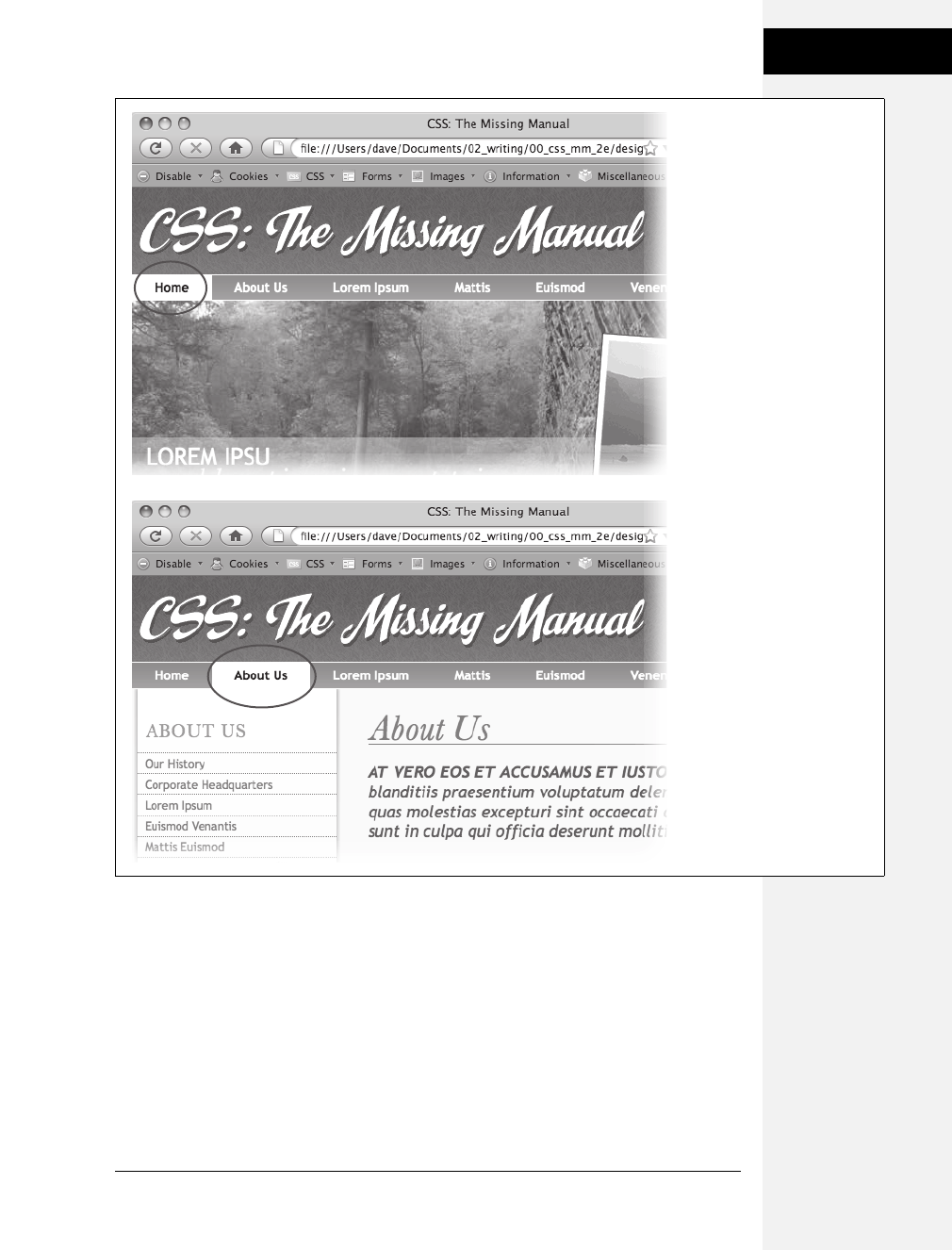
Chapter 15: Improving Your CSS Habits 431
Using Descendent
Selectors
This selector formats the #homeLink only when it’s inside another tag with the
ID #home. In most cases, you’ll want the look of the “you are here” button to be
the same for each section of the site, so you can use a group selector (page 262)
to group all the descendent selectors for each section’s button. That way, you
can apply the same formatting to each button without creating separate rules
Figure 15-7:
Using descendent selectors,
you can highlight a button in a
navigation bar simply by
changing the class or ID
applied to the <body> tag. In
this example, when the body
tag has the ID home applied to
it, the Home button lights up
(circled, top). Change the ID to
about, and the About button
highlights (circled, bottom).
Download at Boykma.Com

432 CSS: The Missing Manual
Managing Internet
Explorer Hacks
for each button. A group selector to highlight the current section’s navigation
button with a light yellow background may look like this:
#home a#homeLink,
#news a#newLink,
#articles a#articlesLink,
#links a#linksLink {
background-color: #FBEF99;
}
Tip: When creating a group selector that includes several descendent selectors, keep each selector on its
own line as in this example. It’s easier to identify each selector in the group this way when you need to go
back and edit your style sheet.
Using the same technique, make additional styles to apply different looks for the
links when you hover over them, click them, or when they’ve been visited. See page
256 for the details.
These few examples are just some of the ways you can take advantage of descen-
dent selectors. They can make your style sheets a little more complex. You’ll have
styles like #home .navbar a, for example, instead of a simple class like .navLink. But
once the styles are set up, you’ll need to do very little further formatting. HTML
pasted into different areas of the page automatically gets formatted in strikingly
different ways. Almost like magic.
Managing Internet Explorer Hacks
Browsers don’t always behave the way you, or the rules of CSS, expect. Browsers
like Safari, Firefox, and Internet Explorer 8 handle CSS quite well and display CSS-
based web pages consistently and predictably. Getting your designs to work in
Internet Explorer 6 and 7 for Windows is much more of a challenge. Although
these browsers are old by today’s standards, they still make up the majority of web
browsers in use.
Throughout this book, you’ve seen some of the most horrific Internet Explorer
bugs—and their solutions. There’s the double-margin bug (page 33) and IE 5’s box
model problem (page 167). Techniques for managing these problems include the
* html hack (page 169). But knowing the techniques isn’t enough. You’ve got to
consider your entire Web audience and make sure your IE fixes don’t get in the
way and spoil the fun for other viewers.
Tip: You can find a list of pages describing various CSS bugs in many different browsers at http://
css-discuss.incutio.com/?page=BrowserBugs.
Download at Boykma.Com

Chapter 15: Improving Your CSS Habits 433
Managing Internet
Explorer Hacks
Design for Contemporary Browsers First
Because Internet Explorer 6 and 7 are still very common, many web designers use
one of those browsers for testing their site design. When they find a problem with
the way the page looks in this browser, they manipulate their CSS until the page
looks fine. Unfortunately, because IE 6 and 7 don’t always get CSS right, the “solu-
tions” designers use for that browser cause more modern, CSS-savvy browsers like
IE 8, Firefox, and Safari to display pages incorrectly.
The backward-looking approach of designing for Internet Explorer 6 or 7 would
be fine if everyone visits your site on Windows with Internet Explorer 6 or 7 for
the rest of eternity. But as more people upgrade to Internet Explorer 8 or switch to
state-of-the-art browsers like Firefox or Safari, your fine-tuned IE 6 pages will
begin to break. A better approach is to design with Internet Explorer 8, Firefox,
Safari, or Chrome in mind. Make sure your CSS works in those browsers, and you
can be reasonably confident that you’re using CSS correctly. Then, after your site
looks great in those browsers, it’s time to fix the problems that crop up in Internet
Explorer 7 and 6.
Tackling all those problems may sound like an overwhelming task, but take heart.
You’ll repeatedly encounter the same set of bugs, which in turn require the same
set of fixes. So once you become an old hand at identifying and fixing the peek-a-
boo bug or the double-margin bug, it won’t be hard for you to add the necessary
hacks to fix your pages for older versions of Internet Explorer.
Note: For more terrifying information on how Internet Explorer can mangle your carefully designed web
pages visit www.positioniseverything.net/explorer.html and www.positioniseverything.net/ie-primer.html.
Isolate CSS for IE with Conditional Comments
The * html hack in Chapter 7 (page 169) is one way to send the “this’ll fix your stu-
pid bug” styles to just Internet Explorer 6 and earlier without adversely affecting
other browsers. But as your style sheets get larger, all those little fixes start to cre-
ate clutter. Even if you isolate those changes into one part of your style sheet, you
may still end up inserting some invalid CSS code (like zoom: 1) that prevents your
main CSS file from validating.
Another way to collect IE-only styles in a single place is to use Internet Explorer’s
conditional comments feature (Figure 15-8). This Microsoft invention provides a
way of inserting HTML that only Internet Explorer understands. Other browsers
simply see the code as an HTML comment and ignore it.
Conditional comments can even target different versions of IE. You can put all of
your IE 6–only styles in a single external style sheet (like IE6_styles.css) and use a
conditional comment to link it to IE 6 browsers only. This approach also makes it
a snap to eliminate those styles when IE 6 finally goes the way of the dinosaurs. Just
remove the external style sheet. Your non-IE visitors will benefit too. When you
use conditional comments, other browsers don’t download those external style
sheets at all. As a result, your site opens and runs faster for these lucky folks.
Download at Boykma.Com
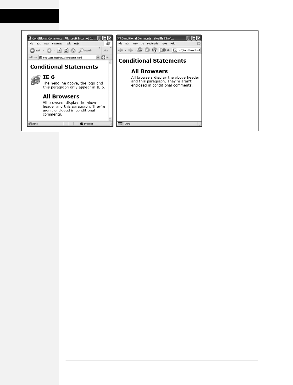
434 CSS: The Missing Manual
Managing Internet
Explorer Hacks
Here’s the basic structure of a conditional comment:
<!--[if IE]>
Some HTML code that only applies to IE goes here.
<![endif]-->
The <!--[if IE]> is the condition itself. It translates to: “If this browser is Internet
Explorer, then process the following HTML.” So any Internet Explorer browser
acts on the HTML that comes after this line of code and stops when it gets to the
<![endif]--> statement. In this way, you can add any HTML—text, images, styles,
and even links to external style sheets—to Internet Explorer only.
Note: Non-IE browsers simply view conditional statements as HTML comments and ignore them.
Conditional comments and IE 8
Internet Explorer 8 understands CSS much better than earlier versions, so you may
have to hide some IE hacks from that browser as well. Fortunately, conditional com-
ments also let you specify which version of Internet Explorer the style sheet applies to.
Say you want to have a particular style sheet load only for Internet Explorer 6 or ear-
lier. Add the following conditional comment to your web page’s head:
<!--[if lte IE 6]>
<link href="IE_styles.css" rel="stylesheet" type="text/css" />
<![endif]-->
Or, using the @import method:
<!--[if lte IE 6]>
<style type="text/css">
@import url(IE_styles.css)
</style>
<![endif]-->
Figure 15-8:
With Internet Explorer’s
conditional comments
feature, you can apply IE-
specific style sheets full of
your IE hacks.
Conditional comments let
you have some HTML
appear only in a
particular version of
Internet Explorer (left).
Other browsers simply
ignore the HTML inside
the comment (right).
Download at Boykma.Com

Chapter 15: Improving Your CSS Habits 435
Managing Internet
Explorer Hacks
The lte stands for “less than or equal to,” so if lte IE 6 means “if this browser is
version 6 or earlier of Internet Explorer.”
Conditional comments and the cascade
Use whatever method you prefer for linking an external style sheet (page 37), but
add any conditional comments after any other linked style sheets. Most IE hacks
tend to redefine styles already present in the style sheet—styles that work for other
browsers. And, due to the nature of the cascade, rules defined later in a page can
override earlier defined styles. To make sure your redefined IE-only styles success-
fully take hold in Internet Explorer, they should appear after any other style sheets
attached to the page.
Here’s the code you might use to link: a) a style sheet for all browsers, b) a style
sheet just for IE 7, and c) a style sheet for version 6 or earlier of IE:
<link href="global_styles.css" rel="stylesheet" type="text/css" />
<!--[if IE 7]>
<link href="IE7_styles.css" rel="stylesheet" type="text/css" />
<![endif]-->
<!--[if lte IE 6]>
<link href="IE6_styles.css" rel="stylesheet" type="text/css" />
<![endif]-->
Note: For more information on Internet Explorer’s conditional comments, visit the source: http://msdn.
microsoft.com/en-us/library/ms537512(VS.85).aspx.
Download at Boykma.Com

Download at Boykma.Com

437
Chapter 16
chapter
16
CSS 3: CSS on the Edge
Although CSS 2.1 has been around for years, it’s only now, with the introduction
of Internet Explorer 8, that all major browsers properly handle this version of CSS.
Of course, the Web never sleeps, and the World Wide Web Consortium is busy
working on the next CSS standard—CSS 3 (see Figure 16-1). Most browser
developers have already started to include bits and pieces of this yet-to-be finished
edition of CSS.
If you like to live on the edge and explore the latest new thing, this chapter is for
you. Just be ready to accept the fact that some CSS 3 properties don’t yet work in
all browsers. This chapter shows you how to use the more widely accepted proper-
ties and, when possible, shows you workarounds for the browsers that don’t yet
understand them.
Above all, remember this: Web pages don’t have to look the same in every browser.
Just make sure that your websites work for all of your site’s visitors, whether they
use Internet Explorer 6 or Firefox 3.5. If a page is unreadable because of some
difference in how a web browser displays it—for example, the horrible float drop
discussed on page 330—that’s a problem you need to fix.
That said, it’s perfectly fine to enhance the appearance of a page using properties
that work in some browsers but not others. For example, the text-shadow property
(coming up on page 448) lets you give text a drop shadow. It works in Safari,
Opera 9.5, Firefox 3.5, and Chrome but not in any version of IE. Adding a subtle
drop shadow can improve the appearance of headlines in those browsers, but it
doesn’t ruin the experience for Internet Explorer users. So feel free to explore the
following CSS properties, even if not everyone will get to enjoy them.
Download at Boykma.Com
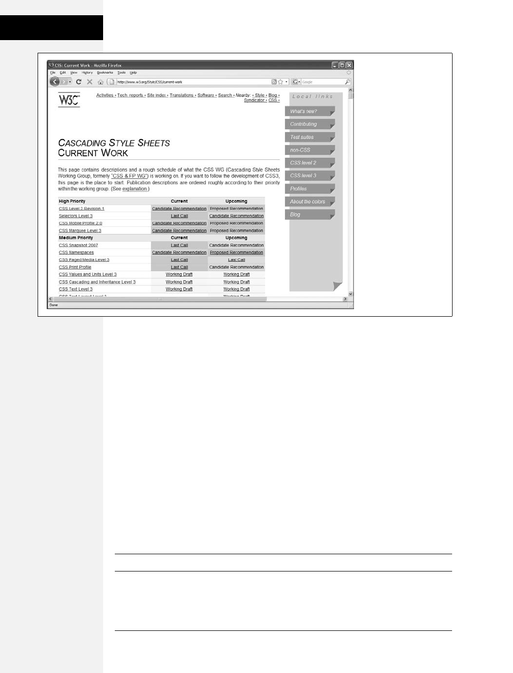
438 CSS: The Missing Manual
An Overview of
CSS 3
An Overview of CSS 3
CSS has matured substantially since its 1996 introduction. It’s become the pri-
mary web-design tool, and with designers clamoring to make ever more stunning
websites, each version of CSS has more—and more complex—properties than the
one before. With CSS 3, the World Wide Web Consortium has broken CSS up into
independent modules. Each module describes a specific new set of CSS properties.
Some modules are straightforward, like CSS Transitions (for animating a transi-
tion between two states such as making text glow when you mouse over a link) and
CSS Web Fonts (instructions for different font properties), while some modules
are more obscure, like CSS Math or CSS Namespaces. The goal of the module sys-
tem is to let CSS grow bit by bit, without making everyone wait for one giant set of
instructions to be completed. Each module progresses on its own, and browser
vendors are free to adopt a module’s rules as soon as it’s ready.
Although none of the CSS 3 modules is complete, some of the most visually exciting
bits of CSS 3 have made their way into current browsers (even Internet Explorer,
in some cases). The rest of this chapter walks you through you a bunch of them.
Tip: Beside the W3C, www.css3.info also offers fairly up-to-date information on the state of CSS 3.
Figure 16-1:
The World Wide Web
Consortium provides the
most up-to-date
information on CSS at
www.w3.org/Style/CSS/
current-work. Here you
can read about all of the
different CSS 3 modules
and see how far along
they are in the approval
process.
Download at Boykma.Com

Chapter 16: CSS 3: CSS on the Edge 439
CSS 3 Selectors
CSS 3 Selectors
CSS 3 introduces a wide range of new selectors that let you specify which page ele-
ments a style applies to with even greater precision. In fact, several of the attribute
selectors discussed on pages 67–70 are actually CSS 3 selectors. For example, to
style links that point to Adobe Acrobat files, you can create a selector like this:
a[href$=".pdf"]. The $= means “ends with,” so the specified attribute (here, href)
has to end with a particular value (.pdf). Similarly, you can use ^= to pinpoint an
attribute that starts with a particular value (page 69 explains how to use this selec-
tor to identify links to another website).
The advanced attribute selectors in this section work with Firefox, Safari, Chrome,
Opera, and even Internet Explorer 7 and above (but not IE 6, mind you). Other
new CSS 3 selectors work mostly in non-IE browsers.
Note: If you want to see which CSS 3 selectors your favorite web browser understands, visit the CSS
Selectors Test Suite at www.css3.info/selectors-test. This nifty JavaScript program tests your browser, giving
either a green (thumbs up) or red (thumbs down) rating for each of the CSS 3 selectors. Safari 4, Firefox
3.5, Opera 9.5, and Chrome pass all 43 tests, while Internet Explorer 8 passes 22 of the 43 tests.
Child Selectors
CSS provides several methods for formatting tags that are children of other tags. As
described on page 57, a child is any tag that’s directly wrapped inside a tag. Take,
for example, a bold word inside a paragraph; the <strong> tag is the child of the
<p> tag. In a bulleted list of items, the <li> tags are children of the <ul> tag.
•:first-child. You’ve seen this selector before, on page 64. Actually part of the CSS
2 standard, it lets you format just the first child of a tag—see top-left image in
Figure 16-2. For example, to format the first list item in a bulleted list, you can
write this selector:
ul :first-child
Note the space between ul and :first-child, which translates to “find the first
child of a <ul> tag.” (The selector ul:first-child, with no space, is entirely differ-
ent: it selects all <ul> tags that are a first child of some other tag.)
If you want to add a special color to any text that appeared first inside a div with
the class announcement, write the following style:
.announcement :first-child { color: #F33F00; }
This style applies to the first tag inside the div, whether it’s an <h1>, <h2>, <p>,
or any other tag. It gives you extra flexibility, since the style isn’t dependent on
an exact type of tag to appear first inside the div.
The :first-child selector works in all modern browsers except Internet Explorer 6
and earlier.
Download at Boykma.Com

440 CSS: The Missing Manual
CSS 3 Selectors
•:last-child. This selector is new in CSS 3 and applies to the last child within a tag.
You can use it, for example, to add a borderline to the bottom of the last para-
graph of a div or to highlight the last item in a list (see second from left image in
the top row of Figure 16-2). This selector doesn’t work in any version of Internet
Explorer (even IE 8).
•:nth-child( ). This complex selector is very useful. With it, you can easily style
every other row in a table, every third list item, or style any combination of
alternating child elements (see Figure 16-2).
:nth-child( ). This selector requires a value to determine which children to
select. The easiest option is a keyword—either odd or even—which lets you
select alternating odd or even child elements. For example, if you want to pro-
vide one background color for each even row in a table and another color in the
background of each odd-numbered row, you can write two styles like this:
table tr:nth-child(odd) { background-color: #D9F0FF; }
table tr:nth-child(even) { background-color: #FFFFFF; }
Now that’s a really simple way to color alternating table rows (see Figure 16-3).
But :nth-child( ) has even more power up its sleeve. You can also select, say,
every third child element in a series, starting with the second child element. For
example, suppose you want to highlight every third table cell (<td> tag) inside a
row, starting with the second table cell (see Figure 16-3). Here’s a style to
achieve that:
tr td:nth-child(3n+2) { background-color:#900; }
Basically, the number before the n(3 in this case) represents which child ele-
ment you’re after. So, 3n means every third element, while 4n means every
fourth element. The plus sign followed by a number (+2 in this example) indi-
cates which element to start at, so +2 means start at the second child element,
while +5 means start at the fifth child element. So :nth-child(5n + 4) selects
every fifth child element starting at the fourth child element.
Figure 16-2:
CSS’s wide range of child
selectors gives you a
variety of ways to select
child elements. These
selectors are great when
you want to highlight the
first, last, or an
alternating number of
items in a list.
Download at Boykma.Com
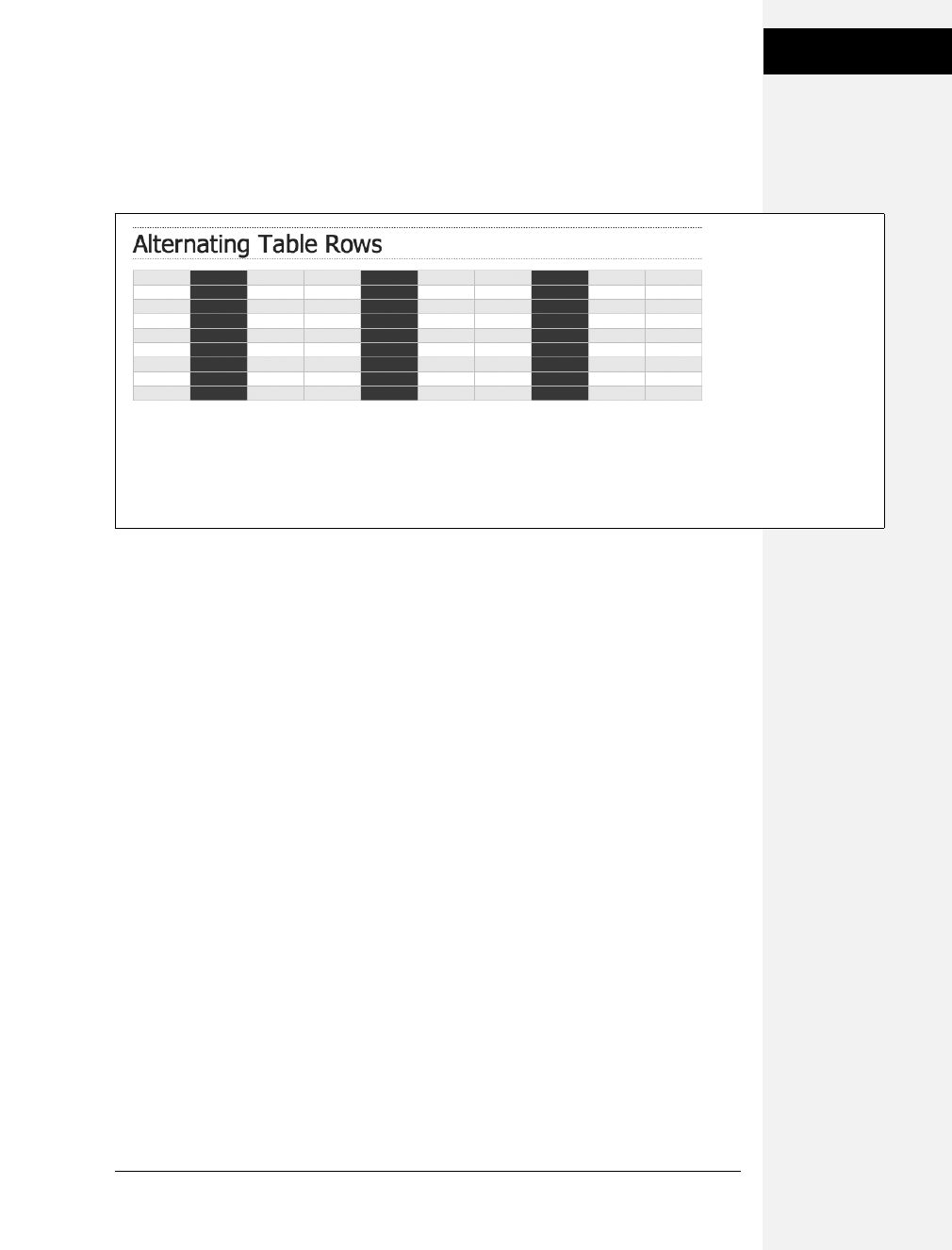
Chapter 16: CSS 3: CSS on the Edge 441
CSS 3 Selectors
Unfortunately, only Firefox 3.5 and later understands this fancy new selector.
Safari, Opera, Chrome, and Internet Explorer will simply ignore it. (For them,
you can use the lower-tech solution for striping tables, described on page 277,
which works in all browsers.)
Type Selectors
CSS 3 introduces a selector that works much like the child selectors in the previ-
ous section but applies to children with a specific type of HTML tag. For example,
say you want to format the first paragraph inside a sidebar in a particular way, but
on some pages, that sidebar starts with an <h2> tag, and on other pages, it starts
with a <p> tag. You can’t use :first-child to select that paragraph, since in some
cases it’s the second child (following the <h2>). However, it’s always the first para-
graph (<p> tag), even if other tags come before it, so you can select it with a type
selector called :first-of-type.
Here’s the skinny on :first-of-type and several more type-related selectors:
•:first-of-type. Works just like :first-child but applies to a child that has a particu-
lar tag. For example, say you have a sidebar element with the ID sidebar. To style
the first paragraph in that sidebar, use this selector:
#sidebar p:first-of-type
Notice the p in p:first-of-type. It indicates the tag you’re going to format.
•:last-of-type. Works like :last-child but applies to the last instance of a particular
type of tag. For example, if you want to format the last paragraph in the sidebar
div in a particular way, but you’re not sure whether there are other tags coming
after the paragraph (like a bulleted list, headline, or image). Here’s the style:
#sidebar p:last-of-type
Figure 16-3:
Table-striping the easy
way: with child selectors.
You can even stripe
alternating columns by
targeting every other
<td> tag within a row, or,
as in this case, every
third column beginning
with the second one.
Now that’s precision!
Unfortunately, this
technique doesn’t work in
the most common
browser in the world—
Internet Explorer.
Download at Boykma.Com

442 CSS: The Missing Manual
CSS 3 Selectors
Note: Remember, these type selectors also have to be children of a particular tag. So p:first-of-type
means the “first child with a paragraph tag.”
•:nth-of-type( ). Works like :nth-child( ) but it applies to alternating children that
have a specific tag. You may find this selector handy if you have something like
a big paragraph of text that’s peppered with photos. The <img> tag is an inline
tag, so you can have a <p> tag with a bunch of <image> tags inside it. And say
you want to alternately float the images left and right, as shown in Figure 16-4.
You can do so with these two styles:
img:nth-of-type(odd) { float: left; }
img:nth-of-type(even) { float: right; }
As you can see, you use the same keywords (odd or even) and formula (here,
2n +1) for :nth-of-type( ) as you do for :nth-child( ).
Unfortunately, the type selectors don’t work in Internet Explorer; just Firefox 3.5,
Safari, Opera, and Chrome.
Note: For a complete list of CSS 3 selectors, visit www.w3.org/TR/css3-selectors.
Figure 16-4:
The :nth-of-type( ) selector you can
easily select every other image
inside a tag, alternating between
left and right alignment.
Download at Boykma.Com
Chapter 16: CSS 3: CSS on the Edge 443
Opacity
Opacity
If you like ghosts, at least the cartoon kind you can see through, then you’ll like the
CSS 3 opacity property. Basically, this simple property lets you make any element
partially transparent, so, for example, you can make an image appear faded into a
page’s background. You can use opacity in conjunction with JavaScript to make
elements fade into view by dynamically adjusting their opacity. Or you can use it
with the link pseudo-classes like :hover to add some simple excitement to a naviga-
tion bar or even a set of photos (see Figure 16-5).
Opacity takes a value from 0 (invisible) to 1 (opaque). So if you want to make a
particular image with the class of see-thru 50 percent transparent, use this style:
.see-thru {
opacity: .5;
}
The opacity property works in all browsers except Internet Explorer. Fortunately,
IE supplies a similar property that lets you achieve the same results. To get the pre-
vious style to work in all browsers (even IE 6), rewrite it like this:
.see-thru {
opacity: .5;
filter: alpha(opacity=50);
}
The IE-only filter property lets you add a bunch of groovy (and some hideous)
visual effects to your pages. In this case, the alpha filter lets you set the opacity of
an element from 0 (invisible) to 100 (opaque). So to make an element 75 percent
opaque, for example, use these two declarations:
opacity: .75;
filter: alpha(opacity=75);
FREQUENTLY ASKED QUESTION
Vendor-Specific Extensions
I’ve come across some CSS that has properties like -moz-
opacity and -webkit-border-radius. What are those?
Browser makers like Apple, Mozilla, Opera, and Microsoft
sometimes add an extension to the beginning of a CSS
property to indicate that property only applies to their
browser. Developers use this technique when they want to
add a CSS property that isn’t part of the CSS standard. (Or
the W3C CSS Working Group hasn’t figured out how the
property is supposed to work yet.)
Properties beginning with -moz- are for Firefox, -webkit- is
Safari, -ms- is Internet Explorer, and -o- is Opera. Usually, if
the W3C CSS Working Group adopts the property and final-
izes enough of its details, vendors drop the extension. For
example, Firefox 3 now understands the CSS 3 property
opacity, but earlier versions of the program used the prop-
erty -moz-opacity.
Download at Boykma.Com
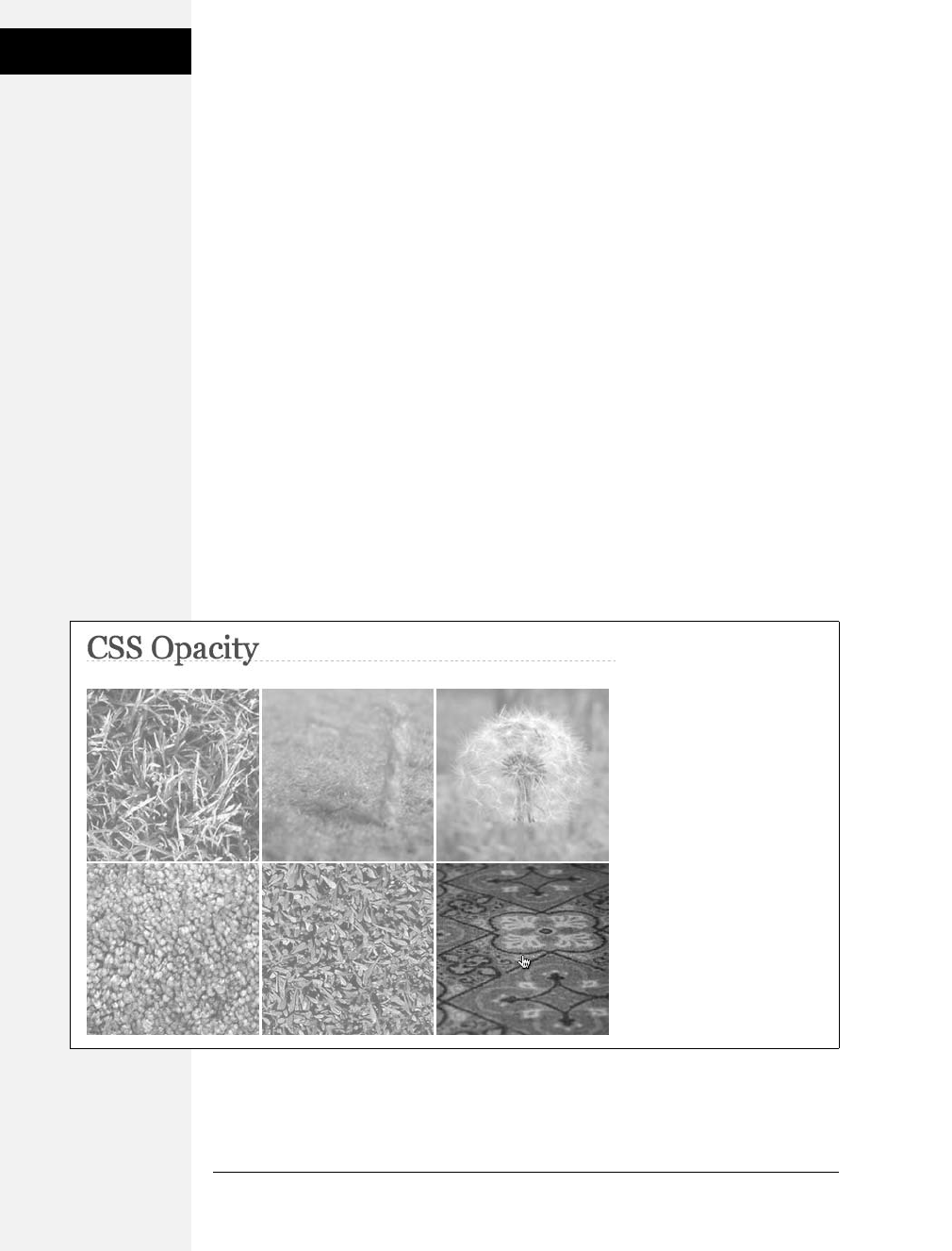
444 CSS: The Missing Manual
Opacity
Two styles create the effect in Figure 16-5: one that sets the images to 50 percent
transparent and another that makes them 100 percent opaque when moused over.
Basically each image is wrapped in a <a> tag as part of a link, and then the :hover
pseudo-class creates the rollover effect:
a img{
opacity: .5;
filter: alpha(opacity=50);
}
a:hover img {
opacity: 1;
filter: alpha(opacity=100);
}
One problem with opacity—all descendent tags inherit the property. For example,
say you put some text inside a <div> tag. The div is sitting on top of a background
image that’s been added to the <body> tag. You’d like to add a background color
to the div but make it transparent so you can see through the background color to
see part of the image. Unfortunately, if you use the opacity property on the <div>
tag, it also applies to the text inside the div—even if the text is inside another tag,
like a <h1> or <p> tag. In other words, the text will be transparent, too—and hard
to read. Fortunately, you can turn to another new CSS 3 attribute for a solution to
that problem—RGBA color—as described next.
Figure 16-5:
Now you sort of see it, now you
totally see it. Here, images with
links are set to 50 percent
opacity (essentially fading them
into the page’s white
background). But mousing over
one of the images (bottom
right) suddenly makes it pop
into vivid solidness.
Download at Boykma.Com
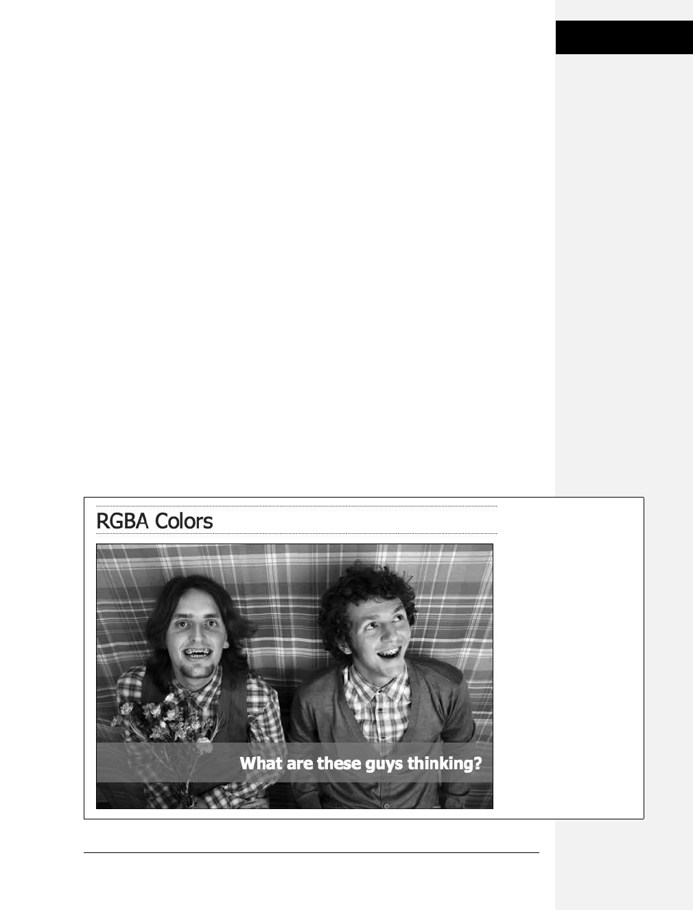
Chapter 16: CSS 3: CSS on the Edge 445
RGBA Color
RGBA Color
You’re familiar with hexadecimal colors like #FF0066. And in Chapter 6 (page 119),
you read about RGB color notation: rgb(25, 255, 0), for example. CSS 3 adds another
way of specifying color: RGBA, which stands for Red, Green, Blue, Alpha. Basically,
it’s RGB color with the addition of alpha transparency. Alpha works the same way as
opacity, as described in the previous section, in that you specify a value from 0 to 1 to
indicate how much you can see through the color. A value of 0means the color’s
invisible, while 1 means it’s a solid color—you can’t see through it.
Say you want to add a background color to a div with a class of caption, but you
want that color to be see-through enough so the content underneath the div is
readable (see Figure 16-6). You could then create a style like this:
.caption { background-color: rgba(95,156,140,.75); }
In this case, the background color is teal (95, 156, 140) with 75 percent opacity
(.75). You can use RGBA wherever you’d normally use a color value in CSS—for a
background color, text color, border color, and so on.
The downside of RGBA color is that Firefox 2, Opera 9, and every version of Inter-
net Explorer don’t understand RGBA colors. If those browsers encounter this style,
they simply ignore it and leave the background color empty. You have a couple of
approaches for dealing with these browsers: First, don’t worry about it and let
those browsers ignore the color. That’s the easiest tactic, but not necessarily the
best. For example, the text might not be legible if there’s no background color at all
(Figure 16-6).
Figure 16-6:
The new CSS 3 RGBA color
gives you an easy way to
add partially transparent
backgrounds to page
elements, like the paragraph
pictured here.
Download at Boykma.Com

446 CSS: The Missing Manual
RGBA Color
Tip: Any image-editing program, like Photoshop or Fireworks, can give you an RGB color value as well as
a hexadecimal color. If you already know a hex color value, and you want to convert it to RGB so you can
use RGBA colors, visit this web page for help: www.javascripter.net/faq/hextorgb.htm.
Another approach is to give the background a solid color using either the regular
RGB color or a hexadecimal color. Doing so takes two passes. First, to deal with
non-IE web browsers that don’t understand RGBA, you must edit the rgba style:
.caption {
background-color: rgb(95,156,140); /* Opera and others */
background-color: rgba(95,156,140,.75);
}
In this case, the first background-color declaration uses RGB color, which all browsers
understand. When Opera, Internet Explorer 8, or Firefox 2 encounters the second
declaration, the browser ignores it, since it doesn’t know what RGBA color is. This
style works for Opera 9 and Internet Explorer 8, but IE 6 and 7 get confused and
don’t display any background color at all.
Accordingly, you need to add another style sheet for IE using conditional com-
ments, as described on page 433. Here’s an example of how to get the previous
code to work with IE as well:
<!--[if IE]>
<style type="text/css">
.caption {
background-color: rgb(95,156,140);
}
</style>
<![endif]-->
Simulating RGBA in Internet Explorer
There’s another way to get Internet Explorer to join the RGBA party. As with opacity,
IE provides a filter property that you can use to achieve the same effect as RGBA
color. It’s a bit of a handful to type, and you need to add a one other CSS property
to make it work. To get a taste of how the finished product looks, here’s you what
you’d add to your page to get the same effect as described in the previous section
on RGBA color:
<!--[if IE]>
<style type="text/css">
.caption {
background-color: transparent;
filter:progid:DXImageTransform.Microsoft.gradient(
startColorstr=#BF5F9C8C,endColorstr=#BF5F9C8C);
zoom: 1;
}
</style>
<![endif]-->
Download at Boykma.Com
Chapter 16: CSS 3: CSS on the Edge 447
RGBA Color
This chunk of code does the same thing as this:
.caption { background-color: rgba(95,156,140,.75); }
Here’s how it works:
• First, you need to put the special IE code into a conditional comment. Here, the
conditional comment contains an internal style sheet, but you can use IE condi-
tional comments (also called IECCs) to link to another IE-only style sheet with
the style, as described on page 434.
• Use the same selector as you did for creating the effect in the first place. In this
example, the selector is .caption.
• For Internet Explorer 8, you need to set the background color to transparent
first with background-color: transparent. This style erases any background color
that’s been applied to the element so the filter property (that’s the next step) will
work correctly.
• Add the filter property:
filter:progid:DXImageTransform.Microsoft.
gradient(startColorstr=#BF5F9C8C,endColorstr=#BF5F9C8C);
There’s a lot of code here. Just take your time and type it exactly as you see here,
except keep it all on a single line. The only two things you change are the values
for startColorstr and endColorstr. In this example, those values are both
#BF5F9C8C. The first two characters BF (which means roughly 75 percent)
represent the transparency. It’s just a number from 0 to 255 represented in
hexadecimal. The last six characters are the hex value of the color; in this exam-
ple that’s 5F9C8C.
In other words, take the alpha value you specified in the RGBA declaration and
convert it to a hex number between 0 and 255 (see Table 16-1 for a quick conver-
sion guide). Then convert the RGB color to hex (use the calculator at www.
javascripter.net/faq/rgbtohex.htm), and then put them together (transparency value
first) and type that combined number for both the startColorStr and endColordstr).
• Add zoom: 1. This property forces IE 6 and 7 to obey. You can read the bizarre
details of this little maneuver in the box on page 173.
Table 16-1. To use Internet Explorer’s gradient filter to simulate RGBA color, you have to convert your
alpha setting to a hex value.
Alpha Setting Hex Equivalent
0 (invisible) 00
.1 19
.2 33
.3 4C
.4 66
Download at Boykma.Com
448 CSS: The Missing Manual
Text Shadow
Text Shadow
As you saw in the image gallery tutorial on page 210, there’s nothing like a drop
shadow to add dimension to a web page. CSS 3 includes one property that lets you
add drop shadows to text to add depth and interest to headlines, lists, and para-
graphs (see Figure 16-7).
The text-shadow property requires four pieces of information: the horizontal off-
set (how far to the left or right of the text the shadow should appear), the vertical
offset (how far above or below the text the shadow should appear), the blurriness
of the shadow, and the color of the drop shadow. For example, here’s the text-
shadow property that creates the effect at top in Figure 16-7:
text-shadow: -4px 4px 3px #999999;
The first value— –4px—means “place the shadow 4 pixels to the left of the text.”
(A positive value here would place the shadow to the right of the text.) The second
value—4px—places the shadow 4 pixels below the text. (A negative value would
place the shadow above the text.) The 3px value defines how blurry the shadow
should be. A zero value (no blur) results in a sharp drop shadow; the larger the
value, the more blurry and indistinct the shadow. Finally, the last value is the drop
shadow’s color.
You can even add multiple drop shadows for more complex effects (see bottom
image in Figure 16-7): just add a comma followed by additional drop shadow val-
ues, like this:
text-shadow: -4px 4px 3px #666, 1px -1px 2px #000;
There’s no limit (except good taste) to the number of shadows you can add this
way. Sadly, this effect works only in Firefox 3.5, Safari, Chrome, and Opera. All
versions of Internet Explorer and versions 3 and earlier of Firefox ignore this prop-
erty. For that reason, don’t rely on this effect to make text readable. The bottom
image in Figure 16-7, shows you what not to do: The text color is white and it’s
readable only because the drop shadows define the outline of the text. In Internet
Explorer, the text would be invisible—white text on a white background.
.5 7F
.6 99
.7 B2
.8 CC
.9 E6
1 (opaque) FF
Table 16-1. To use Internet Explorer’s gradient filter to simulate RGBA color, you have to convert your
alpha setting to a hex value. (continued)
Alpha Setting Hex Equivalent
Download at Boykma.Com
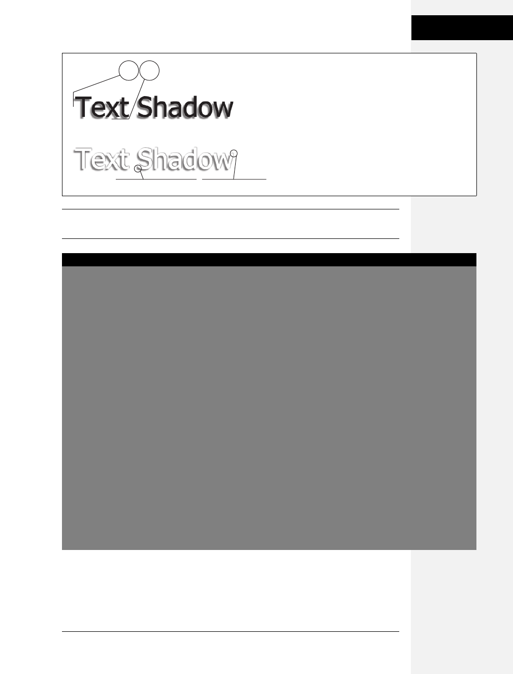
Chapter 16: CSS 3: CSS on the Edge 449
Text Shadow
Note: If you’re really gaga for drop shadows, you can use JavaScript to add complete cross-browser shad-
ows to not only text, but also any other element. Visit http://eyebulb.com/dropshadow for one solution.
Figure 16-7:
Text shadows are a great way to add subtle (or, if you
insist, not so subtle) depth to headlines and other text.
However, the text-shadow property doesn’t work in Internet
Explorer or versions of Firefox prior to 3.5.
text-shadow: -4px 4px 3px #999999;
text-shadow: -4px 4px 3px #999999, 1px -1px 2px #000;
POWER USERS’ CLINIC
But, Wait, There’s More!
This chapter touches upon some of the most well-supported
CSS 3 features. These properties currently work in enough
browsers that it’s worth your while to start learning them—
and eventually, they’ll work everywhere. This box introduces
some cool new CSS 3 properties with more limited adoption
that you may be interested in experimenting with:
Rounded Corners. Everyone loves rounded corners (or so
it seemed back in 2005 with the Web 2.0 revolution). But
they’re so darn hard to create. CSS 3 provides a property
just for adding rounded corners to elements. Imagine
smooth round corners around a sidebar without any extra
HTML and no images whatsoever. The border-radius prop-
erty (which currently works in Firefox, Safari, and Chrome)
lets you control the curvature of any or all of an element’s
four corners. To learn how it works, visit www.css3.info/
preview/rounded-border.
Drop Shadows. If you like drop shadows for your text, why
not try them on block-level elements? The box-shadow
property lets any element cast a rectangular shadow. You
can make a sidebar appear to be floating onto a page, for
example, or simply highlight a footer with a solid, dark
shadow. It works just like text-shadow, but it only works in
Firefox 3.5 and Safari. Furthermore, even in those browsers
you have to use browser-specific extensions (see the box
on page 443). For example, to get a gray, blurry drop
shadow 10 pixels below and to the right of a div, you could
create this style:
div {
-webkit-box-shadow: 10px 10px 5px #888;
-moz-box-shadow: 10px 10px 5px #888;
}
Border Image. Tired of plain-old solid, dotted, or dashed
border lines (page 161)? How about using your own
images to create a border effect? You can (in Firefox 3.5 and
Safari), using the border-image property (actually, the -
webkit-border-image and -moz-border-image properties).
To see it in action and learn more about it, launch Firefox 3.
5 or Safari and visit www.css3.info/preview/border-image
and http://ejohn.org/blog/border-image-in-firefox.
Download at Boykma.Com

450 CSS: The Missing Manual
Font Freedom
Font Freedom
As discussed on page 113, the humble font-family property lets you assign a font to
your CSS styles. However, you can’t just use any old font with that font-family.
Well, you can, but your site’s visitors will only see that font if they also have it
installed on their computers. Because most people don’t buy lots of fonts, web
designers usually stick with a handful of web-safe fonts they can count on most
people having (see page 117).
CSS 3 opens new typographic territory with the @font-face rule. With this rule, you
can put a font file on your web server—in either open type (.otf) or true type (.ttf)
format—and use the @font-face rule to make a visitor’s web browser download the
font for use while looking at your site. Before you jump up and down for joy, there
are a few things to keep in mind:
•The @font-face rule doesn’t work in all browsers. Only Firefox 3.5, Safari 3,
Chrome, and Opera 10 respond to this technique. Earlier versions of these
browsers and Internet Explorer don’t display the font and resort to the old,
what-the-user-has-installed method of displaying fonts. One exception:
Internet Explorer has recognized @font-face since version 4, but only for a
special type of font—.eot (embedded open type)—which you create using a
Windows-only font conversion tool (http://msdn.microsoft.com/en-us/library/
ms533034.aspx).
Note: You can make the @font-face rule work in both IE and the other modern browsers, but it’s a
chore. If you’re interested, you can read about the process at http://jontangerine.com/log/2008/10/font-
face-in-ie-making-web-fonts-work. There’s also a JavaScript-only approach to getting the font you want
that’s relatively easy to get working: http://wiki.github.com/sorccu/cufon/about.
•Big font files can slow down your site. When you use the @font-face technique,
visitors have to download an entire font file. And font files are not small. A sim-
ple font (and a font consists of just one weight; the bold version is another font
file entirely) can be around 172 KB. Complex font files are many times that size.
Your visitors have to wait around for that file to download before they can read
the text that uses that font. With small font files and fast Internet connections,
visitors may not notice anything. But if you make visitors download a bunch of
font files, your site might take a long time to load.
•There are legal restrictions. Fonts are software and are protected by copyright
laws. Most fonts are commercial products sold by companies like Adobe.com or
Fonts.com, and, like other commercial software, are governed by licenses that
specify how the font can and cannot be used. In many cases, you can’t legally
put these commercial fonts on web servers using the @font-face rule. After all,
you’re literally putting the font file up on your server where anyone can down-
load it. However, there are plenty of free fonts that you can use for @font-face
embedding. For a sampling, visit www.tinyurl.com/font-face-rule.
Download at Boykma.Com

Chapter 16: CSS 3: CSS on the Edge 451
Font Freedom
Aside from these (hopefully temporary) problems, the @font-face rule is an excit-
ing development for web designers. The @font-face rule requires two pieces of
information: a font-family name (which identifies the font in your styles) and a
URL pointing to the font file’s location. For example, a basic @font-face rule may
look like the following:
@font-face {
font-family: Lavoisier;
src: url('lavoisier.otf');
}
The font-family property (here, Lavoisier) defines the name you’ll use in your
styles. It doesn’t have to match the name of the font you’re using; it could be
something like “Site Font” or MyFont.
Note: You must enclose the font name in quotes if it’s more than one word long. For example,
font-family: Site Font;
is wrong, but
font-family: "Site Font";
is correct.
The src property uses a URL to point to either a true type font (.ttf) or open type
font (.otf). As with URLs used elsewhere in CSS (for example, to point to a back-
ground image file), the path is relative to the style sheet. So, if you’re using an
external style sheet, the path would be from that style sheet to wherever the font
lives on your server. You can even use absolute URLs to point to the file.
Once you’ve defined the font, you can then use it in your styles. For example,
here’s the Lavoisier font used in an <h1> tag style:
h1 {
font-family: Lavoisier, Arial, Helvetica, sans-serif;
color: #FF993E;
font-size: 48px;
}
Note: It’s still a good idea to provide a list of fonts after the font you’ve specified with @font-face. For
example font-family: Lavoisier, Arial, sans-serif;. That way, you’re providing options for browsers that don’t
understand the @font-face rule.
The @font-face rule provides another useful option for the src property. Say you
want to use a font that’s common but not quite universal. For example, some fonts
come installed on all Windows computers, but not on Macs. It would be a waste of
Download at Boykma.Com

452 CSS: The Missing Manual
Generated Content
time (and bandwidth) to force those Windows people to download a font they
already have. Fortunately, you can also specify a local font, so if the browser finds
that font installed, it won’t bother downloading the font file. Here’s an example:
@font-face {
font-family: Lavoisier;
src: local(Lavoisier),
url('lavoisier.otf');
}
You need to use the name of the font as it appears in your font menu (see the Note
below). In the above example, if the visitor already has the Lavoisier font on her
computer, her browser won’t download the font file. But if she doesn’t have that
font, then the browser will download it for use on the site.
Note: To find the name of a font on your computer, you can look at the Font menu in a program like
Word. Also, on Windows you can use the Fonts Control Panel to see the fonts installed on your computer
(www.ehow.com/how_2148826_access-fonts-control-panel.html). And on a Mac, open the Applications
➝Font Book program.
Generated Content
Sometimes you want to add some content without necessarily adding any code to
your HTML. For example, say you wanted to display the word “Announcement”
before the first paragraph of a news announcement (see Figure 16-8). You could
just put that into your HTML, but that would require extra work and extra code.
It’s also not really integral to the actual content; it’s just a sort of introduction to
the text. Also, if you later wanted to change “Announcement” to “News” you’d
have the time-consuming task of identifying and changing that text throughout
your site.
There’s an easier way to insert stuff that isn’t really part of an element’s content.
It’s called generated content, and it’s been around since CSS 2.1. However, it hasn’t
been very useful until Internet Explorer 8 came on the scene. Now, every major
browser (except IE 6 and IE 7) understands generated content.
Note: You encountered generated content earlier in the book. It’s part of one method for dealing with
float problems (see page 137).
You add generated content with the content property in combination with either
the :before or :after pseudo-elements. You use :before to place stuff before a tag, and
:after to place content after a tag. For example, say you want to add a paragraph
symbol (¶) at the beginning of each paragraph (Figure 16-8) to add typographic
distinction (or just to show off). You can do that with this style:
p:before {
content: "¶";
}
Download at Boykma.Com
Chapter 16: CSS 3: CSS on the Edge 453
Generated Content
The selector—p:before—applies to the location right before the beginning of the
content inside the paragraph. The content property indicates what you want to
place before each paragraph (in this case, a paragraph symbol). You can put any
text you like between quotes, and it will appear in the specified location (before or
after the tag). Beware: The text between quotes is printed as is, so you can’t include
HTML as part of the content (well, you can, but the tags will appear onscreen). So
for example, if you had this style:
p:before {
content: "<h2>Announcement</h2>";
}
You wouldn’t end up with a heading 2 before each paragraph, just the text “<h2>
Announcement</h2>”.
Note: Trivial Pursuit Challenge Answer: The ¶ symbol is technically called a pilcrow.
POWER USERS’ CLINIC
The Future of Layout
Web designers always find a way to make good designs out
of the worst technologies—HTML tables, for example—and
have made the Web a much more beautiful place by cre-
atively using floats (Chapter 12) and absolute positioning
(Chapter 13). However, none of those techniques really
approaches the level of control offered in desktop publishing
programs. Fortunately, there’s a lot of work being done on this
front, with the CSS 3 Working Group busily crafting three sep-
arate CSS 3 modules to help make web page layout easier.
For example, if you’ve ever read a magazine, you know that
columns are easier to read than text that goes all the way
across a wide page. There’s no easy way to create columns
on web pages now, but the proposed multi-column layout
module will make that task a snap. In fact, both Safari and
Firefox have already implemented multiple columns. To
see an example and learn more, visit www.css3.info/
preview/multi-column-layout.
The CSS 3 grid positioning module (www.w3.org/TR/css3-
grid) is another set of CSS properties aimed at making
graphic designers’ lives easier. The goal of this module is to
let you define a grid—an invisible collection of columns—
that you can then use to position and size elements. These
properties would let you divide a page into, say, six 150-
pixel columns—an underlying grid for the page—and then
size other elements using grid measurements. For example,
“make this div 3 columns wide and place it in the top of col-
umn 2.” This module is a long way away from becoming
reality, since no browser currently recognizes anything
from this module.
Finally, the most interesting CSS 3 addition to layout will be
the template layout module (www.w3.org/TR/css3-layout).
The template layout properties will let you use letters to
define a page’s basic structure. For example, the following
code divides the page into two rows, with the top row—
aaa—being one unit, and the bottom row—bcd—being three
units or columns:
body {
display: "aaa"
"bcd";
}
Positioning different page elements into the proper loca-
tion uses a similar, notation:
#head { position: a }
#nav { position: b }
#adv { position: d }
#body { position: c }
Here, an element with ID head spans the entire page in the
top row, while the nav, adv, and body elements sit side by
side, each in its own column. Exciting stuff, but unfortu-
nately, this module too is far from becoming a reality.
Download at Boykma.Com

454 CSS: The Missing Manual
Generated Content
You can even insert an image by specifying a URL like this:
p:before {
content: url("images/symbol.png");
}
And you can combine text with an image, like this:
p:before {
content: "Paragraph" url("images/symbol.png");
}
This code prints the text “Paragraph” and adds the image symbol.png at the front
of each paragraph.
You can style generated content like other elements, using any CSS property. For
example, in Figure 16-8, the “Announcement” text uses a different font than the
paragraph, and has a background color. That first paragraph has a class of
announcement, so here’s the style that creates the look pictured in Figure 16-8:
.announcement:before {
content: "ANNOUNCEMENT";
font: bold .6em Arial, Helvetica, sans-serif;
color: #FFF;
padding: 4px;
background-color:red;
margin-right: 10px;
}
All of those CSS properties apply to the :before pseudo-element, and since that
holds the text “ANNOUNCEMENT,” all of the properties are applied to that text.
Download at Boykma.Com
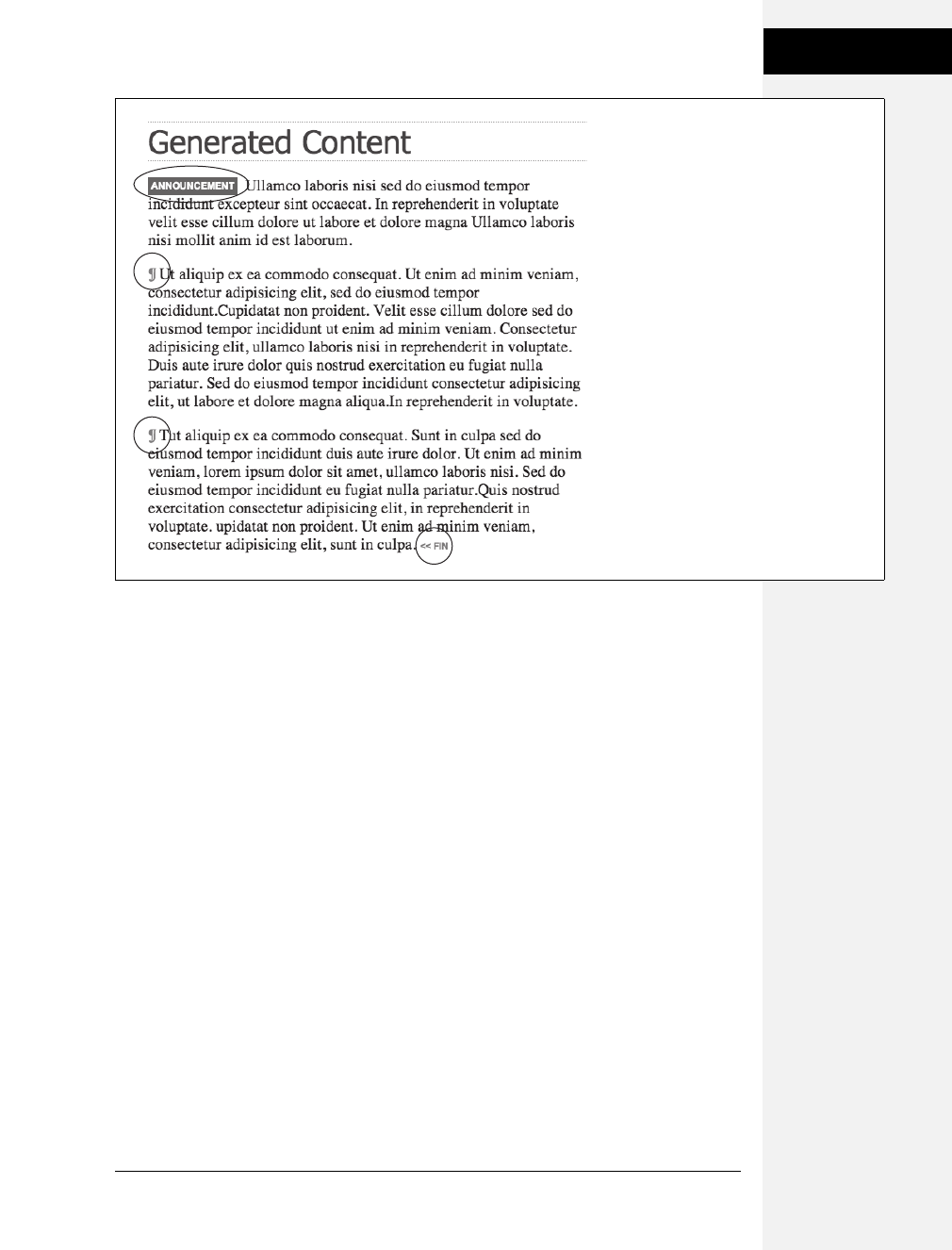
Chapter 16: CSS 3: CSS on the Edge 455
Generated Content
Figure 16-8:
CSS Generated Content lets you add
supplemental, less critical content to spice
up your pages. Add introductory boxes like
the Announcement blurb at the beginning of
the first paragraph, or elegantly close an
entry with “<<fin” (bottom right) without
adding extra HTML to the page.
Download at Boykma.Com

Download at Boykma.Com


Download at Boykma.Com
459
Appendix A
appendix
a
CSS Property Reference
Mastering Cascading Style Sheets involves knowing how to use a large number of
CSS properties that control the appearance of text, images, tables, and forms. To
help you in your quest, this appendix gives you a summary of the properties and
values you’ll use to create your own styles. This list covers nearly all of the CSS 2.1
standard properties—the ones that most web browsers support.
Note: This appendix leaves out properties that no (or hardly any) browsers recognize. Otherwise, the fol-
lowing descriptions mention the browsers with which each property works. For full details straight from the
horse’s mouth, visit the World Wide Web Consortium’s CSS 2.1 specification at www.w3.org/TR/CSS21. You
can read about some of the newer CSS 3 properties in Chapter 16. (They don’t work in all browsers.)
CSS Values
Every CSS property has a corresponding value. The color property, which formats
font color, requires a color value to specify which color you want to use. The prop-
erty color: #FFFFFF; creates white text. Different properties require different types
of values, but they come in four basic categories: colors, lengths and sizes, key-
words, and URLs.
Colors
You can assign colors to many different properties, including those for font, back-
ground, and borders. CSS provides several different ways to specify color.
Download at Boykma.Com

460 CSS: The Missing Manual
CSS Values
Keywords
A web color keyword is simply the name of the color, like white or black. There are
currently 17 recognized web color keywords: aqua, black, blue, fuchsia, gray, green,
lime, maroon, navy, olive, orange, purple, red, silver, teal, white, and yellow. Some
browsers accept more keywords, and CSS 3 promises to offer many more in the
future: for one example, RGBA color, see page 445. You can read a lot more about
CSS 3 at www.w3.org/TR/css3-color.
RGB values
Computer monitors create colors using a mixture of red, green, and blue light.
These RGB values can create (nearly) the full spectrum of color. Almost every
design, illustration, and graphics program lets you specify colors using RGB, so it’s
easy to transfer a color from one of those programs to a CSS property. CSS repre-
sents RGB values in several ways:
•Hex values. The method most commonly used on the Web for identifying
color, hex color values consist of three two-character numbers in the hexadeci-
mal (that is, base 16) system. #FF0033 represents an RGB value composed of
red (FF, which equals 255 in normal, base 10 numbers), green (00), and blue
(33). The # tells CSS to expect hex numbers ahead, and it’s required. If you
leave off the #, a web browser won’t display the correct color.
Tip: If all three two-digit values are repeated pairs of digits, you can shorten the hex value by using just
the first number of each pair. For example #361 means the same thing as #336611.
•RGB percentages. You can also specify a color using percentage values, like this:
rgb(100%, 0%, 33%). You can get these numbers from image-editing and design
programs that can define colors using percentages (which is most of them).
•Decimal values. Finally, you can use decimal RGB values to specify a color. The
format is similar to the percentage option, but you use a number from 0 to 255
to indicate each color: rgb(255, 0, 33).
It doesn’t matter which method you use—they all work. For consistency’s sake,
you should pick one way of specifying RGB values and stick with it. The Windows
and Mac operating systems both have color pickers that let you find the perfect
color from a palette of millions, and then show you the RGB value. Alternatively,
you can use this free online color picker: www.ficml.org/jemimap/style/color/wheel.
html. Or, for more advanced color picking (including the ability to create and save
a pallet of colors), check out http://kuler.adobe.com.
Tip: Many Mac programs, including TextEdit, let you open the color picker by pressing c-Shift-C.
Download at Boykma.Com

Appendix A: CSS Property Reference 461
CSS Values
Lengths and Sizes
CSS provides many different ways to measure the size of type, the width of a box,
or the thickness of a borderline. To indicate type size, you can use inches, picas,
points, centimeters, millimeters, em-heights, ex-heights, pixels, and percentages.
However, even though there are a lot of options, most don’t apply to the world of
onscreen display, for reasons discussed on page 120. You really need to think about
these three only—pixels, ems, and percentages.
Pixels
A pixel is a single dot on a computer screen. Pixels give you a consistent method of
identifying lengths and font sizes from computer to computer: 72 pixels on one
monitor is 72 pixels on another monitor. That doesn’t mean the actual, real-world
length is the same for everyone, though. Since people set their monitors to differ-
ent resolutions—800 ×600, 1024 ×768, 1600 ×1200, or whatever—72 pixels may
take up 1 inch on one monitor, but only half an inch for someone else. Neverthe-
less, pixels give you the most consistent control over presentation.
Note: There’s just one drawback to using pixels: Folks using Internet Explorer 6 or earlier can’t resize any
type that’s sized using pixels. If your text is too small for someone’s eyes, the visitor won’t be able to
enlarge it to make it more readable. (See page 120 for more on pixel measurements.)
Ems
Originally from the typographic world, an em is a unit that represents the height of
the capital letter M for a particular font. In web pages, 1em is the height of the web
browser’s base text size, which is usually 16 pixels. However, anyone can change
that base size setting, so 1em may be 16 pixels for one person, but 24 pixels in
someone else’s browser. In other words, ems are a relative unit of measurement.
In addition to the browser’s initial font-size setting, ems can inherit size informa-
tion from containing tags. A type size of .9em would make text about 14 pixels tall
on most browsers with a 16 pixel base size. But if you have a <p> tag with a font
size of .9ems, and then a <strong> tag with a font size of .9ems inside that <p> tag,
that <strong> tag’s em size isn’t 14 pixels—it’s 12 pixels (16 ×.9 ×.9). So keep
inheritance in mind when you use em values.
Percentages
CSS uses percentages for many different purposes, like sizing text, determining the
width or height of an element, and specifying the placement of an image in the
background of a style, to name a few. Now, what you’re taking a percentage of var-
ies from property to property. For font sizes, the percentage is calculated based on
the text’s inherited value. Say the general font size for a paragraph is 16 pixels tall.
If you created a style for one special paragraph and set its font size to 200 percent,
Download at Boykma.Com

462 CSS: The Missing Manual
CSS Values
that text is displayed at 32 pixels tall. When applied to width, however, percent-
ages are calculated based on the width of the page or on the width of the nearest
parent element. You specify a percentage with a number followed by the percent
sign: 100%.
Keywords
Instead of color or size, many properties have their own specific values that affect
how the properties display and are represented by keywords. The text-align prop-
erty, which aligns text on screen, can take one of four keywords: right, left, center,
and justify. Since keywords vary from property to property, read the property
descriptions that follow to learn the keyword appropriate to each property.
One keyword, however, is shared by all properties—inherit. This keyword lets you
force a style to inherit a value from a parent element. You can use the inherit key-
word on any property. This keyword gives you the power to make styles inherit
properties that aren’t normally inherited from parent tags. For instance, say you
use the border property to add a border around a paragraph. Other tags, such as
<em> and <strong>, inside the <p> tag don’t inherit this value, but you can force
them to do so with the inherit keyword:
em, strong {
border: inherit;
}
That way, the em and strong tags display the same border value as their parent
<p> tag. So the <em> and <strong> elements of the paragraph each get their own
borders, as does the entire paragraph, so you’d end up with boxes within boxes (a
good reason why that property isn’t inherited normally). If you change the <p>
tag’s border value to a different color or thickness, the <em> and <strong> tags
inherit that value and display the same type of border, too.
Note: The border property isn’t a very useful example, mainly because inherit isn’t a very useful value.
But this wouldn’t be a Missing Manual if it didn’t give you all the facts.
URLs
URL values let you point to another file on the Web. For example, the background-
image property accepts a URL—the path to the file on the Web—as its value,
which lets you assign a graphic file as a background for a page element. This tech-
nique is handy for adding a tiling image in the background of a page or using your
own graphic for bulleted lists (see page 137).
In CSS, you specify an URL like this: url(images/tile.gif). A style that adds an image
called tile.gif to the background of the page would look like this:
body { background-image: url(images/tile.gif); }
Download at Boykma.Com

Appendix A: CSS Property Reference 463
Text Properties
Unlike in HTML, in CSS, quotes around the URL are optional, so url("images/tile.
gif"), url('images/tile.gif'), and url(images/tile.gif) are equivalent.
Note: The URL itself is just like the HTML href attribute used for links, meaning you can use an absolute
URL like http://www.missingmanuals.com/images/tile.gif, a root-relative path like /images/tile.gif,ora
document-relative URL like ../../images/tile.gif. See page 192 for the full story on these kinds of paths.
Text Properties
The following properties affect how text is formatted on a web page. Since most of
the properties in this category are inherited, you don’t necessarily have to apply
them to tags specifically intended for text (like the <p> tag). You can apply these
properties to the <body> tag, so that other tags inherit and use the same settings.
This technique is a quick way to define an overall font, color, and so on for a page
or section.
color (inherited)
Sets the color of text. Since it’s inherited, if you set the color of the <body> tag to
red, for example, all text inside of the body—and all other tags inside the <body>
tag—is red, too.
•Values: any valid color value
•Example: color: #FFFF33;
Note: The preset link colors for the <a> tag override color inheritance. In the above example, any links inside
the <body> tag would still be standard hyperlink blue. See page 226 for ways to change preset link colors.
font (inherited)
This is a shortcut method for cramming the following text properties into a single
style declaration: font-style, font-variant, font-weight, font-size, line-height, and font-
family. (Read on for the individual descriptions.)
You must separate each value by a space and include at least font-size and font-
family, and those two properties must be the last two items in the declaration. The
others are optional. If you don’t set a property, the browser uses its own preset
value, potentially overriding inherited properties.
•Values: Any value that’s valid for the specific font property. When including a
line height, add a slash followed by the line height after the font size like this:
1.25em/150%.
•Example: font: italic small-caps bold 1.25em/150% Arial, Helvetica,
sans-serif;
Download at Boykma.Com

464 CSS: The Missing Manual
Text Properties
font-family (inherited)
Specifies the font the browser should use to display text. Fonts are usually speci-
fied as a series of three to four options to accommodate the fact that a particular
font may not be installed on a visitor’s computer. See page 117.
•Values: A comma-separated list of font names. When a font has a space in its
name, surround that font name with quotes. The last font listed is usually a
generic font type instructing browsers to choose a suitable font if the other
listed fonts aren’t available: serif, sans-serif, monotype, fantasy, or cursive.
•Example: font-family: "Lucida Grande", Arial, sans-serif;
font-size (inherited)
Sets the size of text. This property is inherited, which can lead to some weird
behaviors when using relative length measurements like percentages and ems.
•Values: Any valid CSS measurement unit (page 120), plus the following key-
words: xx-small, x-small, small, medium, large, x-large, xx-large, larger, and
smaller. Medium represents the web browser’s normal, preset font size, and the
other sizes are multiples of medium.
Each of the other options decreases or increases the size by a different factor.
While each size change is supposed to be a consistent increase or decrease from
the previous size, it isn’t. Basically, xx-small is the equivalent of 9 pixels (assum-
ing you haven’t adjusted the base font size in your browser); x-small is 10 pixels;
small is 13 pixels; large is 18 pixels; x-large is 24 pixels; and xx-large is 32 pixels.
Due to the uncertainty of how each browser handles these keywords, many
designers use pixels, ems, or percentages instead.
•Example: font-size: 1.25em;
font-style (inherited)
Makes text italic. Applied to italic text, it turns it back to plain text. The options
italic and oblique are functionally the same.
•Values: italic, oblique, normal
•Example: font-style: italic;
font-variant (inherited)
Makes text appear in small caps, like this: SPECIAL PRESENTATION. The value nor-
mal removes small caps from text already formatted that way.
•Values: small-caps, normal
•Example: font-variant: small-caps;
Download at Boykma.Com

Appendix A: CSS Property Reference 465
Text Properties
font-weight (inherited)
Makes text bold or removes bolding from text already formatted that way.
•Values: CSS actually provides 14 different font-weight keywords, but only a cou-
ple actually work with today’s browsers and computer systems—bold and normal.
•Example: font-weight: bold;
letter-spacing (inherited)
Adjusts the space between letters to spread out letters (adding spacing between
each) or cram letters together (removing space).
•Values: Any valid CSS measurement unit, though ems and pixels are most com-
mon. For this property, percentages don’t work in most browsers. Use a posi-
tive value to increase the space between letters and a negative value to remove
space (scrunch letters together). The value normal resets letter-spacing to its reg-
ular browser value of 0.
•Examples: letter-spacing: -1px; letter-spacing: 2em;
line-height (inherited)
Adjusts space between lines of text in a paragraph (often called line spacing in
word-processing programs). The normal line height is 120 percent of the size of
the text (page 128).
•Values: Most valid CSS lengths (page 120), though ems and pixels and percent-
ages are most common.
•Example: line-height: 200%;
text-align (inherited)
Positions a block of text to the left, right, or center of the page or container element.
•Values: left, center, right, justify (the justify option often makes text difficult to
read on monitors).
•Example: text-align: center;
text-decoration
Adds lines above, under, and/or through text. Underlining is common with links,
so it’s usually a good idea not to underline text that isn’t a link. The color of the
underline, overline, or strike-through line is the same as the font color of the tag
being styled. The property also supports a blink value that makes text flash off and
on obnoxiously (but most browsers ignore blink anyway).
Download at Boykma.Com

466 CSS: The Missing Manual
Text Properties
•Values: underline, overline, line-through, blink, none. The none value turns off all
decoration. Use this to hide the underline that normally appears under links.
You can also add multiple decorations by listing the name of each type (except
none) separated by a space.
•Example: text-decoration: underline overline line-through;
text-indent (inherited)
Sets the indent size of the first line of a block of text. The first line can be indented
(as in many printed books) or outdented, so that the first line hangs off and over
the left edge of the rest of the text.
•Values: Any valid CSS measurement unit. Ems and pixels are most common;
percentages behave differently than with the font-size property. Here, percent-
ages are based on the width of the box containing the text, which can be the
width of the entire browser window. So 50% would indent the first line half of
the way across the window (see page 62 for a detailed explanation). To outdent
(hang the first line off the left edge), use a negative value. This technique works
well in conjunction with a positive margin-left property (page 136), which
indents the left side of the other lines of text a set amount.
•Example: text-indent: 3em;
text-transform (inherited)
Changes the capitalization of text, so text appears in all uppercase letters, all lowercase,
or only the first letter of each word capitalized.
•Values: uppercase, lowercase, capitalize, none. The none option returns the text
to whatever case is in the actual HTML code. If aBCDefg are the actual letters
typed in HTML, then none removes any other inherited case set by an ancestor
tag and displays aBCDefg onscreen.
•Example: text-transform: uppercase;
vertical-align
Sets the baseline of an inline element relative to the baseline of the surrounding
contents. With it, you can make a character appear slightly above or below sur-
rounding text. Use this to create superscript characters like ™, ®, or ©. When
applied to a table cell, the values top, middle, bottom, and baseline control the vertical
placement of content inside the cell (page 275).
•Values:baseline, sub, super, top, text-top, middle, bottom, text-bottom, a percent-
age value, or an absolute value (like pixels or ems). Percentages are calculated
based on the element’s line-height value (page 128).
•Examples: vertical-align: top; vertical-align: -5px; vertical-align: 75%;
Download at Boykma.Com

Appendix A: CSS Property Reference 467
List Properties
white-space
Controls how the browser displays space characters in the HTML code. Normally,
if you include more than one space between words—“Hello Dave”—a web
browser displays only one space—“Hello Dave.” You can preserve any white space
exactly as is in the HTML using the pre value, which does the same as the HTML
<pre> tag. In addition, web browsers will split a line of text at a space, if the line
won’t fit within the window’s width. To prevent text from wrapping, use the now-
rap value. But the nowrap value makes all of the paragraph’s text stay on one line,
so don’t use it with long paragraphs (unless you like the idea of making your visi-
tors scroll endlessly to the right).
•Values: nowrap, pre, normal. Two other values—pre-line and pre-wrap—don’t
work in many browsers.
•Example: white-space: pre;
word-spacing (inherited)
Works like the letter-spacing property (page 464), but instead of letters, it adjusts
space between words.
•Values: Any valid CSS measurement unit, though ems and pixels are most com-
mon; percentages don’t work in most browsers. Use a positive value to increase
the space between words and a negative value to remove space (scrunch words
together). The value normal resets word spacing to its regular browser value of 0.
•Examples: word-spacing: -1px; word-spacing: 2em;
List Properties
The following properties affect the formatting of bulleted lists (<ul>) and numbered
lists (<ol>). (See page 134 for more on using CSS with lists.)
list-style (inherited)
This property is a shorthand method of specifying the three properties listed next.
You can include a value for one or more of those properties, separating each by a
space. You can even use this property as a shortcut for writing a single property and
save a couple of keystrokes: list-style: outside, instead of list-style-position: outside. If
you specify both a type and an image, a web browser will display the bullet type
(disc, square, and so on) only if it can’t find the image. This way, if the path to your
custom bullet image doesn’t work, you don’t end up with a bulletless bulleted list.
•Values: Any valid value for list-style-type, list-style-image, and/or list-style-position.
•Example: list-style: disc url(images/bullet.gif) inside;
Download at Boykma.Com

468 CSS: The Missing Manual
Padding, Borders,
and Margins
list-style-image (inherited)
Specifies an image to use for a bullet in a bulleted list.
•Values: a URL value (page 192) or none.
•Example: list-style-image: url(images/bullet.gif);
Note: The background-image property does the custom bullet job just as well and offers more control
(see page 188).
list-style-position (inherited)
Positions the bullets or numbers in a list. These markers can appear outside of the
text, hanging off to the left, or inside the text (exactly where the first letter of the
first line normally begins). The outside position is how web browsers normally dis-
play bullets and numbers.
•Values:inside, outside
•Example:list-style: inside;
list-style-type (inherited)
Sets the type of bullet for a list—round, square, roman numeral, and so on. You
can even turn an unordered (bulleted) list into an ordered (numbered) list by
changing the list-style-type property. Use the none option to completely remove
bullets or numbers from the list.
•Values: disc, circle, square, decimal, decimal-leading-zero, upper-alpha, lower-
alpha, upper-roman, lower-roman, lower-greek, none
•Example: list-style-type: square;
Padding, Borders, and Margins
The following properties control the space around an element, and let you add
border lines to a style.
border
Draws a line around the four edges of an element.
•Values: The width (thickness) of the border line in any valid CSS measurement
unit (except percentages).
You can also specify a style for the line: solid, dotted, dashed, double, groove,
ridge, inset, outset, none, and hidden. (See Figure 7-7 on page 161 for an illustra-
tion of the different styles.) The none and hidden values do the same thing—
remove any border.
Download at Boykma.Com

Appendix A: CSS Property Reference 469
Padding, Borders,
and Margins
Finally, you can specify a color using any valid CSS color type (a keyword like
green or a hex number like #33fc44).
•Example:border: 2px solid #f33;
border-top, border-right, border-bottom, border-left
Adds a border to a single edge. For example, border-top adds a border to the top of
the element.
•Values: same as for border.
•Example: border-left: 1em dashed red;
border-color
Defines the color used for all four borders.
•Values: Any valid CSS color type (a keyword like green or a hex number like
#33fc44).
•Example: border-color: rgb(255,34,100);
This property also supports a shorthand method, which lets you assign different
colors to each of the four borders.
•Values: Any valid CSS color type for each border: top, right, bottom, left. If you
include just two colors then the first color applies to the top and bottom, and
the second color to the left and right.
•Example: border-color: #000 #F33 #030 #438F3C;
border-top-color, border-right-color, border-bottom-color,
border-left-color
Functions just like the border-color property but sets color for only one edge. Use
these properties to override the color set by the border property. In this way, you
can customize the color for an individual edge while using a more generic border
style to define the basic size and style of all four edges.
•Values: see border-color above.
•Example: border-left-color: #333;
border-style
Defines the style used for all four borders.
•Values: One of these keywords: solid, dotted, dashed, double, groove, ridge, inset,
outset, none, and hidden. See Figure 7-7 on page 161 for an illustration of the dif-
ferent styles. The none and hidden values act identically—they remove any border.
•Example: border-style: inset;
Download at Boykma.Com

470 CSS: The Missing Manual
Padding, Borders,
and Margins
This property also supports a shorthand method, which lets you assign different
styles to each of the four borders.
•Values: One of the keywords mentioned above for each border: top, right, bot-
tom, left. If you include just two keywords, then the first style applies to the top
and bottom and the second style to the left and right.
•Example: border-style: solid dotted dashed double;
border-top-style, border-right-style, border-bottom-style,
border-left-style
Functions just like the border-style property, but applies only to one edge.
•Values: see border-style above.
•Example: border-top-style: none;
border-width
Defines the width or thickness of the line used to draw all four borders.
•Values: Any valid CSS measurement unit except percentages. The most common
are ems and pixels.
•Example: border-width: 1px;
This property also supports a shorthand method, which lets you assign different
colors to each of the four borders.
•Values: Any valid CSS measurement unit (except percentages) for each border:
top, right, bottom, left. If you include just two values, then the first value sets
the width for the top and bottom border and the second value the width for the
left and right borders.
•Example: border-width: 3em 1em 2em 3.5em;
border-top-width, border-right-width, border-bottom-
width, border-left-width
Functions just like the border-width property but applies only to one edge.
•Values: see border-width above.
•Example: border-bottom-width: 3em;
outline
This property is a shorthand way to combine outline-color, outline-style, and outline-
width (listed next). An outline works just like a border, except the outline takes up
no space (that is, it doesn’t add to the width or height of an element), and it
applies to all four edges. It’s intended more as a way of highlighting something on

Appendix A: CSS Property Reference 471
Padding, Borders,
and Margins
a page than as a design detail. Outline works in Firefox, Safari, Chrome, Opera, and
only version 8 or later of Internet Explorer.
•Values: The same as for border with one exception—see outline-color next.
•Example: outline: 3px solid #F33;
outline-color
Specifies the color for an outline (see outline above).
•Values: Any valid CSS color, plus the value invert, which merely reverses the color
the outline is sitting on. If the outline is drawn on a white background, the invert
value makes the outline black. Works just like border-color (page 469).
•Example: outline-color: invert;
outline-style
Specifies the type of line for the outline—dotted, solid, dashed, and so on.
•Values: Same as border-style (page 469).
•Example: outline-style: dashed;
outline-width
Specifies the thickness of the outline. Works just like border-width.
•Values: Any valid CSS measurement unit except percentages. The most common
are ems and pixels.
•Example: outline-width: 3px;
padding
Sets the amount of space between the content, border, and edge of the back-
ground. Use it to add empty space around text, images, or other content. (See
Figure 7-1 on page 152 for an illustration.)
•Values: Any valid CSS measurement unit, like pixels or ems. Percentage values
are based on the width of the containing element. A headline that’s a child of
the <body> tag uses the width of the browser window to calculate a percentage
value, so a padding of 20 percent adds 20 percent of the window’s width. If the
visitor resizes his browser, the padding size changes proportionately. You can
specify the padding for all four edges by using a single value or set individual
padding sizes per edge using this order: top, right, bottom, left.
•Examples: padding: 20px; padding: 2em 3em 2.5em 0;

472 CSS: The Missing Manual
Padding, Borders,
and Margins
padding-top
Works just like the padding property, but sets padding for top edge only.
•Example: padding-top: 20px;
padding-right
Works just like the padding property, but sets padding for right edge only.
•Example: padding-right: 20px;
padding-bottom
Works just like the padding property, but sets padding for bottom edge only.
•Example: padding-bottom: 20px;
padding-left
Works just like the padding property, but sets padding for left edge only.
•Example: padding-left: 20px;
margin
Sets the amount of space between an element’s border and the margin of other
elements (see Figure 7-1 on page 152). It lets you add white space between two ele-
ments—between one picture and another picture, or between a sidebar and the
main content area of a page.
Note: Vertical margins between elements can collapse. That is, browsers use only the top or bottom
margin and ignore the other, creating a smaller gap than expected (see page 156).
•Values: Any valid CSS measurement unit like pixels or ems. Percentage values
are based on the width of the containing element. A headline that’s a child of
the body tag uses the width of the browser window to calculate a percentage
value, so a margin of 10 percent adds 10 percent of the window’s width to the
edges of the headline. If the visitor resizes his browser, the margin size changes.
As with padding, you specify the margin for all four edges using a single value,
or set individual margins in this order: top, right, bottom, left.
•Examples: margin: 20px; margin: 2em 3em 2.5em 0;
margin-top
Works just like the margin property, but sets margin for top edge only.
•Example: margin-top: 20px;

Appendix A: CSS Property Reference 473
Backgrounds
margin-right
Works just like the margin property, but sets margin for right edge only.
•Example: margin-right: 20px;
margin-bottom
Works just like the margin property, but sets margin for bottom edge only.
•Example: margin-bottom: 20px;
margin-left
Works just like the margin property, but sets margin for left edge only.
•Example: margin-left: 20px;
Backgrounds
CSS provides several properties for controlling the background of an element,
including coloring the background, placing an image behind an element, and con-
trolling how that background image is positioned.
background
Provides a shorthand method of specifying properties that appear in the back-
ground of an element, like a color, an image, and the placement of that image. It
combines the five background properties (described next) into one compact line,
so you can get the same effect with much less typing. However, if you don’t set one
of the properties, browsers use that property’s normal value instead. For example,
if you don’t specify how a background image should repeat, browsers will tile that
image from left to right and top to bottom (see page 193).
•Values: The same values used for the background properties listed next. The
order of the properties isn’t important (except for positioning as described
below), but usually follow the order of background-color, background-image,
background-repeat, background-attachment, background-position.
•Example: background: #333 url(images/logo.gif) no-repeat fixed left top;
background-attachment
Specifies how a background image reacts when your visitor scrolls the page. The
image either scrolls along with the rest of the content or remains in place. You can
add a logo to the upper-left corner of a very long web page, using the background-
attachment property’s fixed value, and make that image stay in the upper-left corner

474 CSS: The Missing Manual
Backgrounds
even when the page is scrolled. (In Internet Explorer 6 and earlier, this property
works only for the <body> tag.)
•Values: scroll or fixed. Scroll is the normal behavior: An image will scroll off the
screen along with text. Fixed locks the image in place.
•Example: background-attachment: fixed;
background-color
Adds a color to the background of a style. The background sits underneath the
border and underneath a background image, a fact to keep in mind if you use one
of the nonsolid border styles like dashed or dotted. In these cases, the background
color shows through the gaps between the dashes or dots.
•Values: any valid color value (page 118).
•Example: background-color: #FFF;
background-image
Places an image into the background of a style. Other page elements sit on top of
the background image, so make sure that text is legible where it overlaps the image.
You can always use padding to move content away from the image, too. The image
tiles from left to right and top to bottom, unless you set the background-repeat
property as well.
•Values: The URL of an image.
•Examples: background-image: url(images/photo.jpg); background-image:
url(http://www.example.org/photo.jpg);
background-position
Controls the placement of an image in the background of a page element. Unless
you specify otherwise, an image begins in the element’s top-left corner. If the
image tiles, background-position controls the image’s start point (see background-
repeat next). If you position an image in the center of an element, the browser puts
the image there, and then tiles the image up and to the left and down and to the
right. In many cases, the exact placement of an image doesn’t cause a visible differ-
ence in the background tiling, but it lets you make subtle changes to the positioning
of a pattern in the background.
•Values: Any valid CSS measurement unit, like pixels or ems, as well as keywords
or percentages. The values come in pairs, with the first being the horizontal
position, and the second being vertical. Keywords include left, center, and right
for horizontal positioning and top, center, and bottom for vertical. Pixel and em
values are calculated from the top-left corner of the element, so to place a
graphic 5 pixels from the left edge and 10 pixels from the top, you’d use a value
of 5px 10px.

Appendix A: CSS Property Reference 475
Page Layout
Properties
Percentage values map one point on the image to one point in the background of
the element, calculated by the specified percentage from the left and top edges of
the image and the specified percentage from the left and top edges of the element.
50% 50% places the point that’s 50 percent across and 50 percent down the image
on top of the point that’s 50 percent across and 50 percent down the element. In
other words, it puts the image directly in the middle of the element. You can mix
and match these values: If you want, use a pixel value for horizontal placement
and a percentage value for vertical placement.
•Examples: background-position: left top; background-position: 1em 3em;
background-position: 10px 50%;
background-repeat
Controls whether or how a background image repeats. Normally, background images
tile from the top left to the bottom right, filling the element’s entire background.
•Values: repeat, no-repeat, repeat-x, repeat-y. The repeat option is the normal
method—tiling left to right, top to bottom. No-repeat places the image a single
time in the background with no tiling. Repeat-y tiles the image top to bottom
only—perfect for adding a graphical sidebar. Repeat-x tiles the image from left to
right only, so you can add a graphical bar to an element’s top, middle, or bottom.
•Example: background-repeat: no-repeat;
Page Layout Properties
The following properties control the placement and size of elements on a web page.
bottom
This property is used with absolute, relative, and fixed positioning (see page 356).
When used with absolute or fixed positioning, bottom determines the position of
the bottom edge of the style relative to the bottom edge of its closest positioned
ancestor. If the styled element isn’t inside of any positioned tags, then the place-
ment is relative to the bottom edge of the browser window. You can use this prop-
erty to place a footnote at the bottom of the browser window. When used with
relative positioning, the placement is calculated from the element’s bottom edge
(prior to positioning).
•Values: Any valid CSS measurement unit, like pixels, ems, or percentages.
Percentages are calculated based on the width of the containing element.
•Example: bottom: 5em;
Note: Internet Explorer 6 and earlier can have a problem when positioning an element using the bot-
tom property. See the box on page 365 for details.

476 CSS: The Missing Manual
Page Layout
Properties
clear
Prevents an element from wrapping around a floated element. Instead, the cleared
element drops below the bottom of the floated element.
•Values: left, right, both, none. The left option means the element can’t wrap
around left-floated elements. Similarly, right drops the element below any right-
floated items. The both value prevents an element from wrapping around either
left- or right-floated elements. None turns the property off, so you use it to
override a previously set clear property. This trick comes in handy when a par-
ticular tag has a style that drops below a floated element but you want the tag to
wrap in just one case. Create a more specific style to override the float for that
one tag.
•Example: clear: both;
clip
Creates a rectangular window that reveals part of an element. If you had a picture
of your high-school graduating class, and the class bully was standing on the far
right edge of the photo, you could create a display area that crops out the image of
your tormentor. The full image is still intact, but the clipping area only displays the
bully free portion of it. The clip property is most effective when used with Java-
Script programming to animate the clip. You can start with a small clipping area
and expand it until the full photo is revealed.
•Values: Coordinates of a rectangular box. Enclose the coordinates in parentheses
and precede them by the keyword rect, like so: rect(5px,110px,40px,10px);.
Here’s how the order of these coordinates works: The first number indicates the
top offset—the top edge of the clipping window. In this example, the offset is
5px, so everything in the first four rows of pixels is hidden. The last number is
the left offset—the left edge of the clipping window. In this example, the offset
is 10px, so everything to the left (the first 9 pixels of the element) is hidden. The
second number is the width of the clipping window plus the last number; if the
left edge of the clip is 10 pixels and you want the visible area to be 100 pixels,
the second number would be 110px. The third number is the height of the clip-
ping region plus the top offset (the first number). So, in this example, the
clipping box is 30 pixels tall (30px + 10px = 40px).
•Example: clip: rect(5px,110px,40px,10px);
Note: Since the order of the coordinates is a little strange, most designers like to start with the first and
last numbers, and then compute the two other numbers from them.

Appendix A: CSS Property Reference 477
Page Layout
Properties
display
Determines the kind of box used to display a web page element—block-level or
inline (page 22). Use it to override how a browser usually displays a particular ele-
ment. You can make a paragraph (block-level element) display without line breaks
above and below it—exactly like, say, a link (inline element).
•Values: block, inline, none. The display property accepts 17 values, most of
which have no effect in the browsers available today. Block, inline, and none,
however, work in almost all browsers. Block forces a line break above and below
an element, just like other block-level elements (like paragraphs and headers).
Inline causes an element to display on the same line as surrounding elements
(just as text within a <strong> tag appears right on the same line as other text).
None makes the element completely disappear from the page. Then, you can
make the element reappear with some JavaScript programming or the :hover
pseudo-class (see page 64). Some of the other properties work in a handful of
browsers (the most notable exceptions being Internet Explorer 7 and 6). You
can use the table display properties to create some interesting page layouts, as
mentioned on page 283.
•Example: display: block;
float
Moves an element to the left or right edge of the browser window, or, if the floated
element is inside another element, to the left or right edge of that containing ele-
ment. Elements that appear after the floated element move up to fill the space to
the right (for left floats) or left (for right floats), and then wrap around the floated
element. Use floats for simple effects—like moving an image to one side of the
page—or for very complex layouts—like those described in Chapter 12.
•Values: left, right, none. To turn off floating entirely, use none: This comes in
handy when a particular tag has a style with a left or right float applied to it and
you want to create a more specific style to override the float for that one tag.
•Example: float: left;
height
Sets the height of the content area—the area of an element’s box that contains con-
tent like text, images, or other tags. The element’s actual onscreen height is the
total of height, top and bottom margins, top and bottom padding, and top and
bottom borders.
•Values: Any valid CSS measurement unit, such as pixels, ems, or percentages.
Percentages are calculated based on the height of the containing element.
•Example:height: 50%;

478 CSS: The Missing Manual
Page Layout
Properties
Note: Sometimes, your content ends up taller than the set height—if you type a lot of text, for instance,
or your visitor increases text size in her browser. Browsers handle this situation differently: IE 6 (and ear-
lier) simply makes the box bigger, while other browsers make the content extend outside of the box. The
overflow property controls what happens in this case (see page 167).
left
When used with absolute or fixed positioning (page 356), this property deter-
mines the position of the left edge of the style relative to the left edge of its closest
positioned ancestor. If the styled element isn’t inside of any positioned tags, then
the placement is relative to the left edge of the browser window. You can use this
property to place an image 20 pixels from the left edge of the browser window.
When used with relative positioning, the placement is calculated from the ele-
ment’s left edge (prior to positioning).
•Values: Any valid CSS measurement unit, such as pixels, ems, or percentages.
•Example:left: 5em;
max-height
Sets the maximum height for an element. That is, the element’s box may be shorter
than this setting, but it can’t be any taller. If the element’s contents are taller than
the max-height setting, they overflow the box. You can control what happens to the
excess using the overflow property. Internet Explorer 6 (and earlier) doesn’t under-
stand the max-height property.
•Values: Any valid CSS measurement unit, like pixels, ems, or percentages.
Browsers calculate percentages based on the height of the containing element.
•Example: max-height: 100px;
max-width
Sets the maximum width for an element. The element’s box can be narrower than
this setting, but not wider. If the element’s contents are wider than the max-width
setting, they overflow the box, which you can control with the overflow property.
You mostly use max-width in liquid layouts (page 300) to make sure a page design
doesn’t become unreadably wide on very large monitors. This property doesn’t
work in Internet Explorer 6 (or earlier).
•Values: Any valid CSS measurement unit, like pixels, ems, or percentages.
Percentages are calculated based on the width of the containing element.
•Example: max-width: 950px;

Appendix A: CSS Property Reference 479
Page Layout
Properties
min-height
Sets the minimum height for an element. The element’s box may be taller than this
setting, but it can’t be shorter. If the element’s contents aren’t as tall as the min-
height setting, the box’s height shrinks to meet the min-height value. Internet
Explorer 6 (and earlier) doesn’t recognize this property.
•Values: Any valid CSS measurement unit, like pixels, ems, or percentages.
Percentages are based on the containing element’s height.
•Example: min-height: 20em;
min-width
Sets the minimum width for an element. The element’s box may be wider than this
setting, but it can’t be narrower. If the element’s contents aren’t as wide as the min-
width value, the box simply gets as thin as the min-width setting. You can also use
min-width in liquid layouts, so that the design doesn’t disintegrate at smaller window
widths. When the browser window is thinner than min-width, it adds horizontal scroll
bars. Internet Explorer 6 (and earlier) doesn’t understand this property.
•Values: Any valid CSS measurement unit, like pixels, ems, or percentages.
Percentages are based on the containing element’s width.
•Example: min-width: 760px;
Note: You usually use the max-width and min-width properties in conjunction when creating liquid lay-
outs. See Chapter 12 (page 320).
overflow
Dictates what should happen to text that overflows its content area, like a photo
that’s wider than the value set for the width property.
Note: IE 6 (and earlier) handles overflow situations differently than other browsers. See page 173.
•Values: visible, hidden, scroll, auto. Visible makes the overflowing content extend
outside the box—potentially overlapping borders and other web page elements
on the page. IE 6 (and earlier) simply enlarges the box (borders and all) to
accommodate the larger content. Hidden hides any content outside of the con-
tent area. Scroll adds scroll bars to the element so a visitor can scroll to read any
content outside the content area—sort of like a mini-frame. Auto adds scroll-
bars only when they’re necessary to reveal more content.
•Example: overflow: hidden;

480 CSS: The Missing Manual
Page Layout
Properties
position
Determines what type of positioning method a browser uses when placing an
element on the page.
•Values: static, relative, absolute, fixed.Static is the normal browser mode—one
block-level item stacked on top of the next with content flowing from the top to
the bottom of the screen. Relative positions an element in relation to where the
element currently appears on the page—in other words, it can offset the ele-
ment from its current position. Absolute takes an element completely out of the
page flow. Other items don’t see the absolute element and may appear under-
neath it. It’s used to position an element in an exact place on the page or to
place an element in an exact position relative to a parent element that’s posi-
tioned with absolute, relative, or fixed positioning. Fixed locks an element on the
page, so that when the page is scrolled, the fixed element remains on the
screen—much like HTML frames. Internet Explorer 6 (and earlier) ignores the
fixed option.
•Example: position: absolute;
Tip: You usually use relative, absolute, and fixed in conjunction with left, right, top, and bottom. See
Chapter 13 for the full details on positioning.
right
When used with absolute or fixed positioning, this property determines the posi-
tion of the right edge of the style relative to the right edge of its closest positioned
ancestor. If the styled element isn’t inside of any positioned tags, then the place-
ment is relative to the right edge of the browser window. You can use this prop-
erty to place a sidebar a set amount from the right edge of the browser window.
When used with relative positioning, the placement is calculated from the ele-
ment’s right edge (prior to positioning).
•Values: Any valid CSS measurement unit, like pixels, ems, or percentages.
•Example: left: 5em;
Warning: Internet Explorer 6 (and earlier) can have problems when positioning an element using the
right property. See the box on page 365 for details.
top
Does the opposite of the bottom property (page 475). In other words, when used with
absolute or fixed positioning, this property determines the position of the top edge of
the style relative to the top edge of its closest positioned ancestor. If the styled ele-
ment isn’t inside of any positioned tags, then the placement is relative to the top edge

Appendix A: CSS Property Reference 481
Page Layout
Properties
of the browser window. You can use this property to place a logo a set amount from
the top edge of the browser window. When used with relative positioning, the place-
ment is calculated from the element’s top edge (prior to positioning).
•Values: Any valid CSS measurement unit, like pixels, ems, or percentages.
•Example: top: 5em;
visibility
Determines whether a web browser displays the element. Use this property to hide
part of the content of the page, such as a paragraph, headline, or <div> tag. Unlike
the display property’s none value—which hides an element and removes it from
the flow of the page—the visibility property’s hidden option doesn’t remove the
element from the page flow. Instead, it just leaves an empty hole where the ele-
ment would have been. For this reason, you most often use the visibility property
with absolutely positioned elements, which have already been removed from the
flow of the page.
Hiding an element doesn’t do you much good unless you can show it again. Java-
Script programming is the most common way to toggle the visibility property to
show and hide items on a page. You can also use the :hover pseudo-class (page 64)
to change an element’s visibility property when a visitor hovers over some part of
the page.
•Values: visible, hidden. You can use the collapse value to hide a row or column
in a table as well.
•Example:visibility: hidden;
width
Sets the width of the content area (the area of an element’s box that contains text,
images, or other tags). The amount of onscreen space actually dedicated to the ele-
ment may be much wider, since it includes the width of the left and right margin,
left and right padding, and left and right borders. IE 6 (and earlier) handles over-
flow situations differently than other browsers. (See the box on page 365.)
•Values: Any valid CSS measurement unit, like pixels, ems, or percentages.
Percentages are based on the containing element’s width.
•Example: width: 250px;
z-index
Controls the layering of positioned elements. Only applies to elements with a posi-
tion property set to absolute, relative, or fixed (page 365). It determines where on
the z axis an element appears. If two absolutely positioned elements overlap, the
one with the higher z-index appears to be on top.

482 CSS: The Missing Manual
Table Properties
•Values: An integer value, like 1, 2, or 10. You can also use negative values, but
different browsers handle them differently. The larger the number, the more
“on top” the element appears. An element with a z-index of 20 appears below an
element with a z-index of 100 (if the two overlap). However, when the element
is inside another positioned element, it’s “positioning context” changes and it
may not appear above another element—no matter what its z-index value. See
Figure 13-6.
•Example: z-index: 12;
Note: The values don’t need be in exact integer order. If element A has a z-index of 1, you don’t have to
set element B’s z-index to 2to put it on top. You can use 5, 10, and so on to get the same effect, as long
as it’s a bigger number. So, to make sure an element always appears above other elements, simply give it
a very large value, like 10000. However, Firefox can only handle a maximum value of 2147483647, so
don’t ever set your z-index above that number.
Table Properties
There are a handful of CSS properties that relate solely to HTML tables.
Chapter 10 has complete instructions on using CSS with tables.
border-collapse
Determines whether the borders around the cells of a table are separated or col-
lapsed. When they’re separated, browsers put a space of a couple of pixels between
each cell. Even if you eliminate this space by setting the cellspacing attribute for the
HTML <table> tag to 0, browsers still display double borders. That is, the bottom
border of one cell will appear above the top border of the cell below, causing a
doubling of border lines. Setting the border-collapse property to collapse eliminates
both the space between cells and this doubling up of borderlines (page 273). This
property works only when applied to a <table> tag.
•Values: collapse, separate
•Example: border-collapse: collapse;
border-spacing
Sets the amount of space between cells in a table. It replaces the <table> tag’s cell-
spacing HTML attribute. However, Internet Explorer 7 and earlier doesn’t under-
stand the border-spacing property, so it’s best to continue to use the cellspacing
attribute in your <table> tags to guarantee space between cells in all browsers.
Note: If you want to eliminate the space browsers normally insert between cells, just set the border-
collapse property to collapse.

Appendix A: CSS Property Reference 483
Table Properties
•Values: Two CSS length values. The first sets the horizontal separation (the
space on either side of each cell), and the second sets the vertical separation (the
space separating the bottom of one cell from the top of the one below it).
•Example: border-spacing: 0 10px;
caption-side
When applied to a table caption, this property determines whether the caption
appears at the top or bottom of the table. (Since, according to HTML rules, the
<caption> tag must immediately follow the opening <table> tag, a caption would
normally appear at the top of the table.)
•Values: top, bottom
•Example: caption-side: bottom;
Note: Unfortunately, this property has no effect in Internet Explorer 6 or 7 (it works in IE 8), so it’s safest
to stick with the HTML equivalent: <caption align="bottom"> or <caption align="top">.
empty-cells
Determines how a browser should display a table cell that’s completely empty,
which in HTML would look like this: <td></td>. The hide value prevents any part
of the cell from being displayed. Instead, only an empty placeholder appears, so
borders, background colors, and background images don’t show up in an emptied
cell. Apply this property to a style formatting the <table> tag.
•Values: show, hide
•Example: empty-cells: show;
Note: The empty-cells property has no effect in Internet Explorer 7 and earlier.
table-layout
Controls how a web browser draws a table and can slightly affect the speed at
which the browser displays it. The fixed setting forces the browser to render all
columns the same width as the columns in the first row, which (for complicated
technical reasons) draws tables faster. The auto value is the normal “browser just
do your thing” value, so if you’re happy with how quickly your tables appear on a
page, don’t bother with this property. If you use it, apply table-layout to a style for-
matting the <table> tag.
•Values: auto, fixed
•Example: table-layout: fixed;

484 CSS: The Missing Manual
Miscellaneous
Properties
Miscellaneous Properties
CSS 2.1 offers a few additional—and sometimes interesting—properties. They let
you enhance your web pages with special content and cursors, offer more control
over how a page prints, and so on. (Unfortunately, browser understanding of these
properties is spotty at best.)
content
Specifies text that appears either before or after an element. Use this property with
the :after or :before pseudo-elements. You can add an opening quotation mark in
front of quoted material and a closing quotation after the quote. Internet Explorer
6 and 7 don’t understand this property, so its use is limited.
•Values: Text inside of quotes "like this," the keywords normal, open-quote, close-
quote, no-open-quote, no-close-quote. You can also use the value of an HTML
attribute. (See page 404 for an example.)
•Examples: p.advert:before { content: "And now a word from our sponsor..."; }
a:after { content: " (" attr(href) ") "; }
Note: Adding text in this way (like the opening and closing quote example) is called generated content.
Read a simple explanation of the generated content phenomenon at www.westciv.com/style_master/
academy/css_tutorial/advanced/generated_content.html. For a deeper explanation, visit www.w3.org/TR/
CSS21/generate.html.
cursor
Lets you change the look of the mouse pointer when it moves over a particular ele-
ment. You can make a question mark appear next to the cursor when someone mouses
over a link that provides more information on a subject (like a word definition).
•Values: auto, default, crosshair, pointer, move, e-resize, ne-resize, nw-resize, n-
resize, se-resize, sw-resize, s-resize, w-resize, text, wait, help, progress. You can also
use a URL value to use your own graphic as a cursor (but see the Note below).
The look of a cursor when mousing over a link is pointer, so if you want to
make some element on the page display the “click me” icon, you can add the
declaration cursor: pointer to the style.
•Example: cursor: help; cursor: url(images/cursor.cur);
Note: Not all browsers recognize URL cursor values. For more information, visit www.quirksmode.org/
css/cursor.html.

Appendix A: CSS Property Reference 485
Miscellaneous
Properties
orphans
Specifies the minimum number of lines of text that can be left at the bottom of a
printed page. Suppose you’re printing your web page on a laser printer, and a five-
line paragraph is split between two pages, with just one line at the bottom of page
one, and the four remaining lines at the top of page two. Because a single line all by
itself looks odd (sort of like a lost orphan—get it?), you can tell the browser to
break a paragraph only if at least, say, three lines are left on the bottom of the page.
(At this writing, only the Opera browser understands this property.)
•Values: a number like 1, 2, 3, or 5.
•Example:orphans: 3;
page-break-after
Determines whether a page break (in printing) occurs after a particular element.
With it, you can make sure that a particular paragraph is always the last item to
appear on a printed page.
•Values: auto, always, avoid, left, right. Auto represents the normal value and lets
the browser determine when and how to break content across printed pages.
Always forces the element that follows to appear at the top of a separate printed
page, and it’s the only value that works consistently across browsers. Avoid pre-
vents a page break after an element; it’s a great way to keep a headline with the
paragraph that follows it, but unfortunately, most browsers don’t understand it.
Left and right determine whether the element following appears on a left- or
right-handed page, which may force the browser to print an extra empty page.
But since no browsers understand these values, don’t worry about wasting
paper. Browsers treat left and right the same as always.
•Example: page-break-after: always;
page-break-before
Works like page-break-after, except the page break appears before the styled ele-
ment, placing it at the top of the next printed page. You can use this property to
make sure headlines for different sections of a long web page each appear at the
top of a page.
•Values: same as page-break-after.
•Example: page-break-before: always;

486 CSS: The Missing Manual
Miscellaneous
Properties
page-break-inside
Prevents an element from being split across two printed pages. If you want to keep
a photo and its caption together on a single page, wrap the photo and caption text
in a <div> tag, and then apply a style with page-break-inside to that <div>. (At this
writing, only Opera understands this property.)
•Values: avoid
•Example: page-break-inside: avoid;
widows
The opposite of orphans, it specifies the minimum number of lines that must
appear at the top of a printed page. Say the printer can manage to fit four out of
five lines of a paragraph at the bottom of a page and has to move the last line to the
top of the next page. Since that line might look weird all by itself, use widows to
make the browser move at least two or three (or whatever number of) lines
together to the top of a printed page. (Only Opera understands this property, so
it’s of limited use.)
•Values: a number like 1, 2, 3 or 5.
•Example: widows: 3;
487
Appendix B
appendix
b
CSS in Dreamweaver
CS4
Adobe’s Dreamweaver CS4 is a website-building program that takes the drudgery
out of creating HTML/XHTML and CSS. Instead of typing lines of code into a text
editor, you can click convenient onscreen buttons and menus and watch your
design unfold before your eyes. The program even has powerful site-management
tools that help you keep track of your site’s pages and links.
Although this book gives you everything you need to know to create your own CSS
from scratch, there’s nothing wrong with turning to a visual editor like Dream-
weaver to save time. In fact, knowing how CSS works, as this book shows you, is a
big help when tweaking or troubleshooting pages created in Dreamweaver.
Note: This appendix focuses solely on Dreamweaver CS4’s CSS features. To learn everything Dreamweaver
can do for your website design and maintenance, check out Dreamweaver CS4: The Missing Manual.
Creating Styles
You begin most CSS-related tasks in the CSS Styles panel, which is Dreamweaver’s
command center for creating styles. To open it, choose Window ➝ CSS Styles.
Using Figure B-1 as a guide, here’s how to find your way around the CSS Styles panel:
• The All button at the top of the panel lists all internal and external styles for the
currently open document. The other button—Current—lets you take a closer
look at individual styles.
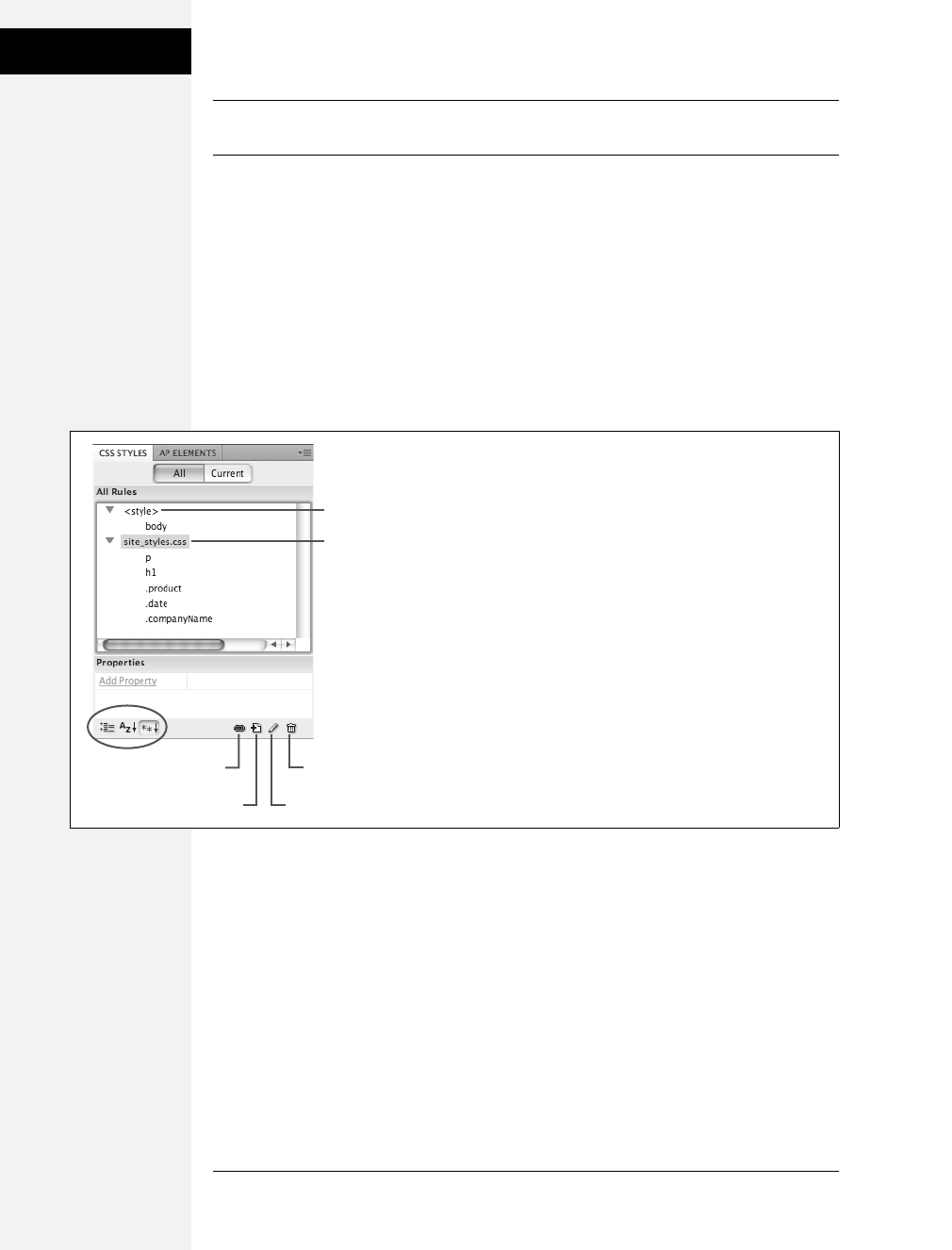
488 CSS: The Missing Manual
Creating Styles
Note: Clicking the minus (–) icon to the left of the style sheet collapses the list of styles, hiding them
from view. (On a Mac, the button looks like a little triangle instead, but it does the same thing.)
• An internal style sheet is indicated by <style> in the panel. In this example,
there’s one tag style inside an internal style sheet (for the <body> tag).
• External style sheets are listed by file name (main.css). The external style sheet’s
rules are listed below the file name (h1, p, .copyright, and so on). The first two
styles are tag styles (notice that the names match various HTML tags), while the
last five are class styles (note the period at the beginning of each name).
• The Properties list in the bottom half of the panel lets you edit a style as
described on page 498. The three buttons at the bottom left of the panel (cir-
cled in Figure B-1) control how the property list is displayed.
Phase 1: Set Up the CSS Type
Dreamweaver gives you many ways to create a new style: click the new style button
on the CSS Styles panel (see Figure B-1); right-click anywhere in the CSS Styles
panel, and then select New from the menu that appears; or choose Format ➝CSS
Styles ➝New. The New CSS Rule dialog box appears (Figure B-2), then you begin
the process of creating your new style.
Here’s a quick tour of your choices:
•Selector Type. From the Selector Type menu, choose the kind of style you wish
to create: Class (page 51), ID (page 53), or Tag (page 50).
Figure B-1:
With the All button selected, the CSS Styles panel lists the
names of all styles available to the current page, including
external and internal style sheets. In this example, an
internal style sheet contains a single style, and one external
style sheet—headlines.css—contains seven styles.
Internal style sheet
External style sheet
Attach external
style sheet Delete style
New style Edit style
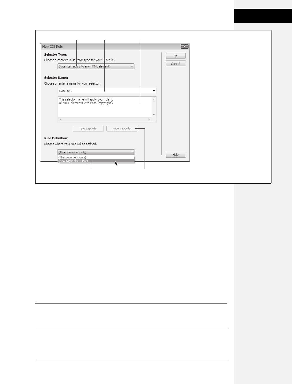
Appendix B: CSS in Dreamweaver CS4 489
Creating Styles
Use the fourth type, Compound, to create more advanced style types like
pseudo-classes (page 62), attribute selectors (page 67), and descendent selectors
(page 57).
In addition, if you’ve selected something on the page (like a paragraph, image,
or headline), Dreamweaver highlights the Compound option and suggests a
descendent selector in the Selector Name field. For example, if you click inside a
paragraph that is itself inside a <div> tag with an ID of main, then Dream-
weaver suggests the descendent selector #main p when you create a new style.
•Selector Name. If you selected Class or ID from the Selector Type menu, enter a
name for the new style. Class style names must begin with a period—.copyright,
for example— and ID style names begin with a # symbol—#banner, for exam-
ple. (Dreamweaver automatically adds the proper symbol, if you forget.)
If you chose Tag instead, then, from the Tag pop-up menu that appears, select
the HTML tag you want to redefine.
Note: If you’re an HTML guru, you may find it faster to skip the Tag pop-up menu and just type the tag
(minus the brackets) in the Name box. For example, if you want to create a style for all unordered (bul-
leted) lists, type ul.
Figure B-2:
In the New CSS Rule dialog box, you
choose a type of style, give it a name,
and decide whether to place the style in
an internal or external style sheet. If
you’ve used previous versions of
Dreamweaver, you’ll notice that this
dialog box has changed significantly in
Dreamweaver CS4.
Internal or external
style sheet
Selector type menu
Change descendent
selector
Selector explanationSelector name

490 CSS: The Missing Manual
Creating Styles
If you selected the Compound option, Dreamweaver lets you type any valid CSS
selector type in the Selector field. You use this feature to create attribute,
descendent, and other advanced selectors, but you can also use it just to create a
tag or class style.
When you add a Class, ID, tag, or other selector to the Selector Name field,
Dreamweaver briefly explains which HTML elements the selector will apply to.
For example, Figure B-2 displays the New CSS Rule dialog box in the process of
creating a new class style named copyright. The dialog box explains that this rule
will apply to all HTML tags that have the class property set to copyright (in other
words, all tags that have the copyright class applied to them as described on page
51.) For simple styles like class and tag styles, this explanation may make you
mutter, “Uhh, yeah. Tell me something I don’t know, Dreamweaver.” But for
descendent selectors and other complex selectors, the explanation box helps
clarify which page element a selector applies to.
•Rule Definition. The Rule Definition menu at the bottom of the dialog box lets
you specify where the CSS code you’re about to create gets stored. Choose “This
document only” if you want to add an internal style sheet (page 35). To create a
new external style sheet (page 36), choose New Style Sheet File from the pop-up
menu. This option not only creates a new external CSS file (which you can save
anywhere in your site folder), but also adds the necessary code in the current
document to link it to that file.
If you’ve previously linked this document to an external style sheet, that style
sheet’s name appears in the pop-up menu, indicating that Dreamweaver is
going to store the new style in this style sheet file.
Note: If you create a bunch of internal styles in a particular page, and later realize you’d like to turn them
into an external style sheet that you can use in other pages, you’re in luck. Dreamweaver includes many
tools for managing your style sheets. You’ll learn how to use them starting on the next page.
If you indicated that you want to create an external style sheet, clicking OK
makes a Save Style Sheet As dialog box appear. Navigate to your site’s folder,
and then type a name for the new external CSS file. Just as HTML files end in
.html, CSS files end in .css.
Note: If you’ll be using this style sheet for all your site’s pages, you may want to save it in your site’s root
folder, or in a folder specifically dedicated to style sheets, and give it a general name like site_styles.css or
main.css. (You don’t have to type the .css file name extension, by the way. In this case, Dreamweaver adds it.)
No matter what “Define in” option you selected, clicking OK eventually brings
you to the CSS Rule Definition window.
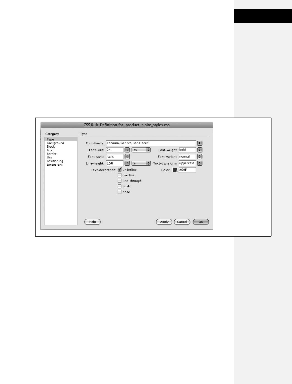
Appendix B: CSS in Dreamweaver CS4 491
Adding Styles to
Web Pages
Phase 2: Defining the Style
The CSS Rule Definition window provides access to all of the available formatting
for styling text and graphics (see Figure B-3). You’ll learn about each of the differ-
ent properties throughout this book.
Once you’ve defined the style, click OK at the bottom of the Rule Definition win-
dow. Dreamweaver adds the style to the specified style sheet and displays it in the
CSS Styles panel.
The real trick to creating a style is mastering all the different properties available,
such as borders, margins, and background colors, and then learning which ones
work reliably in the different browsers.
Adding Styles to Web Pages
Once you’ve created styles, applying them is easy. In fact, if you created HTML tag
styles, then you don’t need to do anything to apply them because their selectors auto-
matically dictate which tags they affect. When you put your styles in an external style
sheet, Dreamweaver automatically links it to the current document. To use its styles
in a different web page, you must attach it to the page, as described next.
Figure B-3:
For ultimate formatting
control, Dreamweaver lets
you set dozens of different
Cascading Style Sheet
properties from the CSS
Rule Definition window.
Earlier versions of the
program didn’t use
standard CSS property
names—for example,
Dreamweaver CS3 calls
the “font-family” property
simply “font” (which is
really a separate CSS
property entirely).
Thankfully, Dreamweaver
CS4 now uses standard
CSS property names in its
dialog boxes.
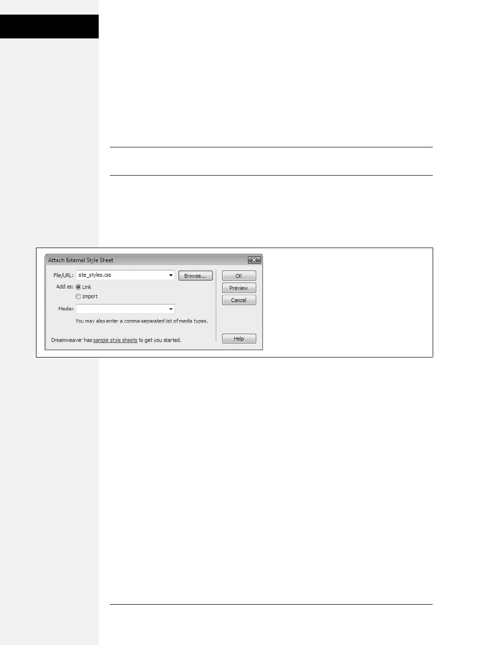
492 CSS: The Missing Manual
Adding Styles to
Web Pages
Linking to an External Style Sheet
When you add a new web page to your site, usually you want to use the same CSS
styles as you did in existing pages, for a consistent look. But you need to tell
Dreamweaver which style sheet you’re using by attaching it to the page. To do so,
open the web page to which you wish to add the style sheet. Then click the Attach
Style Sheet button (see Figure B-1) on the CSS Styles panel. (If the CSS Styles panel
isn’t open, choose Window ➝ CSS Styles.)
Tip: You can also use Dreamweaver’s Property inspector (at the bottom of the window) to attach a style
sheet. Just choose Attach Style Sheet from the Style menu.
When the Attach External Style Sheet window appears (Figure B-4), click Browse.
In the Select Style Sheet File dialog box that appears, go to the CSS (.css) file you
wish to attach to the document, and then double-click it. If Dreamweaver offers to
copy the style sheet file into your site’s root folder, then click Yes.
The Attach External Style Sheet window provides two other options: how to attach
the style sheet and what type of media you want the styles to apply to.
• When attaching an external style sheet, you can choose to either Link or Import
it. These two choices are nearly identical, as described on page 38.
• The Media menu defines which type of output device or display should use the
style sheet. Selecting “print” means that the style sheet will apply only when the
document is printed. Most of these options—such as TV for televisions, or TTY
for teletype machines—aren’t of any use to the average web designer. You can
read about these different media types and the two most important ones,
“printer” and “screen,” starting on page 395. If you want the styles to appear
both in print and onscreen, you can safely ignore this menu.
The “all” option in the Media menu is the same as not selecting anything—the
style sheet applies when printed, viewed on a monitor, felt on a Braille reader,
and so on. (Dreamweaver CS4 also includes a helpful toolbar for controlling the
display of style sheets aimed at different media—see Figure B-5).
Figure B-4:
Most of the options in the Media menu aren’t very
useful, since there aren’t any devices programmed
to work with them. However, “printer” and
“screen” are handy ways to control how your
page displays when viewed on a monitor and
when printed on paper.
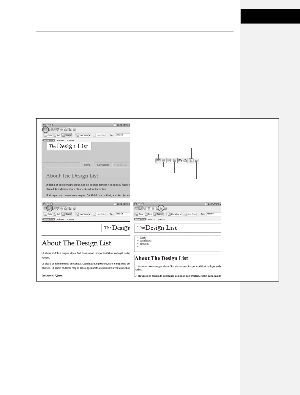
Appendix B: CSS in Dreamweaver CS4 493
Adding Styles to
Web Pages
Note: You can preview the effect of the style sheet on your page by clicking the Preview button on the
Attach External Style Sheet window.
After choosing your options, click OK. Dreamweaver adds the necessary HTML
code to the head of the web page and automatically formats any tags in the docu-
ment according to the style sheet’s HTML tag styles. You’ll see the formatting
changes take place in the document window immediately after attaching the exter-
nal style sheet.
If the style sheet contains class styles, on the other hand, you won’t see their for-
matting effects until you apply them to an element on the page, as described next.
Applying a Class Style
You can apply class styles to any selection in the document window, whether it’s a
word, image, or entire paragraph. In fact, you can apply a class style to any individ-
ual HTML tag, like a <p> (paragraph), <td> (table cell), or <body> tag. You can
even select a single word within a paragraph and apply a style to it.
Figure B-5:
To turn on
Dreamweaver’s Style
Rendering toolbar (top
right), choose View ➝
Toolbars ➝ Style
Rendering. Click a button
on the toolbar to show
styles that match the
media type you selected
when you attached the
page. Screen (top-left,
circled) and Print
(bottom-left, circled) are
the two most useful,
though you can hide all
CSS styles by clicking the
button on the far right of
the toolbar (bottom-
right, circled).
Screen
Printer
Handheld
TTY
Turn styles on/off
TV
Projection
Design time
style sheets
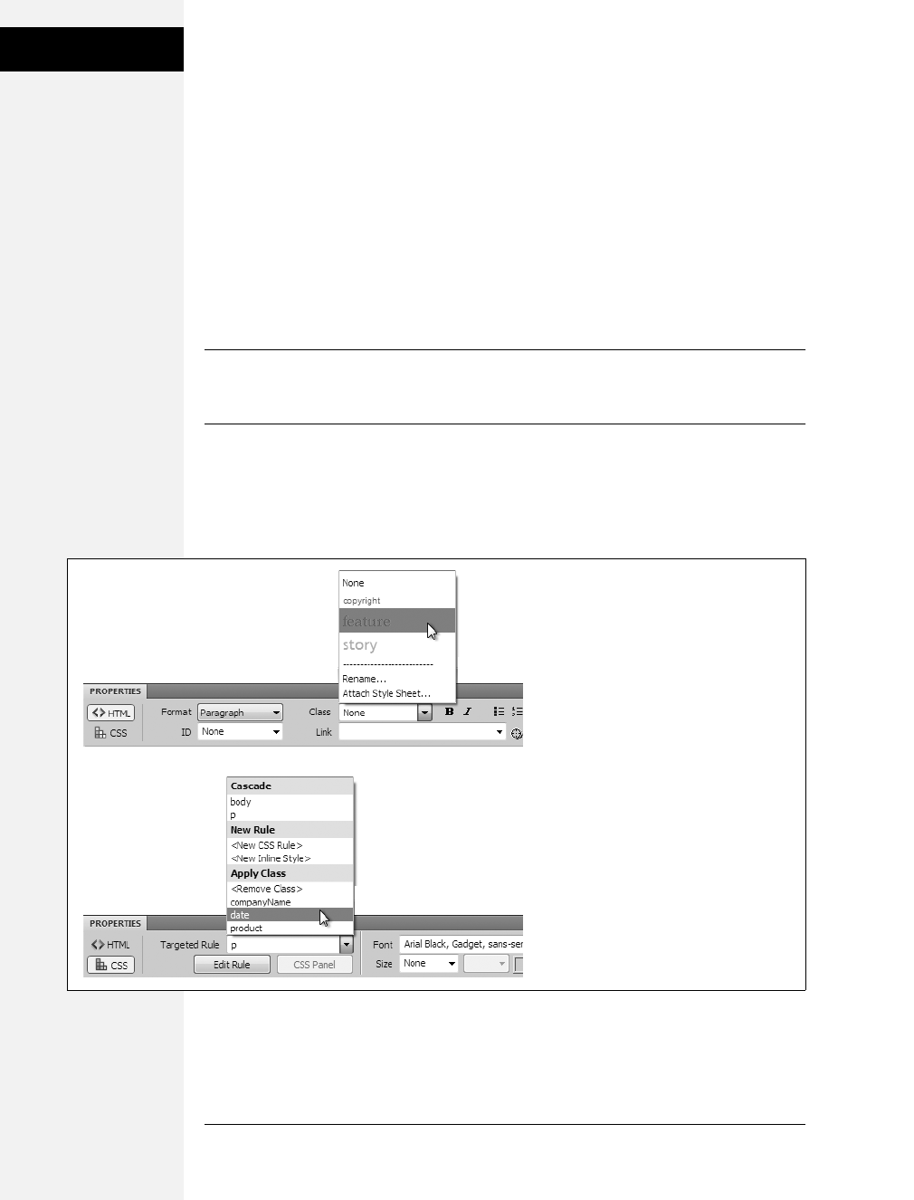
494 CSS: The Missing Manual
Adding Styles to
Web Pages
Applying a class style to text
Start by selecting some words. Then, select the style name from the Property
inspector—you can do this either in HTML mode, in which case you select the
name from the class menu (Figure B-6, top), or in CSS mode, where you use the
Targeted Rule menu (Figure B-6, bottom).
To style an entire paragraph, triple-click within the paragraph (or heading) to
select it before using the Property inspector to select the style. When you style an
entire paragraph, you’re actually telling Dreamweaver to apply the style to the <p>
tag. In that case, Dreamweaver adds the class property to the page’s code, like this:
<p class="company"> (for a class style named .company).
Tip: You can also add a class to an entire paragraph or heading simply by clicking anywhere inside the
paragraph and choosing the class name from the Property inspector—just make sure you don’t select any
text, otherwise the style is applied just to the selected text not the entire paragraph.
On the other hand, if you apply a class to a selection that isn’t a tag—like a single
word you’ve double-clicked—Dreamweaver wraps the selection within a <span>
tag like this: <span class="company">Chia Vet</span>. This tag, in other words,
applies a style to a span of text that can’t be identified by a single tag.
Figure B-6:
The Property inspector provides the easiest
method of applying a class style. For non-
text elements like images or tables, a Class
menu appears in the top-right of the
Property inspector. For text, you apply class
styles using either the Class menu if the
Property inspector is in HTML mode (top) or
the Targeted Rule Menu in CSS mode
(bottom). The bottom section of the
Targeted Rule Menu (the stuff below Apply
Class) is to the only place you can add (or
remove) a class from a text selection. The
other items are for creating new styles or
viewing the styles that apply to the selection.

Appendix B: CSS in Dreamweaver CS4 495
Adding Styles to
Web Pages
Applying a class style to objects
To apply a class style to an object (like an image or a table), start by selecting the
object. As always, the Tag selector at the bottom of the document window is a
great way to select a tag. Then use the Class pop-up menu at the top right of the
Property inspector to select the style name.
Note: You can apply any class style to any element, although doing so doesn’t always make sense. If you
format a graphic with a style that specifies bold, red, Courier type, it won’t look any different.
Other class styling options
You can also apply a class style by selecting whatever element you wish to style,
choosing Format ➝CSS Styles, and then selecting the style from the submenu. Or
you can right-click (Control-click) the style’s name in the CSS Styles panel, and
then, from the pop-up menu, choose Apply. Finally, you can also apply a class
from the document window’s Tag selector, as shown in Figure B-7.
Removing a Class Style
To remove a class style from text on a web page, simply select the text, and then, in
the Property inspector (see Figure B-6) choose None from the Class menu (HTML
mode) or <Remove Class> from the Targeted Rule menu (CSS mode). To remove
a class style from another object (like an image), select the object and then choose
None from the Property inspector’s Class menu. You can also choose Format ➝
CSS Styles ➝None to remove a style from any selection (even non text elements
like images or tables).
Figure B-7:
You can apply a class style
directly to a tag using the
document window’s Tag
selector at the bottom of the
window. Just right-click
(Control-click) the tag you
wish to format, and then
select the class style from
the Set Class submenu. In
addition, the Tag selector
lets you know if a tag has a
class style applied to it. If so,
the style’s name is added at
the end of the tag. For
example, here a class style
named .products has been
applied to a bulleted list (the
<ul> tag) on the page
(circled).

496 CSS: The Missing Manual
Editing Styles
Tip: If you’ve applied a class style to a selection of text, you don’t actually have to select all the text to
remove the style. Just click anywhere inside it, and then select None from the Property inspector’s Class
menu or <Remove Class> from the Targeted Rule menu. Dreamweaver is smart enough to realize you
want to remove the style applied to the text. (If you applied the style to a tag, Dreamweaver removes the
class property. If you applied the style using the <span> tag, Dreamweaver removes the span tag.)
You can’t, however, remove tag styles from HTML tags. For example, suppose
you’ve redefined the <h2> tag. If your page has three Heading 1 (<h2>) para-
graphs, and you want the third heading to have a different style from the other
two, you can’t simply remove the <h2> style from the third paragraph. Instead,
what you need to do is create a new class style with all the formatting options you
want for that third heading and then apply it directly to the <h2> tag. (By the
magic of CSS’s cascade, the class formatting options override any existing tag style
options—see page 99 for more on this sleight of hand.)
Applying IDs to a Tag
To apply an ID to text, just select the text, and use the ID menu in the HTML
mode of the Property inspector (see Figure B-6, top). Since you can only apply
each ID name once per page, this menu lists only IDs that are in your style sheet
but haven’t yet been applied to a tag on the page.
For non-text elements, select the element and then type the ID name into the ID
field in the Property inspector. (For some elements, the ID field is unlabelled, but
you can always find it on the far left of the Property inspector.)
You can also use the Tag selector as outlined in Figure B-7. Just use the Set ID
menu in the shortcut menu that appears when you right-click the tag.
Tip: The Tag selector tells you if an ID is applied to a tag. An ID is indicated with a # symbol, so in
Figure B-7, for example, body#catalog indicates that the <body> tag has an ID of catalog applied to it.
Whenever you apply an ID to a tag, Dreamweaver adds a bit of HTML code to
your page. For instance, an ID style named #copyright applied to a paragraph
would look like this in the HTML: <p id="copyright">.
To remove an ID from a text element, select the text and then select None from the
ID menu in the Property inspector. For non-text elements, just select the element
and then delete the ID name in the Property inspector’s ID field.
Editing Styles
While building a website, you’ll almost always continually refine your designs.
That chartreuse color you assigned to the background of your pages may have
looked great at 2 a.m., but it loses something in the light of day.

Appendix B: CSS in Dreamweaver CS4 497
Editing Styles
Fortunately, one of CSS’s greatest selling points is how easy it makes updating the
formatting on a website.
Note: When you edit and add styles to an external style sheet, Dreamweaver doesn’t always let you
undo the changes you make (see the box on page 501 for an explanation).
Dreamweaver provides many ways to edit styles:
• Select a style in the CSS Styles panel (see Figure B-1), and then click the Edit
Style button to open the Rule Definition window (Figure B-3). (This window is
the same one you used when first creating the style.) Make your changes, and
then click OK to return to the document window. Dreamweaver reformats the
page to reflect any changes you made to styles used in the current document.
• Double-clicking the name of a style in the CSS panel also opens the Rule Definition
window. Actually, depending on a preference setting—or a setting someone else
may have tweaked while using your computer—double-clicking a style in the
CSS panel may display the raw CSS code in Code view. To change this behavior,
open the Preferences window (Ctrl+U [c-U]), click the CSS Styles category,
and then select the “Edit using CSS dialog” button.
FREQUENTLY ASKED QUESTION
When Formatting Disappears
Sometimes when I copy text from one web page and paste
it into another web page, all of the formatting disappears.
What’s going on?
When you use Cascading Style Sheets, keep in mind that
the actual style information is stored either in the <head>
of the web page (for internal style sheets) or in a separate
CSS file (an external style sheet). If a page includes an inter-
nal style sheet, then when you copy text, graphics, or other
page elements, Dreamweaver copies those elements and
any class or ID style definitions used by that content. When
you paste the HTML into another page, the styles are writ-
ten into the <head> of that page. This feature can save you
some time, but won’t solve all of your woes. It doesn’t, for
example, copy any tag styles you’ve created, or most
advanced styles you may create (see page 65 for more on
advanced styles). So if you copy and paste some text—say,
an <h1> tag styled with an h1 tag style—you paste the <h1>
tag and its contents, but not the tag style.
In addition, if a page uses an external style sheet, when you
copy and paste text, the styles themselves don’t go along
for the ride. If you copy a paragraph that has a class style
applied to it, and paste it into another document, the code
in the paragraph gets pasted (<p class="company">, for
instance) but not the actual company style with all its for-
matting properties.
The best solution is to use a common external style sheet
for all pages on your site. That way, when you copy and
paste HTML, all the pages share the same styles and for-
matting. So in the example above, if you copy a paragraph
that includes a class style—class="company”—into another
page that shares the same style sheet, the paragraphs look
the same on both pages. See page 95 for more on how to
create one of these uber, site-wide external style sheets.
498 CSS: The Missing Manual
Editing Styles
• Right-click (Control-click) the name of a style in the CSS Styles panel, and then
choose Edit from the shortcut menu, which also opens the Rule Definition
window. Make your changes to the style, and then click OK to return to the
document window.
Editing in the Properties Pane
The CSS Rule Definition window (Figure B-3) can be a rather tedious way of edit-
ing CSS properties. It’s easy to use, but opening the window and jumping around
the categories and menus may slow down experienced CSS jockeys. Fortunately,
Dreamweaver offers the Properties pane (Figure B-8) for fast CSS editing. This
pane displays a selected style’s currently defined properties, as well as a list of other
not-yet-set CSS properties.
GEM IN THE ROUGH
A Time to Design
A Dreamweaver feature called Design Time style sheets lets
you quickly try different CSS style sheets while developing
your web page. You can hide the (external) style sheets
you’ve attached to a web page and substitute new ones.
Design Time style sheets come in handy when working on
HTML that you intend to later make part of a complete web
page. Dreamweaver Library items are a good example; this
feature lets you create a chunk of HTML that any number
of pages on your site can use. When you update the Library
item, every page that uses it is updated. A timesaving fea-
ture, for sure, but since a Library item is only part of a page,
it doesn’t include the <head> portion needed to either
store styles or attach an external style sheet. So when
designing a Library item, you’re working in the dark (or at
least, without any style). But by using Design Time style
sheets, you can access all the styles in an external style
sheet and even preview the effects directly in Design view.
You’ll also turn to this feature when working with Dream-
weaver’s server-side XML tools, which let you add an “XSLT
fragment” to a complete web page—essentially letting you
convert XML (like you’d find in an RSS news feed) into a
chunk of HTML. But to accurately design these compo-
nents, you’ll need to use Design Time style sheets.
You can apply a Design Time style sheet by clicking the
Design Time style sheet button in the Style Rendering tool-
bar (see Figure B-5) or by choosing Format ➝CSS Styles ➝
Design Time. When the Design Time Style Sheets window
appears, click the top + button to select an external style
sheet to display in Dreamweaver. (Clicking this button
doesn’t attach the style sheet to the page; it merely selects
a .css file to use when viewing the page in Dreamweaver.)
To properly view your page with this new style sheet, you
may need to get an attached external style sheet out of the
way. To do that, use the bottom + button to add it to the
Hide list.
Design Time style sheets apply only when you’re working
in Dreamweaver. They have no effect on how the page
looks in a web browser. That’s both the good news and the
bad news. Although Dreamweaver lets you apply class
styles you take from a Design Time style sheet to your web
page, it doesn’t actually attach the external style sheet to the
appropriate page. For example, if you use a Design Time
style sheet to help design a Library item, Dreamweaver
doesn’t guarantee that the web page using the Library item
has the style sheet attached to it. You have to attach it your-
self, or else your visitors will never see your intended result.

Appendix B: CSS in Dreamweaver CS4 499
Managing Styles
Start by selecting the style you wish to edit in the CSS Styles panel. The Properties
pane (found in the bottom third of the Styles panel) displays CSS properties in one
of three different views: a set properties view, which displays only the properties
that have been defined for the selected style (Figure B-8); a Category view, which
groups the different CSS properties into the same seven categories used in the Rule
Definition window (Figure B-9, left); and a List view, which provides an alphabeti-
cal listing of all CSS properties (Figure B-9, right). Clicking the view buttons at the
bottom-left corner of the CSS Styles panel switches between these three displays
(see the circled buttons in Figure B-8 and Figure B-9).
Property names are listed on the left, and their values are on the right. Figure B-8 shows
an example of a style for the <body> tag, which lists six properties (such as background-
color and margin) and their corresponding settings (#333333, 0px, and so on).
To add a new property, click the “Add Property” link below the list of properties
on the Properties pane, and then select the property name from the pop-up menu.
You set (and edit) the value of a particular property in the space to the right of the
property name. Most of the time, you don’t have to type the value. Dreamweaver
provides the tools you’re likely to need for each property: a color box for any prop-
erty that requires a color, like font-color; a pop-up menu for properties that have a
limited list of possible values, like Repeat-y for the background-repeat property
shown in Figure B-8; and the “Browse for File” folder icon for properties that
require a path to a file, like the background-image property.
Some other properties, however, require you to know enough CSS to enter them
manually, in the correct format. That’s what makes the Properties pane a good
advanced option for experienced CSS gurus.
But even those more comfortable with Dreamweaver’s friendly Rule Definition
window should find the Properties pane helpful. First, it’s the best way to get a
bird’s-eye view of a style’s properties. Second, for really basic editing, like chang-
ing the colors used in a style or assigning it a different font, the Properties pane is
as fast as it gets.
To remove a property from a style, just delete its value in the right column.
Dreamweaver removes not only the value from the style sheet, but the property
name as well. In addition, you can right-click (Control-click) a property name and
then select “delete” from the pop-up menu, or simply click a property name and
either press Delete or click the Trash can to banish it from your style sheet (see
Figure B-8).
Managing Styles
Sometimes, instead of editing the properties of a style, you want to delete it and start
over. Or you’ve come up with a way to better organize your website, and you want to
rename some styles according to your new system. Dreamweaver makes it easy to do
both those things. It even lets you duplicate a style, so you can quickly create a new
style that bears some similarities to one you’ve already built from scratch.

500 CSS: The Missing Manual
Managing Styles
Deleting a Style
At some point, you may find you’ve created a style that you don’t need after all.
Maybe you redefined the HTML <code> tag and realize you haven’t even used the
tag in your site. There’s no need to keep it around, taking up precious space in the
style sheet.
To delete a style, make sure the CSS Styles panel is open (Window ➝CSS Styles)
and the All button is highlighted (see Figure B-10). Click the name of the style you
wish to delete, and then press Delete (you can also click the Trash can at the bot-
tom of the panel). You can also remove all the styles in an internal style sheet (as
well as the style sheet itself) by selecting the style sheet—indicated by “<style>” in
the CSS Styles panel—and pressing Delete or clicking the Trash can. If you trash an
external style sheet, however, you merely unlink it from the current document
without deleting the .css file.
Figure B-8:
The CSS Styles panel has two
views: All (shown here) and
Current. The Properties pane is
available in both views, but you
access it slightly differently when
in Current view (see Figure B-9).
With the All button selected, you
can click any style from the list of
CSS styles (body in this case) and
use the Properties pane to add
and edit properties. The “show
only set properties” view of the
Properties pane, accessed by
clicking the icon circled in this
figure, provides a clear view of a
particular style’s properties. You
can quickly see which CSS
properties are used by the style,
delete or edit them, and add a
new property by clicking the Add
Property link (hidden behind the
pop-up menu) and selecting the
new property’s name from the
CSS property menu.
View all styles
Selected style
Property
Add property
CSS property
menu
Value
Delete property

Appendix B: CSS in Dreamweaver CS4 501
Managing Styles
Figure B-9:
The Properties pane’s two other
views aren’t as streamlined or as
easy to use as the “show only set
properties” view. Add new
properties in these views by simply
typing a value in the empty box to
the right of the property name—in
the left view, in the empty box to
the right of “background-color,”
for example. However, since these
views aren’t the fastest way to edit
CSS with the Properties pane,
you’re better off not using them.
FREQUENTLY ASKED QUESTION
When Undo Won’t Do
Sometimes when I edit a style—say, to change the font
color—I can undo that change. But sometimes, I’m unable
to undo changes I’ve made to a style. What gives?
You can undo only changes made to the document you’re
currently working on. So say you’ve added an internal style
sheet (see page 35) to a document. If you edit one of those
styles, Dreamweaver lets you undo those changes. Because
the styles in an internal style sheet are a part of the web
page you’re working on, choosing Edit ➝Undo undoes the
last change you’ve made to that style.
However, if you’re using an external style sheet, you’re
actually working on two different files at the same time—the
web page you’re building and the style sheet file in which
you add, delete, or edit styles. So if you’re designing a web
page and edit a style contained in the external style sheet,
you’re actually making a change to the style sheet file. In
this case, choosing Edit ➝Undo will undo only the last
change made to the web page. If you want to undo the
change you made to the external style sheet, you need to
use the related files feature, new to Dreamweaver CS4. The
name of the external style sheet will appear on the Related
Files toolbar, which appears below the title of the web page
file; click the file’s name to move to its code and then
choose Edit ➝Undo. Click the Source Code button to
return to the Web.

502 CSS: The Missing Manual
Managing Styles
Unfortunately, deleting a class style doesn’t delete any references to the style in your
site’s pages. For example, if you’ve created a style called .company and applied it
throughout your site, and you then delete that style from the style sheet, Dream-
weaver doesn’t remove the <span> tags or class properties that refer to the style.
Your pages are still littered with orphaned code like this—<span class="company">
CosmoFarmer</span>—even though the text loses the styling. You have to remove
them manually using Dreamweaver’s powerful Find and Replace tool.
Renaming a Class Style
You can rename any style by selecting it in the CSS Styles panel, pausing a second,
and then clicking the name again. This makes the name editable, at which point
you can type a new name in its place. Of course, if you change a style named pto a
style named h1, you’ve essentially removed a <p> tag style and added an <h1> tag
style—in other words, all paragraphs would lose the style’s formatting, and all h1
tags would suddenly change appearance. Alternatively, you can open the .css file in
Code view, and then edit the name. However, when it comes to class styles, just
changing the name doesn’t do much good if you’ve already applied the style
throughout your site. The old class name still appears in the HTML in each place
you used it.
What you have to do is rename the class style, and then perform a find-and-replace
operation to change the name wherever it appears in your site. Dreamweaver
includes a handy tool to simplify this process.
To rename a class style:
1. In the Class menu on the Property inspector (Figure B-10), choose Rename.
The Rename Style window appears .
2. From the top menu, choose the name of the style you wish to rename.
This menu lists all class styles available on the current page, including external
and internal styles.
3. Type the new style name in the “New name” box.
You must follow the same rules for naming class styles described on page 51.
But, just as when creating a new class, you don’t need to precede the name with
a period—Dreamweaver takes care of that.
Figure B-10:
The Rename Style tool is a fast and easy way to
change the name of a class style even if you’ve
already used the style hundreds of times
throughout your site.

Appendix B: CSS in Dreamweaver CS4 503
Managing Styles
4. Click OK.
If the style whose name you’re changing is an internal style, Dreamweaver
makes the change. Your job is complete.
However, if the style belongs to an external style sheet, Dreamweaver warns you
that other pages on the site may also use this style. To successfully rename the
style, Dreamweaver must use its “Find and Replace” tool to search the site and
update all pages that use the old style name. In that case, continue to step 5.
5. If you get cold feet, click Cancel to call off the name change, or click Yes to
open the “Find and Replace” window, where you should click Replace All.
One last warning appears, reminding you that this action can’t be undone.
Note: If you click No in the warning box that appears after step 4, Dreamweaver still renames the style in
the external style sheet, but doesn’t update your pages.
6. Click Yes.
Dreamweaver goes through each page of your site, dutifully updating the name
of the style in each place it appears.
Duplicating a Style
Dreamweaver makes it easy to duplicate a CSS style, which is handy when you’ve
created, say, an HTML tag style, and then decide you’d rather make it a class style.
Or you may want to use the formatting options from one style as a starting-off
point for a new style. Either way, you start by duplicating an existing style.
You can duplicate a style in two ways. The easiest method is to open the CSS Styles
panel (Window ➝CSS Styles), right-click (Control-click) the name of the style you
wish to duplicate, and then choose Duplicate from the shortcut menu.
The Duplicate CSS Rule window appears (Figure B-11), where you can give the
duplicated style a new name, reassign its Type setting, use the “Define in” menu to
move it from an internal to an external style sheet, and so on.
When you click OK, Dreamweaver adds the duplicate style to the page or external
style sheet. You can then edit the new style just as you would any other, as
described on page 496.
Moving and Managing Styles
In the old days, when web browsers were just beginning to adopt CSS, web design-
ers used just a handful of styles to format headlines and text. Keeping track of a
site’s styles back then wasn’t too hard. Today, CSS works great in almost all web
browsers and CSS-based layout is becoming the norm, so a style sheet may include
hundreds of styles.
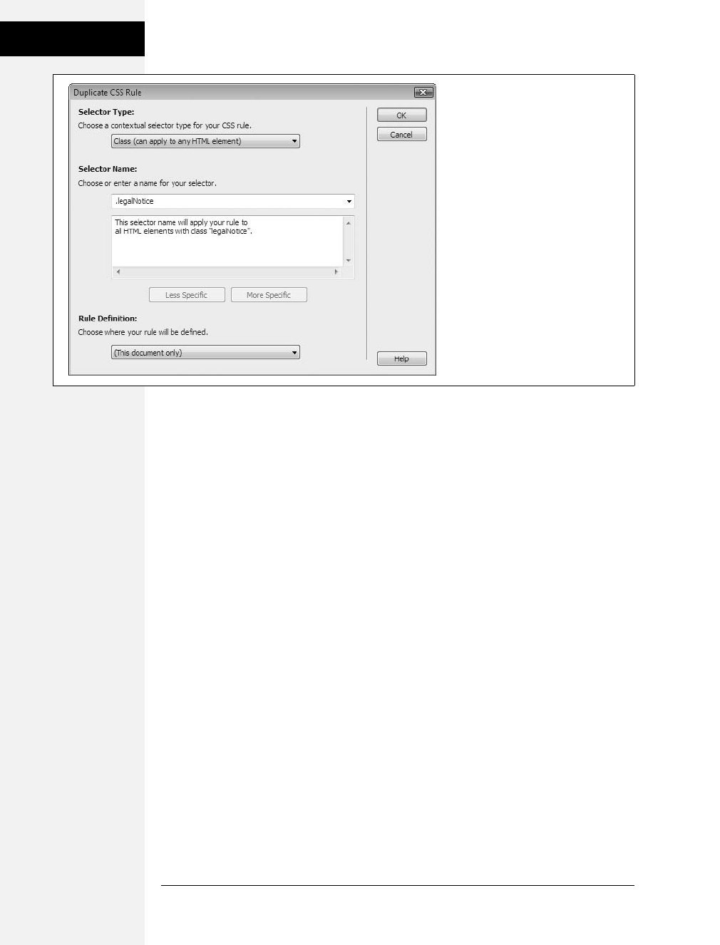
504 CSS: The Missing Manual
Managing Styles
You might want to take a really long, complicated style sheet and split it up into
several smaller, easier-to-read external style sheets. One common web design prac-
tice is to store styles that serve a related function in a separate style sheet—for
example, all the styles related to formatting forms in one style sheet, styles for text
in another, and styles for page layout in yet another. You can then link each of the
external style sheets to your site’s pages.
Even if you don’t have enough styles to warrant multiple style sheets, it’s still use-
ful to organize the styles within a style sheet. To keep track of their CSS, web
designers frequently group related styles together in a style sheet; for example, all
the styles for basic layout in one section of the style sheet, basic tag selectors in
another section, and specific styles for text, images, and other content grouped
according to the part of the page where they’re used (sidebar, banner, and so on).
By grouping related styles, it’s a lot easier to find any particular style when it comes
time to edit it.
Dreamweaver provides a simple and logical way to move styles within a style sheet
and to move styles from one style sheet to another.
•To move a style from one place to another in the same style sheet, drag the
style in the CSS Styles panel (see Figure B-12, left). The order the styles are
listed in the CSS Styles panel represents their order in the actual CSS code—so
dragging one style below another repositions the CSS code in the style sheet.
You can select and move more than one style at a time by Ctrl-clicking (c-
clicking) each style you wish to select, and then dragging the highlighted group
of styles (Ctrl-click [c-click] a selected style to deselect it). Select a range of
styles by clicking one style and then Shift-clicking another style: This also selects
every style between the two.
Figure B-11:
The Duplicate CSS Rule dialog box
looks and acts just like the New CSS
Rule box (Figure B-2). You can select a
new style type, name it, and then add
it to an external or internal style sheet.
The only difference is that the
duplicated style retains all the original
style’s CSS properties.

Appendix B: CSS in Dreamweaver CS4 505
Managing Styles
Note: You’ll see the full list of styles in a style sheet (and be able to rearrange those styles) only when
the All button (circled in Figure B-12, left) is selected in the CSS Styles panel.
•To move one or more styles between two style sheets, drag the style from one
style sheet to another in the CSS Styles panel. This works both for moving a
style from an internal style sheet to an external style sheet, and for moving a
style from one external style sheet to another. Say you’ve created an internal
style sheet for the current page and also attached an external style sheet to the
same page. Dragging a style from the internal style sheet (represented by
<style> in the CSS Styles panel) to the external style sheet (represented by the
file name—main.css, for example) moves the style out of the internal style sheet
and into the external style sheet (Figure B-13, right). Dreamweaver then deletes
the CSS code for the style from the first style sheet. You can also use this
method to move a style between two attached external style sheets as well.
If you drag a style into another style sheet and the destination style sheet already
contains a style with the same name, you can run into some confusion. For
example, say you’ve got a tag style for the <body> tag defined in an internal
style sheet; in addition, you’ve got an external style sheet attached to the same
page, and it also has a body tag style (perhaps with different properties). If you
drag the body tag style from one style sheet into another, you’re suddenly try-
ing to add the same named style a second time. When this happens, Dream-
weaver informs you of the potential problem .
Note: Unfortunately, Dreamweaver doesn’t provide a way to reorder the sequence of internal and exter-
nal style sheets on a page. They’re attached to the page in the order in which you add them. For example,
if you attached an external style sheet to a web page, and then created an internal style sheet, the internal
style sheet’s code appears after the link to the external style sheet. The order can have some serious
effects on how the cascade works (see page 91). To change the order of the style sheets in the HTML, you
have to go to Code view and cut and paste the code.
Figure B-12:
In the CSS Styles panel, you can drag styles
to different locations within a style sheet
(left). In this case, dragging the styles below
the h1 style groups all the basic tag
selectors (body, h1, p, and h2) together.
You can also drag styles between style
sheets to move a style from one style sheet
to another. In the Styles panel on the right,
three styles are being moved from an
internal style sheet to a CSS file named
main.css.
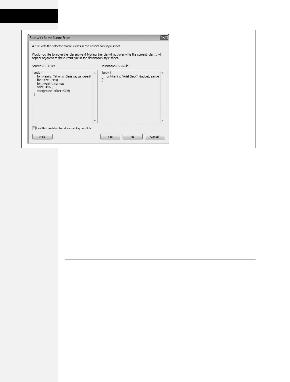
506 CSS: The Missing Manual
Managing Styles
You have two choices at this point. You can decide not to move the style: Click
the No button (the Cancel button has the same effect), then the window closes
and no styles are moved. Or click Yes, and Dreamweaver moves the style to the
style sheet. It doesn’t replace the old style, nor does it try to merge the proper-
ties from the two styles into a single style with the same name. Instead, it just
places the new style along with the old style in the same style sheet—in other
words, you end up with one style sheet containing two separate styles with the
same name. Even though this setup is perfectly valid CSS, it’s very confusing to
have the same style twice in one style sheet. You should delete one of the styles,
and, if necessary, edit the remaining style to match any properties from the
deleted style.
Note: Dreamweaver says that it will place a style adjacent to the style with the same name when moving
like-named styles (see Figure B-13), but it doesn’t. Dreamweaver places the moved style wherever you
drop it in the list of styles in the destination style sheet.
• You can also move one or more styles into an external style sheet that’s not
attached to the current page. As discussed on page 34, external style sheets are
the most efficient way of styling a website’s collection of pages. However, it’s
often easier to use an internal style sheet when you’re first starting a design.
Figure B-13:
When dragging a style from one style
sheet to another, it’s possible that a style
by the same name already exists in the
destination style sheet. When that
happens, this dialog box appears, letting
you either cancel the move or move the
style anyway. To help you figure out what
to do, Dreamweaver lists the properties in
both the style you’re trying to move and
the one that’s present in the style sheet
you’re dragging into. You can use this
information to determine which of the two
styles you wish to keep or to note which
properties from each style are most
important.

Appendix B: CSS in Dreamweaver CS4 507
Examining Your CSS
in the Styles Panel
This way, as you tweak your CSS, you only have to edit the one file (the web
page with the internal style sheet) instead of two (the web page and the external
CSS file). But once you’ve completed the design, it’s best to move the styles
from the internal style sheet to an external style sheet. This process is as easy as
a right-click (Ctrl-click).
In the CSS Styles panel, select the styles you wish to move to an external style
sheet (Ctrl-click [c-click] each style name to select it). Right-click (Ctrl-click)
the selected styles and choose “Move CSS Rules” (see Figure B-14, top). The
“Move to External Style Sheet” window opens (Figure B-14, bottom). You can
then either add the rules to an existing external style sheet by clicking the
browse button and selecting an external CSS file in the site, or turn on the “A
new style sheet…” radio button to create a new CSS file and move the styles
there. When you click OK, the styles are either moved to an existing CSS file, or
a dialog box appears letting you name and save a new CSS file. Either way,
Dreamweaver removes the styles from the internal style sheet and places them
into an external style sheet; even better, if the external CSS file isn’t already
attached to the current page, Dreamweaver attaches it for you, which lets you
skip the manual process of attaching the style sheet.
Tip: If you move all the styles from an internal style sheet to an external style sheet, Dreamweaver still
leaves some useless <style> tags in the web page. To remove those, just select <style> from the list of
styles in the CSS Styles panel, then press the Delete key or click the trash can icon in the lower-right cor-
ner of the Styles panel.
Examining Your CSS in the Styles Panel
As you read in Chapter 4 and Chapter 5, inheritance and the cascade are two very
important CSS concepts. Inheritance provides a way of passing on common prop-
erties like a font color to descendents of a styled tag. Giving the page’s <body> tag
a font color causes other tags inside the page to use (inherit) that same font color.
The cascade is a set of rules for determining what a web browser should do if mul-
tiple styles apply to the same tag and there are conflicts between the two styles. The
cascade helps decide what to do when one style dictates that a particular para-
graph should be displayed in 24-pixel type, while another style dictates that the
type should be 36 pixels tall.
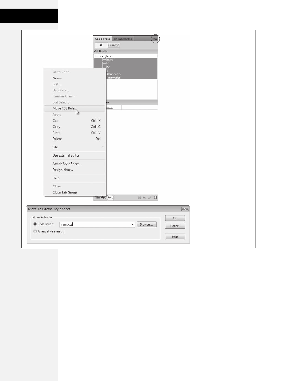
508 CSS: The Missing Manual
Examining Your CSS
in the Styles Panel
Current Selection Mode
With all this inheritance and cascading going on, it’s very easy for styles to collide
in unpredictable ways. To help you discern how styles interact and ferret out possi-
ble style conflicts, Dreamweaver CS4 includes another view of the CSS Styles Panel
(see Figure B-15). When you click the Current button, the panel switches to Cur-
rent Selection mode, which provides insight into how a selected item on a page—
an image, a paragraph, a table—is affected by inherited styles.
Figure B-14:
Moving internal styles to an
external style sheet is a two-
step process. First, select the
styles you wish to move and
right-click to select Move CSS
Rules. Second, tell
Dreamweaver which style
sheet to move the style to. You
can also access the Move CSS
Rules option from the Option
menu on the CSS Styles panel
(circled). This technique is also
a good way to take one really
long external style sheet file
and move related styles into
several, smaller CSS files.

Appendix B: CSS in Dreamweaver CS4 509
Examining Your CSS
in the Styles Panel
Current Selection mode is really an incredible tool that’s invaluable in diagnosing
weird CSS behavior associated with inheritance and cascading. But like any incred-
ible tool, it requires a good user’s manual to learn how it works. The panel crams
in a lot of information; here’s a quick overview of what it provides:
•A summary of style properties for the currently selected item is in the “Sum-
mary for Selection” pane. Remember that whole thing about how parents pass
on attributes to child tags, and how as styles cascade through a page, they accu-
mulate (which means, for example, it’s possible to have an <h1> tag formatted
by multiple styles from multiple style sheets)? The “Summary for Selection”
pane is like the grand total at the bottom of a spreadsheet. It tells you, in
essence, what the selected element—a paragraph, a picture, and so on—looks
like when a web browser tallies up all of the styles and displays the page. For
serious CSS fans, this pane is almost worth the entire price of Dreamweaver.
•The origin of a particular property is displayed in the About pane (Figure B-15,
top). If a headline is orange, but you never created an <h1> tag with an orange
color, you can find out which style from which style sheet is passing its hideous
orangeness to the heading. You can get the same information by mousing over
any property listed in the Summary section. In addition, when the About pane
is visible, you can’t see the much more useful Rules pane, discussed next. So
you’re better off skipping this pane.
•A list of styles that apply to the current selection appears in the Rules pane
(Figure B-15, bottom). Since any element can be on the receiving end of count-
less CSS properties handed down by parent tags, it’s helpful to see a list of all the
styles contributing to the current appearance of the selected object on the page.
•The order of the cascade is in the Rules pane (Figure B-15, bottom). Not only
are styles that apply to the current selection listed here, they’re also listed in a
particular order, with the most general style at the top and the most specific
ones at the bottom. This means that when the same property exists in two (or
more) styles, the style listed last (farthest down the list) wins.
A few examples can help demonstrate how to read the CSS Styles panel when it’s in
Current Selection mode. Figure B-15 shows the CSS properties affecting a selec-
tion of text (in this case, a paragraph within the main content area) on a web page.
The “Summary for Selection” pane lets you know that if you viewed this page in a
web browser, this paragraph would be displayed using the Tahoma typeface, in
black (#000000), left-aligned, with no padding, at a font size of 14 pixels, with a
130% line height (space between each line of text), and with 5 pixels of space for
the top margin. When you select a property from the “Summary for Selection”
pane and then click the Show Property Information button (Figure B-15, top), the
About pane displays where the property comes from—in this case, that the margin
property settings belong to a descendent selector—#mainContent p—which is
defined in an external style sheet named global.css.

510 CSS: The Missing Manual
Examining Your CSS
in the Styles Panel
You’ve seen the bottom part of this pane before. It’s the Properties pane, and it’s
used to delete, add, and edit the properties of a style. Simply click in the area to the
right of the property’s name to change its value, or click the Add Property link to
select a new property for the style. Notice that in this example, the Properties pane
contains fewer properties than the summary view. That’s because it only displays
properties of a single style (the #mainContent p descendent selector), while the
Summary view shows all properties inherited by the current selection.
Note: Sometimes one or more of the three panes are too small for you to see all the information dis-
played. You can use the gray bars containing the panes’ names as handles and drag them up or down to
reveal more or less of each pane.
Deciphering the Cascade
Clicking the Show Cascade button (Figure B-15, bottom) reveals a list of all styles
that affect the current selection. In this case, you can see that six different styles—the
body tag style, two ID styles (#container and #mainWrapper), a descendent selector, a
group selector (h1, h2, h3, h4, p), and, finally, the descendent selector #mainContent
p—contribute to styling the selected paragraph of text. In addition, as mentioned
above, the order in which the styles are listed is important. The lower the name
appears in the list, the more “specific” that style is—in other words, when several
styles contain the same property, the property belonging to the style lower on the list
wins out.
Tip: You can also see the cascade of rules listed in the Property inspector. On the document, select the
text you want analyze; click the CSS button on the Property inspector, and then select the Targeted Rule
menu—the top group of items in the menu is a listing of the cascade exactly as it appears in the Rules
pane of the CSS Styles panel.
Clicking a style name in the Rules pane reveals that style’s properties in the Proper-
ties pane below. This pane not only lists the style’s properties, but also crosses out
any properties that don’t apply to the selected tag. A property doesn’t apply to a
selection for one of two reasons: Either the property is overridden by a more spe-
cific style, or that property isn’t inherited by the selected tag.
For example, Figure B-16 shows that four styles affect the formatting of a single
headline: three tag styles (<body>, <h2>, and <h2>) and one class style (.highlight).
In the left-hand image, the color and font-size properties for the h2 style are
crossed out—meaning those properties don’t apply to the current selection. The
font-family property, on the other hand, isn’t crossed out, indicating that the cur-
rent selection is displayed using the font Trebuchet MS. Because that h2 appears
near the top of the list of styles in the Rules pane, you can determine that that style
is less “specific” (less powerful) than styles listed later. The style that appears last
on the list—.highlight in this example—is most “specific,” and its properties over-
ride conflicts from any other style. Selecting .highlight in the rules pane
(Figure B-16, bottom right) demonstrates that, yes indeed, its font-size and color
properties “win” in the battle of cascading style properties.
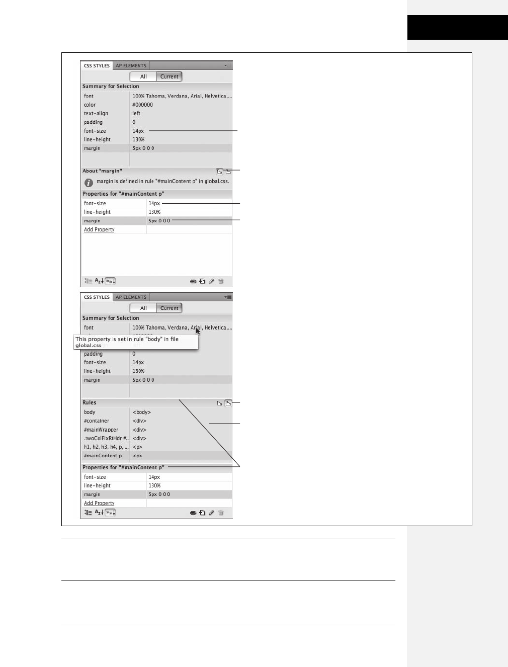
Appendix B: CSS in Dreamweaver CS4 511
Examining Your CSS
in the Styles Panel
Tip: If you mouse over a property that’s crossed out in the Properties pane, Dreamweaver pops up a
tooltip explaining why a browser won’t apply that property. If the property is crossed out because it’s over-
ruled by a more specific style, Dreamweaver also tells you which style won out.
Figure B-15:
The two views of the Styles panel—
Property Information (top) and Cascade
(bottom)—are mostly the same. Both show
a summary of properties that apply to the
current selection, and both display, at
bottom, the Property list pane used to edit
those properties. Property Information
view shows where a selected property
“comes from”—that is, which style and
which style sheets were used in defining a
property. Cascade view, however, is by far
the more useful option. You can get the
same information as in Property
Information view simply by mousing over
a CSS property in the Summary pane. For
example, in the bottom image, hovering
the mouse over the font property opens a
pop-up tooltip that explains that this
particular property is set in a body tag
style that’s defined in an external style
sheet named global.css. In addition,
Cascade view lists all styles that apply to
the currently selected tag: In this case, six
different styles help format the text
currently selected in the document.
CSS properties applied
to current selection
Selected property
Show property info
CSS properties of style
Selected property
Show cascade
CSS Styles that apply
to current selection
Resize pane
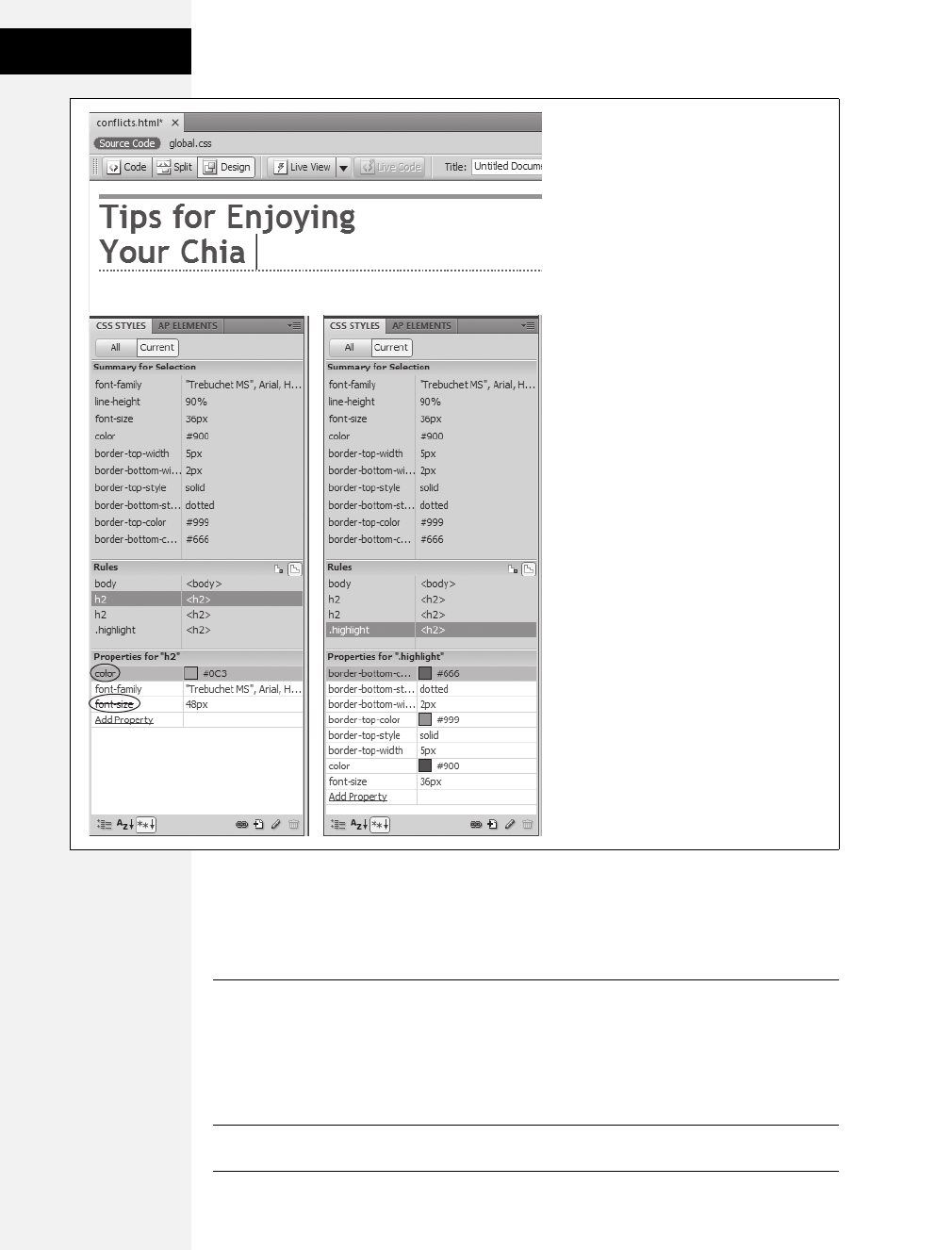
512 CSS: The Missing Manual
Examining Your CSS
in the Styles Panel
If your web pages are elegantly simple and use only a couple of styles, you may not
find much need for this aspect of the CSS Styles panel. But as you become more
proficient (and adventurous) with CSS, you’ll find that this panel is a great way to
untangle masses of colliding and conflicting styles.
Tip: One way to make a style more powerful—so that its properties override properties from conflicting
styles—is to use a descendent selector (see page 57). For example a body p descendent selector has more
authority than just a plain ptag style, even though both styles target the exact same tags. You can quickly
rename a style or create a more longwinded and powerful descendent selector using the CSS Styles panel:
Select the name of the style in the CSS Styles panel (use the “All” view); click the style name a second
time to edit it.
Figure B-16:
Selecting the Current view of the CSS Styles
panel lets you easily view all the properties
that apply to the currently selected item—in
this example it’s the headline (an <h2> tag)
pictured at top. A line (circled in the left
corner of the panel below) strikes out
properties from a style that don’t apply to
the headline. In this case, the font-size and
color in the first <h2> style is overridden by
the same properties in the more specific
.highlight class style (bottom right).
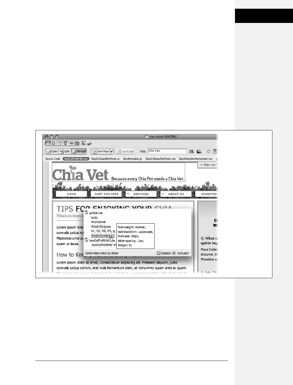
Appendix B: CSS in Dreamweaver CS4 513
Using the Code
Navigator
Using the Code Navigator
Dreamweaver CS4 introduces a new tool for CSS pros: Code Navigator, which
provides a quick way to view all CSS styles that apply to any element you click on.
In this way, it’s kind of like the Rules Pane of the CSS Styles panel (discussed in the
previous section). However, Code Navigator is a pop-up window that appears
directly in the document window (see Figure B-17).
To access the Code Navigator, hold down the Alt key and click an element on the
page (for Macs, you need to press c-Option and click). You can click any element
whose CSS you wish to examine: for example, an image, a heading, a paragraph, a
table, and so on. For example, in Figure B-18, c-Option clicking the “Tips” head-
line (that would be Alt-click for Windows) opens the Code Navigator, which lists
the styles that apply to that headline.
There are several other ways to access the Code Navigator window, as well:
• Click the Code Navigator icon (circled in Figure B-18). This ship steering wheel
icon appears above an element that you’ve selected on the page (or above the
element where the cursor is currently placed). It usually takes a second or so to
appear, so you may want to stick with the keyboard shortcut (Alt-click or c-
Option-click).
Figure B-17:
The Code Navigator,
new in Dreamweaver
CS4, lets you view a list
of CSS styles for any
element on a page. In
fact, it can show more
than just CSS: If you’re
working with templates
or dynamic, database-
driven websites (see
Part 6), the Code
Navigator may list other
files that impact the
current document such
as a template file, or a
file containing server-
side programming.

514 CSS: The Missing Manual
Using the Code
Navigator
• Right-click any item on the page and choose Code Navigator from the pop-up
shortcut menu.
• Select an item on a page (a table, image, paragraph, and so on) and choose View
➝Code Navigator, or press Ctrl-Alt-N (Windows) or c-Option-N (Mac).
Once the Code Navigator window opens, you’ll see all CSS styles that affect the
current item. In Figure B-18, for example, the Code Navigator lists six styles that
impact the formatting of the headline “Tips for Enjoying Your Chia”—five styles
are in the global.css external style sheet, and one is in the twoColFixRtHdr.css exter-
nal style sheet. If you move your mouse over one of the styles, you’ll see a list of
that style’s CSS properties.
Code Navigator provides a quick way to see properties for all styles that affect the
page element as well. In Figure B-18, hovering over the #mainContent h1 style lists
that style’s properties: a font-size of 30 pixels, 1 pixel of letter-spacing, and so on.
Although the Code Navigator is a quick way to view styles and their properties, it
isn’t as useful as the Current view of the CSS Styles panel (page 507), which shows
exactly which properties (not just which styles) apply to the current selection. In
Figure B-18:
If the Code Navigator’s
constantly appearing
ship steering wheel icon
bothers you, you can
turn it off by turning on
the disable box in the
Code Navigator window
(see Figure B-17). At
that point, you need to
use the keyboard
shortcut or one of the
other methods
discussed in this chapter
for opening the Code
Navigator.

Appendix B: CSS in Dreamweaver CS4 515
Using the Code
Navigator
addition, the Code Navigator window doesn’t always accurately display the CSS
Cascade (page 510)—it does list the styles in order of specificity, but it splits up the
list of styles by style sheet, so if a page has more than one style sheet you may not
get a clear picture of the cascade. The CSS Rules Pane, on the other hand, shows a
complete list of styles from least to most specific, regardless of how many style
sheets you use.
If you’re a code jockey who prefers to type CSS code instead of relying on Dream-
weaver’s windows and panels, the Code Navigator lets you jump immediately to
CSS code. Once the Code Navigator window is open, just click any style listed.
Dreamweaver will jump into Split mode (a view of raw code and the page’s Design
view) and display the CSS code for the selected style.


517
Appendix C
appendix
c
CSS Resources
No one book—not even this one—can answer all of your CSS questions. Luckily,
CSS resources abound for both beginning and expert web designers. In this appen-
dix, you’ll find resources to help you with general CSS concepts as well as specific
CSS tasks, like building a navigation bar or laying out a web page.
References
References that cover CSS properties range from the official to the obscure. There
are websites and online tutorials, of course, but you don’t have to be on the Web to
learn about CSS. Some of these guides come on good old-fashioned paper.
World Wide Web Consortium (W3C)
•CSS 2.1 Specification (www.w3c.org/TR/CSS21). For the official word, go to the
source—the W3C—and read the actual set of rules that make up the most
widely recognized version of CSS, version 2.1.
•CSS 3 Current Work (www.w3.org/Style/CSS/current-work). If you want to take a
look at what the future holds, check out the current work being done on the CSS
3 specification. Some of the properties are already available in some browsers (see
Chapter 16), but it’s probably going to take a few years before these innovations
are finalized and even longer before web browsers understand them all.

518 CSS: The Missing Manual
CSS Help
Books and PDFs
•Cascading Style Sheets: The Definitive Guide by Eric Meyer (O’Reilly). For
comprehensive technical (yet readable) coverage of CSS, check out this guide.
•CSS Cheat Sheet (www.addedbytes.com/cheat-sheets/css-cheat-sheet). This one-
page PDF document provides a compact reminder of most every CSS property,
covers every type of CSS selector under the sun, and includes a handy diagram of
the box model (page 151). Print it out, fold it up, and carry it in your back pocket.
Other Online References
•SitePoint CSS Reference (http://reference.sitepoint.com/css). A very complete
guide to CSS, including instruction on concepts, live examples, and coverage of
CSS3.
•WesternCiv’s Complete CSS Guide (www.westciv.com/style_master/academy/
css_tutorial/index.html). A detailed online guide to CSS.
•CSS3.Info (www.css3.info). Up-to-date coverage of CSS 3’s evolution including
live examples and a useful “CSS Selectors Test,” which lets you test a browser
for how well it understands the selector syntax for CSS 2 and 3.
•Mozilla’s CSS Center (https://developer.mozilla.org/En/CSS). This information
comes from the makers of Firefox and contains information specific to that
browser. However, it also has lots of great information on CSS in general,
including some excellent in-depth articles on some of CSS’s quirks.
CSS Help
Even with the best references (like this book), sometimes you need to ask an
expert. You can join a discussion list, where CSS-heads answer questions by email,
or peruse a wealth of information in an online forum.
Email List
•CSS-Discuss (http://css-discuss.org). The longest living mailing list dedicated to
just CSS. You’ll find CSS masters willing to help get you out of your CSS troubles.
Note: Before pestering the CSS-Discuss list with a question that 47,000 people have previously asked,
check out their wiki—a collaborative website where group members freely add, edit, and update each
other’s articles. This wiki has evolved into a terrifically convenient index of tips and tricks, best practices,
and in-depth treatment of CSS topics. Visit http://css-discuss.incutio.com.
Discussion Boards
•CSSCreator Forum (www.csscreator.com/css-forum). A very active online forum
offering help and advice for everything from basic CSS to advanced layout.

Appendix C: CSS Resources 519
CSS Navigation
•SitePoint.com’s CSS Forum (www.sitepoint.com/forums/forumdisplay.php?f=53).
Another helpful group of CSS addicts.
•CSS-Tricks.com Forum (http://css-tricks.com/forums). A relative newcomer, this
small forum holds some good information. (If you like PHP and JavaScript,
there’s some good discussion on those topics here as well.)
CSS Tips, Tricks, and Advice
The Web makes it easy for anyone to become a publisher. That’s the good news.
The bad news is, when everyone’s a publisher, it’s harder to sort through all the
chaff to find the golden wheat of clear, concise, and accurate information. There’s
plenty of good CSS information on the Web—and a lot that’s not good. Here are a
few of the best destinations for CSS information:
•CSS-Tricks.com (http://css-tricks.com). This one-man blog is full of great CSS
tips. You’ll find frequently updated tips and tricks as well as comprehensive
video tutorials.
•Sitepoint (www.sitepoint.com/subcat/css). Sitepoint’s CSS tutorials are very good
(even though they’re not updated frequently).
•Smashing Magazine (www.smashingmagazine.com/category/css). Smashing Mag-
azine gathers some of the best resources on the Web, and in the CSS category
you’ll find a nearly endless number of links highlighting some of the most cre-
ative thinking on CSS and web design.
CSS Navigation
Chapter 9 shows you how to create navigation buttons for your website from
scratch. But online tutorials are a great way to solidify your knowledge. Also, once
you understand the process in detail, you don’t have to do it yourself every single
time. On the Web you can find examples of navigation features for inspiration.
Tutorials
•Listutorial (http://css.maxdesign.com.au/listutorial). Step-by-step tutorials on
building navigation systems from unordered lists.
•30 Excellent CSS Based Navigation and Buttons Tutorial (www.instantshift.
com/2009/01/11/30-excellent-css-based-navigation-and-buttons-tutorial). More
tutorials than you can shake a stick out.
•Create Apple’s Navigation Bar with CSS (http://westciv.com/style_master/blog/
apples-navigation-bar-using-only-css). If you like the simple, clean appearance of
Apple.com, you might be interested in how to create their menu with CSS.

520 CSS: The Missing Manual
CSS and Graphics
•CSS Vertical Navigation Bar with Teaser (www.sohtanaka.com/web-design/css-
vertical-navigation-with-teaser). This very cool technique creates a navigation
bar that’s so interactive you’d think it had to be done with JavaScript. Nope—
CSS only!
Online Examples
•CSS Navigation Bar Code Generator (http://lab.mattvarone.com/navbar).Feel-
ing lazy? Let this online tool create all the code you need to use the pixy method
described on page 246.
•CSS Menus (http://13styles.com/category/css-menus).Download free CSS menus—
the coding is already done for you!
•CSS Showcase (www.alvit.de/css-showcase). A gallery of navigation menus, tabs,
and CSS navigation techniques.
•Listamatic (http://css.maxdesign.com.au/listamatic). Showcase of CSS-based
navigation systems. Also lots of links to related websites.
•Listamatic2 (http://css.maxdesign.com.au/listamatic2). More CSS menus, including
nested lists with submenus.
•CSS Play Menu Showcase (www.cssplay.co.uk/menus/index.html). Lots of cool
menus, many useful techniques. A must see.
CSS and Graphics
Once you’ve tried the photo gallery in Chapter 8, you’re ready to get even more
creative. Here are some websites that showcase CSS graphics tricks.
•CSS Slideshow (www.cssplay.co.uk/menu/slide_show.html). CSS-only slideshow
from the creative mind of Stu Nicholls.
•Sliding PhotoGalleries (www.cssplay.co.uk/menu/gallery3l.html). Dynamic, CSS-
driven gallery.
•CSS Image Maps (www.frankmanno.com/ideas/css-imagemap). Create pop-up
labels for your photos.
•CSS Photo Caption Zoom (http://randsco.com/_miscPgs/cssZoomPZ3.html). Make
a ginormous version of a photo appear just by mousing over a thumbnail image.
•Revised Image Replacement (www.mezzoblue.com/tests/revised-image-replacement).
Overview of different ways to swap out HTML headlines with stylish graphics.
CSS Layout
CSS layout is so flexible, you could spend a lifetime exploring the possibilities. And
some people seem to be doing just that. You can gain from their labors by reading
articles, checking out online examples, and experimenting with tools that can do
some of the CSS work for you.

Appendix C: CSS Resources 521
CSS Layout
Box Model Information
•Interactive CSS Box Model (www.redmelon.net/tstme/box_model). Fun, interactive
tool for visualizing the box model.
•On Having Layout (www.satzansatz.de/cssd/onhavinglayout.html). Not for the
faint of heart, this highly technical analysis of Internet Explorer explains the
main cause (and some solutions) for many of the CSS bugs that plague Win-
dows Internet Explorer 6 and earlier (and some of the bugs that vex IE7).
Float Layouts
•Perfect Multi-Column CSS Liquid Layouts (http://matthewjamestaylor.com/
blog/perfect-multi-column-liquid-layouts).Great examples of many different
types of liquid (full-screen) layouts that work on everything from IE 5.5 to an
iPhone.
•In search of the one true layout (www.positioniseverything.net/articles/
onetruelayout). Interesting—if slightly mind-bending—presentation on how to
create a float-based layout that overcomes most of the limitations of floats.
•CSS-Discuss Wiki page on float-based layouts (http://css-discuss.incutio.com/
?page=FloatLayouts). Even more links to float-based layout resources.
Absolute Position Layouts
•CSS-Discuss Wiki on Absolute Layouts (http://css-discuss.incutio.com/
?page=AbsoluteLayouts). Good resources with some helpful background
information.
•Learn CSS Positioning in Ten Steps (www.barelyfitz.com/screencast/html-
training/css/positioning). Quick, hands-on overview of CSS positioning.
•Making the Absolute, Relative (http://stopdesign.com/archive/2003/09/03/
absolute.html). Guide to using absolute positioning for subtle design effects.
Layout Examples
•CSS Layout Generator (www.pagecolumn.com).Pick the number of columns,
tweak a few knobs, and this website generates all the HTML and CSS required.
With a site like this, who needs a book (just kidding).
•Even More Layout Generators (www.webdesignbooth.com/15-extremely-useful-
css-grid-layout-generator-for-web-designers).If you can’t get enough of websites
that automatically create your CSS and HTML, you’ll find a list of 15 different
online tools.
•960 Grid System (http://960.gs).One of the better CSS frameworks that pro-
vides a set of basic styles and a technique for using divs and class names to
create complex, multicolumn, fixed-width layouts. (You can find a detailed
video introduction to this system at http://nettuts.com/videos/screencasts/a-
detailed-look-at-the-960-css-framework/)

522 CSS: The Missing Manual
Browser Bugs
•YUI Grids CSS (https://developer.yahoo.com/yui/grids).Yahoo’s very own CSS-
layout system. It’s a bit techy, but like the 960 Grid System above, provides a
basic framework for building complicated multicolumn layouts.
•Blueprint (www.blueprintcss.org). Another popular CSS framework.
•Intensivstation Templates (http://intensivstation.ch/en/templates). Cool tem-
plates, weird domain name.
Miscellaneous Layout Resources
•Adaptive CSS Layouts (www.smashingmagazine.com/2009/06/09/smart-fixes-
for-fluid-layouts).Provides many resources for building flexible layouts that
adapt to the full width of the browser window.
•One clean HTML markup, many layouts (http://tjkdesign.com/articles/one_
html_markup_many_css_layouts.asp). Great blog post that takes a single HTML
page and demonstrates eight different ways to lay it out with just CSS.
•Variable fixed width layout (www.clagnut.com/blog/1663). Short blog post
about a technique for adjusting the number of columns on a page, based on the
width of the browser window.
•3-Column Layout Index (http://css-discuss.incutio.com/?page=ThreeColumnLayouts).
A nearly exhaustive (or at least exhausting) list of different three-column layouts.
Browser Bugs
CSS is the best way to format web pages, and Internet Explorer 6 for Windows is
the world’s most popular browser…so why doesn’t IE 6 do a better job displaying
CSS? That’s a question for the ages, but one thing’s for sure: You’d be holding a
thinner book if it didn’t have to devote so much paper to IE workarounds. (And
the following websites would go out of business.)
Windows Internet Explorer
•How to Attack an Internet Explorer (Win) Display Bug (www.communitymx.
com/content/article.cfm?page=1&cid=C37E0). A great introduction to debug-
ging Internet Explorer CSS problems.
•RichInStyle’s guide to IE 5/5.5 Bugs (www.richinstyle.com/bugs/ie5.html). That
pesky browser is still around and still causing web designers trouble. If you need
help making your pages work for IE 5, check this page out.
•Explorer Exposed! (www.positioniseverything.net/explorer.html). Information on
the most common Internet Explorer bugs and how to fix them.

Appendix C: CSS Resources 523
CSS Books
Showcase Sites
Knowing the CSS standard inside out is no help when your imagination is run-
ning dry. A great source of inspiration is the creative work of others. There are
more CSS showcase sites than you can shake a search engine at, so here’s a handful
of sites where you can appreciate and study beautiful CSS designs.
•CSS ZenGarden (www.csszengarden.com). The mother of all CSS showcase sites:
many different designs for the exact same HTML.
•CSS Beauty (www.cssbeauty.com). A wonderful gallery of inspirational CSS
designs.
•CSS Elite (www.csselite.com).“Showcasing the best in CSS web design”…of
course they all say that.
•CSS Mania (http://cssmania.com). Yet another showcase site, whose ungram-
matical claim to fame is “Since March 2004, the most updated CSS showcase all
over the globe.”
•Showcase of Showcases (http://css-discuss.incutio.com/?page=ShowCase). The
CSS-Discuss wiki presents a list of showcase sites and great examples of CSS
design.
CSS Books
Hey, not even this book can tell you everything there is to know about CSS!
•Web Standards Solutions by Dan Cederholm (Friends of Ed). Though not
strictly about CSS, this book provides an excellent presentation on how to write
good HTML. If you have any doubts about what tags you should use to create a
navigation bar, how to best create HTML forms, or what’s the best method for
making your HTML code as simple as possible, this book is a must read.
•Bulletproof Web Design by Dan Cederholm (New Riders). A great book covering
how best to create CSS styles that can withstand the pressure of visitors changing
text sizes, resizing their browser windows, and the general instability of the
browser environment. Great tips on building layouts, navigation bars and more.
•CSS Mastery: Advanced Web Standards Solutions by Andy Budd (Friends of
Ed). Many advanced tips for using CSS, including good examples of CSS-based
layouts and techniques for streamlining your CSS and HTML code.
•Head First HTML with CSS & XHTML by Elisabeth Freeman and Eric Free-
man (O’Reilly). A lively, highly illustrated introduction to websites integrating
HTML and CSS.
•Flexible Web Design by Zoe Mickley Gillenwater (New Riders) teaches you
everything you need to know to build flexible (meaning liquid, full-screen) layouts.

524 CSS: The Missing Manual
CSS Software
•CSS Cookbook by Christopher Schmitt (O’Reilly). Straightforward, recipe-like
explanations of the most common CSS tasks.
CSS Software
There are lots of different ways to create Cascading Style Sheets. Keeping it simple,
you can stick with the free text editors that come with Windows and Mac OS, like
Notepad or TextEdit. There are also CSS-only editors and full-fledged web-page-
development programs like Dreamweaver that include CSS creation tools.
•CSS-Discuss list of CSS Editors (http://css-discuss.incutio.com/?page= CssEditors).
A long list of many different programs available for editing CSS.
Windows and Mac
•Style Master (www.westciv.com/style_master/product_info). This powerful CSS
editor with a long history includes many tools, including simple wizards to get
you started, sample templates, tutorials, and a complete CSS guide.
•Dreamweaver (www.adobe.com/dreamweaver). Definitely not just for CSS, this
premium web-development tool includes everything you need to build com-
plete websites. Visual editing tools make it easier to see the effect of CSS on your
web pages as you work.
Windows Only
•Top Style (www.newsgator.com/NGOLProduct.aspx?ProdID=TopStyle). The ven-
erable CSS editor that also lets you edit your HTML documents—a one-stop
shop for web page building. Includes many tools to increase your productivity.
There’s also a free “lite” version.
•Microsoft Expression Web (www.microsoft.com/expression/products/Web_
Overview.aspx) is a complete website-construction tool that works very well
with CSS.
Mac Only
•CSSEdit (www.macrabbit.com/cssedit). Simple, inexpensive CSS editor.
525
Index
Symbols
# (pound symbol) preceding ID selector,54
$= (dollar sign, equal) preceding ends-with
attribute selectors,69
* (asterisk) as universal selector,56
* html hack, 169, 186, 335, 433
*= (asterisk, equal) preceding contains
attribute selectors,69
+ (plus sign) in adjacent siblings
selectors,67
, (comma) separating selectors in group
selector,56
. (period) preceding class selector name,51
/*…*/ (slash, asterisk) enclosing
comments, 415
: (colon) between property and value,34
; (semicolon) following declarations, 33, 34,
41
> (angle bracket) in child selector,66
[] (brackets) enclosing attribute selectors,68
^= (caret, equals) preceding begins-with
attribute selectors,69
{} (braces) enclosing declaration block, 33,
41
A
<a> tag,5
see also links
a:active pseudo-class,61
a:hover pseudo-class,61
a:link pseudo-class,61
a:visited pseudo-class,61
<abbr> tag,20
abbreviations, tags for,20
about this book,11
absolute path, 192
absolute positioning, 303, 356, 358–363, 521
accessibility issues, font sizes and, 120
accumulation of styles, 92, 95, 105
active links, selector for,61
:active pseudo-class, 226, 227
Adaptive CSS Layouts, 522
adding content
after an element, 64
before an element, 62
<address> tag,25
adjacent sibling selectors, 66, 79–80
:after pseudo-element, 64, 484
align attribute, <td> tag, 275
aligning text, 130, 465, 466

526 CSS: The Missing Manual
Index
all media type, 396
ancestor tags, 57, 58, 81, 93
angle bracket (>) in child selector,66
arrows used in this book,12
asterisk (*) as universal selector,56
asterisk, equal (*=) preceding contains
attribute selectors,69
attribute selectors, 67–70
for form fields, 282
for links to specific things, 250–252
attributes to avoid, HTML,23
attributes, XHTML,6
B
<b> tag,22
background attribute, <body> tag, 188, 193
background color, 147, 152, 164, 175–178
borders overlapping, 164
filling column height for, 328
background images, 147, 188–193, 474
combining properties for, 199
filling column height for, 328
fixing in place, 199, 473
for link underline, 230
for links, 233–234, 255
for sidebars, 219–223
in page layout, considerations for, 306
inserting in web pages, 213–216
positioning, 194–199, 474
printing with web page, 198, 308
relative positioning for, 363
repetition of, controlling, 193, 194, 475
scrolling, 473
switching for different media types, 403
background property, 46, 147, 199, 278, 402,
473
background-attachment property, 199, 473
background-color property, 164, 176, 179,
474
background-image property, 46, 138, 188,
192, 213–216, 233, 306, 474
background-position property, 194–198, 474
background-repeat property, 46, 193, 194,
214, 216, 475
backgrounds, 473–475
color of, 474
floating elements affected by, 172
for print style sheets, 402–403
banner, CSS Positioning for, 380–384
base text size, font sizes relative to, 121–123
:before pseudo-element, 62, 484
begins-with attribute selectors,69
blinking text, 125, 465
block boxes, 158–160, 477
block elements, displaying links as, 236, 242
<blockquote> tag, 19, 25, 303
blocks of content, tags for,22
Blueprint framework, 522
<body> tag,4
attributes of, avoiding, 23
background attribute, 188, 193
background color, effects of, 176
selectors for, 429–432
bold text, 22, 124, 465
books and publications
Bulletproof Web Design (Cederholm), 523
Cascading Style Sheets: The Definitive
Guide (Meyer), 518
Creating a Web Site: The Missing
Manual (MacDonald), 3
CSS Cheat Sheet, 518
CSS Cookbook (Schmitt), 282, 524
CSS Mastery: Advanced Web Standards
Solutions (Budd), 523
Dreamweaver CS4: The Missing Manual
(McFarland), 8
Flexible Web Design (Mickley
Gillenwater), 318, 523
Head First HTML with CSS & XHTML
(Freeman; Freeman), 3, 523
HTML & XHTML; The Definitive Guide
(Musciano; Kennedy), 20
Web Standards Solutions
(Cederholm), 523
border attribute, 277
border property, 161, 176, 187, 276, 468
border-bottom property, 46, 162–163, 469
border-bottom-color property, 469
border-bottom-style property, 470
border-bottom-width property, 470
border-collapse property, 276, 287, 482
border-color property, 163, 469
border-image property, CSS 3, 449
border-left property, 162–163, 469
border-left-color property, 469
border-left-style property, 470
border-left-width property, 470
border-right property, 162–163, 469
border-right-color property, 469
border-right-style property, 470
border-right-width property, 470
borders, 151, 160–163, 469
around linked images, 426
background color affecting, 164
color of, 160, 163, 469
doubling up around adjacent elements, 239
floating elements affected by, 172
for linked images, 229
for links, 230

Index
Index 527
for table cells, 425
for tables, 276
graphics for, 216–218
padding for, 163
properties of, combining, 161, 468
style of, 160, 163, 469
turning off, 160, 163
width of, 160, 163, 470
border-spacing property, 482
border-style property, 163, 469
border-top color property, 469
border-top property, 162–163, 469
border-top-style property, 470
border-top-width property, 470
border-width property, 163, 470
bottom property, 358, 365, 475
box model, 151
block boxes, 158–160, 477
height and width of, 164–168
inline boxes, 158–160, 477
overflowing content, handling, 167
websites about, 521
box-shadow property, 211
box-shadow property, CSS 3, 449
<br> tag,23
braces ({}) enclosing declaration block, 33,
41
brackets ([]) enclosing attribute selectors,68
Browsercam testing service,29
browsers
built-in styles of
erasing, 101, 103–105
overriding inheritance, 84
cache for, 35, 423
cross-browser testing, 29
CSS bugs in, list of, 432
default styles of, erasing, 423–427
forcing reload of web page, 35
quirks mode of, 26
vendor-specific extensions, 443
See also Firefox; Internet Explorer; Opera;
Safari
bullet graphics for unordered lists, 137–138
bullet position for unordered lists, 135
bullet style for unordered lists, 134
bulleted lists. See unordered lists
Bulletproof Web Design (Cederholm), 523
buttons in forms, 281
buttons, for links, 231–232
C
cache, browser’s, 35, 423
capitalization of text, 125, 466
<caption> tag, 286
captions for graphics, 203–206, 384–386
captions for tables, 483
caption-side property, 483
caret, equals (^=) preceding begins-with
attribute selectors,69
cascade, 91–96
accumulation of styles, 92, 95, 105
changing specificity of styles, 99
conditional comments affecting, 435
controlling, guidelines for, 99–103
last style rule, 97
media types affected by, 400
most specific style rule, 85, 93, 96–98
nearest ancestor rule, 93
overruling specificity rule, 99
tools for determining, 98, 510
tutorial for, 103–109
Cascading Style Sheets. See CSS
Cascading Style Sheets: The Definitive Guide
(Meyer), 518
case of text, specifying, 125, 466
c-clicking,11
cellpadding attribute, <table> tag, 274
cellspacing attribute, <table> tag, 276
centered text, 130
charts, tags for,23
checkboxes in forms, 282
child selectors, 66, 67
child selectors, CSS 3, 439–441
child tags,58
first child, selector for, 64
specific child, selector for, 66
citations, tags for,25
<cite> tag, 23, 25
class selectors, 46, 51–53, 73–76
applying, in Dreamweaver, 493–495
conflicting with group selectors, 95
conflicting with ID selectors, 95
conflicting with tag selectors, 94
<div> and <span> tags used with, 54
for <div> layouts, 303
for graphics, 188
for links, 227
for specific tables, 275
for table rows, 277
formatting text using, 144
inheritance applied to, 86–89
multiple, applied to one tag, 418–419
removing in Dreamweaver, 495
renaming in Dreamweaver, 502
specificity of, 96
when to use, 53
clear property, 173, 324, 325, 327, 476
clicked element, selector for,65
clicking,11
clip property, 476

528 CSS: The Missing Manual
Index
closing tags,26
Coda software,8
<code> tag,20
<col> tag, 278
<colgroup> tag, 279
colon (:) between property and value,34
color
of background, 152, 164, 175–178, 474
of borders, 160, 163, 469
of outlines, 471
of text, 118–119, 463
specifying, 459–460
color property, 140, 400, 463
column-based layout. See floats for page
layout
comma (,) separating selectors in group
selector,56
comments in style sheets, 415, 420
compression, for graphics files, 190
computer code, tags for,20
conditional comments in IE, 433–435
contains attribute selectors,69
content of page, as top priority, 304
content property, 63, 484
Create Apple’s Navigation Bar with CSS
tutorial, 519
Creating a Web site: The Missing Manual
(MacDonald),3
cropping images, 476
cross browser testing,29
CrossBrowserTesting service,29
CSS, 1–2
benefits of, 2
editing software for, 7–8
HTML written for, 19–26
software for, 524
specification for, 459, 517
validating, 36
versions of, 9
vs. HTML, 1
CSS 3, 438
@font-face rule, 450–452
border-image property, 449
box-shadow property, 449
child selectors, 439–441
generated content, 452–454
grid positioning module, 453
modules, 438
multi-column layout module, 453
opacity property, 443–444
RGBA color notation, 445–447
rounded corners, 449
selectors, 439–442
specification, 517
template layout module, 453
text-shadow property, 448
type selectors, 441–442
CSS Beauty showcase, 523
CSS Cheat Sheet, 518
CSS Cookbook (Schmitt), 282, 524
CSS Elite showcase, 523
CSS Layout Generator, 521
CSS Mania showcase, 523
CSS Mastery: Advanced Web Standards
Solutions (Budd), 523
CSS Menus examples, 520
CSS Navigation Bar Code Generator
examples, 520
CSS panel in Dreamweaver,98
CSS Play Menu Showcase examples, 520
CSS Positioning, 355–367, 480
absolute positioning, 356, 358–363
distances from edges, specifying, 358–360
elements protruding out of other
elements, 370
elements within other elements, 369
fixed positioning, 356
for nested elements, 360
for photo caption, 384–386
frame layout using, 375–379
IE 6 bugs in, 360
multiple-column page layout using,
371–375, 387–392
negative position values, 358
page banner using, 380–384
relative positioning, 356, 363–365
stacking elements, 365
static positioning, 358
visibility of elements, 367, 481
z-index property, 365
CSS reset, 102, 103–105
CSS Showcase examples, 520
CSS Slideshow examples, 520
CSS Sprites method, 246
CSS Transitions, 438
CSS Vertical Navigation Bar with Teaser
tutorial, 520
CSS Web Fonts, 438
CSS ZenGarden showcase, 523
CSS3.Info website, 518
CSSCreator Forum, 518
CSS-Discuss email list, 518
CSS-Discuss list of CSS Editors, 524
CSS-Discuss Wiki on Absolute Layouts, 521
CSS-Discuss Wiki page on float-based
layouts, 521
CSSEdit software, 524
csshover script,64
CSS-Tricks.com, 519
CSS-Tricks.com Forum, 519

Index
Index 529
Ctrl-clicking,11
Cufon tool, 115
cursor property, 484
D
data, displaying. See tables
<dd> tag,25
decimal RGB values for colors, 460
declaration block, in a style, 31, 33
definition lists,25
deprecated tags in HTML,2
descendent selectors, 57–61, 76–77, 427
conflicting, 95
creating, 58
for graphics, 188
for links, 228
formatting text using, 140
specificity of, 97
descendent tags, 57, 58, 81
Design Time style sheets, Dreamweaver, 498
display property, 160, 186, 477
<div> tag, 22, 26, 428–429
class selectors used with, 54
for page layout, 302–304
inheritance applied to, 83
sidebars using, 181, 311
<dl> tag,25
DOCTYPE declaration, 4, 6, 26–27
Document Type Definition (DTD),26
documenting style sheets, 415, 420
document-relative path, 192
dollar sign, equal ($=) preceding ends-with
attribute selectors,69
double-clicking,11
Dreamweaver, 8, 39, 524
cascade, determining, 510
class selectors
applying, 493–495
removing, 495
renaming, 502
Design Time style sheets, 498
ID selectors
applying, 496
removing, 496
problem with formatting disappearing, 497
problems with undo, 501
style sheets, organizing, 503
styles
applying to pages, 491–496
creating, 487–491
deleting, 500
duplicating, 503
editing, 496–499
examining, 507–512
moving, 504–507
viewing for an element, 513–515
Dreamweaver CS4: The Missing Manual
(McFarland),8
Dreamweaver CSS panel,98
drop shadows under graphics, 210
drop-down menus
from navigation bars, 242
in forms, 281
<dt> tag,25
DTD file,26
E
EditPlus software,8
elastic layout, 300
element selectors. See tag selectors
<em> tag,22
em values, specifying, 461
email links, styling, 251
emphasizing text, tags for,22
empty-cells property, 483
ems for font size, 32, 123
ends-with attribute selectors,69
Even More Layout Generators, 521
examples in this book, websites for,10
Explorer Exposed!, 522
Expression Web 2 software,8
external links, selector for,68
external style sheets, 34, 36–38, 43–47, 98
linking
using CSS, 38
using Dreamweaver, 492–493
using HTML, 37
location of, specifying, 44
multiple, for selective overriding, 101
F
family tree structure of HTML,57
<fieldset> tag, 280
file formats for graphics, 190
file types, links styled by, 251
Firefox
CSS validator in, 36
forcing reload of web page, 35
form styling limitations, 279
vendor-specific properties for, 443
View Formatted Source extension, 98
first child tag, selector for,64
first letter of paragraph, selector for,62
first line of paragraph, selector for,62
first line of text, indenting, 466
:first-child selector, 64, 439
:first-letter pseudo-element, 62, 132

530 CSS: The Missing Manual
Index
:first-line pseudo-element, 62, 132, 142
:first-of-type selector, 441
fixed positioning, 356
fixed-width layout, 299, 300, 315, 320, 344
Flexible Web Design (Mickley
Gillenwater), 318, 523
float property, 144, 169–171, 182, 477
floating elements, 169–174
background affecting, 172
borders affecting, 172
ignoring, 172
multiple, not floating next to each other, 173
sidebars using, 182
width for, 171
floating graphics, 188
floating list items, 241
floating text around lists, 144
floats for page layout, 303, 311–314, 477
columns dropping below, 330–333
floating all columns, 315–317
floating elements too large for
container, 324–327
floats within floats, 317
full-height columns for, 328–330
IE 6 problems with, 333–337
multiple-column fixed-width layout, 315,
344
multiple-column liquid layout, 340–344
negative margins for columns, 318–323,
345–353
sidebars using, 311
tutorial for, 338–353
two-column fixed-width layout, 315
two-column liquid layout, 312–314,
338–340
unfloating specific elements, 323, 352, 476
websites about, 521
:focus pseudo-class, 64, 65, 226, 295
font property, 131, 141, 463
<font> tag, 17, 19, 22
@font-face rule, CSS 3, 450–452
font-family property, 113–118, 140, 464
fonts, 113–118, 463–465
back-up fonts, specifying, 115
bold, 22, 124, 465
color of, 118–119, 463
commonly-installed fonts, 117
family of, 464
italicized, 22, 124, 464
monospaced fonts, 117
replacing default fonts, 115
sans-serif fonts, 116
serif fonts, 115
size of, 119–123, 425, 464
small caps, 464
spacing between letters, 465
See also text formatting
font-size property, 119–123, 140, 400, 464
font-style property, 124, 464
font-variant property, 125, 464
font-weight property, 124, 465
forcing reload of web page,35
formatting text. See text formatting
forms, 279–284
active element, highlighting, 295
buttons, 281, 294
checkboxes, 282
drop-down menus, 281
fieldsets, backgrounds for, 280
labels, 283, 292
layout for, 283–284, 291
legends, 280
radio buttons, 282
recognizable, guidelines for, 280
specific fields, styling, 282
text fields, 280, 294
tutorial for, 290–295
frames, CSS Positioning for, 375–379
G
generated content,63
CSS 3, 452–454
for list number customizations, 137
GIF (Graphics Interchange Format) files, 190
glossary, tags for,25
graphics
background images. See background images
borders for, 187, 203
captions for, 203–206
cropping, 476
drop shadows under, 210
examples of, 520
file formats for, 190
floating, 188
for borders, 216–218
for bullets in unordered lists, 137–138, 201,
218–219, 468
for page layout, 19
framing, 202
free, websites for, 201
in tables, spacing around, 274
inserting in web pages, 187–188
linked, border around, 229
linked, removing borders from, 426
margins around, 188
padding for, 188, 203
photo gallery, 206–212
preloading, 246–247
styles for, 188

Index
Index 531
transparency of, 190
tutorials for, 201–224
URL for, specifying, 192
Graphics Interchange Format (GIF) files, 190
grid positioning module, CSS 3, 453
Grid System Generator, 316
group selectors, 55–56, 72–73, 95
grouping styles, 420
gutter. See margins
H
<h1> - <hn> tags, 19, 20, 25
Head First HTML with CSS & XHTML
(Freeman; Freeman), 3, 523
<head> tag,4
headings, tags for, 19, 20, 23
height of element, 164–168, 477, 478, 479
height property, 164–166, 360, 477
hexadecimal notation for color, 119, 460
horizontal navigation bar, 238–243, 266–269
:hover pseudo-class, 61, 64, 226
changing visibility using, 367
delay from graphics for, 234
preloading graphics for, 246–247
How to Attack an Internet Explorer (Win)
Display Bug, 522
HTML
attributes to avoid, 23
deprecated tags in, 2
DOCTYPE declaration, 4, 6, 26–27
editing software for, 7–8
methods of using with CSS, 19–26
past methods of using, 17–19
tags, 3–5
tags to avoid, 22–23
tutorials for, 3, 20
validating, 24
versions of, 7, 27
vs. CSS, 1
HTML & XHTML: The Definitive Guide
(Musciano; Kennedy),20
HTML Dog website,3
HTML family tree structure,57
HTML Kit software,8
<html> tag, 4, 176
Hypertext Markup Language. See HTML
I
<i> tag,22
icons, websites for, 201
ID selectors, 53–55, 77–79
applying, in Dreamweaver, 496
conflicting with class styles, 95
for <div> layouts, 303
JavaScript programs using, 55
links implemented using, 55
removing, in Dreamweaver, 496
specificity of, 96
when to use, 53
IE. See Internet Explorer
IETester software,29
images. See graphics
<img> tag, 187–188
align attribute, deprecated, 171
for graphics to be printed, 308
@import directive, 38, 98
in external style sheet, 421
media type specified with, 398
!important declaration, 99, 400
In search of the one true layout
presentation, 521
indent for lists, removing, 136
indenting first line of text, 130, 466
inherit keyword, 462
inheritance, 81–85, 91
accumulation of styles with, 92
cascade affecting, 91–96
class styles used with, 86–89
conflicts resulting from. See cascade
for font sizes in nested lists, 123
limitations of, 83–85
one level of, 85–86
properties not affected by, 83, 89
tutorial for, 85–90
inline boxes, 158–160, 477
inline elements, 22, 240
inline styles, 36, 39–40, 96
Intensivstation Templates, 522
Interactive CSS Box Model tool, 521
internal style sheets, 35–36, 40–42
copying to external style sheet, 37
selective overriding with, 101
when to use, 70
Internet Explorer (IE)
:after selector support, 404
:focus pseudo-class, versions supporting, 65
:hover pseudo-class, versions
supporting, 61
attribute selectors, versions supporting, 70
background-attachment property, versions
limiting use of, 199
bugs in, websites about, 522
conditional comments, 433–435
content property, versions supporting, 63
designing pages for all versions of, 433
fieldset background problems, 280
forcing reload of web page, 35
form styling limitations, 279

532 CSS: The Missing Manual
Index
Internet Explorer (IE) (continued)
layout property for, 338
media types with @import directive not
supported, 398
pseudo-classes and pseudo-elements,
versions supporting, 62
RGBA color notation, simulating, 446
vendor-specific properties for, 443
version 5
overflow problem, 173
width calculated incorrectly, 167
version 6
* html hack for, 169, 186, 335, 433
3-pixel gaps, 335–337
<a> tag problems, 238, 265
attribute selectors not supported, 282
CSS Positioning bugs in, 365
designing web pages for, 63
double margin bug, 323, 333–335
ems for font size, problems with, 123
guillotine bug, 337
height and width limits not
supported, 165
italicized text increasing float width, 333
minimums and maximums not
supported, 320
overflow problem, 173, 184
peek-a-boo bug, 337
pixel sizes, problems with, 120
selectors not supported, 250
selectors, handling with JavaScript, 64
setting properties only for, 169, 186, 335
version 7
CSS bugs in, 337, 338
version 8
:focus pseudo-class, 226
bottom image position problem, 196
compatibility view, suppressing, 28
zoom property for, 338
italicized text, 22, 124, 464
J
jEdit software,7
JPEG (Joint Photographic Experts Group)
files, 190
jQuery library,64
jQuery Simple Drop Down Menu, 242
justified text, 130
K
keyboard shortcuts,12
keywords for property values, 460, 462
L
<label> tag, 283
labels in forms, 283
:last-child selector, 440
:last-of-type selector, 441
layering elements, 308, 481
Layout Gala website, 316
layout property, 338, 365
layout. See page layout
Learn CSS Positioning in Ten Steps
guide, 521
left property, 358, 478
left-aligned text, 130
<legend> tag, 280
length values, specifying, 461–462
letter-spacing property, 127, 465
line breaks, tags for,23
line style for borders, 160, 163
line-height property, 128–129, 142, 465
lines of text, spacing between, 128–129, 465
line-through text, 125, 465
:link pseudo-class, 226
<link> tag, 422
linking style sheets using, 37, 44
media attribute, 398
links
active, selector for, 61
background image for, 255
bottom border for, 230
button style for, 231–232
changing according to current
location, 262–264
containing lots of text, displaying as
buttons, 244–246
displaying as block element, 236, 242
external, selector for, 68
graphical underline for, 230
graphics added to, 233–234
graphics for, border around, 229
hovering over, selector for, 61
ID selectors used as, 55
not visited, selector for, 61
printing URLs for, in print style sheets, 404,
412
pseudo-classes for, 61
specific types of, styling, 227–228, 250–252
state of, 225–227
styling, tutorial for, 252–258
to specific things, styling, 256–258
underlining, 229–231
unordered lists for, 228
visited, selector for, 61
See also navigation; navigation bars
liquid layout, 300, 320

Index
Index 533
minimum and maximum dimensions
for, 320
negative margins technique for, 318
two-column design using, 312–314
Listamatic 2 examples, 520
Listamatic examples, 520
List-O-Matic wizard, 244
lists
combining properties for, 138, 467
definition, 25
floating text around, 144
indents for
consistent, 426
removing, 136
nested, font size inheritance problems, 123
numbered. See numbered lists
spacing between elements of, 136, 144
unordered. See unordered lists
width of, 144
list-style property, 138, 467
list-style-image property, 137, 468
list-style-position property, 135, 468
list-style-type property, 134, 468
Listutorial website, 519
Litmus testing service,29
locations, specifying. See CSS Positioning
M
Making the Absolute, Relative guide, 521
margin property, 144, 147, 155, 177, 180, 182,
188, 472
margin-bottom property, 132, 136, 142, 154,
473
margin-left property, 136, 142, 154, 177, 473
margin-right property, 142, 148, 154, 177, 473
margins, 152, 153–160, 472
between paragraphs, 132
collapsing, 156
colliding, 155
combining properties for, 155
default, erasing, 153
for inline boxes, 158
how calculated, 154
negative, 156
positioning elements in page layout, 309
removing, 154
removing default values of, 425
tutorial for, 175–178
margin-top property, 132, 136, 142, 154, 177,
472
max-height property, 165, 320, 478
max-width property, 165, 320, 478
media attribute, <link> tag, 398
@media directive, 398
media style sheets, 395–399
cascade considerations for, 400
for print, 399–406
backgrounds for, 402–403
hiding page areas for, 403, 406–408
layout adjustments for, 409–411
linked URLs printed in, 404, 412
overriding screen styles, 400
page breaks for, 405–406
text styles for, 400–401, 411–412
tutorial for, 406–412
media types, 396
menus,11
Microsoft Expression Web, 524
min-height property, 165, 320, 479
min-width property, 165, 320, 479
mockups for page layout, 305–306
modules, CSS 3, 438
monospaced fonts, 117
mouse pointer, style of, 484
-moz prefix for properties, 443
Mozilla’s CSS Center website, 518
-ms prefix for properties, 443
multi-column layout module, CSS 3, 453
multiple style sheets, 421–422
N
naming conventions for comments, 420
naming styles, 417
navigation
tabbed navigation buttons, 248–249
tutorials for, 519
See also links
navigation bars, 235–243
horizontal, 238–243, 266–269
pop-up menus in, 242
rollover effects for, 262–264
tutorial for, 258–269
unordered lists for, 20, 26, 235–236
vertical, 236–238
negative margins, 148, 156
for floating columns, 318–323, 345–353
960 Grid System framework, 521
:not() selectors, 251
Notepad++ software,7
:nth-child selector, 440
:nth-of-type selector, 442
numbered lists,25
number customizations for, 137
number position for, 135
numbering scheme for, 134
position of numbers in, 468
styles for numbers, 63

534 CSS: The Missing Manual
Index
O
-o prefix for properties, 443
On Having Layout article, 521
One clean HTML markup, many layouts, 522
opacity property, CSS 3, 443–444
Opera
projection media type supported, 396
vendor-specific properties for, 443
orphans property, 485
outline property, 470
outline-color property, 471
outline-style property, 471
outline-width property, 471
overflow property, 167, 172, 173, 184, 326, 479
overlapping text. See negative margins
overlining text, 125, 465
P
<p> tag, 4, 20, 25
first letter of, selector for, 62
first line of, selector for, 62
spacing applied to, 23
padding, 151, 153–155, 471
borders needing, 163
combining properties for, 155
default, erasing, 153
for inline boxes, 158
for tables, 274
how calculated, 154
positioning elements in page layout, 309
removing, 154
removing default values for, 425
padding property, 147, 155, 177, 179, 188, 274,
471
padding-bottom property, 154, 472
padding-left property, 136, 154, 472
padding-right property, 154, 472
padding-top property, 154, 472
page breaks for print style sheets, 405–406
page layout, 475–482
absolute positioning for, 303, 521
background image considerations, 306
<blockquote> tag for, 303
compartmentalizing, 428–429
content as top priority for, 304
CSS 3 features for, 453
CSS Positioning for. See CSS Positioning
<div> tag for, 302–304
elastic, 300
fixed-width, 299, 300
floats for. See floats for page layout
for print style sheets, adjusting, 409–411
guidelines for, 304–309
layering elements of, 308
layout generators for, 316
liquid, 300
mockups for, 305–306
positioning with margins and padding, 309
<table> tag for, 301
templates for, 316
<ul> tag for, 303
websites about, 520–522
page zooming, 120
page-break-after property, 405, 485
page-break-before property, 405
page-break-inside property, 486
paragraphs, 20, 25
first letter of, formatting, 132
first line of, formatting, 132
indenting first line of, 130
margins between, 132
parent tags,58
paths for URLs, specifying, 192
percentages
for font size, 121
for margins and border values, 154
for RGB color values, 460
for size values, 461
Perfect Multi-Column CSS Liquid Layouts
examples, 521
period (.) preceding class selector name,51
photo caption, CSS Positioning for, 384–386
photo gallery, 206–212
pixel values, specifying, 120, 461
Pixy method, 246
plus sign (+) in adjacent siblings
selectors,67
PNG (Portable Network Graphics) files, 190
pointer, style of, 484
points, for printing text measurements, 401
pop-up menus from navigation bars, 242
pop-up tool tips, 367
Portable Network Graphics (PNG) files, 190
position property, 308, 356–358, 480
positioning elements. See CSS Positioning
posterized images, 190
pound symbol (#) preceding ID selector, 54,
55
preloading graphics, 246–247
print media type, 396
print style sheets, 399–406
backgrounds for, 402–403
hiding page areas for, 403, 406–408
layout adjustments for, 409–411
linked URLs printed in, 404, 412
orphans, controlling, 485
overriding screen styles, 400
page breaks for, 405–406, 485–486

Index
Index 535
text styles for, 400–401, 411–412
tutorial for, 406–412
widows, controlling, 486
printing background images with web
page, 308
projection media type, 396
properties
backgrounds, 473–475
color values for, specifying, 459–460
inheritance not affecting, 83, 89
length values for, specifying, 461–462
list properties, 467–468
page layout, 475–482
size values for, specifying, 461–462
specifying in a style declaration, 33, 41
tables, 482–483
text properties, 463–467
URL values for, specifying, 462
value keywords for, 460, 462
white space, 468–473
See also specific properties
pseudo-classes, 61, 62–65
pseudo-elements, 62, 62–65
Pure CSS Menu generator, 242
Q
<q> tag, 25, 426
quirks mode of browsers,26
quotations, tags for,25
R
radio buttons in forms, 282
references, tags for,25
relative positioning, 356, 363–365
reloading of web page, forcing,35
resources. See books and publications;
software; websites
RGB color notation, 119, 460
RGBA color notation, CSS 3, 445–447
RichInStyle’s guide to IE 5/5.5 Bugs, 522
right property, 358, 365, 480
right-aligned text, 130
right-clicking,11
rollovers. See :hover pseudo-class
root-relative path, 192
rounded corners, CSS 3, 449
rules. See styles
S
Safari
form styling limitations, 279
vendor-specific properties for, 443
Web Inspector for, 98
sans-serif fonts, 116
screen media type, 396
sections in documents, tags for,20
Selectoracle website,65
selectors, 31, 32, 49
adjacent sibling selectors, 66, 79–80
attribute selectors, 67
child selectors, 66, 67
class selectors, 51–53, 73–76
combining to change specificity, 99, 109
descendent selectors, 57–61, 76–77
descriptions of, getting, 65
group selectors, 55–56, 72–73
ID selectors, 53–55, 77–79
in CSS 3, 439–442
pseudo-classes, 61, 62–65
pseudo-elements, 62, 62–65
tag selectors, 50–51, 72
tutorial for, 70–80
universal selector, 56
semicolon (;) following declarations, 33, 34,
41
serif fonts, 115
Showcase of Showcases, 523
sibling tags, 58, 66
sidebars, 181–184
background images for, 219–223
floats and <div> tag for, 311
SitePoint CSS Reference website, 518
Sitepoint CSS tutorials, 519
SitePoint.com’s CSS Forum, 519
size values, specifying, 461–462
skEdit software,8
slash, asterisk (/*…*/) enclosing
comments, 415
Sliding Doors method, 248–249
small caps font, 464
small caps text style, 125
Smashing Magazine, 519
software, 524
cascade interpreters, 98, 510
cross browser testing, 29
CSS validators, 36
HTML and CSS editors, 7
HTML validators, 24
Son of Suckerfish drop-down menu, 242
spacing between letters and words, 127
spacing between lines, 128–129
<span> tag, 22, 26
class selectors used with, 54
for form labels, 283
for positioning using, 369
specificity rule for precedence, 93, 96–98
changing specificity of styles, 99
overruling, 99

536 CSS: The Missing Manual
Index
spreadsheets. See tables
stacking elements, 365
star html hack, 169, 186, 335, 433
state of a link, 225–227
static positioning, 358
Stencil Kit tool, 305
<strong> tag, 4, 22
style sheets, 1, 34–38
comments in, 415, 420
Design Time style sheets,
Dreamweaver, 498
external, 34, 36–38, 43–47
internal, 35–36, 40–42, 70
multiple, containing same style name, 95
multiple, guidelines for, 421–422
organizing, in Dreamweaver, 503
style names used multiple times in, 95
tutorial for, 40–47
<style> tag,40
StyleMaster software, 524
styles, 1, 31–34
accumulation of, 92, 95, 105
applying to pages in Dreamweaver, 491–496
conflicting, which takes precedence. See
cascade
creating in Dreamweaver, 487–491
deleting, in Dreamweaver, 500
duplicating, in Dreamweaver, 503
editing in Dreamweaver, 496–499
examining, in Dreamweaver, 507–512
grouping, 420
inline, 36, 39–40
moving, in Dreamweaver, 504–507
naming, 417
subscripted text, 466
Superfish menu system, 242
superscripted text, 466
T
tabbed navigation buttons, 248–249
tabbed-to element, selector for,65
<table> tag, 19, 23, 301
table-layout property, 483
tables, 271–279, 482–483
borders for, 276, 425, 482
caption for, 286, 483
cells, borders for, 287
cells, empty, 483
cells, positioning content in, 274–275
cells, spacing between, 276
column headings, 273, 287
columns, 278
for form layout, 283
images in, spacing around, 274
padding for, 274
rows, striping, 277–279, 289
speed of displaying, controlling, 483
styling specific tables, 275
tutorial for, 284–290
tabular information, tags for,23
tag selectors, 50–51, 72
conflicting with class styles, 94
specificity of, 96
tags, HTML, 3–5
ancestor, 57, 58
child tags, 58
closing, 26
deprecated, 2
descendent, 57, 58
inline styles in, 36, 39–40
parent, 58
siblings, 58
tags to avoid, 22–23
tags, XHTML,6
<td> tag, 274
template layout module, CSS 3, 453
text decoration property, 229
text fields in forms, 280
text formatting
aligning text, 130, 465, 466
blinking text, 125, 465
bold text, 22, 124, 465
capitalization, 125, 466
class selectors used for, 144
color, 118–119, 463
combining font properties for, 131
descendent selectors used for, 140
first letter of paragraph, 132
first line of paragraph, 132
font size, 119–123, 425, 464
fonts, 113–118, 463–465
in print style sheets, 400–401, 411–412
indenting first line, 130, 466
italicized text, 22, 124, 464
line-through text, 125, 465
lists, 134–138, 143
margins between paragraphs, 132
overlapping text. See negative margins
overlining, 125, 465
small caps, 464
spacing between letters and words, 127,
465, 467
spacing between lines, 128–129, 465
subscripts or superscripts, 466
tutorial for, 138–148
underlining, 125, 465
white space in, handling, 467
wrapping of, 467
text properties, 463–467

Index
Index 537
text-align property, 130, 275, 465
text-decoration property, 125, 465
text-indent property, 130, 466
text-shadow property, CSS 3, 448
text-transform property, 125, 142, 466
TextWrangler software,8
<th> tag, 273, 274
30 Excellent CSS Based Navigation and
Buttons Tutorial, 519
3-Column Layout Index, 522
titles, tags for,23
tooltips, attribute selectors for,68
top property, 358, 480
Top Style software, 524
transitional versions of HTML and
XHTML,27
transparency of graphics, 190
type selectors, CSS 3, 441–442
type selectors. See tag selectors
U
<ul> tag, 20, 26, 303
underlines for links, 229–231
underlining text, 125, 465
Uniform Resource Locator. See URL
universal selector,56
unordered lists, 20, 25, 26
bullet graphics for, 137–138, 201, 218–219,
468
bullet position for, 135, 468
bullet style for, 63, 134, 426, 468
floating items in, 241
for links, 228
for navigation bars, 235–236, 240
nested, child selectors used with, 67
URL (Uniform Resource Locator)
printing in print style sheets, 404, 412
specifying, 192, 462
V
validating CSS,36
validating HTML,24
valign attribute, <td> tag, 276
value, in a style declaration, 33, 41
Variable fixed-width layout, 522
vertical navigation bar, 236–238
vertical-align property, 275, 466
View Formatted Source extension for
Firefox,98
viewport, 358
visibility property, 367, 481
visited links, selector for,61
:visited pseudo-class, 226
W
W3C CSS validator,36
W3C HTML validator,24
W3Schools website,3
web browsers. See browsers
Web Developer’s Toolbar, 424
Web Inspector for Safari,98
web page layout. See page layout
Web Standards Solutions (Cederholm), 523
-webkit prefix for properties, 443
websites, 517–524
30 Excellent CSS Based Navigation and
Buttons Tutorial, 519
3-Column Layout Index, 522
960 Grid System framework, 521
about this book, 13
Adaptive CSS Layouts, 522
Blueprint framework, 522
Browsercam testing service, 29
bullet examples, 137
cascade tutorial, 103
Create Apple’s Navigation Bar with CSS
tutorial, 519
CrossBrowserTesting service, 29
CSS 2.1 specification, 459, 517
CSS 3, 9, 438
CSS 3 specification, 517
CSS Beauty showcase, 523
CSS bugs in browsers, 432
CSS Cookbook, 282
CSS Elite showcase, 523
CSS Layout Generator, 521
CSS Mania showcase, 523
CSS Menus examples, 520
CSS Navigation Bar Code Generator
examples, 520
CSS Play Menu Showcase examples, 520
CSS Positioning tutorial, 380
Css reset file, 103
CSS Showcase examples, 520
CSS Slideshow examples, 520
CSS Sprites method, 246
CSS Vertical Navigation Bar with Teaser
tutorial, 520
CSS3.Info, 518
CSSCreator Forum, 518
CSS-Discuss email list, 518
CSS-Discuss list of CSS Editors, 524
CSS-Discuss Wiki on Absolute Layouts, 521
CSS-Discuss Wiki page on float-based
layouts, 521
CSSEdit software, 524
csshover script, 64
CSS-Tricks.com, 519

538 CSS: The Missing Manual
Index
websites (continued)
CSS-Tricks.com Forum, 519
Cufon tool, 115
Dreamweaver, 524
drop-down menus, 242
Even More Layout Generators, 521
examples in this book, 10
Explorer Exposed! bugs information, 522
form styling results in different
browsers, 282
free graphics, 201
graphics tutorials, 201
How to Attack an Internet Explorer (Win)
Display Bug, 522
HTML tables, 273
HTML tutorials, 3, 20
IETester software, 29
image spacing in tables, 274
In search of the one true layout
presentation, 521
inheritance tutorial, 85
installed font lists, 118
Intensivstation Templates, 522
Interactive CSS Box Model tool, 521
jQuery library, 64
Learn CSS Positioning in Ten Steps
guide, 521
link styling tutorial, 252
links to other websites, styling, 250
liquid layouts with negative margins, 318
Listamatic 2 examples, 520
Listamatic examples, 520
Listutorial, 519
Litmus testing service, 29
Making the Absolute, Relative guide, 521
Microsoft Expression Web, 524
Mozilla’s CSS Center, 518
multiple-column layout tutorial, 338
naming conventions for styles, 418
navigation tutorials, 244
obsolete HTML tags, 2
On Having Layout article, 521
One clean HTML markup, many
layouts, 522
page layout generators, 316
page layout templates, 316
Perfect Multi-Column CSS Liquid Layouts
examples, 521
Pixy method, 246
pop-up tool tips, 367
print style sheets tutorial, 406
printing background images, 403
RichInStyle’s guide to IE 5/5.5 Bugs, 522
Selectoracle, 65
selectors tutorial, 70
Showcase of Showcases, 523
SitePoint CSS Reference, 518
Sitepoint CSS tutorials, 519
SitePoint.com’s CSS Forum, 519
Smashing Magazine, 519
Stencil Kit tool, 305
striping table rows, 278
StyleMaster software, 524
table tutorial, 285
text formatting tutorial, 138
Top Style software, 524
Variable fixed-width layout, 522
W3C CSS validator, 36
W3C HTML validator, 24
Web Developer’s Toolbar, 424
WesternCiv’s Complete CSS Guide, 518
XHTML tutorials, 6, 20
YUI Grids CSS framework, 522
WesternCiv’s Complete CSS Guide
website, 518
white space, 151, 468–473
See also margins; padding
white-space property, 467
widows property, 486
width of borders, 160, 163
width of element, 164–168, 478, 479, 481
width property, 144, 147, 164–166, 176, 278,
358, 360, 481
word-spacing property, 127, 467
wrapping of text, 467
X
XHTML,6
attributes, 6
past methods of using, 17–19
tags, 6
tutorials for, 6, 20
versions of, 27
XML,5
Y
YUI Grids CSS framework, 522
Z
z-index property, 365, 481
zoom property, 173, 185, 238, 265, 327, 338,
371
zooming web page, 120

Colophon
The cover of this book is based on a series design originally created by David
Freedman and modified by Mike Kohnke, Karen Montgomery, and Fitch
(www.fitch.com). Back cover design, dog illustration, and color selection by Fitch.
David Futato designed the interior layout, based on a series design by Phil Simp-
son. This book was converted by Abby Fox to FrameMaker 5.5.6. The text font is
Adobe Minion; the heading font is Adobe Formata Condensed; and the code font
is LucasFont’s TheSansMonoCondensed. The illustrations that appear in the book
were produced by Robert Romano using Macromedia FreeHand MX and Adobe
Photoshop CS.

