CSS3 (The Missing Manual 3rd Edition) David Sawyer O'Reilly
User Manual:
Open the PDF directly: View PDF  .
.
Page Count: 650 [warning: Documents this large are best viewed by clicking the View PDF Link!]
- The Missing Credits
- Introduction
- Part One: CSS Basics
- Part Two: Applied CSS
- Chapter 6: Formatting Text
- Chapter 7: Margins, Padding, and Borders
- Chapter 8: Adding Graphics to Web Pages
- Discovering CSS and the <img> Tag
- Adding Background Images
- Controlling Repetition
- Positioning a Background Image
- Using Background Property Shorthand
- Using Multiple Background Images
- Utilizing Gradient Backgrounds
- Applying Easy Gradients with Colorzilla
- Tutorial: Enhancing Images
- Tutorial: Creating a Photo Gallery
- Tutorial: Using Background Images
- Chapter 9: Sprucing Up Your Site’s Navigation
- Chapter 10: CSS Transforms, Transitions, and Animations
- Chapter 11: Formatting Tables and Forms
- Part Three: CSS Page Layout
- Part Four: Advanced CSS
- Part Five: Appendixes
- Index
CSS3
Third Edition
David Sawyer McFarland
Beijing | Cambridge | Farnham | Köln | Sebastopol | Tokyo
The book that should have been in the box®
CSS3: The Missing Manual, Third Edition
by David Sawyer McFarland
Copyright © 2013 Sawyer McFarland Media, Inc. All rights reserved.
Printed in the United States of America.
Published by O’Reilly Media, Inc.,
1005 Gravenstein Highway North, Sebastopol, CA 95472.
O’Reilly books may be purchased for educational, business, or sales promotional use.
Online editions are also available for most titles (
http://my.safaribooksonline.com
).
For more information, contact our corporate/institutional sales department: (800)
998-9938 or
corporate@oreilly.com
.
August 2006: First Edition.
August 2009: Second Edition.
December 2012: Third Edition.
Revision History for the Third Edition:
2012-12-07 First release
See
http://oreilly.com/catalog/errata.csp?isbn=0636920024996
for release details.
The Missing Manual is a registered trademark of O’Reilly Media, Inc. The Missing
Manual logo, and “The book that should have been in the box” are trademarks of
O’Reilly Media, Inc. Many of the designations used by manufacturers and sellers to
distinguish their products are claimed as trademarks. Where those designations
appear in this book, and O’Reilly Media is aware of a trademark claim, the
designations are capitalized.
While every precaution has been taken in the preparation of this book, the publisher
assumes no responsibility for errors or omissions, or for damages resulting from the
use of the information contained in it.
ISBN-13: 978-1-449-32594-7
[V]

III
Contents
The Missing Credits ....................................... vii
Introduction ................................................ 1
Part One: CSS Basics
CHAPTER 1:
HTML for CSS ..............................................17
HTML: Past and Present ............................................17
Writing HTML for CSS ..............................................20
The Importance of the Doctype .....................................30
Making Sure Internet Explorer Is Up-to-Date ..........................32
CHAPTER 2:
Creating Styles and Style Sheets .......................... 35
Anatomy of a Style .................................................35
Understanding Style Sheets .........................................38
Internal Style Sheets .............................................. 40
External Style Sheets ...............................................41
Tutorial: Creating Your First Styles ...................................43
CHAPTER 3:
Selectors: Identifying What to Style ...................... 55
Tag Selectors: Page-Wide Styling ....................................56
Class Selectors: Pinpoint Control ....................................57
ID Selectors: Specific Page Elements .................................60
Styling Groups of Tags ..............................................62
Styling Tags Within Tags ............................................63
Pseudo-Classes and Pseudo-Elements ...............................68
Attribute Selectors .................................................72
Child Selectors ....................................................74
Siblings ...........................................................79
The :not( ) Selector ...............................................80
Tutorial: Selector Sampler ........................................... 81
CHAPTER 4:
Saving Time with Style Inheritance ....................... 93
What Is Inheritance? ...............................................93
How Inheritance Streamlines Style Sheets ............................95
The Limits of Inheritance ............................................95
Tutorial: Inheritance ................................................97

CONTENTS
IV
CHAPTER 5:
Managing Multiple Styles: The Cascade .................. 103
How Styles Cascade ...............................................104
Specificity: Which Style Wins .......................................108
Controlling the Cascade ............................................111
Tutorial: The Cascade in Action ......................................117
Part Two: Applied CSS
CHAPTER 6:
Formatting Text .......................................... 127
Using Fonts ......................................................127
Using Web Fonts .................................................132
Discovering Google Web Fonts .....................................146
Adding Color to Text ..............................................154
Changing Font Size ...............................................157
Formatting Words and Letters .....................................162
Adding Text Shadow ..............................................166
Formatting Entire Paragraphs ......................................167
Styling Lists ......................................................173
Tutorial: Text Formatting in Action ..................................178
CHAPTER 7:
Margins, Padding, and Borders .......................... 193
Understanding the Box Model ......................................193
Controling Space with Margins and Padding .........................195
Adding Borders ...................................................202
Coloring the Background ......................................... 206
Creating Rounded Corners .........................................207
Adding Drop Shadows .............................................210
Determining Height and Width .....................................212
Wrapping Content with Floating Elements .......................... 220
Tutorial: Margins, Backgrounds, and Borders .........................225
CHAPTER 8:
Adding Graphics to Web Pages .......................... 239
Discovering CSS and the <img> Tag .................................239
Adding Background Images ....................................... 240
Controlling Repetition ............................................ 244
Positioning a Background Image ....................................245
Using Background Property Shorthand ..............................255
Using Multiple Background Images. . . . . . . . . . . . . . . . . . . . . . . . . . . . . . . . . .257
Utilizing Gradient Backgrounds .....................................259
Applying Easy Gradients with Colorzilla .............................269
Tutorial: Enhancing Images .........................................272
Tutorial: Creating a Photo Gallery ...................................278
Tutorial: Using Background Images .................................283
CONTENTS V
CHAPTER 9:
Sprucing Up Your Site’s Navigation ...................... 293
Selecting Which Links to Style ......................................293
Styling Links .....................................................297
Building Navigation Bars ...........................................303
CSS-Style Preloading Rollovers .....................................313
Styling Particular Types of Links ....................................315
Tutorial: Styling Links ..............................................318
Tutorial: Creating a Navigation Bar ..................................324
CHAPTER 10:
CSS Transforms, Transitions, and Animations ............ 335
Transforms .......................................................335
Transitions .......................................................345
Animations .......................................................354
Tutorial ..........................................................366
CHAPTER 11:
Formatting Tables and Forms ............................ 375
Using Tables the Right Way ........................................375
Styling Tables ....................................................378
Styling Forms ................................................... 384
Tutorial: Styling a Table ........................................... 390
Tutorial: Styling a Form ............................................395
Part Three: CSS Page Layout
CHAPTER 12:
Introducing CSS Layout ..................................405
Types of Web Page Layouts ....................................... 405
How CSS Layout Works ...........................................408
Layout Strategies .................................................412
CHAPTER 13:
Building Float-Based Layouts ............................ 417
Applying Floats to Your Layouts ....................................421
Overcoming Float Problems ........................................425
Tutorial: Multiple Column Layouts .................................. 440
CHAPTER 14:
Responsive Web Design ................................. 453
Responsive Web Design Basics .................................... 454
Setting Up a Web Page for RWD ....................................455
Media Queries ....................................................457
Flexible Grids .................................................... 465
Fluid Images .....................................................470
Responsive Web Design Tutorial ....................................474
CONTENTS
VI
CHAPTER 15:
Positioning Elements on a Web Page ....................487
How Positioning Properties Work .................................. 488
Powerful Positioning Strategies .....................................502
Tutorial: Positioning Page Elements .................................507
Part Four: Advanced CSS
CHAPTER 16:
CSS for the Printed Page ................................. 519
How Media Style Sheets Work ......................................519
How to Add Media Style Sheets ....................................522
Creating Print Style Sheets .........................................523
Tutorial: Building a Print Style Sheet ............................... 530
CHAPTER 17:
Improving Your CSS Habits ..............................539
Adding Comments ................................................539
Organizing Styles and Style Sheets .................................541
Eliminating Browser Style Interference ............................. 548
Using Descendent Selectors ........................................553
Trying Dierent CSS for Internet Explorer ...........................558
Part Five: Appendixes
APPENDIX A:
CSS Property Reference ................................. 563
CSS Values .......................................................563
Text Properties ...................................................567
List Properties ....................................................572
Padding, Borders, and Margins .....................................573
Backgrounds .....................................................579
Page Layout Properties ............................................582
Animation, Transform, and Transition Properties ......................588
Table Properties ..................................................593
Miscellaneous Properties ..........................................595
APPENDIX B:
CSS Resources ...........................................599
References .......................................................599
CSS Help ........................................................600
CSS Tips, Tricks, and Advice .......................................600
CSS Navigation ...................................................601
CSS Layout ...................................................... 602
Showcase Sites .................................................. 603
CSS Books ......................................................604
CSS Software. . . . . . . . . . . . . . . . . . . . . . . . . . . . . . . . . . . . . . . . . . . . . . . . . . . . 604
Index.....................................................607
THE MISSING CREDITS VII
The Missing Credits
ABOUT THE AUTHOR
David Sawyer McFarland is president of Sawyer McFarland Media,
Inc., a web development and training company in Portland, Oregon.
He’s been building websites since 1995, when he designed his first
website: an online magazine for communication professionals. He’s
served as the webmaster at the University of California at Berkeley
and the Berkeley Multimedia Research Center, and he has helped
build, design, and program numerous websites for clients including
Macworld.com
.
In addition to building websites, David is also a writer, trainer, and instructor. He’s
taught web design at the UC Berkeley Graduate School of Journalism, the Center
for Electronic Art, the Academy of Art College, Ex’Pressions Center for New Media,
and the Art Institute of Portland. He currently teaches in the Multimedia Program at
Portland State University. He’s written articles about web design for
Practical Web
Design, Macworld
magazine, and
CreativePro.com
.
David is also the author of
Dreamweaver: The Missing Manual
and
JavaScript: The
Missing Manual
.
He welcomes feedback about this book by email:
missing@sawmac.com
. (If you’re
seeking technical help, however, please refer to the sources listed in Appendix B.)
ABOUT THE CREATIVE TEAM
Nan Barber (editor) has worked with the Missing Manual series since the previous
century. She lives in Massachusetts with her husband and iMac. Email:
nanbarber@
oreilly.com
.
Holly Bauer (production editor) lives in Ye Olde Cambridge, Mass., where she is an
avid home cook, prolific DIYer, and mid-century modern design enthusiast. Email:
holly@oreilly.com
.
Nancy Reinhardt (proofreader) lives in the Midwest, where she enjoys summer
weekends at the lake, boating, swimming, and reading voraciously. Nan is not only
a freelance copyeditor and proofreader, but she’s also a published romance novelist.
Check out her work at
www.nanreinhardt.com
. Email:
nanleigh1@gmail.com
.
Nancy A. Guenther (indexer) indexed this book on behalf of Potomac Indexing, LLC,
an international indexing partnership at
www.potomacindexing.com
. She has been a
full-time freelance indexer since 1983, specializing in computer software, American
studies, and business. Her website is
www.guenther .bizland.com
.

THE MISSING CREDITS
VIII
Daniel J. Quinn (technical reviewer) is a freelance web developer at DQuinn.net.
For the past five years, he has worked as a senior UI engineer at award-winning
digital agency Genuine Interactive, specializing in WordPress and content strategy
for brands like Sam Adams, MassMutual, and Children’s Hospital Boston. Today,
Daniel serves as web developer for Harvard University’s Digital Communications
department. He regularly works with a team of local designers and can be reached
at
daniel@dquinn.net
.
Jason Arnold (technical reviewer) lives in Santa Rosa, California, with his wife and
three daughters. He works at Healdsburg District Hospital as a Telemetry Technician
and teaches Kenpo Karate to children. He is currently working toward his nursing
degree at Santa Rosa Junior College. In his free time, he does Kenpo Karate with
his daughters and is always on the lookout for an extra tech project to stay busy.
ACKNOWLEDGEMENTS
Many thanks to all those who helped with this book, including my students, who
always help me see complex concepts through beginners’ eyes. Thanks to my techni-
cal editors, Daniel Quinn and Jason Arnold, who saved me from any embarrassing
mistakes, and Zoe Gillenwater whose valuable advice for the first edition of this book
lives on. Also, we all owe a big debt of gratitude to the many web designers who
have broken new ground by using CSS in creative ways and shared their discoveries
with the web design community.
Finally, thanks to David Pogue, whose unflagging enthusiasm and endurance is in-
spiring; Nan Barber for refining my writing, fixing my mistakes, and keeping me on
track; my wife, Scholle, for her love and support; my son, Graham, who suggested
that I’d get this book done a lot faster if I just typed “Blah, blah, blah, blah, BOO!”
for each chapter; my wonderful daughter, Kate, whose smile is always a great pick-
me-up; and to my family: Mom, Doug, Mary, David, Marisa, Tessa, Phyllis, Les, Del,
Patricia, and Mike.
—David Sawyer McFarland
THE MISSING MANUAL SERIES
Missing Manuals are witty, superbly written guides to computer products that don’t
come with printed manuals (which is just about all of them). Each book features a
handcrafted index and cross-references to specific pages (not just chapters). Recent
and upcoming titles include:
Access 2010: The Missing Manual
by Matthew MacDonald
Access 2013: The Missing Manual
by Matthew MacDonald
Adobe Edge Animate: The Missing Manual
by Chris Grover
Buying a Home: The Missing Manual
by Nancy Conner
Creating a Website: The Missing Manual, Third Edition,
by Matthew MacDonald

THE MISSING CREDITS IX
David Pogue’s Digital Photography: The Missing Manual
by David Pogue
Dreamweaver CS6: The Missing Manual
by David Sawyer McFarland
Droid 2: The Missing Manual
by Preston Gralla
Droid X2: The Missing Manual
by Preston Gralla
Excel 2010: The Missing Manual
by Matthew MacDonald
FileMaker Pro 12: The Missing Manual
by Susan Prosser and Stuart Gripman
Flash CS6: The Missing Manual
by Chris Grover
Galaxy S II: The Missing Manual
by Preston Gralla
Galaxy Tab: The Missing Manual
by Preston Gralla
Google+: The Missing Manual
by Kevin Purdy
Google SketchUp: The Missing Manual
by Chris Grover
HTML5: The Missing Manual
by Matthew MacDonald
iMovie ’11 & iDVD: The Missing Manual
by David Pogue and Aaron Miller
iPad: The Missing Manual, Fourth Edition
by J.D. Biersdorfer
iPhone: The Missing Manual, Fifth Edition
by David Pogue
iPhone App Development: The Missing Manual
by Craig Hockenberry
iPhoto ’11: The Missing Manual
by David Pogue and Lesa Snider
iPod: The Missing Manual, Tenth Edition
by J.D. Biersdorfer and David Pogue
JavaScript & jQuery: The Missing Manual, Second Edition
by David Sawyer McFarland
Kindle Fire: The Missing Manual
by Peter Meyers
Living Green: The Missing Manual
by Nancy Conner
Mac OS X Mountain Lion: The Missing Manual
by David Pogue
Microsoft Project 2010: The Missing Manual
by Bonnie Biafore
Motorola Xoom: The Missing Manual
by Preston Gralla
Netbooks: The Missing Manual
by J.D. Biersdorfer
NOOK HD: The Missing Manual
by Preston Gralla
Oce 2010: The Missing Manual
by Nancy Conner, Chris Grover, and Matthew
MacDonald
Oce 2011 for Macintosh: The Missing Manual
by Chris Grover
Oce 2013: The Missing Manual
by Nancy Conner and Matthew MacDonald
Personal Investing: The Missing Manual
by Bonnie Biafore

THE MISSING CREDITS
X
Photoshop CS6: The Missing Manual
by Lesa Snider
Photoshop Elements 10: The Missing Manual
by Barbara Brundage
PHP & MySQL: The Missing Manual, Second Edition
by Brett McLaughlin
QuickBooks 2012: The Missing Manual
by Bonnie Biafore
Switching to the Mac: The Missing Manual, Lion Edition
by David Pogue
Windows 7: The Missing Manual
by David Pogue
Windows 8: The Missing Manual
by David Pogue
Your Body: The Missing Manual
by Matthew MacDonald
Your Brain: The Missing Manual
by Matthew MacDonald
Your Money: The Missing Manual
by J.D. Roth
For a full list of all Missing Manuals in print, go to
www.missingmanuals.com/library
.html
.
1
Cascading Style Sheets—CSS for short—give you creative control over the
layout and design of your web pages. Using CSS, you can dress up your site’s
text with eye-catching headlines, drop caps, and borders, just like the ones in
glossy magazines. You can also arrange images with precision, create columns and
banners, and highlight your links with dynamic rollover eects. You can even make
elements fade in or out of view, move objects around the page, or make a button
slowly change colors when a visitor mouses over it.
Anything that can do all that must be pretty complicated, right? Au contraire! The
whole idea behind CSS is to streamline the process of styling web pages. In the next
few pages, you’ll learn about the basics of CSS. In Chapter 1, you’ll get right to work
creating a CSS-powered web page.
How CSS Works
CSS works with HTML, but it’s not HTML. It’s a dierent language altogether. While
HTML provides structure to a document by organizing information into headers,
paragraphs, bulleted lists, and so on, CSS works hand-in-hand with the web browser
to make HTML
look
good.
For example, you might use HTML to turn a phrase into a top-level heading, indicat-
ing that it introduces the content on the rest of the page. However, you’d use CSS to
format that heading with, say, big and bold red type and position it 50 pixels from
the left edge of the window. In CSS, that text formatting comprises a style—a rule
describing the appearance of a particular portion of a web page. A style
sheet
is a
set of these styles.
Introduction
CSS3: THE MISSING MANUAL
2
THE BENEFITS
OF CSS
You can also create styles specifically for working with images. For instance, a style
can align an image along the right edge of a web page, surround the image with a
colorful border, and place a 50-pixel margin between the image and the surround-
ing text.
Once you’ve created a style, you can apply it to text, images, headings, or other
elements on a page. For example, you can select a paragraph of text and apply a
style to instantly change the text’s size, color, and font. You can also create styles
for specific HTML tags, so, for example, all first-level headings (<h1> tags) in your
site are displayed in the same style, no matter where they appear.
The Benefits of CSS
Before CSS, web designers were limited to the layout and styling options of HTML.
And if you surfed the Web in 1995, then you understand the emphasis on
limited
.
HTML still forms the foundation of all pages on the World Wide Web, but it’s simply
not a design tool. Sure, HTML provides basic formatting options for text, images,
tables, and other web page elements, and patient, meticulous webmasters can make
pages look pretty good using only HTML. But the result is often sluggish web pages
laden with clunky code.
CSS, in contrast, oers the following advantages:
• Style sheets oer far more formatting choices than HTML. With CSS, you can
format paragraphs as they appear in a magazine or newspaper (the first line
indented and no space between each paragraph, for example) and control the
leading
(the space between lines of type in a paragraph).
• When you use CSS to add a background image to a page, you get to decide
whether and how it
tiles
(repeats). HTML can’t even begin to do that.
• Even better, CSS styles take up much less space than HTML’s formatting op-
tions, such as the much-hated <font> tag. You can usually trim a lot of kilobytes
from text-heavy web pages by using CSS. As a result, your pages look great
and
load faster.
• Style sheets also make updating your site easier. You can collect all your styles
into a single external style sheet that’s linked to every page in your site. Then,
when you edit a style, that change immediately ripples through your site
wher-
ever
that style appears. You can completely change the appearance of a site
just by editing a single style sheet.
What You Need to Know
This book assumes you’ve already got some knowledge of HTML (and maybe some
CSS experience as well). Perhaps you’ve built a site or two (or at least a page or
two) and have some familiarity with the sea of tags—<html>, <p>, <h1>, <table>,
INTRODUCTION 3
DOCUMENT
TYPES
and so on—that make up the Hypertext Markup Language. CSS can’t do anything
without HTML, so to move forward you need to know how to create a web page by
using basic HTML.
If you’ve used HTML in the past to create web pages, but feel like your knowledge
is a bit rusty, the next section provides a basic refresher.
TIP If you’re just getting your feet wet learning HTML, then check out these free online tutorials: HTML Dog
(
www.htmldog.com/guides/htmlbeginner
) and W3Schools (
www.w3schools.com/html
). If you’re a printed page
fan, then you may want to pick up a copy of
Creating a Website: The Missing Manual,
Third Edition or
Head First
HTML and CSS,
Second Edition (both O’Reilly).
HTML: The Barebones Structure
HTML (Hypertext Markup Language) uses simple commands called
tags
to define the
various parts of a web page. For example, this HTML code creates a simple web page:
<!doctype html>
<html>
<head>
<meta charset="UTF-8">
<title>Hey, I am the title of this web page</title>
</head>
<body>
<p>Hey, I am a paragraph on this web page.</p>
</body>
</html>
It may not be exciting, but this example has all the basic elements a web page needs.
You’ll notice something called a doctype declaration at the very beginning of the
code, followed by <html> (with the brackets), a head, a body, and some stu—the
actual page contents—inside the body, ending in a final </html>.
Document Types
All web pages begin with a doctype—a line of code that identifies what flavor of
HTML you used to write the page. Two doctypes have been used for years—HTML
4.01 and XHTML 1.0—and each of those doctypes has two styles:
strict
and
transi-
tional
. For example, the HTML 4.01 transitional doctype looks like the following (the
other doctypes for HTML 4.01 and XHTML 1.0 look similar):
<!DOCTYPE HTML PUBLIC "-//W3C//DTD HTML 4.01 Transitional//EN" "http://www.
w3.org/TR/html4/loose.dtd">
NOTE For examples of all various doctypes, visit
www.webstandards.org/learn/reference/templates
.
CSS3: THE MISSING MANUAL
4
HOW HTML
TAGS WORK
If you look at the code for the sample HTML page in this section, you’ll see that it
uses a much more succinct doctype:
<!doctype html>
That’s HTML5’s new—and simpler—doctype. HTML5 is intended to be easier to use
and more streamlined than its predecessors. This book uses the HTML5 doctype,
which is supported by every popular browser (even the old Internet Explorer 6).
And because HTML5 is the future of the Web, there’s no reason to use the older
doctypes any longer.
NOTE Just because the HTML doctype works in older browsers doesn’t mean that those browsers understand
all HTML5 tags or features. Internet Explorer 8 and earlier, for example, don’t recognize the new HTML5 tags. To
style tags with CSS for those versions of IE, you have to employ a little JavaScript. You’ll learn how to get older
browsers up to speed on page 30.
But no matter which doctype you prefer, the important thing is to always use one.
Without it, your pages will look dierent depending on your visitor’s browser, since
browsers display CSS dierently if they don’t have a doctype for guidance.
Each doctype requires you to write your HTML in a certain way. For example, the
tag for a line break looks like this in HTML 4.01:
<br>
But in XHTML, it looks like this:
<br />
And there’s another advantage of HTML5: it accepts either one.
How HTML Tags Work
In the simple HTML example on page 3, as in the HTML code of any web page, most
commands appear in pairs that surround a block of text or other commands. Sand-
wiched between brackets, these
tags
are instructions that tell a web browser how to
display the web page. Tags are the “markup” part of the Hypertext Markup Language.
The starting (
opening
) tag of each pair tells the browser where the instruction begins,
and the ending tag tells it where the instruction ends. Ending or
closing
tags always
include a forward slash (/) after the first bracket symbol (<).
On any web page, you’ll usually find at least these four elements.
• The first line of a web page is the DOCTYPE declaration, discussed in the
previous section.
• The <html> tag appears once at the beginning of a web page and again (with
an added forward slash) at the end: </html>. This tag tells a web browser that

INTRODUCTION 5
XHTML, TOO
the information contained in this document is written in HTML, as opposed to
some other language. All the contents of a page, including other tags, appear
between the opening and closing <html> tags.
If you were to think of a web page as a tree, the <html> tag would be its roots.
Springing from the trunk are two branches that represent the two main parts
of any web page: the
head
and the
body
.
• The
head
of a web page contains the title of the page (“Izzie’s Mail-Order Pen-
cils”). It may also include other, invisible information, like a page description,
that browsers and search engines use. You surround the head section with
opening and closing <head> tags.
In addition, the head section can include information that browsers use to for-
mat the page’s HTML and to add interactivity. As you’ll see, the <head> section
can contain CSS code (like the kind you’ll learn to write in this book) or a link
to another file containing CSS information.
• The
body
, as set apart by its surrounding <body> tags, contains all the content
that appears inside a browser window—headlines, text, pictures, and so on.
Within the <body> tag, you commonly find tags like these:
• You tell a web browser where a paragraph of text begins with a <p> (opening
paragraph tag), and where it ends with a </p> (closing paragraph tag).
• The <strong> tag emphasizes text. When you surround some text with it and its
partner tag, </strong>, you get boldface type. The HTML snippet <strong> Warn-
ing!</strong> tells a web browser to strongly emphasize the word “Warning!”
• The <a> tag, or anchor tag, creates a
hyperlink
in a web page. When clicked, a
hyperlink—or
link
—can lead anywhere on the Web. You tell the browser where
the link points by putting a web address inside the <a> tags. For instance, you
can type <a href="http://www.missingmanuals.com">Click here!</a>.
The browser knows that when your visitor clicks the words “Click here!” it should
go to the Missing Manual website. The href part of the tag is called an
attribute
,
and the URL (the Uniform Resource Locator or web address) is the
value
. In this
example, http://www.missingmanuals.com is the
value
of the href attribute.
XHTML, Too
Like any technology, HTML has evolved over time. Although standard HTML has
served its purpose well, it’s always been a somewhat sloppy language. Among
other things, it lets you use uppercase, lowercase, and mixed-case letters in tags
(<body> and <BODY> are both correct, for example) and permits unclosed tags (so
you can use a <p> tag without a closing </p> tag to create a paragraph). While this
flexibility may make page-writing easier, it also makes life more dicult for web
browsers, smart phones, and other technologies that interact with data on the Web.

CSS3: THE MISSING MANUAL
6
HTML5: THE
WHEEL TURNS
AGAIN
Additionally, HTML doesn’t work with one of the hottest Internet languages: XML,
or Extensible Markup Language.
To keep pace with the times, an improved version of HTML, called XHTML, was
introduced back in 2000, and you’ll find it used frequently on many sites (in fact,
XHTML is just an “XML-ified” version of HTML). XHTML was seen as the future
(back in 2000), but has since been supplanted by HTML5. While web browsers still
understand XHTML (and probably will for a long time), this book doesn’t include it.
HTML5: The Wheel Turns Again
When the W3C—the group responsible for many Internet technologies—introduced
XHTML as an intermediate step in the transition to XML as the prime language of
the Web, the web development community heralded it as the next big thing. His-
tory has shown that prediction to be a bit grandiose. As it turns out, the complexity
of moving to XML kept browser manufacturers from following the XML path the
World Wide Web Consortium laid down. Instead, the W3C closed down the XHTML
working group in favor of HTML5—a new version of HTML that a moves away from
XML and back to HTML, albeit an enhanced version. With the support of all browser
manufacturers, HTML5 is the new next big thing. Some browsers, including Google
Chrome and Firefox, already recognize parts of HTML5, and even mainstream news
outlets like Time, Newsweek, and CNN drop “HTML5” into their technology reporting.
HTML5 isn’t some radically new technology. In fact, unlike XHTML, which was in-
tended to foster a new way to build web pages, HTML5 is about making sure the
Web continues to work the way it always has. Most of the basics of HTML are still
in place. Also, HTML5 adds a few new elements, meant to support the way web
designers currently build websites. For example, in HTML5, the <header> tag can
contain the content you’d usually find at the top of a page, such as a logo and site-
wide navigation links; the new <nav> tag encloses the set of links used to navigate a
site; and the <footer> tag houses the stu you usually put at the bottom of a page,
like legal notices, email contacts, and so on.
In addition, HTML5 adds new tags that let you insert video and audio into a page,
and new form tags that add sophisticated elements, like sliders and pop-up date
pickers, as well as built-in browser support for form validation (which ensures
visitors correctly fill out your forms). Unfortunately, browser support for these new
features isn’t consistent, and it’s dicult to use the new tags without some pretty
elaborate workarounds.
Although HTML5 may not be entirely ready for primetime, there’s no reason not to
start using the HTML5 doctype and even some basic HTML5 now. (You’ll need to
give Internet Explorer 8 and earlier a bit of help, though; see the box on page 24.)
You’ll find HTML5 throughout this book, especially in the next chapter.

INTRODUCTION 7
SOFTWARE
FOR CSS
Software for CSS
To create web pages made up of HTML and CSS, you need nothing more than a
basic text editor like Notepad (Windows) or TextEdit (Mac). But after typing a few
hundred lines of HTML and CSS, you may want to try a program better suited to
working with web pages. This section lists some common programs, some free and
some you have to buy.
NOTE There are literally hundreds of tools that can help you create web pages, so the following isn’t a
complete list. Think of it as a greatest-hits tour of the most popular programs that CSS fans are using today.
Free Programs
There are plenty of free programs out there for editing web pages and style sheets.
If you’re still using Notepad or TextEdit, give one of these a try. Here’s a short list
to get you started:
• jEdit (Windows, Mac, Linux;
http://jedit.org
). This free, Java-based text editor
works on almost any computer and includes many features that you’d find in
commercial text editors, like syntax highlighting for CSS.
• Notepad++ (Windows;
http://notepad-plus.sourceforge.net
). A lot of people
swear by this fast text editor. It even has built-in features that make it ideal for
writing HTML and CSS, like syntax highlighting—color coding tags and special
keywords to make it easier to identify the page’s HTML and CSS elements.
• TextWrangler (Mac;
www.barebones.com/products/textwrangler
). This free
software is actually a pared-down version of BBEdit, the sophisticated, well-
known Mac text editor. TextWrangler doesn’t have all of BBEdit’s built-in HTML
tools, but it does include syntax highlighting, FTP (so you can upload files to a
web server), and more.
Commercial Software
Commercial website development programs range from inexpensive text editors to
complete website construction tools with all the bells and whistles:
• EditPlus (Windows;
www.editplus.com
) is an inexpensive ($35) text editor
that includes syntax highlighting, FTP, auto-complete, and other wrist-saving
features.
• skEdit (Mac;
www.skedit.com
) is an inexpensive ($30) web page editor, com-
plete with FTP/SFTP, code hints, and other useful features.
• Coda2 (Mac;
www.panic.com/coda
) is a full-featured web development toolkit
($99). It includes a text editor, page preview, FTP/SFTP, and graphic CSS-
creating tools for creating CSS.
• Sublime Text (Mac;
www.sublimetext.com
) is a relatively new text editor. It’s
beloved among coders on the Mac.
CSS3: THE MISSING MANUAL
8
ABOUT THIS
BOOK
• Dreamweaver (Mac and Windows;
www.adobe.com/products/dreamweaver
)
is a visual web page editor ($399). It lets you see how your page looks in a web
browser. The program also includes a powerful text-editor and excellent CSS
creation and management tools. Check out
Dreamweaver CS6: The Missing
Manual
for the full skinny on how to use this powerful program.
• Expression Web 2 (Windows;
www.microsoft.com/expression
) is Microsoft’s
entry in the web design field ($149). It includes many professional web design
tools, including excellent CSS tools.
NOTE The various types of software discussed in this section are general-purpose programs that let you
edit both HTML/XHTML and CSS. With them, you need to learn only one program for your web development needs.
But if you already have a beloved HTML/XHTML editor that doesn’t do CSS, then you may want to check out one
of the CSS-specific editing programs covered in Appendix B.
About This Book
The World Wide Web is really easy to use. After all, grandmothers in Boise and first
graders in Tallahassee log onto the Web every day. Unfortunately, the rules that
govern how the Web
works
aren’t so easy to understand. The computer scientists
and other techie types who write the ocial documentation aren’t interested in ex-
plaining their concepts to the average Joe (or Joanne). Just check out
www.w3.org/
TR/css3-transforms
to get a taste of the technical mumbo-jumbo these geeks speak.
People just learning CSS often don’t know where to begin. And CSS’s finer points
can trip up even seasoned web pros. The purpose of this book, then, is to serve as
the manual that should have come with CSS. In this book’s pages, you’ll find step-
by-step instructions for using CSS to create beautiful web pages.
CSS3: The Missing Manual
is designed to help readers at every technical level. To get
the most out of this book, you should know a sampling of HTML and maybe even
CSS. So if you’ve never built a web page before, then check out the tutorial that starts
on page 43. The primary discussions in these chapters are written for advanced-
beginners or intermediates. But if you’re new to building web pages, special boxes
called “Up to Speed” provide the introductory information you need to understand
the topic at hand. If you’re an advanced web page jockey, on the other hand, then
keep your eye out for similar boxes called “Power Users’ Clinic.” They oer more
technical tips, tricks, and shortcuts for the experienced computer fan.
INTRODUCTION 9
ABOUT THIS
BOOK
UP TO SPEED
The Dierent Flavors of CSS
Like operating systems and iPods, CSS spins off new versions
continuously (well, not as frequently as iPod models). CSS 1,
introduced in 1996, laid the groundwork for Cascading Style
Sheets. The basic structure of a style, the selector concept
(Chapter 3), and most of the CSS properties in this book were
all in that very first version.
CSS 2 added new features, including the ability to target your
CSS to different printers, monitors, and other devices. CSS 2
also added new selectors and the ability to precisely position
elements on a web page.
This book completely covers CSS 2.1, which is the current
accepted standard. It incorporates all of CSS 1, adds several
new properties, and corrects a few problems with the CSS 2
guidelines.
CSS 2.1 included a few additions and revisions. It wasn’t a radical
change from version 2, and most web browsers have adapted
to the new rules just fine, thank you.
More recently, CSS3 has been getting a lot of press (along with
its cousin HTML5). Unlike previous versions of CSS, CSS3 isn’t
actually one single standard. As CSS has grown in complexity,
the W3C has split CSS up into separate modules—the Selectors
module, the Values and Units module, the Box Alignment mod-
ule, and so on. Since each module can develop independently
of the others, there isn’t any single standard called “CSS3.” In
fact, level 3 of the Selectors module is complete, and work on
level 4 is underway.
In other words, what’s known as CSS3 is really just a loose
collection of different modules at various states of comple-
tion. Browser manufacturers have already incorporated parts
the newer modules, but other modules aren’t supported in
any browsers. In the future, there won’t be any CSS4; there
will just be new versions of the different modules, each at a
different level of work.
For these reasons, this book covers the core CSS 2.1 (which has
simply been rolled over into the various modules of CSS3), as
well as the most exciting, popular, and widely supported new
CSS properties.
NOTE This book periodically recommends other CSS books, covering topics that are too specialized or tan-
gential for a manual. Sometimes the recommended titles are from Missing Manual series publisher O’Reilly—but
not always. If there’s a great book out there that’s not part of the O’Reilly family, we’ll let you know about it.
About the Outline
CSS3: The Missing Manual
is divided into five parts; the first four each contain several
chapters while the last part contains appendixes:
• Part One: CSS Basics, shows you how to create style sheets and provides an
overview of key CSS concepts like inheritance, selectors, and the cascade.
Along the way, you’ll learn the best HTML writing practices when working with
CSS. Tutorials reinforce the part’s main concepts and give you a good taste of
the power of CSS.

CSS3: THE MISSING MANUAL
10
THE VERY
BASICS
• Part Two: Applied CSS, takes you into the real world of web design. You’ll learn
the most important CSS properties and how to use them to format text, create
useful navigation tools, and enhance your page with graphics. You’ll learn how
to create simple animations with CSS. This section also provides advice on how
to make attractive tables and forms.
• Part Three: CSS Page Layout, helps you with one of the most confusing, but
most rewarding, aspects of CSS—controlling the placement of elements on a
page. You’ll learn how to create common designs (like 2- and 3-column layouts),
how to add sidebars, as well as about floats and positioning—two common CSS
techniques for controlling page layout. You’ll also learn how to craft websites
that adapt to look good on desktop, tablet, and mobile browsers.
• Part Four: Advanced CSS, teaches you how to make web pages look good
when printed and covers advanced techniques for using CSS more eectively
and eciently.
• Part Five: Appendixes, provides two sets of resources. The CSS Property Ref-
erence summarizes each CSS property in small, easy-to-digest chunks so you
can quickly learn about useful CSS properties you may not have seen before
or brush up on what you already know. The last appendix covers tools and
resources for creating and using CSS.
The Very Basics
To use this book, and indeed to use a computer, you need to know a few basics. You
should be familiar with these terms and concepts:
• Clicking. This book gives you three kinds of instructions that require you to use
your computer’s mouse or trackpad. To
click
means to point the arrow cursor at
something on the screen and then—without moving the cursor at all—to press
and release the clicker button on the mouse (or laptop trackpad). A right-click
is the same thing using the right mouse button. (On a Mac, press Control as you
click if you don’t have a right mouse button.)
To
double-click
means to click twice in rapid succession, again without moving
the cursor at all. And to
drag
means to move the cursor
while
pressing the button.
When you’re told to c-
click
something on the Mac, or
Ctrl-click
something on
a PC, you click while pressing the c or Ctrl key (both of which are near the
space bar).
• Menus. The
menus
are the words at the top of your screen or window: File, Edit,
and so on. Click one to make a list of commands appear, as though they’re written
on a window shade you’ve just pulled down. This book assumes that you know
how to open a program, surf the Web, and download files. You should know
how to use the Start menu (Windows) or the Dock or a menu (Mac), as well as
the Control Panel (Windows) or System Preferences (Mac OS X).
INTRODUCTION 11
THE VERY
BASICS
• Keyboard shortcuts. Every time you take your hand o the keyboard to move
the mouse, you lose time and potentially disrupt your creative flow. That’s why
many experienced computer fans use keystroke combinations instead of menu
commands wherever possible. When you see a shortcut like Ctrl+S (c-S) (which
saves changes to the current document), it’s telling you to hold down the Ctrl
or c key, and, while it’s down, type the letter S, and then release both keys.
About→These→Arrows
Throughout this book, and throughout the Missing Manual series, you’ll find sentences
like this one: “Open the System→Library→ Fonts folder.” That’s shorthand for a much
longer instruction that directs you to open three nested folders in sequence, like this:
“On your hard drive, you’ll find a folder called System. Open that. Inside the System
folder window is a folder called Library; double-click it to open it. Inside
that
folder
is yet another one called Fonts. Double-click to open it, too.”
Similarly, this kind of arrow shorthand helps to simplify the business of choosing
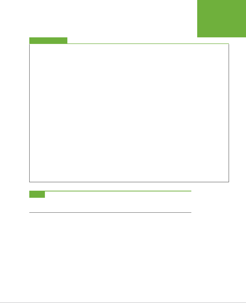
commands in menus, as shown in Figure I-1.
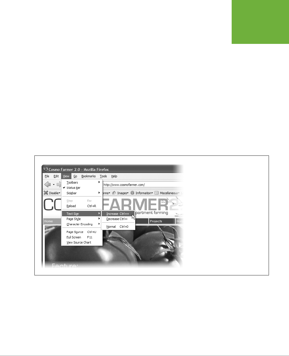
FIGURE I-1
In this book, arrow notations help simplify
menu instructions. For example, View→Text
Size→Increase is a more compact way of
saying, “From the View menu, choose Text
Size; from the submenu that then appears,
choose Increase.” (By the way, when you
see a keystroke combination after a menu
command, like Ctrl++ here, that means you can
press those keys as a shortcut.)

CSS3: THE MISSING MANUAL
12
ABOUT THE
ONLINE
RESOURCES
About the Online Resources
As the owner of a Missing Manual, you’ve got more than just a book to read. Online,
you’ll find example files so you can get some hands-on experience, as well as tips,
articles, and maybe even a video or two. You can also communicate with the Miss-
ing Manual team and tell us what you love (or hate) about the book. Head over to
www.missingmanuals.com
, or go directly to one of the following sections.
Living Examples
This book is designed to get your work onto the Web faster and more professionally.
It’s only natural, then, that half the value of this book lies on the Web.
As you read the book’s chapters, you’ll encounter a number of
living examples
—step-
by-step tutorials that you can build yourself, using raw materials (like graphics and
half-completed web pages) that you can download from
www.sawmac.com/css3/
.
You may not gain very much by simply reading these step-by-step lessons while
relaxing in your porch hammock. But if you work through them at the computer,
you’ll discover that these tutorials give you insight into the way professional design-
ers build web pages.
You’ll also find, in this book’s lessons, the URLs of the finished pages, so that you
can compare your work with the final result. In other words, you won’t just see pic-
tures of how the web pages
should
look; you’ll find the actual, working web pages
on the Internet.
About MissingManuals.com
At
www.missingmanuals.com
, you’ll find articles, tips, and updates to
CSS3: The
Missing Manual
. In fact, we invite and encourage you to submit such corrections
and updates yourself. In an eort to keep the book as up-to-date and accurate as
possible, each time we print more copies of this book, we’ll make any confirmed
corrections you’ve suggested. We’ll also note such changes on the website, so that
you can mark important corrections into your own copy of the book, if you like. (Go
to
www.missingmanuals.com/feedback
, choose the book’s name from the pop-up
menu, and then click Go to see the changes.)
Also on our Feedback page, you can get expert answers to questions that come
to you while reading this book, write a book review, and find groups for folks who
share your interest in CSS.
We’d love to hear your suggestions for new books in the Missing Manual line. There’s
a place for that on missingmanuals.com, too. And while you’re online, you can also
register this book at
www.oreilly.com
(you can jump directly to the registration
page by going here:
www.oreilly.com/register
). Registering means we can send you
updates about this book, and you’ll be eligible for special oers like discounts on
future editions of
CSS3: The Missing Manual
.

INTRODUCTION 13
SAFARI®
BOOKS ONLINE
Errata
In an eort to keep this book as up-to-date and accurate as possible, each time we
print more copies, we’ll make any confirmed corrections you’ve suggested. We also
note such changes on the book’s website, so you can mark important corrections
into your own copy of the book, if you like. Go to
oreil.ly/css3_mm
to report an error
and view existing corrections.
Safari® Books Online
Safari® Books Online is an on-demand digital library that lets you easily search over
7,500 technology and creative reference books and videos to find the answers you
need quickly.
With a subscription, you can read any page and watch any video from our library
online. Read books on your cellphone and mobile devices. Access new titles before
they’re available for print, and get exclusive access to manuscripts in development
and post feedback for the authors. Copy and paste code samples, organize your
favorites, download chapters, bookmark key sections, create notes, print out pages,
and benefit from tons of other time-saving features.


17
CHAPTER
1
To get the most out of CSS, your HTML code needs to provide a solid, well-built
foundation. This chapter shows you how to write better, more CSS-friendly
HTML. The good news is that when you use CSS throughout your site, HTML
actually becomes
easier
to write. You no longer need to worry about trying to turn
HTML into the design maven it was never intended to be. Instead, CSS oers most of
the graphic design touches you’ll likely ever want, and HTML pages written to work
with CSS are easier to create since they require less code and less typing. They’ll also
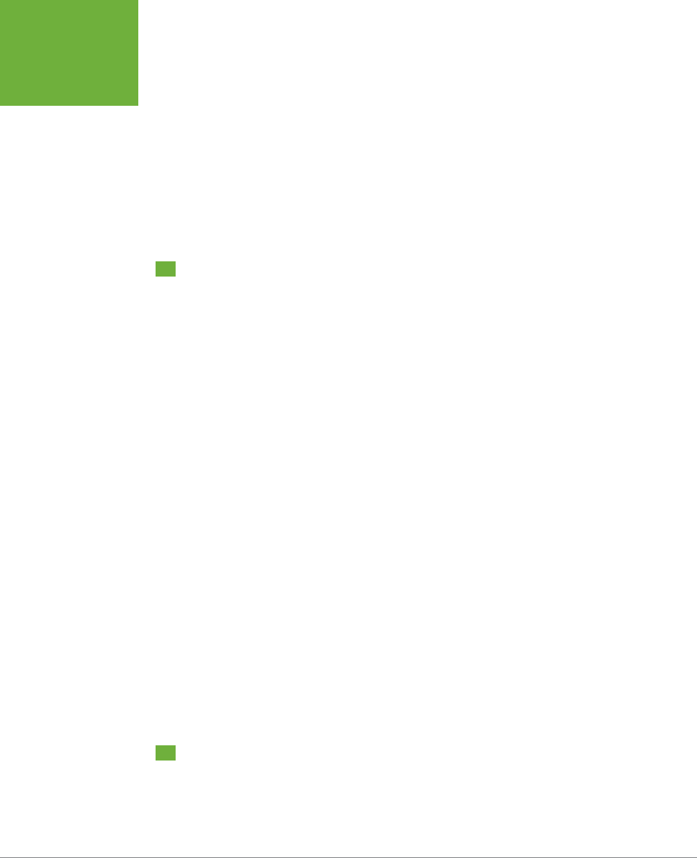
download faster—a welcome bonus your site’s visitors will appreciate (see Figure 1-1).
HTML: Past and Present
As discussed in the Introduction, HTML provides the foundation for every page you
encounter on the World Wide Web. When you add CSS into the mix, the way you
use HTML changes. Say goodbye to repurposing awkward HTML tags merely to
achieve certain visual eects. Some HTML tags and attributes—like the old <font>
tag—you can forget completely.
HTML for CSS
CSS3: THE MISSING MANUAL
18
HTML: PAST
AND PRESENT
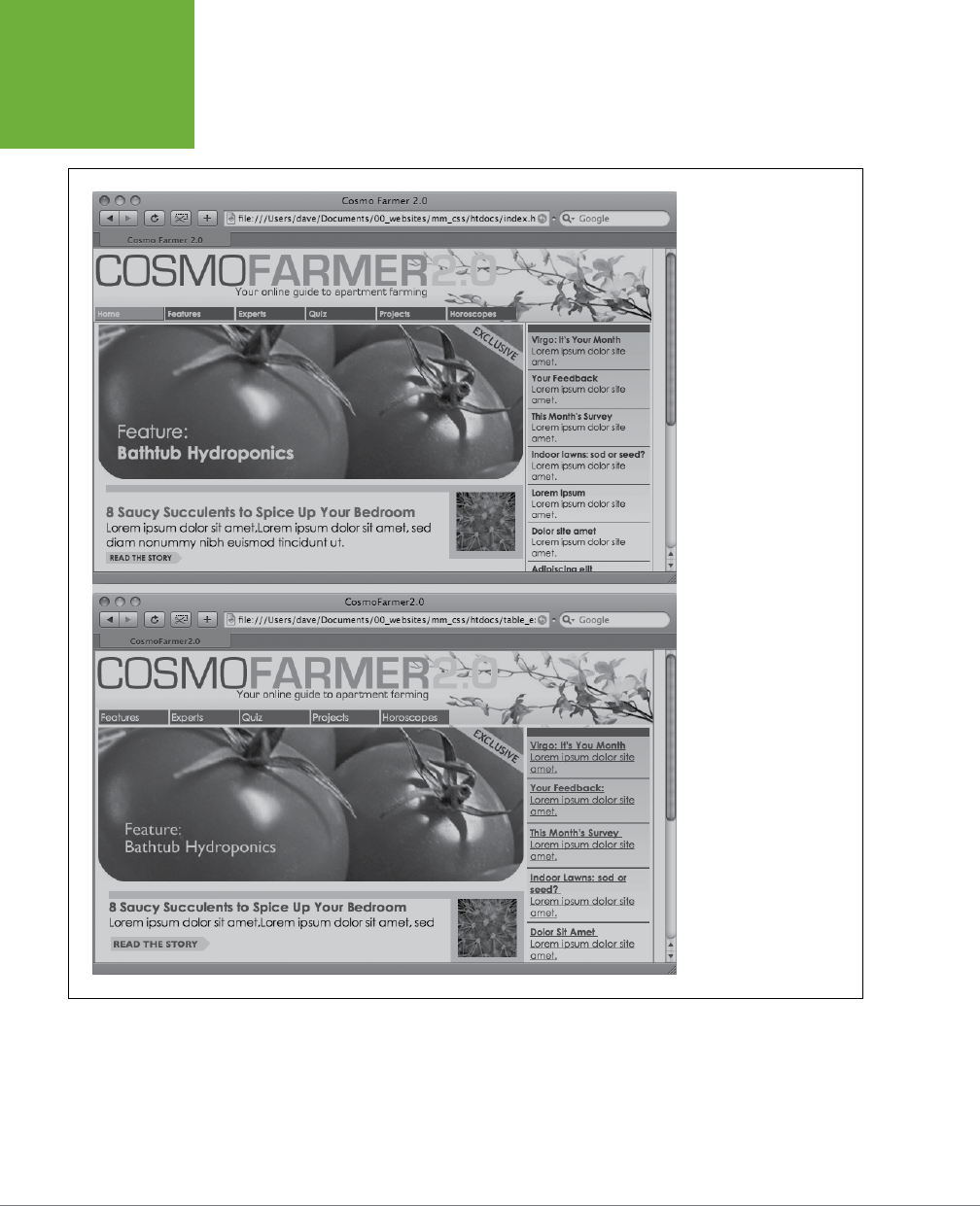
FIGURE 1-1
CSS-driven web design
makes writing HTML
easier. The two designs
pictured here look similar,
but the top page is styled
completely with CSS, while
the bottom page uses only
HTML. The size of the HTML
file for the top page is only
4k, while the HTML-only
page is nearly 4 times that
size at 14k. The HTML-only
approach requires a lot
more code to achieve
nearly the same visual
effects: 213 lines of HTML
code compared with 71
lines for the CSS version.
HTML Past: Whatever Looked Good
When a bunch of scientists created the Web to help share and keep track of technical
documentation, nobody called in the graphic designers. All the scientists needed
HTML to do was structure information for easy comprehension. For example, the <h1>
tag indicates an important headline, while the <h2> tag represents a lesser heading,

CHAPTER 1: HTML FOR CSS 19
HTML: PAST
AND PRESENT
usually a subheading of the <h1> tag. Another favorite, the <ol> (ordered list) tag,
creates a numbered list for things like “Top 10 reasons not to play with jellyfish.”
But as soon as people besides scientists started using HTML, they wanted their web
pages to look good. So web designers started to use tags to control appearance
rather than structure information. For example, you can use the <blockquote> tag
(intended for material that’s quoted from another source) on any text that you
want to indent a little bit. You can use heading tags to make any text bigger and
bolder—regardless of whether it functions as a heading.
In an even more elaborate workaround, designers learned how to use the <table>
tag to create columns of text and accurately place pictures and text on a page.
Unfortunately, since that tag was intended to display spreadsheet-like data—
research results, train schedules, and so on—designers had to get creative by using
the <table> tag in unusual ways, sometimes nesting a table within a table within a
table to make their pages look good.
Meanwhile, browser makers introduced new tags and attributes for the specific
purpose of making a page look better. The <font> tag, for example, lets you specify
a font color, typeface, and one of seven dierent sizes. (If you’re keeping score at
home, that’s about 100 fewer sizes than you can get with, say, Microsoft Word.)
Finally, when designers couldn’t get exactly what they wanted, they often resorted
to using graphics. For example, they’d create a large graphic to capture the exact
font and layout for web page elements and then slice the Photoshop files into smaller
files and piece them back together inside tables to recreate the original design.
While all of the preceding techniques—using tags in creative ways, taking advantage
of design-specific tag attributes, and making extensive use of graphics—provide
design control over your pages, they also add a lot of additional HTML code (and
more wrinkles to your forehead).
HTML Present: Scaolding for CSS
No matter what content your web page holds—the fishing season calendar, driving
directions to the nearest IKEA, or pictures from your kid’s birthday party—it’s the
page’s design that makes it look like either a professional enterprise or a part-timer’s
hobby. Good design enhances the message of your site, helps visitors find what
they’re looking for, and determines how the rest of the world sees your website.
That’s why web designers went through the contortions described in the previous
section to force HTML to look good. By taking on those design duties, CSS lets HTML
go back to doing what it does best—structure content.
Using HTML to control the look of text and other web page elements is obsolete. Don’t
worry if HTML’s <h1> tag is too big for your taste or bulleted lists aren’t spaced just
right. You can take care of that later using CSS. Instead, think of HTML as a method
of adding structure to the content you want up on the Web. Use HTML to organize
your content and CSS to make that content look great.
CSS3: THE MISSING MANUAL
20
WRITING HTML
FOR CSS
Writing HTML for CSS
If you’re new to web design, you may need some helpful hints to guide your forays
into HTML (and to steer clear of well-intentioned, but out-of-date HTML techniques).
Or if you’ve been building web pages for a while, you may have picked up a few
bad HTML-writing habits that you’re better o forgetting. The rest of this chapter
introduces you to some HTML writing habits that will make your mother proud—and
help you get the most out of CSS.
Think Structure
HTML adds meaning to text by logically dividing it and identifying the role that text
plays on the page: For example, the <h1> tag is the most important introduction to
a page’s content. Other headers let you divide the content into other, less important,
but related sections. Just like the book you’re holding, for example, a web page
should have a logical structure. Each chapter in this book has a title (think <h1>)
and several sections (think <h2>), which in turn contain smaller subsections. Imagine
how much harder it would be to read these pages if every word just ran together
as one long paragraph.
NOTE For a tutorial on HTML, visit
www.w3schools.com/html/html_intro.asp
. For a quick list of all available
HTML tags, visit Sitepoint.com’s HTML reference at
http://reference.sitepoint.com/html
.
HTML provides many other tags besides headers for
marking up
content to identify
its role on the page. (After all, the M in HTML stands for
markup
.) Among the most
popular are the <p> tag for paragraphs of text and the <ul> tag for creating bulleted
(non-numbered) lists. Lesser-known tags can indicate very specific types of content,
like <abbr> for abbreviations and <code> for computer code.
When writing HTML for CSS, use a tag that comes close to matching the role the
content plays in the page, not the way it looks (see Figure 1-2). For example, a bunch
of links in a navigation bar isn’t really a headline, and it isn’t a regular paragraph
of text. It’s most like a bulleted list of options, so the <ul> tag is a good choice. If
you’re saying, “But items in a bulleted list are stacked vertically one on top of the
other, and I want a horizontal navigation bar where each link sits next to the previ-
ous link,” don’t worry. With CSS magic you can convert a vertical list of links into a
stylish horizontal navigation bar as described in Chapter 9.
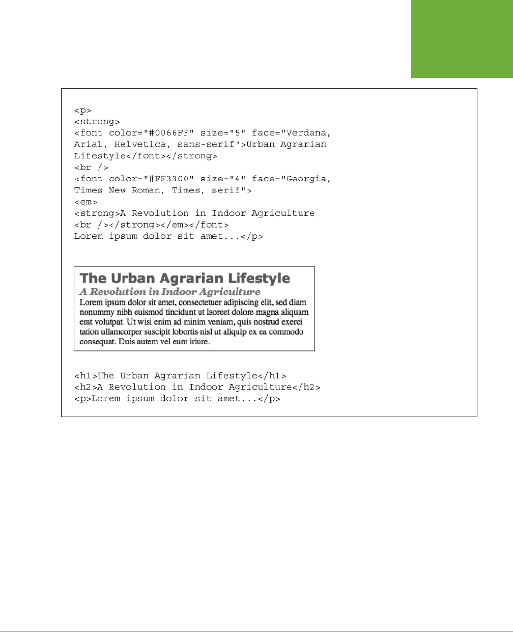
CHAPTER 1: HTML FOR CSS 21
WRITING HTML
FOR CSS
FIGURE 1-2
Old school, new school. Before CSS,
designers had to resort to the <font> tag
and other extra HTML to achieve certain
visual effects (top). You can achieve the
same look (and often a better one) with a
lot less HTML code (bottom). In addition,
using CSS for formatting frees you up
to write HTML that follows the logical
structure of the page’s content.
Two HTML Tags to Keep in Mind
HTML’s motley assortment of tags doesn’t cover the wide range of content you’ll
probably add to a page. Sure, <code> is great for marking up computer program
code, but most folks would find a <recipe> tag handier. Too bad there isn’t one.
Fortunately, HTML provides two generic tags that let you better identify content,
and, in the process, provide “handles” that let you attach CSS styles to dierent
elements on a page.

CSS3: THE MISSING MANUAL
22
WRITING HTML
FOR CSS
UP TO SPEED
Simple HTML Is Search Engine Friendly
Once you take the mental leap of picturing HTML as the way to
structure a document’s content, and CSS as the tool for making
that content look good, you’ll discover additional benefits to
writing lean, mean HTML. For one thing, you may boost your
search-engine ranking as determined by sites like Google,
Yahoo, and Bing. That’s because when search engines crawl the
Web, indexing the content on websites, they must go through
all
the HTML on a page to discover the actual content. The old
HTML way of using special tags (like
<font>
) and lots of tables
to design a page gets in the way of a search engine’s job. In
fact, some search engines stop reading a page’s HTML after a
certain number of characters. When you use a lot of HTML just
for design, the search engine may miss important content on
the page or even fail to rank it at all.
By contrast, simple, structured HTML is easy for a search engine
to read and index. Using an
<h1>
tag to indicate the most
important topic of the page (as opposed to just making the text
big and bold) is smart strategy: Search engines give greater
weight to the contents inside that tag while indexing the page.
To see Google’s suggestions for building search-friendly
websites, visit
http://support.google.com/webmasters/bin/
answer.py?hl=en&answer=35769
.
UNDERSTANDING THE <DIV> AND <SPAN> TAGS
The <div> tag and the <span> tag are like empty vessels that you fill with content. A
div is a block, meaning it has a line break before it and after it, while a span appears
inline, as part of a paragraph. Otherwise, divs and spans have no inherent visual
properties, so you can use CSS to make them look any way you want. The <div>
(for
division
) tag indicates any discrete block of content, much like a paragraph or
a headline. But more often it’s used to group any number of
other
elements, so
you can insert a headline, a bunch of paragraphs, and a bulleted list inside a single
<div> block. The <div> tag is a great way to subdivide a page into logical areas,
like a banner, footer, sidebar, and so on. Using CSS, you can later position each area
to create sophisticated page layouts (a topic that’s covered in Part III of this book).
The <span> tag is used for
inline
elements; that is, words or phrases that appear
inside of a larger paragraph or heading. Treat it just like other inline HTML tags
such as the <a> tag (for adding a link to some text in a paragraph) or the <strong>
tag (for emphasizing a word in a paragraph). For example, you could use a <span>
tag to indicate the name of a company, and then use CSS to highlight the name by
using a dierent font, color, and so on. Here’s an example of those tags in action,
complete with a sneak peek of a couple of attributes—id and class—frequently used
to attach styles to parts of a page.
<div id="footer">
<p>Copyright 2006, <span class="bizName">CosmoFarmer.com</span></p>
<p>Call customer service at 555-555-5501 for more information</p>
</div>

CHAPTER 1: HTML FOR CSS 23
WRITING HTML
FOR CSS
This brief introduction isn’t the last you’ll see of these tags. They’re used frequently
in CSS-heavy web pages, and in this book you’ll learn how to use them in combina-
tion with CSS to gain creative control over your web pages.
ADDITIONAL TAGS IN HTML5
The <div> tag is rather generic—it’s simply a block-level element used to divide a
page into sections. One of the goals of HTML5 is to provide other, more
semantic
tags for web designers to choose from. Making your HTML more semantic simply
means using tags that accurately describe the content they contain. As mentioned
earlier in this section, you should use the <h1> (heading 1) tag when placing text that
describes the primary content of a page. Likewise, the <code> tag tells you clearly
what kind of information is placed inside—programming code.
HTML5 includes many dierent tags whose names reflect the type of content they
contain, and can be used in place of the <div> tag. The <article> tag, for example,
is used to mark o a section of a page that contains a complete, independent com-
position…in other words, an “article” as in a blog post, an online magazine article,
or simply the main text of the page. Likewise, the <header> tag indicates a header
or banner, the top part of a page usually containing a logo, site-wide navigation,
page title and tagline, and so on.
NOTE To learn more about the new HTML tags, visit HTML5 Doctor (
http://html5doctor.com
) and
www.w3schools.com/html5/html5_intro.asp.
Many of the new HTML5 tags are intended to expand upon the generic <div> tag,
Here are a few other HTML5 tags frequently used to structure the content on a page:
• The <section> tag contains a grouping of related content, such as the chapter
of a book. For example, you could divide the content of a home page into three
sections: one for an introduction to the site, one for contact information, and
another for latest news.
• The <aside> tag holds content that is related to content around it. A sidebar in
a print magazine, for example.
• The <footer> tag contains information you’d usually place in the footer of a
page, such as a copyright notice, legal information, some site navigation links,
and so on. You’re not limited, however, to just a single <footer> per page; you
can put a footer inside an <article>, for example, to hold information related
to that article, like footnotes, references, or citations.
• The <nav> element is used to contain primary navigation links.
• The <figure> tag is used for an illustrative figure. You can place an <img> tag
inside it, as well as another new HTML5 tag—the <figcaption> tag, which is
used to display a caption explaining the photo or illustration within the <figure>.
CSS3: THE MISSING MANUAL
24
WRITING HTML
FOR CSS
TIP Understanding which HTML5 tag to use—should your text be an
<article>
or a
<section>
?—can
be tricky. For a handy flowchart that makes sense of HTML5’s new sectioning elements, download the PDF from
the HTML5doctor.com at
http://html5doctor.com/downloads/h5d-sectioning-flowchart.pdf
.
There are other HTML5 elements, and many of them simply provide a more descrip-
tive alternative to the <div> tag. This book uses both the <div> tag and the new
HTML5 tags to help organize web-page content. The downside of HTML5 is that
Internet Explorer 8 and earlier don’t recognize the new tags without a little bit of
help (see the box below).
In addition, aside from feeling like you’re keeping up with the latest web design
trends, there’s really no tangible benefit to using some of these HTML5 tags. For
example, simply using the <article> tag to hold the main story on a web page,
doesn’t make Google like you any better. You can comfortably continue using the
<div> tag, and avoid the HTML5 sectioning elements if you like.
WORKAROUND WORKSHOP
Getting IE 8 to Understand HTML5
HTML5 provides many new HTML tags to play with. From tags
that clearly describe the kind of content they hold, like the
<nav>
tag, to ones that provide added functionality, like the
<video>
tag for embedding videos and the
<audio>
tag
for embedding sound and music. As you learn more about
HTML5, you’ll probably start applying these new tags to your
web pages.
Unfortunately, Internet Explorer 8 and earlier don’t recognize
these new tags, and won’t respond to any CSS you apply to
them. That’s right—if you’re using HTML5 and viewing web
pages in IE 8, this book is useless to you. Well…not exactly.
There is a way to kick those old versions of IE into gear, so they’ll
understand all the CSS that applies to HTML5 tags.
Simply place the following code before the closing </head>
tag at the top of your HTML file:
<!--[if lt IE 9]>
<script src="//html5shiv.googlecode.com/
svn/trunk/html5.js"></script>
<![endif]-->
This tricky bit of code uses what’s called an “Internet Explorer
conditional comment” (IECC for short) to embed a bit of Java-
Script code that’s only visible to versions of Internet Explorer
earlier than IE 9. In other words, only IE 6, 7, and 8 respond to
this code, and all other browsers (including newer versions of
IE) simply ignore it. This code makes earlier versions of IE load
a small JavaScript program that forces the browser to recognize
HTML5 tags and apply the CSS that applies to those tags.
This code only affects how the browser displays and prints
HTML5 tags; it doesn’t make the browser “understand” an
HTML5 tag that actually does something. For example, IE 8
and earlier don’t understand the
<video>
tag and can’t play
HTML5 video (even with the added JavaScript code).
Keep Your Layout in Mind
While you’ll use the <h1> tag to identify the main topic of the page and the <p> tag
to add a paragraph of text, you’ll eventually want to organize a page’s content into
a pleasing layout. As you learn how to use CSS to lay out a page in Part Three of this
book, it doesn’t hurt to keep your design in mind while you write the page’s HTML.
CHAPTER 1: HTML FOR CSS 25
WRITING HTML
FOR CSS
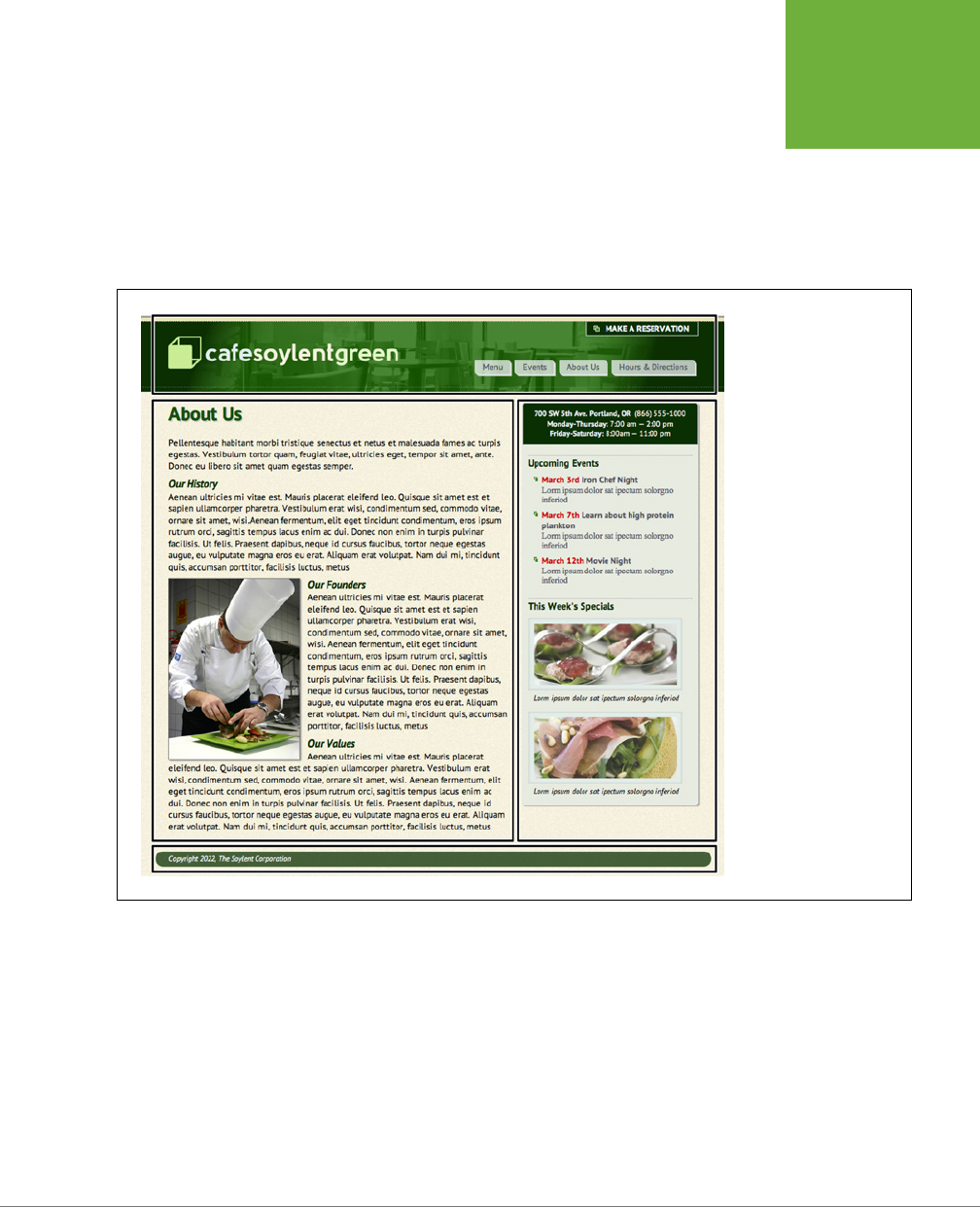
You can think of web page layout as the artful arrangement of boxes (see Figure 1-3
for an example). After all, a two-column design consisting of two vertical columns
of text is really just two rectangular boxes sitting side-by-side. A header consisting
of a logo, tagline, search box, and site navigation is really just a wide rectangular
box sitting across the top of the browser window. In other words, if you imagine the
groupings and layout of content on a page, you’d see boxes sitting on top of one
another, next to each other, and below each other.
FIGURE 1-3
This basic two-column
layout includes a banner
(top), a column of main
content (middle, left), a
sidebar (middle, right),
and a footer (bottom).
These are the main
structural boxes making up
this page’s layout.
In your HTML, you create these boxes, or structural units, using the <div> tag.
Simply wrap the HTML tags that make up the banner area, for example, in one div,
a column’s worth of HTML in another, and so on. If you’re HTML5 savvy, you might
create the design pictured in Figure 1-3, with a <header> tag for the top banner, an
<article> tag for the main text, an <aside> or <section> tag for the sidebar, and
a <footer> tag for the page’s footer. In other words, if you plan to place a group of
HTML tags together, somewhere on a page, then you’ll need to wrap those tags in
a sectioning element like a <div>, <article>, <section>, or <aside>.

CSS3: THE MISSING MANUAL
26
WRITING HTML
FOR CSS
HTML to Forget
CSS lets you write simpler HTML for one big reason: You can stop using a bunch of
tags and attributes that only make a page better looking. The <font> tag is the most
glaring example. Its sole purpose is to add a color, size and font to text. It doesn’t
do anything to make the structure of the page more understandable.
Here’s a list of tags and attributes you can easily replace with CSS:
• Ditch <font> for controlling the display of text. CSS does a much better job
with text. (See Chapter 6 for text-formatting techniques.)
• Don’t use the <b> and <i> tags to emphasize text. If you want text to really be
emphasized, use the <strong> tag, which browsers normally display as bold. For
a slightly less emphatic point, use the <em> tag, which browsers display as italic.
While HTML4 tried to phase the <b> and <i> tags out, HTML5 has brought them
back. In HTML5 the <b> tag is meant to merely make text bold without adding
any meaning to that text (that is, you just want the text to be bold looking but
you don’t want people to treat that text like you’re shouting it). Likewise, the
<i> tag is used for italicizing text, but not emphasizing its meaning.
NOTE To italicize a publication’s title, the
<cite>
tag kills two birds with one stone. It puts the title in
italics
and
tags it as a cited work for search engines’ benefit. This one’s a keeper.
• Skip the <table> tag for page layout. Use it only to display tabular informa-
tion like spreadsheets, schedules, and charts. As you’ll see in Part Three of this
book, you can do all your layout with CSS for much less time and code than
the table-tag tango.
• Avoid the awkward <body> tag attributes that enhance only the presentation
of the content: background, bgcolor, text, link, alink, and vlink set colors
and images for the page, text, and links. CSS gets the job done better (see
Chapter 7 and Chapter 8 for CSS equivalents of these attributes).
• Don’t abuse the <br> tag. If you grew up using the <br> tag (<br /> in XHTML)
to insert a line break without creating a new paragraph, then you’re in for a
treat. (Browsers automatically—and sometimes infuriatingly—insert a bit of
space between paragraphs, including between headers and <p> tags. In the
past, designers used elaborate workarounds to avoid paragraph spacing they
didn’t want, like replacing a single <p> tag with a bunch of line breaks and using
a <font> tag to make the first line of the paragraph
look like
a headline.) Using
CSS’s margin controls, you can easily set the amount of space you want to see
between paragraphs, headers, and other block-level elements.
CHAPTER 1: HTML FOR CSS 27
WRITING HTML
FOR CSS
NOTE In the next chapter, you’ll learn about a technique called a “CSS Reset,” which eliminates the gaps
browsers normally insert between paragraphs and other tags (see page 115).
As a general rule, adding attributes to tags that set colors, borders, background
images, or alignment—including attributes that let you format a table’s colors, back-
grounds, and borders—is pure old-school HTML. So is using alignment properties
to position images and center text in paragraphs and table cells. Instead, look to
CSS to control text placement (page 169), borders (page 202), backgrounds (page
206), and image alignment (page 239).
UP TO SPEED
Validate Your Web Pages
HTML follows certain rules: For example, the
<html>
tag wraps
around the other tags on a page, and the
<title>
tag needs
to appear within the
<head>
tag. XHTML provides an even
more strict set of rules to follow, while HTML5 is a bit more lax.
It’s easy to forget these rules or simply make a typo. Incorrect
(or
invalid
, as the geeks would say) HTML causes problems like
making your page look different in different web browsers.
More importantly, even valid CSS may not work as expected
with invalid HTML. Fortunately, there are tools for checking
whether the HTML in your web pages is correctly written.
The easiest way to check—that is,
validate
—your pages is on the
W3C’s website at
http://validator.w3.org
(see Figure 1-4). Get
the Web Developer extension for Firefox (
http://chrispederick
.com/work/web-developer
); it provides a quick way to test a
page in the W3C validator.
The W3C, or World Wide Web Consortium, is the organization
responsible for determining the standards for many of the tech-
nologies and languages of the Web, including HTML and CSS.
If the W3C validator finds any errors in your page, it tells you
what those errors are. If you use Firefox, you can download
an extension that lets you validate a web page directly in
that browser, without having to visit the W3C site. It can even
attempt to fix any problems it encounters. You can get the
extension here:
http://users.skynet.be/mgueury/mozilla/
.
Chrome users can download the HTML Tidy extension for
Chrome from
http://bit.ly/SCONRY
. A similar tool is available
for the Safari browser as well:
www.zappatic.net/safaritidy
.
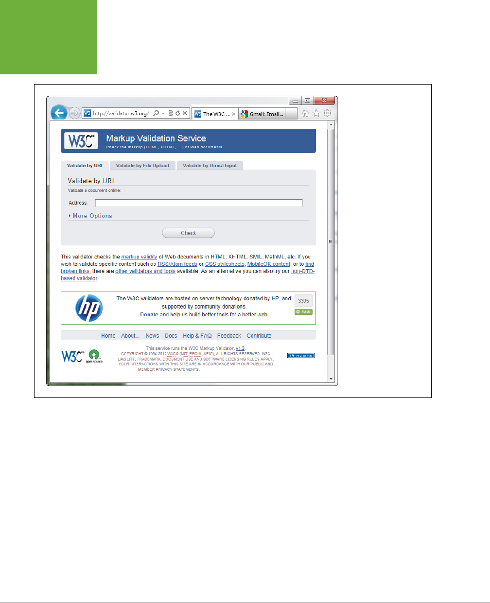
CSS3: THE MISSING MANUAL
28
WRITING HTML
FOR CSS
FIGURE 1-4
The W3C HTML validator
located at
http://validator
.w3.org
lets you quickly
make sure the HTML in a
page is sound. You can
point the validator to an
already existing page on
the Web, upload an HTML
file from your computer,
or just paste the HTML of a
web page into a form box
and then click the Check
button.
Tips to Guide Your Way
It’s always good to have a map for getting the lay of the land. If you’re still not sure
how to use HTML to create well-structured web pages, then here are a few tips to
get you started:
• Use headings to indicate the relative importance of text. Again, think outline.
When two headings have equal importance in the topic of your page, use the
same level header on both. If one is less important or a subtopic of the other,
then use the next level header. For example, follow an <h2> with an <h3> tag
(see Figure 1-5). In general, it’s good to use headings in order and try not to
skip heading numbers. For example, don’t follow an <h2> tag with an <h5> tag.
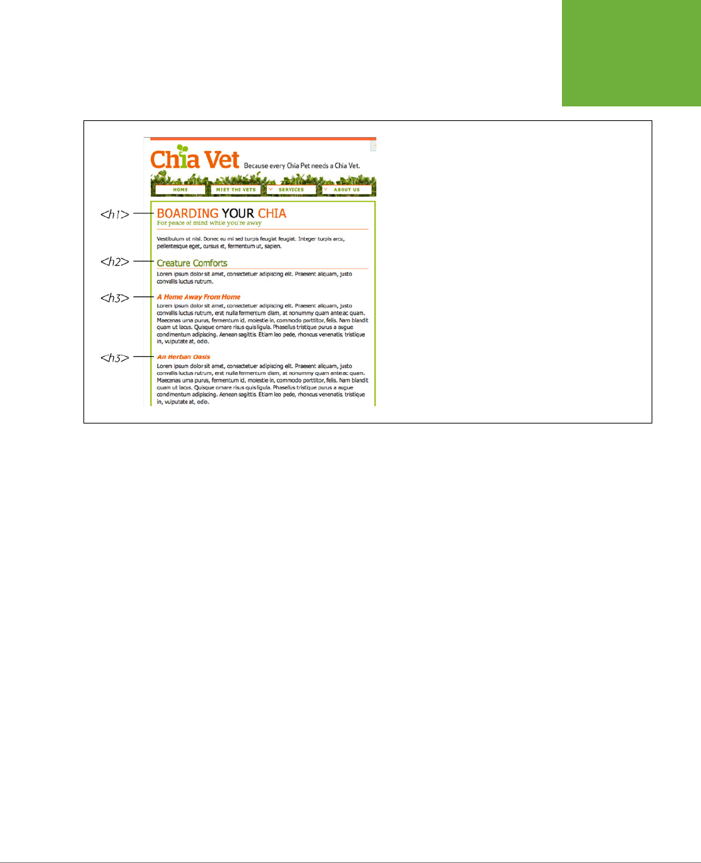
CHAPTER 1: HTML FOR CSS 29
WRITING HTML
FOR CSS
FIGURE 1-5
Use the headline tags (
<h1>
,
<h2>
, and so on) as you would if
you were outlining a school report: Put them in order of impor-
tance, beginning with an
<h1>
tag, which should shout “Listen
up! This is what this whole page is about.”
• Use the <p> tag for paragraphs of text.
• Use unordered lists (<ul>) when you’ve got a list of several related items, such
as navigation links, headlines, or a set of tips like these.
• Use numbered lists (<ol>) to indicate steps in a process or define the order of a
set of items. The tutorials in this book are a good example, as is a list of rankings
like “Top 10 websites popular with monks.”
• To create a glossary of terms and their definitions or descriptions, use the <dl>
(definition list) tag in conjunction with the <dt> (definition term) and <dd> (defi-
nition description) tags. (For an example of how to use this combo, visit
www
.w3schools.com/tags/tryit.asp?filename=tryhtml_list_definition
.)
• If you want to include a quotation like a snippet of text from another website,
a movie review, or just some wise saying of your grandfather’s, try the <block-
quote> tag for long passages or the <q> tag to place a short quote within a
longer paragraph, like this:
<p>Mark Twain is said to have written <q>The The coldest winter I ever spent
was a summer in San Francisco</q>. Unfortunately, he never actually wrote that
famous quote.</p>
• Take advantage of obscure tags like the <cite> tag for referencing a book title,
newspaper article, or website, and the <address> tag to identify and supply
contact information for the author of a page (great for a copyright notice).

CSS3: THE MISSING MANUAL
30
THE
IMPORTANCE
OF THE
DOCTYPE
• As explained in full on page 26, steer clear of any tag or attribute aimed just
at changing the appearance of a text or image. CSS, as you’ll see, can do it all.
• When there just isn’t an HTML tag that fits the bill, but you want to identify
an element on a page or a bunch of elements on a page so you can apply a
distinctive look, use the <div> and <span> tags (see page 21). You’ll get more
advice on how to use these in later chapters.
• Don’t overuse <div> tags. Some web designers think all they need are <div> tags,
ignoring tags that might be more appropriate. For example, to create a naviga-
tion bar, you could add a <div> tag to a page and fill it with a bunch of links. A
better approach would be to use a bulleted list (<ul> tag), After all, a navigation
bar is really just a list of links. As discussed on page 23, HTML5 provides several
new tags that can take the place of the <div> tag, like the <article>, <section>,
and <footer> tags. For a navigation bar, you could use the HTML5 <nav> tag.
• Remember to close tags. The opening <p> tag needs its partner in crime (the
closing </p> tag), as do all other tags, except the few self-closers like <br> and
<img> (<br /> and <img /> in XHTML).
• Validate your pages with the W3C validator (see Figure 1-4 and the box on page
27). Poorly written or typo-ridden HTML causes many weird browser errors.
The Importance of the Doctype
HTML follows certain rules—these rules are contained in a
Document Type Defini-
tion
file, otherwise known as a DTD. A DTD is a text file that explains what tags,
attributes, and values are valid for a particular type of HTML. And for each version
of HTML, there’s a corresponding DTD. By now you may be asking, “But what’s all
this got to do with CSS?”
Everything—if you want your web pages to appear correctly and consistently in web
browsers. You tell a web browser which version of HTML or XHTML you’re using by
including what’s called a
doctype declaration
at the beginning of a web page. This
doctype declaration is the first line in the HTML file, and defines what version of
HTML you’re using (such as HTML5 or HTML 4.01 Transitional). When you mistype
the doctype declaration or leave it out, you can throw most browsers into an altered
state called
quirks mode
.
Quirks mode is browser manufacturers’ attempt to make their software behave like
browsers did circa 1999 (in the Netscape 4 and Internet Explorer 5 days). If a mod-
ern browser encounters a page that’s missing the correct doctype, then it thinks,
“Gee, this page must have been written a long time ago, in an HTML editor far, far
away. I’ll pretend I’m a really old browser and display the page just as one of those

CHAPTER 1: HTML FOR CSS 31
THE
IMPORTANCE
OF THE
DOCTYPE
buggy old browsers would display it.” That’s why, without a correct doctype, your
lovingly CSS-styled web pages may not look as they should, according to current
standards. If you unwittingly view your web page in quirks mode when checking it
in a browser, you may end up trying to fix display problems that are related to an
incorrect doctype and not the incorrect use of HTML or CSS.
NOTE For more (read: technical) information on quirks mode, visit
www.quirksmode.org/css/quirksmode
.html
and
https://developer.mozilla.org/en/Mozilla%2527s_Quirks_Mode
.
Fortunately, it’s easy to get the doctype correct. All you need to know is what version
of HTML you’re using. If you’re using HTML5, things are easy. The doctype is simply:
<!doctype html>
Put this at the top of your HTML file and you’re good to go. If you’re still using older
versions of HTML or XHTML such as HTML 4.01 Transitional and XHTML 1.0 Transi-
tional, then the doctype is a lot more convoluted.
If you’re using HTML 4.01 Transitional, for example, type the following doctype
declaration at the very beginning of every page you create:
<!DOCTYPE HTML PUBLIC "-//W3C//DTD HTML 4.01 Transitional//EN" "http://www.
w3.org/TR/html4/loose.dtd">
The doctype declaration for XHTML 1.0 Transitional is similar. It’s also necessary
to add a little code to the opening <html> tag that’s used to identify the file’s XML
type—in this case, it’s XHTML—like this:
<!DOCTYPE html PUBLIC "-//W3C//DTD XHTML 1.0 Transitional//EN" "http://www.
w3.org/TR/xhtml1/DTD/xhtml1-transitional.dtd">
<html xmlns="http://www.w3.org/1999/xhtml">
If this entire discussion is making your head ache and your eyes slowly shut, keep
your life simple by using the HTML5 doctype. It’s short, easy to remember, and
works in all browsers. You can use this doctype even if you don’t touch any of the
new HTML5 tags.
NOTE Most visual web page tools like Dreamweaver and Expression Web automatically add a doctype
declaration whenever you create a new web page, and many HTML-savvy text editors have shortcuts for adding
doctypes.
CSS3: THE MISSING MANUAL
32
MAKING SURE
INTERNET
EXPLORER IS
UP-TO-DATE
FREQUENTLY ASKED QUESTION
Should I Care About IE 6, 7, or 8?
I keep hearing that Internet Explorer 6 is dead and we don’t
need to worry about it anymore. Is this true? What about other
versions of IE?
If you’re a web designer, you’ve probably got the latest ver-
sion of Internet Explorer, Firefox, Safari, Chrome, or Opera on
your computer. Previous versions of this book talked quite a
bit about Internet Explorer 6 and even provided a section on
how to deal with IE 6 bugs. That’s all been removed, since IE 6
is rapidly disappearing.
If you’re building sites with a US audience in mind, as of August
2012, less than .6 percent of US web surfers use that outdated
browser; in the UK, it’s 1.1%. The exact figure varies depending
on whom you ask (for example,
http://gs.statcounter.com
has
worldwide IE 6 usage at .57 percent and
www.ie6countdown
.com
says it’s at 6 percent as of August 2012). In China, IE 6 is
still widely used.
However, even statistics that include the geographic region of
your site’s audience don’t truly reflect what visitors to your site
use. If you build a site aimed at tech-savvy web designers, odds
are that IE 6 hasn’t been to your site in a long time. However,
if your site’s aimed at people in China, you may need to deal
with IE 6. The best way to find out how much of your traffic
comes via IE 6 is to look at your web server’s log files or sign
up for Google Analytics (
www.google.com/analytics
) so you
can track your visitors’ browsers (among many other things).
For the great majority of web design projects, IE 6 is ef-
fectively gone. In addition, IE 7 is also rapidly disappearing,
with just 1.16 percent worldwide market share as of August
2012 (
http://gs.statcounter.com/#browser_version-ww-
monthly-201108-201208
).
IE 8, however, you still need to contend with. Windows XP is
still a popular operating system, and Microsoft chose not to
bring Internet Explorer 9 or later to that operating system. So
as long as XP is around, Internet Explorer 8 will be around,
too. (To keep up with advances in web development, XP users
can switch to Chrome or Firefox.) According to StatCounter,
in August 2012, IE 8 accounted for 13.65 percent of all web
browsers (
http://gs.statcounter.com/#browser_version-
ww-monthly-201108-201208
). According to NetMarketShare,
IE 8 accounts for a whopping 26 percent of web browsers
(
http://marketshare.hitslink.com/browser-market-share
.aspx?qprid=2&qpcustomd=0
). Since IE 8 doesn’t understand
HTML5 tags, you can’t directly format them with CSS either—you
have to turn to a JavaScript workaround as described in the
box on page 24.
Making Sure Internet Explorer Is Up-to-Date
Thanks to Microsoft’s auto-update feature, Windows PCs now update Internet
Explorer to the latest version. Windows 7 and 8 users have the latest version of
Internet Explorer installed—IE 10 at the time of this writing. IE 10 supports many of
the exciting and powerful new HTML5 and CSS3 properties. As you’ll learn in this
book, CSS3 provides many exciting design possibilities like drop shadows (page 210),
gradient backgrounds (page 259), and rounded corners (page 207), to name a few.

CHAPTER 1: HTML FOR CSS 33
MAKING SURE
INTERNET
EXPLORER IS
UP-TO-DATE
Unfortunately, not all Windows users will be able to take advantage of these advance-
ments in web design. As explained in the box on page 32, the widely used Windows
XP operating system can run only Internet Explorer 8 or earlier. In fact, IE 8 is still
the most common version of Internet Explorer used on the Web. This book will
point out CSS properties that won’t work in IE 8, as well as possible workarounds.
Because IE 8 is still very popular, you need to keep a couple of things in mind. IE 8
is sort of like a chameleon: It can take on the appearance of a dierent version. If
you’re not careful, it may not display your web pages the way you want it to. For
example, and most importantly, you must include a proper doctype. As mentioned
in the previous section, without a doctype, browsers switch into quirks mode. Well,
when IE 8 goes into quirks mode, it tries to replicate the look of IE 5 (!?).
But wait—there’s more! IE 8 can also pretend to be IE 7. When someone viewing your
site in IE 8 clicks a “compatibility view” button, IE 8 goes into IE 7 mode, displaying
pages without IE 8’s full CSS 2.1 goodness. The same thing happens if Microsoft
puts your website onto its Compatibility View List—a list of sites that Microsoft
has determined look better in IE 7 than in IE 8. If you’re designing a site using the
guidelines in this book, you won’t want IE 8 to act like IE 7…
ever
.
Fortunately, there’s a way to tell IE 8 to stop all this nonsense and just be IE 8. Adding
a single META tag to a web page instructs IE 8 to ignore Compatibility View and the
Compatibility View List and always display the page by using its most standards-
compliant mode:
<meta http-equiv="X-UA-Compatible" content="IE=edge" />
Put this instruction in the page’s <head> section (below the <title> tag is a good
place). This tag works for current versions of IE, too: The "IE=edge" part of the tag
will instruct versions of Internet Explorer later than IE 8 to also display web pages
in their standard mode. Unfortunately, you must do this on every page of your site.
Now that your HTML ship is steering in the right direction, it’s time to jump into the
fun stu (and the reason you bought this book): Cascading Style Sheets.
CSS3: THE MISSING MANUAL
34
MAKING SURE
INTERNET
EXPLORER IS
UP-TO-DATE
UP TO SPEED
Cross-Browser Testing
There are a lot of web browsers out there. If you use Win-
dows, you automatically get Internet Explorer and can install
additional browsers like Firefox, Safari, Opera, or Google’s
Chrome. On a Mac, you can stick with the already-installed
Safari browser, or run Firefox or Chrome. While the very latest
browsers are mostly comparable when displaying CSS-driven
web pages, you can’t say the same for IE 8, which is still in
widespread use.
To really make sure your sites work for the largest audience, you
need a way to test your designs in as wide a range of browsers
as possible. Here are a few techniques:
Windows. Normally, Windows computers can only run one
version of IE—you can’t test in IE 6, IE 7, and IE 8 on the same
computer. Well, normally you can’t, but
you
can if you run
virtual machines
on your Windows computer to create com-
pletely separate versions of Internet Explorer that you can then
test in. It’s a fair amount of work, but it gives you the most
accurate way of testing a page in multiple versions of IE. Visit
www.howtogeek.com/102261/how-to-run-internet-explorer-
7-8-and-9-at-the-same-time-using-virtual-machines
to learn
more about how to do this.
You should also install the other major browsers on your
computer: Firefox, Opera, and Chrome. Apple has discontinued
Safari for Windows, so you can simply rely on Chrome (which
has a similar underlying rendering engine) or use one of the
services listed later in this box (like Adobe Browserlab) to test
your designs in Safari.
Mac. Testing is a bit trickier for Mac people. You
have
to test in
Internet Explorer—it’s still one of the most used browsers in the
world, and the lack of most CSS3 properties in IE 8 means that
your painstakingly crafted design might look great for you, but
fall apart in IE 8. You have a few options: First, you can buy (or
borrow) a Windows machine; second, if you have an Intel Mac,
you can install Windows using Apple’s Boot Camp software
(
www.apple.com/macosx/features/bootcamp.html
); a third
option is to install virtualization software like VMware Fusion
or Parallels Desktop on your Mac. This software lets you run a
virtual Windows machine side-by-side with the Mac OS. You can
jump between Mac and Windows to test in various browsers in
both operating systems. It’s the most efficient testing technique
for Mac users. Both Boot Camp and virtualization software
require a copy of the Windows OS.
Everyone. Another option that works for both Windows and
Macs and doesn’t require installing extra software is one of
the many cross-browser testing services that let you see what
your pages look like in many different operating systems and
browsers.
• CrossBrowserTesting.com (
http://CrossBrowserTesting
.com
) is $30 a month (ouch) for 150 minutes of use and
offers an added benefit—interactive testing. You get
to see your page running remotely on a PC under your
control—you can test features that a screenshot can’t
capture, like Flash movie playback, animation, and
JavaScript interactions.
• BrowserStack (
www.browserstack.com
) is another service
that lets you test your pages interactively via your web
browser. For $19 a month, it’s like renting multiple
Windows and Mac machines with multiple versions of IE,
Chrome, Firefox, and Safari installed.
• Browsershots (
www.browsershots.org
) is a free
alternative that provides screenshots for a wide range
of browsers on Windows and Linux.
• You can also see what a page looks like in IE 9, 8 7, 6,
and even 5.5 for free with NetRenderer (
http://ipinfo
.info/netrenderer
), though. You need to have the pages
you want to test up on a publicly accessible website.
Visit
http://ipinfo.info/netrenderer
, type the URL of the
page, and in a few moments you’ll see a screen shot.
Unfortunately, it doesn’t take a picture of a complete
web page—just the top part that you’d normally see on
a screen. On the other hand, it’s free.
• Finally, you can use Adobe’s BrowserLab tool (
https://
browserlab.adobe.com
) to get snapshots of a web page
in all major browsers. If you use Dreamweaver to build
sites, for example, you can launch BrowserLab from
within the program and preview the page you’re currently
working on.

35
CHAPTER
2
Even the most complex and beautiful websites, like the one in Figure 2-1, start with
a single CSS style. As you add multiple styles and style sheets, you can develop
fully formed websites that inspire designers and amaze visitors. Whether you’re a
CSS novice or a Style Sheet Samurai, you need to obey a few basic rules about how
to create styles and style sheets. In this chapter, you’ll start at square one, learning
the basics of creating and using styles and style sheets.
TIP Some people learn better by doing rather than reading. If you’d like to try your hand at creating styles
and style sheets first and then come back here to read up on what you just did, turn to page 43 for a hands-on
tutorial.
Anatomy of a Style
A single style defining the look of one element on a page is a pretty basic beast.
It’s essentially just a rule that tells a web browser how to format something on a
web page—turn a headline blue, draw a red border around a photo, or create a
150-pixel-wide sidebar box to hold a list of links. If a style could talk, it would say
something like, “Hey Browser, make
this
look like
that
.” A style is, in fact, made up
of two elements: the web page element that the browser formats (the
selector
) and
the actual formatting instructions (the
declaration block
). For example, a selector
can be a headline, a paragraph of text, a photo, and so on. Declaration blocks can
turn that text blue, add a red border around a paragraph, position the photo in the
center of the page—the possibilities are endless.
Creating Styles and
Style Sheets
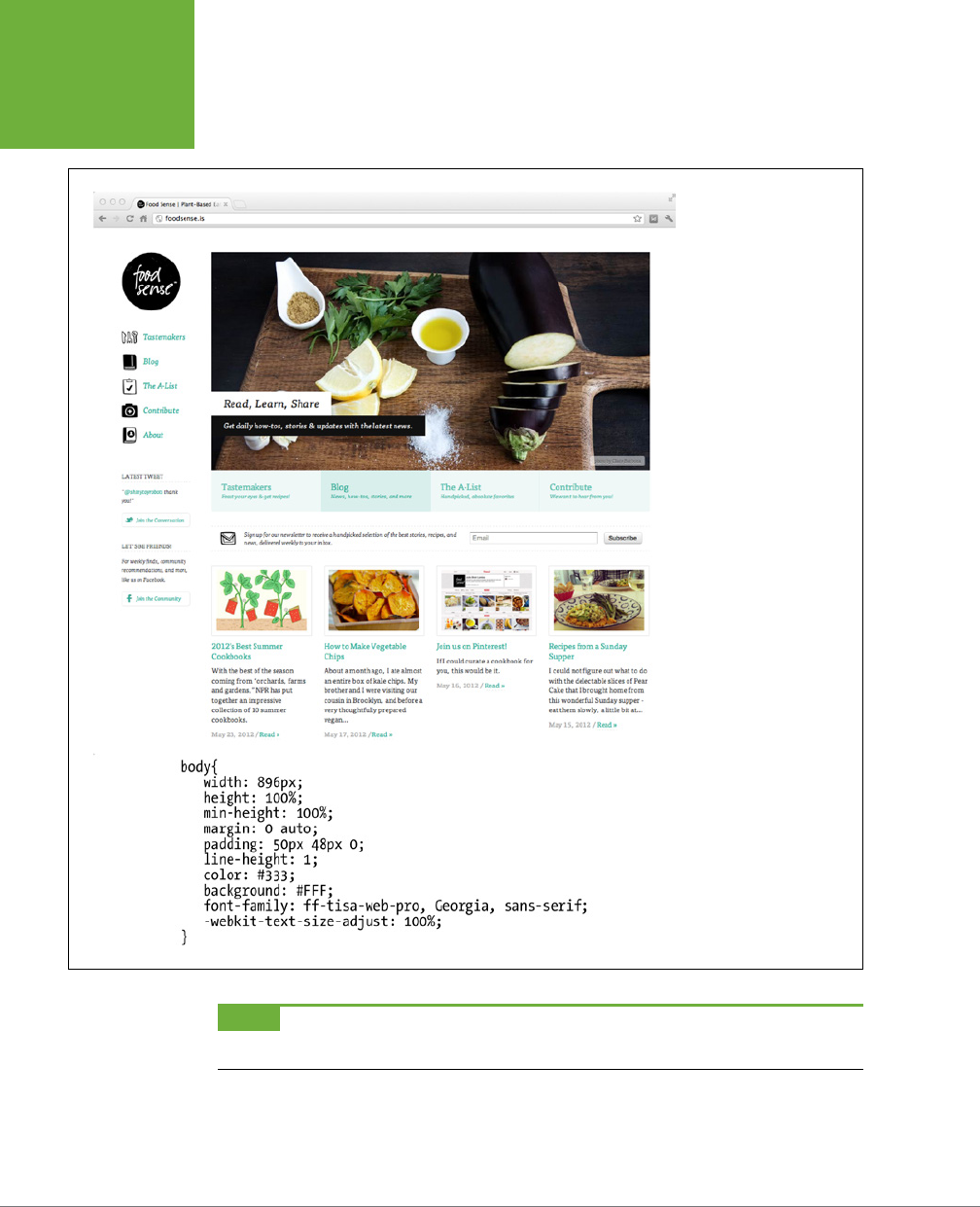
CSS3: THE MISSING MANUAL
36
ANATOMY OF A
STYLE
FIGURE 2-1
Every CSS-driven web
page starts with a single
CSS style. Here, a basic
style (bottom) sets the
groundwork for the body
of the entire page (top).
NOTE Technical types often follow the lead of the W3C and call CSS styles
rules
. This book uses the terms
“style” and “rule” interchangeably.
CHAPTER 2: CREATING STYLES AND STYLE SHEETS 37
ANATOMY OF A
STYLE
Of course, CSS styles can’t communicate in nice clear English like the previous
paragraph. They have their own language. For example, to set a standard font color
and font size for all paragraphs on a web page, you’d write the following:
p { color: red; font-size: 1.5em; }
This style simply says, “Make the text in all paragraphs—marked with <p> tags—red
and 1.5 ems tall.” (An
em
is a unit of measurement that’s based on a browser’s normal
text size. More on that in Chapter 6.) As Figure 2-2 illustrates, even a simple style
like this example contains several elements:
• Selector. As described earlier, the selector tells a web browser which element
or elements on a page to style—like a headline, paragraph, image, or link. In
Figure 2-2, the p selector refers to the <p> tag. This selector makes web brows-
ers format all <p> tags by using the formatting directions in this style. With the
wide range of selectors that CSS oers and a little creativity, you’ll master your
pages’ formatting. (The next chapter covers selectors in depth.)
• Declaration Block. The code following the selector includes all the formatting
options you want to apply to the selector. The block begins with an opening
brace ({) and ends with a closing brace (}).
• Declaration. Between the opening and closing braces of a declaration block,
you add one or more
declarations
, or formatting instructions. Every declaration
has two parts, a
property
and a
value
. A colon separates the property name
and its value, and the whole declaration ends with a semicolon.
• Property. CSS oers a wide range of formatting options, called
properties
. A
property is a word—or a few hyphenated words—indicating a certain style eect.
Most properties have straightforward names like font-size, margin-top, and
text-align. For example, the background-color property sets—you guessed
it—a background color. You’ll learn about oodles of CSS properties throughout
this book. You must add a colon after the property name to separate it from
the value.
TIP Appendix A has a handy glossary of CSS properties.
• Value. Finally, you get to express your creative genius by assigning a
value
to a CSS property—by making a background blue, red, purple, or chartreuse,
for example. As upcoming chapters explain, dierent CSS properties require
specific types of values—a color (like red, or #FF0000), a length (like 18px, 200%,
or 5em), a URL (like
images/background.gif
), or a specific keyword (like top,
center, or bottom).
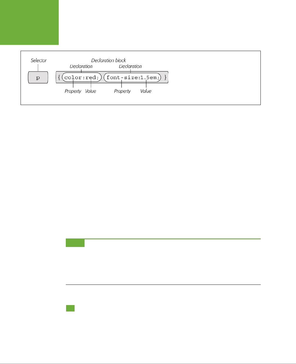
CSS3: THE MISSING MANUAL
38
UNDERSTANDING
STYLE SHEETS
FIGURE 2-2
A style (or rule) is made of two main parts:
a selector, which tells web browsers what to
format, and a declaration block, which lists the
formatting instructions that the browsers use to
style the selector.
You don’t need to write a style on a single line, as pictured in Figure 2-2. Many
styles have multiple formatting properties, so you can make them easier to read by
breaking them up into multiple lines. For example, you may want to put the selector
and opening brace on the first line, each declaration on its own line, and the closing
brace by itself on the last line, like so:
p {
color: red;
font-size: 1.5em;
}
Web browsers ignore spaces and tabs, so feel free to add them to make your CSS
more readable. For example, it’s helpful to indent properties, with either a tab or a
couple of spaces, to visibly separate the selector from the declarations, making it
easy to tell which is which. In addition, putting one space between the colon and the
property value is optional but adds to the readability of the style. In fact, you can
put as much white space between the two as you want. For example, color:red,
color: red, and color : red all work.
NOTE Don’t forget to end each property/value pair with a semicolon:
color: red;
Leaving off that semicolon can trip up browsers, breaking your style sheet and ruining the look of your web
page. Don’t worry, this mistake is very common—just make sure you use a CSS validator, as described in the
box on page 41.
Understanding Style Sheets
Of course, a single style won’t transform a web page into a work of art. It may make
your paragraphs red, but to infuse your websites with great design, you need many
dierent styles. A collection of CSS styles comprises a
style sheet
. A style sheet can
be one of two types—
internal
or
external
, depending on whether the style informa-
tion is located in the web page itself or in a separate file linked to the web page.
CHAPTER 2: CREATING STYLES AND STYLE SHEETS 39
UNDERSTANDING
STYLE SHEETS
Internal or External—How to Choose
Most of the time, external style sheets are the way to go, since they make building
web pages easier and updating websites faster. An external style sheet collects all
your style information in a single file that you then link to a web page with just a
single line of code. You can attach the same external style sheet to every page in
your website, providing a unified design. It also makes a complete site makeover as
easy as editing a single text file.
On the receiving end, external style sheets help web pages load faster. When
you use an external style sheet, your web pages can contain only basic HTML—no
byte-hogging HTML tables or <font> tags and no internal CSS style code. Further-
more, when a web browser downloads an external style sheet, it stores the file on
your visitor’s computer (in a behind-the-scenes folder called a
cache
) for quick ac-
cess. When your visitor hops to other pages on the site that use the same external
style sheet, there’s no need for the browser to download the style sheet again. The
browser simply downloads the requested HTML file and pulls the external style sheet
from its cache—a significant savings in download time.
NOTE When you’re working on your website and previewing it in a browser, the cache can work against
you. See the box below for a workaround.
WORKAROUND WORKSHOP
Don’t Get Caught in the Cache
A browser’s cache is a great speed-boost for Web surfers.
Whenever the cache downloads and stores a frequently used
file—like an external CSS file or an image—it saves precious
moments traveling the highways of the Internet. Instead of
re-downloading the next time it needs the same file, the
browser can go straight to the new stuff—like a yet-to-be-
viewed page or graphic.
But what’s good for your visitors isn’t always good for you.
Because the web browser caches and recalls downloaded
external CSS files, you can often get tripped up as you work
on a site design. Say you’re working on a page that uses an
external style sheet, and you preview the page in a browser.
Something doesn’t look quite right, so you return to your web
editor and change the external CSS file. When you return to
the web browser and reload the page, the change you just
made doesn’t appear! You’ve just been caught by the cache.
When you reload a web page, browsers don’t always reload
the external style sheet, so you may not be seeing the latest
and greatest version of your styles.
To get around this snafu, you can
force reload
a page (which
also reloads all linked files) by pressing the Ctrl (c) key and
clicking the browser’s Reload button; Ctrl+F5 also works for
Chrome and Internet Explorer; Ctrl+Shift+R (c-Shift-R) is
Firefox’s keyboard shortcut; and Ctrl+R (c-R) works for both
Safari and Chrome.
CSS3: THE MISSING MANUAL
40
INTERNAL
STYLE SHEETS
Internal Style Sheets
An internal style sheet is a collection of styles that’s part of the web page’s code.
It always appears between opening and closing HTML <style> tags in the page’s
<head> portion. Here’s an example:
<style>
h1 {
color: #FF7643;
font-family: Arial;
}
p {
color: red;
font-size: 1.5em;
}
</style>
</head>
<body>
<!-- The rest of your page follows... -->
NOTE You can place the
<style>
tag and its styles after the
<title>
tag in the head of the page, but
web designers usually place them right before the closing
</head>
tag as shown here. If you also use JavaScript
in your pages, add the JavaScript code
after
the style sheet. Many JavaScript programs rely on CSS, so by adding
your CSS first, you can make sure the JavaScript program has all the information it needs to get its job done.
The <style> tag is HTML, not CSS. But its job is to tell the web browser that the in-
formation contained within the tags is CSS code and not HTML. Creating an internal
style sheet is as simple as typing one or more styles between the <style> tags.
NOTE HTML5 simply requires <style> for the opening tag of an internal style sheet. Earlier versions of HTML
and XHTML require an additional attribute on the opening <style> tag:
<style type="text/css">
If you leave that attribute off a non-HTML5 page, you’ll get an error if you try to validate the web page. Yet
another reason to use HTML5.
Internal style sheets are easy to add to a web page and provide an immediate visual
boost to your HTML. But they aren’t the most ecient method for designing an
entire website composed of many web pages. For one thing, you need to copy and
paste the internal style sheet into each page of your site—a time-consuming chore
that adds bandwidth-hogging code to each page.
But internal style sheets are even more of a hassle when you want to update the
look of a site. For example, say you want to change the <h1> tag, which you origi-
nally decided should appear as large, green, bold type. But now you want small,
CHAPTER 2: CREATING STYLES AND STYLE SHEETS 41
EXTERNAL
STYLE SHEETS
blue type in the Courier typeface. Using internal style sheets, you’d need to edit
every
page. Who has that kind of time? Fortunately, there’s a simple solution to this
dilemma—external style sheets.
NOTE It’s also possible (though rarely advisable) to add styling information to an individual HTML tag
without using a style sheet. The tutorial on page 44 shows you how to perform that maneuver by using an
inline
style.
External Style Sheets
An external style sheet is nothing more than a text file containing all your CSS rules.
It never contains any HTML code—so don’t include the <style> tag. In addition, al-
ways end the file name with the extension .css. You can name the file whatever you
like, but it pays to be descriptive. Use
global.css, site.css
, or, simply,
styles.css
, for
example, to indicate a style sheet used by every page on the site, or use
form.css
to name a file containing styles used to make a web form look good.
UP TO SPEED
Validate Your CSS
Just as you should make sure you’ve correctly written the HTML
in your web pages using the W3C HTML validator (see the box
on page 27), you should also check your CSS code to make sure
it’s kosher. The W3C provides an online tool for CSS checking
as well:
http://jigsaw.w3.org/css-validator
. It operates just
like the HTML validator: You can type the URL of a web page
(or even just the address to an external CSS file), upload a CSS
file, or copy and paste CSS code into a web form and submit
it for validation.
It’s easy to make a typo when writing CSS, and one small
mistake can throw all of your carefully planned designs out of
whack. When your CSS-infused web page doesn’t look as you
expect, a simple CSS error may be the cause. The W3C CSS vali-
dator is a good first stop when troubleshooting your designs.
TIP If you have a page with an internal style sheet but want to use an external style sheet, then just cut all
of the code between the <style> tags (without the tags themselves). Then create a new text file and paste
the CSS into the file. Save the file with a .css extension—
styles.css
, for example—and link it to your page, using
one of the techniques described next.
Once you create an external style sheet, you must connect it to the web page you
wish to format. You can attach a style sheet to a web page using HTML’s <link>
tag or CSS’s own @import directive—a command that basically does the same thing
as the link tag. All current web browsers treat these two techniques the same, and
both let you attach style sheets to a web page, so choosing one is mostly a matter
of preference.
CSS3: THE MISSING MANUAL
42
EXTERNAL
STYLE SHEETS
NOTE The
@import
directive can do one thing the
<link>
tag can’t: attach external style sheets to an
external style sheet. This advanced technique is discussed at the bottom of this page.
Linking a Style Sheet by Using HTML
The most common method of adding an external style sheet to a web page is to use
the HTML <link> tag. You write the tag slightly dierently depending on whether
you’re using HTML5, HTML 4.01, or XHTML. For example, here’s HTML5:
<link rel="stylesheet" href="css/styles.css">
HTML 4.01 is similar, but requires an additional type attribute:
<link rel="stylesheet" type="text/css" href="css/styles.css">
Finally, XHTML is just like HTML 4.01, but it requires a closing slash at the end of
the tag:
<link rel="stylesheet" type="text/css" href="css/styles.css" />
Because HTML5 requires less code, we’d recommend that you use HTML5. All doc-
types require two attributes:
• rel="stylesheet" indicates the type of link—in this case, a link to a style sheet.
• href points to the location of the external CSS file on the site. The value of this
property is a URL and will vary depending on where you keep your CSS file. It
works the same as the src attribute you use when adding an image to a page
or the href attribute of a link pointing to another page.
TIP You can attach multiple style sheets to a web page by adding multiple
<link>
tags, each pointing to
a different style sheet file. This technique is a great way to organize your CSS styles, as you can see in Chapter 15.
Linking a Style Sheet by Using CSS
CSS includes a built-in way to add external style sheets—the @import directive. You
add the directive inside of an HTML <style> tag, like so:
<style>
@import url(css/styles.css);
</style>
NOTE If you’re using an HTML 4.01 or XHTML doctype, then you need to add
type="text/css"
to the
opening
<style>
tag. See the note on page 40.
Unlike HTML’s <link> tag, @import is part of the CSS language and has some
definite un-HTML-like qualities:
CHAPTER 2: CREATING STYLES AND STYLE SHEETS 43
TUTORIAL:
CREATING
YOUR FIRST
STYLES
• To make the connection to the external CSS file, you use url instead of href
and enclose the path in parentheses. So in this example,
css/styles.css
is the
path to the external CSS file. Quotes around the URL are optional, so url(css/
styles.css) and url("css/styles.css") both work.
• As with the <link> tag, you can include multiple external style sheets by using
more than one @import:
<style type="text/css">
@import url(css/styles.css);
@import url(css/form.css);
</style>
• You can add regular CSS styles after the @import directives if you want to cre-
ate a rule that applies just to that one page, but still use the site’s global design
rules to format the rest of the page.
NOTE You’ll learn how rules interact and how you can create a rule that overrides other rules on page 113.
You can even create an external CSS file that contains only
@import
directives linking to
other
external style
sheets, a technique often used to help organize your styles (see page 547).
Here’s an example:
<style>
@import url(css/styles.css);
@import url(css/form.css);
p { color:red; }
</style>
You must place all the @import lines
before
any CSS rules, as shown here. Web
browsers ignore any style sheets you import after a CSS rule, so if you reversed the
order of the code above and had the p style appear first, then the browser ignores
any styles in
style.css
or
form.css
style sheets.
Which to use? Although both methods work, the <link> tag is more common. In a
few cases, using the @import technique can slow your style sheets’ download speed
(visit
www.stevesouders.com/blog/2009/04/09/dont-use-import
to find out when
this can happen and why). So, if you don’t have a strong preference for either, just
use the <link> method.
Tutorial: Creating Your First Styles
The rest of this chapter takes you through the basic steps for adding inline styles,
writing CSS rules, and creating internal and external style sheets. As you work through
this book, you’ll work through various CSS designs, from simple design elements to
complete CSS-enabled web page layouts. To get started, download the tutorial files

CSS3: THE MISSING MANUAL
44
TUTORIAL:
CREATING
YOUR FIRST
STYLES
located on the book’s companion website at
www.sawmac.com/css3
. Click the tuto-
rial link and download the zip archive containing the files (detailed instructions for
unzipping the files are on the website as well). Each chapter’s files are in a separate
folder, named
02
(for Chapter 2),
03
(for Chapter 3), and so on.
Next, launch your favorite web page–editing software, whether it’s a simple text
editor, like Notepad or TextEdit, or a visually oriented program, like Dreamweaver
or Microsoft Expression Web (for information on selecting an editor, see page 7).
Creating an Inline Style
When you type a CSS rule directly into a page’s HTML, you’re creating an
inline
style.
Inline styles oer none of the time- and bandwidth-saving benefits of style sheets,
so the pros hardly ever use them. Still, in a pinch, if you absolutely must change
the styling on a single element on a single page, then you may want to resort to an
inline style. (For example, when creating HTML-formatted email messages, it’s best
to use inline styles. That’s the only way to get CSS to work in Gmail, for instance.)
And if you do, you at least want the style to work properly. The important thing is
to carefully place the style within the tag you want to format. Here’s an example
that shows you exactly how to do it:
1. In your web page–editing program, open the file
02→basic.html
.
This simple-but-elegant HTML5 file contains a couple of dierent headings, a
few paragraphs, and a copyright notice inside an <address> tag. You’ll start by
creating an inline style for the <h1> tag.
2. Click inside the opening <h1> tag and type style="color: #666666;".
The tag should look like this:
<h1 style="color: #666666;">
The style attribute is HTML, not CSS, so you use the equal sign after it and en-
close all of the CSS code inside quotes. Only the stu inside the quotes is CSS.
In this case, you’ve added a property named color—which aects the color of
text—and you’ve set that property to #666666 (a hexadecimal code for defining
a color that’s gray). You’ll learn more about coloring text on page 154. The colon
separates the property name from the property value that you want. Next you’ll
check the results in a web browser.
3. Open the
basic.html
page in a web browser.
For example, start up your favorite web browser and choose File→Open File
(or press Ctrl+O [c-O] and select the
basic.html
file in the
02 tutorial
folder
from your computer; or just drag the file from the desktop—or wherever you’ve

CHAPTER 2: CREATING STYLES AND STYLE SHEETS 45
TUTORIAL:
CREATING
YOUR FIRST
STYLES
saved the tutorial files—into an open browser window). Many HTML editors also
include a “Preview in Browser” function, which, with a simple keyboard shortcut
or menu option, opens the page in a web browser. It’s worth checking your
program’s manual to see if it includes this timesaving feature.
When you view the page in a browser, the headline is now gray. Inline styles
can include more than one CSS property. You’ll add another property next.
4. Return to your HTML editor, click after the semicolon following #666666,
and type font-size: 3em;.
The semicolon separates two dierent property settings. The <h1> tag should
look like this:
<h1 style="color: #666666; font-size: 3em;">
5. Preview the page in a web browser. For example, click your browser window’s
Reload button (but make sure you’ve saved the HTML file first).
The headline is now massive in size. And you’ve had a taste of how labor-intensive
inline styles are. Making all the <h1> headings on a page look like this one could
take days of typing and add acres of HTML code.
6. Return to your page editor and delete the entire style property, which re-
turns the heading tag back to its normal <h1>.
Next, you’ll create a style sheet within a web page. (You’ll find a finished version
of this part of the tutorial in the
02_finished
folder in a file named
inline.html
.)
Creating an Internal Style Sheet
A better approach than inline styles is using a style sheet that contains multiple CSS
rules to control multiple elements of a page. In this section, you’ll create a style that
aects all top-level headings in one fell swoop. This single rule automatically formats
every <h1> tag on the page.
1. With the file
basic.html
open in your text editor, click directly after the
closing </title> tag. Then hit Enter (Return) and type <style>.
The HTML should now look like the following (the stu you’ve added is in bold):
<title>CSS:The Missing Manual -- Chapter 2</title>
<style>
</head>
The opening <style> tag marks the beginning of the style sheet. It’s always a
good idea to close a tag right after you type the opening tag, since it’s so easy
to forget this step once you jump into writing your CSS. In this case, you’ll close
the <style> tag before adding any CSS.
2. Press Enter twice and type </style>.
Now, you’ll add a CSS selector that marks the beginning of your first style.

CSS3: THE MISSING MANUAL
46
TUTORIAL:
CREATING
YOUR FIRST
STYLES
3. Click between the opening and closing <style> tags and type h1 {.
The h1 indicates the tag to which the web browser should apply the upcoming
style.
The weird bracket thingy after the h1 is called an opening brace, and it marks
the beginning of the CSS properties for this style. In other words, it says, “The
fun stu comes right after me.” As with closing tags, it’s a good idea to type
the closing brace of a style before actually adding any style properties.
4. Press Enter twice and type a single closing brace: }.
As the partner of the opening brace you typed in the last step, this brace’s job
is to tell the web browser, “This particular CSS rule ends here.” Now time for
the fun stu.
5. Click in the empty line between the two braces. Hit the Tab key, and type
color:
#666666;.
You’ve typed the same style property as the inline version—color—and set
it to #666666. The final semicolon marks the end of the property declaration.
NOTE Technically, you don’t have to put the style property on its own line, but it’s a good idea. With one
property per line, it’s a lot easier to quickly scan a style sheet and see all the properties for each style. Also, the
tab is another helpful visual organizing technique (you can also insert a few spaces instead). The indentation
makes it easy to discern all of your rules at a glance, since the selectors (like
h1
here) line up along the left edge,
with the properties spaced a bit out of the way.
6. Press Enter again and add three additional properties, like so:
font-size: 3em;
margin: 0;
Make sure you don’t leave o the semicolon at the end of each line, otherwise
the CSS won’t display correctly in a browser.
Each of these properties adds a dierent visual eect to the headline. The first
two assign a size and font to the text, while the third removes space from around
the headline. Part 2 of this book covers all these properties in detail.
Congratulations—you’ve just created an internal style sheet. The code you’ve
added should look like the bolded text:
<title>CSS: The Missing Manual -- Chapter 2</title>
<style>
h1 {
color: #666666;
font-size: 3em;
margin: 0;

CHAPTER 2: CREATING STYLES AND STYLE SHEETS 47
TUTORIAL:
CREATING
YOUR FIRST
STYLES
}
</style>
</head>
7. Save the page and preview it in a web browser.
You can preview the page by opening it in a web browser as described in Step
3 on page 44, or, if the page is still open in a browser window, then just click
the Reload button.
Next you’ll add another style.
NOTE Always remember to add the closing
</style>
tag at the end of an internal style sheet. When you
don’t, a web browser displays the CSS style code followed by a completely unformatted web page—or no web
page at all.
8. Back in your text-editing program, click after the closing brace of the h1
style you just created, press Enter, and then add the following rule:
p {
color: #616161;
line-height: 150%;
margin-top: 10px;
margin-left: 80px;
}
This rule formats every paragraph on the page. Don’t worry too much right now
about what each of these CSS properties is doing. Later chapters cover these
properties in depth. For now, just practice typing the code correctly and get a
feel for how to add CSS to a page.
9. Preview the page in a browser.
The page is starting to shape up and should look like Figure 2-3. You can see
what stylistic direction the page is headed in. You can see a completed version
of this tutorial by opening the
internal.html
file in the
02_finished
folder.
The process you’ve just worked through is CSS in a nutshell: Start with an HTML page,
add a style sheet, and create CSS rules to make the page look great. In the next part
of this tutorial, you’ll see how to work more eciently using external style sheets.
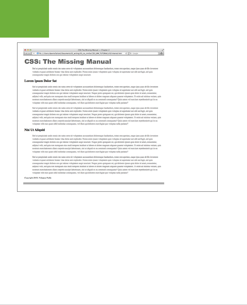
CSS3: THE MISSING MANUAL
48
TUTORIAL:
CREATING
YOUR FIRST
STYLES
FIGURE 2-3
CSS easily formats text in
creative ways, letting you
change fonts, text colors, font
sizes, and a lot more, as you’ll
see in Chapter 6.
Creating an External Style Sheet
Since it groups all of your styles at the top of the page, an internal style sheet is a
lot easier to create and maintain than the inline style you created a few pages ago.
Also, an internal style sheet lets you format any number of instances of a tag on a
page, like every <p> tag, by typing one simple rule. But an external style sheet gets
even better—it can store all of the styles for an
entire website
. Editing one style in
the external style sheet updates the whole site. In this section, you’ll take the styles
you created in the previous section and put them in an external style sheet.
1. In your text-editing program, create a new file and save it as
styles.css
in
the same folder as the web page you’ve been working on.
External style sheet files end with the extension .css. The file name
styles.css
indicates that the styles contained in the file apply throughout the site. (But
you can use any file name you like, as long as it ends with the .css extension.)
Start by adding a new style to the style sheet.

CHAPTER 2: CREATING STYLES AND STYLE SHEETS 49
TUTORIAL:
CREATING
YOUR FIRST
STYLES
2. Type the following rule into the
styles.css
file:
html {
padding-top: 25px;
background-image: url(images/bg_page.png);
}
This rule applies to the HTML tag—the tag that surrounds all other HTML tags
on a page. The padding-top property adds space between the top of the tag
and the content that goes inside it. In other words, what you just typed will
add 25 pixels of space between the top of the browser window and the content
inside the page. The background-image adds a background image to the page,
The CSS background-image property can display the graphic in many dierent
ways—in this case, the graphic will tile seamlessly from left to right and top to
bottom, covering the entire browser window. You can read more about back-
ground image properties on page 240.
3. Add a second rule following after the rule you just typed to the
styles.css
file:
body {
width: 80%;
padding: 20px;
margin: 0 auto;
box-shadow: 10px 10px 10px rgba(0,0,0,.5);
background-color: #E1EDEB;
}
This rule applies to the body tag—the tag that holds all the content visible in a
web browser window. There are a lot of dierent things going on in this style,
and each of these properties is covered in-depth later in the book. But in a
nutshell, this style creates a box for the page’s content that’s 80 percent the
width of the browser window, has a little bit of space inside that moves text
from the edge of the box (that’s the padding property), and centers the box
on the page (that’s the margin property, and the particular trick of centering
a page’s content is discussed in the tutorial starting on page 89). Finally, the
box gets a light blue background color and a transparent black drop shadow.
Instead of recreating the work you did earlier, just copy the styles you created
in the previous section and paste them into this style sheet.
4. Open the
basic.html
page that you’ve been working on and copy all of the
text
inside
the <style> tags. (Don’t copy the <style> tags themselves.)
Copy the style information the same way you’d copy any text. For example,
choose Edit→Copy or press Ctrl+C (
c
-C).
5. In the
styles.css
file, paste the style information by selecting Edit→Paste
or pressing Ctrl+V (
c
-V).
An external style sheet never contains any HTML—that’s why you didn’t copy
the <style> tags.

CSS3: THE MISSING MANUAL
50
TUTORIAL:
CREATING
YOUR FIRST
STYLES
6. Save
styles.css
.
Now you just need to clean up your old file and link the new style sheet to it.
7. Return to the
basic.html
file in your text editor and delete the <style> tags
and all the CSS rules you typed in earlier.
You no longer need these styles, since they’re in the external style sheet you’re
about to attach. In this tutorial, you’ll take a dip into the exciting world of web
fonts. You’ll learn all about web fonts starting on page 132, but the basic idea is
that you can use nearly any font you want in a web page—even a font that your
site’s visitors don’t have installed on their own computers—simply by providing
a link to that font file. There are many dierent ways to use web fonts, but in
this example, you’ll use Google’s web font service.
8. In the space where the styles used to be (between the closing </title> tag
and the closing </head> tag), type the following:
<link href="http://fonts.googleapis.com/css?family=Gravitas+One"
rel="stylesheet">
Again, don’t worry about the details yet. All you need to know for now is that
when a web browser encounters this link, it downloads a font named Gravi-
tas One from a Google server, which your CSS styles can freely use to make
distinctive-looking text.
Next, you’ll link to the external style sheet you created earlier.
9. After the <link> tag you added in the previous step, type:
<link href="styles.css" rel="stylesheet">
The <link> tag is one way to attach a style sheet to a page; another option is
the CSS @import directive, as discussed on page 42. The link tag specifies the
location of the external style sheet. The rel attribute simply lets the browser
know that it’s linking to a style sheet.
NOTE In this example, the style sheet file is in the same folder as the web page, so using the file’s name
for the
href
value provides a simple “document-relative” path. If it were in a different folder from the page,
then the path would be a bit more complicated. In either case, you’d use a
document-
or
root-relative
path to
indicate where the file is. The routine is the same as when you create a link to a web page or set a path to an
image file when using the HTML
<img>
tag. (For a brief primer on document- and root-relative links, visit
www.communitymx.com/content/article.cfm?cid=230AD
.)
10. Save the file and preview it in a web browser.
You’ll see the same text styles for the <h1> and <p> tags that you created in the
internal style sheet on page 45. In addition, there’s now a speckled, tan back-
ground (the background image you applied on the <html> tag), as well as a blue
box. That box is the <body> tag, and its width is 80 percent that of the browser
window. Try resizing the browser window and notice that the box changes width

CHAPTER 2: CREATING STYLES AND STYLE SHEETS 51
TUTORIAL:
CREATING
YOUR FIRST
STYLES
as well. There’s also a drop shadow on the box; you can see through the drop
shadow to the speckled background. That’s thanks to a CSS3 color type—rgba
color—that includes a transparency setting (you’ll read about it on page 155).
NOTE If the web page doesn’t have any formatting (for example, the top headline isn’t big, bold, and dusty
brown), then you’ve probably mistyped the code from step 6 or saved the
styles.css
file in a folder other than the
one where the
basic.html
file is. In this case, just move the
styles.css
into the same folder.
Now, you’ll use the web font you linked to in Step 8.
11. In your text editor, return to the
styles.css
file. For the h1 style, add the fol-
lowing two lines:
font-family: 'Gravitas One', 'Arial Black', serif;
font-weight: normal;
The finished style should look like this (additions in bold):
h1 {
font-family: 'Gravitas One', 'Arial Black', serif;
font-weight: normal;
color: #666666;
font-size: 3em;
margin: 0;
}
If you preview the page now, you’ll see the new font “Gravitas One” for the
headline.
NOTE If you don’t see the new font—it’s kind of chunky looking with thin lines (serifs) at the ends of the
letters—then one of a couple of things could be wrong. If you’re not connected to the Internet, you won’t be able
to download the font from Google; second, you may have mistyped either the
<link>
tag (see step 8 on the
previous page), or the font-family declaration (line 2 above).
To demonstrate how useful it can be to keep your styles in their own external
file, you’ll attach the style sheet to another web page.
12. Open the file
02
→
another_page.html
.
This page contains some of the same HTML tags—h1, h2, p, and so on—as the
other web page you’ve been working on.
13. Click after the closing </title> tag and press Enter (Return).
You’ll now link to both the web font and the external style sheet.

CSS3: THE MISSING MANUAL
52
TUTORIAL:
CREATING
YOUR FIRST
STYLES
14. Type the same <link> tags you did in Steps 8 and 9.
The web page code should look like this (the code you just typed appears in
bold):
<title>Another Page</title>
<link href="http://fonts.googleapis.com/css?family=Gravitas+One"
rel="stylesheet">
<link href="styles.css" rel="stylesheet">
</head>
15. Save the page and preview it in a web browser.
Ta-da! Just two lines of code added to the web page is enough to instantly
transform its appearance. To demonstrate how easy it is to update an external
style sheet, you’ll do so by editing one style and adding another.
16. Open the
styles.css
file and add the CSS declaration font-family: "Palatino
Linotype", Baskerville, serif; at the beginning of the p style.
The code should look like this (the bold text is what you’ve just added):
p {
font-family: "Palatino Linotype", Baskerville, serif;
color: #616161;
line-height: 150%;
margin-top: 10px;
margin-left: 80px;
}
In this case, you’re not using a web font, but relying on the site visitor to already
have one of the fonts listed on his machine (you’ll learn all about using fonts on
page 127). Next, create a new rule for the h2 tag.
17. Click at the end of the p style’s closing }, press Enter, and add the follow-
ing rule:
h2 {
color: #B1967C;
font-family: 'Gravitas One', 'Arial Black', serif;
font-weight: normal;
font-size: 2.2em;
border-bottom: 2px white solid;
background: url(images/head-icon.png) no-repeat 10px 10px;
padding: 0 0 2px 60px;
margin: 0;
}
Some of these CSS properties you’ve encountered already. Some are new—like
the border-bottom property for adding a line underneath the headline. And
some—like the background property—provide a shortcut for combining several

CHAPTER 2: CREATING STYLES AND STYLE SHEETS 53
TUTORIAL:
CREATING
YOUR FIRST
STYLES
dierent properties—in this case, the background-image, and background-
repeat—into a single property. Don’t worry about the specifics of these proper-
ties, you’ll learn them all in great detail in upcoming chapters (Chapter 6 covers
font properties; Chapter 8 covers backgrounds; Chapter 7 covers padding and
margins).
The styles you’ve created so far aect mainly tags—the h1, h2, and p—and they
aect every instance of those tags. In other words, the p style you created
formats every single paragraph on the page. If you want to target just one
paragraph, you need to use a dierent kind of style.
18. Click at the end of the h2 style’s closing }, press Enter, and add the follow-
ing rule:
.intro {
color: #6A94CC;
font-family: Arial, Helvetica, sans-serif;
font-size: 1.2em;
margin-left: 0;
margin-bottom: 25px;
}
If you preview the
basic.html
page in a web browser, you’ll see that this new
style has no eect…yet. This type of style, called a
class selector
, formats only
the specific tags you apply the class to. In order for this new style to work, you
need to edit some HTML.
19. Save the file
styles.css
and switch to the
basic.html
file in your text editor.
Locate the opening <p> tag following the <h1> tag and add class="intro" so
the opening tag looks like this:
<p class="intro">
You don’t have to add a period before the word intro as you did when you cre-
ated the style in Step 18 (you’ll learn why in the next chapter). This little extra
HTML applies the style to the first paragraph (and only that one paragraph).
Repeat this step for the
another_page.html
file—in other words, add class=
"intro" to the first <p> tag on that page.
20. Save all the files and preview both the
basic.html
and
another_page.html
files in a web browser. Figure 2-4 shows the completed
another_page.html
file.
Notice that the appearance of both pages changes, based on the simple edits
you made to the CSS file. Close your eyes and imagine your website has a
thousand pages. Aaaahhhhhhh, the power. (You’ll find a completed version of
this tutorial in the
02_finished
folder.)
For added practice, add a style to format the <address> tag (that tag is used
at the bottom of the HTML file to hold the copyright notice). For example, you
might change its color, and indent it 60 pixels to match the indent of the <p> tags.
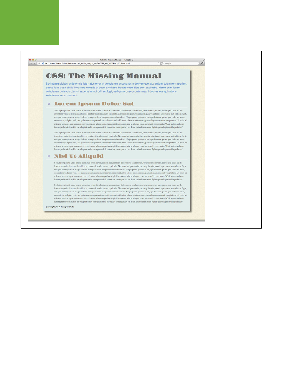
CSS3: THE MISSING MANUAL
54
TUTORIAL:
CREATING
YOUR FIRST
STYLES
FIGURE 2-4
Using an external style
sheet, you can update an
entire site’s worth of web
pages by editing a single
CSS file. In addition, by
moving all of the CSS code
out of an HTML document
and into a separate file,
you cut down on the file
size of your web pages so
they load faster.
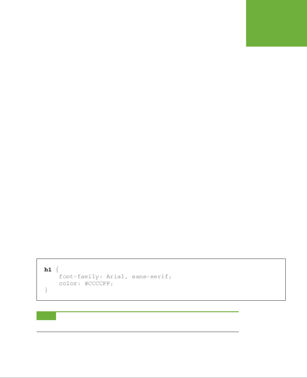
55
CHAPTER
3
Every CSS style has two basic parts: a selector and a declaration block. (And
if that’s news to you, go back and read the previous chapter.) The declaration
block carries the formatting properties—text color, font size, and so on—but
that’s just the pretty stu. The magic of CSS lies in those first few characters at the
beginning of every rule—the selector. By telling CSS
what
you want it to format (see
Figure 3-1), the selector gives you full control of your page’s appearance. If you’re
into sweeping generalizations, then you can use a selector that applies to many ele-
ments on a page at once. But if you’re a little more detail oriented (OK, a
lot
more),
other selectors let you single out one specific item or a collection of similar items.
CSS selectors give you a lot of power: This chapter shows you how to use them.
FIGURE 3-1
The first part of a style, the selector, indicates the element
or elements of a page to format. In this case,
h1
stands for
“every heading 1, or <h1>, tag on this page.”
NOTE If you’d rather get some hands-on experience before studying the ins and outs of CSS selectors, then
jump to the tutorial in the next section on page 81.
Selectors: Identifying
What to Style
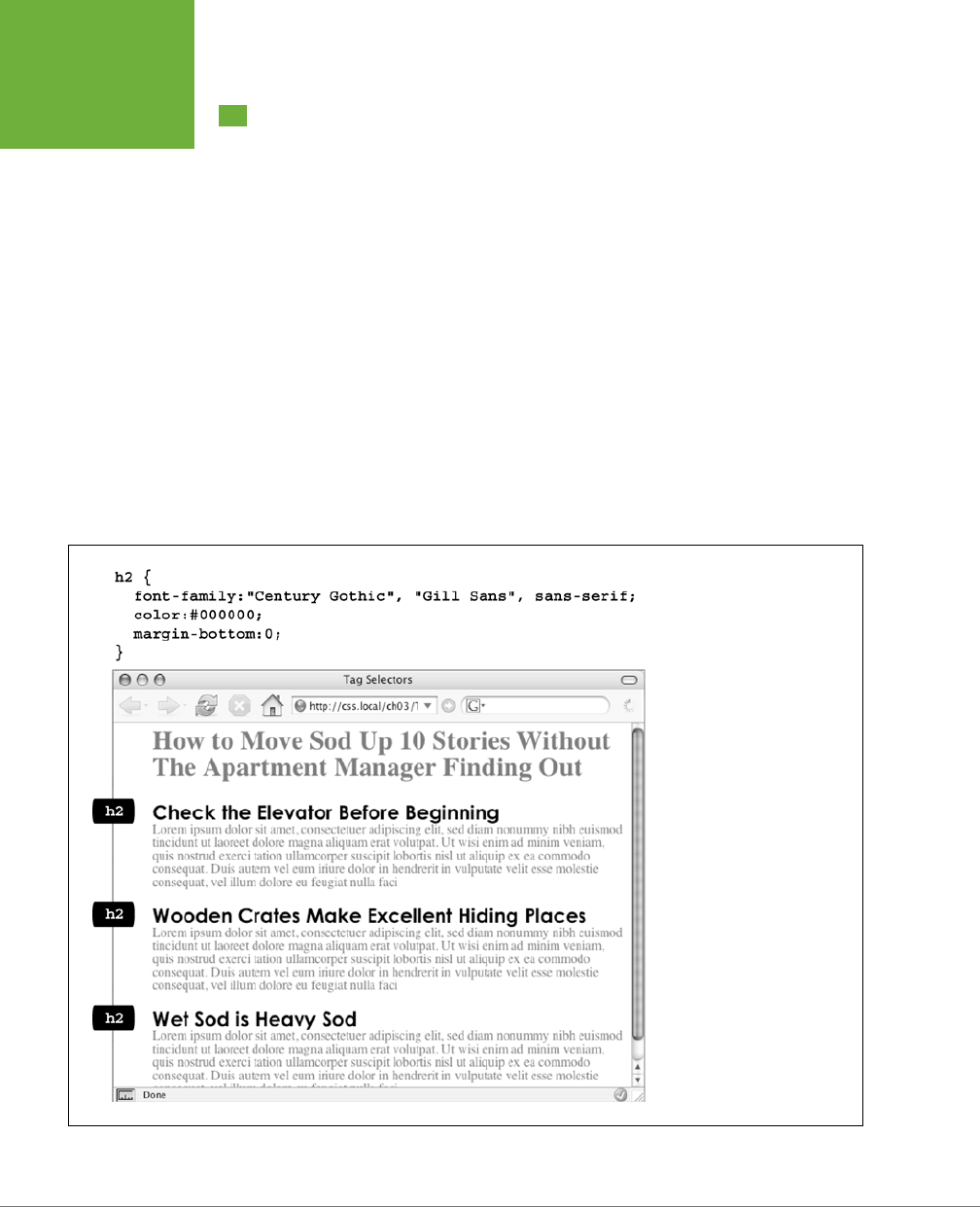
CSS3: THE MISSING MANUAL
56
TAG
SELECTORS:
PAGE-WIDE
STYLING
Tag Selectors: Page-Wide Styling
Tag
selectors—sometimes called
type
or
element
selectors—are extremely ecient
styling tools, since they apply to every occurrence of an HTML tag on a web page.
With them, you can make sweeping design changes to a page with very little eort.
For example, when you want to format every paragraph of text on a page, using the
same font, color, and size, you merely create a style using p (as in the <p> tag) as the
selector. In essence, a tag selector redefines how a browser displays a particular tag.
Prior to CSS, in order to format text, you had to wrap that text in a <font> tag. To
add the same look to every paragraph on a page, you often had to use the <font>
tag multiple times. This process was a lot of work and required a lot of HTML, making
pages slower to download and more time-consuming to update. With tag selectors,
you don’t actually have to do anything to the HTML—just create the CSS rule, and
let the browser do the rest.
Tag selectors are easy to spot in a CSS rule, since they bear the exact same name
as the tag they style—p, h1, table, img, and so on. For example, in Figure 3-2, the
h2 selector (top) applies some font styling to all <h2> tags on a web page (bottom).
FIGURE 3-2
A tag selector affects every
instance of the tag on the page.
This page has three
<h2>
tags
(indicated by the black labels
at the left edge of the browser
window). A single CSS style
with a selector of
h2
controls
the presentation of every
<h2>
tag on the page.
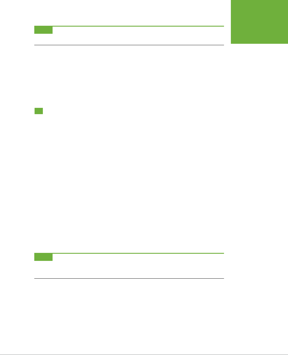
CHAPTER 3: SELECTORS: IDENTIFYING WHAT TO STYLE 57
CLASS
SELECTORS:
PINPOINT
CONTROL
NOTE As Figure 3-2 makes clear, tag selectors don’t get the less than (<) and greater than (>) symbols that
surround HTML tags. So when you’re writing a rule for the
<p>
tag, for example, just type the tag’s name—
p
.
Tag selectors have their downsides, however. What if you want
some
paragraphs to
look dierent from other paragraphs? A simple tag selector won’t do, since it doesn’t
provide enough information for a web browser to identify the dierence between
the <p> tags you want to highlight in purple, bold, and large type from the <p> tags
you want to leave with normal, black text. Fortunately, CSS provides several ways
to solve this problem—the most straightforward method is called a
class selector
.
Class Selectors: Pinpoint Control
When you want to give one or more elements a look that’s dierent from related
tags on a page—for example, give one or two images on a page a red border while
leaving the majority of other images unstyled—you can use a
class
selector. If you’re
familiar with styles in word-processing programs like Microsoft Word, then class
selectors will feel familiar. You create a class selector by giving it a name and then
applying it to just the HTML tags you wish to format. For example, you can create
a class style named .copyright and then apply it only to a paragraph containing
copyright information, without aecting any other paragraphs.
Class selectors also let you pinpoint an exact element on a page, regardless of its
tag. Say you want to format a word or two inside a paragraph, for example. In this
case, you don’t want the entire <p> tag aected, just a single phrase inside it. You can
use a class selector to indicate just those words. You can even use a class selector
to apply the same formatting to multiple elements that have dierent HTML tags.
For example, you can give one paragraph and one second-level heading the same
styling—perhaps a color and a font you’ve selected to highlight special information,
as shown in Figure 3-3. Unlike tag selectors, which limit you to the existing HTML
tags on the page, you can create as many class selectors as you like and put them
anywhere you want.
NOTE When you want to apply a class selector to just a few words contained inside another tag (like the
middle paragraph in Figure 3-3), you need a little help from the <span> tag. See the box on page 60 for more
detail.
You’ve probably noticed the period that starts every class selector’s name—such as
.copyright and .special. It’s one of a few rules to keep in mind when naming a class:
• All class selector names must begin with a period. That’s how web browsers
spot a class selector in the style sheet.
• CSS permits only letters, numbers, hyphens, and underscores in class names.
CSS3: THE MISSING MANUAL
58
CLASS
SELECTORS:
PINPOINT
CONTROL
FIGURE 3-3
Class selectors let you make highly targeted design changes.
For example, you can stylize one instance of an
<h2>
head-
ing (“Wet Sod is Heavy Sod”). The class selector
.special
tells the browser to apply the style to just that single
<h2>
tag. Once you’ve created a class selector, you can use it on
other tags, like the top paragraph on this page.
• After the period, the name must always start with a
letter
. For example,
.9lives
isn’t a valid class name, but .crazy8 is. You can have classes named .copy-right
and .banner_image, but not .-bad or ._as_bad.
• Class names are case sensitive. For example, CSS considers .SIDEBAR and
.sidebar two dierent classes.

CHAPTER 3: SELECTORS: IDENTIFYING WHAT TO STYLE 59
CLASS
SELECTORS:
PINPOINT
CONTROL
Apart from the name, you create class styles exactly like tag styles. After the class
name, simply slap on a declaration block containing all the styling you desire:
.special {
color:#FF0000;
font-family:"Monotype Corsiva";
}
Because tag styles apply across the board to all tags on a web page, you merely
have to define them in the head of the page: The HTML tags that make them work
are already in place. The extra freedom you get with class styles, though, comes
with a little more work. Using class selectors is a two-step process. After you create
a class rule, you must then indicate
where
you want to apply that formatting. To do
so, you add a class attribute to the HTML tag you wish to style.
Say you create a class .special that you’ll use to highlight particular page elements.
To add this style to a paragraph, add a class attribute to the <p> tag, like so:
<p class="special">
NOTE In the HTML, as part of the class attribute, you
don’t
put a period before the class name. The period
is only required for the class selector name in a
style sheet
.
When a web browser encounters this tag, it knows to apply the formatting rules
contained in the
.special
style to the paragraph. You can also apply class format-
ting to only part of a paragraph or heading by adding a <span> tag. For example, to
highlight just one word in a paragraph using the .special style, you could write this:
<p>Welcome to <span class="companyName">Café Soylent Green</span>, the restau-
rant with something a little different.</p>
Once you create a class style, you can apply it to just about any tag on the page. In
fact, you can apply the same class to dierent tags, so you can create a .special
style with a specific font and color and apply it to <h2>, <p>, and <ul> tags.

CSS3: THE MISSING MANUAL
60
ID SELECTORS:
SPECIFIC PAGE
ELEMENTS
UP TO SPEED
Divs and Spans
Chapter 1 introduced you to
<div>
and
<span>
, two generic
HTML tags that you can bend to your CSS wishes. When there’s
no HTML tag that exactly delineates where you want to put a
class or ID style you’ve created, use a
<div>
or
<span>
to
fill in the gaps.
The div tag identifies a logical
division
of the page, like a
banner, navigation bar, sidebar, or footer. You can also use it
to surround any element that takes up a chunk of the page,
including headings, bulleted lists, or paragraphs. (Program-
mer types call these
block-level
elements because they form a
complete “block” of content, with line breaks before and after
them.) The
<div>
tag works just like a paragraph tag: Type
the opening
<div>
, add some text, a photo, or some other
content inside it, and then end it with the closing
</div>
.
The div tag has the unique ability to contain
several
block-level
elements, making it a great way to group tags that are logi-
cally related such as the logo and navigation bar in a page’s
banner or a series of news stories that compose a sidebar.
Once grouped in this way, you can apply specific formatting
to just the tags inside the particular div or move the entire
div-tagged chunk of content into a particular area, such as
the right side of the browser window (CSS can help you control
the visual layout of your pages in this manner, as described
in Part 3 of this book).
For example, say you added a photo to a web page; the photo
also has a caption that accompanies it. You could wrap a
<div>
tag (with a class applied to it) around the photo and the caption
to group both elements together:
<div class="photo">
<img src="holidays.jpg"
alt="Penguins getting frisky"/>
<p>Mom, dad and me on our yearly trip
to Antarctica.</p>
</div>
Depending on what you put in the declaration block, the
.photo
class can add a decorative border, background color,
and so on to both photo and caption. Part 3 of this book shows
you even more powerful ways to use
<div>
tags—including
nested divs.
A
<span>
tag, on the other hand, lets you apply a class or ID
style to just
part
of a tag. You can place
<span>
tags around
individual words and phrases (often called
inline
elements)
within paragraphs to format them independently. Here, a
class called
.companyName
styles the inline elements
“CosmoFarmer.com,” “Disney,” and “ESPN”:
<p>Welcome to <span class="companyName">
CosmoFarmer.com</span>, the parent
company of such well-known corporations
as <span class="companyName"> Disney
</span> and <span class="companyName">
ESPN </span>...well, not really.</p>
ID Selectors: Specific Page Elements
CSS reserves the ID selector for
identifying
a unique part of a page, like a banner,
navigation bar, or the main content area. Just like a class selector, you create an ID by
giving it a name in CSS, and then you apply it by adding the ID to your page’s HTML
code. So what’s the dierence? As explained in the box on page 62, ID selectors
have some specific uses in JavaScript-based or very lengthy web pages. Otherwise,
compelling reasons to use IDs over classes are few.

CHAPTER 3: SELECTORS: IDENTIFYING WHAT TO STYLE 61
ID SELECTORS:
SPECIFIC PAGE
ELEMENTS
NOTE There’s a growing trend in the web design community to abandon ID selectors in CSS. The reasoning
requires greater knowledge of CSS than is presented so far in this book. You won’t find IDs much in this book,
and you’ll learn all the gory details why ID selectors are often not a good idea on page 114.
Although many web designers don’t use ID selectors as much as they once did, it’s
good to know what they are, and how they work. Should you decide to use an ID
selector, creating one is easy. Just as a period indicates the name of a class selec-
tor, a pound or hash symbol identifies an ID style. Otherwise, follow the exact same
naming rules used for classes (page 57). This example provides a background color
and a width and height for the element:
#banner {
background: #CC0000;
height: 300px;
width: 720px;
}
Applying IDs in HTML is similar to applying classes but uses a dierent attribute
named, logically enough,
id
. For example, to apply the style above to a <div> tag,
you’d write this HTML:
<div id="banner">
Likewise, to indicate that the last paragraph of a page is that page’s one and only
copyright notice, you can create an ID style named #copyright and add it to that
paragraph’s tag:
<p id="copyright">
NOTE As with class styles, you use the # symbol only when naming the style in the style sheet. You leave
the # off when using the ID’s name as part of an HTML tag:
<div id="banner">
.
CSS3: THE MISSING MANUAL
62
STYLING
GROUPS OF
TAGS
POWER USERS’ CLINIC
Proper IDs
ID selectors have a few powers that class selectors lack. These
benefits actually have nothing to do with CSS, so you may never
need an ID. But if you’re curious:
• One easy way for JavaScript programmers to locate and
manipulate parts of a page is by applying an ID to a page
element, and then using JavaScript to reference that ID.
For example, programmers often apply an ID to a form
element like a text box for collecting a visitor’s name. The
ID lets JavaScript access that form element and work its
magic—like making sure the field isn’t empty when the
visitor clicks Submit.
• IDs also let you link to a specific part of a page, making
long web pages quicker to navigate. If you have an
alphabetic glossary of terms, then you can use an ID
selector to create links to the letters of the alphabet.
When your visitors click “R,” they jump immediately to
all the “R” words on the page. You don’t actually need
to create any CSS for this—it works purely with HTML.
First, add an ID attribute to the spot on the page you
wish to link to. For example, in a glossary you can add an
h2
tag with a letter from the alphabet followed by the
glossary listings—perhaps in a definition list or a series
of paragraphs. Just add an appropriate ID to each of those
h2
tags:
<h2 id="R">R</h2>
. To create the link in
HTML, add the pound symbol and the ID name to the end
of the URL, followed by the ID name—
index.html#R
. This
link points directly to an element with the ID of
#R
on the
page
index.html
. (When used this way, the ID behaves just
like a named anchor—
<a name="R">R</a>
—in HTML.)
Styling Groups of Tags
Sometimes you need a quick way to apply the same formatting to several dierent
elements. For example, maybe you’d like all the headers on a page to share the same
color and font. Creating a separate style for each header—h1, h2, h3, h4, and so on—is
way too much work, and if you later want to change the color of all of the headers,
then you have six dierent styles to update. A better approach is to use a
group
selector. Group selectors let you apply a style to multiple selectors at the same time.
Constructing Group Selectors
To work with selectors as a group, simply create a list of selectors separated by
commas. So to style all the heading tags with the same color, you can create the
following rule:
h1, h2, h3, h4, h5, h6 { color: #F1CD33; }
This example consists of only tag selectors, but you can use any valid selector (or
combination of selector types) in a group selector. For example, here’s a selector
that applies the same font color to the <h1> tag, the <p> tag, any tag styled with the
.copyright class,
and
the tag with the #banner ID:
h1, p,.copyright, #banner { color: #F1CD33; }

CHAPTER 3: SELECTORS: IDENTIFYING WHAT TO STYLE 63
STYLING TAGS
WITHIN TAGS
TIP If you want a bunch of page elements to share
some
but not all of the same formatting properties, then
you can create a group selector with the shared formatting options and also create individual rules with unique
formatting for each individual element. In other words, two (or more) different styles can format the same tag.
The ability to use multiple styles to format a single element is a powerful CSS feature. See Chapter 5 for details.
The Universal Selector (Asterisk)
Think of a group selector as shorthand for applying the same style properties to
several dierent page elements. CSS also gives you a sort of über group selector—
the
universal
selector. An asterisk (*) is universal selector shorthand for selecting
every single
tag.
For example, say you want all the tags on your page to appear in bold type. Your
group selector might look something like the following:
a, p, img, h1, h2, h3, h4, h5 ...yadda yadda... { font-weight: bold; }
The asterisk, however, is a much shorter way to tell CSS to select
all
HTML tags on
the page:
* { font-weight: bold; }
You can even use the universal selector as part of a descendent selector, so you
can apply a style to all the tags that descend from a particular page element. For
example, .banner * selects every tag inside the page element to which you’ve ap-
plied the banner class. (You’ll read about descendent selectors next.)
Since the universal selector doesn’t specify any particular type of tag, it’s hard to
predict its eect on an entire website’s worth of pages all composed of a variety of
dierent HTML tags. To format many dierent page elements, web page gurus rely
on
inheritance
—a CSS trait discussed in depth in the next chapter.
Styling Tags Within Tags
Choosing whether to style your page with tag selectors or class selectors is a
tradeo. Tag selectors are fast and easy, but they make every occurrence of a tag
look the same, which is fine—if you want every <h2> on your page to look exactly
like all the rest. Class and ID selectors give you the flexibility to style individual page
elements independently, but creating class or ID styles also require you to add the
appropriate class or ID to the HTML tags you wish to style. Not only does this add
work for you, but also code to your HTML file. What you need is a way to combine
the ease of tag selectors with the precision of classes and IDs. CSS has just the
thing—
descendent selectors
.
You use descendent selectors to format a whole bunch of tags in a similar manner
(just like tag selectors), but only when they’re in a particular part of a web page. It’s
like saying, “Hey you <a> tags in the navigation bar, listen up. I’ve got some format-
ting for you. All you other <a> tags, just move along; there’s nothing to see here.”
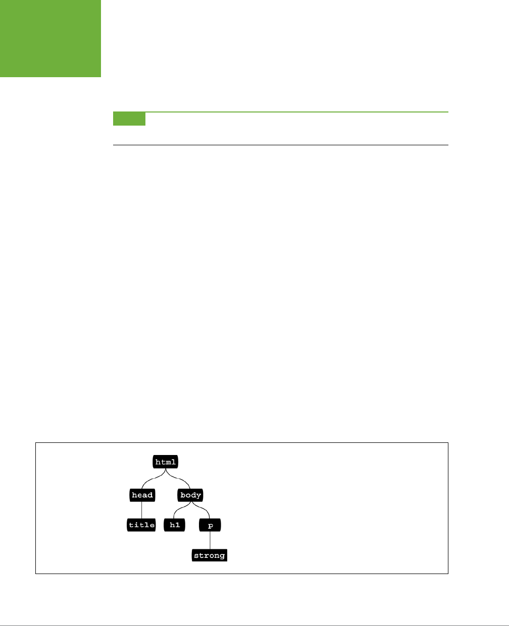
CSS3: THE MISSING MANUAL
64
STYLING TAGS
WITHIN TAGS
Descendent selectors let you format a tag based on its relationship to other tags. To
understand how it works, you need to delve a little bit more deeply into HTML. On
the bright side, the concepts underlying descendent selectors help you understand
several other selector types, too, as discussed later in this chapter.
NOTE Descendent selectors can be confusing at first, but they’re among the most important techniques for
efficiently and accurately applying CSS. Take the time to master them.
The HTML Family Tree
The HTML that forms any web page is akin to a family tree, where the HTML tags
represent various family members. The first HTML tag you use on a page—the <html>
tag—is like the grandpappy of all other tags. The <html> tag surrounds the <head>
tag and the <body> tag, which makes <html> the
ancestor
of both. Similarly, a tag
inside of another tag is a
descendent
. The <title> tag in the following example is
the <head> tag’s descendent:
<html>
<head>
<title>A Simple Document</title>
</head>
<body>
<h1>Header</h1>
<p>A paragraph of <strong>important</strong>text.</p>
</body>
</html>
You can turn the above HTML code into a diagram, like Figure 3-4, showing the
relationships between the page’s tags. First there’s the <html> tag; it’s divided into
two sections represented by the <head> and <body> tags. Those two tags contain
other tags that in turn may contain other tags. By seeing which tags appear inside
which other tags, you can diagram any web page.
FIGURE 3-4
HTML consists of nested tags—tags within tags within even more tags.
The relationship between these tags—how they’re nested within each
other—forms a kind of family tree.

CHAPTER 3: SELECTORS: IDENTIFYING WHAT TO STYLE 65
STYLING TAGS
WITHIN TAGS
Tree diagrams help you figure out how CSS sees the relationship of one element
on a page to another. Many of the selectors in this chapter, including descendent
selectors, rely on these relationships. The most important relationships are:
• Ancestor. As explained at the beginning of this chapter, an HTML tag that wraps
around another tag is its ancestor. In Figure 3-4, the <html> tag is an ancestor
of all other tags, while the <body> tag is an ancestor for all of the tags
inside
of
it—the <h1>, <p>, and <strong> tags.
• Descendent. A tag inside one or more tags is a descendent. In Figure 3-4, the
<body> tag is a descendent of the <html> tag, while the <p> tag is a descendent
of
both
the <body> and <html> tags.
• Parent. A parent tag is the
closest
ancestor of another tag. In Figure 3-4, a
parent is the first tag directly connected to and above another tag. Thus, the
<html> tag is the parent of the <head> and <body> tags, but of no other tags.
And, in this diagram, the <p> tag is the parent of the <strong> tag.
• Child. A tag that’s directly enclosed by another tag is a child. In Figure 3-4,
both the <h1> and <p> tags are children of the <body> tag, but the <strong>
tag isn’t. Since the <strong> tag is directly wrapped inside the <p> tag, it’s a
child of the <p> tag.
• Sibling. Tags that are children of the same tag are called
siblings
, just like
brothers and sisters. In an HTML diagram, sibling tags are next to each other
and connected to the same parent. In Figure 3-4, the <head> and <body> tags
are siblings, as are the <h1> and <p> tags.
Thankfully, that’s where CSS draws the line with this family metaphor, so you don’t
have to worry about aunts, uncles, or cousins. (Though rumor has it CSS10
will
include in-laws.)
Building Descendent Selectors
Descendent selectors let you take advantage of the HTML family tree by formatting
tags dierently when they appear inside certain other tags or styles. For example,
say you have an <h1> tag on your web page, and you want to emphasize a word
within that heading with the <strong> tag. The trouble is, most browsers display
both heading tags and the <strong> tag in bold, so anyone viewing the page can’t
see any dierence between the emphasized word and the other words in the head-
line. Creating a tag selector to change the <strong> tag’s color and make it stand
out from the headline isn’t much of a solution: You end up changing the color of
every
<strong> tag on the page, like it or not. A descendent selector lets you do
what you really want—change the color of the <strong> tag
only when
it appears
inside of an <h1> tag.
The solution to the <h1> and <strong> dilemma looks like this:
h1 strong { color: red; }
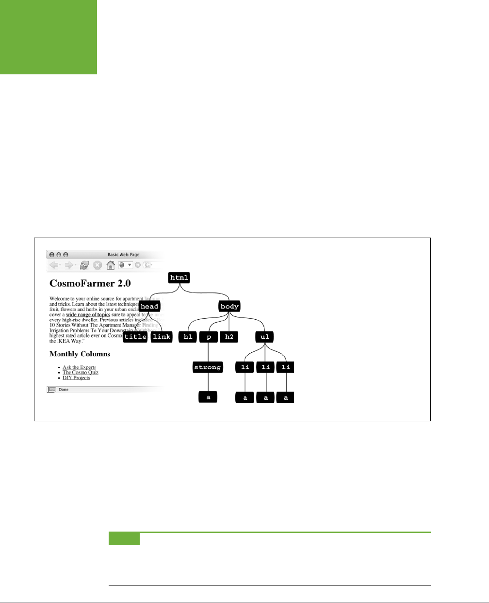
CSS3: THE MISSING MANUAL
66
STYLING TAGS
WITHIN TAGS
Here
any
<strong> tag inside an h1 is red, but other instances of the <strong> tag
on the page aren’t aected. You could achieve the same result by creating a class
style—.strongHeader, for example—but you’d then have to edit the HTML by add-
ing class="strongHeader" to the <strong> tag inside the header. The descendent
selector approach adds no HTML and no more work beyond creating the style!
Descendent selectors style elements that are nested inside other elements, following
the exact same pattern of ancestors and descendants as the tags in the HTML fam-
ily tree. You create a descendent selector by tacking together selectors according
to the part of the family tree you want to format, with the most senior ancestor on
the left and the actual tag you’re targeting on the far right. For example, in Figure
3-5, notice the three links (the <a> tag) inside of bulleted list items and another link
inside of a paragraph. To format the bulleted links dierently than the other links
on the page, you can create the following descendent selector:
li a { font-family: Arial; }
FIGURE 3-5
This simple tree diagram (right) represents
the structure of the web page pictured
to the left. Every tag on a web page is
a descendent of the
<html>
tag, since
<html>
wraps around them all. A tag can
descend from multiple tags. For example,
the first
<a>
tag listed in this diagram is
a descendent of the
<strong>
,
<p>
,
<body>
, and
<html>
tags.
This rule says, “Format all links (a) that appear inside a list item (li) by using the
Arial font.” A descendent selector can contain more than just two elements. The fol-
lowing are all valid selectors for the <a> tags inside of the bulleted lists in Figure 3-5:
ul li a
body li a
html li a
html body ul li a
NOTE Although, in general, it’s best to write as short a descendent selector as possible, one reason you
would tack on additional descendent selectors is if you’ve written several different rules that simultaneously
format a tag. Formatting instructions from a long-winded descendent selector can override simple class or tag
styles. More on that in the next chapter.

CHAPTER 3: SELECTORS: IDENTIFYING WHAT TO STYLE 67
STYLING TAGS
WITHIN TAGS
These four selectors—all of which do the same thing—demonstrate that you don’t
have to describe the entire lineage of the tag you want to format. For instance, in the
second example, body li a—ul isn’t needed. This selector works as long as there’s
an <a> tag that’s a descendent (somewhere up the line) of an <li> tag (which is also
a descendent of the <body> tag). This selector can just as easily apply to an <a> that’s
inside an <em> tag, that’s inside a <strong> tag, that’s inside an <li> tag, and so on.
You’re not limited to just tag selectors, either. You can build complex descendent
selectors combining dierent types of selectors. For example, suppose you want
your links to appear in yellow only when they’re inside an introductory element
(which you’ve designated with a class style named intro). The following selector
does the trick:
.intro a { color: yellow; }
Quick translation: Apply this style to every link (a) that’s a descendent of another
tag that has the intro class applied to it.
Creating Modules
Descendent selectors are often used to format a
module
of code—that is, a collection
of HTML that serves a particular function on a page. For example, say you had a <div>
on the page, used for listing the latest company news. You might have HTML like this:
<div>
<h2>Our company is great!</h2>
<p>More information about why our company is so great</p>
<h2>Another news item</h2>
<p>Information about the other news item…</p>
<h2>…and so on…</h2>
<p>… and so on… </p>
</div>
If you simply slap a class on that opening <div> tag—<div class="news">—then
you can create descendent selectors that format the HTML tags within the news
section dierently. For example,
.news h2 { color: red; }
.news p { color: blue; }
Now the <h2> tags within the news section will be red, and the paragraphs, blue.
It’s even possible (and common) to create descendent selectors with multiple class
names. For example, say you’re building a page that provides a directory of addresses
for members of an organization. You might wrap each contact in its own div, and
further refine the elements inside that div with a class like this:
<div class="contact">
<p class="name">John Smith</p>
<p class="phone">555-555-1234</p>
<p class="address">1234 Elem St</p>
</div>
CSS3: THE MISSING MANUAL
68
PSEUDO-
CLASSES AND
PSEUDO-
ELEMENTS
Then you could create several descendent selectors to style just those contact
elements like this:
.contact .name { font-weight: bold; }
.contact .phone { color: blue ;}
.contact .address { color: red; }
NOTE In a style sheet, you may sometimes see something like this:
p.intro
This may look like a descendent selector—since there is both a HTML tag and a class—but it’s not. There’s no space
between the
p
and the
.intro
, which means that the
intro
class must be applied specifically to a
<p>
tag
(
<p class="intro">
) for this style to work. If you add a space, you get a different effect:
p .intro { color: yellow; }
This seemingly slight variation selects any tag styled with the
.intro
class, which is itself a descendent of a <p>
tag. In other words, it doesn’t select a paragraph, it selects another tag inside a paragraph. In general, to keep
your class styles as flexible as possible, it is better to leave off the HTML tag (in other words use just
.intro
instead of
p.intro
).
Pseudo-Classes and Pseudo-Elements
Sometimes you need to select parts of a web page that don’t have tags per se, but
are nonetheless easy to identify, like the first line of a paragraph or a link as you
move your mouse over it. CSS gives you a handful of selectors for these doohickeys—
pseudo-classes and pseudo-elements.
Styles for Links
Four pseudo-classes let you format links in four dierent states based on how a
visitor has interacted with that link. They identify when a link is in one of the fol-
lowing four states:
• a:link selects any link that your guest hasn’t visited yet, while the mouse isn’t
hovering over or clicking it. This style is your regular, unused web link.
• a:visited is a link that your visitor has clicked before, according to the web
browser’s history. You can style this type of link dierently than a regular link
to tell your visitor, “Hey, you’ve been there already!” (See the box on page 294
for the limitations surrounding this selector.)
• a:hover lets you change the look of a link as your visitor passes the mouse over
it. The rollover eects you can create aren’t just for fun—they can provide useful
visual feedback for buttons on a navigation bar.
CHAPTER 3: SELECTORS: IDENTIFYING WHAT TO STYLE 69
PSEUDO-
CLASSES AND
PSEUDO-
ELEMENTS
You can also use the :hover pseudo-class on elements other than links. For
example, you can use it to highlight text in a <p> or <div> when your guests
mouse over it. In that case, instead of using a:hover (which is for links) to add
a hover eect, you can create a style named p:hover to create a specific ef-
fect when someone mouses over any paragraph. If you just want to style tags
with a specific class of highlight applied to them, then create a style named
.highlight:hover.
• a:active lets you determine how a link looks
as
your visitor clicks. In other
words, it covers the brief nanosecond when someone’s pressing the mouse
button, before releasing it.
Chapter 9 shows you how to design links by using these selectors to help your visi-
tors click their way around your site.
NOTE You can live a long, productive life without reading about the selectors in the next few sections.
Many web designers never use them. The selectors you’ve learned so far—tag, class, ID, descendent, group, and
so on—let you build absolutely beautiful, functional, and easily maintained websites. If you’re ready for the fun
stuff—designing web pages—then skip to the tutorial on page 81. You can always finish reading this discussion
some cold, rainy night by the fire.
Styling Paragraph Parts
The typographic features that make books and magazines look cool, elegant, and
polished didn’t exist in the early web era. (After all, when did scientists ever worry
about looking cool?) CSS provides two pseudo-elements—:first-letter and
:first-line—that give your web pages the design finesse that print has enjoyed
for centuries.
The :first-letter pseudo-element lets you create a drop cap—an initial letter that
jumps out from the rest of the paragraph with bigger or bolder font formatting, as
at the beginning of a book chapter.
Styling the :first-line of a paragraph in a dierent color keeps your reader’s eye
moving and makes text appear appealing and fresh. (If you’re intrigued, Chapter 6 is
all about formatting text, and page 171 covers these two pseudo-elements in depth.)
NOTE CSS3 changes the syntax for pseudo-elements. In CSS 2.1, pseudo-elements begin with a single colon,
like this:
:first-letter
CSS3 adds an additional colon to differentiate pseudo-classes like
:hover
from pseudo-elements. So
:first-
letter
and
:first-line
, are now
::first-letter
and
::first-line
. Fortunately, to maintain
support with older sites, browser will continue to support the single colon version of pseudo-elements. That’s
a good thing since Internet Explorer 8 doesn’t understand the double-colon syntax, so for the time being, stick
with the single colon for now, since all other browsers still use that as well.

CSS3: THE MISSING MANUAL
70
PSEUDO-
CLASSES AND
PSEUDO-
ELEMENTS
More Pseudo-Classes and Pseudo-Elements
The CSS guidelines define several powerful pseudo-class and pseudo-element
selectors besides the ones covered so far. Support for these selectors in all but the
oldest browsers is very good.
:FOCUS
The :focus pseudo-class works much like the :hover pseudo-class. While :hover
applies when a visitor mouses over a link, :focus applies when the visitor does
something to indicate her attention to a web page element—usually by clicking or
tabbing into it. In programmery lingo, when a visitor clicks in a text box on a web
form, she puts the
focus
on that text box. That click is a web designer’s only clue as
to where the visitor is focusing her attention.
The :focus selector is mostly useful for giving your visitor feedback, like changing
the background color of a text box to indicate where she’s about to type. (Single-line
text fields, password fields, and multi-line <textarea> boxes are common targets
for the :focus selector.) This style, for example, adds a light yellow color to any text
box a visitor clicks or tabs into:
input:focus { background-color: #FFFFCC; }
The :focus selector applies only while the element is in focus. When a visitor tabs
into another text field or clicks anywhere else on the page, she takes the focus—and
the CSS properties—away from the text box.
TIP One good resource for seeing which browsers support which CSS selector is
www.quirksmode.org/css/
contents.html
.
:BEFORE
The :before pseudo-element does something no other selector can: It lets you add
content preceding a given element. For example, say you wanted to put “HOT TIP!”
before certain paragraphs to make them stand out, like the boxes in this book that
say “UP TO SPEED” and “POWER USERS’ CLINIC.” Instead of typing that text in your
page’s HTML, you can let the :before selector do it for you. This approach not only
saves on code, but also if you decide to change the message from “HOT TIP!” to,
say, “Things to know,” then you can change every page on your site with one quick
change to your style sheet. (The downside is that this special message is invisible
to browsers that don’t understand CSS or don’t understand the :before selector.)
First, create a class (.tip, say) and apply it to the paragraphs that you want to
precede with the message, like so: <p class="tip">. Then, add your message text
to the style sheet:
p.tip:before {content: "HOT TIP!" }
Whenever a browser encounters the .tip class in a <p> tag, it dutifully inserts the
text “HOT TIP!” just before the paragraph.
CHAPTER 3: SELECTORS: IDENTIFYING WHAT TO STYLE 71
PSEUDO-
CLASSES AND
PSEUDO-
ELEMENTS
The technical term for text you add with this selector is
generated content
, since
web browsers create (generate) it on the fly. In the page’s HTML source code, this
material doesn’t exist. Whether you realize it or not, browsers generate their own
content all the time, like the bullets in bulleted lists and numbers in ordered lists. If
you want, you can even use the :before selector to define how a browser displays
its bullets and numbers for lists.
Internet Explorer 8 and up as well as all other major browsers support the :before
selector (and the :after selector coming up next). You’ll find more information on
using these selectors in the box on page 259.
:AFTER
Exactly like the :before selector, the :after pseudo-element adds generated
content—but after the element, not before. You can use this selector, for example,
to add closing quotation marks (") after quoted material.
NOTE Both
:before
and
:after
are pseudo-elements like
:first-line
and
:first-letter
.
As mentioned in the note on page 69, CSS3 adds double-colons to pseudo-elements, so
:before
, and
:after
are written as
::before
and
::after
in CSS3. Fortunately, browsers support the older notation, so you can
continue to use
:before
and
:after
, which have the added benefit of working in Internet Explorer 8.
::SELECTION
This CSS3 selector refers to items that a visitor has selected on a page. For example,
when a visitor clicks and drags over text, the browser highlights that text, and the
visitor can then copy the text. Normally, browsers add a blue background behind
the text. Internet Explorer changes the text color to white. However, you can control
the background color and text color by defining this selector. For example, if you
wanted to make selected text white with a violet background you could add this
style to a page’s style sheet:
::selection {
color: #FFFFFF;
background-color: #993366;
}
The only properties you can set with this selector are color and background-color,
so you can go wild and change the font size, fonts, margins, or other visual changes
that would surely drive your site visitors crazy. (Thanks for protecting us from our-
selves, CSS!)
NOTE There’s no single-colon version of the selection pseudo-element, so you must use the double colon.
In other words,
::selection
works, but
:selection
won’t.
This selector works in Internet Explorer 9, Opera, Chrome, and Safari, but not IE
8 or Firefox. You can, however, add support for Firefox by adding what’s called a
vendor-prefix
to the selector, like this:
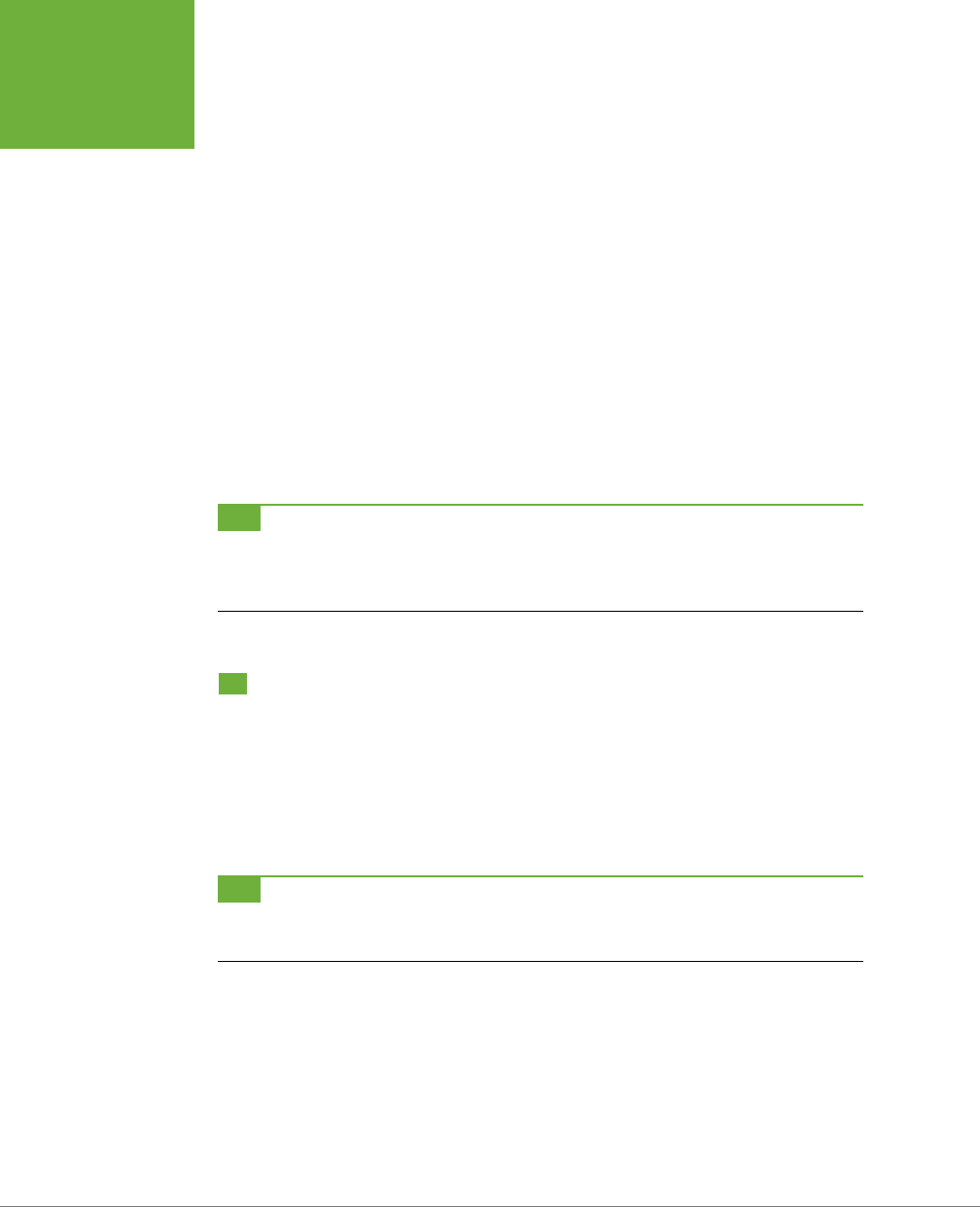
CSS3: THE MISSING MANUAL
72
ATTRIBUTE
SELECTORS
::-moz-selection {
color: #FFFFFF;
background-color: #993366;
}
To get this to work in Firefox and the other browsers, you need to have both styles
in your style sheet—just place one after the other. (You’ll learn more details about
vendor prefixes are and why you need them in the box on page 209.)
If you really want to go crazy, you can specify a dierent background color just
for text selected inside a particular element. For example, to make only text inside
paragraphs red with a pink background, just add the p element selector before
::selection, like this:
p::selection {
color: red;
background-color: pink;
}
TIP Learning how to write selectors can sometimes feel like learning hieroglyphics. To translate a selector
into straightforward language, visit the Selectoracle at
http://gallery.theopalgroup.com/selectoracle
. This great
resource lets you type in a selector and then it spits out a clear description of which page elements on a page
the style affects.
Attribute Selectors
CSS provides a way to format a tag based on any HTML attributes it has. For example,
say you want to place borders around the images on your page—but only around
the important photos. You don’t want to include your logo, buttons, and other little
doodads that also have an <img> tag. Fortunately, you realize that you’ve given all
the photos descriptions using the title attribute, which means you can use an
attribute selector
to identify just the important images.
TIP The HTML
title
attribute is a great way to add tooltips (pop-up messages) to links and images on a
page. It’s also one way to inform search engines about the useful information on a web page. Learn more about
it at
http://webdesign.about.com/od/htmltags/a/aa101005.htm
.
With attribute selectors, you can single out tags that have a particular property. For
example, here’s how to select all <img> tags with a title attribute:
img[title]
The first part of the selector is the name of the tag (img) while the attribute’s name
goes in brackets: [title].

CHAPTER 3: SELECTORS: IDENTIFYING WHAT TO STYLE 73
ATTRIBUTE
SELECTORS
CSS doesn’t limit attribute selectors to tag names: You can combine them with
classes, too. For example, .photo[title] selects every element with the .photo
class style and an HTML title attribute.
To get more specific, you can select elements that not only share a particular at-
tribute but also have an exact value set for that attribute. For example, when you
want to highlight links that point to a particular URL, create an eye-catching attribute
selector, like so:
a[href="http://www.cafesoylentgreen.com"]{
color:red;
font-weight:bold;
}
Adding a value to an attribute selector is very useful when working with forms. Many
form elements have the same tag, even if they look and act dierently. The checkbox,
text box, submit button, and other form fields all share the <input> tag. The type
attribute’s value is what gives the field its form and function. For example, <input
type="text"> creates a text box, and <input type="checkbox"> creates a checkbox.
To select just text boxes in a form, for example, use this selector:
input[type="text"]
The attribute selector is very versatile. It lets you not only find tags that have a specific
value for an attribute (for example, find all form fields with a type of checkbox) but
even select elements with an attribute value that
begins with, ends with
, or
contains
a specific value. While this might sound like overkill, it’s actually quite handy.
For example, suppose you want to create a specific style to highlight external links
(links that point outside of your own website) to indicate, “Hey, you’ll leave this site
if you click this.” Assuming you don’t use absolute links to link to any pages in your
own site, you can assume that any external link begins with
http://
—the first part
of any absolute link.
If that’s the case, the selector would look like this:
a[href^="http://"]
The ^= translates to “begins with,” so you can use this selector to format any link
that begins with
http://
. You can use it to style a link that points to
http://www
.google.com
as well as a link to
http://www.sawmac.com
. In other words, it selects
any external link.
NOTE This selector won’t work for any secure connections over SSL—in other words, any links that begin
with
https://
. To create a style that affects those as well, you could create a group selector (page 84) like this:
a[href^="http://"], a[href^=" https://"]
Similarly, there are times when you want to select an element with an attribute that
ends
in a specific value. Again, links are handy for this task. Say you want to add

CSS3: THE MISSING MANUAL
74
CHILD
SELECTORS
a little document icon next to any links that point to a PDF file. Since PDF docu-
ments end in .pdf, you know a link pointing to one of those files will end in .pdf—for
example, <a href="download_instructions.pdf">. So to select just those types of
links, you’d create a selector like this:
a[href$=".pdf"]
The full style might look something like this:
a[href$=".pdf"] {
background: url(doc_icon.png) no-repeat;
padding-left: 15px;
};
Don’t worry too much about the particular properties in this style—you’ll learn about
padding on page 195 and background images on page 240. Just pay attention to that
cool selector: $= translates to “ends with.” You can use this selector to format links
that point to Word docs ([a href$=".doc"]), movies (a [href$=".mp4"]), and so on.
Finally, you can even select elements with attributes that contain another value. For
example, say you like to highlight photos of your employees throughout the site. You
might want all of those photos to have a common style, like a thick green border
and a gray background. One way to do this is to create a class style—.headshot, for
example—and manually add a class attribute to the appropriate <img> tags. However,
if you name the photos consistently, then there’s a faster method.
For example, say you name each of those images with the word
headshot
in them—
for example,
mcfarland_headshot.png
,
mccord_headshot.jpg
,
headshot_albert
.jpg
, and so on. Each of these files has the word
headshot
somewhere in the file, so
the src attribute of the <img> tag used to insert each image also contains the word
headshot
. You can create a selector for just those images like this:
img[src*="headshot"]
This translates to “select all images whose src attribute has the word
headshot
somewhere in it.” It’s a simple, elegant way to format just those images.
Child Selectors
Similar to the descendent selectors described earlier in this chapter, CSS lets you
format the children of another tag with a
child
selector. The child selector uses an
additional symbol—an angle bracket (>) to indicate the relationship between the
two elements. For example, the selector body > h1 selects any <h1> tag that’s a
child of the <body> tag.
Unlike a descendent selector, which applies to
all
descendants of a tag (children,
grandchildren, and so on), the child selector lets you specify which child of which
parent you mean. For example, in Figure 3-6, there are two <h2> tags. Using a plain
old descendent selector—
body h2
—selects both <h2> tags. Even though both <h2>
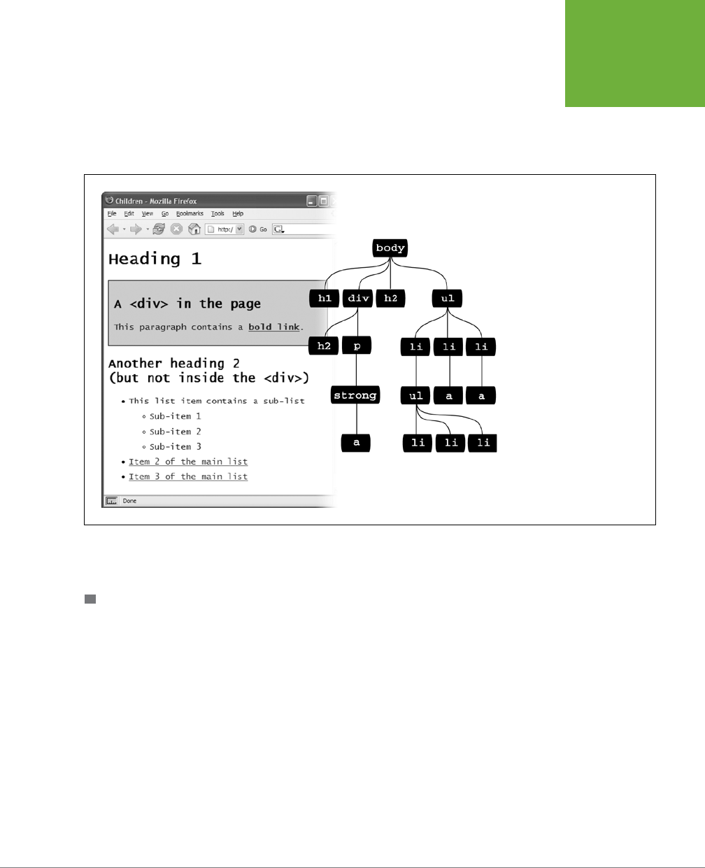
CHAPTER 3: SELECTORS: IDENTIFYING WHAT TO STYLE 75
CHILD
SELECTORS
tags are inside of the <body> tag, only the second one is a child of the <body> tag. The
first <h2> is directly inside of a <div> tag, so its parent is the <div>. Since the two <h2>
tags have dierent parents, you can use a child selector to get at them individually.
To select only the second <h2> tag, your child selector looks like this: body > h2. If
you want the first <h2> tag, then you must use this child selector instead: div > h2.
FIGURE 3-6
The diagram (right) shows the
relationship between HTML tags
(left).
CSS3 also includes some very specific pseudo-classes for selecting child elements.
They let you fine-tune your selectors for many dierent arrangements of HTML.
:FIRST-CHILD
Going back to the HTML family tree analogy for a moment, recall what a child tag is:
any tag directly enclosed by another tag. (For example, in Figure 3-6, <h1>, <div>,
<h2>, and <ul> are all children of the <body> tag.) The :first-child pseudo-element
lets you select and format just the
first
of however many children an element may
have.
In Figure 3-6, if you want to select the first <h1> tag on the page, create a selector
like this:
h1:first-child
This selector applies to any <h1> tag that is a first child. In Figure 3-6, the results are
obvious: there’s only on <h1> tag and it’s the first tag on the page. Therefore it’s a
child of the <body> element. However, :first-child can be confusing. For example,
if you change the <h2> tag inside the <div> pictured in Figure 3-6 to an <h1> tag,

CSS3: THE MISSING MANUAL
76
CHILD
SELECTORS
then h1:first-child would select both the <h1> directly inside the <body> tag and
the <h1> inside the div (since that <h1> is the first-child of the div).
:LAST-CHILD
This is like :first-child discussed earlier, but just with the last child of an element.
For example, to style the last item in a list, you use the ul :last-child selector
(see Figure 3-7).
FIGURE 3-7
CSS’s wide range of child
selectors gives you a vari-
ety of ways to select child
elements. These selectors
are great when you want
to highlight the first, last,
or an alternating number
of items in a list.
NTH-CHILD
This complex selector is very useful. With it, you can easily style every other row in
a table, every third list item, or style any combination of alternating child elements
(see Figure 3-7). This selector requires a value to determine which children to select.
The easiest option is a keyword—either odd or even—which lets you select alternating
odd or even child elements. For example, if you want to provide one background
color for each even row in a table and another color in the background of each odd-
numbered row, you can write two styles like this:
tr:nth-child(odd) { background-color: #D9F0FF; }
tr:nth-child(even) { background-color: #FFFFFF; }
Now that’s a really simple way to color alternating table rows (see Figure 3-8). But
:nth-child() has even more power up its sleeve. You can also select, say, every
third child element in a series, starting with the second child element. For example,
suppose you want to highlight every third table cell (<td> tag) inside a row, starting
with the second table cell (see Figure 3-8). Here’s a style to achieve that:
tr td:nth-child(3n+2) { background-color:#900; }
Basically, the number before the n (3 in this case) represents which child element
you’re after. So, 3n means every third element, while 4n means every fourth element.
The plus sign followed by a number (+2 in this example) indicates which element to
CHAPTER 3: SELECTORS: IDENTIFYING WHAT TO STYLE 77
CHILD
SELECTORS
start at, so +2 means start at the second child element, while +5 means start at the
fifth child element. So :nth-child(5n + 4) selects every fifth child element starting
at the fourth child element.
FIGURE 3-8
Table-striping the easy
way: with child selectors.
You can even stripe
alternating columns by
targeting every other
<td>
tag within a row, or,
as in this case, every third
column beginning with
the second one. Now that’s
precision!
Child Type Selectors
CSS3 includes a selector that works much like the child selectors in the previous
section but applies to children with a specific type of HTML
tag
. For example, say
you want to format the first paragraph inside a sidebar in a particular way, but on
some pages, that sidebar starts with an <h2> tag, and on other pages, it starts with
a <p> tag. You can’t use :first-child to select that paragraph, since in some cases
it’s the
second
child (following the <h2>). However, it’s always the first paragraph
(<p> tag) in that sidebar, even if other tags come before it, so you can select it with
a type selector called :first-of-type.
NOTE
:last-child
,
:first-of-type
, and
:nth-child()
are supported in all modern browsers
including Internet Explorer 9 and above. Alas, these don’t work in IE 8.
:FIRST-OF-TYPE
Works just like :first-child but applies to a child that has a particular tag. For
example, say you have a sidebar element with the class sidebar. To style the first
paragraph in that sidebar, use this selector:
.sidebar p:first-of-type
Notice the p in p:first-of-type. It indicates the tag you’re going to format.
:LAST-OF-TYPE
Works like :last-child but applies to the last instance of a particular type of tag. For
example, if you want to format the last paragraph in the sidebar div in a particular
way, but you’re not sure whether there are other tags coming after the paragraph
(like a bulleted list, headline, or image). Here’s the style:
.sidebar p:last-of-type
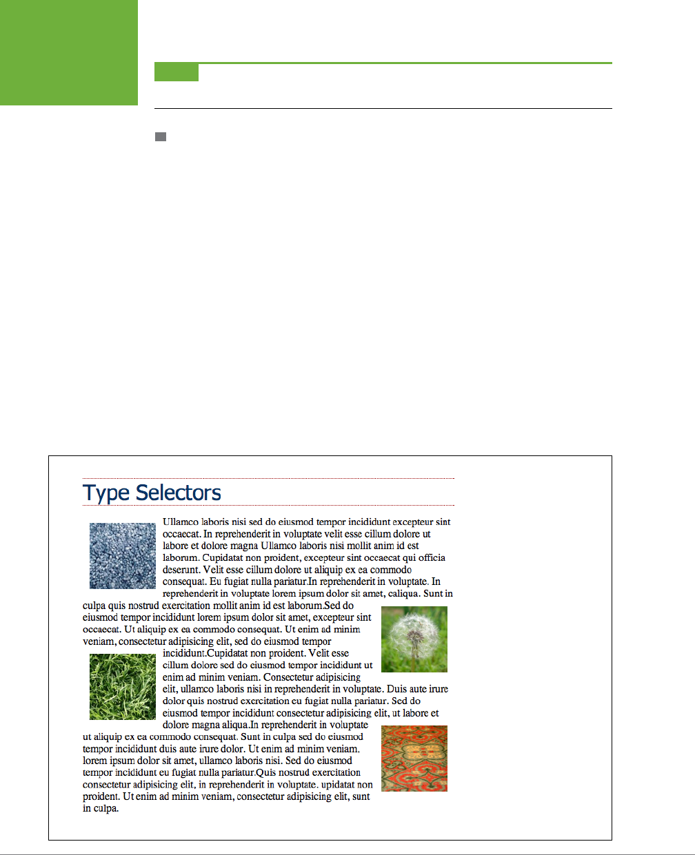
CSS3: THE MISSING MANUAL
78
CHILD
SELECTORS
NOTE Remember, these type selectors also have to be children of a particular tag. So
p:first-of-type
means “the first child that is a paragraph tag.”
:NTH-OF-TYPE
Works like :nth-child() but it applies to alternating children that have a specific tag.
You may find this selector handy if you have something like a big paragraph of text
that’s peppered with photos. The <img> tag is an inline tag, so you can have a <p>
tag with a bunch of <image> tags inside it. And say you want to alternately float the
images left and right, as shown in Figure 3-9. You can do so with these two styles:
img:nth-of-type(odd) { float: left; }
img:nth-of-type(even) { float: right; }
As you can see, you use the same keywords (odd or even) and formula (here, 2n +1)
for :nth-of-type() as you do for :nth-child().
In fact, you can use :nth-of-type() to select alternating table rows as well:
tr:nth-of-type(odd) { background-color: #D9F0FF; }
tr:nth-of-type(even) { background-color: #FFFFFF; }
In the case of CSS selectors, there’s always more than one way to skin an HTML
tag—there are usually five or more! (Just keep in mind that none of these child type
selectors are supported in Internet Explorer 8 or earlier.)
FIGURE 3-9
With the
:nth-of-type()
selector, you can easily select
every other image inside a tag,
alternating between left and
right alignment.
CHAPTER 3: SELECTORS: IDENTIFYING WHAT TO STYLE 79
SIBLINGS
FREQUENTLY ASKED QUESTION
Making Lists Look Great
When would I ever use a child selector? Just from reading this
chapter, I already know enough selectors to get at just about
any page element, so why learn another
?
There’s one design challenge where child selectors can’t be
beat—and it comes up in more websites than you think. Any
time you have an unordered list with one or more unordered
lists nested inside (as in Figure 3-6), you can use child selec-
tors to visually organize these categories and subcategories
of information. You can format the first level of list items one
way, and the second level of list items another way. Content
presented in this manner looks neat, professional, and readable
(and your visitors will love you for it).
First, create a class style for the outermost nested level in
your list and call it, say,
.mainList
. For this top level, you
might use a sans-serif font, a little larger than your other text,
perhaps in bold or a different color. Subsequent categories can
be smaller, in a serif font like Times for easiest reading. When
you have a lot of text, styling each subcategory level a bit
differently helps visually orient your visitors in the material.
Apply the
.mainList
class style to the first
<ul>
tag:
<ul
class="mainList ">
. Then use a child selector (
ul.
mainList > li
) to select just the first set of list items,
and add your desired text styling for the first subcategory. This
styling applies to the
<li>
tags that are children of the
<ul>
tag with the
.mainList
style applied to it. Then, to style the
child
<li>
tags of any subsequent nested
<ul>
tags use this
selector
ul.mainList > li > ul > li
. (A descendent
selector like
ul li
, by contrast, selects the list items of all
unordered lists on the page—nested ones and all.)
You’ll need to keep a concept you’ll learn in the next chapter—
inheritance—in mind. Basically, certain CSS properties applied
to one tag are inherited by tags inside them. So even if you use
a child selector to target the children of one tag, properties may
pass on to other tags inside that child. The
:not()
selector,
discussed on page 80, is one way to avoid this.
Siblings
Parent-child relationships aren’t the only ones in the HTML family tree. Sometimes
you need to select a tag based not on its parent tag but on its surrounding siblings—
the tags that share a common parent. A tag that appears immediately after another
tag in HTML is called an
adjacent sibling
. In Figure 3-6, the <div> tag is the adjacent
sibling of the <h1> tag, the <p> tag is the adjacent sibling of the <h2> tag, and so on.
Using an adjacent sibling selector, you can, for example, give the first paragraph
after each heading dierent formatting from the paragraphs that follow. Suppose
you want to remove the margin that appears above that <p> tag so that it sits right
below the heading without any gap. Or perhaps you want to give the paragraph a
distinct color and font size, like a little introductory statement.
The adjacent sibling selector uses a plus sign (+) to join one element to the next. So
to select every paragraph following each <h2> tag, use this selector: h2 + p (spaces
are optional, so h2+p works as well). The last element in the selector (p, in this case)
is what gets the formatting, but only when it’s directly after its brother <h2>.

CSS3: THE MISSING MANUAL
80
THE :NOT( )
SELECTOR
There’s another sibling selector called the
general sibling combinatory selector
(say
that three times fast). It’s simply a ~ (tilde) and it means “select all siblings of this
type.” For example, while h2 + p selects a single <p> tag that immediately follows
a <h2> tag, h2 ~ p selects
all
<p> tags that are siblings (that is, on the same level)
of the h2. To be honest, you may never find a good use for this selector, but CSS is
nothing if not thorough.
The :not( ) Selector
The :not() selector, also called the negation pseudo-class, lets you select something
that’s not something else. For example, you can use apply a class to a paragraph—
<p class="classy">—and create a CSS class selector to format it, like this:
.classy { color: red; }
But what if you want to select all paragraphs, except the classy paragraphs? That’s
where the :not() selector comes in. You put a CSS selector inside the parentheses
to indicate what you
don’t
want to select. For example:
p:not(.classy) { color: blue; }
This style makes the text color blue for all paragraphs that do not have the classy
class applied to them.
The :not() selector can come in handy when you’re using attribute selectors dis-
cussed on page 72. For example, you saw on page 73 that you can use an attribute
selector to pick all links that point outside your website, like this:
a[href^="http://"]
As you’ve probably noticed, that selector doesn’t specifically select all links that
point outside your site, it simply selects all links that use absolute URLs—that is,
URLs beginning with
http://
. For many sites, that’s the same thing; many sites use
document- or root-relative links to point to other pages within the site, and absolute
URLs to link to other sites. However, in some cases, you may use absolute URLs to
point to pages within your site.
For example, some content management systems (WordPress, for example) use
absolute URLs to point to blog posts within the site. In this case, if you want to style
links that point outside your site, you need to refine the basic attribute selector by
also employing the :not() selector. For example, say your site’s domain name is
mysite.com. To select links that point outside your site, you’ll want to select all abso-
lute links that
don’t
point to the domain
mysite.com
. Here’s how you would do that:
a[href^="http://"]:not([href^="http://mysite.com"])

CHAPTER 3: SELECTORS: IDENTIFYING WHAT TO STYLE 81
TUTORIAL:
SELECTOR
SAMPLER
Translated into English, this selector says “Select all links, whose href attribute
begins with
http://
, but
not
ones that begin with http://mysite.com.” As you’ll recall
from page 72, in an attribute selector, ^= means “begins with.” A shorter way to
write the same thing would be this:
a[href^="http://"]:not([href*="mysite.com"])
In an attribute selector *= means “contains,” so this would exclude any absolute
URL that contains mysite.com. This would include
http://www.mysite.com
as well
as http://mysite.com.
There are some limitations to the :not() selector:
• You can only use
simple selectors
with the :not() selector. In other words you
can use element selectors (like html, or p), the universal selector (* [see page
63]), classes (.footer, for example), IDs (#banner, for example), or pseudo-
classes (:hover, :checked, :first-child, and so on). So the following are all valid:
.footnote:not(div)
img:not(.portrait)
div:not(#banner)
li:not(:first-child)
• You can’t use descendent selectors (like div p a, pseudo-elements (like ::first-
line), group selectors, or combinators (like the adjacent sibling selector h2 + p).
• You can’t string multiple :not() selectors together. For example, the following
is invalid:
a[href^="
http://
"]:not([href*="google.com"]):not([href="yahoo.com])
In other words, you can only use :not( ) once with a selector.
Tutorial: Selector Sampler
In the rest of this chapter, you’ll create a variety of selector types and see how each
aects a web page. This tutorial starts with the basic selector types and then moves
on to more advanced styles.
To get started, you need to download the tutorial files located on this book’s com-
panion website at
www.sawmac.com/css3
. Click the tutorial link and download the
files. All of the files are enclosed in a zip archive, so you’ll need to unzip them first.
(Detailed instructions for unzipping the files are on the website.) The files for this
tutorial are contained inside the folder named
03
.
CSS3: THE MISSING MANUAL
82
TUTORIAL:
SELECTOR
SAMPLER
INDIGNANTLY ASKED QUESTION
Keeping It Internal
Hey, what’s up with the internal style sheet in this tutorial?
Chapter 2
recommends using external style sheets for a bunch
of reasons
.
Think you’re pretty smart, eh? Yes, external style sheets usually
make for faster, more efficient websites, for all the reasons
mentioned in Chapter 2. However, internal style sheets make
your life easier when you’re designing a single page at a time,
as in this tutorial. You get to work in just one web page file
instead of flipping back and forth between the external style
sheet file and the web page.
Furthermore, you can preview your results without constantly
refreshing your browser’s cache; flip back to the box on page
39 for more on that quirkiness.
Many web designers like to begin their designs with an internal
style sheet, since it’s faster and avoids any problems with all
that cache nonsense. Here’s their secret: Once they’ve perfected
their design, they simply cut the code from the internal style
sheet, paste it into an external style sheet, and then link the
style sheet to their site’s pages as described on page 42.
1. Open
selector_basics.html
in your favorite text editor.
This page is made of very basic HTML tags. The most exciting thing about it is
the graphic banner (see Figure 3-10). But you’ll liven things up in this tutorial.
You’ll start by adding an internal style sheet to this file.
2. Click directly after the closing </title> tag, hit Enter (Return), and type
<style>. Press Enter twice and then type </style>.
These are the opening and closing style tags—it’s a good idea to type both tags
at the same time, so you don’t accidentally forget to add the closing </style>
tag. Together, these two tags tell a web browser that the information between
them is Cascading Style Sheet instructions. The HTML should now look like this
(the stu you added is in bold):
<title>Selector Basics</title>
<style>
</style>
</head>
Type selectors—such as the tag selector you’re about to create—are the most
basic type of selector. (If you completed the tutorial in the last chapter, you’ve
already created a few.)
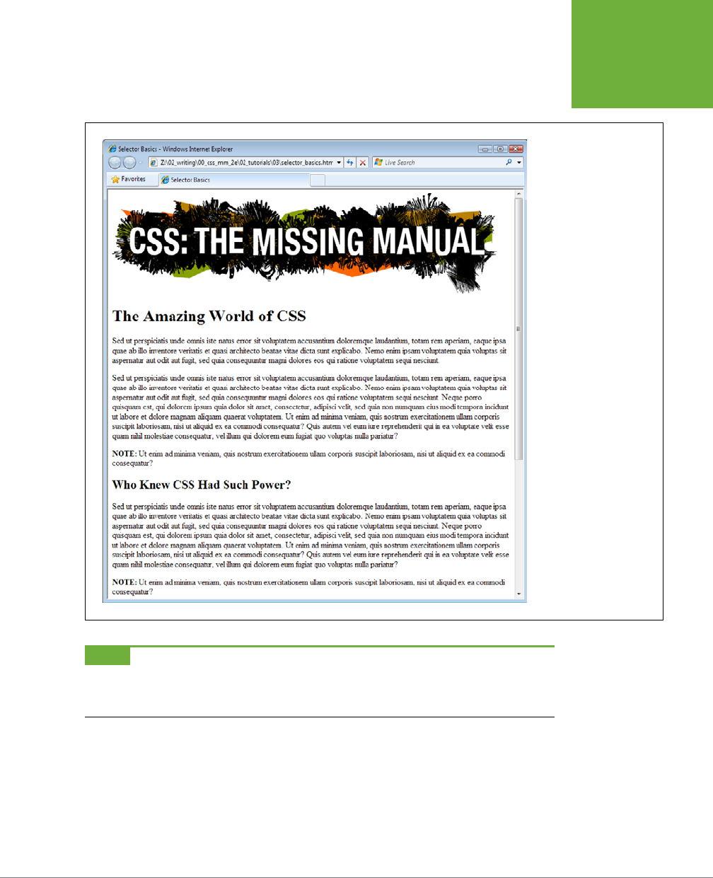
CHAPTER 3: SELECTORS: IDENTIFYING WHAT TO STYLE 83
TUTORIAL:
SELECTOR
SAMPLER
FIGURE 3-10
Plain HTML looks cold and
monotonous in a web
browser. But with a little
CSS, you can turn drab
(shown here) into fab
(Figure 3-11) in 31 easy
steps.
NOTE If you’re using HTML 4.01 or XHTML doctypes (instead of HTML5), you’ll need to add the
type="text/
css"
attribute to the opening style tag like this:
<style type="text/css">
3. Click between the opening and closing style tags you just added and type
p {, hit return twice, and type the closing }.
It’s a good idea to always add the closing brace immediately after typing the
opening brace, just so you don’t forget. To create a tag selector, simply use the
name of the HTML tag you wish to format. This style applies to all paragraphs
of text within <p> tags.
CSS3: THE MISSING MANUAL
84
TUTORIAL:
SELECTOR
SAMPLER
4. Click between the style’s opening and closing braces ( { } ) and add the
following four CSS properties to supply the style’s formatting—color, size,
font, and left indent:
p {
color: #505050;
font-size: 1em;
font-family: “Helvetica Neue”, Arial, Helvetica, sans-serif;
margin-left: 100px;
}
Press Enter to place each CSS property on its own line. It’s also a good idea to
visually organize your CSS code by indenting each property with the Tab key
(some designers use two spaces instead of a tab—it’s up to you).
NOTE These property names and their values may look unfamiliar. For now, just type them as is. You’ll
learn what 1em and 100px mean, along with all the ins and outs of text-formatting properties, in Chapter 6.
Your style sheet is complete. Time for a look-see.
5. Open the page in a web browser to preview your work.
Unless you tinker with the preference settings, most browsers display black text
in a standard serif font like Times. If your CSS style works properly, then you
should see seven indented paragraphs in a sans-serif font in a darkish gray color.
Creating a Group Selector
Sometimes you’ll want several dierent elements on a page to share the same look.
For instance, you may want all your headings to have the same font and color for a
consistent style. Instead of creating separate styles and duplicating the same prop-
erty settings for each tag—<h1>, <h2>, and so on—you can group the tags together
into a single selector.
1. Return to your text editor and the
selector_basics.html
file.
You’ll add a new style below the <p> tag style you just created.
2. Click at the end of the closing brace of the tag selector, press Enter to start
a new line, and the following code:
h1, h2, h3 {
}
As explained earlier in this chapter, a group selector is simply a list of selectors
separated by commas. This rule applies the same formatting, which you’ll add
next, to all <h1>, <h2>, and <h3> tags on the page.

CHAPTER 3: SELECTORS: IDENTIFYING WHAT TO STYLE 85
TUTORIAL:
SELECTOR
SAMPLER
3. Click in the empty line between the opening { and closing } and add five
CSS properties:
color: #BD8100;
font-family: Baskerville, "Palatino Linotype", Times, serif;
border-top: 2px solid #86A100;
padding-top: 7px;
padding-left: 100px;
There’s a lot going on here, but basically you’re setting the color and font type
for the headlines, adding a border line above the headlines for visual interest,
and controlling the top and left spacing by using the padding property. In a nut-
shell, this property adds space from the edges of an element without aecting
a background or border—you’re scooting the headline text in from the left and
down from the top without moving the border line that spans the entire page.
4. Save the file, and preview it in a web browser.
The <h1> heading near the top of the page and the <h2> and <h3> headings
lower on the page all have the same font and font color as well as a green border
along their tops (see Figure 3-11).
Creating and Applying a Class Selector
Tag selectors are quick and ecient, but they’re a bit indiscriminate in how they
style a page. What if you want to style a single <p> tag dierently than all the other
<p> tags on a page? A class selector is the answer.
1. Return to your text editor and the
selector_basics.html
file.
Add a new style below the group selector style you just created.
2. Click at the end of the closing brace of the h1, h2, h3 selector, press Enter
(Return), and then type
.note {
}
This style’s name, note, indicates its purpose: to highlight paragraphs that
contain extra bits of information for your site’s visitors. Once you create a class
style, you can apply it wherever these notes appear—like the second paragraph,
in this case.
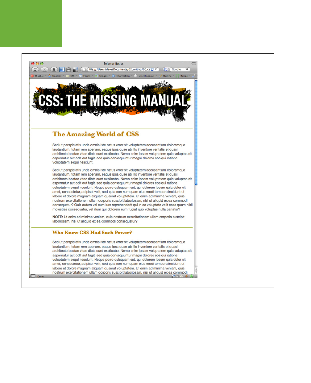
CSS3: THE MISSING MANUAL
86
TUTORIAL:
SELECTOR
SAMPLER
FIGURE 3-11
A simple tag selector can completely
transform the appearance of every
instance of a tag, making quick work
of styling all the paragraphs of text
on a page. And in this case a group
selector does even more by format-
ting every instance of three different
headline tags!
3. Click in the empty line between the opening { and closing } and add the
following list of properties to the style:
color: #333;
border: 2px dashed #BD8110;
background-color: #FBF8A9;
margin-top: 25px;
margin-bottom: 35px;
padding: 20px;

CHAPTER 3: SELECTORS: IDENTIFYING WHAT TO STYLE 87
TUTORIAL:
SELECTOR
SAMPLER
Most of these properties should look familiar by now, but the background-color
property may be new to you. Logically enough, it adds a color to the background
of the element. The completed style should look like this:
.note {
color: #333;
border: 2px dashed #BD8110;
background-color: #FBF8A9;
margin-top: 25px;
margin-bottom: 35px;
padding: 20px;
}
If you preview the page now, you see no changes. Unlike tag selectors, class
selectors don’t have any eect on a web page until you apply the style in the
HTML code.
4. In the page’s HTML, there are two <p> tags that begin with the word “Note”
inside <strong> tags.
To apply a class style to a tag, simply add a class attribute, followed by the class
selector’s name—in this case, the note style you just created.
5. Click just after the p in the first <p> tag, and then type a space followed by
class="note". The HTML should now look like this (what you just typed is in
bold):
<p class="note" ><strong>NOTE:</strong> Ut enim ad
Be sure
not
to type class=".note". In CSS, the period is necessary to indicate
a class style name; in HTML, it’s verboten. Repeat this step for the second para-
graph (it’s just above the <h3> tag with the text “Not Me!”).
NOTE There’s no reason you can’t add this class to other tags as well, not just the
<p>
tag. If you
happen to want to apply this formatting to an
<h2>
tag, for example, then your HTML would look like this:
<h2 class="note">
.
6. Save and preview the web page in a browser.
The note paragraph is nicely highlighted on the page (see Figure 3-12).
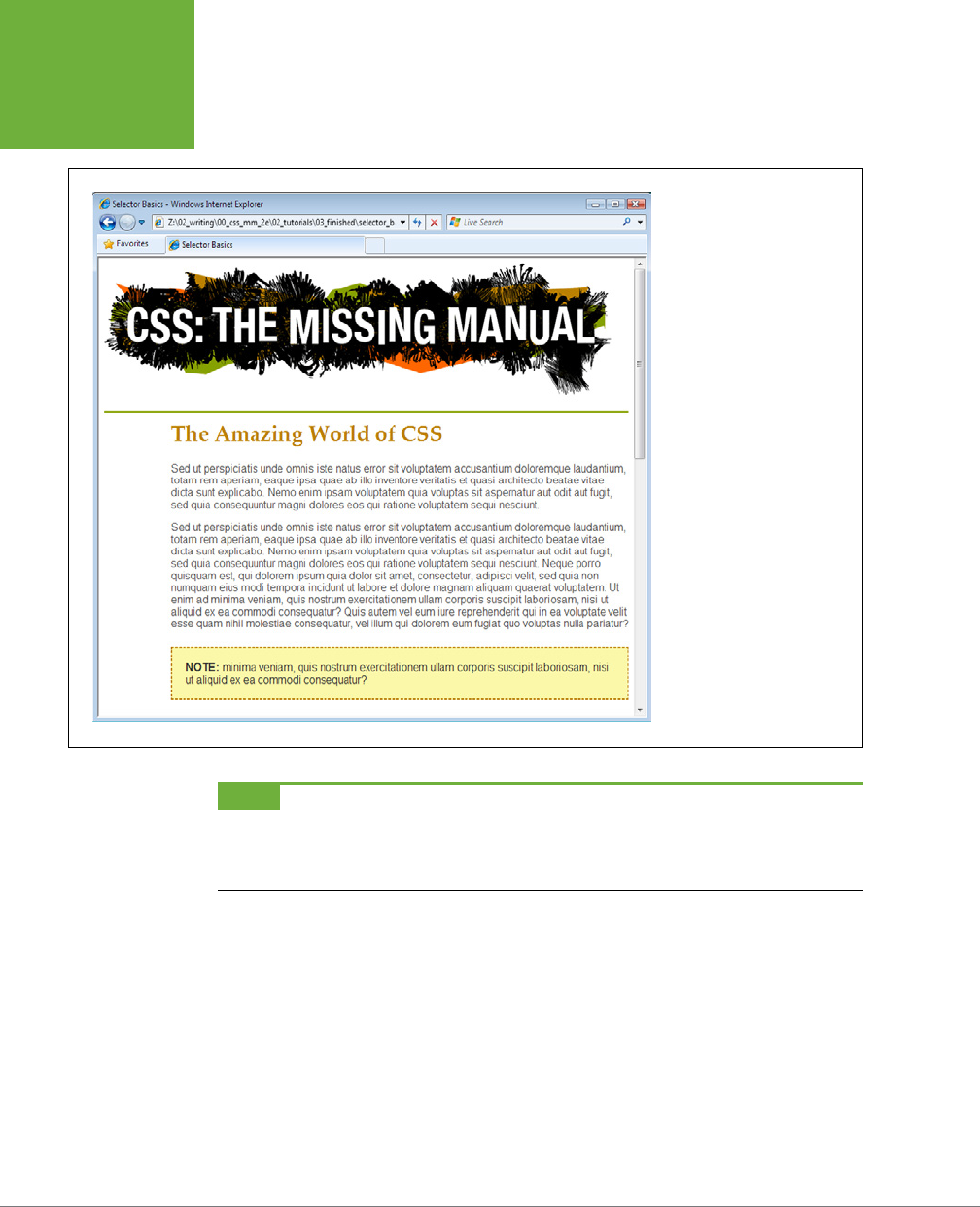
CSS3: THE MISSING MANUAL
88
TUTORIAL:
SELECTOR
SAMPLER
FIGURE 3-12
You can make detailed
formatting changes with class
selectors. A class style gives
selected paragraphs different
formatting from all other
paragraphs on the page. The
distinctive note box pictured
here uses a class style to stand
out from the crowd.
NOTE If your page doesn’t look like Figure 3-12, then you may have mistyped the name of a property or its
value. Double-check your code with the steps above. Also, make sure to end each declaration—
property:value
combination—with a semicolon and conclude the style with a closing brace at the very end. When your style is
not working correctly, missing semicolons and closing braces are frequent culprits.
Creating a Descendent Selector
On the
selectors_basics.html
page, you applied the note class to two paragraphs.
Each of those paragraphs begins with the word “Note:” in bold—actually the word
is wrapped inside the HTML <strong> tag, which all browsers display as bolded text.
But what if you want to format those bolded words in bright orange? You could
create a tag style for the <strong> tag, but that would aect all <strong> tags on
the page, and you only want to change the strong tag inside those note boxes. One
solution would be to create a class style—.noteText, for example—and apply it to
each of the <strong> tags inside the note boxes. But that’s a lot of work, and you
might forget to apply the class if you have a lot of pages with those notes.

CHAPTER 3: SELECTORS: IDENTIFYING WHAT TO STYLE 89
TUTORIAL:
SELECTOR
SAMPLER
A better method is to create a descendent selector (page 88), which targets only the
<strong> tag when it’s inside one of these note boxes. Fortunately, that’s easy to do.
1. Return to your text editor and the
selector_basics.html
file. Create a new
empty line for the descendent selector style.
If you just completed the previous steps, click after the closing brace of the
.note
style, and then hit Enter (Return).
2. Type .note strong {.
The last tag in the selector—strong—is the element you ultimately want to
format. In this case, the style formats the <strong> tag only when it’s
inside
another tag with the class note applied to it. It has no eect on <strong> tags
inside other paragraphs, lists, or heading tags, for example.
3. Hit Enter, type color: #FC6512;, and then hit Enter (Return) again to cre-
ate another blank line. Finish the style by typing the closing brace character.
The finished style should look like this:
.note strong {
color: #FC6512;
}
4. Save the page and preview it in a web browser.
The word “Note:” should appear in orange in each of the note boxes on the page.
Descendent selectors are among the most powerful CSS tools. Professional web
designers use them extensively to target particular tags without littering the HTML
with CSS classes. You’ll learn a lot more about descendent selectors as they’re used
throughout this book.
Creating and Applying an ID Selector
You can apply class selectors to multiple elements on a page. For example, earlier
you created a .note class style and applied it to two paragraphs, but you could apply
it to even more paragraphs (or even other tags) if you wanted to. ID selectors look
and act just like classes, but you can apply an ID only
once
per page. As mentioned
on page 61, many web designers now shy away from ID selectors (you’ll learn exactly
why on page 114). However, that doesn’t mean you shouldn’t learn how to use them.
In this exercise, you’ll create a style that sets a specific width for a web page’s content,
centers it in the middle of the browser window, and adds a decorative background
image to the page. You’ll apply the ID to the page’s <body> tag to indicate a unique
page design.
1. Return to your text editor and the
selector_basics.html
file.
You’ll add a new style below the .note strong class style you created before.

CSS3: THE MISSING MANUAL
90
TUTORIAL:
SELECTOR
SAMPLER
2. Click after the previous style’s closing bracket (}), hit Enter (Return) to
create a new line, and then type #article {.
ID selectors always begin with the pound symbol (#). The style’s name indicates
which type of page this is—it’s common on websites to have dierent designs
for dierent types of web pages. For example, the home page will look dier-
ent from a page advertising a product, which may look dierent from a page
with the text of a blog post. In this case, you’re going to identify this page as an
“article” (as in a newspaper) by creating and applying an ID to the <body> tag.
3. Hit Enter again, and then type:
background-color: #FDF8AB;
background-image: url(images/bg_page.png);
background-repeat: repeat-y;
background-position: center top;
padding: 0;
margin: 0 auto;
width: 760px;
There are a lot of properties here, but basically you’re adding a color to the
page, inserting an image in the background (and controlling how it’s positioned),
removing space around the browser window’s edges, setting a fixed width for
the page’s content, and centering everything in the middle of the page.
4. Finish the style by typing the closing brace. The whole thing should look
like this:
#article {
background-color: #FDF8AB;
background-image: url(images/bg_page.png);
background-repeat: repeat-y;
background-position: center top;
padding: 0;
margin: 0 auto;
width: 760px;
}
Just as with a class, this style doesn’t
do
anything until you apply it to the page.
So you’ll add an ID attribute to the page’s HTML, indicating where you want
the ID style to apply.
5. Find the page’s opening <body> tag and add id="article" so that the tag
looks like this (your changes are in bold):
<body id="article" >
Now the <body> tag reflects the formatting defined in the #article style. As
with all things CSS, there are many ways to arrive at the same destination: You
can instead use a class style and apply it to the <body> tag (as long as you don’t
apply it more than once on the page; otherwise any other elements with the

CHAPTER 3: SELECTORS: IDENTIFYING WHAT TO STYLE 91
TUTORIAL:
SELECTOR
SAMPLER
article class will get that same formatting). You can even create a plain body
element style with the same formatting properties as long as all the other pages
on your site share these same formatting choices. But in this case, you’re using
an ID selector since the point of this style—identifying the type of page—is in
keeping with the general notion of ID selectors.
6. Save the page, and preview it in a browser.
Everything on the page (the logo and all the text) now has a set width and floats
in the center of the browser window. Even if you resize the browser window—try
it!—the content remains centered. In addition, a drop shadow appears on either
side of the content, thanks to the handy background-image property (you’ll learn
about that cool property in depth on page 240).
Finishing Touches
For fun, you’ll add one more advanced style—an adjacent sibling selector discussed
on page 79—to format the paragraph immediately following the first headline on the
page. (You can achieve the same eect by creating a class style and applying it to
that paragraph, but the adjacent sibling selector requires no changes to your HTML.)
1. Return to your text editor and the
selector_basics.html
file. Create a new
empty line for a new style.
If you just completed the previous steps, click after the closing brace of the
#article style, and then hit Enter (Return).
2. Type h1+p {.
This style will apply to any paragraph that
immediately
follows an <h1> tag—in
other words, the first paragraph after the top headline on the page. It won’t
apply to the second or any subsequent paragraphs. This selector provides an
easy way to create a unique look for an introductory paragraph to set it o
visually and highlight the beginning of an article.
3. Hit Enter, and then add the following list of properties to the style:
color: #FF6600;
font-size: 1.2em;
line-height: 140%;
margin-top: 20px;
Here you’re changing the font color and size as well as adding a bit of space above
the paragraph. The line-height property (which you’ll read about on page 167)
controls the space between lines in a paragraph (also known as
leading
).
4. Finally, complete the style by pressing Enter and typing the closing brace.
The completed class style should look like this:
h1+p {
color: #FF6600;
font-size: 1.2em;
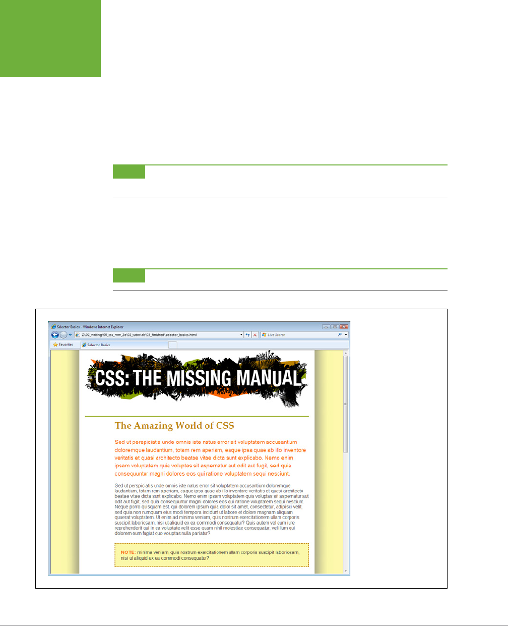
CSS3: THE MISSING MANUAL
92
TUTORIAL:
SELECTOR
SAMPLER
line-height: 140%;
margin-top: 20px;
}
If you preview the page now, you’ll see that the top paragraph is orange and
the text is larger and there’s more space between each line of text (see Figure
3-13). If you actually deleted this paragraph in the HTML, you’d see that the
remaining paragraph would suddenly be orange with larger text, since it would
be the new adjacent sibling of the <h1> tag.
NOTE Internet Explorer 6 doesn’t understand adjacent sibling selectors, so in that browser, the first paragraph
will look just like all the others on the page.
And there you have it: a quick tour through various selector types. You’ll get familiar
with all of these selectors (and more) as you go through the tutorials later in the
book, but by now, you should be getting the hang of the dierent types and why
you’d use one over the other.
NOTE You can see a completed version of the page you’ve just created in the
03_finished
folder.
FIGURE 3-13
The page has really come
together. The set width,
the drop shadow effect,
and the typographic de-
tails have really improved
the look of the boring
HTML page you started
with.

93
CHAPTER
4
Children inherit traits from their parents—eye color, height, male-pattern bald-
ness, and so on. Sometimes, we inherit traits from more distant ancestors, like
grandparents or great-grandparents. As you saw in the previous chapter, the
metaphor of family relations is part of the structure of HTML as well. And just like
humans, HTML tags can inherit CSS properties from their ancestors.
What Is Inheritance?
In a nutshell, inheritance is the process by which some CSS properties applied to
one tag are passed on to nested tags. For example, a <p> tag is always nested in-
side of the <body> tag, so properties applied to the <body> tag get inherited by the
<p> tag. Say you created a CSS tag style (page 62) for the <body> tag that sets the
color property to a dark red. Tags that are descendants of the <body> tag—that is,
the ones inside the <body> tag—will inherit that color property. That means that any
text in those tags—<h1>, <h2>, <p>, whatever—will appear in that same dark red color.
Inheritance works through multiple generations as well. If a tag like the <em> or
<strong> tag appears inside of a <p> tag, then the <em> and the <strong> tags also
inherit properties from any style applied to the <body> tag.
NOTE As discussed in Chapter 3, any tag inside of another tag is a
descendant
of that tag. So a
<p>
tag
inside the
<body>
tag is a descendant of the
<body>
, while the
<body>
tag is an
ancestor
of the
<p>
tag.
Descendants
(think kids and grandchildren) inherit properties from ancestors (think parents and grandparents).
Saving Time with
Style Inheritance
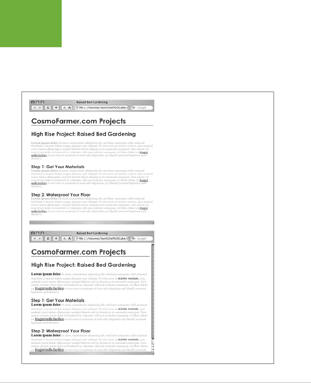
CSS3: THE MISSING MANUAL
94
WHAT IS
INHERITANCE?
Although this sounds a bit confusing, inheritance is a
really
big timesaver. Imagine
if no properties were passed onto nested tags and you had a paragraph that con-
tained other tags like the <em> tag to emphasize text or the <a> tag to add a link. If
you created a style that made the paragraph purple, 24px tall, using the Arial font,
it would be weird if all the text inside the <em> tag reverted to its regular, “browser
boring” style (see Figure 4-1). You’d then have to create another style to format the
<em> tag to match the appearance of the <p> tag. What a drag.
FIGURE 4-1
Inheritance lets tags copy properties from the tags that sur-
round them. Top: The paragraph tag is set with a specific font-
family, size, and color. The tags inside each paragraph inherit
those properties so they look like the rest of the paragraph.
Bottom: If inheritance didn’t exist, the same page would look
like this figure. Notice how the
strong
,
em
, and
a
tags inside
the paragraph retain the font-family, size, and color defined by
the browser. To make them look like the rest of the paragraph,
you’d have to create additional styles—a big waste of time.

CHAPTER 4: SAVING TIME WITH STYLE INHERITANCE 95
THE LIMITS OF
INHERITANCE
Inheritance doesn’t just apply to tag styles. It works with any type of style; so when
you apply a class style (see page 57) to a tag, any tags inside that tag inherit prop-
erties from the styled tag. Same holds true for ID styles, descendant selectors, and
the other types of styles discussed in Chapter 3.
How Inheritance Streamlines Style Sheets
You can use inheritance to your advantage to streamline your style sheets. Say
you want all the text on a page to use the same font. Instead of creating styles for
each tag, simply create a tag style for the <body> tag. (Or create a class style and
apply it to the <body> tag.) In the style, specify the font you wish to use, and all of
the tags on the page inherit the font: body { font-family: Arial, Helvetica,
sans-serif; }. Fast and easy.
You can also use inheritance to apply style properties to a
section
of a page. For
example, like many web designers, you may use the <div> tag (page 21) to define an
area of a page like a banner, sidebar, or footer; or, if you’re using HTML5 elements,
you might use one of the new sectioning elements like <header>, <aside>, <footer>,
or <article>. By applying a style to that outer tag, you can specify particular CSS
properties for all of the tags inside just that section of the page. If you want all the
text in a sidebar to be the same color, you’d create a style setting the color property,
and then apply it to the <div>, <header>, <article>, or other sectioning element.
Any <p>, <h1>, or other tags inside inherit the same font color.
The Limits of Inheritance
Inheritance isn’t all-powerful. Many CSS properties don’t pass down to descendant
tags at all. For example, the border property (which lets you draw a box around an
element) isn’t inherited, and with good reason. If it were, then every tag inside an
element with the border property would also have a border around it. For example, if
you added a border to the <body> tag, then every bulleted list would also have a box
around it, and each bulleted item in the list would also have a border (Figure 4-2).
NOTE There’s a list of CSS properties in Appendix A, including details on which ones get inherited.
Here are examples of times when inheritance doesn’t strictly apply:
• As a general rule, properties that aect the placement of elements on the page
or the margins, background colors, and borders of elements aren’t inherited.
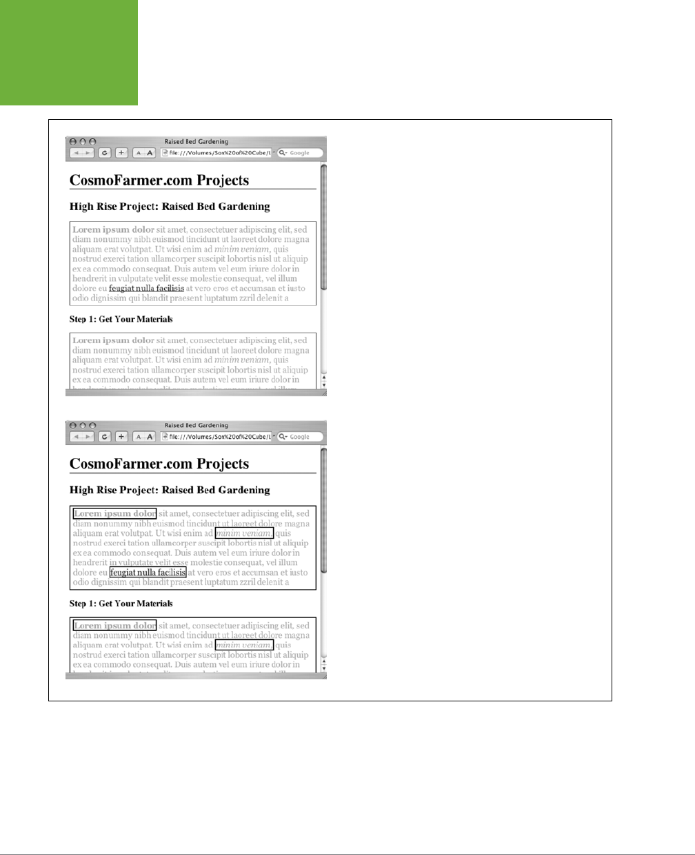
CSS3: THE MISSING MANUAL
96
THE LIMITS OF
INHERITANCE
FIGURE 4-2
Fortunately, not all properties are inherited. The border applied
to the paragraphs at top isn’t inherited by the tags inside those
paragraphs. If they were, you’d end up with an unattractive mess of
boxes within boxes within boxes (bottom).
• Web browsers use their own inherent styles to format various tags: Headings
are big and bold, links are blue, and so on. When you define a font-size for the
text on a page and apply it to the <body> tag, headings still appear larger than
paragraphs, and <h1> tags are still larger than <h2> tags. It’s the same when
you apply a font color to the <body>; the links on the page still appear in good
old-fashioned, web-browser blue.

CHAPTER 4: SAVING TIME WITH STYLE INHERITANCE 97
TUTORIAL:
INHERITANCE
NOTE It’s usually a good idea to eliminate these built-in browser styles—it’ll make designing sites that
work consistently among different browsers easier. In Chapter 5, on page 115, you’ll learn how to do that.
• When styles conflict, the more specific style wins out. In other words, when
you’ve specifically applied CSS properties to an element—like specifying the
font size for an unordered list—and those properties conflict with any inherited
properties—like a font-size set for the <body> tag—the browser uses the font
size applied to the <ul> tag.
NOTE These types of conflicts between styles are very common, and the rules for how a browser deals with
them are called the
cascade
. You’ll learn about that in Chapter 5.
Tutorial: Inheritance
In this three-part tutorial, you’ll see how inheritance works. First, you’ll create a
simple tag selector and watch it pass its characteristics on to nested tags. Then, you’ll
create a class style that uses inheritance to alter the formatting of an entire page.
Finally, you’ll see where CSS makes some welcome exceptions to the inheritance rule.
To get started, you need to download the tutorial files located on this book’s com-
panion website at
www.sawmac.com/css3
. Click the tutorial link and download the
files. All of the files are enclosed in a zip archive, so you’ll need to unzip them first.
(Detailed instructions for unzipping the files are on the website.) The files for this
tutorial are contained in the folder named
04
.
A Basic Example: One Level of Inheritance
To see how inheritance works, start by adding a single tag style and see how it af-
fects the tags nested inside. The next two parts of this tutorial will build upon your
work here, so save the file when you’re done.
1. Open the file
inheritance.html
in your favorite text editor.
Now add an internal style sheet to this file.
NOTE In general, it’s better to use external style sheets for a website, for reasons discussed in Chapter 2
(page 48). But sometimes it’s easier to start your CSS-based design in an internal style sheet, as in this example,
and turn it into an external style sheet later.
2. Click directly after the closing </title> tag. Hit Enter (Return), and then type
<style>. Press Enter twice, and type the closing tag—</style>—to indicate the
end of the style sheet.
These tags mark the area where CSS instructions go.
Now, you’ll create a style that applies to all <p> tags.

CSS3: THE MISSING MANUAL
98
TUTORIAL:
INHERITANCE
NOTE If you’re using HTML 4.01 or XHTML doctypes (instead of HTML5 as in this tutorial) you’ll need to add
the
type="text/css"
attribute to the opening style tag like this:
<style type="text/css">
3. Click in the empty line between the opening and closing <style> tags and
type p {. Hit Enter twice and type the closing brace: }.
You’ve created a tag selector that applies to all <p> tags on the page.
4. Click between the two braces and type color: #FF6600;. The completed
style should look like this:
p {
color: #FF6600;
}
As you’ve seen in the previous tutorials, the color property sets the color of
text. Your style sheet is complete.
5. Open the page in a web browser to preview your work.
The color of the page’s four paragraphs has changed from black to orange
(see Figure 4-3).
But notice how this <p> tag style aects
other
tags: Tags
inside
of the <p> tag also
change color. For example, the text inside the <em> and <strong> tags inside each
paragraph also changes to orange while maintaining its italic and bold formatting.
This kind of behavior makes a lot of sense. After all, when you set the color of text
in a paragraph, you expect
all
the text in the paragraph—regardless of any other
tags inside that paragraph—to be the same color.
Without inheritance, creating style sheets would be very labor intensive. If the <em>,
<a>, and <strong> tags didn’t inherit the color property from the <p> tag selector,
then you’d have to create additional styles—perhaps descendant selectors like p em
and p strong—to correctly format the text.
However, you’ll notice that the link at the end of the first paragraph doesn’t change
color—it retains its link-blue color. As mentioned on page 97, browsers have their
own styles for certain elements, so inheritance doesn’t apply. You’ll learn more about
this behavior in Chapter 5.
Using Inheritance to Restyle an Entire Page
Inheritance works with class styles as well—any tag with any kind of style applied
to it passes CSS properties to its descendants. With that in mind, you can use in-
heritance to make quick, sweeping changes to an entire page.
1. Return to your text editor and the
inheritance.html
file.
You’ll add a new style below the <p> tag style you created.
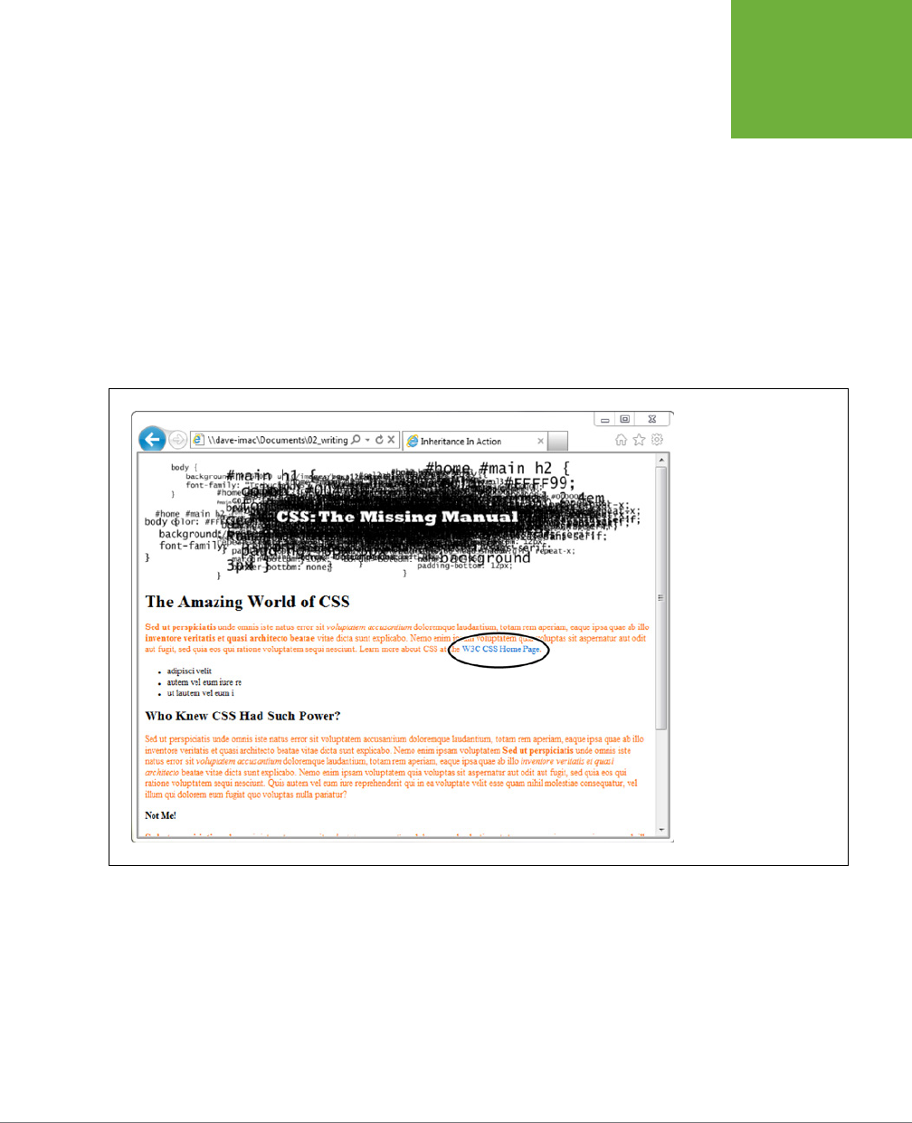
CHAPTER 4: SAVING TIME WITH STYLE INHERITANCE 99
TUTORIAL:
INHERITANCE
2. Click at the end of the closing brace of the p selector. Press Enter (Return)
to create a new line, and then type .pageStyle {. Hit Enter twice, and type the
closing brace: }.
You’re about to create a new class style that you’ll apply to the body tag.
3. Click between the two braces, and then add the following list of properties
to the style:
font-family: "Helvetica Neue", Arial, Helvetica, sans-serif;
font-size: 18px;
color: #BD8100;
width: 900px;
margin: 0 auto;
FIGURE 4-3
Inheritance in action!
Tags inside of a styled
tag—the bold, italicized
text—display the same
color applied to the
<p>
tag surrounding them.
But what’s that? The link
at the end of the first
paragraph is still blue
(circled). You’ll learn why
in the next chapter.
The whole thing should look like this:
.pageStyle {
font-family: "Helvetica Neue", Arial, Helvetica, sans-serif;
font-size: 18px;
color: #BD8100;
width: 900px;
margin: 0 auto;
}

CSS3: THE MISSING MANUAL
100
TUTORIAL:
INHERITANCE
This completed class style sets a font, font size, and color. It also sets a width
and centers the style on the page (you saw this trick in the previous tutorial on
page 89 for creating a fixed, centered area for a page’s content).
4. Find the opening <body> tag (just a couple lines below the style you just
created), and then type class="pageStyle".
The tag should now look like this: <body class="pageStyle">. It applies the
class to the body tag. Thanks to inheritance, all tags inside of the body tag
(which are also all the tags visible inside a browser window) inherit this style’s
properties and therefore use the same font.
5. Save and preview the web page in a browser.
As you can see in Figure 4-4, your class style has created a seamless, consistent
appearance throughout all text in the body of the page. Both headings and
paragraphs inside the <body> tag have taken on the new font styling.
The page as a whole looks great, but now look more closely: The color change af-
fected only the headings and the bulleted list on the page, and even though the style
specified an exact font-size, the headline text is a dierent size than the paragraphs.
How did CSS know that you didn’t want your headings to be the same 18-pixel size
as the body text? And why didn’t the nested <p> tags inherit your new color styling
from the <body> tag?
NOTE Why use a class—
pageStyle
—instead of a tag style—
body
—to redefine the look of the page? Well,
in this case, a tag style would work fine. But, applying a class to the
<body>
tag is a great way to customize the
look of different pages on your site. For example, if all pages on your site share the same external style sheet, a
body tag style would apply to the
<body>
tag of every page on your site. But by creating different classes (or
IDs) you can create a different style for the
<body>
tag for different sections of the site or different types of
pages.
You’re seeing the “cascading” aspect of Cascading Style Sheets in action. In this
example, your <p> tags have two color styles in conflict—the <p> tag style you created
on page 98 and the class style you created here. When styles collide, the browser
has to pick one. As discussed on page 104, the browser uses the more specific styl-
ing—the color you assigned explicitly for <p> tag. You’ll learn much more about the
rules of the cascade in Chapter 5.
CHAPTER 4: SAVING TIME WITH STYLE INHERITANCE 101
TUTORIAL:
INHERITANCE
FIGURE 4-4
A style applied to the body tag
passes its properties onto all the
tags you see in the web browser,
making it easy to apply global
formatting effects to a page.
Inheritance Inaction
Inheritance doesn’t always apply, and that isn’t necessarily a bad thing. For some
properties, inheritance would have a negative eect on a page’s appearance. You’ll
see another example of inheritance
in action
in the final section of this tutorial.
Margins, padding, and borders (among other properties) don’t get inherited by
descendant tags—and you wouldn’t want them to, as you’ll see in this example.
1. Return to your text editor and the
inheritance.html
file.
You’ll expand on the p tag style you just created.
2. Locate the p style, click at the end of the color property (color : #FF6600;),
and then press Enter (Return) to create a new line.
You’ll indent the paragraphs on the page by adding a left margin.
3. Add three properties to the style so that it looks like this:
p {
color: #FF6600;
margin-left: 50px;
padding-left: 20px;
border-left: solid 25px #BD8100;
}
CSS3: THE MISSING MANUAL
102
TUTORIAL:
INHERITANCE
The margin-left property indents the paragraph 50 pixels from the left; the
padding property indents the paragraph text 20 pixels from the border.
4. Save the file and preview it in a web browser.
Notice that all of the <p> tags are indented 50px from the left edge of the
browser window and that they each have a thick brown border on the left.
However, the tags
inside
the <p> tag (for example, the <em> tag) don’t have any
additional indentation or border (see Figure 4-5). This behavior makes sense:
It would look weird if there were an additional 50px of space to the left of each
<em> and each <strong> tag inside of a paragraph!
To see what would happen if those properties were inherited, edit the p selec-
tor so that it looks like this: p, p *, which makes it into a group selector (page
84). The first part is just the p selector you already created. The second part—
p *—means “select all tags inside of a p tag and apply this style to them.” (The
*, or universal selector, is described on page 63.)
FIGURE 4-5
While most properties
are inherited (like color),
there are plenty—like
margins, padding, and
borders—that don’t pass
on to nested tags. The CSS
Property Reference in Ap-
pendix A indicates which
properties are and are not
inherited.
NOTE You can find a completed version of the page you created in this tutorial in the
04_finished
folder.

103
CHAPTER
5
As you create increasingly complex style sheets, you’ll sometimes wonder
why a particular element on a page looks the way it does. CSS’s inheritance
feature, as discussed in Chapter 4, creates the possibility that any tag on a
page is potentially aected by any of the tags that wrap around it. For example, the
<body> tag can pass properties on to a paragraph, and a paragraph may pass its
own formatting instructions on to a link within the paragraph. In other words, that
link can inherit CSS properties from
both
the <body> and the <p> tag—essentially
creating a kind of Frankenstyle that combines parts of two dierent CSS styles.
Then there are times when styles collide—the same CSS property is defined in mul-
tiple styles, all applying to a particular element on the page (for example, a <p> tag
style in an external style sheet and another <p> tag style in an internal style sheet).
When that happens, you can see some pretty weird stu, like text that appears bright
blue, even though you specifically applied a class style with the text color set to
red. Fortunately, there’s actually a system at work: a basic CSS mechanism known
as the
cascade
, which governs how styles interact and which styles get precedence
when there’s a conflict.
NOTE This chapter deals with issues that arise when you build complex style sheets that rely on inheritance
and more sophisticated types of selectors like descendent selectors (page 88). The rules are all pretty logical, but
they’re about as fun to master as the tax code. If that’s got your spirits sagging, consider skipping the details
and doing the tutorial on page 117 to get a taste of what the cascade is and why it matters. Or jump right to the
next chapter, which explores fun and visually exciting ways to format text. You can always return to this chapter
later, after you’ve mastered the basics of CSS.
Managing Multiple
Styles: The Cascade
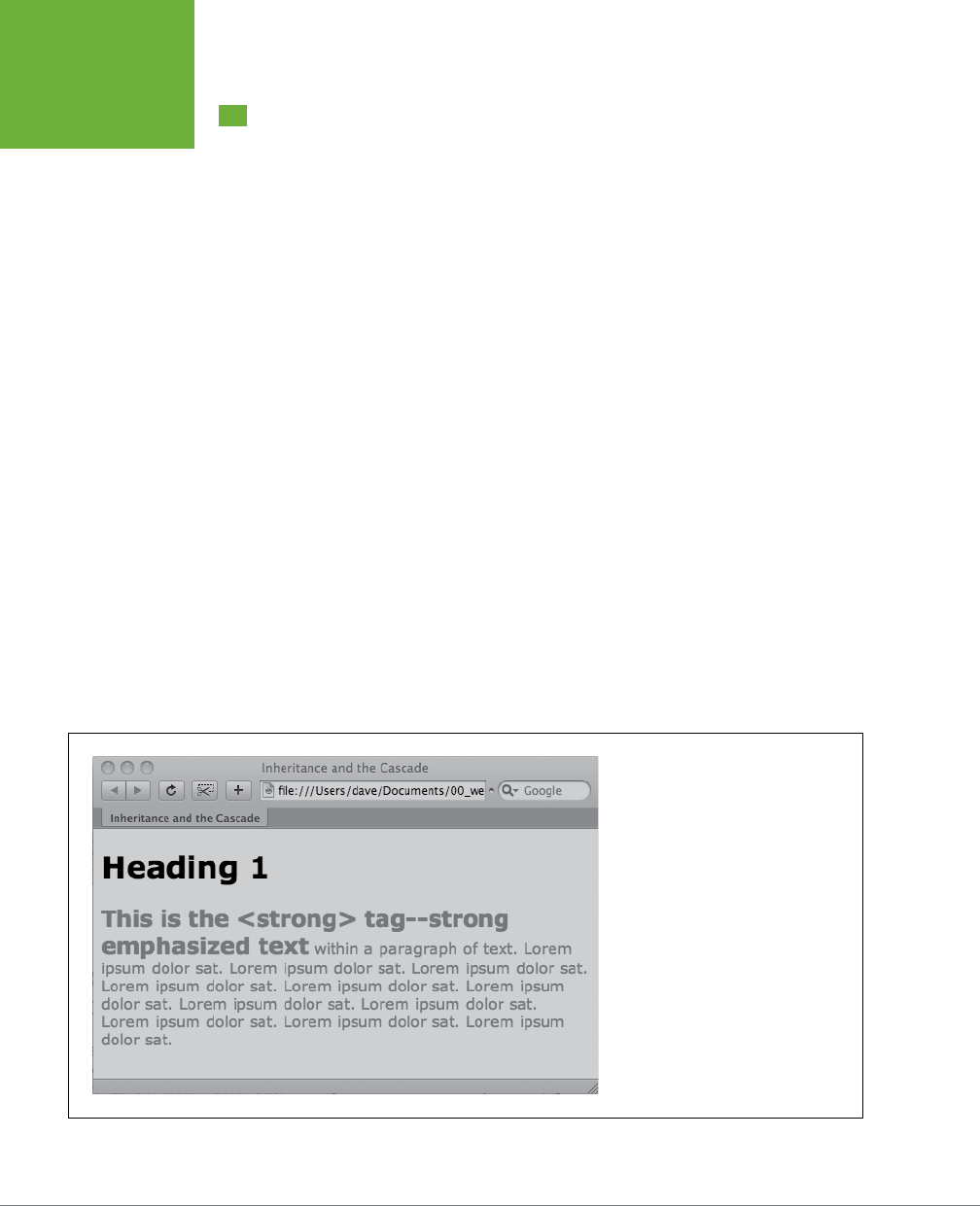
CSS3: THE MISSING MANUAL
104
HOW STYLES
CASCADE
How Styles Cascade
The
cascade
is a set of rules for determining which style properties get applied to an
element. It specifies how a web browser should handle multiple styles that apply to
the same tag and what to do when CSS properties conflict. Style conflicts happen
in two cases: through inheritance when the same property is inherited from multiple
ancestors, and when one or more styles apply to the same element (maybe you’ve
applied a class style to a paragraph and also created a <p> tag style, so both styles
apply to that paragraph).
Inherited Styles Accumulate
As you read in the last chapter, CSS inheritance ensures that related elements—like
all the words inside a paragraph, even those inside a link or another tag—share
similar formatting. It spares you from creating specific styles for each tag on a page.
But since one tag can inherit properties from
any
ancestor tag—a link, for example,
inheriting the same font as its parent <p> tag—determining why a particular tag is
formatted one way can be a bit tricky. Imagine a font family applied to the <body>
tag, a font size applied to a <p> tag, and a font color applied to an <a> tag. Any <a>
tag inside of a paragraph would inherit the font from the body and the size from
the paragraph. In other words, the inherited styles combine to form a hybrid style.
The page shown in Figure 5-1 has three styles: one for the <body>, one for the <p>
tag, and one for the <strong> tag. The CSS looks like this:
body { font-family: Verdana, Arial, Helvetica, sans-serif; }
p { color: #F30; }
strong { font-size: 24px; }
FIGURE 5-1
Thanks to inheritance, it’s possible for
multiple styles to affect the appearance
of one tag. Here the
<strong>
tag has
a specific color, font family, and font size,
even though only a single property is
applied directly to that tag. The other two
formatting options were inherited from
the tag’s ancestors: the
<body>
and the
<p>
tags.

CHAPTER 5: MANAGING MULTIPLE STYLES: THE CASCADE 105
HOW STYLES
CASCADE
The <strong> tag is nested inside a paragraph, which is inside the <body> tag.
That <strong> tag inherits from both of its ancestors, so it inherits the font-family
property from the body and the color property from its parent paragraph. In addi-
tion, the <strong> tag has a bit of CSS applied directly to it—a 24px font size. The
final appearance of the tag is a combination of all three styles. In other words, the
<strong> tag appears exactly as if you’d created a style like this:
strong {
font-family: Verdana, Arial, Helvetica, sans-serif;
color: #F30;
font-size: 24px;
}
Nearest Ancestor Wins
In the previous example, various inherited and applied tags smoothly combined to
create an overall formatting package. But what happens when inherited CSS proper-
ties conflict? Think about a page where you’ve set the font color for the body tag to
red and the paragraph tag to green. Now imagine that within one paragraph, there’s
a <strong> tag. The <strong> tag inherits from both the body and p tag styles, so
is the text inside the <strong> tag red or green? Ladies and gentleman, we have a
winner: the green from the paragraph style. That’s because the web browser obeys
the style that’s closest to the tag in question.
In this example, any properties inherited from the <body> tag are rather generic. They
apply to all tags. A style applied to a <p> tag, on the other hand, is more narrowly
defined. Its properties apply only to <p> tags and the tags inside them.
In a nutshell, if a tag doesn’t have a specific style applied to it, then, in the case of
any conflicts from inherited properties, the nearest ancestor wins (see Figure 5-2,
number 1).
Here’s one more example, just to make sure the concept sinks in. If a CSS style
defining the color of text were applied to a <table> tag, and another style defining
a
dierent
text color were applied to a <td> tag inside that table, then tags inside
that table cell (<td>) such as a paragraph, headline, or unordered list would use the
color from the <td> style, since it’s the closest ancestor.
The Directly Applied Style Wins
Taking the “nearest ancestor” rule to its logical conclusion, there’s one style that
always becomes king of the CSS family tree—any style applied directly to a given tag.
Suppose a font color is set for the body, paragraph,
and
strong tags. The paragraph
style is more specific than the body style, but the style applied to the <strong> tag
is more specific than either one. It formats the <strong> tags and only the <strong>
tags, overriding any conflicting properties inherited from the other tags (see Figure
5-2, number 2). In other words, properties from a style specifically applied to a tag
beat out any inherited properties.
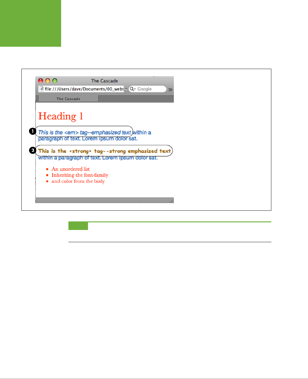
CSS3: THE MISSING MANUAL
106
HOW STYLES
CASCADE
This rule explains why some inherited properties don’t appear to inherit. A link
inside a paragraph whose text is red still appears browser-link blue. That’s because
browsers have their own predefined style for the <a> tag, so an inherited text color
won’t apply.
FIGURE 5-2
Here’s how web browsers figure out which proper-
ties to display when inherited properties conflict:
The
<em>
tag in the first paragraph (1) inherits
the font family and color from both the
<body>
tag and the paragraph. But since the body and
paragraph have different fonts and colors applied
to them, the
<em>
tag uses the font and color
specified for its closest ancestor—the
<p>
tag.
When a style applies directly to a tag—the font-
family and color are specified for the
<strong>
tag (2)—browsers ignore conflicting inherited
properties.
NOTE You can learn how to overcome preset styles for the
<a>
tag and change link colors to your heart’s
content. See page 115.
One Tag, Many Styles
Inheritance is one way that a tag can be aected by multiple styles. But it’s also
possible to have multiple styles apply
directly
to a given tag. For example, say you
have an external style sheet with a <p> tag style and attach it to a page that has an
internal style sheet that
also
includes a <p> tag style. And just to make things really
interesting, one of the <p> tags on the page has a class style applied to it. So for
that one tag, three dierent styles directly format it. Which style—or
styles
—should
the browser obey?
The answer: It depends. Based on the types of styles and the order in which they’re
created, a browser may apply one or more of them at once. Here are a few situations
in which multiple styles can apply to the same tag:
• The tag has both a tag selector and a class style applied to it. For example,
a tag style for the <h2> tag, a class style named .leadHeadline and this HTML:
<h2 class="leadHeadline">Your Future Revealed!</h2>. Both styles apply
to this <h2> tag.

CHAPTER 5: MANAGING MULTIPLE STYLES: THE CASCADE 107
HOW STYLES
CASCADE
NOTE Hold onto your hat if you’re worried about what happens when these multiple styles conflict; details
to follow.
• The same style name appears more than once in the style sheet. There could
be a group selector (page 84), like .leadHeadline
,
.secondaryHeadline
,
.news
Headline, and the class style .leadHeadline in the same style sheet. Both of
these rules define how any element with a class of leadHeadline looks.
• A tag has both a class and an ID style applied to it. Maybe it’s an ID named
#banner, a class named .news, and this HTML: <div id="banner" class="news">.
Properties from both the banner and news styles apply to this <div> tag.
• There’s more than one style sheet containing the
same
style name attached
to a page. The same-named styles can arrive in an external style sheet and
an internal style sheet. Or, the same style can appear in multiple external style
sheets that are all linked to the same page.
• There are complex selectors targeting the same tag. This situation is com-
mon when you use descendent selectors (page 88). For example, say you have
a div tag in a page (like this: <div id="mainContent">), and inside the div is a
paragraph with a class applied to it: <p class="byline">. The following selec-
tors apply to this paragraph:
#mainContent p
#mainContent .byline
p.byline
.byline
If more than one style applies to a particular element, then a web browser combines
the properties of all those styles,
as long as they don’t conflict
. An example will make
this concept clearer. Imagine you have a paragraph that lists the name of the web
page’s author, including a link to his email address. The HTML might look like this:
<p class="byline">Written by <a href="mailto:jean@cosmofarmer.com">Jean Graine
de Pomme</a></p>
Meanwhile, the page’s style sheet has three styles that format the link:
a { color: #6378df; }
p a { font-weight: bold; }
.byline a { text-decoration: none; }
The first style turns all <a> tags powder blue; the second style makes all <a> tags
that appear inside a <p> tag bold; and the third style removes the underline from
any links that appear inside an element with the byline class applied to it.
All three styles apply to that very popular <a> tag, but since none of the proper-
ties are the same, there are no conflicts between the rules. The situation is similar
to the inheritance example (page 104): the styles combine to make one überstyle
containing all three properties, so this particular link appears powder blue, bold,
and
underline-free.
CSS3: THE MISSING MANUAL
108
SPECIFICITY:
WHICH STYLE
WINS
NOTE Your head will really start to ache when you realize that this particular link’s formatting can also be
affected by inherited properties. For example, it would inherit any font family that’s applied to the paragraph. A
few tools can help sort out what’s going on in the cascade. (See the box on page 110.)
Specificity: Which Style Wins
The previous example is pretty straightforward. But what if the three link styles
above each had a
dierent
font specified for the font-family property? Which of
the three fonts would a web browser pay attention to?
As you know if you’ve been reading carefully so far, the cascade provides a set of
rules that helps a web browser sort out any property conflicts; namely,
properties
from the most specific style win
. But as with the styles listed above, sometimes it’s
not clear which style is most specific. Thankfully, CSS provides a formula for deter-
mining a style’s
specificity
that’s based on a value assigned to the style’s selector—a
tag selector, class selector, ID selector, and so on. Here’s how the system works:
• A tag selector is worth 1 point.
• A class selector is worth 10 points.
• An ID selector is worth 100 points.
• An inline style (page 44) is worth 1,000 points.
NOTE The math involved in calculating specificity is actually a bit more complicated than described here.
But this formula works in all but the weirdest cases. To read how web browsers actually calculate specificity, visit
www.w3.org/TR/css3-selectors/#specificity
.
The bigger the number, the greater the specificity. So say you create the following
three styles:
• A tag style for the <img> tag ( specificity = 1)
• A class style named .highlight (specificity = 10)
• An ID style named #logo (specificity = 100)
Then, say your web page has this HTML: <img id="logo" class="highlight"
src="logo.gif" />. If you define the same property—such as the border property—in
all three styles, then the value from the ID style (#logo) always wins out.
NOTE A pseudo-element (like
::first-line
for example) is treated like a tag selector and is worth 1
point. A pseudo-class (
:link
, for example) is treated like a class and is worth 10 points. (See page 70 for the
deal on these pseudo-things.)
CHAPTER 5: MANAGING MULTIPLE STYLES: THE CASCADE 109
SPECIFICITY:
WHICH STYLE
WINS
Since descendent selectors are composed of several selectors—#content p, or h2
strong, for example—the math gets a bit more complicated. The specificity of a
descendent selector is the total value of all of the selectors listed (see Figure 5-3).
FIGURE 5-3
When more than one style applies to
a tag, a web browser must determine
which style should “win out” in
case style properties conflict. In CSS,
a style’s importance is known as
specificity and is determined by the
type of selectors used when creating
the style. Each type of selector has a
different value, and when multiple
selector types appear in one style—
for example, the descendent selector
#banner p
—the values of all the
selectors used are added up.
NOTE Inherited properties don’t have any specificity. So even if a tag inherits properties from a style with
a large specificity—like
#banner
—those properties will always be overridden by a style that directly applies to
the tag.
The Tiebreaker: Last Style Wins
It’s possible for two styles with conflicting properties to have the same specificity.
(“Oh brother, when will it end?” Soon, comrade, soon. The tutorial is coming up.) A
specificity tie can occur when you have the same selector defined in two locations.
You may have a <p> tag selector defined in an internal style sheet and an external
style sheet. Or two dierent styles may simply have equal specificity values. In case
of a tie, the style appearing last in the style sheet wins.
Here’s a tricky example using the following HTML:
<p class="byline">Written by <a class="email" href="mailto:jean@cosmofarmer.
com">Jean Graine de Pomme</a></p>
In the style sheet for the page containing the above paragraph and link, you have
two styles:
p .email { color: blue; }
.byline a { color: red; }
Both styles have a specificity of 11 (10 for a class name and 1 for a tag selector) and
both apply to the <a> tag. The two styles are tied. Which color does the browser
use to color the link in the above paragraph? Answer: Red, since it’s the second (and
last) style in the sheet.
CSS3: THE MISSING MANUAL
110
SPECIFICITY:
WHICH STYLE
WINS
FREQUENTLY ASKED QUESTION
Get a Little Help
My head hurts from all of this. Isn’t there some tool I can use to
help me figure out how the cascade is affecting my web page?
Trying to figure out all the ins and outs of inherited properties
and conflicting styles confuses many folks. Furthermore, doing
the math to figure out a style’s specificity isn’t your average
web designer’s idea of fun, especially when there are large
style sheets with lots of descendent selectors.
All current web browsers have built-in help in the form of an
inspector. The fastest way to inspect an element on a page
and all the CSS that affects it is to right-click (Control-click on
a Mac) the element (the headline, link, paragraph, or image),
and choose Inspect Element from the contextual menu. A panel
will open (usually beneath the web page) showing the page’s
HTML, with your selected element’s HTML highlighted. (To
get this to work in Safari, you first need to turn on the Show
Develop Menu option in the Preferences window→Advanced.)
On the right side of the panel, you’ll see the styles applied
to the element. There’s usually a “computed” style—the sum
total of all the CSS properties applied to the element through
inheritance and the cascade or the element’s “Frankenstyle.”
Below that you’ll find the style rules that apply to the element,
listed in order of most specific (at the top) to least specific (at
the bottom).
In the listing of styles, you’ll probably see some properties
crossed out—this indicates that the property either doesn’t
apply to the element or that it’s been overridden by a more
specific style. For a couple of short tutorials on using Chrome’s
Developer’s Tools for analyzing CSS, visit
https://developers
.google.com/chrome-developer-tools/docs/elements-styles
and
http://webdesign.tutsplus.com/tutorials/workflow-
tutorials/faster-htmlcss-workflow-with-chrome-developer-
tools/
.
Now suppose the style sheet looked like this instead:
.byline a { color: red; }
p .email { color: blue; }
In this case, the link would be red. Since .byline a appears after p .email in the
style sheet, its properties win out.
What happens if you’ve got conflicting rules in an external and an internal style sheet?
In that case, the placement of your style sheets (within your HTML file) becomes very
important. If you first add an internal style sheet by using the <style> tag (page
45) and
then
attach an external style sheet farther down in the HTML by using the
<link> tag (page 48), then the style from the external style sheet wins. (In eect, it’s
the same principle at work that you just finished reading about:
The style appearing
last wins
. ) The bottom line: Be consistent in how you place external style sheets. It’s
best to list any external style sheets first, and only use an internal style sheet when
you absolutely need one or more styles to apply to a single page.
NOTE Any external style sheets attached with the
@import
rule have to appear before internal styles
within a
<style>
tag, and before any styles in an external style sheet. See page 48 for more information on
external and internal style sheets.
CHAPTER 5: MANAGING MULTIPLE STYLES: THE CASCADE 111
CONTROLLING
THE CASCADE
TROUBLESHOOTING MOMENT
Overruling Specificity
CSS provides a way of overruling specificity entirely. You can
use this trick when you absolutely, positively want to make
sure that a particular property can’t be overridden by a more
specific style. Simply insert
!important
after any property
to shield it from specificity-based overrides.
For example, consider the two following styles:
.nav a { color: red; }
a { color: teal !important; }
Normally, a link inside an element with the class of
nav
would
be colored red since the
.nav a
style is more specific than
the
a
tag style.
However, including
!important
after a property value
means that specific property always wins. So in the above
example, all links on the page—including those inside an
element with the
nav
class—are teal.
Note that
!important
works on an individual property, not
an entire style, so you need to add
!important
to the end of
each property you wish to make invincible. Finally, when two
styles both have
!important
applied to the same property,
the more specific style’s
!important
rule wins.
Controlling the Cascade
As you can see, the more CSS styles you create, the greater the potential for format-
ting snafus. For example, you may create a class style specifying a particular font
and font size, but when you apply the style to a paragraph, nothing happens! This
kind of problem is usually related to the cascade. Even though you may think that
directly applying a class to a tag should apply the class’s formatting properties, it
may not if there’s a style with greater specificity.
You have a couple of options for dealing with this kind of problem. First, you can use
!important (as described in the box above) to make sure a property
always
applies.
The !important approach is a bit heavy-handed, though, since it’s hard to predict
that you’ll never, ever, want to overrule an !important property someday. Read on
for two other cascade-tweaking solutions.
Changing the Specificity
The top picture in Figure 5-4 is an example of a specific tag style losing out in the
cascade game. Fortunately, most of the time, you can easily change the specificity
of one of the conflicting styles and save !important for real emergencies. In Figure
5-4 (top), two styles format the first paragraph. The class style—.intro—isn’t as
specific as the #sidebar p style, so .intro’s properties don’t get applied to the
paragraph. To increase the specificity of the class, add the ID name to the style:
#sidebar .intro.
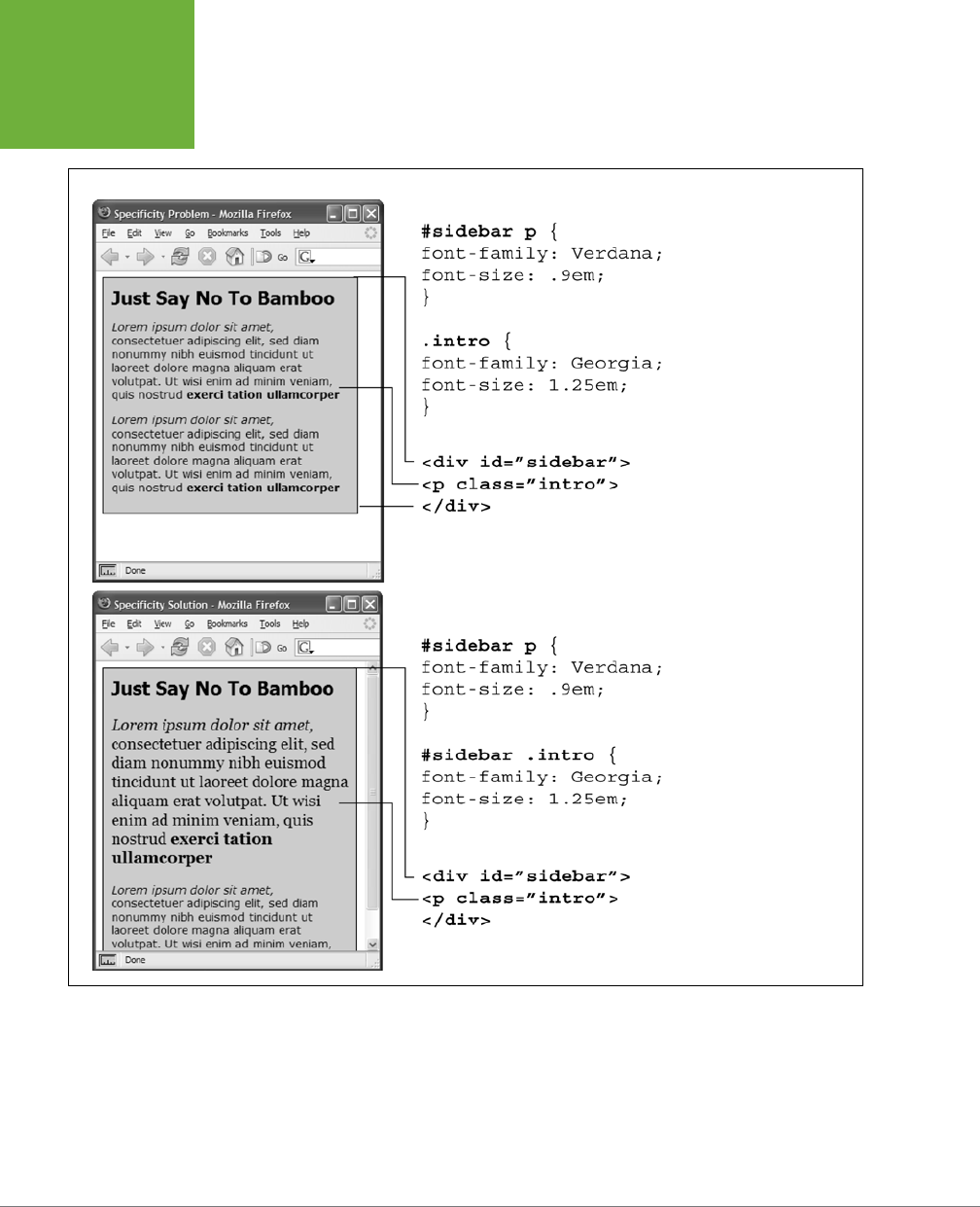
CSS3: THE MISSING MANUAL
112
CONTROLLING
THE CASCADE
FIGURE 5-4
Even though a class is ap-
plied to a specific tag—like
the first paragraph in the top
image—its properties may
not always have an effect.
In this case, the paragraph
is inside a
<div>
tag with
an ID of
#sidebar
, so the
descendent selector
#side-
bar p
is more specific
than the
.intro
class. The
solution: Make the
.intro
class more specific by adding
the ID before it—
#sidebar
p.intro
—as in the bottom
example.
However, simply tacking on additional selectors to make a style’s properties “win”
can lead to what’s been called
specificity wars
where you end up with style sheets
containing very long and convoluted style names like: #home #main #story h1. In
fact, as you’ll read on page 114, you should try to avoid these types of styles and
aim to keep your selectors as short as possible.
CHAPTER 5: MANAGING MULTIPLE STYLES: THE CASCADE 113
CONTROLLING
THE CASCADE
NOTE If you’re into math, the
#sidebar p
style has a specificity of 101 (100 for the ID, and 1 for the tag
selector), while the
.intro
style has a specificity of 10 (10 points for a class selector). Since 101 is greater than
10,
#sidebar p
takes precedence. Changing
.intro
to
#sidebar .intro
changes its specificity to 110.
Selective Overriding
You can also fine-tune your design by
selectively
overriding styles on certain pages.
Say you’ve created an external style sheet named
styles.css
that you’ve attached to
each page in your site. This file contains the general look and feel for your site—the
font and color of <h1> tags, how form elements should look, and so on. But maybe
on your home page, you want the <h1> tag to look slightly dierent than the rest of
the site—bolder and bigger, perhaps. Or the paragraph text should be smaller on the
home page, so you can wedge in more information. In other words, you still want
to use
most
of the styles from the
styles.css
file, but you simply want to override a
few properties for some of the tags (<h1>, <p>, and so on).
One approach is to simply create an internal style sheet listing the styles that you
want to override. Maybe the
styles.css
file has the following rule:
h1 {
font-family: Arial, Helvetica, sans-serif;
font-size: 24px;
color: #000;
}
You want the <h1> tag on the home page to be bigger and red. So just add the fol-
lowing style in an internal style sheet on the home page:
h1 {
font-size: 36px;
color: red;
}
In this case, the <h1> tag on the home page would use the font Arial (from the
external style sheet) but would be red and 36 pixels tall (from the internal style).
TIP Make sure you attach the external style sheet
before
the internal style sheet in the
<head>
section of
the HTML. This ensures that the styles from the internal style sheet win out in cases where the specificity of two
styles are the same, as explained on page 114.
Another approach would be to create one more external style sheet—
home.css
for
example—that you attach to the home page in addition to the
styles.css
style sheet.
The
home.css
file would contain the style names and properties that you want to
overrule from the
styles.css
file. For this to work, you need to make sure the
home
.css
file appears
after
the
styles.css
file in the HTML, like so:
<link rel="stylesheet" href="css/styles.css"/>
<link rel="stylesheet" href="css/home.css"/>

CSS3: THE MISSING MANUAL
114
CONTROLLING
THE CASCADE
TIP Another way to fine-tune designs on a page-by-page basis is to use different class names for the
<body>
tag of different types of pages—for example
.review
,
.story
,
.home
—and then create descendent selectors
to change the way tags on these types of pages look. This technique is discussed on page 67.
Avoiding Specificity Wars
As mentioned on page 112, many web designers these days avoid ID selectors in
favor of classes. One reason: ID selectors are very powerful, and, therefore, require
more power to override. This often leads to specificity wars in which style sheets get
loaded with unnecessarily long-winded and complicated selectors. This problem is
best explained by example. Say, for instance, your page has this snippet of HTML:
<div id="article">
<p>A paragraph</p>
<p>Another paragraph</p>
<p class="special">A special paragraph</p>
</div>
You decide that you want to colors the paragraphs inside the article div red, so you
create a descendent selector like this:
#article p { color: red; }
But you want that one paragraph with the class of special to be blue. If you simply
create a class selector, you won’t get what you want.
.special { color: blue; }
As you read on page 108, when determining which properties to apply to a tag, a web
browser uses a simple mathematical formula to deal with style conflicts: browsers
give an ID selector a value of 100, a class selector a value of 10, and a tag selector a
value of 1. Because the selector #article p is composed of one ID and one element
(a total of 101 specificity points), it overrides the simple class style—forcing you to
change the selector:
#article .special {color: blue; }
Unfortunately, this change causes two more problems. First, it makes the selector
longer, and second, now that blue color is applied only when the special class ap-
pears inside something with an ID of article. In other words, if you copy the HTML
<p class="special">A special paragraph</p> and paste it elsewhere in the page,
it will no longer be blue. In other words, the use of the ID makes your selectors both
longer and less useful.
Now look what happens if you simply replace all IDs with classes. The previous
HTML would change to:
<div id="article">
<p>A paragraph</p>
<p>Another paragraph</p>
<p class="special">A special paragraph</p>
</div>

CHAPTER 5: MANAGING MULTIPLE STYLES: THE CASCADE 115
CONTROLLING
THE CASCADE
And you could change the CSS to this:
.article p { color: red; }
p.special { color: blue; }
The first style—.article p—is a descendent selector worth 11 points. The second
style p.special is also worth 11 points (one tag and one class) and means “apply the
following properties to any paragraph with the special class.” Now if you cut that
HTML and paste it anywhere else on the page, you’d get the blue styling you’re after.
This is just one example, but it’s not hard to find style sheets with ridiculously long
selectors like #home #article #sidebar #legal p and #home #article #sidebar
#legal p.special.
There’s basically no reason to use IDs. They don’t provide anything that you can’t
have with a simple class selector or tag selector, and their powerful specificity can
only lead you to unnecessarily complex style sheets.
NOTE For a more detailed discussion of why you should avoid ID selectors, visit
http://csswizardry
.com/2011/09/when-using-ids-can-be-a-pain-in-the-class
.
Starting with a Clean Slate
As discussed on page 96, browsers apply their own styles to tags: for example, <h1>
tags are bigger than <h2> tags, and both are bold, while paragraph text is smaller
and isn’t bold; links are blue and underlined; and bulleted lists are indented. There’s
nothing in the HTML standard that defines any of this formatting: Web browsers
just add this formatting to make basic HTML more readable. However, even though
browsers treat all tags roughly the same, they don’t treat them identically.
For example, Safari and Firefox use the padding property to indent bulleted lists, but
Internet Explorer uses the margin property. Likewise, you’ll find subtle dierences in
the size of tags across browsers and an altogether confusing use of margins among
the most common web browsers. Because of these inconsistencies, you can run into
problems where, for instance, Firefox adds a top margin, while Internet Explorer
doesn’t. These types of problems aren’t your fault—they stem from dierences in
the built-in browser styles.
To avoid cross-browser inconsistencies, it’s a good idea to start a style sheet with
a clean slate. In other words, erase the built-in browser formatting and supply your
own. The concept of erasing browser styling is called
CSS reset
. This section gives
you a working introduction.
In particular, there’s a core set of styles you should include at the top of your style
sheets. These styles set a baseline for properties that commonly are treated dier-
ently across browsers.
Here’s a bare-bones CSS reset:

CSS3: THE MISSING MANUAL
116
CONTROLLING
THE CASCADE
html, body, div, span, object, iframe, h1, h2, h3, h4, h5, h6, p, blockquote,
pre, a, abbr, acronym, address, big, cite, code, del, dfn, em, img, ins, kbd,
q, s, samp,small, strike, strong, sub, sup, tt, var, b, u, i, center, dl, dt,
dd, ol, ul, li, fieldset, form, label, legend, table, caption, tbody, tfoot,
thead, tr, th, td, article, aside, canvas, details, embed, figure, figcaption,
footer, header, hgroup, menu, nav, output, ruby, section, summary, time, mark,
audio, video {
margin: 0;
padding: 0;
border: 0;
font-size: 100%;
vertical-align: baseline;
}
article, aside, details, figcaption, figure, footer, header, hgroup, menu,
nav, section {
display: block;
}
body {
line-height: 1.2;
}
ol {
padding-left: 1.4em;
list-style: decimal;
}
ul {
padding-left: 1.4em
list-style: square;
}
table {
border-collapse: collapse;
border-spacing: 0;
}
NOTE The above CSS reset is adapted from Eric Meyer’s well-known and influential CSS reset, which you
can find at
http://meyerweb.com/eric/tools/css/reset
.
The first style is a very long group selector (page 84) that takes the most common
tags and
zeros them out
—removing all the padding and margins, setting their base
text size to 100%, and removing bold text formatting. This step makes your tags
look pretty much identical (see Figure 5-5), but that’s the point—you want to start
at zero and then add your own formatting so that all browsers apply a consistent
look to your HTML.
The second selector (article, aside, details…) is another group selector that
helps older browsers correctly display the new HTML5 tags. The third selector (body)

CHAPTER 5: MANAGING MULTIPLE STYLES: THE CASCADE 117
TUTORIAL: THE
CASCADE IN
ACTION
style sets a consistent line-height (space between lines in a paragraph). You’ll learn
about the line-height property in the next chapter.
NOTE You don’t have to type all this code yourself. You’ll find a file named
reset.css
in the
05
tutorial folder
at
www.sawmac.com/css3
that contains a basic CSS reset file. Just copy the styles from this file and paste them
into your own style sheets. Another approach to resets (discussed on page 551) is available in the Chapter 17
tutorial files inside the
17
folder.
The fourth and fifth styles (the ol and ul tag styles) set a consistent left margin and
style (page 173 introduces list styling), and the last style makes adding borders to
table cells easier (you’ll learn why this style is useful on page 380).
Tutorial: The Cascade in Action
In this tutorial, you’ll see how styles interact and how they can sometimes conflict
to create unexpected results. First, you’ll look at a basic page that has the CSS reset
styles mentioned above plus a couple of other styles that provide some simple layout.
Then, you’ll create two styles and see how some properties are inherited and how
others are overruled by the cascade. Then, you’ll see how inheritance aects tags
on a page and how a browser resolves any CSS conflicts. Finally, you’ll learn how to
troubleshoot problems created by the cascade.
To get started, you need to download the tutorial files located on this book’s com-
panion website at
www.sawmac.com/css3
. Click the tutorial link and download the
files. All of the files are enclosed in a zip archive, so you’ll need to unzip them first.
(Go to the website for detailed instructions on unzipping the files.) The files for this
tutorial are contained inside the folder named
05
.
Resetting CSS and Styling from Scratch
First, take a look at the page you’ll be working on.
1. In a web browser, open the file named
cascade.html
located in the
05
tutorial folder (see Figure 5-5).
The page doesn’t look like much—two columns, one with a blue background
and a lot of same-looking text. There are a few styles already applied to this
file, so open the CSS up in a text editor and have a look.
2. Using your favorite text or web page editor, open the file
styles.css
located
in the
05
folder.
This file is the external style sheet that the
cascade.html
file uses. It has several
styles already in it—the first group is the CSS reset styles discussed on the
previous page. They eliminate the basic browser styles, which is why all of the
text currently looks the same. (You’ll create your own styles to make this page
look great soon.)
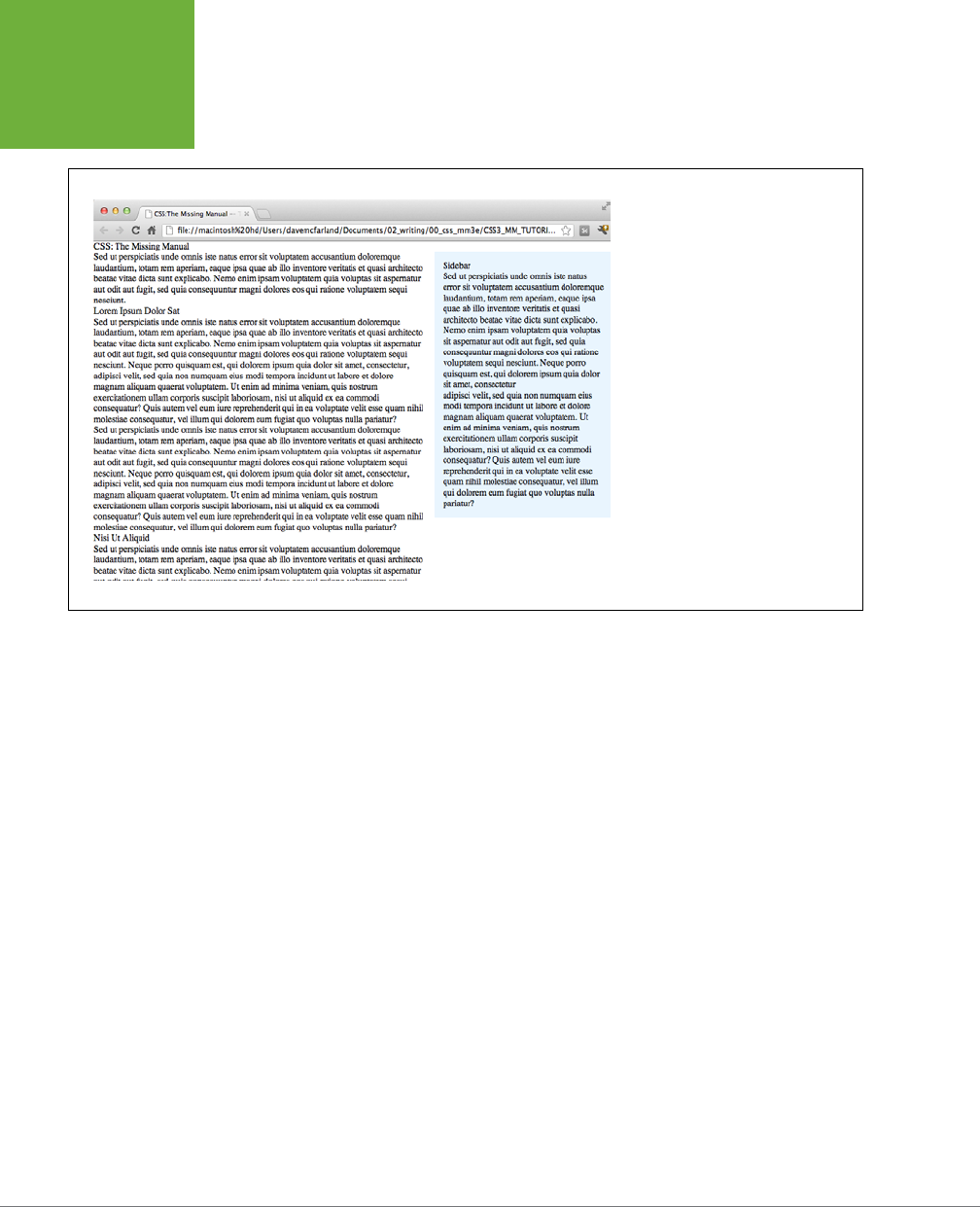
CSS3: THE MISSING MANUAL
118
TUTORIAL: THE
CASCADE IN
ACTION
FIGURE 5-5
The basic “CSS reset” styles on this
page eliminate the subtle differences
in how different browsers display basic
HTML tags. They also eliminate any
difference between how the tags look.
Your job is to take this empty canvas
and style the tags so they look the way
you want them to.
The last two styles—the class styles .main and .sidebar—create the two col-
umns you see in Figure 5-5. The HTML is divided into two <div> tags, each with
its own class. The class styles here essentially position the two divs so they
appear side-by-side as columns (you’ll learn how to control page layout and
create columns in Part 3).
You’ll first add a couple of styles to improve the page’s basic appearance and
its top headline.
3. In the
styles.css
file, add these two styles at the bottom of the style sheet
following the last } of the .sidebar style:
body {
color: #B1967C;
font-family: "Palatino Linotype", Baskerville, serif;
padding-top: 115px;
background: #CDE6FF url(images/bg_body.png) repeat-x;
width: 800px;
margin: 0 auto;
}
h1 {
font-size: 3em;
font-family: "Arial Black", Arial, sans-serif;
margin-bottom: 15px;
}
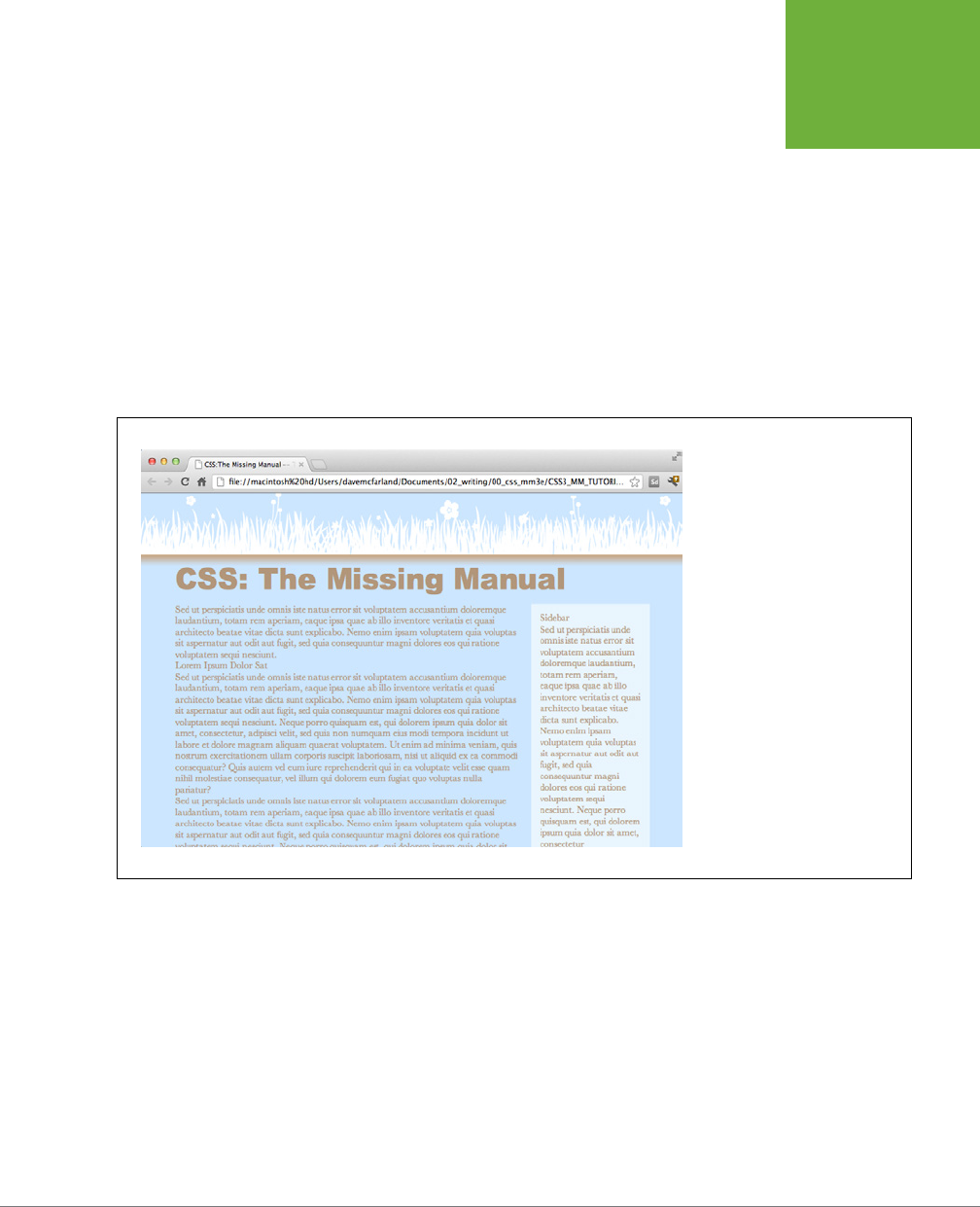
CHAPTER 5: MANAGING MULTIPLE STYLES: THE CASCADE 119
TUTORIAL: THE
CASCADE IN
ACTION
The first style adds a background image and color to the page, and also sets
a fixed width for the page. If you save this file and preview the
cascade.html
file in a web browser (see Figure 5-6), you’ll notice that these attributes aren’t
inherited by the other tags—the same image, for example, isn’t repeated behind
the heading or paragraph tags.
The font-family and color properties, on the other hand, are inherited, so
other tags on the page now use that font and have a brownish color. However,
you’ll see that although the top headline is the same color as the other text
on the page, it uses a dierent font—here’s the cascade in action. The h1 tag
style doesn’t have a color assigned to it, so that the heading inherits the brown
color applied to the body tag. But, since the h1 tag style specifies a font family,
it overrides the inherited font from the body tag style.
FIGURE 5-6
Inheritance and the cascade in
action: the
<h1>
tag at the top
of this page inherits its font color
from the body tag style, but gets
its size and font family from the
specific
h1
tag style.
Creating a Hybrid Style
In this example, you’ll create two styles. One style formats all the second level head-
lines of the page; and another, more specific style reformats just those headings in
the larger, main column of the page.
1. In the
styles.css
file, add the following style to the end of the style sheet:
h2 {
font-size: 2.2em;
color: #AFC3D6;
margin-bottom: 5px;
}

CSS3: THE MISSING MANUAL
120
TUTORIAL: THE
CASCADE IN
ACTION
This style simply changes the text color and increases the size of the h2 tag and
adds a little bit of space below it. If you view the file in a web browser, you’ll
see that the h2 tags in the main column and the one h2 tag in the right sidebar
now look alike.
Next, you’ll create a style to just format the second-level headlines in the main
column.
2. Return to your web page editor and the
styles.css
file, click directly after the
end of the new <h2> tag style, and press Enter (Return) to create an empty
line. Add the following style:
.main h2 {
color: #E8A064;
border-bottom: 2px white solid;
background: url(images/bullet_flower.png) no-repeat;
padding: 0 0 2px 80px;
}
You’ve just created a descendent selector that formats all <h2> tags that appear
inside
of a tag with a class of main applied to it. The two columns of text on this
page are enclosed in <div> tags with dierent class names applied to them.
The larger, left-hand column has the class main, so this particular style will only
apply to the <h2> tags in that div.
This style is similar to the one you created in the tutorial for Chapter 2 in Step
17 on page 52—it adds an underline and a simple flower icon to the headline.
This style also specifies an orange color for the text.
3. Save the style sheet and preview the page once again in a web browser
(see Figure 5-7).
You’ll notice that all of the heading 2 tags (the two in the main column and one
in the sidebar) are the same size, but the two in the main column also have the
underline and flower icon.
Because the .main h2 style is more specific than the simple h2 style, if there
are any conflicts between the two styles—the color property, in this case—the
.main h2 properties win out. So, although the second-level headlines in the main
column get a blue text color from the h2 style, the orange color from the more
specific .main h2 style wins out.
However, since the .main h2 style doesn’t specify a font size or bottom margin,
the headlines in the main column get those properties from the h2 style.
Overcoming Conflicts
Because of how CSS properties sometimes conflict when several styles apply to
the same tag, you’ll sometimes find your pages don’t look exactly as you planned.
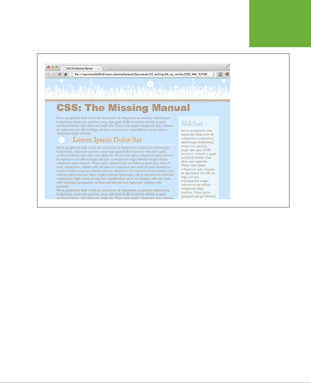
CHAPTER 5: MANAGING MULTIPLE STYLES: THE CASCADE 121
TUTORIAL: THE
CASCADE IN
ACTION
FIGURE 5-7
A tale of two styles: both
the
h2
and .main
h2
styles apply to the second-
level headlines in the
left column of this page.
However, the
.main
h2
style applies to just
those headlines inside the
main (left) column. Also,
since that style is more
powerful than the basic
h2
tag style, it overrides
any conflicts between the
two styles, in this case,
using an orange text color
instead of the blue color of
the
h2
tag style.
When that happens, you’ll need to do a little work to find out why and rejigger your
CSS selectors to make sure the cascade is working to produce the results you want.
1. Return to your web page editor and the
styles.css
file.
You’ll now create a new style to format just the paragraphs in the main column
of the page.
2. Add the following style to the end of the style sheet:
.main p {
color: #616161;
font-family: "Palatino Linotype", Baskerville, serif;
font-size: 1.1em;
line-height: 150%;
margin-bottom: 10px;
margin-left: 80px;
}
This style changes the color, size, and font of the text, spreads the lines of text
out (the line-height property), and adjusts the bottom and left margins of
the paragraphs.

CSS3: THE MISSING MANUAL
122
TUTORIAL: THE
CASCADE IN
ACTION
The page would look better if you highlighted the paragraph immediately follow-
ing the headline—making it bigger and bolder can help make a more powerful
message. The easiest way to style just that one paragraph is to create a class
style and apply it to that paragraph.
3. Add one last style to the end of the style sheet:
.intro {
color: #6A94CC;
font-family: Arial, Helvetica, sans-serif;
font-size: 1.2em;
margin-left: 0;
margin-bottom: 15px;
}
This style changes the color, font, and size, and adjusts the margins a bit. All
you have to do is apply the class to the HTML.
4. Open the
cascade.html
file in your web page editor. Locate the <p> tag that
appears after <h1>CSS: The Missing Manual</h1> and directly below <div
class="main">, and then add the following class attribute:
<p class="intro">
5. Preview the page in a web browser.
And…the paragraph is completely unchanged. What gives? Following the rules of
the cascade, .intro is a basic class selector, while the .main p is a descendent
selector composed of both a class and a tag name. These add up to create a
more specific style, so its style properties overrule any conflict between it and
the .intro style.
In order to make the .intro style work, you need to give it a little juice by mak-
ing its selector more powerful.
6. Return to the
styles.css
file in your web page editor and change the name
of the style from .intro to p.intro.
Make sure there’s no space between the p and .intro. You’ve basically created
a tie—.main p—is one class and one tag selector, and p.intro is one tag and
one class. They both have a specificity value of 11, but because p.intro appears
after .main p in the style sheet, it wins the battle, and its properties apply to
the paragraph. (You could have created an even more specific style—.main
.intro—to overcome the conflict.)
7. Preview the page in a web browser (see Figure 5-8).
Voila! The paragraph changes to blue, with bigger text, a dierent font, and
no left margin. If you didn’t have a clear understanding of the cascade, you’d
be scratching your head wondering why that class style didn’t work the first
time around.
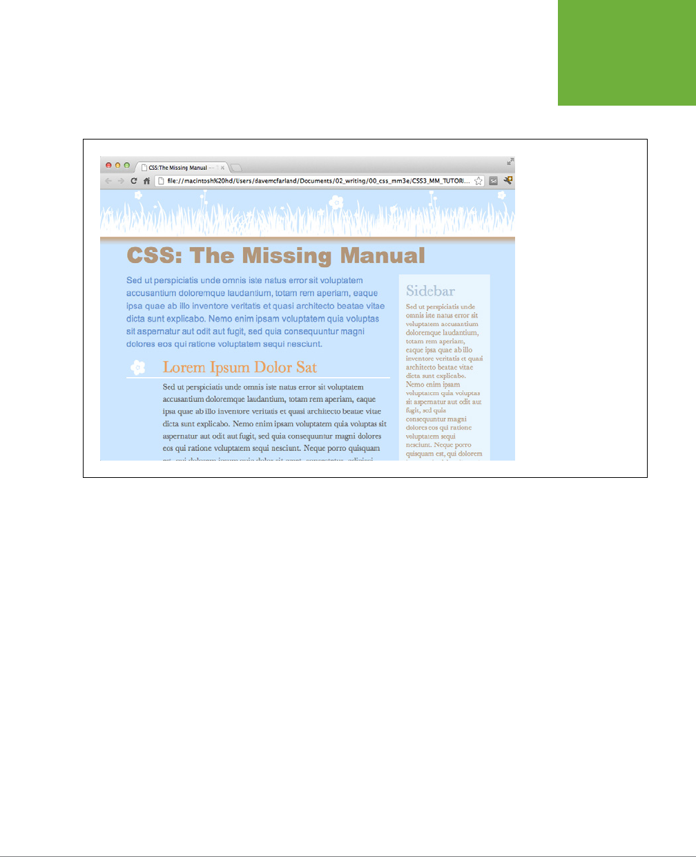
CHAPTER 5: MANAGING MULTIPLE STYLES: THE CASCADE 123
TUTORIAL: THE
CASCADE IN
ACTION
In this and the previous four chapters, you’ve covered the basics of CSS. Now, in Part
Two, it’s time to take that knowledge and apply it to real design challenges—making
web pages look great.
FIGURE 5-8
Even in a simple page
like this one, with just a
handful of styles, the look
of any one tag is often a
combination of properties
from various styles.


127
CHAPTER
6
Most websites still rely on words to get their messages across. Sure, people like
to look at photos, movie clips, and animations, but it’s the reading material
that keeps ’em coming back. People are hungry for Facebook updates, news,
gossip, how-to articles, recipes, FAQs, jokes, information lists, and even 140-character
tweets. With CSS, you can—and
should
—make your headlines and body text grab
a visitor’s attention as compellingly as any photo.
CSS oers a powerful array of text-formatting options, which let you assign fonts,
color, sizes, line spacing, and many other properties that can add visual impact to
headlines, bulleted lists, and regular old paragraphs of text (see Figure 6-1). This
chapter reveals all, and then finishes up with a tutorial where you can practice as-
sembling CSS text styles and put them to work on an actual web page.
Using Fonts
The first thing you can do to make text on your website look more exciting is to apply
dierent fonts to headlines, paragraphs, and other written elements on your pages.
To apply a font to a CSS style, you use the font-family property and specify the
font you wish to use. For example, say you want to use the Arial font for paragraphs
on a page. You can create a p tag style and use the font-family property like this:
p {
font-family: Arial;
}
Formatting Text
CSS3: THE MISSING MANUAL
128
USING FONTS
FIGURE 6-1
Good web typography makes sites that are easy to read
and enjoyable to look at. Using too many fonts or too many
typographic flourishes often leads to confusing and difficult
to understand web pages (top). Using different type sizes,
subtle style choices, and only a couple font variations
makes a page easy to scan, and fun to read (bottom).
Originally, the font-family property only worked if your site’s visitors had the same
font installed on their computers. In other words, using the above example, if some-
one visiting your site didn’t have Arial font on his computer, the page’s paragraphs
would display with the web browser’s default font (usually some variant of Times

CHAPTER 6: FORMATTING TEXT 129
USING FONTS
New Roman). Because of this, web designers were limited to a handful of fonts that
come preinstalled on most computers.
More recently, web browsers began supporting
web fonts
—fonts that the browser
downloads and uses while viewing your site. Web fonts use the font-family property
as well, but require an additional CSS command called the @font-face directive,
which instructs a web browser to download the specified font. Web fonts open up
many exciting design possibilities, letting you choose from a wild array of typefaces.
But, as you’ll learn on page 132, they also come with their own set of challenges.
In other words, as a web designer, you can choose to stick with the tried-and-true
font method—selecting fonts from the basic set installed on most computers—or use
web fonts for greater design choice (at the cost of more work). You’re not limited to
one approach or the other, either. Many web designers mix the two—using standard
fonts in some cases (like the main body text of a page) and web fonts in other cases
(to create eye-catching headlines, for instance).
Choosing a Common Font
When you use the font-family property to specify a font, visitors to your site won’t
necessarily see the font you choose—they must either have it installed on their com-
puters already or, in the case of web fonts, temporarily download the font to view
the site. Because you can’t always know whether your preferred font is available to
a particular visitor, it’s common practice to specify not only your main font, but also
a couple of back-up choices. If your viewer’s computer has your first-choice font,
then that’s what she’ll see. But when the first font isn’t installed, the browser looks
down the list until it finds a font that is. The idea is to specify a list of similar-looking
fonts that are common to a variety of operating systems, like so:
font-family: Arial, Helvetica, sans-serif;
In this example, a web browser first looks to see if the Arial font is installed; if it is,
then that font is used; if not, the browser next looks for Helvetica, and if that isn’t
installed, then it finally settles for a generic font—sans-serif. When you list a generic
font type (like sans-serif or serif), the viewer’s browser gets to choose the actual
font. But at least you can define its basic character.
NOTE In real life, when you put a CSS property into action, you must, of course, include all the other neces-
sities of a complete style declaration block and style sheet, as described in Chapter 2:
p { font-family:
Arial, Helvetica, sans-serif; }
, for example. When you see examples like
font-family:
Arial, Helvetica, sans-serif;
, remember that’s just the property in isolation, distilled down for
your book-reading benefit.
Also, if the font’s name is made up of more than one word, you must enclose it in
quote marks:
font-family: "Times New Roman", Times, serif;
CSS3: THE MISSING MANUAL
130
USING FONTS
Here are some often-used combinations of commonly installed fonts organized by
the type of font, including a generic font type at the end of each list.
SERIF FONTS
Serif fonts are best for long passages of text, as it’s widely believed that the serifs—
those tiny “feet” at the end of a letter’s main strokes—gently lead the eye from letter
to letter, making text easier to read. Examples of serif fonts are Times, Times New
Roman, and Georgia.
• “Times New Roman”, Times, serif
• Georgia, “Times New Roman”, Times, serif
• Baskerville, “Palatino Linotype”, Times, serif
• “Hoefler Text”, Garamond, Times, serif
Examples of these fonts are in Figure 6-2.
FIGURE 6-2
Fonts don’t always display
the same on Mac (left)
and Windows (right). The
two systems come with
different built-in fonts.
In addition, anti-aliasing,
which makes onscreen text
look smoother, is better on
the Mac than on Windows.
Windows includes a
technology called Clear
Type, which can improve
the look of text on a
screen. The quality of text
on Windows depends on
which Clear Type settings
your Windows computer
has. You can learn more
about Clear Type at
www.microsoft.com/
typography/cleartype
.
SANS-SERIF FONTS
Sans-serif fonts are often used for headlines, thanks to their clean and simple ap-
pearance. Examples of sans-serif fonts include Arial, Helvetica, and Verdana. The
text in this book is set in a sans-serif font.
• Arial, Helvetica, sans-serif
• Verdana, Arial, Helvetica, sans-serif
CHAPTER 6: FORMATTING TEXT 131
USING FONTS
• Geneva, Arial, Helvetica, sans-serif
• Tahoma, “Lucida Grande”, Arial, sans-serif
• “Trebuchet MS”, Arial, Helvetica, sans-serif
• “Century Gothic”, “Gill Sans”, Arial, sans-serif
Examples of sans-serif fonts are shown in Figure 6-3.
FIGURE 6-3
Sans-serif fonts on Mac (left) and
Windows (right). Some people
believe that you should use only
sans-serif fonts on web pages
because they think the delicate
decorative strokes of serif fonts
don’t display well on the coarse
resolution of a computer screen. In
the end, your aesthetic judgment
is your best guide. Pick the fonts
you think look best.
MONOSPACED AND FUN FONTS
Monospaced fonts are often used to display computer code like the CSS snippets
you see throughout this book. Each letter in a monospaced font is the same width
(like the ones manual typewriters used).
• “Courier New”, Courier, monospace
• “Lucida Console”, Monaco, monospace
• “Copperplate Light”, “Copperplate Gothic Light”, serif
• “Marker Felt”, “Comic Sans MS”, fantasy
Examples of these font lists are pictured in Figure 6-4.
ADDITIONAL FONTS TO CONSIDER
There are literally thousands of fonts, and every operating system ships with many
more fonts than are listed here. However, here are a few fonts that are very common
on both Macs and PCs, so you might want to give them a go:
• Arial Black
• Arial Narrow
• Impact
CSS3: THE MISSING MANUAL
132
USING WEB
FONTS
FIGURE 6-4
Monospaced fonts on Mac
(left) and Windows (right).
Courier is the most com-
mon monospaced font, but
you’re far from limited to
it. Lucida Console is very
common on Windows
and Macs, and Monaco is
installed on every Mac.
Be careful with Arial Black and Impact: They only have a single weight and don’t
include an italic version. Accordingly, if you use these fonts, make sure to set the
font-weight and the font-style (coming up on page 141) to normal. Otherwise, if
the text is bolded or italicized, the browser will make its best (read: ugly) guess at
what the text should look like.
Using Web Fonts
The traditional way of using fonts in CSS is straightforward: just specify the font you
want using the font-family property. However, you’re limited to fonts your visitors
likely to have installed on their computers. Fortunately, as mentioned earlier, all major
browsers now support web fonts. With web fonts, browsers actually download the
font from a web server and use it to display text on the web page.
The CSS part of web fonts is pretty basic and requires just two CSS commands:
• The @font-face directive is responsible for telling a web browser both the name
of the font and where to download the font from. You’ll learn how this CSS com-
mand works on page 137, but for now just keep in mind that this is how you tell
a browser to download the font.
• The font-family property is used with web fonts in the same manner as the
already installed fonts described on page 127. In other words, once the @font-
face directive instructs the browser to download the font, you can then assign
that font to any CSS style by using the font-family property.
In theory, web fonts aren’t all that dicult to use. However, when you dig into the
details, you’ll need to understand a few unique requirements to use them properly.

CHAPTER 6: FORMATTING TEXT 133
USING WEB
FONTS
NOTE Google offers a really easy method of using web fonts. Page 146 goes into all the details.
Font File Types
Believe it or not, Internet Explorer has had support for web fonts since version 5
(released over 12 years ago!). Unfortunately, it required a unique and dicult method
to create font formatting. That is, you couldn’t just take a regular font from your
computer, slap it up on a web server, and be done. Instead, you needed to take a
regular font and convert it to EOT—Embedded Open Type—format. That’s still true
for versions up through IE 8.
There are still other font formats used for web fonts—some of which work in some
browsers but not others. To make sure the largest number of visitors to your site
can enjoy the fonts you specify, you’ll need to provide those fonts in a variety of
formats (you’ll find the details on page 135).
Here’s a list of the dierent font types and which browsers they work in.
• EOT. Embedded Open Type fonts work only in Internet Explorer. You need a
special tool to convert a regular font to EOT format, but sites like FontSquirrel
(page 135) can do this for you.
• True Type and Open Type. If you look in your computer’s Fonts folder, you’ll
probably find .ttf (True Type) or .otf (Open Type) fonts. This is the font format
most commonly used for computer fonts. You can use these for word process-
ing and desktop publishing as well as for web pages. This font type has wide
support in most web browsers: IE 9 and later, Firefox, Chrome, Safari, Opera,
iOS Safari (version 4.2 and later), Android, and the Blackberry Browser.
• WOFF. Web Open Font Format files is a newer font format that’s designed
specifically for the Web. WOFF fonts are basically compressed versions of
TrueType or Open Type fonts. That means WOFF fonts are generally smaller in
file size and download more quickly than other fonts. WOFF format has wide
browser support as well, including IE 9 and later, Firefox, Chrome, Safari, Opera,
Blackberry browser, and iOS Safari version 5 and later. The most notable excep-
tion is Android. In other words, if you only use WOFF fonts, visitors on Android
mobile devices or using IE 8 won’t be able to download or display your fonts.
• SVG. Scalable Vector Graphic format isn’t a font format, per se. It’s actually a
way to create vector graphics (graphics that can scale without losing quality).
Support for SVG fonts is much more limited. Neither Internet Explorer nor Firefox
support SVG. Another problem with SVG is that it produces files that are often
twice the size of TrueType and three times the size of WOFF fonts. The only real
benefit of SVG is that it’s the only font format understood by older versions of
iOS running Safari version 4.1 or earlier.
CSS3: THE MISSING MANUAL
134
USING WEB
FONTS
Fortunately, you don’t have to select just one font type and ignore all other browsers.
As you’ll read on the next page, you can (and usually will) specify multiple formats
and let the browser download the one that works for it. In addition, you can down-
load a font that’s already been converted to these four formats, or even convert a
regular True Type font into these multiple formats.
NOTE A single font file contains just one weight and style for that font. In other words, if you want text
to be bold, italic, or bold and italic, you must download separate font files for each variation of the font. Some
fonts, especially fun display fonts, only include one variant and are best used for headlines or text where you
won’t need italic or bold versions. See page 129 for more information on different font weights and styles.
Legal Issues with Web Fonts
The second hurdle to using web fonts is a legal issue. Individuals and companies
create and sell these fonts, like other software, to make their livelihood. When you
upload a TrueType font to your web server for visitors to use while viewing your
site, anyone can simply download the font and start using it on her own website or
in her computer’s word processing or page layout program. Most font companies
don’t like the idea of people pirating their creations, so many fonts have licenses
that specifically prohibit their use on the Web.
In other words, even if you buy a font from Adobe, you can’t simply start using it on
your website. Many font companies are now oering dierent kinds of licenses (at
dierent prices) to allow for use on the Web. This even applies to fonts that come
supplied with your computer. You’re allowed to use them with the programs you
install on your computer, but you may not be allowed to place those same font files
on your web server to use as a web font. If you don’t know whether a font allows Web
use, you’re better o not using it and finding a font that can be used on the Web.
NOTE To sidestep any legal issues, you can use a font service like Google Fonts (page 146) or TypeKit, a
commercial web font service from Adobe (see the box on page 153).
Finding Web Fonts
When looking for web fonts, you’re confronted with two issues: finding fonts that
are legal to use on the Web and finding fonts in all the font formats (EOT, WOFF,
TrueType, and so on). While some font companies have begun to oer web licenses
for fonts you purchase, there is a wide assortment of free fonts available for Web
use. Here are a few of the many sources for free web fonts:
• The League of Movable Type (
www.theleagueofmoveabletype.com
). Com-
posed of a group of designers, this site was one of the first to oer free, hand-
crafted fonts for web use. Their font, League Gothic, is widely used on the Web.
• Exljbris font foundry (
www.exljbris.com
). Provides classic, free fonts by Jos
Buivenga: Museo, Museo Sans, and Museo Slab.
CHAPTER 6: FORMATTING TEXT 135
USING WEB
FONTS
• Fontex.org (
www.fontex.org
). Provides a large selection of free fonts, although
not all of them are licensed for commercial use. If you plan on using one of the
fonts on a commercial site (that is, not just your personal website), make sure
you read the license agreement that accompanies the downloaded font.
• The Open Font Library (
http://openfontlibrary.org
). Over 152 free fonts (at the
time of this writing) are available and all of them can be used on your websites
(just don’t use all 152 at once).
• Font Squirrel (
www.fontsquirrel.com
). A landmark site in the web font world
oering over 800 fonts. In addition to oering just fonts, Font Squirrel provides
what it calls “@font-face Kits” which are a collection of files including fonts in
all the major font formats, and a CSS file that includes all the necessary @font-
face syntax to load them (you’ll learn how to use @font-face yourself on page
137). In addition, Font Squirrel oers an online tool for converting a TrueType
or Open Type font to other font formats including EOT, SVG, and WOFF. You’ll
learn how to use this tool in the next section.
• Google Fonts (
www.google.com/webfonts
). Google provides a simple and
free way to include web fonts on your sites. You’ll learn how to use this service
in depth on page 146.
Generating Multiple Font Formats
Most of the sites oering free fonts provide the font in a single format (usually TrueType
(.ttf ) or Open Type (.otf). While many browsers support TrueType and Open Type,
not all do. In addition, the newer WOFF format is supported by most browsers and
has the advantage of being smaller in file size than TrueType. To make sure you sup-
ply fonts to as many browsers as possible, you need to use at least EOT, WOFF, and
TrueType fonts. And if you’re catering to iPhones running Safari version 4.1 or earlier,
you’ll need SVG fonts.
NOTE According to the web statistics site NetMarketShare, Safari 4.1 and earlier represent less than 2
percent of all mobile web browsers. You can read the article at
www.netmarketshare.com/browser-market-share
.aspx?qprid=2&qpcustomd=1
.
Fortunately, Font Squirrel provides a very useful online tool to help generate the
required font formats. The @font-face Generator located at
www.fontsquirrel.com/
fontface/generator
provides a simple method for creating not only the proper fonts,
but also a sample HTML file and a basic CSS style sheet.
To use Font Squirrel’s @font-face Generator:
1. Locate a TrueType (.ttf) or Open Type (.otf) font.
Use one of the sites listed in the previous section, or find a font from another
site. Just make sure that the font is licensed for use as a web font. If it’s not, or
you’re not sure, then skip it and find another font.

CSS3: THE MISSING MANUAL
136
USING WEB
FONTS
2. Go to the @font-face Generator at
www.fontsquirrel.com/fontface/
generator
.
It’s a simple page with just a few options (see Figure 6-5).
3. Click the Add fonts button (#1 in Figure 6-5).
Your browser opens a “Select files” dialog box.
4. Select one or more fonts from your computer and click the Open button.
Your browser uploads the file or files to the Font Squirrel server.
5. Select a conversion option (#2 in Figure 6-5).
• Basic simply converts the font to EOT, WOFF, and SVG formats.
• Optimal is a better choice since it not only converts the font but also makes
other enhancements to improve the performance and speed of the fonts.
• Expert lets you tweak every last setting for the conversion. For example, it
lets you create a
subset
of the font—that is, just a handpicked set of charac-
ters. In other words, you could exclude from the font file certain characters
you’re not using, like the semicolon, exclamation mark, or letter Q.
In all likelihood, you’ll want access to all characters, so it’s best to stick with
the Optimal.
6. Turn on the “Yes, the fonts I’m uploading are legally eligible for web em-
bedding” checkbox (#3 in Figure 6-5).
As mentioned on page 134, fonts are intellectual property, and just slapping
one up on a web server promotes software piracy. Make sure your fonts can be
used on the Web; most of the ones listed in this section are.
7. Click the Download Your Kit button (#4 in Figure 6-5).
Depending on the number of fonts you’re converting and their complexity, the
download process may take a while. The Font Squirrel server needs to take the
font and perform its magic to generate each font format. When it’s done, you’ll
download a folder containing the various font format files, a demo file, a CSS
file, and a few other miscellaneous files. The most important are, of course, the
.eot, .ttf, .wo, and .svg font files.
Now that you’ve got the fonts you wish to use, it’s time to learn how to use them
with CSS’s @font-face directive.
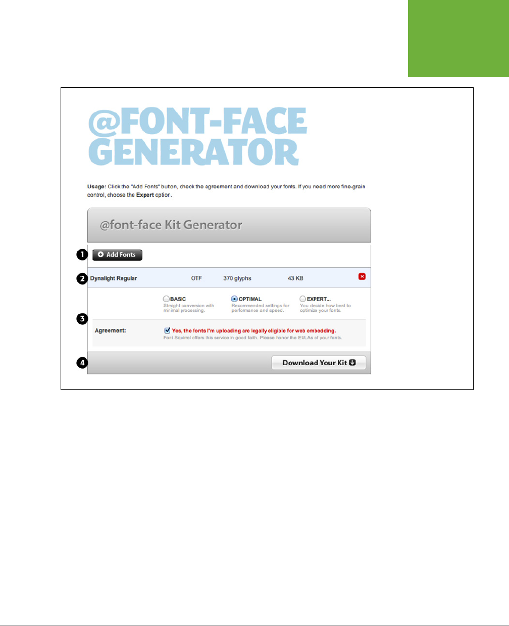
CHAPTER 6: FORMATTING TEXT 137
USING WEB
FONTS
FIGURE 6-5
Unless you know what
you’re doing, stick with
Font Squirrel’s Optimal
conversion setting. It
generates all the font
formats you’ll need and
makes a few other adjust-
ments to make the fonts
load faster and look better
onscreen. But for ultimate
control, choose the Expert
option, and you’ll see a list
of nearly a dozen settings
you can use to alter how
the fonts are generated.
Using the @font-face Directive
Once you’ve downloaded the proper font files, it’s time to use them. First, copy the
files to the location on your computer where you keep the files for your website.
Many web designers create a dedicated folder at the site root folder named fonts,
_fonts, or webfonts. Alternatively, if you have a folder for your CSS files, you can
place the font files there. It doesn’t really matter where you put these files on your
site, but it helps to be organized.
The secret to web fonts is a CSS command called the @font-face directive. This
command at its most basic names the font and tells the browser where to find the
font file for download. You place the @font-face directive in your style sheet, just
like a regular style. For example, say you’re using the League Gothic font. You have
a True Type file named
League_Gothic-webfont.ttf
inside a fonts folder on your site.
You’d instruct a browser to download this font by adding the @font-face directive
to your style sheet like this:

CSS3: THE MISSING MANUAL
138
USING WEB
FONTS
@font-face {
font-family: "League Gothic";
src: url('fonts/League_Gothic-webfont.ttf');
}
The first property, font-family, you’ve seen before (page 127), but here it has a
dierent purpose. When used inside an @font-face directive, font-family assigns a
name to the font. You then use that font name when you want to apply that font to
a style. For example, say you want to use the League Gothic font for all paragraphs
on a page. You could then use this style:
p {
font-family: "League Gothic";
}
NOTE You use one
@font-face
directive for each font you wish to use. If you have three fonts, you need
three
@font-face
directives. It’s a good idea to keep them grouped together and place them at the top of
your style sheet, so a browser can begin downloading them immediately.
The second attribute—the src property—tells the browser where to look for the
font file on the server. You place the path from the style sheet to the font file on the
system inside quote marks and inside url( ). The path works just like other HTML
file paths—for instance, paths to images, links, and JavaScript files. For example, say
you had a style sheet inside a folder named _styles and a font file named my_font
.ttf inside a folder named _fonts. Both folders are in the root of your site. So the
path from the style sheet to the font file is ../_fonts/my_font.ttf. You’d write an
@font-face directive for that font like this:
@font-face {
font-family: "My Font";
src: url('../_fonts/my_font.ttf');
}
You’ve probably noticed that in the examples above, there’s only a single font file—a
TrueType font. That makes it easy to see how @font-face works in general, before
jumping into more detail. As discussed earlier, @font-face lets you specify multiple
files with dierent font types. Unfortunately, due to browser bugs, the syntax for
all that is a bit complicated. For example, say you want to use all the dierent font
formats for League Gothic on your site. Here’s how to rewrite the above code:
@font-face {
font-family: 'League Gothic';
src: url('fonts/League_Gothic-webfont.eot');
src: url('fonts/League_Gothic-webfont.eot?#iefix') format('embedded-openty-
pe'),
url('fonts/League_Gothic-webfont.woof') format('woff'),
url('fonts/League_Gothic-webfont.ttf') format('truetype'),
url('fonts/League_Gothic-webfont.svg') format('svg');
}
CHAPTER 6: FORMATTING TEXT 139
USING WEB
FONTS
This looks messy, and unfortunately, due to a bug in IE, it’s unnecessarily complicated.
Here’s how it breaks down:
• Line 2 is the same as before. The font-family property supplies the name of
the font; the same name you’ll use when applying the font to your CSS styles.
• Line 3 is for Internet Explorer 9, but only when it’s in Compatibility mode—a
mode where IE 9 acts like it’s IE 8. This weird feature was added to IE 9 so that
websites designed to correctly accommodate the bugs in IE 8 and earlier would
look OK in IE 9. A user has to purposely switch to compatibility mode in IE 9,
so you’re probably safe leaving this out.
• Line 4 begins a second src property, which according to the rules of the
@font-face directive, can have multiple font type specified. The first font is the
.eot font again, but this time you’ll see that at the end of the .eot file, you need
to add ?#iefix. This is to accommodate yet more IE bugs—this time for IE 6–8.
If you don’t add that little bit to the URL following the .eot, then the font may
not display in IE 8 or earlier correctly.
You’ll also notice that after the URL there’s some new code:
format('embedded-opentype')
This indicates the font format, and you add this after each URL for a dierent
font format.
• Lines 5–7 simply identify additional font formats. This is actually just one
property—the src property—split over several lines for greater readability. For
each font type you specify for the src property, you add a URL, a format, and
a comma (for all but the last font):
url('fonts/League_Gothic-webfont.woof') format('woff'),
NOTE At the end of the list of files for the
src
property, you add a semicolon to note that you’ve reached
the end of the
src
property (line 7 above). Don’t forget this final semicolon, or the
@font-face
directive
won’t work.
Even though a browser may understand dierent types of fonts (for example,
Chrome can use WOFF, TrueType, and SVG fonts), it won’t download all the font
files. Instead, as it reads through the list of font types, the browser downloads
only the first one it understands. In other words, if Chrome encountered the
above code, it would skip the .eot file since it doesn’t understand that font
format, but would download the .woof file. It would then skip the TrueType and
SVG files entirely. That means the order in which you list the fonts is important.
WOOF is generally preferred since it’s a smaller file that downloads more quickly,
while SVG is generally much larger file, so you want to make sure that you list
the fonts in the order of .eot, .woof, .ttf, and .svg.
CSS3: THE MISSING MANUAL
140
USING WEB
FONTS
NOTE The above
@font-face
syntax is the result of a lot of testing and troubleshooting on the part
of many talented web professionals. You can read about its evolution on the following blog posts:
http://www
.fontspring.com/blog/further-hardening-of-the-bulletproof-syntax
,
http://www.fontspring.com/blog/the-new-
bulletproof-font-face-syntax
, and
http://paulirish.com/2009/bulletproof-font-face-implementation-syntax/
.
Creating Styles Using Web Fonts
The hardest part of web fonts is getting the font files in the proper format and set-
ting up the @font-face directives. Once that’s done, you use web fonts just as you
would the preinstalled fonts discussed on page 127. In other words, when you create
a new style, you simply use the font-family property and supply the name for the
font you used in the @font-face directive. For example, in the previous code, the
@font-face directive names the new font League Gothic (line 2 on page 138). This
is the name you use when applying this font to a style. To make all h1 tags use the
League Gothic font, you could write this style:
h1 {
font-family: 'League Gothic';
font-weight: normal;
}
Notice that there’s a new property—font-weight—listed here. Browsers normally
display <h1> tags as bold. Most browsers will artificially bold a web font when a
submibold version is required. This results in an ugly boldface. Setting the font-
weight to normal tells the browser to just use the League Gothic font “as-is,” and
avoids trying to bold it. In the next section, you’ll learn more about how to deal with
font variants like bold and italic with web fonts.
It’s also a good idea to include a list of backup, preinstalled fonts, in case the
browser can’t load the web font. This is the same technique described on page 129.
For example:
h1 {
font-family: 'League Gothic', Arial, sans-serif;
font-weight: normal;
}
TIP You can use fonts that contain symbols and icons on a web page, too. So rather than creating a graphic
of a warning sign (for example) and placing it inside a paragraph of text, you can use the
@font-face
direc-
tive to load a font containing the warning sign icon and just use a simple letter (mapped to the icon in the font).
Here are a few resources on using icon fonts:
http://css-tricks.com/flat-icons-icon-fonts/
,
http://css-tricks.com/
html-for-icon-font-usage/
and
http://css-tricks.com/examples/IconFont/
.
Dealing with Bold and Italic Variants
The common fonts installed on computers include variations in style and weight,
so when you apply a <strong> tag in HTML, a web browser uses the bold version of
that font; likewise, when you apply an <em> tag to text, the browser uses an italicized

CHAPTER 6: FORMATTING TEXT 141
USING WEB
FONTS
version of that font; and if you combine both tags, you’ll see a bold and italic ver-
sion of the font. These are actually dierent fonts contained in dierent font files.
With the original method of using fonts in web pages (described on page 129), you
never have to worry about these dierent fonts, since the browser uses the correct
version automatically.
However, with web fonts, you need separate font files for each font variant. So, for
body text you’ll need at least a regular version of a font, a bold version, an italic
version, and a bold/italic version. Keep this in mind when finding a web font for your
site; some fonts only have a single weight and no italic version. This could be fine
for a headline, but not much use for long paragraphs of text, which most likely will
have some italic and bold text. In addition, you must create separate @font-face
directives for each font variant.
You have two choices when working with italic/bold versions of web fonts. One
method is easier to implement but doesn’t work on Internet Explorer 8 or earlier
(or IE 9 in compatibility mode); the other is more labor intensive but works on older
versions of Internet Explorer.
THE EASY WAY TO ADD BOLD AND ITALIC
The easiest way to add bold and italic variants of your fonts is to add font-weight
and font-style properties to the @font-face directive. Normally, the CSS font-
weight property (page 140) tells a browser to display a font in bold, normal, or one
of several other weights, while the font-style property (page 141) tells a browser
to display a font as italic or normal. However, when used within the @font-face
directive, font-style tells a browser to apply the font when the style asks for a
particular variant of the font.
Say you have a font named PTSans. You start with the normal, non-bold, non-italic
version of the font. The various font formats begin with PTSansRegular (PTSan-
sRegular.eot, PTSansRegular.ttf, and so on). In your style sheet, you’d add this @
font-face directive:
@font-face {
font-family: 'PTSans';
src: url('PTSansRegular.eot');
src: url('PTSansRegular.eot?#iefix') format('embedded-opentype'),
url('PTSansRegular.woof') format('woff'),
url('PTSansRegular.ttf') format('truetype'),
url('PTSansRegular.svg') format('svg');
font-weight: normal;
font-style: normal;
}
Notice the following:
• You use a generic name for the font family—PTSans in line 2 above—instead of
the specific name for that font file—PTSansRegular.
CSS3: THE MISSING MANUAL
142
USING WEB
FONTS
• The font-weight is set to normal, since this isn’t a bold version of the font (line 8).
• The font-style is set to normal, since this isn’t an italic version of the font (line 9).
NOTE The code examples here assume that the font files PTSansRegular.eot, PTSansBold.eot, and so on are
in the same folder as the style sheet. If they were in different folders, you’d need to adjust the URL to accurately
point to the location of the font files in relation to the style sheet.
Now, say you had an italicized version of the font—the file name begins with
PTSansItalic. You’d then add this to your style sheet:
@font-face {
font-family: 'PTSans';
src: url('PTSansItalic.eot');
src: url('PTSansItalic.eot?#iefix') format('embedded-opentype'),
url('PTSansItalic.woof') format('woff'),
url('PTSansItalic.ttf') format('truetype'),
url('PTSansItalic.svg') format('svg');
font-weight: normal;
font-style: italic;
}
You use the same font-family name in line 2—PTSans. However, you change the
font-style to italic (line 9). This tells the browser that the font you’re specifying is
the italic version of the PTSans font. You’d add similar @font-face directives for the
bold and the bold/italic versions like this:
@font-face {
font-family: 'PTSans';
src: url('PTSansBold.eot');
src: url('PTSansBold.eot?#iefix') format('embedded-opentype'),
url('PTSansBold.woof') format('woff'),
url('PTSansBold.ttf') format('truetype'),
url('PTSansBold.svg') format('svg');
font-weight: bold;
font-style: normal;
}
@font-face {
font-family: 'PTSans';
src: url('PTSansBoldItalic.eot');
src: url('PTSansBoldItalic.eot?#iefix') format('embedded-opentype'),
url('PTSansBoldItalic.woof') format('woff'),
url('PTSansBoldItalic.ttf') format('truetype'),
url('PTSansBoldItalic.svg') format('svg');
font-weight: bold;
font-style: italic;
}

CHAPTER 6: FORMATTING TEXT 143
USING WEB
FONTS
In other words, you need four @font-face directives to cover all variants of bold,
italic, and regular text: notice that the font-family name is the same in each case;
only the src properties change (to point to the dierent files) and the font-weight
and font-style properties change.
The benefit of this method is that you can apply the regular font to text, apply
<em> and <strong> tags to your HTML, and let the browser worry about which font
file to load and use. In this example, if you want to use the PTSans font on all your
paragraphs, you’d simply add this style to your style sheet:
p {
font-family: PTSans;
}
Then you can mark up your paragraph tags with HTML. For example, you might
have a paragraph like this:
<p>When I was younger, I could remember <em>anything<em>, whether it had hap-
pened or <strong>not<strong> -- <strong><em>Mark Twain</em></strong></p>
When the web browser reads the style sheet (with the four @font-face directives
and the p tag style), it would display most of the paragraph using the PTSansRegular
font. However, the word “anything” contained inside the <em> tags would use the
PTSansItalic font; the word not inside the <strong> tags would use the PTSansBold
font; and “Mark Twain” inside both <strong> and <em> tags would use the PTSans-
BoldItalic font.
These directives even work for headlines. If you created a style to format all h1 tags
with PTSans, you could create this style:
h1 {
font-family: PTSans;
}
With this style in place, a web browser would actually use the bold version of
PTSans, since headlines are normally displayed in bold. (When you use this technique
involving multiple variations of a font, you should not add font-weight: normal;,
as described on page 140.)
Unfortunately, Internet Explorer 8 and earlier don’t understand this method and
will use the PTSansRegular font for all of the text. IE will create faux-italic and faux-
bold for the <em> and <strong> tags; that is, it will slant the PTSansRegular font on
screen for italic, and make the PTSansRegular font thicker for bold. The resulting
computer-generated bold and italic usually look pretty bad.
NOTE This chapter’s tutorial files include examples of both techniques for including bold and italic versions
of fonts. Look inside the
webfonts-demo
folder. The file
webfonts.html
uses the technique outlined on page 140,
while the
webfonts-ie-safe.html
file uses the technique described next.

CSS3: THE MISSING MANUAL
144
USING WEB
FONTS
ADDING BOLD AND ITALIC AND SUPPORTING INTERNET EXPLORER 8
If you’re still supporting Internet Explorer 8 (or earlier), the previous solution to bold
and italic won’t work so well. You can get font variants to work in IE 8, but it requires
a bit more work. To begin with, you still create four @font-face directives, one for
each variant of the font. However, instead of giving them the same font-family
name (PTSans, for example), you give each one its unique name (PTSansRegular,
PTSansItalic, and so on). In other words, you’d rewrite the four @font-face direc-
tives like this:
@font-face {
font-family: 'PTSansRegular';
src: url('PTSansRegular.eot');
src: url('PTSansRegular.eot?#iefix') format('embedded-opentype'),
url('PTSansRegular.woof') format('woff'),
url('PTSansRegular.ttf') format('truetype'),
url('PTSansRegular.svg') format('svg');
}
@font-face {
font-family: 'PTSansItalic';
src: url('PTSansItalic.eot');
src: url('PTSansItalic.eot?#iefix') format('embedded-opentype'),
url('PTSansItalic.woof') format('woff'),
url('PTSansItalic.ttf') format('truetype'),
url('PTSansItalic.svg') format('svg');
}
@font-face {
font-family: 'PTSansBold';
src: url('PTSansBold.eot');
src: url('PTSansBold.eot?#iefix') format('embedded-opentype'),
url('PTSansBold.woof') format('woff'),
url('PTSansBold.ttf') format('truetype'),
url('PTSansBold.svg') format('svg');
}
@font-face {
font-family: 'PTSansBoldItalic';
src: url('PTSansBoldItalic.eot');
src: url('PTSansBoldItalic.eot?#iefix') format('embedded-opentype'),
url('PTSansBoldItalic.woof') format('woff'),
url('PTSansBoldItalic.ttf') format('truetype'),
url('PTSansBoldItalic.svg') format('svg');
}
Notice that each @font-face directive has its one family name—one that matches
the font variant: PTSansRegular, PTSansItalic, PTSansBold, and PTSansBoldItalic.

CHAPTER 6: FORMATTING TEXT 145
USING WEB
FONTS
In addition, notice that the font-weight and font-style properties used in the
examples on pages 140–143 are gone. You don’t need them here.
The hard part comes when it’s time to apply the font. In the example on page 143,
you merely applied the font-family to the style like this:
p {
font-family: PTSans;
}
Now, unfortunately, you have to apply the dierent font names to the various tags—p
for regular, em for italic, strong for bold, and a descendent selector to handle the
case of bold and italic. So to get the dierent variants of the PTSans font to work,
you need to create four styles, involving many lines of code, like this:
p {
font-family: PTSansRegular;
font-size: 48px;
font-style: normal;
font-weight: normal;
}
p em {
font-family: PTSansItalic;
font-style: normal;
font-weight: normal;
}
p strong {
font-family: PTSansBold;
font-style: normal;
font-weight: normal;
}
p strong em, p em strong {
font-family: PTSansBoldItalic;
font-weight: normal;
font-style: normal;
}
First, notice there are four styles: the p style applies the PTSansRegular font; p em is
a descendent selector that applies to an <em> tag that’s inside a <p> tag—that style
applies the PTSansItalic font; p strong is another descendent selector, which ap-
plies the PTSansBold font to the <strong> tag when it appears inside a paragraph;
finally, there’s a group selector composed of two descendent selectors. The first
descendent selector applies to an <em> tag that’s inside a <strong> tag that’s inside
a <p> tag; while the second applies to a <strong> tag inside and <em> that’s inside
a <p>. You need both because you can nest <em> tags inside of <strong> tags and
vice versa. You could end up with HTML like this:
CSS3: THE MISSING MANUAL
146
DISCOVERING
GOOGLE WEB
FONTS
<p>
<em><strong>Hey!</strong></em>
, I'm talking to
<strong><em>you</em></strong>
</p>
The single p strong em selector won’t work for the “Hey!” above, since it’s a <strong>
tag inside an <em> tag.
NOTE In HTML5, the
<b>
(for bold) and
<i>
(for italic) tags are back. You should use them merely for
presentational purposes—when you want text to be italic, but not add any real emphasis to the meaning of the
text. For example, the titles of books are often italicized, so using the
<i>
tag is recommended:
<i>CSS3: The Missing Manual</i>
Using
<em>
would emphasize the text and cause screen readers to read the text aloud in a different way than
other text. At any rate, if you intended to use
<b>
and
<i>
, make sure you create styles that use the italic and
bold variants of the font (again, you only need worry about that if you’re using the IE 8—safe way of specifying
italics, not if you’re using the method discussed on page 141).
Another thing to notice is that you have to set the font-weight and font-style to
normal for all these styles. If you don’t, many browsers (not just Internet Explorer)
will try to bold the already bolded font, and italicize the already italic version of the
font (Firefox creates particularly bad fake bold text).
This second technique for supporting bold and italic variants is obviously a lot of
work. It becomes even more work if you use more than one font with bold and
italic versions on the same site. Which technique you use really depends on how
important Internet Explorer 8 support is for you. At the time of this writing, IE 8 is
still quite popular, ranging from 13% (
http://gs.statcounter.com/#browser_version-
ww-monthly-201108-201208
) to 25% (
http://www.netmarketshare.com/browser-
market-share.aspx?qprid=2&qpcustomd=0&qptimeframe=M
) of web browsers in use.
NOTE Here’s another approach to the problem of supporting bold and italic for IE 8. Try the first method
(page 141), and see how it looks in IE 8. Some fonts, usually sans-serif fonts, don’t always look that bad when IE
does its faux italic and bold thing to them. You might find that the difference isn’t that noticeable, and you can
use the first method without much of a problem. Also, remember that IE 8’s market share will continue to decline
as people buy new computers, switch to Chrome or another browser, or upgrade their operating systems.
Discovering Google Web Fonts
If the instructions for using web fonts discussed in the previous section sound too
daunting to you, there’s an easier way—although one with fewer font options. In ad-
dition to search, maps, email, and all the many services it oers, Google provides an
easy-to-use web fonts service. Rather than downloading fonts, converting them to
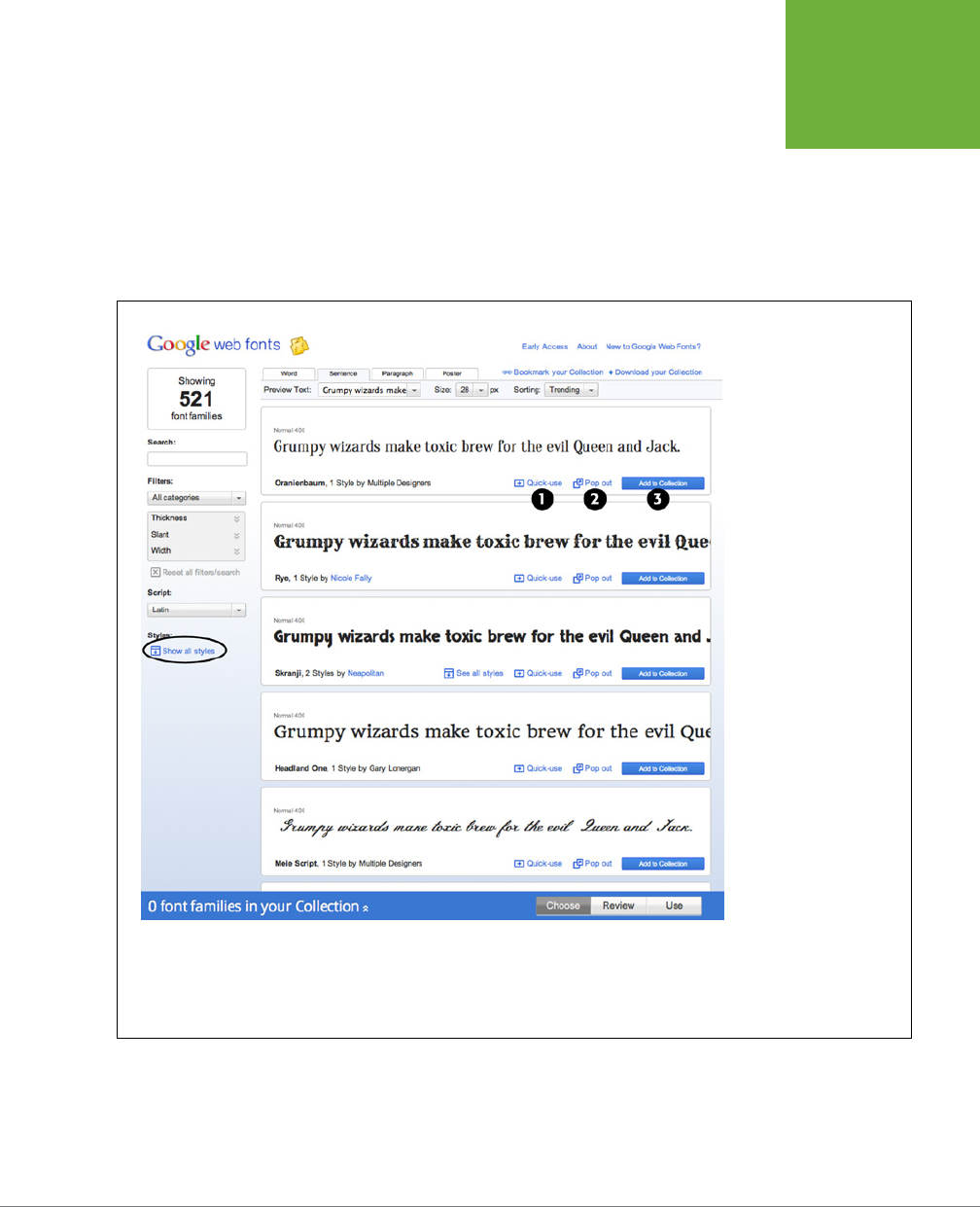
CHAPTER 6: FORMATTING TEXT 147
DISCOVERING
GOOGLE WEB
FONTS
proper formats, and then placing them onto your web server, you simply include a
single external style sheet link to Google that indicates which fonts you’d like to use.
Google’s server sends the proper fonts to the visitor’s web browser. No muss, no fuss.
Your only responsibilities are finding the fonts you want to use on the Google Web
Fonts site, copying the necessary code (which Google provides) and adding it to your
web page, and creating CSS styles using those fonts. Start by visiting the Google
Web Fonts site at
www.google.com/webfonts
(see Figure 6-6).
FIGURE 6-6
The Google Web Fonts
site lists the fonts Google
offers. Some fonts have
multiple styles, such as
bold, italic, thin, ultra-thin,
and so on. To see all vari-
ants for a particular font,
click the Show All Styles
link in the left sidebar
(circled). Each font also
has three links: the first,
“Quick Use”(#1) loads
the Use panel described
on page 150 and lets you
quickly add the code
necessary to use that font;
the “Pop-out” link (#2)
opens a new window with
more information on the
font as well as a specimen
sheet demonstrating every
letter in the font (it’s a
good way to see what the
entire alphabet looks like
and also to make sure that
it has all the characters
you need—such as unusual
symbols or punctuation
marks); lastly, the “Add to
Collection” link (#3) adds
the font to your collection.
(If you want to use more
than one font, then add
them all to the collection.)

CSS3: THE MISSING MANUAL
148
DISCOVERING
GOOGLE WEB
FONTS
Finding and Selecting Fonts
You select the fonts you wish to use by creating a
collection
. It’s as easy as finding a
font you like and clicking the “Add to Collection” button (see Figure 6-6). To find a
font, you can scroll down the main web fonts page and see examples of the available
fonts, but with over 500 fonts to choose from, it might take you a while to locate
one you like. If you have a specific look already in mind, like a bold sans-serif font for
headlines, use one of the filtering options in the left side of the page (see Figure 6-7).
• Search by name. If you know the name of the font you’re interested in, then just
type the name (or part of the name) in the Search field (#1 in Figure 6-7). The
page then filters the list of fonts to show you the ones that match.
• Filter by category. The category menu (#2 in Figure 6-7) lets you show fonts
that match one, two, three, or four categories: Serif, Sans Serif, Display, and
Handwriting. Just uncheck a box to hide that type of font, or turn on the box
to show it. Display fonts are generally bold and stylish; they’re not really good
for long passages of text, but can make short headlines really jump out of the
page. Handwriting fonts, or script fonts, look like someone wrote the text with a
pen. They vary from elegant, wedding invitation-like scripts, to a hand-scrawled,
“Give me the money if you want your cat back” ransom-note look.
• Physical style. Three sliders let you identify physical characteristics of fonts
(#3 in Figure 6-7). The thickness slider lets you find fonts made of very thin
lines (delicate lines that are often hard to read unless displayed at a large font
size) to very thick lines (bold and chunky). The Slant slider identifies fonts with
a “lean” to them: generally this means italic versions of fonts, but also is rel-
evant for handwritten fonts, which generally have a pronounced lean toward
the right. Finally, use the Width slider to find fonts that are either narrower or
more spread-out. With wider fonts, you fit fewer letters on a single line but
often make a bold statement in a headline.
• Alphabet. Lastly, the Script menu (#4 in Figure 6-7) lets you specify fonts for
use with other languages. English and many European languages use the Latin
alphabet, but if you need a font for Russian text, for example, you would choose
Cyrillic. Pick the one that matches the language your text will appear in.
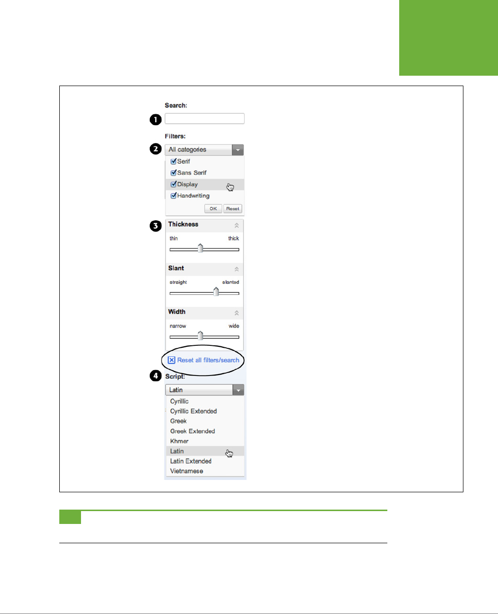
CHAPTER 6: FORMATTING TEXT 149
DISCOVERING
GOOGLE WEB
FONTS
FIGURE 6-7
To help find the fonts that match your design, you can search Google’s
font directory, or filter down the list of fonts by specifying various
criteria. If you try to use all of these filters, you’ll most likely end up
with no results. If so, click the “Reset all filters/search” link (circled) to
return to the full list of Google web fonts.
TIP To see a showcase of some of the best fonts available from Google, check out
http://hellohappy.org/
beautiful-web-type/
.
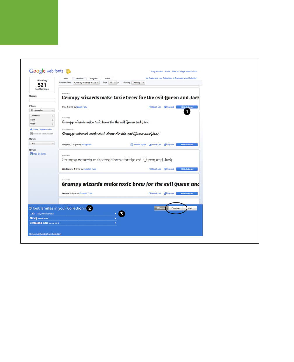
CSS3: THE MISSING MANUAL
150
DISCOVERING
GOOGLE WEB
FONTS
As you find fonts that you’d like to use, you can click the “Add to Collection” button
(#1 in Figure 6-8). The collection is kind of like a shopping cart, so you can add fonts
to it and remove fonts from it.
FIGURE 6-8
To see the fonts you’ve
added to your collection,
click the disclosure arrows
(#2). You can remove a
font from the collection
by clicking the X (delete)
button to the right of
the font name (#3). The
Review button (circled)
lets you compare the fonts
in your collection and
retrieve more in-depth
information. For example,
you can see the complete
character set for each font
(that is, each letter and
symbol), test drive a font
by adding your own text
and changing the font size,
and even create an overlay
comparison of all the fonts
in your collection (if you’re
truly type obsessed).
Using Google Fonts
Once you’ve created a collection of fonts, you’re ready to retrieve the code neces-
sary to use them.
1. At the bottom right of the Google Web Fonts screen (#1 in Figure 6-9), click
the Use button.
A page opens with several options as well as the code you need to copy.
2. Choose the style you want to use (#2 in Figure 6-9).
Some fonts include italic, bold, and other variants of the regular font. For body
text, you’ll usually want at least regular, italic, and bold. In the case of a headline,
you can usually get away with just one font. You’ll notice also that there’s a “speed
dial” on the right of this page. As you add more styles and fonts, the speed dial
rotates clockwise indicating that it will take more time to download the fonts.
CHAPTER 6: FORMATTING TEXT 151
DISCOVERING
GOOGLE WEB
FONTS
That’s one drawback of web fonts. Since your site’s visitors need to download
them (as well as the web page, external style sheets, graphics, and other ele-
ments that make up your page), be careful not to go crazy and use too many
fonts. Otherwise, people will have to wait a long time for the fonts to appear.
The number on the dial indicates the number of milliseconds (on average) it
will take to download the font files.
3. Optionally, choose the character sets you want.
This step isn’t required and may not be available for all fonts. In addition, if
you selected a character set other than Latin (see the last bullet point on page
148), then you may see other options besides Latin and Latin Extended. Latin
Extended is a good choice if your text contains words in a language that uses
particular accent characters like Turkish, Welsh, and Hungarian. For most Latin-
based languages like French and Spanish, the normal Latin alphabet is all you
need. You’re better o not using the extended Latin if you don’t need it, since
using it adds file size and download time to the font.
NOTE To see a list of the extra characters available in Latin Extended visit
http://en.wikipedia.org/wiki/
Latin_Extended-A
.
4. Copy the code in the “Add this code to your website” box (#3 in Figure 6-9).
You have three options here.
• Standard provides a <link> tag that points to an external style sheet (this
is the same as linking to any external style sheet, as described on page 48).
However, this is actually a special link that points to Google’s web server
and provides the information Google needs to deliver the proper fonts.
For instance:
<link href='http://fonts.googleapis.com/css?family=Codystar:300,400|Gent
ium+Book+Basic:400,400italic' rel='stylesheet' type='text/css'>
Notice that at the end of the href attribute, the fonts and their styles are
listed. In this example, the fonts are Codystar and Gentium. And Google will
load several styles: 300 and 400 for Codystar and 400 and 400italic for
Gentium. Those numbers are a way of indicating the weight (or thickness)
of the font and are discussed in Step 6 on page 152.
NOTE If you’re using HTML5, you can leave out the
"type='text/css'"
part of the <link> tag. It’s not
needed in HTML5.
• Another option is @import. Click the @import tab under step 3 on the web
page (see Figure 6-9) to see the code needed to use the @import directive
discussed on page 42. The benefit of this approach is that you can add
@import to the beginning of another style sheet. For example, say you have
CSS3: THE MISSING MANUAL
152
DISCOVERING
GOOGLE WEB
FONTS
a single external style sheet for your site, and you’ve linked all the pages in
your site to it. The standard <link> method requires you to add that code
to every page on your site. However, with the @import method, you can add
the code to your single external style sheet and you’re done.
• Finally, you can choose a JavaScript approach. This book doesn’t cover this
method, since it’s requires a lot of code, and unless you know JavaScript
really well, it’s easy to make a mistake. In addition, it doesn’t oer much
benefit over the other options.
5. Paste the code on your site’s web pages.
In the case of the <link> method described in the previous step, you must paste
the code onto every page you wish to use the fonts on. If you’re just beginning
the process of building your site, this isn’t such a big deal, but if you already have
lots of pages, this may end up being quite a bit of work. In that case, consider
the @import method: you can place the @import code at the top of your site’s
external style sheet, and then all the pages that link to that style sheet will also
download the proper fonts.
NOTE The
@import
method can have a slight effect on your website’s performance (that is, speed).
6. Create styles using the fonts.
Now that the fonts are loading, you can use them much like any other font.
Just create a style, add the font-family property, and list the font. Google’s
Web Fonts page shows the font’s name at the bottom of the Use page (#4 in
Figure 6-9).
If you’re using multiple styles of a font, then you also need to add the font-
weight and font-style properties to the style. Google doesn’t use the regular
normal or bold keywords to indicate a font’s weight. Instead it uses a numeric
scale from 100 to 900. A value of 700 is bold, 400 is normal, and the other
numbers indicate variations in thickness. For example, say you want to apply
the regular italic version of the Gentium Book Basic font to the <em> tag. You
can write this style:
em {
font-family: "Gentium Book Basic", serif;
font-weight: 400;
font-style: italic;}
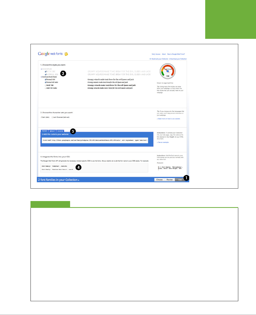
CHAPTER 6: FORMATTING TEXT 153
DISCOVERING
GOOGLE WEB
FONTS
FIGURE 6-9
When you’re ready to
use the Google fonts that
you’ve added to your
collection, click the Use
button in the bottom right
(#1), the styles you want
(#2), and the method
you’d like to use to attach
those fonts to a page. The
most common way is to
simply link to a style sheet
that loads the fonts from
Google’s servers.
UP TO SPEED
TypeKit, a Google Alternative
Because of the technical and legal requirements to using web
fonts, several companies have sprouted up that handle all
the heavy lifting for you. Google Web Fonts is one example,
but there are others. These
font services
let you select from
a large collection of fonts hosted on their own web servers.
In other words, you don’t put the fonts on your server, you
simply reference their servers by using either a snippet of CSS
or JavaScript code. These services take care of sending the
proper font format (EOT to IE 8 and earlier, for example) to
your visitors’ browsers.
A commercial service from Adobe, called TypeKit, also provides
a wide selection of fonts, but for a fee. Because it’s part of
Adobe (which makes fonts in addition to all the other software
they create), you have access to a wide range of professionally
created fonts. With TypeKit, you create individual
kits
, or col-
lections of fonts, and assign them to a website. You then add a
snippet of JavaScript code to each page on your site. This code
connects with the TypeKit servers, and delivers the fonts you
requested to your site’s visitors. TypeKit is a commercial service,
though it does offer a free, limited trial version. Depending on
how many fonts you want access to and how many people visit
your website each month, you can end up spending anywhere
from $24 a year to $99 a year.

CSS3: THE MISSING MANUAL
154
ADDING COLOR
TO TEXT
Adding Color to Text
Black-and-white is great for
Casablanca
and Woody Allen films, but when it comes
to text, a nice skyline blue looks much sharper and classier than drab black. Coloring
your text with CSS is easy. In fact, you’ve used the color property in a few tutorials
already. You have several dierent ways to define the exact color you want, but
they all follow the same basic structure. You type color
:
followed by a color value:
color: #3E8988;
In this example, the color value is a hexadecimal number indicating a muted shade
of teal (more in a moment on what hexadecimal is).
Every graphics program from Fireworks to Photoshop to the GIMP lets you select a
color using hexadecimal or RGB values. Also, the color pickers built into Windows
and Mac let you use a color wheel or palette to select the perfect color and translate
it into a hexadecimal or RGB value.
NOTE If your color design sense needs some help, you can find lots of attractive, coordinated collections
of colors as well as great color-related resources at
www.colourlovers.com
.
Hexadecimal Color Notation
The oldest color system used by web designers is hexadecimal notation. A color
value—like #6600FF—actually contains three hexadecimal numbers—in this example
66, 00, FF—each of which specify an amount of red, green, and blue, respectively.
As in the RGB color system described next, the final color value is a blend of the
amounts of red, green, and blue specified by these numbers.
TIP You can shorten the hexadecimal numbers to just three characters if each set contains the same two
numbers. For example, shorten #6600FF to #60F, or #FFFFFF to #FFF.
RGB
You can also use the RGB—red, green, blue—method familiar in computer graphics
programs. The color value consists of three numbers representing either percentages
(0–100 percent) or numbers between 0–255 for each hue (red, green, and blue). So
when you want to set the text color to white (perhaps to set it o from an ominous
dark page background), you can use this:
color: rgb(100%,100%,100%);
or
color: rgb(255,255,255);

CHAPTER 6: FORMATTING TEXT 155
ADDING COLOR
TO TEXT
NOTE If all these numbers and digits have your head spinning, then you can always fall back on the classic
HTML color keywords. (Just don’t expect your site to win any awards for originality.) There are 17 colors—aqua,
black, blue, fuchsia, gray, green, lime, maroon, navy, olive, orange, purple, red, silver, teal, white, and yellow.
In CSS, you add them to your style like so:
color: fuchsia;
. In addition, most browsers support 147 SVG
colors (also called X11 colors), so if you really want to show off, start using colors like linen, chocolate, khaki, and
whitesmoke. You can find these colors listed at
https://developer.mozilla.org/en-US/docs/CSS/color_value
.
RGBA
To add depth to a page, consider one of the newer color methods. RGBA stands for
Red, Green, Blue, Alpha, and it works just like the RGB colors with the addition of an
alpha
channel. That is, you can specify a level of opacity so that the color isn’t solid,
but see-through (see Figure 6-10). To the RGB colors, you add one last number, a
value between 0 and 1. A value of 0 makes the color invisible, while 1 renders the
color totally opaque (that is, you can’t see through it):
color: rgba(255, 100, 50, .5);
You can create interesting visual eects by placing RGBA colored text over back-
ground images. For example, you can make the images seep through the color of
the text a little (by using a high value like .9) or a lot (by using a low value like .1).
TIP RGBA works particularly well with the
text-shadow
property discussed on page 166 and the
box-
shadow
property discussed on page 210. Using RGBA, you can create even more subtle drop shadow effects by
letting more of the background show through the shadow.
The downside? Internet Explorer 8 and earlier don’t understand RGBA color. One
solution is to declare a solid color first using hexadecimal notation, and then a second
color property with RGBA color, like this:
color: rgb(255,100,50); /* for IE8 */
color: rgba(255,100,50,.5); /* for newer browsers */
All browsers interpret the first line; the second line overrides the first line, but only
for browsers that understand RGBA color. In other words, IE 8 applies the first color
declaration and ignores the second, while IE 9 and other browsers apply the RGBA
color. You just won’t get the transparency eect in IE 8. In addition, this technique
doesn’t work in IE 7, which simply ignores both lines and applies a black color. Fortu-
nately, IE 7 usage is trending toward zero, so you probably don’t need to worry about
it. (To make the alpha transparency work in IE 7 and 8, see the note on page 156.)
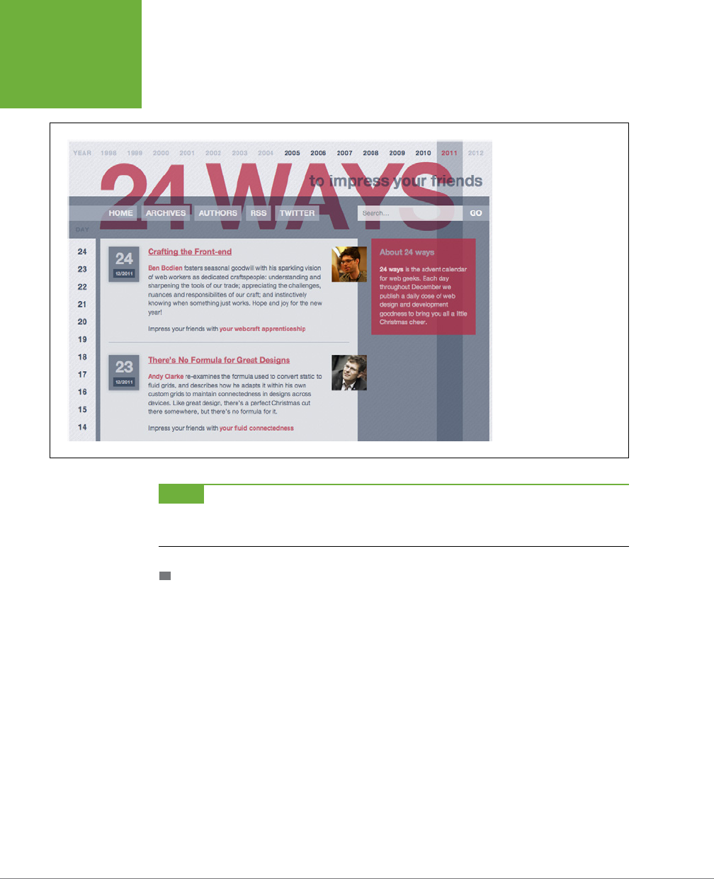
CSS3: THE MISSING MANUAL
156
ADDING COLOR
TO TEXT
FIGURE 6-10
RGBA colors aren’t just
for text. You can use
RGBA color with any CSS
property that accepts
a color value, like the
background color of the
search box in the top-right
of this image, or the color
of the navigation buttons:
Home, Archives, Authors,
and so on.
NOTE If you want to preserve the transparency effect for IE 7 and 8, you can. It just requires a bit of IE-only
magic. Considering IE 7 is on its way out, you may not want to bother, but you can learn how at
http://css-tricks
.com/rgba-browser-support
.
HSL AND HSLA
HSL stands for hue, saturation, and lightness (also sometimes labeled
luminance
). It’s
yet another way to specify color. It’s not supported by Internet Explorer 8 or earlier,
but works in all other browsers. If you’re used to RGB or Hex colors, you may find
the HSL syntax a bit unusual. Here’s an example of a bright red color:
color: hsl(0, 100%, 50%);
You supply three values inside hsl( ). The first is a degree value from 0 to 360, which
maps to a circle of hues. If you remember the order of the colors in a rainbow—red,
orange, yellow, green, blue, indigo, and violet (ROYGBIV)—then you’ve got a basic
idea of the values you’ll need to specify a color. Red is 0 (it’s also 360, since that’s one
full rotation around a circle), yellow is around 50, orange around 100, green around
150, and so on. Each color is separated by around 51 degrees.
The second is the saturation, or how pure the color is. You specify saturation in a
percentage from 0% to 100%. A value of 0% is no saturation at all, or a dull gray. In
fact, no matter what hue you specify, 0% will produce the same gray hue. A value

CHAPTER 6: FORMATTING TEXT 157
CHANGING
FONT SIZE
of 100% is the pure color—bright and vibrant. The third value is the lightness value,
specified in a percentage from 0% (completely black) to 100% (completely white). If
you want to have a pure color, then you use a value of 50%.
HSL is supposed to be more intuitive then RGB or Hexadecimal color values, but if
you don’t find it easy to understand, you don’t have to use it. Instead, use a program
like Fireworks or Photoshop or an online color picker, each of which make picking
an RGB or Hex value easy.
NOTE If you’re interested in using HSL, you’ll find a easy-to-use HSL color picker at
www.workwithcolor
.com/hsl-color-schemer-01.htm
.
Just as RGB has its companion format, RGBA, HSL supports opacity with the HSLA
format. It works similarly to RGB described on page 155. You specify an opacity
value from 0 (invisible) to 1 (totally opaque) to set the opacity value. This will create
a bright red color with 50% opacity:
color: hsla(0, 100%, 50%, .5);
The examples in this book mostly stick with RGBA, but if you find HSL easier to
understand, then use it!
Changing Font Size
Varying the size of text on a web page is a great way to create visual interest and
direct your visitors’ attention to important areas of a page. Headlines in large type
sizes capture attention, while copyright notices displayed in small type subtly recede
from prominence.
The font-size property sets text size. It’s always followed by a unit of measure-
ment, like so:
font-size: 1em;
The value and unit you specify for the font size (in this example, 1em) determine the
size of the text. CSS oers a dizzying selection of sizing units: keywords, ems, exs,
pixels, percentages, picas, points, and even inches, centimeters, and millimeters.
Units of measurement commonly used with printed materials—picas, points, inches,
and so on—don’t work well on web pages because you can’t predict how they’ll
look from one monitor to the next. But you may have occasion to use points when
creating style sheets for printer-friendly pages, as described on page 523. Only a
few of the measurement units—pixels, keywords, ems, and percentages—make sense
when you’re sizing text for a computer monitor. The rest of this section explains
how they work.
CSS3: THE MISSING MANUAL
158
CHANGING
FONT SIZE
Using Pixels
Pixel values are the easiest to understand, since they’re completely independent
from any browser settings. When you specify, for example, a 36-pixel font size for
an <h1> tag, the web browser displays text that’s 36 pixels tall, period. Web design-
ers cherish pixel values because they provide consistent text sizes across dierent
types of computers and browsers.
To set a pixel value for the font-size property, type a number followed by the
abbreviation px:
font-size: 36px;
NOTE Don’t include a space between the number and the unit type. For example,
36px
is correct, but
36 px
isn’t.
UP TO SPEED
Pixels and Retina Displays
When Apple introduced the iPhone with Retina Display, iPhone
owners rejoiced at the clarity and sharpness of the images.
Apple’s Retina Display provides its clear image by cramming
more pixels into a square inch. While regular computer displays
range from 72–100 pixels per inch, the new Retina Displays
boast upward of 224 pixels per inch.
Apple has since added Retina Displays to iPads and laptops.
Other tablet makers like Amazon are also jumping on the
bandwagon, offering considerably more pixels per inch than
older screens. What does this mean for web designers? Quite
a bit. As you’ll read in the box on page 473, these screens have
considerable effect on images, and you’ll need to do a bit of
work to make great looking images for dense pixel displays.
When it comes to the pixels mentioned above, browsers on
devices with Retina Displays actually multiply a pixel value
by 2. That is, if you specify for text to be 16 pixels, a Retina
Display-enabled web browser will actually use 32 pixels on
the screen to draw the text. This is a good thing. If the browser
only used 16 of its super-tiny pixels to display the text, then no
one could read what you have to say.
In other words, although more dense displays are entering
both the mobile and desktop computing world, they won’t
suddenly make the pixel-based type on your web pages appear
microscopically small.
Using Keywords, Percentages, and Ems
Three ways of sizing text with CSS—keywords, percentages, and ems—work by either
adding to or subtracting from the text size already on the viewer’s browser screen.
In other words, if you don’t specify a text size using CSS, a web browser falls back
on its pre-programmed settings. In most browsers, text inside a non-header tag is
displayed 16 pixels tall—that’s called the
base text size
.
Web surfers can adjust their browsers by pumping up or dropping down that base
size; however, changing the base font size requires fiddling with the browser’s pref-
erence settings, a step most folks won’t bother with.

CHAPTER 6: FORMATTING TEXT 159
CHANGING
FONT SIZE
NOTE Most browsers have a
zoom
function that makes text, graphics, and the entire page smaller or larger.
This setting doesn’t really change the base text size as much as it magnifies the entire page. Ctrl++ (c-+) on most
browsers zooms in on a page, while Ctrl+- (c--) zooms out. Pressing the Ctrl (Control) key and using the scroll
wheel on a mouse also lets you zoom in and out of a page.
When you resize text with CSS, the browser takes the base text size (whether it’s the
original 16 pixels or some other size the viewer ordered) and adjusts it up or down
according to your keyword, em, or percentage value.
KEYWORDS
CSS provides seven keywords that let you assign a size that’s relative to the base
text size: xx-small, x-small, small, medium, large, x-large, and xx-large. The CSS
looks like this:
font-size: large;
The medium option is the same as the browser’s base font size. Each of the other op-
tions decreases or increases the size by a dierent factor. In other words, while each
size change is supposed to be a consistent increase or decrease from the previous
size, it isn’t. Basically, xx-small is the equivalent of 9 pixels (assuming you haven’t
adjusted the base font size in your browser); x-small is 10 pixels, small is 13 pixels,
large is 18 pixels; x-large is 24 pixels, and xx-large is 32 pixels.
Keywords are pretty limited: You have only seven choices. When you want more
control over the size of your text, turn to one of the other font-sizing options dis-
cussed next.
PERCENTAGES
Like keywords, percentage values adjust text in relationship to the font size defined
by the browser, but they give you much finer control than just large
,
x-large, and
so on. Every browser has a pre-programmed base text size, which in most browsers
is 16 pixels. You can adjust this base size in your browser’s preferences. Whatever
setting has been chosen, the base text size for a particular browser is equivalent to
100%. In other words, for most browsers, setting the CSS percentage to 100% is the
same as setting it to 16 pixels.
Say you want to make a particular headline appear two times the size of average
text on a page. You simply set the font size to 200%, like so:
font-size: 200%;
Or, when you want the text to be slightly smaller than the default size, use a value
like 90% to shrink the font size down a bit.
The above examples are pretty straightforward, but here’s where it gets a little tricky:
Font size is an inherited property (see Chapter 4), meaning that any tags inside of a
tag that has a font size specified inherit that font size. So the exact size of 100% can
change if a tag inherits a font-size value.
CSS3: THE MISSING MANUAL
160
CHANGING
FONT SIZE
For example, at the lower left of Figure 6-11, there’s a <div> tag that has its font
size set to 200%. That’s two times the browser’s base text size, or 32 pixels. All tags
inside that <div> inherit that text size and use it as the basis for calculating their
text sizes. In other words, for tags inside that <div>, 100% is 32 pixels. So the <h1>
tag inside the <div> that has a font size of 100% displays at two times the base-text
size for the page, or 32 pixels.
FIGURE 6-11
The three most common
units for sizing text:
pixels, ems, and percent-
ages. Watch out for
inherited text sizes when
using ems or percentages,
as explained on page 159.
If you notice that some
text on a page looks
unusually large or small,
then check to see if the
offending text isn’t inside
a tag that inherits a font
size from another tag.
EMS
Once you understand percentages, you know everything you need to understand
ems. The two work exactly the same way, but many web designers use ems because
of its roots in typography.
The word
em
comes from the world of printed (as in paper) typography, where it
refers to the size of a capital letter M for a particular font. As it’s worked its way into
the Web world, an em in CSS no longer means the same thing as in typography.
Think of it as referring to the base text size. That is, a value of 1em means the same
thing as a value of 100 percent, as described in the previous section. You can even
CHAPTER 6: FORMATTING TEXT 161
CHANGING
FONT SIZE
say it the opposite way: A percentage value is just an em multiplied by 100: .5em is
50 percent, .75em is 75 percent, 3em is 300 percent, and so on.
For example, this CSS does the exact same thing as font-size: 200%;:
font-size: 2em;
NOTE As with pixel values, there’s no space between the number and the word
em
. Also, even if you specify
more than one em, you never add an
s
to the end:
2.5em
, never
2.5ems
.
When it comes to inheritance, ems also work just like percentage values. See the
upper right of Figure 6-11 for an example. The bottom paragraph is set to .75em,
which, since the <p> tag inherits the 2em (32 pixel) setting from the <div> tag, works
out to .75 x 32, or 24 pixels. Inside the <p> tag are two other tags that also have a
font-size setting of .75em. The innermost tag, a <strong> tag, is set to .75em or, in
essence, 75 percent of its
inherited
size. There’s a lot of math to this one: 32 pixels
(inherited from the <div> tag) x .75 (inherited from the <p> tag) x .75 (inherited from
the <em> tag) x .75 (the <strong> tag’s own font size). The result of this brainteaser
is a text size of roughly 14 pixels.
WORKAROUND WORKSHOP
Untangling the Nest
Inherited font-size values can cause problems for nested lists.
(See the bottom-right square of Figure 6-11.) If you create a
style like
ul { font-size: 75% }
, then a nested list,
which is a
<ul>
tag inside of another
<ul>
tag, is set to 75
percent of 75 percent—making the text in the nested list smaller
than the rest of the list.
To get around this conundrum, create an additional descendent
selector style like this:
ul ul {font-size: 100%}
. This
style sets any
ul
tag inside of a
ul
to 100 percent: in other
words, 100 percent of the surrounding
ul
tag’s font size. In
this example, it keeps any nested lists to 75 percent of the
base text size.
There’s another way to prevent this hall-of-mirrors, shrinking-
text effect. CSS3 includes a new measurement unit named
rem
.
No, it’s not named after sleep patterns or a band. It stands
for Root EM—meaning its value is based on the text size of
the root element. In most cases this just means the base text
size, so you can change the .75em shown in Figure 6-11 to this:
font-size: .75rem;
This style makes the font size .75 of the base text size, not the
current font size (as is the case with ems). The root element in
HTML is actually the
html
element you find at the beginning
of a web page. When using
rem
values, you can set the base
text size of the
html
element and then use
rem
units to set
text to a size relative to that. For example, you can set the base
text size to 20 pixels like this:
html {
font-size: 20px;
}
Then use
rem
units to create fonts in relation to that 20-pixel
base text size. For example, to then make all paragraphs 15
pixels in size, add this style.
p {
font-size: .75rem;
}
You should be aware, however, that while most browsers now
understand the
rem
unit, Internet Explorer 8 and earlier don’t.
CSS3: THE MISSING MANUAL
162
FORMATTING
WORDS AND
LETTERS
TIP You can make type stand out on a page in many different ways. Making certain words larger than others
or making some text darker, lighter, or brighter visually sets them apart from the surrounding text. Contrast is
one of the most important principles of good graphic design; it can help highlight important messages, guide a
reader’s eye around a page, and generally make understanding a page easier. For a quick overview of typographic
contrast, check out this page:
www.creativepro.com/story/feature/19877.html
.
Formatting Words and Letters
Although you’ll spend a lot of time fine-tuning the color, size, and fonts of the text
on your web pages, CSS also lets you apply other common text-formatting proper-
ties (like bold and italic) as well as some less common ones (like small caps and
letter spacing).
NOTE CSS lets you combine multiple text properties, but don’t get carried away. Too much busy formatting
makes your page harder to read. Worst of all, your hard work loses its impact.
Italicizing and Bolding
Web browsers display type inside the <em> and <i> tags in
italicized
type and text
inside the <strong>, <b>, <th> (table header), and header tags (<h1>, and so on) in
bold type. But you can control these settings yourself—either turn o bold for a
headline or italicize text that normally isn’t—using the font-style and font-weight
properties.
To italicize text, add this to a style:
font-style: italic;
Alternatively, you can make sure text
isn’t
italicized, like so:
font-style: normal;
NOTE The
font-style
property actually has a third option—
oblique
—which works identically to
italic
.
The font-weight property lets you make text bold or not. In fact, according to the
rules of CSS, you can actually specify nine numeric values (100–900) to choose
subtle gradations of boldness (from super-extra-heavy [900] to nearly invisible-
light [100]). Of course, the fonts you use must have nine dierent weights for these
values to have any visible eect for your website’s visitors. The only way to use the
numeric values is with the web fonts discussed on page 132. In fact, Google Web
Fonts (page 146) use the numeric values exclusively for specifying font weights.
NOTE When using web fonts, you’ll find that making text bold and italic requires a few other steps. See
page 140 for the details.
CHAPTER 6: FORMATTING TEXT 163
FORMATTING
WORDS AND
LETTERS
To make text bold:
font-weight: bold;
And to make text un-bold:
font-weight: normal;
NOTE Since headlines are already displayed as bold type, you may want to find another way of highlighting
a word or words that are strongly emphasized or bolded inside a headline. Here’s one way:
h1 strong { color: #3399FF; }
This descendent selector changes the color of any
<strong>
tags (usually displayed as bold) that appear
inside a
<h1>
tag.
Capitalizing
Capitalizing text is pretty easy—just hit the caps lock key and start typing, right?
But what if you want to capitalize every heading on a page, and the text you’ve
copied and pasted from a Word document is lowercase? Rather than retyping the
headline, turn to the CSS text-transform property. With it, you can make text all
uppercase, all lowercase, or even capitalize the first letter of each word (for titles
and headlines). Here’s an example:
text-transform: uppercase;
For the other two options, just use lowercase or capitalize.
Because this property is inherited, a tag that’s nested inside a tag with text-
transform applied to it gets the same uppercase, lowercase, or capitalized value.
To tell CSS
not
to change the case of text, use the none value:
text-transform: none;
SMALL CAPS
For more typographic sophistication, you can also turn to the font-variant property,
which lets you set type as small-caps. In small cap style, lowercase letters appear
as slightly downsized capital letters, like so: PomP and CirCumstanCe. While dicult
to read for long stretches of text, small caps lend your page an old-world, bookish
gravitas when used on headlines and captions. To create small-cap text:
font-variant: small-caps;
Decorating
CSS also provides the text-decoration property to add various enhancements to
text. With it, you can add lines over, under, or through the text (see Figure 6-12), or
for real giggles, you can make the text blink like a No Vacancy sign. Use the text-
decoration property by adding one or more of the following keywords: underline
,
overline
,
line-through, or blink. For example, to underline text:
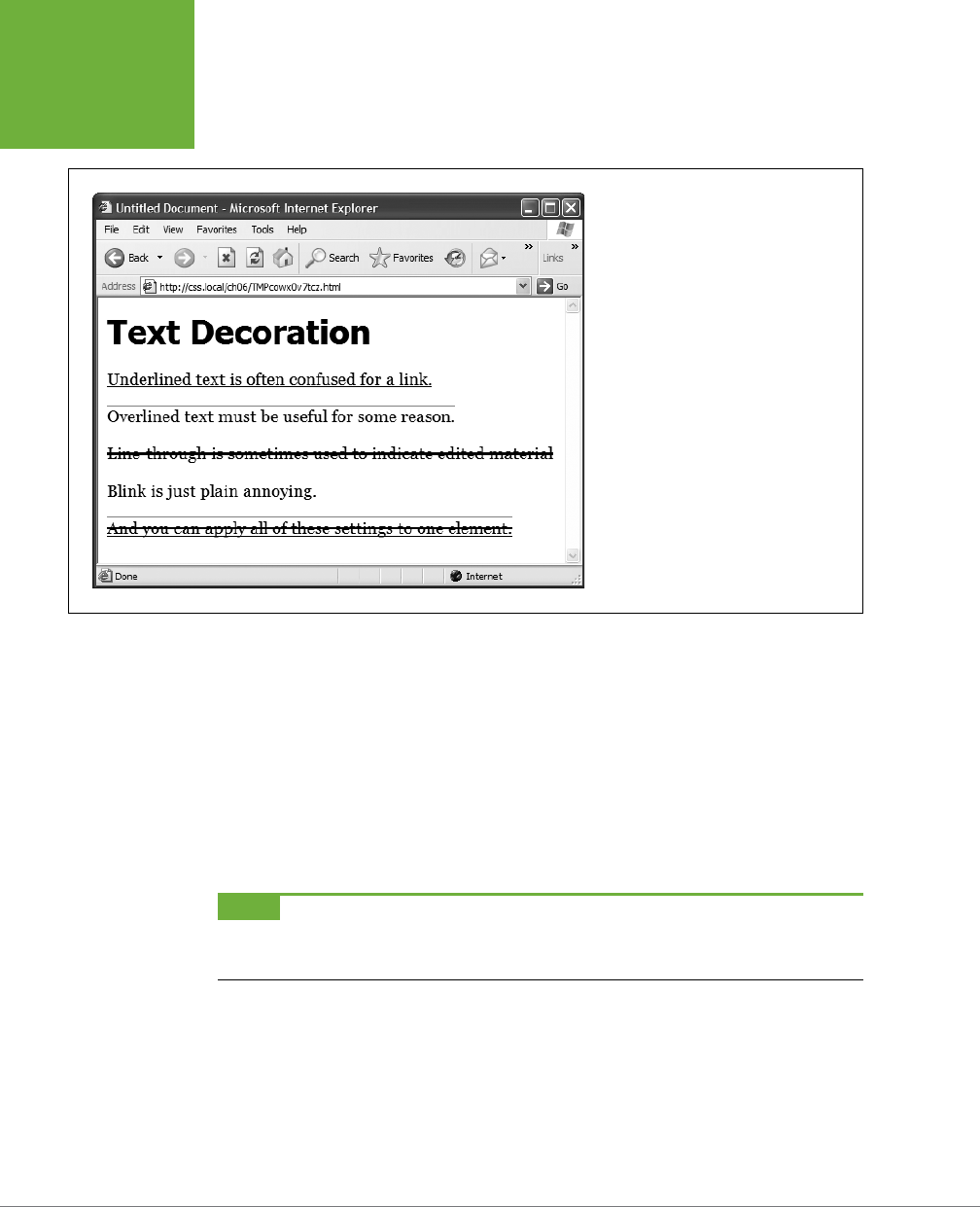
CSS3: THE MISSING MANUAL
164
FORMATTING
WORDS AND
LETTERS
text-decoration: underline;
FIGURE 6-12
The
text-decoration
property in
action. If this is what the people at CSS
headquarters call “decorations,” you’d best
not ask for their design help on your next
home remodel.
You can also combine multiple keywords for multiple eects. Here’s how to add a
line over and under some text:
text-decoration: underline overline;
But just because you
can
add these not-so-decorative decorations to text, doesn’t
mean you should. For one thing, anyone who’s used the Web for any length of time
instinctively associates any underlined text with a link and tries to click it. So it’s not
a good idea to underline words that aren’t part of a link. And blink is like a neon
sign flashing “Amateur! Amateur! Amateur!” (That’s probably why most browsers
don’t make text blink even if you ask for it.)
NOTE You can get a similar effect to underlining and overlining by adding a border to the bottom or top of
an element (see page 298). The big advantage of borders is that you can control their placement, size, and color
to create a more attractive design that doesn’t look like a link.
The overline option simply draws a line above text, while line-through draws a
line right through the center of text. Some designers use this strike-through eect to
indicate an edit on a page where text has been removed from the original manuscript.
Finally, you can turn o all decorations by using the none keyword like this:
text-decoration: none;
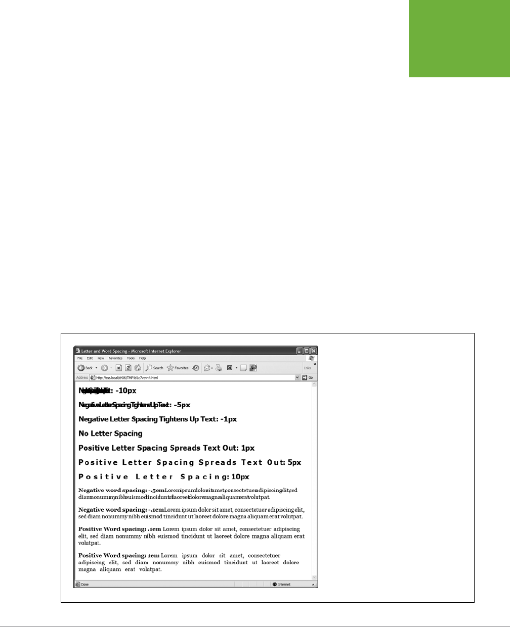
CHAPTER 6: FORMATTING TEXT 165
FORMATTING
WORDS AND
LETTERS
Why do you need a text-decoration property that removes decorations? The most
common example is removing the line that appears under a link. (See page 297.)
Letter and Word Spacing
Another way to make text stand out from the crowd is to adjust the space that ap-
pears between letters or words (see Figure 6-13). Reducing the space between let-
ters using the CSS letter-spacing property can tighten up headlines, making them
seem even bolder and heavier while fitting more letters on a single line. Conversely,
increasing the space can give headlines a calmer, more majestic quality. To reduce
the space between letters, you use a negative value like this:
letter-spacing: -1px;
A positive value adds space between letters:
letter-spacing: .7em;
Likewise, you can open up space (or remove space) between words using the word-
spacing property. This property makes the space between words wider (or narrower)
without actually aecting the spacing between the letters inside a word:
word-spacing: 2px;
With either of these properties, you can use any type of measurement you’d use
for text sizing—pixels, ems, percentages—with either positive or negative values.
FIGURE 6-13
Use word and letter spacing judiciously. Too
much or too little of either can make text dif-
ficult, if not impossible, to read.
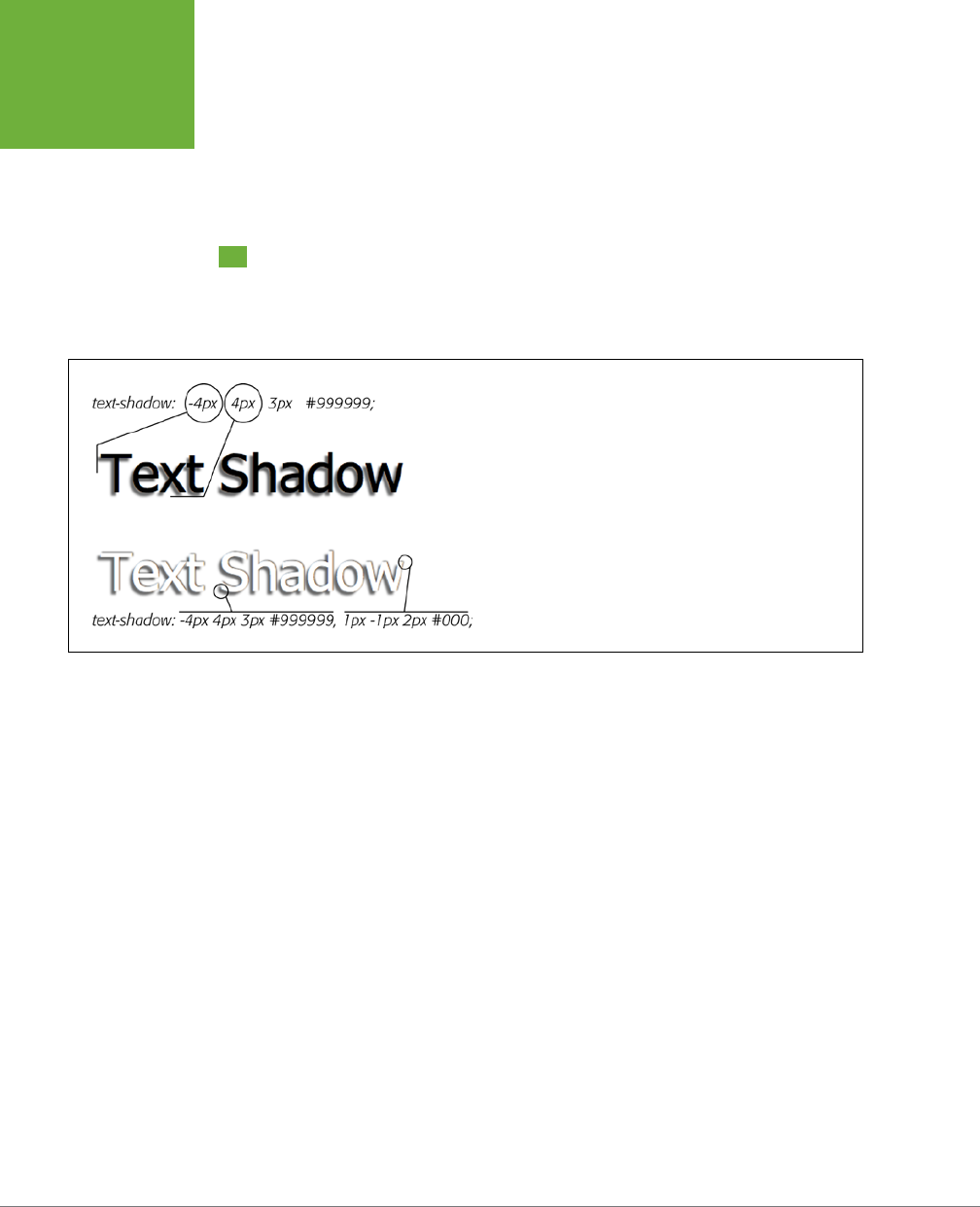
CSS3: THE MISSING MANUAL
166
ADDING TEXT
SHADOW
Unless you’re going for some really far-out design eect—in other words, totally
unreadable text—keep your values small. Too high a negative value, and letters and
words overlap. To keep the message of your site clear and legible, use both letter
and word spacing with care.
Adding Text Shadow
CSS3 includes one property that lets you add drop shadows to text to add depth
and interest to headlines, lists, and paragraphs (see Figure 6-14).
FIGURE 6-14
Text shadows are a great way to add subtle (or, if you insist, not
so subtle) depth to headlines and other text. However, the
text-
shadow
property doesn’t work in Internet Explorer 9 or earlier.
The text-shadow property requires four pieces of information: the horizontal oset
(how far to the left or right of the text the shadow should appear), the vertical oset
(how far above or below the text the shadow should appear), the blurriness of the
shadow, and the color of the drop shadow. For example, here’s the
text-shadow
property that creates the eect at the top of Figure 6-14:
text-shadow: -4px 4px 3px #999999;
The first value—-4px—means “place the shadow 4 pixels to the left of the text.” (A
positive value here would place the shadow to the right of the text.) The second
value—4px—places the shadow 4 pixels below the text. (A negative value would place
the shadow above the text.) The 3px value defines how blurry the shadow should be.
A 0px value (no blur) results in a sharp drop shadow; the larger the value, the more
blurry and indistinct the shadow. Finally, the last value is the drop shadow’s color.
You can even add multiple drop shadows for more complex eects (see the bot-
tom image in Figure 6-14): just add a comma followed by additional drop shadow
values, like this:
text-shadow: -4px 4px 3px #666, 1px -1px 2px #000;
There’s no limit (except good taste) to the number of shadows you can add this way.
Sadly, this eect doesn’t work in Internet Explorer 9 or earlier. It does, however, work
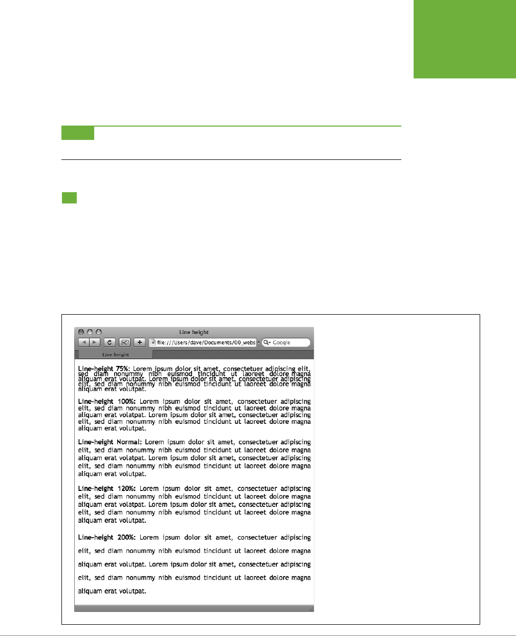
CHAPTER 6: FORMATTING TEXT 167
FORMATTING
ENTIRE
PARAGRAPHS
in all other current browsers (even IE 10). In other words,
don’t
rely on this eect
to make text readable. The bottom image in Figure 6-14 shows you what not to do:
The text color is white and it’s readable only because the drop shadows define the
outline of the text. In Internet Explorer, the text would be invisible—white text on
a white background.
NOTE For some examples of beautiful ways to use text shadows, visit
http://webexpedition18.com/articles/
css3-text-shadow-property/
.
Formatting Entire Paragraphs
Some CSS properties apply to chunks of text rather than individual words. You can
use the properties in this section on complete paragraphs, headlines, and so on.
Adjusting the Space Between Lines
In addition to changing the space between words and letters, CSS lets you adjust
the space between lines of text using the line-height property. The bigger the line
height, the more space that appears between each line of text (see Figure 6-15).
FIGURE 6-15
The
line-height
property lets you spread
a paragraph’s lines apart or bring them closer
together. The normal setting is equivalent to 120
percent, so a smaller percentage tightens up the
lines (top), while a larger percentage pushes them
apart (bottom).

CSS3: THE MISSING MANUAL
168
FORMATTING
ENTIRE
PARAGRAPHS
LINE SPACING BY PIXEL, EM, OR PERCENTAGE
Just as with the font-size property, you can use pixels, ems, or percentages to set
the size of line height:
line-height: 150%;
In general, percentages or ems are better than pixels, because they change accord-
ing to, and along with, the text’s font-size property. If you set the line height to 10
pixels and then later adjust the font size to something much larger (like 36 pixels),
because the line height remains at 10 pixels, your lines then overlap. However, using
a percentage (150% percent, say) means the line-height spacing adjusts propor-
tionally whenever you change the font-size value.
The normal line-height setting for a browser is 120%. So, when you want to tighten
up the line spacing, use a value less than 120%; and to spread lines apart, use a value
greater than that.
NOTE To determine the amount of space that appears between lines of text, a web browser subtracts the
font size from the line height. The result—called
leading
—is the amount of space between lines in a paragraph.
Say the font size is 12 pixels, and the line height (set to 150%) works out to 18 pixels. 18 - 12 = 6 pixels, so the
browser adds 6 pixels of space between each line.
LINE SPACING BY NUMBER
CSS oers one other measurement method specific to line height, which is simply
a number. You write it like this:
line-height: 1.5;
There’s no unit (like em or px) after this value. The browser multiplies this number by
the font size to determine the line height. So if the text is 1em and the line-height
value is 1.5, then the calculated line height is 1.5em. In most cases, the eect is no
dierent from specifying a value of 1.5em or 150%. But sometimes this multiplication
factor comes in handy, especially since nested tags inherit the line-height value
of their parents.
For example, say you set the line-height property of the <body> tag to 150%. All
tags inside the page would inherit that value. However, it’s not the percentage that’s
inherited; it’s the
calculated
line height. So, say the font size for the page is set to
10 pixels; 150 percent of 10 is 15 pixels. Every tag would inherit a line height of 15
pixels, not 150 percent. So if you happened to have a paragraph with large, 36 pixel
text, then its line height—15 pixels—would be much smaller than the text, making
the lines squish together in a hard-to-read mess.
In this example, instead of using a line-height of 150% applied to the <body> tag,
you could have all tags share the same basic proportional line height by setting the
line-height to 1.5. Every tag, instead of inheriting a precise pixel value for line height
from the body style, simply multiplies its font size by 1.5. So in the above example
of a paragraph with 36-pixel text, the line height would be 1.5 x 36 or 54 pixels.

CHAPTER 6: FORMATTING TEXT 169
FORMATTING
ENTIRE
PARAGRAPHS
Aligning Text
One of the quickest ways to change the look of a web page is with paragraph align-
ment. Using the text-align property, you can center a paragraph on a page, align
the text along its left or right edge, or justify both left and right edges (like the
paragraphs in this book). Normally, text on a page is left aligned, but you may want
to center headlines to give them a formal look. Languages that read from right to
left, like Hebrew and Arabic, require right-alignment. To change the alignment of
text, use any of the following keywords—left, right, justify, center:
text-align: center;
Justified text looks great on a printed page—mainly because the fine resolution
possible with printing allows for small adjustments in spacing, and because most
programs used to lay out printed material can hyphenate long words (thus attempting
to equally distribute the number of characters per line). This prevents large, unsightly
gaps or rivers of white space flowing through the paragraphs. Web pages are limited
to much coarser spacing because of the generally low resolution of monitors, and
because web browsers don’t know how to hyphenate long words. So when you use
the justify option, the space between words can vary significantly from line to
line, making the text harder to read. When you want to use the justify option on
your web pages, test it thoroughly to make sure the text is attractive and readable.
Indenting the First Line and Removing Margins
In many books, the first line of each paragraph is indented. This first-line indent marks
the beginning of a paragraph when there are no spaces separating paragraphs. On
the Web, however, paragraphs don’t have indents but are instead separated by a
bit of space—like the paragraphs in this book.
If you have a hankering to make your web pages look less like other web pages and
more like a handsomely printed book, take advantage of the CSS text-indent and
margin properties. With them, you can add a first-line indent and remove (or increase)
the margins that appear at the beginnings and ends of paragraphs.
FIRST-LINE INDENTS
You can use pixel and em values to set the first-line indent like this:
text-indent: 25px;
or
text-indent: 5em;
A pixel value is an absolute measurement—a precise number of pixels—while an
em value specifies the number of letters (based on the current font size) you want
to indent.
CSS3: THE MISSING MANUAL
170
FORMATTING
ENTIRE
PARAGRAPHS
TIP You can use negative
text-indent
values to create what’s called a
hanging indent
, where the first
line starts further to the left than the other lines in the paragraph. (Think of it as “hanging” off the left edge.)
You’ll usually use a negative text indent along with a position margin value, so that the negative text indent
doesn’t stick outside the left side of a page, column, or layout box.
You can also use a percentage value, but with the text-indent property, percent-
ages take on a dierent meaning than you’ve seen before. In this case, percentages
aren’t related to the font size; they’re related to the width of the element containing
the paragraph. For example, if the text-indent is set to 50%, and a paragraph spans
the entire width of the web browser window, then the first line of the paragraph
starts half the way across the screen. If you resize the window, both the width of
the paragraph and its indent change. (You’ll learn more about percentages and how
they work with the width of elements in the next section.)
POWER USERS’ CLINIC
A Shorthand Method for Text Formatting
Writing one text property after another gets tiring, especially
when you want to use several different text properties at once.
Fortunately, CSS offers a shorthand property called
font
,
which lets you combine the following properties into a single
line:
font-style
(page 162),
font-variant
(page 163),
font-weight
(page 162),
font-size
(page 37),
line-
height
(page 167), and
font-family
(page 127). For
example, consider the following declaration:
font: italic bold small-caps 18px/150%
Arial, Helvetica, sans-serif;
It creates bold, italicized type in small caps, using 18px Arial
(or Helvetica or sans-serif) with a line height of 150 percent.
Keep these rules in mind:
• You don’t have to include every one of these properties,
but you
must
include the font size and font family:
font: 1.5em Georgia, Times, serif;.
• Use a single space between each property value. You use
a comma only to separate fonts in a list like this: Arial,
Helvetica, sans-serif.
• When specifying the line height, add a slash after the
font size followed by the line-height value, like this:
1.5em/150% or 24px/37px
.
The last two properties must be
font-size
(or
font-
size/line-height
) followed by
font-family
, in that
order. All the other properties may be written in any order. For
example, these two declarations are the same:
font: italic bold small-caps 1.5em Arial;
font: bold small-caps italic 1.5em Arial;
Finally, omitting a value from the list is the same as setting that
value to normal. Say you create a
<p>
tag style that formats
all paragraphs in bold, italics, and small caps with a line height
of 2000 percent (not that you’d actually
do
that). You can then
create a class style named, say,
.special-Paragraph
with
the following font declaration:
font: 1.5em Arial;
When you apply this style to one paragraph on the page, then
that paragraph would
not
inherit the italic, bold, small caps,
or line height. Omitting those four values in the
.special-
Paragraph
style is the same as writing this:
font: normal normal normal 1.5em/normal
Arial/;
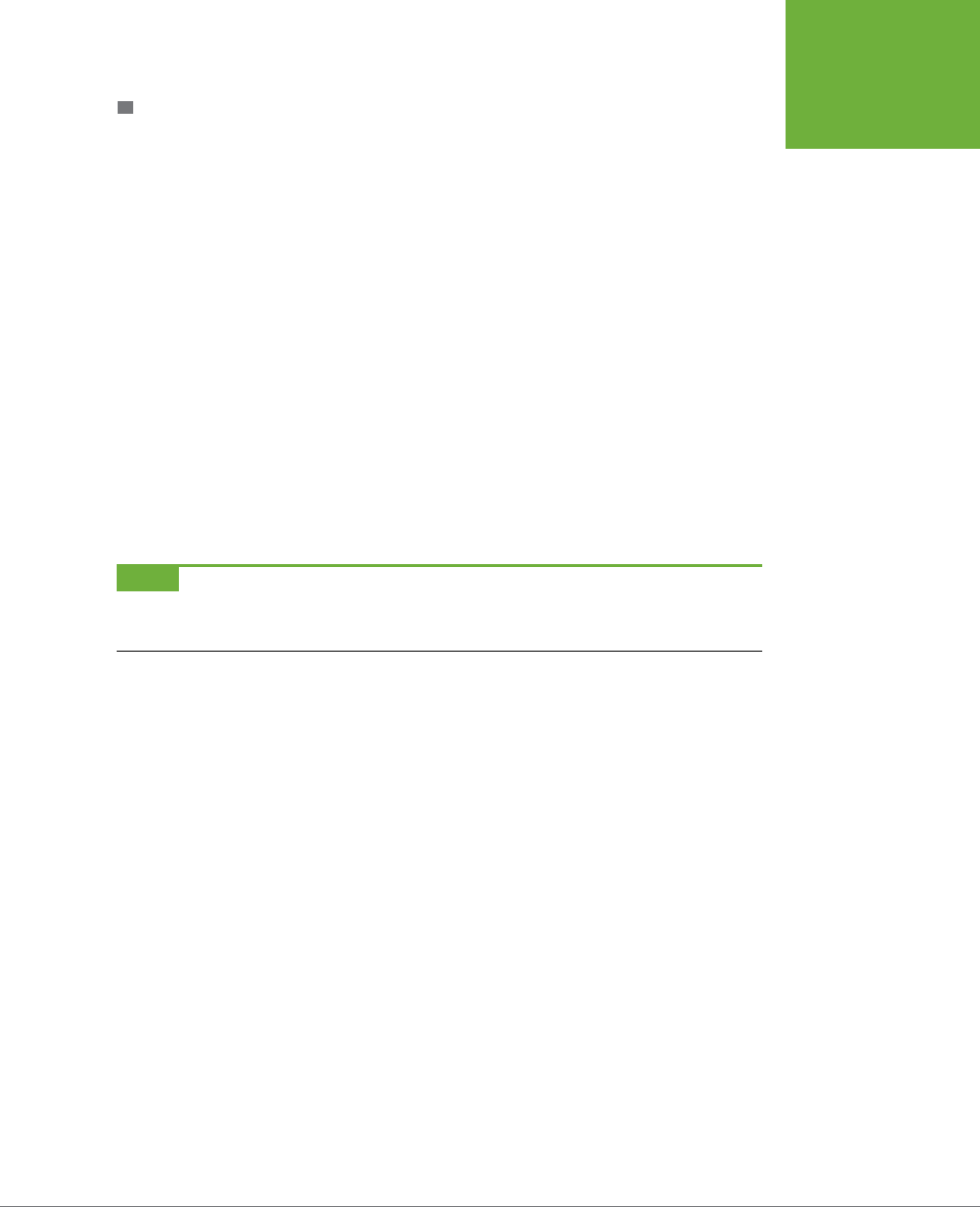
CHAPTER 6: FORMATTING TEXT 171
FORMATTING
ENTIRE
PARAGRAPHS
CONTROLLING MARGINS BETWEEN PARAGRAPHS
Many designers hate the space that every browser throws in between paragraphs.
Before CSS, there was nothing you could do about it. Fortunately, you can now tap
into the margin-top and margin-bottom properties to remove (or, if you wish, expand)
that gap. To totally eliminate a top and bottom margin, write this:
margin-top: 0;
margin-bottom: 0;
To eliminate the gaps between
all
paragraphs on a page, create a style like this:
p {
margin-top: 0;
margin-bottom: 0;
}
As with text-indent, you can use pixel or em values to set the value of the margins.
You can also use percentages, but as with text-indent, the percentage is related to
the
width
of the paragraph’s containing element. Because it’s confusing to calculate
the space above and below a paragraph based on its width, it’s easier to stick with
either em or pixel values.
NOTE Because not all browsers treat the top and bottom margin of headlines and paragraphs consistently,
it’s often a good idea to simply
zero out
(that is, eliminate) all margins at the beginning of a style sheet. To see
how this works, turn to page 548.
For a special eect, you can assign a
negative
value to a top or bottom margin. For
example a –10px top margin moves the paragraph up 10 pixels, perhaps even visually
overlapping the page element above it. (See step 4 on page 190 for an example.)
Formatting the First Letter or First Line of a Paragraph
CSS also provides a way of formatting just a part of a paragraph by using the :first-
letter and :first-line pseudo-elements (see Figure 6-16). Technically, these aren’t
CSS properties, but types of selectors that determine what part of a paragraph CSS
properties should apply to. With the :first-letter pseudo-element, you can create
an initial capital letter to simulate the look of a hand-lettered manuscript. To make
the first letter of each paragraph bold and red you could write this style:
p:first-letter {
font-weight: bold;
color: red;
}
To be more selective and format just the first letter of a particular paragraph, you
can apply a class style to the paragraph—.intro, for example:
<p class="intro">Text for the introductory paragraph goes here...</p>
CSS3: THE MISSING MANUAL
172
FORMATTING
ENTIRE
PARAGRAPHS
Then you could create a style with a name like this: .intro:first-letter.
The :first-line pseudo-element formats the initial line of a paragraph. You can
apply this to any block of text like a heading (h2:first-line) or paragraph (p:first-
line). As with :first-letter, you can apply a class to just one paragraph and
format only the first line of that paragraph. Say you want to capitalize every letter
in the first line of the first paragraph of a page. Apply a class to the HTML of the first
paragraph—<p class="intro">—and then create a style like this:
.intro:first-line { text-transform: uppercase; }
FIGURE 6-16
The
:first-letter
pseudo-
element formats the first letter of
the styled element, like the initial
caps to the left. The
:first-line
selector, on the other hand, styles
the first line of a paragraph. Even if
your guest resizes the window (bot-
tom), the browser still styles every
word that appears on a paragraph’s
first line.
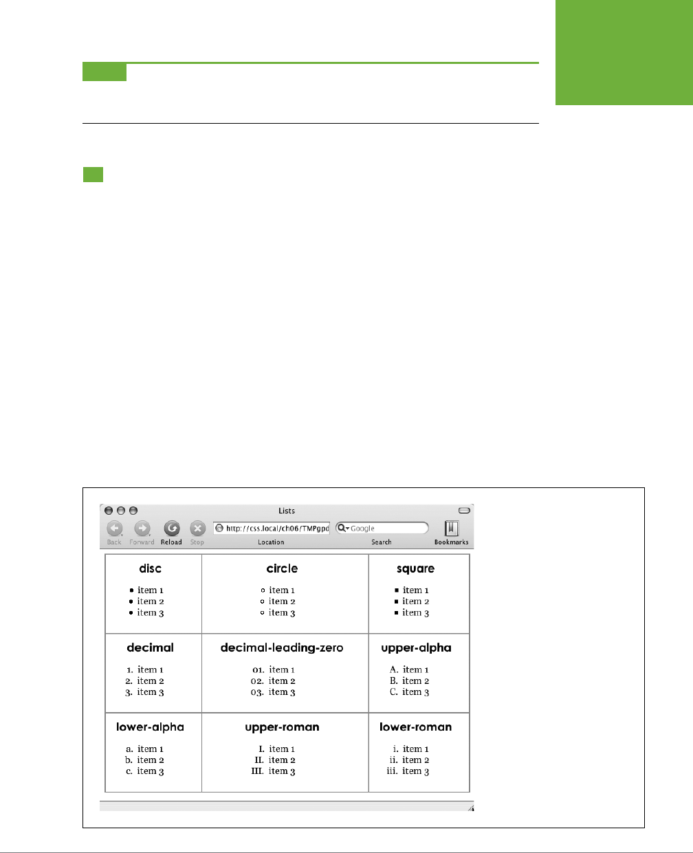
CHAPTER 6: FORMATTING TEXT 173
STYLING LISTS
NOTE For some strange reason, neither Chrome nor the Safari web browser understands the
text-
transform
property (page 163) when it’s used with the
:first-line
pseudo-element. In other words,
you can’t use CSS to capitalize the letters of a paragraph’s first line in Chrome or Safari.
Styling Lists
The <ul> and <ol> tags create bulleted and numbered lists, like lists of related items
or numbered steps. But you don’t always want to settle for the way web browsers
automatically format those lists. You may want to swap in a more attractive bullet,
use letters instead of numbers, or even completely eliminate the bullets or numbers.
Types of Lists
Most web browsers display unordered lists (<ul> tags) using round bullets, and num-
bered lists (<ol> tags) using…well…numbers. With CSS, you can choose from among
three types of bullets—disc (a solid round bullet), circle (a hollow round bullet), or
square (a solid square). There are also six dierent numbering schemes—decimal
,
decimal-leading-zero
,
upper-alpha
,
lower-alpha
,
upper-roman, or lower-roman (see
Figure 6-17). You select all these options using the
list-style-type
property, like so:
list-style-type: square;
or
list-style-type: upper-alpha;
FIGURE 6-17
CSS provides many different ways
to mark bulleted and numbered
lists, from a handful of geometric
shapes to many different numbering
systems. If you feel like rushing
a fraternity or sorority, you can
also replace numbers with Greek
letters—α, β, γ—using the
lower-
greek
option. In fact, there are a
number of other numbering schemes
including Armenian, Georgian,
Katakana, and other regional varia-
tions. You can find out about them at
https://developer.mozilla.org/en-US/
docs/CSS/list-style-type
.

CSS3: THE MISSING MANUAL
174
STYLING LISTS
Most of the time, you use this property on a style that’s formatting an <ol> or
<ul> tag. Typical examples include an ol or ul tag style—ul { list-style-type:
square; }—or a class you’re applying to one of those tags. However, you can also
apply the property to an individual list item (<li> tag) as well. You can even apply
dierent types of bullet styles to items within the same list. For example, you can
create a style for a <li> tag that sets the bullets to square, but then create a class
named .circle that changes the bullet type to circle, like this:
li {list-style-type: square; }
.circle { list-style-type: circle; }
You can then apply the class to every other item in the list to create an alternating
pattern of square and circular bullets:
<ul>
<li>Item 1</li>
<li class="circle">Item 2</li>
<li>Item 3</li>
<li class="circle">Item 4</li>
</ul>
Or, using the nth-of-type selector (page 78) you could skip the class name entirely:
li {list-style-type: square; }
li:nth-of-type(odd) { list-style-type: circle; }
At times you’ll want to completely hide bullets, like when you’d rather use your own
graphic bullets (see page 176). Also, when a site’s navigation bar is a list of links, you
can use an <ul> list, but hide its bullets (see the example on page 286). To turn o
the bullets, use the keyword none:
list-style-type: none;
Positioning Bullets and Numbers
Web browsers usually display bullets or numbers hanging to the left of the list
item’s text (Figure 6-18, left). With CSS, you can control the position of the bullet
(somewhat) using the list-style-position property. You can either have the bullet
appear outside of the text (the way browsers normally display bullets) or inside
the text block itself (Figure 6-18, right):
list-style-position: outside;
or
list-style-position: inside;
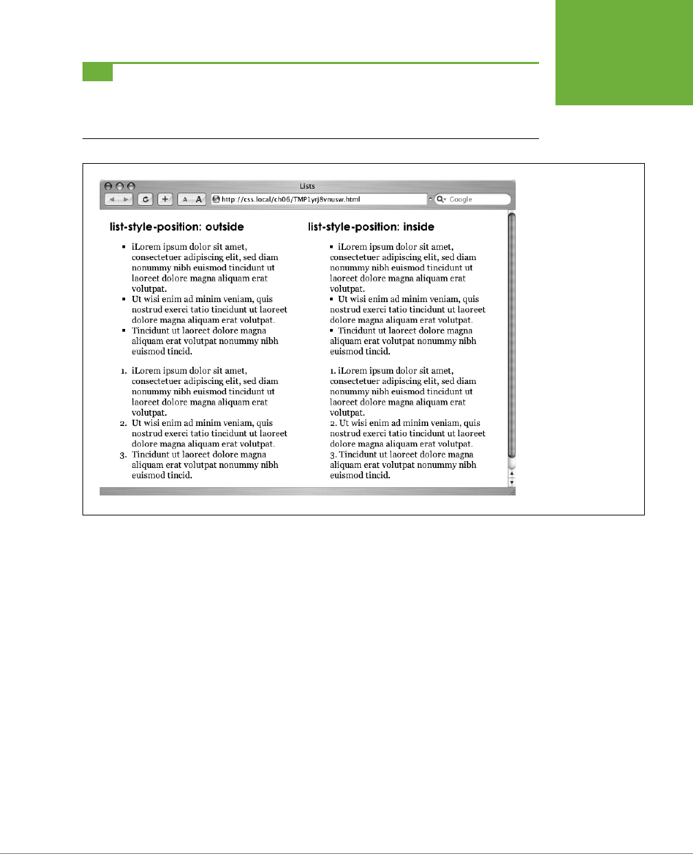
CHAPTER 6: FORMATTING TEXT 175
STYLING LISTS
TIP You can adjust the space between the bullet and its text—increase or decrease that gap—by using the
padding-left
property. To use it, you create a style that applies to the
<li>
tags. This technique works
only if you set the
list-style-position
property to the
outside
option (or don’t use
list-style-
position
at all).
FIGURE 6-18
Using the
list-
style-position
property, you can control
the position of bullets
and numbers in a list.
The outside option (left)
emphasizes the “listness”
of your list. Use the
inside
option (right) if
you need to maximize the
width of your list.
In addition, if you don’t like how web browsers indent a list from the left edge, then
you can remove that space by setting both the margin-left and padding-left
properties to 0 for the list. To remove the indent from all lists, you can create this
group selector:
ul, ol {
padding-left: 0;
margin-left: 0;
}
CSS3: THE MISSING MANUAL
176
STYLING LISTS
Or, you can create a class style with those properties and apply it to a particular <ul>
or <ol> tag. The reason you need to set both the padding and margin properties
is that some browsers use padding (Firefox, Mozilla, Safari) and some use margin
(Internet Explorer) to control the indent. (You’ll learn more about the margin and
padding properties in the next chapter.)
Browsers normally display one bulleted item directly above another, but you can add
space between list items using the margin-top or margin-bottom properties on the
particular list items. These properties work for spacing list items exactly the same way
they work for spacing paragraphs, as explained on page 171. You just need to make
sure that the style applies to the <li> tags by creating a class style and applying it
individually to each <li> tag. Or, better yet, create an <li> tag style or descendent
selector. The style should
not
apply to the <ul> or <ol> tag. Adding margins to the
top or bottom of those tags simply increases the space between the entire list and
the paragraphs above or below it—not the space between each item in the list.
Graphic Bullets
If you’re not happy with squares and circles for your bullets, create your own. Us-
ing an image-editing program like Photoshop or Fireworks, you can quickly create
colorful and interesting bullets. Clip art collections and most symbol fonts (like
Webdings) provide great inspiration.
TIP For a listing of loads of sites with free icons and bullets, check out this page:
www.cssjuice.com/38-free-
icon-checkpoints/
.
The CSS list-style-image property lets you specify a path to a graphic on your
site, much as you specify a file when adding an image to a page by using the src
attribute of the HTML <img> tag. You use the property like this:
list-style-image: url(images/bullet.gif);
The term url and the parentheses are required. The part inside the parentheses—
images/bullet.gif in this example—is the path to the graphic. Notice that, unlike
HTML, you don’t use quotation marks around the path.
CHAPTER 6: FORMATTING TEXT 177
STYLING LISTS
FREQUENTLY ASKED QUESTION
Customizing List Bullets and Numbers
I’d like the numbers in my numbered lists to be bold and red
instead of boring old black. How do I customize bullets and
numbers?
CSS gives you a few ways to customize the markers that appear
before list items. For bullets, you can use your own graphics, as
described previously. You have two other techniques available:
one that’s labor intensive, but works on most browsers, and one
that’s super geeky, cutting edge, and doesn’t work in Internet
Explorer 7 or earlier.
First, the labor-intensive way. Say you want the numbers in
an ordered list to be red and bold, but the text to be plain,
unbolded black. Create a style that applies to the list—like a
class style you apply to the
<ol>
or
<li>
tags—with a text
color of red and the font weight set to bold. At this point,
everything in the list—text included—is red and bold.
Next, create a class style—
.regularList
, for example—that
sets the font color to black and font weight to normal (that is,
not bold). Then (and this is the tedious part), wrap a
<span>
tag around the text in each list item and apply the class style
to it. For example:
<li><span class="regularList">Item 1</
span></li>
Now the bullets are bold and red and the text is black and
normal. Unfortunately, you have to add that
<span>
to
every
list item!
The cool, “I’m so CSS-savvy” way is to use what’s called
generated content
. Basically, generated content is just stuff
that isn’t actually typed on the page but is added by the web
browser when it displays the page. A good example is bullets
themselves. You don’t type bullet characters when you create
a list; the browser adds them for you. With CSS, you can have
a browser add content, and even style that content, before
each
<li>
tag. You’ll learn about generated content on page
595, but just so you have the code at hand if you want to make
regular bullets next to the list items red, add this CSS to your
style sheet:
ul li {
list-style-type: none;
}
ul li:before {
content: counter(item, disc) " ";
color: red;
}
And, if you wanted to make the items in a numbered list red,
you can add this CSS:
ol li {
list-style-type: none;
counter-increment: item;
}
ol li:before {
content: counter(item) ". ";
color: red;
}
For a more in-depth explanation of styling numbered lists visit
www.456bereastreet.com/archive/201105/styling_ordered_
list_numbers/
.
NOTE When specifying a graphic in an
external
style sheet, the path to the image is relative to the style
sheet file, not the web page. You’ll learn more about how this works in the box on page 244, as you start to use
images with CSS.
CSS3: THE MISSING MANUAL
178
TUTORIAL:
TEXT
FORMATTING
IN ACTION
While the list-style-image property lets you use a graphic for a bullet, it doesn’t
provide any control over its placement. The bullet may appear too far above or below
the line, requiring you to tweak the bullet graphic until you get it just right. A better
approach—one you’ll learn in Chapter 8—is to use the background-image property.
That property lets you very accurately place a graphic for your bulleted lists.
NOTE As with the
font
property (see the box on page 170), there’s a shorthand method of specifying list
properties. The
list-style
property can include a value for each of the other list properties—
list-style-
image
,
list-style-position
, and
list-style-type
. For example,
ul { list-style: circle
inside; }
formats unordered lists with the hollow circle bullet on the inside position. When you include both
a style type and style image—
list-style: circle url(images/bullet.gif) inside;
—web
browsers use the style type
circle
in this example—if the graphic can’t be found.
Tutorial: Text Formatting in Action
In this tutorial, you’ll gussy up headlines, lists, and paragraphs of text, using CSS’s
powerful formatting options.
To get started, you need to locate the tutorial files on this book’s companion web-
site at
www.sawmac.com/css3/
. Click the tutorial link and download the files. All of
the files are enclosed in a zip archive, so you’ll need to unzip them first. (Go to the
website for detailed instructions on unzipping the files.) The files for this tutorial are
contained inside the folder named
06
.
Setting Up the Page
First, you’ll get your style sheet started, add the @font-face directive to load some
web fonts, and add styles to format the body text.
1. Launch your web browser and open the file
06→text.html
(see Figure 6-19).
It’s not much to look at—just a collection of headlines, paragraphs and a lone
bulleted list—but you’ll turn it into something far better looking.
2. Open the file
text.html
in your favorite text editor.
Start by adding an internal style sheet to this file. (Yes, external style sheets
are better, but it’s perfectly OK to start your design with an internal sheet. See
page 39.)
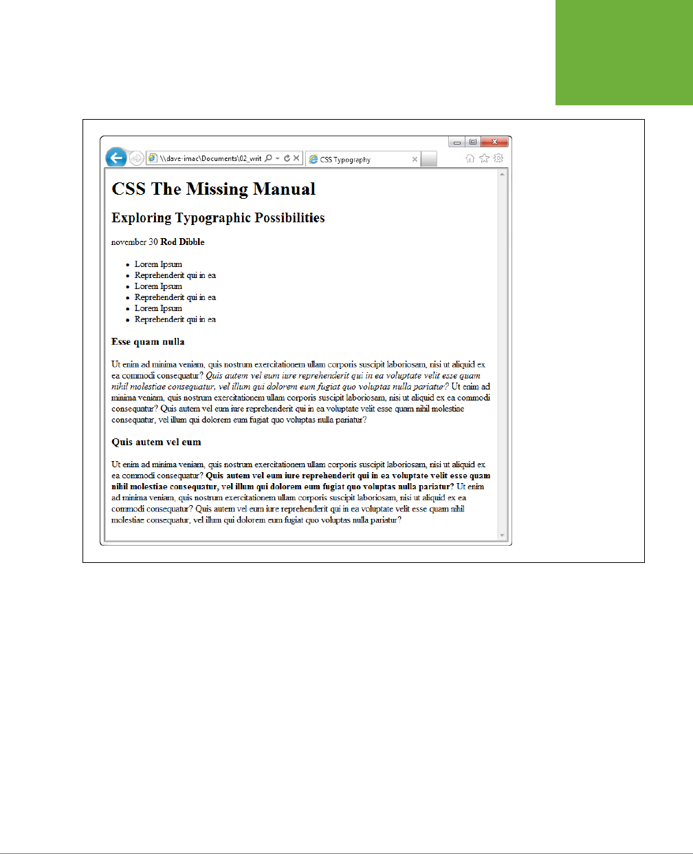
CHAPTER 6: FORMATTING TEXT 179
TUTORIAL:
TEXT
FORMATTING
IN ACTION
FIGURE 6-19
The page begins with
nothing but basic, drab,
HTML.
3. In the <head> of the web page, click directly after the closing </title> tag.
Hit Enter (Return), and then type:
<style>
</style>
Now that the basic style tags are in place, you’ll add the CSS reset discussed
on page 115. Instead of typing it all out, you’ll just copy and paste the CSS from
an external style sheet.

CSS3: THE MISSING MANUAL
180
TUTORIAL:
TEXT
FORMATTING
IN ACTION
4. Open the file
reset.css
. Copy all the code from that file and paste it between
the opening and closing <style> tags you added in Step 3.
If you preview the
text.html
file in a web browser now, you’ll see that all of the
text on the page (headlines, paragraphs, and so on) looks nearly the same—in
other words, all the basic HTML formatting the browser applied has been re-
moved, so you can start with a clean slate.
Next, you’ll add the necessary @font-face directives to load four web fonts.
Actually, they are all the same font—PTSans—but include the bold, italic, and
bold-italic variants.
5. Add the following code to the page:
@font-face {
font-family: 'PTSans';
src: url('fonts/PTSansRegular.eot');
src: url('fonts/PTSansRegular.eot?#iefix') format('embedded-opentype'),
url('fonts/PTSansRegular.woof') format('woff'),
url('fonts/PTSansRegular.ttf') format('truetype'),
url('fonts/PTSansRegular.svg') format('svg');
font-weight: normal;
font-style: normal;
}
@font-face {
font-family: 'PTSans';
src: url('fonts/PTSansItalic.eot');
src: url('fonts/PTSansItalic.eot?#iefix') format('embedded-opentype'),
url('fonts/PTSansItalic.woof') format('woff'),
url('fonts/PTSansItalic.ttf') format('truetype'),
url('fonts/PTSansItalic.svg') format('svg');
font-weight: normal;
font-style: italic;
}
@font-face {
font-family: 'PTSans';
src: url('fonts/PTSansBold.eot');
src: url('fonts/PTSansBold.eot?#iefix') format('embedded-opentype'),
url('fonts/PTSansBold.woof') format('woff'),
url('fonts/PTSansBold.ttf') format('truetype'),
url('fonts/PTSansBold.svg') format('svg');
font-weight: bold;
font-style: normal;
}
@font-face {
font-family: 'PTSans';
CHAPTER 6: FORMATTING TEXT 181
TUTORIAL:
TEXT
FORMATTING
IN ACTION
src: url('fonts/PTSansBoldItalic.eot');
src: url('fonts/PTSansBoldItalic.eot?#iefix') format('embedded-opentype'),
url('fonts/PTSansBoldItalic.woof') format('woff'),
url('fonts/PTSansBoldItalic.ttf') format('truetype'),
url('fonts/PTSansBoldItalic.svg') format('svg');
font-weight: bold;
font-style: italic;
}
NOTE Yes, that’s a lot of code. If you’d rather not type all of that, this chapter’s examples include a file
named
at-font-face.css
. You can open it, copy the code from there, and paste it into your style sheet. Go to
www.sawmac.com/css3
.
In a nutshell, you’ve created a new font family named PTSans. You’ll be able to
use it in any new styles you create. You’re using the method described on page
141 to add the bold-italic variants of the font. This method means that whenever
you apply a normal bolded tag to text (like a headline, or the <strong> tag), the
browser will automatically swap in the bold version of the font. (This method
doesn’t work in IE 8, which artificially bolds and italicizes the text instead of
swapping in the bold or italic versions of the font.)
Next, you’ll create a style that defines some general properties for all text on
the page.
6. After the four @font-face directives, press Enter, and type html {.
This is a basic tag selector that applies to the <html> tag. As discussed in
Chapter 4, other tags inherit the properties of this tag. You can set up some
basic text characteristics like font, color, and font size for later tags to use as
their starting point.
7. Press Enter again, and then add the following two properties:
font-family: PTSans, Arial, sans-serif;
font-size: 62.5%;
These two instructions set the font to PTSans (or Arial if the browser can’t
download PTSans), and the font size to 62.5 percent.
NOTE Why set the page’s base font to 62.5 percent? It just so happens that 62.5 percent times 16 pixels (the
normal size of text in most web browsers) equals 10 pixels. With 10 pixels as a starting point, it’s easy to compute
what other text sizes will look like on the screen. For example, 1.5em would be 1.5 x 10 or 15 pixels. 2em is 20
pixels, and so on—easy multiples of ten. For more on this interesting discovery and more font-sizing strategies,
visit
http://clagnut.com/blog/348/
.

CSS3: THE MISSING MANUAL
182
TUTORIAL:
TEXT
FORMATTING
IN ACTION
8. Complete this style by pressing Enter and typing a closing bracket to mark
the end of the style.
At this point, your completed style should look like this:
html {
font-family: PTSans, Arial, sans-serif;
font-size: 62.5%;
}
Your style sheet is complete.
9. Save the page, and open it in a web browser to preview your work.
The text on the page changes font…it also gets really small. Don’t worry, that’s the
62.5 percent font size you set in Step 7. That’s just the starting point for all text,
and you’ll easily increase the size of text by defining em sizes for the other tags.
Formatting the Headings and Paragraphs
Now that the basic text formatting is done, it’s time to refine the presentation of
the headlines and paragraphs.
1. Return to your text editor and the
text.html
file. Click at the end of the closing
brace of the body tag selector in the internal style sheet, press Enter (Return)
to create a new line, and then type .main h1 {.
This is a
descendent selector
(page 88). It provides more specific direction than
a basic HTML tag selector. In this case, the selector tells the web browser “ap-
ply the following formatting to any <h1> tag inside another tag with the class
name main.” If you look at the page’s HTML, you’ll see that there’s a <div> tag
with a class of main (<div class="main">). As you’ll learn later, it’s very com-
mon in CSS-based designs to group HTML tags inside of <div> tags. You can
then position individual <div> tags to create columns and other complex page
layouts. It’s also common to use descendent selectors like this one to pinpoint
your formatting choices by aecting just the tags in certain areas of the page.
2. Hit Enter, and then type these three CSS properties:
color: rgb(252,102,0);
font-family: "Arial Black", Arial, Helvetica, sans-serif;
font-size: 4em;
You’ve just changed the color of the <h1> tag as well as the font. This time,
instead of using a web font, you’re specifying a font that the visitor must have
installed on their computer. Many computers have Arial Black, but if the one
visiting this page doesn’t, it will fall back to Arial or Helvetica or just a generic
sans serif. You’ve also set the font size to 4em, which for most browsers (unless
the visitor has tweaked his browser’s font settings) comes out to 40 pixels tall.
That’s all thanks to the 62.5% size you set for the body back at Step 7. That
smooth move made the base font size 10 pixels tall, so 4 x 10 comes out to 40
pixels. Next you’ll add a text shadow to the headline.

CHAPTER 6: FORMATTING TEXT 183
TUTORIAL:
TEXT
FORMATTING
IN ACTION
3. Complete this style by hitting Enter, adding the coded in bold below (don’t
forget the closing brace):
.main h1 {
color: rgb(252,102,0);
font-family: "Arial Black", Arial, Helvetica, sans-serif;
font-size: 4em;
text-shadow: 4px 3px 6px rgba(0,0,0,.5);
}
Here, you’ve added a text shadow (page 166), which is oset 4 pixels to the
right, 3 pixels below, and is feathered out 6 pixels. In addition, you’re using the
RGBA color (page 155) to set the shadow to black with 50 percent transparency.
4. Save the file and preview it in a web browser.
Next, spruce up the appearance of the other headings and paragraphs.
5. Return to your text editor and the
text.html
file. Click after the closing brace
of the .main h1 tag, hit Enter, and add the following two styles:
.main h2 {
font: bold 3.5em "Hoefler Text", Garamond, Times, serif;
border-bottom: 1px solid rgb(200,200,200);
margin-top: 25px;
}
Here you have another descendent selector that only applies to <h2> tags inside
another tag with the class main (you’re probably getting the hang of these now).
The font property used here is shorthand that combines the more long-winded
font-weight
,
font-size, and font-family (see the box on page 170). In other
words, this one line makes the headline bold, 3.5ems tall, and specifies a font.
In addition, this style adds a decorative border below the headline and a bit of
space between the headline and the tag above it (in other words, it adds some
space between the “CSS The Missing Manual” and the “Exploring Typographic
Possibilities” headlines). You’ll read more about borders and margins in the
next chapter.
Time to tackle more headlines.
6. Add another style below the one you added in the last step:
.main h3 {
color: rgb(255,102,0);
font-size: 1.9em;
font-weight: bold;
text-transform: uppercase;
margin-top: 25px;
margin-bottom: 10px;
}

CSS3: THE MISSING MANUAL
184
TUTORIAL:
TEXT
FORMATTING
IN ACTION
This style dishes out some of the usual formatting—color, size, boldness—and
also uses the text-transform property (page 163) to make all of the text in the
<h3> headlines uppercase. Finally, it adds a bit of space above and below the
headlines by using the margin properties.
Next, you’ll improve the look of the paragraphs.
7. Add one more style to the page:
.main p {
font-size: 1.5em;
line-height: 150%;
margin-left: 150px;
margin-right: 50px;
margin-bottom: 10px;
}
This style introduces the line-height property, which sets the spacing between
lines. A percentage of 150 adds a little more space between lines in a paragraph
than you’d normally see in a web browser. This extra breathing room gives the
text a lighter, airier quality and makes the sentences a little easier to read (but
only if you speak Latin).
The style also increases the font size to 1.5em (15 pixels for most browsers) and
indents the paragraph from the left and right edges of the page. You’ll notice
that there’s a lot of typing going on for the margin properties—fortunately, as
you’ll read on page 184 in the next chapter, there’s a margin shortcut property
that requires much less typing to control the four margins of an element.
Time to try out a more advanced selector type.
8. Add the following style to your style sheet:
.main p:first-line {
font-weight: bold;
color: rgb(153,153,153);
}
The :first-line pseudo-element (page 172) aects just the first line of a para-
graph. In this case, just the first line of text for each of the paragraphs inside
the main div will be bold and gray.
9. Save the page and open it in a web browser to preview your work.
At this point, the page should look like Figure 6-20.
CHAPTER 6: FORMATTING TEXT 185
TUTORIAL:
TEXT
FORMATTING
IN ACTION
FIGURE 6-20
The page is starting
to come together. The
headlines, paragraphs, and
basic text settings are in
place. Depending on which
fonts you have on your
computer, you may notice
slight differences between
your design and the one
pictured here. Specifically,
if you’re on Windows, the
“Exploring Typographic
Possibilities” headline will
use either Garamond or
Arial. This image, taken
on a Mac, uses the Hoefler
Text font family specified
in Step 5 on page 183.
Formatting Lists
This page has a single bulleted list. The plan is to move the list over to the right
edge of the page and have the text following it wrap around it. CSS makes this little
trick easy.
1. Return to your text editor and the
text.html
file. Add the following style at
the end of the page’s internal style sheet:
.main ul {
margin: 50px 0 25px 50px;
width: 170px;
float: right;
}

CSS3: THE MISSING MANUAL
186
TUTORIAL:
TEXT
FORMATTING
IN ACTION
When formatting lists, you’ll usually create styles for two dierent elements:
the list itself (either the <ul> tag for bulleted lists or the <ol> tag for numbered
lists) and the individual list items (the <li> tag). This style controls the entire list.
There are a few things happening in this style. First, the
margin
property uses the
shorthand method. This one line sets all four margins around the list, replacing
the four individual margin properties (margin-top
,
margin-right, and so on).
The four values are ordered like this: top, right, bottom, left. So for this style,
50 pixels of space get added above the list, 0 space on the right, 25 pixels on
the bottom, and 50 pixels on the left.
The width property (discussed in detail on page 212) makes the entire list 150
pixels wide. If any particular list item has more text than will fit within that space,
it wraps to another line. The
float
property is the real magic—in this case,
float:
right
means move the list over to the right edge of the page. This property also
causes the text following the list to wrap around the left side of the list. It’s a
cool trick, and you’ll learn a lot more about floats on page 220.
You’ll control the look of the individual list items next.
2. Add one more style to the internal style sheet in the
text.html
file:
.main li {
color: rgb(32,126,191);
font-size: 1.5em;
margin-bottom: 7px;
}
Nothing new here: just changing the color and size and adding space below
each list item. Time to check out your progress.
NOTE If you want to add space between list items, you need to add top or bottom margins to the
<li>
tag. Adding margins to the
<ul>
or
<ol>
tags simply adds space around the entire list.
3. Save the page and preview it in a web browser.
The page should now look like Figure 6-21.
CHAPTER 6: FORMATTING TEXT 187
TUTORIAL:
TEXT
FORMATTING
IN ACTION
FIGURE 6-21
The
float
property gives
you some interesting
design options. In this
case, the bulleted list is
floated to the right edge
of the page. In fact, the
float
property is so
useful, you’ll see that it’s
the main ingredient of
CSS-based layouts, like the
ones you’ll learn about in
Chapter 12.
Fine-Tuning with Classes
Sometimes you want even more control over how a style is applied. For example,
while you might want most paragraphs in one section of the page to look the
same, you might also want one or two paragraphs to have their own unique look.
In this tutorial, the paragraph of text near the top of the page—“November 30 Rod
Dibble”—contains some unique information—a publication date and author. You
want it to stand out from the other paragraphs, so you’ll add a class to the HTML
and create a class style.

CSS3: THE MISSING MANUAL
188
TUTORIAL:
TEXT
FORMATTING
IN ACTION
1. Locate the HTML for that paragraph—<p>november 30 <strong>Rod Dibble</
strong></p>—and add class="byline" to the opening <p> tag. The HTML
should look like this:
<p class="byline">november 30 <strong>Rod Dibble</strong></p>
Now it’s a simple matter of creating a class style that overrides the generic
formatting of the other paragraphs on the page.
2. In the internal style sheet near the top of the page, add a style for that
paragraph:
.main .byline {
font-size: 1.6em;
margin: 5px 0 25px 50px;
}
This style tweaks the size and placement of just that one paragraph. Note that
if you’d just named that style .byline—a basic class selector—it wouldn’t work.
Thanks to the rules of the cascade described in the last chapter, .byline is less
specific (less powerful) than the
.main p style you created in Step 7 on page
184, so it wouldn’t be able to override the size and margins specified by .main p.
However, .main .byline is more specific.
That paragraph still needs some work. It would be great if the name stood out
more. The HTML in this case provides just the hook you need.
3. Add another style to the style sheet:
..main .byline strong {
color: rgb(32,126,191);
text-transform: uppercase;
margin-left: 11px;
}
If you look at the HTML in Step 1 above, you’ll see that the name—Rod Dibble—is
inside a <strong> tag. The <strong> tag is used to emphasize text and mark
it as important. But that doesn’t mean you have to let it be bold, the way web
browsers normally display that tag. Instead, this descendent selector targets
the <strong> tag but only when it appears inside another tag with the class
.byline, and only if all of that is inside yet another tag with the class main—
whew, that’s pretty specific.
This style turns the text blue, makes it uppercase, and adds a bit of space on
the left side (nudging the name over just a bit from the “November 30” text).
Adding the Finishing Touches
For the last bit of design, you’ll incorporate a few design touches that format the
page and that main div so they both look better. Then you’ll finish up with a cool
bit of text formatting.

CHAPTER 6: FORMATTING TEXT 189
TUTORIAL:
TEXT
FORMATTING
IN ACTION
1. Return to your text editor and the
text.html
file.
First, you’ll add a background color and image to the page.
2. Locate the html style near the top of the internal style sheet and add one
new property so that it looks like this (changes are in bold):
html {
font-size: 62.5%;
font-family: Arial, Helvetica, sans-serif;
background: rgb(225,238,253) url(images/bg_body.png) repeat-x;
}
The background property is a powerful tool for any web designer. You’ve already
used it a couple of times in earlier tutorials; it lets you add color and insert and
control the placement of an image to the background of any tag. You’ll learn
the ins and outs of this property on page 255, but for now this line changes
the background color of the page to light blue and adds a dark blue stripe to
the top of the page.
Next you’ll spruce up the main div.
3. Add another style in between the html style and the .main h1 style:
.main {
width: 740px;
margin: 0 auto;
padding: 0 10px;
border: 4px solid white;
background: transparent url(images/bg_banner.jpg) no-repeat;
}
In other words, click after the closing } for the html style, hit Enter, and type
the code above. You don’t necessarily have to put the style in that spot for it
to work, but for organizational purposes, putting the style that controls the div
before the other styles that format tags inside that div makes sense.
The width property sets an overall width for this div (and the content inside
it), essentially turning this page into a 740-pixel-wide document. The margin
property values—0 auto—put 0 pixels of space above and below the div and
set the left and right margins to auto, which centers the div in the middle of
the browser window. The padding property adds space inside the box, pushing
content inside the div away from the border line. Finally, you’ve placed an image
into the background of the div.
Those last two styles didn’t have anything to do with text formatting, but if you
preview the page, you’ll see that they make it look a lot better…except for those
two top headlines. The first headline isn’t bold enough, and the second should
fall below the newly added graphic.

CSS3: THE MISSING MANUAL
190
TUTORIAL:
TEXT
FORMATTING
IN ACTION
4. Add one last style right after the .main h1 style:
.main h1 strong {
font-size: 150px;
color: white;
line-height: 1em;
margin-right: -1.25em;
}
The HTML for the headline looks like this:
<h1><strong>CSS</strong> The Missing Manual</h1>
The “CSS” is enclosed inside <strong> tags, so this descendent selector formats
only that text (in that sense, it’s like the style you added in Step 3 on page 188
that took advantage of a <strong> tag embedded within a paragraph). The
text size is pumped way up, its color changed, and line height is adjusted so
that it fits inside the top of the page. You’ll notice that the line height is set to
1em (as you read on page 160, an em is based on the current font size of the
element), so in this case, the line height will translate to 150 pixels—that’s the
font size of this style.
The one cool trick is the margin-right property, which is set to a negative value:
–1.25em. Since a positive margin pushes elements away, a negative margin actu-
ally pulls elements on top of each other. In this case, the rest of the text in the
headline—“The Missing Manual”—is scooted over 1.25 em, which is 1.25 times
the font size (150 pixels), on top of the “CSS” text.
NOTE Negative margins are perfectly legal (although tricky) CSS. They’re even used for some pretty advanced
CSS layout, as described on page 199.
5. Save the file and preview it in a web browser.
It should look like Figure 6-22. You can compare your work to the finished
text.html
page located in the
06_finished
folder.
Congratulations! You’ve explored many of the text formatting properties oered by
CSS and turned ho-hum HTML into an attractive, attention-getting design. In the
next chapter, you’ll explore graphics, borders, margins, and other powerful CSS
design options oered by CSS.
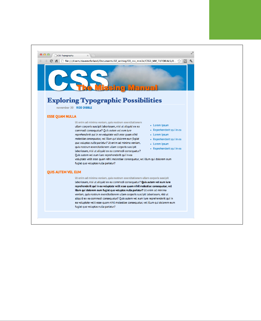
CHAPTER 6: FORMATTING TEXT 191
TUTORIAL:
TEXT
FORMATTING
IN ACTION
FIGURE 6-22
With a little CSS, you
can turn plain text
into a powerful design
statement that helps
guide readers through the
information on your site.

193
CHAPTER
7
Every HTML tag is surrounded by a world of properties that aect how the tag
appears in a web browser. Some properties—like borders and background
colors—are immediately obvious to the naked eye. Others, though, are
invisible—like padding and margin. They provide a bit of empty space on one or
more sides of a tag. By understanding how these properties work, you can create
attractive columns and decorative sidebars and control the space around them
(what designers call
white space
) so your pages look less cluttered, lighter, and
more professional.
Taken together, the CSS properties discussed in this chapter make up one of the
most important concepts in CSS—the
box model
.
Understanding the Box Model
You probably think of letters, words, and sentences when you think of a paragraph
or headline. You also probably think of a photo, logo, or other picture when you
think of the <img> tag. But a web browser treats these (and all other) tags as little
boxes
. To a browser, any tag is a box with something inside it—text, an image, or
even other tags containing other things, as illustrated in Figure 7-1.
Surrounding the content are dierent properties that make up the box:
• padding is the space between the content and the content’s border. Padding is
what separates a photo from the border that frames the photo.
• border is the line that’s drawn around each edge of the box. You can have a
border around all four sides, on just a single side, or any combination of sides.
Margins, Padding,
and Borders
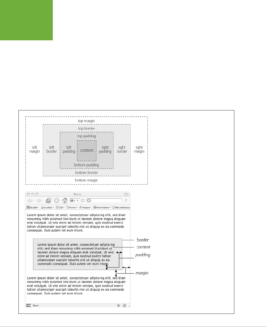
CSS3: THE MISSING MANUAL
194
UNDERSTANDING
THE BOX MODEL
• background-color fills the space inside the border, including the padding area.
• margin is what separates one tag from another. The space that commonly ap-
pears between the tops and bottoms of paragraphs of text on a web page, for
example, is the margin.
For a given tag, you can use any or all of these properties in combination. You can
set just a margin for a tag or add a border, margins,
and
padding. Or you can have
a border and margin but no padding, and so on. If you don’t adjust any of these
properties, then you’ll end up with the browser’s settings, which you may or may not
like. For example, although browsers usually don’t apply either padding or borders
to any tags on a page, some tags like headings and paragraphs have a preset top
and bottom margin.
FIGURE 7-1
The CSS box model includes the content inside a
tag (for example, several sentences of text) plus
padding, borders, and margins. The area within
the border, which includes the content and pad-
ding, may also have a background color. Actually,
the background color is drawn underneath the
border, so when you assign a dashed or dotted
border, the background color appears in the gaps
between the dots or dashes.
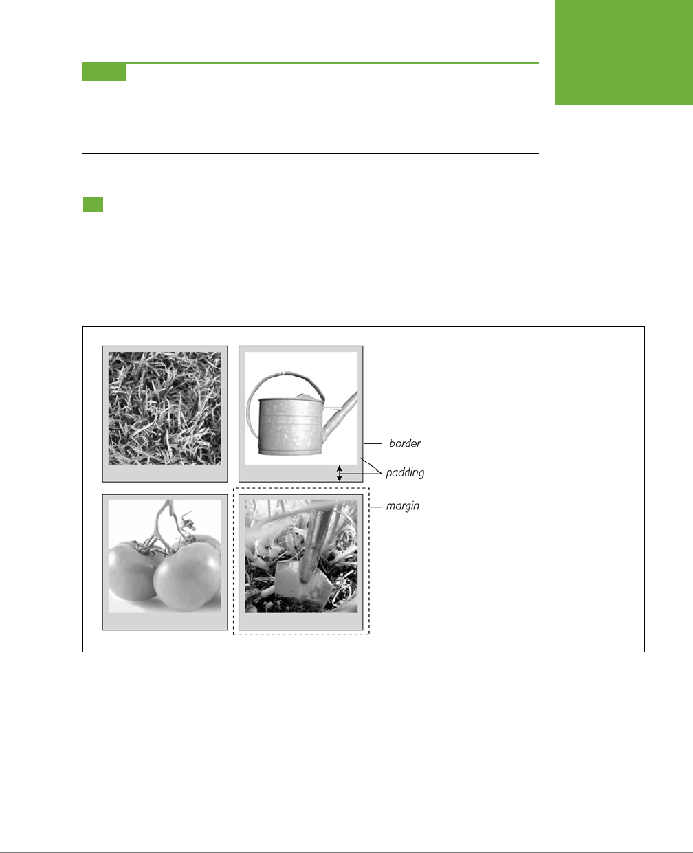
CHAPTER 7: MARGINS, PADDING, AND BORDERS 195
CONTROLLING
SPACE WITH
MARGINS AND
PADDING
NOTE As discussed on page 548, because different browsers apply different amounts of padding and
margin to the same tags, it’s best to “zero-out” padding and margin values for all tags. In other words, use a
set of simple styles—called a CSS reset—to remove padding and margin from HTML tags. Then, when you create
additional styles that add margin and padding, you can be assured that you’ll have a consistent cross-browser
presentation.
Controlling Space with Margins and Padding
Both margins and padding add space around content. You use these properties to
separate one element from another—for example, to add space between a left-hand
navigation menu and the main page content on the right—or to inject some white
space between content and a border. You may want to move the border away from
the edge of a photo (see Figure 7-2).
FIGURE 7-2
Each photo on this page has a 10-pixel margin,
so the gap separating two photos is 20 pixels.
Padding separates the images from their borders
and exposes a gray background color. You can set
the border, margin, and padding independently
for each edge. Notice the larger padding applied to
the bottom edge of each photo.
Padding and margin function similarly, and unless you apply a border or background
color, you can’t really tell whether the space between two tags is caused by padding
or by a margin. But if you have a border around an element or a background behind
it, then the visual dierence between the two properties is significant. Padding adds
space between the content and the border, and keeps the content from appearing
cramped inside the box; it also includes the background area, so the space taken
up by padding might be empty of content (like text or a photo), but it will still be
filled with a background color or image. Margins, on the other hand, add white
space (often called a
gutter
) between elements, giving the overall look of the page
a lighter appearance.
CSS3: THE MISSING MANUAL
196
CONTROLLING
SPACE WITH
MARGINS AND
PADDING
You can control each side of the margin or padding for an element independently.
Four properties control margin edges: margin-top, margin-right, margin-bottom,
and margin-left. Similarly, four properties control padding: padding-top, padding-
right, padding-bottom, and padding-left. You can use any valid CSS measurement
to define the size of a margin or padding, like so:
margin-right: 20px;
padding-top: 3em;
margin-left: 10%;
Pixels and ems are commonly used and act just as they do with text (see page 160).
A 20-pixel margin adds 20 pixels of space, and 3 ems of padding adds space equal
to 3 times the font size of the styled element. You can also use percentage values,
but they’re tricky. (See the box below for the details.)
NOTE To remove all the space for a margin or padding, use 0 (
margin-top: 0
or
padding-bottom:
0
, for example). To remove space around all four edges of the browser window—to let a banner or logo or other
page element butt right up to the edge without a gap—give the body tag a margin of 0 and a padding of 0:
margin: 0; padding 0;
.
POWER USERS’ CLINIC
Margins, Padding, and Percentages
When you use percentages, web browsers calculate the amount
of space based on the
width of the containing element
. On a
simple web page, the containing element is the body of the
page, and it fills the browser window. In this case, the percent-
age value is based on the width of the browser window at any
given time. Say the window is 760 pixels wide. In that case, a
10% left margin adds 76 pixels of space to the left edge of the
styled element. But if you resize the browser window, then that
value changes. Narrowing the browser window to 600 pixels
changes the margin to 60 pixels (10 percent of 600).
However, the containing element isn’t always the width of
the browser window. As you’ll see in later chapters, when
you create more sophisticated layouts, you can introduce new
elements that help organize your page.
You may want to add a
<div>
tag to a page in order to group
related content into a sidebar area. (You’ll see an example of
this in the tutorial on page 225.) That sidebar might have a
specified width of 300 pixels. Tags inside the sidebar consider
the
<div>
tag their containing element. So a tag in the sidebar
with a right margin of 10% will have 30 pixels of empty space
to its right.
To make matters more confusing, top and bottom percentage
values are calculated based on the width of the containing
element, not its height. So a 20% top margin is 20 percent of
the width of the styled tag’s container.
Margin and Padding Shorthand
You’ll frequently want to set all four sides of a style’s margin or padding. But typing
out all four properties (margin-right, margin-left, and so on) for each style gets
tedious. Fear not: You can use the shortcut properties named margin and padding
to set all four properties quickly:
CHAPTER 7: MARGINS, PADDING, AND BORDERS 197
CONTROLLING
SPACE WITH
MARGINS AND
PADDING
margin: 0 10px 10px 20px;
padding: 10px 5px 5px 10px;
NOTE If the value used in a CSS property is 0, then you don’t need to add a unit of measurement. For
example, just type
margin: 0;
instead of
margin: 0px;
.
The order in which you specify the four values is important. It must be top, right,
bottom, and left. If you get it wrong, you’ll be in trouble. In fact, the easiest way to
keep the order straight is to remember to stay out of TRouBLe—top, right, bottom,
and left.
If you want to use the same value for all four sides, it’s even easier—just use a single
value. If you want to remove margins from all <h1> tags, you can write this style:
h1 {
margin: 0;
}
Similarly, use shorthand to add the same amount of space between some content
and its border:
padding: 10px;
NOTE When you’re using the same value for both top and bottom and another value for both left and
right, you can use two values.
margin: 0 2em;
sets the top
and
bottom margins to 0 and the left
and
right
margins to 2 ems. Likewise, if the top and bottom margins (or padding) differ, but the left and right remain the
same, you can use three values. For example,
margin: 0 2em 1em;
sets the top margin to 0, the left and
right margins to 2 ems, and the bottom margin to 1 em.
Colliding Margins
When it comes to CSS, two plus two doesn’t always equal four. You could run into
some bizarre math when the bottom margin of one element touches the top margin
of another. Instead of adding the two margins together, a web browser applies the
larger of the two margins (Figure 7-3, top). Say the bottom margin of an unordered
list is set to 30 pixels, and the top margin of a paragraph following the list is 20
pixels. Instead of adding the two values to create 50 pixels of space between the list
and the paragraph, a web browser uses the
largest
margin—in this case 30 pixels.
If you don’t want this to happen, then use top or bottom padding instead (Figure
7-3, bottom).
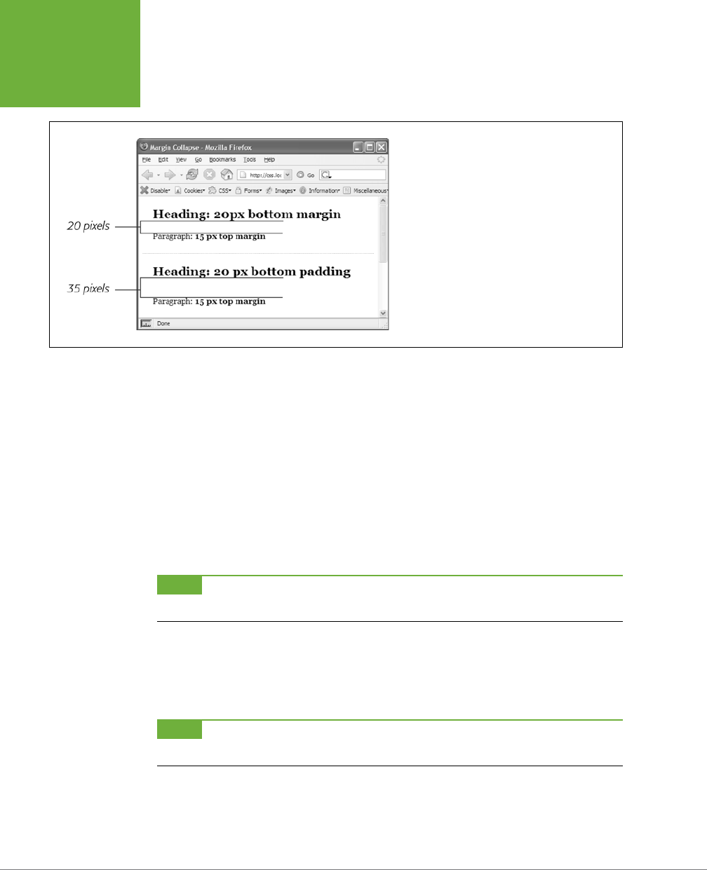
CSS3: THE MISSING MANUAL
198
CONTROLLING
SPACE WITH
MARGINS AND
PADDING
FIGURE 7-3
When two vertical margins meet, the smaller one
collapses. Although the top headline has a bottom
margin of 20 pixels, and the paragraph has a top
margin of 15 pixels, a web browser adds only 20
pixels of space between the two elements. To get
the full 35 pixels’ worth of space that you want, use
padding instead of margins, as shown in the bottom
headline. Here, the heading has 20 pixels of bottom
padding. Those 20 pixels get added to the 15-pixel
top margin of the paragraph to form a 35-pixel gap.
Things get even weirder when one element’s
inside
another element. This situation
can lead to some head-scratching behavior. For example, say you add a “warning” box
to a page (like a <div> tag to hold a warning message inside it). You add a 20-pixel
top and bottom margin to separate the warning box from the heading above it and
the paragraph of text below it. So far so good.
But say you insert a heading inside the warning box, and to put a little room between
it and the top and bottom of the div, you set the heading’s margin to 10 pixels. You
may think you’re adding 10 pixels of space between the heading and the top and
bottom of the div, but you’d be wrong (Figure 7-4, top). Instead, the margin appears
above
the div. In this case, it doesn’t matter how large a margin you apply to the
headline—the margin still appears
above
the div.
NOTE In the lingo of CSS, this phenomenon is known as
collapsing margins
, meaning two margins actually
become one.
You have two ways around this problem: Either add a small amount of padding
around the <div> tag or add a border to it. Since border and padding sit
between
the two margins, the margins no longer touch, and the headline has a little breathing
room (Figure 7-4, bottom).
NOTE Horizontal (left and right) margins and margins between floating elements don’t collapse in this way.
Absolutely and relatively positioned elements—which you’ll learn about in Chapter 15—don’t collapse either.
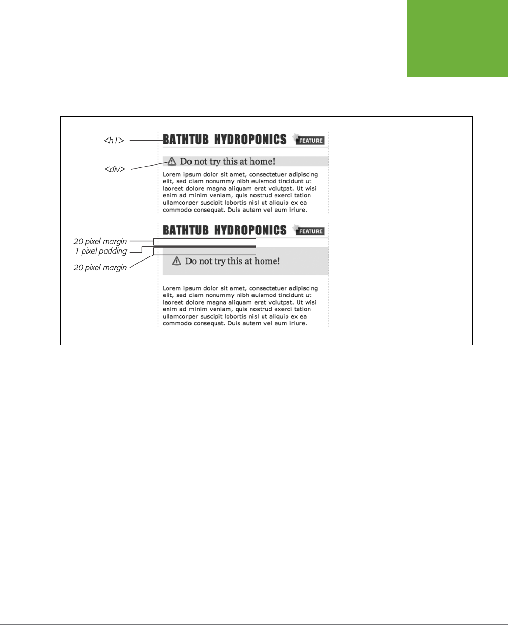
CHAPTER 7: MARGINS, PADDING, AND BORDERS 199
CONTROLLING
SPACE WITH
MARGINS AND
PADDING
Removing Space with Negative Margins
Most measurements in CSS have to be a positive value—after all, what would text
that’s
negative 20 pixels
tall (or short) look like? Padding also has to be a positive
value. But CSS allows for many creative techniques using negative margins.
FIGURE 7-4
Holy shrinking margins, Batman! Top:
Whenever vertical margins touch, even
when one element is inside another ele-
ment (like the
<h2>
tag inside this div),
the margins collapse.
Bottom: To solve this dilemma, add a little
padding or a border around the containing
element (1 pixel of top and bottom pad-
ding on the
<div>
, in this case).
Instead of adding space between a tag and elements around it, a negative margin
removes
space. So you can have a paragraph of text overlap a headline, poke out
of its containing element (a sidebar or other layout <div>), or even disappear o
an edge of the browser window. And, hey, you can even do something useful with
negative margins.
Even when you set the margins between two headlines to 0, there’s still a little space
between the text of the headlines (thanks to the text’s line height, as described on
page 168). That’s usually a good thing, since it’s hard to read sentences that bunch
together and touch. But, used in moderation, tightening the space between two
headlines can produce some interesting eects. The second headline of Figure
7-5 (the one that begins “Raise Tuna”) has a top margin of –10px applied to it. This
moves the headline up 10 pixels so it slightly overlaps the space occupied by the
headline above it. Also, the left and right borders of the “Extra! Extra!” headline
actually touch the letters of the larger headline.
You can also use a negative margin to simulate negative padding. In the third headline
of Figure 7-5, the one that begins with “The Extraordinary Technique,” a line appears
directly under the text. This line is actually the
top
border for the paragraph that
follows. (You’ll learn how to add borders on page 202.) But because that paragraph
has a negative top margin, the border moves up and under the headline. Notice how
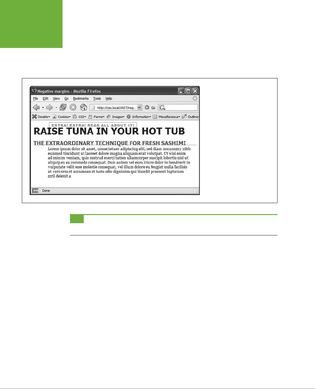
CSS3: THE MISSING MANUAL
200
CONTROLLING
SPACE WITH
MARGINS AND
PADDING
the descending tail for the letter Q in the headline actually hangs
below
the border.
Since padding—the space between content (like that letter Q) and a border—can’t
be negative, you can’t move a bottom border up over text or any other content. But
you get the same eect by applying a border to the following element and using a
negative margin to move it up.
FIGURE 7-5
In this example, to make the last
paragraph’s top border look like
it’s actually the bottom border for
the headline above it, add a little
padding to the paragraph. Around
5 pixels of top padding moves the
paragraph down from the border,
while 4ems of left padding indents
the paragraph’s text, still allowing
the top border to extend to the left
edge.
TIP You can actually use a negative top margin on the paragraph or a negative bottom margin on the
headline. Both have the same effect of moving the paragraph up close to the headline.
Inline, Block, and Other Display Settings
Although web browsers treat every tag as a kind of box, not all boxes are alike. CSS
has two dierent types of boxes—
block boxes
and
inline boxes
—that correspond
to the two types of tags—block-level and inline tags.
A
block-level
tag creates a break before and after it. The <p> tag, for example, creates
a block that’s separated from tags above and below. Headlines, <div> tags, tables,
lists, and list items are other examples of block-level tags.
Inline
tags don’t create a break before or after them. They appear on the same
line as the content and tags beside them. The <strong> tag is an inline tag. A word
formatted with this tag happily sits next to other text—even text wrapped in other
inline tags like <em>. In fact, it would look pretty weird if you emphasized a single
word in the middle of a paragraph with the <strong> tag and that word suddenly
appeared on its own line by itself. Other inline tags are <img> for adding images, <a>
for creating links, and the various tags used to create form fields.
In most cases, CSS works the same for inline boxes and block boxes. You can style
the font, color, and background and add borders to both types of boxes. However,
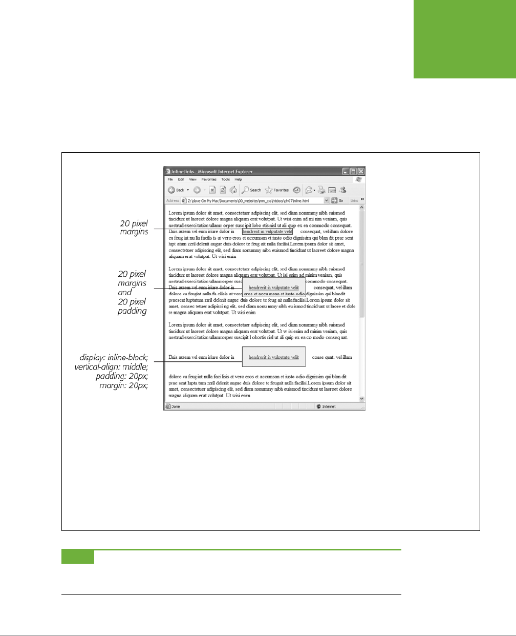
CHAPTER 7: MARGINS, PADDING, AND BORDERS 201
CONTROLLING
SPACE WITH
MARGINS AND
PADDING
when it comes to margins and padding, browsers treat inline boxes dierently.
Although you can add space to the left or right of an inline element using either left
or right padding or left or right margins, you can’t increase the height of the inline
element with top or bottom padding or margins. In the top paragraph in Figure
7-6, the inline element is styled with borders, a background color, and 20 pixels of
margin on all four sides. But the browser only adds space to the left and right sides
of the inline element.
FIGURE 7-6
Adding top or bottom margins
and padding doesn’t make an
inline element any taller, so you
can run into some weird format-
ting. In the middle paragraph,
the background and borders of
a link overlap the text above
and below. The background
appears on top of the line
before the styled inline text, but
underneath the line following it
because the browser treats each
line as if it’s stacked on top of
the previous line. Normally, that
isn’t a problem since lines of
text don’t usually overlap. If you
want top and bottom margins
and padding to work for an
inline element, you can use the
display:inline-block
instruction (bottom). This leaves
the item inline, but treats it like
a box so padding, margins, bor-
ders, and width and height are
all applied (and obeyed). This
even works in Internet Explorer
7, but only for normally inline
elements like links,
<strong>
,
<em>
, and
<span>
tags; you
should also add
vertical-
align: middle
so that IE7
displays the inline block the
same as other browsers.
NOTE One exception to the rule that inline elements don’t get taller when padding or margins are added
is the
<img>
tag (even though it’s an inline tag). Web browsers correctly expand the height of the image’s box
to accommodate any padding and margins you add.
CSS3: THE MISSING MANUAL
202
ADDING
BORDERS
At times, you may wish an inline element behaved more like a block-level element
and vice versa. Bulleted lists present each item as its own block—each list item is
stacked above the next. You may want to change that behavior so the list items ap-
pear side by side, all on a single line, as in a navigation bar (you can see an example
of one in the box on page 307). Finally, you may want to treat an inline element like
a block-level element. Maybe you want an image embedded in a paragraph to be
on its own line, with space above and below.
Fortunately, CSS includes a property that lets you do just that—the display property.
With it, you can make a block-level element act like an inline element:
display: inline;
Or you can make an inline element, like an image or link, behave like a block-level
element:
display: block;
NOTE The
display
property has a myriad of possible options, some of which don’t work in all browsers.
The
inline-block
value works in current browsers (see Figure 7-6). Another value,
none
, works in most
browsers and has many uses. It does one simple thing—completely hides the styled element so it doesn’t appear
in a web browser. With a dab of JavaScript programming, you can make an element hidden in this way instantly
become visible, simply by changing its display back to either
inline
or
block
. You can even make an element
with a display of
none
suddenly appear using CSS; you’ll see an example of that on page 583.
Adding Borders
A border is simply a line that runs around an element. As shown back in Figure 7-1,
it sits between any padding and margins you set. A border around every edge can
frame an image or mark the boundaries of a banner or other page element. But
borders don’t necessarily have to create a full box around your content. While you
can add a border to all four edges, you can just as easily add a border to just the
bottom or any combination of sides. This flexibility lets you add design elements
that don’t necessarily feel like a border. For example, add a border to the left of an
element, make it around 1em thick, and it looks like a square bullet. A single border
under a paragraph can function just like the <hr> (horizontal rule) by providing a
visual separator between sections of a page.
You control three dierent properties of each border: color, width, and style. The
color can be any of the CSS color values discussed starting on page 154, such as a
hexadecimal number, a keyword, or an RGB (or RGBA) value. A border’s width is
the thickness of the line used to draw the border. You can use any CSS measure-
ment type (except percentages) or the keywords thin, medium, and thick. The most
common and easily understood method is pixels.
Finally, the style controls the type of line drawn. There are many dierent styles, and
some look very dierent from browser to browser, as you can see in Figure 7-7. You
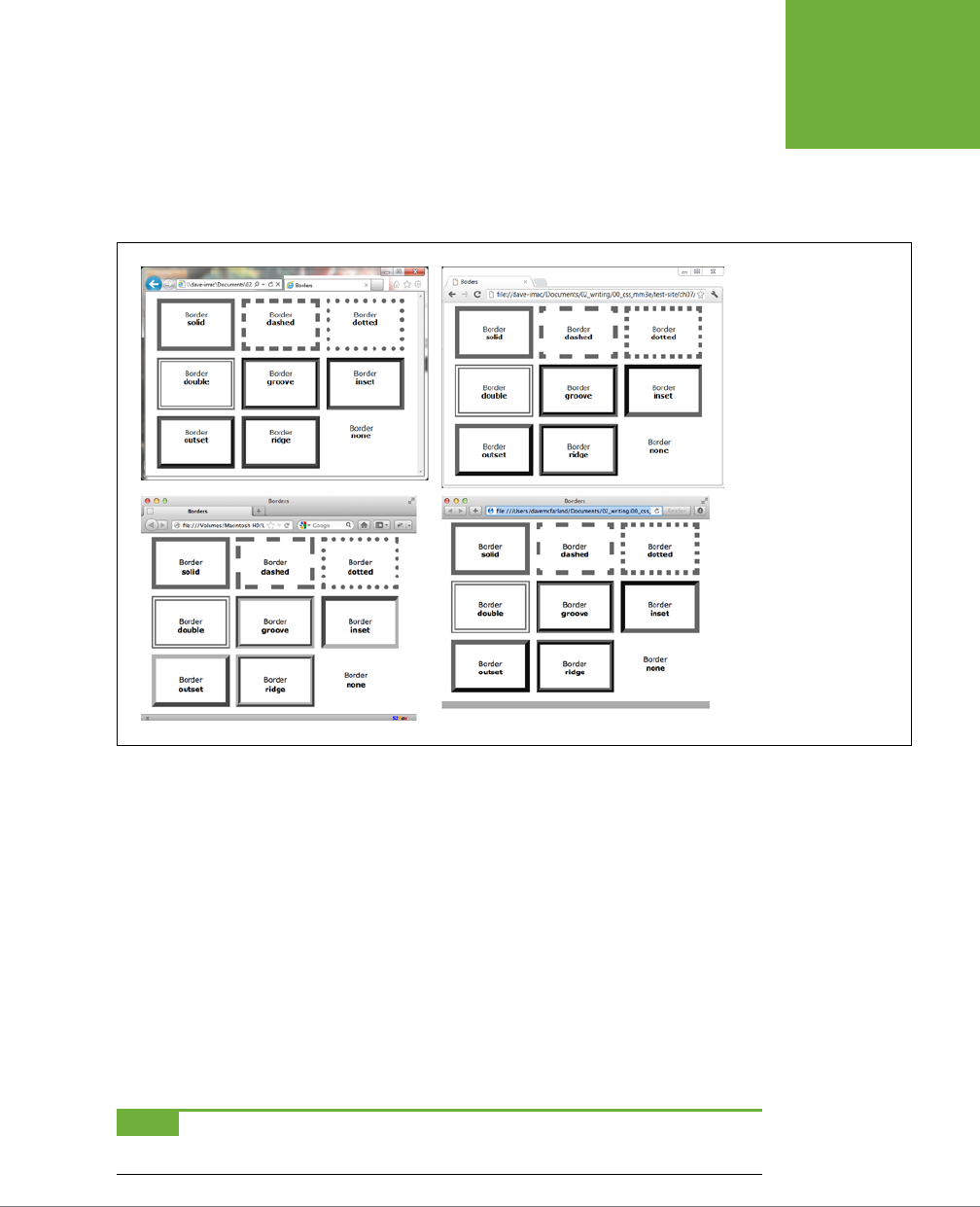
CHAPTER 7: MARGINS, PADDING, AND BORDERS 203
ADDING
BORDERS
specify the style with a keyword. For example, solid draws a solid line and dashed
creates a line made up of dashes. CSS oers these styles: solid, dotted, dashed,
double, groove, ridge, inset, outset, none, and hidden. (None and hidden work the
same way: They remove the border entirely. The none value is useful for turning o
a single border. See the example on page 205.)
FIGURE 7-7
The appearance of border
styles can vary greatly
from browser to browser.
The browsers pictured
here are Internet Explorer
9 (top left), Chrome for
Windows (top right),
Firefox for Mac (bottom
left), and Safari for Mac
(bottom right).
Border Property Shorthand
If you’ve ever seen a list of the dierent border properties available in CSS, you may
think borders are really complex. After all, there are 20 dierent border properties,
which you’ll meet in the following sections, plus a couple that apply to tables. But
all these properties are merely variations on a theme that provide dierent ways
of controlling the same three properties—color, width, and style—for each of the
four borders. The most basic and straightforward property is
border
, which simply
adds four borders:
border: 4px solid #FF0000;
The above style creates a solid, red, 4-pixel border. You can use this property to
create a basic frame around a picture, navigation bar, or other item that you want
to appear as a self-contained box.
NOTE The order in which you write the properties doesn’t matter:
border: 4px solid #FF0000;
works as well as
border: #FF0000 solid 4px;
.

CSS3: THE MISSING MANUAL
204
ADDING
BORDERS
Formatting Individual Borders
You can control each border individually using the appropriate property: border-
top, border-bottom, border-left, or border-right. These properties work just like
the regular border property, but they control just one side. The following property
declaration adds a 2-pixel, red, dashed line below the style:
border-bottom: 2px dashed red;
You can combine the border property with one of the edge-specific properties
like border-left to define the basic box for the entire style but customize a single
border. Say you want the top, left, and right sides of a paragraph to have the same
type of border, but you want the bottom border to look slightly dierent. You can
write four lines of CSS, like this:
border-top: 2px solid black;
border-left: 2px solid black;
border-right: 2px solid black;
border-bottom: 4px dashed #333;
Or, you can achieve the same eect as the previous four lines of CSS with just two
lines:
border: 2px solid black;
border-bottom: 4px dashed #333;
The first line of code defines the basic look of all four borders, and the second line
redefines just the look of the bottom border. Not only is it easier to write two lines
of CSS instead of four, but it also makes changing the style easier. If you want to
change the color of the top, left, and right borders to red, then you only have to edit
a single line, instead of three:
border: 2px solid red;
border-bottom: 4px dashed #333;
When you use this shortcut method—defining the basic look of all four borders us-
ing the border property and then overriding the look of a single border with one of
the edge-specific properties like border-left—it’s crucial that you write the code
in a specific order. The more general, global border setting must come first, and the
edge-specific setting second, like so:
border: 2px solid black;
border-bottom: 4px dashed #333;
Because the border-bottom property appears second, it overrides the setting of the
border property. If the border-bottom line came before the border property, then
it would be cancelled out by the border property, and all four borders would be
identical. The last property listed can overrule any related properties listed above
it. This behavior is an example of the CSS cascade you read about in Chapter 5.

CHAPTER 7: MARGINS, PADDING, AND BORDERS 205
ADDING
BORDERS
You can also use this shortcut method to turn o the display of a single border with
the none keyword. Say you want to put a border around three sides of a style (top,
left, and bottom) but no border on the last side (right). Just two lines of code get
you the look you’re after:
border: 2px inset #FFCC33;
border-right: none;
The ability to subtly tweak the dierent sides of each border is the reason there
are so many dierent border properties. The remaining 15 properties let you define
individual colors, styles, and widths for the border and for each border side. For
example, you could rewrite border: 2px double #FFCC33; like this:
border-width: 2px;
border-style: double;
border-color: #FFCC33;
Since you’re using three lines of code instead of one, you’ll probably want to avoid
this method. However, each border edge has its own set of three properties, which
are helpful for overriding just one border property for a single border edge. The
right border has these three properties: border-right-width, border-right-style,
and border-right-color. The left, top, and bottom borders have similarly named
properties—border-left-width, border-left-style, and so on.
You can change the width of just a single border like this: border-right-width: 4px;.
One nice thing about this approach is that if you later decide the border should be
solid, you need to edit only the generic border property by changing dashed to solid.
In addition, you can specify individual values for each side of the border by us-
ing the border-width, border-style, and border-color properties. For example,
border-width: 10px 5px 15px 13px; applies four dierent widths to each (top,
right, bottom, and left) side.
Imagine that you want to have a 2-pixel, dashed border around the four edges of
a style, but you want each border to be a dierent color. (Perhaps you’re doing a
website for kids.) Here’s a quick way to do that:
border: 2px dashed;
border-color: green yellow red blue;
This set of rules creates a 2-pixel dashed border around all four edges, while mak-
ing the top edge green, the right edge yellow, the bottom edge red, and the left
edge blue.
NOTE You usually add padding whenever you use borders. Padding provides space between the border and
any content, such as text, images, or other tags. Unless you want to put a border around an image, borderlines
usually sit too close to the content without padding.
CSS3: THE MISSING MANUAL
206
COLORING THE
BACKGROUND
Coloring the Background
It’s a cinch to add a background to an entire page, an individual headline, or any
other page element. Use the background-color property followed by any of the valid
color choices described starting on page 154. If you want, add a shockingly bright
green to the background of a page with this line of code:
body { background-color: rgb(109,218,63); }
Alternatively, you can create a class style named, say, .review with the background-
color property defined, and then apply the class to the body tag in the HTML, like
so: <body class="review">.
NOTE You can also place an image in the background of a page and control that image’s placement in many
different ways. You’ll explore that in the next chapter. In addition, you can add a color gradient to the background
of any element.
Background colors come in handy for creating many dierent visual eects. You
can create a bold-looking headline by setting its background to a dark color and its
text to a light color. Background colors are also a great way to set o part of a page
like a navigation bar, banner, or sidebar.
And, don’t forget about the RGBA color method described on page 155. With it, you
can make the background partially transparent, letting underlying colors, textures, or
images from other objects show through. For example, you can set the background
color of the page to a tan color. Then, say you want a <div> tag inside that to be a
lighter shade of that tan. Instead of placing a solid color in the background of that
div, you can add the color white and then control the opacity of that color, so that
various degrees of the tan color show through:
body {
background-color: rgb(247,226,155);
}
.special-div {
background-color: rgba(255,255,255.75);
}
NOTE When you use background colors and borders, keep the following in mind: If the border style is either
dotted or dashed (see Figure 7-7), the background color shows in the empty spaces between the dots or dashes.
In other words, web browsers actually paint the background color
under
the borderline.
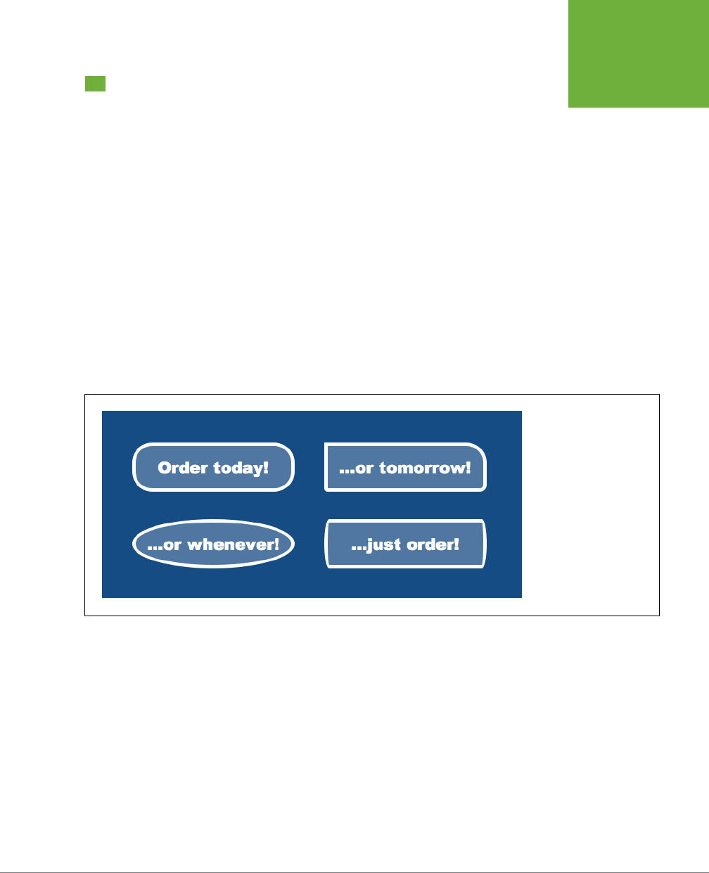
CHAPTER 7: MARGINS, PADDING, AND BORDERS 207
CREATING
ROUNDED
CORNERS
Creating Rounded Corners
As mentioned earlier, web browsers treat all elements as stark rectangular boxes.
That becomes obvious when you put a border around a paragraph or div. Fortunately,
you can soften the hard edges of those boxes by adding a rounded corner to your
styles (see Figure 7-8). CSS3 introduces the border-radius property to let designers
add curves to one or more corners of an element. At its simplest, the border-radius
property accepts a single value, which it then applies to all four corners of an element:
.specialBox {
background-color: red;
border-radius: 20px;
}
The browser uses the supplied radius value to draw a circle at each corner of the
element. The value equals the distance from the center of the circle to its edge—its
radius—as pictured in Figure 7-9. Pixels and ems are the most common measure-
ments you’ll use, but you can use percentages as well (though they behave a little
dierently than you might expect, as discussed in Figure 7-9).
FIGURE 7-8
CSS3 lets you apply
rounded corners to any
element. Make sure you
have a background color or
border on the element, or
else you won’t be able to
see any of that awesome
roundedness.
With a single value, the browser draws the same radius for each corner of the ele-
ment. For example, the top-left image in Figure 7-8 uses the following declaration:
border-radius: 30px;
However, you’re not limited to the same value for each corner. You can supply sepa-
rate values for each corner by providing four values. For example, the top-right box
in Figure 7-8 has four dierent corners. The declaration is:
border-radius: 0 30px 10px 5px;
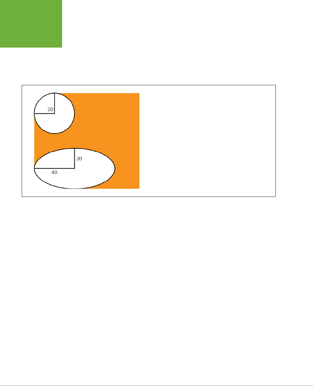
CSS3: THE MISSING MANUAL
208
CREATING
ROUNDED
CORNERS
The numbers start at the top-left of the box and work their way around clockwise.
In other words, the first value (0 in the example in Figure 7-8) applies to the top-
left, the second (30px) to the top-right, the third (10px) to the bottom-right, and
the fourth (5px) to the bottom-left corner. You can also supply just two values, in
which case, the first number applies to the top-left and bottom-right corners, while
the second number applies to the top-right and bottom-left corners.
FIGURE 7-9
You can create either circular corners (top) or elliptical corners
(bottom) by supplying either a single value—
border-radius:
20px
—or a combination of two values separated by
/ -- border-
radius: 40px/20px;
. If you use a single percentage value, you’ll
most likely end up with an elliptical corner. That’s because the browser
calculates the horizontal radius by using a percentage of the element’s
width, and the vertical radius, using a percentage of the element’s
height. So, if you write something like
border-radius: 20%
,
unless the element is a perfect square, the browser will calculate an
elliptical corner more like this:
border-radius: 20px/40px;
.
In addition to the perfectly round (that is, circular) corners you’ve seen so far, it’s
also possible to apply an elliptical corner, like the ones in the two bottom examples
in Figure 7-8. An elliptical path requires two radius values: the first is the radius from
the center of the path to one of the left or right edges, while the second number
is the distance from the center of the path to one of the top or bottom edges. For
example, to add corners like the one pictured in the bottom-left corner in Figure
7-8, you’d create this declaration:
border-radius: 40px/20px ;
The 40px value is the horizontal radius; the 20px value is the vertical radius. The
slash between them lets a browser know that you’re creating an elliptical path. You
can make all four corners have dierent oblong shapes by providing four sets of
these values, like this:
border-radius: 40px/20px 10px/30px 20px/40px 10px/20px;
You can even mix and match elliptical and circular corners if you’d like:
border-radius: 10px 10px/30px 20px/40px 10px;
Finally, if you want to go the longhand route, you can use separate properties to
define the appearance of each corner. For example:
border-radius: 1em 2em 1.5em .75em;
CHAPTER 7: MARGINS, PADDING, AND BORDERS 209
CREATING
ROUNDED
CORNERS
can also be written as:
border-top-left-radius: 1em;
border-top-right-radius: 2em;
border-bottom-right-radius: 1.5em;
border-bottom-left-radius: .75em;
NOTE Internet Explorer 8 and earlier don’t understand the
border-radius
property, so they’ll display
square corners instead. In addition, version 3.2 of Safari for iOS, and version 2.1 of the Android Browser require
the
-webkit-
vendor prefix like this:
-webkit-border-radius: 20px;
. See the box below for more.
UP TO SPEED
Vendor Prefixes
CSS is an always-evolving set of rules. Even as you build web
pages today, there are smart people at the W3C (World Wide
Web Consortium) working on new CSS properties, and other
smart people adding support for new CSS properties in the
web browsers they build. In fact, sometimes browser makers
themselves come up with a new CSS property they think would
be cool and add it to their browser. Other times, the W3C thinks
up new CSS properties that the browser vendors slowly try to
add to their browsers.
During this period when new CSS properties and standards are
developing, browser manufactures move cautiously. They don’t
want to completely commit to CSS properties that may change.
Likewise, as they experiment with CSS properties of their own
design, browser makers hesitate to claim that they’ve come
up with an agreed-upon standard. To mark a CSS property as
experimental or not-yet-completely agreed upon, a browser
manufacturer uses a prefix before the property name. Each of
the major browser makers has its own prefix:
•
-webkit-
is used by Chrome, Safari, and other WebKit-
based browsers
•
-moz-
is used by Mozilla Firefox
•
-o-
is used by Opera
•
-ms-
is used by Microsoft Internet Explorer
When a property is in flux, a browser may support a vendor-
prefixed version. For example, when the
border-radius
property was first proposed, Firefox supported a
-moz-
border-radius
property, while Safari supported the
-webkit-border-radius
property.
When a property requires a vendor prefix, you usually write
several lines of code to create the same effect: one for each
vendor, and finally one with the non-prefixed version like this:
-moz-box-sizing: border-box;
-webkit-box-sizing: border-box;
box-sizing: border-box;
Usually, if the W3C CSS Working Group adopts a property and
finalizes enough of its details, vendors drop the extension.
For example, now all major browsers simply support the
border-radius
property with no required vendor prefix.
As you’ll read throughout this book, the final details for some
CSS3 properties are still being hammered out, so you may
need to use a vendor prefix with them. This book will let you
know when you need these prefixes and how to use them with
a particular property.
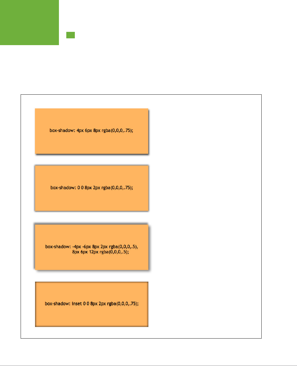
CSS3: THE MISSING MANUAL
210
ADDING DROP
SHADOWS
Adding Drop Shadows
As you read on page 166, you can create subtle (or not so subtle) drop shadows to
text to make it pop from the page. CSS3 includes the box-shadow property to add
drop shadows to an element’s bounding box so you can, for example, make a <div>
appear to float above the page (see Figure 7-10). There are a few more options than
with the text-shadow property. For example, you can make a shadow appear inside
the box as at the bottom in Figure 7-10.
FIGURE 7-10
The CSS3
box-shadow
property lets you add shadows
to your elements to make them appear as though they’re
floating above the page. This property works in most cur-
rent browsers including Internet Explorer 9. Unfortunately,
IE 9 draws the shadows noticeably thinner than do other
browsers. In addition, IE 8 and earlier simply ignore the
property and won’t draw any shadows on elements.
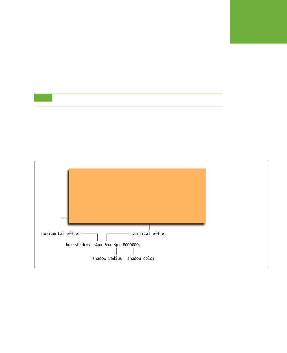
CHAPTER 7: MARGINS, PADDING, AND BORDERS 211
ADDING DROP
SHADOWS
The basic syntax for the box-shadow property is pictured in Figure 7-11. The first value
is a horizontal oset; that is, this value moves the shadow to the element’s right or
the left. A positive number moves the shadow to the right (Figure 7-10, top), and a
negative number moves the shadow to the left.
The second value is the vertical oset—the position of the shadow either above
or below the element. A positive element positions the shadow below the bottom
edge of the box (Figure 7-10, top), while a negative value moves the shadow above
the top edge of the box.
NOTE You must use pixels or ems for the drop shadow values. Percentages will not work.
The third value is the radius of the shadow. It determines how blurry and wide the
shadow is. A value of 0 creates no blur, so the edges of the shadow are sharp. A
large value creates more blur and a thicker shadow. Finally, the last value is the drop
shadow’s color. You can use any CSS color value, but RGBA values look particularly
good since you can control the color’s opacity to make it appear more translucent
and shadow-like.
FIGURE 7-11
The most basic drop shadow
positions a colored shadow
either to the left (using a
negative value as pictured
here) or right (positive value)
and above the top (negative
value) or below the bottom
(positive value) of the ele-
ment, and blurs the shadow
with a specified blur radius.
The box-shadow property includes two optional values: inset and a spread value.
The inset keyword tells a browser to draw the shadow inside the box (Figure 7-10,
bottom). Simply add inset as the first value of the box-shadow property to create
an inset shadow:
box-shadow: inset 4px 4px 8px rgba(0,0,0,.75);
You can also add a
spread
as a fourth value (between the shadow radius and shadow
color). The spread expands the shadow by the specified amount. In other words,
if you add a spread value of 10px, a browser expands the shadow 10 pixels in each
direction (basically making it 20 pixels wider and 20 pixels taller). The value also
CSS3: THE MISSING MANUAL
212
DETERMINING
HEIGHT AND
WIDTH
dictates when the blur radius is applied. In other words, when you add a spread
value, the blurring of the shadow doesn’t begin until after the spread value is ap-
plied. This is particularly useful when you want to add a shadow around the entire
element—what a lot of image-editing programs call
glow
.
NOTE The Android browser and older versions of Safari for the iPhone require the vendor-prefixed version
of
box-shadow
to work; see the box on page 209 for more on vendor prefixes. In other words, to make a box
shadow work in those browsers as well as all the new browsers, you need to add two declarations to a style:
-webkit-box-shadow: 2px 2px 10px #000000;
box-shadow: 2px 2px 10px #000000;
For example, at the second-from-top box in Figure 7-10, both the horizontal and
vertical osets are set to 0; the shadow radius is 8px; and the spread is 2px. The
spread value pushes the shadow outward 2 pixels on all four sides of the box; and
then the 8 pixels of shadow radius extends the blurring another 8 pixels. You can
even use the spread value to create a second, dierent-colored border around an
existing border. Here’s an example of that:
border: 10px solid rgb(100,255,30);
box-shadow: 0 0 0 10px rgb(0,33,255);
Finally, you can even apply multiple shadows to a style (Figure 7-10, second from
bottom). Just add a comma after the first set of shadow settings, and then add
another shadow:
box-shadow: 10px 5px 8px #FF00FF,
-5px -10px 20px 5px rgb(0,33,255);
You can add as many shadows as you want (and as common design sense allows).
NOTE Unfortunately, there’s a lot of variation in how browsers draw a box shadow. IE 9 for example cre-
ates a noticeably thinner shadow than other browsers. For a good visual comparison of how browsers draw box
shadows, visit
http://thany.nl/apps/boxshadows/
.
Determining Height and Width
Two other CSS properties that form part of the CSS box model are useful for assign-
ing dimensions to an object, such as a table, column, banner, or sidebar. The height
and width properties assign a height and width to the content area of a style. You’ll
use these properties often when building the kinds of CSS layouts described in Part
Three of this book, but they’re also useful for more basic design chores like assigning
the width to a table, creating a simple sidebar, or creating a gallery of thumbnail
images (like the one described in the steps on page 278).

CHAPTER 7: MARGINS, PADDING, AND BORDERS 213
DETERMINING
HEIGHT AND
WIDTH
Adding these properties to a style is very easy. Just type the property followed by
any of the CSS measurement systems you’ve already encountered. For example:
width: 300px;
width: 30%;
height: 20em;
Pixels are, well, pixels. They’re simple to understand and easy to use. They also create
an exact width or height that doesn’t change. An
em
is the same as the text size for
the styled element. Say you set the text size to 24px; an em for that style is 24px,
so if you set the width to 2em, then it would be 2 x 24 or 48 pixels. If you don’t set
a text size in the style, the em is based on the inherited text size (see page 104).
NOTE CSS3 introduces another measurement—the
rem
—which is based on the
font-size
of the
html
element. It works in all major browsers, except Internet Explorer 8 and earlier. See page 161 for more on the
rem
unit.
For the width property, percentage values are based on the percentage of the
width of the style’s containing element. If you set the width of a headline to 75%
and that headline isn’t inside any other elements with a set width, then the headline
will be 75 percent of the width of the browser window. If the visitor adjusts the size
of his browser, then the width of the headline will change. However, if the headline
is contained inside a <div> (maybe to create a column) that’s 200 pixels wide, the
width of that headline will be 150 pixels. Percentage values for the height property
work similarly, but are based on the containing element’s height, instead of width.
Calculating a Box’s Actual Width and Height
While the width and height properties seem pretty straightforward, there are a
few nuances that can throw you for a loop. First of all, there’s a dierence between
the value you set for a style’s width and height and the amount of space that a web
browser actually uses to display the style’s box. The width and height properties
set the width and height of the
content area
of the style—the place where the text,
images, or other nested tags sit. (See Figure 7-1 for a refresher on where the content
area sits within the overall box model.) The actual width—that is, the amount of
screen real estate given by the web browser—is the total of the widths of the margins,
borders, padding, and width properties, as illustrated in Figure 7-12.
Say you’ve set the following properties:
width: 100px;
padding: 15px;
border-width: 5px;
margin: 10px;
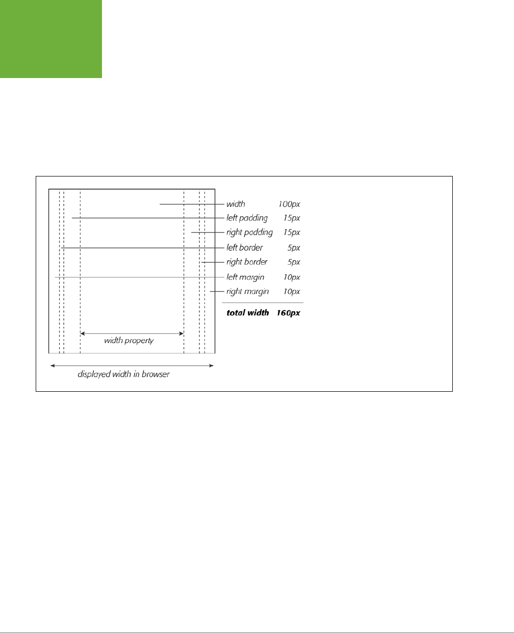
CSS3: THE MISSING MANUAL
214
DETERMINING
HEIGHT AND
WIDTH
When the width property is set, you always know how much room is allocated just
for your content—the words and images that fill the space—regardless of any other
properties you may set. You don’t need to do any math because the value of the
width property is the room for your content (in the previous example, 100 pixels). Of
course, you
do
have to perform a little math when you’re trying to figure out exactly
how much space an element will take up on a web page. In the preceding example,
the width that a web browser allocates for the style’s box is 160 pixels: 20 pixels for
the left and right margins, 10 pixels for the left and right borders, 30 pixels for the
left and right padding, and 100 pixels for the width.
FIGURE 7-12
Calculate the actual width of a styled
element’s box by adding up its
margin
,
border
,
padding
, and
width
properties.
The height occupied on the screen by the ele-
ment is calculated in the same way—the total
of the
height
property, the top and bottom
margins, the top and bottom borders, and the
top and bottom padding.
The general rule of thumb for setting heights on page elements is
don’t!
A lot of bud-
ding CSS designers try to set heights on everything in an attempt to get pixel-perfect
control. But unless you’re totally sure of the exact dimensions of the content inside
a tag, you can run into some unwanted results (see Figure 7-13). In this example, a
pull-quote box used to highlight an interesting comment from an article has a set
width and height of 100 pixels. When more text than fits into the 100-pixel height is
added to the box, its contents spill out the bottom. Even if you make sure that the
text you put inside a box with a fixed height fits, if a visitor increases the font size
in her browser, the text might resize to a height larger than the box.
In other words, the height property is useful for controlling the height of a div
containing images, for example, because you can correctly determine the height of
the images; however, if you use the height for elements that have text, make sure to
not only test your pages in the major browsers, but also test the page with dierent
font sizes by increasing the font size in the web browser.
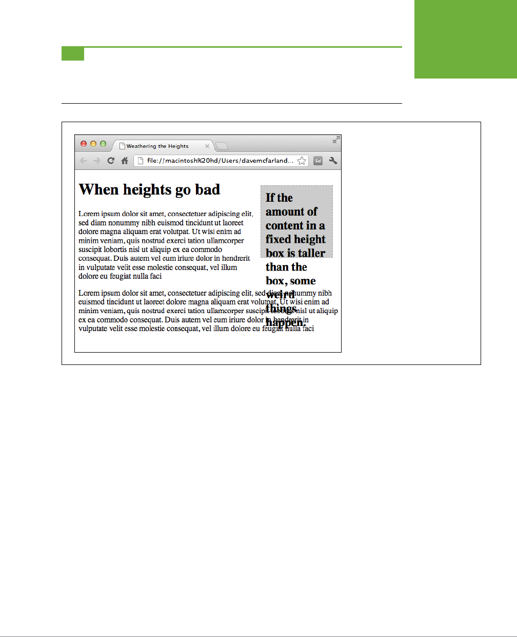
CHAPTER 7: MARGINS, PADDING, AND BORDERS 215
DETERMINING
HEIGHT AND
WIDTH
TIP The banner area of a page is another good candidate for a set height. Usually, the banner has limited
content: a logo, search box, maybe some navigation buttons. Frequently, banners have a fair amount of white
space (empty areas that help draw a visitor’s attention to the key elements in the banner like the navigation
bar), so specifying a height for a banner doesn’t usually cause problems.
FIGURE 7-13
When you set the height of an element
(like the right sidebar div here), but the
content inside is taller than the element,
browsers simply let the content spill
out the bottom of the element below
its edges.
Redefining Box Width with Box-Sizing
As mentioned on page 213, web browsers traditionally calculate the width of an ele-
ment by adding together the border, padding, and width properties. Not only does
this force you to (heaven forbid) do math to figure out an element’s actual display
width, it can cause other problems as well. This is especially true when you create
float-based layouts using percentages. You’ll learn the details of float layouts later
in this book, but in a nutshell, CSS lets you place elements side-by-side using the
float property, which lets you create multiple column layouts.
When using percentages with multiple columns, you can run into some weird prob-
lems. Say you have two columns (really, two tags, such as <div> tags), and you want
each to be 50 percent of the width of the window. So you set the two columns to
a width of 50%; however, the moment you add padding or a border to one of the
columns, you’ll increase its width to more than 50% (to be exact, it will be 50% plus
the amount of left and right padding and the width of the left and right borders). In
most cases, this will force the second column to drop
below
the first.

CSS3: THE MISSING MANUAL
216
DETERMINING
HEIGHT AND
WIDTH
Fortunately, CSS3 oers a property that lets you change how a browser calculates
the screen width (and height) of an element. The box-sizing property provides
three options:
• The content-box option is the way browsers have always defined the screen
width and height of an element, as described on page 213. That is, the browser
adds the border widths and padding thicknesses to the values set for the width
and height properties to determine the tag’s onscreen width and height. Since
this is the default behavior, you don’t need to specify anything for content-box.
• The padding-box option tells a browser that when you set a style’s width or
height property, it should include the padding as part of that value. For ex-
ample, say you give an element 20 pixels of left and right padding and set the
width of the element to 100 pixels. The browser will consider the padding part
of that 100-pixel value. In other words, the content area will be only 60 pixels
wide (100 – 20 [left padding] – 20 [right padding]).
• The border-box value includes both the padding and the border thickness as
part of the width and height values. This setting solves the problem of using
percentage values for widths discussed above. In other words, with the box-
sizing property set to border-box, when you set an element’s width to 50%,
for instance, that element will take up 50 percent of the space, even if you add
padding and borders to that element.
If you don’t like the standard way browsers calculate element widths and heights,
go with the border-box value. (Unless, of course, you have some unusual reason
why you’d want to include the padding but not the border as part of the calcula-
tion.) To use the box-sizing property, simply supply one of the three values from
the list. For example:
box-sizing: border-box;
In addition, Firefox doesn’t yet (at the time of this writing) support the standard
property name, so you need to use the vendor-prefixed version (see the box on page
209); the same is true for older versions of Safari for iOS and Android (version 3
and earlier). To make sure the box-sizing setting works in all of those browsers as
well, you should write three declarations like this:
-moz-box-sizing: border-box;
-webkit-box-sizing: border-box;
box-sizing: border-box;
In fact, many web designers are finding the border-box setting so useful that they
create a universal selector (page 63) style to apply it to every element on a page:

CHAPTER 7: MARGINS, PADDING, AND BORDERS 217
DETERMINING
HEIGHT AND
WIDTH
* {
-moz-box-sizing: border-box;
-webkit-box-sizing: border-box;
box-sizing: border-box;
}
As you’ll read on page 467, using border-box is extremely helpful when creating
CSS3’s responsive web designs that resize to fit dierent device sizes (such as an
iPhone, a tablet, and a desktop monitor).
NOTE The
box-sizing
property even works in Internet Explorer 8 and older, so it’s supported in well
over 95 percent of the browsers in use. Unfortunately, IE 7 doesn’t understand this property, so if you use the
border-box
setting, IE 7 will ignore it and draw elements much wider (and taller) than in other browsers. If
you still need to support IE 7, skip this property.
Controlling the Tap with the Overflow Property
When the content inside a styled tag is larger than the style’s defined width and
height, some weird things happen. As shown in Figure 7-13, browsers let the content
spill out of the box (past the borders and often over other content).
Fortunately, you can control what a browser should do in this situation with the
overflow property. Overflow accepts four keywords that control how content that
overflows the edges of a box should be displayed:
• visible. This option is what browsers do normally. It’s the same as not setting
the property at all (Figure 7-14, top).
• scroll. Lets you add scroll bars (Figure 7-14, middle). It creates a kind of mini-
browser window in your page and looks similar to old-school HTML frames,
or the HTML <iframe> tag. You can use scroll to provide a lot of content in a
small amount of space. Unfortunately, scroll bars
always
appear when you use
this option, even if the content fits within the box.
• auto. To make scroll bars optional, use the auto option. It does the same thing
as scroll but adds scroll bars only when needed.
• hidden. Hides any content that extends outside the box (Figure 7-14, bottom).
This option is a bit dangerous—it can make some content disappear from the
page—but it’s a useful trick for float-based layouts (page 222).
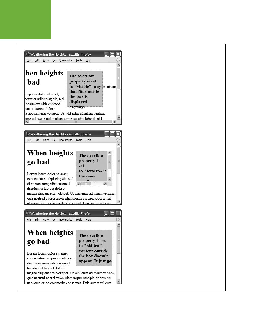
CSS3: THE MISSING MANUAL
218
DETERMINING
HEIGHT AND
WIDTH
FIGURE 7-14
The
overflow
property gives you three basic ways to deal with
text that doesn’t fit inside a box: visible displays the content
anyway (top);
scroll
and
auto
add scroll bars (middle); and
hidden
just doesn’t show anything that doesn’t fit (bottom).

CHAPTER 7: MARGINS, PADDING, AND BORDERS 219
DETERMINING
HEIGHT AND
WIDTH
Maximum and Minimum Heights and Widths
In case you haven’t yet realized it, CSS oers a lot of flexibility. In addition to the
standard width and height properties, you’ll find four variations:
• The max-width property, not surprisingly, sets the maximum width for an ele-
ment. That element can be thinner than the setting, but it can’t be any wider
than that setting. This option comes in handy when you want your page to
resize to fit dierent display widths but you don’t want the page to get so wide
that it’s too hard to read on a really large monitor. For example, say you add
this style to a page:
body {
max-width: 1200px;
}
This style lets the page reflow to fit the width of smaller displays like smart-
phones and tablets. But on a really large desktop monitor, the page won’t get
wider than 1200 pixels, so the page can’t grow unreadably wide.
• The max-height property works much like max-width, except it’s for the ele-
ment’s height. As mentioned on page 214, however, it’s usually best not to mess
with the height of an element.
• The min-width property sets an element’s minimum width. The element can
stretch wider than the minimum width value, but it can never get thinner. If, for
example, you notice that when you resize your browser window, the element’s
so thin that the layout falls apart, you can set a minimum width like this:
body {
min-width: 760px;
}
If a visitor shrinks his browser window so it’s only 500 pixels wide, then the
browser will add a scrollbar rather than let the elements on the page get too
narrow.
• The min-height property works like min-width, except for height. This prop-
erty can solve the problem pictured in Figure 7-13. With a minimum height,
you’re telling a web browser to make the element at least a certain height. If
the content inside the element is taller, then the browser will make the entire
element taller as well.
You can use the minimum and maximum properties together as well. For example,
if you want to make sure that a page is at least 760 pixels wide, but never expands
to wider than 1200 pixels, you can use this style:
body {
min-width: 760px;
max-width: 1200px;
}
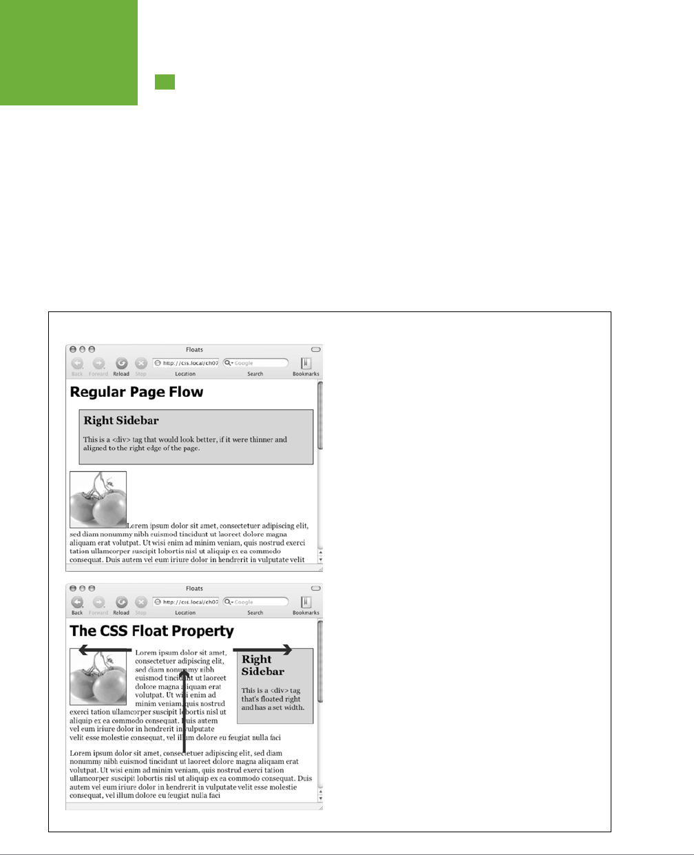
CSS3: THE MISSING MANUAL
220
WRAPPING
CONTENT WITH
FLOATING
ELEMENTS
Wrapping Content with Floating Elements
HTML normally flows from the top of the browser window down to the bottom, one
headline, paragraph, or block-level element on top of another. This word-processor–
like display is visually boring (Figure 7-15, top), but with CSS, you’re far from stuck
with it. You’ll learn lots of new methods for arranging items on a web page in Part
3, but you can spice up your pages plenty with one little CSS property—float.
The float property moves an element to either the left or right. In the process, con-
tent below the floated element moves up and wraps around the float (Figure 7-15,
bottom). Floating elements are ideal for moving supplemental information out of
the way of the page’s main text. Images can move to either edge, letting text wrap
elegantly around them. Similarly, you can shuttle a sidebar of related information
and links o to one side.
FIGURE 7-15
The regular flow of HTML is left to right, top to bottom, with one
block-level element—headline, paragraph, div, and so on—stacked on
top of the next. By letting you break up this uniformity, the
float
property is one of CSS’s most powerful tools. Its uses range from
simply moving an image to one side of a paragraph to providing
complete layout control over banners, sidebars, navigation bars, and
other page elements.
CHAPTER 7: MARGINS, PADDING, AND BORDERS 221
WRAPPING
CONTENT WITH
FLOATING
ELEMENTS
Although you can use floats in some complex (and confusing) ways, as you’ll see in
Chapter 13, the basic property is very simple. It takes one of three keywords—left,
right or none—like so:
float: left;
• left. Slides the styled element to the left while content below wraps around
the right side of the element.
• right. Slides the element to the right.
• none. Turns o the float and returns the object to its normal position.
Floated elements move to the left or right edge of their
containing element
. In
some cases, this just means that the element moves to the left or right edge of the
browser window. However if you float an element that’s inside another tag with a
set width or position on a web page, then the float will go to the left or right edge
of that tag—the floated element’s “container.” For example, you may have a box on
the page that’s 300 pixels wide and is itself floated to the right edge of the browser
window. Inside that box, you’ve got an image that floats to the left. That image slides
to the left edge of that 300-pixel-wide box—not the left edge of the browser window.
You can even use the float property with an inline element, such as the <img> tag.
In fact, floating a photo to the left or right using CSS is a very common use of the
float property. A web browser treats a floated inline element just like a block-level
element, so you don’t run into the problems with padding and margin that normally
trouble inline elements (see page 200).
You can also float a block-level element like a headline or paragraph. A common
technique is to float a <div> tag (or one of HTML5’s new elements like <article>,
<section>, or <aside>) containing other HTML tags and page content to create a
kind of containing box. In this way, you can create sidebars, pull quotes, and other
self-contained page elements. (You’ll see an example of this in this chapter’s tuto-
rial.) When you float block-level elements, you should also set the width property
for that element (in fact, CSS rules require setting the width for floated elements for
all tags except images). This way, you can control how much horizontal space the
block takes up and how much space is available for the content below it to move
up and wrap around the block.
NOTE The
source order
—the order in which you write your HTML—has a big impact on the display of floated
elements. The HTML for the floated tag must appear
before
the HTML of any content that wraps around the floated
element. Say you’ve created a web page composed of an
<h1>
tag followed by a
<p>
tag. Toward the end of
that
<p>
tag, you’ve also inserted a photo using the
<img>
tag. If you float that photo to the right, say, then
the
<h1>
tag and most of the content inside that
<p>
tag will still appear above the photo; only content that
follows the
<img>
tag will wrap around the left side of the image.
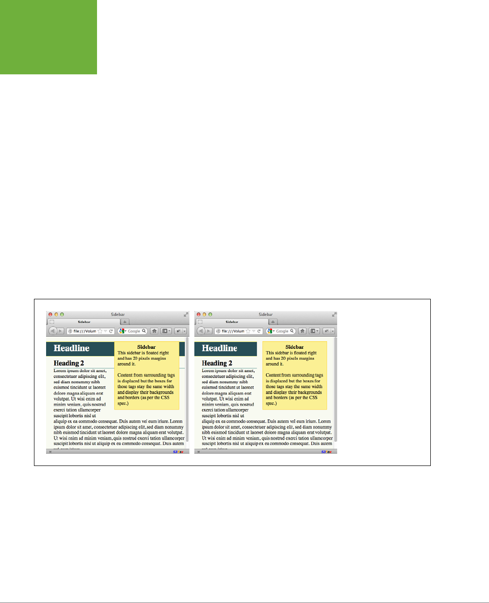
CSS3: THE MISSING MANUAL
222
WRAPPING
CONTENT WITH
FLOATING
ELEMENTS
Backgrounds, Borders, and Floats
To the consternation of many web designers, backgrounds and borders don’t react
to floated elements the same way content does. Say you float an element—a sidebar
for example—to the right. The content below the sidebar moves up and wraps around
it, just as it should. But if that content has a background or border set on it, then
that background or border actually appears
underneath
the floated sidebar (Figure
7-16, left). In essence, a web browser wraps the text around the float, but not the
border or background. Believe it or not, this is absolutely kosher and (according to
the rules) how it’s supposed to work. Of course, you may not want to follow these
rules; you might want to have the border or background stop when it reaches the
floated element (Figure 7-16, right). With a little CSS magic, you can do it.
First, you need to add one rule to the style that has background or borders running
underneath the float. Once you locate the style, add this line: overflow: hidden;.
The overflow property (page 217) makes any background or border that extends
underneath the float disappear.
Another approach is to add a borderline around the floated element; when you make
the borderline thick enough and match its color to the background color of the page,
the border looks just like empty space—even though it’s covering and hiding the
background color and borderlines that are extending below it.
FIGURE 7-16
In this example, there’s
an
<h1>
tag with a back-
ground color and an
<h2>
tag with a border (left).
Adding
overflow:
hidden;
to the style
for the
<h1>
tag (right)
prevents the headline from
appearing under the float-
ing element (sidebar).
Stopping the Float
Sometimes you need a way to tell a tag to ignore a floated element. You may have
a copyright notice that should always appear at the bottom of the browser window.
If you have a particularly tall sidebar that’s floated to the left side of the page, the
copyright notice might actually be drawn up the page and wrap around the float.
Instead of appearing at the bottom of the page, the copyright is sitting farther up
the page next to the sidebar. You want the copyright notice part of your page to
refuse to wrap around the floated element and instead drop below it.

CHAPTER 7: MARGINS, PADDING, AND BORDERS 223
WRAPPING
CONTENT WITH
FLOATING
ELEMENTS
Other problems occur when you have several floated items close together. If the
floated items aren’t very wide, they float up and next to each other, and if they’re
of varying heights they can get into an unattractive logjam (see Figure 7-17, top). In
this case, the floated elements
shouldn’t
float next to each other. CSS provides the
clear property for just these types of problems.
The clear property instructs an element to
not wrap
around a floated item. By
clearing an element, you essentially force it to drop down below the floated item.
Also, you can control which type of float (left or right) is cleared or force a style to
simply ignore both types of floats.
The clear property accepts the following options:
• left. The style will drop below elements that are floated left but will still wrap
around right-floated objects.
• right. Forces a drop below right-floated objects but still wraps around left-
floated objects.
• both. Forces a drop below both left- and right-floated elements.
• none. Turns o clearing altogether. In other words, it makes an item wrap around
both left- and right-floated objects, which is how web browsers normally work.
In the case of a copyright notice that must appear at the bottom of the page, you’d
want it to clear both left- and right-floated objects—it should always be below other
content, and should never wrap to the left or right of any other item. Here’s a class
style that would do just that:
.copyright {
clear: both;
}
Figure 7-17 shows how the clear property can prevent floated items of varying
heights from clumping together. All three photos in that figure have a right float
applied to them. In the top figure, the photo of the tomatoes (1) is the first image
on the page and appears at the far right edge. The second image (2) obeys the float
set on the first image and wraps up to the left of it. The last photo (3) is too wide
to sit next to the second photo (2) but still tries to wrap around both (1) and (2). It
gets stuck in the process.
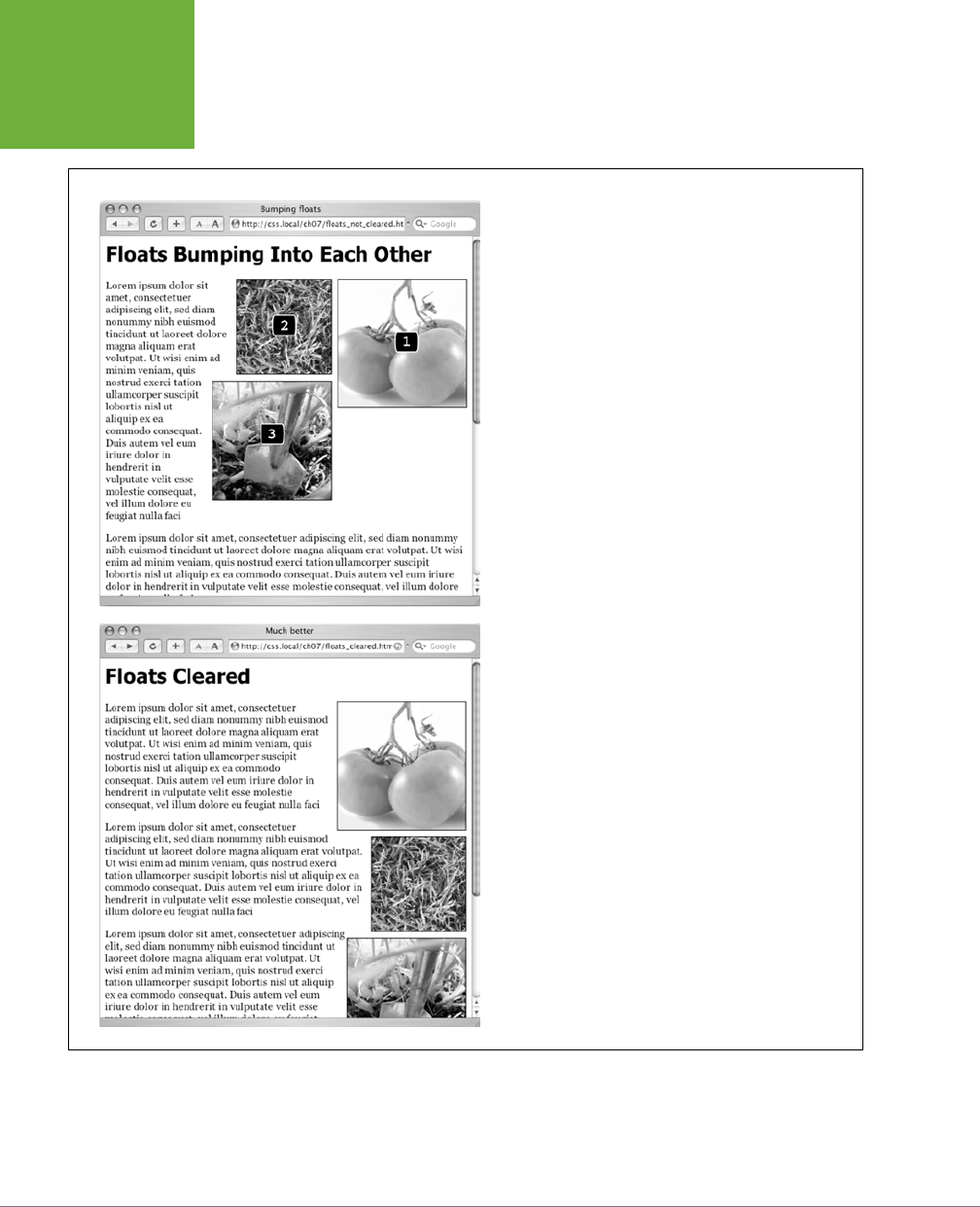
CSS3: THE MISSING MANUAL
224
WRAPPING
CONTENT WITH
FLOATING
ELEMENTS
FIGURE 7-17
Top: Sometimes you don’t want an element to wrap around a
floated object.
Bottom: Applying the
clear
property (in this case
clear:
right;
) to each image prevents them from sitting next to each
other. The
clear
applied to photo (2) prevents it from wrap-
ping up next to image (1). Applying
clear: right
to photo
(3) forces it to appear below photo (2).
Using clear: right; on the images prevents the photos from sitting next to each
other (Figure 7-17, bottom). The clear applied to the second photo prevents it from
wrapping up next to the first image, while the last image’s right clear property
forces it to appear below the second image.
CHAPTER 7: MARGINS, PADDING, AND BORDERS 225
TUTORIAL:
MARGINS,
BACKGROUNDS,
AND BORDERS
NOTE This business of left floats, right floats, and how to clear them sounds complicated—and it is. This
section gives you a basic introduction. You’ll see the subject again in Chapter 13 and eventually learn how to use
floats in more sophisticated ways.
Tutorial: Margins, Backgrounds,
and Borders
In this tutorial, you’ll explore elements of the CSS box model, adjust the spacing
around objects on a page, add colorful borders to items on a page, and control the
size and flow of page elements.
1. To get started, you need to download the tutorial files located on this book’s
companion website at
www.sawmac.com/css3/
. Click the tutorial link and
download the files. (All of the files are enclosed in a zip archive. See detailed
instructions for unzipping the files on the website.) The files for this tutorial are
contained inside the
07
folder.
Controlling Page Margins and Backgrounds
You’ll start with a very basic HTML file containing an internal style sheet with a basic
CSS reset style. It’s not much to look at right now (see Figure 7-18).
NOTE For a sneak preview of the final result, check out Figure 7-21.
2. In your favorite text editor, open
07
→
sidebar.html
.
There’s already an internal style sheet added to this page containing the same
set of styles discussed on page 116. The styles basically remove all margins,
padding, and font size from the most common block-level elements and elimi-
nate many of the cross-browser display problems you’ll encounter related to
these properties.
At a bare minimum, you should always include this set of styles in every style
sheet you create. Probably the most important properties are the margin and
padding settings in the first style. There’s enough cross-browser weirdness
related to those two properties that you should always zero these out and start
fresh. You’ll start with something simple: a background color.
3. In the internal style sheet, click directly after the CSS comment /* end reset
styles */ and add a tag selector style:
html {
background-color: rgb(253,248,171);
}
CSS3: THE MISSING MANUAL
226
TUTORIAL:
MARGINS,
BACKGROUNDS,
AND BORDERS
This style adds a light yellow background color to the page. If you want to color
the background of a web page, you can add the background-color property to
either the <html> tag or the <body> tag. Next, you’ll add some margins, borders,
and other properties to the <body> tag.
NOTE You may be used to using hexadecimal colors (like #FDF8AB) instead of RGB colors. You can use a tool
like the online convertor at
www.colorhexa.com/
to convert between the two. Using RGB is a good idea because
RGBA colors, with their optional transparency (page 155), are so useful, and it’s easier to just stick with one color
model (RBG) instead of mixing two (RGB and hex).
4. Add another style to the internal style sheet:
body {
background-color: rgb(255,255,255);
border: 3px solid rgb(75,75,75);
}
This style adds a white background color to the <body> tag and a 3-pixel dark
gray border. Because the <body> tag sits inside the <html> tag, a web browser
considers it to be “on top” of the <html> tag, so the white background will cover
the yellow color you added in the previous step. Next you’ll give the body tag
a width and adjust its padding and margins.
TIP Normally, if you add a background color property to the
<body>
tag, that color fills the entire browser
window; however, if you also add a background color to the
<html>
tag, the body’s background color fills only
the area with content. To see this in action, just preview the web page after completing Step 3 above; then delete
the
html
tag style, and preview the page again. A weird, but useful bit of CSS trivia.
5. Edit the body style you just created by adding five new properties (changes
are in bold):
body {
background-color: rgb(255,255,255);
border: 3px solid rgb(75,75,75);
width: 760px;
margin-top: 20px;
margin-left: auto;
margin-right: auto;
padding: 15px;
}
The width property constrains the body so that it’s just 760 pixels wide: if a
visitor’s browser window is wider than 760 pixels, then he’ll see the background
color from the html style and a 760-pixel box with the white background of
the body tag.
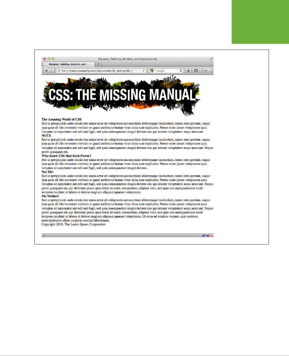
CHAPTER 7: MARGINS, PADDING, AND BORDERS 227
TUTORIAL:
MARGINS,
BACKGROUNDS,
AND BORDERS
FIGURE 7-18
This web page is bare-
bones HTML, with a single
style that removes much of
the built-in web browser
styling. It’ll look a lot
better with a box model
makeover.
The margin-top property adds 20 pixels of space from the browser window’s
top edge—nudging the body tag down just a bit—while the left and right margin
settings center the body in the middle of the browser window. “Auto” is just
another way of telling a browser, “You figure it out,” and since that auto value
is applied to both the left and right margins, a browser simply provides equal
space on the left and right side.

CSS3: THE MISSING MANUAL
228
TUTORIAL:
MARGINS,
BACKGROUNDS,
AND BORDERS
NOTE You could also use the
margin
shorthand property (page 186) to condense those three lines of
margin settings to just one like this:
margin: 20px auto 0 auto;
Finally, to keep the content inside the <body> from touching the border line,
15 pixels of space are added to the inside of the body by using the padding
property—in other words, the image and text is indented 15 pixels from all four
edges. Next, you’ll add a glow around the box using the box-shadow property.
6. Edit the body style you just created by adding one last property after the
border but before the width (changes are in bold):
body {
background-color: rgb(255,255,255);
border: 3px solid rgb(75,75,75);
box-shadow: 0 0 15px 5px rgba(44,82,100,.75);
width: 760px;
margin-top: 20px;
margin-left: auto;
margin-right: auto;
padding: 15px;
}
This style adds a glow to the box by creating a 15-pixel shadow placed directly
behind the box (the 0 0 part at the beginning indicates that the shadow isn’t
oset to the left/right or top/bottom; it’s simply in the background). The 5px
value is the spread value (page 211), and it pushes the shadow out 5 pixels
around all four edges. Finally, the rgba value sets the color to a dark blue that’s
only 75 percent solid (that is, you can see through to the background yellow).
Your style sheet is pretty far along, and you’re ready to check the page.
7. Save the file and preview the page in a web browser.
You should see a white box with an image, a bunch of text, and a gray outline
with a bluish glow floating in a sea of yellow (see Figure 7-19). The text needs
some loving attention. You’ll take care of that next.
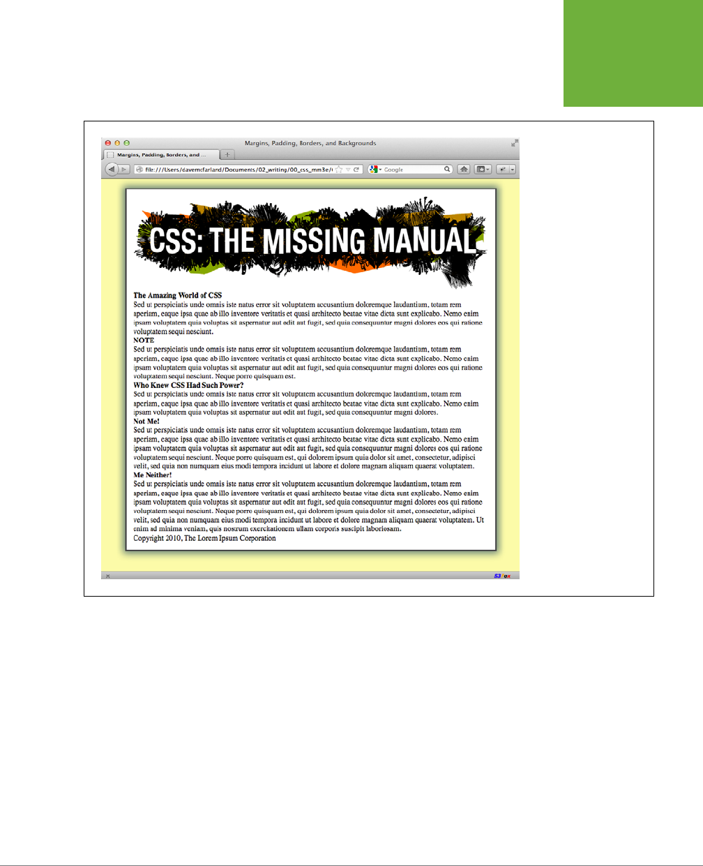
CHAPTER 7: MARGINS, PADDING, AND BORDERS 229
TUTORIAL:
MARGINS,
BACKGROUNDS,
AND BORDERS
FIGURE 7-19
Setting the left and right
margins to
auto
for any
element with a set width
centers it. In this case, set-
ting a width for the
body
and adding
margin-
left: auto
and
margin-right: auto
places it smack dab in the
center of the browser win-
dow. Unfortunately, there’s
no easy way to center an
element vertically (with
equal space above and
below it) using CSS. There
are a few tricks that crafty
designers have come up
with, though. If you’re
after vertically centered
elements, check out
www
.vanseodesign.com/css/
vertical-centering/
.
Adjusting the Space Around Tags
Since the CSS reset styles pretty much stripped the text on this page of all format-
ting, you’ll need to create styles to make the headings and paragraphs look great.
You’ll start with the <h1> tag at the top of the page.
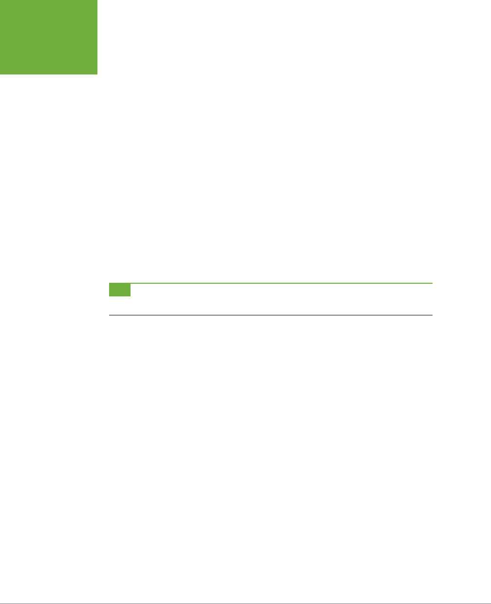
CSS3: THE MISSING MANUAL
230
TUTORIAL:
MARGINS,
BACKGROUNDS,
AND BORDERS
1. Return to your text editor and the
sidebar.html
file. Click at the end of the
closing brace of the body tag selector, press Enter (Return) to create a new line,
and then add the following style:
h1 {
font-size: 2.75em;
font-family: Georgia, "Times New Roman", Times, serif;
font-weight: normal;
text-align: center;
letter-spacing: 1px;
color: rgb(133,161,16);
text-transform: uppercase;
}
This style uses many of the text-formatting properties discussed in the previ-
ous chapter—the top headline is 2.75 ems tall (44 pixels in most browsers) and
all uppercase, uses the Georgia font, and has a green color, with a little space
between each letter. The text-align property makes sure the text is centered
in the middle of the box. The real fun is adding a background color to really
highlight the headline.
TIP Save the page and preview it in a web browser after each step in this tutorial. That way you’ll get a
better understanding of how these CSS properties affect the elements they format.
2. Add one new property to the h1 tag style so that it looks like this (changes
in bold):
h1 {
font-size: 2.75em;
font-family: Georgia, "Times New Roman", Times, serif;
font-weight: normal;
text-align: center;
letter-spacing: 1px;
color: #85A110;
text-transform: uppercase;
background-color: rgb(226,235,180);
}
If you preview the page now, you’ll see that the headline has a light green back-
ground. When applied to a block-level element like a headline, the background
fills the entire horizontal space available (in other words, the color doesn’t just
sit behind the text “The Amazing World of CSS,” but extends all the way to the
right edge of the box).

CHAPTER 7: MARGINS, PADDING, AND BORDERS 231
TUTORIAL:
MARGINS,
BACKGROUNDS,
AND BORDERS
The headline text is a little cramped—the “T” that begins the headline touches
the edge of the background. With a little padding, you can fix this.
3. Add another property to the h1 tag style so that it looks like this (changes
in bold):
h1 {
font-size: 2.75em;
font-family: Georgia, "Times New Roman", Times, serif;
font-weight: normal;
text-align: center;
letter-spacing: 1px;
color: #85A110;
text-transform: uppercase;
background-color: rgb(226,235,180);
padding: 5px 15px 2px 15px;
}
The padding shorthand property provides a concise way to add padding around
all four sides of the content—in this case, 5 pixels of space are added above
the text, 15 pixels to the right, 2 pixels to the bottom, and 15 pixels to the left.
There’s one other problem with the headline: Because of the padding added
to the body tag (see Step 5 on page 226), the headline is indented 15 pixels
from the left and right edges of the green border surrounding the body. The
headline would look better if it touched the green border. No problem; negative
margins to the rescue.
4. Add one last property to the h1 tag style so that it looks like this (changes
in bold):
h1 {
font-size: 2.75em;
font-family: Georgia, "Times New Roman", Times, serif;
font-weight: normal;
text-align: center;
letter-spacing: 1px;
color: #85A110;
text-transform: uppercase;
background-color: rgb(226,235,180);
padding: 5px 15px 2px 15px;
margin: 0 -15px 20px -15px;
}

CSS3: THE MISSING MANUAL
232
TUTORIAL:
MARGINS,
BACKGROUNDS,
AND BORDERS
Here, the margin shorthand sets the top margin to 0, the right margin to –15
pixels, bottom margin to 20 pixels, and the left margin to –15 pixels. The bottom
margin just adds a bit of space between the headline and the paragraph that
follows. The next trick is the use of negative values for the left and right margins.
As mentioned on page 190, you can assign a negative margin to any element.
This property pulls the element out toward the direction of the margin—in this
case, the headline extends 15 pixels to the left and 15 pixels to the right, actually
expanding the headline and pulling it out over the body tag’s padding.
5. Now, you’ll add some formatting of the <h2> tags. Add the following style
after the h1 tag style:
h2 {
font-size: 1.5em;
font-family: "Arial Narrow", Arial, Helvetica, sans-serif;
color: rgb(249,107,24);
border-top: 2px dotted rgb(141,165,22);
border-bottom: 2px dotted rgb(141,165,22);
padding-top: 5px;
padding-bottom: 5px;
margin: 15px 0 5px 0;
}
This style adds some basic text formatting and a dotted border above and below
the headline. To add a bit of space between the headline text and the lines, it
puts a small bit of padding at the top and bottom. Finally, the margin property
adds 15+ pixels above the headline and 5 pixels below it.
6. Save the file and preview the page in a web browser.
The headlines are looking good (see Figure 7-20). Next, you’ll create a sidebar
on the right side of the page.
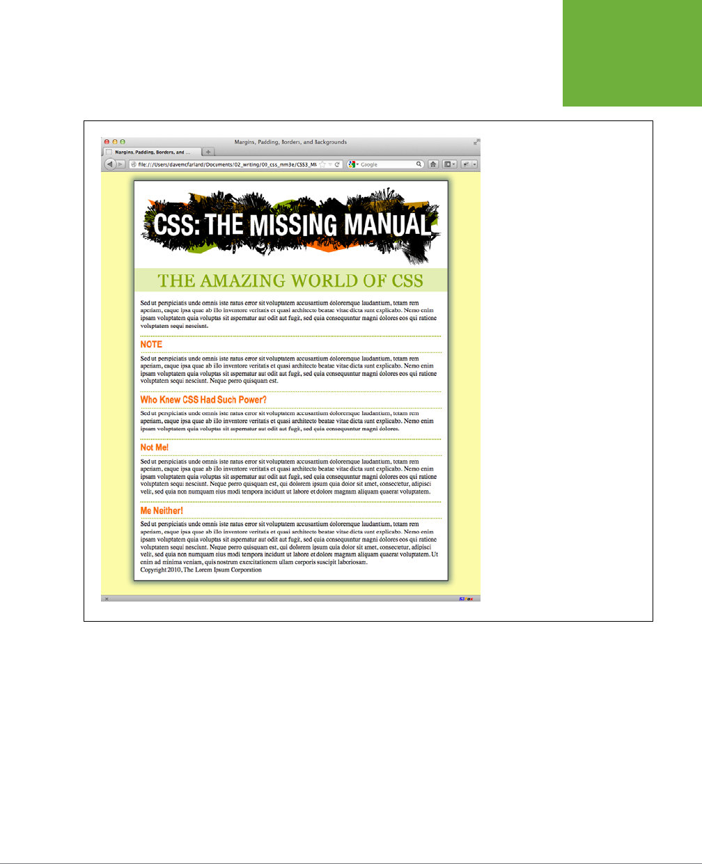
CHAPTER 7: MARGINS, PADDING, AND BORDERS 233
TUTORIAL:
MARGINS,
BACKGROUNDS,
AND BORDERS
FIGURE 7-20
With just a few styles, you can add
background colors, control margins
throughout the page, and adjust
the space between headlines and
paragraphs.
Building a Sidebar
Sidebars are common elements in most types of print publications like magazines,
books, and newspapers. They compartmentalize and highlight small chunks of in-
formation like a resource list, contact information, or a related anecdote. But to be
eective, sidebars shouldn’t interrupt the flow of the main story. They should, like
the name says, sit unobtrusively o to one side, which you can easily make happen
with CSS.

CSS3: THE MISSING MANUAL
234
TUTORIAL:
MARGINS,
BACKGROUNDS,
AND BORDERS
1. Return to your text editor and open the
sidebar.html
file.
First, you must isolate the region of the page that makes up the sidebar. The
<div> tag is the perfect tool. You can enclose any amount of HTML into its own
self-contained chunk by wrapping it in a <div> tag.
2. Scroll down the page into the HTML and click
before
the first <h2> tag (the
one with the “NOTE” headline). Then type <div class="sidebar">, and press
Enter (Return).
This HTML marks the beginning of the sidebar and applies a class to it. You’ll
create the .sidebar class style soon, but first you need to indicate the end of
the sidebar by closing the <div>.
3. Click after the closing </p> tag that immediately follows the <h2> tag (this
is the </p> that appears just before <h2>Who Knew CSS Had Such Power?</
h 2>. Press Enter, and then type </div>.
You’ve just wrapped a headline and paragraph inside a <div> tag. Next, you’ll
create a style for it.
4. Scroll back up to the page’s style sheet, and add the following style below
the h2 style you created earlier:
.sidebar {
width: 30%;
float: right;
margin: 10px;
}
This style sets the width of the content area (where the text appears) to 30
percent. You don’t have to use an absolute value like pixels for widths. In this
case, the sidebar’s width is 30 percent of the width of the container. The float
property moves the sidebar to the right side of the box, and the margin property
adds 10 pixels of space around the sidebar.
If you preview the page in a browser, you’ll see that the basic shape and place-
ment of the sidebar are set, but there’s one problem: The borders from the <h2>
tags appear
underneath
the box. Even though the floated sidebar moves the text
of the headlines out of the way, floats don’t displace borders or backgrounds.
Those just appear right under the floated sidebar. One way to fix this problem is
to simply add a background color to the sidebar, so you can’t see the h2 borders.
(There’s another technique, as well, which you’ll use in Step 8 on page 236.)
5. Add two other properties to the .sidebar style so it looks like this (changes
in bold):
.sidebar {
width: 30%;
float: right;
margin: 10px;

CHAPTER 7: MARGINS, PADDING, AND BORDERS 235
TUTORIAL:
MARGINS,
BACKGROUNDS,
AND BORDERS
background-color: rgb(250,235,199);
padding: 10px 20px;
}
These properties add a light orangish color to the sidebar and indents the text
from the sidebar’s edges so it won’t touch the borders you’re about to add.
6. Add two more properties to the .sidebar style so it looks like this (changes
in bold):
.sidebar {
width: 30%;
float: right;
margin: 10px;
background-color: rgb(250,235,199);
padding: 10px 20px;
border: 1px dotted rgb(252,101,18);
border-top: 20px solid rgb(252,101,18);
}
Here’s an example of the handy technique described on page 205. If you want
most of the borders around an element to be the same, you can first define a
border for all four edges—in this case a 1 pixel, dotted, orange line around the
entire sidebar—and then supply new border properties for the specific edges
you want changed—in this example, the top border will be 20 pixels tall and
solid. This technique lets you use just two lines of CSS code instead of four
(border-top, border-bottom, border-left, and border-right).
Next, you’ll add rounded corners and a drop shadow to really make this sidebar
stand out.
7. Finally, add two more properties to the .sidebar style so it looks like this
(changes in bold):
.sidebar {
width: 30%;
float: right;
margin: 10px;
background-color: rgb(250,235,199);
padding: 10px 20px;
border: 1px dotted rgb(252,101,18);
border-top: 20px solid rgb(252,101,18);
border-radius: 10px;
box-shadow: 5px 5px 10px rgba(0,0,0,.5);
}
The border-radius property (page 207) lets you create rounded corners. In this
case, the 10-pixel setting provides a prominent-looking curve. The box-shadow
property here adds a drop shadow below and to the right of the box making it
look as though it’s floating above the page. You’re almost done.

CSS3: THE MISSING MANUAL
236
TUTORIAL:
MARGINS,
BACKGROUNDS,
AND BORDERS
The headline inside the sidebar doesn’t look quite right. It uses the same prop-
erties as the other <h2> tags (because of the h2 tag style you created in Step
4). The border is distracting and the top margin pushes the headline down too
much from the top of the sidebar. Fortunately, you can use a descendent selec-
tor to override those properties.
8. After the .sidebar style, in the internal style sheet, add a descendent se-
lector:
.sidebar h2 {
border: none;
margin-top: 0;
padding: 0;
}
Because of the .sidebar, this style is more powerful—that is, it has greater
specificity
as described on page 114—than the basic h2 style. It erases the border
from the original h2 tag style, along with the top margin and all the padding.
However, since this style doesn’t have a font size, color, or font family, those
properties from the h2 style still apply—it’s the cascade in action!
The page is looking good, but the borders on the <h2> tags still run up to and
behind the sidebar. That just doesn’t look good, but you can fix it easily.
9. Locate the <h2> style and add the overflow property, like so:
h2 {
font-size: 1.5em;
font-family: "Arial Narrow", Arial, Helvetica, sans-serif;
color: rgb(249,107,24);
border-top: 2px dotted rgb(141,165,22);
border-bottom: 2px dotted rgb(141,165,22);
padding-top: 5px;
padding-bottom: 5px;
margin: 15px 0 5px 0;
overflow: hidden;
}
Setting the overflow property to hidden hides the borders that pass beyond
the headline text and under the floating element.
10. Save the file and preview the web page in a browser.
The page should look like Figure 7-21.
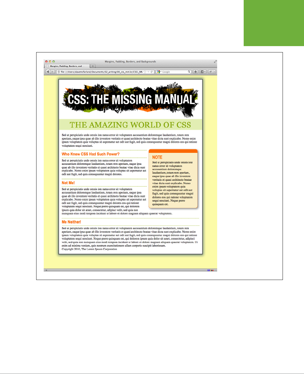
CHAPTER 7: MARGINS, PADDING, AND BORDERS 237
TUTORIAL:
MARGINS,
BACKGROUNDS,
AND BORDERS
FIGURE 7-21
A handful of CSS styles add
design elegance to ho-hum
HTML. Notice how the floated
sidebar both attracts attention
and moves it out of the way of
the main body of text.
Going Further
To try out your newfound skills, try this exercise on your own: Create a p tag style
to add some pizzazz to the paragraphs on the page—try out some margin settings,
font color, and so on. Next, create a class style for formatting the copyright notice
that appears at the bottom of the
sidebar.html
page (called, say, .copyright). In this
style, add a border above the copyright notice, change its text color, shrink its font
size, and change the type to uppercase. (Hint: Use the text-transform property
discussed on page 163.) After you’ve created the style, add the appropriate class
attribute to the <p> tag in the HTML.

239
CHAPTER
8
No matter how much you gussy up your text or fiddle with borders and mar-
gins, nothing aects the appearance of your site more than the images you
add to it. And once again, CSS gives you more image control than HTML ever
dreamed of. You can work with graphics in CSS on two fronts: the <img> tag and
the background-image property (which lets you place an image in the background
of any tag on a page).
This chapter delves into some of the creative ways you can deploy images with CSS.
The best way to learn how to use graphics in CSS is to see them in action, so this
chapter has three—count ’em, three—tutorials. By creating a photo gallery web page
and using images for overall page styling, you’ll be an image-slinging pro in no time.
Discovering CSS and the <img> Tag
The venerable <img> tag has been the workhorse of photo-heavy websites since the
beginning of the World Wide Web. Even sites without photos use it to add logos,
navigation buttons, and illustrations. While CSS doesn’t have any properties specifi-
cally aimed at formatting images, you can take advantage of the CSS properties
you’ve already learned to enhance your site’s graphics. For example, the border
property is a quick and simple way to frame an image or unify the look of a gallery
of photos. Here’s a rundown of the CSS properties most commonly used with images:
• Borders. Use one of the many border properties (page 202) to frame an image.
You’ll see an example of this in the tutorial on page 273. Since each border side
can be a dierent color, style, and width, you’ve got lots of creative options.
Adding Graphics
to Web Pages

CSS3: THE MISSING MANUAL
240
ADDING
BACKGROUND
IMAGES
• Padding. The padding property (page 195) adds space between a border and
an image. By putting a little breathing room between a photo and its frame,
padding simulates the fiberboard
mat
that’s used in traditional picture frames
to surround and oset the image. And by setting a background color, you can
even change the color of the mat.
• Float. Floating an image moves it to either the left or right edge of the page,
or—if the image is contained in another layout element such as a sidebar—to
the left or right edge of the image’s containing element. Text and other page
elements then wrap around the image. You can even float multiple images to
create a flexible, multi-row image gallery. You’ll see an example of this technique
in the tutorial on page 272.
• Margins. To add space between an image and other page content, use the
margin property. When you float an image, the text that wraps around it is usu-
ally uncomfortably close to the image. Adding a left margin (for right-floated
images) or right margin (for left-floated images) adds space between text and
the graphic.
In most cases, you won’t create a style for the <img> tag itself. Formatting this tag
is using too broad a brush, since it formats
all
images on your page—even those
with very dierent functions, such as the logo, navigation buttons, photos, and even
graphic ads. You wouldn’t, after all, want the same black frame around all of those
images. Instead, you should use a class style, such as .galleryImage or .logo, to
apply the style selectively.
Another approach is to use a descendent selector to target images grouped together
in one section of a page. If you have a gallery of photos, you can place all the photos
inside a <div> tag with a class name of gallery, and then create a style for just the
images inside that <div>, like this: .gallery img.
Adding Background Images
The background-image property is the key to making visually stunning websites.
Learn how to use it and its cousin properties, and you can make your site stand head
and shoulders above the rest. For an example of the power of background images,
check out
www.csszengarden.com
(Figure 8-1). The HTML for both the pages shown
in Figure 8-1 is exactly the same; the visual dierences are accomplished by using
dierent background images. How’s that for CSS power?
If you’ve built a few websites, you’ve probably used an image for the background
of a page—perhaps a small graphic that repeats in the background of the browser
window creating a (hopefully) subtle pattern. That time-honored HTML method used
the <body> tag’s background attribute. But CSS does the same job better.
NOTE In the next few pages, you’ll meet three background image properties by learning the individual CSS
code for each one. Later in the chapter, you’ll learn a shorthand method that’ll save you a lot of typing.
CHAPTER 8: ADDING GRAPHICS TO WEB PAGES 241
ADDING
BACKGROUND
IMAGES
FIGURE 8-1
CSSzengarden.com showcases the
power of CSS by demonstrating how
you can transform a single HTML file
into two utterly different-looking
pages. The real secret to making each
of the wonderful designs look unique
is the extensive use of background
images. (In fact, when you look at
these pages’ HTML code, you’ll see
there isn’t a single
<img>
tag in it.)

CSS3: THE MISSING MANUAL
242
ADDING
BACKGROUND
IMAGES
UP TO SPEED
GIFs, JPEGs, and PNGs: The Graphics of the Web
Computer graphics come in hundreds of different file formats,
with a mind-numbing assortment of acronyms: JPEG, GIF, TIFF,
PICT, BMP, EPS, and so on.
Fortunately, graphics on the Web are a bit simpler. Today’s web
browsers work with three main graphics formats: GIF, JPEG, and
PNG, each of which provides good
compression
. Through clever
computer manipulation, compression reduces the graphic’s file
size so it can travel more rapidly across the Internet. Which you
choose depends on the image you wish to add to your page.
GIF (Graphics Interchange Format) files provide good com-
pression for images that have areas of solid color: logos,
text, simple banners, and so on. GIFs also offer single-color
transparency, meaning that you can make one color in the
graphic disappear, permitting the background of a web page
to show through part of the image. In addition, GIFs can include
simple animations.
A GIF image can contain a maximum of only 256 shades, how-
ever, which generally makes photos look
posterized
(patchy
and unrealistically colored, like a poster). In other words, that
radiant sunset photo you took with your digital camera won’t
look so good as a GIF. (If you don’t need to animate an image,
the PNG8 format discussed later is a better choice than GIF.)
JPEG (Joint Photographic Experts Group) graphics, on the other
hand, pick up where GIFs leave off. JPEG graphics can contain
millions of different colors, making them ideal for photos. Not
only do JPEGs do a better job on photos, they also compress
multicolored images much better than GIFs, because the JPEG
compression algorithm considers how the human eye perceives
different adjacent color values. JPEG is the format many cam-
eras use to save photos. When your graphics software saves a
JPEG file, it runs a complex color analysis to lower the amount
of data required to accurately represent the image. On the
downside, JPEG compression makes text and large areas of
solid color look blotchy.
Finally, the PNG (Portable Network Graphics) format includes
the best features of GIFs and JPEGs, but you need to know which
version of PNG to use for which situation. PNG8 is basically a
replacement for GIF. Like GIF, it offers 256 colors and basic
one-color transparency. However, PNG8 usually compresses
images to a slightly smaller file size than GIF, so PNG8 images
download a tiny bit faster than the same image saved in the
GIF format. In other words, use PNG8 over GIFs.
PNG24 and PNG32 (which is basically PNG24 with alpha trans-
parency) offer the expanded color palette of JPEG images,
without any loss of quality. This means that photos saved as
PNG24 or PNG32 tend to be higher quality than JPEGs. But before
you jump on the PNG bandwagon, JPEG images do offer very
good quality and a
much
smaller file size than either PNG24 or
PNG32. In general, JPEG is a better choice for photos and other
images that include lots of colors.
Finally, PNG32 offers one feature that no other format does: 256
levels of transparency (also called
alpha
transparency), which
means that you can actually see the background of a web page
through a drop shadow on a graphic, or even make a graphic
that has 50 percent opacity (meaning you can see through it)
to create a ghostly translucent effect.
The background-image property adds a graphic to the background of an element.
To put an image in the background of a web page, you can create a style for the
<body> tag:
body {
background-image: url(images/bg.gif);
}
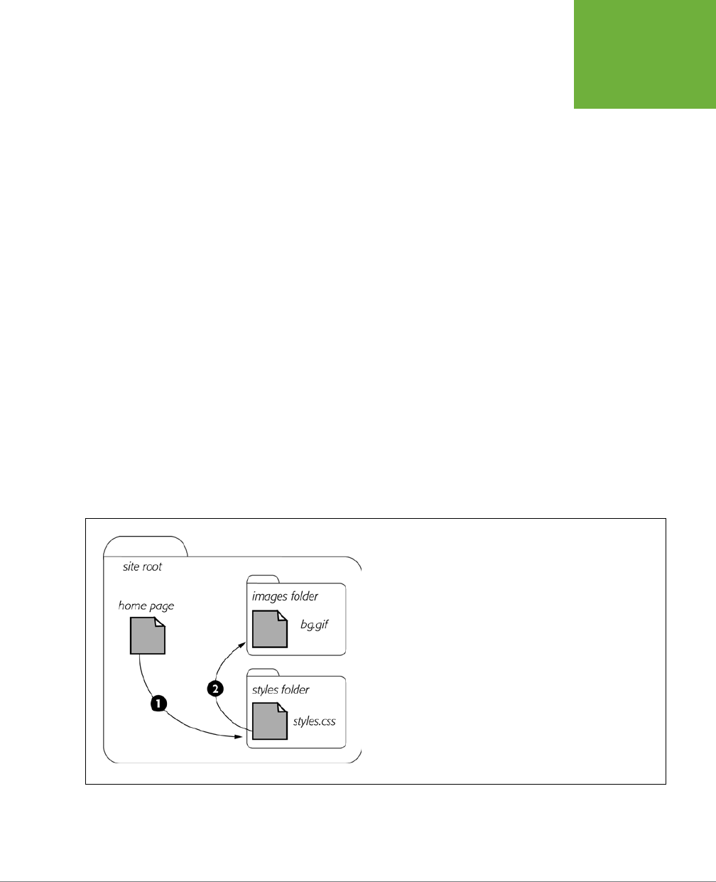
CHAPTER 8: ADDING GRAPHICS TO WEB PAGES 243
ADDING
BACKGROUND
IMAGES
The property takes one value: the keyword url, followed by a path to the graphic file
enclosed in parentheses. You can use an absolute URL like this—url(http://www.
cosmofarmer.com/image/bg.gif)—or a document- or root-relative path like these:
url(../images/bg.gif) /* document-relative */
url(/images/bg.gif) /* root-relative */
As explained in the box on page 244, document-relative paths provide directions
in relation to the style sheet file,
not
the HTML page you’re styling. These will be
one and the same, of course, if you’re using an internal style sheet, but you need
to keep this point in mind if you’re using an
external
style sheet. Say you’ve got a
folder named
styles
(containing the site’s style sheets) and a folder named
images
(holding the site’s images). Both these folders are located in the site’s main folder
along with the home page (Figure 8-2). When a visitor views the home page, the
external style sheet is also loaded (Step 1 in Figure 8-2). Now, say the external style
sheet includes a style for the <body> tag with the background image property set
to use the graphic file
bg.gif
in the images folder. The document-relative path would
lead from the style sheet to the graphic (Step 2 in Figure 8-2). In other words, the
style would look like this:
body {
background-image: url(../images/bg.gif);
}
This path breaks down like this: ../ means “go up one level” (that is, up to the folder
containing the
styles
folder); images/ means “go to the images folder”; and bg.gif
specifies that file.
FIGURE 8-2
Document-relative paths are calculated in relation to the style sheet,
not the web page being styled.
In the examples so far, the path isn’t enclosed in quotes as in HTML, but quotes are
fine, too. In CSS, all three of the following code lines are kosher:
CSS3: THE MISSING MANUAL
244
CONTROLLING
REPETITION
background-image: url(images/bg.gif);
background-image: url("images/bg.gif");
background-image: url('images/bg.gif');
UP TO SPEED
URL Types
In CSS, you need to specify a
URL
when you add a background
image or attach an external style sheet by using the @import
method (page 42). A URL or
Uniform Resource Locator
is a path
to a file located on the Web. There are three types of paths:
absolute path, root-relative path
, and
document-relative
path
. All three simply indicate where a web browser can
find a particular file (like another web page, a graphic, or an
external style sheet).
An absolute path is like a postal address—it contains all the
information needed for a web browser located anywhere in
the world to find the file. An absolute path includes
http://
, the
hostname, and the folder and name of the file. For example:
http://www.cosmofarmer.com/images/bluegrass.jpg
.
A
root-relative
path indicates where a file is located relative to
a site’s top-level folder—the site’s root folder. A root-relative
path doesn’t include
http://
or the domain name. It begins with
a / (slash) indicating the root folder of the site (the folder the
home page is in). For example
/images/bluegrass.jpg
indicates
that the file
bluegrass.jpg
is located inside a folder named
images
, which is itself located in the site’s top-level folder. An
easy way to create a root-relative path is to take an absolute
path and strip off the
http://
and the host name.
A
document-relative
path specifies the path from the current
document to the file. When it comes to a style sheet, this means
the path from the style sheet to the specified file
, not the path
from the current web page to the file.
Here are some tips on which type to use:
• If you’re pointing to a file that’s not on the same server
as the style sheet, you
must
use an absolute path. It’s the
only type that can point to another website.
• Root-relative paths are good for images stored on your
own site. Since they always start at the root folder, you can
move the style sheet around without affecting the path
from the root to the image on the site. However, they’re
difficult to use when first building your designs: You can’t
preview root-relative paths unless you’re viewing your
web pages through a web server—either your web server
out on the Internet or a web server you’ve set up on your
own computer for testing purposes. In other words, if
you’re just opening a web page off your computer using
the browser’s File→Open command, then you won’t see
any images placed using root-relative paths.
• Document-relative paths are the best when you’re
designing on your own computer without the aid of a web
server. You can create your CSS files and then review them
in a web browser simply by opening a web page stored
on your hard drive. These pages will work fine when you
move them to your actual, living, breathing website on
the Internet, but you’ll have to re-write the URLs to the
images if you move the style sheet to another location
on the server.
Controlling Repetition
If you use the background-image property by itself, the graphic always tiles, filling
up the entire background of a web page. Fortunately, you can use the background-
repeat property to specify how (or if at all) an image tiles:
background-repeat: no-repeat;
The property accepts four values: repeat, no-repeat, repeat-x, and repeat-y:
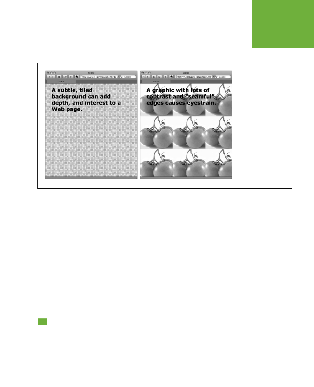
CHAPTER 8: ADDING GRAPHICS TO WEB PAGES 245
POSITIONING A
BACKGROUND
IMAGE
• repeat is the normal setting for background images that you want to display
from left to right and top to bottom until the entire space is filled with a graphic
(Figure 8-3).
FIGURE 8-3
Be careful when tiling
images in the background
of a web page. Choose
an image without a lot of
contrast that tiles seam-
lessly (left). An image with
too much contrast (right),
makes text hard to read.
• no-repeat displays the image a single time, without tiling or repetition. It’s a
very common option, and you’ll frequently use it when placing images into the
background of tags other than the body. You can use it to place a logo in the
upper corner of a page or to use custom graphics for bullets in lists, to name
a couple. (You’ll see the bullet example in action in the tutorial on page 286.)
• repeat-x repeats an image horizontally along the x-axis (the horizontal width of
the page, if your geometry is rusty). It’s perfect for adding a graphical banner to
the top of a web page (Figure 8-4, left) or a decorative border along the top or
bottom of a headline. (See page 299 in the tutorial for an example of this eect.)
• repeat-y repeats an image vertically along the y-axis (the vertical length of
the page). You can use this setting to add a graphic sidebar to a page (Figure
8-4, right) or to add a repeating drop shadow to either side of a page element
(like a sidebar).
Positioning a Background Image
Placing and tiling a background image is just half the fun. With the background-
position property, CSS lets you control the exact placement of an image in a number
of ways. You can specify both the horizontal and vertical starting points for a graphic
in three ways—keywords, exact values, and percentages.
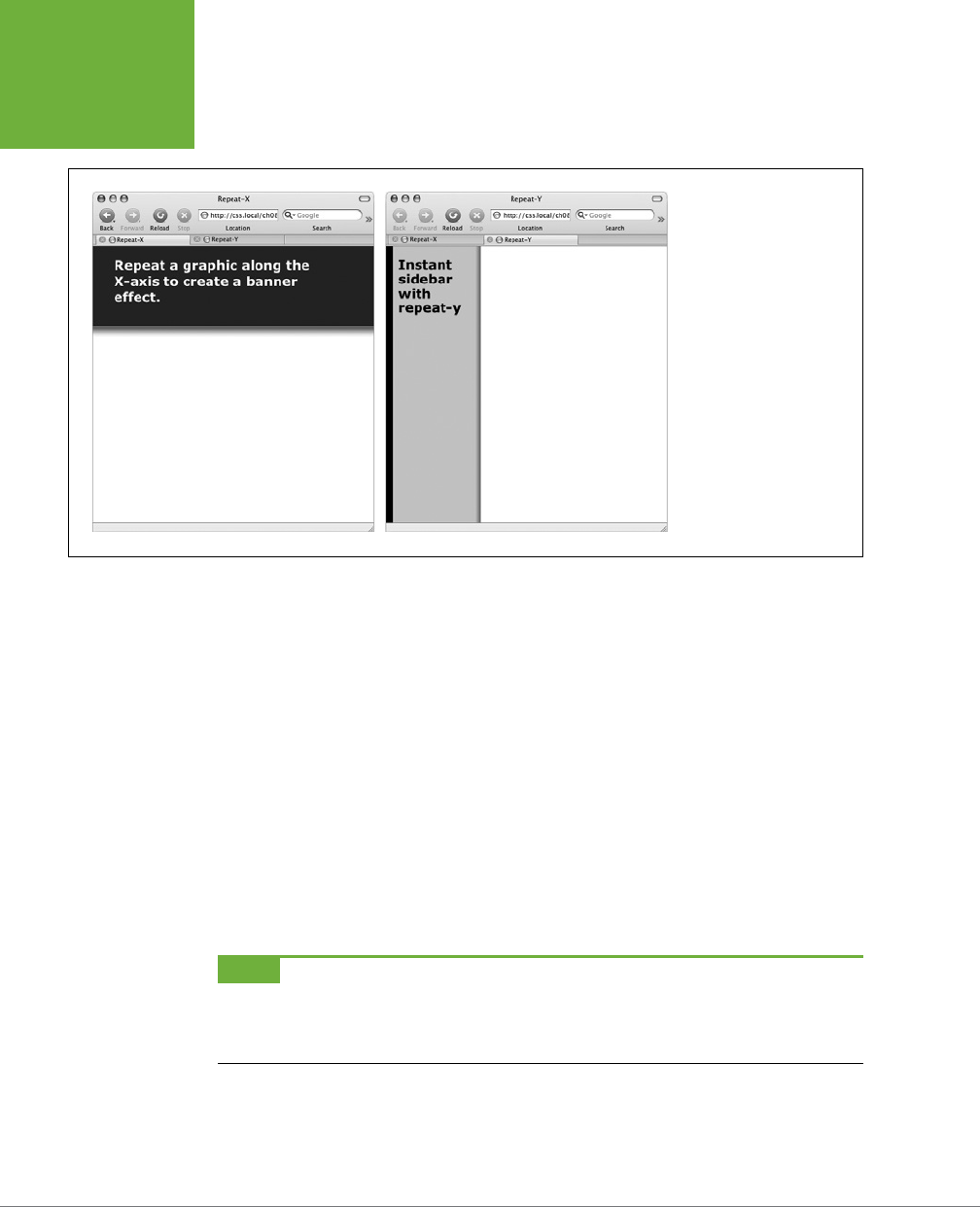
CSS3: THE MISSING MANUAL
246
POSITIONING A
BACKGROUND
IMAGE
FIGURE 8-4
Add graphic backgrounds
to the banners and
sidebars of a page by
taking advantage of the
tiling control offered by
the
repeat-x
(left)
and
repeat-y
(right)
options.
Keywords
You get two sets of keywords to work with. The first one controls the three hori-
zontal positions—left, center, right—and the second controls the three vertical
positions—top, center, bottom (Figure 8-5). Suppose you want to place a graphic
directly in the middle of a web page. You can create a style like this:
body {
background-image: url(bg_page.jpg);
background-repeat: no-repeat;
background-position: center center;
}
To move that graphic to the top-right corner, just change the background position
to this:
background-position: right top;
NOTE If you’ve decided to tile an image (by setting
background-repeat
to one of the values listed in
the previous section), then the
background-position
property controls the
starting
point of the first tile.
So, for example, if you use the
repeat
option, you’ll still see the entire background filled by the image. It’s just
that the position of the
first
tile changes based on which
background-position
setting you used.
Keywords are really useful when you want to create vertical or horizontal banners.
If you wanted a graphic that’s centered on a page and tiled downwards in order to
create a backdrop for content (Figure 8-6, left), then you’d create a style like this:
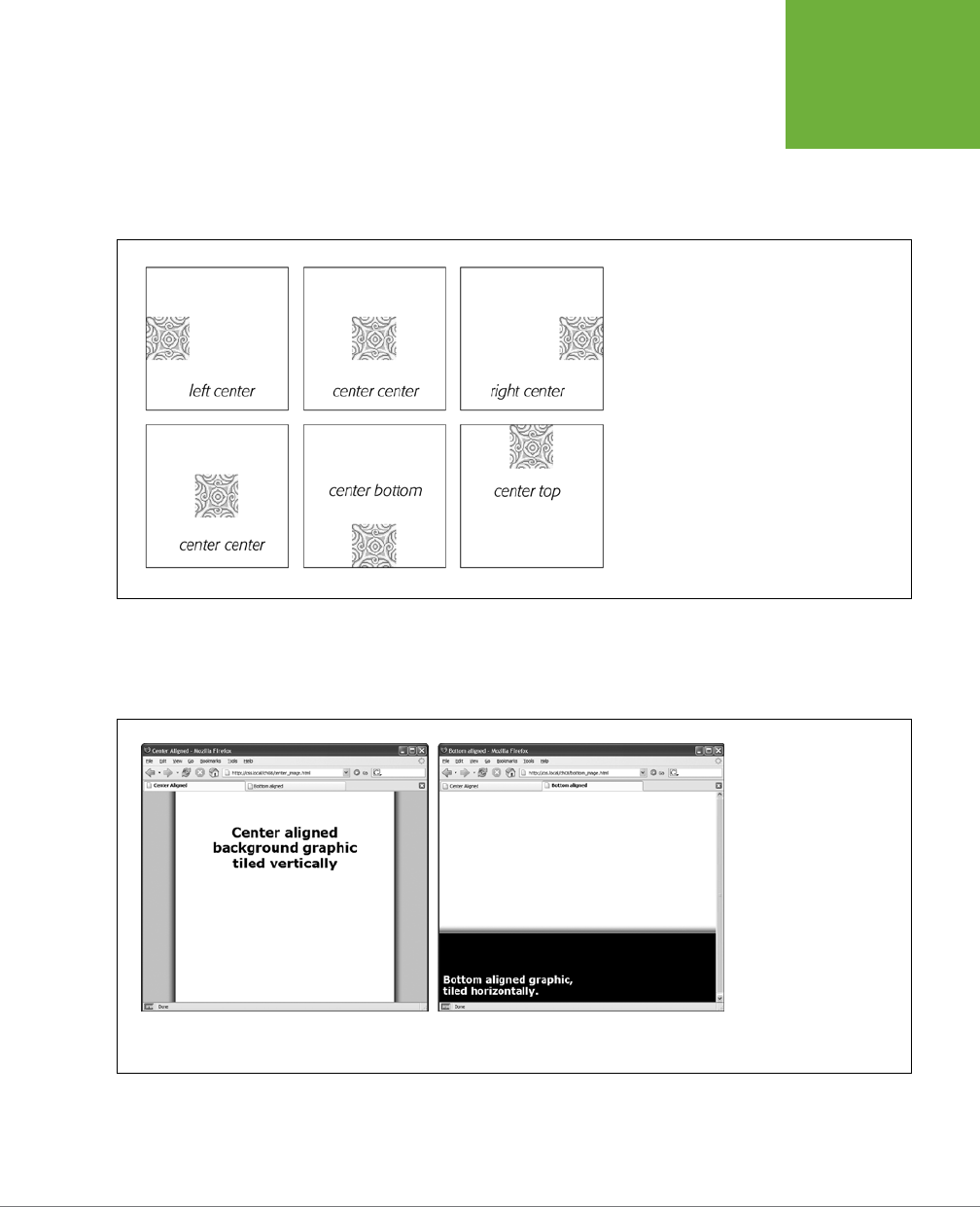
CHAPTER 8: ADDING GRAPHICS TO WEB PAGES 247
POSITIONING A
BACKGROUND
IMAGE
body {
background-image: url(background.jpg);
background-repeat: repeat-y;
background-position: center top;
}
FIGURE 8-5
You can use keywords to position an image in the
background. The order in which you specify the
keywords doesn’t matter—
top center
and
center top
both have the same effect.
Likewise, using the bottom,
center, or top keywords, you can position a horizontally
repeating image by using repeat-x (Figure 8-4, left) in a particular place on the
page (or within a styled element).
FIGURE 8-6
Use the
background-
position
prop-
erty when tiling an image
either vertically (left) or
horizontally (right). In the
left image, the graphic is a
wide white box with drop
shadows on the left and
right edges. The page’s
background color is gray,
so the text of the page
looks like it’s on a white
piece of paper floating
above the screen.
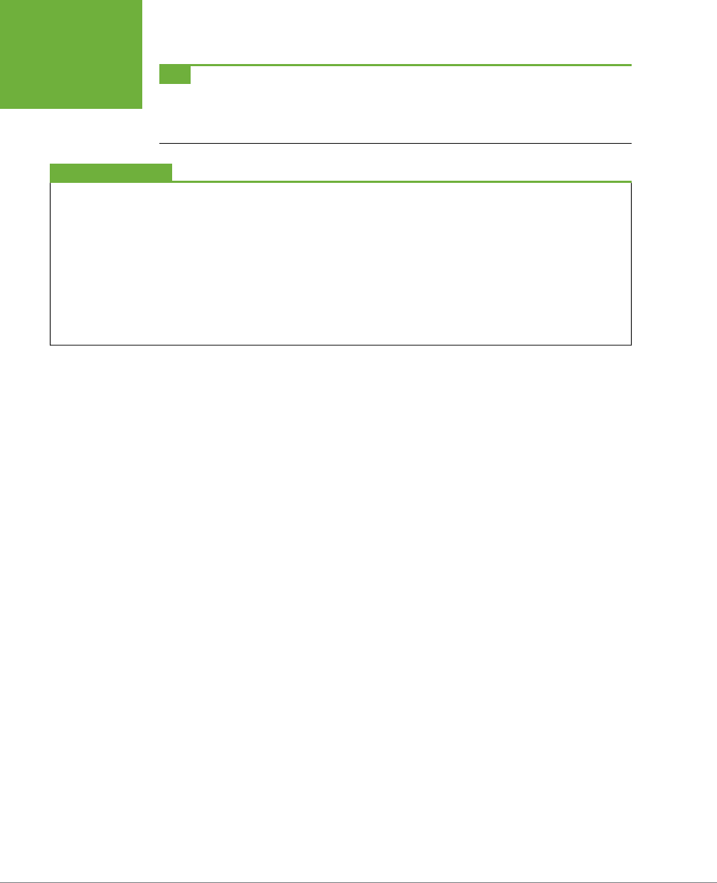
CSS3: THE MISSING MANUAL
248
POSITIONING A
BACKGROUND
IMAGE
TIP You can actually add a background image to both the
<html>
and
<body>
tags. If you tile both images
horizontally and place the
<body>
tag’s image at the top and the
<html>
tag’s image on the bottom, you can
achieve the effect of two stripes cutting across the top and bottom of the page—no matter how tall the page is.
And it works in all current browsers, even IE 6!
BROWSER BUG
Bottoming Out
When displaying an image in the background of a web page,
most browsers don’t always vertically position the image in the
way you’d expect. For example, if you set the vertical position
to
bottom
, the image doesn’t always appear at the bottom
of the browser window. This happens when the content on a
page is shorter than the browser window is tall.
If the web page has only a couple of paragraphs of text and it’s
displayed on a really large monitor, most browsers treat the
“bottom” as the bottom of the last paragraph, not the bottom
of the browser window. If you run into this annoyance, then
just add this style to your style sheet:
html { height: 100%; }
.
Precise Values
You can also position background images by using pixel values or ems. You use two
values: one to indicate the distance between the image’s left edge and the container’s
left edge, and another to specify the distance between the image’s top edge and the
style’s top edge. (Put another way, the first value controls the horizontal position,
the second value controls the vertical position.)
Say you want custom bullets for a list. If you add a background image to the <li>
tag, the bullets often don’t line up exactly (see Figure 8-7, top). So you can just
nudge the bullets into place by using the background-position property (Figure
8-7, bottom). If the list would look better with, say, the bullets 5 pixels farther to the
right and 8 pixels farther down, then add this declaration to the style defining the
background image:
background-position: 5px 8px;
You can’t specify distances from the bottom or right by using pixel or em measure-
ments, so if you want to make sure an image is placed in the exact bottom-right corner
of the page or a styled element, then use keywords (bottom right) or percentages,
as discussed next. However, you can use negative values to move an image o the
right edge or above the top edge, hiding that portion of the image from view. You
may want to use negative values to crop out part of a picture. Or, if the background
image has lots of extra white space at the top or left edge, you can use negative
values to eliminate that extra space.
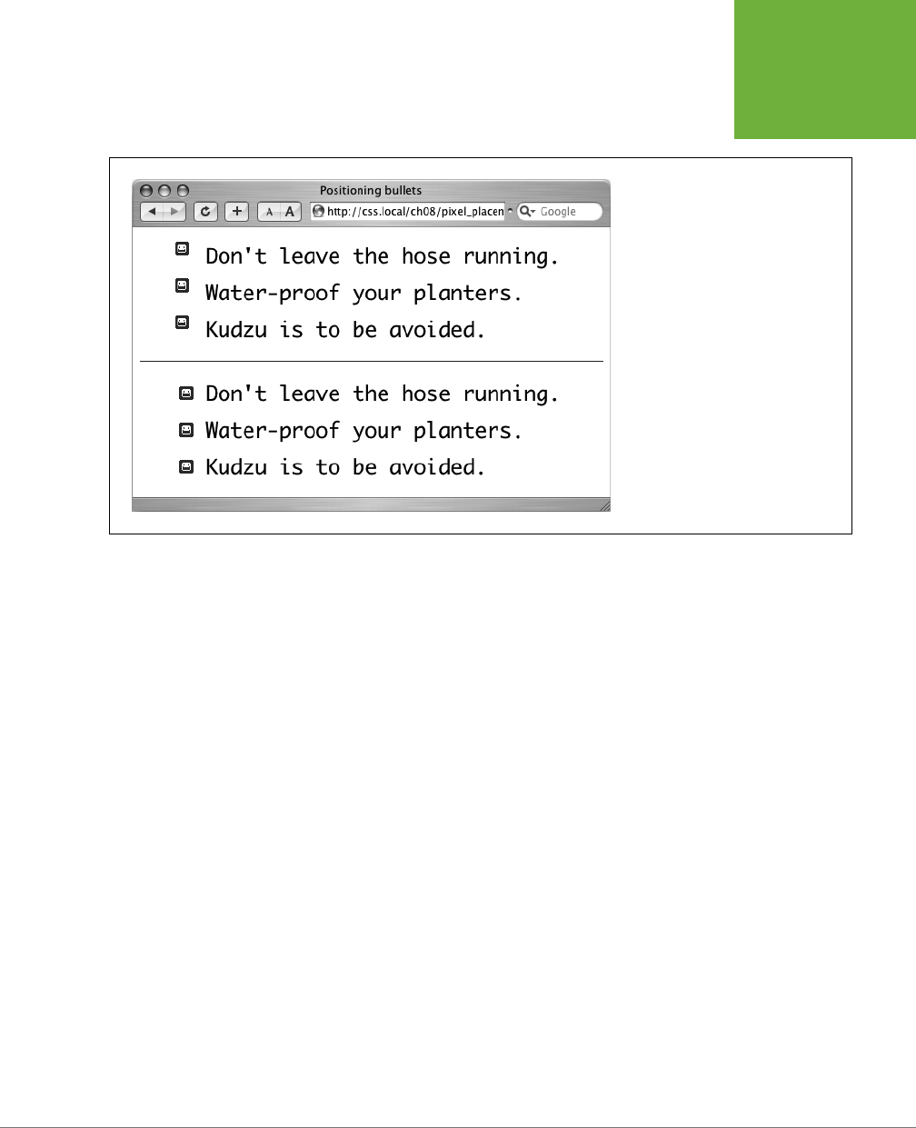
CHAPTER 8: ADDING GRAPHICS TO WEB PAGES 249
POSITIONING A
BACKGROUND
IMAGE
FIGURE 8-7
Using custom images for bullets
sometimes requires careful positioning,
so that the bullet graphic appears the
correct distance from, and perfectly
centered on, the list item’s text.
Percentage Values
Finally, you can use percentage values to position a background image. Using per-
centages in this manner is tricky, and if you can achieve the eect you’re after with
the keyword or precise values discussed previously, then use them. But you have to
use percentages to position an element in a spot that’s proportional to the width of
an element. For example, if you want to place a graphic three-quarters of the way
across a headline and you don’t know the width of the element.
As with pixel or em values, you supply two percentages: one to indicate the horizon-
tal position and the second to indicate the vertical position. What the percentage
is measuring is a little tricky. In a nutshell, a percentage value aligns the specified
percentage of the image with the same percentage of the styled element. What?
The best way to understand how percentage values work is to look at a few examples.
To position an image in the middle of a page (like the one shown in the center of
Figure 8-8) you’d write this:
background-position:50% 50%;
This declaration places the point on the image that’s 50 percent from its left edge
directly on top of the point that’s 50 percent from the left edge of the page (or
whatever element you’ve styled with the background image). The declaration also
aligns the point on the image that’s 50 percent from its top with the point that’s 50
percent from the top edge of the page or styled element. In other words, the center
of the image is aligned with the center of the element. This means that, when using
percentages, the exact point on the image that’s being aligned can be a moving
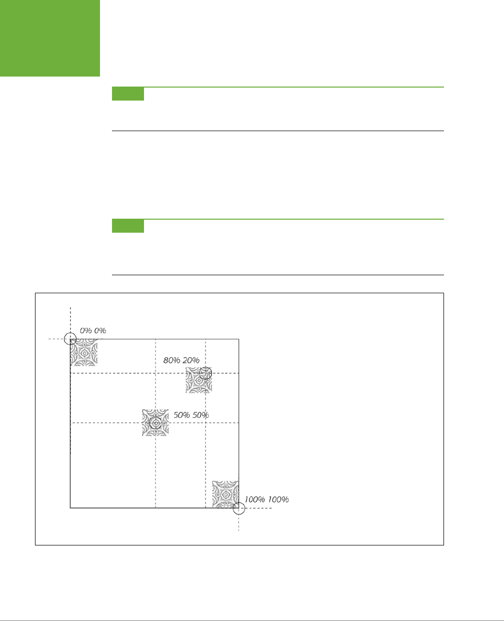
CSS3: THE MISSING MANUAL
250
POSITIONING A
BACKGROUND
IMAGE
target. (That’s because your styled element’s positioning percentages can change
if your visitors resize their browsers.)
NOTE Positioning an image vertically in the background of a page by using percentages won’t necessarily
put the image in the correct spot if the page content doesn’t fill the entire height of the browser window. See
the box on page 248 for the solution to this problem.
As with pixel and em values, you can specify negative percentage values, although
the results can be hard to predict. You can also mix and match pixel/em values with
percentage values. For example, to place an image that’s 5 pixels from the element’s
left edge, but placed in the middle of the element’s height, you could use this:
background-position: 5px 50%;
NOTE Although background images can raise the visual quality of your web pages, they usually don’t show
up if your visitor prints the page. Most browsers
can
print out the backgrounds, but it usually requires extra work
on your visitor’s part. If you plan to have your visitors print pages from your site, then you may want to keep
using the
<img>
tag to insert mission-critical images like your site logo or a map to your store.
FIGURE 8-8
Each of the four images pictured here have been
positioned on this web page (represented by
the large black box) by using percentage values.
When using percentage values, first identify the
“anchor point” on the image:
50% 50%
, for
example, is the center of the middle image. Next,
identify the 50/50 point on the page itself: again,
that would be directly in the center of the page.
That spot is where the image’s anchor point gets
placed. The three other images are all positioned
in the same way.
Fixing an Image in Place
Normally, if there’s a background image on a web page and the visitor has to scroll
down to see more of the page, the background image scrolls as well. As a result,
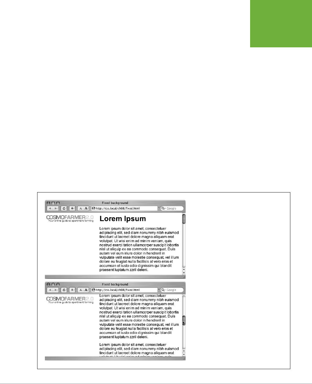
CHAPTER 8: ADDING GRAPHICS TO WEB PAGES 251
POSITIONING A
BACKGROUND
IMAGE
any pattern in the background of the page appears to move along with the text.
Furthermore, when you have a nonrepeating image in the background, it can po-
tentially scroll o the top of the page out of view. If you’ve placed the site’s logo or
a watermark graphic in the background of the page, then you may
not
want it to
disappear when visitors scroll.
The CSS solution to such dilemmas is the background-attachment property. It has
two options—scroll and fixed. Scroll is the normal web browser behavior; that is,
it scrolls the background image along with the text and other page content. Fixed,
however, keeps the image in place in the background (see Figure 8-9). So if you want
to place your company’s logo in the upper-left corner of the web page, and keep it
there even if the viewer scrolls, then you can create a style like this:
body {
background-image: url(images/logo.gif);
background-repeat: no-repeat;
background-attachment: fixed;
}
The fixed option is also very nice when using a repeating, tiled background. When
you have to scroll, the page’s text disappears o the top, but the background doesn’t
move: The page content appears to float gracefully above the background.
FIGURE 8-9
Looking for a way to nail down a site logo (like the
CosmoFarmer 2.0 image) so when viewers scroll
down the page the logo stays in place? Using the
fixed
option for the
background-attachment
property, you can lock a background image in place.
That way, even if the page is very long and the visitor
has to scroll down, the image remains visible on the
web page (bottom).
CSS3: THE MISSING MANUAL
252
POSITIONING A
BACKGROUND
IMAGE
Defining the Origin and Clipping for a Background
CSS3 adds the ability to tell a browser where the background image should begin in
relation to the border, padding, and content of an element. For example, normally
when you tile an image, it starts in the upper-left corner of the padding of an element
(see the top, middle image in Figure 8-10). However, you can reposition that image’s
starting point, using the background-origin property. It takes one of three values:
• border-box places the image in the upper-left corner of the area assigned to
the border (top-left in Figure 8-10).
• padding-box places the image in the upper-left corner of the area assigned
to the padding (top-middle in Figure 8-10). This is normally where a browser
places a background image.
• content-box places the image in the upper-right corner of the area assigned to
the content (top-right in Figure 8-10).
Of course, this setting doesn’t matter if there’s neither a border nor any padding
around an element; in addition, the eect can be very subtle, especially if you have
a seamlessly tiling pattern.
NOTE Neither the
background-origin
nor the
background-clip
properties work in Internet
Explorer 8 and earlier. Since IE 8 is still a very popular browser, use these properties with caution.
However, it can be noticeable if you’re not repeating an image. For example, if you
choose the no-repeat option (page 245) and the background image appears only a
single time, you could place that image in the upper-left corner of the content area
(inside any padding) like this:
background-image: url(logo.png);
background-repeat: no-repeat;
background-origin: content-box;
In addition, the background-origin property can be used eectively with another
new property—background-clip. The background-clip property limits the area
where the background image appears. Normally, background images fill the entire
area of an element including behind borders and padding areas (bottom-left in Figure
8-9). However, you can specify where the image appears with one of three values:
• border-box lets the image appear behind the content all the way behind any
borders. You’ll notice this only if you have borders with visible gaps like a dashed
line (bottom-left in Figure 8-9). This is normally what browsers do, so there’s
no real reason to use this setting.
• padding-box limits any background to just the padding area and the element’s
content (bottom-middle in Figure 8-9). This is useful if you have a border that’s
dotted or dashed and you don’t want the image to appear in the border’s gaps.
• content-box limits the background to just the content area. The padding and
the area behind the border will be free of any image (bottom-right in Figure 8-9).
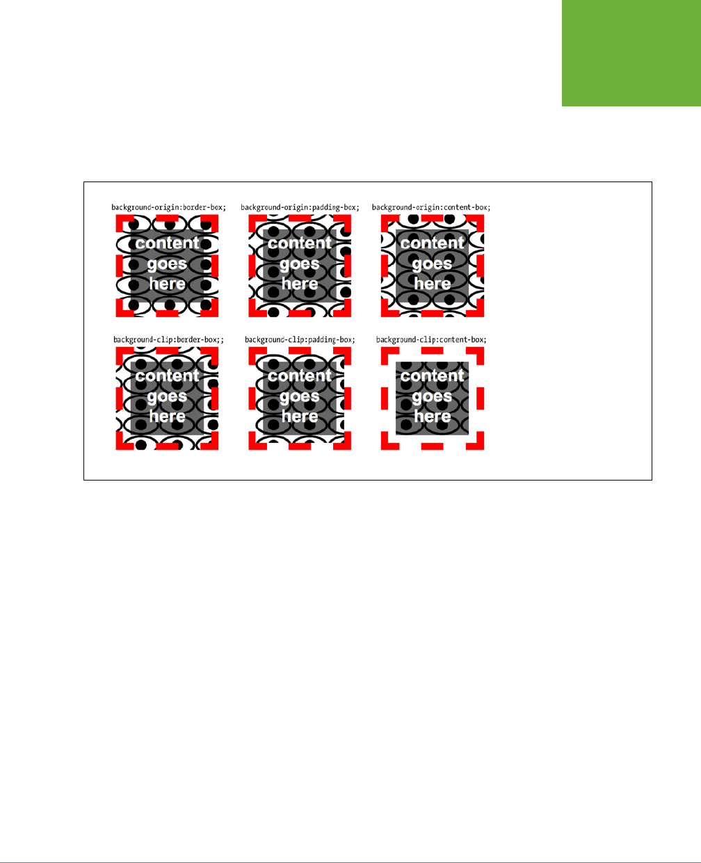
CHAPTER 8: ADDING GRAPHICS TO WEB PAGES 253
POSITIONING A
BACKGROUND
IMAGE
By combining background-origin and background-clip, you can make sure that
an image begins in the upper-left of the content area and appears only behind
content like this:
background-origin: content-box;
background-clip: content-box;
FIGURE 8-10
The
background-clip
property also applies to
background colors. If you’ve
added a non-solid border (like
dotted, dashed, or double),
the background color normally
shows behind the border in the
empty areas. However, to limit
that color to just inside the
border you would simply set
the element’s
background-
clip
property to
padding-
box
.
Scaling Background Images
Unlike the HTML <img> tag, you can normally resize a background image. It’s placed
in the background at the size you created it. However, CSS3 adds a background-size
property, which lets you control the size of a background image. You have the option
of using values or keywords to set the size:
• Supply a height and width value to set the size of the image. You can use an
absolute value like a pixel value:
background-size: 100px 200px;
This code sets the background image to 100 pixels wide and 200 pixels tall.
You can also set the value of just the width or height and set the other to auto:
background-size: 100px auto;
In this case, the background image is 100 pixels wide, and the browser auto-
matically sets the width to keep the aspect ratio of the image intact (so it isn’t
distorted). You can also use percentage values. If you want the image to scale
to completely fit the background, you can use 100% for both settings (Figure
8-11, left):
background-size: 100% 100%;
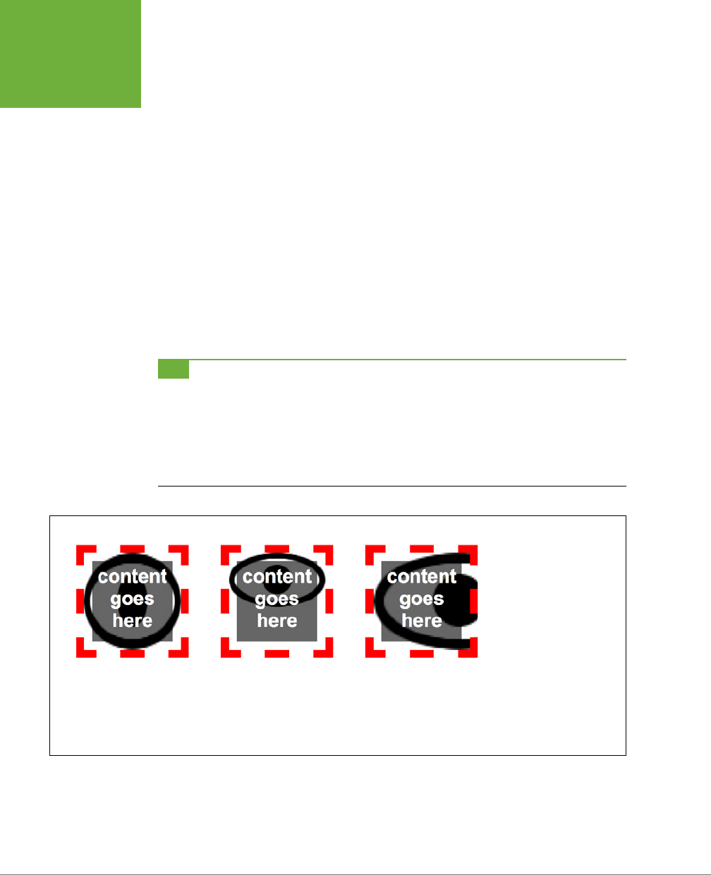
CSS3: THE MISSING MANUAL
254
POSITIONING A
BACKGROUND
IMAGE
• The contain keyword forces the image to resize to fit while maintaining the
aspect ratio of the image (Figure 8-10, middle). Depending on the shape of the
image and the element, the image is stretched to fit either the width or height
of the element.
background-size: contain;
• The cover keyword forces the width of the image to fit the width of the ele-
ment and the height of the image to fit the height of the element. This usually
distorts the image by either squishing or stretching it to fit the element (Figure
8-10, right).
background-size: cover;
The background-size property almost always ends up resizing the original image:
if the image is smaller than the elements, the browser scales the image up, usually
resulting in noticeable pixilation and degradation of the image (as with the back-
ground images in Figure 8-10).
TIP Using the
background-size
property can be especially helpful when you’re working with elements
that are sized using percentages, such as the responsive designs discussed in Chapter 14. For example, if you put
an image into the background of a banner that’s 960 pixels when viewed on a desktop monitor but shrinks down
to 480 when viewed on a phone, you can place a large background image in the banner and use this setting:
background-size: 100% auto;
This forces the web browser to resize the image to fit as the banner shrinks to a thinner size.
FIGURE 8-11
The
background-
size
property is the only
way to change the size
of a background image.
Keep in mind that while
most browsers under-
stand this property, the
still widely used Internet
Explorer 8 doesn’t, so
use it with care (or, if
you don’t care about IE 8,
then use it with reckless
abandon).

CHAPTER 8: ADDING GRAPHICS TO WEB PAGES 255
USING
BACKGROUND
PROPERTY
SHORTHAND
Using Background Property Shorthand
As you can see from the examples in the previous section, to really take control of
background images you need to harness the power of several dierent background
properties. But typing out background-image, background-attachment, and so on
again and again can really take its toll on your hands. But there’s an easier way—the
background shorthand property.
You can actually bundle all the background properties (including the background-
color property) into a single line of streamlined CSS. Simply type background
followed by the values for background-image, background-position, background-
repeat, background-attachment, and background-color. The following style sets
the background to white and adds a nonrepeating fixed background image smack
dab in the middle of the page:
body {
background: url(bullseye.gif) center center no-repeat fixed #FFF;
}
You don’t need to specify all the property values either. You can use one or any
combination of them. For example: background: yellow is the equivalent of
background-color: yellow. Any property value you leave out simply reverts to its
normal behavior, so say you specify only an image:
background: url(image/bullseye.gif);
That’s the equivalent of this:
background: url(image/bullseye.gif) scroll left top repeat transparent;
This behavior of resetting non-defined values to their default values can lead you to
some unexpected results. For example, say you add these two declarations to a style:
background-color: yellow;
background: url(image/bullseye.gif) no-repeat;
You may expect to see a single bull’s-eye image sitting atop a yellow background
color. But you won’t, because a browser resets the background-color to transparent
(invisible) when it encounters the background property with no color specified. To get
around this predicament, you need to specify the background-color second, like this:
background: url(image/bullseye.gif) no-repeat;
background-color: yellow;
In addition, when multiple styles apply to the same element, you can inadvertently
end up wiping out background images. For example, say you want to add a back-
ground image to every paragraph on a page, so you create a style like this:
p {
background: url(icon.png) left top no-repeat rgb(0,30,0);
}
CSS3: THE MISSING MANUAL
256
USING
BACKGROUND
PROPERTY
SHORTHAND
You then decide you’d like the first paragraph after every Heading 2 to have a blue
background, so you create this:
h2 + p {
background: blue;
}
This second style uses the shorthand, which resets all the other background proper-
ties to their defaults. In the case of an image, the default is no image at all, so rather
than simply adding a blue background to the paragraph and leaving the image in
place, this style actually erases the image!
In other words, the background shorthand property can help you write less code,
but it can also get you into trouble, so just keep this behavior in mind.
NOTE You can use the newer CSS3 background properties—
background-size
,
background-origin
,
and
background-clip
—in the background shorthand, but it’s not necessarily a good idea. First, since IE 8
doesn’t understand those properties, adding them to the background declaration will make IE 8 skip the other valid
properties (in other words, it’ll ignore all of your background settings). In addition, you need to put the proper-
ties in a specific order, and no browser (as of this writing) can handle both the
background-position
and
background-size
values together in a single declaration. To get around this, you can create one declaration
with the common and accepted shorthand properties—image, position, repeat, placement, and color—and then
add separate declarations after the shorthand declaration for the new CSS3 properties.
FREQUENTLY ASKED QUESTION
Finding Free Imagery
I’m not an artist. I can’t draw, can’t paint, don’t even own a
digital camera. Where can I find artwork for my site?
Thank goodness for the Web. It’s the one-stop shop for cre-
ative geniuses who couldn’t paint themselves into a corner
if they tried. There are plenty of pay-to-download sites for
stock photos and illustrations, but there are also quite a few
completely free options. For photos, check out Morgue File
(
www.morguefile.com
), which despite the grisly name has
many wonderful photos supplied free of charge by people
who love to take pictures. Stock.xchng (
www.sxc.hu
) is yet
another excellent photographic resource. Open Photo (
http://
openphoto.net
) also supplies images based on Creative Com-
mons licenses, and you can use the search engine on the Cre-
ative Commons website to find images (and video and music)
that can be used in personal and commercial projects:
http://
search.creativecommons.org
. In addition, you can use Flickr
(
www.flickr.com/creativecommons
) and Picasa Web Albums
(
http://picasaweb.google.com
) to search for images that have
a Creative Commons license applied to them. (Although they
don’t cost money, not all photos on these sites can be used in
commercial projects. Make sure you read the fine print for any
photo you wish to use.)
If you’re looking for bullets to add to lists, icons to supercharge
your navigation bar, or patterns to fill the screen, there are
plenty of sites to choose from. Some Random Dude (no, really,
that’s the name of the website) offers a set of 121 icons free
of charge:
www.somerandomdude.com/work/sanscons/
. And
if you’re looking for interesting tiling patterns, check out the
patterns on these sites: ColourLovers.com (
www.colourlovers.
com/patterns
), Pattern4u (
www.kollermedia.at/pattern4u
),
and Squidfingers (
http://squidfingers.com/patterns
). Or
make your own tiled backgrounds with these online pattern
creators: BgPatterns (
http://bgpatterns.com
), Stripe Genera-
tor 2.0 (
www.stripegenerator.com
), and PatternCooler (
www.
patterncooler.com
).

CHAPTER 8: ADDING GRAPHICS TO WEB PAGES 257
USING
MULTIPLE
BACKGROUND
IMAGES
Using Multiple Background Images
While one background image is fine, being able to layer multiple images in a back-
ground has its uses. For example, say you want to add a background image to a
sidebar to make it look like a scroll (Figure 8-12). If you simply place a single image
in the background, it might work at first (top-left in Figure 8-12), but if you add a
lot of text inside that sidebar, it won’t look so good (top-right in Figure 8-12). That’s
because the image is one size and it won’t grow or shrink to accommodate the size
of the sidebar.
Fortunately, CSS3 lets you add multiple images to the background of an element.
In the scroll example, you can use three background images: one for the top of the
scroll, one for the bottom of the scroll, and one for its text area. That last image is
a seamlessly tiling image, so as the sidebar gets taller, the image simply tiles to fit
the space.
Of course, you can use multiple images for simpler tasks as well. For example, say
you want to add a colorful, richly textured image to the background of an element
and you also add a two-color logo. As discussed in the box on page 242, JPEG is a
better format when an image has lots of colors, while PNG8 is better for areas of
solid color like a logo. In this case, you can have the best of both worlds by using a
JPEG for the colorful background and a PNG8 for the logo.
For multiple background images, simply use the background-image property with
a comma-separated list of images like this:
background-image: url(scrollTop.jpg),
url(scrollBottom.jpg),
url(scrollMiddle.jpg);
NOTE In this example code, each URL is listed on its own line, but you don’t have to do it that way. You
could type this all out in one single (really long) line. However, most designers find it easier to read if you place
each image on its own line and use spaces (or tabs) to indent the following lines to line up. Just keep in mind that
you need a comma after each image specified, except the last, which requires the usually semicolon necessary
to end a declaration.
Because background images normally tile, you’ll usually need to include a back-
ground-repeat property as well (if you don’t then the images would just tile one
on top of the other hiding all images underneath.) You can add other background
properties as well, with a similarly comma-separated set of values like this:
background-repeat: no-repeat,
no-repeat,
repeat-y;
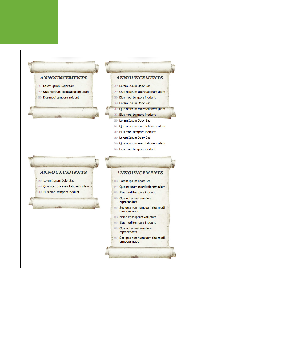
CSS3: THE MISSING MANUAL
258
USING
MULTIPLE
BACKGROUND
IMAGES
FIGURE 8-12
Note that multiple background images
don’t work in Internet Explorer 8. See
the box on page 259 for one way to use
multiple background images with IE 8.
When using multiple values like this, the first value (no-repeat in this example) goes
with the first image listed in the background-image property (
scrollTop.png
); the
second goes with the second image listed, and so on. Because this can get confus-
ing quickly, many web designers use the shorthand method to specify multiple
images, like this:
background: url(scrollTop.jpg) center top no-repeat,
url(scrollBottom.jpg) center bottom no-repeat,
url(scrollMiddle.jpg) center top repeat-y;
CHAPTER 8: ADDING GRAPHICS TO WEB PAGES 259
UTILIZING
GRADIENT
BACKGROUNDS
NOTE Multiple background images lay on top of one another, like layers in an image-editing program. The
order you list the background images in determines which image appears on top. The first image listed is on
the element’s top layer, the second the second layer, and the last on the bottom layer. In the preceding example
code, the top of the scroll (
scrollTop.jpg
) is above the bottom of the scroll (
scrollBottom.jpg
), which in turn sits
above the text area of the scroll (
scrollMiddle.jpg
).
POWER USERS’ CLINIC
Faking Multiple Backgrounds
Internet Explorer 8 still is widely used (thanks to Windows XP).
But because IE 8 doesn’t support multiple images, you may
feel like you should steer clear of them. There are, however, a
couple of ways to fake multiple backgrounds. The simplest is
to add individual background images to overlapping elements.
For example, you can achieve the same scroll effect shown in
Figure 8-12 by adding the middle, text area of the scroll to the
background of the
<div>
tag, which creates that sidebar
region. Then, add the top of the scroll to the background of
the first element in the sidebar—in this case it’s an
<h2>
tag
with the text “Announcements.” Finally, add the image of the
bottom of the scroll to the bottom of the last element in the
sidebar—in this case, an unordered list. The headline and the
unordered list are both inside the sidebar div, and this lays on
top of the
<div>
.
Another technique uses CSS generated content (page 595).
Generated content is a way to add content before and/or after
an element. You can add text, but you can also add images
as well. The generated content sits above the element, so in
the scroll example, you could add the top of the scroll to the
:before
pseudo class and the bottom of the scroll to the
:after
pseudo class, like this:
.sidebar {
background: url(scrollMiddle.jpg) center
top repeat-y;
}
.sidebar:before {
content: url(scrollTop.jpg);
}
.sidebar:after {
content: url(scrollBottom.jpg);
}
To move the images around so they’re not at the top or bot-
tom of the element, you’ll need to learn how to use absolute
positioning so you can move the generated content around.
You’ll learn about absolute positioning in depth in Chapter 15.
CSS3 multiple backgrounds let you add as many background
images as you like. Using generated content, you’re limited to
just three images: the element’s background and its before
and after pseudo-classes. You’ll use this generated content
method to create multiple background images in the tutorial
on page 290.
Utilizing Gradient Backgrounds
Gradients—smooth transitions of color from blue to red or black to white are com-
mon staples of any image-editing program. Creating subtle shifts from one similar
color to another creates a kind of misty quality; Apple uses gradients on buttons
and other user interface elements in their OS X and iPhone software. It used to be
that you had to open Photoshop and create a huge image file with the gradient you
were after. Now you can let the browser create gradients for you.
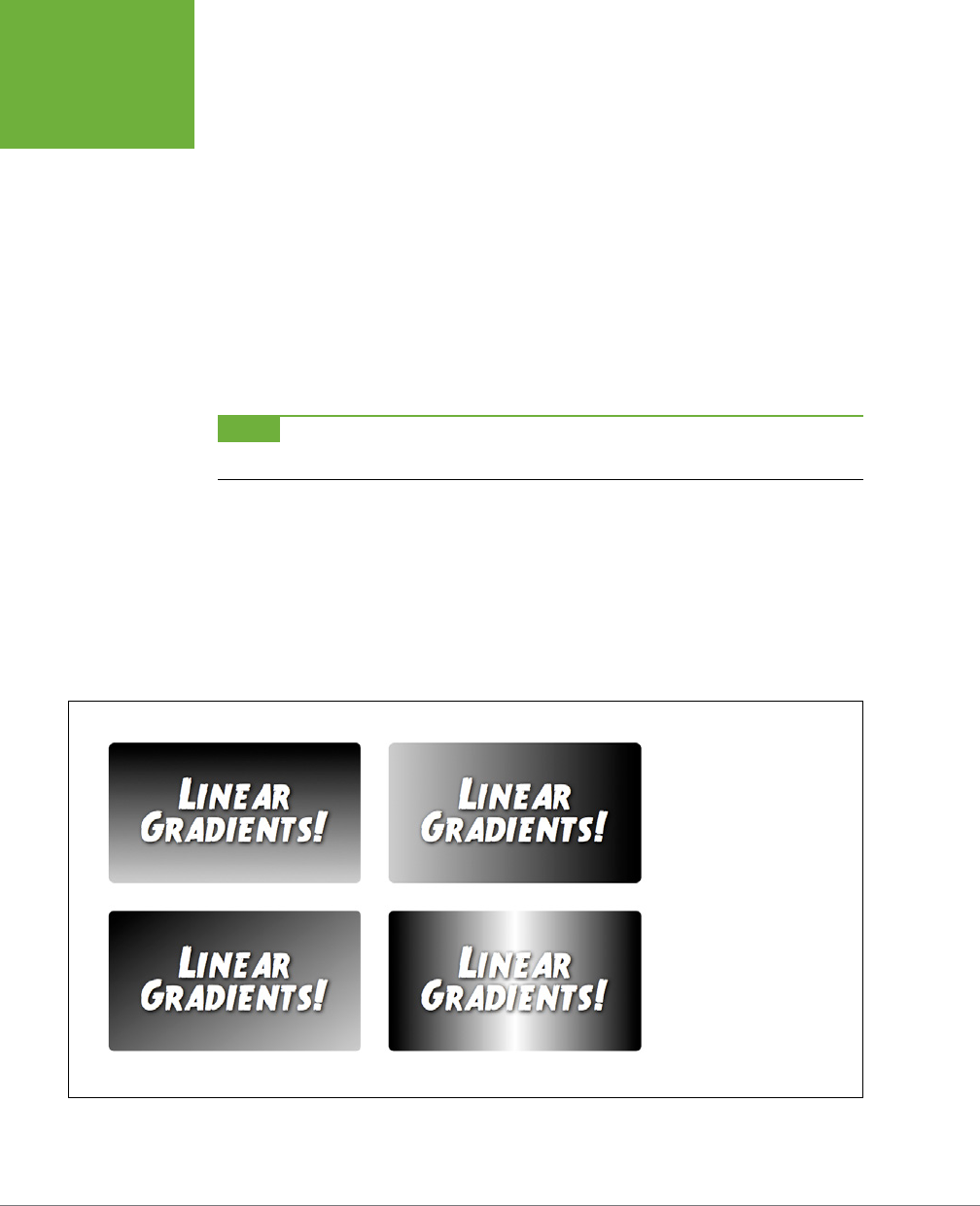
CSS3: THE MISSING MANUAL
260
UTILIZING
GRADIENT
BACKGROUNDS
CSS3 supports background gradients—basically, images created on the fly by a
web browser. In fact, you use the usual background-image property to create the
gradient. You have several types of gradients to choose from.
Linear Gradients
The most basic type of gradient is a linear gradient. It moves in a straight line from
one edge of an element to another, transitioning from one color to another (see
Figure 8-13). In essence, you specify where to begin the gradient (at an element’s
edge), the beginning color, and the ending color. For example, to create a gradient
that starts out with black on the left edge of an element and then transitions to
white on the far right of the element, you’d write this:
background-image: linear-gradient(left,black,white);;
NOTE As discussed in the box on page 209, you can’t simply use the
linear-gradient( )
value for
background images. For it to work, most browsers require a vendor prefix, like
–webkit-linear-gradient
.
You can create a gradient by using any CSS color value (page 54), such as keywords
like white or black, hexadecimal values like #000000, RGB values like rgb(0,0,0),
and so on. To identify the starting position, you can use left, right, top, or bottom.
In fact, if you want a gradient that moves diagonally across the element, you can
combine keywords. For example, to draw a gradient that travels from the top-left
corner to the bottom-right corner changing from black to white, write this:
background-image: linear-gradient(top left,black,white);
FIGURE 8-13
Linear gradients let you
bypass the old method of
adding gradients to the
background of an element:
create the gradient as a
graphic in Photoshop or
Fireworks, and then use
the
background-
image
property to place
that graphic in the back-
ground of the element.
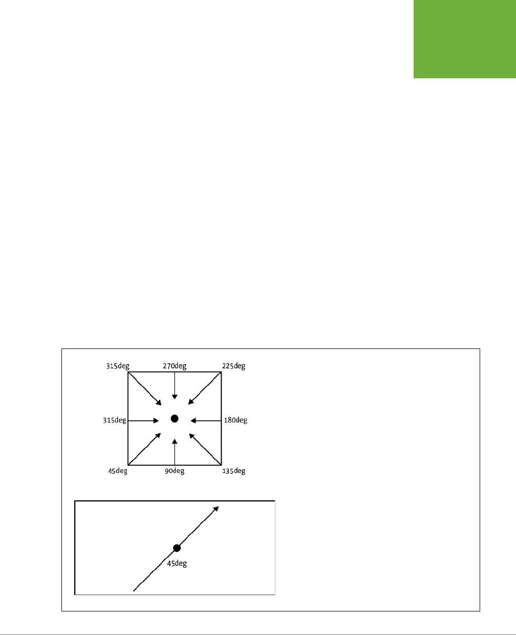
CHAPTER 8: ADDING GRAPHICS TO WEB PAGES 261
UTILIZING
GRADIENT
BACKGROUNDS
You’re not limited to keywords either. You can specify a degree value that specifies
the direction of the gradient. Degrees are written with a number from 0 to 360
followed by deg like this: 0deg (Figure 8-14). You’ll need to do some trial and error
to get the eect you want, but here’s roughly how it works: 0deg means start on
the left and move to the right, whereas 45deg begins in the bottom-left corner and
moves the gradient 45 degrees up toward the top-right. For example, the gradient
created in the bottom-left image in Figure 8-13 uses this declaration:
background-image: linear-gradient(45deg, rgb(0,0,0), rgb(204,204,204));
On a perfectly square element, 45deg represents the bottom-left corner and is the
same as using the keyword bottom-left. In other words this:
background-image: linear-gradient(45deg, rgb(0,0,0), rgb(204,204,204));
Is the same as this:
background-image: linear-gradient(bottom left, rgb(0,0,0), rgb(204,204,204));
However, on a rectangular image, these two declarations won’t create the same
gradients. That’s because a browser draws an imaginary line through the middle of
the element. The angle you specify is the angle of that line. For example, in the wide,
rectangular element in Figure 8-14, bottom, a line drawn at 45 degrees through the
middle doesn’t actually run from the bottom-left to the top-right of the element. It
runs somewhere between the left and middle of the bottom of the element up to a
point between the middle and right edge at the top.
FIGURE 8-14
The degree value you supply for a linear gradient is used to create
a line that passes through the middle of an imaginary point in
the center of the element. The gradient is drawn along this line.
The value dictates both where the gradient starts and the slope
of the gradient.
CSS3: THE MISSING MANUAL
262
UTILIZING
GRADIENT
BACKGROUNDS
COLOR STOPS
The gradients you’ve seen so far use only two colors, but you can add as many as
you like. The additional colors are called
color stops,
and they let the background
transition from one color to a second color, then from that second color to a third
color, and so on, until the final color ends the gradient. To add color stops, simply
add more color values to the gradient. For example, the bottom-right image in Figure
8-13 contains three colors: black to white to black:
background-image: linear-gradient(left, black, white, black);
Of course, you can use any color values (expressed as keywords, hexadecimal, or
RGB) and even mix and match them, so you can even write the preceding line of
code like this:
background-image: linear-gradient(left, black, rgb(255,255,255), #FFFFFF,
HSL(0,0,0%));
Web browsers evenly spread out the colors, so in this example the far left starts
out black; the background of the middle of the element is white; and then the far
right of the element is black. However, you can place the dierent color stops at
more specific locations in the background by adding a second value after the color.
TIP You can get some really wild effects if you add the
background-position
property to an element
with a gradient background. Essentially, you can change what the browser considers to be the starting point for
the gradient. Try it out.
For example, say you want to start at a deep red, then quickly ramp up to a burnt
orange about 10 percent into the element, stay at that orange color for most of the
element, and then quickly ramp back down to deep red, like the top image in Figure
8-15. To do this, you’d use four color stops—red, orange, orange and red—and specify
where the two white stops should be positioned:
background-image: linear-gradient(left, #900, #FC0 10%, #FC0 90%, #900);
Notice that the 10% applies to the second color (the orange): this tells the browser
that it needs to get to this color at 10 percent of the width of the element. Likewise,
the 90% indicates that the browser needs to stay at that orange color until it’s 90
percent across the element, and then begin the transition to the deep red at the far
right of the element.
NOTE You don’t have to use percentages to place color stops. You can use pixels or ems as well. However,
percentages are more flexible and adapt as the width or height of an element changes. One exception is the
repeating linear gradients discussed on page 260. Pixel values for stops are very useful for creating these types
of tiled gradients.
You don’t need to use any values for the first or last color, since the browser as-
sumes that the first color starts at 0% and the last color ends at 100%. However, if you
wanted to keep a solid starting color further into the element, you could provide a
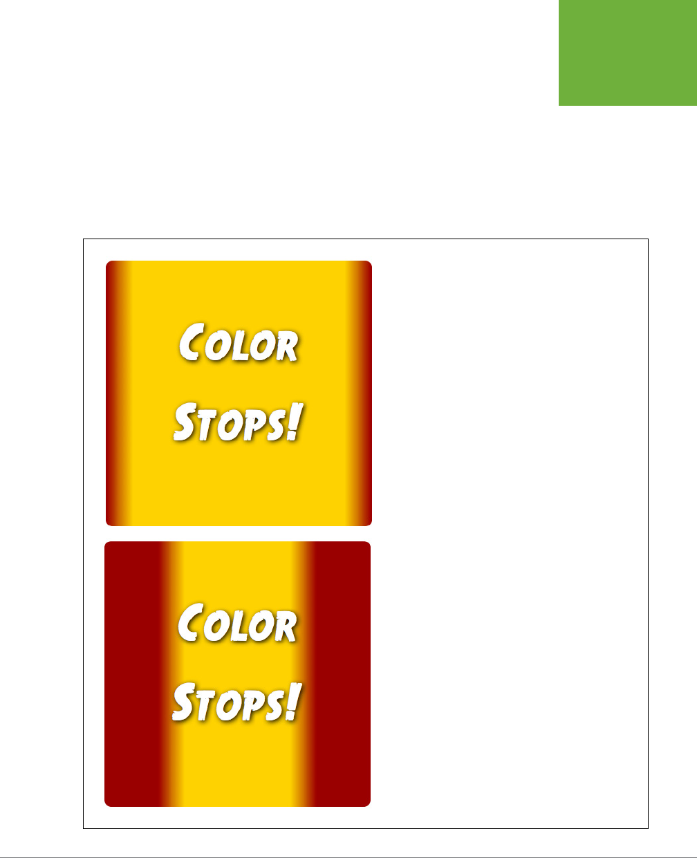
CHAPTER 8: ADDING GRAPHICS TO WEB PAGES 263
UTILIZING
GRADIENT
BACKGROUNDS
value after the first color. For example, the bottom image in Figure 8-15 is created
with this declaration:
background-image: linear-gradient(left, #900 20%, #FC0 30%, #FC0 70%, #900
80%);
Notice that the first color—#900—also has a position of 20%. This means that the first
20 percent of the element (from left to right) should be a solid red color. Then, at
the 20 percent point, the gradient should begin transitioning to the orange color
at 30 percent.
FIGURE 8-15
You can specify where the color stops appear in a linear gradient.
In the top example, a dark red color transitions quickly from the
left to an orange color at 10 percent of the width of the element.
To create a large solid color area in the middle, you need two
color stops with the same color value. Basically a gradient from
one color to the same color is no gradient at all.
CSS3: THE MISSING MANUAL
264
UTILIZING
GRADIENT
BACKGROUNDS
VENDOR PREFIXES AND INTERNET EXPLORER SUPPORT
As you read in the box on page 209, many of the newer CSS properties require a
vendor prefix before the property name: -webkit- for Chrome and Safari, -moz- for
Firefox, and -o- for Opera. This is true for gradients. Unfortunately, you have to
write out declarations for each of the browsers. In other words, to get the simple
gradient on page 262 to work in the dierent browsers, you have to write this code:
background-image: -webkit-linear-gradient(left,black,white);
background-image: -moz-linear-gradient(left,black,white);
background-image: -o-linear-gradient(left,black,white);
background-image: linear-gradient(left,black,white);
That’s right, four times the work. To make matters worse, gradients are not sup-
ported in Internet Explorer 9 and earlier. If you do choose to use gradients, then you
should provide a back-up color for IE 9 and earlier. Find a solid color that matches
the general tone of your gradient and declare it first, followed by the gradient
declarations, like this:
background-color: #FC0;
background-image: -webkit-linear-gradient(left, #900, #FC0, #900);
background-image: -moz-linear-gradient(left, #900, #FC0, #900);
background-image: -o-linear-gradient(left, #900, #FC0, #900);
background-image: linear-gradient(left, #900, #FC0, #900);
IE 9 will apply the background color, and since it doesn’t understand linear gradients,
it will skip the other declarations. Other browsers will apply the background color,
but also create a gradient that covers the background color. If you’re using RGBA
colors with some level of transparency, then you won’t want the background color
to show through. In this case, use the background shorthand property instead, and
the background-color will be overridden (thanks to the peculiar behavior of the
background shorthand property discussed on page 255). So you can use this code
for RGBA colors:
background-color: #FC0;
background: -webkit-linear-gradient(left, rgba(153,0,0,.5), #FC0,
rgba(153,0,0,.5));
background: -moz-linear-gradient(left, rgba(153,0,0,.5),
#FC0,rgba(153,0,0,.5));
background: -o-linear-gradient(left, rgba(153,0,0,.5), #FC0,
rgba(153,0,0,.5));
background: linear-gradient(left, rgba(153,0,0,.5), #FC0, rgba(153,0,0,.5));
NOTE As you can see, there’s a lot of code involved in creating gradients. In addition, older versions of
WebKit (Safari on Macs and iOS, and Android browsers) follow a different syntax entirely for linear gradients.
Because of this, you’ll probably want to use the online gradient creator tool discussed on page 269. It’ll make
your gradient-creation process a whole lot easier.
CHAPTER 8: ADDING GRAPHICS TO WEB PAGES 265
UTILIZING
GRADIENT
BACKGROUNDS
Repeating Linear Gradients
Normally, a linear gradient fills the entire element with the first color at one point
and the last color at the opposite edge of the element. However, it’s possible to
create repeating gradients so you can create gradient patterns. In essence, you
define a gradient with specified color stops; the browser draws the gradient, and
then repeats that pattern, tiling it in the background of the element. For example, to
get the repeating gradient of the left image in Figure 8-16, you can write this code:
background-image: repeating-linear-gradient(bottom left, #900 20px, #FC0 30px,
#900 40px)
In cases like this, using pixel values for the color stops is very useful. In essence, the
browser draws a gradient that starts at bottom-left; it starts with 20 pixels of deep
red, then transitions to an orange at 30 pixels, and then goes back to deep red at 40
pixels. Once it’s drawn that gradient, the browser simply tiles it in the background
like a tiled image.
NOTE There’s plenty of room for experimentation with gradients. To see just a few of the amazing
things that are possible, visit the CSS3 pattern gallery at
http://lea.verou.me/css3patterns/
,
www.standardista.
com/cssgradients/
, and the amazing use of gradients to create flags of the world at
www.standardista.com/
CSS3gradients/flags.html
.
You can even use repeating gradients to create solid stripes without any of the fancy
and subtle transitions between colors. For example, the image on the right in Figure
8-16 is created with this declaration:
background-image: repeating-linear-gradient(45deg, #900 0, #900 10px, #FC0
10px, #FC0 20px);
Here, you start with deep red (#900) at the 0 point, and go to red again at the 10px
point. Since you’re transitioning between the same colors, the browser draws this as
a solid color. Next, you transition to orange (#FC0) at 10 pixels. Since that’s the same
spot at which the red ends, that’s not a subtle transition, the pattern just goes from
red to orange. Finally, the transition goes to the same orange at 20 pixels, creating
another solid line. Because this is a repeating linear gradient, the browser simply
tiles that pattern to fill the background of the element.
Now the bad news. Repeating linear gradients work in most browsers, but not in
older versions of Safari (prior to 5.1 or iOS 5) or in IE 9 and earlier. So it’s a good idea
to add a fallback background color; you also need to make sure that you include all
the vendor-prefixed declarations, so the first repeat gradient would look like this:
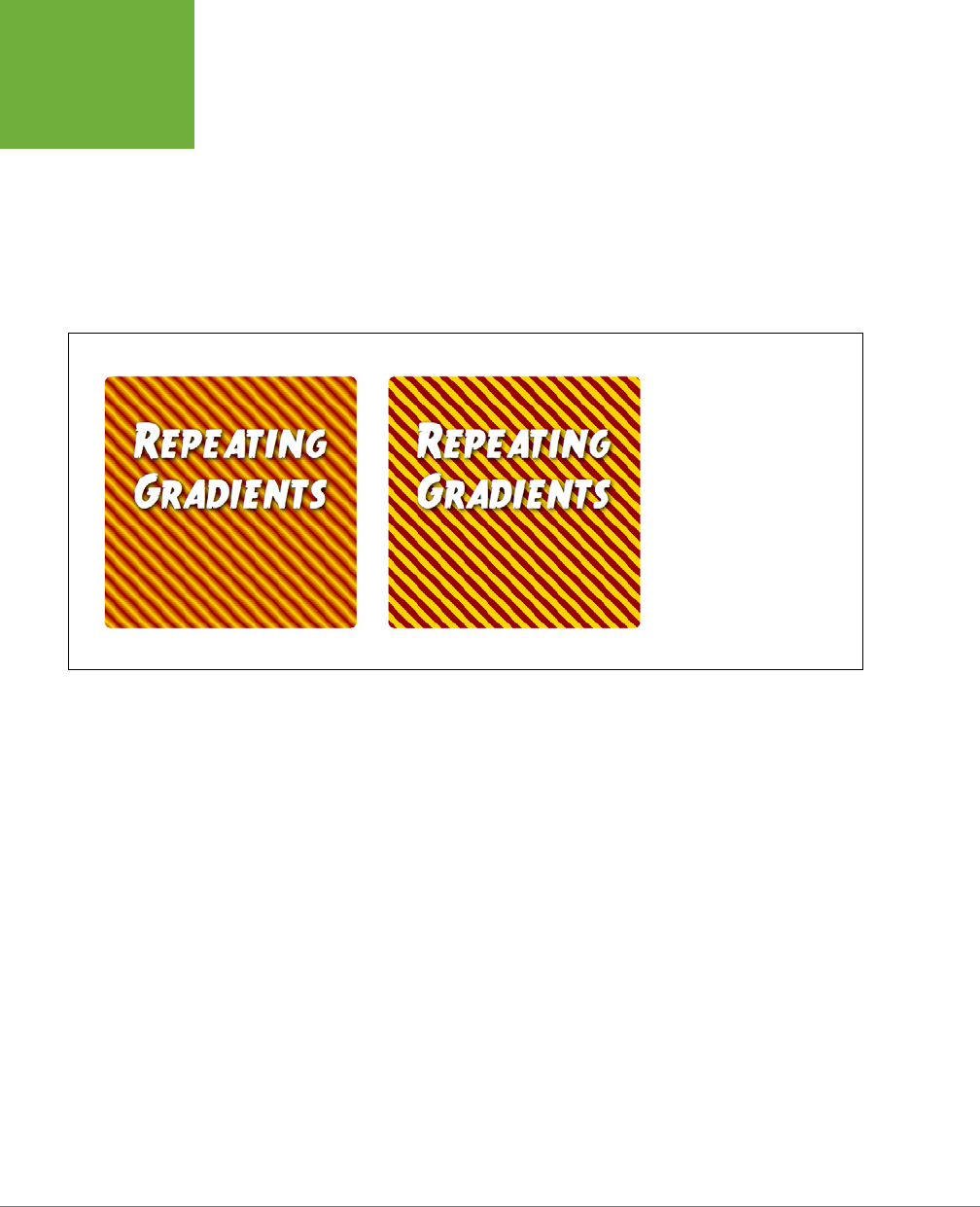
CSS3: THE MISSING MANUAL
266
UTILIZING
GRADIENT
BACKGROUNDS
background-color: #FC0;
background: -webkit-repeating-linear-gradient(bottom left, #900 20px, #FC0
30px, #900 40px)
background: -moz-repeating-linear-gradient(bottom left, #900 20px, #FC0 30px,
#900 40px)
background: -o-repeating-linear-gradient(bottom left, #900 20px, #FC0 30px,
#900 40px)
background: repeating-linear-gradient(bottom left, #900 20px, #FC0 30px, #900
40px)
FIGURE 8-16
You can create striped patterns
using CSS3’s repeating linear
gradients.
Radial Gradients
CSS also provides a way of creating radial gradients—gradients that radiate outward
in a circular or elliptical pattern (see Figure 8-17). The syntax is similar to linear
gradients and at its most simple, you need only to provide a beginning color (the
color at the middle of the gradient) and an ending color (the color at the end of the
gradient). For example, the top-left image in Figure 8-17 is created with this code:
background-image: radial-gradient(red, blue);
This creates an elliptical shape that fits the height and width of the element, with the
center of the gradient (the beginning red) in the center of the element.
You can also make circular gradients by adding a “circle” keyword before the colors.
For example, the top-right image in Figure 8-17 is created with this code:
background-image: radial-gradient(circle, red, blue);

CHAPTER 8: ADDING GRAPHICS TO WEB PAGES 267
UTILIZING
GRADIENT
BACKGROUNDS
While a browser normally draws the center of a radial gradient in the center of
the element, you can position the gradient’s center by using the same positioning
keywords and values you use for the background-position property (page 246).
For example, in the middle-left image in Figure 8-17, the radial gradient begins 20
percent over from the left edge of the element and 40 percent from the top of the
element. The positioning values go before the color and shape keyword, like this:
background-image: radial-gradient(20% 40%, circle, red, blue);
To dictate the size of the gradient, you can use one of four keywords:
• The closest-side keyword tells the browser to make the gradient extend from
the center only as far as the side that’s closest to the center. For example, in the
middle-left image in Figure 8-17, the closest side to the center of the gradient is
the top edge, so the radius of the circle travels from the center of the circle to
this edge. This keeps the entire gradient within the element. Here is the code
to produce this gradient:
background-image: radial-gradient(20% 40%, circle closest-side, red, blue);
When closest-side is applied to an elliptical gradient, both closest sides (that
is, the top or bottom and the left or right sides) are used to calculate the x and
y radii of the ellipse.
• The closest-corner keyword measures the width of the gradient from its
center to the corner of the element that’s closest (middle-right in Figure 8-17).
This can mean that the gradient may overflow the element. For example, the
circle drawn on top of the middle-right image in Figure 8-17 demonstrates the
actual size of the gradient. Part of the gradient extends beyond the element:
background-image: radial-gradient(20% 40%, circle closest-corner, red,
blue);
• The farthest-side keyword measures the radius of a circle from its middle to
the side of the element that’s farthest away. In the case of an elliptical gradi-
ent, it’s the distance from the center to either the farthest top or bottom side
and the farthest left or right side. Here is the code to produce the image in the
bottom-left of Figure 8-17:
background-image: radial-gradient(20% 40%, circle farthest-side, red, blue);
• The farthest-corner keyword measures the radius of a circle from its middle
to the corner of the element that’s farthest away. Here is the code to produce
the image in the bottom-right of Figure 8-17:
background-image: radial-gradient(20% 40%, circle farthest-corner, red,
blue);
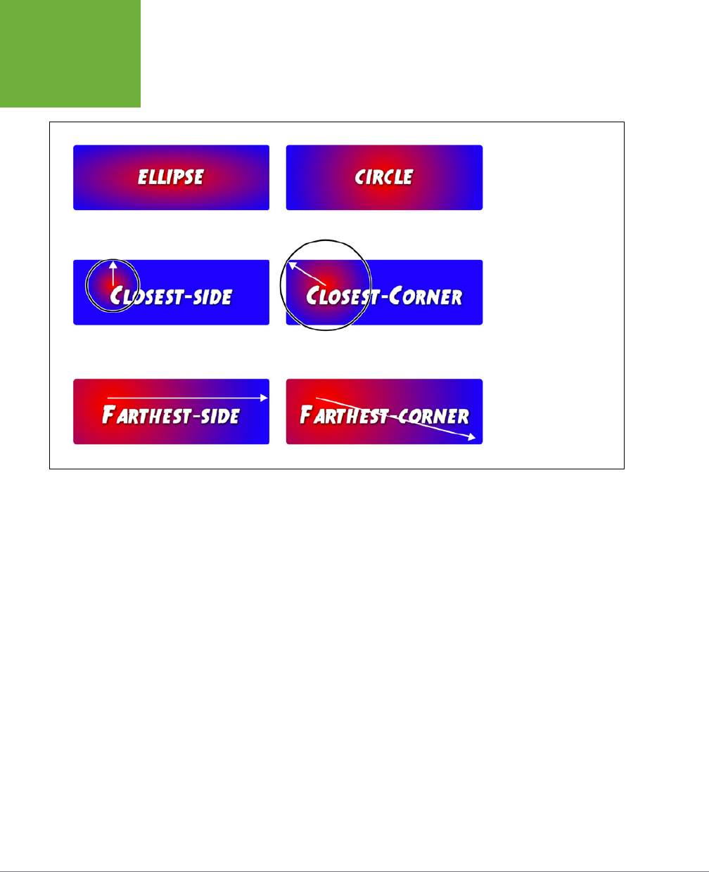
CSS3: THE MISSING MANUAL
268
UTILIZING
GRADIENT
BACKGROUNDS
FIGURE 8-17
Radial gradients are ellip-
tical (top-left) or circular
(top-right) gradients. You
can control the placement
of the gradient within
the background of the
element, as well as control
how large the gradient is.
As with linear gradients, you can use multiple color stops and set the placement of
those color stops. For example, say you want a circular gradient that was composed
of a bright red, an orange, and a yellow. You want the red to appear for a while before
it transitions to orange, and then the orange lasts a while longer until the yellow ap-
pears at the end. You can use percentage values to dictate where the colors appear:
background-image: radial-gradient(20% 40%, circle, red 20%, orange 80%, yel-
low);
Of course, as with linear gradients you can use and valid CSS color values, so you
can rewrite this code as:
background-image: radial-gradient(20% 40%, circle, rgb(255,0,0) 20%,
rgb(255,165,0) 80%, #FFFF00);
As with linear gradients, Internet Explorer 9 and earlier won’t know what you’re
talking about if you use a radial gradient, and neither will versions of Safari prior to
5.1 (and iOS 5). You should add a backup background color, and you’ll need to add
all the vendor prefixes as well. For example:
CHAPTER 8: ADDING GRAPHICS TO WEB PAGES 269
APPLYING EASY
GRADIENTS
WITH
COLORZILLA
background-color: red;
background: -webkit-radial-gradient(20% 40%, circle, red 20%, orange 80%, yel-
low);
background: -moz-radial-gradient(20% 40%, circle, red 20%, orange 80%, yel-
low);
background: -o-radial-gradient(20% 40%, circle, red 20%, orange 80%, yellow);
background: radial-gradient(20% 40%, circle, red 20%, orange 80%, yellow);
Repeating radial gradients
As with linear gradients, you can create radial gradients that repeat—perfect for
that bullseye look or when you wish to hypnotize your website visitors. You need to
make sure you add either percentages or actual pixel or em values for the various
color stops so the browser knows the size of a single radial gradient and can then
repeat it. For example:
background-image: repeating-radial-gradient(circle, red 20px, orange 30px,
yellow 40px, red 50px);
Note that to create a smooth-looking repeating radial gradient, you should end with
the same color you start with (red, in this example). This provides a smooth color
change back to the original color. If you don’t (for example, if you just ended with
the yellow color in the above code), then there’s a sharp line where the last color
ends and the first color of the repeated gradient begins.
TIP Because web browsers treat linear- and radial-gradients simply as background images, you can use
the other properties of background images, like
background-size
,
background-position
, and so on
with them. In addition, you can have multiple, comma-separated gradients on a single style, just as you can have
multiple background images (page 257). In fact, you can mix images with gradients in the same element.
Applying Easy Gradients with Colorzilla
The complexity of gradients and their limited browser support may have made you
already decide to not use them in your CSS. Fortunately, there’s an online tool that
makes creating most types of gradients (except repeating gradients) a snap. It’s
the humbly named Ultimate CSS Gradient Generator (
www.colorzilla.com/gradient-
editor/
), shown in Figure 8-18.
While this online tool is only a single web page, it has a lot of options. Here’s one
way to use it:
1. Start with a preset by selecting one of the gradients in the presets window
(#1 in Figure 8-18).
You don’t have to do this step, but building the gradient can go more quickly
if you start with something close to what you’re after.
CSS3: THE MISSING MANUAL
270
APPLYING EASY
GRADIENTS
WITH
COLORZILLA
2. From the Orientation menu, choose a gradient type (#2 in Figure 8-18).
This tool is limited to radial and linear gradients that go from top to bottom, left
to right, top-left to bottom-right, bottom-left to top-right, or diagonal. However,
once you’ve created the code, you can replace the keyword angle (top left, for
example) with a degree (65deg, for example). Likewise, the tool creates elliptical
radial gradients; if you want a circular gradient, just find ellipse and replace
it with circle in the final CSS.
You can’t create repeating linear gradients or repeating radial gradients with
this tool.
3. To change the color and position of a color stop, click to select it (#3 in
Figure 8-18).
Unless you like the preset colors, you’ll need to edit each of the color stops.
4. To change the color of the color stop, click the color box (#4 in Figure 8-18).
A pop-up color picker appears. You can click to select a color, or if you know the
color’s RGB, hexadecimal, or HSL values, you can type it in. Click OK to select
the new color and close the color picker.
5. Optionally, you can set the position of the color stop in the Location field
to the right of the color box (#5 in Figure 8-18).
Type a percentage value, or, more easily, drag the color stop on the gradation
bar (#3 in Figure 8-18).
NOTE To remove a color stop, select it from the gradation bar (#3 in Figure 8-18) and press the Delete button
below it.
6. Add additional color stops by clicking below the gradation bar in the spot
where you wish to add the color stop.
After you add a new color stop, change its color and position as desired (steps
4 and 5).
7. You can also alter the opacity of the gradient by making the beginning or
end slightly or completely transparent. Select one of the stops above the
gradation bar (#6 in Figure 8-18) and then adjust its opacity and position (#7
in Figure 8-18).

CHAPTER 8: ADDING GRAPHICS TO WEB PAGES 271
APPLYING EASY
GRADIENTS
WITH
COLORZILLA
NOTE The Ultimate CSS Gradient Generator also attempts to make a gradient that works somewhat in IE
9 and earlier. Click the IE checkbox in the top-right preview box (see Figure 8-18) to see the effect, which uses
a proprietary IE feature called
filters
to achieve a gradient. Unfortunately, IE can simulate only linear gradients
that run either left to right or top to bottom, not radial gradients nor gradients at an angle.
8. Once you’ve created the gradient, point to the CSS box and click the Copy
button when it appears (#8 in Figure 8-18).
This copies the CSS code to your computer’s clipboard. You can then go to
your text editor of choice and paste the code into the style to which you want
to add a background gradient.
The Ultimate CSS Gradient Generator uses an IE-only feature to simulate a gradient
for Internet Explorer versions 9 and earlier. In fact, it provides two fallbacks, one
for IE 9 and one for earlier versions. The one for IE 9 uses another image technol-
ogy—SVG or
scalable vector graphics
—to achieve its magic, and using it is a good
idea. The one for earlier versions of IE uses a filter, which can’t always simulate the
gradient correctly and slows down IE’s performance, so you’re best o ignoring IE
8 and earlier. To do this:
1. Turn on the IE9 Support checkbox at bottom-right below the CSS code box
(see Figure 8-18).
This adds the code to create a SVG gradient.
2. Copy the CSS code (Step 8 above) and paste it into your CSS.
3. Locate the IE filter code and delete it.
The last line of the code you copied looks something like this:
filter: progid:DXImageTransform.Microsoft.gradient( startColorstr='#3f4c6b',
endColorstr='#7ed6d3',GradientType=1 ); /* IE6-8 fallback on horizontal gradi-
ent */
If you really need to support IE 8, then leave this code in and test the gradient
in IE 8 to make sure it displays correctly.
4. Finally, add a background-color property in the spot where you deleted
the IE filter code; this is the color that will appear in the background for IE
8 and earlier.
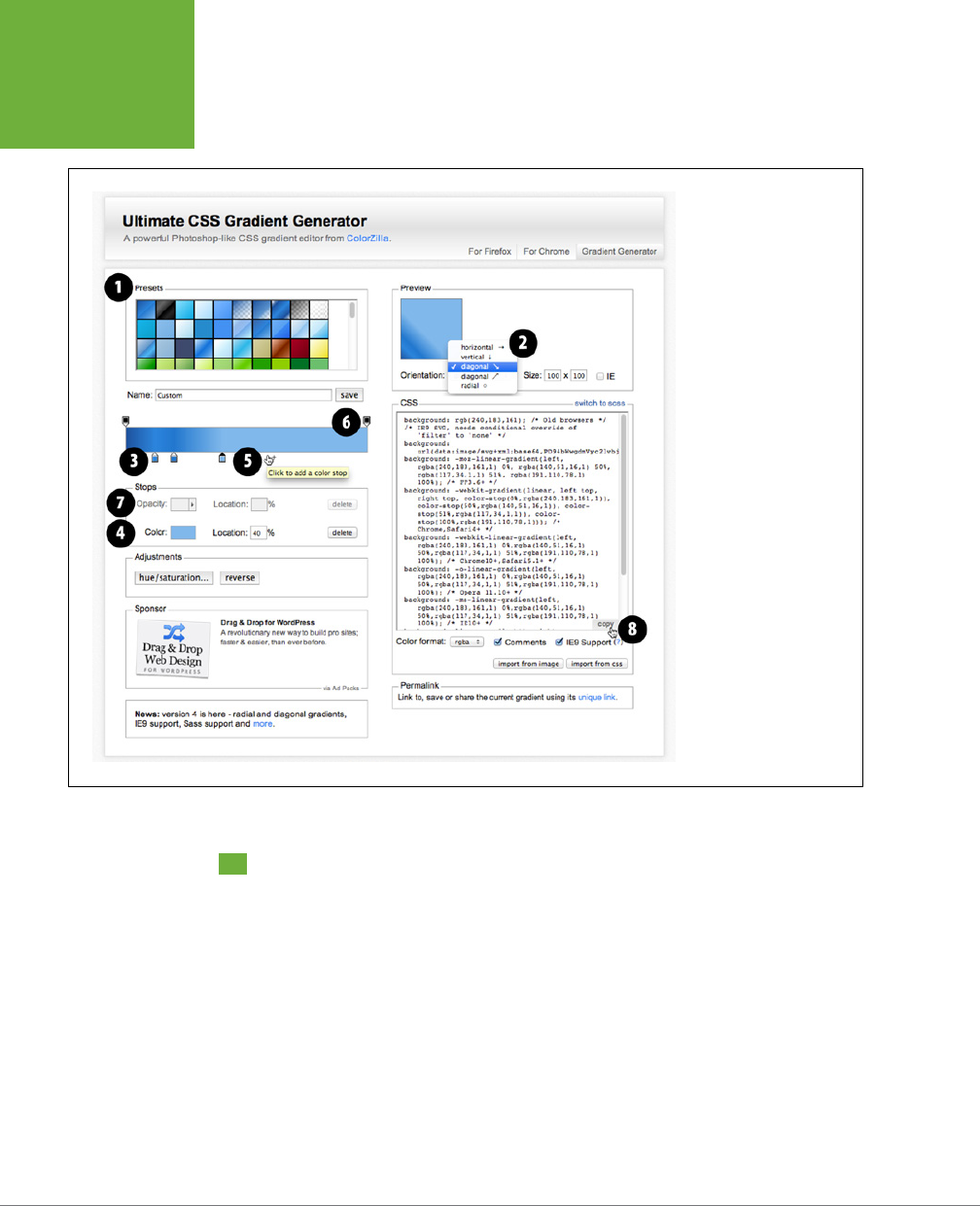
CSS3: THE MISSING MANUAL
272
TUTORIAL:
ENHANCING
IMAGES
FIGURE 8-18
The easiest way to get
started with gradients is
to use an online tool like
the Ultimate CSS Gradient
Generator (
www.colorzilla
.com/gradient-editor/
).
On the left, near the top
of the page, you’ll find a
gallery of already created
gradients. You can pick
one of those as a simple
starting point and adjust
its colors and color stops to
match your vision, or build
your own gradient.
Tutorial: Enhancing Images
A photo gallery is a perfect example of an eye-catching web page. This tutorial
brings together a variety of image styling techniques. You’ll format images with
frames and captions, create a photo gallery that’s flexible enough to look great in
a variety of window sizes, and use the box-shadow property (page 210) to create
professional-looking drop shadows.
To get started, you need to download the tutorial files located on this book’s com-
panion website at
www.sawmac.com/css3/
. Click the tutorial link and download
the files. All of the files are enclosed in a zip archive, so you need to unzip them
first. (There are detailed instructions on the website.) The files for this tutorial are
in the
08
folder.
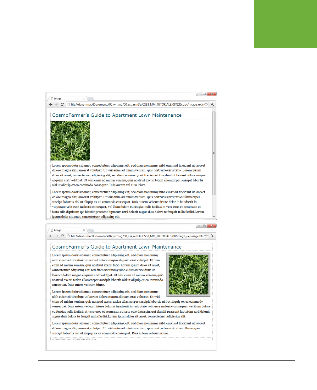
CHAPTER 8: ADDING GRAPHICS TO WEB PAGES 273
TUTORIAL:
ENHANCING
IMAGES
Framing an Image
You’ll be working on a basic web page from the fictional (just in case you thought
it was real) website CosmoFarmer.com (Figure 8-19). In this case, there’s already
an external style sheet attached to the page, adding some basic text formatting.
1. Launch a web browser and open the file
08
→
01_image_ex
→
image.html
.
FIGURE 8-19
Before and after—CSS, that is. If you
rely just on HTML, images take up lots
of space (top). With a little CSS (bot-
tom) you can nicely frame an image
and move it out of the way.

CSS3: THE MISSING MANUAL
274
TUTORIAL:
ENHANCING
IMAGES
2. Open the file
styles.css
in the
image_ex
folder in your favorite text editor.
This file is the external style sheet used by the
image.html
file. You’ll start by
adding a class style to this style sheet, and then applying a class to the <img>
tag in the HTML file.
3. Scroll to the bottom of the file and then type the following:
img.figure {
}
The selector
img.figure
targets any <img> tag with the figure class applied to
it. You’ll use this to selectively format only the images you want. (You could
also just name the style .figure—the only dierence is that that style would
then apply to
any
tag with the class figure, not just images.)
4. Add float and margin properties to the style you just created, like so:
float: right;
margin: 10px;
The right float moves the image to the right side of the page, letting the text
move up and wrap around the photo’s left edge. The margins give the photo a
little breathing room and move it away from the text, the side of the page, and
the headline above. Next, you’ll add a border, a background color, and some
padding to make the image look more like a real snapshot.
5. Add border, background color, and padding, so that the finished style looks
like this:
img.figure {
float: right;
margin-left: 10px;
margin-bottom: 10px;
border: 1px solid #666;
background-color: #CCC;
padding: 10px;
}
If you save this file and then preview the web page right now, you won’t see a
change, since the class style has no eect until you’ve added the class to a tag.
6. Save and close the
styles.css
file and open the
image.html
file. Locate the
<img> tag and add class="figure" so the tag looks like this:
<img src="../images/grass.jpg" alt="Apartment Grass" width="200" height="200"
class="figure">
Now that image takes on all of the formatting properties you defined for the
.figure class style.

CHAPTER 8: ADDING GRAPHICS TO WEB PAGES 275
TUTORIAL:
ENHANCING
IMAGES
7. Preview the page in a web browser. It should look like the bottom image in
Figure 8-19.
A picture may be worth a thousand words, but sometimes you still need a few
words to explain a picture. So in the next part of this tutorial, you’ll add a cap-
tion below the photo.
You’ll frequently want to add a caption to an image or photo to provide more
information about the subject, where the photo was taken, and so on. Instead
of just floating the image, as you did in the previous exercise, you want the
caption text to float as well. The best way to float both is to wrap the image
and the text in a container that’s floated as a single unit. This method keeps the
photo and its related text together. If you decide later that you want to change
their layout—perhaps float them to the left—no problem: You simply change
the formatting for the entire container.
Fortunately, HTML5 includes two new tags for just such a requirement: The
<figure> tag is intended to enclose an image that’s meant to be an illustrative
figure. In addition, the <figcaption> tag can be used to enclose, you guessed
it, a figure caption. First, you need to adjust some of the HTML.
NOTE Because you’re using some HTML5 tags now, you need to include the HTML5shiv JavaScript file to
force IE 8 and earlier to recognize the
<figure>
and
<figcaption>
tags. See the box on page 24.
8. Return to your text editor and the
image.html
file. Locate the <img> tag in
the code, and first remove the class="figure" that you added in Step 6, and
add <figure> before that tag.
This marks the beginning of the container. Now you’ll add the caption and close
the <figure> to indicate the end of the container.
9. After the <img> tag, add the code in bold below, so the HTML looks like this:
<figure>
<img src="../images/grass.jpg" alt="Creeping Bentgrass" width="200"
height="200"/>
<figcaption>Figure 1: Creeping Bentgrass is best suited for outdoor use and
should be avoided by the indoor farmer.
</figcaption>
</figure>
10. Scroll to the bottom of the file and delete the .figure style you created
earlier.
You’ll add a new style for the figure element.

CSS3: THE MISSING MANUAL
276
TUTORIAL:
ENHANCING
IMAGES
11. Add this style to the
styles.css
file:
figure {
float: right;
width: 222px;
margin: 15px 10px 5px 10px;
}
You’ve already used the float: right property in the previous tutorial, and the
margin adds a little white space around all four edges of the <figure> tag. But
what’s the
width
for, you ask? Although the photo has a set width (200 pixels),
the caption paragraph doesn’t. When you don’t set a width, the paragraph
makes the <figure> expand wider than the photo. In this case, you want the
caption to be just as wide as the photo and its frame.
The 222-pixel value comes from a little math used to calculate the entire area
taken up by the photo on the page: While the photo is only 200 pixels wide, the
10 pixels of left and right padding as well as the image’s 1-pixel left border and
1-pixel right border make the entire width of the photo equal to 222 pixels from
border to border (see page 213 for a refresher on how to calculate the width of
an element). Next, you’ll add the formatting for the image.
12. Add this style to the
styles.css
file:
figure img {
border: 1px solid #666;
background-color: #CCC;
padding: 10px;
}
This descendent selector aects any <img> tag
inside
a <figure> tag. Since
you’re using a descendent selector here, you don’t need to add a class to the
<img> tag. Next, you’ll style the caption.
13. Add the following style to the
styles.css
style sheet:
figcaption {
font: bold 1em/normal Verdana, Arial, Helvetica, sans-serif;
color: #333;
text-align: center;
}
This style uses some of the properties you learned about in Chapter 6 to create
a center-aligned, bold, and gray caption using the Verdana font. Fortunately, the
font shorthand property in the first line lets you roll four dierent properties
into a single style declaration.
To make the caption stand out even more, add a background color and border.
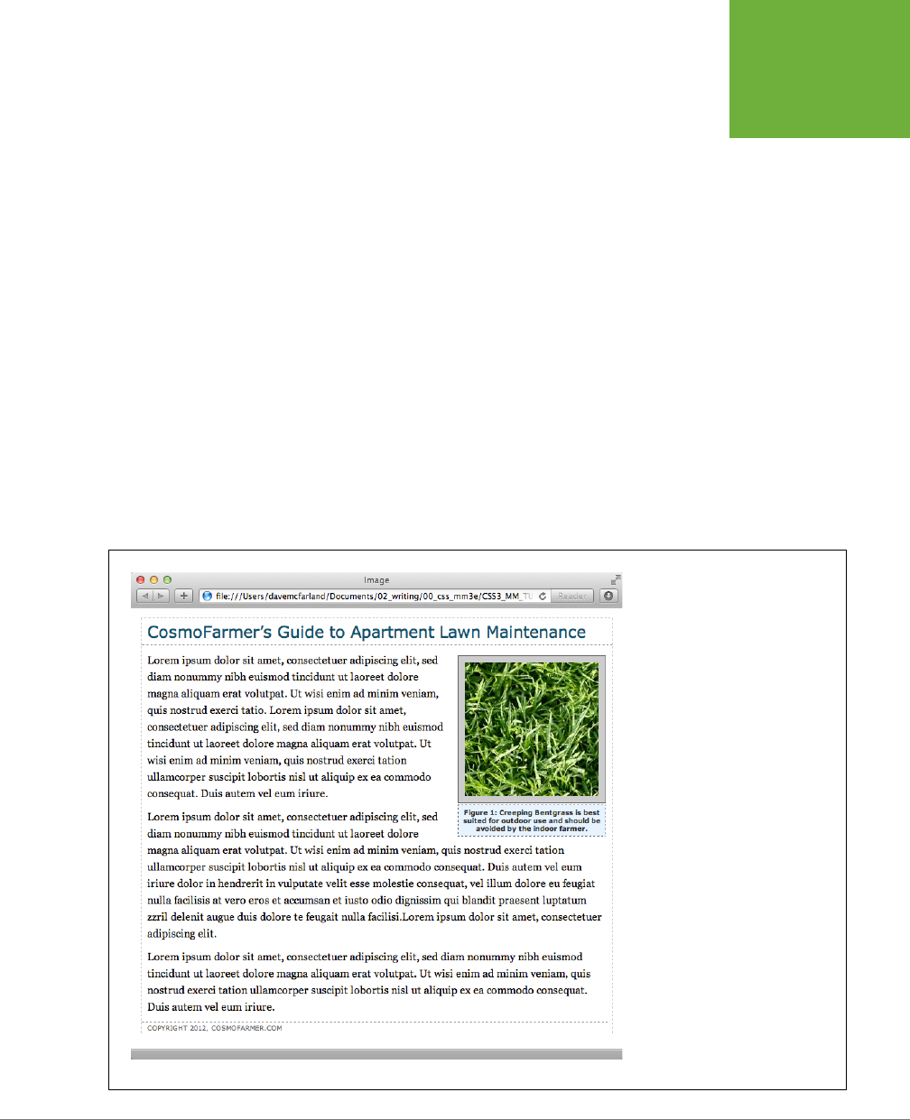
CHAPTER 8: ADDING GRAPHICS TO WEB PAGES 277
TUTORIAL:
ENHANCING
IMAGES
14. Add three properties to the figcaption style, like so:
figcaption {
font: bold 1em/normal Verdana, Arial, Helvetica, sans-serif;
color: #333;
text-align: center;
background-color: #e6f3ff;
border: 1px dashed #666;
padding: 5px;
}
The purpose of the background-color, border, and padding properties should
be clear—to create a colored box around the caption. Now it’s time to preview
your work.
15. Save both the
image.html
and
styles.css
files and preview the
image.html
file in a web browser.
16. Now you see one reason why it’s easier to develop a design using an internal
style sheet—you need to work in and save only one file instead of two. The
page should look like Figure 8-20. (You can find a completed version of this
page in the
08_finished→01_image_ex
folder.)
FIGURE 8-20
With the use of a containing
<figure>
tag, a right float, and a
little style, it’s easy to add captions
to photos.
CSS3: THE MISSING MANUAL
278
TUTORIAL:
CREATING
A PHOTO
GALLERY
Tutorial: Creating a Photo Gallery
Folks used to rely on the HTML <table> tag to create rows and columns for holding
the pictures in a photo gallery. But you can achieve the same eect with a little CSS
and far less HTML.
1. Open the file
08
→
02
→
gallery_ex
→
gallery.html
.
First, a quick review of the HTML used to construct the photo gallery. The page
contains six photos and photo captions. Each photo and caption is contained
in a <figure>. The photo itself is an <img> tag and the caption is inside a
<figcaption> tag.
<figure>
<img src="../ images/dandelion.jpg" alt="Dandelion" height="200"
width="200"/>
<figcaption>Figure 6: The dandelion: scourge of the apartment farmer.
</figcaption>
</figure>
NOTE Because you’re using some HTML5 tags, you need to include the HTML5
HTML5shiv
JavaScript file to
force IE 8 and earlier to recognize the
<figure>
and
<figcaption>
tags. See the box on page 24.
2. Locate the <link> tag near the top of the file, place your cursor
after
that
tag, and then press Enter (Return) to create a new blank line.
The <link> tag attaches an external style sheet containing some basic
formatting.
3. Add an internal style sheet. Then add two new styles, as follows:
<style>
figure img {
border: 1px solid #666;
background-color: #FFF;
padding: 4px;
}
figcaption {
font: 1.1em/normal Arial, Helvetica, sans-serif;
text-align: center;
margin: 10px 0 0 0;
}
</style>
These two styles add a border to each image in the gallery, and set the font,
alignment, and margins of the captions. The first is a descendent selector to
target just the images inside the figures.
Next, place the photos side by side.
CHAPTER 8: ADDING GRAPHICS TO WEB PAGES 279
TUTORIAL:
CREATING
A PHOTO
GALLERY
NOTE When you insert the internal style sheet, make sure to place it in the page’s head section, after the
link tag and before the IE conditional comment, which attaches the
HTML5shiv
JavaScript file (page 24).
4. Add the following style to the internal style sheet you just created:
figure {
float: left;
width: 210px;
margin: 0 10px 10px 10px;
}
This style floats each photo/caption pair to the left. In eect, it places the photos
side-by-side until there’s no more room in the row. The browser then drops the
next photos down a row, until all of the photos are displayed one row on top of
the next. The width is the
total
width of the photo plus padding and borders.
In this example, it’s 200 pixels for the photo, 8 pixels for left and right padding,
and 2 pixels for left and right borders.
NOTE In this fictitious photo gallery, each picture is the same width. In the real world, you may have pictures
of varying sizes. See the box below for a trick that lets you arrange rows of pictures of different widths. Using
different height images won’t work (as you’ll see in Step 5). When you’ve got images with differing heights, stick
with HTML tables.
POWER USERS’ CLINIC
When One Width Doesn’t Fit All
It’s a breeze to set up a photo gallery—like the one in this tuto-
rial—when the photos are conveniently all the same width. But
what if you have photos of differing widths? One solution is to
create a style for each different width and apply a class to the
<figure>
tag for the particular image. (That’s tons of work,
so it would pay to do some photo editing work to standardize
your photos to just a handful of different widths first.)
For example:
<figure class="w300">
.
Then create a class style, for example
.w300
, and set the
width to the width of the image (in this case, 300) plus 10 to
cover the padding and borders:
.w300 { width: 310 }
.
5. Save the file and preview the
gallery.html
page in a web browser. It should
look like the left image in Figure 8-21.
Adjust the width of your browser window to make it thinner and wider and
watch how the images reflow into the space. Aha—something’s not quite right.
The second row of images has two empty spaces where photos should be. This
problem occurs because the caption for the second image on the first line is
taller than the other captions on the line. Images that jump down to another row
bump into that caption and can’t get by it. (You can read more about this float
property snafu on page 425.) Fortunately, there’s a simple fix to this dilemma.
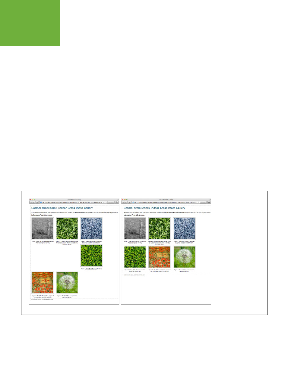
CSS3: THE MISSING MANUAL
280
TUTORIAL:
CREATING
A PHOTO
GALLERY
6. Return to your text editor and the
gallery.html
file. Locate the figure style.
Remove the float:left and add display: inline-block; vertical-align:
top. The finished style should look like this:
figure {
display: inline-block;
vertical-align: top;
width: 210px;
margin: 0 10px 10px 10px;
}
The display: inline-block property (page 308) treats each image/caption
pair as a block (a box with height and width) but also as an inline element (so
the blocks can sit side-by-side). In addition, the vertical-align property set
to top makes sure that each <figure> tag aligns to the top of all the other
<figure> tags in a row.
7. Save the file and preview the page in a web browser. See the right side of
Figure 8-21.
If you resize the browser window, the gallery reformats itself. With a wider
window you can fit four or even five images on a row, but if you make it smaller
you’ll see only one or two images per row.
FIGURE 8-21
Floating elements next
to each other is one way
to simulate the column
and row appearance of
a table. But it doesn’t
work well if the elements
are of varying heights
(left). Using
display:
inline-block
is
another way to force
elements to sit side-by-
side (right) without the
nasty dropping behavior
pictured in the left image.

CHAPTER 8: ADDING GRAPHICS TO WEB PAGES 281
TUTORIAL:
CREATING
A PHOTO
GALLERY
Adding Drop Shadows
Your gallery looks good, but you can make it even more impressive. Adding drop
shadows under each photo lends the page an illusion of depth and a realistic 3-D
quality. But before you fire up Photoshop, you’ll be glad to know there’s no need
to add individual drop shadows. Instead, you can make CSS automatically add a
shadow to any image you want. Before CSS3 (and in previous editions of this book),
you had to go through an elaborate process to add drop shadows to the images in
this gallery, adding extra divs around the images and using two background graph-
ics, and it still didn’t look like a perfect drop shadow. Fortunately CSS3 makes it so
easy, you’ll wrap this tutorial up in two steps.
1. In a text editor, open the
styles.css
file you completed in the previous
tutorial.
You’ll update the img style you created before.
2. Add box-shadow: 2px 2px 4px rgba(0,0,0,.5); at the end of the figure img
style so it looks like this (changes in bold):
figure img {
border: 1px solid #666;
background-color: #FFF;
padding: 4px;
box-shadow: 2px 2px 4px rgba(0,0,0,.5);
}
You learned about the box-shadow property back on page 210. Here you’ve
added a shadow that extends 2 pixels to the right of the image, 2 pixels below
the image, and which spreads out 4 pixels. Using an RGBA color (page 155),
you can set the shadow to 50 percent transparent black color.
3. Save the file and preview the page. It should look like Figure 8-22.
Each image has its own drop shadow, and you didn’t even have to open
Photoshop!
You can find a completed version of this tutorial in the
08_finished
→
gallery_ex
folder.
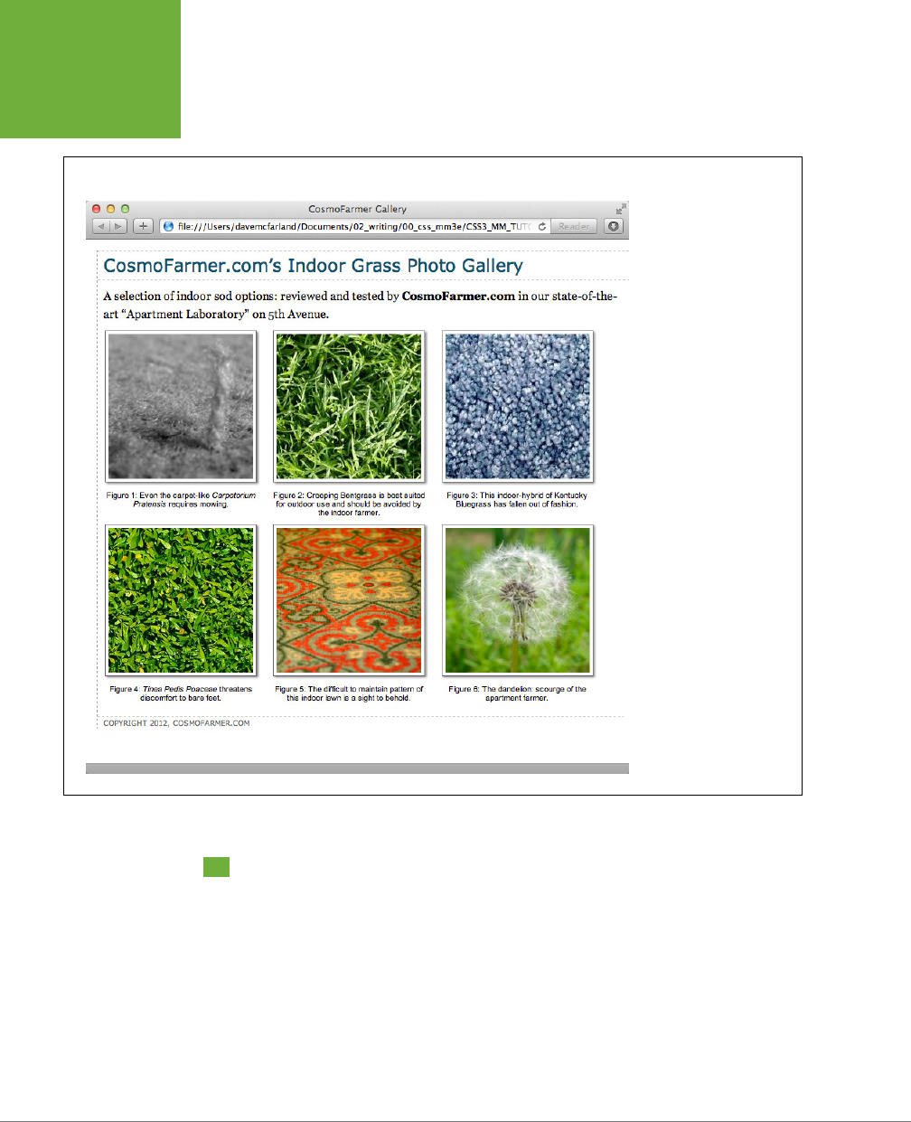
CSS3: THE MISSING MANUAL
282
TUTORIAL:
USING
BACKGROUND
IMAGES
FIGURE 8-22
Adding drop shadows to
photos gives a page a
3-D look and increases
the visual appeal of any
photo gallery. Fortunately,
using CSS you can easily
add a drop shadow to any
picture without even
touching Photoshop.
Tutorial: Using Background Images
The CSS
background-image
property is the secret weapon of modern web design. It
can turn a ho-hum, text-heavy web page into a dazzling swirl of imagery (see Figure
8-23). Since you can use it to add an image to the background of any HTML tag,
the designs you can create are limited only by your imagination. The drop shadow
example in the previous tutorial is just one example of creative background image
use. Other common background image frills include applying a page background
and adding custom bullets to unordered lists. You’ll explore some of these common
tasks in this tutorial.

CHAPTER 8: ADDING GRAPHICS TO WEB PAGES 283
TUTORIAL:
USING
BACKGROUND
IMAGES
Adding an Image to the Page Background
Whether it’s an intricate pattern, a logo, or a full-screen photograph, images appear
in the background of many web pages. In fact, adding an image to the background of
a page is probably the most common application of the background-image property.
1. In your text editor, open the file
08
→
bg_ex
→
bg_images.html
.
This page is a basic two-column layout: a very simple page, with some text
formatted on a white background (Figure 8-23, top). To start, you’ll add a
background image to the page. The page has an external style sheet with the
basic formatting, but to avoid having to wade through all the styles in that file,
you’ll add an internal style sheet for the steps in this tutorial.
2. Click between the opening and closing <style> tags. Add the following style:
body {
background-image: url(images/bg_page.png);
background-repeat: repeat-x;
background-color: #FFF;
}
The first line of code points to the image—
bg_page.png
—you want to display
on the page. The file is stored in the
images
folder. This graphic is a gradient
that starts as light blue at the top and fades to white at the bottom. The graphic
isn’t as tall as the page content, so without further instructions, it would tile over
and over across and down the page. At a certain point down the page, that light
blue would reappear and fade once again downward to white. To prevent this
unsightly snafu, you’ve set the background-repeat property so that the image
tiles from left to right in order to fit any width of browser window, but doesn’t
tile
down
the page. The last line of code sets the page’s background color to
match the end of the gradient, so the image fades seamlessly into the page’s
background color.
You might think that using a linear gradient would be a lot better than using
a gradient image. In some cases, that’s true. However, when adding a linear
gradient to the background of a page, the web browser literally has to redraw
that background gradient every time you resize the browser window, causing a
noticeable slowing down of the page rendering and making the page feel slow.
In addition, because linear gradients don’t work in IE 9 or earlier without some
additional code, you’ll stick with a background image for now.
NOTE Using background property shorthand, you can condense the three lines of code from Step 2 into a
single line of CSS:
background: url(images/bg_page.png) repeat-x #FFF
.
3. Save the file and preview it in a web browser.
The background graphic’s blue gradient drips down the page. Not bad looking,
but the blue also appears in the text’s background. You can make the text pop
by giving its background a dierent color.
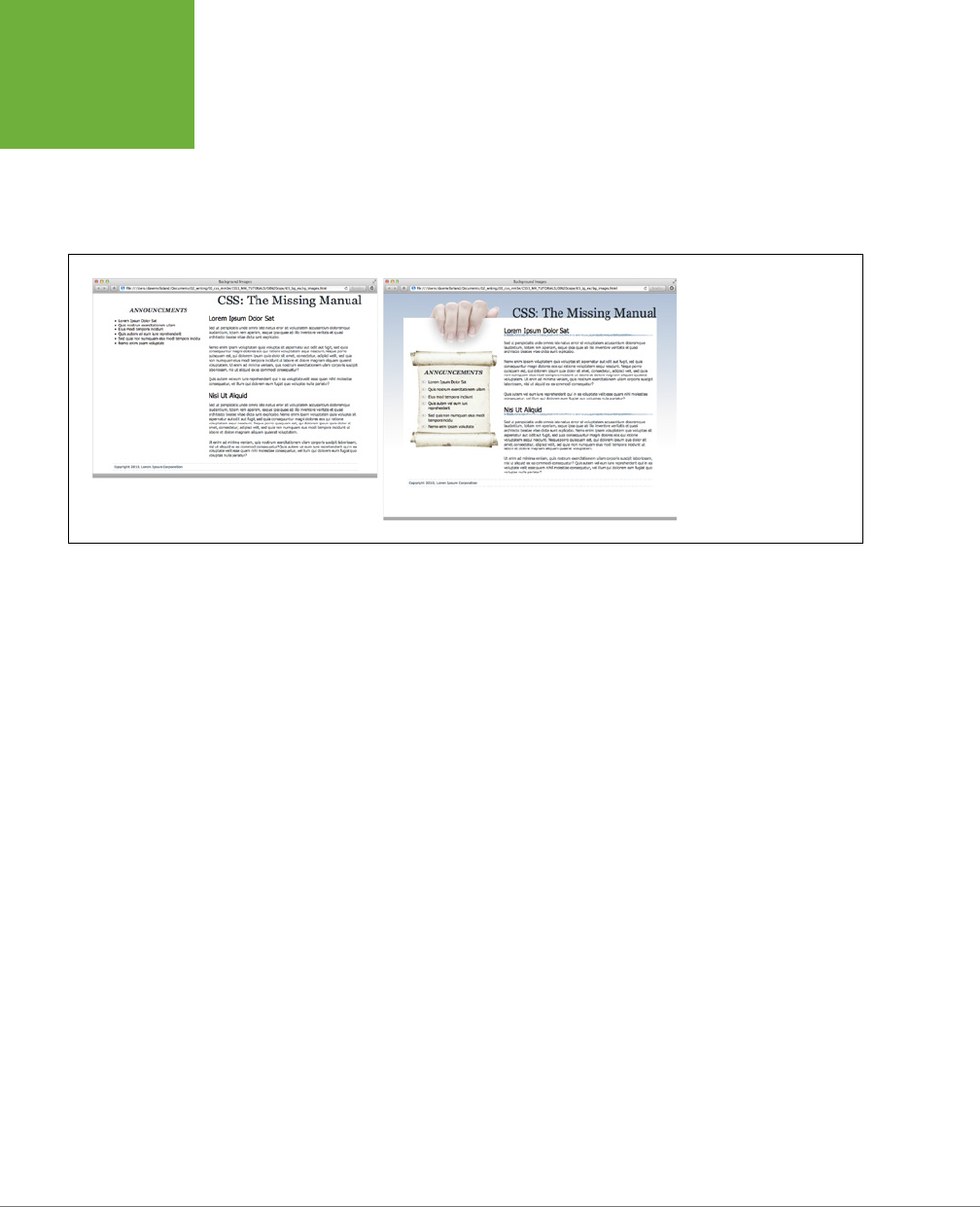
CSS3: THE MISSING MANUAL
284
TUTORIAL:
USING
BACKGROUND
IMAGES
4. Return to your text editor and the
bg_images.html
file. Add another style
for the <div> containing the content of the page:
.wrapper {
background-color: #FFF;
}
FIGURE 8-23
Using background images,
you can make an already
well-organized page (left)
look much spiffier (right).
Since you can add images
to the background of any
tag on a page, the possible
placement of graphics on a
page are nearly limitless.
The wrapper div is a fixed width, centered in the middle of the page, containing
all of the page’s text. This style gives it a white background, but with the help
of an image, you can do better than that.
5. Edit the style you created in Step 4 by adding a background image:
.wrapper {
background-color: #FFF;
background-image: url(images/bg_main.jpg);
background-position: left top;
background-repeat: no-repeat;
}
These three lines of code add a background image to the top-left of the <div>;
the no-repeat option for the background-repeat property means the image
only appears a single time. If you save the file and preview it in a web browser,
you’ll now see the picture of a hand acting like it’s holding the page. Very cool.
The only problem is the text is too far up, covering up the image. You’ll next
push down the top headline and the left sidebar.
6. Add two more styles to the internal style sheet:
.banner {
margin-top: 48px;
}
.announcement {
margin-top: 115px;
}
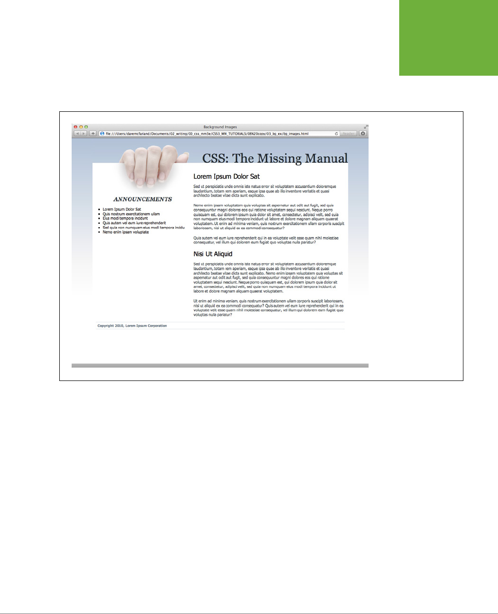
CHAPTER 8: ADDING GRAPHICS TO WEB PAGES 285
TUTORIAL:
USING
BACKGROUND
IMAGES
The first line just adds a bit of padding, pushing down the banner containing
the headline until it just touches the top of the white page, while the second
style moves the left sidebar down enough to clear the picture of the hand. The
page should now look like Figure 8-24.
FIGURE 8-24
CSS lets you combine a
background color and a
background image, which
comes in really handy in
this example. The main
text area has a white
background color that
helps separate the text
from the fading gradation
in the page’s background.
In addition, a graphic of
a hand holding a piece of
paper adds depth to the
design.
Replacing Borders with Graphics
The border property is a useful tool in your design arsenal, but the limited number
of border styles CSS oers can get boring. A hand-drawn line with a little texture
would catch your visitors’ attention better than a plain, straight one. You can skip
the border property and add any kind of line you want as a background image—easy
as pie. In this part of the tutorial, you’ll replace the underline below each <h2> tag in
the main text area with a custom graphic that looks like a hand-drawn line.
1. Return to your text editor and the
bg_images.html
file. Add a style for the
<h2> tags inside the main <div> tag:
.main h2 {
background-image: url(images/underline.png);
background-repeat: no-repeat;
}

CSS3: THE MISSING MANUAL
286
TUTORIAL:
USING
BACKGROUND
IMAGES
The background-image property specifies which graphic to use in the back-
ground of <h2> tags inside any tag with a class of main, whereas the no-repeat
value makes sure the graphic only appears a single time.
If you preview the file now, you’ll see that the underline doesn’t exactly line up.
In fact, it isn’t
under
at all. It’s above the headlines!
2. Add the following style declaration to the .main h2 style below the
background-repeat property:
background-position: left bottom;
You’ve changed the graphic’s starting location so it appears at the left edge
and bottom of the <h2> tags. If you preview the page now, though, you may not
notice much improvement. The underline runs
into
the headline text.
But there’s an easy fix. Since the bottom value used here puts the graphic at
the bottom of the block created by the <h2> tag, you need only to increase
the overall height of the block to move the line down a bit. You’ll do this with
a little bottom padding.
NOTE CSS3 provides a means of using images for borders. Unfortunately, it’s a bit complex and doesn’t
work on Internet Explorer 9 or earlier. Since you can achieve a similar effect in this example by using a back-
ground image, in this tutorial you’ll go that route. However, if you want to learn more about border images, visit
www.css3files.com/border
.
3. Edit the .main h2 style one last time, so that it looks like this:
.main h2 {
background-image: url(images/underline.png);
background-repeat: no-repeat;
background-position: left bottom;
padding-bottom: 7px;
}
Padding, as you’ll recall from page 195, is the space between the border (the
edge of the background as well) and the content. It also increases the overall
height of the box—in this case, by adding 7 pixels of bottom padding. Now, the
line graphic is placed at the bottom of the h2 block, but in the empty space
created by the bottom padding.
4. Save the file and preview the page in a web browser.
Each <h2> tag has the hand-drawn underline. Next you’ll tackle the sidebar box,
making it look a little less boxy and jazzing up the bulleted lists.
Using Graphics for Bulleted Lists
The average bullet used for unordered lists is a black dot—not very inspiring. But you
can use the background-image property to replace those drab bullets with any image
you want. The first step is to hide the bullets that normally appear beside list items.

CHAPTER 8: ADDING GRAPHICS TO WEB PAGES 287
TUTORIAL:
USING
BACKGROUND
IMAGES
1. Return to your text editor and the
images.html
page. Add a style for format-
ting the list items in the left sidebar.
.announcement li {
list-style: none;
}
The bulleted list is inside a <div> with a class of announcement, so this descendent
selector targets just the list items (<li> tags) inside that div. The style removes
the bullet. Now add the graphic.
NOTE You can just as well apply
list-style: none;
to a style affecting the
<ul>
or
<ol>
tags to
remove bullets from
each
list item.
2. Add the following two properties to the .announcement li style:
background-image: url(images/bullet.png);
background-repeat: no-repeat;
You’ve seen these two properties before. They add an image to the background
and turn o repeating so that the graphic appears only once.
If you preview the page, you’ll see that the bullets currently overlap the list
text and the list items are a little jammed together (Figure 8-25, left). A little
padding and margin will fix this.
3. Add two more properties to the .announcement li style:
padding-left: 25px;
margin-bottom: 10px;
The left padding adds empty space, eectively moving the text out of the way
in order to display the new bullet icon. The bottom margin adds just a bit of
breathing room between each list item (Figure 8-25, middle).
There’s just one final flaw. The bullet image is a tad too high on the line, causing
the tip of the icon to stick out too far above the text. But you can easily fix that
with the background-position property.
4. Finish this style by adding background-position: 0px 4px;. The completed
style should look like this:
.announcement li {
list-style: none;
background-image: url(images/bullet.png);
background-repeat: no-repeat;
background-position: 0 4px;
padding-left: 25px;
margin-bottom: 10px;
}
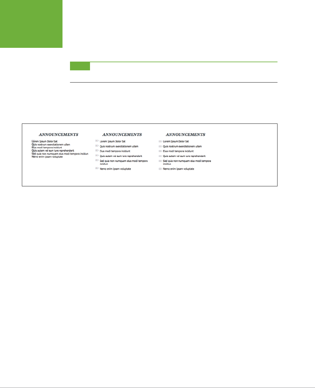
CSS3: THE MISSING MANUAL
288
TUTORIAL:
USING
BACKGROUND
IMAGES
This last style declaration positions the bullet icon to the far left (that’s the 0)
and 4 pixels from the top (4px) of the list item. It moves the icon down just a
smidgen, enough to make the bullet look perfect.
NOTE As discussed on page 255, this kind of exact positioning is precisely why you should use the
back-
ground
property instead of the
list-style-image
property for adding graphic bullets to your lists.
5. Save the file and preview the page in your browser.
The list should now have 3-D tabs with red exclamation marks instead of dreary
black circles (Figure 8-25, right).
FIGURE 8-25
Replacing regular black
bullets with your own
graphics is easy. Just a
few extra steps ensure the
bullets and text are placed
in the correct location.
Giving the Sidebar Personality
At this point, the sidebar looks pretty good. The text is nicely formatted, and the
bullets look great, but the sidebar gets a little lost in the sea of white. Adding a back-
ground image can make the sidebar stand out in a whimsical way. You could use a
single image—the scroll image pictured in the bottom image of Figure 8-23—in the
background of the <div> tag, but in order to make sure the text fits exactly on the
scroll, you’d have to limit the amount of content you put in the sidebar. Too much
text and it won’t fit on top of the single image (top-left in Figure 8-12), too little, and
there will be too much empty space on the graphic.
A more flexible approach would let the image grow as the sidebar acquires more
content (bottom-right in Figure 8-12). As discussed on page 257, there are multiple
ways to achieve this eect. You can put the background part of the scroll (where
the text appears) as a repeating background image in the div, then place a back-
ground image for the top of the scroll in the headline at the top of the div, and a
background image in the bottom of the list item at the bottom of the div. In fact,
that’s the method used in previous editions of this book. However, now that most
browsers support CSS3 multiple backgrounds, you can use them instead. It’s a lot
simpler, and it doesn’t require three dierent styles to work.
1. Return to your text editor and the
bg_images.html
file. Locate the .announce-
ment style you added in Step 6 on page 284 and add one additional property:

CHAPTER 8: ADDING GRAPHICS TO WEB PAGES 289
TUTORIAL:
USING
BACKGROUND
IMAGES
.announcement {
background: url(images/scroll_top.jpg) no-repeat center top,
url(images/scroll_bottom.jpg) no-repeat center bottom,
url(images/scroll_middle.jpg) repeat-y center top;
margin-top: 115px;
}
Yes, that’s only one property—the background property—but it has three dif-
ferent images. The order in which you list these images is important, since they
stack on top of each other. In this case, the first image is the top of the scroll;
it only appears once (no-repeat) at the top and center. The second image is
the bottom of the scroll; it also only appears once, but at the bottom of the
div. Finally, the middle part of the scroll—scroll_middle.jpg—will be layered
underneath the other two images (since it appears last in the list), and it’s
repeated along the y-axis (up and down), so if the <div> gets taller, the image
simply tiles to fill the space.
If you preview the page, you’ll see a few problems. First, the text appears on top
of the rolled up top and bottom parts of the scroll. A little padding will fix that.
2. Update the .announcement style to add top and bottom padding. Make the
changes listed in bold below:
.announcement {
background: url(images/scroll_top.jpg) no-repeat center top,
url(images/scroll_bottom.jpg) no-repeat center bottom,
url(images/scroll_middle.jpg) repeat-y center top;
padding: 70px 0 60px 0;
margin-top: 115px;
}
Another problem is that the bulleted list sticks out on both the left and right
sides of the sidebar image. To make the bulleted list fit on the scroll, you need
to add some left and right margin.
3. Locate the .announcement li style you created earlier and add two proper-
ties to the end so it looks like this:
#announcement li {
list-style: none;
background-image: url(images/bullet.png);
background-repeat: no-repeat;
background-position: 0 4px;
padding-left: 25px;
margin-bottom: 10px;
margin-left: 30px;
margin-right: 40px;
}

CSS3: THE MISSING MANUAL
290
TUTORIAL:
USING
BACKGROUND
IMAGES
These properties move both the left and right edges of each bulleted item in
enough to clear the edges of the background image.
4. Save the file and preview it in a web browser.
The page should look like the right image in Figure 8-23—in all current browsers
except Internet Explorer 8. That browser doesn’t support multiple background
images.
Getting the Scroll to Appear in IE 8
While Internet Explorer 8 doesn’t support multiple images, you can fake it, especially
if you only need two or three background images. Using generated content (page
595), you can add text or images before and after any element on a page. In this
case, you can add the top of the scroll before the div, and the bottom of the scroll
after the div.
If you’re not so worried about supporting IE 8, you can skip this step, but if you want
to see how to make this work in IE 8 and later as well as all other current browsers,
read on.
1. Edit the .announcement style so there’s only a single background image (the
middle of the scroll) and no padding:
.announcement {
background: url(images/scroll_middle.jpg) repeat-y center top;
margin-top: 115px;
}
You won’t need the padding, since the other images will take up room above and
below the div. Next, you’ll add the top of the scroll as a before element to the div.
2. Add the following style below the .announcement style:
.announcement:before {
content: url(images/scroll_top.jpg);
}
As mentioned on page 70, the :before pseudo-element lets you add content
before a tag. This could be text, or (as in this case) an image. Now for the bot-
tom of the scroll.
3. Add the following style below the :before style you just added:
.announcement:after {
content: url(images/scroll_bottom.jpg);
}
This adds the bottom of the scroll after the div. Well, it doesn’t really go after the
div, it goes on top and the div expands to fit it. In fact, if you preview the page,
you’ll see a little bit of the background of the div (the scroll) show underneath
the curved bottom of the scroll. You’ll fix that with a little more CSS magic.

CHAPTER 8: ADDING GRAPHICS TO WEB PAGES 291
TUTORIAL:
USING
BACKGROUND
IMAGES
4. Edit the style you just created by adding two more lines of code (bolded
below):
.announcement:after {
content: url(images/scroll_bottom.jpg);
position: relative;
bottom: -5px;
}
You’re jumping ahead a bit here, since you won’t learn about the position
property in depth until Chapter 15, but in a nutshell, you’re moving the bottom
of the scroll down 5 pixels to cover up the background of the div.
Now the page should look like the righthand image in Figure 8-23, and just
like the one you created in the earlier part of this tutorial with multiple images.
You’ll find both pages in the
08_finished/03_bg_ex
folder:
bg_images.html
and
bg_images_ie8.html
.

293
CHAPTER
9
It’s safe to say that without links there’d be no Web. The ability to be on one page,
then click something onscreen and suddenly see a page on a computer half a world
away is what makes the Web so useful. Links are also how your visitors navigate
their way around your website. That’s why web designers agonize over making their
links look good and work properly.
In this chapter, you’ll learn how to style links to make them stand out from other
text. You can also make your links provide visual cues so your site’s visitors can
see where they are—and where they’ve been. You’ll learn how to use CSS to create
onscreen buttons and navigation bars just like the pros use. And in the tutorial sec-
tion, you’ll get some hands-on experience creating a full set of navigation features
that work in all browsers.
Selecting Which Links to Style
As always in CSS, you have to select something before you can style it. For links,
you need to tell CSS not only
what
you want to style, but also
when
you want that
style to apply. Web browsers keep track of how a visitor interacts with links, and
then displays that link dierently depending on the link’s status, or
state
. When you
use a CSS link selector, you can target a specific link state as well.
Understanding Link States
Most browsers recognize four basic link states: an unvisited link, a link that’s been
visited already (meaning the URL is stored in the browser’s history), a link that
the visitor’s mouse is poised over, and a link that’s being clicked. As described in
Sprucing Up Your
Site’s Navigation
CSS3: THE MISSING MANUAL
294
SELECTING
WHICH LINKS
TO STYLE
Chapter 3, CSS gives you four pseudo-class selectors to accompany these states—
:link, :visited, :hover, and :active. Using them, you can apply dierent formatting
to each state, so there’s no doubt in your visitor’s mind whether he’s been there or
done that.
NOTE Browsers also recognize a pseudo-class called
:focus
. Links get
:focus
when mouse-averse
visitors use the keyboard to tab to them. This pseudo-class is also fun to use with form text fields, as you’ll see
in the forms tutorial on page 395.
Suppose you want to change the text color for an unvisited link from boring browser
blue to vivid orange. Add this style:
a:link { color: #F60; }
Once someone has clicked that link, its state changes to visited, and its color
changes to the purple used by most browsers. To change that color to deep red,
use this style:
a:visited { color: #900; }
TIP When you want to provide a style that applies to all link states—for example, use the same font and
font size for all link states—then style the HTML
<a>
tag by creating a generic
a
selector. You can then use the
specific link state styles—
a:visited
, for example—to change the color or in some other way customize the
look of just that state.
WORD TO THE WISE
Limits on Visitation
Due to privacy concerns, browsers have begun to place severe
limits on which CSS properties you can apply to the
:visited
pseudo class. As it turns out, some nefarious types have
figured out how to use JavaScript to read changes in the style
of
:visited
links to determine sites people had visited. For
example, by loading a new background image for visited links,
you can determine whether a visitor has been to Paypal.com,
eBay.com, BankofAmerica.com, or not-safe-for-work.com.
Because of that potential problem, you’re limited to styling
the
color
,
background-color
, and
border-color
of visited links—and only if you’ve already given the normal
states of those links a color, background color, or border
color. In other words, you can’t do much with the :
visited
pseudo-class any longer.
The :hover pseudo-class oers many creative possibilities; you’ll learn quite a few
later in this chapter. It lets you completely alter the look of a link when a visitor moves
her mouse over it. If you’ve used cumbersome JavaScript to make graphic buttons
change when a mouse hovers over them, you’ll love being able to create the same
eect with CSS alone. But to start with a simple example, this style changes the
color of a link as a mouse passes over it:
a:hover { color: #F33; }
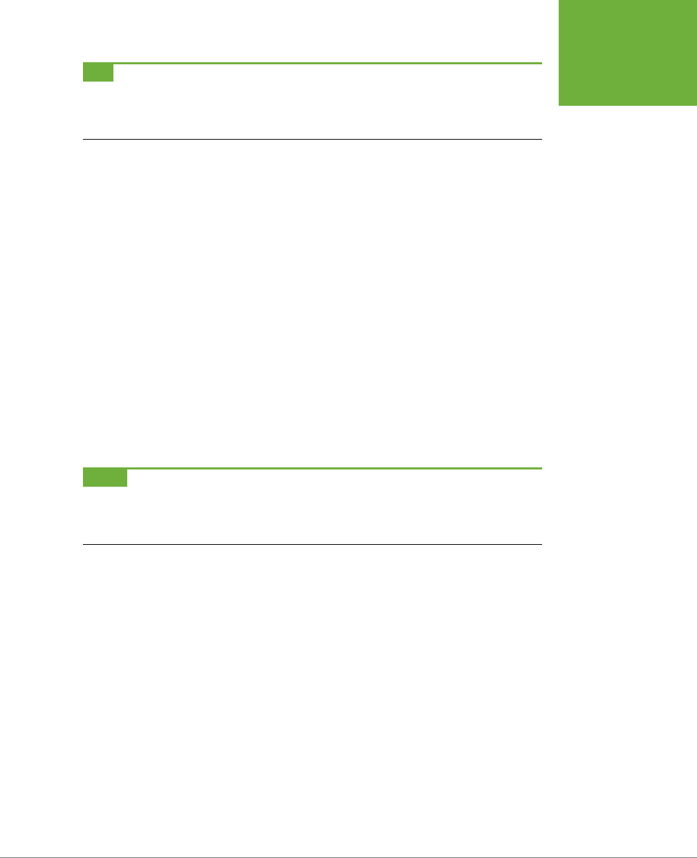
CHAPTER 9: SPRUCING UP YOUR SITE’S NAVIGATION 295
SELECTING
WHICH LINKS
TO STYLE
TIP Be careful when adding CSS properties to the
:hover
pseudo-class. Properties that change the size
of the hovered element might affect other elements around it. For example, if you increase the font size of a
hovered text link, when moused over, the link text will grow, pushing other elements out of the way. The effect
can be jarring.
And finally, if you’re one of those obsessive-compulsive designers who leave no de-
sign stone unturned, you can even change the look of a link for the few milliseconds
when a visitor is actually clicking it. Here’s how:
a:active {color: #B2F511; }
In most cases, you’ll probably have a generic a style,
:visited, and :hover styles
in your style sheets. For maximum design control you may want to style all the dif-
ferent states. But for that to work, you must specify the links in a particular order:
link, visited, hover, and active. Use this easy mnemonic to remember it: LoVe/
HAte. So here’s the proper way to add all four link styles:
a:link { color: #F60; }
a:visited { color: #900; }
a:hover { color: #F33; }
a:active {color: #B2F511; }
If you change the order, the hover and active states won’t work. For example, if you
put a:hover before a:link and a:visited, then the color change won’t take eect
when hovering.
NOTE Why does the order matter? That would be thanks to our friend the cascade (see Chapter 5). All those
styles have the same specificity, so the order in which they appear in the code determines the style that wins
out. A link can be both
unvisited
and
hovered over
. So if the
a:link
style comes last in the code, then it wins,
and the color from
a:hover
never gets applied.
Targeting Particular Links
The styles in the previous section are basic a tag styles. They target certain link
states, but they style
all
links on a page. What if you want to style some links one
way and some links another way? A simple solution is to apply a class to particular
link tags. Say you have a bunch of links within the body of an article, some of which
point to sites that you want to highlight (for example, links to websites belonging
to your friends, business associates, or sponsors). You may want to identify these
links so people know they’re special and are more likely to click them. In this case,
you can apply a class to these external links, like this:
<a href="http://www.hydroponicsonline.com" class="sponsor">Visit this great
resource</a>
CSS3: THE MISSING MANUAL
296
SELECTING
WHICH LINKS
TO STYLE
To style this link in its own way, you’d create styles like this:
a.sponsor { font-family: Arial, sans-serif; }
a.sponsor:link { color: #F60; }
a.sponsor:visited { color: #900; }
a.sponsor:hover { color: #F33; }
a.sponsor:active {color: #B2F511; }
Leaving o the
a
and only specifying the class works too:
.sponsor { font-family: Arial, sans-serif; }
.sponsor:link { color: #F60; }
.sponsor:visited { color: #900; }
.sponsor:hover { color: #F33; }
.sponsor:active {color: #B2F511; }
Now only those links with a class of “sponsor” will get this formatting.
NOTE These examples change only the links’ colors, but that’s just to make it simple for demonstration
purposes. You can use
any
CSS property to format links (except
:visited
links, as explained in the box on page
296). As you’ll see in the next section, you have lots of creative ways to style links.
Grouping links with descendent selectors
If a bunch of links appear together in one area of a page, you can also save time by
using
descendent selectors
. Say you have five links that lead to the main sections
of your site. They represent your main navigation bar, and so you want to give them
a distinctive look. Just wrap those links in the HTML5 <nav> tag. Now you have an
easy way to identify and format just those links:
nav a { font-family: Arial, sans-serif; }
nav a:link { color: #F60; }
nav a:visited { color: #900; }
nav a:hover { color: #F33; }
nav a:active {color: #B2F511; }
Alternatively, you can use a <div> tag (if you’re not quite ready for HTML5 tags) and
add a class to that div: <div class="mainNav">:
.mainNav a { font-family: Arial, sans-serif; }
.mainNav a:link { color: #F60; }
.mainNav a:visited { color: #900; }
.mainNav a:hover { color: #F33; }
.mainNav a:active {color: #B2F511; }
Using descendent selectors, it’s easy to style links dierently for dierent areas of
a web page. (See page 553 in Chapter 17 for a thorough discussion of the power of
descendent selectors.)

CHAPTER 9: SPRUCING UP YOUR SITE’S NAVIGATION 297
STYLING LINKS
TIP It’s very common to use bulleted lists to present links (you’ll see an example of this technique on page
304). In this case, you can add an ID or class to the
<ul>
tag for the list—
<ul class="mainNav">
, for
example—then create descendent selectors like
.mainNav a:link
to style them.
Styling Links
Now that you know how to create a selector that targets links, how should you style
them? Any way you want! There aren’t any CSS properties intended just for links. You
have access to all CSS properties, so you’re limited only by your imagination. Just
make sure your links look like links. Not that they need to be blue and underlined,
but links must look dierent from non-link text so visitors know they can click them.
If you make a link look like a button—adding a border, including a background, and
making it change color when moused over—most people will understand they can
click it. Or, use a linear gradient (page 260) to add texture and depth to a link. Like-
wise, links that appear in long passages of text should look clearly distinct. You can
make links stand out by bolding the text, keeping the traditional underline, coloring
the background, or adding a hover style. You can even add a graphic (like an arrow)
that provides a clear visual cue that clicking the text takes you somewhere else.
TIP Unless you set an
<img>
tag’s
border
attribute to
0
, Internet Explorer adds a border around linked
images. To prevent this from happening, add this basic style to your style sheets:
img { border: none; }
.
Underlining Links
Since the beginning of the Web, vibrant blue, underlined text has signaled, “Click here
to go there.” But that underline and color are often the first two things a designer
wants to change. Underlines are such a common way to mark a link that they’re
boring (#1 in Figure 9-1). Fortunately, you can do several things to eliminate or im-
prove on the standard underline, while still ensuring that your links are identifiable:
• Remove the underline entirely. To eliminate the regular underline, use the
text-decoration property and the none value:
a {text-decoration: none;}
Of course, removing the underline completely can confuse your visitors. Unless
you provide other visual cues, your links look exactly the same as all the other
text (#2 in Figure 9-1). So if you go this route, then make sure you highlight the
links in some other way, like making link text bold (#3 in Figure 9-1), coloring
the background, adding an informative graphic, or making the link look like a
button (page 305).
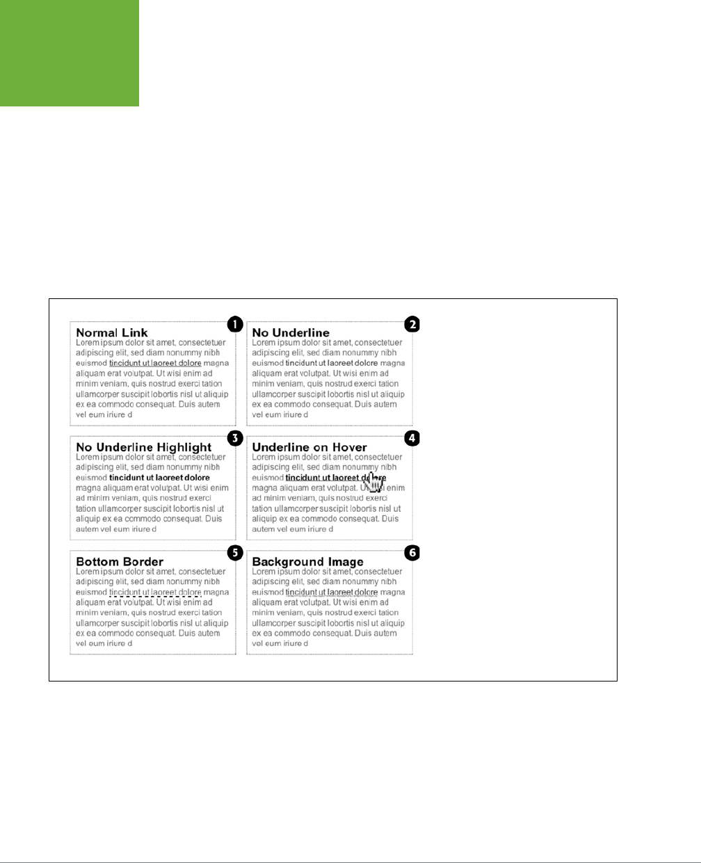
CSS3: THE MISSING MANUAL
298
STYLING LINKS
• Underline when mousing over. Some designers remove underlines for all links,
highlight them in some other way, and then add the underlines back when the
visitor moves his mouse over the link (#4 in Figure 9-1). To do so, simply remove
the underline for links, and then reintroduce it using the :hover pseudo-class:
a {
text-decoration: none;
background-color: #F00;
}
a:hover {
background-color: transparent;
text-decoration: underline;
}
FIGURE 9-1
You have plenty of ways to make the boring
line (1) under links more exciting. Start by
removing the link entirely (2, 3, 4). Better
yet, create a more stylized link by using
the border property (5) or a background
image (6).
• Use a bottom border. You can’t control the color, width, or style of a regular
link underline. It’s always a solid, 1-pixel line in the same color as the link text.
For greater variety, use the border-bottom property instead (#5 in Figure 9-1).
Hiding the normal underline and adding a dashed-line border looks like this:

CHAPTER 9: SPRUCING UP YOUR SITE’S NAVIGATION 299
STYLING LINKS
a {
text-decoration: none;
border-bottom: dashed 2px #9F3;
}
You can alter the style, width, and color of the border. To put more space be-
tween the text and the border, use the padding property.
• Use a background image. You can customize the look of links even further by
using a graphical line. For example, #6 in Figure 9-1 uses a graphic that looks
like a hand-drawn line. There’s a similar technique for underlining headlines in
the Chapter 8 tutorial (page 285). Start by creating an underline graphic using
a program like Fireworks or Photoshop, which have brush tools that simulate
the look of a crayon, felt-tip marker, or whatever. Next, create a style for the link
that removes the normal underline and adds a background image. Make sure the
graphic repeats horizontally and is positioned at the bottom of the link. You may
also need to add a little bottom padding to position the line. Here’s an example:
a {
text-decoration: none;
background: url(images/underline.gif) repeat-x left bottom;
padding-bottom: 5px;
}
Creating a Button
You can also make links look like the buttons in the dialog boxes and toolbars you
see in desktop programs. Buttons look great in navigation bars, but you can also
use them for any small (one- or two-word) links on your pages. Your main allies in
this task are the border, background-color, and padding properties. With them, it’s
easy to create a wide range of boxy-looking buttons (see Figure 9-2).
Say you added a class to a link that you’d like to style as a button: <a href="stale
.html" class="button">Free Donuts Here!</a>. To add a basic black outline around
this link (like the top-left image in Figure 9-2), you’d create this style:
a.button {
border: solid 1px #000;
}
You can get fancier by adding a background color as well, like so:
a.button {
border: solid 1px #000;
background-color: #333;
}
CSS3: THE MISSING MANUAL
300
STYLING LINKS
NOTE In these examples, both
a.button
or
.button
would work for style names. In the case of
a.button
, the style only applies to
<a>
tags with the class
button
, while
.button
applies to any tag with
that class name. If you want to make sure the style only applies to a particular tag, then add the tag name to
the beginning. Adding the tag name is also a helpful reminder when looking over your CSS code—it provides a
valuable clue as to what the style is intended to format. When you see
a.button
, it’s clear that the style is
aimed at particular links.
FIGURE 9-2
Use the border, back-
ground, and padding
properties to turn a link
into an obviously clickable
button. Simply adding
a border (top left) can
be enough to get the
point across. Or you can
create more sophisticated-
looking buttons by
combining different
borders of varying colors,
styles, and widths with the
background-color
property (page 206).
And, for those browsers
that support
linear-
gradient
(page 260),
text-shadow
(page
166),
box-shadow
(page 210), and rounded
corners with
border-
radius
(page 207), you
can achieve some truly
remarkable looking effects
(bottom row).
Mind you, all four borders don’t need to be the same width, type, or color. You don’t
even have to have four borders. One common design technique is to add a beveled
look to a button using four dierent border colors, as shown at top right in Figure
9-2. Creating the beveled look isn’t dicult, but you need to remember what makes
something look three-dimensional—the light source. Imagine a light shining on one
of the four sides; that side is the lightest, while the side opposite is the darkest (since
the raised button is blocking the light and putting that side into a “shadow”). The
other two sides should have shades in between the “lit” and “shadow” borders. Here’s
the CSS used to create the beveled design in the top-right corner of Figure 9-2:

CHAPTER 9: SPRUCING UP YOUR SITE’S NAVIGATION 301
STYLING LINKS
a.button {
background: #B1B1B1;
color: #FFF;
font-weight: bold;
border-width: 4px;
border-style: solid;
border-top-color: #DFDFDF;
border-right-color: #666;
border-bottom-color: #333;
border-left-color: #858585;
}
Keep in mind that you can (and probably should) create a :hover state for your but-
tons as well. That way, your buttons can react when a visitor moves her mouse over
the link, providing useful visual feedback. In the case of a beveled button, reversing
the various colors—make a dark background lighter, a light border darker, and so
on—is very eective.
Using linear gradients and rounded corners, box and text shadows can really add
depth to a button. For example, the button in the bottom middle of Figure 9-2 is
created with this code:
1. background-color: #ee432e;
2. background-image: -webkit-linear-gradient(top, #ee432e 0%, #c63929 50%,
3. #b51700 50%, #891100 100%);
4. background-image: -moz-linear-gradient(top, #ee432e 0%, #c63929 50%,
5. #b51700 50%, #891100 100%);
6. background-image: -o-linear-gradient(top, #ee432e 0%, #c63929 50%, #b51700
7. 50%, #891100 100%);
8. background-image: linear-gradient(top, #ee432e 0%, #c63929 50%, #b51700
9. 50%, #891100 100%);
10. border: 1px solid #951100;
11. border-radius: 5px;
12. box-shadow: inset 0px 0px 0px 1px rgba(255, 115, 100, 0.4), 0 1px 3px
13. #333333;
14. padding: 12px 20px 14px 20px;
15. text-decoration: none;
16. color: #fff;
17. font: bold 20px/1 “helvetica neue”, helvetica, arial, sans-serif;
18. text-align: center;
19. text-shadow: 0px -1px 1px rgba(0, 0, 0, 0.8);
Line 1 sets a deep red background color; this color is provided for browsers that don’t
understand linear gradients (IE 9 and earlier as well as other older browsers). Lines
2 –5 set up a linear gradient for various browsers. Line 6 adds a simple border, while
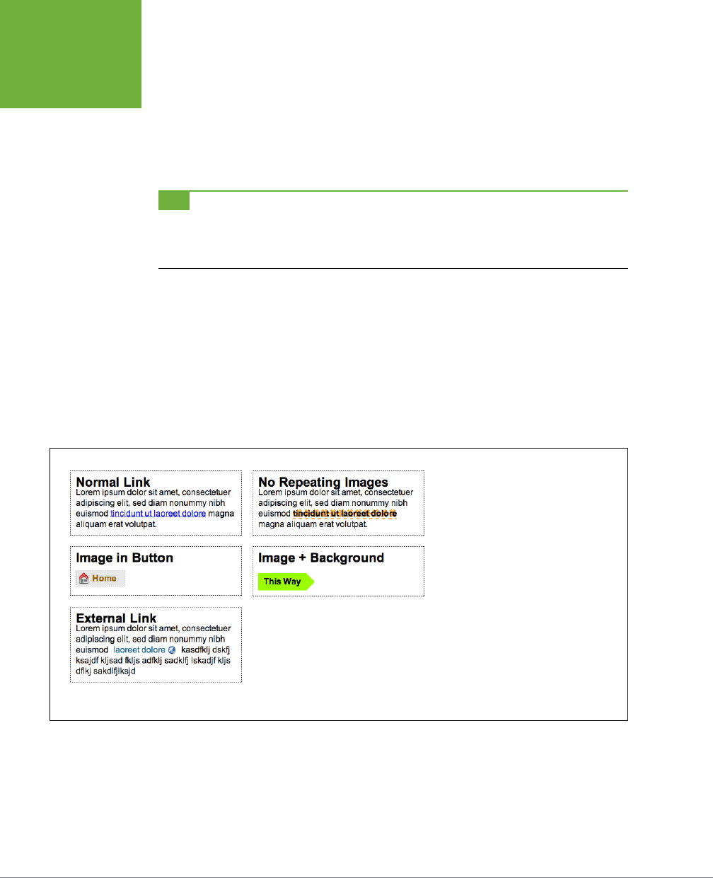
CSS3: THE MISSING MANUAL
302
STYLING LINKS
line 7 creates the rounded corners and line 8 adds a subtle inset shadow and a second
drop shadow below the button; in other words, it applies two drop shadows, which
is perfectly legal, as described on page 211. Line 9 adds padding to provide space
around the button text and the button border, while line 10 removes the underline
that normally appears below links. The last lines set properties for the text in the
button including its color, font, alignment, and text shadow.
TIP Creating great looking buttons often involves piling on the CSS properties (as you can tell from the above
code). If you need a little help creating all that code, check out the CSS3 Button generator
http://css3button.net
. To
see other great examples of CSS3 buttons, visit
http://hellohappy.org/css3-buttons/
and
http://webdesignerwall
.com/tutorials/css3-gradient-buttons
.
Using Graphics
Adding graphics to links is one of the easiest and most visually exciting ways to
spruce up your site’s navigation. There are any number of possible techniques and
designs, but none of the good ones involve an HTML <img> tag. Instead, you can
easily add attractive and informative imagery to any link using the CSS background-
image property. You can see several examples in Figure 9-3. (You’ll also learn more
advanced techniques for using images to create graphical buttons and rollovers
starting on page 314.)
FIGURE 9-3
Even a simple graphic can enliven a
link and make its purpose clearer. A
globe icon (bottom left) is one way
to indicate an external link.
If you need a refresher on background-image and related properties, flip back to page
240. Meanwhile, here are a few things to keep in mind when you use images with links:
• Don’t forget no-repeat. Normally a background graphic tiles repeatedly in the
background. With many graphics, that eect looks awful for links (top right,
Figure 9-3). Unless you’re using a subtle pattern like a gradient fill, remember to
set the repeat option to stop the tiling like this: background-repeat: no-repeat;.
CHAPTER 9: SPRUCING UP YOUR SITE’S NAVIGATION 303
STYLING LINKS
• Control placement with background-position. To place an image accurately in
the background, use the background-position property (page 246). When you
want to place an image on the far-right edge of a link but centered vertically on
the line, use this CSS: background-position: right center.
For more accurate placement, use a specific value such as pixels or ems. These
units of measurement make it easy to scoot a graphic a couple of pixels away
from the left edge of the link. By combining these units with a percentage value,
you can easily center a graphic vertically within a link but place it an exact amount
away from the left edge: background-position: 10px 50%;.
TIP In positioning background images, the first value is the horizontal placement (left to right); the second
is vertical placement (top to bottom).
Unfortunately, there’s no way to exactly place an image from the right or bottom
edges. So if you want to move an image in from the right edge a bit, then you
have two options: First, in your image-editing program, you can add empty space
to the right edge of the graphic. The amount of empty space you add should be
equivalent to how much you want to indent that graphic from the right. Once
you’ve created the graphic, use the background-position property to place the
graphic on the right edge of the element: for example, background-position:
right top;. Or you can use percentage values: background-position: 90% 75%;
places the point that lies 90 percent from the left edge of the image on top of the
point 90 percent from the left edge of the styled element. As you can imagine,
this method doesn’t provide complete accuracy, so you’ll need to experiment
a little. (See page 249 for more on how percentage positioning works.)
• Padding gives you room. If you’re using an image or icon to mark a link, then
make sure to add padding on the side the image is on to move the link text out
of the way. For instance, the third example in Figure 9-3 has 30 pixels of left
padding to prevent the word “Home” from overlapping the picture of the house,
while a little right padding makes room for the globe in the bottom-left image.
NOTE Since the <a> tag is an inline element, adding top and bottom padding (or, for that matter, top and
bottom margins) has no effect. See page 200 for the reason why. You can, however, turn a link into a block-level
element (
display: block
) so it can accept top and bottom padding and margins, or use the
inline-block
setting (
display: inline-block
). You’ll see both of these techniques later in this chapter.
• Use the pseudo-classes. Don’t forget the :hover and :visited pseudo-classes.
They can add great dynamic eects and provide helpful feedback about your
links. You can swap in a
dierent
background graphic for any of these pseudo-
classes. So you could, for example, have a dim light bulb graphic in the back-
ground of a normal link but change that graphic to a lit bulb when the mouse
travels over it.
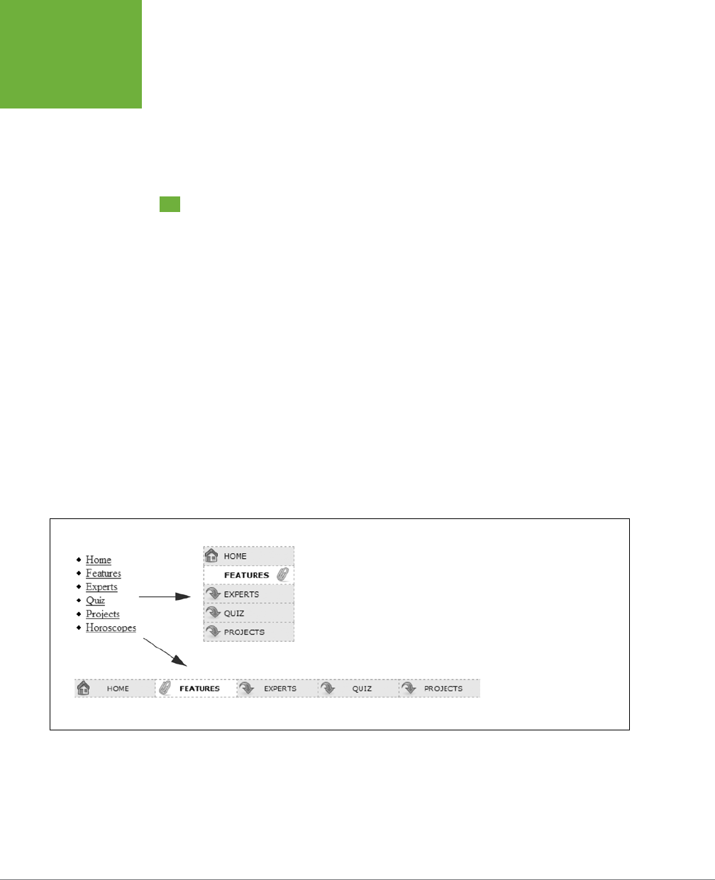
CSS3: THE MISSING MANUAL
304
BUILDING
NAVIGATION
BARS
Should you decide to use a graphic for a link’s :hover state, keep in mind that
browsers don’t download the graphic until your visitor’s mouse actually hovers
over the link, so there’ll be a noticeable delay before the graphic appears. Once
the graphic is downloaded, however, the delay goes away. See page 313 for a
technique to prevent this awkward problem.
Building Navigation Bars
Every site needs good navigation features to guide visitors to the information they’re
after—and help them find their way back. Most sites are organized in sections, such
as Products, Contact Info, Corporate Blog, and so on. This structure lets visitors know
what information to expect and where they can find it. Much of the time, you find
links to a site’s principle sections in a
navigation bar
. CSS makes it easy to create a
great-looking navigation bar, rollover eects and all.
Using Unordered Lists
At heart, a navigation bar is nothing more than a bunch of links. More specifically,
it’s actually a
list
of the dierent sections of a site. Back in Chapter 1, you learned
HTML’s mission is to provide meaningful structure to your content. Accordingly, you
should always use a tag that’s appropriate to the meaning of that content. For a
list of items, that’s the <ul> or unordered list tag—the same one you use to create
bulleted lists. It doesn’t matter whether you want your list to have
no
bullets or to
stretch horizontally across the top of the page: You can do all that by styling the
<ul> tag with CSS. Figure 9-4 shows an example.
FIGURE 9-4
Using CSS, you can bend
ordinary HTML
<ul>
tags to
your will and turn them into
either vertical or horizontal
navigation bars. To paraphrase
a classic movie line, “We don’t
need no stinkin’ bullets.”
The HTML for a nav bar is straightforward. There’s a single link inside each individual
list item. Also, you need a way to style just that unordered list. (You don’t want
actual
lists of items to look like navigation bars.) Applying a class or id to the <ul>
tag is a good approach:

CHAPTER 9: SPRUCING UP YOUR SITE’S NAVIGATION 305
BUILDING
NAVIGATION
BARS
<ul class="nav">
<li><a href="index.html">Home</a></li>
<li><a href="news.html">News</a></li>
<li><a href="reviews.html">Reviews</a></li>
</ul>
The CSS varies a bit depending on whether you want a horizontal of vertical naviga-
tion bar. In either case, you need to do two things:
• Remove the bullets. Unless the navigation bar is supposed to look like a bul-
leted list, remove the bullets by setting the list-style-type property to none:
ul.nav {
list-style-type: none;
}
• Eliminate padding and margins. Since browsers indent list items from the left,
you need to remove this added space as well. Some browsers do the indenting
using padding, and others use margin, so you need to set both to 0:
ul.nav {
list-style-type: none;
padding-left: 0;
margin-left: 0;
}
These two steps essentially make each list item look like any plain old block-level
element, such as a paragraph or headline (except that a browser doesn’t insert mar-
gins between list items). At this point, you can begin styling the links. If you want a
vertical navigation bar, read on; for horizontal nav bars, see page 307.
Vertical Navigation Bars
A vertical navigation bar is just a bunch of links stacked one on top of the next.
Removing the bullets, left margin, and padding (as explained in the previous sec-
tion) gets you most of the way there, but you need to know a few additional tricks
to get things looking right:
1. Display the link as a block.
Since the <a> tag is an inline element, it’s only as wide as the content inside it.
Buttons with dierent length text (like Home and Our Products) are dierent
widths. The staggered appearance of dierent width buttons stacked on top
of each other doesn’t look good, as you can see in #1 in Figure 9-5. In addition,
top and bottom padding and margins have no eect on inline elements. To get
around these limitations, style the link as a block element:
ul.nav a {
display: block;
}
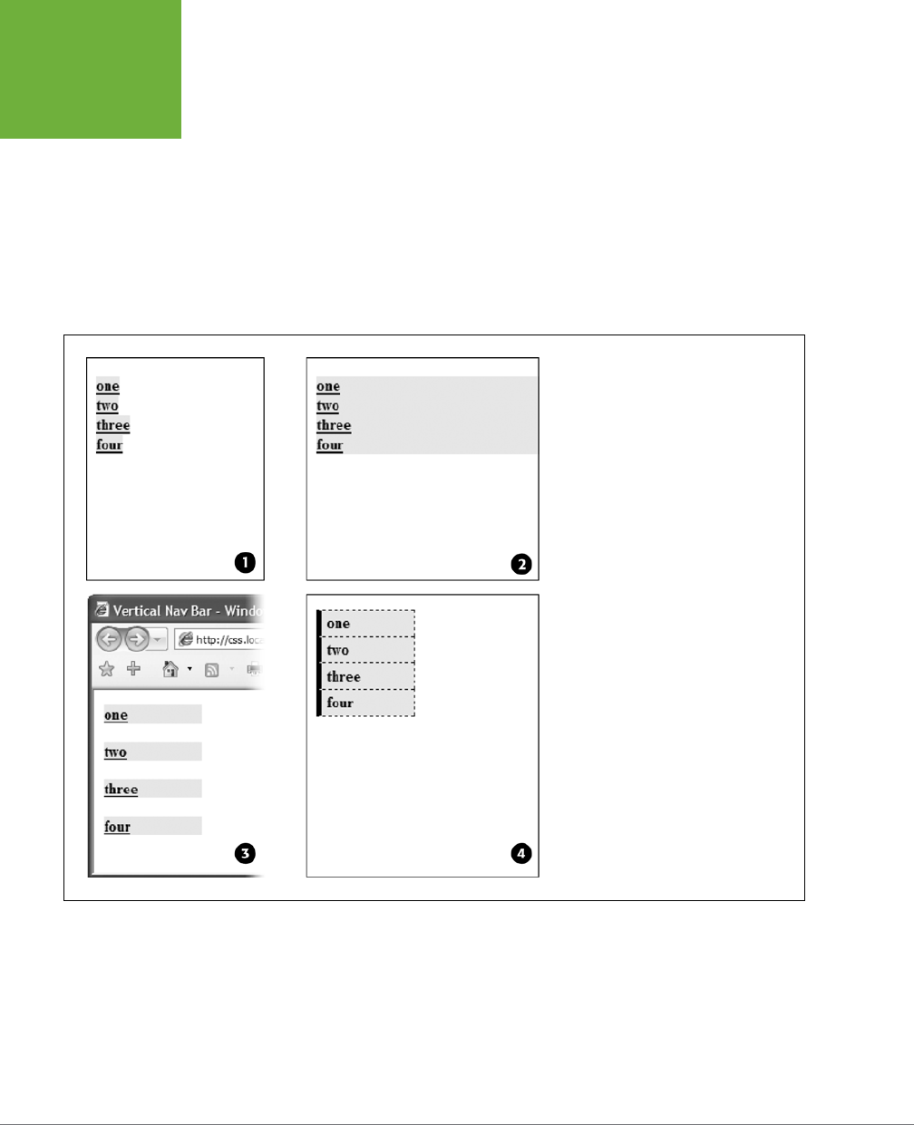
CSS3: THE MISSING MANUAL
306
BUILDING
NAVIGATION
BARS
The block value not only makes each button the same width, but it also makes
the entire area of the link clickable. That way, when your visitors click areas where
there’s no link text (like the padding around the link), they still trigger the link.
2. Constrain the width of the buttons.
Making links block-level elements also means they’re as wide as the tag they’re
nested in. So when they’re just sitting in a page, those links stretch the width of
the browser window (#2 in Figure 9-5). You have several ways to make them a
little narrower. First you can just set the width of the <a> tag. If you want each
button to be 8 ems wide, for example, then add that to the width property:
FIGURE 9-5
In just four easy steps, you can turn an
unordered list of links into an attractive
navigation bar.
ul.nav a {
display: block;
width: 8em;
}
Setting a width for any of the tags that wrap around those links—such as the
<li> or <ul> tags—also works.
CHAPTER 9: SPRUCING UP YOUR SITE’S NAVIGATION 307
BUILDING
NAVIGATION
BARS
If the button text occupies only one line, you can also center the text vertically
so there’s equal space above and below the link text. Just add a height to the
link
and
set its line-height property to the same value:
a {
height: 1.25em;
line-height: 1.25em;
}
NOTE You may not need to set an explicit width if the nav bar is inside a page layout element that itself
has a width. As you’ll read in Part Three, it’s easy to create a sidebar that hugs the left (or right) edge of a page.
The sidebar has a set width, so plopping the unordered list nav bar inside it automatically constrains the width
of the buttons.
Now that all this busywork is out of the way, you can style the buttons to your heart’s
content. Add padding, background colors, margins, images, or whatever tickles your
artistic fancy. If you want to spread the buttons out so they don’t touch, then add
a bottom (or top) margin to each link.
Horizontal Navigation Bars
CSS lets you turn a set of stacked list items into a side-by-side presentation of
links, like the one shown back in Figure 9-4. This section shows you two common
ways to create a horizontal navigation bar from a list. The first—using the display:
inline-block property—is easy, but it usually leads to a small gap between but-
tons. There’s a way around this, but it involves fussing with your HTML. If you want
a horizontal nav bar where buttons touch, then turn to the floated <ul> method
described on page 310.
WORKAROUND WORKSHOP
When Borders Bump
If the buttons in your nav bar touch and you apply a border
around each link, then the borders double up. In other words,
the bottom border from one button touches the top border of
the next button.
To get around this, add the border to only the
top
of each link.
That way, you’ll get just one border line where the bottom from
each button touches the top from the next.
This workaround, however, leaves the entire nav bar borderless
below the last link. To fix that problem, you can either create a
class with the correct bottom border style and apply it to the
last link, or better yet, add a bottom border to the <ul> tag
that encloses the nav bar. (You’ll see this trick in action in this
chapter’s tutorial on page 310.)
The same holds true when you have horizontal links. In this
case the right and left borders of adjacent buttons touch. Just
turn off the left borders on the buttons and add a left border
to the containing tag—the
<ul>
tag, for example.
Whichever method you use, start by removing the bullets and left space from the
<ul> tag, as illustrated in #1 in Figure 9-6.
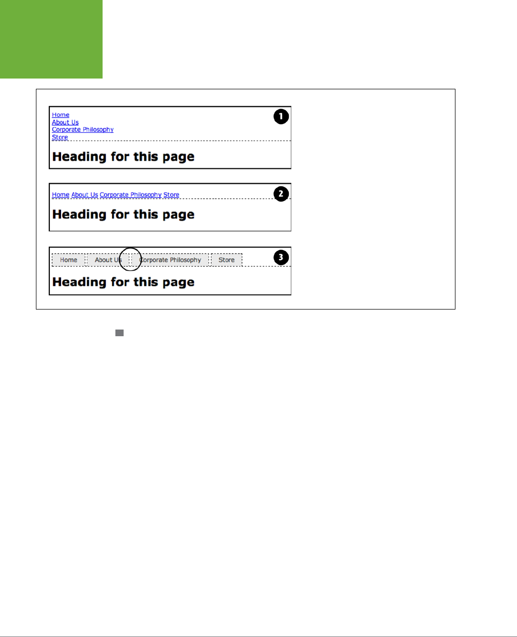
CSS3: THE MISSING MANUAL
308
BUILDING
NAVIGATION
BARS
FIGURE 9-6
Creating a horizontal menu from an unordered
list of links requires just a few steps. However,
using the
inline
and
inline-block
method
results in a noticeable gap between the buttons
(circled). See the note on page 303 for the reason
for this and one possible workaround.
USING DISPLAY: INLINE AND DISPLAY: INLINE-BLOCK
The simplest method of creating a horizontal navigation bar involves changing the
display property of the list items from block to inline. It’s easy to do using CSS.
1. Create a style for the unordered list to remove any padding, margins, and
bullets.
ul.nav {
margin-left: 0px;
padding-left: 0px;
list-style: none;
border-bottom: 1px dashed #000;
}
In this case, you’ve also added a bottom border, which will appear under the
buttons (see #1 in Figure 9-6).
2. Make the list items inline elements.
Inline elements don’t create a line break before or after them as block-level
elements do. Setting the display property of the <li> tags to inline makes
them appear one beside the other (#2 in Figure 9-6).
.nav li { display: inline; }
You need to make sure you don’t have too many buttons, though. If they don’t
all fit side by side, some will drop down below the first row.

CHAPTER 9: SPRUCING UP YOUR SITE’S NAVIGATION 309
BUILDING
NAVIGATION
BARS
NOTE You could also use
inline-block
for the above style, but only if you don’t care about Internet
Explorer 7, which only lets you apply
inline-block
to inline elements like links, not to block-level elements
like the
<li>
tag.
3. Style the links.
You can remove the underline beneath the links and add a border around them
instead. You can also add background color or a background image to provide
visual depth. Add padding if you need more room around each link’s text. If you
want some space between each button, then apply a right margin. The following
style gives links a button-like appearance, as shown in #3 and #4 in Figure 9-6:
.nav a {
display: inline-block;
border: 1px dashed #000;
border-bottom: none;
padding: 5px 15px 5px 15px;
background-color: #EAEAEA;
text-decoration: none;
color: #333;
}
First, you need to set the display property of the links to inline-block. This
makes sure that top and bottom padding and margins are obeyed (as described
on page 200, normally inline elements ignore top and bottom padding and
margins as well as width and height values). Then you can style the buttons
to your heart’s content. Here, you’ve added a border to the links and removed
the bottom border so it doesn’t double up on the bottom border applied to
the unordered list.
TIP You can make the buttons all equal in size by setting the width of the links.
To make this horizontal nav bar appear in the center of the page, add text-align:
center; to the <ul> tag’s style. In fact, this is one benefit of this technique over the
float technique described next—when you use inline and inline-block, you can
center your nav bar, which you can’t do with floats.
You will, however, notice that the buttons don’t touch (see the circled area in Figure
9-6). That has to do with the way web browsers treat the white space between the
<li> tags. For example, take this example HTML:
<ul class="nav">
<li><a href="index.html">Home</a></li>
<li><a href="news.html">News</a></li>
<li><a href="reviews.html">Reviews</a></li>
</ul>
CSS3: THE MISSING MANUAL
310
BUILDING
NAVIGATION
BARS
Web browsers treat the carriage return after one </li> and before the next <li> as
a space. There are a couple of ways to remove this space:
• Put the closing </li> and opening <li> on the same line like this:
<ul class="nav">
<li><a href="index.html">Home</a></li><li>
<a href="news.html">News</a></li><li>
<a href="reviews.html">Reviews</a></li>
</ul>
This kind of code isn’t normally written this way, and a program like Dream-
weaver definitely wouldn’t write it this way. To remove the space, you have to
get in and change the code by hand.
• Add a negative right margin to the list items. For example, you could change
the li style in Step 2 above to this:
.nav li {
display: inline;
margin-right: -5px;
}
The negative margin value basically pulls the following list item over 5 pixels to
close up the gap between the buttons. The problem with this technique is that
the exact value you use will vary depending upon the size of the text—5 pixels
may or may not work—so you’ll need to experiment to get the proper value.
USING FLOATS FOR HORIZONTAL NAVIGATION
Another more popular technique is to float the list items. This method also places
the links side-by-side. In addition, this technique doesn’t suer from the spacing
problem of the inline method.
NOTE Nav bars made up of floated elements are hard to center horizontally in the middle of a page. When
you need to do that, the
inline
method described on page 308 is better.
1. Float the list items.
Adding a left float to the <li> tags removes them from the normal top-down
flow of elements:
.nav li { float: left; }
The floated list items (along with their enclosed links) slide right next to each
other, just like the images in the photo gallery tutorial on page 278. (You can
just as easily float them right if you want those buttons to align to the right
edge of the screen or containing sidebar.)
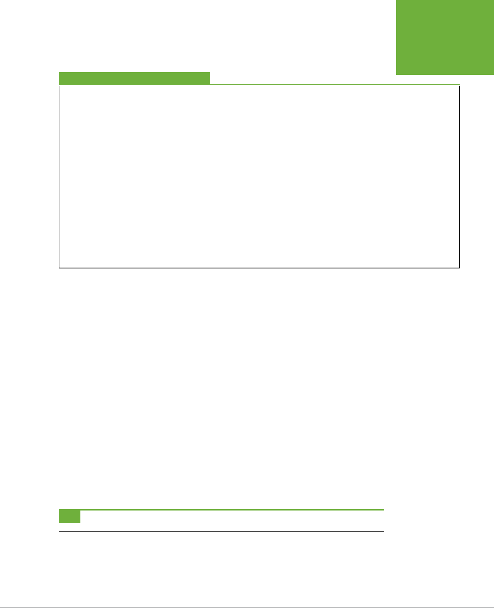
CHAPTER 9: SPRUCING UP YOUR SITE’S NAVIGATION 311
BUILDING
NAVIGATION
BARS
FREQUENTLY ASKED QUESTION
Pop-up Menus
How do I create those cool pop-up menus that display a sub-
menu of links when someone rolls his mouse over a button
?
Navigation bars that have multiple levels of menus that pop
up or slide out are extremely popular. They’re a perfect way
to cram a lot of link options into a compact navigation bar. You
can create them in a couple of ways.
First, there’s the CSS-only approach. You can find a basic
tutorial on the process at
http://line25.com/tutorials/how-
to-create-a-pure-css-dropdown-menu
. For a spiffy CSS
menu that uses CSS transitions to animate the appearance
and disappearance of the drop-down menus, check out
www
.red-team-design.com/css3-animated-dropdown-menu
.
If you’re not the do-it-yourself type, or if you’re just in a hurry,
you can use the free Pure CSS Menu generator—a wizard-like
web page that produces the necessary HTML and CSS for you:
http://purecssmenu.com
.
The one disadvantage to the CSS approach is that the sub-
menus disappear instantly if your visitor’s mouse strays. You
can hope that all your visitors have excellent reflexes, or you
can try a different approach: Use CSS to style the buttons and
JavaScript to control the actions of the submenus. For a very
simple JavaScript menu, try the jQuery Navigation Plug-in at
https://github.com/dansdom/plugins-navigation
.
2. Add display: block to the links.
Links are inline elements, so width values (as well as top and bottom padding
and margins) don’t apply to them. Making a browser display the links as block
elements lets you set an exact width for the button and add a comfortable
amount of white space above and below each link:
ul.nav a { display: block; }
3. Style the links.
Add background colors, borders, and so on.
4. Add a width.
If you want the nav buttons to have identical widths, set a width for the <a> tag.
The exact width you use depends on how much text is in each button. Obviously
for a link like Corporate Philosophy, you need a wider button.
If you want each button to be simply the width of the text inside, don’t set
a width. You can, however, add left and right padding to give the text some
breathing room.
TIP To center the text in the middle of the button, add
text-align: center;
to the links’ style.

CSS3: THE MISSING MANUAL
312
BUILDING
NAVIGATION
BARS
5. Add overflow: hidden to the <ul> tag style.
If it has a border, background color, or image, you should need to “contain the
float”—that is, the floated list items inside the <ul> will appear to pop out of
the bottom of the list (and outside the <ul> tags border or background color).
ul.nav {
overflow: hidden;
}
Here are the styles required to create the navigation bar pictured in Figure 9-7. Notice
that the buttons are the same width, and the button text is centered.
.nav {
margin: 0px;
padding: 0px;
list-style: none;
border-bottom: 3px solid rgb(204,204,204);
overflow: hidden;
}
.nav li {
float: left;
}
.nav a {
width: 12em;
display: block;
border: 3px solid rgb(204,204,204);
border-bottom: none;
border-radius: 5px 5px 0 0 ;
padding: 10px;
margin-right: 5px;
background-color: rgb(95,95,95);
background-image: -webkit-linear-gradient(rgb(175,175,175), rgb(95,95,95));
background-image: -moz-linear-gradient(rgb(175,175,175), rgb(95,95,95));
background-image: -o-linear-gradient(rgb(175,175,175), rgb(95,95,95));
background-image: linear-gradient(rgb(175,175,175), rgb(95,95,95));
text-decoration:none;
color: white;
text-align: center;
font-family: Arial, Helvetice, sans-serif;
font-weight: bold;
}
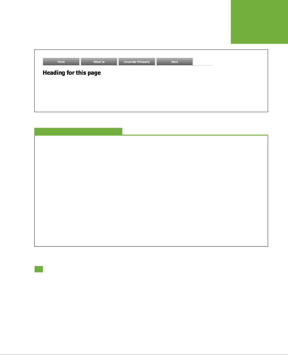
CHAPTER 9: SPRUCING UP YOUR SITE’S NAVIGATION 313
CSS-STYLE
PRELOADING
ROLLOVERS
FIGURE 9-7
Floating list items let
you create equal-width
buttons for a navigation
bar like this one. You can
see the actual CSS that
created this bar on the
facing page.
FREQUENTLY ASKED QUESTION
Where to Get Navigation Bar Help
I’ve never made a nav bar before, but I really want my site to
have one. I just don’t think I can put it all together on my own.
Is there something that walks me through the whole process
for the first time
?
Yes. In fact, there’s a tutorial in this very chapter that shows
you step by step how to create a navigation bar. Just flip to
page 324.
Online, you can find tutorials, plus tools that do some of the
work for you.
For more information on turning ordinary lists into extraordi-
nary navigation elements, visit the step-by-step list tutorial
at:
http://css.maxdesign.com.au/listutorial
.
You can also find loads of cool list-based navigation designs
at
http://css.maxdesign.com.au/listamatic
.
Finally, if you just don’t want to bother creating your own,
then try the List-O-Matic wizard at
www.accessify.com/tools-
and-wizards/developer-tools/list-o-matic
. This site is for
certain information, like fonts and colors, and can create the
CSS you need for list-based navigation. It even lets you create
submenus (a.k.a. drop-down menus).
CSS-Style Preloading Rollovers
In the bad old days, making a graphical link change to another graphic when moused
over required JavaScript. With CSS, you can achieve similar eects with the :hover
pseudo-class and a background image. However, there’s one problem with the CSS
method: Unless your visitor has already downloaded the rollover graphic, there’s a
noticeable delay while the browser sucks down the new graphic and displays it. The
delay happens only the first time the visitor hovers over the link, but still, waiting
for graphics to load is very 20th century.
CSS3: THE MISSING MANUAL
314
CSS-STYLE
PRELOADING
ROLLOVERS
The JavaScript solution can avoid this problem thanks to a technique called
preload-
ing,
which automatically downloads the rollover graphic well before it’s needed. But
CSS doesn’t give you that option, so you need to enlist another clever maneuver
called
CSS Sprites
, which utilizes a single graphic to create dierent states for the
same button.
NOTE CSS Sprites are used widely by companies like Yahoo and Google, not just for rollover effects but also
to optimize the download speed of websites. You can learn more about them at
http://coding.smashingmagazine
.com/2009/04/27/the-mystery-of-CSS-sprites-techniques-tools-and-tutorials/
.
Here’s how to implement the method:
1. In your favorite image-editing program, create one image with dierent
versions of the button.
You might create a regular state, a rollover state, and maybe even a “you are
here” state. Place the images one on top of the other, with the regular link im-
age on top and the rollover image below.
NOTE Fireworks CS6 has a built-in tool for creating CSS sprites. There are also many online tools to help
you create them: SpritePad (
http://spritepad.wearekiss.com
) is one example.
2. Measure the distances from the top of the entire graphic to the top of each
image.
In Figure 9-8 (top), the rollover image’s top edge is 39 pixels from the top of
the graphic.
3. Create a CSS style for the regular link. Include the image in the background
and place it at the left top of the style (Figure 9-8, middle).
Your style may look something like this:
a { background: #E7E7E7 url(images/pixy.png) no-repeat left top; }
4. Create the :hover style.
Here’s the trick: Use the background-position property to shift the graphic
upwards
, so the first image disappears and the rollover image becomes visible
(Figure 9-9, bottom).
a:hover { background-position: 0 -39px; }
Besides preventing the dreaded download delay, this technique helps you keep your
navigation graphics organized in a single file.
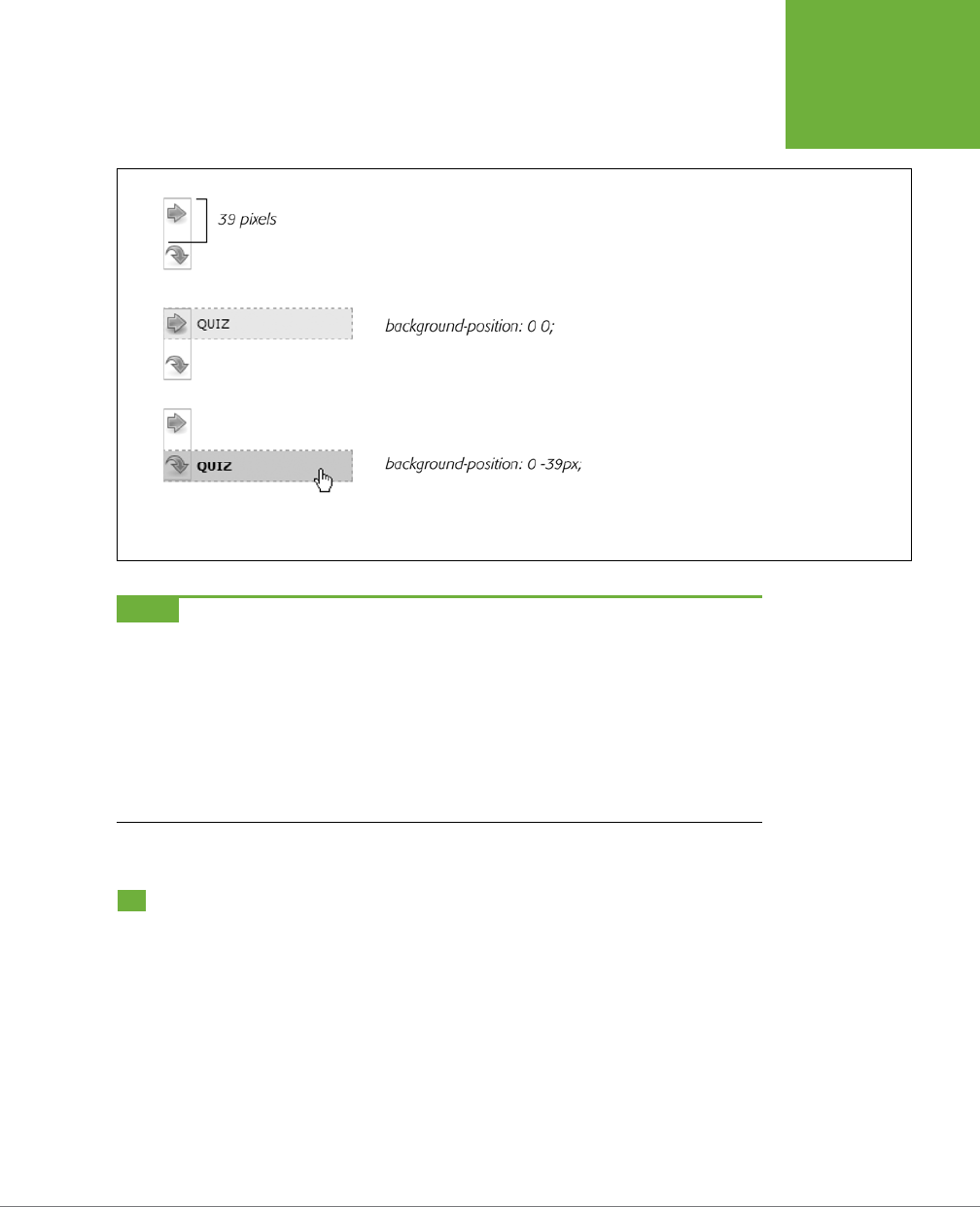
CHAPTER 9: SPRUCING UP YOUR SITE’S NAVIGATION 315
STYLING
PARTICULAR
TYPES OF
LINKS
FIGURE 9-8
Using the CSS Sprites method, you can avoid an an-
noying delay while the browser downloads a rollover
image for the first time. By combining all of the
different link state graphics into a single image, you
can display a different state simply by adjusting the
positioning of the background image.
NOTE Some websites take this technique to the extreme. Yahoo, Amazon, and Google (among many others)
often put together dozens of little images into a single file and display only the portion of the file containing
the desired button. You can see an example from Amazon here:
www.flickr.com/photos/mezzoblue/3217540317
.
Sites with millions of daily viewers benefit from complex sprites, since it’s easier and faster for a web server to
send a single (albeit bigger) image file than dozens of smaller files.
On a more manageable level, the website of one well-known designer uses a single graphic to manage the 15
different buttons on her navigation bar. You can read about her technique at
http://veerle-v2.duoh.com/blog/
comments/the_xhtml_css_template_phase_of_my_new_blog_part_2/
. You can also see this technique in
action in this chapter’s tutorial, in Step 8 on page 320.
Styling Particular Types of Links
Web designers link to all sorts of things: other web pages on their sites, web pages
on other sites, Adobe Acrobat files, Word documents, and zip archive files, to name
a few. To help guide your site’s visitors, you might want to supply clues to let them
know where a link leads before they click it. Advanced selectors are a great way to
do just that.

CSS3: THE MISSING MANUAL
316
STYLING
PARTICULAR
TYPES OF
LINKS
Links to Other Websites
You can easily create a style that identifies links to other websites using an attribute
selector. As you read on page 72, attribute selectors let you style HTML tags that
have a particular attribute—for example, an <img> tag with the alt attribute set to
Our Company
. You can also style tags whose attributes
begin
with certain values.
Any link that points outside your site must be an absolute URL (see the box on page
244), meaning it must begin with
http://
—for example,
http://www.yahoo.com
. So
to create a style that only aects links using an absolute URL, you use this selector:
a[href^='http://']
The
^=
translates to “begins with,” so this selector matches links like <a href="http://
www.google.com/">,
<a href="http://www.sawmac.com/css3/">, and so on.
You could style these any way you’d like, but one common technique is to add a
small image next to the link—an icon indicating an external link. You’ll see this in
action on page 321 of this chapter’s tutorial.
If you happen to use absolute links to point to other pages in
your
site, then you’ll
need to add another style to “turn o” the styling—otherwise, you’ll end up high-
lighting those links as external links, when in reality they’re just links within your site.
This second style just uses a more detailed version of the selector listed above. For
example, if your site is located at
www.mysite.com
, then you can create a selector
that applies to those links like this: a[href^='http://www.mysite.com']. Putting this
all together, if you want to add a globe icon next to external links, but not for links
within your site, you can create these two styles:
a[href^='http://'] {
background: url(images/globe.png) no-repeat center right;
padding-right: 15px;
}
a[href^='http://www.mysite.com'] {
background: none;
padding-right: 0;
}
NOTE If you want to get really fancy with your CSS, you can combine the attribute selector with the CSS3
:not()
selector to create a single style that will affect all absolute URLs
except
ones pointing to your own site:
a[href^='http://']:not(a[href^='http://www.mysite.com'])
This crazy-looking selector translates to “select all links that begin with
http://
, but
not
the ones that begin with
http://www.mysite.com.” The downside of this technique is that Internet Explorer 8 and earlier don’t understand
the
:not()
selector.

CHAPTER 9: SPRUCING UP YOUR SITE’S NAVIGATION 317
STYLING
PARTICULAR
TYPES OF
LINKS
Email Links
Email links are another special kind of link. Normally, email links look just like any
other link—blue and underlined. However, they don’t act like any other link. Click-
ing one launches a visitor’s email program, and some people find starting up a new
program while browsing a website really distracting, so let ’em know it’s for email.
The same basic technique described for external links above applies. Since all email
links begin with mailto:, you can create a selector like the following to create a style
to format just email links:
a[href^='mailto:']
You’ll see an example of this in action in the tutorial on page 321.
Links to Specific Types of Files
Some links point to files, not other web pages. You often see a company’s annual
report online as a downloadable PDF file or a zip archive of files (like the tutorials
for this book) on a website. Links to those types of files usually force the browser
to download the file to the visitor’s computer, or, for PDF files, launch a plug-in that
lets you view the file within the browser. It can be a real drag to click a link, only to
find out that it’s actually started a 100MB download!
You can identify specific file types in much the same way as external links or email
links. But instead of looking for specific information at the beginning of the link’s
URL, you can find it at the end. For example, a link to a PDF document might look
like this <a href="annual_report.pdf">, while a link to a zip archive could look like
this: <a href="tutorials.zip">. In each case, the specific file type is identified by
an extension at the end of the URL—.pdf or .zip.
CSS provides an attribute selector that lets you find attributes that end with specific
information. So to create a style for links to PDF files, use this selector:
a[href$='.pdf']
$= means “ends in,” so this selector means “select all links whose href attribute ends
in .pdf.” You can create similar styles for other types of files as well:
a[href$='.zip'] /* zip archive */
a[href$='.doc'] /* Word document */
You’ll see examples of this technique in the tutorial on page 323.
CSS3: THE MISSING MANUAL
318
TUTORIAL:
STYLING LINKS
Tutorial: Styling Links
In this tutorial, you’ll style links in a variety of ways, like adding rollovers and back-
ground graphics.
To get started, download the tutorial files from this book’s companion website at
www.sawmac.com/css3
. Click the tutorial link and download the files. All the files are
enclosed in a zip archive, so you need to unzip them first. (You’ll find detailed instruc-
tions on the website.) The files for this tutorial are contained inside the
09
folder.
Basic Link Formatting
1. Launch a web browser and open the file
09
→
links
→
links.html
.
This page contains a variety of links (circled in Figure 9-9) that point to other
pages on the site, links to pages on other websites, and an email address. Start
by changing the color of the links on this page.
2. Open
links.html
in a text editor and place your cursor between the opening
and closing <style> tags.
The page already has an external style sheet attached to it with some basic
formatting, plus the <style> tags for an internal style sheet.
NOTE As you’ve done before, you’ll put the styles for this exercise into an internal style sheet for easy
coding and previewing. When done, it’s best to move the styles to an external style sheet.
3. Add a new style to the internal style sheet:
<style>
a {
color: #207EBF;
}
</style>
This style is about as generic as it gets. It will apply to all <a> tag on the page.
It’s a good place to start, since it sets up the overall look of links for the page.
You’ll add more styles that will let you pinpoint links in specific areas of the
page. Now, time to remove that boring old underline beneath the link.
4. Add text-decoration: none; to the style you just created.
This removes the underline, but also makes the link less visible on the page.
Remember: you should always do something to make links stand out and seem
clickable to your site’s visitors.
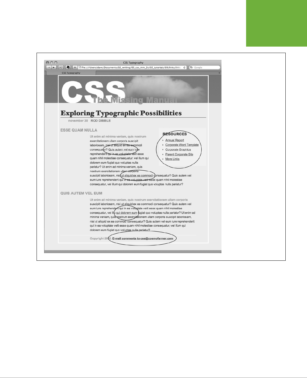
CHAPTER 9: SPRUCING UP YOUR SITE’S NAVIGATION 319
TUTORIAL:
STYLING LINKS
FIGURE 9-9
Here’s a basic web page with
links in their standard browser
configuration—underlined and
blue (or purple, if they’re links
to previously visited pages).
In this case, some links point
to other pages on the site,
some point to other sites, and
one is an email address. In
this tutorial, you’ll style each
of these links differently.
5. Add font-weight: bold; to the a style.
Now links appear in bold (other text may appear bold, too). Next you’ll replace
the underline, but you’ll do it a bit more creatively, using a border instead of
the text-decoration property.
6. Add a border declaration to the style, so it looks like this:
a {
color: #207EBF;
text-decoration: none;
font-weight: bold;
border-bottom: 2px solid #F60;
}
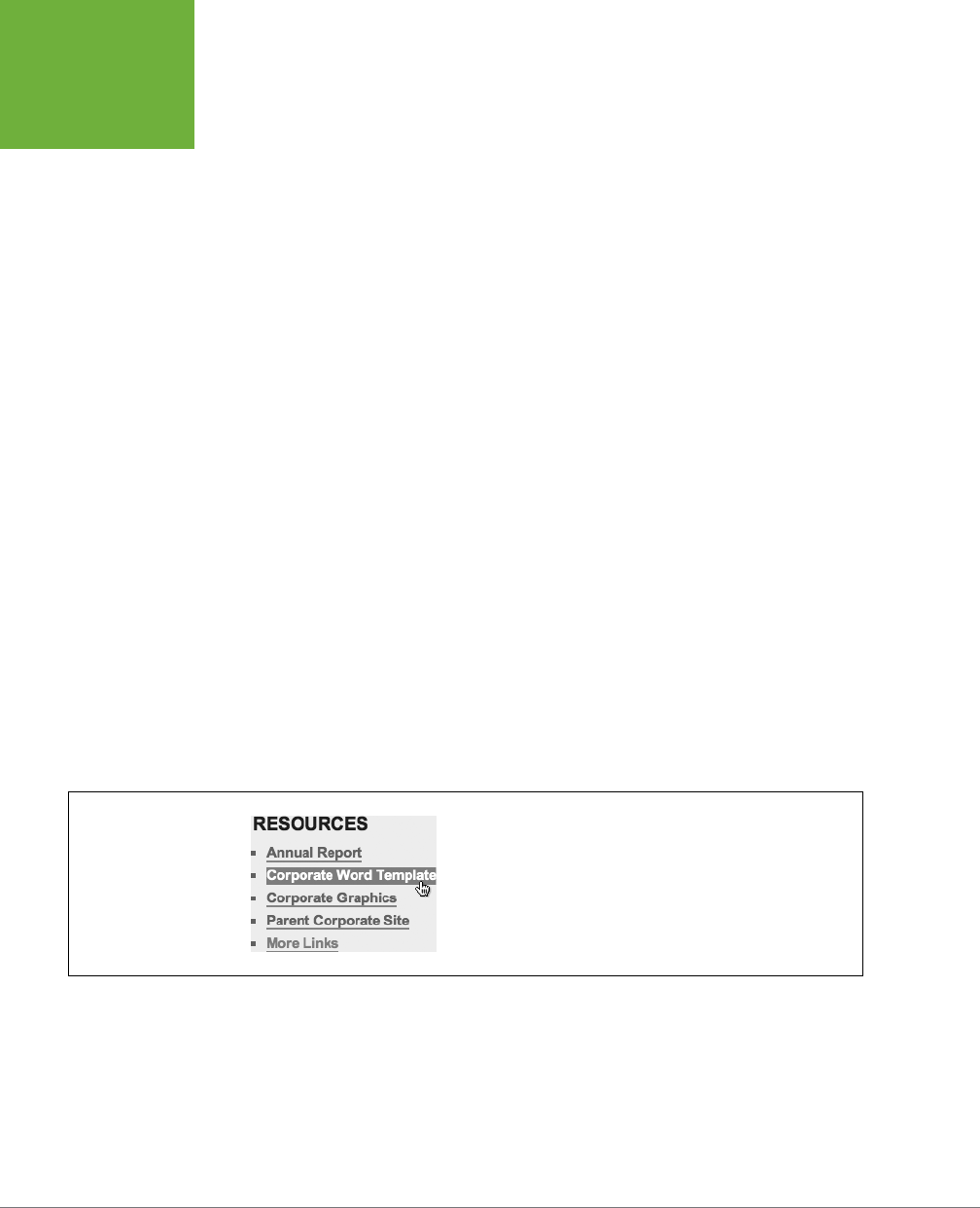
CSS3: THE MISSING MANUAL
320
TUTORIAL:
STYLING LINKS
The links really stand out, and using a border instead of the normal underline
applied to links lets you change the line’s color, size, and style (Figure 9-11, left).
Now you’ll change the look of visited links.
7. Add a :visited pseudo-class style for visited links:
a:visited {
color: #6E97BF;
}
This style changes the look of visited links to a lighter, grayer shade of the main
link color—a subtle way to draw attention away from an already visited page.
If you preview the page, click one of the links (try one in the middle part of the
page) and then return to the
links.html
page. You should see the link get lighter
in color. You’ll also notice that it stays bold and continues to have the orange
underline you assigned to the a style in Step 6. That’s the cascade in action
(Chapter 5)—the a:visited style is more specific than a plain a selector, so its
color property overrides the color assigned by the a style.
Time to take it a step further by adding a rollover eect, so the link’s background
changes color when the mouse moves over it.
8. Add a :hover pseudo-class style to the style sheet:
a:hover {
color: #FFF;
background-color: #6E97BF;
border-bottom-color: #6E97BF;
}
This pseudo-class applies only when the mouse is over the link. The interactive
quality of rollovers lets visitors know the link does something (Figure 9-10).
FIGURE 9-10
With a couple of styles, you can change the look of any link. With the
:hover
pseudo-class, you can even switch to a different style when
the mouse moves over the link.

CHAPTER 9: SPRUCING UP YOUR SITE’S NAVIGATION 321
TUTORIAL:
STYLING LINKS
Adding a Background Image to a Link
The email link at the bottom of the page looks no dierent than the other links on
the page (Figure 9-11, top). You have other plans for that mailto link, however. Since
it points to an email address, clicking it doesn’t take a visitor to another page, but
instead launches an email program. To provide a visual cue emphasizing this point,
you’ll add a cute little email icon.
1. Add a descendent selector to the internal style sheet of the
links.html
file:
a[href^="
mailto:
"] {
color: #666666;
border: none;
background: url(images/email.gif) no-repeat left center;
}
This is an advanced attribute selector, which selects any links that begin with
mailto,: (in other words, it selects email links). The border: none setting re-
moves the underline defined by the a style you created in Step 6—you’re going
for a subtle look here. The background property adds an image on the left edge
of the link. Finally, the no-repeat value forces the graphic to appear just a single
time. Trouble is, the graphic lies directly underneath the link, so it’s hard to read
the text (circled in the middle image in Figure 9-11).
2. Add 20 pixels of left padding to the
attribute
style you just created:
padding-left: 20px;
Remember that padding adjusts the space between content and its border.
So adding some left padding moves the text over 20 pixels but leaves the
background in place. One last touch: move the entire link a little away from the
copyright notice.
3. Add 10 pixels of left margin to the style, so it finally ends up like this:
a[href^=
"
mailto:"] {
color: #666666;
border: none;
background: url(images/email.gif) no-repeat left center;
padding-left: 20px;
margin-left: 10px;
}
This small visual adjustment makes it clear that the icon is related to the link
and not part of the copyright notice (Figure 9-11, bottom).
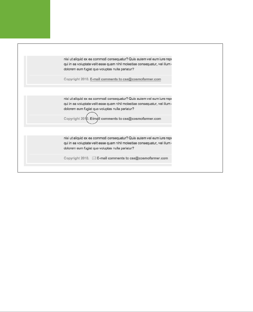
CSS3: THE MISSING MANUAL
322
TUTORIAL:
STYLING LINKS
FIGURE 9-11
Just a few subtle touches can
help make a link’s purpose
obvious. In this case, a plain
link (top) becomes clearly
identifiable as an email link
(bottom).
Highlighting Dierent Links
At times you may want to indicate that a link points to another website. In this way,
you can give your visitors a visual clue that there’s additional information elsewhere
on the Internet or warn them that they’ll exit your site if they click the link. Also, you
may want to identify links that point to downloadable files or other non-web-page
documents.
On the web page you’re working on, the right-hand “Resources” sidebar contains
dierent types of links that you’ll highlight with icons—a dierent icon for each type
of link. First, you’ll set up a basic style that applies to all of those links.
1. Add this style to the
links.html
internal style sheet:
.resources a {
border-bottom: none;
}
Since all of the links you want to format are inside a <div> with the class re-
sources, the descendent selector .resources a targets just those links. This
style gets rid of the underline that the generic link style added.

CHAPTER 9: SPRUCING UP YOUR SITE’S NAVIGATION 323
TUTORIAL:
STYLING LINKS
Next, you’ll add an icon next to external links.
2. Add another style at the end of the
links.html
internal style sheet:
.resources a[href^='http://'] {
background: url(images/globe.png) no-repeat right top;
}
This is a descendent selector style that uses the advanced attribute selector
discussed on page 317. Basically, it targets any link that begins with
http://
(but
only those that are also inside the element with the class
resources). As with
the email link style you created earlier, this style adds a background image. It
places the image at the right side of the link.
However, this style has a similar problem as the email link style—the image sits
underneath the link’s text. Fortunately, the solution is the same—just add some
padding to move the image out of the way of the text. In this case, though,
instead of adding left padding, you’ll add right padding (since the icon appears
on the right side of the link). In addition, since every link in the resources box
will have a similarly sized icon, you can save some code by adding the padding
to the .resources a style you created in Step 1.
3. Edit the .resources a style so that it looks like this:
.resources a {
border-bottom: none;
padding-right: 22px;
}
If you save the page and preview it in a web browser, you’ll see small globe icons
to the right of the bottom two links in the sidebar. Time to format the other links.
4. Add three more styles to the internal style sheet:
.resources a[href$='.pdf'] {
background: url(images/acrobat.png) no-repeat right top;
}
.resources a[href$='.zip'] {
background: url(images/zip.png) no-repeat right top;
}
.resources a[href$='.doc'] {
background: url(images/word.png) no-repeat right top;
}
These three styles look at how the href attribute ends; identifies links to either
Adobe Acrobat files (.pdf), zip archives (.zip), or Word documents (.doc); and
assigns a dierent icon in each case.
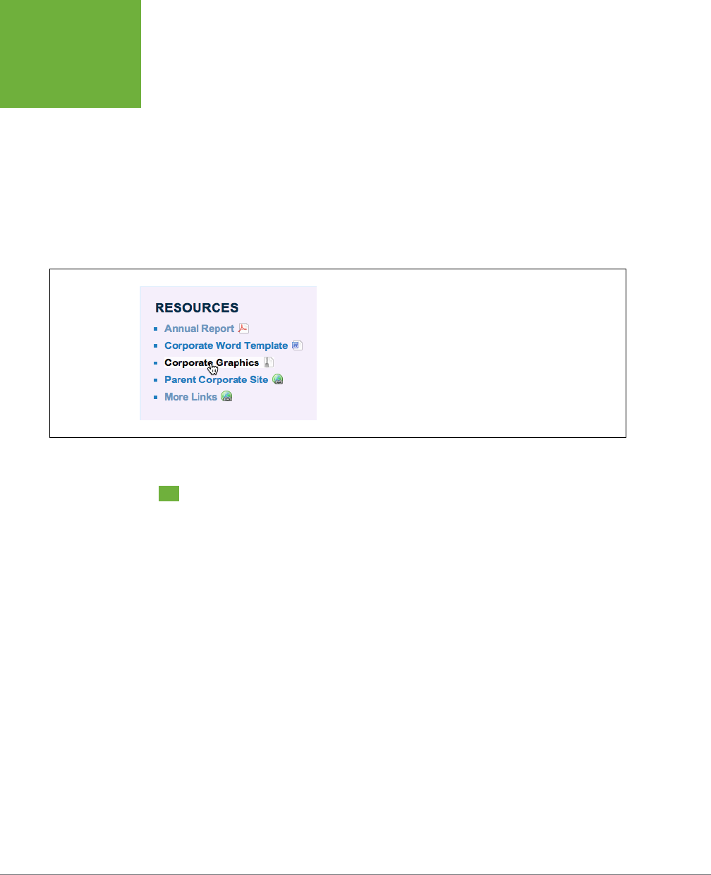
CSS3: THE MISSING MANUAL
324
TUTORIAL:
CREATING A
NAVIGATION
BAR
5. Finally, add a hover state for the resources links:
.resources a:hover {
color: #000;
background-color: rgba(255,255,255,.8);
}
This style both changes the color of the text and adds a background color (see
Figure 9-12).
You can find a finished version of this tutorial in the
09_finished/links/links
.html
file.
FIGURE 9-12
Using advanced attribute selectors, you can easily identify and style
different types of links—external links, links to PDF files, Word docs,
and zip files.
Tutorial: Creating a Navigation Bar
In this exercise, you’ll turn a plain old list of links into a spectacular navigation bar,
complete with rollover eects and a “You are here” button eect.
1. In a text editor, open
09
→
nav_bar
→
nav_bar.html
.
As you can see, there’s not much to this file yet. There’s an internal style sheet
with the basic reset styles discussed on page 115, and one rule setting up some
basic properties for the <body> tag. The HTML consists of an unordered list with
six links. It looks like example #1 in Figure 9-13. Your first step is to add some
HTML so you can target your CSS to format the links in this list.
2. Locate the opening <ul> tag and add class="mainNav" to it, so it looks like
this:
<ul class="mainNav">
The class attribute identifies this list as the main navigation area. Use this class
to build descendent selectors to format only these links—and not just any old
link on the page.
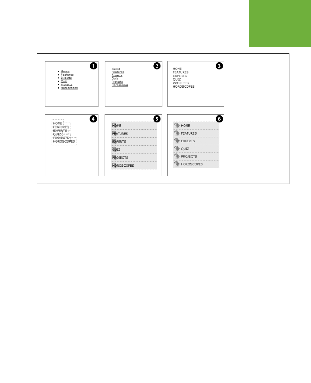
CHAPTER 9: SPRUCING UP YOUR SITE’S NAVIGATION 325
TUTORIAL:
CREATING A
NAVIGATION
BAR
FIGURE 9-13
While it may feel like a lot of
steps, transforming a plain
unordered list of links into a
sophisticated navigation bar
requires only a few styles.
3. Below the body style in the internal style sheet, add a new style:
.mainNav {
margin: 0;
padding: 0;
list-style: none;
}
This style applies only to a tag with an class of mainNav—in this case, the <ul>
tag. It removes the indent and bullets that browsers apply to unordered lists,
as shown in #2 in Figure 9-13. Next, you’ll start formatting the links.
4. Add a descendent selector to format the links in the list:
.mainNav a {
color: #000;
font-size: 11px;
text-transform: uppercase;
text-decoration: none;
}
This style defines the basic text formatting for the links. It sets the color and
font size, makes all letters uppercase, and removes the line usually found un-
derneath links (#3 in Figure 9-13). Now start making the links look like buttons.

CSS3: THE MISSING MANUAL
326
TUTORIAL:
CREATING A
NAVIGATION
BAR
5. To the .mainNav a style, add the following border and padding properties:
border: 1px dashed #999;
padding: 7px 5px;
If you preview the file now, you’ll see a few problems (#4 in Figure 9-13): The
borders overlap and the boxes aren’t the same width. That’s because the <a>
tag is an inline element, so the width of the box is just as wide as the text in the
link. In addition, top and bottom padding don’t add any height to inline boxes,
so the borders overlap. (See page 200 for a discussion of inline boxes.) You can
fix these problems by changing how a browser displays these links.
6. Add display: block; to the .mainNav a style.
You’ve changed the basic display of the <a> tag so it acts like a paragraph or
other block-level element, with the links neatly stacked one on top of the other.
The only problem now is that they also extend the full length of the browser
window—a little too wide for a button. You can fix this by constraining the width
of the <ul> tag’s style.
7. In the internal style sheet, locate the .mainNav style and add width: 175px;
to it:
.mainNav {
margin: 0;
padding: 0;
list-style: none;
width: 175px;
}
With the list’s width now set to 175 pixels, the links still expand, but they’re limited
to the width of their container (the <ul> tag). In many cases, you’ll have a list of
links inside some layout element (like a sidebar) that already has a set width, so
you’ll be able to skip this step. (You’ll learn how to add sidebars in Part Three.)
Now for the fun part.
8. Add background properties to the .mainNav a style, like so:
.mainNav a {
color: #000;
font-size: 11px;
text-transform: uppercase;
text-decoration: none;
border: 1px dashed #999;
padding: 7px 5px;
display: block;
background-color: #E7E7E7;
background-image: url(images/nav.png);
background-repeat: no-repeat;
background-position: 0 2px;
}

CHAPTER 9: SPRUCING UP YOUR SITE’S NAVIGATION 327
TUTORIAL:
CREATING A
NAVIGATION
BAR
These lines add a gray background color to the links and a non-repeating im-
age at the left edge of each button (#5 in Figure 9-13). You still have a couple
of things to fix: The link text overlaps the icon, and the border between each
button is 2 pixels thick. (Technically, the borders are still just 1 pixel thick, but
the bottom and top borders of adjoining links are creating a 2-pixel line.)
TIP Using the
background
shorthand property, you can write the code in Step 8 like this:
background:
#E7E7E7 url(images/nav.png) no-repeat 0 2px;
.
9. Remove the bottom border and adjust the padding for the .mainNav a style,
so it looks like this:
.mainNav a {
color: #000;
font-size: 11px;
text-transform: uppercase;
text-decoration: none;
border: 1px dashed #999;
border-bottom: none;
padding: 7px 5px 7px 30px;
display: block;
background-color: #E7E7E7;
background-image: url(images/nav.png);
background-repeat: no-repeat;
background-position: 0 2px;
}
The text of each link sits clear of the icon and the borders look great…except for
one thing. The last link’s bottom border is now gone. (Sometimes CSS feels like
two steps forward, one step back!) But you have a few ways to fix this snafu. One
way is to create a class style with the proper border-bottom setting and then
apply it to just that last link. But it would be easier to apply a bottom border to
the <ul> tag containing the list of links. (Since there’s no padding on that tag,
there’s no space separating the top of the <ul> from the top of that first link.)
10. Add a bottom border to the .mainNav style so that it looks like this:
.mainNav {
margin: 0;
padding: 0;
list-style: none;
width: 175px;
border-bottom: 1px dashed #999;
}
There you have it: A basic navigation bar using borders, padding, background
color, and images (#6 in Figure 9-13).
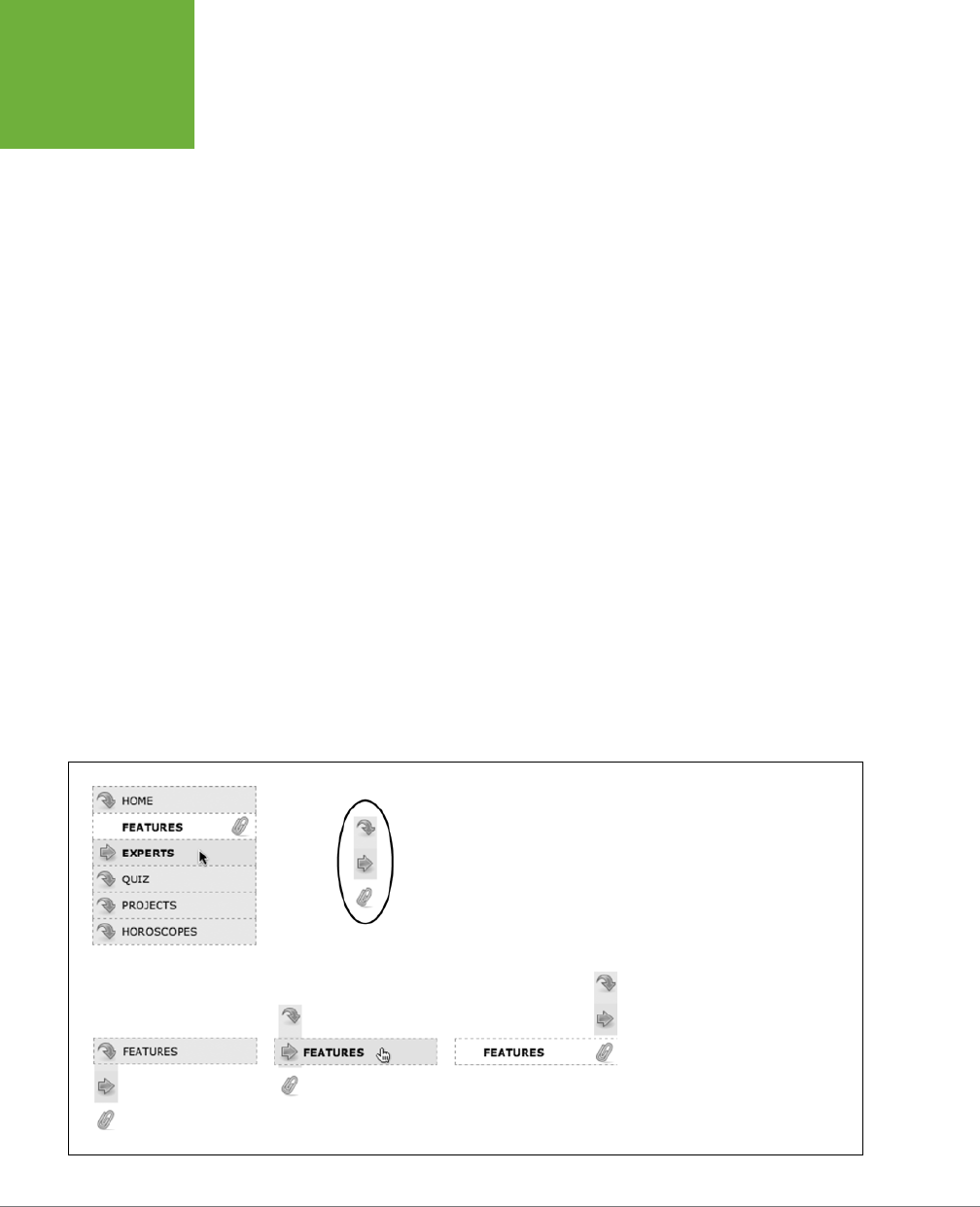
CSS3: THE MISSING MANUAL
328
TUTORIAL:
CREATING A
NAVIGATION
BAR
Adding Rollovers and Creating “You Are Here” Links
Now it’s time to add some interactive and advanced features to this nav bar. First,
you’ll add a rollover eect to the buttons in your main navigation bar. That way, the
buttons change to show your visitor which button she’s about to click.
It’s also considerate to let your visitor know which page of your site she’s on. Us-
ing the same HTML nav bar you already have, you can make this bit of interactivity
happen automatically. You simply make the button’s format change to match the
page’s section. Sounds simple, but it does require a little planning and setup, as
you’ll see in the following steps.
The rollover eect is easy, so get that out of the way first:
1. In the
nav_bar.html
file, add the following style to the end of the style sheet:
.mainNav a:hover {
font-weight: bold;
background-color: #B2F511;
background-position: 3px 50%;
}
This style sets the button’s hover state. It makes the text inside the button bold,
and changes the background color to a vibrant green. In addition, it uses the
CSS Sprites technique discussed on page 314. The same image is used as in Step
8 on page 326—however, that image actually holds three dierent icons (see
Figure 9-14). In this case, the image is centered within the button, displaying
the middle icon in the file.
Now, moving the mouse over any of the buttons instantly changes its look.
(Open the page in your web browser and try it yourself.)
FIGURE 9-14
With some basic CSS, it’s easy to
create interactive rollover effects for
navigation buttons. You can even
automatically highlight the section of
the site in which the current page is
located. To speed up the download of
your navigation bar graphics, you can
use the CSS Sprites method described
on page 314. Basically, you use one
image (circled at top right) and adjust
its position for different states of each
button (bottom row).

CHAPTER 9: SPRUCING UP YOUR SITE’S NAVIGATION 329
TUTORIAL:
CREATING A
NAVIGATION
BAR
Next, make your navigation bar more informative by highlighting the button
that matches the section in which the page is located. To do so, you need to
identify two things in the nav bar’s HTML: the section a page belongs to and
the section each link points to. For this example, assume that the page you’re
working on is the home page.
NOTE Alternatively, you can create a class style that changes the appearance of a link and apply it to the
link representing the page’s section. For a horoscope page, you’d apply the class to the Horoscope link in the nav
bar:
<a href="/horoscopes/" class="current">Horoscopes</a>
.
2. Locate the <body> tag, and then add class="home", like so:
<body class="home">
Now that you know what section this page belongs to, you can use a descendent
selector to create special CSS rules that apply only to tags on pages within the
Features section. Next, you need to identify the section each link applies to,
which you accomplish by adding some classes to those links.
3. In the nav bar’s HTML code, locate the Home link, and then add class=
"homeLink" so the tag looks like this:
<a href="/index.html" class="homeLink">Home</a>
This class identifies this link, providing the information you need to create a
style that applies only to that link.
You need to add a class to the other links in the navigation bar as well.
4. Repeat Step 3 for each of the other links using the following classes:
featureLink, expertLink, quizLink, projectLink, and horoscopeLink.
You’re done with the HTML part of this exercise. Now it’s time to create some
CSS. Because you’ve provided classes to identify the dierent links, it’s easy to
create a descendent selector to highlight the Features link.
5. Add another style to the page’s style sheet:
.home .homeLink {
background-color: #FFFFFF;
background-position: 97% 100%;
padding-right: 15px;
padding-left: 30px;
font-weight: bold;
}
You’ve seen all these properties before. Again, you’re using the CSS Sprites
method to adjust the position of the background image. This time, the image is
moved over to the right 97 percent (that is, the point 97 percent across the image
is matched up with the point 97 percent across the button), and the bottom of
the image is placed at the bottom of the button. In other words, it displays the
CSS3: THE MISSING MANUAL
330
TUTORIAL:
CREATING A
NAVIGATION
BAR
icon at the bottom of the image (see Figure 9-14). See page 249 for a discussion
of how percentage values work with background-images.
The most interesting part is the selector—.home .homeLink. It’s a very specific
selector that applies only to a link with a class of homeLink that’s
also
inside a
<body> tag with a class of home. If you change the class of the page to quiz, for
example, the link to the Home page is no longer highlighted.
Preview the page in a browser to see the eect: The Home link now has a white
background and a paperclip icon. To make this work for the other links, you
need to expand this selector a little…OK, make that a
lot
.
6. Edit the selector for the style you just added, like so:
.home .homeLink,
.feature .featureLink,
.expert .experLink,
.quiz .quizLink,
.project .projectLink,
.horoscope .horoscopeLink
{
background-color: #FFFFFF;
background-position: 97% 100%;
padding-right: 15px;
padding-left: 30px;
font-weight: bold;
}
Yes, that’s a lot of CSS. But your setup work here has a big payo. This style
now applies to every link in the nav bar, but only under certain conditions, which
is exactly how you want it to behave. When you change the class attribute of
the <body> tag to quiz, the link to the Quiz gets highlighted instead of the link
to the Features section. Time to take your work for a test drive.
NOTE This long-winded selector is an example of the group selector discussed on page 62.
7. Change the class attribute of the <body> tag to feature like this:
<body class="feature">
Preview the page, and wham! The Feature link is now highlighted with a white
background and a paperclip icon (Figure 9-14). The secret at this point is to just
change the class in the <body> tag to indicate which section of the site a page
belongs to. For a horoscope page, change the class to class="horoscope" in
the <body> tag.

CHAPTER 9: SPRUCING UP YOUR SITE’S NAVIGATION 331
TUTORIAL:
CREATING A
NAVIGATION
BAR
NOTE Ready to take this design further? Try adding a rollover effect to complement the style you created
in Step 6. (Hint: Use the
:hover
pseudo-class as part of the selector like this:
.quiz .quizLink:hover
.)
Also try adding a different graphic for the Home link. (You have a
home.png
file in the images folder to use.)
To see the completed version of this navigation bar, see the file
09_finished
→
nav_
bar
→
nav_bar_vertical.html
.
From Vertical to Horizontal
Suppose you want a horizontal navigation bar that sits at the top of the page. No
problem—you did most of the hard work in the last part of this tutorial. Just modify
that page a little to spread the buttons along a single line. (You’ll use the
nav_bar
.html
file you just completed, so if you want to keep the vertical nav bar, then save
a copy of the file before proceeding.)
1. Make sure you’ve completed all the steps above to create the vertical navi-
gation bar, and have the file
nav_bar.html
open in your text editor.
Now you’ll see how easy it is to change the orientation of a navigation bar. Start
by cleaning up some of the work you already did. You need to remove the width
you set for the <ul> tag in Step 7 on page 326. That width prevented the nav
buttons from spanning the entire length of the page. But since the <ul> needs to
spread out much wider to contain the side-by-side buttons, this width has to go.
2. Find the .mainNav style, and then remove the width: 175px; declaration.
And now it’s time for the big secret of vertical nav bars—placing the buttons
side by side.
3. Add a new style to your style sheet (directly below the .mainNav style is a
good spot):
.mainNav li {
float: left;
width: 12em;
}
This style applies to the <li> tag (the list items that hold each link). The first
declaration floats the tag to the left. In this way, each <li> tag attempts to wrap
around to the right side of the previous <li> tag. Also, setting the width of the
<li> tag defines the width of each button. Here, a value of 12 ems provides
enough space to contain the longest link name—Horoscopes. When you’re
working with longer links, you need to increase this value.
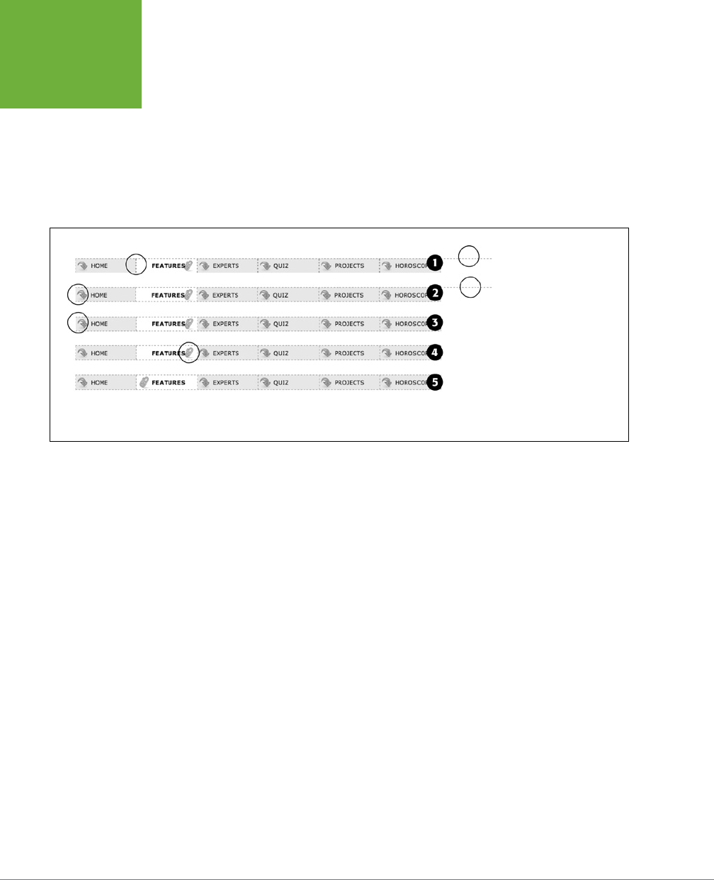
CSS3: THE MISSING MANUAL
332
TUTORIAL:
CREATING A
NAVIGATION
BAR
If you preview the page now, you’ll see the basics are complete. All that’s left
are some cosmetic enhancements (see the circled areas of #1 in Figure 9-15).
First, the bottom border you created in Step 10 on page 327 runs the entire
length of the <ul> tag—wider than the navigation buttons themselves. Even
stranger, that bottom border is no longer on the bottom—it’s on top of the
navigation buttons! In addition, since the buttons sit side by side, their left and
right borders combine to make a 2-pixel border between each button. You’ll
fix that problem now.
FIGURE 9-15
Changing a vertical stack
of navigation buttons into
the much shorter, side-by-
side format of a horizontal
navigation bar only takes
a couple of steps. Most of
your effort involves tweak-
ing styles for cosmetic
considerations such as
borders and background
image placement.
4. In the .mainNav a style, change border-bottom: none; to border-left: none;.
This change removes the left border so that the borders don’t double up between
buttons and at the same time adds a border to the bottom of each button. But
that <ul> tag’s bottom border is still on top of the buttons, and now the nav
bar is missing a border on the far-left button (see circled areas of #2 in Figure
9-15). No problem—just change the border on the <ul> tag.
5. Locate the .mainNav style and change border-bottom: 1px dashed #999999;
to border-left: 1px dashed #999999;.
If you preview the page now, you’ll see that the border above the buttons is
gone, but there’s still no left border (#3 in Figure 9-15). You’re witnessing one
of the complications of using floats. That is, floating the list items removes them
from the normal flow of the document, so web browsers no longer see them as
part of the <ul> tag, and the <ul> tag shrinks down to nearly no height—that’s
the reason the ul’s bottom border appeared on top as well. (If this whole sce-
nario sounds confusing, it is. That’s why there’s an entire section of Chapter 13
dedicated to dealing with the issue—see page 425 for the details.)

CHAPTER 9: SPRUCING UP YOUR SITE’S NAVIGATION 333
TUTORIAL:
CREATING A
NAVIGATION
BAR
Fortunately, while the problem is complex, the solution is simple. Add one CSS
property to the bulleted list.
6. Add one more property to the end of the .mainNav style (changes are in bold):
.mainNav {
margin: 0;
padding: 0;
list-style: none;
border-left: 1px dashed #999999;
overflow: hidden;
}
The overflow: hidden forces the unordered list to expand. Why does this
property work? See the detailed coverage on page 222. Finally, that paperclip
aligned to the right edge of the “You are here” button looks funny (#4 in Figure
9-15). You’ll switch its position to the left edge of the button.
7. Locate the “You are here” style you created in Step 6 on page 330. (It’s the
one with the crazy, long-winded selector.) Change its background position from
97% 100% to 3px 100%. The style should now look like this:
.home .homeLink,
.feature .featureLink,
.expert .experLink,
.quiz .quizLink,
.project .projectLink,
.horoscope .horoscopeLink
{
background-color: #FFFFFF;
background-position: 3px 100%;
padding-right: 15px;
padding-left: 30px;
font-weight: bold;
}
Preview the page, and you’ll find a fully functional horizontal navigation bar
(#5 in Figure 9-15).
To see the finished version, open the file
09_finished
→
nav_bar
→
nav_ bar_
horizontal.html
.
NOTE You may want to center the text inside each button. If so, you need to do two things: Add
text-
align: center;
to the
.mainNav a
style and adjust that style’s
left-padding
until the text looks
absolutely centered.

335
CHAPTER
10
For the short history of the web, designers have had few options for adding
animation to their websites. The humble, goofy-looking animated GIF provides
basic animation within an image. Adobe’s Flash program lets you create complex
animations, and even games and web applications, but its learning curve is steep, and
it can’t interact with the other HTML on your page, like the images, headlines, and
paragraphs that make up most web content. JavaScript lets you animate anything
on a web page, but at the cost of learning a full-fledged programming language.
Fortunately, CSS3 provides a way to move, transform, and animate any HTML ele-
ment on a page, without resorting to any of those other technologies.
Transforms
CSS3 introduces several properties that transform a web page element, by either
rotating it, scaling it, moving it, or distorting it along its horizontal and vertical
axes (a process called
skewing
). You can use a transform, for example, to provide
a slight tilt (rotation) to a navigation bar, or make an image get twice as big when
a visitor mouses over it. You can even combine multiple transformations for some
wild visual eects.
The basic CSS property to achieve any of these changes is the CSS transform prop-
erty. You use this property by supplying the type of transformation you want and a
value indicating how much to transform the element. For example, to rotate an ele-
ment, you supply the keyword rotate, followed by the number of degrees to turn it:
transform: rotate(10deg);
CSS Transforms,
Transitions, and
Animations
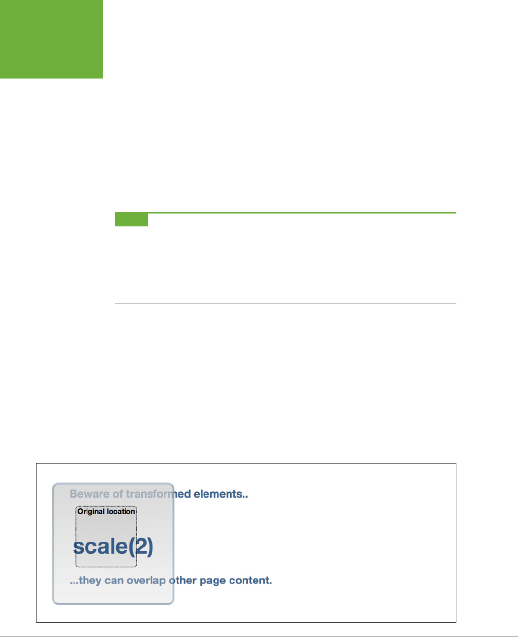
CSS3: THE MISSING MANUAL
336
TRANSFORMS
The above declaration rotates the element 10 degrees clockwise.
CSS transforms are relatively new and, for that reason, aren’t supported in all
browsers. While Internet Explorer 9, Safari, Chrome, Firefox, and Opera support
2D transforms, Internet Explorer 8 and earlier don’t. What’s more, you need to use
vendor prefixes for all current browsers. So, to get the above code working, you
need to rewrite it like this:
-webkit-transform: rotate(10deg);
-moz-transform: rotate(10deg);
-o-transform: rotate(10deg);
-ms-transform: rotate(10deg);
transform: rotate(10deg);
NOTE Earlier in this book, you’ve seen other CSS3 properties that require vendor prefixes (
-webkit-
linear-gradient
), for example. Thus far, you haven’t encountered the -ms- prefix, which stands for
Microsoft and is aimed at Internet Explorer. Internet Explorer 9 doesn’t understand a lot of CSS3 properties, so
you don’t usually need vendor prefixes for that browser. Internet Explorer 10 (which may be available when you
read this) isn’t going to use vendor prefixes for most of the CSS3 properties discussed in this book. However, IE
9
does
understand the
transform
property, so you need to use the
-ms-transform
property to get any
transformation to work in that browser.
One strange feature of CSS transforms is that they don’t aect other elements around
them. In other words, if you rotate an element 45 degrees, it may actually overlap
elements above, below, or to the side. Web browsers actually start by setting aside
the space the element would normally take up (before the transformation), and then
they transform the element (rotate it, enlarge it, move it, or skew it). This process
is readily apparent when you increase the size of an element by using a transform
scale function (page 338). If you increase an element’s size two times, the browser
enlarges the transformed element but doesn’t move any of the surrounding content
out of the way, usually causing parts of the page to overlap (Figure 10-1). In other
words, the web browser preserves all the other parts of the page just as they would
appear if the element wasn’t enlarged.
FIGURE 10-1
Get out of my way…or not. Transformed elements are
pretty much ignored by other elements around them.
Enlarging the
<div>
here (the big square) simply
makes it overlap the headline above and below it. The
box in the middle, with the dotted outline, represents
the div before it was scaled up by two.
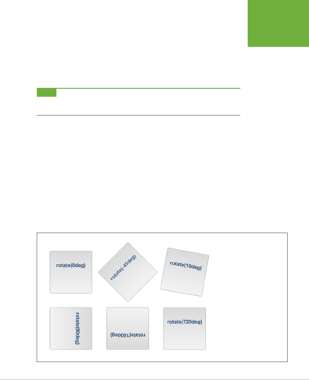
CHAPTER 10: CSS TRANSFORMS, TRANSITIONS, AND ANIMATIONS 337
TRANSFORMS
Rotate
The transform property’s rotate function is easy to understand: you give it a degree
value from 0 to 360, and the browser rotates that element the specified number of
degrees around a circle (see Figure 10-2). To specify a degree value, use a number
followed by deg. For example, to rotate an element 180 degrees, add this declaration:
transform: rotate(180deg);
NOTE To save space, these examples don’t include all the vendor-prefixes here, but when you put this code
into a style sheet, you need to add the
-webkit-transform
,
-moz-transform
,
-o-transform
, and
-ms-transform
properties as well.
You can even use negative numbers to rotate the element counter-clockwise. For
example, the element in the top middle of Figure 10-2 is rotated 45 degrees counter-
clockwise like this:
transform: rotate(-45deg);
The value 0deg provides no rotation, while 360deg is one complete rotation, and
720deg is two complete rotations. Of course, looking at an element that’s been rotated
once, twice, or three times will look just like an element that hasn’t been rotated at
all (top-left and bottom-right in Figure 10-2), so you’re probably wondering why’d
you ever use a value of 360 or higher. CSS3 provides a mechanism for animating
changes in CSS properties. So, for example, you can make a button spin around
four times when a visitor mouses over it by starting with an initial rotation of 0deg
and adding a :hover style for that button that has a rotation of 1440deg. You’ll learn
how to do this on page 339.
FIGURE 10-2
Turn your page on its head. With
the
rotate
function you can make
any page element—div, button,
banner, photo, or footer—rotate ever
so slightly or completely wildly. As
always, keep your audience in mind
and make sure your page is still
legible whenever you apply any type
of CSS transform.
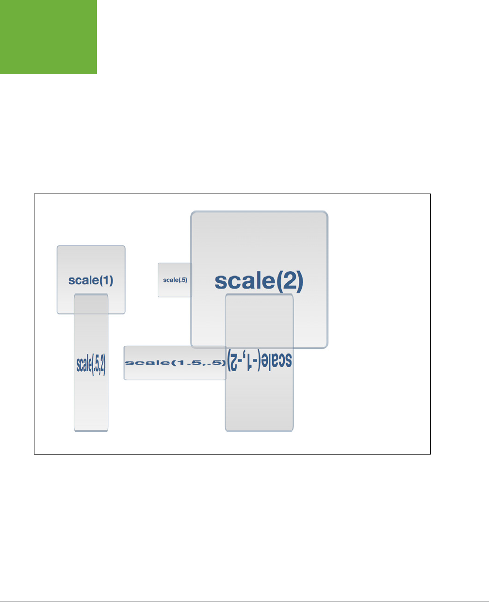
CSS3: THE MISSING MANUAL
338
TRANSFORMS
Scale
You can also resize an element, making it bigger or smaller using the scale func-
tion (see Figure 10-3). For example, to make an element twice as big, you add this
declaration:
transform: scale(2);
The number you supply inside the parentheses is a scaling factor—a number that’s
multiplied by the element’s current size. For example, 1 is no scaling, .5 is half the
current size, while 4 is four times the current size. In other words, a number between
0 and 1 shrinks an element, while a number larger than 1 makes it bigger (a value of
0 actually renders the element invisible on the page).
FIGURE 10-3
Use the
scale
function
to increase the size of any
page element. Mind you,
when you enlarge an ele-
ment, the browser doesn’t
move other elements on
the page out of the way. In
fact, whenever you scale
up an element, it will most
likely overlap other items
(the box in the top right,
for example). You can read
more about how browsers
display transformed
elements along with other
page content on page 335.
The element and everything inside it is scaled by this number. For example, if you
scale a <div> tag up by a factor of two, not only would that div be twice as wide and
tall, but also the text inside would be twice as big, as would any images inside it.
Of course, you may be wondering why you’d ever use this. After all, you could just
as easily increase or decrease the width and height of the element, using the CSS
width and height properties, and you can scale text size up or down using the font-
size property. The most common use for scale is to make a visual change to an
element dynamically on the page. For example, mousing over a button may make
that button momentarily bigger. You could achieve this eect with the :hover state.
CHAPTER 10: CSS TRANSFORMS, TRANSITIONS, AND ANIMATIONS 339
TRANSFORMS
For example, say you have a link on a page with the .button class applied. You can
create a simple style like this to format that button:
.button {
font: .9em Arial, Helvetica, sans-serif;
border-radius: .5em;
background-color: rgb(34,255,23);
border: 1px solid rgba(0,0,0,.5);
padding: .5em;
}
To really emphasize that button, you can make it get slightly bigger when a visitor
mouses over it, like this:
.button:hover {
-webkit-transform: scale(1.2);
-moz-transform: scale(1.2);
-o-transform: scale(1.2);
-ms-transform: scale(1.2);
transform: scale(1.2);
}
When the visitor mouses o the button, the transform is removed and the button
returns to its regular size. On page 345, you’ll even learn how you can animate this
change in size by using CSS transitions.
TIP You can use a similar idea for images. Display a gallery of small images, and then add a
:hover
style
to them so that when a visitor mouses over the image, it grows larger. To make this look good, you should insert
the final, enlarged version of the image inside the HTML, but set its size smaller by using either CSS or the
<img>
tag’s
width
and
height
properties.
You can even scale the horizontal and vertical dimensions separately. To do this,
supply two values separated by a comma inside the parentheses; the first number
is the horizontal scale, and the second is the vertical scale. For example, to make
an element half as wide but twice as tall, use this declaration:
transform: scale(.5,2);
You can see the eect at bottom left in Figure 10-3.
CSS3 also provides separate functions for horizontal and vertical scaling: scaleX
scales along the horizontal axis, while scaleY scales vertically. For example, to make
an element twice as tall without changing its width, you’d write this:
transform: scaleY(2);
NOTE Again, to save space, this example shows only the un-prefixed version of the transform property. For
this to work in all browsers, you’ll need to add the proper prefix
-webkit
,
-moz
, and so on.
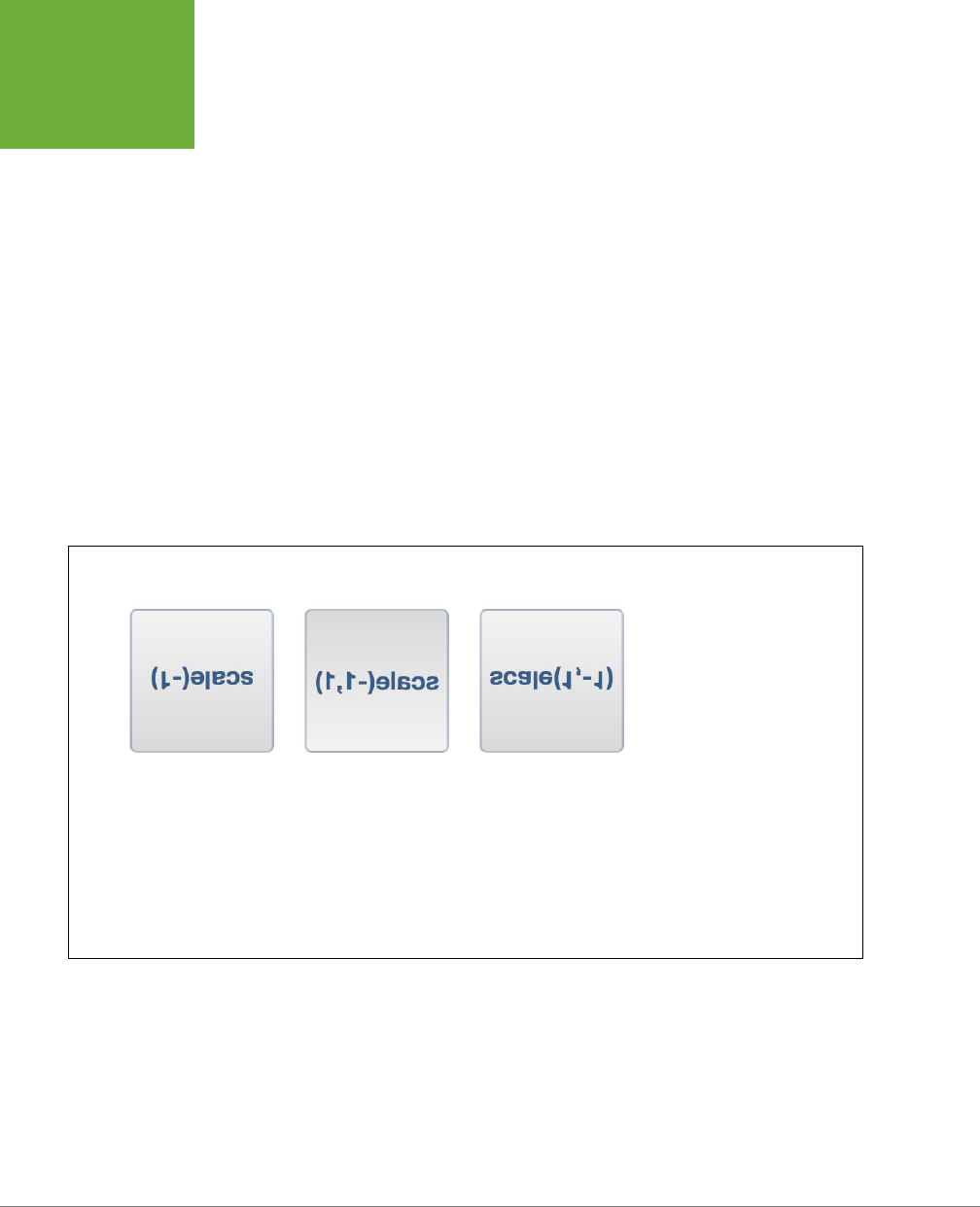
CSS3: THE MISSING MANUAL
340
TRANSFORMS
But to make an element three-and-a-half times as wide, but not taller or shorter,
you’d use:
transform: scaleX(3.5);
There’s another visual trick that scaling oers: the ability to flip an element upside
down and backwards. No one’s quite sure what branch of mathematics the W3C
used to come up with this system, but if you use a negative number with scale, you
actually flip an element around. For example, here’s how to flip an element upside
down and left to right:
transform: scale(-1);
This produces the image pictured in Figure 10-4, left. You can also flip the element
on only one axis. In the fight image in Figure 10-4, the image is flipped only on its
horizontal axis. Flipping the element along its vertical axis produces the middle image:
transform: scale(-1,1);
It produces the eect of a mirror held to the side of the element, or like you’ve flipped
the element over and are looking through its back. What fun!
FIGURE 10-4
There’s no end to the ways
you can use CSS to confuse
and enrage your website’s
visitors. The box at left is
flipped on the horizontal
axis, the box in the
middle is flipped on the
vertical axis, and at right
it’s flipped both ways.
Of course, if you want to
create a tribute site to
Leonardo DaVinci (
www
.mos.org/sln/Leonardo/
LeonardoRighttoLeft.html
),
creating a mirror image of
all the text on a page may
be just the thing!
Translate
The transform property’s translate function simply moves an element from its
current position a set amount left or right and up or down. By itself, it’s really not
that useful. As you read on page 335, when a web browser transforms an element,
it doesn’t rearrange the page; it lays the page out as if the element had no trans-
formation. Accordingly, when you move a div or other tag, using the translate
function, the browser leaves an empty space where the tag would normally appear,
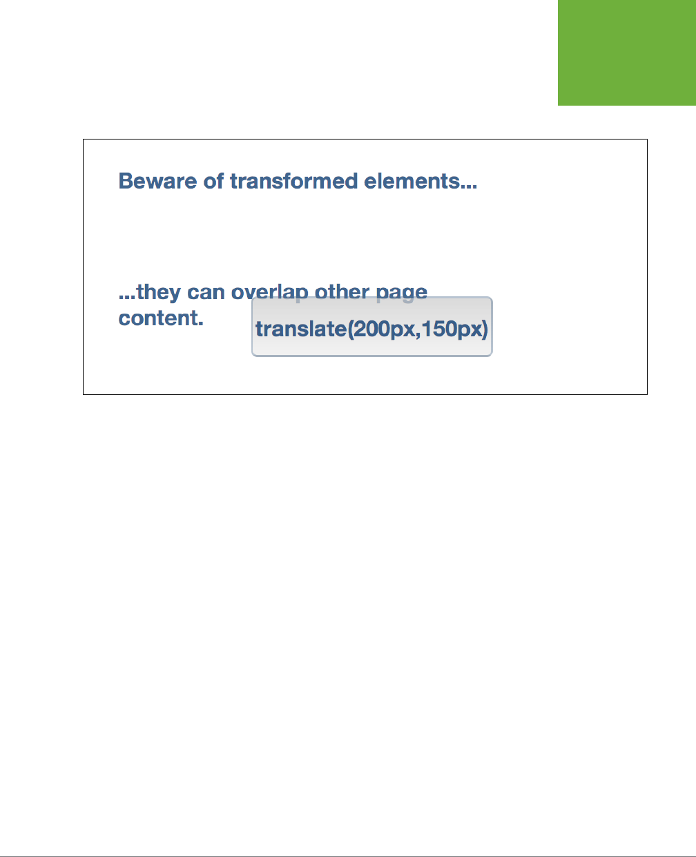
CHAPTER 10: CSS TRANSFORMS, TRANSITIONS, AND ANIMATIONS 341
TRANSFORMS
and then draws the element in its new position (see Figure 10-5). If you simply want
to position an element on the page, you can use absolute or relative positioning as
described in Chapter 15.
FIGURE 10-5
The
translate
function
moves an element a set
number of pixels, ems,
or a percentage from its
normal spot on a page.
This often leaves an
empty space: the blank
area between the two
headlines is where the
outlined
<div>
tag would
normally appear.
However, translate does come in handy when you want to make subtle movements
in response to a hover or click. For example, in many user interface designs, when
you click a button, it moves slightly down and to the left, simulating the look of a
real 3D button being pressed into a keypad. You can simulate this eect using the
translate function and the :active state of a link:
.button:active {
-webkit-translate(1px,2px);
-moz-translate(1px,2px);
-o-translate(1px,2px);
-ms-translate(1px,2px);
translate(1px,2px);
}
The translate function takes two values: the first specifies the horizontal movement
and the second the vertical movement. In this example, clicking an element with the
.button class moves that element one pixel to the right and two pixels down. Use a
negative number for the first value to move the element to the left; use a negative
number for the second value to move the element up.
You’re not limited to pixel values either. Any valid CSS length value—px, em, %, and
so on will work.
CSS3 also provides two additional functions for moving an element just to the left or
right—translateX—and up or down—translateY. For example, to move an element
up .5 ems, use the translateY function like this:
transform: translateY(-.5em);
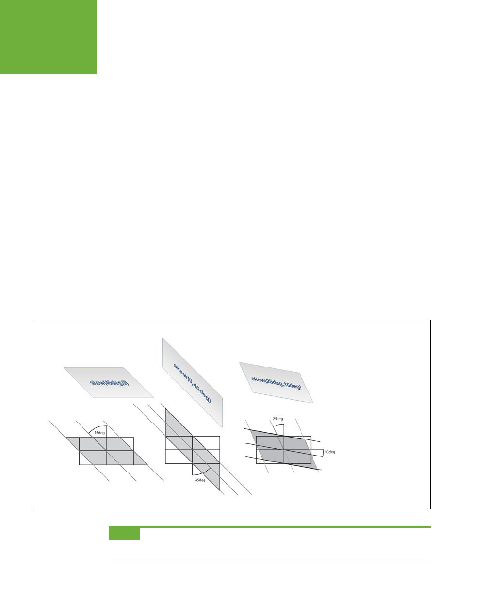
CSS3: THE MISSING MANUAL
342
TRANSFORMS
The real fun with the translate function is when used with CSS transitions. With the
CSS transition, you can then animate the movement of the element, so that it travels
across the screen. You’ll learn how to do that on page 345.
Skew
Skewing an element lets you slant it on its horizontal and vertical axes: this can give
an element a three-dimensional feel (see Figure 10-6). For example, to slant all the
vertical lines so that they lean to the left 45 degrees (as in the first image in Figure
10-6), you’d write this code:
transform: skew(45deg, 0);
To do the same along the Y axis (middle image in Figure 10-6), you’d write this:
transform: skew(0,45deg);
You can skew an element on both axes at once. For example, here is the code used
to produce the third image in Figure 10-6:
transform: skew(25deg,10deg);
The first value is a degree value from 0deg to 360deg, proceeding in a counter-
clockwise direction from the top of the element. For example, in the first image in
Figure 10-6, the 45 degrees are represented by a line drawn from the center of the
element and rotated 45 degrees counter-clockwise (bottom-left).
FIGURE 10-6
The skew function is
one way to simulate a 3D
look. However, as you’ll
see in the box on page
345, CSS3 actually offers
a better way to simulate
three dimensions, with 3D
transforms.
NOTE Remember to add browser-prefixed versions of the
transform
property to your finished CSS:
-webkit-transform
,
-moz-transform
, and so on.
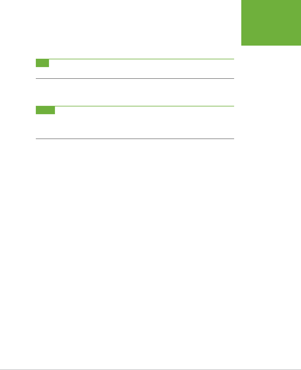
CHAPTER 10: CSS TRANSFORMS, TRANSITIONS, AND ANIMATIONS 343
TRANSFORMS
The second value is also a degree value from 0deg to 360deg. But this one proceeds
in a clockwise position from the right of the element. So the middle image in Figure
10-6 shows a 45-degree slant of all of the horizontal lines.
TIP Visit
http://westciv.com/tools/transforms/index.html
to play with an online tool for visualizing CSS
transforms.
As with translate and scale, CSS3 oers separate functions for the X and Y axes:
skewX and skewY.
NOTE CSS3 provides yet another transformation method called a
matrix
. A matrix is an array of numbers, as
used in advanced algebra. They’re pretty mind-bending and not at all intuitive unless you’re Stephen Hawking. But
if you want to learn how they work, visit
http://dev.opera.com/articles/view/understanding-the-css-transforms-
matrix/
for as lucid an explanation as possible.
Multiple Transformations
You’re not limited to just a single transformation. You can both scale an image and
skew it; rotate it and translate it; or use any of the four dierent transform func-
tions simultaneously. Simply add additional functions to the transform property,
each separated by a space. For example, here’s how you can rotate an element 45
degrees and enlarge it to twice its normal size:
transform: rotate(45deg) scale(2);
Here’s an example with all four transformations applied at the same time:
transform: skew(45deg,0deg) scale(.5) translate(400px,500px) rotate(90deg);
The order in which you place the transform functions is the order in which the
browser applies these eects. For example, in the second example, the element
is first skewed, then scaled, then translated, and finally rotated. The order doesn’t
really matter unless you’re using translate. Since translate actually moves the
element, if you place it before a rotate, for example, the browser first moves the
element and then rotates it. Since the element moved first, the point around which it
rotates has changed. On the other hand, if you rotate it first, you’re then moving the
rotated element a certain amount from its center (which is now in a new location).
Origin
Normally, when you apply a transformation to an element, the web browser uses the
center of the element as the transformation point. For example, when you rotate an
element, the browser rotates it around its center point (Figure 10-7, left). However,
CSS3 lets you change that transformation point, using the transform-origin prop-
erty. It works just like the background-position property (page 246); you can supply
keyword values, absolute values in pixels, and relative values in ems and percentages.
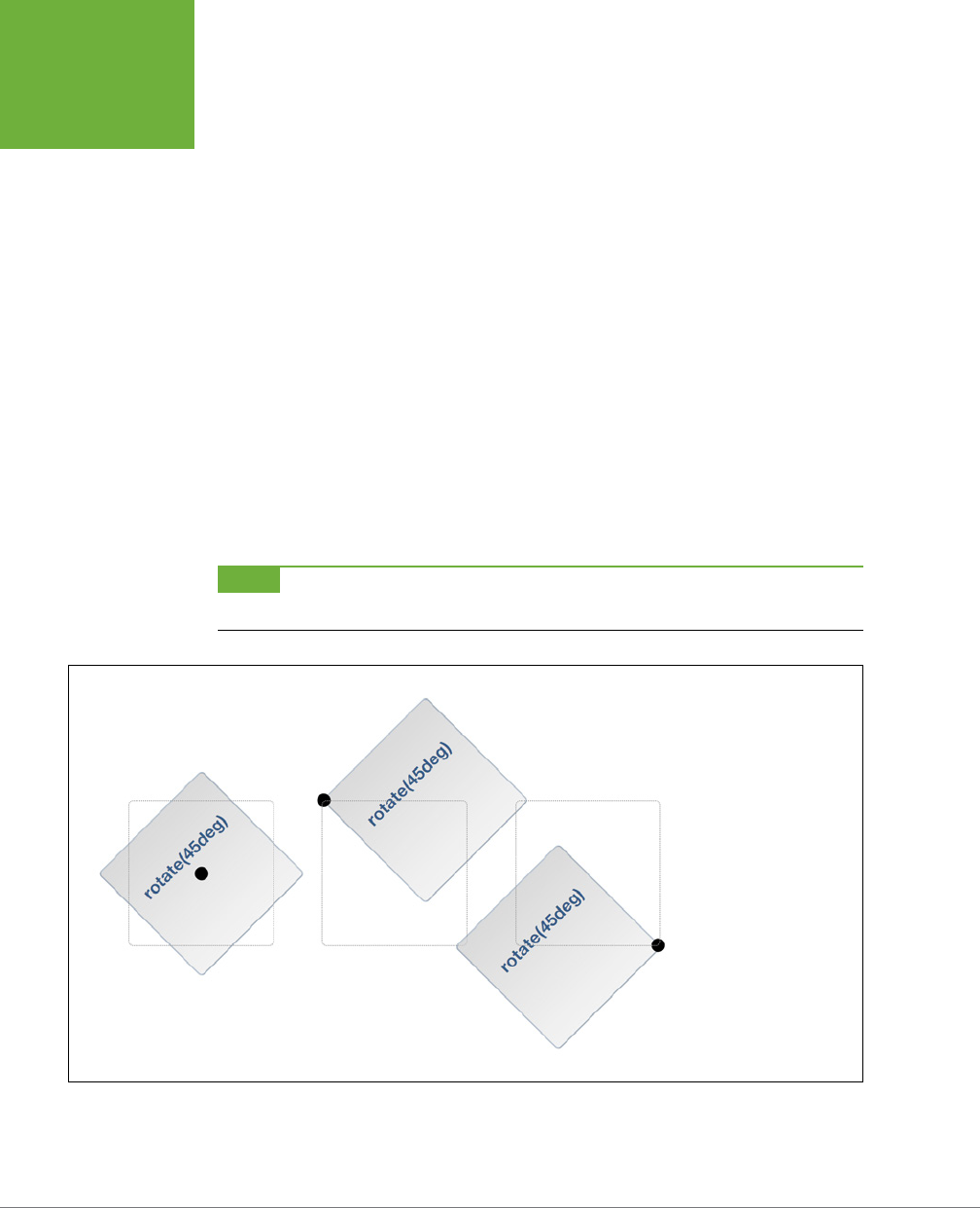
CSS3: THE MISSING MANUAL
344
TRANSFORMS
For example, to rotate a div around its top-left point (Figure 10-7, middle), you can
use the left and top keywords, like this:
transform-origin: left top;
You can also use pixel values:
transform-origin: 0 0;
Or percentages:
transform-origin: 0% 0%;
Likewise, to rotate an element around its bottom-right corner (Figure 10-7, right),
use the right and bottom keywords:
transform-origin: right bottom;
Which is also equivalent to:
transform-origin: 100% 100%;
When using pixel, em, or percentage values, the first number is the horizontal posi-
tion, and the second is the vertical position.
NOTE The
transform-origin
property has no effect on elements that are only moved using the
translate
function.
FIGURE 10-7
Setting the
transform-
origin
property changes
the point on the element
where the transformation is
applied. The default origin
is the middle of the element
(left), but you can change
it to the top left (middle)
or bottom right (right). The
dotted squares represent
the element if it hadn’t
been rotated (its regular
position on the page).

CHAPTER 10: CSS TRANSFORMS, TRANSITIONS, AND ANIMATIONS 345
TRANSITIONS
POWER USERS’ CLINIC
3D Transforms
CSS3 also offers a much more complex type of transformation.
3D transforms let you simulate a three-dimensional space on
the flat screen of a monitor, tablet, or phone.
For a short introduction to 3D transforms, visit
http://coding
.smashingmagazine.com/2012/01/06/adventures-in-the-
third-dimension-css-3-d-transforms/
and
http://blogs.msdn
.com/b/ie/archive/2012/02/02/css3-3d-transforms-in-ie10.
aspx
. To see some great examples of 3D transforms in action,
visit these sites:
• One of the first examples of the power of 3D Transformations,
Apple’s Morphing Power Cubes page (
www.webkit
.org/blog-files/3d-transforms/morphing-cubes.html
)
demonstrates a rotating cube, which you can change into
a rotating set of tiles.
• Another great demo from Apple, the Horizontal 3D picture
gallery (
https://developer.apple.com/safaridemos/
showcase/gallery/
) lets you flip, carousel-like, through
a series of photos.
• Snow Stack: Use left and right arrow keys to send an
endless gallery of photos shooting by:
http://www.satine
.org/research/webkit/snowleopard/snowstack.html
.
• The 2011 BeerCamp website (
http://2011.beercamp.com
)
provides an innovative way to navigate by moving pages
“forward” and “backward” through space.
Transitions
While transforms can be fun (especially the rotate function), they really bring your
page to life when coupled with a CSS3 transition. A
transition
is simply an animation
from one set of CSS properties to another set over a specific amount of time. For
example, you can make a banner rotate 360 degrees over the course of two seconds.
To make a transition work, you need a few things in place:
• Two styles. One style represents the beginning look of the element—a red
nav button, for example—while the second style is the ending look—a blue nav
button. The web browser will take care of the process of animating the change
between the two styles (changing the button from red to blue, for example).
• The transition property. CSS3 adds the transition property—the secret
sauce that makes the animation possible. In general, you apply the transition
property to the original style, the style that defines the look of an element
before the animation begins.
• A trigger. The trigger is the action that causes the change between the two
styles. With CSS, you can use several pseudo-classes to trigger an animation.
The most common is the :hover pseudo-class. With it, you can animate the
change between an element’s normal appearance and how it looks when a
visitor mouses over it. You’ll see an example of that in just a minute. In addition,
CSS3: THE MISSING MANUAL
346
TRANSITIONS
you have :active (when the mouse is clicked on an element), :target (when
an element is the target of link), and :focus (when a link is tabbed to, or a
form field is clicked into or tabbed to). Beyond that, you can use JavaScript to
dynamically change the style of any tag (see the box on page 351).
When the trigger no longer applies—when the visitor mouses o a navigation
button, for example—then the browser returns the tag back to its previous style
and
animates the entire process. In other words, you only need to set a transition
to an element once, and the browser takes care of animating from one style to
another and back to the original style.
A web browser can’t animate every single CSS property, but you still have a long
list of properties to choose from. In addition to the rotate, scale, translate,
and skew transformations you just read about, you can also animate color,
background-color, border-color, border-width, font-size, height, width, letter-
spacing, line-height, margin, opacity, padding, word-spacing; the positioning
properties—top, left, right, and bottom—which you’ll learn about in Chapter 15;
and many other properties. You can find a complete list at
www.w3.org/TR/css3-
transitions/#animatable-properties
.
NOTE CSS3 transitions work in most browsers. Unfortunately, when it comes to Internet Explorer, only version
10 and later understand CSS transitions. Because of this, it’s best to use transitions simply as a way to add visual
excitement. Mostly, this is just fine: IE 9 and earlier will, in most cases, be able to switch between two styles (for
example, show a
hover
style) without animating that change.
Adding a Transition
The heart of CSS transitions are four properties that control which properties to
animate, how long the animation takes, the type of animation used, and an op-
tional delay before the animation begins. Here’s a simple example. Say you want a
navigation button’s background color to change from orange to blue when a visitor
mouses over it. First, you start with the two styles needed to switch between these
two colors. For example, you can apply a class of .navButton to the link and then
create two styles, like this:
.navButton {
background-color: orange;
}
.navButton:hover {
background-color: blue;
}
These styles will work in any browser; hovering over the nav button will change its
background from orange to blue. However, the change is instantaneous. To make
the color animate over one second, add two new properties to the .navButton
style, like this:

CHAPTER 10: CSS TRANSFORMS, TRANSITIONS, AND ANIMATIONS 347
TRANSITIONS
.navButton {
background-color: orange;
transition-property: background-color;
transition-duration: 1s;
}
.navButton:hover {
background-color: blue;
}
The first property—transition-property—specifies which properties to animate.
You can specify a single property (as in the above example), use the keyword all
to animate all CSS properties that change, or use a comma-separated list to specify
more than one (but not all) properties. For example, say you create a :hover style
so the text color, background color, and border color all change. You list out all three
of those properties like this:
transition-property: color, background-color, border-color;
Or, to make it simple, use the all keyword like this:
transition-property: all;
In most cases, using all works well, since every CSS change is animated, which
creates a pleasing visual eect.
To specify how long the animation takes to complete, use the transition-duration
property. This property takes either a value in seconds or milliseconds (thousandths
of a second). For example, to make a transition take half a second to complete, you
can use either:
transition-duration: .5s;
Or:
transition-duration: 500ms;
It’s even possible to set separate timings for each animated property. For example,
when a visitor mouses over a button, you may want the text color to change rapidly,
the background color to change a little more slowly, and the border color to change
really slowly. To do so, you need to list the animated properties, using transition-
property and then list the times, using transition-duration, like this:
transition-property: color, background-color, border-color;
transition-duration: .25s, .75s, 2s;
The order in which you list the times must match the order you list the proper-
ties. So, in the above example, .25s goes with the color property, .75s with the
background-color property, and the 2s with the border-color property. If you move
the properties around, then their timing changes.

CSS3: THE MISSING MANUAL
348
TRANSITIONS
Unfortunately, like many CSS3 properties, transitions require vendor prefixes to
work. In other words, the .navButton example above won’t work in most browsers
until you add the proper vendor prefixes, so you need to rewrite that style like this:
.navButton {
background-color: orange;
-webkit-transition-property: background-color;
-moz-transition-property: background-color;
-o-transition-property: background-color;
transition-property: background-color;
-webkit-transition-duration: 1s;
-moz-transition-duration: 1s;
-o-transition-duration: 1s;
transition-duration: 1s;
}
You don’t need an -ms vendor prefix for Internet Explorer since IE 9 and earlier
don’t understand transitions, and IE 10 understands the non-prefixed versions of
the transition properties.
NOTE As of this writing, current versions of Firefox and Opera no longer require vendor prefixes for transi-
tions. But to make sure your animations still work in older versions of those browsers, it’s best to keep using the
-moz
and
-o
vendor prefixes for the time being.
Transition Timing
To have a working, animated transition, you only need to set transition-property
and transition-duration. However, you can control the rate of the animation by
using the transition-timing-function property. This property can be a little con-
fusing: it doesn’t control how long the animation takes (that’s what the transition-
duration property is for). Instead it controls the speed
during
the animation. For
example, you can begin the animation slowly and then quickly complete it, creating
an eect where the background color changes almost imperceptibly at first and then
quickly completes its color change.
The transition-timing-function property can take one of five keywords: linear,
ease, ease-in, ease-out, and ease-in-out. If you don’t specify a timing function,
the browser uses the ease method, which begins the animation slowly, speeds up
in the middle, and slows down at the end, providing a more organic change. The
linear option provides a steady change along the entire length of the animation.
No option is really any better than the other, they just provide dierent looks, so try
them out to see which one you like best.
CHAPTER 10: CSS TRANSFORMS, TRANSITIONS, AND ANIMATIONS 349
TRANSITIONS
To use it, simply add the transition-timing-function property and the method
you’d like to use:
transition-timing-function: ease-in-out;
Of course, as with all of these transition properties, you need to add vendor prefixes
as well. So to get this line of code to work in as many browsers as possible, you’ll
need to rewrite it as:
-webkit-transition-timing-function: ease-in-out;
-moz-transition-timing-function: ease-in-out;
-o-transition-timing-function: ease-in-out;
transition-timing-function: ease-in-out;
NOTE It’s a lot easier to see the different timing functions than to describe them. Visit
www.the-art-of-web
.com/css/timing-function/
to see an excellent side-by-side comparison of the five timing methods.
You can also use what’s called a cubic-bezier value for the transition-timing-
function property. The Bezier curve plots the progress of the animation over time
(see Figure 10-8). If you’ve used a drawing program like Adobe Illustrator, you’re
probably familiar with Bezier curves. By adjusting two control points you can control
how the line curves: the steeper the line, the faster the animation, the flatter the line,
the slower. For example, the Bezier curve pictured in Figure 10-8 starts o steep (the
animation begins quickly), then flattens in the middle (the animation slows down),
and then grows steep again (the animation rapidly progresses to its final state). To
create this kind of animation, add this line of code:
transition-timing-function: cubic-bezier(.20, .96, .74, .07);
Cubic Bezier curves aren’t something you can come up with o the top of your
head. You’re better o using one of the many online tools for creating and testing
dierent timing functions. Mathew Lein’s Ceasar tool is one of the best:
http://
matthewlein.com/ceaser/
.
As with the transition-duration property, you can apply dierent timings to dif-
ferent properties.
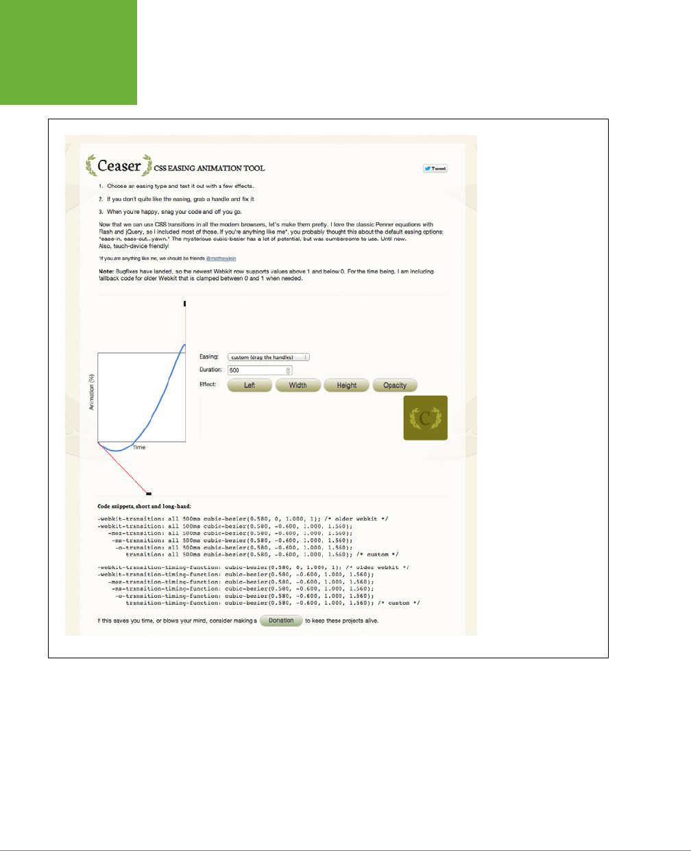
CSS3: THE MISSING MANUAL
350
TRANSITIONS
FIGURE 10-8
Creating a cubic Bezier
curve lets you create a
wide range of interesting
timing functions for your
animations. You can make
them start really slowly
and end quickly, or vice
versa. The online Caesar
tool makes creating cubic
Bezier curves a breeze: just
grab the control handle
on the bottom-left point
and drag to change the
slope of the line, and then
drag the control point on
the top-right point. The
steeper the line, the faster
the progress of the anima-
tion at that stage. In this
example, the line starts
off relatively flat, meaning
the animation will move
slowly at first, then ramps
up steeply at the end,
meaning the animation
will quickly progress to
the finish at the end of the
transition’s duration.

CHAPTER 10: CSS TRANSFORMS, TRANSITIONS, AND ANIMATIONS 351
TRANSITIONS
POWER USERS’ CLINIC
Using JavaScript to Trigger Transitions
CSS3 transitions are easy-to-use animations built right into
web browsers (at least most web browsers). You can create
complex effects simply by defining a set of CSS properties to
begin with, and a set of CSS properties to end with, and then
step out of the way and let the web browser handle the rest.
Unfortunately, you’re limited to just a handful of CSS selectors
for triggering those transitions. Most commonly, you’ll use
the
:hover
pseudo-class to make an element change when
moused over. You can also use the
:focus
pseudo-class on
a form element to make it animate when a user clicks inside
it (for example, you can make a multi-line text area grow in
height when focused, then shrink to just a few lines when a
visitor clicks out of it).
For example, CSS doesn’t have a
:click
pseudo-class, so
if you want to trigger a transition when someone clicks on
an element, you can’t do it with CSS. Likewise, if you want to
hover over one element but trigger an animation on another
element, you’re out of luck…if you’re only using CSS. But CSS
transitions work anytime a CSS property changes, even if you
change the CSS property using JavaScript.
JavaScript is a programming language that lets you add
interactivity to web pages, build dynamic user interfaces,
and loads of other things. But you can also use JavaScript to
simply add or remove a class from an element, or change any
CSS property you’d like. Using JavaScript, you can add a class
to an image when a visitor clicks a “Show bigger image” link.
That new class simply scales up the image (using the
scale
transform discussed on page 367). By adding a transition to
the image, you’ll have an instant animation.
JavaScript is a big topic worthy of its own book… there just so
happens to be
JavaScript & jQuery: The Missing Manual
by this
author that’s worth a read. But if you want to get started with
the simplest way to use CSS transitions triggered by JavaScript,
read this short tutorial:
www.netmagazine.com/tutorials/get-
more-out-your-css-transitions-jquery
.
Delaying a Transition’s Start
Finally, you can prevent a transition from animating right away with the transition-
delay property. For example, if you want to wait a half second before the animation
begins, you can add this code:
transition-delay: .5s;
And, of course, this property requires vendor prefixes, so to get this code to work
in most browsers, you’d need to write:
-webkit-transition-delay: .5s;
-moz-transition-delay: .5s;
-o-transition-delay: .5s;
transition-delay: .5s;

CSS3: THE MISSING MANUAL
352
TRANSITIONS
Most of the time, you won’t want to use a delay for all properties, since it kind of
undermines the transition’s potential for interactivity. After all, it’s more like a cruel
trick to make your visitors wait a second before they see any visual changes when
they mouse over your button. However, if you’re animating several properties, you
may want to make one property wait until the others finish before its animation
starts. For example, say you have a button whose background color and text color
you want to change, and then have its border color change suddenly after the other
two properties have finished. Here’s how you might do that:
.navButton {
color: black;
background-color: #FF6603;
border: 5px solid #660034;
transition-property: color, background-color, border-color;
transition-duration: 1s, 1s, .5s;
transition-delay: 0, 0, 1s;
}
.navButton:hover {
color: white;
background-color: #660034;
border-color: #FF6603;
}
As with the transition-duration property, you can specify dierent delay values for
each property. The order in which you list the times must match the order of the
properties listed for transition-property. For instance, in the preceding code,
there’s no delay for the transition between the color and background color, but
there’s a one-second delay before the border color changes.
TIP Usually you put the transition properties into the starting style (for example,
.navButton
on page
348), not the final style (
.navButton:hover
). However, here’s a trick for use with CSS drop-down menus
(see the box on page 313). One problem with drop-down menus in CSS is that they usually disappear very quickly
if you accidentally mouse off the menu. However, you can make the menu appear quickly but disappear slowly
using the
transition-delay
property. To do so, you add the following code to the original style:
transition-delay: 5s;
Then add no delay to the
:hover
style:
transition-delay: 0;
It’s somewhat counterintuitive, but this code basically makes the
:hover
transition happen immediately, with
no delay. But to return to the regular style (where the menu disappears) takes 5 seconds. During that time, a
visitor has enough time to move his errant mouse back over the menu before it disappears.

CHAPTER 10: CSS TRANSFORMS, TRANSITIONS, AND ANIMATIONS 353
TRANSITIONS
Transition Shorthand
Writing out all the dierent properties—transition-property, transition-duration,
transition-timing-function, and transition-duration—can get pretty tiring.
Especially when you consider you need to also create vendor-prefixed versions of
each of those as well. Fortunately, there’s a faster way to create transitions—the
transition property.
This property bundles all of the other properties into one. To use it, simply list the
property, duration, timing function, and duration in a space-separated list. For
example, to animate all CSS properties for one second using the ease-in timing
function, with a half-second delay, write the following:
transition: all 1s ease-in .5s;
You need to list either all or a single CSS property and a duration, but the timing
function and delay are optional. By default, the timing function is ease-in and there’s
no delay. So if you simply want to animate the transition of all CSS properties for
one second, then write this:
transition: all 1s;
If you only want to animate the change in the background color, then list that
property:
transition: background-color 1s;
You can only list a single CSS property here, so if you wish to animate multiple
CSS properties (but not all), then you can write a comma-separated list of space-
separated transition properties. Take the example from page 347, where the border-
color property is animated separately from the color and background color. You
can rewrite that code like this:
transition: color 1s, background-color 1s, border-color .5s 1s;
To make the code easier to read, many web designers put each transition on a
separate line, like this:
transition: color 1s,
background-color 1s,
border-color .5s 1s;
This is perfectly legal as long as you remember to separate them with a comma
and end the whole shebang with a semicolon. And, of course, you need to create
vendor-prefixed versions as well:
-webkit-transition: color 1s,
background-color 1s,
border-color .5s 1s;
-moz-transition: color 1s,
background-color 1s,
border-color .5s 1s;
CSS3: THE MISSING MANUAL
354
ANIMATIONS
-o-transition: color 1s,
background-color 1s,
border-color .5s 1s;
transition: color 1s,
background-color 1s,
border-color .5s 1s;
Animations
CSS3 provides another, more feature-rich mechanism for creating animations.
With CSS transitions, you can only animate from one set of CSS properties to an-
other. CSS3
animations
let you animate from one set of properties to another set to
another set and so on. In addition, you can have an animation repeat, pause when
a visitor mouses over it, and even reverse itself once the animation reaches its end.
CSS3 animations are a bit more complicated than transitions, but they have the
added benefit of not necessarily needing a trigger to begin the animation. While
you can add an animation to a :hover state so the animation plays when the mouse
hovers over an element, you can also have an animation start when the page loads.
This eect lets you draw attention to a banner or logo by animating it across the
page when a visitor first enters your site.
NOTE CSS3 animations, like transitions, don’t work in Internet Explorer 9 or earlier. They’re well supported
in most other current browsers, however.
The first step in creating an animation is creating a set of keyframes. In animation,
a
keyframe
is a single frame of an animation that dictates how the scene looks.
Suppose the first keyframe shows a ball on one side of a soccer field. By adding a
second keyframe, you can define an ending point for the animation—like the ball
inside the goal on the other side of the soccer field. A web browser then provides the
animation between the two keyframes by drawing all of the intermediate steps—the
ball travelling across the field on its way to the goal.
If you’re thinking transitions use a similar idea, you’re right. In a transition, you de-
fine two styles and let the browser animate the change from one style to another.
In this way, you could think of each of those styles as a keyframe. However, CSS3
animations let you define
multiple
keyframes, so you can create much more complex
animated eects: a soccer ball traveling from one side of the field, to a player, to
another player, and then into the goal, for example.
There are two steps in creating an animation:
1. Define the animation. This involves setting up keyframes that list the CSS
properties to animate.

CHAPTER 10: CSS TRANSFORMS, TRANSITIONS, AND ANIMATIONS 355
ANIMATIONS
2. Apply the animation to an element. Once defined, you can apply the animation
to any number of elements on a page. You can even set up separate timings,
delays, and other animation properties for each element. So you can use the
same animation with slightly dierent settings multiple times on a page.
Defining Keyframes
The first step is to set up your keyframes. The syntax involved may look kind of
strange, but here’s the basic structure:
@keyframes animationName {
from {
/* list CSS properties here */
}
to {
/* list CSS properties here */
}
}
You start with @keyframes, followed by a name. The name is what you call the anima-
tion. You’ll end up using that name later when you apply the animation to an element
on the page, so make it descriptive, like “fadeOut” or “fadeIn.”
NOTE The term
@keyframes
isn’t a CSS property, it’s called an
at rule
. Other at rules in CSS include the
@import
statement for loading an external style sheet from another style sheet (page 42), and
@media
to
define styles for different types of media such as a printer (page 523) or different screen sizes and resolutions
(page 547).
You then add at least two keyframes. In the current example, the keywords from
and to are used to create the beginning keyframe (from) and the final keyframe
(to). Inside each keyframe you add one or more CSS properties—just as if you were
creating a style. In fact, you can think of each keyframe as just a CSS style filled with
one or more CSS properties. For example, say you want to create an animation that
fades an element into view. You could start with an opacity value of 0 (invisible),
and end with a value of 1 (fully visible):
@keyframes fadeIn{
from {
opacity: 0;
}
to {
opacity: 1;
}
}
CSS3: THE MISSING MANUAL
356
ANIMATIONS
You’re not limited to just two keyframes either. You can use percentage values to
define multiple keyframes. The percentage represents where in the overall length
of the animation the change should occur. For example, say you want to create an
eect where the background of an element changes from yellow to blue to red.
You can write this:
@keyframes backgroundGlow {
from {
background-color: yellow;
}
50% {
background-color: blue;
}
to {
background-color: red;
}
}
In this case, the blue background will appear halfway through the animation. If you
want the yellow to last longer and the blue to appear after three-quarters of the
animation is complete, use 75% instead of 50%. You can continue to add additional
keyframes this way (for example, at 25%, 66%, and so on).
NOTE You can replace the
from
keyword with
0%
and the
to
keyword with
100%
.
Nor are you limited to a single CSS property. You can place any number of animat-
able properties (page 346) inside each keyframe—background-color, opacity,
width, height, and so on:
@keyframes growAndGlow {
from {
background-color: yellow;
}
50% {
transform: scale(1.5);
background-color: blue;
}
to {
transform: scale(3);
background-color: red;
}
}

CHAPTER 10: CSS TRANSFORMS, TRANSITIONS, AND ANIMATIONS 357
ANIMATIONS
In the above example, not only does the background color cycle through three colors,
it also scales up in size until it’s three times its original size.
You can also get pretty tricky with the percentage values by adding multiple percent-
age values for one set of CSS properties. This is useful in a couple of cases: first, it’s
good if you want to animate to a certain point, pause, and then continue. For example,
say you’d like to begin with a yellow background color for a <div> tag. Then you’d
like to change that color to blue, stay at blue for a while, and then finish with a red
color. In other words, you want a sort of pause in the middle while the background
color stays constant before changing again. You can do that with this code:
@keyframes glow {
from {
background-color: yellow;
}
25%, 75% {
background-color: blue;
}
to {
background-color: red;
}
}
Notice the 25%, 75% in line 5. That means 25% of the way through the animation,
the background color of the element should be blue. However, it should be blue
75% of the way through as well. In other words, from the 25% mark to the 75% mark,
the background will remain solid blue, before finally turning red. If this animation
ran for 4 seconds, then for the middle 2 seconds of the animation, the element’s
background would remain solid blue.
You can also use percentages when you want to use the same set of CSS proper-
ties for dierent parts of the animation. For example, say you want to animate the
background color again, but this time go from yellow to blue to orange to blue to
orange to red. Blue and orange appear twice, so instead of writing their background-
color properties multiple times, you can instead do this:
@keyframes glow {
from {
background-color: yellow;
}
20%, 60% {
background-color: blue;
}
40%, 80% {
background-color: orange;
}

CSS3: THE MISSING MANUAL
358
ANIMATIONS
to {
background-color: red;
}
}
In this case, the background color will turn blue at the 20% mark, orange at the 40%
mark, then blue again at the 60% mark, and orange one last time at the 80% mark
before finally turning red.
One downside of CSS3 animations is that they require vendor-specific prefixes (like a
lot of CSS3 properties). In other words, you need to repeat your keyframes for
each
browser. So to write this simple fade-in animation so it’ll work in as many browsers
as possible, you have to write this:
@-webkit-keyframes fadeIn {
from {
opacity: 0;
}
to {
opacity: 1;
}
}
@-moz-keyframes fadeIn{
from {
opacity: 0;
}
to {
opacity: 1;
}
}
@-o-keyframes fadeIn{
from {
opacity: 0;
}
to {
opacity: 1;
}
}
@keyframes fadeIn{
from {
opacity: 0;
}

CHAPTER 10: CSS TRANSFORMS, TRANSITIONS, AND ANIMATIONS 359
ANIMATIONS
to {
opacity: 1;
}
}
Notice the two hyphens—one between the @ and the vendor prefix and one between
the vendor prefix and the word keyframes.
NOTE You don’t need the
-ms-
vendor prefix for Internet Explorer in this case. IE 9 and earlier don’t
understand CSS animations anyway, and IE 10 supports the
@keyframes
syntax without a prefix.
Applying an Animation
Once you’ve completed a set of keyframes, the animation is ready. However, to make
it work, you need to apply it to an element on your page. You can add an animation
to any style for any element on a page. If you simply add the animation to a style
that applies immediately to an element—for example, an h1 tag style—the animation
will apply when the page loads. You can use this technique to add an introductory
animation to a page that makes a logo zoom into place in the page’s upper-left, or
make a particular box of content glow to draw attention to it.
In addition, you can apply an animation to one of the pseudo-classes, including
:hover, :active, :target, or :focus to make an animation run when a visitor mouses
over a link, for example, or clicks into a form field. Finally, you can apply the anima-
tion to a class style and use JavaScript to dynamically apply that class in response
to a visitor clicking a button or some other page element (see the box on page 351).
CSS3 provides a handful of animation-related properties to control how and when
an animation plays back (as well as a shorthand version that encompasses all the
individual properties). At a minimum, to get an animation running, you need to sup-
ply the name you gave the original animation (in the @keyframes rule as discussed
on page 355), and a duration for the animation.
Here’s a simple example. Say you want a div with an important announcement to fade
into view when the page loads. You’ve given that div a class name of announcement:
-<div class="announcement">.
1. Create the fade-in animation with the @keyframes rule:
@keyframes fadeIn {
from { opacity: 0; }
to { opacity: 1; }
}
CSS3: THE MISSING MANUAL
360
ANIMATIONS
TIP If you’re only animating a single property, it can be easier to read to if you put the keyframes on a
single line:
from { opacity: 0; }
However, if you’re animating many properties, it’s easier to read (and type) if you spread that code over
several lines:
from {
opacity: 0;
color: red;
width: 50%;
}
2. Apply that animation to the style for the <div> tag:
.announcement {
animation-name: fadeIn;
animation-duration: 1s;
}
The animation-name property simply tells the browser which animation to use.
It’s the same name you provided when you created the animation in Step 1. The
animation-duration property sets the time the animation takes from start to
finish. In this example, these are the only two animation properties listed, but
you can (and probably will) put other non-animation properties in the style as
well. For example, in the real world, you’d probably add properties such as width,
background-color, border, and so on to this .announcement style.
NOTE Putting the animation’s name inside of quotes—
'fadeIn'
—isn’t technically required, and it’s not
done in this example, but doing so can prevent any conflicts that might arise if you use a CSS keyword for an
animation name.
As with the @keyframes rule, each of the animation properties require vendor-specific
prefixes, so the above .announcement style would need to be written like the follow-
ing to work in as many browsers as possible:
.announcement {
animation-name: fadeIn;
animation-duration: 1s;
-webkit-animation-name: fadeIn;
-webkit-animation-duration: 1s;
-moz-animation-name: fadeIn;
-moz-animation-duration: 1s;
-o-animation-name: fadeIn;
-o-animation-duration: 1s;
animation-name: fadeIn;
animation-duration: 1s;
}

CHAPTER 10: CSS TRANSFORMS, TRANSITIONS, AND ANIMATIONS 361
ANIMATIONS
It may seem a bit of a pain to define the animation in one place with the @keyframes
rule and then apply it in another (the style); however, once you’ve defined the
animation, you’re free to use it any number of times in any number of styles. For
example, you can create a generic fade-in type of animation and apply it to dier-
ent elements. What’s more, you can control the animation independently for each
style—for example, make the header fade in over the course of half a second, but
make another page element fade in for five seconds.
In addition, you can apply more than one animation to an element. Say you create
one animation named fadeIn to make an element fade in and another animation
named blink to make the background color blink wildly. To apply both animations
to the element, you provide a comma-separated list of names like this:
animation-name: fadeIn, blink;
To give the animations separate timings, provide a list of comma-separated times:
animation-name: fadeIn, blink;
animation-duration: 1s, 3s;
The order in which you place the times applies to the animation name in the same
order. For example, the first animation gets the first time listed. In the above example,
fadeIn takes one second to complete, while blink takes three seconds.
You can apply several other useful animation properties as well. Read on.
Timing the Animation
You’ve already seen that the animation-duration property lets you control an ani-
mation’s length. As with transitions, you can use milliseconds (750ms, for example)
or seconds (.75s, for example) to specify the duration.
As with transitions, you can also set a specific type of timing function to control the
rate of the animation throughout that duration. For example, you can start the anima-
tion slowly and end it quickly, using a cubic-Bezier curve (page 349) or using one of
the built-in keyword methods: linear, ease, ease-in, ease-out, ease-in-out. These
work the same as the transition-timing-function property discussed on page 348.
You can use the animation-timing-function to control the entire animation or
just specific keyframes. For example, to apply the ease-out timing function for the
fadeIn animation presented earlier (Step 1 on page 359), add the timing function
to the .announcement style (Step 2 on page 360):
.announcement {
animation-name: fadeIn;
animation-duration: 1s;
animation-timing-function: ease-out;
}
However, you can also control the timing function for the animation between key-
frames. For example, say you create an animation that has three keyframes with
three dierent background colors. The web browser will animate from one color
CSS3: THE MISSING MANUAL
362
ANIMATIONS
to another and then to a third. Perhaps you want it to slowly move from the first to
the second color using a cubic Bezier curve, and then move in a uniform time from
the middle to the end. You can do that by adding two timing functions, one to the
first keyframe (which controls the animation from keyframe 1 to 2), and one at the
second keyframe to control the animation from keyframe 2 to 3:
@keyframes growAndGlow {
from {
background-color: yellow;
animation-timing-function: cubic-bezier(1, .03, 1, .115);
}
50% {
transform: scale(1.5);
background-color: blue;
animation-timing-function: linear;
}
to {
transform: scale(3);
background-color: red;
}
}
You can also delay the beginning of the animation using the property. It works the
same as the transition-delay property for transitions (page 351), and simply waits a
specific number of milliseconds or seconds before the animation begins. For example,
if you want to wait one second before the “announcement” div fades into view, you
can rewrite that .announcement class like this:
.announcement {
animation-name: fadeIn;
animation-duration: 1s;
animation-delay: 1s;
}
Adding a delay to an animation is a great way to catch people’s attention and add
surprise to a page.
NOTE The
animation-timing-function
and
animation-delay
properties require vendor
prefixes, so make sure you add the appropriate
-webkit-animation-timing-function
,
-moz-
animation-timing-function
, and so on to your animated styles.

CHAPTER 10: CSS TRANSFORMS, TRANSITIONS, AND ANIMATIONS 363
ANIMATIONS
Finishing the Animation
With CSS, you can control a few additional aspects of an animation, including
whether to repeat an animation, which direction the animation runs if it’s animated
more than once, and also how the browser should format the element when the
animation is complete.
Transitions are animations that only run once—mouse over a button and the button
grows, for example. Animations, however, can run once, twice, or continuously, thanks
to the animation-iteration-count property. If you want an animation to run 10
times (fade in and out 10 times, perhaps), add this code to the style you’re animating:
animation-iteration-count: 10;
Normally a browser only plays the animation once, and if that’s all you’re after, then
leave o this iteration count property. If you want the animation to play continu-
ously, the animation-iteration-count property accepts one keyword: infinite.
So to run the fadeIn animation an infinite number of times on the announcement
div, you can create this style:
.announcement {
animation-name: fadeIn;
animation-duration: .25s;
animation-iteration-count: infinite;
}
That, however, would annoy your visitors to no end, so please don’t do it. However,
you could use a style like this for a simple “pulsing” eect where a “sign up today”
button gently glows (by animating the box-shadow property discussed on page 210).
Normally, when an animation runs more than once, a web browser literally starts
the animation over from the beginning. So if you animated a background color from
yellow to blue and repeated it twice, the browser would show a yellow box turning
blue, and then suddenly the yellow box would return and then animate to blue once
again. This eect can be pretty jarring. In this case, it would look better if, for the
second time through the animation, the browser simply reversed the eect. That’s
how transitions work: for example, when you mouse over an element, the browser
animates the transition from the regular state to the rollover state. When you move
the mouse o the element, the browser simply reverses the animation to return to
the regular state. To make an animation move forward on odd runs and backward
on even runs, use the animation-direction property and the alternate keyword.
For example, to make an element fade out and then back in again, you can create
an animation called fadeOut, like this:
@keyframes fadeOut {
from { opacity: 1; }
to { opacity: 0; }
}
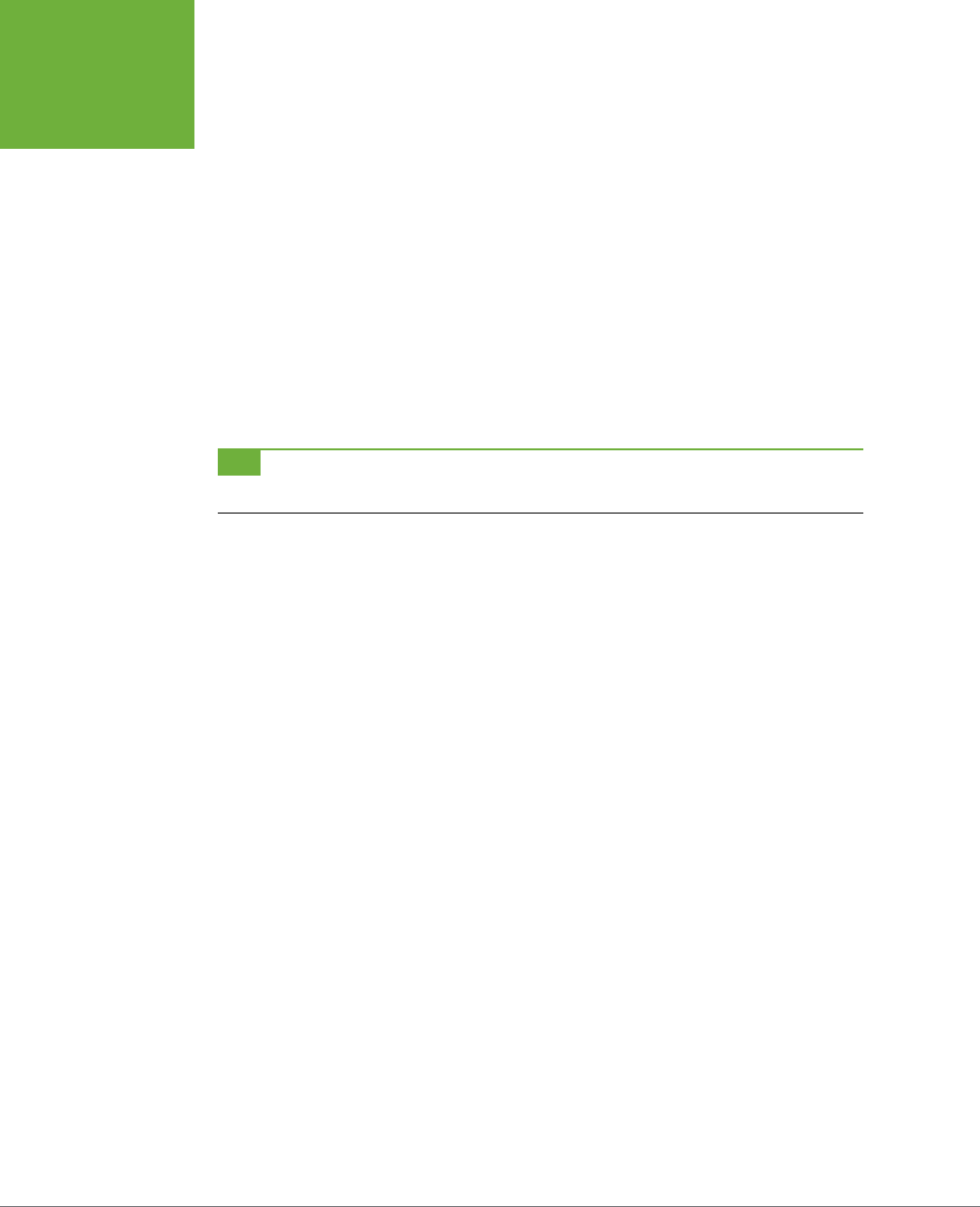
CSS3: THE MISSING MANUAL
364
ANIMATIONS
Then, play that animation twice, reversing its direction on the second time:
.fade {
animation-name: fadeOut;
animation-duration: 2s;
animation-iteration-count: 2;
animation-direction: alternate;
}
This code tells the web browser to run the fadeOut animation on any element with
the class of fade. The animation should run for two seconds and then repeat. Be-
cause of the alternate value for animation-direction, the animation will fade out
the first time (go from totally opaque—an opacity of 1—to invisible—an opacity of
0), but will run backwards the second time (from 0 to 1 opacity), which makes it
fade back into view.
TIP To have an animation run a number of times but end up back at the beginning state, use an even number
of iterations and set the
animation-direction
property to
alternate
.
No matter how many times you have a web browser run an animation, once the
animation is completed, the browser displays the animated element in its original,
pre-animation state. For example, say you animate an image so it slowly grows to
twice its size. Once the animation is completed, the web browser snaps the image
back down to its original size, creating a jarring visual eect. Fortunately, you can
tell the browser to keep the animated element formatted the same as when the
animation ended by setting the animation-fill-mode property to forwards.
animation-fill-mode: forwards;
Apply this property to the element you’re animating, along with the animation-name,
animation-duration, and other animation properties.
Animation Shorthand
As you can see, there are a lot of animation properties, and writing all of them out in
addition to all of the vendor-prefixed versions is a recipe for carpal tunnel syndrome.
While you still need vendor-prefixed versions, you can simplify things by using
the animation shorthand property. This single property combines animation-name,
animation-duration, animation-timing-function, animation-iteration-count,
animation-direction, animation-delay, and animation-fill-mode into a single
property. For example, you can take this code:
.fade {
animation-name: fadeOut;
animation-duration: 2s;
animation-timing-function: ease-in-out;

CHAPTER 10: CSS TRANSFORMS, TRANSITIONS, AND ANIMATIONS 365
ANIMATIONS
animation-iteration-count: 2;
animation-direction: alternate;
animation-delay: 5s;
animation-fill-mode: forwards;
}
And rewrite it like this:
.fade {
animation: fadeOut 2s ease-in-out 2 alternate 5s forwards;
}
That’s one line of code instead of seven! You should list the property values in the
order used above: name, duration, timing function, count, direction, delay, and fill-
mode. In addition, make sure each value is separated by a space. Only the name
and duration are actually required. The other values are optional.
If you want to apply more than one animation to an element, simply use comma-
separated lists of animation properties. For example, to apply two animations (say
fadeOut and glow) to the .fade style, write this:
.fade {
animation: fadeOut 2s ease-in-out 2 alternate 5s forwards,
glow 5s;
}
Of course, in real usage you’d need to use vendor prefixes as well:
.fade {
-webkit-animation: fadeOut 2s ease-in-out 2 alternate 5s forwards,
glow 5s;
-moz-animation: fadeOut 2s ease-in-out 2 alternate 5s forwards,
glow 5s;
-o-animation: fadeOut 2s ease-in-out 2 alternate 5s forwards,
glow 5s;
animation: fadeOut 2s ease-in-out 2 alternate 5s forwards,
glow 5s;
}
In general, you should opt to use the animation shorthand—it’s much more concise
and gentler on your fingers and the keyboard.
Pausing an Animation
CSS3 includes another animation property—animation-play-state—to control an
animation’s playback. It accepts only one of two keywords: running or paused. To
pause an animation, simply apply this declaration to a style:
animation-play-state: paused;

CSS3: THE MISSING MANUAL
366
TUTORIAL
There’s only one way to really apply that using CSS, however—a pseudo-class. As
with transitions, you need some kind of trigger to pause an animation. One way to
do this is to pause any animation when a visitor mouses over the animation. Here’s
an example using the .fade class style:
.fade {
animation: fadeOut 2s ease-in-out 2 alternate 5s forwards,
glow 5s;
}
This code runs two animations—fadeOut and glow—on any element with the fade
class applied to it. Say you want to let visitors pause this animation simply by mous-
ing over it. You’d only need to add one more style:
.fade:hover {
animation-play-state: paused;
}
Of course, you’ll need all the vendor prefixed versions as well. A more powerful way
to pause an animation would be to dynamically apply the animation-play-state
property to the element using JavaScript. In this way, you can create a complex
animation and add a Pause button that pauses the animation when clicked. See the
box on page 351 for more on JavaScript and CSS animations.
Animating on Hover
So far, the animations you’ve seen here would all run when the page loads. You have
a few other options, including several pseudo-classes and using JavaScript, to trigger
a CSS animation. The most common pseudo-class for animation is :hover. With it,
you can run an animation when a visitor mouses over any element; for example, you
can make a logo do fancy gymnastics, move o the page, and then move back again.
To animate an element when a visitor’s mouse hovers over it, start by creating an
animation with the @keyframes rule (Step 1 on page 359). Then, create a :hover
pseudo-class for whatever element you wish to animate. In that style, you simply
add the animation properties (Step 2 on page 360). Now the animation runs only
when the visitor hovers over the element.
Tutorial
In this exercise, you’ll add transformations, animation, and transitions to a banner.
To get started, download the tutorial files from this book’s companion website at
www.sawmac.com/css3
. Click the tutorial link and download the files. All the files
are enclosed in a zip archive, so you need to unzip them first. (You’ll find detailed in-
structions on the website.) The files for this tutorial are contained inside the
10
folder.
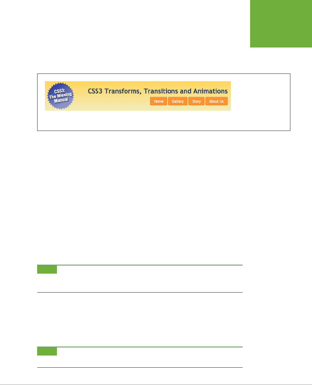
CHAPTER 10: CSS TRANSFORMS, TRANSITIONS, AND ANIMATIONS 367
TUTORIAL
1. In a text editor, open
10
→
banner.html
.
The page includes a banner with a logo graphic, headline, and set of naviga-
tion buttons (see Figure 10-9). First, you’ll add a transformation so that when
a visitor mouses over a button it scales up in size.
FIGURE 10-9
A normal, static banner
just waiting to come to life
with animation, transfor-
mations, and transitions.
2. Locate the opening and closing <style> tags near the top of the page and
add the following rule to the style sheet:
nav a:hover {
-webkit-transform:scale(1.2);
-moz-transform: scale(1.2);
-o-transform: scale(1.2);
-ms-transform: scale(1.2);
transform: scale(1.2);
}
The buttons on the page are contained inside a HTML5 nav element. This de-
scendent selector targets links inside the <nav> tag in their hover state (that is,
when a visitor mouses over the link). The style applies the scale function (page
338) to make the button slightly larger. Unfortunately, you need to add five lines
of code so it’ll work in Safari, Chrome, Firefox, Opera, and Internet Explorer 9,
as well as future browsers that won’t require a vendor prefix.
NOTE To make the steps in this tutorial easier to follow, you’re putting the styles inside an internal style
sheet in the web page. However, if you’d prefer, you can add this code to the external style sheet that’s already
applied to this page. (It’s called
styles.css
and it’s in the same folder as the web page.)
3. Save the page and preview it in a web browser. Mouse over the links below
the headline.
When you mouse over a button, it grows larger, almost popping o the page
(Figure 10-10). Very cool, but it would look even better if you added an anima-
tion to the eect.
NOTE Internet Explorer 8 and earlier don’t understand transforms, so you won’t see any effect in those
browsers.
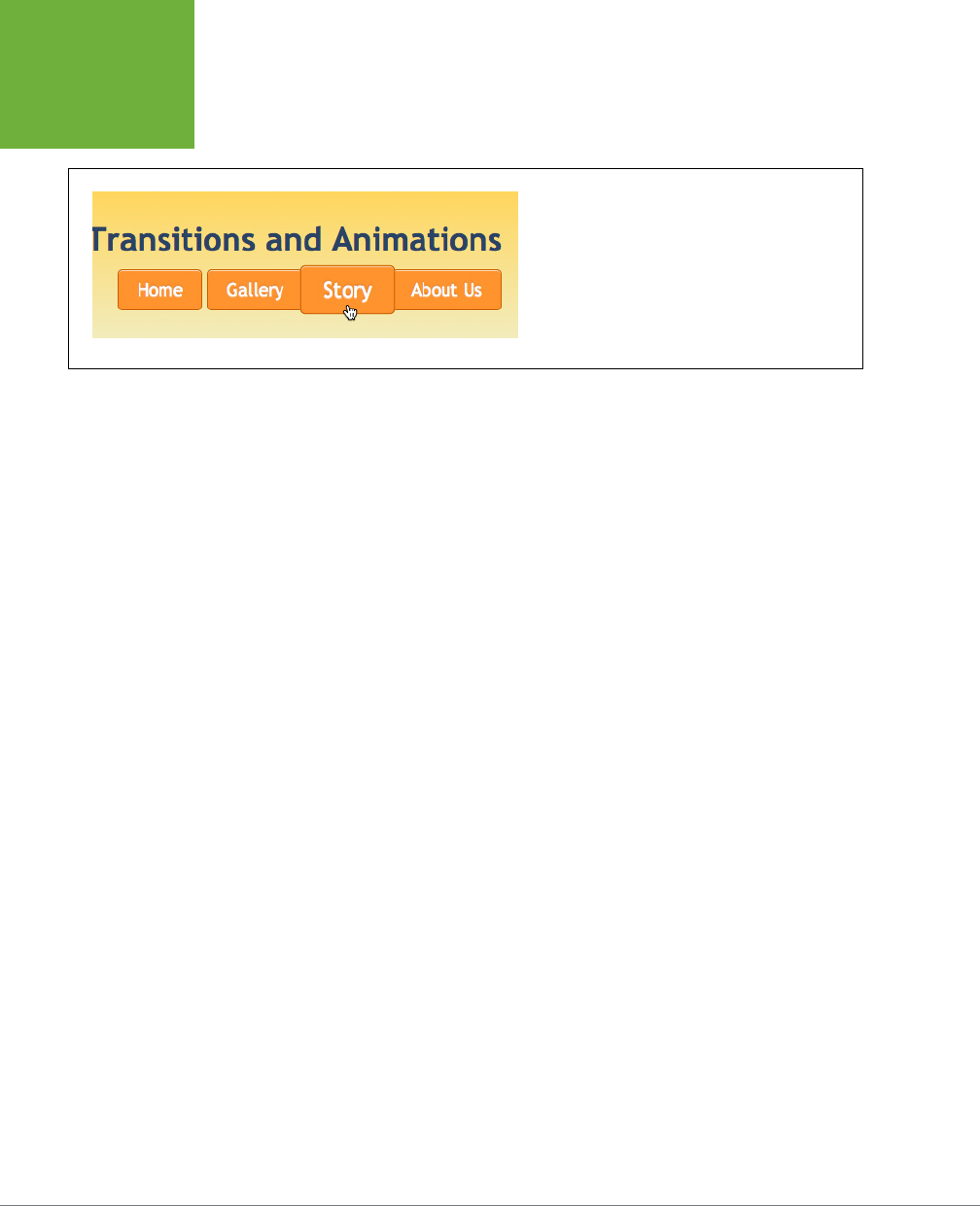
CSS3: THE MISSING MANUAL
368
TUTORIAL
FIGURE 10-10
Pop goes the button. By adding a scale transformation to
a bottom’s hover state, you can make it almost pop off
the page. The enlarged button doesn’t affect any of the
content around it (for example, it doesn’t push the other
buttons out of the way). This is a unique aspect of all CSS
transformations.
4. Add another style before the nav a:hover style you just created:
nav a {
-webkit-transition: all .5s;
-moz-transition: all .5s;
-o-transition: all .5s;
transition: all .5s;
}
Again, you need to add the vendor prefixed versions. (IE 9 doesn’t understand
transitions, and since IE 10 understands the non-prefixed version, you don’t
need a -ms-transition property.) Here, you’re instructing the web browser
to animate all changes to the CSS properties of the <a> tags inside the <nav>
element, and to make the animation last .5s. To make things more interesting,
you’ll add a background color to the hover state.
5. Locate the nav a:hover style and add background-color: red, so the finished
style looks like this:
nav a:hover {
background-color:
-webkit-transform:scale(1.2);
-moz-transform: scale(1.2);
-o-transform: scale(1.2);
-ms-transform: scale(1.2);
transform: scale(1.2);
}
If you save the page and preview it now, you’ll see that not only do the buttons
grow larger when hovered over, they also fade to red. But now you’ll add separate
timings to these transitions, so the button first grows larger and then turns red.

CHAPTER 10: CSS TRANSFORMS, TRANSITIONS, AND ANIMATIONS 369
TUTORIAL
6. Change the nav a style to include two transitions, one for the transforma-
tion and the other for the background color, like this (changes are in bold):
nav a {
-webkit-transition: -webkit-transform .5s,
background-color 1s ease-in .5s;
-moz-transition: -moz-transform .5s,
background-color 1s ease-in .5s;
-o-transition: -o-transform .5s,
background-color 1s ease-in .5s;
transition: transform .5s,
background-color 1s ease-in .5s;
}
The first part—transform .5s—informs the browser that you want to animate
any changes in the transform property over the course of half a second. The
second part—background-color 1s ease-in .5s—indicates that you wish to
animate the background color change over the course of one second, using the
ease-in timing method (page 361), but wait half a second before starting. That
.5s at the end is important since it matches the .5s of the transform animation.
In other words, the browser will wait until the transform transition is complete
before changing the background color.
7. Save the page and preview it in a web browser.
Mouse over a button. First, the button gets larger. Keep the mouse over the but-
ton, and it then turns red. You can of course, tweak with the timing—for example,
remove the delay for the background-color transition, and the color change
will begin at the same time as the size change. However, since the color change
lasts for one second, it will continue after the button has reached its final size.
Adding an Animation
Now, it’s time to try out CSS3 animations. You’ll begin by simply spinning and scaling
the logo image. The first step in creating a CSS animation is to use the @keyframes
rule to set up the keyframes of the animation. This example starts you o with a
simple animation and just two keyframes.
TIP Because CSS animations require a fair amount of code, it’s a good idea to start by using only the vendor-
prefix for the browser you most often use. Test the page in that browser, and once you’ve perfected the animation,
then add the code for the other browsers.

CSS3: THE MISSING MANUAL
370
TUTORIAL
1. Add the following style to the page’s internal style sheet, after the nav
a:hover style:
@-webkit-keyframes logo {
from {
-webkit-transform: rotate(0) scale(.5);
}
to {
-webkit-transform: rotate(-720deg) scale(1);
}
}
This example uses the WebKit syntax, which means it’ll work in Chrome and
Safari. If you’re using Firefox as your main browser, replace @-webkit-keyframes
with @-moz-keyframes. (Use @-o-keyframes for Opera; for IE 10, skip the pre-
fixes.)
This code is telling the browser that it should start the element with no rotation—
rotate(0)—and at half its size—scale(.5). It should then animate the change
from that to the animation’s “to” state—in this case rotating it –720 degrees,
which is three counter-clockwise rotations—and scaling it back up to its normal
size. In other words, this animation will spin an element and make it grow.
Now, you need to apply it to any element on the page.
2. Create a new style after the one you just added:
.logo {
-webkit-animation: logo 1s;
}
The logo in the banner has a class of logo applied to it, so this class selector
adds an animation to it. The animation property can take many values, but you
only need the name and duration. Here, you’re specifying the animation you
created in the last step—logo—and telling a web browser to make the anima-
tion last one second.
3. Save the file and preview it in Chrome or Safari (or whatever browser you
used the prefix for).
The logo should spin, grow in size, and then stop. If it doesn’t, double-check
your code and make sure you’re previewing the page in the proper browser. If
all goes according to plan, this animation should look great, but it would be even
better if it moved in from o the page and then stopped in its proper spot in
the banner. To do that, you’ll simply animate the element’s position on the page.

CHAPTER 10: CSS TRANSFORMS, TRANSITIONS, AND ANIMATIONS 371
TUTORIAL
4. Edit the @keyframes rule so it looks like this (addition in bold):
@-webkit-keyframes logo {
from {
-webkit-transform: rotate(0) scale(.5);
left: 120%;
}
to {
-webkit-transform: rotate(-720deg) scale(1);
left: 0;
}
}
Here, you begin the logo’s position to the right of the banner and navigation
buttons at the edge of the screen (basically you’re placing the logo’s left edge
1.2x the width of the banner). To get this to work, you need to take advantage
of the CSS position property. You’ll learn about it in-depth in Chapter 15, but
for now you just need to know that CSS gives you the power to position any
element anywhere in the browser window—even outside the browser window.
The final keyframe places the logo at the 0 position, where it normally would
appear on the page at the left side of the banner.
5. Save the page and preview it in Chrome or Safari.
Looking good. But you can still do better. Add another keyframe so the logo
rolls into place and then rotates in the opposite direction as it gets bigger.
6. Change the code you added in Step 4 to look like this:
@-webkit-keyframes logo {
from {
-webkit-transform: rotate(0) scale(.5);
left: 120%
}
50% {
-webkit-transform: rotate(-720deg) scale(.5);
left: 0;
}
to {
-webkit-transform: rotate(0) scale(1);
}
}
Now you have three keyframes: one at the beginning, another right in the middle,
and a third at the end. The browser will animate the properties as they change
from frame 1 to frame 2 to frame 3.

CSS3: THE MISSING MANUAL
372
TUTORIAL
The first keyframe is the same as from Step 4: the logo is unrotated, half its
size, and placed o to the right side. The second keyframe keeps the logo at
the same size, rotates it three times, and moves it to the left side of the banner.
Finally, once the logo is in the place, the browser scales it up while rotating it
back from the –720 degree position to the 0 degree position; in other words,
the logo now spins three times clockwise.
7. Save the page and preview it in Chrome or Safari.
The logo should roll in from the right side of the banner to the left, stop, grow,
and spin clockwise. If it’s not working, double-check your code with that from
above. Unfortunately, the animation’s a bit too fast. That’s an easy fix.
8. Edit the .logo style so the animation lasts for three seconds instead of one:
.logo {
-webkit-animation: logo 3s;
}
Now for the tedious part—getting it to work in other browsers by adding all the
vendor prefixes. You’ll tackle the @keyframes rule first.
9. Add vendor-prefixed versions for the @keyframes rule, so your code looks
like this:
@-webkit-keyframes logo {
from {
-webkit-transform: rotate(0) scale(.5);
left: 120%
}
50% {
-webkit-transform: rotate(-720deg) scale(.5);
left: 0;
}
to {
-webkit-transform: rotate(0) scale(1);
}
}
@-moz-keyframes logo {
from {
-moz-transform: rotate(0) scale(.5);
left: 120%
}
50% {
-moz-transform: rotate(-720deg) scale(.5);
left: 0;

CHAPTER 10: CSS TRANSFORMS, TRANSITIONS, AND ANIMATIONS 373
TUTORIAL
}
to {
-moz-transform: rotate(0) scale(1);
}
}
@-o-keyframes logo {
from {
-o-transform: rotate(0) scale(.5);
left: 120%
}
50% {
-o-transform: rotate(-720deg) scale(.5);
left: 0;
}
to {
-o-transform: rotate(0) scale(1);
}
}
@keyframes logo {
from {
transform: rotate(0) scale(.5);
left: 120%
}
50% {
transform: rotate(-720deg) scale(.5);
left: 0;
}
to {
transform: rotate(0) scale(1);
}
}
That’s a lot of code, and, unfortunately, that’s what you have to do at this point
to use CSS animations. At some point, in a beautiful future, all the browsers
will use the single non-prefixed @keyframes rule and a non-prefixed transform
property. But, at this point, you’re stuck typing all this code.
Fortunately, adding the @keyframes rule is the hardest part. Adding the anima-
tion to the .logo style isn’t nearly as much work.
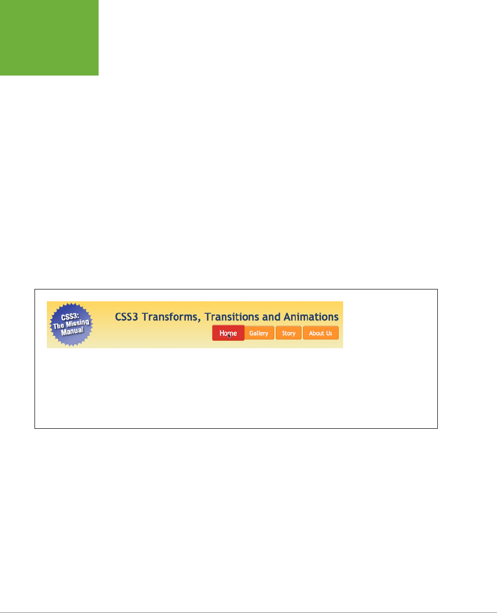
CSS3: THE MISSING MANUAL
374
TUTORIAL
10. Edit the .logo style by adding three new lines:
.logo {
-webkit-animation: logo 3s;
-moz-animation: logo 3s;
-o-animation: logo 3s;
animation: logo 3s;
}
11. Save the page and check it out in Firefox, Chrome, Safari, and Opera.
The logo should roll along the page and enlarge on all of those browsers. Of
course, in Internet Explorer 9 and earlier, you won’t see any animation. However,
the logo will still be correctly placed and the page will look just fine. You’ll find
a finished version of this tutorial in the
10_finished
folder.
To take this further, add an animation that makes one of the navigation buttons
glow when the mouse is positioned over it. (Hint: create an animation that cycles
through dierent box shadow. Use the inset value to add the shadow inside
the box as described on page 211. Then add that animation to the nav a:hover
style so it only plays when the mouse hovers over a button.)
FIGURE 10-11
Books can do a lot, but
they can’t, unfortunately,
show you the amazing
animation that you just
created. Here’s what the
page should look like
when the animation has
run its course and you
mouse over the Home
button.

375
CHAPTER
11
The formatting powers of CSS go way beyond text, images, and links. You can
make tables of information like schedules, sports scores, and music playlists
easier to read by adding borders, backgrounds, and other visual enhancements.
Similarly, you can use CSS to organize the elements of a form to help your visitors
through the process of ordering items, signing up for your newsletter, or using your
latest web application.
This chapter shows you how to display tables and forms with HTML and how to lay
out and style them using CSS. In two tutorials at the end of the chapter, you’ll create
a table and a form, using the tricks you’ve learned along the way.
Using Tables the Right Way
HTML tables have seen a lot of use in the short history of the Web. Originally cre-
ated to display data in a spreadsheet-like format, tables became a popular layout
tool. Faced with HTML’s limitations, designers got creative and used table rows and
columns to position page elements like banner headlines and sidebars. As you’ll
see in Part Three of this book, CSS does a much better job of laying out web pages.
You can concentrate on using (and formatting) tables for their original purpose—
displaying data (Figure 11-1).
Formatting Tables
and Forms
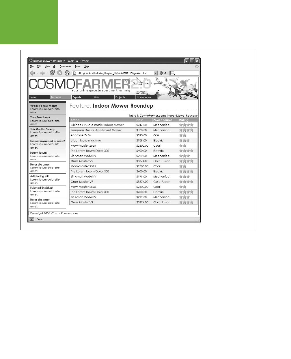
CSS3: THE MISSING MANUAL
376
USING TABLES
THE RIGHT WAY
FIGURE 11-1
You can do all of your page
layout and design with CSS
and use tables for what
they were intended—
displaying rows and
columns of information.
CSS created the attractive
fonts, borders, and
background colors in this
table about indoor lawn
mowers, but the underly-
ing structure is all thanks
to HTML.
HTML (and XHTML) has a surprising number of tags dedicated to table building. This
chunk of HTML creates the very simple table pictured in Figure 11-2.
<table>
<caption align="bottom">
Table 1: CosmoFarmer.com's Indoor Mower Roundup
</caption>
<colgroup>
<col class="brand" />
<col class="price" />
<col class="power" />
</colgroup>
<thead>
<tr>
<th scope="col">Brand</th>
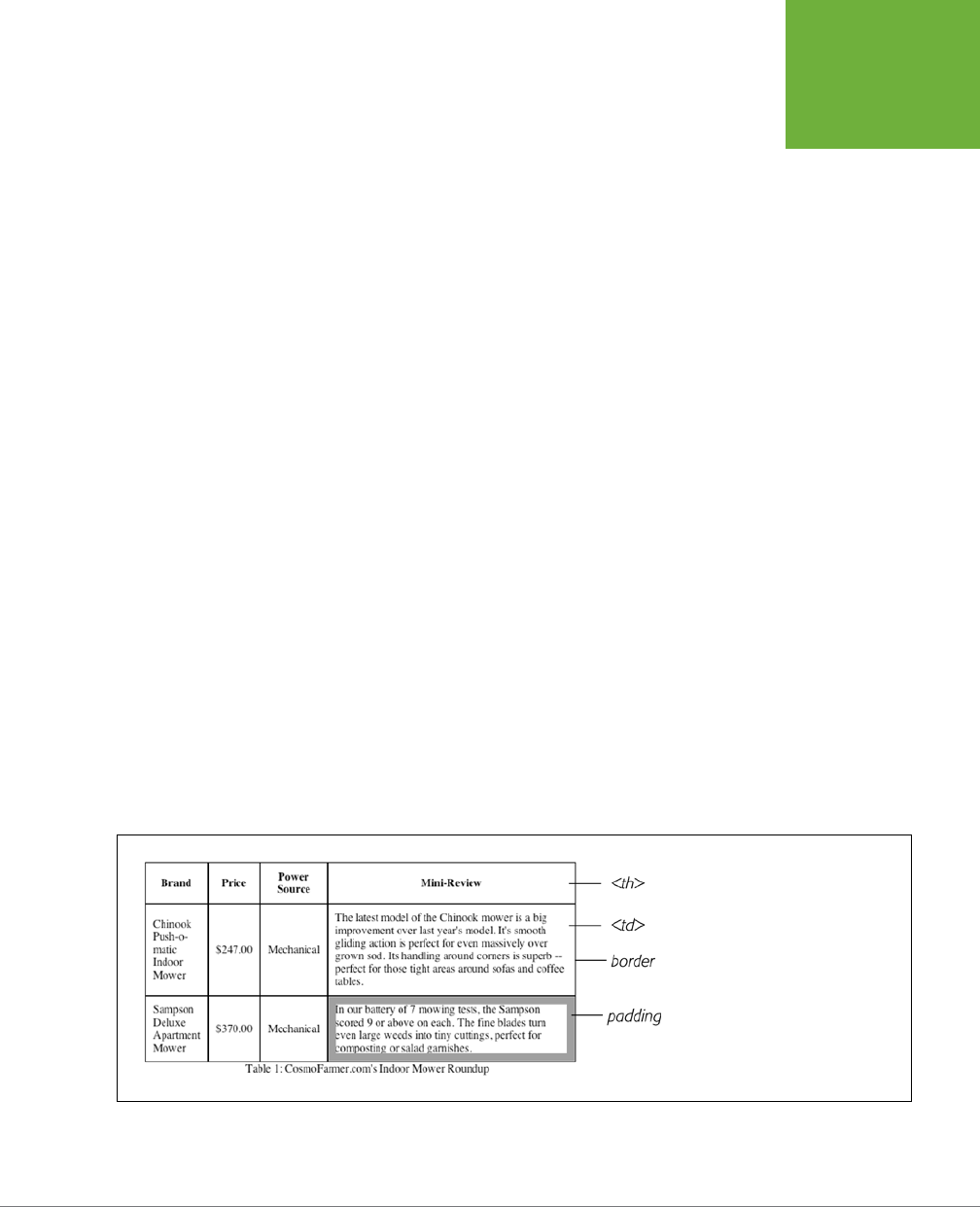
CHAPTER 11: FORMATTING TABLES AND FORMS 377
USING TABLES
THE RIGHT WAY
<th scope="col">Price</th>
<th scope="col">Power Source</th>
</tr>
</thead>
<tbody>
<tr>
<td>Chinook Push-o-matic Indoor Mower</td>
<td>$247.00</td>
<td>Mechanical</td>
</tr>
<tr>
<td>Sampson Deluxe Apartment Mower</td>
<td>$370.00</td>
<td>Mechanical</td>
</tr>
</tbody>
</table>
Even with only three rows and three columns, the table uses nine unique HTML tags:
<table>, <caption>, <colgroup>, <col>, <thead>, <tbody>, <tr>, <th>, and <td>. In
general, more HTML isn’t a good thing, and you don’t need all of these tags: you
can get away with just the <table>, <tr>, and <td> tags (and usually <th> as well).
However, a table’s various tags give you lots of useful hooks to hang CSS styles on.
The headers of each column—the <th> tags—can look dierent from other table
cells if you create a <th> tag style, and you can use the <colgroup> tag as an easy
way to set the width of a table column. This saves you the hassle of having to create
lots of classes—like .tableHeader—and then apply them by hand to individual table
cells. In the next section, you’ll see examples of how you can use these dierent
tags to your advantage.
FIGURE 11-2
Data tables, like this one, usually have
headers created with the
<th>
tag.
Header cells announce what type of in-
formation appears in a row or column.
Price tells you that you’ll find the cost
of each lawn mower listed in the cells
below. The actual data presented in a
table is enclosed in
<td>
tags.
CSS3: THE MISSING MANUAL
378
STYLING
TABLES
NOTE For an in-depth article on the HTML used to create tables, visit
www.456bereastreet.com/
archive/200410/bring_on_the_tables
.
Styling Tables
You can use many of the CSS properties you’ve read about to dress up the appear-
ance of a table and its contents. You can use the
color
property, for example, to set
a table’s text color, just like anywhere else. You’ll find a few properties, however,
that are particularly useful with tables, as well as a couple aimed specifically at
formatting tables.
Because tables are composed of several HTML tags, it helps to know which tag to
apply a particular CSS property to. Applying padding to a <table> tag, for example,
has no eect. The next few sections cover CSS properties for formatting tables and
which HTML tags they get along with.
Adding Padding
As you read on page 195, padding is the space between an element’s border and
its content. You can use padding to provide a little space between the edges of a
paragraph’s text and its border. When it comes to tables, the borders are the
edges
of a cell, so padding adds space around any content you’ve placed inside of a table
cell (see Figure 11-2). It works a lot like the old cellpadding attribute—which is no
longer valid in HTML5—with the added benefit that you can individually control
space between a cell’s content and each of its four edges.
You apply padding to either a table header or a table cell tag, but
not
to the <table>
tag itself. So, to add 10 pixels of space to the inside of all table cells, use this style:
td, th { padding: 10px; }
You can also control the spacing separately for each edge. To add 10 pixels of space
to the top of each table data cell, 3 pixels to the bottom of that cell, and 5 pixels on
both the left and right sides, create this style:
td {
padding-top: 10px;
padding-right: 5px;
padding-bottom: 3px;
padding-left: 5px;
}
Or, use the padding shortcut property:
td {
padding: 10px 5px 3px 5px;
}
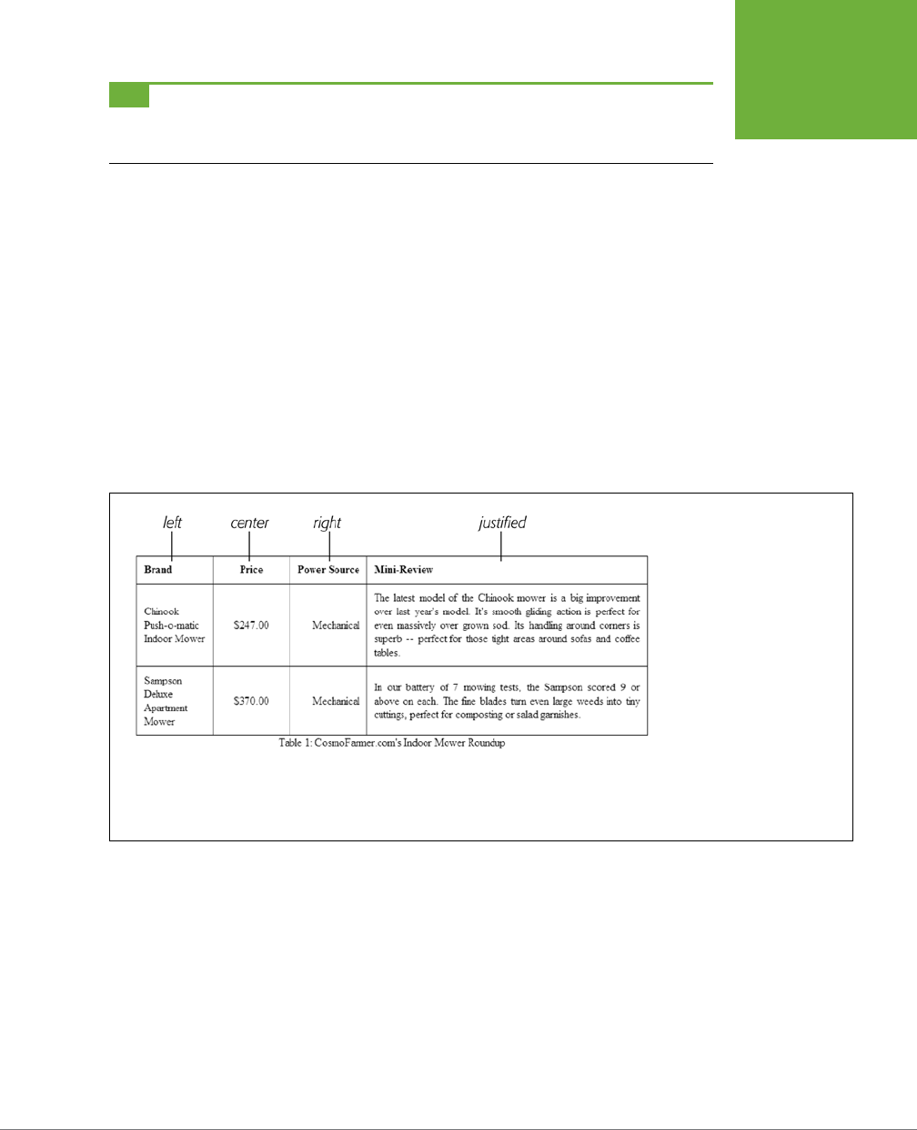
CHAPTER 11: FORMATTING TABLES AND FORMS 379
STYLING
TABLES
TIP If you place an image into a table cell using the
<img>
tag and notice that there’s unwanted space below
the image, then set its
display
property (page 202) to
block
. For more information, see
http://developer
.mozilla.org/en/docs/Images,_Tables,_and_Mysterious_Gaps
.
Adjusting Vertical and Horizontal Alignment
To control where content is positioned
within
a table cell, use the text-align and
vertical-align properties.
Text-align controls horizontal positioning and can be set to left, right, center,
and justify (see Figure 11-3). It’s an inherited property. (See Chapter 4 for more
on inheritance.) When you want to right align the contents of all table cells, create
a style like this:
table { text-align: right; }
This property comes in handy with <th> tags, since browsers usually center align
them. A simple style like th { text-align: left; } makes table headers align
with table cells.
FIGURE 11-3
When applied to table cells, the
CSS
text-align
property
works like the
<td>
tag’s align
attribute. Skip the HTML
align
attribute, however, since it is
no longer valid in HTML5, and
CSS lets you store the style
information in an external style
sheet. That way, if you decide
you need to change alignment
in your table cells from right to
left, then you need to update
only the external style sheet,
not 10,000 individual
<td>
tags.
Table cells have a height as well. Web browsers normally align content vertically in
the middle of a table cell (see the middle example in Figure 11-4). You can control
this behavior by using the vertical-align property. Use one of these four values:
top, baseline, middle, or bottom. Top pushes content to the top of the cell, middle
centers content, and bottom pushes the bottom of the content to the bottom of the
cell. Baseline works just like top, except the browser aligns the baseline of the first
line of text in each cell in a row (Figure 11-4). Unless you’re a real perfectionist, you
won’t even notice the subtlety of the baseline option. More importantly, neither will
your visitors. Unlike text-align, the vertical-align property isn’t inherited, so you
can use it only on styles that apply directly to <th> and <td> tags.
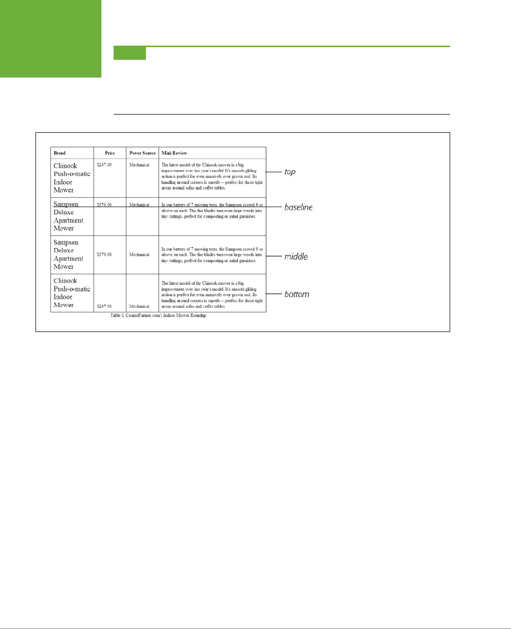
CSS3: THE MISSING MANUAL
380
STYLING
TABLES
NOTE So far, the table formatting you’ve learned applies to
all
your tables. When you want to style indi-
vidual tables (or table cells), change the selector you use. To apply a special design to a certain table, give it a
class name—
<table class="stocks">
—and create descendent selectors like
.stocks td
or
stocks
th
to uniquely format individual cells. If you want to style a particular cell differently than other cells in a table,
then apply a class to the tag—
<td class="subtotal">
—and create a class style to format that cell.
FIGURE 11-4
The
vertical-align
property is the
CSS equivalent of the (now obsolete)
<td>
tag’s
valign
attribute. When
padding is applied to a cell, the content
never actually aligns to the bottom or top
border lines: There’s always a gap equal
to the padding setting. You can control
the size of the padding (see page 195).
Creating Borders
The CSS border property (page 202) works pretty much the same with tables as with
other elements, but you need to keep a couple of things in mind. First, applying a border
to a style that formats the <table> tag outlines just the table, not any of the individual
cells. Second, applying borders to cells (td { border: 1px solid black; }) leaves
you with a visual gap between cells, as shown in Figure 11-5, top. To gain control of
how borders appear, you need to understand the how web browsers normally draw
tables cells and the CSS border-collapse property.
• Controlling the space between table cells. Unless instructed otherwise, brows-
ers separate table cells by a couple of pixels. This gap is really noticeable when
you apply a border to table cells. CSS gives you the border-spacing property
to control this space. Apply this property to the table itself, and if you wish to
remove the space that browsers normally place between cells, then set the
border-spacing property to 0:
table {
border-spacing: 0;
}
CHAPTER 11: FORMATTING TABLES AND FORMS 381
STYLING
TABLES
Of course, if you like space between the cells, then add space:
table {
border-spacing: 2px;
}
• Eliminating double borders. Even if you eliminate the cell spacing of a table,
borders applied to table cells double up. That is, the bottom border of one cell
adds to the top border of the under-hanging cell, creating a line that’s twice
as thick as the border setting (Figure 11-5, middle). The best way to eliminate
this (and eliminate cell spacing at the same time) is to use the border-collapse
property. It accepts two values—separate and collapse. The separate option
is normally how tables are displayed, with the cell spaces and doubled borders.
Collapsing a table’s borders eliminates the gaps and doubled borders (Figure
11-5, bottom). Apply the collapse value to a style formatting a table, like so:
table { border-collapse: collapse; }
NOTE If you set the
border-collapse
property to
collapse
,
border-spacing
has no effect.
• Rounded corners. You can use the border-radius property (page 207) to add
rounded corners to table cells (but not to tables themselves). For example, if
you want to outline table cells and give them rounded corners, you can create
this style:
td {
border: 1px solid black;
border-radius: 5px;
}
Note that if you set the border-collapse property to collapse, then browsers
ignore any border-radius you’ve set for table cells; they’ll just draw regular
square corners.
NOTE You can even apply the
box-shadow
property (page 210) to tables and to cells. If you apply it to a
table, the shadow will appear outside the entire table, but if you apply the shadow to individual cells, then each
cell will have its own drop shadow.
Styling Rows and Columns
Adding stripes, like the ones in Figure 11-6, is a common table design technique. By
alternating the appearance of every other row of data, you make it easier for people
to spot the data in each row. Fortunately, CSS does oer a way to do that. Using
the nth-of-type selector, which you read about on page 78, you can add dierent
backgrounds to odd and even rows:
tr:nth-of-type(odd) { background-color: red; }
tr:nth-of-type(even) { background-color: blue; }
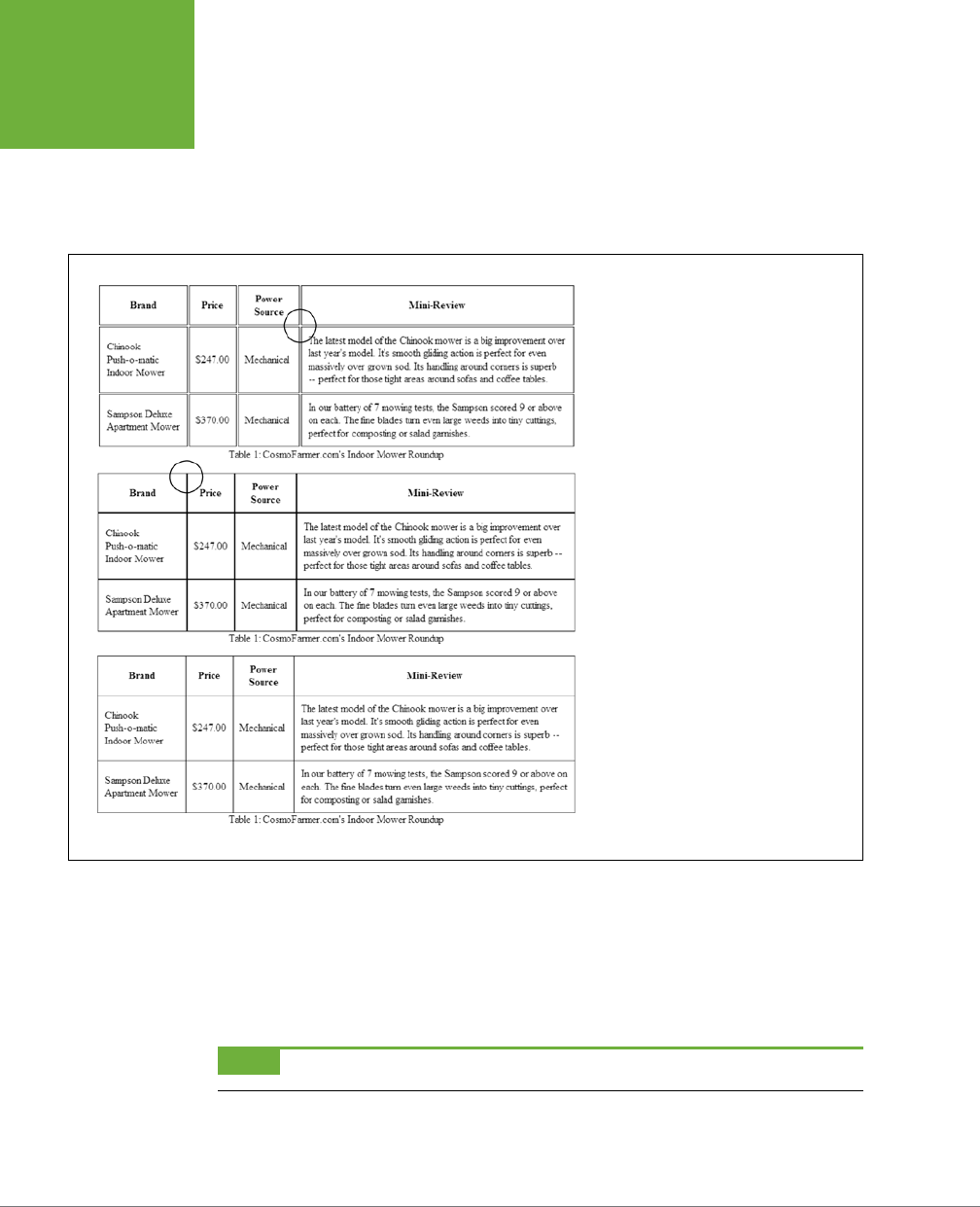
CSS3: THE MISSING MANUAL
382
STYLING
TABLES
If you don’t want to apply the same background to the odd rows of all of your tables,
simply add a class name to the table you wish to target (products, for a table with
product information, for example), then use a descendent selector like this:
.products tr:nth-of-type(odd) { background-color: red; }
.products tr:nth-of-type(even) { background-color: blue; }
FIGURE 11-5
Browsers normally insert space between each
table cell. (You probably won’t notice this
extra space unless you’ve added a border,
as shown here at the top.) If you set the
border-spacing
to
0
to remove the
extra space, you’re left with double border
lines where adjoining borders touch (middle).
The
border-collapse
property solves
both dilemmas (bottom).
You’re not limited to colors either. You can use background images (see page 240)
or even linear gradients (page 260) to create more sophisticated looks like the slight
gradation in the table header row of Figure 11-6. (You’ll see a similar example of
this in the tutorial on page 393.) You can use a descendent selector to target cells
in that row as well. This technique is great for when you style all of the cells in one
column with their own look: <td class="price">, for example.
NOTE The
nth-of-type
selector isn’t supported in Internet Explorer 8 or earlier.
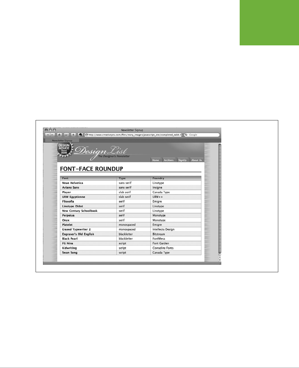
CHAPTER 11: FORMATTING TABLES AND FORMS 383
STYLING
TABLES
Formatting columns is a bit trickier. HTML provides the <colgroup> and <col> tags
to indicate groups of columns and individual columns, respectively. You include one
<col> tag for each column in the table and can identify them with either a class or
ID. (See the HTML code on page 376.) Only two sets of properties work on these
tags: width and the background properties (background-color, background-image,
and so on). But they can come in mighty handy. When you want to set the width
of all of the cells in a column, you can skip any HTML attributes and just style the
column, using a style applied to the <col> tag. For example, say you have this bit
of HTML: <col class="price">. You can add this style to a style sheet to set the
width of each cell in that column to 200 pixels:
.price { width: 200px; }
FIGURE 11-6
Alternating the back-
ground color from row to
row in a table makes it
easier to quickly identify
the data for each row.
To highlight a column, you can use the background properties. Again, assume you
have a <col> tag with a class of price applied to it:
.price { background-color: #F33; }
Keep in mind, however, that backgrounds for columns appear under table cells, so if
you set a background color or image for <td> or <th> tags, the column’s background
won’t be visible.
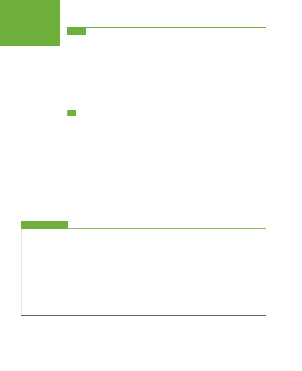
CSS3: THE MISSING MANUAL
384
STYLING
FORMS
NOTE Typically, web browsers display the border and background color of any empty table cell. If you want
to hide those empty cells, CSS lets you. Just add
empty-cells:hide
to a style applied to a table:
table {
empty-cells: hide;
}
One caveat, however: If you set the
border-collapse
property (page 380) to
collapse
, browsers ignore
the
empty-cells
property and show the borders and backgrounds of even empty cells.
Styling Forms
Web forms are the primary way visitors interact with a website. By supplying
information on a form, you can join a mailing list, search a database of products,
update your personal profile on Facebook, or order that Star Wars Lego set you’ve
had your eye on.
There’s no reason your forms need to look like all the others on the Internet. With a
little CSS, you can style form fields to share the same formatting as other site ele-
ments like fonts, background colors, and margins. There aren’t any CSS properties
specific to forms, but you can apply just about any property in this book to a form
element.
The results, however, can be mixed (see Figure 11-7). Browsers vary in how they
handle the styling of form elements. The next section tells you which properties work
best with which form tags and also lists which browsers interpret them properly.
UP TO SPEED
Staying True to Form
Quite apart from the varying browser support for CSS-styled
forms, there are good reasons to tread lightly when altering the
look of universally recognized interface elements like submit
buttons and pull-down menus. Most web surfers are already
very familiar with how forms look and work. The generic look
of a submit button is the same from site to site. When people
see it, they instantly know what that button does and how to
use it. If you alter the look of a form
too
much, you may make
it harder for visitors to fill out your form correctly.
Adding a dotted border to a form field can turn an easily
recognizable text field into an easily skipped box. (See the
examples at bottom right and bottom center of Figure 11-7.) If
that text box is intended to capture email addresses for your
newsletter, you may lose a few visitors who skip right over it.
At the very least, make sure people can recognize the forms
on your sites as forms.
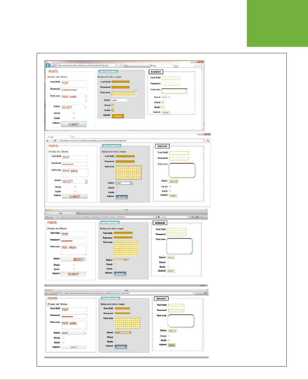
CHAPTER 11: FORMATTING TABLES AND FORMS 385
STYLING
FORMS
FIGURE 11-7
Browsers vary in how they handle
the styling of form fields. Internet
Explorer 9 (top) doesn’t support
rounded corners or drop shadows
on a text area (see the Text area in
the Borders panel at right). Nor does
it understand the linear gradient
applied to the Submit button in
the middle Backgrounds panel. The
differences between Chrome (second
from top), Firefox (second from
bottom), and Safari (bottom) aren’t
nearly so drastic, but there are still a
few visual inconsistencies between
them. The best you can do is design
your forms carefully and not expect
them to look the same on every
browser.

CSS3: THE MISSING MANUAL
386
STYLING
FORMS
HTML Form Elements
A variety of HTML tags help you build forms. You can format some of them (like text
fields) more successfully than others (radio buttons). Here are a few common form
tags and the types of properties they get along with:
• Fieldset. The <fieldset> tag groups related form questions. Most browsers do
a good job of displaying background colors, background images, and borders
for this tag. However, Internet Explorer lets the background flow up and over
the top line of the fieldset. (Look at the middle panel of the top image in Figure
11-7.) Padding places space from the edges of the fieldset to the content inside it.
Although Internet Explorer unfortunately ignores top padding, you can simulate
it by adding a top margin to the first element inside the fieldset.
• Legend. The <legend> tag follows the HTML for the <fieldset> tag and provides
a label for the group of fields. The legend appears vertically centered on the top
borderline of a fieldset. If the form elements for collecting a shipping address
appear inside the fieldset, you might add a legend like this: <legend>Shipping
Address</legend>. You can use CSS to change the <legend> tag’s font proper-
ties, add background colors and images, and add your own borders.
• Text fields. The <input type="text">, <input type"password">, and <textarea>
tags create text boxes on a form. These tags give you the most consistent cross-
browser CSS control. You can change the font size, font family, color, and other
text properties for text boxes, as well as add borders, background colors, and
images. You can set the width and height of these fields using the CSS width
and height properties.
• Buttons. Form buttons—like <input type="submit">— let your visitors submit
a form, reset its contents, or set o some other action. Most browsers let you go
wild with text formatting, borders, backgrounds, drop shadows, and rounded
corners. You can also align the button’s text to the left, middle, or right using
the text-align property. Linear gradients (page 260) look especially good on
buttons.
• Drop-down menus. Drop-down menus created by the <select> tag also give
you a fair amount of styling control. Most other browsers also let you set the
font, font size, background color, image, and borders. However, backgrounds
and background images aren’t always added to the drop-down menu when it
expands to show all of the menu’s options.
• Checkboxes and radio buttons. Most browsers don’t allow formatting of these
elements. Opera, however, lets you set a background color that appears
inside
the box or button. Internet Explorer adds a background color
around
the box
or button. Because browsers vary widely in how they treat these elements, it’s
best to leave them alone.

CHAPTER 11: FORMATTING TABLES AND FORMS 387
STYLING
FORMS
POWER USERS’ CLINIC
Attribute: The Ultimate Form Field Selector
When it comes to styling forms, tag styles just don’t cut the
mustard. After all, text boxes, radio buttons, checkboxes,
password fields, and buttons all share the same HTML tag—
<input>
. While a width of 200 pixels makes sense for a
textbox, you probably don’t want your checkboxes to be that
big, so you can’t use the
<input>
tag to format width. For
now, the most cross browser–friendly way of formatting only
text fields would be to add a class name to each text field—
like
<input type="text" class="textfield"
name="email">
—and then create a class style to format it.
However, you can take advantage of the attribute selector
(page 72) to fine-tune your form styling without resorting
to classes.
An attribute selector targets an HTML tag based on one of
the tag’s attributes. The
type
attribute is responsible for
determining what kind of form element the
<input>
tag
produces. The type value for a form text field is
text
. To create
a style that makes the background color of all single-line text
fields blue, you’d create this selector and style:
input[type="text"] {
background-color: blue;
}
Changing
text
in the above example to
submit
creates a
style for submit buttons only, and so on.
All current browsers, even Internet Explorer 7, understand at-
tribute selectors, so feel free to use them to style your forms
with precision.
Laying Out Forms Using CSS
All it takes to create a form is adding a bunch of labels and other form elements to
a web page. Visually, though, you may end up with a chaotic mess (see Figure 11-8,
left). Forms usually look best when the questions and form fields are organized into
columns (Figure 11-8, right).
You can achieve this eect in a couple of ways. The easiest approach is with an
HTML table. Although form labels and fields aren’t strictly table data, they lend
themselves beautifully to a row/column format. Just put your labels (“First Name,”
“Phone Number,” and so on) in one column and form fields in a second column.
Using CSS, you can also create a two-column form like Figure 11-8 (with the added
benefit of less HTML code). Here’s the basic approach:
1. Wrap each label in a tag.
The obvious choice for a tag is <label>, since it’s designed to identify form
labels. But you can’t
always
use <label> tags for all labels. Radio buttons usu-
ally have a question like “What’s your favorite color?” followed by separate
<label> tags for each button. So what tag do you use for the question? In this
case, you must resort to wrapping the question in a <span> tag: <span>What's
your favorite color?</span>. Then add a class to each of these tags—<span
class="label">—and also add the class to just those <label> tags you want to
appear in the left-hand column (in Figure 11-8, that would be the labels for “First
name,” “Last name,” and so on, but not the <label> tags for the radio buttons).
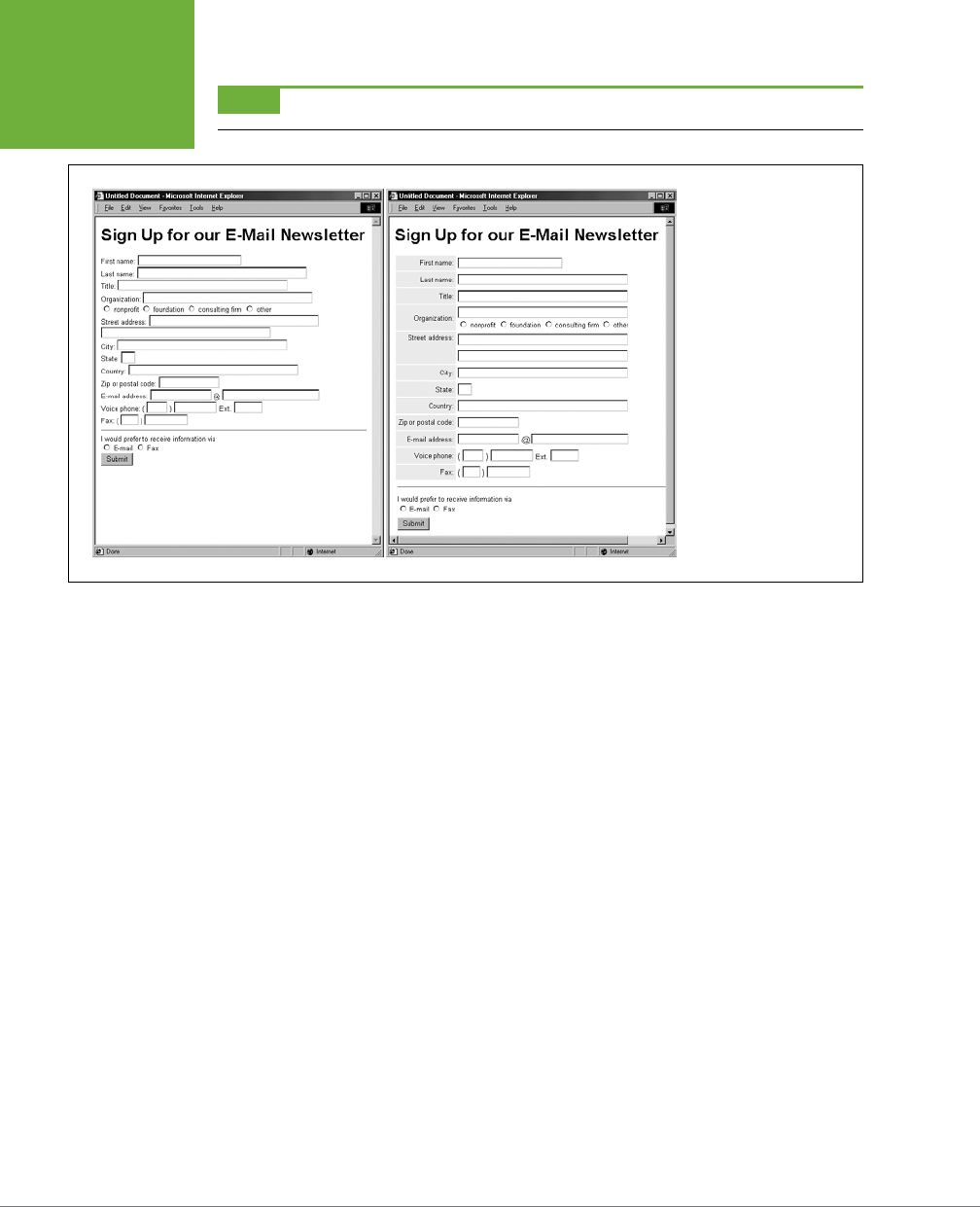
CSS3: THE MISSING MANUAL
388
STYLING
FORMS
NOTE Visit
www.htmldog.com/guides/htmladvanced/forms
for a quick overview on the
<label>
tag.
FIGURE 11-8
The different shapes and
sizes of text boxes, radio
buttons, and other form
objects don’t naturally
align well with text, often
causing an ungainly zigzag
pattern. This form isn’t
just ugly; it’s hard to read
(left). The solution is to
organize your forms into
columns (right), using
either an HTML table or
CSS styles.
2. Set the display property to inline-block, and set a width.
Normally the <label> and <span> tags are inline elements, which normally ig-
nore many of the settings available to block elements, including width, height,
and text-align. However, if you make the label an inline-block, it can still sit
next to (that’s the “inline” part) the form field. The width value should provide
enough space to accommodate the entire label on one line if possible. You can
create a class style that looks something like this:
.label {
display: inline-block;
width: 20em;
}
The width and inline-block settings turn the labels into little evenly sized blocks
and provide a clean left edge to which all the form fields align.
3. Adjust the style.
Just a couple more enhancements complete the job. You want to set the
vertical-align property (page 379) to top, so the top of the label text aligns
with the top of the form field. You also should align the label text to the right,
so each label appears next to each form field. Finally, by adding a little bit of
right margin, you can create a nice gutter of white space between the labels
and form fields.
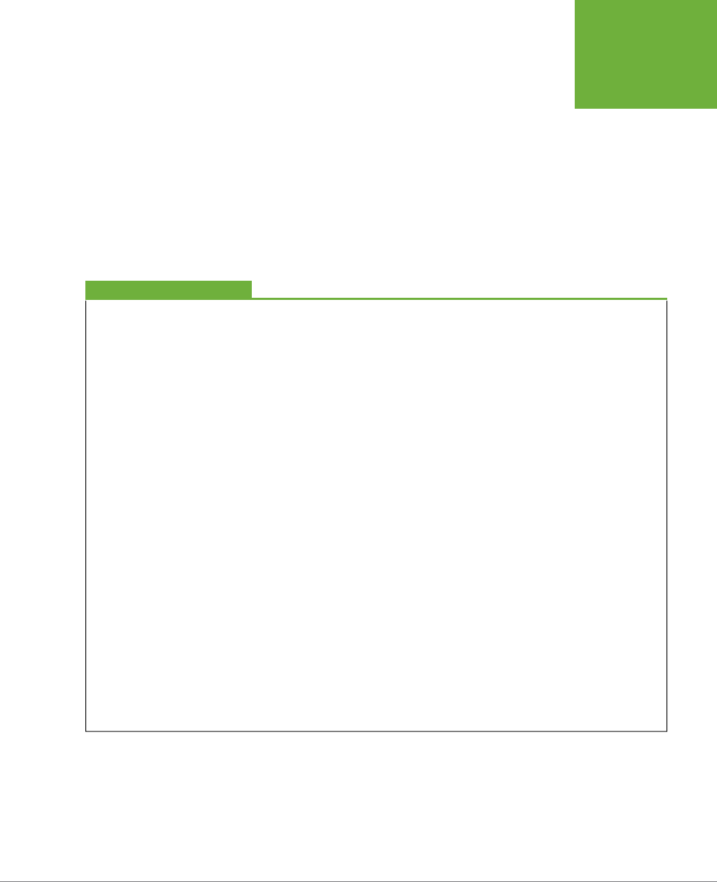
CHAPTER 11: FORMATTING TABLES AND FORMS 389
STYLING
FORMS
.label {
float: left;
width: 20em;
vertical-align: top;
text-align: right;
margin-right; 15px;
}
At this point, you’ve got yourself a simple, neat form. You can make other en-
hancements if you wish, like making the labels bold and a dierent color. The
tutorial that starts on the next page provides a step-by-step example of this
technique.
POWER USERS’ CLINIC
Form Pseudo-Classes
There are a handful of pseudo-classes aimed at styling forms.
The
:focus
pseudo-class lets you create a selector that
changes the way a text field looks when a visitor clicks or
tabs inside it (this is called giving the field
focus
). You can use
this to change the size, background color, font, and other CSS
properties of the field. You’ll see an example of it in action in
the tutorial on page 395.
The
:checked
pseudo-class works with radio buttons and
checkboxes. It’s intended to let you style those elements,
but web browsers generally keep a tight visual rein on these
fields, and most CSS properties do not apply. However, if you
want to give them a try, you can simply create a style named
:checked
and add some CSS properties to it. Realize it will
only apply to the radio buttons and checkboxes of a form. If
you want to style a particular checkbox when it’s checked, you
can create a class style:
.special:checked
And then apply that class to just that checkbox:
<input type="checkbox" class="special" …
Form elements can also be enabled or disabled. When disabled,
the field can’t be changed: for example, you can’t type into
a disabled text field, or turn on a disabled checkbox. You can
only change the state of a form element (from disabled to
enabled, for example) using JavaScript, so you’ll need to learn
that to really take advantage of the
:enabled
or
:dis-
abled
pseudo-classes. However, they can come in handy.
For example, say you have an order form with both “billing”
and “shipping” address fields. If you added a “same as billing
address” checkbox next to the shipping address fields, a visitor
can click this box. Using JavaScript, you can disable the shipping
address fields so no one accidentally types into them. To make
it clear that the user can’t fill them out, you can change their
style so they look “dimmed” or grayed out, like this:
:disabled {
background-color: #333;
}
There are even more pseudo-classes intended to work with
some of HTML5’s special form features like built-in form
validation or other special properties. To learn about these,
visit
http://html5doctor.com/css3-pseudo-classes-and-html5-
forms/
. Keep in mind, though, that many browsers don’t yet
support these HTML5 form features.
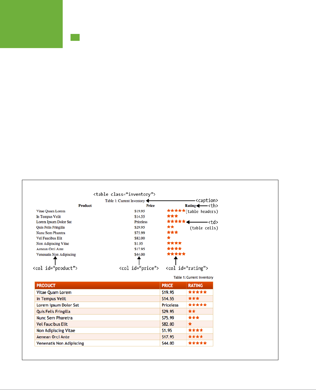
CSS3: THE MISSING MANUAL
390
TUTORIAL:
STYLING A
TABLE
Tutorial: Styling a Table
HTML is great for building tables, but you need CSS to give them style. As you can
see on page 375, it takes quite a bit of HTML to construct a simple table. Lucky for
you, this book comes with a prebuilt HTML table for you to practice your CSS on. In
this tutorial, you’ll format the table’s rows, columns, and cells, and give it an attrac-
tive font and background color.
To get started, download the tutorial files located on this book’s companion website
at
www.sawmac.com/css3/
. Click the tutorial link and download the files. All the files
are enclosed in a zip archive, so you need to unzip them first. (Go to the website for
detailed instructions.) The files for this tutorial are in the
11
→
table
folder.
1. Launch a web browser and open the file
11
→
table
→
table.html
.
This page contains a simple HTML table. It has a caption, a row of table head-
ers, and nine rows of data contained in table cells (Figure 11-9). In addition, the
<col> tag is used three times to identify the three columns of data. As you’ll
see in a bit, <col> is a handy tag to style, since it will let you set the width of
all cells in a column.
FIGURE 11-9
Formatting a table with
borders, background
colors, and other CSS
properties not only makes
a drab HTML table (top)
look great, but also makes
the table’s data easier to
read (bottom).

CHAPTER 11: FORMATTING TABLES AND FORMS 391
TUTORIAL:
STYLING A
TABLE
2. Open
table.html
in a text editor.
You’ll start by creating a style that sets the table’s width and text font. This
table has an class of inventory applied to it, so you can use a class selector to
format just this one table.
NOTE There’s already an external style sheet attached to this page, but you’ll add your new styles to an
internal style sheet.
3. Click between the opening and closing <style> tags, and then add the fol-
lowing style:
.inventory {
font-family: "Trebuchet MS", Arial, Helvetica, sans-serif;
width: 100%;
margin-top: 25px;
}
Unless you set the width of a table, it grows and shrinks to fit the size of the
content inside it. In this case, you’ve set a 100 percent width, so the table
stretches to fit the entire width of its container. (In this case, it’s the <body> tag
itself, with a set width and auto left and right margins to center it in the browser
window.) Setting the font family in the <table> uses inheritance to give all of
the tags inside the table the same font—<caption>, table headers (<th>), table
cells (<td>), and so on. Finally, the margin-top property scoots the table down
from the headline above it.
Next you’ll style the table’s caption.
4. Add another style below the table style you just created:
.inventory caption {
text-align: right;
font-size: 1.3em;
margin-bottom: 10px;
}
This descendent selector only aects the <caption> tag that appears inside
another tag with the ID of inventory (that’s the <table> on this page). A <cap-
tion> tag indicates what a table is about. In this case, it shouldn’t be the focus of
attention, so you’ve kept the text small and moved it to the right edge, out of the
way. The bottom margin adds a bit of space between the caption and the table.
When you read information across a table row, it’s easy to lose track of which
row you’re looking at. Good visual guides are essential. Adding borders around
the cells, which you’ll do next, visually delineates the information.

CSS3: THE MISSING MANUAL
392
TUTORIAL:
STYLING A
TABLE
5. Add the following group style to the internal style sheet:
.inventory td, .inventory th {
font-size: 1.1em;
border: 1px solid #DDB575;
}
This group selector formats the table header (<th>) and table cell (<td>) tags
of this table with larger type and draws a border around each header and each
cell. Browsers normally insert space between each cell, so at this point there
are small gaps between the borders (Figure 11-10, circled). Between the gaps
and the borders, the whole table looks too boxy. You’ll fix that next.
6. Add the border-collapse property to the table style you created in Step 3
so that it looks like this:
.inventory {
font-family: "Trebuchet MS", Arial, Helvetica, sans-serif;
width: 100%;
margin-top: 25px;
border-collapse: collapse;
}
The border-collapse property removes the spacing between cells. It also
merges borders that touch, which prevents thick, unattractive borders. Without
border-collapse, the bottom border of a table header and the top border of
the table cell would double up to make a two-pixel border.
If you preview the table now, you’ll see the data is better organized visually, but
the information in each cell looks a little cramped. Add some padding to fix that.
7. Add padding to the group selector you created in Step 5:
.inventory td, .inventory th {
font-size: 1.1em;
border: 1px solid #DDB575;
padding: 3px 7px 2px 7px;
}
Although the top, table-header row stands out because of its boldface text,
there are a few things you can do to make it stand out even more and improve
its appearance.
8. Create a new style below the .inventory td, .inventory th style for
formatting just table head cells:
.inventory th {
text-transform:uppercase;
text-align: left;
padding-top: 5px;
padding-bottom: 4px;
}
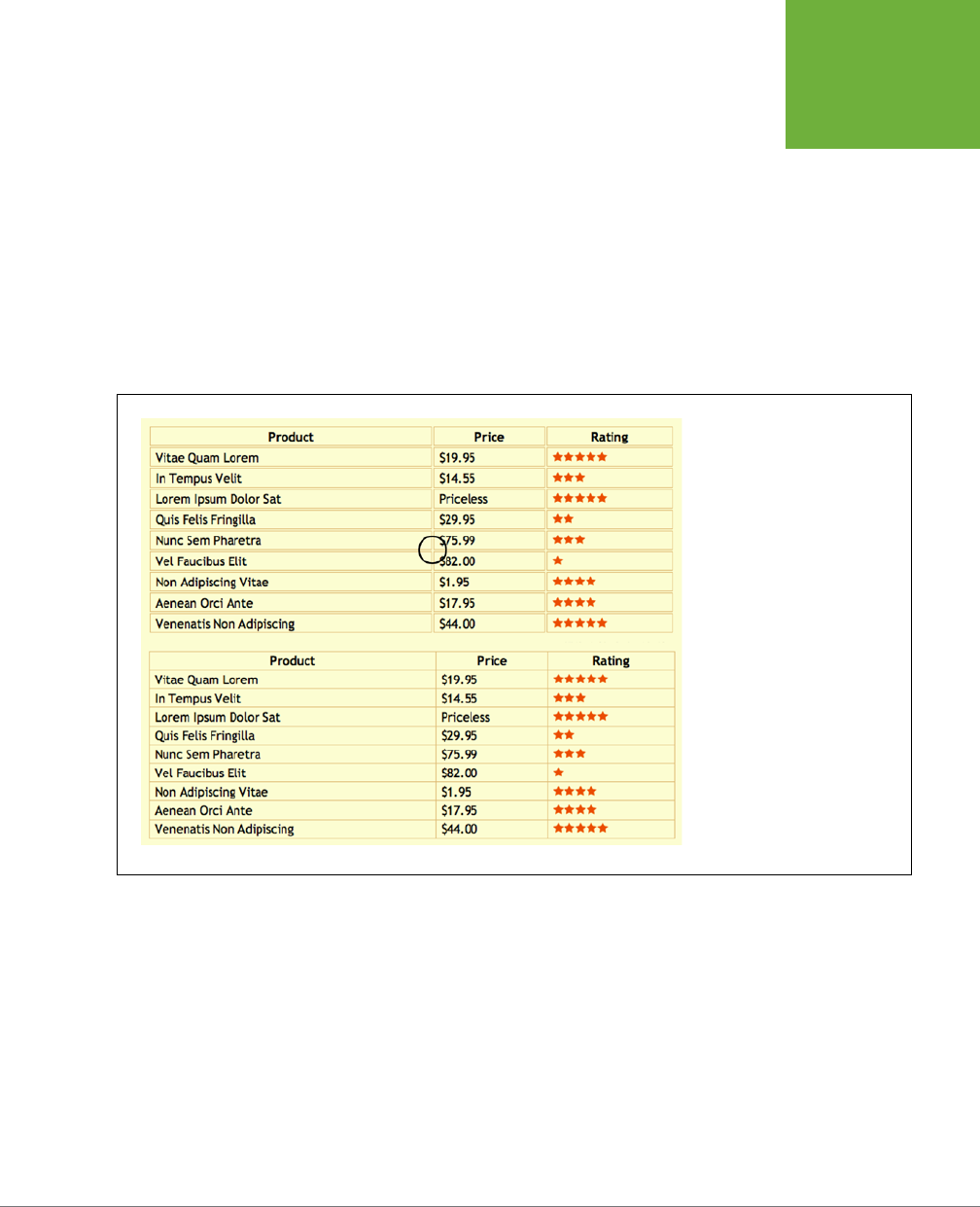
CHAPTER 11: FORMATTING TABLES AND FORMS 393
TUTORIAL:
STYLING A
TABLE
This style is a perfect example of eective cascading. The group selector td,
th defines common formatting properties between the two types of cells. By
introducing this th-only style, you can further tweak the look of
just
the table
headers. For example, the padding-top and padding-bottom settings here over-
ride those same settings defined in the selector in Step 7. However, since you
don’t override the left or right padding settings, the <th> tags will retain the
seven pixels of left and right padding defined in Step 7. This style also turns all
of the text to uppercase and aligns it to the left edge of the table cell.
The table headers still don’t have enough oomph, and the table seems to re-
cede into the background of the page. A background graphic can provide the
necessary boost.
FIGURE 11-10
A browser’s normal display of a
table inserts space between each
cell (top). It also lets borders
double up where cells touch.
Setting the
border-collapse
property to
collapse
solves
both problems (bottom).
9. Edit the th style by adding a linear gradient to the background and chang-
ing the text color:
.inventory th {
text-transform:uppercase;
text-align: left;
padding-top: 5px;
padding-bottom: 4px;
background: rgb(229,76,16);
background: -webkit-linear-gradient(rgb(229,76,16), rgb(173,54,8));
background: -moz-linear-gradient(rgb(229,76,16), rgb(173,54,8));
background: -o-linear-gradient(rgb(229,76,16), rgb(173,54,8));

CSS3: THE MISSING MANUAL
394
TUTORIAL:
STYLING A
TABLE
background: linear-gradient(rgb(229,76,16), rgb(173,54,8));
color: white;
}
You start by simply adding an RGB color to the background; that way, Internet
Explorer 9 and earlier (which don’t understand gradients) at least have a solid
color. The next three lines add the vendor-prefixed versions of the linear gradi-
ent, while the second-to-last line is the ocial linear-gradient syntax. Finally,
the text color is changed to white.
When tables have lots of data stued into many rows and columns, it’s some-
times hard to quickly identify which data belongs to each row. Thankfully, you
can use the nth-of-type selector to quickly target alternating rows.
10. Add one more style to the web page’s internal style sheet:
.inventory tr:nth-of-type(even){
background-color: rgba(255,255,255,.1);
}
.inventory tr:nth-of-type(odd){
background-color: rgba(229,76,16,.1);
}
As you can read on page 78, the nth-of-type selector is used to select child
elements that follow a numeric pattern; for example, every fifth paragraph. In
this case, the first style selects every even <tr> tag, while the second selects
every odd <tr> tag.
Finally, you’ll adjust the width of the cells that fall under the Price and Rating
columns. One technique is to meticulously add class names to those cells and
create a class style with a set width. A better approach, however, is to take
advantage of the <col> tag, which lets you assign a class or ID to a column’s
worth of cells. As you can see in Figure 11-9, those two columns have an ID of
price and rating. You can easily set the width for these two columns with one
group selector.
11. Add one more style to the web page’s internal style sheet:
#price, #rating {
width: 15%;
}
Preview the page in a web browser to see the results. Your page should look like
the bottom image in Figure 11-9. You’ll also find the completed exercise in the
11_finished
→
table
folder.
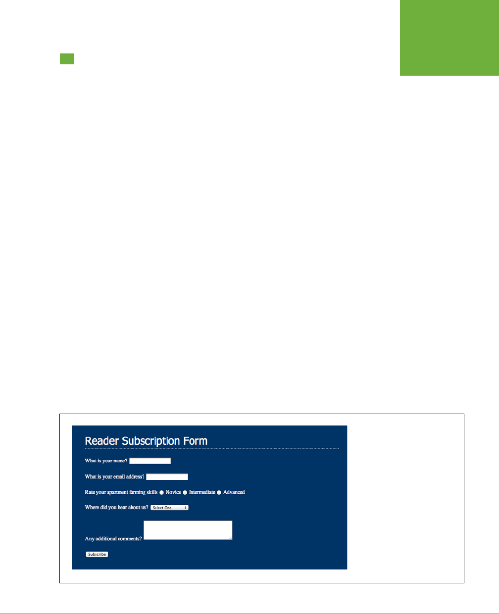
CHAPTER 11: FORMATTING TABLES AND FORMS 395
TUTORIAL:
STYLING A
FORM
Tutorial: Styling a Form
This tutorial gives you some practice using CSS to organize a form and make it
more attractive. If you open
11
→
form
→
form.html
in a web browser, then you’ll see
it contains a simple form for subscribing to the fictitious website, CosmoFarmer.com
(Figure 11-11). The form asks several questions and uses a variety of form elements
for input, including text boxes, radio buttons, and a pull-down menu.
As subscription forms go, it looks fine, but a little bland. In the steps on the following
pages, you’ll spruce up the fonts, line up the questions and boxes better, and add
a few other improvements.
1. Open the file
form.html
in a text editor.
There’s already an external style sheet attached to this page, but you’ll add
your new styles to an internal style sheet. Start by bringing down the size of
the type in the form.
2. Click between the opening and closing <style> tags, and then add the fol-
lowing style:
.subform {
font-size: 1.2em;
color: white;
font-family:Tahoma, Geneva, sans-serif;
}
The subscription form has a class of subform applied to it, so this style sets the
text size, color, and font for all text between the opening and closing <form> tags.
Time to work on the layout. To better align the form elements, you’ll create the
appearance of two columns—one for the questions (labels) and another for the
answers (form fields).
FIGURE 11-11
While the HTML
<table>
tag is
a common way to organize the
questions of a form, you can also
use CSS to make a disorganized
jumble of labels and form fields
(like the ones pictured here) and
make a form’s layout clearer and
more attractive.

CSS3: THE MISSING MANUAL
396
TUTORIAL:
STYLING A
FORM
3. Add another style to the internal style sheet:
.subform .label {
display: inline-block;
width: 200px;
vertical-align: top;
}
This descendent selector identifies any element with a class of .label within
this form. The style changes the labels from inline elements (which won’t ac-
cept width values) to inline-block elements. The width setting sets the label
area to 200 pixels wide, while the vertical align setting makes sure the label
text aligns with the top of the form fields next to them. As a result, when you
apply this style to each of the questions in the form, you create an even-width
column. But in order to see the eect, you must first apply the class to the ap-
propriate page elements.
4. In the page’s HTML, locate this code <label for="name"> and add class=
"label", so the tag looks like this:
<label for="name" class="label">
You must do the same for each question in the form, so…
5. Repeat Step 5 for the following pieces of HTML code: <label for="email">,
<label for="refer">, <label for="comments">.
There’s one additional question on the form—Rate your apartment farming skills.
It isn’t inside a label tag, since its purpose is to introduce a series of radio but-
tons, each of which has its own label. You need to add a <span> tag to this text
so you can apply the label style to it.
6. Find the text
Rate your apartment farming skills
, and then wrap it in a <span>
tag with a class of label, like so:
<span class="label">Rate your apartment farming skills</span>
Now the questions appear to be in a single column (Figure 11-12, top). But
they’d look better if they stood out more and lined up with the corresponding
form fields.
7. Edit the .subform .label style you created in Step 4, so it looks like this:
.subform .label {
display: inline-block;
width: 200px;
vertical-align: top;
text-align: right;
margin-right: 10px;
font-weight: bold;
color: rgba(255,255,255,.5);
}
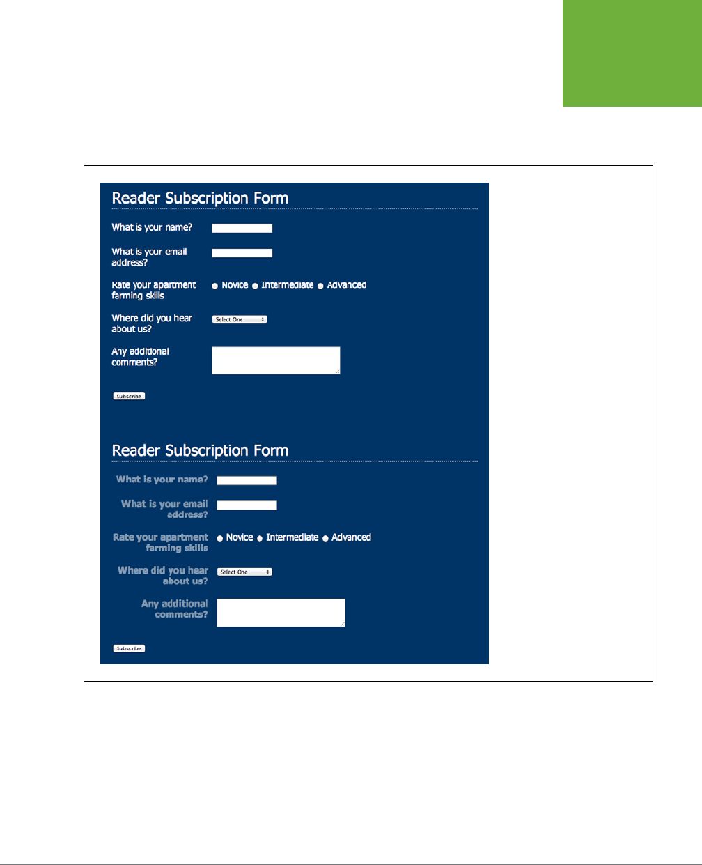
CHAPTER 11: FORMATTING TABLES AND FORMS 397
TUTORIAL:
STYLING A
FORM
Preview the page in a web browser. The form should look like the bottom im-
age in Figure 11-12.
The form is shaping up, but that Subscribe button looks out of place over at the
left edge. You’ll align it with the other form elements next.
FIGURE 11-12
Sometimes small and subtle
changes can make a form more
readable. Making the questions
on the form bold and aligning
them with their corresponding
form elements (bottom figure)
immediately improves the look of
the form.
8. Add another style to the internal style sheet.
.subform input[type="submit"] {
margin-left: 220px;
}
Since submit buttons are created by adding type="submit" to an <input> tag,
you can simply use an attribute selector (page 72) to target them. This frees
you from having to create a class style and applying it to the submit button.

CSS3: THE MISSING MANUAL
398
TUTORIAL:
STYLING A
FORM
Most browsers let you style buttons in other ways, too, so…
9. Edit the Submit button style by adding a few more properties:
.subform input[type="submit"] {
margin-left: 220px;
padding: 10px 25px;
font-size: 1em;
color: white;
}
Padding adds space between the text inside the button and the edges of the
button, while the font-size and color properties aect the text on the button.
Now you can get more creative and add a gradient to the button.
10. Edit the Submit button style again:
.subform input[type="submit"] {
margin-left: 220px;
padding: 10px 25px;
font-size: 1em;
color: white;
background: rgb(0,102,153);
background: -webkit-linear-gradient(rgba(255,255,255,.1) 40%,
rgba(255,255,255,.5));
background: -moz-linear-gradient(rgba(255,255,255,.1) 40%,
rgba(255,255,255,.5));
background: -o-linear-gradient(rgba(255,255,255,.1) 40%,
rgba(255,255,255,.5));
background: linear-gradient(rgba(255,255,255,.1) 40%, rgba(255,255,255,.5));
}
Here you set a standard background color (for IE 9 and earlier) followed by a
linear gradient. There are two color stops. The first color runs from the top to
40 percent of the way into the button, then the gradient begins (for a recap of
gradients and color stops, turn to page 262).
Finally, you’ll tweak the look just a bit. You’ll remove the standard border, round
the corners, and add a glow around the box.
11. Edit the Submit button style one last time (changes in bold):
.subform input[type="submit"] {
margin-left: 220px;
padding: 10px 25px;
font-size: 1em;
color: white;
background: rgb(0,102,153);
background: -webkit-linear-gradient(rgba(255,255,255,.1) 40%,

CHAPTER 11: FORMATTING TABLES AND FORMS 399
TUTORIAL:
STYLING A
FORM
rgba(255,255,255,.5));
background: -moz-linear-gradient(rgba(255,255,255,.1) 40%,
rgba(255,255,255,.5));
background: -o-linear-gradient(rgba(255,255,255,.1) 40%,
rgba(255,255,255,.5));
background: linear-gradient(rgba(255,255,255,.1) 40%, rgba(255,255,255,.5));
border: none;
border-radius: 5px;
box-shadow: 0 0 4px white;
}
Setting the border to none removes the border browsers normally draw around
the button, while the border-radius property (page 207) rounds the button’s
corners. Finally, by adding a drop shadow with no horizontal or vertical oset
(that’s the 0 0 part), you can add a glow to an element. In this case, it looks like
a slight white glow coming from behind the button.
NOTE You can take this button design even farther. Try creating a rollover style for it—
.subform
input[type="submit"]:hover
—and change the background color. You can even animate that transition
using the information you learned in the previous chapter!
You’ve got the text labels and Subscribe button looking great, but why stop
there? Time to jazz up the form fields. Begin by changing their font and back-
ground colors.
12. Add a style for the form’s Select menu:
.subform select {
font-size: 1.2em;
}
This just pumps the text size up a bit. You could choose a font, add a background
color, and make other changes. However, some browsers (like Safari) don’t really
let you style the drop-down menus much, so make sure you test out any style
changes you make to drop-down menus.
Now it’s time to change the text fields.
13. Create a new group selector for styling the three text boxes in the form:
.subform input[type="text"], .subform textarea {
border-radius: 5px;
border: none;
background-color: rgba(255,255,255,.5);
color: rgba(255,255,255,1);
font-size: 1.2em;
box-shadow: inset 0 0 10px rgba(255,255,255,.75);
}

CSS3: THE MISSING MANUAL
400
TUTORIAL:
STYLING A
FORM
This group style selects all input elements with the type of text as well as the
multiline text boxes (the <textarea> tag). This adds various properties that
you should be familiar with by now, like border-radius, background-color,
font size, and box-shadow). The text boxes look a little small, so you’ll set their
widths and add a little bit of padding.
14. Edit the style you just created by setting a width and padding (changes in
bold):
.subform input[type="text"], .subform textarea {
font-size: 1.2em;
border-radius: 5px;
border: none;
background-color: rgba(255,255,255,.5);
color: rgba(255,255,255,1);
font-size: 1.2em;
box-shadow: inset 0 0 10px rgba(255,255,255,.75);
width: 500px;
padding: 5px;
}
You can make your form easier for your visitors to fill out by highlighting the
active form element with the special :focus pseudo-class (page 70). You’ll add
that in the next step.
15. At the end of the internal style sheet, add one last style for the pull-down
menu and the three text fields:
.subform input[type="text"]:focus, .subform textarea:focus {
background-color: white;
color: black;
}
Preview the page in a web browser. It should now look like Figure 11-13 You can find
a completed version of this tutorial in the
11_finished
→
form
folder.
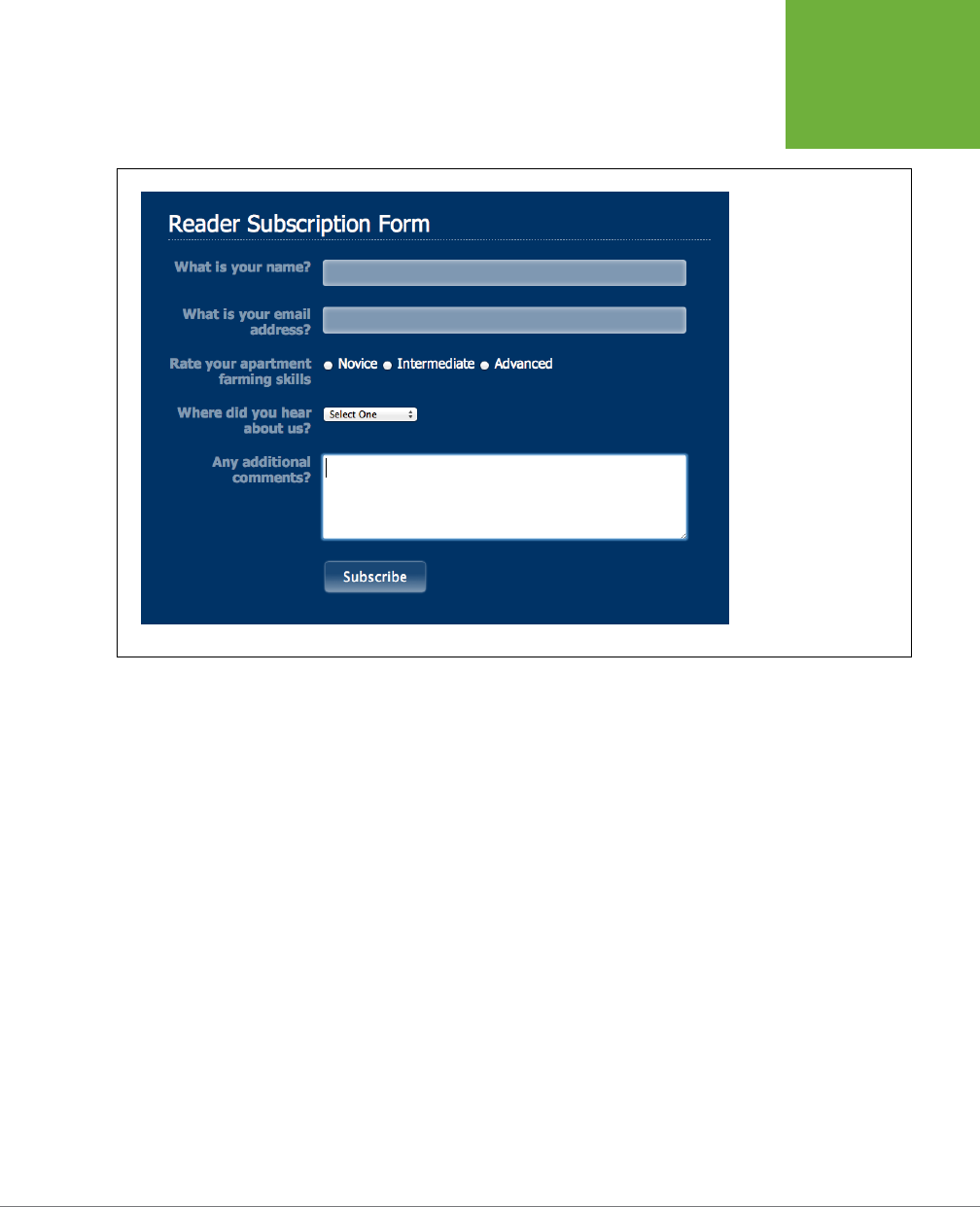
CHAPTER 11: FORMATTING TABLES AND FORMS 401
TUTORIAL:
STYLING A
FORM
FIGURE 11-13
Using the
:focus
pseudo-class
, you
can make your forms
more interactive by
highlighting form fields
the visitor uses. Here,
you can see you’re about
to type in the Comments
field because of its white
background color.


405
CHAPTER
12
CSS leads a double life. As great as it is for formatting text, navigation bars, im-
ages, and other bits of a web page, its truly awesome power comes when you’re
ready to lay out entire web pages. While HTML normally displays onscreen
content from top to bottom, with one block-level element stacked after another, CSS
lets you create side-by-side columns and position images or text anywhere on the
page (even layered on top of other page elements), so you can create much more
visually interesting web pages.
There’s a lot to CSS layout. The next three chapters cover the most important CSS
techniques in detail. This chapter provides a brief overview of the principles behind
CSS layout and a handful of useful guidelines for approaching your own layout
challenges.
Types of Web Page Layouts
Being a web designer means dealing with the unknown. What kind of browsers
do your visitors use? Are they viewing your site on an Android phone or an iPad?
The biggest issue designers face is creating attractive designs for dierent display
sizes. Monitors vary in size and resolution: from 15-inch, 640 x 480 pixel notebook
displays to 30-inch monstrosities displaying, oh, about 5,000,000 x 4,300,000
pixels. Not to mention the petite displays on mobile phones, and the small- to mid-
range screens of tablets.
Web layouts oer several basic approaches to this problem. Nearly every page de-
sign you see falls into one of two types—
fixed width
or
liquid
. Fixed-width designs
give you the most control over how your design looks but can inconvenience some
Introducing CSS Layout
CSS3: THE MISSING MANUAL
406
TYPES OF WEB
PAGE LAYOUTS
of your visitors. Folks with really small monitors have to scroll to the right to see
everything, and those with large monitors end up with wasted space that could be
showing more of your excellent content. In addition, smartphone owners need to
pinch and zoom to get to the content they’re after. Liquid designs, which grow or
shrink to fit browser windows, make controlling the design more challenging but
oer the most eective use of the browser window. A recent innovation—
responsive
web design
—seeks to solve the problem of wildly varying screen widths, but at the
cost of added complexity.
• Fixed Width. Many designers prefer the consistency of a set width, like the
page in Figure 12-1, top. Regardless of the browser window’s width, the page
content’s width remains the same. In some cases, the design clings to the left
edge of the browser window, or, more commonly, it’s centered in the middle.
With the fixed-width approach, you don’t have to worry about what happens
to your design on a very wide (or small) monitor.
Many fixed-width designs are below 1,000 pixels wide, letting the window and
the space taken up by scrollbars and other parts of the browser’s “chrome” fit
within a 1024 x 768 pixel monitor. A very common width is 960 pixels. Many
websites are fixed width, but that’s changing, thanks to the widespread adoption
of smartphones and tablets, which are often much narrower than the average
fixed-width web page design.
NOTE For examples of fixed-width designs, visit
www.alistapart.com
,
espn.go.com
, or
www.nytimes.com
.
• Liquid. Sometimes it’s easier to roll with the tide instead of fighting it. A liquid
design adjusts to fit the browser’s width—whatever it may be—by assigning
percentage widths instead of absolute pixel values. Your page gets wider or
narrower as your visitor resizes the window (Figure 12-1, middle). While this type
of design makes the best use of the available browser window real estate, it
gives you the additional challenge of making sure your design looks good at
dierent window sizes. On very large monitors, these types of designs can look
ridiculously wide, creating very long, dicult to read lines of text.
NOTE For an example of a liquid layout, check out
http://maps.google.com
.
• Responsive web design (RWD). This new technique, championed by web
designer Ethan Marcotte, oers another way to address the problem presented
by the wildly dierent screen sizes of smartphone, tablet, and desktop web
browsers. Instead of presenting a single layout for all devices, responsive web
design compensates for dierent browser widths by changing its presentation.
For example, a responsive web page may shrink down from a wide, multicolumn
layout for desktop monitors to a single-column layout for smartphones. In this
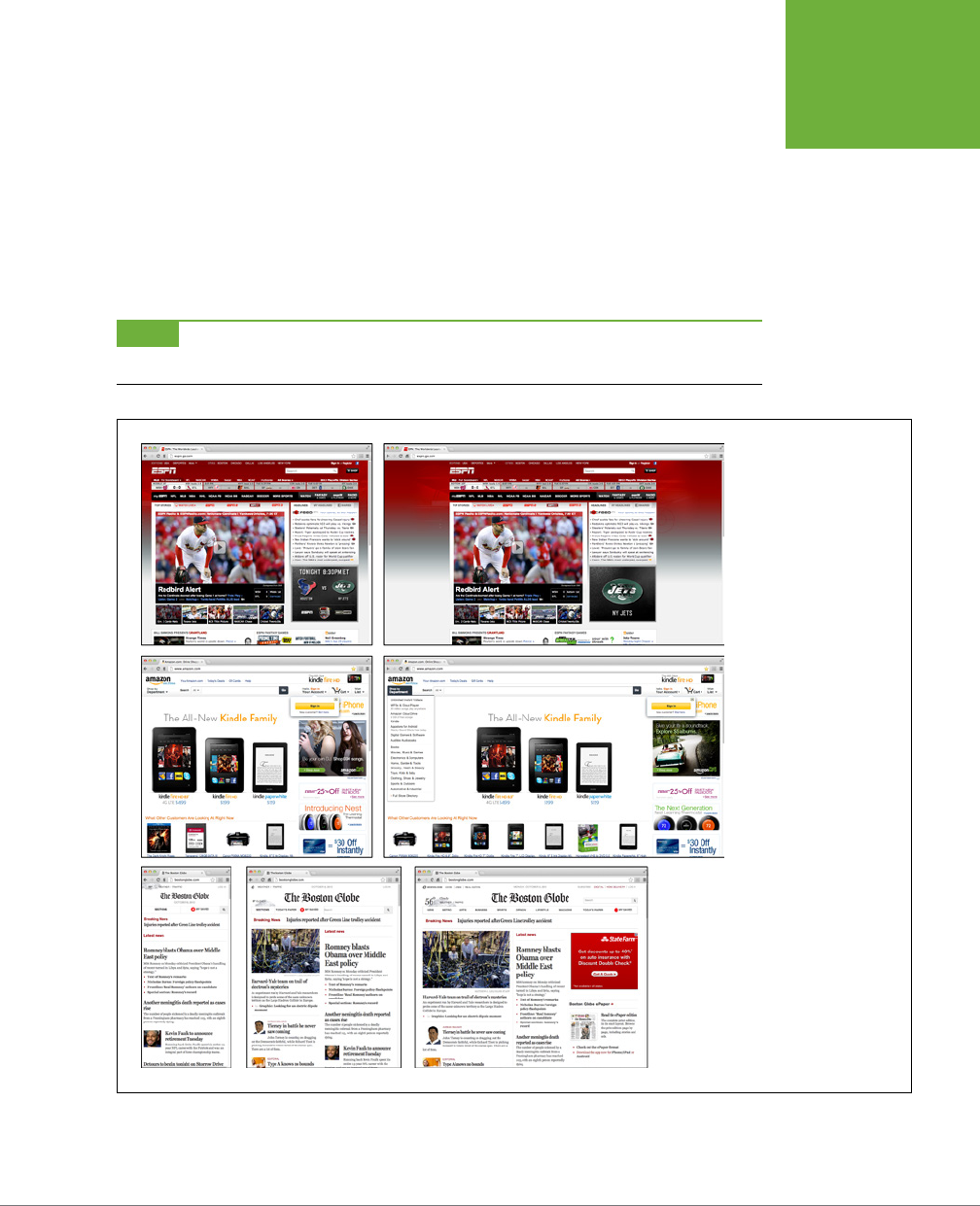
CHAPTER 12: INTRODUCING CSS LAYOUT 407
TYPES OF WEB
PAGE LAYOUTS
way, responsive web design is very much like liquid layouts—the design uses
percentages to grow or shrink in response to the width of the browser window.
However, it goes one step further by using some tricky CSS—called media
queries—to send dierent designs to dierent-width browsers, letting you cre-
ate very dierent looking layouts depending on the device viewing the page.
In the tutorials at the end of next chapter, you’ll create a fixed-width design and a
liquid design. In Chapter 13, you’ll dive into the techniques for creating responsive
web designs.
NOTE The
max-width
and
min-width
properties offer a compromise between fixed and liquid designs.
See page 219.
FIGURE 12-1
You have several ways to
deal with the uncertain
widths of web browser
windows and browser
font sizes. You can simply
ignore the fact that
your site’s visitors have
different resolution moni-
tors and force a single,
unchanging width for your
page (top), or create a liq-
uid design that flows to fill
whatever width window
it encounters (middle). A
responsive design literally
reformats itself depending
upon the browser window
width. The Boston Globe
(
www.bostonglobe.com
)
site, for example, goes
from one column (left),
to two columns (middle),
to three columns (right)
as the browser window
expands.

CSS3: THE MISSING MANUAL
408
HOW CSS
LAYOUT
WORKS
How CSS Layout Works
As discussed in Chapter 1, in the early days of the Web, HTML’s limitations forced
designers to develop clever ways to make websites look good. The most common
tool was the <table> tag, which was originally intended to create a spreadsheet-like
display of information composed of rows and columns of data. Designers used HTML
tables to build a kind of scaolding for organizing a page’s contents (see Figure
12-2). But because the <table> tag wasn’t meant for layout, designers often had to
manipulate the tag in unusual ways—like placing a table inside the cell of
another
table—just to get the eect they wanted. This method was a lot of work, added a
bunch of extra HTML code, and made it very dicult to modify the design later. But
before CSS, that’s all web designers had.
HTML tables have one thing going for them: They provide a well-organized grid
with a unified structure of individual cells. For CSS design, you use individual tags
to contain content that you want to position in one area of the page. By grouping
content into lots of individual containers and positioning those containers, you can
create complex designs made up of columns and rows. Before HTML5, you had one
tag in particular to achieve this goal: the <div> tag.
The <div> Tag
Web page layout involves putting chunks of content into dierent regions of the
page. With CSS, one element commonly used for organizing content is the <div>
tag. As you read on page 22, the <div> tag is an HTML element that has no inher-
ent formatting properties (besides the fact that browsers treat the tag as a block
with a line break before and after it). Instead, it’s used to mark a logical grouping of
elements or a
division
on the page.
You’ll typically wrap a <div> tag around a chunk of HTML that belongs together.
The elements comprising the logo and navigation bar in Figure 12-2 occupy the top
of the page, so it makes sense to wrap a <div> tag around them. At the very least,
you would include <div> tags for all the major regions of your page, such as the
banner, main content area, sidebar, footer, and so on. But it’s also possible to wrap a
<div> tag around one or more additional divs. One common technique is to wrap the
HTML inside the <body> tag in a <div>. Then you can set some basic page properties
by applying CSS to that
wrapper
<div>. You can set an overall width for the page’s
content, set left and right margins, center all of the page’s content in the middle of
the screen, and add a background color or image to the main column of content.
Once you’ve got your <div> tags in place, add either a class or ID to each one, which
becomes your handle for styling each <div> separately. The <div> tag for a page’s
banner area might look like this: <div class="banner">. You can only use an ID,
but you can use the same ID only once per page, so when you have an element that
appears multiple times, use a class. If you have several divs that position photos and
their captions, for example, you can wrap those tags in a div and add a class like
this: <div class="photo">. (For more on knowing when to use a div, read the box
on page 60.) In addition, when it comes to the cascade (Chapter 5), IDs are very
CHAPTER 12: INTRODUCING CSS LAYOUT 409
HOW CSS
LAYOUT
WORKS
powerful and easily override other styles, often forcing you to create long-winded
selectors like #home #banner #nav a just to override previously created selectors
using IDs. For this reason, many web designers avoid IDs and stick with classes.
Once you have the divs in place and have accurately identified them with IDs or
class names, you can then create CSS styles to position those divs on the page us-
ing floats (Chapter 13).
WORD TO THE WISE
A Delicate Balancing Act
Although divs are critical to CSS layout, don’t go crazy pelting
your page with divs. A common trap is to believe you must
wrap
everything
on a web page in a
<div>
tag. Say your
main navigation bar is an unordered list of links (like the one
described on page 304). Because it’s an important element,
you may be tempted to wrap a
<div>
around it:
<div
class="mainNav"><ul>…</ul></div>
.
But there’s no reason to add a
<div>
when the
<ul>
tag
is just as handy. As long as the
<ul>
contains the main
navigation bar links, you can simply add your class to that
tag:
<ul class="mainNav">
. An additional
<div>
is
just unnecessary code.
Likewise, it doesn’t make sense to use a
<div>
when another,
more logical HTML tag is at hand. For example, say you want
to add a pull quote to a long passage of text—a box aligned to
the right edge of the page displaying an exciting quote pulled
from the page. In this case, you can skip an extra
<div>
and
simply use the HTML
<blockquote>
tag. You can position
the blockquote tag using the float property as discussed on
page 220.
That said, don’t be afraid of divs either. Adding a few extra
divs to a page is not going to substantially change the file
size or slow the page’s download speed. If a div helps you get
the job done, and no other HTML tag makes sense, then by all
means, use a div. Also, a div is the only way to go when you
want to group a bunch of different HTML tags into a cohesive
unit. In fact, it’s not at all uncommon to see one div surround
one or more other divs.
The basic rule of thumb is you should try to keep the amount of
HTML on a page down to a minimum, but use as much HTML as is
needed. If adding a few divs makes sense for the design—go for
it. Or, if you’re digging into HTML5, try the sectioning elements
described in the next section.
HTML5 Sectioning Elements
Before HTML5, divs were the main way designers organized content. HTML5 intro-
duces many new HTML tags that are intended to group certain types of content.
For example, the <article> tag is intended for content that makes up a single,
self-contained composition—a blog post, for example. Likewise, the <header> tag is
intended to provide headline, navigational aids, and other introductory material for
a page or a section of page. Then there’s the <footer> tag that’s meant to contain
concluding information like copyright notice, the name of the website’s creator, the
date the page was published, and so on. In a nutshell, HTML5 provides tags that
take over the job of the <div> tag for specific types of content. (Visit
www.adobe
.com/devnet/dreamweaver/articles/understanding-html5-semantics.html
for a quick
introduction to HTML5 sectioning elements.)
NOTE If you go the HTML5 route, then don’t forget to use the HTML5 shim described in the box on page 24
to make sure that Internet Explorer 8 and earlier can format those new elements.

CSS3: THE MISSING MANUAL
410
HOW CSS
LAYOUT
WORKS
As you learned on page 23, the new HTML5 elements are intended to add seman-
tics to a web page. That is, the name of the tag—<header>, for example—imparts
identifying information about what’s inside that tag. The <figure> tag is intended to
enclose—you guessed it—a figure. In other words, if you want to enclose particular
type of content inside a tag, see if an HTML5 tag fits the bill. If the content is your
page’s footer, then use the <footer> tag instead of the plain old <div>. In the world
of HTML5, the <div> tag still exists and is perfectly valid to use. But these days it’s
generally used to group content for stylistic reasons—for example, if you’d like to
add a border around a group of tags or move those tags over to the left side of the
page using a float, the enclose those tags in a <div>. (You’ll learn how to do just
that in Chapter 13.)
That all said, beyond bragging rights at your next web designer meetup, there’s
no direct benefit to using the HTML5 right now. In the future, software might look
through your HTML and identify individual articles based on the presence of the
<article> tag, or use the HTML5 tags in some other way to better analyze your
web page. Or, if you want to future-proof your web pages and be prepared the day
when HTML5 rules the world, you could go ahead and use HTML5 today. However, if
you’ve grown up using <div> tags and don’t want to bother using some JavaScript
to make HTML5 work in Internet Explorer 8 (see Note above), you may want to just
stick with the <div> tag for now.
Techniques for CSS Layout
The vast majority of web pages use the CSS float property for layout (see the box
on page 413 for other CSS layout options). You’ve already encountered this seem-
ingly simple property in Chapter 8, where the float property was introduced as a
way of positioning an image within a column of text by either floating the image to
the left or right side. The same concept applies to other tags: By setting the width
of an element and floating it to the left or right, you can create a column (the text
following the element ends up wrapping around the floated element as if it were
another column). By using the float property with multiple divs, or other tags, you’re
able to achieve multicolumn layouts. Taking this technique further, you can quickly
create complex, multicolumn layouts by placing floated divs within floated divs.
Another CSS technique, absolute positioning, lets you place an element anywhere
on the page with pixel-level accuracy. You can place an element 100 pixels from the
top edge of the browser window and 15 pixels in from the left edge, for example.
Page-layout programs like InDesign and Quark Xpress work this way. Unfortunately,
the fluid nature of web pages and some of the weird characteristics of absolute
positioning make it dicult to achieve total layout control with this technique. As
you’ll read in Chapter 14, it is possible to lay out a page by using absolute position-
ing, but, in general, this technique is better suited to smaller tasks like positioning
a logo in a particular location of the page.
Don’t worry if this sounds rather abstract right now—you’ll see all of these techniques
in action in the next three chapters.
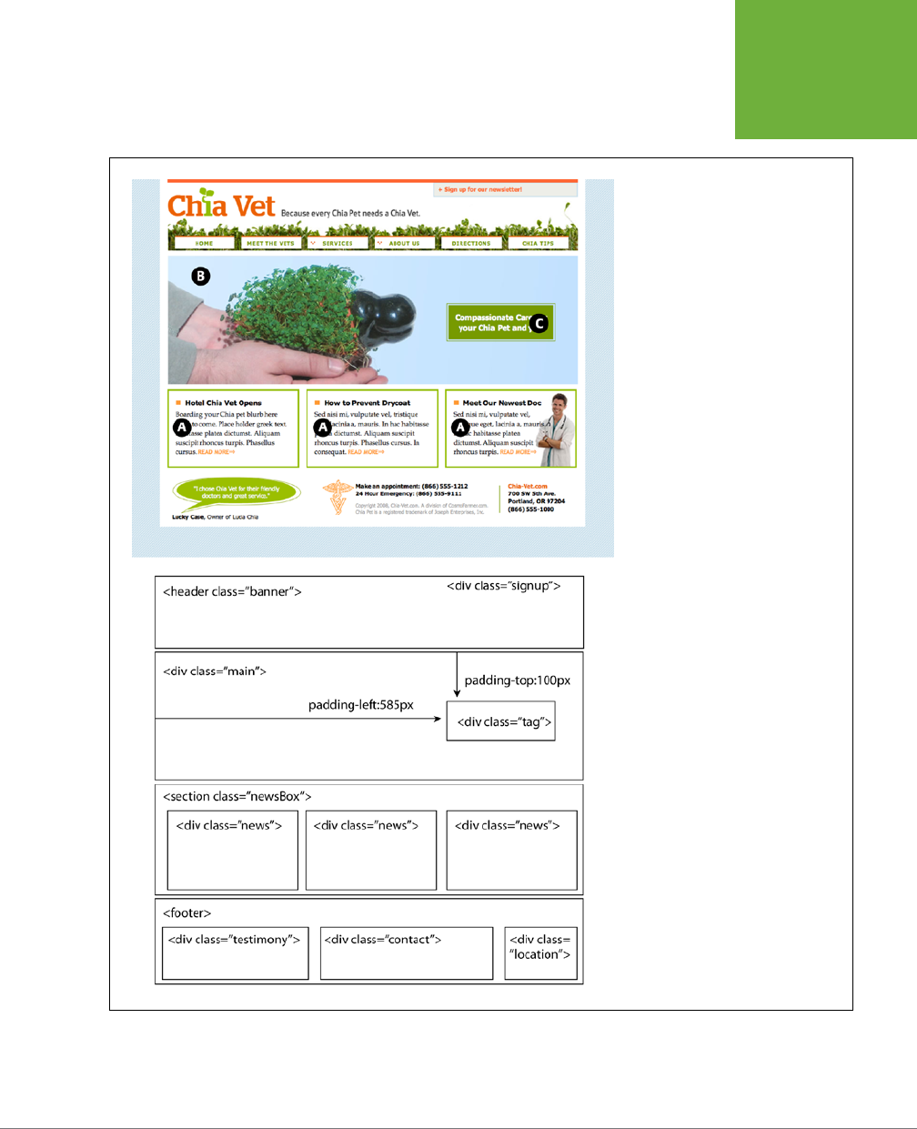
CHAPTER 12: INTRODUCING CSS LAYOUT 411
HOW CSS
LAYOUT
WORKS
FIGURE 12-2
Correctly putting together the HTML
necessary to convert a Photoshop
mockup into HTML and CSS reality
involves seeing the underlying structure
and wrapping related groups of HTML
within
<div>
tags. Sometimes, it can
take a lot of divs to make a design come
to life.

CSS3: THE MISSING MANUAL
412
LAYOUT
STRATEGIES
Layout Strategies
Web page layout with CSS is more of an art than a science; there’s no one formula to
follow for marking up your content with HTML and creating your CSS. What works
for one design might not for another. Although that might not be a comforting
thought—“Hey, I bought this book to learn this darn stu”—CSS layout is something
you’ll learn through experience, learning how the dierent CSS properties work (es-
pecially floats and absolute positioning), reading about dierent layout techniques,
following tutorials like the ones in the next two chapters, and lots of practice.
However, there are definitely some strategies you can adopt as you approach CSS
layout. These are more like guidelines than hard-and-fast rules, but as you begin
to see your projects through the initial visual design, start with these tips in mind.
Start with Your Content
Many designers like to jump right into the good stu—colors, fonts, icons, and im-
ages. But beginning with the visual design is putting the cart before the horse. The
most important elements of a web page are the contents: headlines, paragraphs of
text, stunning photographs, navigational links, videos, and such are what people will
come to your site for. They want to read, learn, and experience what your site has to
oer. Content is king, so you think of what you want to say before you tackle how it
should look. After all, it won’t do you much good to create a fantastic, 3D–looking
sidebar box if you don’t have anything meaningful to put in that box.
In addition, a page’s message should dictate its design. If you decide that your
home page needs to sell the services of your company and highlight the excellent
customer service you oer, you might decide that a large photo of your friendly
sta is important, as well as a quote from a satisfied customer. Since both of these
elements are important to the page’s message, you can craft the visual message by
making both the picture and the quote prominent and compelling.
Mobile First
Along the same lines, the rise of smartphones and tablets has driven designers to
think long and hard about winnowing down their content to just the key message
and facts. This
Mobile First
movement is based on the limited screen size of smart-
phones as well as the limited attention of people on the go. Mobile First design is
about starting with your content, but it’s also about getting rid of extraneous noise—
including supplementary information that fits fine on a large desktop screen, but
merely gets in the way on the smaller screen and detracts from the key information
you’re hoping to deliver.
Keep in mind that if your site will be visited by a significant number of people using
smartphones or small tablets, not everyone will want to scroll through a long page of
information (or pinch and zoom to see everything available on a page). Rather than
trying to fill every last square inch of a 32" desktop monitor, think about simplifying
your content so it’s clear, direct, and easy to take in.
CHAPTER 12: INTRODUCING CSS LAYOUT 413
LAYOUT
STRATEGIES
NOTE The term
Mobile First
was coined by Luke Wroblewski. In fact, he wrote a fantastic short treatise on
the subject that’s worth reading:
www.abookapart.com/products/mobile-first
.
POWER USERS’ CLINIC
Other CSS3 Layout Options
Web designers initially used tables to create multicolumn
layouts. Then the CSS float property came onto the scene and
provided another, less code-intensive method to lay out a web
page. And while most designers still use the float property to
achieve their designs, that may change in the not-so-distant
future.
The CSS working group at the W3C is busily finalizing plans
on several other techniques for CSS layout. For example, the
CSS
multicolumn
layout module provides a way to take a long
column of text and display it across multiple side-by-side
columns. You’ll learn about it in the next chapter, on page 440.
The
flexible box
layout module provides yet another way
to arrange boxes of content—vertically, horizontally, and in
different directions and orders. And remarkably, this module
is pretty well supported in many browsers today. You’ll read
about flex in the box on page 436.
Finally, the
CSS grid
layout module is perhaps the most
ambitious attempt to change how designers lay out web pages.
This method lets you break up a page into a set of rows and
columns, then accurately attach page elements to that grid.
It’s intended to make building web applications easier and
more like building desktop
programs
. The CSS grid is pretty
complicated and (at the time of this writing) not yet supported
by any currently shipping browsers, although there is support
in the beta version of IE 10. You can read more about it at
http://
blogs.msdn.com/b/ie/archive/2011/04/14/ie10-platform-
preview-and-css-features-for-adaptive-layouts.aspx
.
Start with a Sketch
Once you’ve figured out your content, you can think about organizing that content
visually. Some designers start by hand coding the HTML: creating divs, adding
<header>, <article>, <footer> tags, and so on. This is a fine approach, often called
“designing in the browser” since it gives you a head start on building your site by
jumping right into the HTML.
However, before jumping into the HTML, you should at least sketch out the placement
of your content. You don’t need anything fancy—paper and pencil work fine. Since
web design is about placing content inside of boxes (divs and other HTML tags) and
placing them on the page, simply sketching out a bunch of boxes, drawing columns,
and so on, is a fast and easy way to try out dierent page layouts. You can quickly
get a feel for where content should go, how big it should be, and the general color
tone (light or dark).
TIP Yahoo offers a free Stencil Kit (
http://developer.yahoo.com/ypatterns/wireframes
) that you can use
in Illustrator, Visio, OmniGraffle, and other graphics programs to create web page mock-ups. The supplied user
interface elements, like buttons, form fields, windows, and navigation buttons can make sketching out a page
layout as simple as dragging and dropping icons.
If you’re comfortable with a graphics program like Photoshop, Illustrator, or Fire-
works, you can use that to create a visual design. If you’re not a whiz with graphics

CSS3: THE MISSING MANUAL
414
LAYOUT
STRATEGIES
programs, even just drawing boxes to indicate dierent placement of page elements
can help you refine your thinking about how the page should be laid out. It’s a lot
easier to change a two-column design to a four-column design by resizing boxes in
Illustrator than by rewriting HTML and CSS.
However, if you do use a graphics program, don’t spend too much time refining
the graphic design. It’s a lot of work to create the look of many CSS properties in
Photoshop or Illustrator, and you’ll only have to recreate that look using CSS code.
In other words, try to refine a “lo-fi” look for your site on paper or in a graphics
program, and then jump to your text editor to create the HTML to fit your content
and use the CSS properties you’ve learned in this book to test out dierent styles.
Identify the Boxes
Once you’ve created a visual mockup, it’s time to think of how to create the HTML
markup and CSS to achieve your design goal. This process usually involves envision-
ing the dierent structural units of a page and identifying elements that look like
individual boxes. For example, in Figure 12-2, there are quite a few elements that look
like boxes: most obviously, the three announcement boxes near the bottom (marked
as A in Figure 12-2). Each box is usually a good candidate for a separate <div> tag
(unless there’s a more appropriate HTML tag, as discussed in the box on page 409).
Often a visual clue in your mockup can help you decide if a div is needed. For
example, a border line drawn around a headline and several paragraphs of text
indicates you’ll need to surround that group of HTML tags with a <div> tag that has
a border applied to it.
In addition, whenever you see chunks of text sitting side by side (like the three
chunks of content in the footer in Figure 12-2), you know you’ll need to have each
group in its own <div> tag—HTML tags don’t usually sit side by side, so you have
to use some layout mojo (like the float technique covered in the next chapter) to
make that happen.
It’s also common to group divs (or other tags) that sit side by side in columns within
another div. For example, in the bottom half of Figure 12-2, you can see the basic set
of <div> tags that provide the page’s structure. The “news” <div> and the <footer>
tag are containers for their own set of divs. While this isn’t always a necessity, it
can provide flexibility. For example, you can reduce the main area (the photo of
the hand and the tagline) in width and move the news div to the right side to form
its own column. The news items could then be stacked on top of each other rather
than sitting side by side.
Go with the Flow
Tags don’t normally sit side by side or layer on top of each other. Normally, HTML tags
act pretty much like text in a word-processing program: filling the entire width of the
page and flowing from top to bottom. Each block-level tag—headline, paragraph,
bulleted list, and so on—stacks on top of the next block-level tag. Since that’s the
“business as usual” approach of HTML tags, you usually don’t have to do any kind
of positioning if you plan on stacking one div on the next.

CHAPTER 12: INTRODUCING CSS LAYOUT 415
LAYOUT
STRATEGIES
For example, in Figure 12-2, four elements—the <header> tag, “main” div, the
<section> tag, and the <footer> tag—span the entire width of their container (the
<body> tag) and sit one on top of the other. Because this is the normal way block-
level tags work, you don’t need to do anything special with the CSS for those four
divs to stack on top of each other.
Remember Background Images
You’ve no doubt seen tiled images filling a web page’s background, or subtle
gradients adding depth to a banner. But the background-image property provides
another way to add photos to a page without resorting to the <img> tag. Not only
does putting an image into the background of an existing HTML tag save the few
bytes of data required by the <img> tag, but it also simplifies some layout challenges.
For example, in Figure 12-2, the central image of the hands holding the Chia Pet (B)
is actually just a background image. This makes placing another div—the one with
the tagline “Compassionate care…” (C) really easy, since it’s just sitting on top of the
background of its parent div. Likewise, the picture of the doctor at the lower right of
the page is just a background image placed in that div—adding some right padding
pushes the text in that div out of the way of the photo.
NOTE There are downsides to using photos in the background of divs (or any HTML tag). First, web browsers
usually don’t print backgrounds—so if you’ve got a page with a map containing driving directions to your business,
insert the map with the
<img>
tag and not as a background image. Likewise, search engines don’t search CSS,
so if you think the image can help attract traffic to your site, use an
<img>
tag and include a descriptive
alt
attribute.
Pieces of a Puzzle
This tip can be filed under “creative problem solving” or “if I stare at this design
long enough I’ll come up with some crazy solution.” Often, what looks like a single,
unified whole is actually composed of multiple pieces.
You can see a simple example of this in Figure 12-2, even though at first glance it
looks like one big white box full of content. Actually there are four stacked divs, each
with a white background. So, if you’re having trouble seeing how to put together
one large element on a page—a very large graphic, a rainbow that spans several
columns, or just a solid background color that appears to span multiple areas of a
page—think about how you could achieve the same look breaking the large unit into
smaller pieces that are joined like parts in a jigsaw puzzle.
Layering Elements
If you’re a Photoshop, Illustrator, or Fireworks fan, you’re probably used to the notion
of layers. Layers let you create separate canvases that float on top of each other to
build one unified image. In these programs, it’s easy to make a logo float on top of
a headline of text, or place a photo over another photo. If you want a web page that
has this kind of eect, you have a couple of choices.

CSS3: THE MISSING MANUAL
416
LAYOUT
STRATEGIES
Often the easiest way to layer something on top of a photo is to put the image into
the background of another tag (see the tip on page 415). Because the background
image is behind the tag, anything inside that tag—text, another photo—will sit on
top of the photo.
But what if you want to layer a photo on top of some text? In that case, you’ll turn
to the only CSS property that lets you layer elements—the position property. You’ll
learn all about that property in Chapter 15, since to position something on top of
something else requires absolute positioning.
Don’t Forget Margins and Padding
Finally, sometimes the simplest solution is the best. You don’t always need fancy CSS
to move a page element into place. Remember that padding and margins (page 195)
are just empty space, and by using those properties, you can move elements around
the page. For example, the tagline box (C in Figure 12-2) is positioned simply by set-
ting the top and left padding of the parent div. As you can see in the diagram in the
bottom half of Figure 12-2, the tagline is placed inside another div (<div id="main">).
That div doesn’t actually have any content besides the tagline—the photo is just a
background image—so adding padding moves the tagline div down and to the right.

417
CHAPTER
13
Float-based layouts take advantage of the float property to position elements
side by side and create columns on a web page. As described in Chapter 7
(page 220), you can use this property to create a wrap-around eect for, say, a
photograph, but when you apply it to a <div> tag, float becomes a powerful page-
layout tool. The float property moves a page element to one side of the page (or
other containing block). Any HTML that appears below the floated element moves
up on the page and wraps around the float.
The float property accepts one of three dierent values—left, right, and none. To
move an image to the right side of the page, you could create this class style and
apply it to the <img> tag:
.floatRight { float: right; }
The same property applied to a <div> tag full of content can also create a sidebar:
.sidebar {
float: left;
width: 170px;
}
Figure 13-1 shows these two styles in action.
NOTE The
none
value turns off any floating and positions the element like a normal, unfloated element. It’s
useful only for overriding a float that’s already applied to an element. You may have an element with a particular
class such as
.sidebar
applied to it, with that element floating to the right. But on one page you may want an
element with that class to
not
float, but to be placed within the flow of the page, like this Note box. By creating
a more specific CSS selector (see page 480) with
float: none
, you can prevent that element from floating.
Building Float-
Based Layouts
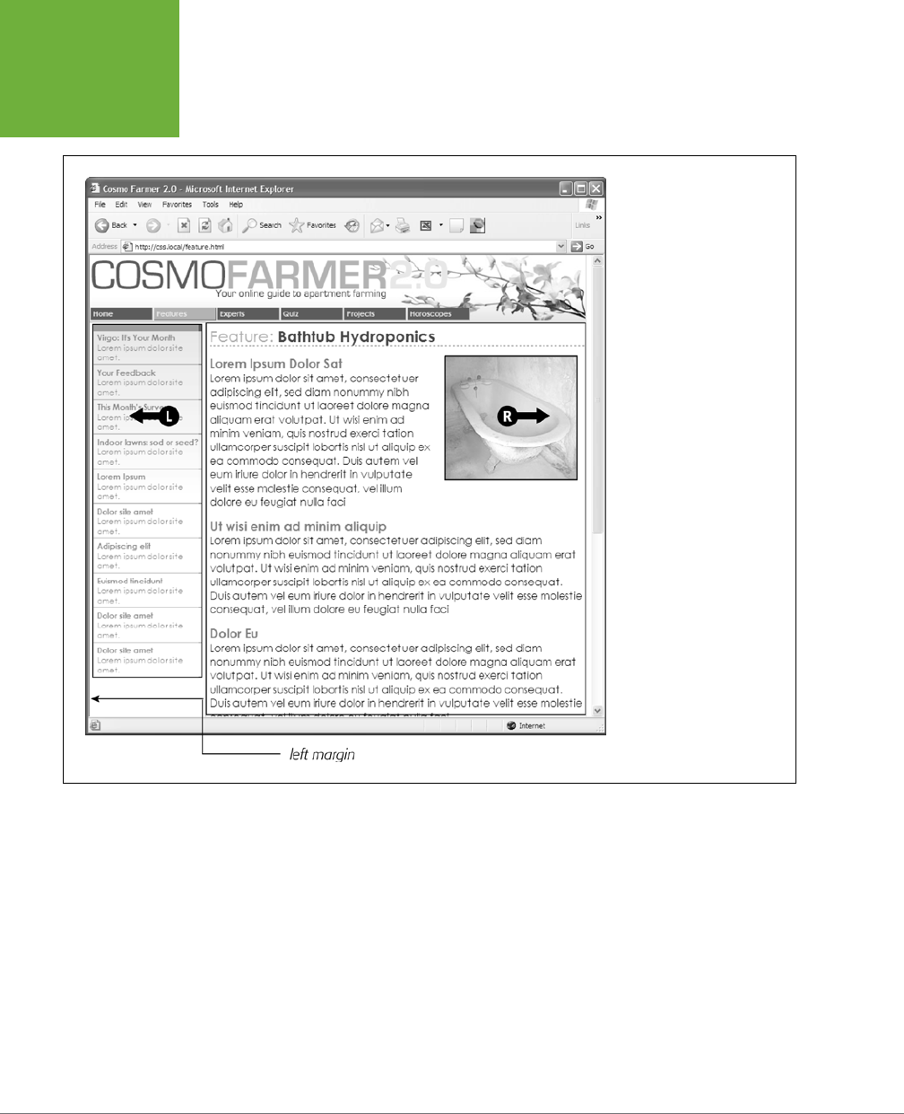
CSS3: THE MISSING MANUAL
418
FIGURE 13-1
You can use the
float
prop-
erty to lay out a web page
with multiple columns. On
this page, a block of content
is floated to the left edge.
The sidebar has a set width,
but the main content doesn’t,
which makes this design a
liquid layout
. The main section
of the page simply expands to
fill the width of the browser
window. In the upper right,
the bathtub photo is floated
to the right.
A simple two-column design like Figure 13-1 requires just a few steps:
1. Wrap each column in a <div> tag with an ID or class attribute.
In Figure 13-1, the news items listed in the left sidebar are wrapped in one <div>—
<div class="news">—and the main content in another div—<div class="main">.
2. Float the sidebar <div> either right or left.
When you work with floats, the source order (the order in which you add HTML
to a file) is important. The HTML for the floated element must appear
before
the HTML for the element that wraps around it.

CHAPTER 13: BUILDING FLOAT-BASED LAYOUTS 419
Figure 13-2 shows three two-column layouts. The diagrams on the left side
show the page’s HTML source order: A <div> for the banner, followed by a <div>
for the sidebar, and, lastly, a <div> for the main content. On the right side, you
see the actual page layout. The sidebar comes
before
the main content in the
HTML so it can float either left (top, bottom) or right (middle).
3. Set a width for the floated sidebar.
Unless you’re floating an image with a predefined width, you should always
give your floats a width. This way, you create a set size for the floated element,
letting the browser make room for other content to wrap into position.
The width could be a fixed size like 170px or 10em. You can also use percentages
for a flexible design that’s based on the width of the browser window. (See page
158 for more about the pros and cons of the dierent measurement units.) If
the sidebar is 20 percent wide, and the browser window is 700 pixels wide,
then the sidebar will be 140 pixels wide. But if your visitor resizes the window
to 1000 pixels, then the sidebar grows to 200 pixels. Fixed-width sidebars are
easier to design for, since you don’t have to consider all the dierent widths
the sidebar might stretch to.
However, percentages let you maintain the same proportions between the two
columns, which can be more visually pleasing. In addition, percentages make
your designs more flexible, since the overall proportion of the page can adjust
to fit the screen size, something that’s important when creating responsive web
designs, which you’ll learn about in the next chapter.
NOTE When the overall page design is a fixed width (as described on page 406), percentage width values
for the sidebar are based on the fixed-width containing element. The width isn’t based on the window size and
won’t change when the browser window changes size.
4. Add a left margin to the main content.
If the sidebar is shorter than the other content on the page, the text from the
main column wraps underneath the sidebar, ruining the look of two side-by-side
columns (see Figure 13-16 for an example). Adding a left margin that’s equal to
or greater than the width of the sidebar indents the main content of the page,
creating the illusion of a second column:
.main { margin-left: 180px; }
By the way, it’s usually a good idea to make the left margin a little bigger than
the width of the sidebar: This creates some empty space—a white gutter—
between the two elements. So, when you use percentages to set the width of
the sidebar, use a slightly larger percentage value for the left margin.
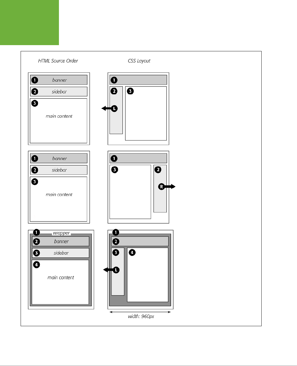
CSS3: THE MISSING MANUAL
420
FIGURE 13-2
Creating a two-column layout is a simple
matter of floating a
<div>
tag to the left
(top). To make a sidebar move from the
left to right side of the page (middle), just
change the sidebar’s CSS styling to
float:
right
. You don’t need to make any other
changes to your CSS or HTML.
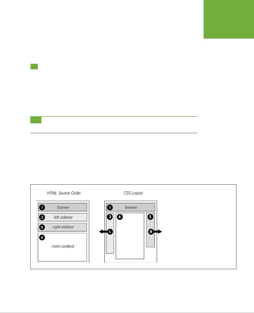
CHAPTER 13: BUILDING FLOAT-BASED LAYOUTS 421
APPLYING
FLOATS TO
YOUR LAYOUTS
Avoid setting a width for the main content div. It’s not necessary, since brows-
ers simply expand it to fit the available space. Even if you want a fixed-width
design, you don’t need to set a width for the main content div, as you’ll see in
the next section.
Applying Floats to Your Layouts
Now that you’ve learned a basic two-column liquid layout, you can adapt it in count-
less ways. Converting it into a fixed-width layout is a snap. Simply wrap all the tags
within the page’s body inside
another
<div> (like <div class="wrapper">). Then,
create a style for that new container element that has a set width, such as 960
pixels (see Figure 13-2, bottom). That width setting constrains everything inside
the container box.
TIP It’s also possible to create a fixed-width page without resorting to the extra wrapper div: set a width
on the
<body>
tag. You already saw an example of this technique in the tutorial on page 225.
Expanding it into a three-column design isn’t dicult, either (Figure 13-3). First, add
another <div> between the two columns and float it to the right. Then add a right
margin to the middle column, so that if the text in the middle column runs longer
than the new right sidebar, it won’t wrap underneath the sidebar.
The rest of this section explores more CSS layout techniques that use float-based
layouts.
FIGURE 13-3
A three-column design uses the same
concepts used to create a two-column design.
In this case, you float both the left and right
sidebars and add both left and right margins
to the center column. The lefthand diagram
shows the order of the HTML; the right side
shows what the web page looks like.
Floating All Columns
It’s perfectly possible to float
every
column, not just the left and right sidebars. You
could float the first sidebar to the left, the middle column to the left, and the right
sidebar to the right, as shown in Figure 13-4, top. This approach lets you put more
CSS3: THE MISSING MANUAL
422
APPLYING
FLOATS TO
YOUR LAYOUTS
than three columns in your design. You can float four or more columns, as long as
there’s room for all the floats to fit side by side.
When you float all columns in a design, you need to pay close attention to the
widths of each column. If the total width of all the columns is less than the space
available—for example, if the browser window is smaller or the columns are placed
inside another <div> with a set width—then the last column drops down below the
others. (You can read a solution to this dropping float problem on page 480.)
UP TO SPEED
You Don’t Have to Reinvent the Wheel
If terms like
liquid layout
and
containing element
sound a little
intimidating, don’t give up. First of all, the tutorials beginning
on page 440 walk you step by step through the process of laying
out web pages with CSS. But there’s no law saying you have to
create your own CSS layouts from scratch. On the Web, you’ll
find plenty of pre-built and tested designs you can make your
own. The LayoutGala site offers 40 different CSS designs that
work in all common browsers (
http://blog.html.it/layoutgala/
).
The designs are just basic skeletons consisting of
<div>
tags
and the CSS that positions them. All you need to do is fill them
with your own design touches like font styling and imagery.
There are also quite a few
layout generators
—online tools
that let you customize basic requirements like the number of
columns you want, whether you’re after a liquid or fixed layout,
and so on. The Gridinator (
http://gridinator.com
) provides a
simple tool for creating a complex multicolumn grid system
(see the box on page 430). You can then download HTML and
CSS files with the code created for you.
In addition, floating more than just the sidebars lets you change the order of your
divs in the HTML. Take, for example, the left diagram in Figure 13-3, which shows the
order of the <div> tags for that page. Because of the way floated elements work,
they must appear before any content that wraps around them, so in this example,
the main content area must go
after
the sidebars.
The order of the <div> tags in the HTML may not seem like a big deal until you try to
browse the web page
without
CSS, which is the case for many alternative browsers,
including screen readers that read a page’s content aloud to visually impaired visitors.
Without CSS, all the sidebar material (which often includes navigational elements,
ads, or other information that’s not relevant to the main topic of the page) appears
before the content the visitor came to read in the first place. The inconvenience of
having to scroll past the same sidebar content on each page will turn o some visi-
tors. Furthermore, your page is less accessible to vision-impaired visitors, who have
to listen to their screen readers read o a long list of links and ads before coming
to any real information.
And if that doesn’t sway you, you’ve got the search engines to worry about. Most
search engines limit the amount of HTML they read when searching a site. On a
particularly long web page, they simply stop at a certain point—possibly missing
important content that
should
be indexed by the search engine. Also, most search
engines give greater value to the HTML near the beginning of the file. So if you’re
worried about getting good placement in search engine results, it’s in your best
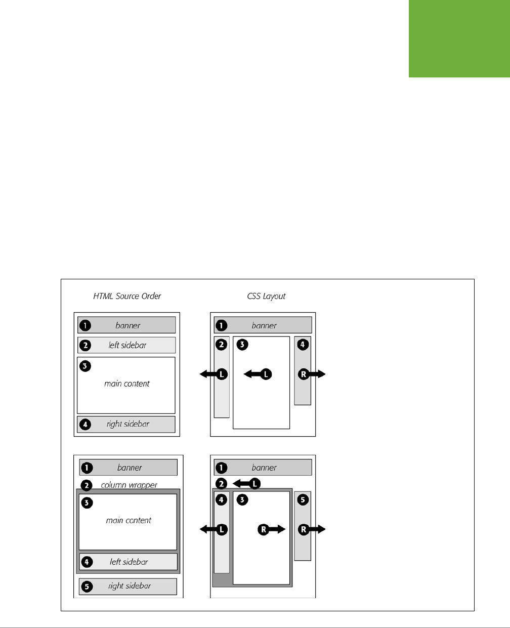
CHAPTER 13: BUILDING FLOAT-BASED LAYOUTS 423
APPLYING
FLOATS TO
YOUR LAYOUTS
interest to make sure the important content is as close as possible to the top of the
page’s HTML code.
In the top-left diagram in Figure 13-4, the main content’s HTML is between the left
and right sidebars, which is better than having it after both sidebars. You can even
put the main content before
both
sidebars’ HTML by wrapping the main content and
left sidebar in one <div>, floating that <div> left, and then floating the main content
right and the left sidebar left
within
that <div> (Figure 13-4, bottom). Voilà—the main
column’s HTML falls before the other <div> tags.
Floats Within Floats
The bottom diagram in Figure 13-4 illustrates another useful technique—floating
elements
within
floats. Imagine that the main content (3) and the left sidebar (4)
divs didn’t exist, and only the column wrapper (2) and the right sidebar (5) were
left. You’d have just a basic two-column design, with one column floated left and
another floated right. In fact, it’s still a two-column design even with the two divs
(3 and 4) placed back inside the column-wrapper div. The dierence is that the left
column is itself divided into two columns.
FIGURE 13-4
There’s more than one way to float a page.
CSS’s flexibility provides many ways to
create a multicolumn layout. Using different
methods of floating, you can easily change
the source order of the HTML for the page, as
you can see in the diagrams at left. Right-side
diagrams represent final web page layout.
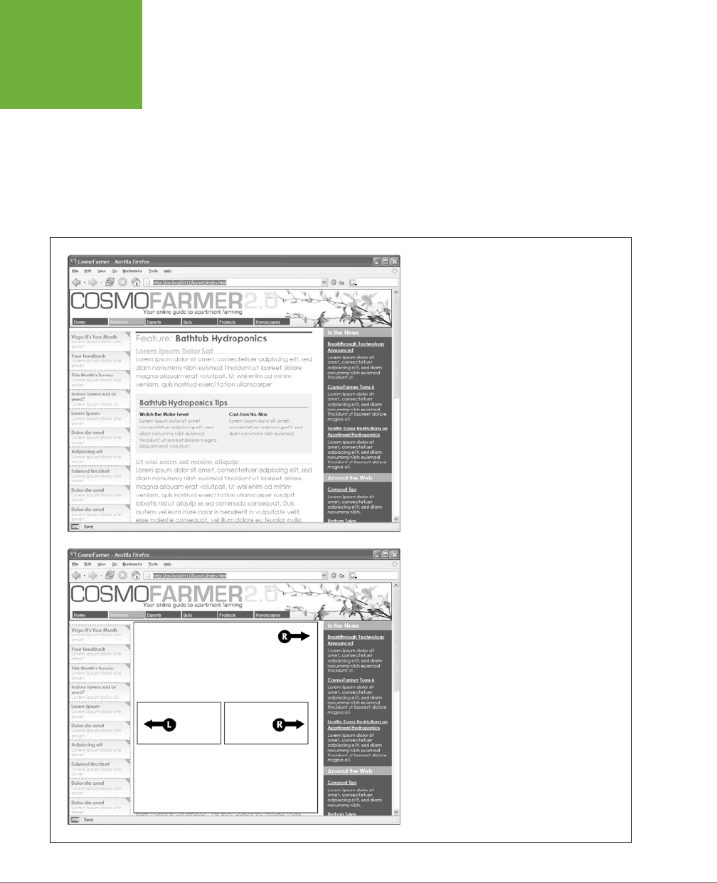
CSS3: THE MISSING MANUAL
424
APPLYING
FLOATS TO
YOUR LAYOUTS
Although this arrangement is a bit confusing, it’s also helpful in a number of instances.
First, it lets you add columns within a column. The three-column layout at the top of
Figure 13-5 shows a small Tips box in the middle column that also has two columns
inside it. By nesting floats inside floats, you can create some very complex designs.
In addition, when you have just a couple of floated elements divided into columns
with additional floated elements, it’s easier to calculate the widths of page elements.
That’s a good thing when you need to control float drops (page 480) and other
problems that occur when columns get too wide.
FIGURE 13-5
Top: Create columns within columns by floating
elements inside another floated element. In the
middle column, the Tips box provides a simple two-
column note that adds visual interest to the page.
Bottom: It doesn’t matter which direction the
container is floated (in this instance, to the right)—
you simply float the two additional columns left
and right.

CHAPTER 13: BUILDING FLOAT-BASED LAYOUTS 425
OVERCOMING
FLOAT
PROBLEMS
POWER USERS’ CLINIC
Finding Order in the Grid
Graphic designers used grids to provide an underlying order
to their layouts long before the Web came around. A grid is
simply a series of rows and columns that help align elements
within a layout. For example, in a 12-column grid, you divide
the page into 12 equally sized columns, usually with a small
amount of space—a
gutter
—between each.
But the grid doesn’t mean that your page needs 12 skinny
columns of content. Instead, you usually divide the 12 columns
(often referred to as
grid units)
into groups. For example, in a
three-column design, you might have one left-hand sidebar
that’s 3 grid units wide, a main column that’s 6 grid units
wide, and a right sidebar that’s 3 grid units wide to fill the
entire 12-unit width. This 12-unit grid has the flexibility to let
you try other layouts as well, while retaining a common and
consistent measurement scheme. For example, you could have
three columns of equal width (4 grid units each).
In most CSS grid systems, you divide a page into rows composed
of columns. There’s usually some class-based nomenclature to
define a row using a
<div>
, like this:
<div class="row">
And inside the row, you place additional tags, often
<div>
tags, but you can use any block-level tag like the HTML5
sectioning elements (page 409). Each of these tags includes
classes indicating how many grid units wide they should be.
For example, a three-column layout may have code like this:
<div class="span3"> </div>
<div class="span6"> </div>
<div class="span3"> </div>
The class name depends upon the grid system. Two popular
grid-based frameworks—Foundation (
http://foundation .zurb.
com/docs/grid.php
) and Twitter Bootstrap (
http://twitter.github
.com/bootstrap/scaffolding.html#grid
)—include complete
CSS-based solutions for grid systems. You use their basic CSS
and their naming conventions to create columns of varying
widths. For a simpler approach, read Chris Coyier’s blog post
at CSS-Tricks.com, where he explains how to create your own
simple grid system:
http://css-tricks.com/dont-overthink-
it-grids/
.
Overcoming Float Problems
As you get more adventurous with CSS, you’ll probably encounter—like many web
designers before you—some of the weird intricacies of working with floats. This
section describes a few common problems and their solutions. (And if you ever
stumble upon a problem not listed here, you can always take it to one of the online
forums or discussion lists in Appendix A.)
Clearing and Containing Floats
Floats are powerful design tools because they let content flow around them. Floating
a photo lets text below it move up and wrap around the image (Figure 13-1). When
you’re creating float-based column designs, though, sometimes you
don’t
want
content to move up and next to a floated element. For example, you frequently
want to keep copyright notices, contact information, or other housekeeping details
at the bottom of your web page, below all other content.
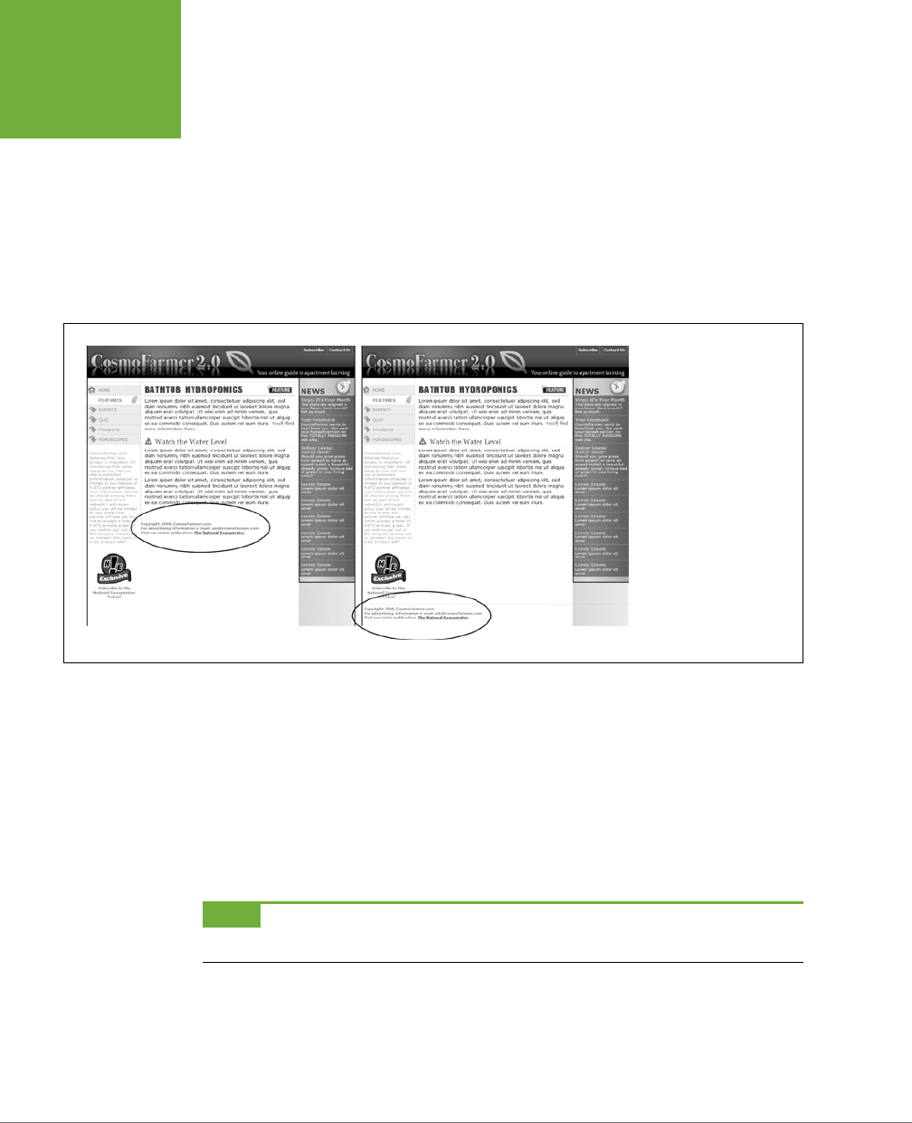
CSS3: THE MISSING MANUAL
426
OVERCOMING
FLOAT
PROBLEMS
In the two- and three-column designs you’ve seen so far, if the main column is
shorter than either of the floated sidebar columns, a footer can move up and around
the left floated column (Figure 13-6, left). To make the footer stay down below the
sidebars, you can use the clear property. This property prevents an element from
wrapping around floats. You can make an element drop below a left-floated object
(clear: left;) or a right floated object (clear: right;). For footers and other
items that need to appear at the bottom of the page, you should clear
both
left and
right floats, like this:
footer { clear: both; }
FIGURE 13-6
You don’t always want
an item to wrap around
a floated element (left).
Copyright notices and
other material that belong
at the bottom of a page
usually need to clear any
floats they encounter.
To achieve this, use the
clear
property for the
copyright notice to force
it to the bottom of the
page below any floated
elements.
Another problem occurs when you float one or more elements inside a non-floated
containing tag like a <div> tag. When the floated element is taller than the other
content inside the div, it sticks out of the bottom of the enclosing element. This
snafu is especially noticeable if that tag has a background or border. The top of the
web page in Figure 13-7 shows a <div> tag that has an <h1> tag and two columns
created by floating two divs. The background and border, which appear only around
the <h1> tag, are actually applied to the entire enclosing <div>, including the area
where the two columns are. However, since the columns are floated, they pop out
of the bottom instead of expanding the borders of the box.
NOTE For a good explanation of why floated elements can break outside of their containing blocks, read
www.complexspiral.com/publications/containing-floats
.
A similar problem happens in the bottom example in Figure 13-7. In this case, each
image is floated left inside a containing <div> that has a border. Because the images
are taller than their boxes, they pop out of the bottom. Unfortunately, this example
is even worse than the previous one, because each image causes the image below
it to wrap to the right, creating an ugly staggered eect.
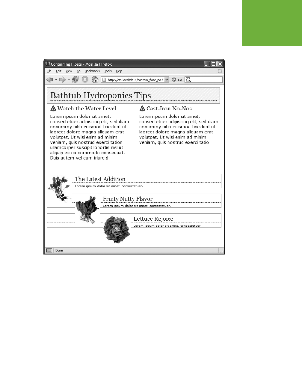
CHAPTER 13: BUILDING FLOAT-BASED LAYOUTS 427
OVERCOMING
FLOAT
PROBLEMS
FIGURE 13-7
A floated element can
escape its containing
<div>
if it’s taller than
the container itself.
If the containing tag
includes a background or
border, then the escaping
elements can look like
they’re not even part
of the container (top
of page). In addition,
a floated element can
bump into other ele-
ments—including other
floats, thereby creating
a “stair-stepped” effect
(bottom of page) instead
of the nicely stacked
boxes in Figure 13-8.
You have many ways to tackle the problem of these renegade floating elements.
It’s good to have more than one solution at your fingertips, so here’s a list of the
most popular:
• Add a clearing element at the bottom of the containing div. This solution is the
most straightforward. Simply add a tag—like a line break or horizontal rule—as
the last item in the <div> containing the floated element (that is, right before the
closing </div> tag). Then use the clear property to force that extra tag below
the float. This trick makes the enclosing div expand, revealing its background
and border. You can add a line break—<br> (HTML) or <br /> (XHTML)—
before
the closing </div> tag and add a class to it: <br class="clear"/>. Then create
a style for it, like this:
br.clear { clear: both; }

CSS3: THE MISSING MANUAL
428
OVERCOMING
FLOAT
PROBLEMS
The problem with this technique is that it adds extra HTML.
• Float the containing element. An easier way is to just float the <div> contain-
ing the floated elements as well. A floated container <div> expands to fully
contain any floated elements inside it. In Figure 13-9, top, the <div> containing
the heading and two floated columns is floated to the left of the page. In the
process, its entire box—background and borders—expands to fit everything
inside it, including the floated elements. Strange, but true.
If you go this route, make sure you add a clear property to whatever element
follows the floated container to make sure the following element drops below
the container.
• Use overflow:hidden. Another common technique is to add the following two
properties to a style for the containing block:
overflow: hidden;
The overflow:hidden property is just another one of those weird CSS things:
It forces the containing block to expand and contain the floated elements. In
general, this technique works very well. However, if you have any absolutely
positioned elements (see page 410) inside the container, they may not show up.
You can get into this situation if you have a drop-down menu inside another tag
and the drop-downs, when they appear, are supposed to appear outside the
container element. If that’s the case, use one of the other methods described
on these pages.
• Use the Micro Clear Fix. With this technique, created by Nicolas Gallagher, you
add just a few styles and a class name to the tag containing the floated element.
This technique is the latest in a long evolution of methods that use the :after
pseudo-class. To use it, you add two dierent styles to your style sheet: One
applies to all modern browsers; the other style applies to IE 7 and earlier. The
whole shebang looks like this:
.clear:after {
content: " ";
display: table;
clear: both;
}
.clear {
zoom:1;
}
The last two styles make IE 6 and 7 “have layout,” as described in the box on
page 440. If you’re not concerned with those browsers, then you can leave that
style out of your style sheet.
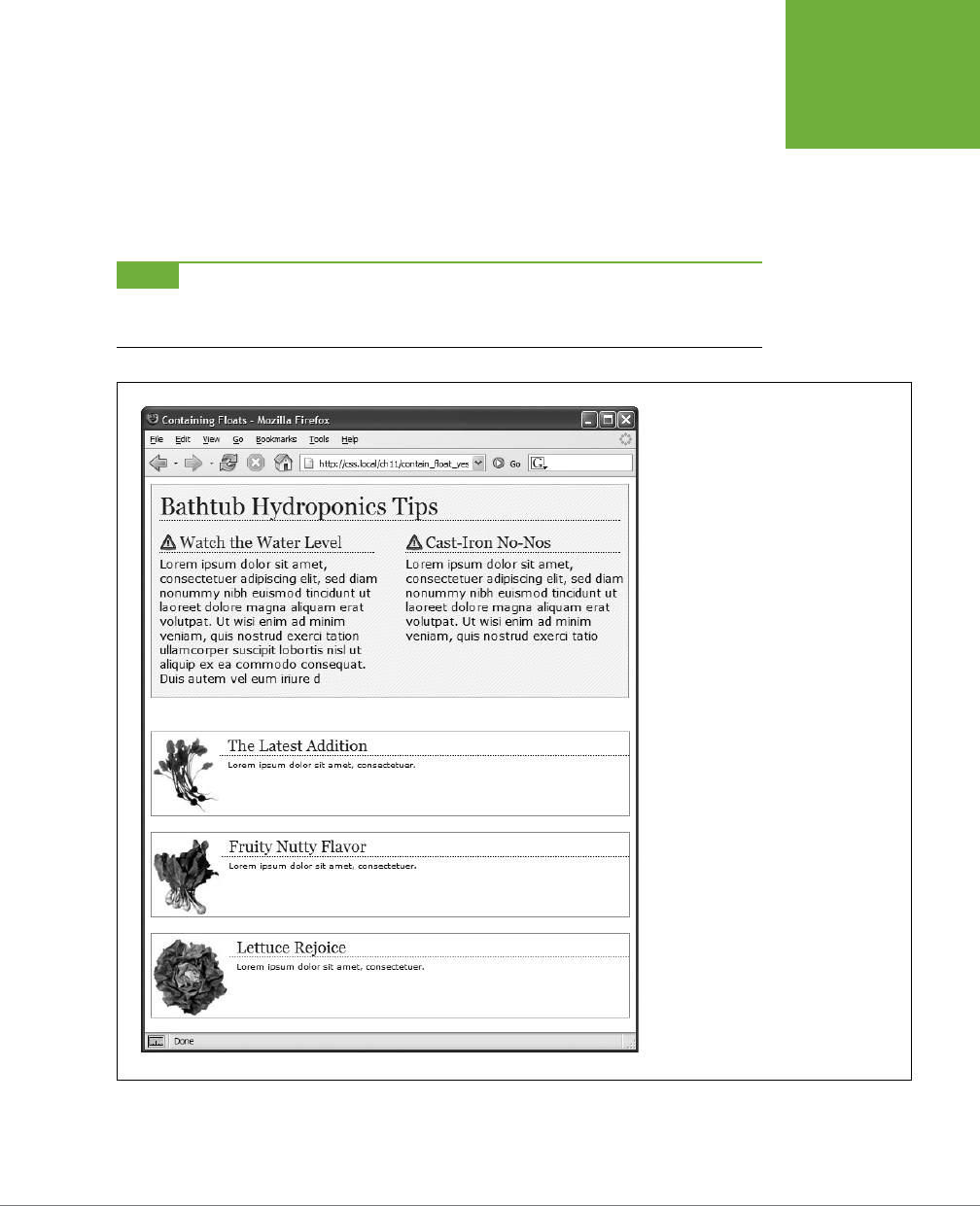
CHAPTER 13: BUILDING FLOAT-BASED LAYOUTS 429
OVERCOMING
FLOAT
PROBLEMS
Once you’ve added these styles to a style sheet, you simply add the class name
to the div
containing
the escaping floats: <div class="clear">. If you’re using
HTML5 sectioning elements like <article> or <footer>, then add that class to
them: <article class="clear">. See the bottom of Figure 13-8. This technique
is very reliable; however, unlike the previous two techniques, you do have to
add extra HTML (the class attribute) to the page.
NOTE The
zoom
property makes your page flunk the CSS validator check. To get around
that
, you can put
this rule (along with any other IE-only styles) into an external style sheet and attach it to your web pages, using
any of the tricks described in Chapter 17 (page 546).
FIGURE 13-8
Don’t let a float escape! You have several
ways to make floated elements stay inside
the borders and backgrounds of their
containing tag. Two methods are pictured
here, though any of the four discussed
would produce the same results. Floating
the container works (top), as does a
special combination of CSS (bottom). Both
methods result in borders and backgrounds
that surround the container and the floats
inside.
CSS3: THE MISSING MANUAL
430
OVERCOMING
FLOAT
PROBLEMS
POWER USERS’ CLINIC
Multiple Columns: The Easy Way
CSS3 introduces the
multicolumn layout
module: It lets you
divide a single element (like a div full of text) into a three, four,
or more columns. It provides CSS properties to determine the
number of columns, the space between columns, and to add
a line (a
rule
) between the columns.
Multicolumns are intended to simulate the kind of columns you
find in a newspaper or magazine, where one long story flows
from the top to the bottom of one column, back to the top of
the second column, down to the bottom of that column, and
so on. In other words, it’s not for placing columns of unrelated
content next to each other (for example, a sidebar with links,
and a main column containing an article). In addition, you
can’t set different widths for each individual column; they’re
all the same width.
Multiple columns work well in a magazine, where you have
a set height and can see an entire page, making it easy to
read to the bottom of a column and jump back to the top of
the next. On a web page however, you don’t know the size of
your visitors’ monitors, so a long column of text might force a
visitor to scroll down to get to the bottom, then scroll back up
to read the next column. In other words, unless you make sure
you have very short columns, you might end up forcing people
to scroll down and up to read one page—not very user friendly.
However, multiple columns are great for long bulleted lists with
short items. Instead of one really long list of bullets, you can
spread them across a page in multiple columns, saving precious
vertical space. The basic syntax is pretty straightforward: you
can use the
column-count
property to set the number of
columns, the
column-gap
property to set the space between
columns, and the
column-rule
property to draw a line
between the columns. To set the style, size, and color of the
column rule, use the same syntax as for borders (page 205).
You apply these to the tag that contains the elements you wish
to divide into columns. For example, say you have several para-
graphs of text inside a
<div>
tag. You apply these properties
to that div, and the paragraphs flow across multiple columns.
If, for instance, you give that column a class called
multicol
,
you can create the following style for a three-column design,
with a 1 em gap and a dotted rule:
.multicol {
column-count: 3;
column-gap: 1em;
column-rule: 1px dotted black;
}
Mind you, Internet Explorer 9 and earlier don’t understand
multiple columns. In addition, you need to use vendor
prefixes (page 209) for Chrome and Safari (
-webkit-
column-count
,
-webkit-column-gap
, and
-webkit-
column-rule
) and for Firefox (
-moz-column-count
,
-moz-column-gap
, and
-moz-column-rule
). Opera,
however, understands the non-prefixed version.
There are a few other properties for multicolumns, which
you can read about at the official W3C page:
www.w3.org/
TR/css3-multicol/
. In addition, there’s a simple introduction
to multi-columns at
http://dev.opera.com/articles/view/
css3-multi-column-layout/
and an online tool for creating
and previewing multiple columns at
www.aaronlumsden
.com/multicol/
.
Creating Full-Height Columns
HTML tables aren’t great for web page layout for several reasons. They add lots of
code, are dicult to update, and don’t work well on alternative browsers like those
used by cellphones. But tables have one thing going for them in the layout depart-
ment—the ability to create columns of equal height. Equal-height columns let you
add a background color or graphic to one column and have it fill the entire height

CHAPTER 13: BUILDING FLOAT-BASED LAYOUTS 431
OVERCOMING
FLOAT
PROBLEMS
of the page. The backgrounds of the two sidebars in the top image of Figure 13-9
fill the screen height, creating solid, bold stripes on either side of the page.
CSS floats, on the other hand, fall a bit short in this regard. Table cells in a row are
always the same height, which isn’t true of divs. The height of a float is usually dic-
tated by the content inside it. When there’s not a lot of content, the float is not very
tall. Since a background image or background color fills only the float, you can end
up with solid-colored columns that stop short of the page bottom, as in the circled
areas at the bottom of Figure 13-9.
NOTE The new flexible box model fixes the problem of different height columns in a row. Unfortunately,
browser support for it isn’t that good yet. See the box on page 436.
As with most problems related to CSS, there are several workarounds. The most
tried-and-true method is the
faux column
technique first championed by the CSS
guru Dan Cederholm. The secret is to add background images to a tag that
wraps
around
the stubby sidebar and the other columns on the page. Say your HTML has
two <div> tags that contain the content for a left sidebar and the page’s main content:
<div class="sidebar">Sidebar content here</div>
<div class="main">Main content for page, this column has a lot of text and is
much taller than the sidebar.</div>
The sidebar <div> is floated to the left edge of the page and has a width of 170
pixels. Because there’s less content in the sidebar, it’s shorter than the main text.
Suppose you wrap that HTML in a wrapper <div> tag, like so:
<div class="wrapper">
<div class="sidebar">Sidebar content here</div>
<div class="main">Main content for page, this column has a lot of text and is
much taller than the sidebar.</div>
</div>
That outer div grows to be as tall as the tallest element inside it, so even if the main
div is very tall, that wrapper div will be just as tall. Here’s the magic: Create a style
for the wrapper <div> with a background image the width of the sidebar, in the
background color you want for the sidebar. That way, if the background image tiles
vertically, it forms a solid bar the height of the wrapper <div> (Figure 13-9, top).
.wrapper { background: url(images/col_bg.gif) repeat-y left top; }
Web browsers display that background image directly
under the sidebar
, creating
the illusion that the sidebar has a background color.
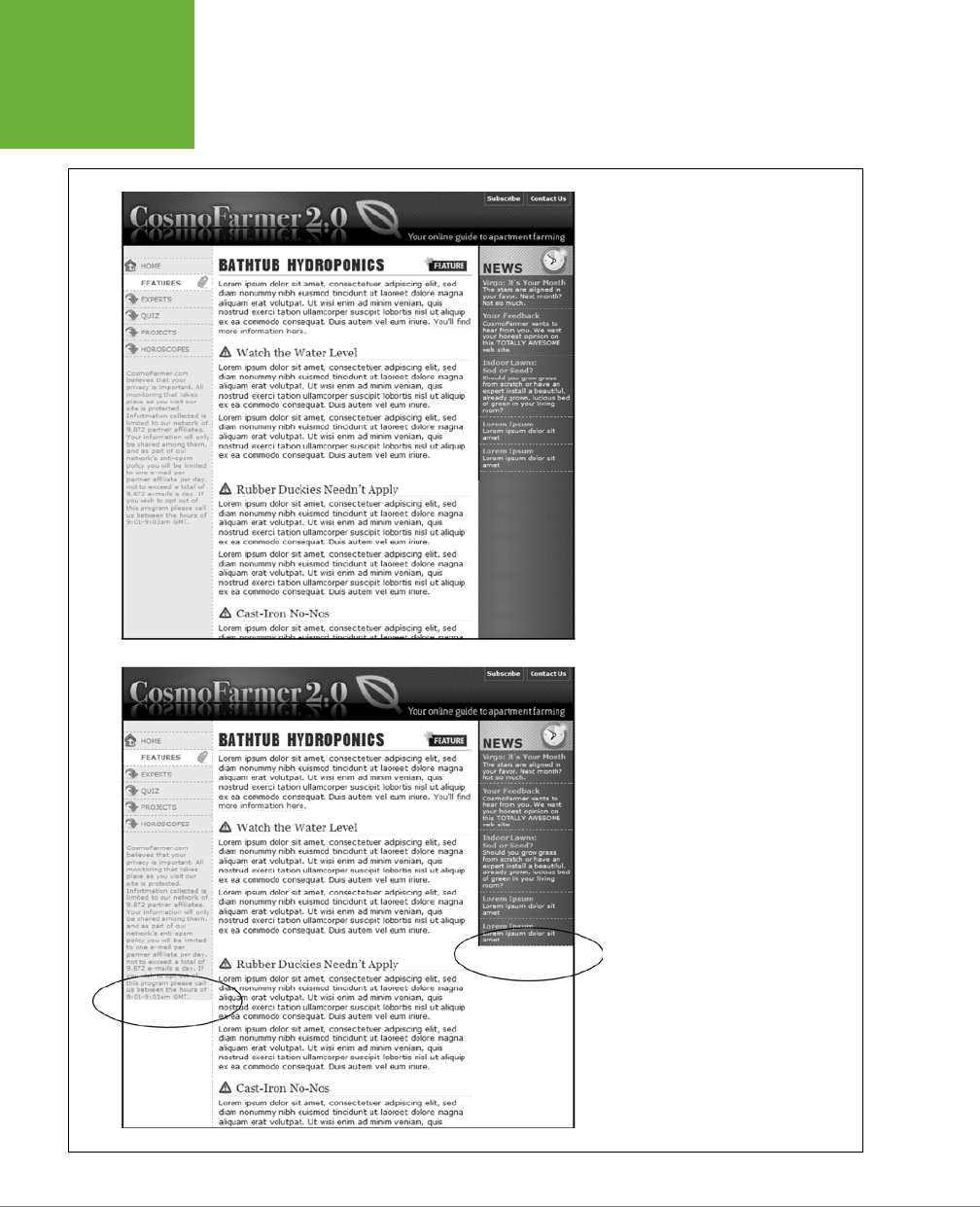
CSS3: THE MISSING MANUAL
432
OVERCOMING
FLOAT
PROBLEMS
FIGURE 13-9
Full-height columns with bold back-
ground colors are a common design
technique. The left and right sidebars
(top) show how solid backgrounds can
help visually define the different areas
of a page. When a sidebar’s background
stops abruptly (circled at bottom),
you get extra white space that’s both
distracting and unappealing.
CHAPTER 13: BUILDING FLOAT-BASED LAYOUTS 433
OVERCOMING
FLOAT
PROBLEMS
NOTE You’re not limited to solid colors either. Since you’re using an image anyway, you can make a decora-
tive pattern that tiles seamlessly down the left side of the page.
Reproducing this result for two columns is just a little more involved. First, add two
wrapper divs:
<div class="wrapper1">
<div class="wrapper2">
<div class="sidebar1">Sidebar content here</div>
<div class="sidebar2">Second sidebar</div>
<div class="main">Main content for page, this column has a lot of text and is
much taller than the two sidebars.</div>
</div>
</div>
NOTE If the wrapper and each column are all fixed widths, you can create this faux-column look for both
the left and right columns with just a single image and wrapper div. Just make the graphic as wide as the wrap-
per, with the left side of the graphic being the color and width of the left sidebar, the right side of the graphic
the color and width of the right sidebar, and the center part of the graphic matching the background color of the
center column.
If the first sidebar appears on the left side of the page and the second sidebar ap-
pears on the right side, you create two styles. Apply one style to the first wrapper
<div> tag to add a background to the left sidebar; apply one to the second wrapper
<div> to add a background to the right sidebar (Figure 13-10, bottom).
.wrapper1 { background: url(images/col1_bg.gif) repeat-y left top; }
.wrapper2 { background: url(images/col2_bg.gif) repeat-y right top; }
When adding a background image to the right-hand column, make sure you posi-
tion the background image in the top right of the second wrapper, so that it falls
underneath the second sidebar on the right side of the page.
One major problem with the faux-column technique is that it’s very dicult to make
it work when the columns are all percentage widths. If the widths of the sidebars
are a percentage of the browser window, they can be thinner or wider depending
upon a visitor’s monitor. The faux-column technique requires placing a graphic in
the background of the wrapper element. That graphic is a specific width and won’t
scale as the browser’s width, and thus the column’s width, changes.
One clever workaround uses CSS3 linear gradients (page 260) to add a gradient to
a wrapper element. The gradient becomes the background colors for the columns
inside the wrapper element. Now, you may be thinking, “I like rainbows and all, but
I want the background colors to each column to be solid, not a gradient that morphs
from one color to the next.” Well, fear not, you can get solid colors.
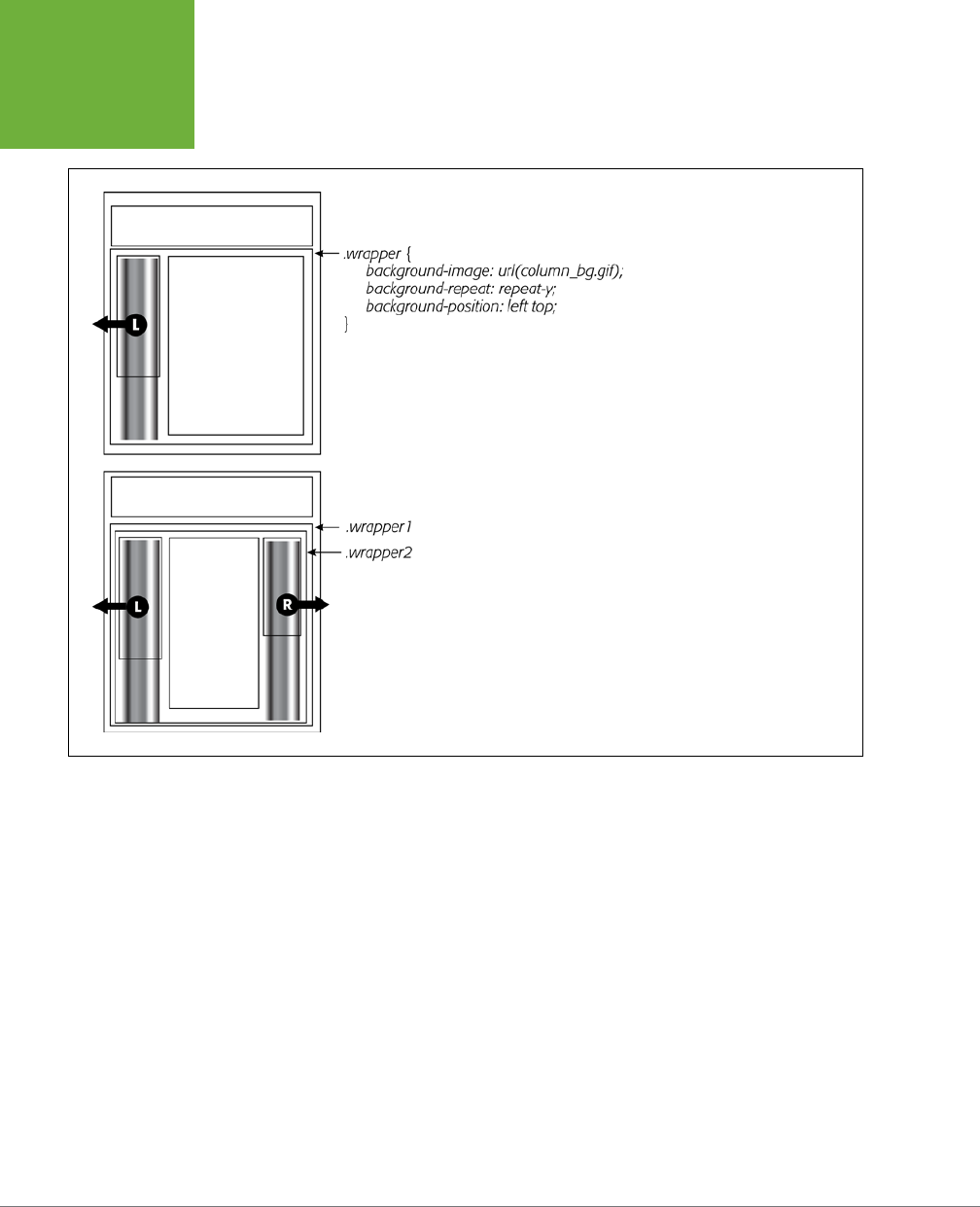
CSS3: THE MISSING MANUAL
434
OVERCOMING
FLOAT
PROBLEMS
FIGURE 13-10
You sometimes need to think outside
the tag for creative solutions to CSS
problems. To get full-height back-
grounds behind floated columns, you
need to resort to some extra
<div>
tags that wrap around all of the main
columns of text. These divs grow to
be the height of the tallest column
in the group. By adding background
images to these wrapper divs, you
create the appearance of equal-
height columns.
As described on page 262, linear gradients let you set color stops—places where a
new color is defined as part of the gradient. If the first stop is white, for instance,
and the second stop is white, the gradient runs from white to white. In other words,
there’s no color change—it’s just one solid color. In addition, you can set a color
stop at the same spot as another color stop, which lets the second color begin im-
mediately after the other with no subtle gradient eect.
Say you have a three-column design. The first column is 25 percent wide, the middle
column is 50 percent wide, and the third column is 25 percent wide. You want the
first column to have a background color of red, the middle white, and the third blue.
1. Wrap all three columns in a wrapping element:
<div class="wrapper">
<div class="sidebar1"> … content here …</div>
<div class="main"> … content here …</div>
<div class="sidebar2"> … content here …</div>
</div>

CHAPTER 13: BUILDING FLOAT-BASED LAYOUTS 435
OVERCOMING
FLOAT
PROBLEMS
The wrapper is the element in which you’ll add the gradient. In addition, if you
float all three of the columns inside the wrapper, you’ll need to use one of the
methods described on page 425 for containing those floats.
2. Add a linear gradient, with color stops that match the width of the columns:
.wrapper {
background-image: linear-gradient(left,
red 0%,
red 25%,
white 25%,
white 75%,
blue 75%,
blue 100%);
}
Red runs from 0% (far left of the wrapper) to 25%. It’s the same color, so there’s
no gradient. Then white begins at 25%—the same point at which red ended—so
again there’s no gradient. White continues until the 75% mark—just a solid white
stretch. Then blue begins exactly where white ends and continues to the 100%
mark (the right side of the wrapper). In other words, you have three solid-color
columns whose widths change with the browser width. Perfect.
Of course, you need to include the vendor-prefixed versions as well.
3. Add the vendor prefixed versions:
.wrapper {
background-image: -webkit-linear-gradient(left,
red 0%,
red 25%,
white 25%,
white 75%,
blue 75%,
blue 100%);
background-image: -moz-linear-gradient(left,
red 0%,
red 25%,
white 25%,
white 75%,
blue 75%,
blue 100%);
background-image: -o-linear-gradient(left,
red 0%,
red 25%,
white 25%,
white 75%,
blue 75%,
CSS3: THE MISSING MANUAL
436
OVERCOMING
FLOAT
PROBLEMS
blue 100%);
background-image: linear-gradient(left,
red 0%,
red 25%,
white 25%,
white 75%,
blue 75%,
blue 100%);
}
The downside of using a linear gradient is that it only works with solid colors (or, of
course, gradients, if you’d like to do that), so you can’t use a graphic in the back-
ground or borders around each column. In addition, Internet Explorer 9 and earlier
don’t understand gradients at all.
NOTE There are even a few other ways to make columns appear to be equal height. Check out this blog
post by CSS expert Chris Coyier for an overview of the different techniques:
http://css-tricks.com/fluid-width-
equal-height-columns/
. Ignore his discussion of the flexible box method, since he wrote this article before the
W3C released the finalized flexbox syntax.
POWER USERS’ CLINIC
Better Layout Methods Are on the Way
CSS3 includes some very promising new methods for controlling
the flow of web page content. In most browsers (but not IE 9 or
earlier), you can already use the multicolumn layout module to
flow text over multiple columns as in newspaper and magazine
design (see the box on page 430).
In addition, the new
flexible box
model provides solutions to
most of the problems floats attempt to tackle, such as creating
side-by-side columns of varying widths. However,
flexbox
(as its usually called) can do a lot more, including controlling
the order in which the columns are displayed independent of
their order in the HTML or changing their display from left to
right to right to left. Flexbox syntax is straightforward, and it
provides a lot of controls for managing layout. Most browsers
even support it.
Unfortunately, the CSS working group has made significant
changes to flexbox syntax. They’ve changed the names of
properties and added new ones, so the implementation in
browsers as of this writing is totally out-of-date, and using
the old syntax is not recommended. Even Internet Explorer 10,
which was not yet released as of this writing, is predicted to
support the old, out-of-date flexbox syntax. In other words,
it’ll probably be some time before you can reliably use flexbox
on your websites. For more on flexbox, go to the source:
http://www.w3.org/TR/css3-flexbox/
. Also, avoid any flexbox
tutorials written prior to 2012. They all use the old syntax. To
learn how to recognize the difference between old flexbox
and new flexbox, read the article at
http://css-tricks.com/
old-flexbox-and-new-flexbox/
).
Also on the horizon is the
complex grid
layout module (
www
.w3.org/TR/css3-grid-layout/
). This module will simplify the
process of defining an underlying structure of rows and col-
umns to which you can align page elements. Although a lot of
work has been put into this module, as of the end of 2012, it’s
not yet finalized and no browsers support it.
Finally, there are even a few preliminary ideas from Adobe for
refining text layout (
http://html.adobe.com/webstandards/
).

CHAPTER 13: BUILDING FLOAT-BASED LAYOUTS 437
OVERCOMING
FLOAT
PROBLEMS
Preventing Float Drops
Suddenly, one of your columns simply drops down below the others (Figure 13-11,
top). It looks like there’s plenty of room for all the columns to coexist perfectly side
by side, but they don’t. You’ve got the dreaded float drop.
A floated column drops down because there’s not enough room to fit it. So be careful
if you set widths for
each
column. If the available space in the browser window (or
the containing block in a fixed-width design) is less than the
total
widths of the col-
umns, then you’re asking for a float drop. Also, keep the CSS box model in mind: As
discussed in the box on page 196, the width of an element displayed in the browser
window isn’t the same as its width property. The displayed width of any element is
a combination of its width, left and right border sizes, left and right padding, and
left and right margins. For the columns to fit, the browser window (or containing
block) must accommodate the combined total of all those widths.
Take, for example, the simple three-column layout in Figure 13-11. As you can see
in the top example, the three columns don’t fit. Here’s a breakdown of the math
behind the problem:
• Wrapper div. A fixed-width wrapper <div> tag encloses the entire design. Its
width property is set to 760 pixels, so all three columns can’t total more than that.
• Sidebar 1 (left side). Its width is 150 pixels, but it also has 10 pixels of padding,
making its total onscreen width 170 pixels. (150 + 10 pixels of left padding + 10
pixels of right padding.)
• Main content. The main content <div> is 390 pixels wide, with a 1-pixel border
and 15 pixels of left and right margin for a total width of 422 pixels. (You may
need a calculator for this one: 390 + 1 [left border] +1 [right border] + 15 [left
margin] + 15 [right margin].)
• Sidebar 2 (right side). This element has a width property set to 150 pixels,
with 10 pixels of left and 10 pixels of right padding: 170 pixels, just like Sidebar 1.
The actual widths of each element add up to a grand total of 762 pixels. That’s
two pixels more than the width of the wrapper <div>. The middle image of Figure
13-11 shows an outline around the main content <div> indicating its total width
plus margins. Just those measly two extra pixels of width (circled) are enough
to cause a column to drop down. The solution: Remove 2 pixels of space from
any of the elements. Changing the main content div’s left and right margins
from 15 to 14 pixels buys you the extra room needed for all three columns to fit
side by side (bottom).
Bottom line: Float drops are always caused by not enough room to hold all of
the columns.
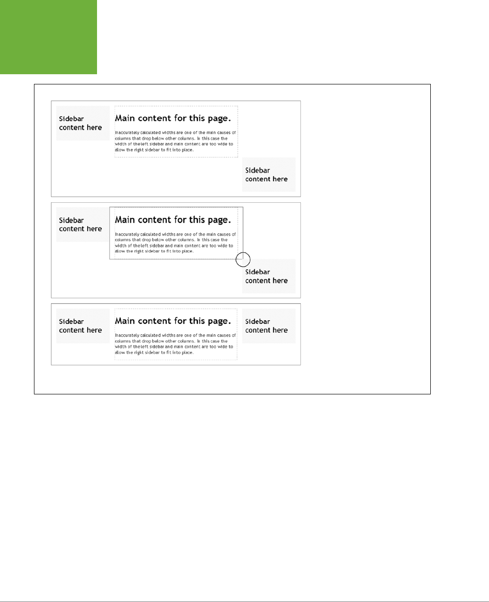
CSS3: THE MISSING MANUAL
438
OVERCOMING
FLOAT
PROBLEMS
FIGURE 13-11
It takes only a single pixel or two
to ruin a design. When the width of
floated elements are just a hair wider
than their containing block (like a
<div>
with a set width, or even
the browser window itself), the last
floated element drops below the others
(top). The actual width of an element
combines many CSS properties. In the
middle image, the outline around the
main content area shows that it’s a
tad too wide to allow the right sidebar
to fit (circled). Adjusting any of the
elements by removing a bit of width,
padding, or margins can solve the
problem (bottom).
Another way to make the math easier is to never set the border or padding on column
divs or elements. In this way, if you set three columns to 20%, 60%, and 20% widths,
respectively, you’ll know they fit side-by-side since they total 100%, and there’s no
padding or borders to mess that up. If you do want padding, you can simply add
padding to the elements inside the column: for example, give the same left and
right padding to the headlines, paragraphs, and other elements inside the div. This
requires more work, but it prevents potential float drops caused by column widths
totaling more than 100%.
If you want borders as well, another technique is to nest divs like this:
<div class="column1">
<div class="innerColumn">
…content goes here …
</div>
</div>

CHAPTER 13: BUILDING FLOAT-BASED LAYOUTS 439
OVERCOMING
FLOAT
PROBLEMS
You then set the width on the outer div—column1 in this case—and add the padding
and borders to the inner div—innerColumn—in the above code. Don’t set a width on
the inner div; it will automatically fill the width of the outer column.
Preventing Float Drops With Box-Sizing
The main culprit responsible for float drops is the wacky way browsers calculate the
actual screen width for an element. You set the width to 100 pixels, for example, but
the browser draws it as 122 pixels, because you’ve also added 10 pixels of left and
right padding and a 1-pixel border around the whole thing. Fortunately, one CSS
property lets you sidestep these headache-inducing calculations.
The CSS box-sizing property lets you tell a web browser to use a dierent model for
calculating the actual screen width of an element. You can give it one of three values:
• The content-box value is how browsers normally work: The width of an element
is the total of the left and right border thicknesses, left and right padding, and
the CSS width property.
box-sizing: content-box;
• The padding-box value tells a browser to include the left and right padding. In
other words, the display width of an element is the total of the CSS width, and
the left and right padding. It doesn’t include any borders around the element.
box-sizing: padding-box;
• Finally, the border-box property includes padding, borders, and CSS width. In
general, this is the one you want to use. It keeps the math simple and helps
prevent float drops, especially when you’re using percentage-based widths
along with pixel-based units for the border width and padding:
box-sizing: border-box;
The very good news is that almost all browsers support this scheme, including
Internet Explorer 8. For Firefox, you need a vendor prefix—-moz-box-sizing—but all
other browsers can accept the plain, non-prefixed version. It’s safe to use for the vast
majority of the web-surfing public. Only IE 7 and earlier won’t follow these instruc-
tions; they’ll resort to defining the visual width as browsers always have, so you’ll
end up with wider elements in IE 7 and probably float drops in float-based layouts.
See the box on page 24 to help you determine whether you really care about IE 7.
Some web designers suggest setting all elements to the border-box setting, so that
every tag will be measured in the same way. To do so, use the * selector, which selects
every element on the page, at the top of your style sheet along with your CSS reset:
* {
-moz-box-sizing: border-box;
box-sizing: border-box;
}
CSS3: THE MISSING MANUAL
440
TUTORIAL:
MULTIPLE-
COLUMN
LAYOUTS
POWER USERS’ CLINIC
Got Layout?
As you’ve probably gathered by now, Internet Explorer 6 and
7 have a long history of browser bugs. Some basic CSS that
looks fine in Internet Explorer 8, Firefox, or Safari crumbles in
Internet Explorer 6 or 7. Fortunately, IE 6 and 7 are dwindling
in popularity (see the box on page 24), and are quickly passing
into oblivion. But if you still need to support those browsers,
here’s a trick that will come in handy. As it turns out, you can
fix many IE bugs by switching on a special IE-only property
known as
layout
. This isn’t a CSS concept, nor does it have
anything to do with the rules of HTML. It’s just a concept built
into Internet Explorer (versions 7 and earlier) by the engineers
who created IE. As far as IE is concerned, each page element
either has layout or it doesn’t.
In Internet Explorer, floats, list items, and absolutely posi-
tioned elements display differently depending on whether or
not they have layout. For example, to make sure an element
contains any floated elements inside them, you can add this
style to your CSS:
.clear { zoom: 1; }
Then, add that class to any element that contains a floated
element. The point of that style isn’t really to zoom into the
links. Although the IE-only
zoom
property lets you zoom into
a page element (using JavaScript), it also triggers
layout
in IE 6 and 7. For reasons known only to Microsoft (and the
extraterrestrials), switching on
layout
forces IE 6 and 7 to
contain any floated elements inside a containing tag. The
zoom
property isn’t the only one that switches on
layout
in IE. Several other (real) CSS properties also give an element
layout:
position: absolute
;
float: left
;
float:
right
;
display: inline-table
; any
width
value;
and any
height
value.
The
zoom
property is a good choice because it doesn’t mean
anything to other browsers (unlike real CSS properties like
width
and
height
), so Safari, Firefox, and so on happily
ignore it. That means you can use
zoom
anywhere you need
to fix an IE bug by “adding layout” to an element without fear
of messing up the page in other browsers. The downside of
using this property is that it isn’t valid CSS, so it won’t pass
W3C validation (see the box on page 27).
Tutorial: Multiple-Column Layouts
In this tutorial, you’ll create a multicolumn, float-based layout. In the process, you’ll
create a three-column liquid design, as well as a fixed-width design. In addition,
you’ll learn a couple of dierent techniques for doing it.
To get started, download the tutorial files located on this book’s companion website
at
www.sawmac.com/css3/
. Click the tutorial link and download the files. All the
files are in a zip archive, so you need to unzip them first, as detailed on the website.
The files for this tutorial are in the
13
folder.
Structuring the HTML
The first step in creating a CSS-based layout is identifying the dierent layout ele-
ments on the page. You do this by wrapping chunks of HTML inside of <div> tags,
each of which represents a dierent part of the page.

CHAPTER 13: BUILDING FLOAT-BASED LAYOUTS 441
TUTORIAL:
MULTIPLE-
COLUMN
LAYOUTS
1. Open the
start.html
file in a text editor and click in the empty line following
the HTML comment: <!—first sidebar goes here-->.
As you can see, some of the HTML work is already done: Currently, there’s a
banner and footer. Before you create any styles, you need to add the structure
and content for the page. You’ll next add the <div> tag for the left sidebar.
2. Add an opening <aside> for the sidebar: <aside class="sidebar1">. Then
press Enter (Return) to create a new, empty line.
You’re using the HTML5 <aside> tag, but you could just as easily use a <div> tag
to create this column. (The page includes a link to a JavaScript file that lets IE 8
and earlier apply CSS to HTML5 elements; see page 24 for the full explanation.)
If you were creating a web page from scratch, at this point you’d add the HTML
for the page’s sidebar, perhaps a list of articles on the site, links to related
websites, and so on. In this case, the HTML is already taken care of. The code
for an unordered list of links is waiting for you in another file. You just need to
copy and paste it into this page.
3. Open the file
sidebar1.txt
, copy all of the contents, and then return to the
start.html
file. Paste the HTML after the <aside> tag you created in Step 2 (or
your <div> tag, if you went that route).
The HTML for the sidebar is nearly complete. You just need to close the <aside>
tag.
4. Immediately after the code you just pasted, type </aside>.
You’ve just added the first layout element on the page. In a little bit, you’ll style
this HTML so that it looks like a column. But first, you need to add some more
content.
5. Place your cursor in the empty line after this HTML comment: <!--main
content goes here-->, and then type <article class="main">.
This div holds the page’s main content. You’ll get that HTML from another file, too.
6. Open the file
main.txt
, copy all of the contents, return to the
start.html
file,
and then paste the code after the <article> tag you just created. Add the
closing </article> tag exactly as in Step 4. Save the HTML file.
That’s all the HTML you need to create your design for now. Next, it’s time to
turn your attention to building the CSS.
Creating the Layout Styles
If you preview the page now, you’ll see that the banner, navigation buttons, and text
are already styled. That’s because this page has an external style sheet attached to it
with some basic formatting. Next, you’ll create styles to format the page’s columns:

CSS3: THE MISSING MANUAL
442
TUTORIAL:
MULTIPLE-
COLUMN
LAYOUTS
1. In a text editor, open the styles.css file.
Since the web page uses an external style sheet, you’ll add all the new styles to
it. You’re now managing two files, the HTML file and the CSS file, so make sure
you save both before previewing your work in a web browser.
2. Scroll to the bottom the CSS file. You’ll see a CSS comment that reads /* add
tutorial styles below here */. Below that, add this style:
.sidebar1 {
float: left;
width: 20%;
}
This class style floats the sidebar div to the left of the page, and gives it a width
of 20%. The width property is important in this style: Unless you’re floating an
image that has a set width, you should always set a width for a floated element.
Otherwise, the browser sets the width based on the content inside the float,
leading to inconsistent results. Here, the width is percentage-based, meaning
it’s determined by the width of its container. In this case, the container is the
<body> tag, and it fills the entire browser window width. So the sidebar’s onscreen
width will depend on the width of the visitor’s browser window.
3. Save the HTML and CSS files and preview the start.html file in a web browser.
The sidebar now forms a left-hand column…sort of. When the text in the main
column reaches the bottom of the sidebar, it wraps around the bottom of the
sidebar, as shown in Figure 13-12. While that’s normally how floats work, it’s not
what you want in this case. To make the main body text appear like a column
of its own, you have to add enough left margin to indent the main text beyond
the right edge of the sidebar.
4. Create a style for the second column:
.main {
margin-left: 22%;
}
Since the sidebar is 20 percent wide, a margin of 22 percent indents the main
content an additional 2 percent, creating a gutter between the two columns.
This additional white space not only makes the text easier to read, but also
makes the page look better.
Preview the page now, and you’ll see you’ve got yourself a two-column layout.
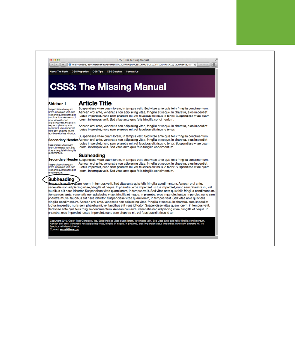
CHAPTER 13: BUILDING FLOAT-BASED LAYOUTS 443
TUTORIAL:
MULTIPLE-
COLUMN
LAYOUTS
FIGURE 13-12
A floated element doesn’t
actually create a column
on the page. It merely
displaces any content
that wraps around it, up
to the point where the
float ends (circled). After
that, the content flows
back to its normal position
underneath the float.
Adding Another Column
As you can see, a two-column design isn’t hard. Adding a third column so you can
treat your visitors to even more information isn’t any harder. In fact, the steps are
quite similar to the previous part of this tutorial.
1. Open the file
sidebar2.txt
. Copy all the HTML from that file, and then return
to the
start.html
file.
The HTML for this next column goes after the main text inside the <article> tag.
2. Locate the HTML comment <!-- second sidebar goes here --> near the
bottom of the file. Click in the empty line below it.

CSS3: THE MISSING MANUAL
444
TUTORIAL:
MULTIPLE-
COLUMN
LAYOUTS
It’s often hard to find the right closing </div> when you use a lot of divs to
structure a page. That’s why HTML comments—like this one—can really help
you identify and keep track of the HTML in your page.
3. Type <aside class="sidebar2">, press Enter, and then paste the HTML you
copied in Step 1. Hit Enter again, and then type </aside>. Save the HTML file.
When you close the <aside> tag, you’ve completed the HTML for the page’s
third column. Start styling it next.
4. In your text editor, open the
styles.css
file. Below the .main
style you cre-
ated in Step 4 on the previous page, add a new style to the internal style sheet:
.sidebar2 {
float: right;
width: 20%;
}
You’re floating this column to the right side of the page to flank the main content
with sidebars on either side.
5. Save all the files and preview the start.html file in a web browser.
Right away, you’ll notice something strange. The second sidebar appears below
the main content and even runs over the footer. The problem has to do with the
HTML’s source order. When you float an element, only HTML that comes after
that element wraps around and appears next to the floated element. In other
words, since the second sidebar’s HTML is after the main content, it doesn’t
appear
next
to the main content, only after it.
There are a couple of ways to get around this situation. You could move the
second sidebar’s HTML (the second <aside> element) before the main content’s
HTML (the <article> element). Then the first sidebar would float to the left and
the second to the right; the main content would just scoot up in between them.
Alternatively, you could simply float the main column as well. If you set its width
so all three columns add up to no more than 100 percent, then the three columns
will sit side by side. For this example, you’ll try that approach.
6. Edit the .main style so that it looks like this:
.main {
float: left;
width: 60%;
}
If you save the CSS file and preview the
start.html
file in a browser, you’ll notice
another problem—suddenly, everything’s turned black! Remain calm: That’s
the footer trying to wrap around all the floats and causing a mess. As you read
above, when you float an element and another element wraps around it, the
background color and borders for that element actually extend underneath
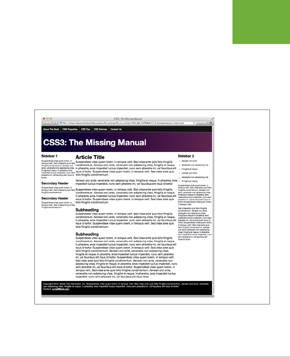
CHAPTER 13: BUILDING FLOAT-BASED LAYOUTS 445
TUTORIAL:
MULTIPLE-
COLUMN
LAYOUTS
the floated element. Strange, true…and frustrating. To fix it, you simply need
to make the footer drop below—that is,
clear
—the floats.
7. Add one more style after the .sidebar2 style:
footer {
clear: both;
}
As described on page 425, the clear property forces an element to drop below
floated elements. In this case, it pushes the footer down below the columns as
shown in Figure 13-13.
FIGURE 13-13
Using floats you can make
three elements appear
as three side-by-side
columns.
Adding Some Breathing Room
You’ve got three columns, but the text is a little jammed together. The three columns
practically touch and the text on the right sidebar hugs too closely to the edge of
the browser window. A little padding can help fix this.

CSS3: THE MISSING MANUAL
446
TUTORIAL:
MULTIPLE-
COLUMN
LAYOUTS
1. Add padding to the .sidebar1, .main, and .sidebar2 styles, so the styles
look like this:
.sidebar1 {
float: left;
width: 20%;
padding: 0 20px 0 10px;
}
.main {
float: left;
width: 60%;
padding: 0 20px 0 20px;
}
.sidebar2 {
float: right;
width: 20%;
padding: 0 10px 0 20px;
}
Here, you’re using the padding shorthand property (page 231). The numbers
represent the top, right, left, and bottom padding. So in the .sidebar1 style,
you’re adding 0 top padding, 20 pixels of right padding, 0 bottom padding,
and 10 pixels of left padding.
If you save the
styles.css
file and preview the
start.html
file in a browser, you’ll
notice a problem—the dreaded float drop (page 437). By adding padding, you’ve
essentially increased the width of each column, and since the total widths of the
columns (20% + 60% + 20%) already totaled 100%, that extra padding forces
the third column down below the other two. It just can’t fit!
There are a couple of ways to handle this problem. First, you can remove the
padding from these styles, and add it to all the elements inside. In other words,
add 10 pixels of left and right padding to the <h2>, <h3>, <p>, and <ul> tags.
That’s a lot of work.
Secondly, you could remove the padding from the styles in the CSS file and then,
in the
start.html
file, add a <div> inside each of the columns, something like this:
<aside class="sidebar1">
<div class="innerColumn">
… content goes here …
</div>
</aside>
Then, in the
styles.css
file, simply create a style to add the padding:
.innerColumn {
padding: 0 20px 0 10px;
}

CHAPTER 13: BUILDING FLOAT-BASED LAYOUTS 447
TUTORIAL:
MULTIPLE-
COLUMN
LAYOUTS
Because there’s no width set on the .innerColumn style, it simply grows to fill
the column, while the padding scoots everything inside of it (the headings,
paragraphs, and so on) in by 10 pixels. The downside of this approach is you
need to add additional HTML.
There’s another way, that’s a lot easier, more flexible, and widely supported by
web browsers.
2. Add another style to the style sheet:
* {
-moz-box-sizing: border-box;
box-sizing: border-box;
}}
This style takes advantage of the universal selector (page 63). It applies the
box-sizing property to every element on the page. By setting this property to
border-box, you’re instructing web browsers to use the size of the padding and
border properties as part of the CSS width value. In other words, the padding
doesn’t add to the CSS widths you set earlier. This prevents any float drop, since
the columns now only add up to 100 percent of the browser window width.
The only downside to this technique is that Internet Explorer 7 and earlier don’t
understand the box-sizing property, so you get a float drop in those browsers.
See the box on page 24 to help you determine whether you’re concerned about
the dwindling and nearly extinct fan base of those browsers. If you do need to
design for them, use the extra div technique discussed in Step 1 on page 448.
Finally, you’ll add a border line to separate the columns.
3. Edit the .main style by adding a left and right border so that it looks like this:
.main {
float: left;
width: 60%;
padding: 0 20px;
border-left: dashed 1px rgb(153,153,153);
border-right: dashed 1px rgb(153,153,153);
}
These properties add two lines, one on either side of the main content section.
If you preview the page in a web browser now, it should look like Figure 13-14.
CSS3: THE MISSING MANUAL
448
TUTORIAL:
MULTIPLE-
COLUMN
LAYOUTS
FIGURE 13-14
Adding some padding to
the columns and border
lines between them clearly
separates the columns.
Fixing the Width
Currently, the page is a liquid design, meaning that it expands to fill the entire width
of the browser window. But say you’d rather have the page stay the same width all
the time—because you hate how it looks on cinema display monitors, or you don’t like
what happens to the design when the browser window is shrunk too small. Changing
a liquid design to a fixed-width design is easy. Start by adding a little more HTML.
1. Return to your text editor and the start.html file. Directly after the opening
<body> tag, add a new <div> tag:
<body>
<div class="pageWrapper">

CHAPTER 13: BUILDING FLOAT-BASED LAYOUTS 449
TUTORIAL:
MULTIPLE-
COLUMN
LAYOUTS
You’re wrapping the entire page inside a div, which you’ll use to control the
page’s width. You need to make sure that tag is closed.
2. Add the closing </div> just before the closing </body> tag:
</div>
</body>
Now that there’s a div surrounding all of the content on this page, you can
control the page’s width by setting a width for this tag.
3. Save the HTML file, and switch to the
styles.css
file. Add another style:
.pageWrapper {
width: 960px;
}
If you save the CSS and HTML files and preview the
start.html
file in a browser,
you’ll see that the page is indeed locked in at 960 pixels. If you make the browser
window thinner than 960 pixels, you’ll get scroll bars.
You don’t have to set an exact width, however. If, you want the page to fit into
a browser window that’s thinner—say 760 pixels—you’re better o avoiding
an exact width. The real problem is that the page becomes hard to read when
the browser is really wide. Another approach is to use the max-width property,
which prevents the div from getting larger than a particular value, but doesn’t
prevent it from getting thinner to fit smaller screens. While you’re at it, you’ll
also center the div within the browser window.
4. In the styles.css file, change the .pageWrapper style you just created so it
looks like this:
.pageWrapper {
max-width: 1200px;
margin: 0 auto;
}
The max-width property (which even works in Internet Explorer 7) provides a
liquid layout but only up to a point. In this case, when the browser window is
wider than 1200 pixels, the div won’t get any wider. The margin setting here—0
auto—provides 0 margin for the top and bottom, and auto margins for left and
right. That auto setting tells the browser to automatically figure out the margin,
splitting the space evenly between left and right and centering the div in the
browser window. The page should now look like Figure 13-15.
CSS3: THE MISSING MANUAL
450
TUTORIAL:
MULTIPLE-
COLUMN
LAYOUTS
FIGURE 13-15
Using the CSS
max-
width
property instead
of
width
lets you provide
a flexible design that fits
various browser window
widths, but won’t get
unreadably wide on an
ultra-wide monitor.
Mixing Liquid and Fixed Design
The page looks pretty good, but it might look better if the black background for
the nav bar at the top, the footer at the bottom, and the dark purple gradient in the
banner extended all the way across the page (see Figure 13-16). Because the nav,
banner, and footer are inside the pageWrapper div, those backgrounds stop when the
browser window is wider than 1200 pixels. Instead, you want to keep some parts of
the page—the tags with the background colors—liquid, while limiting the width of
the tags containing any content.
The background color for the navigation is applied to a <nav> element in the HTML;
the purple gradient is applied to a <header> element; and the black background
in the footer is applied to the <footer> element. In order for their backgrounds to
extend the width of the page, they can’t be constrained by the pageWrapper div. So
the first step is removing that style.
1. In the styles.css file, delete the .pageWrapper style you just created.
You can leave the pageWrapper div in the HTML. It won’t hurt to have that little
bit of extra HTML, and you may want to use it later to hang styles on.
The page is back to its fully liquid form. Now you want to constrain just the nav,
banner text, footer text, and main content so they don’t get any wider than 1200
pixels. To do so, you need to dig into the HTML a bit and see what elements
you have to play with.

CHAPTER 13: BUILDING FLOAT-BASED LAYOUTS 451
TUTORIAL:
MULTIPLE-
COLUMN
LAYOUTS
Look in the HTML for the
start.html
file and find the <nav> tag. Inside it, you’ll
see that the navigation buttons are created with a simple unordered list. Bingo.
You can set the maximum width of that list to 1200 pixels and center it on the
page, while leaving the <nav> tag (and its black background) to extend the entire
browser window width. Likewise, the text inside the banner—
CSS3: The Missing
Manual
—is inside a <h1> tag. You can set its maximum width and margin as well.
In the footer, you’ve got a <p> tag you can control.
2. In the
styles.css
file, add one more style:
nav ul, header h1, footer p {
max-width: 1200px;
margin: 0 auto;
}
This group selector targets the navigation bar, banner, and footer text, but not
their containing elements. If you save the CSS file and preview
start .html
now,
you’ll see that the navigation, title, and footer text don’t get wider than 1200
pixels. However, the main content region still fills the entire browser window.
To fix that, you need to wrap the three columns in another div to create a group
that you can size and center.
NOTE Another approach is to insert another
<div>
inside the
<header>
tag and wrapped around the
<nav>
and <h1> tags, and another
<div>
inside the
<footer>
tag. You can let the
<header>
and
<footer>
stay full width while constraining the width of those nested divs.
3. Open the start.html file in your text editor. Just before the comment that intro-
duces the first sidebar—<!-- first sidebar goes here -->—add <div class=
"contentWrapper">:
<div class="contentWrapper">
<!-- first sidebar goes here -->
Now, you need to close that div.
4. Scroll down near the bottom of the HTML file. Between the closing </aside>
tag and opening <footer> tag, add a closing </div> so the HTML looks like this:
</aside>
</div>
<footer>
Finally, you can add this new class name to the style you created in Step 2.
5. Add the new class to the group selector, like this:
nav ul, header h1, footer p, .contentWrapper {
max-width: 1200px;
margin: 0 auto;
}
A completed version of this tutorial is in the
13_finished
folder.
CSS3: THE MISSING MANUAL
452
TUTORIAL:
MULTIPLE-
COLUMN
LAYOUTS
FIGURE 13-16
Creating a multicolumn
design is no harder than
floating HTML tags: three
columns, three floated ele-
ments. You can add more
columns simply by adding
more HTML containers
(
<div>
,
<article>
,
<aside>
, and so on) and
floating them to the left
and right. Just make sure
to remember to adjust
their widths so there’s
enough room that for
them to fit side by side.

453
CHAPTER
14
Web designers have always had to contend with designing for various screen
sizes—from 760-pixel-wide laptops to gargantuan widescreen displays.
However, the rise of smartphones and tablets has now made it even more
imperative to design for a wide range of screen widths and heights. Some compa-
nies go so far as to create separate, mobile-only websites (see the top images in
Figure 14-1). However, unless you have the time, money, and technical expertise to
develop two sites and program your web server to provide the proper site to the
proper device, a mobile-only website is probably out of reach.
Fortunately, there’s another, simpler approach that lets you build a single site that
adapts to dierent device widths (see bottom images in Figure 14-1). Called
respon-
sive web design
, this technique uses several dierent tricks to make a page change
its layout based on the width of the browser screen. On a smartphone, for example,
you can lay out a page in a single, easy-to-read column to fit the narrow width of the
screen (bottom-left image in Figure 14-1), while maintaining a multicolumn layout
on wider monitors (bottom-right image in Figure 14-1).
Responsive Web Design
CSS3: THE MISSING MANUAL
454
RESPONSIVE
WEB DESIGN
BASICS
FIGURE 14-1
Many large companies, like
Amazon and Target, create
mobile versions of their
sites, optimized for display
on handheld devices like
the iPhone (top). Fortu-
nately, using responsive
web design techniques,
you can craft one HTML file
that displays differently
on different-width devices
(bottom). On a phone, the
page may appear as one
long column, while in a
desktop browser, the same
page takes advantage of
the wider screen to include
multiple columns and
larger photos.
Responsive Web Design Basics
It’s very hard to read a four-column web page on a phone whose screen is just 320
pixels wide. It’s just as dicult to read a single column of text that’s spread across
the 2560 pixels of a large desktop monitor. Responsive web design, a term coined
by web design pioneer Ethan Marcotte, is an attempt to solve that problem. Re-
sponsive web design, or RWD for short, lets you change the entire layout of a page
CHAPTER 14: RESPONSIVE WEB DESIGN 455
SETTING UP A
WEB PAGE FOR
RWD
based on browser window width (among other factors), so you can create the most
readable presentation for each device, without having to create multiple versions
of the same website. RWD is not a single technology or technique. Instead, it brings
together several CSS and HTML methods to create web pages whose layouts adapt
to dierent screens.
NOTE Ethan Marcotte lays out his steps for RWD in his book
Responsive Web Design
(
A Book Apart
).
(There’s nothing better than a straightforward title.) You can also read Ethan’s original article about RWD at
http://www.alistapart.com/articles/responsive-web-design
.
RWD combines three main ideas: flexible grids for layout, flexible media for images
and video, and CSS media queries to create dierent styles for dierent screen
widths. With flexible grids, you skip fixed-width layouts. Since smartphone screens
come in a wide variety of widths, it makes no sense to create a page at a fixed width;
instead, you want the page to grow or shrink to fit the particular device (this is the
liquid layout concept discussed on page 450). Creating flexible media lets your im-
ages and videos scale to fit the appropriate screen real estate…big photos for big
monitors, smaller photos for small screens, and so on.
Finally, media queries are a CSS technology that lets you send dierent styles to a
browser based on current conditions. For example, you can send one set of styles
when the screen is less than 480 pixels wide and another set when the window is
more than 760 pixels wide. You’re not just limited to width either: you can craft styles
that only apply to tablets in landscape view or to devices with high-pixel density
(like the Retina Display on iPhone and iPads).
Setting Up a Web Page for RWD
If you have a smartphone, like an iPhone or Android phone, take a look at it. Open
a web browser and visit
www.nytimes.com
. You should see (unless the
New York
Times
has since made its site responsive) something like Figure 14-2. It’s a large,
multicolumn design smashed into the tiny screen space of the phone. Because phone
manufacturers know that most websites are built for desktop screens, they’ve made
their browsers behave a little dierently than what you may be used to. Mobile
browsers don’t just display the page at 100 percent; if they did, then a fixed width,
960-pixel-wide page would not fit the screen and you’d see only one portion of
the page at a time. You’d then have to swipe around to see all of the page. Instead,
phone browsers zoom out to fit the page on screen. The exact amount they zoom
out varies from phone to phone. Safari on the iPhone, for example, acts like the
screen is really 980 pixels wide, so it shrinks the page down to fit within 980 pixels.
CSS3: THE MISSING MANUAL
456
SETTING UP A
WEB PAGE FOR
RWD
FIGURE 14-2
Websites designed for desktop browsers, like the
New York Times
site
pictured here, tend to look like tiny postage stamps on phones. Visitors
are forced to zoom in and drag around the screen to read everything.
In general, this behavior of mobile browsers works well for the majority of sites, but
not so well with a responsive web design. Because responsive sites are intended to
look good on phones, you don’t want the display to zoom out, which would make
the text too small to read. Fortunately, there’s a simple way to override this behavior
of mobile browsers. Simply add the following code to the <head> section of your
web page (directly above the <title> tag is a good spot for it):
<meta name="viewport" content="width=device-width">
HTML meta tags provide extra information about the page’s content and can give
browsers extra instructions about how to display the page. In this case, the viewport
refers to the browser screen, and the content attribute sets the width of the browser
to the width of the phone’s. In other words, on mobile browsers that tend to zoom
out, you’re telling them not to zoom out, but to just make the screen’s width match
the actual display of the phone.

CHAPTER 14: RESPONSIVE WEB DESIGN 457
MEDIA QUERIES
NOTE Aside from the meta viewport tag, there’s another way to make sure that a phone doesn’t try to
shrink your page, but instead displays it at 100 percent size. The CSS Working Group has added an
@viewport
rule to CSS. It lets you do anything the meta viewport tag does, but within your style sheet. This way, you can
skip adding the
<meta>
tag to each HTML file in your site, and just add one
@viewport
rule to your main style
sheet, like this:
@viewport { width: device-width; }
You should add this to the top of your style sheet, before any other styles. Unfortunately, at this time, the
@viewport
rule isn’t available in all browsers, and requires vendor-prefixes for those browsers that do under-
stand it. You can learn more about
@viewport
from
http://dev.opera.com/articles/view/an-introduction-to-
meta-viewport-and-viewport/
and
http://dev.w3.org/csswg/css-device-adapt/
.
Media Queries
CSS3 includes a concept called
media queries
, which let you assign styles to a
page based on the destination browser’s width and height. With this method, you
can create custom styles for mobile phones, tablets, and desktop browsers, and, in
turn, customize your site’s presentation so it looks its best on each type of device.
The whole point of responsive design is to give your site’s visitors the most readable
and attractive presentation possible. This usually means customizing the design
to look its best at dierent browser widths. Many designers think of three target
screens related to the three most common web browsing devices: smartphones,
tablets, and desktop computers. Granted, there’s a wide variety of widths for these
devices…you can have small phones, large phones, 7" tablets, 10" tablets, and so on,
so there’s no one width for all of these devices. Just keep in mind that the goal is to
make a page look good at varying widths; you can simply test out dierent designs
and dierent window widths to see when a four-column design needs to become a
two-column or one-column design.
Strategies for Using Media Queries
Although we recommend trial-and-error to determine what changes you need to
make to a design so that it looks the best on dierent devices, there are a few com-
mon design changes that are routinely targeted by media queries:
• Adjust columns. Multiple side-by-side columns look great on a big monitor (and
even on a tablet in landscape mode), but not so much on a phone. In addition,
four columns is probably too many for most tablets in portrait mode, so bring-
ing the page down to 2 or 3 columns is probably a good idea for media queries
targeting tablets. Avoiding floats in mobile-targeted media query styles lets
you stack a page’s content containers one on top of the other. You’ll try out this
technique in the tutorial on page 474.
• Flexible widths. You can use a fixed-width design for a desktop browser—that’s
how designers have done it for years—but for narrower screens like those on
tablets and phones, a fixed design won’t fit the window. A 960-pixel-wide page

CSS3: THE MISSING MANUAL
458
MEDIA QUERIES
is just too much for a phone’s 320 or 480 pixels. For phones and tablets, a good
approach is setting the widths of your content divs to Auto or 100%. This setting
converts your page from a fixed-width design to a liquid, or flexible, design. In
other words, no matter how wide a phone’s screen, the divs will fit 100 percent
of it. If a person holds an iPhone in portrait mode (so the screen width is 320
pixels) and then suddenly turns the phone horizontally (changing the screen
width to 480 pixels), divs set to Auto or 100% simply resize to fit the new space.
• Tighten up white space. Ample space between headlines, graphics, and other
page elements adds breathing room to a design on a 23-inch monitor, but cre-
ates a scattered design and wasted space on a phone’s small screen, forcing
visitors to scroll excessively. Shrinking margin and padding values lets you fit
more onto those small screens.
• Adjust font sizes. Contrast between big, bold headlines and small body type
looks great on a desktop monitor, but overly large headlines waste screen space
and are hard to read on a handheld device. Likewise, making body type a bit
larger on phones can often make it easier to read. In other words, pay attention
to font sizes as you create media query styles.
• Changing navigation menus. You might have a beautifully designed horizontal
navigation bar that spans the top of your web page, with a dozen buttons to
take visitors to dierent sections of your site. Unfortunately, as the browser
window becomes thinner, those buttons may no longer fit across the screen.
Instead, they’ll break into two, three, or more lines on the screen. You’ll see an
example of this in the tutorial on page 474. It may be all right if the navigation
bar becomes a few lines instead of just one, or it might take up too much of
the top of the screen, forcing viewers to scroll down just to get to the first bit
of actual content.
Unfortunately, there’s no straightforward CSS solution. Many sites use Java-
Script to dynamically change the navigation menu into a HTML drop-down
menu, so it only takes up a small bit of space (to learn how to do so, visit
http://
css-tricks.com/convert-menu-to-dropdown/
). There are other solutions as
well. For an overview of dierent approaches some sites take to this problem,
read
http://bradfrostweb.com/blog/web/responsive-nav-patterns/
and
http://
bradfrostweb.com/blog/web/complex-navigation-patterns-for-responsive-
design/
.
• Hide content on handheld devices. Many designers strip away content from
mobile versions of sites. While it’s easy to scan several columns and hundreds
of lines of text on a desktop monitor, too much information on a phone can be
overwhelming. You can use CSS to simply hide content that you think is super-
fluous for mobile users by setting the CSS display property to none.
However, keep in mind that whenever you hide content, you’re keeping a visi-
tor away from information your site provides. This can be particularly shocking
if someone visits your site using their desktop computer, then later visits the
site on her phone only to find that important information she was looking for is

CHAPTER 14: RESPONSIVE WEB DESIGN 459
MEDIA QUERIES
now gone. In addition, even though you hide that content with CSS, the HTML is
still there, forcing the mobile phone to waste time and bandwidth downloading
HTML that it doesn’t use.
• Use background images. If you put a 960-pixel banner on a page, no phone will
display it without zooming out. One approach is to make sure your images are
small enough to fit inside a phone’s screen, or to use CSS background images
instead. For example, you can create a div and add a class to it like this: <div
class="logo">. Then, in the style sheet for the desktop browser, set the div’s
width and height to match the size of the large logo, using the background-image
property to insert the image into the background. For example:
.logo {
width: 960px;
height: 120px;
background-image: url(images/large_logo.png)
}
You could then put another style inside the style sheet used for mobile phones
that resizes that div and uses a dierent background image:
.logo {
width: 320px;
height: 60px;
background-image: url(images/small_logo.png)
}
On page 472, you’ll learn how to scale images that you’ve inserted into the HTML
using the <img> tag, so they fit dierent browser widths.
NOTE You can find an overview of different strategies you can use to alter the layout of a page for different
devices at
www.lukew.com/ff/entry.asp?1514
.
Creating Breakpoints
Media queries let you send dierent styles to browsers based on their screen widths.
For example, you can tell a browser “If your screen is no larger than 480 pixels,
apply these styles,” or, “If your screen is more than 480 pixels but less than 769
pixels, then use these styles.” The dierent width values you specify—480, 769, and
so on—are often called
breakpoints
in responsive design. Basically, at which value
does the design start to break down?
An easy way to determine this is to take a completed desktop design and open it
in a web browser. Grab the browser window’s sizing handle and slowly make the
window narrower. At a certain point, the design will probably start to look terrible.
Those four columns, for example, will get mighty cramped. The point at which the
design starts to look bad is a good candidate for a breakpoint; in other words, it’s

CSS3: THE MISSING MANUAL
460
MEDIA QUERIES
a good size at which to define a new media query and load some new styles to
remove a column or two.
It’s common to create three sets of media queries for three dierent breakpoints—one
for smartphones, one for tablets, and one for desktop monitors. The exact break
point you use will vary from design to design (as well as from device to device),
but a common starting point is a screen less than 480 pixels gets one set of styles,
a screen between 481 and 768 gets another set of styles, and anything over 768
gets the desktop design. However, it’s up to you. Some designers make the tablet
design go up to 1024 pixels, and send desktop styles to browsers wider than 1024.
Some designers even go so far as designing four or five dierent breakpoints so
their designs look best in a wide range of screen widths. The exact details on how
you create these breakpoints using media queries is coming up on page 461.
Desktop First or Mobile First?
Another thing to consider is which device are you designing for first? You don’t need
to create three separate sets of styles, one for each width device you’re targeting. You
can, and should, start with a
default
design; that is, a design that works without media
queries. You can then create media query styles to override the default styles and
reformat the page for the particular screen width. There are two main approaches:
• Desktop first. You can design your site with the desktop in mind. Throw in all
the columns you want. Polish and finalize the design so it looks great on a large
monitor. This becomes your base design, and you can put all of these styles into
an external style sheet and link it to the pages of your site as you normally would.
Then, you add media queries for tablets and phones. Those media query
styles will tweak the base desktop design—remove columns, make headline
text smaller, and so on. A benefit of this approach is that browsers that don’t
understand media queries will get the basic desktop styles. Most phones do
understand media queries, but older desktop browsers like Internet Explorer 8
and earlier don’t. So the desktop first approach means IE 8 will get the styles
it needs to create a great desktop presentation.
• Mobile first. You can flip that approach on its head by designing first for mobile
browsers. This time, you put the basic small-screen styles in a regular external
style sheet, and then refine the design for tablets and desktops by adding col-
umns and other adjustments for larger screens in media queries.
Whichever method you choose, you should use a regular external style sheet linked
to the web page as you normally would. In that style sheet, include all the styles that
are common
across
the dierent devices. For example, you’ll still want the same
color palette and same fonts across all versions of the site. You may also keep the
same styling for links, images, and other HTML elements consistent. In other words,
you don’t need to create three entirely separate sets of styles for each device; start
with one set that applies across phones, tablets, and desktop browsers, then refine
the design for the media query-targeted devices.

CHAPTER 14: RESPONSIVE WEB DESIGN 461
MEDIA QUERIES
Creating Media Queries
A
query
is just a question asked of a web browser: “Is your screen 480 pixels wide?”
If the answer is Yes, the browser launches a style sheet for just that size device (a
style sheet that you supply, as explained on the previous page). The code that makes
this happen looks pretty much the same as that for any external style sheet:
<link href="css/small.css" rel="stylesheet" media="(width: 480px)">
The one addition to this standard style sheet link is the media attribute, which sets
up the conditions under which a browser uses a particular sheet. In the example
above, a browser loads the
small.css
external style sheet when someone views your
site with a browser whose width measures 480 pixels. The parentheses around
the query—(width: 480px)—are required. If you leave them out, the browser will
ignore the query.
NOTE While mobile browsers and most desktop browsers understand media queries, Internet Explorer 8
and earlier don’t. You can make older versions of IE understand your media queries by adding a bit of JavaScript
to the
<head>
of your document. You’ll need to download the
respond.js
file from
http://tinyurl.com/7w49a6z
.
Put the file in your site, and then link it to your page using the
<script>
tag. For example:
<!--[if lte IE 8]>
<script src="respond.min.js"></script>
<![endif]-->
This little maneuver forces IE 8, 7, and 6 to understand media queries.
Because 480 pixels is very precise—what if someone’s using a phone with a smaller
screen, say one that’s just 300 pixels wide?—it’s best to use a range of values in your
media query. For example, you might want to apply a particular style for screens
that are
less than or equal to
480 pixels wide. You do that like this:
<link href="css/small.css" rel="stylesheet" media="(max-width:480px)">
The notation "(max-width:480px)" is the same as saying “for screens that are at
most 480 pixels wide.” So the styles inside the
small.css
file apply to screens that
are 480px wide, 320 pixels wide, and 200 pixels wide, for example.
Likewise, there’s a min-width option that determines whether a browser is
at least
a certain width. This is useful when you target a device that’s bigger than a mobile
phone or tablet. For example, you can write this link to apply styles to screens wider
than the 768 pixels of many tablets:
<link href="css/large.css" rel="stylesheet" media="(min-width:769px)">
To use this style sheet, a browser window must be at least 769 pixels wide—that’s
1 pixel wider than 768, the width of some tablets.

CSS3: THE MISSING MANUAL
462
MEDIA QUERIES
And finally, you can set
both
max widths and min widths to target devices that
fall
between
phones and desktop browsers. For example, to create a set of styles for a
tablet that’s 768 pixels wide, you could use this CSS code:
<link href="css/medium.css" rel="stylesheet" media="(min-width:481px) and
(max-width:768px)">
In other words, the browser’s screen must be at least 481 pixels wide, but not more
than 768 pixels wide. This
medium.css
file wouldn’t apply to a 320-pixel-wide smart-
phone, nor would it apply to a desktop browser with a screen width of 1024 pixels.
NOTE CSS3 media queries can do more than just check the width of a browser. The current media query
standard states that you can check for height, orientation (whether a visitor holds a mobile phone in portrait or
landscape mode), and even whether a device uses a color or monochrome screen. There are a few other browser
characteristics you can check with media queries, but not all browsers support the queries. You can learn more
about media queries at the W3C website:
www.w3.org/TR/css3-mediaqueries
.
Including Queries Inside a Stylesheet
The technique demonstrated above provides one way to use media queries by us-
ing the <link> tag to load dierent style sheets for dierent screen sizes. However,
you can also add media queries within a single style sheet. You may want to do this
so you don’t have to add multiple <link> tags to an HTML file, for example, or you
may want to keep your media query styles together with your main style sheet.
There are a couple of ways to add media queries to a style sheet:
• Use the @import directive. You read about this technique on page 42. The
@import directive lets you load additional external style sheets within either an
internal or external style sheet. You can also use @import with a media query.
For example, say you want to load an external style sheet named
small.css
containing styles for displays that are 320 pixels or smaller. To do that, add the
@import directive directly to a style sheet:
@import url(css/small.css) (max-width:320px);
Unfortunately, as the note on page 461 points out, Internet Explorer 8 and
earlier only understand media queries if you use a JavaScript program called
respond.js
. That program doesn’t work with media queries that use the @import
technique, so if you use @import and a media query to load a style sheet for
desktop browsers, IE 8 and earlier won’t load those styles. That’s not a huge
concern, since you don’t necessarily need to use media queries with desktop
browsers (see page 460).

CHAPTER 14: RESPONSIVE WEB DESIGN 463
MEDIA QUERIES
NOTE As noted on page 42, you must place @import directives at the beginning of a style sheet. They
can’t come after any styles. As a result, you may run into problems with the cascade, where styles you defined
in an external style sheet and loaded using @import can be overridden by later styles in the style sheet. (See
Chapter 5 for more on this issue.) You can get around it by simply having one external style sheet that only
contains @import directives. The first loads a basic style sheet for all devices, and the second and third load
style sheets using media queries, like this:
@import url(css/base.css); /* no media query, applies to all */
@import url(css/medium.css) (min-width:481px) and (max-width:768);
@import url(css/small.css) (max-width: 480px);
• Embed the media query in the style sheet. You can also embed a media query
directly inside a style sheet, like this:
@media (max-width: 480px) {
body {
/*style properties go here*/
}
.style1 {
/*style properties go here*/
}
}
The @media directive acts as a kind of container for all of the styles that match
the query. So in this example, the body and .style1 styles only apply to devices
whose screen is no wider than 480 pixels. By using embedded @media directives
like this, you can keep all of your styles organized into one style sheet. A good
approach is to start your external style sheets with styles that aren’t contained
in a media query using either the desktop first or mobile first approach, and
then add media queries for the remaining devices.
A Basic Stylesheet Structure
As you can tell, there are many dierent ways to use media queries to target dier-
ent devices: desktop first, mobile first, separate style sheets, a single style sheet,
and so on. As you gain more experience, you’ll figure out which approach is best
for which project. But as a starting point, you can always create a single external
style sheet that includes styles for desktop displays, and then add media queries
to modify that base-level design for tablets and phones. Here’s a skeletal structure
for just such a file:

CSS3: THE MISSING MANUAL
464
MEDIA QUERIES
/* Put your reset styles here */
/* Put styles for desktop and basic styles for all devices here */
body {
/* properties for body here */
}
/* medium display only */
@media (min-width: 481px) and (max-width:768px) {
body {
/* properties that only apply to tablets */
}
}
/* small display only */
@media (max-width:480px) {
body {
/* properties that only apply to phones */
}
}
You’ll see this structure in action in the tutorial starting on page 474, and you’ll find
a basic starter style sheet called
desktop_first.css
in the
14
folder in this chapter’s
tutorial folder (
www.sawmac.com/css3
). Remember that even though this file in-
cludes media queries, it’s still just a regular style sheet and is linked to a web page
the usual way. For example, if you save the this file as, you’d add this HTML to the
<head> of a web page:
<link href="styles.css" rel="stylesheet">
Mobile First
If you decide to go the mobile-first route, you first create a set of styles aimed at
mobile browsers, and then add media queries to alter the design for tablets and then
desktop browsers. Here’s a basic style sheet structure for that approach:
/* Put your reset styles here */
/* Put styles for mobile and basic styles for all devices here*/
body {
/* properties for body here */
}
/* medium display only */
@media (min-width: 481px) and (max-width:768px) {
body {
/* properties that only apply to tablets */
}
}
CHAPTER 14: RESPONSIVE WEB DESIGN 465
FLEXIBLE
GRIDS
/* large display only */
@media (min-width:769px) {
body {
/* properties that only apply to phones */
}
}
If you go this route, remember that Internet Explorer 8 and earlier don’t understand
media queries and require some JavaScript to apply the large display styles. Oth-
erwise, they’ll display only the mobile styles for the site (see the tip on page 461).
Flexible Grids
You may be tempted to design fixed-width layouts that are 320 pixels wide, which
is typical for the iPhone and some Android phones; 720 pixels wide, for iPads in
portrait (tall) mode; and 1000 for desktop monitors. Don’t do it. While the iPhone
is very popular, it’s far from the only phone out there. Android phones come in all
sorts of shapes and sizes, and therefore, widths. You’ll undoubtedly see many other
unusually sized devices, and tablets come in a wide array of widths. In other words,
there is no universal width for smartphones and tablets, so the best approach is to
create flexible-width pages.
Flexible grids are a core component of responsive web design. They’re nothing much
more than the liquid layout discussed on page 406, in which the page’s overall width
resizes to fit dierent width screens. In most cases, that means you set the width to
100%. However, for desktop displays, you may want to use the max-width property
(page 219) to make sure the page isn’t absurdly wide on large desktop monitors.
In addition, the individual columns within a design should be percentage based,
instead of set with a fixed pixel- or em-based measurement. Individual columns also
need to grow wider or narrower to fit the changing page width.
TIP As discussed in the box on page 425, there are many freely available prepackaged grid systems—HTML
and CSS code that make building multicolumn layouts easier. However, you already learned the basics of creating
liquid layouts in the previous chapter.
For example, say you want to create a two-column design where the first column
is one-third the width of the page and the second is two-thirds. You may start with
some simple HTML, like this:
<div class="columns">
<div class="one-third">
…content goes here…
</div>
<div class="two-thirds">
…content goes here…

CSS3: THE MISSING MANUAL
466
FLEXIBLE
GRIDS
</div>
</div>
You can then create several CSS styles to create the fluid layout:
.columns {
width: auto; /* same as 100% */
max-width: 1200px;
}
.columns:after {
content: "";
display: table;
clear: both;
}
.one-third {
float: left;
width: 33%;
}
.two-thirds {
float: left;
width: 67%;
}
The first style—.columns—sets the width of the div containing the columns. Setting
the width property to a value of auto is the same as setting it to 100%, while the
max-width property will keep the box from getting too wide. The second style—
.columns:after—helps contain the two floated columns (for more detail on how
that works, see page 425). Finally, the last two styles just set the widths of the two
divs to 33% (one-third the width of its container) and 67% (two-thirds) and floats
them left so they appear side-by-side.
The Importance of HTML Source Order
When you’re holding a phone upright in your hand, there’s simply not enough room
to have two, let alone three, columns in a row and still have a readable page. So many
designers simply lay out a page in one long column for display on a mobile phone.
To do so, just remove any floats from the columns you’ve created. For example, if
you create a three-column design for desktop display using floats to position the
columns side-by-side, simply set the float property to none on those elements.
They then display as HTML normally does—one block-level tag on top of the other.
This makes the HTML source order very important. For example, a page may have
two sidebars, one with a list of links to related sites, the other with ads for products
your company sells. A middle column contains the main content—the stu your au-
dience is really after when they visit the page. One way to lay this out in columns is
to float the first sidebar left and the second sidebar right, and let the main column
simply wrap around the two and sit in the middle.
CHAPTER 14: RESPONSIVE WEB DESIGN 467
FLEXIBLE
GRIDS
In terms of HTML, this would mean the two sidebar divs appear first, followed by the
tag containing the main content. If you made this page mobile-friendly by removing
the floats on these sidebars, you’d end up with the two sidebars appearing
above
the main content. Your audience would be faced with scrolling down past the ads
and links just to get to the content they’re after.
A more user-friendly approach is to place the main content container above the
sidebars. As discussed on page 421, this method can require adding some additional
containers and floating all the elements including the main content div.
In short, be aware of how you order your HTML before you try to lay out a multicolumn
design for the desktop. The easiest way to see what’s going on is to view the web
page without any CSS applied. You can then see all the divs and other block-level
elements stacked on top of each other and get a good idea of what the page will
look like as a single column on a phone.
NOTE The tutorial on page 421 demonstrates how you can create a three-column desktop design while
keeping the most important content near the top of the page.
Reset the Box Model
As explained on page 437, when you use percentage-based widths, you run into the
danger of float drops, where the total width of columns in a row exceeds 100 per-
cent, so the last column drops down below the others. Because of the way browsers
calculate the widths of elements, adding a border around a div, or padding inside
it, will make the div’s onscreen width greater than the width you set in the CSS.
For example, if you make one column 33 percent wide and another 67 percent wide
(as in the example on the previous page), they’d fit perfectly next to each other,
since their combined widths are 100%. However, if you add a 1 pixel border to the
column, their combined width would be 100% + 2 pixels (the left and right borders).
They’d now be too large to fit in the window, and the second column would drop
down below the first.
There are a couple of ways to deal with this predicament, and they’re detailed on
page 437. But the most straightforward solution is to tell the web browser to
include
the border and padding widths and heights as part of its box model calculation. In
other words, you can make the browser include the border and padding as part of
the CSS width property, so adding more padding or a border doesn’t increase an
element’s width (or height). Since that’s a good thing for all elements, it’s best to
use a universal selector so you can reset the box model on every element on a page:
* {
-moz-box-sizing: border-box;
box-sizing: border-box;
}
CSS3: THE MISSING MANUAL
468
FLEXIBLE
GRIDS
Firefox still uses a vendor prefix for this property, so you need to use the -moz-box-
sizing version. Fortunately all other browsers, including Internet Explorer 8 and up,
understand the non-prefixed version. A good place to put this style is in the page’s
CSS reset (page 115).
NOTE Internet Explorer 7 doesn’t understand the
box-sizing
property, so this approach won’t work for
it. IE 7 is quickly disappearing (see the box on page 24), but if you still need to support it, there are a couple of
other ways to prevent float drops on percentage-based layouts (see page 437).
Converting Fixed Width to Flexible Grids
If you’re starting with a brand new design, thinking in terms of percentages shouldn’t
be too hard. After all, if you wanted four equal-width columns, you’d set each to 25%:
width: 25%;
However, if you’ve already got a fixed-width website design and you want to convert
it to a fluid design, things get a little trickier. To start with, say you design a page
with a fixed width of 960 pixels. You either wrap the page in a <div> tag and give
that div a width of 960 pixels, or simply set the <body> tag to that width. In either
case, you now want that container to be completely fluid. That’s easy, just change
width: 960px;
to
width: auto;
Setting an element’s width to auto is much the same as setting it to 100%; its width
will be as wide as its container.
Next, you need to convert any column widths from pixel values to percentages.
Ethan Marcotte, the champion of responsive web design, has come up with a nifty
formula to make this relatively easy to figure out:
target / context = result
. In English,
it means, “take the width (in pixels) of the element you wish to convert and divide
it by the width of its container (in pixels).” The result is a fractional value that you
convert to percentages.
Here’s an example. Suppose that inside that 960-pixel-wide page, you have two
columns: a sidebar that’s 180 pixels wide and a main column that’s 780 pixels wide.
In your CSS file, you have some code like this:
.sidebar {
float: left;
width: 180px;
}
.main {
float: left;
width: 780px;
}

CHAPTER 14: RESPONSIVE WEB DESIGN 469
FLEXIBLE
GRIDS
Of course, you’d have a lot of other CSS in there like borders, background colors,
and so on, but for this exercise, you’re just concerned about the widths. Starting
with the sidebar, you’d take its width—180 pixels—and divide it by its container’s
width—960 pixels. The result—.1875—multiplied by 100 gives you the percentage
value: 18.75%. Likewise, for the main column, you’d divide 780 by 960 to get .8125.
Multiply that by 100 to get 81.25%. In other words, you end up changing the widths
of those styles like this:
.sidebar {
float: left;
width: 18.75%;
}
.main {
float: left;
width: 81.25%;
}
Don’t round up the new values. In other words, don’t turn 18.75% into 19%; doing so
will most likely cause the columns to no longer sit side-by-side, resulting in a float
drop. Browsers can handle decimal values just fine. In fact, feel free to use all the
numbers that your calculator returns. A width of 25.48488% is perfectly acceptable.
The same applies to a column inside another column. For example, say in the main
column above, you have one section of two floated divs that create two additional
columns within the main column. Both divs shared the same width—390 pixels—so to
calculate their width in percentages you take their current width in pixels—390—and
divide it by their container’s width—in this example, the main column is 780 pixels.
The result is .5. Multiply that by 100 to get 50%. (But you don’t really need to do
the math. After all, if you have two equally sized columns sitting side-by-side, you
know that each takes up half the available space, or 50%.)
As you recreate your design and figure out percentage values, keep in mind that
the total width of all columns in a single row can’t exceed 100%.
TIP You can use the same formula to convert pixel-sized type to ems. Say you have paragraph text that’s 18
pixels (the target). The default size of regular text (the context) is 16 pixels. Just divide 18 by 16 to get the new
size in ems: 1.125em.
CSS3: THE MISSING MANUAL
470
FLUID IMAGES
UP TO SPEED
Testing Responsive Designs
Since responsive designs are intended to adapt to the screens
of different browsing devices, you’ll need to find a way to
view your pages at different screen widths. The easiest way
to test your media queries is to view the page on a desktop
browser and resize the browser window. Drag it in to make it
thinner, and view what happens at each breakpoint or media
query that you set. This technique works pretty well, but not
all browsers let you scale the window down to the 320-pixel
width of some phones.
There are also several web-based tools that let you preview
your pages inside windows of different dimension. The
responsivepx site (
http://responsivepx.com
) lets you enter a
URL for a page on the Web, then input different screen heights
and widths. The site opens the page in an
<iframe>
of the
set width. The browser applies any media queries that pertain
to that width screen, so you can preview the effect of your
media queries.
The Responsinator (
www.responsinator.com
) comes with
several preset window widths that match popular devices
like iPhone, Samsung Galaxy, iPad, Kindle, and others. Just
enter your site’s URL, and its page will appear inside simulated
screens. The Responsinator only works with files that you’ve
uploaded to a web server on the Internet.
If you have a smartphone or tablet, you can preview a page
directly from your computer on those devices, using Adobe’s
Edge Inspect tool (
http://html.adobe.com/edge/inspect/
).
This sophisticated tool is a great way to preview your working
design in progress. Alternatively, you can just put your design
up on a web server, whip out your phone, and visit that page
to see what it looks like. Of course, unless you have dozens of
smartphones, you won’t know exactly what all people using
mobile browsers will experience.
Fluid Images
While a flexible layout creates a design that works in a wide range of browser window
widths, you’ll encounter a problem if you’ve inserted images in your pages. Although
columns in a flexible design shrink as the window gets smaller, images usually don’t.
This can lead to graphics overflowing their bounds and no longer fitting within the
width of a column (see Figure 14-3).
Fortunately, there’s a way to make images flexible as well. It requires two steps: a
new CSS style and some changes to your HTML:
1. First, in your style sheet, add the following style:
img { max-width: 100%; }
This sets the maximum width of any image to 100 percent of the width of its
container. In other words, an image can never be bigger than a column, div, or
any HTML element that it sits inside of.
This alone isn’t enough to make an image flexible. Usually, when you insert an
<img> tag, you also add the height and width for that image. That’s the size the
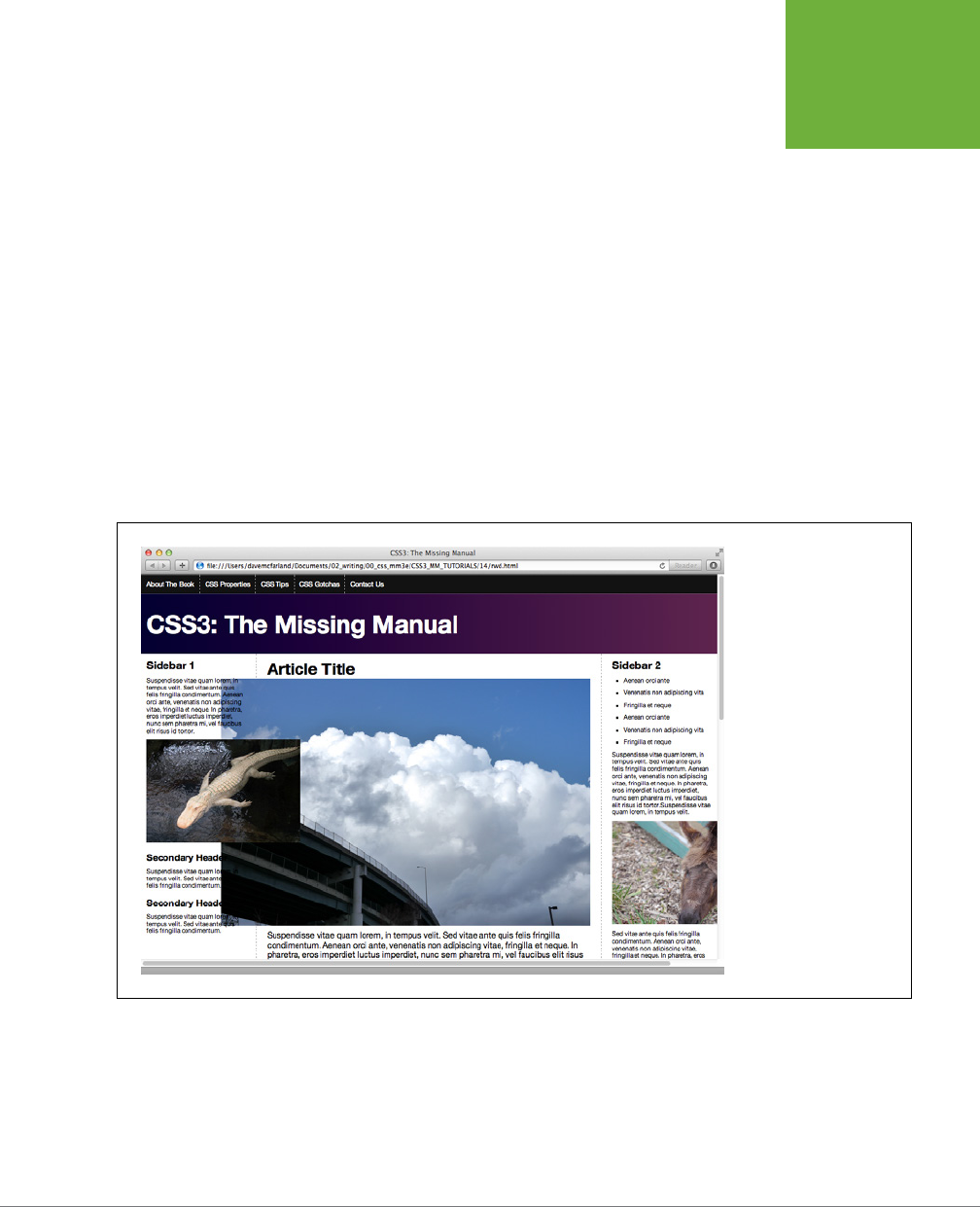
CHAPTER 14: RESPONSIVE WEB DESIGN 471
FLUID IMAGES
browser uses when displaying the image. With the max-width property in place,
the image still won’t get wider than the column, but its height is still locked to
the value set in the HTML. In other words, the image will conform to the width
of the column, but its height won’t change, resulting in a distorted image. The
solution is straightforward: just remove the width and height attributes from
the HTML.
2. Locate every <img> tag in the page and remove the height and width
attributes.
In other words, turn this HTML:
<img src="bunny.jpg" width="320" height="200" alt="bunny">
into this:
<img src="bunny.jpg" alt="bunny">
Many text editors have search and replace features that can speed up the process
of finding and removing these attributes.
FIGURE 14-3
When a column gets thin-
ner than an image inside
it, that image overflows
the bounds of the column,
usually overlapping other
columns and content.
This approach assumes, of course, that you want all your images to fill the column
they’re in. In many cases, you’ll want images to be smaller than that; for example, a
photo that’s floated to the right of the main column, with text wrapping around it.
To deal with dierently sized images, you can create dierent classes, with dierent
max-width settings, and apply those classes to particular <img> tags within the HTML.

CSS3: THE MISSING MANUAL
472
FLUID IMAGES
For example, say you want to float an image to the left of a column and size it to 40
percent of the column. First create a class style:
.imgSmallLeft {
float: left;
max-width: 40%;
}
Then apply that class to the <img> tag:
<img src="bunny.jpg" alt="bunny" class="imgSmallLeft">
A more flexible approach is to break the size and the float into separate classes:
.imgSmall {
max-width: 40%;
}
.imgLeft {
float: left;
}
Then apply both classes to the image:
<img src="bunny.jpg" alt="bunny" class="imgSmall imgLeft">
By using two classes, you can apply the imgSmall class to any image, even ones you
decide to float right or not float at all.
NOTE You can resize background images by using the
background-size
property discussed on page
253. It doesn’t work in Internet Explorer 8 or earlier.
The Downsides of Fluid Images
Fluid images have a couple of problems. First, since the image will grow to fit 100% (or
whatever percentage you specified) of the column width, it’s possible for that image
to be stretched beyond its natural width. For example, say you insert a 200-pixel-
wide image into a sidebar. When the page that image is on is displayed on a really
wide monitor, the browser might make that sidebar 300 pixels wide. The image will
fit that column and also stretch to 300 pixels. Since that’s wider than the image file,
the image will appear distorted and pixelated. In other words, make sure the image
file itself is sized to fit at the widest width the column can scale to.
Secondly, when the page is viewed on a phone, the column widths and images can
shrink to a width that’s much smaller than on a desktop browser. This means the
images are actually shrunk on screen. While the image quality won’t suer, you’re
forcing users of mobile phones to download image files that are much larger than
really necessary. They’re wasting their bandwidth on unnecessarily large image files.
Unfortunately, there’s no great solution to this problem yet; in fact, champions of
responsive web design recognize this as one of the biggest problems with RWD.

CHAPTER 14: RESPONSIVE WEB DESIGN 473
FLUID IMAGES
Among other people working on the problem of fluid images, a W3C community
group has formed to try to answer this problem via HTML. You can read about their
progress at
http://picture.responsiveimages.org
and
http://www.w3.org/community/
respimg/
. In the meantime, you may choose not to worry about the larger image files
for mobile and wait for a solution to arrive—perhaps one already has by the time
you’re reading this. Or try a very good but somewhat complicated solution called
adaptive images
. It uses JavaScript and PHP to send images of the appropriate size
to each device. In other words, a small, handheld browser receives smaller image
files for its smaller screen, while desktop browsers download larger images. To learn
more about it, visit
http://adaptive-images.com
.
Videos and Flash
If you use the HTML5 video tag or embed Flash content, you can also use the max-
width trick to make those elements scale with their containers as well. Simply add
this style to your style sheet:
img, video, embed, object {
max-width: 100%;
}
Unfortunately, this style doesn’t do anything to help with videos that are embed-
ded using iframes (the most common way to add a YouTube or Vimeo video to a
page). For embedded YouTube videos, use Dave Rupert’s and Chris Coyier’s FitVids
JavaScript program:
http://fitvidsjs.com
. This small bit of JavaScript code makes
sure most embedded videos scale up or down to fit their container.
UP TO SPEED
When Is a Pixel Not a Pixel?
Most people think of a pixel as a single dot on a screen or
monitor. And it is. But thanks to new high-density pixel
displays like Apple’s Retina displays, you now have to think
of pixels in two different ways. A device like an iPhone 5 has
a resolution of 1136 pixels by 640 pixels. That’s a lot of pixels,
and the iPhone squishes those pixels into a smaller area than
most other screens. It crams 326 pixels into every inch of the
screen. Desktop monitors usually have around 100 pixels per
inch. In other words, the iPhone puts three times as many pixels
into one inch of its screen than many desktop monitors. The
result is very clear, sharp images.
This poses a problem for web designers, however. If you give
your text a size of 16 pixels, that would look fine on a desktop
monitor (about .16 inches tall), but would be unreadable in a
phone with a high-density screen—.04 inches tall.
Fortunately, that’s not what browsers with high-density
displays do. They actually make a single CSS pixel fill
multiple
pixels on its screen, so text that’s 16 pixels tall is actually
displayed using
more
than 16 pixels. Phones and other devices
with high-density pixel displays make a distinction between
a
device pixel
—an actual dot on a screen—and a
CSS pixel
.
A CSS pixel is a calculation based on the screen’s pixel density
and its distance from the viewer. Since a phone is held closer
to your face than a monitor, items on its screen appear bigger
than similarly sized items on a monitor that’s 28 inches away.
On an iPhone, 1 CSS pixel is actually represented by 4 device
pixels. So 16-pixel-tall type is actually 32 device pixels tall.
Different devices like Android phones have different pixel
densities and so use different calculations to determine how
many screen pixels to use to display a single CSS pixel.

CSS3: THE MISSING MANUAL
474
RESPONSIVE
WEB DESIGN
TUTORIAL
Responsive Web Design Tutorial
In this tutorial, you’ll take the layout you created in the last chapter (with the addition
of a few images) and turn it into a responsive web design. You’ll use a desktop-first
approach—so the basic CSS styles work best in a desktop browser—and then you’ll
add media queries to change the look for medium-size screens (like tablets) and
small screens (like phones).
To get started, download the tutorial files located on this book’s companion website
at
www.sawmac.com/css3/
. Click the tutorial link and download the files. All the
files are in a zip archive, so you need to unzip them first. The files for this tutorial
are in the
14
folder.
Changing the HTML Source Order
In creating a layout for a small screen, you’ll turn your three-column design into
single-column layout with each block of content stacked one on top of the other.
One problem with the HTML from the page you worked on in the previous tutorial
is that the left sidebar appears first in the source order, so if you turn this into a
single-column design, that sidebar will appear before the main content.
It would be better for the site’s visitors if they can get directly to the main content
first, then scroll down to see the supplemental information from the sidebars. To
achieve that, you have to add a little HTML and move some already-existing HTML.
You’ll use the technique described on page 438 in the last chapter (see Figure 13-11):
move the main content container up above the first sidebar, and then wrap the main
content and the sidebar in a new <div> tag. You’ll float that new div left, the main
content right, and the sidebar left. This arrangement will maintain the same visual
layout for desktop displays—first sidebar on the left, main content in the middle,
and second sidebar on the right—but then stack the main content above the two
sidebars for the mobile design.
1. Open the file rwd.html in the 14 folder.
This page is the same as the completed page from last chapter’s tutorial. First,
you’ll move the main content up.
2. Locate the HTML comment <!-- main content goes here -->, and select it
and all the HTML down to and including the closing </article> tag.
In other words, select that comment and everything down to the <!-- second
sidebar goes here --> comment.
3. Cut that text to the clipboard, using Edit→Cut (or using whatever method
your text editor provides).
Next, you’ll paste that code above the first sidebar.
4. Locate the <div class="contentWrapper"> tag toward the top of the file.
Add an empty line after it, but before the <!-- main content goes here -->
comment, and choose Edit→Paste to paste the main content above the sidebar.
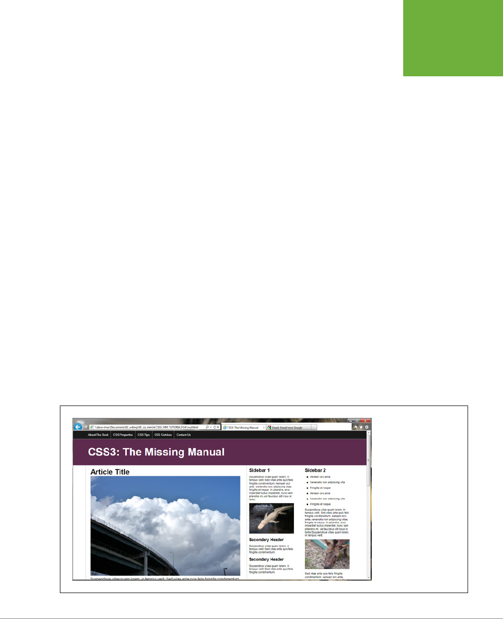
CHAPTER 14: RESPONSIVE WEB DESIGN 475
RESPONSIVE
WEB DESIGN
TUTORIAL
Now you need to add a <div> tag to enclose the main content and the first
sidebar.
5. After the <div class="contentWrapper"> tag, add <div class="columnWrapper">.
The HTML should look like this:
<div class="contentWrapper">
<div class="columnWrapper">
<!-- main content goes here -->
Next, you’ll close that div.
6. Locate the closing </aside> for the first sidebar. It’s just before the <!-- second
sidebar goes here --> comment. Add </div> after the </aside> so that the
HTML looks like this:
</aside>
</div>
<!-- second sidebar goes here -->
That’s it for the HTML changes for now. You can find a file called
new-source-
order.html
in the
14
folder with all of these HTML changes, if you got lost or
want to check your work.
If you preview this page in a web browser, you’ll see there’s a three-column
layout, but the main content’s on the left side, and the first sidebar is in the
middle (Figure 14-4). You can fix that with some CSS.
7. Open the file
styles.css
in the 14 folder.
This file contains the CSS you created in the last chapter. You’ll first need to
add a new style for the column wrapper and float it left so it sits next to the
right sidebar.
FIGURE 14-4
The page is still a three-
column design, but now
the main content is on the
left and the left sidebar is
in the middle. A couple of
simple styles can get those
columns back into their
original positions.

CSS3: THE MISSING MANUAL
476
RESPONSIVE
WEB DESIGN
TUTORIAL
8. Near the bottom of the file, before the .sidebar style, add the following style:
.columnWrapper {
float: left;
width: 80%;
}
The width setting here is the combined widths of the left sidebar (20%) and
the main column (60%). What you’re actually doing is creating a two-column
layout: the first column is this new <div> tag, and the second column is the right
sidebar. The main content container and the left sidebar are actually two columns
inside this column wrapper div—in other words, columns within a column, as
described on page 438 and pictured in Figure 13-11.
Next, you’ll adjust the floats and widths of the main column and first sidebar.
9. Change the width value of the .sidebar style to 25%. The style should look
like this:
.sidebar1 {
float: left;
width: 25%;
padding: 0 20px 0 10px;
}
Originally, this sidebar took up 20% of the entire page width, but now that it’s
inside the column wrapper div, you need to adjust the sidebar and main content
columns’ widths to fit within the 80% width of the column wrapper. In other words,
the percentage width you’re specifying isn’t a percentage of the entire page,
it’s a percentage of the column wrapper, which only takes up 80% of the page.
To figure out the new percentage, take the older percentage—20%—and divide it
by the width of its container—80%—and then multiply by 100. So 20 divided by
80 is .25. Multiply that by 100 and you get 25%. You’ll use the same technique
to change the width of the main content.
10. Locate the .main style, and change the float to right, and the width to 75%,
so the style looks like this:
.main {
float: right;
width: 75%;
padding: 0 20px;
border-left: dashed 1px rgb(153,153,153);
border-right: dashed 1px rgb(153,153,153);
}
You’re floating this element to the right, so it appears to the right of the first
sidebar, which places the main content in the middle again. You calculate the
width by taking the old width and dividing it by the width of its container:
60/80 = .75, or 75%. If you save the files and preview the
rwd.html
file in a web
browser, it should look like Figure 14-5.
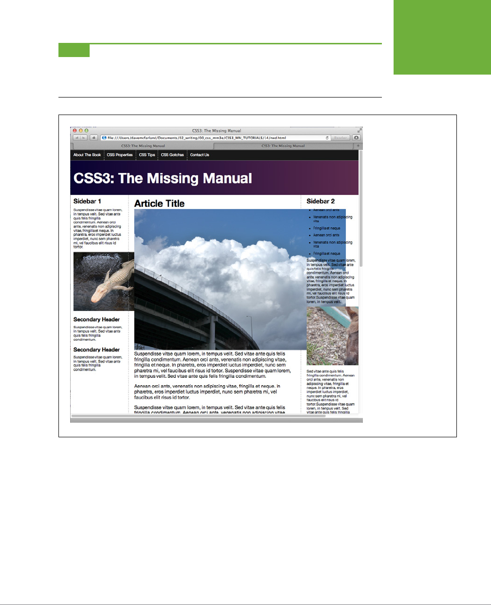
CHAPTER 14: RESPONSIVE WEB DESIGN 477
RESPONSIVE
WEB DESIGN
TUTORIAL
NOTE This particular design won’t get wider than 1200 pixels thanks to the
max-width
set in the group
selector
nav ul, header h1, footer p, .contentWrapper
. If you want this design to fill the
browser window, no matter how wide it is, just remove the
max-width 1200px;
declaration from that group
selector.
FIGURE 14-5
Back to where you started:
a three-column design.
However, now the order of
the page’s HTML is better
positioned for creating a
one-column phone layout.
The images don’t quite
fit, and hang outside the
columns as pictured here.
You’ll fix that next.
Fluid Images
You’ve successfully created a fluid layout. If you preview the page now and resize the
browser window, you’ll notice that as you make the window narrower, the columns
get smaller. Unfortunately, some of the images are wider than the columns and the
pop out of the design. As you read on page 454, part of responsive web design is
making your images respond to changes in the width of the browser window as well.
To make that work, you need to add some CSS and remove some HTML.

CSS3: THE MISSING MANUAL
478
RESPONSIVE
WEB DESIGN
TUTORIAL
1. Open the
styles.css
file in your text editor. At the bottom of the style sheet,
add a style for the img tag:
img {
max-width: 100%;
}
This style makes the maximum width of an image equal to 100 percent of its
container’s width. So for a column that’s 200 pixels wide on screen, the image
will be 200 pixels wide. If a visitor resizes the browser window, and the column
shrinks in size, the image will shrink to fit the column.
This only works, however, if you remove the image’s width and height proper-
ties in the HTML.
2. Delete the height and width attribute for each of the four <img> tags in the
rwd.html file.
There are four graphics—
clouds.jpg
,
jellyfishy.jpg
,
gator.jpg
, and
mule.jpg
.
Remove the width and height attribute—for example:
<img src="imgs/clouds.jpg" alt="Clouds" width="670" height="446">
should become
<img src="imgs/clouds.jpg" alt="Clouds">
If you save the CSS and HTML files and preview the page in a web browser, you’ll
see that the images do change size as you make the page thinner. However,
the two images in the main column are
really
big. Using max-width: 100% for
the <img> tag does create flexible images, but in many cases, you won’t want
all images to be as wide as their column. In the case of the two images in the
main column, they’d look a whole lot better if they were only half the size of
the main column. You can do that by applying some classes to those tags and
adding some styles.
3. In the
styles.css
file, add the following styles to the bottom of the style sheet:
img.half {
max-width: 50%;
}
img.left {
float: left;
margin: 0 10px 10px 0;
}
img.right {
float: right;
margin: 0 0 10px 10px;
}
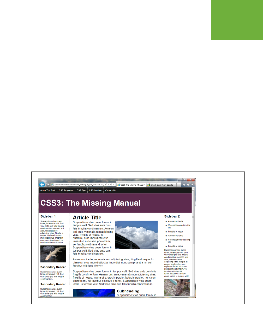
CHAPTER 14: RESPONSIVE WEB DESIGN 479
RESPONSIVE
WEB DESIGN
TUTORIAL
The first style sets the max-width to just 50%—half the column width. The other
two styles let you float an image to the left or the right of the column, to let
text wrap around them. To make use of these class styles, you need to add a
bit of HTML to the images
4. In the rwd.html file, locate the <img> tag for the
clouds.jpg
image—<img src
="imgs/clouds.jpg" alt="Clouds">—and add class="half right" so it looks
like this:
<img src="imgs/clouds.jpg" alt="Clouds" class="half right">
It’s common and often useful to apply more than one class to an element. In this
way, you can combine simpler, modular styles to create more complex designs.
In this case, the half class resizes the images, while the right class floats the
image to the right. Simply by changing right to left you can move the image to
the left of the column, while still maintaining the sizing property of the half style.
5. For the
jellyfish.jpg
image, add class="half left" so its HTML code looks
like this:
<img src="imgs/jellyfish.jpg" alt="Jellyfish" class="half left">
Now the images are all sized. The page should look like Figure 14-6. If you want,
you can create additional styles for other sizes, and even specify pixel sizes to
allow particular images to resize to their full widths, but no more (see page 219).
FIGURE 14-6
Creating responsive
images isn’t difficult. Just
remove the widths and
heights from the HTML
and set their
max-
width
values. If you
want different sizes for
your images, then create
classes with the desired
max-width
values and
apply those classes to the
<img>
tags.

CSS3: THE MISSING MANUAL
480
RESPONSIVE
WEB DESIGN
TUTORIAL
Adding Styles for Tablet Screens
The design at this point works the same in every device: desktop, tablets, and mo-
bile phones. It’s a flexible design that shrinks or grows to fit the browser window.
But at a certain point, the sidebar columns are just too thin to be readable. The first
media query you’ll add will target screens that are between 480 and 768 pixels and
will move the right sidebar to the bottom of the page, converting the three-column
design into a more readable two-column design.
1. Open the
styles.css
file in your text editor. Scroll to the bottom of the file
and add:
@media (min-width: 481px) and (max-width:768px) {
}
Here’s the first media query. It targets screens that are at least 481 pixels, but
no more than 768 pixels. In the next part of this tutorial, you’ll craft a media
query for devices that are no more than 480 pixels wide. So this media query
excludes those devices, but also excludes devices that are more than 768 pixels.
In other words, any styles you place in this section of the style sheet won’t apply
to desktop browsers (unless you resize the window so that it’s very thin); nor
will they apply to most phones.
The first thing you’ll do is remove the float from the right sidebar.
2. Inside the media query you added in the last step, add the following style
(in bold):
@media (min-width: 481px) and (max-width:768px) {
.sidebar2 {
float: none;
width: auto;
}
}
This removes the float from that sidebar, and sets its width to auto (overriding
the 20% width from the .sidebar2 style earlier in the style sheet). However, this
doesn’t make the sidebar drop down below the other two columns. Because
the column wrapper div is also floated left, the second sidebar wraps around
it (see page 421 for more on how floats work). You’ll need to make the sidebar
clear those floats.
3. Edit the style you added in the last step by adding the code in bold:
.sidebar2 {
float: none;
width: auto;

CHAPTER 14: RESPONSIVE WEB DESIGN 481
RESPONSIVE
WEB DESIGN
TUTORIAL
clear: both;
border-top: 2px solid black;
padding-top: 10px;
}
The clear property (discussed on page 425) makes this sidebar drop down
below the other two columns. You’ve also added a distinctive top border to
further visually separate this container from the above columns.
If you preview the page now, you’ll see that the two columns don’t span the
entire width of the page. That’s because earlier in Step 8 on page 486, you set
that column wrapper to 80% of the page width. You need to reset that style
inside the tablet media query.
4. After the .sidebar2 style, add the following:
.columnWrapper {
width: auto;
}
Make sure that style goes inside the media query. It resets the column wrap-
per’s width to auto (the same as 100%) so it spans the entire width of the page.
Because there are now only two columns, you can remove the right border
that’s applied to the main content column.
5. Add one last style after the .columnWrapper style. The complete media query
should now look like this (changes in bold):
@media (min-width: 481px) and (max-width:768px) {
.sidebar2 {
float: none;
width: auto;
clear: both;
border-top: 2px solid black;
padding-top: 10px;
}
.columnWrapper {
width: auto;
}
.main {
border-right: none;
}
}
6. Save the
styles.css
file and preview the rwd.html file in a web browser. Resize
the browser window until only two columns appear.
The page should look like Figure 14-7.
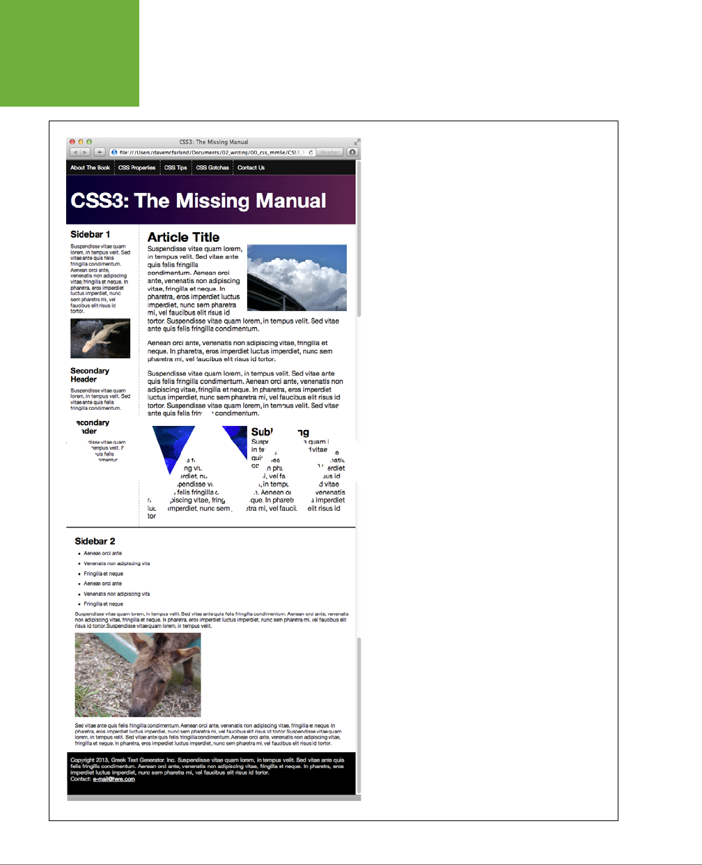
CSS3: THE MISSING MANUAL
482
RESPONSIVE
WEB DESIGN
TUTORIAL
FIGURE 14-7
From three columns to two columns, with one media query
and just three simple styles.

CHAPTER 14: RESPONSIVE WEB DESIGN 483
RESPONSIVE
WEB DESIGN
TUTORIAL
Adding Phone Styles
Finally, it’s time to add styles for devices that are no wider than 480 pixels.
1. Open the
styles.css
file in your text editor. Scroll to the bottom of the file and
add another media query:
@media (max-width:480px) {
}
Make sure this goes after the other media query, not inside it. Here we’ll target
devices that are no wider than 480 pixels. The first step is to
linearize
the layout;
that is, remove all of the floats so the content is stacked in a single column for
easy reading on a small screen.
2. Inside that media query, add the following style:
.columnWrapper, .main, .sidebar1, .sidebar2 {
float: none;
width: auto;
}
This removes the float from the column wrapper and all the columns. Setting
the width to auto makes them fill their container completely. So now the three
columns are simply block-level elements stacked one on top of the other, with
the main content on top and the two sidebars underneath.
The main content area still has borders from the styles earlier in the style sheet.
These left and right borders provide visual separation from the left and right
sidebars in the three-column layouts, but you don’t need them in this stacked
layout, so you can remove them. On the other hand, adding visual separation
between the now-stacked content blocks would be nice to have.
3. After the style you just added (and still inside the 480-pixel media query),
add these two styles:
.main {
border: none;
}
.sidebar1, .sidebar2 {
border-top: 2px solid black;
margin-top: 25px;
padding-top: 10px;
}
The second group selector here adds a border above each sidebar as well as
some top margin and padding to clearly mark o the dierent content regions
on the page.
Save the CSS file and preview the
rwd.html
page in a web browser. Drag the
browser window so it’s less than 480 pixels wide. You’ll now see the one-column
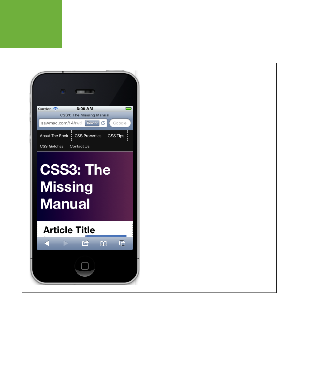
CSS3: THE MISSING MANUAL
484
RESPONSIVE
WEB DESIGN
TUTORIAL
design. If you view this page on a phone, you’ll notice that the headline looks
really big (Figure 14-8). In addition, the navigation buttons look a little out of
control. You’ll fix those two problems next.
FIGURE 14-8
Even when you get the width of a page correctly sized for a mobile
phone, there’s still work to do. Here, a headline, which is the perfect
size for a desktop browser, is an oversized monster on the phone tak-
ing up way too much valuable screen space.
4. Add a style for the <h1> tag inside the 480-pixel media query:
header h1 {
font-size: 1.5em;
}
This style reduces the text size in the <h1> tag so it now fits on a single line. It’s
often a good idea to reduce the size of headlines when converting a desktop
design to one viewed on a little phone screen. You may also find that you should
increase
the font size for body text to make it easier to read. There are a lot of

CHAPTER 14: RESPONSIVE WEB DESIGN 485
RESPONSIVE
WEB DESIGN
TUTORIAL
ways you can tweak the phone design of your page, and it’s up to you to figure
out what looks best.
Now, you’ll tackle the navigation bar. The dashed borders separating the buttons
look bad and jumbled. In addition, the buttons are aligned to the left, creating
an out-of-balance asymmetry. They’ll look better centered and without those
borders.
5. Add another style after the header h1 style you added in the previous step:
nav {
text-align: center;
}
The nav buttons are contained inside an HTML5 <nav> element. By setting
the text-align value to center, all text inside that nav should be centered.
However, the buttons are actually floated to the left, so this is only the first
step. (You can turn to page 304 for more information on using floats to create
a horizontal navigation bar.)
6. Add two more styles after the nav style:
nav li {
float: none;
display: inline-block;
}
nav a {
float: none;
display: inline-block;
border: none;
}
You’re removing the floats from both the list items and the links. In addition,
you turn these elements into inline blocks. As described on page 308, using
inline-block on navigation elements lets you place links side-by-side, while
still preserving padding and margins. In addition, the inline-block method is
the only way to center these buttons.
7. The final 480-pixel media query should look like this:
@media (max-width:480px) {
.columnWrapper, .main, .sidebar1, .sidebar2 {
float: none;
width: auto;
}
.main {
border: none;
}
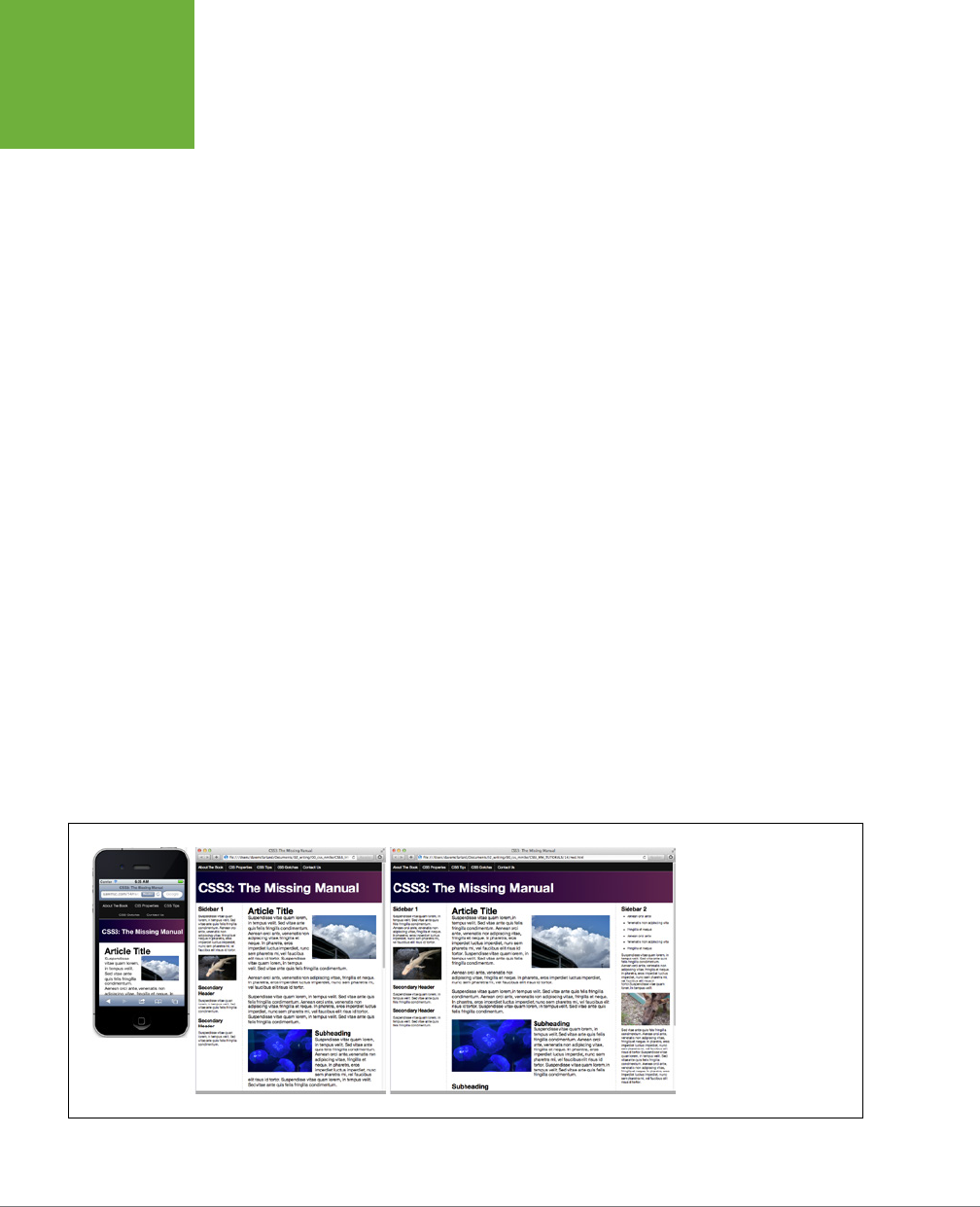
CSS3: THE MISSING MANUAL
486
RESPONSIVE
WEB DESIGN
TUTORIAL
.sidebar1, .sidebar2 {
border-top: 2px solid black;
margin-top: 25px;
padding-top: 10px;
}
header h1 {
font-size: 1.5em;
}
nav {
text-align: center;
}
nav li {
display: inline-block;
float: none;
}
nav a {
float: none;
display: inline-block;
border: none;
}
}
Save all of your files and preview the
rwd.html
file in a web browser. Resize
the browser window so it’s less than 480 pixels to see the phone design; resize
the window until the two-column design pops into view; and then again until
you see the three-column, desktop version. You should see designs like those
pictured in Figure 14-9. You’ll find a completed version of this tutorial in the
14_finished
folder.
FIGURE 14-9
One, two, and three col-
umns, all in a single web
page. Thanks to responsive
web design techniques,
you can transform a single
web page to best fit any
width device.

487
CHAPTER
15
When the World Wide Web Consortium introduced
CSS Positioning
, some
designers understandably thought they could make web pages look just
like print documents created in programs like InDesign or Quark XPress.
With just a couple of CSS properties, CSS Positioning lets you position an element
in a precise location on a page—say 100 pixels from the top of the page and 200
pixels from the left edge. Pixel-accurate placement seemed to promise that, at last,
you could design a page simply by putting a photo here, a headline there, and so on.
Unfortunately, the level of control designers expected from CSS Positioning never
materialized. There have always been dierences in how various browsers display
CSS positioned elements. But, even more fundamentally, the Web doesn’t work
like a printed brochure, magazine, or book. Web pages are much more fluid than
printed pages. Once a magazine rolls o the press, readers can’t change the page
size or font size. About the only way they can change the look of the magazine is
to spill coee on it.
Web visitors, on the other hand, can tinker with your handcrafted presentation.
They can increase their browser’s font size, potentially making text spill out of your
precisely placed and sized layout elements. But the news isn’t all bad: As long as you
don’t try to dictate the exact width, height, and position of
every
design element,
you’ll find CSS’s positioning properties powerful and helpful. You can use these
properties to make a text caption appear on top of a photo, place a logo anywhere
on the page, and much more.
Positioning Elements
on a Web Page
CSS3: THE MISSING MANUAL
488
HOW
POSITIONING
PROPERTIES
WORK
How Positioning Properties Work
The CSS position property lets you control how and where a web browser displays
particular elements. Using position, you can, for example, place a sidebar anywhere
you wish on a page or make sure a navigation bar at the top of the page stays in
place even when visitors scroll down the page. CSS oers four types of positioning:
• Absolute. Absolute positioning lets you determine an element’s location by
specifying a left, right, top, or bottom position in pixels, ems, or percentages.
(See Chapter 6 for more on picking between the dierent units of measure-
ment.) You can place a box 20 pixels from the top and 200 pixels from the left
edge of the page, as shown in Figure 15-1, middle. (More in a moment on how
you actually code these instructions.)
In addition, absolutely positioned elements are completely detached from
the flow of the page as determined by the HTML code. In other words, other
things on the page don’t even know the absolutely positioned element exists.
They can even disappear completely underneath absolutely positioned items,
if you’re not careful.
NOTE Don’t try to apply both the
float
property and any type of positioning other than static (explained
below) or relative to the same style. The
float
property and
absolute
or
fixed
positioning can’t work
together on the same element.
• Relative. A relatively positioned element is placed relative to its current position
in the HTML flow. So, for example, setting a top value of 20 pixels and left value
of 200 pixels on a relatively positioned headline moves that headline 20 pixels
down and 200 pixels from the left
from wherever it would normally appear
.
Unlike with absolute positioning, other page elements accommodate the old
HTML placement of a relatively positioned element. Accordingly, moving an
element with relative positioning leaves a “hole” where the element would have
been. Look at the dark strip in the bottom image of Figure 15-1. That strip is
where the relatively positioned box
would have
appeared, before it was given
orders to move. The main benefit of relative positioning isn’t to move an ele-
ment, but to set a new point of reference for absolutely positioned elements
that are nested inside it. (More on that brain-bending concept on page 493.)
• Fixed. A fixed element is locked into place on the screen. It does the same thing
as the fixed value for the background-attachment property (page 579). When
a visitor scrolls the page, fixed elements remain onscreen as paragraphs and
headlines, while photos disappear o the top of the browser window.
Fixed elements are a great way to create a fixed sidebar or replicate the eect
of HTML frames, where only a certain portion (frame) of the page scrolls. You
can read about how to create this eect on page 506.
CHAPTER 15: POSITIONING ELEMENTS ON A WEB PAGE 489
HOW
POSITIONING
PROPERTIES
WORK
FIGURE 15-1
CSS offers several ways to affect an
element’s placement on a web page. The
static option, top, is the way browsers have
presented content since the beginning of
the Web. They simply display the HTML in
top-to-bottom order. Absolute positioning
(middle) removes an element from the
page flow, placing it on top of the page,
sometimes overlapping other content.
Relative positioning (bottom) places
an element relative to where it would
normally appear on the page and leaves
a hole (the dark background here) where
that element would’ve been without rela-
tive positioning.

CSS3: THE MISSING MANUAL
490
HOW
POSITIONING
PROPERTIES
WORK
• Static positioning simply means the content follows the normal top-down flow
of HTML (see Figure 15-1, top). Why would you want to assign an element static
positioning? The short answer: You probably never will.
To change the positioning of any element, simply use the position property fol-
lowed by one of the four keywords: absolute, relative, fixed, static. To create
an absolutely positioned element, add this property to a style:
position: absolute;
Static is the normal positioning method, so unless you’re overriding a previously
created style that already has a position of absolute, relative, or fixed, you won’t
need to specify that. In addition, static elements don’t obey any of the positioning
values discussed next.
Setting a positioning value is usually just part of the battle. To actually place an ele-
ment somewhere on a page, you need to master the various positioning properties.
Setting Positioning Values
The display area of a web browser window—also called the viewport—has top, bot-
tom, left, and right edges. Each of the four edges has a corresponding CSS property:
top, bottom, left, and right. But you don’t need to specify values for all four edges.
Two are usually enough to place an item on the page. You can, if you want, place an
element 10 ems from the left edge of the page and 20 ems from the top.
To specify the distance from an edge of a page to the corresponding edge of the
element, use any of the valid CSS measurements—pixels, ems, percentages, and so
on. You can also use negative values for positioning like left: –10px; to move an
element partly o the page (or o another element) for visual eect, as you’ll see
later in this chapter (page 503).
After the position property, you list one or more properties (top, bottom, left, or
right). If you want the element to take up less than the available width (to make a
thin sidebar, for example), then you can set the width property. To place a page’s
banner in an exact position from the top and left edges of the browser window,
create a style like this:
.banner {
position: absolute;
left: 100px;
top: 50px;
width: 760px;
}
This style places the banner as pictured in Figure 15-2, top.
CHAPTER 15: POSITIONING ELEMENTS ON A WEB PAGE 491
HOW
POSITIONING
PROPERTIES
WORK
NOTE If you don’t specify a vertical positioning value (for left or right), the browser places the element
in the same place on the page vertically as it would if there were no positioning. The same is true for horizontal
settings (top or bottom). In other words, if you simply set an element to a position of
absolute
but don’t
provide any placement values for top, right, bottom, or left, the browser simply keeps the element in the same
place on the page, but stacked above other content.
FIGURE 15-2
One useful aspect of absolute
positioning is the ability to
place an item relative to the
right edge of the browser
window (middle). Even when
the width of the browser
changes, the distance from
the right edge of the window
to the right edge of the
positioned element stays the
same (bottom).
Here’s another example: placing an element so it always remains a fixed distance
from the right side of the browser. When you use the right property, the browser
measures the distance from the right edge of the browser window to the right edge
of the element (Figure 15-2, middle). To position the banner 100 pixels from the
right edge of the window, you’d create the same style as above, but simply replace
left with right:

CSS3: THE MISSING MANUAL
492
HOW
POSITIONING
PROPERTIES
WORK
.banner {
position: absolute;
right: 100px;
top: 50px;
width: 760px;
}
Since the position is calculated based on the right edge of the browser window,
adjusting the size of the window automatically repositions the banner, as you can
see in Figure 15-2, bottom. Although the banner moves, the distance from the right
edge of the element to the right edge of the browser window remains the same.
You can even specify
both
left and right position properties as well as both top and
bottom and let the browser determine the width and height of the element. Say you
want a central block of text positioned 10 percent from the top of the window and 10
pixels from both the left and right edges of the window. To position the block, you
can use an absolutely positioned style that sets the top, left, and right properties
to 10%. In a browser window, the left edge of the box starts from the left edge of
the window to 10 percent of the window’s width, and the right edge extends to 10
percent from the right edge (Figure 15-3). The exact width of the box, then, depends
on how wide the browser window is. A wider window makes a wider box; a thinner
window, a thinner box. The left and right positions, however, are always 10 percent
of the browser window’s width.
The width and height properties, which you learned about in Chapter 7, work exactly
the same way for positioned elements. To place a 50 x 50 pixel gray box in the top-
right corner of the browser window, create this style:
.box {
position: absolute;
right: 0;
top: 0;
width: 50px;
height: 50px;
background-color: #333;
}
The same caveat mentioned on page 214 applies here as well: Be careful with setting
heights on elements. Unless you’re styling a graphic with a set height, you can’t be
sure how tall any given element will be on a page. You might define a sidebar to be
200 pixels tall, but if you end up adding enough words and pictures to make the
sidebar taller than 200 pixels, then you end up with content spilling out of the side-
bar. Even if you’re sure the content fits, a visitor can always pump up the size of her
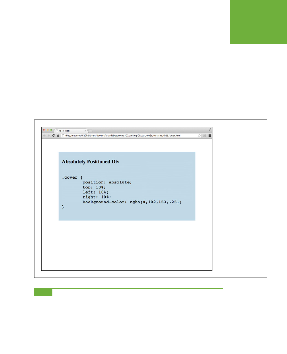
CHAPTER 15: POSITIONING ELEMENTS ON A WEB PAGE 493
HOW
POSITIONING
PROPERTIES
WORK
browser’s font, creating text that’s large enough to spill out of the box. Furthermore,
when you specify a width and height in a style and the contents inside the styled
element are wider or taller, strange things can happen.
When Absolute Positioning Is Relative
So far, this chapter has talked about positioning an element in an exact location in
the browser window. However, absolute positioning doesn’t always work that way.
In fact, an absolutely positioned element is actually placed
relative
to the boundaries
of its closest positioned ancestor. Simply put, if you’ve already created an element
with absolute positioning (say a <div> tag that appears 100 pixels down from the top
of the browser window), then any absolutely positioned elements with HTML
inside
that <div> tag are positioned relative to the div’s top, bottom, left, and right edges.
FIGURE 15-3
You can let a browser
figure out an element’s
width simply by setting
both the left and right
values of an absolutely
positioned element.
NOTE If all this talk of parents and ancestors doesn’t ring a bell, then turn to page 104 for a refresher.
In the top image of Figure 15-4, the light gray box is absolutely positioned 5 ems
from the top and left edges of the browser window.
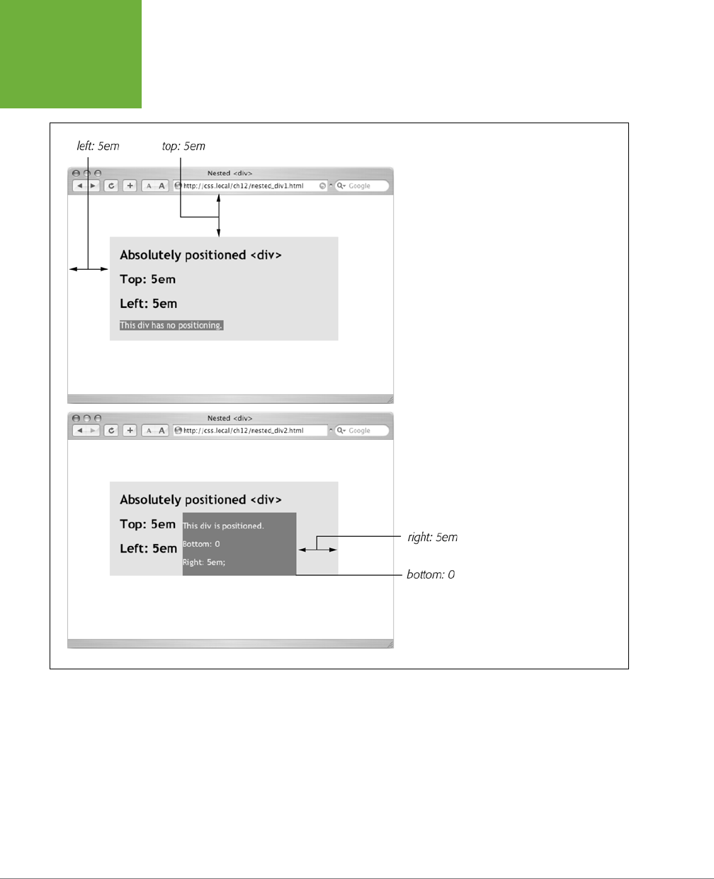
CSS3: THE MISSING MANUAL
494
HOW
POSITIONING
PROPERTIES
WORK
FIGURE 15-4
You can place an element relative
to the browser window (top) or
relative to a positioned ancestor
(bottom).
There’s also a <div> tag nested inside that box. Applying absolute positioning to
that <div> positions it
relative to its absolutely positioned parent
. Setting a bottom
position of 0 doesn’t put the box at the bottom of the screen; it places the box at
the bottom of its parent. Likewise, a right position for that nested <div> refers to
the right of the edge of its parent (Figure 15-4, bottom).
Whenever you use absolute positioning to place an element on the page, the exact
position depends upon the positioning of any other tags the styled element is nested
in. Here are the rules in a nutshell:
CHAPTER 15: POSITIONING ELEMENTS ON A WEB PAGE 495
HOW
POSITIONING
PROPERTIES
WORK
• A tag is positioned relative to the browser window if it has an absolute posi-
tion
and
it’s not inside any other tag that has either absolute, relative, or fixed
positioning applied to it.
• A tag is positioned relative to the edges of another element if it’s inside
another tag with absolute, relative, or fixed positioning.
When (and Where) to Use Relative Positioning
You get one big benefit from placing an element relative to another tag: If that tag
moves, the positioned element moves along with it. Say you place an image inside
an <h1> tag, and you want the image to appear on the right edge of that <h1> tag.
If you simply position the image in an exact spot in the browser window on the left
edge of the <h1> tag, you’re taking your chances. If the <h1> moves, the absolutely
positioned image stays glued to its assigned spot. Instead, what you want to do is
position the image relative to the <h1> tag, so that when the headline moves, the
image moves with it (bottom two images in Figure 15-5).
NOTE You can use the
background-image
property to place an image into the background of an
<h1>
tag. But if the graphic is taller than the
<h1>
tag, or you want the graphic to appear
outside
the boundaries of
the headline (see the example third from the top in Figure 15-5), then embed the image with the
<img>
tag
and use the relative positioning technique described in this section.
You could use the position property’s relative value to place the image, but that
has drawbacks, too. When you set an element’s position to relative and then place
it—maybe using the left and top properties—the element moves the set amount
from where it would normally appear in the flow of the HTML. In other words, it
moves relative to its current position. In the process, it leaves a big hole where it
would’ve been if you hadn’t positioned it at all (Figure 15-1, bottom). Usually, that’s
not what you want.
A better way to use relative positioning is to create a new positioning context for
nested tags. For instance, the <h1> tag in the example at the beginning of this sec-
tion is an ancestor of the <img> tag inside it. By setting the position of the <h1> tag
to relative, any absolute positioning you apply to the <img> tag is relative to the
four edges of the <h1> tag, not the browser window. Here’s what the CSS looks like:
h1 { position: relative; }
h1 img {
position: absolute;
top: 0;
right: 0;
}
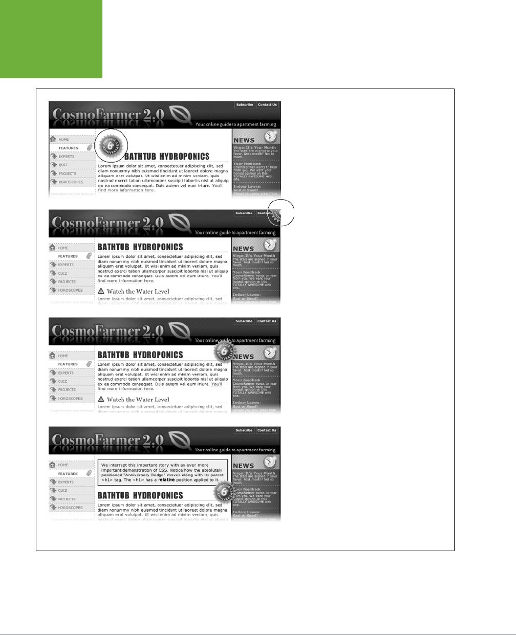
CSS3: THE MISSING MANUAL
496
HOW
POSITIONING
PROPERTIES
WORK
FIGURE 15-5
Top: A graphical button (circled) is placed inside
an
<h1>
tag.
Second from top: Adding absolute position-
ing to the button—
right: -35px; top:
-35px
;—moves it outside of the
<h1>
tag
area and places it in the top-right corner of the
browser window (circled). (In fact, it’s placed a
little outside of the browser window thanks to
the negative positioning values.)
Third from top: Adding
position: rela-
tive
to the
<h1>
creates a new positioning
context for the
<img>
tag. The same top and
right values move the
<img>
tag to the
<h1>
tag’s top-right corner.
Bottom: When you move the heading down the
page, the graphic goes along for the ride.
Setting the image’s top and right properties to 0 places the image in the upper-right
corner of the headline—not the browser window.
In CSS, the term
relative
doesn’t exactly mean the same thing it does in the real
world. After all, if you want to place the <img> tag relative to the <h1> tag, your first
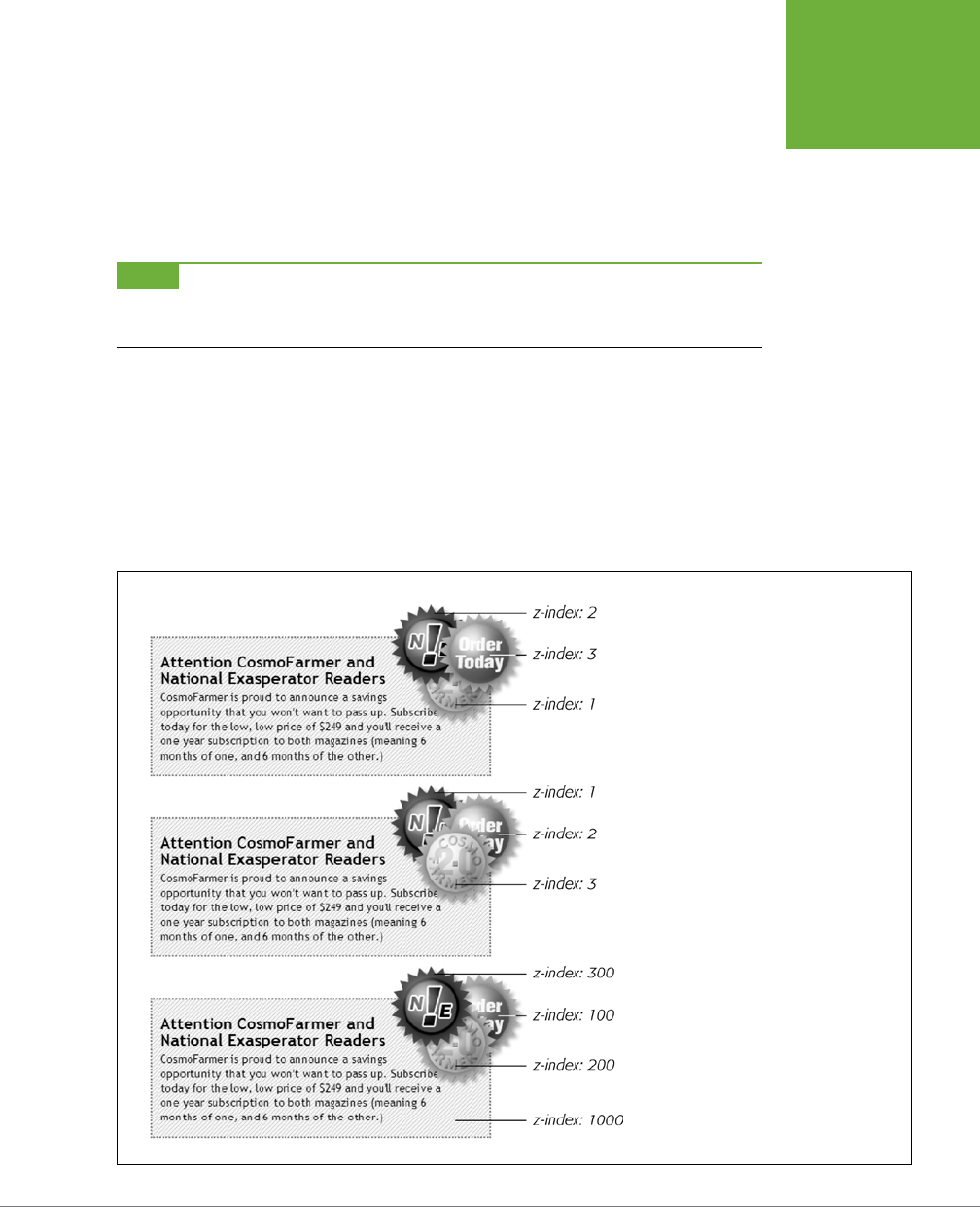
CHAPTER 15: POSITIONING ELEMENTS ON A WEB PAGE 497
HOW
POSITIONING
PROPERTIES
WORK
instinct may be to set the image’s position to relative. In fact, the item that you want
to position—the image—gets an absolute position, while the element you want to
position the element
relative to
—the headline—gets a setting of relative. Think of
the relative value as meaning “relative to me.” When you apply relative positioning
to a tag, it means “all positioned elements inside of me should be positioned rela-
tive to my location.”
NOTE Because you’ll often use relative positioning merely to set up a new positioning context for nested
tags, you don’t even need to use the left, top, bottom, or right settings with it. The
<h1>
tag has
position:
relative
, but no
left
,
top
,
right
, or
bottom
values.
Stacking Elements
As you can see in Figure 15-6, absolutely positioned elements sit “above” your web
page and can even reside on top of (or underneath) other positioned elements. This
stacking of elements takes place on what’s called the z-index. If you’re familiar with
the concept of layers in Photoshop, Fireworks, or Adobe InDesign, then you know
how the z-index works: It represents the order in which positioned elements are
stacked on top of the page.
FIGURE 15-6
When you use
z-index
to control how
positioned elements are stacked, parent
elements define the stacking order for their
children. In the top two examples, the text box
isn’t positioned, so it shares the z-index of
the page itself, which has a
z-index
value
of
0
. So the buttons in those two text boxes
are stacked relative to and above the page.
But the text box in the bottom image has
an absolute position and a z-index of 1000.
This containing
<div>
becomes the starting
point for stacking the images inside it. So
even though the div’s
z-index
is
1000
, its
nested children (with lower z-index values)
appear on top of it, while the text box itself
sits above the page.

CSS3: THE MISSING MANUAL
498
HOW
POSITIONING
PROPERTIES
WORK
To put it another way, think of a web page as a piece of paper and an absolutely
positioned element as a sticky note. Whenever you add an absolutely positioned
element to a page, it’s like slapping a sticky note on it. Of course, when you add
a sticky note, you run the risk of covering up anything written on the page below.
Normally, the stacking order of positioned elements follows their order in the page’s
HTML code. On a page with two absolutely positioned <div> tags, the <div> tag that
comes second in the HTML appears
above
the other <div>. But you can control the
order in which positioned elements stack up by using the CSS z-index property.
The property gets a numeric value, like this:
z-index: 3;
The larger the value, the closer to the top of the stack an element appears. Say you
have three absolutely positioned images, and parts of each image overlap. The one
with the larger z-index appears on top of the others (see Figure 15-6, top). When
you change the z-index of one or more images, you change their stacking order
(Figure 15-6, middle).
You can even use negative z-index numbers, which can come in handy when you
want to position an element underneath its parent or any of its ancestors. For
example, in the top image in Figure 15-6, the <div> tag is relatively positioned. If
you wanted to place one of the images behind the <div>, you could use a negative
z-index value:
z-index: -1;
While most browsers support negative z-index values, Internet Explorer 7 and earlier
don’t, so if you need to support Internet Explorer 7, then it’s best to skip negative
z-indexes completely.
NOTE It’s perfectly OK to have gaps in
z-index
values. In other words,
10, 20, 30
does the exact
same thing as
1, 2, 3
. In fact, spreading out the numerical values gives you room to insert more items into
the stack later. And, when you want to make sure nothing ever appears on top of a positioned element, give it
a really large z-index, like this:
z-index: 10000;
. But don’t get too carried away: some browsers can only
handle a maximum z-index of 2147483647.
Hiding Parts of a Page
Another CSS property often used with absolutely positioned elements is visibility,
which lets you hide part of a page (or show a hidden part). Say you want a label to
pop into view over an image when a visitor mouses over it. You make the caption
invisible when the page first loads (visibility: hidden), and switch to visible
(visibility: visible) when the mouse moves over it.
The visibility property’s hidden value is similar to the display property’s none value,
but there’s a fundamental dierence. When you set an element’s display property
to none, it literally disappears from the page without a trace. However, setting the
visibility property to hidden prevents the browser from displaying the element’s

CHAPTER 15: POSITIONING ELEMENTS ON A WEB PAGE 499
HOW
POSITIONING
PROPERTIES
WORK
contents, but leaves an empty hole where the element would have been. When ap-
plied to absolutely positioned elements that are already removed from the flow of
the page, visibility: hidden and display: none behave identically. Most develop-
ers simply use the display: none method and skip the visibility property entirely.
There’s yet another way to hide an element—set its opacity to 0 like this:
opacity: 0;
To make it reappear, you can set its opacity back to 1:
opacity: 1;
The benefit of using opacity is that it’s one of the CSS properties that a browser can
animate. This means you can use the CSS transitions you learned about in Chapter
10 to animate changes in opacity. For example, you can make an element appear to
fade into view by changing its opacity from 0 to 1 and adding a transition.
The most common way to switch an element from hidden to displayed and back
again is with JavaScript. But you don’t have to learn JavaScript programming to
use the visibility property (or, for that matter, the display property). You can use
the :hover pseudo-class (see page 294) to make an invisible element visible. For
example, say you wanted to place a caption over an image, but you only want that
caption to show up when a visitor mouses over the image (see Figure 15-7). You
could do that following these steps:
1. Create the HTML for the image and caption.
One way to do this would be to use the HTML5 <figure> and <figcaption>
tags, like this:
<figure class="hat">
<img src="hat.jpg" width="100" height="100">
<figcaption>A picture of a hat</figcaption>
</figure>
Here you’re applying a class—hat—to the <figure> tag so you can style just
that one figure.
NOTE As mentioned in the box on page 24, IE 8 and earlier don’t apply CSS to HTML5 elements without a
little help from some simple JavaScript. If you don’t want to bother with that, you could simply use
<div>
tags
instead of the
<figure>
and
<figcaption>
tags.
2. Position the caption.
To place the caption on top of the image, you use absolute positioning. To place
the caption in relation to the img, you should set its parent (the <figure> tag)
to relative and also give the parent a set width that matches the dimensions
of the photo.

CSS3: THE MISSING MANUAL
500
HOW
POSITIONING
PROPERTIES
WORK
.hat {
position: relative;
width: 100px;
height: 100px;
}
.hat figcaption {
position: absolute;
bottom: 0
left: 0;
right: 0;
background-color: white;
}
The caption is placed at the bottom of the figure (bottom: 0). By setting its left
and right values to 0, it will span the entire width of the figure.
3. Hide the caption.
With the current code, a browser would display the caption on top of the im-
age, but you want that to happen only when someone’s mouse hovers over the
image. To hide it, add either visibility: hidden; or display: none; to the
.hat figcaption style.
.hat figcaption {
display: none;
position: absolute;
bottom: 0
left: 0;
right: 0;
background-color: white;
}
4. Make the caption appear when a visitor mouses over the image.
To do this, you’ll employ a little trick with the :hover pseudo-class (page 294).
You want to make the caption visible when the visitor mouses over the image.
Unfortunately, there’s no way to create a style that aects the caption when the
mouse moves over the image. However, since the caption is inside the <figure>
tag, you can craft a descendent selector that aects the caption when the
mouse moves over the figure:
.hat:hover figcaption {
display: block;
}
This descendent selector basically says “target any <figcaption> tag that’s
inside an element with the class of hat, but only when the mouse is over that
element.” This selector only works because the figcaption tag is a descendent
of the element being hovered over.
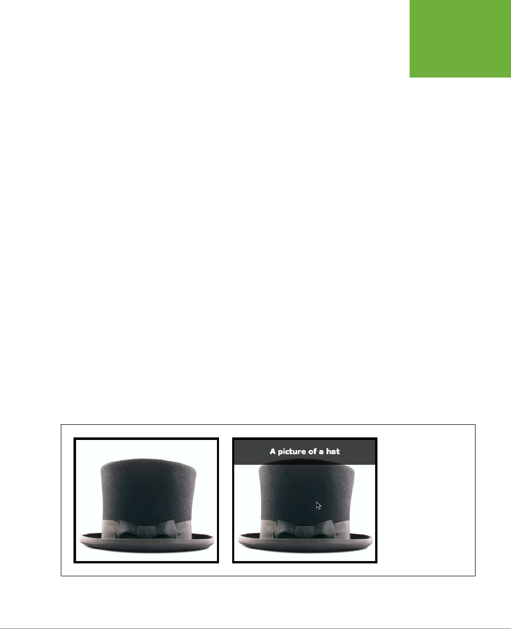
CHAPTER 15: POSITIONING ELEMENTS ON A WEB PAGE 501
HOW
POSITIONING
PROPERTIES
WORK
You can elaborate on this idea to create CSS-based pop-up tooltips. For a basic
CSS method of adding pop-up tooltips—additional information that appears when
someone mouses over a link—check out
www.menucool.com/tooltip/css-tooltip
.
You also have many JavaScript options to choose from: the jQuery aTip2 plug-in is
a full-featured and easy-to-use JavaScript tooltip based on the jQuery framework:
http://craigsworks.com/projects/qtip2/
.
As mentioned earlier, you can also use the opacity setting to hide and show an ele-
ment, as well as use a transition to animate this eect. To do that, you can change
the previous styles to look like this:
.hat figcaption {
opacity: 0;
-webkit-transition: opacity .5s ease-in;
-moz-transition: opacity .5s ease-in;
-o-transition: opacity .5s ease-in;
transition: opacity .5s ease-in;
position: absolute;
bottom: 0
left: 0;
right: 0;
background-color: white;
}
.hat:hover figcaption {
opacity: 1;
}
You’ll see this in action in the tutorial on page 507. Remember, however, that transi-
tions don’t work in Internet Explorer 9 or earlier. That’s OK in this case; your visitors
will still see the caption appear, it just won’t fade in and out of view smoothly.
FIGURE 15-7
Now you don’t see it, now
you do. You can place an
absolutely positioned
element over another
element, but hide it (left)
until a visitor mouses over
a parent element (right).

CSS3: THE MISSING MANUAL
502
POWERFUL
POSITIONING
STRATEGIES
Powerful Positioning Strategies
As explained at the beginning of this chapter, you can run into trouble when you
try to use CSS positioning to place
every
element on a page. Because it’s impos-
sible to predict all possible combinations of browsers and settings your visitors will
use, CSS-controlled positioning works best as a tactical weapon. Use it sparingly to
provide exact placement for specific elements.
In this section, you’ll learn how to use absolute positioning to add small but visually
important details to your page design, how to absolutely position certain layout
elements, and how to cement important page elements in place while the rest of
the content scrolls.
Positioning Within an Element
One of the most eective ways to use positioning is to place small items relative
to other elements on a page. Absolute positioning can simulate the kind of right
alignment you get with floats. In the first example in Figure 15-8, the date on the
top headline is a bit overbearing, but with CSS you can reformat it and move it to
the right edge of the bottom headline.
In order to style the date separately from the rest of the headline, you need to
enclose the date in an HTML tag. The <span> tag is a popular choice for applying a
class to a chunk of inline text to style it independently from the rest of a paragraph.
<h1><span class="date">Nov. 10, 2006</span> CosmoFarmer Bought By Google</h1>
Now it’s a matter of creating the styles. First, you need to give the containing ele-
ment—in this example, the <h1> tag—a relative position value. Then, apply an abso-
lute position to the item you wish to place—the date. Here’s the CSS for the bottom
image in #1 of Figure 15-8:
h1 {
position: relative;
border-bottom: 1px dashed #999999;
}
h1 .date {
position: absolute;
bottom: 0;
right: 0;
font-size: .5em;
background-color: #E9E9E9;
color: black;
padding: 2px 7px 0 7px;
}
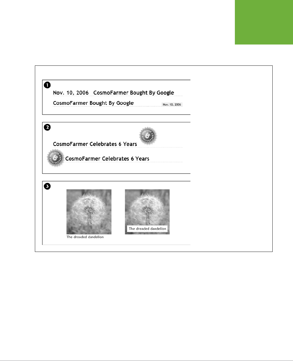
CHAPTER 15: POSITIONING ELEMENTS ON A WEB PAGE 503
POWERFUL
POSITIONING
STRATEGIES
Some of the properties listed above, like border-bottom, are just for looks. The crucial
properties are bolded: position, bottom, and right. Once you give the headline a
relative position, you can position the <span> containing the date in the lower-right
corner of the headline by setting both the bottom and right properties to 0.
FIGURE 15-8
Absolute positioning is perfect for simple
design details like placing a date in the
lower-right corner of a headline (top),
punching an image out of its containing
block (middle), or placing a caption directly
on top of a photo (bottom). (You’ll learn
the caption trick in the tutorial on page
507.)
Breaking an Element Out of the Box
You can also use positioning to make an item appear to poke out of another ele-
ment. In the second example in Figure 15-8, the top image shows a headline with a
graphic. That is, the <img> tag is placed inside the <h1> tag as part of the headline.
Using absolute positioning and negative top and left property values moves the
image to the headline’s left and pushes it out beyond the top and left edges. Here’s
the CSS that produces that example:

CSS3: THE MISSING MANUAL
504
POWERFUL
POSITIONING
STRATEGIES
h1 {
position: relative;
margin-top: 35px;
padding-left: 55px;
border-bottom: 1px dashed #999999;
}
h1 img {
position: absolute;
top: -30px;
left: -30px;
}
The basic concept is the same as the previous example, but with a few additions.
First, the image’s top and left values are negative, so the graphic actually appears
30 pixels above the top of the headline and 30 pixels to the left of the headline’s
left edge. Be careful when you use negative values. They can position an element
partially (or entirely) o a page or make the element cover other content on the
page. To prevent a negatively positioned element from sticking out of the browser
window, add enough margin or padding to either the body element or the enclosing,
relatively positioned tag—the <h1> tag in this example. The extra margin provides
enough space for the protruding image. In this case, to prevent the image from
overlapping any content above the headline, add a significant top margin. The left
padding of 55 pixels also moves the text of the headline out from under the abso-
lutely positioned image.
Creating CSS-Style Frames Using Fixed Positioning
Since most web pages are longer than one screen, you may want to keep some page
elements constantly visible—like a navigation panel, search box, or your site logo.
HTML frames were once the only way to keep important fixtures handy as other
content scrolled out of sight. But HTML frames have major drawbacks. Since each
frame contains a separate web page file, you have to create several HTML files to
make one complete web page (called a
frameset
). Not only are framesets time con-
suming for the designer, they also make your site hard for search engines to search.
And HTML framesets can also wreak havoc for visitors who use screen readers due
to vision problems or those who want to print pages from your site.
Nevertheless, the idea behind frames is still useful, so CSS oers a positioning value
that lets you achieve the visual appearance of frames with less work. You can see a
page created using the
fixed
value in Figure 15-9.
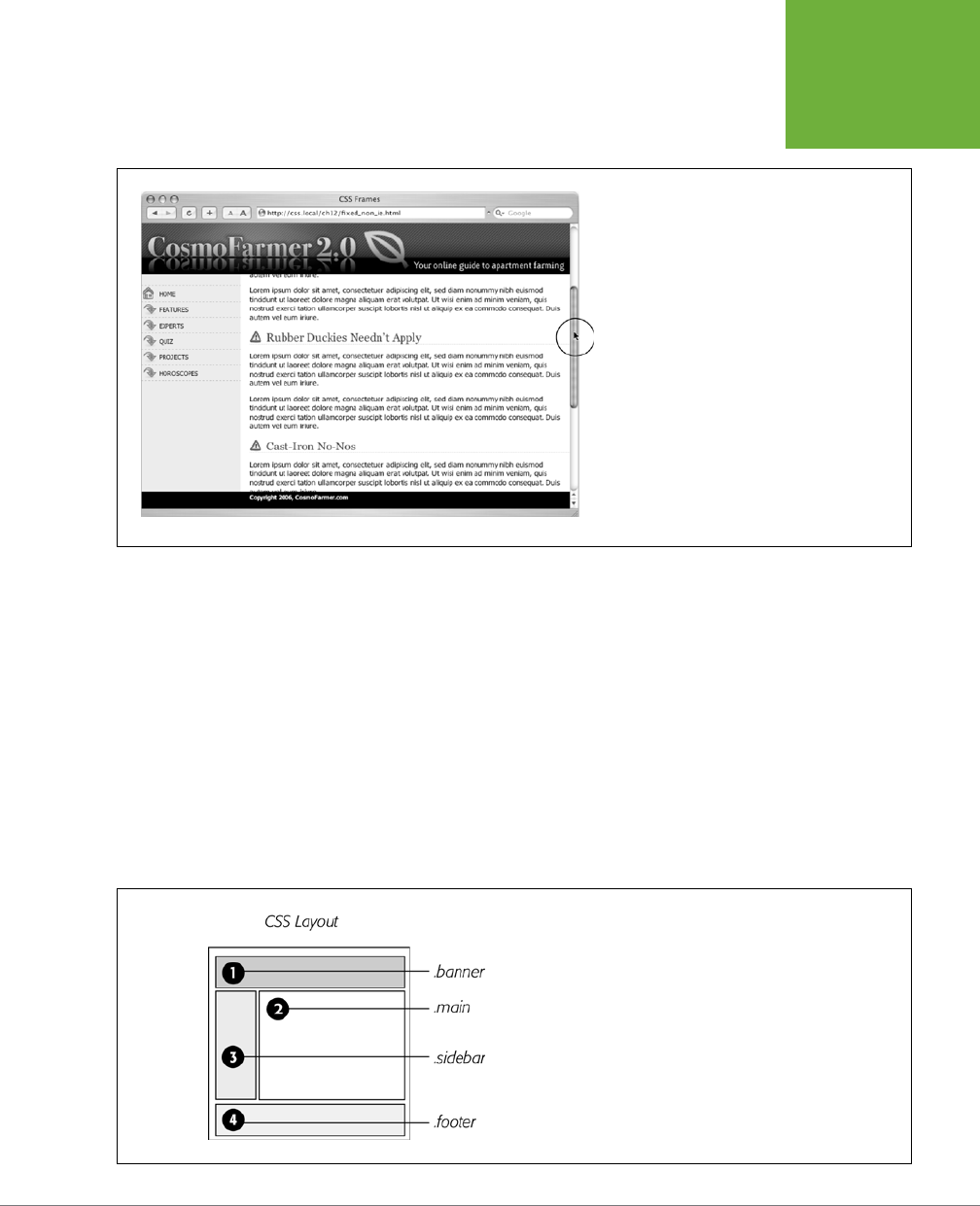
CHAPTER 15: POSITIONING ELEMENTS ON A WEB PAGE 505
POWERFUL
POSITIONING
STRATEGIES
FIGURE 15-9
Revisit the Web of yesteryear, but with a lot less
code. Using the
position
property’s fixed value,
you can emulate the look of HTML frames by fixing
some elements in place but still letting visitors
scroll through the content of a very long web page.
The scrollbar (circled) moves only the large text
area; the top and bottom banners and the sidebar
stay fixed.
Fixed positioning works much like absolute positioning in that you use the left, top,
right, or bottom properties to place the element. Also like absolutely positioned
elements, fixed positioning removes an element from the flow of the HTML. It floats
above other parts of the page, which simply ignore it.
Here’s how you can build the kind of page pictured in Figure 15-9, which has a fixed
banner, sidebar, and footer, and a scrollable main content area:
1. Add <div> tags with class (or ID) attributes for each section of the page.
You can have four main <div> tags with classes (or IDs) like banner, sidebar,
main, and footer (Figure 15-10). The order in which you place these tags in the
HTML doesn’t matter. Like absolute positioning, fixed positioning lets you place
elements on a page regardless of their HTML order.
FIGURE 15-10
With fixed positioning, you can lock any number of page elements
in place, so they’re always in view when your visitor scrolls. In this
example, the header (1), sidebar (3), and footer (4) are fixed while the
content in the main area of the page (2) is free to scroll.

CSS3: THE MISSING MANUAL
506
POWERFUL
POSITIONING
STRATEGIES
2. Add your material to each < d iv >.
In general, use the fixed divs for stu a visitor should always have access to in
the areas you wish to be locked in place. In this example, the banner, sidebar,
and footer contain the site logo, global site navigation, and copyright notices.
The main content goes into the remaining <div> tag. Don’t add too much in-
formation to a fixed <div>, however. If a fixed sidebar is taller than the visitor’s
browser window, he won’t be able to see the entire sidebar. And since fixed
elements don’t scroll, there’ll be no way (short of buying a bigger monitor) for
that visitor to see the sidebar content that doesn’t fit in his browser window.
3. Create styles for all fixed elements.
The left, right, top, and bottom values are relative to the browser window, so
just determine where on the screen you’d like them to go and plug in the values.
Specify a width for the elements as well.
NOTE Unlike absolute positioning, fixed positioning is
always
relative to the browser window, even when
an element with fixed positioning is placed inside another tag with relative or absolute positioning.
The styles to position the elements numbered 1, 3, and 4 in Figure 15-10 look
like this:
.banner {
position: fixed;
left: 0;
right: 0;
top: 0;
}
.sidebar {
position: fixed;
left: 0;
top: 110px;
width: 175px;
}
.footer {
position: fixed;
bottom: 0;
left: 0;
right: 0;
}

CHAPTER 15: POSITIONING ELEMENTS ON A WEB PAGE 507
TUTORIAL:
POSITIONING
PAGE
ELEMENTS
4. Create the style for the scrollable content area.
Since fixed-position elements are removed from the flow of the HTML, other tags
on the page have no idea the fixed-position elements are there. So, the <div>
tag with the page’s main content, for example, appears underneath the fixed
items. The main task for this style is to use margins to move the contents clear
of those areas. (The concept is the same as for absolutely positioned layouts,
as discussed on page 493.)
.main {
margin-left: 190px;
margin-top: 110px;
}
Fixed positioning is well supported in browsers: Internet Explorer 8 and up, as
well as all other major browsers (including the latest iOS and Android mobile
browsers) support fixed positioning.
Tutorial: Positioning Page Elements
This tutorial lets you explore a few dierent ways to use absolute positioning, like cre-
ating a three-column layout, positioning items within a banner, and adding captions
on top of photos. Unlike the previous chapter, where you wrapped chunks of HTML
in <div> tags and added class names to them, in these exercises, most of the HTML
work has already been done for you. You can focus on honing your new CSS skills.
To get started, download the tutorial files located on this book’s companion website
at
www.sawmac.com/css3/
.
Enhancing a Page Banner
First, you’ll make some small but visually important changes to a page banner. You’ll
create styles that refer to HTML tags with classes applied to them. (Again, that part
has been taken care of for you.)
1. Launch a web browser and open the file
15→hats.html
.
On this web page (Figure 15-11), start by repositioning several parts of the banner.
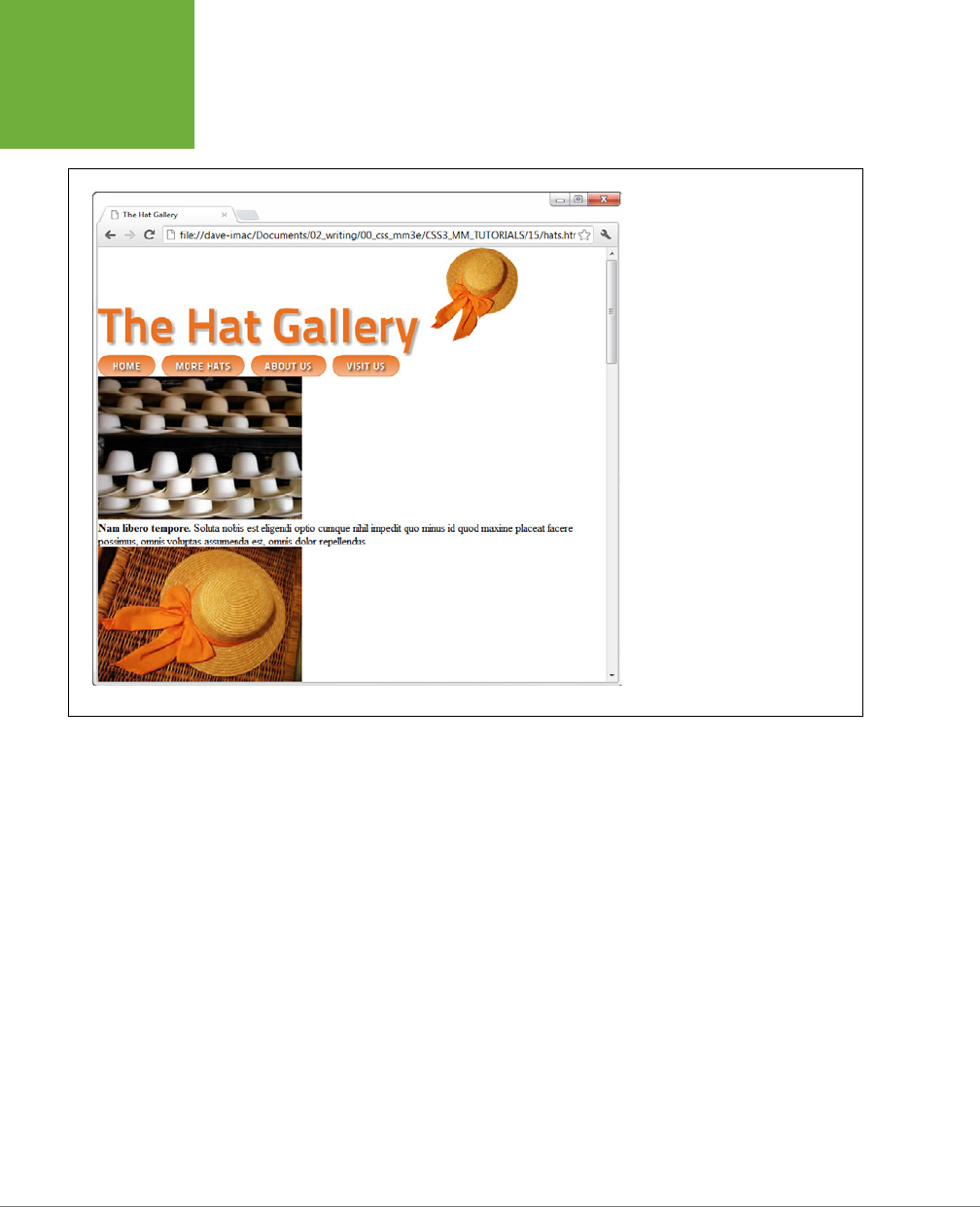
CSS3: THE MISSING MANUAL
508
TUTORIAL:
POSITIONING
PAGE
ELEMENTS
FIGURE 15-11
This page has a lot of stuff—logo
graphic, banner, nav bar, and a
gallery of images and captions. But
there’s not much visual structure.
Just normal, static HTML with every-
thing running from top to bottom
of the page. You can make it more
readable and interesting with some
absolute positioning.
2. Open the
hats.html
file in a text editor. Place your cursor between the open-
ing and closing <style> tags.
Along with the <style> tags for an internal style sheet, the page already has an
attached external style sheet with some basic formatting. Start by moving the
small hat image to the left side of the banner. To help break up the boxy look
that’s typical of CSS designs, break this graphic out of the banner’s borders, so
it looks like a slapped-on sticker.
3. In the internal style sheet, add this new style:
header .badge {
position: absolute;
top: -20px;
left: -90px;
}
The graphic is inside of an HTML5 <header> tag, and the graphic itself has a
class of badge. This style positions the top-left corner of the graphic 90 pixels
to the left and 20 pixels above the top of the page.

CHAPTER 15: POSITIONING ELEMENTS ON A WEB PAGE 509
TUTORIAL:
POSITIONING
PAGE
ELEMENTS
Preview the page now, and you’ll see a couple of problems. First, the graphic
hangs o the edge of the page, but you really want it to hang o the edge of
the banner area. You’ll tackle that problem now.
4. Add this style above the one you just created:
header {
position: relative;
}
It’s good practice to place the CSS code for styles that control a general section
of a page (like this header style) above the code for styles that format just parts
of that section (like the style you created in Step 3). Also, grouping styles for
related sections makes it easier to find styles when you need to analyze or edit
a page’s CSS. In this case, the header style goes first in the internal style sheet
because it applies to a large chunk of HTML. But you should keep the header
.badge style near it as you add more styles to the page. (You can read more
about techniques for organizing your CSS on page 541.)
The header
style creates a new positioning context for any nested tags. In other
words, the relative setting makes any other positioned elements inside this tag
place themselves relative to the edges of the banner. This change in positioning
shifts the placement of the style you created in Step 3. Now it’s 20 pixels above
and 90 pixels to the left of the banner box. The badge still hangs o the page
just a little bit, so you’ll add some margin to the header to move it down a bit.
5. Edit the header style by adding the two bolded lines below:
header {
position: relative;
margin-top: 20px;
padding: 20px 0 0 10px;
}
This margin adds enough space above the header to move it and the graphic
down. In addition, the padding adds space inside the header so the headline
(and the soon to be repositioned nav bar) don’t feel so cramped. But now you
have another problem—“The Hat Gallery” headline is partially hidden underneath
the badge. Overlapping elements is one of the hazards of absolute position-
ing. In this case, you can fix the problem by changing the badge’s z-index and
moving it behind the text.
6. Add z-index: -1 to the header .badge style:
header .badge {
position: absolute;
top: -20px;
left: -90px;
z-index: -1;
}
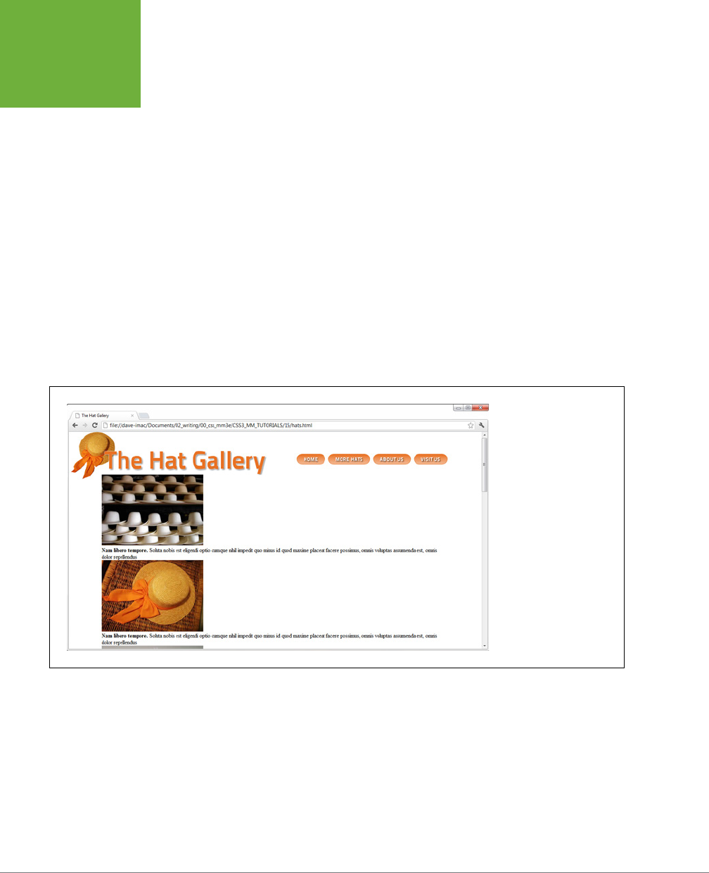
CSS3: THE MISSING MANUAL
510
TUTORIAL:
POSITIONING
PAGE
ELEMENTS
The -1 value places the absolutely positioned element behind its parent—in this
case behind the text (see Figure 15-12). Next, you’ll use absolute positioning to
move the navigation bar to the right side of the header.
7. Add another style after the header .badge style.
header nav {
position: absolute;
right: 0;
top: 45px;
}
Although you could position the navigation bar by floating the <h1> tag, in this
case, it’s a lot easier to use absolute positioning. Here, you’ve created a tag style
for the HTML5 <nav> tag, when it’s also inside a <header> tag. Remember, in
Step 4, you gave the header a relative position, which means any tags inside
it—like the <nav> tag—are positioned in relation to it, so the right value of 0 in
this style places the right edge of the navigation bar on the right edge of the
banner (see Figure 15-12).
FIGURE 15-12
Absolute positioning is a
big help in placing small
elements like the hat
graphic and the navigation
bar. Unlike floats, the exact
position of the image and
the navigation bar in the
HTML code isn’t important,
giving you a lot of layout
flexibility. You can achieve
the same effect without
absolute positioning, but it
would be harder.
Placing Captions on the Photos
In Chapter 8, you learned one way to add a caption to a photo (page 275). In the
examples from that chapter, the captions sat underneath the photos, which is what
you want most of the time. But someday, you may want to add a caption directly
on
a photo, like the subtitles TV news shows love to display across the lower third
of the screen.

CHAPTER 15: POSITIONING ELEMENTS ON A WEB PAGE 511
TUTORIAL:
POSITIONING
PAGE
ELEMENTS
1. Open
hats.html
in your text editor.
There is a gallery of photos on this page. The HTML for one image looks like this:
<figure>
<img src="images/file00079963469.jpg" width="300" height="210" alt="Panama">
<figcaption><strong>Nam libero tempore.</strong> Soluta nobis est eligendi
optio cumque nihil impedit quo minus id quod maxime placeat facere possimus,
omnis voluptas assumenda est, omnis dolor repellendus
</figcaption>
</figure>
This example uses the HTML5 <figure> and <figcaption> tags. The <figure>
tag is normally a block-level tag, but since you want the images to sit side-by-
side, start by changing them to inline elements.
NOTE Because Internet Explorer 8 and earlier can’t style HTML5 tags, you’re adding a bit of JavaScript to
tell those browsers to get with the program. See the box on page 24 for how this scheme works.
2. Add another style below the header nav style you added earlier.
.gallery figure {
display: inline-block;
width: 300px;
height: 210px;
margin: 15px;
position: relative;
}
This HTML creates a descendent selector. The <figure> tags are all grouped
inside a <div> tag with the class of gallery applied to it. You’re using a de-
scendent selector since you may add other figures to this page that aren’t part
of the gallery and should be formatted dierently. This descendent selector
targets just the <figure> tags you’re after at the moment.
By making the figure tag an inline-block element, the figures can all sit side-
by-side. The width and height values match the width and height of the images.
In other words, you want the <figure> tag to only be large enough to hold
the images. The margin value adds a little space around the figures so they
don’t bump into each. Finally, the position: relative declaration sets a new
positioning context, so you can position each caption in relation to its figure.
Now it’s time to position the captions.

CSS3: THE MISSING MANUAL
512
TUTORIAL:
POSITIONING
PAGE
ELEMENTS
3. Add one more style below the one you just added:
.gallery figcaption {
position: absolute;
top: 15%;
bottom: 15%;
left: 0;
right: 0;
background-color: rgb(153,153,153);
background-color: rgba(153,153,153,.9);
}
The <figcaption> tags are absolutely positioned using all four positioning
quadrants: top, bottom, left, and right. Basically, the captions will span the
entire figure, but be placed a bit below the top and above the bottom (in fact,
15 percent below and above). Using all four settings means that you don’t need
to worry about setting a width or a height for the captions; instead, you leave
it up to the browser.
Finally, two background-color declarations are set. The first is for Internet
Explorer 8 and earlier (which doesn’t understand the transparency settings of
RGBA colors). The second is for modern browsers, and places a semi-transparent
background atop each figure, which means you can see the image through the
caption’s background.
Now for some simple text enhancements.
4. Edit the style you just created by adding the bolded code below:
.gallery figcaption {
position: absolute;
top: 15%;
bottom: 15%;
left: 0;
right: 0;
background-color: rgb(153,153,153);
background-color: rgba(153,153,153,.9);
padding: 20px;
font-family: Titillium, Arial, sans-serif;
font-weight: 400;
font-size: .9em;
color: white;
}
The padding just provides a little breathing room for the text, while the other
properties set a font, size, and color.

CHAPTER 15: POSITIONING ELEMENTS ON A WEB PAGE 513
TUTORIAL:
POSITIONING
PAGE
ELEMENTS
If you preview the page now, you’ll see that the captions appear on top of all
of the images. Next, you’ll change the style so the captions appear only when
a visitor mouses over an image. Start by hiding the captions.
5. Add opacity: 0; to the style:
.gallery figcaption {
position: absolute;
top: 15%;
bottom: 15%;
left: 0;
right: 0;
background-color: rgb(153,153,153);
background-color: rgba(153,153,153,.9);
padding: 20px;
font-family: Titillium, Arial, sans-serif;
font-size: .9em;
font-weight: 400;
color: white;
opacity: 0;
}
Setting the opacity to 0 makes the caption invisible. You may also use display:
none; or visibility: hidden; to hide the captions, but this way you can ani-
mate the opacity value by using a CSS transition—in fact, you’ll add that eect
in a moment. But first, you need to add a :hover state so when a visitor hovers
over the image, its caption appears.
6. Add the following to the style sheet:
figure:hover figcaption {
opacity: 1;
}
This tricky bit of CSS can be translated to “when the mouse moves over the figure
element (figure:hover), set the opacity of the caption to 1.” In other words,
moving the mouse over the <figure> tag makes the descendent <figcaption>
tag visible. Save the page and try it out. When you mouse over the figure, the
caption should appear. We can animate this eect by adding a transition to the
.gallery figcaption style.
7. Edit the .gallery figcaption style so that it looks like this (additions are
in bold):
figcaption {
position: absolute;
top: 15%;
bottom: 15%;
left: 0;
right: 0;

CSS3: THE MISSING MANUAL
514
TUTORIAL:
POSITIONING
PAGE
ELEMENTS
background-color: rgb(153,153,153);
background-color: rgba(153,153,153,.9);
padding: 20px;
font-family: Titillium, Arial, sans-serif;
font-size: .9em;
font-weight: 400;
color: white;
opacity: 0;
-webkit-transition: opacity .75s ease-out;
-moz-transition: opacity .75s ease-out;
-o-transition: opacity .75s ease-out;
transition: opacity .75s ease-out;
}
You’ve added the transition property. Of course, to get it to work in the most
browsers possible, you must add the appropriate vendor prefixes (-webkit-,
and so on). While Internet Explorer 9 and earlier don’t understand transitions,
that’s OK; the captions will still appear in those browsers. They’ll just appear
and disappear instantly instead of fading in and out smoothly.
Finally, you’ll make the copyright notice stick to the bottom of the browser
window, using fixed positioning.
8. Add one last style to the style sheet:
footer {
position: fixed;
bottom: 0;
left: 0;
right: 0;
padding: 10px;
background-color: black;
color: white;
}
As you read on page 504, fixed positioning lets you “stick” an element to a
specific spot in the browser window. In this case, it’s fixed to the bottom of
the page (bottom: 0) and extends the entire width of the page (thanks to the
left: 0 and right: 0 declarations). The last three declarations simply add a
bit of space around the footer, giving it a black background and white text.
The final page should look like Figure 15-13. You’ll find a completed version of
this tutorial in the
15_finished
folder.
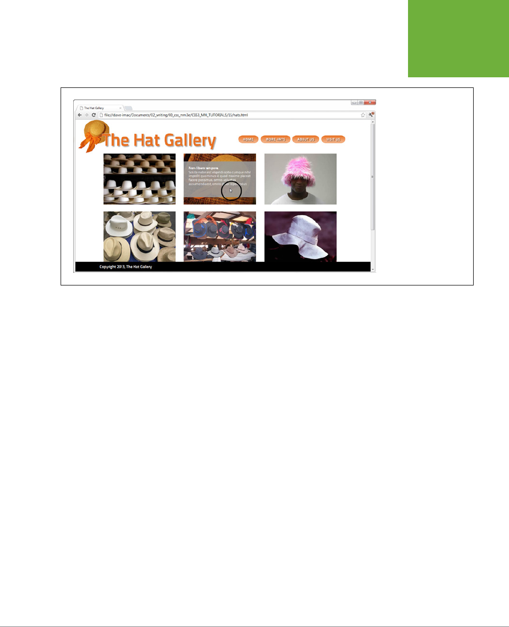
CHAPTER 15: POSITIONING ELEMENTS ON A WEB PAGE 515
TUTORIAL:
POSITIONING
PAGE
ELEMENTS
FIGURE 15-13
With some clever CSS, you
can easily make captions
fade into view when
mousing over an image
(circled).


519
CHAPTER
16
Believe it or not, sometimes people will want to see your web pages on paper.
People who make a purchase on your site may want to print out a receipt, for
example. If you have a cooking site, you’ll certainly want to let your guests
print their favorite recipes on paper or index cards for use in the kitchen. Even if your
website consists of mostly text articles intended to be read online, some visitors
will want to print a hard copy for a class project or archiving. So what becomes of
your carefully crafted designs when the ink hits the paper? White text on a black
background can waste gallons of toner, and some browsers may not even print the
background. Do visitors really need to see your site’s navigation bar on the printed
page? Probably not.
Web designers used to solve this dilemma by creating separate
printer-friendly
versions of their sites—essentially creating a duplicate site formatted just for printing.
Not only is that a lot more work than building one version of the site, it also means
changing multiple files each time a page needs editing. Fortunately, CSS oers a
better way—the ability to make a page look one way when displayed on a screen
and a dierent way when printed (see Figure 16-1). The secret? Media style sheets.
How Media Style Sheets Work
The creators of CSS were pretty thorough when they envisioned all the dierent
ways people might view websites. They knew while most people view the Web using
a computer and monitor, sometimes people want to print out a page. In addition,
new web surfing devices like mobile phones, handhelds, and televisions have their
own unique requirements when it comes to web design.
CSS for the Printed Page
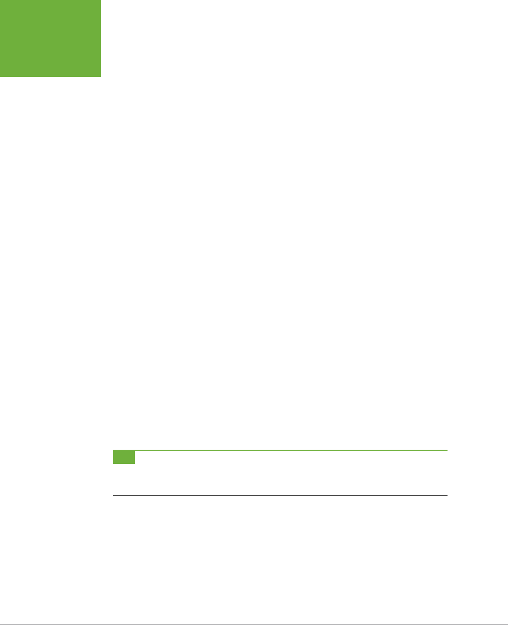
CSS3: THE MISSING MANUAL
520
HOW MEDIA
STYLE SHEETS
WORK
To accommodate these dierent methods of surfing, CSS lets you create styles and
style sheets that specifically target a particular media type. CSS recognizes 10 dif-
ferent media types: all, braille, embossed, handheld, print, projection, screen,
speech, tty, and tv. The browser applies the style sheet only when that media type
is active. In other words, the browser can apply one style sheet for the screen and
a dierent one when printing. Many of these media types are for very specialized
applications like a Braille reader for the blind, a speech reader (for those who want
or need to hear a page in spoken form), or a teletype machine. These types may not
work in the real world, as they depend on devices programmed to understand them.
You should be aware, however, of three types: all, screen, and print.
• All applies to every type of device. When a style or style sheet applies to all
media types, every device accessing the page uses those same styles. Printers
and monitors alike attempt to format the page the same way. (Styles actually
work this way already when you embed them in the page or link them from
an external style sheet, so you don’t need to specify “all media types” when
adding a style sheet to a page.)
• Screen styles display only on a monitor. When you specify the screen media
type, the browser ignores those styles when it prints the page. This media type
lets you isolate styles that look good on screen but awful on paper, like white
text on a black background.
• Print styles apply only when the page is printed. Print styles let you create styles
that use printer-friendly font sizes, colors, graphics, and so on.
One approach is to build styles with your monitor in mind first, and then attach them
using one of the methods described below (methods like internal or external, linked
or imported). At the outset, these styles work for both the monitor and the printer.
Then, you create a style sheet that applies only when printing. It overrides any of the
main styles that negatively aect the look of the page when printed. You’ll learn this
technique starting on page 523. Alternatively, you can create two dierent media
style sheets—one for screen and the other for print—and attach them to your web
pages, as described in the next section.
TIP Another popular technique is to create three style sheets: one for the printer, one for the screen, and
a third with styles that should appear both on a monitor and when printed. You specify the media types for the
printer and screen style sheets and attach the third, shared set of styles as you would normally.
CHAPTER 16: CSS FOR THE PRINTED PAGE 521
HOW MEDIA
STYLE SHEETS
WORK
FIGURE 16-1
Using a printer style
sheet can save paper,
ink, and frustration by
letting visitors print just
the information they’re
after and leave unneeded
extras on the monitor. In
this example, a page from
the great web develop-
ment site, A List Apart,
looks nice onscreen (top)
and simple, clean, and
informative when printed
(bottom). Notice how the
printed version expands to
fill the entire width of the
page and leaves off logo,
navigation, and ads.
CSS3: THE MISSING MANUAL
522
HOW TO ADD
MEDIA STYLE
SHEETS
How to Add Media Style Sheets
Media style sheets are simply CSS style sheets: They can be either internal or exter-
nal. However, when you want a web browser to apply the styles for only a particular
device such as a screen or printer, you need to add the style sheet to your web page
in a slightly dierent way than usual.
Specifying the Media Type for an External Style Sheet
To attach an external style sheet while specifying a particular media type, use the
<link> tag with a
media
attribute. To link a style sheet that should be used only for
printing, add this HTML to your web page:
<link rel="stylesheet" media="print" href="print.css"/>
NOTE Technically, the rules of CSS also let you define a media type when using the
@import
method of
attaching an external style sheet (see page 42), like so:
@import url(print.css) print;
. But since
Internet Explorer 8 and earlier refuses to understand this code, you should avoid using it.
If you don’t specify any media, a web browser assumes you’re targeting all media,
so it uses the style sheet for screen display, printing, and so on. In addition, you can
specify
multiple
media types by separating them with commas. A linked external
style sheet targeting multiple media might look like:
<link rel="stylesheet" media="screen, projection, handheld" href="screen.
css"/>
You probably won’t need to specify more than one until browsers start recognizing
multiple media types.
TIP When you build and test printer style sheets, leave off the
media="print"
attribute and turn off
any screen-only style sheets. For example, change
media="screen"
to
media="speech"
. This technique
lets you view the page in a web browser but have it display as if it were formatted for a printer. Once the printer
style sheet looks good, make sure to set its media type to
print
and turn on any screen-only style sheets.
Specifying the Media Type Within a Style Sheet
You can also include media-specific styles directly inside a style sheet using the @media
directive. You’ve already seen the @media directive in Chapter 14, for creating media
queries to target dierent features and settings of a web browser (such as screen
width). You can use the @media directive to target dierent screens as well as printing.
Maybe you want to add a couple of print-specific styles to an internal style sheet. Or
perhaps you’d like to keep all your styles in a single external style sheet and just add
a few printer-only styles. You can do so using the @media directive, like so:
@media print {
/* put your styles for the printer in here */
}
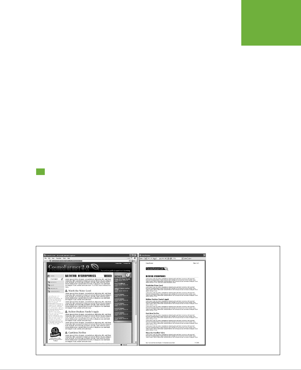
CHAPTER 16: CSS FOR THE PRINTED PAGE 523
CREATING
PRINT STYLE
SHEETS
Be careful to include that closing brace (on the last line), otherwise the directive
won’t work. Here’s an example of using @media to include two printer-only styles:
@media print {
h1 {
font-size: 24pt;
}
p {
font-size: 12pt;
}
}
Technically, it doesn’t really matter whether you put all styles in a single file and use
the @media method or put media-specific styles in their own external style sheets
(like
screen.css
, and
printer.css
). Putting all your printer-only styles in their own
external style sheet named something like
printer.css
makes it a lot easier to find
and edit styles for print only.
Creating Print Style Sheets
First, see how pages on your site print before embarking on a print-specific redesign.
Often, all the information on a web page prints without problems, so you may not
have to add a printer style sheet to your site. But in some cases, especially when us-
ing heavy doses of CSS, pages look awful printed. For example, since web browsers
don’t print background images unless instructed to, you might end up with large
blank spaces where those background images were. But even if a page looks the
same in print as it does on the screen, you have many ways to improve the quality
of the printed version by adding custom printer-only styles (see Figure 16-2).
FIGURE 16-2
When printing a web page, you really
don’t need navigation links or infor-
mation that’s not related to the topic
at hand. With a printer style sheet,
you can eliminate sidebars, naviga-
tion bars, and other content designed
for web browsing (left). The result is
a simply formatted document—
perfect for printing (right).

CSS3: THE MISSING MANUAL
524
CREATING
PRINT STYLE
SHEETS
TIP A quick way to see how a page will print without wasting a lot of paper and toner is to use your browser’s
Print Preview command. On Windows, this command is usually available from the browser’s File→Print Preview
menu. On a Mac, you usually first choose File→Print, and then click Preview in the window that appears. Using
Print Preview, you can check to see whether a page is too wide to fit on one page and see where page breaks
occur.
Using !important to Override Onscreen Styling
As mentioned earlier, it’s often useful to create a style sheet without specifying a
media type (or by using media="all"). When you’re ready to define some print-
specific rules, you can just create a separate style sheet to override any styles that
don’t look good in print.
Say you’ve got an <h1> tag that’s styled to appear blue onscreen, and you’ve also
chosen rules controlling letter spacing, font weight, and text alignment. If the only
thing you want to change for your printed pages is to use black rather than blue, then
you don’t need to create a new style with a whole new set of properties. Just create
a main style sheet that applies in both cases and a print style sheet that overrides
the blue color for the <h1> tag.
One problem with this approach is that you need to make sure the printer styles
actually
do
override the main style sheet. To do this successfully, you have to carefully
manage the
cascade
. As discussed in Chapter 5, styles can interact in complex ways:
Several styles may apply to the same element, and those styles’ CSS properties can
merge and override each other. There’s a surefire way to make sure one property
trumps all others—the !important declaration.
When you add !important after the value in a CSS declaration, that particular prop-
erty overrides any conflicts with other styles. Add this rule to a print style sheet to
ensure that all <h1> tags print in black:
h1 {
color: #000 !important ;
}
This h1 style overrides even more specific styles, including #main h1, h1.title, or
#wrapper #main h1 from the main style sheet.
Reworking Text Styles
You may not necessarily want to have text look the same onscreen as it does in
print. A good place to start when creating a printer style sheet is by modifying the
font-size and color properties. Using pixel sizes for text doesn’t mean much to
a printer. And while bright green text may look good onscreen, it may come out a
dicult-to-read pale gray when printed.
Pixels and ems (page 158) make sense for onscreen text, but the measurement of
choice for printing is
points
. Points are how Word and other programs measure font
sizes, and they’re what printers expect. In practice, most web browsers translate
pixel and ems to something more printer friendly anyway. The base onscreen font

CHAPTER 16: CSS FOR THE PRINTED PAGE 525
CREATING
PRINT STYLE
SHEETS
size for most browsers—16 pixels—prints out as 12 points. But there’s no consistent
way to predict how every browser will resize text, so for maximum printing control,
set the font size specifically to points in your print style sheets.
To make all paragraphs print in 12-point type (a common size for printing), use the
following rule:
p {
font-size: 12pt;
}
NOTE As with ems, you don’t add an “s” when setting the font to a point size:
12pt
not
12pts
.
Likewise, screen colors don’t often translate well when printed in black-and-white
on a laser or inkjet printer. Crisp black text on white paper is much easier to read,
for instance, than light gray letters. What’s more, as you’ll see in the next section,
white text on a black background, although very legible onscreen, often doesn’t
print well. To make text most readable on paper, it’s a good idea to make all text
print black. To make all paragraph text black, add this style to your print style sheet:
p {
color: #000;
}
As mentioned on the previous page, if your print style sheet competes with styles
from another attached style sheet, then use !important to make sure your printer
styles win:
p {
font-size: 12pt !important;
color: #000 !important;
}
To make sure
all
text on a page prints black, use the universal selector (page 63) and
!important to create a single style that formats every tag with black text:
* { color: #000 !important; }
Of course, this advice applies only if your site is printed out in black and white. If you
think most visitors to your site use color printers, then you may want to leave all the
text color in or change the colors to be even more vibrant when printed.
Styling Backgrounds for Print
Adding background images and colors to navigation buttons, sidebars, and other
page elements adds contrast and visual appeal to your web pages. But you can’t be
sure if the background will come through when those pages are printed. Because
colored backgrounds eat up printer ink and toner, most web browsers don’t normally
print them, and most web surfers don’t turn on backgrounds for printing even if
their browser has this feature.
CSS3: THE MISSING MANUAL
526
CREATING
PRINT STYLE
SHEETS
In addition, even if the background does print, it may compete with any text that
overlaps it. This is especially true if the text contrasts strongly with a colorful back-
ground on a monitor but blends into the background when printed on a black-and-
white printer.
NOTE White text on a black background used to pose the biggest problem—your visitor would end up with
a blank white page. Fortunately, most current web browsers have the smarts to change white text to black (or
gray) when printing without backgrounds.
REMOVING BACKGROUND ELEMENTS
The easiest way to take care of backgrounds is to simply remove them in your print
style sheet. Say you reverse out a headline so that the text is white and the back-
ground is a dark color. If the style that creates that eect is named .headHighlight,
then duplicate the style name in your print-only style sheet, like this:
.headHighlight {
color: #000;
background: #FFF;
}
This style sets the background to white—the color of the paper. In addition, to get
crisp printed text, this style sets the font color to black.
GEM IN THE ROUGH
Two Birds with One Stone
You can use the
background-color
property to set a
background color to white like this:
background-color:
white
. You get the same effect using the
background
shorthand method:
background: white
. Remember
that the background property (page 255) can also specify a
background image, how the image repeats, and its position.
But when you leave out any values using the shorthand
method, the web browser resets to its normal value.
In other words, by omitting a background image value, the
browser sets that value to its normal setting—
none
. So a
declaration like
background: white;
not only sets the
background color to white but also removes any background
images. By using the
background
shorthand property, you
kill two birds—setting a white background and removing im-
ages—with very little code.

CHAPTER 16: CSS FOR THE PRINTED PAGE 527
CREATING
PRINT STYLE
SHEETS
LEAVING BACKGROUND ELEMENTS IN
If you don’t want to get rid of the background, you can leave it in and hope that
visitors set their browsers to print them. If you leave background elements in your
print style sheet and text appears on top of them, then make sure the text is legible
with the backgrounds on
and
o.
Another thing to consider when using background images: Do you
need
the image
to print out? Say you place a company’s logo as a background image of a <div> tag
used for the banner of a page. Because the logo is in the background, it may not
print. Your company or client may not be happy when every page printed from their
site lacks a logo. In this case, you’ve got a few options. You can insert the logo as a
regular <img> tag instead of a background image. This technique works, but what
if the logo looks great on a full-color monitor but no good at all when printed on a
black-and-white printer? Another technique is to leave the logo in as a background
image and add another, more printer-friendly logo using the <img> tag. You then hide
that <img> tag onscreen but show the printer-friendly logo when printed. Here’s how:
1. Add the <img> tag to your HTML in the spot where you want it to appear
when printed:
<img src="logo.png" height="100" width="100" class="logo" />
2. Then, in the main style sheet (the one that applies when the page is displayed
on screen), add a style that hides that image:
.logo { display: none; }
3. In the print style sheet, add one last style to display the image:
.logo { display: inline; }
Now that logo won’t appear on screen, but will when printed.
Hiding Unwanted Page Areas
Web pages are often loaded with informational and navigational aids like naviga-
tion bars, sidebars full of helpful links, search boxes, and so on. These elements are
great for surfing the Web, but don’t do much good on a piece of paper. Your web
pages may also contain ads, movies, and other doodads that people don’t like to
waste expensive ink and toner on. You can do your visitors a favor by stripping these
onscreen frills out of the content they really want to print.
CSS3: THE MISSING MANUAL
528
CREATING
PRINT STYLE
SHEETS
POWER USERS’ CLINIC
Revealing Links in Print
Imagine a coworker hands you a printout of a fascinating
article she found on the Web. You’re reading along and come
to this passage: “And that’s when I found the secret to eternal
life
here
.” The underline tells you there’s a clickable link that
reveals the secret. But on a piece of paper, of course, you have
no way to follow where the link leads.
To prevent this conundrum on your own pages, you can make
linked URLs print along with the rest of the text: “secret to
eternal life here (
http://www.pyramind_scam.com
).” Using
an advanced selector—
:after
—and an advanced CSS prop-
erty called
content
, you can print text that doesn’t appear
onscreen at the end of a styled element. Unfortunately, the
:after
selector and
content
property trick doesn’t work
in Internet Explorer 7 or earlier. But it does work in Internet
Explorer 8 (and later), Firefox, Safari, and Opera, so you can
at least spell out URLs for the benefit of visitors using those
browsers.
To do so, add a style to the print style sheet that prints the
URL after each link.
You can even add other text items like parentheses to make
it look better:
a:after {
content: " (" attr(href) ") ";
}
However, this CSS doesn’t distinguish between external or
internal links, so it also prints unhelpful document-relative
links to other pages on the same site: “Visit the home page
(../../index.html).” Using an advanced attribute selector (page
321), you can force the style to print only absolute URLs (the
ones that begin with
http://
), like so:
a[href^="http://"]:after {
content: " (" attr(href) ") ";
}
Fortunately, all browsers that understand the
:after
selector
and
content
property understand this advanced attribute
selector.
If you use root-relative links on your site, you can use another
technique to print the correct, full URLs. See this article for
more information:
www.alistapart.com/articles/goingtoprint
.
In addition, because some links can be really long, they may
not fit on the printed page and be clipped at the paper’s edge.
To overcome this, you can use the
word-wrap
property to tell
the browser to break links over multiple lines:
a {
word-wrap: break-word;
}
Add the above style to your printer style sheet.
As you learned in the third part of this book, one way to lay out a page is to wrap
<div> tags around dierent layout elements—banner, main navigation, content,
copyright notice, and so on. By styling each <div> using floats or absolute position-
ing, you can place various page elements right where you want them. You can use
that same structure to create a print-only style sheet that hides unwanted elements
using the display property.
By setting the display value to none, you can make a web browser remove a styled
element from a page. So to prevent a sidebar from printing, simply redefine that
style in a print style sheet and set its display property to none:
.sidebar {
display: none;
}

CHAPTER 16: CSS FOR THE PRINTED PAGE 529
CREATING
PRINT STYLE
SHEETS
For most pages, you want the print style sheet to display only the most basic infor-
mational elements—like the logo, the main content, and a copyright notice—and hide
everything else. You can easily hide multiple elements with a group selector, like so:
.banner, .mainNav, .sidebar, .ads, .newsLinks {
display: none;
}
Remember, these styles go into your print style sheet, not the main style sheet.
Otherwise, you’d never see the navigation, banner, or other important areas of your
page onscreen. However, at times you might want to hide something from your main
style sheet and reveal it only when printed.
Say you place your site’s logo as a background image inside the banner area of a
page. You may want to do this to have text or links appear on top of an empty area
of the logo graphic. You (or your boss or client) certainly want the logo to appear
on any printed pages, but since not all browsers print background images, you can’t
be sure the logo will appear when printed. One solution is to insert an <img> tag
containing a modified, printer-friendly version of the logo graphic; add a class to the
image; create a class style in the main style sheet with the display property set to
none; and then set the display property for the same class style in the print style
sheet to block. Voilà! The logo appears only when the page is printed.
Adding Page Breaks for Printing
Version 2.1 of the Cascading Style Sheet standard includes many CSS properties
aimed at better formatting a printed web page: from setting the orientation of the
page to defining margins and paper size. (You can see the full list at
www.w3.org/
TR/CSS21/page.html
.) Unfortunately, today’s web browsers recognize very few of
these print styles.
Two widely recognized properties are page-break-before and page-break-after.
Page-break before tells a browser to insert a page break before a given style. Say you
want certain headings to always appear at the top of a page, like titles for dierent
sections of a long document (see Figure 16-3). You can add page-break-before:
always to the style used to format those headings. Likewise, to make an element
appear as the last item on a printed page, add page-break-after: always to that
element’s style.
The page-break-before property is also useful for large graphics, since some
browsers let images print across two pages, making it a little tough to see the whole
image at once. If you have one page with three paragraphs of text followed by the
image, then the browser prints part of the image on one page and the other part on
a second page. You don’t want your visitors to need cellophane tape to piece your
image back together, so use the page-break-before property to make the image
print on a new page, where it all fits.
CSS3: THE MISSING MANUAL
530
TUTORIAL:
BUILDING A
PRINT STYLE
SHEET
Here’s a quick way to take advantage of these properties. Create two class styles
named something like .break_after and .break_before, like so:
.break_before { page-break-before: always; }
.break_after { page-break-after: always; }
You can then selectively apply these styles to the elements that should print at
the top—or bottom—of a page. If you want a particular heading to print at the
top of a page, then use a style like this: <h1 class="break_before">. Even if the
element already has a class applied to it, you can add an additional class like this:
<h1 class="sectionTitle break_before">.
FIGURE 16-3
Normally when printing
a web page, a browser
breaks the content into
multiple pages to fit as
much content on each
page as possible (left). But
if you want to put page
breaks in more attractive
and logical places, then
use the
page-break-
before
property (right).
Tutorial: Building a Print Style Sheet
In this tutorial, you’ll create a print style sheet. To make the printed version of a
web page look better, you’ll add styles that remove unwanted page elements and
backgrounds, change text formatting, and print the URLs attached to any links on
the page.
To get started, download the tutorial files from this book’s companion website at
http://www.sawmac.com/css3/
. Click the tutorial link, and then download the files.
All of the files are in a zip archive, so you need to unzip them first. (You’ll find detailed
instructions on the website.) The files for this tutorial are in the
16
folder.
Remove Unneeded Page Elements
To get started, you first need to understand how the page is laid out so you can
decide which elements you want printed.

CHAPTER 16: CSS FOR THE PRINTED PAGE 531
TUTORIAL:
BUILDING A
PRINT STYLE
SHEET
1. Launch a web browser and open 16→print.html.
This web page is a float-based layout consisting of several <div> tags (see
Figure 16-4). In all likelihood, anyone printing this page is most interested in
the main content—the large central body of text. Printing the navigation bar
and sidebar is just a waste of toner, so your print style sheet should hide these
parts of the page.
2. In a text editor, create a new file named
print.css
and save it along with the
main style sheet in the css folder inside the
16
folder.
In your new print style sheet, the first order of business is to hide the navigation
bar and other parts of the page that you don’t want to print.
3. Using the display property, create a new group selector that hides the
navigation elements and sidebar, like so:
.sidebar, .navWrapper, .footerNav {
display: none;
}
With the display property set to none, web browsers hide those elements so
they won’t print. But first you need to attach this external style sheet to your
web page so browsers can find it.
4. In your text editor, open 16→print.html.
This page already has an attached style sheet—
main.css
. This external style sheet
provides all of the formatting for the page when it’s displayed in a browser. Also,
since the style sheet is attached using the <link> tag with no media attribute
specified, it applies when the page is printed as well. Your print style sheet,
then, needs to override any styles from the
main.css
file that won’t look good
in print. The first step in that process is attaching the print style sheet after the
main.css
file in the html of this page.
5. Locate the <link> tag in the head of the page used to attach the
global.css
file. Insert a blank line after that tag, and then add the following:
<link href="css/print.css" rel="stylesheet" media="print">
If properties from two styles with the same name conflict, the properties from
the style sheet last linked on the page wins, so this <link> must go
after
the
other <link>. That way, if the
main.css
file has a class named .copyright that
creates white, 10-pixel type on a black background, you can create another style
named .copyright in the print style sheet with black, 12-point type on a white
background. Even though the two styles share the same name, the properties
from the print style sheet win because it’s the last one linked. (See page 115 for
more detail on this cascading rule.)
CSS3: THE MISSING MANUAL
532
TUTORIAL:
BUILDING A
PRINT STYLE
SHEET
FIGURE 16-4
CSS layout lets you control
the placement of elements
on a page. When printing
a page, some elements are
better off not appear-
ing at all. The banner,
sidebar, and navigation
elements don’t add useful
information to a printed
document.
6. Save the
print.css
and
print.html
files, and then preview
print.html
in a
web browser.
The page should look no dierent than it did in Step 1. That’s because you
haven’t printed it yet. You can see the eect of the print style sheet by using
your browser’s Print Preview command.
7. If you’re using Windows, choose File→Print Preview. Mac fans should choose
File→Print, and then, in the Print window that appears, click the Preview button.
In the Print Preview window, you’ll see that the right sidebar and navigation
have disappeared. But the design still doesn’t look that great. The main content
doesn’t fill the page as it should. You’ll fix that—and a few other things—next.

CHAPTER 16: CSS FOR THE PRINTED PAGE 533
TUTORIAL:
BUILDING A
PRINT STYLE
SHEET
Adjusting the Layout
Currently, the main content and the footer copyright notice don’t fit the printed
page correctly: The main content stops short of the right edge of the page, while
the copyright is indented from the left edge. Both would look better if they filled
the entire printable area.
Two styles are currently controlling the layout. In Figure 16-4, you can see that the
page is divided into several areas, each created with a separate <div> tag. The
.mainWrapper and .footer are both used to center and set a width of 900 pixels
for the main content area and the footer area. In addition, the
.main style has a set
width, while the .footerMain style has a left margin. Since you don’t know what size
paper this page might be printed on, you should get rid of all widths and remove
any margins.
1. Return to your text editor and the
print.css
file. Add one new group style to
remove widths and margins of the areas of the page that will be printed:
.banner, .mainWrapper, .footer, .main {
width: auto;
margin: 0;
padding: 0;
}
The first declaration—width:auto—aects several areas of the page. It overrides
the 900-pixel width setting for the main text and footer in the
main.css
file and
leaves the exact width up to the web browser. Auto simply lets the <div> fill the
entire available width, so no matter the paper size—letter, A4, or whatever—the
content fills the width of the printed page. The two other declarations, margin
and padding, remove any space around these divs.
The copyright content, contained inside a <div> with the class footerMain,
doesn’t have a set width, but it does have a left margin—that indent will look
strange when printed, so you should get rid of it.
2. Add another style to the
print.css
style sheet:
.footerMain {
margin: 0;
}
While you’ve hidden the right sidebar, which is positioned using a float, the main
content is still floated—it doesn’t have to be for the printed page.
3. Add another style to the
print.css
style sheet:
.main {
float: none;
}

CSS3: THE MISSING MANUAL
534
TUTORIAL:
BUILDING A
PRINT STYLE
SHEET
Other problems can arise when printing a float-based layout. As described
on page 428, floated elements can pop out of the bottom of their containers,
preventing backgrounds and borders from showing properly. One solution: Add
the declaration overflow: hidden; to the containing block’s style. However,
hiding overflowing content can sometimes cause printed material to not show
up. So, you need to turn that o for two styles.
4. Add another style to the
print.css
style sheet:
.mainWrapper, .footer {
overflow: visible;
}
This style ensures that content inside those two divs is fully displayed.
There are also a few background colors and images sprinkled throughout the
page. Sometimes background images and colors print out, but often they
don’t. It all depends on the browser and the visitor’s settings. Some browsers
don’t print background elements at all; others can print them but give folks
the option of turning them on or o. Printing backgrounds is useful when it’s
important for the printed page to look just like the screen version. But when
you have backgrounds that would only be a distraction and a waste of ink, do
your visitors a favor and disable them.
5. Add another style to the
print.css
style sheet:
html, body, .banner, .footerWrapper {
background: #FFF;
}
When viewed onscreen, this page has various background colors and images.
The banner, for example, has a background image for the “About Us” tag and
the footer area has a purple background color. This style sets the background
color of the page and banner to white
and
removes the graphic. (See page 526
for the story on why the background image disappears as well.)
The banner area containing the site logo also doesn’t look very good in print.
That area is too tall, since it was expanded to hold a background image that
won’t appear in print. So you’ll adjust the height—and while you’re at it, you’ll
improve the overall look of this top section by centering the logo and adding
lines above and below it.
6. Add a new style to the
print.css
file:
.banner {
height: auto;
text-align: center;
border-bottom: 2pt solid #000;
border-top: 2pt solid #000;
padding: 10pt 0;
margin-bottom: 15pt;
}

CHAPTER 16: CSS FOR THE PRINTED PAGE 535
TUTORIAL:
BUILDING A
PRINT STYLE
SHEET
The first property eliminates the height of the banner, letting it size itself based on
the content of the <div>. In other words, it will just be as tall as the logo graphic
inside it. The text-align property centers the logo for a refined, classic look. The
border settings add lines above and below the logo, while the padding adds space
between the logo and the borders. Note these styles use pt (points), since that’s a
more normal way of measuring items for print.
Feel free to save this file, preview the
print.html
file in a web browser, and use the
Print Preview function to see how the printed version’s coming along.
Reformatting the Text
While colored text and pixel-sized fonts may work on the screen, laser printers
understand point sizes better. Also, solid black text looks better on white paper. In
this section, you’ll adjust the text accordingly to look better in print.
1. In the
print.css
file, add the following CSS rule:
* {
color: #000000 !important;
}
This style is the CSS equivalent of a sledgehammer. It essentially tells every
tag to use black text no matter what. The * (universal selector) is a quick way
of specifying a style for every single element on a page, while the !important
declaration cancels out any conflicts caused by the cascade. So even though *
isn’t a very specific style, the color property here trumps the same property in
much more specific styles like .main h1 or .nav .mainNav a.
Next you’ll set new font sizes for the text.
2. Add the following three styles:
h1 {
font-size: 30pt !important;
}
h2 {
font-size: 16pt !important;
}
p, li {
font-size: 11pt !important;
}
These styles make each of these tags use a more printer-friendly font size. The
addition of !important makes these sizes always apply to those tags regardless
of any style conflicts with the
main.css
style sheet.
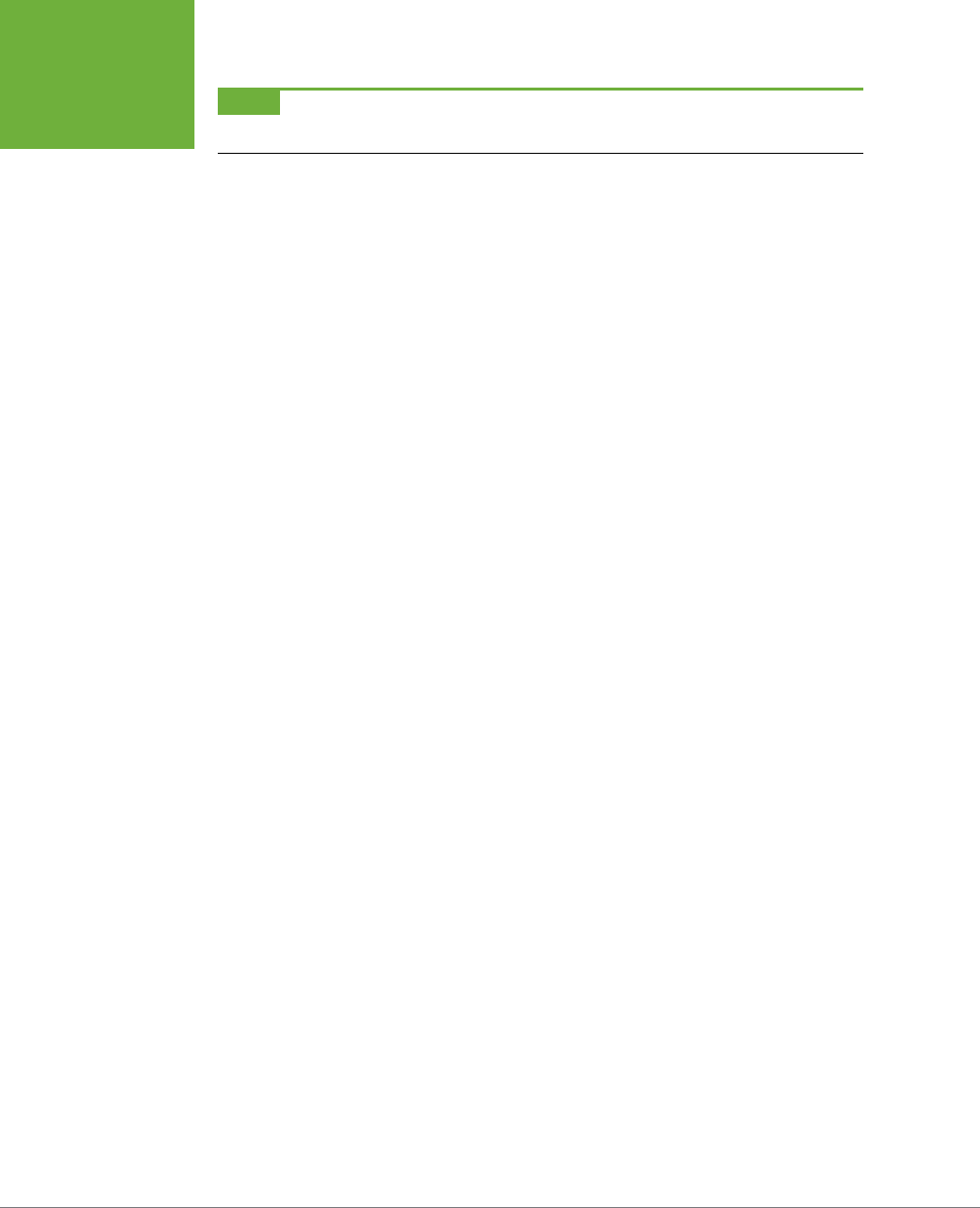
CSS3: THE MISSING MANUAL
536
TUTORIAL:
BUILDING A
PRINT STYLE
SHEET
NOTE In this case,
h1
,
h2
,
p
, and
li
are the only tags that print from the
print.html
page. Your pages may
require you to redefine text sizes for other tags like
blockquote
, other headlines and so on.
Just for fun, add a couple of styles to change the font size of the copyright
notice and add a borderline above it.
3. Add the following two styles:
.footerMain {
margin-top: 15pt;
border-top: 1pt solid #000;
padding-top: 5pt;
}
.footerMain p {
font-size: 9pt !important;
}
The CSS properties in these styles should all be old hat by now. They adjust
space above the footer, add a borderline, add some space between the bor-
der and the copyright, and make the copyright notice text smaller. Notice the
!important declaration in the .footerMain p style. You need to add this because
the p style from Step 2 has !important as well. Because .footerMain p has
greater specificity (see page 114 for more on this concept) than p, its !important
declaration wins out.
Displaying URLs
For a final flourish, you’ll add one more style that prints the URL next to the text of
each link on the page. That way, the onscreen text “Click here to find out more” will
print as “Click here to find out more (
www.outmore.com
)” so anyone reading the
printed version can visit the site referenced by the link. This technique uses some
advanced CSS that Internet Explorer 6 and 7 doesn’t understand, but it doesn’t do
any harm in those browsers, either. And it
is
a great enhancement for visitors who
print from your site with IE 8, 9, and 10, as well as Chrome, Firefox, and Safari.
1. Add one last style to the
print.css
style sheet:
a:after {
content: " (" attr(href) ") ";
}
In the content: line, this style adds the URL (the attr(href) part) at the end
of each link (the a:after part).
2. Save the
print.css
file. In your browser, open
print.html
and print it.
The printed page should look something like Figure 16-5—a simple, barebones,
just-the-facts page.
You’ll find a completed version of the page in the
16_finished
folder.
CHAPTER 16: CSS FOR THE PRINTED PAGE 537
TUTORIAL:
BUILDING A
PRINT STYLE
SHEET
FIGURE 16-5
Its looks aren’t much to
write home about, but this
page’s simplicity makes
it perfect for printing. It’ll
earn you the appreciation
of visitors who are looking
for a clean presentation of
the facts, free from navi-
gation buttons, ads, and
ink-wasting background
images.

539
CHAPTER
17
At this point, this book has covered most aspects of Cascading Style Sheets.
With the addition of CSS-based layout, which you learned about in Part Three,
you’re now an unstoppable web-designing machine. But even after you’ve
mastered all the properties CSS oers, nailed those annoying browser bugs, and
learned great tricks for producing beautiful web pages, you can still stand to learn
a few techniques that’ll make your CSS easier to create, use, and maintain.
This chapter covers some recommendations for creating and using CSS. None of
them count as “must know” CSS essentials, but they can make your CSS work go
faster, leading to less frustration and greater productivity.
Adding Comments
When it’s time to edit a style sheet weeks, months, or even years after creating it,
you may find yourself wondering, “Why did I create that style? What does it do?”
As with any project, when you’re building a website, you should keep notes of what
you did and why. Fortunately, you don’t need a pad of paper to do this. You can
embed your notes right into your style sheets using CSS comments.
A CSS comment is simply a note contained within two sets of characters, /* and */.
As with HTML comments, CSS comments aren’t read or acted on by a web browser,
but they do let you add helpful reminders to your style sheets. You don’t need to
comment
everything
in your style sheets—after all, most properties like color, font-
family, border-color, and so on are self-explanatory. But it’s a good idea to add a
comment for a style when it isn’t immediately obvious what the style or property
Improving Your
CSS Habits
CSS3: THE MISSING MANUAL
540
ADDING
COMMENTS
does. For example, you might reset the CSS box model so that the width and height
of an element is calculated with the border and padding taken into account:
* {
-moz-box-sizing: border-box;
box-sizing: border-box;
}
At the time you wrote the style, you knew what you were doing, but will you still
remember three months later? Or, what if someone who’s not familiar with this trick
needs to edit your CSS at some point? Add a comment and it’ll be easy for you or
someone else who needs to work on the site to figure out what the style does and
why it was created:
/* Reset box model sizing on all elements */
* {
-moz-box-sizing: border-box;
box-sizing: border-box;
}
If you have a lot to say, comments can span multiple lines as well. Just begin with
/*, type all the comments you’d like, then end with */. This is handy when adding
background information at the beginning of a style sheet, as pictured in Figure 17-1.
FIGURE 17-1
CSS comments can help
you identify your styles
for later editing. You can
also use them to provide
helpful introductory infor-
mation that lets you keep
track of the version of the
site or style sheets, add
copyright information, and
identify yourself as the CSS
master behind it all.

CHAPTER 17: IMPROVING YOUR CSS HABITS 541
ORGANIZING
STYLES AND
STYLE SHEETS
Organizing Styles and Style Sheets
You’ve learned a lot in this book about creating styles and style sheets. But when
you’re designing a site that’s meant to last, you can incorporate a few other steps to
help you out in the future. The day will come when you need to change the look of
the site, tweak a particular style, or hand o your hard work to someone else who’ll
be in charge. In addition to leaving notes for yourself and others, a little planning
and organization within your CSS will make things go more smoothly down the road.
Name Styles Clearly
You’ve already learned the technical aspects of naming dierent types of selec-
tors—class selectors begin with a . (period) to identify the styles as a class, and
ID styles begin with the # symbol. In addition, the names you give IDs and classes
must begin with a letter and can’t contain symbols like &, *, or !. But beyond those
requirements, following some rules of thumb can help you keep track of your styles
and work more eciently.
NAME STYLES BY PURPOSE NOT APPEARANCE
It’s tempting to use a name like .redhighlight when creating a style to format eye-
catching, fire-engine-red text. But what if you (or your boss or your client) decide that
orange, blue, or chartreuse look better? Let’s face it: a style named .redhighlight
that’s actually chartreuse is confusing. It’s better to use a name that describes the
purpose
of the style. For example if that “red” highlight is intended to indicate an
error that a visitor made while filling out a form, then use the name .error. When
the style needs to alert the visitor of some important information, a name like .alert
would work. Either way, changing the color or other formatting options of the style
won’t cause confusion because the style’s still intended to point out an error or alert
the visitor—regardless of its color.
Likewise, avoid names that provide exact sizes, like .font20px. While that font may
be 20 pixels today, maybe you’ll make it 24 pixels tomorrow, or switch from pixels
to ems or percentages. Using a tag selector may be a better route: Apply the font
size to an h2 or p tag or even a descendent selector like .sidebar1 p.
DON’T USE NAMES BASED ON POSITION
For the same reason you avoid naming styles by appearance, you should avoid nam-
ing them by position. Sometimes a name like .leftSidebar seems like an obvious
choice—“I want all this stu in a box placed at the left edge of the page!” But it’s
possible that you (or someone else) will want the left sidebar moved to the right,
top, or even bottom of the page. All of a sudden, the name .leftSidebar makes no
sense at all. A name more appropriate to the purpose of that sidebar—like
.news,
.events, .secondaryContent, .mainNav—serves to identify the sidebar no matter
where it gets moved. The names you’ve seen so far in this book—.gallery, .figure,
.banner, .wrapper, and so on—follow this convention.

CSS3: THE MISSING MANUAL
542
ORGANIZING
STYLES AND
STYLE SHEETS
The temptation is to use names like .header and .footer (for elements that always
appear at the top or bottom of the page, for example) since they’re so easily un-
derstood, but you can often find names that are better at identifying the content of
an element—for example, .branding instead of .header. On the other hand, some-
times using a name with position information does make sense. For example, say
you wanted to create two styles, one for floating an image to the left side of a page
and another for floating an image to the right side. Since these styles exist solely to
place an image to the left or right, using that information in the style names makes
sense. So .floatLeft and .floatRight are perfectly legitimate names.
AVOID CRYPTIC NAMES
Names like .s, .s1, and .s2 may save you a few keystrokes and make your files
a bit smaller, but they can cause trouble when you need to update your site. You
could end up scratching your head, wondering what all those weird styles are for.
Be succinct, but clear: .sidebar, .copyright, and
.banner don’t take all that much
typing, and their purpose is immediately obvious.
NOTE You can also learn a lot from checking out the naming conventions used on other sites. The web
inspector built into most browsers gives you a quick way to reveal style names.
Use Multiple Classes to Save Time
Often, two or more items on a web page share many similar formatting properties.
You may want to use the same border styles to create a frame around a bunch of
images on a page, but there may be some formatting dierences between those
items as well. Maybe you want some images to float to the left and have a right
margin, while some photos float to the right and have a left margin (Figure 17-2).
The most obvious solution is to create two class styles, each having the same border
properties but dierent float and margin properties. You then apply one class to
the images that should float left and another to the images that should float right.
But what if you need to update the border style for all of these images? You’ll need
to edit
two
styles, and if you forget one, the images on one side of the page will all
have the wrong frames!
CHAPTER 17: IMPROVING YOUR CSS HABITS 543
ORGANIZING
STYLES AND
STYLE SHEETS
POWER USERS’ CLINIC
CSS Preprocessors
If getting things done efficiently and quickly is your thing,
then take a look at CSS preprocessors. A
preprocessor
is a tool
that takes some code and processes it into a final product. In
the case of CSS, a preprocessor lets you write CSS in a kind of
shorthand version and then process it into a finalized CSS file
that you put on your web server.
CSS preprocessors have quite a few benefits.
• CSS variables. Preprocessors let you define a variable—a
kind of placeholder for information—and use it as a value
in your CSS. For example, say you have a blue color that
you want to use throughout your site. Normally, you’d add
the color in your CSS as a hex or RGB value. When you want
to change that color, you have to find every instance of
the hex value and change it. With a preprocessor, you can
define that color once, at the beginning of the style sheet.
If you want to change the color, just change the variable,
and the color is updated throughout the style sheet.
• CSS3 the easy way. As you read earlier, you often need to
use vendor prefixes when adding newer CSS properties.
This often involves writing four or more lines of code for
a single property like a
linear-gradient
. Most CSS
preprocessors can write the code for you. You usually just
need to write the normal CSS property—
background-
image: linear-gradient(red, blue);
. The
preprocessor then adds all the additional code to work
different browsers.
• Combining style sheets and minifying files. As you’ll read
on page 546, it’s often convenient to break your CSS up
into multiple style sheets. This keeps your CSS in separate,
manageable files of related styles. However, from a web
server performance perspective, it’s best to send as few
files as possible. CSS preprocessors let you keep your CSS
in different files, but then can combine them into a single
external style sheet that your web pages can use. What’s
more, you can strip out extraneous space, CSS comments,
and other characters that aren’t needed to make your CSS
work and add unwanted size to your CSS files.
The two most common CSS preprocessors are LESS (
http://
lesscss.org
) and SASS (
http://sass-lang.com
). There are two
drawbacks to using these. First, they assume that you already
have a really good understanding of CSS. If you’re not perfectly
comfortable with selectors and CSS properties, learning the
sometimes strange syntax of LESS and SASS will probably
only confuse you.
Second, both require some elaborate setup on your computer.
They’re basically small computer programs that run in the
background performing their processing tasks. However, you
can overcome this limitation by using a standalone program
like the free Scout (
http://mhs.github.com/scout-app/
) or the
commercial Compass.app (
http://compass.handlino.com
). They
both run on Windows and Mac and can convert LESS and SASS
files to regular old external style sheets.
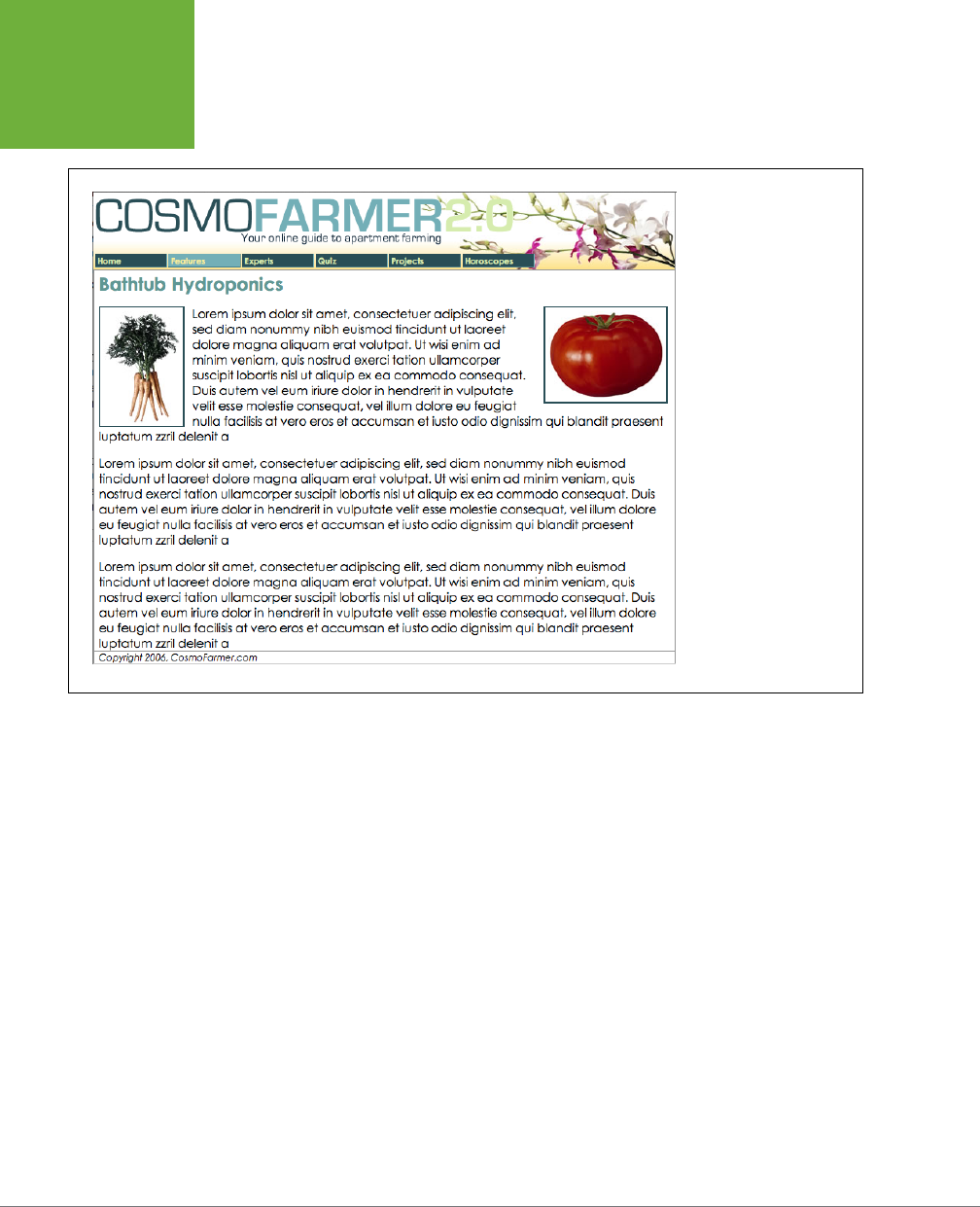
CSS3: THE MISSING MANUAL
544
ORGANIZING
STYLES AND
STYLE SHEETS
FIGURE 17-2
The two photos pictured
here have the same class
style applied to them. This
style provides the border
around the image. In ad-
dition, the left image has
a class style that merely
floats the image left,
whereas the right image
has a different class that
floats it to the right. In
other words, each image
has two classes applied
to it.
There’s a trick that works in all browsers that not all designers take advantage of—
multiple classes
applied to the same tag. This just means that when you use the class
attribute for a tag, you add two (or more) class names like this: <div class="note
alert">. In this example, the <div> tag receives formatting instructions from both
the .note style and the .alert style.
Say you want to use the same border style for a group of images, but some of the
images you want floating left and others you want floating right. You’d approach
the problem like this:
1. Create a class style that includes the formatting properties shared by all
the images.
This style could be called .imgFrame and have a 2-pixel, solid black border
around all four edges.
2. Create two additional class styles, one for the left floated images and an-
other for the right floated images.
For example, .floatLeft and .floatRight. One style would include properties
unique to one set of images (floated left with a small right margin), while the
other style includes properties specific to the second group of images.
CHAPTER 17: IMPROVING YOUR CSS HABITS 545
ORGANIZING
STYLES AND
STYLE SHEETS
3. Apply both classes to each tag, like so:
<img src="photo1.jpg" height="100" class="imgFrame floatLeft">
or
<img src="photo1.jpg" height="100" class="imgFrame floatRight">
At this point, two classes apply to each tag, and the web browser combines the
style information for each class to format the tag. Now if you want to change
the border style, then simply edit one style—.imgFrame—to update the borders
around both the left and right floated images.
NOTE You can list more than two classes with this method; just make sure to add a space between each
class name.
This technique is useful when you need to tweak only a couple of properties of one
element, while leaving other similarly formatted items unchanged. You may want a
generic sidebar design that floats a sidebar to the right, adds creative background
images, and includes carefully styled typography. You can use this style throughout
your site, but the width of that sidebar varies in several instances. Perhaps it’s 33
percent wide on some pages and 25 percent wide on others. In this case, create
a single class style (like .sidebar) with the basic sidebar formatting and separate
classes for defining just the width of the sidebar—for example, .w33per and .w25per.
Then apply two classes to each sidebar: <div class="sidebar w33per">.
Organize Styles by Grouping
Adding one style after another is a common way to build a style sheet. But after a
while, what was once a simple collection of five styles has ballooned into a massive
500-style CSS file. At that point, quickly finding the one style you need to change
is like looking for a needle in a haystack. (Of course, haystacks don’t have a Find
command, but you get the point.) If you organize your styles from the get-go, you’ll
make your life a lot easier in the long run. There are no hard and fast rules for
how
to group styles together, but here are two common methods:
• Group styles that apply to related parts of a page. Group all the rules that
apply to text, graphics, and links in the banner of a page in one place. Then
group the rules that style the main navigation in another, and the styles for the
main content in yet another.
• Group styles with a related purpose. Put all the styles for layout in one group,
the styles for typography in another, the styles for links in yet another group,
and so on.
USING COMMENTS TO SEPARATE STYLE GROUPS
Whichever approach you take, make sure to use CSS comments to introduce each
grouping of styles. Say you collected all the styles that control the layout of your
pages into one place in a style sheet. Introduce that collection with a comment like
this:
CSS3: THE MISSING MANUAL
546
ORGANIZING
STYLES AND
STYLE SHEETS
/* *** Layout *** */
or
/* --------------------------
Layout
--------------------------- */
As long as you begin with /* and end with */, you can use whatever frilly combina-
tion of asterisks, dashes, or symbols you’d like to help make those comments easy
to spot. You’ll find as many variations on this as there are web designers. If you’re
looking for inspiration, then check out how these sites comment their style sheets:
www.wired.com
,
www.mezzoblue.com
, and
http://keikibulls.com
.
TIP For a method of naming comments that makes it easy to find a particular section of a style sheet you’re
editing, check out
www.stopdesign.com/log/2005/05/03/css-tip-flags.html
.
Using Multiple Style Sheets
As you read in Chapter 16, you can create dierent style sheets for dierent types
of displays—maybe one for a screen and another for a printer. But you may also
want to have multiple onscreen style sheets, purely for organizational purposes. This
takes the basic concept from the previous section—grouping related styles—one
step further. When a style sheet becomes so big that it’s dicult to find and edit
styles, it may be time to create separate style sheets that each serve an individual
function. You can put styles used to format forms in one style sheet, styles used
for layout in another, styles that determine the color of things in a third, another
style sheet for keeping your Internet Explorer hacks, and so on. Keep the number
of separate files reasonable since having, say, 30 external CSS files to weed through
may not save time at all. In addition, the more external CSS files, the more requests
your web server has to answer. That’s one source for slower website performance.
At first glance, it may seem like you’ll end up with more code in each web page,
since you’ll have that many more external style sheets to link to or import—one line
of code for each file. Ah, but there’s a better approach: Create a single external style
sheet that uses the @import directive to include multiple style sheets. Figure 17-3
illustrates the concept.
Here’s how to set up this type of arrangement:
1. Create external style sheets to format the dierent types of elements of
your site.
For example, a
color.css
file with styles that control the color of the site, a
forms.css
file that controls form formatting, a
layout.css
file for layout control,
and a
main.css
file that covers everything else (see the right side of Figure 17-3).
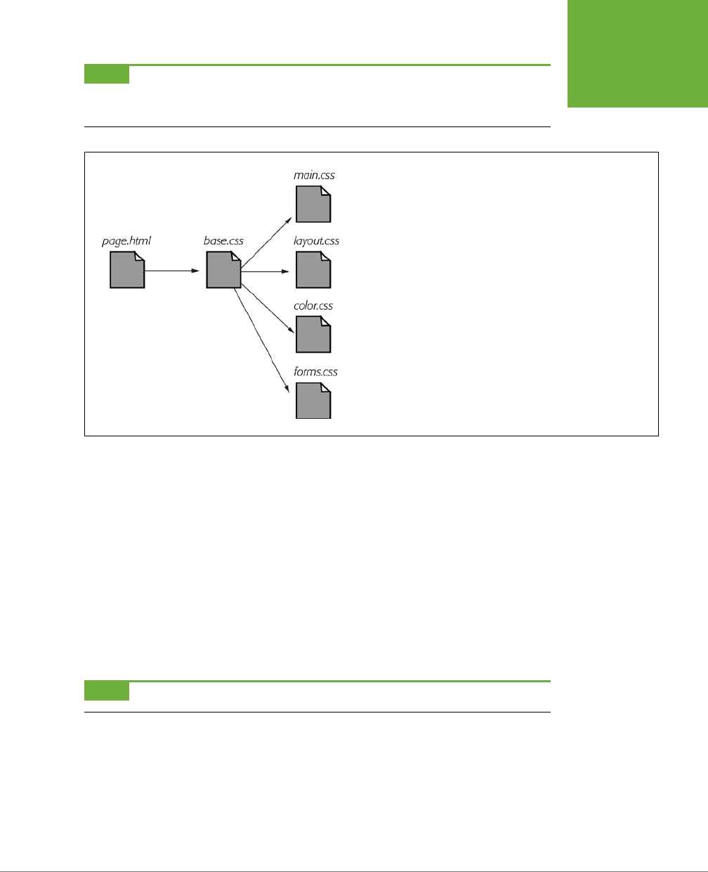
CHAPTER 17: IMPROVING YOUR CSS HABITS 547
ORGANIZING
STYLES AND
STYLE SHEETS
NOTE These suggestions are just a few possibilities. Organize your styles and style sheets in whatever way
seems most logical and works best for you. For more suggestions, check out this article on modular CSS design:
www.contentwithstyle.co.uk/content/modular-css
.
FIGURE 17-3
Let a single external style sheet serve as gatekeeper for your site’s CSS.
Each HTML page in the site can link to a single CSS file (
base.css
in this
example). The HTML never has to change, even if you want to add or
remove additional external style sheets. Just update the
base.css
file
by adding or removing
@import
directives.
2. Create an external style sheet and import each of the style sheets you cre-
ated in Step 1.
You can name this file
base.css
,
global.css
,
site.css
, or something generic like
that. This CSS file won’t contain any rules. Instead use the @import directive to
attach the other style sheets like this:
@import url(main.css);
@import url(layout.css);
@import url(color.css);
@import url(forms.css);
That’s the only code that needs to be in the file, though you may add some
comments with a version number, site name, and so on to help identify this file.
NOTE For a better way to attach an “IE-only” style sheet, see page 559.
3. Finally, attach the style sheet from Step 2 to the HTML pages of your site
using either the <link> tag or the @import method. (See page 42 for more on
using these methods.) For example:
<link rel="stylesheet" href="base.css">
Now, when a web page loads, the browser loads
base.css
, which in turn tells
the browser to load the four other style sheets.

CSS3: THE MISSING MANUAL
548
ELIMINATING
BROWSER
STYLE
INTERFERENCE
It may feel like there’s a whole lot of loading going on here, but once the browser
has downloaded those files and stored them in its cache, it won’t have to retrieve
them over the Internet again. (See the box on the next page.)
There’s another benefit to using a single external style sheet to load several other
style sheets: If you decide later to further divide your styles into additional styles
sheets, then you won’t have to muck around with the HTML of your site. Instead,
just add one more @import directive to that gatekeeper style sheet (see Step 2).
If you decide to take all the styles related to type out of the
main.css
file and put
them in their own
type.css
file, then you won’t need to touch the web pages on your
site. Simply open the style sheet with all of the @import directives in it and add one
more: @import url(type.css).
This arrangement also lets you have some fun with your site by swapping in dierent
style sheets for temporary design changes. Say you decide to change the color of
your site for the day, month, or season. If you’ve already put the main color-defining
styles into a separate
color.css
file, then you can create another file (like
summer_fun
.css
) with a dierent set of colors. Then, in the gatekeeper file, change the @import
directive for the
color.css
file to load the new color style file (for example, @import
url(summer_fun.css)).
Eliminating Browser Style Interference
When you view a web page that hasn’t been “CSS-ified” in a web browser, you can
see that HTML tags already have some minimal formatting: headings are bold, the
<h1> tag is bigger than other text, links are underlined and blue, and so on. In some
cases, dierent web browsers apply slightly dierent formatting to each of these
elements. You may experience some frustrating “it
almost
looks the same in Internet
Explorer and Firefox and Safari” moments.
As discussed on page 115, to deal with these browser dierences, it’s a good idea
to “zero out” the formatting for commonly used tags so your audience can see the
beautiful styling you worked so hard to create (see Figure 17-4). All you have to do
is set up some basic styles at the beginning of your style sheet that remove the
oensive formatting.
Here are some things you may want to do to make browsers stop meddling with
your designs:
• Remove padding and margins. Browsers add top and bottom margins to
most block-level elements—the familiar space that appears between <p> tags,
for example. This can cause some weird display issues like when the exact
margin amount is inconsistently applied across browsers. A better approach
is to remove padding and margins from the block-level tags you use, and then
purposely add the amount you want by creating new styles.
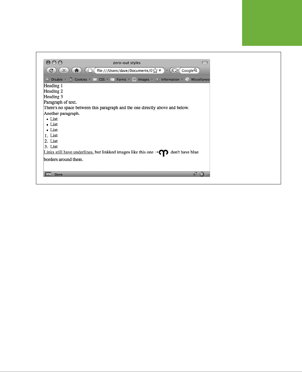
CHAPTER 17: IMPROVING YOUR CSS HABITS 549
ELIMINATING
BROWSER
STYLE
INTERFERENCE
FIGURE 17-4
Doesn’t look like much, and that’s
the point! Eliminate browser dis-
play differences by “zeroing out”
the normal browser styles. Then
create your own—and better—
styles to add margins, padding,
and font sizes that are consistent
across browsers.
• Apply consistent font sizes. While text inside a <p> tag is displayed as 1 em,
web browsers apply dierent sizes to other tags. You can force all tags to be
1em to begin with, and then create additional styles with specific font sizes
for the dierent tags. That way, you stand a much better chance of getting
consistent font sizes across browsers.
• Make sure HTML5 elements are displayed as blocks. New HTML5 elements
like article, aside, and section are block-level elements like headlines and divs.
However, browsers that don’t understand these elements won’t necessarily
display them as blocks. It’s a good idea to add display: block for those ele-
ments. In addition, use the HTML5 shiv (
http://code.google.com/p/html5shiv/
)
as described in the box on page 24, to get IE 8 and earlier to understand any
CSS applied to HTML5 tags.

CSS3: THE MISSING MANUAL
550
ELIMINATING
BROWSER
STYLE
INTERFERENCE
POWER USERS’ CLINIC
A Pain in the Cache
The web browser’s cache is usually every website owner’s
friend. As discussed on page 39, the cache makes sure frequent
visitors to your site don’t have to download the same file over
and over again, which would slow down their experience and
increase your web hosting bills. However, the cache can be
a pain when it’s time to update your site’s appearance. For
example, if all of the pages in your site reference an external
style sheet named
main.css
, then visitors to your site will
cache that file. However, when you update that file with all
new styles and a completely new look and feel for your site,
previous visitors to your site may continue to access the old
style sheet from their hard drive instead of the new
main.css
file you’ve updated.
Eventually, a visitor’s cache will clear and they’ll get the new
CSS file, but you have one simple way to defeat the cache—by
updating the
<link>
tag on each HTML page. Normally a
<link>
tag to an external style sheet looks like this:
<link rel="stylesheet" href="main.css">
However, if you add a query string after the name of the .css
file (for example,
main.css?v=1
), then a web browser will
see the file as
main.css?v=1
and not just
main.css
. If you
change the number after the
v=
whenever you change the
external style sheet, then browsers consider that a new file
and will download the external style sheet from the web server
instead of using the cached site.
For example, suppose when you launch your site, the
main
.css
file is the first version of the site’s CSS. You can then use
this link:
<link rel="stylesheet" href="main.
css?v=1">
Then when you update the
main.css
file, you change the
<link>
to this:
<link rel="stylesheet" type="text/css"
href="main.css?v=2">
The web browser considers this different from the cached ver-
sion of the
main.css
file and downloads the file from the web
server. In reality, the
?v=1
doesn’t do anything—it doesn’t
affect how your web server works, for example. It’s a way of
telling a web browser to redownload the file.
The downside of this technique is that you must update the
<link>
tag for every HTML file on your site. If you’re com-
fortable with PHP, there’s a more automated way to handle
this problem:
http://ikeif.net/2009/03/27/stop-caching-files-
php-function
.
• Set a consistent line height. Browsers can have subtle dierences in the line
height (page 167) values they use by default. By setting a multiplier on the
<body> tag—body { line-height: 1.2; }—you make sure that browsers apply
the same line height. The 1.2 value is equivalent to 120 percent of the tag’s text
size. You can, of course, change this value to match your design sense.
• Improve table borders and create consistent table cells. As you read on
page 380, applying a border to a table cell usually creates an unpleasant gap
between cell borders and doubles up the borders between cells. You should
get rid of both the space and the extra borders. In addition, the <th> and <td>
tag are given dierent alignments and font weights.

CHAPTER 17: IMPROVING YOUR CSS HABITS 551
ELIMINATING
BROWSER
STYLE
INTERFERENCE
• Remove borders from linked images. Some browsers add a colored border
around any image inside of a link. If you’re like most people, you find this border
both unattractive and unnecessary. Remove it and start fresh.
• Set consistent list indents and bullet types. Dierent browsers indent bulleted
and numbered lists in dierent ways, and you’ll even find the type of bullet used
can vary between browsers. It’s good to set a consistent indent and bullet type.
• Remove quote marks from quoted material. If you ever use the <q> tag to
identify a quote (<q>To err is human</q> for example), then you may have
noticed that some browsers (Firefox, Safari) automatically add quote marks
(' ') around the quote and some (Internet Explorer 6 and 7) don’t. And even
within the browsers that do add quote marks, the type of mark added varies;
for example, IE 8 inserts single quotes (' '), while Firefox adds double quotes
(" "). For a consistent presentation, it’s best to remove these quote marks.
To put these ideas into action, here are a few basic styles you can add at the begin-
ning of your style sheet:
/* reset browser styles */
html, body, div, span, object, iframe, h1, h2, h3, h4, h5, h6, p, blockquote,
pre, a, abbr, acronym, address, big, cite, code, del, dfn, em, img, ins, kbd,
q, s, samp,small, strike, strong, sub, sup, tt, var, b, u, i, center, dl, dt,
dd, ol, ul, li, fieldset, form, label, legend,
table, caption, tbody, tfoot, thead, tr, th, td, article, aside, canvas, de-
tails, embed,
figure, figcaption, footer, header, hgroup, menu, nav, output, ruby, section,
summary,
time, mark, audio, video {
margin: 0;
padding: 0;
border: 0;
font-size: 100%;
vertical-align: baseline;
}
article, aside, details, figcaption, figure, footer, header, hgroup, menu,
nav, section {
display: block;
}
body {
line-height: 1.2;
}
table {
border-collapse: collapse;

CSS3: THE MISSING MANUAL
552
ELIMINATING
BROWSER
STYLE
INTERFERENCE
border-spacing: 0;
}
ol {
padding-left: 1.4em;
list-style: decimal;
}
ul {
padding-left: 1.4em;
list-style: square;
}
blockquote, q {
quotes: none;
}
blockquote:before, blockquote:after,
q:before, q:after {
content: '';
content: none;
}
/* end reset browser styles */
The first two styles here are group selectors that apply the same formatting to every
one of the tags listed. Add these styles to the beginning of your style sheet, and
then, further down the style sheet, override them on a case-by-case basis. After
zeroing out the margins and font size for the <h1> tag, you may want to give the
<h1> tag a specific top margin value and font size. Just add another style, like so:
h1 {
margin-top: 5px;
font-size: 2.5em;
}
Thanks to the cascade (see Chapter 5), as long as this h1 style appears in the style
sheet
after
the group selector (the reset style that removes the margins and changes
the font size), the new values take precedence.
You’ll find the file
reset.css
in the
17
folder inside the
tutorials
folder. Just copy the
code from that file into your own style sheets.
NOTE Some designers take a different approach to the problem of inconsistent browser styles. The Normalize.
css project (
http://nicolasgallagher.com/about-normalize-css/
) aims to provide consistent baseline styles while
still retaining the basic differences in HTML tags. For example, instead of making headlines and paragraphs the
same size, Normalize.css keeps headlines at varying sizes. It also includes many other styles aimed at fixing bugs
present in some browsers.
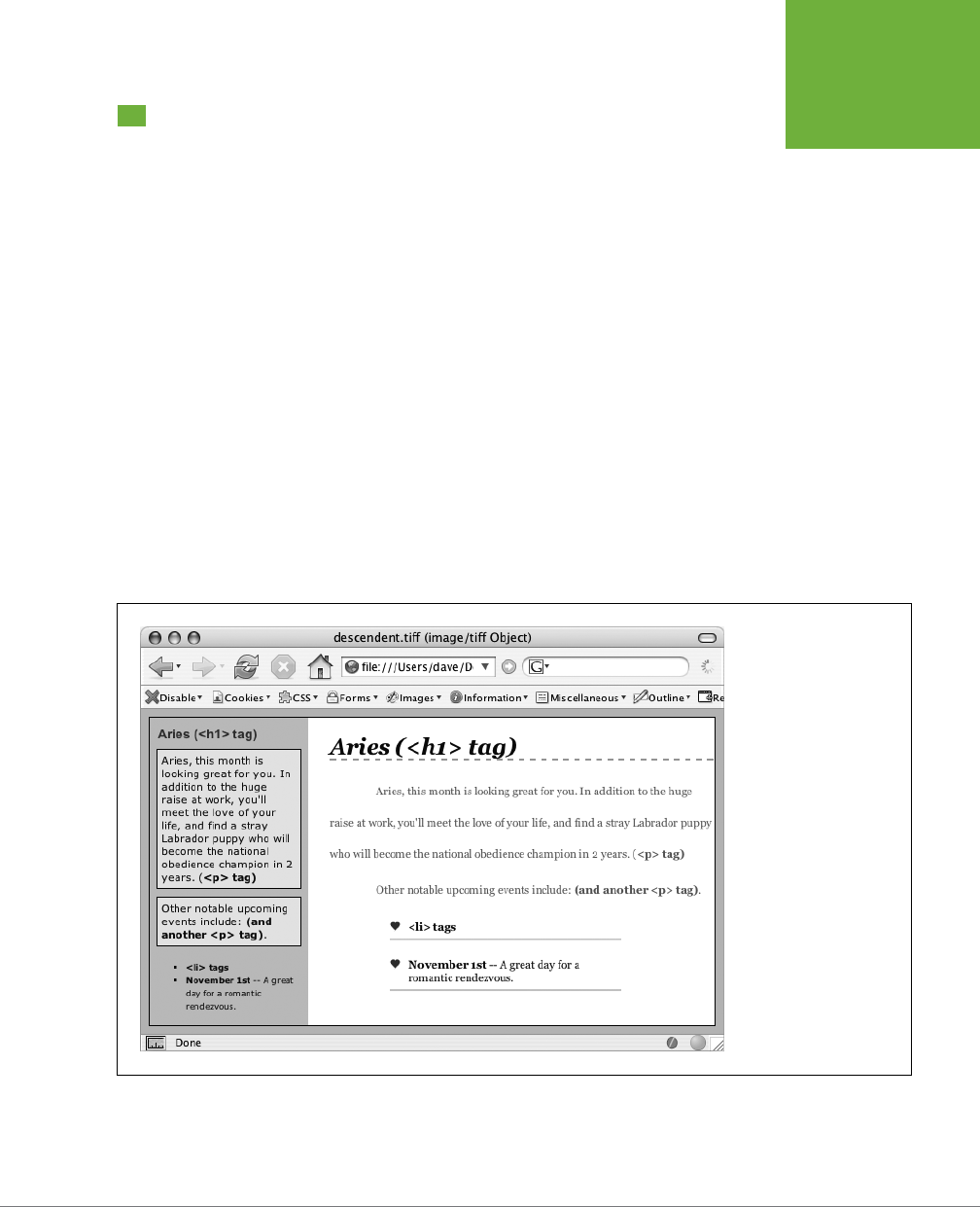
CHAPTER 17: IMPROVING YOUR CSS HABITS 553
USING
DESCENDENT
SELECTORS
Using Descendent Selectors
Classes and IDs are great for marking specific tags for styling. For example, you
can add a class to a paragraph—<p class="intro">—and pinpoint just that one
paragraph with its own look as determined by the .intro class style. Trouble is,
it’s so easy to add a class or ID to a tag, lots of designers tend to add classes and
IDs to
everything
(well, almost everything). The pros even have a diagnosis for this
disease—
classitis
. Adding a class to every tag is not only a waste of your time, it
also makes your HTML slower to download. Most important, there’s a better way
to exert pinpoint control over your tags without resorting to too many classes or
IDs—descendent selectors.
Descendent selectors are a powerful tool for ecient website building. As discussed
in Chapter 3, they let you pinpoint the tags you want to style with greater accuracy
than tag styles, with less work than class styles. Most of the time you want to format
all
the links in a navigation bar the same way, but that doesn’t mean you want to
format all of the links in the entire
page
the same way. What you need is a way to say
(in CSS), “Format
only
the links in the nav bar this way”—without having to apply a
class style to each of those links. In other words, you need the ability to format the
same HTML in dierent ways depending on where it’s located—and that’s exactly
what descendent selectors oer (see Figure 17-5).
FIGURE 17-5
The same HTML was
pasted into both the left
sidebar and the larger
right area of this web
page. By using descendent
selectors, identical HTML
tags (
<h1>
,
<p>
,
<ul>
,
and
<li>
) are formatted
differently based solely on
where they’re located on
the page.

CSS3: THE MISSING MANUAL
554
USING
DESCENDENT
SELECTORS
Compartmentalize Your Pages
One of your biggest allies in using descendent selectors eectively is the <div>
tag. Since this HTML tag lets you create logical
divisions
in a page, you can use it
to identify dierent layout elements like a banner, a sidebar, a column of text, and
so on. As discussed on page 408, you can organize the content of your page into
dierent areas by wrapping HTML in a <div> tag.
Group the title of a story and a list of links used to navigate the story’s pages like this:
<div>
<h2>The CosmoFarmer Revolution</h2>
<ul>
<li><a href="page1.html">Page 1</a></li>
<li><a href="page2.html">Page 2</a></li>
<li><a href="page3.html">Page 3</a></li>
</ul></div>
After adding the <div>, identify it for CSS purposes with a class attribute: <div
class="pullQuote">. When you want to include the same type of layout element
more than once on a page—multiple pull quotes in a single story perhaps—use a class.
Suppose the list of links in the HTML above appears twice on a page—at the begin-
ning of the text and at the end. You’d apply a class to it like this:
<div class="storyNav">
<h2>The CosmoFarmer Revolution</h2>
<ul>
<li><a href="page1.html">Page 1</a></li>
<li><a href="page2.html">Page 2</a></li>
<li><a href="page3.html">Page 3</a></li>
</ul>
</div>
NOTE You don’t always need to add a
<div>
tag to style a group of elements. If the preceding HTML had
only an unordered list of links and didn’t include the
<h2>
tag, then you could just as easily skip the
<div>
tag
and simply add a class to the unordered list:
<ul class="storyNav">
. You could also wrap the
<ul>
tag
in the HTML5
<nav>
tag and apply the class to it.
Once you identify each <div> on a page, it becomes very easy to use a descendent
selector to target tags inside a particular <div>. Say you want to create a unique look
for each of the links in the above HTML. You’d create a descendent selector like this:
.storyNav a {
color: red;
background-color: #ccc;
}
CHAPTER 17: IMPROVING YOUR CSS HABITS 555
USING
DESCENDENT
SELECTORS
Now links will appear as red text on a light gray background, but
only
when they
appear
inside
another tag with the storyNav class applied to it. Best of all, if you
want to add another link (like page4.html) to this list, then you don’t have to lift a
finger to format it like the other links. The browser handles all of that automatically
when it applies the descendent selector.
Formatting other tags inside that <div> is a simple matter of creating a descendent
selector that begins with the class name—.storyNav, for instance—followed by a
space and the tag you want to style. To format the <h2> that appears inside the
<div>, create the descendent selector .storyNav h2.
Identify the Body
Because descendent selectors provide such specific targeting of styles, you can easily
create styles that not only apply to one particular area of a page, but also apply only
to particular
types
of pages on your site. Say you want to style the <h1> tag dier-
ently on the home page than on other pages of the site. An easy way to distinguish
<h1> tags on the home page is to add a class to the <body> tag of the home page:
<body class="home">
You can style the <h1> tag on the home page using a descendent selector: .home
h1. With this technique, you can create entirely dierent looks for any tag on any
particular page of your site (see Figure 17-6). One approach is to identify the sec-
tion of the site each page is in. Say your site is divided into four sections—news,
events, articles, and links. On each page within a section, add either a class or
ID to the <body> tag. So each page in the news section might have the following
HTML: <body class="news">, while pages in the events section would have <body
class="events">.
NOTE Another common CSS technique is to use a class to identify the type of layout you want for a particular
page (like a one-, two-, or three-column design).
One great use for identifying a page’s section in the site is to highlight that section’s
button in a navigation bar. The highlighted button acts as a kind of “you are here”
marker, as shown in Figure 17-6. If a page is in the news section of your site, you can
highlight the “news” button so visitors can tell immediately which section they’re in.
Here’s how to format a navigation button dierently depending on which section
of your site it’s in:
1. Add a class to the <body> tag indicating the section the page is in.
For example, <body class="home">. Do the same thing for each section, so pages
in the news section of the site would have code like this: <body class="news">.
2. Add a navigation bar to the page.
Step-by-step instructions are on page 303.
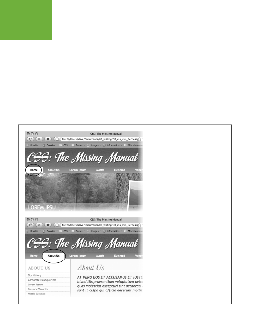
CSS3: THE MISSING MANUAL
556
USING
DESCENDENT
SELECTORS
3. Identify each link within the navigation bar.
For a link to the home page, you might have this code: <a href="/index.html"
class="homeLink">Home</a>. The class lets you identify that particular link as
the one going to the home page. Repeat for the other links: <a href="/news/"
class="newsLink">News</a> and so on.
At this point, you have enough information in your HTML to uniquely format
each section’s link using CSS. In this example, you know that the Home page
link is nested inside a <body> tag with the class of home
only
on the Home page.
4. Create a descendent selector to format each section’s link dierently when
the link is inside a page for that section.
For the home page in this example, the descendent selector would look like this:
.home .homeLink
FIGURE 17-6
Using descendent selectors, you can highlight a button
in a navigation bar simply by changing the class
applied to the
<body>
tag. In this example, when
the body tag has the class
home
applied to it, the
Home button lights up (circled, top). Change the class
to
about
, and the About button highlights (circled,
bottom).

CHAPTER 17: IMPROVING YOUR CSS HABITS 557
USING
DESCENDENT
SELECTORS
This selector formats the #homeLink only when it’s inside another tag with the
ID #home. In most cases, you’ll want the look of the “you are here” button to be
the same for each section of the site, so you can use a group selector (page 62)
to group all the descendent selectors for each section’s button. That way, you
can apply the same formatting to each button without creating separate rules
for each button. A group selector to highlight the current section’s navigation
button with a light yellow background may look like this:
.home .homeLink,
.news .newsLink,
.articles .articlesLink,
.links .linksLink {
background-color: #FBEF99;
}
TIP When creating a group selector that includes several descendent selectors, keep each selector on its
own line as in this example. This way, it’s easier to identify each selector in the group when you need to go back
and edit your style sheet.
Using the same technique, make additional styles to apply dierent looks for the
links when you hover over them, click them, or when they’ve been visited. See page
68 for the details.
These few examples are just some of the ways you can take advantage of descendent
selectors. They can make your style sheets a little more complex. You’ll have styles
like .home .navbar a, for example, instead of a simple class like .navLink. But once
the styles are set up, you’ll need to do very little further formatting. HTML pasted
into dierent areas of the page automatically gets formatted in strikingly dierent
ways. Almost like magic.
CSS3: THE MISSING MANUAL
558
TRYING
DIFFERENT CSS
FOR INTERNET
EXPLORER
POWER USERS’ CLINIC
Object Oriented CSS
Object Oriented CSS is another approach to organizing and
using CSS. The term was coined by CSS expert Nicole Sullivan
and the approach was developed to respond to the complex-
ity of very large sites with a wide variety of HTML structures.
On large sites, you might end up having really different HTML
containing similar types of information.
For example, in one case you might use a bulleted list to display
a name, info, and photo for a list of contacts. But on another
page you might use the
<article>
tag for each contact.
Say you wanted to format those elements similarly because
they really are the same type of information. If you use CSS
styles that depend on that HTML, you could end up with either
duplicate styles or group selectors like this:
article img, li img {
/* formatting info here */
}
Object Oriented CSS recommends abandoning any CSS that’s
tied to actual HTML elements and instead use classes. In other
words, you’d apply class names throughout your HTML and
then use CSS class styles to format then. In this way it doesn’t
matter what HTML tags you use. As long as they use the same
classes, they’ll look the same.
This may sound a lot like the “classitis” problem described on
page 111, and in a sense, it is. Object Oriented CSS does require
adding lots of class attributes to your HTML. If you’re using a
content management system like WordPress, then this might
not be much work—you can add the class names into the
template files. But if you’re building every page by hand, this
approach could add a lot of work.
For a quick introduction to Object Oriented CSS, read
http://
coding.smashingmagazine.com/2011/12/12/an-introduction-
to-object-oriented-css-oocss/
. You can find the OOCSS project
at
https://github.com/stubbornella/oocss
.
Another related approach from Jonathon Snook, called Scalable
and Modular Architecture for CSS (or SMACSS), is a simpler
style guide for creating reusable CSS components. You can
read more about it at
http://smacss.com
. You can also find a
bunch of videos discussing SMACSS at
http://tv.adobe.com/
watch/adc-presents/smacss-introduction-to-a-scalable-and-
modular-architecture-for-css/
.
Trying Dierent CSS for Internet Explorer
Browsers don’t always behave the way you, or the rules of CSS, expect. Browsers
like Safari, Firefox, and Internet Explorer 10 handle CSS quite well and display CSS-
based web pages consistently and predictably. Getting your designs to work in
Internet Explorer 7, 8, and even 9 for Windows can be more of a challenge. Although
these browsers are old by today’s standards, they still make up the majority of web
browsers in use.
It’s not uncommon to create styles that aim to fix just particular versions of Internet
Explorer. The zoom property discussed on page 428, for example, solves some prob-
lems that plague IE 7 and earlier. Internet Explorer 8 and earlier don’t understand
how to properly format HTML5 tags. One solution is to send certain content like
style sheets, JavaScript and even HTML to just Internet Explorer. In fact, you can
target specific versions of Internet Explorer to send dierent code to each version.
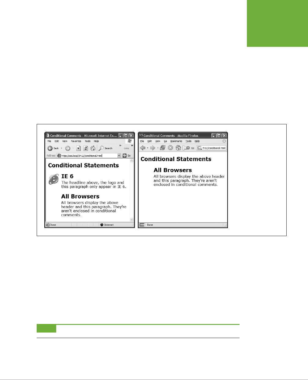
CHAPTER 17: IMPROVING YOUR CSS HABITS 559
TRYING
DIFFERENT CSS
FOR INTERNET
EXPLORER
You can collect IE-only styles in a single place by using Internet Explorer’s
conditional
comments
feature (Figure 17-7). This Microsoft invention provides a way of inserting
HTML that only Internet Explorer understands. Other browsers simply see the code
as an HTML comment and ignore it.
Conditional comments can even target dierent versions of IE. You can put all of
your IE 7–only styles in a single external style sheet (like
IE7_styles.css
) and use a
conditional comment to link it to IE 7 browsers only. This approach also makes it a
snap to eliminate those styles when IE 7 finally goes the way of the dinosaurs. Just
remove the external style sheet. Your non-IE visitors will benefit, too. When you use
conditional comments, other browsers don’t download those external style sheets
at all. As a result, your site opens and runs faster for these lucky folks.
FIGURE 17-7
With Internet Explorer’s
conditional comments
feature, you can apply IE-
specific style sheets full of
your IE hacks. Conditional
comments let you have
some HTML appear only
in a particular version of
Internet Explorer (left).
Other browsers simply
ignore the HTML inside the
comment (right).
Here’s the basic structure of a conditional comment:
<!--[if IE]>
Some HTML code that only applies to IE goes here.
<![endif]-->
The <!--[if IE]> is the
condition
itself. It translates to: “If this browser is Internet
Explorer, then process the following HTML.” So any Internet Explorer browser acts
on the HTML that comes after this line of code and stops when it gets to the <![en-
dif]--> statement. In this way, you can add any HTML—text, images, styles, and
even links to external style sheets—to Internet Explorer only.
NOTE Non-IE browsers simply view conditional statements as HTML comments and ignore them.

CSS3: THE MISSING MANUAL
560
TRYING
DIFFERENT CSS
FOR INTERNET
EXPLORER
Targeting Dierent Versions of IE
Conditional comments also let you specify which
version
of Internet Explorer the
style sheet applies to. Say you want to have a particular style sheet load only for
Internet Explorer 7. Add the following conditional comment to your web page’s head:
<!--[if IE 7]>
<link href="IE7_styles.css" rel="stylesheet" >
<![endif]-->
Or, using the @import method:
<!--[if IE 7]>
<style>
@import url(IE7_styles.css)
</style>
<![endif]-->
This targets IE 7 in particular and won’t apply to any earlier version. However, you
sometimes want to include other versions. For example, you might create a style
sheet that applies to Internet Explorer 6, 7, and 8. In this case, you can use lte, which
stands for “less than or equal to,” so lte IE 8 means “if this browser is version 8
or earlier of Internet Explorer”:
<!--[if lte IE 8]>
<link href="IE_styles.css" rel="stylesheet">
<![endif]-->
Add any conditional comments
after
any other linked style sheets. Most IE hacks
tend to redefine styles already present in the style sheet—styles that work for other
browsers. And due to the nature of the cascade, rules defined later in a page can
override earlier defined styles. To make sure your redefined IE-only styles success-
fully take hold in Internet Explorer, they should appear after any other style sheets
attached to the page.
Here’s the code you might use to link: a style sheet for all browsers, a style sheet
just for IE 8, and a style sheet for IE 7 and earlier:
<link href="global_styles.css" rel="stylesheet" type="text/css" />
<!--[if IE 8]>
<link href="IE8_styles.css" rel="stylesheet" type="text/css" />
<![endif]-->
<!--[if lte IE 7]>
<link href="IE_old_styles.css" rel="stylesheet" type="text/css" />
<![endif]-->
NOTE For more information on Internet Explorer’s conditional comments, visit the source:
http://msdn.
microsoft.com/en-us/library/ms537512(VS.85).aspx
.


563
APPENDIX
A
Mastering Cascading Style Sheets involves knowing how to use a large number
of CSS properties that control the appearance of text, images, tables, and
forms. To help you in your quest, this appendix gives you a summary of com-
mon properties and values you’ll use to create your own styles. This list covers nearly
all of the CSS 2.1 standard properties—the ones that most web browsers support—as
well as a handful of the most useful and commonly supported CSS3 properties.
NOTE The latest CSS specification is really quite large. In fact, to better manage the growth of CSS, the W3C
split CSS into many modules—each module describes a particular property or set of related properties. For full
details straight from the horse’s mouth, visit the latest CSS specifications from the World Wide Web Consortium
at
www.w3.org/Style/CSS/current-work
.
CSS Values
Every CSS property has a corresponding value. The color property, which formats
font color, requires a color value to specify which color you want to use. The property
color: #FFFFFF; creates white text. Dierent properties require dierent types of
values, but they come in four basic categories: colors, lengths and sizes, keywords,
and URLs.
Colors
You can assign colors to many dierent properties, including those for font, back-
ground, and borders. CSS provides several dierent ways to specify color.
CSS Property Reference
CSS3: THE MISSING MANUAL
564
CSS VALUES
KEYWORDS
A web color keyword is simply the name of the color, like white or black. There
are currently 17 recognized web color keywords: aqua, black, blue, fuchsia, gray,
green, lime, maroon, navy, olive, orange, purple, red, silver, teal, white, and yel-
low. Some browsers accept more keywords, and CSS3 promises to oer many more
in the future: for one example, RGBA color, see page 155. You can read a lot more
about CSS3 at
www.w3.org/TR/css3-color
.
RGB VALUES
Computer monitors create colors using a mixture of red, green, and blue light. These
RGB values can create (nearly) the full spectrum of color. Almost every design, il-
lustration, and graphics program lets you specify colors, using RGB, so it’s easy to
transfer a color from one of those programs to a CSS property. CSS represents RGB
values in several ways:
• Hex values. The method most commonly used on the Web for identifying color,
hex color values consist of three two-character numbers in the hexadecimal
(that is, base 16) system. #FF0033 represents an RGB value composed of red
(FF, which equals 255 in normal, base 10 numbers), green (00), and blue (33).
The # tells CSS to expect hex numbers ahead, and it’s required. If you leave o
the #, a web browser won’t display the correct color.
TIP If all three two-digit values are repeated pairs of digits, you can shorten the hex value by using just the
first number of each pair. For example, #361 means the same thing as #336611.
• RGB percentages. You can also specify a color using percentage values, like this:
rgb(100%, 0%, 33%). You can get these numbers from image-editing and design
programs that can define colors by using percentages (which is most of them).
• Integer values. Finally, you can use integer RGB values to specify a color. The
format is similar to the percentage option, but you use a number from 0 to 255
to indicate each color: rgb(255, 0, 33).
• RGBA. RGBA adds transparency to the mix. That is, you can make the color
see-through so underlying background colors, images, or text show through.
You add a value of 0 (completely invisible) to 1 (totally opaque) to the end of an
RGB color. You can use either the percentage or decimal values for the colors,
but only use decimal values for the transparency. For example, both of these
creates a middle gray color that’s 50 percent transparent:
rgba(50%,50%,50%,.5)
rgba(122,122,122,.5)

APPENDIX A: CSS PROPERTY REFERENCE 565
CSS VALUES
• HSL stands for hue, saturation, and lightness (also sometimes labeled lu-
minance). It’s yet another way to specify color. It’s not supported by Internet
Explorer 8 or earlier, but works in all other browsers. If you’re used to RGB or
Hex colors, you may find the HSL syntax is a bit unusual. Here’s an example of
a bright red color:
hsl(0, 100%, 50%);
The first number (
hue
) is a degree value from 0 to 360 representing the spec-
trum of colors in a color wheel, with 0 and 360 both representing red and 180
representing green. The second number is
saturation
, or how pure the color is,
specified in a percentage from 0% (dull grey) to 100% (vibrant). The last value
is
lightness
and it’s also specified as a percentage from 0% (completely black)
to 100% (completely white). As with RGB color, there is a version of HSL that
supports transparency, called HSLA: hsla(0, 100%, 50%, .5).
It doesn’t matter which method you use—they all work. For consistency, you may
want to pick one way of specifying RGB values and stick with it. However, using
keywords like white and black can be quick and convenient. The Windows and Mac
operating systems both have color pickers that let you find the perfect color from
a palette of millions, and then show you the RGB value. Alternatively, you can use
this free online color picker:
www.ficml.org/jemimap/style/color/wheel.html
. Or for
more advanced color picking (including the ability to create and save a palette of
colors), check out
http://kuler.adobe.com
.
Lengths and Sizes
CSS provides many dierent ways to measure the size of type, the width of a box,
or the thickness of a borderline. To indicate type size, you can use inches, picas,
points, centimeters, millimeters, em-heights, ex-heights, pixels, and percentages.
However, even though there are a lot of options, most don’t apply to the world of
onscreen display, for reasons discussed on page 155. You really need to think about
these three only—pixels, ems, and percentages.
PIXELS
A pixel is a single dot on a computer screen. Pixels give you a consistent method
of identifying lengths and font sizes from computer to computer: 72 pixels on one
monitor is 72 pixels on another monitor. That doesn’t mean the actual, real-world
length is the same for everyone, though. Since people set their monitors to dier-
ent resolutions—800 x 600, 1024 x 768, 1600 x 1200, or whatever—72 pixels may
take up 1 inch on one monitor, but only half an inch for someone else. Nevertheless,
pixels give you the most consistent control over presentation.
NOTE There’s just one drawback to using pixels: Folks using Internet Explorer 6 or earlier can’t resize any
type that’s sized using pixels. If your text is too small for someone’s eyes, the visitor won’t be able to enlarge it
to make it more readable. (See page 158 for more on pixel measurements.)

CSS3: THE MISSING MANUAL
566
CSS VALUES
EMS
Originally from the typographic world, an
em
is a unit that represents the height of
the capital letter M for a particular font. In web pages, 1em is the height of the web
browser’s base text size, which is usually 16 pixels. However, anyone can change that
base size setting, so 1em may be 16 pixels for one person, but 24 pixels in someone
else’s browser. In other words, ems are a relative unit of measurement.
In addition to the browser’s initial font-size setting, ems can inherit size information
from containing tags. A type size of .9em would make text about 14 pixels tall on
most browsers with a 16 pixel base size. But if you have a <p> tag with a font size of
.9ems, and then a <strong> tag with a font size of .9ems inside that <p> tag, that
<strong> tag’s em size isn’t 14 pixels—it’s 12 pixels (16 x .9 x .9). So keep inheritance
in mind when you use em values.
PERCENTAGES
CSS uses percentages for many dierent purposes, like sizing text, determining
the width or height of an element, and specifying the placement of an image in the
background of a style, to name a few. Now, what you’re taking a percentage
of
var-
ies from property to property. For font sizes, the percentage is calculated based on
the text’s inherited value. Say the general font size for a paragraph is 16 pixels tall.
If you created a style for one special paragraph and set its font size to 200%, that
text is displayed at 32 pixels tall. When applied to width, however, percentages are
calculated based on the width of the page or on the width of the nearest parent ele-
ment. You specify a percentage with a number followed by the percent sign: 100%.
Keywords
Instead of color or size, many properties have their own specific values that aect how
the properties display and are represented by keywords. The text-align property,
which aligns text on screen, can take one of four keywords: right, left, center, and
justify. Since keywords vary from property to property, read the property descrip-
tions that follow to learn the keyword appropriate to each property.
One keyword, however, is shared by all properties—inherit. This keyword lets
you force a style to inherit a value from a parent element. You can use the inherit
keyword on any property. This keyword gives you the power to make styles inherit
properties that aren’t normally inherited from parent tags. For instance, say you use
the border property to add a border around a paragraph. Other tags, such as <em>
and <strong>, inside the <p> tag don’t inherit this value, but you can force them to
do so with the inherit keyword:
em, strong {
border: inherit;
}
That way, the <em> and <strong> tags display the same border value as their parent
<p> tag. So the <em> and <strong> elements of the paragraph each get their own
borders, as does the entire paragraph, so you’d end up with boxes within boxes (a
good reason why that property
isn’t
inherited normally). If you change the <p> tag’s
APPENDIX A: CSS PROPERTY REFERENCE 567
TEXT
PROPERTIES
border value to
a dierent color or thickness
, the <em> and <strong> tags inherit
that value and display the same type of border, too.
NOTE The
border
property isn’t a very useful example, mainly because
inherit
isn’t a very useful
value. But this wouldn’t be a Missing Manual if it didn’t give you all the facts.
URLs
URL values let you point to another file on the Web. For example, the background-
image property accepts a URL—the path to the file on the Web—as its value, which
lets you assign a graphic file as a background for a page element. This technique
is handy for adding a tiling image in the background of a page or using your own
graphic for bulleted lists (see page 176).
In CSS, you specify n URL like this: url(images/tile.gif). A style that adds an im-
age called
tile.gif
to the background of the page would look like this:
body { background-image: url(images/tile.gif); }
Unlike in HTML, in CSS, quotes around the URL are optional, so url("images/tile.
gif"), url('images/tile.gif'), and url(images/tile.gif) are equivalent.
NOTE The URL itself is just like the HTML
href
attribute used for links, meaning you can use an absolute URL
like
http://www.missingmanuals.com/images/tile.gif
, a root-relative path like
/images/tile.gif
, or a document-
relative URL like
../../images/tile.gif
. See page 244 for the full story on these kinds of paths.
Text Properties
The following properties aect how text is formatted on a web page. Since most
of the properties in this category are inherited, you don’t necessarily have to apply
them to tags specifically intended for text (like the <p> tag). You can apply these
properties to the <body> tag, so that other tags inherit and use the same settings.
This technique is a quick way to define an overall font, color, and so on for a page
or section.
color (inherited)
Sets the color of text. Since it’s inherited, if you set the color of the <body> tag to
red, for example, all text inside of the body—and all other tags inside the <body>
tag—is red, too.
• Values: any valid color value
• Example: color: #FFFF33;
NOTE The preset link colors for the
<a>
tag override color inheritance. In the above example, any links
inside the
<body>
tag would still be standard hyperlink blue. See page 115 for ways to change preset link colors.
CSS3: THE MISSING MANUAL
568
TEXT
PROPERTIES
font (inherited)
This is a shortcut method for cramming the following text properties into a single
style declaration: font-style, font-variant, font-weight, font-size, line-height,
and font-family. (Read on for the individual descriptions.)
You must separate each value by a space and include at least font-size and font-
family,
and
those two properties must be the last two items in the declaration. The
others are optional. If you don’t set a property, the browser uses its own preset
value, potentially overriding inherited properties.
• Values: Any value that’s valid for the specific font property. When including a
line height, add a slash followed by the line height after the font size like this:
1.25em/150%.
• Example: font: italic small-caps bold 1.25em/150% Arial, Helvetica,
sans-serif;
font-family (inherited)
Specifies the font the browser should use to display text. Fonts are usually specified
as a series of three to four options to accommodate the fact that a particular font
may not be installed on a visitor’s computer. See page 129.
• Values: A comma-separated list of font names. When a font has a space in its
name, surround that font name with quotes. The last font listed is usually a ge-
neric font type instructing browsers to choose a suitable font if the other listed
fonts aren’t available: serif, sans-serif, monotype, fantasy, or cursive.
• Example: font-family: "Lucida Grande", Arial, sans-serif;
NOTE All browsers let you specify additional fonts that you either keep on your web server or your visitors’
browsers download from a web font service. See page 132 for a detailed description of using web fonts.
font-size (inherited)
Sets the size of text. This property is inherited, which can lead to some weird behav-
iors when using relative length measurements like percentages and ems.
• Values: Any valid CSS measurement unit (page 158), plus the following key-
words: xx-small, x-small, small, medium, large, x-large, xx-large, larger, and
smaller. Medium represents the web browser’s normal, preset font size, and
the other sizes are multiples of medium.
Each of the other options decreases or increases the size by a dierent factor.
While each size change is supposed to be a consistent increase or decrease
from the previous size, it isn’t. Basically, xx-small is the equivalent of 9 pixels
(assuming you haven’t adjusted the base font size in your browser); x-small is 10
pixels; small is 13 pixels; large is 18 pixels; x-large is 24 pixels; and xx-large is
32 pixels. Due to the uncertainty of how each browser handles these keywords,
many designers use pixels, ems, or percentages instead.

APPENDIX A: CSS PROPERTY REFERENCE 569
TEXT
PROPERTIES
• Example: font-size: 1.25em;
font-style (inherited)
Makes text italic. Applied to italic text, it turns it back to plain text. The options
italic and oblique are functionally the same.
• Values: italic,
oblique,
normal
• Example: font-style: italic;
font-variant (inherited)
Makes text appear in small caps, like this: sPeCial Presentation. The value normal
removes small caps from text already formatted that way.
• Values: small-caps,
normal
• Example: font-variant: small-caps;
font-weight (inherited)
Makes text bold or removes bolding from text already formatted that way.
• Values: CSS actually provides 14 dierent font-weight keywords, but only a
couple actually work with today’s browsers and computer systems—bold and
normal.
• Example: font-weight: bold;
letter-spacing (inherited)
Adjusts the space between letters to spread out letters (adding spacing between
each) or cram letters together (removing space).
• Values: Any valid CSS measurement unit, though ems and pixels are most
common. For this property, percentages don’t work in most browsers. Use a
positive value to increase the space between letters and a negative value
to remove space (scrunch letters together). The value normal resets letter-
spacing to its regular browser value of 0.
• Examples: letter-spacing: -1px; letter-spacing: 2em;
line-height (inherited)
Adjusts space between lines of text in a paragraph (often called line spacing in
word-processing programs). The normal line height is 120 percent of the size of the
text (page 167).
• Values: Most valid CSS lengths (page 158), though ems and pixels and percent-
ages are most common.
• Example: line-height: 200%;

CSS3: THE MISSING MANUAL
570
TEXT
PROPERTIES
text-align (inherited)
Positions a block of text to the left, right, or center of the page or container element.
• Values: left, center, right, justify (the justify option often makes text
dicult to read on monitors).
• Example: text-align: center;
text-decoration (inherited)
Adds lines above, under, and/or through text. Underlining is common with links, so
it’s usually a good idea
not
to underline text that isn’t a link. The color of the under-
line, overline, or strike-through line is the same as the font color of the tag being
styled. The property also supports a blink value that makes text flash o and on
obnoxiously (but most browsers ignore blink anyway).
• Values: underline, overline, line-through, blink, none. The
none
value turns
o all decoration. Use this to hide the underline that normally appears under
links. You can also add multiple decorations by listing the name of each type
(except
none
) separated by a space.
• Example: text-decoration: underline overline line-through;
text-indent (inherited)
Sets the indent size of the first line of a block of text. The first line can be indented
(as in many printed books) or outdented, so that the first line hangs o and over
the left edge of the rest of the text.
• Values: Any valid CSS measurement unit. Ems and pixels are most common;
percentages behave dierently than with the font-size property. Here, per-
centages are based on the width of the box containing the text, which can be
the width of the entire browser window. So 50% would indent the first line half
of the way across the window. To outdent (hang the first line o the left edge),
use a negative value. This technique works well in conjunction with a positive
margin-left property, which indents the left side of the other lines of text a
set amount.
• Example: text-indent: 3em;
text-shadow (inherited)
Lets you add a drop shadow to any text.
• Values: Two measurement values (ems or pixels) for horizontal and vertical
oset, a value for the amount of blur applies to the text, and a color value. For
the horizontal oset, a negative number places the shadow to the left of the
text, a positive value to the right. For vertical oset, a negative number moves
the shadow above the text, and positive value places it below. Each value is
separated from the next by a space. You can also add multiple shadows by
adding additional shadow values separated by a comma.

APPENDIX A: CSS PROPERTY REFERENCE 571
TEXT
PROPERTIES
• Examples:
text-shadow: -4px 4px 3px #999999;
text-shadow: -4px 4px 3px #999999
2px 3px 10px #000;
text-transform (inherited)
Changes the capitalization of text, so text appears in all uppercase letters, all low-
ercase, or only the first letter of each word capitalized.
• Values: uppercase, lowercase, capitalize, none. The none option returns the
text to whatever case is in the actual HTML code. If
aBCDefg
are the actual
letters typed in HTML, then none removes any other inherited case set by an
ancestor tag and displays
aBCDefg
onscreen.
• Example: text-transform: uppercase;
vertical-align
Sets the baseline of an inline element relative to the baseline of the surrounding con-
tents. With it, you can make a character appear slightly above or below surrounding
text. Use this to create superscript characters like ™, ®, or ©. When applied to a table
cell, the values top, middle, bottom, and baseline control the vertical placement of
content inside the cell.
• Values: baseline, sub, super, top, text-top, middle, bottom, text-bottom, a
percentage value, or an absolute value (like pixels or ems). Percentages are
calculated based on the element’s line-height value.
• Examples:
vertical-align: top;
vertical-align: -5px;
vertical-align: 75%;
white-space
Controls how the browser displays space characters in the HTML code. Normally, if
you include more than one space between words—“Hello Dave”—a web browser
displays only one space—“Hello Dave.” You can preserve any white space exactly
as is in the HTML by using the pre value, which does the same as the HTML <pre>
tag. In addition, web browsers will split a line of text at a space, if the line won’t fit
within the window’s width. To prevent text from wrapping, use the nowrap value.
But the nowrap value makes
all
the paragraph’s text stay on one line, so don’t use
it with long paragraphs (unless you like the idea of making your visitors scroll end-
lessly to the right).
• Values: nowrap, pre, normal. Two other values—pre-line and pre-wrap—don’t
work in many browsers.
• Example: white-space: pre;
CSS3: THE MISSING MANUAL
572
LIST
PROPERTIES
word-spacing (inherited)
Works like the letter-spacing property (page 569), but instead of letters, it adjusts
space between words.
• Values: Any valid CSS measurement unit, though ems and pixels are most com-
mon; percentages don’t work in most browsers. Use a positive value to increase
the space between words and a negative value to remove space (scrunch words
together). The value normal resets word spacing to its regular browser value of 0.
• Examples: word-spacing: -1px; word-spacing: 2em;
List Properties
The following properties aect the formatting of bulleted lists (<ul>) and numbered
lists (<ol>). (See page 173 for more on using CSS with lists.)
list-style (inherited)
This property is a shorthand method of specifying the three properties listed next.
You can include a value for one or more of those properties, separating each by a
space. You can even use this property as a shortcut for writing a single property
and save a couple of keystrokes: list-style: outside, instead of list-style-
position: outside. If you specify both a type and an image, a web browser will
display the bullet type (disc, square, and so on)
only
if it can’t find the image. This
way, if the path to your custom bullet image doesn’t work, you don’t end up with a
bulletless bulleted list.
• Values: Any valid value for list-style-type, list-style-image, and/or list-
style-position.
• Example: list-style: disc url(images/bullet.gif) inside;
list-style-image (inherited)
Specifies an image to use for a bullet in a bulleted list.
• Values: A URL value or none.
• Example: list-style-image: url(images/bullet.gif);
NOTE The
background-image
property does the custom bullet job just as well and offers more control
(see page 240).
list-style-position (inherited)
Positions the bullets or numbers in a list. These markers can appear outside of the
text, hanging o to the left, or inside the text (exactly where the first letter of the
first line normally begins). The outside position is how web browsers normally
display bullets and numbers.

APPENDIX A: CSS PROPERTY REFERENCE 573
PADDING,
BORDERS, AND
MARGINS
• Values: inside, outside
• Example: list-style: inside;
list-style-type (inherited)
Sets the type of bullet for a list—round, square, roman numeral, and so on. You can
even turn an unordered (bulleted) list into an ordered (numbered) list by changing
the list-style-type property. Use the none option to completely remove bullets
or numbers from the list.
• Values: disc, circle, square, decimal, decimal-leading-zero, upper-alpha,
lower-alpha, upper-roman, lower-roman, lower-greek, none
• Example: list-style-type: square;
Padding, Borders, and Margins
The following properties control the space around an element, and let you add
border lines to a style.
box-shadow Adds a shadow around a box element.
• Values: An optional value—inset—adds a drop shadow inside an element, fol-
lowed by four measurement values and a color. The first two measurement values
(ems or pixels) are for horizontal and vertical oset; the third value specifies
the amount of blur applied to the box; the fourth value, which is optional, adds
a “spread” to the shadow, making the shadow wider. For the horizontal oset,
a negative number places the shadow to the left of the box, a positive value to
the right. For vertical oset, a negative number moves the shadow above the
box, and positive value places it below. Each value is separated from the next
by a space. You can also add multiple shadows by adding additional shadows
values separated by a comma.
• Example:
box-shadow: -4px 4px 3px #999999;
box-shadow: inset 4px 4px 3px 5px #999999;
box-shadow: inset 4px 4px 3px 5px #999999
2px 2px 5px black;
border
Draws a line around the four edges of an element.
• Values: The width (thickness) of the border line in any valid CSS measurement
unit (except percentages).
You can also specify a style for the line: solid, dotted, dashed, double, groove,
ridge, inset, outset, none, and hidden. (See Figure 7-7 on page 203 for an
illustration of the dierent styles.) The none and hidden values do the same
thing—remove any border.

CSS3: THE MISSING MANUAL
574
PADDING,
BORDERS, AND
MARGINS
Finally, you can specify a color by using any valid CSS color type (a keyword
like green or a hex number like #33fc44).
• Example: border: 2px solid #f33;
border-radius
Rounds the corners of an element. Only has a visual eect if the element has a
border, background color, or image.
• Values: One, two, three, or four values (px, em, or %) that indicate the size of a
radius of a circle drawn at the corners of an element’s box. If you supply only
one value, it applies the same size rounded corner to all four corners; with two
values, the first specifies the top-left and bottom-right corners, while the second
indicates the top-right and bottom-left corner radii. If you use three values, the
first specifies the top-left corner; the second, both the top-right and bottom-left;
and the third, the bottom-right corner. With four values, each value applies in
order to the top-left, top-right, bottom-right, and bottom-left corner. You can
add a / followed by a second value to create an elliptical corner rather than a
perfectly circular one.
• Examples:
border-radius: .5em;
border-radius: 15px 10px 25px 5px;
border-radius: 15px / 5px;
border-top, border-right, border-bottom, border-left
Adds a border to a single edge. For example, border-top adds a border to the top
of the element.
• Values: same as for border.
• Example: border-left: 1em dashed red;
border-color
Defines the color used for all four borders.
• Values: Any valid CSS color type (a keyword like green or a hex number like
#33fc44).
• Example: border-color: rgb(255,34,100);
This property also supports a shorthand method, which lets you assign dierent
colors to each of the four borders.
• Values: Any valid CSS color type for each border: top, right, bottom, left. If you
include just two colors then the first color applies to the top and bottom, and
the second color to the left and right.
• Example: border-color: #000 #F33 #030 #438F3C;

APPENDIX A: CSS PROPERTY REFERENCE 575
PADDING,
BORDERS, AND
MARGINS
border-top-color, border-right-color, border-bottom-color,
border-left-color
Functions just like the border-color property but sets color for only one edge. Use
these properties to override the color set by the border property. In this way, you
can customize the color for an individual edge while using a more generic border
style to define the basic size and style of all four edges.
• Values: See border-color.
• Example: border-left-color: #333;
border-style
Defines the style used for all four borders.
• Values: One of these keywords: solid, dotted, dashed, double, groove, ridge,
inset, outset, none, and hidden. See Figure 7-7 on page 203 for an illustration
of the dierent styles. The none and hidden values act identically—they remove
any border.
• Example: border-style: inset;
This property also supports a shorthand method, which lets you assign dierent
styles to each of the four borders.
• Values: One of the keywords (mentioned previously) for each border: top, right,
bottom, left. If you include just two keywords, then the first style applies to the
top and bottom and the second style to the left and right.
• Example: border-style: solid dotted dashed double;
border-top-style, border-right-style, border-bottom-style,
border-left-style
Functions just like the border-style property, but applies only to one edge.
• Values: See border-style.
• Example: border-top-style: none;
border-width
Defines the width or thickness of the line used to draw all four borders.
• Values: Any valid CSS measurement unit except percentages. The most com-
mon are ems and pixels.
• Example: border-width: 1px;
This property also supports a shorthand method, which lets you assign dierent
widths to each of the four borders.

CSS3: THE MISSING MANUAL
576
PADDING,
BORDERS, AND
MARGINS
• Values: Any valid CSS measurement unit (except percentages) for each border:
top, right, bottom, left. If you include just two values, then the first value sets
the width for the top and bottom border and the second value the width for
the left and right borders.
• Example: border-width: 3em 1em 2em 3.5em;
border-top-width, border-right-width, border-bottom-
width, border-left-width
Functions just like the border-width property but applies only to one edge.
• Values: See border-width.
• Example: border-bottom-width: 3em;
box-sizing
Dictates how a browser measures an element’s height and width. Normally, brows-
ers combine the border, padding, and width properties to determine the amount
of screen space an element takes up. This system can be confusing, since you can
specify an element’s width to be 300 pixels, but if the element also has padding
and borders, the browser displays that element wider than 300 pixels onscreen.
• Values: content-box, padding-box, or border-box. The content-box option is the
normal way browsers do it. Padding-box tells a browser to include the padding
with the width and height values; border-box also includes the border width
and height in its calculations. For example, if you have a <div> tag that you set
to 300 pixels width, with 20 pixels of padding and a 2-pixel border, a browser
will normally display that div in 344 pixels of screen space (300 + 20 + 20 + 2
+2); however, if you set the box-sizing property to padding-box, the browser
would display that div in 304 pixels of space (300 + 2 +2) because the padding
is considered part of that 300 pixels; the border-box setting would tell a browser
to simply make the div 300 pixels wide. The border-box option is commonly
used to make it easier to keep track of element widths. Unfortunately, Internet
Explorer 7 and earlier don’t understand it.
• Example: box-sizing: border-box;
outline
This property is a shorthand way to combine outline-color, outline-style, and
outline-width (listed next). An outline works just like a border, except the outline
takes up no space (that is, it doesn’t add to the width or height of an element), and
it applies to all four edges. It’s intended more as a way of highlighting something
on a page than as a design detail. Outline works in Firefox, Safari, Chrome, Opera,
and only version 8 or later of Internet Explorer.
• Values: The same as for border with one exception—see outline-color.
• Example: outline: 3px solid #F33;

APPENDIX A: CSS PROPERTY REFERENCE 577
PADDING,
BORDERS, AND
MARGINS
outline-color
Specifies the color for an outline (see outline).
• Values: Any valid CSS color, plus the value invert, which merely reverses the
color the outline is sitting on. If the outline is drawn on a white background, the
invert value makes the outline black. Works just like border-color (page 574).
• Example: outline-color: invert;
outline-style
Specifies the type of line for the outline—dotted, solid, dashed, and so on.
• Values: Same as border-style (page 575).
• Example: outline-style: dashed;
outline-width
Specifies the thickness of the outline. Works just like border-width.
• Values: Any valid CSS measurement unit except percentages. The most com-
mon are ems and pixels.
• Example: outline-width: 3px;
padding
Sets the amount of space between the content, border, and edge of the background.
Use it to add empty space around text, images, or other content. (See Figure 7-1 on
page 194 for an illustration.)
• Values: Any valid CSS measurement unit, like pixels or ems. Percentage values
are based on the width of the containing element. A headline that’s a child of
the <body> tag uses the width of the browser window to calculate a percentage
value, so a padding of 20 percent adds 20 percent of the window’s width. If the
visitor resizes his browser, the padding size changes proportionately. You can
specify the padding for all four edges by using a single value or set individual
padding sizes per edge using this order: top, right, bottom, left.
• Examples: padding: 20px; padding: 2em 3em 2.5em 0;
padding-top
Works just like the padding property, but sets padding for top edge only.
• Example: padding-top: 20px;
padding-right
Works just like the padding property, but sets padding for right edge only.
• Example: padding-right: 20px;
CSS3: THE MISSING MANUAL
578
PADDING,
BORDERS, AND
MARGINS
padding-bottom
Works just like the padding property, but sets padding for bottom edge only.
• Example: padding-bottom: 20px;
padding-left
Works just like the padding property, but sets padding for left edge only.
• Example: padding-left: 20px;
margin
Sets the amount of space between an element’s border and the margin of other
elements (see Figure 7-1 on page 194). It lets you add white space between two
elements—between one picture and another picture, or between a sidebar and the
main content area of a page.
NOTE Vertical margins between elements can
collapse
. That is, browsers use only the top or bottom
margin and ignore the other, creating a smaller gap than expected (see page 198).
• Values: Any valid CSS measurement unit like pixels or ems. Percentage values
are based on the width of the containing element. A headline that’s a child of
the <body> tag uses the width of the browser window to calculate a percentage
value, so a margin of 10% adds 10 percent of the window’s width to the edges
of the headline. If the visitor resizes his browser, the margin size changes. As
with padding, you specify the margin for all four edges using a single value, or
set individual margins in this order: top, right, bottom, left.
• Examples: margin: 20px; margin: 2em 3em 2.5em 0;
margin-top
Works just like the margin property, but sets margin for top edge only.
• Example: margin-top: 20px;
margin-right
Works just like the margin property, but sets margin for right edge only.
• Example: margin-right: 20px;
margin-bottom
Works just like the margin property, but sets margin for bottom edge only.
• Example: margin-bottom: 20px;
margin-left
Works just like the margin property, but sets margin for left edge only.
• Example: margin-left: 20px;

APPENDIX A: CSS PROPERTY REFERENCE 579
BACKGROUNDS
Backgrounds
CSS provides several properties for controlling the background of an element, includ-
ing coloring the background, placing an image behind an element, and controlling
how that background image is positioned.
background
Provides a shorthand method of specifying properties that appear in the background
of an element, like a color, an image, and the placement of that image. It combines
the five background properties (described next) into one compact line, so you can
get the same eect with much less typing. However, if you don’t set one of the
properties, browsers use that property’s normal value instead. For example, if you
don’t specify how a background image should repeat, browsers will tile that image
from left to right and top to bottom.
• Values: The same values used for the background properties listed next. The
order of the properties isn’t important (except for positioning, as described
below), but usually follow the order of background-color, background-image,
background-repeat, background-attachment, background-position.
• Example: background: #333 url(images/logo.gif) no-repeat fixed left
top;
background-attachment
Specifies how a background image reacts when your visitor scrolls the page. The
image either scrolls along with the rest of the content or remains in place. You can
add a logo to the upper-left corner of a very long web page, using the background-
attachment property’s fixed value, and make that image stay in the upper-left corner
even when the page is scrolled. (In Internet Explorer 6 and earlier, this property
works only for the <body> tag.)
• Values: scroll or fixed. Scroll is the normal behavior: An image will scroll o
the screen along with text. Fixed locks the image in place.
• Example: background-attachment: fixed;
background-clip
This property limits the area in which a background image appears. Normally a
background image fills the entire area of an element including its borders, padding,
and content. However, you may want a background image to only appear behind the
padding area and exclude the borders—useful when you have a dotted or dashed
border, to keep the image from appearing in the gaps of the border. Likewise, you
might want to exclude the padding area so a tiled background appears only in the
content area, and a solid color in the padding area. This property is not supported
by Internet Explorer 8 or earlier.

CSS3: THE MISSING MANUAL
580
BACKGROUNDS
• Values: border-box, padding-box, or content-box. The border-box option is the
normal method—placing an image behind the border, paddings, and content.
Padding-box keeps a background image in the padding area only, so it won’t
appear behind the border. Content-box places a background image in the
content area only, so it won’t appear in the padding area or behind the border.
• Examples:
background-clip: content-box;
background-clip: padding-box;
background-color
Adds a color to the background of a style. The background sits underneath the
border and underneath a background image, a fact to keep in mind if you use one
of the nonsolid border styles like dashed or dotted. In these cases, the background
color shows through the gaps between the dashes or dots.
• Values: Any valid color value (page 155).
• Example: background-color: #FFF;
background-image
Places an image into the background of a style. Other page elements sit on top of
the background image, so make sure that text is legible where it overlaps the image.
You can always use padding to move content away from the image, too. The image
tiles from left to right and top to bottom, unless you set the background-repeat
property as well. CSS3 lets you apply multiple background images (page 257).
• Values: The URL of an image. Can also include a browser-generated linear- or
radial-gradient (see page 260).
• Examples:
background-image: url(images/photo.jpg);
background-image: url(http://www.example.org/photo.jpg);
background-origin
Tells a browser where to place a background image in relationship to the border,
padding, and content of an element. This is most useful for a nonrepeating image,
since this property lets you better control the image’s position. This property is not
supported by Internet Explorer 8 or earlier.
• Values: border-box, padding-box, or content-box. The border-box option
is the normal method—placing an image in the top-left corner of the border.
Padding-box starts a background image in the padding area only, so it won’t
appear behind the border. Content-box places a background image in the
content area only, so it won’t appear in the padding area or behind the border.
However, if the image is tiled, you’ll still see the image behind the borders and
padding regardless, since this property only controls where the image starts.

APPENDIX A: CSS PROPERTY REFERENCE 581
BACKGROUNDS
Use the background-clip property (page 252) to keep a tiled image from ap-
pearing behind borders or padding.
• Example: background-origin: content-box;
background-position
Controls the placement of an image in the background of a page element. Unless
you specify otherwise, an image begins in the element’s top-left corner. If the im-
age tiles, background-position controls the image’s start point (see background-
repeat). If you position an image in the center of an element, the browser puts the
image there and then tiles the image up and to the left
and
down and to the right.
In many cases, the exact placement of an image doesn’t cause a visible dierence
in the background tiling, but it lets you make subtle changes to the positioning of
a pattern in the background.
• Values: Any valid CSS measurement unit, like pixels or ems, as well as keywords
or percentages. The values come in pairs, with the first being the horizontal
position, and the second being vertical. Keywords include left, center, and
right for horizontal positioning and top, center, and bottom for vertical. Pixel
and em values are calculated from the top-left corner of the element, so to
place a graphic 5 pixels from the left edge and 10 pixels from the top, you’d
use a value of 5px 10px.
Percentage values map one point on the image to one point in the background
of the element, calculated by the specified percentage from the left and top
edges of the image and the specified percentage from the left and top edges of
the element. 50% 50% places the point that’s 50 percent across and 50 percent
down the image on top of the point that’s 50 percent across and 50 percent
down the element. In other words, it puts the image directly in the middle of the
element. You can mix and match these values: If you want, use a pixel value for
horizontal placement and a percentage value for vertical placement.
• Examples: background-position: left top; background-position: 1em 3em;
background-position: 10px 50%;
background-repeat
Controls whether or how a background image repeats. Normally, background images
tile from the top-left to the bottom-right, filling the element’s entire background.
• Values: repeat, no-repeat, repeat-x, repeat-y. The repeat option is the normal
method—tiling left to right, top to bottom. No-repeat places the image a single
time in the background with no tiling. Repeat-y tiles the image top to bottom
only—perfect for adding a graphical sidebar. Repeat-x tiles the image from left to
right only, so you can add a graphical bar to an element’s top, middle, or bottom.
• Example: background-repeat: no-repeat;

CSS3: THE MISSING MANUAL
582
PAGE LAYOUT
PROPERTIES
background-size
Lets you resize a background image scaling it up, down, or even distorting its
proportions.
• Values: You can use specific values in pixels, ems, or percentages or one of two
keywords: contain or cover. Contain forces the image to resize to completely
fit the entire element while still maintaining its aspect ratio. Cover forces the
width of the image to fit the width of the element and the height of the image
to fit the height of the element, which usually distorts the image by stretching
it or squishing it to fit within the element.
• Example:
background-size: 200px 400px;
background-size: contain;
Page Layout Properties
The following properties control the placement and size of elements on a web page.
bottom
This property is used with absolute, relative, and fixed positioning (see page 488).
When used with absolute or fixed positioning, bottom determines the position of
the bottom edge of the style relative to the bottom edge of its closest positioned
ancestor. If the styled element isn’t inside of any positioned tags, then the placement
is relative to the bottom edge of the browser window. You can use this property
to place a footnote at the bottom of the browser window. When used with relative
positioning, the placement is calculated from the element’s bottom edge (prior to
positioning).
• Values: Any valid CSS measurement unit, like pixels, ems, or percentages. Per-
centages are calculated based on the width of the containing element.
• Example: bottom: 5em;
clear
Prevents an element from wrapping around a floated element. Instead, the cleared
element drops below the bottom of the floated element.
• Values: left, right, both, none. The left option means the element can’t wrap
around left-floated elements. Similarly, right drops the element below any
right-floated items. The both value prevents an element from wrapping around
either
left- or right-floated elements. None turns the property o, so you use it
to override a previously set clear property. This trick comes in handy when a
particular tag has a style that drops below a floated element but you want the
tag to wrap in just one case. Create a more specific style to override the float
for that one tag.
APPENDIX A: CSS PROPERTY REFERENCE 583
PAGE LAYOUT
PROPERTIES
• Example: clear: both;
clip
Creates a rectangular window that reveals part of an element. If you had a picture
of your high-school graduating class, and the class bully was standing on the far
right edge of the photo, you could create a display area that crops out the image of
your tormentor. The full image is still intact, but the clipping area only displays the
bully free portion of it. The clip property is most eective when used with Java-
Script programming to animate the clip. You can start with a small clipping area and
expand it until the full photo is revealed.
• Values: Coordinates of a rectangular box. Enclose the coordinates in parentheses
and precede them by the keyword rect, like so: rect(5px,110px,40px,10px);.
Here’s how the order of these coordinates works: The first number indicates the
top oset—the top edge of the clipping window. In this example, the oset is
5px, so everything in the first four rows of pixels is hidden. The last number is
the left oset—the left edge of the clipping window. In this example, the oset
is 10px, so everything to the left (the first 9 pixels of the element) is hidden.
The second number is the width of the clipping window plus the last number;
if the left edge of the clip is 10 pixels and you want the visible area to be 100
pixels, the second number would be 110px. The third number is the height of
the clipping region plus the top oset (the first number). So, in this example,
the clipping box is 35 pixels tall (35px + 5px = 40px).
• Example: clip: rect(5px,110px,40px,10px);
NOTE Since the order of the coordinates is a little strange, most designers like to start with the first and
last numbers, and then compute the two other numbers from them.
display
Determines the kind of box used to display a web page element—block-level or inline
(page 44). Use it to override how a browser usually displays a particular element.
You can make a paragraph (block-level element) display without line breaks above
and below it—exactly like, say, a link (inline element).
• Values: block, inline, none. The display property accepts 17 values, most of
which have no eect in the browsers available today. Block, inline, and none,
however, work in almost all browsers. Block forces a line break above and below
an element, just like other block-level elements (like paragraphs and headers).
Inline causes an element to display on the same line as surrounding elements
(just as text within a <strong> tag appears right on the same line as other text).
None makes the element completely disappear from the page. Then you can
make the element reappear with some JavaScript programming or the :hover
pseudo-class (see page 294). Some of the other properties work in a handful
of browsers (the most notable exceptions being Internet Explorer 7 and 6). You
CSS3: THE MISSING MANUAL
584
PAGE LAYOUT
PROPERTIES
can use the table display properties to create some interesting page layouts,
as mentioned on page 387.
• Example: display: block;
float
Moves an element to the left or right edge of the browser window, or, if the floated
element is inside another element, to the left or right edge of that containing element.
Elements that appear after the floated element move up to fill the space to the right
(for left floats) or left (for right floats) and then wrap around the floated element.
Use floats for simple eects—like moving an image to one side of the page—or for
very complex layouts—like those described in Chapter 12.
• Values: left, right, none. To turn o floating entirely, use none: This comes in
handy when a particular tag has a style with a left or right float applied to it and
you want to create a more specific style to override the float for that one tag.
• Example: float: left;
height
Sets the height of the content area—the area of an element’s box that contains
content like text, images, or other tags. The element’s actual onscreen height is the
total of height, top, and bottom margins, top and bottom padding, and top and
bottom borders.
• Values: Any valid CSS measurement unit, such as pixels, ems, or percentages.
Percentages are calculated based on the height of the containing element.
• Example: height: 50%;
NOTE Sometimes, your content ends up taller than the set height—if you type a lot of text, for instance, or
your visitor increases text size in her browser. Browsers handle this situation differently: IE 6 (and earlier) simply
makes the box bigger, while other browsers make the content extend outside of the box.
left
When used with absolute or fixed positioning (page 410), this property determines
the position of the left edge of the style relative to the left edge of its closest
positioned ancestor. If the styled element isn’t inside of any positioned tags, then
the placement is relative to the left edge of the browser window. You can use this
property to place an image 20 pixels from the left edge of the browser window.
When used with relative positioning, the placement is calculated from the element’s
left edge (prior to positioning).
• Values: Any valid CSS measurement unit, such as pixels, ems, or percentages.
• Example: left: 5em;

APPENDIX A: CSS PROPERTY REFERENCE 585
PAGE LAYOUT
PROPERTIES
max-height
Sets the
maximum
height for an element. That is, the element’s box may be shorter
than this setting, but it can’t be any taller. If the element’s contents are taller than
the max-height setting, they overflow the box. You can control what happens to
the excess by using the overflow property. Internet Explorer 6 (and earlier) doesn’t
understand the max-height property.
• Values: Any valid CSS measurement unit, like pixels, ems, or percentages.
Browsers calculate percentages based on the height of the containing element.
• Example: max-height: 100px;
max-width
Sets the
maximum
width for an element. The element’s box can be narrower than
this setting, but not wider. If the element’s contents are wider than the max-width
setting, they overflow the box, which you can control with the overflow property.
You mostly use max-width in liquid layouts (page 406) to make sure a page design
doesn’t become unreadably wide on very large monitors. This property doesn’t work
in Internet Explorer 6 (or earlier).
• Values: Any valid CSS measurement unit, like pixels, ems, or percentages. Per-
centages are calculated based on the width of the containing element.
• Example: max-width: 950px;
min-height
Sets the
minimum
height for an element. The element’s box may be taller than
this setting, but it can’t be shorter. If the element’s contents aren’t as tall as the
min-height setting, the box’s height shrinks to meet the min-height value. Internet
Explorer 6 (and earlier) doesn’t recognize this property.
• Values: Any valid CSS measurement unit, like pixels, ems, or percentages.
Percentages are based on the containing element’s height.
• Example: min-height: 20em;
min-width
Sets the
minimum
width for an element. The element’s box may be wider than this
setting, but it can’t be narrower. If the element’s contents aren’t as wide as the min-
width value, the box simply gets as thin as the min-width setting. You can also use
min-width in liquid layouts, so that the design doesn’t disintegrate at smaller window
widths. When the browser window is thinner than min-width, it adds horizontal scroll
bars. Internet Explorer 6 (and earlier) doesn’t understand this property.
• Values: Any valid CSS measurement unit, like pixels, ems, or percentages.
Percentages are based on the containing element’s width.
• Example: min-width: 760px;

CSS3: THE MISSING MANUAL
586
PAGE LAYOUT
PROPERTIES
NOTE You usually use the
max-width
and
min-width
properties in conjunction when creating liquid
layouts. See Chapter 12.
overflow
Dictates what should happen to text that overflows its content area, like a photo
that’s wider than the value set for the width property.
• Values: visible, hidden, scroll, auto. Visible makes the overflowing content
extend outside the box—potentially overlapping borders and other web page
elements on the page. IE 6 (and earlier) simply enlarges the box (borders and
all) to accommodate the larger content. Hidden hides any content outside of
the content area. Scroll adds scroll bars to the element so a visitor can scroll
to read any content outside the content area—sort of like a mini-frame. Auto
adds scrollbars
only
when they’re necessary to reveal more content.
• Example: overflow: hidden;
position
Determines what type of positioning method a browser uses when placing an ele-
ment on the page.
• Values: static, relative, absolute, fixed. Static is the normal browser mode—
one block-level item stacked on top of the next with content flowing from the
top to the bottom of the screen. Relative positions an element in relation to
where the element currently appears on the page—in other words, it can oset
the element from its current position. Absolute takes an element completely
out of the page flow. Other items don’t see the absolute element and may ap-
pear underneath it. It’s used to position an element in an exact place on the
page or to place an element in an exact position relative to a parent element
that’s positioned with absolute, relative, or fixed positioning. Fixed locks
an element on the page, so that when the page is scrolled, the fixed element
remains on the screen—much like HTML frames. Internet Explorer 6 (and earlier)
ignores the fixed option.
• Example: position: absolute;
TIP You usually use
relative
,
absolute
, and
fixed
in conjunction with
left
,
right
,
top
, and
bottom
. See Chapter 13 for the full details on positioning.
right
When used with absolute or fixed positioning, this property determines the posi-
tion of the right edge of the style relative to the right edge of its closest positioned
ancestor. If the styled element isn’t inside of any positioned tags, then the placement
is relative to the right edge of the browser window. You can use this property to
place a sidebar a set amount from the right edge of the browser window. When
APPENDIX A: CSS PROPERTY REFERENCE 587
PAGE LAYOUT
PROPERTIES
used with relative positioning, the placement is calculated from the element’s right
edge (prior to positioning).
• Values: Any valid CSS measurement unit, like pixels, ems, or percentages.
• Example: left: 5em;
WARNING Internet Explorer 6 (and earlier) can have problems when positioning an element, using the
right
property. See the box on page 440 for details.
top
Does the opposite of what the bottom property does (page 582). In other words,
when used with absolute or fixed positioning, this property determines the position
of the top edge of the style relative to the top edge of its closest positioned ances-
tor. If the styled element isn’t inside of any positioned tags, then the placement is
relative to the top edge of the browser window. You can use this property to place
a logo a set amount from the top edge of the browser window. When used with
relative positioning, the placement is calculated from the element’s top edge (prior
to positioning).
• Values: Any valid CSS measurement unit, like pixels, ems, or percentages.
• Example: top: 5em;
visibility
Determines whether a web browser displays the element. Use this property to hide
part of the content of the page, such as a paragraph, headline, or <div> tag. Unlike the
display property’s none value—which hides an element and removes it from the flow
of the page—the visibility property’s hidden option doesn’t remove the element from
the page flow. Instead, it just leaves an empty hole where the element would have
been. For this reason, you most often use the visibility property with absolutely
positioned elements, which have already been removed from the flow of the page.
Hiding an element doesn’t do you much good unless you can show it again. JavaS-
cript programming is the most common way to toggle the visibility property to
show and hide items on a page. You can also use the :hover pseudo-class (page
294) to change an element’s visibility property when a visitor hovers over some
part of the page.
• Values: visible, hidden. You can use the collapse value to hide a row or
column in a table as well.
• Example: visibility: hidden;
CSS3: THE MISSING MANUAL
588
ANIMATION,
TRANSFORM,
AND
TRANSITION
PROPERTIES
width
Sets the width of the content area (the area of an element’s box that contains text,
images, or other tags). The amount of onscreen space actually dedicated to the
element may be much wider, since it includes the width of the left and right margin,
left and right padding, and left and right borders. IE 6 (and earlier) handles overflow
situations dierently than other browsers.
• Values: Any valid CSS measurement unit, like pixels, ems, or percentages.
Percentages are based on the containing element’s width.
• Example: width: 250px;
z-index
Controls the layering of positioned elements. Only applies to elements with a posi-
tion property set to absolute, relative, or fixed (page 488). It determines where
on the z axis an element appears. If two absolutely positioned elements overlap,
the one with the higher z-index appears to be on top.
• Values: An integer value, like 1, 2, or 10. You can also use negative values, but
dierent browsers handle them dierently. The larger the number, the more
“on top” the element appears. An element with a z-index of 20 appears below
an element with a z-index of 100 (if the two overlap). However, when the ele-
ment is inside another positioned element, it’s “positioning context” changes
and it may not appear above another element—no matter what its z-index
value. See Figure 13-6.
• Example: z-index: 12;
NOTE The values don’t need to be in exact integer order. If element A has a
z-index
of
1
, you don’t
have to set element B’s
z-index
to
2
to put it on top. You can use
5
,
10
, and so on to get the same effect, as
long as it’s a bigger number. So, to make sure an element
always
appears above other elements, simply give
it a very large value, like
10000
. However, Firefox can only handle a maximum value of 2147483647, so don’t set
your
z-index
above that number.
Animation, Transform, and Transition
Properties
CSS3 added some spiy properties to transform elements by scaling, rotating,
skewing, and moving them, as well as the ability to animate changes from one CSS
property to another.
@keyframes
The heart of CSS animations is the @keyframes rule. It lets you name an animation,
which you can then apply to any element on a page, and create a set of keyframes.
(Keyframes, as described on page 355, are places within the animation where CSS

APPENDIX A: CSS PROPERTY REFERENCE 589
ANIMATION,
TRANSFORM,
AND
TRANSITION
PROPERTIES
properties change.) For example, to fade the background of an element from black
to white, you’d need two keyframes: The first keyframe sets the CSS background-
color property to black, and the second keyframe sets it to white. You can have
any number of keyframes in a variety of CSS properties.
At the time of this writing, you need to use vendor prefixes for an @keyframe rule,
and animations don’t work at all in Internet Explorer 9 and earlier.
• Values: The @keyframes rule isn’t like any other CSS property—in fact, it’s not
a property at all. It’s called an
at rule,
and it’s more complex than a regular
property. You need to supply a name (which you’ll use later when you apply
the animation to an element on the page) and then a set of braces: { }. Inside
the braces are the keyframes, which can be as simple as the two keywords from
and to to mark the first and last keyframes. Each keyframe has its own set of
braces, in which you put CSS properties that you’d like to animate: background-
color, font-size, position on the page, and so on. For detailed information on
how animations work, turn to page 354.
• Example:
@keyframes myAnimation {
from {
background-color: black;
}
to {
background-color: white;
}
animation
This is the shorthand method of applying an animation to an element. It’s a com-
pact way to include the following properties into one: animation-name, animation-
duration, animation-timing-function, animation-iteration-count, animation-
direction, animation-delay, and animation-fill-mode, all of which are explained
in the following pages. As this is a CSS3 property, it requires vendor prefixes for
most browsers and doesn’t work in IE 9 and earlier.
• Values: A space separated list of values that includes the animation properties
listed in the previous paragraph. For the exact type of values you need to supply
for each, read the following entries (animation-name, animation-duration) and
so on. Only two values are required—animation-name and animation-duration.
Animation requires vendor-prefixes (page 209). You can apply multiple named
animations to the same element by providing a comma-separated list of anima-
tion values.

CSS3: THE MISSING MANUAL
590
ANIMATION,
TRANSFORM,
AND
TRANSITION
PROPERTIES
• Examples:
animation: myAnimation 2s;
animation: myAnimation 2s ease-in 2 alternate 5s forwards;
animation: fadeOut 2s ease-in-out 2 alternate 5s forwards,
glow 5s;
animation-name
Use this property to assign an animation that you’ve created with the @keyframes
rule. You add this property as part of a CSS selector that applies to one or more page
elements. For example, adding this property to a h1 tag style, will tell a browser to
run the specified animation on all <h1> tags when the page loads. You also need
to assign the animation-duration property for this to work. This property requires
vendor prefixes and doesn’t work in IE 9 or earlier (page 209).
• Values: A name from an @keyframes rule.
• Example: animation-name: myAnimation;
animation-duration
Specifies how long an animation specified by the animation-name property takes
to complete.
• Values: A value in seconds—1s—or milliseconds—1000ms.
• Example: animation-duration: 2s;
animation-timing-function
Dictates the speed of an animation within the allotted animation duration. For ex-
ample, while you may set the duration of an animation to 5 seconds, you can also
control how the animation plays back within that 5 seconds, such as starting slowly
and finishing quickly. Requires vendor prefixes and doesn’t work in IE 9 or earlier.
• Values: One of five keywords linear, ease, ease-in, ease-out, and ease-in-out.
Can also supply a cubic Bezier value for a custom timing function (page 349).
• Examples:
animation-timing-function: ease-out;
animation-timing-function: cubic-bezier(.20, .96, .74, .07);
animation-delay
Specifies a time in seconds or milliseconds that an animation should wait before
beginning to play. Requires vendor prefixes and doesn’t work in IE 9 or earlier.
• Values: A value in seconds—1s—or milliseconds—1000ms.
• Example: animation-delay: 1.5s;

APPENDIX A: CSS PROPERTY REFERENCE 591
ANIMATION,
TRANSFORM,
AND
TRANSITION
PROPERTIES
animation-iteration-count
Specifies how many times an animation runs. Normally, an animation runs once and
then stops, but you can make an animation run 4, 5, 100, or an infinite number of
times. Requires vendor prefixes and doesn’t work in IE 9 or earlier.
• Values: A positive integer or the keyword infinite.
• Examples:
animation-iteration-count: 5;
animation-iteration-count: infinite;
animation-direction
When an animation runs more than once, this property specifies the starting point for
each subsequent animation. Normally, a browser simply replays an animation from
its original starting point, over and over. However, you can also make the animation
forwards then backwards then forwards again. For example, if you have an anima-
tion that makes an element’s background color progress from white to black, you
may want to give it a pulsing quality by having it run many times and animate from
white to black, then black back to white, then white to black, then black to white,
and so on. Requires vendor prefixes and doesn’t work in IE 9 or earlier.
• Values: The keyword normal or alternate. Normal is the way a browser already
plays back animations, so you only need to use this property if you want to use
the alternate keyword.
• Example: animation-direction: alternate;
animation-fill-mode
Dictates how an animated element should be styled at the beginning and/or end of
an animation. Requires vendor prefixes and doesn’t work in IE 9 or earlier.
• Values: One of three keywords: backwards, forwards, or both. Forwards is the
most common as it leaves the element styled in the same way as the end of the
animation instead of reverting back to the styling before the animation began.
• Example: animation-fill-mode: backwards;
animation-play-state
Controls whether an animation is playing or not. You can use this property on a
:hover pseudo-class to pause an animation when a visitor hovers over the element.
Requires vendor prefixes and doesn’t work in IE 9 or earlier.
• Values: One of two keywords: pause or running. Paused stops the animation,
while running makes it go. The default value is running.
• Example: animation-play-state: paused;

CSS3: THE MISSING MANUAL
592
ANIMATION,
TRANSFORM,
AND
TRANSITION
PROPERTIES
transform
Changes an element in one or more ways including scaling, rotating, skewing, or
moving the element. Requires vendor prefixes and doesn’t work in IE 8 or earlier.
• Values: Keywords rotate(), translate(), skew(), or scale(). Each keyword
takes its own kind of value. For example rotate requires a degree value—180deg;
translate requires a measurement like percentage, ems, or pixels; skew takes
two degree values; and scale takes a positive or negative number. You can
apply more than one type of transformation to an element.
• Examples:
transform: rotate(45deg);
transform: scale(1.5);
transform: skew(45deg 0) rotate(200deg) translate(100px, 0)
scale(.5);
transform-origin
Controls the point at which a transformation is applied. For example, normally when
you rotate an element, you spin it around its center. However, you can also rotate
it around one of its four corners. Requires vendor prefixes and doesn’t work in IE
8 or earlier.
• Values: Two values, one for the horizontal origin, the other for the vertical
origin. You use the same keywords and values as for the background-position
property (page 581).
• Examples:
transform-origin: left top;
transform-origin: 0% 100%;
transform-origin: 10px -100px;
transition
A shorthand method to specify the transition-property, transition-duration,
transition-timing-function, and transition-delay properties (discussed next).
Transitions tell a browser to animate changes in CSS properties on an element. For
example, you can animate the change of a navigation button’s background color
from red to green as a visitor mouses over that button. Requires vendor prefixes
and doesn’t work in IE 9 or earlier.
• Values: A space separated list of properties, which include the transition-
property (optional, defaults to all), transition-duration (required),
transition-timing-function (optional, defaults to ease), transition-delay
(optional, defaults to 0).
• Example: transition: background-color 1.5s ease-in-out 500ms;

APPENDIX A: CSS PROPERTY REFERENCE 593
TABLE
PROPERTIES
transition-property
Specifies the specific CSS properties that should be animated when an element’s
CSS properties change. Requires vendor prefixes and doesn’t work in IE 9 or earlier.
• Values: An animatable CSS property (see page 346), or the keyword all.
• Example: transition-property: width, left, background-color;
transition-property: all;
transition-duration
Specifies how long a transition animation takes to complete.
• Values: A value in seconds—1s—or milliseconds—1000ms.
• Example: animation-duration: 2s;
transition-timing-function
Dictates the speed of a transition animation within the specified duration. For
example, while you may set the duration of a transition to 5 seconds, you can also
control how the transition plays back within that 5 seconds, such as starting slowly
and finishing quickly. Requires vendor prefixes and doesn’t work in IE 9 or earlier.
• Values: One of five keywords linear, ease, ease-in, ease-out, and ease-in-out.
Can also supply a cubic Bezier value for a custom timing function (page 349).
• Examples:
transition-timing-function: ease-out;
transition-timing-function: cubic-bezier(.20, .96, .74, .07);
transition-delay
Specifies a time in seconds or milliseconds that the transition animation should wait
before beginning to play. Requires vendor prefixes and doesn’t work in IE 9 or earlier.
• Values: A value in seconds—1s—or milliseconds—1000ms.
• Example: transition-delay: 1.5s;
Table Properties
There are a handful of CSS properties that relate solely to HTML tables. Chapter 10
has complete instructions on using CSS with tables.
border-collapse
Determines whether the borders around the cells of a table are separated or col-
lapsed. When they’re separated, browsers put a space of a couple of pixels between
each cell. Even if you eliminate this space by setting the cellspacing attribute for
CSS3: THE MISSING MANUAL
594
TABLE
PROPERTIES
the HTML <table> tag to 0, browsers still display double borders. That is, the bottom
border of one cell will appear above the top border of the cell below, causing a dou-
bling of border lines. Setting the border-collapse property to collapse eliminates
both the space between cells and this doubling up of borderlines (page 381). This
property works only when applied to a <table> tag.
• Values: collapse, separate
• Example: border-collapse: collapse;
border-spacing
Sets the amount of space between cells in a table. It replaces the <table> tag’s
cellspacing HTML attribute. However, Internet Explorer 7 and earlier doesn’t under-
stand the border-spacing property, so it’s best to continue to use the cellspacing
attribute in your <table> tags to guarantee space between cells in all browsers.
NOTE If you want to eliminate the space browsers normally insert between cells, just set the
border-
collapse
property to
collapse
.
• Values: Two CSS length values. The first sets the horizontal separation (the
space on either side of each cell), and the second sets the vertical separation
(the space separating the bottom of one cell from the top of the one below it).
• Example: border-spacing: 0 10px;
caption-side
When applied to a table caption, this property determines whether the caption
appears at the top or bottom of the table. (Since, according to HTML rules, the
<caption> tag must immediately follow the opening <table> tag, a caption would
normally appear at the top of the table.)
• Values: top, bottom
• Example: caption-side: bottom;
NOTE Unfortunately, this property has no effect in Internet Explorer 6 or 7 (it works in IE 8), so it’s safest
to stick with the HTML equivalent:
<caption align="bottom">
or
<caption align="top">
.
empty-cells
Determines how a browser should display a table cell that’s completely empty, which
in HTML would look like this: <td></td>. The hide value prevents any part of the
cell from being displayed. Instead, only an empty placeholder appears, so borders,
background colors, and background images don’t show up in an emptied cell. Apply
this property to a style formatting the <table> tag.
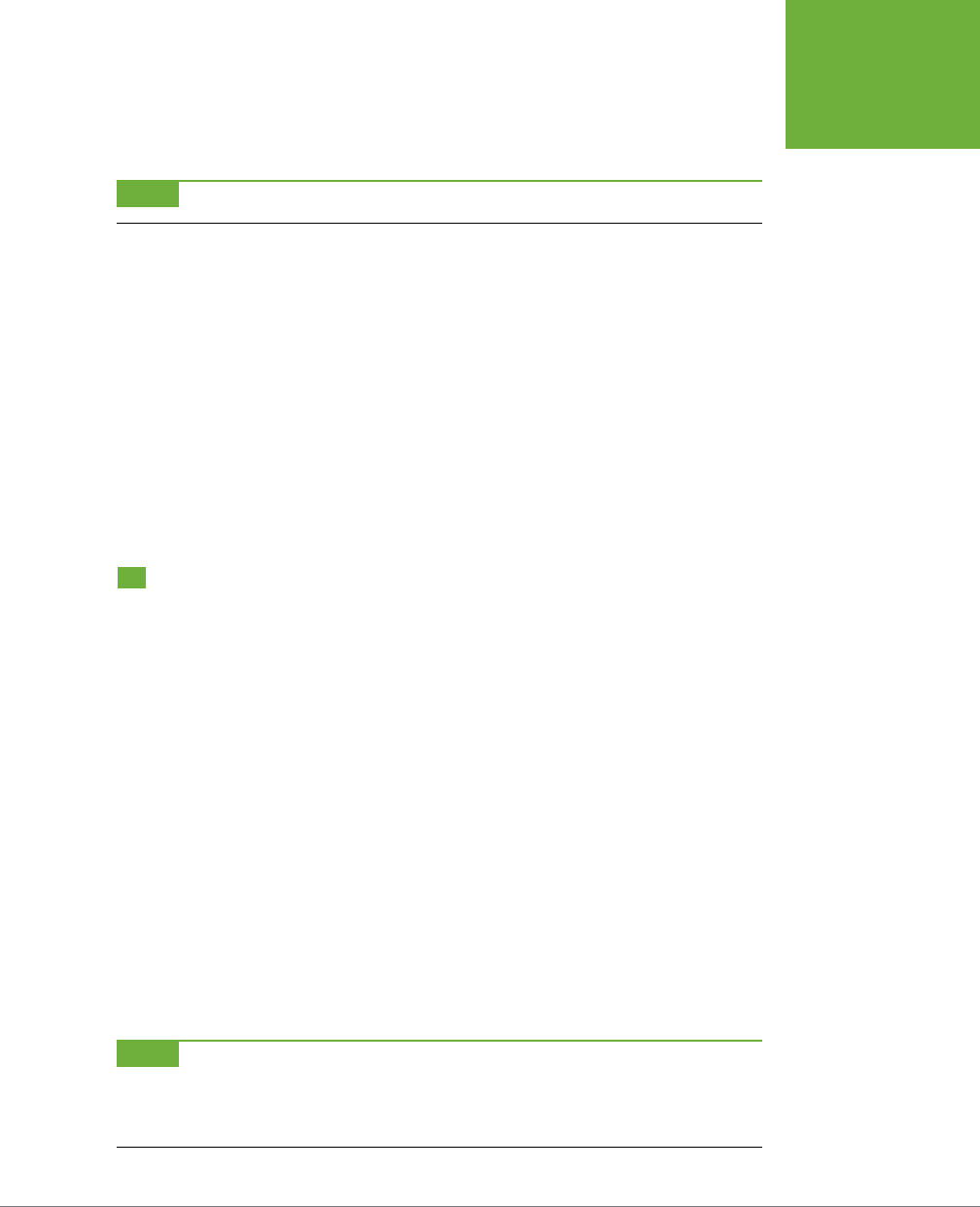
APPENDIX A: CSS PROPERTY REFERENCE 595
MISCELLANEOUS
PROPERTIES
• Values: show, hide
• Example: empty-cells: show;
NOTE The
empty-cells
property has no effect in Internet Explorer 7 and earlier.
table-layout
Controls how a web browser draws a table and can slightly aect the speed at
which the browser displays it. The fixed setting forces the browser to render all
columns the same width as the columns in the first row, which (for complicated
technical reasons) draws tables faster. The auto value is the normal “browser just
do your thing” value, so if you’re happy with how quickly your tables appear on a
page, don’t bother with this property. If you use it, apply table-layout to a style
formatting the <table> tag.
• Values: auto, fixed
• Example: table-layout: fixed;
Miscellaneous Properties
CSS 2.1 oers a few additional—and sometimes interesting—properties. They let
you enhance your web pages with special content and cursors, oer more control
over how a page prints, and so on. (Unfortunately, browser understanding of these
properties is spotty at best.)
content
Specifies text that appears either before or after an element. Use this property with
the :after or :before pseudo-elements. You can add an opening quotation mark in
front of quoted material and a closing quotation after the quote. Internet Explorer
6 and 7 don’t understand this property, so its use is limited.
• Values: Text inside of quotes "like this", the keywords normal, open-quote,
close-quote, no-open-quote, no-close-quote. You can also use the value of
an HTML attribute.
• Examples: p.advert:before { content: "And now a word from our spon-
sor…"; }
a:after { content: " (" attr(href) ") "; }
NOTE Adding text in this way (like the opening and closing quote example) is called generated content.
Read a simple explanation of the generated content phenomenon at
www.westciv.com/style_master/academy/
css_tutorial/advanced/generated_content.html
. For a deeper explanation, visit
www.w3.org/TR/CSS21/generate.
html
.

CSS3: THE MISSING MANUAL
596
MISCELLANEOUS
PROPERTIES
cursor
Lets you change the look of the mouse pointer when it moves over a particular
element. You can make a question mark appear next to the cursor when some-
one mouses over a link that provides more information on a subject (like a word
definition).
• Values: auto, default, crosshair, pointer, move, e-resize, ne-resize, nw-
resize, n-resize, se-resize, sw-resize, s-resize, w-resize, text, wait,
help, progress. You can also use a URL value to use your own graphic as a
cursor (see the Note below). The look of a cursor when mousing over a link is
pointer, so if you want to make some element on the page display the “click
me” icon, you can add the declaration cursor: pointer to the style.
• Example: cursor: help; cursor: url(images/cursor.cur);
NOTE Not all browsers recognize URL cursor values. For more information, visit
www.quirksmode.org/css/
cursor.html
.
opacity
Lets you control the transparency of any element and all of its descendents. In this
way, you can have underlying colors, images, and content show through an element.
Note that if you apply opacity to a div, all of the items inside that div—headlines, im-
ages, paragraphs, and other divs—will share the same opacity level. In other words,
if you set a <div> tag to .5 opacity (50% transparent), an image inside that div will
also be 50 percent transparent—even explicitly setting the opacity of that image to
1 won’t override the 50 percent transparency.
• Values: A decimal value from 0 to 1. 0 is invisible, 1 is completely opaque.
• Example: opacity: .5;
orphans
Specifies the minimum number of lines of text that can be left at the bottom of a
printed page. Suppose you’re printing your web page on a laser printer, and a five-
line paragraph is split between two pages with just one line at the bottom of page
one, and the four remaining lines at the top of page two. Because a single line all by
itself looks odd (sort of like a lost
orphan
—get it?), you can tell the browser to break
a paragraph
only
if at least, say, three lines are left on the bottom of the page. (At
this writing, only the Opera browser understands this property.)
• Values: A number like 1, 2, 3, or 5.
• Example: orphans: 3;

APPENDIX A: CSS PROPERTY REFERENCE 597
MISCELLANEOUS
PROPERTIES
page-break-after
Determines whether a page break (in printing) occurs after a particular element.
With it, you can make sure that a particular paragraph is always the last item to
appear on a printed page.
• Values: auto, always, avoid, left, right. Auto represents the normal value
and lets the browser determine when and how to break content across printed
pages. Always forces the element that follows to appear at the top of a separate
printed page, and it’s the only value that works consistently across browsers.
Avoid prevents a page break after an element; it’s a great way to keep a head-
line
with
the paragraph that follows it, but unfortunately, most browsers don’t
understand it. Left and right determine whether the element following appears
on a left- or right-handed page, which may force the browser to print an extra
empty page. But since no browsers understand these values, don’t worry about
wasting paper. Browsers treat left and right the same as always.
• Example: page-break-after: always;
page-break-before
Works like page-break-after, except the page break appears before the styled
element, placing it at the top of the next printed page. You can use this property
to make sure headlines for dierent sections of a long web page each appear at
the top of a page.
• Values: Same as page-break-after.
• Example: page-break-before: always;
page-break-inside
Prevents an element from being split across two printed pages. If you want to keep
a photo and its caption together on a single page, wrap the photo and caption text
in a <div> tag, and then apply a style with page-break-inside to that <div>. (At
this writing, only Opera understands this property.)
• Values: avoid
• Example: page-break-inside: avoid;
widows
The opposite of orphans, it specifies the minimum number of lines that must appear
at the top of a printed page. Say the printer can manage to fit four out of five lines
of a paragraph at the bottom of a page and has to move the last line to the top of
the next page. Since that line might look weird all by itself, use widows to make the
browser move at least two or three (or whatever number of) lines together to the
top of a printed page. (Only Opera understands this property, so it’s of limited use.)
• Values: A number like 1, 2, 3 or 5.
• Example: widows: 3;

599
APPENDIX
B
No one book—not even this one—can answer all of your CSS questions. Luck-
ily, CSS resources abound for both beginning and expert web designers. In
this appendix, you’ll find resources to help you with general CSS concepts as
well as specific CSS tasks, like building a navigation bar or laying out a web page.
References
References that cover CSS properties range from the ocial to the obscure. There
are websites and online tutorials, of course, but you don’t have to be on the Web to
learn about CSS. Some of these guides come on good old-fashioned paper.
World Wide Web Consortium (W3C)
• CSS Current Work (
www.w3.org/Style/CSS/current-work
). Here you’ll find all
of the CSS specifications, including the newest additions. The dierent specifi-
cations are organized by status, like Completed, Revising, or Abandoned. You
can click any specification to dig into the nitty gritty details, but just because
a specification is listed as “completed” doesn’t necessarily mean it’s been fully
implemented in all web browsers. However, this site does provide the final
(sometimes overly complex and hard-to-understand) word on CSS.
Books
• Cascading Style Sheets: The Definitive Guide by Eric Meyer (O’Reilly). For
comprehensive technical (yet readable) coverage of CSS, check out this guide.
CSS Resources

CSS3: THE MISSING MANUAL
600
CSS HELP
Other Online References
• CSS Reference at the Mozilla Developer Network (
https//developer.mozilla.
org/en-US/docs/CSS/CSS_Reference
). The Mozilla Developer Network (MDN)
provides one of the most comprehensive references to CSS (as well as HTML5,
JavaScript, and other web technologies).
• The Sitepoint CSS Reference (
http://reference.sitepoint.com/css
) provides a
clear, designer-oriented reference to CSS properties and concepts. It’s a good
place to turn if the W3C or MDN docs cause your eyes to glaze over.
• Can I use... (
http://caniuse.com
). This frequently updated site provides detailed
information on CSS and browser compatibility. Here, you’ll be able to determine
whether a particular CSS property works in Internet Explorer 9, for example.
• CSS3 Files (
http://www.css3files.com/
) provides very good instruction and
even better demonstrations of popular CSS3 properties like animation, shadows,
gradients, and more.
CSS Help
Even with the best references (like this book), sometimes you need to ask an expert.
You can join a discussion list, where CSS-heads answer questions by email, or peruse
a wealth of information in an online forum.
Discussion Boards
• CSSCreator Forum (
www.csscreator.com/css-forum
). A very active online forum
oering help and advice for everything from basic CSS to advanced layout.
• SitePoint.com’s CSS Forum (
http://www.sitepoint.com/forums/forumdisplay.
php?53-CSS-amp-Page-Layout
). Another helpful group of CSS addicts.
• CSS-Tricks.com Forum (
http://css-tricks.com/forums
). A relative newcomer,
this small forum holds some good information. (If you like PHP and JavaScript,
there’s some good discussion on those topics here as well.)
CSS Tips, Tricks, and Advice
The Web makes it easy for anyone to become a publisher. That’s the good news. The
bad news is, when everyone’s a publisher, it’s harder to sort through all the cha to
find the golden wheat of clear, concise, and accurate information. There’s plenty of
good CSS information on the Web—and a lot that’s not good. Here are a few of the
best destinations for CSS information:
• CSS-Tricks.com (
http://css-tricks.com
). This one-man blog is full of great CSS
tips. You’ll find frequently updated tips and tricks as well as comprehensive
video tutorials.

APPENDIX B: CSS RESOURCES 601
CSS
NAVIGATION
• Sitepoint (
www.sitepoint.com/tags/css
). Lots of articles and tutorials on CSS
techniques. You’ll often find the latest news and information about CSS here, too.
• Smashing Magazine (
www.smashingmagazine.com/tag/css
). Smashing Maga-
zine gathers some of the best resources on the Web, and in the CSS category,
you’ll find a nearly endless number of links highlighting some of the most creative
thinking on CSS and web design.
• NetMagazine (
http://www.netmagazine.com/tag/css?ct=tutorial
). NetMagazine
often has interesting and useful CSS tutorials.
CSS Navigation
Chapter 9 shows you how to create navigation buttons for your website from scratch.
But online tutorials are a great way to solidify your knowledge. Also, once you un-
derstand the process in detail, you don’t have to do it yourself every single time. On
the Web, you can find examples of navigation features for inspiration.
Tutorials
• Listutorial (
http://css.maxdesign.com.au/listutorial
). Step-by-step tutorials on
building navigation systems from unordered lists.
• 40 Premium CSS Menu and Navigation Solutions (
www.tripwiremagazine.
com/2012/06/css-menu-and-navigation.html
). More tutorials than you can
shake a stick at.
• The Apple.com navigation menu created using only CSS3 (
www.marcofolio.
net/css/the_apple.com_navigation_menu_created_using_only_css3.html
). If
you like the simple, clean appearance of Apple.com, you might be interested in
how to create their menu with CSS.
Online Examples
• CSS Navigation Bar Code Generator (
http://lab.mattvarone.com/navbar
).
Feeling lazy? Let this online tool create all the code you need to use the CSS
sprite method described on page 314.
• CSS Menu Maker (
http://cssmenumaker.com
). Choose from a selection of fancy
CSS3-rich navigation bars. You can customize them to fit your site, and then
download the code.
• CSS Showcase (
www.alvit.de/css-showcase
). A gallery of navigation menus,
tabs, and CSS navigation techniques.
• Listamatic (
http://css.maxdesign.com.au/listamatic
). Showcase of CSS-based
navigation systems. Also lots of links to related websites.
• Listamatic2 (
http://css.maxdesign.com.au/listamatic2
). More CSS menus,
including nested lists with submenus.

CSS3: THE MISSING MANUAL
602
CSS LAYOUT
• CSS Menu Builder (
www.cssmenubuilder.com/
). Lots of cool menus, many
useful techniques. A must see.
• Responsive CSS Navigation Menu (
http://pixelsdaily.com/resources/html-css/
responsive-css-navigation-menu/
). A responsive menu that changes from a
horizontal bar, to a two-row bar, to a two-column stack of buttons.
CSS Layout
CSS layout is so flexible, you could spend a lifetime exploring the possibilities. And
some people seem to be doing just that. You can gain from their labors by reading
articles, checking out online examples, and experimenting with tools that can do
some of the CSS work for you.
Box Model Information
• Interactive CSS Box Model (
www.redmelon.net/tstme/box_model
). Fun,
interactive tool for visualizing the box model.
• Paul Irish’s * { box-sizing: border-box } FTW blog post (
http://paulirish.
com/2012/box-sizing-border-box-ftw/
). An influential blog post that champions
abandoning the old CSS box model and using the box-sizing property as a
more sane way to keep track of element heights and widths.
Layout Examples
• PageBlox (
www.pageblox.com
). Provides an online tool for generating a CSS-
based responsive design. It takes care of browser bugs and generates the media
queries for large and small screens.
• CSS Layout Generator (
www.pagecolumn.com
). Pick the number of columns,
tweak a few knobs, and this website generates all the HTML and CSS required.
With a site like this, who needs a book? (Just kidding!)
• Even More Layout Generators (
www.webdesignbooth.com/15-extremely-
useful-css-grid-layout-generator-for-web-designers
). If you can’t get enough
of websites that automatically create your CSS and HTML, you’ll find a list of
15 dierent online tools.
• 960 Grid System (
http://960.gs
). One of the better CSS frameworks that
provides a set of basic styles and a technique for using divs and class names
to create complex, multicolumn, fixed-width layouts. (You can find a detailed
video introduction to this system at
http://nettuts.com/videos/screencasts/a-
detailed-look-at-the-960-css-framework/
). There’s even an online tool to help
you generate your own grid based on the 960 grid system:
http://grids.heroku.
com
.

APPENDIX B: CSS RESOURCES 603
SHOWCASE
SITES
• YUI Grids CSS (
http://yuilibrary.com/yui/docs/cssgrids/
). Yahoo’s very own
CSS-layout system. It’s a bit techy, but like the 960 Grid System, provides a
basic framework for building complicated multicolumn layouts.
• Twitter Bootstrap (
http://twitter.github.com/bootstrap/
). A complete website
toolkit, this site includes HTML, CSS, and JavaScript components that make
it easy to build a complete, responsive, grid-based page, with some fancy
JavaScript thrown in.
• Foundation (
http://foundation.zurb.com
). Another take on the complete web-
site toolkit. Very much like Twitter bootstrap, Foundation includes HTML, CSS,
and JavaScript. It has excellent documentation and is relatively easy to learn.
Miscellaneous Layout Resources
• Adaptive CSS Layouts (
www.smashingmagazine.com/2009/06/09/smart-
fixes-for-fluid-layouts
). Provides many resources for building flexible layouts
that adapt to the full width of the browser window.
• One clean HTML markup, many layouts (
http://tjkdesign.com/articles/
one_html_markup_many_css_layouts.asp
). Great blog post that takes a single
HTML page and demonstrates eight dierent ways to lay it out with just CSS.
• Variable fixed width layout (
www.clagnut.com/blog/1663
). Short blog post
about a technique for adjusting the number of columns on a page, based on
the width of the browser window.
• 3-Column Layout Index (
http://css-discuss.incutio.com/?page=Three
ColumnLayouts
). A nearly exhaustive (or at least exhausting) list of dierent
three-column layouts.
Showcase Sites
Knowing the CSS standard inside out is no help when your imagination is running
dry. A great source of inspiration is the creative work of others. There are more CSS
showcase sites than you can shake a search engine at, so here’s a handful of sites
where you can appreciate and study beautiful CSS designs.
• CSS ZenGarden (
www.csszengarden.com
). The mother of all CSS showcase
sites: many dierent designs for the exact same HTML.
• CSS Beauty (
www.cssbeauty.com
). A wonderful gallery of inspirational CSS
designs.
• CSS Elite (
www.csselite.com
). “Showcasing the best in CSS web design”…of
course they all say that.
• CSS Mania (
http://cssmania.com
). Yet another showcase site, whose ungram-
matical claim to fame is “Since March 2004, the most updated CSS showcase
all over the globe.”
CSS3: THE MISSING MANUAL
604
CSS BOOKS
• CSS Winner (
www.csswinner.com
). Highlights a new “winner” everyday. It’s
unclear if the judges are really just teenagers surfing the Web from their bed-
rooms, but the site does highlight some very nicely designed sites.
CSS Books
Hey, not even this book can tell you
everything
there is to know about CSS!
• Handcrafted CSS: More Bulletproof Web Design by Dan Cederholm (New Rid-
ers). A bit dated, but this book has some great design and very good thinking
about how to craft HTML for formatting with CSS.
• Bulletproof Web Design by Dan Cederholm (New Riders). A classic, updated
for HTML5 and CSS3, covers how best to create CSS styles that can withstand
the pressure of visitors changing text sizes, resizing their browser windows,
and the general instability of the browser environment. Great tips on building
layouts, navigation bars, and more.
• Head First HTML with CSS & XHTML by Elisabeth Freeman and Eric Freeman
(O’Reilly). A lively, highly illustrated introduction to websites integrating HTML
and CSS.
• Stunning CSS3: A Project-Based Guide to the Latest in CSS by Zoe Mickley
Gillenwater (New Riders). Provides many good tips and techniques for using
CSS3 to create attractive and flexible web pages.
CSS Software
There are lots of dierent ways to create Cascading Style Sheets. Keeping it simple,
you can stick with the free text editors that come with Windows and Mac OS, like
Notepad or TextEdit. There are also CSS-only editors and full-fledged web page–
development programs like Dreamweaver that include CSS creation tools.
Windows and Mac
• Style Master (
www.westciv.com/style_master/product_info
). This powerful CSS
editor with a long history includes many tools, including simple wizards to get
you started, sample templates, tutorials, and a complete CSS guide.
• Dreamweaver (
www.adobe.com/dreamweaver
). Definitely not just for CSS,
this premium web-development tool includes everything you need to build
complete websites. Visual editing tools make it easier to see the eect of CSS
on your web pages as you work.
• Sublime Text (
http://www.sublimetext.com
). This powerful code editor is useful
for creating a wide variety of text documents. While not specifically a CSS tool,
it’s a popular tool among web developers.

APPENDIX B: CSS RESOURCES 605
CSS SOFTWARE
Windows Only
• Top Style (
www.topstyle4.com
). The venerable CSS editor that also lets you
edit your HTML documents—a one-stop shop for web page building. Includes
many tools to increase your productivity. There’s also a free “lite” version.
• Microsoft Expression Web (
www.microsoft.com/expression/products/Web_
Overview.aspx
). A complete website-construction tool that works very well
with CSS.
Mac Only
• Espresso (
http://www.macrabbit.com/espresso/).
This all-in-one web design
tool includes a code editor, an FTP program, and CSSEdit 3, a powerful, yet
simple CSS editor.
• Code (
http://panic.com/coda/
). Another all-in-one web-building tool with
built-in CSS-editing tools.
607
vendor prefixes, 372
@media statement, 355, 463, 522
for smartphone, 483
. (period), for class selector, 57
+ (plus sign), for adjacent sibling
selector, 79
# (pound symbol), for ID selectors, 61,
90
‘ (quotes), for animation name, 360
; (semicolon)
for end of src property, 139
for property/value pair, 38
~ (tilde), for general sibling
combinatory selector, 80
* (universal selector), 535
for formatting every tag with black
text, 525
@viewport rule, 457
A
a:active state, 69
<abbr> tag (HTML), 20
absolute path, 244
for background image, 243
absolute positioning, 410, 488, 489,
491, 496, 510
overlapping elements from, 509–510
relative to boundaries of
ancestor, 493–495
accent characters, 151
:active pseudo-class, 294, 295
of link, 341
as transition trigger, 345
Index
Symbols
3D transforms, 345
40 Premium CSS Menu and Navigation
Solutions, 601
960 Grid System, 602
2011 BeerCamp website, 345
$= (“ends in”) selector, 317
$= (“ends with”) selector, 74
/* and */, for comments, 539
> (angle bracket), for child
relationship, 74
– (“begins with”) selector, 73, 316
and :not() selector, 81
{ } (braces), 37
for internal style, 46
*= (contains) attribute selector, 81
<![endif]--> statement, 559
/ (forward slash), for closing tags, 4
# (hash symbol), for hex
numbers, 564
<!--[if IE]> statement, 559
!important, 535
to override onscreen styling, 524
to override specificity, 111
for print, 525
@import directive, 41, 42–43, 355
for multiple style sheets, 547
Internet Explorer and, 522
for media queries, 462
for targeting version of IE, 560
@keyframes statement, 355, 588–589
for fade-in animation, 359–360

INDEX
608
ACTIVE STATE
OF LINK
delaying beginning, 362
finishing, 363–364
keyframes in, 354
defining, 355–359
@keyframes rule for fade-in,
359–360
of opacity property, 499
pausing, 365–366
properties, 588–593
of rotating element, 337
speed of, 372
animation-delay property, 590
animation-direction property, 363,
591
alternate value for, 364
animation-duration property, 360,
361, 590
animation-fill-mode property, 591
forwards value, 364
animation-iteration-count
property, 363, 591
animation-name property, 360, 590
animation-play-state property, 365,
591
animation property, 370, 589–590
shorthand, 364–365
animation-timing-function
property, 361, 590
anti-aliasing, 130
Apple
Boot Camp software, 34
Horizontal 3D picture gallery, 345
Morphing Power Cubes, 345
Arial Black font, 131, 132
Arial font, 130
Arial Narrow font, 131
arrow notations, 11
<article> tag (HTML5), 23, 24, 25, 30,
409, 443
<aside> tag (HTML5), 23, 25, 441
<a> tag (HTML), 5.
See also
links
browser predefined style for, 106
as inline tag, 200
width for, 306, 311
at rule, 355, 589.
See also
@...
attaching
multiple style sheets to web page, 42
style sheet to web page, 41
active state of link, 69
adaptive images, 473
<address> tag, 29
adjacent sibling, 79
adjacent sibling selector, 91
Adobe
Acrobat files, assigning icon to
link, 323
BrowserLab tool, 34
Edge Inspect tool, 470
text layout ideas, 436
TypeKit, 153
:after pseudo-class, 259, 428
:after pseudo-element, 71, 528
content property and, 595
a:hover state, 68–69
alignment
of form elements, 395–396
of text, 169
a:link state, 68
all keyword, for transition
property, 347
all media type, 520
alphabet, finding font with alphabet
by language, 148
alphabetic glossary, links to alphabet
letters, 62
alpha channel, 155
alpha transparency, in PNG32
files, 242
alternate keyword, 363
for animation-direction
property, 364
Amazon sprites, 315
ancestor styles, conflict
resolution, 105
ancestor tag, 65
anchor tag.
See
<a> tag (HTML); links
Android browser
box-sizing property in, 216
and element corners, 209
vendor prefix for box shadow, 212
WOFF fonts and, 133
angle bracket (>), for child
relationship, 74
animation, 354–366.
See
also
transitions
adding, 369–374
applying to element, 359–361
of CSS properties, 346

INDEX 609
BACKGROUND
PROPERTY
for buttons, 301
for <img> tag, 274
::selection selector to change, 71
background-image property, 91, 178,
240–244, 415, 495
for <body> tag, 242–243
for buttons, 301
for <html> tag, 49
for links, 302
for multiple background
images, 257–259
for page, 283
repetition, 244–245
tutorial, 282–291
background images, 2
background color combined
with, 285
for <body> tag, 119
defining origin and clipping, 252–253
faking multiple for Internet
Explorer, 259
fixing in place, 250–251
for links, 299, 321–322
media queries and, 459
multiple, 257–259
of padding, 195
pixels or ems for positioning, 248–
249
positioning, 245–254
padding for, 321
percentage values for, 249–250
scaling, 253–254
for sidebar, 288–291
under sidebar, 431–436
styling for print, 525–527
for table, 393
for tables, 382
background-origin property, 252,
580–581
background shorthand and, 256
background-position property,
246–247, 286, 303, 314, 581
for bulleted list, 287
for element with gradient
background, 262
for graphic link, 303
background property, 579
for column in tables, 383
for html property, 189
for link as button, 300
attributes, 5
adding class to tag, 59
for <body> tag. those to avoid, 26
for <style> tag, 40
vs. CSS, 27
attribute selectors, 72–74, 316
for form styling, 387
for submit buttons, 397
<audio> tag (HTML5), 24
auto keyword
for margin property, 227, 229, 449
for overflow property, 217–218
for width property, 466, 481
a:visited state, 68
B
background
floated elements and, 222
properties for, 579–582
background-attachment
property, 251, 579
background attribute of <body> tag,
CSS alternatives, 240
background-clip property, 252,
579–580
background shorthand and, 256
background color
alternating for rows, 76
background image combined
with, 285
for block level element, 230
color gradients, 259–269
with Colorzilla, 269–272
linear gradients, 260–264
radial, 266–269
vendor prefixes and Internet
Explorer, 264
for headlines, 230
for hover state, 368
for <nav> element, 450
of padding, 195
for page, 189, 226
print style sheet to remove, 526
RGBA for transparency, 206
for sidebar, 234
styling for print, 525–527
tutorial, 225–229
background-color property, 87, 194,
206, 526, 580
animating change, 369

INDEX
610
BACKGROUND-
REPEAT
PROPERTY
class style for, 99–100
style for, 49
bold type, 107, 319, 569
for Internet Explorer, 144–146
from web fonts, 140–146
<strong> tag (HTML) for, 5
for words and letters, 162–163
border-bottom property, 52, 204, 574
for links, 298
border-bottom-style property, 575
border-bottom-width property, 576
border-box option, for box-sizing
property, 216
border-box value
for background-clip property, 252
for background-origin property, 252
for box-sizing property, 439
border-collapse property, 380, 381,
393, 593–594
for table, 392
border-color property, 205, 574
border declaration property
for link, 319–320
border-left property, 204, 574
border-left-style property, 575
border-left-width property, 576
border property, 285, 321, 573–574
for <img> tag, 274
inheritance and, 95–96
for link as button, 300
shorthand, 203
for tables, 380–381
border-radius property, 207–209, 574
for buttons, 300, 301, 399
for table cells, 381
border-right-color property, 205
border-right property, 204, 574
border-right-style property, 205, 575
border-right-width property, 205, 576
borders, 193, 194, 202–205
advantages, 164
bottom for navigation bar, 327
and column layout, 438
and element size, 576
floated elements and, 222
for button, removing, 398
formatting individual, 204–205
for images, 239
inheritance inaction, 101
in navigation bar, 307
for navigation a style, 326
shorthand, 255–256, 264, 327
with multiple images, 289
background-repeat property,
244–245, 246, 257, 581
no-repeat option, 284, 302
background-size property, 253, 582
background shorthand and, 256
backwards keyword, for animation-
fill-mode property, 591
bandwidth, image file size and, 472
banners
adjusting for print, 534
enhancing, 507–510
position property for, 506
set height for, 215
vertical or horizontal, 246
base font of web page, 181
baseline keyword, for vertical-align
property, 379, 571
base text size, 158
percentage changes to, 159
:before pseudo class, 259
:before pseudo-element, 70, 290
content property and, 595
“begins with” (–) selector, 73, 316
and :not() selector, 81
beveled design for button, 300
Bezier curve, 349–350
BgPatterns, 256
blinking text, 163, 570
block boxes, 200
block elements, 60
converting link to, 303
display property for, 583
floating, 221
block-level tag, 200
<blockquote> tag (HTML), 19, 29, 409
block value, for display property, 303
blurriness of text shadow, 166
body style, 226
<body> tag (HTML), 5, 64
attributes to avoid, 26
background attribute, CSS
alternatives, 240
background image for, 248
background-image property,
242–243
class attribute, 329, 330
class for home page, 555

INDEX 611
CAPTIONS
Browsershots, 34
BrowserStack, 34
<br> tag (HTML), 4, 26, 427
<br /> tag (XHTML), 4, 30, 427
<b> tag (HTML), 26, 146
bulleted lists, 173, 202
customizing, 177
graphics for, 286–288
for links, 297
margins for, 289
<ol> tag for, 20
padding property use by browsers to
indent, 115
Bulletproof Web Design
(Cederholm), 604
bullets
custom for list, 248, 249
finding free graphics for, 256
graphic, 176–178
positioning in lists, 174–176
removing from navigation bar
list, 305
sites with free, 176
types of, 173, 573
bullseye look, 269
buttons
centering text, 311, 333
on forms, 386
:hover state for color change, 346
link appearance as, 297
for links, 299–302
scaling on mouseover, 367–368
width for navigation bar, 306
C
cache
for external style sheet, 39
for web browsers, 550
Can I use.. website, 600
capitalization of text, 163, 571
capitalize keyword, for text-transform
property, 163, 571
captions, 275
<div> tag to group with photo, 60
hiding, 513
placing on photos, 510–516
positioning, 499
size of, and reflow, 279
of table, 391
width of, 276
lines for headlines, 85
of linked images, 551
properties for, 573–578
replacing with graphics, 285–286
for separating columns, 447
space between content and, 195
style for decorative, 183
for table cells, 391
browser default for, 550
for <ul> tag, 332
border-spacing property, 380, 594
border-style property, 205, 575
border-top property, 204, 574
border-top-style property, 575
border-top-width property, 576
border-width property, 205, 575–576
both keyword, for clear property, 223
bottom keyword
for background-position
property, 246
for transform-origin property, 344
for vertical align property, 379
bottom property, 490, 582
Box Alignment module, 9
box model in CSS, 193–195
box-sizing for redefining width, 215–
217
calculating actual width and
height, 213–215
and float drops, 437
height and width properties, 212–219
margins and padding, 195–202
online information, 602
resetting, 467–468
tutorial, 225–238
types of boxes, 200
box-shadow property, 210, 228, 573
for button, 300, 301
for photo gallery, 281
RGBA and, 155
for tables and cells, 381
box-sizing property, 447, 467, 576
float drop prevention with, 439–440
for redefining width, 215–217
braces ({ }), 37
for internal style, 46
braille media type, 520
breakpoints for media queries, 459–
465
browsers.
See
web browsers

INDEX
612
CAPTION-SIDE
PROPERTY
:checked pseudo-class for, 389
:checked pseudo-class, 389
child selectors, 74–79
child tag, 65
child type selectors, 77–79
Chrome browser, 6, 34
Developer’s Tools, 110
font types used by, 139
form field display, 385
gradients in, 264
HTML Tidy extension, 27
text-transform property and, 173
vendor prefix for transforms,
336–337
circular corners, 208
circular gradients, 266
<cite> tag (HTML5), 26, 29
class attribute, 22, 554
adding to tag, 59
classes, 553–558
adding to navigation bar links, 329
attribute selectors for, 73
for <body> tag (HTML), 329
for dierently sized images, 471
for <div> tags, 408
for fine-tuning formatting, 187–188
for external links, 295
for images, 478
increasing specificity, 111
using multiple, 479, 542–545
for navigation links list, 304
pseudo-classes, 68–72
for <p> tag, 188
class selectors, 53, 57–60, 330
replacing ID selectors with, 114–115
specificity, 108
tutorials, 85–88
class styles, 118
applying animation to, 359
vs. attribute selector, 74
background-color property in, 206
for <body> tag, 99–100
descendent selector for, 67
for first paragraph, 122
ID style and, 107
for <img> tag, 274
vs. tag style, 100
clearing float, 425–440
clear property, 223–225, 427, 428, 481,
582–583
caption-side property, 594
<caption> tag (HTML), 377
carriage return, as space, 310
cascade, 97, 100, 103–124, 393
controlling, 111–117
properties applied with, 104–108
specificity in, 108–111
tutorial, 117–124
CSS reset, 117–119
hybrid style creation, 119–120
Cascading Style Sheets (CSS).
See
also
CSS layout
attributes vs., 27
benefits, 1, 2
comments, 442
dierent flavors, 9
formatting with, 21
help, 600
how it works, 1–13
HTML vs., 2
navigation, 601–602
Object Oriented, 558
references, 599–600
showcase sties, 603–604
software, 7–13, 604–606
specification modules, 563
tips, tricks, and advice, 600–601
validating code, 41
writing HTML for, 20–30
case sensitivity of class names, 58
c-click (Mac), 10
Ceasar tool, 349–350
Cederholm, Dan, 431
Bulletproof Web Design, 604
Handcrafted CSS, 604
cellspacing attribute, of <table>
tag, 594
centering
content, 91
horizontal navigation bar, 309
paragraph, 169
text in button, 311, 333
center keyword
for background-position
property, 246
for text-align property, 169, 379
center of radial gradient, 267
characters.
See
letters (characters)
character sets, 151
checkboxes, 73, 386

INDEX 613
COMPRESSION
OF GRAPHICS
FILES
color pickers in Windows and Mac, 154
color property, 37, 154, 567
for button, 301
for text, 98
for <h1> tag, 182
inheritance, 119
::selection selector to change, 71
for tables, 378
color stops in gradients, 262–263, 434
in Colorzilla, 270
matching column widths, 435
Colorzilla, 269–272
ColourLovers.com, 256
<col> tag (HTML), 377, 383–384, 390
width setting, 394
column-count property, 430
column-gap property, 430
column-rule property, 430
columns in tables
background property for, 383
formatting, 383–384
styles for, 381–384
columns on web page
adjusting for media queries, 457
color stops matching widths, 435
<div> tag for, 118
floating, 421–423
full-height, 430–436
linear gradients for
background, 433–436
multiple, 418
rule (line) between, 430
tutorial, 440–452
adding column, 443–445
HTML structure, 440–441
layout styles, 441–443
padding, 445
width, in responsive web design, 476
column wrapper
in mobile web design, 476, 481
for smartphone, 483
comments (CSS), 442, 539–540
to separate style groups, 545–546
comments (HTML), 441, 443–444
Compass.app, 543
Compatibility View List
(Microsoft), 33
complex grid layout module, 436
compression of graphics files, 242
for footer, 445
Clear Type, 130
click, 10
translate in response to, 341
clicked link, 293
clipping, defining for background
images, 252–253
clip property, 583
closest-corner keyword, for radial
gradient, 267–268
closest-side keyword, for radial
gradient, 267–268
closing tags, 30, 45
</style>, 47
Coda2 (Mac), 7
code
HTML-only vs. HTML with CSS, 18
JavaScript location in, 40
Code (editing software), 605
<code> tag (HTML), 20, 21
<colgroup> tag (HTML), 377, 383–384
collapse keyword, for border-collapse
property, 381
collapsing margins, 198, 199
collection of fonts, 148, 150
colliding margins, 197–198
color
of background, 206
for <body> tag, 119
of border, 574
of borders, 202–203
of buttons, :hover state for
changing, 346
formatting text with, 154–157
keywords in HTML, 155
of background, 87
of text, changing for unvisited
link, 294
of outlines, 577
property values for, 563–565
resources on coordinating, 154
solid, from linear gradient, 434
of text shadow, 166
color gradients, 259–269
with Colorzilla, 269–272
radial, 266–269
repeating, 269
repeating, 265–266
vendor prefixes and Internet
Explorer, 264

INDEX
614
CONDITIONAL
COMMENTS,
FOR INTERNET
EXPLORER
cross-browser display problems
avoiding inconsistencies, 115
style eliminating, 225
CrossBrowserTesting.com, 34
CSS.
See also
Cascading Style Sheets
(CSS)
CSS3 Button generator, 302
CSS3 Files website, 600
CSS3 pattern gallery, 265
CSS Beauty, 603
CSS box model.
See
box model in CSS
CSSCreator Forum, 600
CSS Elite, 603
.css extension, 41, 48
CSS grid layout module, 413
CSS layout, 405–416.
See also
<div>
tag (HTML)
how it works, 408–411
layering elements, 415–416
multi-column layouts, 413
resources, 602
sketches, 413–414
identifying boxes, 414
strategies, 412–416
techniques for, 410–411
CSS Layout Generator, 602
CSS Mania, 603
CSS Menu Builder, 602
CSS Menu Maker, 601
CSS Navigation Bar Code
Generator, 601
CSS Positioning, 487.
See
also
positioning
CSS reset, 115–116, 195
tutorial, 117–119
CSS Showcase, 601
CSS Sprites, 314, 328, 329
CSS-Tricks.com, 425, 600
CSS Winner, 604
CSS ZenGarden, 241, 603
Ctrl-click (Windows), 10
cubic-Bezier curve, 362
for animation-duration property, 361
for transition-timing-function
property, 349–350
cursor property, 596
curves for element corners, 207–209
conditional comments, for Internet
Explorer, 559–560
container element, width of, 421
containing element
floated elements and, 221
floating, and containment of
elements inside, 428
width of, 196
containing float, 425–440
contain keyword, for background-size
property, 254
contains (*=) attribute selector, 81
content
controlling flow, 217–218
float property for wrapping,
220–225
height of area, 584
hiding on handheld devices, 458
as layout starting point, 412
left margin for, and sidebar
width, 419
content attribute, in <meta> tag, 456
content-box value
for background-clip property, 252
for background-origin property, 252
for box-sizing property, 216, 439
content management system, 558
content of box, 194
content property, 528, 595
contrast in graphic design, 162
converting font formats, 135
copyright notice
fixed positioning for, 514
font size for, 536
preventing wrap, 223
in print, 533
corners, rounded, 207–209
for sidebar, 235
counter-clockwise rotation, negative
numbers for, 337
Courier font, 132
cover keyword, for background-size
property, 254
Coyier, Chris, 436, 473
CSS-Tricks.com blog post, 425
Creative Commons licenses, 256
cropping picture, negative values
for, 248
cross brower testing, 34

INDEX 615
DOTTED
BORDER
display area of browser window, 490
display: block property, 311
for <a> tag, 326
Display fonts, 148
display:inline-block property, 201,
280, 307, 388
for navigation bars, 308–310
display: inline property, for navigation
bars, 308–310
display property, 202, 303, 583–584
to hide or display elements for
print, 528
for image in table cell, 379
for <li> tag, 308
options, 202
for print style sheet, 531
vs. visibility property, 498
<div> tag (HTML)
float property, 417
<div> tag (HTML), 22, 25, 30, 60, 182,
408–409, 411
absolute positioning relative to
parent, 494
for announcement to fade into
view, 359–360
as block-level tag, 200
code order, screen readers and, 422
for columns on page, 118
to control entire page width, 448
descendent selectors, 554–555
determining need for, 409
inheritance and, 95
for navigation links, 296
for page elements, 505
for page layout, 528
scaling, 338
for sidebar, 196, 234–236, 441
style for page content, 284
width property, 189
<dl> tag (HTML), 29
DOCTYPE declaration, 3, 4
document--relative links, 80
document-relative path, 243, 244
for style sheet location, 50
Document Type Definition (DTD),
30–32
document types, 3–13
dotted border, 203, 575
background color and, 206
D
dashed border, 203, 575
background color and, 206
<dd> tag (HTML), 29
decimal values, for column width
percentages, 469
declaration block, 35, 37, 55
for class styles, 59
decorative border, 183
default design, desktop vs.
mobile, 460
default font of web browser, 128
default values, for background
properties, 255–256
definition description, <dd> tag
for, 29
definition list, <dl> tag for, 29
definition term, <dt> tag for, 29
degrees, for direction of linear
gradient, 261
delay
for animation, 362, 590
for transition start, 351–352
descendent selectors, 63–64, 107, 182,
321, 553–558
creating, 65–67, 120
<div> tag and, 554–555
for grouping links, 296–297
for <img> tag inside <figure>
tag, 276
for links, 322–323
for images, 240
for images inside figure, 278
for module of code, 67–68
for sidebar, 236
specificity, 109
for table cells, 380
to format navigation links, 325
tutorials, 88–89
universal selector as part, 63
descendent tags, 65, 93
desktop computers
media queries for, 460
web browsing on, 457
device pixel, vs. CSS pixel, 473
disabled form elements, 389
display
size variations, 405–407
style eliminating cross-browser
problems, 225
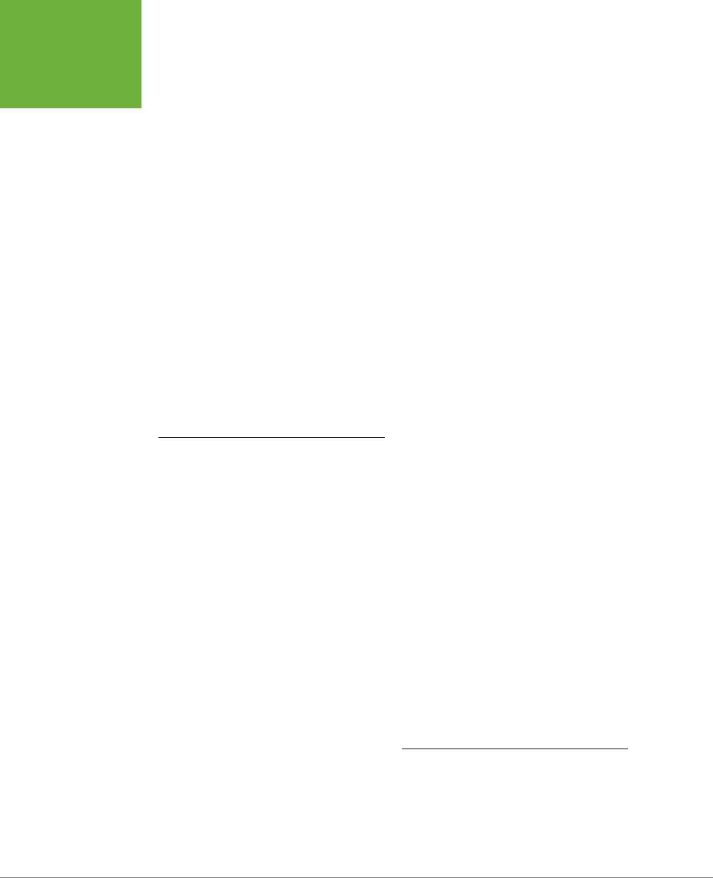
INDEX
616
DOUBLE
BORDERS
elliptical radial gradients, 270
email links, 317, 321
embossed media type, 520
em measurement unit, 37, 213, 566
converting pixed-sized type to, 469
for text-indent property, 169
for line spacing, 168
for margin or padding, 196
for text size, 160
empty-cells:hide property, 384
empty-cells property, 594
<em> tag (HTML), 26, 140, 143, 162
enabled form elements, 389
ending tag in HTML, 4
“ends in” ($=) selector, 317
“ends with” ($=) selector, 74
EOT (Embedded Open Type) file
format, 133
erasing styles built-in to web
browsers, 115–117
Espresso, 605
even child elements, selecting, 76
Even More Layout Generators, 602
Exljibris font foundry, 134
experimental CSS property, 209
Expression Web, 8
doctype declaration added by, 31
Extensible Markup Language (XML), 6
external links
class for, 295
style to highlight, 73
external style sheets, 41–43, 274
conflict with internal style sheet, 110
internal vs., 178–179
<link> tag for, 42
link to Google fonts, 147
media type for, 522
for responsive web design, 460
specifying graphic in, 177
tutorial on creating, 48–54
using multiple, 113
vs. internal, 39
F
fade-in animation, @keyframes rule
for, 359–360
fading element into view, animation
for, 355
farthest-corner keyword, for radial
gradient, 267–268
double borders, 203, 575
eliminating from tables, 381
double-click, 10
double-colon syntax, 69
download
@import directive and, 43
web fonts, 129
time required, 150–151
dragging, 10
Dreamweaver, 8, 604
doctype declaration added by, 31
drop cap, 69
drop-down menus
disappearing slowly, 352
on forms, 386
drop shadows, 49, 51, 91, 210–212, 573
for glow, 399
for photo gallery, 281–282
for sidebar, 235
for text, 570
DTD (Document Type Definition), 30
<dt> tag (HTML), 29
E
ease-in keyword
for animation-duration property, 361
for transition-timing-function
property, 348
ease-in-out keyword
for animation-duration property, 361
for transition-timing-function
property, 348
ease-in timing method, 369
ease keyword
for animation-duration property, 361
for transition-timing-function
property, 348
ease-out keyword
for animation-duration property, 361
for transition-timing-function
property, 348
EditPlus (Windows), 7
elements
breaking out of box, 503–504
overlapping, from absolute
positioning, 509–510
stacking, 497–498
element selectors, 56.
See also
tag
selectors
elliptical corners, 208

INDEX 617
FLUID IMAGES
fixed positioning
for copyright notice, 514
frames from, 504–507
fixed-width layouts, 405
converting liquid layout to, 421,
448–450
converting to flexible grids, 468–470
vs. flexibility, 465
Flash content, scaling to
containers, 473
flexbox, 436
flexible box layout module, 413
flexible box model, 431, 436
flexible grids
converting fixed-width layouts
to, 468–470
flexible grids for layout, 465–470
flexible media, 455
Flickr, 256
flipping element upside down and
backwards, 340
float-based layout, problems
printing, 534
floated element
ignoring, 222–225
preventing drops, 437–439,
446–447, 467
width for, 419
floating
applying to layout, 421–425
of caption with image, 275
clearing and containing, 425–440
columns on web page, 421–423
horizontal navigation bars, 310–313
images, 240
list items, 313
troubleshooting problems, 425–440
within floats, 423–425
float property, 186, 220–225, 417, 584
and absolute or fixed
positioning, 488
and HTML source order, 466
for <img> tag, 274
for layout, 410
none keyword, 480
flow of content, controlling, 217–218
fluid images, 470–473
tutorial, 477–479
W3C community group to study, 473
farthest-side keyword, for radial
gradient, 267–268
faux column technique, 431–436
<fieldset> tag (HTML), 386
<figcaption> tag (HTML5), 23, 275,
499, 511
absolutely positioned, 512
<figure> tag (HTML5), 23, 275, 410,
499, 511
descendent selector for <img> tag
inside, 276
for photo gallery, 278
file formats, for graphics, 242
file size for images, bandwidth
consumption and, 472
file types
for fonts, 133–134
icons for dierent, 323
links to specific types, 317
filtering fonts by category, 148
finding
free images, 256
Google web fonts, 148–150
web fonts, 134–135
Firefox, 6, 34
box-sizing property in, 216, 468
form field display, 385
gradients in, 264
padding property for indenting
bulleted lists, 115
transitions and, 348
vendor prefix
for transforms, 336–337
vendor-prefix, 71
Web Developer extension for, 27
Fireworks CS6, 314
:first-child pseudo-class, 75–76
first letter or first line of paragraph
formatting, 171–173
:first-letter pseudo-element, 69, 171
first line indents, 169–171
:first-line pseudo-element, 69, 171, 184
:first-of-type selector, 77
FitVids JavaScript program, 473
fixed design, mixing with liquid, 450–
452
fixed elements, 488
fixed keyword
for background-attachment
property, 251

INDEX
618
:FOCUS
PSEUDO-CLASS
Font Squirrel, 133, 135, 135–137
font-style property, 162, 569
in @font-face directive, 141
in font shorthand property, 170
font variants and, 146
<font> tag (HTML), 2, 19, 21
alternative to, 56
font-variant property, 163, 569
font-weight property, 107, 140, 143,
162, 319, 569
in @font-face directive, 141
font variants and, 146
for Google web fonts, 152
footer
float and, 426
position property for, 506
problems from, 444
<footer> tag (HTML5), 6, 23, 25, 30,
409, 415
forcing reload for web page, 39
formatting text
black color for printing, 525
classes for fine-tuning, 187–188
color, 154–157
CSS for, 21
drop shadows, 166–167
first letter or first line of
paragraph, 171–173
fonts, 127–132
choosing common, 129–132
file types, 133–134
generating multiple formats,
135–137
web fonts, 132–146
font size changes, 157–162
for printing, 535–536
paragraphs, 167–173
aligning text, 169
first line indents and removing
margins, 169–171
space adjustment between text
lines, 167–168
properties for, 567–572
shorthand method for, 170
styling lists, 173–178
tutorial, 178–192
finishing touches, 188
headings and paragraphs, 182–185
lists, 185–187
:focus pseudo-class, 70, 294, 389, 401
for transition trigger, 345, 351
:focus selector, 70
folders for fonts, 142
font color, 37
Fontex.org, 135
@font-face directive, 129, 132, 137–140
for font variants, 141–143
for headlines, 143
for Internet Explorer, 144
for loading web fonts, 180–181
tutorial, 178
@font-face Generator, 135–137
@font-face Kits, 135
font family
declaration, 52
in font property, 170
font-family property, 127, 181, 568
in @font-face directive, 138
for <h1> tag, 182
inheritance, 119
limitations, 132
font property, 170, 183
for button, 301
shorthand, 568
fonts, 127–132
alternative options, 129
changes, 157–162
choosing common, 129–132
file types, 133–134
generating multiple formats, 135–137
Google web fonts, 146–153
inheritance for, 95
licenses for, 134
points for measuring, 524
quote marks for multi-word
names, 129
of table text, 391–392
web browser default, 128
web fonts, 132–146
font services, 153
font size, 37
browser default for, 549
changes for media queries, 458
in font property, 170
for print, 524, 535
font-size property, 37, 157, 181,
484–485, 568–569
for <h1> tag, 182
line-height property and, 168

INDEX 619
GUTTER
Google Analytics, 32
Google Chrome.
See
Chrome browser
Google fonts, 134, 135, 146–153
finding and selecting, 148–150
numerical values for font
weights, 162
using, 150–153
gradient backgrounds, 259–269
linear, 260–264
for column background, 433–436
radial, 266–269
repeating linear, 265–266
repeating radial, 269
gradient image, linear gradient
vs., 283
graphic bullets, 176–178
graphic design
contrast in, 162
grid for layouts, 425
graphics.
See also
<img> tag (HTML)
adding to links, 302–304
file formats, 242
for bulleted lists, 286–288
for element background, 242
in <header> tag, positioning,
508–509
multiple in one file, 314–315
positioning background image,
245–254
replacing borders with, 285–286
specifying in external style
sheets, 177
graphics programs, for web-page
mock-ups, 413
Gridinator, 422
grids for layout, 425
in responsive web design, 455
groove border, 203, 575
grouping links, descendent selectors
for, 296–297
grouping, to organize styles, 545
group selectors, 62–63, 557–558
tutorial, 84
groups of tags, styles for, 62–63
gutter, 195, 425.
See also
space
words and letters, 162–166
capitalizing, 163
text-decoration property, 163–165
zeroing out, 548–552
form elements (HTML), 386–387
alignment, 395–396
style for, 399
form pseudo-classes, 389
forms, 384–389
attribute selector for, 73
browser variations in display, 385
layout with CSS, 387–389
tutorial, 395–402
forwards keyword, for animation-fill-
mode property, 591
forward slash (/), for closing tags, 4
forwards value
for animation-fill-mode
property, 364
Foundation, 425, 603
frameset, 504
frames, from fixed positioning,
504–507
framing images, 273–277
free fonts, 134
Freeman, Elisabeth, Head First HTML
with CSS & XHTML, 604
from keyword, for @keyframe, 356
fun fonts, 131
G
Gallagher, Nicolas, 428
general sibling combinatory
selector, 80
generated content, 71, 177, 259, 595
Georgia font, 130
GIF (Graphics Interchange Format)
files, 242
Gillenwater, Zo Mickley, Stunning
CSS3, 604
glossary
creating, 29
links to alphabet letters, 62
glow, 212, 228, 374
for button, 398
drop shadow for, 399
Google
on search-friendly websites, 22
showcase of best fonts from, 149
web fonts, 50, 51

INDEX
620
<H..> TAG
(HTML)
hidden value, for overflow
property, 217–218, 236
hide keyword, for empty-cells
property, 384
hiding
captions, 513
content on handheld devices, 458
unwanted page areas for print,
527–529
web page parts, 498–501
highlighting links, 322–324
Horizontal 3D picture gallery
(Apple), 345
horizontal navigation bars, 307–313
centering on page, 309
change to vertical, 331–334
float for, 310–313
with display: inline and display:
inline-block, 308–310
horizontal oset
for box-shadow property, 211
for text-shadow property, 166
horizontal scaling, 339
:hover pseudo-class, 294, 295,
298–299, 303, 313
for making caption visible, 500
for transition trigger, 345
for transition trigger, 351
for visibility, 499
:hover pseudo-class selector, 294
:hover state, 68–69, 367
animating on, 366
background-position property
and, 314
button color change and, 346
for buttons, 301, 328
for caption display, 513
for resources links, 324
and scaling element, 338–339
translate in response to, 341
href attribute, for <link> tag, 42
HSLA format, 157, 565
HSL (hue, saturation, lightness) color
notation, 156–157, 565–566
HTML.
See also
tags
color keywords, 155
comments, 441, 443–444
family tree for tags, 64–65
online tutorials, 3
past and present, 17–19
H
<h..> tag (HTML), 28
<h1> tag (HTML), 18, 20, 182
inline style for, 44
internal style sheet for, 45
style, 230–232
<h2> tag (HTML), 18, 232
style
for graphic border, 285–286
style for, 120, 183
h3 style, 183–184
Handcrafted CSS (Cederholm), 604
handheld devices.
See
mobile devices
handheld media type, 520
Handwriting fonts, 148
hanging indent, 170
hash symbol (#), for ID style, 61
<header> tag (HTML5), 6, 23, 25, 409,
410, 415
positioning graphic in, 508–509
Head First HTML with CSS & XHTML
(Freeman and Freeman), 604
headings, 28
formatting, 182–185
headlines
background color for, 230
as block-level tag, 200
border line for, 85
@font-face directive for, 143
style for, 190
in tables, cascading style for, 393
tightening space between, 199
type size, 157
<head> tag (HTML), 5, 27, 64
height
of elements, 576
max-height property for, 585
min-height property for, 585
minimum and maximum, 219
of table cells, 379
height property, 584
in box model, 212–219
for positioned elements, 492
Helvetica font, 130
hexadecimal number for color, 226,
564
for color value, 154
hidden border, 203, 575

INDEX 621
INHERITANCE
adding to web page, 189, 283–285
background property with
multiple, 289
for bullet, 572
descendent selector for those inside
figure, 278
finding free, 256
fluid, 470–473
:hover style to enlarge, 339
moving in from edge, 303
styles for, 2
tutorial on enhancing, 272–277
framing, 273–277
<img> tag (HTML), 23, 239–240
alternately floating left and right, 78
border attribute, and IE border for
linked images, 297
as inline tag, 200
padding and margin changes, 201
removing width and height attribute,
for fluid images, 478
in table cell, display property, 379
<img /> tag (XHTML), 30
Impact font, 131, 132
!important, 535
to override specificity, 111
for print, 525
to override onscreen styling, 524
@import directive, 41, 42–43, 355
for Google Web fonts, 151
Internet Explorer and, 522
for media queries, 462
for multiple style sheets, 547
for targeting version of IE, 560
indentation in styles, 46, 84
indented text
for first line of paragraph, 169, 570
margins to move text beyond
sidebar, 442
InDesign, 410
infinite keyword, for animation-
iteration-count property, 363, 591
inheritance, 63, 79
accumulated styles, 104–105
basics, 93–95
and cascade, 119
inaction, 101–102
limits, 95–97
line-height property, 168
properties specificity, 109
and search engines, 22
source order, 466–467
changing for RWD, 474–477
floated elements and, 418
screen readers and, 422
vs. CSS, 2
writing for CSS, 20–30
HTML 4.01 doctype, 3
HTML 4.01 Transitional
doctype declaration for, 31
<link> tag for, 42
HTML5, 6–13
doctype declaration for, 31
element display as blocks, 549
<link> tag, 42
sectioning elements, 409–410
semantic tags in, 23
HTML5 Doctor, 23, 24
HTML5 doctype, 4
HTML Dog, 3
HTML frames, 504
<html> tag (HTML), 4, 27, 64, 181–182
background image for, 248
background property, 189
based text size, 161
HTML Tidy extension for Chrome, 27
hue in color, 565–566
hybrid style, creating, 119–120
hyperlink, 5.
See also
<a> tag (HTML);
links
I
icons
finding free graphics for, 176, 256
fonts containing, 140
multiple in one file, 328
varying by link type, 322
id attribute, 22, 61
IDs, 553–558
for <div> tags, 408
ID selectors, 60–62
overriding, 114
replacing with classes, 114–115
specificity, 108
tutorials, 89–91
ID style, class style and, 107
IE.
See
Internet Explorer
<iframe> tag (HTML), 217, 470, 473
images.
See also
background-image
property

INDEX
622
INHERIT
KEYWORD
browser bugs, 440
bug in @font-family directive, 139
color gradients and, 264
CSS for, 558–560
drop shadow and, 166–167
earlier versions, 32
and element corners, 209
filters for gradient, 271
font variants, 143–146
form checkboxes and radio
buttons, 386
form field display, 385
gradients and, 436
HTML5 and, 4, 24, 511
<img> border attribute, and border
for linked images, 297
and inline-block, 309
keyframes and, 359
media queries and, 460
multiple background images
and, 290
negative z-index values and, 498
and :not() selector, 316
nth-of-type selector and, 382
popularity of, 146
radial gradients and, 268
and rem measurement unit, 161
repeating linear gradients and, 265
RGBA color issues, 155
targeting dierent versions, 560
and transforms, 367
transitions and, 346, 348, 501
transparency settings and, 512
vendor prefix, for transforms, 336–
337
web fonts support, 133
“Internet Explorer conditional
comment” (IECC), 24
iPhones
pixels on, 473
Retina Display, 158
SVG fonts for, 135
Irish, Paul, 602
<i> tag (HTML), 26, 146, 162
italics type, 569
for Internet Explorer, 144–146
web fonts, 140–146
for words and letters, 162–163
streamlining style sheets with, 95
for table font family, 391
of text size, 160
in nested lists, 161
tutorials, 97–102
inherit keyword, 566
inline-block elements, figure tags
as, 511
inline-block value, for display
property, 202, 303
inline boxes, 200
inline elements
display property for, 583
float property with, 221
line breaks and, 308
inline styles, 41
specificity, 108
tutorial on creating, 44–45
inline tags, 200
inline text, <span> tag for, 22
<input> tag (HTML), 73, 386
inset border, 203, 575
inset value, for box-shadow
property, 211
Inspect Element command, in web
browsers, 110
integer values, for color, 564
intellectual property, fonts as, 136
Interactive CSS Box Model, 602
internal style sheets, 40–41
benefits, 82
conflict with external style sheet, 110
external vs., 178–179
location in page code, 279
to override styles, 113
tutorial on creating, 45–48
Internet Explorer, 33
adjacent sibling selectors and, 92
animations and, 354
auto-update feature, 32–34
background images, 258
faking multiple, 259, 290
background-origin and background-
clip properties and, 252
and background properties, 256
box shadow in, 212
box-shadow in, 210
box-sizing property and, 447, 468
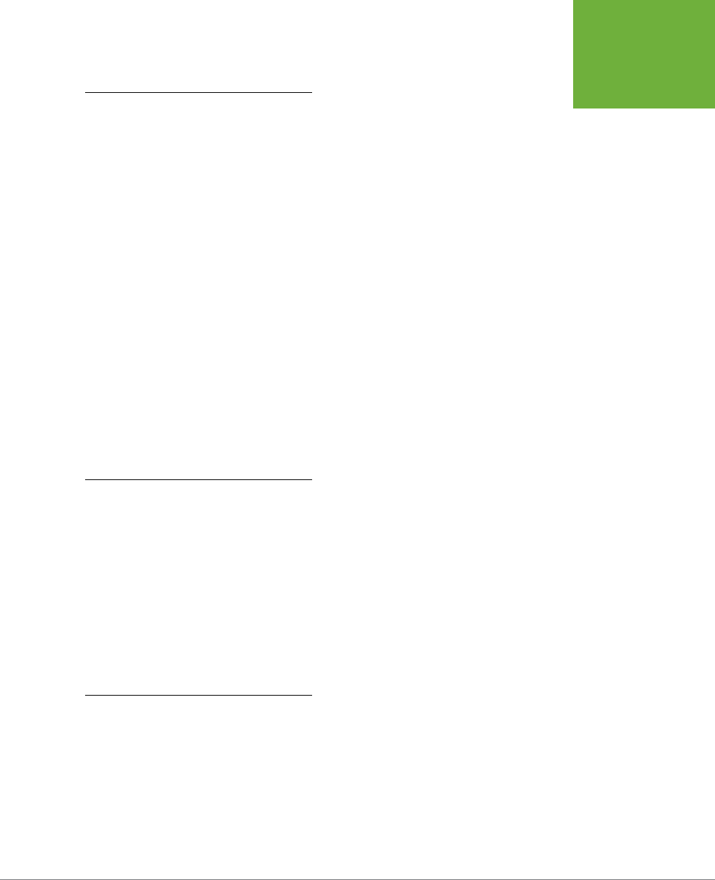
INDEX 623
LINEAR
GRADIENTS
layout generators, 422
layout of web page, 24–25, 405.
See
also
CSS layout;
See also
CSS layout
adjusting for print, 533–535
avoiding <table> tag for, 26
float-based, 417, 421
future methods, 436
grid for, 425
mixing liquid with fixed design,
450–452
multi-column layouts
module, 430
tutorial, 440–452
online designs, 422
properties, 582–588
three-column design, 421
two-column design, 418–421
flexible grids and, 465–466
leading, 168
League Gothic font, 134
League of Movable Type, 134
left keyword
for background-position
property, 246
for clear property, 223
for float property, 221, 417
for text-align property, 169, 379
for transform-origin property, 344
left property, 490, 584
of images, 504
<legend> tag (HTML), 386
Lein, Mathew, Ceasar tool, 349–350
LESS preprocessor, 543
letters (characters)
formatting, 162–166
capitalizing, 163
text-decoration property, 163–165
spacing, 165–166
letter-spacing property, 165–166, 569
licenses, for fonts, 134
lightness value in HSL color
notation, 157, 565–566
linear-gradient property
for button, 300
for Submit button, 398
linear gradients, 260–264
for buttons, 301, 386
with color stops matching column
widths, 435
for column background, 433–436
J
JavaScript
to apply animation-play-state
property, 366
applying ID for, 62
FitVids program, 473
location in code, 40
for mouseover, 501
navigation menu change to HTML
drop-down menu, 458
for pop-up submenus, 311
respond.js program, 462
to trigger transitions, 351
tutorial on, 351
for TypeKit, 153
visibility property and, 499
for web fonts, 152
jEdit, 7
JPEG (Joint Photographic Experts
Group) graphics, 242
jQuery aTip2 plug-in, 501
justifying text, 169
justify keyword, for text-align
property, 169, 379
K
keyboard shortcuts, 11
keyframes in animation, 354, 371
defining, 355–359
percentage values for multiple, 356–
358
@keyframes statement, 355, 588–589
for fade-in animation, 359–360
vendor prefixes, 372–373
keywords
for background image position, 246
for color, 564
for text size changes, 159
L
labels, changing from inline elements
to inline-block, 396
<label> tag (HTML), 387, 388
large keyword for font size, 159, 568
larger keyword for font size, 568
:last-child selector, 76
:last-of-type selector, 77
Latin Extended character set, 151
layering elements, 415–416
LayoutGala site, 422

INDEX
624
LINEAR
KEYWORD
for Google web fonts, 50, 151, 152
media attribute, 522
for style sheet, 41, 42, 50
updating for revised style sheet, 550
liquid designs, 406, 407, 448
mixing with fixed, 450–452
Listamatic, 601
A List Apart website, 521
list items, floating, 313
List-O-Matic wizard, 313
lists
as block-level tag, 200
bulleted
graphics for, 286–288
<ul> tag for, 20
child selectors for, 79
numbered, 29
ordered, <ol> tag for, 19
properties for, 572–573
removing indent from all, 175
space between items, 186
styling, 173–178
tutorial, 185–187
types of, 173–174
unordered
for navigation bar, 304–305
<ul> tag for, 29
list-style-image property, 176, 572
list-style-position property, 174–175,
572–573
list-style property, 178, 572
list-style-type property, 173, 573
Listutorial, 601
<li> tag (HTML), 174, 176
background image for, 248, 249
display property of, 308
in horizontal navigation bar, 331
left float for, 310
style for, 186
living examples, 12
logo image, spinning and scaling, 369
lowercase keyword, for text-transform
property, 163, 571
Lucida Console font, 132
M
Mac
font display on, 130
monospaced fonts on, 132
mailto link, visual cue for, 321
gradient image vs., 283
in tables, 382
header background, 393
linear keyword
for animation-duration property, 361
for transition-timing-function
property, 348
line breaks
<br> or <br />tag for, 4, 26
for float problem, 427
inline elements and, 308
line height
browser default, 550
in font property, 170
line-height property, 91, 117, 121,
167–168, 184, 569
for navigation links, 307
line (rule) between columns, 430
line-through option for text, 164, 570
:link pseudo-class selector, 294
links.
See also
<a> tag (HTML)
adding background image to, 321–
322
adding graphics, 302–304
adding tooltips, 72
blue, underline to indicate, 297–299
border-bottom property for, 298
bulleted lists for, 297
buttons for, 299–302
converting to block-level
element, 303
descendent selectors for
grouping, 296–297
email, 317
highlighting, 322–324
order for styles, 295
to other websites, 316
removing underline, 107
selecting for style, 293–297
to specific file types, 317
styles for, 68–69, 297–304
particular link types, 315–317
to highlight external, 73
tutorial, 318–324
targeting particular, 295–297
“you are here”, 328–331
link states, 293–295
<link> tag (HTML)
for external style sheet, and internal
style placement, 278

INDEX 625
MOUSEOVER,
CAPTION
APPEARANCE
WITH
media queries, 407, 455, 457–465, 480
for 480-pixel display, 485–486
basic stylesheet structure for,
463–465
breakpoints, 459–465
creating, 461–462
in stylesheet, 462–463
strategies for using, 457–459
@media statement, 355, 463, 522
media style sheets
!important to override onscreen
styling, 524
for printed page, 519–521
medium keyword for font size, 159,
568
menus, 10
drop-down, slowly disappearing, 352
pop-up, 311
<meta> tag (HTML), 456
for IE8 to ignore compatibility
view, 33
Meyer, Eric, 116
“Micro Clear Fix”, 428
Microsoft Compatibility View List, 33
Microsoft Expression Web, 605
middle keyword, for vertical align
property, 379
min-height property, 219, 585
min-width notation, for link media
attribute, 461–462
min-width property, 219, 585
mobile devices
displays, 406
hiding content on, 458
page layout for, 412
troubleshooting display, 484
mobile-first design, stylesheet
for, 464–465
Mobile First movement, 412
mobile-only websites, screen
variations, 453
modular CSS design, 547
module of code, descendent selectors
for, 67–68
Monaco font, 132
monospaced fonts, 131, 132
Morgue File, 256
Morphing Power Cubes (Apple), 345
mouseover, caption appearance
with, 500
Marcotte, Ethan, 406, 454
Responsive Web Design, 455
Marcott, Ethan, 468
margin-bottom property, 196, 578
for list items, 176
for paragraphs, 171
margin-left property, 102, 196, 578
and list indent, 175
margin property, 184, 578
for <body> tag, 49
for <div> tag, 189
for <h2> tags, 232
for <img> tag, 274
order of values, 186
shorthand, 232
margin-right property, 196, 578
negative value for, 190
margins, 121, 194, 195–202
browser default for, 548
collapsing, 198, 199
colliding, 197–198
for bulleted list, 289
for indenting main text beyond
sidebar, 442
inheritance inaction, 101
inline boxes and, 201
negative, for removing space,
199–200
between paragraphs, 171
for positioning, 416
properties for, 573–578
recommendation on zeroing out, 171
removing, 169–171
from navigation bar, 305
from print style sheet, 533
shorthand property, 196–197
for space between <li> tag, 186
margin-top property, 196, 227, 391,
578
for list items, 176
matrix, 343
max-height property, 219, 585
max-width notation, for link media
attribute, 461
max-width property, 219, 449, 450,
465, 477, 585
for img style, 470
measurement units
for fonts, 157
for margin or padding, 196

INDEX
626
MOUSE
POINTER,
APPEARANCE
OF
tutorials, 324–334
<ul> tag for, 30
unordered lists for, 304–305
vertical, 305–307
navigation menus, for media
queries, 458
<nav> tag (HTML5), 6, 23, 24, 30, 296,
510
negation pseudo-class, 80
negative margins, for removing
space, 199–200
negative numbers
for cropping picture, 248
for rotating counter-clockwise, 337
for positioning, 490, 504
in translate function, 341
for z-index property, 498
negative percentage values,
for background image
positioning, 250
negative value
for margin-right property, 190
nested elements
descendent selectors for, 66
inheritance and, 93
relative positioning for, 494–495,
495–497
nested lists
child selectors for unordered, 79
inheritance of text size, 161
nesting tables, 19
NetMagazine, 601
NetMarketShare, 32, 135
NetRenderer, 34
New York Times site, on phones, 456
none keyword
for border, 205
for clear property, 223
for display property, 202
for float property, 417, 480
for border property, 321
for border-style property, 575
for float property, 221
for list-style property, 287
for list-style-type property, 174
for text-decoration property, 164,
297, 570
for text-transform property, 163, 571
non-numbered lists, <ul> tag for, 20
mouse pointer, appearance of, 596
moving
background image, padding for, 321
images in from edge, 303
Mozilla Developer Network, CSS
Reference, 600
-moz- vendor prefix, 209
for color gradients, 264
-ms- vendor prefix, 209
multi-column layout module, 430
multi-column layouts
three-column design, 421
troubleshooting, 444
tutorial, 440–452
adding column, 443–445
HTML structure, 440–441
layout styles, 441–443
padding, 445
two-column design, 418–421
N
names
for animations, 355
for classes, 58
for styles, 541–542
of fonts, quote marks for multi-
word, 129
<nav> element (HTML5), 367, 485
background color for, 450
navigation
resources on, 601–602
selecting links for style, 293–297
navigation bars, 304–313
adding class to links, 329
borders, 307
bottom border for, 327
changing horizontal to vertical,
331–334
formatting button based on site
section, 555–557
help for creating, 313
horizontal, 307–313
centering on page, 309
with display: inline and display:
inline-block, 308–310
float for, 310–313
on smartphone, 485
pop-up menus, 311
removing from printed page, 531
rollover eect, 328

INDEX 627
PADDING-BOX
VALUE
order of stacked elements, 497
origin
for background image, 252–253, 580
for transform property, 343–345,
592
orphans property, 596
.otf file extension, 133
outline-color property, 577
outline property, 576
outline-style property, 577
outline-width property, 577
outset border, 203, 575
-o- vendor prefix, 209
for color gradients, 264
overflow:hidden property, 312, 333,
428
overflow property, 217–218, 236, 586
hidden float and, 222
overlapping elements
from absolute positioning, 509–510
from transformed element, 336
overline option for text, 164, 570
overriding styles, selectively, 113–114
P
padding, 193, 194, 195–202
borders and, 205
browser default for, 548
for columns on web page, 438, 445
and element size, 576
for form text boxes, 400
for space in list item, 287
for graphics for link, 303
for header, 509
inheritance inaction, 101
inline boxes and, 201
for positioning, 416
properties for, 573–578
removing from navigation bar, 305
shorthand property, 196–197
for sidebar, 289
for table cells, 380, 392
for <table> tag, 378
to move background image, 321
padding-bottom property, 196, 578
padding-box value
for background-clip property, 252
for background-origin property, 252
for box-sizing property, 216, 439
no-repeat value, for background-
repeat property, 245, 284, 302,
581
normal
as font-style property value, 142, 162
as font-weight property value, 140,
142, 143
Normalize.css project, 552
Notepad (Windows), 7
Notepad++ (Windows), 7
:not() selector, 79, 80, 316
nowrap value, for white-space
property, 571
:nth-child selector, 76
:nth-of-type selector, 78
for alternating rows in tables, 394
for table rows, 381
numbered lists, 29, 173
customizing numbers, 177
positioning numbers, 174–176
number measurement method
line spacing by, 168
O
Object Oriented CSS, 558
oblique, as font-style property
value, 162
odd child elements, selecting, 76
<ol> tag (HTML), 19, 29, 173
online resources, 12–13
online tutorials, on HTML, 3
OOCSS project, 558
opacity
of box shadow, 211
in HSL color, 157
opacity property, 501, 513, 596
0 value to hide element, 499
opaque color, 155
Open Font Library, 135
opening tag in HTML, 4
Open Photo, 256
Open Type fonts, 133
Opera browser, 34
form checkboxes and radio
buttons, 386
gradients in, 264
transitions and, 348
vendor prefix
for transforms, 336–337
ordered list, tag for, 19

INDEX
628
PADDING-LEFT
PROPERTY
style for link, 317
percentage values, 566
for color stop placement, 262
for column widths, 215, 468
for float width, 419
for height property, 213
for line spacing, 168
for liquid design widths, 406
for margins and padding, 196
for multiple keyframes, 356–358
for text-indent property, 170
for text size, 159
to position background image, 249–
250
for transform-origin property, 344
for width property, 213
period (.), for class selector, 57
photo gallery, 272
for photos of diering widths, 279
tutorial, 278–282
drop shadows, 281–282
photos.
See
graphics; <img> tag
(HTML)
in div background, 415
<div> tag to group caption with, 60
finding free, 256
positioning captions on, 510–516
physical style, for font search, 148
Picasa Web Albums, 256
pixels, 213, 473, 565
for color stop placement, 262
for font size measurement, 158
for line spacing, 168
for margin or padding
measurement, 196
for text-indent property, 169
for transform-origin property, 344
plus sign (+), for adjacent sibling
selector, 79
PNG (Portable Network Graphics) file
format, 242
PNG8 file format, 242
PNG24 file format, 242
PNG32 file format, 242
points, for font measurement, 524
pop-up menus, 311
pop-up messages, 72
pop-up tooltips, 501
positioning
animating, 370–371
padding-left property, 175, 196, 578
and list indent, 175
padding property, 85, 102, 228, 577
for <body> tag, 49
for <div> tag, 189
for <h2> tags, 232
for images, 240, 274
for link as button, 300
shorthand, 231, 446
for space between link text and
border, 299
padding-right property, 196, 577
padding-top property, 196, 577
for <html> tag, 49
PageBlox, 602
page-break-after property, 529–530,
597
page-break-before property,
529–530, 597
page-break-inside property, 597
page breaks for printed page,
529–530
page elements
guidelines for setting heights,
214–215
positioning, tutorials, 507–516
page loads, animation start when, 354
paragraphs
class styles for first, 122
formatting, 167–173, 182–185
aligning text, 169
first letter or first line, 171–173
first line indents and removing
margins, 169–171
space adjustment between text
lines, 167–168
HTML tag for, 5, 29
margins between, 171
style for, 47, 91, 121–122
Parallels Desktop, 34
parent tag, 65
inheriting value from, 566
Pattern4u, 256
PatternCooler, 256
patterns, online creators, 256
pause keyword, for animation-play-
state property, 365, 591
pausing animation, 365–366
PDF documents
assigning icon to link, 323

INDEX 629
REPEAT
VALUE, FOR
BACKGROUND-
REPEAT
PROPERTY
tables, 593–595
of text, 567–572
values, 563–567
color, 563–565
lengths and sizes, 565–566
web page layout, 582–588
pseudo-classes, 68–72
applying animation to, 359
for links, 303
specificity value, 108
pseudo-class selectors, 294
pseudo-elements, 68–72
specificity value, 108
<p> tag (HTML), 5, 20, 29, 200
adding class, 188
font-family property for, 127–129
Pure CSS Menu generator, 311
px, 158.
See also
pixels
Q
<q> tag (HTML), 29
<q> tag (HTML), 551
Quark Xpress, 410
query, 461.
See also
media queries
quirks mode, 30–31, 33
quotations, <blockquote> tag for, 29
quote marks (‘)
browser default for, 551
for animation name, 360
R
radial gradients, 266–269
radio buttons on forms, 386
:checked pseudo-class for, 389
radius, of box shadow, 211
relative positioning, 488, 489, 496
uses for, 495–497
rel attribute, for <link> tag, 42, 50
rem measurement unit, 161, 213
removing
margins, 197
space between table cells, 392
space for a margin or padding, 196
repeating
background-image property,
244–245
color gradients, 265–266
repeat value, for background-repeat
property, 245, 581
background image, 245–254, 581
bullets and numbers in lists, 174–176
captions, 499, 510–516
fixed distance from side of
browser, 491
frames from fixed, 504–507
negative values for, 504
page element, tutorial, 507–516
setting values, 490–493
strategies, 502–507
breaking element out of
box, 503–504
within element, 502–503
table content in cell, 379–380
position property, 488–501, 586
for layer elements, 416
pound symbol (#)
for ID selectors, 90
for ID style, 61
preloading rollovers, 313–315
preprocessors, 543
<pre> tag (HTML), 571
printed page, 519
adjusting banners for, 534
background images and color
for, 525–527
backgrounds, 250
displaying URLs on, 528
formatting text for, 535–536
hiding unwanted areas, 527–529
issues with background, 415
media style sheets for, 519–521
page breaks for, 529–530
print media type, 520
print style sheets, 522
creating, 523–530
hiding unwanted elements, 528
for text, 524
tutorial, 530–538
privacy concerns, 294
projection media type, 520
properties
animation, transform and
transition, 588–593
of backgrounds, 579–582
in declarations, 37
of lists, 572
overcoming conflicts, 120–124
of padding, borders, and
margins, 573–578

INDEX
630
REPEAT-X
VALUE, FOR
BACKGROUND-
REPEAT
PROPERTY
root-relative path, 80, 243, 244
for style sheet location, 50
rotate function, of transform
property, 337, 592
rotate property, 371
rounded corners, 207–209, 574
for button, removing, 398
for table cells, 381
for sidebar, 235
rows in tables, styles for, 381–384
rule (line) between columns, 430
rules, 36.
See also
styles
running keyword, for animation-play-
state property, 365, 591
Rupert, Dave, 473
RWD.
See
responsive web design
(RWD)
S
Safari browser, 34
box-sizing property in, 216
and element corners, 209
form field display, 385
gradients in, 264
Inspect Element command, 110
padding property for indenting
bulleted lists, 115
radial gradients and, 268
repeating linear gradients and, 265
text-transform property and, 173
validate tool for, 27
vendor prefix
for box shadow, 212
for transforms, 336–337
sans-serif fonts, 129, 130–131
SASS preprocessor, 543
saturation in color, 156, 565–566
Scalable and Modular Architecture for
CSS (SMACSS), 558
scale function, of transform
property, 338–340, 592
scaleX function, 339
scaleY function, 339
scaling
background images, 253–254
buttons on mouseover, 367–368
logo image, 369
Scout, 543
screen media type, 520
screen readers, 422
repeat-x value, for background-repeat
property, 245, 581
repeat-y value, for background-repeat
property, 245, 581
reset.css file, 117
reset styles, 225
resources, online, 12–13
Responsinator, 470
Responsive CSS Navigation Menu, 602
responsivepx site, 470
responsive web design (RWD), 406,
407
basics, 454–455
desktop first or mobile first, 460
flexible grids, 465–470
fluid images, 470–473
media queries, 457–465
basic stylesheet structure
for, 463–465
breakpoints, 459–465
creating, 461–462
stylesheets in, 462–463
testing, 470
tutorial, 474–486
web page setup for, 455–457
Retina Display, 158
reversing animation direction, 364
RGBA (Red, Green, Blue, Alpha)
colors, 51, 155, 183, 226, 564
background shorthand property
for, 264
for background transparency, 206
for box shadows, 211
percentages for, 564
RGB colors, 154, 226
ridge border, 203, 575
right keyword
for background-position
property, 246
for clear property, 223, 224
for float property, 417
for float property, 221
for text-align property, 169, 379
for transform-origin property, 344
right property, 490, 491, 586–587
rollovers
for :hover, 320
preloading, 313–315
tutorial, 328–331
Root EM, 161

INDEX 631
SOURCE
ORDER
serif fonts, 130
sibling tags, 65, 79–80
sidebar, 23, 25
background image for, 288–291
background image under, 431–436
changing code order, 474
<div> tag for, 441
floating, 418
hidden for printed page, 533
position property for, 506
removing from printed page, 531
tutorial, 233–237
simulated screens, 470
Sitepoint.com, 600, 601
CSS Reference, 600
site root folder, 137
size
of background image, 582
of fonts, changes, 157–162
of image, scaling, 253
of radial gradient, 267–268
scale function to change, 338–340
skEdit (Mac), 7
skew function, of transform
property, 342–343, 592
skewing, 335
skewX function, 343
skewY function, 343
Slant slider, for finding fonts, 148
small caps, 163, 569
smaller keyword for font size, 568
small keyword, for font size, 159, 568
smartphones, 455
media queries for, 460
navigation bar on, 485
previewing page for, 470
styles for, 483–486
web browsing on, 457
Smashing Magazine, 601
Snook, Jonathon, 558
Snow Stack, 345
software for CSS, 7–13, 604–606
software piracy, 136
solid border, 203, 575
Some Random Dude, 256
source order, 466–467
changing for responsive web
design, 474
and floated elements display, 221
screen readers and, 422
script fonts, 148
scrollable content area, fixed position
elements and, 507
scroll bars, window width and, 449
scrolling
and image position, 250
page elements in view, 505
scroll value
for background-attachment
property, 251
for overflow property, 217–218
search engines
and content order, 422
HTML and, 22
sectioning elements (HTML5),
409–410
<section> tag (HTML5), 23, 25, 30, 415
selecting
Google web fonts, 148–150
links for style, 293–297
::selection selector, 71–72
Selectoracle, 72
selectors, 35, 37, 55–92
attribute, 72–74
child, 74–79, 77–79
class, 57–60
descendent, 63–64
universal selector as part, 63
group, 62–63
ID, 60–62
:not(), 80
tag, 56–57
tutorial, 81–92
class selector, 85–88
descendent selector, 88–89
group selector, 84–85
ID selector, 89–91
type, 82
* (universal), 63, 535
for formatting every tag with
black text, 525
Selectors module, 9
<select> tag (HTML), 386
self-closing tags, 30
semantic tags in HTML5, 23
semicolon (;)
for end of src property, 139
for property/value pair, 38
separate keyword, for border-collapse
property, 381

INDEX
632
SPACE
static keyword, for position
property, 586
static positioning, 489, 490
statistics, on web browser use, 32
Stock.xchng, 256
strict doctype style, 3
strike-through eect, for text, 164
Stripe Generator 2.0, 256
<strong> tag (HTML), 5, 26, 140, 143,
188, 190
structure, HTML for, 19, 20–21
Stunning CSS3 (Gillenwater), 604
Style Master, 604
styles
accumulated by inheritance, 104–105
for all link states, 294
anatomy of, 35–38
applying animation to, 360
applying many to tag, 106–108
of border, 202–203
built-in to web browsers
erasing, 115–117
for class, 188
code indentation, 46, 84
conflicts, 97, 103, 104, 105
eliminating interference, 548–552
for figure, 276
for font variants in Internet
Explorer, 145
for groups of tags, 62–63
for <h2> tag, 183
for headlines, 190
inline, 41
for links, 68–69, 297–304
tutorial, 318–324
for lists, 173–178
multiple, for transitions, 345
names for, 541–542
for navigation bar tags, 325
order of, 189
organizing, 541–548
by grouping, 545
removing all margins, padding and
font size, 225
selectively overriding, 113–114
for smartphones, 483–486
specificity for, 108–111
for tablets, 480–482
tutorial on creating, 43–54
external style sheet, 48–54
space, 193.
See also
margin property
adjusting around tags, 229–233
adjustment between text lines,
167–168, 569
avoiding rivers of, 169
between letters, 165, 569
between navigation bar <li>
tags, 309–310
between table cells, 382
removing, 380, 392, 593
carriage return as, 310
for columns on web page
padding to add, 445
around content, 195–202
in list item, padding for, 287
between list items, 186
negative margins for removing,
199–200
padding property for, 85, 577
removing for a margin or
padding, 196
tightening for media queries, 458
troubleshooting in table cell with
image, 379
between words, 165–166, 572
<span> tag (HTML), 22, 30, 57, 177,
388, 396, 502
class formatting for, 59
on form, 387
for inline elements, 60
specificity
changing, 111
for styles, 108–111
overruling, 111
tie in, 109–111
specificity wars, 112
avoiding, 114–115
speech media type, 520
speed of animation, 590
spinning logo image, 369
spread for drop shadow, 211, 212
SpritePad, 314
Sprites (CSS), 314, 328, 329
Squidfingers, 256
src property
in @font-face directive, 138
for font formats, 139
stacking elements, 497–498
StatCounter, 32
states of links, 68

INDEX 633
:TARGET
PSEUDO-CLASS
T
table-layout property, 595
tables
as block-level tag, 200
border-collapse property, 392
border property for, 380–381
browser default for borders, 550
cell height, 379
color property for, 378
content position in cell, 379–380
equal-height columns in, 430
for form layout, 387–389
HTML tags for, 376–377
properties, 593–595
proper use, 375–378
rounded corners for cells, 381
styles for rows and columns,
381–384
tutorials, 390–394
vertical-align property for cells, 571
<table> tag (HTML), 19, 377, 408
avoiding for page layout, 26
tablets
media queries for, 460
previewing page for, 470
styles for, 480–482
web browsing on, 457
tabs in styles, readability and, 38
tags, 3
adding class attribute to, 59
adjusting space around, 229–233
as boxes, 193
closing, 30
descendant, 93
how they work, 4–13
list of, 20
many styles applied, 106–108
those to forget, 26
within tags, styles for, 63–68
tag selectors, 56–57
specificity, 108
tags in HTML5
new, 6
semantic, 23
tag styles
class style vs., 100
for groups, 62–63
for specific, 2
:target pseudo-class, 345
inline style, 44–45
internal style sheet, 45–48
using web fonts, 140, 152
style sheets
attaching multiple to web page, 42
attaching to multiple web pages,
51–52
basic structure for media
queries, 463
choosing external or internal, 39
code order in, 509
comments in, 539–540
conflict between internal and
external, 110
external, 41–43
<link> tag for, 42
@font-face directive in, 137
inheritance for streamlining, 95
internal, 40–41
benefits, 82
internal or external, 38–39
media queries in, 462–463
media type specified within, 522–523
multiple, 546–548
multiple with same style name, 107
organizing, 541–548
for print, 523–530
to reset browser styles, 551–552
<style> tag (HTML), 40, 82, 179
excluding from external style
sheet, 49
@import directive in, 42
subdividing page, <div> tag for, 22
Sublime Text (Mac), 7, 604
Submit button
benefit of generic appearance, 384
properties for, 398
Subscribe button, aligning with other
form elements, 397
subset of font, 136
Sullivan, Nicole, 558
superscript characters, 571
SVG (scalable vector graphic)
fonts, 133
for Chrome, 139
for iPhone fonts, 135
symbols, fonts with, 140, 176

INDEX
634
<TBODY> TAG
(HTML)
<title> tag (HTML), 27
to keyword, for @keyframe, 356
tooltips, 72
top keyword
for background-position
property, 246
for transform-origin property, 344
for vertical align property, 379
top property, 490, 587
of images, 504
Top Style, 605
transform-origin property, 343–345,
592
transform property, 335–345, 592
with multiple functions, 343
online tool for visualizing eect, 343
rotate function, 337
scale function, 338–340
skew function, 342–343
translate function, 340–342
transitional doctype style, 3
transition-delay property, 351–352,
593
transition-duration property, 347, 593
transition property, 345, 514, 592–593
shorthand, 353–354
transition-property property, 347, 593
transitions, 345–354
adding, 346–348
animating drop-down menus, 311
delaying start, 351–352
properties, 588–593
transition-timing-function
property, 348–351, 593
translate function, of transform
property, 340–342, 592
translateX function, 341
translateY function, 341
transparency, 596
of background, RGBA color method
for, 206
of color, 155
of element, 596
HSLA format for, 565
RGBA color for, 564
trigger
to pause animation, 366
for transitions, 345
JavaScript for, 351
<tbody> tag (HTML), 377
<td> tag (HTML), 377, 392
valign attribute of, 380
testing
cross brower, 34
responsive web design (RWD), 470
text.
See also
formatting text
centering in button, 311, 333
color, changing for unvisited
link, 294
color property, 98
importance, and heading level,
28–29
preventing wrap, 571
properties, 567–572
styles for print, 524–525
text-align: center property, 311, 333
text-align property, 169, 230, 535,
566, 570
for button, 301
for table content, 379
<textarea> tag (HTML), 386
text box, 73
text-decoration property, 107,
163–165, 570
for button, 301
none value, 297, 318
TextEdit (Mac), 7
text fields in forms, 386, 399
text-indent property, 169, 570
text shadow, 183
text-shadow property, 166–167,
570–571
for button, 300, 301
RGBA and, 155
text-transform property, 163, 184, 237,
571
TextWrangler (Mac), 7
<thead> tag (HTML), 377
thickness slider, for font search, 148
3D transforms, 345
<th> tag (HTML), 377, 392
tilde (~), for general sibling
combinatory selector, 80
tiling image, 246
Times font, 130
Times New Roman font, 130
timing
for multiple animations, 361
title attribute, 72

INDEX 635
URL FOR LIST-
STYLE-IMAGE
PROPERTY
external style sheet, 48–54
inline style, 44–45
internal style sheet, 45–48
styles for links, 318–324
tables, 390–394
transforms, animation and
transitions, 366–374
tv media type, 520
Twitter Bootstrap, 425, 603
two-column design, flexible grids
and, 465–466
TypeKit, 134, 153
type selectors, 56, 82.
See also
tag
selectors
type=”text/css” attribute for <style>
tag, 83
typography, 128
U
ul style, 185
<ul> tag (HTML), 20, 29, 173, 304
border, 332
child selector for, 79
for navigation bar, 30, 324
width of, 326
Ultimate CSS Gradient Generator, 269
simulating gradient for IE, 271
underline, 163, 164, 570
removing from links, 107, 297, 309,
318
Uniform Resource Locator
(URL).
See
URL (Uniform Resource
Locator)
universal selector (*), 63, 535
for formatting every tag with black
text, 525
unordered lists, 29, 173–174
for navigation bar, 304–305
nested, child selectors for, 79
style to remove padding, margins
and bullets, 308
unvisited link, 293
updating website, style sheets and, 2
uppercase keyword, for text-
transform property, 163, 571
url for list-style-image property, 176
troubleshooting
float problems, 425–440
horizontal navigation bar, 332
mobile device display, 484
multi-column layout, 444
space in table cell with image, 379
<tr> tag (HTML), 377
True Type fonts, 133
.ttf file extension, 133
tty media type, 520
tutorial files
webfonts-demo folder, 143
tutorials, 12
background-image property,
282–291
cascade, 117–124
CSS reset, 117–119
hybrid style creation, 119–120
CSS box model, 225–238
formatting text, 178
finishing touches, 188–192
headings and paragraphs, 182–185
lists, 185–187
forms, 395–402
on HTML, 3, 20
image enhancement, 272–277
framing image, 273–277
inheritance, 97–102
one level, 97–98
to restyle entire page, 98–101
on JavaScript, 351
multi-column layouts
adding column, 443–445
HTML structure, 440–441
layout styles, 441–443
padding, 445
on navigation, online resources, 601
on navigation bars, 313, 324–334
photo gallery, 278–282
drop shadows, 281–282
positioning page elements, 507–516
print style sheet, 530–538
responsive web design (RWD),
474–486
selectors, 81–92
class selector, 85–88
descendent selector, 88–89
group selector, 84–85
sidebar, 233–237
style creation, 43–54

INDEX
636
URL (UNIFORM
RESOURCE
LOCATOR)
@viewport rule, 457
virtual machines, for testing, 34
visibility property, 498, 587
visible option, for overflow
property, 217–218
vision-impaired visitors, <div> tag
impact for, 422
visited links, 293
:visited pseudo-class, 294, 303, 320
visited state for link, 68
visitor feedback, :focus selector
for, 70
VMware Fusion, 34
W
W3C.
See
World Wide Web Consortium
(W3C)
W3Schools, 3
web address.
See
URL (Uniform
Resource Locator)
web browsers
built-in styles, 96–97
erasing, 115–117
cache, 550
default font of, 128
display area of window, 490
eliminating style interference,
548–552
forcing background image to bottom
of window, 248
Inspect Element, 110
predefined style for <a> tag, 106
Print Preview command, 524, 532
testing web pages in multiple, 34
zoom function, 159
Webdings, 176
web fonts, 50, 51, 129, 132–146
bold and italic variants, 140–146
finding, 134–135
Google, 146–153
finding and selecting, 148–150
legal issues, 134
styles using, 140
Web forms.
See
forms
WebKit syntax, 370
-webkit- vendor prefix, 209
web pages.
See also
layout of web
page; responsive web design
(RWD)
adding image to background,
283–285
URL (Uniform Resource Locator), 5
absolute, for background image, 243
displaying on print page, 528,
536–538
as property value, 567
V
validating
CSS code, 41
web pages, 27, 28
valign attribute of <td> tag, 380
value, in declaration, 37
Values and Units module, 9
variables, preprocessors to
define, 543
vector graphics, 133
vendor prefixes, 209, 543
for animation properties, 358, 360,
365, 589
for animation-delay property, 362
for animation-timing-function
property, 362
for color gradients
linear, 435
for color gradients, 264
linear, 260
for @keyframes rule, 372–373
for linear gradient property, 394
for transitions, 368
for multi-column layout, 430
for transforms, 336–337
for transition-delay property, 351
for transition property, 348, 353
vendor-prefixes
for Firefox, 71
Verdana font, 130
vertical-align: middle property, 201
vertical-align property, 571
for forms, 388
for table cells, 379–380, 380
vertical navigation bar, 305–307
changing horizontal to, 331–334
vertical oset
for box-shadow property, 211
for text-shadow property, 166
vertical scaling, 339
<video> tag (HTML5), 24
scaling to container, 473
viewport, 490
in <meta> tag (HTML), 456

INDEX 637
XX-LARGE
KEYWORD FOR
FONT SIZE
PROPERTY
width property, 186, 588
for <body> tag, 49, 226
in box model, 212–219
of columns, 466
for <div> tag, 189
for positioned elements, 492
removing from print style sheet, 533
for sidebar div, 442
when floating block-level
elements, 221
Width slider for finding fonts, 148
Windows
font display on, 130
monospaced fonts on, 132
Windows XP, and Internet Explorer
8, 32
WOFF (Web Open Font Format)
files, 133, 135
for Chrome, 139
Word documents, assigning icon to
link, 323
words
capitalizing, 163
formatting, 162–166
text-decoration property, 163–165
spacing, 165–166
word-spacing property, 165, 572
World Wide Web Consortium
(W3C), 6, 599
CSS working group, 413
tool for validating CSS code, 41
website for validating pages, 27, 28
wrapper div element, 284
wrapping content, float property
for, 220–225
Wroblewski, Luke, 413
X
XHTML, 5–13
<link> tag for, 42
XHTML 1.0 doctype, 3
XHTML 1.0 Transitional, 31
x-large keyword for font size
property, 159, 568
XML (Extensible Markup Language), 6
x-small keyword for font size
property, 159, 568
xx-large keyword for font size
property, 159, 568
attaching multiple style sheets, 42
attaching style sheet to, 41
attaching style sheet to second,
51–52
background color, 189, 226
background image for, 2
base font of, 181
graphics programs for mock-ups, 413
hiding parts, 498–501
inheritance to restyle, 98–101
setup
tutorial, 178–182
validating, 27, 41
website for book, tutorial files on, 44
websites
external style sheet for, 48
Google on search-friendly, 22
links to other, 316
web typography, 128
weight of font, 151
white space, 193.
See also
space
white-space property, 571
widows property, 597
width
of <a> tag (HTML), 311
of border, 202–203
box-sizing property for
redefining, 215–217
of caption, 276
of columns, 476
of container element, 421
of containing element, 196
of element display, 437
of elements, 468, 576
border and, 467
flexible, for media queries, 457
of floated element, 419
of form text boxes, 400
max-width property for, 585
minimum and maximum, 219
min-width property for, 585
of navigation bar buttons, 306, 309
of photos, photo gallery for
variation, 279
of outlines, 577
of page
<div> tag to control, 448
of table cells in columns, 390
of <ul> tag, 326

INDEX
638
XX-SMALL
KEYWORD FOR
FONT SIZE
PROPERTY
xx-small keyword for font size
property, 159, 568
Y
Yahoo, Stencil Kit, 413
“you are here” links, 328–331
YouTube videos, 473
YUI Grids CSS, 603
Z
zeroing out formatting, 548–552
margins and padding, 225
recommendation on margins, 171
zeroing out tags, 116
z-index, 497, 509–510
z-index property, 498, 588
Zip archives, assigning icon to
link, 323
zoom function in web browsers, 159
zoom property, 428, 429
