ChartGuide 3.5_Mini Chart Guide
User Manual:
Open the PDF directly: View PDF ![]() .
.
Page Count: 1
Copyright, poster and chart design: www.Chart.Guide - Poster version 3.5
a
c
d
b
b
a
c
d
10
20
30
10
0
20
30
10
0
20
30
10
0
20
30
10
0
20
30
4
0
8
12
10
0
20
30
10
0
20
30
50
0
100
150
10
0
20
30
0
x
y
11 16 11 16 11 16 11 16 11 16
11
23
15
20
8
a
c
d
b
Product a scored second
Consequence
Likelyhood
4
20 16
plan
real VII
share
42%
25%
20%
13%
team
blue
yellow
green
red
earned
10
6
5
2
€
€
€
€
eight
6
11-20
21-30
31-40
41-50
51-60
60+
0-10
01 2 3
-1
-2-3
2005 2007
2011
2004
??
?
?
??
yes
no
no
no
yes
yes
3
xy
21
abcde
yes
no
agree
disagree
100%
0%
20%
80%
86%
54%8%
70%
10 6 521
100%
42%
67%
88%96%
42%
25%
21%
12%
a
b
c
d
100%
100%42%
25%
21%
12%
100%0%
100%
0%
100%
0%
75%
50%
mon tue wed thu fri
12345 12345 12345 12345 12345
23
31
1
5
10
3
90 76
70
2016
2017
0
0
a
b
c
d
e
7 9
8 11
11 12
10 14
13 17
01/1 31/12
1
2
3
4
5
a
b
c
a
b
c
d
e
8 10
10
7
11
12
916
12 17
k l m n
x
y
0
average
100%
0%
0
0
0
0
0
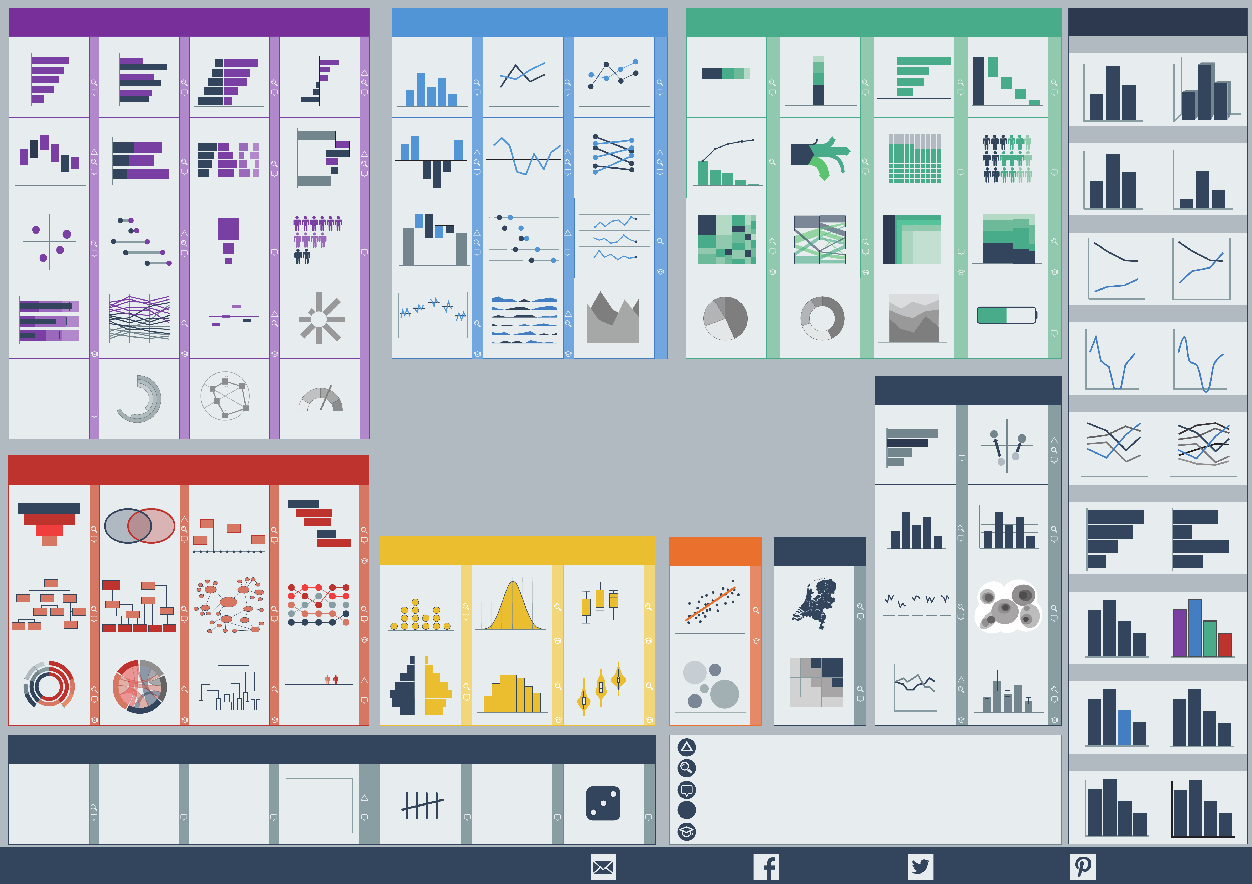
data
visual
axis
bar
column
numbers
legend
chart
diagram
graph
hierarchical network
nested composition
rank over time
relations
questions
clustering take position
planningoverlapping timeconversion
(geo) spatial
text and numbers hierarchy hand counted font or style symbol
multiple series
single value text based
uncertainty
exact value
storytelling
relative change
easy comparing
change
continuous time aggregated in time
versus cumulative target
repeating time series high and low
two time stamps
mini trend
not recommended
before and after
breakdownmultiple categories adding upone category in time
ow
comparing sizes part to multiple whole parts inside other parts plus extra variable
80 / 20 analysis
not recommended not recommended
single measure in timenominal comparison two variables opposing variables
one category and totals
multiple categories
measure combination
deviation from average
visual calculation
two groups image countsizing
multi variate data
delta between
above or below target
in context, bad/ok/good
delta between
not recommended
not recommended
not recommendednot recommended
correlation geospatial
change in time
risk
image countshow in relation to 100
not recommended
not recommended
with median
over interval
distributionfrequency count
two categories box plot + density
not recommended image lled
tablewords scripttally imagedeviation boxnumber
scatterplot
bubbleage distribution
funnel venn
chord diagram
network
timeline
owchart
dendrogram
gantt
organization chart
100%
bar 100
%
waterfall
100%
stacked column
100% stacked bar
tree map
pareto
parallel set nested area map
pie
donut
sankeydeviation line slopegraph
sparklines
line dot-line graph
cycle plot areahorizon
gauge
dumbbell dot plot
columngrouped bar deviation bar
deviation columnoating column
diverging stacked bar
stacked bar
bullet graph
panel bar
bar
x/y coördinate
parallel coordinate
radial bar
radar
heatmapsmall multiples
error bars
direct label grid
descriptive title
index
arrows
unitwae
wordcloud
pictogram
radial column
proportional size
deviation average
marimekko
100%
stacked area
sunburst position
image ll
bump
waterfall
vertical waterfall
risk
mapsdot matrix
violin
box plot
histogram
frequency polygon
More chart and designtips at www.Chart.Guide info@Chart.Guide @Chart_Guide/ChartGuide /ChartGuide
Useful for communicating your insights in infographics or presentations
Gives you insights when you are analysing your dataset
Great for monitoring your data in a dashboard
Only use this chart, when your readers know how to read it
Emphasizes the delta between two subgroups
! ! ! !
!
!
!
!
! !
! ! !
!
!
! ! !
!
!
!
!
!
!
!
!
!
!
!!
!!
!
!
!!
!
!
!
!
!
!
Show the relation between the data elements
Show the numbers
Show the development over time or a trend Show the part to whole relationShow the comparison between categories
When you are comparing category A with category B. Best to show data vertical.
When you want to show how A, B and C relate to each other.
When you want to show how often the letters A, B and C each appear in the dataset. To show the correlation
between A and B.
When A and B relate
in another way.
Techniques to enhance a chart.
When you want to show the change of category A and B over time. Best to show data horizontal. When you want to show how A, B and C add up to the total ABC.
To show the exact value of A, B or C.
Other
Correlation
Show the distribution of your dataset
Enhancements
Apply relevant ranking
Use a maximum of 4 series
It’s about data, axis only assist
True scaling, bar or column start at zero
Highlight what is important
True scaling, use a single Y axis
Straight corners show true numbers
Use 2D
Use color sparingly and unify ll and outline
Choose and design
your Perfect Chart
Chart design tips
“What would you like to show?”
