Data Storytelling Using Tableau User Guide
User Manual:
Open the PDF directly: View PDF ![]() .
.
Page Count: 39

Copyright © Xaltius Pte. Ltd. 2019 www.xaltius.tech | info@xaltius.tech
Page2
Module 1
Connect to the data source
The data source is a set of flat CSV files. Tableau allows connection to other types of sources as well
(MySQL, Google Analytics, Salesforce and others). For the purpose of simplicity, the workshop today
covers only connections to flat(CSV) files. During the demo, the use of PostgreSQL with Tableau will also
be demonstrated.
Download data from the following link: http://bit.ly/aventisXtableau
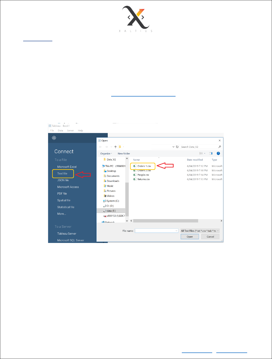
Live Hands-On: Point to the data source and load the file
Copyright © Xaltius Pte. Ltd. 2019 www.xaltius.tech | info@xaltius.tech
Page3
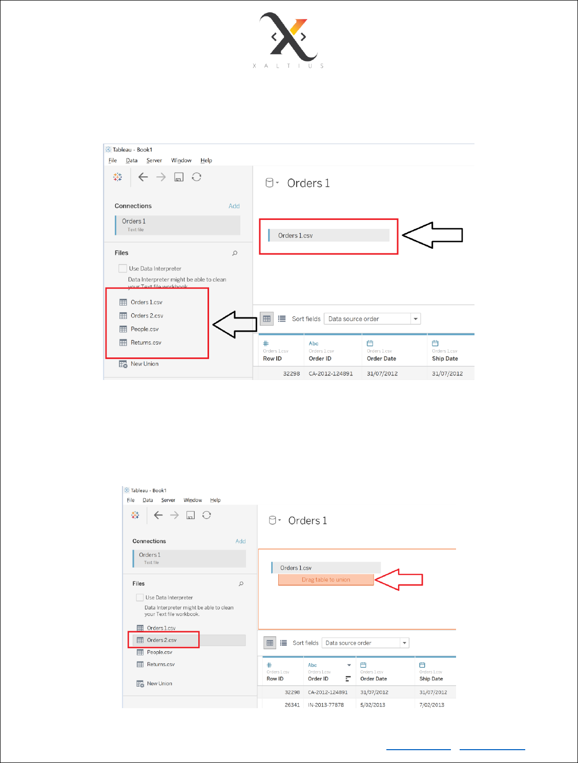
Load a single file/table
Once you select the CSV files, you’ll see that all your tables have been loaded and the other files are
available to on the left-hand pane.
Union two tables together
Drag the file Orders 2 and union it with the already present Orders 1 table. UNION adds up all the data
rows together and creates a single table. Please note that the column structure must be the same for 2
files to be combined as a union.
Copyright © Xaltius Pte. Ltd. 2019 www.xaltius.tech | info@xaltius.tech
Page4
Choose connection type
Live: updates real time. If the data in the source table changes, it will be updated on tableau as well
Extract: an extract in the form of a ‘.hyper’ database that is saved onto the disk. You can choose the
refresh rate at which the data needs to be updated.
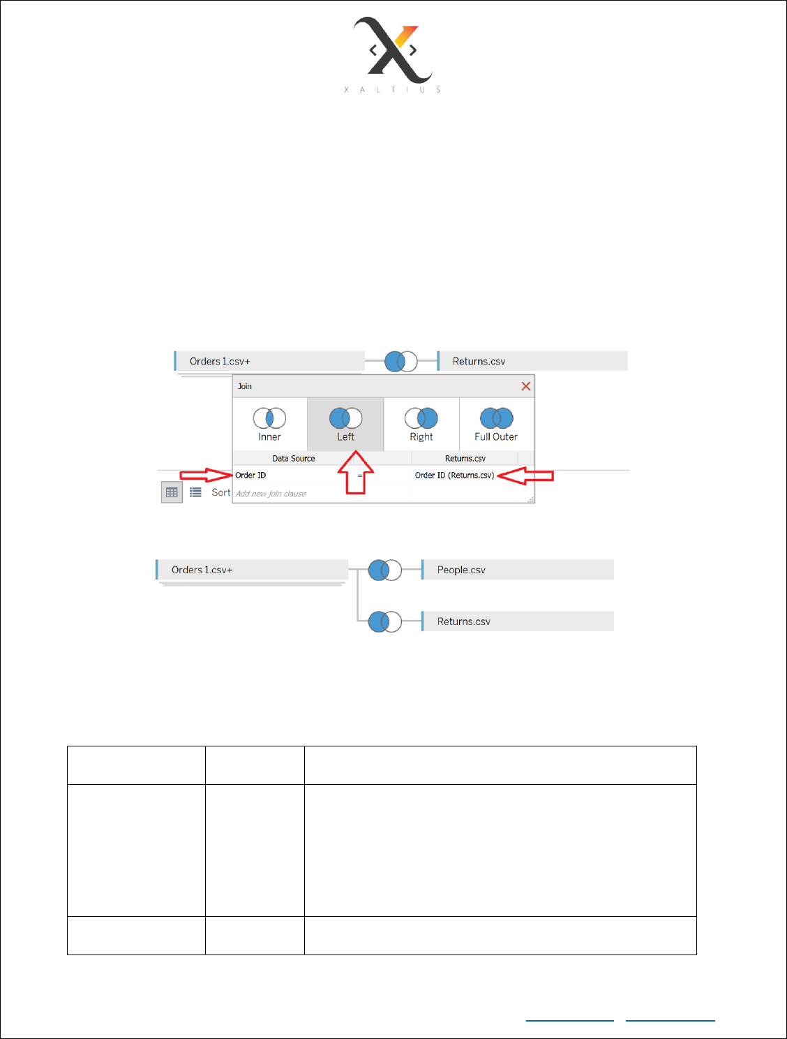
Join multiple tables
Tableau also provisions different join types to join multiple tables together. From your knowledge of
unions and joins, replicate the structure represented below.
Most commonly used file types in Tableau
File Type
File
Extension
Purpose
Tableau Workbook
.twb
It contains information on each sheet and dashboard that is
present in a workbook. It has the details of the fields, which
are used in each view and the formula applied to the
aggregation of the measures. It also has the formatting and
styles applied. It contains the data source connection
information and any metadata information created for that
connection.
Tableau Packaged
Workbook
.twbx
This file format contains the details of a workbook as well as
the local data that is used in the analysis. Its purpose is to
Copyright © Xaltius Pte. Ltd. 2019 www.xaltius.tech | info@xaltius.tech
Page5
share with other Tableau desktop or Tableau reader users,
assuming it does not need data from the server.
Tableau Data
Extract
.hyper
This file contains the data used in a .twb file in a highly
compressed columnar data format. This helps in storage
optimization. It also saves the aggregated calculations that
are applied in the analysis. This file should be refreshed to
get the updated data from the source.
Data Types in Tableau
Data Type
Description
Example
STRING
Any sequence of zero or more characters
‘Hello World’
NUMBER
These are either integers or floating points
322
145.33
BOOLEAN
They are logical values.
TRUE
FALSE
DATE & DATETIME
Tableau recognizes dates in almost all
formats. There are in-built functions in
Tableau to format the dates
"02/01/2015"
"#3 March 1982"
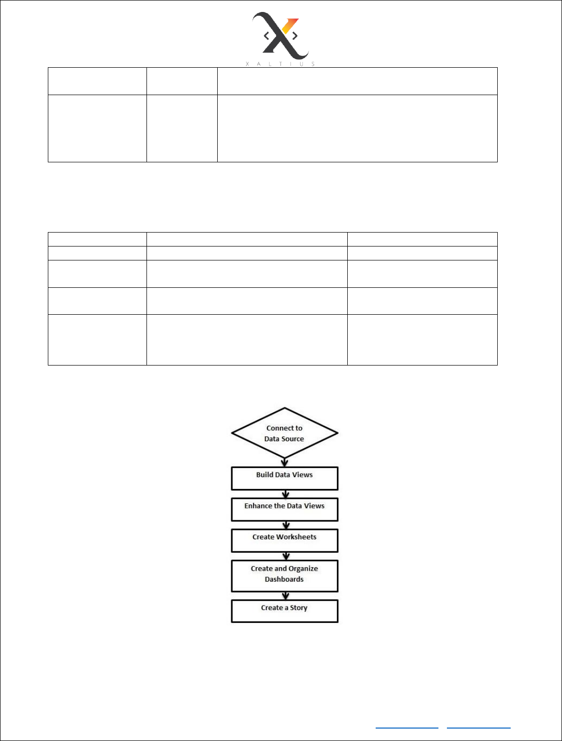
Tableau Workflow

Copyright © Xaltius Pte. Ltd. 2019 www.xaltius.tech | info@xaltius.tech
Page6
Exploring the Tableau Interface
What are the different components on the Tableau Interface that are important?
• Data source
• Data pane
• Analytics pane
• Columns
• Rows
• Filter card
• Marks card
• Create Worksheet
• Create Dashboard
• Create Story
• Menu Highlights:
a) File -> Export Packaged Workbook
b) Data -> Refresh all Extracts, Edit Relationships
c) Worksheet -> Show Summary, Run Update
d) Dashboard -> Actions, Export Images
e) Analysis -> Create Calculated Field
This is demonstrated during the workshop.
Copyright © Xaltius Pte. Ltd. 2019 www.xaltius.tech | info@xaltius.tech
Page7
Module 2
Worksheet Basics
• Add Worksheet
• Rename Worksheet
• Save and Delete Worksheet
• Reorder Worksheet
• Paged Workbook – when you want to use the same visualization for a dimension
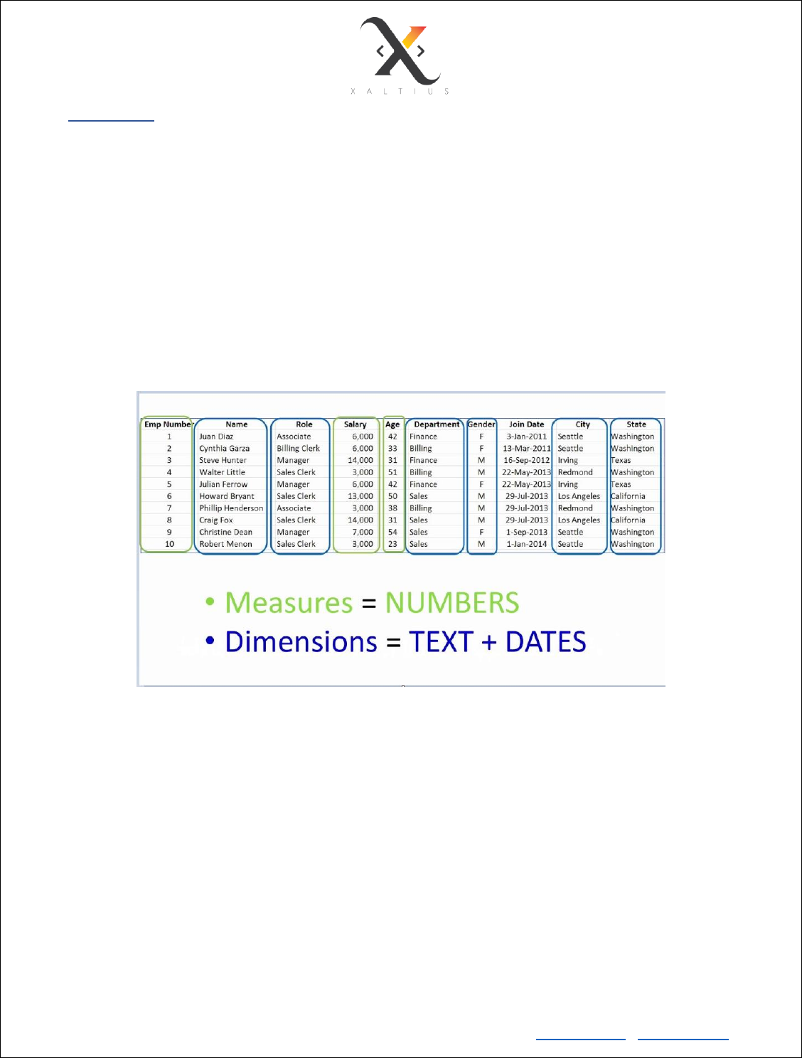
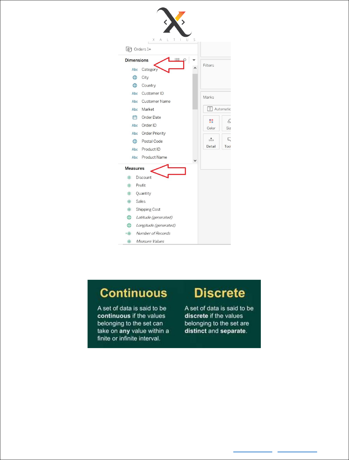
Dimension and Measure
In tableau, the dimensions and measures are automatically detected, and you can see them in the
respective pane.

Copyright © Xaltius Pte. Ltd. 2019 www.xaltius.tech | info@xaltius.tech
Page9
3. Number of people sleeping in stats class
Continuous:
1. Height of children
2. Weight of cars
3. Time to wake up in the morning
4. Speed of the train
Different combinations of dimensions/measures:
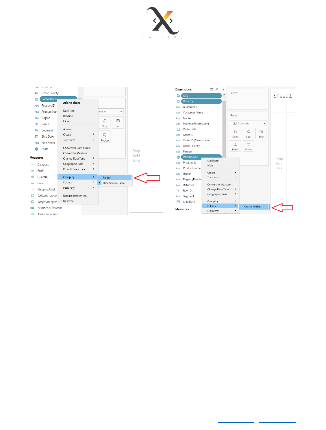
Create Folders in Tableau
You can organize your dimensions and measures in folders if required. The purpose of using folders is to
organize your data better and in a more efficient way.
Copyright © Xaltius Pte. Ltd. 2019 www.xaltius.tech | info@xaltius.tech
Page10
To do so, select on any dimension/measure and group by folder. Then, select all the variables that you
want to group together using ctrl + click.
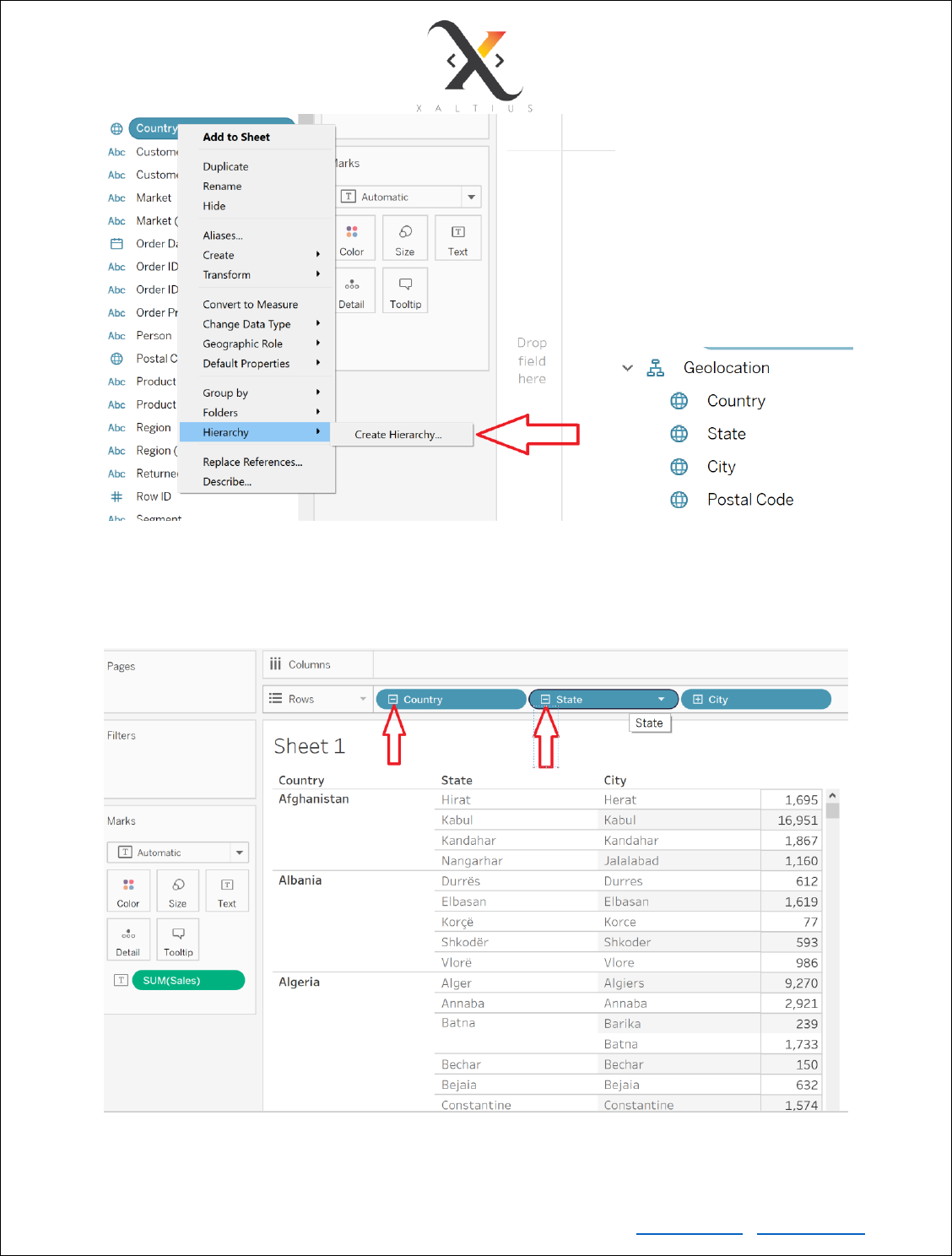
Create Hierarchy in Tableau
Multidimensional (cube) data sources contain hierarchies. One of the most useful ways to navigate
hierarchies is to drill down or drill up. For example, if you are examining the sales totals for various states,
you can then drill down and view sales for all the cities within each state. Alternatively, if you are
examining sales totals for all cities, you can then drill up and view the sales for each state.
Copyright © Xaltius Pte. Ltd. 2019 www.xaltius.tech | info@xaltius.tech
Page13
Module 3
Dashboards in Tableau
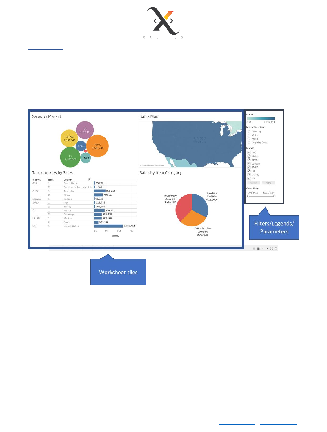
A dashboard is a collection of several views, letting you compare a variety of data simultaneously. For
example, if you have a set of views that you review every day, you can create a dashboard that displays
all the views at once, rather than navigate to separate worksheets. An example of a dashboard is shown
in the below figure.
Actions in Tableau Dashboard
Types of actions:
• Link to a different worksheet
• Link to an external web page
• Highlight a particular value in a dimension
• Filter values
Copyright © Xaltius Pte. Ltd. 2019 www.xaltius.tech | info@xaltius.tech
Page14
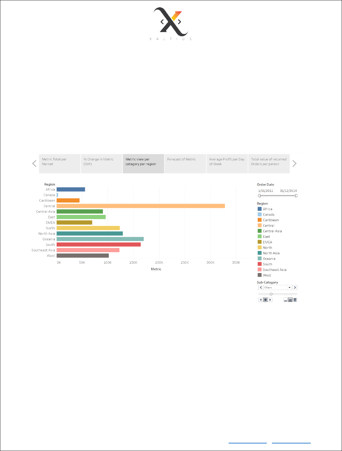
Storyboarding in Tableau
In Tableau, a story is a sequence of visualizations that work together to convey information. You can
create stories to tell a data narrative, provide context, demonstrate how decisions relate to outcomes, or
to simply make a compelling case.
A story is a sheet, so the methods you use to create, name, and manage worksheets and dashboards also
apply to stories. At the same time, a story is also a collection of sheets, arranged in a sequence. Each
individual sheet in a story is called a story point
Advantages of using stories is that you can present your insights in a sequential way and uncover the story
hidden in your data.
Copyright © Xaltius Pte. Ltd. 2019 www.xaltius.tech | info@xaltius.tech
Page15
Module 4
Data Sources
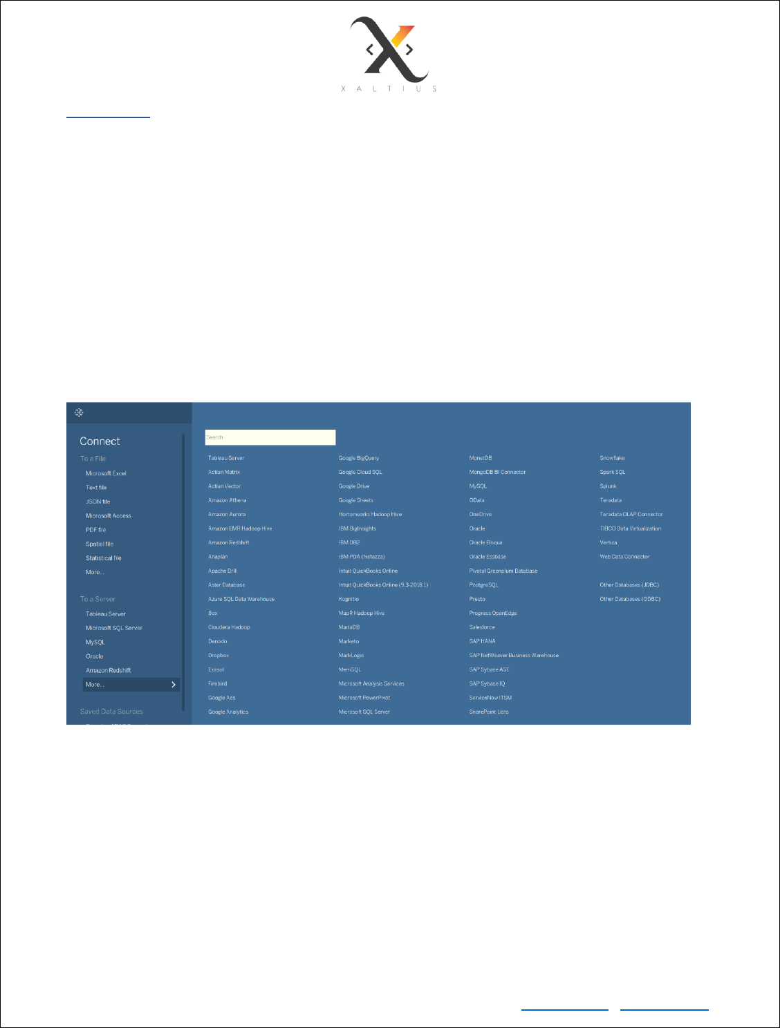
Tableau can connect to many kinds of data sources if you are using the desktop version. If you are using
the public version, then you can only connect to flat files (CSVs, text files and Excel files). However, do
note that Tableau is not meant for data pre-processing and should not be used for complex calculations.
Tableau’s native connectors can connect to the following types of data sources.
• File Systems such as CSV, Excel, etc.
• Relational Systems such as Oracle, SQL Server, DB2, PostgreSQL etc.
• Cloud Systems such as Windows Azure, Google BigQuery, Google Sheets etc.
• Other Sources using ODBC
The following image shows all the sources to which you can connect Tableau to.
Connection types
Live: used for real time data analytics. The result of the analysis is up to the second, and the latest changes
are reflected in the result. However, on the downside, it burdens the source system as it has to keep
sending the data to Tableau.
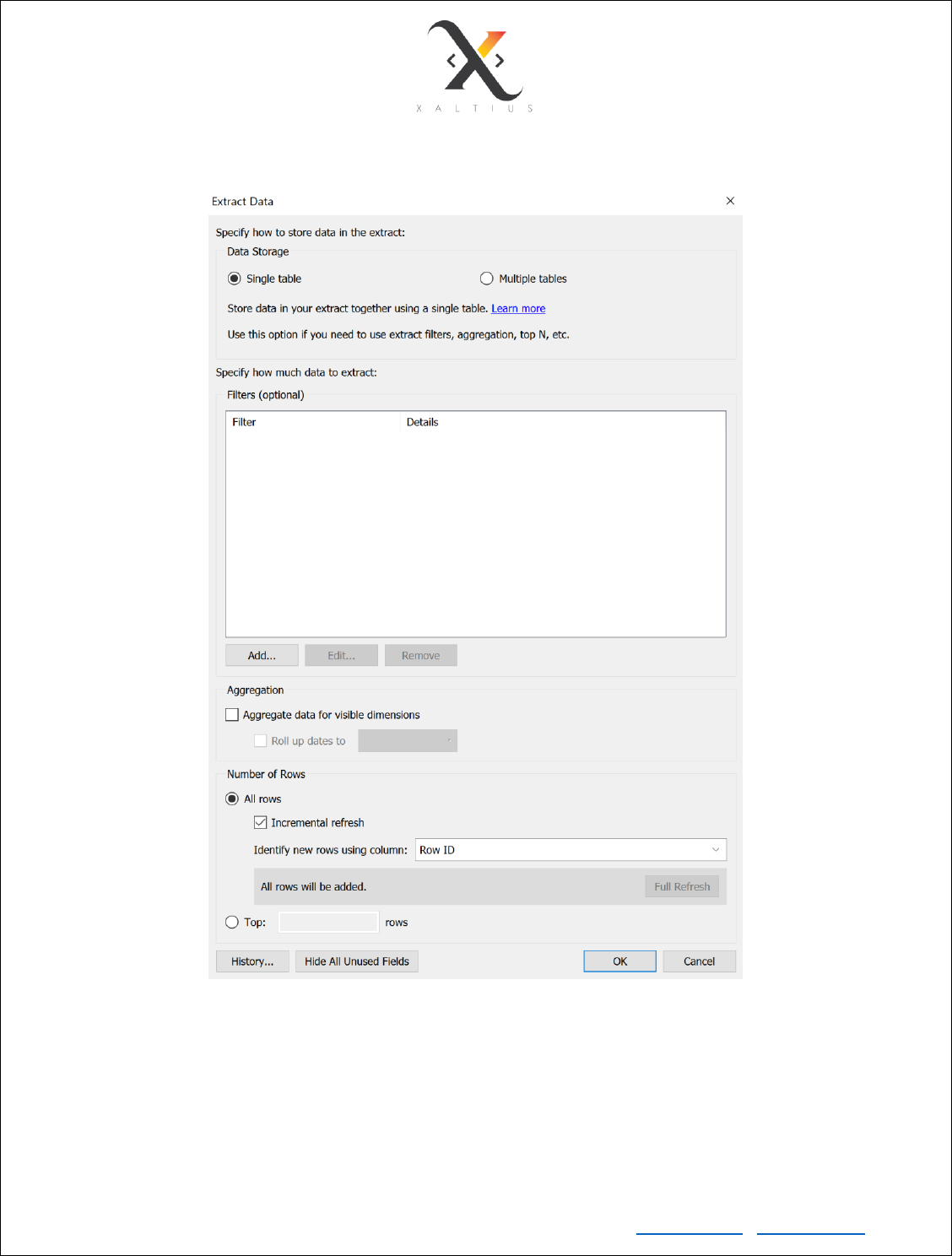
Extract: Tableau can also process data in-memory by caching them in memory and not being connected
to the source anymore while analyzing the data. The cached file is then persisted as .hyper file, which is a
sort of data store.
Copyright © Xaltius Pte. Ltd. 2019 www.xaltius.tech | info@xaltius.tech
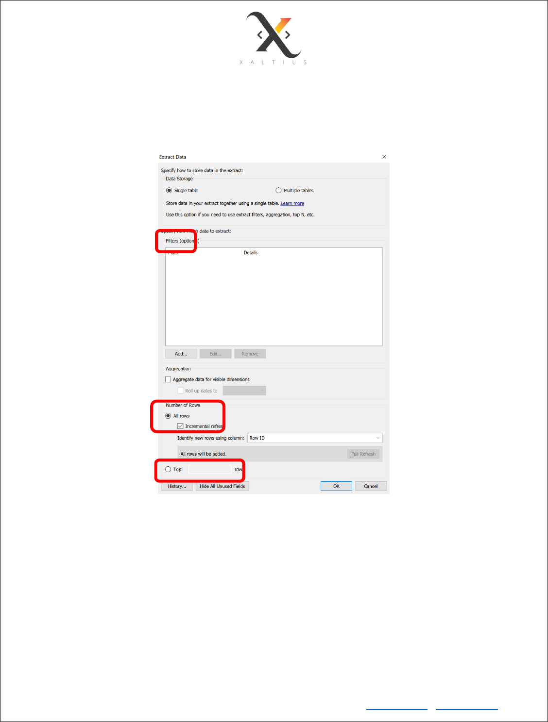
Page16
You can add constraints while creating the extract. Constraints could be
1. Filter/exclude data along a dimension/measure
2. Add only the newly added rows/values (Incremental refresh)
3. Include only the top n rows into the extract
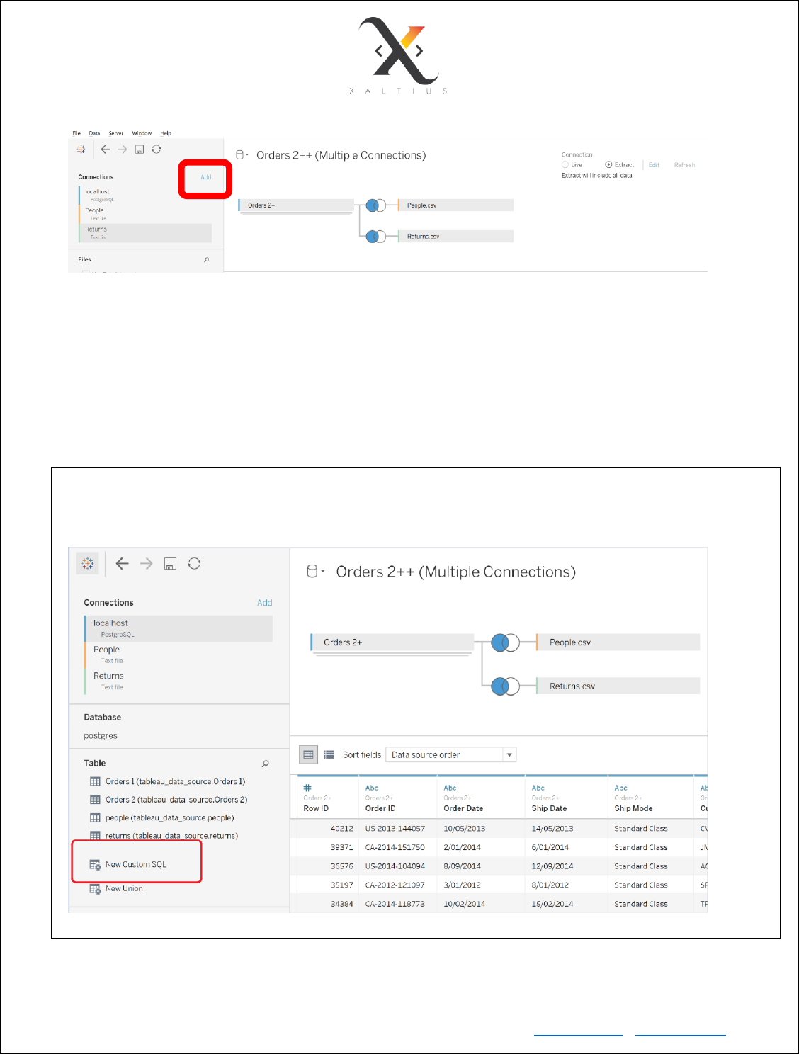
Connecting to multiple data sources
Tableau can connect to different data sources at the same time. For example, in a single workbook you
can connect to a flat file and a relational source by defining multiple connections. This is used in data
blending, which is a very unique feature in Tableau.
Copyright © Xaltius Pte. Ltd. 2019 www.xaltius.tech | info@xaltius.tech
Page17
As you can see, all three tables are taken from different data sources.
• Orders table is in the database
• People table is available as a CSV flat file
• Returns table is available as an Excel file
Different data sources have a different colour coding
PRO TIP:
You can write custom SQL while connecting to a relational database store. You can restrict the amount of
data being imported by applying a filter in SQL itself, which will improve the performance on Tableau.
Copyright © Xaltius Pte. Ltd. 2019 www.xaltius.tech | info@xaltius.tech
Page18
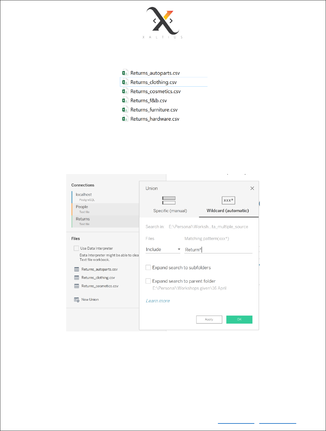
Union multiple tables using the wildcard method
Suppose we have multiple tables that have the same structure but have different names, for example
We need to union all of them, but it may not be possible to add all of them manually if the number of such
tables is too high. We can use the wildcard method instead to add all tables that start with ‘Returns’. The
same wildcard method can be used to search for files inside a subfolder and also a parent folder.
Copyright © Xaltius Pte. Ltd. 2019 www.xaltius.tech | info@xaltius.tech
Page21
Module 5
Grouping on a dimension
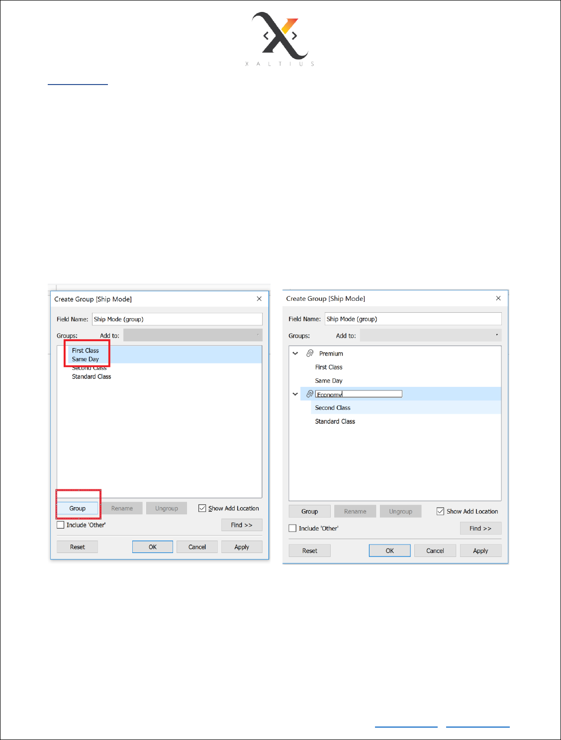
You can group multiple unique values into a single group for a dimension variable. In this use case, we can
group the “First Class” and “Same Day” delivery option as a “Premium” delivery option and “Second Class”
and “Standard Class” as an “Economy” delivery option.
To do so, right click on the dimension that you want to create groups for and select
Create -> group
• Select the values that you want to group together by holding down the ctrl key and left
click the values
• Then select the Group button
• Rename the new group
Grouping on a measure
The method to group a continuous variable is the same, although it doesn’t make sense as there would
be a lot of unique values in a measure. Instead, values in a continuous variable can be binned together to
form a dimension.

Copyright © Xaltius Pte. Ltd. 2019 www.xaltius.tech | info@xaltius.tech
Page22
Binning on a measure
Right click on the measure that you want to create bins for and select
Create -> bins
Select the bin size. If not specified, Tableau calculates the bin size according to the formula:
Number of Bins = 3 + log2(n) * log(n)
where n is the number of distinct rows in the table
By specifying a bin size xxx, you are instructing Tableau to create equal sized bins.
For more details on binning, refer to the video here : https://www.youtube.com/watch?v=VwDPBWuHu3Q
TASK - Create equal sized bins for discount measure with each bin size of 0.1 and create a histogram to
show plot the bin size vs % of transactions/records.
In this use case, the discount is the ration of discount in $ of a product in an order / Sale amount of that
product. If discount is 0.1, it means 10% discount was offered on that product.
The final visualization should look like:
Copyright © Xaltius Pte. Ltd. 2019 www.xaltius.tech | info@xaltius.tech
Page23
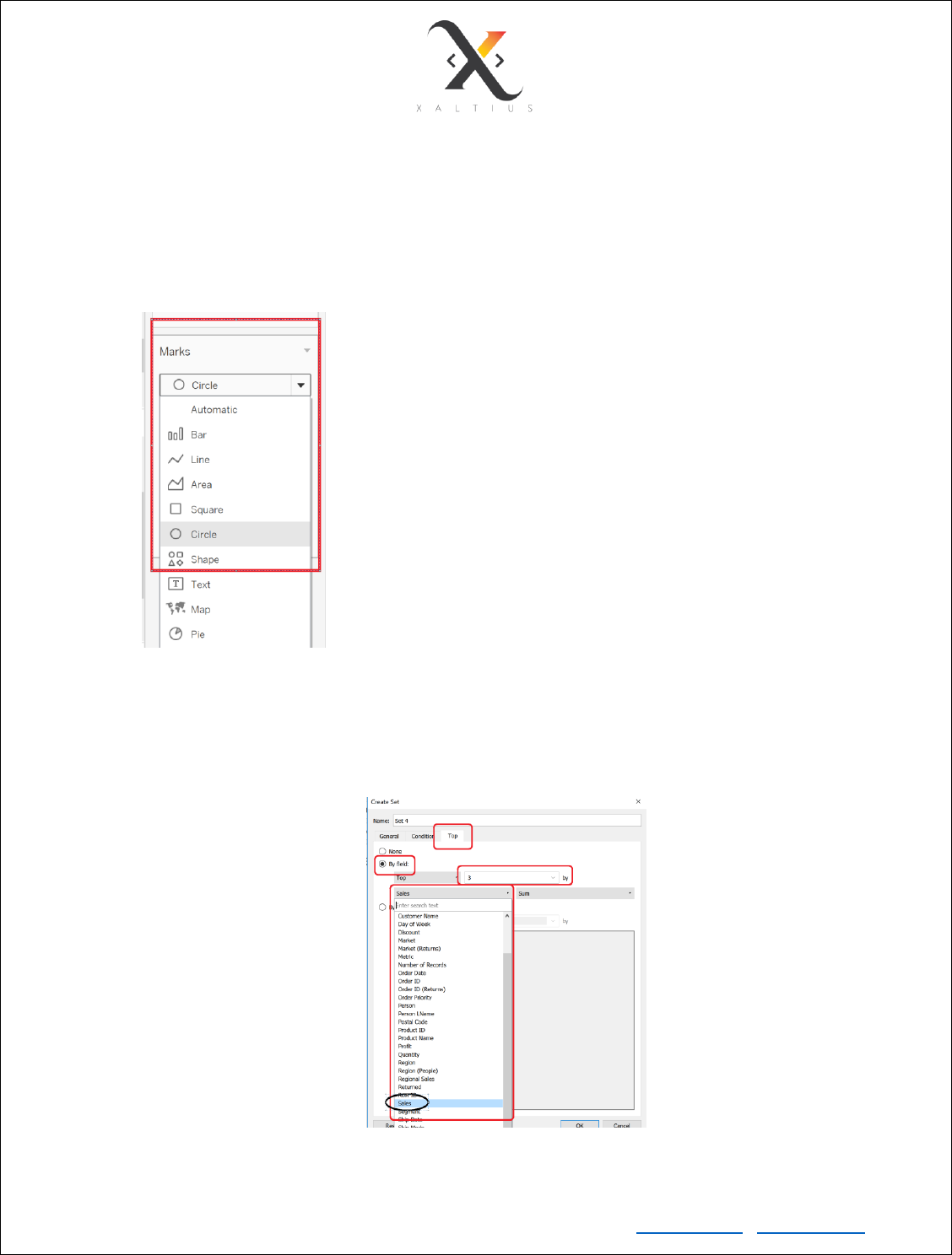
Create Set on a dimension
Sets help us to selectively highlight our points of interest in a chart. For example, if you want to select the
top 3 sub-categories by sales in a sub-category vs profit plot.
• Drag sub-category to Columns shelf
• Drag profit to Rows shelf
• Change the shape type from the Marks card
• Right click on Sub-category -> create -> set
• Select the Top tab -> By field -> enter 3 in the text box -> chose sales from the field drop down
menu -> select sum for the aggregation drop down menu -> rename the field to “top 3 by sales” -
> click ok
Copyright © Xaltius Pte. Ltd. 2019 www.xaltius.tech | info@xaltius.tech
Page24
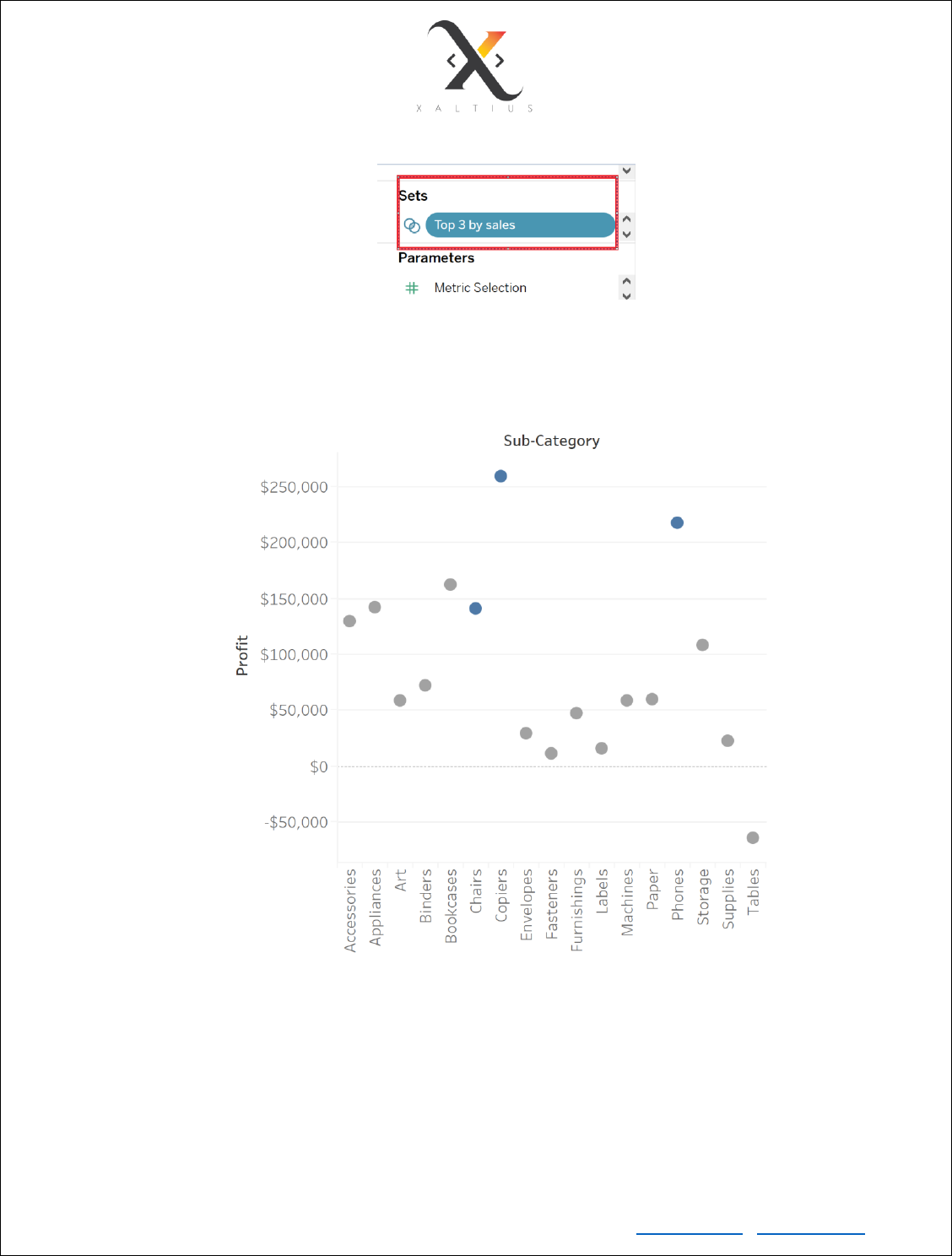
• You’ll see a new set created in the sets pane.
• Drag the newly created set to colour in the marks pane. In the product sub-category vs profit
plot, you’ll see the top 3 by sales highlighted
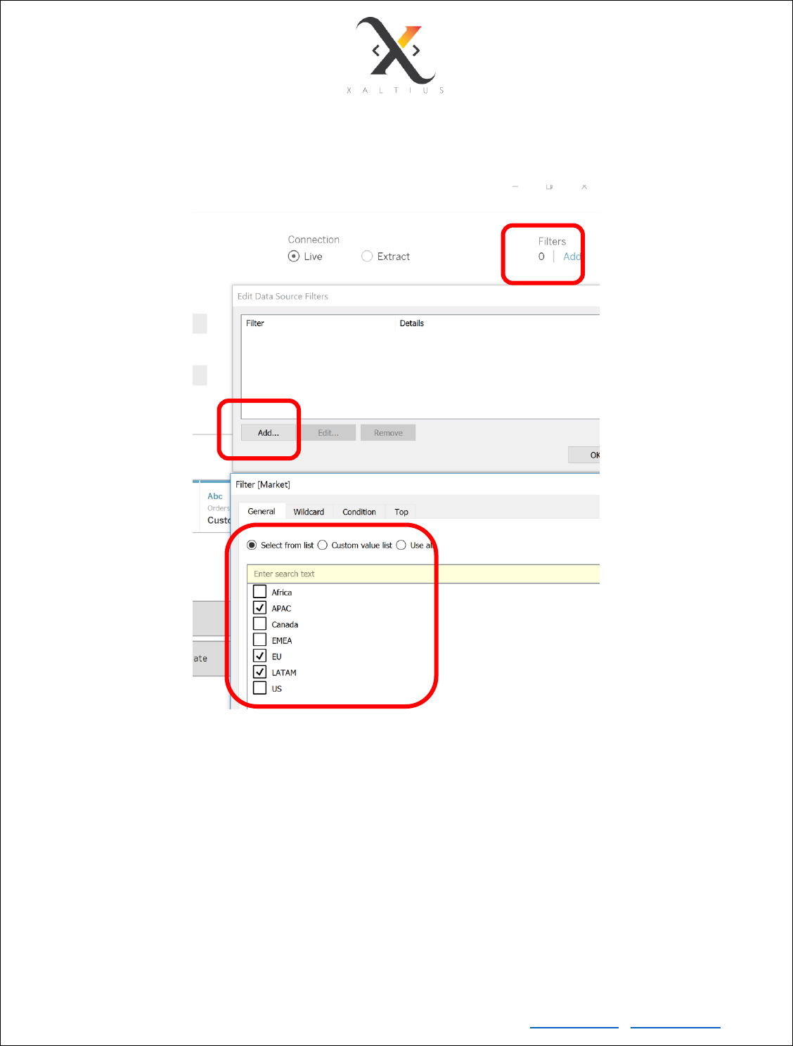
Filter Data
Drag any dimension/measure to the filter shelf.

Copyright © Xaltius Pte. Ltd. 2019 www.xaltius.tech | info@xaltius.tech
Page25
Dimension Filters
Date Filter
Filter a range of dates(continuous), relative dates(continuous) which start from a reference point, starting
from date(continuous), ending at date(continuous), years(dimension), quarters(dimension),
months(dimension), individual date(dimension) and many more other ways.
General Dimension Filters
For dimensions that contain string values, you can include or exclude based on
1. the entire string itself, e.g. if you want to filter out “furniture”
2. string contains/starts/ends with or exactly matches a pattern
3. based on a condition, for e.g. filter the persons who’s count of return orders is >200
4. top n based on a measure, for e.g. filter the top 5 sub-categories based on the profit they made
over the entire period
TASK:
1. The data we have is from 1st Jan 2011 to 31st Dec 2014.
Create a category-profit% pie chart and show a dynamic date filter to filter only profits made
from 1st Aug 2012 to the end of period
2. Filter the top 10 products by sales in 2012
Copyright © Xaltius Pte. Ltd. 2019 www.xaltius.tech | info@xaltius.tech
Page26
Module 6
Create Calculated fields
This feature in tableau can be used to create derived variables. For example:
• Derive the day of week of an order date
• Derive the first name of a customer from the customer’s full name
• Derive the discount amount by using the sales amount and % discount
• Derive the GDP per capita from the total GDP and total population of a country
• Derive if a customer is a low value, medium value or high value customer based on the amount
spent at the store
• From the menu option, go to Analysis -> Create Calculated Field
• Write the formula or the if-else statement (to create a derived dimension using the values of a
measure)
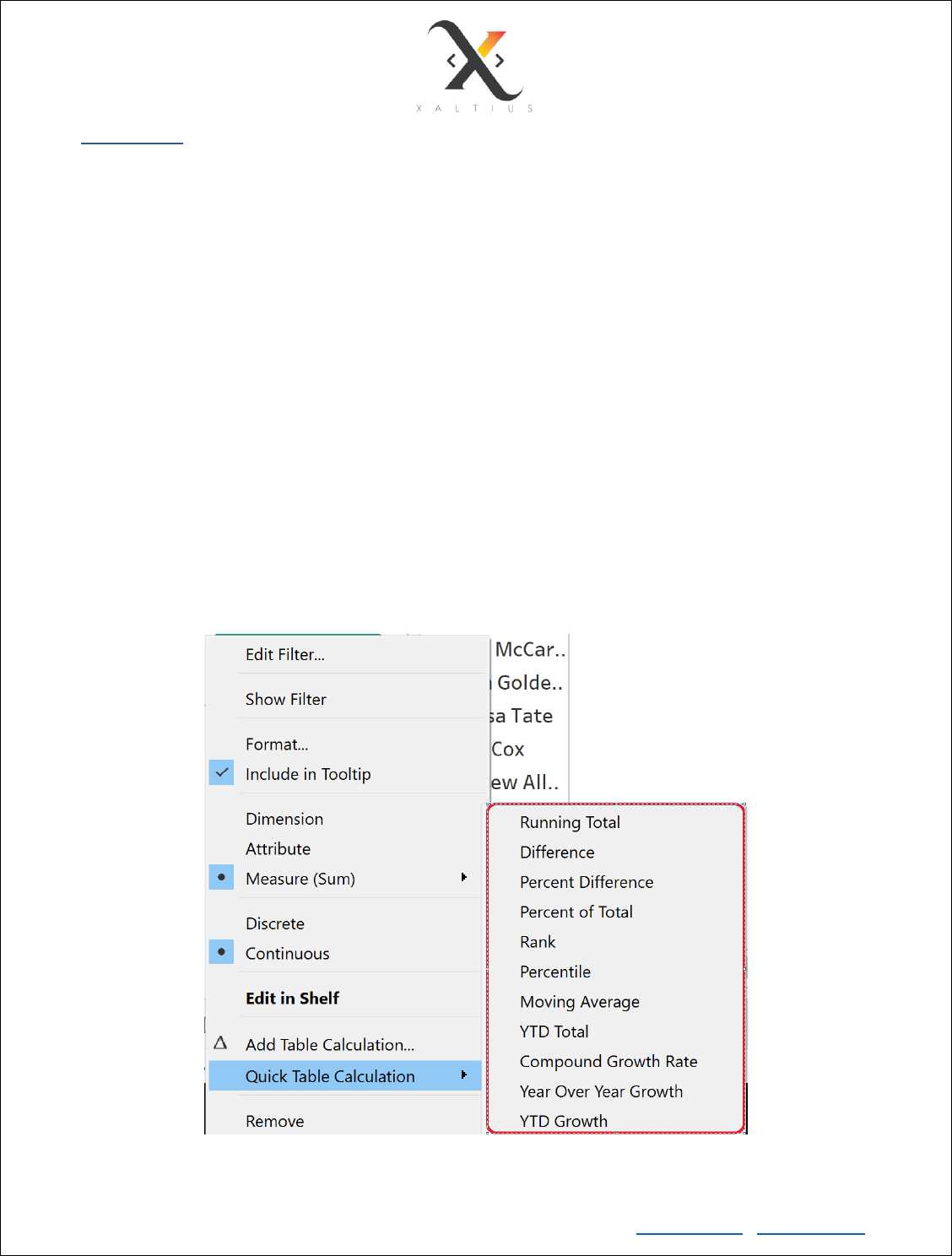
You can also use the in-built quick table calculations to quickly calculate a few metrics from a measure.
• To do this, drag a measure to the column/row shelf or the marks pane -> right click on the measure -
> select the aggregation
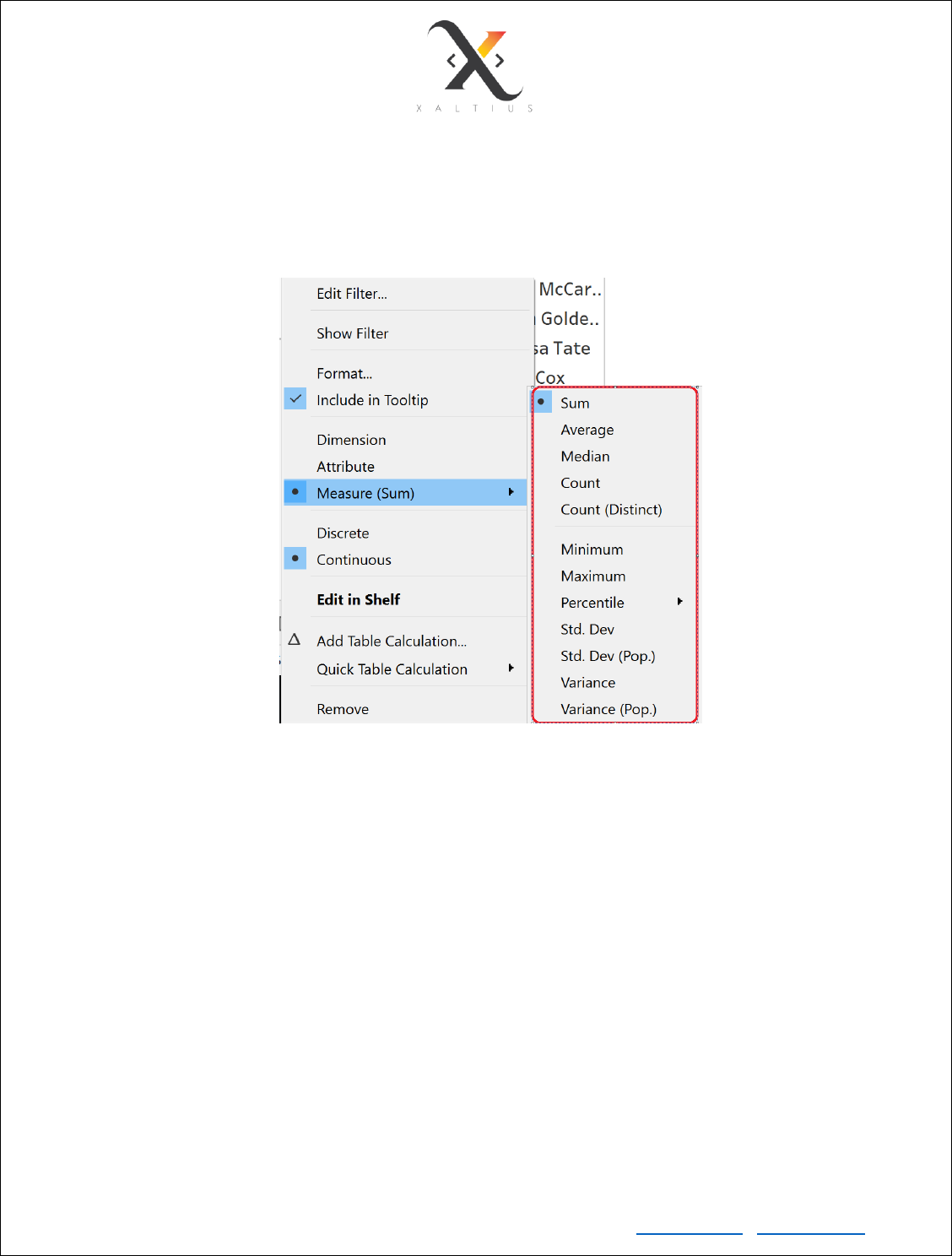
Copyright © Xaltius Pte. Ltd. 2019 www.xaltius.tech | info@xaltius.tech
Page27
You can also select the aggregation method for a measure. The default aggregation is SUM() if you drag a
measure to the column/row shelf or marks pane. You can change that by doing
• Right click on the measure from row/column shelf or marks pane -> Measure
The quick table calculations and aggregations can be used in visualizations to quickly draw some insights.
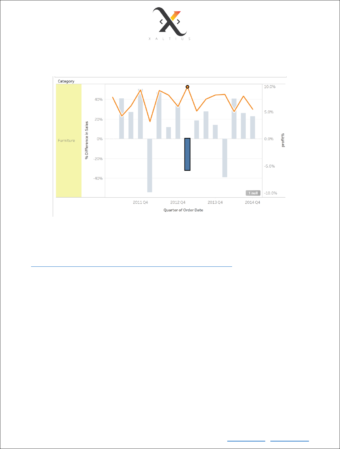
TASK:
1. Plot a chart to show %increase or decrease in sales compared to previous quarter for furniture
category
2. Plot a dual axis chart to check if the profit margin (percentage of profit) always decreases with
decrease in sales for each category
Copyright © Xaltius Pte. Ltd. 2019 www.xaltius.tech | info@xaltius.tech
Page28
The final visualization should look something like this:
Functions in Tableau
Functions available in Tableau are similar to the functions that are available in Excel.
You can use the in-built functions mentioned on the official documentation link
(https://onlinehelp.tableau.com/current/pro/desktop/en-us/functions.htm)
TASK
1. Derive the order day of week. This dimension will be used for the sales amount comparison per
day of week. We want to test out the hypothesis that Customers spend different amount on
weekends as opposed to weekdays
2. Derive the undiscounted sale price of each product (one record can be treated as an individual
product in our use case)
HINT: use the formula
undiscounted price of product = sales/(quantity * (1-discount))
3. Derive the cost price of each line item
HINT: use the formula
Cost price of line item = (Sales – profit – shipping cost)/quantity

Copyright © Xaltius Pte. Ltd. 2019 www.xaltius.tech | info@xaltius.tech
Page29
Module 7
Top N analysis
Calculation of top n is useful when you want to display only the top n per group. For example, to show
the top 3 countries by sales for each market in the data.
• Create a new derived variable called Rank. Assign INDEX() to the value of this variable
• Drag Market from dimensions to Rows
• Drag Sales from measures to Columns. Make sure the aggregation is SUM
• Drag Rank to Rows, to the right of Market
• Drag Country to Rows, to the right of Rank
• Sort Country based on the sum of sales in descending order
• Right click Rank -> compute using -> Pane Down
Take a closer look. The rank restarts from 1 for every market. This way, each country has a rank
(highest sales to lowest sales) in its respective market
• Hold Ctrl and Click Rank from Rows, drag it to the filters pane. Select the numbers 1,2 and 3
• Format the chart to show the actual sales values
Filter by Parameter
A parameter allows you to dynamically show the same chart for different dimension. For example, if you
want to show the Top 3 countries per market but you want the user to choose from
Sales/Quantity/Profit/Shipping Cost then use parameter as a filter.
• Create a new parameter and call it Metric
• Data type -> Integer, Allowable values -> List
• Add value 1, 2, 3 and 4. Display as Sales for ‘1’, Profit for ‘2’, Quantity for ‘3’ and Shipping Cost
for ‘4’
• Set current value to ‘Sales’
• Create new calculated field ‘Metric Selection’. Use the following for derivation:
IF [Metric] == 1 THEN [Sales]
ELSEIF [Metric] == 2 THEN [Profit]
ELSEIF [Metric] == 3 THEN [Quantity]
ELSEIF [Metric] == 4 THEN [Shipping Cost]
END
Copyright © Xaltius Pte. Ltd. 2019 www.xaltius.tech | info@xaltius.tech
Page30
• Right click on metric -> show parameter control. You will see a Metrics card at the right
• Drag Order date to column and convert to continuous, right click and choose quarter
• Drag Metric Selection variable from measure and drop it to Rows
• Create a line chart to see the overall trend
• Select the metric from the Metric card. You can now switch from seeing the Sales figures to any
of Profit/Quantity/Shipping Cost
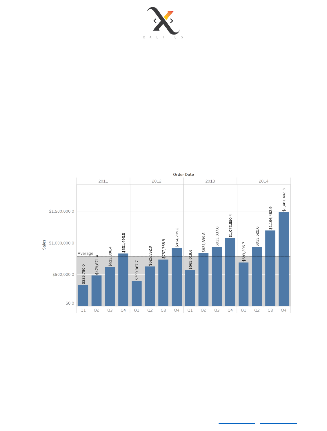
Add Reference Line
Reference line is useful when you want to have a high-level statistic view (average/median/max) on the
entire table
• Create a Year-Quarter vs Sum of Sales bar chart
• From the analytics pane, drag the Reference Line on top of the chart
• Drop on the “table” option
Copyright © Xaltius Pte. Ltd. 2019 www.xaltius.tech | info@xaltius.tech
Page31
Module 8
Analytics functions in Tableau
Average line
Can be used to add a reference average line or an average line with confidence interval
• Drag Order date to Column and make it continuous. Drill down to Month level
• Drag Sales to Rows. Make sure the aggregation is SUM
• From the analytics pane, drag the Average with 95% CI to the chart and choose the table in
distribution-band
TASK – reproduce the below chart
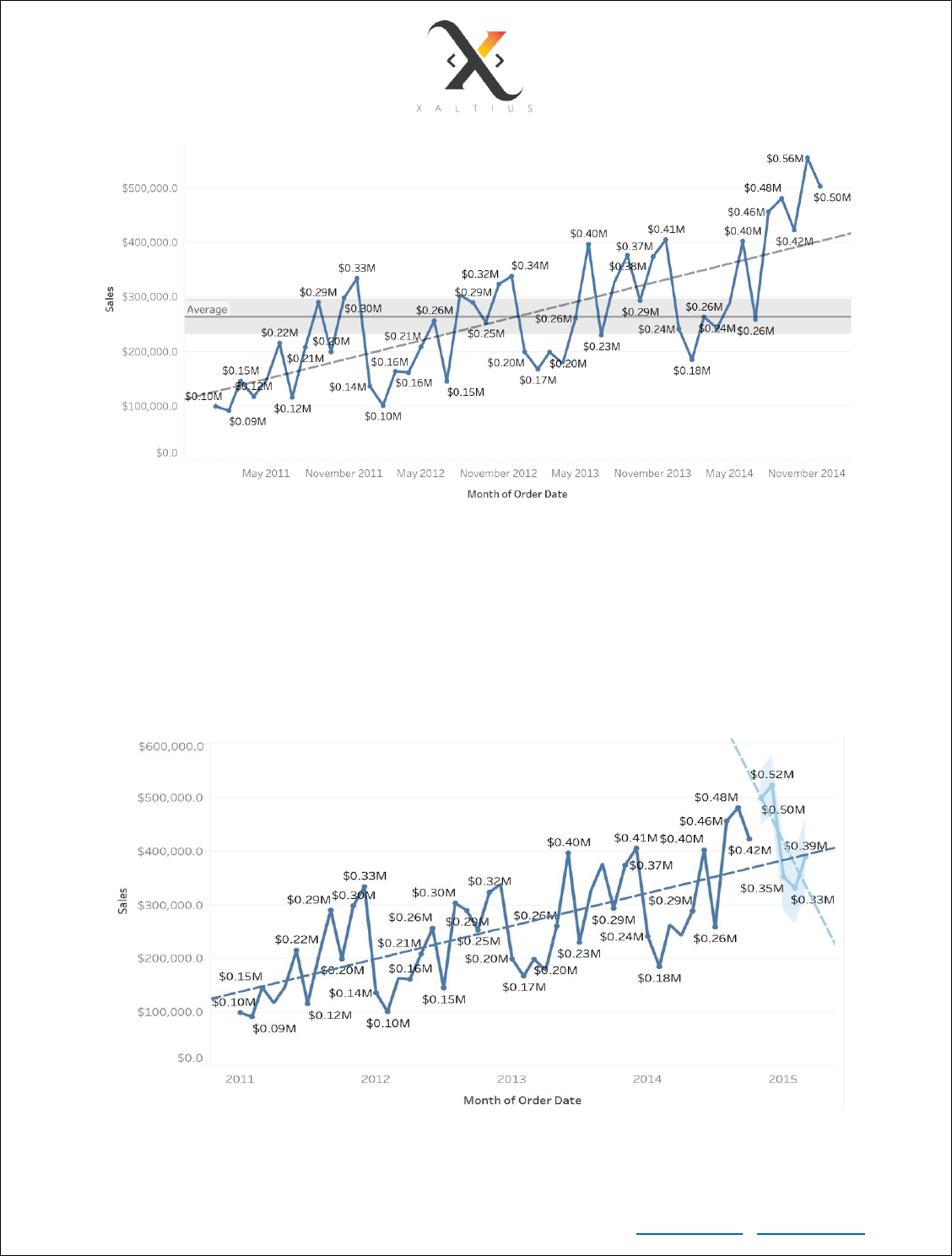
Trend Line
• From the analytics pane, drag the trend line and drop on the chart to see the overall trend.
This trend line fits a regression line on the data. The trend line also shows the coefficients, R
Squared value and P value
TASK - Reproduce the below chart. The line that cuts across is the trend line or the regression line
Copyright © Xaltius Pte. Ltd. 2019 www.xaltius.tech | info@xaltius.tech
Page32
Forecast
Similar to the average line and trend line, drop the forecast on the same chart. This analytics method
creates a time series model to forecast the value (always should be a measure).
TASK - Create a forecast for the next 5 months. After the forecast is created, see the description of the
forecast. It should look something like this:

Copyright © Xaltius Pte. Ltd. 2019 www.xaltius.tech | info@xaltius.tech
Page33
Clustering
• Drag Profit to Column
• Drag Sales to Row
• Drag Customer Name to Detail
• From analytics, drag cluster to the chart. This will create 2 clusters
• From the marks pane, right click on the cluster and edit cluster. You can increase the number of
clusters and change the clustering criteria.
TASK - Describe the cluster and interpret the results

Copyright © Xaltius Pte. Ltd. 2019 www.xaltius.tech | info@xaltius.tech
Page34
Module 9
Map visualizations in Tableau
Tableau provides 2 types of map visualizations – Symbol map and Filled map
Symbol Map
Symbol map is useful when you want to add an extra dimension.
• Tableau automatically detects a country/state/city/postal code and generates the corresponding
latitude/longitude
• Drag latitude to rows
• Drag longitude to columns
• Choose the symbol maps visualization
• Drag Country to detail
• Drag Sales to colour
Copyright © Xaltius Pte. Ltd. 2019 www.xaltius.tech | info@xaltius.tech
Page35
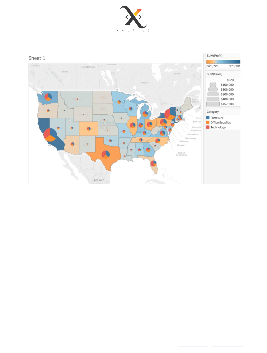
Use Cases of Map Visualizations
In the above image, a pie chart is overlaid on top of each state. The pie chart shows the percentage share
of profit for each category in each state. The colour code shows the profit value of each state.
To see how it is done, follow the link
https://onlinehelp.tableau.com/current/pro/desktop/en-us/maps_howto_filledpiechart.htm
Copyright © Xaltius Pte. Ltd. 2019 www.xaltius.tech | info@xaltius.tech
Page36
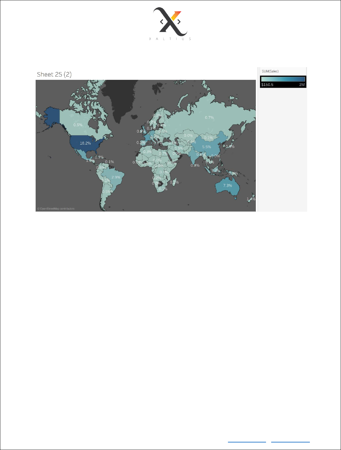
Filled Map
Filled maps in tableau are good to show clear differences in a metric.
In the above visualization, the colour legend corresponds to the total sales for a country. The labels are
set by calculating the percentage of total sales.
TASK - Replicate the above visualization
Web Map Service
Tableau comes pre-loaded with a default background maps. You can change the default background maps
by using a WMS of your choice or Mapbox. In this exercise, we will see how to change the default
background maps to Mapbox.
• Go to Map -> Background Maps -> Map Service -> Add -> Mapbox Maps -> Classic
• You can create a free account on Mapbox and use the public token to use the Mapbox service.
For convenience purpose, the team has set up a temporary Mapbox public token for this workshop.
Please note that it will be deleted after the workshop
• Enter the following public token into the API access token field
pk.eyJ1IjoiYXJqdW5wbW0iLCJhIjoiY2p1YXlkbWszMDc5NDQycGMzeDV0MzZnOS
J9.NIOIaN-0nSBrpMQ8OcRSbQ
• Choose the Run + Bike + Hike in pre-set style. Give it a name of your choice, click OK
• Go to Map -> Background map -> select the newly added map service
TASK - Recreate the Symbol Map using the newly added WMS

Copyright © Xaltius Pte. Ltd. 2019 www.xaltius.tech | info@xaltius.tech
Page37
Module 10
LOD Calculations
LOD calculations are similar to group by aggregation in SQL. LODs are useful when the data is replicated
at a particular dimension. If you want to run aggregation like SUM() on that dimension, the replicated data
will lead to incorrect results.
For example :
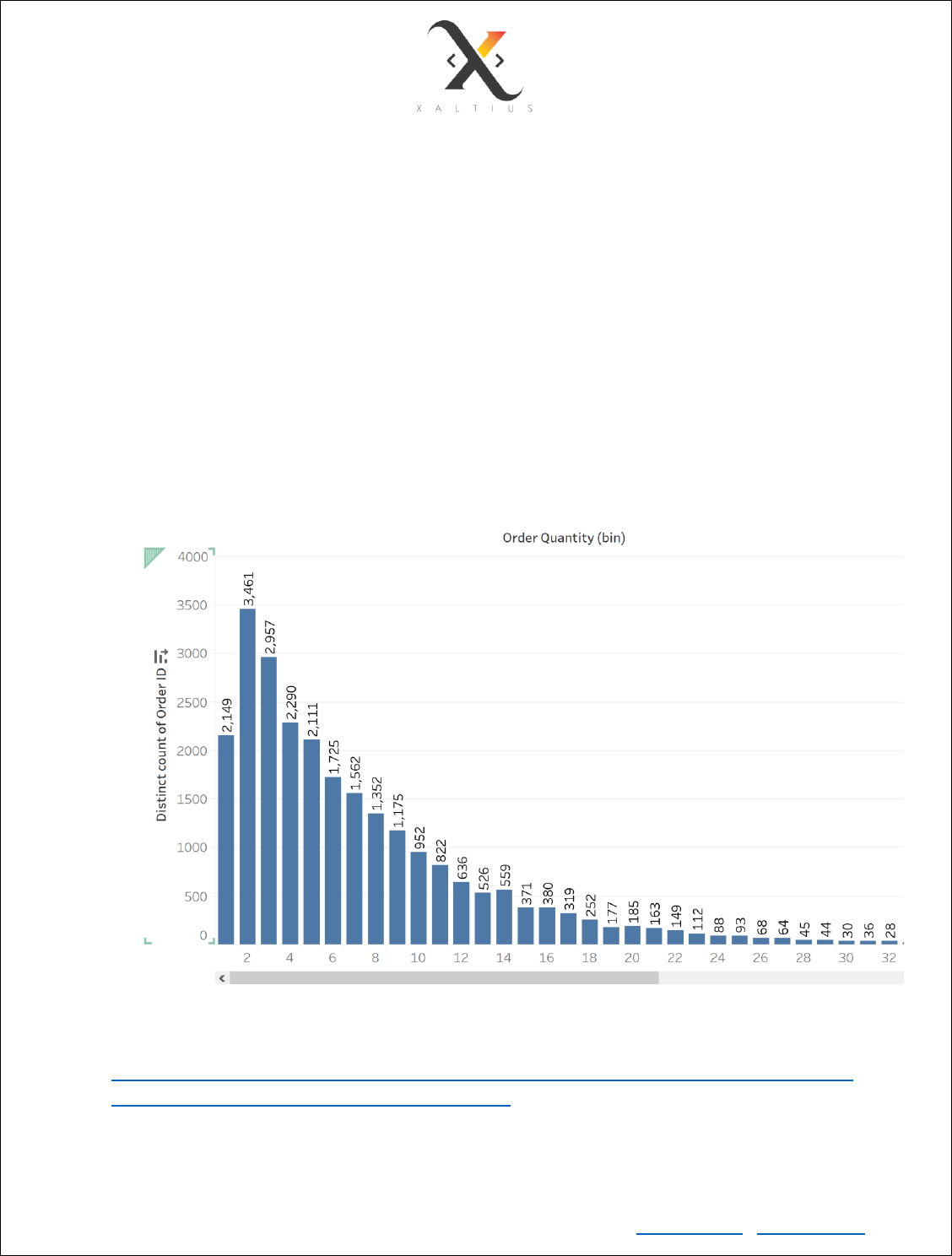
If you want to create a frequency count chart to see the Total Order Quantity vs Number of unique orders
(how many orders had x items in it), the usual method that strikes your mind is to
create bins from Quantity -> drag the Quantity bins to columns -> drag Order ID to Rows -> convert Order
ID to COUNTD -> create a histogram. This would produce the following visualization:
Which is totally wrong.
TASK: Calculate the sum of quantity for order id ‘IN-2014-15263’ in Tableau. Check the individual rows
that contribute to this sum by viewing the data. You will notice that the Order ID is being repeated in some
of the rows and the true sum of quantity is calculated using the following logic:
For each Order ID -> Sum the Quantity measure
Copyright © Xaltius Pte. Ltd. 2019 www.xaltius.tech | info@xaltius.tech
Page38
LOD to the rescue
• Create a calculated variable with the following formula:
{FIXED [Order ID]:
SUM([Quantity])
}
Here, FIXED tells Tableau to fix Order ID as the dimension and sum the quantities for each Order
ID. Looks similar to GROUP BY clause, doesn’t it? It is!
• Create bins for this new variable with bin size = 1 or you can create a parameter that can
dynamically change the bin size
• Drag the bins dimension to rows and order ID to columns. Convert Order ID to COUNTD
• From SHOW ME, choose the text table
• Now you see the true quantities grouped by order ID. To verify, view the data corresponding to
order quantity = 58. It will show all the corresponding data
• Now create a histogram. You’ll see a long-tailed histogram that shows the true count of orders
vs total quantity per order
Tableau offers FIXED, INCLUDE and EXCLUDE level of detail.
For detailed explanation, refer to the following links:
• https://onlinehelp.tableau.com/current/pro/desktop/en-us/calculations_calculatedfields_lod.htm
• https://www.youtube.com/watch?v=kmApWaE3Os4

Copyright © Xaltius Pte. Ltd. 2019 www.xaltius.tech | info@xaltius.tech
Page39
TASK:
Create a visualization that would show how the sales of all sub-categories compare to that of a selected
sub-category. The final visualization should look like below. The sub-category selection is dynamic here.
HINT:
1. Create a parameter to select the sub-category
2. Create a new field (Selected-Sale) to show sales of selected sub-cat and rest to zero. Total sales
of a sub-cat subtracted by Selected-Sale will give us the difference in sales
if [Sub-Category] = [Select sub-category] THEN [Sales] ELSE 0 END
3. Create new variable (Sale of selected sub-cat) to exclude the selected sub-cat and sum Selected-
Sale. We will subtract this value from the total sales of each sub-cat to get the actual difference
{EXCLUDE [Sub-Category] : SUM([Selected sales])}
4. Create a new variable (Sales diff from selected)
SUM([Sales]) - SUM([Sales of Selected Sub-Cat])
