Design Guide
User Manual:
Open the PDF directly: View PDF ![]() .
.
Page Count: 32

NATMUS
KAMMER
DMJX | GD 2016-2019 | 2ND YEAR EXAM 2018
MAËLLE MORIN
1
NATMUS
KAMMER
Design Guide

NATMUS
KAMMER
DMJX | GD 2016-2019 | 2ND YEAR EXAM 2018
MAËLLE MORIN
2
TABLE OF CONTENT
1. The brand narrative
2. Logo
3. Typography
4. Colors
5. Imagery
6. Fifth Element
7. Web
8. Airlook
9. Applications
03
05
11
15
17
19
22
26
28

NATMUS
KAMMER
DMJX | GD 2016-2019 | 2ND YEAR EXAM 2018
MAËLLE MORIN
3
THE BRAND NARRATIVE

NATMUS
KAMMER
DMJX | GD 2016-2019 | 2ND YEAR EXAM 2018
MAËLLE MORIN
4
THE MODERN STORYTELLER
Storyteller is one of the oldest profession in the world, it is how
we keep track of our history. Natmus Kammer wants to keep
this tradition of entertainment by becoming a new type of sto-
ryteller, a modern storyteller. Like history, the way of telling
stories must also evolve and we are ready to evolve with it. With
our various collection of stories and multimedia contents, we
are the perfect tool to satisfy you curiosity. Together we must
built a bridge between the past and the present by looking at
our history and put it in perspective with the present. We are
here to offer you an immersive and knowledge-based experien-
ce. Take part of your own story and experience it yourselves in
the comfort of your home.

NATMUS
KAMMER
DMJX | GD 2016-2019 | 2ND YEAR EXAM 2018
MAËLLE MORIN
5
LOGO
NATMUS
KAMMER
DMJX | GD 2016-2019 | 2ND YEAR EXAM 2018
MAËLLE MORIN
6
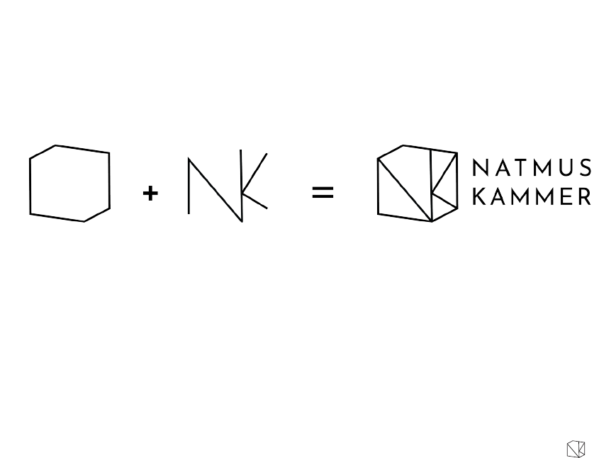
The logo is a combination of a
box shape, which represents a
room, and the two rst letters
of the media platform’s name.
The name is always put on the
right side of the logomark.
LOGO CREATION
NATMUS
KAMMER
DMJX | GD 2016-2019 | 2ND YEAR EXAM 2018
MAËLLE MORIN
7
CLEARSPACE AND SCALING
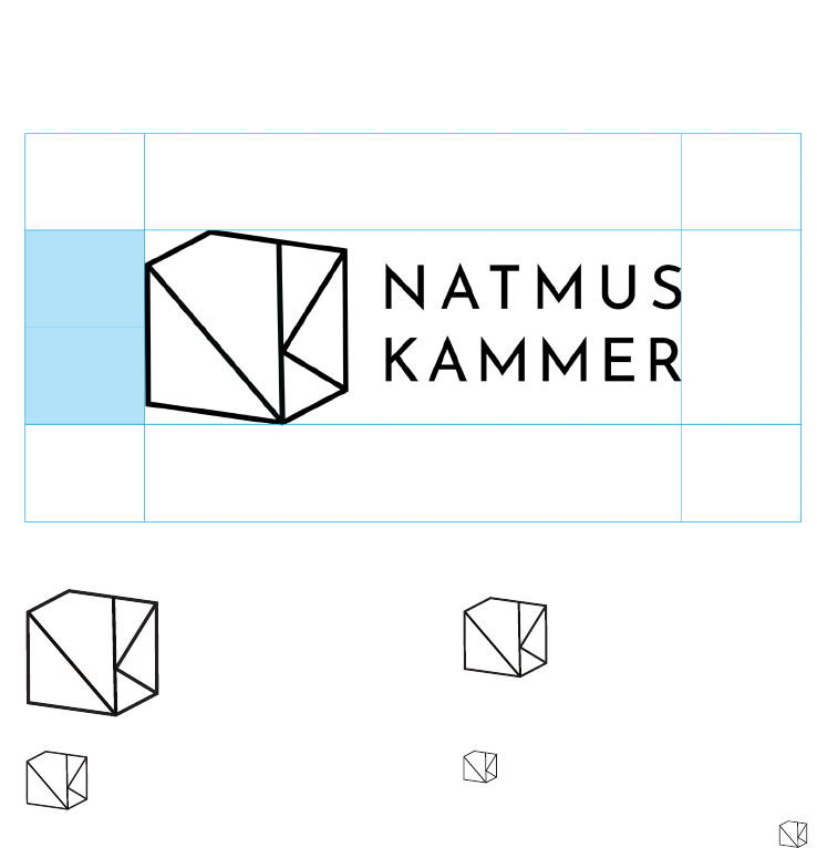
Leave enough space between
the logo and any other elements.
The minimum clearspace is half
the height of the logo on all
sides.
The logo always needs to be
scale proportionnaly. To chan-
ge the size of the logo always
hold the shift key to maintain
the good proportions.
NATMUS
KAMMER
NATMUS
KAMMER
NATMUS
KAMMER
NATMUS
KAMMER
NATMUS
KAMMER
DMJX | GD 2016-2019 | 2ND YEAR EXAM 2018
MAËLLE MORIN
8
LOGO COLOR PALETTE
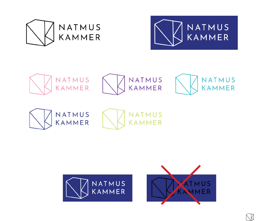
Use black and white outlines
on busy designs and ofcial
documents.
The logo always needs to be
readable from far.
Choose appropriate colors
according to the background
color.
Do Don’t
NATMUS
KAMMER
DMJX | GD 2016-2019 | 2ND YEAR EXAM 2018
MAËLLE MORIN
9
LOGO AND LOGOMARK COMBINED WITH ELEMENTS
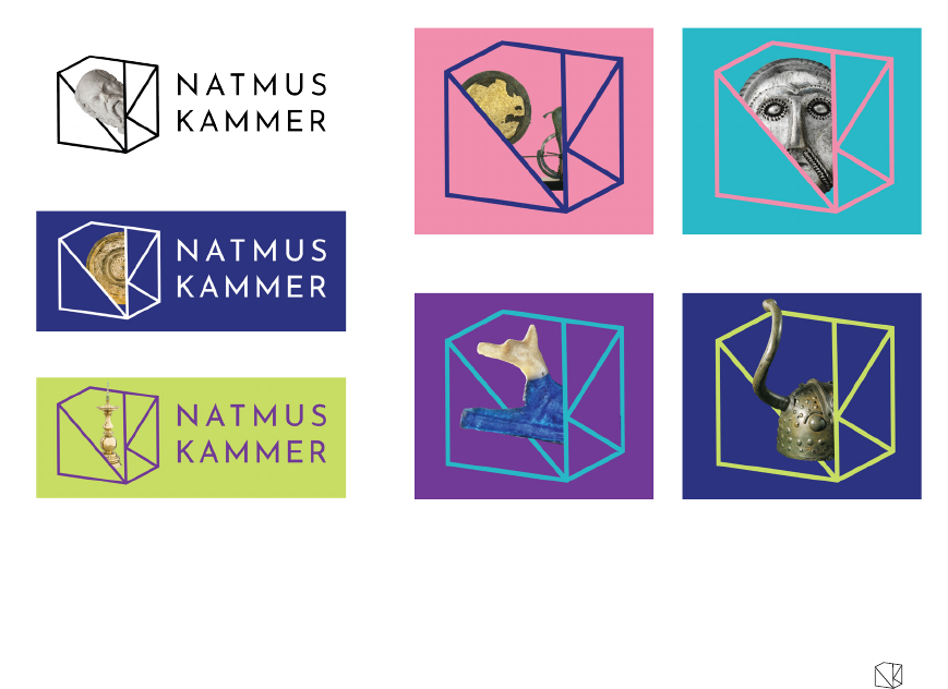
Put no ll color and only
a contour on the quadrilateral.
The ll color of the 4 triangles
needs to be the same as the
background color.
The elements can partially be
outside of the box.
Only combine one element with
the logo.
The logo combined with ele-
ments can only be used on solid
color background.
NATMUS
KAMMER
DMJX | GD 2016-2019 | 2ND YEAR EXAM 2018
MAËLLE MORIN
10
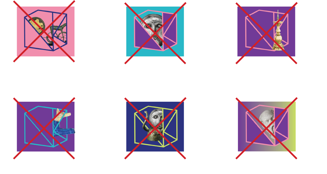
INCORRECT USED OF THE LOGOMARK COMBINED WITH ELEMENTS
DO NOT set no ll color on the
triangles
DO NOT set a ll color on the
quadrilateral DO NOT set more than one ele-
ment inside the logo DO NOT set the logo combined
with an element on a non solid
background
DO NOT set a ll color different
from the background DO NOT set the element
completely outside of the logo
The squares are used as examples for background colors

NATMUS
KAMMER
DMJX | GD 2016-2019 | 2ND YEAR EXAM 2018
MAËLLE MORIN
11
TYPOGRAPHY

NATMUS
KAMMER
DMJX | GD 2016-2019 | 2ND YEAR EXAM 2018
MAËLLE MORIN
12
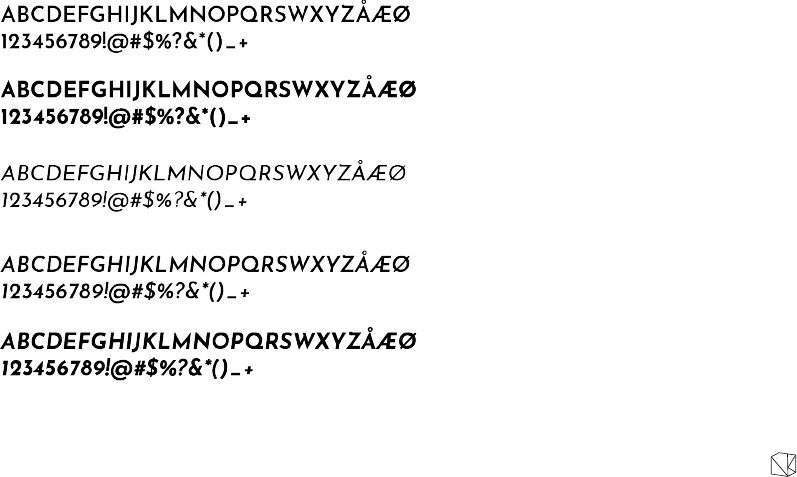
JOSEFIN SANS
AVENIR
ABCDEFGHIJKLMNOPQRSWXYZÅÆØ
123456789!@#$%?&*()_+
Regular
20 pt
tracking 100
Two typefaces are used for
the brand identity: Josen
Sans and Avenir. Josen Sans
is a geometric and sans-serif
family font. Its sharp and pointy
edges refer to the triangles of
the logo. Natmus is currently
using a typeface really similar
to Avenir. Avenir was chosen
to keep a clear and distinct link
between the National Museum
of Denmark and its new media
platform.
Use Josen Sans for every
titles and headlines. The letters
are always in capitals. For the
logo, Josen Sans regular is
used with a tracking of 100.
Use Avenir book for body text.
abcdefghijklmnopqrstuvwxyzåæø
ABCDEFGHIJKLMNOPQRSWXYZÅÆØ
123456789!@#$%?&*()_+
Book
11 pt
NATMUS
KAMMER
DMJX | GD 2016-2019 | 2ND YEAR EXAM 2018
MAËLLE MORIN
13
JOSEFIN SANS
ABCDEFGHIJKLMNOPQRSWXYZÅÆØ
123456789!@#$%?&*()_+ Regular
21 pt
tracking 100
SemiBold
11 pt
Bold
11 pt
Italic
11 pt
Italic SemiBold
11 pt
Italic Bold
11 pt
Every typefaces of Josen Sans
can be used for headlines and
titles. Choose the appropriate
one for your need.
A tracking of 100 can be used
for huge titles.
Josen Sans bold and Josen
Sans semibold are used for
smaller titles to highlight them.

NATMUS
KAMMER
DMJX | GD 2016-2019 | 2ND YEAR EXAM 2018
MAËLLE MORIN
14
AVENIR
abcdefghijklmnopqrstuvwxyzåæø
ABCDEFGHIJKLMNOPQRSWXYZÅÆØ
123456789!@#$%?&*()_+
abcdefghijklmnopqrstuvwxyzåæø
ABCDEFGHIJKLMNOPQRSWXYZÅÆØ
123456789!@#$%?&*()_+
abcdefghijklmnopqrstuvwxyzåæø
ABCDEFGHIJKLMNOPQRSWXYZÅÆØ
123456789!@#$%?&*()_+
abcdefghijklmnopqrstuvwxyzåæø
ABCDEFGHIJKLMNOPQRSWXYZÅÆØ
123456789!@#$%?&*()_+
abcdefghijklmnopqrstuvwxyzåæø
ABCDEFGHIJKLMNOPQRSWXYZÅÆØ
123456789!@#$%?&*()_+
Book
11 pt
Oblique
11 pt
Medium
11 pt
Medium Oblique
11 pt
Black
11 pt
Every typefaces of Avenir can
be used for body text and small
paragraphs. Choose the appro-
priate one for your need.

NATMUS
KAMMER
DMJX | GD 2016-2019 | 2ND YEAR EXAM 2018
MAËLLE MORIN
15
COLORS
NATMUS
KAMMER
DMJX | GD 2016-2019 | 2ND YEAR EXAM 2018
MAËLLE MORIN
16
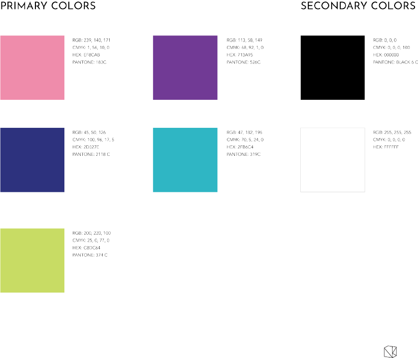
The colors are meant to be
primarly used on digital media.
The PANTONE colors are only
suggestion of the closest
similar colors.
The black and white are used
with busy design where the
logo or text need to be more
neutral.

NATMUS
KAMMER
DMJX | GD 2016-2019 | 2ND YEAR EXAM 2018
MAËLLE MORIN
17
IMAGERY
NATMUS
KAMMER
DMJX | GD 2016-2019 | 2ND YEAR EXAM 2018
MAËLLE MORIN
18
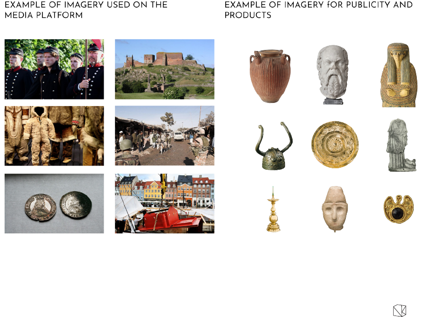
Use relevant images that illu-
strate adequately the subject.
Use images always in colors.
You can use black and white
photography only when the
event to illustrate took place
before the existence of color
photography.
For poster and publicity, use
elements with no background.
Cut off their backgrounds and
replace them by one of the
brand’s colors.

NATMUS
KAMMER
DMJX | GD 2016-2019 | 2ND YEAR EXAM 2018
MAËLLE MORIN
19
FIFTH ELEMENT
NATMUS
KAMMER
DMJX | GD 2016-2019 | 2ND YEAR EXAM 2018
MAËLLE MORIN
20
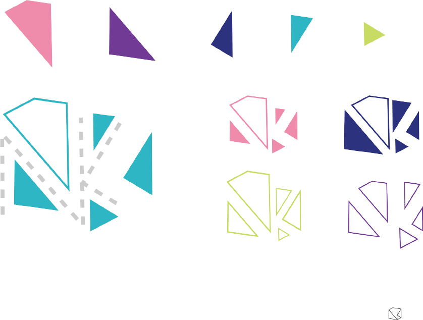
The fth element is the
5 shapes that form the logo.
The shapes are dynamic and
can be scale up and down but
not rotated. Be careful to keep
every proportion when scaling.
Pay extra atttention to keep the
proportion of the stroke weight
when scaling.
Use the brand’s colors to ll the
shapes or to set a stroke color
with an empty ll.
When you use an individual
shape, it can be placed where-
ver on the design.
When you used the shapes all
together, place them in their
respective corner. Hence, the
NK will always be form by the
empty spaces.
The quadrilateral needs to have
an empty ll more often than
the other shapes to represent
the ’’window through the box’.
NATMUS
KAMMER
DMJX | GD 2016-2019 | 2ND YEAR EXAM 2018
MAËLLE MORIN
21
USE OF THE FIFTH ELEMENT
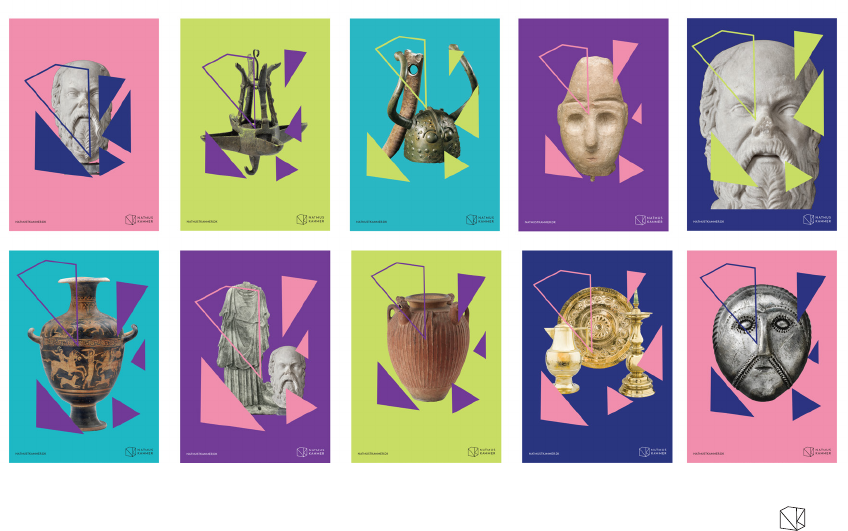
Some rules to design
publicity posters:
Always center the objects
Use no more than 3 objects on
one poster.
Keep an empty ll color on the
quadrilateral.

NATMUS
KAMMER
DMJX | GD 2016-2019 | 2ND YEAR EXAM 2018
MAËLLE MORIN
22
WEB
NATMUS
KAMMER
DMJX | GD 2016-2019 | 2ND YEAR EXAM 2018
MAËLLE MORIN
23
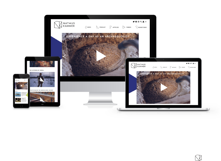
Our website uses a responsive
design that looks great on every
screen sizes.
NATMUS
KAMMER
DMJX | GD 2016-2019 | 2ND YEAR EXAM 2018
MAËLLE MORIN
24
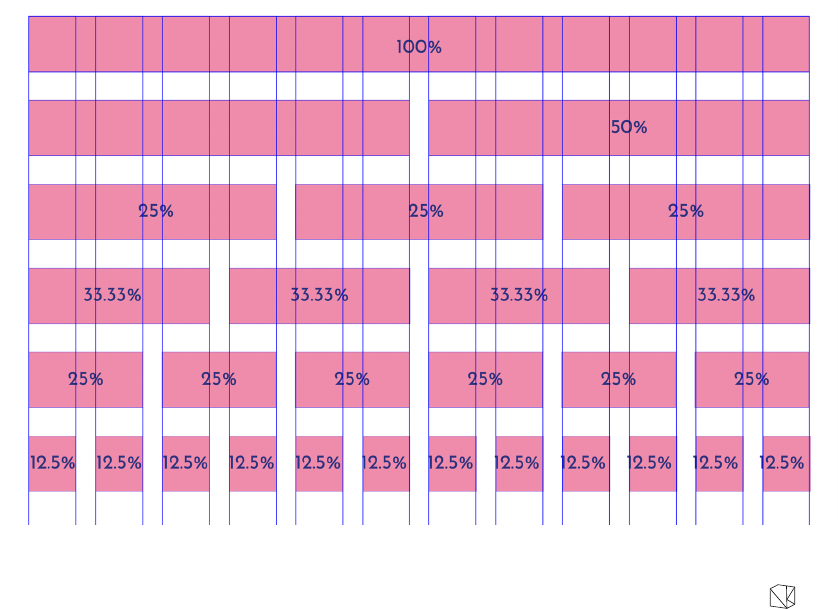
GRID
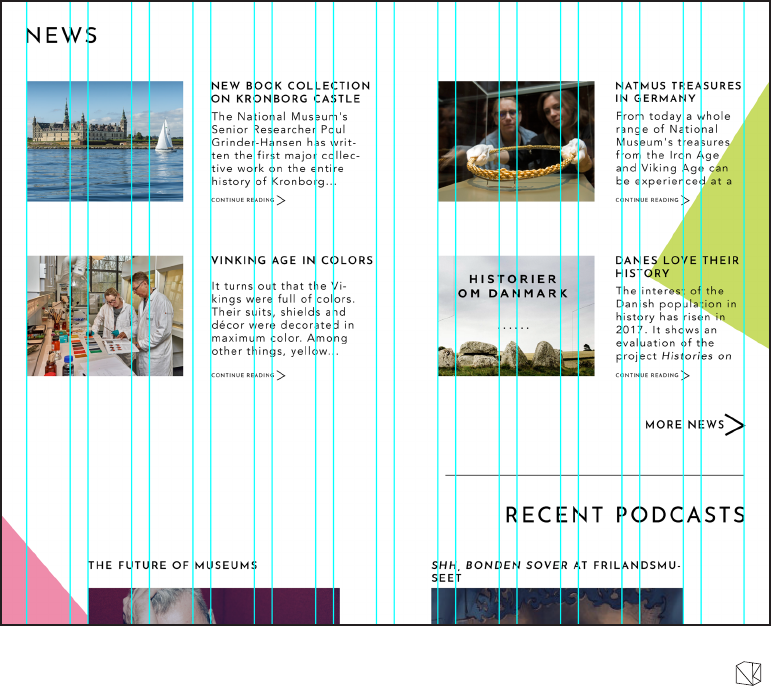
The full website used a
12 columns grid with
30 px of gutter
44 px of margin left and right
and
24 px of margin on top.
The margins are 22 px left and
right, 12 px on top and a gutter
of 15 px for smaller screen.
NATMUS
KAMMER
DMJX | GD 2016-2019 | 2ND YEAR EXAM 2018
MAËLLE MORIN
25
GRID SYSTEM IN PERCENTAGE
The grid system gives an idea of
how organizing the content on
the website. You can combine
many different columns layout
together. For example: you can
use one column at 50% and two
at 33.33%.

NATMUS
KAMMER
DMJX | GD 2016-2019 | 2ND YEAR EXAM 2018
MAËLLE MORIN
26
AIRLOOK

NATMUS
KAMMER
DMJX | GD 2016-2019 | 2ND YEAR EXAM 2018
MAËLLE MORIN
27
A margin of 36 px needs to be
respected on every side of the
screen.
The logomark is always at the top
right corner.

NATMUS
KAMMER
DMJX | GD 2016-2019 | 2ND YEAR EXAM 2018
MAËLLE MORIN
28
APPLICATIONS

NATMUS
KAMMER
DMJX | GD 2016-2019 | 2ND YEAR EXAM 2018
MAËLLE MORIN
29
POSTERS
NATMUS
KAMMER
DMJX | GD 2016-2019 | 2ND YEAR EXAM 2018
MAËLLE MORIN
30
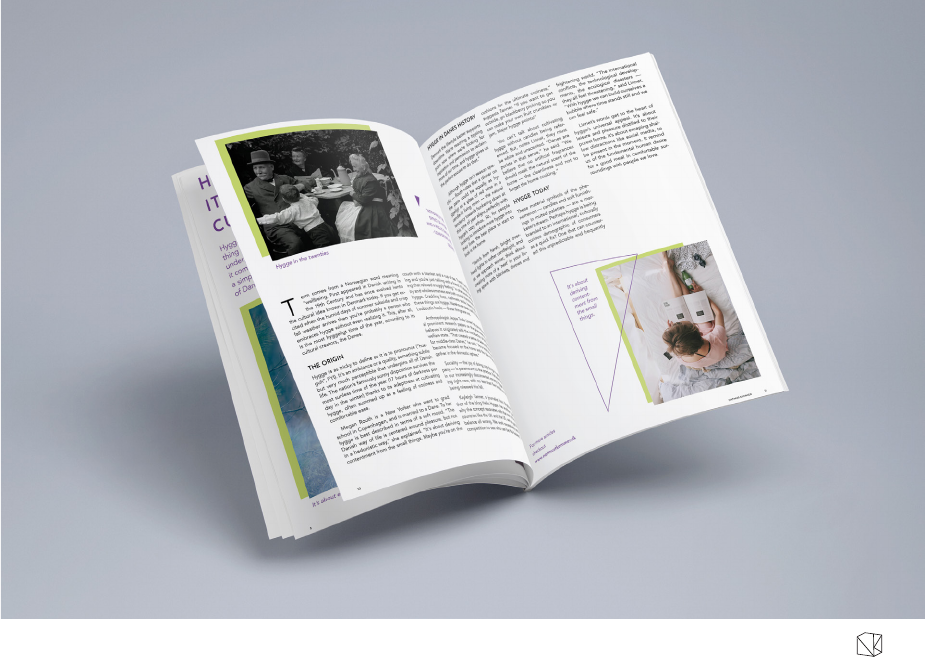
MAGAZINE

NATMUS
KAMMER
DMJX | GD 2016-2019 | 2ND YEAR EXAM 2018
MAËLLE MORIN
31
BUSINESS CARD

NATMUS
KAMMER
DMJX | GD 2016-2019 | 2ND YEAR EXAM 2018
MAËLLE MORIN
32