Developers Guide
User Manual:
Open the PDF directly: View PDF  .
.
Page Count: 108 [warning: Documents this large are best viewed by clicking the View PDF Link!]

Infor Homepages Widget SDK
Developers Guide

Copyright © 2019 Infor
Important Notices
The material contained in this publication (including any supplementary information) constitutes and
contains confidential and proprietary information of Infor.
By gaining access to the attached, you acknowledge and agree that the material (including any
modification, translation or adaptation of the material) and all copyright, trade secrets and all other
right, title and interest therein, are the sole property of Infor and that you shall not gain right, title or
interest in the material (including any modification, translation or adaptation of the material) by virtue
of your review thereof other than the non-exclusive right to use the material solely in connection with
and the furtherance of your license and use of software made available to your company from Infor
pursuant to a separate agreement, the terms of which separate agreement shall govern your use of
this material and all supplemental related materials ("Purpose").
In addition, by accessing the enclosed material, you acknowledge and agree that you are required to
maintain such material in strict confidence and that your use of such material is limited to the
Purpose described above. Although Infor has taken due care to ensure that the material included in
this publication is accurate and complete, Infor cannot warrant that the information contained in this
publication is complete, does not contain typographical or other errors, or will meet your specific
requirements. As such, Infor does not assume and hereby disclaims all liability, consequential or
otherwise, for any loss or damage to any person or entity which is caused by or relates to errors or
omissions in this publication (including any supplementary information), whether such errors or
omissions result from negligence, accident or any other cause.
Without limitation, U.S. export control laws and other applicable export and import laws govern your
use of this material and you will neither export or re-export, directly or indirectly, this material nor any
related materials or supplemental information in violation of such laws, or use such materials for any
purpose prohibited by such laws.
Trademark Acknowledgements
The word and design marks set forth herein are trademarks and/or registered trademarks of Infor
and/or related affiliates and subsidiaries. All rights reserved. All other company, product, trade or
service names referenced may be registered trademarks or trademarks of their respective owners.
Publication Information
Release:
Publication date: March 12, 2019
Document code:

Contents
Widget SDK Developers Guide | 3
Contents
About this guide ................................................................................................................................. 11
Version log ..................................................................................................................................... 11
Contacting Infor.............................................................................................................................. 12
Chapter 1 Introduction .................................................................................................................. 13
Purpose ................................................................................................................................... 13
Who Should Read This Document .......................................................................................... 13
Widget Developer knowledge and responsibilities .................................................................. 13
Chapter 2 Overview ....................................................................................................................... 14
Introduction .................................................................................................................................... 14
Disclaimer ...................................................................................................................................... 15
AngularJS support removed .......................................................................................................... 15
Widget SDK Contents .................................................................................................................... 15
Documentation ........................................................................................................................ 16
API ..................................................................................................................................... 16
OpenSourceLicenses .............................................................................................................. 16
Samples ................................................................................................................................... 16
Widgets .............................................................................................................................. 16
Source ..................................................................................................................................... 16
Technologies .................................................................................................................................. 17
Enterprise Components for Infor Design System .......................................................................... 17
Chapter 3 Widgets ......................................................................................................................... 18
Widget framework .......................................................................................................................... 18
Widget types .................................................................................................................................. 18
Inline widget ............................................................................................................................. 18
jQuery widget .................................................................................................................... 18
Angular widget ................................................................................................................... 19

Contents
4 | Widget SDK Developers Guide
External widget ........................................................................................................................ 19
Hybrid widget ........................................................................................................................... 19
Widget technology choice .............................................................................................................. 19
Tenant widgets ............................................................................................................................... 20
Tenant widgets disclaimer ............................................................................................................. 20
Widget manifest ............................................................................................................................. 21
Mandatory manifest properties ................................................................................................ 21
Widget ID ........................................................................................................................... 21
Type ................................................................................................................................... 21
Version .............................................................................................................................. 22
Name ................................................................................................................................. 22
Title, Description vs Localization ....................................................................................... 22
Module name ..................................................................................................................... 22
URL ................................................................................................................................... 23
Framework......................................................................................................................... 23
Author ................................................................................................................................ 24
Optional manifest properties ................................................................................................... 24
Display version .................................................................................................................. 24
AOT version....................................................................................................................... 24
Localization........................................................................................................................ 25
Category ............................................................................................................................ 27
Application logical ID ......................................................................................................... 28
Application version ............................................................................................................ 28
Shared modules ................................................................................................................ 28
Help URL ........................................................................................................................... 29
Settings .............................................................................................................................. 29
Default size ........................................................................................................................ 30
Max size ............................................................................................................................ 31
Enable publish ................................................................................................................... 31
Enable settings when published ....................................................................................... 31
Enable title edit .................................................................................................................. 31
Enable settings .................................................................................................................. 32
Enable application selector ............................................................................................... 32
Enable catalog ................................................................................................................... 32
Enable custom properties ................................................................................................. 32
Enable refresh ................................................................................................................... 33
Icon file .............................................................................................................................. 33
Screen shots for the widget catalog .................................................................................. 34

Contents
Widget SDK Developers Guide | 5
Requires config ................................................................................................................. 34
Empty config ...................................................................................................................... 35
Target ................................................................................................................................ 35
Targets .............................................................................................................................. 36
Banner widget ................................................................................................................................ 36
Mobile widget ................................................................................................................................. 36
Enabling content for Infor Go .................................................................................................. 37
Enabling a widget for Infor Go ................................................................................................. 37
Widget menu in Infor Go.......................................................................................................... 38
Developing for mobile .............................................................................................................. 38
Limitations ......................................................................................................................... 38
Accessing native features ....................................................................................................... 38
Inline widget implementation ......................................................................................................... 39
Widget module ......................................................................................................................... 39
Widget factory function ............................................................................................................ 39
Widget context ......................................................................................................................... 40
Widget instance ....................................................................................................................... 40
Widget state ............................................................................................................................. 40
Widget activation ..................................................................................................................... 41
Identifiers for automated UI (E2E) tests .................................................................................. 41
Widget settings .............................................................................................................................. 42
Settings for a published widget ............................................................................................... 42
User settings for a published widget ................................................................................. 42
Implicit widget settings ............................................................................................................. 43
External widget settings........................................................................................................... 43
Metadata settings UI ................................................................................................................ 43
Custom settings UI .................................................................................................................. 44
Accessing settings ................................................................................................................... 44
Saving settings ........................................................................................................................ 44
Settings events ........................................................................................................................ 44
Settings opening ................................................................................................................ 45
Settings saved ................................................................................................................... 45
Ad-hoc settings ........................................................................................................................ 45
Widget context values .................................................................................................................... 45
Resolving priority ..................................................................................................................... 46
Qualifying a value .................................................................................................................... 46
Using widget context values in a URL template ...................................................................... 47

Contents
6 | Widget SDK Developers Guide
Accessing widget context values in code ................................................................................ 47
Ming.le application settings ..................................................................................................... 47
Framework values ................................................................................................................... 47
Using widget context values in the test container ................................................................... 48
Chapter 4 jQuery widgets.............................................................................................................. 49
Introduction .................................................................................................................................... 49
Widget factory function .................................................................................................................. 49
Performance tips ............................................................................................................................ 50
Creating a widget package ............................................................................................................ 50
Chapter 5 Angular widgets ........................................................................................................... 51
Introduction .................................................................................................................................... 51
AOT vs JIT ..................................................................................................................................... 51
AOT documentation ................................................................................................................. 52
The future of AOT .................................................................................................................... 52
The future of JIT ...................................................................................................................... 52
Angular modules and components ................................................................................................ 52
Module imports ........................................................................................................................ 52
Module declarations and entry components ........................................................................... 53
Widget factory function .................................................................................................................. 53
JIT factory function .................................................................................................................. 53
AOT factory function ................................................................................................................ 53
File structure .................................................................................................................................. 54
Widget context and instance ......................................................................................................... 54
Constructor injection of widget context and instance ................................................. 55
Input properties for widget context and instance ........................................................ 55
Templates ...................................................................................................................................... 56
Creating a widget package ............................................................................................................ 56
Chapter 6 External widgets ........................................................................................................... 57
Introduction .................................................................................................................................... 57
External widget implementation .............................................................................................. 57
Creating a widget package ............................................................................................................ 58
Chapter 7 Localization ................................................................................................................... 59
Localization .................................................................................................................................... 59

Contents
Widget SDK Developers Guide | 7
Localization scripts .................................................................................................................. 60
LangFromManifestToResx.js ............................................................................................ 60
LangFromResxToManifests.js .......................................................................................... 61
Chapter 8 Development environment .......................................................................................... 63
Introduction .................................................................................................................................... 63
Prerequisites .................................................................................................................................. 63
Samples ......................................................................................................................................... 64
Running the Samples in Visual Studio Code .......................................................................... 65
Running the Samples on a Node.js server.............................................................................. 65
Creating a new widget ................................................................................................................... 66
Testing with multiple widgets ......................................................................................................... 66
Static code analysis with TSLint .................................................................................................... 67
Running the linter .................................................................................................................... 67
Automatically fix problems ....................................................................................................... 67
Modifying or overriding rules ................................................................................................... 68
Chapter 9 Packaging ..................................................................................................................... 69
Files to include ............................................................................................................................... 69
Mandatory files ........................................................................................................................ 69
Optional files ............................................................................................................................ 69
File optimizations ........................................................................................................................... 70
Homepages command pack script ................................................................................................ 70
Directory rules.......................................................................................................................... 70
AOT compilation ...................................................................................................................... 70
Manifest ............................................................................................................................. 70
Widget factory files ............................................................................................................ 71
Prerequisites ............................................................................................................................ 71
Pack and optimize: .................................................................................................................. 71
Examples..................................................................................................................... 71
Output .......................................................................................................................... 72
Shared modules ...................................................................................................................... 72
Angular AOT package recommendation ................................................................................. 72
Manual minification ........................................................................................................................ 73
Single module widget .............................................................................................................. 73
Multi-module widget ................................................................................................................. 73

Contents
8 | Widget SDK Developers Guide
Packaging widgets for an on-premise installation ......................................................................... 73
Widget installation package file ............................................................................................... 74
Chapter 10 ION API .......................................................................................................................... 75
Introduction .................................................................................................................................... 75
Retrieving OAuth access token ..................................................................................................... 75
Token timeout .......................................................................................................................... 76
Development environment ............................................................................................................. 76
Prerequisites ............................................................................................................................ 76
Acquire an OAuth token string .......................................................................................... 76
Set up the development configuration .............................................................................. 77
Developing and debugging ...................................................................................................... 77
Chapter 11 Homepages Widget Certification ................................................................................ 78
Certification checklist ..................................................................................................................... 78
Development checklist ................................................................................................................... 80
Chapter 12 Resources ..................................................................................................................... 82
Chapter 13 Appendix Node.js ......................................................................................................... 83
Node.js ........................................................................................................................................... 83
Install Node.js .......................................................................................................................... 83
Verify the Node package manager .......................................................................................... 83
Verify the Node executable ..................................................................................................... 84
Chapter 14 Appendix Test............................................................................................................... 85
Widget Test Scenarios ................................................................................................................... 85
Scenario 1: Basic features ...................................................................................................... 85
Pre-requisites .................................................................................................................... 85
Test .................................................................................................................................... 85
Scenario 2: Widget sizes ......................................................................................................... 91
Pre-requisites .................................................................................................................... 91
Test .................................................................................................................................... 91
Scenario 3: Publish widget ...................................................................................................... 92
Pre-requisites .................................................................................................................... 92
Test .................................................................................................................................... 92
Scenario 4: Publish the widget with one or more settings enabled ........................................ 95
Pre-requisites .................................................................................................................... 95
Test .................................................................................................................................... 95

Contents
Widget SDK Developers Guide | 9
Scenario 5: Configure settings on a published page .............................................................. 97
Pre-requisites .................................................................................................................... 97
Test .................................................................................................................................... 97
Scenario 6: Import and Export page with the widget ............................................................ 100
Pre-requisites .................................................................................................................. 100
Test .................................................................................................................................. 100
Scenario 7: Widget Title Logic ............................................................................................... 102
Pre-requisites......................................................................................................................... 102
Test .................................................................................................................................. 102
Scenario 8: Widget Translations ........................................................................................... 106
Pre-requisites .................................................................................................................. 106
Test .................................................................................................................................. 106
Scenario 9: Export and Import page with configured published widget ................................ 107
Pre-requisites .................................................................................................................. 107
Test .................................................................................................................................. 107
Scenario 10: Polling ............................................................................................................... 108
Pre-requisites .................................................................................................................. 108
Test .................................................................................................................................. 108
Developers Guide | 11
About this guide
Version log
The version log describes the changes between versions of this document.
Version
Date
Changes
1.0
First version of the document.
1.1
Added information about Shared Modules as well as its restrictions.
1.1.1
Added language information, removed internal links and updated
checklist.
1.1.2
Added enablePublish, updated checklist.
1.1.3
Added new widget category, updated with new manifest configuration
options.
1.1.4
Banner widget as target.
1.1.5
Widget Localization.
1.2
Updated all information to new Angular interfaces and Angular
component development
1.2.1
Deprecated sharedWidgetId. Support for widget variants will be
removed.
1.2.2
Added AOT support for Angular widgets. Deprecated previous minify
scripts. Deprecated sub directories in widget zip package files. Added
homepages command script for build, minify and package.
1.2.3
Added manifest property maxSize.
1.2.4
Added manifest property screenshots.
1.2.5
Removed SoHoXi references and added links to Infor Design System,
https://design.infor.com/ and the widget design guide,
https://design.infor.com/resources/mingle-homepage-widget-guidelines .
1.2.6
Added information about tenant widgets.
Removed SharedWidgetId, no longer supported in 12.0.32.
Added information about Mobile.
About this guide
12 | Widget SDK Developers Guide
Added empty config information
Contacting Infor
If you have questions about Infor products, go to the Infor Xtreme Support portal at
www.infor.com/inforxtreme.
If we update this document after the product release, we will post the new version on this Web site.
We recommend that you check this Web site periodically for updated documentation.
If you have comments about Infor documentation, contact documentation@infor.com.

Developers Guide | 13
Chapter 1 Introduction
1
Purpose
The purpose of this document is to describe how to set up a development environment and build
widgets using the Widget SDK.
Who Should Read This Document
Roles for which this document is primarily intended:
Role
Skills
Web Application developer
JavaScript, TypeScript, Angular, jQuery
Widget Developer knowledge and responsibilities
The widget developer needs to have a deep understanding and knowledge developing web
applications. The skills are not only the ones listed above but also how to develop secure web
applications, which uses all available techniques to protect against different kinds of attacks. The
developer should have a deep understanding of the OWASP top 10 vulnerabilities and how to avoid
them.
Although the code is reviewed for inconsistent use of the Homepages API it is up to the widget
developer to provide a stable and secure widget that does not affect the Homepages application
negatively.
The widget developer is responsible for following the guidelines and checklists provided in this
document.
Overview
14 | Widget SDK Developers Guide
Chapter 2 Overview
2
This chapter gives an overview of the Widget SDK.
Introduction
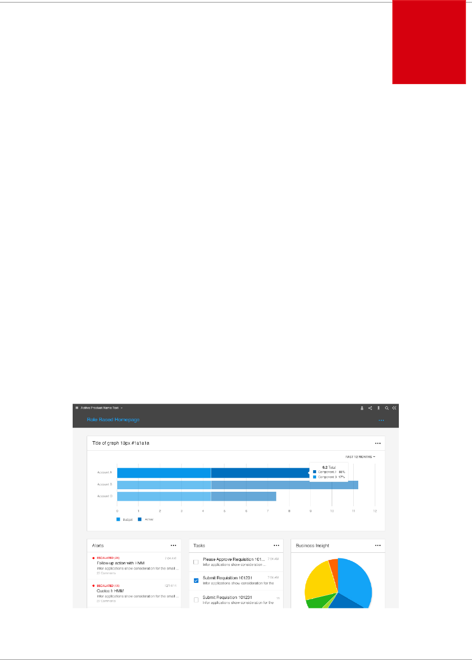
The Widget SDK is used to build widgets for Homepages in Infor Ming.le.
A widget can be defined as:
A small, single-purpose application that provides quick, at-a-glance information or quick
access to simple interactive functions. Widgets are simpler and faster to access than full
applications (apps) that may provide more functionality.
Homepages may contain one or many pages and each page may contain one or many
widgets. Widgets can be added to a page from the Widget Catalog.

Overview
Widget SDK Developers Guide | 15
Disclaimer
Please note that only classes and functions documented in the Widget SDK API Documentation are
publicly available for you to use. Anything that is not documented or explicitly marked with “internal”
in the API documentation should not be used. Classes and functions that are not intended for public
use may be removed or changed in future versions without notice.
AngularJS support removed
AngularJS support has been completely removed in Homepages version 12.0.32.
Angular is the name for the Angular of today and tomorrow. AngularJS is the name for all v1.x
versions of Angular.
https://angular.io/guide/upgrade
Widget SDK Contents
This section describes the contents of the Widget SDK zip file. The folder structure can be seen
below followed by an overview of each folder.
- Documentation
o API
- OpenSourceLicenses
- Samples
o Widgets
- Source
o scripts
▪ lime
▪ typings
▪ vendor
▪ xi

Overview
16 | Widget SDK Developers Guide
Documentation
Contains the developers guide in PDF format.
API
Contains the Widget SDK API documentation in HTML format. Open the index.html file in a browser
to view the API documentation.
OpenSourceLicenses
Contains the license files for open source projects used in the Widget SDK.
Samples
Contains node scripts for web server, proxy and widget packaging. Additional npm package
dependencies specified in package.json will also be installed into this directory.
Widgets
Contains all the sample widgets. Each sample widget folder also contains the generated JavaScript
files with code comments for those that prefer plain JavaScript. This directory also contains
configuration files for Visual Studio Code (.vscode/).
Source
Contains the Widget SDK script files, external dependencies, Enterprise components for Infor
Design System and TypeScript typings files.

Overview
Widget SDK Developers Guide | 17
Technologies
The Homepages framework is implemented using TypeScript, Angular and the Enterprise
Components for Infor Design System. A widget may be implemented using these technologies as
well but TypeScript and Angular are completely optional. Widgets should use the Enterprise
Components for Infor Design System or follow Infor design guidelines. For widgets with limited
functionality, use jQuery and the Enterprise Components for Infor Design System.
Note that AngularJS has been deprecated, see AngularJS deprecated
Enterprise Components for Infor Design System
Enterprise Components for Infor Design System provides comprehensive tools for product
development teams to create user experiences that are: Intuitive, Engaging, Purposeful, Functionally
Relevant, and Beautiful.
Enterprise Components for Infor Design System is a framework-independent UI component library
built in js and css that is pattern-focused, template-driven, touch-enabled, responsive, accessible,
and themable.

Widgets
18 | Widget SDK Developers Guide
Chapter 3 Widgets
3
This chapter describes the different widget types and widget related concepts.
Widget framework
The widget framework is responsible for the creation, layout and lifecycle management for all
widgets.
The widget framework also owns parts of what an end user would consider to be the widget. The
widget border, widget title bar and widget menu are owned by the framework and a widget
implementation is not allowed to directly access these parts of a widget. A widget implementation
owns the widget body area, which is the area inside the widget border and below the widget title bar.
Widget types
There are two major types of widgets in Homepages which we will refer to as inline and external.
There is also a hybrid type which, technically, is an inline widget with some external content.
Inline widget
An inline widget is loaded in the same page (DOM) as the Homepage framework. The widget may
be implemented in JavaScript or TypeScript and can use the external frameworks supported by the
Homepages framework such as jQuery and Angular. Since the widget is loaded in the same DOM as
the framework it is very important that the widget does not interfere with the framework or other
widgets on the page. The widget files are deployed on the Homepage server. This is the
recommended widget type.
jQuery widget
jQuery widgets introduce the least technical overhead. For more information see chapter 4.

Widgets
Widget SDK Developers Guide | 19
Angular widget
For more information see chapter 5.
External widget
An external widget is loaded in an IFrame using a URL that may contain parameters with values
provided by the framework. The widget files may be deployed on any server that can be reached by
the client. This widget type should be used with caution, especially if the external widget loads a lot
of resources as it will impact the browser performance. This is not a recommended widget type.
For more information see chapter 6.
Hybrid widget
A hybrid widget is an inline widget that creates an IFrame to load all or parts of its content. This type
can be used when a widget requires more integration with the framework than is possible with an
external widget, but the main widget content will be rendered by an external server. This widget type
should be used with caution, especially if the external widget loads a lot of resources as it will impact
the browser performance. This is not a recommended widget type.
Widget technology choice
After deciding the type of widget that you would like to develop, it’s time to make the technology
choice for the framework that you would like to build the widget on, if you have decided to develop a
hybrid or an inline widget.
There are a few different choices, TypeScript or JavaScript. Angular or jQuery. Note that no other UI
frameworks are allowed.
For widgets with simple functionality and hybrids with for example a custom settings UI, jQuery is a
good fit with minimal overhead. Pure jQuery widgets will also be faster, include less code as it does
not need to have a JIT and an AOT bundle file as the Angular widgets do. With jQuery widgets, there
is no need to deliver new packages as Homepages updates the Angular version which might be the
case with AOT compiled widgets.
For complex widgets Angular and TypeScript is a better fit. If Angular is the selected framework, we
recommend that you use it with TypeScript.
When it comes to the UI, if you develop in Angular you would use the Angular wrappers for the IDS
Enterprise components, but if you use jQuery you would use the jQuery versions of the control
library.

Widgets
20 | Widget SDK Developers Guide
To get familiar with the Angular component library, clone the below GitHub repository and follow the
readme instructions on how to get the samples running locally.
IDS Enterprise NG – Angular wrappers for the IDS Enterprise components
https://github.com/infor-design/enterprise-ng
Tenant widgets
Tenant widgets are widgets developed by partners or customers for the cloud edition of Homepages.
There is a certification process before a widget can be uploaded into a cloud environment. The
process is not described in this document.
The process will result in an artifact that can be uploaded and installed in Homepages. The concept
of “Tenant widgets” are only applicable for the cloud edition of Homepages. There are some
limitations and restrictions that applies to tenant widgets, for example the widget id must start with
‘tenant.’ and the manifest must have an author property specified.
The sample “tenant.sample.angular.helloworld” is an example of a tenant widget.
Once you have completed the certification process a tenant widget is deployed by first enabling the
Tenant Widgets Feature in the Settings area in the Homepages Administration tool. After that feature
is enabled there will be a new section called Tenant Widgets under the Widgets section.
Note that only approved and signed packages from Infor can be uploaded.
Tenant widgets disclaimer
The web technologies are evolving in a rapid pace. It is not guaranteed that a developed widget will
continue to work for an unlimited time. Angular and other dependencies that are used by the
Homepages application continue to be developed and improved and as such they might introduce
breaking changes that are out of our control. For major upgrades we’ll publish a notice that a
transition is coming but it is important to know that if you develop tenant widgets then you have an
obligation to keep up with the technology that Homepages is using and possibly do code changes to
the widget that needs to go through the certification process again.
There is therefore no guarantee that a widget will continue to work forever. There might be changes
required on a yearly basis.

Widgets
Widget SDK Developers Guide | 21
Widget manifest
The widget manifest is used to define a widget and each widget must have a manifest with all
mandatory properties set. The manifest is a JSON file called “widget.manifest” that should be placed
in the root widget folder.
The data in the manifest is used to create an inline widget or address an external widget. The
manifest also contains the information about the widget that is displayed in the widget catalog.
Mandatory manifest properties
The following manifest properties are mandatory and must be included in each widget manifest.
Note that some of these properties are only mandatory for specific widget types, which is noted in
the property descriptions.
Widget ID
The unique widget identifier. The ID must be unique among all widgets and should be chosen
carefully. The ID should be like a package/namespace with lowercase words separated by dots.
Include abbreviated product suites and product names in the ID to make it unique.
For widgets developed by partners and customers the widget ID must start with the “tenant.” Prefix.
This applies to tenant widgets that are installed in the cloud version of Homepages.
Property name: widgetId
Max length: 64
Example:
"widgetId": "infor.sample.helloworld"
Example:
"widgetId": "infor.mingle.actions"
Type
The type of widget. The only supported types are inline and external. A hybrid widget should be
defined as inline.
Property name: type
Valid values: inline | external
Example:
"type": "inline"

Widgets
22 | Widget SDK Developers Guide
Version
The widget version number. The version number should consist of a minimum of two and a
maximum of four positive integers separated by dots.
The widget version is mainly intended as a technical version number for resolving compatibility with
application versions. As long as a widget is backwards compatible there is no actual need to change
the version number and it could remain as “1.0”.
If you want to include build numbers of other release information you can use the optional
displayVersion property, see the Optional manifest properties section.
Property name: version
Max length: 32
Example:
"version": "1.0.0.0"
Name
The name of the widget. This name will never be visible for an end user and is mainly intended
administration purposes. If you are not sure what name to pick use the localized widget title in
English.
Property name: name
Max length: 64
Example:
"name": "Hello World"
Title, Description vs Localization
Either Title and Description OR a Localization block with "en-US" and "widgetTitle" and
"widgetDescription" is mandatory.
If the widget is Localized in different languages it must have a Localization property with at least en-
US with widgetTitle and widgetDescription set. If the widget is not going to be translated (applies to
customer and partner developed widgets only) then the manifest must have the Title and Description
property on the Manifest set. It is recommended to set the Name and Title to the same value (in
English). For non-localized widgets it means that they will have Name, Title and Description set and
all those are Mandatory. But Title and Description is not mandatory if Localization is used.
Module name
The name of the widget AMD module used to load the widget with SystemJS. This property is only
mandatory if the widget type is inline. This property should be omitted for external widgets.
The module name does not have to be unique. If necessary, it will be updated to a unique name
during the mandatory minification step by the included bundle & minification script (See Pack and

Widgets
Widget SDK Developers Guide | 23
optimize script). The module name should match the name of a JavaScript file in the widget folder,
excluding the .js file extension. The example below assumes that there is a file called widget.js in the
root of the widget folder.
Property name: moduleName
Example:
"moduleName": "widget"
URL
The URL or URL template for an external widget. This property is only mandatory if the widget type
is external. This property should be omitted for inline widgets.
A URL template may contain replacement variables that will be resolved using Ming.le application
settings, Homepage properties and Widget settings. More information about this can be found in
chapter Resolved widget values. The API documentation for the resolveAndReplace function in
IWidgetContext also contains more information about URL template syntax.
Property name: url
Example:
"url": "https://server/path"
Example:
"url": "{scheme}://{hostname}:{port}/{context}"
Framework
The client framework that the widget is using. Valid values are "angular", "jquery" or "angularjs"
(during the transition period). This property is only mandatory if the widget type is inline.
During a transition period to Angular it is ok to have this value blank, which will be defaulted to
"angularjs". This is to avoid breaking existing widgets. As we move to Framework SDK 2.0, angularjs
will not be an allowed value and those widgets will stop to work. When Framework SDK 2.0 is out
the new default will be "angular". This property should be considered a mandatory property and as
you deliver or update widgets this property should be set in the manifest.
Property name: framework
Example:
"framework": "angular"
Example:
"framework": "jquery"

Widgets
24 | Widget SDK Developers Guide
Author
The author of the widget. Note that this is only required for widgets developed by customers and
partners, so called “tenant widgets”. Infor standard widgets should not have this property set.
Property name: author
Example:
"author": "Sample Corporation"
Optional manifest properties
The following manifest properties are optional.
Display version
The widget display version. If this property is set the value will be displayed in the UI instead of the
version property. The purpose of the display version is to allow additional information such as build
numbers and other release information. Since the display version has no technical function it is not
restricted to just integer and dot characters as the version property is.
Note that the version property is still mandatory even if the displayVersion property is used.
The display version can be automatically set by the homepage pack command setting by passing
the script the extra parameter:
node homepages pack “infor.sample.helloworld” --addDisplayVersion=true
It is highly recommended to also include the version value in the display version. All standard
Homepages widgets, for example, use the following display version format which starts with the
technical widget version followed by the build date and time:
<Version>.<yyyyMMdd>-<HHmmss>
Property name: displayVersion
Max length: 32
Example:
"displayVersion": " 1.0.20170316-154339"
AOT version
Set this property to an empty string for Angular widgets to enable AOT compilation and bundle using
the homepages command script. This property will be automatically set by the homepages
packaging script, using the Angular version used in the Homepages SDK, if the property exists in the
manifest.
Widgets
Widget SDK Developers Guide | 25
Property name: aotVersion
Example:
"aotVersion": ""
Example after package:
"aotVersion": "6"
Localization
Localized language constants for the widget. The localization object should contain one property for
each supported language. Standard widgets delivered by Infor should be localized. Perhaps the first
version is not fully localized, but the goal should be to support all languages that are supported by
the application the widget corresponds to.
The languages that Homepages supports are:
af-ZA
Afrikaans - South Africa
ar-SA
Arabic - Saudi Arabia
bg-BG
Bulgarian - Bulgaria
cs-CZ
Czech - Czech Republic
da-DK
Danish - Denmark
de-DE
German - Germany
el-GR
Greek - Greece
En-GB
English - UK
en-US
English - United States
es-AR
Spanish - Argentina
es-ES
Spanish - Spain
et-EE
Estonian - Estonia
fi-FI
Finnish - Finland
fr-CA
French - Canada
Widgets
26 | Widget SDK Developers Guide
fr-FR
French - France
he-IL
Hebrew - Israel
hi-IN
Hindi - India
hu-HU
Hungarian - Hungary
it-IT
Italian - Italy
ja-JP
Japanese - Japan
ko-KR
Korean - Korea
lt-LT
Lithuanian - Lithuania
lv-LV
Latvian - Latvia
nb-NO
Norwegian (Bokmål) -
Norway
nl-NL
Dutch - The Netherlands
pl-PL
Polish - Poland
pt-BR
Portuguese - Brazil
pt-PT
Portuguese - Portugal
ro-RO
Romanian - Romania
ru-RU
Russian - Russia
sk-SK
Slovakian - Slovakia
sl-SI
Slovenian - Slovenia
sv-SE
Swedish - Sweden
th-TH
Thai - Thailand
tr-TR
Turkish - Turkey
uk-UA
Ukrainian - Ukraine
vi-VN
Vietnamese - Vietnam
zh-CN
Chinese - China
zh-TW
Chinese - Taiwan

Widgets
Widget SDK Developers Guide | 27
Each language must contain a widget title and description property named widgetTitle and
widgetDescription. These texts will be visible in the Widget Catalog. The title will also be used as the
default widget title if this is not overridden in the widget implementation. It is recommended to have
the same title and name (in English).
If the widget is not translated to other languages, then there should be no localization property. The
title and description should be set in the manifest instead. This means that the manifest in that case
should have name, title and description.
A widget may include additional localized language constants that will be available in runtime
through the widget context. Labels for metadata settings may also be localized using this section.
Property name: localization
Example:
"localization": {
"en-US": {
"widgetTitle": "Hello World",
"widgetDescription": "Hello World Sample Widget."
}
}
A few framework shared language constants will always be available through the widget context,
without having to include them in the manifest localization. These are: “ok”, “cancel”, “yes”, “no”,
“refresh”, “add” and “save”.
Category
An optional category that the widget belongs to. If a category is not specified, the widget will always
be visible in the “All” category in the Widget Catalog. A widget that do not specify a category might
also be assigned to a default category.
The following categories are currently available:
- application
- businessintelligence
- businessprocess
- social
- utilities
- statisticsusage (since 12.0.10)
Property name: category
Example:
"category": "application"

Widgets
28 | Widget SDK Developers Guide
Application logical ID
An optional parameter, but if the widget is dependent on a specific application this property must be
set. The value is the Logical Id prefix for the application the widget is dependent on. By specifying
this, the widget will have access to the Application configuration in Ming.le for the specified
application and the widget will only be available to those tenants that has the application.
Property name: applicationLogicalId
Example:
"applicationLogicalId": "lid://infor.m3"
Application version
An optional parameter for the version of the related Application. This parameter should only be set if
ApplicationLogicalId is set, and this is the minimum version of the application that the widget is valid
for. If the widget is valid for all available versions the ApplicationVersion can be omitted, but when
changes are introduced in the application that affects the widget, a new version of the widget can be
created with a specified Application Version in the manifest.
Property name: applicationVersion
Example:
"applicationVersion": "13.4"
Shared modules
On optional parameter for adding a shared JavaScript file with application logic. The shared module
can be used by several widgets and will only be loaded once by the Framework.
The value of this property is a list of SharedModule Entries that each has a name and a path. The
path is optional but can be used to specify a different path (including name) of the actual JavaScript
module being used. The name must be unique, and the included files should be minified.
Property name: sharedModules
Example:
"sharedModules": [
{
"name": "m3-common",
"path": "m3-common-core/m3-common"
}
]
In this example, the module will be registered as “m3-common”, using JavaScript module “m3-
common-core/m3-common.js”
NOTE! It is not allowed to include any JavaScript framework such as React, Immutable or any
other JavaScript framework. Only shared application functions are permitted.

Widgets
Widget SDK Developers Guide | 29
Help URL
An optional URL to documentation. If specified, a link to the documentation will be shown. The link
supports replacement for application related widgets.
Property name: helpUrl
Examples:
"helpUrl": " https://docs.infor.com/mingle/11.1ce/index.html"
"helpUrl": "{Scheme}://{Hostname}:{Port}/{TenantId}/MyApp/Help"
Settings
The settings property can be used to define a list of settings metadata used for the metadata
settings UI. Inline widgets may also specify settings in runtime and in this case this property is
optional. An inline widget may even use a mix where some settings are specified in the manifest and
some are added or modified in runtime. An external widget must specify settings in the manifest to
be able to use the metadata settings UI.
The settings metadata is also as part of the publish process where it is possible to enable specific
settings in the Edit Publish Configuration dialog, so that one or more of the settings can be changed
by the user on a published widget (but only for that user).
It is also possible to completely disable all settings or a specific setting as user settings for a
published widget. In which case, the setting would not be available in the Edit Publish Configuration
dialog at all.
The widgets that implement custom settings UI can still provide metadata if it makes sense to have
some of the settings as user settings for published content. But it also means that the widget must
check the current publish configuration when showing the settings UI to know what fields should be
enabled, visible etc.
A setting typically has a name, type, default value and a label. The settings property should contain
an array of settings metadata objects where the following properties are supported.
- name
o The name of the setting.
- type
o The setting type, one of boolean, object, number, radio, selector or string
o The default value is “string”
o Note that the object type is not supported in the metadata settings UI, it requires a
custom settings UI.
- defaultValue
o Optional default value.
- labelId

Widgets
30 | Widget SDK Developers Guide
o A language constant ID for the setting label. The labelId should be defined in the
localization property.
- isHidden
o Indicates that the setting should be permanently hidden. The default value if false.
- maxLength
o The maximum length for a text input field.
- values
o An array of value objects used if the type is selector or radio. Each object may
contain the following properties. Use either the text or the textId property, not both.
▪ value
• The item value.
▪ text
• The item text.
▪ textId
• A language constant for the item text.
- isEnabledWhenPublished
o Indicates that the setting should not be configurable as a user setting when
published. The default value is true.
- isMandatory
o Indicates that the setting is mandatory. This property only applies to a setting with
type selector or string. The default value is false.
Default size
The default size of a widget can be specified in the manifest using a property called defaultSize. If a
default size is specified it will be used when adding the widget from the Widget Catalog.
The property can be used to specify the number of columns or the number of columns and rows
separated by comma. Column values can range from 1 - 4 and row values from 1 - 2. The default
value is "1,1" and there is no need to use the property if this is the desired size.
Property name: defaultSize
Examples:
"defaultSize": "2"
"defaultSize": "2,2"
"defaultSize": "1,2"
"defaultSize": "4,2"

Widgets
Widget SDK Developers Guide | 31
Max size
The max size of a widget can be specified in the manifest using a property called maxSize. If a max
size is specified it will replace the default max size of 4,2 (four columns and two rows).
The property can be used to specify the number of columns or the number of columns and rows
separated by comma. Column values can range from 1 - 4 and row values from 1 - 2. The default
value is "4,2" and there is no need to use the property if this is the desired size. It’s not allowed to set
a value higher than this default value.
Property name: maxSize
Examples:
"maxSize": "1"
"maxSize": "2,2"
"maxSize": "1,2"
Enable publish
A widget may set the enablePublish property to false to prevent the widget from being published.
The default value is true. Publish must only be turned off if there are no widget specific settings.
Property name: enablePublish
Example:
"enablePublish": false
Enable settings when published
A widget may set the enableSettingsWhenPublished property to false to disable user settings for the
widget when published. The default value is true. The setting should be set to false if no widget
specific user settings are applicable for a published widget.
Property name: enableSettingsWhenPublished
Example:
"enableSettingsWhenPublished": false
Enable title edit
A widget may set the enableTitleEdit property to false to prevent the title from being available in
Widget Settings. If enableTitleEdit is not specified it defaults to true and it is possible to change the
widget title on a page.
Property name: enableTitleEdit
Example:
"enableTitleEdit": false

Widgets
32 | Widget SDK Developers Guide
Enable settings
A widget will have settings if it has settings defined in the definition or if it implements functions for
generating metadata (see IWidgetSettings in the API Documentation). EnableSettings is defaulted to
true but can be set to false, which means that no settings will be allowed. This means that the widget
title can't be changed. To hide the Settings menu on the widget (called Configuration) but still have
the framework support for settings see IWidgetSettings.enableSettingsMenu in the API
Documentation. If the value for EnableSettings is false, the framework will return an exception if the
application tries to trigger save.
Property name: enableSettings
Example:
"enableSettings": false
Enable application selector
A widget with an application dependency (applicationLogicalId) combined with Settings section in the
manifest will have an automatic generated UI. If there are multiple applications in Mingle for the local
id prefix, a dropdown with the available applications is shown in the automatically generated UI. This
is for selecting what application instance the widget is for. The ION API only supports one instance
(root) or the widget needs to support selecting the context root for the ION API call. If the widget has
an automatic UI but doesn’t need to configure the specific application instance it can hide the
application selector by setting enableApplicationSelector to false.
Property name: enableApplicationSelector
Example:
"enableApplicationSelector": false
Enable catalog
Setting the enableCatalog property to false means that the standard widget will not be displayed in
the widget catalog. The default value is true. Such a widget can only be added by manually editing a
JSON for a page, or by using a drillback to Homepages with widget configuration data that will add a
configured widget directly to a private page. A standard widget with enableCatalog set to false can
create published widgets that are added to the Widget Catalog. The configuration only applies to the
standard widget.
Property name: enableCatalog
Example:
"enableCatalog": false
Enable custom properties
Setting the enableCustomProperties property to true will allow the widget to resolve any value set as
Ming.le custom properties. The default value is false. Only applies to widgets that has

Widgets
Widget SDK Developers Guide | 33
ApplicationLogicalId. These are extra custom properties that are sent to the Ming.le application as
URL parameters when launching a parameter. Once enabled these properties are available using
the IWidgetContext.resolve method or directly in URL templates in external widgets. To be sure the
value is resolved against the Application and not any of the other sources the "application." prefix
can be used in templates.
Property name: enableCustomProperties
Example:
"enableCustomProperties": false
Enable refresh
The enableRefresh property can be used to get automatic refresh support for external widgets and
partial refresh support for inline widgets.
When this property is enabled for an external widget a refresh menu item will be added to the widget
menu and a refresh button will be added to the widget title bar. When the user activates refresh the
URL of the IFrame for the external widget will be reloaded.
When this property is enabled for an inline widget the menu item and button will also be added but
the widget must manually implement the refresh functionality by using the “refreshed” event function
in the widget instance, see the IWidgetInstance interface. Inline widgets that already has a primary
action button in the title bar will only get the refresh menu item.
The refresh functionality can also be controlled for each widget instance by adding a widget setting
with the same name as the manifest property, enableRefresh. If the manifest property is set to true
and the widget setting is set to false it will override the manifest property and disable the refresh
functionality by removing the menu item and the button. The enableRefresh widget setting will not
have any effect if the manifest property is set to false, or not set at all.
There is also a cooldown interval for the refresh functionality to prevent the user from spamming
refresh requests. The cooldown interval cannot be controlled by the widget.
Property name: enableRefresh
Default value: false
Example:
" enableRefresh ": true
Icon file
A widget may include a custom icon that is shown in the Widget Catalog. By default, the icon in the
widget catalog is determined by the category. The iconFile property should be set to the name of the
icon file, including path if the file is not placed in the root of the widget package.
The file must be a 60 px * 60 px PNG file following the Xi look and feel. It is recommended to call the
file icon.png and place it in the root of the widget package.

Widgets
34 | Widget SDK Developers Guide
Please note that leading slashes such as "/images/icon.png" are not allowed. For sub paths use
"images/icon.png".
Property name: iconFile
Example:
"iconFile": "icon.png"
Screen shots for the widget catalog
A widget may include up to three png image files that will be shown in the details panel in the Widget
Catalog. The image will be displayed in a 200 x 200 pixels container and if the image is clicked the
image is shown in its original size. The max file size is 100 kb even though we recommend keeping
the file size around 10 kb. The max pixel size is 740 * 760 pixels which represents a two column, two
rows widget size. The min pixel size is 200 * 200 pixels.
The manifest property should be set to the number of image files and the image files must be called
screenshot1.png, screenshot2.png, screenshot3.png.
Example:
"screenshots": 2
The example widget has two screen shots screenshot2.png and screenshot3.png. Setting the value
to 0 is not allowed. If there are no screenshots, then remove the property.
Requires config
Optional property requiresConfig can be used to specify if the widget needs to be configured before
it can be used. If set to true, the widget content will be hidden until it has been configured and
replaced by a button which opens the Configure Widget dialog. If the user is not allowed to configure
the widget, it will be empty.
If set to true, the widget configuration will be validated when the widget is loaded, reset to default or
when settings are saved when closing the Configure Widget dialog.
By default, this validation will be performed by the Framework, and the configuration will be
interpreted as valid if at least one of the settings has an assigned value. If a custom validation is
required, a widget may implement the IWidgetInstance.isConfigured function instead, please refer to
the API Documentation for more information about this.
When the widget has been configured according to the validation, the overlay UI will be removed,
and the widget content will display.
To specify a specific icon and message instead of the default UI. Please see the “Empty Config”
manifest property.
Note: requiresConfig shall never be set to true if the widget does not use settings, or if neither
metadata settings UI nor custom settings UI are used.
Property name: requiresConfig

Widgets
Widget SDK Developers Guide | 35
Example:
" requiresConfig ": true
Empty config
A widget that requires configuration, i.e. requiresConfig is set to true, can specify an icon, title,
description and action button by configuring the property emptyConfig. The properties that are
configurable are “icon”, “titleId”, “descriptionId” and “buttonId”. All four properties are optional and
type string.
The icons that are available to use in the configuration, defined on the IDS Enterprise site, are the
following : “generic”, “error-loading” (default), “new-project”, “no-alerts”, “no-
analytics”, “no-budget”, “no-data”, “no-events”, “no-notes”, “no-orders”,
“no-tasks”.
To invoke the action button functionality the optional IWidgetInstance function
emptyConfigClicked() should be implemented. See API documentation for more information.
An example widget for the empty config state is available as infor.sample.angular.emptystate in the
Widget SDK. The example widget uses the same property values as defined below.
Property name: emptyConfig
Example:
“emptyConfig”: {
“icon”: “no-budget”,
“titleId”: “emptyStateTitle”,
“descriptionId”: “emptyStateDescription”,
“buttonId”: “emptyStateButton”
}
where “emptyStateTitle”, “emptyStateDescription” and “emptyStateButton” are
localization constants. See Chapter 7 on Localization for more information on localization constants.
The default UI for an empty widget, i.e. if requiresConfig is set to true but no emptyConfig is set, will
consist of the default icon “error-loading”, button text “Configure Widget” and no title or
description.
Target
The optional property target is used to define the widget as a Banner widget. To make the widget a
Banner widget - set target to "banner". To make the widget a Mobile widget – set target to “mobile”. If
the parameter is skipped the widget will become a regular widget. This property can only be used
when there is only one target.
Property name: target

Widgets
36 | Widget SDK Developers Guide
Example (banner only):
"target": "banner"
Example (mobile only):
"target": "mobile"
Targets
This optional property is used to define the supported targets for the widget. If the widget is possible
to add both as a regular widget and a banner widget, both targets are specified. It is also possible to
include mobile in the targets.
Property name: targets
Example (banner widget example that can also be added as a regular widget):
"targets": ["banner", "default"]
Example (mobile widget example that can also be added as a regular widget):
"targets": ["mobile", "default"]
Example (mobile widget only, not available as a regular widget (except for admins that will still see
the mobile widget):
"targets": ["mobile"]
Banner widget
A Banner widget is a special widget that is added to the banner container. The banner container is
located at the top of the page directly below the page header, and always spans the entire first row.
It holds between one and four banner widgets and has a background color based on the color of the
page (default is blue).
When developing a Banner widget, it is important to make sure that it works with all colored
background (blue, turquoise, purple, green, orange, grey and black) and that it responds well to
different widths, since its size will depend on the user’s screen (or browser) width. A Banner widget
is created by setting the target or targets property in the manifest.
Mobile widget
A Mobile widget is a widget that is built for the Infor Go mobile application for Android and IOS.
When running on a mobile device the widget can access native device features like GPS information
and camera.
Infor Go is a mobile application that hosts different Infor applications suites for example HCM and
Homepages. It acts like Ming.le for Mobile and allows easy access to your most used functions and

Widgets
Widget SDK Developers Guide | 37
options to add favorites for easy access to widgets, homepages and other screens in Infor
applications.
The Infor Go mobile application has support for viewing the Homepages pages and for viewing an
individual widget in a stand-alone mode, giving maximum screen estate to the content view of the
widget, a “widget only view”. In the “widget only view” the title bar of the widget is not displayed, only
the widget content. This is a great view for building a mobile application through the Homepages
framework. The widget can be added as a favorite in the mobile application for easy access.
There are two options to specify the targets that the widget supports in the manifest. There is a
target and a targets property. The targets for the default mode that is implicit if no target is defined is
“default”. To add support for Infor Go and mobile, use the target “mobile”.
Once a widget has support for mobile an extra option will be available when the configuration of a
standard widget is published to a published widget. The option that will appear in the Publish
Configuration dialog is “Enable for mobile devices”. Checking this check box means that the
published widget will be available in the widget menu in Infor Go.
Enabling content for Infor Go
To enable pages and widgets in Infor Go there are two settings in the Homepages administration
tool that needs to be enabled.
• “View and Publish widgets for Infor Go”
• “View pages in Infor Go”
These settings will enable widgets and pages in Infor Go, respectively. It’s not supported to add
more pages from the Widget catalog. Only the user’s current pages will be displayed if the pages are
enabled in Infor Go setting is enabled.
If the Infor Go application does not show any content, please verify that these settings are enabled
and that the user have pages in My Pages / added pages when accessing Homepages in Ming.le.
Enabling a widget for Infor Go
In the manifest, if you have entered a value for the target property, remove that property and use
targets instead.
In the targets property add “mobile”.
Example (mobile widget example that can also be added as a regular widget):
"targets": ["mobile", "default"]
If the standard widget requires configuration before it can load data you must add
requiresConfig=true to the manifest.

Widgets
38 | Widget SDK Developers Guide
Widget menu in Infor Go
The Homepages menu in Infor Go has a quick list of widgets that supports mobile devices. These
are a combination of:
• Standard widgets that have the target mobile and requiresConfig=false in the manifest.
• Published variants of mobile standard widgets with the option: ”Enable for mobile devices
enabled”.
The standard widgets that requires configuration are filtered out from the list since it’s not supported
to edit configuration of a widget in the mobile application. The mobile support is focused on viewing
and using pages and widgets, not on their configuration.
Developing for mobile
When developing for mobile the development container does not support the IDevice interface which
means that it will be complicated to fully test in a device unless it’s possible to deploy this in an on-
prem environment.
If your widget support both default and mobile use the IDevice to check in which device the widget is
currently running to enable different features. Always launch links and drillbacks through the
IWidgetContext.launch, it will automatically open a new browser on a mobile device.
For information on how to use the IDevice please see the infor.sample.mobile.
Limitations
There are several limitations to the Infor Go view of the widget to consider. The limitations are:
• The widget is not allowed to be configured when running in mobile.
• The screen resolution is different depending on mobile device so a responsive user interface
is extremely important
• The widget title bar is not available, nor the configure menu so any actions needs to be made
available through the content area on the widget. If a widget supports both default and
mobile, then it needs to be able to adapt to showing for example the primary action in the title
bar when in normal mode.
Accessing native features
The access to the native functions is available through the IDevice available from
IWidgetContext.getDevice(). The IDevice interface contains and API for accessing the following
native services:
• Location

Widgets
Widget SDK Developers Guide | 39
• Image
• Video
• Audio
• Motion Sensors
• Network
• Read QR Code
• Show map
Inline widget implementation
This section describes the basic steps required when implementing an inline widget. Refer to the
sample widgets for code examples.
For jQuery widgets refer to chapter 4 and for Angular widgets refer to chapter 5 for more details.
Widget module
An inline widget should be implemented as a module on a supported format that can be loaded
using the module loader. The supported module formats are UMD and AMD.
It is not allowed to explicitly use the module loader to load additional code.
The widget module must export a widget factory function, see next section.
Widget factory function
The widget factory function is responsible for creating a widget instance. The widget factory function
should be called “widgetFactory” and it should be exported from the widget module.
The factory function must have the following signature which is also documented in the
IWidgetModule2 interface.
widgetFactory(context: IWidgetContext): IWidgetInstance;
The widget factory function should return a widget instance object if it succeeds in creating the
widget. If the widget cannot be created the function may return null, undefined or throw an exception.

Widgets
40 | Widget SDK Developers Guide
For examples and more details see chapter 4 for jQuery widgets and chapter 5 for Angular widgets.
The widget context and widget instance are described in the following sections.
Widget context
The widget context is provided by the framework to the widget factory function for each widget that is
instantiated. The context is specific to each widget instance and not shared. The context contains,
among other things, the widget data, widget settings, the DOM element and various functions for
interacting with the framework.
See the IWidgetContext interface in the API documentation for more information.
Widget instance
The widget instance represents the runtime widget. Its main purpose is to let the framework notify
the widget of different events such as when a widget is activated or deactivated, when settings are
saved etc.
All functions and properties defined in the IWidgetInstance interface are optional, so a widget factory
function may return an empty object if none of the callbacks are used for example.
See the IWidgetInstance interface in the API documentation for more information. For examples and
more details see chapter 4 for jQuery widgets and chapter 5 for Angular widgets.
Widget state
A widget can have different states but using the widget state is optional. The different widget states
are defined in the WidgetState class. The default widget state is “running”. The getState and
setState functions on the widget context (IWidgetContext) can be used to check and set the widget
state.
A widget may set the state to “busy” when it is busy making a server request for example. When the
widget is no longer busy it should set the state back to “running”. The framework may show busy
indicator for widgets in the busy state.
A widget may also set the state to “error” if it is missing settings or if backend service is not
responding for example. If the issue is resolved the widget should set the state back to “running”.
The framework may show some kind error indicator for widgets in the error state.

Widgets
Widget SDK Developers Guide | 41
Widget activation
A widget can be activated or deactivated by the framework for different reasons, such as a change in
visibility when user navigates to a new page. A widget is notified about activations through the
activated and deactivated event functions on the widget instance (IWidgetInstance). The different
types of activations are defined in the WidgetActivationType class.
A widget that makes polling requests to a backend service or does any kind of periodic processing
must handle activation. Widgets that do not use polling and don’t have any other periodic processing
may choose to ignore activation notifications.
A common scenario, as mentioned above, is a change in visibility. If a user navigates from one page
to another all widgets that has defined the deactivated function would get a call with an activation
object where the type is set to visibility. All widgets on the next page would get a similar call but on
the activated function. Another example is when the settings dialog is opened and closed in which
case the widget will also be deactivated and activated.
When a widget is deactivated it should no longer make any server requests or do any other kind of
processing. When a widget is activated again it may resume any suspended operations. The main
reason for this is to prevent unnecessary load on both the client, network and backend servers when
the user cannot see or interact with the widget content.
Identifiers for automated UI (E2E) tests
A widget cannot have any HTML id-attributes, except in a custom settings UI, since several widgets
can be added to a page, making their IDs non-unique.
If you want to add identifiers for the sole purpose of facilitating automated UI testing, add the
following data attribute to elements:
data-lm-tst-{applicationShortName}=”my-identifier”
Example
<div class="field">
<label soho-label data-lm-tst-smp="prd-src-lbl">
Product search
<label>
<input soho-autocomplete
data-lm-tst-smp="prd-src-ipt"
[(ngModel)]="searchText"
placeholder="Type to search..."/>
</div>

Widgets
42 | Widget SDK Developers Guide
Widget settings
A widget may have settings, but it is not required. If a widget has settings, it may use a metadata
driven settings UI managed by the framework or use a custom settings UI implemented by the
widget. Note that a custom settings UI is only supported for inline widgets.
The widget settings are opened when the user clicks the Configure menu item in the widget menu.
When the metadata settings UI is used, it is the framework that opens the settings dialog. When the
custom settings UI is used, it might be the framework or the widget that opens the settings dialog.
Please note that the settings data size should be kept to a minimum. It should basically be key-value
pairs. There is a max size limitation per page that will prevent the user from saving the page if the
widgets are storing too much data.
If the settings UI depends on a lot of data, consider storing it in the browser local storage.
Settings for a published widget
A published widget or a widget on a published page will in most cases be configured in a way that
affects settings. The default for a published widget is to disable settings completely. In this case, the
Configure menu will not be available. For widgets that provide settings metadata it is also possible to
enable/disable individual settings or show/hide individual settings. The person that publishes the
widget or the page will decide which settings that should be available.
For widgets that only defines settings metadata in the manifest and relies on the metadata settings
UI everything is handled automatically by the framework. The metadata settings UI will disable
settings that are disabled and hide settings that are hidden etc.
Widgets that use a custom settings UI or that dynamically provides or modifies settings metadata
must consider publish configurations made related to settings. When settings are disabled the
Configure menu will not be available but if the widget exposes other ways to access settings the
implementation must check if settings are disabled and act accordingly. The same is true for
individual settings if metadata settings are used. The widget should check if individual settings are
disabled if it creates a custom UI or if it is possible to change the setting from other places than the
widget settings dialog. The IWidgetSettings2 interface contains functions for checking if settings are
enabled/disabled or if individual settings are enabled/disabled or visible/hidden. Use the getSettings
function in the IWidgetContext interface to get the IWidgetSettings2.
User settings for a published widget
Settings for a widget are normally stored as part of the page. For a published widget, things get a bit
more complicated. When settings are disabled for a published widget or a widget on a published
page, the settings are stored on the published widget or on the published page. If some settings are
enabled a user can change those settings but these values are stored for that user only (on the page
connection). This makes it possible to have a published widget with some settings that are disabled
or hidden but some that are enabled and can be changed by the user. If the published widget is

Widgets
Widget SDK Developers Guide | 43
updated the user will receive new values for the disabled settings but the user will retain the values
that were enabled.
If the publisher of a widget wants to have full control of the widget settings, it is recommended to
always disable settings (which is the default). In this case, all users will have received all updated
settings when the widget is republished.
Implicit widget settings
There are some implicit widget settings such as the widget title that is handled by the framework.
The framework automatically generates the UI for implicit settings when metadata settings are used.
When a custom settings UI is used, it is up to the widget to support the implicit settings. If a widget
with a custom settings UI wants to support editing of the title is must provide support for that in the
custom UI.
Note that title editing can be disabled for a published widget. This can be checked using the
isTitleEditEnabled function on the IWidgetContext.
External widget settings
An external widget may use the metadata settings UI described below and let the framework store
the settings. The widget may also handle all settings on its own.
If the framework should handle the settings, the widget must define all settings in the manifest.
There is no ad-hoc setting support for external widgets. The settings values can be used with
replacement variables in the URL for the external widget. When the user changes the widget
settings in the settings dialog the framework will reload the external widget using a URL with the new
settings values.
Metadata settings UI
The metadata settings UI is generated automatically by the framework using settings metadata
defined in the widget manifest or in runtime. The settings definitions contain the name, type, label etc
for each setting. The metadata settings UI is limited to what the framework supports but the benefit
is that the widget can declaratively define the settings UI and no implementation is necessary. For
complex settings, the custom settings UI should be used instead.
The metadata settings UI supports the following types: boolean, number, radio, selector and string.
The object type is not supported in the metadata settings UI, a custom settings UI is required.

Widgets
44 | Widget SDK Developers Guide
Custom settings UI
When the custom settings UI is used the content of the settings dialog is managed by the widget. To
enable the custom settings UI the widget must set the widgetSettingsFactory function on the widget
instance (IWidgetInstance). This function will be called when the settings dialog is displayed.
Where to store the actual settings values is up to the widget. The custom settings values may be
saved as part of the widget or using some external service. If the data should be saved as part of the
widget it must be stored using the widget settings object. If the data is stored as part of the widget
the save function on the widget context should be called to notify that framework that the widget
settings have been changed.
A widget may also choose to completely override the settings dialog. In this case the widget must
handle everything related to the settings UI, including any dialogs etc. To prevent the framework
from showing the settings dialog the widget must set the settingsOpening function on the
IWidgetInstance and also set the cancel property to true on the function argument. The framework
will call the settingsOpening function when the settings dialog is about to be displayed but if this is
cancelled by the widget, no dialog will be opened.
Accessing settings
Settings are made available to an inline widget through the getSettings function on the widget
context (IWidgetContext). External widgets will get settings on the URL if the URL is a template with
settings replacement variables.
When a widget is first added to the page the settings will contain default values for widgets that use
metadata settings. If a widget does not define default values, do not have any settings, use ad-hoc
or custom settings, the settings object might be empty. A widget should never assume that a settings
value is available, and it should always check that settings values are correct before using them.
The widget settings object (IWidgetSettings) defines some getter functions which have optional
parameters for default values. It is also possible to use the values dictionary directly using the values
property. See the API documentation for more information.
Saving settings
Settings are automatically saved by the framework when the metadata settings UI is used. It is
possible to manually save settings using the save function on the widget context (IWidgetContext).
This function should be used if the widget modifies settings internally or for widgets with a custom
settings UI.
Settings events
The framework can notify a widget when settings are opening and when settings are saved.

Widgets
Widget SDK Developers Guide | 45
Settings opening
The settingsOpening function on the widget instance will be called by the framework (if it is defined)
when the user opens the widget settings. An object (IWidgetSettingsArg) is provided to the function
with the settings metadata and values.
A widget that uses the metadata settings UI and ad-hoc properties may choose to modify the
settings metadata. The framework will open the settings dialog after this function returns and it will
use any modified settings metadata or settings values.
A widget that wants to completely override the default settings dialog should set the cancel property
to true on the function argument when this function is called.
Settings saved
The settingsSaved function on the widget instance will be called by the framework (if it is defined)
when settings are saved. An options object (IWidgetSettingsArg) is provided to the function with the
settings metadata and values.
Settings may be saved when the user closes the widget settings dialog or if the save function on the
widget context has been called. An options object (IWidgetSettingsArg) is provided to the function
with the settings values.
Ad-hoc settings
Ad-hoc settings can be used by inline widgets with a metadata settings UI. The ad-hoc settings
metadata and values can be added or modified before the widget settings dialog is opened. The
widget manifest does not need to contain any settings metadata in this scenario. A mix is also
possible with some settings defined in the manifest and some ad-hoc settings defined in runtime.
The settingsOpening function on the widget instance should be set so that the widget is notified
when the settings dialog is opened. See the Settings events section above.
Widget context values
A widget context value is a value that has been resolved using a hierarchy of sources. The values
can be used in URL templates or accessed from code using an API. The following three sources are
supported.
- Ming.le application settings
o These are only available to widgets that specify a logical ID prefix using the
applicationLogicalId property in the manifest.
- Homepages properties

Widgets
46 | Widget SDK Developers Guide
o These properties are configured using the Homepages administration tool.
- Widget settings
- Framework values
o These values must be qualified with the framework prefix
Resolving priority
Value are resolved with a specific priority order for each source. If a value cannot be found in the
first source there is a fallback to next. The priority is Ming.le application settings, Homepage
properties, Widget settings.
Qualifying a value
It is possible to qualify the key for a resolved value to override the default resolving priority and only
check a specific source. This can be used if there is a naming conflict for the keys. If a widget
specifies a setting with the same name as a Ming.le application setting the key can be prefixed to
ensure that the value is retrieved from the widget settings for example.
The following prefixes are supported:
- application
o Ming.le application setting
- property
o Homepage property
- widget
o Widget setting
- framework
o Framework values
Example:
{widget.port}

Widgets
Widget SDK Developers Guide | 47
Using widget context values in a URL template
One scenario where context widget values can be used is in the URL template for an external
widget. The keys are place within curly brackets in the template.
Note that there is some special handling of the port key. If a port is not configured the port variable
and the preceding colon will be removed when resolving the template.
Example:
{scheme}://{hostname}:{port}/{context}
Accessing widget context values in code
The IWidgetContext interface contains functions for resolving values. The resolve function can
resolve a single value. The resolveAndReplace function can be used to manually resolve a URL
template in code.
Ming.le application settings
The following Ming.le application settings are available for a widget that belongs to an existing
Ming.le application.
- version
- productName
- logicalIdPrefix
- logicalId
- hostname
- context
- port
- useHttps
Framework values
The following framework values can be accessed in runtime. These values must always be qualified
with the framework prefix.
- pageid
o The generated ID of the current page.

Widgets
48 | Widget SDK Developers Guide
- widgetid
o The ID of the current widget.
- standardwidgetid
o The standard ID of the current widget.
- widgetinstanceid
o The generated ID of the current widget.
- containerurl
o The URL of the container the hosts Homepages (usually Ming.le) or the URL to
Homepages if used stand-alone or in development mode.
- random
o A random string with 16 characters.
Example:
{scheme}://{hostname}:{port}/{context}/path/?pageid={framework.pageid}
Using widget context values in the test container
When developing a widget that uses resolved values it is possible to specify those values in a
configuration file when using the test container. The file should be located in the Widgets folder. The
file will only be used if the devConfiguration attribute is set. See example below:
<lm-app devWidget="infor.mingle.custommenu" devConfiguration="configuration.json"></lm-app>
The sample solution contains an example of the configuration.json file.

jQuery widgets
Widget SDK Developers Guide | 49
Chapter 4 jQuery widgets
4
This chapter describes how to implement inline widgets using jQuery.
Introduction
The jQuery widgets introduce the least possible overhead.
Widget factory function
The widget factory function receives an IWidgetContext context and must return an IWidgetInstance
instance.
The Widget instance needs to implement at least one of the functions in the IWidgetInstance
interface if TypeScript is used. This example is TypeScript and that is what we recommend as the
homepage command scripts supports packaging of TypeScript files into a minified bundle file.
Example:
class HelloWorld implements IWidgetInstance {
private root: JQuery;
constructor(private widgetContext: IWidgetContext) {
this.root = widgetContext.getElement();
this.root.html("<h1 class='lm-padding-md' > Hello jQuery world </h1>");
}
activated(arg: IWidgetActivationArg): void {
}
export const widgetFactory = (context: IWidgetContext): IWidgetInstance => {
return new HelloWorld(context);
};

jQuery widgets
50 | Widget SDK Developers Guide
Performance tips
Search for and apply any performance tips that are available for jQuery. For example:
- Prefer simple selection first using ID first (and then by tag name) using a relative scope of
the widget top element
- Cache the jQuery objects as much as possible
- Don’t use $.each(), use a for loop instead.
- DOM manipulations should be minimized and preferably done in large chunks instead of
small updates. Operations like prepend(), append() and after() are time consuming. Build a
large chunk of html and use html to set the content.
Creating a widget package
jQuery widgets can be minified and packaged using the homepages command script. See chapter 9
for more information.

Angular widgets
Widget SDK Developers Guide | 51
Chapter 5 Angular widgets
5
This chapter describes how to implement inline widgets using Angular.
Introduction
An Angular widget is a widget implemented using the Angular framework. See the following page for
documentation and general information about Angular.
https://angular.io/
Refer to the widget samples for code examples of the concepts discussed in this chapter.
AOT vs JIT
An Angular widget can run in two different modes, JIT (Just in time) or AOT (Ahead of time). In JIT
mode, the widget templates are compiled in runtime which is slow. In AOT mode, the widget
templates are compiled during development to avoid the slow JIT compilation in runtime.
One downside of using AOT is that the compiled factory script code (AOT factories) for the widget
templates are only guaranteed to be compatible within one major Angular release. When a new
major Angular version is released the AOT factories may no longer be compatible. To handle this
scenario the Homepages framework supports a fallback to JIT if there are breaking changes in a
newer Angular version. This will ensure that the widgets keep working but with reduced loading
performance.
The performance hit when using JIT depends on the size and complexity of the widget templates.
When the widget templates are really small it might be OK to support JIT only, but in this case the
widget could probably be implemented in jQuery instead. In most cases an Angular widget should
support both JIT and AOT. The homepages command script that is part of the SDK makes it
possible to build a widget package that supports both JIT and AOT.
Widgets that support AOT must be verified with Homepages version 12.0.23 or later.

Angular widgets
52 | Widget SDK Developers Guide
AOT documentation
For those who are interested in more details about AOT see the following Angular page.
https://angular.io/guide/aot-compiler
To avoid some pitfalls for AOT compared to JIT check the do’s and don’ts in the following page.
https://github.com/rangle/angular-2-aot-sandbox#aot-dos-and-donts
The future of AOT
The Angular team is working on an improved AOT compiler that might be released for Angular 7.
When / If Homepages switches to the new AOT compiler the widgets will need to be re-packaged to
include factories for the newer version of AOT. This should not require any code changes in the
widgets, but it will require compilation with the new Angular version.
The future of JIT
The Angular team has hinted that JIT support in runtime might be removed in favor of AOT for
performance reasons. If this happens in future versions of Angular, it will be mandatory for widgets
to support AOT.
Angular modules and components
An Angular widget must contain at least one Angular module decorated with @NgModule and one
Angular component decorated with @Component. The widget may contain additional components
but there must be one main widget component. The module and the main widget component are the
main entry point for the widget and they must be returned by the widget factory function, see the
following section. Both the module and the component classes should be exported.
Module imports
The widget module should import the CommonModule and any other modules that it requires such
as the FormsModule.
When using angular components for the Infor Design System it is recommended to import specific
modules instead of the entire module. Use SohoButtonModule instead of SohoComponentsModule if
you just need a button and so on. This will reduce the size of the generated factories when using
AOT.

Angular widgets
Widget SDK Developers Guide | 53
Module declarations and entry components
Add the widget components to the declarations and entryComponents arrays on the @NgModule
declaration. In some cases, the widget may work without this but make sure to verify this in both JIT
and AOT mode before omitting them.
Widget factory function
The widget factory function of an Angular widget is different compared to a jQuery widget. The
widget instance that is returned from the factory function must contain a property called
angularConfig that contains a configuration object specific to Angular.
Angular widgets that support both JIT and AOT will have two different factory functions, one for JIT
and one for AOT. The two factory functions must be placed in two different files.
JIT factory function
The JIT factory function should return a widget instance with the angularConfig property set. The
angularConfig object should have the moduleType and componentType properties set. The
moduleType is the widget Angular module class annotated with @NgModule. The componentType is
the main widget component annotated with @Component.
Example:
export const widgetFactory = (context: IWidgetContext): IWidgetInstance => {
return {
angularConfig: {
moduleType: MyWidgetModule,
componentType: MyWidgetComponent
}
};
};
AOT factory function
The main difference between the AOT factory function and the JIT factory function is that the AOT
factory function should set the moduleFactory property instead of the moduleType. The module
factory is a class generated by the AOT compiler and it will have the same name as the module
class with the suffix “NgFactory”.

Angular widgets
54 | Widget SDK Developers Guide
The AOT factory function should return a widget instance with the angularConfig property set. The
angularConfig object should have the moduleFactory and componentType properties set. The
moduleFactory is the widget Angular module factory class annotated. The componentType is the
main widget component annotated with @Component.
Example:
export const widgetFactory = (context: IWidgetContext): IWidgetInstance => {
return {
angularConfig: {
moduleFactory: MyWidgetModuleNgFactory,
componentType: MyWidgetComponent
}
};
};
File structure
The file structure of an Angular widget project will be different depending on if the widget only
supports JIT or if it supports both JIT and AOT. A JIT widget may contain a single script file while a
JIT+AOT widget will contain at least three script files.
A JIT widget may have the widget factory function and the widget code in the same file. An AOT
widget requires one file with the common widget code and two factory files, one for JIT and one for
AOT. The reason for having two factory files is to be able to package two versions of the same
widget, one for JIT mode and one for AOT mode.
Note that the widget factory file for AOT must be named the same as the widget module name with
the suffix “-aot”.
JIT widget example:
widget.ts
AOT widget example:
main.ts
widget.ts
widget-aot.ts
Refer to the Angular sample widgets for more details.
Widget context and instance
Most Angular Widget components needs access to the widget context and widget instance objects
and there are two different options on how to achieve this. One option is to have the widget context

Angular widgets
Widget SDK Developers Guide | 55
and widget instance injected into the constructor of the component. The other option is to declare
two input properties on the component.
Constructor injection of widget context and instance
This option is preferred if the widget needs to access either the widget context or the widget instance
in the constructor. Since the widget context and instance are just interfaces it is necessary to use
Angular InjectionToken objects declared in the lime module. See examples of the import statements
and usage in a component constructor below. Additional examples can be found in the sample
widgets.
Import example:
import {
widgetContextInjectionToken,
widgetInstanceInjectionToken,
IWidgetContext,
IWidgetInstance
} from "lime";
Constructor example:
constructor(
@Inject(widgetContextInjectionToken)
private readonly widgetContext: IWidgetContext,
@Inject(widgetInstanceInjectionToken)
private readonly widgetInstance: IWidgetInstance) {
}
It is recommended to always name the properties widgetContext and widgetInstance. If the
properties are given different names the framework will automatically add properties with the
standard names after the component has been created. This is for compatibility reasons since the
injection support was added after the support for @Input properties. The IWidgetComponent
interface should not be used in combination with constructor injection if the properties are declared
private, which can be common in this scenario.
Input properties for widget context and instance
Widgets that do not need access to the widget context or widget instance in the constructor may
declare two input properties that will be set by the framework after the component has been created.
The properties should be named widgetContext and widgetInstance. Both properties should be
annotated with @Input. The component may implement the IWidgetComponent interface where
these two properties are declared.
Example:
export class MyComponent implements IWidgetComponent {
@Input() widgetContext: IWidgetContext;
@Input() widgetInstance: IWidgetInstance;

Angular widgets
56 | Widget SDK Developers Guide
It is important to know that the input properties will not be available in the constructor; inputs are
available in the ngOnInit method. Therefore, any code that depends on the widget context or the
widget instance needs to be in the ngOnInit function (or later). Consider using constructor injection if
this is an issue.
Templates
All Angular widgets will contain at least one component template. A component template is defined
in HTML. The template syntax is documented in the following page.
https://angular.io/guide/template-syntax
Widgets must currently use only inline template files to be able to support both JIT and AOT.
External template files might be supported in future versions of the Homepages SDK.
Note that all component properties and functions that are referenced from the template must be
public. Private members will work in JIT, but it will break in AOT so make sure to not reference
anything that is declared as private.
Our recommendation is to reduce the complexity of the templates as much as possible. Use
dedicated properties or functions in the widget component instead of creating complex expressions
in the templates. Avoid using the safe navigation operator ( ?. ). Create objects in the constructor or
use empty objects instead. The reason for these recommendations is that is reduces the size and
complexity of the generated AOT factories. If a complex expression is used multiple times in a
template it will be duplicated multiple times in the generated factory. It is better to create a function in
the widget component that can be used from the template. Debugging is also simplified if there are
no complex expressions in the templates.
Refer to the Angular sample widgets for examples of component templates.
Creating a widget package
Angular widgets can be minified and packaged using the homepages command script. See chapter
9 for more information.

External widgets
Widget SDK Developers Guide | 57
Chapter 6 External widgets
6
This chapter describes how to implement the external widget type.
Introduction
An external widget is loaded in an IFrame using a URL that may contain parameters with values
provided by the framework. The widget files may be deployed on any server that can be reached by
the client. This widget type should be used with caution, especially if the external widget loads a lot
of resources as it will impact the browser performance. This is not a recommended widget type.
External widget implementation
This section describes the basic steps required when implementing an external widget.
An external widget is basically an external web page intended to be rendered in an IFrame and
addressed using an URL with parameters. The URL may be absolute, but it is more likely that the
URL is a template with replacement variables for server names and port numbers for the current
environment.
The URL parameters for the external widget may be hardcoded in the URL or they can be
replacement variables for widget settings or profile settings. The replacement variables are
described in section Widget context values.
The framework can provide an external widget with settings through URL parameters and a
metadata settings UI but there is no other interaction between an external widget and the framework.
See the Widget settings section for more information about settings and the metadata settings UI.

External widgets
58 | Widget SDK Developers Guide
Creating a widget package
Use the homepages command script to package the manifest into a zip file. It’s also possible to add
an image for the widget catalog by setting the icon property in the manifest. See chapter 9 for more
information.

Localization
Widget SDK Developers Guide | 59
Chapter 7 Localization
7
This chapter describes how to support localization of a widget.
Localization
Widgets can be localized using the Localization section in the manifest to specify constants and their
values. The samples contain widgets that have localizations and include information on how to use
the language object both in templates and in code. See for example the quicknote sample.
All Infor provided widgets should be localized but as the localization cycle is a bit delayed it is
possible that not all widgets are translated to all languages available in the corresponding Infor
application. E.g. all M3 widgets should be translated to all the languages that M3 support. It is up to
each product team to translate the constants in the manifest. If you are missing a translation or there
is anything wrong with the translation, please report to support so that we can prioritize the
requested languages.
As a developer, you are responsible for providing a full set of constants in each language. That
means that if you add a new constant in en-US, but you have a translation block in the widget
manifest with other languages as well you need to add the new constants in English to each
language section. There is no fallback to English within the manifest, each constant must exist in
each language section.
The localization block in the manifest must always have an en-US section.
The overall process for the translation is as follows:
1. Add constants to the localization section in the manifest.
a. Add widgetTitle and widgetDescription.
b. When a new constant is added, and you already have translations in place, note that
you must add the constant for all languages, with the default English text as a
temporary fallback.

Localization
60 | Widget SDK Developers Guide
2. Start using the Language service and object in code and in templates.
3. Extract language constants to a format that works well with translations tools or simply ask
translators to update the manifest with their translations.
a. For examples of localization script see below. Internally we use Node scripts to read
the manifest file and then copy all constants to an .resx file which is a Microsoft XML
file for translations.
Please note that when dealing with localized content you need to consider an 30% increase in labels
and text so please make sure to test in other languages as well.
Localization scripts
There are two scripts in the SDK that shows how to extract translations from widgets to resource
files and vice versa. These are located in the Samples folder.
LangFromManifestToResx.js
This script will go through widget manifests and create a resource (.resx) file with all translations in
the specified language. The output file can then be sent for translation to more languages. There are
also two example resource files in Samples\Translations.
Usage:
node LangFromManifestToResx.js <languageCode> <pathToOutputLocation>
<checkSubdirectories> <widgetFolderNames>
- languageCode
o Language code of translations to extract.
- pathToOutputLocation
o Where the output file should be placed, relative to the script location.
- checkSubdirectories
o If true, the script assumes that each specified folder in <widgetFolderNames>
contains one or more widget folders.
o If false, the script assumes that each folder specified in <widgetFolderNames> is a
widget folder.
- widgetFolderNames
o One or more paths to folders containing widget folders, or, one or more direct paths
to widget folders.
Example:
node .\LangFromManifestToResx.js en-US .\ true .\Widgets

Localization
Widget SDK Developers Guide | 61
or
node .\LangFromManifestToResx.js en-US .\ false .\Widgets\infor.sample.angular.helloworld
.\Widgets\infor.sample.angular.example
LangFromResxToManifests.js
This script will go through .resx files and copy translations to the localization object of specified
widgets.
Usage:
node .\LangFromResxToManifests.js <baseLineResx> <pathToResxFiles> true
<widgetFolderNames>
- baseLineResx
o File used as the baseline for translations. Should be the file that was sent for
translation (usually en-US).
- pathToResxFiles
o Path to a folder containing .resx-files. Filename should be <languageCode>-
Widgets.resx.
Example: en-US-Widgets.resx
- checkSubdirectories
o If true, the script assumes that each specified folder in <widgetFolderNames>
contains one or more widget folders.
o If false, the script assumes that each folder specified in <widgetFolderNames> is a
widget folder.
- widgetFolderNames
o One or more paths to folders containing widget folders, or, one or more direct paths
to widget folders.

Localization
62 | Widget SDK Developers Guide
Example:
node .\LangFromResxToManifests.js \Translations\en-US-Widgets.resx \Translations true \Widgets
or
node .\LangFromResxToManifests.js \Translations\en-US-Widgets.resx \Translations false
\Widgets\infor.sample.angular.helloworld

Development environment
Widget SDK Developers Guide | 63
Chapter 8 Development
environment
8
This chapter describes how to setup the Widget SDK development environment.
Introduction
The Widget SDK contains a development version of the Homepages application that can be used
when developing and testing a widget. In the development environment, the Homepages application
will not have access to a server and all data will be stored in the browser local storage.
It is important to note that there are a lot of functions that will not be available in the development
mode. The development mode supports testing one or more widgets at a time. The same widget can
be added multiple times and on multiple pages.
When developing inline widgets that makes server API calls the widget and server will need to
support CORS or use a local proxy. If CORS is not supported, the local proxy must be replaced by
making the server API calls via the ION API server to avoid cross domain calls. The Homepages
application server will not act as a proxy.
Prerequisites
To be able to develop and test widgets you will need an editor for the source files and some kind of
web server for serving the files. There are many different options depending on your preferences
and the operating system used for development. This chapter will mention a couple of options but
feel free to use your preferred tools.
Some development tools such as Visual Studio contains all the functionality you need such as a
source code editor, debugger and a built-in web server. Other tools may just have a source code
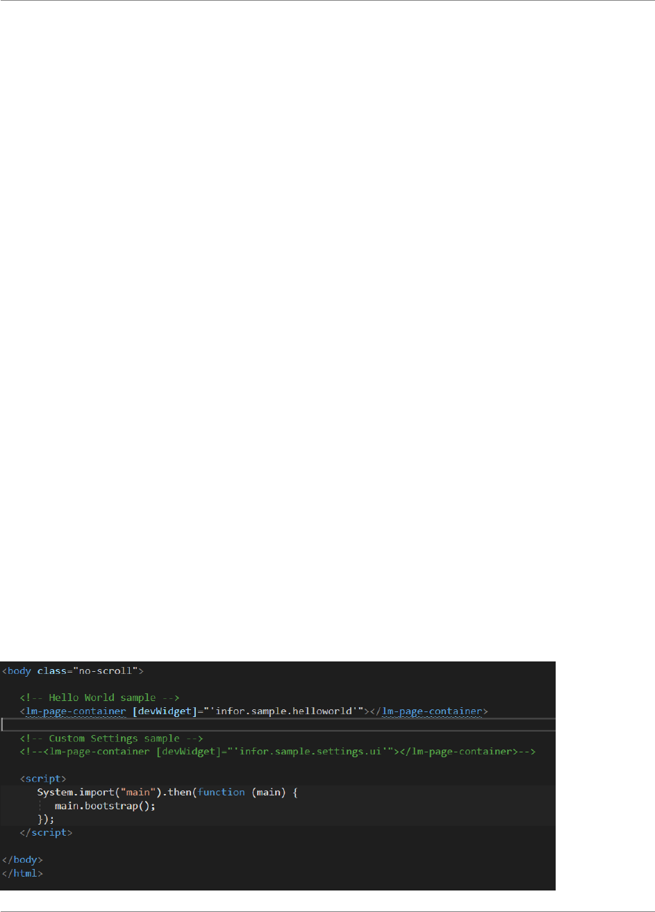
Development environment
64 | Widget SDK Developers Guide
editor and support for running command line tools. The minimal approach would be some kind of
text editor and a Node.js web server, which is included in the SDK.
Here is a list with a selection of the tools that you could use for widget development:
- Visual Studio Code (Recommended)
o Visual Studio Code is free and runs on Windows, macOS and Linux.
o The SDK comes with preconfigured VS Code tasks for running the web server and
TypeScript compilation in watch mode
- Visual Studio Professional or Enterprise
o Requires a license
o Minimum version is Visual Studio 2013 with update 4
- Visual Studio Community
o Free version of Visual Studio with limited functionality
- Sublime Text + Node.js web server
o Sublime Text is cross-platform source code editor
The samples can be run in different ways for example using Visual Studio or using a Node.js server.
To use a Node.js server follow the instruction in the Appendix on Node.js and NPM and make sure
they are correctly installed before trying to run the samples.
Samples
The samples are in the Samples/Widgets folder. Widgets are loaded from the file structure, using the
information in the widget.manifest file. Inline widgets will also contain a script file that is loaded with
the current module loader. External widgets will only contain a manifest.
The index.html file contains a list of different widgets contained in an lm-app Angular component.

Development environment
Widget SDK Developers Guide | 65
Uncomment the one you want to test and comment-out the others. Make sure there is only one lm-
app on the page.
You should not edit any files except for changing the dev-path that is located in the index.html file.
The files will change in coming versions.
Running the Samples in Visual Studio Code
1. Make sure the prerequisites described earlier in this chapter have been met.
2. Open the ./Samples/Widgets folder in VS Code.
3. Start the web server by running the build task “Start Server” (Windows: ctrl+shift+b)
4. Start TypeScript compilation in watch mode by running the build task “Typescript Watch”
(Windows: ctrl+shift+b)
5. Open http://localhost:8080 in your preferred browser
6. Debug the project with F5 or run with Ctrl+F5. The Homepages application will be opened
and the widget specified in index.html will be displayed. This requires the Debugger for
Chrome extension for VS Code, which can be installed by navigating to the Extensions tab.
Running the Samples on a Node.js server
1. Make sure the prerequisites described earlier in this chapter have been completed.
2. Open a command prompt in the Samples folder
3. In the command prompt: npm install
4. In the command prompt: node server
5. If the default port (8080) is available, the web server will be started. If the port is not available
try to start the server on another port, for example: "node server 4000"
6. Open a browser and navigate to http://localhost:8080
If the server does not start check that the port is available or supply a port number. If there are other
issues with the install check that NPM and Node.js is installed, according to the information in the
Appendix.

Development environment
66 | Widget SDK Developers Guide
Creating a new widget
These instructions describe how to create a new widget in the Sample project.
1. Create a widget by adding a folder with a lowercase widgetId name to the Widgets folder.
Check the manifest documentation section for more information regarding naming rules.
2. In the folder create a widget.manifest and (optional) script file.
a. For Angular AOT widgets create three script files:
i. main.ts (suggestion name only. This file has the main widget code)
ii. widget.ts (widget factory file for JIT)
iii. widget-aot.ts (widget factory file for AOT)
b. If creating an inline widget, make sure you implement the factory method in the script
file.
i. If creating an AOT Angular widget make sure to follow the factory files
samples in chapter 5, Angular widgets.
3. In index.html update the active lm-app element and set the devWidget attribute to the id of
your widget.
4. Run the project in Visual Studio or using Node.js and a local web server.
Testing with multiple widgets
It is possible to test with multiple widgets by adding multiple values separated by semi colon to the
following attributes on the lm-app element: devWidget, devSettings and devCustom. Note that the
devConfiguration attribute only supports a single value.
When multiple attributes are used they must contain the same number of values separated by semi
colon. Blank values are allowed however so you can just add a semi colon if a value is not needed
for one of the widgets. The values for each attribute must be in the same order.
Example with two widgets:
<lm-app
devWidget="infor.sample.angular.helloworld;infor.sample.angular.cardlist">
</lm-app>
Example with two widgets and settings for the second one only:
<lm-app
devWidget="infor.sample.angular.cardlist;infor.sample.angular.helloworld"
devSettings="infor.sample.helloworld/settings.json">
</lm-app>

Development environment
Widget SDK Developers Guide | 67
Static code analysis with TSLint
TSLint is included in the project to make it easier to avoid common mistakes and to keep a
consistent code style. Most modern text editors and IDE:s can integrate with TSLint either out of the
box or through extensions (See https://palantir.github.io/tslint/usage/third-party-tools/). There are two
different tslint configurations in the Widgets directory:
tslint.json
This configuration is based on the recommended settings from the TSLint team, with some rules
turned off. This one should be enough to detect many of the common mistakes that developers
make, and to keep the code style consistent without being too pedantic.
tslint-strict.json
This configuration is used to lint all the provided samples, and we recommend that you use it for
your widgets as well. It enforces some best practices in regard to keeping code maintainable and
type-safe. You can configure Visual Studio Code to use this configuration by modifying the
“tslint.configFile” property in the Workspace Settings file (Widgets/.vscode/settings.json).
Running the linter
The easiest way to lint your code is through your text editor or IDE. It can show errors and warnings
next to the affected lines/symbols, and automatically fix them. Configuration depends on the
editor/extension. If TSLint is not supported by your editor, you can always run it from the command
line:
Using the provided npm scripts (Samples/package.json):
npm run lint # Lint using the standard config
npm run lint:strict # Lint using the strict config
Using the tslint executable (from the Widgets directory):
npx tslint -c tslint-strict.json -p . # Local installation, npm>=5.2.0
tslint -c tslint-strict.json -p . # Globally installed tslint
../node_modules/tslint/bin/tslint ... # Local installation
Automatically fix problems
Some linting rules can be fixed automatically. It is highly recommended to configure your text editor
to do this for you, since some problems can be tedious to fix manually. However, this can also be
done with the CLI by adding the --fix option. Note that doing this will modify your source files.
Example:
tslint -c path/to/Widgets/tslint-strict.json -p path/to/Widgets –fix

Development environment
68 | Widget SDK Developers Guide
Modifying or overriding rules
If there is some rule that contradict your preferred code standard, you can either modify the provided
configuration files, or create a new configuration for your widget:
Example
// Widgets/my.example.widget/tslint.json
{
“extends”: “../tslint-strict.json”,
“rules”: {
“indent”: [true, “spaces”, 4], // Change a rule
“max-line-length”: false // Disable a rule
}
}

Packaging
Widget SDK Developers Guide | 69
Chapter 9 Packaging
9
This chapter describes how to package a widget. The widget package can then be registered and
deployed in the Ming.le Cloud Console for cloud environments or uploaded in the Administration tool
for on-premise installations.
Files to include
A widget package should only include the files that are required in runtime. Any files that are not
used in runtime such as source files or build artifacts should be excluded from the widget package.
The widget packages are synchronized over networks and stored in databases and should be as
small as possible.
Mandatory files
Which files are mandatory depends on the widget type.
- Widget manifest
o A widget manifest file called widget.manifest is required for all type of widgets.
- Widget module file
o A widget module file is required for inline widgets.
o Example: widget.js
Optional files
Optional files could be image files.

Packaging
70 | Widget SDK Developers Guide
File optimizations
It is mandatory to optimize content by combining script files to a single file that is minified. All files
that can be combined and minified should be. This will be a requirement for cloud deployed widgets.
Please note that directories in the widget package is not allowed. Source code can be in directories
and there can be multiple files and modules, but they need to be bundled into one file.
Angular components must use inline templates.
Homepages command pack script
The Widget SDK includes a Node.js script that can be used to build and package all types of
widgets. It will compile and bundle all TypeScript files used in the widget into a single JavaScript file
(except any shared modules).
The script will create named modules based on the widget ID and you can have multiple source files
as modules which will be automatically bundled.
Shared modules need to have the TypeScript file copied to each widget directory prior to executing
the pack command.
Directory rules
All widgets must adhere to the following guidelines:
- The widget directory must have the same name as the widget ID.
- Sub directories are only allowed for source code.
- Sub directories are not allowed for resources such as images.
AOT compilation
To enable AOT compilation there are three actions you need to take:
1. Add the aotVersion property with a blank value in manifest
2. Make sure widget directory rules are followed
3. Make sure there are two widget factory files created, one for AOT and one for JIT
Manifest
To enable AOT compilation for Angular widgets the manifest needs to contain the aotVersion
property. Add the following to the manifest for Angular widgets:

Packaging
Widget SDK Developers Guide | 71
“aotVersion”: “”
Widget factory files
Be sure to have created two factory files for the widget module. One that is used for AOT and one
that is used for JIT.
o Source code in main.ts
o AOT factory function in widget-aot.ts
o JIT factory function in widget.ts
Prerequisites
- Ensure that you have installed Node.js
o Can be verified with the command node -v
- Ensure that you have installed the node package dependencies
o Change to the directory /Infor_HomepagesWidgetSDK/Samples
o Execute npm install
- Ensure that the directory that contains the widget has the exact name as the widget ID.
Pack and optimize:
A widget can be minified and zipped for production by following below steps:
1. Open a command window in directory \Infor_HomepagesWidgetSDK\Samples
2. Execute command:
node homepages pack “folder_name”
Where “widget_id” corresponds to your widget folder.
Example: node homepages “widget_id”
The homepages command file has a help function that will print out the different commands and
parameters that are available. Please check the help information for more information.
Examples
node homepages help
node homepages pack "infor.sample.angular.helloworld"

Packaging
72 | Widget SDK Developers Guide
node homepages pack --
widgets="infor.sample.angular.helloworld,infor.sample.angular.quicknote"
node homepages pack --widget "Widgets/infor.sample.angular.helloworld" --
outputPath "C:\Builds"
node homepages pack --widget
"C:\Source\Widgets\infor.sample.angular.helloworld" --outputPath "C:\Builds"
–zip=false
The default output location with be in a Builds directory relative to the script location unless the
outputPath parameter is provided.
Output
The name of the zip file will include the name and version of the widget, as well as the current date
and time. If the addDisplayVersion parameter is set the script will update the manifest with a
displayVersion property.
The output directory will contain the widget package zip, for example:
infor.sample.angular.helloworld-1.0.20180323-114907.zip
Shared modules
Shared modules are supported like before. It is however important that the TypeScript file for the
shared module is available in the same directory as the widget. It can be copied by a script prior to
building the widget.
Angular AOT package recommendation
Make sure that the package script is run throughout development as it will discover issues related to
template validation.
You can also use a stricter validation by setting the fullTemplateTypeCheck parameter to true.
Example:
node homepages pack "Widgets/infor.sample.angular.helloworld" --
fullTemplateTypeCheck=true
Try to fix any issues related to the widget code. If there are remaining issues that cannot be
addressed, you must build the widget package without full template type checks. There could for
example be issues in one of the Infor Design System components used by the widget.

Packaging
Widget SDK Developers Guide | 73
Manual minification
If packaging the widget using other methods than the included homepages script, a few things must
be considered to ensure that the widget will work properly and not break other widgets or Framework
modules. It’s recommended to use the homepages script for all builds.
Single module widget
If your widget only consists of one TypeScript file, i.e. there is only one module, the minification is
straight-forward. If there is a single AMD module it can be anonymous, it’s not allowed to have a
common name, such as “widget”, that might conflict with other modules when the widget is loaded
by the Framework. A named module must be prefixed with the widgetID. The main module can have
the widget ID as name and other should have it prefixed with the widgetID.
Once minified, it can be packed manually together with the manifest and any additional resources.
Multi-module widget
If your widget consists of two or more TypeScript files (not shared modules), they must be combined
into a single out-file when compiled for production. When combining several modules into one, the
AMD modules in the resulting JavaScript will be named the same as the corresponding TypeScript
file they originated from. For instance, the module from widget.ts will be named “widget”.
Any named AMD modules must be unique, since the Framework will load the main widget module
by its name in the multi-module scenario. The JavaScript modules must manually be updated to be
prefixed with the widget id. And, any module importing another must update its import array to match
the new name. The widget manifest “moduleName” property must be updated to reflect the new
name for the main module, as well as the JavaScript file.
After this, the JavaScript file can be minified and packed manually together with the manifest and
any additional resources.
The homepages command script supports multi module out of the box and will create UMD named
modules using the folder name that must be set to the widget ID.
Packaging widgets for an on-premise installation
Widgets can be installed manually by a customer in an on-premise installation of Homepages. This
is different compared to a cloud installation of Homepages where the widgets are automatically
synchronized from the Infor Registry. The zip file for the Infor Registry is the format described in the
previous section, e.g. one zip one widget.

Packaging
74 | Widget SDK Developers Guide
The widgets should be packaged with the homepages command script in the same way as
There are two options for installing Standard widgets in an on-premise installation. Note that they
use different zip formats. The widget installation package file (see below) is a zip that may contain
multiple widgets and it can only be uploaded on the management pages for the Homepages server
in the ION Grid.
A simpler way to upload a widget is to use the new import functionality within the Homepages
application itself. Open Homepages Administration and go to the Standard widgets section. There is
an ‘import’ action available above the list of Standard widgets.
In this tool, it is important to upload a zip that has just one widget and the widget.manifest directly in
the root of the zip. Note that the zip should not have any directories.
Refer to the Homepages administration guide for more information on how to import widgets in an
on-premise installation.
Widget installation package file
There are two different installation formats for installing widgets. One is a zip file as described below.
Such a file can only be installed in the Management pages for the Homepages application in the ION
Grid.
To upload a single widget zip file, use the Homepages Administration tool accessible from the
Homepages menu within the Homepages application.
A widget installation package file is simply a zip file that may contain one or more widget zip files.
Even when installing a single widget, it must still be packaged into a widget installation package file.
These are the basic steps for creating a widget installation package file:
- Create zip files for each widget as described above (1-n)
- Create a new zip file and add the widget zip files to it.
Widget installation package file example:
- Widgets.zip
o infor.examplewidget1.zip
o infor.example.widget2.zip
o …
o infor.example.widgetn.zip

ION API
Widget SDK Developers Guide | 75
Chapter 10 ION API
10
This chapter describes how call the ION APIs from an inline Homepage widget.
Introduction
The Widget SDK contains an API for retrieving the OAuth token that can be used when accessing
the ION APIs. OAuth essentially allows access tokens to be issued to third-party clients by an
authorization server, with the approval of the resource owner. The client then uses the access token
to access the protected resources hosted by the resource server. ION APIs uses OAuth and before
starting with Homepages development using the ION API there are some prerequisites that are
required.
1. Application API deployed in ION API Server for a specific environment
2. Access to Ming.le and Homepages in that environment
Retrieving OAuth access token
The OAuth access token must be set as a request header. This means that all access to URL must
be done in code and even if there are IDS components that takes an URL you must use another
approach to be able to manually update the header before making the request. Homepages provides
a consistent way to access a token that is shared among all widgets.
IIonApiContext contains functions for retrieving the base URL to the ION API Server as well as the
token and the header name and header.

ION API
76 | Widget SDK Developers Guide
Token timeout
It is the responsibility of the Widget developer to handle authentication errors and retry any API call
with a newly refreshed token. A new token can be requested by setting refresh to true. Note that this
should only be done if the token is expired.
Another important note is that you should not store the token in a variable for later use but always
get it from the context. This means that if any other widget has requested a new token you will
always get the latest one.
Development environment
There is an ION API widget sample. It shows how to connect to a M3 API but can be used as
reference on how to set the required header and how to enter configuration for the ION API Base
path. Please note that the example is not a complete solution but only a starting point.
Prerequisites
The following are the prerequisites for running the ION API sample but can be applied to any ION
API usage.
- Acquire the server and port number for the ION API server to test with.
- Configure and start a localhost proxy with the ION API server and port number.
Example: node proxy.js 8083 "server.infor.com" 443
Example: \Samples\StartIonApiProxy.cmd
Acquire an OAuth token string
1. Log on to Ming.le
example: https://server/tenant
a. Locate the server that Homepages is running on within Ming.le. You will need to
check the server and port for Homepages and apply it to the template below. Use the
browser developer tools to locate the URL for the IFrame in which Homepages is
running.
i. Open the browser developer tools (how depends on browser)
ii. Use the element inspector tool and click the top bar in Homepages. Look for
an Iframe element with a context root called /lime
2. Open a new tab in the same browser and navigate to the Grid SAML Session Provider
OAuth resource.

ION API
Widget SDK Developers Guide | 77
a. The Grid must be version 2.0 or later with a SAML Session Provider configured for
the same IFS as Ming.le (these conditions are true for the Homepages Grid)
Template: https://{homepagesserver}:{homepagesport}/grid/rest/security/sessions/oauth
3. Copy the OAuth token string from the browser window
If there are issues you can verify if your user has access to the grid by navigating to the Grid user
page. Note that you must be logged on to Ming.le before doing this.
Example: https://{homepagesserver}:{homepagesport}/grid/user
Set up the development configuration
Set the ionApiToken property in the configuration.json file to the OAuth token string.
Example: "ionApiToken": "V9k5niTDR1kq6RuYlEq3N3HxGq8u"
Set the devConfiguration attribute on the lm-app to the name of the configuration.json file
Example: <lm-app devWidget="infor.sample.ionapi.m3" devConfiguration="configuration.json"></lm-
app>
Developing and debugging
A widget using the ION API can be developed and debugged like any other widget. Just remember
to start the proxy and configure the configuration.json file. The OAuth token will time out and when
that happens you must acquire a new token and update the configuration.json file.
The OAuth token might time out in production as well. If not using the executeIonApiAsync() API
method, which handles this automatically, all API calls must be wrapped with a retry that is done
after forcing a new token if a request results in a 401 HTTP response code.
To force a refresh of the access token call getIonApiContextAsync with refresh set to true.
Example:
widgetContext.getIonApiContextAsync({refresh:true}).then(…..)
Note this should only be done when a call has resulted in an unauthorized response.

Homepages Widget Certification
78 | Widget SDK Developers Guide
Chapter 11 Homepages
Widget Certification
11
To be delivered as a standard Homepages widget the widget needs to be reviewed and certified by
the User Platform / Homepages team. The reason we have a certification is that your widgets
behavior may affect other widgets since it is not running in a sandboxed environment. It is also
important that all recommendations in the developer’s guide have been followed. This chapter
contains the certification checklist as well as a developer checklist with some things to consider
when developing and testing your widget.
Please note that the checklist is a short summary. Once ready for review contact Fredrik Eriksson,
fredrik.eriksson@infor.com. The review process is Infor internal.
Certification checklist
Packaging
• The manifest must be correct, e.g. unique widget id and correct information
• Script files must be minified and combined into one single script file. It should be an
anonymous script module or a named module with a unique name – for example the widget
id. Use the homepages pack script to make sure the bundle result is correct.
• Angular templates shall be inline and not result in an extra request to load them.
• The widget package shall only contain a manifest, a script file and optional images. The
package shall not contain map files or TypeScript files. If you have a shared JavaScript
module the package may contain two script files. The total package size will also be
considered.
• It is not allowed to include JavaScript libraries as sharedModules. Only application logic is
allowed as a shared module.
Verify package
• Use the lime-zipv tool to verify that the widget package zip is correct. Download the tool
from GitHub, unzip and follow the read me instructions:
https://github.com/infor-cloud/homepages-widget-sdk
Development
• The widget shall be translated to all languages that your backend application supports.
• The widget shall always be backwards compatible if possible. It should never break with its
previous configuration.
• A widget that has settings must support publishing.
o If settings are used the widget must respect the publish configuration that specifies
which settings are enabled and visible etc. If you have actions available in the Widget
Title bar or inline configuration that depends on settings, you need to read the API
documentation carefully.
o This also applies to a widget that is not published but has publish information on a
published page

Homepages Widget Certification
Widget SDK Developers Guide | 79
o If the widget does not respect the publish configuration, user settings must be turned
off when published. In that scenario, set enableSettingsWhenPublished to false in
the manifest.
• Don’t store too much data as settings. Basically, only store key-value pairs. The page size
must be kept to a minimum. There is a max size per page that will prevent the page from
being saved if it is too big.
• Avoid polling for data updates
o We don’t recommend polling. Implement the refresh action in the Widget Title bar
instead.
o If polling must be used, then make sure to use long intervals e.g. default interval 15
min and minimum 5 minutes.
o If you implement polling, you must use the activated and deactivated event on the
IWidgetInstance so that the widget isn’t requesting new data unless it is visible and
active on a Page.
• The UI shall follow the Infor Design System guide.
• A widget shall be a small application that provide quick access to information or functionality.
Avoid making the widget too complex, it shall not be a complete application.
• Don’t use global variables.
• Only access public documented homepages APIs.
• A widget is only allowed to make changes to the widget DOM element and its children. There
must be no side effects affecting other parts of the DOM.
• Show inline messages for errors instead of showing dialogs.
• HTML ID attributes must include the unique widgetInstanceId from IWidgetContext.
• Don’t include any third-party libraries
• If using ::ng-deep as part of a CSS selector, it must be scoped, ex. :host ::ng-deep.
• Never load data that isn’t directly visible in the UI. E.g. if you have tabs with different data,
only load the first tab. All data should be lazy loaded and loaded only when the data is
displayed in the view.
• Never use anything global.
• It’s not allowed to add any JavaScript libraries.
• It’s not allowed to link in CSS files as it would affect all widgets.
• It’s not allowed to include <script> tags in the widget.
• Don’t call save() unless the configuration is actually saved.
• Don’t store recent state in the widget settings. Data such as recent documents, recent
queries etc. should preferably be stored in the browser local storage.
• Don’t use the “?” safe operator in Angular templates.
• If the widget belongs to an application, dependency needs to be set in the manifest
(applicationLogicalId).
• Don’t use hardcoded strings in html templates or messages, only localized values.
• Always handle request errors (show informative inline message and use Log class to log
error).
• Set widget state to busy when performing asynchronous operations such as loading data,
IWidgetContext setState. Set state back to running when completed.

Homepages Widget Certification
80 | Widget SDK Developers Guide
• Error messages shown to the end user shall be localized, not raw server responses. Avoid
using “Error” in the message and make sure it’s informative. It’s for the end user.
• Do not pass sensitive information in API requests, nor store it in widget settings.
• Do not use the console directly for logging, use the Log class from lime with a log prefix (ex.
widget name).
• Make sure any parameters in API request URLs are correctly encoded if necessary.
• Any message handlers need to be unregistered when the widget is deactivated (ex.
“inforBusinessContext”).
• Companyon client message handlers must include a unique namespace since the client is
shared among other content. Namespace is used both when registering and unregistering
the message handler through the companyon client.
Development checklist
Please complete the Certification Checklist before submitting a widget for review. Below is a short
checklist of scenarios that you should consider when developing / testing.
You should also complete the more detailed scenarios described in Chapter 14 Appendix Test.
• Use multiple widgets on the same page. They should be self-contained and not affect each
other (or other widgets).
• Use widgets on multiple pages. Use Fiddler to check that there are is no polling when your
widget isn’t visible or if the widget settings is edited.
• Test the widget in multiple browsers. For the complete list check which Ming.le currently
support.
• Publish your widget and test different publish scenarios. If you have settings test and publish
your widget with different configurations. You should consider the following:
o Disable settings
o Enabling settings but only some of the values
o Enable settings but only in read-only etc.
o These different scenarios must also be tested by a user that has view only access to
the published widget or the published page.
• Use browser dev tools and check the log output.
o Also check all requests and make sure you check the amount of data that store in
settings.
• Test in different languages.
• Make sure you have proper error handling.

Homepages Widget Certification
Widget SDK Developers Guide | 81
• Make sure you have checked and tested the OWASP to 10 vulnerabilities and have taken
actions to prevent different types of attacks.

Resources
82 | Widget SDK Developers Guide
Chapter 12 Resources
12
The Infor Design System
https://design.infor.com/
IDS Enterprise components
https://github.com/infor-design/enterprise
IDS Enterprise NG - Angular wrappers for IDS Enterprise components
https://github.com/infor-design/enterprise-ng
Widget Design Guidelines
https://design.infor.com/resources/mingle-homepage-widget-guidelines
TypeScript
http://www.typescriptlang.org
Angular
https://angular.io/
https://angular.io/guide/upgrade
https://angular.io/guide/template-syntax
Node.js
http://nodejs.org/

Appendix Node.js
Widget SDK Developers Guide | 83
Chapter 13 Appendix Node.js
13
Node.js
A Node.js installation is required if you want to use the web server that are part of the SDK samples.
The web server can be used for testing the widget samples or for widget development. If you already
have a working Node.js installation or if you don’t intend to use the web server, you can skip this
section.
Install Node.js
Download and install Node.js from http://nodejs.org/
When the installation is complete you can follow the steps in the next two sections to verify that
installations works. Note that the instructions are for Microsoft Windows operating systems only.
Refer to the Node.js documentation for other operating systems.
Verify the Node package manager
Follow these steps to verify that the Node package manager works.
• Verify that the following folder exists and create it manually if not.
o C:\Users\<userid>\AppData\Roaming\npm
o You need to show Hidden items in Windows Explorer to be able to see the AppData
folder.
• Open a Windows Command Prompt window.
• Run the following command
o npm -version
• Verify that a version number is printed, such as 1.4.21
o If the command fails verify that the npm directory has been created, see previous
step, and create it if necessary.

Appendix Node.js
84 | Widget SDK Developers Guide
o When the directory has been created retry the "npm -version" command.
o On some operating systems the command might complete even if the npm folder is
missing. In these cases, the installation of the node packages will fail. This can be
solved by manually creating the npm folder.
o On some operating systems you might have to restart the computer after adding the
npm folder.
Verify the Node executable
Follow these steps to verify that Node executable works.
• Open a Windows Command Prompt window.
• Run the following command
o node -v
• Verify that a version number is printed, such as v0.10.30
o If the command fails it could be that the node directory is not on the Windows path.
o Add the following directory to the Windows System Path
▪ C:\Program Files\nodejs
o Close the command Window, start a new one and test node -v again
▪ The command should succeed this time.
o To apply the new Windows path the computer might have to be restarted.

Appendix Test
Widget SDK Developers Guide | 85
Chapter 14 Appendix Test
14
Widget Test Scenarios
This appendix contains a list of different scenarios that you should use as part of your testing. Not all
features might apply to your widget, but it is important to understand the different usage scenarios
for your widget especially if you have widget settings. The scenarios should be tested in a proper
environment, not the local development test container.
Scenario 1: Basic features
The purpose of this scenario is to verify that:
- The widget can be added to a page
- The widget can be duplicate
- The widget title can be edited
- The widget is still visible when using it on a page set as homepage
Pre-requisites
None.
Test
1. Add a new page.
Appendix Test
86 | Widget SDK Developers Guide
2. Find and add your widget to the page.
Appendix Test
Widget SDK Developers Guide | 87
3. Verify that the widget is added to the page.
4. Open the “Configure” dialog and click the padlock to make the widget title editable. Update
the title and save the changes. Verify that the widget has the new title.
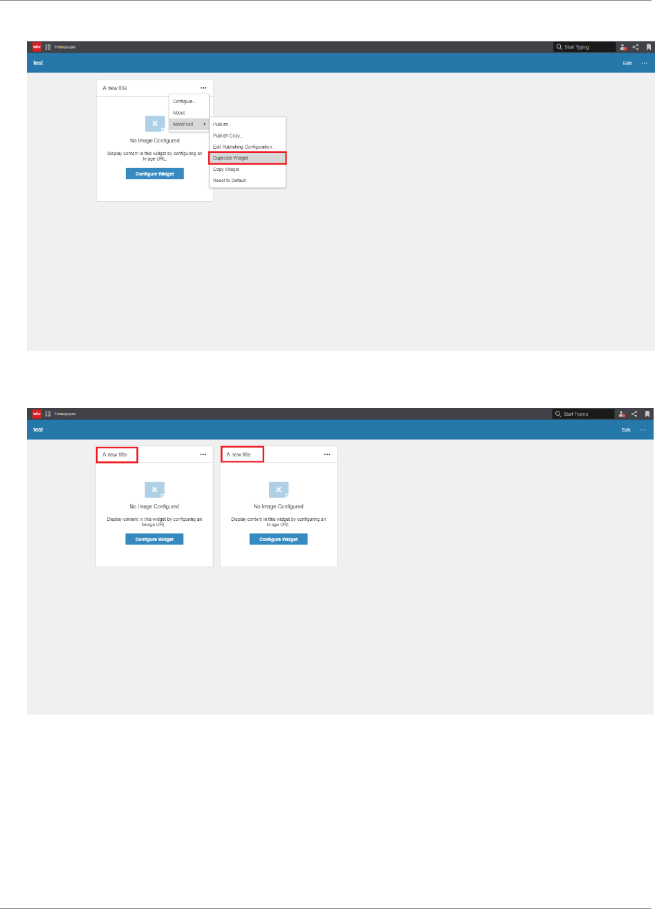
Appendix Test
88 | Widget SDK Developers Guide
5. Duplicate the widget.
6. Verify that the duplicate has the same title as the original widget.
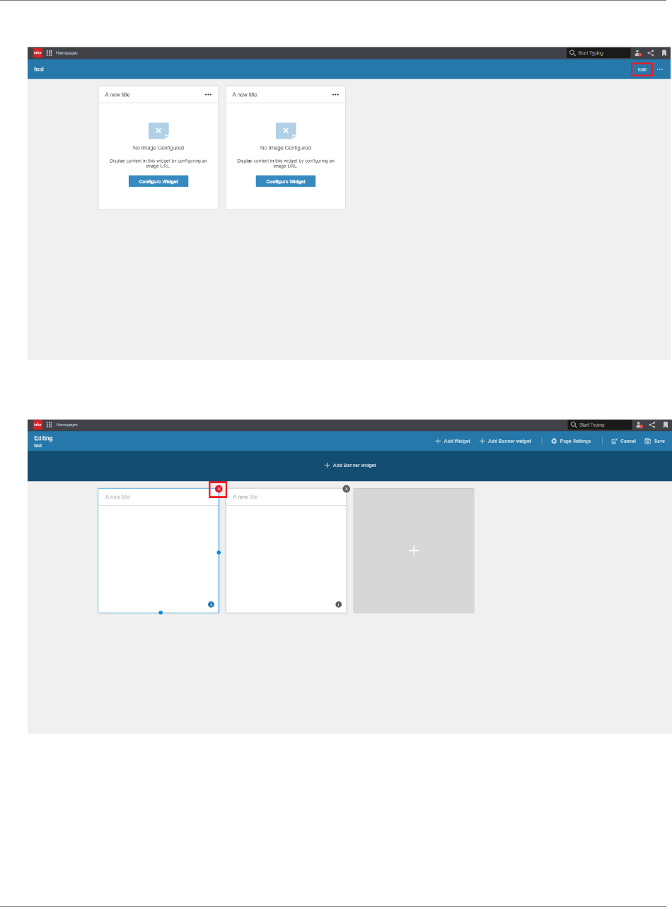
Appendix Test
Widget SDK Developers Guide | 89
7. Open Edit Page Layout.
8. Remove one of the widgets by clicking the X icon. Save the changes.
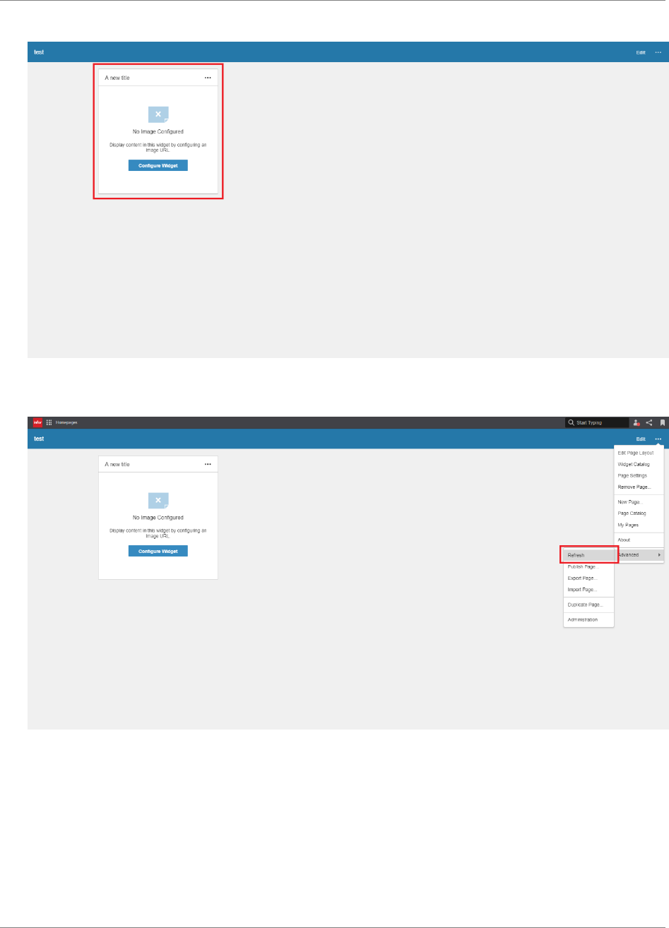
Appendix Test
90 | Widget SDK Developers Guide
9. Verify that only one widget is displayed on the page.
10. Refresh Homepages and verify that there’s still only one widget displayed on the page.
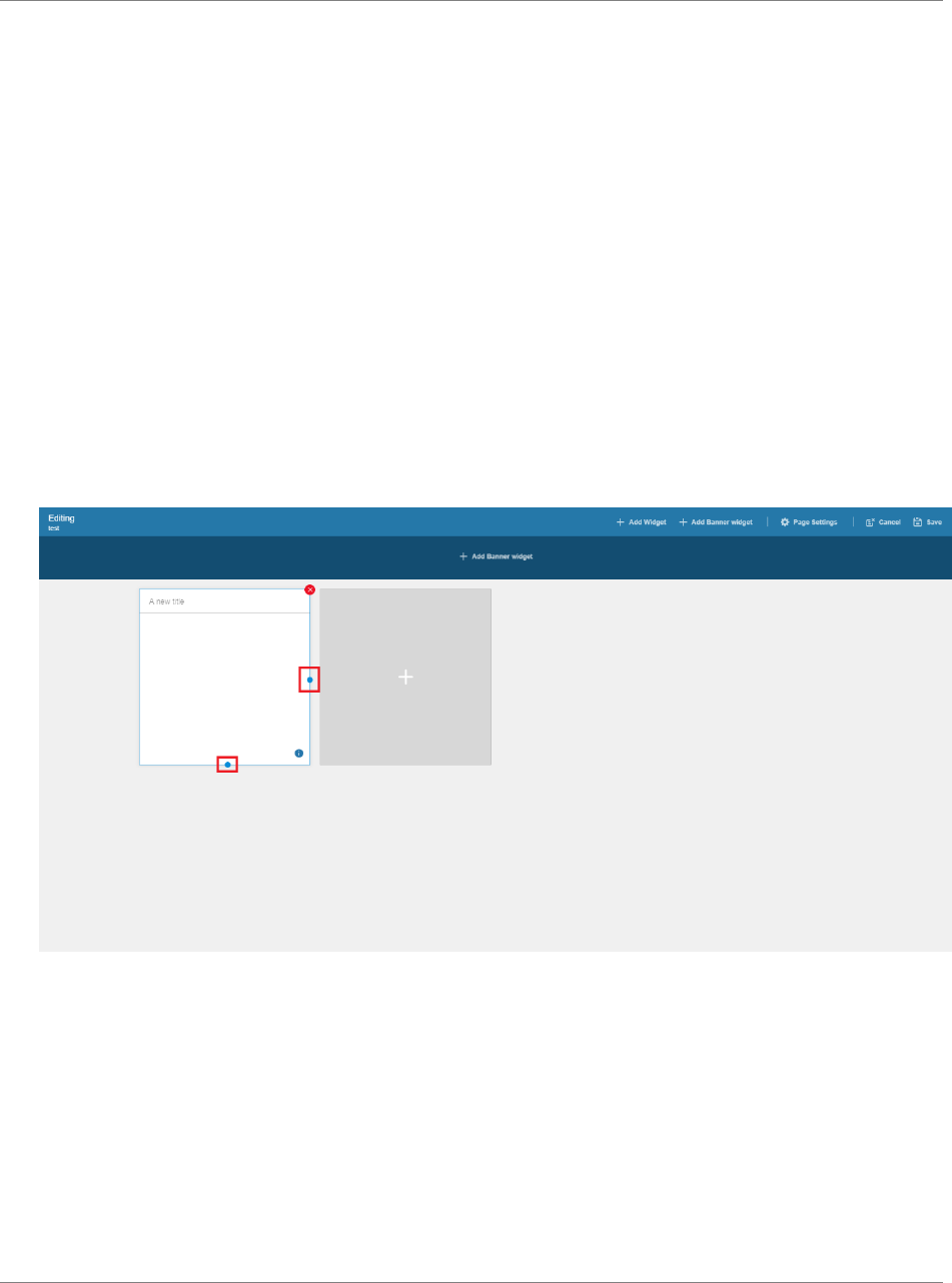
Appendix Test
Widget SDK Developers Guide | 91
Scenario 2: Widget sizes
The purpose of this scenario is to verify that:
- The widget can be resized to all supported sizes
- The widget content is correctly displayed and accessible in all supported sizes
Pre-requisites
A page with the widget exists.
The widget has been configured so that content is displayed in the widget.
Test
1. Open Edit Page Layout.
2. Hover the widget and resize it by dragging the handle. Save the changes.
3. Verify that the widget content is responsive and correctly displayed in its new size.
4. Repeat step 1-3, resizing the widget to all supported sizes (if maxSize has been set in the
manifest, it can only be resized up to and including max size).
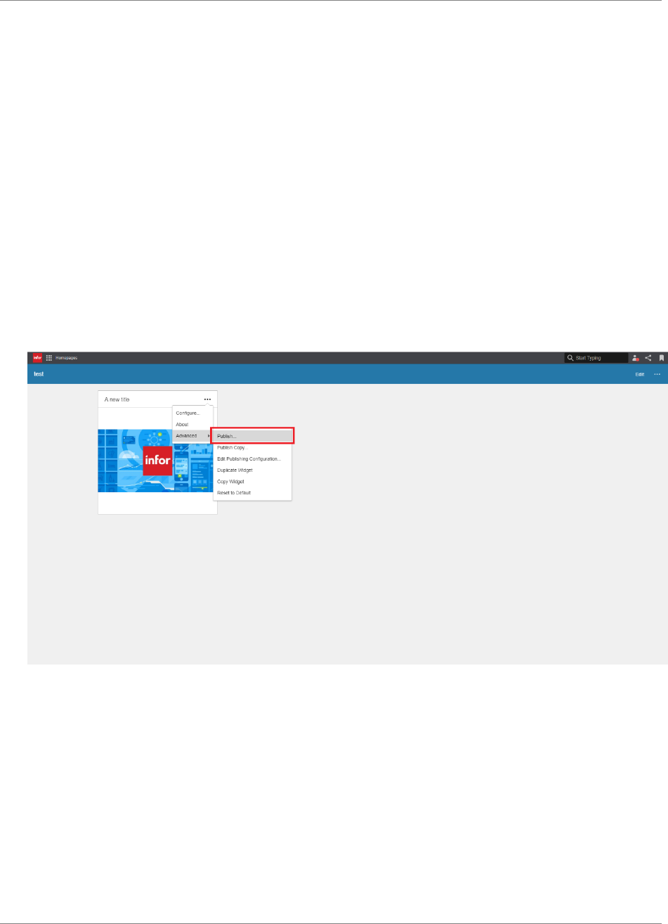
Appendix Test
92 | Widget SDK Developers Guide
Scenario 3: Publish widget
The purpose of this scenario is to verify that:
- The widget can be published and made available to other users in the Widget Catalog
- Users, other than the owner, can add the widget
Pre-requisites
Two users are available.
A page with the widget exists.
The widget has been configured so that content is displayed in the widget.
Test
1. Open Publish Widget mode via the “Publish” menu item in the widget menu.
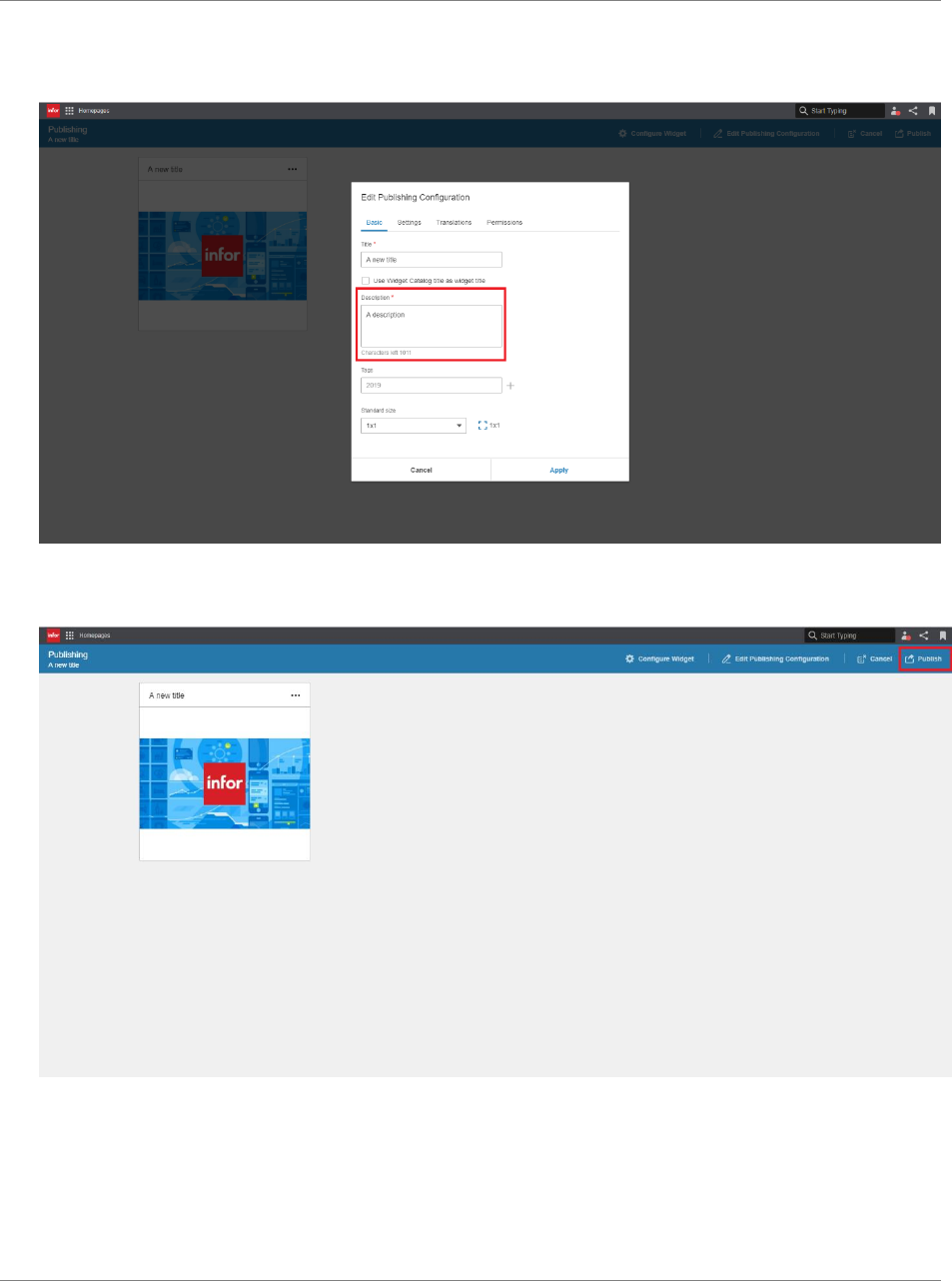
Appendix Test
Widget SDK Developers Guide | 93
2. Enter a description and apply the changes.
3. Publish the widget by clicking “Publish”.
4. Log in to Homepages as another user.
5. Add a new page. Open Widget Catalog and verify that the widget is available.
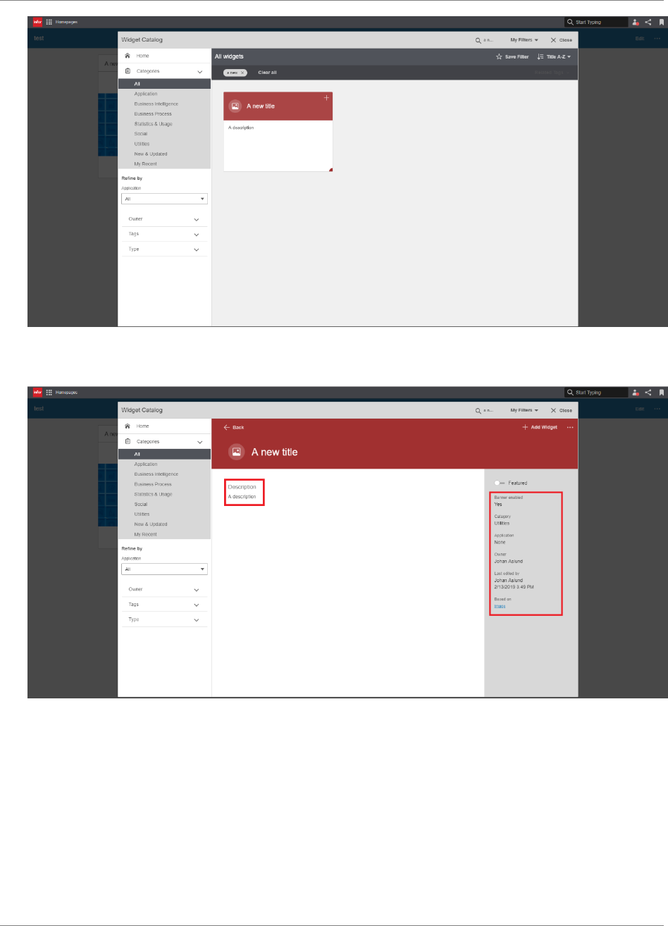
Appendix Test
94 | Widget SDK Developers Guide
6. Click the title of the published widget. Verify that the details are correct.
7. Add the widget and close Widget Catalog. Verify that the widget is displayed correctly.
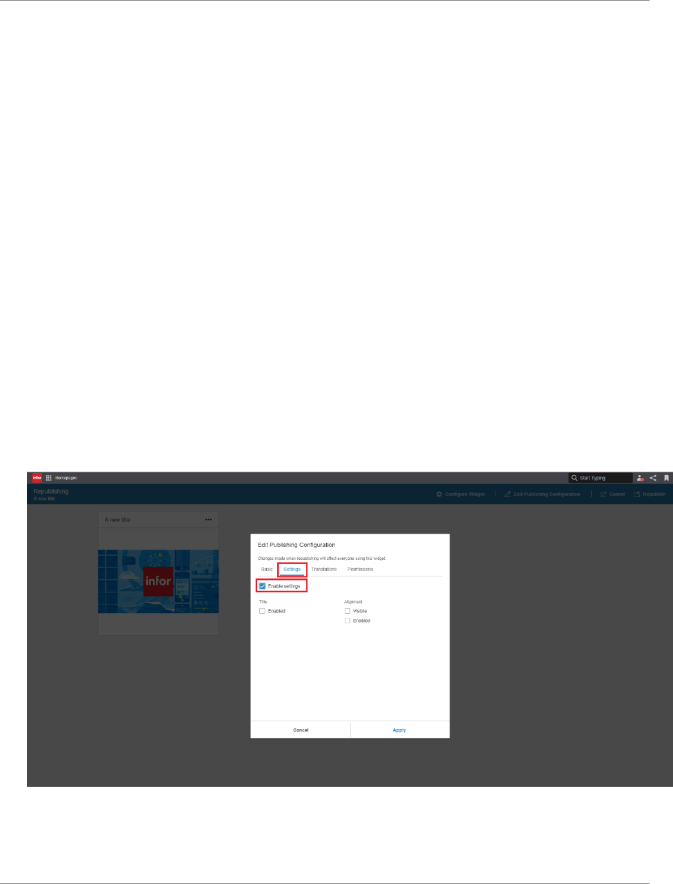
Appendix Test
Widget SDK Developers Guide | 95
Scenario 4: Publish the widget with one or more settings enabled
Note: If your widget does not have any settings metadata, or if user settings are force disabled for
published versions of the widget (“enableSettingsWhenPublished” set to false in the manifest), this
scenario can be skipped.
The purpose of this scenario is to verify that:
- The widget can be published with one or more settings enabled
- An end user can edit the enabled settings but cannot edit the disabled settings of the
published widget
Pre-requisites
A page with the widget exists.
The widget has been configured so that content is displayed in the widget.
Test
1. Open Publish Widget mode via the “Publish” menu item in the widget menu.
2. Enter a description.
3. Click the “Settings” tab and check the “Enable settings” checkbox. Verify that the individual
setting checkboxes below no longer are disabled.
4. Enable one or more of the settings and apply the changes. Publish the widget.
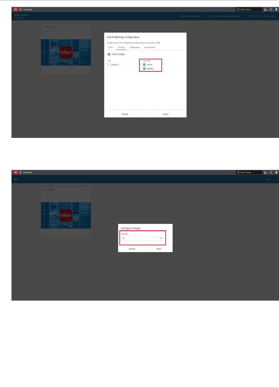
Appendix Test
96 | Widget SDK Developers Guide
5. Open the “Configure” dialog and verify that the enabled setting can be changed, and that the
disabled settings are read-only or not visible.
6. Repeat step 1-5 until all the settings have been verified.
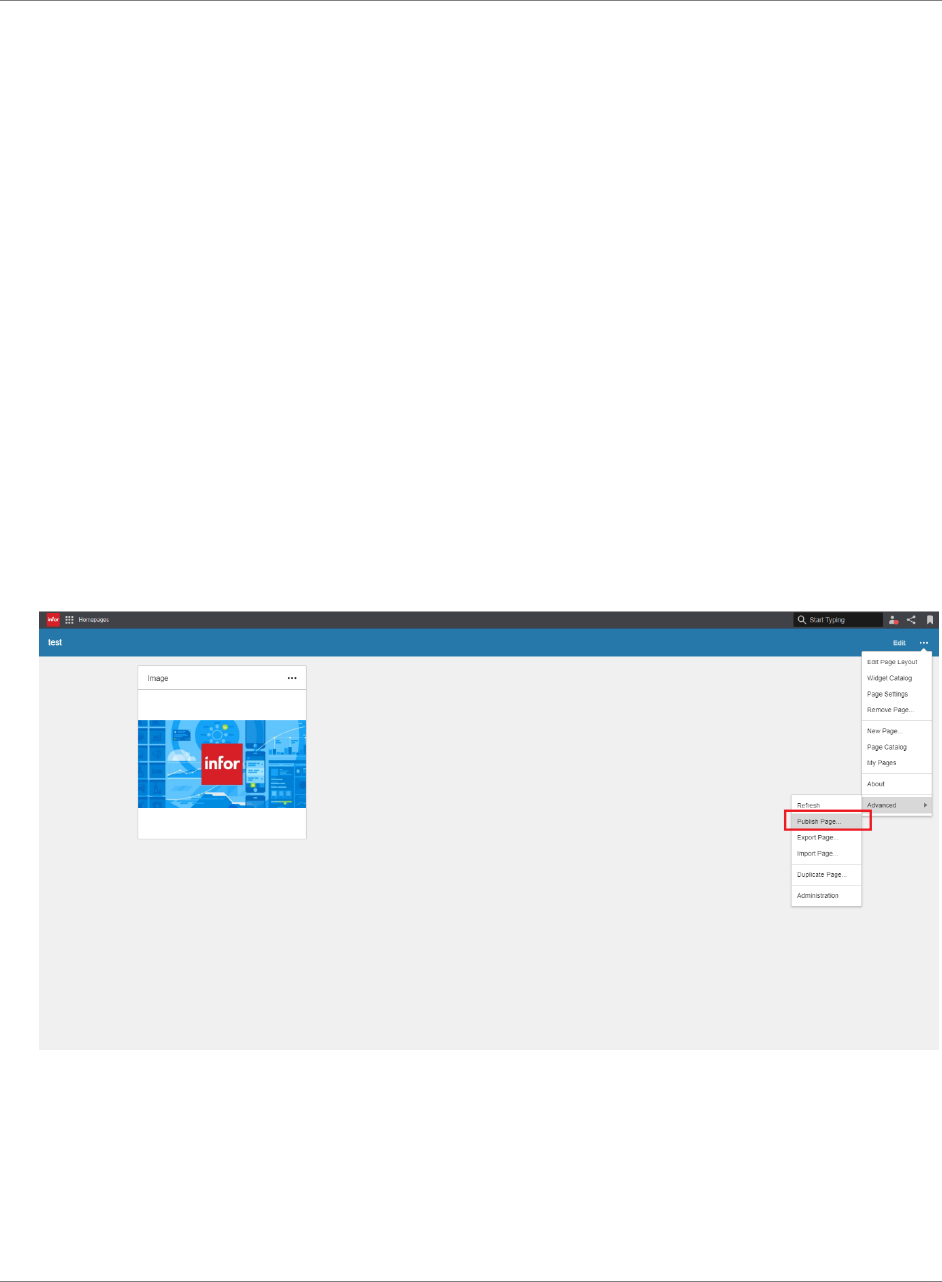
Appendix Test
Widget SDK Developers Guide | 97
Scenario 5: Configure settings on a published page
Note: If your widget does not have any settings metadata, or if user settings are force disabled for
published versions of the widget (“enableSettingsWhenPublished” set to false in the manifest), this
scenario can be skipped.
The purpose of this scenario is to verify that:
- The publish configuration for your widget works as designed on a published page
- An end user can edit the enabled settings but cannot edit the disabled settings of the widget
on a published page
Pre-requisites
A page with the widget (not published) exists.
The widget has been configured so that content is displayed in the widget.
Test
1. Open Publish Page mode via the “Publish” menu item in the page menu.
2. Click “Apply” in the “Edit Publish Configuration” dialog.
3. Open the “Edit Publish Configuration” dialog for the widget via the widget menu.
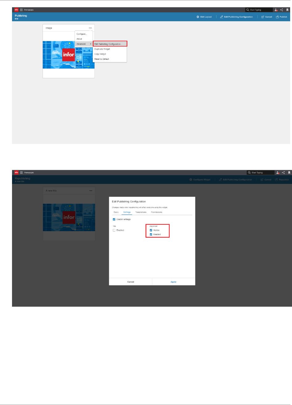
Appendix Test
98 | Widget SDK Developers Guide
4. Enter a description and enable one or more settings. Apply the changes.
5. Click “Publish” to publish the page to the Page Catalog.

Appendix Test
Widget SDK Developers Guide | 99
6. Open the “Configure” dialog and verify that the enabled settings can be changed, and that the
disabled settings are read-only or not visible.
7. Log in to Homepages as another user and add the published page via the Page Catalog.
8. Open the “Configure” dialog and verify that the enabled settings can be changed, and that the
disabled settings are read-only or not visible.

Appendix Test
100 | Widget SDK Developers Guide
Scenario 6: Import and Export page with the widget
The purpose of this scenario is to verify that:
- The widget is working as expected when exporting/importing a page where the widget exists
Pre-requisites
A private page with the widget exists.
The widget has been configured so that content is displayed in the widget.
Test
1. Export the page.
2. Remove the page.

Appendix Test
Widget SDK Developers Guide | 101
3. Open the Import Page dialog via the page menu and import the exported page.
4. Verify that the widget is working correctly.

Appendix Test
102 | Widget SDK Developers Guide
Scenario 7: Widget Title Logic
NOTE: If you have disabled title edit for your widget (“enableTitleEdit” set to false in the manifest),
this scenario can be skipped.
The purpose of this scenario is to verify that:
- The widget title can be changed
- The widget title is locked when checking the “Use Widget Catalog title as widget title” option
during publishing
Pre-requisites
A page with the widget exists.
Test
1. Open the “Configure” dialog and click the padlock. Verify that the title becomes editable.
Change the title and save the changes.
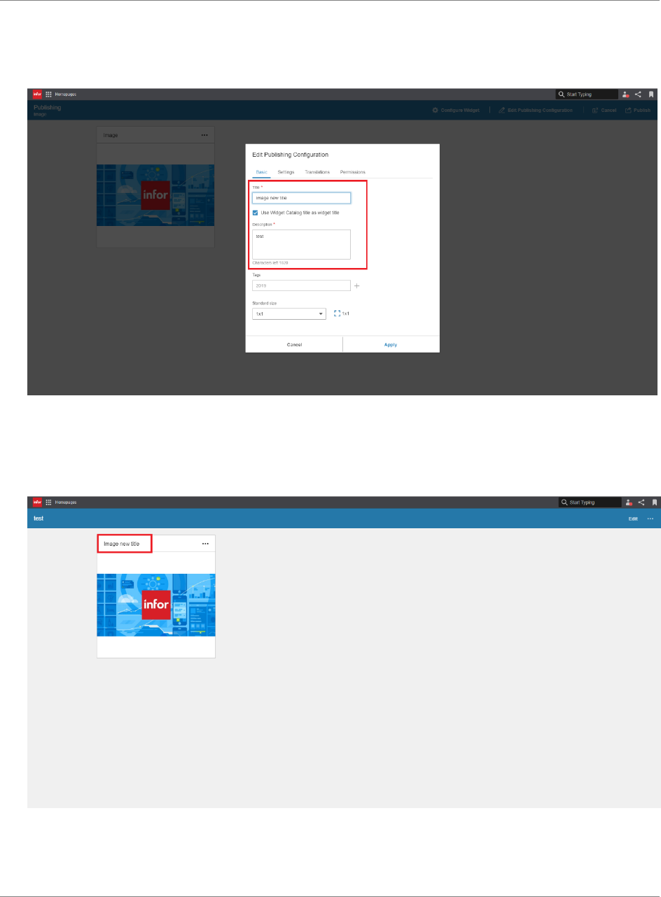
Appendix Test
Widget SDK Developers Guide | 103
2. Open Publish Widget mode via the “Publish” menu item in the widget advanced menu.
3. Enter a description and a new title. Check “Use Widget Catalog title as widget title”
4. Apply the changes and publish the widget.
5. Verify that the widget title is now the same title as the one set in step 3.
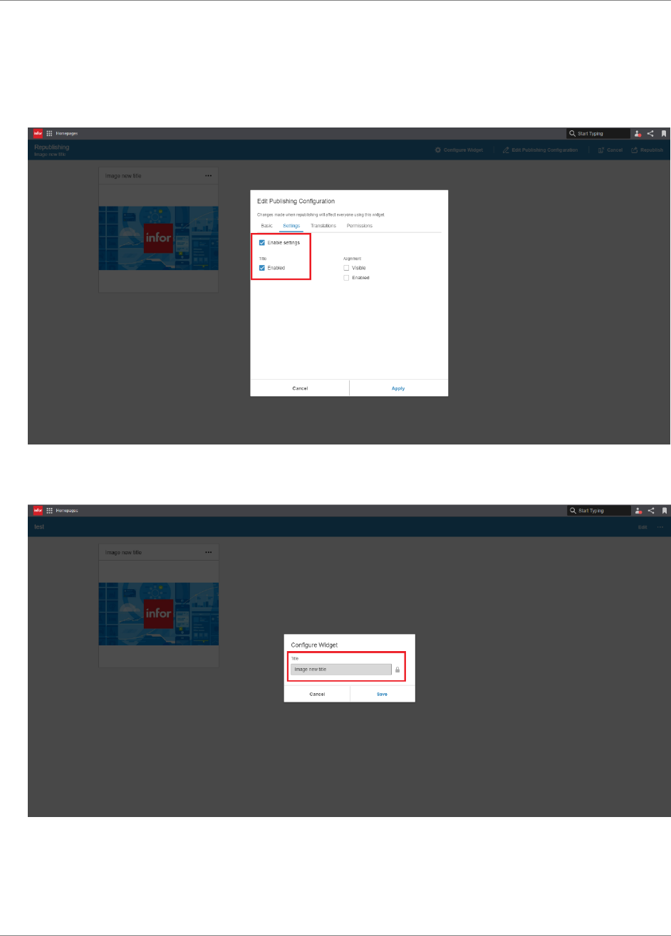
Appendix Test
104 | Widget SDK Developers Guide
6. Open Republish Widget mode via the “Edit Published” menu item in the widget advanced
menu and click “Edit Publishing Configuration”.
7. Go to the Settings tab and check ”Enable settings” and ”Enabled” below “Title”. Apply the
changes and republish the widget.
8. Open the “Configure” dialog and verify that the title cannot be edited.
9. Reopen Republish Widget mode, change the title, apply the changes and republish the
widget.
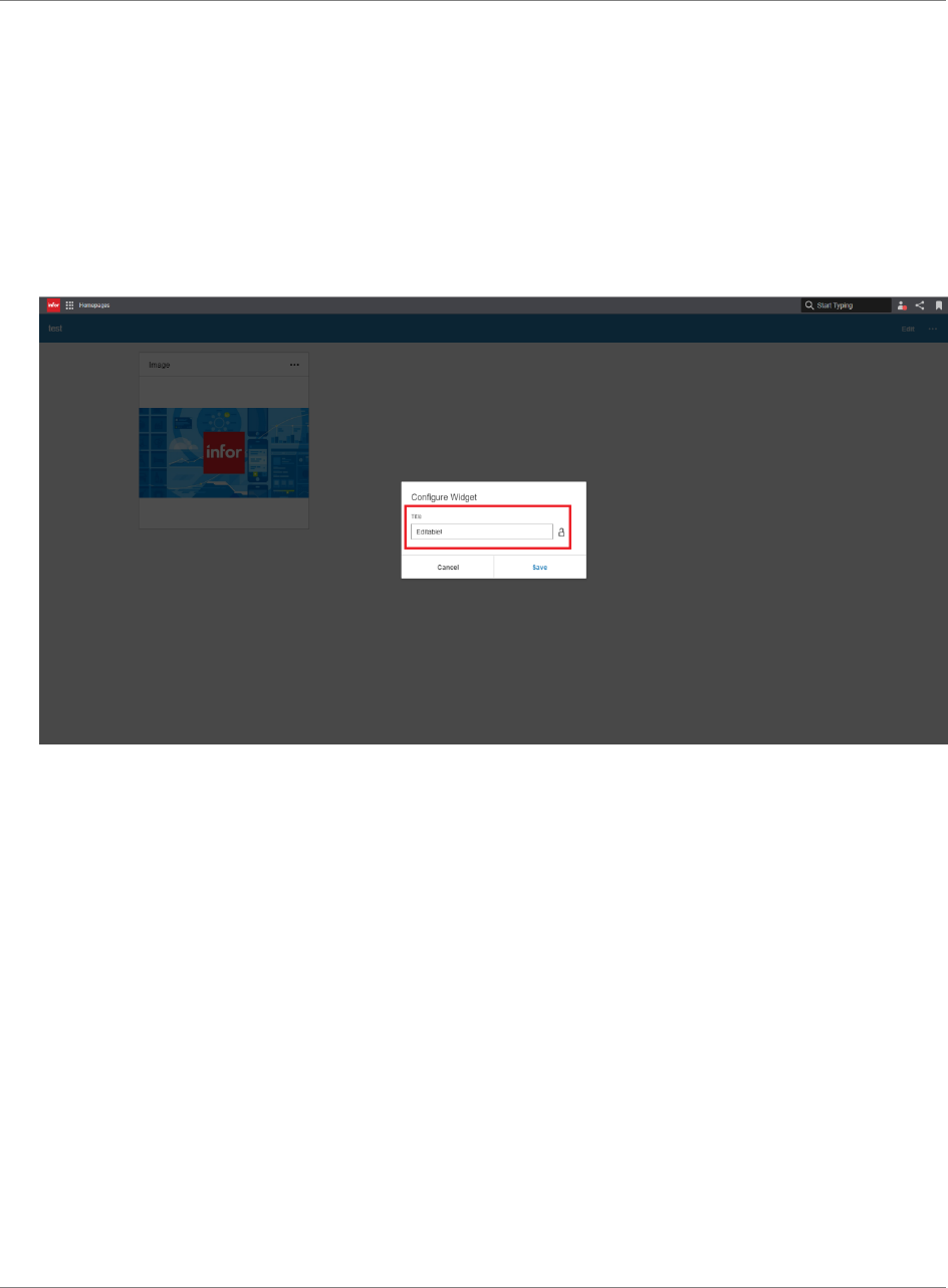
Appendix Test
Widget SDK Developers Guide | 105
10. Open the “Configure” dialog and verify that the title has changed but cannot be edited, just
as in Step 8.
11. Reopen Republish Widget mode and uncheck the “Use Widget Catalog title as widget title”.
Apply the changes and republish the widget.
12. Open the “Configure” dialog and verify that the title can be changed.

Appendix Test
106 | Widget SDK Developers Guide
Scenario 8: Widget Translations
The purpose of this scenario is to verify that:
- The widget is correctly translated
Pre-requisites
A page with the widget exists.
The widget has been configured so that content is displayed in the widget.
Test
1. Change the browser language to a language that the widget supports.
2. Verify that the widget is translated.
3. Open Widget Catalog and verify that the title and description is translated.
4. Repeat step 1-3 using all the supported languages.

Appendix Test
Widget SDK Developers Guide | 107
Scenario 9: Export and Import page with configured published
widget
The purpose of this scenario is to verify that:
- A configured published instance of the widget is working as expected before and after
importing/exporting a page.
- User settings set to a published widget before a page export are not applied when importing
the page
Pre-requisites
The widget has been configured and published with one or more settings enabled.
A page has been published with that published widget.
Test
1. Log in to Homepages as a regular Homepages user that hasn’t the permissions granted by
the HOMEPAGES-Administrator and/or HOMEPAGES-ContentAdministrator IFS-roles.
2. Add the published page with the published widget. Change the enabled setting.
3. Verify that the changes are applied.
4. Export the page.
5. Remove the page and import it.
6. Verify that the changes you made in step 3 are not applied.

Appendix Test
108 | Widget SDK Developers Guide
Scenario 10: Polling
This scenario is only applicable if the widget is polling. The purpose of this scenario is to verify
that:
- The widget is not polling when the widget is not visible to the user, e.g. when browsing
another homepage.
Pre-requisites
Two pages have been added.
The widget has been added to one of the pages.
Test
1. Navigate to the page with the widget.
2. Open Fiddler.
3. Navigate to another page. Wait until the polling interval has been exceeded. Verify in Fiddler
that no request has been sent.
4. Navigate back to the page with the widget. Wait until the polling interval has been exceeded.
Verify in Fiddler that the request has been sent.
