Fullstack React Native Devin Abbot, Houssein Djirdeh, Anthony Accomazzo, And Sophia Shoemaker
Devin%20Abbot%2C%20Houssein%20Djirdeh%2C%20Anthony%20Accomazzo%2C%20and%20Sophia%20Shoemaker%20-%20Fullstack%20React%20Native%20
Fullstack.React.Native.The..Guide.to.React.Native
User Manual:
Open the PDF directly: View PDF  .
.
Page Count: 552 [warning: Documents this large are best viewed by clicking the View PDF Link!]
- Table of Contents
- Book Revision
- Bug Reports
- Be notified of updates via Twitter
- We'd love to hear from you!
- Introduction
- Getting Started with React Native
- React Fundamentals
- Breaking the app into components
- 7 step process
- Step 2: Build a static version of the app
- Step 3: Determine what should be stateful
- Step 4: Determine in which component each piece of state should live
- Step 5: Hardcode initial states
- Step 6: Add inverse data flow
- Updating timers
- Deleting timers
- Adding timing functionality
- Add start and stop functionality
- Methodology review
- Core Components, Part 1
- Core Components, Part 2
- Core APIs, Part 1
- Core APIs, Part 2
- Navigation
- Animation
- Gestures
- Native Modules
- Building and publishing
- Appendix
- Changelog


Fullstack React Native
The Complete Guide to React Native
Wri!en by Devin Abbo!, Houssein Djirdeh, Anthony Accomazzo, and Sophia
Shoemaker
© 2017 Fullstack.io
All rights reserved. No portion of the book manuscript may be reproduced, stored in a retrieval
system, or transmi!ed in any form or by any means beyond the number of purchased copies,
except for a single backup or archival copy. "e code may be used freely in your projects,
commercial or otherwise.
"e authors and publisher have taken care in preparation of this book, but make no expressed
or implied warranty of any kind and assume no responsibility for errors or omissions. No
liability is assumed for incidental or consequential damagers in connection with or arising out
of the use of the information or programs container herein.
Published in San Francisco, California by Fullstack.io.
FULLSTACK.io
Contents
Book Revision . . . . . . . . . . . . . . . . . . . . . . . . . . . . . . . . . . . . . . . . . . . . . . . 1
BugReports ................................................ 1
Be notified of updates via Twitter . . . . . . . . . . . . . . . . . . . . . . . . . . . . . . . . . . . 1
We’d love to hear from you! . . . . . . . . . . . . . . . . . . . . . . . . . . . . . . . . . . . . . . 1
Introduction .................................................. 1
About This Book . . . . . . . . . . . . . . . . . . . . . . . . . . . . . . . . . . . . . . . . . . . . . 2
Running Code Examples . . . . . . . . . . . . . . . . . . . . . . . . . . . . . . . . . . . . . . . . 2
Code Blocks and Context . . . . . . . . . . . . . . . . . . . . . . . . . . . . . . . . . . . . . . . . 3
GettingHelp................................................ 4
EmailingUs ................................................ 4
Getting Started with React Native .................................... 6
WeatherApp ............................................... 6
Starting the project . . . . . . . . . . . . . . . . . . . . . . . . . . . . . . . . . . . . . . . . . . . . 9
Expo .................................................... 10
Components................................................ 17
Custom components . . . . . . . . . . . . . . . . . . . . . . . . . . . . . . . . . . . . . . . . . . . 33
Summary.................................................. 67
React Fundamentals ............................................. 68
Breaking the app into components . . . . . . . . . . . . . . . . . . . . . . . . . . . . . . . . . . 69
7 step process . . . . . . . . . . . . . . . . . . . . . . . . . . . . . . . . . . . . . . . . . . . . . . . 74
Step 2: Build a static version of the app . . . . . . . . . . . . . . . . . . . . . . . . . . . . . . . 76
Step 3: Determine what should be stateful . . . . . . . . . . . . . . . . . . . . . . . . . . . . . . 91
Step 4: Determine in which component each piece of state should live . . . . . . . . . . . . 93
Step 5: Hardcode initial states . . . . . . . . . . . . . . . . . . . . . . . . . . . . . . . . . . . . . 95
Step 6: Add inverse data flow . . . . . . . . . . . . . . . . . . . . . . . . . . . . . . . . . . . . . 106
Updating timers . . . . . . . . . . . . . . . . . . . . . . . . . . . . . . . . . . . . . . . . . . . . . . 113
Deleting timers . . . . . . . . . . . . . . . . . . . . . . . . . . . . . . . . . . . . . . . . . . . . . . 119
Adding timing functionality . . . . . . . . . . . . . . . . . . . . . . . . . . . . . . . . . . . . . . 122
Add start and stop functionality . . . . . . . . . . . . . . . . . . . . . . . . . . . . . . . . . . . . 124
Methodology review . . . . . . . . . . . . . . . . . . . . . . . . . . . . . . . . . . . . . . . . . . . 132
Core Components, Part 1 ..........................................134
CONTENTS
What are components? . . . . . . . . . . . . . . . . . . . . . . . . . . . . . . . . . . . . . . . . . 134
Building an Instagram clone . . . . . . . . . . . . . . . . . . . . . . . . . . . . . . . . . . . . . . 134
View .....................................................142
StyleSheet .................................................151
Text .....................................................153
TouchableOpacity ............................................161
Image ....................................................166
ActivityIndicator ............................................173
FlatList ..................................................178
Core Components, Part 2 ..........................................190
TextInput .................................................193
ScrollView .................................................197
Modal ....................................................204
Core APIs, Part 1 ...............................................216
Building a messaging app . . . . . . . . . . . . . . . . . . . . . . . . . . . . . . . . . . . . . . . . 216
Initializing the project . . . . . . . . . . . . . . . . . . . . . . . . . . . . . . . . . . . . . . . . . . 219
Theapp...................................................220
Network connectivity indicator . . . . . . . . . . . . . . . . . . . . . . . . . . . . . . . . . . . . 224
The message list . . . . . . . . . . . . . . . . . . . . . . . . . . . . . . . . . . . . . . . . . . . . . 235
Toolbar ...................................................256
Geolocation . . . . . . . . . . . . . . . . . . . . . . . . . . . . . . . . . . . . . . . . . . . . . . . . 268
Input Method Editor (IME) . . . . . . . . . . . . . . . . . . . . . . . . . . . . . . . . . . . . . . . 270
Core APIs, Part 2 ...............................................286
The keyboard . . . . . . . . . . . . . . . . . . . . . . . . . . . . . . . . . . . . . . . . . . . . . . . 286
We’reDone!................................................310
Navigation ...................................................311
Navigation in React Native . . . . . . . . . . . . . . . . . . . . . . . . . . . . . . . . . . . . . . . 311
Contact List . . . . . . . . . . . . . . . . . . . . . . . . . . . . . . . . . . . . . . . . . . . . . . . . 317
Starting the project . . . . . . . . . . . . . . . . . . . . . . . . . . . . . . . . . . . . . . . . . . . . 322
Container and Presentational components . . . . . . . . . . . . . . . . . . . . . . . . . . . . . . 324
Contacts ..................................................324
Profile....................................................328
React Navigation . . . . . . . . . . . . . . . . . . . . . . . . . . . . . . . . . . . . . . . . . . . . . 332
Stack navigation . . . . . . . . . . . . . . . . . . . . . . . . . . . . . . . . . . . . . . . . . . . . . 332
Tab navigation . . . . . . . . . . . . . . . . . . . . . . . . . . . . . . . . . . . . . . . . . . . . . . 344
Drawer navigation . . . . . . . . . . . . . . . . . . . . . . . . . . . . . . . . . . . . . . . . . . . . 364
Sharing state between screens . . . . . . . . . . . . . . . . . . . . . . . . . . . . . . . . . . . . . 371
Deep Linking . . . . . . . . . . . . . . . . . . . . . . . . . . . . . . . . . . . . . . . . . . . . . . . 378
Summary..................................................383
CONTENTS
Animation ...................................................384
Animation challenges . . . . . . . . . . . . . . . . . . . . . . . . . . . . . . . . . . . . . . . . . . 384
Building a puzzle game . . . . . . . . . . . . . . . . . . . . . . . . . . . . . . . . . . . . . . . . . 386
App .....................................................390
Building the Start screen . . . . . . . . . . . . . . . . . . . . . . . . . . . . . . . . . . . . . . . . 392
Building the Game screen . . . . . . . . . . . . . . . . . . . . . . . . . . . . . . . . . . . . . . . . 415
Summary..................................................429
Gestures .....................................................430
Building the board . . . . . . . . . . . . . . . . . . . . . . . . . . . . . . . . . . . . . . . . . . . . 430
Gesture Responder System . . . . . . . . . . . . . . . . . . . . . . . . . . . . . . . . . . . . . . . 442
PanResponder . . . . . . . . . . . . . . . . . . . . . . . . . . . . . . . . . . . . . . . . . . . . . . . 446
Draggable component . . . . . . . . . . . . . . . . . . . . . . . . . . . . . . . . . . . . . . . . . . 447
Finishing the game . . . . . . . . . . . . . . . . . . . . . . . . . . . . . . . . . . . . . . . . . . . . 461
We’reDone!................................................466
Native Modules ................................................467
What are native modules? . . . . . . . . . . . . . . . . . . . . . . . . . . . . . . . . . . . . . . . 467
Building a native module . . . . . . . . . . . . . . . . . . . . . . . . . . . . . . . . . . . . . . . . 469
Development environment . . . . . . . . . . . . . . . . . . . . . . . . . . . . . . . . . . . . . . . 471
Initializing the project . . . . . . . . . . . . . . . . . . . . . . . . . . . . . . . . . . . . . . . . . . 472
iOS .....................................................477
Android ..................................................487
JavaScript . . . . . . . . . . . . . . . . . . . . . . . . . . . . . . . . . . . . . . . . . . . . . . . . . 496
Building and publishing ...........................................504
How to read this chapter . . . . . . . . . . . . . . . . . . . . . . . . . . . . . . . . . . . . . . . . 504
Building ..................................................504
Building with Expo . . . . . . . . . . . . . . . . . . . . . . . . . . . . . . . . . . . . . . . . . . . . 505
iOS .....................................................508
Android ..................................................525
Handling Updates . . . . . . . . . . . . . . . . . . . . . . . . . . . . . . . . . . . . . . . . . . . . 532
Summary..................................................533
Appendix ....................................................534
JavaScript Versions . . . . . . . . . . . . . . . . . . . . . . . . . . . . . . . . . . . . . . . . . . . . 534
ES2015 ...................................................534
ReactElement ...............................................540
Handling Events in React Native . . . . . . . . . . . . . . . . . . . . . . . . . . . . . . . . . . . 541
Publishing with Expo . . . . . . . . . . . . . . . . . . . . . . . . . . . . . . . . . . . . . . . . . . 545
Changelog ...................................................546

CONTENTS 1
Book Revision
Revision 5 - Native modules chapter added to book
Bug Reports
If you’d like to report any bugs, typos, or suggestions just email us at: rn@fullstack.io1.
Be notified of updates via Twitter
If you’d like to be notified of updates to the book on Twitter, follow @fullstackreact2
We’d love to hear from you!
Did you like the book? Did you find it helpful? We’d love to add your face to our list of testimonials
on the website! Email us at: rn@fullstack.io3.
1mailto:rn@fullstack.io?Subject=Fullstack%20React%20Native%20book%20feedback
2https://twitter.com/fullstackreact
3mailto:rn@fullstack.io?Subject=React%20Native%20testimonial

Introduction
One of the major problems that teams face when writing native mobile applications is becoming
familiar with all the different technologies. iOS and Android - the two dominant mobile platforms
- support different languages. For iOS, Apple supports the languages Swift4and Objective-C5. For
Android, Google supports the languages Java6and Kotlin7.
And the differences don’t end there. These platforms have different toolchains. And they have
different interfaces for the device’s core functionality. Developers have to learn each platform’s
procedure for things like accessing the camera or checking network connectivity.
One trend is to write mobile apps that are powered by WebViews. These types of apps have minimal
native code. Instead, the interface is a web browser running an app written in HTML, CSS, and JS.
This web app can use the native wrapper to access features on the device, like the camera roll.
Tools like Cordova8enable developers to write these hybrid apps. The advantage is that developers
can write apps that run on multiple platforms. Instead of learning iOS and Android specifics, they
can use HTML, CSS, and JS to write a “universal” app.
The disadvantage, though, is that it’s hard to make these apps look and feel like real native
applications. And users can tell.
While universal WebView-powered apps were built with the idea of build once, run anywhere, React
Native was built with the goal of learn once, write anywhere.
React is a JavaScript framework for building rich, interactive web applications. With React
Native, we can build native mobile applications for multiple platforms using JavaScript and React.
Importantly, the interfaces we build are translated into native views. React Native apps are not
composed of WebViews.
We’ll be able to share a lot of the code we write between iOS and Android. And React Native makes
it easy to write code specific to each platform when the need arises. We get to use one language
(JavaScript), one framework (React), one styling engine, and one toolchain to write apps for both
platforms. Learn once, write anywhere.
At its core, React Native is composed of React components. We’ll dig deep into components
throughout this book, but here’s an example of what a React component looks like:
4https://developer.apple.com/swift/
5https://developer.apple.com/library/content/documentation/Cocoa/Conceptual/ProgrammingWithObjectiveC/Introduction/
Introduction.html
6https://docs.oracle.com/javase/8/docs/technotes/guides/language/index.html
7https://developer.android.com/kotlin/index.html
8https://cordova.apache.org/

Introduction 2
import React from 'react';
import { StyleSheet, Text, View } from 'react-native';
export default class StyledText extends React.Component {
render() {
return (
<Text style={styles.text}>{content}</Text>
);
}
}
const styles =StyleSheet.create({
text:{
color:'red',
fontWeight:'bold',
},
});
React Native works. It is currently being used in production at Facebook, Instagram, Airbnb, and
thousands of other companies.
About This Book
This book aims to be an extensive React Native resource. By the time you’re done reading this book,
you (and your team) will have everything you need to build reliable React Native applications.
React Native is rich and feature-filled, but that also means it can be tricky to understand all of its
parts. In this book, we’ll walk through everything, such as installing its tools, writing components,
navigating between screens, and integrating native modules.
But before we dig in, there are a few guidelines we want to give you in order to get the most out of
this book. Specifically:
• how to approach the code examples and
• how to get help if something goes wrong
Running Code Examples
This book comes with a library of runnable code examples. The code is available to download from
the same place where you downloaded this book.
We use yarn9to run every example in this book. This means you can type the following commands
to run any example:
9https://yarnpkg.com/en/

Introduction 3
•yarn start will start the React Native packager and print a QR code. If you’re on an Android
mobile device, scanning this code with the Expo10 app will load the application. For iOS devices,
see the instructions for loading apps onto your phone at the beginning of the first chapter.
•yarn run ios will start the React Native packager and open your app in the iOS Simulator if
you are using a Mac.
•yarn run android will start the React Native packager and open your app on a connected
Android device or emulator.
In the next chapter we’ll explain each of these commands in detail.
Code Blocks and Context
Nearly every code block in this book is pulled from a runnable code example, which you can find
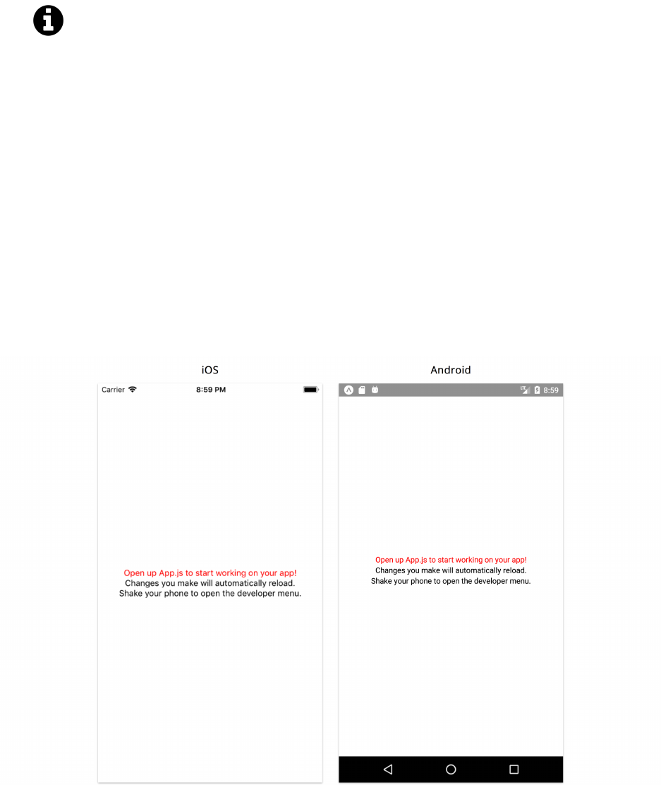
in the sample code. For example, here is a code block pulled from the first chapter:
weather/1/App.js
import React from 'react';
import { StyleSheet, Text, View } from 'react-native';
export default class App extends React.Component {
render() {
return (
<View style={styles.container}>
<Text>Open up App.js to start working on your app!</Text>
<Text>Changes you make will automatically reload.</Text>
<Text>Shake your phone to open the developer menu.</Text>
</View>
);
}
}
const styles =StyleSheet.create({
container:{
flex: 1,
backgroundColor:'#fff',
alignItems:'center',
justifyContent:'center',
},
});
10https://expo.io/
Introduction 4
Notice that the header of this code block states the path to the file which contains this code:
code/weather/1/App.js.
This book is written with the expectation that you’ll also be looking at the example code
alongside the chapter. If you ever feel like you’re missing the context for a code example, open up
the full code file using your favorite text editor.
For example, we often need to import libraries to get our code to run. In the early chapters of the
book we show these import statements, because it’s not clear where the libraries are coming from
otherwise. However, the later chapters of the book are more advanced and they focus on key concepts
instead of repeating boilerplate code that was covered earlier in the book. If at any point you’re not
clear on the context, open up the code example on disk.
Getting Help
While we’ve made every effort to be clear, precise, and accurate you may find that when you’re
writing your code you run into a problem.
Generally, there are three types of problems:
• A “bug” in the book (e.g. something is explained incorrectly)
• A “bug” in our code
• A “bug” in your code
If you find an inaccuracy in our description of something, or you feel a concept isn’t clear, email us!
We want to make sure that the book is both accurate and clear.
Similarly, if you’ve found a bug in our code we definitely want to hear about it.
If you’re having trouble getting your own app working (and it isn’t our example code), this case is a
bit harder for us to handle. If you’re still stuck, we’d still love to hear from you, and here some tips
for getting a clear, timely response.
Emailing Us
If you’re emailing us asking for technical help, here’s what we’d like to know:
• What revision of the book are you referring to?
• What operating system are you on? (e.g. Mac OS X 10.8, Windows 95)
• Which chapter and which example project are you on?
• What were you trying to accomplish?
• What have you tried already?
• What output did you expect?

Introduction 5
• What actually happened? (Including relevant log output.)
The absolute best way to get technical support is to send us a short, self-contained example of the
problem. Our preferred way to receive this would be for you to send us an Expo Snack link11. Snack
is an online code editor that let’s one quickly develop and demo React Native components on the
browser or an actual device without having to set up a brand new project. We’ll explain Expo in
more detail in the next chapter.
When you’ve written down these things, email us at rn@fullstack.io. We look forward to hearing
from you.
11https://snack.expo.io/
Getting Started with React Native
Weather App
In this chapter we’re going to build a weather application that allows the user to search for any city
and view its current forecast.
With this simple app we’ll cover some essentials of React Native including:
• Using core and custom components
• Passing data between components
• Handling component state
• Handling user input
• Applying styles to components
• Fetching data from a remote API
By the time we’re finished with this chapter, you’ll know how to get started with Create React Native
App and build a basic application with local state management. You’ll have the foundation you need
to build a wide variety of your own React Native apps.
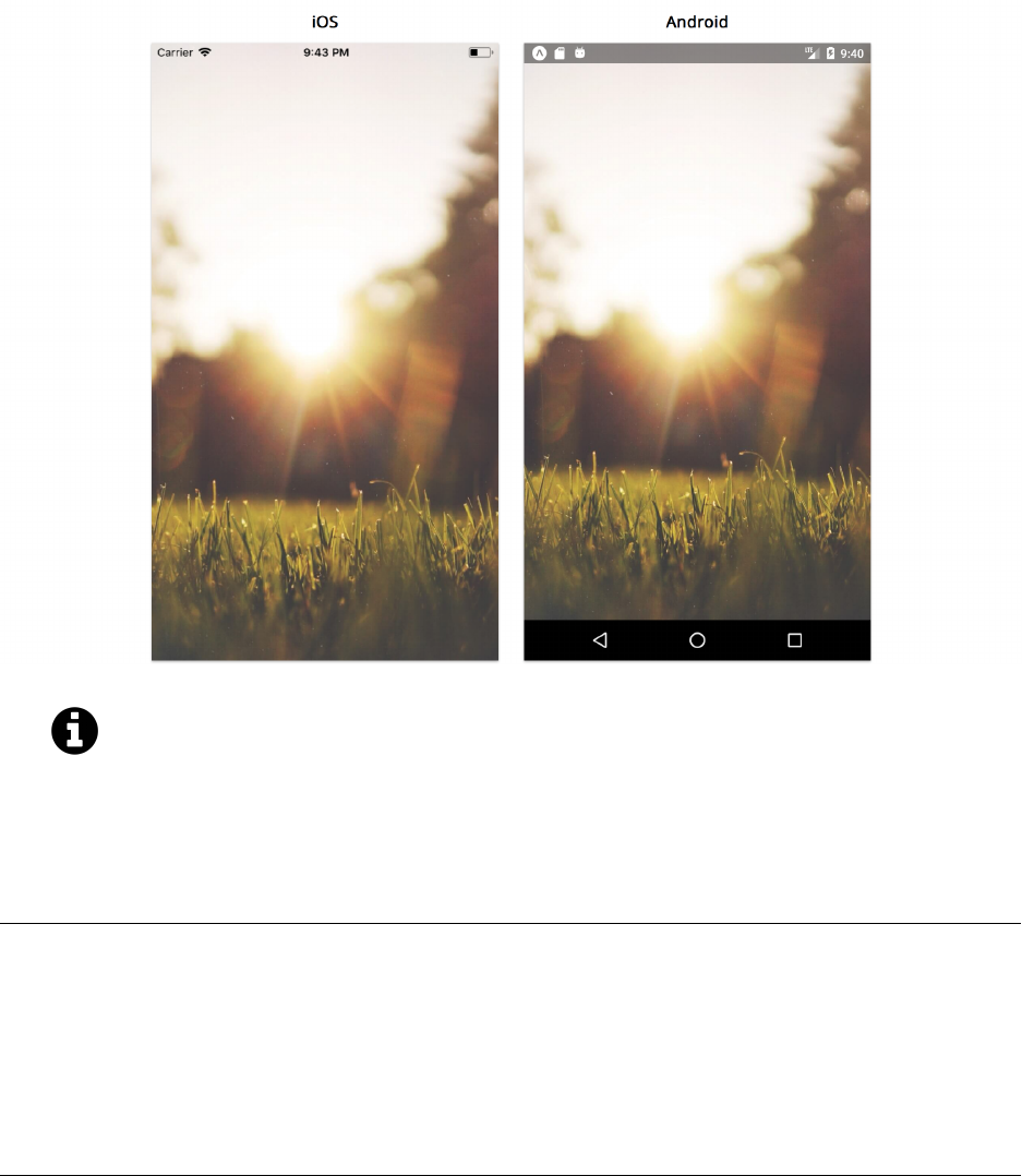
Here’s a screenshot of what our app will look like when it’s done:

Getting Started with React Native 7
The completed app
In this chapter, we’ll build an entire React Native application from scratch. We’ll talk about how to
set up our development environment and how to initialize a new React Native application. We’ll
also learn how Expo allows us to rapidly prototype and preview our application on our mobile
device. After covering some of the basics of React Native, we’ll explore how we compose apps using
components. Components are a powerful paradigm for organizing views and managing dynamic
data.
We’re about to touch on a wide variety of topics, like styling and data management. This chapter
will exhibit how all these topics fit together at a high-level. In subsequent chapters, we’ll dive deep
into the concepts that we touch on here.
Code examples
This book is example-driven. Each chapter is setup as a hands-on tutorial.
We’ll be building apps from the ground up. Included with this book is a download that contains
completed versions of each app as well as each of the versions we develop along the way (the “sample
code.”) If you’re following along, we recommend you use the sample code for copying and pasting
longer examples or debugging unexpected errors. If you’re not following along, you can refer to the
sample code for more context around a given code example.
The structure of the sample code for all the chapters in this book follows this pattern:

Getting Started with React Native 8
├── components/
├── App.js
├── 1/
│ ├── components/
│ └── App.js
├── 2/
│ ├── components/
│ └── App.js
├── 3/
│ ├── components/
│ └── App.js
// ...
At the top-level of the directory is App.js and components/. This is the code for the completed
version of the application. Inside the numbered folders (1/,2/,3/) are the different versions of the
app as we build it up throughout the chapter.
Here’s what a code example in this book looks like:
weather/1/App.js
render() {
return (
<View style={styles.container}>
<Text>Open up App.js to start working on your app!</Text>
<Text>Changes you make will automatically reload.</Text>
<Text>Shake your phone to open the developer menu.</Text>
</View>
);
}
Note that the title of the code block contains the path within the sample code where you can find
this example (weather/1/App.js).
JavaScript
This book assumes some JavaScript knowledge.
React Native uses Babel12 as a JavaScript compiler to allow us to develop in the latest version
of JavaScript, ES2016. To understand what we mean by JavaScript versions, you can refer to the
Appendix.
We highlight some of JavaScript’s newer features in the Appendix. We reference the appendix when
relevant.
12https://babeljs.io/

Getting Started with React Native 9
Starting the project
Create React Native App
To begin, we’re going to use Create React Native App13 (CRNA), a tool that makes it extremely easy
to get started with React Native. If you’ve used Create React App14 before, you’ll notice similarities
here in that no build configuration is required to get up and running. We can install it globally using
yarn15.
yarn
yarn16 is a node package manager that automates the process of managing all the required
dependencies and packages from npm, an online repository of published JavaScript libraries and
projects, in an application. This is done by defining all our dependencies in a single package.json
file.
npm also has a command line tool, npm, that allows us to maintain and control dependencies.
The tool that we use to build our application, CRNA, does not currently work with the latest
version of npm, npm v5. For this reason, we’ll use yarn throughout the book.
You can refer to the documentation17 for instructions to install yarn for your operating system. The
documentation also explains how to install node18 as well. In order to use CRNA however, Node.js
v6 or later is required.
Here’s a list of some commonly used yarn commands:
•yarn init creates a package.json file and adds it directly to our project.
•yarn installs all the dependencies listed in package.json into a local node_modules folder.
•yarn add new-package will install a specific package to our project as well as include it as a
dependency in package.json. Dependencies are packages needed when we run our code.
•yarn add new-package --dev will install a specific package to our project as well as include it as
adevelopment dependency in package.json. Development dependencies are packages needed
only during the development workflow. They are not needed for running our application in
production.
•yarn global add new-package will install the package globally, rather than locally to a specific
project. This is useful when we need to use a command line tool anywhere on our machine.
13https://github.com/react-community/create-react-native-app
14https://github.com/facebookincubator/create-react-app
15https://yarnpkg.com
16https://yarnpkg.com
17https://yarnpkg.com/lang/en/docs/install
18https://nodejs.org/en/

Getting Started with React Native 10
If we already have an older version of npm than v5 installed, we can use it instead of yarn
and run its equivalent commands19.
Watchman
Watchman20 is a file watching service that watches files and triggers actions when they are modified.
If you use macOS as your operating system, the Expo and React Native documentation recommend
installing Watchman for better performance. The instructions to install the service can be found
here21.
Expo
Expo22 is a platform that provides a number of different tools to build fully functional React Native
applications without having to write native code. Beginning a project with CRNA automatically
creates an application that leverages Expo’s development environment.
A benefit of leveraging Expo is that building an application does not require using Xcode for iOS, or
Android Studio for Android. This means that developers can build native iOS applications without
even owning a Mac computer. Using CRNA and Expo is the easiest way to get started with React
Native and is recommended in the React Native documentation23.
Including Native Code
Using Expo and CRNA isn’t the only way to start a React Native application. If we need to start
a project with the ability to include native code, we’ll need to use the React Native CLIainstead.
With this however, our application will require Xcode and Android Studio for iOS and Android
respectively.
Expo also provides a number of different APIs for device specific properties such as contacts, camera
and video. However, if we need to include a native iOS or Android dependency that is not provided
by Expo, we’ll need to eject from the platform entirely. Ejecting an Expo application means we have
full control of managing our native dependencies, but we would need to use the React Native CLI
from that point on.
We’ll explore how to add native modules onto a React Native project later on this book.
ahttps://facebook.github.io/react-native/docs/getting-started.html#installing-dependencies
19https://yarnpkg.com/lang/en/docs/migrating-from-npm/#toc-cli-commands-comparison
20https://facebook.github.io/watchman/
21https://facebook.github.io/watchman/docs/install.html#installing-on-os-x-via-homebrew
22https://expo.io/
23https://facebook.github.io/react-native/docs/getting-started.html

Getting Started with React Native 11
Previewing the app
To develop and preview apps with Expo, we need to install its client iOS or Android app24 to develop
and run React Native apps on our device.
Android
On your Android mobile device, install the Expo Client on Google Play25. You can then select Scan
QR code and scan this QR code once you’ve installed the app:
QR Code
If this QR code doesn’t work, we recommend making sure you have the latest version of that Expo
app installed, and that you’re reading the latest edition of this book.
Instead of scanning the QR code, you can also type the project URL,
exp://exp.host/@fullstackio/weather, inside of Expo to load the application.
iOS
You can install the Expo Client via the App Store26. With an iOS device however, there is no capability
to scan a QR code. This means we’ll first need to build the final app in order to preview it. We can
do this by navigating to the weather/ directory in the sample code folder and running the following
commands:
cd weather
yarn
yarn start
This will start the React Native packager. Pressing swill allow you to send a link to your device
by SMS or e-mail (you’ll need to provide your mobile phone number of email address). Once done,
clicking the link will open the application in the Expo Client.
24https://github.com/expo/expo
25https://play.google.com/store/apps/details?id=host.exp.exponent
26https://itunes.apple.com/us/app/expo-client/id982107779?mt=8

Getting Started with React Native 12
For the app to load on your physical device, you’ll need to make sure that your phone is connected
to the same local network as your computer.
Local Development Tool
In addition to a client app, Expo also provides two local development tools that allow us to
preview, share and publish our projects:
•XDE27, or the Expo Development Environment, is a desktop app that we can use for
macOS, Windows, or Linux.
•exp28 is a command line interface.
Both options provide a number of different commands and services that we can use to
manage our applications. Instead of using the shotkey provided by CRNA when we start
the packager to send the link to an iOS device, we can also use exp or XDE instead.
We’ll explore using these local development tools in more detail when we cover deploying
and publishing apps later in this book.
Preparing the app
At this point, you should see the final application load successfully on your device. Play around with
the app for a few minutes to get a feel for it. Try searching for different cities as well a location that
doesn’t even exist.
If you plan on building the application as you read through the chapter, you’ll need to create a brand
new project. Once yarn is installed, let’s run the following command to install Create React Native
App (CRNA) globally:
yarn global add create-react-native-app@1.0.0
The @1.0.0 specifies the version of create-react-native-app to install. It’s important to
lock in version 1.0.0 so that the version on your machine matches that here in the book.
We’ll call our application weather and can use the following command to get started (this command
may take a little while):
create-react-native-app weather --scripts-version 1.14.0
27https://github.com/expo/xde
28https://docs.expo.io/versions/latest/workflow/exp-cli

Getting Started with React Native 13
Importantly, we specify the --scripts-version as 1.14.0. We’ll talk about this in a moment.
We’ll then navigate to that directory and boot the app:
cd weather
yarn start
With the pacakger running, we can continue to scan the QR code with an Android device or send a
link directly to our iOS device using the shotkey. It is important to remember that our device needs
to be connected to the same local network as our computer in order for this to work.
Right now, viewing the app shows our starting point:
Application

Getting Started with React Native 14
Running on a simulator
As we mentioned, using the Expo client app allows us to run our application without using
native tooling (Xcode for iOS, or Android Studio for Android).
However if we happen to have the required build tools we can still run our application in a
virtual device or simulator:
• With a Mac, yarn run ios will start the development server and run the application
in an iOS simulator. We can also start the packager separately with yarn start and
press ito open the simulator.
• With the required Android tools29,yarn run android will start the application in an
Android emulator. Similarly, pressing awhen the React Native packager is running
will also boot up the emulator.
Running an application using an emulator/simulator can be useful to test on different devices
and screen sizes. It can also be quicker to update and test code changes on a virtual device.
However, it’s important to run your application on an actual device at some point in order
to get a better idea of how exactly it looks and feels.
By default, CRNA comes with live reload enabled. This means if you edit and save any file, the
application on your mobile device will automatically reload. Moreover, any build errors and logs
will be displayed directly in the terminal.
Let’s see what the directory structure of our app looks like. Open up a new terminal window.
Navigate to this app:
cd weather
And then run ls -a to see all the contents of the directory:
ls -a
If you’re using PowerShell or another non-Unix shell, you can just run ls.
Although your output will look slightly different based on your operating system, you should see
all the files in your directory listed:
29https://facebook.github.io/react-native/docs/getting-started.html

Getting Started with React Native 15
├── node_modules/
├── .babelrc
├── .flowconfig
├── .gitignore
├── .watchmanconfig
├── App.js
├── app.json
├── App.test.js
├── package.json
├── README.md
└── yarn.lock
Let’s go through each of these files:
•node_modules/ contains all third party packages in our application. Any new dependencies and
development dependencies go here.
•.babelrc allows us to define presets and plugins for configuring Babel30. As we mentioned
previously, Babel is a transpiler that compiles newer experimental JavaScript into older versions
so that it stays compatible with different platforms.
•.flowconfig allows us to configure Flow31, a static type checker for JavaScript. Flow is part
of the React Native toolchain and this file is included automatically in any React Native
application. We won’t be using Flow in this chapter but we will explore prop validations briefly
using prop-types.
•.gitignore is where we specify which files should be ignored by Git. We can see that both the
node_modules/ and .expo/ directories are already included.
•.watchmanconfig defines configurations for Watchman.
•App.js is where our application code lives.
•app.json is a configuration file that allows us to add information about our Expo app. The list
of properties that can be included in this file is listed in the documentation32.
•App.test.js is included as a sample test file and contains a single test. CRNA is packaged with
Jest33 as its testing platform. We’ll go into detail about unit testing React Native applications
in the “Testing” chapter.
•package.json is where we provide information of the application to our package manager as
well as specify all our project dependencies.
•README.md is a markdown file commonly used to provide a description of a project.
•yarn.lock is where yarn keeps a record of the versions of each dependency installed.
package.json
Let’s take a closer look at the generated package.json file:
30https://babeljs.io/
31https://flow.org/
32https://docs.expo.io/versions/v18.0.0/guides/configuration.html
33https://facebook.github.io/jest/
Getting Started with React Native 16
1{
2"name":"weather",
3"version":"0.1.0",
4"private":true,
5"devDependencies":{
6"react-native-scripts":"1.14.0",
7"jest-expo":"~27.0.0",
8"react-test-renderer":"16.3.1"
9},
10 "main":"./node_modules/react-native-scripts/build/bin/crna-entry.js",
11 "scripts":{
12 "start":"react-native-scripts start",
13 "eject":"react-native-scripts eject",
14 "android":"react-native-scripts android",
15 "ios":"react-native-scripts ios",
16 "test":"jest"
17 },
18 "jest":{
19 "preset":"jest-expo"
20 },
21 "dependencies":{
22 "expo":"^27.0.1",
23 "react":"16.3.1",
24 "react-native":"~0.55.2"
25 }
26 }
The name and version properties are always required. The dependencies and devDependencies
define our application and development dependencies respectively.
Notice there are three devDependencies:
•react-native-scripts
•jest-expo
•react-test-renderer
The last two packages are related to testing. While CRNA is the tool that initializes our project,
the package react-native-scripts is the engine that runs our React Native app while in
development. When we specified the --scripts-version as 1.14.0 above, we were referring to
this package.
In our package.json, the scripts object defines all our script commands. These commands are all
handled by the react-native-scripts package. The commands yarn run start,yarn run android,
and yarn run ios allow us to start our application development server and/or run on a virtual device
or simulator. The scripts object also contains two other commands:
Getting Started with React Native 17
•yarn test runs all the Jest tests in our application
•yarn run eject starts the process of ejecting our application from the CRNA toolchain. As
we mentioned earlier, this can be necessary if we need to include a React Native library that
contains native code or if we need to write native code ourselves.
The utils/ directory
If you look at the book’s sample code, you’ll note that every application has a utils/ directory. This
directory contains helper functions that the application will use. You don’t need to concern yourself
with the details of these functions as they’re not relevant to the chapter’s core concepts.
When we reach the point in the application’s development where we need to use a utility provided
by utils/, we’ll remind you to copy over that folder from the sample code. You can also do this
immediately after initializing each project.
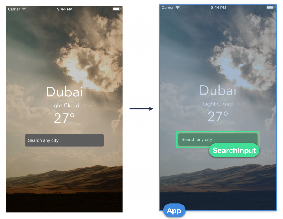
Components
With newer versions of JavaScript, we can define objects with properties using classes. React
Native lets us use this syntax to create components. Let’s take a look at a visual breakdown of the
components in our application:
Getting Started with React Native 18
Component Structure
We have an App component that represents the entire screen and contains the weather information
displayed to the use. Inside of this component, we have a SearchInput component that allows us to
search for different cities.
App
App is the first component created with a default CRNA application. Let’s take a look at its file:

Getting Started with React Native 19
weather/1/App.js
1import React from 'react';
2import { StyleSheet, Text, View } from 'react-native';
3
4export default class App extends React.Component {
5render() {
6return (
7<View style={styles.container}>
8<Text>Open up App.js to start working on your app!</Text>
9<Text>Changes you make will automatically reload.</Text>
10 <Text>Shake your phone to open the developer menu.</Text>
11 </View>
12 );
13 }
14 }
15
16 const styles =StyleSheet.create({
17 container:{
18 flex: 1,
19 backgroundColor:'#fff',
20 alignItems:'center',
21 justifyContent:'center',
22 },
23 });
Notice how we have a class defined in our file named App that extends React.Component. Using
extends allows us to declare a class as a subclass of another class. In here, we’ve defined App as
a subclass of React.Component. This is how we specify a specific class to be a component in our
application.
If you’d like to learn more about how classes work in JavaScript, refer to our Appendix.
We can also attach methods as properties to classes, and the same applies to component classes in
React Native. We can see we already have one for this component, the render method:

Getting Started with React Native 20
weather/1/App.js
5render() {
6return (
7<View style={styles.container}>
8<Text>Open up App.js to start working on your app!</Text>
9<Text>Changes you make will automatically reload.</Text>
10 <Text>Shake your phone to open the developer menu.</Text>
11 </View>
12 );
13 }
What we see on our device when launching our device matches what we see described in this
method. The render() method is the only required method for a React Native component. React
Native uses the return value from this method to determine what to render for the component.
When we use React Native, we represent different parts of our application as components. This
means we can build our app using different reusable pieces of logic with each piece displaying a
specific part of our UI. Let’s break down what we already have in terms of components:
• Our entire application is rendered with App as our top-level component. Although created
automatically as part of setting up a new CRNA project, this component is a custom component
responsible for rendering what we need in our application.
• The View component is used as a layout container.
• Within View, we use the Text component to display lines of text in our application. Unlike App,
both View and Text are built-in React Native components that are imported and used in our
custom component.
We can see that our App component uses and returns an HTML-like structure. This is JSX, which is
an extension of JavaScript that allows us to use an XML-like syntax to define our UI structure.
JSX
When we build an application with React Native, components ultimately render native views which
are displayed on our device. As such, the render() method of a component needs to describe how
the view should be represented. In other words, React Native allows us to describe a component’s
iOS and Android representation in JavaScript.
JSX was created to make the JavaScript representation of components easier to understand. It allows
us to structure components and show their hierarchy visually in markup. Consider this JSX snippet:

Getting Started with React Native 21
<View>
<Text style={{ color:'red' }}>
Hello, friend!I am a basic React Native component.
</Text>
</View>
In here, we’ve nested a Text component within a View component. Notice how we use braces ({})
around an object ({ color: 'red' }) to set the style property value for Text. In JSX, braces are a
delimiter, signaling to JSX that what resides in-between the braces is a JavaScript expression. The
other delimiter is using quotes for strings, like this:
<TextInput placeholder="This is a string" />
Even though the JSX above might look similar to HTML, it is actually just compiled into
JavaScript function calls (ex: React.createElement(View)). For this reason, we need to
import React at the top of any file that contains JSX. You can refer to the Appendix for
more detail.
During runtime React Native takes care of rendering the actual native UI for each compo-
nent.
Props
We use the imported Text component to wrap each line of text output for our App component:
<Text>Open up App.js to start working on your app!</Text>
And we use the imported View component to wrap all the Text components:
<View style={styles.container}>
...
</View>
Props allow us to pass parameters to components to customize their features. Here, View is used
to layout the entire content of the screen. We only have a single prop attached, style, that allows
us to pass in style parameters to adjust how our View component is rendered on our devices. Each
built-in component provided by React Native has its own set of valid props that we can use for
customization.
Getting Started with React Native 22
If you’re familiar with HTML, it’s very similar. For example, in HTML, say you wanted to insert an
image named image.png. You’d specify an img tag with a src attribute like this:
<img src="path/to/image.png">
To give you an idea of the similarity, in React Native we can include images using the Image
component. We specify the location using the source prop:
<Image source={require('./image.png')}>
We’ll cover images in greater detail later.
Like our View component, many components in React Native accept a style prop. Styling is a large
topic that we explore throughout this book. However, we can take a look at our styles object at the
bottom of App.js and get an idea of how it works:
weather/1/App.js
16 const styles =StyleSheet.create({
17 container:{
18 flex: 1,
19 backgroundColor:'#fff',
20 alignItems:'center',
21 justifyContent:'center',
22 },
23 });
Web developers may recognize that this looks like CSS (Cascading Style Sheets) which is used to
style web pages. It’s important to note that styling in React Native does not use CSS. However, React
Native borrows a lot of styling nomenclature from web development. Here, we specify that the text
should be centered and that the background color should be white (#fff).
If you’ve used CSS before, you’ll find styling in React Native very familiar. If not, don’t
worry! It’s easy to get the hang of it.
Specifically, styles.container has the attributes flex,alignItems and justifyContent.
These are used to position the View in the center of the screen. React Native uses flexbox to
layout and align items consistently on different device sizes. We’ll go into more detail about
how exactly flexbox works in later chapters.

Getting Started with React Native 23
To build our weather app, we’ll start with layout and styling. Once we have some of the essence of
our weather app in place we can begin to explore strategies for managing data.
As we saw in the completed version of the app, we want our app to display the city,temperature,
and weather conditions as separate text fields. Although we’ll eventually interface with a weather
API in order to retrieve actual data, we’ll begin with hard-coding these values.
The completed app
Adding styles
To get a better handle on styling, let’s try adding an object with a color attribute to one of the text
fields:
<View style={styles.container}>
<Text style={{ color:'red' }}>
Open up App.js to start working on your app!
</Text>
<Text>Changes you make will automatically reload.</Text>
<Text>Shake your phone to open the developer menu.</Text>
</View>
Getting Started with React Native 24
Note that the outer-most set of brackets above are delimiters enclosing our JavaScript
statement. Inside of the delimiters is a JavaScript object. In React Native, if the object is
small enough it’s common to just write it all on one line.
However, the double brackets ({{}}) might be confusing. Here’s another way of writing the
same component:
const style ={ color:'red' };
return (
<View style={styles.container}>
<Text style={style}>
Open up App.js to start working on your app!
</Text>
Save App.js. We can see our style applied once the application reloads:

Getting Started with React Native 25
As we mentioned previously, live reload is enabled by default in Expo. This means that with
any change to the code, the application will reload immediately. If you happen to not see any
changes reflected as soon as you save the file, you may have to check to see if this is enabled.
The documentation34 explains how to open up the developer menu and enable/disable the
feature.
Although we can style our entire component this way, a lot of inline styles (or style attributes defined
directly within the delimeter of the style prop) used in a component can make things harder to read
and digest.
We can solve this by leveraging React Native’s Stylesheet API to separate our styles from our
component. With Stylesheet, we can create styles with attributes similar to CSS stylesheets. We
can see that Stylesheet is already imported at the top of the file. It’s used to declare our first style,
styles.container, which we use for View. We can add a new style called red to our styles:
const styles =StyleSheet.create({
container:{
flex: 1,
backgroundColor:'#fff',
alignItems:'center',
justifyContent:'center',
},
red:{
color:'red',
},
});
We’ll then have Text use this style:
<View style={styles.container}>
<Text style={styles.red}>
Open up App.js to start working on your app!
</Text>
<Text>Changes you make will automatically reload.</Text>
<Text>Shake your phone to open the developer menu.</Text>
</View>
If we save our file and take a look at our app, we can see that the end result is the same.
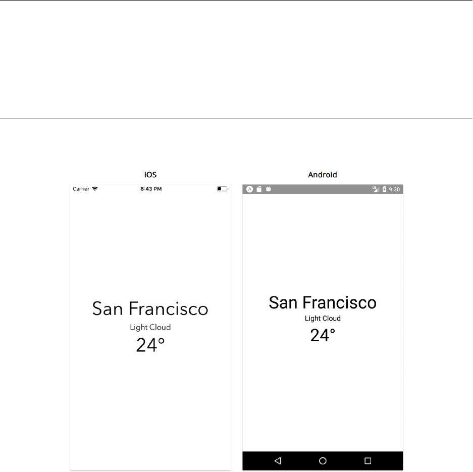
Now let’s add some appropriate styles and text fields in order to display some weather data for a
location. To add multiple styles to a single component, we can pass in an array of styles:
34https://docs.expo.io/versions/latest/guides/up-and-running.html#cant-see-your-changes

Getting Started with React Native 26
weather/2/App.js
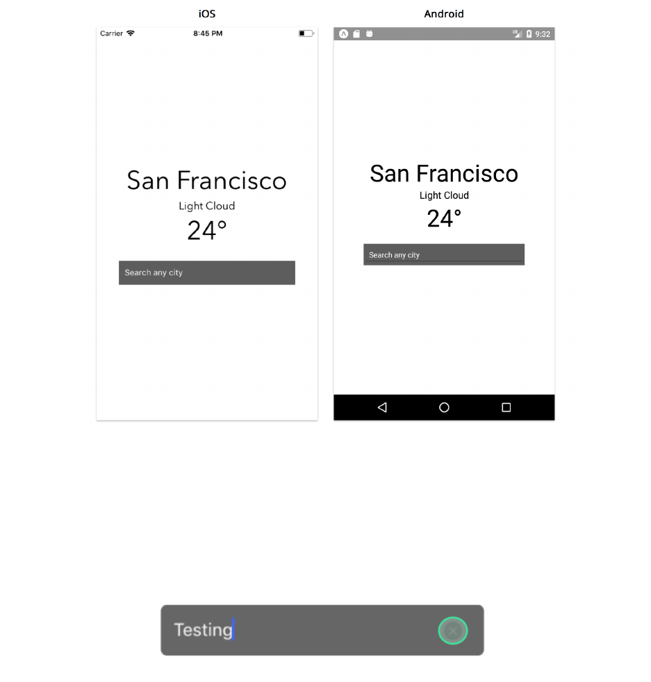
14 <Text style={[styles.largeText, styles.textStyle]}>San Francisco</Text>
15 <Text style={[styles.smallText, styles.textStyle]}>Light Cloud</Text>
16 <Text style={[styles.largeText, styles.textStyle]}>24°</Text>
It is important to mention that when passing an array, the styles at the end of the array take
precedence over earlier styles, in case of any repeated attributes. We can see that we’re referencing
three new styles; textStyle,smallText, and largeText. Let’s define these within our styles object:
weather/2/App.js
29 const styles =StyleSheet.create({
30 container:{
31 flex: 1,
32 backgroundColor:'#fff',
33 alignItems:'center',
34 justifyContent:'center',
35 },
36 textStyle:{
37 textAlign:'center',
38 fontFamily:Platform.OS === 'ios' ?'AvenirNext-Regular' :'Roboto',
39 },
40 largeText:{
41 fontSize: 44,
42 },
43 smallText:{
44 fontSize: 18,
45 },
•textStyle specifies an alignment (center) as well as the fontFamily. Notice how we use
Platform to define platform specific fonts for both iOS and Android. We do this because both
operating systems provide a different set of native fonts.
•smallText and largeText both specify different font sizes.
Platform is a built-in React Native API. We’ll need to make sure to import it:
Getting Started with React Native 27
weather/2/App.js
1import React from 'react';
2import {
3StyleSheet,
4Text,
5KeyboardAvoidingView,
6Platform,
7TextInput,
8} from 'react-native';
Let’s take a look at our application now:
Styled Text
Platform specific properties
The Platform API allows us to conditionally apply different styles or properties in our component
based on the device’s operating system. The OS attribute of the object returns either iOS or android
depending on the user’s device.
Getting Started with React Native 28
Although this is a relatively simple way to apply different properties in our application based on
the user’s device, there may be scenarios where we may want our component to be substantially
different between operating systems.
We can also use the Platform.select method that takes the operating system as keys within an
object and returns the correct result based on the device:
1textStyle:{
2textAlign:'center',
3...Platform.select({
4ios:{
5fontFamily:'AvenirNext-Regular',
6},
7android:{
8fontFamily:'Roboto',
9},
10 }),
11 },
Separate files
Instead of applying conditional checks using Platform.OS a number times throughout the entire
component file, we can also leverage the use of platform specific files instead. We can create
two separate files to represent the same component each with a different extension: .ios.js and
.android.js. If both files export the same component class name, the React Native packager knows
to choose the right file based on the path extension. We’ll dive deeper into platform specific
differences later in this book.
Text input
We now have text fields that display the location, weather condition, and temperature. The next
thing we need to do is provide some sort of input to allow the user to search for a specific city.
Again, we’ll continue using hardcoded data for now. We’ll only begin using an API for real data
once we have all of our components in place.
React Native provides a built-in TextInput component that we can import into our component
that allows us to accept user input. Let’s include it within our View container underneath the Text
components (make sure to import it as well!):

Getting Started with React Native 29
weather/2/App.js
<Text style={[styles.largeText, styles.textStyle]}>San Francisco</Text>
<Text style={[styles.smallText, styles.textStyle]}>Light Cloud</Text>
<Text style={[styles.largeText, styles.textStyle]}>24°</Text>
<TextInput
autoCorrect={false}
placeholder="Search any city"
placeholderTextColor="white"
style={styles.textInput}
clearButtonMode="always"
/>
There are a number of props associated with TextInput that we can use. We’ll cover the basics
here but go into more detail about them in the “Core Components” chapter. Here we’re specifying
a placeholder, its color, as well as a style for the component itself. Let’s create its style object,
textInput, underneath our other styles:
weather/2/App.js
smallText:{
fontSize: 18,
},
textInput:{
backgroundColor:'#666',
color:'white',
height: 40,
width: 300,
marginTop: 20,
marginHorizontal: 20,
paddingHorizontal: 10,
alignSelf:'center',
},
As we mentioned previously, all the attributes that we provide styles with in React Native are
extremely similar to how we would apply them using CSS. Now let’s take a look at our application:
Getting Started with React Native 30
Text Input
We can see that the text input has a default underline on Android. We’ll go over how to remove this
in a bit.
We’ve also specified the clearButtonMode prop to be always. This shows a button on the right side
of the input field when characters are inserted that allows us to clear the text. This is only available
on iOS.
Text Input Clear Button
We can now type into the input field!
Getting Started with React Native 31
If you’re using the iOS simulator, you can connect your hardware keyboard and use that with
any input field. This can be done with Shift + ⌘ + K or going to Hardware -> Keyboard ->
Connect Hardware Keyboard
With this enabled, the software keyboard may not show by default. You can toggle this by
pressing ⌘ + K or going to Hardware -> Keyboard -> Toggle Software Keyboard
Now every time you click an input field, the software keyboard will display exactly how it
would if you were using a real device and you can type using your hardware keyboard.
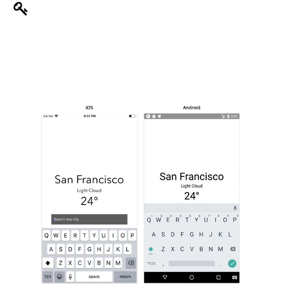
However one thing you may have noticed is that when you focus on the input field with a tap, the
keyboard pops up and covers it on Android and comes quite close on iOS:
Keyboard
Since the virtual keyboard can cover roughly half the device screen, this is a common prob-
lem that occurs when using text inputs in an application. Fortunately, React Native includes
KeyboardAvoidingView, a component that solves this problem by allowing us to adjust where other
components render in relation to the virtual keyboard. Let’s import and use this component instead
of View:

Getting Started with React Native 32
weather/2/App.js
render() {
return (
<KeyboardAvoidingView style={styles.container} behavior="padding">
<Text style={[styles.largeText, styles.textStyle]}>San Francisco</Text>
<Text style={[styles.smallText, styles.textStyle]}>Light Cloud</Text>
<Text style={[styles.largeText, styles.textStyle]}>24°</Text>
<TextInput
autoCorrect={false}
placeholder="Search any city"
placeholderTextColor="white"
style={styles.textInput}
clearButtonMode="always"
/>
</KeyboardAvoidingView>
);
}
Notice that KeyboardAvoidingView accepts a behavior prop with which we can customize how the
keyboard adjusts. It can change its height, position or bottom padding in relation to the position of
the virtual keyboard. Here, we’ve specified padding.
Now tapping the text input will shift our component text and input fields out of the way of the
software keyboard.
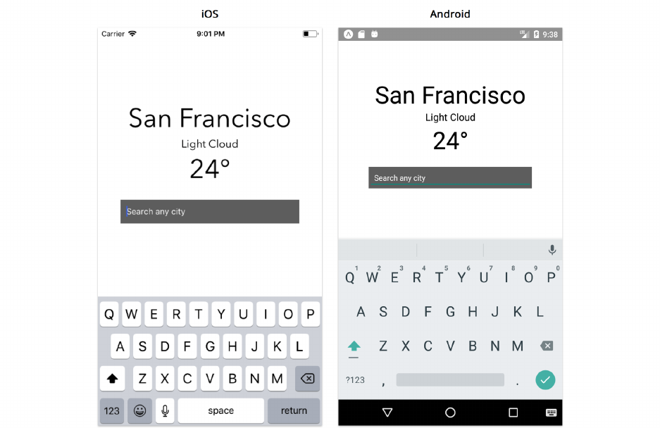
Getting Started with React Native 33
Keyboard Avoiding View
Custom components
So far, we’ve explored how to add styling into our application, and we’ve included some built-in
components into our main App component. We use View as our component container and import
Text and TextInput components in order to display hardcoded weather data as well as an input
field for the user to change locations.
It’s important to re-iterate that React Native is component-driven. We’re already representing our
application in terms of components that describe different parts of our UI without too much effort,
and this is because React Native provides a number of different built-in components that you can
use immediately to shape and structure your application.
However, as our application begins to grow, it’s important to begin thinking of how it can further
be broken down into smaller and simpler chunks. We can do this by creating custom components
that contain a small subset of our UI that we feel fits better into a separate, distinct component
file. This is useful in order to allow us to further split parts of our application into something more
manageable, reusable and testable.
Although our application in its current state isn’t extremely large or unmanageable, there’s still some
room for improvement. The first way we can refactor our component is to move our TextInput into

Getting Started with React Native 34
a separate component to hide its implementation details from the main App component. Let’s create
acomponents directory in the root of the application with the following file:
├── components/
- SearchInput.js
All the custom components we create that we use in our main App component will live inside this
directory. For more advanced apps, we might create directories within components to categorize
them more specifically. Since this app is pretty simple, let’s use a flat components directory.
The SearchInput will be our first custom component so let’s move all of our code for TextInput
from App.js to SearchInput.js:
weather/3/components/SearchInput.js
1import React from 'react';
2import { StyleSheet, TextInput, View } from 'react-native';
3
4export default class SearchInput extends React.Component {
5render() {
6return (
7<View style={styles.container}>
8<TextInput
9autoCorrect={false}
10 placeholder={this.props.placeholder}
11 placeholderTextColor="white"
12 underlineColorAndroid="transparent"
13 style={styles.textInput}
14 clearButtonMode="always"
15 />
16 </View>
17 );
18 }
19 }
20
21 const styles =StyleSheet.create({
22 container:{
23 height: 40,
24 marginTop: 20,
25 backgroundColor:'#666',
26 marginHorizontal: 40,
27 paddingHorizontal: 10,
28 borderRadius: 5,
29 },
Getting Started with React Native 35
30 textInput:{
31 flex: 1,
32 color:'white',
33 },
34 });
Let’s break down what this file contains:
• We export a component named SearchInput.
• This component accepts a placeholder prop.
• This component returns a React Native TextInput with a few of its properties specified
wrapped within a View. We’ve applied the appropriate styles to our view container including
aborderRadius. We also added underlineColorAndroid="transparent" to remove the dark
underline that shows by default on Android.
this is a special keyword in JavaScript. The details about this are a bit nuanced, but for the
purposes of the majority of this book, this will be bound to the React Native component
class. So, when we write this.props inside the component, we’re accessing the props
property on the component. When we diverge from this rule in later sections, we’ll point it
out.
For more details on this, check out this page on MDN35.
Custom props
As you may recall, in App.js we set the placeholder prop for TextInput to “Search any city.” That
renders the text input with a placeholder:
For SearchInput, we could hardcode a string again for placeholder. But what if we wanted to add
a search input elsewhere in our application? It would be nice if placeholder was customizable.
Earlier in this chapter, we explored how we can use props with a number of built-in components in
order to customize their features. We can also create props for custom components that we build as
well.
That’s what we do here in SearchInput. The component accepts the prop placeholder. In turn,
SearchInput uses this value to set the placeholder prop on TextInput.
35https://developer.mozilla.org/en-US/docs/Web/JavaScript/Reference/Operators/this

Getting Started with React Native 36
The way data flows from parent to child in React Native is through props. When a parent renders
a child, it can send along props the child depends on. A component can access all its props through
the object this.props. If we decide to pass down the string "Type Here" as the placeholder prop,
the this.props object will look like this:
{"placeholder":"Type Here" }
In here, we’ll set up App to render SearchInput which means that App is the parent of SearchInput.
Our parent component will be responsible for passing down the actual value of placeholder.
We’re getting somewhere interesting now. We’ve set up a custom SearchInput component and by
building it to accept a placeholder prop, we’re already setting it up to be configurable. Based on
what it receives, it can render any placeholder message that we’d like.
Importing components
In order to use SearchInput in App, we need to import the component first. We can remove the
TextInput logic from App.js and have App use SearchInput instead:
weather/3/App.js
import React from 'react';
import { StyleSheet, Text, KeyboardAvoidingView, Platform } from 'react-native';
import SearchInput from './components/SearchInput';
export default class App extends React.Component {
render() {
return (
<KeyboardAvoidingView style={styles.container} behavior="padding">
<Text style={[styles.largeText, styles.textStyle]}>San Francisco</Text>
<Text style={[styles.smallText, styles.textStyle]}>Light Cloud</Text>
<Text style={[styles.largeText, styles.textStyle]}>24°</Text>
<SearchInput placeholder="Search any city" />
</KeyboardAvoidingView>
);
}
}
By moving the entire TextInput details into a separate component called SearchInput, we’ve
made sure to not have any of its specific implementation details showing in the parent component
anymore. We can also remove the text input’s styling defined within the styles object.

Getting Started with React Native 37
There’s no specific answer to how often we should isolate different UI logic into separate custom
components. React Native was built in order to allow us to lay out our entire application in terms
of self-contained components, and that means we should separate parts of our application into
distinct units with custom functionality attached to them. This allows us to build a more manageable
application that’s easier to control and understand. We’ve isolated knowledge of our search input to
the component SearchInput and we’ll continue to isolate specific pieces of our app throughout this
chapter.
It’s common to separate your imports into two groups: imports from dependencies, and
imports from other files in your project. That’s why we put a blank line above SearchInput.
This comes down to personal style preference.
Background image
As we saw in the photo of the completed version of the app at the beginning of this chapter, we can
make our application more visually appealing by displaying a background image that represents the
current weather condition.
In this book’s sample code, we’ve included a number of images for various weather conditions. If you
inspect the weather/assets directory, you’ll find images like clear.png,hail.png, and showers.png.
If you’re following along, copy these two folders over from the sample code into your project:
1. weather/assets
2. weather/utils
We mentioned earlier that we’ve included a utils/ folder for each project in the book’s
sample code. This folder contains helper functions that we’ll use below.
If you’re on macOS or Linux, you can use cp -r to copy directories:
cp -r weather/{assets,utils}~/react-native-projects/weather/
With the assets and utils folders copied over, let’s update our App component:

Getting Started with React Native 38
weather/4/App.js
import React from 'react';
import {
StyleSheet,
View,
ImageBackground,
Text,
KeyboardAvoidingView,
Platform,
} from 'react-native';
import getImageForWeather from './utils/getImageForWeather';
import SearchInput from './components/SearchInput';
export default class App extends React.Component {
render() {
return (
<KeyboardAvoidingView style={styles.container} behavior="padding">
<ImageBackground
source={getImageForWeather('Clear')}
style={styles.imageContainer}
imageStyle={styles.image}
>
<View style={styles.detailsContainer}>
<Text style={[styles.largeText, styles.textStyle]}>
San Francisco
</Text>
<Text style={[styles.smallText, styles.textStyle]}>
Light Cloud
</Text>
<Text style={[styles.largeText, styles.textStyle]}>24°</Text>
<SearchInput placeholder="Search any city" />
</View>
</ImageBackground>
</KeyboardAvoidingView>
);
}
}
In this component, we’re importing a getImageForWeather method from our utils directory which
Getting Started with React Native 39
returns a specific image from the assets directory depending on a weather type. For example,
getImageForWeather('Clear') returns the following image:
Feel free to peek into the implementation details of any function we use from the utils
directory to get a better idea of how it works.
We also import React Native’s built-in ImageBackground component. Let’s take a closer look at how
we’re making use of it in our render method:
weather/4/App.js
render() {
return (
<KeyboardAvoidingView style={styles.container} behavior="padding">
<ImageBackground
source={getImageForWeather('Clear')}
style={styles.imageContainer}
imageStyle={styles.image}
>
Conceptually, the ImageBackground component is a View with an Image nested within. The source
prop accepts an image location, which we’ve set to getImageForWeather('Clear'). We know this

Getting Started with React Native 40
will always return the image displayed above. ImageBackground also uses the prop style for styling
the View container and the prop imageStyle for styling the image itself. Let’s add two new styles
and modify the container style:
weather/4/App.js
const styles =StyleSheet.create({
container:{
flex: 1,
backgroundColor:'#34495E',
},
imageContainer:{
flex: 1,
},
image:{
flex: 1,
width:null,
height:null,
resizeMode:'cover',
},
Defining component styles with a flex attribute mean that they will expand to take up any room
remaining in their parent container in relation to any sibling components. They share this space in
proportion to their defined flex values. Since ImageBackground is the only nested element within
KeyboardAvoidingView, setting imageContainer to flex: 1 means that this element will fill up
the entire space of its parent component. We’ve removed justifyContent and alignItems from
container so that the ImageBackground can take up the entire device screen.
We also used flex: 1 to style the actual image itself, image, to make sure it takes up the entire
space of its parent container. With images in particular, the component will fetch and use the actual
width and height of the source image by default. For this reason, we’ve also set its height and width
attribues to null so that the dimensions of the image fit the container instead. The resizeMode
attribute allows us to define how the image is resized when the Image element does not match its
actual dimensions. Setting this attribute to cover means that the image will scale uniformly until it
is equal to the size of the component.
The “Core Components” chapter will dive deeper into how flexbox, layout, and the Image
component work in React Native
We also wrapped all of our Text elements and SearchInput within a view container styled with
detailsContainer:

Getting Started with React Native 41
weather/4/App.js
<View style={styles.detailsContainer}>
<Text style={[styles.largeText, styles.textStyle]}>
San Francisco
</Text>
<Text style={[styles.smallText, styles.textStyle]}>
Light Cloud
</Text>
<Text style={[styles.largeText, styles.textStyle]}>24°</Text>
<SearchInput placeholder="Search any city" />
</View>
Now let’s set up its style:
weather/4/App.js
detailsContainer:{
flex: 1,
justifyContent:'center',
backgroundColor:'rgba(0,0,0,0.2)',
paddingHorizontal: 20,
},
Here, we’re ensuring the container within ImageBackground also fills up the entire space of its
parent component as well as have its items aligned at the center of the screen. We also add a semi-
transparent overlay to our image by setting the backgroundColor of this component.
The last thing we’ll need to do here is change our Text elements to white instead of black to show
more clearly with a background image:
weather/4/App.js
textStyle:{
textAlign:'center',
fontFamily:Platform.OS === 'ios' ?'AvenirNext-Regular' :'Roboto',
color:'white',
},
Try it out
Save the file and take a look at our app. We should now see the background image displayed!
Getting Started with React Native 42
Modifying location
The steps we’ve taken so far are quite common when starting React Native applications. We hardcode
all our data, organize our app into components, and get an idea of the visual layout as well as how
it breaks down into components.
However, our app really isn’t very useful at this moment. If we take a look at our SearchInput
component for instance, we can type anything into the input field but nothing actually happens as
a result. We need to find a way to track changes made to the component and store that information
somewhere. In other words, we need some piece of mutable data that updates whenever the user
changes or submits the input field.
Instead of having SearchInput not actually manage any data that represents the text inputted by
the user, let’s pass in a prop for it called location to reflect what the user has inputted into the text
input field:
render() {
const location ='San Francisco';
return (
<KeyboardAvoidingView style={styles.container} behavior="padding">
<ImageBackground
source={getImageForWeather('Clear')}
style={styles.imageContainer}
imageStyle={styles.image}
>
<View style={styles.detailsContainer}>
<Text style={[styles.largeText, styles.textStyle]}>{location}</Text>
<Text style={[styles.smallText, styles.textStyle]}>
Light Cloud
</Text>
<Text style={[styles.largeText, styles.textStyle]}>24°</Text>
<SearchInput placeholder="Search any city" />
</View>
</ImageBackground>
</KeyboardAvoidingView>
The reason we want to pass in the property that contains our location data is we need a way for our
child component to modify that field and communicate back up to our container App component.
Notice how we’ve moved the static string for location into a separate constant which we pass down
to SearchInput. We’ve instantiated it as San Francisco so that it can show as the first location when
the user loads the application. The next thing we just need to do is make sure that this location
constant is updated when the user actually changes the field in SearchInput:
Getting Started with React Native 43
export default class SearchInput extends React.Component {
handleChangeText(newLocation) {
// We need to do something with newLocation
}
render() {
return (
<TextInput
autoCorrect={false}
placeholder={this.props.placeholder}
placeholderTextColor="white"
underlineColorAndroid="transparent"
style={styles.textInput}
clearButtonMode="always"
onChangeText={this.handleChangeText}
/>
);
}
}
So what did we just do? We’ve just added onChangeText as a new prop to our TextInput component.
Notice that we don’t pass in a specific object or property, but a function instead:
onChangeText={this.handleChangeText}
This method is invoked everytime the text within the input field is changed. A number of built-
in components provided by React Native include event-driven props which we can attach specific
methods to. We’ll explore more throughout this book.
With onChangeText, our TextInput returns the changed text as an argument which we’re attempting
to pass into a separate method called handleChangeText. Currently our method is blank and we’ll
explore how we can complete it in a bit.
In React Native, we need to pass in functions when we want to handle certain events related to the
component being referenced. For the TextInput component, onChangeText is set to fire every single
time the text within the input field has changed. We need to “listen” to this specific event in our child
component (TextInput) so that it can notify our parent component (SearchInput) to respond to this
event. To do this, we pass in a function that calls another function, or in other words, a callback.
This is a common pattern when building components which need to notify a parent component of
some event. Unfortunately with the way we’ve just set it up, it wouldn’t work in this example. This
is because the function handleChangeText has a different local scope than the component instance.
We can work around this by binding our function to the correct context of its this object.
Getting Started with React Native 44
<TextInput
placeholder={placeholder}
placeholderTextColor="white"
underlineColorAndroid="transparent"
style={styles.textInput}
clearButtonMode="always"
onChangeText={this.handleChangeText.bind(this)}
/>
Now this might seem okay for the current context, but it can quickly become unwieldy if we build
our components with bind statements in each event handler. One reason why is if we wanted to use
handleChangeText in multiple different sub-components for example, we would have to make sure
to bind it to the correct context every single time. To help solve this, we can take care of handling
our event using property initializers:
export default class SearchInput extends React.Component {
handleChangeText =(newLocation) => {
// We need to do something with newLocation
}
render() {
return (
<TextInput
autoCorrect={false}
placeholder={this.props.placeholder}
placeholderTextColor="white"
underlineColorAndroid="transparent"
style={styles.textInput}
clearButtonMode="always"
onChangeText={this.handleChangeText}
/>
);
}
}
This allows us to declare the member methods as arrow functions:
handleChangeText =(newLocation) => {
// We need to do something with newLocation
}
And we pass the method name to the prop and nothing more:

Getting Started with React Native 45
onChangeText={this.handleChangeText}
Property Initializers
Supported by Babel36, property initializers are still in the proposal phase and have not yet
been slated for adoption in future JavaScript versions. Although this pattern is used quite
often in many React and React Native applications, it is important to keep in mind that it is
still experimental syntax.
For more information on the different ways to handle events in React Native, refer to the
Appendix.
Now that we’ve set up our callback correctly, let’s modify handleChangeText to change our text
prop in order to change the data to match what the user is typing:
handleChangeText =(newLocation) => {
this.props.location =newLocation;
};
Let’s run our application and try typing into the TextInput field. You’ll immediately notice that the
first location that shows is San Francisco, so we know that the text prop is being passed down
successfully!
However, if we type anything into our TextInput, you’ll notice nothing happens. Changing the text
within the input field does not actually update the parent location property and from the way
we’ve designed our component logic, it looks like it should. This is because this.props, which is
referenced in SearchInput,is actually owned by App and not the child component, SearchInput.
A component’s props are immutable and create a one-way data pipeline from parent to children.
We have a bit of a problem. We need to find a way to:
• store local data in our child component, SearchInput, that represents the value in the input
field
• track changes to the search input field as it’s updated by the user
• notify our parent component, App, whenever our location changes
This is where we can use a component’s state.
Storing local data
Let’s modify our SearchInput component once more. Currently the text input within the component
does nothing, so let’s add some local component state to control actual data. We can do this by adding
aconstructor method to the component. We can then initialize the component’s state within this
method:
36https://babeljs.io/docs/plugins/transform-class-properties/

Getting Started with React Native 46
weather/5/components/SearchInput.js
export default class SearchInput extends React.Component {
constructor(props) {
super(props);
this.state ={
text:'',
};
}
We can use the constructor method to to initialize our component-specific data, or state. We
do this here because this method fires before our component is mounted and rendered. Here, we
defined our state object to only contain a text property:
Remember, components in React Native are extended from React.Component to create
derived classes. super() is required in derived classes in order to reference this within
the constructor.
Much like how we can access the component’s props with this.props, we can access the compo-
nent’s state via this.state. For example if we wanted to output our state property in a single Text
component, we could do this:
export default class HiThere extends React.Component {
constructor(props) {
super(props);
this.state ={
text:'Hi there!',
};
}
render() {
return <Text>{this.state.text}</Text>;
}
}
This component would now render 'Hi there!' since that’s how we defined our state.text
property in our constructor. For our current component however, our text property in state will
be used to define the text typed by the user into the input field. Let’s now modify our component’s
render method to allow for this:
Getting Started with React Native 47
weather/5/components/SearchInput.js
render() {
const { placeholder } =this.props;
const { text } =this.state;
return (
<View style={styles.container}>
<TextInput
autoCorrect={false}
value={text}
placeholder={placeholder}
placeholderTextColor="white"
underlineColorAndroid="transparent"
style={styles.textInput}
clearButtonMode="always"
onChangeText={this.handleChangeText}
onSubmitEditing={this.handleSubmitEditing}
/>
</View>
);
}
The first thing we did was destructure the component props and state objects:
weather/5/components/SearchInput.js
render() {
const { placeholder } =this.props;
const { text } =this.state;
Destructuring
Instead of using this.props.placeholder and this.state.text directy, we destructured
both objects at the beginning of our render method into individual variables (text and
placeholder). Please refer to the Appendix for more details on destructuring assignments.
We then make sure that the TextInput placholder prop is still accepting our props.placeholder
attribute. We also pass state.text to a value prop:

Getting Started with React Native 48
weather/5/components/SearchInput.js
<TextInput
autoCorrect={false}
value={text}
placeholder={placeholder}
placeholderTextColor="white"
underlineColorAndroid="transparent"
style={styles.textInput}
clearButtonMode="always"
onChangeText={this.handleChangeText}
onSubmitEditing={this.handleSubmitEditing}
/>
The value prop is responsible for the content showed in the input field. With this, we now know
whatever is displayed in input field will always represent our local state.
We’ve also attached two additional props to our component, onChangeText and onSubmitEditing
with methods we haven’t set up yet.
Tracking changes to input
Let’s take a look at how onChangeText can allow us to update our state every time the input field is
changed. As we just did previously, we’re attaching a method to the onChangeText prop of TextInput:
weather/5/components/SearchInput.js
onChangeText={this.handleChangeText}
Previously, we set up a handleChangeText method that modifies our location prop value when the
user changes the text within the input. We quickly realized that this didn’t work. This is because
props are immutable and are always “owned” by a component’s parent while state can be mutated
and is “owned” by the component itself. This is an extremely important pattern to remember while
building components with React Native.
This brings us to setState(), a method we can use to change our state correctly. Let’s make use of
this in our handleChangeText method which we can declare right underneath our constructor:
Getting Started with React Native 49
weather/5/components/SearchInput.js
export default class SearchInput extends React.Component {
constructor(props) {
super(props);
this.state ={
text:'',
};
}
handleChangeText =text => {
this.setState({ text });
};
Shorthand property names
With later versions of JavaScript, we can define objects using shorthand form where possible.
Our handleChangeText method can also be written in a more explicit syntax:
handleChangeText =(text) => {
this.setState({ text:text });
};
Please refer to the Appendix for a little more detail on this concept.
Now we might be tempted to update our state by using this.state.text = text, but this will
not work. For all state modifications after the initial state we’ve defined in our constructor,
React provides components with the method setState() to do this. In addition to mutating the
component’s state object, this method triggers the React component to re-render, which is essential
after the state changes.
It’s good practice to initialize components with “empty” state as we’ve done in this component.
However, after our SearchInput component is initialized, we want to update the state for with data
the user types into the text input. This is why we use the text argument provided into our callback
method as part of the onChangeText prop and pass that into this.setState().
Never modify state outside of this.setState(). This function has important hooks around
state modification that we would be bypassing.
We discuss state management in detail throughout the book.

Getting Started with React Native 50
Notifying the parent component
So we’ve found a way to correctly store local state in our component that represents the text within
the search input and make sure that it updates as the user changes the value. We still need to do
one more thing which is to notify our parent App component when the user submits a new searched
value. This is why we’ve attached a method to the onSubmitEditing prop of TextInput:
weather/5/components/SearchInput.js
onSubmitEditing={this.handleSubmitEditing}
The idea here is we don’t necessarily want to communicate with our parent component everytime
the user changes the input field. That’s why onChangeText is purely responsible for storing the latest
typed input value into the local state of the component. Fortunately, the TextInput component has
an onSubmitEditing prop which fires when the user submits the field and not just changes it. This
happens specifically when the user presses the action button of the virtual keyboard in order to
submit their input. This is where we would want to notify our container component of the typed
user data. Let’s take a look at how we can set up the handleSubmitEditing function that we’re
passing in:
weather/5/components/SearchInput.js
handleSubmitEditing =() => {
const { onSubmit } =this.props;
const { text } =this.state;
if (!text) return;
onSubmit(text);
this.setState({ text:'' });
};
In here, we check if this.state.text is not blank (which means the user has typed something into
the field), and if that’s the case:
1. Run an onSubmit function obtained from the component’s props. We pass text as an
argument here.
2. Clear the text property in state using this.setState()
We’ve seen how this.props can be used to pass information down from a parent component to child
and we’ve also seen how built-in components such as TextInput can notify their parent component
through callbacks in some of their props. Similarly, we can create props in our custom components
to do the exact same thing. In here, we need SearchInput to communicate with the App component

Getting Started with React Native 51
whenever the user submits the input field. We do this because we want our parent component to
handle the event of the user typing and submitting a new city. This is why we have an onSubmit
prop here that gets fired.
The next thing we need to do is pass a method to the onSubmit prop of SearchInput in App and
handle the event:
weather/5/App.js
<SearchInput
placeholder="Search any city"
onSubmit={this.handleUpdateLocation}
/>
Let’s define local state for this component as well as the handleUpdateLocation method:
weather/5/App.js
export default class App extends React.Component {
constructor(props) {
super(props);
this.state ={
location:'San Francisco',
};
}
handleUpdateLocation =city => {
this.setState({
location:city,
});
};
We defined local state for this component with just a location property and have it set to San
Francisco. We do this to ensure that an initial location is shown when we reload our application.
We also included a handleUpdateLocation method that takes in a parameter to change our location
state. This method will fire everytime the user submits the search input field because we pass this
method as the onSubmit prop for SearchInput.
Since we actually have “living” location data represented by what the user submits in the input field,
we can now display it in our first Text element instead of a hardcoded string:
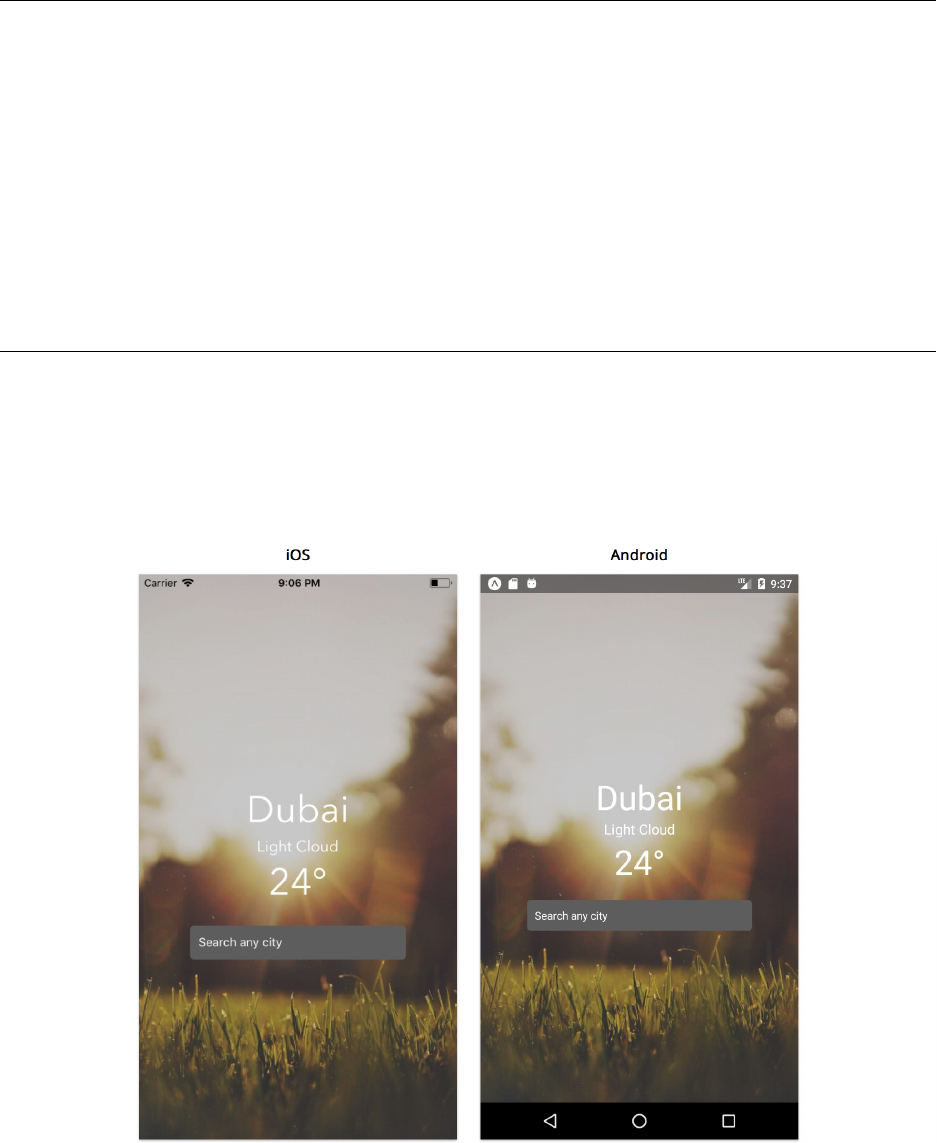
Getting Started with React Native 52
weather/5/App.js
render() {
const { location } =this.state;
return (
<KeyboardAvoidingView style={styles.container} behavior="padding">
<ImageBackground
source={getImageForWeather('Clear')}
style={styles.imageContainer}
imageStyle={styles.image}
>
<View style={styles.detailsContainer}>
<Text style={[styles.largeText, styles.textStyle]}>{location}</Text>
Try it out
If we type any city in the search input and press return, we’ll see the name of the city being displayed
immediately.
Component State

Getting Started with React Native 53
This shows that we’ve wired everything correctly!
We’ve sequenced each of our problems step by step and showed how props and state differ when
trying to pass and store component data. However, handleUpdateLocation doesn’t really get real
weather information and just updates the city name that’s being displayed. We’ll wire it up to get
actual weather data soon.
Architecting state
We may have already considered controlling all the location state within SearchInput and not
having to deal with passing information upwards to a container component. There’s no specific
answer to where each piece of state should live and it depends on the type of application we’re
building. This is a core concept of building React Native applications and tools like Redux37 and
MobX38 aim to simplify this even further by allowing you to manage the entire state of the
application in a single location. However, even when we decide to use state management libraries
such as these examples, we still need to spend time deciding on how we want to structure our state
logic.
In our current app, we need to have App know the location data in order to display correct weather
conditions. SearchInput doesn’t really need to store this information without actually passing it up
to the component that handles the logic. The motivation behind keeping SearchInput simple is that
we can leverage React’s component-driven paradigm. We can re-use it in various places across our
application whenever we need a search input.
We can think of SearchInput as a component that provides presentational markup and does not
manage any real application data. Such components accept props from parent components which
specify the data a presentational component should render. This parent container component also
specifies behavior. If the lower level presentational component has any interactivity — like our
search input — it calls a prop-function given to it by the parent. We’ll go into more detail about
this important pattern throughout this book.
Lifecycle methods
We’ve wired up how our components communicate with each other to have a new location displayed
immediately when the user submits the text input field. However, you’ll notice that the city shows a
blank string when the app first loads. We could instantiate it with the name of an actual city instead
but we know we want to be getting actual weather information eventually. Although we haven’t set
that up just yet, the asynchronous action to fetch actual weather data for a city will be happening in
the handleUpdateLocation. Therefore it makes sense to call this method when our component first
loads. One thing we might be tempted to try is firing this method in our constructor:
37https://github.com/reactjs/redux
38https://github.com/mobxjs/mobx
Getting Started with React Native 54
constructor(props) {
super(props);
this.state ={
location:'',
};
this.handleUpdateLocation('San Francisco');
}
However, firing off asynchronous requests in the constructor is typically an anti-pattern. This is
because the constructor is called before the component is first mounted. As such, this method
should usually only be used to initialize state and bind methods.
Instead, we can make use of one of React Native’s lifecycle methods. Like the name suggests, these
methods allow you to access specific points in the lifecycle of a component. The term lifecycle here
applies to how React Native instantiates,changes and destroys components. We can use lifecycle
hooks to do something when these functions are called during different phases of component
rendering.
The most common lifecycle method used is the one that allows us to set component data after the
component is mounted – componentDidMount(). This method is commonly used to trigger network
requests to fetch data that the component would need. To understand when this method fires, let’s
add it to our component right after our constructor with a console.log:
export default class App extends React.Component {
constructor(props) {
super(props);
this.state ={
location:'San Francisco',
};
}
componentDidMount() {
console.log('Component has mounted!');
}
When we reload our application, we can see Component has mounted! outputted directly to our
terminal as soon as the component has mounted.
Getting Started with React Native 55
Debugging in React Native
If you’ve worked with JavaScript on the web, you may be familiar with using console.log,
console.warn or console.error to output messages to the browser’s console for debugging
purposes. Similarly, Expo allows us to use these methods to output logs to our terminal. For
more detail about viewing logs, you can refer to the documentation39.
Aside from logging, React Native also allows us to debug the JavaScript code in our app
using the Chrome Developer Tools. With Expo, we can do this by pressing Debug Remote JS
in the developer menu. You can refer to the documentation40 to learn more.
Now let’s update it to fire handleUpdateLocation:
weather/6/App.js
componentDidMount() {
this.handleUpdateLocation('San Francisco');
}
With this, we can remove San Francisco as our default location in state and set it to an empty
string.
export default class App extends React.Component {
constructor(props) {
super(props);
this.state ={
location:'',
};
}
Since we’re using componentDidMount, we should still see San Francisco populated in place of the
text field as soon as we reload the app.
Although componentDidMount() allows us to create event listeners and fetch network
requests right after the component has rendered for the first time, there are number of other
lifecycle methods that React Native provides. We’ll go through each of them throughout this
book.
39https://docs.expo.io/versions/latest/guides/logging.html
40https://docs.expo.io/versions/latest/guides/debugging.html

Getting Started with React Native 56
Networking
We’ve built all the components that make up the UI of our app and refined it to show a nice
background image for the user. As we mentioned previously, the approach we’ve taken so far is
a common pattern used when building brand new React Native applications. We first organized our
views using components and then introduced some state and state management.
However, nobody will find our app useful unless it’s actually connected to real data. When building
a new mobile app, chances are we’ll need to communicate with a server. Communicating with a
server is a crucial component of most mobile applications.
For the purpose of this application, we’ll use the MetaWeather41 API to fetch real weather
information. MetaWeather is a weather data aggregator that calculates the most likely outcome
from predictions of different forecasters. They provide an API42 that provides this information over
a set of different endpoints:
1. Location search (/api/location/search/) which allows us to search for a particular city
2. Location weather information (/api/location/{woeid}) which provides a 5 day forecast for a
certain location
3. Location day which provides (/api/location/{woeid}/{date}/) forecast history and informa-
tion for a particular day and location
WOEID, or Where On Earth ID43, is a location identifier that allows us find details about a
specific location. For more detail on how exactly the MetaWeather API works, feel free to
take a closer look at the documentation44.
Now that we have a basic understanding of how state and props control the flow of data between
different components, let’s move on to using this API to render real weather data. It’s possible to
put API calls directly in our component methods, but it’s usually a good idea to abstract that logic
away in its own file. In the utils directory, we’ve set up two separate API calls in api.js:
•fetchLocationId returns an array of locations based on a search query
•fetchWeather returns weather details about a specific location using a location identifier
known as Where On Earth ID45
The combination of both calls will allow us to search for a city and retrieve its weather information.
Feel free to open the file and take a look at how these methods work if you’re interested.
41https://www.metaweather.com/
42https://www.metaweather.com/api/
43https://developer.yahoo.com/geo/geoplanet/guide/concepts.html
44https://www.metaweather.com/api/
45https://developer.yahoo.com/geo/geoplanet/guide/concepts.html

Getting Started with React Native 57
Async Functions
Callbacks and Promises are two ways to define asynchronous code in JavaScript. Built on
top of promises, async functions are a newer syntax that allows us to define asynchronous
methods in a synchronous manner. Both methods we’ve set up in api.js use this syntax.
Although supported by Babel, it is still in draft proposal stage and will most likely be ratified
into a future JavaScript release. Here’s the MDN46 resource if you happen to be interested
in learning more about this syntax further.
When building components that fetch information over the network, it’s inevitable that the user will
have to wait a certain period of time before the data is retreived. With most applications, it makes
sense to show a loading indicator of some sort so the user knows they have to wait a bit before they
can see the content. Fortunately, React Native provides a built-in ActivityIndicator component
that displays a circular loading spinner. Let’s update our root App component beginning with some
new imports:
weather/6/App.js
import React from 'react';
import {
StyleSheet,
View,
ImageBackground,
Text,
KeyboardAvoidingView,
Platform,
ActivityIndicator,
StatusBar,
} from 'react-native';
import { fetchLocationId, fetchWeather } from './utils/api';
import getImageForWeather from './utils/getImageForWeather';
import SearchInput from './components/SearchInput';
We’ve added the following imports:
•ActivityIndicator is a built-in component that displays a circular loading spinner. We’ll use
it when data is being fetched from the network
•fetchLocationId, fetchWeather are the methods for interacting with the weather API
•StatusBar is a built-in component that allows us to modify the app status bar at the top of the
device
46https://developer.mozilla.org/en-US/docs/Web/JavaScript/Reference/Statements/async_function

Getting Started with React Native 58
Now let’s make some changes to our component. We need to apply our network request logic and
store that information so that it can be easily displayed. We also need to make sure that a loading
indicator is shown while the request is firing. Let’s begin with updating our state:
weather/6/App.js
constructor(props) {
super(props);
this.state ={
loading:false,
error:false,
location:'',
temperature: 0,
weather:'',
};
}
We just expanded our state object to include loading,error,temperature, and weather in addition
to location. The three latter properties are data we’ll retreive from the API. The loading property
represents when a call is still being made (in order to show a loading icon) and error is used to store
the error message if our call fails or returns unusable information.
With setState, updates to our state can happen asynchronously. For this reason, the method accepts
a callback as an optional second parameter that allows us to define an action to fire after the state
is updated. Consider the following as an example:
export default class Example extends React.Component {
state ={
weather:'',
};
componentDidMount() {
this.setState({ weather:'Clear' }, () => console.log(this.state));
}
}
// { weather: 'Clear' } is logged right after our component finishes mounting
We can apply this logic to the method responsible for interfacing with our external API: handleUpdateLocation:

Getting Started with React Native 59
weather/6/App.js
handleUpdateLocation =async city => {
if (!city) return;
this.setState({ loading:true }, async () => {
try {
const locationId =await fetchLocationId(city);
const { location, weather, temperature } =await fetchWeather(
locationId,
);
this.setState({
loading:false,
error:false,
location,
weather,
temperature,
});
}catch (e) {
this.setState({
loading:false,
error:true,
});
}
});
};
We’ve updated it to be an asynchronous function that uses setState to change our loading attribute
to true. We also pass in an asynchronous function as its second argument. In here, we first call
fetchLocationId with the user queried city (if present) and pass the location ID to fetchWeather to
return an object that contains the required information (location,weather, and temperature). Once
complete, our state is updated with the correct parameters. Moreover, if any of the calls happen to
error, the catch statement will update the error property in our state to true.
Now that we have our API logic in place, we’ll need to do a few things in the UI of our component:
• We need to display a loading spinner only when our API calls have fired but not completed
• We should show an error message if the user types in an incorrect address or our API call fails
• We need to render the correct weather information for a certain location
Let’s take a look at how we can update our render() method to do this:

Getting Started with React Native 60
weather/6/App.js
render() {
const { loading, error, location, weather, temperature } =this.state;
return (
<KeyboardAvoidingView style={styles.container} behavior="padding">
<StatusBar barStyle="light-content" />
<ImageBackground
source={getImageForWeather(weather)}
style={styles.imageContainer}
imageStyle={styles.image}
>
<View style={styles.detailsContainer}>
<ActivityIndicator animating={loading} color="white" size="large" />
{!loading && (
<View>
{error && (
<Text style={[styles.smallText, styles.textStyle]}>
Could not load weather, please try a different city.
</Text>
)}
{!error && (
<View>
<Text style={[styles.largeText, styles.textStyle]}>
{location}
</Text>
<Text style={[styles.smallText, styles.textStyle]}>
{weather}
</Text>
<Text style={[styles.largeText, styles.textStyle]}>
{`${Math.round(temperature)}°`}
</Text>
</View>
)}
<SearchInput
placeholder="Search any city"
onSubmit={this.handleUpdateLocation}
/>
</View>
)}
Getting Started with React Native 61
</View>
</ImageBackground>
</KeyboardAvoidingView>
);
}
It might look like a lot is going on in the file, but let’s break it down piece by piece. We first included
our StatusBar component:
weather/6/App.js
<StatusBar barStyle="light-content" />
The StatusBar component allows us to customize the status bar of our application using a barStyle
prop that lets us change the color of the text within the bar. A value of light-content renders a
lighter color (white) and dark-content will change it to a darker color (dark-grey).
With Expo, we can also configure the status bar for Android by modifying app.json.
Expo defaults barStyle for Android to light-content and makes the background translu-
cent. Although this looks fine for our current application, you can remove the translucency
by providing a background color. Take a look at the documentation47 for more details.
We then added ActivityIndicator along with assigning its color and size prop:
weather/6/App.js
<ActivityIndicator animating={loading} color="white" size="large" />
Notice how we’ve also included an animating prop which we’ve set to be our state.loading
attribute. This prop is responsible for showing or hiding the component entirely.
After that, we’ve included a curly brace container in our JSX:
47https://docs.expo.io/versions/latest/guides/configuring-statusbar.html

Getting Started with React Native 62
weather/6/App.js
{!loading && (
<View>
{error && (
<Text style={[styles.smallText, styles.textStyle]}>
Could not load weather, please try a different city.
</Text>
)}
{!error && (
<View>
<Text style={[styles.largeText, styles.textStyle]}>
{location}
</Text>
<Text style={[styles.smallText, styles.textStyle]}>
{weather}
</Text>
<Text style={[styles.largeText, styles.textStyle]}>
{`${Math.round(temperature)}°`}
</Text>
</View>
)}
<SearchInput
placeholder="Search any city"
onSubmit={this.handleUpdateLocation}
/>
</View>
)}
</View>
We’ve previously seen how JSX allows us to embed JavaScript expressions within curly braces.
Fortunately, this lets us include operators as well, allowing us to conditionally render certain parts
of our UI. In here, !loading && <...> means that this statement will evaluate and display the
element if and only if loading is false. We can see we’ve pretty much wrapped most of the elements
that make up our component within here, and this makes sense since we don’t want to show any
text fields or the search input while the API call is being fetched.

Getting Started with React Native 63
Conditional Rendering
Using logical && operators within the render method is not the only way to conditionally
render parts of the component. At times, this approach can make it harder to read a
component file if a significant number of lines are being conditionally rendered.
If this happens, it might be a good idea to use helper methods. For example, our render
method can be rewritten following this pattern:
renderContent() {
const { error } =this.state;
return (
<View>
{error && <Text>Error</Text>}
{!error && this.renderInfo()}
</View>
);
}
renderInfo() {
const { info } =this.state;
return <Text>{info}</Text>;
}
render() {
const { loading } =this.state;
return (
<View>
<ActivityIndicator animating={loading} color="white" size="large" />
{!loading && this.renderContent()}
</View>
);
}
The React documentation48 goes into more detail about this concept as well as explaining
even more ways to conditionally render parts of components. Ultimately, it depends on
preference on which pattern to use.
Now within the content that shows when the API call isn’t being fired, we still need to be able to
display an appropriate error message if there’s an issue. We can use the state.error attribute to
conditionally display text in this scenario:
48https://reactjs.org/docs/conditional-rendering.html

Getting Started with React Native 64
weather/6/App.js
{error && (
<Text style={[styles.smallText, styles.textStyle]}>
Could not load weather, please try a different city.
</Text>
)}
{!error && (
<View>
<Text style={[styles.largeText, styles.textStyle]}>
{location}
</Text>
<Text style={[styles.smallText, styles.textStyle]}>
{weather}
</Text>
<Text style={[styles.largeText, styles.textStyle]}>
{`${Math.round(temperature)}°`}
</Text>
</View>
)}
<SearchInput
placeholder="Search any city"
onSubmit={this.handleUpdateLocation}
/>
Notice how we now display our state information (location,weather, and temperature) in our
Text elements instead of hard-coded values. For temperature, we’re making use of the JavaScript
Math object and its round() method to round the temperature to the nearest integer.
The last thing we also do is pass the dynamic weather attribute to ImageBackground instead of a
hardcoded Clear string:
weather/6/App.js
<ImageBackground
source={getImageForWeather(weather)}
style={styles.imageContainer}
imageStyle={styles.image}
>
Now if we run our application, typing a city into the input field will return its actual weather data!

Getting Started with React Native 65
We’ve pretty much finished connecting all the major points of our application by wiring in network
requests to retreive actual data. After slowly beginning with hardcoded data and building our
components that make up the building blocks of our UI, our application now works just as we
intended from the beginning of this chapter. The next few sections will explore some additional
enhancements to our code but won’t add any new functionality to our app.
PropTypes
With React Native, we can include validation functions using the prop-types library. This allows
us to specify and enforce the type of our component props and ensure that match what we expect
them to be. This can not only help us catch development errors sooner but also provide a layer of
documentation to the consumer of our components
We can add prop-types as a dependency:
yarn add prop-types
Now let’s take a look at how we can use PropTypes in SearchInput:

Getting Started with React Native 66
weather/6/components/SearchInput.js
SearchInput.propTypes ={
onSubmit:PropTypes.func.isRequired,
placeholder:PropTypes.string,
};
SearchInput.defaultProps ={
placeholder:'',
};
We’ve defined a propTypes object which instructs React to validate the props given to our
component. We’re specifying that onSubmit must be a function and placeholder must be a string.
We’ve also specified onSubmit to be required which means it has to be provided to out component
and is not optional.
We’ve left placeholder to be optional. For this, we’re making use of the defaultProps object. This
allows us to create our component and not specify placeholder if we don’t need to, defaultProps
will take care of providing it’s value in that case. It’s important to note that the value passed into
defaultProps also undergoes type-checking as well by the library.
Now what exactly happens when a prop’s type is not validated successfully? When a prop is passed
in with an invalid type or fails the propType validation, a warning is passed into the JavaScript
console. These warnings will only be shown in development mode, so if we accidentally deploy our
app into production with an improper use of a component, our users won’t see the warning.
Class properties
React Native includes class properties transformation49 from Babel that allows us to simplify how
we define our component state,props, and propTypes. For example, we can update the constructor
in App.js to:
weather/App.js
state ={
loading:false,
error:false,
location:'',
temperature: 0,
weather:'',
};
This gets transpiled into the exact same result as using a constructor. Similarly, we can simplify
how we define our state in SearchInput:
49https://babeljs.io/docs/plugins/transform-class-properties/

Getting Started with React Native 67
weather/components/SearchInput.js
state ={
text:'',
};
Moreover, we can also set propTypes and defaultProps using static properties in our class. In other
words, we can remove the object references in SearchInput and define a static method within the
class:
weather/components/SearchInput.js
static propTypes ={
onSubmit:PropTypes.func.isRequired,
placeholder:PropTypes.string,
};
static defaultProps ={
placeholder:'',
};
Using this pattern and leveraging class properties transform is purely syntactical sugar over defining
methods and objects separately and allows us to write in a cleaner, simpler syntax.
Summary
Congratulations, we’ve just built our very first React Native application and covered almost all of
the essentials needed to build a complete and fully functional mobile app. We began by exploring
each of the files generated as a result of starting a new project with CRNA and how Expo allows us
to run our application smoothly on our device without worrying about Xcode and Android Studio
set up. We then built out each of the components that make up our application using the built-in
components provided by React Native. While doing so, we dove into the fundamentals of React
Native understanding JSX, how to apply custom styling as well as understanding how to use props
and state to manage and control data. We moved on to more complex topics including lifecycle
methods and how to use external network calls to provide real content to our application. Finally,
we finished off with a brief look into how propTypes can add an additional layer of safety by adding
type validation to our application. The rest of this book will dive deeper into core concepts of React
Native and the concepts learned in this chapter will serve as the foundation for everything else in
the text.
So far, we’ve only scratched the surface of what React Native allows us to do. By knowing the
setup/development details like Expo and the core concepts of props, state, and components, you
already have the essentials of React Native development under your belt. As of now, you can already
build a wide variety of applications using the framework – so go forth and build something amazing!
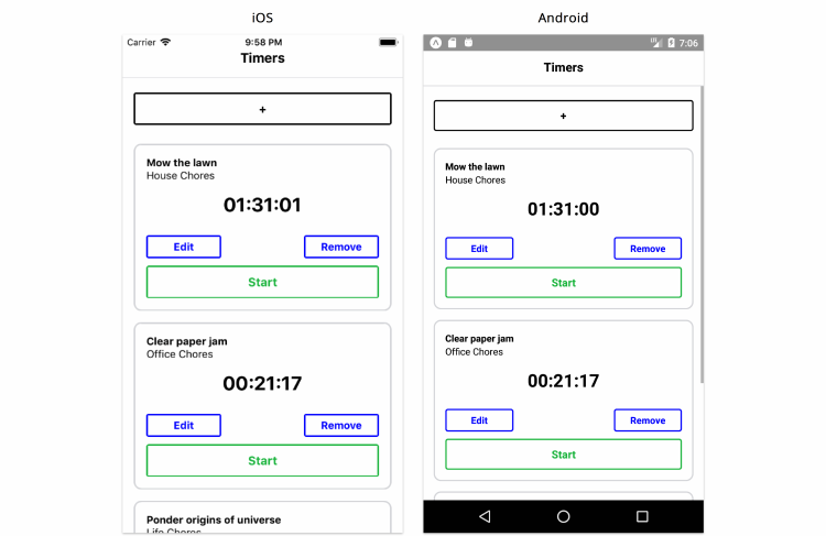
React Fundamentals
In the last chapter, we built our first React Native application. We explored how React applications
are organized by components. Using the key React concepts of state and props, we saw how data
is managed and how it flows between components. We also discussed other useful concepts, like
handling user input and fetching data from a remote API.
In this section, we’ll build another application step-by-step. We’ll dive even deeper into React’s
fundamentals. We’ll investigate a pattern that you can use to build React Native apps from scratch
and then put those steps to work to build a time-tracking application.
In this app, a user can add, delete, and modify various timers. Each timer corresponds to a different
task that the user would like to keep time for:
Time Tracking App
This app will have significantly more interactive capabilities than the one built in the last chapter.
As we’ll see, this will present us with some interesting challenges.
Getting started
This chapter assumes you’ve setup your system by following the steps at the beginning of the first
chapter.
As with all the chapters in this book, make sure you have the book’s sample code at the ready.

React Fundamentals 69
Previewing the app
Let’s begin by viewing the completed app. To try the completed app on your device:
• On Android, you can scan this QR code using the Expo app:
QR Code
• On iOS, you can navigate to the time-tracking/ directory within the sample code folder and
either preview it on the iOS simulator or send the link of the project URL to your device as we
explained in the previous chapter.
Play around with it to get a feel for all the functionality.
Breaking the app into components
Let’s start by breaking our app down into its components. As we noticed in our last project, visual
components usually map tightly to their respective React Native components. For example, we can
imagine that we’d want a Timer component for each timer:
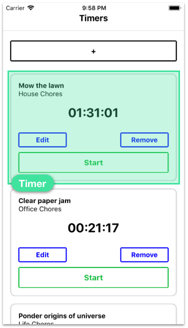
React Fundamentals 70
Our application displays a list of timers and has a “+” icon at the top. We’re able to add new
timers to the list using this button. This “+” component is interesting because it has two distinct
representations. When the “+” button is pressed, the component changes into a form:
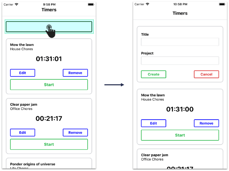
React Fundamentals 71
When the form is closed, the component changes back into a “+” button.
There are two approaches we could take. The first one is to have the parent component decide
whether or not to render a “+” component or a form component based on some piece of stateful
data. It could swap between the two children. However, this adds more responsibility to the parent
component. Since no other child components need this piece of information, it might make more
sense to have a new child component own the single responsibility of determining whether or not
to display a “+” button or a create timer form. We’ll call it ToggleableTimerForm. As a child, it can
either render the component TimerForm or the “+” button.
So, we’ve identified two components in addition to our root application component:
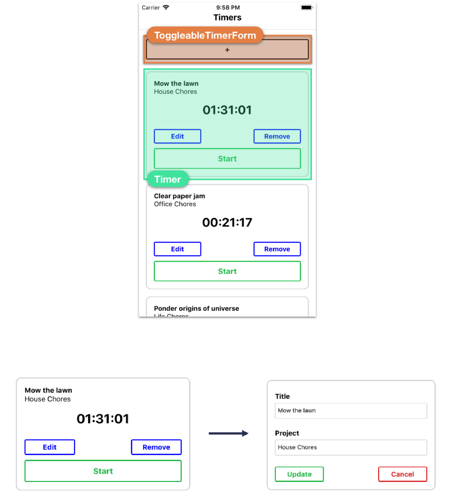
React Fundamentals 72
But the Timer component has a fair bit of functionality. As we saw in the completed version of the
app, each timer turns into a form when the user clicks “Edit”:
A single timer: Displaying time (left) vs. edit form (right)
In addition, timers delete themselves when “Remove” is pressed and have buttons for starting and
stopping. Do we need to break this up? And if so, how?
Displaying a timer and editing a timer are indeed two distinct UI components. They should be two
distinct React components. Like ToggleableTimerForm, we need some container component that
renders either the timer’s face or its edit form depending on if the timer is being edited.
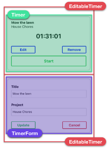
React Fundamentals 73
We’ll call this EditableTimer. The child of EditableTimer will then be either a Timer component or
the edit form component. The form for creating and editing timers is very similar, so let’s assume
that we can use the component TimerForm in both contexts:
As for the other functionality of the timer, like the start and stop buttons, it’s a bit tough to determine
at this point whether or not they should be their own components. We can trust that the answers
will be more apparent after we’ve started writing some code and have a better idea of the general
structure of the components in our application.
So, we have our final component hierarchy, with some ambiguity around the final state of the timer
component:
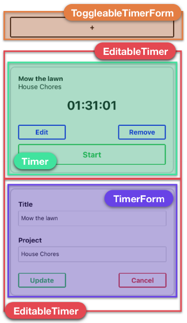
React Fundamentals 74
•App: Root container
–EditableTimer: Displays either a timer or a timer’s edit form
*Timer: Displays a given timer
*TimerForm: Displays a given timer’s edit form
–ToggleableTimerForm: Displays a form to create a new timer
*TimerForm: Displays a new timer’s create form
For all the buttons in the app, we’ll create and use a component called TimerButton.
7 step process
Now that we have a good understanding of the composition of our components, we’re ready to build
a static version of our app that only contains hardcoded data. As we noticed in the previous chapter,
many applications we build will require our top-level component to communicate with a server. In
these scenarios, the server will be the initial source of state, and React Native will render itself
according to the data the server provides. If our current app followed this pattern it would also
send updates to the server, like when a timer is started. However, for simplicity, in this chapter we’ll
render local state rather than communicating with a server.
React Fundamentals 75
It always simplifies things to start off with static components, as we did in the last chapter. The
static version of the app will not be interactive. Pressing buttons, for example, won’t do anything.
But this will enable us to lay the framework for the app, getting a clear idea of how the component
tree is organized.
Next, we can determine what the state should be for the app and in which component it should live.
At that point, we’ll have the data flow from parent to child in place. Then we can add inverse data
flow, propagating events from child to parent.
In fact, this follows from a handy process for developing a React Native app from scratch:
1. Break the app into components
2. Build a static version of the app
3. Determine what should be stateful
4. Determine in which component each piece of state should live
5. Hardcode initial states
6. Add inverse data flow
7. Add server communication (if present)
We followed this pattern in the last project:
1. Break the app into components
We looked at the desired UI and determined we wanted a custom SearchInput component.
2. Build a static version of the app
Our components started off without using state. Instead, we had our root App component pass down
location as a static prop to SearchInput.
3. Determine what should be stateful
In order for our application to become interactive, we had to be able to modify the search value of
the search input. The value submitted was our stateful location property.
4. Determine in which component each piece of state should live
Our root App component was responsible for managing the location,temperature, and weather
state parameters using React component class methods.
5. Hardcode initial state
We defined a hardcoded location value and passed it down to SearchInput as a custom prop.
6. Add inverse data flow
We defined the handleUpdateLocation function in our App container and passed it down in props
so that SearchInput could inform the parent of when our search input’s submit button is pressed.
7. Add server communication

React Fundamentals 76
We added server communication between our parent component and the MetaWeather API to
retrieve actual weather data.
These steps only serve as a guideline. You don’t necessarily have to follow it every time you build an
application, but you’ll likely internalize and become more accustomed to following this structure as
you build more applications. If steps in this process aren’t completely clear right now, don’t worry.
The purpose of this chapter is to familiarize yourself with this procedure.
We’ve already covered step (1) and have a good understanding of all of our components, except
for some uncertainty down at the Timer component. Step (2) is to build a static version of the app.
As in the last project, this amounts to defining React components, their hierarchy, and their HTML
representation. We avoid state for now.
Step 2: Build a static version of the app
Prepare the app
Before beginning, run the following commands in your terminal to create a new React Native app:
create-react-native-app time-tracking --scripts-version 1.14.0
cd time-tracking
yarn start
App
Let’s start off by writing our App component in the file App.js. We’ll begin with our imports:
time-tracking/1/App.js
import React from 'react';
import { StyleSheet, View, ScrollView, Text } from 'react-native';
import EditableTimer from './components/EditableTimer';
import ToggleableTimerForm from './components/ToggleableTimerForm';
After importing the core React Native components we’ll be using in App, we import EditableTimer
and ToggleableTimerForm. We’ll be implementing those shortly.
We’ll have our App component render both ToggleableTimerForm and a couple of EditableTimer
components. Because we’re building the static version of our app, we’ll manually set all the props:

React Fundamentals 77
time-tracking/1/App.js
export default class App extends React.Component {
render() {
return (
<View style={styles.appContainer}>
<View style={styles.titleContainer}>
<Text style={styles.title}>Timers</Text>
</View>
<ScrollView style={styles.timerList}>
<ToggleableTimerForm isOpen={false}/>
<EditableTimer
id="1"
title="Mow the lawn"
project="House Chores"
elapsed="8986300"
isRunning
/>
<EditableTimer
id="2"
title="Bake squash"
project="Kitchen Chores"
elapsed="3890985"
editFormOpen
/>
</ScrollView>
</View>
);
}
}
At the top, we display a title (“Timers”) inside of a Text component. We’ll look at the styles object
in a moment.
After our title, we render the rest of the components in a ScrollView component. The built-in
ScrollView component in React Native is responsible for wrapping components within a scrolling
container.
We’re passing down one prop to ToggleableTimerForm:isOpen. This is used by the child component
to determine whether to render a “+” or TimerForm. When ToggleableTimerForm is “open” the form
is being displayed.
We also include two separate EditableTimer components within App. We’ll dig into each of these
props when we build the component. Notably, isRunning specifies whether the timer is running and
editFormOpen specifies whether EditableTimer should display the timer’s face or its edit form.

React Fundamentals 78
Note that we don’t explicitly set any values for the props isRunning on the first EditableTimer or
editFormOpen on the second:
time-tracking/1/App.js
<EditableTimer
id="1"
title="Mow the lawn"
project="House Chores"
elapsed="8986300"
isRunning
/>
<EditableTimer
id="2"
title="Bake squash"
project="Kitchen Chores"
elapsed="3890985"
editFormOpen
/>
This is a style for boolean props you’ll often encounter in React Native apps. When no explicit value
is passed, the prop defaults to true. So <ToggleableTimerForm isOpen /> will give the same result
as <ToggleableTimerForm isOpen={true}/>. Conversely, when a prop is absent it is undefined. This
means that for the first timer editFormOpen is “falsy.”
ScrollView renders all of its components at once, even those not currently shown in the
screen.
Last, here are the styles we’re using:
time-tracking/1/App.js
const styles =StyleSheet.create({
appContainer:{
flex: 1,
},
titleContainer:{
paddingTop: 35,
paddingBottom: 15,
borderBottomWidth: 1,
borderBottomColor:'#D6D7DA',
},
title:{
fontSize: 18,

React Fundamentals 79
fontWeight:'bold',
textAlign:'center',
},
timerList:{
paddingBottom: 15,
},
});
We’re not going to focus on styles in this chapter so feel free to just copy over the styles object for
each component.
EditableTimer
With all of our child components, we’ll save their respective files within a components subdirectory.
Let’s create components/EditableTimer.js.
First, we’ll begin by implementing TimerForm and Timer. We’ll be creating those shortly:
time-tracking/1/components/EditableTimer.js
import React from 'react';
import TimerForm from './TimerForm';
import Timer from './Timer';
EditableTimer will either return a timer’s face (Timer) or a timer’s edit form (TimerForm) based on
the prop editFormOpen. We don’t anticipate this component will ever manage state.
So far, we’ve written React components as ES6 classes that extend React.Component. However,
there’s another way to declare React components: as functions.
Let’s see what that looks like:
time-tracking/1/components/EditableTimer.js
export default function EditableTimer({
id,
title,
project,
elapsed,
isRunning,
editFormOpen,
}) {
if (editFormOpen) {
return <TimerForm id={id} title={title} project={project} />;

React Fundamentals 80
}
return (
<Timer
id={id}
title={title}
project={project}
elapsed={elapsed}
isRunning={isRunning}
/>
);
}
EditableTimer is a regular JavaScript function. In React, we call components written this way state-
less functional components or functional components for short. While we can write EditableTimer
using either component style, it’s a perfect candidate to be written as a function.
Think of functional components as components that only need to implement the render() method.
They don’t manage state and don’t need any of React’s special lifecycle hooks.
Throughout this book, we’ll refer to the two different types as class components and
functional components.
Note that the props are passed in as the first argument to the function. We don’t use this when
working with functional components. Here, we use destructuring to extract all the props from the
props object.
The component’s render method switches on the prop editFormOpen. If true, we render a TimerForm.
Otherwise, we render Timer.
As we saw in App, this component receives six props. This component passes down the props id,
title and project to TimerForm. For Timer, we pass down all the timer attributes.
Benefits of functional components
Why would we want to use functional components? There are two main reasons:
First, using functional components where possible encourages developers to manage state in fewer
locations. This makes our programs easier to reason about.
Second, using functional components are a great way to create reusable components. Because
functional components need to have all their configuration passed from the outside, they are easy
to reuse across apps or projects.
A good rule of thumb is to use functional components as much as possible. If we don’t need any
lifecycle methods and can get away with only a render() function, using a functional component
is a great choice.

React Fundamentals 81
Note that React still allows us to set propTypes and defaultProps on functional components.
TimerForm
TimerForm will contain two TextInput fields for editing a timer’s title and project. We’ll also add
a pair of buttons at the bottom.
Like EditableTimer, we can write this component as a functional component:
time-tracking/1/components/TimerForm.js
import React from 'react';
import { StyleSheet, View, Text, TextInput } from 'react-native';
import TimerButton from './TimerButton';
export default function TimerForm({ id, title, project }) {
const submitText =id ?'Update' :'Create';
return (
<View style={styles.formContainer}>
<View style={styles.attributeContainer}>
<Text style={styles.textInputTitle}>Title</Text>
<View style={styles.textInputContainer}>
<TextInput
style={styles.textInput}
underlineColorAndroid="transparent"
defaultValue={title}
/>
</View>
</View>
<View style={styles.attributeContainer}>
<Text style={styles.textInputTitle}>Project</Text>
<View style={styles.textInputContainer}>
<TextInput
style={styles.textInput}
underlineColorAndroid="transparent"
defaultValue={project}
/>
</View>
</View>
<View style={styles.buttonGroup}>

React Fundamentals 82
<TimerButton small color="#21BA45" title={submitText} />
<TimerButton small color="#DB2828" title="Cancel" />
</View>
</View>
);
}
const styles =StyleSheet.create({
formContainer:{
backgroundColor:'white',
borderColor:'#D6D7DA',
borderWidth: 2,
borderRadius: 10,
padding: 15,
margin: 15,
marginBottom: 0,
},
attributeContainer:{
marginVertical: 8,
},
textInputContainer:{
borderColor:'#D6D7DA',
borderRadius: 2,
borderWidth: 1,
marginBottom: 5,
},
textInput:{
height: 30,
padding: 5,
fontSize: 12,
},
textInputTitle:{
fontSize: 14,
fontWeight:'bold',
marginBottom: 5,
},
buttonGroup:{
flexDirection:'row',
justifyContent:'space-between',
},
});

React Fundamentals 83
We wrap each of our form elements in a View container. Each input field has a label (“Title” and
“Project”) above a TextInput.
At the end of the component, we have a button group with two TimerButton instances. We’ll create
this component in a bit.
Let’s take a closer look at how we’ve set up TextInput for the timer’s title:
time-tracking/1/components/TimerForm.js
<TextInput
style={styles.textInput}
underlineColorAndroid="transparent"
defaultValue={title}
/>
And for the timer’s project:
time-tracking/1/components/TimerForm.js
<TextInput
style={styles.textInput}
underlineColorAndroid="transparent"
defaultValue={project}
/>
Aside from adding styles using the style prop, we’re also using the TextInput component’s
defaultValue property. When the form is used for editing as it is here, we want the fields to be
populated with the current title and project values for this timer. Using defaultValue initializes
these fields with the current values, as desired.
Later, we’ll use TimerForm again within ToggleableTimerForm for creating timers.
ToggleableTimerForm will not pass TimerForm the title or project props. We’ll use
defaultProps to default these values to empty strings.
At the beginning of the component function, before the return statement, we define the variable
submitText. This variable uses the presence of props.id to determine what text the submit button
at the bottom of the form should display. If id is present, we know we’re editing an existing timer,
so it displays “Update.” Otherwise, it displays “Create.”
With all of this logic in place, TimerForm is prepared to render a form for creating a new timer or
editing an existing one.

React Fundamentals 84
We used an expression with the ternary operator to set the value of submitText. The syntax
is:
condition ?expression1 :expression2
If the condition is true, the ternary expression evaluates to expression1. Otherwise, it
evaluates to expression2. In our example, the variable submitText is set to the result of
the ternary expression.
TimerButton
Now let’s set up a component that we can use for all the buttons in our application, TimerButton.
Again, we can write this as a functional component:
time-tracking/1/components/TimerButton.js
1import { StyleSheet, Text, TouchableOpacity } from 'react-native';
2import React from 'react';
3
4export default function TimerButton({ color, title, small, onPress }) {
5return (
6<TouchableOpacity
7style={[styles.button, { borderColor:color }]}
8onPress={onPress}
9>
10 <Text
11 style={[
12 styles.buttonText,
13 small ?styles.small :styles.large,
14 { color },
15 ]}
16 >
17 {title}
18 </Text>
19 </TouchableOpacity>
20 );
21 }
22
23 const styles =StyleSheet.create({
24 button:{
25 marginTop: 10,
26 minWidth: 100,
27 borderWidth: 2,

React Fundamentals 85
28 borderRadius: 3,
29 },
30 small:{
31 fontSize: 14,
32 padding: 5,
33 },
34 large:{
35 fontSize: 16,
36 padding: 10,
37 },
38 buttonText:{
39 textAlign:'center',
40 fontWeight:'bold',
41 },
42 title:{
43 fontSize: 14,
44 fontWeight:'bold',
45 },
46 elapsedTime:{
47 fontSize: 18,
48 fontWeight:'bold',
49 textAlign:'center',
50 paddingVertical: 10,
51 },
52 });
React Native provides a built-in Button component, but it only allows for limited customization. For
this reason, we’re leveraging TouchableOpacity, which renders a wrapper to allow for components
to respond with opacity changes when pressed.
For easier customization, we’ve included color,title, and small as props that will allow us to
change how our button looks. The title prop is responsible for the button text while the color prop
changes the text and border colors. The small prop is a boolean prop passed in to render a smaller
button with slightly different styling.
Since we plan on using this component in multiple places in our app, we’ve defined an onPress prop
in order to fire a specific function that’s passed into our component when the button is pressed. We’re
not using it currently in TimerForm but we will as soon as we add actual data in our application.
TouchableOpacity accepts an activeOpacity prop that allows us to determine what the
opacity of the view should be when pressed. This defaults to a value of 0.2.

React Fundamentals 86
ToggleableTimerForm
Let’s turn our attention next to ToggleableTimerForm. Recall that this is a wrapper component
around TimerForm. It will display either a “+” or a TimerForm. Right now, it accepts a single prop,
isOpen, from its parent that instructs its behavior:
time-tracking/1/components/ToggleableTimerForm.js
import React from 'react';
import { StyleSheet, View } from 'react-native';
import TimerButton from './TimerButton';
import TimerForm from './TimerForm';
export default function ToggleableTimerForm({ isOpen }) {
return (
<View style={[styles.container, !isOpen && styles.buttonPadding]}>
{isOpen ? <TimerForm /> : <TimerButton title="+" color="black" />}
</View>
);
}
const styles =StyleSheet.create({
container:{
paddingVertical: 10,
},
buttonPadding:{
paddingHorizontal: 15,
},
});
As noted earlier, TimerForm does not receive any props from ToggleableTimerForm. As such, its
title and project fields will be rendered empty.
We’re using a ternary operator again here to either return TimerForm or render a “+” button. You
could make a case that this should be its own component (say PlusButton) but at present we’ll keep
the code inside ToggleableTimerForm.
Timer
Time for the Timer component.
As with all projects in this book, the sample code for this project comes with a utils/ directory
that contains various functions that will aid in the construction of this app. We’ll be using one of

React Fundamentals 87
those functions now. If you haven’t already, go ahead and copy over time-tracking/utils/ from
the sample code to your project directory now.
With utils/ in place, let’s take a look at our first version of Timer:
time-tracking/1/components/Timer.js
import React from 'react';
import { StyleSheet, View, Text } from 'react-native';
import { millisecondsToHuman } from '../utils/TimerUtils';
import TimerButton from './TimerButton';
export default function Timer({ title, project, elapsed }) {
const elapsedString =millisecondsToHuman(elapsed);
return (
<View style={styles.timerContainer}>
<Text style={styles.title}>{title}</Text>
<Text>{project}</Text>
<Text style={styles.elapsedTime}>{elapsedString}</Text>
<View style={styles.buttonGroup}>
<TimerButton color="blue" small title="Edit" />
<TimerButton color="blue" small title="Remove" />
</View>
<TimerButton color="#21BA45" title="Start" />
</View>
);
}
const styles =StyleSheet.create({
timerContainer:{
backgroundColor:'white',
borderColor:'#d6d7da',
borderWidth: 2,
borderRadius: 10,
padding: 15,
margin: 15,
marginBottom: 0,
},
title:{
fontSize: 14,
fontWeight:'bold',
},
elapsedTime:{

React Fundamentals 88
fontSize: 26,
fontWeight:'bold',
textAlign:'center',
paddingVertical: 15,
},
buttonGroup:{
flexDirection:'row',
justifyContent:'space-between',
},
});
The elapsed prop in this app is in milliseconds. This is the representation of the data that React will
keep. This is a good representation for machines, but we want to show our users a more human-
readable format.
We use a function defined in ./utils/TimerUtils,millisecondsToHuman(). You can pop open that
file if you’re curious about how it’s implemented. The string it renders is in the format ‘HH:MM:SS’.
Note that we could store elapsed in seconds as opposed to milliseconds, but JavaScript’s
time functionality is all in milliseconds. We keep elapsed consistent with this for simplicity.
Try it out
With all of our components laid out, let’s boot up the React Native packager to see our app so far:
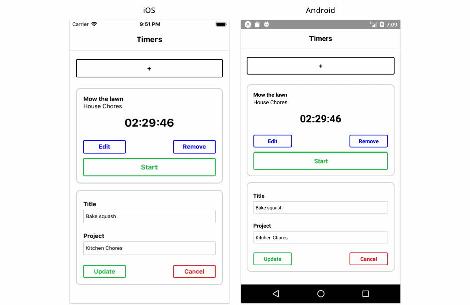
React Fundamentals 89
Tweak some of the props and refresh to see the results. For example:
• Flip the prop passed down to ToggleableTimerForm from false to true and see the timer form
render in the place of the “+” button:
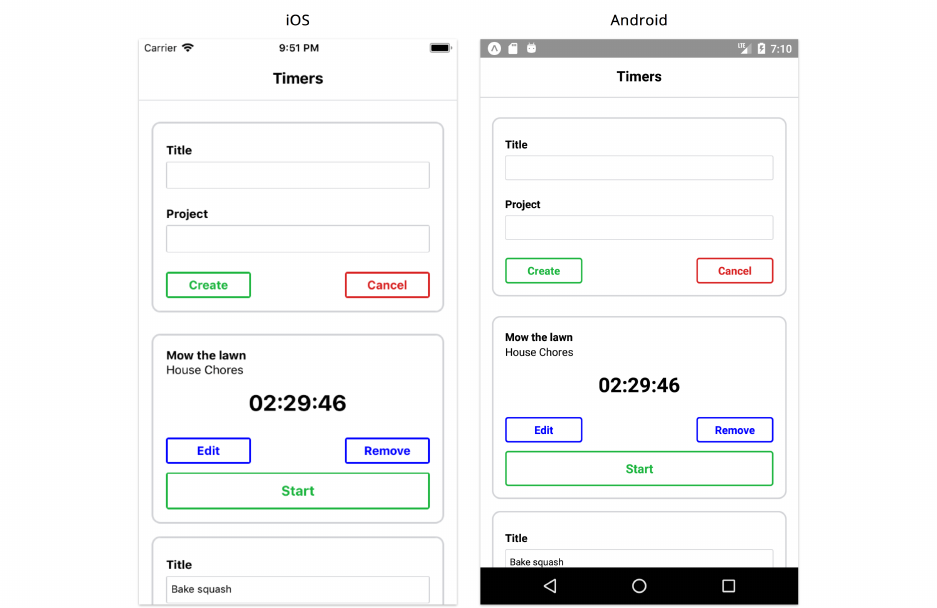
React Fundamentals 90
• Remove the editFormOpen prop in the second EditableTimer component within App and
witness the component flip the child it renders accordingly:
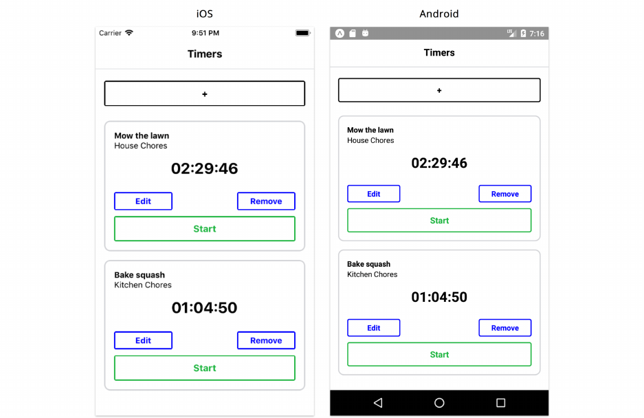
React Fundamentals 91
To review, our App component currently renders a ToggleableTimerForm component and two
EditableTimer components.
ToggleableTimerForm renders either a “+” or a TimerForm based on the prop isOpen.
EditableTimer renders either Timer or TimerForm based on the prop editFormOpen.Timer and
TimerForm are our app’s bottom-level components. They hold the majority of the screen’s UI. The
components above them are primarily concerned with orchestration.
So far, we’ve used hardcoded props to pass data around our app. But in order to enhance our app
with interactivity, we must evolve it from its static existence to a mutable one. As we saw in the last
chapter, in React we use state to accomplish this.
Step 3: Determine what should be stateful
Before introducing state, we need to determine what, exactly, should be stateful. Let’s start by
collecting all of the data that’s consumed by each component in our static app. In our static app,
data will be wherever we are defining or using props. We will then determine which of that data
should be stateful.
App

React Fundamentals 92
This declares two child components. It sets one prop, which is the isOpen boolean that is passed
down to ToggleableTimerForm.
EditableTimer
This uses the prop editFormOpen and also accepts all the attributes of a timer.
Timer
This uses all the attributes for a timer.
TimerForm
This has two interactive input fields, one for title and one for project. When editing an existing
timer, these fields are initialized with the timer’s current values.
State criteria
We can apply criteria to determine if data should be stateful:
These questions are from the excellent article by Facebook called “Thinking In React.” You
can read the original article here50.
1. Is it passed in from a parent via props? If so, it probably isn’t state.
A lot of the data used in our child components are already listed in their parents. This criterion helps
us de-duplicate.
For example, “timer properties” is listed multiple times. When we see the properties declared in
EditableTimer, we can consider it state. But when we see it elsewhere, it’s not.
2. Does it change over time? If not, it probably isn’t state.
This is a key criterion of stateful data: it changes.
3. Can you compute it based on any other state or props in your component? If so, it’s not
state.
For simplicity, we want to strive to represent state with as few data points as possible.
Applying the criteria
App
•isOpen boolean for ToggleableTimerForm and timer properties for EditableTimer
50https://facebook.github.io/react/docs/thinking-in-react.html

React Fundamentals 93
Stateful. The data is defined here. It changes over time. And it cannot be computed from other state
or props.
• timer attributes
Stateful. We define the data on each EditableTimer here. This data is mutable. And it cannot be
computed from other state or props.
EditableTimer
•editFormOpen for a given timer
Stateful. The data is defined here. It changes over time. And it cannot be computed from other state
or props.
Timer
• Timer properties
In this context, not stateful. Properties are passed down from the parent.
TimerForm
We might be tempted to conclude that TimerForm doesn’t manage any stateful data, as title and
project are props passed down from the parent. However, as saw with our SearchInput component
in the previous chapter, components that use TextInput can be special state managers in their own
right – these components often maintain the value of the input field as state.
So, outside of TimerForm, we’ve identified our stateful data:
• The list of timers and properties of each timer
• Whether or not the edit form of a timer is open
• Whether or not the create form is open
Step 4: Determine in which component each piece of
state should live
While the data we’ve determined to be stateful might live in certain components in our static app,
this does not indicate the best position for it in our stateful app. Our next task is to determine the
optimal place for each of our three discrete pieces of state to live.
This can be challenging at times but, again, we can apply the following steps from Facebook’s guide
“Thinking in React51” to help us with the process:
51https://facebook.github.io/react/docs/thinking-in-react.html
React Fundamentals 94
For each piece of state:
• Identify every component that renders something based on that state.
• Find a common owner component (a single component above all the components
that need the state in the hierarchy).
• Either the common owner or another component higher up in the hierarchy should
own the state.
• If you can’t find a component where it makes sense to own the state, create a new
component simply for holding the state and add it somewhere in the hierarchy above
the common owner component.
Let’s apply this method to our application:
The list of timers and attributes of each timer
At first glance, we may be tempted to conclude that App does not appear to use this state. Instead, the
first component that uses this state is EditableTimer. We might think it would be wise to move timer
attributes into the EditableTimer component’s state as opposed to passing them down as props.
While this may be the case for displaying timers, modifying them, and deleting them, what about
creating them? ToggleableTimerForm does not need the state to render, but it can affect state. It
needs to be able to insert a new timer. It will propagate the data for the new timer up to the root
App.
Therefore, App is truly the common owner. It renders EditableTimer components by passing down
timer state. It can handle modifications from EditableTimer and creates from ToggleableTimerForm,
mutating the state. The new state will then flow downward through EditableTimer via props.
Whether or not the edit form of a timer is open
In our static app, App specifies whether or not an EditableTimer should be rendered with its edit
form open. Technically, though, this state could just live in each individual EditableTimer. No parent
component in the hierarchy depends on this data.
Storing the state in EditableTimer will be fine for our current needs. But there are a few requirements
that might require us to “hoist” this state up higher in the component hierarchy in the future.
For instance, what if we wanted to impose a restriction such that only one form, including the create
form, could be open at a time? Then it would make sense for App to own the state, as it would need
to inspect it to determine whether to allow for another form to open.
Visibility of the create form
App doesn’t appear to care about whether ToggleableTimerForm is open or closed. It feels safe to
reason that the state can just live inside ToggleableTimerForm itself.
So, in summary, we’ll have three pieces of state each in three different components:

React Fundamentals 95
•Timer data will be owned and managed by App.
• Each EditableTimer will manage the state of its timer edit form.
• The ToggleableTimerForm will manage the state of its form visibility.
Step 5: Hardcode initial states
We’re now well prepared to make our app stateful. We’ll define our initial states within the
components themselves. This means hardcoding a list of timers in the top-level component, App.
For our two other pieces of state, we’ll have the components’ forms closed by default.
After we’ve added initial state to a parent component, we’ll make sure our props are properly
established in its children.
Adding state to App
Let’s start by modifying App to hold the timer data in state.
We’ll be using the npm library uuid52 to generate ids for each of our timers. The library’s function
uuidv4() will randomly generate a Universally Unique IDentifier53 for each of our timers.
A UUID is a string that looks like this:
2030efbd-a32f-4fcc-8637-7c410896b3e3
First, in your console, install the library:
yarn add uuid
Then, at the top of App.js, import the uuidv4() function:
time-tracking/2/App.js
import uuidv4 from 'uuid/v4';
Next, we’ll initialize the component’s state to an array of two timer objects. This will give us a list
of timers to play with when we open the app:
52https://www.npmjs.com/package/uuid
53https://en.wikipedia.org/wiki/Universally_unique_identifier
React Fundamentals 96
time-tracking/2/App.js
export default class App extends React.Component {
state ={
timers:[
{
title:'Mow the lawn',
project:'House Chores',
id:uuidv4(),
elapsed: 5456099,
isRunning:true,
},
{
title:'Bake squash',
project:'Kitchen Chores',
id:uuidv4(),
elapsed: 1273998,
isRunning:false,
},
],
};
We set the initial state to an object with the key timers.timers points to an array with two hardcoded
timer objects.
As in the previous chapter, we’re leaning on the Babel plugin transform-class-properties
to help simplify how we define our initial state.
Below, in render, we’ll use state.timers to generate an array of EditableTimer components. Each
will be derived from an individual object in the timers array that’s being passed in as a prop. We’ll
use map to do so:
time-tracking/2/App.js
render() {
const { timers } =this.state;
return (
<View style={styles.appContainer}>
<View style={styles.titleContainer}>
<Text style={styles.title}>Timers</Text>
</View>
<ScrollView style={styles.timerList}>

React Fundamentals 97
<ToggleableTimerForm />
{timers.map(({ title, project, id, elapsed, isRunning }) => (
<EditableTimer
key={id}
id={id}
title={title}
project={project}
elapsed={elapsed}
isRunning={isRunning}
/>
))}
</ScrollView>
</View>
);
}
The rendered UI of the component ends up being an array of EditableTimer components:
[
<EditableTimer
timer={{
title:'Mow the lawn',
project:'House Chores',
id:// random UUID,
elapsed: 5456099,
isRunning:true,
}}
/>,
<EditableTimer
timer={{
title:'Bake squash',
project:'Kitchen Chores',
id:// random UUID,
elapsed: 1273998,
isRunning:false,
}}
/>
]
Notably, we’re able to represent the EditableTimer component instance in JSX inside of return. It
might seem odd at first that we’re able to have a JavaScript array of JSX elements, but remember
that Babel will transpile the JSX representation of each EditableTimer (<EditableTimer />) into
regular JavaScript.

React Fundamentals 98
If you’re interested in how this compiles, please refer to the Appendix.
Note the use of the key={timer.id} prop. The key prop is not used by our EditableTimer
component but by the React Native framework. It’s a special property that we discuss deeper
in the next chapter “Core Components.” For the time being, it’s enough to note that this
property needs to be unique per React Native component in a list.
Array’s map()
If you’re unfamiliar with the map method, it takes a function as an argument and calls it with
each item inside of the array and builds a new array by using the return value from each
function call.
Since the timers array has two items, map will call this function twice, once for each timer.
When map calls this function, it passes in as the first argument an item. The return value
from this function call is inserted into the new array that map is constructing. After handling
the last item, map returns this new array. Here, we’re rendering this new array within our
render() method.
Props vs. state
Let’s take a step back and reflect on the difference between props and state again. What existed as
mutable state in App is passed down as immutable props to EditableTimer.
We talked at length about what qualifies as state and where state should live. Mercifully, we do not
need to have an equally lengthy discussion about props. Once you understand state, you can see
how props act as its one-way data pipeline. State is managed in some select parent components
and then that data flows down through children as props.
If state is updated, the component managing that state re-renders by calling render(). This, in turn,
causes any of its children to re-render as well. And the children of those children. And on and on
down the chain.
Let’s continue our own march down the chain.
Adding state to EditableTimer
In the static version of our app, EditableTimer relied on editFormOpen as a prop to be passed down
from the parent. We decided that this state could actually live here in the component itself.
Because this component will actually manage state, we’ll need to change it from a functional
component to a class component.
We’ll set the initial value of editFormOpen to false, which means that the form starts off as closed:

React Fundamentals 99
time-tracking/2/components/EditableTimer.js
export default class EditableTimer extends React.Component {
state ={
editFormOpen:false,
};
render() {
const { id, title, project, elapsed, isRunning } =this.props;
const { editFormOpen } =this.state;
if (editFormOpen) {
return <TimerForm id={id} title={title} project={project} />;
}
return (
<Timer
id={id}
title={title}
project={project}
elapsed={elapsed}
isRunning={isRunning}
/>
);
}
}
Timer remains stateless
If you look at Timer, you’ll see that it does not need to be modified to include state. It has been using
exclusively props and is so far unaffected by our current refactor.
Adding state to ToggleableTimerForm
We know that we’ll need to tweak ToggleableTimerForm as we’ve assigned it some stateful
responsibility. We want to have the component manage the state isOpen.
We’ll initialize the state to a “closed” state at the top of the component:

React Fundamentals 100
time-tracking/2/components/ToggleableTimerForm.js
export default class ToggleableTimerForm extends React.Component {
state ={
isOpen:false,
};
Next, we’ll define a function that toggles the state of the form to open:
time-tracking/2/components/ToggleableTimerForm.js
handleFormOpen =() => {
this.setState({ isOpen:true });
};
Finally, we’ll modify the component’s render() method to include our app’s first piece of interactiv-
ity. We’ll switch off of isOpen to determine whether we should render the “+” button or a TimerForm.
We’ll set handleFormOpen as the onPress handler for TimerButton:
time-tracking/2/components/ToggleableTimerForm.js
render() {
const { isOpen } =this.state;
return (
<View style={[styles.container, !isOpen && styles.buttonPadding]}>
{isOpen ?(
<TimerForm />
):(
<TimerButton title="+" color="black" onPress={this.handleFormOpen} />
)}
</View>
);
}
If you remember, we created TimerButton to accept an onPress prop which is passed down to
the onPress action of the TouchableOpacity within. TouchableOpacity is a built-in React Native
component. When it is pressed, it will invoke its onPress handler. TimerButton passes along its own
onPress prop directly to TouchableOpacity.
Therefore, when the TimerButton is pressed, the function handleFormOpen() will be invoked.
handleFormOpen() modifies the state, setting isOpen to true. This causes the ToggleableTimerForm
component to re-render. When render() is called this second time around, this.state.isOpen is
true and ToggleableTimerForm renders TimerForm. Neat.

React Fundamentals 101
As we explored in the last chapter, we are writing the handleFormOpen() function as a
property initializer (i.e. using an arrow function) in order to ensure this inside the function
is bound to the component. React will automatically bind class methods corresponding to
the component API (like render and componentDidMount) to the component for us.
Our updated ToggleableTimerForm, in full:
time-tracking/2/components/ToggleableTimerForm.js
export default class ToggleableTimerForm extends React.Component {
state ={
isOpen:false,
};
handleFormOpen =() => {
this.setState({ isOpen:true });
};
render() {
const { isOpen } =this.state;
return (
<View style={[styles.container, !isOpen && styles.buttonPadding]}>
{isOpen ?(
<TimerForm />
):(
<TimerButton title="+" color="black" onPress={this.handleFormOpen} />
)}
</View>
);
}
}
Adding state to TimerForm
We mentioned earlier that TimerForm would manage state as it includes a form. In React Native,
forms are stateful.
Recall that TimerForm includes two input fields:
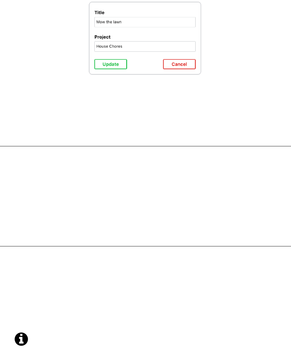
React Fundamentals 102
These input fields are modifiable by the user. In React Native, all modifications that are made to a
component should be handled and kept in state. This includes changes like the modification of an
input field. The best way to understand this is to see what it looks like.
To make these input fields stateful, we can make our component stateful and initialize state at the
top of our component:
time-tracking/2/components/TimerForm.js
export default class TimerForm extends React.Component {
constructor(props) {
super(props);
const { id, title, project } =props;
this.state ={
title:id ?title :'',
project:id ?project :'',
};
}
Our state object has two properties, each corresponding to an input field that TimerForm manages.
If TimerForm is creating a new timer as opposed to editing an existing one, the id prop will be
undefined. In that case, we initialize both properties to a blank string ('') using ternary operators.
Otherwise, when this form is editing a timer, we’ll want to set both values to their respective prop
values.
Note that because we’re checking and defining our state based on props, we’re using the constructor()
for state initialization instead of defining state as a class property.
We want to avoid initializing title or project to undefined. That’s because the value of
an input field can’t technically ever be undefined. If it’s empty, its value in JavaScript is a
blank string.
In our first pass at building this component, we used defaultValue to set the initial state of the
TextInput fields based on props. But the defaultValue prop only sets the value of the TextInput

React Fundamentals 103
for the initial render. Instead of using defaultValue, we can connect our input fields directly to our
component’s state using value. We could do something like this:
<TextInput value={this.state.title} />
With this, our input fields would be driven by state. Whenever either of our state properties change,
our input fields would be updated to reflect the new value.
However, this misses a key ingredient: We don’t currently have any way for the user to modify
this state. The input field will start off in-sync with the component’s state. But the moment the user
makes a modification, the input field will become out-of-sync with the component’s state.
We can fix this by using React Native’s onChangeText prop for TextInput components. Like onPress
for a button component, we can set onChangeText to a function like we did in our previous chapter.
Whenever the input field is changed, React will invoke the function specified.
Let’s set the onChangeText attributes on both input fields to functions we’ll define next. For our title
input field:
time-tracking/2/components/TimerForm.js
<TextInput
style={styles.textInput}
underlineColorAndroid="transparent"
onChangeText={this.handleTitleChange}
value={title}
/>
And similarly for project:
time-tracking/2/components/TimerForm.js
<TextInput
style={styles.textInput}
underlineColorAndroid="transparent"
onChangeText={this.handleProjectChange}
value={project}
/>
The functions handleTitleChange and handleProjectChange will both modify their respective
properties in state. Here’s what they look like:

React Fundamentals 104
time-tracking/2/components/TimerForm.js
handleTitleChange =title => {
this.setState({ title });
};
handleProjectChange =project => {
this.setState({ project });
};
When React Native invokes the function passed to onChangeText, it invokes the function with the
changed text passed as the argument. With this, we update the state to the new value of the input
field.
Using a combination of state, the value attribute, and the onChangeText attribute is the
canonical method we use to write form elements in React Native.
Our updated TimerForm component, in full:
time-tracking/2/components/TimerForm.js
export default class TimerForm extends React.Component {
constructor(props) {
super(props);
const { id, title, project } =props;
this.state ={
title:id ?title :'',
project:id ?project :'',
};
}
handleTitleChange =title => {
this.setState({ title });
};
handleProjectChange =project => {
this.setState({ project });
};
render() {
const { id } =this.props;
const { title, project } =this.state;

React Fundamentals 105
const submitText =id ?'Update' :'Create';
return (
<View style={styles.formContainer}>
<View style={styles.attributeContainer}>
<Text style={styles.textInputTitle}>Title</Text>
<View style={styles.textInputContainer}>
<TextInput
style={styles.textInput}
underlineColorAndroid="transparent"
onChangeText={this.handleTitleChange}
value={title}
/>
</View>
</View>
<View style={styles.attributeContainer}>
<Text style={styles.textInputTitle}>Project</Text>
<View style={styles.textInputContainer}>
<TextInput
style={styles.textInput}
underlineColorAndroid="transparent"
onChangeText={this.handleProjectChange}
value={project}
/>
</View>
</View>
<View style={styles.buttonGroup}>
<TimerButton small color="#21BA45" title={submitText} />
<TimerButton small color="#DB2828" title="Cancel" />
</View>
</View>
);
}
}
To recap, here’s an example of the lifecycle of TimerForm:
1. On the page is a timer with the title “Mow the lawn.”
2. The user toggles open the edit form for this timer, mounting TimerForm to the screen.
3. TimerForm initializes the state property title to the string "Mow the lawn".
4. The user modifies the title input field, changing it to the value "Cut the grass".
5. With every keystroke, React invokes handleTitleChange. The internal state of title is kept
in-sync with what the user sees on the page.
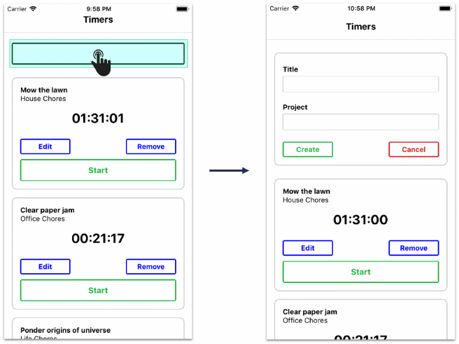
React Fundamentals 106
With TimerForm refactored, we’ve finished establishing our stateful data inside our components.
And we’ve assembled our downward data pipeline, props.
We’re ready — and perhaps a bit eager — to build out interactivity using inverse data flow. But
before we do, let’s save and reload the app to ensure everything is working.
Try it out
We expect to see new example timers based on the hardcoded data in App. We also expect pressing
the “+” button toggles open a form:
Step 6: Add inverse data flow
As we saw in the last chapter, children communicate with parents by calling functions that are
provided to them via props. In our weather app, when our search field was submitted with a value,
SearchInput didn’t do any data management. Instead, it called a function given to it by App, which
was then able to manage state accordingly.
We are going to need inverse data flow in two areas:
•TimerForm needs to propagate create and update events (create while under ToggleableTimerForm
and update while under EditableTimer). Both events will eventually reach our top level App.
•Timer has a fair amount of behavior. It needs to handle delete and edit press, as well as the
start and stop timer logic.
Let’s start with TimerForm.

React Fundamentals 107
TimerForm
To get a clear idea of what exactly TimerForm will require, we’ll start by adding event handlers to it
and then we’ll work our way backwards up the hierarchy.
TimerForm needs two event handlers:
• When the form is submitted (creating or updating a timer)
• When the “Cancel” button is pressed (closing the form)
TimerForm will receive two functions as props to handle each event. The parent component that uses
TimerForm is responsible for providing these functions:
•props.onFormSubmit(): called when the form is submitted
•props.onFormClose(): called when the “Cancel” button is pressed
As we’ll see soon, this enables the parent component to determine what the behavior should be
when these events occur.
Let’s first add onFormClose to the props being destructured in the component’s render method:
time-tracking/3/components/TimerForm.js
render() {
const { id, onFormClose } =this.props;
We’ll then modify the buttons on TimerForm by specifying onPress props for each:
time-tracking/3/components/TimerForm.js
<View style={styles.buttonGroup}>
<TimerButton
small
color="#21BA45"
title={submitText}
onPress={this.handleSubmit}
/>
<TimerButton
small
color="#DB2828"
title="Cancel"
onPress={onFormClose}
/>
</View>

React Fundamentals 108
The onPress prop for the “Submit” button specifies the function this.handleSubmit, which we’ll
define next. The onPress prop for the “Cancel” button specifies the prop onFormClose directly.
Now that we’ve seen how we’ll use handleSubmit, let’s write it. Declare this function above
render():
time-tracking/3/components/TimerForm.js
handleSubmit =() => {
const { onFormSubmit, id } =this.props;
const { title, project } =this.state;
onFormSubmit({
id,
title,
project,
});
};
Again, we’re working bottom-up right now. So the handleSubmit() method calls the anticipated
function onFormSubmit() which we’ll write in a moment. It passes in a data object with id,title,
and project attributes.
Notice that we’re reading id via props and reading title and project from state. This is because we
want to supply the function with the up-to-date values of title and project (in state) as opposed
to the initial values (supplied as props).
ToggleableTimerForm
Let’s follow the submit event from TimerForm as it bubbles up the component hierarchy. First, we’ll
modify ToggleableTimerForm. We need it to define and pass down two prop-functions to TimerForm:
onFormClose() and onFormSubmit().
Let’s update the component’s render() method first:
time-tracking/4/components/ToggleableTimerForm.js
render() {
const { isOpen } =this.state;
return (
<View style={[styles.container, !isOpen && styles.buttonPadding]}>
{isOpen ?(
<TimerForm
onFormSubmit={this.handleFormSubmit}
onFormClose={this.handleFormClose}

React Fundamentals 109
/>
):(
<TimerButton title="+" color="black" onPress={this.handleFormOpen} />
)}
</View>
);
}
We pass in two functions as props to TimerForm. As we’ve seen, functions are just like any other
prop.
Let’s write handleFormClose() first:
time-tracking/4/components/ToggleableTimerForm.js
handleFormClose =() => {
this.setState({ isOpen:false });
};
Now, what might handleFormSubmit() look like? ToggleableTimerForm is not the manager of timer
state. So ToggleableTimerForm should expect a new prop, onFormSubmit() from App.ToggleableTimerForm
should, in turn, pass this down to TimerForm. When the user submits a form down in TimerForm,
they’ll be invoking a function defined up in App that modifies the timer state. ToggleableTimerForm
is just a proxy of this function.
So, we might be tempted to just pass this anticipated prop-function directly to TimerForm like this:
<TimerForm
onFormSubmit={this.props.onFormSubmit}
onFormClose={this.handleFormClose}
/>
However, consider this: after the user clicks “Create” to create a timer, we actually want to close
ToggleableTimerForm. We’ll want to intercept this event so that we can set isOpen to false.
To do this, here’s what handleFormSubmit() looks like:

React Fundamentals 110
time-tracking/4/components/ToggleableTimerForm.js
handleFormSubmit =timer => {
const { onFormSubmit } =this.props;
onFormSubmit(timer);
this.setState({ isOpen:false });
};
The handleFormSubmit() method accepts the argument timer and passes it along to onFormSubmit().
Recall that in TimerForm this argument is an object containing the desired timer properties. After
invoking onFormSubmit(),handleFormSubmit() calls setState() to close its form.
Although we’re not adding server communication in this chapter, let’s try and visualize how
submitting the form would work if we did.
The result of onFormSubmit() will not impact whether or not the form is closed. We invoke
onFormSubmit(), which may eventually create an asynchronous call to a server. Execution
will continue before we hear back from the server which means setState() will be called.
If onFormSubmit() fails — such as if the server is temporarily unreachable — we’d ideally
have some way to display an error message and re-open the form.
App
We’ve reached the top of the hierarchy, our root App component. As this component will be
responsible for the data for the timers, it is here that we will define the logic for handling the events
we’re capturing down at the lowest-level components.
The first event we’re concerned with is the submission of a form (i.e. events from TimerForm). When
this happens, either a new timer is being created or an existing one is being updated. We’ll create
two separate functions to handle these two distinct events:
•handleCreateFormSubmit() will handle creating timers and will be the function passed to
ToggleableTimerForm
•handleFormSubmit() will handle updating timers and will be the function passed to EditableTimer
Both functions travel down their respective component hierarchies until they reach TimerForm as
the prop onFormSubmit().
Let’s start with handleCreateFormSubmit().
Handling creates
handleCreateFormSubmit() will be the function App will supply to ToggleableTimerForm. Let’s set
that prop now:

React Fundamentals 111
time-tracking/3/App.js
<ToggleableTimerForm onFormSubmit={this.handleCreateFormSubmit} />
Next, we’ll define the function.
For creating timers, we’ll be using the function newTimer() from utils/TimerUtils.js. This just
hides some logic, like generating ids. Here’s what it looks like:
time-tracking/utils/TimerUtils.js
export const newTimer =(attrs ={}) => {
const timer ={
title:attrs.title || 'Timer',
project:attrs.project || 'Project',
id:uuidv4(),
elapsed: 0,
isRunning:false,
};
return timer;
};
The function accepts an object with timer and project properties and returns a new object with the
rest of the properties properly initialized.
Import that function at the top of App.js:
time-tracking/3/App.js
import { newTimer } from './utils/TimerUtils';
Inside handleCreateFormSubmit(), we’ll use newTimer() to insert a new timer object into state.
Declare this function above render():
time-tracking/3/App.js
handleCreateFormSubmit =timer => {
const { timers } =this.state;
this.setState({
timers:[newTimer(timer), ...timers],
});
};

React Fundamentals 112
Note that we set this.state.timers to a new array of timers. The first element in the array is our
new timer, created with newTimer(). Then, we use JavaScript’s spread syntax to add the rest of our
existing timers to this new array. We do this to avoid mutating state.
The tempting alternative is to write handleCreateFormSubmit() like this:
handleCreateFormSubmit =timer => {
const { timers } =this.state;
this.setState({
timers:timers.push(newTimer(timer)), // mutates state!
});
};
But .push() appends the new timer to the existing array in state. It’s subtle, but this mutates
state. And we never want to mutate state outside of the this.setState() method.
We always want to treat the state object (and the objects and arrays inside state) as
immutable. Writing immutable JavaScript can be tricky at first. A simple strategy is to just
avoid using certain Array and Object methods. .push() is one method to avoid, as it always
mutates the array it is called on.
If you still find the distinction between .push() and the spread syntax confusing, don’t
worry. We’ll be showcasing strategies for how to avoid accidental state mutations through-
out the book.
Spread syntax
In arrays, the ellipsis (…) will expand the array that follows into the parent array. The spread
operator enables us to succinctly construct new arrays as a composite of existing arrays:
const a=[1,2,3];
const b=[4,5,6];
const c=[ ...a, ...b, 7,8,9];
console.log(c); // -> [ 1, 2, 3, 4, 5, 6, 7, 8, 9 ]
In objects, the ellipsis (…) will allow you to create a modified version of an existing object:
const coffee ={ milk:false, cream:false };
const coffeeWithMilk ={ ...coffee, milk:true };
console.log(coffeeWithMilk); // -> { milk: true, cream: false }
This can be useful when working with immutable JavaScript objects.
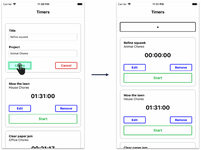
React Fundamentals 113
Try it out
Now we’ve finished wiring up the create timer flow from the form down in TimerForm up to the
state managed in App. Save App.js and your app should reload. Toggle open the create form and
create some new timers:
Updating timers
Our app is setup for creating timers. Let’s add updates next.
We know we’ll eventually want App to define a handler, onFormSubmit(), for when TimerForm
submits a timer update. However, as you can see in the current state of the app, we haven’t yet
added the ability for a timer to be edited. We don’t yet have a way to display an edit form which
will be a prerequisite to submitting one.
To display an edit form, the user will press on the edit button on a Timer. This should propagate an
event up to EditableTimer and tell it to flip its child component, opening the form.
We’ll work from the bottom-up again. We’ll start with Timer, specify the prop-functions that it needs,
then move up the component hierarchy.
Adding editability to Timer
Since we’ll be adding a fair bit of functionality to Timer, we’ll first convert it into a class component:

React Fundamentals 114
time-tracking/4/components/Timer.js
export default class Timer extends React.Component {
EditableTimer manages the state of whether or not the edit form is open. So, we’ll expect Timer to
receive a prop from its parent, onEditPress(). We’ll set the onPress prop on the “Edit” TimerButton
to this prop:
time-tracking/4/components/Timer.js
render() {
const { elapsed, title, project, onEditPress } =this.props;
const elapsedString =millisecondsToHuman(elapsed);
return (
<View style={styles.timerContainer}>
<Text style={styles.title}>{title}</Text>
<Text>{project}</Text>
<Text style={styles.elapsedTime}>{elapsedString}</Text>
<View style={styles.buttonGroup}>
<TimerButton color="blue" small title="Edit" onPress={onEditPress} />
<TimerButton color="blue" small title="Remove" />
</View>
<TimerButton color="#21BA45" title="Start" />
</View>
);
}
Updating EditableTimer
Now we’re prepared to update EditableTimer. Again, it will display either the TimerForm (if we’re
editing) or an individual Timer (if we’re not editing).
Let’s add event handlers for both possible child components. For TimerForm, we want to handle the
form being closed or submitted. For Timer, we want to handle the edit button being pressed:

React Fundamentals 115
time-tracking/4/components/EditableTimer.js
export default class EditableTimer extends React.Component {
state ={
editFormOpen:false,
};
handleEditPress =() => {
this.openForm();
};
handleFormClose =() => {
this.closeForm();
};
handleSubmit =timer => {
const { onFormSubmit } =this.props;
onFormSubmit(timer);
this.closeForm();
};
closeForm =() => {
this.setState({ editFormOpen:false });
};
openForm =() => {
this.setState({ editFormOpen:true });
};
We pass these event handlers down as props:
time-tracking/4/components/EditableTimer.js
render() {
const { id, title, project, elapsed, isRunning } =this.props;
const { editFormOpen } =this.state;
if (editFormOpen) {
return (
<TimerForm
id={id}
title={title}
project={project}

React Fundamentals 116
onFormSubmit={this.handleSubmit}
onFormClose={this.handleFormClose}
/>
);
}
return (
<Timer
id={id}
title={title}
project={project}
elapsed={elapsed}
isRunning={isRunning}
onEditPress={this.handleEditPress}
/>
);
}
Look a bit familiar? EditableTimer handles the same events emitted from TimerForm in a similar
manner as ToggleableTimerForm. This makes sense. Both EditableTimer and ToggleableTimerForm
are just intermediaries between TimerForm and App.App is the one that defines the submit function
handlers.
Like ToggleableTimerForm,EditableTimer doesn’t do anything with the incoming timer. In
handleSubmit(), it just blindly passes this object along to its prop-function onFormSubmit(). It then
closes the form with closeForm().
We pass along our new prop to Timer,onEditPress. The behavior for this function is defined in
handleEditPress, which modifies the state for EditableTimer, opening the form.
Defining handleFormSubmit() in App
Like we did with handleCreateFormSubmit(), the last step with this pipeline is to define a handler
for edit form submits up in App,handleFormSubmit().
For creating timers, we have a function that creates a new timer object with the specified attributes
and we prepend this new object to the beginning of the timers array in state.
For updating timers, we need to hunt through the timers array until we find the timer object that is
being updated. As always, the state object cannot be updated directly. We have to use setState().
Therefore, we’ll use map() to traverse the array of timer objects. If the timer’s id matches that of
the form submitted, we’ll return a new object that contains the timer with the updated attributes.
Otherwise we’ll just return the original timer. This new array of timer objects will be passed to
setState():

React Fundamentals 117
time-tracking/4/App.js
handleFormSubmit =attrs => {
const { timers } =this.state;
this.setState({
timers:timers.map(timer => {
if (timer.id === attrs.id) {
const { title, project } =attrs;
return {
...timer,
title,
project,
};
}
return timer;
}),
});
};
Note that we call map() on timers from within the JavaScript object we’re passing to setState().
This is an often used pattern. The call is evaluated and then the property timers is set to the result.
Inside of the map() function we check if the timer matches the one being updated by comparing
their id attributes. If not, we just return the timer. Otherwise, we use the spread operator again to
return a new object with the timer’s updated attributes.
Remember, it’s important here that we treat state as immutable. By creating a new timers object and
then using the spread operator to populate it, we’re not modifying any of the objects sitting in state.
We pass this method down as a prop inside render() to EditableTimer:
time-tracking/4/App.js
{timers.map(({ title, project, id, elapsed, isRunning }) => (
<EditableTimer
key={id}
id={id}
title={title}
project={project}
elapsed={elapsed}
isRunning={isRunning}
onFormSubmit={this.handleFormSubmit}
/>
))}
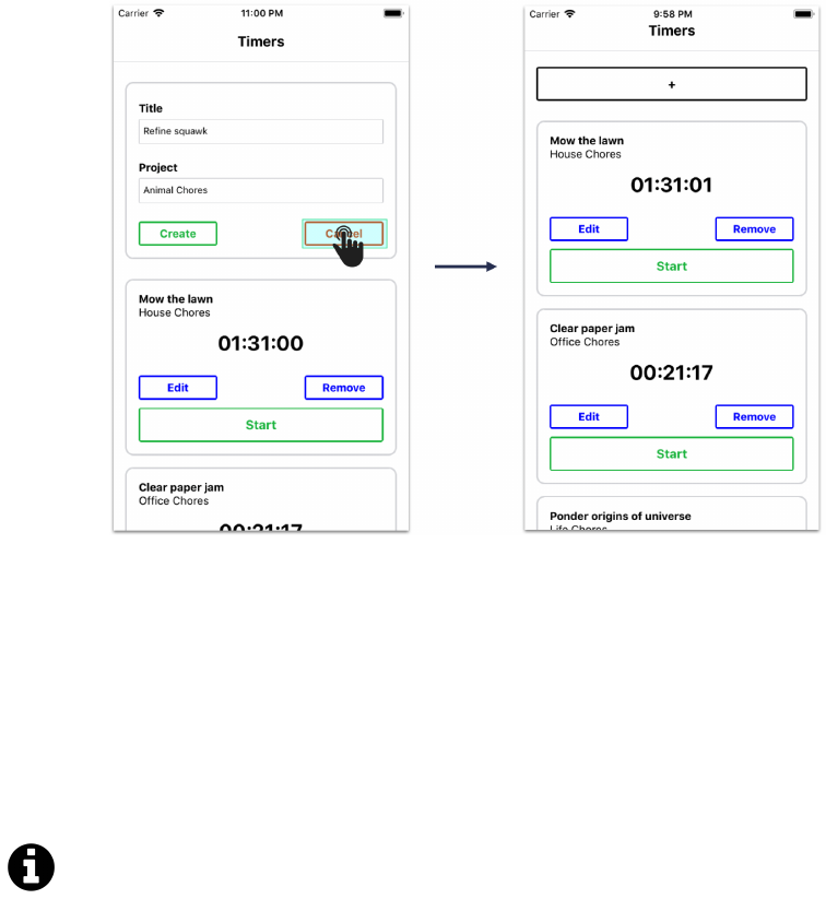
React Fundamentals 118
As we did with ToggleableTimerForm and handleCreateFormSubmit, we pass down handleFormSubmit
as the prop onFormSubmit.TimerForm calls this prop, oblivious to the fact that this function is entirely
different when it is rendered underneath EditableTimer as opposed to ToggleableTimerForm.
Try it out
Both of the forms are wired up! Save App.js, and after your app reloads, try both creating and
updating timers. You can also press “Cancel” on an open form to close it:
Note that the keyboard might get in the way when you’re typing into an edit form. We’ll address
this at the end of the chapter by using the KeyboardAvoidingView component in App.
The rest of our work resides within the timer. We need to:
• Wire up the “Remove” button
• Implement the start/stop buttons and the timing logic itself
Try it yourself
Feeling ambitious? Before moving on to the next section, see how far you can get wiring up
the “Remove” button by yourself. Move ahead afterwards and verify your solution is sound.

React Fundamentals 119
Deleting timers
Adding the event handler to Timer
As with adding create and update functionality, we’ll work from the bottom-up. We’ll start in Timer
and work our way up to App. In App is where we’ll define the function that removes the targeted
timer from state.
In Timer, we’ll begin by defining the function for handling “Remove” button press events:
time-tracking/5/components/Timer.js
handleRemovePress =() => {
const { id, onRemovePress } =this.props;
onRemovePress(id);
};
We’ve yet to define the function that will be set as the prop onRemovePress(). But you can imagine
that when this event reaches the top (App), we’re going to need the id to sort out which timer is
being deleted. The handleRemovePress() method provides the id to this function.
We use onPress to connect that function to the “Remove” TimerButton:
time-tracking/5/components/Timer.js
<TimerButton
color="blue"
small
title="Remove"
onPress={this.handleRemovePress}
/>
Routing through EditableTimer
In EditableTimer, we include onRemovePress in the destructured props in the component’s render
method:

React Fundamentals 120
time-tracking/5/components/EditableTimer.js
render() {
const {
id,
title,
project,
elapsed,
isRunning,
onRemovePress,
}=this.props;
We then pass the function along to Timer:
time-tracking/5/components/EditableTimer.js
<Timer
id={id}
title={title}
project={project}
elapsed={elapsed}
isRunning={isRunning}
onEditPress={this.handleEditPress}
onRemovePress={onRemovePress}
/>
Implementing the remove function in App
The last step is to define the function in App that removes the desired timer from the state array.
There are many ways to accomplish this in JavaScript. If you attempted to implement this solution
on your own, don’t sweat it if your solution was not the same.
We add our handler function that we will ultimately pass down as a prop:
time-tracking/5/App.js
handleRemovePress =timerId => {
this.setState({
timers:this.state.timers.filter(t => t.id !== timerId),
});
};
Here, we use the Array filter() method to return a new array without the timer object that has an
id matching timerId.
Finally, we pass down handleRemovePress() as a prop:
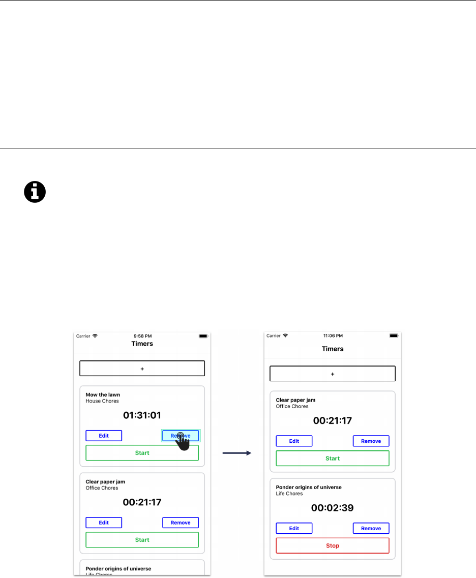
React Fundamentals 121
time-tracking/5/App.js
<EditableTimer
key={id}
id={id}
title={title}
project={project}
elapsed={elapsed}
isRunning={isRunning}
onFormSubmit={this.handleFormSubmit}
onRemovePress={this.handleRemovePress}
/>
Array filter()
Array filter() accepts a function that is used to “test” each element in the array. It returns
a new array containing all the elements that “passed” the test. If the function returns true,
the element is kept.
Try it out
Save App.js and reload the app. Now you can delete timers:

React Fundamentals 122
Adding timing functionality
Functionality for creating, updating, and deleting is now in place for our timers. The next challenge:
making these timers actually track time.
There are several different ways we can implement a timer system. The simplest approach would
be to have a function update the elapsed property on each timer every second. This is why we’ve
included the timer property isRunning. We can do something like this:
this.setState({
timers:timers.map(timer => {
const { elapsed, isRunning } =timer;
return {
...timer,
elapsed:isRunning ?elapsed + 1000 : elapsed,
};
}),
});
We map through all the timers in state and check the value of isRunning. If isRunning is true, we
can add 1000 milliseconds (or 1 second) to elapsed.
Now, to make this work we’ll need to do this every second. We can use JavaScript’s setInterval()
to execute this function on an interval.
Let’s set up our interval in componentDidMount:
time-tracking/6/App.js
componentDidMount() {
const TIME_INTERVAL = 1000;
this.intervalId =setInterval(() => {
const { timers } =this.state;
this.setState({
timers:timers.map(timer => {
const { elapsed, isRunning } =timer;
return {
...timer,
elapsed:isRunning ?elapsed +TIME_INTERVAL :elapsed,
};
}),

React Fundamentals 123
});
}, TIME_INTERVAL);
}
setInterval() accepts two arguments. The first argument is the function we’d like executed on an
interval. Here, we’re performing the logic to update elapsed. The second argument is the length
of the interval (or the delay between function invocations). We set that to TIME_INTERVAL, 1000
milliseconds.
We also capture the return value of setInterval(), setting the component variable this.intervalId.
This special identifier allows us to stop the interval at any point in the future using JavaScript’s cor-
responding clearInterval(). We’ll want to cancel (or “clear”) this interval if the timer component
is ever unmounted (deleted). Otherwise, our function will run on indefinitely and cause errors. We
can use the componentWillUnmount lifecycle hook for this:
time-tracking/6/App.js
componentWillUnmount() {
clearInterval(this.intervalId);
}
This is the first time we’re using componentWillUnmount. Like the name suggests, this method fires
right before a component is unmounted or removed. In this example, we use clearInterval() to
cancel the logic that updates our timers.
Using setInterval() when a component mounts and clearInterval() when a component un-
mounts is a common pattern in React apps that require interval events.
In our version of the app, App will never be unmounted. However, it is still best practice
to clear any intervals when a component unmounts. This “future proofs” our app. There
are many libraries, like “hot reloading” libraries, that would cause even the app’s main
component to be unmounted and re-mounted.
Although this timer implementation works for our purposes, it is not the most accurate.
There is no guarantee that timers will be updated precisely every 1000 milliseconds and we
lose accuracy around starts and stops.
An example of a more precise approach would be defining a separate timer attribute, like
runningSince. We could then derive how long a timer has been running by calculating the
difference between the value of runningSince and the current time. If we saved this value
somewhere, it would also allow our timers to continue “running” even while the app is
closed.

React Fundamentals 124
Add start and stop functionality
With our interval in place, we just need to add the ability to flip the isRunning boolean on a given
timer.
The action button at the bottom of each timer should display “Start” if the timer is paused and
“Stop” if the timer is running. These presses will invoke functions defined in App that will modify
isRunning.
Add timer action events to Timer
We’ll start at the bottom again with Timer.
We’ll anticipate two prop-functions, onStartPress() and onStopPress(). Let’s write the button
press event handlers that will call these functions first:
time-tracking/6/components/Timer.js
handleStartPress =() => {
const { id, onStartPress } =this.props;
onStartPress(id);
};
handleStopPress =() => {
const { id, onStopPress } =this.props;
onStopPress(id);
};
We’re propagating the id property up to App so it knows which timer to start or stop.
Inside render(), we’ll anticipate a renderActionButton() method that conditionally shows the
correct button based on whether the timer is running or has stopped:

React Fundamentals 125
time-tracking/6/components/Timer.js
render() {
const { elapsed, title, project, onEditPress } =this.props;
const elapsedString =millisecondsToHuman(elapsed);
return (
<View style={styles.timerContainer}>
<Text style={styles.title}>{title}</Text>
<Text>{project}</Text>
<Text style={styles.elapsedTime}>{elapsedString}</Text>
<View style={styles.buttonGroup}>
<TimerButton color="blue" small title="Edit" onPress={onEditPress} />
<TimerButton
color="blue"
small
title="Remove"
onPress={this.handleRemovePress}
/>
</View>
{this.renderActionButton()}
</View>
);
}
Now let’s set up the JSX rendered within this method:
time-tracking/6/components/Timer.js
renderActionButton() {
const { isRunning } =this.props;
if (isRunning) {
return (
<TimerButton
color="#DB2828"
title="Stop"
onPress={this.handleStopPress}
/>
);
}
return (
<TimerButton

React Fundamentals 126
color="#21BA45"
title="Start"
onPress={this.handleStartPress}
/>
);
}
We could write this conditional inside of the component’s render() method. But, as we briefly
mentioned in the previous chapter, a common pattern in React is to use helper methods to do this.
Sometimes this helps with code clarity and readability. In renderActionButton(), we specifically
render one button or another based on this.props.isRunning.
Now we’ll need to run these events up the component hierarchy, all the way up to App where we’re
managing state.
Run the events through EditableTimer
In EditableTimer, we’ll need to pass onStartPress and onStopPress to Timer:
time-tracking/6/components/EditableTimer.js
render() {
const {
id,
title,
project,
elapsed,
isRunning,
onRemovePress,
onStartPress,
onStopPress,
}=this.props;
const { editFormOpen } =this.state;
if (editFormOpen) {
return (
<TimerForm
id={id}
title={title}
project={project}
onFormSubmit={this.handleSubmit}
onFormClose={this.handleFormClose}
/>
);

React Fundamentals 127
}
return (
<Timer
id={id}
title={title}
project={project}
elapsed={elapsed}
isRunning={isRunning}
onEditPress={this.handleEditPress}
onRemovePress={onRemovePress}
onStartPress={onStartPress}
onStopPress={onStopPress}
/>
);
}
We can define a single function that handles these props in App. It should hunt through the state
timers array using map, flipping isRunning when it finds the matching timer:
time-tracking/6/App.js
toggleTimer =timerId => {
this.setState(prevState => {
const { timers } =prevState;
return {
timers:timers.map(timer => {
const { id, isRunning } =timer;
if (id === timerId) {
return {
...timer,
isRunning: !isRunning,
};
}
return timer;
}),
};
});
};
When toggleTimer comes across the relevant timer within its map call, it sets the property isRunning
to the opposite of its value. This means it will stop a running timer and start a stopped timer.

React Fundamentals 128
Finally, we pass this function down to EditableTimer in the render method:
time-tracking/6/App.js
<EditableTimer
key={id}
id={id}
title={title}
project={project}
elapsed={elapsed}
isRunning={isRunning}
onFormSubmit={this.handleFormSubmit}
onRemovePress={this.handleRemovePress}
onStartPress={this.toggleTimer}
onStopPress={this.toggleTimer}
/>
Try it out
Save App.js, wait for the app to reload, and behold: you can now create, update, and delete timers
as well as actually use them to time things!
Again, for this app we won’t add server communication. Without it, our app’s data is ephemeral. If
we reload the app, the timers will reset.
Wrapping App in KeyboardAvoidingView
A behavioral quirk in our app so far has been that the keyboard can get in the way when we edit a
timer. As we saw in the first chapter, we can wrap our app in a KeyboardAvoidingView component

React Fundamentals 129
to address this.
In App.js, first import the component:
time-tracking/6/App.js
import React from 'react';
import uuidv4 from 'uuid/v4';
import {
StyleSheet,
View,
ScrollView,
Text,
KeyboardAvoidingView,
Next, wrap the ScrollView component with it:
time-tracking/6/App.js
render() {
const { timers } =this.state;
return (
<View style={styles.appContainer}>
<View style={styles.titleContainer}>
<Text style={styles.title}>Timers</Text>
</View>
<KeyboardAvoidingView
behavior="padding"
style={styles.timerListContainer}
>
<ScrollView contentContainerStyle={styles.timerList}>
<ToggleableTimerForm onFormSubmit={this.handleCreateFormSubmit} />
{timers.map(({ title, project, id, elapsed, isRunning }) => (
<EditableTimer
key={id}
id={id}
title={title}
project={project}
elapsed={elapsed}
isRunning={isRunning}
onFormSubmit={this.handleFormSubmit}
onRemovePress={this.handleRemovePress}
onStartPress={this.toggleTimer}

React Fundamentals 130
onStopPress={this.toggleTimer}
/>
))}
</ScrollView>
</KeyboardAvoidingView>
</View>
);
}
Finally, add this style to the styles object:
time-tracking/6/App.js
timerListContainer:{
flex: 1,
},
Our ScrollView will now accommodate the keyboard when we start typing into text inputs.
To finish up, let’s add PropTypes to our components. As discussed in the previous chapter, PropTypes
are nice to have in place when making additions or changes to a React Native app.
PropTypes
Let’s add PropTypes to each of our components beginning with EditableTimer:
time-tracking/components/EditableTimer.js
export default class EditableTimer extends React.Component {
static propTypes ={
id:PropTypes.string.isRequired,
title:PropTypes.string.isRequired,
project:PropTypes.string.isRequired,
elapsed:PropTypes.number.isRequired,
isRunning:PropTypes.bool.isRequired,
onFormSubmit:PropTypes.func.isRequired,
onRemovePress:PropTypes.func.isRequired,
onStartPress:PropTypes.func.isRequired,
onStopPress:PropTypes.func.isRequired,
};
For this component, all our props are required as we’re expecting App to always set them. Now let’s
take a look at Timer:

React Fundamentals 131
time-tracking/components/Timer.js
export default class Timer extends Component {
static propTypes ={
id:PropTypes.string.isRequired,
title:PropTypes.string.isRequired,
project:PropTypes.string.isRequired,
elapsed:PropTypes.number.isRequired,
isRunning:PropTypes.bool.isRequired,
onEditPress:PropTypes.func.isRequired,
onRemovePress:PropTypes.func.isRequired,
onStartPress:PropTypes.func.isRequired,
onStopPress:PropTypes.func.isRequired,
};
Similarly, we know each of the props for Timer should always be provided by EditableTimer. Let’s
add PropTypes and defaultProps for TimerButton:
time-tracking/components/TimerButton.js
TimerButton.propTypes ={
color:ColorPropType.isRequired,
title:PropTypes.string.isRequired,
small:PropTypes.bool,
onPress:PropTypes.func.isRequired,
};
TimerButton.defaultProps ={
small:false,
};
small is an optional prop with a default value of false. Our other props are all required. We’re also
using ColorPropType for our color prop in order to correctly validate if an appropriate color54 is
passed in. We’ll need to import it at the top of our file from react-native as well.
Our last two components that need prop validations are our form components. Let’s begin with
TimerForm:
54https://facebook.github.io/react-native/docs/next/colors.html

React Fundamentals 132
time-tracking/components/TimerForm.js
export default class TimerForm extends React.Component {
static propTypes ={
id:PropTypes.string,
title:PropTypes.string,
project:PropTypes.string,
onFormSubmit:PropTypes.func.isRequired,
onFormClose:PropTypes.func.isRequired,
};
static defaultProps ={
id:null,
title:'',
project:'',
};
For this component, we only pass in timer attributes (id,title, and project) if we’re editing
a timer form and not creating one. We’ve added appropriate default values for each. Now for
ToggleableTimerForm:
time-tracking/components/ToggleableTimerForm.js
export default class ToggleableTimerForm extends Component {
static propTypes ={
onFormSubmit:PropTypes.func.isRequired,
};
This component only takes a single required prop, onFormSubmit, which fires when we submit our
timer form.
Methodology review
While building our time-tracking app, we learned and applied a methodology for building React
apps. Again, those steps were:
1. Break the app into components
We mapped out the component structure of our app by examining the app’s working UI. We
then applied the single-responsibility principle to break components down so that each had
minimal viable functionality.
2. Build a static version of the app
Our bottom-level (user-visible) components rendered JSX based on static props, passed down
from parents.
React Fundamentals 133
3. Determine what should be stateful
We used a series of questions to deduce what data should be stateful. This data was represented
in our static app as props.
4. Determine in which component each piece of state should live
We used another series of questions to determine which component should own each piece of
state. App owned timer state data and ToggleableTimerForm and EditableTimer both held state
pertaining to whether or not to render a TimerForm.
5. Hardcode initial states
For the components that own state, we initialized state properties with hardcoded values.
6. Add inverse data flow
We added interactivity by decorating buttons with onPress handlers. These called functions
that were passed in as props down the hierarchy from whichever component owned the
relevant state being manipulated.
If we were planning to add server communication to our application, it would make sense to do it
now given we’ve completed setting up the base of our entire application.
Up next
With the first chapter, we explored the basics of React Native by building a weather app. In this
chapter, we dove deeper into the fundamentals of the React API by creating a more interactive
application with more components. Although we covered a number of important concepts including
a useful pattern for building React Native apps from scratch, we’ve so far only briefly covered each
of React Native’s built-in components, like View and Text. Over the next two chapters, we’ll examine
a number of React Native’s core components in greater detail.

Core Components, Part 1
What are components?
Components are the building blocks of any React Native application. We used components like View
and Text throughout the previous chapters to create the UI for our weather app and our timer app.
Out-of-the-box, React Native includes components for everything from form controls to rich media.
Up to this point, we’ve been using React Native components without fully exploring how they
work. In this chapter, we’ll study the most common built-in React Native components. Just as in
the previous chapters, we’ll build an application as we go. When we come across a new topic, we’ll
deep dive into that topic before we keep building. At the end of the chapter, you should have a solid
foundation of knowledge for using any React Native component – even the ones we don’t cover will
follow many of the same patterns.
UI abstraction
Components are an abstraction layer on top of the underlying native platform. On an iOS device,
a React Native component is ultimately rendered as a UIView. On Android, the same component
would be rendered as an android.view. As React Native expands to new platforms, the same code
should be able to render correctly on more and more devices.
React Native is already supported on the universal Windows platform55, Apple TV (part of
the main react-native repository56), React VR57, and the web58.
As you start building complex apps, you’ll likely run into cases where you want to use a feature that
exists on one platform but not the other. Platform-specific components exist for cases like these.
Generally, the component’s name will end with the name of the platform e.g. NavigatorIOS. As
we mentioned in the “Getting Started”, there are several ways to run different code on different
platforms – you will need to do this for platform-specific components.
Building an Instagram clone
In this chapter, we’ll use the most common React Native components to build an app that resembles
Instagram. We’ll build the main image feed with the components View,Text,Image and FlatList.
We’ll also build a comments screen using TextInput and ScrollView.
55https://github.com/Microsoft/react-native-windows
56https://github.com/facebook/react-native
57https://facebook.github.io/react-vr/
58https://github.com/necolas/react-native-web
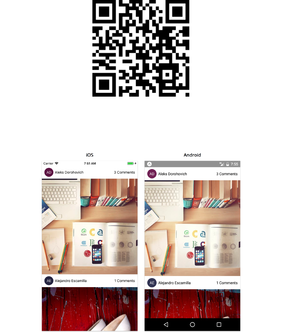
Core Components, Part 1 135
To try the completed app on your phone:
• On Android, you can scan this QR code from within the Expo app:
• On iOS, you can navigate to the image-feed/ directory within our sample code folder and build
the app using the same process in previous chapters. You can either preview it using the iOS
simulator or send the link of the project URL to your device.
Our app will have two screens. The first screen is the image feed:

Core Components, Part 1 136
The second screen opens when we tap “3 comments” to display comments for that image:
Project setup
Just as we did in the previous chapters, let’s create a new app with the following command:
$ create-react-native-app image-feed --scripts-version 1.14.0
Once this finishes, navigate into the image-feed directory.
Choose one of the following to start the app:
•yarn start - Start the Packager and display a QR code to open the app on your Android phone
•yarn ios - Start the Packager and launch the app on the iOS simulator
•yarn android - Start the Packager and launch the app on the Android emulator
You should see the default App.js file running, which looks like this:
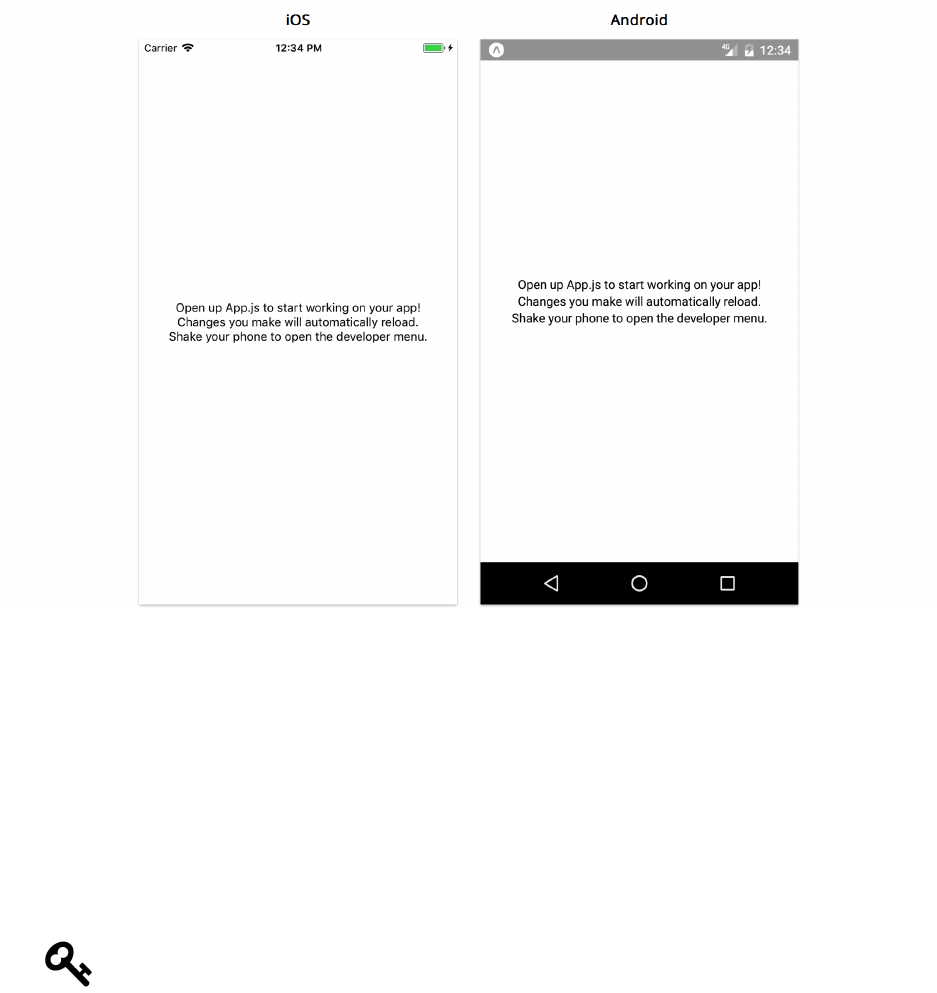
Core Components, Part 1 137
Now’s a good time to copy over the image-feed/utils directory from the sample code into your
own project. Copy the utils directory into the image-feed directory we just created.
How we’ll work
In this chapter, we’ll build our app following the same methodology as the previous chapter. We’ll
break the app into components, build them statically, and so on. We won’t specifically call out each
step, since it isn’t necessary to follow them exactly. They’re most useful as a reference for when
you’re unsure what to do next.
If at any point you get stuck when building an app of your own, consider identifying which
steps you’ve completed, and following the steps more closely until you’re back on track.
Breaking down the feed screen
We want to start thinking about our app in terms of the different components of our UI. Ultimately
our app will render built-in components like View and Text, but as we learned in the previous chapter,
it’s useful to build higher levels of abstraction on top of these. Let’s start by figuring out how our
main image feed might break down into components.
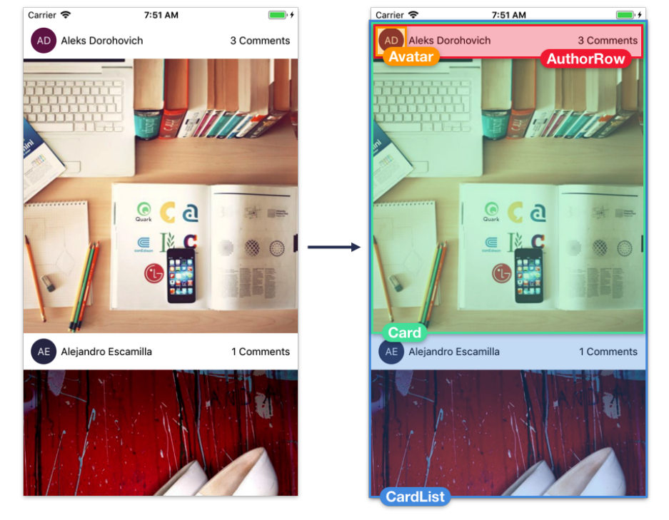
Core Components, Part 1 138
A good component is generally concise and self-contained. By looking at the screenshot we are trying
to build, we can identify which pieces are reasonably distinct from others and reused in multiple
places. Since we’re only building a couple screens, we won’t be able to make fully informed decisions
about which parts of the screenshots are most reusable as we don’t know what the other screens
in the app will look like. But we can make some pretty good guesses. Here’s one way we can break
down the main feed:
•Avatar - The profile photo or initials of the author of the image
•AuthorRow - The horizontal row containing info about the author: their avatar and their name
•Card - The item in the image feed containing the image and info about its author
•CardList - The list of cards in the feed
Each of these build upon one another: CardList contains a list of Card components, which each
contain an AuthorRow, which contains an Avatar.
Core Components, Part 1 139
Top-down vs. bottom-up
When it comes to building the UI components of an app, there are generally two approaches: top-
down and bottom-up. In a top-down approach, we would start by building the CardList component,
and then we would build the components within the CardList, and then the components within
those, and so on until we reach the inner-most component, Avatar. In a bottom-up approach, we
would start with the innermost components like Avatar, and keep building up higher levels of
abstraction until we get to the CardList. Choosing between these two approaches is mostly personal
preference, and it’s common to do a little of both.
For this app, we’re going to work bottom-up. We’ll start with the Avatar component, and then build
the AuthorRow which uses it, and so on.
Unlike the last chapter, we’ll focus on building one component at a time, testing each one as we go.
We can modify App.js to render just the component we’re currently working on.
As an example, if we were to do this for the Avatar component, we might modify the App.js file to
render just the Avatar:
// Inside App.js
render() {
return <Avatar />;
}
We might also hardcode different kinds of props for testing:
// Inside App.js
render() {
return <Avatar initials="FL" size={35} backgroundColor={'blue'}/>;
}
Isolating individual components like this is a useful technique when working with styles. A
component’s layout can change based on its parent – if we build a component within a specific
parent, we may end up with styles that closely couple the parent and child. This isn’t ideal, since
we want our components to look accurate within any parent for better reusability. We can easily
ensure that components work well anywhere by building components at the top level of the view
hierarchy, since the top level has the default layout configuration.
Now that we have our strategy locked down, let’s start with the Avatar component.
Avatar
Here’s what the Avatar should look like, when rendered in isolation:

Core Components, Part 1 140
For simple apps, it’s easiest to keep all of our components together in a components directory.
For more advanced apps, we might create directories within components to categorize them more
specifically. Since this app is pretty simple, let’s use a flat components directory, just like we did in
the previous chapters.
Let’s create a new directory called components and create a new file within that called Avatar.js.
Our avatar component is going to render the components View and Text. It’s going to use StyleSheet,
and it’s going to validate strings, numbers, and color props with PropTypes. Let’s import these things
at the top of the file. We also have to import React.
We’ll import React in this file, even though we don’t reference it anywhere. Behind-the-
scenes, babel compiles JSX elements into calls to React.createElement, which reference the
React variable.
Add the following imports to Avatar.js:
Core Components, Part 1 141
image-feed/1/components/Avatar.js
import { ColorPropType, StyleSheet, Text, View } from 'react-native';
import PropTypes from 'prop-types';
import React from 'react';
We import ColorPropType from react-native rather than PropTypes. The PropTypes
package contains validators for primitive JavaScript types like numbers and strings. While
colors in React Native are strings, they follow a specific format that can be validated – React
Native provides a handful of validators like ColorPropType for validating the contents of a
value rather than just its primitive type.
Now we can export the skeleton of our component:
image-feed/1/components/Avatar.js
export default function Avatar({ /* ... */ }) {
// ...
}
Since this component won’t need to store any local state, we’ll use the stateless functional
component style that we learned about in the previous chapter.
What should the props be for our avatar? We definitely need the initials to render. We also probably
want the size and background color to be configurable. With that in mind, we can define our
propTypes like this:
image-feed/1/components/Avatar.js
// ...
export default function Avatar({ size, backgroundColor, initials }) {
// ...
}
Avatar.propTypes ={
initials:PropTypes.string.isRequired,
size:PropTypes.number.isRequired,
backgroundColor:ColorPropType.isRequired,
};
// ...

Core Components, Part 1 142
In this app, we’ll make most of our props required using isRequired, since we’ll always pass every
prop. If we wanted to make our component more reusable, we could instead make its props optional
– but it’s hard to know which props should be optional until we actually try to reuse it!
It’s time to render the contents of our Avatar. For the colored circular background, we’ll render a
View. The View is the most common and versatile component. We’ve already used it throughout the
previous chapters, but now let’s take a closer look at how it works and how to style it.
View
There are two fairly distinct things we use View for:
• First, we use View for layout. A View is commonly used as a container for other components. If
we want to arrange a group of components vertically or horizontally, we will likely wrap those
components in a View.
• Second, we use View for styling our app. If we want to render a simple shape like a circle or
rectangle, or if we want to render a border, a line, or a background color, we will likely use a
View.
React Native components aim to be as consistent as possible – many components use similar props
as the View, such as style. Because of this, if you learn how to work with View, you can reuse that
knowledge with Text,Image, and nearly every other kind of component.
Avatar background
Let’s use View to create the circular background for our Avatar:
image-feed/1/components/Avatar.js
// ...
export default function Avatar({ size, backgroundColor, initials }) {
const style ={
width:size,
height:size,
borderRadius:size / 2,
backgroundColor,
}
return (
<View style={style} />
)
}

Core Components, Part 1 143
// ...
As we saw in previous chapters, we can use the style prop to customize the dimensions and colors
of our View component. Here, we instantiate a new object that we pass to the style prop of our
View. We can assign the size prop to the width and height attributes to specify that our View should
always be rendered as a perfect square. Adding a borderRadius that’s half the size of the width and
height will render our View as a circle. Lastly, we set the background color.
In this style object, the attributes are computed dynamically: width,height,borderRadius, and
backgroundColor are all derived from the component’s props. When we compute style objects
dynamically (i.e. when rendering our component), we define them inline – this means we create
a new style object every time the component is rendered, and pass it directly to the style prop of
our component.
When there are a lot of style objects defined inline, it can clutter the render method, making the
code harder to follow. For styles which aren’t computed dynamically, we should use the StyleSheet
API. We’ll practice this more in the next few sections.
Before that, let’s make sure what we have so far is working correctly.
Try it out
Let’s add our Avatar component to App. We haven’t finished Avatar yet, but it’s useful to test as we
go in case we’ve introduced any errors.
Open up App.js and import our Avatar after our other imports:
image-feed/1/App.js
import Avatar from './components/Avatar';
Next, modify the render function to render an Avatar:
image-feed/1/App.js
// ...
export default class App extends React.Component {
render() {
return (
<View style={styles.container}>
<Avatar initials={'FL'} size={35} backgroundColor={'teal'}/>
</View>
);
}
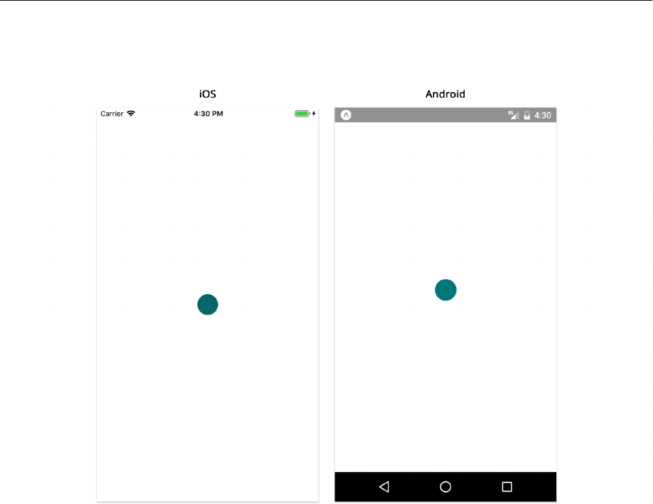
Core Components, Part 1 144
}
// ...
For any props we didn’t include, the Avatar will use its defaultProps. We should see a 35px teal
circle in the center of the screen:
Regardless of the size of your screen, the teal circle will render in the center. This means React
Native is calculating the center of the screen, calculating the dimensions of the Avatar, and using
these calculations to properly position the View component. As we learned in the “Getting Started”
chapter, the React Native layout engine is based on the flexbox algorithm. Let’s start digging into
how layout works: how does React Native know the dimensions for each component and where to
render it on the screen?
Dimensions
The first thing we want to think about when understanding the layout of a screen is the dimensions
of each component. A component must have both a non-zero width and height in order to render
anything on the screen. If the width is 0, then nothing will render on the screen, no matter how large
the height is.

Core Components, Part 1 145
In our Avatar example, we rendered our View with fixed dimensions by specifying an exact width
and height as part of the style prop. This is the simplest way to specify component dimensions.
Our View will always render at exactly 35px by 35px, regardless of the screen size or the components
within it.
In the case of Avatar, this is exactly the behavior we want. However, in many cases we want our
layout to automatically adapt to different screen sizes.
Our App renders a View that fills the entire screen, yet we never specified a fixed width or height. If
you look at the StyleSheet.create call at the bottom of App.js, you’ll see the style attribute flex:
1.
image-feed/1/App.js
const styles = StyleSheet.create({
container: {
flex: 1,
backgroundColor: '#fff',
alignItems: 'center',
justifyContent: 'center',
},
});
We can use flex to adapt our layout to different screen sizes.
Flex
The flex style attribute gives us the ability to define layouts that can expand and shrink automat-
ically based on screen size. The flex value is a number that represents the ratio of space that a
component should take up, relative to its siblings.
If a component has no siblings, as in the case of the top-level View rendered by App, things are
straightforward:
• with a flex of 1, the component will expand to fill its parent entirely
• with a flex value of 0, the component will shrink to the minimum space possible (just large
enough for the component’s children to be visible, if it has any)
Since the View in App has a flex value of 1, it expands to fill its parent, which in this case is the
entire screen. Now we know why this View expands to fill the screen, but how does React Native
know to render the Avatar (and its underlying View) in the center of the screen?
Core Components, Part 1 146
Layout
We can apply three style attributes to a parent component in order to specify the layout of its
children. That is, we can specify where children render within a parent. The attributes are:
•flexDirection
•justifyContent
•alignItems
With these attributes, we can achieve nearly any kind of layout.
flexDirection
The first attribute is flexDirection. The flexDirection we choose defines the primary axis. Children
components are laid out along the primary axis. The orthogonal axis is called the secondary axis.
The possible values for flexDirection are:
•column: for a vertical layout (the default)
•row: for a horizontal layout
•column-reverse: the same as column but flipped vertically
•row-reverse: the same as row but flipped horizontally
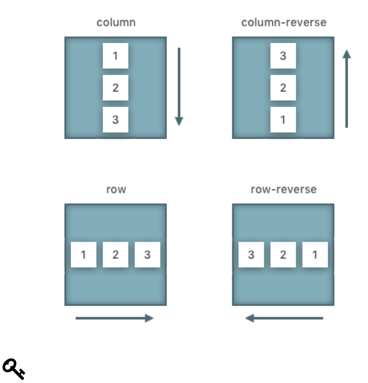
Core Components, Part 1 147
The names are a little confusing at first, because when you hear “row”, you might think we’ll
get a layout with multiple rows – but in fact, this is saying that our layout is a row.
justifyContent
Next we’ll use the justifyContent attribute to distribute children along the primary axis. The
possible values are:
•flex-start: Distribute children at the start of the primary axis (the default)
•flex-center: Distribute children at the center of the primary axis
•flex-end: Distribute children at the end of the primary axis
•space-around: Distribute children evenly, including space at the edges
•space-between: Distribute children evenly, without any space at the edges
The following diagram depicts the possible values for justifyContent in both row and column
layouts. Remember, the flexDirection sets the primary and orthogonal axes, so our choice of
flexDirection will determine the meaning of justifyContent.

Core Components, Part 1 148
alignItems
Lastly, we’ll use the alignItems attribute to align children along the secondary axis. Possible values
are:
•flex-start: Align children at the start (the default)
•flex-center: Align children at the center
•flex-end: Align children at the end
•stretch: Stretch children to fill the entire width/height of the secondary axis
The following diagram depicts the possible values for alignItems, in both row and column layouts.
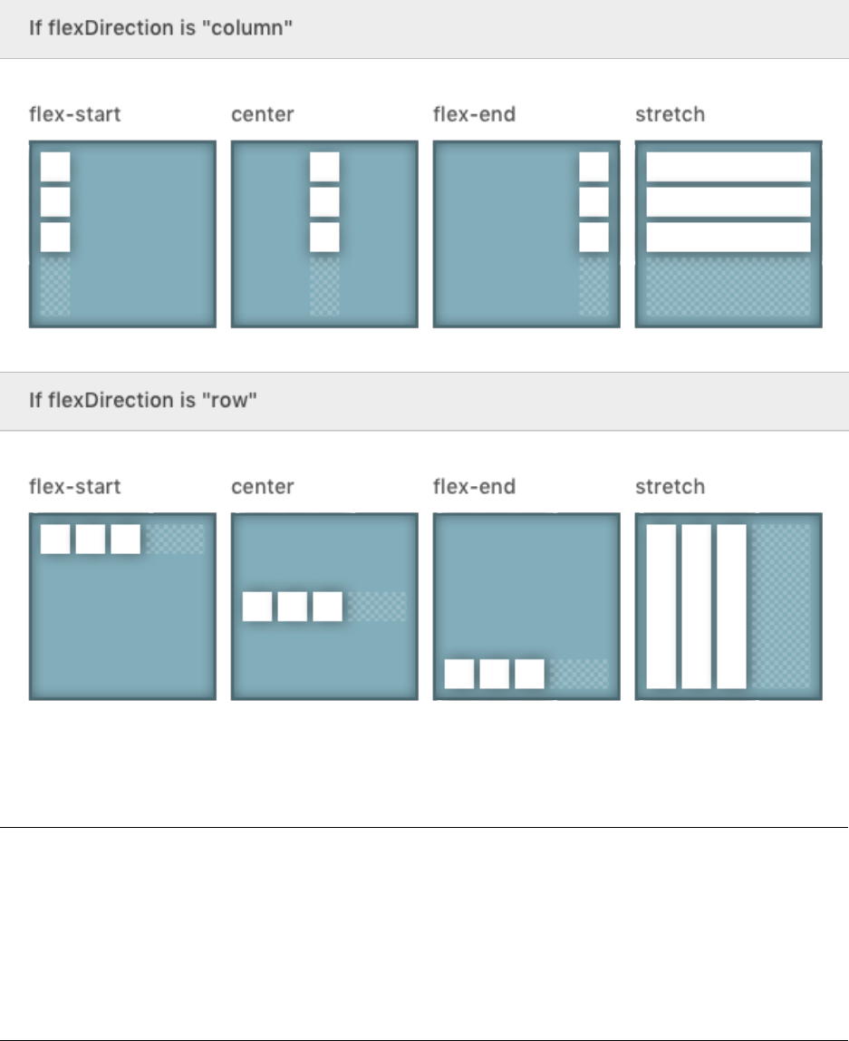
Core Components, Part 1 149
Take another look at the container style in StyleSheet.create at the bottom of App.js:
image-feed/1/App.js
const styles =StyleSheet.create({
container:{
flex: 1,
backgroundColor:'#fff',
alignItems:'center',
justifyContent:'center',
},
});
Let’s figure out how this style centers the Avatar within the View. This style object doesn’t contain
a value for the flexDirection attribute, so instead it’ll use the default value, column. This means the

Core Components, Part 1 150
primary axis is the vertical axis and the secondary axis is the horizontal axis. The justifyContent:
'center' distributes the Avatar to the center of the vertical axis. The alignItems: 'center' aligns
the Avatar in the center of the horizontal axis.
Flex and the primary axis
Now that we know how flexDirection and axes work, let’s revisit how this top-level View uses flex
to fill the entire screen.
The flex attribute of a component determines only its dimension along the primary axis. This means
that, just like for justifyContent and alignItems, we need to know what the flexDirection is in
order to use flex correctly.
In the case of our View in App, it’s best to imagine this View is actually the child of another wrapper
View that fills the entire screen. This wrapper View has the default style attributes for flexDirection,
justifyContent, and alignItems. In other words, the top-level View that we render is actually inside
a parent with style:
{
flexDirection:'column',
justifyContent:'flex-start',
alignItems:'stretch'
}
Our top-level View has a fullscreen height because we specify flex: 1, which stretches it across
the vertical axis. It has a fullscreen width because its parent uses alignItems: 'stretch', which
stretches the View across the horizontal axis.
What to do if a component doesn’t show up
Beginners and experts alike frequently run into the problem where a component doesn’t render
anything on the screen. The most common reason for this is that the component has dimensions
equal to 0.
When using flex: 0 or no flex attribute, a component will only have a dimension greater than
0along the primary axis if given explicitly (using a width or height attribute) or if its children
have dimensions greater than 0. Similarly, when using alignItems: 'stretch', a child will only
have dimensions greater than 0along the secondary axis if given explicitly or if the parent has
dimensions greater than 0.
Thus, when a component doesn’t show up on the screen, the first thing we should do is pass an
explicit width and height style attribute (and also a backgroundColor, just to make sure something
is visible). Once a component appears on the screen, we can start understanding the component
hierarchy and evaluating how to tweak our styles.
Core Components, Part 1 151
StyleSheet
Now that we have a better understanding of layouts, lets get back to creating our Avatar component.
As a reminder, here’s what we’re aiming for:
The next thing we’ll want to add is the text within the circular View. The text should be centered,
which we now know how to do using justifyContent and alignItems. Let’s do that now.
We previously used an inline style object for the style prop of View. For styles which don’t need
to be computed dynamically based on props, such as centering the content within the View, we
generally use a StyleSheet at the bottom of the file. Let’s go ahead and update Avatar.js with the
following:
Core Components, Part 1 152
image-feed/1/components/Avatar.js
// ...
export default function Avatar({ size, backgroundColor, initials }) {
const style ={
width:size,
height:size,
borderRadius:size / 2,
backgroundColor,
};
return (
<View style={[styles.container, style]} />
);
}
const styles =StyleSheet.create({
container:{
alignItems:'center',
justifyContent:'center',
},
});
In React Native, styles are most often defined below the component code in the same
file. When reading a file, generally the component is the primary concern, and styles are
secondary – this is why we put the component code first. This works because the variable
name styles is hoisted to the top of the file, and the code which defines its value is executed
before the code that accesses its value. As you may have noticed, we’ve been doing this since
the start of the book, and we’ll continue to do it throughout.
In this case, we always want the text to be centered on both axes, so we’ll use justifyContent:
'center' and alignItems: 'center'. As we saw in the “Getting Started” chapter, we can merge
both of our style objects together by passing an array as the style prop of View.
When centering a single child component within a View like this, any flexDirection will
result in the same layout, so we can use either.
Now that we’ve centered the contents of our View, let’s add the text for the initials. We’ll use Text
for this. We’ve used Text before, but let’s take a step back and look at it in-depth before we add it
to our avatar.
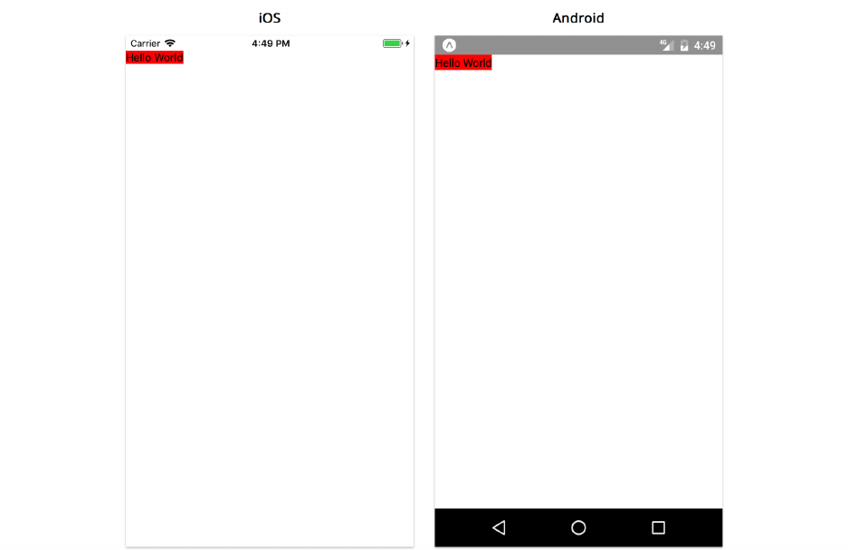
Core Components, Part 1 153
Text
We use the Text component to render text on the screen. Text can be styled with font-specific
attributes such as fontSize. It can use nearly all of the same styles as View, such as backgroundColor
and width. However, Text has some key differences when it comes to layout.
Text dimensions
Unlike the View component, Text components have an intrinsic size. In other words, if we don’t
specify a width or height, a Text component will still show up on the screen. If we were to put a
background color behind it to visualize the width and height, we could see that the background is
exactly the size of the text we see (plus or minus a little space, depending on the line height).
Rendering a Text component with:
<Text style={{ backgroundColor:'red' }}>
Hello World
</Text>
Gives us:
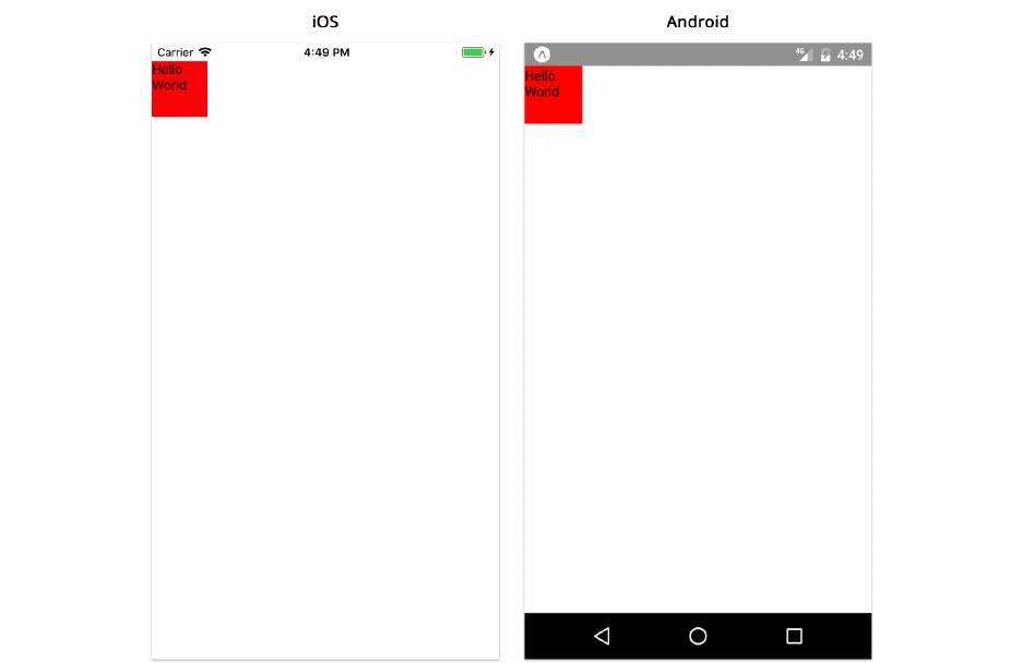
Core Components, Part 1 154
Specifying a width,height, or flex attribute as part of the style will override the intrinsic dimensions
of the Text. Rendering a Text component with:
<Text style={{ backgroundColor:'red', width: 60, height: 60 }}>
Hello World
</Text>
Gives us:
Text context will automatically wrap around by default when it fills the width of the component.
This is configurable with the numberOfLines prop.
Common Text props and styles
Here are a few common style attributes that you might want to use with text:
•color - A string representing the color of the text.
•fontFamily - A string with the name of the font family (this font family must already exist on
the device).
•fontSize - A number value equal to the size of the font in points.
•fontStyle - Either 'normal' or 'italic'.

Core Components, Part 1 155
•fontWeight - The thickness of each character. One of 'normal','bold','100','200','300',
'400','500','600','700','800', or '900'. If the chosen weight isn’t available on the device,
the nearest available weight will be used instead).
•textAlign - The text alignment. One of 'left','right','center','justify' (iOS only),
'auto'.
In addition, we use the following props frequently:
•numberOfLines - The number of lines to allow before truncating the text.
•ellipsizeMode - How text should be truncated when it exceeds numberOfLines. One of 'head',
'middle','tail','clip' (iOS only).
You can find the full list of props and styles for Text in the official docs59.
Like View elements, Text elements can have children. This is useful when you want to have multiple
styles of text within the same paragraph. The Text element will inherit styles from its parent. If the
parent has a fontSize of 16 and color of blue, a child Text element will have the same styles by
default. The child Text element can be styled to override its parent’s styles as needed.
Adding Text to Avatar
Let’s render and style a Text component to display the initials in the Avatar component:
image-feed/1/components/Avatar.js
// ...
export default function Avatar({ size, backgroundColor, initials }) {
const style ={
width:size,
height:size,
borderRadius:size / 2,
backgroundColor,
}
return (
<View style={[styles.container, style]}>
<Text style={styles.text}>{initials}</Text>
</View>
);
}
59https://facebook.github.io/react-native/docs/text.html
Core Components, Part 1 156
// ...
const styles =StyleSheet.create({
container:{
alignItems:'center',
justifyContent:'center',
},
text:{
color:'white',
},
});
After saving Avatar.js, you should see the following:
Since we don’t want our content centered on the screen, let’s update the styles in App.js to
render content starting at the top left. We can do this by removing alignItem and justifyContent.
Since we’re in a View with flexDirection: "column" (the default), we can use justifyContent:
"flex-start" (also the default) to distribute content starting at the top of the screen.
We also want to leave room at the top of the screen for the status bar. We’ll import Constants from
expo so we can use Constants.statusBarHeight.
Core Components, Part 1 157
The expo library provides a variety of APIs and components beyond those pro-
vided by react-native – these are available to us out-of-the-box since we’re using
create-react-native-app to create our app.
Add the following import to the top of App.js:
image-feed/1/App.js
import { Constants } from 'expo';
Then update the container style at the bottom of the file to:
image-feed/1/App.js
// ...
const styles =StyleSheet.create({
container:{
marginTop:Constants.statusBarHeight,
flex: 1,
backgroundColor:'#fff',
},
});
Now we should see our avatar at the top left of the screen, sitting just below the status bar.

Core Components, Part 1 158
In order to create the Avatar, we covered View,Text,StyleSheet, and layout with flexbox. These are
the built-in components and APIs required to build nearly any custom component in React Native.
We’ll spend most of the rest of the chapter using them to build other components in our image feed
app.
AuthorRow
Now that we’ve completed the Avatar, let’s move on to the next component! Let’s create the
horizontal row containing our Avatar and the full name of the photo author.
Core Components, Part 1 159
Create a new file AuthorRow.js in our components directory.
In this file, we’ll import mostly things we’ve seen already: StyleSheet,View,Text,PropTypes, and
React. We’ll also import a TouchableOpacity so that we can handle taps on the “Comments” text to
take us to the comments screen. We’ll also need to import the Avatar component we just made, and
a few of the utility functions we copied into this project at the start of the chapter.
If you haven’t copied over the utils directory from our sample code, you should do so now.
image-feed/1/components/AuthorRow.js
import { StyleSheet, Text, TouchableOpacity, View } from 'react-native';
import PropTypes from 'prop-types';
import React from 'react';
import Avatar from './Avatar';
import getAvatarColor from '../utils/getAvatarColor';
import getInitials from '../utils/getInitials';
Now let’s figure out the propTypes for the component. We’ll want to configure the full name we

Core Components, Part 1 160
display next to the Avatar and the text we use for the “Comments” link on the right side. We’ll also
want to propagate press events when the user taps the link.
image-feed/1/components/AuthorRow.js
// ...
export default function AuthorRow({ fullname, linkText, onPressLinkText }) {
}
AuthorRow.propTypes ={
fullname:PropTypes.string.isRequired,
linkText:PropTypes.string.isRequired,
onPressLinkText:PropTypes.func.isRequired,
};
// ...
Thinking about the layout of the component, we’ll want to have a View with flexDirection: 'row'.
Within this we’ll render an Avatar, a Text, and a TouchableOpacity.
Let’s start with the styles for the View and Text. Add this to the bottom of the file:
image-feed/1/components/AuthorRow.js
// ...
const styles =StyleSheet.create({
container:{
height: 50,
flexDirection:'row',
alignItems:'center',
paddingHorizontal: 10,
},
text:{
flex: 1,
marginHorizontal: 6,
},
});
We use flex: 1 so that Text expands to fill any remaining space in the View. This will push the
TouchableOpacity to the right side.
Now we can fill out the component function:

Core Components, Part 1 161
image-feed/1/components/AuthorRow.js
// ...
export default function AuthorRow({ fullname, linkText, onPressLinkText }) {
return (
<View style={styles.container}>
<Avatar
size={35}
initials={getInitials(fullname)}
backgroundColor={getAvatarColor(fullname)}
/>
<Text style={styles.text} numberOfLines={1}>
{fullname}
</Text>
{/* ... */}
</View>
);
}
// ...
We’ll use numberOfLines={1} so that the Text is truncated when it reaches the end of the line, rather
than wrapping around to multiple lines.
Now let’s render a TouchableOpacity to add the “Comments” link text and handle taps.
TouchableOpacity
The TouchableOpacity component is similar to View, but lets us easily respond to tap gestures in a
performant way. The TouchableOpacity component fades out when pressed, and fades back in when
released. The opacity animation happens on the native side (it doesn’t trigger a re-render), so the
animation is extremely smooth and the interaction is low latency. The opacity value when pressed
can be configured with the activeOpacity prop by providing a number from 0 to 1.
If you don’t like the opacity animation, you can instead use a TouchableHighlight for a background
color changing animation.
One minor inconvenience with both TouchableOpacity and TouchableHighlight: these components
can only have a single child element, so if we want multiple children, we will need to wrap them in
aView.

Core Components, Part 1 162
Adding TouchableOpacity to AuthorRow
Let’s render a TouchableOpacity for “Comments” to the right of the Text in our AuthorRow. We’ll
use the onPress prop of the TouchableOpacity to call our onPressLinkText prop.
image-feed/1/components/AuthorRow.js
export default function AuthorRow({ fullname, linkText, onPressLinkText }) {
return (
<View style={styles.container}>
<Avatar
size={35}
initials={getInitials(fullname)}
backgroundColor={getAvatarColor(fullname)}
/>
<Text style={styles.text} numberOfLines={1}>
{fullname}
</Text>
{!!linkText && (
<TouchableOpacity onPress={onPressLinkText}>
<Text numberOfLines={1}>{linkText}</Text>
</TouchableOpacity>
)}
</View>
);
}
We use !!linkText to conditionally render the <TouchableOpacity> element. The double negation
with !! lets us make sure we’re dealing with a boolean value.
Since linkText is a string, the && expression would evaluate to a string type when linkText
is the empty string '' – in React Native (unlike on the web), we’re not allowed to render
string values outside of Text (even empty strings).
Try it out
Let’s update App.js to render our AuthorRow component in order to test it:

Core Components, Part 1 163
image-feed/1/App.js
// ...
import AuthorRow from './components/AuthorRow';
export default class App extends React.Component {
render() {
return (
<View style={styles.container}>
<AuthorRow
fullname={'First Last'}
linkText={'Comments'}
onPressLinkText={() => {
console.log('Pressed link!');
}}
/>
</View>
);
}
}
// ...
Here’s what our AuthorRow should look like:
Core Components, Part 1 164
You can also try pressing the “Comments” text. The text’s opacity should animate and you’ll see
“Pressed link!” logged to the terminal.
In our AuthorRow, as in earlier chapters, we used the style attributes paddingHorizontal and
marginHorizontal to adjust the spacing between the different components we rendered. Let’s dive
into how these attributes work.
Padding, margin, borders, and the box model
The React Native layout engine uses what’s known as the box model for customizing spacing. You
might be familiar with the box model if you’ve developed for the web. There are three main style
attributes we can use:
•margin: This is the amount of space between a component and its siblings or the edge of its
parent’s content area.
•border: This is the border drawn around the component, which can vary in width, style (e.g.
a dashed line), and color.
•padding: this is the spacing within a component before its children components.
Each of these style attributes can have a different size on each side of the component: top, right,
bottom, and left. For example, if we wanted to set a top margin of 10 pixels, we would write
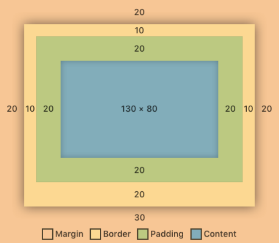
Core Components, Part 1 165
marginTop: 10 in the styles object. For convenience, we can set all four sides to have the same
size with margin: 10. We can also set vertical and horizontal margin with marginVertical: 10 and
marginHorizontal: 10. The more specific style attributes will override the more generic ones – if
we write margin: 10, marginTop: 20, the top will have a margin of 20, while the rest of the sides
will have a margin of 10. All of the same rules apply to padding and border too (except that for
border, the attribute is called borderWidth instead of border).
Here is an illustration of the box model:
In this example, there’s a margin of 20, a borderWidth of 10,padding of 20, and a content area of
130 wide by 80 tall. The borderWidth and margin on the bottom side are different than the rest: the
border on the bottom is 20, and the margin on the bottom is 30. Here’s how we might write the style
for this:
{
margin: 20,
borderWidth: 10,
padding: 20,
borderBottomWidth: 20
marginBottom: 30
};
When we use a fixed width or height, this includes the content area, the padding area, and the border
width. Margin is not counted in the width or height, since it is space outside of the component’s
edges. The width in this example is 10 + 20 + 130 + 20 + 10 = 190, and the height is 10 + 20 +
80 + 20 + 20 = 150.
Core Components, Part 1 166
We’ll continue using these spacing style attributes and the box model as we build the rest of the
components in our app.
Card
Next up, we’ll make the card containing AuthorRow and the Image component.
Since rendering Image components will be an important part of our app, let’s look at how images
work in more detail.
Image
We use the Image component to render images on the screen. There are two ways to include images
in an app: we can bundle an image asset with our code (which will then get stored on the device),
or we can download an image from a URI.
Bundling image assets
To bundle an image asset, we can require the image by name from our project directory just like
any other file. The React Native packager will give us a reference to this image (a number) that

Core Components, Part 1 167
represents the image’s metadata. The packager will automatically bundle images for multiple pixel
densities if we name them with the @suffix: .png for standard resolution, @2x.png for 2x resolution,
and @3x.png for 3x resolution. We can pass an image reference to the source prop of an Image to
render it.
For example, if we had a file called foo.png in the root directory of our app, we could use:
<Image source={require('./foo.png')} />
We won’t bundle any images in this app, however, since the images we want to display come from
the web. Instead, we’ll load remote images assets.
Remote image assets
To display an image from a URI, we must pass an object to the source prop of the Image component.
The object should contain a string value uri, and may optionally contain number values for width
and height (representing the image’s intrinsic dimensions, pre-calculated). The Image component
will automatically download the data from the URI and display it once loaded.
<Image source={{ uri:'https://unsplash.it/600/600' }} />
Since large images may take a while to download, we’ll often show a loading indicator of some sort
before the download has finished. We can pass a callback function to the onLoad prop of Image to
determine when the image has loaded. We’ll explore this shortly.
In this chapter, we’ll use the open API, https://unsplash.it, to fetch images for our image feed.
This API is very useful for testing apps that need placeholder images. We’ll use two API endpoints:
•https://unsplash.it/${width}/${height}: This endpoint gives us a random image. We can
use the query parameter image and pass the id of an image to fetch a specific image, e.g.
?image=10. We can specify the dimensions of the image by putting the desired width and
height in the URL. We’ll choose an arbitrary size, 600 x 600, for this app.
•https://unsplash.it/list: This endpoint gives us a list of image metadata objects. The
metadata object for each image contains an id which we can use for the image query parameter
of the previous endpoint.
We’ll be using two utility functions in utils/api.js:getImageFromId(id) and fetchImages().
These functions correspond to the two unsplash.it APIs, respectively.

Core Components, Part 1 168
Common image styles
We can use the resizeMode style (or prop – both work) to determine how the image is cropped in
the case where the image data’s intrinsic dimensions are different than the dimensions of the Image
component.
The options for resizeMode are:
•cover: The image scales uniformly to fill the Image component. The image will be cropped by
the bounding box of the component if they have different aspect ratios.
•contain: The image scales uniformly to fit within the component. The component’s background
color will show if they have different aspect ratios.
•stretch: The image stretches to fill the component.
•repeat: The image repeats itself at its intrinsic dimensions to fill the component (iOS-only).
•center: The image maintains its intrinsic dimensions, and is centered within the component.
We can use the aspectRatio style to render the image at a specific aspect ratio, regardless of its
intrinsic dimensions. We provide a number value which represents the ratio of width to height. For
example, if we set aspectRatio: 2, this means the ratio of width to height is 2 to 1 – the image will
render twice as wide as it is tall.
While most commonly used with images, the aspectRatio style can be used on any component,
such as View or Text.
If you’re coming from the web, you’ll likely find this style surprising since there’s no
equivalent style in CSS. The React Native layout engine, Yoga, added this style to its flexbox
implementation.
Yoga
React Native uses the Yoga layout engine (also from Facebook). This is a cross-platform implemen-
tation of the flexbox algorithm. It matches the algorithm used by web browsers pretty closely, but
with two important differences:
• The default values are different
• Yoga adds a couple new features that don’t exist in the browser (like aspectRatio)
If you want to read more about the algorithm and all of the styles available to use, check out the
Yoga docsa.
ahttps://facebook.github.io/yoga/

Core Components, Part 1 169
Adding Image to Card
Let’s set up the outline for our Card component and render an Image.
Create a new file Card.js in the components directory. Add the following to this file:
image-feed/1/components/Card.js
import { Image, StyleSheet, View } from 'react-native';
import PropTypes from 'prop-types';
import React from 'react';
import AuthorRow from './AuthorRow';
export default class Card extends React.Component {
static propTypes ={
fullname:PropTypes.string.isRequired,
image:Image.propTypes.source.isRequired,
linkText:PropTypes.string,
onPressLinkText:PropTypes.func,
};
static defaultProps ={
linkText:'',
onPressLinkText:() => {},
};
// ...
render() {
// ...
}
}
Most of the props we use here should look familiar: fullname,linkText, and onPressLinkText
will all get passed into the AuthorRow we created earlier. The interesting one is image – we use
Image.propTypes.source as the type, so that we can pass this directly into the source prop of the
Image we’ll render.
Let’s fill out the component function:

Core Components, Part 1 170
image-feed/1/components/Card.js
// ...
render() {
const { fullname, image, linkText, onPressLinkText } =this.props;
return (
<View>
<AuthorRow
fullname={fullname}
linkText={linkText}
onPressLinkText={onPressLinkText}
/>
<Image style={styles.image} source={image} />
</View>
);
}
// ...
const styles =StyleSheet.create({
image:{
aspectRatio: 1,
backgroundColor:'rgba(0,0,0,0.02)',
},
});
We’ll render a View (with the default style flexDirection: 'column') in order to vertically stack
our AuthorRow and Image component. Since the View style defaults to alignItems: 'stretch', the
image stretches horizontally to fill the screen. We use aspectRatio: 1 to make the height of the
Image match its full-screen width, rendering as a perfect square. We put a backgroundColor on the
Image which will show before the image loads, or behind the image if the image is transparent.
Try it out
To test this, let’s render our new Card from App. Update the component in App.js to the following:

Core Components, Part 1 171
image-feed/1/App.js
// ...
import Card from './components/Card';
export default class App extends React.Component {
render() {
return (
<View style={styles.container}>
<Card
fullname={'First Last'}
linkText={'Comments'}
onPressLinkText={() => {
console.log('Pressed link!');
}}
image={{ uri:'https://unsplash.it/600/600' }}
/>
</View>
);
}
}
// ...
When you save App.js, you should see our AuthorRow from earlier plus a random image on your
device:
Core Components, Part 1 172
Loading status
You might notice that we see the background color behind our image as we wait for it to load. Let’s
add a loading indicator before the image has fully loaded, to provide more feedback to the user.
We can pass a callback to the onLoad prop of Image in order to monitor the loading status. Let’s keep
track of the Image loading status in the state of our Card component. Update Card.js to include the
following:
image-feed/1/components/Card.js
export default class Card extends React.Component {
// ...
state ={
loading:true,
};
handleLoad =() => {
this.setState({ loading:false });
};

Core Components, Part 1 173
render() {
const { fullname, image, linkText, onPressLinkText } =this.props;
const { loading } =this.state;
return (
<View>
<AuthorRow
fullname={fullname}
linkText={linkText}
onPressLinkText={onPressLinkText}
/>
<Image style={styles.image} source={image} onLoad={this.handleLoad} />
</View>
);
}
}
Now we’re tracking when the image has fully loaded with state.loaded. Next we’ll render the
loading indicator when state.loaded is true.
ActivityIndicator
We can render a loading indicator using the ActivityIndicator component.

Core Components, Part 1 174
This component accepts all the same props as View, plus a few more:
•animating: A bool indicating whether to show or hide the indicator (defaults to true).
•color: The color of the spinner (defaults to gray).
•size: One of 'small' or 'large' (defaults to small).
We want to position the ActivityIndicator in the center of the image. Unlike View, the Image
component doesn’t accept a children prop, so we can’t put the ActivityIndicator inside it. We
could use the ImageBackground component like we did in the “Getting Started” chapter, but let’s
instead look at a more generic way we can stack components: position.
Position
So far we’ve mostly used the style attributes flexDirection,justifyContent, and alignItems in our
layouts. React Native gives us another powerful style attribute we can use to adjust layout: position.
Position can be either 'relative' or 'absolute'.
relative
When set to 'relative' (which is the default), we’re able to tweak the position of a component after
it has already been laid out according to its flex,width,height, etc. We can use a combination of
Core Components, Part 1 175
top,right,bottom, and left. For example, if we want to move a component down on the screen by
20 pixels, we could say top: 20 to indicate that its top should be 20 pixels greater than it is currently.
Unlike specifying padding,margin, or borderWidth, the style attributes like top don’t affect other
elements in the layout. In other words, adding top: 20 will change the position of the element it
was applied to, but not the position of the element’s siblings or parent (even if this causes them to
overlap).
absolute
When set to 'absolute', the layout of the parent and the component’s flex style are completely
ignored. Instead we use top,right,bottom, and left to specify exactly how the component should
be placed within its parent. For example, if we want the component to be 10 pixels from the bottom
and 20 pixels from the right side of its parent, we can say bottom: 20,right: 10. As always, we
need to make sure the component has dimensions greater than 0. Since flex is ignored, we may
need to specify a fixed width and height. We can also ensure the component has dimensions greater
than 0 by specifying both top and bottom, or both left and right. For example, if we say left: 10,
right: 10, the component will stretch horizontally to fill the space from 10 pixels from the left of its
parent to 10 pixels from the right. Components positioned with position: 'absolute' don’t affect
the layout of their siblings or parent components.
It’s common to use position: 'absolute' to make elements overlap. Suppose we want two sibling
elements to overlap, filling their parent completely. We can add a style like this to both siblings:
const absoluteFillStyle ={
position:'absolute',
top: 0,
right: 0,
bottom: 0,
left: 0,
};
This style will cause an element to fill its parent completely, since its top will match its parent’s top,
its right side will match its parent’s right side, and so on. This technique is so common that there’s a
predefined style to do the same thing: StyleSheet.absoluteFill. This value can be passed directly
to the style prop of an element. Alternately, you can use ...StyleSheet.absoluteFillObject,
copying each of these properties into another style – this is useful if you want to override one
or two properties but keep the rest.
This overlapping behavior is exactly what we want for positioning our ActivityIndicator in the
center of our Image.
Adding ActivityIndicator to Card
We’ll use StyleSheet.absoluteFill to ensure that our ActivityIndicator matches the dimensions
of our Image. To do this, we’ll need to create a common ancestor View for both.

Core Components, Part 1 176
First, in Card.js, make sure to import ActivityIndicator:
image-feed/1/components/Card.js
import { ActivityIndicator, Image, StyleSheet, View } from 'react-native';
Then, update the render method of Card to the following:
image-feed/1/components/Card.js
render() {
const { fullname, image, linkText, onPressLinkText } =this.props;
const { loading } =this.state;
return (
<View>
<AuthorRow
fullname={fullname}
linkText={linkText}
onPressLinkText={onPressLinkText}
/>
<View style={styles.image}>
{loading && (
<ActivityIndicator style={StyleSheet.absoluteFill} size={'large'}/>
)}
<Image
style={StyleSheet.absoluteFill}
source={image}
onLoad={this.handleLoad}
/>
</View>
</View>
);
}
If you save Card.js and look at your device, you should see the ActivityIndicator positioned in
the center of the Image before it loads.
It can be a little confusing to see how this works at first, so let’s walk through it. We moved the
styles.image style to the inner View that’s the parent of the Image. This inner View is inside a
parent View with alignItems: 'stretch' (the default) and it has aspectRatio: 1, so we know the
inner View will have the same width as its parent (in this case, the width of the screen) and a height
equal to its width. The Image and ActivityIndicator will have the same top,right,bottom, and
left of the inner View – in other words, they’ll will match the dimensions of the View.

Core Components, Part 1 177
The order we render components in our code matters here: within the inner View, we render the
ActivityIndicator before the Image. The component rendered last in the code will render on top of
its siblings visually. This normally isn’t something we have to think about, since components don’t
stack on top of one another. With position however, sibling components may overlap, and the order
we render them determines their order on screen. In this case, our image Image renders on top of
our ActivityIndicator. The onLoad event may get called after the image has been drawn, so this
way the Image covers up the ActivityIndicator even if both are rendered at the same time.
If you’re coming from the web, you may be wondering about the zIndex style attribute.
React Native has a attribute zIndex, but it behaves a little differently and can have
somewhat unpredictable effects. It’s generally safer to render components in the correct
order, if possible.
There are many other ways to achieve the same layout. Another approach would be to set the Image
style to flex: 1 to fill the View completely.
<View style={styles.image}>
{loading && (
<ActivityIndicator style={StyleSheet.absoluteFill} size={'large'}/>
)}
<Image
style={{ flex: 1 }}
source={image}
onLoad={this.handleLoad}
/>
</View>
We could also leave styles.image on the Image, and rely on the fact that its parent View will resize
along the vertical axis to contain its children:
<View>
{loading && (
<ActivityIndicator style={StyleSheet.absoluteFill} size={'large'}/>
)}
<Image
style={styles.image}
source={image}
onLoad={this.handleLoad}
/>
</View>
All of these approaches are reasonable, so deciding which to use mostly comes down to preference.
We chose our approach for this chapter because it’s easier to understand at first glance: both children
Core Components, Part 1 178
of the View have StyleSheet.absoluteFill, so it’s clear that they will overlap completely just by
reading the code.
Now that we have our Card component, we can render a list of these to create the main feed.
CardList
The CardList component will render the infinitely scrolling list of authors and images.
We’ll render this list of cards using the FlatList component.
FlatList
FlatList components are used for rendering large quantities of scrollable content. Instead of
rendering a children prop, the FlatList renders each item in an input data array using the
renderItem prop. The renderItem prop is a function which takes an item from the data array and
maps it to a React Element. Each item in data should be an object with a unique id, so that React
can determine when items have been rearranged.

Core Components, Part 1 179
The FlatList is generally performant: it only renders the content on screen (clipping offscreen
content), and only updates rows that have changed. The FlatList is built using a more generic
component, the ScrollView, which we’ll use later in the chapter.
Adding FlatList to CardList
Let’s create a new file, CardList.js, in our components directory. We’ll import the FlatList, our
Card, a utility for building an image url from an id, and a few other things at the top of the file:
image-feed/1/components/CardList.js
import { FlatList } from 'react-native';
import PropTypes from 'prop-types';
import React from 'react';
import { getImageFromId } from '../utils/api';
import Card from './Card';
Ultimately we’ll use https://unsplash.it to fetch the data for our feed, but for now let’s pretend
our data looks like:
[
{ id: 0, author:"Bob Ross" },
{ id: 1, author:"Chuck Norris" }
];
It’s important that the id field is unique, since we’ll use it to determine the identity of each card in
the feed. If it weren’t unique, we would start to see quirky behavior where some items don’t render.
Fortunately the API we’ll call later has unique id values (as most APIs should!).
We’ll need to provide a function to the FlatList which maps each element in our data array to its
unique key. Let’s define a utility function to do this at the top of the file, which we’ll then pass to the
FlatList as the keyExtractor prop. Our function, keyExtractor, will take an item from our array
and return the id for that item as a string. Define this function below the imports:
image-feed/1/components/CardList.js
const keyExtractor =({ id }) => id.toString();
We’ll use this function in a moment when we render the FlatList.
Moving on to the propTypes, we’ll want to ensure our input data matches the format we defined
above. We can use a combination of PropTypes.arrayOf and PropTypes.shape. Let’s set up our
component skeleton as follows:

Core Components, Part 1 180
image-feed/1/components/CardList.js
// ...
export default class CardList extends React.Component {
static propTypes ={
items:PropTypes.arrayOf(
PropTypes.shape({
id:PropTypes.number.isRequired,
author:PropTypes.string.isRequired,
}),
).isRequired,
};
render() {
// ...
}
}
We’ll use a class component instead of a functional component, since we’ll add a few methods which
need to access props when we add commenting later.
So far we’ve seen how we can validate primitive values with PropTypes.bool,PropTypes.string,
etc. We can use PropTypes.shape() to validate an object, passing the keys of the values we want to
validate. We can use PropTypes.array() to validate an array, passing the type of the element.
If we were planning to use this items data structure in multiple places, we might want to define its
type in a separate file, such as ItemsPropType.js. That way we can define it once and import it from
multiple files, rather than defining it in multiple places. React Native exports a few built-in types
this way, such as ViewPropTypes.
Now let’s render the FlatList:

Core Components, Part 1 181
image-feed/1/components/CardList.js
renderItem =({ item:{ id, author } }) => (
<Card
fullname={author}
image={{
uri:getImageFromId(id),
}}
/>
);
render() {
const { items } =this.props;
return (
<FlatList
data={items}
renderItem={this.renderItem}
keyExtractor={keyExtractor}
/>
);
}
Destructuring assignments, revisited
In the previous chapter, we covered destructuring assignments. Destructuring assignments can also
be nested, as in the example above:
renderItem =({ item:{ id, author } }) => {}
This is equivalent to:
renderItem =(obj) => {
const id =obj.item.id;
const author =obj.item.author;
}
We provide the prop keyExtractor to instruct the FlatList how to uniquely identify items – this
helps the FlatList determine when it needs to re-render items as they go in and out of the visible
portion of the screen.
Each time the FlatList decides to render a new item, it will call the renderItem function we provide

Core Components, Part 1 182
it with, with an object as a parameter. The object contains some rendering metadata, along with the
item from the array we passed as the data prop.
Within renderItem, we can then return a Card component based on the item. We can use the item’s
id to construct a URI for an image, leveraging our getImageFromId() utility function.
Save CardList.js and let’s test it out.
Try it out
Update App.js to render the CardList using the hardcoded data we mentioned earlier:
image-feed/1/App.js
// ...
import CardList from './components/CardList';
const items =[
{ id: 0, author:'Bob Ross' },
{ id: 1, author:'Chuck Norris' },
];
export default class App extends React.Component {
render() {
return (
<View style={styles.container}>
<CardList items={items} />
</View>
);
}
}
// ...
Save App.js and you should see this:
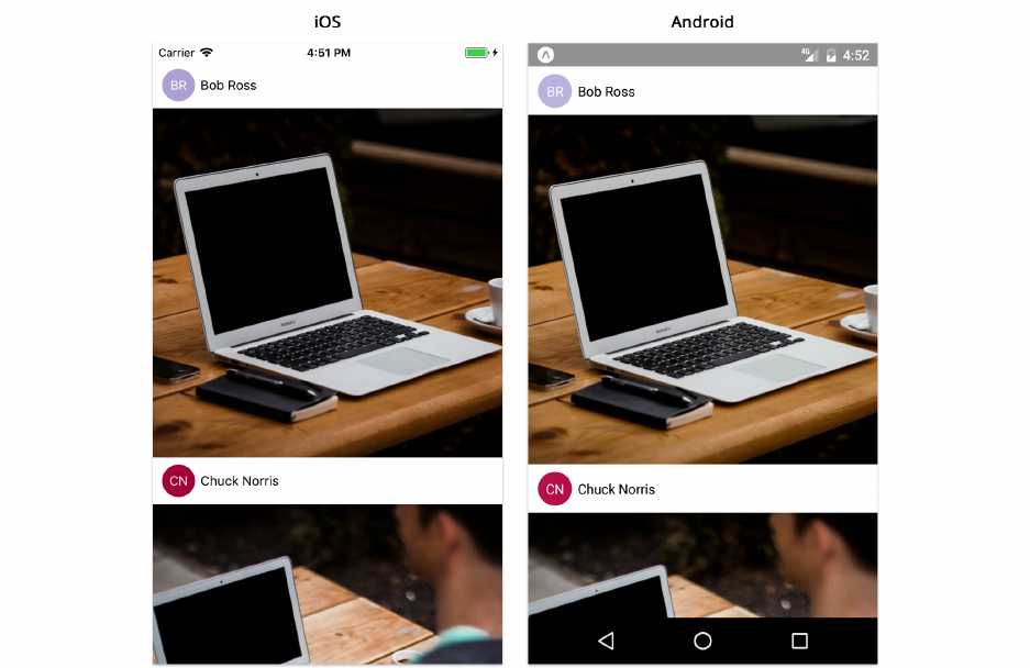
Core Components, Part 1 183
Now that we’ve finished our last custom UI component for the image feed, we can use it to create
our Feed screen.
Adding a screen
Our app will have two screens:
•Feed: The image feed
•Comments: The list of comments for a specific image
In React Native, screens are components just like any other. However, it’s useful to think about
screens slightly differently. Screens are components that fill the entire device screen. They often
handle non-visual concerns, like fetching data and handling navigation to other screens.
It’s common to keep all of the screen components in an app together in a screens directory. For more
advanced apps, we might create directories within screens to categorize them more specifically.
Since this app is pretty simple, let’s use a flat screens directory.
Create a new directory called screens within our top level image-feed directory, and create a new
file within screens called Feed.js.

Core Components, Part 1 184
The Feed screen
This screen will fetch live data from https://unsplash.it and pass the data into our CardList. The
data we fetch will follow the same format as the hardcoded list we’re using currently.
Now that we’re fetching remote data asynchronously, we need to consider loading and error states.
This screen will show a simple loading indicator and error status.
Add the following imports to Feed.js:
image-feed/1/screens/Feed.js
import {
ActivityIndicator,
Text,
ViewPropTypes,
SafeAreaView,
} from 'react-native';
import PropTypes from 'prop-types';
import React from 'react';
import { fetchImages } from '../utils/api';
import CardList from '../components/CardList';
Often screens are configured with props just like other components. In this case, we’ll allow a style
prop, which we’ll use for the top level View within this screen. This allows a lot of flexibility for our
screen to be styled however we need. The type of this prop will be the same as the style prop of
View – React Native provides this validator as a separate import, ViewPropTypes.
You might be tempted to use PropTypes.object to represent a style, but this doesn’t work
very well. Styles created with StyleSheet.create are represented as numbers, so this will
cause a warning. Also, ViewPropTypes.style provides in-depth type-checking of each key
and value, which is very valuable.
image-feed/1/screens/Feed.js
// ...
export default class Feed extends React.Component {
static propTypes ={
style:ViewPropTypes.style,
};
static defaultProps ={
style:null,

Core Components, Part 1 185
};
// ...
}
// ...
It’s common to allow a style prop for creating extremely flexible custom components. We could
technically use this style prop however we want, such as styling a deeply nested component –
however, when naming a prop the same as a built-in View prop, we’ll generally try to keep the
behavior similar. Following built-in component conventions makes it easier for other developers to
understand how to use our custom components without reading the source code.
We’ll keep track of three things in the state of our Feed:loading,error, and items.
image-feed/1/screens/Feed.js
state ={
loading:true,
error:false,
items:[],
};
We can use these to decide what to render. We’ll fetch data in componentDidMount, updating
component state when we get a response.
image-feed/1/screens/Feed.js
async componentDidMount() {
try {
const items =await fetchImages();
this.setState({
loading:false,
items,
});
}catch (e) {
this.setState({
loading:false,
error:true,
});
}
}

Core Components, Part 1 186
We made componentDidMount an async function so that we can use the await syntax within it. This
means the function will return a promise. React doesn’t use the return value of componentDidMount
for anything, so this is safe.
Now, let’s update our render method to make use of this new state:
image-feed/1/screens/Feed.js
render() {
const { style } =this.props;
const { loading, error, items } =this.state;
if (loading) {
return <ActivityIndicator size="large" />;
}
if (error) {
return <Text>Error...</Text>;
}
return (
<SafeAreaView style={style}>
<CardList items={items} />
</SafeAreaView>
);
}
We’re ready to render our Feed screen from App!
Adding Feed to App
Let’s update App.js to render our new screen. First we’ll need to update the imports at the top of
the file:
image-feed/1/App.js
import { Platform, StyleSheet, View } from 'react-native';
import { Constants } from 'expo';
import React from 'react';
import Feed from './screens/Feed';
Then we can render our Feed within a wrapper View:

Core Components, Part 1 187
image-feed/1/App.js
export default class App extends React.Component {
render() {
return (
<View style={styles.container}>
<Feed style={styles.feed} />
</View>
);
}
}
Since our Feed uses a SafeAreaView at the top level, we’ll also need to update our styles from before.
We only want to add a marginTop on Android, or on iOS versions less than 11, since the top margin
is added automatically by the SafeAreaView on iOS 11+ now.
We can use Platform.Version to detect the native operating system version. On iOS, this is a string
like '10.3', while on Android it’s a number.
image-feed/1/App.js
const platformVersion =
Platform.OS === 'ios' ?parseInt(Platform.Version, 10):Platform.Version;
const styles =StyleSheet.create({
container:{
flex: 1,
backgroundColor:'#fff',
},
feed:{
flex: 1,
marginTop:
Platform.OS === 'android' || platformVersion < 11
?Constants.statusBarHeight
: 0,
},
});
And with that, we’re finished with the feed! Here’s the final result with live data:

Core Components, Part 1 188
List Performance
If you’re running a version of React Native greater than 0.55, you may see the following warning
after scrolling through a hundred or so images:
1VirtualizedList:You have a large list that is slow to update -make sure your
2renderItem function renders components that follow React performance best practices
3like PureComponent,shouldComponentUpdate,etc.
React Native is letting us know that our list is taking a long time to render once it gets to a certain
length. We can address this by reducing the amount of cards we re-render.
The FlatList re-renders our cards while we scroll. Most of the time, however, a card’s data
doesn’t change, so we don’t need to update the component after the initial render – the only
time the data might change is if the number of comments to display changes. We can add a
shouldComponentUpdate method to Card.js to reduce re-renders and thus improve the performance
of our FlatList. We could add the following shouldComponentUpdate method:
shouldComponentUpdate(nextProps) {
return this.props.linkText !== nextProps.linkText
}

Core Components, Part 1 189
Then our cards would only re-render if absolutely necessary. You may still get the same warning at
a certain point, but it should take several times more scrolling than before.
Most of the time using shouldComponentUpdate is a premature optimization. Even when it comes to
large lists like this, often the performance will be good enough in the production build without any
other optimizations. However, if you get a warning, it’s an optimization worth considering.
What we’ve built so far
Let’s recap what we’ve done so far. We used the components View,Text,Image, and FlatList to build
a cross-platform, infinitely scrolling list of images and authors. We created 4 components, each one
building on top of the previous: Avatar,AuthorRow,Card, and CardList. We tested each component
as we built it, by rendering from our top-level component, App. We used a variety of techniques for
layout:
• Setting the width and height explicitly
• Using flex to stretch elements
• Using flexDirection,justifyContent, and alignItems for children layout
• Using padding and margin to define spacing between elements
• Using position: 'absolute' to stack elements on top of one another
• Creating optimized styles with StyleSheet.create
These are the fundamental building blocks of any React Native UI. We’ll continue to use these
throughout the rest of the book, as we add more components and APIs to our repertoire.

Core Components, Part 2
Picking up where we left off
We successfully built an awesome infinitely-scrolling image feed. Next, we’re going to add a new
screen to the same app for commenting on images.
This is a code checkpoint. If you haven’t been coding along with us but would like to start
now, we’ve included a snapshot of our current progress in the sample code for this book.
If you haven’t created a project yet, you’ll need to do so with:
$ create-react-native-app image-feed --scripts-version 1.14.0
Then, copy the contents of the directory image-feed/1 from the sample code into your new
image-feed project directory.
Comments
Here’s what the comments screen will look like:
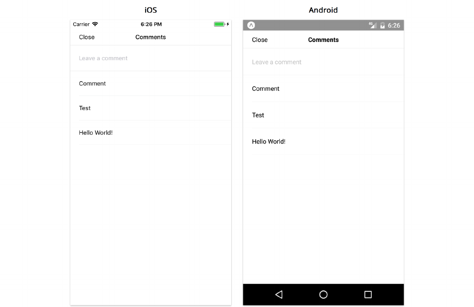
Core Components, Part 2 191
To build this portion of the app, we’ll learn how to use the TextInput,ScrollView, and Modal
components. We’ll also cover a few other topics like AsyncStorage. We’ll make a few assumptions
so we can focus on built-in components:
• we won’t use a navigation library even though we have multiple screens (more on navigation
in later chapters)
• we only want to store comments locally on the device, rather than remotely via an API
• comments can be saved as simple strings (no id,author, or other metadata)
• the comment input field is at the top of the screen, to avoid complexities around keyboard and
scrolling (which we’ll cover in the next chapter)
• there are few enough comments that a ScrollView will be performant enough (rather than
using a FlatList)
Breaking down the comments screen
The first thing we’ll want to do is break the screen down into components. Here’s one way we can
break it down:
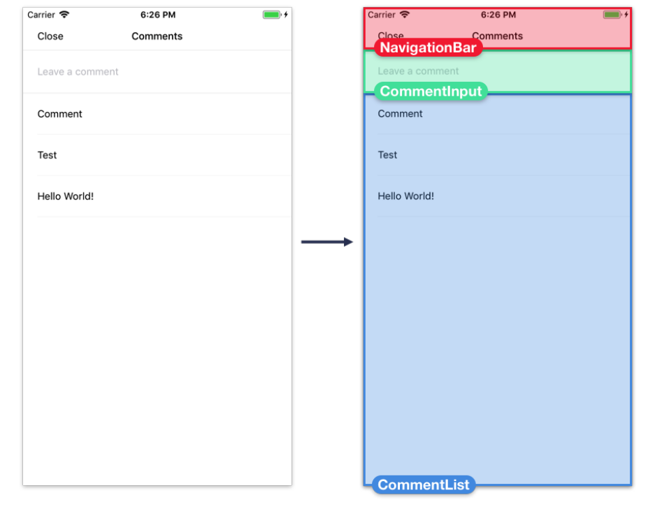
Core Components, Part 2 192
•NavigationBar - A simple navigation bar for the top of the screen with a title and a “close”
button
•CommentInput - The input field for adding new comments
•CommentList - The scrollable list of comments
The App component will be responsible for handling comment data in our app, since both the Feed
screen and Comments screen need to render this data. We’ll render the Comments screen component
from App, passing the comment data for the selected card as a prop. We’ll render the built-in Modal
component to open and close this new screen based on the state of App.
We’ll continue building bottom-up, starting with the CommentInput component, working our way
up to the screen component. We won’t test every component individually by rendering it from App
like we did in the first half of the chapter, but you’re welcome to continue to do this if you liked
having a quicker feedback loop while developing.
CommentInput
First, let’s create the input field for new comments.

Core Components, Part 2 193
TextInput
As we saw in the “Getting Started” chapter, we can use a TextInput component to create an editable
text field for the user to type in.
When working with TextInput, we’ll generally use the following props to capture user input:
•value - The current text in the input field.
•onChangeText - A function called each time the text changes. The new value is the first
argument.
•onSubmitEditing - A function called when the user presses the return/next key to submit/move
to the next field.
It’s common to store the current text in the state of the component that renders the TextInput.
Each time the function we pass to onChangeText is called, we call setState to update the current
text. When the user presses return, the function we passed to onSubmitEditing is called – we can
then perform some action with the current text, and use setState to reset the current text to the
empty string.

Core Components, Part 2 194
Common TextInput props and styles
When working with TextInput, we can use most of the same styles as Text (which includes the
styles for View). A few styles don’t work quite as well as they do on Text though: borders tend not to
render correctly, and padding and line height can conflict in unusual ways. If you’re having trouble
styling a TextInput, you may want to wrap the TextInput in a View and style the View instead.
A few other common props:
•autoCapitalize - For capitalizing characters as they’re typed. One of 'none','sentences',
'words','characters'.
•autoCorrect - Enable/disable auto-correct.
•editable - Enable/disable the text field.
•keyboardType - The type of keyboard to display. Cross-platform values are 'default',
'numeric','email-address','phone-pad'.
•multiline - Allow multiple lines of input text.
•placeholder - The text to show when the text field is empty
•placeholderTextColor - The color of the placeholder text
•returnKeyType - The text of the return key on the keyboard. Cross-platform values are 'done',
'go','next','search','send'.
Many more props are available in the docs for TextInput60
Adding TextInput to CommentList
While we could render a TextInput component directly from our Comments screen, it’s often better
to create a wrapper component that encapsulates state, styles, edge cases, etc, and has a smaller
API. That’s what we’ll do in our CommentInput component. The result will be very similar to our
TextInput wrapper components from previous chapters.
Create a new file, CommentInput.js, in the components directory. We’ll import the usual React,
PropTypes, etc, along with the TextInput component:
image-feed/components/CommentInput.js
import { StyleSheet, TextInput, View } from 'react-native';
import PropTypes from 'prop-types';
import React from 'react';
We want this component to have two props:
•onSubmit - we’ll call this with the comment text when the user presses the “return” key.
•placeholder - a passthrough to the placeholder prop of the TextInput.
Add the following to CommentInput.js:
60https://facebook.github.io/react-native/docs/textinput.html

Core Components, Part 2 195
image-feed/components/CommentInput.js
// ...
export default class CommentInput extends React.Component {
static propTypes ={
onSubmit:PropTypes.func.isRequired,
placeholder:PropTypes.string,
};
static defaultProps ={
placeholder:'',
};
// ...
}
// ...
We’ll add a text value to state and methods for updating this value when the value of the TextInput
changes:
image-feed/components/CommentInput.js
state ={
text:'',
};
handleChangeText =text => {
this.setState({ text });
};
handleSubmitEditing =() => {
const { onSubmit } =this.props;
const { text } =this.state;
if (!text) return;
onSubmit(text);
this.setState({ text:'' });
};
We don’t want to allow empty comments, so when handleSubmitEditing is called, we’ll return
immediately if state.text is empty.

Core Components, Part 2 196
Last, we’ll render the TextInput. We want to add a border on the bottom, but adding borders to
TextInput can be a bit unreliable as sometimes they don’t show up. So we’ll wrap the TextInput in
aView and style the View instead:
image-feed/components/CommentInput.js
render() {
const { placeholder } =this.props;
const { text } =this.state;
return (
<View style={styles.container}>
<TextInput
style={styles.input}
value={text}
placeholder={placeholder}
underlineColorAndroid="transparent"
onChangeText={this.handleChangeText}
onSubmitEditing={this.handleSubmitEditing}
/>
</View>
);
}
image-feed/components/CommentInput.js
const styles =StyleSheet.create({
container:{
borderBottomWidth:StyleSheet.hairlineWidth,
borderBottomColor:'rgba(0,0,0,0.1)',
paddingHorizontal: 20,
height: 60,
},
input:{
flex: 1,
},
});
This is where we pass our state management methods handleChangeText and handleSubmitEditing
to the TextInput, to keep track of changes to the value.
We can use StyleSheet.hairlineWidth as the border width to render the thinnest possible line on
any given device. On a retina device for example, this would be less than 1.
Core Components, Part 2 197
If you want to see what this component looks like to check your work, consider rendering
it from within App for testing.
CommentList
Next, we’ll render a list of comments for each image:
We’ll render these comments in a ScrollView. In reality, we’d probably want to use a FlatList for
performance, but let’s use a ScrollView for practice.
ScrollView
The ScrollView is simpler than the FlatList: it will render all of its children in a vertically or
horizontally scrollable list, without the additional complexity of the keyExtractor or renderItem
props.
The ScrollView is well suited for scrolling through small quantities of content (fewer than 20 items
or so). Content within a ScrollView is rendered even when it isn’t visible on the screen. For large
quantities of items, or cases where many children of the ScrollView are offscreen, you will likely
want to use a FlatList component for better performance.

Core Components, Part 2 198
ScrollView dimensions and layout
You can think of a ScrollView as two separate views, one inside the other. The outer view has a
bounded size, while the inner view can exceed the size of the outer view. If the inner view exceeds
the size of the outer view, only a portion of it will be visible. When we pass children elements to the
ScrollView, they are rendered inside this inner view. We call the inner view the “content container
view”, and can style it separately from the outer view.
Debugging a ScrollView
While building an app, it’s common to render a ScrollView but see nothing on the screen. There
are two common causes for this, based on how the outer view and the content container view work
(assuming vertical scrolling):
• The content container view has flex: 0 by default, so it starts with a height of 0and expands
to the minimum size needed to contain its children elements. If a child has flex: 1, this child
won’t be visible, since the content container has an intrinsic height of 0. While we could set
the contentContainerStyle to flex: 1, this probably isn’t what we want, since then we’ll
never have content larger than the outer view. Instead, we should make sure the children we
pass to the ScrollView have intrinsic height values greater than 0(either by using an explicit
height, or by containing children that have height greater than 0).
• The outer view does not change size based on the content container view. In addition to
ensuring that the children of a ScrollView have non-zero height, we have to make sure our
ScrollView has non-zero dimensions – a fixed width and height,flex: 1 and a parent with
alignItems: stretch, or absolute positioning.
Most likely, if the ScrollView doesn’t appear, we need to add flex: 1 to each parent and to the
ScrollView itself. To debug, you can try setting a background color on each parent to see where
flex: 1 stopped getting propagated down the component hierarchy.
Adding ScrollView to CommentList
Let’s render a ScrollView that contains a list of comments. We’ll call this component CommentList.
Create a file CommentList.js in the components directory.
This component will take an items array prop of comment strings, mapping these into View and
Text elements. We’ll set up the outline for this component in CommentList.js as follows:

Core Components, Part 2 199
image-feed/components/CommentList.js
import { ScrollView, StyleSheet, Text, View } from 'react-native';
import PropTypes from 'prop-types';
import React from 'react';
export default class CommentList extends React.Component {
static propTypes ={
items:PropTypes.arrayOf(PropTypes.string).isRequired,
};
// ...
}
Unlike FlatList, we don’t need to deal with the keyExtractor and data props. We can simply render
the children of the ScrollView as we would for a View:
image-feed/components/CommentList.js
renderItem =(item, index) => (
<View key={index} style={styles.comment}>
<Text>{item}</Text>
</View>
);
render() {
const { items } =this.props;
return <ScrollView>{items.map(this.renderItem)}</ScrollView>;
}
image-feed/components/CommentList.js
const styles =StyleSheet.create({
comment:{
marginLeft: 20,
paddingVertical: 20,
paddingRight: 20,
borderBottomWidth:StyleSheet.hairlineWidth,
borderBottomColor:'rgba(0,0,0,0.05)',
},
});
Core Components, Part 2 200
Since comments are stored as strings, we don’t have a convenient value to use as the unique
React key. Using the comment text as the key wouldn’t work, since comments don’t have to
be unique. Using the index as the key works here, but is generally a pattern to be wary of,
since it can cause problems when rearranging items. A better solution would be to augment
our comment data with ids: we could store comments as objects, and use the uuid library
from the previous chapter to assign each comment a unique id for use as the key.
Now that we have a scrolling list of comments, we can move on to the navigation bar, which will
be the last component we make before assembling our comments screen.
NavigationBar
Since our comments screen is going to open in a modal, we want to render a navigation bar with a
title and close button.
In a real app, we would likely use a navigation library for this, but for simplicity, let’s write something
small of our own.
Create NavigationBar.js in the components directory and add the following outline:

Core Components, Part 2 201
image-feed/components/NavigationBar.js
import { StyleSheet, Text, TouchableOpacity, View } from 'react-native';
import PropTypes from 'prop-types';
import React from 'react';
export default function NavigationBar({ title, leftText, onPressLeftText }) {
// ...
}
NavigationBar.propTypes ={
title:PropTypes.string,
leftText:PropTypes.string,
onPressLeftText:PropTypes.func,
};
NavigationBar.defaultProps ={
title:'',
leftText:'',
onPressLeftText:() => {},
};
// ...
We won’t use isRequired on our props, since this component would likely be used without
some of them, e.g. leftText and onPressLeftText, if we were to add more screens to this
app.
This component will be fairly straightforward, using only concepts we’ve covered already. We’ll use
aTouchableOpacity for the close button on the left. We’ll position it with position: 'absolute',
since we don’t want the text on the left to push the title off-center (remember, using position:
'absolute' means the component no longer affects other siblings in the layout). A real navigation
library takes into account many more cases such as text on the right, icons on either side, and long
text that may bump into the title. Let’s keep things simple and just handle the one case at hand.
The component function and styles should look like this:

Core Components, Part 2 202
image-feed/components/NavigationBar.js
export default function NavigationBar({ title, leftText, onPressLeftText }) {
return (
<View style={styles.container}>
<TouchableOpacity style={styles.leftText} onPress={onPressLeftText}>
<Text>{leftText}</Text>
</TouchableOpacity>
<Text style={styles.title}>{title}</Text>
</View>
);
}
image-feed/components/NavigationBar.js
const styles =StyleSheet.create({
container:{
height: 40,
borderBottomWidth:StyleSheet.hairlineWidth,
borderBottomColor:'rgba(0,0,0,0.1)',
alignItems:'center',
justifyContent:'center',
},
title:{
fontWeight:'500',
},
leftText:{
position:'absolute',
left: 20,
top: 0,
bottom: 0,
justifyContent:'center',
},
});
Despite generally representing a numeric value, fontWeight must be a string!
We now have all of the building blocks we need: CommentInput,CommentList, and NavigationBar.
Let’s assemble them in a new screen.

Core Components, Part 2 203
Comments screen
Create a new file Comments.js within the screens directory.
Within our new screen, we’ll want to render first the NavigationBar, then the CommentInput, and
finally the CommentList. We want this screen to take 4 props:
•comments - The array of comments to display.
•onClose - A function prop to call when the user presses the close button.
•onSubmitComment - A function prop to call when the user adds a new comment.
•style - The style to apply to the top-level View of this screen (just like we did with Feed)
Add the following to Comments.js:
image-feed/screens/Comments.js
1import { SafeAreaView, ViewPropTypes } from 'react-native';
2import PropTypes from 'prop-types';
3import React from 'react';
4
5import CommentInput from '../components/CommentInput';
6import CommentList from '../components/CommentList';
7import NavigationBar from '../components/NavigationBar';
8
9export default function Comments({
10 style,
11 comments,
12 onClose,
13 onSubmitComment,
14 }) {
15 return (
16 <SafeAreaView style={style}>
17 <NavigationBar
18 title="Comments"
19 leftText="Close"
20 onPressLeftText={onClose}
21 />
22 <CommentInput placeholder="Leave a comment" onSubmit={onSubmitComment} />
23 <CommentList items={comments} />
24 </SafeAreaView>
25 );
26 }
27
28 Comments.propTypes ={

Core Components, Part 2 204
29 style:ViewPropTypes.style,
30 comments:PropTypes.arrayOf(PropTypes.string).isRequired,
31 onClose:PropTypes.func.isRequired,
32 onSubmitComment:PropTypes.func.isRequired,
33 };
34
35 Comments.defaultProps ={
36 style:null,
37 };
The code for our screen is fairly simple, since we already built the different parts of the UI as
individual components.
Putting it all together
Now we need to allow navigation from the Feed screen we made earlier with this new Comments
screen.
We want the Comments screen to slide up and cover the entire screen, so we’ll use the built-in Modal
component.
Modal
The Modal component lets us transition to an entirely different screen. This is most useful for simple
apps, since for complex apps you’ll likely be using a navigation library which will come with its
own way of doing modals.
Common props include:
•animationType - This controls how the modal animates in and out. One of 'none','slide', or
'fade' (defaults to 'none').
•onRequestClose - A function called when the user taps the Android back button.
•onShow - A function called after the modal is fully visible.
•transparent - A bool determining whether the background of the modal is transparent.
•visible - A bool determining whether the modal is visible or not.
The visible prop is the most important, since this lets us show and hide the Modal.

Core Components, Part 2 205
Adding Modal to App
We’ll maintain the state of the Modal in the state of our App component. We’ll use the visible prop of
the Modal component to show and hide it, so we’ll want to store a boolean showModal in state. We’ll
also want to store the id of the image we’re viewing comments for, so we’ll store selectedItemId
in state too. And we’ll want to store the actual text for the comments we type in, so let’s create an
object that maps from an image id to an array of comment strings. Let’s update the state in App.js
to look like this:
image-feed/App.js
state ={
commentsForItem:{},
showModal:false,
selectedItemId:null,
};
Next, we’ll make two function properties on our App component, for updating state in order to open
and close the Modal.
image-feed/App.js
openCommentScreen =id => {
this.setState({
showModal:true,
selectedItemId:id,
});
};
closeCommentScreen =() => {
this.setState({
showModal:false,
selectedItemId:null,
});
};
Notice that our openCommentScreen function takes the id of the image we want to display comments
for. We’ll need to call this function from within the CardList in order pass that id. Then we’ll
propagate the value through Feed and up to App. Save App.js and let’s head over to CardList.js to
make this possible.
Updating CardList with comments
We want the “Comments” link on each card to open the Modal we just created:

Core Components, Part 2 206
To do this, let’s tweak our CardList component, adding an onPressComments prop (which we can use
to call openCommentScreen) and a commentsForItem prop (which we can use to display the number
of comments per image).
image-feed/components/CardList.js
// ...
export default class CardList extends React.Component {
static propTypes = {
items: PropTypes.arrayOf(
PropTypes.shape({
id: PropTypes.number.isRequired,
author: PropTypes.string.isRequired,
}),
).isRequired,
commentsForItem: PropTypes.objectOf(PropTypes.arrayOf(PropTypes.string))
.isRequired,
onPressComments: PropTypes.func.isRequired,
};
// ...
}
// ...
Let’s call onPressComments from within renderItem, passing the id of the item so that we know
which image to display comments for.
image-feed/components/CardList.js
renderItem =({ item:{ id, author } }) => {
const { commentsForItem, onPressComments } =this.props;
const comments =commentsForItem[id];
return (
<Card
fullname={author}
image={{
uri:getImageFromId(id),
}}
linkText={`${comments ?comments.length : 0}Comments`}
onPressLinkText={() => onPressComments(id)}
/>

Core Components, Part 2 207
);
};
There’s one small problem with our CardList so far: the count of comments we use for the linkText
won’t immediately update when we add new comments. This is due to how the FlatList decides
whether or not to re-render items; the FlatList will only re-render an item when the data prop
changes or when scrolling. In this case, we pass the items prop of CardList into the data prop of
FlatList, but our commentsForItem prop doesn’t cause the items array to change, so the FlatList
won’t update when new comments are added. We can use the prop extraData of FlatList to inform
the FlatList that it should monitor another source of input data for changes.
Let’s update the render method within CardList, passing commentsForItem as the extraData prop
of FlatList.
image-feed/components/CardList.js
// ...
const { items, commentsForItem } = this.props;
return (
<FlatList
data={items}
renderItem={this.renderItem}
keyExtractor={keyExtractor}
extraData={commentsForItem}
/>
);
// ...
Save CardList.js. This will put your app in an error state, since CardList isn’t currently being
passed a commentsForItem prop.
Core Components, Part 2 208
Let’s fix that!
Updating Feed with comments
Open Feed.js. We need to accept commentsForItem and onPressComments here too, and pass them
into CardList.
Update the propTypes:
image-feed/screens/Feed.js
static propTypes ={
style:ViewPropTypes.style,
commentsForItem:PropTypes.objectOf(PropTypes.arrayOf(PropTypes.string))
.isRequired,
onPressComments:PropTypes.func.isRequired,
};
And update the render method:

Core Components, Part 2 209
image-feed/screens/Feed.js
render() {
const { commentsForItem, onPressComments, style } =this.props;
// ..
return (
<SafeAreaView style={style}>
<CardList
items={items}
commentsForItem={commentsForItem}
onPressComments={onPressComments}
/>
</SafeAreaView>
);
}
// ...
Save Feed.js. You should still see the same error message, since we’re still not passing a value for
commentsForItem into Feed.
Updating App with comments
Let’s head back to App.js to connect these new props we’ve just added to Feed and to render the
screen.
Import the Modal component and our Comments component:
image-feed/App.js
import { Modal, Platform, StyleSheet, View } from 'react-native';
// ...
import Comments from './screens/Comments';
Then update the render method to render Comments and update Feed with new props:

Core Components, Part 2 210
image-feed/App.js
// ...
export default class App extends React.Component {
// ...
render() {
const { commentsForItem, showModal, selectedItemId } =this.state;
return (
<View style={styles.container}>
<Feed
style={styles.feed}
commentsForItem={commentsForItem}
onPressComments={this.openCommentScreen}
/>
<Modal
visible={showModal}
animationType="slide"
onRequestClose={this.closeCommentScreen}
>
<Comments
style={styles.container}
comments={commentsForItem[selectedItemId] || []}
onClose={this.closeCommentScreen}
// ...
/>
</Modal>
</View>
);
}
}
// ...
We’ll also add one new style for the comments screen:

Core Components, Part 2 211
image-feed/App.js
// ...
const styles =StyleSheet.create({
// ...
comments:{
flex: 1,
marginTop:
Platform.OS === 'ios' && platformVersion < 11
?Constants.statusBarHeight
: 0,
},
});
Like before, we need to handle iOS versions below 11 separately by adding a top margin. Modals
naturally sit below the status bar on Android, so we only need a top margin on iOS in this case.
After saving App.js, you’ll be able to open and close the Comments screen! Tap any "Comments" link
to open it, and tap the "Close" button in the NavigationBar to close it.
There should still be a warning about a missing onSubmitComment prop. Let’s add that next.
Adding new comments
Now that we can access our new Comments screen, we’ll want to be able to type new comments.
Let’s create a function property onSubmitComment on our App component for saving a new comment
into the commentsForItem object in our state. Since our commentsForItem object should be immutable
(it’s part of state), we’ll create a new object and copy over the existing keys and values using the
... object spread syntax. For our selectedItemId, we’ll either update the comments array within
commentsForItem, copying over existing comments with the ... array spread syntax, or we’ll create
a new array if this is the first comment.
image-feed/App.js
// ...
onSubmitComment =(text) => {
const { selectedItemId, commentsForItem } =this.state;
const comments =commentsForItem[selectedItemId] || [];
const updated ={
...commentsForItem,
[selectedItemId]:[...comments, text],

Core Components, Part 2 212
};
this.setState({ commentsForItem:updated });
};
// ...
Since we’re creating a new commentsForItem object, when we end up passing it into Feed, the Feed
will pass it to the FlatList as extraData, triggering a re-render (updating the "0 Comments" text).
Computed property names
When defining object literals, we can dynamically compute property names by putting array
brackets around the property name. For example:
const name ='foo';
const obj ={ [name]:'bar' };
console.log(obj.foo); // => 'bar'
This is roughly equivalent to:
const name ='foo';
const obj ={};
obj[name] ='bar';
Computed property names are convenient in cases like the above example, where we want the object
literal to have property names based on dynamic values.
The last step for typing new comments is to pass the onSubmitComment function to the Comments
component when rendering:
image-feed/App.js
// ...
return (
<View style={styles.container}>
<Feed
style={styles.feed}
commentsForItem={commentsForItem}
onPressComments={this.openCommentScreen}
/>

Core Components, Part 2 213
<Modal
visible={showModal}
animationType="slide"
onRequestClose={this.closeCommentScreen}
>
<Comments
style={styles.comments}
comments={commentsForItem[selectedItemId] || []}
onClose={this.closeCommentScreen}
onSubmitComment={this.onSubmitComment}
/>
</Modal>
</View>
);
// ...
Save App.js, then go ahead and play around with the app for a bit! You should be able to tap the “0
Comments” text at the top right of each image to open up the Modal containing the Comments screen.
You should be able to type new comments and see them appear in the list of comments. When you
close the Modal, you should see the number of comments has increased for the image you chose.
Bonus: Persisting comments to device storage
You may have noticed that any comments you added will disappear if you reload the app. This is
because we don’t save them anywhere.
As an optional final step, we can persist the comments we write to the device via the AsyncStorage
API. AsyncStorage is a simple key-value store provided by React Native for storing small quan-
tities of string data (which we usually serialize as JSON). Like the name implies, saving and
reading from this store both happen asynchronously. We can call AsyncStorage.getItem(key) and
AsyncStorage.setItem(key, value) to store and retrieve a string value using a string key.
In App.js, we’ll first need to import AsyncStorage:
image-feed/App.js
import { AsyncStorage, Modal, Platform, StyleSheet, View } from 'react-native';
Then we’ll define an arbitrary key for persisting our comments object as JSON:

Core Components, Part 2 214
image-feed/App.js
const ASYNC_STORAGE_COMMENTS_KEY ='ASYNC_STORAGE_COMMENTS_KEY';
Then we’ll update our componentDidMount and onSubmitComment to save and read from AsyncStorage,
respectively. Since we can only store string values using AsyncStorage, if we want to store a complex
object, we’ll have to serialize it to JSON first. To do this, we can call JSON.stringify before storing
values and JSON.parse after retreiving them.
We’ll load all comments into state when our App mounts:
image-feed/App.js
async componentDidMount() {
try {
const commentsForItem =await AsyncStorage.getItem(
ASYNC_STORAGE_COMMENTS_KEY,
);
this.setState({
commentsForItem:commentsForItem ?JSON.parse(commentsForItem) :{},
});
}catch (e) {
console.log('Failed to load comments');
}
}
Then we’ll update the stored comments anytime we add a new comment by modifying onSubmitComment:
// ...
onSubmitComment = text => {
const { selectedItemId, commentsForItem } = this.state;
const comments = commentsForItem[selectedItemId] || [];
const updated = {
...commentsForItem,
[selectedItemId]: [...comments, text],
};
this.setState({ commentsForItem: updated });
try {
AsyncStorage.setItem(ASYNC_STORAGE_COMMENTS_KEY, JSON.stringify(updated));
Core Components, Part 2 215
} catch (e) {
console.log('Failed to save comment', text, 'for', selectedItemId);
}
};
// ...
Note that getItem and setItem can both fail (e.g. when disk I/O fails), so we need to wrap any async
calls in try/catch.
That’s all we had to do to persist comments to disk! Now when you write comments and reload the
app, they’ll still be there. Give it a shot!
Wrapping up
Many of the built-in components we’ve covered in this chapter are highly generic and resusable:
View,Text,Image,ScrollView, and FlatList. The bulk of the UI in most apps will be written with
a combination of these components.
We covered a few other components which are for more specialized use cases, like ActivityIndicator,
TextInput, and Modal. There are many more components like this which we didn’t cover.
You don’t need to memorize every built-in React Native component – in fact, there are some
components you’ll probably never need. The important thing is: you now have a strong foundation
in how React Native works, so you’ll be able to figure out how to use any built-in component just
by reading the docs.
UI components are a huge part of what React Native has to offer. However, most apps need more than
just UI components. There’s another big part of React Native which we touched on in this chapter:
imperative APIs. These are APIs (like AsyncStorage) which we can call from the component lifecycle
to fetch data, access the camera roll, query our geolocation, etc. In the next chapter, we’ll explore
some of the most common React Native APIs.

Core APIs, Part 1
So far we’ve primarily used React components to interact with the underlying native APIs – we’ve
used components like View,Text, and Image to create native UI elements on the screen.
React provides a simple, consistent interface for APIs which create visual components. Some APIs
don’t create UI components though: for example, accessing the Camera Roll, or querying the current
network connectivity of the device.
React Native also comes with APIs for interacting with these non-visual native APIs. In contrast
with components, these APIs are generally imperative functions: we must call them explicitly at
the right time, rather than returning something from a component’s render function and letting
React call them later. React Native simply provides us a JavaScript wrapper, often cross-platform,
for controlling the underlying native APIs.
Building a messaging app
In this chapter, we’ll build the start of a messaging app (similar to iMessage) that gives us a tour of
some of the most common core APIs. Our app will let us send text, send photos from the camera
roll, and share our location. It will let us know when we are disconnected from the network. It will
handle keyboard interactions and the back button on Android.
To try the completed app:
• On Android, you can scan the following QR code from within the Expo app:
• On iOS, you can navigate to the messaging/ directory within our sample code folder and build
the app. You can either preview it using the iOS simulator or send the link of the project URL
to your device as we mentioned in the first chapter.
Core APIs, Part 1 217
We can send text messages, images, and maps:
We can choose images from our device camera roll:

Core APIs, Part 1 218
And we can view images fullscreen:
Core APIs, Part 1 219
We’ll use the following APIs:
•Alert - Displays modal dialog windows for simple user input
•BackHandler - Controls the back button on Android
•CameraRoll - Returns images and videos stored on the device
•Dimensions - Returns the dimensions of the screen
•Geolocation - Returns the location of the device, and emits events when the location changes
•Keyboard - Emits events when the keyboard appears or disappears
•NetInfo - Returns network connectivity information, and emits events when the connectivity
changes
•PixelRatio - Translates from density-independent pixels to density-dependent pixels (more
detail on the later)
•StatusBar - Controls the visibility and color of the status bar
We’ll just be focusing on the UI, so we won’t actually send messages, but we could connect the UI
we build to a backend if we wanted to use it in a production app.
Initializing the project
Just as we did in the previous chapters, let’s create a new app with the following command:
Core APIs, Part 1 220
$ create-react-native-app messaging --scripts-version 1.14.0
Once this finishes, navigate into the messaging directory.
In this chapter we’ll create the utils directory ourselves, so there’s no need to copy over the sample
code.
The app
Let’s start by setting up the skeleton of the app. We’ll do this in App.js. After that, we’ll build out
the different parts of the screen, one component at a time. We’ll tackle keyboard handling last, since
that’s the most difficult and intricate.
We’ll follow the same general process as in the previous chapters: we’ll start by breaking down the
screen into components, building a hardcoded version, adding state, and so on.
The app’s skeleton
If we look at the app from top to bottom, these are the main sections of the UI:
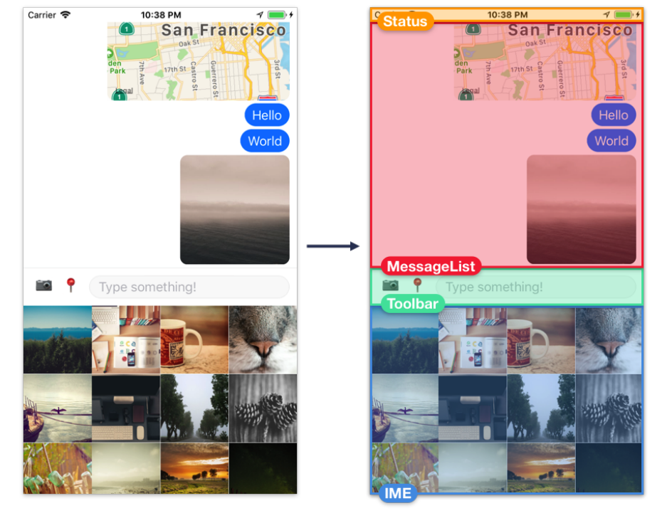
Core APIs, Part 1 221
•Status - The device generally renders a status bar, the horizontal strip at the top of the
screen that shows time, battery life, etc – but in this case, we’ll augment it to show network
connectivity more prominently. We’ll create our own component, Status, which renders
beneath the device’s status bar.
•MessageList - This is where we’ll render text messages, images, and maps.
•Toolbar - This is where the user can switch between sending text, images, or location, and
where the input field for typing messages lives.
• Input Method Editor (IME) - This is where we can render a custom input method, i.e. sending
images. We’ll build an image picker component, ImageGrid, and use it here. Note that the
keyboard is rendered natively by the operating system, so we will trigger the keyboard to
appear and disappear at the right times, but we won’t render it ourselves.
In this chapter we’ll be building top-down. We’ll start by representing the message list, the toolbar,
and the IME with a placeholder View. By starting with a rough layout, we can then create components
for each section, putting each one in its respective View. Each section will be made up of a few
different components.

Core APIs, Part 1 222
Open App.js and add the following skeleton:
messaging/App.js
import { StyleSheet, View } from 'react-native';
import React from 'react';
export default class App extends React.Component {
renderMessageList() {
return (
<View style={styles.content}></View>
);
}
renderInputMethodEditor() {
return (
<View style={styles.inputMethodEditor}></View>
);
}
renderToolbar() {
return (
<View style={styles.toolbar}></View>
);
}
render() {
return (
<View style={styles.container}>
{this.renderMessageList()}
{this.renderToolbar()}
{this.renderInputMethodEditor()}
</View>
);
}
}
const styles =StyleSheet.create({
container:{
flex: 1,
backgroundColor:'white',
},
content:{
flex: 1,
Core APIs, Part 1 223
backgroundColor:'white',
},
inputMethodEditor:{
flex: 1,
backgroundColor:'white',
},
toolbar:{
borderTopWidth: 1,
borderTopColor:'rgba(0,0,0,0.04)',
backgroundColor:'white',
},
});
When you save App.js, the app should reload on your device and you’ll see the following:
Awesome, a blank screen with a small gray line through the middle! Now we can start building out
the different sections of the screen. The App component will orchestrate how data is populated, and
when to hide or show the various input methods – but first, we need to start creating the different
components in the UI.
Now’s a good time to create a new directory, components, within our main messaging directory.
We’ll put the UI components we build in the components directory.

Core APIs, Part 1 224
Network connectivity indicator
Since we’re building a messaging app, network connectivity is relevant at all times. Let’s let the user
know when they’ve lost connectivity by turning the status bar red and displaying a short message.
StatusBar
Many apps display the default status bar, but sometimes we want to customize the style, e.g. turning
the background red.
The status bar works a little differently on iOS and Android. On iOS the status bar background is
always transparent, so we can render content behind the status bar text. On Android, we can set
the status bar background to transparent, or to a specific solid color. If we use a transparent status
bar, we can render content behind it just like on iOS – unlike on iOS, by default the status bar text
is white and there’s typically a semi-transparent black background. If we choose a solid color status
bar, our app’s content renders below the status bar, and the height of our UI will be a little smaller.
In our app, we’ll use a solid color status bar, since this will let us customize the color.
To use a solid color status bar, we need to open up app.json and add the following to the expo object
(although you can skip this if you’re not using an Android):

Core APIs, Part 1 225
messaging/app.json
"expo":{
// ...
"androidStatusBar": {
"barStyle":"dark-content",
"backgroundColor":"#FFFFFF"
}
}
Let’s restart the packager with npm run start to make sure this change takes effect.
If we had used react-native init instead of create-react-native-app, we wouldn’t
need to do this. Expo handles the status bar specially. You can check out the guide on
configuring the status bar61 for more detail.
On both platforms, we can set the status bar text color by using the built-in StatusBar component
and passing a barStyle of either light-content (white text) or dark-content (black text).
There are two different ways we can use StatusBar: imperatively and as a component. In this
example we’ll use the component approach.
Create a new file Status.js in the components directory now.
Status styles
Let’s first start with the background styles. We need to create a View that sits behind the text of the
status bar – on iOS, rendering the background color of the status bar is our responsibility, since the
operating system only renders the status bar text.
We’ll have two visual states: one where the user is connected to the network, and one where the
user is disconnected. We’ll set the color for each state in render, so let’s start with the base style for
the status bar:
61https://docs.expo.io/versions/latest/guides/configuring-statusbar.html

Core APIs, Part 1 226
messaging/components/Status.js
import { Constants } from 'expo';
import { StyleSheet } from 'react-native';
// ...
const statusHeight =
(Platform.OS === 'ios' ?Constants.statusBarHeight : 0);
const styles =StyleSheet.create({
status:{
zIndex: 1,
height:statusHeight,
},
// ...
});
The base style status will give the View its height. The View will have the same height regardless of
whether this component is in the connected or disconnected state. We use a zIndex of 1to indicate
that this View should be drawn on top of other content – this will be relevant later, since we’re going
to render a ScrollView beneath it.
Depending on the component’s state, we’ll then pass a style object containing a background color
(in addition to passing the status style).
We’ll store the network connectivity status in component state as state.info. Network connectiv-
ity status can have several different states, but let’s assume for now that if the state.info is "none"
then we’re disconnected, and anything else means we’re connected.
Let’s try rendering this background View.
messaging/components/Status.js
import { Constants } from 'expo';
import { NetInfo, Platform, StatusBar, StyleSheet, Text, View } from 'react-native';
import React from 'react';
export default class Status extends React.Component {
state ={
info:null,
};
// ...
render() {

Core APIs, Part 1 227
const { info } =this.state;
const isConnected =info !== 'none';
const backgroundColor =isConnected ?'white' :'red';
if (Platform.OS === 'ios') {
return <View style={[styles.status, { backgroundColor }]}></View>;
}
return null;// Temporary!
}
}
// ...
Notice how we use an array for the View to apply two styles: the status style, and then a style object
containing a different background color depending on whether we’re connected to the network or
not.
Let’s save Status.js and import it from App.js so we can see what we have so far.
We can now go ahead and render our new Status component from App:
messaging/App.js
// ...
import Status from './components/Status';
export default class App extends React.Component {
// ...
render() {
return (
<View style={styles.container}>
<Status />
{this.renderMessageList()}
{this.renderToolbar()}
{this.renderInputMethodEditor()}
</View>
);
}
// ...
Core APIs, Part 1 228
}
// ...
We shouldn’t see anything yet… but to verify that everything is working, you can temporarily set
info: 'none' in the state of Status. This will show a red background behind the status bar text.
Doing this, we should see:
Using StatusBar
The black text on the red background doesn’t look very good. This is where the StatusBar component
comes in. Let’s import it from react-native and render it within our View.

Core APIs, Part 1 229
messaging/components/Status.js
import { Constants } from 'expo';
import { StatusBar, StyleSheet, View } from 'react-native';
import React from 'react';
export default class Status extends React.Component {
state ={
info:null,
};
// ...
render() {
const { info } =this.state;
const isConnected =info !== 'none';
const backgroundColor =isConnected ?'white' :'red';
const statusBar =(
<StatusBar
backgroundColor={backgroundColor}
barStyle={isConnected ?'dark-content' :'light-content'}
animated={false}
/>
);
if (Platform.OS === 'ios') {
return <View style={[styles.status, { backgroundColor }]}>{statusBar}</View>;
}
return null;// Temporary!
}
}
Here we set barStyle to dark-content if we’re connected (black text on our white background) and
light-content if we’re disconnected (white text on our red background). We set backgroundColor
to set the correct background color on Android. We also set animated to false – since we’re not
animating the background color on iOS, animating the text color won’t look very good.
Note that the StatusBar component doesn’t actually render the status bar text. We use this
component to configure the status bar. We can render the StatusBar component anywhere in the
component hierarchy of our app to configure it, since the status bar is configured globally.
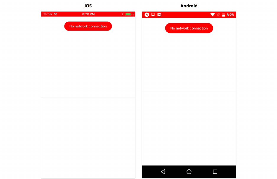
Core APIs, Part 1 230
We can even render StatusBar in multiple different components, e.g. we could render it from App.js
in addition to Status.js. If we do this, the props we set as configuration are merged in the order the
components mount. In practice it can be a bit hard to follow the mount order, so it may be easier to
use the imperative API if you find yourself with many StatusBar components (more on this later).
Message bubble
Since the red status bar alone doesn’t indicate anything about network connectivity, let’s also add a
short message in a floating bubble at the top of the screen.
If we’re not connected to the network, we’ll render a few more components. On Android, since we
don’t need to render the background behind the status bar, we can return just the message bubble
components.

Core APIs, Part 1 231
messaging/components/Status.js
import { Constants } from 'expo';
import { NetInfo, StatusBar, StyleSheet, Text, View } from 'react-native';
import React from 'react';
export default class Status extends React.Component {
// ...
render() {
const { info } =this.state;
const isConnected =info !== 'none';
const backgroundColor =isConnected ?'white' :'red';
const statusBar =(
<StatusBar
backgroundColor={backgroundColor}
barStyle={isConnected ?'dark-content' :'light-content'}
animated={false}
/>
);
const messageContainer =(
<View style={styles.messageContainer} pointerEvents={'none'}>
{statusBar}
{!isConnected && (
<View style={styles.bubble}>
<Text style={styles.text}>No network connection</Text>
</View>
)}
</View>
);
if (Platform.OS === 'ios') {
return <View style={[styles.status, { backgroundColor }]}>{messageContainer}</\
View>;
}
return messageContainer;
}
}
const styles =StyleSheet.create({

Core APIs, Part 1 232
// ...
messageContainer:{
zIndex: 1,
position:'absolute',
top:statusHeight + 20,
right: 0,
left: 0,
height: 80,
alignItems:'center',
},
bubble:{
paddingHorizontal: 20,
paddingVertical: 10,
borderRadius: 20,
backgroundColor:'red',
},
text:{
color:'white',
},
});
A future update to this chapter will fix iPhone X style issues.
Here we use absolute position to precisely position the message bubble on top of the rest of the con-
tent we’ll render, without pushing our other content out of the way. We use pointerEvent={'none'}
so that this component doesn’t prevent us from tapping the ScrollView we’ll render it. The
pointerEvents prop allows us to control whether an component can respond to touch interactions,
or whether they pass through to the components behind it.
Save Status.js and you should see the following.

Core APIs, Part 1 233
Our connectivity indicator UI is looking good! Now it’s time to hook it up to the device’s real network
connectivity state.
NetInfo
We have info in state, and we have logic to switch between showing a connected and disconnected
UI in our render method. Now we need to update this state whenever network connectivity changes.
We can do this using the NetInfo APIs.
The NetInfo APIs are a good example of React Native core APIs: these provide a uniform interface
to the lower level native APIs on iOS and Android. React Native is essentially providing JavaScript
bindings and smoothing out platform differences for us.
We can call NetInfo.getConnectionInfo() to get the network connectivity status. NetInfo.getConnectionInfo()
returns a promise which resolves to a string. If the device is connected, the string value will be 'wifi'
or 'cellular' If the device isn’t connected, the promise will still resolve, but with the value 'none'.
If we wanted to update our UI when the network connection changes, we could continuously poll
NetInfo.getConnectionInfo() to get the network status – but this would be inefficient. Instead, we
can add an event listener to NetInfo.NetInfo provides the method addEventListener, which we
can call with a callback function, which it will invoke each time the network status changes.
Here’s an example of using NetInfo.addEventListener:
Core APIs, Part 1 234
const subscription =NetInfo.addEventListener('connectionChange', (status) => {
console.log('Network status changed', status)
});
This example would log a new status each time the network connectivity changes. We can call
subscription.remove() when we want to stop listening for changes – most of the time, we’ll do
this when our component unmounts.
For our app, we’ll use both NetInfo.getConnectionInfo and NetInfo.addEventListener. First we’ll
call NetInfo.getConnectionInfo when the Status component mounts to get the initial network
connectivity. Then we’ll use NetInfo.addEventListener to update our UI when a change occurs.
Let’s add the following lines to our Status component in Status.js:
1// ...
2
3async componentWillMount() {
4this.subscription = NetInfo.addEventListener('connectionChange', this.handleChange\
5);
6
7const info = await NetInfo.getConnectionInfo();
8
9this.setState({ info });
10 }
11
12 componentWillUnmount() {
13 this.subscription.remove();
14 }
15
16 handleChange = (info) => {
17 this.setState({ info });
18 };
19
20 // ...
Now we receive both the initial status and handle connectivity changes.
Note that we declared componentWillMount as an async method, so that we can use await when
calling NetInfo.getConnectionInfo(). Most of the React lifecycle methods can be declared with
async, since React doesn’t use the return value from these.
To test changes in network connectivity without setting the device to airplane mode,
we can add: setTimeout(() => this.handleChange('none'), 3000); to the end of
componentWillMount. This way we can observe the transition from our initial state
(probably 'wifi') to the disconnected state.

Core APIs, Part 1 235
For reference, if we wanted to use the imperative approach to changing the status bar style, we
would write our handleChange as:
handleChange =(info) => {
this.setState({ info });
StatusBar.setBarStyle(info === 'none' ?'light-content' :'dark-content');
};
We would then remove the <StatusBar ... /> component from our render function. The
StatusBar component is a little unusual because it doesn’t actually render anything. Under the
hood, the StatusBar component just calls StatusBar.setBarStyle at the appropriate times. Calling
the imperative APIs directly can be simpler than figuring out how and where to render StatusBar
components in a complex app.
Wrapping up StatusBar and NetInfo
We’re finished with the status bar and network connectivity indicator! We’ve just written a cross-
platform UI that works on both iOS and Android, with only a little bit of platform-specific code.
For future improvements, we could consider animating the message bubble as it appears and
disappears, and animating the status bar as it changes colors. We’ll cover this kind of animation
in more depth in a later chapter. For now, let’s move on to the message list.
The message list
Let’s create the message list. The message list will display a vertically scrolling list of text messages,
image messages, and location messages. We should be able to tap the messages to potentially trigger
other actions (e.g. view the image fullscreen).
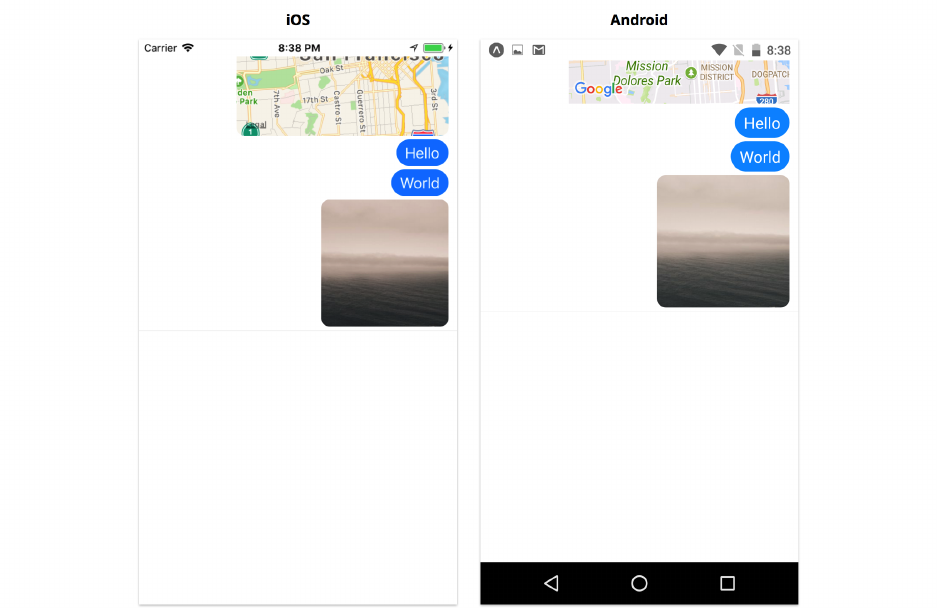
Core APIs, Part 1 236
We’ll use the FlatList component we learned about in the previous chapter to handle rendering the
list. In order to do that, we should first decide how we’ll store our message objects.
MessageUtils
Let’s first write a few utility functions for creating message objects so that we keep this logic separate
from our rendering logic.
Create a new directory called utils in the messaging directory. Within utils, create a new file
called MessageUtils.js.
Within MessageUtils.js, let’s first define the shape of each message using PropTypes.shape. All of
the messages we render will have a type and an id, and then some messages will have either a text,
uri, or coordinate value, depending on the type.
Add the following to MessageUtils.js:

Core APIs, Part 1 237
messaging/utils/MessageUtils.js
import PropTypes from 'prop-types';
export const MessageShape =PropTypes.shape({
id:PropTypes.number.isRequired,
type:PropTypes.oneOf(['text','image','location']),
text:PropTypes.string,
uri:PropTypes.string,
coordinate:PropTypes.shape({
latitude:PropTypes.number.isRequired,
longitude:PropTypes.number.isRequired,
}),
});
By using this shape in the propTypes of a component, React will automatically warn us if we
accidentally pass invalid message data. Declaring our data models this way is also great for
documentation purposes: if another developer reads our component, they’ll know exactly what the
input data should look like, without having to sprinkle console.log throughout the app and actually
run it.
Declaring our data models this way is optional. For a model that will likely be used in many
places throughout the app, it’s probably worthwhile to spend the extra effort. It isn’t as
valuable for a model used within a single component, or a model that you’re still iterating
on during development. If you decide to use a strongly-typed variant of JavaScript, i.e. Flow
or TypeScript, you’ll likely declare your types elsewhere and won’t need to also declare
PropTypes.
Next, let’s write a few utility functions for creating the different kinds of messages:
messaging/utils/MessageUtils.js
let messageId = 0;
function getNextId() {
messageId += 1;
return messageId;
}
export function createTextMessage(text) {
return {
type:'text',
id:getNextId(),
text,

Core APIs, Part 1 238
};
}
export function createImageMessage(uri) {
return {
type:'image',
id:getNextId(),
uri,
};
}
export function createLocationMessage(coordinate) {
return {
type:'location',
id:getNextId(),
coordinate,
};
}
We created a utility getNextId() for getting a unique message id. It’s important that we ensure
uniqueness for each id, since we’ll be using the id as the key when rendering these messages in a
list.
We would likely want to use a more sophisticated id, such as a UUID, if we were actually
connecting with a backend. Incrementing a number works for our purposes, but once
messages are persisted or coming from multiple devices, there would be id collisions.
By exporting createTextMessage,createImageMessage, and createLocationMessage, we can now
easily create new messages of each type from elsewhere in our app. We’ll use these messages to
populate the FlatList.
MessageList
Our MessageList component will render an array of the message objects we defined in MessageUtils.
We can determine how to render each message based on its type.
Let’s start by determining the propTypes for this component. Here’s a good opportunity to use the
MessageShape we just defined. We’ll also want to notify the parent component whenever a message
in the list is pressed. We can do this using an onPressMessage function prop.
Create a new file, MessageList.js, in our components directory. Add the following to it:

Core APIs, Part 1 239
messaging/components/MessageList.js
import React from 'react';
import PropTypes from 'prop-types';
import { MessageShape } from '../utils/MessageUtils';
export default class MessageList extends React.Component {
static propTypes ={
messages:PropTypes.arrayOf(MessageShape).isRequired,
onPressMessage:PropTypes.func,
};
static defaultProps ={
onPressMessage:() => {},
};
// ...
}
By using our MessageShape, React will warn us if we’re passed malformed data.
Now let’s render our messages into a FlatList. Just as in the previous chapter, We need to use a
keyExtractor to tell the FlatList how to find the unique id of our message objects.
Let’s update MessageList.js to render a FlatList:
messaging/components/MessageList.js
import { FlatList, StyleSheet } from 'react-native';
// ...
const keyExtractor =item => item.id.toString();
export default class MessageList extends React.Component {
// ...
renderMessageItem =({ item }) => {
// ...
};
render() {
const { messages } =this.props;

Core APIs, Part 1 240
return (
<FlatList
style={styles.container}
inverted
data={messages}
renderItem={this.renderMessageItem}
keyExtractor={keyExtractor}
keyboardShouldPersistTaps={'handled'}
/>
);
}
}
const styles =StyleSheet.create({
container:{
flex: 1,
overflow:'visible',// Prevents clipping on resize!
},
});
We looked at the data,renderItem, and keyExtractor props in the previous chapter. There are a few
new props here that are worth looking at in more detail.
inverted
In a messaging app, we typically want new messages to appear at the bottom of the list. To
accomplish this, we’ve added the inverted prop to our FlatList.
This “new-messages-at-the-bottom” behavior is difficult to achieve without using inverted.
If we didn’t use inverted, every time a new message is added, we would have to scroll to the
bottom of the list by adding a ref to the list and calling the scrollToEnd method. While it
may sound relatively simple, it quickly gets complicated when we start adding asynchronous
animations, e.g. in response to the keyboard appearing. Since ScrollView doesn’t support
inverted, we almost always want to use a FlatList for this.
Behind-the-scenes, our FlatList is vertically inverted using a transform style, and then
each row within the list is also vertically inverted. Since rows are doubly inverted, they
appear right-side-up. Pretty clever!
keyboardShouldPersistTaps
We use the keyboardShouldPersistTaps prop to configure what happens when we tap the FlatList.
This prop has three possible options:

Core APIs, Part 1 241
•never - Tapping the list will dismiss the keyboard and blur any focused elements. This is the
default behavior.
•always - Tapping the list will have no effect on the keyboard or focus.
•handled - Tapping the list will dismiss the keyboard, unless the tap is handled by a child
element first (e.g. tapping a message within the list). We want handled, so that we enable
tapping messages without dismissing the keyboard.
We add overflow: 'visible' to the style of the FlatList to prevent content from getting clipped
during animations. When an animation causes the list to resize to a smaller size, the content within it
will be clipped to the smaller size instantly, while the list itself resizes gradually. If we don’t include
this line, some content will get clipped at the start of the animation that should actually be clipped
at the end. It’ll be easier to understand why this is necessary after we’re a bit further along. You can
comment out this property and observe the difference in behavior as the keyboard appears.
Rendering messages
We’ve successfully set up a scrolling list, so now we can populate it with messages. As a reminder,
this is what we’re aiming to build:
Let’s start with the styles. Conceptually, each message is a row in the list, so let’s call our top-level
message style messageRow and give it flexDirection: 'row'. We want to align messages to the right

Core APIs, Part 1 242
using justifyContent: 'flex-end', but leave a little space on the left with marginLeft: 60 in case
our message gets long. Text messages should appear in blue bubbles: this is what messageBubble is
for.
messaging/components/MessageList.js
const styles =StyleSheet.create({
container:{
flex: 1,
overflow:'visible',// Prevents clipping on resize!
},
messageRow:{
flexDirection:'row',
justifyContent:'flex-end',
marginBottom: 4,
marginRight: 10,
marginLeft: 60,
},
messageBubble:{
paddingVertical: 5,
paddingHorizontal: 10,
backgroundColor:'rgb(16,135,255)',
borderRadius: 20,
},
text:{
fontSize: 18,
color:'white',
},
image:{
width: 150,
height: 150,
borderRadius: 10,
},
map:{
width: 250,
height: 250,
borderRadius: 10,
},
});
Feel free to experiment with other styles. There are a lot of ways to customize a messaging
app to give it a unique look.

Core APIs, Part 1 243
Let’s move on to renderMessageItem and begin using the styles we just created. We can start by
updating our imports to include all of the components we’ll render from MessageList:
import { FlatList, Image, StyleSheet, Text, TouchableOpacity, View } from 'react-nat\
ive';
import { MapView } from 'expo';
Here we’ll use MapView for the first time. You’ll notice we import this from Expo, rather than from
React Native. MapView comes from the 3rd party module react-native-maps, which Expo includes
by default. If we had created our app via react-native-cli rather than create-react-native-app,
we would have to remember to install and link react-native-maps.
If you’re running an Android emulator, you’ll need the Google Play Services installed to
actually see a MapView (otherwise you’ll see a placeholder label). You can create an emulator
from Android Studio with this, but it can be difficult to connect it to Expo. If you don’t know
how to do this already, we recommend testing on a real Android device if possible.
React Native used to include a built-in MapView, but this has been removed in favor of
react-native-maps. The react-native-maps module quickly became the de-facto standard
for using maps in React Native, obsoleting the original built-in version.
Then let’s add the following:
messaging/components/MessageList.js
// ...
renderMessageItem =({ item }) => {
const { onPressMessage } =this.props;
return (
<View key={item.id} style={styles.messageRow}>
<TouchableOpacity onPress={() => onPressMessage(item)}>
{this.renderMessageBody(item)}
</TouchableOpacity>
</View>
);
};
renderMessageBody =({ type, text, uri, coordinate }) => {
// ...
}

Core APIs, Part 1 244
// ...
Just as in the previous chapters, we use the id of the item as the key of the top-level element we
return, so React can keep track of existing items. Without this, React would have to re-render all
items when we add more, since it wouldn’t know which items are old and which are new.
We want each message to be tappable, so we wrap the message body in a TouchableOpacity, and
call onPressItem with the item object when tapped.
Finally, we call this.renderMessageBody with the item (our message), where we’ll render the body
of each message. We’ll switch on the type of the message to decide what to render.
messaging/components/MessageList.js
export default class MessageList extends React.Component {
// ...
renderMessageBody =({ type, text, uri, coordinate }) => {
switch (type) {
case 'text':
return (
<View style={styles.messageBubble}>
<Text style={styles.text}>{text}</Text>
</View>
);
case 'image':
return <Image style={styles.image} source={{ uri }} />;
case 'location':
return (
<MapView
style={styles.map}
initialRegion={{
...coordinate,
latitudeDelta: 0.08,
longitudeDelta: 0.04,
}}
>
<MapView.Marker coordinate={coordinate} />
</MapView>
);
default:
return null;
}
};

Core APIs, Part 1 245
// ...
}
Each type of message, text,image, and location has a different kind of UI. Most of the components
we used for text and image should look pretty familiar.
For location messages, we use a MapView. The MapView API is fairly advanced, allowing custom
drawing and animations on top of maps. We’ll use the initialRegion to supply a bounding box
to display on the map, and we’ll create a MapView.Marker to drop a pin at the coordinate in the
message. You can read more about the MapView API in the official docs for react-native-maps62.
We now have a scrollable, tappable list of messages that supports different kinds of content. Let’s
test it out.
Adding MessageList to App
To test our new MessageList component, we can render it from within the renderMessageList
method of App.js.
Heading back to App.js now, we’ll need to import our new MessageList component and our utility
functions for creating messages:
messaging/App.js
// ...
import MessageList from './components/MessageList';
import { createImageMessage, createLocationMessage, createTextMessage } from './util\
s/MessageUtils';
//...
We can use these utility functions to create a few sample messages in the initial state of our app:
62https://github.com/airbnb/react-native-maps

Core APIs, Part 1 246
messaging/App.js
// ...
state ={
messages:[
createImageMessage('https://unsplash.it/300/300'),
createTextMessage('World'),
createTextMessage('Hello'),
createLocationMessage({
latitude: 37.78825,
longitude: -122.4324,
}),
],
};
handlePressMessage =() => {}
renderMessageList() {
const { messages } =this.state;
return (
<View style={styles.content}>
<MessageList messages={messages} onPressMessage={this.handlePressMessage} />
</View>
);
}
// ...
We’ve now hooked up the hardcoded message data with our MessageList component. We also
added a placeholder handlePressMessage for handling tapping messages. When you save App.js, if
everything is working correctly, here’s what you should see:

Core APIs, Part 1 247
We’re successfully rendering our message list! We can display messages of different types and our
new messages appear at the bottom, just like we’d expect from a messaging app.
At this point, we have the prop onPressMessages set to the empty function handlePressMessage.
Let’s hook up a few different actions to onPressMessages.
Alert
The first action we’ll add is to text messages. We’ll add a “delete” feature: when the user taps a
text message, we’ll give the user the option to delete that message. We’ll present a dialog with two
choices: delete and cancel.
We can use the Alert.alert API to present the user with a native dialog window for making this
choice.
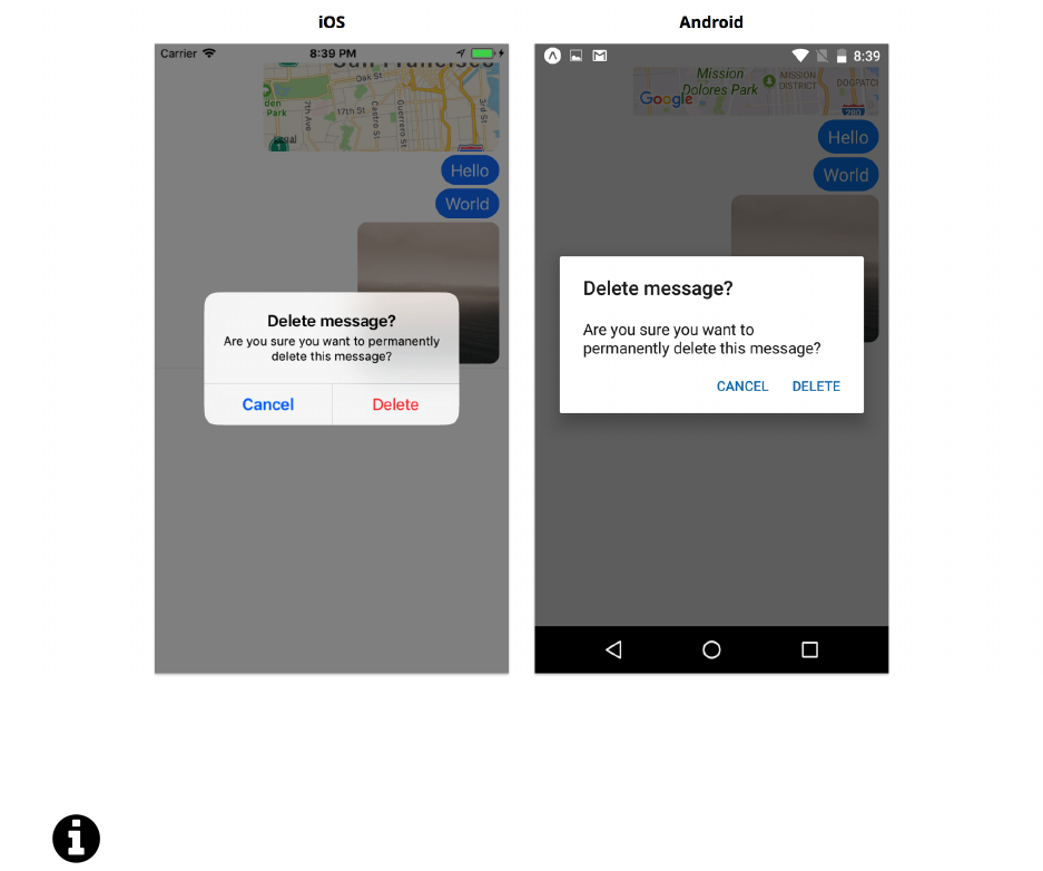
Core APIs, Part 1 248
Alert dialogs are commonly used for asking simple “yes or no” questions. The text and quantity of
buttons are configurable.
Alert dialogs can also be used for debugging. Sometimes it can be easier to pop open an alert
dialog than tracking down a console.log message.
The full method signature is Alert.alert(title, message?, buttons?, options?, type?):
•title - A string, shown in a large bold font, at the top of the dialog
•message - A string, typically longer, shown in a normal weight font below the title
•buttons - An array of objects containing text (a string), onPress (a callback function), and
optionally a style on iOS (styles can be one of default,cancel, or destructive).
•options - An object for controlling the dialog dismissal behavior on Android. Tapping outside
the dialog will normally exit the dialog. This can be prevented by setting { cancelable: false
}or handled specially with { onDismiss: () => {} }.
•type - Allows text entry on iOS using one of the following options: default,plain-text,
secure-text, or login-password.
Let’s trigger an alert from App.js. First we’ll need to import Alert:

Core APIs, Part 1 249
messaging/App.js
import {
Alert,
// ...
} from 'react-native';
Then we can add the following to our handlePressMessage method:
messaging/App.js
// ...
handlePressMessage =({ id, type }) => {
switch (type) {
case 'text':
Alert.alert(
'Delete message?',
'Are you sure you want to permanently delete this message?',
[
{
text:'Cancel',
style:'cancel',
},
{
text:'Delete',
style:'destructive',
onPress:() => {
const { messages } =this.state;
this.setState({ messages:messages.filter(message => message.id !== id\
) });
},
},
],
);
break;
default:
break;
}
};
// ...
After adding these lines, save App.js. When we tap a text message, we should see something like
this:
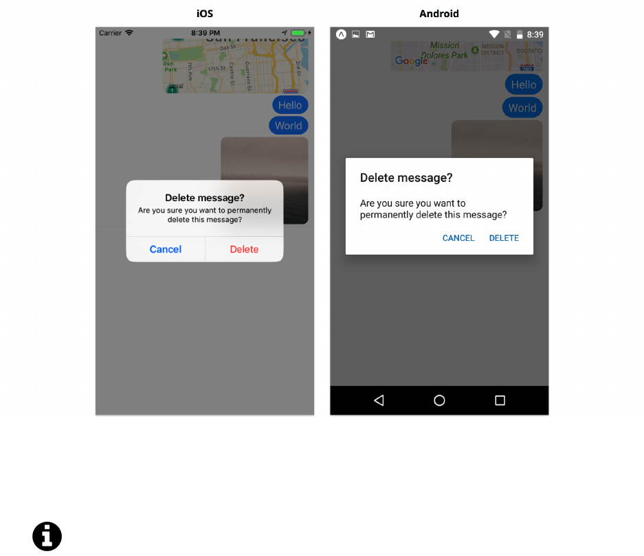
Core APIs, Part 1 250
Pressing “Delete” will remove the message from the list. We do this by filtering the list of messages
and removing the message with the id that we tapped. The removal currently isn’t animated, but it
will be when we’re finished with this app!
It’s fairly easy to call Alert incorrectly. If you’re coming from the web, you might attempt
to call Alert() rather than Alert.alert. You also might try to call Alert.alert with
parameters that are numbers instead of strings, e.g. our message id. Both of these will crash
the app with confusing error messages. It’s also possible to get into a corrupted state, where
you’ll have to restart the app before Alert.alert will function properly again.
Deleting text messages is useful, but what should we do when the user taps other kinds of messages?
For images, let’s show the image fullscreen.
Fullscreen image
When the user presses an image, we’ll show it fullscreen.
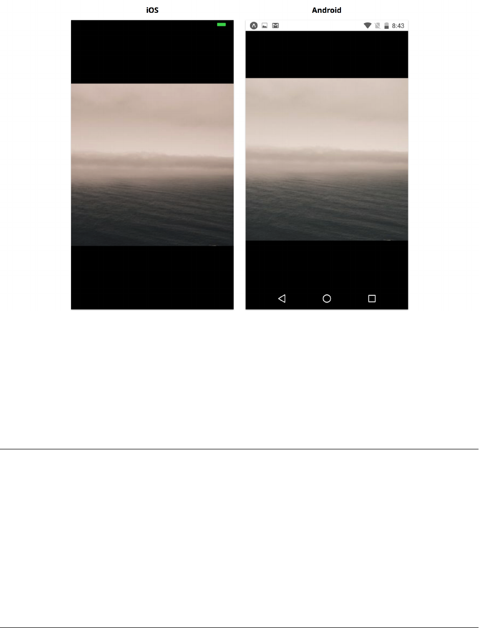
Core APIs, Part 1 251
Transitioning to fullscreen might be accomplished using a navigation library (which we’ll cover in
a later chapter), but we can also do it manually. If we do, we’ll want the Android back button to
dismiss the fullscreen image – we can use the BackHandler API to accomplish this. Let’s also dismiss
the image when it’s pressed again, so that we’re not trapped in a fullscreen image state on iOS.
In App.js, we’ll use state to keep track of which image was pressed. Let’s add the following for
state tracking:
messaging/App.js
// ...
state ={
// ...
fullscreenImageId:null,
};
dismissFullscreenImage =() => {
this.setState({ fullscreenImageId:null });
};
// ...

Core APIs, Part 1 252
We’ve initialized fullscreenImageId to null to indicate that we don’t want to show any image.
Then, when a message is pressed, we’ll set it to the id of the message object. We can update
handlePressMessage with the following:
messaging/App.js
// ...
handlePressMessage =({ id, type }) => {
switch (type) {
case 'text':
// ...
case 'image':
this.setState({ fullscreenImageId:id });
break;
default:
break;
}
};
// ...
Now we need to render the fullscreen image. We’ll use a TouchableHighlight for the black overlay
background so we can tap it to dismiss the image. Within that, we’ll use an Image. We’ll use the
fullscreenImageId to look up which image we need to display as the uri of the Image component.
First, let’s import Image and TouchableHighlight:
messaging/App.js
import {
// ...
Image,
TouchableHighlight,
} from 'react-native';
Then we can set up the styles:

Core APIs, Part 1 253
messaging/App.js
const styles =StyleSheet.create({
// ...
fullscreenOverlay:{
...StyleSheet.absoluteFillObject,
backgroundColor:'black',
zIndex: 2,
},
fullscreenImage:{
flex: 1,
resizeMode:'contain',
},
});
We’ll use the built-in StyleSheet.absoluteFillObject so that our overlay background is fullscreen,
and then we’ll add zIndex: 2 so that it renders on top of the rest of our UI. Our image should fill
the overlay, so we use flex: 1.
Next, let’s create a helper method for rendering the fullscreen image called renderFullscreenImage.
We can also use this method to determine if we need to show an image. We’ll call this from render.
Add the following:
messaging/App.js
// ...
renderFullscreenImage =() => {
const { messages, fullscreenImageId } =this.state;
if (!fullscreenImageId) return null;
const image =messages.find(message => message.id === fullscreenImageId);
if (!image) return null;
const { uri } =image;
return (
<TouchableHighlight style={styles.fullscreenOverlay} onPress={this.dismissFullsc\
reenImage}>
<Image style={styles.fullscreenImage} source={{ uri }} />
</TouchableHighlight>
);
Core APIs, Part 1 254
};
// ...
render() {
return (
<View style={styles.container}>
<Status />
{this.renderMessageList()}
{this.renderToolbar()}
{this.renderInputMethodEditor()}
{this.renderFullscreenImage()}
</View>
);
}
Save App.js. Now when we tap an image, we should see it fullscreen, and we can tap it again to
dismiss it:
On Android though, we’ll also want the device’s back button to dismiss the image. We do this using
the BackHandler API.

Core APIs, Part 1 255
BackHandler
If you’re not using an Android, you can skip this section!
Like with NetInfo, we use the event listener pattern to handle back button press events:
`BackHandler.addEventListener('hardwareBackPress', handlerFunction);`
We can use this to get notified every time the user presses the back button on an Android device.
We’ll have our handlerFunction hide our fullscreen image.
We can return true from our handlerFunction to indicate that we’ve handled the back button. By
returning false, we indicate that we didn’t handle the event. Therefore, if any other functions have
been registered, the next one registered should be called. These functions are called in the reverse of
the order they were registered – the last handler registered will be called first. If no handler returns
true, then the back button will exit to the home screen (the default back button behavior).
First, import the BackHandler API:
messaging/App.js
import {
// ...
BackHandler,
} from 'react-native';
Then we’ll use componentWillMount and componentWillUnmount to listen to back button presses:
messaging/App.js
// ...
componentWillMount() {
this.subscription =BackHandler.addEventListener('hardwareBackPress', () => {
const { fullscreenImageId } =this.state;
if (fullscreenImageId) {
this.dismissFullscreenImage();
return true;
}
return false;
});

Core APIs, Part 1 256
}
componentWillUnmount() {
this.subscription.remove();
}
// ...
If state.fullscreenImageId exists, then we’re currently showing a fullscreen image, so we’ll want
the back button to dismiss it. We return true to indicate that we shouldn’t exit the app. If we’re not
showing a fullscreen image, we return false. Because no other handlers should be registered, this
will allow for the default back button behavior (exiting the app).
Our message list is working pretty well now! We’ve used two core APIs, Alert and BackHandler,
to create cross-platform interactions for deleting and enlarging messages. Now that we’ve finished
with the message list, let’s move on to the next section of the UI and create the toolbar.
Toolbar
The toolbar will sit above the keyboard and contain an input field for typing messages, along with
buttons for switching to an image picker and sending a location.
Core APIs, Part 1 257
Building the Toolbar
The toolbar is similar to the CommentInput from the Core Components chapter: it maintains the
state of a TextInput field internally and uses an onSubmit function prop to tell the parent when the
message is ready to send. We’ll need a little more control over the focus state of the TextInput this
time, so we’ll use an isFocused prop to control the focus state and an onChangeFocus function prop
to tell the parent when the state should changes.
Let’s create a new file Toolbar.js in the components directory, and render the top level View which
will contain all the elements in the toolbar. We’ll add propTypes for the focus state and the various
functions which the parent component can pass in:

Core APIs, Part 1 258
messaging/components/Toolbar.js
import { StyleSheet, Text, TextInput, TouchableOpacity, View } from 'react-native';
import PropTypes from 'prop-types';
import React from 'react';
export default class Toolbar extends React.Component {
static propTypes ={
isFocused:PropTypes.bool.isRequired,
onChangeFocus:PropTypes.func,
onSubmit:PropTypes.func,
onPressCamera:PropTypes.func,
onPressLocation:PropTypes.func,
};
static defaultProps ={
onChangeFocus:() => {},
onSubmit:() => {},
onPressCamera:() => {},
onPressLocation:() => {},
};
render() {
return (
<View style={styles.toolbar}>
{/* ... */}
</View>
);
}
}
const styles =StyleSheet.create({
toolbar:{
flexDirection:'row',
alignItems:'center',
paddingVertical: 10,
paddingHorizontal: 10,
paddingLeft: 16,
backgroundColor:'white',
},
// ...
});
Core APIs, Part 1 259
Let’s add a camera button and a location button and use them to call the onPressCamera and
onPressLocation props.
1// ...
2
3const ToolbarButton = ({ title, onPress }) => (
4<TouchableOpacity onPress={onPress}>
5<Text style={styles.button}>{title}</Text>
6</TouchableOpacity>
7);
8
9ToolbarButton.propTypes = {
10 title: PropTypes.string.isRequired,
11 onPress: PropTypes.func.isRequired,
12 };
13
14 export default class Toolbar extends React.Component {
15 // ...
16
17 render() {
18 const { onPressCamera, onPressLocation } = this.props;
19
20 return (
21 <View style={styles.toolbar}>
22 {/* Use emojis for icons instead! */}
23 <ToolbarButton title={'C'} onPress={onPressCamera} />
24 <ToolbarButton title={'L'} onPress={onPressLocation} />
25 {/* ... */}
26 </View>
27 );
28 }
29 }
30
31 const styles = StyleSheet.create({
32 // ...
33 button: {
34 top: -2,
35 marginRight: 12,
36 fontSize: 20,
37 color: 'grey',
38 },
39 // ...
40 });

Core APIs, Part 1 260
We can use emojis here for button icons! They require some positioning tweaks in styles.button,
but look decent on both platforms. Later we could swap these out for images or an icon font.
Unfortunately our PDF-creation software doesn’t handle emojis very well, so we couldn’t
include them in the code snippet. You’ll have to grab them from the sample code or choose
emojis of your own!
We define a ToolbarButton component at the top of the file which we can use in the toolbar. This
component is fairly small and styled specifically for use in the toolbar, so we leave it in the same
file as Toolbar. In terms of coding style, it’s common to define small utility components in the same
file that they’re used, and move them into separate files later if we want to reuse them.
Now let’s render a TextInput. As a reminder from the Core Components chapter: when we style a
TextInput, it’s often easier to put styles like border and padding on a wrapper View. Otherwise we
tend to run into slight rendering inconsistencies, e.g. borders not rendering.
1// ...
2
3export default class Toolbar extends React.Component {
4// ...
5
6state = {
7text: '',
8};
9
10 handleChangeText = (text) => {
11 this.setState({ text });
12 };
13
14 handleSubmitEditing =()=>{
15 const { onSubmit }=this.props;
16 const {text }=this.state;
17
18 if (!text)return;
19
20 onSubmit(text);
21 this.setState({ text: '' });
22 };
23
24 render() {
25 const { onPressCamera, onPressLocation }=this.props;
26 const {text }=this.state;
27
Core APIs, Part 1 261
28 return (
29 <View style={styles.toolbar}>
30 {/* Use emojis for icons instead! */}
31 <ToolbarButton title={'C'}onPress={onPressCamera}/>
32 <ToolbarButton title={'L'}onPress={onPressLocation}/>
33 <View style={styles.inputContainer}>
34 <TextInput
35 style={styles.input}
36 underlineColorAndroid={'transparent'}
37 placeholder={'Type something!'}
38 blurOnSubmit={false}
39 value={text}
40 onChangeText={this.handleChangeText}
41 onSubmitEditing={this.handleSubmitEditing}
42 // ...
43 />
44 </View>
45 </View>
46 );
47 }
48 }
49
50 const styles =StyleSheet.create({
51 // ...
52 inputContainer: {
53 flex: 1,
54 flexDirection:'row',
55 borderWidth: 1,
56 borderColor:'rgba(0,0,0,0.04)',
57 borderRadius: 16,
58 paddingVertical: 4,
59 paddingHorizontal: 12,
60 backgroundColor:'rgba(0,0,0,0.02)',
61 },
62 input:{
63 flex:1,
64 fontSize: 18,
65 },
66 });
Just like in the previous chapter, we store the value of the input field as state.text. When the user
presses the return key on the keyboard, we call onSubmit with this value and then reset state.text.
Our messaging app doesn’t allow sending multiline messages (we’re using the return key to submit,
Core APIs, Part 1 262
so there’s no way to insert a newline).
We use blurOnSubmit={false} so that the keyboard isn’t dismissed when the user presses the return
key. This is common in messaging apps, since it allows sending multiple messages in a row more
easily.
We’ll need more control over the input field’s internal state than we did in the previous chapter.
We’ll need to focus and blur the input field at specific times. We need to do this because when the
user presses the camera icon, we want to dismiss the keyboard. The built-in React Native APIs for
this are imperative: we have to call .focus() and .blur() on an instance of TextInput. We’ll contain
this complexity in this component, so that App can use an isFocused prop to declare the focus state.
In order to do this, we’ll use a ref prop.
Refs
React let’s us access the instance of any component we render using a ref prop. This is a special
prop that we can supply a callback – the callback will be called with the instance as a parameter,
after the component mounts (and before it unmounts). We can store a reference to the component
instance.
You can think of a component instance as the “this” when we access this.props or any method
that’s part of our class. In this case, the TextInput component class has a focus and blur method
that can be called from the component instance. We can call these from within the lifecycle of our
custom component to control the focus state of the TextInput.
Storing a ref
Let’s capture a reference to the TextInput element we render.
We’ll store this reference as this.input. We can then use this reference to imperatively focus and
blur the input field with this.input.focus() and this.input.blur() when the isFocused prop
changes.
1// ...
2
3export default class Toolbar extends React.Component {
4// ...
5
6setInputRef = (ref) => {
7this.input = ref;
8};
9
10 componentWillReceiveProps(nextProps) {
11 if (nextProps.isFocused !== this.props.isFocused) {
12 if (nextProps.isFocused) {
Core APIs, Part 1 263
13 this.input.focus();
14 } else {
15 this.input.blur();
16 }
17 }
18 }
19
20 handleFocus = () => {
21 const { onChangeFocus } = this.props;
22
23 onChangeFocus(true);
24 };
25
26 handleBlur = () => {
27 const { onChangeFocus } = this.props;
28
29 onChangeFocus(false);
30 };
31
32 // ...
33
34 render() {
35 const { onPressCamera, onPressLocation } = this.props;
36
37 // Grab this from state!
38 const { text } = this.state;
39
40 return (
41 <View style={styles.toolbar}>
42 {/* Use emojis for icons instead! */}
43 <ToolbarButton title={'C'} onPress={onPressCamera} />
44 <ToolbarButton title={'L'} onPress={onPressLocation} />
45 <View style={styles.inputContainer}>
46 <TextInput
47 style={styles.input}
48 underlineColorAndroid={'transparent'}
49 placeholder={'Type something!'}
50 blurOnSubmit={false}
51 value={text}
52 onChangeText={this.handleChangeText}
53 onSubmitEditing={this.handleSubmitEditing}
54
55 // Additional props!

Core APIs, Part 1 264
56 ref={this.setInputRef}
57 onFocus={this.handleFocus}
58 onBlur={this.handleBlur}
59 />
60 </View>
61 </View>
62 );
63 }
64 }
The onFocus prop of the TextInput will be called when the user taps within the input field, and
the onBlur prop will be called when the user taps outside the input field. We use handleFocus and
handleBlur to notify the parent of changes to the focus state.
Whenever the parent passes a different value for the isFocused prop, we update the focus state of the
TextInput by calling this.input.focus() or this.input.blur() in componentWillReceiveProps.
Go ahead and save Toolbar.js. We can now control the focus state of the toolbar entirely from App
using isFocused and onChangeFocus. We won’t use this much in the next section, but it’ll be very
important when working with the keyboard near the end of the chapter.
Adding Toolbar to App
Let’s now render our Toolbar component from App.js. We can handle the onSubmit event to
populate our message list with real messages. When we type in the input field and submit the text (by
pressing the return key on the keyboard), we can add a new message to the messages in state using
our createTextMessage utility function. We’ll also add a few callback functions as placeholders.
messaging/App.js
import Toolbar from './components/Toolbar';
// ...
export default class App extends React.Component {
state ={
// ...
isInputFocused:false,
}
handlePressToolbarCamera =() => {
// ...
}
handlePressToolbarLocation =() => {

Core APIs, Part 1 265
// ...
}
handleChangeFocus =(isFocused) => {
this.setState({ isInputFocused:isFocused });
};
handleSubmit =(text) => {
const { messages } =this.state;
this.setState({
messages:[createTextMessage(text), ...messages],
});
};
renderToolbar() {
const { isInputFocused } =this.state;
return (
<View style={styles.toolbar}>
<Toolbar
isFocused={isInputFocused}
onSubmit={this.handleSubmit}
onChangeFocus={this.handleChangeFocus}
onPressCamera={this.handlePressToolbarCamera}
onPressLocation={this.handlePressToolbarLocation}
/>
</View>
);
}
// ...
}
// ...
We’ll store isInputFocused in this.state to keep track of the focus state of the TextInput in toolbar.
After saving App.js, our toolbar should look like this:

Core APIs, Part 1 266
There’s an interesting edge case when we open a fullscreen image preview while the input field is
focused – the keyboard stays up even though the input field is no longer visible!
Core APIs, Part 1 267
We can address this by updating our handlePressMessage function to also set isInputFocused:
false in the component’s state.
messaging/App.js
// ...
handlePressMessage =({ id, type }) => {
switch (type) {
// ...
case 'image':
this.setState({ fullscreenImageId:id, isInputFocused:false });
break;
default:
break;
}
};
// ...
Now the keyboard should be dismissed when we tap an image to preview it fullscreen.

Core APIs, Part 1 268
Next, let’s connect the location button so we can send messages containing a map with a pin at our
location.
Geolocation
The React Native geolocation API is slightly different than other APIs: we can access it directly
from the global navigator object, rather than importing it at the top of the file.
The geolocation API in React Native is the same as the one found in modern web browsers. This
means better compatibility between libraries and a lower learning curve if you’re coming from web
development. On the web, the navigator object contains a lot of useful metadata about your web
browser. In React Native, it’s really just a container for geolocation and potentially a handful of
other browser APIs. Accessing a global variable feels a bit unusual in React Native, but is necessary
to provide the exact same API on web and mobile.
We’ll use navigator.geolocation.getCurrentPosition to get our current position. This API takes
a callback parameter which is called with an object containing our coordinates, coords, in latitude
and longitude.
There’s currently a bug in Expo/React Native. This method never calls its callback parameter
on Android. We’ll update this chapter as soon as it’s fixed!
Let’s try it out. We can get our current position and use it to create a location message in the
MessageList. Add the following to handlePressToolbarLocation in App.js:
1// ...
2
3handlePressToolbarLocation = () => {
4const { messages }=this.state;
5
6navigator.geolocation.getCurrentPosition((position) => {
7const { coords: {latitude, longitude } }=position;
8
9this.setState({
10 messages: [
11 createLocationMessage({
12 latitude,
13 longitude,
14 }),
Core APIs, Part 1 269
15 ...messages,
16 ],
17 });
18 });
19 };
20
21 // ...
Pretty simple!
If you try it out, you may be prompted to give Expo permission to access your location. Expo is
already set up to allow the location permission.
If you’re building an app using react-native-cli, you’ll also need to modify your
Info.plist on iOS and AndroidManifest.xml on Android to enable location permissions.
Tapping the location button should now add a location message:
Depending on how we’re using geolocation, there are a few other APIs that might be use-
ful: - watchPosition(success, error?, options?) and clearWatch(watchID) can be used to
receive notifications when location changes. We can also pass the options timeout (number in
Core APIs, Part 1 270
ms), maximumAge (number in ms), and enableHighAccuracy (bool) for more granular control. -
requestAuthorization() can be used to request access to device location. This can be a better expe-
rience than presenting an alert when a map is shown for the first time. - getCurrentPosition(geo_-
success, geo_error?, geo_options?) is the full function signature of the getCurrentPosition API
we use above. Although we didn’t do it in our example, we would generally want to handle errors
and present them to the user in some way. We might also want to pass options for more granular
control (the same options as watchPosition).
Input Method Editor (IME)
We’ve finished creating the message list and toolbar. Let’s move on to one of the more interesting
features of our app: the custom input method editor for sending images.
We’ll build the image grid flexibly so we could easily use it in other apps with just a few
modifications.
Image picker
Let’s populate our image grid with photos from the camera roll. To do this, we’ll need to access the
images saved on the device and display them in an infinitely scrolling grid. We can do this with a
combination of the Core APIs CameraRoll,Dimensions, and PixelRatio.

Core APIs, Part 1 271
Building a grid
Let’s make a new Grid component which we’ll use to display Image components from the camera
roll.
Here we’ll use a FlatList to make our image grid. If you recall from the previous chapter, the
FlatList component is a feature-packed ScrollView that we can use for infinite scrolling out-of-
the-box. The FlatList can be configured to display multiple columns, instead of the normal single
column, by passing the numColumns prop.
Let’s make a new file Grid.js within the components directory. In this, we can create a Grid
component which renders a FlatList. Our Grid will be a wrapper around FlatList that configures
it specifically for our use case: displaying multiple columns of square-shaped components.
Our Grid will pass along all of its props to FlatList, since it’s mostly acting as a more specific case of
the very general FlatList component. Our Grid component will handle three props (two of which
are also FlatList props):
•renderItem - A function called with each item. Should return a React element. We want to
intercept this function before passing it to FlatList. We’re going to call it with the same
arguments that FlatList would call it with, but we’re going to add some extra information
about the style of the item to render.
•numColumns - The number of columns per row. We’ll use this to calculate item dimensions.
We’ll pass this to FlatList directly.
•itemMargin - The vertical and horizontal spacing between each item in the grid. This prop
doesn’t need to be passed into FlatList.
Here’s a skeleton for the Grid component code:
messaging/components/Grid.js
import { Dimensions, FlatList, PixelRatio, StyleSheet } from 'react-native';
import PropTypes from 'prop-types';
import React from 'react';
export default class Grid extends React.Component {
static propTypes ={
renderItem:PropTypes.func.isRequired,
numColumns:PropTypes.number,
itemMargin:PropTypes.number,
};
static defaultProps ={
numColumns: 4,
itemMargin:StyleSheet.hairlineWidth,

Core APIs, Part 1 272
};
renderGridItem =(info) => {
// ... The interesting stuff happens here!
};
render() {
return <FlatList {...this.props} renderItem={this.renderGridItem} />;
}
}
Note that we pass all props into FlatList. We’re building a wrapper around FlatList that adds some
extra rendering info to each item, but we’re going to let FlatList do the hard work of rendering
rows of content in an infinitely scrolling list. We’ll focus on rendering square Image components of
equal size in the renderGridItem function.
We’ll need to get the dimensions of the device using the Dimensions API.
messaging/components/Grid.js
renderGridItem =(info) => {
// ...
const { width } =Dimensions.get('window');
// ...
};
At first glance, it might look like we should call Dimensions.get('window') outside of the render
path, so we only have to retrieve it once. However, width can change sizes depending on device
orientation, multitasking mode, etc, so it’s best to do this within the render path.
Next, let’s calculate the dimensions of each item we’ll render. Here we’ll want to use the PixelRatio.roundToNearestPixel
API. This API helps us ensure we align content to physical pixels when we’re dealing with non-
integer dimensions.
In React Native, we specify dimensions in terms of logical pixels rather than physical
pixels. There may be multiple physical pixels per logical pixels in a device with a high
pixel density, e.g. retina display. When we make calculations that can result in non-integer
dimensions, we should use PixelRatio to help us align to the nearest physical pixel -
otherwise, there may be visual inconsistencies (e.g. some elements or margins appear
larger than others).

Core APIs, Part 1 273
messaging/components/Grid.js
renderGridItem =(info) => {
// ...
const { numColumns, itemMargin } =this.props;
const { width } =Dimensions.get('window');
const size =PixelRatio.roundToNearestPixel(
(width -itemMargin *(numColumns - 1)) /numColumns,
);
// ...
};
We now have a pixel-aligned size for each item in the grid. Let’s also calculate the margins between
elements. We can use the index of the item, which is passed to us automatically by the FlatList.
messaging/components/Grid.js
renderGridItem =(info) => {
const { index } =info;
const { numColumns, itemMargin } =this.props;
const { width } =Dimensions.get('window');
const size =PixelRatio.roundToNearestPixel(
(width -itemMargin *(numColumns - 1)) /numColumns,
);
// We don't want to include a `marginLeft` on the first item of a row
const marginLeft =index %numColumns === 0 ? 0 : itemMargin;
// We don't want to include a `marginTop` on the first row of the grid
const marginTop =index <numColumns ?0:itemMargin;
// ...
};
Great! We’ve done all the calculations necessary to start rendering Image elements of the appropriate
size. Let’s call the renderItem prop with this information.

Core APIs, Part 1 274
messaging/components/Grid.js
renderGridItem =(info) => {
const { renderItem, numColumns, itemMargin } =this.props;
// ...
return renderItem({ ...info, size, marginLeft, marginTop });
};
We augment the info passed by FlatList with size,marginLeft, and marginTop, so that we can
render items at the correct size from within the renderItem function.
On generic vs. specific components
What we just did was a little complicated: we created a Grid component which accepts a renderItem
function prop, then we passed a different function, renderGridItem, into the FlatList.
Our goal here is to take the very powerful and generic FlatList and create a more specific version
called Grid. We want to expose nearly all the customizability of FlatList (we propagate all the
props from Grid into FlatList), while tweaking a few parts to make rendering in a grid format
more straightforward. By keeping the API as similar as possible to FlatList, our Grid can be used
as an almost drop-in replacement. Additionally, the learning curve for using our Grid is much lower
than a completely custom component, since if we know the API of FlatList we also know the API
of Grid.
Adding images to the grid
Our grid is ready to go! We wrote the Grid component so that we could add an infinitely scrolling
grid of images for the user to send as messages.
Ultimately we want to fill this grid with photos from the camera roll. But first, let’s try using it with
some placeholder images to test it out.
Create a new file in components called ImageGrid.js. We’ll use our Grid component by adding the
following code:

Core APIs, Part 1 275
messaging/components/ImageGrid.js
import { CameraRoll, Image, StyleSheet, TouchableOpacity } from 'react-native';
import { Permissions } from 'expo';
import PropTypes from 'prop-types';
import React from 'react';
import Grid from './Grid';
const keyExtractor =({ uri }) => uri;
export default class ImageGrid extends React.Component {
static propTypes ={
onPressImage:PropTypes.func,
};
static defaultProps ={
onPressImage:() => {},
};
state ={
images:[
{ uri:'https://picsum.photos/600/600?image=10' },
{ uri:'https://picsum.photos/600/600?image=20' },
{ uri:'https://picsum.photos/600/600?image=30' },
{ uri:'https://picsum.photos/600/600?image=40' },
],
};
renderItem =({ item:{ uri }, size, marginTop, marginLeft }) => {
const style ={
width:size,
height:size,
marginLeft,
marginTop,
};
return (
<Image source={{ uri }} style={style} />
);
};
render() {
const { images } =this.state;

Core APIs, Part 1 276
return (
<Grid
data={images}
renderItem={this.renderItem}
keyExtractor={keyExtractor}
// ...
/>
);
}
}
const styles =StyleSheet.create({
image:{
flex: 1,
},
});
You can see that we use Grid in almost the same way as we would use a FlatList. The difference is
that renderItem has a few additional values we can use for layout: size,marginTop, and marginLeft.
Save ImageGrid.js. Let’s render ImageGrid from App.js to see what we have so far. Update App.js
with the following:
messaging/App.js
// ...
import ImageGrid from './components/ImageGrid';
export default class App extends React.Component {
// ...
renderInputMethodEditor =() => (
<View style={styles.inputMethodEditor}>
<ImageGrid />
</View>
);
// ...
}
// ...

Core APIs, Part 1 277
When we save App.js, we should see something similar to this:
On separating components
Notice how by making a separate Grid component, we’ve cleanly separated the grid rendering logic
from the content we render. We could have written the grid rendering logic, and the image loading
from the camera roll in the same ImageGrid component, but then the component would’ve had two
reasonably complex and distinct tasks.
As a general guideline for React Native, it’s useful to separate complex concerns (e.g. rendering
calculations, data fetching) into separate components, so that our components remain focused on a
single task. This makes them easier understand when reading them later, and easier to reuse. Our
Grid can easily be reused in other apps with other kinds of content. Our ImageGrid could render
images into a FlatList instead of a Grid with very few changes.
Loading images from the camera roll
Let’s replace the placeholder images we’ve added to state.images with real images from the camera
roll.

Core APIs, Part 1 278
We can use CameraRoll.getPhotos(options) to request an array of images from the device. We can
specify the number of images we want to get with the first option. We can use a cursor to iterate
through the list of images by passing an after option (more on this soon). This API is asynchronous
and returns a promise containing the image metadata, along with pagination info.
Since this API is asynchronous, it may take some time for the first images to be returned. The more
images we request, the longer it will take. It’s best to request just enough images to fill the entire
screen: we want the API response as soon as we can, but we also want the screen to load all at once,
rather than piecemeal.
Calling CameraRoll.getPhotos(options) returns a promise, which resolves to an object containing:
•edges - An array of items, each containing a node object. The node object contains metadata
about the image, such as timestamp and location. The node object also contains an image object
with the filename,width,height, and uri of the image.
•page_info - An object containing a boolean has_next_page, a string end_cursor, and a string
before_cursor.
We can pass end_cursor to the after option of CameraRoll.getPhotos(options) in order to iterate
through the list.
If you’re not familiar with using cursors, they’re a common way to iterate through lists
of data stored on servers or in databases. A cursor points to a specific item in a list. By

Core APIs, Part 1 279
passing the cursor along with a request for more items, the server or database will know
which items it’s already returned to you and which it should return next. The details
aren’t too relevant for our uses, but if you’re curious about cursors, you can read more
here63.
Before we can access the camera roll on Android, we’ll need to request the user’s permission to do
so. We can use the Expo Permissions API to do this. We can await a call to Permissions.askAsync
containing the permission we want access to, and check the returned object for whether request was
granted.
await Permissions.askAsync(Permissions.CAMERA_ROLL);
if (status !== 'granted') {
// Denied
}else {
// Good to go!
}
More info about permissions is available in the Expo docs64.
In componentDidMount, let’s get camera roll permissions, load an initial set of images, and store the
images in state.images.
messaging/components/ImageGrid.js
// ...
export default class ImageGrid extends React.Component {
state ={
images:[],
};
componentDidMount() {
this.getImages();
}
getImages =async () => {
const { status } =await Permissions.askAsync(Permissions.CAMERA_ROLL);
63https://en.wikipedia.org/wiki/Cursor_(databases)
64https://docs.expo.io/versions/latest/sdk/permissions.html

Core APIs, Part 1 280
if (status !== 'granted') {
console.log('Camera roll permission denied');
return;
}
const results =await CameraRoll.getPhotos({
first: 20,
});
const { edges } =results;
const loadedImages =edges.map(item => item.node.image);
this.setState({ images:loadedImages });
};
// ...
}
This should give us at most 20 images. If there are fewer than 20 images saved on the device, then
we may see fewer.
We make our getImages method async so that we can use await with CameraRoll.getPhotos.
This works well for 20 images, but now we need to load more when the user scrolls to the bottom
of the Grid. We can use the onEndReached function prop of FlatList (which is also a prop of Grid)
to notify us that we need to load more images. This is trickier than it sounds: the onEndReached
function we pass may be called multiple times before we have finished loading a new set of images.
We need to be careful not to load the same set of images twice. Let’s start by calling getNextImages
when we reach the end of the list:
messaging/components/ImageGrid.js
// ...
export default class ImageGrid extends React.Component {
// ...
getNextImages =() => {
// ...
};
// ...

Core APIs, Part 1 281
render() {
const { images } =this.state;
return (
<Grid
data={images}
renderItem={this.renderItem}
keyExtractor={keyExtractor}
onEndReached={this.getNextImages}
/>
);
}
}
We can use the page_info object in the response of CameraRoll.getPhotos to determine if we need
to load another page. We’ll use:
•has_next_page - Are there more images to load?
•end_cursor - The cursor we can use to load more images after the current set we’ve just
retrieved.
Let’s keep track of the internal state of the pagination with two member variables, this.loading and
this.cursor. We don’t need to put these in this.state since they don’t directly affect component
rendering. We can also update them synchronously which will make our implementation simpler.
Anytime we use this.setState we have to keep in mind that it occurs asynchronously.
messaging/components/ImageGrid.js
// ...
export default class ImageGrid extends React.Component {
loading =false;
cursor =null;
// ...
getNextImages =() => {
if (!this.cursor) return;
this.getImages(this.cursor);
};
getImages =async (after) => {

Core APIs, Part 1 282
if (this.loading) return;
this.loading =true;
const results =await CameraRoll.getPhotos({
first: 20,
after,
});
const { edges, page_info:{ has_next_page, end_cursor } } =results;
const loadedImages =edges.map(item => item.node.image);
this.setState(
{
images:this.state.images.concat(loadedImages),
},
() => {
this.loading =false;
this.cursor =has_next_page ?end_cursor :null;
},
);
};
}
By keeping track of loading, we can be certain that we’ll only ever load one set of images at a time.
We set this.loading = true before making the asynchronous call to getPhotos, and we wait till
the asynchronous call to this.setState() has completed before setting this.loading = false.
The second parameter of this.setState is a completion callback. We can use this to avoid race
conditions between the time we call this.setState and the time this.state is actually updated.
If we didn’t use the completion callback and instead set this.loading = false after calling
this.setState, we would potentially access this.state.images before it had been updated, thus
one set of the images we loaded would fail to be added to the list.
We abort getNextImages if this.cursor doesn’t have a value. This stops us from loading the initial
set of images again once we reach the end of the camera roll. If we preferred, we could instead record
a boolean this.hasNextPage to help us track when we’ve reached the end.
The last thing we’ll do in this file is call the onPressImage prop whenever we tap an image. We’ll
pass the uri of the image so that we can use it within messages.
We’ll wrap the Image in a TouchableOpacity in order to handle press events. Update renderItem
with the following:

Core APIs, Part 1 283
messaging/components/ImageGrid.js
// ...
renderItem =({ item:{ uri }, size, marginTop, marginLeft }) => {
const { onPressImage } =this.props;
const style ={
width:size,
height:size,
marginLeft,
marginTop,
};
return (
<TouchableOpacity
key={uri}
activeOpacity={0.75}
onPress={() => onPressImage(uri)}
style={style}
>
<Image source={{ uri }} style={styles.image} />
</TouchableOpacity>
);
};
// ...
Save ImageGrid.js and let’s start using it to add messages to the message list!
Sending images from ImageGrid
We can now load images from the camera roll and display them in a pixel-perfect grid. When
we tap an image, let’s add a new image message to the list of messages in state using our
createImageMessage utility function.
We’ll use handlePressImage to add a new image to the message list:

Core APIs, Part 1 284
messaging/App.js
// ...
export default class App extends React.Component {
// ...
handlePressImage =(uri) => {
const { messages } =this.state;
this.setState({
messages:[createImageMessage(uri), ...messages],
});
};
renderInputMethodEditor =() => (
<View style={styles.inputMethodEditor}>
<ImageGrid onPressImage={this.handlePressImage} />
</View>
);
// ...
}
Great! We can now tap images and they’ll appear in the MessageList we wrote earlier. Here’s what
it should look like:
Core APIs, Part 1 285
What we’ve built
At this point, we have the bulk of the UI components written. In order to access device in-
formation, we’ve used a variety of APIs including Alert,CameraRoll,Dimensions,Geolocation,
NetInfo,PixelRatio, and StatusBar.
Using React Native APIs tends to follow a pattern:
1. Figure out which API we need to call.
2. Figure out which lifecycle/helper method is the most appropriate place to call it.
3. Call the API (either synchronously or asynchronously).
4. Store the results in component state.
5. Re-render the UI based on the new state.
We can use this approach with nearly any API. We’ll continue covering other APIs in the second
part of this chapter, and in the rest of the book.

Core APIs, Part 2
In the first part of this section, we covered a variety of React Native APIs for accessing device
information. In this part, we’ll focus on one fundamental feature of mobile devices: the keyboard.
This is a code checkpoint. If you haven’t been coding along with us but would like to start
now, we’ve included a snapshot of our current progress in the sample code for this book.
If you haven’t created a project yet, you’ll need to do so with:
$ create-react-native-app messaging --scripts-version 1.14.0
Then, copy the contents of the directory messaging/1 from the sample code into your new
messaging project directory.
The keyboard
Keyboard handling in React Native can be very complex. We’re going to learn how to manage the
complexity, but it’s a challenging problem with a lot of nuanced details.
Our UI is currently a bit flawed: on iOS, when we focus the message input field, the keyboard opens
up and covers the toolbar. We have no way of switching between the image picker and the keyboard.
We’ll focus on fixing these issues.
We’re about to embark on a deep dive into keyboard handling. We’ll cover some extremely
useful APIs and patterns – however, you shouldn’t feel like you have to complete the entire
chapter now. Feel free to stop here and return again when you’re actively building a React
Native app that involves the keyboard.
Why it’s difficult
Keyboard handling can be challenging for many reasons:
• The keyboard is enabled, rendered, and animated natively, so we have much less control over
its behavior than if it were a component (where we control the lifecycle).
• We have to handle a variety of asynchronous events when the keyboard is shown, hidden,
or resized, and update our UI accordingly. These events are somewhat different on iOS and
Android, and even slightly different in the simulator compared to a real device.

Core APIs, Part 2 287
• The keyboard works differently on iOS and Android at a fundamental level. On iOS, the
keyboard appears on top of the existing UI; the existing UI doesn’t resize to avoid the keyboard.
On Android, the keyboard resizes the UI above it; the existing UI will shrink to fit in the
available space. We generally want interactions to feel similar on both platforms, despite this
fundamental difference.
• Keyboards interact specially with certain native elements e.g. ScrollView. On iOS, dragging
downward on a ScrollView can dismiss the keyboard at the same rate of the pan gesture.
• Keyboards are user-customizable on both platforms, meaning there’s an almost unlimited
number of shapes and sizes our UI has to handle.
In this app, we’ll attempt to achieve a native-quality messaging experience. Ultimately though, there
will be a few aspects that don’t quite feel native. It’s extremely difficult to get an app with complex
keyboard interactions to feel perfect without dropping down to the native level. If you can’t achieve
the right experience in React Native, consider writing a native module for the screen that interacts
heavily with the keyboard. This is part of the beauty of React Native – you can start with a JavaScript
version in your initial implementation of a screen or feature, then seamlessly swap it out for a native
implementation when you’re certain it’s worth the time and effort.
If you’re lucky, you’ll be able to find an existing open source native component that does
exactly that!
KeyboardAvoidingView
In the first chapter, we demonstrated how to use the KeyboardAvoidingView component to move
the UI of the app out from under the keyboard. This component is great for simple use cases, e.g.
focusing the UI on an input field in a form.
When we need more precise control, it’s often better to write something custom. That’s what we’ll
do here, since we need to coordinate the keyboard with our custom image input method.
Our goal here is for our image picker to have the same height as the native keyboard, in essence
acting as a custom keyboard created by our app. We’ll want to smoothly animate the transition
between these two input methods.
For a demo of the desired behavior, you can try playing around with the completed app (it’s the
same app as the previous section):
• On Android, you can scan this QR code from within the Expo app:

Core APIs, Part 2 288
• On iOS, you can build the app and preview it on the iOS simulator or send the link of the
project URL to your device like we’ve done in previous chapters.
On managing complexity
Since this problem is fairly complicated, we’re going to break it down into 3 parts, each with its own
component:
•MeasureLayout - This component will measure the available space for our messaging UI
•KeyboardState - This component will keep track of the keyboard’s visibility, height, etc
•MessagingContainer - This component will displaying the correct IME (text, images) at the
correct size
We’ll connect them so that MeasureLayout renders KeyboardState, which in turn renders MessagingContainer.
We could build one massive component that handles everything, but this would get very complicated
and be difficult to modify or reuse elsewhere.
Keyboard
We’ll need to measure the available space on the screen and the keyboard height ourselves, and
adjust our UI accordingly. We’ll keep track of whether the keyboard is currently transitioning. And
we’ll animate our UI to transition between the different keyboard states.
To do this, we’ll use the Keyboard API. The Keyboard API is the lower-level API that KeyboardAvoidingView
uses under the hood.
On iOS, the keyboard uses an animation with a special easing curve that’s hard to replicate
in JavaScript, so we’ll hook into the native animation directly using the LayoutAnimation API.
LayoutAnimation is one of the two main ways to animate our UI (the other being Animated). We’ll
cover animation more in a later chapter.

Core APIs, Part 2 289
Measuring the available space
Let’s start by measuring the space we have to work with. We want to measure the space that our
MessageList can use, so we’ll measure from below the status bar (anything above our MessageList)
to the bottom of the screen. We need to do this to get a numeric value for height, so we can transition
between the height when the keyboard isn’t visible to the height when the keyboard is visible. Since
the keyboard doesn’t actually take up any space in our UI, we can’t rely on flex: 1 to take care of
this for us.
Measuring in React Native is always asynchronous. In other words, the first time we render our UI,
we have no general-purpose way of knowing the height. If the content above our MessageList has
a fixed height, we can calculate the initial height by taking Dimensions.get('window').width and
subtracting the height of the content above our MessageList – however, this is not very flexible.
Instead, let’s create a container View with a flexible height flex: 1 and measure it on first render.
After that, we’ll always have a numeric value for height.
We can measure this View with the onLayout prop. By passing a callback to onLayout, we can get
the layout of the View. This layout contains values for x,y,width, and height.
messaging/components/MeasureLayout.js
1import { Constants } from 'expo';
2import { Platform, StyleSheet, View } from 'react-native';
3import PropTypes from 'prop-types';
4import React from 'react';
5
6export default class MeasureLayout extends React.Component {
7static propTypes ={
8children:PropTypes.func.isRequired,
9};
10
11 state ={
12 layout:null,
13 };
14
15 handleLayout =event => {
16 const { nativeEvent:{ layout } } =event;
17
18 this.setState({
19 layout:{
20 ...layout,
21 y:
22 layout.y +
23 (Platform.OS === 'android' ?Constants.statusBarHeight : 0),
24 },

Core APIs, Part 2 290
25 });
26 };
27
28 render() {
29 const { children } =this.props;
30 const { layout } =this.state;
31
32 // Measure the available space with a placeholder view set to flex 1
33 if (!layout) {
34 return <View onLayout={this.handleLayout} style={styles.container} />;
35 }
36
37 return children(layout);
38 }
39 }
40
41 const styles =StyleSheet.create({
42 container:{
43 flex: 1,
44 },
45 });
Here we render a placeholder View with an onLayout prop. When called, we update state with the
new layout.
Most React Native components accept an onLayout function prop. This is conceptually
similar to a React lifecycle method: the function we pass is called every time the component
updates its dimensions. We need to be careful when calling setState within this function,
since setState may cause the component to re-render, in which case onLayout will get called
again… and now we’re stuck in an infinite loop!
We have to compensate for the solid color status bar we use on Android by adjusting the yvalue,
since the status bar height isn’t included in the layout data. We can do this by merging the existing
properties of layout, ...layout, and an updated yvalue that includes the status bar height.
We use a new pattern here for propagating the layout into the children of this component: we
require the children prop to be a function. When we use our MeasureLayout component, it will
look something like this:

Core APIs, Part 2 291
<MeasureLayout>
{layout => <View ... />}
</MeasureLayout>
This pattern is similar to having a renderX prop, where Xindicates what will be rendered, e.g.
renderMessages. However, using children makes the hierarchy of the component tree more clear.
Using the children prop implies that these children components are the main thing the parent
renders. As an analogy, this pattern is similar to choosing between export default and export X. If
there’s only one variable to export from a file, it’s generally more clear to go with export default. If
there’s a variable with the same name as the file, or a variable that seems like the primary purpose of
the file, you would also likely export it with export default and export other variables with export
X. Similarly, you should consider using children if this prop is the “default” or “primary” thing a
component renders. Ultimately this is an API style preference. Even if you choose not to use it, it’s
useful to be aware of the pattern since you may encounter it when using open source libraries.
We’re now be able to get a precise height which we can use to resize our UI when the keyboard
appears and disappears.
Keyboard events
We have the initial height for our messaging UI, but we need to update the height when the keyboard
appears and disappears. The Keyboard object emits events to let us know when it appears and
disappears. These events contain layout information, and on iOS, information about the animation
that will/did occur.
KeyboardState
Let’s create a new component called KeyboardState to encapsulate the keyboard event handling
logic. For this component, we’re going to use the same pattern as we did for MeasureLayout: we’ll
take a children function prop and call it with information about the keyboard layout.
We can start by figuring out the propTypes for this component. We know we’re going to have
achildren function prop. We’re also going to consume the layout from the MeasureLayout
component, and use it in our keyboard height calculations.

Core APIs, Part 2 292
messaging/components/KeyboardState.js
import { Keyboard, Platform } from "react-native";
import PropTypes from 'prop-types';
import React from 'react';
export default class KeyboardState extends React.Component {
static propTypes ={
layout:PropTypes.shape({
x:PropTypes.number.isRequired,
y:PropTypes.number.isRequired,
width:PropTypes.number.isRequired,
height:PropTypes.number.isRequired,
}).isRequired,
children:PropTypes.func.isRequired,
};
// ...
}
Now let’s think about the state. We want to keep track of 6 different values, which we’ll pass into
the children of this component:
•contentHeight: The height available for our messaging content.
•keyboardHeight: The height of the keyboard. We keep track of this so we set our image picker
to the same size as the keyboard.
•keyboardVisible: Is the keyboard fully visible or fully hidden?
•keyboardWillShow: Is the keyboard animating into view currently? This is only relevant on
iOS.
•keyboardWillHide: Is the keyboard animating out of view currently? This is only relevant on
iOS, and we’ll only use it for fixing visual issues on the iPhone X.
•keyboardAnimationDuration: When we animate our UI to avoid the keyboard, we’ll want to
use the same animation duration as the keyboard. Let’s initialize this with the value 250 (in
milliseconds) as an approximation.

Core APIs, Part 2 293
messaging/components/KeyboardState.js
// ...
const INITIAL_ANIMATION_DURATION = 250;
export default class KeyboardState extends React.Component {
// ...
constructor(props) {
super(props);
const { layout:{ height } } =props;
this.state ={
contentHeight:height,
keyboardHeight: 0,
keyboardVisible:false,
keyboardWillShow:false,
keyboardWillHide:false,
keyboardAnimationDuration:INITIAL_ANIMATION_DURATION,
};
}
// ...
}
Now that we’ve determined which properties to keep track of, let’s update them based on keyboard
events.
There are 4 Keyboard events we should listen for:
•keyboardWillShow (iOS only) - The keyboard is going to appear
•keyboardWillHide (iOS only) - The keyboard is going to disappear
•keyboardDidShow - The keyboard is now fully visible
•keyboardDidHide - The keyboard is now fully hidden
In componentWillMount we can add listeners to each keyboard event and in componentWillUnmount
we can remove them.

Core APIs, Part 2 294
1// ...
2
3componentWillMount() {
4if (Platform.OS === 'ios') {
5this.subscriptions = [
6Keyboard.addListener('keyboardWillShow', this.keyboardWillShow),
7Keyboard.addListener('keyboardWillHide', this.keyboardWillHide),
8Keyboard.addListener('keyboardDidShow', this.keyboardDidShow),
9Keyboard.addListener('keyboardDidHide', this.keyboardDidHide),
10 ];
11 } else {
12 this.subscriptions = [
13 Keyboard.addListener('keyboardDidHide', this.keyboardDidHide),
14 Keyboard.addListener('keyboardDidShow', this.keyboardDidShow),
15 ];
16 }
17 }
18
19 componentWillUnmount() {
20 this.subscriptions.forEach(subscription => subscription.remove());
21 }
22
23 // ...
We’ll add the listeners slightly differently for each platform: on Android, we don’t get events for
keyboardWillHide or keyboardWillShow.
Storing subscription handles in an array is a common practice in React Native. We don’t know
exactly how many subscriptions we’ll have until runtime, since it’s different on each platform, so
removing all subscriptions from an array is easier than storing and removing a reference to each
listener callback.
Let’s use these events to update keyboardVisible,keyboardWillShow, and keyboardWillHide in our
state:
messaging/components/KeyboardState.js
// ...
keyboardWillShow =(event) => {
this.setState({ keyboardWillShow:true });
// ...
};

Core APIs, Part 2 295
keyboardDidShow =() => {
this.setState({
keyboardWillShow:false,
keyboardVisible:true,
});
// ...
};
keyboardWillHide =(event) => {
this.setState({ keyboardWillHide:true });
// ...
};
keyboardDidHide =() => {
this.setState({
keyboardWillHide:false,
keyboardVisible:false
});
};
// ...
The listeners keyboardWillShow,keyboardDidShow, and keyboardWillHide will each be called with
an event object, which we can use to measure the contentHeight and keyboardHeight. Let’s
do that now, using this.measure(event) as a placeholder for the function which will perform
measurements.
messaging/components/KeyboardState.js
// ...
keyboardWillShow =(event) => {
this.setState({ keyboardWillShow:true });
this.measure(event);
};
keyboardDidShow =(event) => {
this.setState({
keyboardWillShow:false,
keyboardVisible:true,
});
this.measure(event);

Core APIs, Part 2 296
};
keyboardWillHide =(event) => {
this.setState({ keyboardWillHide:true });
this.measure(event);
};
// ...
For iOS it would be sufficient to calculate measurements in the keyboardWill* events, since the
keyboardDid* events should receive the same event parameter. However, since Android only
supports the keyboardDid* events, we also need to use keyboardDidShow. Calculating measurements
in keyboardDidShow on iOS shouldn’t affect the app’s behavior, but we could do this conditionally
by checking Platform.OS === 'android' if we preferred.
We can use these events to keep track of the keyboard’s current state. Each event object will have
the following properties:
•duration - Duration of the keyboard animation. In practice, this is typically constant across all
keyboard animations. This property only exists on iOS, so we’ll use a constant to approximate
it on Android.
•easing - Easing curve used by the keyboard animation. This will be the special easing curve
called 'keyboard', which we can use to sync our own animations with the keyboard’s. This
property only exists on iOS, since there isn’t a specific keyboard animation on Android. We’ll
use 'easeInEaseOut' as a pleasant-looking default to approximate the keyboard animation on
Android.
•startCoordinates,endCoordinates - An object containing keys height,width,screenX, and
screenY. These refer to the start and end coordinates of the keyboard. Normally height,width,
and screenX will stay the same. We can use height to determine the height of the keyboard. The
screenY value refers to the top of the keyboard, which we can use to determine the remaining
height available to render content.
To calculate the contentHeight, we can take the screenY (top coordinate of the keyboard) and
subtract layout.y (top coordinate of our messaging component).

Core APIs, Part 2 297
1measure = (event) => {
2const { layout } = this.props;
3
4const { endCoordinates: { height, screenY }, duration = INITIAL_ANIMATION_DURATION\
5} = event;
6
7this.setState({
8contentHeight: screenY - layout.y,
9keyboardHeight: height,
10 keyboardAnimationDuration: duration,
11 });
12 };
13
14 // ...
Remember, ycoordinates lower down on the screen are larger than those higher on the
screen, so this calculation will resulting in a positive value.
Note that if a hardware keyboard is connected, the height of the keyboard will be 0– we’ll have to
handle this specially later.
Let’s propagate all of these values into the children of this component. We’ll also propagate the
height of the entire component as containerHeight.
messaging/components/KeyboardState.js
// ...
render() {
const { children, layout } =this.props;
const {
contentHeight,
keyboardHeight,
keyboardVisible,
keyboardWillShow,
keyboardWillHide,
keyboardAnimationDuration,
}=this.state;
return children({
containerHeight:layout.height,
contentHeight,
keyboardHeight,
keyboardVisible,

Core APIs, Part 2 298
keyboardWillShow,
keyboardWillHide,
keyboardAnimationDuration,
});
}
// ...
When we use this component, it’ll look roughly like this: we’ll first wrap it in our MeasureLayout
component, and pass the layout in as a prop. We can then render our content using the keyboardInfo
object.
<MeasureLayout>
{layout => (
<KeyboardState layout={layout}>
{keyboardInfo => /* ... */}
</KeyboardState>
)}
</MeasureLayout>
Alright, we’re almost there! We have MeasureLayout and KeyboardState. The last component we
need is MessagingContainer to render the content using the sizes we’ve calculated.
MessagingContainer
Let’s create a new component MessagingContainer to render the correct Input Method Editor (IME)
at the correct size.
Once again, let’s figure out the propTypes first. This component is going to have a lot of props, since
it’s consuming data from the previous components we wrote, in addition to more props which we’ll
pass in from App.
The main job of this component is to display the correct IME at any given time. Let’s define constants
for each potential state:
•NONE - Don’t show any IME.
•KEYBOARD - The text input is focused, so the keyboard should be visible.
•CUSTOM - Show our custom IME. In this case, we’ll show our image picker, but we could show
other kinds of input here if we wanted to.
Let’s create an object to hold these. We’ll also export it so that other components can easily use the
correct string values.

Core APIs, Part 2 299
messaging/components/MessagingContainer.js
import { BackHandler, LayoutAnimation, Platform, UIManager, View } from 'react-nativ\
e';
import PropTypes from 'prop-types';
import React from 'react';
export const INPUT_METHOD ={
NONE:'NONE',
KEYBOARD:'KEYBOARD',
CUSTOM:'CUSTOM',
};
// ...
Now for the propTypes. We’ll begin by declaring each of the values that will be passed from
KeyboardState. We’ll define inputMethod and onChangeInputMethod to handle switching between
IMEs and notifying the parent of changes. We’ll also support rendering content in both the keyboard
area with renderInputMethodEditor and the main content area with children. In this case, children
should be a normal React element rather than a function like in the two components we wrote
previously.
messaging/components/MessagingContainer.js
// ...
export default class MessagingContainer extends React.Component {
static propTypes ={
// From `KeyboardState`
containerHeight:PropTypes.number.isRequired,
contentHeight:PropTypes.number.isRequired,
keyboardHeight:PropTypes.number.isRequired,
keyboardVisible:PropTypes.bool.isRequired,
keyboardWillShow:PropTypes.bool.isRequired,
keyboardWillHide:PropTypes.bool.isRequired,
keyboardAnimationDuration:PropTypes.number.isRequired,
// Managing the IME type
inputMethod:PropTypes.oneOf(Object.values(INPUT_METHOD)).isRequired,
onChangeInputMethod:PropTypes.func,
// Rendering content
children:PropTypes.node,
renderInputMethodEditor:PropTypes.func.isRequired,

Core APIs, Part 2 300
};
static defaultProps ={
children:null,
onChangeInputMethod:() => {},
};
// ...
}
Now let’s use componentWillReceiveProps to handle switching the inputMethod. When the key-
board transitions from hidden to visible, we want to set the inputMethod to INPUT_METHOD.KEYBOARD.
When the keyboard transitions from visible to hidden, we want to set the inputMethod to INPUT_-
METHOD.NONE… unless we’re currently displaying the image picker (the keyboard should always be
hidden when we display the image picker, so we can ignore this transition).
messaging/components/MessagingContainer.js
// ...
componentWillReceiveProps(nextProps) {
const { onChangeInputMethod } =this.props;
if (!this.props.keyboardVisible && nextProps.keyboardVisible) {
// Keyboard shown
onChangeInputMethod(INPUT_METHOD.KEYBOARD);
}else if (
// Keyboard hidden
this.props.keyboardVisible &&
!nextProps.keyboardVisible &&
this.props.inputMethod !== INPUT_METHOD.CUSTOM
) {
onChangeInputMethod(INPUT_METHOD.NONE);
}
// ... more to come!
}
// ...
Since inputMethod will be stored in the state of the parent, we’ll call onChangeInputMethod
and let the parent pass this prop back down. We could store inputMethod in the state of

Core APIs, Part 2 301
MessagingContainer, but since the parent needs to access this value, it’s best that the parent stores
it.
LayoutAnimation
We’re going to use LayoutAnimation to handle automatically transitioning between the various
states of this component. LayoutAnimation is still considered experimental, and it’s more common
to use the other animated API, Animated. However, LayoutAnimation is the only way we can match
the exact animation of the keyboard. It’s used internally by the built-in KeyboardAvoidingView
component, so it’s safe for us to use despite being considered experimental.
Currently LayoutAnimation is disabled by default on Android, so we need to enable it by calling
UIManager.setLayoutAnimationEnabledExperimental(true). We can enable it anywhere in the app,
but let’s do it at the top of MessagingContainer.js, since that’s the file we use it in:
messaging/components/MessagingContainer.js
if (Platform.OS === 'android' && UIManager.setLayoutAnimationEnabledExperimental) {
UIManager.setLayoutAnimationEnabledExperimental(true);
}
The UIManager object contains a variety of APIs for getting access to native UI elements
for measuring, but we won’t use it for anything else here.
LayoutAnimation automatically handles animating elements that should change size or appear/dis-
appear between calls to render. We call LayoutAnimation.create to define an animation configu-
ration, and then LayoutAnimation.configureNext to enqueue the animation to run the next time
render is called.
The LayoutAnimation.create API takes three parameters:
•duration - The duration of the animation
•easing - The curve of the animation. We choose from a predefined set of curves: spring,linear,
easeInEaseOut,easeIn,easeOut,keyboard. The keyboard curve is the key to matching the
keyboard’s animation curve – although it only exists on iOS.
•creationProp - The style to animate when a new element is added: opacity or scaleXY.
In our case, we want to call this every time the component will re-render, so componentWillReceiveProps
is the best place.

Core APIs, Part 2 302
messaging/components/MessagingContainer.js
// ...
componentWillReceiveProps(nextProps) {
// ... from before!
const { keyboardAnimationDuration } =nextProps;
const animation =LayoutAnimation.create(
keyboardAnimationDuration,
Platform.OS === 'android' ?LayoutAnimation.Types.easeInEaseOut :LayoutAnimatio\
n.Types.keyboard,
LayoutAnimation.Properties.opacity,
);
LayoutAnimation.configureNext(animation);
}
// ...
LayoutAnimation applies to the entire component hierarchy, not just the component we call it from,
so this will actually animate every component in our app. It may be a better idea to selectively choose
when to animate based on the exact props which have changed, but for simplicity, let’s assume we
always want to animate.
Handling the back button
We should add one last bit of logic in MessagingContainer.js to handle the hardware back button
on Android. When the CUSTOM IME is active, we want the back button to dismiss the IME, just like it
would for the device keyboard. We’ll use BackHandler for this. When the back button is pressed, if
the CUSTOM IME is active, we’ll call onChangeInputMethod(INPUT_METHOD.NONE) to notify the parent.
messaging/components/MessagingContainer.js
// ...
componentDidMount() {
this.subscription =BackHandler.addEventListener('hardwareBackPress', () => {
const { onChangeInputMethod, inputMethod } =this.props;
if (inputMethod === INPUT_METHOD.CUSTOM) {
onChangeInputMethod(INPUT_METHOD.NONE);
return true;

Core APIs, Part 2 303
}
return false;
});
}
componentWillUnmount() {
this.subscription.remove();
}
// ...
Rendering the MessagingContainer
Now let’s render this thing! We’ll render an outer View which contains the message list and the tool-
bar (via children), and an inner View which renders the image picker (via renderInputMethodEditor).
The conditional logic is pretty complex, so let’s take a look at it in-line with the code.
messaging/components/MessagingContainer.js
// ...
render() {
const {
children,
renderInputMethodEditor,
inputMethod,
containerHeight,
contentHeight,
keyboardHeight,
keyboardWillShow,
keyboardWillHide,
}=this.props;
// For our outer `View`, we want to choose between rendering at full
// height (`containerHeight`) or only the height above the keyboard
// (`contentHeight`). If the keyboard is currently appearing
// (`keyboardWillShow` is `true`) or if it's fully visible
// (`inputMethod === INPUT_METHOD.KEYBOARD`), we should use
// `contentHeight`.
const useContentHeight =
keyboardWillShow || inputMethod === INPUT_METHOD.KEYBOARD;

Core APIs, Part 2 304
const containerStyle ={
height:useContentHeight ?contentHeight :containerHeight,
};
// We want to render our custom input when the user has pressed the camera
// button (`inputMethod === INPUT_METHOD.CUSTOM`), so long as the keyboard
// isn't currently appearing (which would mean the input field has received
// focus, but we haven't updated the `inputMethod` yet).
const showCustomInput =
inputMethod === INPUT_METHOD.CUSTOM && !keyboardWillShow;
// If `keyboardHeight` is `0`, this means a hardware keyboard is connected
// to the device. We still want to show our custom image picker when a
// hardware keyboard is connected, so let's set `keyboardHeight` to `250`
// in this case.
const inputStyle ={
height:showCustomInput ?keyboardHeight || 250 : 0,
};
return (
<View style={containerStyle}>
{children}
<View style={inputStyle}>{renderInputMethodEditor()}</View>
</View>
);
}
// ...
In order for the toolbar to sit above the home indicator on the iPhone X, we’ll need to adjust the
space below the toolbar as the keyboard transitions up and down.
Supporting the iPhone X
You may skip this section if you’re not testing with an iPhone X.
In the “Core Components” chapter, we used the SafeAreaView to support the iPhone X. This won’t
work here, since we want to animate the space below the toolbar (to avoid a jerk when the space
changes).

Core APIs, Part 2 305
We’ll install the npm library react-native-iphone-x-helper65 to help us determine if the device is
an iPhone X.
In your terminal, install the library with:
yarn add react-native-iphone-x-helper@1.0.1
React Native doesn’t currently provide a way to determine if the device is an iPhone X. This
library simply checks the device’s dimensions. Hopefully in the future something better will
be provided out-of-the-box for accessing the safe area insets directly.
After this finishes, import the isIphoneX utility function at the top of the file:
messaging/components/MessagingContainer.js
import { isIphoneX } from 'react-native-iphone-x-helper';
Now we can update the render method above to include extra space below the toolbar:
messaging/components/MessagingContainer.js
// ...
render() {
// ...
// The keyboard is hidden and not transitioning up
const keyboardIsHidden =
inputMethod === INPUT_METHOD.NONE && !keyboardWillShow;
// The keyboard is visible and transitioning down
const keyboardIsHiding =
inputMethod === INPUT_METHOD.KEYBOARD && keyboardWillHide;
const inputStyle ={
height:showCustomInput ?keyboardHeight || 250 : 0,
// Show extra space if the device is an iPhone X the keyboard is not visible
marginTop:isIphoneX() && (keyboardIsHidden || keyboardIsHiding) ? 24 : 0,
};
// ...
65https://www.npmjs.com/package/react-native-iphone-x-helper

Core APIs, Part 2 306
}
// ...
Whew, we made it. Save MessagingContainer.js. Now we just need to render MessagingContainer
from App.
Rendering MessagingContainer in App
Head back to App.js and import the components we’ve just created:
messaging/App.js
// ...
import KeyboardState from './components/KeyboardState';
import MeasureLayout from './components/MeasureLayout';
import MessagingContainer, { INPUT_METHOD } from './components/MessagingContainer';
// ...
Let’s include the inputMethod in the state of App, and handle changes to it.
messaging/App.js
// ...
export default class App extends React.Component {
state ={
// ...
inputMethod:INPUT_METHOD.NONE,
};
// ...
handleChangeInputMethod =(inputMethod) => {
this.setState({ inputMethod });
};
handlePressToolbarCamera =() => {
this.setState({
isInputFocused:false,
inputMethod:INPUT_METHOD.CUSTOM,
});

Core APIs, Part 2 307
};
// ...
}
// ...
Lastly, let’s use MeasureLayout,KeyboardState, and MessagingContainer to render the UI compo-
nents we’ve already written. We’ll rearrange this.renderMessageList,this.renderToolbar, and
this.renderInputMethodEditor so that they render within MessagingContainer.
We can update the render method of App to look like this:
// ...
render() {
const { inputMethod } =this.state;
return (
<View style={styles.container}>
<Status />
<MeasureLayout>
{layout => (
<KeyboardState layout={layout}>
{keyboardInfo => (
<MessagingContainer
{...keyboardInfo}
inputMethod={inputMethod}
onChangeInputMethod={this.handleChangeInputMethod}
renderInputMethodEditor={this.renderInputMethodEditor}
>
{this.renderMessageList()}
{this.renderToolbar()}
</MessagingContainer>
)}
</KeyboardState>
)}
</MeasureLayout>
{this.renderFullscreenImage()}
</View>
);
}

Core APIs, Part 2 308
// ...
Using the children function prop pattern, we can pretty clearly visualize the flow of data downward
into MessagingContainer.
Note that since keyboardInfo contains many properties, it’s easiest to pass them all into MessagingContainer
at once with the object spread syntax ...keyboardInfo. If we prefer, we could also assign each
property individually, e.g. keyboardHeight={keyboardInfo.keyboardHeight}.
Save App.js and test it out! You should see the same components as before, but now they animate
smoothly to avoid the keyboard as it appears and disappears.
In the default state, our app should look like this:
Tapping the input field should pop open the keyboard, and smoothly transition the rest of the UI:

Core APIs, Part 2 309
Tapping the camera icon should transition to the image picker:
Core APIs, Part 2 310
We’re Done!
We’ve built a messaging app UI complete with text messages, images, and maps. We notify the
user of connectivity issues. We display a pixel-perfect infinite scrolling grid of photos. We smoothly
animate the UI as new messages are added and removed (try it if you haven’t! the LayoutAnimation
takes care of this automatically). We handle the keyboard gracefully on both platforms.

Navigation
In the “Core Components” chapter, we explored how different parts of the app (the image feed and
user comments) can be represented as separate screens - components that take up the entire device
screen. When building screens, handling how the user navigates between them is a primary concern.
Navigation is a major piece of any mobile application with multiple screens. With a navigation
system in place, a user can access any part of an application. It also allows us to structure and
separate how data is handled in the app.
Handling navigation in a mobile application is fundamentally different from a website. For a website,
the state of a user’s location is usually kept in the browser’s URL. Although the browser maintains
a history of pages visited in order to allow the user to move back and forth, the browser only stores
page URLs and is otherwise stateless. On mobile, the entire history stack is maintained and can be
accessed.
On mobile, we have more control and flexibility over history management. We can keep a history
stack that includes details of each route including parameters and part of the application state.
Further, mobile navigation presents its own set of challenges. One of the biggest is the reduced real
estate of the user’s device screen compared to a desktop or laptop computer. We need to make sure
there are easily visible and identifiable navigation components that will allow the user to move to
another part of the application when pressed. Including a complex navigation flow comes with the
cost of a larger number of navigation components (such as menu options). For this reason, most
mobile apps tend to have a small and focused number of screens that a user can easily navigate to
and understand.
Navigation in React Native
This section will explore the landscape of navigation in React Native in some detail. If you
would like to jump straight to building our sample application, feel free to skip this section
and return to it later.
One of the primary navigation patterns in a mobile app is a stack-based pattern. In this pattern, only
one screen can be seen by the user at any given time. Navigating involves pushing the new screen
onto the navigation stack. We’ll explore stack-based navigation in more detail later in the chapter.
For now, it is important to realize that this pattern, among others, uses different native components
for iOS and Android. For example, building a stack-based navigation flow between screens can be
done using UINavigationController66 for iOS and connecting Activities67 for Android.
66https://developer.apple.com/documentation/uikit/uinavigationcontroller
67https://developer.android.com/guide/components/activities/index.html
Navigation 312
There are two primary approaches to navigation in React. We can either include actual native
iOS/Android navigational elements or use JavaScript to create the required animations and com-
ponents that we need.
Native navigation
The first way we can add navigation is to use native iOS/Android navigational components.
In an iOS application, views are used to build the UI and display content to the user. A view controller
(or the UIViewController class) is used to control a set of views and allows us to connect our UI
with our application data. By including multiple view controllers in our app, we can build different
screens as well as transition between them.
Anavigation controller (UINavigationController ) simplifies the process of navigating between
screens by allowing us to pass in a stack of UIViewControllers. It will take care of including a
header navigation bar at the top of our device with a back button that allows us to pop the current
view controller off of the current stack. With this, it maintains the hierarchy of all the screens within
the stack.
Example of a navigation controller (from Apple Developer Documentation - UINavigationController)
In Android, activities are used to create single screens to define our UI. We can use tasks in order
to define a stack of activities known as the back stack. The startActivity method can be used to
start a new activity. When this happens, the activity is pushed onto the activity stack. In order to
return to the previous screen, the physical back button on every Android device can be pressed in
order to run the finish method on the activity. This closes the current activity, pops it off the stack
and returns the user back to the previous activity.
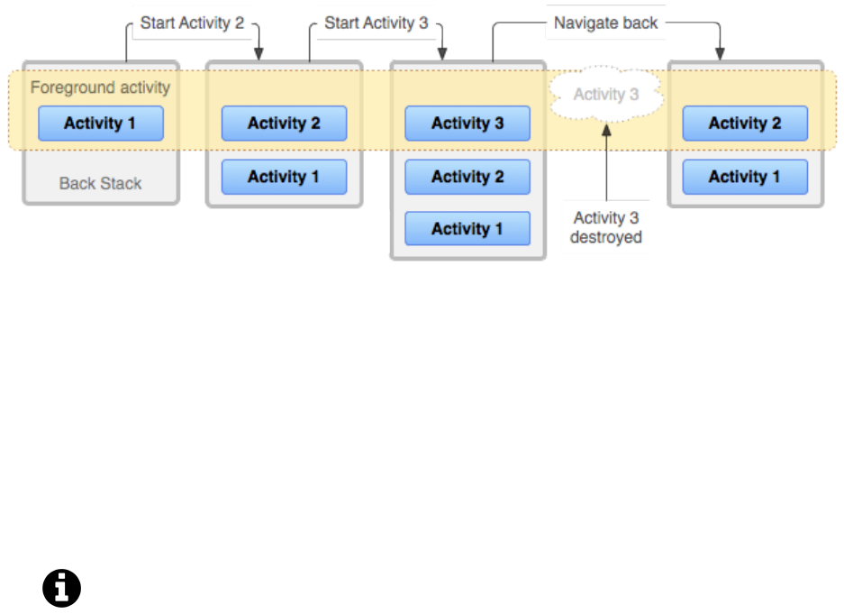
Navigation 313
Android Back Stack (from Android Developers Documentation - Tasks and Back Stack)
In React Native, all of our component code executes on a JavaScript thread. These components then
bridge to a separate main thread responsible for rendering native iOS and Android views.
In the first chapter, we briefly mentioned how we can eject from Expo if we need to include any
native dependencies ourselves. This includes any native iOS or Android code we wish to write
ourselves or third-party libraries that provide a React Native API which bridges to a specific native
module. We can use this to include native navigation in our application. We can create native
modules around platform-specific navigation components (such as UINavigationController and
Activity) and bridge them ourselves in a React Native app.
We’ll explore bridging native APIs in much more detail in the “Native Modules” chapter.
Pros
The primary benefit of this approach is a smoother navigation experience for the user. This is because
purely native iOS/Android navigation APIs can be used with all of our navigation happening within
the native thread. This approach works well when including React Native in an existing native iOS
or Android application. Using the same navigation components and transitions throughout the app
means that different screens in the app will feel consistent regardless of whether they’re written
natively or with React Native.
Additionally, if an operating system update modifies the style or functionality of navigation
components, you won’t have to wait for the same modifications to be made in your JavaScript-
based navigation library.
Cons
One of the issues with this navigation approach is that it usually involves more work. This is
because we need to ensure navigation works for both iOS and Android, using their respective native
navigational components.

Navigation 314
Moreover, we will also have to eject from Expo and take care of linking and bridging any
native modules ourselves. This means we cannot build an application with native iOS navigation
components if we do not own a Mac computer.
Another potential problem with this solution is that it can be significantly harder to modify or create
new navigation patterns. In order to customize how navigation is performed, we would have to dive
in to the native code and understand how the underlying navigation APIs work before being able
to change them.
Navigation with JavaScript
The second approach to adding navigation to a React Native app is to use JavaScript to create
components and navigation patterns that look and feel like their native counterparts. This is done
solely using React Native built-in components and the Animated API for animations.
We can explain how this works by using stack navigation as an example again. As we mentioned
earlier, this pattern allows us to move between screens by pushing a second screen on top of the
previous one. We usually see this happen by seeing the second screen slide in from either the right
or bottom edge of the device screen or fading in from the bottom. When we attempt to navigate
backwards, the current screen slides back out in the opposite direction or fades out from the top.
With the Animated API, we can use animated versions of some built-in components such as View as
well as create our own. We can create stack based navigation (as well as other navigation patterns)
by nesting our screen components within an Animated component. We can then have our screens
slide (or fade) in and out of our device when we need to allow the user to navigate throughout our
application. We’ll have to maintain the hierarchy of screens entirely in JavaScript ourselves.
Pros
One of the advantages of using JavaScript-based navigation is that it can be simpler to build the
components and animation mechanisms that can be used in both platforms instead of trying to
create a bridge to all of the core native iOS/Android APIs that we would need. This also gives us
more control and flexibility to customize specific navigation features instead of relying on what’s
available in the native platforms. We can debug any issues we experience with navigation that is
purely JavaScript-based without diving in to native code.
Most of the work during an animation using the React Native Animated API is on the JavaScript
thread. This means that every frame needs to go over the bridge to the native thread to update the
views during a transition. Fortunately, we have the option to use the API’s native driver option to
render natively driven animations. These animations are performed with animation calculations
happening on the native thread. By building navigation with this, navigation animations will
perform smoothly.
We’ll explore the built-in Animated API in greater detail in the next chapter.

Navigation 315
Another benefit of keeping all of our navigation elements within the JavaScript thread means that
we can take advantage of services such as CodePush68 to allow us to dynamically update the
application’s JavaScript code (which includes our navigation) without rolling out a new build to
our users.
Cons
There are also disadvantages with this approach. Firstly, the app can never feel exactly like a native
application in terms of navigation. As much as we can try to mimic how navigation components
and animations look like in the native layer, there may always be slight discrepancies. This can be
a bigger problem if we happen to be including React Native components into an existing native iOS
or Android application. Building transitions between screens built natively and screens built with
React Native can be a challenge if we’re using only JavaScript for our navigation.
Another potential concern with JavaScript-based navigation is slower updates in relation to the
underlying platform’s operating system. Updates to the iOS or Android version may bring changes
to the native navigational views and components. We’ll need to make sure the views and components
built with JavaScript are also updated in order to better match how they are represented natively.
Third-party libraries
In React Native, we have the option of setting up navigation by creating our own native modules
or by building our own JavaScript-based implementation. There are also a number of community-
supported libraries that we can use for either of these approaches:
•React Native Navigation69 by Wix engineering and Native Navigation70 by Airbnb are both
navigation libraries that provide access to native iOS/Android navigation components using a
React Native API.
•React Navigation71 and React Router72 are two popular third-party JavaScript navigation
libraries.
Using one of these libraries can make things significantly easier than building a navigation pattern
entirely from scratch. Moreover, all of these community-built libraries are continuously maintained
with updates included in each new release.
Navigation alternatives
Not all mobile applications need to have a complete navigation architecture. Examples include an
app that only has a few screens or does not even need any navigation in the first place (such as a
68https://github.com/Microsoft/react-native-code-push
69https://wix.github.io/react-native-navigation/#/
70http://airbnb.io/native-navigation/
71https://facebook.github.io/react-native/docs/navigation.html#react-navigation
72https://reacttraining.com/react-router/native/guides/philosophy

Navigation 316
single-screen game). However, most applications with more than a few screens will usually need
some form of navigation to allow the user to move between them.
There is no single correct solution for applications that require navigation. Different mobile apps will
always have different features and complexities. For example, it may be easier to use a JavaScript
implementation in a brand new and relatively simple application without complex navigation
requirements. However, we might find it easier to use a native solution if we plan on rolling React
Native components into a native application. We should always weigh the benefits and challenges
of each solution before deciding which approach to take.
Deprecated solutions
Navigation is a core tenet of any native application. Just like other built-in components (such as View
and Text), React Native also used to provide a number of different built-in navigation APIs. Here
are a few examples:
•NavigatorIOSaprovides an API to access the UINavigationController component for iOS to
build a screen navigation stack. It is not currently maintained and cannot be used for Android.
•Navigator is a JavaScript navigation implementation that was included into React Native when
it first launched. Expo built ExNavigator on top of this API with the aim of providing more.
features. However, it did not provide a complete navigation solution and was deprecated soon
after.
•NavigationExperimental is another JavaScript implementation and aimed to solve the prob-
lems noticed in Navigator.ExNavigation was built by the Expo team to act as a wrapper
around NavigationExperimental. It is also now deprecated.
It is important to note that all of these APIs are either not maintained or are deprecated. It is
recommended to use one of the newer community-built navigation libraries instead.
Since navigation is an important part of many mobile applications, all of these efforts were done in
order to provide a simple React Native API that can be imported and used directly in a component.
However, navigation is a lot more complex than many other built-in components. It is not easy to
provide a simple navigation API that can solve all navigation concerns in any application. For this
reason, a number of different open-source alternatives were created by the community. The efforts
from Navigator,NavigationExperimental, and the community-built ex-navigation were combined
to form the community-built React Navigation library.
ahttps://facebook.github.io/react-native/docs/navigatorios.html
In this chapter
We covered the differences between native and JavaScript navigation implementations as well
as some of their advantages and disadvantages. For each approach, we also discussed how using
an open-source library that is continuously maintained can make things easier than building a

Navigation 317
navigation architecture from scratch.
Co-authored by the Facebook team and the open-source community, React Navigation73 is the
recommended option in the React Native documentation. For this reason, we’ll use React Navigation,
a JavaScript-based implementation, in this chapter to handle navigation in our sample application.
Contact List
In this chapter, we’re going to build a contact list application that allows a user to view contact
information across several screens. We’ll begin by building our first screen, Contacts, that shows a
list of contact information fetched from a remote API.
Contacts
Then we’ll explore how we can allow the user to navigate to a separate Profile screen for each
specific contact.
73https://facebook.github.io/react-native/docs/navigation.html#react-navigation

Navigation 318
Profile
We’ll then include another top level screen, Favorites, to show favorited contacts.

Navigation 319
Favorites
Then we’ll build a User screen and tie together our top level screens using a tab navigation
component.
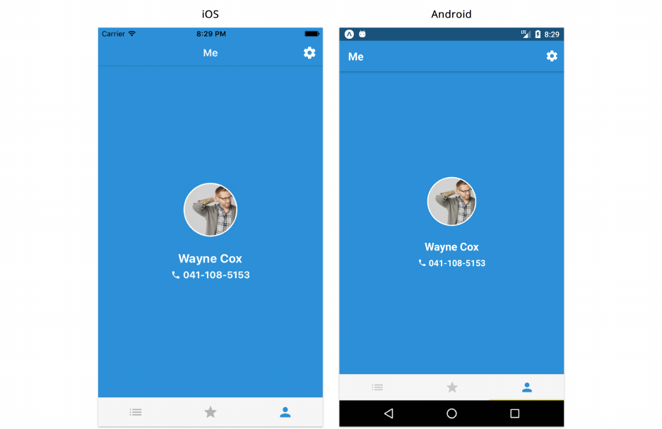
Navigation 320
User
The last screen we’ll create will be an options screen that the user can navigate to through the user
screen.

Navigation 321
Options
By building out each screen and connecting them, we’ll get a better understanding of how a
navigation pattern such as tabs can be coupled with stack navigation. While doing so, we’ll also look
into creating a small state container that controls the entire state of our app and can be accessed in
any of our screens.
By the time we’re finished with this chapter, we will have covered a number of different navigation
patterns and show how they can fit together. We’ll also be touching on a number of core concepts
we’ve already covered in the previous chapters.
Previewing the app
Before we begin, to try the completed app on your device:
• On Android, you can scan this QR code with the Expo app:

Navigation 322
QR Code
• On iOS, you can navigate to the contact-list/ directory within the sample code folder and
either preview it on the iOS simulator or send the link of the project URL to your device as we
explained in the first chapter.
Spend a little time navigating between the different screens to get a feel for all the functionality.
Starting the project
Just as we did in the previous chapters, let’s create a new app with the following command:
create-react-native-app contact-list --scripts-version 1.14.0
Once this finishes, navigate into the contact-list directory and start the app.
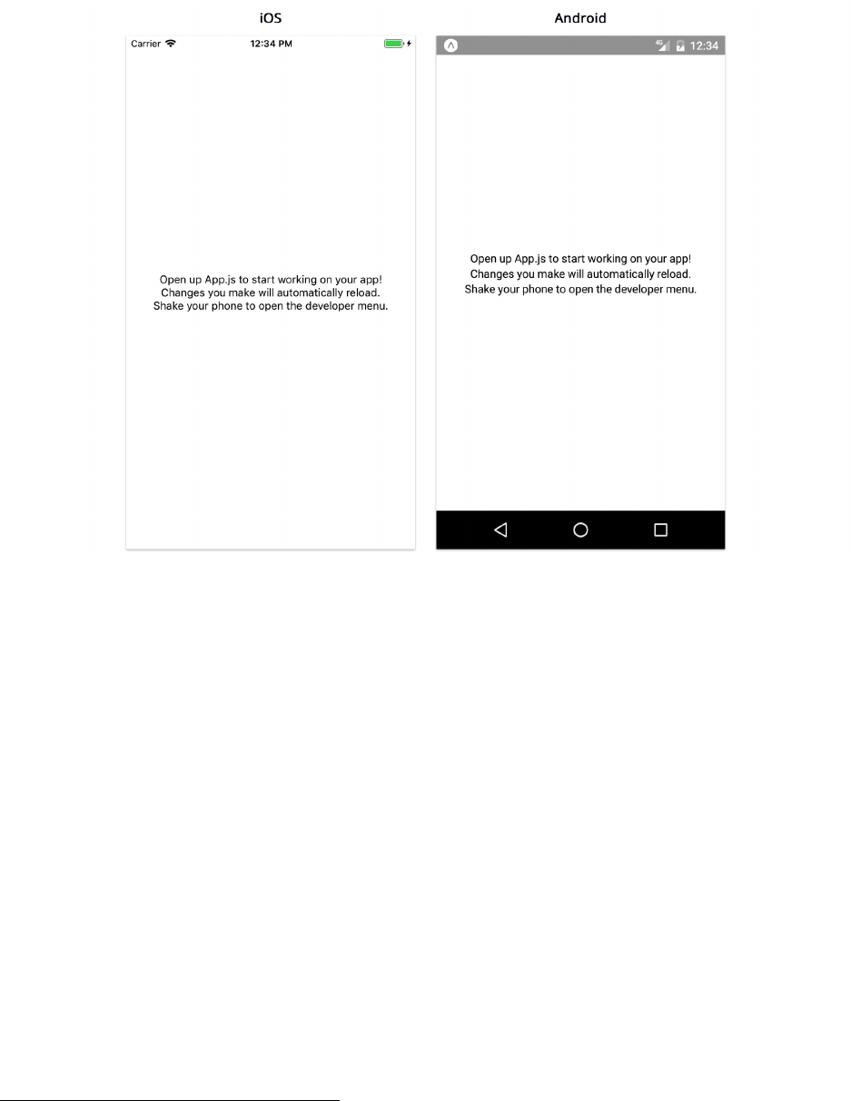
Navigation 323
Like you did in previous chapters, copy over the contact-list/utils directory from the sample
code into your own project. The utils/ directory contains the following:
• A few utility methods
• Methods that return results from our external API, Random User Generator74
• A colors object with a number of different colors
Copy over the contact-list/components directory as well. These components are the low level
presentational components that don’t manage any state of their own. They are used in the app to
display UI elements in all of our screens. Here’s a brief overview of each of the components:
•ContactListItem will be used for each contact’s list item in the Contacts screen.
•ContactThumbnail renders a thumbnail for the contact avatar that can fire an action when
pressed. It can also show the user’s name and phone number underneath based on optional
props. This component will be used to render a list of user avatars in the Favorites screen as
well as show the user thumbnail in the Profile and User screens.
•DetailListItem shows a list item with a title, subtitle, and an optional icon. This component
will be used to show contact details in the Profile screen as well as mocked links in the Options
screen.
74https://randomuser.me/
Navigation 324
Feel free to dive in and take a closer look at any of the files within utils/ and components/ to get a
better idea of how they work.
Container and Presentational components
Before we dive in to building our application, let’s take a little time to further understand how
we separate our screen and component logic. In all of our previous chapters, we explored building
custom components to create higher-level abstractions over built-in components (such as View,Text,
etc…). We can think of screens in the same way. Just like any other component, screens wrap over
lower level components. The difference here is that we can build our screen components to take up
the entire device screen and allow the user to navigate between them.
We briefly explored this pattern in the “Core Components” chapter where we built a Feed and
Comments screen for our Instagram clone app. While doing so, we managed all of our remote data
fetching within the Feed screen and the rest of our lower level components only received this
information via props. This further ties in to the pattern we’ve seen in each of the applications
we’ve built in this book so far: the concept of container components that take care of data fetching
and state management and presentational components that take in data and provide the markup
and styling in our application. We can closely follow this logic by separating how we build screens
and components in an application.
Although the Feed screen was responsible for data fetching in our Instagram clone app, we still had
some state managed in our root App component. For a relatively large application with a significant
number of screens, managing data in a single component like App may not be the most maintainable
way to handle state. For this reason, third-party state container libraries are commonly used. Instead
of using a specific library and trying to understand its APIs, we’ll handle data in our application by
writing a small custom state container. The same pattern will apply to any complex application with
a central state container regardless of which library is used.
Contacts
The first screen we’ll build is the main contacts screen which will also serve as the starting point
of our application. Create a screens/ directory and add a Contacts.js file. As we mentioned in
the “Core Components” chapter, a more complex application might be structured with directories
nested within screens/ for better categorizing of files. Since this application only consists of five
screens, we’ll add them all to the screens/ directory.
We’ll begin by defining our imports in the file:

Navigation 325
contact-list/1/screens/Contacts.js
import React from 'react';
import {
StyleSheet,
Text,
View,
FlatList,
ActivityIndicator,
} from 'react-native';
import ContactListItem from '../components/ContactListItem';
import { fetchContacts } from '../utils/api';
We’ve imported a few necessary built-in components including FlatList and ActivityIndicator
as well as our custom ContactListItem component responsible for displaying each of our contacts
items in the list. Aside from components, we also import the fetchContacts method in order to
retrieve our list of contacts and our colors object from utils.
Now let’s begin creating our class component:
contact-list/1/screens/Contacts.js
export default class Contacts extends React.Component {
state ={
contacts:[],
loading:true,
error:false,
};
async componentDidMount() {
try {
const contacts =await fetchContacts();
this.setState({
contacts,
loading:false,
error:false,
});
}catch (e) {
this.setState({
loading:false,
error:true,
});

Navigation 326
}
}
We’ve set up local component state that includes a contacts array and loading/error attributes.
In here, we’ve set our initial loading property to true because we fire our API call as soon as our
component mounts. We then update this to false as soon as our request finishes successfully.
Let’s now build the UI that gets rendered on the screen:
contact-list/1/screens/Contacts.js
renderContact =({ item }) => {
const { name, avatar, phone } =item;
return <ContactListItem name={name} avatar={avatar} phone={phone} />;
};
render() {
const { loading, contacts, error } =this.state;
const contactsSorted =contacts.sort((a, b) =>
a.name.localeCompare(b.name));
return (
<View style={styles.container}>
{loading && <ActivityIndicator size="large" />}
{error && <Text>Error...</Text>}
{!loading &&
!error && (
<FlatList
data={contactsSorted}
keyExtractor={keyExtractor}
renderItem={this.renderContact}
/>
)}
</View>
);
}
In the component render method, we sort our contacts alphabetically and show a loading indicator
if state.loading is true, an error message if state.error is true, or a list of our contacts using
FlatList. For each item in the list, we use a renderContact helper method that passes down the
contact name,avatar and phone as props to ContactListItem.

Navigation 327
We’ll also need to create our list’s keyExtractor method which we can write under our imports at
the top of the file:
contact-list/1/screens/Contacts.js
import { fetchContacts } from '../utils/api';
const keyExtractor =({ phone }) => phone;
export default class Contacts extends React.Component {
The last thing we’ll need to do is set up the styles for this component. Since our existing
presentational component ContactListItem takes care of most of our styling, we’ll just set up styles
for the container View component:
contact-list/1/screens/Contacts.js
const styles =StyleSheet.create({
container:{
backgroundColor:'white',
justifyContent:'center',
flex: 1,
},
});
Try it out
To quickly take a look at how this screen renders, we can temporarily place this component within
App:
contact-list/App.js
import React from 'react';
import Contacts from './screens/Contacts';
export default function App() {
return <Contacts />;
}
Now we can see our Contacts screen if we run the app:

Navigation 328
Contacts
You may notice the top and bottom of our list touches the edges of our device screen. This will be
fixed once we introduce our header and tab navigation components to the app. Pressing any of the
contacts does not do anything just yet. We’ll explore how we can navigate to a specific contact’s
profile screen in a bit.
You may also see a warning about a missing onPress prop which is required in the ContactListItem
component. We’ll include it once we begin adding navigation to our application.
Profile
Let’s move on to building our second screen, Profile, which shows details about a specific contact.
Create a Profile.js file within the same screens directory. Again, we’ll begin with our imports:

Navigation 329
contact-list/1/screens/Profile.js
import React from 'react';
import { StyleSheet, View } from 'react-native';
import ContactThumbnail from '../components/ContactThumbnail';
import DetailListItem from '../components/DetailListItem';
import { fetchRandomContact } from '../utils/api';
import colors from '../utils/colors';
We’ve included the ContactThumbnail and DetailListItem presentational components that we’ll
need for this screen as well as the colors object we’ll use for some styling.
We’ve also included fetchRandomContact to obtain a random contact’s information. This is tempo-
rary in order to render this screen for the first time, but will be removed once we have navigation
in place and the contact ID is passed from the previous screen to the Profile screen.
We can build our class component as follows:
contact-list/1/screens/Profile.js
export default class Profile extends React.Component {
state ={
contact:{},
};
async componentDidMount() {
const contact =await fetchRandomContact();
this.setState({
contact,
});
}
render() {
const {
avatar, name, email, phone, cell,
}=this.state.contact;
return (
<View style={styles.container}>
<View style={styles.avatarSection}>
<ContactThumbnail avatar={avatar} name={name} phone={phone} />

Navigation 330
</View>
<View style={styles.detailsSection}>
<DetailListItem icon="mail" title="Email" subtitle={email} />
<DetailListItem icon="phone" title="Work" subtitle={phone} />
<DetailListItem icon="smartphone" title="Personal" subtitle={cell} />
</View>
</View>
);
}
}
We’ve defined a contact object as our only attribute in our component state. Our componentDidMount
method fires an API call to get a random contact. Again, this is temporary until we’ve included our
navigation library. This is because we’ll eventually pass the contact’s information from the Contacts
screen.
We have not included any loading or error attributes for this same reason. This is because once
navigation is in place, this screen will only be accessible through another screen by pressing on a
contact list item or thumbnail. This means there will be no loading or potential errors from data
fetching happening at this point.
Although this might usually be the case when building screens that are only accessible through
other screens in a stack, there are scenarios where we may need to fetch data in nested screens. A
good example is deep linking which allows a user to navigate to a certain part of the app through
another app or a web browser using a specific link. We’ll explore this topic later in this chapter.
The render method is relatively straightforward. We show the user thumbnail for the top half of the
screen using ContactThumbnail as our component (which accepts the user’s avatar, name, and phone
as props). For the bottom half of the screen, we’re displaying a few DetailListItem components to
show the user’s email, work, and cell numbers.
We can now create styling for the View container components we’re using for layout at the end of
the file:
contact-list/1/screens/Profile.js
const styles =StyleSheet.create({
container:{
flex: 1,
},
avatarSection:{
flex: 1,
alignItems:'center',
justifyContent:'center',
backgroundColor:colors.blue,
},

Navigation 331
detailsSection:{
flex: 1,
backgroundColor:'white',
},
});
Try it out
Once again, let’s render our screen to see if everything is working well:
contact-list/App.js
import React from 'react';
import Profile from './screens/Profile';
export default function App() {
return <Profile />;
}
Running the app should show the Profile screen for a random contact:
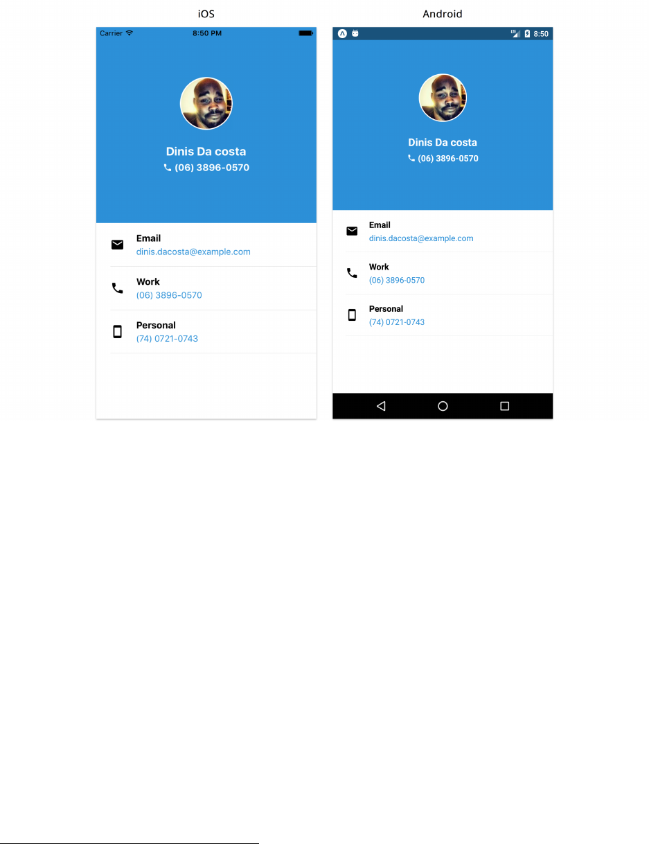
Navigation 332
Profile
React Navigation
Now that we have our first two screens in place, let’s start adding navigation to our app! As we
mentioned earlier in the chapter, there are a number of different open-source navigation libraries
available. We’ll be using React Navigation75 for this application. Since it’s purely a JavaScript
implementation, we don’t have to worry about linking iOS and Android dependencies. We can
install it to our app by using yarn:
yarn add react-navigation@1.5.11
Specify version 1.5.11 as above so that the version in your application matches the version we use
here.
Stack navigation
We briefly described how a stack navigator works earlier in this chapter. This pattern allows a user
to navigate from one screen to another by pushing the new screen to the top of the stack. The user
can also pop the current screen off the stack in order to return to the previous screen.
75https://facebook.github.io/react-native/docs/navigation.html#react-navigation

Navigation 333
In both iOS and Android, a back button at the top of the navigation bar is how a user usually
navigates back to a previous screen by removing the current screen off the stack. On Android devices,
there is also a physical or soft key back button at the bottom of the device screen that also allows
you to go back on any application.
With this navigation flow, only one screen is visible at any given time. We can think of the entire
navigation stack as an ordered array of screens, with the last element being the screen that is
currently visible and the first element being the root screen (or the screen that is visible when loading
the app for the first time).
Let’s begin by connecting our first two screens as a single stack. We’ll define all of our navigation
logic in a separate routes.js file at the root of our entire app.
Create the file and add the following code:
contact-list/2/routes.js
import { StackNavigator } from 'react-navigation';
import Contacts from './screens/Contacts';
import Profile from './screens/Profile';
export default StackNavigator({
Contacts:{
screen:Contacts,
},
Profile:{
screen:Profile,
},
});
We pass in our route configuration as an argument to StackNavigator. The object maps route names
to their configuration. We have two routes defined above, Contacts and Profile.
For each route, we define a configuration object with just one property: screen. This is the
component we wish to render at that specific route. We’ll explore more configuration options in
a bit.
We can also pass a second argument to StackNavigator, our stack navigator configurations. We’ll
also explore this a little later in this section.
In React Navigation, every navigator including StackNavigator creates a higher-order component
that wraps over each of the screen components defined within its route configurations. It enhances
each of its components by creating a newer component with a navigation prop.

Navigation 334
Higher-Order Components
In short, higher-order components are functions that take in an existing component and
return a new component with added functionality. They’re useful for minimizing code
duplication by containing common logic in a single component that can be shared among
multiple components. They’re also useful for libraries like React Navigation.
Internally, StackNavigator() generates a higher-order component that provides each of
our screens with a navigation prop. This prop serves as the interface between our screen
components and the React Navigation library.
For more information on higher-order components, refer to its section in the Appendix.
The navigation prop provides us with the following:
•navigate: Method to allow us to navigate between screens. With a StackNavigator, this
method pushes the new screen on top of the current stack.
•state: Object that returns the name and identifier of the current route as well as its parameters.
•setParams: Method to change the current screen’s parameters.
•goBack: Method that allows us to navigate to a previous screen. For StackNavigator, this pops
the current screen (or number of screens) until the specified screen is reached within the stack.
The React Navigation documentation76 contains more detail about the navigation prop.
Let’s now modify our App.js file to render our navigator instead of a single component:
contact-list/2/App.js
1import React from 'react';
2
3import AppNavigator from './routes';
4
5export default function App() {
6return <AppNavigator />;
7}
Now that we’ve set up the first StackNavigator of our application, we’ll need to use our navigation
prop to allow the user to navigate from the Contacts screen to the Profile screen. We know that
the ContactListItem component contains an onPress prop that fires the action passed to it. Let’s
modify how we render this component within our Contacts screen:
76https://reactnavigation.org/docs/navigation-prop.html

Navigation 335
contact-list/2/screens/Contacts.js
renderContact =({ item }) => {
const { navigation:{ navigate } } =this.props;
const { name, avatar, phone } =item;
return (
<ContactListItem
name={name}
avatar={avatar}
phone={phone}
onPress={() => navigate('Profile')}
/>
);
};
Try running the app and you’ll notice a header navigation bar at the top of the screen. In addition
to supplying the navigation prop, the StackNavigator HOC also renders a header above the screen
components it wraps.
Contacts
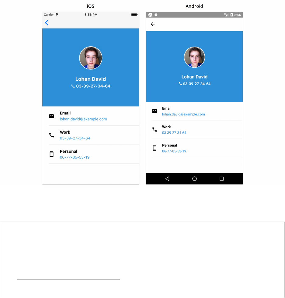
Navigation 336
Pressing any contact will navigate to the profile screen. The default behaviour for iOS is an animation
that slides the new screen from the right. For Android, the newer screen fades in from the bottom.
Profile
Pressing the back button also pops the profile screen of the stack and returns us to the contacts
screen.
In your terminal, you may be seeing a warning similar to the following:
Warning: isMounted(...) is deprecated in plain JavaScript React classes...
This warning shows when using our current version of React Navigation (1.5.11) with our version
of React Native (0.55.2). There is currently an open GitHub issueawhere this should be resolved in
a future release.
ahttps://github.com/react-navigation/react-navigation/issues/3956
Although our stack navigation pattern works, we have two problems:
• Recall that we’re using the fetchRandomContact() method to obtain a random contact. This
means that pressing a specific contact doesn’t actually load their information in the Profile
screen.

Navigation 337
• The header navigation bar doesn’t currently show anything. We should attempt to show the
current screen name so the user knows which screen they’re on.
Navigation parameters
When building multiple screens in a mobile application, it is common to have screens that depend
on some particular data in order to display the correct information. A good example is the Profile
screen in this application. Everytime a user presses a contact on the Contacts screen, we expect to
see that specific contact’s information on the next screen.
The secondary screen here is not a child of the previous screen, but it still relies on a piece of data.
In these scenarios, we need to be able to pass this data as part of the transition in our navigation
flow. React Navigation lets us attach navigation parameters using the navigate method.
We previously mentioned that the navigation prop allows us to change parameters for a screen
using its setParams method. We can similarly pass parameters to another screen. Let’s take a look
at how we set this up for navigating from the Contacts screen to Profile:
contact-list/3/screens/Contacts.js
renderContact =({ item }) => {
const { navigation:{ navigate } } =this.props;
const {
id, name, avatar, phone,
}=item;
return (
<ContactListItem
name={name}
avatar={avatar}
phone={phone}
onPress={() => navigate('Profile', { contact:item })}
/>
);
};
In the second argument of the navigate method, we pass a single object for our parameters that
contains a contact key with the value being the actual contact item. This means that every time we
press a contact on the Contacts screen, the user is navigated to the Profile screen with the actual
contact being passed as a parameter.
With this, we can simplify our Profile screen component and not load a specific contact every time
the screen is mounted:
Since we are now receiving a contact object through navigation props, we no longer need to fetch a
random contact using fetchRandomContact(). We can simplify our Profile screen and not fire any
API calls when our screen mounts:

Navigation 338
contact-list/3/screens/Profile.js
export default class Profile extends React.Component {
render() {
const { navigation:{ state:{ params } } } =this.props;
const { contact } =params;
const {
avatar, name, email, phone, cell,
}=contact;
return (
<View style={styles.container}>
<View style={styles.avatarSection}>
<ContactThumbnail avatar={avatar} name={name} phone={phone} />
</View>
<View style={styles.detailsSection}>
<DetailListItem icon="mail" title="Email" subtitle={email} />
<DetailListItem icon="phone" title="Work" subtitle={phone} />
<DetailListItem icon="smartphone" title="Personal" subtitle={cell} />
</View>
</View>
);
}
}
We’ve removed all local state from Profile and the component is now driven by props. We extract
the contact object from the navigation prop and use that to render the contact’s information. If
you try running the app now, navigating to a specific contact will show the correct information.
Although passing in the contact object as a navigation parameter works, we generally want to avoid
this pattern.
So far, we’ve explored how parents and children use props to communicate. If a parent performs a
state update, that update propagates through props down to its children. When the child receives
the updated props, the child re-renders.
What’s different here is that Profile is not a direct child of the Contacts screen. Instead Profile is
receiving this data through navigation parameters. Navigation parameters are set once, at the time
of navigation. So if the state for a contact changes, that state update will not be propagated through
navigation parameters.
Put another way, we’ve pushed a copy of a part of our state into navigation parameters. But we have
no means in place to update that copy when the state changes.
So, we should instead pass the id of a contact as a parameter. Then, Profile can look up the contact
in the list of all contacts. We’ll explore this improvement once we introduce a centralized location
for all our state later in this chapter.

Navigation 339
We’ve built the first two screens that make up our first navigator. We covered how to transition
between them by using the API supplied by the navigation prop.
Each screen will usually have its own unique set of features, and we’ll sometimes need to be able to
modify how our navigation-specific components are displayed. Next, we’ll explore how to configure
our navigation screen options before moving on to expanding the number of screens and navigation
patterns in our application.
Navigation screen options
With React Navigation, we can use the navigationOptions property to modify navigation set-
tings for a particular screen or to modify settings for every screen within a navigator (such as
StackNavigator).
We’ll use this property to add a title to the navigation header at the top of both screens. Let’s add it
to each of our screens in route.js:
contact-list/3/routes.js
export default StackNavigator({
Contacts:{
screen:Contacts,
navigationOptions:{
title:'Contacts',
},
},
We add our options using a navigationOptions object. We specify the title attribute to be Contacts.
We can run the application to confirm that this works.

Navigation 340
Contacts
Now let’s do the same for the Profile screen along with adding a few more details:
contact-list/3/routes.js
Profile:{
screen:Profile,
navigationOptions:({ navigation:{ state:{ params } } }) => {
const { contact:{ name } } =params;
return {
title:name.split(' ')[0],
headerTintColor:'white',
headerStyle:{
backgroundColor:colors.blue,
},
};
},
},
Although we passed in an object to navigationOptions for the Contacts screen, we also can pass in
a function. Passing a function gives us access to the navigation prop. This is useful when we want
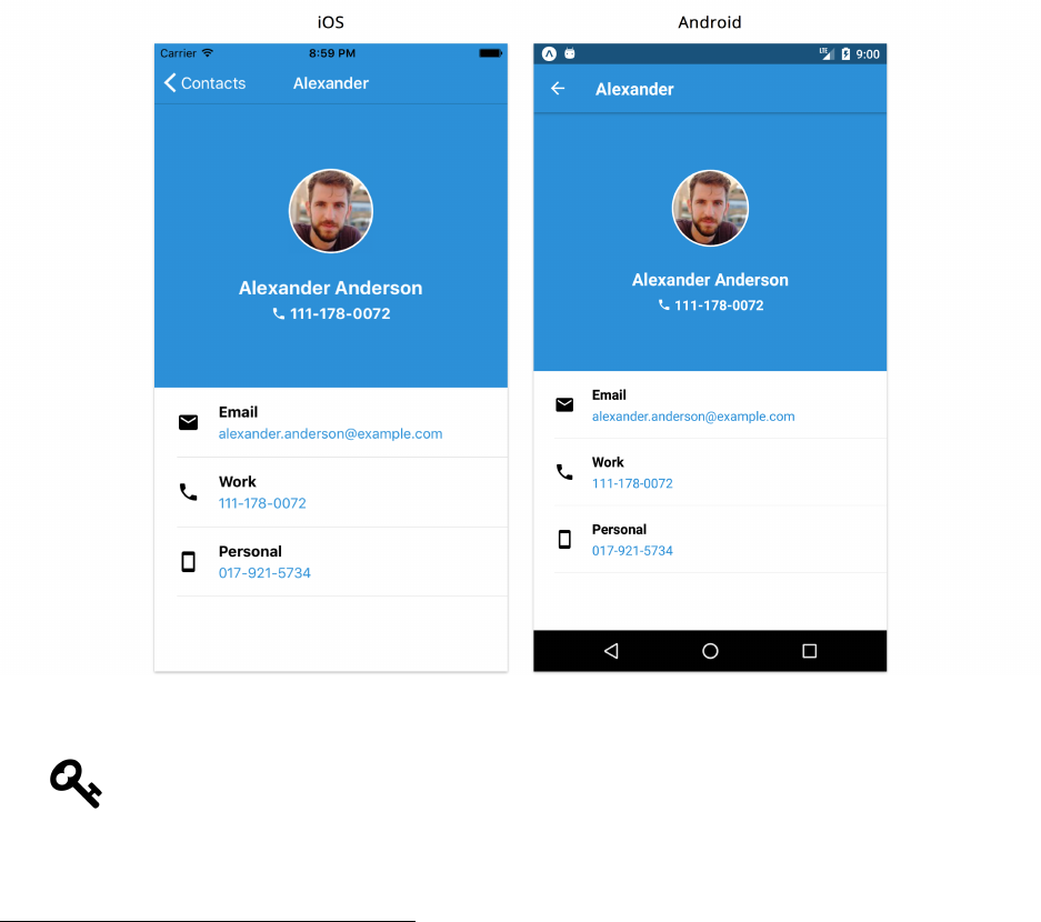
Navigation 341
our options to be derived from the navigation parameters. Here, we get the name of our contact and
use the split77 method to only render her or his first name as the title
We also modify the colors of our header by using headerTintColor, which allows us to change
the text color, and headerStyle to pass in an object of styles for the header. We change the
backgroundColor to blue.
If we try navigating to the Profile screen now, we’ll see our header styled appropriately.
Profile
Notice on iOS that the title on the left of the header defaults to the title of the previous
screen. We have control over this with the headerBackTitle property of navigation options
if we need to modify this.
For a full list of navigator configuration options provided by StackNavigator, refer to the
documentation78.
77https://developer.mozilla.org/en-US/docs/Web/JavaScript/Reference/Global_Objects/String/split
78https://reactnavigation.org/docs/navigators/stack

Navigation 342
Default Navigation Options
Although we can specify all of our navigation options for each screen separately, it may
be useful to set default navigation options for multiple screens if they all share the same
configurations. We can do this by defining navigationOptions at the level of the navigator.
For example:
export default StackNavigator({
Contacts:{
screen:Contacts,
navigationOptions:{
headerStyle:{
backgroundColor:'white',
},
},
},
Profile:{
screen:Profile,
},
}, {
navigationOptions:{
headerStyle:{
backgroundColor:colors.blue,
},
},
});
Screen-specific navigation options for the same configuration will overwrite those defined
for the navigator. In this example, all the screens within this navigator will have a default
background color of blue for their header components. The Contacts screen however will
have a white background color that overwrites the default setting.
Although we can add all of our screen-specific navigation options where we define our navigators
in routes.js, that file can quickly become quite large if we have a lot of screens and configuration
settings. We can instead define each screen’s navigation options inside each component.
Let’s begin with Contacts. We’ll remove the navigationOptions property from our routes.js file
and add it as a static class method to the Contacts component:

Navigation 343
contact-list/4/screens/Contacts.js
export default class Contacts extends React.Component {
static navigationOptions ={
title:'Contacts',
};
state ={
This is the same technique we’ve used previously for propTypes and defaultProps. We can now do
the same thing for Profile:
contact-list/4/screens/Profile.js
export default class Profile extends React.Component {
static navigationOptions =({ navigation:{ state:{ params } } }) => {
const { contact:{ name } } =params;
return {
title:name.split(' ')[0],
headerTintColor:'white',
headerStyle:{
backgroundColor:colors.blue,
},
};
};
render() {
Without the navigationOptions properties, we can clean up our routes.js file:
contact-list/4/routes.js
1import { StackNavigator } from 'react-navigation';
2
3import Contacts from './screens/Contacts';
4import Profile from './screens/Profile';
5
6export default StackNavigator(
7{
8Contacts:{
9screen:Contacts,
10 },
11 Profile:{
12 screen:Profile,
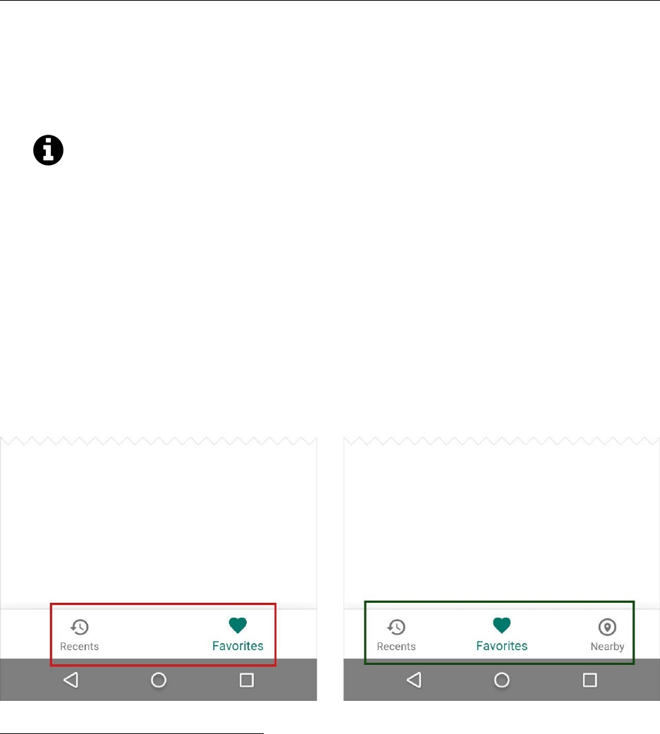
Navigation 344
13 },
14 },
15 {
16 initialRouteName:'Contacts',
17 },
18 );
The only new thing we’ve added here is the initialRouteName property. Without this property,
the first screen listed is the default screen. However, it’s better to explicitly define the initial route,
since we generally shouldn’t rely on the implicit order of keys within an object. Now, wherever this
navigator is loaded in the application, the first screen that shows will be the Contacts screen.
Like initialRouteName, React Navigation allows us to modify a number of different con-
figuration properties for stack navigators besides navigationOptions. The documentation79
goes into more detail on each of them.
Tab navigation
A single stack navigator might suffice for a small mobile app with just two or three screens. However,
most applications have more than a few screens and only using stack navigation may not be the most
efficient way to navigate throughout the entire app. This is where another navigation paradigm, like
tabs, can be useful.
We can use tab navigation to allow the user to navigate to a number of different screens at the root
level. Tabs are suitable when a number of screens carry roughly equal importance.
Bottom navigation - (from Material Design documentation - Components)
79https://reactnavigation.org/docs/stack-navigator.html#stacknavigatorconfig

Navigation 345
Favorites
Before we begin adding tab navigation components to our application, we’ll need to build a few more
screens. Let’s build the Favorites screen of our application first. We can create a Favorites.js file
within the screens directory and begin with its imports:
contact-list/5/screens/Favorites.js
import React from 'react';
import {
StyleSheet,
Text,
View,
FlatList,
ActivityIndicator,
} from 'react-native';
import { fetchContacts } from '../utils/api';
import ContactThumbnail from '../components/ContactThumbnail';
As we briefly described earlier in this chapter, this screen will be responsible for showing a list of
favorited contacts.
The Favorites component will not be a child of the Contacts component. And because we’ll be using
tab navigation as opposed to stack navigation, we can’t pass contacts to favorites via a navigation
prop.
Therefore, we’ll use the fetchContacts() function to fetch this data directly from the API. We
usually want to avoid making numerous API calls to obtain the same data on every screen. Once
we include a state container later in the chapter, we’ll remove this.
Note that we’ve set up the fetchContacts API call to randomly “favorite” contacts by setting the
favorites boolean on the contact object to true. That way, we should always have some contacts
displayed on this screen.

Navigation 346
contact-list/5/screens/Favorites.js
export default class Favorites extends React.Component {
static navigationOptions ={
title:'Favorites',
};
state ={
contacts:[],
loading:true,
error:false,
};
async componentDidMount() {
try {
const contacts =await fetchContacts();
this.setState({
contacts,
loading:false,
error:false,
});
}catch (e) {
this.setState({
loading:false,
error:true,
});
}
}
The screen’s render function:
contact-list/5/screens/Favorites.js
renderFavoriteThumbnail =({ item }) => {
const { navigation:{ navigate } } =this.props;
const { avatar } =item;
return (
<ContactThumbnail
avatar={avatar}
onPress={() => navigate('Profile', { contact:item })}
/>
);

Navigation 347
};
render() {
const { loading, contacts, error } =this.state;
const favorites =contacts.filter(contact => contact.favorite);
return (
<View style={styles.container}>
{loading && <ActivityIndicator size="large" />}
{error && <Text>Error...</Text>}
{!loading &&
!error && (
<FlatList
data={favorites}
keyExtractor={keyExtractor}
numColumns={3}
contentContainerStyle={styles.list}
renderItem={this.renderFavoriteThumbnail}
/>
)}
</View>
);
}
In render, we filter our list of contacts using a favorites flag. Using the same pattern we used in
Contacts, we show a loading indicator while the request is still being made, an error message if the
request fails, or the list of contacts.
We’re making use of the numColumns prop for FlatList to render three contacts in every row.
The renderFavoriteThumbnail method is responsible for every item in the list where we use our
ContactThumbnail component to display the user’s avatar. Notice how we’ve also passed in a
navigate action to the onPress prop. This allows the user to navigate to the contact’s profile screen
by pressing an avatar on the Favorites screen - just like when they press a contact on the Contacts
screen.
Since we’re using FlatList again, we can hook up a keyExtractor method once more:

Navigation 348
contact-list/5/screens/Favorites.js
import ContactThumbnail from '../components/ContactThumbnail';
const keyExtractor =({ phone }) => phone;
export default class Favorites extends React.Component {
And we can finish things off here by adding a few styles:
contact-list/5/screens/Favorites.js
const styles =StyleSheet.create({
container:{
backgroundColor:'white',
justifyContent:'center',
flex: 1,
},
list:{
alignItems:'center',
},
});
Try it out
In a moment, we’ll build the Users screen then add tab navigation to our app. Before we do, let’s
add Favorites to our stack navigator just so we can see what it looks like. We’ll set it as our initial
route:
contact-list/routes.js
import { StackNavigator } from 'react-navigation';
import Contacts from './screens/Contacts';
import Profile from './screens/Profile';
import Favorites from './screens/Favorites';
export default StackNavigator(
{
Contacts:{
screen:Contacts,
},
Profile:{
screen:Profile,
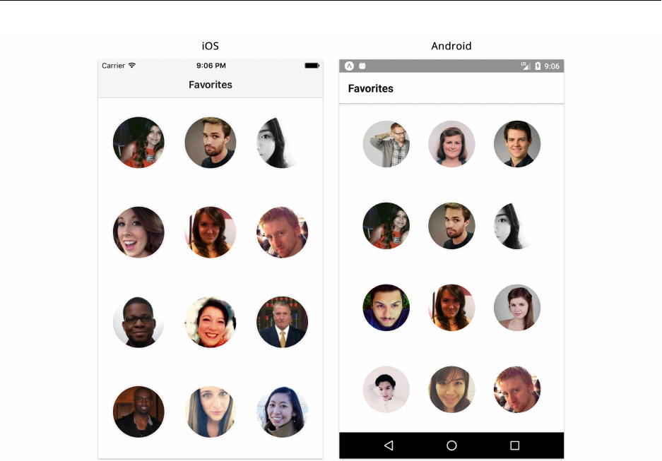
Navigation 349
},
Favorites:{
screen:Favorites,
},
},
{
initialRouteName:'Favorites',
},
);
Favorites
Note that pressing on any avatar navigates to the Profile screen.
As Favorites will not be a part of our stack navigation, go ahead and revert the changes here to the
original route configurations.
User screen
Let’s now build the third root screen, User, which displays the details of the user of the app. We’ll
begin with its imports:

Navigation 350
contact-list/5/screens/User.js
import React from 'react';
import { StyleSheet, Text, View, ActivityIndicator } from 'react-native';
import ContactThumbnail from '../components/ContactThumbnail';
import colors from '../utils/colors';
import { fetchUserContact } from '../utils/api';
We’re using another method, fetchUserContact, from our API utility file. This fetches a single
contact.
We define the header styles at the top of the component:
contact-list/5/screens/User.js
export default class User extends React.Component {
static navigationOptions ={
title:'Me',
headerTintColor:'white',
headerStyle:{
backgroundColor:colors.blue,
},
};
Similar to the Profile screen, we’re displaying a blue header bar with white text.
Our local state and componentDidMount method will follow the same pattern as other screens:
contact-list/5/screens/User.js
state ={
user:[],
loading:true,
error:false,
};
async componentDidMount() {
try {
const user =await fetchUserContact();
this.setState({
user,
loading:false,
error:false,

Navigation 351
});
}catch (e) {
this.setState({
loading:false,
error:true,
});
}
}
Our render method will show the ContactThumbnail with the user’s name, avatar and phone
number:
contact-list/5/screens/User.js
render() {
const { loading, user, error } =this.state;
const { avatar, name, phone } =user;
return (
<View style={styles.container}>
{loading && <ActivityIndicator size="large" />}
{error && <Text>Error...</Text>}
{!loading && (
<ContactThumbnail avatar={avatar} name={name} phone={phone} />
)}
</View>
);
}
And finally, we’ll style our container to have a blue background as well as place our thumbnail in
the center of our screen:
contact-list/5/screens/User.js
const styles =StyleSheet.create({
container:{
flex: 1,
alignItems:'center',
justifyContent:'center',
backgroundColor:colors.blue,
},
});

Navigation 352
Try it out
We’ll again temporarily modify our routes.js file to test out this component:
contact-list/routes.js
import { StackNavigator } from 'react-navigation';
import Contacts from './screens/Contacts';
import Profile from './screens/Profile';
import User from './screens/User';
export default StackNavigator(
{
Contacts:{
screen:Contacts,
},
Profile:{
screen:Profile,
},
User:{
screen:User,
},
},
{
initialRouteName:'User',
},
);
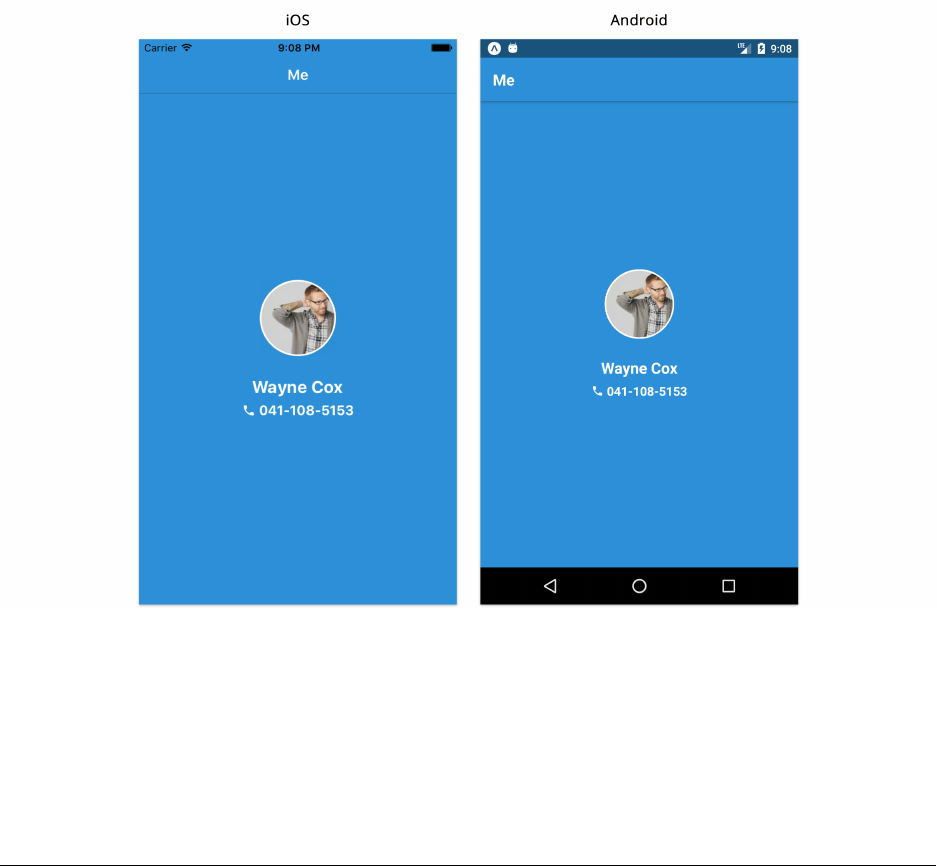
Navigation 353
User
Nested navigators
Now that we have all the screens that make up our tabs, we can start putting our tab navigation
logic in place. Let’s import and use the TabNavigator component in our routes.js file:
contact-list/routes.js
import { TabNavigator } from 'react-navigation';
import Contacts from './screens/Contacts';
import Favorites from './screens/Favorites';
import User from './screens/User';
export default TabNavigator({
Contacts:{
screen:Contacts,
},
Favorites:{
screen:Favorites,
},
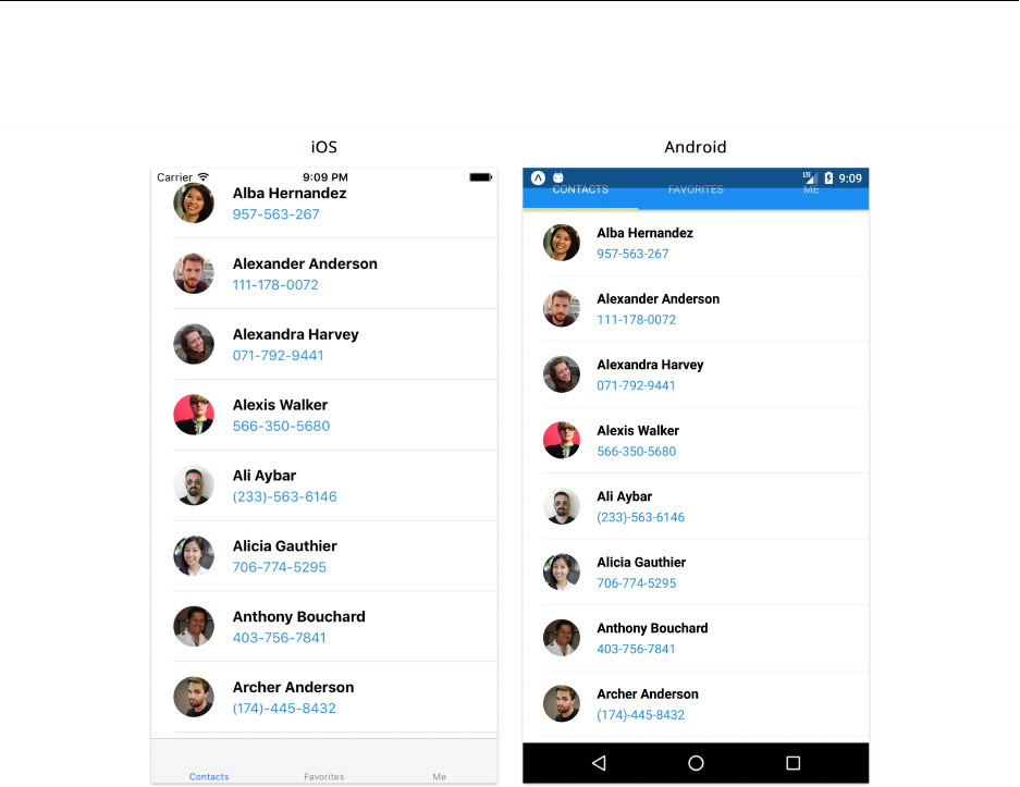
Navigation 354
User:{
screen:User,
},
});
If we run the app, we’ll see tabs with labels at the bottom of the iOS device screen and at the top of
the Android screen. These tabs allow us to switch between the three screens.
Tabs
We’ll modify the styling of our tabs in a little bit. At the moment, we have a bigger problem. We
don’t have our header component anymore and if we try pressing any of the contacts in the Contacts
or Favorites screens, nothing happens. This is because we’ve removed our StackNavigator entirely
and only have a single tab navigation system in place. What we want to do is compose our two
navigators.
Let’s update our route configurations. We’ll begin with the imports since we’ll be including a few
new ones:
Navigation 355
contact-list/5/routes.js
import React from 'react';
import { StackNavigator, TabNavigator } from 'react-navigation';
import { MaterialIcons } from '@expo/vector-icons';
import Favorites from './screens/Favorites';
import Contacts from './screens/Contacts';
import Profile from './screens/Profile';
import User from './screens/User';
import colors from './utils/colors';
We’re importing both navigators from react-navigation as well as MaterialIcons from Expo’s
vector-icons package. This package is a wrapper around react-native-vector-icons80, a library
that contains a number of vector icons. Creating icons is done by using JSX to define icon
components. For this reason, we’ve imported React to this file as well.
You can find a list of all the icons provided by the library here81. There are a number
of different icon sets that can be used (such as FontAwesome). We’ll only be using the
MaterialIcons icon set for this application.
To compose stack navigation and tab navigation, each tab will have its own separate navigation
stack. This means that instead of passing specific screens to each tab, we’ll pass in a stack (a
StackNavigator component) that contains every possible screen within that tab.
For example, we want the contacts list to still use a stack navigator. That way, the user can navigate
to individual profiles. That stack navigator will reside inside our app’s broader tab navigator.
Let’s write our stack navigator for the contacts list. It looks the same as before, with one additional
configuration:
contact-list/5/routes.js
const ContactsScreens =StackNavigator(
{
Contacts:{
screen:Contacts,
},
Profile:{
screen:Profile,
},
},
80https://github.com/oblador/react-native-vector-icons
81https://expo.github.io/vector-icons/
Navigation 356
{
initialRouteName:'Contacts',
navigationOptions:{
tabBarIcon:getTabBarIcon('list'),
},
},
);
For the “Contacts” tab, we want to first show the Contacts screen and allow the user to be able to
navigate to the Profile screen.
Notice how we’ve also added navigation options to specify this navigator’s tabBarIcon. We’re
passing in a getTabIcon helper method to retrieve a list icon component. Let’s define this function
right after our imports:
contact-list/5/routes.js
import colors from './utils/colors';
const getTabBarIcon =icon => ({ tintColor }) => (
<MaterialIcons name={icon} size={26} style={{ color:tintColor }} />
);
const ContactsScreens =StackNavigator(
The tabBarIcon option expects a function. It will call that function with a single object that has the
properties focused and tintColor.
The getTabIcon function returns a function that returns a specific icon component from the
MaterialIcons icon set given its name. When we define our TabNavigator component, we’ll assign
the tint colors for all icons in each of our tabs.
Higher-order functions
The tabBarIcon parameter in our navigation options expects a function that takes an object with
focused and tintColor as attributes. It looks like the following:
tabBarIcon:(params) => (
<MaterialIcons
name="list"
size={26}
style={{ color:params.tintColor }}
/>
),

Navigation 357
The focused argument allows us to render something different depending on whether the current
tab is focused in view or not. We’re not doing anything for the different states so we do not even
use focused at all. We only use tintColor in order to give our tab icons an appropriate active or
inactive color defined as options in TabNavigator.
With parameter context matchinga, we can simplify how we pass in our arguments:
tabBarIcon:({ tintColor }) => (
<MaterialIcons
name="list"
size={26}
style={{ color:tintColor }}
/>
),
Since every icon in each of the tabs have the same tint color and size, we simplify how we render
our icons by defining a single getTabIcon function:
const getTabBarIcon =icon => ({ tintColor }) => (
<MaterialIcons name={icon} size={26} style={{ color:tintColor }} />
);
// ...
tabBarIcon:getTabBarIcon('list'),
The getTabIcon function takes an icon string as a parameter and returns a function that takes the
correct parameters expected by tabBarIcon (an object with tintColor and focused).
aappendix_higher_order_components
Let’s do the same for our other two tabs, Favorites and User:
contact-list/5/routes.js
const FavoritesScreens =StackNavigator(
{
Favorites:{
screen:Favorites,
},
Profile:{
screen:Profile,
},
},
{
initialRouteName:'Favorites',

Navigation 358
navigationOptions:{
tabBarIcon:getTabBarIcon('star'),
},
},
);
const UserScreens =StackNavigator(
{
User:{
screen:User,
},
},
{
initialRouteName:'User',
navigationOptions:{
tabBarIcon:getTabBarIcon('person'),
},
},
);
For the Favorites tab, the idea is similar. We want to default to the Favorites screen but still allow
the user to navigate to the Profile screen for any specific contact. The User stack navigator only
has one screen at the moment, but we’ll add a second screen a little later.
Now that we’ve defined our stack navigators, we can write up our tab navigator underneath:
contact-list/5/routes.js
export default TabNavigator(
{
Contacts:{
screen:ContactsScreens,
},
Favorites:{
screen:FavoritesScreens,
},
User:{
screen:UserScreens,
},
},
{
initialRouteName:'Contacts',
tabBarPosition:'bottom',
tabBarOptions:{

Navigation 359
style:{
backgroundColor:colors.greyLight,
},
showLabel:false,
showIcon:true,
activeTintColor:colors.blue,
inactiveTintColor:colors.greyDark,
renderIndicator:() => null,
},
},
);
We pass each StackNavigator as the screen for their corresponding tab. React Navigation allows us
to pass entire navigators as a tab screen and the first screen of the stack will be the default screen
for that tab. We’ve also defined some configurations for our tabs:
•tabBarPosition allows us to have our tabs at the top or bottom of our screen. For iOS, this
defaults to bottom and Android defaults to top. Specifying bottom means the tabs will render
at the bottom for both platforms.
•tabBarOptions allow us to modify styling for our tabs. We first define the tab background color
using the style object. Since we only want icons to show, we’ve also specified showLabel to be
false and showIcon to true. We set our icon colors for both active (where the user is currently
viewing) and inactive tabs. The last option, renderIndicator, allows us to pass in a function
to modify how tab indicators (or lines at the bottom of the active tab) are rendered. A default
tab indicator shows for Android and we pass null to remove it entirely.
With regards to tabBarOptions, there are options specific to Android that do not apply
to iOS. Every option we’ve specified so far is customizable for both platforms. For more
information on tab configurations and options, refer to the documentation82.
Try it out
If we try running the application now, we’ll see our complete tab logic working!
82https://reactnavigation.org/docs/navigators/tab

Navigation 360
Contacts
Try navigating between the different tabs as well as pressing a contact list item or thumbnail to
navigate to the Profile screen. You’ll notice that navigating to the Profile screen in one tab will
only show that screen there. Composing both tab and stack navigation allows for more complex
navigation architectures where each stack in a tab maintains the history of its own navigated screens
independently from the others.
Modal navigation
We’ll introduce our final screen in the app, Options, to demonstrate how stack navigators can be
modified to render new screens with a modal. This is only for iOS and does not work for Android.
We can begin by creating an Options.js file in the screens/ directory:

Navigation 361
contact-list/screens/Options.js
1import React from 'react';
2import { StyleSheet, View } from 'react-native';
3import { MaterialIcons } from '@expo/vector-icons';
4
5import DetailListItem from '../components/DetailListItem';
6import colors from '../utils/colors';
7
8export default class Options extends React.Component {
9static navigationOptions =({ navigation:{ goBack } }) => ({
10 title:'Options',
11 headerLeft:(
12 <MaterialIcons
13 name="close"
14 size={24}
15 style={{ color:colors.black, marginLeft: 10 }}
16 onPress={() => goBack()}
17 />
18 ),
19 });
20
21 render() {
22 return (
23 <View style={styles.container}>
24 <DetailListItem title="Update Profile" />
25 <DetailListItem title="Change Language" />
26 <DetailListItem title="Sign Out" />
27 </View>
28 );
29 }
30 }
31
32 const styles =StyleSheet.create({
33 container:{
34 flex: 1,
35 backgroundColor:'white',
36 },
37 });
In this screen, we render a few DetailListItem components to represent options that the user
can press to modify their profile settings. We’ve included a headerLeft attribute for the screen’s

Navigation 362
navigation options that renders a close icon. We’ve added a callback to the icon’s onPress prop that
fires navigate.goBack to close the current screen and return to the previous one.
Let’s build the functionality to allow the user to navigate to this screen. We’ll do this in the User
screen by adding an icon to our header:
contact-list/screens/User.js
static navigationOptions =({ navigation:{ navigate } }) => ({
title:'Me',
headerTintColor:'white',
headerStyle:{
backgroundColor:colors.blue,
},
headerRight:(
<MaterialIcons
name="settings"
size={24}
style={{ color:'white', marginRight: 10 }}
onPress={() => navigate('Options')}
/>
),
});
Don’t forget to import MaterialIcons in this file.
Now, in routes.js, we’ll import our Options screen:
contact-list/routes.js
import Options from './screens/Options';
Then add it to the UserScreens stack navigator within routes.js:
contact-list/routes.js
const UserScreens =StackNavigator(
{
User:{
screen:User,
},
Options:{
screen:Options,
},
},
{

Navigation 363
mode:'modal',
initialRouteName:'User',
navigationOptions:{
tabBarIcon:getTabBarIcon('person'),
},
},
);
We use the mode attribute to specify this navigator should have modal transitions for iOS.
Try it out
Start the app and give it a shot! You’ll be able to navigate directly to the Options screen through
User.
User
By pressing the icon on the right of our header bar, you’ll notice that the screen moves up from the
bottom if you own an iOS device.
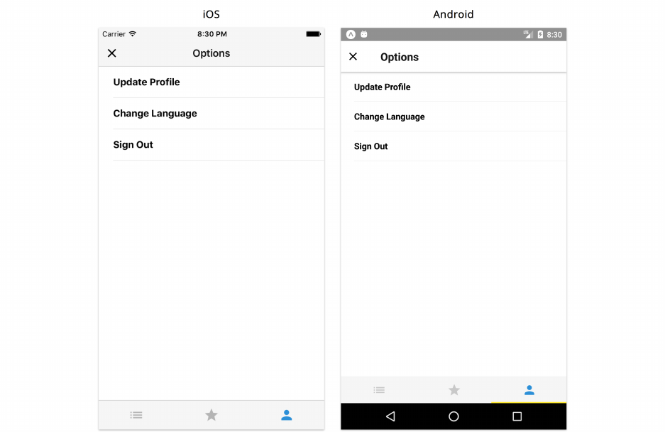
Navigation 364
Options
If you try on Android device or emulator, the screen will fade in just like any of the other screens
in the stack.
Drawer navigation
Another navigation pattern that is commonly used is drawer navigation, where views are accessible
through a drawer that slides in from the left side of the screen.

Navigation 365
Navigation drawer - (from Material Design documentation - Components)
Just like tab navigation, a drawer navigator allows users to switch between equally important views
quickly.
Neither of these patterns is better than the other. Choosing the right pattern depends on both
preferences as well as the number of root screens that the user can access.
A good rule of thumb is that tabs work well when there are three to five of them. If there are many
important, unrelated screens that the user should be able to access without navigating through a
stack, then drawer navigation may be more suitable.
Although our final app only includes tab navigation for our three core views, let’s explore what
using drawer navigation would look like. We’ll swap in DrawerNavigator for TabNavigator.
Let’s modify our routes.js file:
contact-list/6/routes.js
1import React from 'react';
2import { StackNavigator, DrawerNavigator } from 'react-navigation';
3import { MaterialIcons } from '@expo/vector-icons';
4
5import Favorites from './screens/Favorites';
6import Contacts from './screens/Contacts';
7import Profile from './screens/Profile';
8import User from './screens/User';
9import Options from './screens/Options';
10
11 const getDrawerItemIcon =icon => ({ tintColor }) => (
Navigation 366
12 <MaterialIcons name={icon} size={22} style={{ color:tintColor }} />
13 );
14
15 const ContactsScreens =StackNavigator(
16 {
17 Contacts:{
18 screen:Contacts,
19 },
20 Profile:{
21 screen:Profile,
22 },
23 },
24 {
25 initialRouteName:'Contacts',
26 navigationOptions:{
27 drawerIcon:getDrawerItemIcon('list'),
28 },
29 },
30 );
31
32 const FavoritesScreens =StackNavigator(
33 {
34 Favorites:{
35 screen:Favorites,
36 },
37 Profile:{
38 screen:Profile,
39 },
40 },
41 {
42 initialRouteName:'Favorites',
43 navigationOptions:{
44 drawerIcon:getDrawerItemIcon('star'),
45 },
46 },
47 );
48
49 const UserScreens =StackNavigator(
50 {
51 User:{
52 screen:User,
53 },
54 Options:{

Navigation 367
55 screen:Options,
56 },
57 },
58 {
59 mode:'modal',
60 initialRouteName:'User',
61 navigationOptions:{
62 drawerIcon:getDrawerItemIcon('person'),
63 },
64 },
65 );
66
67 export default DrawerNavigator(
68 {
69 Contacts:{
70 screen:ContactsScreens,
71 },
72 Favorites:{
73 screen:FavoritesScreens,
74 },
75 User:{
76 screen:UserScreens,
77 },
78 },
79 {
80 initialRouteName:'Contacts',
81 },
82 );
Note that instead of the tabBarIcon option, we use drawerIcon to display an icon near the menu item
within the drawer. We also change the name of the method that returns our icon from getTabIcon
to getDrawerIcon.
Although the drawer can be accessed by swiping on the left edge of the device screen towards the
right, it also helps to have a menu icon in each of the main screens that can open and close the
drawer. We’ll begin with the Contacts screen:

Navigation 368
contact-list/6/screens/Contacts.js
static navigationOptions =({ navigation:{ navigate } }) => ({
title:'Contacts',
headerLeft:(
<MaterialIcons
name="menu"
size={24}
style={{ color:colors.black, marginLeft: 10 }}
onPress={() => navigate('DrawerToggle')}
/>
),
});
We’ve added a menu icon on the left hand side of the header. With React Navigation, we can navigate
to DrawerOpen and DrawerClose to open and close the drawer respectively. DrawerToggle will fire
either of those depending on the current state of the navigation drawer. This allows us to toggle the
drawer with a single method.
We can add this same icon to the Favorites screen:
contact-list/6/screens/Favorites.js
static navigationOptions =({ navigation:{ navigate } }) => ({
title:'Favorites',
headerLeft:(
<MaterialIcons
name="menu"
size={24}
style={{ color:colors.black, marginLeft: 10 }}
onPress={() => navigate('DrawerToggle')}
/>
),
});
And the User screen:

Navigation 369
contact-list/6/screens/User.js
static navigationOptions =({ navigation:{ navigate } }) => ({
title:'Me',
headerTintColor:'white',
headerStyle:{
backgroundColor:colors.blue,
},
headerLeft:(
<MaterialIcons
name="menu"
size={24}
style={{ color:'white', marginLeft: 10 }}
onPress={() => navigate('DrawerToggle')}
/>
),
headerRight:(
<MaterialIcons
name="settings"
size={24}
style={{ color:'white', marginRight: 10 }}
onPress={() => navigate('Options')}
/>
),
});
Try it out
Try running the application with these drawer settings enabled. We can see a menu icon in either
of our three root screens.

Navigation 370
Contacts Screen - Drawer
We can open and close our drawer by swiping right on the left edge of the screen or by pressing the
menu icon.
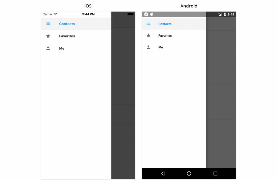
Navigation 371
Drawer
Sharing state between screens
So far, we’ve built our entire application using local component state. While doing so, we noticed
some of the challenges that applications with multiple screens have when data must be shared
between screens.
For example, our Favorites screen uses the same list of contacts as the Contacts screen. But we had
to make an API call for each screen, fetching the list twice. It would be better to fetch the list just
once and share data between screens.
There are a few different ways we can make this better. One way is to define all the data within
our application in the App component. We can then use the initialRouteParams property that React
Navigation provides for our root tab navigator to assign the state to its initial route - Contacts.
With this approach, we can continue to pass our entire data to every other screen we navigate using
navigation parameters similar to how we pass contact information from Contacts to Profile.
This method of maintaining state is not ideal due to the fact that every screen now has access to all
the data in the entire app. Moreover, this will most likely create performance issues as we would
need to re-render every screen to reflect changes to the state being modified in a specific screen.

Navigation 372
State containers
React Native applications that contain a navigation architecture generally handle data flow differ-
ently than we’ve done in our apps so far. So far, we’ve stored data in the root and screen components
of our apps, and we’ve passed data down from parent to child as props. In this app, we’ll use a
state container to manage all of our application data in a separate external location outside of our
components.
This can be useful to separate the UI and data concerns in our application. In a typical application
with multiple top-level screens, this approach allows us to pass parts of our state to each of our
screens.
Third-party libraries
One approach to including a state container is to use a third-party library. Redux83 and MobX84 are
two popular examples that allow users to maintain their entire application state in a single location.
They also impose certain restrictions on how this state object can be modified.
Using a community-supported library means we don’t have to spend the time trying to build the
logic ourselves. There are packages that exist in both the Redux and MobX ecosystem that allow
us to bind our React or React Native components directly to the global store. Modifying our state
requires an action to be dispatched which gives us more explicit control to modify our state in only
specific parts of our application. We can also take advantage of middlewares to intercept any of
our actions before it reaches our state. This can allow us to log all of our state changes for easier
debugging as well as fire asynchronous operations as part of our actions if we need to.
Downsides of using an external library include the learning curve needed to learn its API and specific
requirements. Redux, for example, adheres to the use of pure functions (or functions without any
side effects) and requires a decent amount of boilerplate code in order to connect a component to
our store with appropriate actions. MobX uses the concept of reactive programming and observables
in order to have our state update when our data is changed. Using either of these libraries or another
state management tool altogether means that we would need to fully understand how they work.
Custom state container
Instead of using a community-supported library, we always have the option of building our own
state container in our application. This can be useful when we want complete control over how we
manage our data, or when we don’t want to introduce a complex dependency.
While suitable for our needs in this app, a simple state container built from scratch will not have
nearly as many features or plugins as a third-party library. Most medium and large React Native
applications use Redux or MobX. These libraries have a bit of a learning curve and require more
boilerplate code, but they make things more predictable by constraining how we manage our state.
83https://github.com/reactjs/redux
84https://github.com/mobxjs/mobx

Navigation 373
They can help us build consistent applications that are easier to test, debug and analyze using
different built-in or external plugins.
To demonstrate the overall approach of how to manage state in a central location with navigation,
we’ll use an extremely simple state container of our own instead of relying on a third-party solution.
Copy over the the contact-list/store.js file in the sample code to the root of you application. If
you like, take a look at the file to get a better understanding of how it works.
In this file, we’ve defined all of our application state as a single object called state:
contact-list/store.js
1let state ={
2isFetchingContacts:true,
3isFetchingUser:true,
4contacts:[],
5user:{},
6error:false,
7};
Each of the field values in this object are the default values when our application is first launched.
We then export three methods that can be used throughout our application:
•getState returns the application state.
•setState takes in new values and updates our state. We don’t mutate the current state object
directly, but instead create a new copy with our updated values.
•onChange allows us to listen for changes in our state.
Let’s begin by including it to our Contacts screen. We’ll start with importing our store:
contact-list/7/screens/Contacts.js
import store from '../store';
Now we can make use of our store methods:

Navigation 374
contact-list/7/screens/Contacts.js
export default class Contacts extends React.Component {
static navigationOptions ={
title:'Contacts',
};
state ={
contacts:store.getState().contacts,
loading:store.getState().isFetchingContacts,
error:store.getState().error,
};
async componentDidMount() {
this.unsubscribe =store.onChange(() =>
this.setState({
contacts:store.getState().contacts,
loading:store.getState().isFetchingContacts,
error:store.getState().error,
}));
const contacts =await fetchContacts();
store.setState({ contacts, isFetchingContacts:false });
}
componentWillUnmount() {
this.unsubscribe();
}
We’ve set up our local state by connecting its attributes to the correct global store attributes. Notice
how we’ve defined loading to be equal to the global state attribute of isFetchingContacts. This
component does not need to know anything else in the state that it is not using (and this includes
the isFetchingUser boolean that would be used in the User screen). We have complete control of
how we want to refer and define our state relevant to the context of this component.
In componentDidMount, we set our onChange method to update our local component state using
this.setState. When we get the results of our API call, we use our store setState method to
update our shared store and since we also use onChange - our local component state will also update
to reflect this change. We make sure to unsubscribe from our change listener when our component
unmounts as well.
Now in our render method, we’ll need to update which parameters we look for within our state:

Navigation 375
contact-list/7/screens/Contacts.js
render() {
const { contacts, loading, error } =this.state;
const contactsSorted =contacts.sort((a, b) =>
a.name.localeCompare(b.name));
return (
<View style={styles.container}>
{loading && <ActivityIndicator size="large" />}
{error && <Text>Error...</Text>}
{!loading &&
!error && (
<FlatList
data={contactsSorted}
keyExtractor={keyExtractor}
renderItem={this.renderContact}
/>
)}
</View>
);
}
Let’s do the same thing for Favorites:
contact-list/7/screens/Favorites.js
export default class Favorites extends React.Component {
static navigationOptions ={
title:'Favorites',
};
state ={
contacts:store.getState().contacts,
loading:store.getState().isFetchingContacts,
error:store.getState().error,
};
async componentDidMount() {
const { contacts } =this.state;
this.unsubscribe =store.onChange(() =>
this.setState({

Navigation 376
contacts:store.getState().contacts,
loading:store.getState().isFetchingContacts,
error:store.getState().error,
}));
if (contacts.length === 0) {
const fetchedContacts =await fetchContacts();
store.setState({ contacts:fetchedContacts, isFetchingContacts:false });
}
}
componentWillUnmount() {
this.unsubscribe();
}
We technically shouldn’t need to submit fetch our contacts from the API again. We know that when
the user loads the application for the first time, the contacts are retrieved within the Contacts screen,
which is the first tab. However, it’s generally better not rely on the order each screen loads to ensure
our data is ready. This is both for testability (we can easily run this screen individually), and because
if we later add the capability to navigate to this screen without loading the Contacts screen first,
our application will fail. A good example of when this might happen is when we allow a user to
deep link to a specific screen from outside the application entirely. We’ll explore this concept in a
bit.
Similarly, we can update our render method as well:
contact-list/7/screens/Favorites.js
render() {
const { contacts, loading, error } =this.state;
const favorites =contacts.filter(contact => contact.favorite);
return (
<View style={styles.container}>
{loading && <ActivityIndicator size="large" />}
{error && <Text>Error...</Text>}
{!loading &&
!error && (
<FlatList
data={favorites}
keyExtractor={keyExtractor}
numColumns={3}

Navigation 377
contentContainerStyle={styles.list}
renderItem={this.renderFavoriteThumbnail}
/>
)}
</View>
);
}
And finally, we can update our User screen to follow this same approach:
contact-list/7/screens/User.js
export default class User extends React.Component {
static navigationOptions ={
title:'Me',
headerTintColor:'white',
headerStyle:{
backgroundColor:colors.blue,
},
};
state ={
user:store.getState().user,
loading:store.getState().isFetchingUser,
error:store.getState().error,
};
async componentDidMount() {
this.unsubscribe =store.onChange(() =>
this.setState({
user:store.getState().user,
loading:store.getState().isFetchingUser,
error:store.getState().error,
}));
const user =await fetchUserContact();
store.setState({ user, isFetchingUser:false });
}
componentWillUnmount() {
this.unsubscribe();
}

Navigation 378
render() {
const { user, loading, error } =this.state;
const { avatar, name, phone } =user;
return (
<View style={styles.container}>
{loading && <ActivityIndicator size="large" />}
{error && <Text>Error...</Text>}
{!loading && (
<ContactThumbnail avatar={avatar} name={name} phone={phone} />
)}
</View>
);
}
}
Don’t forget to import store within Favorites and User!
Try it out
If we try running the application at this point, we’ll notice everything works exactly the same. Again,
the difference now is that each top level screen in our application uses the same shared data object
in our application.
Instead of being more specific about which parts of our central store we wanted to connect to in
each screen, we could have just connected the entire store using state = store.getState();.
However, connecting only parts of the global state to our component not only improves how we
encapsulate which state parameters we need, but it can also improve re-render performance. In
React Native, a component re-renders if any part of its state changes. With this approach, we can
have our component re-render only when the state specific to it changes.
Although a centralized store allowed us to handle how data is managed across a number of top-level
screens, it’s important to remember that this adds an extra layer of abstraction to our application.
Not only do we now pass presentational data from parent components to child components, we
also pass data through navigation parameters when we navigate through certain screens and use a
top-level state container that manages all the data in our application.
Deep Linking
The last major topic we’ll explore in this chapter is deep linking. Deep linking means launching
the app and navigating to a specific screen automatically. A deep link bypasses the tab, stack, and

Navigation 379
drawer navigation, taking the user directly to the desired screen. This can be useful when launching
your app from a webpage, a push notification, or another app.
Imagine the user gets a push notification that a new contact has been added. When the user taps the
notification, they should be taken directly to the profile screen for that contact, rather than having
to navigate their way from the initial screen of the app.
Deep links are similar to typing a URI (Uniform Resource Identifier) into a web browser. On the web,
https://www.fullstackreact.com might load the homepage for the website, while https://www.fullstackreact.com/react-native
will load a different page. Similarly in mobile applications, we perform a deep link using a URI, where
each URI generally takes us to a different screen.
Using a navigation library for a mobile app helps us build our app in terms of screens – this makes
it easy to connect any screen of our app to a specific URI.
Let’s explore how we can add deep linking to our current application by allowing the user to navigate
to a specific contact’s profile directly. With Expo, the base URI is different based on the state of the
application:
•exp://localhost:19000/+ or exp://10.2.8.358:19000/+ is the URI we use during develop-
ment. 10.2.8.358 is our IP address and 19000 is the port that the app is running. We can see
our IP address and the port right underneath the QR code printed to the terminal when we
start the application with yarn start.
•exp://exp.host/@fullstackio/contact-list/+ is what we can use if our app is published to
the Expo client. If you have the final version of this app installed on your device through the
client, try typing this address into a web browser on your mobile device and you’ll navigate
directly to it.
• For standalone apps published outside of Expo, the URI can be defined in app.json. For
example:
app.json
{
"expo":{
"scheme":"contact-list"
}
}
This will give us a URI of contact-list://+.
Instead of having to take care of all of these different possible URI values, Expo provides us with a
linkingUri attribute from a Constants object that will resolve to the correct URI depending on the
state of the application.
Now let’s begin adding deep linking to our contact list application! Our goal is to allow a user to navi-
gate to a specific contact only using his or her first name. For example, exp://{linkingUri}/+?name=ali

Navigation 380
will navigate directly to Ali’s profile. If the contact doesn’t exist, we’ll have the user remain in the
Contacts screen and not be navigated anywhere. For a real production application however, it would
make more sense to show a user-friendly error message if this happens.
We’ll begin with importing Linking and Constants into our Contacts screen:
contact-list/screens/Contacts.js
import React from 'react';
import {
StyleSheet,
Text,
View,
FlatList,
ActivityIndicator,
Linking,
} from 'react-native';
The Linking API provides methods that allow us to handle incoming deep links as well as open
external links. We’ll add two of these methods to the lifecycle hook that fires after our component
mounts:
contact-list/screens/Contacts.js
async componentDidMount() {
this.unsubscribe =store.onChange(() =>
this.setState({
contacts:store.getState().contacts,
loading:store.getState().isFetchingContacts,
error:store.getState().error,
}));
const contacts =await fetchContacts();
store.setState({ contacts, isFetchingContacts:false });
Linking.addEventListener('url',this.handleOpenUrl);
const url =await Linking.getInitialURL();
this.handleOpenUrl({ url });
}
Let’s go over the two methods we added:

Navigation 381
• The getInitialURL method will fire when a URI associated with the app is accessed externally.
This method allows a user to deep link to a particular part of the application when the
app is closed and not running in the background. In here, we pass the URL obtained to a
handleOpenUrl method.
• For instances where the app is running in the background, we can listen to URL events and
provide a callback to handle these situations. This is why we use addEventListener and pass
a handler to the same handleOpenUrl method.
Like any event listener, we’ll need to make sure it is removed when our component is destroyed/un-
mounted:
contact-list/screens/Contacts.js
componentWillUnmount() {
Linking.removeEventListener('url',this.handleOpenUrl);
this.unsubscribe();
}
Now that we’ve handled incoming deep links in our component, let’s create our handler method to
respond appropriately to the correct URL:
contact-list/screens/Contacts.js
handleOpenUrl(event) {
const { navigation:{ navigate } } =this.props;
const { url } =event;
const params =getURLParams(url);
if (params.name) {
const queriedContact =store
.getState()
.contacts.find(contact =>
contact.name.split(' ')[0].toLowerCase() ===
params.name.toLowerCase());
if (queriedContact) {
navigate('Profile', { id:queriedContact.id });
}
}
}
We use a getURLParams utility function to extract query parameters from a given string and return
an object. For example getURLParams(exp://localhost:19000/+?name=abby) will return {name:

Navigation 382
'abby'}. If the name parameter exists, we check our state for a contact with the same first name
and if so - navigate to the Profile screen for that user.
We’ll also need to import the getURLParams utility function at the top of our file:
contact-list/screens/Contacts.js
import getURLParams from '../utils/getURLParams';
Although deep linking to a contact by name is straightforward, this approach is flawed. If two
contacts have the same name, our logic will fail, always returning the first contact it finds that
meets the condition. Ideally, we would want to pass the contact’s ID as a URI parameter. In this
example application however, we generate random UUIDs for each contact every time we load our
application. For this reason, we’ve shown the name-based approach for simplicity.
Try it out
While developing locally, you can try deep linking with different methods depending on which
platform you’re using:
• If you’re using the iOS simulator or an actual device connected to the same network, you can
open Safari and type exp://localhost:19000/+?name=ali into the address bar.
• On an Android emulator on the same network, you can test it through a terminal command:
adb shell am start -W -a "android.intent.action.VIEW" -d "exp://localhost:19000/+?na\
me=ali"
If localhost:19000 isn’t working, the application may be running on a different port. Take
a look at the terminal to see which port is being used.
You’ll notice you’ll be navigated directly to his profile screen:

Navigation 383
Deep Linking
If we try navigating to a contact with a name that doesn’t exist, we’ll remain in the Contacts screen.
Summary
Navigation is one of the most crucial elements of building an application that requires multiple
screens. In this chapter, we looked at different navigation patterns as well as how they can be
composed to allow for a complete navigation system. We built out a complete contact list example
app to explore this in-depth, using all of the navigators provided by React Navigation. We then
moved on to building a small state container to further understand how data can be shared between
top-level screens. Finally, we finished the chapter by including deep linking functionality in a specific
part of our application.
While discussing the differences between native and JavaScript navigation libraries, we briefly
touched on how JavaScript implementaions use their own custom components by relying on React
Native components and the Animated API. Animations and gestures are important topics in mobile
development and the next two chapters will dive deeper into how they work in React Native.
Animation
In order to animate a component on the screen, we’ll generally update its size, position, color, or
other style attributes continuously over time. We often use animations to imitate movement in the
real world, or to build interactivity similar to familiar physical objects.
We’ve seen several examples of animation already:
• In our weather app, we saw how the KeyboardAvoidingView shrinks to accommodate room for
the keyboard.
• In our messaging app, we used the LayoutAnimation API to achieve similar keyboard-related
animations.
• In our contacts app, we used react-nagivation, which automatically coordinates transition
animations between screens.
In this chapter and the next, we’ll explore animations in more depth by building a simple puzzle game
app. React Native offers two main animation APIs: Animated and LayoutAnimation. We’ll use these
to create a variety of different animations in our game. Along the way, we’ll learn the advantages
and disadvantages of each approach.
The next chapter (“Gestures”) will primarily focus on a closely related topic: gestures. Gestures help
us build components that respond to tapping, dragging, pinching, rotating, etc. Combining gestures
and animations enables us to build intuitive, interactive experiences in React Native.
Animation challenges
Building beautiful animations can be tricky. Let’s look at a few of the challenges we’ll face, and how
we can overcome them.
Performance challenges
To achieve animations that look smooth, we’ll want our UI to render at 60 frames-per-second (fps).
In other words, we need to render 1 frame roughly every 16 milliseconds (1000 milliseconds / 60
frames). If we perform expensive computations that take longer than 16 milliseconds within a single
frame, our animations may start to look choppy and uneven. Thus, we must constantly pay attention
to performance when working with animation.
Performance issues tend to fall into a few specific categories:

Animation 385
•Calculating new layouts during animation: When we change a style attribute that affects
the size or position of a component, React Native usually re-calculates the entire layout of the
UI. This calculation happens on a native thread, but is still an expensive calculation that can
result in choppy animations. In this chapter, we’ll learn how we can avoid this by animating
the transform style attribute of a component.
•Re-rendering components: When a component’s state or props change, React must de-
termine how to reconcile these changes and update the UI to reflect them. React is fairly
efficient by default, so components generally render quickly enough that we don’t optimize
their performance. With animation, however, a large component that takes a few milliseconds
to render may lead to choppy animations. In this chapter, we’ll learn how we can reduce re-
renders with shouldComponentUpdate to acheive smoother animations.
•Communicating between native code and JavaScript: Since JavaScript runs asynchronously,
JavaScript code won’t start executing in response to a gesture until the frame after the gesture
happens on the native side. If React Native must pass values back and forth between the native
thread and the JavaScript engine, this can lead to slow animations. In this chapter, we’ll learn
how we can use useNativeDriver with our animations to mitigate this.
Complex control flow challenges
When working with animations, we tend to write more asynchronous code than normal. We must
often wait for an animation to complete before starting another animation (using an imperative API)
or unmounting a component. The asynchronous control flow and imperative calls can quickly lead
to confusing, buggy code.
To keep our code clear and accurate, we’ll use a state machine85 approach for our more complex
components. We’ll define a set of named states for each component, and define transitions from
one state to another. This is similar to the React component lifecycle: our component will transition
through different states (similar to mounting, updating, unmounting, etc), and we can run a specific
function every time the state changes.
If you’re familiar with state machines, you might be wondering how our state machine
approach will differ from normal usage of React component state. React state is an implicit
state machine, which we often use without defining specific states. In our case, we’re going to
be explicit about our states, naming them and defining transitions between them. Ultimately
though, we’re just using React state in a slightly more structured way than normal.
If you’re not familiar with state machines, that’s fine. We’ll be building ours together as we
go through the chapter. Even if you’re not familiar with the term “state machine,” the coding
style will probably look familiar, since we’ve used it elsewhere in this book already (e.g. the
INPUT_METHOD from the “Core APIs” chapter).
85https://en.wikipedia.org/wiki/Finite-state_machine

Animation 386
Building a puzzle game
In this chapter, we’ll learn how to use the React Native animation APIs to build a slider-puzzle game.
You can try the completed app on your phone by scanning this QR code from within the Expo app:
Our app will have two screens. The first screen let’s us choose the size of the puzzle and start a new
game:

Animation 387
The second screen opens when we start the game. The goal of the game is to rearrange the squares
of the puzzle to complete the image displayed in the top left:
Project setup
In this chapter, we’ll work out of the sample code directory for the project. Throughout this book
we’ve already set up several projects and created many components from scratch, so for this project
the import statements, propTypes,defaultProps, and styles are already written for you. We’ll be
adding the animations and interactivity to these components as we go.
We’ll use the contents of puzzle/1 as a foundation for our app. First, you’ll need to copy the
puzzle/1 directory to somewhere else on your computer. Then in the terminal, you can navigate to
the directory you copied and install the dependencies by running yarn.
For example, if you unzipped the book’s sample code to ∼/Downloads/fsrn/, on a macOS or Linux
computer you would run:
$ cp -r ~/Downloads/fsrn/puzzle/1 ~/Downloads/puzzle
$cd ~/Downloads/puzzle
$ yarn
Animation 388
You won’t be able to work out of the original directory, since it’s nested within another React
Native app directory, and the packager currently doesn’t support nested directories like this.
That’s why you’ll need to copy puzzle/1 elsewhere.
Once this finishes, choose one of the following to start the app:
•yarn start - Start the Packager and display a QR code to open the app on your phone
•yarn ios - Start the Packager and launch the app on the iOS simulator
•yarn android - Start the Packager and launch the app on the Android emulator
You should see a dark full-screen gradient (it’s subtle), which looks like this:
Project Structure
Let’s take a look at the files in the directory we copied:
Animation 389
├── App.js
├── README.md
├── app.json
├── assets
│ ├── logo.png
│ ├── logo@2x.png
│ └── logo@3x.png
├── components
│ ├── Board.js
│ ├── Button.js
│ ├── Draggable.js
│ ├── Logo.js
│ ├── Preview.js
│ ├── Stats.js
│ └── Toggle.js
├── package.json
├── screens
│ ├── Game.js
│ └── Start.js
├── utils
│ ├── api.js
│ ├── clamp.js
│ ├── configureTransition.js
│ ├── controlFlow.js
│ ├── formatElapsedTime.js
│ ├── grid.js
│ ├── puzzle.js
│ └── sleep.js
├── validators
│ └── PuzzlePropType.js
└── yarn.lock
Here’s a quick overview of the most important parts:
• The App.js file is the entry point of our code, as with our other apps.
• The assets directory contains a logo for our puzzle app.
• The components directory contains all the component files we’ll use in this chapter. Some of
them have been written already, while others are scaffolds that need to be filled out.
• The screens directory contains the two screen components in our app: the Start screen and
the Game screen. The App coordinates the transitions between these two screens.
• The utils directory contains a variety of utility functions that let us build a complex app like
this more easily. Most of these functions aren’t specific to React Native, so you can think of

Animation 390
them as a “black box” – we’ll cover the relevant APIs, but the implementation details aren’t
too important to understand.
• The validators directory contains a custom propTypes function that we’ll use in several
different places.
Now that we’re familiar with the project structure, let’s dive into the code!
App
Let’s walk through how the App component coordinates different parts of the app. Open up App.js.
App state
App stores the state of the current game and renders either the Start screen or the Game screen. A
“game” in our app is represented by the state of the puzzle and the specific image used for the puzzle.
To start a new game, the app generates a new puzzle state and chooses a new random image.
If we look at the state object, we can see there are 3 fields:
puzzle/1/App.js
state ={
size: 3,
puzzle:null,
image:null,
};
•size - The size of the slider puzzle, as an integer. We’ll allow puzzles that are 3x3, 4x4, 5x5,
or 6x6. We’ll allow the user to choose a different size before starting a new game, and we’ll
initialize the new puzzle with the chosen size.
•puzzle - Before a game begins or after a game ends, this value is null. If there’s a current game,
this object stores the state of the game’s puzzle. The state of the puzzle should be considered
immutable. The file utils/puzzle.js includes utility functions for interacting with the puzzle
state object, e.g. moving squares on the board (which returns a new object).
•image - The image to use in the slider puzzle. We’ll fetch this image prior to starting the game
so that (hopefully) we can fully download it before the game starts. That way we can avoid
showing an ActivityIndicator and delaying the game.
App screens
Our app will contain two screens: Start.js and Game.js. Let’s briefly look at each.
Start screen
Open Start.js. The propTypes have been defined for you:

Animation 391
puzzle/1/screens/Start.js
static propTypes ={
onChangeSize:PropTypes.func.isRequired,
onStartGame:PropTypes.func.isRequired,
size:PropTypes.number.isRequired,
};
When we write the rest of this component, we’ll be building the buttons that allow switching the
size of the puzzle board. We’ll receive the current size as a prop, and call onChangeSize when we
want to update the size in the state of App. We’ll also build a button for starting the game. When
the user presses this button, we’ll call the onStartGame prop so that App knows to instantiate a puzzle
object and transition to the Game screen.
The state object for this component includes a field transitionState:
puzzle/1/screens/Start.js
state ={
transitionState:State.Launching,
};
This transitionState value indicates the current state of our state machine. Each possible state is
defined in an object called State near the top of the file:
puzzle/1/screens/Start.js
const State ={
Launching:'Launching',
WillTransitionIn:'WillTransitionIn',
WillTransitionOut:'WillTransitionOut',
};
This object defines the possible states in our state machine. We’ll set the component’s transitionState
to each of these values as we animate the different views in our component. We’ll then use
transitionState in the render method to determine how to render the component in its current
state.
We define the possible states as constants in State, rather than assigning strings directly
to transitionState, both to avoid small bugs due to typos and to clearly document all the
possible states in one place.
We can see that the Start screen begins in the Launching state, since transitionState is initialized
to State.Launching. The Start component will transition from Launching when the app starts, to

Animation 392
WillTransitionIn when we’re ready to fade in the UI, to WillTransitionOut when we’re ready to
transition to the Game screen.
We’ll use this pattern of State and transitionState throughout the components in this app to keep
our asynchronous logic clear and explicit.
Game screen
Now open Game.js. Again, the propTypes have been defined for you:
puzzle/1/screens/Game.js
static propTypes ={
puzzle:PuzzlePropType.isRequired,
image:Image.propTypes.source,
onChange:PropTypes.func.isRequired,
onQuit:PropTypes.func.isRequired,
};
The puzzle and image props are used to display the puzzle board. When we want to change the
puzzle, we’ll pass an updated puzzle object to App using the onChange prop. We’ll also present a
button to allow quitting the game. When the user presses this button, we’ll call onQuit, initiating a
transition back to the Start screen.
Like in Start.js, we’ll use a state machine to simplify our code:
puzzle/1/screens/Game.js
const State ={
LoadingImage:'LoadingImage',
WillTransitionIn:'WillTransitionIn',
RequestTransitionOut:'RequestTransitionOut',
WillTransitionOut:'WillTransitionOut',
};
We’ll cover these states in more detail when we build the screen.
Now that you have an overview of how the state and screens of our app will work, we can dive in
to building animations!
Building the Start screen
In order to build the Start screen, we’ll use the two main building blocks of animation: LayoutAnimation
and Animated. Each of these come with their own strengths and weaknesses. With LayoutAnimation
we can easily transition our entire UI, while Animated gives us more precise control over individual
values we want to animate.
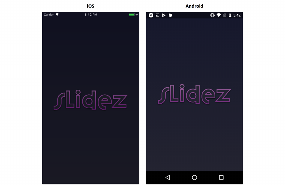
Animation 393
Initial layout
Let’s use LayoutAnimation to animate the position of a logo from the center of the screen to the top
of the screen.
Initially we’ll show this:
Then we’ll animate the position of the logo to turn it into this:
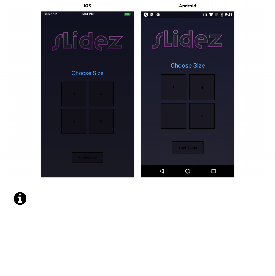
Animation 394
We’re rendering placeholder buttons for now. We’ll style the buttons and add some custom
animations soon.
Open up Start.js. You’ll notice the component’s import statements, propTypes,state, and styles
are already defined.
Let’s start by returning the Logo and a few other components from our render method. Add the
following to render:
puzzle/screens/Start.js
// ...
render() {
const { size, onChangeSize } =this.props;
const { transitionState } =this.state;
return (
<View style={styles.container}>
<View style={styles.logo}>
<Logo />
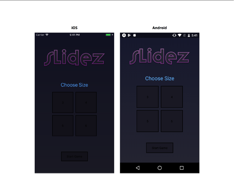
Animation 395
</View>
<View>
<Toggle options={BOARD_SIZES} value={size} onChange={onChangeSize} />
</View>
<View>
<Button title={'Start Game'} onPress={() => {}} />
</View>
</View>
);
}
// ...
After saving Start.js, you should see the end state of our animation:
We touched on LayoutAnimation in the second half of the “Core APIs” chapter, but let’s revisit how
it works before we use it.

Animation 396
LayoutAnimation
LayoutAnimation automatically animates the entire UI of our application from its current layout
to the next layout. Elements that change position or size will be translated or scaled. Elements
that are added or removed between layouts will be animated too, and we can choose what this
animation looks like. We call LayoutAnimation.create to define an animation configuration, and
then LayoutAnimation.configureNext to enqueue the animation to run the next time render is
called.
The LayoutAnimation.create API takes three parameters:
•duration - The duration of the animation
•easing - The curve of the animation. We choose from a predefined set of curves: spring,linear,
easeInEaseOut,easeIn,easeOut,keyboard.
•creationProp - The style to animate when a new element is added: opacity or scaleXY.
The main advantages of LayoutAnimation are:
• We can animate our entire UI with a single function call, rather than starting one or several
animations for each individual component.
• We can animate flexbox layout attributes like justifyContent and alignItems, so we don’t
have to specify movement in terms of coordinates.
• The API fits nicely with React’s declarative rendering pattern – we specify the start and
end states of our UI by returning components from render as we normally would, and
LayoutAnimation figures out the details of how to transition between these states.
The main disadvantages are:
• We have limited control over individual animations and individual components, since every
updated layout property of every component animates simultaneously.
• We can only animate layout attributes, so if we want to animate other style attributes like color
or opacity we’ll need to use Animated.
Note that we’ve already added the boilerplate code to enable LayoutAnimation on Android
at the top of App.js.
puzzle/screens/Start.js
if (
Platform.OS === 'android' &&
UIManager.setLayoutAnimationEnabledExperimental
) {
UIManager.setLayoutAnimationEnabledExperimental(true);
}
As we mentioned in the Core APIs chapter, this will only be necessary until the
LayoutAnimation implementation on Android matures.

Animation 397
Animating the logo
To animate our logo, we want to initially not render the components below it, then start rendering
them and enqueue an animation with LayoutAnimation.configureNext. Since the outer View
component rendered from our Start component has justifyContent: 'space-around' in its style,
adding more content below the logo will move the logo up.
Our component starts in the Launching state, so let’s update render to only render the View
components below the logo when we’re not in the Launching state:
puzzle/screens/Start.js
// ...
render() {
const { size, onChangeSize } =this.props;
const { transitionState } =this.state;
return (
<View style={styles.container}>
<View style={styles.logo}>
<Logo />
</View>
{transitionState !== State.Launching && (
<View>
<Toggle
options={BOARD_SIZES}
value={size}
onChange={onChangeSize}
/>
</View>
)}
{transitionState !== State.Launching && (
<View>
<Button title={'Start Game'} onPress={() => {}} />
</View>
)}
</View>
);
}
// ...
When the app is in the Launching state, only the logo will appear. If we were to save Start.js now,
our app would render the logo in the center of the screen indefinitely.

Animation 398
When we shift the transitionState from Launching to WillTransitionIn,render() will return the
two View components below the logo. This will push the logo up towards the top of the screen. We
can use LayoutAnimation to animate the logo’s movement and the other two components’ entrances.
Let’s write a componentDidMount method and call LayoutAnimation.configureNext within it and set
our transitionState to WillTransitionIn. We’ll also add a little delay using await and our utility
function sleep so we see the logo in the initial state for a short period of time before starting the
animation.
Add the following to Start.js:
puzzle/screens/Start.js
// ...
async componentDidMount() {
await sleep(500);
const animation =LayoutAnimation.create(
750,
LayoutAnimation.Types.easeInEaseOut,
LayoutAnimation.Properties.opacity,
);
LayoutAnimation.configureNext(animation);
this.setState({ transitionState:State.WillTransitionIn })
}
// ...
After saving Start.js, you should see the animation! The logo should move up toward the top of
the screen, and the “Choose Size” text and placeholder buttons will fade in.
Awaiting LayoutAnimation
Suppose we want to change the timing of the animations so that the buttons don’t fade in until after
the logo finishing moving toward the top of the screen. To do this, we’ll need to know when our
LayoutAnimation completes.
We can use the second parameter of LayoutAnimation.configureNext(animation, completionCallback),
the completionCallback, to wait for an animation to finish. However, as of React Native 0.52, this
callback currently only works on iOS. To overcome this limitation, we’re going to use a utility
function that approximates the completion callback on Android (we’re going to assume that the
animation will complete in the duration we specified for the animation, e.g. 750 milliseconds).
Animation 399
Since we’re going to use the same animation in several different places throughout this app, the
utility function can also encapsulate some of the animation’s configuration parameters. We’ll also
use a promise-based API for our utility function for convenience.
The utility function is a little tricky, so we’ve already written it for you in configureTransition.js:
puzzle/utils/configureTransition.js
import { LayoutAnimation, Platform } from 'react-native';
export default function configureTransition(onConfigured =() => {}) {
const animation =LayoutAnimation.create(
750,
LayoutAnimation.Types.easeInEaseOut,
LayoutAnimation.Properties.opacity,
);
const promise =new Promise(resolve => {
// Workaround for missing LayoutAnimation callback support on Android
if (Platform.OS === 'android') {
LayoutAnimation.configureNext(animation);
setTimeout(resolve, 750);
}else {
LayoutAnimation.configureNext(animation, resolve);
}
});
onConfigured();
return promise;
}
If you don’t follow exactly what happens with the callback argument and promise, that’s
fine. The details of this aren’t important, and the need for this function should go away in a
subsequent React Native release.
We allow passing an onConfigured parameter so that we have a place to easily update component
state with setState between the time we call LayoutAnimation.create and the time we actually
schedule the animation with LayoutAnimation.configureNext.
If we call LayoutAnimation.configureNext before setState, most animations will still work
correctly, but there are a few instances where it won’t work on Android.
Let’s update componentDidMount in Start to use our configureTransition utility function:

Animation 400
puzzle/screens/Start.js
// ...
async componentDidMount() {
await sleep(500);
await configureTransition(() => {
this.setState({ transitionState:State.WillTransitionIn });
});
// ...
}
// ...
When you save the app now, you should see the exact same animation as before. The updated
code is a bit simpler and handles the completion callback, so that’s how we’ll use LayoutAnimation
throughout the rest of the app.
Animating buttons
Now that we can wait for the LayoutAnimation to complete, let’s update the animation of the buttons
to fade in after the logo finishes moving. We could use LayoutAnimation again, but instead we’re
going to learn how to make the same fade animation using the Animated API.
Animated
The Animated API lets us animate most style attributes of core components. While LayoutAnimation
is designed to automatically transition between two states, Animated lets us fine-tune the tim-
ing and duration of individual style attributes. Although Animated gives us more control than
LayoutAnimation, it’s also more complex: we must define which style attributes we want to animate
individually, and imperatively call functions to start these animations.
There are two parts to Animated:
•Animated.Value - This is a class that wraps a primitive value (number, string, etc) for use
in component styles. The Animated API includes functions for modifying the primitive value
within the wrapper, e.g. Animated.add.
•Animated.createAnimatedComponent(Component) - Components must be specially wrapped
with Animated.createAnimatedComponent in order to handle Animated.Value in their styles.
The Animated API exports a wrapped version of some of the most common components:
Animated.View,Animated.Text,Animated.Image, and Animated.ScrollView. These are just for
convenience – Animated.View is equivalent to Animated.createAnimatedComponent(View).

Animation 401
Running animations
It’s time to make the fade animation for our buttons! Let’s begin by instantiating two Animated.Value
instances. One will represent the opacity of the Toggle component, and the other will represent the
opacity of the start Button component. While we could animate both components with a single
Animated.Value, by instead instantiating one for each component, we can animate the components
independently. In our case, we’ll use an animation option called delay to stagger the animations
independently.
We’ll instantiate these animated values as instance properties of our Start component. We’ll add
them below where we instantiate the initial state:
puzzle/screens/Start.js
state ={
transitionState:State.Launching,
};
toggleOpacity =new Animated.Value(0);
buttonOpacity =new Animated.Value(0);
We initialize each Animated.Value with a primitive value of 0. For our animation, this primitive
value will represent that opacity of our components: 0 represents a fully transparent style and 1
represents a fully opaque style.
To perform a fade-in animation, we instruct the Animated.Value to change its primitive value from 0
to 1 over a some duration using an animation curve. There are variety of different animation curves
we can use to update the value:
•Animated.timing - This animates a value using an easing curve over a specified duration.
E.g. Animated.timing(this.buttonOpacity, { toValue: 1, duration: 500, easing:
Easing.inOut(Easing.ease) }). The Easing API provides most of the common easing
curve functions used for animation. If we don’t provide a value for easing, the default is
Easing.inOut(Easing.ease), which generally looks pretty good.
•Animated.spring - This animates a value using a simulated spring. The tension and friction
of the spring are customizable. E.g. Animated.spring(this.buttonOpacity, { toValue: 1,
friction: 7, tension: 40 }).
•Animated.decay - This animates a value by simulating motion and kinetic energy. The ani-
mated value will decay to 0, using the provided velocity and deceleration. E.g. Animated.decay(this.buttonOpacity,
{ velocity: 1, deceleration: 0.997 }).
Both Animated.timing and Animated.spring accept a delay option which will delay when the
animation begins. We’ll use this delay to stagger the animations.
Calling any of these animation functions returns an object with two methods:
Animation 402
•start(completionCallback?) - We must always start() an animation when we want it to
run (which is often immediately). We can optionally provide a callback that’s invoked when
the animation completes (or is stopped).
•stop() - We can force an animation to stop at any time by calling stop(). If we passed a
completionCallback to the start function, it will be invoked with { finished: false }.
We’ll use Animated.timing for our animations, configuring the animations to last for 500 millisec-
onds. We’ll set the first animation to start 500 milliseconds after the LayoutAnimation finishes, and
we’ll set the second animation to start 1000 milliseconds after.
puzzle/screens/Start.js
async componentDidMount() {
await sleep(500);
await configureTransition(() => {
this.setState({ transitionState:State.WillTransitionIn });
});
Animated.timing(this.toggleOpacity, {
toValue: 1,
duration: 500,
delay: 500,
useNativeDriver:true,
}).start();
Animated.timing(this.buttonOpacity, {
toValue: 1,
duration: 500,
delay: 1000,
useNativeDriver:true,
}).start();
}
Any time we configure an animation, we need to start it with .start(). In this case, we do it right
after calling Animated.timing.
If at any point you run an app and an animation doesn’t work, double check that you’re
calling .start()! It’s very easy to forget.
We’ll come back to useNativeDriver shortly.

Animation 403
Lastly, we need to update the render method to use these animated values. We use animated values
in the style prop of our components, e.g. style={{ opacity: this.buttonOpacity }}, just like we
would if we were using a primitive value directly.
Using an Animated.Value within a component’s style only works if we’re using Animated.View,
Animated.Text,Animated.Image,Animated.ScrollView, or a component created by calling Animated.createAnimatedComponent(Component)
with an existing component. For this reason, we’ll change some of our View components to
Animated.View now that we’re using styles that contain an Animated.Value.
puzzle/screens/Start.js
// ...
render() {
// ...
const toggleStyle ={ opacity:this.toggleOpacity };
const buttonStyle ={ opacity:this.buttonOpacity };
return (
<View style={styles.container}>
<View style={styles.logo}>
<Logo />
</View>
{transitionState !== State.Launching && (
<Animated.View style={toggleStyle}>
<Toggle
options={BOARD_SIZES}
value={size}
onChange={onChangeSize}
/>
</Animated.View>
)}
{transitionState !== State.Launching && (
<Animated.View style={buttonStyle}>
<Button title={'Start Game'}/>
</Animated.View>
)}
</View>
);
}
// ...
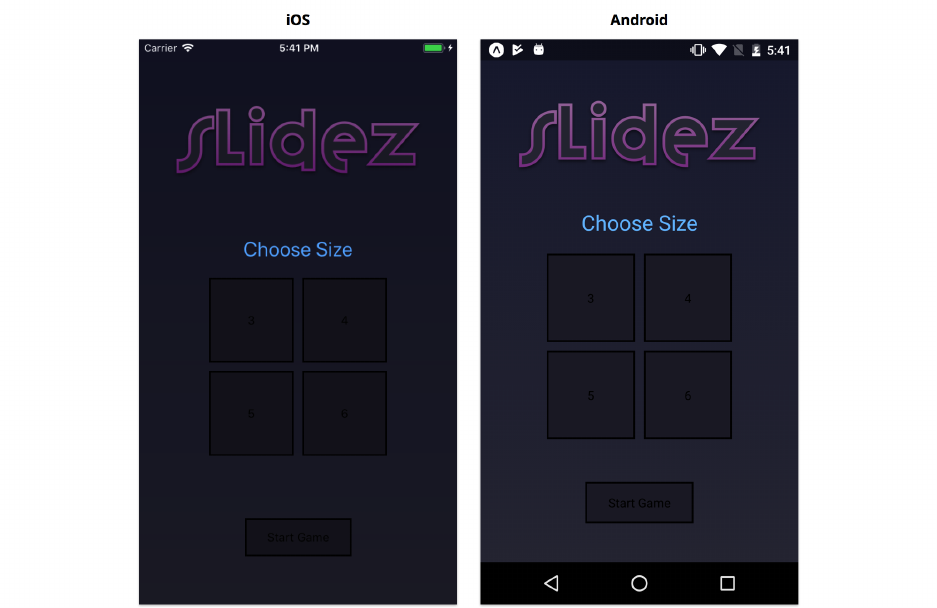
Animation 404
Try it out
Save Start.js and reload the app. Now the logo should animate, then the toggle buttons, then finally
the start button at the bottom.
The end state should look the same as it did before:
Animated value performance
These animations should probably look pretty smooth on your device. Let’s briefly discuss how they
work under the hood.
Normally when we want to change how a component is rendered, we change either the props or
state of the component, and this triggers a re-render. However, re-rendering 60 times per second
(to achieve 60fps) is often too slow. Thus, animations must happen outside of the lifecycle of our
components.
You might have noticed that we didn’t store our Animated.Value instances in the state of our Start
component. The Animated.Value is a reference to a class instance that wraps a primitive value.
When we change the underlying primitive value with Animated.timing and start, this doesn’t
change the Animated.Value reference. Even if we were to store the animated value in state, the
component wouldn’t re-render when we call Animated.timing or start.
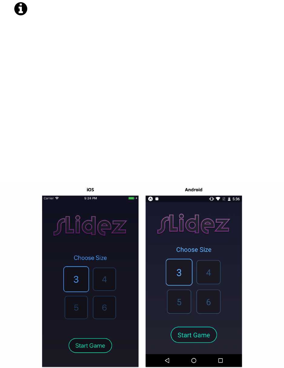
Animation 405
Animated values can be stored in component state, even though they will never trigger a re-
render. By convention, animated values are either stored in state or as instance properties.
Both are common conventions – it’s up to you which you prefer.
When we call Animated.start, the JavaScript animation driver (the thing that actually runs our
animations) uses requestAnimationFrame to update our component’s styles in a way that doesn’t
require a component to re-render (called setNativeProps) every frame.
You may have noticed that we also added useNativeDriver to our animation configurations. This
option is purely for improved animation performance. This option tells React Native to perform
the animation solely on the native thread using the native animation driver, rather than passing
values back and forth between JavaScript and React Native. We can only use useNativeDriver when
animating styles that don’t affect layout, such as opacity,backgroundColor, or transform. We can’t
use useNativeDriver when animating width or top, for example, since these affect layout.
Advanced Animated.Value
Now that we’ve covered the basics of Animated.Value, we can try some more advanced animations.
Let’s replace the placeholder buttons that sit below the logo on the Start screen with some that look
nicer:

Animation 406
So far when we’ve created buttons in this book, we’ve used TouchableOpacity and TouchableHighlight.
The animations for these are pre-defined to change the opacity and background color of the button’s
view. But what if we want a custom button-press animation? In this section, we’ll use the Animated
API to animate the border color, text color, and scale of our own custom Button component.
Updating our buttons
We’re already rendering this Button in our Start screen, and it’s used within the Toggle component,
which we also render from Start. We’ll make the height, color, font size, and border radius of the
button configurable so that we can use the same component in both places.
Open up components/Button.js. Once again, the import statements, propTypes, and styles have
been filled out for you. There’s also a render method that was used to render our placeholder buttons,
but we’ll replace that entirely.
Let’s begin by writing the constructor. Here, we’ll track whether or not the button is currently
pressed within the component’s state. We use the disabled prop to determine if the component is
currently selected (in our toggle component) or not. We’ll also initialize a new Animated.Value to
represent the color and scale of the button, which we’ll store as this.value:
puzzle/components/Button.js
constructor(props) {
super(props);
const { disabled } =props;
this.state ={ pressed:false };
this.value =new Animated.Value(getValue(false, disabled));
}
You’ll notice we call a utility function, getValue, to get the initialize the primitive value wrapped
by an Animated.Value. This function has already been written for you at the top of the file:
puzzle/components/Button.js
const getValue =(pressed, disabled) => {
const base =disabled ? 0.5 : 1;
const delta =disabled ? 0.1 : 0.3;
return pressed ?base -delta :base;
};
This utility function returns a different number depending on the state and props of the component.
The exact numbers were chosen arbitrarily to make the animation look nice, but let’s go into a little
more detail about what these will be used for.

Animation 407
When we used Animated.Value for opacity previously (our components below the logo), we used a
value between 0 and 1 to represent the opacity. We were able to use the Animated.Value directly,
since opacity is also a number between 0 and 1. In this case, however, we want to animate a color
value, rather than a number. An Animated.Value always wraps a primitive number value, but we can
use the interpolate method of an animated value to interpolate the number into a different range
(including a range of colors!). For example, we could use 0 to represent black and 1 to represent
white, and interpolate any value between 0 and 1 into a gray color in the range between black and
white.
For this component, we’ll be using a number between 0.1 and 1 to represent the various visual states
of our button. The exact number isn’t important, since we’re mapping it into a different range. In
this case, lower numbers will render our component smaller and dimmer, and higher numbers will
render it bigger and brighter – but we could’ve made it so that higher numbers render the button
smaller.
We want to animate the button whenever the disabled prop or the pressed state changes. In order
to make the button look and feel good, we’ll animate it to a slightly different size and color for
each combination of disabled and pressed, and we’ll call getValue to get the correct value for each
combination.
The utility function is useful since we don’t need to remember which values to use for each
combination of disabled and pressed. Since getValue is a pure function, we’ll always get
the same result for any given pressed and disabled arguments we pass.
Next, we’ll create a utility method to update this Animated.Value whenever the component’s state
or props change. We want to start a new Animated.timing animation whenever disabled or pressed
change, and we’ll use getValue to determine the desired end value of our Animated.Value for the
animation:
puzzle/components/Button.js
updateValue(nextProps, nextState) {
if (
this.props.disabled !== nextProps.disabled ||
this.state.pressed !== nextState.pressed
) {
Animated.timing(this.value, {
duration: 200,
toValue:getValue(nextState.pressed, nextProps.disabled),
easing:Easing.out(Easing.quad),
}).start();
}
}
We want to run this animation every time the component will update or receive new props:

Animation 408
puzzle/components/Button.js
componentWillUpdate(nextProps, nextState) {
this.updateValue(nextProps, nextState);
}
componentWillReceiveProps(nextProps, nextState) {
this.updateValue(nextProps, nextState);
}
We’ll also create functions for updating the pressed state, which we’ll soon use in the render method:
puzzle/components/Button.js
handlePressIn =() => {
this.setState({ pressed:true });
};
handlePressOut =() => {
this.setState({ pressed:false });
};
Rendering with Animated.Value
Now we’re ready to render our button.
We’ll start by rendering a TouchableWithoutFeedback to handle touches. This is similar to TouchableOpacity
and TouchableHighlight, except that there’s no visual feedback for the user when tapped. That’s
what we want in this case, since we’re defining our own visual feedback with the Animated API.
In addition to the onPress prop that we’ve used with TouchableOpacity, the TouchableWithoutFeedback
components allows us to pass props that handle the pressing down and releasing of the button
separately. The onPressIn prop fires when we touch the button, and the onPressOut prop fires
when we release the button. We can use these to update the visual/animation state of the button
by updating pressed in state. It’s best to use onPressIn and onPressOut for visual feedback, and to
continue using onPress for the behavior of a button (calling the onPress function prop passed into
Button).
We want to render a TouchableWithoutFeedback, passing it an onPress,onPressIn, and onPressOut
prop. Go ahead and delete the existing render method (we don’t need it anymore), and replace it
with the following one:

Animation 409
puzzle/screens/Start.js
// ...
render() {
const {
props:{ title, onPress, color, height, borderRadius, fontSize },
}=this;
// ...
return (
<TouchableWithoutFeedback
onPress={onPress}
onPressIn={this.handlePressIn}
onPressOut={this.handlePressOut}
>
{/* ... */}
</TouchableWithoutFeedback>
);
}
// ...
Note that we propagate the onPress prop from our Button component into the TouchableWithoutFeedback.
Within the TouchableWithoutFeedback, we’ll render an Animated.View and an Animated.Text
component:
puzzle/screens/Start.js
// ...
render() {
// ...
return (
<TouchableWithoutFeedback
onPress={onPress}
onPressIn={this.handlePressIn}
onPressOut={this.handlePressOut}
>
<Animated.View style={/* ... */}>
<Animated.Text style={/* ... */}>
{title}

Animation 410
</Animated.Text>
</Animated.View>
</TouchableWithoutFeedback>
);
}
// ...
For both the Animated.View and Animated.Text, we want to use this.value to modify their color
– we can do this with this.value.interpolate. As mentioned previously, the interpolate method
lets us interpolate an Animated.Value into a different range. In this case, we’ll interpolate a number
between 0 and 1 into a color between black and the color prop, where 0 represents black and 1
represents fully colored. In render(), let’s make a new variable above the return statement to hold
this color:
puzzle/components/Button.js
const animatedColor =this.value.interpolate({
inputRange:[0,1],
outputRange:['black', color],
});
We can use the output of this.value.interpolate as a style attribute for any attribute that accepts a
color. Similarly, we’ll interpolate this.value into a suitable range to update the scale of the button:
puzzle/components/Button.js
const animatedScale =this.value.interpolate({
inputRange:[0,1],
outputRange:[0.8,1],
});
In this case, 0 will map to 0.8 and 1 will map to 1. These numbers were chosen by testing the
animation and trying a few different values to see what looked best.
Next we’ll create a style object for our Animated.View:

Animation 411
puzzle/components/Button.js
const containerStyle ={
borderColor:animatedColor,
borderRadius,
height,
transform:[{ scale:animatedScale }],
};
Transform
By using the transform attribute of a component’s style, we can apply a transformation matrix to
the component before rendering it. This allows us to scale, rotate, translate, or skew the component.
Transformations applied this way don’t affect the layout of other components. Even if we make a
component bigger by setting a { scale: 2 } transformation, the sibling and parent components
will remain in the exact same position. If components overlap after a transformation is applied, the
component rendered last will render on top (unless zIndex is used for re-ordering).
Because transform doesn’t affect the layout of our components, we’re able to animate it with
useNativeDriver for improved performance. For this reason, we generally use transform whenever
we can for animations. Rather than animating top or left, we can translate. Rather than animating
width and height, consider a scale transformation. Some of the time we’ll still need to animate
layout properties, but it’s good to consider whether a transform can accomplish the same thing.
If you’re coming from CSS, you might be familiar with the transform attribute already. The idea
is the same, although the API is fairly different. The API in React Native might seem unusual: the
transform attribute takes an array of objects, each with a single key. This object-based description
of transformations, e.g. { scale: 2 }, lets React Native expose a type-safe API when used with
the Flow language. By contrast, the API in CSS is string-based, e.g. scale(2), which can’t be fully
type-checked in Flow. We can’t simplify the API by combining the array of objects into a single
object, since it’s possible to apply several of the same kind of transformation, e.g. [{ scale: 2 },
{ rotateX: '45deg' }, { scale: 1.2 }].
To see all the transformations you can apply to components, check out the React Native documen-
tationa.
ahttps://facebook.github.io/react-native/docs/transforms.html
And a style object for our Animated.Text:

Animation 412
puzzle/components/Button.js
const titleStyle ={
color:animatedColor,
fontSize,
};
Update the return value as follows:
puzzle/components/Button.js
return (
<TouchableWithoutFeedback
onPress={onPress}
onPressIn={this.handlePressIn}
onPressOut={this.handlePressOut}
>
<Animated.View style={[styles.container, containerStyle]}>
<Animated.Text style={[styles.title, titleStyle]}>
{title}
</Animated.Text>
</Animated.View>
</TouchableWithoutFeedback>
);
Remember to use wrapped components like Animated.View when working with animations!
It’s very easy to forget. If you pass an Animated.Value in the style of a normal View, you’ll
get seemingly-unrelated error messages that are hard to decipher.
Try it out
Save Button.js. Once the app reloads, you should see the button component we just wrote on the
Start screen. We use it both for choosing the size of the puzzle and for the “Start Game” button:

Animation 413
If you try tapping the button, you should see the border color, text color, and scale animate when
you press and when you release your finger.
Starting the game
The last thing we need to do on the start screen is enable the transition to the game screen. We’ll
transition when the user taps the “Start Game” button at the bottom of the screen.
Open up Start.js again. We’re going to add a function handlePressStart that sets the transitionState
to WillTransitionOut, and configures a LayoutAnimation using the configureTransition utility
function we wrote earlier. After the animation completes we’ll call the onStartGame prop, which
tells the App to unmount this screen and render the game screen instead. Add the following function
to the Start component:

Animation 414
puzzle/screens/Start.js
handlePressStart =async () => {
const { onStartGame } =this.props;
await configureTransition(() => {
this.setState({ transitionState:State.WillTransitionOut });
});
onStartGame();
};
Then we’ll update the render method with two new things.
• We’ll pass the handlePressStart function to our Button component’s onPress prop.
• If we’re in the WillTransitionOut state, we don’t want to render anything. This will cause
the components on the screen to fade out, due to the LayoutAnimation we configured.
In order to achieve this, we’ll only render our components when transitionState !==
State.WillTransitionOut.
Update the render method to the following:
puzzle/screens/Start.js
render() {
const { size, onChangeSize } =this.props;
const { transitionState } =this.state;
const toggleStyle ={ opacity:this.toggleOpacity };
const buttonStyle ={ opacity:this.buttonOpacity };
return (
transitionState !== State.WillTransitionOut && (
<View style={styles.container}>
<View style={styles.logo}>
<Logo />
</View>
{transitionState !== State.Launching && (
<Animated.View style={toggleStyle}>
<Toggle
options={BOARD_SIZES}
value={size}
onChange={onChangeSize}

Animation 415
/>
</Animated.View>
)}
{transitionState !== State.Launching && (
<Animated.View style={buttonStyle}>
<Button title={'Start Game'} onPress={this.handlePressStart} />
</Animated.View>
)}
</View>
)
);
}
Try it out
Save Start.js. Once the app reloads, tap the “Start Game” button. You should see the components
on this screen fade out.
Wrapping up the Start screen
We’ve successfully created the start screen for our puzzle game. To do this we used two types of
animations:
•LayoutAnimation - These animations automatically transition our UI between two states. This
is especially useful when animating many components and style attributes at once, or when
we don’t know the exact pixel values to use in the animation (e.g. with flex-based layouts). We
can only animate layout attributes, such as width or flex. If we want to animate non-layout
attributes like color, we’ll need to use Animated.
•Animated - These animations offer us more control than LayoutAnimation, but also have a
more complex API. We have to specify the exact starting and ending value for each animation,
and start each animation at the appropriate time. We use these animations when animating
multiple components independently, or when animating non-layout attributes like color. We
can use useNativeDriver to improve the performance of our non-layout animations.
Next, we’ll use these same animation techniques to make the Game screen.
Building the Game screen
The Game screen shows the current puzzle, along with a preview of the completed puzzle in the top
left and a timer and moves counter in the top right:
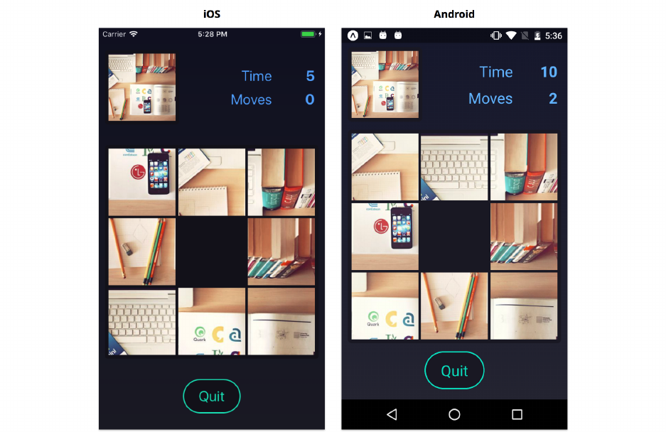
Animation 416
Game lifecycle
We’re going to combine a lot of different animations to show and hide the game screen. Since these
are all asynchronous and will span multiple components, the code can easily get complicated without
careful planning. It’s important that we have a clear understanding of how the animations should
work before we attempt to code them.
Let’s think about the “lifecycle” of the Game screen. There are two phases of the lifecycle: the
“transition in” phase where the screen transitions into view, and the “transition out” phase where it
transitions out of view.
The Game screen renders the Board component as a child. The Board handles a lot of the animations.
In the “transition in” phase, we must first display the Game before we display the Board. In the
“transition out” phase, we must hide the Board before we hide the Game – we do this to give the
board time to animate before unmounting it.
The “transition in” phase
Let’s consider the following diagram of the “transition in” phase:

Animation 417
Here’s what needs to happen at each step:
1. After the user presses the start button on the Start screen, the Start screen fades out, and the App
renders the Game screen. The App passes an image and a puzzle state as props to the Game.
The possible states of the Game screen are:
puzzle/screens/Game.js
const State ={
LoadingImage:'LoadingImage',
WillTransitionIn:'WillTransitionIn',
RequestTransitionOut:'RequestTransitionOut',
WillTransitionOut:'WillTransitionOut',
};
The Game begins in either the LoadingImage or WillTransitionIn state.
2. Since the image may not have fully downloaded yet, it may be null to begin with. If that’s the
case, the Game begins in the LoadingImage state and renders an ActivityIndicator until the image
loads:
Animation 418
3. Otherwise, the Game begins in the WillTransitionIn state. In this state, the Game will render the
top and bottom of the screen, along with an empty game board in the middle:
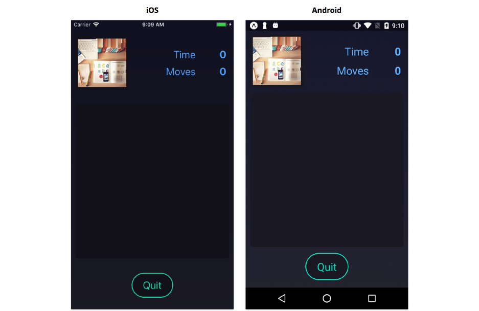
Animation 419
4. After the WillTransitionIn state, it’s the Board component’s turn to animate things. The Board
component handles animating the puzzle pieces into view:
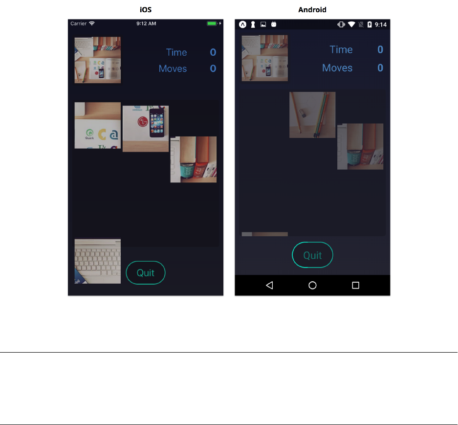
Animation 420
The possible states of the Board component are:
puzzle/components/Board.js
const State ={
WillTransitionIn:'WillTransitionIn',
DidTransitionIn:'DidTransitionIn',
DidTransitionOut:'DidTransitionOut',
};
The Board begins in the WillTransitionIn state, and starts animating each puzzle piece from
beneath the screen into the center of the screen. Once these animations finish, it will enter the
DidTransitionIn state and call its onTransitionIn prop (passed in from Game).
5. The Game listens the Board to call onTransitionIn. Once it’s called, the Game will start the timer
in the top right. Now the game has begun!
The “transition out” phase
Now let’s consider how the Game and Board transition out of view:
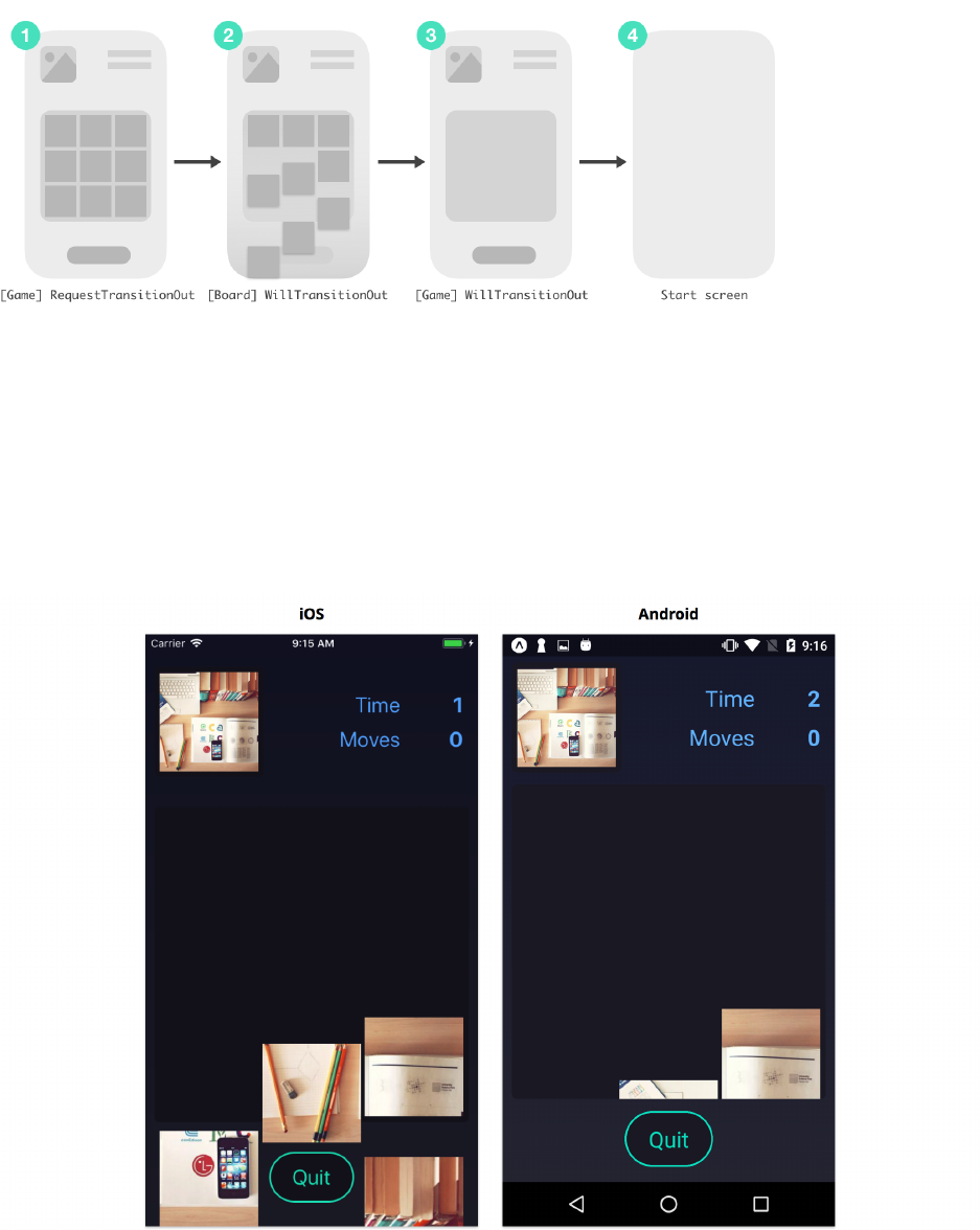
Animation 421
1. Once the user completes the puzzle or presses the quit button, the game enters the RequestTransitionOut
state. In this state, the Game tells the Board to do any cleanup it needs by passing the prop
teardown={true}.
2. Upon receiving the teardown prop, the Board transitions animates each puzzle piece out of
view. Once this cleanup is done, the Board will transition to the DidTransitionOut state and
call onTransitionOut. We do this to give the Board a chance to animate before we unmount the
component:
3. When the onTransitionOut prop is called, the Game transitions to its final state,WillTransitionOut.

Animation 422
In the WillTransitionOut state, the Game will fade out the entire UI in preparation for displaying
the Start screen again.
Transitioning in and out
Now that we have a plan, we can start our implementation! Open screens/Game.js. Once again,
some of the skeleton of the screen has already been written for you.
You can ignore the handlePressSquare function for now; we’ll come back to that later.
Let’s begin by writing the constructor for the Game screen. Here we’ll use the existence of the image
prop to determine whether we should begin in the LoadingImage or WillTransitionIn state. We’ll
run our configureTransition utility to enqueue a LayoutAnimation on initial render. This covers
step 1 of the “transition in” phase described previously.
Open up Game.js and add the following constructor:
puzzle/screens/Game.js
constructor(props) {
super(props);
const { image } =props;
this.state ={
transitionState:image ?State.WillTransitionIn :State.LoadingImage,
moves: 0,
elapsed: 0,
previousMove:null,
image:null,
};
configureTransition();
}
If the game begins in the LoadingImage state, then we want to watch for when the image prop changes
so we know when to transition to the WillTransitionIn state. This is step 2 of the “transition in”.
Add the following componentWillReceiveProps to do this:

Animation 423
puzzle/screens/Game.js
componentWillReceiveProps(nextProps) {
const { image } =nextProps;
const { transitionState } =this.state;
if (image && transitionState === State.LoadingImage) {
configureTransition(() => {
this.setState({ transitionState:State.WillTransitionIn });
});
}
}
We can update the render method to handle these first few states. If we’re still loading an image (Game
is in the LoadingImage state) we want to show an ActivityIndicator. If we’ve finished loading the
image, we want to show the stats and image preview at the top of the screen. Let’s update our render
method to the following:
puzzle/screens/Game.js
// ...
render() {
const { puzzle, puzzle:{ size }, image } =this.props;
const { transitionState, moves, elapsed, previousMove } =this.state;
return (
<View style={styles.container}>
{transitionState === State.LoadingImage && (
<ActivityIndicator size={'large'} color={'rgba(255,255,255,0.5)'}/>
)}
{transitionState !== State.LoadingImage && (
<View style={styles.centered}>
<View style={styles.header}>
<Preview image={image} boardSize={size} />
<Stats moves={moves} time={elapsed} />
</View>
{/* ... */}
</View>
)}
</View>
);
}
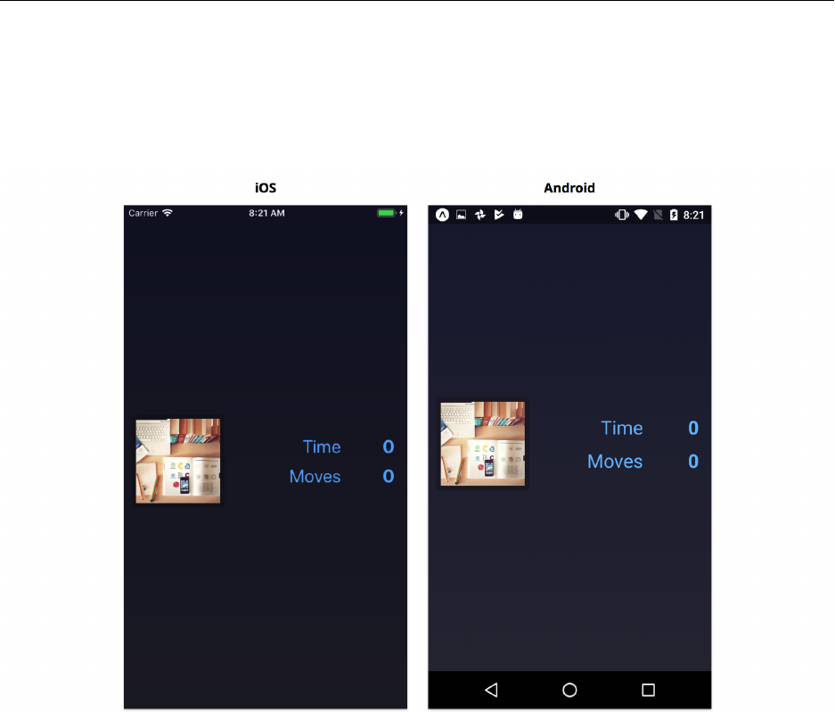
Animation 424
// ...
Try it out
Save Game.js and reload the app. If you tap the “Start Game” button, you should see the start screen
fade out and the first few components of the game screen fade in.
Transitioning in and out, continued
Now let’s add the game board. The Board component will handle its own transitions once rendered
from Game. Rendering the Board completes step 3 of the “transition in” phase, and step 4 will
be completed within the Board component. Let’s create the methods we need to pass as props
to the Board component. We’ll start by creating a method for handling when the Board finishes
transitioning.
The timer in the top right of the screen counts how much time has elapsed since the game started.
Once the board fully transitions in, it will call its onTransitionIn prop. That’s when we want
to start the timer. We’ll use setInterval to increment state.elapsed every second. Let’s add a
handleBoardTransitionIn method that we can pass to onTransitionIn to do this:

Animation 425
puzzle/screens/Game.js
handleBoardTransitionIn =() => {
this.intervalId =setInterval(() => {
const { elapsed } =this.state;
this.setState({ elapsed:elapsed +1});
}, 1000);
};
This completes the last step of the transition in phase. However, we’ll want to add a few more things
before we update the render method. Let’s consider how the Game screen should transition out.
The game ends either when the puzzle is finished or when the user presses the “Quit” button. In
both of these scenarios, we want to enter the transitionState called RequestTransitionOut. In
this state, we give the Board time to run its transition animation.
Let’s add a requestTransitionOut function to Game that handles updating transitionState. We also
want to stop the timer in the top right once we call this:
puzzle/screens/Game.js
requestTransitionOut =() => {
clearInterval(this.intervalId);
this.setState({ transitionState:State.RequestTransitionOut });
};
Pressing the quit button should also set the transitionState to RequestTransitionOut. We can call
the same requestTransitionOut function for this. When the quit button is pressed, we’ll handle
it with a new function handlePressQuit. We’ll use the Alert API, which we covered in the “Core
APIs” chapter, to ask the user if they are sure they want to quit. Add the following function to Game:
puzzle/screens/Game.js
handlePressQuit =() => {
Alert.alert(
'Quit',
'Do you want to quit and lose progress on this puzzle?',
[
{ text:'Cancel', style:'cancel' },
{
text:'Quit',
style:'destructive',
onPress:this.requestTransitionOut,
},

Animation 426
],
);
};
That handles step 1 of the “transition out” phase. The Board component will handle step 2 internally.
Once the board transitions out (remember, we had to give it time to transition before unmounting),
it will call its onTransitionOut prop. When this happens, we want to fade out the components
on this game screen. We can do that using our configureTransition utility function. After
that we want to call the onQuit() prop, which will return us to the start screen. Let’s write a
handleBoardTransitionOut function which we’ll pass to onTransitionOut:
puzzle/screens/Game.js
handleBoardTransitionOut =async () => {
const { onQuit } =this.props;
await configureTransition(() => {
this.setState({ transitionState:State.WillTransitionOut });
});
onQuit();
};
That completes the “transition out” phase! Now we can update the render method to render both
the Board and the “Quit” Button.
Before returning anything, we’ll first check if we’re in the WillTransitionOut state – if we are,
we don’t want to render anything, since we want our LayoutAnimation to fade the entire screen
out. We also need to remember to pass the teardown prop to the Board when Game is in the
RequestTransitionOut state.
Let’s update the render method to the following:
puzzle/screens/Game.js
render() {
const { puzzle, puzzle:{ size }, image } =this.props;
const { transitionState, moves, elapsed, previousMove } =this.state;
return (
transitionState !== State.WillTransitionOut && (
<View style={styles.container}>
{transitionState === State.LoadingImage && (
<ActivityIndicator size={'large'} color={'rgba(255,255,255,0.5)'}/>
)}

Animation 427
{transitionState !== State.LoadingImage && (
<View style={styles.centered}>
<View style={styles.header}>
<Preview image={image} boardSize={size} />
<Stats moves={moves} time={elapsed} />
</View>
<Board
puzzle={puzzle}
image={image}
previousMove={previousMove}
teardown={transitionState === State.RequestTransitionOut}
onMoveSquare={this.handlePressSquare}
onTransitionOut={this.handleBoardTransitionOut}
onTransitionIn={this.handleBoardTransitionIn}
/>
<Button title={'Quit'} onPress={this.handlePressQuit} />
</View>
)}
</View>
)
);
}
Try it out
Save Game.js and reload the app. If you tap the “Start Game” button, you should see the start screen
fade out and the game screen fade in:
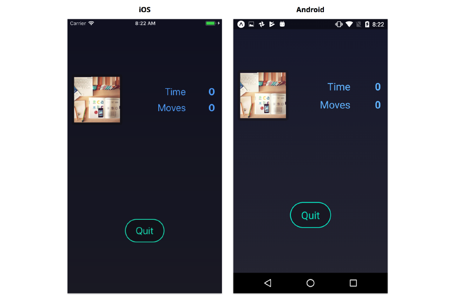
Animation 428
The board won’t render yet, but we’ll add that in the next chapter. If you tap the “Quit” button, you
should see a dialog with options to “Cancel” or “Quit”:
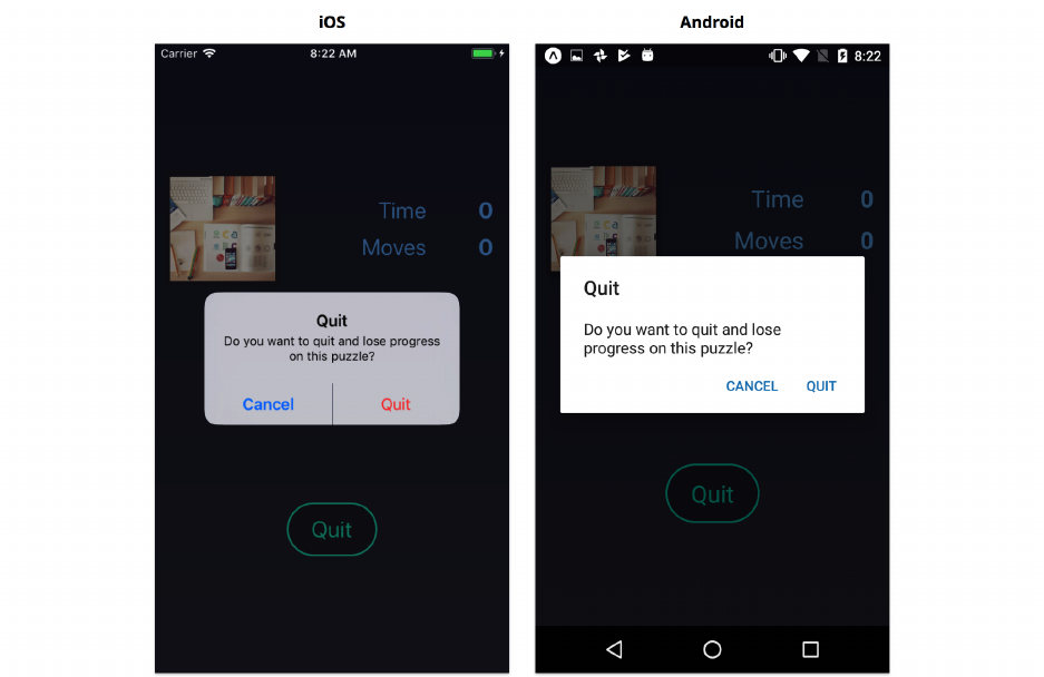
Animation 429
These won’t do anything yet though, since the Board will never call its onTransitionOut prop.
That completes the Game screen, for now. In the next chapter, we’ll build the Board.
Summary
In this chapter, we used the two main animation APIs included in React Native: Animated and
LayoutAnimation. We used LayoutAnimation to move components around the screen, and to fade
components into and out of view. We used Animated to animate non-layout styles like colors and
when we wanted more control over individual animations.
In the next chapter (“Gestures”), we’ll finish our puzzle game. We’ll build the Board component
and allow the user to rearrange puzzle pieces by dragging. Gestures rely heavily on Animated, so
we’ll see a few more ways we can use the Animated API, while ensuring smooth, high-performance
animations.

Gestures
Gestures are fundamental to building mobile apps. Well-designed gestures can make mobile apps
feel intuitive and easy to use. Just like with animations, we often use gestures to imitate movement
in the real world or to build interactivity similar to familiar physical objects. For this reason, most
gestures are accompanied by animations – physical objects rarely teleport from one place to another,
so neither should components in our UI. We can leverage the Animated API from the previous chapter
to build gestures that feel natural.
Simple gestures are supported out-of-the-box by React Native components. When we want to add
a tap gesture, we can use TouchableOpacity or TouchableHighlight. For more advanced gestures,
however, we’ll need to create our own components using lower-level APIs. In this chapter we’ll
explore gestures by adding an interactive game board to the puzzle app we started in the previous
chapter.
Picking up where we left off
We successfully built the start screen and we started the game screen for our puzzle app. Next, we’re
going to add the interactive board.
This is a code checkpoint. If you haven’t been coding along with us but would like to start
now, we’ve included a snapshot of our current progress in the sample code for this book.
First, copy the puzzle/2 directory to somewhere else on your computer. Then in the terminal,
you can navigate to the directory you copied and install the dependencies by running yarn.
For example, if you unzipped the book’s sample code to ∼/Downloads/fsrn/, on a macOS
or Linux computer you would run:
$ cp -r ~/Downloads/fsrn/puzzle/2 ~/Downloads/puzzle
$cd ~/Downloads/puzzle
$ yarn
Building the board
Our Board component is responsible for animating the puzzle pieces into view when the components
mount, handling the drag gesture as the user moves the pieces, and animating the pieces out of view
when the game ends.

Gestures 431
The Board component has already been started for you. Let’s take a look at what’s already there.
Open Board.js.
Transition states
Just like with the Start and Game screens we built in the previous chapter, we’ll use a transitionState
prop to control the various transitions in the Board. These are the states of the board:
puzzle/components/Board.js
const State ={
WillTransitionIn:'WillTransitionIn',
DidTransitionIn:'DidTransitionIn',
DidTransitionOut:'DidTransitionOut',
};
The Board begins in the WillTransitionIn state, and starts animating each puzzle piece from
beneath the screen into the center of the screen:
Once these animations finish, it will enter the DidTransitionIn state and call its onTransitionIn
prop (passed in from Game). At this point, the puzzle pieces become interactive:

Gestures 432
The Game will tell the board when the game is finished and it’s time to cleanup by passing the
teardown prop. Upon receiving the teardown prop, the Board transition animates each puzzle piece
out of view:
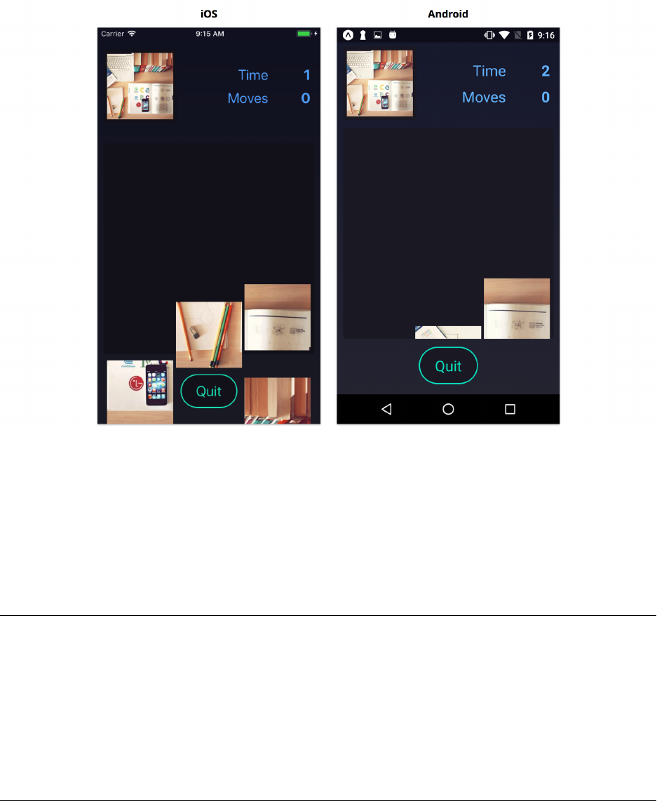
Gestures 433
Once this cleanup is done, the Board will transition to the DidTransitionOut state and call
onTransitionOut.
Board props
Next lets look at the propTypes for this component:
puzzle/2/1/components/Board.js
static propTypes ={
puzzle:PuzzlePropType.isRequired,
teardown:PropTypes.bool.isRequired,
image:Image.propTypes.source,
previousMove:PropTypes.number,
onMoveSquare:PropTypes.func.isRequired,
onTransitionIn:PropTypes.func.isRequired,
onTransitionOut:PropTypes.func.isRequired,
};
The board is passed the current state of the puzzle, the image, and the previousMove. From these,
the board can determine how to render the puzzle. The board will never modify the state of the

Gestures 434
puzzle – instead, the board will call onMoveSquare to inform the Game component that a piece has
been moved.
We use a PropTypes.shape to validate the fields within the puzzle object:
puzzle/validators/PuzzlePropType.js
import PropTypes from 'prop-types';
export default PropTypes.shape({
size:PropTypes.number.isRequired,
empty:PropTypes.number.isRequired,
board:PropTypes.arrayOf(PropTypes.number.isRequired).isRequired,
});
The puzzle object contains the size of the board, the arrangement of pieces on the board, and an
indicator recording which piece is the empty piece. Each piece is represented by a number. In its
finished state, the piece numbers will be properly sorted from small to large within board. In other
words, the number represents the “correct” or “final” position of the piece in the completed puzzle.
The empty value refers to the number of a piece (not to an index in the board array).
If we overlay these numbers on top of the puzzle board, we can see how each number corresponds
with a piece:
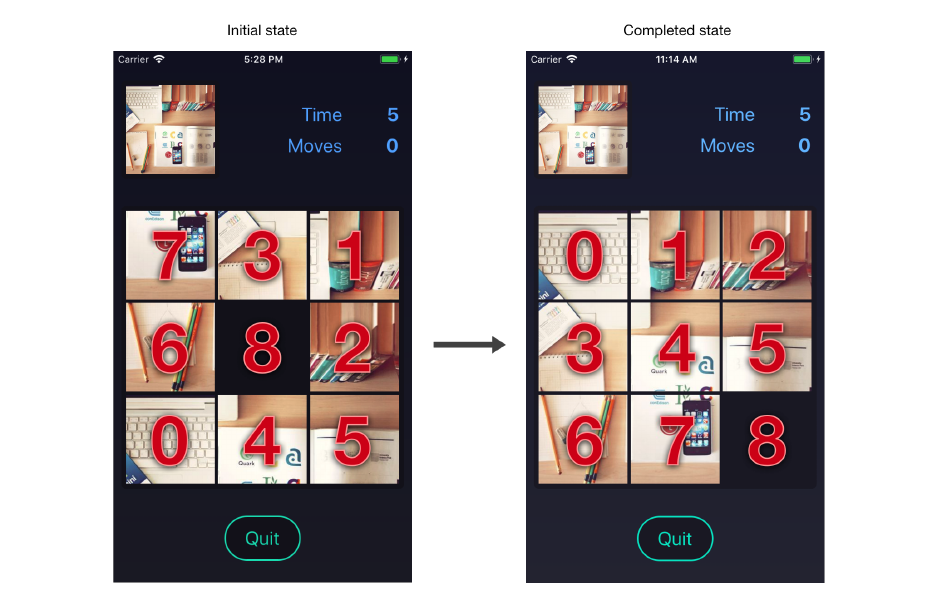
Gestures 435
For this example, the initial state of a puzzle object is:
{
size: 3,
empty: 8,
board:[7,3,1,6,8,2,0,4,5]
}
When completed, the puzzle object will be:
{
size: 3,
empty: 8,
board:[0,1,2,3,4,5,6,7,8]
}
We’ll use the piece numbers directly when rendering the board. We’ll use utility functions for
determining anything else from the puzzle object.

Gestures 436
If you recall from the previous chapter, each puzzle uses a random image fetched from a remote API.
When we render the puzzle, we’ll need to “split up” the image into a grid of puzzle pieces.
We won’t actually modify the raw image data – instead we’ll render the same image multiple times,
once for each piece, and offset the image’s position. We can use a style with overflow: hidden to
hide the excess parts of the image we don’t want to show. We’ll use the piece’s number to calculate
the position of the image for that piece.
You’ll notice at the top of the file we import two utility functions:
import { availableMove, getIndex } from '../utils/puzzle';
We’ll use availableMove to determine which directions the user may drag any given piece. And
we’ll use getIndex to determine the current position of any given piece.
The other props, teardown,onTransitionIn, and onTransitionOut, are all used to communicate state
changes between the Game and Board components.
Initializing the board
We’ll start by writing a simplified version of the game board where the pieces don’t move. After we
have the pieces showing up in the correct positions, we’ll add the animation and gestures.
Each piece on the board will use an Animated.Value to represent its top,left, and scale. This
gives us fine-grained control over the animations of each piece. We can use a helper function,
calculateItemPosition, already imported at the top of the file to determine the correct starting
top and left position of each piece.
Our constructor needs to do 2 things:
• Initialize the transitionState to WillTransitionIn
• Create an Animated.Value for the top,left, and scale of each piece
Add the following constructor to components/Board.js:

Gestures 437
puzzle/2/1/components/Board.js
constructor(props) {
super(props);
const { puzzle:{ size, board } } =props;
this.state ={ transitionState:State.WillTransitionIn };
this.animatedValues =[];
board.forEach((square, index) => {
const { top, left } =calculateItemPosition(size, index);
this.animatedValues[square] ={
scale:new Animated.Value(1),
top:new Animated.Value(top),
left:new Animated.Value(left),
};
});
}
Recall from the previous chapter that an Animated.Value wraps a number. We need to
instantiate a separate Animated.Value for the top,left, and scale of each puzzle piece
on the board, since we want to animate all of these values independently.
We’ll render each puzzle piece with an absolute position, so that it renders at the top-left of the
board. Then we’ll use the top and left animated values to position the piece relative to the top-left
of the board.
Now that we have our constructor, we’ll also need a componentDidMount method where we:
• Start the initial animation (where the puzzle pieces fly onto the board)
• Set transitionState to DidTransitionIn once the animation completes
• Call onTransitionIn to inform the Game that the transition animation has completed and the
game has begun
We’ll handle starting the transition animation later in the chapter, so for now, let’s add a
componentDidMount method that sets the transitionState and calls onTransitionIn:

Gestures 438
puzzle/2/1/components/Board.js
async componentDidMount() {
const { onTransitionIn } =this.props;
this.setState({ transitionState:State.DidTransitionIn });
onTransitionIn();
}
Rendering the board
Next, let’s render each piece on the game board. In order to determine the proper size of the board
and each piece, we’ll use two utility functions that have already been imported at the top of the file:
•calculateContainerSize() - This function returns the size to render the board, in pixels. Since
the board is a square, we’ll use this size for both the width and height.
•calculateItemSize(size) - This function uses puzzle.size to divide the board into an even
number of rows and columns. We’ll use the returned pixel size for the width and height of
each piece.
We’ll represent the board with a View. We’ll map each puzzle piece in puzzle.board into an
Animated.View that contains an Image.
Add the following render method to components/Board.js:
puzzle/2/1/components/Board.js
render() {
const { puzzle:{ board } } =this.props;
const { transitionState } =this.state;
const containerSize =calculateContainerSize();
const containerStyle ={ width:containerSize, height:containerSize };
return (
<View style={[styles.container, containerStyle]}>
{transitionState !== State.DidTransitionOut &&
board.map(this.renderSquare)}
</View>
);
}

Gestures 439
Notice that we map each piece in the board through this.renderSquare. Let’s write the renderSquare
method now. This method is called with two arguments:
•square - The numeric value of the piece in puzzle.board
•index - The index of the square within the puzzle.board array
In other words, the square represents the “correct” position of the puzzle piece (within the original
image), while the index represents the current position of the puzzle piece (within the rearranged
image).
When the board is in the DidTransitionOut state, we don’t render any pieces. This shouldn’t
be necessary, since the pieces should have already animated off-screen. However, there’s a
bug that occurs when combining Animated and useNativeDriver that causes the pieces to
render without their transform styles.
Let’s write renderSquare now. We’ll start by declaring the method and destructuring the props and
state we’ll need:
puzzle/2/1/components/Board.js
renderSquare =(square, index) => {
const { puzzle:{ size, empty }, image } =this.props;
const { transitionState } =this.state;
If the square is the empty square of the puzzle (puzzle.empty), then we shouldn’t render it:
puzzle/2/1/components/Board.js
renderSquare =(square, index) => {
const { puzzle:{ size, empty }, image } =this.props;
const { transitionState } =this.state;
if (square === empty) return null;
Next, we’ll call calculateItemSize to get the pixel size of the puzzle piece. This value will be the
same for every piece:

Gestures 440
puzzle/2/1/components/Board.js
if (square === empty) return null;
const itemSize =calculateItemSize(size);
We can use the itemSize to create a style, itemStyle, for the Animated.View that we’ll render. The
view should have a width and height equal to itemSize, and use a transform to correctly position
it on the board. This is where the Animated.Value array we set up earlier comes in:
puzzle/2/1/components/Board.js
const itemSize =calculateItemSize(size);
const itemStyle ={
position:'absolute',
width:itemSize,
height:itemSize,
overflow:'hidden',
transform:[
{ translateX:this.animatedValues[square].left },
{ translateY:this.animatedValues[square].top },
{ scale:this.animatedValues[square].scale },
],
};
Note that we use a transform with translateX and translateY, instead of left and
top. If you recall from the previous chapter, this allows us to animate these values with
useNativeDriver for improved performance. In this chapter, we use the names top and left
to refer to a piece’s position for simplicity, even though we’re actually setting the translateX
and translateY.
Within the Animated.View that uses this style, we’ll render the image of the puzzle piece. With some
clever math, we can offset the image to display the correct portion for each piece:

Gestures 441
puzzle/2/1/components/Board.js
const imageStyle ={
position:'absolute',
width:itemSize *size +(itemMargin *size - 1),
height:itemSize *size +(itemMargin *size - 1),
transform:[
{
translateX: -Math.floor(square %size) *(itemSize +itemMargin),
},
{
translateY: -Math.floor(square /size) *(itemSize +itemMargin),
},
],
};
The exact calculations here and elsewhere in the chapter are specific to this game, so we
won’t cover them in much detail. However, animation and gesture code in general tends to
rely on manual calculations, so you may find it useful to try to understand the calculations
and utility functions in this chapter.
Lastly, we can put everything together by rendering an Animated.View and an Image:
puzzle/2/1/components/Board.js
return (
<Animated.View key={square} style={itemStyle}>
<Image style={imageStyle} source={image} />
</Animated.View>
);
};
Try it out!
Save Board.js. After the app reloads, press the start button, and you should see the board fade in!

Gestures 442
Making pieces draggable
Now that we’re rendering our puzzle pieces, we can focus on making them draggable. In order to
do this, we’ll need to learn how to use the Gesture Responder System.
Gesture Responder System
React Native provides the Gesture Responder System for building complex interactions like drag-
ging. The Gesture Responder System gives us fine-grained control over which components should
receive and respond to touch events.
Each time the user touches the screen, moves their finger, or lifts their finger, the operating system
records an independent event called a “touch event.” Interpreting one or more of these independent
touch events results in a gesture. A tap gesture may consist of the user touching the screen and
lifting their finger immediately. A drag gesture may consist of a user touching the screen, moving
their finger around the screen, and then lifting their finger.
Touch events can interact in complex ways in mobile apps. Imagine a horizontally draggable slider
within a vertical scrollview – how do we determine which finger movements should affect the slider
and which should affect the scrollview? The Gesture Response System gives us a set of callbacks
which help us handle the right touch events from the right component.
Gestures 443
Responder lifecycle
Let’s look at how touch events flow between components in the responder system.
At its core, the responder system determines which view owns the global “interaction lock” at any
given time. When granted the interaction lock, a view is known as the “responder”, since it responds
to touch events. Generally the responder view should show visual feedback, such as highlighting or
moving. While a touch gesture is occuring, the interaction lock may be transferred to an ancestor
view of the responder.
There are function props a view can implement to request the interaction lock:
•View.props.onStartShouldSetResponder: (e) => true - If a touch gesture begins on this
view, should this view become the responder?
•View.props.onMoveShouldSetResponder: (e) => true - If the user moves their finger over
this view during a touch gesture, should this view become the responder?
If one of these functions returns true, then the view has requested the interaction lock. If no other
view currently owns the interaction lock, then the requesting view automatically becomes the re-
sponder. If a view does own the interaction lock, then the owner’s onResponderTerminationRequest
function prop will be called – the owner can decide whether to keep or hand off the interaction lock.
One of the following props will be called for the view requesting the interaction lock:
•View.props.onResponderGrant: (e) => {} - The request for the interaction lock was granted!
The requesting view is now the responder. The view may want to respond to receiving the
interaction lock in some way, e.g. by setting some state that renders a highlight.
•View.props.onResponderReject: (e) => {} - The request for the interaction lock was rejected.
The view that owned the interaction lock refused to give it up.
The responder view’s props will be called as the touch gesture continues:
•View.props.onResponderMove: (e) => {} - This is called whenever the user moves their finger.
•View.props.onResponderRelease: (e) => {} - This is called when the user lifts their finger.
•View.props.onResponderTerminationRequest: (e) => true - Another view has requested the
interaction lock. Return false to retain the lock, or true to hand it off.
•View.props.onResponderTerminate: (e) => {} - The interaction lock has been taken away.
This is generally due to returning true from onResponderTerminationRequest, but there are
cases where the operating system will take the interaction lock without asking (without
onResponderTerminationRequest being called first). For example, onResponderTerminate will
be called upon receiving a phone call – onResponderTerminationRequest will not be called,
since returning false would not prevent the operating system from taking over control of the
screen.
When a touch starts, the onStartShouldSetResponder prop will be called for the inner-most view
containing the touch. If the view returns false (or doesn’t implement the prop), then the parent’s
onStartShouldSetResponder prop will be called. This process continues up the view hierarchy.

Gestures 444
Capture phase
Sometimes a parent view will need to request the interaction lock before any of its children have
a change. In this case, we don’t want the bottom-up calling order of onStartShouldSetResponder.
There are two other props we can use that are called top-down, i.e. first the parent has a chance to
become responder, then the child.
•View.props.onStartShouldSetResponderCapture: (e) => true
•View.props.onMoveShouldSetResponderCapture: (e) => true
These props are analogous to onStartShouldSetResponder and onMoveShouldSetResponder. These
“capture” props are called first starting from the parent, and then down the view hierarchy. If no
view returns true, then onStartShouldSetResponder and onMoveShouldSetResponder will be called
starting from the inner-most view.
The portion of the responder lifecycle where touches are “captured” from top to bottom is called the
capture phase. The portion of the lifecycle where touches are capture from bottom to top is called
the bubble phase.
If you’re coming from web development, you’ll probably be familiar with these terms – this
part of the responder system is modeled after DOM events!
Diagram
The following diagram illustrates the responder lifecycle for new touches:

Gestures 445
The same flow happens every time a touch moves, except that onMoveShouldSetResponder and
onMoveShouldSetResponderCapture are called instead of onStartShouldSetResponder and onStartShouldSetResponderCapture.
Gestures 446
Touch event object
All of the responder function props are called with an event object, often abbreviated as evt or e, e.g.
the argument in onStartShouldSetResponder = (e) => {}. The event object contains the property
nativeEvent which is an object containing:
•locationX - The X position of the touch, relative to the responder view
•locationY - The Y position of the touch, relative to the responder view
•pageX - The X position of the touch, relative to the root view
•pageY - The Y position of the touch, relative to the root view
•timestamp - The time when the touch occurred
•identifier - The id of the touch
•target - The id of the view receiving the touch event
•touches - Array of all current touches on the screen
•changedTouches - Array of all touch events that have changed since the last event
You may need to access these properties to do touch-related calculations. However, React Native
provides a higher-level convenience wrapper on top of the responder system that you’ll likely use
instead.
PanResponder
The touch event object contains raw values, such as the time and location of touches. Many
interactions, however, will require the distance and velocity of the touches over time. React Native
provides a higher-level API called PanResponder.
The PanResponder intercepts each responder function so that it can maintain a gestureState
object containing the distance, velocity, and a few other computed properties. We can create a
PanResponder with PanResponder.create(config), where the config object contains any of the
following functions:
•onStartShouldSetPanResponder: (e, gestureState) => {}
•onStartShouldSetPanResponderCapture: (e, gestureState) => {}
•onMoveShouldSetPanResponder: (e, gestureState) => {}
•onMoveShouldSetPanResponderCapture: (e, gestureState) => {}
•onPanResponderReject: (e, gestureState) => {}
•onPanResponderGrant: (e, gestureState) => {}
•onPanResponderStart: (e, gestureState) => {}
•onPanResponderEnd: (e, gestureState) => {}
•onPanResponderRelease: (e, gestureState) => {}
•onPanResponderMove: (e, gestureState) => {}

Gestures 447
•onPanResponderTerminate: (e, gestureState) => {}
•onPanResponderTerminationRequest: (e, gestureState) => {}
•onShouldBlockNativeResponder: (e, gestureState) => {}
Each of these wraps a responder function (with roughly the same name) and then calls it with
the gestureState object in addition to the original event object. For example, onPanResponderMove
wraps onResponderMove.
The only exception is onShouldBlockNativeResponder, which is a totally different function
from the underlying responder functions. This function is for blocking native components
from becoming the responder, and only works on Android. We won’t be using it.
The gestureState object contains the following properties:
•stateID - The id of the gestureState – persisted as long as there’s at least one touch on screen
•moveX - The latest screen coordinates of the most recently moved touch
•moveY - The latest screen coordinates of the most recently moved touch
•x0 - The screen coordinates at the time the responder was granted
•y0 - The screen coordinates at the time the responder was granted
•dx - Accumulated distance of the gesture since the touch started
•dy - Accumulated distance of the gesture since the touch started
•vx - Current velocity of the gesture
•vy - Current velocity of the gesture
•numberActiveTouches - Number of touches currently on screen
Now that we’ve covered the fundamentals, let’s put them to use!
Draggable component
For our puzzle game, we want to build a dragging gesture. In order to do this, we’ll need to:
• Handle when the user touches a specific puzzle piece component
• Continously monitor the x, y offset as they move their finger
• Record the final x, y offset when they lift their finger
As the user moves their finger, we can monitor the x, y offset to update the puzzle piece component’s
transform. Thus the puzzle piece will follow the user’s finger as it moves across the screen – this is
how we simulate “dragging” in mobile apps. When the user lifts their finger, we will use the final
x, y offset to determine how to update the puzzle object accordingly.

Gestures 448
Creating a PanResponder
Let’s use a PanResponder to make a Draggable component. We’ll use our Draggable component to
handle touches and to monitor the x, y offset of the drag.
We’ll make this component fairly generic, both to better separate the dragging code from the
rendering code, and to make the component easy to reuse. The component’s sole purpose will be
to handle the logic around touch events. It won’t render anything to the UI itself. The Draggable
component will pass a PanResponder and x, y offset to its children – its children will be responsible
for using this information to render the UI. The Draggable component will expose callback props
that notify the parent as touch events occur. We’ll use these events to update the puzzle object.
Open up components/Draggable.js. The skeleton of the component has already been written for
you. Take a look at the propTypes:
puzzle/2/components/Draggable.js
static propTypes ={
children:PropTypes.func.isRequired,
onTouchStart:PropTypes.func,
onTouchMove:PropTypes.func,
onTouchEnd:PropTypes.func,
enabled:PropTypes.bool,
};
This component will render arbitrary children by calling the children function prop. When the user
interacts with the component, it will call the onTouchStart,onTouchMove, and onTouchEnd props at
the appropriate times. We’ve also included an enabled prop to prevent dragging – we’ll use this
when the board is mounting and unmounting so that the user can’t interfere with the animation.
We chose to name our props onTouchStart,onTouchMove, and onTouchEnd after the touch
event names on the web, in order to make our Draggable component feel more familiar for
those with a web background. However, React Native doesn’t interpret these names in any
special way, and we could’ve named the props anything we wanted.
Using a function for children might look familiar. That’s because we used this same pattern
in the second part of the “Core APIs” chapter!
Let’s begin by writing the constructor. In the constructor, we’ll initialize this.state to keep track
of whether this component is actively being dragged. We’ll also create a new pan responder with
PanResponder.create.
When we write the render method, we’ll pass the value of this.state.dragging to the Draggable
component’s children. This allows them to render differently depending on whether a drag is

Gestures 449
occuring or not. In our case, we will use this to adjust the zIndex of puzzle pieces so that the piece
currently being dragged renders on top of the rest.
Add the following constructor to Draggable.js:
puzzle/components/Draggable.js
constructor(props) {
super(props);
this.state ={
dragging:false,
};
this.panResponder =PanResponder.create({
onStartShouldSetPanResponder:this.handleStartShouldSetPanResponder,
onPanResponderGrant:this.handlePanResponderGrant,
onPanResponderMove:this.handlePanResponderMove,
onPanResponderRelease:this.handlePanResponderEnd,
onPanResponderTerminate:this.handlePanResponderEnd,
});
}
We’ll implement each of the pan responder functions as instance properties of our component.
PanResponder functions
Let’s start by implementing this.handleStartShouldSetPanResponder, which we assigned to
onStartShouldSetPanResponder when creating our pan responder. We want this component to
become the responder when the enabled prop is true. Add the following function to the Draggable
component:
puzzle/components/Draggable.js
handleStartShouldSetPanResponder =() => {
const { enabled } =this.props;
return enabled;
};
Next, we’ll handle when this component becomes the responder in handlePanResponderGrant.
When this component becomes the responder, we want to set state.dragging to true. Add
handlePanResponderGrant now:

Gestures 450
puzzle/components/Draggable.js
handlePanResponderGrant =() => {
const { onTouchStart } =this.props;
this.setState({ dragging:true });
onTouchStart();
};
We’ll pass a the onTouchStart() prop later to allow the parent to animate the scale of the puzzle
piece when a drag begins.
Any time the user moves their finger, we’ll call the onTouchMove prop with the offset from the initial
touch position. This lets us animate the transform of the puzzle piece as it’s dragged from within
Board. Let’s do this by adding the following handlePanResponderMove:
puzzle/components/Draggable.js
handlePanResponderMove =(e, gestureState) => {
const { onTouchMove } =this.props;
// Keep track of how far we've moved in total (dx and dy)
const offset ={
top:gestureState.dy,
left:gestureState.dx,
};
onTouchMove(offset);
};
Lastly, when the user lifts their finger, or if the operating system cancels the gesture (e.g. a phone
call comes in), we want to reset our state and call onTouchMove and onTouchEnd with the final touch
position. We can handle both onPanResponderRelease and onPanResponderTerminate in the same
way. Add the following handlePanResponderEnd:
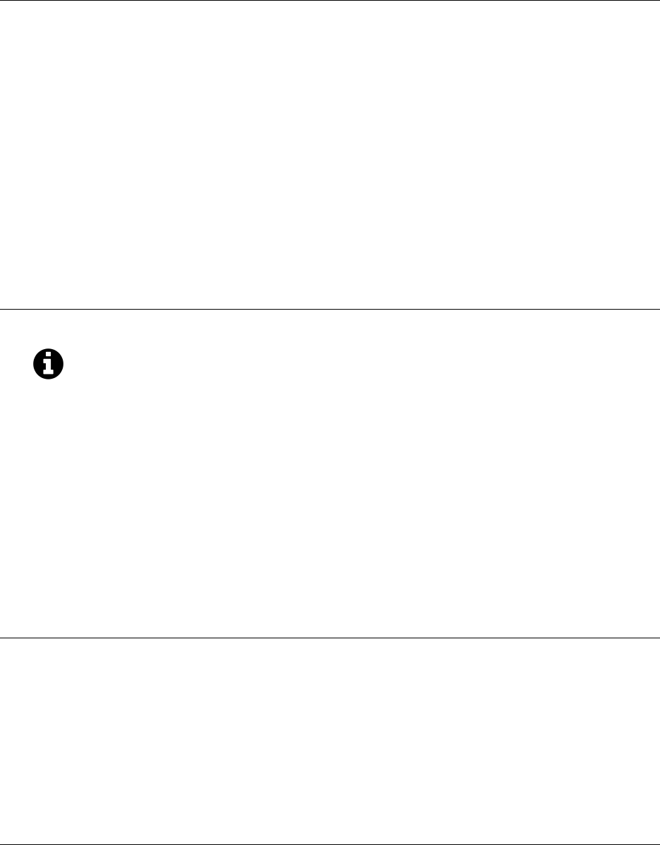
Gestures 451
puzzle/components/Draggable.js
handlePanResponderEnd =(e, gestureState) => {
const { onTouchMove, onTouchEnd } =this.props;
const offset ={
top:gestureState.dy,
left:gestureState.dx,
};
this.setState({
dragging:false,
});
onTouchMove(offset);
onTouchEnd(offset);
};
If the user receives a phone call, the drag gesture will end as if the user had lifted their
finger. This is acceptable for our game, but in some scenarios it may be desirable to handle
the onPanResponderTerminate case differently from an intentional touch event.
Rendering draggable pieces
When we render the Draggable component, we’ll call the children prop function. We’ll pass this
function the dragging and offset values from state so that we can update the positions of the
children as we render. We’ll also pass this.panResponder.panHandlers – these are the responder
functions wrapped by the pan handler to include gestureState.
Add the following render method:
puzzle/components/Draggable.js
render() {
const { children } =this.props;
const { dragging } =this.state;
// Update children with the state of the drag
return children({
handlers:this.panResponder.panHandlers,
dragging,
});
}

Gestures 452
Save Draggable.js. Now open Board.js again so we can render the Draggable component from our
renderSquare method.
There are three changes we’ll be making to renderSquare:
• We’ll return a Draggable component. We’ll move what we’re currently rendering into the
children function prop of Draggable. The children function is passed handlers,dragging, and
offset from the Draggable component, and should return the children component to render.
For the other props of Draggable, we need to set the enabled prop to true once the board’s
pieces have transitioned in – so we’ll check if the board is in the DidTransitionIn state. We’ll
also set onTouchStart,onTouchMove, and onTouchEnd props, which we’ll write shortly.
• We’ll update itemStyle to use the draggable argument of the children function. When
draggable is true, we want to set the zIndex of the piece to 1. This will ensure the piece renders
above the adjacent pieces when its being dragged (we’ll increase its scale during the drag, so
it will overlap the edges of the adjacent pieces).
• We’ll update the Animated.View by spreading the handlers argument of the children function
into the Animated.View props. This is how we apply the PanResponder to a view.
Let’s makes these updates to renderSquare now:
puzzle/components/Board.js
const itemSize =calculateItemSize(size);
return (
<Draggable
key={square}
enabled={transitionState === State.DidTransitionIn}
onTouchStart={() => this.handleTouchStart(square)}
onTouchMove={offset => this.handleTouchMove(square, index, offset)}
onTouchEnd={offset => this.handleTouchEnd(square, index, offset)}
>
{({ handlers, dragging }) => {
const itemStyle ={
position:'absolute',
width:itemSize,
height:itemSize,
overflow:'hidden',
transform:[
{ translateX:this.animatedValues[square].left },
{ translateY:this.animatedValues[square].top },
{ scale:this.animatedValues[square].scale },
],
zIndex:dragging ? 1 : 0,

Gestures 453
};
const imageStyle ={
position:'absolute',
width:itemSize *size +(itemMargin *size - 1),
height:itemSize *size +(itemMargin *size - 1),
transform:[
{
translateX:
-Math.floor(square %size) *(itemSize +itemMargin),
},
{
translateY:
-Math.floor(square /size) *(itemSize +itemMargin),
},
],
};
return (
<Animated.View {...handlers} style={itemStyle}>
<Image style={imageStyle} source={image} />
</Animated.View>
);
}}
</Draggable>
);
};
The above code snippet is pretty long, but we only actually made a few changes. One of the most
important lines is the one where we spread the handlers into the Animated.View:
puzzle/components/Board.js
<Animated.View {...handlers} style={itemStyle}>
Without this, our Draggable component won’t respond to touches!
For each of the Draggable props onTouchStart,onTouchMove, and onTouchEnd, we’ll call the Board
methods handleTouchStart,handleTouchMove, and handleTouchEnd, respectively. These handler
methods don’t exist yet, so let’s write them now.
Handling touch events
When a touch begins on a piece, we want to scale the piece so that it gives the illusion of lifting it.
We can do that by animating this.animatedValues[square].scale. We’ll use the Animated.spring

Gestures 454
function to scale the piece to 1.1 times its original size. Add the following handleTouchStart method
to the Board component:
puzzle/components/Board.js
handleTouchStart(square) {
Animated.spring(this.animatedValues[square].scale, {
toValue: 1.1,
friction: 20,
tension: 200,
useNativeDriver:true,
}).start();
}
As always, we have to call start() after setting up the animation.
Every time a touch moves, we want to update this.animatedValues[square].left and this.animatedValues[square].top
for the piece. We’ll need to restrict the piece’s movement according to which square is currently
empty. We can determine this by calling the availableMove utility function. This function returns a
string, 'up','down','left','right', or 'none', depending on the state of the game board. Based on
this, we can restrict the values of top and left to only allow the valid moves according to our game’s
rules. The exact math we use is specific to this game, so it’s not important to follow it completely.
Add the following handleTouchMove to Board:
puzzle/components/Board.js
handleTouchMove(square, index, { top, left }) {
const { puzzle, puzzle:{ size } } =this.props;
const itemSize =calculateItemSize(size);
const move =availableMove(puzzle, square);
const { top:initialTop, left:initialLeft } =calculateItemPosition(
size,
index,
);
const distance =itemSize +itemMargin;
const clampedTop =clamp(
top,
move === 'up' ? -distance : 0,

Gestures 455
move === 'down' ?distance : 0,
);
const clampedLeft =clamp(
left,
move === 'left' ? -distance : 0,
move === 'right' ?distance : 0,
);
this.animatedValues[square].left.setValue(initialLeft +clampedLeft);
this.animatedValues[square].top.setValue(initialTop +clampedTop);
}
We have two options for updating the top and left Animated.Value. We could either
animate them (e.g. using Animated.spring), or update them immediately with setValue.
After testing both ways, we found using setValue provides a slightly better experience on
slower devices in this specific case.
Before we handle when touches end, let’s first write a utility method, updateSquarePosition, that
animates a piece’s position. When updating a piece’s position, we’ll update both the top and left
values at the same time for simplicity (even though a piece can only be moved along one axis at a
time).
Begin the updateSquarePosition method with the following:
puzzle/components/Board.js
updateSquarePosition(puzzle, square, index) {
const { size } =puzzle;
const { top, left } =calculateItemPosition(size, index);
const animations =[
Animated.spring(this.animatedValues[square].top, {
toValue:top,
friction: 20,
tension: 200,
useNativeDriver:true,
}),
Animated.spring(this.animatedValues[square].left, {
toValue:left,
friction: 20,
tension: 200,

Gestures 456
useNativeDriver:true,
}),
];
Since we’re going to animate multiple values at once, we’ve created an animations array containing
all of our animation objects. Notice that we didn’t call start() on these animations. We need to know
when both animations have completed, which is hard to determine if we start them independently.
Fortunately, the React Native provides the Animated.parallel for this case.
Animated.parallel takes an array of animations, and returns an object with a start(callback)
method, just like with other animations. The callback is called when every animation in the array
is completed. To make our updateSquarePosition slightly more convenient to use (with async/await
syntax), we’ll return a Promise that resolves when the callback is called.
Update the updateSquarePosition method to call Animated.parallel and return a Promise now:
puzzle/components/Board.js
updateSquarePosition(puzzle, square, index) {
const { size } =puzzle;
const { top, left } =calculateItemPosition(size, index);
const animations =[
Animated.spring(this.animatedValues[square].top, {
toValue:top,
friction: 20,
tension: 200,
useNativeDriver:true,
}),
Animated.spring(this.animatedValues[square].left, {
toValue:left,
friction: 20,
tension: 200,
useNativeDriver:true,
}),
];
return new Promise(resolve => Animated.parallel(animations).start(resolve));
}
Now that we’ve finished updateSquarePosition, we can write the handleTouchEnd method to finish
handling touch events.
When a touch ends, we need to do a few things:

Gestures 457
• We need to scale the piece back to its original size (a scale value of 1) using Animated.spring.
• We need to detect whether the user dragged the piece far enough to move it or not. If the piece
was moved more than halfway into the empty square, then we’ll consider this a move, and
we’ll inform the Game of the move by calling the onMoveSquare prop. If the piece was moved
less than halfway into the empty square, then we won’t consider this a move, and we’ll instead
animate the piece back to its original position.
Begin the handleTouchEnd with the following to reset the piece’s scale:
puzzle/components/Board.js
handleTouchEnd(square, index, { top, left }) {
const { puzzle, puzzle:{ size }, onMoveSquare } =this.props;
const itemSize =calculateItemSize(size);
const move =availableMove(puzzle, square);
Animated.spring(this.animatedValues[square].scale, {
toValue: 1,
friction: 20,
tension: 200,
useNativeDriver:true,
}).start();
Based on the direction the piece was moved, we can determine if it was moved more than halfway
to its destination. We’ll finish the handleTouchEnd method by either calling onMoveSquare to inform
the Game of a successful move, or by calling updateSquarePosition to reset the piece’s position:
puzzle/components/Board.js
handleTouchEnd(square, index, { top, left }) {
const { puzzle, puzzle:{ size }, onMoveSquare } =this.props;
const itemSize =calculateItemSize(size);
const move =availableMove(puzzle, square);
Animated.spring(this.animatedValues[square].scale, {
toValue: 1,
friction: 20,
tension: 200,
useNativeDriver:true,
}).start();
if (

Gestures 458
(move === 'up' && top < -itemSize / 2)||
(move === 'down' && top >itemSize / 2)||
(move === 'left' && left < -itemSize / 2)||
(move === 'right' && left >itemSize / 2)
) {
onMoveSquare(square);
}else {
this.updateSquarePosition(puzzle, square, index);
}
}
After a successful move, the Game will update the puzzle object and pass it back into the Board
as a prop, along with the previousMove prop. We need to handle updates to these props in
componentWillReceiveProps.
Whenever the puzzle object updates, we’ll call updateSquarePosition to animate the piece that was
last moved into its new position. To do this, add the following componentWillReceiveProps to Board:
puzzle/2/2/components/Board.js
async componentWillReceiveProps(nextProps) {
const { previousMove, onTransitionOut, puzzle, teardown } =nextProps;
const didMovePiece =this.props.puzzle !== puzzle && previousMove !== null;
if (didMovePiece) {
await this.updateSquarePosition(
puzzle,
previousMove,
getIndex(puzzle, previousMove),
);
}
}
Great! We’ve finished the touch event handling.
Try it out!
Save Board.js. After the app reloads, press the start button to begin the game and try dragging
pieces around.
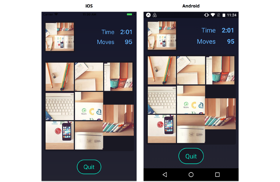
Gestures 459
You should see the pieces smoothly scale up and down as you touch and release them. You should
only be able to drag pieces into the adjacent empty square on the board. The pieces should snap either
to their new positions or back to their original positions, but should never get stuck in-between.
Wrapping up gesture handling
We just built a drag-and-drop gesture from scratch! Let’s review what we did:
• We used a PanResponder to interact with the gesture responder system. We implemented
the onStartShouldSetPanResponder handler to request the global interaction lock, and then
we implemented onPanResponderGrant,onPanResponderMove,onPanResponderRelease, and
onPanResponderTerminate to keep track of the state of the gesture.
• We created a generic Draggable component that provides us with a simpler interface for han-
dling the gesture data we care about when building drag-and-drop interactions: onTouchStart,
onTouchMove, and onTouchEnd.
• We handled touches by looking at the offset from the first touch event to the current one,
and deciding whether or not to move the puzzle piece. We animated the scale of the puzzle
piece so that it feels like we’re lifting the piece off of the board. We animated the position of
the puzzle piece using Animated.spring and Animated.parallel to snap it to a valid position
on the board.
Gestures 460
• If a new game state was passed in as a prop, we animated the pieces to reflect the latest state
of the game board.
Putting it all together, we were able to achieve an intuitive-feeling, cross-platform drag-and-drop
gesture that performs smoothly even on lower-end devices.
Here are a few recommendations for building gestures:
• Most gestures should use the PanResponder like we did in this example, rather than using
the underlying View responder props directly (e.g. onStartShouldSetPanResponder instead of
onStartShouldSetResponder). This is because most gestures will need to use the values in the
gestureState provided by the PanResponder, which are tricky to calculate on your own.
• It’s often helpful to separate gesture-related code into a separate component like we did with
our Dragging component. This ensures we keep the state of the gestures (e.g. offset) separate
from the state of the board. It can also help with performance: the Draggable component will
re-render each time its state updates, but this is significantly less costly than if we had to re-
render a more complex component like the Board.
• If possible, test your gestures on different devices as you build them. You may find that your
intuition about what should perform better isn’t actually the case, and it’s much easier to work
through performance issues one-at-a-time in isolation, rather than all at once when the gesture
is finished. Furthermore, if you run into a React Native bug or inconsistency across platforms
(there are several of these), it’s better to know sooner than later.
Speaking of performance, there’s one more performance improvement we made which we haven’t
covered yet.
Using PureComponent
You may have noticed that our Board component extends React.PureComponent rather than
React.Component. Components that extend React.Component will re-render any time their parent
re-renders or any time setState is called internally, even if the value of state or props is the same.
By contrast, components that extend React.PureComponent will only re-render when state or props
actually change. React checks for changes using a “shallow” equality test (testing the top-level keys
and values within the state and props objects using ===). If state and props are unchanged, then
the component does not re-render.
Preventing re-rendering with PureComponent is especially important for our Board component. Each
time the Game increments the elapsed time counter in the top right, it will re-render all of its children,
including Board. If the Board re-renders every second, this means it will likely re-render during a
drag gesture. Re-rendering results in a noticeable stutter during the gesture. In other words, we use
PureComponent to achieve a smooth drag gesture even as other parts of the UI update.

Gestures 461
If you want to see this for yourself, find this line at the top of Board.js:
export default class Board extends React.PureComponent {
Change it to:
export default class Board extends React.Component {
Then save Board.js. You’ll notice the stutter as you drag pieces around, especially on slower devices.
Make sure to change this back when you’re done!
If we had to re-render the Board during drag gestures for some reason, we might instead consider
breaking the component into smaller components, some of which can re-render more quickly or can
extend PureComponent.
Finishing the game
We’ve nearly finished building the puzzle game now. The next part we’ll write is the animation
where the pieces fly onto and off of the board as it mounts and unmounts:

Gestures 462
Animating all pieces
Let’s start by updating the constructor of the board. Open Board.js if you don’t already have it
open.
We want the puzzle pieces to render off-screen to begin with. This will let us animate them into
view. We can use the Dimensions API we learned about in the chapter “Core APIs, Part 1” to get the
height of the screen, and we can use this when setting the initial Animated.Value for the piece’s top.
Update the constructor to:
puzzle/components/Board.js
constructor(props) {
super(props);
const { puzzle:{ size, board } } =props;
this.state ={ transitionState:State.WillTransitionIn };
this.animatedValues =[];
const height =Dimensions.get('window').height;

Gestures 463
board.forEach((square, index) => {
const { top, left } =calculateItemPosition(size, index);
this.animatedValues[square] ={
scale:new Animated.Value(1),
top:new Animated.Value(top +height),
left:new Animated.Value(left),
};
});
}
With this, pieces will initially render exactly one screen-height below where we’ll move them.
Next, we need to animate every piece onto the board. We’ll write a helper method animateAllSquares(visible)
that does this for us. This method will animate pieces onto the board when we call it with visible
set to true, and it will animate pieces off of the board when we call it with visible set to false.
To perform the animation, we’ll animate the top of each piece by mapping the puzzle.board
to an array of Animated.timing animations (although remember that we’re eventually rendering
translateY instead of top, for performance). Just like with our updateSquarePosition method, we’ll
use Animated.parallel to run all the animations at once and let us easily await their completion.
We can create a playful staggered animation by setting the delay option of the animation.
Add the following animateAllSquares method:
puzzle/components/Board.js
animateAllSquares(visible) {
const { puzzle:{ board, size } } =this.props;
const height =Dimensions.get('window').height;
const animations =board.map((square, index) => {
const { top } =calculateItemPosition(size, index);
return Animated.timing(this.animatedValues[square].top, {
toValue:visible ?top :top +height,
delay: 800 * (index /board.length),
duration: 400,
easing:visible ?Easing.out(Easing.ease) :Easing.in(Easing.ease),
useNativeDriver:true,
});
});

Gestures 464
return new Promise(resolve => Animated.parallel(animations).start(resolve));
}
Notice that depending on the visible argument, we either animate the piece to its position on the
board, top, or off the board, top + height.
Let’s now update our componentDidMount to call animateAllSquares:
puzzle/components/Board.js
async componentDidMount() {
await this.animateAllSquares(true);
const { onTransitionIn } =this.props;
this.setState({ transitionState:State.DidTransitionIn });
onTransitionIn();
}
With that, we’ve completed the animation where the pieces fly onto the board! The last thing we
need to hook up is the animation where the pieces fly off the board when the game finishes.
We can do this by updating our componentWillReceiveProps to watch for when the teardown prop is
set to true by the Game. When the teardown prop first becomes true, we’ll call this.animateAllSquares(false).
Once this completes, we’ll set the transitionState to DidTransitionOut, and we’ll call the
onTransitionOut prop to inform that Game that the Board animations are finished and it’s ready
to be unmounted.
Update componentWillReceiveProps to:
puzzle/components/Board.js
async componentWillReceiveProps(nextProps) {
const { previousMove, onTransitionOut, puzzle, teardown } =nextProps;
const didMovePiece =this.props.puzzle !== puzzle && previousMove !== null;
const shouldTeardown = !this.props.teardown && teardown;
if (didMovePiece) {
await this.updateSquarePosition(
puzzle,
previousMove,
getIndex(puzzle, previousMove),
);
}
Gestures 465
if (shouldTeardown) {
await this.animateAllSquares(false);
this.setState({ transitionState:State.DidTransitionOut });
onTransitionOut();
}
}
Try it out!
Save Board.js. After the app reloads, press the start button to begin the game. To test the animation
we just added, you can either complete the puzzle… or you can press quit. The pieces should fly
offscreen, then the screen should transition out, and finally you’ll be taken back to the start screen.
From the start screen, you can begin another game. The state of the game completely resets after
each game.
Gestures 466
We’re Done!
We’ve built a complete puzzle game with animations and drag-and-drop gestures. Our app performs
smoothly and our animations look great on both iOS and Android.
In this chapter, we learned how to use the PanResponder in conjunction with the Animated API.
Using these together, we can build nearly any common gesture you can find in a mobile app.
We covered several ways of ensuring good animation and gesture performance:
• Using transform instead of top and left to avoid costly layout calculations
• Using useNativeDriver to reduce the number of messages that must be passed between the
native and JavaScript threads
• Using PureComponent to prevent unnecessary component re-rendering
In the next chapter, we’ll cover how to publish your app on the App Store and Play Store.
Native Modules
What are native modules?
So far in this book we’ve written all of our apps purely in JavaScript. We’ve used the built-in React
Native components and APIs to interact with the underlying native iOS and Android platforms.
However, sometimes we want to use native functionality that isn’t provided out-of-the-box by React
Native. In these cases, we can write native components and APIs ourselves, and expose bindings to
use them from JavaScript. In React Native, these bindings are called a “bridge.”
Common use cases
Native modules are most commonly used for bridging existing native functionality into JavaScript.
Native modules are also occasionally used for performance.
Here are a few of the most common cases:
• Accessing native platform features that React Native doesn’t support out-of-the-box, e.g.
payments APIs
• Exposing components and functionality when adding React Native to an existing native app
• Using existing iOS and Android libraries, e.g. authentication libraries for a 3rd party service
• High-performance algorithms like image processing that are usually low-level and multi-
threaded
• Extremely high-performance views when running into performance issues with React Native
views (this is rare)
When to use native modules
Using native modules should be the exception, rather than the norm. It’s generally best to write
views, algorithms, and business logic in JavaScript when possible. The JavaScript we write is almost
completely cross-platform, and updating to new versions of React Native is usually low effort. Native
modules, on the other hand, must be written per platform, and can be time-consuming to update
since they depend on both the native platform APIs and React Native’s APIs. Additionally, we can’t
use the convenient Expo preview app once we start working with native code – we have to “eject”
our app (covered later in this chapter) and build it using Xcode and Android Studio.
If we’re integrating React Native into an existing app (this is known as a “hybrid” app), it’s likely
we’ll use native modules more frequently, since we’ll want to expose the existing components

Native Modules 468
and functionality of our app to React Native. In the short term, it’s often faster to bridge existing
components than to re-write them in React Native. However, in the long term, it can be better to
re-write them – by migrating components to React Native, we’ll only need to maintain a single
implementation, and our team will only need knowledge of a single language/platform.
Native modules on npm
When we decide we need a native module, we should first check if there’s an existing open source
implementation. We’ll likely find an npm package for common use cases such as taking photos,
playing videos, and displaying maps.
The GitHub organization react-native-community86 maintains several of the most popular
native modules. These modules are very high quality and maintained by React Native core
contributors.
It’s very important to read the installation instructions, as setup for native modules can vary.
Most native modules on npm come with two sets of instructions, one for automatic setup using
react-native link, and one for manual setup.
react-native-link
Most of the time, installing a native module consists of 2 steps:
1. Install the npm package with: yarn add foo
2. Integrate the native code into your app by running react-native link
Remember, yarn and npm work interchangeably, but you should always stick to one or the
other. Because we’re using yarn in this book, if you see npm install foo in a package’s
installation instructions, make sure to run yarn install foo instead!
The command react-native link can often integrate native modules automatically. Library authors
can configure the various paths and settings used by this command to integrate their native code.
However, react-native link only handles the most common cases, so many native modules come
with custom setup instructions beyond this. Custom setup instructions usually involve manually
modifying iOS and Android native code.
86https://github.com/react-native-community
Native Modules 469
Manual setup
If you’re building a hybrid app, it’s likely your directory structure and code will differ somewhat
from the structure expected by react-native link. For this reason, native modules usually
include a set of instructions for manually integrating the native code into your app. This generally
involves modifying the Xcode and gradle build configurations to compile native libraries that were
downloaded by yarn into the node_modules directory.
The react-native link command supports some configuration options by adding an rnpm:
{ ... } object to your project’s package.json. However, documentation is currently non-
existent. If you choose to try this, the source code for reading configuration options is
currently here87.
Building a native module
In this chapter, we’ll build an app that displays a native pie chart:
87https://github.com/facebook/react-native/blob/6942408a474af80560497193f73c9e60bf272263/local-cli/core/ios/index.js#L34

Native Modules 470
There are a variety of graphing libraries available for React Native already, some of which are written
in JavaScript and some of which are native modules. In order to explore how native modules work,
however, we’ll write a native pie chart module from scratch.
The semantics of native iOS and Android code are outside the scope of this book, so we will primarily
copy and paste the native code we need. People without any experience writing native code are often
able to bridge simple native modules, so we recommend you attempt to follow along even if you
don’t have any experience with these platforms.
Building this app will consist of the following steps:
1. Create a new app using create-react-native-app
2. Eject the app we just created so that we can modify its native code
3. Write the pie chart component for both iOS and Android
4. Create a single PieChart.js that renders the native pie chart component from JavaScript
If you’re primarily testing on Android, feel free to skip the Xcode/iOS sections, or vice
versa. The project will work correctly on one platform regardless of any native code or
development tools for the other platform.
Native development is challenging!
There are a lot of things that can go wrong when developing a native app. Although the code
we’ll write in this chapter is relatively simple (as native apps go), it’s likely you’ll run into several
challenges along the way, especially if you’ve never done native development before.
The most challenging issues tend to be related to your development environment or build tools.
These can be tricky to debug, since they may be somewhat unique to the setup on your computer.
When you encounter an error with a development tool or building the app, the best place to start
is with a Google search. This will often reveal a Stack Overflow question or GitHub issue where
somebody else in the community had the exact same problem. If you don’t find anything useful, we
recommend opening a GitHub issue on the React Native github repo88. This is the most likely way
to have your issue resolved in a timely manner. If that still doesn’t work, you’re welcome to ask us
(the authors) for help (instructions on how to do so are in the introduction chapter), but be aware
that it’s unlikely we will be able to solve problems related to native app development.
It’s not all bad news though! The React Native community is extremely active, and new native
modules are added to npm frequently – writing custom native modules will become less and less
common as the ecosystem evolves. These complex challenges with native development are a big
reason for React Native’s success after all!
88https://github.com/facebook/react-native
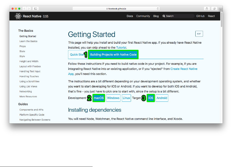
Native Modules 471
Development environment
Before we can get started building the pie chart app, you’ll need to set up your development
environment. If you haven’t done native app development before, it’s likely you’ll need to download
some new software. Building for iOS will require a computer running macOS with Xcode installed.
Building for Android can be done on any computer with Android Studio installed. We recommend
you set up at least one of these tools before continuing with this chapter.
To set up your development environment, follow the instructions on the “Getting Started”89 page of
the React Native docs site. First click the “Building Projects with Native Code” tab at the top of the
page, then select the “Development OS” and “Target OS” you plan to test with.
Follow the instructions for the “Development OS” and “Target OS” of your choice, up until the
section “Creating a new application.” We’ll create a new application in a slightly different way than
these docs demonstrate (although both will give the same result).
89https://facebook.github.io/react-native/docs/getting-started.html
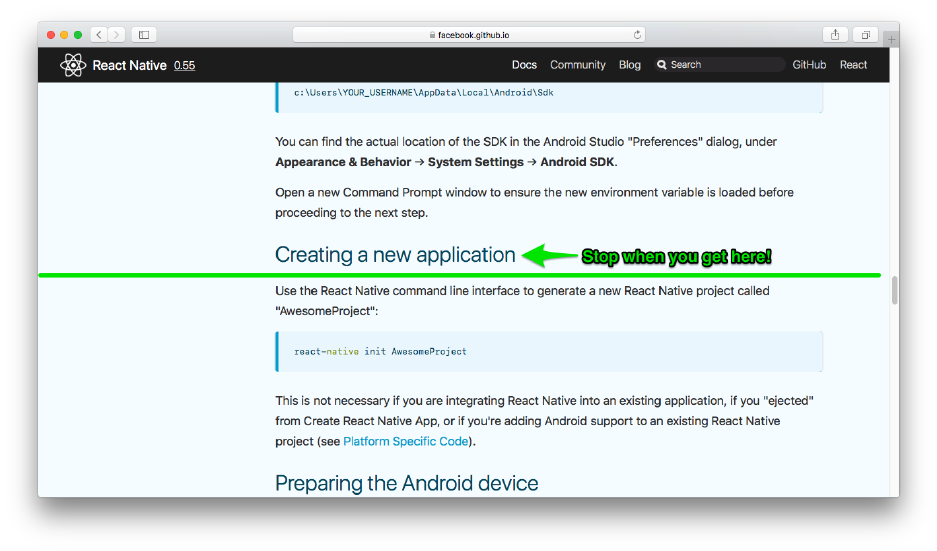
Native Modules 472
Initializing the project
Just as we did in the previous chapters, let’s create a new app with the following command:
$ create-react-native-app pie-chart --scripts-version 1.14.0
Once this finishes, navigate into the pie-chart directory.
Ejecting
Throughout this book, we’ve been using Create React Native App (CRNA) to set up new React Native
projects. This tool dramatically speeds up the process of creating a new project and previewing it
on your mobile device. By using the Expo client app for previewing, CRNA eliminates the need to
compile any native code. The Expo client app already contains a compiled version of all of the React
Native framework code, so apps written purely in JavaScript can be previewed within the Expo
client app by executing a JavaScript code bundle downloaded over the network.
However, as soon as we want to add custom native code, we won’t be able to preview our app using
the Expo client app. We’ll need to build our native code using Xcode and/or Android Studio. CRNA
can facilitate converting a pure JavaScript app into an app with both JavaScript and native code
through a process called “ejecting”. Ejecting a project copies the necessary native build dependencies,

Native Modules 473
configuration files, and scripts into the app’s root directory. After ejecting, we’ll be able to build
custom native code in our app, but we’ll no longer be able to use the Expo client app for easy
previewing.
Since there’s no way to undo an eject, if you’re ejecting an existing project, make sure the project is
backed up in a version control system. In this case, our pie-chart project is brand new, so backing it
up is optional.
From the root of the pie-chart directory, run yarn run eject to eject the project now. Upon running
this command, you should see the following prompt:
1We didn't find any uses of the Expo SDK in your project, so you should be fine to ej\
2ect to
3"Plain" React Native. (This check isn't very sophisticated, though.)
4
5We strongly recommend that you read this document before you proceed:
6https://github.com/react-community/create-react-native-app/blob/master/EJECTING.md
7
8Ejecting is permanent! Please be careful with your selection.
9
10 ? How would you like to eject from create-react-native-app? (Use arrow keys)
11 � React Native: I'd like a regular React Native project.
12 ExpoKit: I'll create or log in with an Expo account to use React Native and the Ex\
13 po SDK.
14 Cancel: I'll continue with my current project structure.
There are two different ways we can eject a project: either with or without ExpoKit.
If we’re importing any of the Expo APIs from within our app (e.g. import { Constants, MapView,
LinearGradient } from 'expo';), then we may want to consider ejecting with ExpoKit (the second
option). This allows us to continue using the Expo APIs.
If we’re not importing any Expo APIs, then we don’t need ExpoKit. That’s the case here, so we
should choose the first option and eject to a “regular React Native project.” The yarn run eject
command attempts to identify whether or not we’re using any Expo APIs and warn us – here, the
first line of the prompt indicates that our app doesn’t use any.
If we decide we want ExpoKit at a later time, we can add it to our app then.
Select the first option, React Native: I'd like a regular React Native project.
The next prompt will ask how you want to name your app:

Native Modules 474
1We have a couple of questions to ask you about how you'd like to name your app:
2? What should your app appear as on a user's home screen?
Type “PieChart” and hit enter to proceed.
The last prompt will ask how to name the Xcode and Android Studio project files.
1? What should your Android Studio and Xcode projects be called? (piechart)
Type “PieChart” and hit enter to proceed.
The script should then proceed with the ejection. After a few minutes (although it can take 10 or
more), you should see the following message:
1Ejected successfully!
2Please consider letting us know why you ejected in this survey:
3https://goo.gl/forms/iD6pl218r7fn9N0d2
This means the project was ejected successfully!
Since we’re just building an example project, don’t fill out the survey!
There’s another tool for starting a new React Native project called react-native init. This was
the original way to get started with React Native, before create-react-native-app was created.
Using create-react-native-app is convenient, since you don’t need to have a full development
environment set up for both iOS and Android native apps.
Creating a new app with create-react-native-app then running yarn run eject is more or less
equivalent to running react-native init. If you know in advance that you’ll need to eject your
app to use native modules, then you should consider running react-native init for simplicity. We
demonstrated the ejection flow since we’ve been using create-react-native-app throughout this
book.
The “Getting Started” page of the React Native docs demonstrates how to use react-native init.
To learn more, continue reading from the “Creating a new application” section we recommended
you stop at earlier.
Project structure
Let’s take a look at the files in our project directory now:
Native Modules 475
├── App.js
├── App.test.js
├── README.md
├── android
├── app.json
├── index.js
├── ios
├── node_modules
├── package.json
└── yarn.lock
Most of the files are the same as usual, but the ios and android directories and the index.js file are
new.
The ios directory contains an Xcode project and the android directory contains an Android Studio
project. From this point on, we’ll need to build the project in either Xcode or Android Studio before
we’re able to preview it in a simulator or on a device.
The index.js file is the “entry point” of our app now – in other words, it’s the first JavaScript file
in our app that gets executed when our app launches. Let’s look at this file now.
Open up index.js. You should see a call to AppRegistry.registerComponent. This registers a “root
component” of our app that will be instantiated by native code. Apps can have multiple root
components, each with a unique name, which can be instantiated within native code.
For apps created with create-react-native-app, the App.js file is normally the entry point
and the App component is registered automatically so long as it has export default in front
of it.
In this case, our root component will be named “PieChart”. Due to a bug in create-react-native-app,
the registered component name may not have the correct letter casing. If AppRegistry.registerComponent
is called with “piechart” (in lower case), replace it with “PieChart” now:
pie-chart/index.js
1import { AppRegistry } from "react-native";
2import App from "./App";
3AppRegistry.registerComponent("PieChart", () => App);
Make sure to change the case of “piechart” to “PieChart” or the app will launch with an error
later! The error will say that no component named “PieChart” was registered.

Native Modules 476
How native modules work
There are 2 kinds of native modules:
• API modules
• UI component modules
API modules expose bindings for native methods to be called from JavaScript. When calling a native
method from JavaScript, any values passed are marshalled90 on the JavaScript side and unmarshalled
on the native side. All APIs called from JavaScript are asynchronous, so we will need to use promises,
callbacks, or events if we want to handle a response from the native side.
UI component modules expose a new React component that we can render from our JavaScript code.
When we render this component in our JavaScript, the native thread will use a “View Manager” to
create a new native view. The View Manager handles the lifecycle of the native view, including:
instantiating the view, marshalling and unmarshalling the component’s props, updating the view
with its props, and reusing native views where possible (for performance).
Prop types
On both platforms, we’ll want our view to consume the same props. This will allow us to create a
single React component that works for both iOS and Android. Our pie chart component will use the
following props:
pie-chart/PieChart.js
12 static propTypes ={
13 data:PropTypes.arrayOf(
14 PropTypes.shape({
15 value:PropTypes.number,
16 color:ColorPropType
17 })
18 ).isRequired,
19 strokeWidth:PropTypes.number,
20 strokeColor:ColorPropType,
21 ...ViewPropTypes
22 };
The different segments of the pie chart, the data prop, are passed as an array of objects containing a
numeric value and a color string. The segments of the pie chart may optionally be rendered with a
colored stroke, configurable with a numeric strokeWidth and strokeColor string. We’ll also allow
astyle prop, just like other built-in React Native components.
90https://en.wikipedia.org/wiki/Marshalling_(computer_science)

Native Modules 477
We’ll now build a UI component native module for each platform. As we build the module, we’ll
make sure it supports the data,strokeWidth, and strokeColor props. The style prop will be handled
automatically for us.
Feel free to follow the instructions for just iOS or just Android, and come back to the other
platform another time.
iOS
The structure of the ios directory looks like this:
1ios/
2├── PieChart
3│ ├── AppDelegate.h
4│ ├── AppDelegate.m
5│ ├── Base.lproj
6│ │ └── LaunchScreen.xib
7│ ├── Images.xcassets
8│ │ ├── AppIcon.appiconset
9│ │ │ └── Contents.json
10 │ │ └── Contents.json
11 │ ├── Info.plist
12 │ └── main.m
13 ├── PieChart-tvOS
14 │ └── Info.plist
15 ├── PieChart-tvOSTests
16 │ └── Info.plist
17 ├── PieChart.xcodeproj
18 │ ├── project.pbxproj
19 │ └── xcshareddata
20 │ └── xcschemes
21 │ ├── PieChart-tvOS.xcscheme
22 │ └── PieChart.xcscheme
23 └── PieChartTests
24 ├── Info.plist
25 └── PieChartTests.m
We’ll be opening PieChart.xcodeproj in Xcode, and then adding a few new files to the PieChart
directory from within Xcode. We won’t be adding native tests or configuring our app for Apple TV,
so we can ignore the PieChart-tvOS,PieChart-tvOSTests, and PieChartTests directories.
Native Modules 478
Swift or Objective-C?
When working with iOS, we have two choices for which language we want to use: Swift or
Objective-C (abbreviated Obj-C). The React Native framework for iOS is written in Obj-C, so the
built-in native modules and most of the documentation uses Obj-C. However, Swift is significantly
easier to learn and use, so we’ll be using Swift. In general we recommend using Swift for new native
modules, unless you know that you need Obj-C for some reason. Regardless of which we choose,
we’ll still need to use Obj-C for one part of the process.
Exporting the native view
There are 4 things we need to do in native code to create a new UI component native module:
1. Define the view that we want to instantiate from JavaScript. This will be a subclass of UIView.
In our case, we’ll call this class PieChartView.
2. Create a bridging header to expose our Swift code to React Native (this is only necessary if
we’re using Swift). Xcode will help us create this automatically when we create our first Swift
file.
3. Define the View Manager that will handle the lifecycle of our component. This will be a
subclass of RTCViewManager. We’ll call our subclass PieChartManager.
4. Export our custom View Manager and our component’s props to JavaScript using macros. This
is done in Obj-C, regardless of whether we’re using Swift for our component or not.
Creating files
Let’s begin by creating all the Swift and Obj-C files we’ll need within Xcode. Open PieChart.xcodeproj
in Xcode now. You can do this by launching Xcode and then choosing File > Open... from the
menubar.
This project was written in Xcode 9.3 with Swift 4.1. The project will likely fail to build in older
versions of Xcode!
First we’ll create our native view class, PieChartView.swift. In the project navigator on the left,
right click the “PieChart” group (the one with the yellow folder icon) and choose “New File…”.
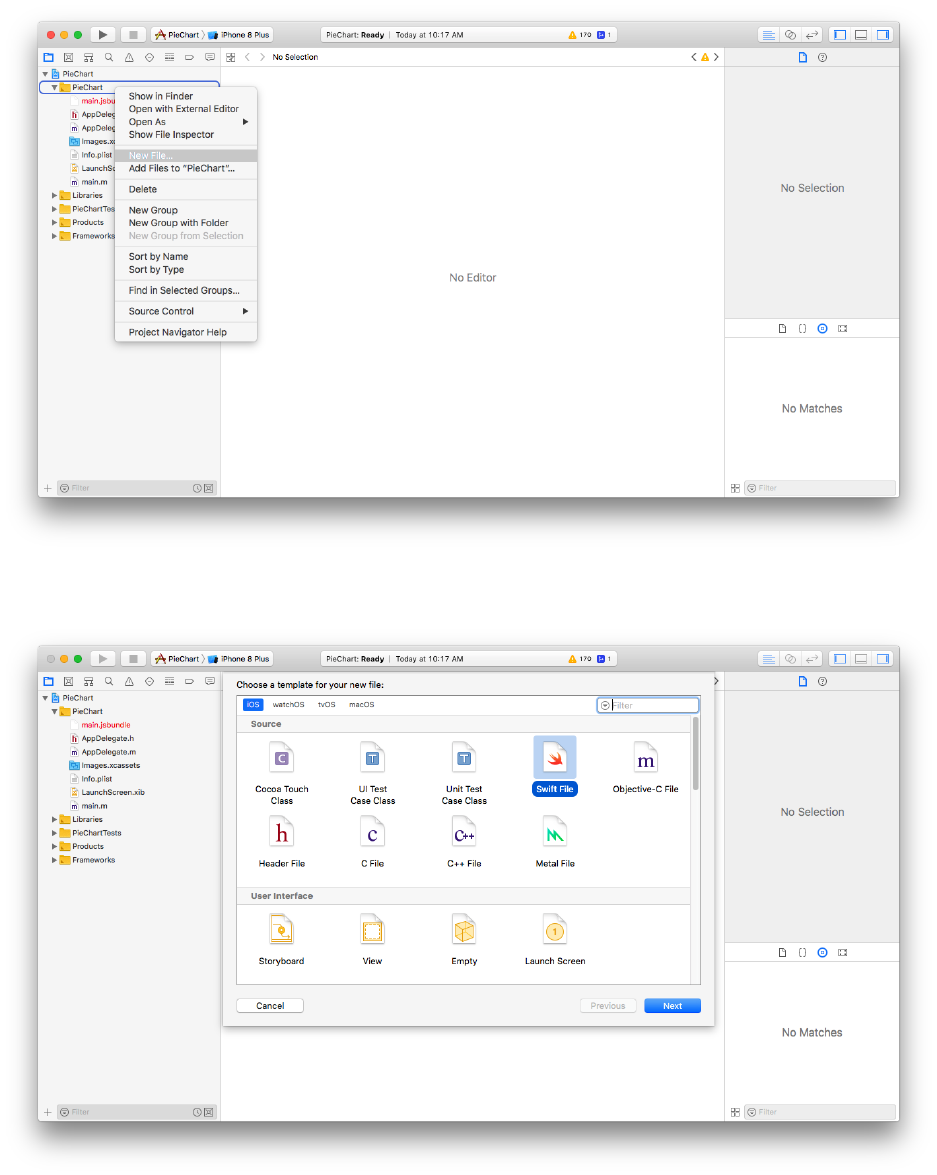
Native Modules 479
Select the “Swift File” option.
Click “Next” and then save the file as PieChartView (the file extension is added automatically) in
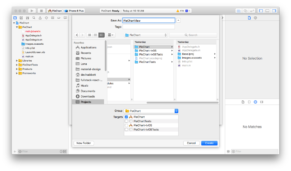
Native Modules 480
the ios/PieChart directory:
Click “Create.” Upon creating this file, Xcode will prompt us to create a “bridging header” – this
is necessary to expose our Swift code to React Native, as React Native is written in Obj-C. Click
“Create Bridging Header”:
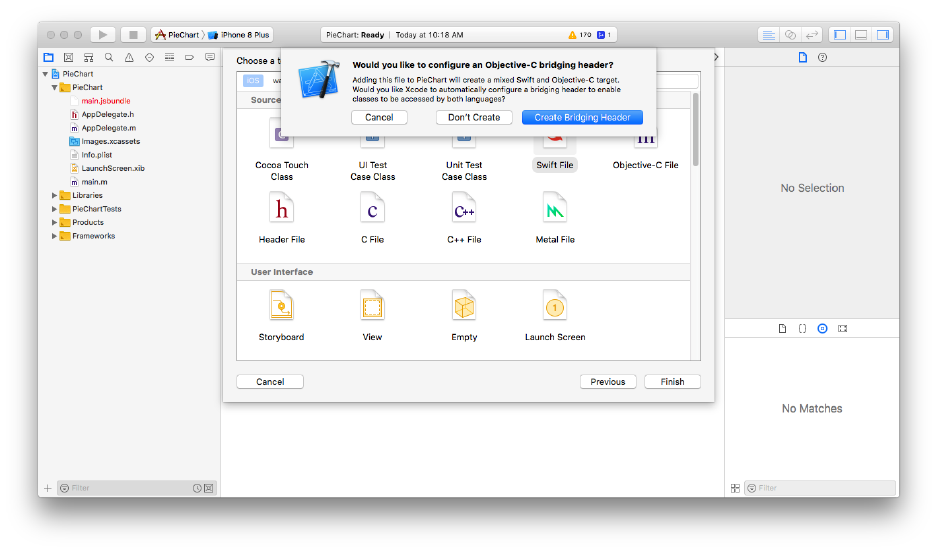
Native Modules 481
Next, right click the “PieChart” group in the project navigator again and create the file PieChartManager.swift
following the same process. Xcode won’t prompt you to create a bridging header this time, since we
already have one.
Last, we’ll create an Obj-C file to expose our view to JavaScript. Once again, right click the “PieChart”
group and choose “New File…”. This time, select “Objective-C File”:
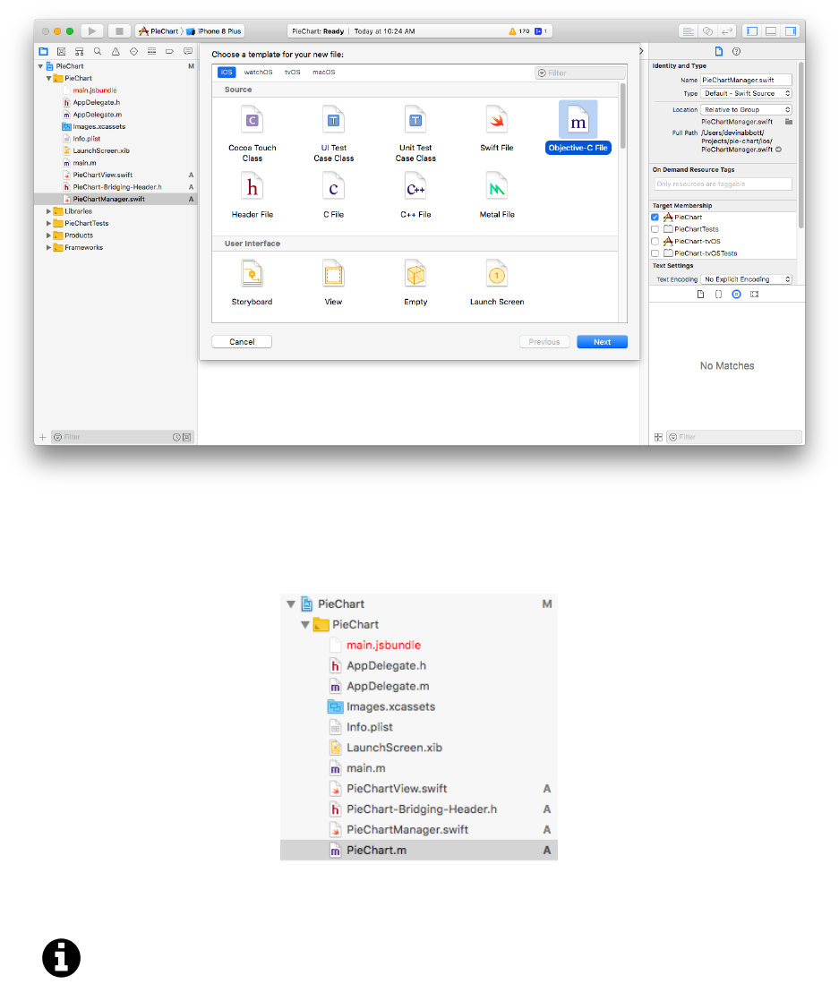
Native Modules 482
Save this file as “PieChart” in the ios/PieChart directory.
At this point, the file navigator should show these files:
Now that we’ve created the files we need, let’s fill them out one by one.
Note that despite how the Xcode file navigator looks, PieChart-Bridging-Header.h is
actually in the ios directory, not the ios/PieChart directory. The Xcode file navigator
doesn’t map directly to the file system. There’s no need to move this file though – it will
work correctly regardless of where it exists on the file system. In fact, moving files managed
by Xcode can be fairly tricky, so for our pie-chart app, we recommend against moving any
files if possible.
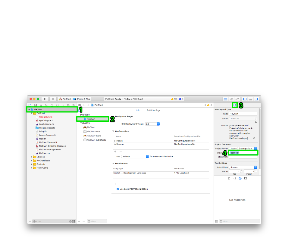
Native Modules 483
You may notice that new files created in Xcode include a copyright header automatically. The
copyright header for projects created with CRNA is set to “Facebook” by default, e.g:
1// Copyright © 2018 Facebook. All rights reserved.
If you’re working on a real project, you’ll likely want to change the default value to your name or
your organization’s name, rather than “Facebook”.
The following image demonstrates how to change the organization name used for the copyright
header:
Bridging header
We’ll be copying code from the sample code directory, pie-chart/ios, into the files we just created.
Copy the contents of PieChart-Bridging-Header.h from the sample code directory into your own
PieChart-Bridging-Header.h:

Native Modules 484
pie-chart/ios/PieChart-Bridging-Header.h
1//
2// Use this file to import your target's public headers that you would like to expo\
3se to Swift.
4//
5
6#import "React/RCTViewManager.h"
This exposes the RCTViewManager.h headers to our Swift code so that we can write a native view in
Swift.
PieChartView
We’ll be using a subclass of UIView that draws a pie chart based on the data,strokeWidth, and
strokeColor props.
Copy the contents of ios/PieChart/PieChartView.swift from the sample directory into your own
PieChartView.swift file. We’ll look at two important details of this code.
If you don’t fully understand the explanations of the native code, that’s fine! This is mainly
included for people who do have a little native iOS development experience.
Props must be member variables of the class, exposed to Obj-C using the @objc annotation, for
example:
@objc var strokeWidth: CGFloat = 0.0
When a prop updates, we need to re-draw the pie chart. We can do this by overriding the didSetProps
method of our view:
override func didSetProps(_changedProps: [String]!) {
setNeedsDisplay()
}
PieChartManager
Now that we have our view class, we need to create a manager class to instantiate it. Copy the con-
tents of PieChartManager.swift from the sample directory into your own PieChartManager.swift
file.
This class allows React Native to instantiate our PieChartView class as needed when we render it
from JavaScript.

Native Modules 485
Export macros
Last, copy the contents of PieChart.m from the sample directory into your own PieChart.m file.
pie-chart/ios/PieChart/PieChart.m
1//
2// PieChartExport.m
3// PieChart
4//
5// Created by Devin Abbott on 6/3/18.
6// Copyright © 2018 Fullstack. All rights reserved.
7//
8
9#import "React/RCTViewManager.h"
10
11 @interface RCT_EXTERN_MODULE(PieChartManager, RCTViewManager)
12
13 RCT_EXPORT_VIEW_PROPERTY(data, NSArray)
14 RCT_EXPORT_VIEW_PROPERTY(strokeColor, UIColor)
15 RCT_EXPORT_VIEW_PROPERTY(strokeWidth, CGFloat)
16
17 @end
This file uses macros to expose the view manager class and the view’s props to React Native.
The RCT_EXTERN_MODULE macro exposes our PieChartManager class to React Native. We can now
consume a native module called PieChart (without the Manager suffix) from our JavaScript.
The RCT_EXPORT_VIEW_PROPERTY macro exposes the member variables on our PieChartView class
as props to React Native. We also provide the types of these props so they can be marshalled and
unmarshalled correctly.
You may see an error 'React/RCTViewManager.h' not found on the line with the #import
"React/RCTViewManager.h". Xcode should find this dependency during the build process, so
the error should disappear once you build the app in the next step.
Try building!
We won’t be able try our component until we render it from JavaScript, but we can at least confirm
that our Xcode project builds successfully.
In the top left of Xcode:
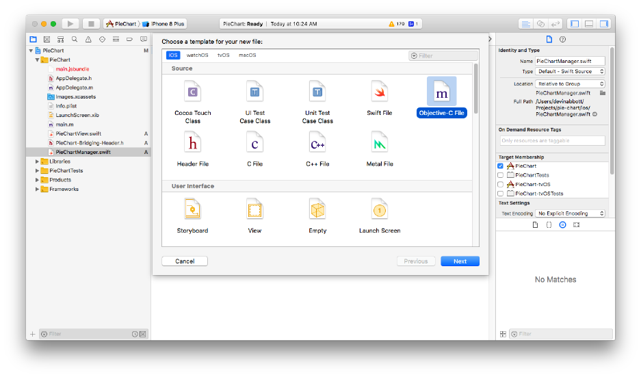
Native Modules 486
1. Choose a simulator to build the project on. It’s more difficult to build on a real device, so we
recommend using the simulator for this chapter unless you’re already set up for building to
your device.
2. Click the play button to start the build.
Xcode will open a new terminal and start the packager in the root directory of our app if you don’t
have a React Native packager process running on your computer. This is for convenience – you may
also quit the terminal that Xcode opened and launch a packager process of your own with yarn
start as usual.
If everything goes well, after a minute you should see a “Build Succeeded” popup from Xcode. The
simulator you chose before building should launch (this can take a minute or two) and you should
see the default create-react-native-app screen.
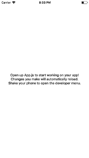
Native Modules 487
Wrapping up iOS
We’ve finished creating a native pie chart component for iOS! The next step will be to consume it
from JavaScript. We’ll do that in the JavaScript section of this chapter.
At this point, you can either build the Android version of the pie chart, or skip ahead to the JavaScript
section (recommended) and come back to Android later.
Android
The structure of the android directory (excluding some deeply nested files) looks like this:
1android/
2├── PieChart.iml
3├── app
4│ ├── BUCK
5│ ├── app.iml
6│ ├── build
7│ ├── build.gradle
8│ ├── proguard-rules.pro
9│ └── src
Native Modules 488
10 ├── build
11 │ └── generated
12 ├── build.gradle
13 ├── gradle
14 │ └── wrapper
15 ├── gradle.properties
16 ├── gradlew
17 ├── gradlew.bat
18 ├── keystores
19 │ ├── BUCK
20 │ └── debug.keystore.properties
21 ├── local.properties
22 └── settings.gradle
We’ll be opening the android directory in Android Studio. We’ll be adding a few new Java source files
to android/app/src/main/java/com/piechart/. We can ignore the rest of the files in this directory,
which are mainly configuration files.
Java or Kotlin
When working with Android, we have two choices for which language we want to use: Java or
Kotlin. The React Native framework for Android is written in Java, so the built-in native modules
and most of the documentation uses Java. While Kotlin is more modern and a popular choice for
new Android apps, the vast majority of Android apps today are still written in Java, so we’ll be using
Java for our pie chart example.
Exporting the native view
There are 4 things we need to do in native code to create a new UI component native module:
1. Define the view that we want to instantiate from JavaScript. This will be a subclass of
android.view.View. In our case, we’ll call this class PieChartView.
2. Define the View Manager that will handle the lifecycle of our component. This will be a
subclass of SimpleViewManager<PieChartView>. We’ll call our subclass PieChartManager.
3. Define a new “package” called PieChartPackage, a subclass of ReactPackage, that instantiates
our View Manager.
4. Register our PieChartPackage at app launch from MainApplication.java.
Exporting the native view
Let’s begin by creating all the Java files we’ll need within Android Studio. Launch Android Studio
now, and choose “Open an existing Android Studio project”.
Native Modules 489
Select the android directory within the pie-chart directory we just created and press “OK.” It may
take Android Studio a minute or two to configure the project.
Next we’ll create a new Java file, PieChartView.java. If you’ve never used Android studio before,
the following diagram depicts the steps to take. First, click the “Project” tab on the left of the window.
Second, choose the “Android” option in the dropdown at the top of the file tree. Third, right click
the “piechart” directory. Lastly, choose “New > Java Class” from the context menu.
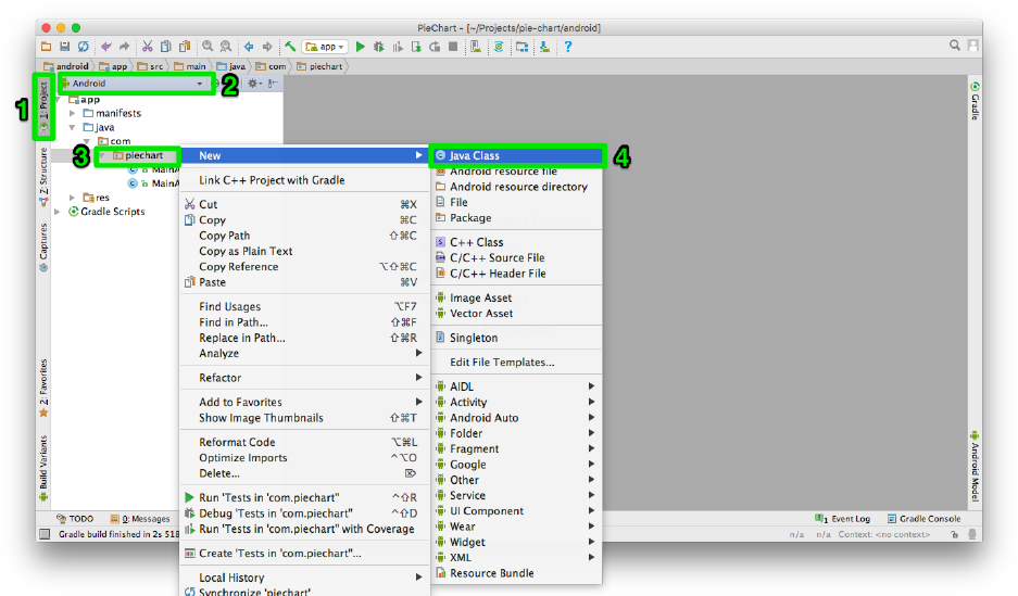
Native Modules 490
Within the dialog that appears, type PieChartView and click “OK.”
Native Modules 491
Repeat this process of creating new files for two more files: PieChartManager.java and PieChartPackage.java.
Once you’ve finished, the file tree should look like this:
Now that we’ve created the files we need, let’s fill them out one by one.

Native Modules 492
PieChartView
We’ll be using a subclass of android.view.View that draws a pie chart based on the data,
strokeWidth, and strokeColor props. React Native doesn’t interact with view classes directly, so this
class could be written any way we want – the member variables of the view could have completely
different names and types from our props.
Copy the contents of PieChartView.java from the sample directory into your own PieChartView.java
file.
PieChartManager
Now that we have our view class, we need to create a manager class to instantiate it. Copy the
contents of PieChartManager.java from the sample directory into your own PieChartManager.java
file.
This class allows React Native to instantiate our PieChartView class as needed when we render
it from JavaScript. The REACT_CLASS string determines the name of the component within our
JavaScript:
public static final String REACT_CLASS ="PieChart";
In this case, our component will be available as PieChart.
Methods of the PieChartManager handle updating the PieChartView to reflect the latest props. A
method can be registered to handle a specific prop by name using the @ReactProp annotation:
@ReactProp(name ="strokeWidth",defaultFloat = 0f)
public void setStrokeWidth(PieChartView view,float strokeWidth) {
view.strokeWidth =strokeWidth;
view.invalidate();
}
These annotated methods handle converting common JavaScript types to Java types. For more detail
on annotating props, check out this guide in the docs91.
Our PieChartView implementation overrides the draw method in order to do custom drawing, so
anytime we change a prop, we also call invalidate() to trigger a re-draw.
91https://facebook.github.io/react-native/docs/native-components-android#3-expose-view-property-setters-using-reactprop-or-
reactpropgroup-annotation
Native Modules 493
Exporting the package
Now that we have our view manager class, we can create a ReactPackage subclass that registers it
with React Native. Copy the contents of PieChartPackage.java from the sample directory into your
own PieChartPackage.java file.
This class can register multiple native modules at once, including both API modules and UI
component modules. We register our PieChartManager using the following:
@Override
public List<ViewManager>createViewManagers(ReactApplicationContext reactContext) {
return Arrays.<ViewManager>asList(
new PieChartManager()
);
}
Lastly, we’ll register our PieChartPackage class within MainApplication.java.
The getPackages method currently looks like this:
@Override
protected List<ReactPackage>getPackages() {
return Arrays.<ReactPackage>asList(
new MainReactPackage()
);
}
Update it to the following:
@Override
protected List<ReactPackage>getPackages() {
return Arrays.<ReactPackage>asList(
new MainReactPackage(), new PieChartPackage()
);
}
This registers our PieChartPackage with React Native.
Try building!
We won’t be able try our component until we render it from JavaScript, but we can at least confirm
that our Android Studio project builds successfully.
Native Modules 494
We can either build to a real device or an emulator. It’s often quicker and easier to build to a real
device if you have one (and a USB cable) handy. If not, now’s a good time to set up an emulator. In
either case, follow the section titled “Preparing the Android Device”92 for information on how to set
up your real device or emulator. If the website shows the wrong operating system (e.g. macOS when
you’re running Windows), you may need to set the “Development OS” toggle at the top of this page
again. Follow the instructions under “Preparing the Android Device” until you reach “Running your
React Native application.”
At the top of Android Studio, click the play button:
Next, choose a device or emulator to build the project on and press “OK”:
92https://facebook.github.io/react-native/docs/getting-started#preparing-the-android-device
Native Modules 495
This will build the app, install it on your device, and launch it automatically. Android Studio doesn’t
automatically launch the React Native packager, so once the app launches you should see a red error
screen explaining that it can’t load the script.
Navigate to the root directory of the pie-chart app we just created and start the packager with yarn
start as usual. Once this finishes, press the “RELOAD” button at the bottom of the red screen on
your device or emulator.
If everything goes well, you should see the default create-react-native-app screen.
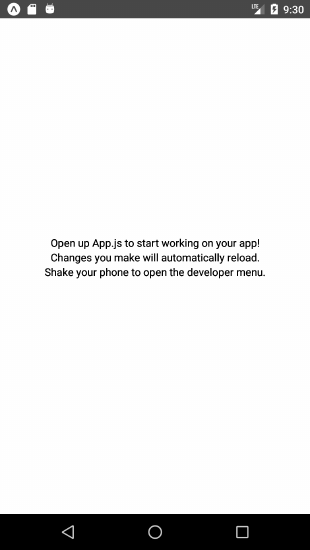
Native Modules 496
JavaScript
Now that we have a native implementation of our pie chart component, we can use it from JavaScript.
Using the native view from JS
In your text editor, create a new file PieChart.js in the root of our project directory (at the same
level as App.js).
In this file, we’ll import the native pie chart component, and render it from a new React component.
It’s best to wrap a native component within another React component so that we have the ability to
modify component props before they’re passed to the native component, and so that we can control
which imperative APIs are available on the component class (although in this case we won’t use
any).
Let’s begin by importing the following at the top of PieChart.js:

Native Modules 497
pie-chart/PieChart.js
import React from "react";
import PropTypes from "prop-types";
import {
ColorPropType,
StyleSheet,
ViewPropTypes,
requireNativeComponent,
processColor
} from "react-native";
Next, we’ll define a React component called PieChart. This component will wrap the native
component which we’ll import shortly. In the PieChart component, we need to define the prop
types and default props in the exact same way that our native component expects. So, we need a
data,strokeWidth, and strokeColor prop type. As a reminder, the data prop should be an array of
objects, where each object contains a numeric value and a color string.
Even though we didn’t specify this explicitly in our native code, our native component also expects
every prop type supported by the built-in React Native View. This is the default behavior for native
components, which allows our native pie chart to work with layout and gestures just like any other
React Native core component.
Create the PieChart class and propTypes now:
pie-chart/PieChart.js
export default class PieChart extends React.Component {
static propTypes ={
data:PropTypes.arrayOf(
PropTypes.shape({
value:PropTypes.number,
color:ColorPropType
})
).isRequired,
strokeWidth:PropTypes.number,
strokeColor:ColorPropType,
...ViewPropTypes
};
Note that we use the spread syntax, ...ViewPropTypes, to add every prop type from View to our
PieChart component.
Next we’ll add defaultProps:
Native Modules 498
pie-chart/PieChart.js
static defaultProps ={
data:[],
strokeWidth: 0,
strokeColor:"transparent"
};
requireNativeComponent
Before we add the render method to our PieChart component, we first need to import our native pie
chart component. We can do this using the requireNativeComponent(viewName, componentInterface)
API. In this case, the viewName will be "PieChart" (since that’s how we exported it from na-
tive code), and the componentInterface will be the PieChart component we just made. The
requireNativeComponent API will use the propTypes of our PieChart (the componentInterface)
to ensure that props passed from JavaScript to native code have the correct names and types.
Let’s add the following line below our PieChart React component definition:
pie-chart/PieChart.js
const NativePieChart =requireNativeComponent("PieChart", PieChart);
We’ll be rendering NativePieChart from within the render method of our PieChart component.
Even though we’re declaring NativePieChart below the PieChart class, we’ll still be able to
use it from within the render method. This works the same way as declaring styles below
the component class.
One last thing to do before writing our render method: we want to set the background of our native
pie chart component to "transparent", since native components have a black background by default.
Let’s add a style that handles this for us at the bottom of the file:
pie-chart/PieChart.js
const styles =StyleSheet.create({
container:{
backgroundColor:"transparent"
}
});

Native Modules 499
Rendering
Now we can write the render method of our PieChart class. Within the render method, we’ll
render a NativePieChart component, propagating all of the props passed to PieChart into the
NativePieChart.
There are two props that we’ll modify before propagating them to the NativePieChart component:
•data - we need to call processColor on each color within the objects in the data array. The
processColor function converts colors into a format that our native code can understand. React
Native normally handles this conversion automatically (e.g. for our strokeColor prop), but
since our colors are nested within objects/arrays, we must do it ourselves for the data array.
In order to do this, we’ll map each object in the data array to a new object containing the
converted color.
•style - we want to apply our default styles.container style before any other styles in order
to clear the default background color.
Let’s add the render method now:
pie-chart/PieChart.js
render() {
const { style, data, ...rest } =this.props;
const processedData =data.map(item => ({
value:item.value,
color:processColor(item.color)
}));
return (
<NativePieChart
{...rest}
style={[styles.container, style]}
data={processedData}
/>
);
}
Save PieChart.js. That wraps up our PieChart component! Now it’s time to render this component
from App.

Native Modules 500
App
Open App.js. In this component we’ll render the PieChart with an initial set of data, and we’ll
include a button that randomizes the data.
We’ll begin by updating the imports at the top of the file:
pie-chart/App.js
import React from "react";
import { AppRegistry, StyleSheet, Text, View, Button } from "react-native";
import PieChart from "./PieChart";
Next, let’s add a style called chart in the styles object at the bottom of this file. This style will
render our pie chart as a 300x300 square with a margin below it. Update the styles object now:
pie-chart/App.js
const styles =StyleSheet.create({
container:{
flex: 1,
backgroundColor:"#fff",
alignItems:"center",
justifyContent:"center"
},
chart:{
width: 300,
height: 300,
marginBottom: 20
}
});
Now let’s move on to the App component. We’ll add a component state object containing some
initial data to render in the pie chart:

Native Modules 501
pie-chart/App.js
state ={
data:[
{ value: 12, color:"#2196F3" },
{ value: 12, color:"#8BC34A" },
{ value: 8, color:"#f44336" },
{ value: 4, color:"#FF9800" }
]
};
We’ll also add a randomize function to this class which randomizes the pie chart’s data:
pie-chart/App.js
randomize =() => {
const { data } =this.state;
this.setState({
data:data.map(slice => ({
value:Math.random() + 0.1,
color:slice.color
}))
});
};
Finally, we can update the render method. Delete the current placeholder contents within the render
method. Then, render a PieChart component using the styles and data we just defined, along with
aButton below it that calls this.randomize when pressed.
pie-chart/App.js
render() {
const { data } =this.state;
return (
<View style={styles.container}>
<PieChart
style={styles.chart}
strokeColor={"white"}
strokeWidth={4}
data={data}
/>
<Button title="Press to randomize" onPress={this.randomize} />
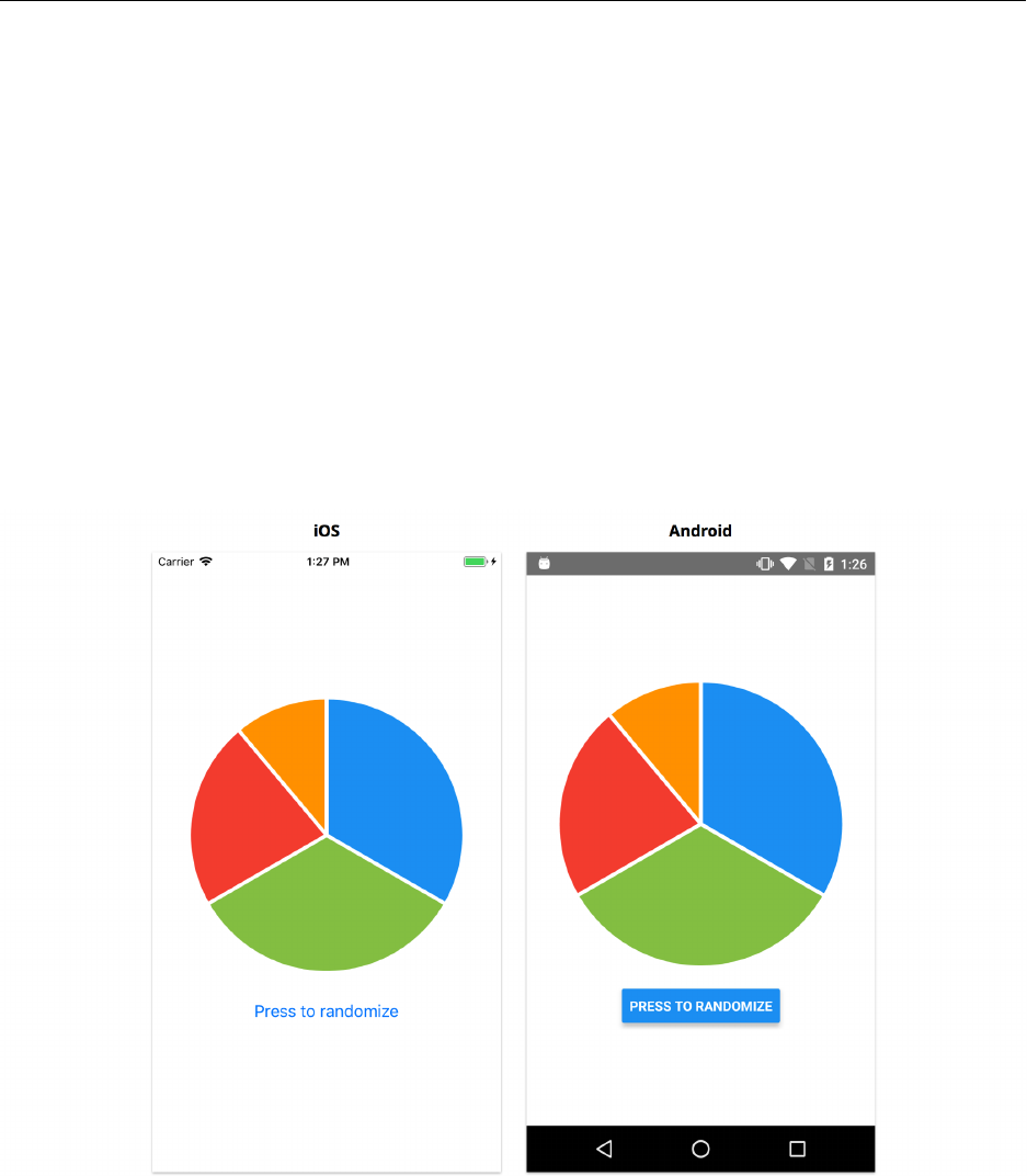
Native Modules 502
</View>
);
}
Save App.js.
Try it out!
You’ll likely need to manually reload the app on your simulator or device, since live reload and hot
reload are disabled by default in ejected apps.
To reload:
• On a physical device, shake the device until the developer menu appears, then tap “Reload”.
• On an iOS simulator, press Cmd+R.
• On an Android emulator, press R twice.
Once the app has reloaded, you should see the pie chart on the screen!
Try tapping the “Press to randomize” button a few times to make sure the native component updates
correctly whenever props change.
Native Modules 503
Wrapping up
We just created a native module for both iOS and Android, and bridged it into React Native.
Although bridging a native module is more complex than creating a JavaScript API or UI component,
it can be necessary in order to leverage native functionality.
As the React Native community has evolved, many native modules have been published on npm.
Creating native modules manually like we did in this chapter is already significantly less common
than it was several years ago. In the future, more and more apps will likely be built without writing
any native code. However, knowing how to bridge a native module will always be an important skill
for a React Native developer, since the need might arise throughout the lifetime of a project.
In the next chapter, we’ll cover how to publish our apps to the App Store and Play Store.

Building and publishing
After spending some time completing a mobile application, the next natural step is to share your
work with the world! If we want any user to be able to access our application at any time, we need to
build and publish it to an app store. By doing so, we let users discover and download our application
to their device.
How to read this chapter
This chapter serves as a reference for when you need to deploy and distribute a React Native
application. Unlike other chapters, you won’t be following along with an example application. Feel
free to read it now to get an idea of the process and return later when you’re ready to publish an
application of your own.
Shipping an application to an app store is generally a two-step process:
1. Create a native build of our application. This involves generating an IPA (iOS App Store
Package) file for iOS and an APK (Android Package Kit) file for Android.
2. Publish the build to an app store. App Store Connect93 and Google Play Console94 are the two
platforms used to publish and distribute an iOS and Android application respectively.
We’ll start with Building. There are two different approaches to creating a build. We’ll weigh their
advantages and disadvantages.
After this section, we suggest you head directly to the section covering the operating system that
you plan on publishing with: iOS or Android.
Building
We explored how to add native components to a React Native application in the “Native Modules”
chapter. While doing so, we described how to set up the necessary integrated development
environments (IDEs) needed for writing native code. To develop for iOS, Xcode95 is the required
IDE and can only be installed on a Mac computer. Android Studio96 is the official IDE used for
Android development.
93https://developer.apple.com/app-store-connect/
94https://developer.android.com/distribute/console/
95https://developer.apple.com/xcode/
96https://developer.android.com/studio/

Building and publishing 505
In order to submit to an App Store, we first need to create a build of our application that we can
publish. If we were building mobile applications without React Native, we would use the same IDEs
that we write native code with to create builds of our application. With CRNA however, we can
create standalone builds in two different ways:
1. Using Expo
2. Ejecting and creating builds manually through Xcode or Android Studio
Both approaches will allow us to generate iOS and Android builds that we can deploy to app stores.
Each approach has its advantages and disadvantages, which we will cover in a little bit.
In the next section, we’ll explore how Expo allows us to create standalone builds using one of its
tools. After that, we’ll review the pros and cons for using this approach as well as the trade-offs for
building manually using the IDEs.
Building with Expo
In the first chapter, we mentioned that Expo provides a number of tools97 to simplify the process of
building and publishing React Native applications without using Xcode or Android Studio. Although
we’ve used the Expo Client extensively throughout the book to run and demo our projects, we have
not explored any other features provided by the platform. Expo provides two local development
tools that allow us to preview, share and publish our projects:
1. XDE98, or the Expo Development Environment, is a desktop app that we can use for macOS,
Windows, or Linux.
2. exp99 is a command line interface.
XDE does not allow developers to create standalone builds to deploy to App Stores. For that reason,
we will be using the exp CLI throughout this chapter. We can begin by installing it globally:
yarn global add exp
In order to use any of the commands or services provided by exp, you need to have an Expo account.
You can create one at https://expo.io/signup100. Once your account is set up, you can sign in directly
through the command line:
97https://expo.io/tools
98https://github.com/expo/xde
99https://docs.expo.io/versions/latest/workflow/exp-cli
100https://expo.io/signup
Building and publishing 506
exp login
The app.json file is automatically generated in the root directory when creating a new project with
CRNA. The file allows us to modify a number of build configurations for our application:
{
"expo":{
"name":"Weather",
"slug":"weather",
"sdkVersion":"27.0.0",
"icon":"./path/app-icon.png",
"version":"1.0.0",
"ios":{
"bundleIdentifier":"com.companyname.appname"
},
"android":{
"package":"com.companyname.appname"
}
}
}
The attributes shown here are all the basic required fields needed to generate a native build:
•name: The name of the application that shows on the device home screen for applications
installed through an App Store.
•slug: The URL name for published Expo applications. For this configuration, the URL will look
like expo.io/user_name/weather.
•sdkVersion: The Expo sdkVersion that the application is running with. This needs to match
with the installed version in package.json.
•icon: The icon of the application that shows on the device home screen.
•version: The version of your current build.
•ios/android: iOS and Android build-specific configurations. The iOS bundleIdentifier and
Android package fields are both unique strings that identify the application and follow a reverse
domain naming convention. It is important to make sure a proper name is chosen for both fields,
as they cannot be changed once the application is published to an App Store.

Building and publishing 507
Although these are the only fields that are required to create native iOS and Android builds,
there are many other configurations that we can add including defining a splash screen101,
modifying the app status bar102 and using appropriate and platform specific app icons103.
Expo provides an extensive guide104 for best practices when creating builds to publish to
App Stores. Further, Expo provides a full list of possible configurations105.
Pros and cons of building with Expo
Creating builds with Expo is only possible if we do not plan on including any custom native code
whatsoever. If we need to include any native dependencies in our application, we have to eject
from CRNA and create our builds manually using Xcode and Android Studio. If you have already
ejected, then skip right ahead to the “Building Manually” section of this chapter. Otherwise, we
highly recommend to use Expo as it is a much simpler and quicker build process.
The Expo platform supplies a CLI to automate the process of creating a native iOS or Android build
of our application. When building for both iOS and Android, signing files are required to identify the
author of the application. Expo can automatically generate these files for you. This method allows
us to create iOS builds without using Xcode and without owning a Mac computer. However, Xcode
is still required to publish the build to the iOS App Store.
Another significant advantage of using this approach is over-the-air (OTA) updates. By default,
applications published with Expo will always check for updates when launched. If a new version of
the app has been published with Expo, the updated build will be fetched and loaded automatically.
With this, we can release fixes and updates to our application without going through the process
of publishing a new version to the App Store. We’ll cover this feature, along with its limitations, in
more detail at the end of this chapter.
A drawback of this approach is the limited control it allows over the build process. The final bundled
build will include every API provided by Expo, regardless of whether we use them or not. This can
result in significantly large build sizes even if the code that makes up our application is relatively
small.
Pros and cons of building manually
We can create builds of our application using the IDE for each platform, Xcode and Android Studio.
The primary advantage of this approach is the capability to add native iOS and Android code to our
application. Building manually also allows us to take full control over the build process, and this
includes modifying any signing steps and adjusting the final build size ourselves.
101https://docs.expo.io/versions/latest/guides/splash-screens.html
102https://docs.expo.io/versions/latest/guides/configuring-statusbar.html
103https://docs.expo.io/versions/latest/guides/app-icons.html
104https://docs.expo.io/versions/latest/guides/app-stores.html
105https://docs.expo.io/versions/latest/guides/configuration.html

Building and publishing 508
The downside is that in order to use an IDE to build our app, we have to eject from Expo. This means
that we will have to own a Mac computer to create an iOS build. And as mentioned in the previous
section, the process of creating builds manually is much more complicated than using Expo. We
recommend taking this approach only if you need to include native code for your application and
own a Mac computer (if you wish to build for iOS).
As we covered in the last chapter, we have two different options for ejecting. We can either
eject to a regular React Native project, or detach to ExpoKit. Ejecting to regular React Native
means we also lose access to APIs provided by Expo. Further, we no longer benefit from the
platform’s built-in OTA updates. To push new updates to our users without deploying a
new build version, we’d need to use a tool like Microsoft’s CodePush106. However, ExpoKit
allows us to build with the IDEs while retaining access to Expo APIs (and OTA updates).
Reference Guide
Now that we’ve outlined our options, the rest of this chapter will be a reference guide that you can
refer to when you need to build and publish a React Native application. You can skip directly to the
operating system that you are currently working with.
iOS
As we mentioned previously, you can skip directly to the appropriate build method depending on
the state of your application:
• If you have not ejected your application from CRNA and do not plan on adding any native
dependencies, you can read the next section and skip the section that explains how to use
Xcode to create a build.
• If you have an ejected application, skip the following section and head directly to “Creating an
iOS build with Xcode.”
After using one of the two strategies to create a build, you can head to the “Testing the final build”
section to learn how to test your final build before continuing to read how to publish to the App
Store.
Creating an iOS build with Expo
In order to create builds for iOS applications, you need to enroll in the Apple Developer Program107.
You can either enroll as an individual or an organization. As an individual, apps distributed in the
App Store are tied to your personal name. As an organization, apps are tied to a legal entity’s name.
106https://github.com/Microsoft/react-native-code-push
107https://developer.apple.com/programs/enroll/
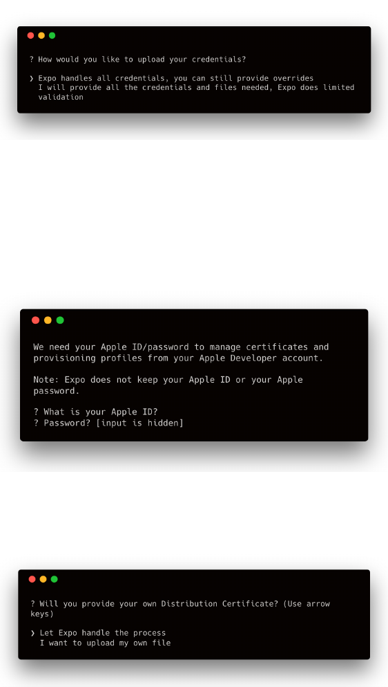
Building and publishing 509
Once we have a developer account set up, we can build a native iOS bundle through Expo with the
following command:
1exp build:ios
We are then asked how we would like to handle our credentials:
The credentials here refer to signing certificates and a provisioning profile needed to submit
applications to the App Store. We’ll go with the simpler option of letting Expo handle all of the
credentials here, but we will explore what each of these mean in detail in the next section.
Once we have selected the option for Expo to take care of managing our files, we’ll need to submit
the ID and password for our Apple Developer Account:
Although we specified we want Expo to handle all credentials, we still have the option to provide
overrides for specific certificates. Expo prompts us about these next. We want Expo to handle both:

Building and publishing 510
Next, the build process will begin and a URL is provided (e.g. https://expo.io/builds/unique-id).
This URL provides access to the current status of the build and you can follow along by reading its
logs.
Clearing Credentials
Expo will always check if a certificate and provisioning profile exist before asking whether
it should handle creating new files or allow you to provide them. If you wish to clear the
already available credentials, you can run exp build:ios --clear-credentials.
The build process can take a few minutes to complete. Once completed, another URL will be provided
that contains the generated .ipa build file. Pasting this link into your browser’s address bar will
begin downloading it to your machine.
Creating an iOS build with Xcode
As we mentioned earlier in this chapter, an account with the Apple Developer Program is necessary
in order to create a build ready for distribution. You’ll need to enroll108 if you haven’t already.
Once enrolled, the first thing we’ll need to do is code sign our application. Code signing is the
process of using a digital signature to identify the application author’s identity. Signatures are used
to ensure that updates to an application are published by the same author.
With Xcode, we have two options for code signing an application:
1. Manually, where we provide all the resources ourselves
2. Automatically, where Xcode takes care of creating all the necessary signing credentials
Automatic code signing is recommended in the Xcode documentation as it simplifies the process
of creating all the required assets needed for signing. Xcode takes care of creating all the needed
credentials and we only have to provide our developer account without doing more additional work.
With this approach, Xcode will:
• Create the necessary signing certificates
108https://developer.apple.com/programs/enroll/

Building and publishing 511
• Create an App ID
• Handle all the provisioning profiles needed
Manually code signing an application means that we will have to create all the needed assets in the
Apple Developer Console and assign them to our application ourselves. This approach gives us some
more control over which provisioning profiles and signing certificates we would like to use.
If you don’t need to use a particular profile or certificate for your application, you should use the
recommended approach of automatic code signing. We’ll cover this first. After reading, feel free to
skip the portion of this chapter where we cover how to manually code sign your application.
If you are interested in learning more about how provisioning profiles and signing certificates work,
or you would like to manually handle these credentials yourself, then you can head directly to
“Manual Code Signing”.
Xcode version 9.1 is used in this chapter. There may be slight inconsistencies to the UI displayed
in the screenshots if you happen to be using a later version of the software. However, the general
procedure should remain the same.
Automatic Code Signing
To access a React Native application using Xcode, we can open the /ios/AppName.xcodeproj file in
our project. An Xcode project file (.xcodeproj) contains all the source files and resources needed
for building and managing a project with the platform.
Once the file is opened with Xcode, you should see your application loaded as the main target. This
is what the default dashboard looks like for an open application:
Building and publishing 512
The bundle identifier in the Identity section of the General tab is a required field and is a unique
string that identifies your application. Once a build of your application is uploaded for submission,
this field cannot be changed. The version and build number fields also need to be completed and
will be used by App Store Connect to identify different versions of your application.
In the Signing section of the screen, there is a checkbox for Automatically manage signing. After
checking this field, a “Team” drop-down is displayed asking for a development team that can be used
to associate all the created signing credentials. In order to see your team as one of the drop-down
options, you must add an Apple Developer Account to Xcode. You can add this account by opening
Xcode � Preferences in the main menu.
Once a development team is selected, you should see a signing certificate assigned to your developer
account. Xcode takes care of creating this certificate along with a provisioning profile and assigns it
to your team. With a certificate set up, you can now head directly to the “Creating a build archive”
section to create a build of your application.
Manual Code Signing
To begin the process of manually code signing, we’ll need to sign in to the Apple Developer Portal109.
109https://developer.apple.com/account/
Building and publishing 513
The Apple Developer Portal provides links to resources, guides and documentation. There are two
important tools provided by the platform that we will be exploring:
•Certificates, Identifiers & Profiles is where we set up signing certificates and profiles for our
application to identify them.
•App Store Connect is a collection of tools that allow us to manage and submit application
builds to the App Store. We will cover how to use this to publish an application in the next
section.
Let’s navigate to Certificates, Identifiers & Profiles and begin by creating an appropriate
signing certificate. Once we are at the certificates110 screen, clicking the +icon on the right hand of
the screen will allow you to create a new certificate. Make sure iOS, tvOS, watchOS is selected in
the dropdown in the left navbar.
110https://developer.apple.com/account/ios/certificate/
Building and publishing 514
Signing certificates are digital signatures used to perform actions while ensuring the application
is from the same source and has not been altered with. There are two certificate types relevant to
building and distributing an iOS application:
•Development (iOS App Development): Used for the development of an iOS application and
limits the number of devices that the application be installed on
•Distribution (App Store and Ad Hoc): Used for the distribution of iOS applications to App
Stores or for Ad Hoc distribution
If you need to continue development of a React Native application after ejecting from CRNA and
would like to handle code signing manually, you will need to create an iOS App Development
certificate and register your device. Since this chapter focuses on distributing an application, we’ll
select App Store and Ad Hoc and click continue.
These are many more certificate types available for other use cases (such as enabling push
notifications or building and distributing a macOS app). You can see a full list of them in
the Xcode docs111.
111https://help.apple.com/xcode/mac/current/#/dev80c6204ec
Building and publishing 515
The next screen provides instructions to create a Certificate Signing Request (CSR) file from a Mac
computer.
A CSR file is a formatted and encrypted file that contains information that identifies a particular
source and is used to issue a certificate. You can follow the instructions provided to save a CSR file
somewhere on your computer. Once that’s done, click continue to proceed and upload the file. Once
uploaded, you should be able to download the certificate by clicking Download. Double-clicking the
certificate file (.cer format) will save it in your Keychain.
Keychain Access112 is a Mac application that can store sensitive account information such
as passwords and certificates.
Let’s move on to creating an app identifier. This is also known as the App ID and is a unique string
that identifies a single application (or multiple applications) connected to a development team. We
112https://support.apple.com/en-ca/guide/keychain-access/what-is-keychain-access-kyca1083/mac

Building and publishing 516
can do this by navigating to the iOS App IDs113 screen by clicking Identifiers/App IDs in the side
menu. To register a new App ID, we need to fill out a few fields:
• App ID Description: Any description of your application can be used here, but this is usually
the same as the name of the app.
• App ID Prefix: This is your Team ID by default.
• App ID Suffix: By changing the suffix of our App ID, we can choose between its two different
types: * An Explicit App ID is used for a single application and must be unique. A reverse
domain naming convention is commonly used (com.companyname.appname). This option needs
to be selected in order to include most application services such as in-app purchases and push
notifications. You can see a list of all services that can be enabled/disabled at the bottom of the
screen. * A Wildcard App ID can allow a single identifier and provisioning profile to be used
for multiple apps. Many Apple services cannot be included with this type of ID. Since App IDs
cannot be changed for an application submitted to the App Store, it is important to ensure that
this option is only selected if no such services are included and will not be in the future. An
asterisk must be the last character of the ID (com.companyname.*) here.
• App Services: In here, you can select any Apple services to include in your application.
Once a certificate and identifier is created, a provisioning profile needs to be set up for the
application in order to allow it to be downloaded on physical devices. A provisioning profile is
the combination of an application’s unique bundle identifier and a signing certificate. Without a
profile, we cannot run an app on a mobile device.
Adistribution provisioning profile is needed when an application is ready to be distributed to
multiple users. To create a distribution provisioning profile, we can click the Provisioning Profiles
–> Distribution114 list item in the side menu and then +on the right hand side of the screen.
113https://developer.apple.com/account/ios/identifier/bundle
114https://developer.apple.com/account/ios/profile/production/create
Building and publishing 517
Of the many possible options, there are two specific types of distribution profiles relevant to iOS
applications:
•App Store: Used to submit an application to the App Store.
•Ad Hoc: Used to distribute applications to multiple testers. Unlike a development provisioning
profile, an Ad Hoc profile can not used to debug applications.
Select App Store to create the profile you need to submit an application to the App Store. In the next
few screens, you will need to select the App ID you just created and the certificates you wish to
include in the profile. Once completed, you can name your provisioning profile and download it to
your machine.
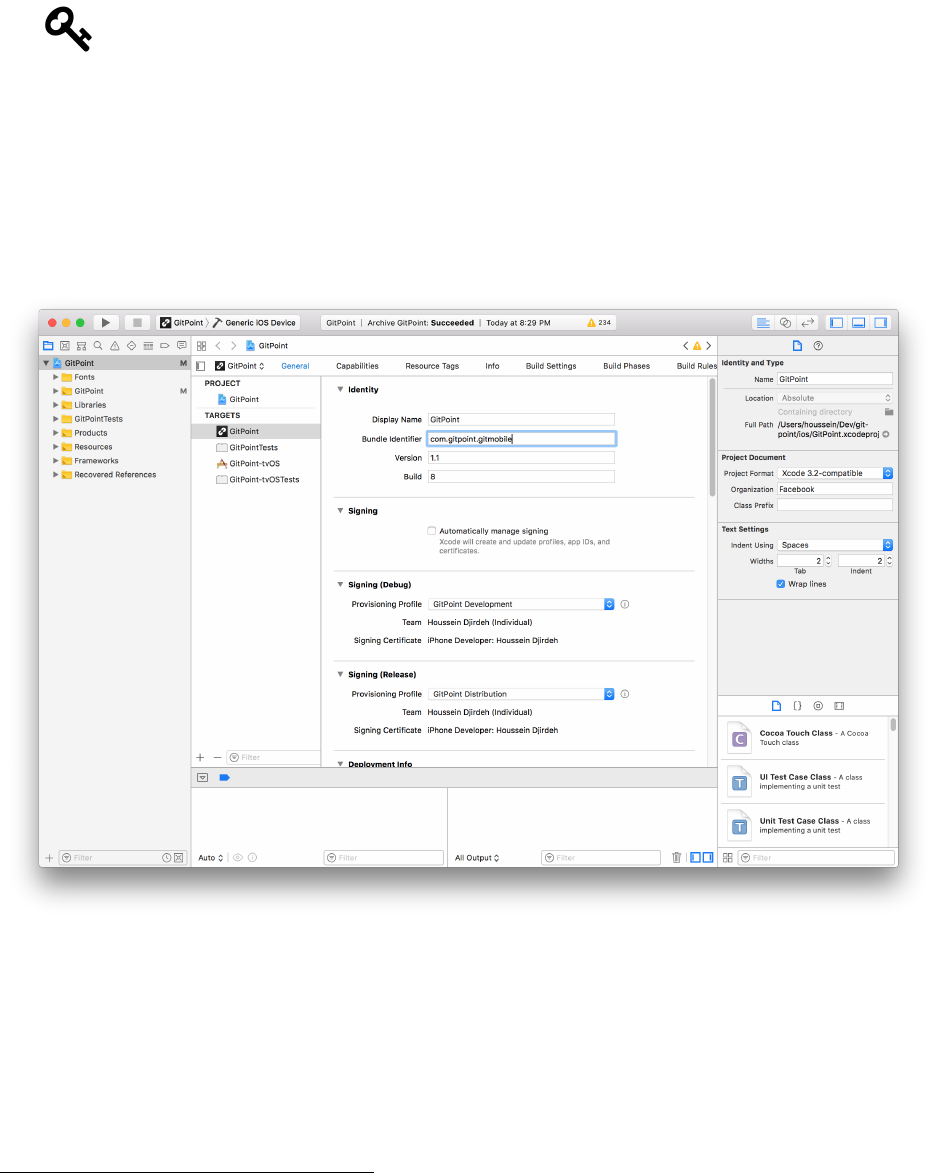
Building and publishing 518
While creating a build of an application, a development provisioning profile uses a
development signing certificate to connect developers and devices to an authorized team.
This allows for multiple developers to debug on more than one device. The process of
selecting an App ID and certificate is the same, but each device’s unique device identifier
(UDID) needs to be explicitly added to the same profile. This can be done in the Apple
Developer Console115.
The final step here is to manually assign our created distribution certificate to our project in Xcode.
We can open the /ios/AppName.xcodeproj file to do this.
The bundle identifier field must be the same as the AppID you created earlier in the developer console,
so you’ll need to make sure that it matches in order to create a successful build.
To manually take care of assigning a provisioning profile to our application, disable the Automatically
manage signing checkbox. Two newer sections, Signing (Debug) and Signing (Release), will
show up underneath. Select the Provisioning Profile dropdown for our signing release and click
Download Profile to download the distribution profile directly from the Apple Developer Console.
We can do the same for the debug section if we have a development profile created as well.
115https://developer.apple.com/account/ios/profile/
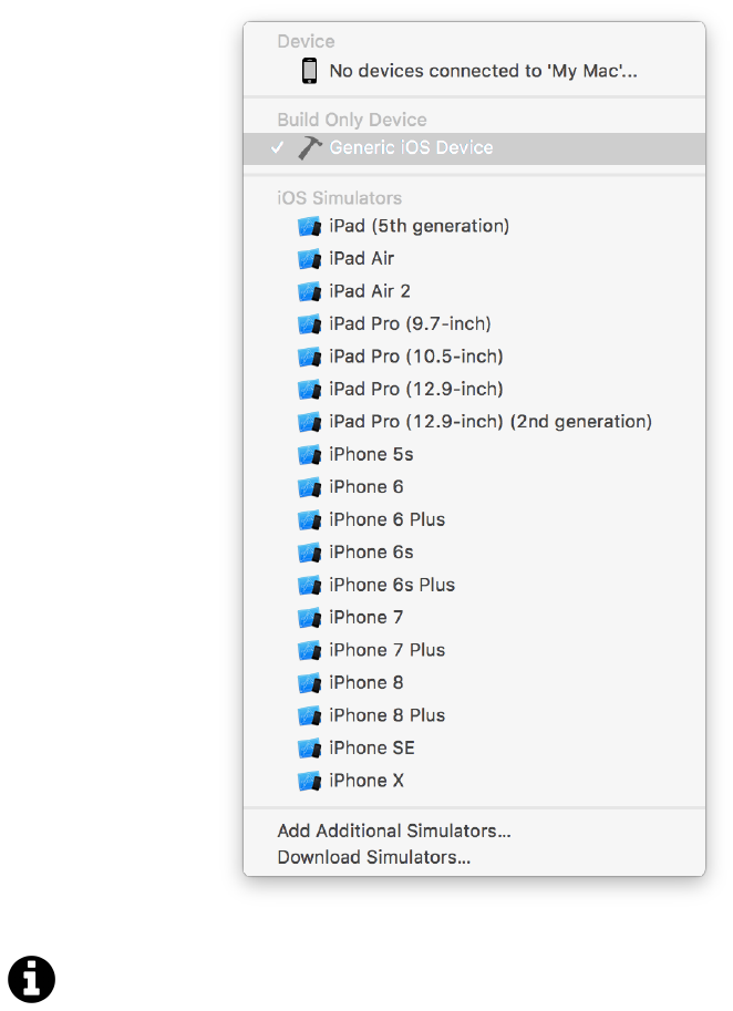
Building and publishing 519
Creating a build archive
Once all the credentials needed for code signing have been set up, we can create a build archive of
our application. We can begin by changing our device target at the top of the screen to Generic iOS
Device.
For an ejected CRNA application, we can run our application on different simulators using
the react-native run-ios --simulator="iPhone 8" command. We can also use this device
target menu on Xcode to do the same thing (as well as preview our application on a physical
device plugged in to our computer).
The Generic iOS Device target is only used to create an iOS device build. With this target selected,
we can select Product � Archive to create a build archive. After a few minutes, a window showing
all past archives will pop up. Clicking Export on the right hand side and selecting App Store as our

Building and publishing 520
method for distribution will allow us to export an .ipa file of our application. Instead of doing this
however, we can also submit directly to App Store Connect by clicking Upload to App Store. We’ll
cover the flow of this process in the next section.
Testing the final build
Since we signed the iOS build we created earlier in this chapter with an App Store distribution
certificate, it cannot be downloaded and run on a personal simulator/device for testing purposes
through Xcode. To allow for this, we can use TestFlight116. TestFlight is an Apple platform that allows
others to download and test a production build on their devices. Instructions for using TestFlight to
invite users to test your production build can be found on the TestFlight website117.
Publishing to the iOS App Store
Submitting and managing application builds for iOS can be done in App Store Connect118. You can
sign in with your developer account.
116https://developer.apple.com/testflight/
117https://itunespartner.apple.com/en/apps/videos#testflight-beta-testing
118https://developer.apple.com/app-store-connect/
Building and publishing 521
App Store Connect provides a collection of tools that developers can use to manage their applications,
view user analytics, study trends and patterns as well as view financial results. Let’s navigate to My
Apps to view a dashboard of all the applications tied to your developer account. Nothing will show
here if you haven’t submitted an application before.
Click the +icon on the top left to add a new application. We’ll need to fill out a form with a few
fields:
• Platform: Select whether you’re creating a new iOS or tvOS application.
• Name: This is the display name of your application in the App Store.
• Primary Language: The main language your application is localized for.
• Bundle ID: The unique identifier for your application. If you let Xcode automatically code sign
your application or Expo handle creating credentials for you, you should see the ID for your
application in the dropdown. If you don’t see it, you may have to create your App ID manually
in the Developer Portal119.
119https://developer.apple.com/account/ios/identifier/bundle
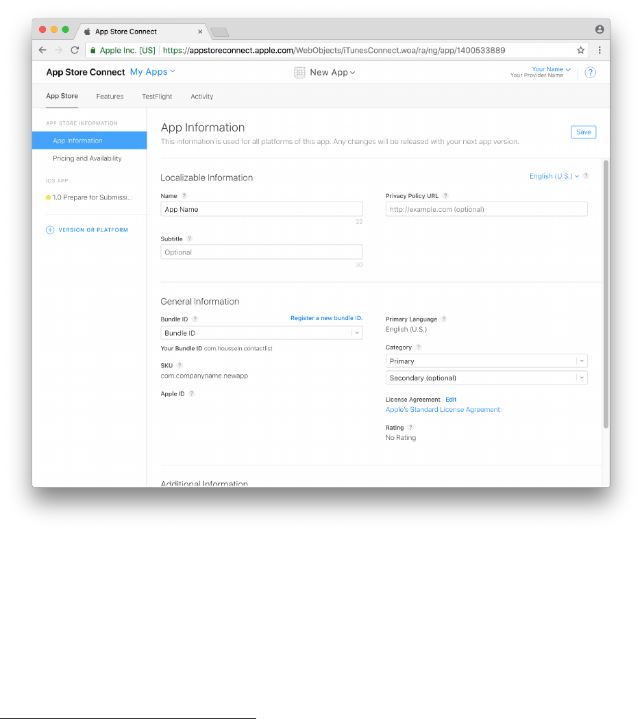
Building and publishing 522
• SKU: This is the Stock Keeping Unit120, an identifier commonly used for inventory and financial
tracking. It also needs to be unique to each application, and you can use the same string as your
bundle ID if you like.
Clicking Create will create our application on the platform.
We can add more general information here such as the application’s subtitle, privacy policy link, and
categories. On the left side of the screen, you’ll notice that the current status of our application’s
submission process is 1.0 Prepare for Submission. 1.0 refers to the version of the application, and
this number will change once we upload newer build versions. Clicking the link in the side menu will
navigate to another form that allows us to provide version-specific information of our application.
This includes:
• iPhone and iPad application previews and screenshots
120https://www.investopedia.com/terms/s/stock-keeping-unit-sku.asp
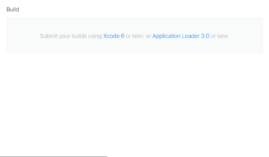
Building and publishing 523
• Promotional text
• Keywords
• App description
• App Store Icon
• App review information
All of this information can be modified at any time by submitting updated builds of an application.
In the Build section of the screen, you’ll see a message letting you know that you can submit builds
directly using Xcode.
Every iOS application that is published to the App Store goes through an extensive review process
before being accepted. To improve your chance of being accepted, there are a few resources you can
consider before submitting an application:
• Apple’s Review Guidelines121
• Xcode’s docs on App Store distribution122
• Expo’s docs on app stores123
In Xcode’s Window � Organizer screen, you can see a list of previously created build archives of
your application. This is what the screen looks like when you have multiple builds:
121https://developer.apple.com/app-store/review/guidelines
122https://help.apple.com/xcode/mac/current/#/dev91fe7130a
123https://docs.expo.io/versions/v27.0.0/distribution/app-stores.html
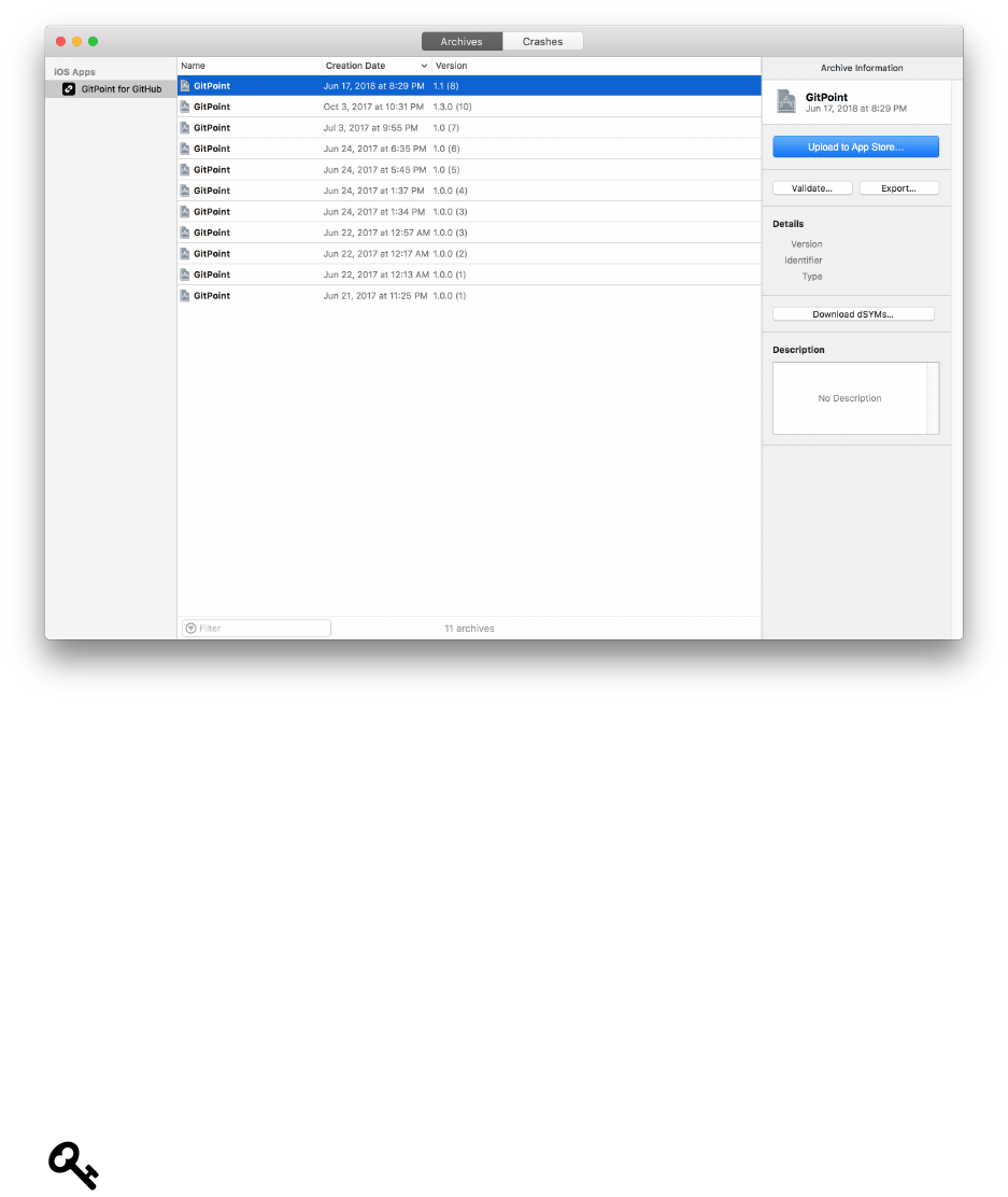
Building and publishing 524
Before we upload our build archive to the App Store, we can validate it to ensure that our build
files pass all the validation checks performed by App Store Connect. We can do this by clicking the
Validate button in the menu on the right. If any necessary configurations or assets are missing,
Xcode will give us an error here.
If our build archive is validated successfully, we can move on to clicking Upload to App Store. After
selecting the correct development team, we’ll see an Upload Successful message if there were no
issues with the archive.
It can take a few minutes for the build archive to show up in App Store Connect. Once it does, you
should see it in the Activity tab of the application. Moreover, the Build section of our submission
will now show a different message - Select a build before you submit your app. Clicking the
link will display a list of available builds.
After the build shows up on App Store Connect, it may still need to finish processing which
can take a little more time. At this point, you’ll see a (Processing) message next to your
build and you’ll only be able to select it for submission once it completes.
Once you select your build and complete all the necessary information for your application, you
Building and publishing 525
can submit it using the Submit for Review button. According to Apple’s support documentation124,
review times vary. Half of all applications submitted are reviewed within 24 hours and over 90% are
reviewed within 48 hours. The status of the application in App Store Connect will be In Review
until it is completed.
If your application requires any form of authentication in order to be used, you should also
provide sign-in information for a dummy account in App Store Connect’s submission form.
Without this information, an application may not be able to be reviewed.
Android
As we mentioned previously, you can skip directly to the build approach that is more relevant for
your application:
• If you have not ejected your application from CRNA, you can read the next section and skip
the section that explains how to create a build manually
• If you have an ejected application, skip the following section entirely and head directly to
“Creating an Android build manually”
After using the appropriate strategy to create a build, we’ll discuss how to publish your application
in the “Publishing to the Play Store” section.
Creating an Android build with Expo
We can start a build process for Android with the following command:
1exp build:android
We are then asked if we would like Expo to take care of creating a keystore or uploading it ourselves:
124https://developer.apple.com/support/app-review/#app-review-status

Building and publishing 526
A keystore is a file that contains private keys used to authenticate oneself. We’ll explore this in more
detail when we build an Android application manually later in this chapter, so we’ll go with the
option of letting Expo take care of it here.
Next, the build process begins and can take a few minutes to complete. As with the iOS build process,
a URL (https://expo.io/builds/unique-id) is provided that shows real-time logs from Android
Studio. Once the build process is finished, we’re provided a URL that contains the final .apk build
file. We can download the file by pasting the link into our browser’s address bar.
Clearing Credentials
A keystore file is used to represent the application owner’s identity, so keeping it secure is
extremely important. Moreover, we cannot submit updates to our application and publish
new versions if we lose our keystore file. We can clear a previously generated keystore used
by Expo with exp build:android --clear-credentials but it is important to make sure
we have fetched and stored a local version of the keystore file first. We can do that with exp
fetch:android:keystore.
Testing the final build after automatic signing
There are two different ways to test the final build of your application:
1. On an emulator.You can drag and drop the final build .apk to have it boot up automatically.
2. On a physical device. You will have to first install Android Platform Tools125 to your computer.
This includes Android Debug Bridge (adb), a command-line interface that allows you to control
an Android device connected to your machine. Once installed, you can run adb install
apk-file-name.apk with your device plugged in.
After setting up and testing your final application’s build file, you can head directly to the
“Publishing to the Play Store” section to learn how to publish your application as well as distribute
testing versions through different channels.
Creating an Android build manually
In order to code sign an Android application with a certificate, the build process requires a keystore
that contains an app signing key. This is done to ensure the source has not changed if any updates are
done to the application. There are two different ways to create an Android keystore for an ejected
React Native application:
1. Using Java Keytool
2. Using Android Studio
125https://developer.android.com/studio/releases/platform-tools

Building and publishing 527
Using Java’s Keytool application can be quicker and is the approach mentioned in the React Native
documentation. For that reason, we’ll explain the process of using it here. However, instructions to
create a keystore using Android Studio can also be found in the Android Studio docs126 if you prefer
that approach.
Keytool127 is a command-line tool already included in the Java Development Kit that simplifies the
management of keys and certificates. It can be used to create a keystore containing an app signing
key used to sign an Android build.
The Java Development Kit (JDK) is a development environment to run and develop
applications built with Java. It is required to build Android applications with React Native
and you should already have it installed after ejecting and following the instructions128 to
build native Android code.
For Unix-like operating systems such as macOS and Linux, the keytool directory is added directly
to the $PATH variable of our system. This means we can run the command in any directory as an
executable. If you are using a Windows machine, you can only run keytool commands in C:\Program
Files\Java\jdk1.x.x_xxx\bin where 1.x.x_xxx is the version of JDK installed on your machine.
We can generate a keystore with a single key using the following command in our terminal:
$ keytool -genkey -v -keystore android-release.keystore -alias android-release-alias\
-keyalg RSA -keysize 2048 -validity 10000
The command contains a number of settings that would apply to our generated keystore:
•-keystore: The name of the keystore file. In here, the file would be named android-release.keystore.
•-alias: The keystore alias is its unique identifier and is used to code sign the application. Our
alias here is android-release-alias.
•-keyalg: Defines the algorithm used to create a public-private key pair in our keystore. RSA is
commonly used, but you can find out about all the possible options in more detail by referring
to Java’s cryptography architecture guide129.
•-keysize: Specifies the size of the created key. In short, key size is used in cryptography to
define the number of bits in a key used in an algorithm. In here, we’ve specified 2048 bits
(which represents 256 bytes).
•-validity: The length of time our key will be valid in days. We’ve set our validity to 10000
days here.
These parameters are all we need to generate a working keystore for our application. You
can see a full list of possible configurations by typing keytool usage: to your terminal.
126https://developer.android.com/studio/publish/app-signing#generate-key
127https://docs.oracle.com/javase/8/docs/technotes/tools/unix/keytool.html
128https://facebook.github.io/react-native/docs/getting-started.html#java-development-kit
129https://docs.oracle.com/javase/8/docs/technotes/guides/security/crypto/CryptoSpec.html#AppA

Building and publishing 528
Running the command will then prompt for passwords for the keystore and signing key, as well as
the Distinguished Name fields for your key. Once provided, an android-release.keystore file will
be created in the current directory.
Due to the fact that a keystore represents an application owner’s identity, it is extremely important to
remember to keep a keystore file secure. If the file is lost, updates to an application in the Play Store
cannot be performed and a new app will have to be created and submitted. If the file is compromised
or stolen, an attacker can publish a newer version of your application with malicious code. It’s
considered best practice to avoid committing a keystore to your version control system, like Git.
We need to place our keystore file in the android/app directory of our project. Once that is done, we
can configure the Gradle build process by adding our keystore and key information. Properties that
modify the build process can be added to the android/app/.gradle/gradle.properties file. Let’s
add the following to the bottom of the file:
APP_RELEASE_KEYSTORE_FILE=android-release.keystore
APP_RELEASE_KEYSTORE_PASSWORD=YOUR_KEYSTORE_PASSWORD_GOES_HERE
APP_RELEASE_KEY_ALIAS=android-release-alias
APP_RELEASE_KEY_PASSWORD=YOUR_SIGNING_KEY_PASSWORD_GOES_HERE
Gradle130 is an extensible and configurable build system used by Android to automate and
manage the entire build process. Instead of configuring Gradle to sign our application,
we also have the option of signing it manually131 using the apksigner132 tool provided by
Android Studio.
Since these properties will need to be referenced in our build file, you can choose any key name for
each of these key:value pairs.
130https://gradle.org/
131https://developer.android.com/studio/publish/app-signing#sign-manually
132https://developer.android.com/studio/command-line/apksigner

Building and publishing 529
In the above example, we added the username and password of both the signing key and
keystore in plain text to the Gradle properties file. This can be dangerous if you are working
on a project with multiple team members or if you submit your project to an open source
platform.
In these conditions, there are a few options that can be performed to keep this sensitive
information outside of this file:
1. Create a separate keystore.properties file to contain this information which can be
accessed in the application’s build file. Instructions to set this up can be found in the
Android Studio docs133. The properties file should not be committed to version control
and can be added to the .gitignore file of the project so it is ignored by Git.
2. For macOS users, the credentials can be stored in Keychain Access and
loaded directly in the build file. Instructions can be found on this page:
https://pilloxa.gitlab.io/posts/safer-passwords-in-gradle/134.
Once our signing credentials are added to our Gradle properties, we can access them in our build file
to complete the signing process. We can apply configurations to the build process by adding them
to the android/app/build.gradle file. Default configurations are added to this file as soon as we
create a new Android project.
Let’s add a signing configuration to the android block within this file underneath our default
configurations:
android {
// ...
defaultConfig {
// ...
}
signingConfigs {
release {
if (project.hasProperty('APP_RELEASE_KEYSTORE_FILE')) {
storeFile file(APP_RELEASE_KEYSTORE_FILE)
storePassword APP_RELEASE_KEYSTORE_PASSWORD
keyAlias APP_RELEASE_KEY_ALIAS
keyPassword APP_RELEASE_KEY_PASSWORD
}
}
}
buildTypes {
release {
133https://developer.android.com/studio/publish/app-signing#generate-key
134https://pilloxa.gitlab.io/posts/safer-passwords-in-gradle/

Building and publishing 530
//. ..
signingConfig signingConfigs.release
}
}
}
We’ll now need to assign our newly created configurations as the release signingConfig of the build
process:
android {
// ...
defaultConfig {
// ...
}
signingConfigs {
// ...
}
buildTypes {
release {
// ...
signingConfig signingConfigs.release
}
}
}
And that completes our signing process! We can now navigate to the android/ directory and bundle
our application into a build:
cd android
./gradlew assembleRelease
Starting any Gradle build is done with the Gradle Wrapper135, a command-line tool we can use at
the root of any Android project with /gradlew task-name. The assembleRelease command will
bundle (or assemble) all the core JavaScript code into the final build. This file can be found as a
app-release.apk file in the android/app/build/outputs/apk/ directory.
Instead of adding signing information to our Gradle properties, we can also manually sign
an application using Android Studio136 or configure the build process137 to automatically
sign any application. Both of these approaches will have the same end result.
135https://docs.gradle.org/current/userguide/gradle_wrapper.html
136(https://developer.android.com/studio/publish/app-signing#release-mode)
137https://developer.android.com/studio/publish/app-signing#sign-auto
Building and publishing 531
Testing the final build after manually signing
With an Android emulator running or a physical device connected to our machine, we can install a
production build of our application with the following command:
react-native run-android --variant=release
Aside from this, we can also publish alpha and beta versions of our app to a closed or open group
of testers before submitting it to the Play Store. This is covered in more detail in the next section.
Publishing to the Play Store
In order to publish and manage Android applications with Google Play Console138, we’ll need to
create a Google Developer account139 which requires a one-time payment.
Once we launch the console, we can click Create Application to begin the process of submitting
an application to the Play Store.
The first few fields we need to fill out are the application’s default language and title.
Once completed, we land on the Store listing page. This page allows us to specify the content in
our app’s listing in the Play Store. Parameters include:
• App description
• Graphic assets such as screenshots, icons and banners
• Application type and relevant category
• Privacy policy link
The left-side menu contains links to other areas of our application such as setting up the price of a
paid application, its places of distribution, and its content rating.
The Android doc’s Launch Checklist140 is a great resource on a number of best practices.
The App Releases link in the menu is where we can manage uploading the APK builds of our
application. We can roll out new builds in a number of different channels:
138https://developer.android.com/distribute/console/
139https://play.google.com/apps/publish/signup
140https://developer.android.com/distribute/best-practices/launch/launch-checklist

Building and publishing 532
•Internal test: Used to quickly publish builds for internal testing with a small number of testers.
•Closed (alpha): Used to publish builds for closed testing. This is useful to test your application
with a larger number of privately invited testers.
•Open (beta): Used to publish builds for open testing. Anybody can join this testing program
and provide private feedback to the author of the application.
•Production: Used to publish final production builds to the Google Play Store.
With any of these build tracks, we can upload an APK file by clicking Manage and then Create
Release. In here, we have the option of using App Signing by Google Play instead of managing our
signing keys manually. Enabling this feature will mean that the signing key within the keystore used
for your application will be handled as an upload key. If we opt-in to this feature, we will have to
publish a new application if our key is lost or compromised.
There are a few more noteworthy parameters we need to specify. The first is the release name. This
is not visible to users and is used to distinguish separate releases in the Play Store. It is recommended
to use the version of the APK here or an internal code name relevant to this release.
The second is release notes. We use release notes to explain modifications to the app in this release.
After this, we can upload the final signed .apk build file (app-release.apk in the android/app/build/outputs/apk/
directory) and review our submission before rolling it out! If you decided to roll out a production
build, the application should show up in the Play Store in a few hours.
Handling Updates
Expo supports over-the-air (OTA) updates by default. Every standalone application built with
Expo will know how to reference updates to an application based on its URL (expo.io/user_-
name/APP_NAME). Once an Expo-built application is published to the iOS App Store or Google Play
Store and installed on a user’s mobile device, we can distribute any updates to the application using
the following command:
exp publish
This command allows us to publish directly with Expo. When the app is re-launched on a user’s
device, the new version of the application will be automatically downloaded and displayed. With
this, we can publish newer updates without distributing new build versions to app stores.
Publishing with Expo can also allow Android users to test and demo a CRNA application
without having to go through the Play Store submission process. You can refer to the
Appendix to get a better idea of how this works.
OTA updates only work when JavaScript code is modified. We cannot use this feature if we eject
from Expo to a regular React Native project. In this scenario, we can use a similar third-party tool like

Building and publishing 533
Microsoft’s CodePush141. This will allow us to still benefit from publishing changes to our JavaScript
bundle without deploying to an app store. However, we need to be careful to not publish newer
JavaScript code over-the-air that bridges functionality to native modules.
In order to comply with Apple’s review process, it is important to make sure that only specific
fixes/modifications that are in-line with the general direction of the application are included in
OTA updates. Section 3.3.2 in the Apple Developer Program License Agreement142 states that only
code that does not change the initial purpose of the application and does not bypass any iOS security
features are permitted.
Summary
We began the journey of learning React Native by building a weather app in the first chapter of this
book. With each subsequent chapter, we learned about important React fundamentals, explored all
of the core components and APIs provided by the framework, and covered advanced topics such
as animations and gesture controls. We spent an entire chapter learning how to apply different
navigation patterns to an application and even investigated how to build custom native modules and
bridge to them ourselves. If you’ve reached this point of the book, you have all the tools you need
to both build and publish a fully functional and powerful React Native application. Give yourself a
pat on the back!
As the authors, we hope you enjoyed reading this book as much as we enjoyed writing it!
141https://github.com/Microsoft/react-native-code-push
142https://developer.apple.com/services-account/download?path=/Documentation/License_Agreements__Apple_Developer_Program/
Apple_Developer_Program_License_Agreement_20180604.pdf

Appendix
JavaScript Versions
JavaScript is the language of the web. It runs on many different browsers, like Google Chrome,
Firefox, Safari, Microsoft Edge, and Internet Explorer. React Native takes this one step further and
allows us to write JavaScript to communicate with native iOS and Android components.
Its widespread adoption as the internet’s client-side scripting language led to the formation of a
standards body which manages its specification. The specification is called ECMAScript or ES.
The 5th edition of the specification is called ES5. You can think of ES5 as a version of the JavaScript
programming language. The 6th edition, ES2015, was finalized in 2015 and is a significant update.
It contains a whole host of new features for JavaScript. JavaScript written in ES2015 is tangibly
different than JavaScript written in ES5.
ES2016, a much smaller update that builds on ES2015, was ratified in June 2016.
ES2015 is sometimes referred to as ES6. ES2016, in turn, is often referred to as ES7.
ES2015
Arrow functions
There are three ways to write arrow function bodies. For the examples below, let’s say we have an
array of city objects:
const cities =[
{ name:'Cairo', pop: 7764700 },
{ name:'Lagos', pop: 8029200 },
];
If we write an arrow function that spans multiple lines, we must use braces to delimit the function
body like this:
Appendix 535
const formattedPopulations =cities.map((city) => {
const popMM =(city.pop / 1000000).toFixed(2);
return popMM +' million';
});
console.log(formattedPopulations);
// -> [ "7.76 million", "8.03 million" ]
Note that we must also explicitly specify a return for the function.
However, if we write a function body that is only a single line (or single expression) we can use
parentheses to delimit it:
const formattedPopulations2 =cities.map((city) => (
(city.pop / 1000000).toFixed(2)+' million'
));
Notably, we don’t use return as it’s implied.
Furthermore, if your function body is terse you can write it like so:
const pops =cities.map(city => city.pop);
console.log(pops);
// [ 7764700, 8029200 ]
The terseness of arrow functions is one of two reasons that we use them. Compare the one-liner
above to this:
const popsNoArrow =cities.map(function(city) { return city.pop });
Of greater benefit, though, is how arrow functions bind the this object.
The traditional JavaScript function declaration syntax (function () {}) will bind this in anonymous
functions to the global object. To illustrate the confusion this causes, consider the following example:
function printSong() {
console.log("Oops - The Global Object");
}
const jukebox ={
songs:[
{
title:"Wanna Be Startin' Somethin'",
artist:"Michael Jackson",
},
Appendix 536
{
title:"Superstar",
artist:"Madonna",
},
],
printSong:function (song) {
console.log(song.title +" - " +song.artist);
},
printSongs:function () {
// `this` bound to the object (OK)
this.songs.forEach(function(song) {
// `this` bound to global object (bad)
this.printSong(song);
});
},
}
jukebox.printSongs();
// > "Oops - The Global Object"
// > "Oops - The Global Object"
The method printSongs() iterates over this.songs with forEach(). In this context, this is bound
to the object (jukebox) as expected. However, the anonymous function passed to forEach() binds
its internal this to the global object. As such, this.printSong(song) calls the function declared at
the top of the example, not the method on jukebox.
JavaScript developers have traditionally used workarounds for this behavior, but arrow functions
solve the problem by capturing the this value of the enclosing context. Using an arrow function
for printSongs() has the expected result:
function printSong() {
console.log("Oops - The Global Object");
}
const jukebox ={
songs:[
{
title:"Wanna Be Startin' Somethin'",
artist:"Michael Jackson",
},
{
title:"Superstar",
artist:"Madonna",
Appendix 537
},
],
printSong:function (song) {
console.log(song.title +" - " +song.artist);
},
printSongs:function () {
this.songs.forEach((song) => {
// `this` bound to same `this` as `printSongs()` (`jukebox`)
this.printSong(song);
});
},
}
jukebox.printSongs();
// > "Wanna Be Startin' Somethin' - Michael Jackson"
// > "Superstar - Madonna"
For this reason, throughout the book we use arrow functions for all anonymous functions.
Classes
JavaScript is a prototype-based language where classes, which is common in many object-oriented
languages, were not used. However, ES2015 introduced a class declaration syntax. For example:
1class Ball {
2constructor(color) {
3this.color =color;
4}
5
6details() {
7return 'This ball is ' +this.color +'!';
8}
9}
10
11 class SoccerBall extends Ball {
12 kick() {
13 return 'This ' +this.color +'soccer ball is kicked!';
14 }
15 }
This isn’t a brand new JavaScript model, but only a simpler way to define object oriented structures
instead of using prototypal-based inheritance. For context, let’s take a look at how this would
probably look like without using a class definition:

Appendix 538
1function Ball(color) {
2this.color =color;
3}
4
5Ball.prototype.details =function details() {
6return 'This ball is ' +this.color +'!';
7};
8
9function SoccerBall(color) {
10 Ball.call(this, color);
11 }
12
13 SoccerBall.prototype =Object.create(Ball.prototype);
14 SoccerBall.prototype.constructor =Ball;
15
16 SoccerBall.prototype.kick =function () {
17 return 'This ' +this.color +'soccer ball is kicked!';
18 }
We won’t be going into more detail explaining object oriented paradigms and structures in
JavaScript, but it’s important to realize that creating objects with properties can be simpler with
classes. The important thing to note here is that we use this exact same model to create our React
Native components.
If you’d like to learn more about ES6 classes, refer to the docs on MDN143.
Shorthand property names
In ES5, all objects were required to have explicit key and value declarations:
const getState =() => {};
const dispatch =() => {};
const explicit ={
getState:getState,
dispatch:dispatch,
};
In ES2015, you can use this terser syntax whenever the property name and variable name are the
same:
143https://developer.mozilla.org/en-US/docs/Web/JavaScript/Reference/Classes
Appendix 539
const getState =() => {};
const dispatch =() => {};
const implicit ={
getState,
dispatch,
};
Lots of open source libraries use this syntax, so it’s good to be familiar with it. But whether you use
it in your own code is a matter of stylistic preference.
Destructuring Assignments
For arrays
In ES5, extracting and assigning multiple elements from an array looked like this:
var fruits =['apples','bananas','oranges' ];
var fruit1 =fruits[0];
var fruit2 =fruits[1];
In ES6, we can use the destructuring syntax to accomplish the same task like this:
const [ veg1, veg2 ] =['asparagus','broccoli','onion' ];
console.log(veg1); // -> 'asparagus'
console.log(veg2); // -> 'broccoli'
The variables in the array on the left are “matched” and assigned to the corresponding elements in
the array on the right. Note that 'onion' is ignored and has no variable bound to it.
For objects
We can do something similar for extracting object properties into variables:
Appendix 540
const smoothie ={
fats:['avocado','peanut butter','greek yogurt' ],
liquids:['almond milk' ],
greens:['spinach' ],
fruits:['blueberry','banana' ],
};
const { liquids, fruits } =smoothie;
console.log(liquids); // -> [ 'almond milk' ]
console.log(fruits); // -> [ 'blueberry', 'banana' ]
Parameter context matching
We can use these same principles to bind arguments inside a function to properties of an object
supplied as an argument:
const containsSpinach =({ greens }) => {
if (greens.find(g => g === 'spinach')) {
return true;
}else {
return false;
}
};
containsSpinach(smoothie); // -> true
We can also do this with functional React components.
ReactElement
React Native allows us to build applications with a fake representation of the native views rendered
in our mobile device. A ReactElement is a representation of a rendered element.
Consider this JavaScript syntax:
React.createElement(Text, { style:{ color:'red' }},
'Hello, friend! I am a basic React Native component.'
)
Which can be represented in JSX as:
Appendix 541
<Text style={{ color:'red' }}>
Hello, friend!I am a basic React Native component.
</Text>
The code readability is slightly improved in the latter example. This is exacerbated in a nested tree
structure:
React.createElement(View, {},
React.createElement(Text, { style:{ color:'red' }},
'Hello, friend! I am a basic React Native component.'
)
)
In JSX:
<View>
<Text style={{ color:'red' }}>
Hello, friend!I am a basic React Native component.
</Text>
</View>
Overall, JSX presents a light abstraction over the JavaScript version, yet the legibility benefits are
huge. Readability boosts our app’s longevity and makes it easier to onboard new developers.
Handling Events in React Native
Using bind statements within a render() method and property initializers aren’t the only ways to
handle events. We can also take care of binding our event handlers in a class constructor:
export default class SearchInput extends React.Component {
constructor() {
super();
this.handleChangeText =this.handleChangeText.bind(this);
}
handleChangeText(newLocation) {
// We need to do something with newLocation
}
render() {
Appendix 542
const { placeholder } =this.props;
return (
<TextInput
placeholder={placeholder}
placeholderTextColor="white"
style={styles.textInput}
clearButtonMode="always"
onChangeText={this.handleChangeText}
/>
);
}
}
Instead of using a constructor to bind our method, we can also also leverage ES6 arrow syntax to
achieve the same effect:
export default class SearchInput extends React.Component {
handleChangeText(newLocation) {
// We need to do something with newLocation
}
render() {
const { placeholder } =this.props;
return (
<TextInput
placeholder={placeholder}
placeholderTextColor="white"
style={styles.textInput}
clearButtonMode="always"
onChangeText={text => this.handleChangeText(text)}
/>
);
}
}
Notice how this simplifies our syntax where we don’t need to continously set up bind for each of
our event handlers. We’re specifically using ES6 arrow syntax to pass in the callback:
onChangeText={text => this.handleChangeText(text)}
Appendix 543
In most cases this is just fine, but it’s important to realize that this callback will instantiate every
time TextInput here is rendered. This will also be the case if we use bind statements within our
component JSX like we did previously. In most applications, this is unlikely to pose any noticeable
performance issues due to additional re-rendering. However, binding our member methods within
the constructor actually prevents this from happening.
This is where using property initializers can come in handy:
export default class SearchInput extends React.Component {
handleChangeText =newLocation => {
// We need to do something with newLocation
}
render() {
const { placeholder } =this.props;
return (
<TextInput
placeholder={placeholder}
placeholderTextColor="white"
style={styles.textInput}
clearButtonMode="always"
onChangeText={this.handleChangeText}
/>
);
}
}
By using this pattern, we can remove some boilerplate within our constructor method as well as
handle events in a cleaner fashion without causing additional re-renders.
Higher-Order Components
A Higher-Order Component (or HOC, for short) sounds complex, but the idea is simple: we
want a way to add common functionality (e.g data fetching or drag-and-drop) to many different
components. To do this, we write a function that takes an existing component and wraps it in
an enhanced component. Instead of changing the code of original component, a higher-order
component allows us to change the functionality by controlling how and when we show the original
component.
In code, a HOC is conceptually straightforward as well. To create a HOC, we’ll create a function
that accepts a component to wrap:

Appendix 544
const Enhance =OriginalComponent => {
return props => <OriginalComponent {...props} />;
};
It looks like there is a lot going on in the Enhance function, but it’s pretty simple. The function accepts
an OriginalComponent argument and returns a stateless component function.
JSX spread syntax
We cover spread syntax, {...props}, in the “React Fundamentals” chapter, but we haven’t
mentioned we can also use it for component props. Instead of having to know all of the
key-value pairs in the props, the spread syntax takes each of the props and sets them as
key-value pairs automatically.
For instance, if we have a props object that has two keys:
const props ={msg:"Hello", recipient:"World"}
In spread-syntax, JSX will make the resulting examples equivalent:
<Component {...props} />
<Component msg={"Hello"} recipient={"World"}/>
The HOC can also return a class component:
const Enhance =OriginalComponent => {
return class extends React.Component {
render() {
return <OriginalComponent {...this.props} />;
}
};
};
Providing a class name is optional. It’s generally a good idea to provide a meaningful name
specific to the purpose of the HOC, but in this case we don’t know what the example HOC
does so we omitted the class name.
Notice that we can return whatever we want in our HOC as the render() value. To display the
original component, we just have to return it as a React component in JSX (as we do above). We
could instead modify the props of the original component before rendering it, or we could display a
completely different component based on the state of our enhanced component.
To apply our HOC to existing components, we can call it with the original component to get the
enhanced component.
Appendix 545
const EnhancedComponent =Enhance(OriginalComponent);
We can then use it anywhere we could use the original:
...
render() {
return <EnhancedComponent />
}
...
Publishing with Expo
Instead of ejecting a CRNA application and going through the process of building and publishing
standalone native builds manually, we also have the option to publish with Expo. This can be done
using the following command:
exp publish
Expo will take a few minutes compiling JavaScript bundles in production mode before deploying it to
the platform. Once completed, a URL will be provided that looks like https://exp.host/@fullstackio/contact-list.
You can send this link to any user who can open your application directly through the Expo Client
app.
One benefit of this approach is that users can access our application without us having to set
up standalone builds. This means we don’t have to take the steps to create and deploy native
iOS/Android builds to the app stores. The only requirement is that users have the Expo Client
application installed on their device. Every sample application in this book has been published with
Expo.
A disadvantage of relying on Expo Client for application distribution is that it only works for users
with Android devices. Users with iOS devices are significantly limited in accessing unauthorized
applications. They need to be logged in to the same Expo account that has published the project
in order to open and preview the application through the Client app. Only Android users have the
capability to open any Expo application published to the platform using their Client app. This means
that we only have the option of deploying a native build to the iOS App Store to allow other iOS
users to test and view our React Native application.
Changelog
This document highlights the changes for each version of Fullstack React Native.
Be sure to check there to ensure that you have the latest revision.
Revision 5 - 2018-07-26
Revision 5 - Adds Native Modules chapters to the book
Revision 4 - 2018-07-20
Revision 4 - Adds Publishing & Gestures chapters to the book
Revision 3 - 2018-05-10
Revision 3 - Adds Animation chapter to the book
Revision 2 - 2018-02-28
Adds Navigation chapter to the book
Revision 1 - 2017-12-06
Initial version of the book
