A Guide To Flexbox | CSS Tricks
User Manual:
Open the PDF directly: View PDF  .
.
Page Count: 82
BY CCHRRIS COYS COYIER R LAST UPDATED ON MARCH 21, 2017
FLFLEXBOXXBOX
BackgBackgroounnd
BaBasicics & Te & Terminologyminology
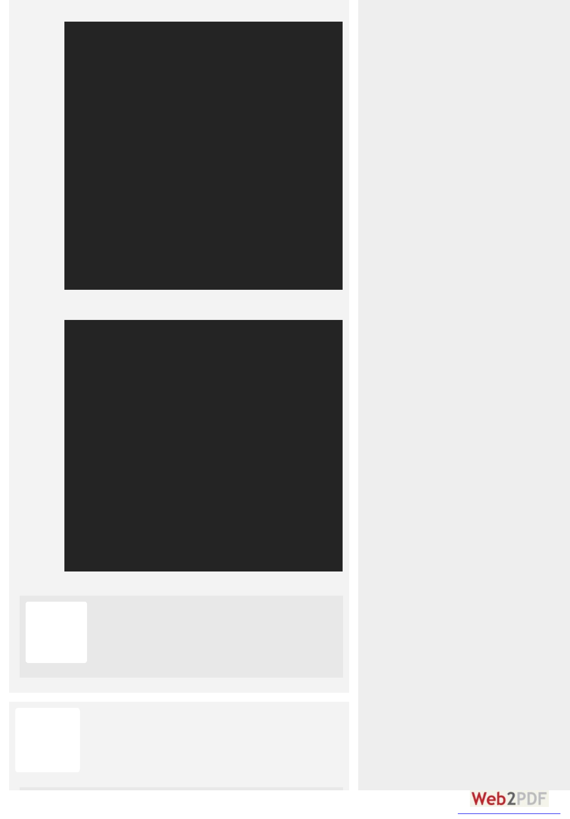
container
PPropeopertieties fo for the Pa the Parentent
(flex containe(flex container))
This defines a flex container; inline or block depending on the
given value. It enables a flex context for all its direct children.
Note that CSS columns have no effect on a flex container.
This establishes the main-axis, thus defining the direction flex
items are placed in the flex container. Flexbox is (aside from
optional wrapping) a single-direction layout concept. Think of
Code Snippets » CSS »
A Complete GA Complete Guiide to Flexboxe to Flexbox
display
#
.container {
display: flex; /* or inline-flex */
}
CSS
flex-direction
#
FIND YOUR
OPPORTUNITY
FFront-ont-Ennd Job Jobs
aboabo ut.me t.m e is hiring a Product Designer
OO rbital bital Innsight ight is hiring a Front End Engineer
C eC e rnene r C o C orpoporation ation is hiring a Entry Level
Software Developer
SEE MORE JOBS
POST A JOB
SIGN UP NOW!
converted by Web2PDFConvert.com
flex items as primarily laying out either in horizontal rows or
vertical columns.
(default): left to right in ; right to left in
: right to left in ; left to right in
: same as but top to bottom
: same as but bottom to top
By default, flex items will all try to fit onto one line. You can
change that and allow the items to wrap as needed with this
property.
(default): all flex items will be on one line
: flex items will wrap onto multiple lines, from top
to bottom.
: flex items will wrap onto multiple lines
from bottom to top.
There are some visual demos of flex-wrap here.
This is a shorthand and properties, which
together define the flex container's main and cross axes.
Default is .
.container {
flex-direction: row | row-reverse | column | column-reverse;
}
CSS
row ltr rtl
row-reverse ltr rtl
column row
column-reverse row-reverse
flex-wrap
#
.container{
flex-wrap: nowrap | wrap | wrap-reverse;
}
CSS
nowrap
wrap
wrap-reverse
flex-flow (Applies to: parent flex
container element)
#
flex-direction flex-wrap
row nowrap
converted by Web2PDFConvert.com
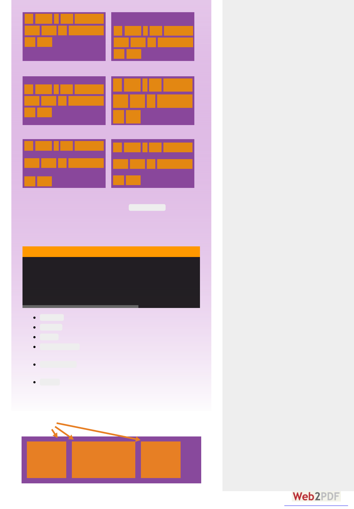
flex-start
flex-end
center
space-between
space-around
This defines the alignment along the main axis. It helps
distribute extra free space left over when either all the flex
items on a line are inflexible, or are flexible but have reached
their maximum size. It also exerts some control over the
alignment of items when they overflow the line.
(default): items are packed toward the start line
: items are packed toward to end line
: items are centered along the line
: items are evenly distributed in the line;
first item is on the start line, last item on the end line
: items are evenly distributed in the line
with equal space around them. Note that visually the
spaces aren't equal, since all the items have equal space
on both sides. The first item will have one unit of space
against the container edge, but two units of space
between the next item because that next item has its own
flex-flow: <‘flex-direction’> || <‘flex-wrap’>
CSS
justify-content
#
.container {
justify-content: flex-start | flex-end | center | space-between | space-around
}
CSS
flex-start
flex-end
center
space-between
space-around
converted by Web2PDFConvert.com
spacing that applies.
flex-start
center
baseline
stretch
flex-end
text text text text
text text text text
This defines the default behaviour for how flex items are laid out
along the cross axis on the current line. Think of it as the
version for the cross-axis (perpendicular to the main-
axis).
: cross-start margin edge of the items is placed
on the cross-start line
: cross-end margin edge of the items is placed on
the cross-end line
: items are centered in the cross-axis
: items are aligned such as their baselines align
(default): stretch to fill the container (still
respect min-width/max-width)
align-items
#
justify-
content
.container {
align-items: flex-start | flex-end | center | baseline | stretch;
}
CSS
flex-start
flex-end
center
baseline
stretch
align-content
#
converted by Web2PDFConvert.com
flex-start
center
space-between
stretch
space-around
flex-end
This aligns a flex container's lines within when there is extra
space in the cross-axis, similar to how aligns
individual items within the main-axis.
Note:ote: this property has no effect when there is only one line of
flex items.
: lines packed to the start of the container
: lines packed to the end of the container
: lines packed to the center of the container
: lines evenly distributed; the first line is at
the start of the container while the last one is at the end
: lines evenly distributed with equal space
around each line
(default): lines stretch to take up the remaining
space
items
justify-content
.container {
align-content: flex-start | flex-end | center | space-between | space-around | stretch
}
CSS
flex-start
flex-end
center
space-between
space-around
stretch
converted by Web2PDFConvert.com
PPropeopertieties fo for the the
ChilChildrenen
(flex item(flex items))
By default, flex items are laid out in the source order. However,
the property controls the order in which they appear in
the flex container.
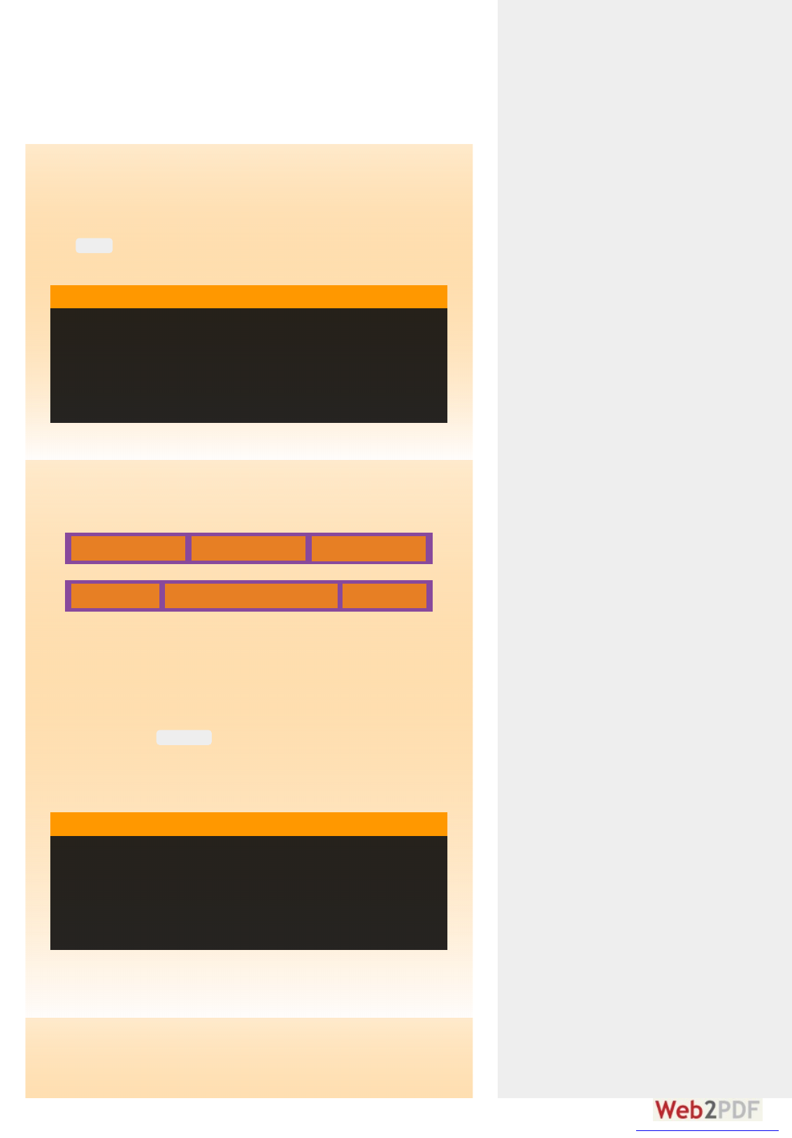
1 1 1
1 2 1
This defines the ability for a flex item to grow if necessary. It
accepts a unitless value that serves as a proportion. It dictates
what amount of the available space inside the flex container
the item should take up.
If all items have set to 1, the remaining space in the
container will be distributed equally to all children. If one of the
children has a value of 2, the remaining space would take up
twice as much space as the others (or it will try to, at least).
Negative numbers are invalid.
This defines the ability for a flex item to shrink if necessary.
order
#
order
.item {
order: <integer>;
}
CSS
flex-grow
#
flex-grow
.item {
flex-grow: <number>; /* default 0 */
}
CSS
flex-shrink
#
converted by Web2PDFConvert.com
Negative numbers are invalid.
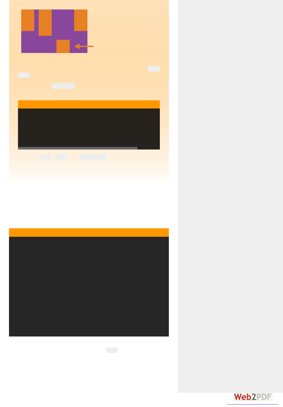
This defines the default size of an element before the
remaining space is distributed. It can be a length (e.g. 20%,
5rem, etc.) or a keyword. The keyword means "look at my
width or height property" (which was temporarily done by the
keyword until deprecated). The keyword
means "size it based on the item's content" - this keyword isn't
well supported yet, so it's hard to test and harder to know what
its brethren , , and do.
If set to , the extra space around content isn't factored in. If
set to , the extra space is distributed based on its
value. See this graphic.
This is the shorthand for and
combined. The second and third parameters ( and
) are optional. Default is .
It it is recommenecommen deed that yo that you use thie this shohorthanthan d p p ropeopertyty
rather than set the individual properties. The short hand sets
the other values intelligently.
.item {
flex-shrink: <number>; /* default 1 */
}
CSS
flex-basis
#
auto
main-size content
max-content min-content fit-content
.item {
flex-basis: <length> | auto; /* default auto */
}
CSS
0
auto flex-grow
flex
#
flex-grow, flex-shrink flex-basis
flex-shrink
flex-basis 0 1 auto
.item {
flex: none | [ <'flex-grow'> <'flex-shrink'>? || <'flex-basis'> ]
}
CSS
align-self
#
converted by Web2PDFConvert.com
flex-end
flex-start
This allows the default alignment (or the one specified by
) to be overridden for individual flex items.
Please see the explanation to understand the
available values.
Note that , and have no effect on a
flex item.
Let's start with a very very simple example, solving an almost daily
problem: perfect centering. It couldn't be any simpler if you use
flexbox.
This relies on the fact a margin set to `auto` in a flex container absorb
extra space. So setting a vertical margin of will make the item
perfectly centered in both axis.
Now let's use some more properties. Consider a list of 6 items, all with a
fixed dimensions in a matter of aesthetics but they could be auto-sized.
We want them to be evenly and nicely distributed on the horizontal axis
so that when we resize the browser, everything is fine (without media
align-
items
align-items
.item {
align-self: auto | flex-start | flex-end | center | baseline | stretch
}
CSS
float clear vertical-align
Examplexamples
#
.parent {
display: flex;
height: 300px; /* Or whatever */
}
.child {
width: 100px; /* Or whatever */
height: 100px; /* Or whatever */
margin: auto; /* Magic! */
}
CSS
auto
converted by Web2PDFConvert.com

queries!).
Done. Everything else is just some styling concern. Below is a pen
featuring this example. Be sure to go to CodePen and try resizing your
windows to see what happens.
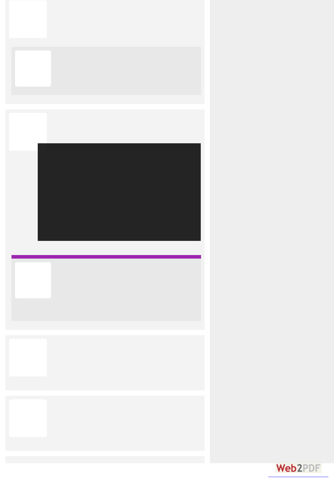
See the Pen Demo Flexbox 1 by CSS-Tricks (@css-tricks) on CodePen.
Let's try something else. Imagine we have a right-aligned navigation
on the very top of our website, but we want it to be centered on medium-
sized screens and single-columned on small devices. Easy enough.
.flex-container {
/* We first create a flex layout context */
display: flex;
/* Then we define the flow direction and if we allow the items to wrap
* Remember this is the same as:
* flex-direction: row;
* flex-wrap: wrap;
*/
flex-flow: row wrap;
/* Then we define how is distributed the remaining space */
justify-content: space-around;
}
CSS
converted by Web2PDFConvert.com

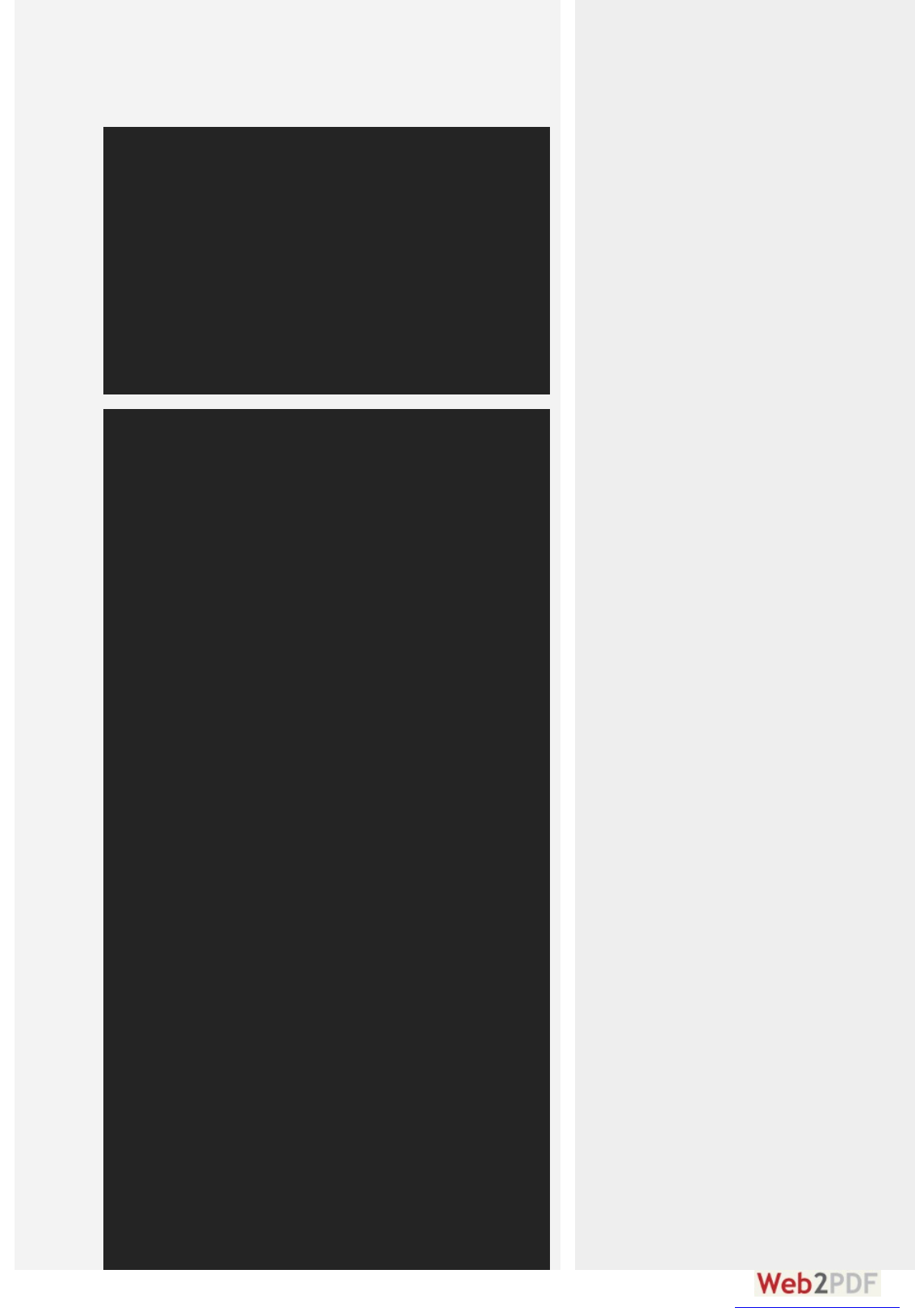
See the Pen Demo Flexbox 2 by CSS-Tricks (@css-tricks) on CodePen.
Let's try something even better by playing with flex items flexibility!
What about a mobile-first 3-columns layout with full-width header and
footer. And independent from source order.
/* Large */
.navigation {
display: flex;
flex-flow: row wrap;
/* This aligns items to the end line on main-axis */
justify-content: flex-end;
}
/* Medium screens */
@media all and (max-width: 800px) {
.navigation {
/* When on medium sized screens, we center it by evenly distributing empty space around items */
justify-content: space-around;
}
}
/* Small screens */
@media all and (max-width: 500px) {
.navigation {
/* On small screens, we are no longer using row direction but column */
flex-direction: column;
}
}
CSS
converted by Web2PDFConvert.com

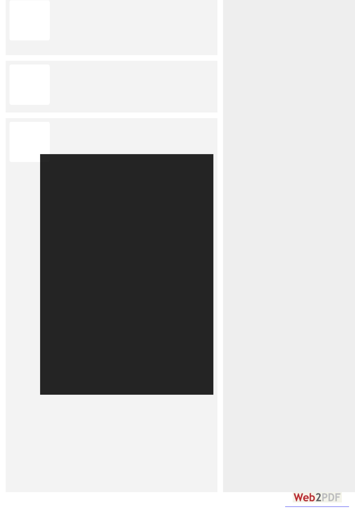
See the Pen Demo Flexbox 3 by CSS-Tricks (@css-tricks) on CodePen.
PPrefixing Flexboxefixing Flexbox
.wrapper {
display: flex;
flex-flow: row wrap;
}
/* We tell all items to be 100% width */
.header, .main, .nav, .aside, .footer {
flex: 1 100%;
}
/* We rely on source order for mobile-first approach
* in this case:
* 1. header
* 2. nav
* 3. main
* 4. aside
* 5. footer
*/
/* Medium screens */
@media all and (min-width: 600px) {
/* We tell both sidebars to share a row */
.aside { flex: 1 auto; }
}
/* Large screens */
@media all and (min-width: 800px) {
/* We invert order of first sidebar and main
* And tell the main element to take twice as much width as the other two sidebars
*/
.main { flex: 2 0px; }
.aside-1 { order: 1; }
.main { order: 2; }
.aside-2 { order: 3; }
.footer { order: 4; }
}
CSS
converted by Web2PDFConvert.com
RelateRelated P Propeopertieties
OtheOther Re Resoourceces
BBuggs
Broken up by "version" of flexbox:
(new) means the recent syntax from the specification (e.g.
)
(tweener) means an odd unofficial syntax from 2011 (e.g.
)
(old) means the old syntax from 2009 (e.g. )
Chrome:
20- (old)
21+
(new)
Safari:
3.1+
(old)
6.1+
(new)
Firefox:
2-21
(old)
22+
(new)
Opera:
12.1+
(new)
IE: 10
(tweener)
11+
(new)
Android:
2.1+
(old)
4.4+
(new)
iOS:
3.2+
(old)
7.1+
(new)
Blackberry browser 10+ supports the new syntax.
For more informations about how to mix syntaxes in order to get the
best browser support, please refer to this article (CSS-Tricks) or this
article (DevOpera).
CommentComments
BBroowseer S Suppopportt
#
display: flex;
display:
flexbox;
display: box;
Bill WebbBill Webb
# A P R IL 8, 2013
Yay. Less javascript and more CSS. What’s not to like? Great info, as
always!
Reply ↓
AlexAlex
# J U L Y 17 , 2014
Flexbox its fine, but It is still not valid for a simple perfect
“product grid” with no margins at first and last elements in row,
and left aligned. Otherwise: could you build this layout using
flexbox? http://i.snag.gy/VHJsV.jpg thanks
LaLawrence Bothaence Botha
# J U L Y 20, 2014
@Alex Yes, you can. In the same manner that you do so with non-
flex grids, apply a negative margin-left to the grid wrapper, and
apply that same value as padding left to all grid columns.
converted by Web2PDFConvert.com
Look at http://inuitcss.com for how it’s done with inline-block
elements, which allows you to apply vertical alignment to
columns, too.
.grid { margin-left: -20px;}
.grid__col { padding-left: 20px;}
mymysttrdatat
# J U L Y 23, 2014
@Alex @Lawrence That has little do with flexbox itself.
and similar exclusion selectors. Negative
margins are rubbish.
.el:not(:last-of-type)
LaLawrence Bothaence Botha
# A U G U S T 2, 2014
@mystrdat You’re correct, it has nothing to do with flexbox.
Using :not selectors, however, will be unscalable, and you will lose
IE8 support (less of an issue now).
If I have a grid with 8 items, each occupying 25% of the width,
that technique fails, since the 4th item will not sit flush with the
container edges.
If I have a grid with 4 items, 25% width on desktop, and then 50%
width on mobile, that technique fails again, for the above
reason. How about managing 3rds, 5ths, 6ths, 12fths, etc., and
when columns change to use different widths across viewports?
I wouldn’t call negative margins rubbish. Perhaps not ideal, but
they solve a complex problem elegantly.
http://tympanus.net/codrops/2013/02/04/creating-
nestable-dynamic-grids/
YaYazinin
# A U G U S T 24 , 2014
@Alex .. actually, it’s alot simpler. Just use
More here
justify-content: space-between;
AbAbdull
# M A R C H 14 , 2015
MattMatt
# A P R IL 3, 2015
The CSS Working Group has a document online of “…Mistakes
in the Design of CSS”, one of them is this:
“Flexbox should have been less crazy about flex-basis vs
converted by Web2PDFConvert.com

width/height. Perhaps: if width/height is auto, use flex-basis;
otherwise, stick with width/height as an inflexible size. (This also
makes min/max width/height behavior fall out of the generic
definition.)”
Can you talk about what they mean by this?
macgalmacgal
# A P R IL 23, 2015
Ahojj
dAVAVIT T dJATKOJATKO
# A P R IL 23, 2015
Jsem vadnej co s tym?
ooNDTRDTREJ kOJ kONRÁTRÁT
# A P R IL 23, 2015
Asy butu breczet
JoJosh McCh McCullolloughgh
# J U L Y 6, 2015
For your final example, how would you make the content (center
row) take up all available space, so that at minimum, the footer
is pinned to the bottom of the window – but if the content area
has more content, the footer will push below, allowing scrolling.
This can be accomplished by setting a min-height on the
content row: calc(100% – header-height – footer-height) but it
requires hard-coding or JS to accomplish AFAIK.
Alan caAlan carpentepenter
# A U G U S T 12, 2015
@Lawrence at the point of using flex does IE8 not become a
problem already? I think the grid solution could be solved with
nth-child. Then using media queries to make appropriate
adjustments based on the users screen.
AnAndy Malehy Maleh
# A U G U S T 18, 2015
Perfect Product Flexbox Layout (using justify-content: space-
between and filler products):
See the Pen Aligned Row Wrap Flexbox by Andy Maleh
(@AndyMaleh) on CodePen.
Though to be honest, I don’t like that I had to use fillers for the
Flexbox implementation to ensure the last row is spaced evenly.
It would be mighty nice if they offer Flexbox row selectors for
converted by Web2PDFConvert.com
multi-row wrap flows.
Here is an alternative implementation with display inline-block:
See the Pen Aligned Row Wrap Inline-Block Layout by Andy
Maleh (@AndyMaleh) on CodePen.
Nafiafis
# SEP T EM B ER 22, 2015
Not working on iPad, iPhone, desktop safari also. Any solution?
Hubebert t Hubenbendubelbel
# O C T O B ER 23, 2015
Your last example only works with no content. If you put some
text in Aside1 the 3 column Layout is gone.
PaPaulOBlOB
# O C T O B ER 23, 2015
@Hubert: Yes the 3 col layout needs this added.
I mentioned it a while ago in an earlier post and assumed
someone would update the demo.;)
@media all and (min-width: 600px) {
.aside {
flex: 1 0 0;
}
}
KaKazii
# J A NU A R Y 12, 2016
@Josh McCullough its pretty simple to achieve that, better and
easier then ever before. Just use the flex property and set it to 1,
for e.g:
flex is a very powerful property and can be used in the shorthand
of flex: 1 1 auto; (grow, shrink and basis) – using just flex: 1 tells it
to take all the remaining space thus making the footer stick at
the bottom. Look an eye out for grid to make a proper entry into
the browsers and we would be having magic on our plates in
.someClass {
flex: 1;
color: #ebebeb;
padding: 2rem;
}
converted by Web2PDFConvert.com
terms of layouts.
See it live in action:
Anonymous Pens can't be embedded.
Edit on CodePen
Result
AlexAlex2
# M A R C H 25, 2016
Well, it’s bad on many levels. Too verbose, hard to manage, it
already creates “frameworks” around it, just to make it
manageable. 25 years ago we already had tools, WYSIWIG IDE’s
and ways to define UI and “responsive” views… For geeze sake,
can we come back to roots and come up with simple and
effective markup language with UI tools and plain resizing rules
for view elements!?
ChCh riis
# A P R IL 26, 2016
Regarding the property:
Saying that the 2nd and 3rd parameters and
are optional is slightly misleading because it implies that
(the 1st parameter) is never optional. The truth is,
is optional as long as is present (and
obviously when the value is ). It’s only required when
is present.
flex
<flex-shrink> <flex-
basis>
<flex-grow>
<flex-grow> <flex-basis>
none <flex-
shrink>
ChCh riis
# A P R IL 26, 2016
oops, sorry, my comment was for the whole board, not just to
your post.
KKuhanhan
# M A Y 10, 2016
when this
article
and
aside
come as html tag , I never know this
<article class="main">
<aside class="aside aside-1">Aside 1</aside>
converted by Web2PDFConvert.com
GennaGennadyy
# A U G U S T 24 , 2016
#include <cmath>
#include <iostream>
#include <iomanip>
using namespace std;
float area(float a, float b, float c)
{
float s = (a + b + c) / 2;
return sqrt(s * (s-a) * (s-b) * (s-c));
}
int main()
{
int T;
float WX, WY, WZ, XY, XZ, YZ,
radius, volume, surfaceArea,
a, b, c, d, u, v, w, x, y, z, U, V, W, X, Y, Z;
ios_base::sync_with_stdio(false);
cout << fixed;
cin >> T;
while (T--)
{
cin >> WX >> WY >> WZ >> XY >> XZ >> YZ;
u = WX;
v = WY;
w = WZ;
U = YZ;
V = XZ;
W = XY;
x = (U - v + w) * (v - w + U);
y = (V - w + u) * (w - u + V);
z = (W - u + v) * (u - v + W);
X = (w - U + v) * (U + v + w);
Y = (u - V + w) * (V + w + u);
Z = (v - W + u) * (W + u + v);
a = sqrt(x * Y * Z);
b = sqrt(y * Z * X);
c = sqrt(z * X * Y);
converted by Web2PDFConvert.com

d = sqrt(x * y * z);
volume = sqrt((-a + b + c + d)
* (a - b + c + d)
* (a + b - c + d)
* (a + b + c - d))
/ (192 * u * v * w);
surfaceArea = area(WX, WY, XY)
+ area(WX, WZ, XZ)
+ area(WY, WZ, YZ)
+ area(XY, XZ, YZ);
radius = 3 * volume / surfaceArea;
cout << setprecision(4) << radius << "\n";
}
return 0;
}
SkytheSkythe
# SEP T EM B ER 9, 2016
@Yazin
That’s not correct. Space-between would spread all items in the
last row across the whole width which is not what Alex wanted.
hihi
# O C T O B ER 10, 2016
Your example specifies but your codepen uses
.
This really threw me off for a while…wondering why the boxes
werent the widths I expected. :p
Great article, thanks.
.main { flex: 2 0px; }
.main { flex: 3 0px; }
SanSan deep Joeleep Joel
# DECEM B ER 23, 2016
Jacob DJacob Dubailbail
# A P R IL 12, 2013
Hey Chris,
Thank you so much for the comprehensive write up.
I just updated Firefox to v20 on a mac and now all of the flex-box
demos aren’t working. Everything still looks great in Chrome.
Reply ↓
converted by Web2PDFConvert.com

Anyone else having this problem?
AnAndreaeas
# M A Y 4 , 2014
Issues with Ch 34.0.1847 on OSX 10.9.2
Thanks for the writeup Chris!
sll01kk
# M A Y 14 , 2014
FF 2-21 (old) – (old) means the old syntax from 2009 (e.g.
display: box;)
RobeRobert Fat Fauvever
# M A Y 15, 2014
The demos are using the new flexbox specs which requires FF 22+
PetePeter Lo Lord
# M A Y 18, 2014
Not working for me on ubuntu 14.04 with firefox 29
CoolcatCoolcat0077
# A P R IL 13, 2013
The only thing I don’t understand is why the use of prefixes is needed
if the syntax doesn’t differ from the recommendation.
I think what would be enough is (using the above example):
Reply ↓
converted by Web2PDFConvert.com
At the moment this is not supported, but I think it should be because
everything that was left out here had the recommended syntax. The
prefixes still should be available if needed, but it shouldn’t be
necessary.
.wrapper {
display: -webkit-box;
display: -moz-box;
display: -ms-flexbox;
display: flex;
}
.item {
-webkit-box-flex: 1 200px;
-moz-box-flex: 1 200px;
flex: 1 200px;
-webkit-box-ordinal-group: 2;
-moz-box-ordinal-group: 2;
-ms-flex-order: 2;
order: 2;
}
Tom LTom L
# A U G U S T 1, 2014
Good explanation of the need for multiple vendor prefixed rules
here:
http://css-tricks.com/using-flexbox/
See code examples with comments…
Billy Wenge-MBilly Wenge-Murphyphy
# O C T O B ER 23, 2014
Vendor prefixes aren’t just about syntax differences. They
(arguably much more importantly) separate out
implementation
differences. What would happen if we just had
one unprefixed word for a feature, and the syntax of its attributes
was consistent across browsers, but the rendering behavior was
different? Then you’d have to do ugly browser sniffing and serve
different files to the client conditionally, like we did back in the
dark ages of IE6.
Once everyone has a correct implementation,
then
the prefixes
can be dropped. Otherwise, the most popular browser’s
implementation of the feature becomes the de facto standard
even if it’s the most broken (again, IE6)
converted by Web2PDFConvert.com
DanielDaniel
# A P R IL 18, 2013
Regarding the example with the 6 items of fixed dimensions to be
evenly distributed – using the
justify-content: space-around; rule:
I’d really like to use this, however it’s not doing exactly what I want.
Let’s say there’s only room for 4 of the items on the first row, the
remaining 2 will be evenly spaced on the second row. (ughh)
Is there any way for items on the last row to be placed/aligned
underneath the elements from the previous row (left->right)??
Reply ↓
CoolcatCoolcat0077
# A P R IL 18, 2013
This is something that can be done with the grid layout module,
but it is not supported by the browsers yet.
You could always use tables and calc()
DanielDaniel
# A P R IL 18, 2013
@Coolcat007 You mention that this can be done with tables and
calc() – is this so – even if you have a dynamic number of
items?? If it is – any chance of a fiddle / codepen?
Thanks!
CoolcatCoolcat0077
# A P R IL 18, 2013
@Daniel
Sorry, I misunderstood your question. For a dynamic number of
items, this won’t work without JS or php.
This is indeed a thing that could be added.
Something like align-items:main-axis /cross-axis could be a great
addition.
Reply ↓
Catalin RoCatalin Rosu
# A P R IL 19, 2013
I think the browser support table is missing a cell, the one with
Opera’s version 12.1+.
The table, as it is now, shows “Any” for IE. It’s funny! :)
Reply ↓
ChCh riis Coyie Coyier
# A P R IL 19, 2013
Fixed, thanks!
converted by Web2PDFConvert.com

Tim McKayTim McKay
# J U N E 14 , 2013
Works beautifully in Chrome and Safari, but I’m on FireFox (v21)
and it’s not working well at all. It doesn’t allow the paragraphs to
break. It’s like it’s treating the display:flex as display:inline-flex. The
only way I’ve been able to get around this is to change the
about:config of Firefox to multiline, but visitors won’t have that set
by default.
Has anyone had any luck with this? Currently I’m using flexbox for
webkit and equalize.js for other browsers.
Reply ↓
CoolcatCoolcat0077
# J U N E 14 , 2013
I think that’s because flexbox isn’t fully supported by firefox until
v22. That’s why I’m running the v22 beta at the moment. You
can always use the display:box untill ff22 is released.
DanielDaniel
# J U N E 23, 2013
Am I crazy enough if I use this in production? I have a really awkward
situation and I can’t use display: table. It messes up with the fluidity
of the images.
Reply ↓
Kevin L.Kevin L.
# A P R IL 7 , 2014
You can use flexbox in production pretty well as long as you’re
using a sound way to detect less-than-ideal support for flex-wrap
w/ modernizer and use a ratio-based grid system like
Singularitygs as a fallback.
An example: http://sassmeister.com/gist/9781525 (toggle the
flexbox and .noflex option.
It’s a sound strategy to the extent you can use flexbox first
towards planning for the layout and quickly create the fallback
with a ratio-based grid system.
As long as you’re considerate enough to have a style guide that
documents documenting how a particular component ought to
look if it in facts differs from both, you should be fine.
WolfWolf
# J U N E 27 , 2013
Flexbox is now unprefixed in Firefox (22).
Reply ↓
converted by Web2PDFConvert.com

TTri i Noenoensieie
# J U L Y 9, 2013
I found a compass compatible mixins
Reply ↓
tinabeantinabean s
# J U L Y 10, 2013
In your second Codepen example (with the blue navigation bar), I
couldn’t figure out why the flow-direction: column doesn’t seem to
kick in at the smallest screen width. I played around with a few values
and found that explicitly adding some height to the ul.navigation
made the li’s stack vertically. Is there a better way around this
without requiring a hard-coded height?
Reply ↓
JayJay
# M A Y 2, 2014
That’s because the code for max 600 width is missing a flex-flow:
column wrap; if you are using firefox. It only contains one for
web-kit. Once I added that in, it does it nicely in my FF.
skittekittermm
# J U L Y 12, 2013
Thanks for the post. I found it highly insightful.
Reply ↓
AnkAnkur Obe Oberoioi
# J U L Y 13, 2013
Something weird is going on in the first example’s pen
(http://codepen.io/HugoGiraudel/pen/LklCv). I tried recreating it
on CodePen and noticed it wasn’t working, even when I copied and
pasted! Then I tried recreating it locally, copied and pasted, and
again it didn’t work. So then I took to the Chrome DevTools to take a
look at what was going on and it looks like even though the pen uses
the rule , what is actually rendered on the
page is . Turns out prefix-free was
turned on in the CodePen config for the Scss panel.
Even if thiven if this waas Co Co dePen’ePen’s p p ref ix-fefix-f ree ee doing th e oing the woo rk fok f o r
m e, m ixing venm e, m ixing ven doo r p p ref ixeef ixed rulele s an an d non-p no n-p refixeef ixe d ruleles
that the pthat the p repep roc eocessoo r t tranan sfof o rmm s shoho ulld be a no-no . be a no-no .
justify-content: space-around;
-webkit-justify-content: space-around;
Reply ↓
Iononutt
# J U L Y 22, 2013
Ryan BoogRyan Boog
# J U L Y 24 , 2013
Nice post Chris. I like how thorough and detailed you are. Too bad we
don’t use SASS, we rely almost solely on LESS. We would love to use
Flexbox for clients, but it doesn’t seem to play nicely cross browser. I
checked this page in FF22 and IE10 and it was a mess.
Reply ↓
converted by Web2PDFConvert.com
Do you, or anyone else, know of any good JS polyfills or plugins or
solutions to get this to play cross-browser nicely? Otherwise, how
long (in your opinion) until we can ‘realistically’ use this without a
lot of cross browser headaches?
DaDario Gio Graassii
# A U G U S T 13, 2013
Great post Chris. I think that flexbox capability to order items will be
usefull in RWD.
I’ve got only a question. When you define main-axis you say that its
direction depends on the justify-content property, but isn’t the flex-
direction property that defines if flex items are layed out as a row or
as a column? Am I misunderstanding something?
Reply ↓
ChCh riis Coyie Coyier
# FEB R U A R Y 10, 2014
When you define main-axis you say that its direction depends
on the justify-content property, but isn’t the flex-direction
property that defines if flex items are layed out as a row or as a
column?
You’re correct, that was wrong in the article and is fixed now.
ZippZippZippZipp
# A U G U S T 15, 2013
Hey, anybody knows real site that using flexbox?
I know that SM try to use it some time ago, but returns to floats.
Reply ↓
Jacob DJacob Dubailbail
# A U G U S T 15, 2013
Hey ZippZipp,
I tried to build my personal/portfolio site with flexbox a few
months ago, but got super frustrated with the syntax. I just found
this Sass helper https://raw.github.com/timhettler/compass-
flexbox/master/extensions/compass-
flexbox/stylesheets/_flexbox.scss, which is working really well
so far. I’m hoping to launch my new site in the next 2 weeks using
flexbox for everything except IE 8/9.
Johnny CalJohnny Caldeeronon
# FEB R U A R Y 18, 2014
I would like to find one too, but older browsers just make it a big
pain… I’d rather use floats to keep the headache away and less
code.
Just yesterday I was checking my browsers support and I saw that
flex is now un-prefixed in these versions, but unfortunately not
everybody has updated browser versions.
IE11
converted by Web2PDFConvert.com

Mozilla Firefox 27.0.1
Chrome 32.0.1700
Opera 19.0
Safari still uses the rule: “display: -webkit-box;”
Safari 5.1.7
Edenen
# M A Y 14 , 2014
I did a school project using flexbox (with help from
Autoprefixer): edensg.github.io/ASM2O
DaviDavid
# A U G U S T 22, 2013
main axis – The main axis of a flex container is the primary axis
along which flex items are laid out. Beware, it is not necessarily
horizontal; it depends on the jjustify-c ontenttify-c ontent property (see
below).
I think you mean flex-flex- diirec tio nec tio n .
flex-direction (Applies to: parent flex container element)
flex-direction: row | row-reverse | column | column-reverse
row (default): left to right in ltr; right to left in rtl
row-reverse: right to left in ltr; left to right in rtl
column: same as row but top to bottom
co lc olum n-m n- reveeversee: same as row-reverse but top to bottom
I think in colc olum n-m n- reveeversee you mean
but bottom to up
Reply ↓
samam
# A U G U S T 22, 2013
SelenSelen ITT
# SEP T EM B ER 6, 2013
Firefox 22+ has unprefixed Flexbox, but, unfortunately, it still
doesn’t support flex-wrap property (and hence flex-flow shorthand).
So the wonderful example with 3-column layout reducing to 1
column on narrow screen in Firefox looks really messy. But it’s
possible to create its simplified analog that works in both
Chromium-based browsers and Firefox 23+:
http://codepen.io/anon/pen/pEIKu
Reply ↓
Jack CalJack Caldeer
# SEP T EM B ER 12, 2013
Wow, its really the one the best post i ever read on this topic. The
steps which you have mentioned are really perfect.
Reply ↓
converted by Web2PDFConvert.com

AArthth ur
# SEP T EM B ER 14 , 2013
Hey, Cris! Looks like “flex-wrap” incorrectly works in Firefox and
Opera! Both tomato blocks and very last demoes do not work!
Is there some workaround already?
And thank you so much for your website! ;)
Reply ↓
SelenSelen ITT
# SEP T EM B ER 20, 2013
Yes, only latest Chromium-based browsers like Chrome, Opera
16+ etc. seem to support multi-line flexboxes currently. As a
workaround, you can use nested flexboxes in combination with
media queries, as in my comment above (it’s not so flexible as
true multi-line flexboxes, but still better than nothing) or use
graceful degradation to old techniques like inline-blocks.
paceapaceauxx
# SEP T EM B ER 20, 2013
I’ve found that, in Chrome 29, and do not respect
. Anyone else observed this, or have an idea as to why?
<input /> <label>
order
Reply ↓
GGrantant
# SEP T EM B ER 22, 2013
Flexbox is what CSS has been sorely lacking since its inception – an
easy way to create flexible web page layouts without the need for
floats, clears, margin: 0 auto and JS hacks. I look forward to the day
when flexbox is supported by a big enough share of the browser
market to put into this all of our production sites.
Reply ↓
AAron Don Dubyby
# O C T O B ER 13, 2013
Thanks for the awesome tutorial, just managed to use the knowledge
to make a sweet way to build tournament brackets! You can check
out the codepen at http://cdpn.io/qliuj
Reply ↓
Uncle JeUncle Jessee
# O C T O B ER 21, 2013
I find myself doing a Mr. Burns “excellent”, as I’m pretty excited
about align-items: stretch
Reply ↓
RanRandy By Burlelesonon
# O C T O B ER 25, 2013
I am trying to make my video rich website “FLEX”. The site scales ok
but the Vimeo iframe videos do not.
I was trying to use the FitVids.js script to make this work but I am not
sure how to make that work with my Weebly template. (YES I am
not a website professional, I know nothing about CSS or HTML) But I
have been tasked with this job and I need to make it work properly.
Reply ↓
converted by Web2PDFConvert.com

Any help would be appreciated. Using Firebug plug in the Firefox
browser I saw this code about Flex Box… How do I modify this to
make the videos Flex?
> ` <!DOCTYPE html>
<html class="new-editor js no-flexbox flexbox-legacy canvas canvastext webgl no-touch geolocation postmessage no-websqldatabase indexeddb hashchange history draganddrop websockets rgba hsla multiplebgs backgroundsize borderimage borderradius boxshadow textshadow opacity cssanimations csscolumns cssgradients no-cssreflections csstransforms csstransforms3d csstransitions fontface generatedcontent video audio localstorage sessionstorage webworkers applicationcache svg inlinesvg smil svgclippaths">
<head>
<body id="body" class="wsite-editor allow-collapse-transition">
</html>`
WillWill
# NO V EM B ER 16, 2013
ReblRebluttus
# NO V EM B ER 20, 2013
I really like this post. It got me started with my project.
i had a problem with firefox like other users here but came over it by
wrapping the columns/rows in more container like a user suggested.
I have another problem though. This time it’s with IE11. If you look
at your example of the menu, you will see that on the smallest width
the menus are not shown in columns and stays as rows.
On my side I had a different problem with IE: the columns were
showing but the items in them had no height! So everything
collapses for no reason. Of course it’s fine in Chrome and Firefox
(25)
Reply ↓
BBrittonitton
# NO V EM B ER 27 , 2013
There is a typo with the portion on flex grow. It doesn’t inhibit
understanding the content, but it would be nice if you fix it.
Reply ↓
JeJessee
# DECEM B ER 8, 2013
The W3C needs to get off their a** and push this through. A
consistent browser implementation will make life so much easier for
creating layouts.
Reply ↓
JeJessee
# DECEM B ER 8, 2013
monomono
# DECEM B ER 12, 2013
Chris, I couldn’t vertically align some content in print media, do you
know where I could find more information about this kind of
support?
My test looks something like this,
Reply ↓
converted by Web2PDFConvert.com
CSS:
HTML:
@page {
size: US-Letter;
}
article {
page-break-after: always;
text-align: center;
display: flex;
flex-direction: row;
align-items: center;
justify-content: center;
}
article:last-child {
page-break-after: avoid;
}
<body>
<article>
<h1>
Hello
</h1>
</article>
<article>
<h1>
Hello 2
</h1>
</article>
</body>
CaCarlolos
# M A R C H 22, 2014
Not all browsers support paged media, does the paged media
example work without the flexbox?
MicheleMichele
# DECEM B ER 19, 2013
What does 22+ (new), in the Firefox support table means?
Reply ↓
converted by Web2PDFConvert.com
Benjamin ChaBenjamin Charityity
# J A NU A R Y 27 , 2014
Meaning version 22 of Firefox which is the newest version at the
time the article was written.
ChCh riis Coyie Coyier
# FEB R U A R Y 10, 2014
And the + means “and up”
OOronon
# DECEM B ER 20, 2013
AnAndyy
# J A NU A R Y 6, 2014
Nice tutorial. Has anything changed this this tutorial was published?
Also it doesn’t work for me in IE10.
Reply ↓
ChCh riis Coyie Coyier
# FEB R U A R Y 10, 2014
IE 10 has the tweener syntax, so make sure you’re prefixing for
that. Autoprefixer does a great job of writing in the latest syntax
and handling the fallbacks.
MaMarkk
# J A NU A R Y 11, 2014
Great article. I found it helpful to see what is coming along the
horizon. The company I contract for right now uses IE8 so I have to
wait until they move to newer version of IE. I have always wondered
why a good layout system has been missing from CSS. Better late
than never I guess. I look forward to using this on touch devices with
webkit.
Reply ↓
DenniDennis
# J A NU A R Y 15, 2014
BBraad Spence Spencer
# J A NU A R Y 22, 2014
Having trouble with 2 flexboxes aligned horizontally when one is set
in column flow and the other in column-reverse flow.
See pen: Flexbox Alignment Sample
How do I fix this? Thanks!
Reply ↓
converted by Web2PDFConvert.com
JJustintin
# M A R C H 17 , 2014
Simple fix I think. You need to set the container(#window) to
flex so that your 2
<ul>s are flex children.
#window { display: flex; }
BBraad Spence Spencer
# M A R C H 18, 2014
Wow, that
was
simple!
Thanks Justin.
FelixFelix
# FEB R U A R Y 3, 2014
JanJan
# FEB R U A R Y 4 , 2014
Hy,
in your first example, the child element has been centered by
(magic!) margin: auto;
This solution does not work in IE11 if the child element has no
defined height, for example, if the height is determined by the
content.
All other browsers behave as expected.
.parent {
display: flex;
height: 300px; /* Or whatever */
}
.child {
width: 100px; /* Or whatever */
height: 100px; /* Or whatever ---- Doesn't work in IE11, if the height is determined by the content ---- */
margin: auto; /* Magic! */
}
CSS
Reply ↓
converted by Web2PDFConvert.com
AnAndreew
# FEB R U A R Y 10, 2014
I messed with this a bit today. I’m interested but a bit confused at the
same time. If I code it (literally copy it) from what you have here to
CodePen it runs as yours did. If, however, I try that on JSFiddle (
where I normally mess around ) the colors come out in a straight line
only. Also, if I load the entire page via jQuery, as I’ve been doing
lately, the same result… Instead of the framed environment you’re
getting I received flat little lines. I’ve even tried injecting the CSS
into the Header before building the page via jQuery with much the
same result. Seems that this only works without jQuery and for
whatever reason only on CodePen.
Reply ↓
AnAndreew
# FEB R U A R Y 11, 2014
Would you happen to know how I could code in a horizontal split (
like they have on Code Pen ) that separates the top of the window
and the bottom of the window and moves fluidly when the bar is
moved, with flexbox framework? Any help would be appreciated,
thanks!
Reply ↓
ChCh riis Coyie Coyier
# FEB R U A R Y 13, 2014
The draggable bar isn’t going to happen with just CSS, flexbox or
no, save for some super crazy hack using a resizeable textarea or
something. On CodePen we use jQuery UI draggable, but there
are others out there. Flexbox does make the situation easier
though. One time I redid the whole CodePen editor layout in
Flexbox for fun and it was way easier, but of course I can’t find it
now. Basically if the flex items have flex: 1; they will fill the area,
so you just resize one of them to a specific height (or width) and
the other will fill the remaining space. So no math.
AnAndreew
# FEB R U A R Y 13, 2014
Do you know of any working examples of jQuery UI Draggable
for a horizontal split pane? I’ve been messing with it for a couple
of days now and can’t seem to figure it out.
GimmGimm
# FEB R U A R Y 20, 2014
Hi Chris,
I’m trying to make a div which its width auto grow with its contents.
Using this:
There seems a bug that with the container’s main size, please see
this pen
display: inline-flex;
flex-flow: column wrap;
Reply ↓
converted by Web2PDFConvert.com

wrong main size when flex-driection is column
MMumtamtaz
# FEB R U A R Y 27 , 2014
Can u check Safari…
flex property not supported.
JohnJohn
# FEB R U A R Y 25, 2014
anonanon
# FEB R U A R Y 27 , 2014
MaMark F. Simchockk F. Simchock
# FEB R U A R Y 28, 2014
Well played. Thanks Chris.
This will certainly be a great tool to have once it’s better supported.
For now it seems to me it’s best to lean on js, or just stick to a design
/ layout that can be manufactured with less-buggy (if you will) off
the shelf parts.
If design doesn’t consider manufacturing then that’s not design.
That’s art. There’s a difference.
Reply ↓
JaJaspeper
# M A R C H 7 , 2014
Evevertt
# M A R C H 9, 2014
Perhaps not the best place to ask, but I am struggling with making a
responsive flexbox fluid layout. What I want is 3 breakpoints like
this:
1) 3 rows (containers vertical, small screen)
2) 2 columns, 2 rows (medium screen)
3) 3 columns (large screen)
1 en 3 are easy, I just change the flex-direction from column to row.
But how about 2)?
So basically it must look like:
A
B
C
A B
C
A B C
Reply ↓
Evevertt
# A P R IL 8, 2014
Gonna answer my own question. The reason I could not get it to
work is because IE11 does not like a max-width to be set on any
flex-item. If you do, it wrongly calculates the space around or
between the items.
converted by Web2PDFConvert.com

LeviLevi
# O C T O B ER 6, 2014
Evert, I just ran into that same issue! I was beating my head
against it for a good hour until I discovered that IE11 doesn’t like
max-width on flex items.
JonJon
# M A R C H 10, 2014
Great article, thanks. Regarding the the browser support table, I
think that IE11 may have full support of the specification.
Ref: http://msdn.microsoft.com/en-
us/library/ie/dn265027(v=vs.85).aspx
Thanks.
Reply ↓
DDwayneayne
# M A R C H 10, 2014
Does using flexbox responsibly meaning coding the site via flexbox
and usual css positioning methods as a fall back for browsers who
dont support flexbox, coding the layout twice? Just thinking
workflow wise…
Reply ↓
Michael PaMichael Parkk
# M A R C H 20, 2014
Thanks Chris! This is an excellent Flexbox reference. I have
implemented a basic Holy Grail template:
http://noseyparka.me.uk/2014/03/26/a-holy-grail-flexbox-
layout/. Flexbox is a thing of beauty!
Reply ↓
Anton GAnton G
# A P R IL 8, 2014
Nice Job!.
Thanks for sharing this.
I found this Polyfill for flexbox, http://flexiejs.com/
Reply ↓
Evevertt
# A P R IL 8, 2014
Things I noticed using flexbox that are a real pain:
Using margin: 0 auto; on the flex-container shrinks the container
(and it’s containing flex-items) to the minimum width. It is no
longer flexible/fluid.
Because of this, any fluid, centered layout must use justify-content:
center/ or space-between. But then the layout becomes “infinite”
(you can make the screen wider and wider and the boxes and spaces
will happily distribute themselves across that space possibly
breaking any design restrictions). So in order to prevent that we
could set max-width on the flex container, but that cancels out the
Reply ↓
converted by Web2PDFConvert.com

centering for some reason and the page flushes left. So the only
other possibility is to set a max-width on one or more flex-items…
but those will break in IE11 because of some bug.
In short: flexbox will only work practically when using the full screen
width and not limiting any flexible item with a max-width. As soon
as you want to set a limit to any item, it falls apart.
ffreed
# A P R IL 8, 2014
I too see no other advantage for this than limiting some lines in my
media queries
Reply ↓
StStuaartt
# A P R IL 9, 2014
This really annoyed me and was broken for a bit, so I wanted to share
in case anyone ever comes across this in the future. If you need to
support blackberry 7+, make sure you use
…if you use row wrap, it doesn’t wrap and just puts everything side-
by-side. Also, very important. Make sure the child elements of the
parent flex container don’t have applied to them. It
breaks it for some reason. I hope this helps someone!
-webkit-box-orient: vertical;
-moz-box-orient: vertical;
-webkit-box-direction: normal;
-moz-box-direction: normal;
-webkit-flex-direction: column;
-ms-flex-direction: column;
flex-direction: column;
display: inline;
Reply ↓
StStuaartt
# A P R IL 12, 2014
One last important thing to remember if you have to support
blackberry 7+…make sure all child elements have
applied to them…if floats are applied, they’ll just not appear. I
hope this helps!
float:none
LaLaurenen
# NO V EM B ER 13, 2014
Bah, thanks so much, this helped me on Samsung Galaxy as well.
Cheers!
Ed
# A P R IL 10, 2014
In the first line of the SASS mixin, shouldn’t be just
?
@mixin flexbox()
@mixin flexbox
Reply ↓
converted by Web2PDFConvert.com
DeepakDeepak
# A P R IL 12, 2014
Chris, this example does not work in IE11. could you please suggest,
how I can have support on IE11
Reply ↓
ChCh riis
# A P R IL 23, 2014
The .wrapper defined “-webkit-flex-flow: row wrap;” only, add
“flex-flow: row wrap;” and it works in IE 11 and Firefox.
Najmajmull
# A P R IL 14 , 2014
Where are things:
box-orient
box-pack
box-align
box-flex
box-flex-group
box-ordinal-group
box-direction
box-lines
Reply ↓
ChCh riis Coyie Coyier
# A P R IL 16, 2014
Those are deprecated properties. I feel like it’s best at this point
(at least in terms of this guide) to focus on the current
properties. Also best in practice to let a tool like Autoprefixer
deal with inserting those older properties for you when needed.
AbhiAbhishek hek Hingnikaingnikar
# A P R IL 20, 2014
Amazing writeup and excellently explained, you saved me fairly a
LOT of time I would off spent learning all this combining all the
broken and outdated articles over the web :D thank you so much !
Reply ↓
ScottScott
# A P R IL 21, 2014
This is a great article. I’d love to see the pens using the flex wrap
updated with “flex-flow: row wrap;” added un-prefixed so they work
in Firefox 29! But still a very good and informative article.
Reply ↓
converted by Web2PDFConvert.com

LaLarryy
# A P R IL 22, 2014
GlGlutenten
# A P R IL 26, 2014
Is there a way to specify a minimum for inter-elements spacing
when using ? The only way I’ve currently found forces
me to add a padding to the container which isn’t ideal.
flex-wrap: wrap;
Reply ↓
BBurninLeoninLeo
# M A Y 7 , 2016
To add spacing, use margin-right and margin-bottom. Give the
container (the same, but) negative margin to still use the full
width.
CeahCeah
# M A Y 2, 2014
Please forgive my newbie ignorance.
I’m thinking that I would experiment with a background color of the
site, then the container would be another color (centered) and then
the flex items yet another color.
I get how to center the flex items themselves, but how would you
center the container itself? And is that something one would even
want to do?
Thanks
Reply ↓
CeahCeah
# M A Y 2, 2014
margin: 0px auto;
think I figured it out….feel very dumb right now!
GGuilheilherme Bme Bruzzii
# M A Y 4 , 2014
Hi Chris! Very nice article! But the last example “mobile-first 3-
columns layout with full-width header and footer” in my
34.0.1847.131 chrome didn’t make the two sidebars half of the size
of the main content.
I had to write:
@media all and (min-width: 800px) {
.aside-1 { order: 1; flex: 1 25%; }
.main { order: 2; flex: 2 1 50%; }
.aside-2 { order: 3; flex: 1 25%; }
.footer { order: 4; }
}
On the last media query in order to do that ( http://cdpn.io/rhbmd
).
Reply ↓
converted by Web2PDFConvert.com

johanjohansoo
RoRory Matthey Matthews
# M A Y 11, 2014
Wow! I had bookmarked the article before and have come back to it
today as a reference. Really like the re-haul, makes it even more
useful! Cheers to you, Chris.
Reply ↓
AlanAlan
# M A Y 12, 2014
Great work on the updated format! The guide was crazy informative
before but now it’s also a great cheat sheet when needed. Thanks!
Reply ↓
RyRy
# M A Y 14 , 2014
Great guide, nice update! Has always been very useful.
One thing I’ve noticed missing (here and almost every other flexbox
guide) is how to do flex-grow and flex-shrink in IE10.
flex-grow
flex-shrink
Would be great to have this footnoted somewhere.
-ms-flex-positive:;
-ms-flex-negative:;
Reply ↓
Neileil
# M A R C H 11, 2015
@Ry, good point. I happen to use Autoprefixer, which added this
IE-specific property name in for me. I wouldn’t have known
otherwise.
Daniel BeDaniel Berthiathiaumeme
# M A Y 14 , 2014
I love all that can be done with the flex box model, now only if all the
browser could support it the same way! How does the flexbos fall on
browsers that don’t support the CSS3?
Reply ↓
Bob PBob P rokopokop
# M A Y 14 , 2014
Thanks so much for updating this post — by far the easiest-to-
understand guide to flexbox ever written. You deserve at least a six-
pack of Rolling Rock for this one, Chris — if that’s still your brew of
choice that is :-)
Reply ↓
converted by Web2PDFConvert.com

stephentephen
# M A Y 15, 2014
Hi,
I was hoping someone might be able to help me out (I’m pretty new
to all of the programming stuff).
I created a flex box and arranhed the items in it in a column layout. I
then did ‘justify-content:center’, but the elements stay on the left-
hand-side of the screen, even though the width of the container is
100%. Is there an easy way to center everything in a container box
when arranging elements as columns? Hope this makes sense.
Cheers,
Steve.
Reply ↓
JayJay
# M A Y 15, 2014
Hi Stephen, I believe that justify-content isn’t to be used for this
purpose. If you flow the elements by column (vertically), the
justify-content: center will really display the elements in the
center bit of the flex box vertically, i,e, some space at the top,
then your elements, then some space at the bottom. What you
wanted is for each element to center align horizontally, which
you can probably achieve by using text-align property.
stephentephen
# M A Y 15, 2014
Hi Jay,
Thanks for getting back to me so quickly. Ah yes, I guess because I
didn’t set a height on the flexbox, I didn’t see how the elements were
centering vertically.
Thanks,
Steve.
Reply ↓
PP remkemkumamar Alexi Alexis Jegannathan Jegannathan
# M A Y 21, 2014
Ethanthan
# M A Y 21, 2014
Does Compass support flex box? I see that they have what seems to
be the old version of flex box in the documentation. But then on
codepen.io, when you include compass you are able to use the other
directives. Like @include display-flex? I’m unable to get this working
locally however. Ideas?
Reply ↓
JoJozef Remenef Remen
# M A Y 24 , 2014
Forget about Compass and use Autoprefixer instead (with
gulp/grunt). Personally, I just use it for vertical rhythm
calculations now as Compass will be big no no for a libsass in C++.
converted by Web2PDFConvert.com

SSrbiotikbiotik
# M A Y 28, 2014
Hey i’m interested in why this background: darken(colour, % ) part
of code is not working for me, i tried to do it by myself with my own
examples and it didn’t work so i pasted your code form codepen and
it still doesn’t work. I’m sorry if i’m asking a noob question and there
is something obvious that i’ve missed!?
Incase a haven’t been clear thats the example that concerns a
making of dynamic navbar!
Thanks a bunch!
SRBIOTIK
Reply ↓
ChCh riis Coyie Coyier
# M A Y 29, 2014
That’s a Sass function.
SSrbiotikbiotik
# M A Y 28, 2014
Oh, sorry i forgot i’m using the latest version of Firefox and Chrome!
Reply ↓
SSrbiotikbiotik
# M A Y 30, 2014
MattMatt
# J U N E 4 , 2014
Bit of a long shot here, but do any Email clients support Flex box..?
Would be useful in HTML emailers to rearrange the order of
elements.
Reply ↓
TilTilwin joyin joy
# J U N E 5, 2014
YehYehudaa
# J U N E 18, 2014
Testing flexbox in Safari now.
What works in all other browsers, either doesn’t work in Safari, or
doesn’t work correctly.
Really frustrating…
The demos here don’t work correctly either (especially the last one).
Reply ↓
converted by Web2PDFConvert.com
pankajpankaj
# J U N E 24 , 2014
this property not working android 4.1.1 browser . How it will be work
on mobile browser
Reply ↓
Scott VanScott Van deheyehey
# J U N E 25, 2014
I think the Support Chart is out of date for Safari. Should read:
6.1+ (new)
3.1+ (old)
According to http://beta.caniuse.com/#search=flexbox
Reply ↓
Scott VanScott Van deheyehey
# J U N E 25, 2014
Similarly, Android 4.4+ (new), iOS 7.1+ (new)
ChCh riis Coyie Coyier
# J U N E 26, 2014
Thanks Scott!
LanceLance
# J U L Y 9, 2014
BBrian ian Hugheghes
# J U L Y 15, 2014
How do you all know what works in which browser version? Where is
flexbox standing now for support?
I just learned about flexbox yesterday so now I’m all anxious to learn
more. I’m a little hesitant because of browser version support.
Reply ↓
coolcatcoolcat0077
# J U L Y 15, 2014
You can find more detailed information about browser support
when you type in “caniuse flexbox” in google.
StephenStephen
# J U L Y 16, 2014
Hi, I was wondering if anyone could help me out with a flexbox
problem. I’ve set a container width to 100% and put six div items
with width of 20% in it. I was expecting to see five divs evenly space
and the sixth div directly underneath the others, one line down (I’m
using row-wrap). This kinda works, but there is a big gap between the
five divs across the top of the page and the sixth div below them. I
Reply ↓
converted by Web2PDFConvert.com

need to know how to get rid of the gap. Here is the Codepen:
HTML CSS Result Edit
Any help would be much appreciated.
Thanks,
Steve.
YehYehudaa
# J U L Y 16, 2014
try align-content: flex-start; on the container. I’m not too sure if
it will help for your purpose, but with your demo it works.
Also, I would rather set flex: 1 1 20%; on each sub item instead of
specifying the width (again, it depends on what you want to do).
SamanSaman
# J U L Y 27 , 2014
div#container {
align-content: flex-start;
}
StephenStephen
# J U L Y 16, 2014
Hi there,
Thanks for both of the tips; the first one works well and solves the
problem I was having.
If you have time, I was hoping you might be able to elaborate on the
second one a little. In all honesty, I’m not really sure how the code is
being interpreted. I understand that giving everything a flex size of 1
gives everything an equal amount of space, but is the 20%
overriding everything the first 1? I’ve played around with the second
1 in the code you provided, but it doesn’t seem to do anything. Oh,
and the purple box now fills the entire width of the screen, which
looks good, but is it the first 1 doing that since it is clearly taking up
more than 20% of the container now? Anyhow, don’t mean to be
lazy; I can look this stuff up tomorrow. Time for bed in the UK
though.
Reply ↓
converted by Web2PDFConvert.com

Cheers again,
Steve.
NeeeedHateate
# J U L Y 17 , 2014
Guys, what about “order”. It doesnt look good in safari, even doesnt
look anyhow. 8) how to make it work in safari?
Reply ↓
YehYehudaa
# J U L Y 23, 2014
I gave up on Safari. Not supporting it on my sites.
You could just revert to floats for it, but when I discussed it with my
employer he said “no one uses it anyways”.
@Stephen, play around with flex: 1 1 20%
Reply ↓
JohnnyJohnny
# J U L Y 25, 2014
Safari 5.7.1
Works only this:
And that’s it. Nothing else can make work :-(
I’ve read that this version of Safari is (old), but how it should to looks
like?
Can’t handle it…
display: -webkit-box;
Reply ↓
wilbilbur
# J U L Y 25, 2014
in the first example (with the 6 orange squares)… is there a way to
request the current number of columns and rows within a flexbox
container? or at least the current number of rows (since the columns
are not rigid)?
thanks!
Reply ↓
PaPawełeł
# J U L Y 29, 2014
Hi!
This guide is wonderful, seriously, guy who did this deserve a BIG nice
glass of GOOD beer.
But I have issue:
I made a website, where container’s div is flex and direction is
column.
Inside this container I have 3 divs. I want last one (footer) to be
always at the bottom of this page.
Is this possible to do? I know it is of course ;) but I want to use only
flex-box model.
Regards, mates!
Reply ↓
converted by Web2PDFConvert.com

PaPawełeł
# J U L Y 29, 2014
Ok, i got it, there was no question xD Sorry. Thanks anyway! This
is best place to learn CSS Tricks.
Regards again!
NeeeedHateate
# J U L Y 29, 2014
Paweł, use order: and width: parametrs.
width: 100% and order: the last div in your list.
Reply ↓
PaPawełeł
# J U L Y 29, 2014
But Note: Internet Explorer and Safari do not support the order
property.
And why width…?
PaPawełeł
# J U L Y 29, 2014
I did it that way:
https://www.dropbox.com/s/y8wccmz7hzmkpdb/Zrzut%20ekranu%20z%202014-
07-29%2011%3A57%3A31.png
Do you see any issues that may be?
Haasschichi
# A U G U S T 1, 2014
IOS7 use -webkit-justify-content
justify-content doesnt work
Reply ↓
bb rimiimi
# A U G U S T 2, 2014
KalebKaleb
# A U G U S T 2, 2014
GopinathGopinath
# A U G U S T 10, 2014
Hi
My requirement is need to alignment support all browser without use
Javascript. Use only CSS/CSS3.
Note: Particular para line Margin top value support all
browser(Mozilla, Chrome, Safari) as per match PDF. But IE-- 11
browser some different its will came._ In case for adjust IE-11
Reply ↓
converted by Web2PDFConvert.com

Browser, at the time margin-top value change another browser._ So,
how to modify all browser requirement. If any possible on that
particular IE-11 alignment modification style-sheet.
Please give any solution that issue.
AnneAnne
# A U G U S T 18, 2014
I am working with flexbox on a few different projects now and love it.
Only downside is all the prefixes that you need.
For my projects I made a less mixin stylesheet that has been tested
and works in the most recent browsers (latest version -1).
Hoping to help some more people out I put it on my github, so if you
want a little help getting started you can grab it there
github.com/annebosman/FlexboxLess
Reply ↓
rameeeeameeee
# A U G U S T 19, 2014
AnAndyy
# A U G U S T 20, 2014
FFreedrikik
# A U G U S T 22, 2014
I’ve been experimenting with recently, and found that
Safari doesn’t support it (on desktop or mobile), although it claims
to, ie. is true. I’ve filed a bug report with Modernizr
for this. Wanted to spread the word, since there seems to be some
confusion around this property flying around in the wake of Firefox
previously not having supported it.
flex-wrap
Modernizr.flexwrap
Reply ↓
LeLesteter
# SEP T EM B ER 8, 2014
it seems many properties aren’t supported by safari:
https://developer.mozilla.org/en-
US/docs/Web/Guide/CSS/Flexible_boxes
something as important and necessary as wrap makes it a no-go
for me (but i’m a new-b)
plus i think that, as great as it is [and CC knows how much i love
him], combining old and new is still another hack that flex box
was supposed to eliminate
and i ain’t got time for that!
KayKay
# A U G U S T 26, 2014
JaJarekek
# SEP T EM B ER 3, 2014
Hi,
I’m trying to build simple layout. Could anyone help me with this? I
was wroten some code reading article.
Want to have this:
Reply ↓
converted by Web2PDFConvert.com
Try to open this (i want to display in this way)
But now block number four is moved to center and on the bottom of
block number two (whole layout). I want to get it on the right side of
the block number two, but below of the block number three.
(i must remove because message was rendering in wrong way)
body
ul class="flex-container"
li class="flex-item1"1 /li
li class="flex-item2"2 /li
li class="flex-item3"3 /li
li class="flex-item4"4 /li
/ul
/body
.flex-container {
padding: 0;
margin: 0;
list-style: none;
width: 650px;
display: -webkit-box;
display: -moz-box;
display: -ms-flexbox;
display: -webkit-flex;
display: flex;
-webkit-flex-flow: row wrap;
justify-content: space-around;
align-items: stretch ;
}
.flex-item1 {
background: tomato;
line-height: 50px;
width: 650px;
height: 50px;
margin-top: 0px;
color: white;
font-weight: bold;
font-size: 0,50em;
text-align: center;
}
.flex-item2 {
background: tomato;
padding: 0px;
converted by Web2PDFConvert.com

width: 325px;
height: 550px;
margin-top: 0px;
line-height: 150px;
color: white;
font-weight: bold;
font-size: 0,50em;
text-align: center;
}
.flex-item3{
background: tomato;
padding: 0px;
width: 325px;
height: 50px;
margin-top: 0px;
line-height: 50px;
color: white;
font-weight: bold;
font-size: 0,50em;
text-align: center;
}
.flex-item4 {
background: tomato;
padding: 5px;
width: 325px;
height: 150px;
margin-top: 0px;
line-height: 150px;
color: white;
font-weight: bold;
font-size: 0,50em;
text-align: center;
}
CaCarlolos
# SEP T EM B ER 16, 2014
converted by Web2PDFConvert.com
Gabe S.Gabe S.
# SEP T EM B ER 26, 2014
In case someone is trying to do a grid layout using flex, I found this
helpful for aligning items in the last row:
http://codepen.io/dalgard/pen/Dbnus
Reply ↓
TyleTyler
# O C T O B ER 1, 2014
Frickin’ love this update! Sad to think we’re still another few years
out from implementing this without fallback support. :(
Reply ↓
AlexAlex
# O C T O B ER 8, 2014
I have a flexbox container.
Inside this container, I have two items. A content area and a footer.
Using “space-between” on the container sticks the footer to the
bottom of the browser window and sticks the content area to the top
of the browser window.
I want the footer to have a set height of 52px and I want the content
region to automatically fill the rest of the empty space.
What CSS is needed for the content area to fill the remaining space
relative to the footer?
I want to be able to infinitely expand the browser window and always
have my content area fill the empty space and I never want the
display: -webkit-box;
display: -moz-box;
display: -ms-flexbox;
display: flex;
-moz-box-direction: column;
-webkit-box-direction: column;
-ms-flexbox-direction: column;
flex-direction: column;
-moz-box-wrap: nowrap;
-webkit-box-wrap: nowrap;
-ms-flexbox-wrap: nowrap;
flex-wrap: nowrap;
justify-content: space-between;
align-items: stretch;
align-content: space-between;
height: 100%;
width: 100%;
background-color: purple;
Reply ↓
converted by Web2PDFConvert.com

footer to change size.
Any help would be greatly appreciated, thanks!
AlexAlex
# O C T O B ER 8, 2014
I figured it out. Here is the solution that I came up with:
.masterContainer > .content {
flex-basis: auto;
flex:1;
background-color: yellow;
}
.masterContainer > .footer {
height: 54px;
width: 100%;
background-color: blue;
}
KenKen
# O C T O B ER 8, 2014
I started on an idea for HTML as a presentation format using flex.
http://ionlyseespots.github.io/ambient-design/index.html
Reply ↓
RichaRichard C C
# O C T O B ER 13, 2014
Hi
Can someone point me to a tutorial or demo of using iframe within a
flexbox container. I have tried and it is failing to keep aspect ration
and the usual padding trick doesn’t seem to work. Alternatively is
there an easy solution you could give me here.
Many thanks
Richard C
Reply ↓
SelenSelen ITT
# O C T O B ER 15, 2014
lingtalfilingtalfi
# O C T O B ER 16, 2014
DanDan
# O C T O B ER 19, 2014
After reading your great article on how to use flex-box, I came across
this article that says don’t use flex-box for overall page layout.
Reply ↓
converted by Web2PDFConvert.com

Any comments on how valid the above article is. If it is valid is there
are work around to still using flex-box for page layout without the
performace hit?
Thanks.
coolcatcoolcat0077
# O C T O B ER 21, 2014
I kind of agree with the article. Both Flexbox and Grid layout have
their pro’s and cons. The flexbox is more suitable for dynamic
content (think about displaying a random amount of images of a
random size), where the grid layout is preferable for known content
areas. Both can adjust for the screensize, but are optimized for
different applications.
Reply ↓
Alex WilkinAlex Wilkin s
# O C T O B ER 22, 2014
The mobile-first 3-columns layout doesn’t work when adding a
paragraph to the asides. I’ve noticed that any example, where
flexbox is used for the entire layout, leaves out content inside these
boxes. Doesn’t seem like flexbox is useful for layouts without a lot of
hacking.
Reply ↓
yanyan
# NO V EM B ER 2, 2014
the initial value of ‘flex-basis’ is ‘main-size’, and if omitted in the
shorthand property ‘flex’, it’s value is ‘0%’.
http://www.w3.org/TR/css-flexbox-1/#propdef-flex-basis
Reply ↓
AArleyMleyM
# NO V EM B ER 3, 2014
I just read that too, but when I was tinkering with it in Chrome
only auto worked!
yanyan
# NO V EM B ER 3, 2014
The specification says is , to be
distinguished from . Currently only Firefox 34+
support ‘main-size’.
https://developer.mozilla.org/en-US/docs/CSS/flex-basis
flex: auto flex: 1 1 main-size
flex: 1 1 auto
fantafantasaiai
# NO V EM B ER 4 , 2014
This is currently under discussion, like it says in the big red box
there. We’re actively looking for feedback on that issue at the
moment, so please let us know if any!
converted by Web2PDFConvert.com
fantafantasaiai
# NO V EM B ER 4 , 2014
This is a pretty good quick guide. Just a couple things I noticed from
a skim:
It’s not very clear how ‘order’ actually works. ‘order: 3’ doesn’t mean
“put it at the third position”, it means “put it after any items with
‘order’ less than 3 and before any items with ‘order’ greater than 3”.
We (the Flexbox spec editors) strongly recommend not using the
longhands of ‘flex’ unless you really, really want to cascade in flex
settings from some other style rule, so I’d suggest somehow
discouraging the use of ‘flex-grow/shrink/basis’ here (or,
preferably, leaving it out/in an advanced section). The shorthand
resets things in appropriate ways, and will therefore result in fewer
cascading errors. Please use the shorthand!
Reply ↓
Neileil
# M A R C H 11, 2015
I tend to think of flex “order” as z-index for flow items. Maybe
this will help others to visualize it this way also.
vvroomoom
# NO V EM B ER 4 , 2014
There is currently a crippling bug in Firefox that makes any non-
trivial implementation of flex unfeasible. Nesting a few flex’d
containers causes Firefox to become unresponsive.
https://bugzilla.mozilla.org/show_bug.cgi?id=1082780
Reply ↓
neonneonwiireed
# DECEM B ER 5, 2014
Loads of bugs with it on ipad too, so it’s pretty much unusable
currently
PhilPhil
# NO V EM B ER 14 , 2014
Thanks for the article, helped me a great deal bringing my LESS-
implementation and Bower package up to date!
(Free to use at https://github.com/philipperutten/css3-box or via
http://bower.io/search/?q=css3%20less%20layout).
Reply ↓
PaPaull
# NO V EM B ER 20, 2014
Hi, I’m looking for the way to do a fullscreen menu for my website
with flex, with a header on the top and the rest of the space with only
6 big responsive buttons. I’ve tried many things and I’ve check many
websites. I would apreciate any help. Thanks in advance.
Reply ↓
converted by Web2PDFConvert.com

JJustin Ttin T
# NO V EM B ER 20, 2014
This is one of the best code tutorials I’ve ever seen. Kudos for taking
the time to make this super intuitive.
Reply ↓
LLukeke
# NO V EM B ER 26, 2014
This is going to be an amazing feature right now. Unfortunately it
still seems to be in it’s revolutionary infancy and I don’t think my
employer would be happy if I tried to implement this on our sites.
Reply ↓
KilleKillerDeDesigneigner
# DECEM B ER 3, 2014
Sean Fiorritto (sp?) produced a great video (and a book) on
Flexbox, entitled “Sketching with Flexbox”, if anyone is interested.
The video lesson link: http://www.sketchingwithcss.com/flexbox/
and a five lesson tut: http://www.sketchingwithcss.com/flexbox-
tutorial/
Enjoy!
Reply ↓
MattheMatthew Dixon Dixon
# DECEM B ER 10, 2014
So I was wandering, is there a good way of making the child elements
of the flex grid not automatically span to the full width of the page.
Only specifying widths every time is not very effective. No one
should have to add a to every element within if they want
it to behave properly.
Thanks
width: 1px;
Reply ↓
Michael C.Michael C.
# DECEM B ER 12, 2014
Tons of love to Flexbox which just saved my weekend. I just had to
redo an entire page which used to use an HTML table to present a
matrix. After requirements changed, I realized I could no longer use a
table since each “column” needed to have an arbitrary number of
“rows”. In other words, I had to go from row-major format to
column-major format. So I used Flexbox to lay out the columns in
left-to-right (row) direction, and then lay out each child in each row
in top-to-bottom (column) direction. But then I needed to reorder
each row in reverse order, which Flexbox also made easy: use either
the “order” property or set the direction to “column-reverse”. Done.
Voila. The JS that I wrote to make it happen is now half the size, and
the CSS is turning out to be smaller, too. Woo-hoo!!!!!
Reply ↓
Ville VanninenVille Vanninen
# J A NU A R Y 7 , 2015
Thanks Chris! I made a flexbox ruleset config thingy / cheat sheet
for quick copy & paste, based on your article. I’ve been using it a lot
for my own projects, might be useful for others too.
http://apps.workflower.fi/css-cheats/?name=flexbox (also on
Reply ↓
converted by Web2PDFConvert.com

github if anyone cares to fork/improve/whatever
https://github.com/sakamies/css-cheats)
mamarcoco
# J A NU A R Y 13, 2015
Great work man….. this inspired me this little css library
http://hictech.github.io/cssPlusWebsite/
Reply ↓
papassive ive deesigneigner
# J A NU A R Y 13, 2015
JaJareed P Prooskeke
# J A NU A R Y 20, 2015
Your first example at this link
(http://codepen.io/HugoGiraudel/pen/LklCv) does not work in IE
11. IE doesn’t seem to like -webkit-flex-flow. Adding flex-wrap:wrap;
flex-direction: row; or just flex-flow: row wrap; works though.
Reply ↓
PikoPikosanan
# J A NU A R Y 24 , 2015
hey guys, need help here. I write css for the screens 1440 resolution.
Got a container and 3 columns in it. Used this tutorial and it worked
great in FF and Chrome, but in Opera it does not. Col 1 and 2 are fully
apart and the 3rd column is under the 1st. Just to mention I am new
here (i mean webdesign). Here is the code:
@media screen and (max-width: 1440px) {
.wrap{width:910px; margin:0 auto;}
#about {width: 900px;}
#container
{
overflow:hidden;
margin:0 auto;
margin-top:70px;
width:880px;
padding: 0;
justify-content:space-between;
list-style: none;
display: -webkit-box;
display: -moz-box;
display: -ms-flexbox;
display: -webkit-flex;
display: flex;
-webkit-flex-flow: row wrap;
padding-right:5px;
padding-left:5px;
}
#skills{width:250px; float:left; }
#software{ margin-left:7px; width:250px; }
#certificates{width:150px; float:right;}
Reply ↓
converted by Web2PDFConvert.com
AlexAlex
# J A NU A R Y 24 , 2015
For starters, you don’t need floats. That is the whole point of
Flexboxes. So you don’t have to use floats. Try getting rid of the
float declarations and playing around some more….
Also, keep in mind that every set of flex items needs a flex
container. It’s not ridiculous to see something like:
Nesting flex boxes is how you keep consistency across browsers
but it can get really confusing really quick. Especially when you
get like 8 levels deep.
You also are probably missing LOTS of vendor prefixes to get it
working properly across all browsers.
For instance, you might want to take a look at the classes that I
use in my projects to see what you are missing
<div class="flex-container">
<div class="flex-item">
<div class="flex-container">
</div>
</div>
</div>
.flex-it {
display: -webkit-box;
display: -webkit-flex;
display: -ms-flexbox;
display: flex;
-moz-box-wrap: nowrap;
-webkit-box-wrap: nowrap;
-webkit-flex-wrap: nowrap;
-ms-flexbox-wrap: nowrap;
-ms-flex-wrap: nowrap;
flex-wrap: nowrap;
}
.flex-row {
-moz-box-direction: row;
-webkit-box-direction: row;
-webkit-box-orient: horizontal;
-webkit-flex-direction: row;
-ms-flexbox-direction: row;
-ms-flex-direction: row;
flex-direction: row;
}
.flex-col {
converted by Web2PDFConvert.com
-moz-box-direction: column;
-webkit-box-direction: column;
-webkit-box-orient: vertical;
-webkit-flex-direction: column;
-ms-flexbox-direction: column;
-ms-flex-direction: column;
flex-direction: column;
}
.flex-align-between {
-webkit-box-align-content: space-between;
-webkit-align-content: space-between;
-ms-flex-align-content: space-between;
align-content: space-between;
}
.flex-align-center {
-webkit-box-align-content: center;
-webkit-align-content: center;
-ms-flex-align-content: center;
align-content: center;
}
.flex-align-start {
-webkit-box-align-content: flex-start;
-webkit-align-content: flex-start;
-ms-flex-align-content: flex-start;
align-content: flex-start;
}
.flex-align-item-start {
-webkit-box-align: flex-start;
-webkit-align-items: flex-start;
-moz-box-align: flex-start;
-ms-flex-align: flex-start;
align-items: flex-start;
}
.flex-align-item-center {
-webkit-box-align: center;
-webkit-align-items: center;
-moz-box-align: center;
-ms-flex-align: center;
align-items: center;
}
.flex-start-all {
-webkit-box-pack: justify;
-webkit-justify-content: flex-start;
-ms-flex-pack: justify;
-moz-box-pack: justify;
justify-content: flex-start;
-webkit-box-align: flex-start;
converted by Web2PDFConvert.com

-webkit-box-align: flex-start;
-webkit-align-items: flex-start;
-moz-box-align: flex-start;
-ms-flex-align: flex-start;
align-items: flex-start;
-webkit-box-align-content: flex-start;
-webkit-align-content: flex-start;
-ms-flex-align-content: flex-start;
align-content: flex-start;
}
.flex-align-item-stretch {
-webkit-box-align: stretch;
-webkit-align-items: stretch;
-moz-box-align: stretch;
-ms-flex-align: stretch;
align-items: stretch;
}
.flex-justify-between {
-webkit-box-pack: justify;
-webkit-justify-content: space-between;
-ms-flex-pack: justify;
-moz-box-pack: justify;
justify-content: space-between;
}
.flex-justify-center {
-webkit-box-pack: justify;
-webkit-justify-content: center;
-ms-flex-pack: justify;
-moz-box-pack: justify;
justify-content: center;
}
.flex-justify-start {
-webkit-box-pack: justify;
-webkit-justify-content: flex-start;
-ms-flex-pack: justify;
-moz-box-pack: justify;
justify-content: flex-start;
}
.flex-justify-end {
-webkit-box-pack: justify;
-webkit-justify-content: flex-end;
-ms-flex-pack: justify;
-moz-box-pack: justify;
justify-content: flex-end;
}
.flex-wrap {
-moz-box-wrap: wrap;
-webkit-box-wrap: wrap;
converted by Web2PDFConvert.com
-webkit-box-wrap: wrap;
-webkit-flex-wrap: wrap;
-ms-flexbox-wrap: wrap;
-ms-flex-wrap: wrap;
flex-wrap: wrap;
}
.flex-item-auto {
-webkit-box-basis: auto;
-webkit-flex-basis: auto;
-ms-flex-basis: auto;
flex-basis: auto;
-webkit-box-flex: 1;
/* OLD - iOS 6-, Safari 3.1-6 */
-moz-box-flex: 1;
/* OLD - Firefox 19- */
-webkit-flex: 1;
/* Chrome */
-ms-flex: 1 0 auto;
/* IE 10 */
flex: 1;
}
Neileil
# M A R C H 11, 2015
If you have the option to use Autoprefixer, this could help a lot
with the vendor prefixing.
https://github.com/postcss/autoprefixer
GabeGabe
# FEB R U A R Y 4 , 2015
I’ve taken the navigation layout above and put it in the header of
the header, aside, main, aside, footer, layout.
What I want to do is fix the navigation/header and have it the width
of the page with the other elements remain in their position below
the header.
Here’s my pen:
Reply ↓
converted by Web2PDFConvert.com
Anonymous Pens can't be embedded.
Edit on CodePen
E D I T O N
Result
ionlyionlyseeeespotpots
# FEB R U A R Y 13, 2015
Does this help? I put your HTML5 within the Ambient framework.
H
e
a
d
e
r
Home About Products Contact
A
s
i
d
e
1
S
e
c
t
i
o
n
P
e
l
l
e
n
t
e
s
q
u
e
h
A
s
i
d
e
2
F
o
o
t
e
r
HTML CSS JS Result Edit
oneblackoneblackswanan
# FEB R U A R Y 13, 2015
It’s great that you have given the html, css and result, but I used
yours exactly and it is fine on my laptop, but on my Android phone
the header, main, aside1, aside2 and footer are all on the same line
(both portrait and landscape). I find a difference between resizing
my laptop monitor and actually viewing it on other devices.
Reply ↓
ionlyionlyseeeespotpots
# FEB R U A R Y 17 , 2015
I can potentially log it as an issue in within Ambient.
converted by Web2PDFConvert.com

PetePeter I..
# FEB R U A R Y 25, 2015
Hi everyone,
I’ve been working on this layout which I managed to work perfectly
in modern Firefox & IE browsers, but it’s not working as expected in
chrome and safari (which leads me to believe I’m not implementing
the flex box correctly).
Any advice would be greatly appreciated….I’ve tried all manner of
logic including flex box within a flex box to make this
work….perhaps it’s a limitation of the way flex box is being
implemented in webkit browsers or vice versa.
I’ve posted the html file here:
http://www.datagnosis.com/test_layout.html
In Safari and Chrome, the contents do not fit perfectly in the
browser window, and the footer div tag is not visible at all.
Reply ↓
PavlePavle
# FEB R U A R Y 27 , 2015
I noticed when declaring flex property for parent that hold some
elements (for example ul is flex, li are flex items (they are inline or
inline-block)), when I set to some list item margin-right:auto, it
push all other elements to the edge of the parent container?
Reply ↓
Neileil
# M A R C H 11, 2015
Thanks, as always, for a very informative post. It really fast-tracked
my understanding of using the flexbox model.
One of the hardest things to wrap my head around was the flex-grow,
flex-shrink and flex-basis properties. Not so much the concept of
what they were, but how the actual values played out.
My basic assumption at first was that if I set the flex-basis to a static
size, say 200px, and flex-grow of Item X to “2” and the other items in
this container to “1”, that the width of Item X would be exactly 2
times the width of any of the others. This was not the case. It was
always greater than 2 times.
After looking a little closer at the numbers it was applying, the first
thing I noticed was that the flex-grow/flex-shrink is a ratio of these
values amongst all children in that flexbox for that specific
property. The grow and shrink values have nothing to do with each
other.
As in the example given above, the ratio would be 2:1 for Item X’s
width to the flex-basis value. But the piece that was eluding me, and
causing the actual width values to not follow this ratio, is that thethe
ratio iatio is ba baseed o n the am o on the am o unt that the co ntainent that the c ontainers have h ave
gg roo wn n
papastt
the ba the basiis wiidth ( oth ( o r
unn deer
the ba the base e wiidth f oth fo r
flex-flex- shh rink.)ink.)
That being said, the key is that if you subtract the basis width from
each item width, then the remaining width
will
follow the ratio.
Now, if you are not setting the flex-basis property manually, then
the default will be “0%” and the ratio is closer to being what you
would think, but there is still a minimum width on these elements
that is factored into the ratio calculation as described above.
Reply ↓
converted by Web2PDFConvert.com
Hopefully, because flexbox is being used, the ratio won’t need to be
exactly correct and the layout will still look and work great. That’s
the whole point of flexbox, right?
I just wanted to share this extra information with those who like to
understand where the numbers are coming from when it doesn’t
come out as you may have thought at first.
ClaClaree
# J A NU A R Y 12, 2016
I’m having this problem and it’s sooo confusing!
Ivan Klevan Kleshninhnin
# M A R C H 20, 2015
Warning! Description of justify-content / align-items is incorrect.
Behavior of the last two changes depending of flex-direction. Article
says it should be independent. “This defines the alignment along the
main axis.” No! If flex-direction = column, that will align items along
the cross axis. To align items along main axis you’ll need to change
align-items instead.
Reply ↓
ChCh riis Coyie Coyier
# M A R C H 20, 2015
When you change the flex direction, you’re changing the main
axis. That’s how I think about it anyway. Flex-direction:
establishes the main-axis
VovaVova
# M A R C H 22, 2015
Here, “Let’s try something else. Imagine we have a right-aligned
navigation on the very top of our website, but we want it to be
centered on medium-sized screens and single-columned on small
devices. Easy enough.”
The navigation don’t works in Chome 41.0.2272.101 m
Reply ↓
Glenn DixonGlenn Dixon
# M A R C H 23, 2015
Just inherited a project with over a thousand products in dozens of
categories/sub-categories. Alignment was all wonky. Just fixed it by
adding TWO flexbox items into CSS.
This site rocks!
Reply ↓
converted by Web2PDFConvert.com

AlanAlan
# M A R C H 27 , 2015
I have seen this code in the wild but it seems like a bad idea.
Can you help me understand why this is or isn’t bad.
Thanks
* {
-ms-flex: 0 1 auto;
flex: 0 1 auto;
}
Reply ↓
Knight YoKnight Yoshihi
# A P R IL 15, 2015
It’s not really ‘bad’ per say, it’s just cross-browser for IE. It’s ugly
code, most people use a post CSS processor like Autoprefixer.
lalaunchovenchoveritit
# M A R C H 27 , 2015
I’m new to flexbox and certainly don’t want to spread my noob
confusion, but I noticed a couple things:
* Regarding this image – http://www.w3.org/TR/css3-
flexbox/images/rel-vs-abs-flex.svg. Initially I thought this was
super helpful. However, when I looked at where it’s used in the w3
spec, it doesn’t actually talk about using “auto” as a value for flex-
basis at all (just a value for the “flex” shorthand), it just has it in the
image for some reason – http://www.w3.org/TR/css3-
flexbox/#flex-property
* Then I found this section of the spec, and it looks like using “auto”
as a value for flex-basis is in debate – http://www.w3.org/TR/css3-
flexbox/#flex-basis-property
Questions:
* Should we avoid using “flex-basis:auto” for the time being? And if
so, should there be a note accompanying that image?
* Am I right in thinking that the w3 spec is a bit
confusing/disorganized in those places? Worthy of me sending a
comment/email to somebody?
Lastly: Very, very greatful for this post. Thanks!
Reply ↓
MichaelMichael
# A P R IL 19, 2015
I just do this most of the time:
flex: 0 0 auto; or flex: 0 0 25%; or flex: 0 0 10em;
I think it’s easier just to use the shorthand property, and have a
play with the values.
converted by Web2PDFConvert.com

MaMarcc
# O C T O B ER 1, 2015
Originally ‘auto’ meant ‘content’ or natural size. Now auto means
look at the height/width property and a new value of ‘content’
has been added. Chrome is still treating ‘auto’ like ‘content’.
Firefox and IE are not.
So ‘auto’ is only useful if you have a height or width set, which is
pretty useless because you could just use that value as the ‘flex-
basis’.
netnetdogog
# A P R IL 3, 2015
Why did you add the classes?
<
header class = “header”> Header </ header>
Do not write now (html5).
write correctly is necessary so.
<
header> Header </ header>
I tried to remove the ALL classes, but the site is broken. I do not
understand.
Reply ↓
RahRahul Kl Kumamar
# A P R IL 8, 2015
These css are like readymade ui-bootstrap components or angular
itself. They work off-the-shelf. Web-pages development are
becoming breezy now, given most of the common burden is taken
by the framework. Love it, thanks!
Reply ↓
MichaelMichael
# A P R IL 19, 2015
What bothers me, is if you use either flex-direction: row; or flex-
direction: column; It dictates what property you use to center
objects horizontally.
Maybe I don’t just understand the logic.
Reply ↓
converted by Web2PDFConvert.com
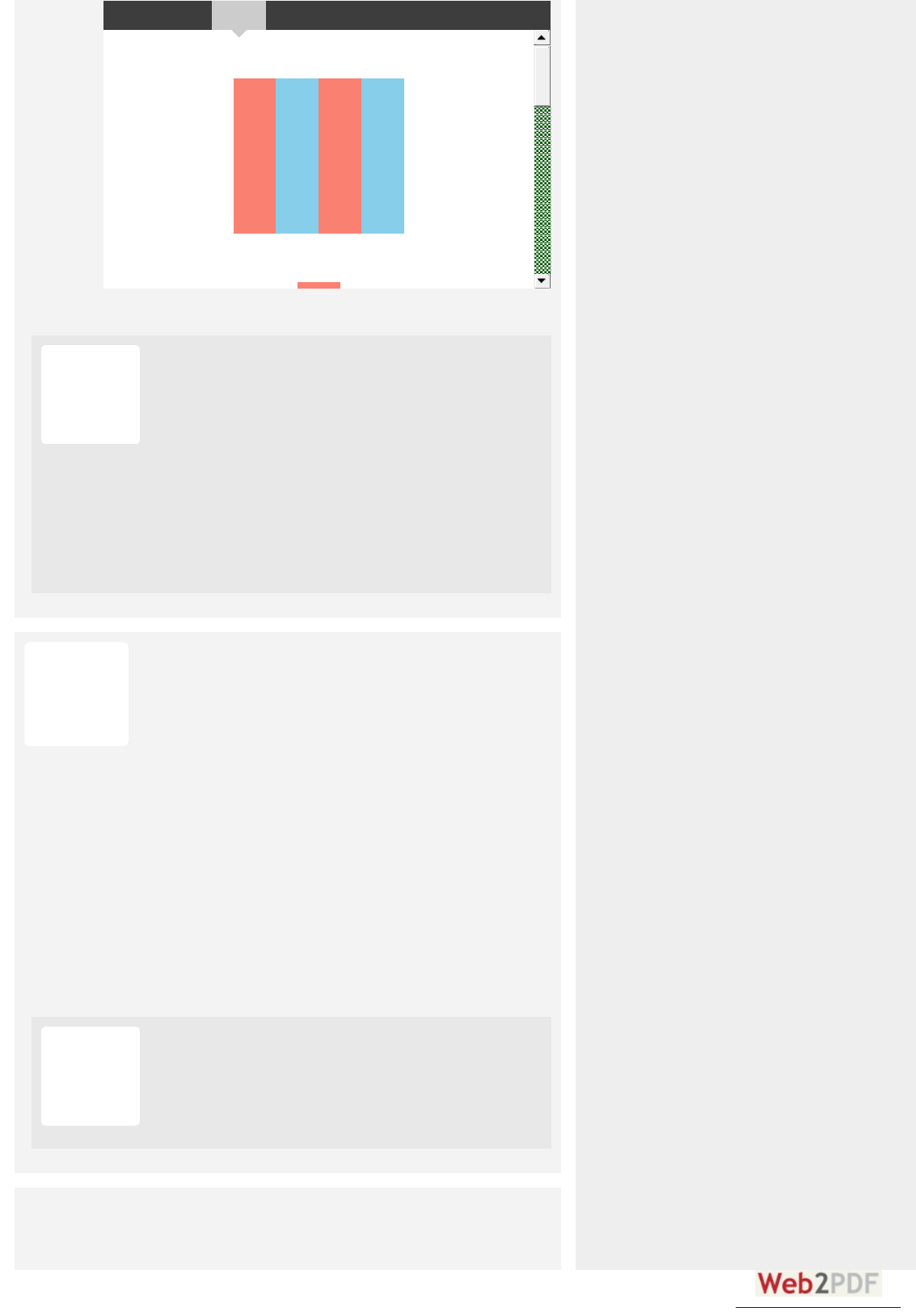
flex-direction: row; needs justify-content: center;
flex-direction: column; needs align-items: center;
HTML Sass Result Edit
AnAndy Malehy Maleh
# A U G U S T 15, 2015
I think align-items and justify-content got mixed up in the
example shared. Also, you the container article is missing a
height, which ends up in confusing the result of applying align-
items and justify-content as the same in that special case.
Here is an example that might help clear this up for you I hope:
See the Pen RPmwdz by Andy Maleh (@AndyMaleh) on
CodePen.
KevinKevin
# A P R IL 24 , 2015
Another great article!
Using this page as a guide and reference, I created a web-app based
log in template that looks like a phone-app. It’s mostly just an
exercise in column layout for flex; it helped me gain a much greater
understanding of flex properties and I thought someone else might
care to poke at it to help learn.
Here’s the result:
https://jsfiddle.net/Serk0413/y6ugdxgx/10/embedded/result/
(complete w/ “hamburger” nav)
Here’s the fiddle (sorry, no pen):
https://jsfiddle.net/Serk0413/y6ugdxgx/
It uses a full mix of css flex props including a flex column w/ nested
rows and nested
traditional
css (no floats!)
Thanks for another great article, Chris !!
Reply ↓
LeonaLeonard Be Bermanman
# O C T O B ER 18, 2015
Thanks for posting. Very interesting. I’m using the hamburger
from your fiddle. Is there a particular attribution you would like?
converted by Web2PDFConvert.com
PaPaulOBlOB
# A P R IL 29, 2015
I notice that the 3 column demo at the end is not working and should
there be more content in the sidebars than the one word shown then
the columns stretch to 100% width and break the layout.
The width of the side columns need to be set.
e.g.
@media all and (min-width: 600px) {
.aside {
flex: 1 0 0;
}
}
Reply ↓
RegiRegis
# M A Y 19, 2015
Thanks for the fix PaulOB !
Took me some time before thinking of looking up in he
comments… :/
ChCh riis Clapp Clapp
# M A Y 6, 2015
I really like the concept of flexbox, but with needing to support IE9,
looking for a way to do that with a graceful fallback. Do you have
any suggestions for a graceful fallback or is it better to just style it
“traditionally” for .no-flexbox (using Modernizr)?
Reply ↓
KyleKyle
# M A Y 6, 2015
Total noob when it comes to flexbox, but I was wondering
something. Is it possible to have, in a list comprised of multiple rows,
the first row “space-around,” and the other rows after left align? In
my list of items I’m not really a fan of if one or two items are
wrapped to the next row, they “space-around” and end up in the
middle, it kind of makes you lose track if you are going down the list
(make sense?). It’s no biggie, just was wondering if there was a way
to specify the last row or something. Great tutorial btw! Thanks in
advance.
Reply ↓
KevinKevin
# M A Y 7 , 2015
Please post your code and link to it.
Here’s a very basic flexbox example; see if it helps. Feel free to
fork, re-post and question.
converted by Web2PDFConvert.com

@Styles.Render("~/Content/css")
@RenderSection("individualCSS", required: false)
Brookfield Country Club
1
Water
$5.00
1
Budweiser
$2.00
1
HTML CSS Result Edit
MaMarc Dixc Dix
# M A Y 26, 2015
When using the flex-shorthand in Safari 7 (7.1.6) ( )
without specifying the third parameter ( ), Safari will
compute the value and wrapping via is not
going to work. In order for Safari to wrap via flexbox
must be (which is Safaris default value). So, if you use the
shorthand and don’t want an initial size for your flex-item, set the
third (or the second parameter if you leave out shrink) to ‘auto’ (f. e.
or ).
You can check this behaviour this codepen:
http://codepen.io/mdix/pen/pJNrmM
-webkit-flex
-webkit-flex-basis
0px -webkit-flex-wrap
-webkit-flex-basis
auto
-webkit-flex: 1 auto; -webkit-flex: 1 0 auto;
Reply ↓
Phil ZitoPhil Zito
# J U N E 13, 2015
Good article, I just shared on Twitter. Really like how you formatted
it, the other articles on the flex box suck compared to yours.
Reply ↓
ChCh riis Deacy Deacy
# J U N E 17 , 2015
This is super helpful. Thank you sir.
Reply ↓
knaknazaarkk
# J U N E 17 , 2015
Custom Flexbox Grid using Bootstrap mixins (SASS)
https://www.ukietech.com/blog/programming/custom-flexbox-
grid-using-bootstrap-mixins-sass/
Reply ↓
converted by Web2PDFConvert.com

JJHonioni
# J U L Y 3, 2015
I love you!! Resolveu meu problema… :)
.container{
flex-wrap: nowrap | wrap | wrap-reverse;
}
Reply ↓
MaMarcoco
# J U L Y 10, 2015
@Alex: maybe a bit late, but this is my solution and it works pretty
well.
Create a number of extra blocks, the same size as your other blocks
but with height=0, to fill up at least 1 line of your screen (or any
screen). Because height=0 you will not see them, but they still take
up space in the x-direction. Since you could fill up 1 full line you
don’t see the odd alignment on the last line even when it is there.
The alignment you see is on the last but one line. See the solution on
https://jsfiddle.net/h0Lww6mk/3/
Reply ↓
Noelinhooelinho
# J U L Y 25, 2015
It’s worth noting is that Internet Explorer struggles when you used
mixed units. I often use flexbox with margins and calc, so I might use
something like:
.menu-item {
width: calc((100% – 20px) / 3);
}
This works fine with Safari, Firefox and Chrome, but not Internet
Explorer. I guess it’s a rounding error, and it won’t affect all
resolutions, but a combination of screen width and element width
might sometimes mean you only get two columns on a line instead
of three. To get around this, I use:
@media all and (-ms-high-contrast: none), (-ms-high-contrast:
active) {
.menu-item {
width: calc(96% / 3);
}
.menu-item + .menu-item {
margin-left: 2%;
}
}
This takes account of the percentage difference in the margins. It’s
doesn’t look quite as clean as in the other browsers, but it does solve
the problem and it isn’t too convoluted.
Reply ↓
claclassic_henic_hen ryy
# J U L Y 27 , 2015
Having just referenced this post for the 100th time in the last two
months, I feel obligated to say that this thing is incredibly useful. I’m
grateful you posted it.
Reply ↓
converted by Web2PDFConvert.com

AlbanAlban
# J U L Y 30, 2015
Great really great guide, well explained with examples. Thank you
very much.
Reply ↓
KpKp
# A U G U S T 17 , 2015
In the event anybody is having issues getting it to work on firefox for
the 2nd example (tomato background)
Put the flex items into their own container with no other element in
them.
Add * flex-flow: row wrap; * to .flex-container
Hope this helps.
Reply ↓
VVINTpTproYKToYKT
# A U G U S T 27 , 2015
Wow, this article is the coolest material about flexbox.
People, now I need help with this:
http://stackoverflow.com/q/32229436/2396907
Share please!
Reply ↓
AntonioAntonio
# SEP T EM B ER 9, 2015
Wow, it could’t be better explained! thanks a lot!
Reply ↓
SeaSeasaltalt
# SEP T EM B ER 12, 2015
Thank you for the tutorial. I followed it whilst updating something I
did for a friend’s project before, but have come into difficulties. The
three elements (the twitter widget’s container, the cbox’s container
and the ccentre’s content) I was trying to update to use flex like in
the tutorial, but it’s not worked. It looks like the ccentre might be
the cause. Any ideas? Here it is on Codepen:
http://codepen.io/seasalt/pen/GppzmG
Reply ↓
TaTadeeusz Ła Łazurskiki
# SEP T EM B ER 15, 2015
Hello. I have stumbled upon this interesting StackOverflow question
re and on a container. I don’t know
the answer and I wonder if there is any solution to this.
justify-content: flex-start margin: auto
Reply ↓
i4i4snonow
# SEP T EM B ER 24 , 2015
I think for “align-content”, the container should already has been
propped up by some elements or in a fixed height. Can tell the reader
of this in advance.
Reply ↓
converted by Web2PDFConvert.com

DanDan
# SEP T EM B ER 29, 2015
Chris, can you give us an example of what are small-scale layouts and
large scale layouts? I don’t completely understand the Note about
the best use for Flexbox vs. Grid.
Reply ↓
Ed
# SEP T EM B ER 30, 2015
Excellent article. This is the best explanation of flexbox I have seen
so far.
Reply ↓
Eniep Yniep Yrekcaekcaz
# O C T O B ER 1, 2015
Thanks so much for the article! I learned a ton. One question
though, the note that you included in the background section “Note:
Flexbox layout is most appropriate to the components of an
application, and small-scale layouts, while the Grid layout is
intended for larger scale layouts. ” links to an article that is over a
year old and has a note on it saying that it is in-flux. Are there any
updates to that article coming down the pipeline? I would love to
read the two in tandem and better be able to grasp in which
situations each would be most appropriate.
Thanks again! Keep up the great work!
Reply ↓
PaPaul Bl Braadyy
# O C T O B ER 1, 2015
To make Flexbox play nicely with iPhone/iPad, add the following
metatag…
Cheers!
Reply ↓
PaPaul Bl Braadyy
# O C T O B ER 1, 2015
(Or, correctly…)
To make Flexbox play nicely with iPhone/iPad, add the following
metatag…
<m eta nam e="vie<m eta nam e="viewpopo rt" c ontent="t" c ontent=" wiidth=th= device-evice- wiidth">th">
Cheers!
Reply ↓
MiMirkoko
# O C T O B ER 6, 2015
The 2nd example works fine without flexbox, with “display: inline-
block”. Less code and it works even with old browsers. See:
http://codepen.io/anon/pen/VvbzbP?editors=110
Reply ↓
converted by Web2PDFConvert.com
DanDan
# O C T O B ER 6, 2015
Try adding a background color to the and you will
see that they are not the same. Using keeps you
dependent on the browser default use of extra space left and
right of inline elements. This rendering can be fixed by
floating the elements, but is a nicer (modern) way of
achieving that effect.
.navigation a
inline-block
li
li flexbox
Matt GMatt G
# O C T O B ER 13, 2015
http://bennettfeely.com/flexplorer/
Reply ↓
AlexAlex
# O C T O B ER 15, 2015
flex-basis seems to have got some updates, no longer
exists, means look at width / height property (previously
main-size), new keyword means automatic sizing
(previously auto)
https://developer.mozilla.org/en-US/docs/Web/CSS/flex-basis
main-size
auto
content
Reply ↓
ChCh riis Coyie Coyier
# O C T O B ER 23, 2015
Indeed! Updated.
vovavova
# NO V EM B ER 7 , 2015
order default: 0
Reply ↓
VinceVince
# J A NU A R Y 5, 2016
I figured out that is only for the cross axis. In this case,
that’s vertical space. I don’t think there’s a way to do what I’m trying
to do with flexbox.
align-content
Reply ↓
CoolcatCoolcat0077
# J A NU A R Y 5, 2016
Something that approaches what you try to do is this:
div.block {
flex-basis: 20rem;
flex-grow: 1;
}
Reply ↓
converted by Web2PDFConvert.com

div.block p {
width: 20rem;
}
CoolcatCoolcat0077
# J A NU A R Y 5, 2016
If you use , it also seems to align left
space-between
Reply ↓
Why Why I gave gave up ap as a a webeb deesigneigner
# J A NU A R Y 6, 2016
Yay, let’s make CSS even more complicated! W3 crams more and
more stuff into HTML and CSS, but forgets that people want to
settle and work with it and not study new tags/definitions each day.
Reply ↓
CoolcatCoolcat0077
# J A NU A R Y 6, 2016
The proposed changes to CSS were initiated years ago, along
with the introduction of HTML5. Most of it are in fact additions
to CSS and HTML, rather than changes. The reason was that
certain page layouts that you see nowadays, were very difficult to
implement with the old specification. Therefore these new tags
were added to simplify web structure/layout, rather than to
complicate it.
Take for instance flexbox. Before it was very hard to make a
dynamically scaling website. Using just percentages to scale the
sections just didn’t cut it. One improvement was the introduction
of the calc() function that could use percentages and static units
together, but even with that it was still hard to read code. Flexbox
was a great addition that is very easy to use once you read this
article.
And as a matter of fact, you are still free to use CSS2 and HTML4
if you wish. Nobody is stopping you, but you deny yourself some
awesome tools if you do
VinceVince
# J A NU A R Y 6, 2016
The reason that I enjoy working with the web is that it’s always
growing. There’s always something more to learn.
The same is true for any technology or even life in general, really.
Without new features and new capabilities, we atrophy and fail to
realize our full potential.
I suspect that relatively few people want to
settle
for what we
have now and just work with that.
The W3C isn’t a single person who has neglected you, or any of
us. It’s an organization, and a democracy, guided by the people
and companies that invented the web and continue to use to
everyone’s benefit.
It should probably be noted that the W3C documents
recommendations, not requirements. Everything’s optional.
converted by Web2PDFConvert.com

You many have been moved by PPK’s article: Stop pushing the
web forward
I found this counterpoint by Bruce Lawson enlightening: On
PPK’s moratorium on new browser features
Both of those articles, and more linked to at the end of Bruce
Lawson’s article, were written by people much smarter than me.
I hat to say it, but the frustration expressed by PPK and many
others strikes me as very similar to my daughter’s frustration with
going to school. After all, she already has TV, YouTube, and all
the toys she needs at home :)
Cookie JoneCookie Jones
# J A NU A R Y 12, 2016
Very nice/helpful site. Tiny error on https://css-
tricks.com/snippets/css/a-guide-to-flexbox/
Under “justify-content”, bullet item “flex-end: items are packed
toward to end line” …. does not make sense, must be typo.
Just fyi, no reply needed.
Reply ↓
anonymanonym
# J A NU A R Y 13, 2016
in the first example there is missing the non prefixed
so right now it’s only working in chrome
flex-flow: row
wrap;
Reply ↓
tomeltomeldeers
# J A NU A R Y 18, 2016
I much preferred the old layout for this article. Seeing the parent and
child examples side by side meant it was easier to compare
behaviours and to pick the right approach.
Reply ↓
LoLouiisaa
# FEB R U A R Y 2, 2016
Hello,
I want to put a link on images wich are in a contener flexbox. before
putting the link, flexbox work, but after putting the link, it doesn’t.
WHY? I suppose it’s a problem with my html? Can somebody can
give me an exemple about how to do?
thank you so much!
here is my html code
Reply ↓
converted by Web2PDFConvert.com

<div id="page1conteneur">
<a href="lorettastrong.htm"> <img src="lib/img/loretta.jpg" alt="spectacle vepre"/></a>
<a href="page2;html"> <img src="lib/img/chutenb.jpg" alt="spectacle chute"/> </a>
<a href="page2;html"> <img src="lib/img/dac.jpg" alt="spectacle dacb"/> </a>
<a href="page2;html"> <img src="lib/img/mcnb.jpg" alt="spectacle loretta"/> </a>
<a href="page2;html"> <img src="lib/img/mcanb.jpg" alt="spectacle mac"/> </a>
<a href="page2;html"> <img src="lib/img/veprenb.jpg" alt="spectacle mc"/> </a>
</div>
VinceVince
# FEB R U A R Y 2, 2016
@Louisa You didn’t include your CSS code, so it’s impossible to
tell what’s wrong. I put your HTML into a Pen and set
and it works fine.
If you want help, you need to post your CSS code as well. Better
yet, post your question and all related code to a site like Stack
Overflow that’s designed for questions and answers
Here’s my example. I replaced the images with images from
LoremPixel just to give me something to look at. …
(Editor: this demo started 404ing, it must have been deleted.)
#page1conteneur { display: flex; }
StephenStephen
# FEB R U A R Y 2, 2016
According to caniuse.com, flexbox is supported in iOS8.* via the
webkit prefix.
http://caniuse.com/#feat=flexbox
According to css-tricks, iOS support for flexbox is 7.0.1+ .
I just got a defect ticket for iOS7 where flex doesn’t work. So, is the
above table wrong?
Reply ↓
PP roovoov
# FEB R U A R Y 10, 2016
This guide is my flex bible ! I use it almost once a day !! Many thanks
to you Chris !
Anyone know if there is a printable version ? a kind of cheat sheet ?
Thanks :)
Reply ↓
converted by Web2PDFConvert.com

SavitaSavita
# FEB R U A R Y 16, 2016
Hi , I need to align all elements inside flex container to each other.
Suppose I have made two div of equal height using flex and now I
want to make the all the elements inside the div to align to each
each other. Is that possible?
Reply ↓
DaDarrenen
# FEB R U A R Y 16, 2016
This is an excellent guide and I pretty much learned how to layout a
page in about an hour using this. I cannot wait to test it out more and
see how it all works in different scenarios. Thank you Chris & Team!
Reply ↓
loeffelloeffel
# FEB R U A R Y 24 , 2016
I am trying to replace a grid layout where I used display: table and
table-cell to align content vertically with flexbox.
My problem with flexbox is, that I can not get a second child item to
align vertically. You can see this in action here:
http://codepen.io/anon/pen/BjXbrw
No matter what I try, I will either lose vertical centering of the
heading or the second child won’t align. What am I doing wrong
here?
Thanks!
Reply ↓
AlexanAlexan daar
# M A R C H 3, 2016
Who ever wrote this article forgot to put information that flex-
shrink if put to 0 prevents item to shrink and maintain its original
size.This information could have saved me 4 hours of work.
Reply ↓
TaTaswellell
# M A R C H 22, 2016
My boss says flexbox is stupid. She said “shoelace” or something is
better can u confirm??
Reply ↓
RegiRegis Philibe Philibertt
# M A R C H 24 , 2016
Your boss seems pretty talkative when attempting to balance
the effectiveness of Flexbox and made up a word/service to
better enhance that fascinating critique.
jimjim
# M A R C H 23, 2016
Sometimes I smile when reading these articles (and this one is just
fine BTW) but I remember back to the dark ages when one could
code a fairly decent web page on a single sheet of paper whereas
now, it takes endless articles to even understand the coding and then
Reply ↓
converted by Web2PDFConvert.com

one ends up with megabytes of code … and it’s still just one page but
a lot “prettier” (and requires up to 1000X the bandwidth and server
storage LOL). And we call it progress.
jimjim
# M A R C H 23, 2016
P.S. It reminds me of when C++ came out, and “Hello World!”
went from 4 or 5
lines
of code (C) to 4 or 5
pages
of code (C++).
LOL I had to swap my PC for a PC-XT to get a hard drive. ^_^
LiLi
# M A Y 4 , 2016
If it takes you “megabytes” of code to make a page, you’re either
doing something very wrong or you’ve got much more than “just
a page”, such as a very complex system of scripts or similar.
SyeSyed A Asaad Abba Abbas
# A P R IL 7 , 2016
Can We make fixed navigation while creating layout of our
navigation with flexbox
Reply ↓
ChCh riis
# A P R IL 26, 2016
Regarding the flex property:
Saying that the 2nd and 3rd parameters and
are optional is slightly misleading because it implies that
(the 1st parameter) is never optional. The truth is,
is optional as long as is present (and obviously
when the value is none). It’s only required when is
present.
<flex-shrink> <flex-
basis>
<flex-grow> <flex-
grow> <flex-basis>
<flex-shrink>
Reply ↓
ChCh riis Simeone Simeone
# A P R IL 27 , 2016
This is an awesome post. It has helped me several times.
I am having one issue that I cannot figure out. I can’t get a single line
of text to vertically center within an element. It seems so simple,
and yet I’ve wasted hours without any luck.
Would anyone be willing to comment on this Codepen? Resize the
width below 900px and you’ll see what happens.
Reply ↓
converted by Web2PDFConvert.com

Responsive Bullet List with CSS Icons
A P E N B Y simspace-dev
Thanks,
Chris
ChCh riis Simeone Simeone
# A P R IL 27 , 2016
Maybe I need to vertically center the icon to the text instead of
the other way around?
WoWouteter
# A U G U S T 26, 2016
If you add “display: flex; align-items: center; height: 100%” to
your .bullet-content class, you should be OK.
The height: 100% is needed to stretch your
element to the li-height (could’ve done that with flexbox too of
course).
Henenry van Megeny van Megen
# M A Y 2, 2016
MaMartin Katin Kariiukiki
# M A Y 10, 2016
ZjaanZjaan
# M A Y 26, 2016
I just started to learn HTML & CSS. Thank you for the information
you have put together. I wish there was more ‘Complete Guides’ like
this out there. This is just brilliant.
Reply ↓
JaimeJaime
# J U N E 6, 2016
And I keep coming back to this site. Thanks so much.
Reply ↓
converted by Web2PDFConvert.com

hannehannes!
# J U N E 7 , 2016
Just wanted to say thanks! This is my go-to site whenever using
flexbox.
Reply ↓
OleOle
# J U N E 13, 2016
One of the examples (Numbered Tomato boxes that wrap) uses
webkit-flex-flow, instead of just flex-flow, so the example becomes
specific to webkit only.
Reply ↓
Otto Otto Naascacarellaella
# J U N E 17 , 2016
Hi people,
This article has been my “cheat sheet” for flex-box standard.
I have encountered a bug on firefox that does not allow elements to
be flex containers.
It took me AGES to find that out, so I wanna share this with other
folks that might be going though the pain I have just experienced!
jsbin link that shows bug: https://jsbin.com/kobefo/1
bugzilla link: https://bugzilla.mozilla.org/show_bug.cgi?id=984869
Reply ↓
Otto Otto Naascacarellaella
# J U N E 17 , 2016
I meant to say: “a bug on firefox that does not allow elements to
be flex containers.”
Ajay KanojiyaAjay Kanojiya
# J U L Y 5, 2016
Hi Otto,
For compatibility you can try this URL http://caniuse.com/ this
will help you to get the required information.
Regards,
AK
AlAldi Unantoi Unanto
# J U L Y 15, 2016
vv3saa
# J U L Y 26, 2016
@Alex
Permalink to comment# JULY 17, 2014
Flexbox its fine, but It is still not valid for a simple perfect
“product grid” with no margins at first and last elements in row,
and left aligned. Otherwise: could you build this layout >using
flexbox? http://i.snag.gy/VHJsV.jpg thanks
Reply ↓
converted by Web2PDFConvert.com
I think you can, have a look at the example here:
https://plnkr.co/edit/yKLl8irs6xudPHfTh1u9
Rob StockiRob Stocki
# A U G U S T 2, 2016
Chris – Thank you for another fantastic and informative
explanation/demonstration. Great stuff!!
Reply ↓
MaMarkk
# A U G U S T 9, 2016
Anonymous Pens can't be embedded.
Edit on CodePen
E D I T O N
Result
How can I get the content to align to the bottom of the element
when it’s inside a nested flexbox? nor don’t
appear to work in this case.
align-items justify-content
Reply ↓
RickRick
# A U G U S T 22, 2016
I’m not clear on whether I would still need prefixing on any flex code
as of this writing in August 2016. If the answer is “depends on what
browser support you need”, I really wouldn’t know or couldn’t predict
exactly who might visit my commercial site.
Should prefix code be inserted as a safeguard, OR is it deleterious to
add vendor flex prefix code if said vendor has provided full flex
compliance in more recent browser versions?
Bottom line: is it just a good idea to add vendor prefixing for flex at
this stage of the game and is there any possible downside for doing it
now (8/2016)?
Reply ↓
MichaelMichael
# A U G U S T 30, 2016
You can get some useful insights (and ones very specific to your
site and users) by installing Google Analytics. With the statistics
it gives you, you can see the browser breakdown of the people
who come to your site. I think that would let you know how much
of a need there really is for support for given browser versions.
converted by Web2PDFConvert.com

DonDon
# A U G U S T 26, 2016
I just want to say thank you. As I’ve been getting up to speed with css
over the past year or so, I have referenced this page a thousand
times. It has been just so helpful. I had to write and give you a well-
earned “thank you”. Great work. Much appreciated. Thank you.
Don
Reply ↓
Nabhaabha
# SEP T EM B ER 2, 2016
Agreed! This was easy to understand and extremely helpful for a
new project we’re working on.
DDuc Thangc Thang
# SEP T EM B ER 6, 2016
Igogor
# SEP T EM B ER 7 , 2016
Hi.
Great stuff in here, but I am obviously missing some basics from my
end. If somebody can explain. I am about to achieve from a last
example (full page with all these elements .header, .main, .nav,
.aside, .footer ) following result. .ASIDE2 – purple part to be bellow
.MAIN – blue part. And ASIDE 1 – yellow to be still running next to
them. In short – add PURPLE under BLUE and extend YELLOW.
Thank you,
Igor
Reply ↓
BeBe
# SEP T EM B ER 30, 2016
Thanks for this great tutorial! The CodePen examples took a little
adjusting to work for me on Firefox 48. I had to remove the -webkit
prefix from -webkit-flex-flow on examples 1 and 2.
Reply ↓
AlexAlex
# O C T O B ER 9, 2016
Nice one, I have a question tho, with this new knowledge I wanted to
try my skills on some kind of framework. I uploaded everything to
“http://tesserakt.pro/demo/repsonse”. But why do the two col-1
at the top not have the same width as the col-2? They should add up
and make 50% width? right? They don’t I guess it has something to
do with the flex-shrink and flex-grow but I’m not sure.
Reply ↓
Paolo FalomoPaolo Falomo
# O C T O B ER 13, 2016
I love how IE 10 is a tweener ahahah!
Reply ↓
converted by Web2PDFConvert.com

Nicoleicole
# O C T O B ER 20, 2016
Is it possible to have a max-width on the container and then center
that container? As soon as I changed my container to flex, ‘margin:
0 auto’ no longer works to center the container.
Reply ↓
Hughniqghniq uee
# DECEM B ER 27 , 2016
Its easy just do it this way:
align-content: flex-start; // to align content to the top of the
grid
justify-content: center; // to center the container horizontally
feferdie peie peranteante
# O C T O B ER 26, 2016
can you do this with absolute elements? please help me
Reply ↓
eeraasseer
# O C T O B ER 26, 2016
Please let me know here, when you solve your problem, thank
you! :D
Chong CheChong Chern Dongn Dong
# O C T O B ER 27 , 2016
AlbeAlbert Wiet Wierschch
# NO V EM B ER 7 , 2016
Awesome! This was helpful in improving support for Flexbox in CSE
HTML Validator. Good stuff.
Reply ↓
AnAndy O.y O.
# NO V EM B ER 10, 2016
I wonder who thought that implementing space-around like that was
a good idea and why.
Because I understand equal space between elements as:
A|===|A|===|A|===|A
(“A” being a certain distance)
Instead, it is:
A|===|AA|===|AA|===|A
Which makes the laying out of content in an evenly distributed
manner impossible.
Reply ↓
converted by Web2PDFConvert.com

Seth-Seth-666
# NO V EM B ER 15, 2016
Is it ok to make a website useing only flexbox ? or not and why ?
Reply ↓
TofTof
# DECEM B ER 19, 2016
I suppose If you consider that all your visitors will have a recent
browser, you can use only flexbox. If some of them still use ie6
and you have to enable them to use your website, you have to
propose another way to display…
RobeRobert Pat Paull
# NO V EM B ER 15, 2016
Thanks for this guide. Very helpful.
Edit suggestion: In the flex-direction section, the visual examples do
not match the order shown in the css code snippet. I thought for
some reason flex-box treated “up-and-down” as a “row” , and “left-
to-right” as a “column” from this.
Since all the other sections match in order from what the visual
example is with the code snippets, I was confused for a bit.
Much love, Rob.
Reply ↓
Hanans An Andeersenen
# NO V EM B ER 16, 2016
Sorry about missing html in my comment above. Here it is:
http://codepen.io/localnepal/pen/vyXPmy
So, the image dimensions in box1 change in the display as I enter
new text in box3, even though it’s not more text than was there
previously.
Reply ↓
GlennGlenn
# DECEM B ER 3, 2016
Seems flex wrap could be a bit more flexible, if it support
indentation and hanging indentation, as for paragraphs.
Use case: a bunch of thumbnails with dates underneath, one flexbox
filled for each month, say. When scrolling quickly, it would be nice
to see the new months at the left margin, and “continuation” lines
indented. I’ve been doing this with floats and weird margins, but
don’t see how to convert it to flexbox.
Reply ↓
Manikya SinghManikya Singh
# DECEM B ER 7 , 2016
Hi, great tutorial.
Is it possible to use flex to make a perfect grid with some square
boxes of side double than other square boxes. The grid is supposed to
contain only two kind of boxes-small and big(with side double to
that of small box).
Reply ↓
converted by Web2PDFConvert.com

ChCh riistiantian
# J A NU A R Y 2, 2017
I´m from Germany and thats why my English isn´t very good.
So please try to anwer in easy words :)
I have taken the code from the Flexbox at the beginning of the
website.
But now I´ve recognized that aside 1 and aside 2 aren´t next to the
main part.
I´ve tried to put in codes which are already written in the comments,
but it doesn´t work.
So could someone please give me a code I am able to paste in my
code?
As far as now the code is:
See the Pen RKbXJX by Christian (@bplaced) on CodePen.
Reply ↓
ZanZan deer
# J A NU A R Y 5, 2017
@Christian
Hi, I am not a code pro, but even I could see, that your code is like
scrambled eggs. You shouldn’t copy/paste code into your code,
when you don’t know were and what. I think you should start a new
with a clean HTML and keep it much simpler.
Reply ↓
BBrian Bancian Bancroftoft
# J A NU A R Y 14 , 2017
Henenryy
# J A NU A R Y 24 , 2017
Can I somehow clear align-items for only one of three items?
Reply ↓
MiMiroo
# A P R IL 3, 2017
@Henry I think you can overwrite default setting (or your setting)
of align-items by align-self: … ; on the flex item.
BaBartt
# J A NU A R Y 29, 2017
MaMartintin
# J A NU A R Y 30, 2017
waaraasintint
# FEB R U A R Y 1, 2017
converted by Web2PDFConvert.com

SSubmit a Commentbmit a Comment
Your comment here. Be cool.
Get the CSS-Tricks newsletter
Posting Code
sheheriffiffdeerekek
# FEB R U A R Y 10, 2017
Don’t push print and walk away… It’ll print ALL of the comments!
Heads up!
Reply ↓
Michael LeMichael Leungng
# FEB R U A R Y 16, 2017
Why is flex-direction row by default?
We typically read digital content vertically so it doesn’t make sense
to me why row would have higher priority over column.
Even React Native has flexDirection set to ‘row’ by default so I’m not
the only one who thinks column should be the default value of flex-
direction.
This makes styling web and RN problematic because in order to have
the same developer experience, you either have to set the flex-
drection of divs to ‘column’, or set the flexDirections of Views to
‘row’.
Reply ↓
AtZackAtZack
# FEB R U A R Y 23, 2017
This is the best Flexbox tutorial I’ve read. Thank you for the great
work. The figures really make things much easier. It would be even
better if there is a real webpage example built with Flexbox, like a
more complete version than the last example, so that we can see
how Flexbox is used in real life.
Reply ↓
Name (required)
Email (required)
SUBMIT COMMENT
Write Preview
converted by Web2PDFConvert.com

You may w rite comments in MaMarkkdoo wnn. This makes code easy to post, as you can w rite
inline code like `<div>this</div>` or multiline blocks of code in triple backtick fences
(```) with double new lines before and after.
Code of Conduct
Absolutely anyone is welcome to submit a comment here. But not all comments will be
posted. Think of it like w riting a letter to the editor. All submitted comments will be read,
but not all published. Published comments will be on-topic, helpful, and further the
discussion or debate.
Want to tell us something privately?
Feel free to use our contact form. That's a great place to let us know about typos or
anything off-topic.
SUBSCRIBE
CSS-Tricks* is created, written by, and maintained by ChCh riis Coyie Coyier and a teama team of swell people. It is built on
W oW o rdPP reess, hosted by MeM edia T em pleia T em ple, and the assets are served by M axCDM axCD N. It is made possible through
spo npo n soo rsh iph ip s from products and services we like.
*May or may not contain any actual "CSS" or "Tricks".
Follow @Real_CSS_Tricks
CONTACT
ABOUT
ARCHIVES
ADVERTISE
JOBS
LICENSE
SUBSCRIBE
RSS
GUEST POSTING
converted by Web2PDFConvert.com
