The Essential Guide To HTML5 And CSS3 Web Design
Guide%20To%20HTML5%20and%20CSS3
User Manual:
Open the PDF directly: View PDF  .
.
Page Count: 510 [warning: Documents this large are best viewed by clicking the View PDF Link!]
- Cover
- An Introduction to Web Design
- Web Page Essentials
- Working With Type
- An introduction to typography
- Styling text the old-fashioned way (or, why we hate font tags)
- A new beginning: semantic markup
- Styling text using CSS
- Defining font colors
- Defining fonts
- Using images for text
- Defining font size and line height
- Defining font-style, font-weight, and font-variant
- CSS shorthand for font properties
- Controlling text element margins
- Using text-indent for print-like paragraphs
- Setting letter-spacing and word-spacing
- Controlling case with text-transform
- Creating alternatives with classes and spans
- Styling semantic markup
- Creating drop caps and pull quotes using CSS
- Working with lists
- Working With Images
- Using Links and Creating Navigation
- Introduction to web navigation
- Navigation types
- Creating and styling web page links
- Absolute links
- Relative links
- Root-relative links
- Internal page links
- Backward compatibility with fragment identifiers
- Top-of-page links
- Link states
- Defining link states with CSS
- Correctly ordering link states
- The difference between a and a:link
- Editing link styles using CSS
- Multiple link states: The cascade
- Enhanced link accessibility and usability
- Link targeting
- Links and images
- Enhancing links with JavaScript
- Creating navigation bars
- The dos and don’ts of web navigation
- Tables: How Nature (and the W3C) Intended
- Page Layouts with CSS
- Getting User Feedback
- Dealing with Browser Quirks
- Putting Everything Together
- An HTML5 reference
- Web Color Reference
- ENTITIES reference
- CSS Reference
- Index
US $34.99
Mac/PC compatible
www.apress.com
SHELVING CATEGORY
WEB DESIGN/HTML
The Essential Guide to
HTML5 and CSS3 Web Design
The Essential Guide to HTML5 and CSS3 Web Design contains everything you need to
design great websites that are standards-compliant, user-friendly, and aesthetically pleas-
ing. It has been fully revised from its critically acclaimed first edition and now includes
the new features and best practices of HTML5 and CSS3.
Authors Craig Grannell, Victor Sumner, and Dionysios Synodinos start you off with a
brief introduction to web design before diving into HTML5 and CSS3 basics, code reuse,
and other best practices. Then they focus on the most important aspects of a successful
website: typography, images, navigation, tables, layouts, forms and feedback (including
ready-made PHP scripts), browser quirks, hacks, and bugs.
Throughout, engaging case studies help you gain invaluable firsthand experience with
important design elements, including all the most popular website archetypes: a blog,
a storefront, a corporate homepage, and an online gallery. You’ll also appreciate the
detailed reference appendixes covering HTML, CSS, color references, entities, and more.
You’ll find The Essential Guide to HTML5 and CSS3 Web Design invaluable at any stage of
your career. If you’re just starting out, this helpful guide quickly teaches you the basics.
If you’re an experienced developer, it will serve as your ideal reference on techniques,
attributes, and other details you may not have used yet.
RELATED TITLES
• The basics of HTML5 and CSS3 web design
• The newest standards implemented in Internet Explorer, Firefox, Opera, Safari, and Chrome
• Effective layouts, tables, images, navigation, forms, and typography
• Cross-browser issues, including quirks, bugs, and hacks in all the major browsers
• Approaches for user-friendly and accessible websites
• Real-world examples of different styles of web front ends
GRANNELL
SUMNER
SYNODINOS
HTML5 and CSS3 Web Design
ft
.
7
f
'
£
y
L
:
BC3
ESSENTIAL
IdlJIJÿftl
iTi
:;.]!
o
1
i
§1:;
0
II
II
I I
IKIIIII
i
II
I
HU1!
iH
J1
ij
RP[!
B
msam
II
ill
u
illl
III
r»
rfS
.
.in
%*
.....
r
•.in
R
7
£X-
BBS
111
Hi
MjjTJB
www.freepdf-books.com

For your convenience Apress has placed some of the front
matter material after the index. Please use the Bookmarks
and Contents at a Glance links to access them.
www.freepdf-books.com

iv
Contents at a Glance
About the Authors .................................................................................................... xiii
About the Technical Reviewer................................................................................. xiv
About the the Cover Image Designer....................................................................... xv
Acknowledgments .................................................................................................... xvi
Introduction.............................................................................................................. xvii
Chapter 1: An Introduction to Web Design ............................................................... 1
Chapter 2: Web Page Essentials .............................................................................. 29
Chapter 3: Working With Type.................................................................................. 63
Chapter 4: Working With Images............................................................................ 119
Chapter 5: Using Links and Creating Navigation ................................................. 145
Chapter 6: Tables: How Nature (and the W3C) Intended ..................................... 227
Chapter 7: Page Layouts with CSS ........................................................................ 249
Chapter 8: Getting User Feedback......................................................................... 307
Chapter 9: Dealing with Browser Quirks ............................................................... 343
Chapter 10: Putting Everything Together.............................................................. 357
Appendix A: An HTML5 reference.......................................................................... 387
Appendix B: Web Color Reference ........................................................................ 437
Appendix C: ENTITES reference ............................................................................ 441
Appendix D: CSS Reference................................................................................... 459
Index.......................................................................................................................... 485
www.freepdf-books.com

xvii
Introduction
The Web is an ever-changing, evolving entity, and it’s easy to get left behind. As designers and writers, we
see a lot of books on web design, and although many are well written, few are truly integrated, modular
resources that anyone can find useful in their day-to-day work. Most web design books concentrate on a
single technology (or, commonly, a piece of software), leaving you to figure out how to put the pieces
together.
This book is different
The Essential Guide to HTML5 and CSS3 Web Design provides a modern, integrated approach to web
design. Each of the chapters looks at a specific aspect of creating a web page, such as formatting type,
working with images, creating navigation, and creating layout blocks. In each case, relevant technologies
are explored in context and at the appropriate times, just like in real-world projects; for example, markup is
explored along with associated CSS and JavaScript, rather than each technology being placed in separate
chapters, and visual design ideas are discussed so you can get a feel for how code affects page layouts.
Dozens of practical examples are provided, which you can use to further your understanding of each
subject. This highly modular and integrated approach means you can dip in and out of the book as you
need, crafting along the way a number of web page elements that you can use on countless sites in the
future.
Because the entire skills gamut is covered—from foundation to advanced—this book is ideal for beginners
and longtime professionals alike. If you’re making your first move into standards-based web design, the
“ground floor” is covered, rather than an assumption being made regarding your knowledge. However,
contemporary ideas, techniques, and thinking are explored throughout, ensuring that the book is just as
essential for the experienced designer wanting to work on CSS layouts or for the graphic designer who
wants to discover how to create cutting-edge websites.
This book’s advocacy of web standards, usability, and accessibility with a strong eye toward visual design
makes it of use to technologists and designers alike, enabling everyone to build better websites. For those
moments when a particular tag or property value slips your mind, this book provides a comprehensive
reference guide that includes important and relevant HTML5 elements and attributes, HTML5 entities, web
colors, and CSS 3 properties and values.
Code Examples
Remember that you can also download files associated with this book from www.apress.com—just find the
book and follow its instructions to access downloads and other associated resources.
To make it easier to work through the exercises, each one has an introductory box that lists where you can
find any required files and the completed files within the downloadable file archive. A short overview of
what you’ll learn is also included.
www.freepdf-books.com
1
Chapter 1
An Introduction to Web Design
In this chapter:
Introducing the Internet and web design
Working with web standards
Working with HTML
Understanding and creating CSS rules
Creating web page boilerplates
www.freepdf-books.com

Chapter 1
2
Organizing web page content
A brief history of the Internet
Even in the wildest dreams of science-fiction and fantasy writers, few envisioned anything that offers the
level of potential that the Internet now provides for sharing information on a worldwide basis. For both
businesses and individuals, the Internet is now the medium of choice, largely because it enables you to
present your wares to the entire world on a 24/7 basis. But the technology’s origins were more ominous
than and very different from the ever-growing, sprawling free-for-all that exists today.
In the 1960s, the American military was experimenting with methods by which the U.S. authorities might
be able to communicate in the aftermath of a nuclear attack. The suggested solution was to replace point-
to-point communication networks with one that was more akin to a net. This meant information could find
its way from place to place even if certain sections of the network were destroyed. Despite the project
eventually being shelved by the Pentagon, the concept itself lived on, eventually influencing a network that
connected several American universities.
During the following decade, this fledgling network went international and began opening itself up to the
general public. The term Internet was coined in the 1980s, which also heralded the invention of
Transmission Control Protocol/Internet Protocol (TCP/IP), the networking software that makes possible
communication between computers running on different systems. During the 1980s, Tim Berners-Lee was
also busy working on HTML, his effort to weld hypertext to a markup language in an attempt to make
communication of research between himself and his colleagues simpler.
Despite the technology’s healthy level of expansion, the general public remained largely unaware of the
Internet until well into the 1990s. By this time, HTML had evolved from a fairly loose set of rules—browsers
having to make assumptions regarding coder intent and rendering output—to a somewhat stricter set of
specifications and recommendations. This, along with a combination of inexpensive hardware, the advent
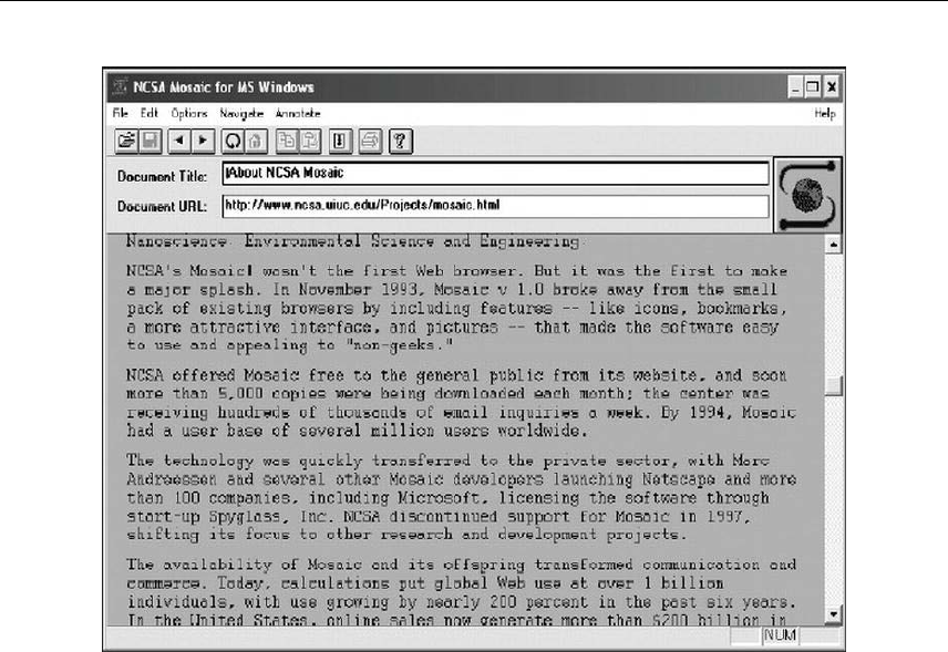
of highly usable web browsers such as Mosaic (see the following image), and improved communications
technology, saw an explosion of growth that continues to this day.
Initially, only the largest brands dipped their toes into these new waters, but soon thousands of companies
were on the Web, enabling customers all over the globe to access information and, later, to shop online.
Home users soon got in on the act, once it became clear that the basics of web design weren’t rocket
science and that, in a sense, everyone could do it—all you needed was a text editor, an FTP client, and
some web space. Designers soon got in on the act, increasingly catered for by new elements within HTML;
Cascading Style Sheets (CSS), which took a while to be adopted by browsers but eventually provided a
means of creating highly advanced layouts for the Web; and faster web connections, which made media-
rich sites accessible to the general public without forcing them to wait ages for content to download.
Therefore, unlike most media, the Web is truly a tool for everyone, and in many countries, the Internet has
become ubiquitous. For those working in a related industry, it’s hard to conceive that as recently as the
mid-1990s relatively few people were even aware of the Internet’s existence!
www.freepdf-books.com
An Introduction to Web Design
3
So, from obscure roots as a concept for military communications, the Internet has evolved into an essential
tool for millions of people, enabling them to communicate with each other, research and gather
information, telecommute, shop, play games, and become involved in countless other activities on a
worldwide basis.
Why create a website?
Before putting pen to paper (and mouse to keyboard), it’s important to think about the reason behind putting
a site online. Millions already exist, so why do you need to create one yourself? Also, if you’re working for
a company, perhaps you already have plenty of marketing material, so why do you need a website as
well?
I should mention here that I’m certainly not trying to put you off—far from it. Instead, I’m trying to reinforce
the point that planning is key in any web design project, and although some people swear that “winging it”
is the best way to go, most such projects end up gathering virtual dust online. Therefore, before doing
anything else, think through why you should build a website and what you’re trying to achieve.
Companies and individuals alike have practical and commercial reasons for setting up a website. A
website enables you to communicate with like-minded individuals or potential clients on a worldwide basis.
If you’re a creative talent of some kind, you can use a website to showcase your portfolio, offering online
photographs, music tracks for download, or poetry. If you fancy yourself as a journalist, a blog enables you
to get your opinion out there. If you own or work for a business, creating a website is often the most
www.freepdf-books.com

Chapter 1
4
efficient means of marketing your company. And even if you just have a hobby, a website can be a great
way of finding others who share your passion—while you may be the only person in town who likes a
particular movie or type of memorabilia, chances are there are thousands of people worldwide who think
the same, and a website can bring you all together. This is perhaps why the paper fanzine has all but died,
only to be reborn online, where development costs are negligible and worldwide distribution is a cinch.
In practical terms, a website exists online all day, every day (barring the odd hiccup with ISPs), which
certainly isn’t the case with printed media, which is there one minute and in the recycle trash the next.
Distribution is less expensive than sending out printed material—a thousand-page website can be hosted
for $10 per month or less, but sending a thousand-page document to one person (let alone a thousand or
several thousand) may cost more than that. Likewise, development (particularly corrections and updates)
is often significantly cheaper, too. For example, if you want to rework a print brochure, you have to
redesign it and then reprint it. Reworking a section of a website often means swapping out a few files,
which is efficient and affordable. So, for large companies and individuals alike, the ability to have relevant
information online in a form that can often be updated in mere minutes, thereby keeping all interested
parties up-to-date, is hard to resist!
Audience requirements
This book centers on the design and technology aspects of web design, but close attention must always
be paid to your potential audience. It’s no good forcing design ideas that result in inappropriate visuals,
unusable navigation to all but the most technically minded of people, and huge download times on your
site’s unsuspecting visitors.
Prior to creating a site, you must ascertain what your audience wants and expects in terms of content,
design, and how the site will work (by way of talking to the relevant people, and also, if your budget allows,
by using surveys and focus groups). You don’t have to take all of your audience’s ideas into account (after
all, many will be contradictory), but be mindful of common themes and ensure they’re not ignored.
Technical considerations must be researched. If you’re targeting designers, you can be fairly sure that a
large proportion of the audience will be using monitors set to a high resolution and millions of colors, and
you can design accordingly. If your site is targeting mobile users, be mindful that it will be displayed on a
wide range of devices. From tablets and smartphones with high-resolution Retina or PenTile technology
displays to those with low-resolution LCD displays, mobile devices come in all shapes, sizes, and
capabilities.
Determining the web browsers your audience members use is another important consideration. Although
use of web standards (used throughout this book) is more likely to result in a highly compatible site,
browser quirks still cause unforeseen problems; therefore, always check to see what browsers are popular
with a site’s visitors, and ensure you test in as many as you can. Sometimes you won’t have access to
such statistics, or you may just be after a “sanity check” regarding what’s generally popular. A
couple of useful places to research global web browser statistics are
www.w3schools.com/browsers/browsers_stats.asp and www.upsdell.com/BrowserNews/. Note, though,
that any statistics you see online are effectively guesswork and are not a definitive representation of the
www.freepdf-books.com

An Introduction to Web Design
5
Web as a whole; still, they do provide a useful, sizeable sample that’s often indicative of current browser
trends.
Although you might be used to checking browser usage and then, based on the results, designing for
specific browsers, we’ll be adhering closely to web standards throughout this book. When doing this, an
“author once, work anywhere” approach is feasible, as long as you’re aware of various browser quirks
(many of which are explored in Chapter 9). Of course, you should still always ensure you test sites in as
many browsers as possible, just to make sure everything works as intended.
Web design overview
Web design has evolved rapidly over the years. Initially, browsers were basic, and early versions of HTML
were fairly limited in what they enabled designers to do. Therefore, many older sites on the Web are plain
in appearance. Additionally, the Web was originally largely a technical repository, which is the reason for
the boring layouts of many sites in the mid-1990s; after all, statistics, documentation, and papers rarely
need to be jazzed up, and the audience didn’t demand such things anyway.
As with any medium finding its feet, things soon changed, especially once the general public flocked to the
Web. It was no longer enough for websites to be text-based information repositories. Users craved—
demanded, even—color! Images! Excitement! Animation! Interaction! Even video and audio managed to
get a foothold as compression techniques improved and connection speeds increased.
The danger of eye candy became all too apparent as the turn of the century approached: every site, it
seemed, had a Flash intro, and the phrase “skip intro” became so common that it eventually spawned a
parody website.
These days, site design has tended toward being more restrained, as designers have become more
comfortable with using specific types of technologies for relevant and appropriate purposes. Therefore,
you’ll find beautifully designed HTML- and CSS-based sites sitting alongside highly animated Flash efforts.
Also, with the increasing popularity of JavaScript and the introduction of CSS Transitions and HTML5
Canvas, Flash appears to be on the way out because Adobe has recently discontinued support for Flash
on mobile devices.
Of late, special emphasis is being placed on usability and accessibility, and in the majority of cases,
designers have cottoned to the fact that content must take precedence. However, just because web
standards, usability, and accessibility are key, that doesn’t mean design should be thrown out the window.
As we’ll see in later chapters, web standards do not have to come at the expense of good design—far from
it. In fact, a strong understanding of web standards helps improve websites, making it easier for you to
create cutting-edge layouts that work across platforms and are easy to update. It also provides you with a
method of catering for obsolete devices.
www.freepdf-books.com
Chapter 1
6
Note: If you’re relatively new to web design, you may be wondering about the best
platform and software for creating websites. Ultimately, it matters little which platform
you choose, as long as you have access to the most popular browsers for testing
purposes (a list that I’d now include Apple’s Safari in, alongside Chrome, Internet
Explorer, Firefox, and Opera). Regarding software, there’s an overview in Appendix E,
but this isn’t an exhaustive guide, so do your own research and find software to your
liking.
Why WYSIWYG tools aren’t used in this book
With lots of software available and this book being design-oriented, you might wonder why I’m not using
WYSIWYG web design tools. This isn’t because I shun such tools—it’s more that in order to best learn
how to do something, you need to start from scratch, with the foundations. Many web design applications
make it tempting to “hide” the underlying code from you, and most users end up relying on the graphical
interface. This is fine until something goes wrong and you don’t know how to fix it.
Removing software from the equation also means we concentrate on the underlying technology that drives
web pages, without the distraction of working out which button does what. It also ensures that the book will
be relevant to you, regardless of what software you use or your current skill level. Therefore, I suggest you
install a quality text editor to work through the exercises or set your web design application to use its code
view. Once you’re familiar with the concepts outlined in this book, you can apply them to your work,
whatever your chosen application for web design. This level of flexibility is important, because you never
know when you might have to switch applications—something that’s relatively painless if you know how to
design for the Web and understand technologies like CSS and HTML.
Introducing HTML5
The foundation of the majority of web pages is HyperText Markup Language, commonly known by its
initials, HTML. A curious facet of the language is that it’s easy to pick up the basics—anyone who’s
computer literate should be able to piece together a basic page after learning some tags—but it has
enough flexibility and scope to keep designers interested and experimenting, especially when HTML is
combined with Cascading Style Sheets (CSS), which we’ll discuss later in this chapter.
The HTML5 syntax is designed to be simpler, more flexible, developer-friendly, and backward-compatible
than HTML4 and XHTML. HTML5 introduces new features such as animation, offline capabilities, audio,
advanced graphics, typography, transitions, and more, which yields a new class of web standards and
replaces the need for proprietary technologies, like Flash and native mobile platforms.
www.freepdf-books.com
An Introduction to Web Design
7
Introducing the concept of HTML tags and elements
HTML documents are text files that contain tags, which are used to mark up HTML elements. These
documents are usually saved with the .html file extension, although other extensions like .htm can be
used.
The aforementioned tags are what web browsers use to display pages, and assuming the browser is well
behaved (most modern ones are), the display should conform to standards as laid out by the World Wide
Web Consortium (W3C), the organization that develops guidelines and specifications for many web
technologies.
Note: The W3C website is found at www.w3.org. The site offers numerous useful tools,
including validation services against which you can check your web pages.
HTML tags are surrounded by angle brackets—for instance, <p> is a paragraph start tag. It’s good practice
to close tags once the element content or intended display effect concludes, and this is done with an end
tag. End tags are identical to the opening start tags but with an added forward slash: /. A complete HTML
element looks like this:
<p>Here is a paragraph.</p>
This element consists of the following:
Start tag: <p>
Content: Here is a paragraph.
End tag: </p>
Note: HTML doesn’t have a hard-and-fast rule regarding the case of tags. If you look at
the source code of HTML pages on the Web, you may see lowercase tags, uppercase
tags, or, in the case of pages put together over a period of time, a mixture of the two.
That said, it’s still good practice with any markup language to be consistent, regardless
of whether the rules are more flexible.
Nesting tags
There are many occasions when tags must be placed inside each other; this process is called nesting.
One reason for nesting is to apply basic styles to text-based elements. Earlier, you saw the code for a
paragraph element. We can now make the text bold by surrounding the element content with a strong
element:
<p><strong>Here is a paragraph.</strong></p>
www.freepdf-books.com
Chapter 1
8
You might be used to using the bold element to make text bold, but it is a physical
element that only amends the look of text rather than also conveying semantic meaning.
Logical elements, such as strong, convey meaning and add styling to text and are
therefore preferred. These will be covered in Chapter 3.
Note that the strong tags are nested within the paragraph tags (<p></p>), not the other way around. That’s
because the paragraph is the parent element to which formatting is being applied. The paragraph could be
made bold and italic by adding another element, emphasis (<em></em>), as follows:
<p><strong><em>Here is a paragraph.</em></strong></p>
In this case, the strong and em tags could be in the opposite order, because they’re at the same level in
the hierarchy. However, you must always close nested tags in the reverse order to that in which they’re
opened, as shown in the previous code block; otherwise, some browsers may not display your work as
intended. For instance, the following should be avoided:
<p><strong><em>Here is a paragraph.</strong></em></p>
As previously mentioned, it’s good practice to close tags in HTML—even though it’s not a requirement for
all elements, being sloppy in this area can lead to errors. Take a look at the following:
<p><strong><em>Here is a paragraph.</strong></p>
Here, the emphasis element isn’t closed, meaning subsequent text-based content on the page is likely to
be displayed in italics—so take care to close all your tags.
Web standards and HTML
HTML5 is an updated version of the HTML specification that has been around since 1997 and many of its
features are already supported in today’s browsers. The changes in HTML5 include a focus on semantic
markup like the addition of the <header>, <footer>, <section>, and <article> elements and also the
addition of the <canvas> element for displaying advanced interactive graphics and the <video> element for
displaying video. Websites like html5please.com, caniuse.com, and of coarse the WC3 working draft
(http://dev.w3.org/html5/html4-differences/) are great resources for finding out what has changed, what is
new, or what is supported in each browser.
HTML5 markup can be defined in whatever way you want it to be. Uppercase, lowercase, quoted,
unquoted, self-closing or not—it’s your choice. The ultimate goal is semantic markup, ensuring the
elements you choose and the style of your markup define the meaning of your content as closely as
possible.
Evolution is another aspect that we have to deal with. Just as the survival of the fittest removes some
species from nature, so too are tags (and attributes) unceremoniously dumped from the W3C
specifications. Such tags and attributes are referred to as deprecated, meaning they are marked for
removal from the standard and may not be supported in future browsers. In the case of HTML5 obsolete
tags and attributes are still supported because of HTML5’s backward-compatibility, it is still recommended
www.freepdf-books.com

An Introduction to Web Design
9
that you do not use such tags and attributes because new implementations of browsers may choose not to
support them.
Semantic markup
In the previous few subsections, you may have noticed specific elements being used for specific things.
This is referred to as semantic markup and is a very important aspect of modern web design. Plenty of
HTML elements exist, and each one has a clearly defined purpose (although some have more than one
use). Because of the flexibility of markup languages, it’s often possible to “wrongly” use elements, bashing
your page into shape by using elements for design tasks they’re not strictly suited for and certainly weren’t
originally designed for.
During the course of this book, we’ll talk about semantics a fair amount. Ultimately, good semantic design
enables you to simplify your markup and also provides the greatest scope for being able to style it with
CSS (see the following section). By thinking a little before you code and defining your content with the
correct markup, you’ll end up with cleaner code and make it much easier for yourself in the long run when
it comes to adding presentation to your content.
Introducing CSS
CSS is the W3C standard for defining the visual presentation for web pages. HTML was designed as a
structural markup language, but the demands of users and designers encouraged browser manufacturers
to support and develop presentation-oriented tags. These tags “polluted” HTML, pushing the language
toward one of decorative style rather than logical structure. Its increasing complexity made life hard for
web designers, and source code began to balloon for even basic presentation-oriented tasks. Along with
creating needlessly large HTML files, things like font tags created web pages that weren’t consistent
across browsers and platforms, and styles had to be applied to individual elements—a time-consuming
process.
The concept behind CSS was simple yet revolutionary: remove the presentation and separate design from
content. Let HTML deal with structure, and use CSS for the application of visual presentation.
The idea caught on albeit slowly. The initial problem was browser support. At first, most browsers
supported only a small amount of the CSS standard—and badly at that. But Internet Explorer 5 for Mac
made great strides with regard to CSS support, and it was soon joined by other browsers fighting for the
crown of standards king. These days, every up-to-date browser supports the majority of commonly used
CSS properties and values, and more besides.
Another problem has been educating designers and encouraging them to switch from old to new methods.
Benefits constantly need to be outlined and proven, and the new methods taught. Most designers these
days style text with CSS, but many still don’t use CSS for entire web page layouts, despite the inherent
advantages in doing so. This, of course, is one of the reasons for this book: to show you, the designer,
how CSS can be beneficial to you—saving you (and your clients) time and money—and to provide
examples for various areas of web page design and development that you can use in your sites.
www.freepdf-books.com

Chapter 1
10
In this section, we’ll look at separating content from design, CSS rules, CSS selectors and how to use
them, and how to add styles to a web page.
Separating content from design
Do you ever do any of the following?
Use tables for website layout
Hack Photoshop documents to bits and stitch them back together in a web page to create
navigation elements and more
Get frustrated when any combination of the previous leads to unwieldy web pages that are a pain
to edit
If so, the idea of separating content from design should appeal to you. On one hand, you have your HTML
documents, which house content marked up in a logical and semantic manner. On the other hand, you
have your CSS documents, giving you sitewide control of the presentation of your web page elements
from a single source. Instead of messing around with stretching transparent GIFs and combining and
splitting table cells, you can edit CSS rules to amend the look of your site, which is great for not only those
times when things just need subtle tweaking but also when you decide everything needs a visual overhaul.
After all, if presentation is taken care of externally, you can often just replace the CSS to provide your site
with a totally new design.
Designers (and clients paying for their time) aren’t the only ones to benefit from CSS. Visitors will, too, in
terms of faster download times but also with regard to accessibility. For instance, people with poor vision
often use screen readers to surf the Web. If a site’s layout is composed of complex nested tables, it might
visually make sense; however, the underlying structure may not be logical. View the source of a document,
and look at the order of the content. A screen reader reads from the top to the bottom of the code and
doesn’t care what the page looks like in a visual web browser. Therefore, if the code compromises the
logical order of the content (as complex tables often do), the site is compromised for all those using screen
readers.
Accessibility is now very important in the field of web design. Legislation is regularly passed to strongly
encourage designers to make sites accessible for web users with disabilities. It’s likely that this trend will
continue, encompassing just about everything except personal web pages. (However, even personal
websites shouldn’t be inaccessible.)
The rules of CSS
Style sheets consist of a number of rules that define how various web page elements should be displayed.
Although sometimes bewildering to newcomers, CSS rules are simple to break down. Each rule consists of
a selector and a declaration. The selector begins a CSS rule and specifies which part of the HTML
document the rule will be applied to. The declaration consists of a number of property/value pairs that set
specific properties and determine how the relevant element will look. In the following example, p is the
selector, and everything thereafter is the declaration:
www.freepdf-books.com
An Introduction to Web Design
11
p {
color: blue;
}
As you probably know, p is the HTML tag for a paragraph. Therefore, if we attach this rule to a web page
(see the section “Adding styles to a web page” later in this chapter for how to do so), the declaration will be
applied to any HTML marked up as a paragraph, thereby setting the color of said paragraphs to blue.
Note: CSS property names are not case sensitive, but it’s good to be consistent in web
design—it’s highly recommended to always use lowercase.
When you write CSS rules, you place the declaration within curly brackets: {}. Properties and values are
separated by a colon (:), and property/value pairs are terminated by a semicolon (;). Technically, you don’t
have to include the final semicolon in a CSS rule, but most designers consider it good practice to do so.
This makes sense—you may add property/value pairs to a rule at a later date, and if the semicolon is
already there, you don’t have to remember to add it.
If we want to amend our paragraph declaration and define paragraphs as bold, we can do so like this:
p {
color: blue;
font-weight:bold;
}
Note: You don’t have to lay out CSS rules as done in this section; rather, you can add
rules as one long string. However, the formatting shown here is more readable in print.
Note that in the files available for download, the formatting is changed slightly again: the
property/value pairs and closing curly bracket are both tabbed inward, enabling rapid
vertical scanning of a CSS document’s selectors.
Types of CSS selectors
In the previous example, the most basic style of selector was used: an element selector. This defines the
visual appearance of the relevant HTML tag. In the sections that follow, we’ll examine some other regularly
used (and well-supported) CSS selectors: class, ID, grouped, and contextual.
Class selectors
In some cases, you may want to modify an element or a group of elements. For instance, you may want
your general website text to be blue, as in the examples so far, but some portions of it to be red. The
simplest way of doing this is by using a class selector.
In CSS, a class selector’s name is prefixed by a period (.), like this:
.warningText {
color: red;
www.freepdf-books.com

Chapter 1
12
}
This style is applied to HTML elements in any web page the style sheet is attached to using the class
attribute, as follows:
<h2 class="warningText">This heading is red.</h2>
<p class="warningText">This text is red.</p>
<p>This is a paragraph, <span class="warningText">and this text is
red</span>.</p>
If you want a make a class specific to a certain element, place the relevant HTML tag before the period in
the CSS rule:
p.warningText {
color: red;
}
If you used this CSS rule with the HTML elements shown previously, the paragraph’s text would remain
red, but not the heading or span, because of the warningText class now being exclusively tied to the
paragraph selector only.
Usefully, it’s possible to style an element by using multiple class values. This is done by listing multiple
values in the class attribute, separated by spaces:
<p class="warningText hugeText">
The previous example’s content would be styled as per the rules .warningText and .hugeText.
ID selectors
ID selectors can be used only once on each web page. In HTML, you apply a unique identifier to an HTML
element with the id attribute:
<p id="footer">© 200X The Company. All rights reserved.</p>
To style this element in CSS, precede the ID name with a hash mark (#):
p#footer {
padding: 20px;
}
In this case, the footer div would have 20 pixels of padding on all sides.
Essentially, then, classes can be used multiple times on a web page, but IDs cannot. Typically, IDs are
used to define one-off page elements, such as structural divisions, whereas classes are used to define the
style for multiple items.
Grouped selectors
Should you want to set a property value for a number of different selectors, you can use grouped
selectors, which take the form of a comma-separated list:
www.freepdf-books.com
An Introduction to Web Design
13
h1, h2, h3, h4, h5, h6 {
color: green;
}
In the preceding example, all the website’s headings have been set to be green. Note that you’re not
restricted to a single rule for each element—you can use grouped selectors for common definitions and
separate ones for specific property values, as follows:
h1, h2, h3, h4, h5, h6 {
color: green;
}
h1 {
font-size: 1.5em;
}
h2 {
font-size: 1.2em;
}
Note: If you define a property value twice, browsers render your web element depending
on each rule’s position in the cascade. See the section “The cascade” later in the
chapter for more information.
Contextual selectors
This selector type is handy when working with advanced CSS. As the name suggests, contextual selectors
define property values for HTML elements depending on context. Take, for instance, the following
example:
<p>I am a paragraph.</p>
<p>So am I.</p>
<div id="navigation">
<p>I am a paragraph within the navigation div.</p>
<p>Another paragraph within the navigation div.</p>
</div>
You can style the page’s paragraphs as a whole and then define some specific values for those within the
navigation div by using a standard element selector for the former and a contextual selector for the latter:
p {
color: black;
}
#navigation p {
color: blue;
font-weight: bold;
}
www.freepdf-books.com

Chapter 1
14
As shown, syntax for contextual selectors (#navigation p ) is simple—you just separate the individual
selectors with some whitespace. The two rules shown previously have the following result:
The p rule colors the web page’s paragraphs black.
The #navigation p rule overrides the p rule for paragraphs within the navigation div, coloring
them blue and making them bold.
By working with contextual selectors, it’s possible to get very specific with regard to styling things on your
website; we’ll be using these selectors regularly.
Pseudo-selectors
This selector is defined with a colon preceding them. The most recognizable pseudo-selector would be
hover used with links. For example, if you wanted to change a link’s text color when your mouse hovers
over it, you would define the following in your style sheet as follows:
a:hover {
color: black;
}
Pseudo-selectors allow you to style your content dynamically and are incredibly powerful when combined
with contextual and id selectors.
There are multiple different kinds of pseudo-selectors including structural, target, UI element states,
negation, and links.
Attribute selectors
Attribute selectors allow you to target any element based on their attributes. Consider the following code:
<a href="http://www.apress.com">I am a link.</a>
Say you wanted to add the Apress logo before every link to Apress.com. You could update your markup
with a class attribute to allow you to target each Apress link. This would be tedious, and you would have to
remember to do this to every Apress link you add to your site. An easier option would be to use attribute
selectors.
Using an attribute selector, you could target all Apress links and add a logo like the following:
a[href$='apress.com'] {
content: url(logos/apress.png);
}
Note: There are other types of selectors used for specific tasks. These will be covered
as relevant throughout the book.
www.freepdf-books.com

An Introduction to Web Design
15
Adding styles to a web page
The most common (and useful) method of applying CSS rules to a web page is by using external style
sheets. CSS rules are defined in a text document, which is saved with the file suffix .css. This document is
attached to an HTML document in one of two ways, both of which require the addition of HTML elements
to the head section.
The first method of attaching a CSS file is to use a link tag:
<link rel="stylesheet" href="mystylesheet.css">
Alternatively, import the style sheet into the style element:
<style type="text/css" media="screen">
@import url(mystylesheet.css);
</style>
The second of these methods was initially used to “hide” CSS rules from noncompliant browsers, thereby
at least giving users of such devices access to the website’s content, if not its design. In some browsers
(notably Internet Explorer), however, this can cause a “flash” of unstyled content before the page is
loaded. This flash doesn’t occur when a link element is also present. In the full site designs in Chapter 10,
you’ll note that both methods are used—@import for importing the main style sheet for screen and link for
linking to a print style sheet.
The style tag can also be used to embed CSS directly into the head section of a specific HTML document,
like this:
<head>
<style type="text/css">
p {
color: black;
}
#navigation p {
color: blue;
font-weight: bold;
}
</style>
</head>
You’ll find that many visual web design tools create CSS in this manner, but adding rules to a style
element is worth doing only if you have a one-page website or if you want to affect tags on a specific page,
overriding those in an attached style sheet (see the next section for more information). There’s certainly no
point in adding styles like this to every page, because updating them would then require every page to be
updated, rather than just an external style sheet.
The third method of applying CSS is to do so as an inline style, directly in an element’s HTML tag:
<p style="color: blue;">This paragraph will be displayed in blue.</p>
As you can see, this method involves using the style attribute, and it’s only of use in very specific, one-off
situations. There’s no point in using inline styles for all styling on your website—to do so would give few
www.freepdf-books.com

Chapter 1
16
benefits over the likes of archaic font tags. Inline styles also happen to be deprecated in XHTML 1.1, so
they’re eventually destined for the chop.
The cascade
It’s possible to define the rule for a given element multiple times: you can do so in the same style sheet,
and several style sheets can be attached to an HTML document. On top of that, you may be using
embedded style sheets and inline styles. The cascade is a way of dealing with conflicts, and its simple rule
is this:
The value closest to the element in question is the one that is applied.
In the following example, the second font-size setting for paragraphs takes precedence because it’s
closest to paragraphs in the HTML:
p {
font-size: 1.1em;
}
p {
font-size: 1.2em;
}
Subsequently, paragraphs on pages the preceding rule is attached to are rendered at 1.2em. If a similar
rule were placed as an embedded style sheet below the imported/linked style sheet, that rule would take
precedence, and if one were applied as an inline style (directly in the relevant element), then that would
take precedence over all others.
Note that it’s possible to import or link multiple style sheets in a web page’s head section.
The cascade principle still applies; in other words, any rules in a second attached style
sheet override those in the one preceding it.
CSS uses the concept of inheritance. A document’s HTML elements form a strict hierarchy, beginning with
html, and then branching into head and body, each of which has numerous descendant elements (such as
title and meta for head, and p and img for body). When a style is applied to an element, its descendants—
those elements nested within it—often take on CSS property values, unless a more specific style has been
applied. However, not all CSS style properties are inherited. See the CSS reference section of this book
for more details.
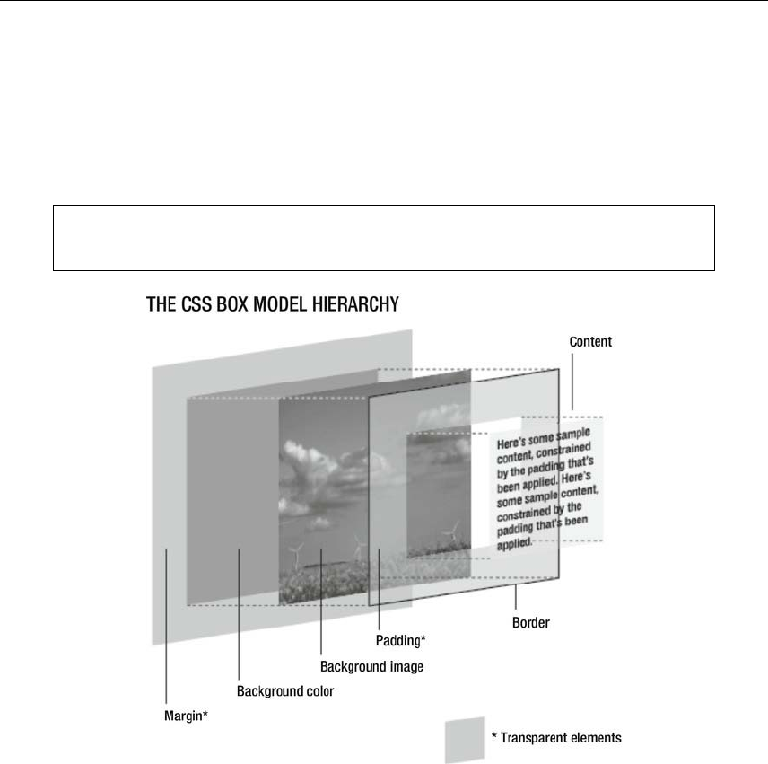
The CSS box model explained
The box model is something every designer working with CSS needs a full understanding of in order to
know how elements interact with each other and also how various properties affect an element.
Essentially, each element in CSS is surrounded by a box whose dimensions are automated depending on
the content. By using width and height properties in CSS, these dimensions can be defined in a specific
manner.
www.freepdf-books.com
An Introduction to Web Design
17
You can set padding to surround the content and add a border and margins to the box. A background
image and background color can also be defined. Any background image or color is visible behind the
content and padding but not the margin. The effective space an element takes up is the sum of the box
dimensions (which effectively define the available dimensions for the box’s contents), padding, border, and
margins. Therefore, a 500-pixel-wide box with 20 pixels of padding at each side and a 5-pixel border will
actually take up 550 pixels of horizontal space (5 + 20 + 500 + 20 + 5).
Note that in some cases, margins between two elements “collapse,” leading to only the
larger margin value being used.
© Jon Hicks (www.hicksdesign.co.uk)
Creating boilerplates
Every web page looks different, just as every book or magazine is different from every other one.
However, under the hood there are often many similarities between sites, and if you author several, you’ll
soon note that you’re doing the same things again and again. You can find many ready-made boilerplates
online. One of the most popular ones is the HTML5 Boilerplate (html5boilerplate.com). This is a great
starting point for any project you want to start. It includes many of the techniques discussed throughout
www.freepdf-books.com

Chapter 1
18
this book such as cross-browser compatibility, mobile browser optimizations, progressive enhancement
and graceful degradation, and more.
While the HTML5 Boilerplate is a great place to start, it is important to learn how to create your own
boilerplates from scratch—starting points for all of your projects.
In the download files, available from the Downloads section of the friends of Apress website
(www.apress.com), there are two boilerplates folders: basic-boilerplates and advanced-boilerplates. In
basic-boiler plates , the basic.html web page is a blank HTML5 document, and in advanced-
boilerplates, extended.html adds some handy structural elements that provide a basic page structure
that’s common in many web pages, along with some additions to the head section. (The former is used as
a quick starting point for many of the tutorials in this book. The latter is perhaps a better starting point for a
full website project.) The CSS-with-ToC.css document in advanced-boilerplates uses CSS comments to
create sections in the document to house related CSS rules. This is handy when you consider that a CSS
document may eventually have dozens of rules in it—this makes it easier for you to be able to find them
quickly.
CSS comments look like this: /* this is a comment */ . They can be single-line or multiple-line. In the
advanced CSS boilerplate, a multiline comment is used for an introduction and table of contents:
/*
STYLE SHEET FOR [WEB SITE]
Created by [AUTHOR NAME]
[URL OF AUTHOR]
ToC
1. defaults
2. structure
3. links and navigation
4. fonts
5. images
Notes
*/
Each section of the document is then headed by a lengthy comment that makes it obvious when a section
has begun:
/* --------- 1. defaults --------- */
* {
margin: 0;
padding: 0;
}
body {
}
www.freepdf-books.com
An Introduction to Web Design
19
As you can see, property/value pairs and the closing curly bracket are indented by two tabs in the
document (represented by two spaces on this page), which makes it easier to scan vertically through
numerous selectors. (Note that for the bulk of this book, the rules aren’t formatted in this way, because
indenting only the property/value pairs differentiates them more clearly in print; however, the download
files all have CSS rules indented as per the recommendations within this section.) Comments can also be
used for subheadings, which I tend to indent by one tab:
/* float-clearing rules */
.separator {
clear: both;
}
Although the bulk of the style sheet’s rules are empty, just having a boilerplate to work from saves plenty
of time in the long run, ensuring you don’t have to key in the same defaults time and time again. Use the
one from the download files as the basis for your own, but if you regularly use other elements on a page
(such as pull quotes), be sure to add those, too; after all, it’s quicker to amend a few existing rules to
restyle them than it is to key them in from scratch.
Tip: Along the same lines as boilerplates, you can save time by creating a snippets
folder on your hard drive. Use it to store snippets of code—HTML elements, CSS rules,
and so on—that you can reuse on various websites. Many applications have this
functionality built in, so make use of it if your preferred application does.
To show you the power of CSS, we’re going to work through a brief exercise using the boilerplates
mentioned earlier. Don’t worry about understanding everything just yet, because all of the various
properties and values shown will be explained later in the book.
Creating, styling, and restyling a web page
Required files basic.html and CSS-default.css from the basic-boilerplates folder
What you’ll learnHow to create, style, and restyle a web page
Completed files creating-and-styling-a-web-page.html, creating-and-styling-a-web-page.css,
creating-and-styling-a-web-page-2.html, and creating-and-styling-a-web-page-2.css,
in the chapter 1 folder
1. Copy basic.html and CSS-default.css to your hard drive and rename them creating-and-styling-a-
web-page.html and creating-and-styling-a-web-page.css.
2. Attach the style sheet. Type Creating and styling a web page in the title element to give the page
a title, and then amend the @import value so that the style sheet is imported:
<link rel="stylesheet" href="creating-and-styling-a-web-page.css">
3. Add some content. Within the wrapper div, add some basic page content, as shown in the
following code block. Note how the heading, paragraph, and quote are marked up using a
www.freepdf-books.com
Chapter 1
20
heading element (<h1></h1>), paragraph element (<p></p>), and block quote element
(<blockquote></blockquote>), rather than using styled paragraphs for all of the text-based
content. This is semantic markup, as discussed briefly earlier in the chapter.
<div id="wrapper">
<h1>A heading</h1>
<p>A paragraph of text, which is very exciting—something
that will live on through the generations.</p>
<blockquote>
<p>“A quote about something, to make
people go "hmmmm" in a thoughtful manner.”</p>
<cite>An inspirational book title.</cite>
</blockquote>
<p>Another paragraph, with equally exciting text; in fact, it’s
so exciting, we're not sure it’s legal to print.</p>
</div>
Note: The items with ampersands and semicolons, such as — and ”, are
HTML entities—see Appendix C for more details.
4. Edit some CSS. Save and close the web page and then open the CSS document. Amend the
body rule within the defaults section of the CSS. This ensures the text on the page is colored
black and that the page’s background color is white. The padding value ensures the page content
doesn’t hug the browser window edges.
body {
font: 62.5%/1.5 Verdana, Arial, Helvetica, sans-serif;
color: #000000;
background: #ffffff;
padding: 20px;
}
5. Style the wrapper. Add the following property values to the #wrapper rule to define a fixed width
for it and then center it (via the margin property’s auto value).
#wrapper {
font-size: 1.2em;
line-height: 1.5em;
margin: 0 auto;
width: 500px;
}
6. Style the text. Add the h1 rule as shown, thereby styling the level-one heading:
h1 {
font: 1.5em/1.8em Arial, sans-serif;
text-transform: uppercase;
}
www.freepdf-books.com
An Introduction to Web Design
21
7. Add the blockquote and blockquote p rules as shown. The former adds margins to the sides of
the block quote, thereby making the text stand out more, while the latter (a contextual selector)
styles paragraphs within block quotes only, making them italic and larger than standard
paragraphs. Once you’ve done this, save your files and preview the web page in a web browser;
it should look like the following image. (Don’t close the browser at this point.)
blockquote {
margin: 0 100px;
}
blockquote p {
font-style: italic;
font-size: 1.2em;
}
8. Duplicate creating-and-styling-a-web-page.css and rename it creating-and-styling-a-web-page-
2.css. Open creating-and-styling-a-web-page.html, and amend the link value, linking to the newly
created CSS document:
<link rel="stylesheet" href="creating-and-styling-a-web-page-2.css">
9. Open creating-and-styling-a-web-page-2.css, and switch the values of color and background in
the first body rule.
body {
font: 62.5%/1.5 Verdana, Arial, Helvetica, sans-serif;
color: #ffffff;
background: #000000;
padding: 20px;
}
10. Replace the text-transform property/value pair from the h1 rule with color: #bbbbbb;. For the
blockquote rule, make the following amendments, which add a border to the left and right edges,
and some horizontal padding around the block quote’s contents.
blockquote {
margin: 0 100px;
border-left: 3px solid #888888;
border-right: 3px solid #888888;
padding: 0 20px;
}
www.freepdf-books.com

Chapter 1
22
11. Finally, amend the blockquote p rule as shown:
blockquote p {
font-weight: bold;
font-size: 1.0em;
}
Refresh the web page in the browser, and you should see it immediately change, looking like that shown in
the following image. Effectively, nothing in the web page was changed (you could have overwritten the
rules in creating-and-styling-a-web-page.css rather than creating a duplicate style sheet); instead, the
web page’s design was updated purely by using CSS. (Note that in the download files, there are two sets
of documents for this exercise—one with the design as per step 7, and the other as per step 11, the latter
of which has the -2 suffix added to the HTML and CSS document file names.)
Although this was a very basic example, the same principle works with all CSS-based design. Create a
layout in CSS and chances are that when you come to redesign it, you may not have to change much—or
any—of the underlying code. A great example of this idea taken to extremes is css Media Queries
(www.mediaqueri.es), whose single web page is radically restyled via dozens of submitted CSS
documents.
www.freepdf-books.com
An Introduction to Web Design
23
Working with website content
Before we explore how to create the various aspects of a web page, we’re going to briefly discuss working
with website content and what you need to consider prior to creating your site. Technology and design
aren’t the only factors that affect the success of a website. The human element must also be considered.
Most of the time, people use the Web to get information of some sort, whether for research purposes or
entertainment. Typically, people want to be able to access this information quickly; therefore, a site must
be structured in a logical manner. It’s imperative that a visitor doesn’t spend a great deal of time looking for
information that should be easy to find. Remember, there are millions of sites out there, and if yours isn’t
up to scratch, it’s easy for someone to go elsewhere.
Note: There are exceptions to the general rule of a website having a structured and
logical design—notably sites that are experimental in nature or the equivalent of online
art, thereby requiring exploration. In these cases, it may actually be detrimental to
present a straightforward and totally logical site, but these cases are strictly a minority.
www.freepdf-books.com

Chapter 1
24
In this section, we’ll look specifically at information architecture and site maps, page layout, design
limitations, and usability.
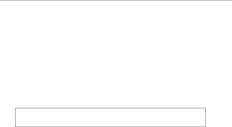
Information architecture and site maps
Before you begin designing a website, you need to collate and logically organize the information it’s going
to contain. A site map usually forms the basis of a site’s navigation, and you should aim to have the most
important links immediately visible. What these links actually are depends on the nature of your website,
but it’s safe to say that prominent links to contact details are a common requirement across all sites. A
corporate website may also need prominent links to products, services, and a press area. The resulting
site map for a corporate site might resemble the following illustration.
Here, the boxed links serve as the primary navigation and are effectively sections of the website.
Underneath each boxed link is a list of subcategories or pages housed within that section. With this
structure, it’s easy for a newcomer to the site to work out where information is located. When working on
site maps, try talking to people who might be interested in the site to get their reaction to your organization
of the content. When working for a client, ensure that they sign off on the site map and that you get
feedback on the site map from people at all levels in the company and, if possible, from the company’s
customers. In all cases, seek the opinions of both the technically minded and the relative computer
novices, because each may have different ideas about how information should be structured. After all,
most web designers are technically minded (or at least well versed in using a computer), and they often
forget that most people don’t use the Web as regularly as they do. In other words, what seems obvious to
you might not be to the general public.
For larger sites, or those with many categories, site maps can be complex. You may have to create
several versions before your site map is acceptable. Always avoid burying content too deep. If you end up
with a structure in which a visitor has to click several times to access information, it may be worth
reworking your site’s structure.
Basic web page structure and layout
Once you’ve sorted out the site map, avoid firing up your graphics package. It’s a good idea to sketch out
page layout ideas on paper before working on your PC or Mac. Not only is this quicker than using graphics
software, but it also allows you to compare many ideas side by side. At this stage, you shouldn’t be too
www.freepdf-books.com

An Introduction to Web Design
25
precious about the design—work quickly and try to get down as many ideas as possible. From there, you
can then refine your ideas, combine the most successful elements of each, and then begin working on the
computer.
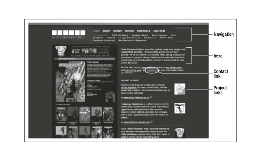
Although the Web has no hard-and-fast conventions, themes run throughout successful websites, many of
which are evident in the following image of a version of my Snub Communications homepage.
www.freepdf-books.com
Chapter 1
26
A website’s navigation should be immediately accessible—you should never have to scroll to get to it. It’s
also a good idea to have a masthead area that displays the organization’s corporate brand (or, if it’s a
personal site, whatever logo/identity you want to be remembered by, even if it’s only a URL).
The homepage should include an introduction of some sort that briefly explains what the site is about, and
it should have some pull-ins to other areas of the site. These pull-ins could be in the form of news items
that link to recent product launches, completed projects, and so on.
Most websites require a method for people to contact the site owner, and at least one clear link to a
contact page is essential.
Avoid constantly changing the design throughout the site. In print, this sometimes works well and provides
variation within a book or magazine. Online, people expect certain things to be in certain places.
Constantly changing the position of your navigation, the links themselves, and even the general design
and color scheme often creates the impression of an unprofessional site and makes it harder to use.
Ultimately, however your site ends up, and whatever your design, you need to ensure your creation is as
usable as possible. A good checklist—even if the points may seem entirely obvious—is as follows:
Is the site easy to navigate?
Is it easy for users to locate content on each page?
Is it easy for users to find what they need on the site?
Are download times kept to a minimum?
Is the site suitable and relevant for its target audience?
Does the site use familiar conventions?
If you can answer yes to all these things, then you should be on the right track!
www.freepdf-books.com
An Introduction to Web Design
27
Note: Regarding conventions, it’s important not to go overboard. For example, some
web gurus are adamant that default link colors should always be used. I think that’s
sweet and quaint but somewhat archaic. As long as links are easy to differentiate from
other text and styled consistently throughout the site, that’s what matters.
Limitations of web design
Depending on your viewpoint, the inherent limitations of the Web are either a challenge or a frustration.
Print designers often feel the latter and consider themselves hampered by the Web when compared to the
relative freedom of print design. While print designers define the material their designs are displayed on,
the Web comes in all shapes and sizes, from the tiny screen of a mobile phone to large, 1080p high-
resolution displays. A web designer must consider each display resolution their site might be viewed on
and also remember that browsers have different levels of support and implementations of HTML
standards.
Columns take on a different role online compared to in print, because they’re primarily used to display
several areas of content with the same level of prominence. You don’t use columns online to display
continuous copy, unless you use just one column. If you use several columns, the visitor has to constantly
scroll up and down to read everything.
There are other limitations when it comes to rendering text online. There are few web standard fonts
(detailed in Chapter 3); serifs, which work well on paper, don’t work so well online, and reading text on-
screen is already harder than reading print, so complex page backgrounds should be avoided. HTML5
provides the ability to embed fonts into your page, but this again has its own set of limitations; browser
providers implement this each using a different format and you must make considerations for older
browsers and mobile browsers that do not support this powerful feature.
And then there are issues like not knowing what an end user’s setup is and therefore having to consider
monitor resolution and color settings, what browser is being used, and even the various potential setups of
web browsers, not to mention mobile web browsers that offer their own set of limitations. Do you go for a
liquid design, which stretches with the browser window; a fixed design, which is flanked by blank space at
larger monitor resolutions; or a responsive design, which adapts to the available screen dimensions?
Don’t worry, this isn’t a pop quiz. These are questions that will be answered in this book, but I mention
them now to get you thinking and realizing that planning is key with regard to web design. Because this is
largely a book about concepts, ideas, and techniques, we won’t return to talk about planning very much,
which is why I’m drumming it in at this early stage.
www.freepdf-books.com

Chapter 1
28
Also, don’t get disheartened by the previous limitations spiel. The Web is a truly magnificent medium, and
for every downside there’s something amazing to counter it. So what if the resolution is low? Nowhere else
can you so effortlessly combine photography, video, sound, and text. Sure, it’s all well and good to read a
magazine, but the Web enables interaction, and navigation can be nonlinear, enabling you to link words
within specific pieces to other articles on your website or elsewhere on the Internet. Don’t get me wrong:
the Web is a great thing. If it weren’t, I wouldn’t be interested in it, wouldn’t be designing for it, and wouldn’t
be writing this book.
www.freepdf-books.com
29
Chapter 2
Web Page Essentials
www.freepdf-books.com

Chapter 2
30
In this chapter:
Creating HTML5 documents
Understanding document type definitions
Using meta tags
Attaching external documents
Working with the body section
Using CSS for web page backgrounds
Commenting your work
Starting with the essentials
You might wonder what’s meant by this chapter’s title: web page essentials. This chapter will run through
everything you need to do with a web page prior to working on the layout and content, including creating
the initial documents, attaching external documents to HTML files, and dealing with the head section of the
web page. Little of this is a thrill with regard to visual design, which is why many designers ignore the
topics we’ll cover or stick their fingers in their ears, hum loudly, and wish it would all go away (and then
probably get rather odd looks from nearby colleagues). However, as the chapter’s title states, everything
we’ll be talking about is essential for any quality web page, even if you don’t see exciting things happening
visually.
This chapter also explores web page backgrounds, which, although they should be used sparingly and
with caution, often come in handy. It’s worth bearing in mind that some aspects discussed here will crop up
later in the book. For example, CSS techniques used to attach backgrounds to a web page can be used to
attach a background to any web page element (be that a div, table, heading, or paragraph). But before we
get into any CSS shenanigans, we’ll put our CSS cheerleading team on hold and look at how to properly
construct an (X)HTML document.
HTML vs. XHTML
The HTML5 specification defines an abstract language for describing documents and applications and
defines some APIs for interacting with what is known as the DOM HTML (or “the DOM” for short). There
are various concrete syntaxes for this language, and two are HTML and XHTML
HTML (or HTML5) is the format suggested for most authors. It is compatible with most legacy web
browsers. If a document is transmitted with an HTML MIME type, such as text/html, then it will be
processed as an HTML document by web browsers.
XHTML (or XHTML5) is an application of XML. When a document is transmitted with an XML MIME type,
such as application/xhtml+xml, then it is treated as an XML document by web browsers, to be parsed by
an XML processor. Authors are reminded that the processing for XML and HTML differs; in particular, even
www.freepdf-books.com

Web Page Essentials
31
minor syntax errors will prevent a document labeled as XML from being rendered fully, whereas they
would be ignored in the HTML syntax.
Essentially, an XHTML5 page is a simple HTML5 document that has the following:
HTML doctype/namespace: The <!DOCTYPE html> definition is optional, but it would be useful
for preventing browser quirks mode.
XHTML well-formed syntax:
XML MIME type: application/xhtml+xml. This MIME declaration is not visible in the source
code, but it would appear in the HTTP Content-Type header that could be configured on the
server.
Default XHTML namespace: <html xmlns="http://www.w3.org/1999/xhtml">.
It has been argued that the strict coding requirements of XHTML identify the structure of a document more
clearly than HTML. In HTML, a browser assumes the location of a missing end tag to be the start tag of the
next block element. In the example, <br /> is rendered after the paragraph in the XHTML document and as
part of the paragraph in the HTML document.
It is recommended to use HTML and not XHTML, especially for beginners since the syntax can be more
forgiving. Note that some server-side technologies might still favor XHTML output.
Document defaults
Both in HTML5 and in XHTML5, a blank document looks like the following code:
<!DOCTYPE html >
<html lang="en">
<head>
<title></title>
<meta http-equiv="Content-type" content="text/html; charset=utf-8" />
</head>
<body>
</body>
</html>
There are other character sets in use, too, for the likes of Hebrew, Nordic, and Eastern
European languages, and if you’re using them, the charset value would be changed accordingly.
Although www.iana.org/assignments/character-sets provides a thorough character set listing and
www.czyborra.com/charsets/iso8859.html contains useful character set diagrams, it’s tricky to wade
through it all, so listed here are some common values and their associated languages:
ISO-8859-1 (Latin1): Western European and American, including Afrikaans, Albanian, Basque,
Catalan, Danish, Dutch, English, Faeroese, Finnish, French, Galician, German, Icelandic, Irish,
Italian, Norwegian, Portuguese, Spanish, and Swedish.
ISO-8859-2 (Latin2): Central and Eastern European, including Croatian, Czech, Hungarian, Polish,
Romanian, Serbian, Slovak, and Slovene.
www.freepdf-books.com

Chapter 2
32
ISO-8859-3 (Latin3): Southern European, including Esperanto, Galician, Maltese, and Turkish.
(See also ISO-8859-9.)
ISO-8859-4 (Latin4): Northern European, including Estonian, Greenlandic, Lappish, Latvian, and
Lithuanian. (See also ISO-8859-6.)
ISO-8859-5: Cyrillic, including Bulgarian, Byelorussian, Macedonian, Russian, Serbian, and
Ukrainian.
ISO-8859-6: Arabic.
ISO-8859-7: Modern Greek.
ISO-8859-8: Hebrew.
ISO-8859-9 (Latin5): European. Replaces Icelandic-specific characters with Turkish ones.
ISO-8859-10 (Latin6): Nordic, including Icelandic, Inuit, and Lappish.
For an overview of the ISO-8859 standard, see http://en.wikipedia.org/wiki/ISO_8859.
DOCTYPE declarations explained
The <!DOCTYPE> prolog identifies the type and version of HTML or XHTML in which the document is
coded. In technical terms, <!DOCTYPE> specifies the type of document and the DTD that validates the
document. The W3C provides a free online service at http://validator.w3.org/ that you can use to validate
your documents.
All HTML and XHTML code should be validated. This verifies the code contains no coding errors. If there
are errors, CSS selectors may fail to select elements as expected or may even select elements
unexpectedly.
There are benefits to using XHTML. Validated XHTML documents are well-formed and have unambiguous
structure. You can also use Extensible Stylesheet Language (XSLT) and XML Query Language (XQuery)
processors to extract content and rearrange documents.
In the HTML4 era, there were two additional varieties of DOCTYPEs: strict and transitional. Strict
removes all presentational elements and attributes, and transitional allows them. We do not recommend
presentation elements and attributes, but the strict DOCTYPE may be too strict for some needs. For
example, it prohibits the start attribute in ol and the value attribute in li, which are the only available means
to control the numbering of an ordered list. The XHTML strict DOCTYPE also prohibits iframe.
The head section
The head section of a web page contains metadata content that sets up the presentation or behavior of the
rest of the content, that sets up the relationship of the document with other documents, or that conveys
other “out-of-band” information.
www.freepdf-books.com
Web Page Essentials
33
Page titles
Many designers are so keen to get pages online that they forget to provide a title for each page. Titles are
added using the title element, as follows:
<title>Pro HTML5 and CSS3 Design</title>
The title is usually shown at the top of the browser window (and sometimes within the active tab, if
you’re using a browser that has a tabbed interface); the results of the previous code block are shown
in the following image.
By default, web design software (for example, Adobe Dreamweaver) usually does one of the following
things with regard to the title element:
Adds no content
Sets the title element’s content as “Untitled Document”
Sets the title element’s content as the application’s name
The first of these results in no title being displayed for the web page and is invalid XHTML, while the
second means your page joins the legions online that have no title. The third option is just as bad: using
your web page to advertise the application you used to create it. Therefore, add a title to every web page
you create; in fact, make it one of the first things you do so you don’t forget.
With regard to the content of your web page titles, bear in mind that this is often the most prominent thing
returned in search engine results pages. Keep titles clear, concise, and utterly to the point. Use too many
words, and the title will be clipped; use too few (or try to get arty with characters), and you may end up with
something that stumps search engines and potential visitors, too.
Generally speaking, for the homepage at least, it’s good to include the name of the site or organization,
followed by an indication of the site’s reason for existence (and author or location, if relevant). For
www.freepdf-books.com

Chapter 2
34
instance, as shown in the following image, the InfoQ title includes the organization’s name, followed by its
mission statement.
Some designers use the same title throughout their site. This is a bad idea—web page titles are used as
visual indicators by visitors trawling bookmarks or their browser’s history. This is why some tend to use
titles as a breadcrumb navigation of sorts, showing where a page sits within the website’s hierarchy, like
this:
<title>Company name - Services - Service name</title>
meta tags and search engines
The Web was once awash with tips for tweaking meta tags. This was because although these tags are
primarily there to provide information about the document, they were initially what most search engines
used to categorize web pages and return results. It didn’t take long for the shortfalls in the system to
become apparent and for designers to abuse them, so many meta tags are today considered redundant.
Generally, search engines now trawl the content of the web page (including the contents of the title
element), trying to match a user’s search with the most important content on the page. This is why strong
use of semantic markup is essential—by correctly utilizing headings, paragraphs, and other structural
elements for text and by avoiding overuse of images for text content, modern search engines get a better
handle on your content and can therefore, in theory, return more accurate results to users.
Tagging and other forms of metadata are also becoming an increasingly popular search engine aid, for
both internal search engines—those within the site itself—and for the search engines that return results
from the whole of the Internet. Both are a means of adding information to a website to aid users. Visual
tags may show a number of keywords associated with a blog posting, for example, enabling a user to see
whether something interests them by the size of the word; search engines will latch onto the keywords and
the content of the piece itself. Metadata enables you to “embed” information in the page, aiding all manner
of devices and potentially creating networks and links to like information. A form of metadata—
microformats—is explored in Chapter 8.
Despite this, it’s still worth being mindful of meta tags when creating web pages, for those search engines
that still make use of them—just be aware that they’re not nearly as important as they once were (with the
possible exception of description).
Keywords and descriptions
Unless you’re totally new to web design, it’s likely you’ll be aware of the keywords and description meta
tags:
www.freepdf-books.com

Web Page Essentials
35
<meta name="keywords" content="keywords, separated, by, commas" />
<meta name="description" content="A short description about the Web
site" />
The first of these tags, keywords, should contain a set of comma-separated tokens, each of which is a
keyword relevant to the page that users might type into a search engine to find your site. Because of
abuse (websites including thousands of words in the meta tag content in order to try to create a catchall in
search engine results pages), such lists are rarely used these days. Instead, search engines tend to look
at the entire content of a page to determine its relevance to someone’s search. If you choose to include
this element in your web page, 30 or fewer words and short phrases are sufficient.
The contents of the description’s content attribute are returned by some search engines in a results page
along with the web page’s title. As with the title, keep things succinct; otherwise, the description will be
cropped. Most search engines display a maximum of 200 characters, so 25 well-chosen words are just
about all you can afford.
revisit-after, robots, and author
Other meta tags also use name and content attributes. These tags assist search engines. In the following
example, the first tag provides an indication of how often they should return (useful for regularly updated
sites), and the second tag states whether the page should be indexed.
<meta name="Revisit-After" content="30 Days" />
<meta name="robots" content="all,index" />
The content attribute of the robots meta tag can instead include the values noindex and none, in order to
block indexing, and follow or nofollow, depending on whether you want search engine robots to follow
links from the current page.
The author meta tag is of less use to search engines and typically includes the page author’s name and
home URL. Designers sometimes use it as a means to declare the author’s name and details, but it has
little use beyond that.
Attaching external documents
A web page—as in the (X)HTML document—is primarily designed to contain content that is structured in
markup. Presentation should be dealt with via external CSS documents, and behavior should be dealt with
via external scripting documents. Although it is possible to work with the likes of JavaScript and CSS within
an HTML document, this goes against the modular nature of good web design. It’s far easier to create,
edit, and maintain a site if you work with separate files for each technology. (The exception is if your “site”
is only a single page, therefore making it sensible to include everything in a single document.)
As already mentioned, HTML documents are text files that are saved with the suffix .html (or .htm). CSS
and JavaScript files are also text documents, and their file suffixes are .css and .js, respectively. When
you start a project, having already set the relevant DOCTYPE and added meta tags, it’s a good idea to create
blank CSS and JavaScript files and to attach them to your web page so you can then work on any element
as you wish.
www.freepdf-books.com

Chapter 2
36
Attaching external CSS files: the link method
In the previous chapter, you were shown how to attach CSS to a web page (see the section “Adding styles
to a web page” in Chapter 1); we’ll briefly recap the process here. There are two methods of attaching an
external CSS file: the link method and the @import method.
The link tag specifies a relationship between the linked document and the document it’s being linked to.
In the context of attaching a CSS file, it looks something like this:
<link rel="stylesheet" href="stylesheet.css" />
Possible attributes include the following:
rel: Defines the relation from the parent document to the target
href: The location of the target file
type: The MIME type of the target document
media: The target medium of the target document
The title attribute is also occasionally used with the link element, either to provide additional
information or to be used as a “hook” for the likes of a style sheet switcher (see
www.alistapart.com/stories/alternate/ for more information). Any style sheet lacking a title attribute
(and a rel value of style sheet) is persistent—always affecting a document. These are by far the most
common types of style sheets. A preferred style sheet also takes a title along with the rel attribute, and
only one such style sheet can be used at a time—typically the first, with subsequent ones ignored. On
pages that offer alternate style sheets (typically via a style switcher), the persistent styles are always used,
and the first preferred is the additional default; the preferred styles, however, can be swapped out by
selecting an alternative style sheet. (Note that in Firefox, you should avoid adding a title attribute to any
style sheet for print, because otherwise the content may not print.)
In the previous example, the media attribute is set to all, specifying that this style sheet is intended for all
devices. But it’s feasible to attach multiple style sheets to a web page and set the media attribute of each
one to a different type. For instance, in the following example, two CSS files are attached, one for screen
and the other for printed output:
<link rel="stylesheet" href="stylesheet.css" type="text/css"
media="screen" />
<link rel="stylesheet" href="printcss.css" type="text/css"
media="print" />
There are other media types, including aural, braille, projection, and tv, but few are supported well.
However, in Chapter 10, we’ll look at style sheets for print, which is one of the alternatives to screen that is
supported reasonably well in mainstream browsers.
Attaching CSS files: the @import method
A problem with the link method in the past was that obsolete browsers saw the style sheet but didn’t
understand it. This could result in garbled layouts—and often in unusable websites for those unfortunate
www.freepdf-books.com

Web Page Essentials
37
enough to have to deal with such arcane web browsers. The solution was to hide the CSS from such
browsers by using a command that they don’t understand and so would ignore. This was often referred to
as the @import method.
As shown in the following example, the style element is used to do this:
<style type="text/css" media="all">
@import url(stylesheet.css);
</style>
It is recommended to avoid using the @import method, especially since it might lead to
performance issues in high-traffic sites (http://www.stevesouders.com/blog/2009/04/09/dont-use-import/
www.stevesouders.com/blog/2009/04/09/dont-use-import/) and with mobile users.
The CSS specifications permit the use of the style sheet location as a quoted string
instead of enclosing it in url(). The method shown here is more commonly supported,
though.
Attaching CSS files: media queries
CSS has long supported media-dependent style sheets tailored for different media types. For example, a
document may use sans-serif fonts when displayed on a screen and serif fonts when printed. screen and
print are two media types that have been defined.
In the old days of HTML4, this could be written as follows:
<link rel="stylesheet" type="text/css" media="screen" href="sans-serif.css">
<link rel="stylesheet" type="text/css" media="print" href="serif.css">
With CSS3, media queries extend the functionality of media types by allowing more precise labeling of
style sheets. A media query consists of a media type and zero or more expressions that check for the
conditions of particular media features. By using media queries, presentations can be tailored to a specific
range of output devices without changing the content itself. A media query is a logical expression that is
either true or false. A media query is true if the media type of the media query matches the media type of
the device where the user agent is running, and all expressions in the media query are true.
Here are a few examples:
<--! Devices of a certain media type (‘screen’) with certain feature (it must be a color
screen)-->
<link rel="stylesheet" media="screen and (color)" href="example.css" />
<!-- The same media query written in an @import-rule in CSS -->
@import url(color.css) screen and (color);
A shorthand syntax is offered for media queries that apply to all media types; the keyword all can be left
out (along with the trailing and). In other words, the following are identical:
@media (orientation: portrait) { … }
@media all and (orientation: portrait) { … }
www.freepdf-books.com
Chapter 2
38
This way, designers and developers can create more complex queries that map their specific needs, like
this one:
@media all and (max-width: 698px) and (min-width: 520px), (min-width: 1150px) {
body {
background: #ccc;
}
}
There is a long list of media features that includes the following:
width and device-width
height and device-height
orientation
aspect-ratio and device-aspect-ratio
color and color-index
monochrome (if not a monochrome device, equals 0)
resolution
scan (describes the scanning process of output devices set to tv)
grid (specifies whether the output device is grid or bitmap)
Attaching favicons and JavaScript
Favicons are those little icons you often see in your browser’s address bar. They are attached using the
link method discussed earlier, although you need to include only three attributes: rel, href, and type. The
type value can change depending on the file type of your favicon. For example, image/png is fine if you’ve
used a PNG.
<link rel="shortcut icon" href="favicon.ico" type="image/x-icon"/>
These days, favicons are almost ubiquitous, and they provide users with an additional visual clue to a
site’s identity. Although not particularly useful on their own, they can be handy when trawling through a
large bookmarks list—you can look for the icon rather than the text. However, don’t rely on them instead of
a good web page title—they should merely be an additional tool in your arsenal. By default web browsers
will search for a favicon.ico file in the root of a site, even if there is no link tag present.
Attaching a JavaScript file to a web page is similarly painless. You do so via the script element, as
follows:
<script src="javascriptfile.js"></script>
JavaScript can be dynamically loaded in a page using a variety of techniques that are
used in libraries called script loaders. These libraries bring performance improvements,
such as nonblocking loading, but are beyond the scope of this book.
www.freepdf-books.com
Web Page Essentials
39
Checking paths
When working with external files, ensure paths between files are complete and don’t become broken as
files are moved around; otherwise, your web page may lose track of the CSS and JavaScript, affecting its
display and functionality. If you’re using document-relative links (that is, links relative to the current
document), remember to amend paths accordingly.
Here are a few examples of paths:
Path Type What it means
myfile.css Relative path. Look for the file in the same
folder as the file that imports it.
/script/myscript.js Relative path. Look for the file in the folder
scripts, which is in the same
root folder as the file that
imports it.
http://www.mysite.com/style.css Absolute path. Look for the file in this location.
/css/style.css Absolute path. Look for the file in the folder
css, which is right under the
root of the website.
The body section
The body element is used to define the body of a web page, and it contains the document’s content.
Technically the body tag is optional in HTML5 because HTML5 doesn’t require the html, head, and body
tags (browsers add them if missing). It is generally good practice to use the body element and avoid
having content placed outside of it.
Although the body element has a number of possible attributes that can be included in its start tag, mostly
for defining ids and classes, they should be avoided. This is because such things should be dealt with
using CSS, which enables you to define values on a sitewide basis, rather than having to do so for each
page.
Content margins and padding in CSS
Page margins and padding are easy to define using CSS. By setting these values once in an external file,
you can update settings sitewide by uploading an amended style sheet rather than every single page on
your site that has an amended body tag.
Furthermore, in terms of page weight, CSS is more efficient. If using old methods, to cater for all browsers,
you set the following body attributes:
<body marginwidth="0" marginheight="0" topmargin="0" leftmargin="0"
bottommargin="0" rightmargin="0">
www.freepdf-books.com
Chapter 2
40
The equivalent in CSS is the following:
body {
margin: 0;
padding: 0;
}
If a CSS setting is 0, there’s no need to state a unit such as px or em.
The reason both margin and padding are set to 0 is because some browsers define a default padding
value. Therefore, even if you set all body margins to 0, there would still be a gap around your page content.
Setting both the margin and padding to 0 in the body rule ensures that all browsers display your content
with no gaps around it.
Zeroing margins and padding on all elements
Although the previous block of code is clean and efficient, it isn’t something we use in our websites. The
reason for this is that browsers place default (and sometimes varying) margins around various elements
other than the page’s body, too. Therefore, our CSS boilerplates always include the following:
* {
margin: 0;
padding: 0;
}
The selector * is the universal selector, and the declaration therefore applies to all elements on the web
page. In other words, add this rule to your CSS, and all default margins and padding for all elements are
removed, enabling you to start from scratch in all browsers and define explicit values for those elements
that need them.
Another way to makes browsers render all elements more consistently and in line with modern
standards is to use a CSS reset kit. Some of the more popular ones are Eric
Meyer's (http://meyerweb.com/eric/tools/css/reset/) and Yahoo’s YUI 2 CSS Reset
(http://developer.yahoo.com/yui/reset/). The goal of a reset style sheet is to reduce browser
inconsistencies in things such as default line heights, margins and font sizes of headings, and so on.
An alternative to reset.css is normalize.css (http://necolas.github.com/normalize.css/), which normalizes
styles for a wide range of HTML elements and corrects bugs and common browser inconsistencies. Users
can just you the full normalize.css file or customize it to suit their needs.
Working with CSS shorthand for boxes
Both of the previous two code examples use CSS shorthand, and this is something that is useful to get to
grips with in order to create the most efficient and easy-to-update CSS. The previous example showed
how to set all margins and padding values to 0, and this was done in shorthand instead of writing out every
single value. How CSS shorthand works for boxes is like this:
A single value (margin: 10px;): This is applied to all edges.
www.freepdf-books.com

Web Page Essentials
41
Two values (margin: 10px 20px;): The first setting (10px) is applied to the top and bottom edges.
The second setting (20px) is applied to both the left and right edges (20px each, not in total).
Three values (margin: 10px 20px 30px; ): The first setting (10px) is applied to the top edge. The
second setting (20px) is applied to both the left and right edges. The third setting (30px) is applied
to the bottom edge.
Four settings (margin: 10px 20px 30px 40px; ): Settings are applied clockwise from the top (in
other words, top: 10px; right: 20px; bottom: 30px; left: 40px).
Shorthand’s benefits become obvious when comparing CSS shorthand with the equivalent properties and
values written out in full. For instance, the following shorthand:
#box {
margin: 0;
padding: 0 100px;
}
looks like this when written out in full:
#box {
margin-top: 0;
margin-right: 0;
margin-bottom: 0;
margin-left: 0;
padding-top: 0;
padding-right: 100px;
padding-bottom: 0;
padding-left: 100px;
}
Whether you use shorthand is up to you. Some designers swear by it and others because of it. Some web
design applications have options to “force” shorthand or avoid it entirely. We reckon it’s a good thing: CSS
documents are usually more logical and shorter because of shorthand. But if you don’t agree, feel free to
keep on defining margins and padding as relevant for every edge of every element.
Setting a default font and font color
As mentioned earlier, the body start tag was historically used to house attributes for dealing with default
text and background colors, link colors, and background images. In CSS, link styles are dealt with
separately (see Chapter 5). We’ll look at how to apply backgrounds later in this chapter.
At this point, it’s worth noting that, when working with CSS, the body selector is often used to set a default
font family and color for the website. We’ll discuss working with text in more depth in the next chapter, but
for now, check out the following CSS:
body {
font-family: Verdana, Arial, Helvetica, sans-serif;
color: #000000;
background-color: #ffffff;
}
www.freepdf-books.com
Chapter 2
42
This is straightforward. The font-family property sets a default font (in this case, Verdana) and fallback
fonts in case the first choice isn’t available on the user’s system. The list should end with a generic family,
such as sans-serif or serif, depending on your other choices. The fonts are separated by commas in the
list, and if you’re using multiple-word fonts, they must be quoted ("Courier New", not Courier New).
The color property’s value defines the default color of text throughout the site. In the preceding example,
its value is #000000, which is the hexadecimal (hex) value for black (when defining colors in CSS, it’s most
common to use hex values, although you can use comma-separated RGB values if you want).
The color red can be specified in different ways:
color: red (color name)
color: #ff0000 (hex)
color: rgb(255,0,0) (RGB value)
It’s also advisable where possible to add a background color for accessibility; in this case, the background
color is #ffffff—hex for white.
Although it’s possible to set a default size (and other property values) for text in the body
declaration, we’ll leave that for now and instead explore how best to do so in the
following chapter
Web page backgrounds
Web page backgrounds used to be commonplace, but they became unpopular once designers figured out
that visitors to web pages didn’t want their eyes wrenched out by gaudy tiled background patterns. With
text being as hard to read on-screen as it is, it’s adding insult to injury to inflict some nasty paisley mosaic
background (or worse) on the poor reader, too.
But, as affordable monitors continue to increase in size and resolution, designers face a conundrum. If
they’re creating a liquid design that stretches to fit the browser window, text can become unreadable,
because the eye finds it hard to scan text in wide columns. And if they’re creating a fixed-width design,
large areas of the screen often end up blank. It’s for the latter design style that backgrounds can be useful,
both in drawing the eye to the content and providing some visual interest outside of the content area.
Like most things related to design, the use and style of backgrounds is subjective, but some rules are
worth bearing in mind. The most obvious is that a background should not distract from your content. If
you’re using background images, keep them simple, and when you’re using color, ensure that the contrast
and saturation with the page’s background color is fairly low but that the contrast with the text content over
the background is very high. Also, unless you’re using a subtle watermark, it’s generally bad form to put
complex images underneath text (a soft gradient or simple geometric shape can sometimes be OK,
however). Also, because backgrounds are typically ancillary content, they should not significantly increase
the loading time of the page.
www.freepdf-books.com
Web Page Essentials
43
Web page backgrounds in CSS
Backgrounds are added to web page elements using a number of properties, as described in the sections
that follow.
background-color
This property sets the background color of the element. In the following example, the page’s body
background color has been set to #ffffff (which is hex for white):
body {
background-color: #ffffff;
}
background-image
This property sets a background image for the relevant element:
body {
background-image: url(background_image.jpg);
}
By using this CSS, you end up with a tiled background, as shown in the following image.
background-repeat
The properties explored so far mimic the range offered by deprecated HTML attributes, but CSS provides
you with control over the background’s tiling and positioning. The background-repeat property can take
four values, the default of which is repeat, creating the tiled background just shown.
If background-repeat is set to no-repeat, the image is shown just once, as in the following illustration.
www.freepdf-books.com
Chapter 2
44
If this property is set to repeat-x, the image tiles horizontally only.
And if the property is set to repeat-y, the image tiles vertically only.
background-attachment
This property has two possible values: scroll and fixed. The default is scroll, in which the background
works as normal, scrolling with the rest of the page. If you set the value to fixed, the background image
remains stationary while the remainder of the page scrolls.
www.freepdf-books.com

Web Page Essentials
45
background-position
This property’s values set the origin of the background by using two values that relate to the horizontal and
vertical positions. The default background-position value is 0 0 (the top left of the web page).
Along with keywords (center, left, and right for horizontal positioning; center, top, and bottom for
vertical positioning), you can use percentages and pixel values. It’s possible to use a combination of
percentages and pixel sizes, but you cannot mix keywords with either. Therefore, it’s recommended that
designers stick with using percentages and pixel values—after all, keyword positioning can be emulated
with numbers anyway (left top being the same as 0 0, for instance). When setting values, they should
always be defined in the order horizontal-vertical.
When using keywords, it’s also recommended to use the order horizontal-vertical, because both
percentage- and pixel-based background positioning use this order, and it’s simpler to remember a single
rule. In the following example, the background would be positioned on the left of the web page and
positioned in the vertical center of the content:
body {
background-image: url(background_image.gif);
background-repeat: no-repeat;
background-position: left center;
}
Again, when using percentages or pixel values, the first value relates to the horizontal position, and the
second relates to the vertical. So, to create the equivalent of the keyword example, you’d use the following
CSS:
body {
background-image: url(background_image.gif);
background-repeat: no-repeat;
background-position: 0 50%;
}
Note, however, when using background-position with the body element, that browsers disagree slightly on
where the background should be positioned vertically if the page content isn’t taller than the viewing area.
Internet Explorer and Safari assume the body is the full view area height when there’s no content, thereby
setting an image with a background-position value of 50% 50% directly in the center of the viewing area.
Firefox and Opera instead assume the body has an effective height of 0, thereby placing the background
vertically at the top of the view area (in fact, you see only the bottom half). For consistency across
browsers in this case, you can define both background-position and background-attachment (as fixed),
although this means the background will not scroll with the page content.
CSS shorthand for web backgrounds
As when defining margins and padding, you can use shorthand for web background values, bundling them
into a single background property, although it’s worth stating that the shorthand value overrides any
previous settings in a CSS file for individual background properties. (For instance, if you use individual
settings to define the background image and then subsequently use the shorthand for setting the color, the
background image will most likely not appear.)
www.freepdf-books.com

Chapter 2
46
When using shorthand, you can set the values in any order. Here’s an example:
body {
background: #ffffff url(background_image.gif) no-repeat fixed 50%
10px;
}
Generally speaking, it’s best to use shorthand over separate background properties—it’s quicker to type
and easier to manage. You also don’t have to explicitly define every one of the values; if you don’t, the
values revert to their defaults. Therefore, the following is acceptable:
body {
background: #ffffff url(background_image.gif) no-repeat;
}
Because the background-attachment value hasn’t been specified, this background would scroll with the
page, and because the background-position value hasn’t been defined, the background would be
positioned at 0%, 0%—the top left of the browser window.
Gradients
A gradient is an image that smoothly fades from one color to another. These are commonly used for subtle
shading in background images, buttons, and many other things. They can be used anywhere an image
can, such as in the background-image or list-style-image properties.
.fancybox {
background: linear-gradient(white, gray);
}
A linear gradient is created by specifying a gradient-line and then several colors placed along that line. The
image is constructed by creating an infinite canvas and painting it with lines perpendicular to the gradient-
line, with the color of the painted line being the color of the gradient-line where the two intersect. The first
argument to the function specifies the gradient-line, which gives the gradient a direction and determines
how color-stops are positioned.
Here are some examples:
linear-gradient(white, gray);
linear-gradient(to bottom, white, grey);
linear-gradient(180deg, white, grey);
In a radial gradient, rather than colors smoothly fading from one side of the gradient box to the other as
with linear gradients, they instead emerge from a single point and smoothly spread outward in a circular or
elliptical shape.
A radial gradient is specified by indicating the center of the gradient and the size and shape of the ending
shape. Color stops are given as a list, just as for linear-gradient(). Starting from the center and progressing
toward the ending shape, concentric ellipses are drawn and colored according to the specified color stops.
Here are some examples:
www.freepdf-books.com

Web Page Essentials
47
radial-gradient(yellow, green);
radial-gradient(ellipse at center, yellow 0%, green 100%);
In addition to the linear-gradient() and radial-gradient() functions, this spec defines repeating-linear-
gradient() and repeating-radial-gradient()functions.
Web page background ideas
Before finishing up this section on web page backgrounds, we’ll run through some examples that show the
CSS and the result, along with the background image used. The files within the basic-boilerplates folder
can be used as starting points for web pages and CSS documents. The images used in each case are in
the chapter 2 folder of the download files, and they should be placed in the same folder as the HTML and
CSS documents, unless you amend path values accordingly.
Rename the files as appropriate for each example, ensuring you import the relevant CSS file via the HTML
document’s @import line.
For the HTML document, add several paragraphs within the existing div element that has an id value of
wrapper, as in the following code block (which, for space reasons, shows only a single truncated
paragraph—add more than this!):
<div id="wrapper">
<p>...</p>
</div>
In CSS, there are also some common elements to add to the boilerplate. For the #wrapper rule, add some
padding to ensure the content within doesn’t hug the box’s edges, and add a background rule to color the
box’s background white. Also, the width value defines the width of the box’s content, while the margin
settings center the box horizontally. (The method will be discussed further in other chapters, but by setting
0 auto as the margin values, vertical margins are removed and horizontal margins are set to auto, which
center the box horizontally in the browser window.)
#wrapper {
padding: 18px;
background: #ffffff;
width: 500px;
margin: 0 auto;
}
Note that in the download files, in order to keep things modular, there are two #wrapper rules in the CSS,
and that’s what’s assumed in the previous code block. However, if you prefer, add the property/value pairs
from the previous code block to the style sheet’s existing #wrapper rule. The same is true for many of the
rules, such as the body rules in the following sections.
Adding a background pattern
The following CSS can be used to add a patterned, tiled background to your web page:
www.freepdf-books.com
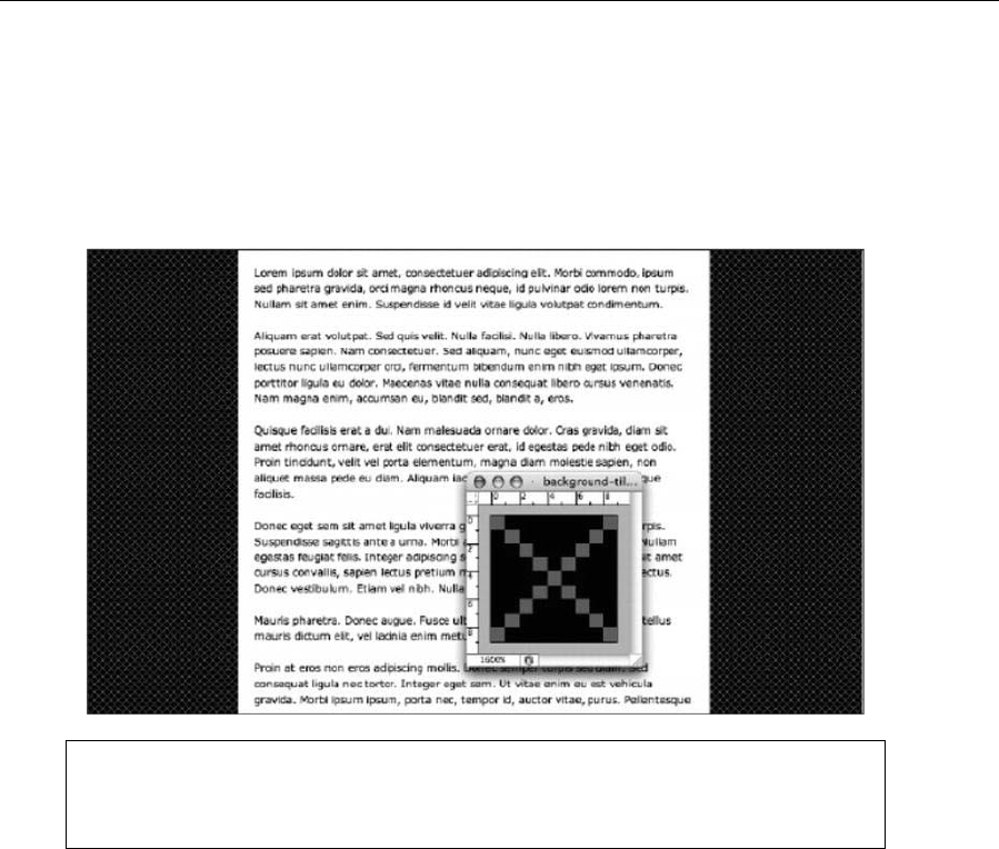
Chapter 2
48
body {
background: #ffffff url(background-tile.gif);
}
The following screenshot shows a page with a diagonal cross pattern, although you could alternatively use
diagonal stripes, horizontal stripes, squares, or other simple shapes.
Note that if you remove many of the paragraphs from the web page, the white
background color ends with the content, since in CSS a container’s size by default only
stretches to that of its content.
Drop shadows
The following image shows a page with a content area and drop shadow.
www.freepdf-books.com
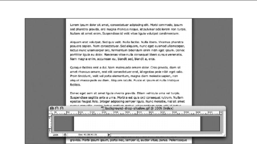
Web Page Essentials
49
This effect was achieved by creating the depicted background image and tiling it vertically. In the body rule,
the position was set to 50% 0 in order to position the background centrally on the horizontal axis. The
background color of the web page is the same as the solid background on the image itself, so the image
and color seamlessly blend.
body {
background: #878787 url(background-drop-shadow.gif) 50% 0 repeat-y;
}
Regarding the white area of the image, this is 536 pixels wide. This is because the wrapper div’s width
was earlier set to 500 pixels, and its padding value was set to 18 pixels. As you will remember from the
box model information from the previous chapter, padding is added to the dimensions of a box, so the
overall width taken up by the wrapper div is 536 pixels (18 + 500 + 18 = 536).
A drop shadow that terminates with the content
In the previous example, the white background of the content area is part of the image. Therefore, if you
remove most of the paragraphs in that example, the background stays as it is, tiling vertically to the height
of the viewing area. Using a different method, you can instead have the background terminate with the
content.
Some additional markup is needed, because of this method requiring two background images: one for the
wrapper div (because, as per the white background in the “Adding a background pattern” section, you
want the content area’s background to stop when the content runs out) and one for a shadow for the
bottom edge of the wrapper div (otherwise, the shadows at the side will just stop dead, resulting in
something like what’s shown in the following image).
www.freepdf-books.com
Chapter 2
50
In terms of markup, add an empty div, as shown in the following code block:
? accumsa'n eu, blandit sed, blandit a, eros.</p>
<div class="contentFooter"><!-- x --></div>
</div>
</body>
</html>
In CSS, for the drop shadows flanking the content area to stop where the content does, they need to be
assigned to the wrapper div, not the web page’s body. Therefore, you need to amend the body rule,
removing the link to a background but retaining the color setting:
body {
background: #878787;
}
The #wrapper rule needs updating in two ways. First, the new background image needs to be applied to
the div—hence the new background property/value pair. However, because the drop shadows are now
shown within the wrapper div, it needs to take up more horizontal space. Since the dimensions of the
div’s content don’t need changing, this is achieved by increasing the horizontal padding value. Also,
because padding at the foot of the div is no longer required (the contentFooter div effectively takes care
of padding at the bottom of the content area), the bottom padding value needs to be set to 0. These
padding values are done in shorthand, as per the method outlined in the “Working with CSS shorthand for
boxes” section earlier in this chapter.
#wrapper {
padding: 18px 36px 0;
background: url(background-drop-shadow-2.gif) 50% 0 repeat-y;
width: 500px;
margin: 0 auto;
}
Finally, the contentFooter div needs styling. Its height is defined on the basis of the height of the
background image (which is a slice of the Photoshop document shown in the following image). The
background is applied to the div in the same way as in previous examples.
One major change, however, is the use of negative margins. The contentFooter div is nested within the
wrapper, which has 36 pixels of horizontal padding. This means that the contentFooter div background
doesn’t reach the edges of the wrapper div by default, leaving whitespace on its left and right sides. By
using margins equal to the negative value of this padding, the div can be “stretched” into place.
www.freepdf-books.com
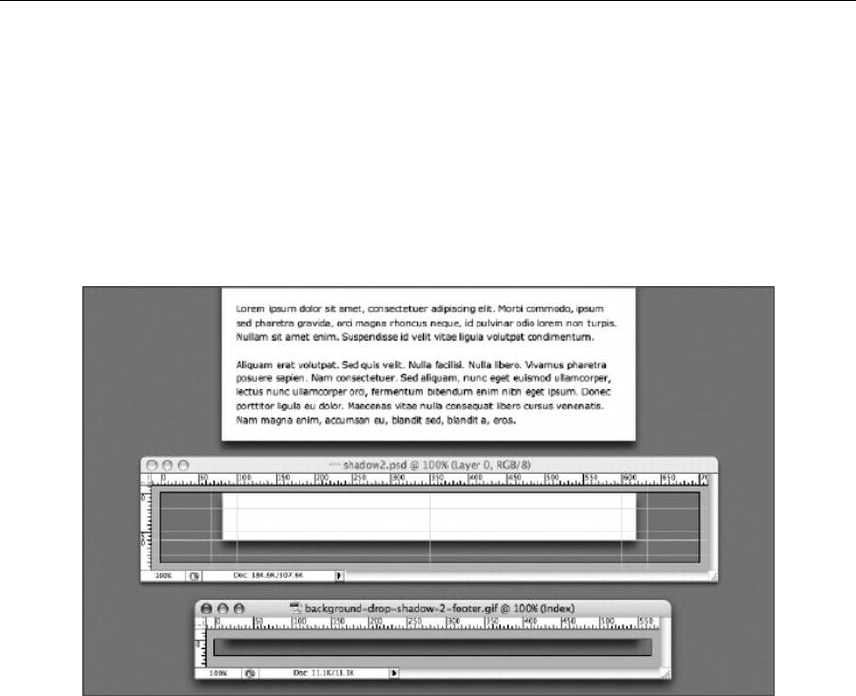
Web Page Essentials
51
.contentFooter {
height: 20px;
background: url(background-drop-shadow-2-footer.gif) 50% 0;
margin: 0 -36px;
}
As you can see, the horizontal value for margin is -36px, the negative of the horizontal padding value
assigned to #wrapper. The addition of all these new rules results in the following image (which also shows
the Photoshop image and exported GIF that makes up the background).
An alternate method for getting this effect would be to place the contentFooter div outside of the wrapper
and then use the same method of aligning it:
.contentFooter {
width: 500px;
height: 20px;
background: url(background-drop-shadow-2-footer.gif) 50% 0;
padding: 0 36px;
margin: 0 auto;
}
To ensure the background of the wrapper joins up with the shadow on the contentFooter div, a single
pixel of bottom padding needs to be applied to the #wrapper rule:
#wrapper {
padding: 18px 36px 1px;
background: url(background-drop-shadow-2.gif) 50% 0 repeat-y;
width: 500px;
margin: 0 auto;
}
www.freepdf-books.com
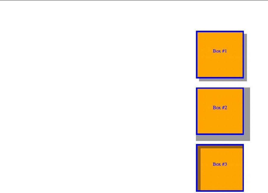
Chapter 2
52
CSS3 shadows
The box-shadow property attaches one or more drop shadows on a box. The
property is a comma-separated list of shadows, each specified by two to four
length values, an optional color, and an optional insetkeyword.
div {
width: 150px;
height: 150px;
border:5px solid blue;
background-color:orange;
margin: 30px;
color: blue;
text-align: center;
}
#box1 {
box-shadow: rgba(0,0,0,0.4) 10px 10px;
}
#box2 {
box-shadow: rgba(0,0,0,0.4) 10px 10px 0 10px
}
#box3 {
box-shadow: rgba(0,0,0,0.4) 10px 10px inset
}
Plain image gradients
Tiled gradient images can be used to add depth and visual interest, without sapping resources (the
example’s image is less than 2 KB in size). The depicted example is based on the page from the “Drop
shadows” section. The changes are an amendment to the background pair in the #wrapper rule, tiling the
gradient image horizontally on the wrapper’s background, and new padding settings, so the text doesn’t
appear over the gradient.
#wrapper {
padding: 36px 18px 18px;
background: #ffffff url(background-gradient.gif) repeat-x;
width: 500px;
margin: 0 auto;
}
www.freepdf-books.com
Web Page Essentials
53
Watermarks
Although it’s common for sites to be centered in the browser window, many designers choose left-aligned
sites that cling to the left edge of the browser window. Both design styles are perfectly valid, but in an era
of rapidly increasing monitor resolutions, you can end up with a lot of dead space to the side of a fixed-
width left-aligned design. And while some of you might be saying, “Well, create flexible-width designs,
then!” some designs aren’t suited to that, and text-heavy sites tend to work better with fairly narrow text
columns, since most users find it hard to read very wide blocks of text.
All of this brings us to the final example in this chapter, which shows how to create watermarks for a web
page. In the following screenshot, the wrapper div is to the left, with a background image to the right of
this area.
www.freepdf-books.com
Chapter 2
54
To achieve this effect, the margin property/value pair in the #wrapper rule has been removed, and the
following rule has been added:
body {
background: #878787 url(background-watermark-large.gif) no-repeat
536px 0;
}
As mentioned earlier in the chapter, this assumes you’re adding a second body rule. You
can, however, just add the background property/value pair to the existing body rule in the
style sheet.
The image used is a transparent GIF, so the background color setting was made a medium-gray
(#878787). The reasoning behind using a transparent GIF is explained in Chapter 4, but it relates to web
browsers sometimes interpreting colors differently from graphics packages. Therefore, it’s often easier to
make the flat background color of a graphic transparent and then use the web page background color in
place of it.
The repeat setting is set to no-repeat, because we don’t want the image to tile. Finally, the background’s
position is set to 536px 0 . The 0 setting means it hugs the top of the browser window, while the 536px
setting means the image is placed at 536 pixels from the left. This is because the content area was earlier
defined as 500 pixels wide with 18 pixels of padding, and 18 + 500 + 18 = 536.
As mentioned earlier, backgrounds can be added to any web page element. For instance, you can add a
watermark to the wrapper div by using the following CSS:
#wrapper {
padding: 18px;
www.freepdf-books.com
Web Page Essentials
55
background: #ffffff url(background-watermark.gif) no-repeat 20px
20px;
width: 500px;
}
This adds the background-watermark.gif image to the background of the content div and positions it 20
pixels from the top and 20 pixels from the left. Again, no-repeat is used to stop the image from tiling.
In either case for the watermark backgrounds, the images scroll with the page content. However,
watermarks can also work well as fixed backgrounds—this can be achieved by adding the fixed value to
the background property in the body and #wrapper rules.
CSS3 patterns
The CSS3 gradient features that are described earlier are powerful enough to produce beautiful patterns.
Web designer Lea Verou has assembled a nice CSS3 patterns gallery from many contributors
(http://lea.verou.me/css3patterns).
www.freepdf-books.com

Chapter 2
56
Closing your document
At the start of this chapter, we examined basic HTML and XHTML documents. Regardless of the
technology used, the end of the document should look like this:
</body>
</html>
There are no variations or alternatives. A body end tag terminates the document’s content, and an html
end tag terminates the document. No web page content should come after the body end tag, and no HTML
content should come after the html end tag (whitespace is fine, and it’s common practice with server-side
technologies to put functions after the html end tag—just don’t put any HTML there).
Also, you must only ever have one body and one head in an HTML document, as well as a single html start
tag and a single html end tag.
This is important stuff to bear in mind, and even if you think it’s obvious, there are millions of pages out
there—particularly those that utilize server-side includes and server-side languages—that include multiple
body tags and head tags, have content outside the body tag, and have HTML outside the html tag.
Don’t do this in your own work.
www.freepdf-books.com
Web Page Essentials
57
Naming your files
Each designer has their own way of thinking when it comes to naming files and documents. Personally, we
like to keep document names succinct but obvious enough that we can find them rapidly via a trawl of the
hard drive. Certain conventions, however, are key: all file names should avoid illegal characters (such as
spaces), and it’s good to be consistent throughout your site. We find that naming files in lowercase and
replacing spaces with hyphens—like-this-for-example.html—works well.
Web designers have historically used underscores in place of spaces, but that causes
problems with some search engines, some of which run-in keywords, effectively
considering the words within the file name as one string. This doesn’t happen with
hyphens
Commenting your work
The rules for HTML, CSS, and JavaScript comments are simple, but the actual characters used are
different in each case.
HTML comments begin with <!-- and end with --> and can run over multiple lines, as follows:
<!-- this is a comment in HTML -->
<!--
Multiple-line
HTML
comment
-->
In XHTML, double hyphens should not occur within the comment itself. Therefore, the following is not valid
XHTML:
<!-- This is invalid -- as is the comment below -->
<!--------------------------------------------------------->
The multiple-hyphen comment is commonly used by designers who favor hand-coding to separate large
chunks of code within a document. When working in XHTML, you can replace the hyphens with a different
character:
<!--oooooooooooooooooooooooooooooooooooooo-->
<!--================================-->
CSS comments were covered in the “Creating boilerplates” section of Chapter 1, but we’ll briefly look
through them again; they’re opened with /* and closed with */ and, like HTML comments, can run over
multiple lines, as shown here:
/* This is a comment in CSS */
/*
Multiple-line
CSS
www.freepdf-books.com
Chapter 2
58
comment
*/
Multiple-line comments in JavaScript are the same as in CSS, but single-line comments are placed after
double forward slashes:
// This is a single-line JavaScript comment.
Don’t use comments incorrectly. CSS comments in an HTML document won’t be problematic from a
rendering standpoint—but they will be displayed. HTML comments in CSS can actually cause a CSS file to
fail entirely.
Note: Along with enabling you to comment your work, comments can be used to disable
sections of code when testing web pages.
Quickly testing your code
You can easily test your HTML/CSS ideas with JsFiddle (http://jsfiddle.net), which includes an online editor
for snippets build from HTML, CSS, and JavaScript. The code can then be shared with others, embedded
in a blog, and so on.
www.freepdf-books.com
Chapter 2
60
Web page essentials checklist
Congratulations—you made it to the end of this chapter! We’re aware that some of this one was about as
much fun as trying to work out complex quadratic equations in your head, but as mentioned at the start,
you need to know this stuff. Imagine designing a site and it suddenly not working the way you thought it
would. It looks fine in your web design package and also in some web browsers, but it starts falling apart in
others. Just removing an XML declaration might be enough to fix the site.
If you take the elements of this chapter and form them into a simple checklist, you won’t have to risk
displaying those wonderful “Untitled Documents” to the entire world (or inadvertently advertising the
package you used to create the page). To make your life easier, you can refer to this checklist:
1. Ensure the relevant DOCTYPE declaration and namespace are in place.
2. Remove the XML declaration if it’s lurking.
www.freepdf-books.com

Web Page Essentials
61
3. Add a title tag and some content within it.
4. Add a meta tag to define your character set.
5. If required, add keywords and description meta tags.
6. Attach a CSS file (or files).
7. Attach a JavaScript file (or files).
8. If your web editor adds superfluous body attributes, delete them.
9. Ensure there are no characters prior to the DOCTYPE declaration or after the html end tag.
10. Ensure no web page content appears outside the body element.
www.freepdf-books.com
63
Chapter 3
Working With Type
In this chapter:
Working with semantic markup
Defining font colors, families, and other styles
Understanding web-safe fonts
Creating drop caps and pull quotes
Rapidly editing styled text
Working to a grid
Creating and styling lists
www.freepdf-books.com
Chapter 3
64
An introduction to typography
Words are important—not just what they say but how they look. To quote Ellen Lupton, from her book
Thinking with Type, “Typography is what language looks like.” Language has always been symbolic,
although the origins of such symbols (of certain letterforms relating to, for example, animals) has largely
been lost in written English; instead, we now have rather more abstract symbols designed for repetition on
the page or screen.
However, from the early calligraphy that was created by hand through the movable type (invented in
Germany by Johannes Gutenberg during the 15th century) that enabled mass-production printing via
molded letterform casts to the most advanced desktop-publishing software available today, the ultimate
aim of type has been one of record and information provision. In other words, type is important from a
design standpoint because it needs to record whatever information is being written about, and that
information needs to be easily retrievable by anyone who wants to understand it.
Like all aspects of design, typography has massively evolved over the years, particularly over the past
couple of decades, where computers have enabled designers to more rapidly experiment with lettering.
Despite this, many conventions formed much earlier still have a part to play:
Myriad fonts exist, and each one has a different look and therefore a different “feel.” You need to
choose the most appropriate one for your purpose. (This is further complicated by there being
only a certain number of web-safe fonts, as you’ll learn later.)
Headings, strap-lines/stand-firsts (the introductory line that introduces a piece of text, commonly
used in editorial articles), and crossheads (short subheadings that break up areas of body copy)
should stand out, and the prominence of each piece of text should be related to its level of
importance (in other words, a crosshead shouldn’t be more prominent than a main heading).
Footnotes often use text smaller than the main body copy text to signify their lesser significance
to the main text, but nonetheless they provide useful supplementary information.
Decorative elements can be used to draw the reader’s attention to specific
parts of the text. Drop caps and initials—large initial letters, flamboyant in
classical typography, but typically more restrained in modern work (see
right)—enable a reader to rapidly navigate to the beginning of a piece of
text. Pull quotes—quotes from the main body of the text, displayed in
large lettering outside of context—are often used in magazine articles to
draw a reader’s attention to a particular article, highlighting particularly interesting quotes or
information.
Spacing is just as important as content. Kerning—the spacing between letter pairs—can be
increased to add prominence to a heading. Leading—the amount of added vertical spacing
between lines of text—can also be adjusted. Increasing leading from its default can make text
more legible. In books, a baseline grid is often employed, ensuring that text always appears in the
same place on each page. This means that the text on the opposite side of the paper doesn’t
appear in the gaps between the lines on the page you’re reading. Baseline grids often make for
www.freepdf-books.com

Working With Type
65
extremely pleasing vertical rhythm and are regularly used in print publications; they’re infrequently
used online but can nonetheless be of use, making a page of text easier to read and navigate.
Columns sometimes make a page easier to read, and this technique is routinely used by
newspapers and magazines. Online, the recent ability to autoflow columns of text makes de facto
text columns possible. This is impractical because not every browser supports it yet and because
columns force users to scroll repeatedly, but the reasoning behind columns is still handy to bear
in mind. Generally, it’s considered easier to read text that has fairly narrow columns (although not
too narrow—if there are too few characters, reading and comprehension slow down). Text that,
for example, spans the entire width of a 23-inch monitor rapidly becomes tiring to read. There are
no hard-and-fast rules when it comes to line length, although some go by the “alphabet-and-a-
half” rule (39 characters per line), some advocate the “points-times-two” rule (double the point
size and use the number for the number of characters), and others recommend a dozen or so
words (or about 60 characters).
A few highly useful online resources for web typography can be found at the following locations:
The Elements of Typographic Style Applied to the Web: www.webtypography.net/
Five Simple Steps to Better Typography: www.markboulton.co.uk/journal/comments/five-
simple-steps-to-better-typography/
Five Simple Steps to Designing Grid Systems: www.markboulton.co.uk/journal/comments/five-
simple-steps-to-designing-grid-systems/
When it comes to web design, some conventions are used, and others are ignored. In fact, while web
designers take the utmost care to get layouts right, scant few give the same thought to text, merely
choosing a font and arbitrarily setting other values, if they set them at all. Once, this could be excused, but
CSS has enabled web type to come a long way, and although the same degree of control as print-based
type isn’t possible, you can do a lot more than just choose your preferred font for headings and body copy.
www.freepdf-books.com

Chapter 3
66
In this chapter, we’ll take a look at the various components available when working on web-based type
(including elements and CSS properties) and provide some exercises, the results from which you can use
for the basis of your own sites’ type. As a final note in this introduction, it’s also worth mentioning spelling
and grammar. Both of these are clearly way outside the scope of this book, but they’re things designers
tend to overlook. A site with a lot of grammatical and spelling errors, especially in larger text (such as
headings and pull quotes), looks unprofessional. If in doubt when working on sites, consult (or get your
client to consult) a copywriter.
Note: There are a couple of books worth digging out for more information on typography
and language. A decent primer on type design is Helen Lupton’s Thinking with Type. For
an entertaining (if not entirely accurate) history of the English language, read Bill
Bryson’s The Mother Tongue.
Styling text the old-fashioned way (or, why we hate
font tags)
Styling text online used to be all about font tags. When Netscape introduced the font element—complete
with size and color attributes—web designers wept tears of joy. When Microsoft announced it would go
further, adding a face attribute (enabling you to specify the font family), web designers were giddy with
anticipation. But things didn’t go according to plan. Page sizes bloated as designers created pages filled
with fonts of myriad sizes and colors. Web users looked on aghast, wondering whether giant, orange body
copy was really the way to go and whether it was worth waiting twice as long for such abominations to
download.
More important, it became apparent that font tags caused problems, including the following:
Inconsistent display across browsers and platforms
The requirement for font tags to be applied to individual elements
Difficulty ensuring fonts were consistent sitewide, because of having to style individual elements
HTML geared toward presentation rather than logical structure
Large HTML documents because of all the extra elements
In addition, working with font tags is a time-consuming, boring process, and yet some (although, thankfully,
increasingly few) web designers remain blissfully ignorant of such problems. In my opinion, if font tags
weren’t HTML elements, I’d suggest they be taken out back and shot. Today, there is no reason
whatsoever to stick with them. Text can be rapidly styled sitewide with CSS, and, as you’ll learn later in
this chapter, CSS provides you with a greater degree of control than font tags ever did. More crucially, font
tags encourage badly formed documents, with designers relying on inline elements to style things like
headings, when there are perfectly good HTML elements better suited to that purpose.
www.freepdf-books.com

Working With Type
67
HTML should be reserved for content and structure, and CSS for design. Web pages should be composed
of appropriate elements for each piece of content. This method of working, called semantic markup, is what
we’re going to discuss next.
A new beginning: semantic markup
Essentially, semantic markup means “using the appropriate tag at the relevant time,” and well-formed
semantic markup is an essential aspect of any website. The following is an example of the wrong way of
doing things—relying on font tags to create a heading and double line breaks (<br /><br />) for separating
paragraphs:
<font size="7" color="red" face="Helvetica">Article heading</font>
<br /><br />
Lorem ipsum dolor sit amet, consectetuer adipiscing elit. Sed aliquet
elementum erat. Integer diam mi, venenatis non, cursus a,
hendrerit at, mi.
<br /><br />
Quisque faucibus lorem eget sapien. In urna sem, vehicula ut, mattis
et, venenatis at, velit. Ut sodales lacus sed eros.
Tags should always relate to the content so that if the styling is removed, there is always an indication of
what role each element plays within the document structure and hierarchy—for instance, there would be
no visual clues as to the importance of the heading. Also, the use of double line breaks (<br /><br />)
instead of paragraph tags means the “paragraphs” cannot be styled in CSS, because there’s nothing to
inform the web browser what the content actually is.
Instead, the example should be marked up like this:
<h1>Article heading</h1>
<p>Lorem ipsum dolor sit amet, consectetuer adipiscing elit. Sed
aliquet elementum erat. Integer diam mi, venenatis non, cursus
a, hendrerit at, mi.</p>
<p>Quisque faucibus lorem eget sapien. In urna sem, vehicula ut,
mattis et, venenatis at, velit. Ut sodales lacus sed eros.</p>
Here, the heading is marked up with the relevant tags, and paragraph elements are used instead of double
line breaks. This means the page’s structural integrity is ensured, and the markup is logical and semantic.
If the attached CSS styles are removed, the default formatting still makes obvious to the end user the
importance of the headings and will visually display them as such.
In this section, we’ll look at how to mark up paragraphs and headings, explore logical and physical styles,
and discuss the importance of well-formed semantic markup.
Paragraphs and headings
With words making up the bulk of online content, the paragraph and heading HTML elements are of
paramount importance. HTML provides six levels of headings, from h1 to h6, with h1 being the top-level
www.freepdf-books.com

Chapter 3
68
heading. The adjacent image shows how these headings, along with a paragraph, typically appear by
default in a browser.
<h1>Level one heading</h1>
<h2>Level two heading</h2>
<h3>Level three heading</h3>
<h4>Level four heading</h4>
<h5>Level five heading</h5>
<h6>Level six heading</h6>
<p>Default paragraph size</p>
By default, browsers put margins around paragraphs and headings.
This can vary from browser to browser, but it can be controlled by
CSS. Therefore, there’s no excuse for using double line breaks to
avoid default paragraph margins affecting web page layouts.
Despite the typical default sizes, level-five and level-six headings
are not intended as “tiny text” but as a way to enable you to
structure your document, which is essential, because headings help
with assistive technology, enabling people who are visually disabled
to efficiently surf the Web.
In terms of general usage, it’s generally recommended to stick to
just one h1 element per sectioning element, used for the section’s
primary heading. As discussed in Chapter 2, a sectioning element is
an <article>, <nav>, <section>, or <aside>. The next level down—and the first level in a sidebar—would be
h2, and then h3, and so on. Take care not to use too many heading levels, though; unless you’re working
on complex legal documents, you really shouldn’t be getting past level four. If you are, look at restructuring
your document.
Logical and physical styles
Once text is in place, it’s common to add inline styles, which can be achieved by way of logical and
physical styles. Many designers are confused by the difference between the two, especially because
equivalents (such as the logical strong and physical b) tend to be displayed the same in browsers. The
difference is that logical styles describe what the content is, whereas physical styles merely define what
the content looks like. This subtle difference is more apparent when you take into account things like
screen readers.
In the markup, I like to <em>emphasize</em> things; a screen reader emphasizes the text surrounded by
the em tags. However, replace the em tags with i tags, and the screen reader won’t emphasize the word,
although in a visual web browser the two pieces of markup will almost certainly look identical.
Styles for emphasis (bold and italic)
Physical styles enable you to make text <b>bold</b> and <i>italic</i>, and these are the most commonly
used inline physical styles. However, logical styles are becoming much more widespread (the majority of
web design applications, such as Dreamweaver, now default to logical styles rather than physical ones).
www.freepdf-books.com
Working With Type
69
Typically, <strong>strong emphasis</strong> emboldens text in a visual web browser, and
<em>emphasis</em> italicizes text.
Deprecated and nonstandard physical styles
Many physical elements are considered obsolete, including the infamous blink (a Netscape “innovation”
used to flash text on and off, amusingly still supported in Firefox). Some physical styles are deprecated: u
(underline) and s (strikethrough; also strike) have CSS equivalents using the text-decoration property (text-
decoration: underline, and text-decoration: line-through, respectively).
The small element
The small element is used to decrease the size of inline text (even text defined in pixels in CSS). An
example of the use of small might be in marking up text that is semantically small print.
Note, however, that the change in size depends on individual web browsers, so it’s important that you
define specific values in CSS for the small element when used in context.
Subscript and superscript
This leaves two useful physical styles. The first, sub, renders as text subscript text. The second, sup,
renders text as superscript text, respectively. These are useful for scientific documents, although there is a
drawback: characters are displayed at the same size, defined by the browser. You can get around this by
using a CSS tag selector and defining a new font size for each element. The following code shows how to
do this, and the accompanying screenshot shows a default sup element (at the top of the image) and a
CSS-styled sup element (at the bottom) in use.
sup {
font-size: 70%;
}
Logical styles for programming-oriented content
Several logical styles do similar jobs, are programming-oriented, and are usually displayed in a
monospace font:
<code>Denotes a code sample.</code>
<kbd>Indicates text entered by the user.</kbd>
<samp>Indicates a programming sample.</samp>
The var element also relates to programming, signifying a variable. However, it is usually displayed in
italics.
www.freepdf-books.com
Chapter 3
70
Block quotes, quote citations, and definitions
The blockquote element is used to define a lengthy quotation and must be set within a block-level element.
Its cite attribute can be used to define the online location of quoted material. See the “Creating drop caps
and pull quotes using CSS” section for more on using this element.
Note that some web design applications—notably, early versions of Dreamweaver—used the
blockquote element to indent blocks of text, and this bad habit is still used by some designers.
Don’t do this. If you want to indent some text, use CSS.
For shorter quotes that are inline, the q element can be used. This is also supposed to add language-
specific quotes before and after the content between the element’s tags. These quotes vary by browser—
Firefox and Internet Explorer add “smart” quotes; Safari, Chrome, and Opera add “straight” quotes.
Finally, to indicate the defining instance of a term, you use the dfn element. This is used to draw attention
to the first use of such a term and is also typically displayed in italics.
Abbreviations
Abbreviations assist with accessibility, enabling you to provide users with full forms of abbreviations and
acronyms by way of the title attribute:
<abbr title="Cascading Style Sheets">CSS</abbr>
This has two uses. For one, it allows users with disabilities (using screen readers) to access the full form of
the words in question. But anyone using a visual web browser can access the information, too, because
title attribute contents are usually displayed as a tooltip when you hover your mouse over elements they’re
used on.
To further draw attention to an abbreviation or acronym, style the tag in
CSS (using a tag selector), thereby making all such tags consistent across
an entire website. The following code is an example of this, the results of
which are shown in the example to the right (including the tooltip triggered
by hovering over the abbr element, which has a title attribute).
abbr {
border-bottom: 1px dotted #000000;
background-color: yellow;
}
Note: You can provide an additional aid to users by setting cursor to help in CSS for abbr
elements. This changes the cursor to a question mark while hovering over the element.
www.freepdf-books.com
Working With Type
71
Elements for inserted and deleted text
The del and ins elements are used, respectively, to indicate deleted text and inserted text, typically in a
manner akin to the tracking features of word-processing packages, although they do not include the
tracking functionality. The del element usually appears in strike-through format, whereas ins usually
appears underlined. Both accept cite and datetime attributes. The former enables you to define a URL that
explains why text was inserted or deleted; the latter enables you to define the time and date that the text
was amended—see the <ins> and <del> entries in Appendix A for accepted formats.
Note that these elements cannot be nested inside each other, for obvious reasons. The following is an
example of their use:
<p>I <del>deleted this</del> and then <ins>inserted this</ins>.</p>
The default style of the ins element can prove problematic online. Because links are underlined by default,
users may attempt to click text marked up as inserted text and wonder why nothing happens. It’s a good
idea to amend the tag’s visual appearance by changing the underline color. This can be done by removing
the default underline and replacing it with a bottom border, like so:
ins {
text-decoration: none;
border-bottom: 1px solid red;
}
The bottom border resembles an underline, although it appears lower than the default underline, which
further differentiates inserted text from hypertext links.
The importance of well-formed markup
Many logical styles are rarely used online, because they look no different from text marked up using the
likes of the i element. However, as mentioned earlier, physical appearance alone misses the point of
HTML. Always using the most appropriate relevant element means that you can later individually style
each element in CSS, overriding the default appearance if you want. If the likes of citations, defining
instances, and variables are all marked up with i instead of cite, dfn, and var, there’s no way of
distinguishing each type of content and no way of manipulating their appearance on an individual basis.
Well-formed markup involves more than ensuring visual flexibility, though. Use of the cite tag, for instance,
enables you to manipulate the Document Object Model (DOM) to extract a bibliography or list of quotations
from a page or even a full website. The ability to style logical tags like this with CSS is likely to be of
increasing rather than diminishing importance.
The importance of end tags
While we’re on the subject of well-formed markup, we’ll revisit the importance of end tags. As mentioned
earlier, XHTML demands that all tags be closed. Most browsers let you get away with ignoring some end
tags, though, such as on paragraphs. Some designers may still have bad habits from working with HTML,
www.freepdf-books.com
Chapter 3
72
for which many end tags are optional. Omit many others at your peril. For instance, overlook a heading
element end tag, and a browser considers subsequent content to be part of the heading and displays it
accordingly. As shown in the following image, two paragraphs are displayed as a heading because the
earlier heading element lacks an end tag.
A similar problem occurs when you accidentally omit end tags when using logical and physical elements.
For instance, forget to close an emphasis element, and the remainder of the web page may be displayed
in italics.
Note: Some designers when hand-coding create both start and end tags at the same
time and then populate the element with content, ensuring end tags are not forgotten.
Styling text using CSS
HTML is intended as a structural markup language, but the Web’s increasing popularity meant it got
“polluted” with tags designed for presentation. This made HTML more complex than it needed to be, and
such tags soon became a headache for web designers trying to style page elements, such as text. In the
bad ol’ days (the end of the 1990s), you’d often see source code like this:
<font face="Helvetica" size="3" color="#333333"> This markup is
<font size="+3"><small>really </small></font>bad, but it was sort of
the norm in the 1990s.</font>
WYSIWYG tools would insert new tags to override previous ones, adding to the page weight and making it
tough to ensure visual consistency sitewide. By and large, CSS eradicates these problems and enables far
more control over text, as you’ll see in the following sections.
This is a boon for graphic designers who used to loathe HTML’s lack of typographical control. However,
the level of freedom evident in print design still isn’t quite so on the Web. Restrictions imposed by
browsers and the screen must be taken into account, such as it being harder to read type on-screen than
in print. This is largely related to resolution. Even magazines with fairly low-quality print tend to be printed
at around 200 dpi or more—more than twice the resolution of a typical monitor. This means that very small
www.freepdf-books.com
Working With Type
73
text (favored by many designers, who think such small text looks neat) becomes tricky to read on-screen,
because there aren’t enough pixels to create a coherent image.
I’ll note restrictions such as this at appropriate times during this section on styling text with CSS, thereby
providing advice on striking a balance between the visual appearance and the practicality of web-based
text.
Defining font colors
In CSS, the color property value defines the foreground color of the relevant CSS element, which for text
sets its color. This can be set using hex, keywords, RGB, or RGBA. The following examples show each
method in turn, and all have the same result: setting paragraphs to black.
p {
color: #000000;
}
p {
color: black;
}
p {
color: rgb(0,0,0);
}
p {
color: rgba(0,0,0,1);
}
Declaring colors using RGB is rare in web design—hex is most popular, especially because CSS supports
so few keywords (see the section “Working with hex” in Chapter 4).
Remember to test your choices on both Windows and Mac, because there are differences in the default
color space for each platform. In general terms, the Mac default display settings are brighter (or Windows
is darker, depending on your outlook on life); if you use subtle dark tones on the Mac or very light tones on
Windows, the result might be tricky to view on the other platform.
It is also a good idea to test on as many different monitors and devices available to you. While your site
might display perfectly on an LCD monitor, it might not on a CRT. Smartphones and tablets are also
becoming increasingly popular for viewing websites, and they have drastically different display
technologies.
This should cause few problems with text, but some designers insist on rendering text with very little
contrast to the background color, and this ends up being even harder to read on a different platform or
monitor from the one on which it was created.
The main tip to keep in mind for color with regard to web-based text is simple: always
provide plenty of contrast so that your text remains readable.
www.freepdf-books.com
Chapter 3
74
Defining fonts
The font-family property enables you to specify a list of font face values, starting with your preferred first
choice, continuing with alternates (in case your choice isn’t installed on the user’s machine), and
terminating in a generic font family, which causes the browser to substitute a similar font (think of it as a
last resort).
selector {
font-family: preferred, "alterate 1", "alterate 2", generic;
}
The most common generic font family names are serif and sans-serif, although when you’re using
monospace fonts (such as Courier New), you should end your list with monospace.
Multiple-word font family names must be quoted (such as "Trebuchet MS" and "Times New Roman"). You
can use single or double quotes—just be consistent. Single-word font family names should never be
quoted. Examples of font-family in use are as follows:
h1 {
font-family: Arial, Helvetica, sans-serif;
}
p {
font-family: Georgia, "Times New Roman", Times, serif;
}
pre {
font-family: Courier, "Courier New", Monaco, monospace;
}
Note: pre is the element for preformatted text, used to display monospace text in an
identical fashion to how it’s formatted in the original HTML document. It’s commonly
used for online FAQs, film scripts, and the like.
Web-embedded fonts and web-safe fonts
Print designers have a world of fonts at their disposal, and now with the ability to embed any font you want
into your website, web designers do as well. There is hope that web-embedded fonts will soon abolish the
use of regular system fonts, which will enable a web designer to choose any typeface or font style they
want. While all major browsers support embedding fonts, they don’t all do it in the same way. It is
important to include web-safe fonts as a fallback to keep your design consistent and prevent the layout of
your design from breaking for mobile and older versions of major browsers. Web-safe fonts are fonts that
are common across different operation systems such as Mac OS X, Windows, and Linux.
Over the next few pages, I’ll provide an overview of different available fonts for the Web, but there are
some handy online references that you should also bookmark. A page comparing fonts common to
the Mac and Windows is available at www.ampsoft.net/webdesign-l/WindowsMacFonts.html, and
www.codestyle.org/css/font-family/sampler-Monospace.shtml details available monospace fonts for
various systems.
www.freepdf-books.com

Working With Type
75
Embedding web fonts
Embedding web fonts allows web designers to use local or remotely hosted fonts in their designs without
requiring the user to download the font. Using web-embedded fonts is easy and can be done by using the
following CSS syntax:
@font-face {
font-face: ‘webfont’;
src: url(‘http://./’) format(‘frmt’)
}
selector {
font-family: webfont;
font-size: 22pt;
}
Since each major browser implements embedding web fonts using different formats, five different formats
need to be included to ensure your font is displayed correctly across each browser. These formats are
TrueType, OpenType, Embedded OpenType, Web Open Font Format, and SVG fonts. The bulletproof
CSS syntax looks like this:
@font-face {
font-family: Graublauweb;
src: url('Graublauweb.eot'); /* IE9 Compatibility Modes */
src: url('Graublauweb.eot?') format('eot'), /* IE6-IE8 */
url('Graublauweb.woff') format('woff'), /* Modern Browsers */
url('Graublauweb.ttf') format('truetype'), /* Safari, Android, iOS */
url('Graublauweb.svg#svgGraublauweb') format('svg'); /* Legacy iOS */
}
Just like in print design, there are a number of commercial, freeware, and open source fonts, which can be
embedded in your web design. Two great resources for free fonts are www.webfonts.info/ and
www.google.com/webfonts.
As time goes on, legacy browsers and browsers that do not support web fonts will disappear, but until
then, falling back to web-safe system fonts is key to having your website support these browsers.
Sans-serif fonts for the Web
Arial is a common font choice, largely because of its dominance on Windows. Its poor design makes it
unreadable at small sizes and a poor choice for body copy, although it can be of use for headings. Mac
users should be wary of choosing Helvetica—it’s an excellent font, but it’s not generally shipped with
Windows. Although you can specify fallback fonts in CSS, again, there’s little point in making your first
choice something that the majority of people won’t see.
Note: Despite its lack of penetration on Windows, Helvetica is often used as a fallback
sans-serif font, because of its prevalence on Linux.
www.freepdf-books.com

Chapter 3
76
Better choices for body copy are Verdana or Trebuchet MS. The former is typically a good choice,
because its spacious nature makes it readable at any size. Its bubbly design renders it less useful for
headings, though. Trebuchet MS is perhaps less readable, but it has plenty of character and is sometimes
an interesting alternative, simply because it isn’t used all that much online.
In recent times, Lucida variants have become popular, because of Apple using it not only as the default
font in Mac OS X but also on its website. Despite Lucida Grande not being available for Windows, Lucida
Sans Unicode is common and similar enough to be used as a first fallback. Usefully, Lucida is common on
UNIX systems, meaning that sites using Lucida variants can look fairly similar textwise across all three
major operating systems. Another pairing—albeit one that’s less common—is Tahoma and Geneva, so
use those with care, providing more generic fallbacks.
See the following images for a comparison of several sans-serif fonts on Mac (left) and Windows (right).
Serif fonts for the Web
Although popular in print, serif fonts fare less well online. If using serifs, ensure you render them large
enough so that they don’t break down into an illegible mess. Georgia is perhaps the best available
web-safe serif, especially when used at sizes equivalent to 12 pixels and bigger, and it can be more
suitable than a sans-serif if you’re working with traditional subject matter or if you’re attempting to emulate
print articles (such as in the following screenshot of the online column Revert to Saved; www.
reverttosaved.com).
www.freepdf-books.com
Working With Type
77
The other commonly available serif font, Times New Roman (Times being a rough equivalent on Linux
systems), is inferior to Georgia but worth using as a fallback. Like Arial, its popularity is the result of its
prevalence as a system font.
Elsewhere, Palatino is fairly common—installed by default on Windows (as Palatino Linotype) and
available on Mac systems that have Classic or iWork installed. Mac owners with Office will also have the
virtually identical Book Antiqua. That said, if using these fonts, you’ll still need to fall back to safer serifs, as
mentioned earlier.
See the following illustration for a comparison of serif fonts on Mac (left) and Windows (right).
www.freepdf-books.com
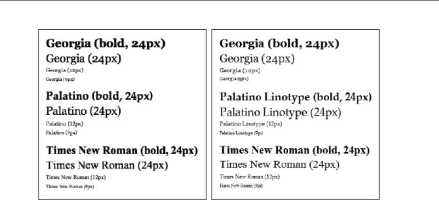
Chapter 3
78
Fonts for headings and monospace type
The remaining “safe” fonts are typically display fonts (for headings) or monospace fonts for when each
character needs to be the same width—for example, when adding code examples to a web page.
Arial Black and Impact are reasonable choices for headings, although they must be handled with care. The
bold version of Impact looks terrible (and isn’t displayed at all in some browsers), and some browsers by
default render headings in bold, so this must be overridden in CSS. Often, large versions of fonts
mentioned in the previous two sections are superior.
Courier New is more useful and a good choice when you need a monospace font. Note that falling back to
Courier for Linux is recommended. The pairing of Lucida Console (Windows) and Lucida Sans Typewriter
or Monaco (Mac) may also be suitable for monospace work, if you’re looking for a less “computery” feel.
Few other fonts are worth a mention, barring perhaps Comic Sans MS, which is inexplicably popular with
novice web designers. To give the font its due, it is readable, but its quirky and unprofessional nature
makes it unsuitable for most purposes (even comic artists eschew it in favor of personalized fonts).
The following image shows several of the fonts mentioned in this section, again with Mac versions on the
left and Windows versions on the right.
www.freepdf-books.com
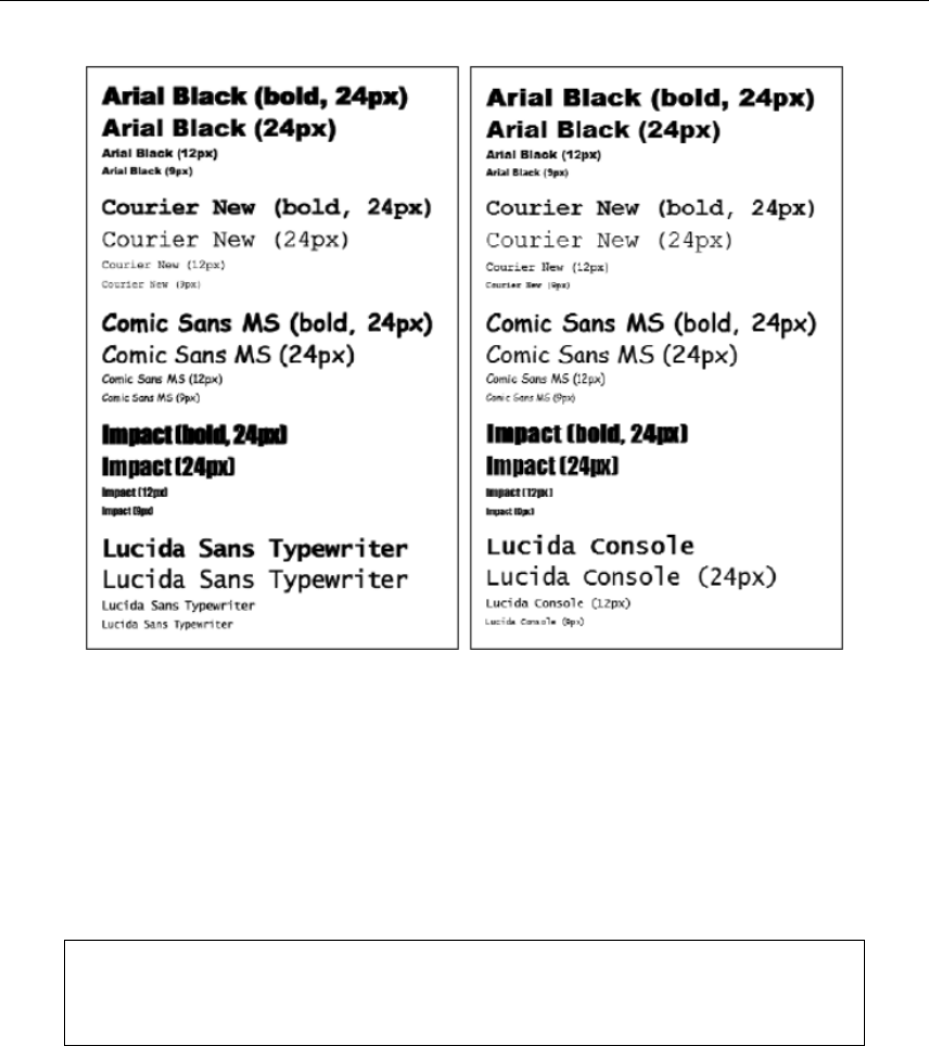
Working With Type
79
Mac vs. Windows: anti-aliasing
When choosing fonts, it’s worth noting that they look different on Mac and Windows. On Macs all browsers
use the system default rendering engine called Core Text to render anti-alias on-screen text. On Windows,
Internet Explorer 8 smooths type via the font-smoothing technology ClearType, while Internet Explorer 9
and 10 use the DirectWrite rendering engine
For body copy, font smoothing (or not) isn’t a major problem; although some prefer aliased text and some
prefer anti-aliased, both are fine, as long as the font size is large enough. However, when it comes to
rendering large text—such as for headings—aliased text is significantly less visually pleasing.
Note: Aliased text is a simplified version of the original font, reduced to pixels made up
of red, green, and blue subpixels. Anti-aliased text attempts to emulate the soft curves of
the original font by introducing gray or colored pixels at the edges.
www.freepdf-books.com

Chapter 3
80
Although arguments rage regarding which is the best method of displaying fonts on-screen, this is a moot
point for web designers, because you don’t control the end user’s setup and therefore must be aware of
each possibility.
Using images for text
Limitations imposed by how different browsers render both embedded and web-safe fonts lead some
designers to seek out alternative methods of creating online type. It’s common to use graphics (mostly
GIFs, but sometimes Flash, because of its vector-based, scalable nature) for text. If you have to follow a
corporate design style under pain of death, the ability to use graphics can be a lifesaver—after all, most
browsers happily render images, and they can be marked up within heading elements, so you can control
things like margins via CSS and also retain the structural integrity of your document.
However, graphical text has its share of problems:
Some browsers do not enable you to resize graphical text in a browser.
Because the Web is low-resolution, when a page is printed out, graphical text looks pixelated and
of poor quality.
Although GIF-based text tends to be small in terms of file size, it’s still larger than HTML-based
text.
People using alternate browsers, such as screen readers, cannot “see” graphical text (although
you can use the alt attribute to compensate).
Graphical text cannot be copied and pasted.
Graphical text cannot be read by search engines.
Graphical text is a pain to update. To change a word, you must rework the original image and
export and upload it, and if the image size has changed, you must edit the appropriate HTML
documents and upload those, too.
In my opinion, graphics should be used as a last resort. A company’s style can be made apparent by the
use of a corporate logo and other imagery rather than by the use of a font. Also, never, ever render body
copy as an image. There are many sites out there with body copy rendered as images, and quite frankly,
every one of them makes me want to scream. Such sites are often full of typos (perhaps because
amending them requires the entire graphic to be reworked, reexported, and uploaded again), cannot be
printed at quality, and cannot be copied to a text editor. Some suggest this means the site’s text is
“secure.” But this goes against one of the fundamental benefits of the Web: that people can share
information and that it can be easily copied and sent on to others. Sure, this presents copyright
implications, but everything online is subject to copyright anyway. Also, plenty of sites commit the cardinal
sin of rendering things like contact details as a graphic—I’m sure their customers very much appreciate
having to type such things out by hand rather than just being able to copy them into their digital address
books.
www.freepdf-books.com
Working With Type
81
Image-replacement techniques
If you need a greater degree of typographical control over a portion of text, such as the site’s main
heading, there is an option that enables you to include an image and also enable the text to remain in
place, which is useful for users surfing the Web with screen readers. This is generally known as image
replacement. Note that the technique should be used with care and sparingly—even from a basic practical
standpoint, it doesn’t make a great deal of sense to set all of your headings as images, simply because it
takes time to create and export each one.
Of the techniques available for replacing images, the most common is to assign the relevant piece of text
(usually a heading) a class value in HTML and also add a dummy span element before its content:
<h1 class="aFancyHeading"><span></span>A fancy heading</h1>
In an image editor, an image-based version of the heading is created and saved, and its dimensions are
measured. Example files for this are a-fancy-heading.gif, image-replacement.css, and image-
replacement.html, located in the chapter 3 folder. In the CSS file, you’ll see rules created to define the
dimensions of the heading (.aFancyHeading) and span (.aFancyHeading span). The heading’s position
value is set to relative, and the span element is then positioned in an absolute fashion, which ensures that
it sits over the text-based heading’s content. The width and height values ensure that the span (and
therefore its background image) expands to fill its container. (Note that when used in conjunction with
links, it’s useful to also set display: block within the CSS rule so that the entire area becomes clickable and
the cursor becomes a pointer—this is because some versions of Internet Explorer use the arrow pointer
instead of the usual finger pointer. Alternatively, set cursor to pointer in CSS.) The overflow: hidden
property/value pair ensures text doesn’t peek out from behind the image—an issue that sometimes occurs
in Internet Explorer or when text is resized. To deal with zoomed text in IE 7, it may also be necessary to
set a pixel font-size value for the heading that’s smaller than the height of the image.
Note: Setting overflow to hidden can be an issue when this technique is used in
conjunction with linked replaced elements, such as linked mastheads and logos. When
tabbing through links, replaced elements that have an overflow setting of hidden will
become displaced on receiving the focus, revealing the underlying text as well as the
image overlaying it. Caution needs to be used here.
The following image shows a page using this technique with and without CSS.
www.freepdf-books.com
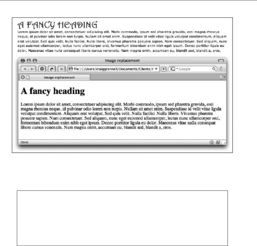
Chapter 3
82
Some methods focus on hiding the text by setting display to none in CSS, but that can cause problems for
screen readers, so avoid doing this. Others use text-indent to shift the text off of the page, although using
absolute positioning with negative top and left coordinates is better—this prevents vertical space being
taken up by the offset text, which is quite often noticeable, especially if margins haven’t been controlled.
Note: Scalable Inman Flash Replacement (sIFR) is an alternative to replacing text with
GIF images. Instead, it uses a combination of CSS, Flash, and JavaScript to switch out
a block of text. Note that although this provides a great deal of typographic flexibility, it
should still be used sparingly—pages where too much text is switched out using sIFR
tend to be extremely sluggish. See sIFR Beauty (www.alvit.de/sifrbeauty/sifr-resources.php)
for resources and Mike Davidson’s site (www.mikeindustries.com/sifr/) for further
information.
Defining font size and line height
In theory, defining font sizes should be easy enough. You use the font-size property, and then you can set
the value to an absolute size, a relative size, a length, or a percentage. For instance, you might set the
following:
www.freepdf-books.com

Working With Type
83
h1 {
font-size: 20px;
}
p {
font-size: 12px;
}
Alternatively, you might go for something like this:
h1 {
font-size: 150%;
}
p {
font-size: 90%;
}
Each method of sizing fonts has its advantages and disadvantages, which we’ll briefly explore in this
section of the book.
Setting text in pixels
Many designers specify font sizes in pixels, largely because pixels are the only measurement that allows
you to be relatively certain that your text will look pretty much identical across various browsers and
platforms (in the same way that sizing page sections in pixels enables you to keep output consistent).
Unfortunately, unlike every other major browser on the market, Internet Explorer for Windows cannot
resize pixel-based text, which creates an accessibility problem (although a user can choose to ignore font
sizes via the little-known accessibility controls). Internet Explorer’s Text Size menu only allows resizing
of text sized using legacy methods, keywords, or relative units other than pixels. (Note that Internet
Explorer 7 can zoom the entire page, but not the text alone.)
Therefore, if you decide to size text in pixels, ensure that your text is very readable. Test it on various
people and listen to feedback. If complaints come your way regarding the fact that someone “had trouble
reading the words” or rooted around for a microscope before giving up and playing solitaire, you need to
increase your pixel size settings. The resulting page might not look quite as “designery,” but at least
people will be able to read it.
Setting text using keywords and percentages
A combination of keywords and percentages became fairly popular for a while on the Web. Available
keyword values are xx-small, x-small, small, medium, large, x-large, and xx-large. A keyword is used to set
the base value, using a body selector in CSS, and percentages are then used to set sizes for specific
elements, such as headings, paragraphs, and lists. Here’s an example:
www.freepdf-books.com

Chapter 3
84
body {
font-size: small;
}
p {
font-size: 93%;
(})
Keyword values don’t compound, and most modern browsers set a lower limit, even on xx-small, so text
tends never to enter the realm of the illegible.
Although Internet Explorer for Windows can resize text set with keywords (as can all other browsers), this
method has several disadvantages. The most problematic from a design perspective is that percentage
values aren’t particularly consistent across browsers and platforms. Scaling tends to “jump” at fairly
arbitrary percentage sizes, so while 93% may look the same in all browsers (using default font-size
settings, at least), 94% may look like 100% in one and 93% in another. Also, it’s often tricky to equate
percentages with the pixel (or point) sizes typically used in mock-ups.
In Internet Explorer, fonts that are set to Small in the ViewText Size menu can make keyword-set
CSS text hard to read, but users can increase the text size by using a more sensible setting. Also, it’s
worth noting that this is up to user choice, and having a tiny minority of users screwing up their own
settings and potentially ending up with unreadable text is better than the vast majority not being able to
resize the text because its size is defined in pixels. Still, there’s a better method for achieving this, as you’ll
see.
Setting text using percentages and ems
As mentioned, the problem with sizing text in pixels is that the text is not resizable in Internet Explorer. The
main problem with using keywords and percentages is that the text size can be different across platforms
and difficult to define—at least in terms of hitting a specific target size. This third method—and the one I
typically use for websites I design—enables you to create font sizes that are targeted at a pixel size but
are also resizable in Internet Explorer, since the measurements are relative units.
The system works by first setting a base font size of 62.5% using a body selector:
body {
font-size: 62.5%;
}
Since most browsers have a default font size of 16 pixels, the previous rule then sets the default size to
62.5% of that value—in other words, 10 pixels. From here, ems can be used to define font sizes of specific
elements, using values that are one-tenth the target pixel size:
www.freepdf-books.com
Working With Type
85
h1 {
font-size: 2.0em; /* will be the equivalent of 20px */
}
p {
font-size: 1.2em; /* will be the equivalent of 12px */
}
The system isn’t perfect—relative values defined in ems can be inherited, so if a list item is within another
list item, the size of the nested item(s) may increase or decrease, depending on the value assigned to the
parent. However, override rules can easily get around this problem (see “Dealing with font-size
inheritance” later in the chapter), and the method generally leads to more satisfactory results from a
design, control, and user point of view than either of the other two methods mentioned. It is worth noting,
however, that this method is somewhat reliant on the user—if someone has changed the default font size
in their browser, your design may not look as intended on their browser, since the value defined for body
may be 62.5% of something other than 16 pixels. Still, few people muck around with their browser settings,
and the general consensus in the industry is that the 62.5% method is the one to go for.
Note: If using this method, ensure that the font-size setting of all text-oriented elements
you use on the site is adjusted; otherwise, you’ll end up with some illegible text set at
62.5% of the default font size. Also ensure you test your work at a range of text sizes in
various browsers to ensure things still look OK if the text is zoomed in or out.
There is one other thing to bear in mind, though: Internet Explorer (again). Although the majority of
browser-specific issues are left until Chapter 9 of this book, we’ll make an exception now. Internet Explorer
has problems with text zooming when the font size is set below 100%, so an additional rule is required:
html {
font-size: 100%;
}
This doesn’t adversely affect other browsers, so you’ll find this rule in the boilerplate documents from the
download files, even though it should technically be in the conditional comments documents.
Setting text using rems
CSS3 has introduced a new sizing unit called the root em unit. The rem unit solves the problem of
inherited ems in nested items by being relative to the root element or the html element of your document.
In the case of rem units, you define a base font size using the html selector:
html {
font-size: 62.5%;
}
All remaining font sizes can be defined as follows:
h1 { font-size: 1.4rem; }
p { font-size: 1.2rem; }
www.freepdf-books.com

Chapter 3
86
It is important to consider older browsers that do not support rem units. This can be done by defining a font
size in pixel units as well as rem units.
h1 { font-size: 14px; font-size: 1.4rem; }
p { font-size: 12px; font-size: 1.2rem; }
Setting line height
Graphic designers will be familiar with leading, and the CSS line-height property enables you to set this.
Generally speaking, it’s a good idea to be fairly generous with leading for web pages, because text is
harder to read on-screen than in print; by placing larger gaps between each line, the eye can more easily
scan through large blocks of text.
When setting line-height, you have various options and can use a number, length, or percentage:
h1 {
font-size: 14px;
line-height: 20px;
}
h2 {
font-size: 1.3em;
line-height: 1.6em;
}
p {
font-size: 1.1em;
line-height: 1.5;
}
The difference between the font-size and line-height measurements is the leading value. Half the value is
applied above the text and half below. Should you use a number alone, rather than a length or percentage,
that value is multiplied by the font-size setting to define the line height. For example, if font-size is set to
10px and line-height is set to 1.5, the line-height value becomes 15px.
Many self-proclaimed web designers who have no graphic design experience ignore the line-height
property, but, as mentioned earlier, it’s essential for improving the legibility of a web page. In the following
screenshots, the left images shows the default spacing, and the right one shows increased line height,
resulting in increased legibility.
www.freepdf-books.com
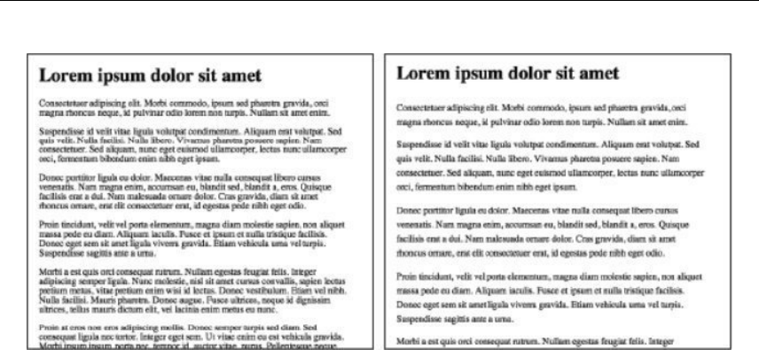
Working With Type
87
Defining font-style, font-weight, and font-variant
These three properties are straightforward. The first, font-style, enables you to set italic or oblique text.
The former is often a defined face within the font, whereas the latter is usually computed. Typically, web
browsers treat both the same, and only the italic value is in general use (except for the occasional use of
normal—the default value—in order to override something set elsewhere).
An element’s font-style is set like this:
h2 {
font-style: italic;
}
The font-weight property is intended to make a font heavier or lighter, and despite the various available
values, only bold and normal are in general use. This is detailed in full in the font-weight entry of
Appendix D.
.introParagraph {
font-weight: bold;
}
The font-variant property has three available values: normal (the default), small-caps, and inherit. The
inherit value causes this element to use the font-variant settings of its parent element. Small caps are often
used to deemphasize uppercase letters in abbreviations and acronyms and are similar in size to a
typeface’s lowercase characters. This property affects only lowercase letters, and the display of small caps
varies across browsers and platforms—for example, older versions of Internet Explorer simply render such
text entirely in normal caps (in other words, in standard uppercase letters).
When defining a font-face rule, it is important to set font-style and font-weight to normal to ensure that all
browsers default to the same values. Webkit browsers need this definition, or else the font-face rule will
ignore any weight or style commands applied to it.
www.freepdf-books.com

Chapter 3
88
CSS shorthand for font properties
The CSS properties discussed so far can be written in shorthand, enabling you to cut down on space and
manage your CSS font settings with greater ease. Like other shorthand properties, some rules apply:
Some browsers are more forgiving than others regarding required and optional values, but you
should always specify the font-size and font-family values, in that order.
Omitted values revert to default settings.
The font-style, font-weight, and font-variant values, if included, should be placed at the start of the
rule (in any order), prior to the font-size value.
The font-size and line-height values can be combined using the syntax
font-size/line-height (for example, 12px/16px for 12px font-size and 16px
line-height).
A complete font declaration in shorthand could therefore look like this:
p {
font: italic small-caps bold 100%/1.3em Arial, Helvetica,
sans-serif;
}
The equivalent in longhand is the following:
p {
font-style: italic;
font-variant: small-caps;
font-weight: bold;
font-size: 100%;
line-height: 1.3em;
font-family: Arial, Helvetica, sans-serif;
}
As you can see, this is rather weightier!
An invalid font declaration is shown in the following code block. Here, the font-weight value (bold) is
incorrectly placed after the font-family value, and the font-size value is missing.
p.invalid {
font: Arial, Helvetica, sans-serif bold;
}
Controlling text element margins
By default, browsers place margins around block-level text-based elements (such as headings and
paragraphs), which can be overridden by CSS. However, many designers get confused when dealing with
margins, so a good rule of thumb is to first remove all element margins via the universal selector (see the
“Zeroing margins and padding on all elements” section in Chapter 2 for more information).
www.freepdf-books.com

Working With Type
89
* {
margin: 0;
padding: 0;
}
Once you’ve done this, you should primarily control spacing between text elements via the bottom
margins:
h1, h2 {
margin-bottom: 10px;
}
p {
margin-bottom: 1em;
}
In the previous example, the margins below headings are small, enabling the eye to rapidly travel from the
heading to the related body copy. The margin at the bottom of each paragraph is one character high.
Should you decide, after applying styles, that more room is required between paragraphs and subsequent
headings, apply a top margin to the relevant level (or levels) of heading, but be aware that vertical margins
collapse.
Later in the chapter, a few exercises will show how margins (along with various other settings) can affect
the way a page looks and feels. Certainly, margin definitions shouldn’t be throwaway—like in music, where
the gaps are almost as important as the notes, the whitespace in typography is almost as important as the
content.
Using text-indent for print-like paragraphs
Because of people’s familiarity with nonindented paragraphs on the Web, the W3C recommends staying
away from indented ones. However, there are times when designers yearn for a more print-based design,
as in the following image.
www.freepdf-books.com
Chapter 3
90
For this effect, two things not previously discussed in this book are required: the text-indent CSS property
and an adjacent sibling selector. This type of selector uses the syntax A+B, where B is the subject of the
selector. For paragraph indentation, the CSS rule would look something like the following code block:
p+p {
text-indent: 1.5em;
}
In plain English, this is saying, “If a paragraph follows another paragraph, indent the text by 1.5 ems.”
Therefore, paragraphs preceded by a different element, such as a heading, won’t be indented, as is
traditional in print.
Note that prior to version 7, Internet Explorer didn’t support adjacent sibling selectors,
and so this effect won’t work in version 6 or older of Microsoft’s browser. A workaround
would be to use a style sheet linked via a conditional comment to indent all paragraphs
for Internet Explorer 6 and older. See the “Dealing with Internet Explorer bugs” section in
Chapter 9 for more on conditional comments.
Setting letter-spacing and word-spacing
The letter-spacing and word-spacing properties work in the same way, taking length values or a default of
normal. For letter-spacing, the value increases whitespace between characters, and for word-spacing, the
defined value increases whitespace between words. Negative values are permitted, which cause
characters or words to bunch together (or kern, if you’re a graphic designer). A certain amount of
experimentation is recommended if you decide to use these properties. Because the Web’s resolution is
low, subtle kerning changes are hard to achieve online, and the results often end up looking clunky. Also,
spacing varies from platform to platform. One occasion when letter-spacing is worth experimenting with,
however, is when styling headings for web pages: a small increase in the letter-spacing value can help
further distinguish headings from body copy.
Examples of these properties in use are shown in the following code block:
www.freepdf-books.com
Working With Type
91
h1 {
letter-spacing: 3px;
}
h2 {
word-spacing: 2px;
}
Controlling case with text-transform
The text-transform property enables you to change the case of letters within an element. Available values
are capitalize, uppercase, lowercase, and none (the default). The uppercase and lowercase values force
the text of the applied element into the relevant case regardless of the original content (for example,
enabling you to override the case of the original content for ensuring that headings are consistent
sitewide), whereas capitalize sets the first letter of each word in uppercase.
In the following example, the first heading is styled as uppercase, the second as lowercase, and the third
as capitalize. Note that I wouldn’t recommend such a mix of styles in a website—these rules are just
examples of the properties in use.
Here’s the HTML:
<h1>A heading</h1>
<h2>Another heading</h2>
<h3>A third heading</h3>
Here’s the CSS:
h1 {
text-transform: uppercase;
}
h2 {
text-transform: lowercase;
}
h3 {
text-transform: capitalize;
}
Creating alternatives with classes and spans
It’s common in web design to define alternatives to the rules set for tag selectors (h1, h2, p, and so on).
This tends to happen most often in one of two situations. The first is when creating alternate styles for a
portion of a web page. (As in print, it’s often beneficial to use different text for sidebars and boxouts—
stand-alone boxes on a magazine page, either housing supplementary information to the main article or
entirely independent pieces that need to be visually distinct from other content on the page—and sidebars
to ensure that each area of content is easy to distinguish from another.) In this situation, it’s sensible to
define a default rule for each element using an element selector and then create an override for the portion
of the page that requires different text by using a contextual selector.
For example, imagine a typical web page that has a sidebar that’s marked up as an aside with an id value
of sidebar. You might use a different paragraph font in the sidebar to differentiate the text, like so:
www.freepdf-books.com
Chapter 3
92
p {
font: 1.2em/1.5 Verdana, Arial, sans-serif;
margin-bottom: 1em;
}
#sidebar p {
font: 1.2em/1.5 Arial, sans-serif;
}
The other occasion where alternatives are required is when creating one-off styles to override an existing
style. In such cases, you can define a class in the CSS and then use a class attribute to apply it to an
element. Should you want only a portion of some text to take on the style, you can surround the selection
with a span element and apply the class to that instead.
For example, if you wanted to create some “warning” text, you could use the following CSS:
.warning {
color: #ff0000;
font-size: 120%;
}
This can then be applied as follows:
<p class="warning">This paragraph takes on the styles defined in
the warning class</p>
<p>Only <em class="warning">this portion</em> of this
paragraph takes on the warningText class styles.</p>
Avoid overusing span elements, though. Text works best when it’s consistent across the page.
Note that the preceding CSS style has a capital letter halfway through it—this case is
known as lowerCamelCase and is a method of writing multiple-word style names,
because spaces must be avoided in CSS. Take care if you do this, because styles are
case sensitive. If you set a class attribute value to warningtext instead of warningText,
many browsers fail to display the style, reverting to the default style for the relevant
element. It is also important to remember that CSS styles can’t begin with a number.
1Style will not work.
Styling semantic markup
The exercises in this section will combine the elements discussed so far in this chapter, showing how to
use the knowledge gained to style some semantic markup. Three different examples are on offer, showing
how rapidly you can create great-looking text when working with CSS and also how you can easily restyle
a page of text without touching the markup. The markup that you’ll use is per that in the next code block,
and the default web page, without any CSS applied, is shown to its right.
<article class="wrapper">
www.freepdf-books.com
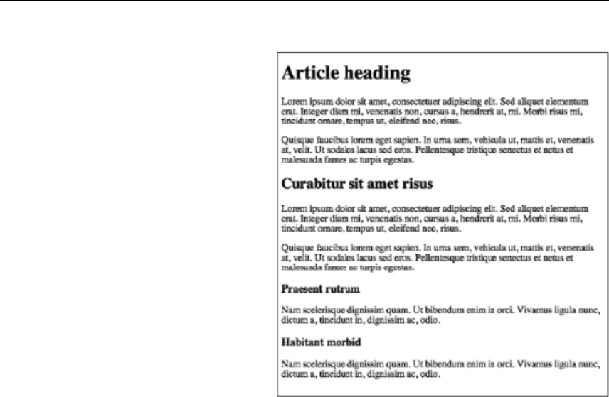
Working With Type
93
<h1>Article heading</h1>
<p>Lorem ipsum dolor sit amet,
consectetuer adipiscing elit. Sed
aliquet elementum erat. Integer
diam mi, venenatis non, cursus
a, hendrerit at, mi. Morbi risus
mi, tincidunt ornare, tempus
ut, eleifend nec, risus.</p>
<p>Quisque faucibus lorem eget sapien.
In urna sem, vehicula ut,
mattis et, venenatis at, velit.
Ut sodales lacus sed eros.
Pellentesque tristique senectus et
netus et malesuada fames
ac turpis egestas.</p>
<h2>Curabitur sit amet risus</h2>
<p>Lorem ipsum dolor sit amet,
consectetuer adipiscing elit. Sed
aliquet elementum erat. Integer
diam mi, venenatis non, cursus
a, hendrerit at, mi. Morbi risus mi,
tincidunt ornare, tempus
ut, eleifend nec, risus.</p>
<p>Quisque faucibus lorem eget sapien. In urna sem, vehicula ut,
mattis et, venenatis at, velit. Ut sodales lacus sed eros.
Pellentesque tristique senectus et netus et malesuada fames
ac turpis egestas.</p>
<h3>Praesent rutrum</h3>
<p>Nam scelerisque dignissim quam. Ut bibendum enim in orci. Vivamus
ligula nunc, dictum a, tincidunt in, dignissim ac, odio.</p>
<h3>Habitant morbid</h3>
<p>Nam scelerisque dignissim quam. Ut bibendum enim in orci. Vivamus
ligula nunc, dictum a, tincidunt in, dignissim ac, odio.</p>
</article>
The code block is simple. The text has three levels of headings, with paragraphs between them.
Everything is enclosed in an article element, which will be styled to restrict the width of its content. This
makes it simpler to see how the leading—defined via line-height—is working out. If you were surfing at full-
screen on a large monitor, the paragraphs might be shown on only a single line.
The default CSS document for these exercises has some rules common to all three examples. These are
shown in the following code block:
* {
margin: 0;
padding: 0;
}
html {
www.freepdf-books.com
Chapter 3
94
font-size: 100%;
}
body {
padding: 20px;
font-size: 62.5%;
}
.wrapper {
margin: 0 auto;
width: 400px;
}
The first rule, *, removes margins and padding from all elements, as discussed previously. The html and
body rules set the default size of the text on the web page to 62.5%, as explained in the “Setting text using
percentages and ems” section earlier in this chapter. Finally, the .wrapper rule defines a width for the
wrapper article and therefore for its content.
Styling semantic markup: A basic example with proportional line heights
Required files styling-semantic-text-starting-point.html and styling-semantic-text-starting-point.css
from the chapter 3 folder
What you’ll learn How to style headings and paragraphs using sans-serif fonts (Verdana for body copy
and Arial for headings) and proportional, unitless line-height settings
Completed files styling-semantic-text-1.html and styling-semantic-text-1.css from the chapter 3 folder
1. Define the font defaults. Using a body selector, define a default font for the web page, along with
a default line-height value. Because this is a basic example, Verdana is used as the primary font,
falling back to Arial and Helvetica. The unitless line-height value means that elements will have
proportional line heights based on their font-size values, unless otherwise stated.
body {
font-family: Verdana, Arial, Helvetica, sans-serif;
line-height: 1.5;
}
Note: In the CSS, you’ll end up with two body selectors if you follow this to the letter—
one for dealing with padding and setting the default font size to 62.5% and the other for
defining the default font-family value for the page, along with the line-height. This enables
these exercises to remain modular; in a real site, although it’s acceptable to use
selectors more than once, you should ensure property values and rules are correctly
housed in the relevant section of your boilerplates—see Chapter 10 and Appendix D for
more information on CSS management.
www.freepdf-books.com

Working With Type
95
2. Define common settings for headings. In this example, the top two levels of headings will have
the same font-family value. Therefore, it makes sense to use a grouped selector to define this
property:
h1, h2 {
font-family: Arial, Helvetica, sans-serif;
}
3. Define specific values for headings. How you style headings will depend on their purpose. For
these exercises, h1 is the page heading, h2 is a subheading, and h3 is a crosshead to introduce
a section of copy. With that in mind, the crosshead needs to be of similar size to the paragraphs,
the main heading needs to be most prominent, and the subheading needs to be somewhere in
between. Therefore, in the CSS, the h1 element has a font-size value of 2.5em, the h3 has a
much smaller 1.2em, and the h2 has an in-between 2em.
h1 {
font-size: 2.5em;
}
h2 {
font-size: 2em;
}
h3 {
font-size: 1.2em;
}
4. Style the paragraphs using the following rule. Whereas the space around headings is taken care
of with the line-height setting defined in the body selector, that doesn’t work for paragraphs, which
must have distinct space between them. Therefore, along with a font-size property/value pair, a
margin-bottom value sets the space between each paragraph to slightly more than the height of
one character.
p {
font-size: 1.1em;
margin-bottom: 1.1em;
}
5. Refine the element spacing. At this point, the spacing is still a little suspect—the crossheads don’t
stand out enough. Therefore, add a margin-top value to the h3 rule; this provides a little extra
space between paragraphs and level-three headings. (As mentioned earlier, vertical margins
collapse, so the space between a paragraph with a bottom margin of 1.1em and a level-three
heading with a top margin of 1.65em is 1.65em, not the sum of the two margins, which would be
2.75em.)
h3 {
font-size: 1.2em;
margin-top: 1.65em;
}
h3, p {
margin-left: 1em;
}
www.freepdf-books.com
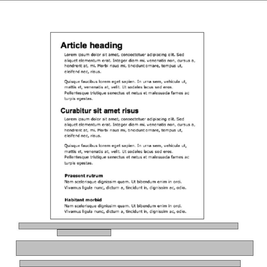
Chapter 3
96
The following image shows what your completed page should look like.
Required files styling-semantic-text-starting-point.html and styling-semantic-text-starting-point.css
from the chapter 3 folder
What you’ll learn How to create a contemporary-looking page of text using Lucida fonts, as per the text
on Apple’s website
Completed files styling-semantic-text-2.html and styling-semantic-text-2.css from the chapter 3 folder
1. Set the font defaults. As in the previous exercise, use a body rule to define the default font for the
page, the first couple of choices of which are Lucida variants that are installed on Mac OS and
Windows. Other fonts are provided for legacy or alternate systems.
body {
font-family: "Lucida Grande", "Lucida Sans Unicode", Lucida, Arial,
Helvetica, sans-serif;
line-height: 1.5;
}
www.freepdf-books.com
Working With Type
97
2. Style the main heading. An h1 rule is used to style the main heading. The restrictive value for
line-height makes the leading value the height of one character of the heading, meaning there’s
no space underneath it. This means you can define an explicit padding-bottom value, followed by
a border-bottom (here, 1 pixel, solid, and very light gray), followed by a margin-bottom value. The
padding-bottom and margin-bottom values are the same, creating a very tight, clean feel for the
heading. Elsewhere, the color setting knocks it back slightly so that it doesn’t overpower the other
content, and the font-weight value removes the default bold setting that browsers apply to
headings. This helps the block of text appear light and clean.
h1 {
font-size: 1.8em;
line-height: 1em;
padding-bottom: 7px;
border-bottom: 1px solid #cccccc;
margin-bottom: 7px;
color: #666666;
font-weight: normal;
}
Tip: When removing the default bold style from headings, check them across
platforms—on some Windows systems, nonbold headings can look a bit spindly,
depending on the settings.
3. Style the other headings. For the next two heading levels, font-size values are assigned. In
keeping with the modern style, the crossheads are the same size as the paragraph text (styled in
the next step)—just displayed in bold; the subheading (h2) is slightly larger, making it a little more
prominent. Again, the headings are colored to make them blend in a little more and not distract
from the paragraph text.
h2, h3 {
color: #333333;
}
h2 {
font-size: 1.3em;
}
h3 {
font-size: 1.2em;
margin-top: 1.65em;
}
4. Style the paragraphs. The font-size setting is larger than that used on many websites (which
typically tend toward 11 pixels, which would require a 1.1em value in this example), but this
ensures clarity and, again, enhances the clean nature of the design.
p {
font-size: 1.2em;
margin-bottom: 1.2em;
}
www.freepdf-books.com
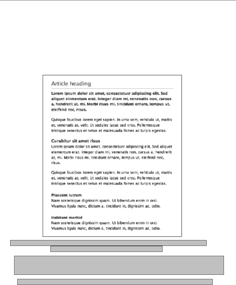
Chapter 3
98
5. The final rule—an adjacent sibling selector—styles the paragraph following the main heading,
making the intro paragraph bold. It’s colored a dark gray, rather than black, which would be
overpowering and wreck the balance of the page.
h1+p {
font-weight: bold;
color: #222222;
}
The following image shows what your completed page should look like.
Required filesstyling-semantic-text-starting-point.html and styling-semantic-text-starting-point.css and
styling-semantic-text baseline.gif from the chapter 3 folder
What you’ll learn How to create a page of traditional-looking text as per a printed book. The text
adheres strictly to a baseline grid, maintaining the page’s vertical rhythm. This requires
some extra calculations when it comes to defining line-height values.
Completed files styling-semantic-text-3.html and styling-semantic-text-3.css from the chapter 3 folder
www.freepdf-books.com

Working With Type
99
1. Define a default font for the page. Using a body rule, a default font is chosen for the web page.
This design primarily uses the Georgia font—a serif—to enhance the traditional feel.
body {
font-family: Georgia, "Times New Roman", Times, serif;
}
2. At this point, it’s also important to decide on a target line-height value for the page. For this
example, it’s going to be 18px.
3. Style the main heading. Here’s where things get a little tricky. For these examples, we’re working
with relative units. As mentioned earlier in the chapter, the 62.5% method means that you can
define font sizes by setting the font-size value to a setting in ems that’s one-tenth of the target
size in pixels. So, in the following code block, the h1 rule’s font-size value of 1.8em means it’s
effectively displayed at 18 pixels (assuming the user hasn’t messed around with their browser’s
default settings, again as mentioned earlier).
4. For the line-height value to hit the target of 18 pixels, it must therefore be 18 pixels or a multiple
of it. However, when using ems, this value is relative to the font-size value. One em is equal to
the height of one character, and since the font-size has been set to 1.8em (which is equivalent to
18 pixels), we set line-height to 1em. This makes the line-height of the h1 element the equivalent
of 18 pixels.
5. Similar thinking is used to define the value for margin-bottom—this needs to be 18 pixels to keep
the vertical rhythm going, so the value is set to 1em.
h1 {
font-size: 1.8em;
line-height: 1em;
margin-bottom: 1em;
}
6. Style the subheading. For the subheading, the font-size value is set to 1.4em. To keep the line-
height vertical rhythm going, you need to find the value that will multiply with the font-size setting
to create 1.8 (since 1.8em is the equivalent of 18 pixels). You can get this by dividing 1.8 by the
font-size value, which results in a line-height value of 1.2857142em. To keep the rhythm going,
this setting can then be used for both the margin-top and margin-bottom values.
h2 {
font-size: 1.4em;
line-height: 1.2857142em;
margin-top: 1.2857142em;
margin-bottom: 1.2857142em;
}
7. However, what this serves to do is isolate the heading on its own line, rather than making it
obviously lead to the subsequent paragraph. Two solutions exist for dealing with this. The first is
simply to remove the bottom margin; the second is to create asymmetrical margins, making the
top margin larger than the bottom one. To keep the entire space the element takes up strictly
within the grid and not interrupt the vertical rhythm too much, it’s sensible to take half the margin-
bottom value and add it to the margin-top value.
www.freepdf-books.com

Chapter 3
100
h2 {
font-size: 1.4em;
line-height: 1.2857142em;
margin-top: 1.9285713em;
margin-bottom: 0.6428571em;
}
8. Style the crossheads and paragraphs. For this example, the crossheads and paragraphs are
identical, save for the default styling on the headings that renders them in bold. The font-size
value is 1.2em. Again, 1.8 is divided by the font-size figure to arrive at the line-height and margin
values, both of which are set to 1.5em. Note that the h3 rule has no margin-bottom value,
meaning that each level-three heading hugs the subsequent paragraph.
h3 {
font-size: 1.2em;
line-height: 1.5em;
margin-top: 1.5em;
}
p {
font-size: 1.2em;
line-height: 1.5em;
margin-bottom: 1.5em;
}
At this point, your page should look like the following image.
www.freepdf-books.com
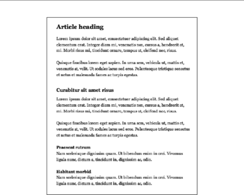
Working With Type
101
9. Add a (temporary) grid. When working on text that adheres to a baseline grid, it can help to create
a tiled background image that you can use to check whether your measurements are accurate.
The 18-pixel-high image file, styling-semantic-text-baseline.gif, has a single-pixel line at the
bottom of the image. When applied to the wrapper article’s background via the .wrapper rule (see
the following code), a ruled background is shown. Although intended as a temporary design aid,
you could retain the grid permanently, because it can help readers to rapidly skim text. However,
the aid works only when a browser is using default settings—when the text is enlarged, the
background image stays as it is, resulting in the grid of the image and the grid of the text being
out of sync.
.wrapper {
margin: 0 auto;
width: 400px;
background: url(styling-semantic-text-baseline.gif);
}
www.freepdf-books.com
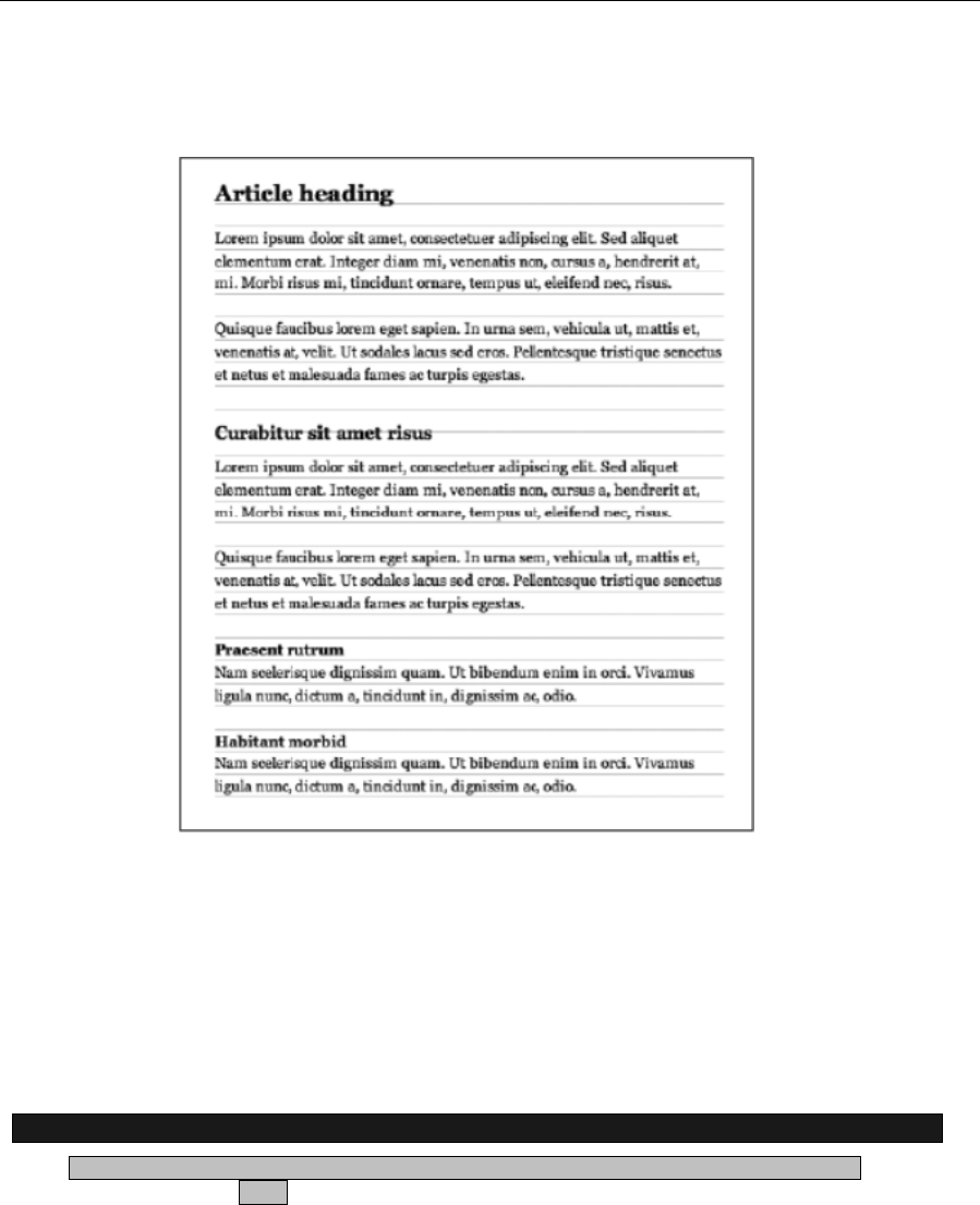
Chapter 3
102
The following image shows how this image works behind the text styled in this exercise—as you can see,
the vertical rhythm is maintained right down the page.
Creating drop caps and pull quotes using CSS
The previous exercise showed how something aimed primarily at the world of print design—a baseline
grid—can actually work well online, and this section will continue that theme, showing how to use CSS to
create drop caps and pull quotes. Drop caps—large letters typically used at the start of a printed article—
are rare online, although they can be a useful way of drawing the eye to the beginning of the body copy.
Pull quotes are more common, and while part of their use in print—taking a choice quote and making it
stand out on the page to draw in the reader—is less effective online, pull quotes are still handy for
highlighting a piece of text (such as a quote or idea) or for providing client quotes on a company website.
Creating a drop cap using a CSS pseudo-element
Required files styling-semantic-text-2.html and styling-semantic-text-2.css from the chapter 3
folder.
www.freepdf-books.com
Working With Type
103
What you’ll learn How to create a drop cap for a website and how to use the CSS float property. Any
element can be floated left or right in CSS, and this causes subsequent content to
wrap around it.
Completed files drop-cap.html and drop-cap.css from the chapter 3 folder.
1. Create a new rule that targets the relevant character. For this, you can use a pseudo-element,
first-letter, and the adjacent sibling selector created earlier in the “Styling semantic markup”
section. See Appendix D for more on pseudo-elements.
h1+p:first-letter {
}
2. In plain English, this rule is saying, “Apply this rule to the first letter of the paragraph that follows
the level-one heading.”
3. Float the character and increase its size. Add a float: left property/value pair to float the first
character in the paragraph to the left, which makes subsequent content wrap around it. Then set
a large font-size value to increase the size of the character compared to the surrounding text.
h1+p:first-letter {
float: left;
font-size: 3em;
}
4. Finally, tweak the positioning. Define a line-height value and margin-top value to vertically
position the character; you may need to experiment some when working on your own designs
outside of this exercise, since the values required are somewhat dependent on the font-size
setting. The margin-right setting provides some spacing between the drop cap and the
subsequent text.
h1+p:first-letter {
float: left;
font-size: 3em;
line-height: 1.0em;
margin-top: -3px;
margin-right: 0.15em;
}
Note that you can use the first-line pseudo-element to target the first line of some text—
for example, to make it bold, which is a commonly used design element in magazines.
Although this technique is the most straightforward one for working with drop caps, the results aren’t
entirely satisfactory. Because of the way different browsers deal with the first-letter pseudo-element, the
display isn’t particularly consistent across browsers and platforms—see the following two images, which
show the results in Firefox and Safari. Therefore, if you want to use drop caps with more precision, it’s best
to fall back on a more old-fashioned but tried-and-tested method: the span element.
www.freepdf-books.com
Chapter 3
104
Required files styling-semantic-text-2.html, styling-semantic-text-2.css, quote-open.gif, and quote-
close.gif from the chapter 3 folder
What you’ll learn How to create a magazine-style pull quote, which can draw the user’s attention to a
quote or highlight a portion of an article
Completed files pull-quote.html and pull-quote.css from the chapter 3 folde
1. Add the HTML. The required markup for a basic pull quote is simple, centering around the
blockquote element and nesting a paragraph within. Add the following to the web page, above the
code <h2>Curabitur sit amet risus</h2>:
<blockquote>
<p>This is the pull quote. It's really very exciting, so read it now!
Lorem ipsum dolor sit amet, consectetuer adipiscing elit.</p>
</blockquote>
2. Style the blockquote element. Create a blockquote rule and use the background property to add
the open quote image as its background. Set vertical margins that are larger than the margins
between the paragraphs (to ensure that the pull quote stands out from the surrounding text) and
the horizontal margins (to ensure that the pull quote doesn’t span the entire column width, which
also helps it visually stand out).
blockquote {
background: url(quote-open.gif) 0 0 no-repeat;
margin: 2.4em 2em;
}
3. Style the pull quote paragraph text. Using the contextual selector blockquote p, style the
paragraph text within the blockquote element. Making the text bold and larger than the
surrounding copy helps it stand out—but to ensure it doesn’t become too distracting, knock back
its color a little.
blockquote p {
color: #555555;
font-size: 1.3em;
font-weight: bold;
text-align: justify;
}
4. Use the background property to add the closing quote mark, which is added to the paragraph,
since you can add only one background image to an element in CSS. The background’s position
is set to 100% 90%—far right and almost at the bottom. Setting it at the absolute bottom would
www.freepdf-books.com
Working With Type
105
align the closing quote with the bottom of the leading under the last line of the paragraph text;
setting the vertical position value to 90%, however, lines up the closing quote with the bottom of
the text itself.
blockquote p {
color: #555555;
font-size: 1.3em;
font-weight: bold;
text-align: justify;
background: url(quote-close.gif) 100% 90% no-repeat;
}
5. Tweak the positioning. If you test the page now, you’ll see the paragraph content appearing over
the top of the background images. To avoid this, padding needs to be applied to the quote mark
to force its content inward but still leave the background images in place. Since the quote images
are both 23 pixels wide, a horizontal padding value of 33px provides room for the images and
adds an additional 10 pixels so that the content of the paragraph doesn’t abut the quote marks.
Finally, the default margin-bottom value for paragraphs is overridden (via a 0 value), since it’s
redundant here.
blockquote p {
color: #555555;
font-size: 1.3em;
font-weight: bold;
text-align: justify;
background: url(quote-close.gif) 100% 90% no-repeat;
padding: 0 33px;
margin-bottom: 0;
}
The following image shows your pull quote page so far.
6. Next, credit the quotation. To add a credit to the quote, add another paragraph, with a nested cite
element, inside which is the relevant content.
<blockquote>
<p>This is the pull quote. It's really very exciting, so read it now!
Lorem ipsum dolor sit amet, consectetuer adipiscing elit.</p>
<p><cite>fredbloggs.com</cite></p>
</blockquote>
www.freepdf-books.com

Chapter 3
106
7. In CSS, add the following rule:
cite {
background: none;
display: block;
text-align: right;
font-size: 1.1em;
font-weight: normal;
font-style: italic;
}
8. Some of the property values in cite are there to override the settings from blockquote p and to
ensure that the second paragraph’s text is clearly distinguishable from the quote. However, at this
point, both paragraphs within the blockquote element have the closing-quote background, so a
final rule is required.
blockquote>p+p {
background: none;
}
9. This fairly complex rule uses both a child selector (>) and an adjacent selector (+) and styles the
paragraph that comes immediately after the paragraph that’s a child element of the blockquote
(which is the paragraph with the cite element). The rule overrides the background value defined in
step 5 for paragraphs within the block quote. Note that this assumes the quote itself will be only a
single paragraph. If you have multiparagraph quotes, you’ll need to apply a class to the final
paragraph and set the quote-close.gif image as a background on that, rather than on
blockquote p.
Using classes and CSS overrides to create an alternate pull quote
Required files pull-quote.html and pull-quote.css from the chapter 3 folder.
What you’ll learn How to use CSS classes to create alternatives to the default pull quote. In this
example, you’ll create a narrow pull quote that floats to the right of the body copy.
Completed files pull-quote-2.html and pull-quote-2.css from the chapter 3 folder.
1. Amend the HTML. First, add a class to the blockquote element so that it can be targeted in CSS:
www.freepdf-books.com

Working With Type
107
<blockquote id="fredBloggs">
2. Position the blockquote. Create a new CSS rule that targets the blockquote from the previous
step by using the selector #fredBloggs. Set float and width values to float the pull quote and
define its width.
#fredBloggs {
float: right;
width: 150px;
}
3. Remove the quote mark background image by setting background to none. Add the two border
property/value pairs shown to visually separate the pull quote from its surroundings, drawing the
eye to its content.
#fredBloggs {
float: right;
width: 150px;
background: none;
border-top: 5px solid #dddddd;
border-bottom: 5px solid #dddddd;
}
4. Add padding and margins. First, add vertical padding to ensure that the pull quote’s contents
don’t hug the borders added in the previous step. Next, define margin values, overriding those set
for the default blockquote from the previous exercise. Because this alternate pull quote is floated
right, there’s no need for top and right margins, which is why they’re set to 0; the bottom and left
margin values are left intact.
#fredBloggs {
float: right;
width: 150px;
background: none;
border-top: 5px solid #dddddd;
border-bottom: 5px solid #dddddd;
padding: 10px 0;
margin: 0 0 2em 2.4em;
}
5. Override the paragraph styles. The background and padding settings for the default blockquote
style are no longer needed, so they’re set to none and 0, respectively. Finally, text-align is set to
center, which is appropriate for a narrow pull quote such as this.
#fredBloggs p {
text-align: center;
background: none;
padding: 0;
}
6. Use pseudo-elements to add quotation marks before and after the blockquote contents.
www.freepdf-books.com
Chapter 3
108
#fredBloggs:before {
content: open-quote;
}
#fredBloggs:after {
content: close-quote;
}
Adding reference citations
The blockquote element can have a cite attribute, and the content from this attribute can be displayed by
using the following CSS rule:
blockquote[cite]:after {
display : block;
margin : 0 0 5px;
padding : 0 0 2px 0;
font-weight : bold;
font-size : 90%;
content : "[source: "" " attr(cite)"]";
}
Working with lists
This chapter concludes with the last of the major type elements: the list. We’ll first look at the different
types of lists—unordered, ordered, and definition—and also see how to nest them. Then we’ll move on to
cover how to style lists in CSS, list margins and padding, and inline lists.
Unordered lists
The unordered list, commonly referred to as a bullet point list, is the most frequently seen type of list
online. The list is composed of an unordered list element (<ul></ul>) and any number of list items within,
each of which looks like this (prior to content being added): <li></li>. An example of an unordered list
www.freepdf-books.com
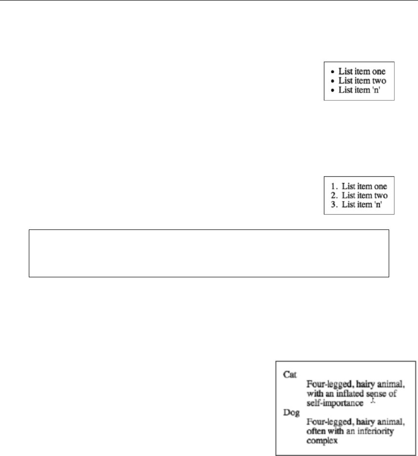
Working With Type
109
follows, and the resulting browser display is shown to the right. As you can see, browsers typically render
a single-level unordered list with solid black bullet points.
<ul>
<li>List item one</li>
<li>List item two</li>
<li>List item 'n'</li>
</ul>
Ordered lists
On occasion, list items must be stated in order, whereupon an ordered list is used. It works in the same
way as an unordered list, the only difference being the containing element, which is <ol></ol>.
<ol>
<li>List item one</li>
<li>List item two</li>
<li>List item 'n'</li>
</ol>
Note: Web browsers automatically insert the item numbers when you use ordered lists.
The only way of controlling numbering directly is via the start attribute, whose value
dictates the first number of the ordered list.
Definition lists
A definition list isn’t a straightforward list of items. Instead, it’s a list of terms and explanations. This type of
list isn’t common online, but it has its uses. The list is enclosed in the definition list element (<dl></dl>),
and within the element are terms and definitions, marked up with <dt></dt> and <dd></dd>, respectively.
Generally speaking, browsers display the definition with an indented left margin, as in the following
example:
<dl>
<dt>Cat</dt>
<dd>Four-legged, hairy animal, with an
inflated sense of self-importance</dd>
<dt>Dog</dt>
<dd>Four-legged, hairy animal, often with
an inferiority complex</dd>
</dl>
Nesting lists
Lists can be nested, but designers often do so incorrectly, screwing up their layouts and rendering web
pages invalid. The most common mistake is placing the nested list outside any list items, as shown in the
following incorrect example:
www.freepdf-books.com

Chapter 3
110
<ul>
<li>List item one</li>
<ul>
<li>Nested list item one</li>
<li>Nested list item two</li>
</ul>
<li>List item two</li>
<li>List item 'n'</li>
</ul>
Nested lists must be placed inside a list item, after the relevant item that leads into the nested list. Here’s
an example:
<ul>
<li>List item one
<ul>
<li>Nested list item one</li>
<li>Nested list item two</li>
</ul>
</li>
<li>List item two</li>
<li>List item 'n'</li>
</ul>
Always ensure that the list element that contains the nested list is closed with an end tag. Not doing so is
another common mistake, and although it’s not likely to cause as many problems as the incorrect
positioning of the list, it can still affect your layout.
Styling lists with CSS
Lists can be styled with CSS, making it easy to amend item spacing or create custom bullet points. I tend
to think bullet points work well for lists. They’re simple and—pardon the pun—to the point. However, I
know plenty of people would rather have something more visually interesting, which is where the list-style-
image property comes in.
list-style-image property
The list-style-image property replaces the standard bullet or number from an unordered or ordered list with
whatever image you choose. If you set the following in your CSS, the resulting list will look like that shown
to the right. (Note that this is the nested list created earlier in this chapter.)
www.freepdf-books.com

Working With Type
111
ul {
list-style-image: url(bullet.gif);
}
Contextual selectors were first mentioned in Chapter 1 (see the section
“Types of CSS selectors”). These enable you to style things in context,
and this is appropriate when working with lists. You can style list items with one type of bullet and nested
list items with another. The original rule stays in place but is joined by a second rule:
ul {
list-style-image: url(bullet.gif);
}
ul ul {
list-style-image: url(bullet-level-two.gif);
}
This second rule’s selector is ul ul, which means that the declaration is
applied only to unordered lists within an unordered list (that is, nested lists). The upshot is that the top-
level list items remain with the original custom bullet, but the nested list items now have a different bullet
graphic.
With this CSS, each subsequent level would have the nested list bullet point, but it’s feasible to change the
bullet graphic for each successive level by using increasingly complex contextual selectors.
Note: When using custom bullet images, be wary of making them too large. Some
browsers clip the bullet image, and some place the list contents at the foot of the image.
In all cases, the results look terrible.
Dealing with font-size inheritance
Most of the font-size definitions in this chapter (and indeed, in this book) use relative units. The problem
with using ems, however, is that they compound. For example, if you have a typical nested list like the one
just shown and you define the following CSS, the first level of the list will have text sized at 1.5em; but the
second-level list is a list within a list, so its font-size value will be compounded (1.5 1.5 = 2.25em).
html {
font-size: 100%;
}
body {
font-size: 62.5%;
font-family: Verdana, Arial,
Helvetica, sans-serif;
}
li {
font-size: 1.5em;
}
www.freepdf-books.com

Chapter 3
112
The simple workaround for this is to use a contextual selector—li li—to set an explicit font-size value for list
items within list items, as shown in the following rule:
li li {
font-size: 1em;
}
With this, all nested lists take on the same font-size value as the parent list, which in this case is 1.5em.
list-style-position property
This property has two values: inside and outside. The latter is how list items are usually displayed: the
bullet is placed in the list margin, and the left margin of the text is always indented. However, if you use
inside, bullets are placed where the first text character would usually go, meaning that the text will wrap
underneath the bullet.
list-style-type property
The list-style-type property is used to amend the bullets in an unordered or ordered list, enabling you to
change the default bullets to something else (other than a custom image). In an unordered list, this
defaults to disc (a black bullet), but other values are available, such as circle (a hollow disc bullet), square
(a square bullet), and none, which results in no bullet points. For ordered lists, this defaults to decimal
(resulting in a numbered list), but a number of other values are available, including lower-roman (i, ii, iii,
and so on) and upper-alpha (A, B, C, and so on). A full list of supported values is in Appendix D.
Generally speaking, the values noted are the best supported, along with the upper and lower versions of
roman and alpha for ordered lists. If a browser doesn’t understand the numbering system used for an
ordered list, it usually defaults to decimal. The W3C recommends using decimal whenever possible,
because it makes web pages easier to navigate. I agree—things like alpha and roman are too esoteric for
general use, plus there’s nothing in the CSS specifications to tell a browser what to do in an alphabetic
system after z is reached (although most browsers are consistent in going on to aa, ab, ac, and so on).
List-style shorthand
As elsewhere in CSS, there is a shorthand property for list styles, and this is the aptly named list-style
property. An example of its use is shown in the following piece of CSS:
ul {
list-style-type: square;
list-style-position: inside;
list-style-image: url(bullet.gif);
}
which can be rewritten as follows:
ul {
list-style: square inside url(bullet.gif);
}
www.freepdf-books.com

Working With Type
113
List margins and padding
Browsers don’t seem to be able to agree on how much padding and margin to place around lists by
default, and also how margin and padding settings affect lists in general. This can be frustrating when
developing websites that rely on lists and pixel-perfect element placement. By creating a list and using
CSS to apply a background color to the list and a different color to list items and then removing the page’s
padding and margins, you can observe how each browser creates lists and indents the bullet points and
content.
In Gecko and Webkit browsers (for example, Mozilla Firefox), Chrome, Opera, and Safari, the list
background color is displayed behind the bullet points, which suggests that those browsers place bullet
points within the list’s left padding (because backgrounds extend into an element’s padding). Internet
Explorer shows no background color there, suggesting it places bullet points within the list’s left margin.
This is confirmed if you set the margin property to 0 for a ul selector in CSS. The list is unaffected in all
browsers but Internet Explorer, in which the bullets abut the left edge of the web browser window.
Conversely, setting padding to 0 makes the same thing happen in Gecko browsers, Safari, and Opera.
To get all browsers on a level playing field, you must remove margins and padding, which, as mentioned
previously in this book, is done in CSS by way of the universal selector:
* {
margin: 0;
padding: 0;
}
With this in place, all browsers render lists in the same way, and you can set specific values as
appropriate. For example, bring back the bullet points (which may be at least partially hidden if margins
and padding are both zeroed) by setting either the margin-left or padding-left value to 1.5em (that is, set
margin: 0 0 0 1.5em or padding: 0 0 0 1.5em). The difference is that if you set padding-left, any
background applied to the list will appear behind the bullet points, but if you set margin-left, it won’t. Note
that 1.5em is a big enough value to enable the bullet points to display (in fact, lower values are usually
sufficient, too—although take care not to set values too low, or the bullets will be clipped); setting a higher
value places more space to the left of the bullet points.
Inline lists for navigation
Although most people think of lists as being vertically aligned, you can also display list items inline. This is
particularly useful when creating navigation bars, as you’ll see in Chapter 5. To set a list to display inline,
you simply add display: inline; to the li selector. Adding list-style-type: none; to the ul selector ensures that
the list sits snug to the left of its container (omitting this tends to indent the list items). Adding a margin-
right value to li also ensures that the list items don’t sit right next to each other. Here’s an example:
ul {
list-style-type: none;
}
li {
display: inline;
margin-right: 10px;
www.freepdf-books.com
Chapter 3
114
}
Thinking creatively with lists
The final part of this chapter looks at creating lists with a little panache. Although most lists are perfectly
suited to straightforward bullet points, sometimes some added CSS and imagery can go a long way.
Creating better-looking lists
Required files The HTML and CSS documents from the basic-boilerplates folder as a starting
point, along with the images better-list-hollow-square.gif, better-list-shadow.gif, better-
list-square.gif, and better-list-star.gif from the chapter 3 folder
What you’ll learn How to style a three-level list to look great, using background images and overrides
Completed files better-looking-lists.html and better-looking-lists.css from the chapter 3 folder
1. Create the list. Within the HTML document’s wrapper div, add the following code:
<ul>
<li>List - 1.1
<ul>
<li>List - 2.1</li>
<li>List - 2.2
<ul>
<li>List - 3.1</li>
<li>List - 3.2</li>
<li>List - 3.3</li>
</ul>
</li>
<li>List - 2.3</li>
</ul>
</li>
</ul>
2. Amend the body rule. Add some padding to the body element so that page content doesn’t hug
the browser window edges during testing:
body {
font: 62.5%/1.5 Verdana, Arial, Helvetica, sans-serif;
padding: 20px;
}
3. Style the list elements. This kind of heavily styled list typically requires you to define specific
property values at one level and then override them if they’re not required for subsequent levels.
This is done by adding the three rules in the following code block. For this example, the top level
of the list (styled via ul) has a star background image that doesn’t repeat (the 1px vertical value is
used to nudge the image into place so it looks better positioned), and the list-style-type value of
none removes the default bullet points of all lists on the page.
www.freepdf-books.com

Working With Type
115
For the second level of lists (the first level of nesting), styled via ul ul, a horizontally tiling background
image is added, giving the impression that the top-level list is casting a soft shadow. The border-left setting
creates a soft boundary to the nested list’s left, thereby enclosing the content. The padding value ensures
that there’s space around nested lists.
For the third level of lists (the second level of nesting—that is, a nested list within a nested list), styled via
ul ul ul, no specific styles are required, but to deal with inherited styles from ul ul, background is set to
none and border-left is set to 0. If this weren’t done, third-level lists would also have the shadow
background and dotted left-hand border.
ul {
list-style-type: none;
background: url(better-list-star.gif) 0 1px no-repeat;
}
ul ul {
background: url(better-list-shadow.gif) repeat-x;
border-left: 1px dotted #aaaaaa;
padding: 10px;
}
ul ul ul {
background: none;
border-left: 0;
}
4. Style the list item elements. For the top-level list items, the li rule styles them in uppercase, adds
some padding (to ensure the items don’t sit over the background image applied in ul), and makes
the text bold and gray. For the nested list items, the li li rule overrides the text-transform property,
returning the text to sentence case, and adds a square gray bullet as a background image. The
font-weight value is an override, and the color setting is darker than for the parent list’s list items
so that the nonbold text of the nested list items stand out. Finally, for the third-level list items,
styled using the selector li li li, a background override provides a unique bullet point image (a
hollow square).
li {
text-transform: uppercase;
padding-left: 20px;
font-weight: bold;
color: #666666;
}
li li {
text-transform: none;
background: url(better-list-square.gif) 0 2px no-repeat;
font-weight: normal;
color: #333333;
}
li li li {
background: url(better-list-hollow-square.gif) 0 2px no-repeat;
}
www.freepdf-books.com
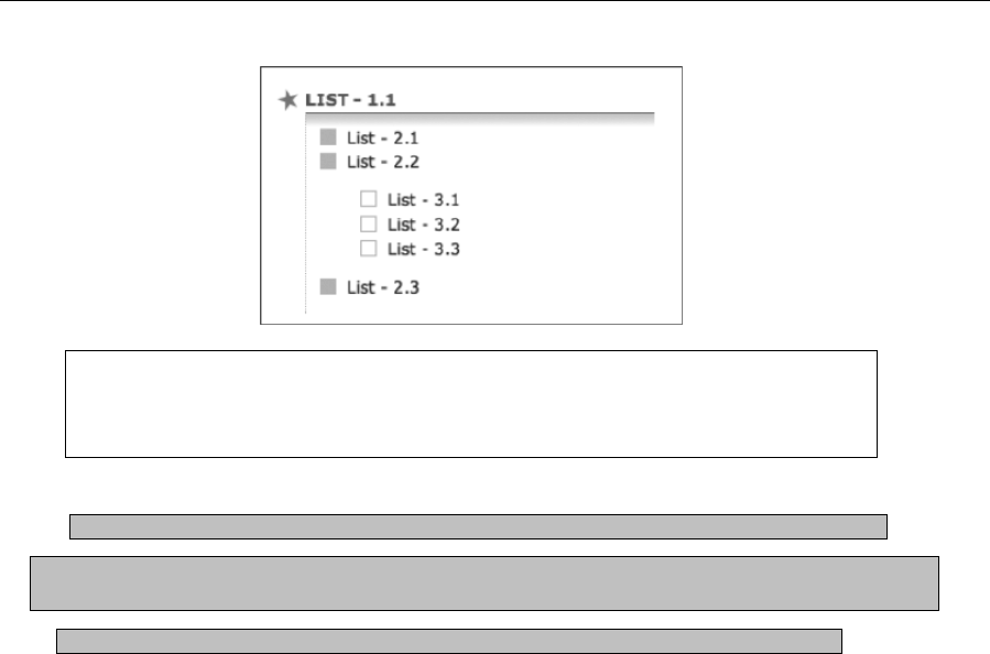
Chapter 3
116
Note: When creating lists such as this, don’t overcomplicate things, and try to avoid
going to many levels of nesting or combining ordered and unordered lists; otherwise, the
selectors required for overrides become extremely complicated.
Required files The HTML and CSS documents from the basic-boilerplates folder as a starting point
What you’ll learn How to style a list for displaying code online (complete with exercise headings and line
numbers)
Completed files display-code-online.html and display-code-online.css from the chapter 3 folder
1. Create the list. Code blocks require terminology and descriptions, meaning that a definition list
can be used to mark them up. For this example, the code block from the preceding “List style
shorthand” section will be used. Within the wrapper div, create a definition list and give it a class
value of codeList. For the term, add a description of the code, and for the definition, add an
ordered list, with each line of code within its own list item. Each line of code should also be
nested within a code element.
<dl class="codeList">
<dt>Writing out list styles in full</dt>
<dd>
<ol>
<li><code>ul {</code></li>
<li><code>list-style-type: square;</code></li>
<li><code>list-style-position: inside;</code></li>
<li><code>list-style-image: url(bullet.gif);</code></li>
<li><code>}</code></li>
</ol>
</dd>
</dl>
2. Amend the body and #wrapper CSS rules, adding some padding to the former (so the content
doesn’t hug the browser window edges during testing) and a shorthand font definition to the latter
(in place of existing content).
www.freepdf-books.com
Working With Type
117
body {
font: 62.5%/1.5 Verdana, Arial, Helvetica, sans-serif;
padding: 20px;
}
#wrapper {
font: 1.2em/1.5em 'Lucida Grande', 'Lucida Sans Unicode', Lucida,
Arial, Helvetica, sans-serif;
}
3. Style the list. Add the following rule, which adds a solid border around the definition list that has a
codeList class value:
.codeList {
border: 1px solid #aaaaaa;
}
4. Style the definition term element. Add the following rule, which styles the dt element. The rule
colors the background of dt elements within any element with a class value of codeList and also
adds some padding so the content of the dt elements doesn’t hug their borders. The font-weight
value of bold ensures the content stands out, while the border-bottom value will be used as a
device throughout the other rules, separating components of the design with a fairly thin white
line.
.codeList dt {
background: #dddddd;
padding: 7px;
font-weight: bold;
border-bottom: 2px solid #ffffff;
}
5. Style the list items within the ordered list by adding the following rule. The
margin-left value places the bullets within the definition list, rather than outside of it.
.codeList li {
background: #ffffff;
margin-left: 2.5em;
}
Note that in Internet Explorer, the bullets typically display further to the left than in other
browsers. This behavior can be dealt with by overriding the margin-left value of .codeList
li in an IE-specific style sheet attached using a conditional comment—see Chapter 9 for
more on this technique.
6. Finally, style the code elements. The background value is slightly lighter than that used for the dt
element, ensuring that each element is distinct. By setting display to block, the code elements
stretch to fill their container (meaning that the background color also does this). The borders
ensure that each line of code is visibly distinct, and the border-right setting essentially provides a
border all the way around the code lines, seeing as the border-bottom setting in .codeList dt
defines one at the top of the first line of code. The font is set to a monospace font, and the
padding values place some space around the code, making it easier to read.
www.freepdf-books.com
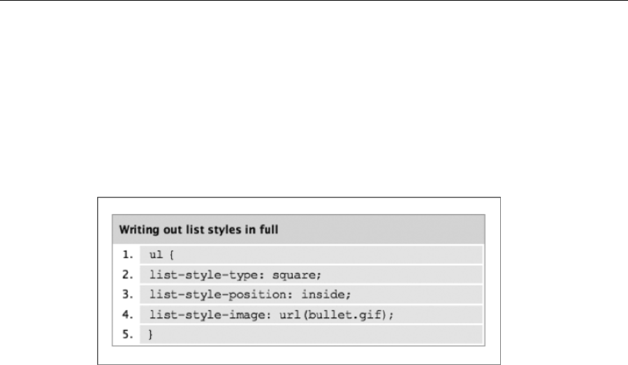
Chapter 3
118
.codeList code {
background: #eaeaea;
display: block;
border-bottom: 2px solid #ffffff;
border-right: 2px solid #ffffff;
font : 1.2em "Courier New", Courier, monospace;
padding: 2px 10px;
}
That just about wraps things up for online type. After all that text, it’s time to change track. In Chapter 4,
you’ll look at working with images on the Web, and in Chapter 5, you’ll combine what you’ve learned so far
and add anchors into the mix to create web navigation.
4
www.freepdf-books.com
119
Chapter 4
Working With Images
In this chapter:
Understanding color theory
Choosing the best image format
Avoiding common mistakes
Working with images in HTML5
www.freepdf-books.com

Chapter 4
120
Using alt text to improve accessibility
Using CSS when working with images
Displaying a random image from a selection
Introduction
Although text makes up the bulk of the Web’s content, it’s inevitable that you’ll end up working with images
at some point—that is, unless you favor terribly basic websites akin to those last seen in 1995. Images are
rife online, comprising the bulk of interfaces, the navigation of millions of sites, and a considerable amount
of actual content, too. As the Web continues to barge its way into every facet of life, this trend can only
continue; visitors to sites now expect a certain amount of visual interest, just as readers of a magazine
expect illustrations or photographs.
Like anything else, use and misuse of images can make or break a website—so, like elsewhere in this
book, this chapter covers more than the essentials of working with HTML and CSS. Along with providing
an overview of color theory, we’ve compiled a brief list of common mistakes that people make when
working with images for the Web—after all, even the most dedicated web designers pick up bad habits
without realizing it. Finally, at the end of the chapter, we’ll introduce your first piece of JavaScript, providing
you with a handy cut-out-and-keep script to randomize images on a web page.
Color theory
Color plays a massively important role in any field of design, and web design is no exception. Therefore, it
seems appropriate to include in this chapter a brief primer on color theory and working with colors on the
Web.
Color wheels
Circular color diagrams—commonly referred to as color wheels—were invented by Newton and remain a
common starting point for creative types wanting to understand the relationship between colors and also
for creating color schemes. On any standard color wheel, the three primary colors are each placed one-
third of the way around the wheel, with secondary colors equally spaced between them—secondary colors
being a mix of two primary colors. Between secondary and primary colors are tertiary colors, the result of
mixing primary and secondary colors. Some color wheels blend the colors together, creating a continuous
shift from one color to another, while others have rather more defined blocks of color; however, in all
cases, the positioning is the same.
Additive and subtractive color systems
On-screen colors use what’s referred to as an additive system, which is the color system used by light—
where black is the absence of color and colored light is added together to create color mixes. The additive
primaries are red, green, and blue (which is why you commonly hear RGB referring to the definition of
www.freepdf-books.com

Working With Images
121
screen colors). Mix equal amounts of red, green, and blue light, and you end up with white; mix
secondaries from the primaries, and you end up with magenta, yellow, and cyan.
In print, a subtractive system is used, similar to that used in the natural world. This works by absorbing
colors before they reach the eye—if an object reflects all light, it appears white, and if it absorbs all light, it
appears black. Inks for print are transparent, acting as filters to enable light to pass through, reflect off the
print base (such as paper), and produce unabsorbed light. Typically, the print process uses cyan,
magenta, and yellow as primaries, along with a key color—black—since equal combination of three print
inks tends to produce a muddy color rather than the black that it should produce in theory.
Although the technology within computers works via an additive system to display colors, digital-based
designers still tend to work with subtractive palettes when working on designs (using red, yellow, and blue
primaries), because that results in natural color combinations and palettes.
Creating a color scheme using a color wheel
Even if you have a great eye for color and can instinctively create great schemes for websites, it pays to
have a color wheel handy. These days, you don’t have to rely on reproductions in books or hastily created
painted paper wheels. There are now digital color wheels that enable you to experiment with schemes,
including Color Consultant Pro for the Mac (www.code-line.com/software/colorconsultantpro.html),
shown in the following screenshot, and Color Wheel Pro (www.color-wheel-pro.com) and ColorImpact
(www.tigercolor.com/Default.htm), both for Windows.
www.freepdf-books.com
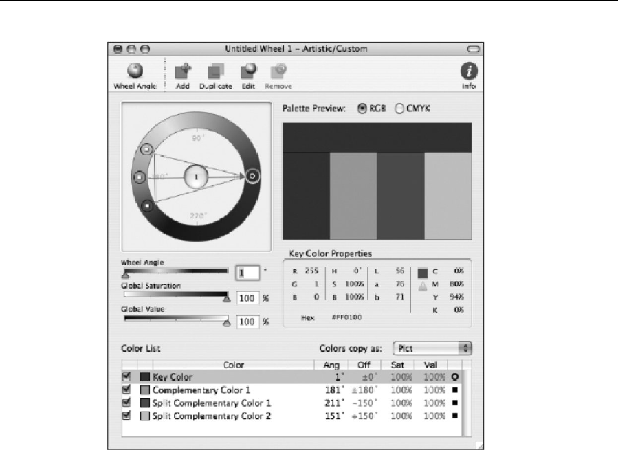
Chapter 4
122
When working on color schemes and creating a palette for a website, various schemes are available for
you. The simplest is a monochromatic scheme, which involves variations in the saturation (effectively the
intensity or strength) of a single hue. Such schemes can be soothing—notably when based on green or
blue—but also have a tendency to be bland, unless used with striking design and black and white. A
slightly richer scheme can be created by using colors adjacent on the color wheel—this is referred to as an
analogous scheme and is also typically considered harmonious and pleasing to the eye.
For more impact, a complementary scheme can be used, which uses colors on opposite sides of the color
wheel (such as red/green, orange/blue, and yellow/purple); this scheme is often seen in art, such as a
pointillist using orange dots in areas of blue to add depth. Complementary schemes work well because of
a subconscious desire for visual harmony—an equal mix of complementary colors results in a neutral gray.
Such effects are apparent in human color vision: if you look at a solid plane of color, you’ll see its
complementary color when you close your eyes.
A problem with a straight complementary scheme is that overuse of its colors can result in garish, tense
design. A subtler but still attention-grabbing scheme can be created by using a color and the hues
adjacent to the complementary color. This kind of scheme (which happens to be the one shown in the
previous screenshot) is referred to as split-complementary.
www.freepdf-books.com

Working With Images
123
Another scheme that offers impact—and one often favored by artists—is the triadic scheme, which
essentially works with primary colors or shifted primaries (that is, colors equally spaced around the color
wheel). The scheme provides plenty of visual contrast and, when used with care, can result in a balanced,
harmonious result.
How colors “feel” also plays a part in how someone reacts to them—for example, people often talk of
“warm” and “cool” colors. Traditionally, cooler colors are said to be passive, blending into backgrounds,
while warmer colors are cheerier and welcoming. However, complexity is added by color intensity—a
strong blue will appear more prominent than a pale orange. A color’s temperature is also relative, largely
defined by what is placed around it. On its own, green is cool, yet it becomes warm when surrounded by
blues and purples.
Against black and white, a color’s appearance can also vary. Against white, yellow appears warm, but
against black, yellow has an aggressive brilliance. However, blue appears dark on white but appears
luminescent on black.
The human condition also adds a further wrench in the works. Many colors have cultural significance,
whether from language (cowardly yellow) or advertising and branding. One person may consider a color
one thing (green equals fresh), and another may have different ideas entirely (green equals moldy).
There’s also the problem of color blindness, which affects a significant (although primarily male) portion of
the population, meaning you should never rely entirely on color to get a message across. Ultimately, stick
to the following rules, and you’ll likely have some luck when working on color schemes:
Work with a color wheel, and be mindful of how different schemes work.
Use tints and shades of a hue, but generally avoid entirely monochromatic schemes—inject an
adjacent color for added interest.
Create contrast by adding a complementary color.
Keep saturation levels and value levels the same throughout the scheme (a color’s value
increases the closer it is to white).
Keep things simple—using too many colors results in garish schemes.
Don’t rely on color to get a message across—if in doubt about the effects of color blindness,
test your design with a color blindness simulator application such as Color Oracle
(http://colororacle.cartography.ch/).
Go with your gut reaction—feelings play an important part when creating color schemes. What
feels right is often a good starting point.
Working with hex
The CSS specifications support just 16 color names: aqua, black, blue, fuchsia, gray, green, lime, maroon,
navy, olive, purple, red, silver, teal, white, and yellow. All other colors must be written in another format,
such as RGB numbers or percentages—rgb(255,0,0) or rgb(100%,0%,0%)—or hexadecimal format, which
tends to be most popular in online design. Note that to keep things consistent, it actually makes sense to
write all colors—even the 17 with supported names—in hex. Colors written in hex comprise a hash sign
www.freepdf-books.com
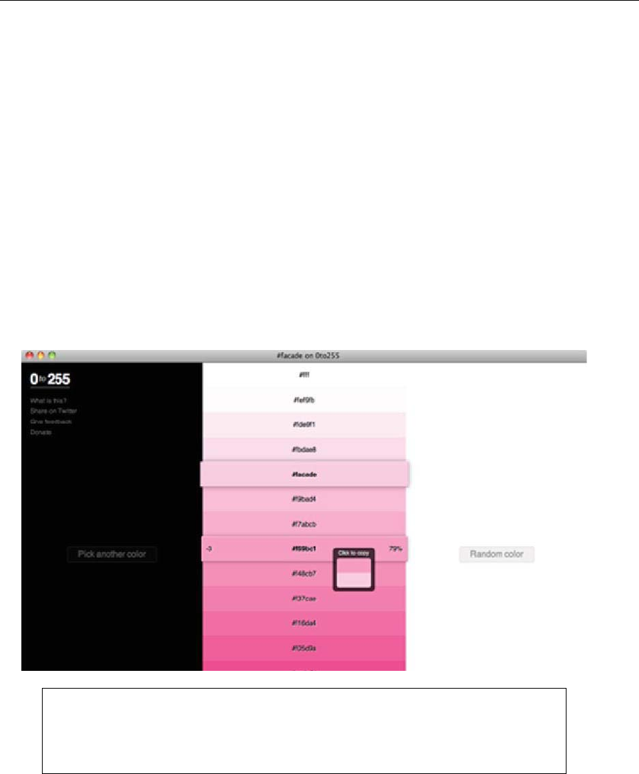
Chapter 4
124
followed by six digits. The six digits are comprised of pairs, representing the red, green, and blue color
values, respectively:
#XXxxxx: Red color value
#xxXXxx: Green color value
#xxxxXX: Blue color value
Because the hexadecimal system is used, the digits can range in value from 0 to f, with 0 being the lowest
value (nothing) and f being the highest. Therefore, if we set the first two digits to full (ff) and the others to
0, we get #ff0000, which is the hex color value for red. Likewise, #00ff00 is green, and #0000ff is blue.
Of course, there are plenty of potential combinations—16.7 million of them, in fact. Luckily, any half-decent
graphics application will do the calculations for you, so you won’t have to work out for yourself that black is
#000000 and white is #ffffff—just use an application’s color picker/eyedropper tool, and it should provide
you with the relevant hex value.
0to255.com offers a nice service to help web designers find variations of any color and quickly copy the
hex code.
Note: When a hex value consists of three pairs, the values can be abbreviated. For
example, the value #ffaa77 can be written #fa7. Some designers swear by this
abbreviated form. I tend to use the full six-figure hex value because it keeps things
consistent.
www.freepdf-books.com

Working With Images
125
Web-safe colors
Modern PCs and Macs come with some reasonable graphics clout, but this wasn’t always the case. In fact,
many computers still in common use cannot display millions of colors. Back in the 1990s, palette
restrictions were even more ferocious, with many computers limited to a paltry 256 colors (8-bit). Microsoft
and Apple couldn’t agree on which colors to use, so the web-safe palette was created, which comprises
just 216 colors that are supposed to work accurately on both platforms without dithering. (For more
information about dithering, see the “GIF” section later in this chapter.) Applications such as Photoshop
have built-in web-safe palettes, and variations on the palette can be seen at www.visibone.com.
Colors in the web-safe palette are made up of combinations of RGB in 20% increments, and as you might
expect, the palette is limited. Also discouraging, in the article “Death of the Websafe Color Palette?” on
Webmonkey (www.webmonkey.com/00/37/index2a.html; posted September 6, 2000), David Lehn and
Hadley Stern reported that all but 22 of these colors were incorrectly shifted in some way when tested on a
variety of platforms and color displays—in other words, only 22 of the web-safe colors are actually totally
web-safe.
The majority of people using the Web have displays capable of millions of colors, and almost everyone
else can view at least thousands of colors. Unless you’re designing for a very specific audience
with known restricted hardware, stick with sRGB (the default color space of the Web—see
www.w3.org/Graphics/Color/sRGB) and design in millions of colors. And consider yourself lucky that it’s not
1995.
Choosing formats for images
To present images online in the best possible way, it’s essential to choose the best file format when
exporting and saving them. Although the save dialogs in most graphics editors present a bewildering list of
possible formats, the Web typically uses just two: JPEG and GIF (along with the GIF89, or transparent
GIF, variant), although a third, PNG, is finally gaining popularity, largely because of Internet Explorer 7
finally having offered full support for it.
JPEG
The Joint Photographic Experts Group (JPEG) format is used primarily for images that require smooth
color transitions and continuous tones, such as photographs. JPEG supports millions of colors, and
relatively little image detail is lost—at least when compression settings aren’t too high. This is because the
format uses lossy compression, which removes information that the eye doesn’t need. As the compression
level increases, this information loss becomes increasingly obvious, as shown in the following images. As
you can see from the image on the right, which is much more compressed than the one on the left, nasty
artifacts become increasingly dominant as the compression level increases. At extreme levels of
compression, an image will appear to be composed of linked blocks (see the following two images, the
originals of which are in the chapter 4 folder as tree.jpg and tree-compressed.jpg).
www.freepdf-books.com

Chapter 4
126
Although it’s tricky to define a cutoff point, it’s safe to say that for photographic work where it’s important to
retain quality and detail, 50 to 60% compression (40 to 50% quality) is the highest you should go for.
Higher compression is sometimes OK in specific circumstances, such as for very small image thumbnails,
but even then, it’s best not to exceed 70% compression.
If the download time for an image is unacceptably high, you could always try reducing the dimensions
rather than the quality; a small, detailed image usually looks better than a large, heavily compressed
image. Also, bear in mind that common elements—that is, images that appear on every page of a website,
perhaps as part of the interface—will be cached and therefore need to be downloaded only once. Because
of this, you can get away with less compression and higher file sizes.
Note: Be aware that applications have different means of referring to compression
levels. Some, such as Adobe applications, use a quality scale, in which 100 is
uncompressed and 0 is completely compressed. Others, such as Paint Shop Pro, use
compression values, in which higher numbers indicate increased compression. Always
be sure you know which scale you’re using.
Some applications have the option to save progressive JPEGs. Typically, this format results in larger file
sizes, but it’s useful because it enables your image to download in multiple passes. This means that a low-
resolution version will display rapidly and gradually progress to the quality you saved it at, allowing viewers
to get a look at a simplified version of the image without having to wait for it to load completely.
GIF
Graphics Interchange Format (GIF) is in many ways the polar opposite of JPEG—it’s lossless, meaning
that there’s no color degradation when images are compressed. However, the format is restricted to a
maximum of 256 colors, thereby rendering it ineffective for color photographic images. Using GIF for such
images tends to produce banding, in which colors are reduced to the nearest equivalent. A fairly extreme
example of this is shown in the following illustration.
www.freepdf-books.com
Working With Images
127
GIF is useful for displaying images with large areas of flat color, such as logos, line art, and type. As we
mentioned in the previous chapter, you should generally avoid using graphics for text on your web pages,
but if you do, PNG is the best choice of format, depending on the stylization of the text and whether it
needs to be transparent.
Although GIF is restricted to 256 colors, it’s worth noting that you don’t have to use the same 256 colors
every time. Most graphics applications provide a number of palette options, such as perceptual, selective,
and web. The first of those, perceptual, tends to prioritize colors that the human eye is most sensitive to,
thereby providing the best color integrity. Selective works in a similar fashion but balances its color choices
with web-safe colors, thereby creating results more likely to be safe across platforms. Web refers to the
216-color web-safe palette discussed earlier. Additionally, you often have the option to lock colors, which
forces your graphics application to use only the colors within the palette you choose.
Images can also be dithered, which prevents continuous tones from becoming bands of color. Dithering
simulates continuous tones, using the available (restricted) palette. Most graphics editors allow for three
different types of dithering: diffusion, pattern, and noise—all of which have markedly different effects on an
image. Diffusion applies a random pattern across adjacent pixels, whereas pattern applies a half-tone
pattern rather like that seen in low-quality print publications. Noise works rather like diffusion, but without
diffusing the pattern across adjacent pixels. The following are four examples of the effects of dithering on
an image that began life as a smooth gradient. The first image (1) has no dither, and the gradient has been
turned into a series of solid, vertical stripes. The second image (2) shows the effects of diffusion dithering;
the third (3), pattern; and the fourth (4), noise.
www.freepdf-books.com
Chapter 4
128
GIF89: The transparent GIF
The GIF89 file format is identical to GIF, with one important exception: you can remove colors, which
provides a very basic means of transparency and enables the background to show through. Because this
is not alpha transparency (a type of transparency that enables a smooth transition from solid to
transparent, allowing for many levels of opacity), it doesn’t work in the way many graphic designers
expect. You cannot, for instance, fade an image’s background from color to transparent and expect the
web page’s background to show through—instead, GIF89’s transparency is akin to cutting a hole with a
pair of scissors: the background shows through the removed colors only. This is fine when the “hole” has
flat horizontal or vertical edges. But if you try this with irregular shapes—such as in the following image of
the cloud with a drop shadow—you’ll end up with ragged edges. In the example, the idea was to have the
cloud casting a shadow onto the gray background. However, because GIFs can’t deal with alpha
transparency, we instead end up with an unwanted white outline. (One way around this is to export the
image with the same background color as that of the web page, but this is possible only if the web page’s
background is a plain, flat color.)
Because of these restrictions, GIF89s are not used all that much these days. They do cling on in one area
of web design, though: as spacers for stretching table cells in order to lay out a page. However, in these
enlightened times, that type of technique must be avoided, since you can lay out precisely spaced pages
much more easily using CSS.
www.freepdf-books.com
Working With Images
129
PNG
For years, PNG (pronounced “ping,” and short for Portable Network Graphics) lurked in the wilderness as a
capable yet unloved and unused format for web design. Designed primarily as a replacement for GIF, the
format has plenty to offer, including a far more flexible palette than GIF and true alpha transparency. Some
have touted PNG as a JPEG replacement, too, but this isn’t recommended—PNGs tend to be much larger
than JPEGs for photographic images. For imagery with sharp lines, areas of flat color, or where alpha
transparency is required, it is, however, a good choice.
The reason PNG was less common than GIF or JPEG primarily had to do with Internet Explorer. Prior to
version 7, Microsoft’s browser didn’t offer support for PNG alpha transparency, instead replacing
transparent areas with white or gray. Although a proprietary workaround exists (see Chapter 9’s “Dealing
with Internet Explorer bugs” section), it isn’t intuitive, and it requires extra code. With post–version 6
releases of Internet Explorer finally supporting alpha transparency, PNG is a popular choice.
The three adjacent images highlight the benefit of PNG over GIF,
as shown in a web browser. The first illustration shows two PNGs
on a white background. The second illustration shows this
background replaced by a grid. Note how the button’s drop
shadow is partially see-through, while the circle’s center is
revealed as being partially transparent, increasing in opacity
toward its edge. The third illustration shows the closest equivalent
when using GIFs—the drop shadow is surrounded by an ugly
cutout, and the circle’s central area loses its transparency. Upon
closer inspection, the circle is also surrounded by a jagged edge,
and the colors are far less smooth than those of the PNG.
For more information about this format, checkout the
PNG website at www.libpng.org/pub/png.
Other image formats
You may have worked on pages in the past and added the odd BMP or TIFF file or seen another site do
the same. These are not standard formats for the Web, though, and while they may work fine in some
cases, they require additional software in order to render in some browsers (in many cases, they won’t
render at all, or they’ll render inconsistently across browsers). Furthermore, JPEG, GIF, and PNG are well-
suited to web design because they enable you to present a lot of visual information in a fairly small file.
Presenting the same in a TIFF or BMP won’t massively increase the image’s quality (when taking into
www.freepdf-books.com

Chapter 4
130
account the low resolution of the Web), but it will almost certainly increase download times. Therefore,
quite simply, don’t use any formats other than JPEG, GIF, or PNG for your web images (and if you decide
to use PNG transparency, be sure that your target audience will be able to see the images).
Common web image gaffes
The same mistakes tend to crop up again and again when designers start working with images. To avoid
making them, read on to find out about some common ones (and how to avoid them).
Using graphics for body copy
Some sites use graphics for body copy on web pages in order to get more typographical control than CSS
allows. However, using graphics for body copy causes text to print poorly—much worse than HTML-based
text. Additionally, it means the text can’t be read by search engines, can’t be copied and pasted, and can’t
be enlarged, unless you’re using a browser (or operating system) that can zoom—and even then it will be
pixelated. If graphical text needs to be updated, it means reworking the original image (which could include
messing with line wraps, if words need to be added or removed), reexporting it, and reuploading it.
As mentioned in the “Image-replacement techniques” section of Chapter 3, the argument is a little less
clear-cut for headings (although I recommend using styled HTML-based text for those, too), but for body
copy, you should always avoid using images.
Not working from original images
If it turns out an image on a website is too large or needs editing in some way, the original should be
sourced to make any changes if the online version has been in any way compressed. This is because
continually saving a compressed image reduces its quality each time. Also, under no circumstances
should you increase the dimensions of a compressed JPEG. Doing so leads to abysmal results every time.
Overwriting original documents
The previous problem gets worse if you’ve deleted your originals. Therefore, be sure that you never
overwrite the original files you’re using. If resampling JPEGs from a digital camera for the Web, work with
copies so you don’t accidentally overwrite your only copy of that great photo you’ve taken with a much
smaller, heavily compressed version. More important, if you’re using an application that enables layers,
save copies of the layered documents prior to flattening them for export—otherwise you’ll regret it when
having to make that all-important change and having to start from scratch.
Busy backgrounds
When used well, backgrounds can improve a website, adding visual interest and atmosphere—see the
following image, showing the top of a version of the Snub Communications homepage. However, if
backgrounds are too busy, in terms of complicated artwork and color, they’ll distract from the page’s
content. If placed under text, they may even make your site’s text-based content impossible to read. With
www.freepdf-books.com
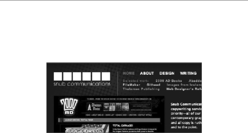
Working With Images
131
that in mind, keep any backgrounds behind content subtle—near-transparent single-color watermarks tend
to work best.
For backgrounds outside of the content area (as per the “Watermarks” section in Chapter 2), you must
take care, too. Find a balance in your design and ensure that the background doesn’t distract from the
content, which is the most important aspect of the site.
Lack of contrast
It’s common to see websites that don’t provide enough contrast between text content and the
background—for example, (very) light gray text on a white background, or pale text on an only slightly
darker background. Sometimes this lack of contrast finds its way into other elements of the site, such as
imagery comprising interface elements. This isn’t always a major problem; in some cases, designs look
stylish if a subtle scheme is used with care. You should, however, ensure that usability isn’t affected—it’s
all very well to have a subtle color scheme, but not if it stops visitors from being able to easily find things
like navigation elements or from being able to read the text.
Using the wrong image format
Exporting photographs as GIFs, using BMPs or TIFFs online, rendering soft and blotchy line art and text
as a result of using the JPEG format—these are all things to avoid in the world of creating images for
websites. See the section “Choosing formats for images” earlier in this chapter for an in-depth discussion
of formats.
Resizing in HTML
When designers work in WYSIWYG editing tools, relying on a drag-and-drop interface, it’s sometimes
tempting to resize all elements in this manner (and this can sometimes also be done by accident), thereby
compromising the underlying code of a web page. Where images are concerned, this has a detrimental
effect, because the pixel dimensions of the image no longer tally with its width and height values. In some
cases, this may lead to distorted imagery (as shown in the rather extreme example that follows); it may
also lead to visually small images that have ridiculously large files sizes by comparison. In most cases,
distortion of detail will still occur, even when proportion is maintained.
www.freepdf-books.com
Chapter 4
132
Note: There are exceptions to this rule, however, although they are rare. For instance, if
you work with pixel art saved as a GIF, you can proportionately enlarge an image,
making it large on the screen. Despite the image being large, the file size will be tiny.
Not balancing quality and file size
Bandwidth can be a problem in image-heavy sites—both in terms of the host getting hammered when
visitor numbers increase and in terms of the visitors, many of whom may be stuck with slower connections
than you having to download the images. Therefore, you should always be sure that your images are
highly optimized in order to save on hosting costs and ensure that your website’s visitors don’t have to
suffer massive downloads. (In fact, they probably won’t—they’ll more than likely go elsewhere.)
But this doesn’t mean you should compress every image on your website into a slushy mess (and we’ve
seen plenty of sites where the creator has exported JPEGs at what looks like 90% compression—“just in
case”).
Err on the side of caution, but remember: common interface elements are cached, so you can afford to
save them at a slightly higher quality. Any image that someone requests (such as via a thumbnail on a
portfolio site) is something they want to see, so these too can be saved at a higher quality because the
person is likely to wait. Also, there is no such thing as an optimum size for web images. If you’ve read in
the past that no web image should ever be larger than 50 KB, it’s hogwash. The size of your images
depends entirely on context, the type of site you’re creating, and the audience you’re creating it for.
Text overlays and splitting images
Some designers use various means to stop people from stealing images from their site and reusing them.
The most common are including a copyright statement on the image itself, splitting the image into a
number of separate images to make it harder to download, and adding an invisible transparent GIF
overlay.
The main problem with copyright statements is that they are often poorly realized (see the following
example), ruining the image with a garish text overlay. Ultimately, while anyone can download images from
your website to their hard drive, you need to remember that if someone uses your images, they’re
infringing your copyright, and you can deal with them accordingly (and, if they link directly to images on
your server, try changing the affected images to something text-based, like “The scumbag whose site
you’re visiting stole images from me”).
www.freepdf-books.com
Working With Images
133
As for splitting images into several separate files or placing invisible GIFs over images to try to stop people
from downloading them, don’t do this—there are simple workarounds in either case, and you just end up
making things harder for yourself when updating your site. Sometimes you even risk compromising the
structural integrity of your site when using such methods.
Stealing images and designs
Too many people appear to think that the Internet is a free-for-all, outside of the usual copyright
restrictions, but this isn’t the case: copyright exists on the Web just like everywhere else. Unless you have
permission to reuse an image you’ve found online, you shouldn’t do so. If discovered, you may get the
digital equivalent of a slap on the wrist, but you could also be sued for copyright infringement.
Although it’s all right to be influenced by someone else’s design, you should also ensure you don’t simply
rip off a creation found on the Web—otherwise, you could end up in legal trouble or the subject of ridicule.
Working with images in HTML
The img element is used to add images to a web page. It’s an empty tag, so it takes the combined start
and end tag form with a trailing slash, as outlined in Chapter 1. The following code block shows an
example of an image element, complete with relevant attributes:
<img src="sunset.jpg" height="200" width="400" alt="Sunset in
ÍReykjavík" />
Perhaps surprisingly, the height and width attributes are actually optional, although I recommend
including them because they assist the browser in determining the size of the image before it downloads
(thereby speeding up the process of laying out the page). The only two image element attributes required
www.freepdf-books.com
Chapter 4
134
in HTML are src and alt. The first, src, is the path to the image file to be displayed; and the second, alt,
provides some alternative text for when the image is not displayed.
Note that this chapter’s section on images largely concerns itself with inline images—the
addition of images to the content of a web page. For an overview of using images as
backgrounds, see the “Web page backgrounds” section of Chapter 2; for an overview of
working with images within web navigation and with links in general, see Chapter 5.
Using alt text for accessibility benefits
Alternate text—usually referred to as alt text, after its attribute—is often ignored or used poorly by
designers, but it’s essential for improving the accessibility of web pages. Visitors using screen readers rely
on the alt attribute’s value to determine what an image shows. Therefore, always include a succinct
description of the image’s content and avoid using the image’s file name, because that’s often of little help.
Ignoring the alt attribute not only renders your page invalid according to the W3C recommendations but
also means that screen readers (and browsers that cannot display images) end up with something like this
for output: [IMAGE][IMAGE][IMAGE]—not very helpful, to say the least.
Descriptive alt text for link-based images
Images often take on dual roles, being used for navigation purposes as well as additional visual impact. In
such cases, the fact that the image is a navigation aid is likely to be of more significance than its visual
appearance. For instance, many companies use logos as links to a homepage—in such cases, some
designers would suggest using “Company X homepage” for the alt text, because it’s more useful than
“Company X.”
Alternatively, stick with using the alt attribute for describing the image, and add a title attribute to the
link, using that to describe the target. Depending on user settings, the link’s title attribute will be read in
the absence of any link text.
Tip: If you don’t have access to screen-reading software for testing alt text and various
other accessibility aspects of a website, either install the text-based browser Lynx; run
Opera in User mode, which can emulate a text browser; or try the Universal Access
options on your computer such as Mac OS X with Voice Over options in Safari.
Null alt attributes for interface images
In some cases, images have no meaning at all (such as if they’re a part of an interface), and there is some
debate regarding the best course of action with regard to such images’ alt values. Definitely never type
something like spacer or interface element; otherwise, screen readers and text browsers will drive their
users crazy relaying these values back to them. Instead, it’s recommended that you use a null alt
attribute, which takes the form alt="".
www.freepdf-books.com
Working With Images
135
Null alt attributes are unfortunately not interpreted correctly by all screen readers; some, upon discovering
a null alt attribute, go on to read the image’s src value. A common workaround is to use empty alt
attributes, which just have blank space for the value (alt=" "). However, the null alt attribute has valid
semantics, so it should be used despite some screen readers not being able to deal with it correctly.
Alternatively, try reworking your design so that images without meaning are applied as background images
to div elements, rather than placed inline.
Using alt and title text for tooltips
Although the W3C specifically states that alt text
shouldn’t be visible if the image can be seen, Internet
Explorer ignores this, displaying alt text as a tooltip
when the mouse cursor hovers over an image, as
shown in the adjacent example.
Internet Explorer users are most likely accustomed to
this by now, and, indeed, you may have used alt text to
create tooltips in your own work. If so, it’s time to stop.
This behavior is not recommended by the W3C, and it’s
also not common across all browsers and platforms.
If an image requires a tooltip, most browsers display the value of a title attribute as one. In spite of this, if
the text you’re intending for a pop-up is important, you should instead place it within the standard text of
your web page, rather than hiding it where most users won’t see it. This is especially important when you
consider that Firefox crops the values after around 80 characters, unlike some browsers, which happily
show multiline tooltips.
Using CSS when working with images
In the following section, we’re going to look at relevant CSS for web page images. You’ll see how best to
apply borders to images and wrap text around them, as well as define spacing between images and other
page elements.
Applying CSS borders to images
You may have noticed earlier that we didn’t mention the border attribute when working through the img
element. This is because the border attribute is deprecated; adding borders to images is best achieved
and controlled by using CSS. (Also, because of the flexibility of CSS, this means that if you want only a
simple surrounding border composed of flat color, you no longer have to add borders directly to your
image files.) Should you want to add a border to every image on your website, you could do so with the
following CSS:
img {
border: 1px solid #000000;
}
www.freepdf-books.com

Chapter 4
136
In this case, a 1-pixel solid border, colored black (#000000 in hex), would surround every image on the site.
Using contextual selectors, this can be further refined. For instance, should you only want the images
within a content area (marked up as a div with an id value of content) to be displayed with a border, you
could write the following CSS:
div#content img {
border: 1px solid #000000;
}
Alternatively, you could set borders to be on by default and override them in specific areas of the website
via a rule using grouped contextual selectors:
img {
border: 1px solid #000000;
}
#masthead img, #footer img, #sidebar img {
border: 0;
}
Finally, you could override a global border setting by creating, for example, a portfolio class and then
assigning it to relevant images. In CSS, you’d write the following:
.portfolio {
border: 0;
}
And in HTML, you’d add the portfolio class to any image that you didn’t want to have a border:
<img class="portfolio" src="sunset.jpg" height="200" width="400"
alt="A photo of a sunset" />
Clearly, this could be reversed (turning off borders by default and overriding this with, say, an addBorder
style that could be used to add borders to specific images). Obviously, you should go for whichever system
provides you with the greatest flexibility when it comes to rapidly updating styles across the site and
keeping things consistent when any changes occur. Generally, the contextual method is superior for
achieving this.
Although it’s most common to apply borders using the shorthand shown earlier, it’s possible to define
borders on a per-side basis, as demonstrated in the “Using classes and CSS overrides to create an
alternate pull quote” exercise in Chapter 3. If you wanted to style a specific image to resemble a Polaroid
photograph, you could set equal borders on the top, left, and right, and a larger one on the bottom. In
HTML, you would add a class attribute to the relevant image:
<img class="photo" src="sunset.jpg" height="300" width="300"
alt="Sunset photo" />
In CSS, you would write the following:
.photo {
border-width: 8px 8px 20px;
border-style: solid;
www.freepdf-books.com
Working With Images
137
border-color: #ffffff;
}
The results of this are shown in the image to the right.
(Obviously, the white border shows only if you have a
contrasting background—you wouldn’t see a white border on
a white background!)
Should you want to, you can also reduce the declaration’s size
by amalgamating the border-style and border-color
definitions:
.photo {
border: solid #ffffff;
border-width : 8px 8px 20px;
}
Note that when you’ve used a contextual selector with an id value to style a bunch of
elements in context, overriding this often requires the contextual selector to again be
included in the override rule. In other words, a class value of .override would not
necessarily override values set in #box img, even if applied to an image in the box div. In
such cases, you’d need to add the id to the selector: #box .override.
There are other border-style values that can be used with images, as well. Examples include dashed and
dotted; see the border-style entry in Appendix D (CSS Reference) for a full list. However, overdone
decoration can distract from the image, so always ensure that your borders don’t overpower your imagery.
Using CSS to wrap text around images
You can use the float and margin properties to enable body copy to wrap around an image. The method
is similar to the pull quote example in the previous chapter, so we won’t dwell too much on this. Suffice to
say that images can be floated left or right, and margins can be set around edges facing body copy in
order to provide some whitespace. For example, expanding on the previous example, you could add the
following rules to ensure that the surrounding body copy doesn’t hug the image:
.photo {
border-width: 8px 8px 20px 8px;
border-style: solid;
border-color: #ffffff;
float: right;
margin-left: 20px;
margin-bottom: 20px;
www.freepdf-books.com

Chapter 4
138
}
This results in the following effect shown in the following image.
See using-css-to-wrap-around-images.html, using-css-to-wrap-around-images.css, and sunset.jpg in
the chapter 4 folder for a working example of this page.
Displaying random images
This section of the chapter looks at creating a simple system for displaying a random image from a
selection. This has several potential uses, such as randomizing banners on a commercial website or giving
the impression that a site is updated more often than it is by showing visitors some new content each time
they arrive. Also, for portfolios, it’s useful to present a random piece of work from a selection.
Prior to starting work, you need to prepare your images. Unless you’re prepared for subsequent layout
elements to shift upon each visit to the page, aim to export all your images with equal dimensions. Should
this not be an option, try to keep the same height setting. Note, however, that you can use different file
formats for the various images. It’s good housekeeping to keep these images in their own folder, too; for
this exercise, the images are placed within assets/random-images.
Creating a JavaScript-based image randomizer
Required files The image-randomizer-starting-point folder from the chapter 4 folder
www.freepdf-books.com
Working With Images
139
What you’ll learn How to create an image randomizer using JavaScript
Completed files The image-randomizer-javascript folder in the chapter 4 folder
1. Edit the HTML. Open randomizer.html. In the body of the web page, add the following img
element. The src value is for the default image, and this is what’s shown if JavaScript is
unavailable. The id value is important—this is a hook for both the JavaScript function written in
steps 4 through 6 and a CSS rule to add a border to the image.
<img src="assets/random-images/road.jpg" id="randomImage"
name="randomImage" height="300" width="300" />
2. Next, add an onload attribute to the body start tag, as shown in the following code block. Note that
the value of this attribute will be the name of the JavaScript function.
<body onload="randomImage()">
3. In randomizer.js, create arrays for image file names and alt attribute values. For the former,
only the image file names are needed, not the path to them (that will be added later). Note that
the order of the items in the arrays must match; in other words, the text in the first item of the
chosenAltCopy array should be for the first image in the chosenImage array.
var chosenImage=new Array();
chosenImage[0]="stream.jpg";
chosenImage[1]="river.jpg";
chosenImage[2]="road.jpg";
var chosenAltCopy=new Array();
chosenAltCopy[0]="A stream in Iceland";
chosenAltCopy[1]="A river in Skaftafell, Iceland";
chosenAltCopy[2]="A near-deserted road in Iceland";
4. Create a random value. The following JavaScript provides a random value:
var getRan=Math.floor(Math.random()*chosenImage.length);
5. Create a function. Add the following text to start writing the JavaScript function, which was earlier
dubbed randomImage (see step 1’s onload value). If you’re not familiar with JavaScript, then note
that content from subsequent steps must be inserted into the space between the curly brackets.
function randomImage()
{
}
6. Add JavaScript to set the image. By manipulating the Document Object Model (DOM), we can
assign values to an element via its id value. Here, the line states to set the src attribute value of
the element with the id value randomImage (that is, the image added in step 1) to the stated path
value plus a random item from the chosenImage array (as defined via getRan, a variable created in
step 3).
document.getElementById('randomImage').setAttribute
www.freepdf-books.com
Chapter 4
140
('src','assets/random-images/'+chosenImage[getRan]);
7. Add JavaScript to set the alt text. Setting the alt text works in a similar way to step 5, but the line
is slightly simpler, because of the lack of a path value for the alt text:
document.getElementById('randomImage').setAttribute
('alt',chosenAltCopy[getRan]);
8. Style the image. In CSS, add the following two rules. The first removes borders by default from
images that are links. The second defines a border for the image added in step 1, which has an
id value of randomImage.
a img {
border: 0;
}
#randomImage {
border: solid 1px #000000;
}
Upon testing the completed files in a browser, each refresh should show a random image from the
selection, as shown in the following screenshot. (Note that in this image, the padding value for body was
set to 20px 0 0 20px to avoid the random image hugging the top left of the browser window.)
There are a couple of things to note regarding the script. To add further images/alt text, copy the previous
items in each array, increment the number in square brackets by one, and then amend the values—for
example:
www.freepdf-books.com
Working With Images
141
var chosenImage=new Array();
chosenImage[0]="stream.jpg";
chosenImage[1]="river.jpg";
chosenImage[2]="road.jpg";
chosenImage[3]="harbor.jpg";
var chosenAltCopy=new Array();
chosenAltCopy[0]="A stream in Iceland";
chosenAltCopy[1]="A river in Skaftafell, Iceland";
chosenAltCopy[2]="A near-deserted road in Iceland";
chosenAltCopy[3]="The harbor in Reykjavík ";
You’ll also note that in this example the height and widths of the images are identical. However, these can
also be changed by editing the script. For example, to set a separate height for each image, you’d first add
the following array:
var chosenHeight=new Array();
chosenHeight[0]="200";
chosenHeight[1]="500";
chosenHeight[2]="400";
And you’d next add the following line to the function:
document.getElementById('randomImage').setAttribute
('height',chosenHeight[getRan]);
Remember, however, the advice earlier about the page reflowing if the image dimensions vary—if you
have images of differing sizes, your design will need to take this into account.
Creating a PHP-based image randomizer
Required files The image-randomizer-starting-point folder from the chapter 4 folder
What you’ll learn How to create an image randomizer using PHP
Completed files The image-randomizer-php folder in the chapter 4 folder
If you have access to web space that enables you to work with PHP, it’s simple to create an equivalent to
the JavaScript exercise using PHP. The main benefit is that users who disable JavaScript will still see a
random image, rather than just the default. Note that you need some method of running PHP files to work
on this exercise, such as a local install of Apache. Note also that prior to working through the steps, you
should remove the HTML document’s script element, and you should also amend the title element’s
value, changing it to something more appropriate.
1. Define the CSS rules. In CSS, define a border style, as per step 7 of the previous exercise, but
also edit the existing paragraph rule with a font property/value pair, because in this example,
you’re going to add a caption based on the alt text value.
www.freepdf-books.com
Chapter 4
142
a img {
border: 0;
}
#randomImage {
border: solid 1px #000000;
}
p {
font: 1.2em/1.5em Verdana, sans-serif;
margin-bottom: 1.5em;
}
2. Set up the PHP tag. Change the file name of randomizer.html to randomizer.php to make it a
PHP document. Then, place the following on the page, in the location where you want the
randomized image to go. Subsequent code should be placed within the PHP tags.
<?php
?>
3. Define the array. One array can be used to hold the information for the file names and alt text. In
each case, the alt text should follow its associated image.
$picarray = array("stream" => "A photo of a stream", "river" => "A
photo of a river", "road" => "A photo of a road");
$randomkey = array_rand($picarray);
4. Print information to the web page. Add the following lines to write the img and p elements to the
web page, using a random item set from the array for the relevant attributes. Note that the
paragraph content is as per the alt text. Aside from the caption, the resulting web page looks
identical to the JavaScript example.
echo '<img src="assets/random-images/'.$randomkey.'.jpg"
alt="'.$picarray[$randomkey].'" width="300" height="300"
class="addBorder" />';
echo '<p>'.$picarray[$randomkey].'</p>';
5. Use an include. This is an extra step of sorts. If you want to make your PHP more modular, you
can copy everything within the PHP tags to an external document, save it (for example, as
random-image.php) and then cut it into the web page as an include:
<?php
@include($_SERVER['DOCUMENT_ROOT'] . "/random-image.php");
?>
For more on working with PHP, see PHP Solutions: Dynamic Web Design Made Easy by
David Powers.
www.freepdf-books.com

Working With Images
143
CSS image sprites
An image sprite is a collection of images put into a single image for performance issues. This way, a
web page with many images can take a shorter time to load since it won’t have to make multiple server
requests. Using image sprites will reduce the number of server requests and save bandwidth. Spriting
is a technique that originated from creating partially transparent graphics for use in video games.
The following shows one of the image sprites that Gmail uses in its UI.
When Gmail is loaded, it won’t load these images one by one but will rather load the whole master
image at once. It may not sound like a significant improvement, but it is. CSS sprites reduce HTTP
requests and the loading time of pages, which is the main reason they are often used on websites with
heavy traffic.
Let’s say you want to use three different images in a page:
<img src=”first.png” style="width: 100px; height: 200px">
<img src=”second.png” style="width: 300px; height: 300px">
<img src=”third.png” style="width: 25px; height: 50px">
You can use a service like csssprites.com to combine them in one master file and include them on the
page in the following manner:
<style type="text/css">
.sprite {
background: url('master-file.png');
}
</style>
www.freepdf-books.com
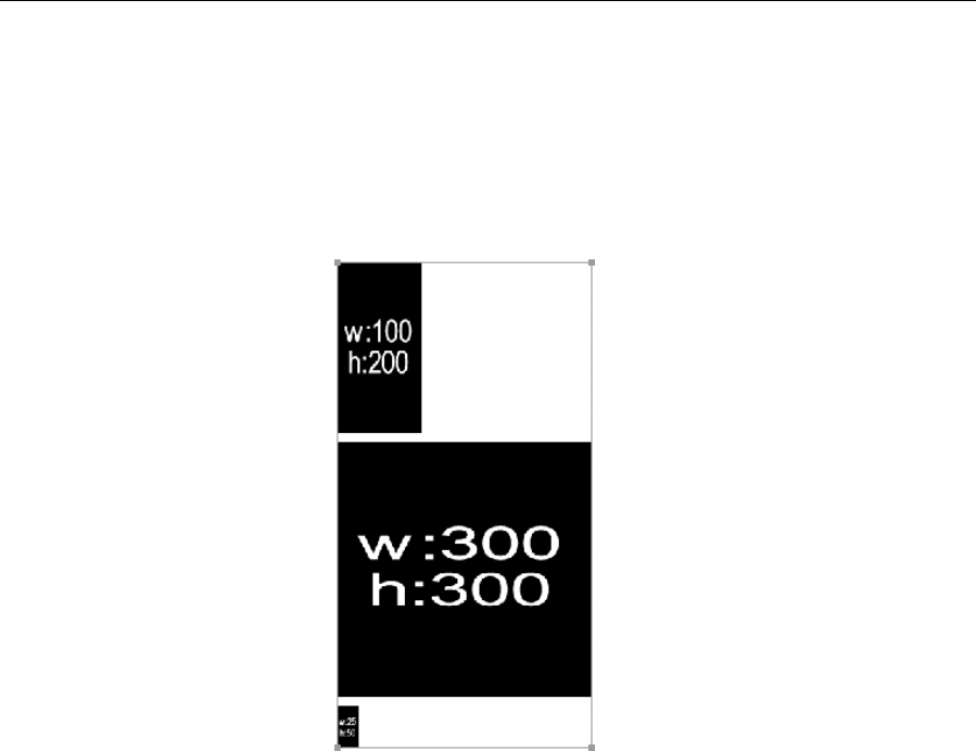
Chapter 4
144
<div class="sprite" style="background-position: -0px -0px; width: 100px; height:
200px"> </div>•
<div class="sprite" style="background-position: -0px -210px; width: 300px; height:
300px"> </div>•
<div class="sprite" style="background-position: -0px -520px; width: 25px; height:
50px"> </div>
The following shows how master-file.png looks (300x570px).
We hope you’ve found this chapter of interest and now feel you have a good grounding in working with
images on the Web. It’s amazing to think how devoid of visual interest the Web used to be in contrast
to today, now that images are essential to the vast majority of sites. As we’ve mentioned before, the
importance of images on the Web lies not only in content but in interface elements such as
navigation—a topic we’re covering in the next chapter.
www.freepdf-books.com
145
Chapter 5
Using Links and Creating Navigation
In this chapter:
Introducing web navigation
Creating links
Controlling CSS link states
Mastering the cascade
Looking at links and accessibility
Examining a JavaScript alternative to pop-ups
Creating navigation bars
Working with CSS-based rollovers
www.freepdf-books.com

Chapter 5
146
Introduction to web navigation
The primary concern of most websites is the provision of information. The ability to enable nonlinear
navigation via the use of links is one of the main things that set the Web apart from other media. But
without organized, coherent, and usable navigation, even a site with the most amazing content will fail.
During this chapter, we’ll work through how to create various types of navigation. Instead of relying on
large numbers of graphics and clunky JavaScript, we’ll create rollovers that are composed of nothing more
than simple HTML lists and a little CSS. And rather than using pop-up windows to display large graphics
when a thumbnail image is clicked, we’ll cover how to do everything on a single page.
Navigation types
There are essentially three types of navigation online:
Inline navigation: General links within web page content areas
Site navigation: The primary navigation area of a website, commonly referred to as a navigation
bar
Search-based navigation: A search box that enables you to search a site via terms you input
yourself
Although I’ve separated navigation into these three distinct categories, lines blur, and not every site
includes all the different types of navigation. Also, various designers call each navigation type something
different, and there’s no official name in each case, so in the following sections, I’ll expand a little on each
type.
Inline navigation
Inline navigation is one of the primary ways of navigating the Web, which, many moons ago, largely
consisted of technical documentation. For instance, you can make specific words within a document
link directly to related content. A great example of this is Wikipedia (www.wikipedia.org), the free
encyclopedia.
www.freepdf-books.com
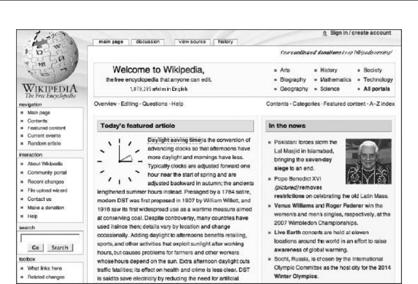
Using Links and Creating Navigation
147
Site navigation
Wikipedia showcases navigation types other than inline. To the left, underneath the logo, is a navigation
bar that is present on every page of the site, allowing users to quickly access each section. This kind of
thing is essential for most websites—long gone are the days when users often expected to have to keep
returning to a homepage to navigate to new content.
As Wikipedia proves, just because you have a global navigation bar, that doesn’t mean you should skimp
on inline navigation. In recent times, I’ve seen a rash of sites that say things like, “Thank you for visiting
our website. If you have any questions, you can contact us by clicking the contact details link on our
navigation bar.” Quite frankly, this is bizarre. A better solution is to say, “Thank you for visiting our website.
If you have any questions, please contact us” and to turn “contact us” into a link to the contact details
page. This might seem like common sense, but not every web designer thinks in this way.
Search-based navigation
Wikipedia has a search box within its navigation sidebar. It’s said there are two types of web users: those
who eschew search boxes and those who head straight for them. The thing is, search boxes are not
always needed, despite the claims of middle managers the world over. Indeed, most sites get by with well-
structured and coherent navigation.
www.freepdf-books.com
Chapter 5
148
However, sites sometimes grow very large (typically those that are heavy on information and that have
hundreds or thousands of pages, such as technical repositories, review archives, or large online stores like
Amazon and eBay). In such cases, it’s often not feasible to use only standard navigation elements to
access information. Attempting to do so leads to users getting lost trying to navigate a huge navigation
tree. Search is useful to users who know exactly what they are looking for and can be the deciding factor
for the user when deciding between your website or another.
Unlike other types of navigation, search boxes aren’t entirely straightforward to set up, requiring server-
side scripting for their functionality. However, a quick trawl through a search engine provides many
options, including Google Custom Search Engine (www.google.com/coop/cse/).
Creating and styling web page links
With the exception of search boxes, which are forms based on and driven by server-side scripting, online
navigation relies on anchor elements. In its simplest form, an anchor element looks like this:
<a href="http://www.apress.com/">A link to the Apress website</a>
The href attribute value is the URL of the destination document, which is often another web page but can
in fact be any file type (MP3, PDF, JPEG, and so on). If the browser can display the document type (either
directly or via a plug-in), it does so; otherwise, it downloads the file (or brings up some kind of download
prompt).
Caution: Never omit end tags when working with links. Omitting </a> will cause most
browsers to turn all subsequent content on the page into a link.
There are three ways of linking to a file: absolute links, relative links, and root-relative links. We’ll cover these
in the sections that follow, and you’ll see how to create internal page links, style link states in CSS, and
work with links and images. We’ll also discuss enhanced link accessibility and usability, as well as link
targeting.
Absolute links
The preceding example shows an absolute link, sometimes called a full URL, which is typically used when
linking to external files (in other words, those on other websites). This type of link provides the entire path
to a destination file, including the file transfer protocol, domain name, any directory names, and the file
name itself. A longer example is as follows:
<a href="http://www.wireviews.com/lyrics/instar.html">Instar lyrics</a>
In this case, the file transfer protocol is http://, the domain is wireviews.com, the directory is lyrics, and
the file name is instar.html.
www.freepdf-books.com

Using Links and Creating Navigation
149
Note: Depending on how the target site’s web server has been set up, you may or may
not have to include www prior to the domain name when creating this kind of link. It is a
good idea to follow a link and see what the end result is before including it, to be on the
safe side. An exception is if you’re linking to a subdomain, such as
http://browsers.evolt.org.
If you’re linking to a website’s homepage, you can usually leave off the file name, as in the earlier link
to the Apress site, and the server will automatically pick up the default document—assuming one
exists—which can be index.html, default.htm, index.php, index.asp, or some other name,
depending on the server type. If no default document exists, you’ll be returned a directory listing or an
error message, depending on whether the server’s permissions settings enable users to browse
directories.
Relative links
A relative link is one that locates a file in relation to the current document. Taking the Wireviews example,
if you were on the instar.html page, located inside the lyrics directory, and you wanted to link back to
the homepage via a relative link, you would use the following code:
<a href="../index.html">Wireviews homepage</a>
The index.html file name is preceded by ../, which tells the web browser to move up one directory prior
to looking for index.html. Moving in the other direction is done in the same way as with absolute links: by
preceding the file name with the path. Therefore, to get from the homepage back to the instar.html page,
you would write the following:
<a href="lyrics/instar.html">Instar lyrics</a>
In some cases, you need to combine both methods. For instance, this website has HTML documents in
both the lyrics and reviews folders. To get from the instar.html lyrics page to a review, you have to go
up one level and then down into the relevant directory to locate the file:
<a href="../reviews/alloy.html">Alloy review</a>
The base element when included in the head section of your web page allows you to set the default URL
or target for all relative links.
<head>
<base href="http://www.wirereviews.com">
This allows you to define the relative links as follows:
<a href="index.html">Wireviews homepage</a>
<a href="lyrics/instar.html">Instar lyrics</a>
<a href="reviews/alloy.html">Alloy review</a>
h
www.freepdf-books.com
Chapter 5
150
Root-relative links
Root-relative links work in a similar way to absolute links but from the root of the website. These links
begin with a forward slash, which tells the browser to start the path to the file from the root of the current
website. Therefore, regardless of how many directories deep you are in the Wireviews website, a root-
relative link to the homepage always looks like this:
<a href="/index.html">Homepage</a>
And a link to the instar.html page within the lyrics directory always looks like this:
<a href="/lyrics/instar.html">Instar lyrics</a>
This type of link therefore ensures you point to the relevant document without your having to type an
absolute link or mess around with relative links and is, in my opinion, the safest type of link to use for
linking to documents elsewhere on a website. Should a page be moved from one directory to one higher or
lower in the hierarchy, none of the links (including links to style sheets and script documents) would
require changing. Relative links, on the other hand, would require changing; and although absolute links
wouldn’t require changing, they take up more space and are less modular from a testing standpoint. If
you’re testing a site, you don’t want to be restricted to the domain in question—you may want to host the
site locally or on a temporary domain online so that clients can access the work-in-progress creation.
Note: All paths in href attributes must contain forward slashes only. Some software—
notably older releases from Microsoft—creates and permits backward slashes (for
example, lyrics\wire\154.html), but this is nonstandard and does not work in non-
Microsoft web browsers.
Internal page links
Along with linking to other documents, it’s possible to link to another point in the same web page. This is
handy for things like a FAQ (frequently asked questions) list, enabling the visitor to jump directly to an
answer and then back to the list of questions, or for top-of-page links, enabling a user single-click access
to return to the likely location of a page’s masthead and navigation, if they’ve scrolled to the bottom of a
long document.
When linking to other elements on a web page, you start by providing an id value for any element you
want to be able to jump to. To link to that, you use a standard anchor element (<a>) with an href value
equal to that of your defined id value, preceded by a hash symbol (#).
For a list of questions, you can have something like this:
<ul id="questions">
<li><a href="#answer1">Question one</a></li>
<li><a href="#answer2">Question two</a></li>
<li><a href="#answer3">Question three</a></li>
</ul>
Later in the document, the first two answers might look like this:
www.freepdf-books.com
Using Links and Creating Navigation
151
<p id="answer1">The answer to question 1!</p>
<p><a href="#questions">Back to questions</a></p>
<p id="answer2">The answer to question 2!</p>
<p><a href="#questions">Back to questions</a></p>
As you can see, each link’s href value is prefixed by a hash sign. When the link is clicked, the web page
jumps to the element with the relevant id value. Therefore, clicking the Question one link, which has an
href value of #answer1, jumps to the paragraph with the id value of answer1. Clicking the Back to
questions link, which has an id value of #questions, jumps back to the list, because the unordered list
element has an id of questions.
Note: It’s worth bearing in mind that the page jumps directly to the linked element only if
there’s enough room underneath it. If the target element is at the bottom of the web
page, you’ll see it plus a browser window height of content above.
Backward compatibility with fragment identifiers
In older websites, you may see a slightly different system for accessing content within a web page, and
this largely involves obsolete browsers such as Netscape 4 not understanding how to deal with links that
solely use the id attribute. Instead, you’ll see a fragment identifier, which is an anchor tag with a name
attribute, but no href attribute. For instance, a fragment identifier for the first answer is as follows:
<p><a id="answer1" name="answer1">Answer 1!</a></p>
The reason for the doubling up, here—using both the name and id attributes—is because the former is on
borrowed time in web specifications, and it should therefore be used only for backward compatibility.
Top-of-page links
Internal page links are sometimes used to create a top-of-page/back-to-top link. This is particularly handy
for websites that have lengthy pages—when a user has scrolled to the bottom of the page, they can click
the link to return to the top of the document, which usually houses the navigation. The problem here is that
the most common internal linking method—targeting a link at #top—fails in many browsers, including
Firefox and Opera.
<a href="#top">Back to top</a>
You’ve likely seen the previous sort of link countless times, but unless you’re using Internet Explorer or
Safari, it’s as dead as a dodo. There are various workarounds, though, one of which is to include a
fragment identifier at the top of the document. At the foot of the web page is the Back to top link shown
previously, and the fragment identifier is placed at the top of the web page:
<a id="top" name="top"></a>
This technique isn’t without its problems, though. Some browsers ignore empty elements such as this
(some web designers therefore populate the element with a single space); it’s tricky to get the element
right at the top of the page and not to interfere with subsequent content.
www.freepdf-books.com

Chapter 5
152
Two potential solutions are on offer. The simplest is to link the top-of-page link to your containing div—the
one within which your web page’s content is housed. For sites I create—as you’ll see in Chapter 7—I
typically house all content within a div that has an id value of wrapper. This enables me to easily control
the width of the layout, among other things. In the context of this section of this chapter, the wrapper div
also provides something for a top-of-page link to jump to. Clicking the link in the following code block
would enable a user to jump to the top of the wrapper div, at (or very near to) the top of the web page.
<a href="#wrapper">Top of page</a>
Another solution is to nest a fragment identifier within a div and then style the div to sit at the top left of
the web page. The HTML for this is the following:
<div id="topOfPageAnchor">
<a id="top" name="top"> </a>
</div>
In CSS, you would then add the following:
div#topOfPageAnchor {
position: absolute;
top: 0;
left: 0;
height: 0;
}
Setting the div’s height to 0 means it takes up no space and is therefore not displayed; setting its
positioning to absolute means it’s outside the normal flow of the document, so it doesn’t affect subsequent
page content. You can test this by setting the background color of a following element to something vivid—
it should sit tight to the edge of the container’s edges.
Link states
By default, links are displayed underlined and in blue when viewed in a web browser. However, links have
five states, and their visual appearance varies depending on the current state of the link. The states are as
follows:
link: The link’s standard state, before any action has taken place
visited: The link’s state after having been clicked
hover: The link’s state while the mouse cursor is over it
focus: The link’s state while focused
active: The link’s state while being clicked
The visited and active states also have a default appearance. The former is displayed in purple and the
latter in red. Both are underlined.
If every site adhered to this default scheme, it would be easier to find where you’ve been and where you
haven’t on the Web. However, most designers prefer to dictate their own color schemes rather than having
blue and purple links peppering their designs. In my view, this is fine. Despite what some usability gurus
www.freepdf-books.com

Using Links and Creating Navigation
153
claim, most web users these days probably don’t even know what the default link colors are, and so hardly
miss them.
Defining link states with CSS
CSS has advantages over the obsolete HTML method of defining link states. You gain control over the
hover and focus states and can do far more than just edit the state colors—although that’s what we’re
going to do first.
Anchors can be styled by using a tag selector:
a {
color: #3366cc;
}
In this example, all anchors on the page—including links—are turned to a medium blue. However,
individual states can be defined by using pseudo-class selectors (so called because they have the same
effect as applying a class, even though no class is applied to the element):
a:link {
color: #3366cc;
}
a:visited {
color: #666699;
}
a:hover {
color: #0066ff;
}
a:focus {
background-color: #ffff00;
}
a:active {
color: #cc00ff;
}
Correctly ordering link states
The various states have been defined in a specific order in the previous example: link, visited, hover,
focus, active. This is because certain states override others, and those “closest” to the link on the web
page take precedence.
There is debate regarding which order the various states should be in, so I can only provide my reasoning
for this particular example. It makes sense for the link to be a certain color when you hover over it, and
then a different color on the active state (when clicked), to confirm the click action. However, if you put the
hover and active states in the other order (active, hover), you may not see the active one when the link
is clicked. This is because you’re still hovering over the link when you click it.
The focus state is probably primarily use keyboard users, so they won’t typically see hover anyway.
However, for mouse users, it makes logical sense to place focus after hover, because it’s a more direct
action. In other words, the link is selected, ready for activation during the focus state; but if you ordered
www.freepdf-books.com
Chapter 5
154
the states focus, hover, a link the cursor is hovering over would not change appearance when focused,
which from a user standpoint is unhelpful.
Tip: A simple way of remembering the basic state order (the five states minus focus) is to
think of the words love, hate: link, visited, hover, active. If focus is included and my order is
used, there’s the slightly awkward (but equally memorable) love her for always/love him for
always: link, visited, hover, focus, active.
However, there is a counter argument that recommends putting focus before hover so that when an
already focused link (or potentially any other focused element for non-IE browsers) is hovered over, it will
change from the focused state to indicate that it is now being hovered over. Ultimately, this is a chicken-
and-egg scenario—do you want a hovered link to change from hover to focus to active? The focus will
get lost somewhere in there until the link is depressed (and the active state removed), by which time the
link will be in the process of being followed.
In the end, the decision should perhaps rest with how you’re styling states and what information you want
to present to the user, and often the focus state is a duplication of hover anyway, for the benefit of
keyboard users. And on some occasions, it doesn’t matter too much where it’s put, if the styling method is
much different from that for other states—for example, when a border is applied to focus, but a change of
color or removal of underlines is used for the other states. However, if you decide on LVFHA or some
other order, you’ll have to make your own way of remembering the state order!
The difference between a and a:link
Many designers don’t realize the difference between the selectors a and a:link in CSS. Essentially, the a
selector styles all anchors, but a:link styles only those that are clickable links (in other words, those that
include an href attribute) that have not yet been visited. This means that should you have a site with a
number of fragment identifiers, you can use the a:link selector to style clickable links only, avoiding
styling fragment identifiers, too. (This prevents the problem of fragment identifiers taking on underlines and
also prevents the potential problem of user-defined style sheets overriding the a rule.) However, if you
define a:link instead of a, you then must define the visited, hover, and active states; otherwise, they will
be displayed in their default appearances. This is particularly important when it comes to visited, because
that state is mutually exclusive to link and doesn’t take on any of its styling. Therefore, if you set font-
weight to bold via a:link alone, visited links will not appear bold (although the hover and active states
will for unvisited links—upon the links being visited, they will become hover and active states for visited
links and will be displayed accordingly).
Editing link styles using CSS
Along with changing link colors, CSS enables you to style links just like any other piece of text. You can
define specific fonts; edit padding, margins, and borders; change the font weight and style; and also
amend the standard link underline, removing it entirely if you want (by setting the text-decoration
property to none).
www.freepdf-books.com
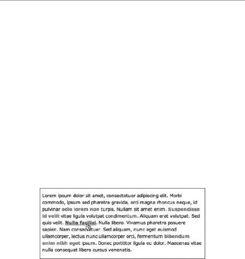
Using Links and Creating Navigation
155
a:link {
color: #3366cc;
font-weight: bold;
text-decoration: none;
}
Removing the standard underline is somewhat controversial, even in these enlightened times, and causes
endless (and rather tedious) arguments among web designers. My view is that it can be OK to do so, but
with some caveats.
If you remove the standard underline, ensure your links stand out from the surrounding copy in some other
way. Having your links in the same style and color as other words and not underlined is a very bad idea.
The only exception is if you don’t want users to easily find the links and click them (perhaps for a children’s
game or educational site).
A common device used by web designers is to recolor links in order to distinguish them from body copy.
However, this may not be enough (depending on the chosen colors), because a significant proportion of
the population has some form of color blindness. A commonly quoted figure for color blindness in Western
countries is 8%, with the largest affected group being white males (the worldwide figure is lower, at
approximately 4%). Therefore, a change of color (to something fairly obvious) and a change of font weight
to bold often does the trick.
Whatever your choice, be consistent—don’t have links change style on different pages of the site. Also, it’s
useful to reinforce the fact that links are links by bringing back the underline on the hover state. An
example of this is shown below (see editing-link-styles-using-css.html and editing-link-styles-
using-css.html in the chapter 5 folder of the completed files).
Links are bold and orange, making them stand out from surrounding text. On the hover state, the link
darkens to red, and the standard underline returns. The second of those things is achieved by setting
text-decoration to underline in the a:hover declaration. Note that even when presented in grayscale,
such as in this book, these two states can be distinguished from surrounding text.
You can also combine pseudo-classes. For example, if you add the rules shown following to a style sheet
(these are from the editing-link-styles-using-css documents), you’d have links going gray when visited
but turning red on the hover state (along with showing the underline). Note that because the link and
www.freepdf-books.com

Chapter 5
156
visited states are exclusive, the bold value for font-weight is assigned using the grouped selector. It
could also be applied to individual rules, but this is neater.
a:link, a:visited {
font-weight: bold;
}
a:link {
color: #f26522;
text-decoration: none;
}
a:visited {
color: #8a8a8a;
}
a:hover {
color: #f22222;
text-decoration: underline;
}
a:active {
color: #000000;
text-decoration: underline;
}
If you decided that you wanted visited links to retain their visited color on the hover state, you could add
the following rule:
a:visited:hover {
color: #8a8a8a;
}
The :focus pseudo-class
The :focus pseudo-class enables you to define the link state of a focused link. Focusing usually occurs
when tabbing to a link, so the :focus pseudo-class can be a handy usability aid.
The following example, used in editing-link-styles-using-css.css, turns the background of focused
links yellow in compliant browsers:
a:focus {
background: yellow;
}
Multiple link states: The cascade
A common problem web designers come up against is multiple link styles within a document. While you
should be consistent when it comes to styling site links, there are specific exceptions, one of which is site
navigation. Web users are quite happy with navigation bar links differing from standard inline links.
Elsewhere, links may differ slightly in web page footers, where links are often displayed in a smaller font
than that used for other web page copy; also, if a background color makes the standard link color hard to
distinguish, it might be useful to change it (although in such situations it would perhaps be best to amend
either the background or your default link colors).
www.freepdf-books.com

Using Links and Creating Navigation
157
A widespread error is applying a class to every link for which you want a style other than the default—you
end up with loads of inline junk that can’t be easily amended at a later date. Instead, with the careful use of
semantic elements and unique ids on the web page and contextual selectors in CSS, you can rapidly
style links for each section of a web page.
Styling multiple link states
Required files XHTML-basic.html and CSS-default.css from the basic-boilerplates folder as a starting
point
What you’ll learn How to use the cascade to set styles for links housed in specific areas of a webpage
Completed files multiple-links-the-cascade.html and multiple-links-the-cascade.css from the chapter 5
folder
1. Add the basic page content structure shown following, placing it within the existing wrapper div of
the boilerplate. This has three sections, which are the navigation, content, and footer,
respectively. The navigation houses an unordered list that forms the basis of a navigation bar.
The content is the content area, which has an inline link within a paragraph. The footer is
sometimes used to repeat the navigation bar links, albeit in a simplified manner.
<nav>
<ul>
<li><a href="index.html">Homepage</a></li>
<li><a href="products.html">Products</a></li>
<li><a href="contact-details.html">Contact details</a></li>
</ul>
</nav>
<div id="content">
<p>Hello there. Our new product is a <a href="banjo.html">fantastic
banjo</a>!</p>
</div>
<footer>
<a href="index.html">Homepage</a> | <a href="products.html">
Products</a> | <a href="contact-details.html">Contact
details</a>
</footer>
Note that the code block could be simplified, such as by dispensing with the navigation
div and instead applying the relevant id value directly to the unordered list. However, this
exercise aims to show how to create links in context, using a simplified web page layout
that has specific areas for certain content types. See Chapters 7 and 10 for more on
layout.
2. Add some padding to the existing body rule in the CSS to add some spacing around the page
content:
www.freepdf-books.com
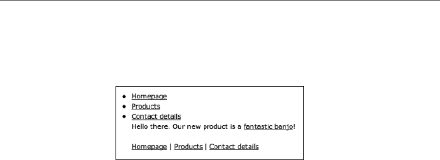
Chapter 5
158
body {
font: 62.5%/1.5 Verdana, Arial, Helvetica, sans-serif;
padding: 30px;
}
3. Add some rules to define the main states for links on the web page. The following rules color links
orange, change them to red on the hover state, make them gray on the visited state, and make
them black on the active state.
a:link {
color: #f26522;
}
a:visited {
color: #8a8a8a;
}
a:hover {
color: #f22222;
}
a:active {
color: #000000;
}
4. Next, style the navigation links. Contextual selectors are used to style the links within the
navigation div.
nav a, nav a:visited {
text-decoration: none;
font-weight: bold;
color: #666666;
text-transform: uppercase;
}
nav a:hover {
text-decoration: underline;
}
The first rule removes the underline from all links within the navigation div , renders them in bold and
uppercase, and colors them a medium gray. The second rule brings back the underline on the hover state.
www.freepdf-books.com
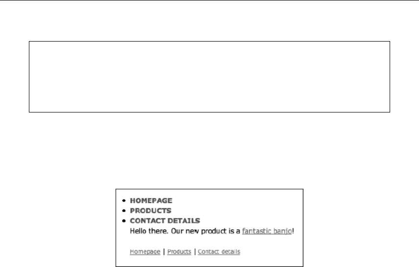
Using Links and Creating Navigation
159
You’ll note that the visited state is the same as the standard state in the previous code
block. While I don’t recommend doing this for links in a page’s general content area, or
for pages that have a lot of navigation links, I feel it’s acceptable for sites that have a
small number of navigation links, where it’s not likely a visitor will need notification
regarding which pages or sections have been accessed.
5. Style the footer links. Add another contextual selector to style the footer links, making them
smaller than links elsewhere on the page:
footer a:link, footer a:visited {
font-size: 0.8em;
}
And there we have it: three different link styles on the same page, without messing around with classes.
Enhanced link accessibility and usability
We’ve already touched on accessibility and usability concerns during this chapter, so we’ll now briefly run
through a few attributes that can be used with anchors (and some with area elements—see the “Image
Maps” section later in the chapter) to enhance your web page links.
www.freepdf-books.com
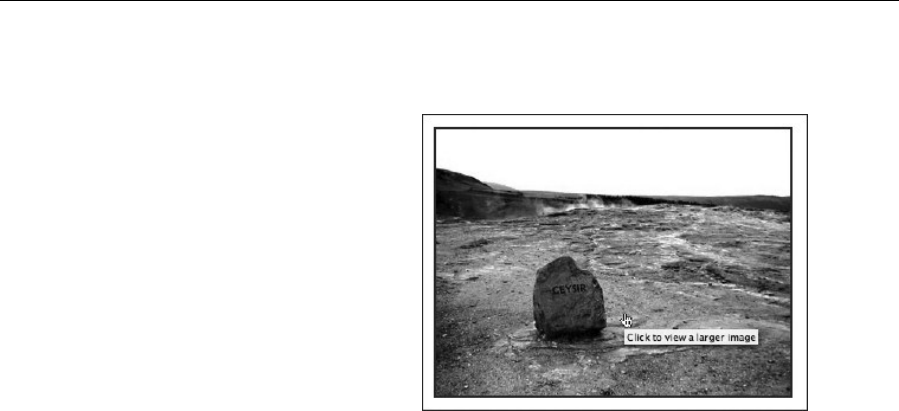
Chapter 5
160
The title attribute
Regular users of Internet Explorer may be familiar
with its habit of popping up alt text as a tooltip.
This has encouraged web designers to wrongly fill
alt text with explanatory copy for those links that
require an explanation, rather than using the alt
text for a succinct overview of the image’s
content. Should you require a pop-up, add a
title attribute to your surrounding a element to
explain what will happen when the link is clicked.
The majority of web browsers display its a value
when the link is hovered over for a couple of
seconds (see right).
<a href="large-image.html" title="Click to view a larger image">
<img src="image.jpg" alt="This is some text that explains what
the image is" width="400" height="300" /></a>
Using accesskey and tabindex
I’ve bundled the accesskey and tabindex attributes because they have similar functions—that is, enabling
keyboard access to various areas of the web page. Most browsers enable you to use the Tab key to cycle
through links, although if you end up on a web page with dozens of links, this can be a soul-destroying
experience. (And before you say “So what?” you should be aware that many web users cannot use a
mouse. You don’t have to be severely disabled or elderly to be in such a position either—something as
common as repetitive strain injury affects plenty of people’s ability to use a mouse. It can also be faster to
use if your hands are already on the keyboard.)
The accesskey attribute can be added to anchor and area elements. It assigns an access key to the link,
whose value must be a single character. In tandem with your platform’s assigned modifier key (Alt for
Windows and Ctrl for Mac), you press the key to highlight or activate the link, depending on how the
browser you’re using works.
<a href="index.html" accesskey="/">Home page</a>
An ongoing problem with access keys is that the shortcuts used to activate them are mostly claimed
by various technologies, leaving scant few characters. In fact, research conducted by WATS.ca
(www.wats.ca/show.php?contentid=32) concluded that just three characters were available that didn’t clash
with anything at all: /, \, and ]. This, combined with a total lack of standard access key
assignments/bindings, has led to many accessibility gurus conceding defeat, admitting that while there’s a
definite need for the technology, it’s just not there yet.
The tabindex attribute has proved more successful. This is used to define the attribute’s value as anything
from -1 (which excludes the element from the tabbing order, which can be useful) to 32767, thereby setting
its place in the tab order, although if you have 32,767 tabbable elements on your web page, you really do
www.freepdf-books.com
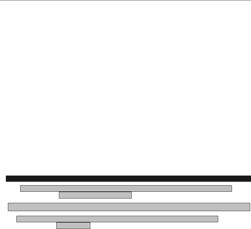
Using Links and Creating Navigation
161
need to go back and reread the earlier advice on information architecture (see Chapter 1). Note that tab
orders needn’t be consecutive, so it’s wise to use tabindex in steps of ten, so you can later insert extra
ones without renumbering everything. Before HTML5 the tabindex attribute was valid only on form and link
elements, HTML5 has changed this making it valid on any element.
What’s logical to some people—in terms of tab order—may not be to others, so always ensure you test
your websites thoroughly, responding to feedback.
Skip navigation links
Designers who work with CSS layouts tend to focus on information structure, rather than blindly putting
together layouts in a visual editor. This is good from an accessibility standpoint, because you can ensure
information is ordered in a logical manner by checking its location in the code. However, when considering
alternate browsers, it’s clear that some of the information on the page will be potentially redundant. For
example, while a user surfing with a standard browser can ignore the masthead and navigation in a split
second, rapidly focusing on the information they want to look at, someone using a screen reader will have
to sit through the navigation links being read out each time, which can prove extremely tedious if there are
quite a few links.
Various solutions exist to help deal with this problem, and although you can use CSS to reorder the page
information (most commonly by placing the code for the masthead at the end of the HTML document and
then using absolute positioning to display it at the top when the page is viewed in a browser), it’s more
common to use what’s typically referred to as skip navigation.
Creating a skip navigation link
Required files skip-navigation-starting-point.html and skip-navigation-starting-point.css from the
chapter 5 folder as a starting point
What you’ll learn How to create some basic skip navigation
Completed files skip-navigation-completed.html and skip-navigation-completed.css from the
chapter 5 folder
1. Examine the web page. Successful skip navigation relies in part on semantic and logical
document structure. Open skip-navigation-starting-point.html, and you’ll see it’s a basic
web page, with all of the page’s content—title, navigation, and main content—contained within a
wrapper div; next is a masthead div, containing a heading and a few links. Under the masthead
div is a content div, which, suitably enough, houses the page’s main content. The beginning of
the content is immediately visible, even on monitors with low resolutions, but for users of screen
readers, the site’s name and navigation links will be read out every single time a page is
accessed—a tedious process for the user.
www.freepdf-books.com
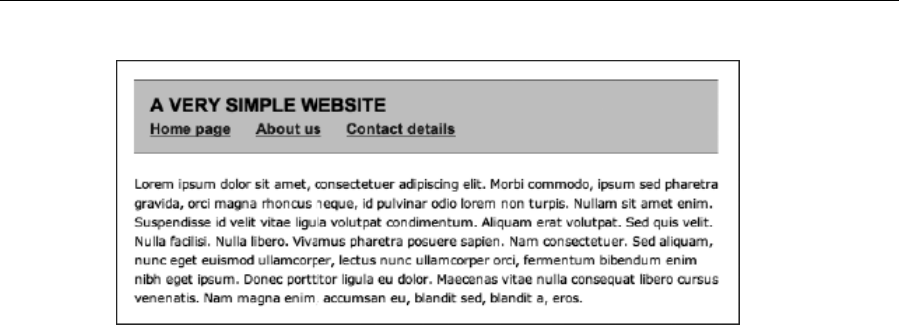
Chapter 5
162
2. Immediately after the body element start tag, add a nav element with an id value of skipLink,
which is a hook to later style the element and its link using CSS. The href value for the anchor is
set to #content. As you will remember from earlier in the chapter, this will make the page jump to
the element with an id value of content when the link is clicked (that is, the content div in this
example’s case).
<nav id="skipLink">
<a href="#content">Skip to content</a>
</nav>
3. Test the web page. Already, the benefits of this are apparent. You can use Opera’s User mode or
View Page Style No Style in Firefox to temporarily remove the CSS and emulate a
text browser (roughly equating to the content available to screen readers)—see the following left
image. Click the skip to content link, and the page will jump to the web page’s content—see
the right image. Even with three links, this proves useful, but if the site has a couple of dozen
links, this improves usability for screen reader users no end.
www.freepdf-books.com
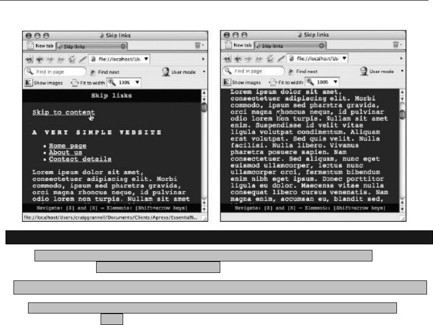
Using Links and Creating Navigation
163
Styling a skip navigation link
Required files skip-navigation-completed.html and skip-navigation-completed.css from the
chapter 5 folder as a starting point
What you’ll learn How to style skip navigation
Completed files skip-navigation-styled.html and skip-navigation-styled.css from the chapter 5
folder
When skip navigation is styled, it’s common to set the container (in this case, the skipLink one) to
display: none, thereby making it invisible. This is all well and good in theory, but some screen readers
render CSS, meaning that your cunning skip navigation won’t be accessible. Therefore, this exercise will
show how to hide the skip navigation within the existing page design. (Note that, depending on your site
and target audience, you may want to leave the skip navigation visible to aid users whose sight is fine but
who have difficulty with motor tasks. That said, the exercise still shows how to style skip navigation in
general and should therefore prove useful regardless.)
1. Style the skipLink nav. Remove the skipLink nav from the document flow (thereby meaning it
won’t affect the positioning of any other element) by setting position to absolute in a CSS rule
targeting the element (see the following code snippet); Chapter 7 has more information on
positioning div elements. The top and right values define the nav’s position in relation to its
parent element (which in this case is body—effectively the entire browser window view area). The
settings place the nav inside the masthead.
#skipLink {
position: absolute;
top: 30px;
right: 30px;
}
www.freepdf-books.com
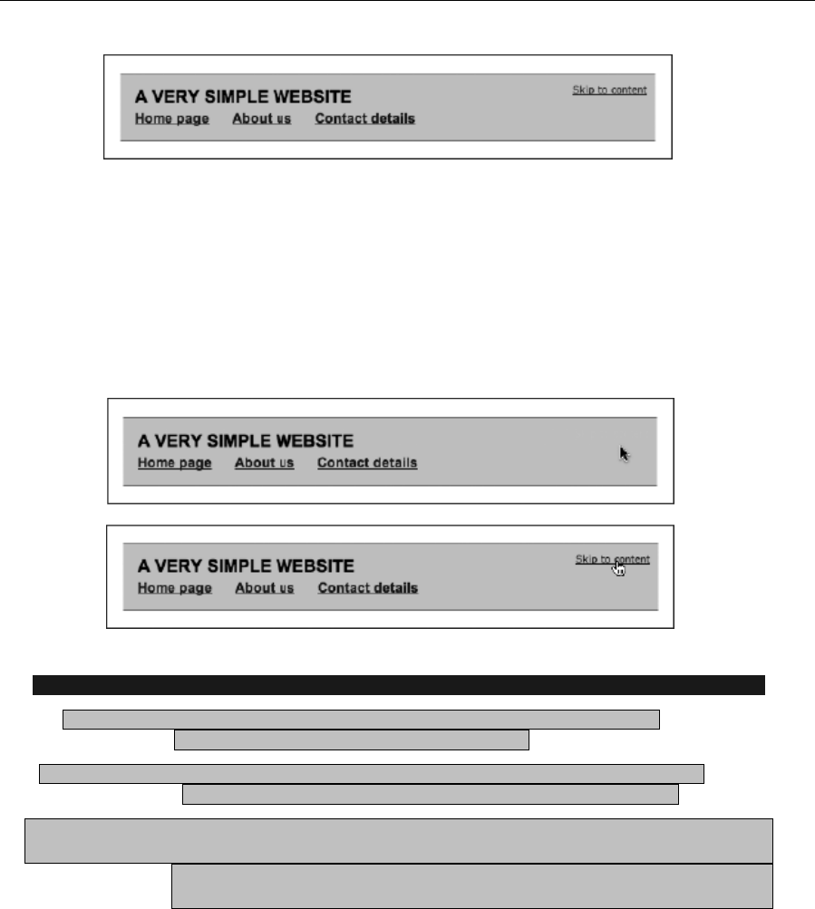
Chapter 5
164
2. Make the link invisible—via the use of contextual selectors you can set the link’s color to blend
with that of the web page element it’s positioned over. You can also use the :hover and :focus
pseudo-classes mentioned earlier in this chapter to make the link visible on the hover and focus
states.
#skipLink a:link, #skipLink a:visited {
color: #cecece;
}
#skipLink a:hover, #skipLink a:focus {
color: #000000;
}
Enhancing skip navigation with a background image
Required files skip-navigation-completed.html, skip-navigation-completed.css, and skip-
navigation-down-arrow.gif from the chapter 5 folder
What you’ll learn How to create skip navigation that sits centrally at the top of the web page and is
invisible but that displays a rollover effect during the hover and focus states
Completed files skip-navigation-background-image.html, skip-navigation-background-
image.css,
and skip-navigation-down-arrow.gif (unchanged during the tutorial) from the
chapter 5 folder
1. Position the skipNav nav. Add the following link to remove the skipNav nav from the
document flow, and position it at the top of the web page. The width and
www.freepdf-books.com
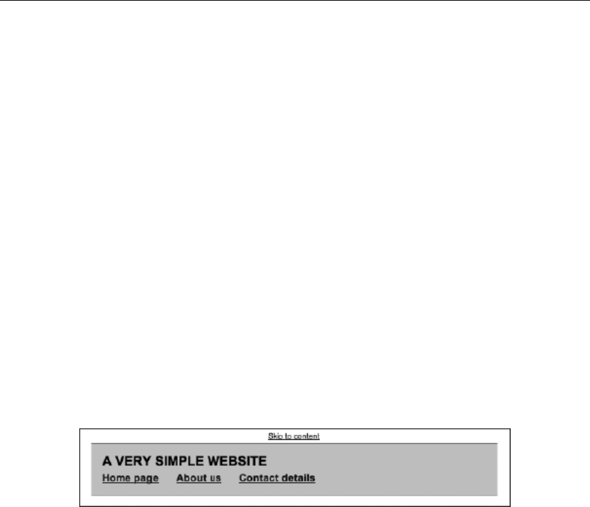
Using Links and Creating Navigation
165
text-align property values stretch the div to the full width of the browser window and center the
text horizontally, respectively.
#skipLink {
position: absolute;
top: 0;
left: 0;
width: 100%;
text-align: center;
}
2. Style the skip navigation link. Add the following rule to style the link within the skipLink nav. By
setting display to block, the active area of the link stretches to fill its container, thereby
effectively making the entire containing div clickable. The padding-bottom setting is important,
because this provides space at the bottom of the div for displaying the background image used
for the hover state, added in the next step. The color value is black (#000000) at this point, which
ensures that the text fits happily within the space available above the page content. (This may
change for users with nondefault settings, but for the default and first zoom setting, it’ll be fine.)
#skipLink a:link, #skipLink a:visited {
display: block;
color: #000000;
font: 1.0em Arial, Helvetica, sans-serif;
padding-top: 5px;
padding-bottom: 20px;
}
3. Recolor the skip navigation link. Change the color property so that the link blends into the
background.
#skipLink a:link, #skipLink a:visited {
display: block;
color: #fefefe;
font: 1.0em Arial, Helvetica, sans-serif;
padding-top: 5px;
padding-bottom: 20px;
}
4. Define the hover and focus states. Add the following rule to set the style for the hover and focus
states. This essentially makes the text visible (via the color setting) and defines a background
image—a wide GIF89 image with a downward-facing arrow at its center now appears when the
user places their mouse cursor over the top of the web page.
www.freepdf-books.com
Chapter 5
166
#skipLink a:hover, #skipLink a:focus {
color: #000000;
background: url(skip-navigation-down-arrow.gif) 50% 100% no-repeat;
}
Link targeting
Although a fairly common practice online, link targeting—using the target attribute (see the following code
for an example), typically to open a link in a new window—is not without its problems and should be
avoided.
<a href="a-web-page.html" target="_blank">Open in a new window</a>
While some argue that this practice is beneficial, enabling users to look at external content and return to
your site, what it actually does is take control of the browser away from users. After all, if someone actually
wants to open content in a new window or tab, they can do so using keyboard commands and/or
contextual menus. More important, opening documents in new windows breaks the history path. For many,
this might not be a huge issue, but for those navigating the Web via a screen reader, pop-ups are a
menace. New content opens up and is deemed to not be of interest, and the back function is invoked. But
this is a new window, with its own blank history. Gnashing of teeth ensues. There’s also the problem that
you can’t guarantee what will happen when this attribute is used anyway—many users configure browsers
to suppress new windows, either forcing them to open in a new tab or over the top of the current page. In
HTML5 the target attribute is no longer deprecated but because of the previously stated reasons its use is
strongly discouraged.
Links and images
Although links are primarily text-based, it’s possible to wrap anchor tags around an image, thereby turning
it into a link:
<a href="a-link.html"><img src="linked-image.gif" width="40"
height="40" /></a>
Some browsers border linked images with whatever link colors have been stated in CSS (or the default
colors, if no custom ones have been defined), which looks nasty and can displace other layout elements.
Historically, designers have gotten around this by setting the border attribute within an img element to 0,
but this has been deprecated. Therefore, it’s best to use a CSS contextual selector to define images within
links as having no border.
www.freepdf-books.com

Using Links and Creating Navigation
167
a img {
border: 0;
}
Clearly, this can be overridden for specific links. Alternatively, you could set an “invisible” border (one that
matches the site’s background color) on one or more sides and then set its color to that of your standard
hover color when the user hovers over the image. This would then provide visual feedback to the user,
confirming that the image is a link.
a img {
border: 0;
border-bottom: 1px solid #ffffff;
}
a:hover img {
border-bottom: 1px solid #f22222;
}
In any case, you must always have usability and accessibility at the back of your mind when working with
image-based links. With regard to usability, is the image’s function obvious? Plenty of websites use icons
instead of straightforward text-based navigation, resulting in frustrated users if the function of each image
isn’t obvious. People don’t want to learn what each icon is for, and they’ll soon move on to competing
sites. With regard to accessibility, remember that not all browsers can zoom images, and so if an image-
based link has text within it, ensure it’s big enough to read easily. Whenever possible, offer a text-based
alternative to image-based links, and never omit alt and title attributes (discussed earlier in this
chapter). The former can describe the image content and the latter can describe the link target (in other
words, what will happen when the link is clicked).
Therefore, the example from earlier becomes the following:
<a href="a-link.html"><img title="Visit our shop"
src="linked-image.gif" width="40" height="40"
alt="Shopping trolley" /></a>
Adding pop-ups to images
On occasion, when a user hovers their mouse cursor over an image, you might like to add a pop-up that’s
a little more flamboyant than what a title attribute can provide. Using CSS, you can add a fully stylable
pop-up to an image, when the user moves their cursor over it. Note, however, that this technique should
be used sparingly, and you should never rely on users accessing this information, unless you make it clear
that the pop-up exists—for example, you could use it for a game, showing the answer to a question when
the user mouses over an image. (However, if something is extremely important for your users to see
immediately, don’t hide it away in a pop-up—display it in plain sight.) The following walk-through shows
you how to use pop-ups in such a way.
www.freepdf-books.com
Chapter 5
168
Adding a pop-up to an image
Required files XHTML-basic.html and CSS-default.css from the basic-boilerplates folder as a starting
point, along with the two image files add-a-pop-up-image.jpg and add-a-pop-up-pop-up.jpg from the chapter 5
folder
What you’ll learn How to create a totally CSS-based pop-up that can be applied to an image
Completed files add-a-pop-up.html and add-a-pop-up.css in the chapter 5 folder, along with the two
images, which remain unchanged
1. Create a container for the pop-up. Add the div shown following to the web page, within the
wrapper; the div will act as a container for the pop-up.
<div id="popupContainer">
</div>
2. Add the main image in the usual fashion, placing it inside the div created in step 1.
<img src="add-a-pop-up-image.jpg" alt="Landscape" width="500"
height="375" />
3. Add a link and pop-up content. Surround the image with a dummy link, and then add a span
element immediately after the image. Within this, place the pop-up content, which can contain
text and even other images. Text can be styled within inline elements (strong, em, and anchors,
for example). In this example, the span contains an image, which will be floated right, and some
text (which is truncated for space reasons—the completed version in the download files is
longer). To ensure that the floated image is “cleared,” making the span’s background appear
behind it once styled, a clearFix class is added to the span start tag, and an associated CSS rule
is created (in step 10). More on this float-clearing technique, along with floats and clears in
general, is given in Chapter 7.
<a href="#"><img src="add-a-pop-up-to-an-image.jpg" alt="Landscape"
width="500" height="375" /><span class="clearFix"><img
src="add-a-pop-up-pop-up.jpg" alt="Winter shot" width="126"
height="215" />
The text for the pop-up goes here…</span></a>
Note: Because you can’t place paragraphs within a span element, you need to stick to a
single block of text or split paragraphs with double line breaks (<br /><br />), despite the
iffy semantics of doing that.
4. Set defaults. At this stage, the page content is displayed in a linear fashion—large image followed
by small image followed by text—so some CSS is now needed. In the CSS document, add some
padding to the existing body element, ensuring the page content doesn’t hug the browser window
edges when you’re testing the page.
www.freepdf-books.com

Using Links and Creating Navigation
169
body {
font: 62.5%/1.5 Verdana, Arial, Helvetica, sans-serif;
padding: 20px;
}
5. Give the images a border. Add the following rule to apply a thin gray border to the images on the
page.
img {
border: 1px solid #666666;
}
6. Define the pop-up area size. Add the following rule to define the size of the pop-up area (the
width setting defines its width and display: block stretches the active area of the link to the size
of its container—the image). The other settings override link defaults, making the text within the
div and anchor black and not underlined.
#popupContainer a:link, #popupContainer a:visited {
position: relative;
display: block;
width: 500px;
text-decoration: none;
color: #000000;
}
7. Make the pop-up invisible. Add the following rule to make the pop-up initially not display on-
screen (that is, outside of the viewing area of the browser).
#popupContainer a span {
position: absolute;
left: -10000px;
top: -10000px;
}
8. Style the span element. The following rule styles the span element during the hover state. The
display property value of block defines the pop-up as a block-level element, rather than an inline
one, while the position setting of relative overrides that set in the previous step (as do the left
and top values). The width setting defines a width for the pop-up. The negative margin-top
setting pulls the pop-up upward, so it no longer sits under the main image. The value is the same
as the height of the main image minus the vertical offset required. (If it were set to the height of
the main image, the pop-up would sit flush to the top of the image during the hover state, which
looks cluttered.) The margin-left value provides a horizontal offset, while the padding value
places some padding within the span, so its contents don’t hug its borders. The other settings
style colors and fonts.
#popupContainer a:hover span, #popupContainer a:focus span,
#popupContainer a:active span {
display: block;
position: relative;
left: 0;
www.freepdf-books.com
Chapter 5
170
top: 0;
width: 360px;
color: #000000;
font: 1.1em/1.5 Arial, Helvetica, sans-serif;
margin-top: -335px;
margin-left: 50px;
padding: 20px;
background-color: #e0e4ef;
border: 1px solid #666666;
}
Note: The selector for step 8’s code block offers three alternate routes for users to
access the pop-up: the hover state (for mouse users), the focus state (for keyboard
users), and the active state (for Internet Explorer keyboard users, since that browser
doesn’t yet support :focus).
9. Next, a rule is needed to float the image within the span. The margin settings ensure that the
image doesn’t hug the text-based content.
#popupContainer a:hover span img, #popupContainer a:focus span img,
#popupContainer a:active span img {
border: 1px solid #666666;
float: right;
margin-left: 15px;
margin-bottom: 5px;
}
10. Apply the clearFix rule. Floated elements are outside the standard document flow. Therefore, if
there’s little text, the image appears to stick out of the span box, as shown in the following
example.
www.freepdf-books.com
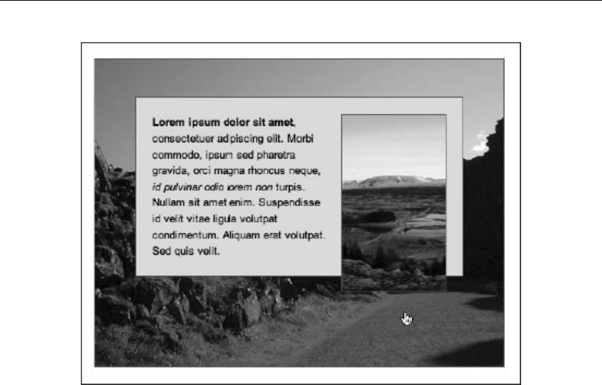
Using Links and Creating Navigation
171
This can be fixed by adding the following rule (this technique is fully explained in Chapter 7):
.clearFix:after {
content: ".";
display: block;
height: 0;
clear: both;
visibility: hidden;
}
www.freepdf-books.com
Chapter 5
172
Image maps
Image maps enable you to define multiple links within a single image. For example, if you have a weather
map, you could use an image map to link to each region’s weather forecast; or if you had a picture of your
office, you could use an image map to make each of the objects clickable, leading to pages explaining
more about each of them. Clickable regions within image maps can be fairly basic—rectangles or circles—
or complex polygonal shapes. Note that there are both server-side and client-side versions of image
maps—server-side image maps are now considered obsolete and pose accessibility problems, and even
client-side image maps tend to be avoided by most designers, although use of alt text can help them
become reasonably accessible.
Regardless of the complexity of the image and the defined regions, the method of
creating an image map remains the same. To the right is the image used in this
section to show how a basic image map is created. It contains three geometric
shapes that will be turned into clickable hot-spots.
The image is added to the web page in the usual way (and within a block element,
since img is an inline element), but with the addition of a usemap attribute, whose
value must be preceded by a hash sign (#).
<div id="wrapper">
<img src="image-map-image.gif" alt="Shapes" width="398" height="398"
usemap="#shapes" />
</div>
www.freepdf-books.com
Using Links and Creating Navigation
173
The value of the usemap attribute must correlate with the name and id values of the associated map element.
Note that the name attribute is required for backward compatibility, whereas the id attribute is mandatory.
<map id="shapes" name="shapes">
</map>
The map element acts as a container for specifications regarding the map’s active areas, which are added
as area elements.
<map id="shapes" name="shapes">
<area title="Access the squares page." shape="rect"
coords="29,27,173,171" href="square.html" alt="A square" />
<area title="Access the circles page" shape="circle"
coords="295,175,81" href="circle.html" alt="A circle" />
<area title="Access the triangles page" shape="poly"
coords="177,231,269,369,84,369" href="triangle.html"
alt="A triangle" />
</map>
Each of the preceding area elements has a shape attribute that corresponds to the intended active link
area:
rect defines a rectangular area; the coords (coordinates) attribute contains two pairs that define
the top-left and bottom-right corners of the rectangle in terms of pixel values (which you either
take from your original image or guess, should you have amazing pixel-perfect vision).
circle is used to define a circular area; of the three values within the coords attribute, the first
two define the horizontal and vertical position of the circle’s center, and the third defines the
radius.
poly enables you to define as many coordinate pairs as you wish, which allows you to define
active areas for complex and irregular shapes—in the previous code block, there are three pairs,
each of which defines a corner of the triangle.
Creating image maps is a notoriously tedious process, and it’s one of the few occasions when I advise
using a visual web design tool, if you have one handy, which can be used to drag out hot-spots. However,
take care not to overlap defined regions—this is easy to do, and it can cause problems with regard to each
link’s active area. If you don’t have such a tool handy, you’ll have to measure out the coordinates in a
graphics package.
Note that some browsers will place a border around the image used for an image map.
This can be removed by using CSS to set the image’s border to 0 (either via applying a
class to the image or via a contextual selector).
Faking images maps using CSS
Although there’s no direct equivalent to image maps in CSS, you can fashion a similar effect by creating
block-level anchors (rather like the one in the pop-up example). The most common way of structuring this
www.freepdf-books.com
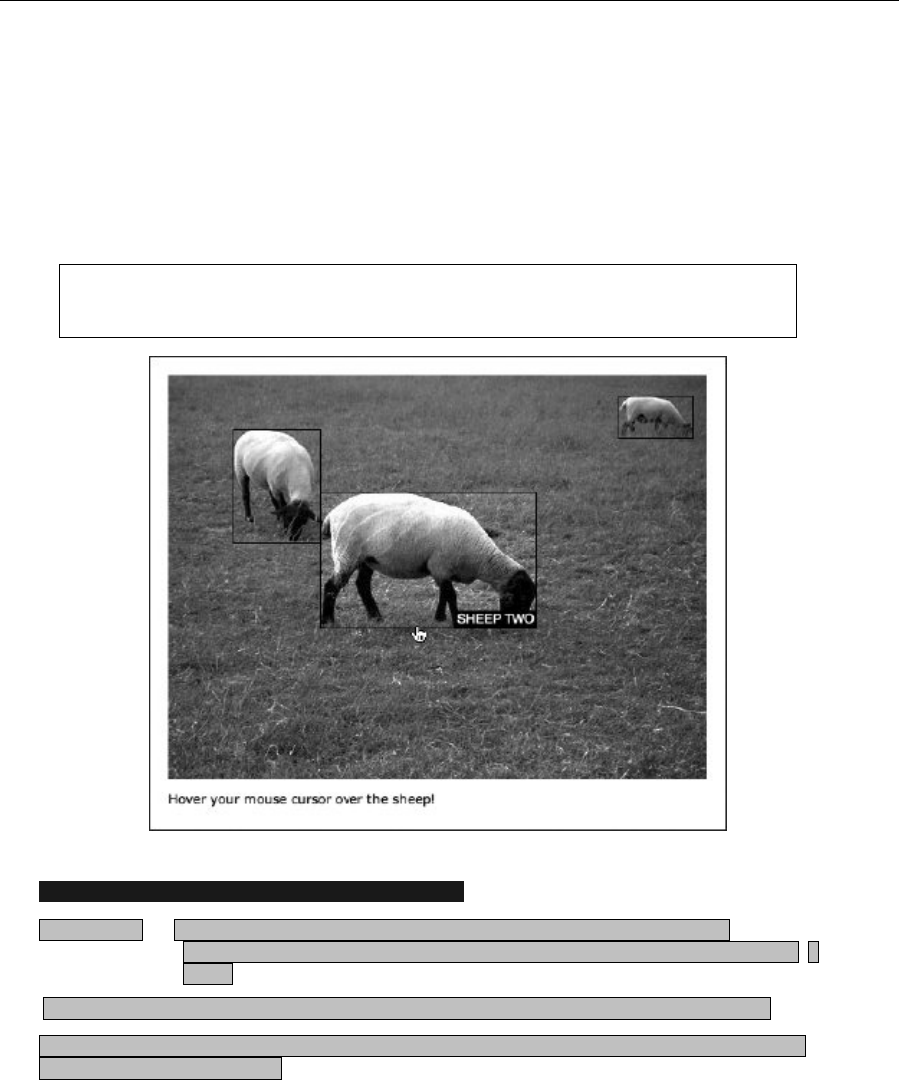
Chapter 5
174
“fake” image map is by using an unordered list, placing links within each list item, and using absolute
positioning to set the locations of the links. Further CSS trickery can be used to make all hot-spots visible
when the mouse cursor is placed over the image and to change the image on the rollover state.
In the following exercise, a picture of three sheep minding their own business is going to be used for the
fake image map. When you mouse over the image, all three hot-spots will be shown (as a 1-pixel, black
border). Placing the cursor over a hot-spot will then turn that portion of the grayscale image into color (by
way of placing a second image as a background on the hot-spot), along with showing a caption.
Note: As you might imagine, with CSS being based around boxes, the technique tends
to work best with highly regular, box-shaped rollover areas.
Using CSS to create a fake image map with rollovers
Required files basic.html and CSS-default.css from the basic-boilerplates folder, along with
image files fake-image-map-color.jpg and fake-image-map-gray.jpg from the chapter 5
folder.
What you’ll learn How to fake an image map using CSS, which will enable two levels of rollover.
Completed files fake-image-map.html and fake-image-map.css in the chapter 5 folder, along with the
image files, which are unchanged
www.freepdf-books.com

Using Links and Creating Navigation
175
1. Add the structure for the fake image map. In the body of the HTML document, add the following
code, which structures the content for the fake image map. Note how the unordered list has a
unique class value and how each of the list items has a class value referring to the hot-spot
relating to a specific item on the image.
<ul class="sheepImageMap">
<li class="sheepOne"><a href="#"><span>Sheep one</span></a></li>
<li class="sheepTwo"><a href="#"><span>Sheep two</span></a></li>
<li class="sheepThree"><a href="#"><span>Sheep three</span></a></li>
</ul>
<p>Hover your mouse cursor over the sheep!</p>
2. Set page defaults. Add some padding to the existing body rule:
body {
font: 62.5%/1.5 Verdana, Arial, Helvetica, sans-serif;
padding: 20px;
}
3. Add the following rule to style the unordered list. The font and text-transform property values
define the font styles for the captions. The background value defines the grayscale image as the
background for the list, and the width and height values ensure the list’s dimensions are the
same as that of the background image. The position property is set to relative because this
enables the list item positioning to then be set from the top left of the unordered list, rather than
from the top left of the browser window.
.sheepImageMap {
font: 1.0em/1 Arial, Helvetica, sans-serif;
text-transform: uppercase;
background: url(fake-image-map-gray.jpg);
width: 500px;
height: 375px;
position: relative;
margin-bottom: 10px;
}
www.freepdf-books.com
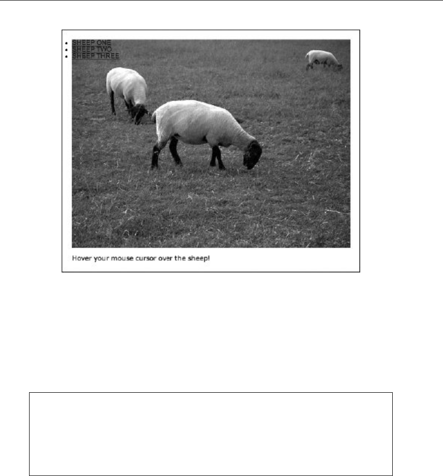
Chapter 5
176
4. Style the links. By setting display to block, the links stretch to fit their container (the list items).
The text-indent setting is used to massively offset the indent of the text within the links,
effectively making the text invisible by default, but keeping the element itself visible and clickable.
The text-decoration value of none turns off the default underline for the links.
.sheepImageMap a {
display: block;
text-indent: -100000px;
text-decoration: none;
}
Note: In some circumstances, offsetting using text-indent can lead to minor layout issues.
This wouldn’t be a problem in the layout being created here, but with more finely tuned
layouts, it could—because of some browsers keeping the space taken up by the
element’s height available to it and thus forcing subsequent content to appear below
where it’s meant to be by an equivalent amount. In cases like those, absolute positioning
and offsetting both vertically and horizontally works well.
5. Set hot-spot borders. Utilizing the :hover pseudo-class, the following rule makes it so that when
the list is hovered over, the three hot-spots show a 1-pixel border:
.sheepImageMap:hover .sheepOne, .sheepImageMap:hover .sheepTwo,
.sheepImageMap:hover .sheepThree {
border: 1px solid #000000;
}
www.freepdf-books.com

Using Links and Creating Navigation
177
6. Add the following rule to style the list items, removing the default bullet point (via the list-style
value of none) and defining them to be positioned in an absolute manner and displayed as block
elements.
.sheepImageMap li {
list-style: none;
position: absolute;
display: block;
}
7. Create the first hot-spot. In a graphics package, four values are required for each hot-spot: its
width, its height, and the distance from the top and left corners. These are then translated,
respectively, into the width, height, left, and top values in a rule applied to the relevant hot-
spot:
.sheepOne {
width: 80px;
height: 104px;
left: 60px;
top: 50px;
}
Two more rules complete the effect. The first ensures the relevant anchor has the correct height (note how
the height value is the same as in the previous rule):
.sheepOne a {
height: 104px;
}
The second rule sets the color version of the image to be displayed as a background on the hover state
(as in, when the user mouses over the hot-spot area, the relevant area is displayed in color). By default,
the top left of the image will be shown, and so negative positioning values are used to pull it into place.
Note how these are the negatives of the values defined for left and top in the .sheepOne rule, minus 1
further pixel. The reason for the extra pixel is to take into account the 1-pixel border defined in step 5. If the
borders weren’t used (although they are handy, since they show all the hot-spots), the positioning values
would just be the direct negatives of the left and top values from .sheepOne.
.sheepOne a:hover {
background: url(fake-image-map-color.jpg) -61px -51px;
}
www.freepdf-books.com
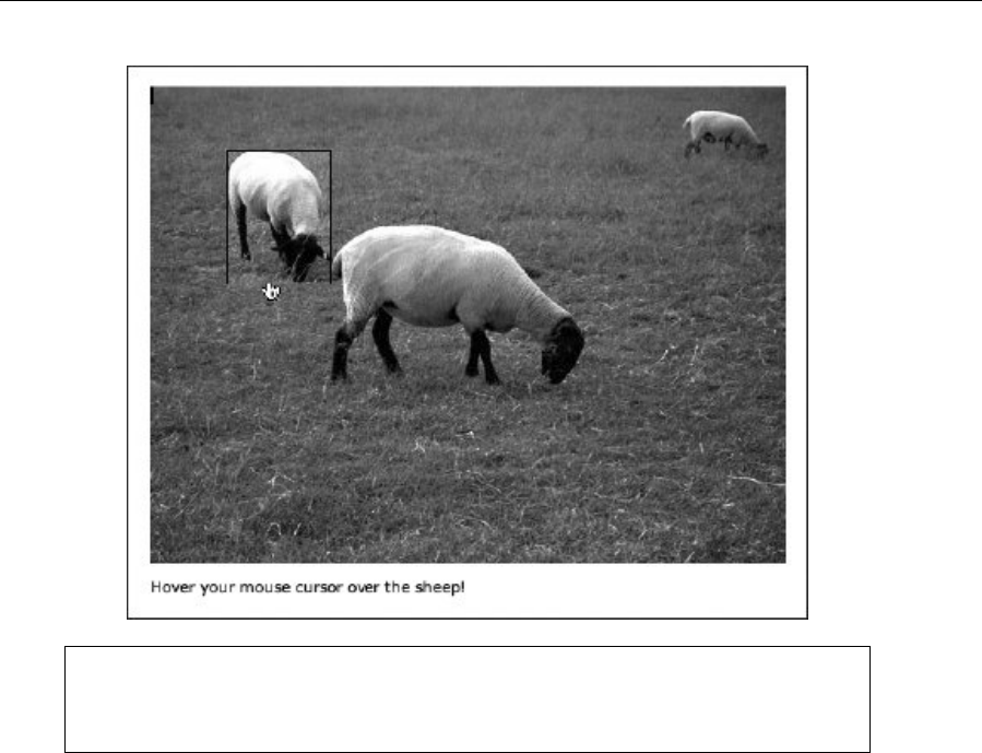
Chapter 5
178
Note that the a selector is used in this exercise rather than a:link. Because the rules are
strictly based on context—anchors within the defined areas of the fake image map—this
is acceptable, and it saves having to use both :link and :visited selectors.
8. Create the other hot-spots. The other two hot-spots are created in the same way as the first one
in step 7. Again, the positioning values in the hover states are negative values minus 1 of the
left and top values in the rules that defined the dimensions and positions of the hot-spots.
.sheepTwo {
width: 200px;
height: 126px;
left: 141px;
top: 108px;
}
.sheepTwo a {
height: 126px;
}
.sheepTwo a:hover {
background: url(fake-image-map-color.jpg) -142px -109px;
}
.sheepThree {
width: 68px;
height: 38px;
left: 418px;
www.freepdf-books.com

Using Links and Creating Navigation
179
top: 19px;
}
.sheepThree a {
height: 38px;
}
.sheepThree a:hover {
background: url(fake-image-map-color.jpg) -419px -20px;
}
9. Add styles for the captions. In step 4, the text-indent property was set to a huge negative value,
which made the text effectively disappear. To bring it back on the hover state, add the following
rule to your CSS, which also colors the text in white:
.sheepImageMap a:hover {
text-indent: 0;
color: #ffffff;
}
10. At this stage, the text still doesn’t stand out enough. Therefore, add the following rule, which
styles the span elements wrapped around the text in each list item, setting a background color
and adding some padding around the content:
.sheepImageMap a:hover span {
padding: 2px;
background-color: #000000;
}
11. This looks fine, but with some further absolute positioning, these captions can be positioned
elsewhere within the hot-spot. By adding the bolded rules shown following, the captions are
positioned at the bottom right of the hot-spots, as shown in the original example screenshot
before the start of the exercise.
.sheepImageMap a:hover span {
padding: 2px;
background-color: #000000;
position: absolute;
bottom: 0;
right: 0;
}
Note: Pre-version 7, Internet Explorer didn’t respond to :hover unless it was used on a
link. Because of this, the borders will not appear in that browser, causing a 1-pixel “jog”
up and left when you mouse over a hot-spot. You can get around this by applying the
border to the following rules (via a conditional style sheet): .sheepOne a:hover, .sheepTwo
a:hover, and .sheepThree a:hover.
www.freepdf-books.com

Chapter 5
180
Enhancing links with JavaScript
In this section, we’re going to use a little JavaScript, showing some methods of providing enhanced
interactivity and functionality to links. Note that in all cases, a non-JavaScript backup (or fallback) to
essential content is required for those who choose to surf the Web with JavaScript disabled. In all cases,
JavaScript can be added either to external JavaScript files attached to your HTML documents (which is the
preferred method; see the section “Attaching favicons and JavaScript” in Chapter 2) or in a script element
within the head of the HTML page:
<script>
(script goes here)
</script>
Specifically, we’ll look at pop-up windows, swapping images using JavaScript, and toggling div visibility
with JavaScript.
Creating a pop-up window
Pop-up windows are mostly an annoyance, especially when automated and when they remove browser
controls. However, they are occasionally useful, such as for providing a user with brief access to terms and
conditions without interrupting a checkout process. Some portfolio sites also use pop-up windows to
display larger versions of images (although we’ll later see a better method of creating an online gallery).
Should you require a pop-up window of your very own, the JavaScript is simple:
function newWindow()
{
window.open("location.html");
}
And this HTML calls the script using the onclick attribute:
<a href="location.html" onclick="newWindow(); return false;">Open a
new window!</a>
Note how the href attribute still has a value, which caters to users with JavaScript disabled (loading the
document into the current window). The return false part of the onclick value ensures the href value is
ignored for browsers with JavaScript activated (otherwise both the original and pop-up windows would
display with the new web page).
Creating a system to open windows with varied URLs requires only slight changes to both script and
HTML. The script changes to this:
function newWindow(webURL)
{
window.open(webURL);
}
www.freepdf-books.com

Using Links and Creating Navigation
181
The HTML changes to this:
<a href="location-one.html" onclick="newWindow('location-one.html');
return false;">Open location one in a new window!</a>
<a href="location-two.html" onclick="newWindow('location-two.html');
return false;">Open location two in a new window!</a>
Note how the target location is now within the single quotes of the onclick value. This could be any file
name, and the link type can be absolute, relative, or root-relative. To provide a warning when a pop-up is
opened (as recommended by Web Content Accessibility Guidelines [WCAG]), you can add a single line to
the JavaScript:
function newWindow(webURL)
{
alert("You are about to open a new window.");
window.open(webURL);
}
It’s also possible to control the settings of a pop-up window. To do so, the script needs to be amended as
follows:
function newWindow(webURL)
{
alert("You are about to open a new window.");
var newWin = window.open(webURL,"new_window",
"toolbar,location,directories,
status,menubar,scrollbars,resizable,
copyhistory,width=300,height=300");
newWin.focus();
}
The values within the set of quotes that begin "toolbar, location... enable you to set the pop-up
window’s dimensions and appearance. There must be no whitespace in the features list, and it must all be
on one line. Most of the items are self-explanatory, but some that may not be are location, which defines
whether the browser’s address bar is visible, and directories, which defines whether secondary toolbars
such as the links bar are visible. Note that if you specify one or more of these, any you don’t specify will be
turned off—therefore, you must specify all the features you want in the pop-up window.
Now, a word of warning: as alluded to earlier, having control of the web browser wrenched away from
them makes some users want to kick a puppy. Therefore:
Never use JavaScript to pop up windows without the user knowing that it’s going to happen. (The
integrated alert mentioned earlier is one thing, but you should always also mention next to the
relevant link that a pop-up will be created if the link is clicked.)
Never create a site that automatically pops up a window and removes the window controls.
Never use a pop-up window unless it’s absolutely necessary.
Some designers might argue about aesthetics and for the clean nature of a browser window at full-screen,
devoid of its controls, but there are no real reasons for using pop-up windows in this manner other than
www.freepdf-books.com
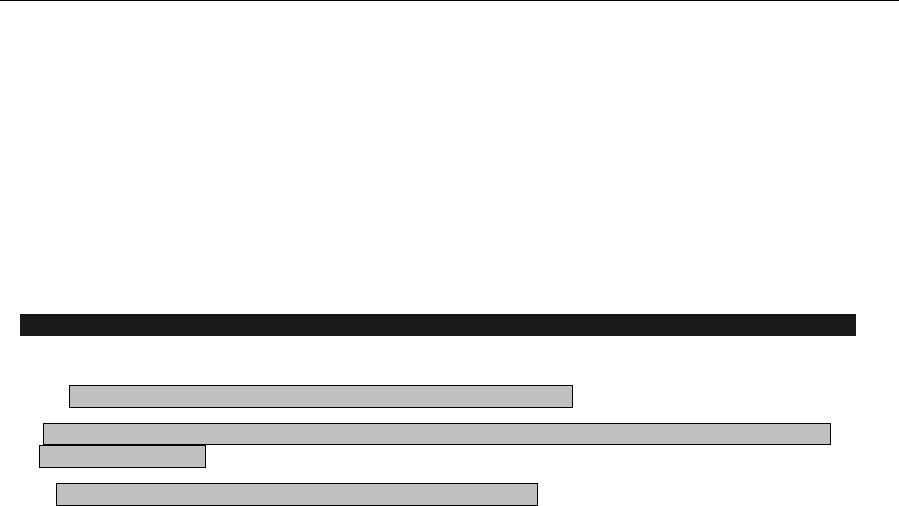
Chapter 5
182
that; there are, however, counterarguments, such as taking control from the user, the general annoyance
factor, a full-screen window suddenly covering everything else, and so on. Ultimately, pop-ups and
nonrequested new windows are a very bad thing, and since most browsers block them, you should avoid
using them.
Creating an online gallery
As mentioned earlier, there’s a better way of creating an online gallery than using pop-up windows when
thumbnails are clicked. Instead, JavaScript can be used to swap out an image that’s on a web page,
replacing it with another, as shown in the following exercise.
Switching images using JavaScript
Required files gallery-starting-point folder in the chapter 5 folder
What you’ll learn How to create a basic online gallery that enables you to easily switch the main image by
clicking on thumbnails
Completed files gallery-completed folder in the chapter 5 folder
1. Add the script. Create a new text document and save it as gallery.js in the same folder as the
files from the gallery-starting-point folder. Add the following to it:
function swapPhoto(photoSRC) {
document.images.imgPhoto.src = "assets/" + photoSRC;
}
Be aware of the case-sensitive nature of JavaScript and also the path to the images, which is set here as
assets/.
2. Add the main image. This requires an id attribute that correlates with the one provided in step 1
(imgPhoto). Leave off the height and/or width attributes if your images have varied dimensions. If
your images have one identical dimension (such as the same widths), include that, but omit the
other. (The img is placed within a div so that the document conforms to XHTML Strict. This also
enables the gallery width to be defined later in CSS.)
<div id="wrapper">
<img src="assets/image-1.jpg" width="500" height="375" id="imgPhoto"
alt="Main photo" />
</div>
3. Add thumbnails. In each case, the swapPhoto value is the file name of the image to be loaded.
Remember that the path to the images was defined in step 1, so it’s not needed here. The href
value links directly to the full-size image to accommodate users who have disabled JavaScript.
<a href="assets/image-1.jpg" onclick="javascript:swapPhoto
('image-1.jpg'); return false;"><img src="assets/image-1-t.jpg"
www.freepdf-books.com
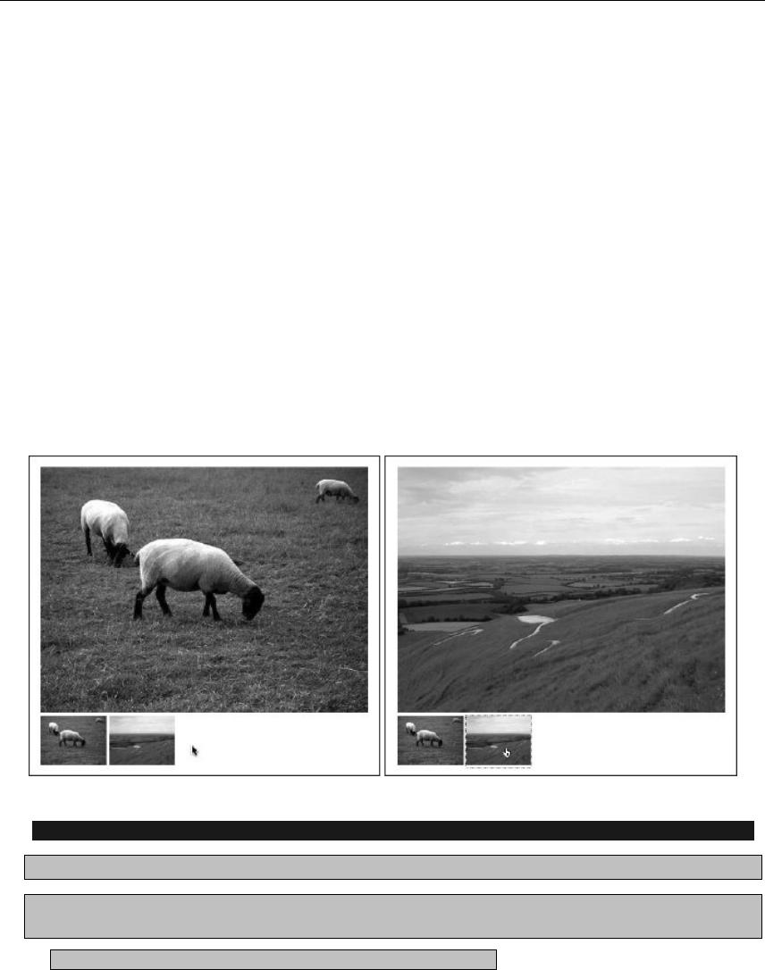
Using Links and Creating Navigation
183
alt="sheep" width="100" height="75" /></a>
<a href="assets/image-2.jpg" onclick="javascript:swapPhoto
('image-2.jpg'); return false;"><img src="assets/image-2-t.jpg"
alt="hillside" width="100" height="75" /></a>
4. Add some CSS. To the gallery.css file, add the following rules, the first of which sets a width
value for the wrapper div, and the second of which removes the default border from image-based
links.
#wrapper {
width: 500px;
}
a img {
border: 0;
}
And that’s all there is to it. The solution is elegant and doesn’t require pop-up windows. Instead, users can
see thumbnails on the same page as the main image, making navigation through the portfolio that much
easier. For those users who don’t have JavaScript, the values in the href attributes ensure they still get
access to the full-size images, too.
Adding captions to your image gallery
Required files The gallery-completed folder from the chapter 5 folder.
What you’ll learn Without context, some pictures are meaningless, so this exercise shows how to take
the gallery created in the previous exercise and add a caption to each image.
Completed files The gallery-captions folder in the chapter 5 folder.
www.freepdf-books.com
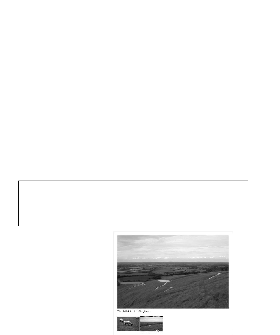
Chapter 5
184
1. Edit the script. Add the elements shown in bold to your script (in gallery.js). These will enable
you to target an element on the page with an id value of caption, loading new text into it when a
thumbnail is clicked.
function swapPhoto(photoSRC,theCaption) {
var displayedCaption = document.getElementById("caption");
displayedCaption.firstChild.nodeValue = theCaption;
document.images.imgPhoto.src = "assets/" + photoSRC;
}
2. Add a caption. Under the main image in the gallery.html file, add a paragraph with an id value
of caption, along with the caption text for the default image.
<img src="assets/image-1.jpg" width="500" height="375" id="imgPhoto"
alt="Main photo" />
<p id="caption">Some sheep, grazing.</p>
3. Edit the thumbnails. For each thumbnail, add some caption text, as shown following. Ensure that
there’s a comma between the two swapPhoto values you now have.
<a href="assets/image-1.jpg" onclick="javascript:swapPhoto
('image-1.jpg','Some sheep, grazing.'); return false;"><img
src="assets/image-1-t.jpg" alt="sheep" width="100"
height="75" /></a>
Note: Some characters are invalid for captions, because they terminate the script early.
If you want to add a single quote mark (often used as an apostrophe online, when
“smart” quotes aren’t being used), you must escape the character first, using a
backslash, like so: \'. If you want to add a double quote mark, you need to define it as an
HTML entity: ".
Automated gallery scripts
The kind of script mentioned in the
previous exercise is great for creating a
gallery fine-tuned to your specific website:
you can control the styles and positioning
with ease. However, there are a number of
ready-made scripts online, one of
the best of which is Lightbox2
(www.huddletogether.com/projects/light
box2/), by Lokesh Dhakar. The script is
highly automated, darkening the screen
and providing next/previous buttons, along
with the capability to rapidly add captions.
www.freepdf-books.com

Using Links and Creating Navigation
185
In terms of setup, you attach the various scripts and the CSS file from the download files and check the
paths to the included images (which can be replaced, if you don’t like the defaults). You then simply add
rel="lightbox" to any link or thumbnail that’s to be used to activate the lightbox script. The optional title
element enables you to add a caption.
<a href="assets/image-1.jpg" rel="lightbox" title="The caption"><img
src="assets/image-1-t.jpg" alt="thumbnail" width="100"
height="75" /></a>
It’s also possible to add more complex captions, including links, by using character entities to encode the
<, >, and " characters when adding HTML. (See Appendix C for more on entities.)
<a href="assets/image-1.jpg" rel="lightbox" title="The caption - <
a href="http://www.a-website.com">Link content
</a>"><img src="assets/image-1-t.jpg" alt="thumbnail"
width="100" height="75" /></a>
Usefully, groups of images can be defined just by adding square brackets and a group name, directly after
lightbox in the rel value. This automates the inclusion of prev and next buttons, along with providing an
image count (such as “Image 4 of 10”) for the current group.
<a href="assets/image-1.jpg" rel="lightbox[groupName]" title="The
caption"><img src="assets/image-1-t.jpg" alt="thumbnail"
width="100" height="75" /></a>
<a href="assets/image-2.jpg" rel="lightbox[groupName]" title="The
second caption"><img src="assets/image-2-t.jpg" alt="thumbnail"
width="100" height="75" /></a>
<a href="assets/image-3.jpg" rel="lightbox[groupName]" title="The
third caption"><img src="assets/image-3-t.jpg" alt="thumbnail"
width="100" height="75" /></a>
The following image shows how the site looks (this example is from Pinkflag.com’s gallery in the look
section). If you’re fine with the look of the gallery (although some of its elements can be restyled and
tweaked in CSS) and its popularity (it’s used on a lot of sites these days), it can save a bit of time, and it’s
also very easy for clients to update themselves. For a more unique take, you’ll need to get your hands dirty
with your own code.
www.freepdf-books.com
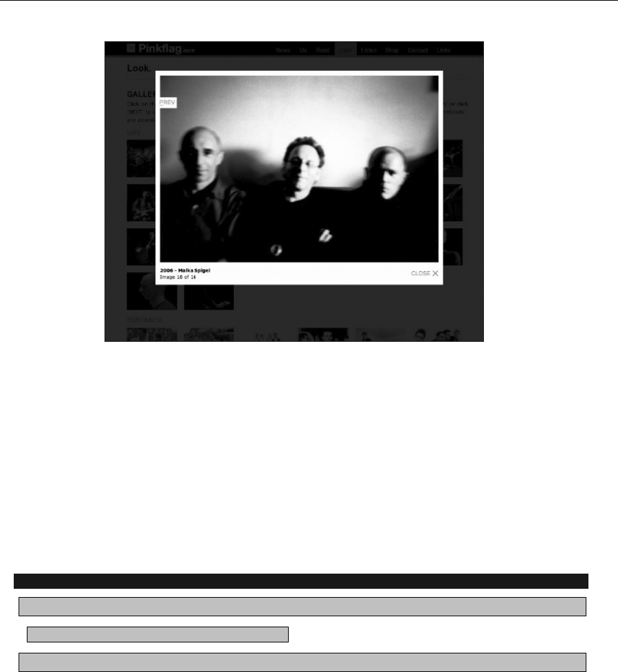
Chapter 5
186
Note that some may consider the behavior of Lightbox2 at odds with user expectations, because the
browser back button returns you to the previous page you visited, rather than closing the lightbox. In my
opinion, this is logical—after all, Lightbox2 is internal page content, not a separate page. However, if you’d
like to override the default behavior and have the back button on the browser close the
lightbox, instructions are available from www.cloversignsblog.com/2007/06/fixing-the-back-button-in-
lightbox/.
Collapsible page content
The DOM enables you to access and dynamically control various aspects of a web page, and this allows
you to use a nifty little trick to toggle the visibility of divs. This has numerous uses, from providing a
method of hiding “spoiler” content unless someone wants to see it to various navigation-oriented uses,
which will be more fully explored later in the chapter.
Setting up a collapsible div
Required files The collapsible-div-starting-point folder from the chapter 5 folder
What you’ll learn How to create a collapsible div
Completed files The collapsible-div-completed folder from the chapter 5 folder
1. Examine the script. Open collapsible-div.js. The code enables you to target any div with a
unique id value. Each time the script is run, it determines whether the display value of the div is
set to block (which makes it visible). If it is, the value is set to none, thereby making it invisible. If it
isn’t set to block (which means it’s set to none), the script sets the value to block.
www.freepdf-books.com

Using Links and Creating Navigation
187
function swap(targetId){
if (document.getElementById)
{
target = document.getElementById(targetId);
if (target.style.display == "block")
{
target.style.display = "none";
}
else
{
target.style.display = "block";
}
}
}
2. Add a link. Add the code block shown following—when clicked, the link will toggle the hidden
content. The value within the onclick attribute (hiddenDiv, in this case) is the id value of the div
that this link will toggle.
<p><a href="#" title="Toggle section" onclick="toggleDiv('hiddenDiv');
return false;">Toggle div!</o>
3. Add a div, and give it an id value equal to the onclick value from the previous step. Within the
div, add whatever content you want. The style attribute makes the div initially hidden.
<p><a href="#" title="Toggle section" onclick="toggleDiv('hiddenDiv');
return false;">Toggle div!</a></p>
<div id="hiddenDiv" style="display: none;">
<p>Initially hidden content goes here.</p>
</div>
A combination of the previous two exercises can be seen in action in a previous version of my Images
from Iceland website—see www.snubcommunications.com/iceland/. This site expands on the div toggler
by also toggling the arrow images when a section is toggled, and it shows what you can do with some
straightforward JavaScript, some decent photographs, and a bit of imagination.
www.freepdf-books.com
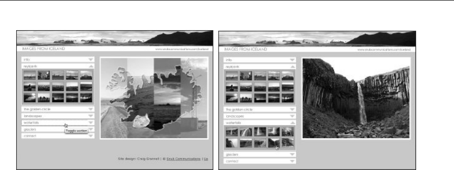
Chapter 5
188
Enhancing accessibility for collapsible content
Although the old version of the Images from Iceland site looks good, it has a problem in common with the
previous exercise: when JavaScript is disabled, the initially hidden content is inaccessible. The Iceland site
was quickly knocked together a number of years back and has been superseded with a new site, but for
any site developed today, there should be no excuses.
In the previous exercise, the hidden content is set to be hidden by default, and the display property is
toggled via the JavaScript function. What therefore needs to be done is to make the content visible by
default and then override this, making it invisible, but only if the user has JavaScript. The first thing to do is
remove the style attribute from the following line of code:
<div id="hiddenDiv" style="display: none;">
Next, a style sheet is created (named javascript-overrides.css for this example), with a rule that targets
the relevant div and sets display to none.
#hiddenDiv {
display: none;
}
Finally, amendments are made to the JavaScript file, adding some lines that attach the new JavaScript
document to the web page:
var cssNode = document.createElement('link');
cssNode.setAttribute('rel', 'stylesheet');
cssNode.setAttribute('type', 'text/css');
cssNode.setAttribute('href', 'javascript-overrides.css');
document.getElementsByTagName('head')[0].appendChild(cssNode);
The results of this are the following:
If a user has JavaScript enabled, javascript-overrides.css is loaded, applying the display
value of none to the togglable div.
If a user has JavaScript disabled, javascript-overrides.css is not loaded, meaning the
togglable div contents are visible.
www.freepdf-books.com

Using Links and Creating Navigation
189
See the collapsible-div-accessible folder within the chapter 5 folder for reference files.
Modularizing the collapsible content script
Although the previous script works perfectly well for a single div, it’s awkward if you want to use several
divs over the course of a page. That’s how the old Images from Iceland site works, and I had to keep track
of id names and values while constructing it. However, it is possible to make a toggler strip more modular,
although this relies on keeping document structure very strict as far as the collapsible sections go. The files
for this section are in the collapsible-div-modular folder within the chapter 5 folder.
The JavaScript is similar to that in the previous example.
function toggle(toggler) {
if(document.getElementById) {
targetElement = toggler.parentNode.nextSibling;
if(targetElement.className == undefined) {
targetElement = toggler.parentNode.nextSibling.nextSibling;
}
if (targetElement.style.display == "block") {
targetElement.style.display = "none";
}
else {
targetElement.style.display = "block";
}
}
}
The main change is that instead of targeting a div with a specific id value, the script targets an element in
relation to the one being used as a toggler, by way of the parentNode/nextSibling JavaScript properties.
If you look at the HTML document, you’ll see that the parent of the anchor element is the p element. What
the next sibling element is depends on the browser—Internet Explorer just looks for the next element in the
document (div), but other browsers count whitespace as the next sibling.
<p><a href="#" title="Toggle section" onclick="toggle(this); return
false;">Toggle div 1!</a></p>
<div class="expandable">
<p>Initially hidden content (div 1) goes here.</p>
</div>
It would be possible to get around this by stripping whitespace. However, a line in the JavaScript makes
this unnecessary.
if(document.getElementById) {
targetElement = toggler.parentNode.nextSibling;
if(targetElement.className == undefined) {
targetElement = toggler.parentNode.nextSibling.nextSibling;
}
www.freepdf-books.com
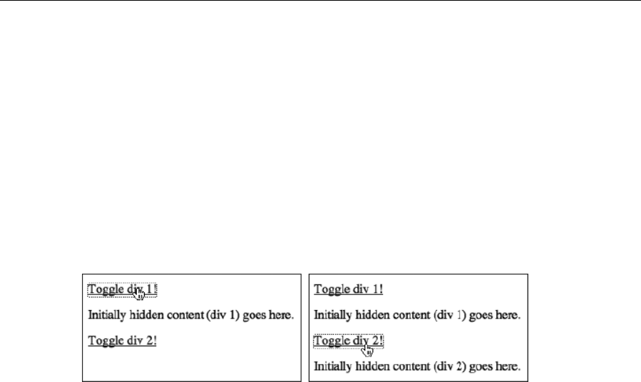
Chapter 5
190
The first line of the previous code block sets the target to the next sibling of the parent element of the link.
In Internet Explorer this works, but other browsers find only whitespace. Therefore, the second line
essentially says, “If you find whitespace (undefined), then set the target to the next sibling on.” It’s a bit of
a workaround, but it’s only one line of JavaScript.
The JavaScript also includes the method used in the preceding “Enhancing accessibility for collapsible
content” section to make the togglable sections initially invisible in JavaScript-enabled browsers only. Note
that the related CSS is slightly different from that shown in the previous section—instead of hidden content
being in a div with an id value of hiddenDiv, it’s now in multiple divs, all of which have a class value of
expandable. Therefore, the selector in the CSS rule has been updated accordingly:
.expandable {
display: none;
}
This system enables you to use as many collapsible divs as you like on the page, and you don’t have to
set id values—the toggling is essentially automated. However, as mentioned earlier, you must ensure that
your structure remains the same for each area that can be toggled; otherwise, the script won’t find the
correct element to make visible or invisible when the links are clicked.
How to find targets for collapsible content scripts
If you want to change your document structure when using the script from the previous section in this
chapter, you need to find the parent/sibling path, in Internet Explorer and in other browsers. If you have a
good grasp of JavaScript, this should be simple; however, if you don’t—or you just want to sanity-check
your values—it’s simple to find out what an element’s parent is, what it’s next sibling is, and various
combinations thereof.
First, give your clickable element a unique id value:
<p><a id="linkToggler" href="#" title="Toggle section"
onclick="toggle(this); return false;">Toggle div 1!</a></p>
Elsewhere within the web page, add the following script:
<script>
alert(document.getElementById("linkToggler").nodeName);
</script>
Before .nodeName, add whatever combination of .parentNode and .nextSibling you like—here’s an
example:
www.freepdf-books.com
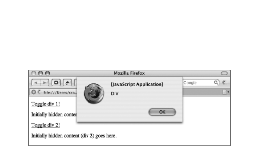
Using Links and Creating Navigation
191
<script>
alert(document.getElementById("linkToggler").parentNode.
•nextSibling.nextSibling.nodeName);
</script>
When you load the web page in a browser, an alert message will be displayed. This will detail what the
target element is, based on the path defined in the previous code block.
In this section, you’ve seen a bare-bones, unstyled version of how to work with collapsible content. Later in
the chapter, this method will be used to create collapsible sections for a navigation bar.
Creating navigation bars
The chapter has so far largely concentrated on inline navigation, so we’ll now turn our attention to
navigation bars. Before getting immersed in the technology, you need to decide what names you’re going
to use for your navigation bar’s items. When designing the basic structure of the site, content should be
grouped into categories, and this is often defined by what the user can do with it. It therefore follows that
navigation bar links tend to be one of the following:
Action-based (buy now, contact us, read our history)
Site audience–based (end users, resellers, employees)
Topic-based (news, services, contact details)
Whenever possible, keep to one of the preceding categories rather than mixing topics and actions. This
sits easier with readers. Navigation links should also be succinct, to the point, and appropriate to the brand
and tone of the website.
In this section, we’ll cover using lists for navigation, styling list-based navigation bars, working with inline
lists, and creating graphical navigation bars with rollover graphics.
Using lists for navigation bars
Think back to what we’ve covered to this point about semantic markup. Of the HTML elements that exist,
which is the most appropriate for a navigation bar? If you said, “a table,” go to the back of the class. Using
www.freepdf-books.com
Chapter 5
192
tables for navigation bars might be a rapid way of getting them up and running, but it’s not structurally
sound. When looked at objectively, navigation bars are essentially a list of links to various pages on the
website. It therefore follows that HTML lists are a logical choice to mark up navigation bars.
When creating the initial pass of the website, just create the list as it is, along with all the associated
pages, and let people play around with the bare-bones site. This enables users to get a feel for its
structure, without getting distracted by content, colors, and design. However, sooner or later, you’re going
to want to make that list look a little fancier.
Much of the remainder of this chapter is concerned with CSS and how it can be used to style lists. From a
plain HTML list, you can rapidly create exciting visual designs—and ones that are easy to update, both in
terms of content and design. After all, adding another navigation link is usually just a matter of adding
another list item.
The nav element
HTLM5 has introduced a new element that provides a semantic way for grouping together links used for
major navigation. As you saw previously in this chapter the nav element was used for skip links. Since
these links are for accessibility this is considered major navigation. Some other areas of your site that can
be considered major navigation and should therefore use the nav element include main navigation,
pagination links, breadcrumbs, and a table of contents.
Using HTML lists and CSS to create a button-like vertical navigation bar
Required files- basic.html and CSS-default.css from the basic-boilerplates folder.
What you’ll learn How to create a vertically aligned navigation bar and how to style it with CSS to create a
3D-like effect for each of the list items.
Completed files The vertical-navigation-bar folder in the chapter 5 folder
1. Create the list structure. Add the following code block to create the structure of the navigation bar.
By using nested lists, you can provide the navigation bar with a hierarchical structure (and you
can style each level in CSS). In this example, the list has two levels. (Refer to Chapter 3 for an
overview of correctly formatting lists.) This list is nested within a div with an id value of
navigation, which we’ll later take advantage of by using contextual selectors. (For this example,
dummy href values of # are being used, but in a live site, always check that your links lead
somewhere!)
<nav>
<ul>
<li>
<a href="#">Section one</a>
<ul>
<li><a href="#">A link to a page</a></li>
<li><a href="#">A link to a page</a></li>
www.freepdf-books.com
Using Links and Creating Navigation
193
<li><a href="#">A link to a page</a></li>
<li><a href="#">A link to a page</a></li>
</ul>
</li>
<li>
<a href="#">Section two</a>
<ul>
<li><a href="#">A link to a page</a></li>
<li><a href="#">A link to a page</a></li>
<li><a href="#">A link to a page</a></li>
<li><a href="#">A link to a page</a></li>
</ul>
</li>
<li>
<a href="#">Section three</a>
<ul>
<li><a href="#">A link to a page</a></li>
<li><a href="#">A link to a page</a></li>
<li><a href="#">A link to a page</a></li>
<li><a href="#">A link to a page</a></li>
</ul>
</li>
</ul>
</nav>
2. Add some padding to the body element, so page content doesn’t hug the browser window edges.
Also, add the background-color pair shown following:
body {
font: 62.5%/1.5 Verdana, Arial, Helvetica, sans-serif;
padding: 20px;
background-color: #aaaaaa;
}
3. Style the list. Add the following rule to remove the default bullet points from
unordered lists within the navigation div, define a width for the lists, and also
set the default font style.
nav ul {
list-style-type: none;
width: 140px;
font: 1.2em/1 Arial, Helvetica, sans-serif;
}
4. Set an override for nested lists. As you can see from the previous image, the nested links have
much larger text. This is because font sizes in ems are inherited, and therefore the font size
within the nested lists ends up at 1.2ems multiplied by 1.2ems. By adding the following rule, the
font size of nested lists is reset to 1em, making nested lists look the same as top-level lists.
nav ul ul {
font-size: 1em;
}
www.freepdf-books.com

Chapter 5
194
5. Style the buttons. Use a contextual selector to style links within the navigation container (that is,
the links within this list). These styles initially affect the entire list, but you’ll later override them for
level-two links. Therefore, the styles you’re working on now are intended only for level-one links
(which are for sections or categories). This first set of property/value pairs turns off the default link
underline, sets the list items to uppercase, and defines the font weight as bold.
nav a:link, nav a:visited {
text-decoration: none;
text-transform: uppercase;
font-weight: bold;
}
6. Set button display and padding. Still within the same rule, set the buttons to display as block,
thereby making the entire container an active link (rather than just the link text). Add some
padding so the links don’t hug the edge of the container.
nav a:link, nav a:visited {
text-decoration: none;
text-transform: uppercase;
font-weight: bold;
display: block;
padding: 3px 12px 3px 8px;
}
7. Define colors and borders. Define the button background and foreground colors, setting the
former to gray and the latter to white. Then add borders to create a 3D effect. Borders can be
styled individually. By setting the left and top borders to a lighter shade than the background and
setting the right and bottom borders to a darker shade, a 3D effect is achieved. (Don’t use black
and white, because it will make the result is too harsh.)
nav a:link, nav a:visited {
text-decoration: none;
text-transform: uppercase;
font-weight: bold;
display: block;
padding: 3px 12px 3px 8px;
background-color: #666666;
color: #ffffff;
border-top: 1px solid #dddddd;
border-right: 1px solid #333333;
border-bottom: 1px solid #333333;
border-left: 1px solid #dddddd;
}
8. Define other link states. The hover state is defined by just changing the
background color, making it slightly lighter.
nav a:hover {
background-color: #777777;
}
www.freepdf-books.com

Using Links and Creating Navigation
195
The active state enables you to build on the 3D effect: the padding settings are changed to move the text
up and left by 1 pixel, the background and foreground colors are made slightly darker, and the border
colors are reversed.
nav a:active {
padding: 2px 13px 4px 7px;
background-color: #444444;
color: #eeeeee;
border-top: 1px solid #333333;
border-right: 1px solid #dddddd;
border-bottom: 1px solid #dddddd;
border-left: 1px solid #333333;
}
9. Style nested list item links. The selector #navigation li li a enables you to style links within a
list item that are themselves within a list item (which happen to be in the navigation container). In
other words, you can create a declaration for level-two links. These need to be differentiated from
the section links, which is the reason for the following rule setting them to lowercase and normal
font weight (instead of bold). The padding settings indent these links more than the section links,
and the background and foreground colors are different, being very dark gray (almost black) on
light gray rather than white on a darker gray.
nav li li a:link, nav li li a:visited {
text-decoration: none;
text-transform: lowercase;
font-weight: normal;
padding: 3px 3px 3px 17px;
background-color: #999999;
color: #111111;
}
10. Style nested item hover and active states. This is done in the same way as per the section links,
changing colors as appropriate and again reversing the border colors on the active state.
nav li li a:hover {
background-color: #aaaaaa;
}
nav li li a:active {
padding: 2px 4px 4px 16px;
background-color: #888888;
color: #000000;
border-top: 1px solid #333333;
border-right: 1px solid #dddddd;
border-bottom: 1px solid #dddddd;
border-left: 1px solid #333333;
}
The navigation bar is now complete, and as you can see from the following images (which depict, from left
to right, the default, hover, and active states), the buttons have a tactile feel to them. Should this not be
to your liking, it’s easy to change the look of the navigation bar because everything is styled in CSS. To
expand on this design, you could introduce background images for each state, thereby making the
www.freepdf-books.com

Chapter 5
196
navigation bar even more graphical. However, because you didn’t simply chop up a GIF, you can easily
add and remove items from the navigation bar, just by amending the list created in step 1. Any added
items will be styled automatically by the style sheet rules.
Creating a vertical navigation bar with collapsible sections
Required files The files from vertical-navigation-bar in the chapter 5 folder
What you’ll learn How to take the navigation bar created in the previous exercise and make its sections
collapsible
Completed files vertical-navigation-bar-collapsible in the chapter 5 folder
1. Set up the JavaScript. Create a new JavaScript document and attach it to the HTML file via a
script element in the head of the document. (In the example files, this document has been
named vertical-navigation-bar.js.) First, add the JavaScript lines first shown in the
“Enhancing accessibility for collapsible content” section:
var cssNode = document.createElement('link');
cssNode.setAttribute('rel', 'stylesheet');
cssNode.setAttribute('type', 'text/css');
cssNode.setAttribute('href', 'javascript-overrides.css');
document.getElementsByTagName('head')[0].appendChild(cssNode);
Next, add the toggler script shown in the “Modularizing the collapsible content script” section, but amend
the target element as shown:
function toggle(toggler) {
if(document.getElementById) {
targetElement = toggler.nextSibling;
www.freepdf-books.com
Using Links and Creating Navigation
197
if(targetElement.className == undefined) {
targetElement = toggler.nextSibling.nextSibling;
}
if (targetElement.style.display == "block")
{
targetElement.style.display = "none";
}
else
{
targetElement.style.display = "block";
}
}
}
Note that if you wanted to toggle different kinds of elements on your page, the two
scripts shown so far in this chapter would clash. Therefore, you would need to create
two different functions, with different names; for example, you could change all instances
of toggle(toggler) in this exercise to toggleNav(toggler).
2. Amend the list. To each top-level navigation link, add the onclick attribute, as shown following.
And to each second-level list that you initially want to be invisible, add the class attribute shown.
For any list you want to be visible, instead add style="display: block;".
<li>
<a href="#" onclick="toggle(this); return false;">Section one</a>
<ul class="collapsibleList">
<li><a href="#">A link to a page</a></li>
<li><a href="#">A link to a page</a></li>
<li><a href="#">A link to a page</a></li>
<li><a href="#">A link to a page</a></li>
</ul>
</li>
3. Add a style sheet. Create and save the style sheet document javascript-
overrides.css, and add the following rule to initially hide any lists with the collapsibleList class
value in JavaScript-enabled browsers.
#navigation ul.collapsibleList {
display: none;
}
The following images show the results (which depict, from left to right, the default, hover, and active
states).
www.freepdf-books.com
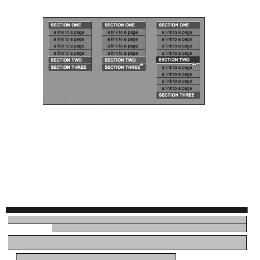
Chapter 5
198
Working with inline lists
By default, list items are displayed in a vertical fashion, one under the other. However, this behavior can
be overridden in CSS, enabling you to create inline lists. This is handy for website navigation, since many
navigation bars are horizontally oriented. Some designers mark up horizontal navigation up by using
strings of links separated by vertical bars or spaces:
<a href="link.html">A link</a> | <a href="link.html">A link</a> |
<a href="link.html">A link</a>
However, a horizontal navigation bar is still a list of links, and so semantically should be marked up in the
same way as the vertical navigation bar in the previous exercise. In this section, you’ll find out how to work
with inline lists, discovering how to create breadcrumb navigation, CSS-only “tabbed” navigation, and
various graphical navigation bars, complete with rollover effects—all without relying on JavaScript.
Creating breadcrumb navigation
Required files basic.html and CSS-default.css from the basic-boilerplates folder, along
with double-arrow.gif from navigation-images within the chapter 5 folder
What you’ll learn How to create breadcrumb navigation by using a list styled in CSS. Breadcrumb
links show the path you’ve taken to the current document
Completed files The breadcrumb-navigation folder in the chapter 5 folder
1. Add the list. In the HTML document, add the following code for the breadcrumbs. Note that the
last item signifies the current page—this is why it’s not a link.
<nav id="breadcrumbs"><ul>
<li><a href="#">Home page</a></li>
<li><a href="#">Reviews</a></li>
<li><a href="#">Live gigs</a></li>
<li>London, 2008</li>
</ul></nav>
www.freepdf-books.com
Using Links and Creating Navigation
199
2. Add some body padding. Add a padding value to the existing body rule.
body {
font: 62.5%/1.5 Verdana, Arial, Helvetica, sans-serif;
padding: 20px;
}
3. Style the list by adding the following rule. The font-size setting specifies the font size for the list
items, and the margin-bottom setting adds a margin under the list.
#breadcrumbs ul {
font-size: 1.2em;
margin-bottom: 1em;
}
4. Add the following rule to style the list items. By setting display to inline, list items are stacked
horizontally. The background value sets double-arrow.gif as the background to each list item
(ensure it’s in the same directory as the CSS document, or modify the path accordingly); the
positioning values ensure the background is set at 0 horizontally and 50% vertically, thereby
vertically centering it at the left—at least once no-repeat is set, which stops the background tiling.
Finally, the padding value sets padding at the right of each list item to 10px, ensuring items don’t
touch the subsequent background image; the left padding value of 15px provides room for the
background image, ensuring the list item text doesn’t sit on top of it.
#breadcrumbs ul li {
display: inline;
background: url(double-arrow.gif) 0 50% no-repeat;
padding: 0 10px 0 15px;
}
Note that when list items are displayed inline, the default bullet points are not displayed.
This is one reason why the bullets in this example are background images, although we
also wanted something more visually relevant, right-facing arrows showing the path
direction.
5. Remove the first bullet. As the trail is leading from the first item, it shouldn’t have a bullet. This
can be dealt with via a simple, standards-compliant rule that removes the background from only
the list item that is the first child of the unordered list (that is, the first list item in the list):
#breadcrumbs ul li:first-child {
background: none;
}
www.freepdf-books.com
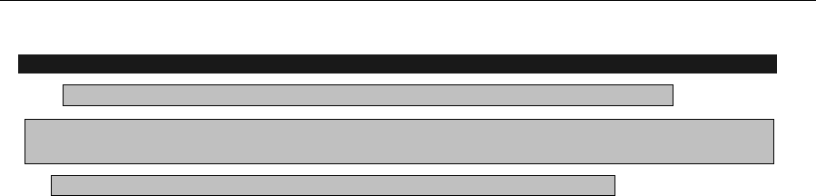
Chapter 5
200
Creating a simple horizontal navigation bar
Required files The graphical-navigation-starting-point folder from the chapter 5 folder
What you’ll learn How to create a good-looking navigation bar, entirely based on HTML text and
styled using CSS.
Completed files The simple-horizontal-navigation-bar folder in the chapter 5 folder
1. Examine the web page. The web page for this exercise—graphical-navigation.
html—is designed for flexibility when it comes to styling elements on the page, making it easy to
change elements without touching the markup (this page is used with a few modifications in
subsequent exercises, too).
The page’s contents are placed within a wrapper div, within which are the masthead and content divs. The
latter contains some paragraphs, and the former includes a navContainer div, which houses a nav
element, which in turn houses the unordered list shown in the following code block. (This nesting of divs
isn’t required for all sites—often you can get away with a single nav element around the navigation list;
however, having an additional wrapper or two is often useful for more complex layouts.)
The list is an unordered list. The main difference from previous lists is the inclusion of an id value for each
list item. For horizontal lists, especially those that will be highly styled, this is worth doing, because it
enables you to work all manner of CSS trickery later, which can benefit the web page. (In fact, some of the
techniques can be applied to vertical lists, too.)
<ul>
<li id="homePageLink"><a href="#">Home page</a></li>
<li id="servicesPageLink"><a href="#">Services</a></li>
<li id="customerSupportPageLink"><a href="#">Customer support</a>
</li>
<li id="contactDetailsPageLink"><a href="#">Contact details</a></li>
</ul>
2. Edit the body and p rules. This design is going to have a classic feel, so in the CSS file, edit the
body rule to amend the font set, add a light gray background, and amend the p rule to change the
font size.
body {
font: 62.5%/1.5 Georgia, "Times New Roman", Times, serif;
background: #dddddd;
}
p {
font-size: 1.3em;
margin-bottom: 1em;
}
3. Style the structural divs. First, add a rule to style the wrapper div, as shown in the following code
block. This sets a fixed width for the div, centers it horizontally, and applies borders on all edges
except the top one. The background value provides a white background for the page’s content.
www.freepdf-books.com
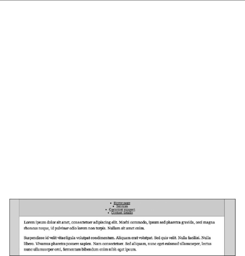
Using Links and Creating Navigation
201
(Note that there’s plenty of explanation about page layout in Chapter 7.) For the content area, add
some horizontal padding by adding the #content rule shown in the following code block.
#wrapper {
width: 700px;
margin: 0 auto;
border-right: 1px solid #898989;
border-bottom: 1px solid #898989;
border-left: 1px solid #898989;
background: #ffffff;
}
#content {
padding: 0 15px;
}
4. Style the navigation container by adding the following rule to style the navContainer div. In this
rule, the font style for the navigation bar’s links is set, and the text-align value centers the
content horizontally. The padding value applies some padding at the top and bottom of the
navContainer div, ensuring its content doesn’t hug its edges—in design, the space is often as
important as the content, so don’t cram things in.
#navContainer {
font: 1.1em/1 Georgia, "Times New Roman", Times, serif;
background: #d7d7d7;
text-align: center;
padding: 7px 0px;
border-top: 1px solid #898989;
border-bottom: 1px solid #898989;
margin-bottom: 10px;
}
5. Style the list items. Now that the structure is styled, it’s time to get cracking on the list. First, add a
rule to remove the default bullets from the unordered list within the navigation div.
#navigation ul {
list-style: none;
}
Next, set the list items to display inline, as with the breadcrumbs. Add some horizontal padding, and also,
as shown, add a border to each item’s right edge, which will act as a visual separator, making each link
more distinct.
www.freepdf-books.com
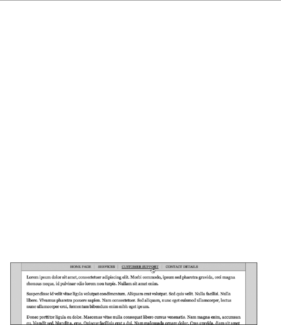
Chapter 5
202
#navigation li {
display: inline;
padding: 0px 9px;
border-right: 1px solid #aaaaaa;
}
If you test the page at this point, you’ll see that all the links have a right-edge border—not a terrible
crime—but from a design standpoint, the one at the far right shouldn’t have one (after all, separators are
needed only between pairs of links). Luckily, because of the id values applied to the list items earlier, each
one can be individually styled, which also means an override can be applied to a specific link. In this case,
add the following rule, which removes the border from the list item with an id value of
contactDetailsPageLink:
#navigation #contactDetailsPageLink {
border-right: none;
}
6. The last thing to do is style the links. The following rules set the link text to uppercase, removing
the default underline and coloring them black by default. The links are then gray on the visited
state, have an underline on the hover state, and are red on the active state.
#navigation a:link, #navigation a:visited {
text-transform: uppercase;
text-decoration: none;
}
#navigation a:link {
color: #000000;
}
#navigation a:visited {
color: #222222;
}
#navigation a:hover {
text-decoration: underline;
}
#navigation a:active {
color: #ff0000;
}
www.freepdf-books.com
Using Links and Creating Navigation
203
Note: In this example, the color of the navigation links—which have no underline—is the
same as the body copy. While this would be a very bad idea for inline links, it’s fine for
the navigation links, because they’re obviously distinct from the text elsewhere on the
page, due to the background color and horizontal line that separates the navigation area
from the content area
Creating a CSS-only tab bar that automates the active page
Required filesThe graphical-navigation-starting-point folder from the chapter 5 folder
What you’ll learn How to create a tab-style navigation bar, using only CSS for styling (no images)
Completed files The css-only-tab-bar folder in the chapter 5 folder
1. Edit the body element—in the HTML page, edit the body start tag, adding the class value shown.
Its significance will be explained later.
<body id="homePage">
2. Edit the body rule. In the CSS document, amend the body rule as shown to add a light gray
background:
body {
font: 62.5%/1.5 Verdana, Arial, Helvetica, sans-serif;
background: #dddddd;
}
3. Style structural divs. Add the following #wrapper rule, which defines a set width for the page,
centers it, and sets the background color to white.
#wrapper {
width: 700px;
margin: 0 auto;
background: #ffffff;
}
Next, style the content div by adding the following rule, which adds a border to all edges but the top one
and defines internal padding:
#content {
padding: 15px 15px 0;
border-right: 1px solid #898989;
border-bottom: 1px solid #898989;
border-left: 1px solid #898989;
}
These rules work slightly differently from those in the previous exercise. We want the content borders to
start right under the navigation, which is why the padding is being applied to the top of the content div,
rather than a margin below the navContainer div.
www.freepdf-books.com
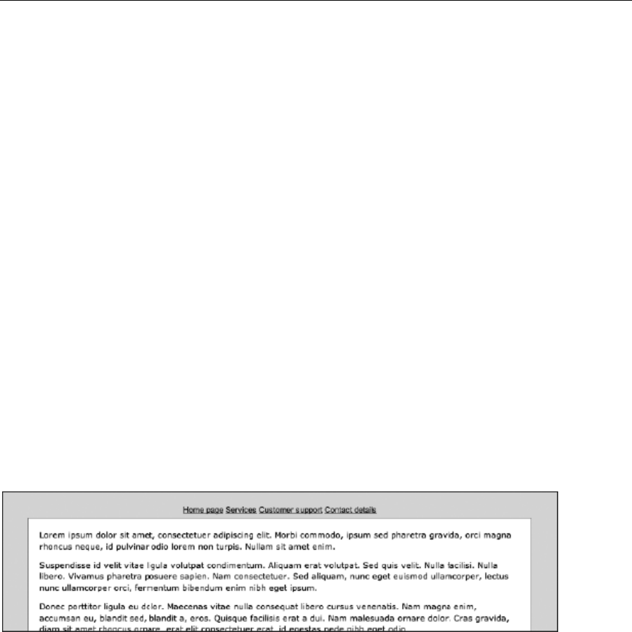
Chapter 5
204
4. Style the navContainer div. Add the following rule to style the navContainer div. The font settings
define a size and family. Avoid setting a line-height value, because that makes it much harder
to line up the tabs with the borders later. The padding value applies some padding above the
soon-to-be-created tabs, and the border-bottom value finally surrounds all edges of the content
div with a border. Because the wrapper div has a white background, this currently shows through
the navContainer div, and so a background setting is applied, using the same background color
value as applied to the body element.
#navContainer {
font: 1.1em Arial, Helvetica, sans-serif;
text-align: center;
padding: 20px 0 0;
border-bottom: 1px solid #909090;
background: #dddddd;
}
5. Style the list. Add the following rule to style the list. The bottom padding value (5px here) adds
padding to the bottom of the list and needs to be equivalent to the padding value you want to be
under the text in each tab.
#navigation ul {
padding: 0 0 5px;
}
Next, style the list items to make them display inline.
#navigation li {
display: inline;
}
6. Add the following rule to style the links. Most of the property values should be familiar by now.
Note how the border value applies a border to each link; this, in tandem with the background
value, gives all the links the appearance of background tabs. The padding setting provides space
around the link contents (and note how the vertical padding value is the same as the bottom
padding value in step 5), and the margin-right setting adds some space between each tab.
#navigation a:link, #navigation a:visited {
text-transform: uppercase;
text-decoration: none;
www.freepdf-books.com

Using Links and Creating Navigation
205
color: #000000;
background: #bbbbbb;
border: 1px solid #898989;
padding: 5px 10px;
position: relative;
margin-right: 5px;
}
As per the previous exercise, the unwanted right-hand value for the rightmost tab (in this case, the margin-
right setting) can be overridden by using a contextual selector that takes advantage of the id values
defined in the HTML document’s unordered list items.
#navigation #contactDetailsPageLink a:link, #navigation
#contactDetailsPageLink a:visited {
margin-right: 0;
}
7. Style other link states. Add the following two rules to define the other link states. The first makes
the text slightly lighter when a link has been visited. The second brings back the default underline
on the hover state, along with making the link’s background slightly lighter.
#navigation a:visited {
color: #222222;
}
#navigation a:hover {
text-decoration: underline;
background: #cccccc;
}
8. Create page-specific overrides. Remember back in step 1, when you defined an id value for the
body element? This can now be used to automate the active tab via the following rule:
#homePage #homePageLink a:link, #homePage #homePageLink a:visited,
#servicesPage #servicesPageLink a:link, #servicesPage
#servicesPageLink a:visited, #customerSupportPage
#customerSupportPageLink a:link, #customerSupportPage
#customerSupportPageLink a:visited, #contactDetailsPage
#contactDetailsPageLink a:link, #contactDetailsPage
#contactDetailsPageLink a:visited {
background: #ffffff;
border-bottom-color: #ffffff;
}
www.freepdf-books.com
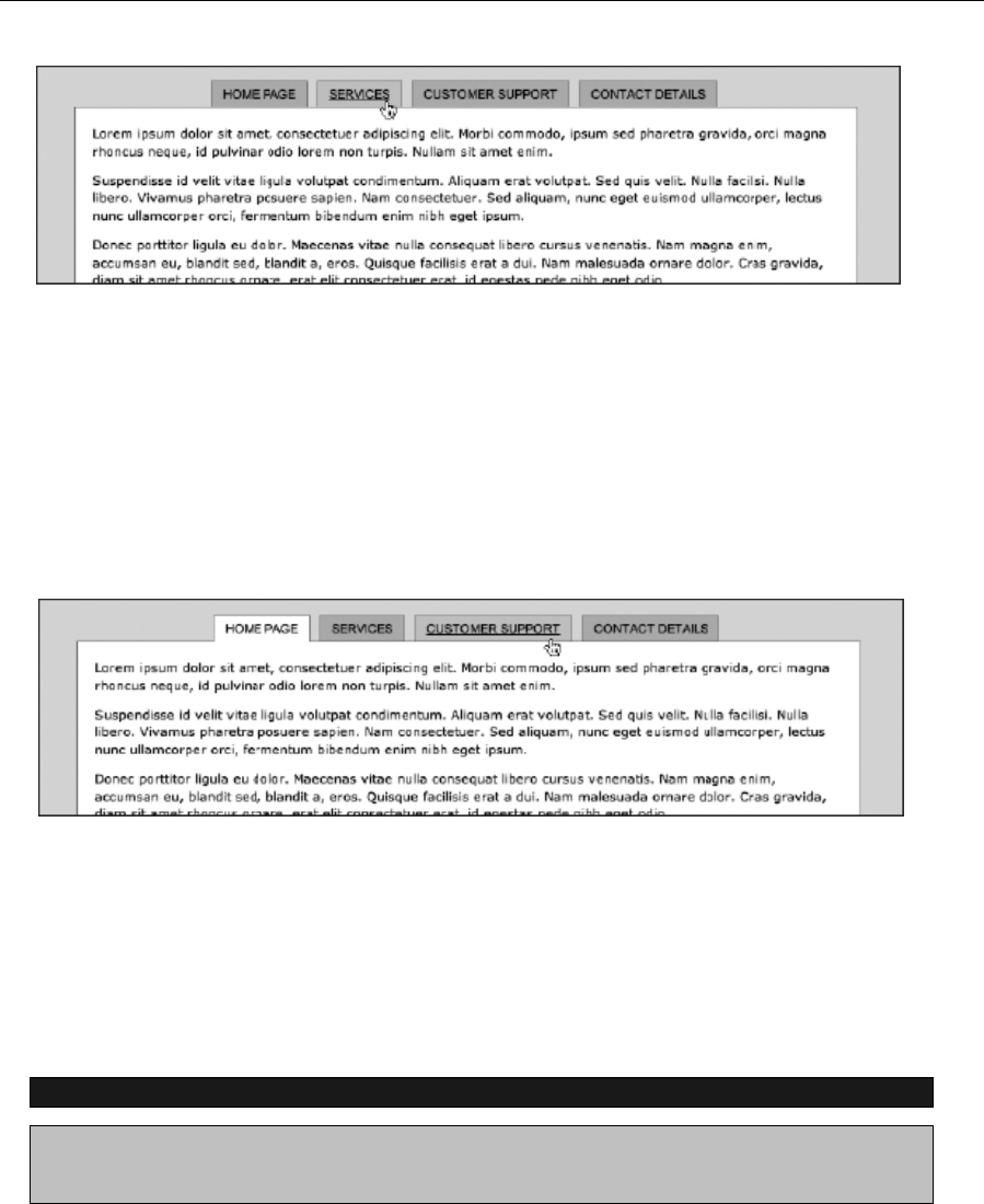
Chapter 5
206
The declaration is simple: a white background is applied, and the bottom border color is changed to white.
The grouped selector is more complex, so I’ll start by explaining the first contextual selector, which is
#homePage #homePageLink a:link. What this means is, “Apply the declaration to the link within an element
with an id of homePageLink that’s in an element with an id of homePage.” In the page you’ve been working
on, the body element has an id of homePage, and the first list element in the unordered list has an id of
homePageLink. Therefore, the link within this list item is automatically given the style, making it look like the
active tab (since the background blends directly into the content area).
The other selectors in the grouped selector behave in the same way (in each case for the link and
visited styles); so if, for example, you change the id value of the body start tag in the HTML document to
customerSupportPage and then refresh the web page, you’ll see the third link become the active tab.
Graphical navigation with rollover effects
Working with text and CSS alone is fine, but designers are creative types and tend to like working with
graphics. Many enjoy creating more visually arresting navigation bars, which make use of imagery and
rollovers. Historically, such systems have required a number of images (three or more per tab) and the use
of JavaScript. However, it’s possible to use CSS, the same unordered list as used for the previous two
exercises, and just a single image to create a graphical navigation bar, as shown in the next exercise.
Using CSS backgrounds to create a navigation bar
Required files The graphical-navigation-starting-point folder and css-tab-rollover-
image.gif from
the navigation-images folder in the chapter 5 folder
www.freepdf-books.com
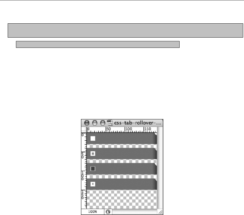
Using Links and Creating Navigation
207
What you’ll learn How to create a graphical navigation bar with four different states, driven by CSS,
without using any JavaScript
Completed files The graphical-navigation-bar folder in the chapter 5 folder
For this exercise, graphical tabs will be created, using a single GIF image that contains four variations on
the graphic: three are for link states for which styles will be defined (active, hover, and then link and
visited, which share an image); the other is to flag the current page. By applying this image as a
background to links and then amending its vertical positioning on each state, only the relevant portion of
the image will be shown. This technique is called CSS sprites and is used to limit the number of files that
have to be loaded into your page. This is great for updating a site (you need to amend only a single image)
and also from a bandwidth standpoint (one image deals with every tab and every state—no need for
preloading anything), and it’s easy to implement.
1. Edit the body element. Like in the previous exercise, edit the body start tag, adding the id value
shown.
<body id="homePage">
2. Style the structural divs. This page’s structure is simple, as are the CSS rules required to style it.
The #wrapper rule sets a fixed width (which is four times the width of one of the tabs) and centers
the design in the browser window. The #masthead rule adds some padding at the top of the
masthead, so the tabs won’t hug the top of the browser window.
The #navContainer rule has a bottom border (to firmly separate the navigation from the other page
content) and a defined height, which is the height of a tab. The height setting is useful, because these
tabs will be floated, meaning they’re outside of the standard document flow. By giving the container a fixed
height, the border is shown in the right place; without the height definition, the border would be displayed
at the top of the navContainer div, because as far as browsers are concerned, floated elements
technically don’t take up any height within the standard document flow.
www.freepdf-books.com
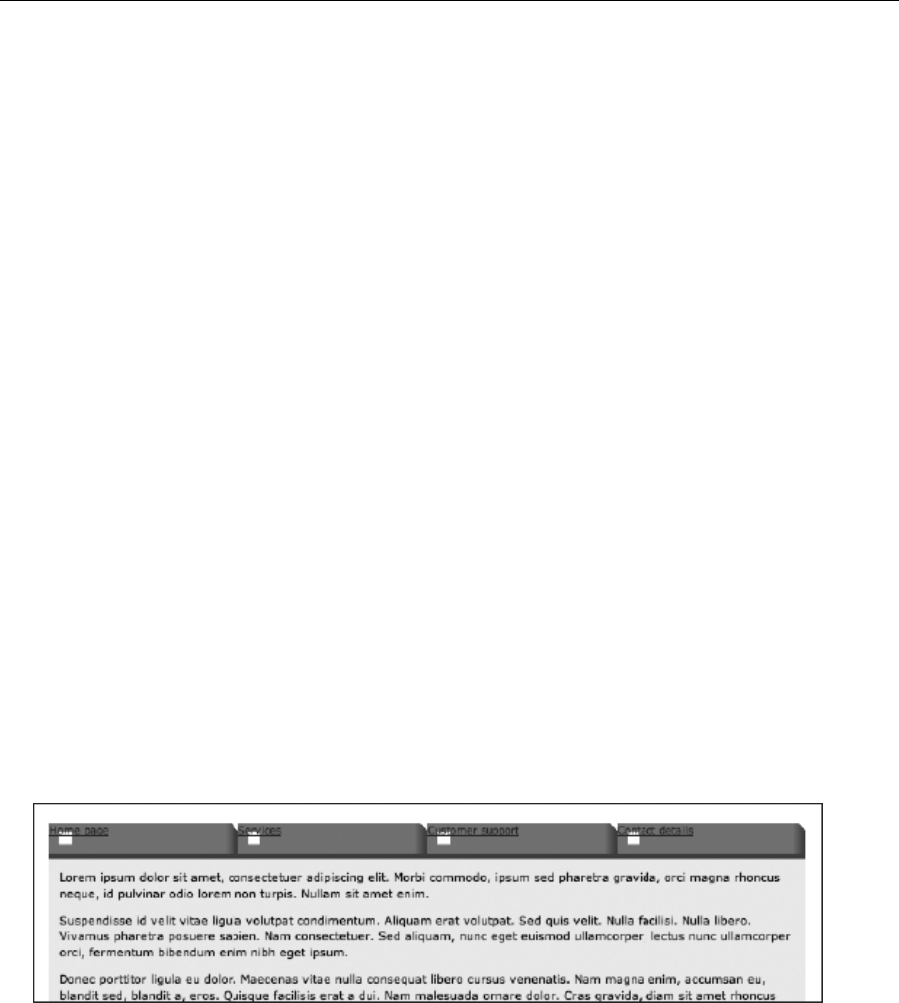
Chapter 5
208
Finally, the #content rule gives that area a background color and some padding.
#wrapper {
width: 740px;
margin: 0 auto;
}
#masthead {
padding-top: 20px;
}
#navContainer {
height: 30px;
border-bottom: 5px solid #ad3514;
}
#content {
padding: 10px;
background-color: #eeeeee;
}
3. Remove the default bullet points from the list items by adding the following rule:
#navigation ul {
list-style-type: none;
}
4. Style list items. Items within the list are styled to float left. The background value includes the
location of the rollover image, with additional settings being
no-repeat (to stop it from tiling), and then 0 and 0, to ensure the relevant portion of the rollover
image is seen by default. The width and height values are the same as that of the image: 185px
and 30px, respectively.
#navigation li {
float: left;
background: url(css-tab-rollover-image.gif) no-repeat 0 0;
width: 185px;
height: 30px;
}
5. Next, style the links. The text is rendered in white, in uppercase, and in Arial, and the default
underlines are removed. Setting display to block makes the entire link container into an active
link, thereby making the navigation bar work in the traditional manner (rather than just the text
being active). Finally, the padding settings position the text correctly over the background images.
www.freepdf-books.com

Using Links and Creating Navigation
209
The height setting, combined with the padding top setting of 9px, adds up to the height of the
container—30px. Without this, the space underneath the text would not be active.
#navigation a:link, #navigation a:visited {
font: bold 1.1em Arial, Helvetica, sans-serif;
text-transform: uppercase;
color: #ffffff;
text-decoration: none;
display: block;
height: 21px;
padding: 9px 0px 0px 30px;
}
6. Style other link states. For the hover and active states, you define which portion of the rollover
graphic is supposed to be visible. This is done via background position values. The first of these
remains 0, because you always want to see the image from its far left. The vertical reading
depends on where the relevant portion of the image appears in the rollover graphic.
If you check css-tab-rollover-image.gif in an image editor, you’ll see the hover state graphic is 40
pixels from the top and the active state graphic is 80 pixels from the top. This means the image needs to
be vertically moved –40 pixels and –80 pixels for the hover and active states, respectively. Therefore, the
rules for these states are as follows:
#navigation a:hover {
background: url(css-tab-rollover-image.gif) 0 -40px;
}
#navigation a:active {
background: url(css-tab-rollover-image.gif) 0 -80px;
}
7. Define the active section state. As per step 8 of the previous exercise, the active state graphic
can be set. In this case, this is done by displaying the fourth state in the rollover image via the
following rule:
#homePage #homePageLink a:link, #homePage #homePageLink a:visited,
#servicesPage #servicesPageLink a:link, #servicesPage
#servicesPageLink a:visited, #customerSupportPage
#customerSupportPageLink a:link, #customerSupportPage
#customerSupportPageLink a:visited, #contactDetailsPage
#contactDetailsPageLink a:link, #contactDetailsPage
#contactDetailsPageLink a:visited {
background: url(css-tab-rollover-image.gif) 0 -120px;
}
Again, you can change the id value of the body element to one of the other list item id values to change
the active section link.
www.freepdf-books.com
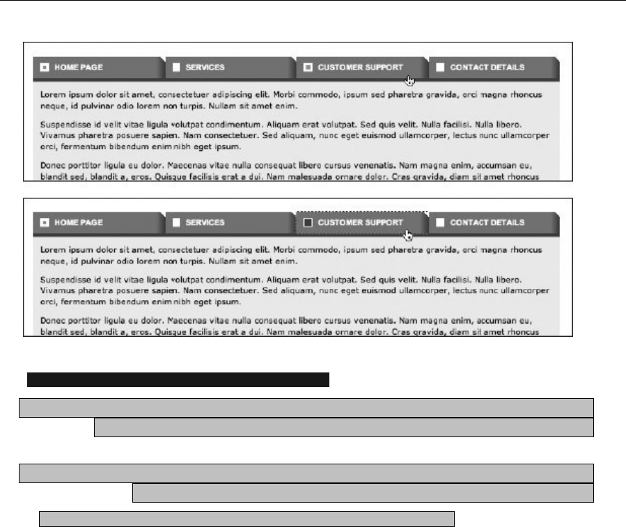
Chapter 5
210
Using a grid image for multiple link styles and colors
Required filesThe files from the graphical-navigation-bar folder and
css-rollover-grid.gif from the navigation-images folder in the chapter 5 folder
What you’ll learn How to amend the previous exercise in order to create a different tab for each
link—still by using a single image
Completed files The graphical-navigation-bar-grid folder in the chapter 5 folder
Taking the previous exercise’s completed files as a starting point, along with
css-rollover-grid.gif, which will be used as the rollover image, you’re now going to have a different tab
for each link. This will be done via more background positioning and by making use of the list item id
values to create rules with contextual selectors specific to each item. Naturally, the rollover image contains
all of the states for the rollover images.
www.freepdf-books.com
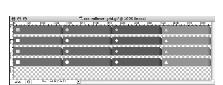
Using Links and Creating Navigation
211
1. Amend the list item style. To apply the new background to the list items, amend the #navigation
li rule:
#navigation li {
float: left;
display: inline;
width: 185px;
height: 30px;
background: url(css-rollover-grid.gif) no-repeat 0 0;
}
2. Amend the navContainer div border. Because the tabs are now multicolored, the orange border
at the bottom of the navContainer div won’t look good, so change it to dark gray.
#navContainer {
height: 30px;
border-bottom: 5px solid #333333;
}
3. Set specific background positions. Each tab now requires a separate background position to
show the relevant portion of the background image for each tab. Again, negative margins are
used to pull the image into place in each case. (Because the different colors aren’t obvious in
grayscale, the tabs also have unique icons at the far left.) These rules should be placed after the
#navigation a:link, #navigation a:visited rule.
#navigation #homePageLink {
background-position: 0 0;
}
#navigation #servicesPageLink {
background-position: -185px 0;
}
#navigation #customerSupportPageLink {
background-position: -370px 0;
}
#navigation #contactDetailsPageLink {
background-position: -555px 0;
}
www.freepdf-books.com

Chapter 5
212
4. Edit the active-page state for each tab. The correct portion of the image needs to show when a
tab is the active page, and this is done by replacing the rule from step 6 of the previous exercise
with the following four rules, which should be placed after the rules added in the previous step.
#homePage #homePageLink a:link, #homePage #homePageLink a:visited {
background: url(css-rollover-grid.gif) 0 -120px;
}
#servicesPage #servicesPageLink a:link, #servicesPage
#servicesPageLink a:visited {
background: url(css-rollover-grid.gif) -185px -120px;
}
#customerSupportPage #customerSupportPageLink a:link,
#customerSupportPage #customerSupportPageLink a:visited {
background: url(css-rollover-grid.gif) -370px -120px;
}
#contactDetailsPage #contactDetailsPageLink a:link,
#contactDetailsPage #contactDetailsPageLink a:visited {
background: url(css-rollover-grid.gif) -555px -120px;
}
5. Finally, the two rules for the hover and active states need to be replaced by four rules each—one
for each tab. Again, negative margin values are used to display the relevant portion of the
background image for each state for each image. Add these rules after those from the previous
step.
#navigation li#homePageLink a:hover {
background: url(css-rollover-grid.gif) 0 -40px;
}
#navigation li#servicesPageLink a:hover {
background: url(css-rollover-grid.gif) -185px -40px;
}
#navigation li#customerSupportPageLink a:hover {
background: url(css-rollover-grid.gif) -370px -40px;
}
#navigation li#contactDetailsPageLink a:hover {
background: url(css-rollover-grid.gif) -555px -40px;
}
#navigation li#homePageLink a:active {
background: url(css-rollover-grid.gif) 0 -80px;
}
#navigation li#servicesPageLink a:active {
background: url(css-rollover-grid.gif) -185px -80px;
}
#navigation li#customerSupportPageLink a:active {
background: url(css-rollover-grid.gif) -370px -80px;
}
#navigation li#contactDetailsPageLink a:active {
background: url(css-rollover-grid.gif) -555px -80px;
}
Once again, change the id value of the body element to amend the active section link.
www.freepdf-books.com
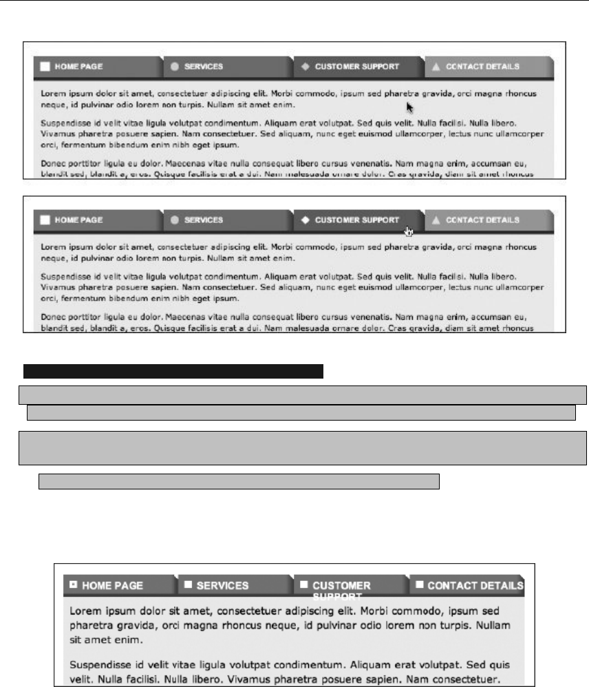
Using Links and Creating Navigation
213
CCreating graphical tabs that expand with resized text
Required files The files from the graphical-navigation-bar folder, and the images css-tab-rollover-
image-left.gif and css-tab-rollover-image-right.gif from the navigation-images folder from the chapter 5 folder
What you’ll learn How to amend the result from the “Using CSS backgrounds to create a navigation
bar” exercise, enabling the tabs to expand, resizing with their content
Completed files graphical-navigation-bar-sliding-doors in the chapter 5 folder
With both of the graphical tab exercises so far, there is a problem: when the text is resized, the tabs don’t
resize with it.
This can be dealt with using a technique typically referred to as “sliding doors.” This requires two images in
place of the original background image tab—one for its left part and one for the right part, with enough
vertical repetition to expand horizontally. With wider links, more of the right image will be displayed.
www.freepdf-books.com
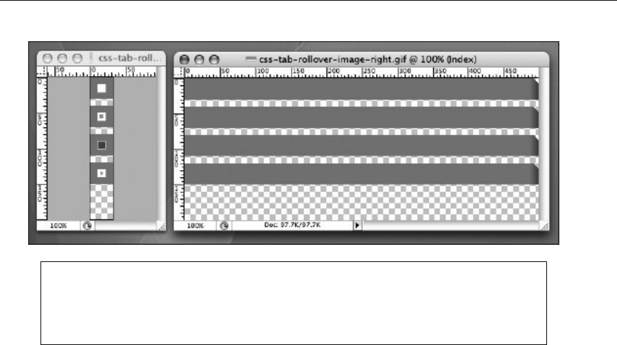
Chapter 5
214
Note that the increase in flexibility in this method is only horizontal. If you need more
flexibility vertically, increase the height of each “state” in the graphical tabs, remove the
height values from both #navigation li and #navigation a:link, #navigation a:visited, and add
a padding-bottom value to the latter of those two rules.
1. Amend the list. To the list items, apply the css-tab-rollover-image-left.gif background image,
and add a padding-left value that’s the same width as the image. This provides the left side of
each tab. The reason for the padding value is so that the right side of the tab (applied to the link)
doesn’t overlap the left image.
#navigation li {
float: left;
background: url(css-tab-rollover-image-left.gif) no-repeat 0 0;
padding-left: 30px;
height: 30px;
}
2. Amend the link style. Because the padding at the left of the link is now dealt with by the previous
rule, there’s no need for a padding-left value in #navigation a:link, #navigation a:visited.
However, because the link now stretches with the content, a padding-right value is required, to
stop the tab content in each case from hugging the edge of the tab. This explains the amended
values for the padding property. For the background property, the image file name is amended,
along with its horizontal position, which is now at the far right (100%).
#navigation a:link, #navigation a:visited {
font: bold 1.1em Arial, Helvetica, sans-serif;
text-transform: uppercase;
color: #ffffff;
text-decoration: none;
display: block;
height: 21px;
padding: 9px 30px 0px 0px;
background: url(css-tab-rollover-image-right.gif) no-repeat 100% 0;
}
www.freepdf-books.com
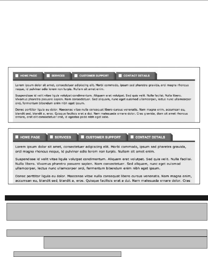
Using Links and Creating Navigation
215
3. With this technique, the left portion of the tab is no longer an active link. It’s therefore usually
recommended to keep the left image as narrow as possible. In this example, the left image is 30
pixels wide, but this was used to show how to convert a standard graphical navigation bar into
one where the tabs can expand—it’s not recommended for the graphical design of such a
system. However, this means the hover and current page states need amending; otherwise,
there’s no feedback. Therefore, for #navigation a:hover, set text-decoration to underline, and
delete everything else within the rule; and for the large, complex rule at the end, set color:
#fff200; as the sole property/value pair in the declaration.
Creating a two-tier navigation menu
Required files The files from the graphical-navigation-bar folder and the images active-section-
tab-background.gif and sub-navigation-background-tile.gif from the navigation-images folder
from the chapter 5 folder.
What you’ll learn How to create a two-tier navigation system, with different backgrounds and styles
for each tier. This is another method for dealing with navigation text resizing, and it’s
also useful for larger websites, providing a place for subnavigation.
Completed files two-tier-navigation in the chapter 5 folder.
1. Edit the body element. In the HTML page, give the body start tag an id value of homePage.
www.freepdf-books.com

Chapter 5
216
<body id="homePage">
2. Add some subnavigation. Open the HTML document and add another list for subnavigation,
directly after the navigation div.
<div id="subNavigation">
<ul>
<li><a href="#">Sub-nav one</a></li>
<li><a href="#">Sub-nav two</a></li>
<li><a href="#">Sub-nav three</a></li>
<li><a href="#">Sub-nav four</a></li>
<li><a href="#">Sub-nav five</a></li>
<li><a href="#">Sub-nav six</a></li>
<li><a href="#">Sub-nav seven</a></li>
</ul>
</div>
3. Amend the body rule. In the CSS document, edit the body rule to add a dark gray background
color and some padding at the top of the document.
body {
font: 62.5%/1.5 Verdana, Arial, Helvetica, sans-serif;
background: #333333;
padding-top: 20px;
}
4. Style the structural divs—add the following three rules to style the three main structural divs.
Adding a light gray bottom border to the masthead makes the transition between the vibrant
navigation to the black-text-on-white-background content area less harsh.
#wrapper {
width: 750px;
margin: 0 auto;
background-color: #ffffff;
border: 1px solid #555555;
}
#masthead {
border-bottom: 8px solid #cccccc;
}
#content {
background: #ffffff;
padding: 10px;
}
5. Add the following two rules to remove list defaults, center list content, and display list items inline.
#navContainer ul {
text-align: center;
}
#navContainer li {
display: inline;
}
www.freepdf-books.com
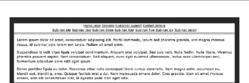
Using Links and Creating Navigation
217
6. Style the navigation div and its links. Add the following three rules to style the navigation div
and the links within. The padding settings work as per the earlier exercises in this chapter: again,
the vertical padding must be kept constant between the container and the links, which is why the
vertical padding is being set to 6px in both cases. Note the hover color—a bright yellow, designed
to stand out against both the black background of the main navigation bar and the orange
background of the subnavigation and highlighted tab.
#navigation {
background: #111111;
padding: 6px 0;
}
#navigation a:link, #navigation a:visited {
font: bold 1.2em Arial, Helvetica, sans-serif;
color: #ffffff;
text-decoration: none;
padding: 6px 10px;
}
#navigation a:hover {
color: #ffd800;
}
7. Style the active page link. Using one of those grouped contextual selectors we seem to like so
much in this chapter, set a rule to style the active page link. In this case, a background image is
tiled horizontally and set to sit at the bottom of the links. A background color is also defined,
which is handy for if the text is zoomed—if no background color were defined, the image might
run out, leaving the navigation div’s background color to show through instead. This rule,
however, ensures that the background will always have some color, regardless of the font size.
The color setting itself was taken from the top pixel of the background image, so it blends
seamlessly with said image.
#homePage #homePageLink a:link, #homePage #homePageLink a:visited,
#servicesPage #servicesPageLink a:link, #servicesPage
#servicesPageLink a:visited, #customerSupportPage
#customerSupportPageLink a:link, #customerSupportPage
#customerSupportPageLink a:visited, #contactDetailsPage
#contactDetailsPageLink a:link, #contactDetailsPage
#contactDetailsPageLink a:visited {
background: #28b767 url(active-section-tab-background.gif)
www.freepdf-books.com

Chapter 5
218
0 100% repeat-x;
border-top: 1px solid #ca8d5c;
}
8. Add the following three rules to style the subnavigation. Here, a background image is tiled
horizontally behind the entire subNavigation div, and it works in a similar way to the one used in
step 7, blending into a background color if the text is zoomed, dramatically changing the div’s
height. The border-bottom setting provides a darker base to the navigation, which works better
than having the light gray masthead border directly beneath it. The margin-top setting pulls the
entire subNavigation div up two pixels, which stops the layout from splitting at some levels of text
zoom.
#subNavigation {
margin-top: -2px;
background: #b76628 url(sub-navigation-background-tile.gif) 0 100%
repeat-x;
border-bottom: 1px solid #6b6b6b;
padding: 6px 0;
}
#subNavigation a:link, #subNavigation a:visited
font: bold 1.1em Arial, Helvetica, sans-serif;
color: #ffffff;
text-decoration: none;
padding: 6px 10px;
}
#subNavigation a:hover {
color: #ffd800;
}
As you can see from the following images, this navigation bar deals really well with increased text sizes—
only when the text is absolutely massive does it not work entirely as expected, although, crucially, it still
remains usable.
www.freepdf-books.com
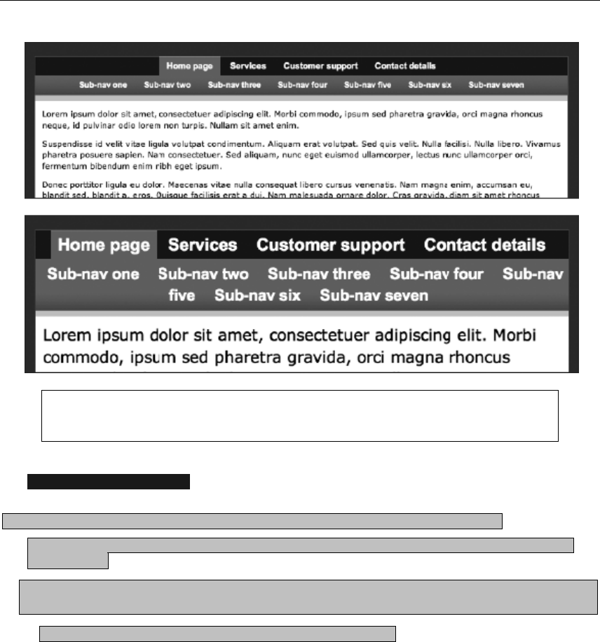
Using Links and Creating Navigation
219
Caution: The subNavigation div in this technique sometimes suffers from the hasLayout
bug in Internet Explorer 6. See Chapter 9 for a method of dealing with hasLayout.
Creating a drop-down menu
Required files Files from the graphical-navigation-bar folder and drop-down-menu-
background.gif (which is a crop of the list item background image) from the navigation-images folder in the
chapter 5 folder
What you’ll learn How to work with an existing CSS-based navigation menu and convert it into a
drop-down menu
Completed files The drop-down-menu folder in the chapter 5 folder
The next type of navigation we’re going to explore in this chapter is the drop-down menu. In part
popularized by operating systems such as Windows and Mac OS, drop-down menus are convenient for
storing plenty of links in a relatively small space. However, use them with caution, because the second tier
of navigation is initially hidden from view, unlike in the previous exercise’s system, where it was visible.
However, with drop-downs, all second-tier navigation is available from the menu.
www.freepdf-books.com
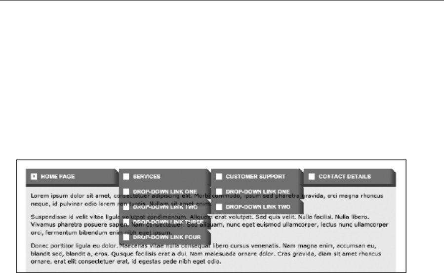
Chapter 5
220
1. Edit the web page. For any link you want to have a drop-down menu spawn from, nest an
unordered list in its parent list item, as per the example in the following code block.
<li id="servicesPageLink">
<a href="#">Services</a>
<ul>
<li><a href="#">Drop-down link one</a></li>
<li><a href="#">Drop-down link two</a></li>
<li><a href="#">Drop-down link three</a></li>
<li><a href="#">Drop-down link four</a></li>
</ul>
</li>
2. Create the drop-downs. Test your page now, and it will look odd because nested list items pick up
the styles for the standard list items. To start dealing with this, add position: relative; to the
#navigation li rule, which will enable nested absolute-positioned elements to take their top and
left values from their containers rather than the page as a whole. Then, after the existing rules in
the CSS, add the #navigation li ul rule shown in the following code block. By setting position
to absolute and left to a large negative value, the nested lists (in other words, the drop-down
menus) are placed offscreen by default but are still accessible to screen readers. Adding the top
border helps visually separate the nested list from its parent button.
#navigation li ul {
border-top: 1px solid #ad3514;
width: 185px;
position: absolute;
left: -10000px
}
3. Next, add the following rule to bring the nested lists back when you hover the cursor over the
parent list item. Upon doing so, the list item’s descendant list’s display value is set to block, and
it’s displayed directly underneath the parent item.
#navigation li:hover ul {
display: block;
left: 0;
}
www.freepdf-books.com

Using Links and Creating Navigation
221
4. Style nested list items and links. Add the following rule to replace the default background for list
items with one specifically for the drop-down menus. The border-bottom value visually separates
each of the list items.
#navigation li li {
background: url(drop-down-menu-background.gif) repeat-y;
border-bottom: 1px solid #ad3514;
}
5. Next, add the following rule to style nested list item links, overriding the
text-transform and padding values of top-level list items.
#navigation li li a:link, #navigation li li a:visited {
text-transform: none;
padding-left: 10px;
}
6. The final step is to override the hover and active states. For this example, the background value
for top-level lists is overridden and the background image removed (meaning the hover state for
nested list links has no unique background). To make the hover state stand out, the links are
given a vibrant left border. This also moves the text inward by the width of the border.
#navigation li li a:hover, #navigation li li a:active {
background: none;
border-left: 5px solid #f7bc1d;
}
These property values are common to both states, apart from the border color (orange for the hover state
and red for the active state, roughly matching the colors applied to the top-level tab icons in the same
states, although the orange is brighter for the drop-downs so that they stand out more); therefore, add the
following rule to change only the left border’s color on the active state:
#navigation li li a:active {
border-left-color: #ed1c24;
}
www.freepdf-books.com
Chapter 5
222
Note: If you decide to create drop-down menu–based navigation, avoid copying an
operating system’s menu style, because this may confuse visitors using that operating
system and irritate visitors using a rival system. The exception to this rule is if you’re
creating a site that centers around nostalgia for the days where operating systems used
to come on floppy disks. One such site—an amusing Mac OS System 7 look-alike—can
be found at http://myoldmac.net/.
Creating a multicolumn drop-down menu
Required files The drop-down-menu folder from the chapter 5 folder.
What you’ll learn How to create a multicolumn drop-down menu, based on the code from the
previous exercise
Completed files The drop-down-menu-multi-column folder in the chapter 5 folder
The final example in this chapter is a multicolumn drop-down menu. These are increasingly common,
enabling sites to provide a lot of links in a drop-down that simply wouldn’t fit on the screen if they were
listed vertically. For an example of such a drop-down in action (although one that uses a different method),
visit www.2000adonline.com/books/ and hover over the Books List link.
www.freepdf-books.com
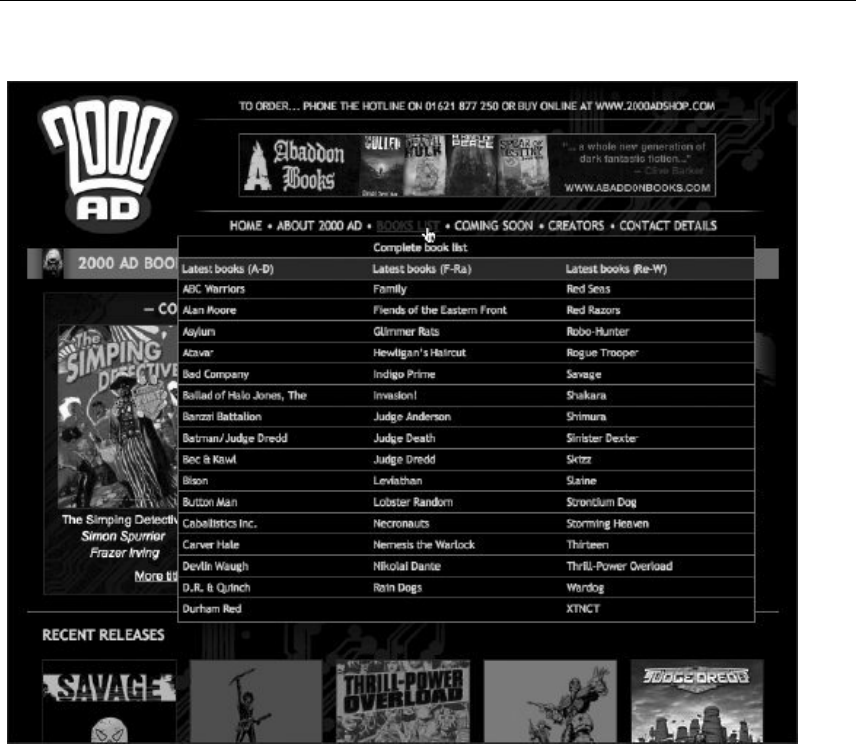
Using Links and Creating Navigation
223
Creating a multi
colum
n drop-down menu
1. Edit the HTML to remove the existing nested lists. Then, for the multicolumn drop-down, decide
which link you want it to spawn from and place an unordered link in its parent list item, with a
single list item of its own. Within that list item, place the unordered lists for the columns in the
drop-down, one after the other. Note that if some columns have fewer items, they must still have
the same number of list items. However, list items can be left empty, despite this technically being
a presentational hack. (Note that HTML Tidy might have problems with this and trim the empty list
items. If you use that tool, add a nonbreaking space as the list’s content.)
<li id="servicesPage">
<a href="#">Services</a>
<ul>
<li>
<ul>
<li><a href="#">Drop-down link 1.1</a></li>
<li><a href="#">Drop-down link 1.2</a></li>
<li><a href="#">Drop-down link 1.3</a></li>
www.freepdf-books.com

Chapter 5
224
<li><a href="#">Drop-down link 1.4</a></li>
</ul>
<ul>
<li><a href="#">Drop-down link 2.1</a></li>
<li><a href="#">Drop-down link 2.2</a></li>
<li></li>
<li></li>
</ul>
<ul>
<li><a href="#">Drop-down link 3.1</a></li>
<li><a href="#">Drop-down link 3.2</a></li>
<li><a href="#">Drop-down link 3.3</a></li>
<li></li>
</ul>
</li>
</ul>
</li>
2. Next, edit the nested list. The list that contains the three lists that form the columns of the drop-
down needs styling. Having larger borders on multicolumn drop-downs is a good idea, because it
enables users to focus on the contents more easily, which is the reason for the amended border
setting in the following code block. The other change is to the width setting, which must be a
multiple of three (here, it’s set to 465px, meaning that each column will be 155 pixels wide). With
multicolumn drop-downs, it’s best to avoid making each column the same width as a tab;
otherwise, the result will look strange.
#navigation li ul {
border: 2px solid #ad3514;
width: 465px;
position: absolute;
left: -10000px
}
3. Now, the list item within the nested list needs amending. For the previous exercise, the
#navigation li li rule dealt with the list items in the drop-down, but here it’s primarily for the
container of the three columns. Therefore, the height and width settings need to be set to auto to
enable the list item to stretch to fit its nested items. The background image is superfluous, so it’s
replaced by a flat color, and the border-bottom pair is removed—the borders will be moved to list
items within the columns.
#navigation li li {
background: #d27448;
height: auto;
width: auto;
}
4. The link rules should be styled next. Since the links are now one level deeper in the list, instances
of li li in the selectors are changed to li li li. In this example, this change isn’t technically
necessary, but it always pays to keep your selectors as precise and accurate as possible. For the
link and visited states, padding settings for the top-level links are overridden, as are width and
www.freepdf-books.com

Using Links and Creating Navigation
225
height settings. For the other states, the border used for the hover and active effects is replaced
by a change in background color. Note that the rule that originally had both the hover and active
states in the selector (#navigation li li a:hover, #navigation li li a:active) now requires
only the hover state (#navigation li li li a:hover ), because the rules have nothing in
common.
#navigation li li li a:link, #navigation li li li a:visited {
text-transform: none;
padding: 10px;
width: 135px;
height: auto;
}
#navigation li li li a:hover {
background: #ad3514; !important;
}
#navigation li li li a:active {
background: #ed1c24;
}
5. Style the column list items. Add a rule to define a width and height for the column list items, along
with a bottom border. The last of those things makes it easier to scan the rows within the list,
while the width and height settings ensure that the layout isn’t affected if the list items have no
links within. (If the width and height settings were omitted, the list items within the columns would
show their bottom borders only underneath their content’s width—and not at all if they were
empty.) The height setting is defined in ems rather than pixels, because this makes it possible for
the list items to stretch vertically if the web page’s text is resized.
#navigation li li li {
width: 155px;
height: 3em;
border-bottom: 1px solid #ad3514;
}
6. Finally, add a rule to float and define a width for the lists that comprise the containers for the list
items styled in the previous step.
#navigation ul ul ul {
border: 0;
width: 155px;
float: left;
position: relative;
}
www.freepdf-books.com
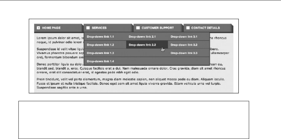
Chapter 5
226
Note: Although the drop-down examples work in currently shipping browsers, neither
works as is in Internet Explorer 6, because that browser doesn’t enable you to do
anything with the hover state unless it’s on a link. To cater for that browser, JavaScript
must be used as a backup.
The dos and don’ts of web navigation
So, that’s the end of our navigation chapter. Before we move on to working with layout, here are a few
succinct tips regarding designing web navigation.
Do
Use appropriate types of navigation.
Provide alternate means of accessing information.
Ensure links stand out.
Take advantage of link states to provide feedback for users.
Get the link state order right (link, visited, hover, active).
Use styled lists for navigation.
Use CSS and as few images as possible (preferably one) for rollovers.
Don’t
Add search boxes just for the sake of it.
Use deprecated body attributes.
Style navigation links like normal body copy.
Use image maps unless absolutely necessary.
Open new windows from links or use pop-ups.
Use clunky JavaScript for rollovers.
www.freepdf-books.com
227
Chapter 6
Tables: How Nature (and the W3C) Intended
www.freepdf-books.com

Chapter 6
228
In this chapter:
Introducing how tables work
Using borders, padding, and spacing
Creating accessible tables
Enhancing tables with CSS
Designing tables for web page layout
The great table debate
Tables were initially intended as a means of displaying tabular data online, enabling web designers to
rapidly mark up things such as price lists, statistical comparisons, specification lists, spreadsheets, charts,
forms, and so on (the following example shows a simple table, taken from www.infoq.com).
It wasn’t long, however, before web designers realized that you could place any web content within table
cells, and this rapidly led to web designers chopping up Photoshop layouts and piecing them back together
in table-based web pages, often by using automated tools.
The strong will of CSS advocates, who typically shout that tables are evil, sometimes leads designers to
believe that tables should be ditched entirely. However, that’s not the case at all. As mentioned, tables
have a specific purpose in HTML, and it’s one that’s still valid. Therefore, the bulk of this chapter is going
www.freepdf-books.com
How Nature (and the W3C) Intended
229
to look at tables in the context for which they’re intended: the formatting of tabular data. Web page layout
will be looked at in the next chapter, which concentrates on CSS layout.
How tables work
In this section, we’re going to look at how tables are structured and some of the table element’s attributes,
which enable you to define the table’s dimensions and borders, along with the spacing, padding, and
alignment of its cells.
Tabular data works via a system of rows and columns, and HTML tables work in the same way. The table
element defines the beginning and end of a table. Within the table element are table row elements
(<tr></tr>), and nested within those are table cell elements (<td></td>). The actual content is placed
inside the td elements. Therefore, a simple table with two rows containing two cells each is created like
this:
<table>
<tr><td>Cell one</td><td>Cell two</td></tr>
<tr><td>Cell three</td><td>Cell four</td></tr>
</table>
Note: Always ensure that you include all end tags when working with tables. If you
began working with HTML in the mid-1990s, you may have learned that it’s OK to omit
the odd end tag from tables or table cells. However, not only does this result in invalid
XHTML, but some browsers won’t render tables accurately (or at all) when end tags are
omitted. Furthermore, there’s evidence to suggest some search engines can’t properly
index pages that contain broken tables.
Adding a border
You can place a border around table cells by using the border attribute and setting its value to 1 or greater.
The adjacent example shows how this looks in a web browser.
HTML borders for tables have a kind of 3D effect and tend to look clunky and old-fashioned. If you want to
add a border to a table, this is best done in CSS.
Cell spacing and cell padding
In addition to amending the border size, it’s possible to change the amount of padding within a table’s
cells, as well as the spacing between all the cells in a table. This is done with the cellpadding and
cellspacing attributes, respectively. In the rather extreme example that follows, cellpadding is set to 20,
cellspacing to 40, and border to 5, so that each can be differentiated with ease (see the subsequent
www.freepdf-books.com
Chapter 6
230
screenshot). As you can see, cellspacing affects not only the spacing between the cells but also the
distance between the cells and the table’s edges. The CSS property border-spacing is intended to do the
same thing as cellspacing.
<table cellpadding="20" cellspacing="40" border="5">
<tr><td>Cell one</td><td>Cell two</td></tr>
<tr><td>Cell three</td><td>Cell four</td></tr>
</table>
You might be thinking that designwise, this example sucks, and you’d be right. The chunk-o-vision 3D
border isn’t particularly tasteful. However, you can omit the border attribute and use CSS to style borders
instead—see the “Styling a table” section later on in this chapter. That section also details how to set
padding in CSS, which provides you with sitewide control over cell padding. CSS also gives you much
finer control over the individual elements in a table—whereas the inline HTML attributes impose a one-
style-fits-all straightjacket.
Spanning rows and cells
It’s sometimes necessary for data to span multiple rows or columns. This is achieved via the rowspan and
colspan attributes, respectively. In the following table, the first row has three cells. However, in the second
row, the first cell spans two rows, and the second cell spans two columns. This means the second row
lacks a third cell, and the third row also has only two cells (whose contents align with the second and third
cells of the top row). See the following screenshot of the table to help make sense of this.
<table border="1" cellpadding="2">
<tr>
<td>A cell</td>
<td>Another cell</td>
<td>Yet another cell!</td>
</tr>
<tr>
<td rowspan="2">A cell that spans two rows</td>
<td colspan="2">A cell that spans two columns</td>
</tr>
<tr>
<td>Another cell</td>
<td>The last cell</td>
www.freepdf-books.com
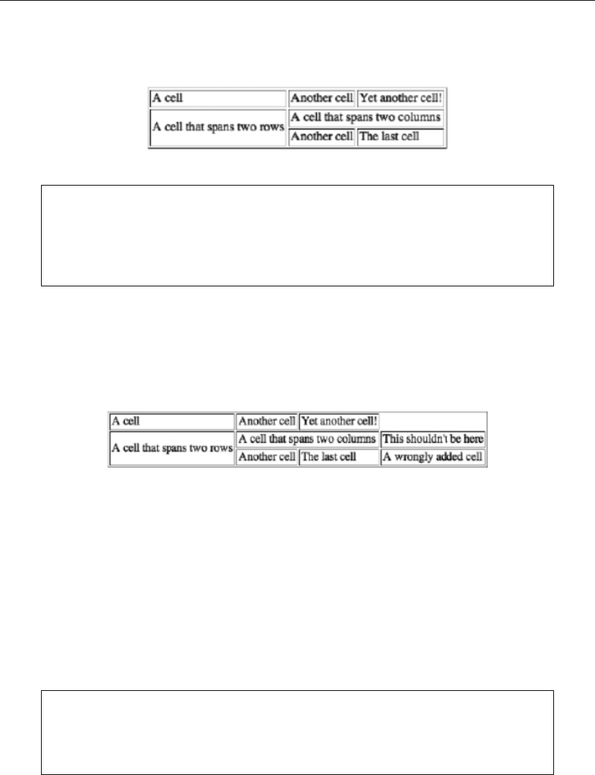
How Nature (and the W3C) Intended
231
</tr>
</table>
Note: In the preceding HTML, the cell elements are indented to make it easier for you to
make them out. This wasn’t done earlier in the chapter. Either method of writing markup
is fine—it’s up to you. Note, however, that if you use images within table cells, this extra
whitespace in the HTML sometimes causes layouts to break and must therefore be
deleted.
Take care when spanning rows or columns with a cell, because it’s easy to add extra cells accidentally.
For instance, in the preceding example, it would be easy to absentmindedly add a third cell to both the
second and third rows—however, doing so appends the extra cells to the end of the table (see the
following example), which looks bad and—more important—makes little structural sense. Also, some
screen readers have difficulty handling such data, often assigning the wrong headers to various pieces of
data (see the “Creating accessible tables” section later in the chapter for information on table headers).
Setting dimensions and alignment
As you can see from the examples so far, browsers by default set cell sizes to the smallest possible values
that are large enough to accommodate the contents and any cell padding settings defined. Although this is
suitable for the majority of purposes, designers tend to want more visual control over layouts.
Longtime designers may be well-versed in the practice of using height and width attributes to control table
and cell dimensions, but beware. The width attribute is fine to use on table start tags (the possible values
of which are a number denoting the width in pixels of the table, and a percentage, which is a percentage of
the parent element’s size). However, the height attribute is nonstandard and fails in many web browsers,
which might come as something of a shock to those people who enjoy centering content in a browser
window by using a table. On the other hand, the CSS height property works as expected.
Take care when using visual web design applications: many of them add deprecated
elements to tables if you manually drag the cells around. Use your favored application’s
preferences to turn off this feature; otherwise, you’ll end up with obsolete and redundant
markup.
www.freepdf-books.com
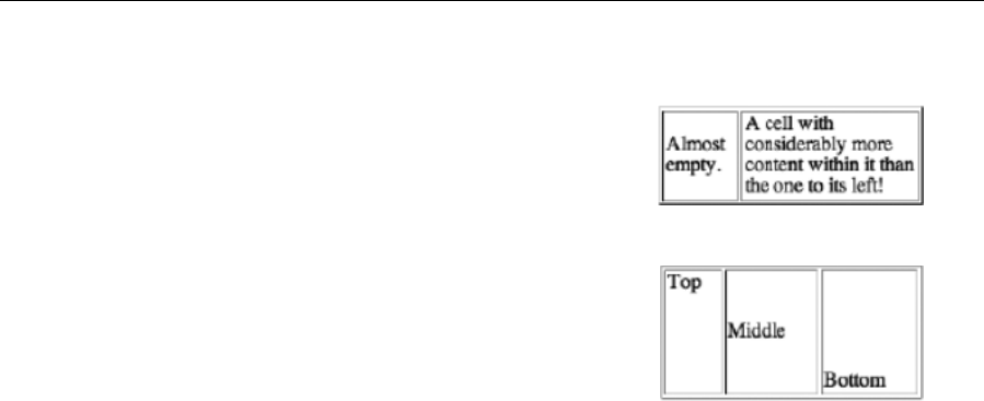
Chapter 6
232
Vertical alignment of table cell content
If you set your table’s width to a small value or if you have a lot of
content in one cell and relatively little in an adjacent one, something else
becomes apparent: web browsers vertically align content in the middle of
cells. (Generally, horizontal alignment is, as with other text, to the left.)
See the image on the right for an example.
Historically, designers have used the valign attribute to override this
vertical-centering behavior—the attribute can be added to a row or cell
start tag and set to top: valign="top". Other values are middle (the
default) and bottom, the results of which are shown in the adjacent
screenshot.
The problem with valign is that it’s presentational markup and shouldn’t
really be used; in fact, because it’s an obsolete attribute—which means it can’t be used if you’re creating
proper HTML5—you should instead work with the CSS alternative, the vertical-align property, which
provides practically identical results.
As an example of vertical-align in use, say you wanted all cells within a table that had a class value of
priceList to be vertically aligned to the top; you could add the following rule to your CSS:
table.priceList td {
vertical-align: top;
}
This results in the same effect as valign="top", as discussed earlier. Likewise, you can set the vertical-
align property to middle, bottom, and various other values, as outlined in Appendix D.
That’s pretty much where many web designers leave tables; however, there are other elements and
attributes that should be used when creating tables, which will be covered in the following sections.
Creating accessible tables
Many web designers ignore all but the most basic elements when working with tables, and in doing so they
end up with output that causes problems for screen readers. By correctly and carefully structuring and
formatting a table, not only will users of screen readers benefit, but you as a designer will also have far
more control over its visual appearance. Additionally, extendable browsers like Firefox can also enable you
to use the table data in other ways, including outside of the browser. For example, the TableTools2 plug-in
(https://addons.mozilla.org/en-US/firefox/addon/tabletools2/) enables sorting, filtering, and
exporting of tabular data from a web page. A properly formatted table will enhance this, making the table
even more useful. Adding a few extra elements and attributes to your table is a win-win situation, and it’s
surprising to note how few designers bother with anything other than rows and cells in their tables.
www.freepdf-books.com

How Nature (and the W3C) Intended
233
Captions and summaries
Two seldom-used table additions that enable you to provide explanations of a table’s contents are the
caption element and the summary attribute. The former is usually placed directly after the table start tag
and enables you to provide a means of associating the table’s title with the table itself. Obviously, this also
helps users—particularly those with screen readers. After reading the caption, the screen reader will go
on to read the table headers (see the “Using table headers” section later in this chapter). Without the
caption, the table’s contents might be relatively meaningless.
By default, most browsers center captions horizontally, and some set their contents in bold type, but these
default styles can be overridden with CSS.
The summary attribute, which is invisible in browsers, is used by screen readers to give the user an
overview of the table’s contents prior to accessing the content. The contents of the summary attribute
should be kept succinct, highlighting the most important aspects of the table contents, letting the user
know what to anticipate.
Many suggest that summaries should be included on all tables, but this isn’t necessarily the case. A
summary should be used only when it performs the task for which it’s designed: to make available a
succinct summary of data within a table. Should you be using tables for layout (which I don’t recommend),
there’s little point including summaries within each layout table. After all, someone using a screen reader is
hardly going to jump for joy upon hearing, for the umpteenth time, “This table is used for laying out the web
page.” Summaries should save time, not waste it.
Using table headers
The table header cell element (<th></th>) performs a similar function to the standard table cell but is
useful with regard to accessibility. Imagine a long data table comprised solely of standard cells. The first
row likely contains the headers, but because they’re not differentiated, a screen reader might treat them as
normal cells, read them once, and then continue reading the remainder of the data. (If it doesn’t do this, it
still has to assume which cells are headers, and it might guess wrong.) When using table headers, the data
is usually read in context (header/data, header/data, and so on), enabling the user to make sense of
everything. Things can be sped up slightly by using the abbr attribute—long table headers can be cut
down, reducing what needs to be repeated when a table’s data is being read. An example of table header
cells and a row of data cells follows:
<th>Country</th><th abbr="Capital">Capital city</th>
<td>France</td><td>Paris</td>
In this case, a screen reader should read the headers and then provide them with the data of each cell
(Country: France, Capital: Paris, and so on). But even with screen-based browsers, the inclusion of
headers proves beneficial for users, because table header cell content by default is styled differently from
data cell content, meaning the two cell types can be easily differentiated.
Although headers are often at the top of a table, they may also be aligned down the left side. Therefore,
you also need to specify whether the header provides header information for the remainder of the row,
www.freepdf-books.com

Chapter 6
234
column, row group, or column group that contains it. This can be done with the scope attribute, which is
added to the table header start tag and given the relevant value (row, col, rowgroup, or colgroup). It’s also
possible to use the headers attribute in conjunction with id values. See the following “Scope and headers”
section for more information.
Row groups
Row group elements are almost never used, the main reason being a supposed lack of browser support.
The three possible row group elements—<thead></thead>, <tbody></tbody>, and <tfoot></tfoot>—
enable browsers to support the scrolling of the body area of long tables, with the head and foot of the table
remaining fixed. Furthermore, when tables are printed, the aforementioned elements enable the table head
and foot to be printed on each page.
Although browser support comes up short in some areas, we still recommend using row groups, because
they encourage you as a designer to think about the structure of the tables you’re creating. Also, although
browsers don’t do all they might with the elements, they still recognize them, which means they can be
used as selectors in CSS, enabling you to set separate styles for the head, body, and foot data.
When using row groups, you can have one or more tbody elements and zero or one thead and tfoot
elements. They should be ordered with the head first, foot second, and body/bodies third, thereby enabling
the browser to render the foot prior to receiving all of the data. Note, however, that despite this order in
HTML, browsers visually render the row groups in the order you’d expect: head, body, and foot.
Scope and headers
Although table header cells provide a means of differentiating headers and other data, a direct means of
associating one with the other can be added via the use of various attributes. For simple data tables, the
scope attribute, added to table headers, provides an indication of which data a heading refers to. For
example, in the previous code block, the table is oriented in columns—the headers are above their
associated data. Therefore, adding a scope attribute to the header cells, with a value of col, clearly defines
this relationship, and this is something that comes in handy for screen readers.
<th scope="col">Country</th><th scope="col">Capital city</th>
<td>France</td><td>Paris</td>
If the alignment of the table were changed, with the headers at the left, the row value would instead be
used.
<th scope="row">Country</th><td>France</td>
<th scope="row">Capital city</th><td>Paris</td>
Note that if a table header contains colspan or rowspan attributes—for example, if a header, such as food,
spanned two columns (thereby having the attribute/value pair colspan="2") and had underneath two
further headings, such as fruit and vegetables— you could set scope="colgroup" in the table header
start tag. The equivalent is true for headers with a rowspan attribute, whereupon the scope value changes
to rowgroup. In such cases, you also need to use the colgroup/rowgroup elements.
www.freepdf-books.com

How Nature (and the W3C) Intended
235
These are positioned between the caption and thead of the table (see the following code, and see the
following section for an overview of the various structural elements of tables combined).
<colgroup span="2"></colgroup >
<colgroup span="2"></colgroup >
<thead>
<tr>
<th scope="colgroup" colspan="2">Fruit</th>
<th scope="colgroup" colspan="2">Vegetable</th>
</tr>
<tr>
<th scope="col">Citrus</th>
<th scope="col">Berry</th>
<th scope="col">Root</th>
<th scope="col">Legume</th>
</tr>
</thead>
For more complex tables that have intricate structures, using many colspans or rowspans, where it
wouldn’t be immediately obvious where the relationship lies between a data cell and a header, you can
use id values and the headers element. Each table header cell should be assigned a unique id value.
Each table data cell that refers to one or more headers requires a headers element. The value of the
headers element is the id or ids that the cell data refers to. Even for simpler data tables, this method can
work well—see the following code block for how our fruit and vegetables table snippet works with id and
headers.
<thead>
<tr>
<th id="fruit" colspan="2">Fruit</th>
<th id="vegetables" colspan="2">Vegetable</th>
</tr>
<tr>
<th id="citrus">Citrus</th>
<th id="berry" >Berry</th>
<th id="root" >Root</th>
<th id="legume" >Legume</th>
</tr>
</thead>
<tbody>
<tr>
<td headers="fruit citrus">Lemon</td>
<td headers="fruit berry">Blueberry</td>
<td headers="vegetable root">Potato</td>
<td headers="vegetable legume">Pea</td>
</tr>
</tbody>
www.freepdf-books.com
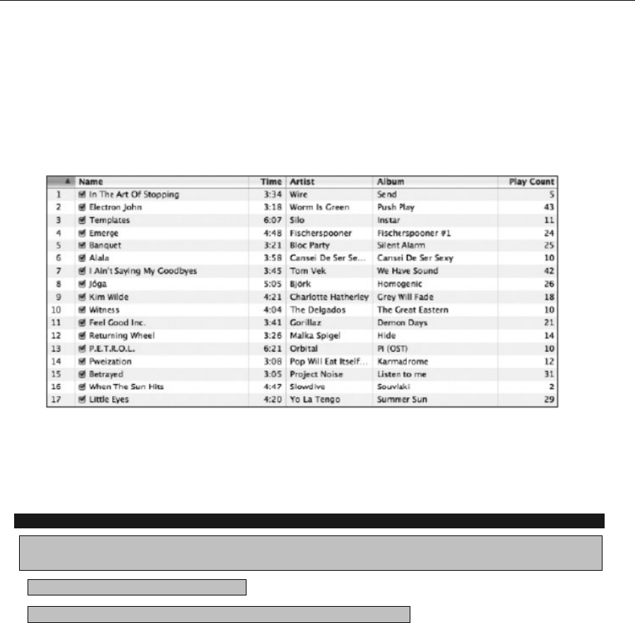
Chapter 6
236
Note that the code blocks in this section are here to highlight the attributes and elements being
discussed—they should not be seen as examples of complete tables.
Building a table
You’re now going to build a table, taking into account all of the information mentioned so far. This will be
based on an iTunes playlist.
As you can see from the screenshot, the playlist lends itself well to being converted to an HTML table. At
the top is the table head, which details each column’s data type (song name, time, and so on). And
although there’s no table foot, you can simply add some information regarding whose choice of music this
is—something of a signature—although the table foot can also be used to provide a succinct summary of
the table’s contents, akin to the value of the summary attribute discussed earlier.
Building the table
Required files XHTML-basic.html from the basic-boilerplates folder as a starting point, along
with building-the-table-body.txt from the chapter 6 folder
What you’ll learn How to create a table
Completed files building-the-table.html in the chapter 6 folder
www.freepdf-books.com
How Nature (and the W3C) Intended
237
1. Structure the table element. To emulate the structure of the iTunes playlist, set the table’s width
to a percentage value. This means the table will stretch with the browser window. As explained
earlier, you should also use the summary attribute to succinctly detail what the table is all about.
<table width="90%" border="1" cellspacing="0"
Ísummary="Music selected by Craig Grannell, with details of song,
playing time, artist, album and play count.">
</table>
Strictly speaking, the border attribute should be omitted. However, prior to adding CSS
rules, it’s a handy way to more prominently show the table’s structure in a browser. Note
also the use of cellspacing—without this, most browsers place gaps between the table
cells of unstyled tables.
2. Add a caption. Immediately after the table start tag, add a caption element to provide the table
with a title.
<caption>A playlist of great music</caption>
3. Add the basic table structure. Use row groups to provide the table with its basic structure.
<thead>
</thead>
<tfoot>
</tfoot>
<tbody>
</tbody>
Remember that row groups must be added in the order outlined in the previous “Row
groups” section.
4. Using table header cell elements, add the content for the table head (the column headers) as in
the following code block, remembering to include relevant scope attribute/value pairs:
<thead>
<tr>
<th scope="col">Song Name</th>
<th scope="col">Time</th>
<th scope="col">Artist</th>
<th scope="col">Album</th>
<th scope="col">Play Count</th>
</tr>
</thead>
There’s no need to add any styling—not even strong tags. By default, most browsers display table header
cell content in bold (and centered) to differentiate it from table data; also, in the following section, you’ll be
using CSS to style everything, anyway.
www.freepdf-books.com
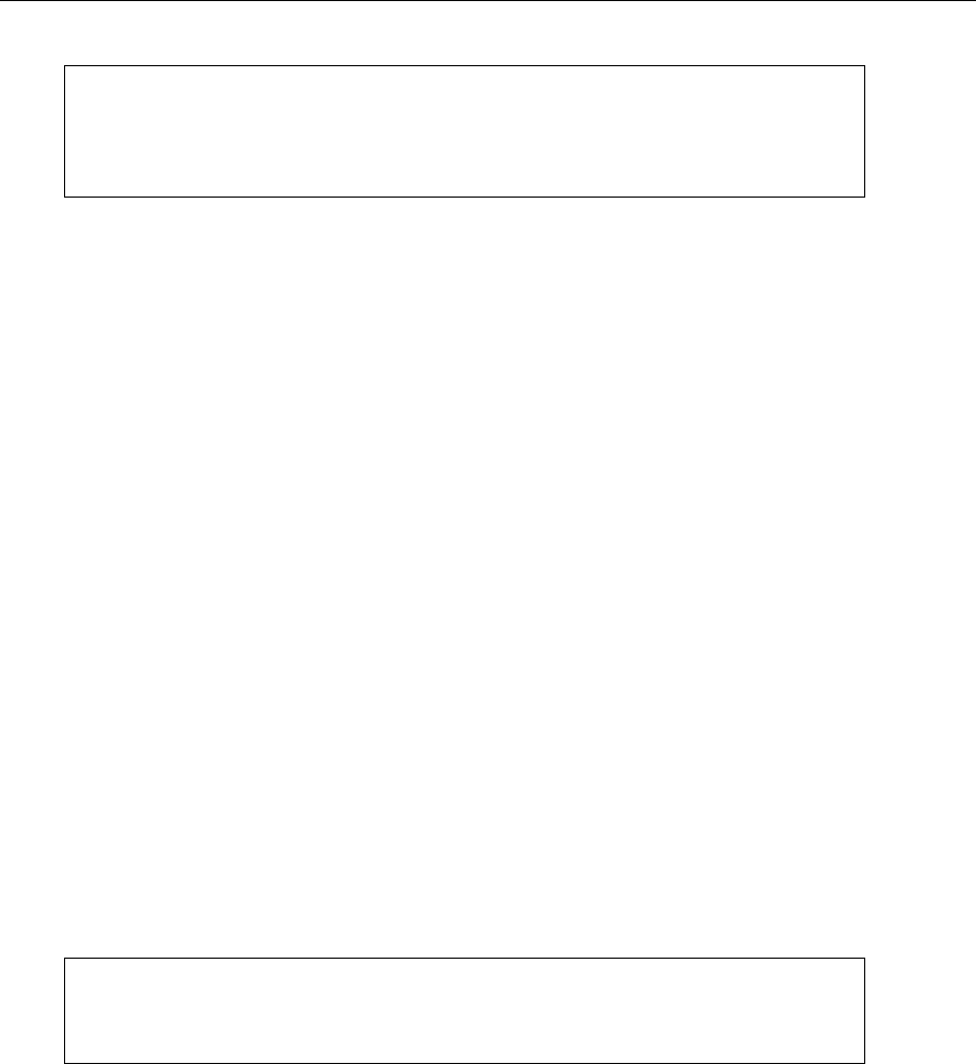
Chapter 6
238
Note: It’s always best to keep your HTML as simple as possible and do any styling in
CSS. This reduces page load times and means that you have a greater degree of
control. It also means that people without the ability to view CSS see the browser
defaults, which are sensible and clear.
5. Add table foot content. As mentioned, the footer for this table is to essentially be a signature,
stating who’s at fault for this selection of music. Because this is a single line of text that could
potentially span the entire table width, simply include a single table cell, set to span five rows
(using the colspan attribute).
<tfoot>
<tr><td colspan="5">Music selection by:
www.snubcommunications.com</td></tr>
</tfoot>
6. Add table body content. Finally, add the table’s body content via the usual method, using table
row and table cell elements. This table will have nearly 20 rows, so to save on trees, only the first
two rows are detailed in the following printed code block—you can add all the others in the same
way, or just copy across the content of building-the-table-body.txt from the download files, to
save inputting the data yourself.
<tbody>
<tr>
<td>In The Art Of Stopping</td>
<td>3:34</td>
<td>Wire</td>
<td>Send</td>
<td>3</td>
</tr>
<tr>
<td>Electron John</td>
<td>3:18</td>
<td>Worm Is Green</td>
<td>Push Play</td>
<td>42</td>
</tr>
</tbody>
Tip: Take care that your table body content aligns correctly with your table headers.
Badly formed tables are one thing, but when the headers and data don’t correlate, the
table is useless.
The following image shows the table so far.
www.freepdf-books.com
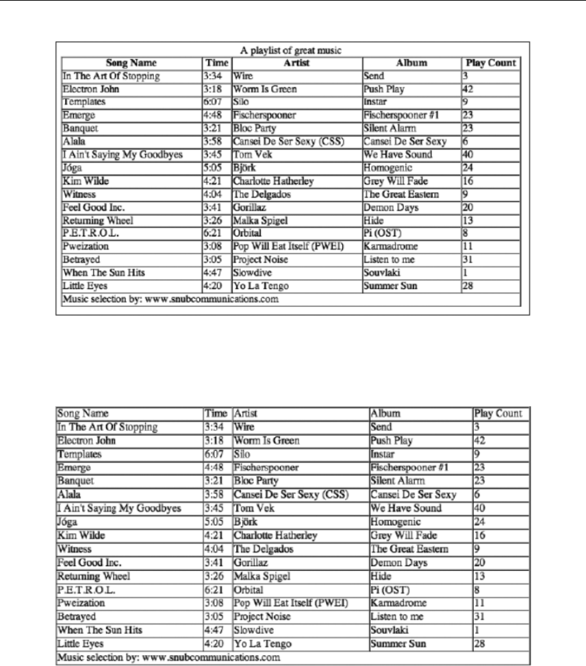
How Nature (and the W3C) Intended
239
This table is not pretty, but it’s structurally sound, and it includes all the relevant elements to at least help
make it accessible. As you can see, the addition of the caption and table header cells also makes a
difference. If you’re unsure of this, look at the following screenshot of the same table, with plain table data
cells throughout and no caption.
All the information might be there, but it’s harder to pick out the headers, and users will have to rely on
body copy elsewhere to discover what the data in the table represents.
www.freepdf-books.com
Chapter 6
240
Styling a table
Flip back over the past few pages and you might notice that the table doesn’t exactly bear a striking
resemblance to the iTunes playlist as yet. But then, we’re only halfway through building the table. Now it’s
time to start styling it using CSS.
Adding borders to tables
As mentioned earlier, it’s a good policy to avoid using the default HTML table border. It looks ugly and old-
fashioned, and it’s a far cry from a clean, flat, 1-pixel border. You might think it’s a straightforward process
to add CSS borders to a table—logically, it makes sense to simply add a border property/value pair to a
grouped selector that takes care of both the table headers and table data cells.
th, td {
border: 1px solid #c9c9c9;
}
But this doesn’t work. As the screenshot to the right shows, this method results in the
correct single-pixel border around the edge of the table but creates double-thick borders
everywhere else. This is because the borders don’t collapse by default, meaning that the
right border of one cell sits next to the left border of an adjacent cell, and so on.
Designers have historically gotten around this by using a rule to define a style for the top
and left borders of the table and another to define a style for the right and bottom borders
of table cells. However, there’s a perfectly good property that deals with the double-
border syndrome: border-collapse. When this property, with a value of collapse, is
applied to the table element via an element selector, borders collapse to a single border
wherever possible. The other available border-collapse property value, which reverts borders to their
“standard” state, is separate.
table {
border-collapse: collapse;
}
With this brief explanation of table borders completed, we’ll now move into exercise mode and style the
table.
Styling the playlist table
Required files styling-the-playlist-table-starting-point.html, styling-the-playlist-
table-starting-
point.css, and table-header-stripe.gif from the chapter 6 folder
What you’ll learn How to style a table
Completed files styling-the-playlist-table.html and styling-the-playlist-table.css in the
chapter 6
folder (along with the GIF image, which isn’t amended)
www.freepdf-books.com

How Nature (and the W3C) Intended
241
1. Set things up. If they still exist, remove the border, cellpadding, and cellspacing attributes
within the table start tag. Add the universal selector rule (*) to remove margins and padding, as
shown a bunch of times already in this book. Also, set the default font by using the html and body
rules, as detailed in Chapter 3 of this book. Because we’re creating a playlist based on the iTunes
interface, it may as well be a little more Apple-like, which is why we’re using Lucida variants as
the primary fonts. Note that the padding value in the body rule is there to ensure that the table
doesn’t hug the browser window when you’re previewing the page.
* {
padding: 0;
margin: 0;
}
html {
font-size: 100%;
}
body {
font: 62.5%/1.5 "Lucida Grande", "Lucida Sans Unicode", Arial,
Helvetica, sans-serif;
padding: 20px;
}
2. Style the table borders. As per the “Adding borders to tables” section, style the table borders.
table {
border-collapse: collapse;
}
th, td {
border: 1px solid #c9c9c9;
}
3. Style the caption. The borders have been dealt with already, so the next step is to style the
caption, which currently lacks impact. The caption is effectively a title, and titles should stand
out. Therefore, place some padding underneath it, set font-weight to bold, font-size to 1.3em,
and text-transform to uppercase. Note that, in the following code block, CSS shorthand is used
for three values for setting padding; as you may remember from Chapter 2, the three values set
the top, horizontal (left and right), and bottom values, respectively, meaning the caption will have
0px padding everywhere except at the bottom, where the padding will be 5px.
caption {
font-weight: bold;
font-size: 1.3em;
text-transform: uppercase;
padding: 0 0 5px;
}
www.freepdf-books.com
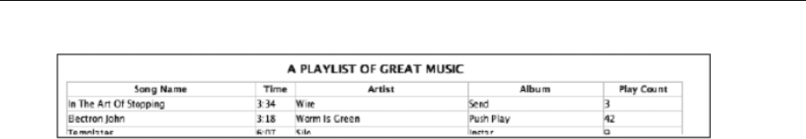
Chapter 6
242
4. Style the header cells. To make the header cells stand out more, apply the CSS rule outlined in
the following code block. The url value set in the background property adds a background image
to the table headers, which mimics the subtle metallic image shown in the same portion of the
iTunes interface; the 0 50% values vertically center the graphic; and the repeat-x setting tiles the
image horizontally. From a design standpoint, the default centered table heading text looks iffy,
which is why we added a text-align property set to left. These settings ensure that the table
header contents stand out from the standard data cell content.
th {
background: url(table-header-stripe.gif) 0 50% repeat-x;
text-align: left;
}
5. Set the font and pad the cells. At the moment, the table cell text hugs the borders, so it needs
some padding; the text is also too small to comfortably read, so its size needs increasing. This is
dealt with by adding font-size and padding pairs to the th, td rule, as shown here:
th, td {
border: 1px solid #c9c9c9;
font-size: 1.1em;
padding: 1px 4px;
}
www.freepdf-books.com
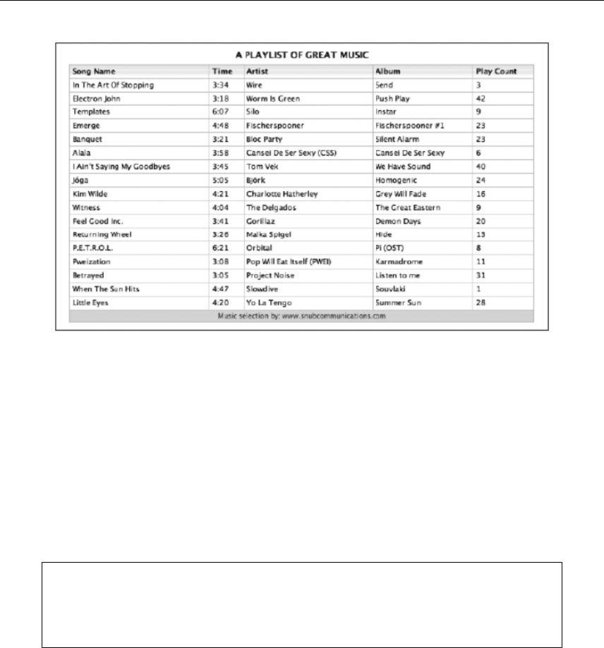
How Nature (and the W3C) Intended
243
6. Style the footer. The footer content needs to be easy to differentiate from the other data cells; you
can achieve this by setting a background color for the entire row within the tfoot element and by
making the color of the text have less contrast. Also, centering the text and making it smaller than
text within the other data cells ensures it doesn’t distract from the main content in the table.
Centering it also provides some balance, because the caption is also centered.
tfoot {
background-color: #dddddd;
color: #555555;
}
tfoot td {
font-size: 1.0em;
text-align: center;
}
In Chapter 3, we warned against using text with low contrast against a background
graphic. In the case of the table’s footer in this exercise, the contrast is lower than for
other text, but it’s still readable; also, the content is not a huge chunk of body copy— it’s
only a single line of text.
Adding separator stripes
One of iTunes’s best visual features (and something seen in usable tables all over the Internet, but more
often in print and in applications) is missing from the completed table: colored separator stripes, which
assist you in rapidly scanning rows of data. Although you could conceivably add a class (setting a
background color) to alternating rows, such a solution is poor when creating a static site—if you had to add
www.freepdf-books.com
Chapter 6
244
a row in the middle of the table, you’d need to update every subsequent table row start tag, which is hardly
efficient.
David Miller’s article “Zebra Tables” on A List Apart (see www.alistapart.com/articles/zebratables/)
offers a far more elegant solution. This was later reworked by Matthew Pennell
(www.thewatchmakerproject.com), whose article “Stripe Your Tables the OO Way”
(www.thewatchmakerproject.com/journal/309/stripe-your-tables-the-oo-way) offers the lowdown on
his technique, including an improved version of his script at www. thewatchmakerproject.com/zebra.html.
Applying separator stripes
Required files styling-the-playlist-table.html, styling-the-playlist-table.css, table-
header-stripe.gif,
and styling-the-playlist-table-stripes.js from the chapter 6 folder
What you’ll learn How to add separator stripes to a table
Completed files styling-the-playlist-table-stripes.html and styling-the-playlist-table-
stripes.css in the
chapter 6 folder (along with the GIF image and JavaScript document, neither of which
is amended)
1. Link to the JavaScript document. Taking things up from the completed table from the previous
exercise (also available in the download files as styling-the-playlist-table.html and styling-
the-playlist-table.css), add a script element in the HTML document’s head section to link to
the JavaScript file styling-the-playlist-table.js. Note that the JavaScript document is also
available in the download files.
<script src="styling-the-playlist-table-stripes.js"
type="text/javascript"></script>
2. Give the table a unique id. For the script to do its work, the table start tag must be given a
unique id value. This must match the value given in styling-the-playlist-table.js in the
onload function. Therefore, add the id attribute and value shown in the following code block:
<table id="playlist1" width="90%" border="0" summary="A playlist of
• great music, selected by www.snubcommunications.com.">
3. In the JavaScript, the relevant code that matches this is already defined, as shown in the
following code block:
window.onload = function() {
zebraTable.stripe('playlist1');
}
4. Assign a separator stripe style. The script creates alternating table rows, which are given a class
value of alt. This can then be styled in CSS by using a rule with the selector tbody tr.alt td:
www.freepdf-books.com

How Nature (and the W3C) Intended
245
tbody tr.alt td {
background: #e7edf6;
}
5. The previous code block styles the background of alternate rows in a light blue.
6. Define a table row hover state. The script also provides a hover state, making it easy for users to
highlight entire table rows by placing the mouse cursor over one of the row’s cells. This is styled
using the rule shown in the following code block. Note that both background and color settings
are defined, which pretty much reverse the standard colors (white on blue, rather than black on a
light color). This makes the highlighted row stand out more and is the same device applications
tend to use. Also note that there are two selectors here. The first is for compliant browsers, which
apply :hover rules to more than just anchors. The second is a fallback for older versions of
Internet Explorer (before version 7), which didn’t do this.
tbody tr:hover td, tbody tr.over td {
background: #5389d7;
color: #ffffff;
}
7. Remove some horizontal borders. With the stripes in place, the top and bottom borders of table
cells in the tbody area are now redundant. Therefore, remove them by adding the following rule:
tbody td {
border-top: 0;
border-bottom: 0;
}
Your table should now look like the following image.
www.freepdf-books.com
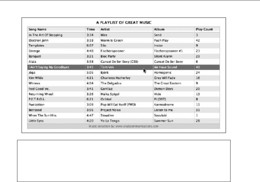
Chapter 6
246
To add stripes to more tables, just assign each one a unique id value and then add
another line to the window.onload function in the JavaScript document, as per the
instructions in this exercise. For example, if you added a table with an id value of
playlist2, the line of JavaScript to add to the function would be
ZebraTable.stripe('playlist2');.
Adding separator stripes with PHP
If you’re creating a table from data stored in a database, automating separator stripes is a relatively simple
process. After the PHP for retrieving data and the opening table markup (including headers), you add the
following:
$alternate = TRUE;
while ($row = mysql_fetch_object($sqlresult)) :
if($alternate) :
$class = ' class="alt"';
$alternate = FALSE;
else :
$class = "";
$alternate = TRUE;
endif;
echo '<tr'.$class.'>';
echo '<td>' . $row->field1 . '</td>';
echo '<td>' . $row->field2 . '</td>';
echo '</tr>';
endwhile;
www.freepdf-books.com

How Nature (and the W3C) Intended
247
This is then followed by the markup to close the table. Note that in this example, the alt class value is
applied to alternate table rows, so the CSS from the previous exercise should still work fine.
Adding separator stripes with the :nth-child selector
CSS3 includes selectors that let us pick out the rows we want to style. The nth-child selector targets
elements in a document tree that have a certain number of siblings before it. Where n is an integer, :nth-
child(an+b) would match the element that has an+b-1 siblings before it. In this scenario, n is basically a
counter, b represents the counter’s starting place, and a is the positions of the elements we match after
that.
For the separator stripes, we need to target only odd or even elements:
/* targets even */
tr:nth-child(2n) {
background: #e7edf6;
}
* targets odd */
tr:nth-child(2n+1) {
background: #5389d7;
color: #ffffff;
}
Tables for layout
This section is going to be brief, because you should avoid using tables for layout or even components of a
layout (excepting tabular data, obviously). There are exceptions—for instance, some web designers
consider tables acceptable for laying out forms. However, generally speaking, tables are less accessible
than CSS, harder to maintain and update, are slow to render in browsers, and they don’t print particularly
well. More importantly, once you know how to create CSS-based layouts, you’ll mostly find working with
tables for layout frustrating and clunky.
A common way of creating tabular layouts is to chop up a Photoshop layout and use images to stretch
table cells to the correct size. (As mentioned earlier, table cells expand to the dimensions of their content.)
Many designers then use a 1-pixel invisible GIF89 (often referred to as a spacer or shim) to force content
into position or stretch table cells to a certain size. Because the 1-pixel GIF is a tiny file that’s cached, it
can be used hundreds of times without impacting download times. However, spacer and table layout
usage pretty much destroys the idea of a semantic Web. Because so much of the layout is defined via
inline HTML, updating it requires amendments to every page on the site (which must also be uploaded and
tested in each case), rather than the simple editing and uploading of an external CSS file.
It is possible to combine CSS and tables—something that’s usually referred to as a transitional layout,
although one might argue that the “transition” from tables to CSS layouts should now be considered a
historic event. Such layouts are usually created to ensure layout-based backward compatibility with
obsolete devices. This direction should be taken only when the target audience is known to definitely
www.freepdf-books.com

Chapter 6
248
include a significant number of users of very obsolete browsers and also when the layout is paramount to
the working of the site (rather than just the content). When working on such a layout, there are a few
golden rules:
Avoid nesting tables whenever possible: Although tables can be nested like any other HTML
element, doing so makes for a web page that is slow to render and nightmarish to navigate for a
screen reader. (Obviously, there are exceptions, such as if you need to present a table of tabular
data within your layout table.)
Structure the information on the page logically: When designers use tables (particularly those
exported from a graphics package), they have a tendency to think solely about how the page
looks rather than its underlying code. However, it’s important to look at how the information
appears in the HTML, because that’s how a screen reader will see it. The content should still
make sense with regard to its flow and order even if the table is removed entirely. If it doesn’t, you
need to rework your table. (You can use Opera’s User mode to temporarily disable tables to find
out how your information is ordered without them. Chris Pederick’s Web Developer toolbar for
Firefox [www.chrispederick.com/work/web-developer/] offers similar functionality via
Miscellaneous ⌂ Linearize Page.) Ensure that content is immediately available; if it isn’t,
provide a link that skips past extraneous content, such as the masthead and navigation—
otherwise, people using screen readers will be driven bonkers. (See www.w3.org/TR/WAI-
WEBCONTENT/ for more on web content accessibility guidelines.)
Avoid deprecated attributes: For instance, there’s little point in setting the table’s height to 100%
when many web browsers ignore that rule (or need to be in quirks mode to support it).
Use CSS whenever possible to position elements: To give an example—if you’re working with a three-
cell table and want the middle cell’s content to begin 100 pixels from the top of the cell, don’t use
a spacer GIF. Instead, provide the cell with a class or unique ID, and use CSS padding.
Note: The last two of these rules are primarily concerned with ensuring that if you design
for legacy browsers, you don’t compromise your work for more modern efforts.
As we keep hammering home, CSS is the way to go for high-quality, modern web page layouts, and tables
should be left for the purpose for which they were designed—formatting data. The arguments that rumbled
on for a few years after the 1990s came to a close—that browsers didn’t support enough CSS to make
CSS layouts possible and that visual design tools such as Dreamweaver couldn’t cope with CSS layouts—
are now pretty much moot. Even the previous major release of the worst offender (yes, we’re talking about
Internet Explorer 6) has more than adequate support for the vast majority of CSS layouts, and anything
shipping today is more than capable of dealing with CSS.
Having said that, in March 2011, the W3C HTML Working Group decided that designers may put
role=presentation on a table element so it can be used (in a conforming way) for presentational purposes
(http://lists.w3.org/Archives/Public/public-html/2011Mar/0245.html).
www.freepdf-books.com
249
Chapter 7
Page Layouts with CSS
In this chapter:
Explaining CSS workflow
Positioning web page elements with CSS
Creating boxouts and sidebars
Creating column-based layouts
Amending layouts, depending on body class settings
www.freepdf-books.com

Chapter 7
250
Creating scrollable content areas
Layout for the Web
Although recent years have seen various institutions offer web-oriented courses, the fact remains that
many web designers are not “qualified” per se. What I mean by this is that plenty of them have come from
some sort of design or technology background related to—but not necessarily a part of—the Web.
Therefore, we often see print designers moving over to the Web through curiosity or sheer necessity and
technologists dipping their toes into the field of design.
This accounts for the most common issues seen in web layouts: many designers coming from print try to
shoehorn their knowledge into their website designs, despite the Web being a very different medium from
print. Conversely, those with no design knowledge lack the basic foundations and often omit design
staples. Even those of us who’ve worked with the Web almost from the beginning and who also come from
a design or arts background sometimes forget that the best sites tend to be those that borrow the best
ideas from a range of media and then tailor the results to the desired output medium.
In this section, we’ll take a brief look at a few layout techniques: grids and boxes, columns, and fixed vs.
liquid design.
Grids and boxes
Like print-oriented design, the basis of web page design tends to be formed from grids and boxes.
Regardless of the underlying layout technology (previously, tables; then, CSS; and now HTML5 and
CSS3), web pages are formed of rectangular areas that are then populated with content.
Grid layouts can add visual rhythm to guide your user’s eye, making your design look clean and ordered,
and provide consistency. They enable stability and structure into which you can easily drop new elements
and rearrange existing ones without the time and energy it would take to do so in a nongrid layout.
A grid is a division of layout with vertical and horizontal guidelines that incorporate margins, spaces, and
columns for organizing your content. The grid container should be evenly divisible. For example, a 960-
pixel total width is a good starting point, because it provides a massive amount of scope for divisions (960
is divisible by 2, 3, 4, 5, 6, 8, 10, 12, 15, 16, 20, 24, 30, 32, 40, 48, 60, 64, 80, 96, 120, 160, 192, 240, 320,
and 480).
That said, too many columns can result in excessive complexity, so when working on initial grid designs,
stick to about a dozen columns. The reason for working with 12 columns (rather than, say, seven or ten) is
because of the flexibility it affords you in being able to divide the layout evenly (2 x 6, 3 x 4) and also in
various other combinations.
A good rule of thumb for web design is to keep things relatively simple. Plan the layout on paper prior to
going near any design applications, and simplify the structure as much as possible. Always design with
mobile and legacy browsers in mind, and use progressive enhancement to add the advanced styles
supported by desktop browsers. A typical web page contains as few as three or four structural areas (such
www.freepdf-books.com

Page Layouts with CSS
251
as masthead, navigation, content, and footer areas), which can then be styled to define their relationship
with each other and the page as a whole.
Working with columns
The vast majority of print media makes heavy use of columns. The main reason for this is that the eye
generally finds it easier to read narrow columns of text than paragraphs that span the width of an entire
page. However, when working with print, you have a finite and predefined area within which to work, and
by and large, the “user” can see the entire page at once. Therefore, relationships between page elements
can be created over the entire page, and the eye can rapidly scan columns of text.
On the Web, things aren’t so easy. Web pages may span more than the screen height, meaning that only
the top portion of the page is initially visible. Should a print page be translated directly to the Web, you may
find that some elements essential for understanding the page’s content are low down the page and not
initially visible. Furthermore, if using columns for text and content, you may end up forcing the user to
scroll down and up the page several times.
Therefore, web designers tend to eschew columns—but let’s not be too hasty. It’s worth bearing in mind
something mentioned earlier: the eye finds it tricky to read wide columns of text. Therefore, it’s often good
practice to limit the width of body copy on a website to a comfortable reading width. Also, if you have
multiple pieces of content that you want the user to be able to access at the same time, columns can come
in handy. This can be seen in the following screenshots from the Smashing Magazine website
(www.smashingmagazine.com/about/).
As you can see, the main, central column of the About page provides an overview of the website. To the
right is the sitewide search and multiple advertisements; and to the left is a sidebar that contains the main
and subnavigation for the website. This provides text columns that are a comfortable, readable width and
enables faster access to information than if the page content were placed in a linear, vertical fashion.
www.freepdf-books.com

Chapter 7
252
Fixed vs. fluid
As already mentioned in this book, the Web is a unique medium in that end users have numerous different
systems for viewing the web page. When designing for print, the dimensions of each design are fixed, and
although television resolutions are varied (PAL, NTSC, HDTV), those designing for the screen work within
a fixed frame—and regardless of the size of the screen, the picture content is always the same.
On the Web, there is an endless supply of new browser dimensions and resolutions, from a tiny mobile
screen at 320px to a high-definition 1080p widescreen monitor at 2560px or higher. This presents a web
designer with many challenges, and the decision to use one layout over another should be determined by
the capabilities of the devices used by your target audience.
Later in the chapter, you’ll see various methods for creating strict, fixed-layout skeletons; liquid designs;
and combinations of the two. Some of these will then be turned into full-page designs in Chapter 10.
Fixed layouts
A fixed-width layout is a static layout whose width is set to a specific value, in pixels. Fixed-width sites are
beneficial in that they enable you to position elements exactly on a web page, and its proportions remain
the same no matter what the user’s browser resolution is. However, because they don’t expand with the
browser window, fixed-width sites restrict you to designing for the lowest common screen size for your
intended audience, meaning that people using larger resolutions see an area of blank space (or a
background pattern).
Fixed-width websites are easier to design and maintain, since you translated what you designed on paper
to the screen. They give the designer greater control over how content is floated, they allow for planned
whitespace, and they are more predictable since the layout doesn’t change when the browser is resized.
While the fixed-width layout is the most common layout used on the Web today, it is not ideal for the
modern Web since it doesn’t take advantage of the available space in the browser window and it won’t
adapt to the smaller browser dimensions and resolution of mobile devices, making it extremely difficult to
read and navigate your content.
Fluid layouts
A fluid or liquid layout is designed by using percentage-based widths so that the design can adapt to the
dimensions of the browser. These layouts take more time and energy to plan, because you need to
foresee issues that might happen at each browser dimension you want to support. The benefit of a fluid
design is that it’s irrelevant what resolution the end user’s machine has—the design stretches to fit. The
drawback is that when designing, you have to be mindful that web page elements move, depending on
each end user’s monitor resolution and/or browser window size. You therefore cannot place elements with
pixel-perfect precision.
Fluid layouts can mix fixed and percentage width columns to create unique configurations with the goal
being to display as much horizontal content as you can fit on the screen.
www.freepdf-books.com

Page Layouts with CSS
253
Logical element placement
Besides the ability to rapidly edit CSS-based layouts, the greatest benefit when using CSS is the emphasis
on accessibility, partly because it encourages the designer to think about the structure of the document
and therefore logically plazce the elements within the web page (first comes the masthead, then the
navigation, then the content, and so on). Each element is then styled to suit.
The logical placement of each element in the web page’s structure results in improved document flow. And
if you’re scratching your head, wondering what on Earth I’m talking about, let me explain. A web page
should still make sense if you remove all formatting and design elements. This is how a screen reader
sees the page—it simply reads from the top of the HTML page downward. While some newer screen
readers can interpret some CSS, it is still best to assume that they can’t. This is because the capabilities of
screen readers varies greatly, and how they interpret some CSS values can cause them to behave
incorrectly. When working with CSS, the structure of the web page isn’t compromised.
Workflow for CSS layouts
This section—and, indeed, much of this chapter—shows how straightforward creating CSS layouts can be,
so long as you carefully plan what you’re going to do. Upon working through the chapter, the benefits of a
CSS-based system will become obvious, including the following: rapidly editing a website’s entire visual
appearance from a single, external file; fine-tuning the placement of elements; and creating flowing,
accessible pages.
Creating a page structure
We’ve covered semantic markup—that is, using HTML elements for the purpose for which they were
created. This theme continues when working with CSS-based layouts. When working with CSS, you need
to be aware of the structure of your web page from the start. That way, you can create structural elements
with id values that relate to their purpose and then style them to suit.
One of the weaknesses of HTML4 and XHTML was that the ability to define the meaning of your content
through your markup was severely limited. In the past, for basic page structure, you would most likely work
with the div element. Custom classes assigned to your div elements defined meaning to your content. The
problem with this solution is that different designers could have a different word for the same thing, such
as header or masthead. This makes it difficult for applications such as search engines to parse your
content and determine its meaning.
While divs are still heavily used for page structure, HTML5 has brought us semantic structural elements
such as header, footer, article, nav, and aside. These tags provide a standard way of defining the meaning
of your content and have been reviewed in detail in Chapter 2.
Box formatting
The box model is mentioned elsewhere in this book (see Chapter 2 and Appendix D), and this is a timely
place for a recap, because the box model is something that confuses some web designers.
www.freepdf-books.com
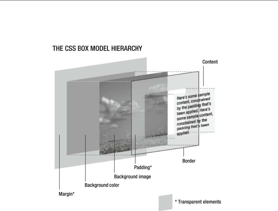
Chapter 7
254
In CSS, every element is considered to be within its own box, and you can define the dimensions of the
content and then add padding, a border, and a margin to each edge as required, as shown in the following
image.
© Jon Hicks (www.hicksdesign.co.uk)
This is one of the trickiest things to understand about the CSS box model: padding, borders, and margins
are added to the set dimensions of the content, and so the sum of these elements is the overall space that
they take up. In other words, a 100-pixel-wide element with 20 pixels of padding will take up an overall
width of 140 pixels, not 100 pixels with 20 pixels of padding within.
You can force browsers to respect the width you set by applying box-sizing: border-box to all elements:
* { -moz-box-sizing: border-box; -webkit-box-sizing: border-box; box-sizing: border-box; }
This is supported by all modern browsers without a vendor prefix with the exception of Firefox.
Note that the top and bottom margins on adjacent elements collapse, meaning that the overall box
dimensions aren’t necessarily fixed, depending on your design. For instance, if you set the bottom margin
to 50px on an element and you have a top margin of 100px on the element below it, the effective margin
between the two elements will be 100 pixels, not 150 pixels.
www.freepdf-books.com
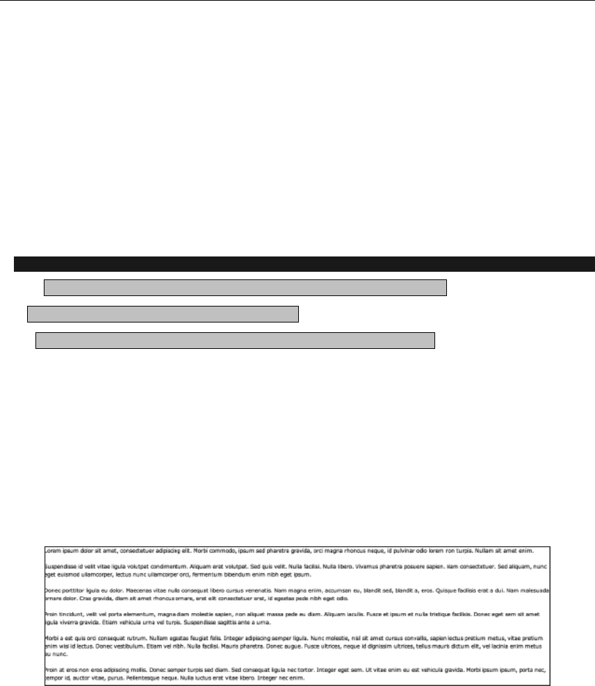
Page Layouts with CSS
255
CSS layouts: a single box
In the remainder of this chapter, we’ll walk through a number of common CSS layout techniques, which
can be combined to form countless layouts. In Chapter 10, these skeleton layouts will form the basis of
various full web page layouts, which will also integrate techniques shown elsewhere in the book (such as
navigation bars).
The starting point for any layout is a single box, which this section concentrates on. I typically refer to
these as wrappers (and accordingly provide said divs with an id value of wrapper); you can think of them
as site containers, used to define a width for the site or set a fixed-size design in the center of the browser
window.
Creating a fixed-width wrapper
Required files Files from the basic-boilerplates folder as a starting point
What you’ll learn How to create a fixed-width div
Completed files create-a-fixed-width-wrapper in the chapter 7 folder
1. Set things up. Rename the boilerplate documents to create-a-fixed-width-
wrapper.html and create-a-fixed-width-wrapper.css. Link the CSS document to the web page
by amending the url value of the style element.
<link rel="stylesheet" id="fixed-width-wrapper-css" href="create-a-fixed-width-wrapper.css"
type="text/css" media="screen">
2. Add some content. The web page already has a div element with an id of wrapper. Within it, add
a bunch of paragraphs and test the web page. You’ll see that the content stretches with the
browser window and goes right up to its edges—this is a basic liquid design. If the browser
window is very wide, this makes the content all but unreadable.
3. Restrict the wrapper’s width. In CSS, add the following rule:
#wrapper {
width: 600px;
margin: 0 auto;
}
www.freepdf-books.com
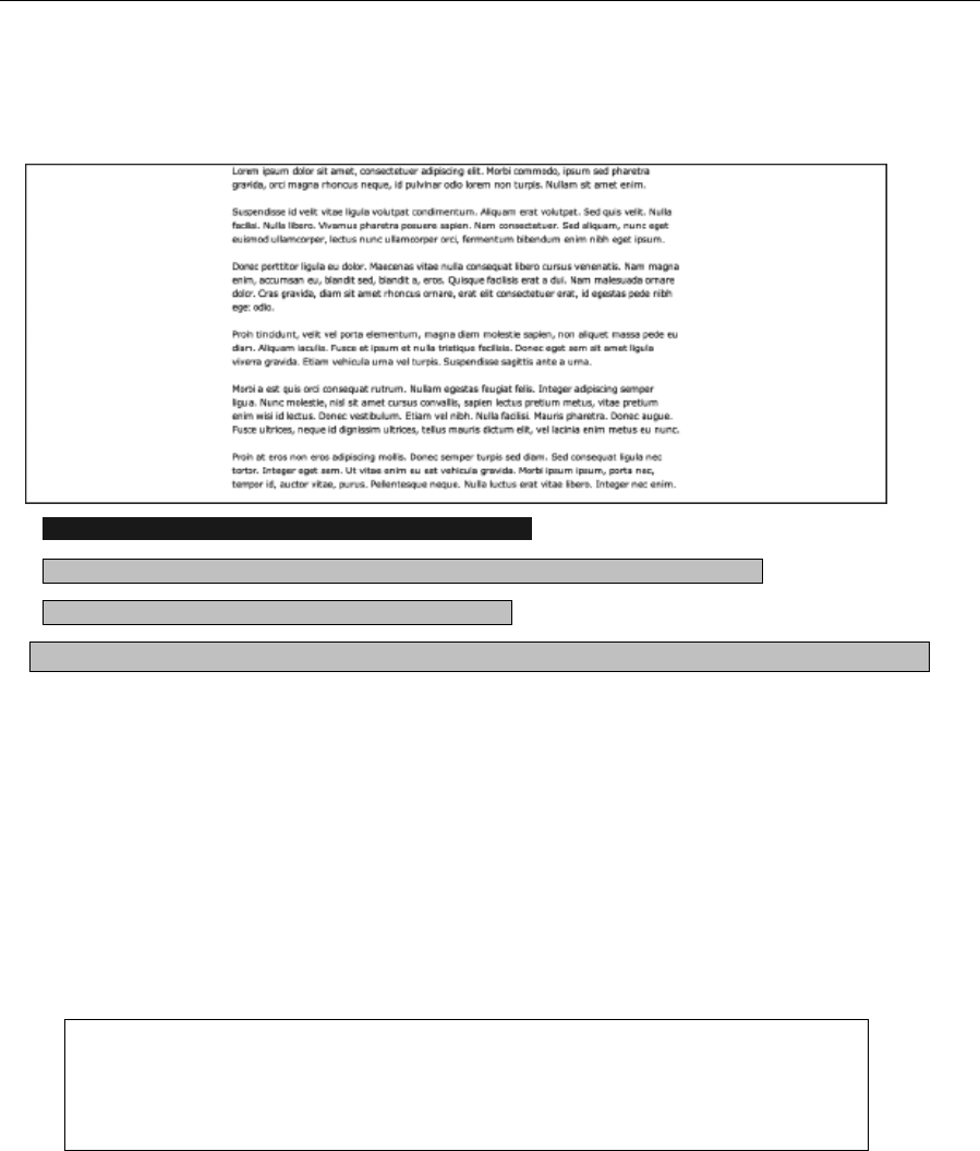
Chapter 7
256
The width setting defines a width in pixels for the wrapper div. The margin setting provides automatic
margins to the left and right of the div, which has the effect of centering the layout in the browser window,
as shown in the following screenshot.
Adding padding, margins, and backgrounds to a layout
Required files-Files from add-starting-point in the chapter 7 folder as a starting point
What you’ll learn How to add style to a fixed-width div
Completed files add-completed in the chapter 7 folder
1. Add a page background. In the add-starting-point folder, there are two images, both of which
are gradients. One is a black gradient, fading toward gray at its bottom edge; this is intended for a
page background. Add this by adding the following rule to the style sheet (after the add your code
below comment):
body {
background: #4d4d4d url(page-background.gif) repeat-x;
}
2. The repeat-x value ensures that the background tiles horizontally only; the color value #4d4d4d is
the color of the bottom pixel of the gradient image, ensuring the gradient seamlessly blends with
the web page background.
Note that in some examples in this book, selectors are used multiple times, such as body
here, as described in the cascade section of Chapter 1. This is perfectly acceptable,
although if you want to merge rules, you can—just be mindful of the cascade if you do
so.
3. Add a border to the wrapper. Amend the #wrapper rule to add a border around the wrapper. Note
that the wrapper in this example sits flush with the top edge of the browser window view area, so
www.freepdf-books.com
Page Layouts with CSS
257
no top border is needed. That’s why the border-top pair is added, overriding the previous rule for
the top border only.
#wrapper {
width: 600px;
margin: 0 auto;
border: 2px solid #777777;
border-top: 0;
}
4. Add a wrapper background. If you test the page now, the background shows behind all of the
page’s content, thereby making it unreadable. Therefore, add the background pair to the rule,
which sets a background color for the wrapper div and also sets the second image in the add-
starting-point folder (a white-to-light-gray vertical gradient) to tile horizontally at the bottom of
the div:
#wrapper {
width: 600px;
margin: 0 auto;
border: 2px solid #777777;
border-top: 0;
background: #ffffff url(wrapper-background.gif) 0 100% repeat-x;
}
www.freepdf-books.com
Chapter 7
258
5. Add some padding. Test the page now, and you’ll see two major layout errors commonly seen on
the Web. First, the content hugs the edges of the div, which makes it hard to read and also looks
cluttered, despite the div being 600 pixels wide. Second, the text at the bottom of the div is
displayed over the gradient—it’s still readable, but it looks a little messy. By adding padding
(more to the bottom edge, to account for the gradient), these issues are dealt with:
#wrapper {
width: 600px;
margin: 0 auto;
border: 2px solid #777777;
border-top: 0;
background: #ffffff url(wrapper-background.gif) 0 100% repeat-x;
padding: 20px 20px 50px;
}
www.freepdf-books.com
Page Layouts with CSS
259
Note that because of the padding and borders added to this div, it now takes up 644
pixels of horizontal space, due to the 20-pixel horizontal padding values and the 2-pixel
borders. To return the overall width to 600 pixels, subtract the 44 pixels from the width
setting, reducing it to 556px.
Creating a maximum-width layout
Required filesFiles from add-completed in the chapter 7 folder as a starting point
What you’ll learn How to create a div with a maximum width
Completed files max-width-example in the chapter 7 folder
6. Amend a rule. Replace the width pair in the #wrapper rule with the max-width pair shown
following. This works much like you’d expect: the design works in a liquid manner, up until the
point at which the content area’s width (this does not include the padding and borders) is the
value defined for max-width, whereupon the layout becomes fixed.
www.freepdf-books.com
Chapter 7
260
#wrapper {
max-width: 800px;
margin: 0 auto;
border: 2px solid #777777;
border-top: 0;
background: #ffffff url(wrapper-background.gif) 0 100% repeat-x;
padding: 20px 20px 50px;
}
7. Amend the body rule. At small browser widths, the design fills the browser window. If you still
want some space around the wrapper, even when the browser window is narrow, all you need do
is amend the body rule, adding some horizontal padding.
body {
background: #4d4d4d url(page-background.gif) repeat-x;
padding: 0 30px;
}
Note that it’s possible to use the min-width property to set the minimum width of a div. In
all cases when using max-width and min-width, be sure to test the usability of your design
at a wide range of browser window sizes.
Using absolute positioning to center a box onscreen
Required files Files from basic-boilerplates in the chapter 7 folder as a starting point
What you’ll learn How to center a div within the browser window
Completed files center-a-box-on-screen in the chapter 7 folder
The final exercise in this section shows how to center a box within the browser window, horizontally and
vertically. Note that this kind of layout isn’t particularly flexible, because it needs the containing wrapper to
have a fixed width and height. Therefore, take care when using this device, because if your page has
plenty of content, your users may be forced to scroll a lot.
1. Add a few paragraphs of text to the web page, placing them inside the wrapper div.
2. Add some backgrounds and style the wrapper div.
body {
background: #666666;
}
#wrapper {
background: #ffffff;
border: 4px solid #000000;
padding: 20px;
width: 400px;
height: 300px;
www.freepdf-books.com
Page Layouts with CSS
261
}
3. Position the div. Set the wrapper div’s position value to absolute, and set the top and left
values to 50%. This sets the top-left position of the div to the center of the browser window.
#wrapper {
background: #ffffff;
border: 4px solid #000000;
padding: 20px;
width: 400px;
height: 300px;
position: absolute;
top: 50%;
left: 50%;
}
www.freepdf-books.com

Chapter 7
262
4. Use negative margins. Clearly, the div is not positioned correctly as yet, and that’s—as
mentioned in the previous step—because absolute positioning and the top and left values
specify the position of the top left of the element they’re applied to. To place the div centrally,
negative top and left margins are used to pull it into place, the values of which are half the width
or height, depending on the margin in question. For the margin-left value, you need the negative
of half the horizontal space the div takes up, which is found by adding its width, horizontal
padding, and horizontal margin values (4 + 20 + 400 + 20 + 4 = 444), dividing by two (222), and
making the number negative (–222). Similarly, the margin-top value is the sum of the vertical
dimensions (300px height, two lots of 20px padding and two lots of 4px borders, which comes to
344px) divided by 2 and made negative.
#wrapper {
background: #ffffff;
border: 4px solid #000000;
padding: 20px;
width: 400px;
height: 300px;
position: absolute;
top: 50%;
left: 50%;
margin-left: -222px;
margin-top: -172px;
}
www.freepdf-books.com
Page Layouts with CSS
263
Note that if you use this kind of layout and have too much content for your wrapper, it
will spill out of it. See later in the chapter for dealing with this issue by creating scrollable
areas for page content.
Nesting boxes: boxouts
Boxouts are design elements commonly used in magazines, but they can, in principle, also be used on the
Web. A boxout is a box separate from other page content that is often used to house images, captions,
and other ancillary information. In magazines, these may be used for supporting text, alternate features, or
magazine mastheads (with contributor information). Online, this enables you to immediately present
content that’s complementary to the main text.
The elements aside and figure are perfect for boxouts. A figure should be used when the content is related
to the main content but is not meant to stand alone without it. An aside should be used when the content
can stand alone without the main content to support it.
In the following screenshot of the HTML5 Rocks website (www.html5rocks.com/en/features/offline), a
boxout is used to house demos of the offline feature, with a link to a page containing the full demo.
www.freepdf-books.com
Chapter 7
264
The float property
Mastering the float property is key to creating CSS-based web page layouts. It enables you to position an
element to the left or right of other web page content, which then wraps around it.
Creating a boxout
Required files Files from boxout-starting-point in the chapter
7 folder as a starting point
What you’ll learn How to create and style a boxout in CSS
Completed files boxout-complete in the chapter 7 folder
As mentioned earlier, boxouts can be handy on web pages for displaying
ancillary content simultaneously with the main text (rather than having
supporting text following the main content). Like any other element, a
boxout can also be styled, which is what this exercise will show how to do.
Steps 1 through 3 show you how to create a basic, plain boxout, and step
www.freepdf-books.com

Page Layouts with CSS
265
4 onward shows how to style it. The final boxout will look like that shown in the image to the right: the
corners are rounded; the plain background of the content area darkens slightly at its base; and the heading
is on a colored background with a gradient (not obvious in a grayscale book, but if you check out the
completed files, you’ll see it’s orange) and a white stripe beneath it to help make the boxout’s heading and
content distinct.
1. Examine the web page. Open boxout.html and look at the page’s body content. The content of
the web page is within a wrapper div. The bulk of the page content is a bunch of paragraphs. The
boxout is an aside element with a class value of boxout, and this is placed before the content the
boxout is supposed to float right of. (In other words, by placing the boxout before the other
content, the other content will wrap around it once the boxout is floated.)
2. Style the wrapper and body. The boxout-starting-point folder contains the images from the
“Adding padding, margins, and backgrounds to a layout” exercise earlier in this chapter, so add
the body and #wrapper rules from that exercise to style the page’s general layout.
body {
background: #4d4d4d url(page-background.gif) repeat-x;
}
#wrapper {
width: 600px;
margin: 0 auto;
border: 2px solid #777777;
border-top: 0;
background: #ffffff url(wrapper-background.gif) 0 100% repeat-x;
padding: 20px 20px 50px;
}
3. Position the boxout. To do so, you need to float it right and assign it a fixed width—if no width is
set, the boxout will span the width of its container, which in this case would be the width of the
wrapper div. Margin values at the bottom and left ensure that the boxout doesn’t hug content that
wraps around it.
.boxout {
float: right;
display: block;
width: 180px;
margin: 0 0 20px 20px;
}
www.freepdf-books.com
Chapter 7
266
4. Add a background. As shown earlier, the boxout has a
background, and this is added by applying a CSS gradient to the
boxout that blends into a solid background color. Finally, padding
values are added to ensure that the boxout content doesn’t go
right up to the edge of the background.
.boxout {
float: right;
width: 180px;
margin: 0 0 20px 20px;
padding: 0 10px;
display: block;
background-color: #e1e1e1;
background-image: -webkit-gradient(linear, 0% 0%, 0% 100%,
from(#e1e1e1), to(#b5b5b5));
background-image: -webkit-linear-gradient(top, #e1e1e1, #b5b5b5);
background-image: -moz-linear-gradient(top, #e1e1e1, #b5b5b5);
background-image: -ms-linear-gradient(top, #e1e1e1, #b5b5b5);
background-image: -o-linear-gradient(top, #e1e1e1, #b5b5b5);
}
www.freepdf-books.com
Page Layouts with CSS
267
5. The boxout header now needs styling, which will add the second
part of the background. A contextual selector is used for this,
ensuring that the style applies only to level-two headings within
an element with a class value of boxout. The first three pairs in
the rule style the header font (see Chapter 3 for more on styling
type); a background CSS gradient has been applied as in step 4.
.boxout h2 {
font: bold 1.2em Arial, Helvetica, sans-serif;
text-transform: uppercase;
color: #ffffff;
background-color: #d7932a;
background-image: -webkit-gradient(linear, 0% 0%, 0% 100%, from(#e3b46a), to(#d7932a));
background-image: -webkit-linear-gradient(top, #e3b46a, #d7932a);
background-image: -moz-linear-gradient(top, #e3b46a, #d7932a);
background-image: -ms-linear-gradient(top, #e3b46a, #d7932a);
background-image: -o-linear-gradient(top, #e3b46a, #d7932a);
}
6. Position the header. If you test the page, you’ll see that the header has a gap at its left and right.
This is because the header is within the boxout aside, which has 10 pixels of padding on its left
and right edges. By applying negative margins of the same value to the header, the horizontal
space it takes up is increased to span the entire width of the boxout. Some padding is then added
to ensure that the heading text doesn’t hug its container’s edges. Next, the bottom-border setting
shown following adds a single-pixel white line under the header.
.boxout h2 {
font: bold 1.2em Arial, Helvetica, sans-serif;
text-transform: uppercase;
color: #ffffff;
background-color: #d7932a;
background-image: -webkit-gradient(linear, 0% 0%, 0% 100%, from(#e3b46a), to(#d7932a));
background-image: -webkit-linear-gradient(top, #e3b46a, #d7932a);
background-image: -moz-linear-gradient(top, #e3b46a, #d7932a);
background-image: -ms-linear-gradient(top, #e3b46a, #d7932a);
background-image: -o-linear-gradient(top, #e3b46a, #d7932a);
margin: 0 -10px 10px;
padding: 5px 10px;
border-bottom: 1px solid #ffffff;
}
7. A final rule styles paragraphs within the boxout, differentiating them from other text.
.boxout p {
font-size: 0.9em;
}
www.freepdf-books.com
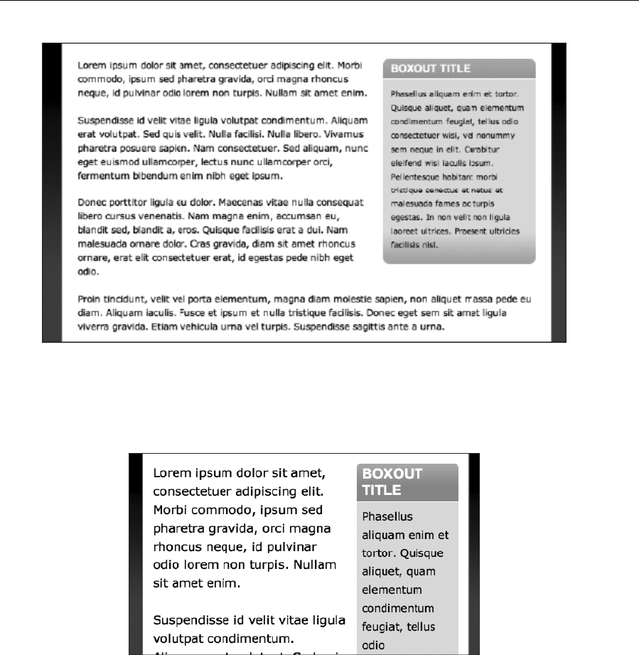
Chapter 7
268
Note that because of the way the header’s background is styled, using a CSS gradient that stretches to fill
the available space, there’s no chance of the background running out, even if the page’s text is massively
zoomed (see the following image). Although the vast majority of users will never use such settings, it
always pays to see how well your sites fare when very atypical settings are used in the browser. While
some problems will be tricky to get around, others just require a little lateral thinking, as shown here.
Advanced layouts with multiple boxes and columns
The layouts so far in this chapter have laid the foundation, showing you how to get to grips with creating a
wrapper for site content and then nesting a div within the wrapper, providing a little added scope for
layout. In this section, you’re going to find out how to fashion the basic building blocks of more complex
layouts, working with two and then three or more structural divs, finding out how they can be styled using
www.freepdf-books.com
Page Layouts with CSS
269
CSS. In all cases, try to think in a modular fashion, because the methods for creating the basic building
blocks shown can be combined in many different ways to create all sorts of layouts.
One of the main reasons for working with two structural divs is to create columns on a web page. Although
columns of the sort found in newspapers and magazines should be avoided online, columns can be useful
when you’re working with various types of content. For instance, you may offer current news in one column
and an introduction to an organization in another. Using columns makes both sets of information
immediately available. If a linear layout is instead used, you’ll need to decide which information you want
the user to see first and which information will initially be out of sight. The general principle of columns is
about more than written site content, though. For example, you could use one column to house a vertical
navigation bar and another to contain thumbnail images relating to an article.
Working with two structural divs
In the following exercise, you’ll work with two structural divs, seeing how seemingly small changes to CSS
rules can make a major difference to the layout of the web page. This will highlight the flexibility of web
layouts, showing how quickly you can build pages and also how easy it is to experiment with designs and
make edits and rapid changes should they be required.
Manipulating two structural divs for fixed-width layouts
Required files Files from two-divs-starting-point in the chapter 7 folder as a starting point
W h a t y o u ’ l l l e a r n How to use two structural divs to create various types of fixed-width layouts,
including two-column designs
Completed files two-divs-fixed-complete in the chapter 7 folder
1. Examine the code. Open two-divs.html, and you’ll see a simple page layout. A level-one
heading is followed by the first div, with an id value of divOne. This is then followed by a second
div, which has an id value of divTwo. Both divs have a level-two heading and some paragraphs
within. Some initial styles are also in the style sheet, defining the fonts and placing 20 pixels of
padding around the page’s content (via the padding pair in the body rule) so the page content
doesn’t hug the browser window edge.
www.freepdf-books.com
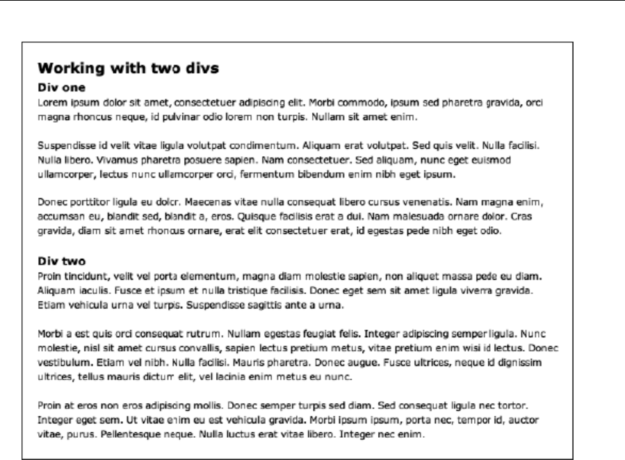
Chapter 7
270
2. Add the background colors. When initially working on CSS layouts and hand-coding, it’s often
useful to apply background colors to your main structural divs. This enables you to more easily
see their edges and how they interact. Therefore, add the following rules to your CSS:
#divOne {
background: #dddddd;
}
#divTwo {
background: #aaaaaa;
}
3. If you test the web page at this point, you’ll see the divs are positioned in a basic linear fashion.
The gap between the two occurs because the paragraphs have margins assigned on their bottom
edges—therefore, the gap is from the margin of the top div’s last paragraphs.
www.freepdf-books.com
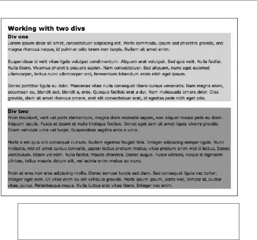
Page Layouts with CSS
271
Note that for an actual website, you should use id (and class) values relevant and
appropriate to the content within them, as evidenced by wrapper and boxout earlier in this
chapter. The values of divOne and divTwo are used in this exercise to enable you to
easily keep track of each one.
4. Make the divs flush to each other. By adding padding-bottom values equal to the margin-bottom
value for paragraphs, you can make the div backgrounds flush to subsequent content.
#divOne {
background: #dddddd;
padding-bottom: 1.5em;
}
#divTwo {
background: #aaaaaa;
padding-bottom: 1.5em;
}
www.freepdf-books.com

Chapter 7
272
5. Float the divs to make columns. By adding width values and floating both divs in the same
direction, the divs stack horizontally, thereby creating columns.
#divOne {
background: #dddddd;
padding-bottom: 1.5em;
float: left;
width: 350px;
}
#divTwo {
background: #aaaaaa;
padding-bottom: 1.5em;
float: left;
width: 250px;
}
www.freepdf-books.com

Page Layouts with CSS
273
Note how each div only stretches to fill its content. Later, you’ll find out how to mimic full-
height columns by using a background image (creating what are known as faux
columns).
6. Switch the column order. You can switch the stack direction by amending the float values,
changing left to right. This can be useful for when you want information to be displayed in a
certain order on-screen but in a different order in code. For example, your main content might be
on the right and a sidebar on the left on-screen, but screen readers would go through the main
content before the sidebar.
7. Note that floats start stacking from the edge of their container, which in this case is 20 pixels in
from the browser window edge. For more control over the overall layout, columns can be placed
in a wrapper, which will be discussed later in the chapter.
www.freepdf-books.com
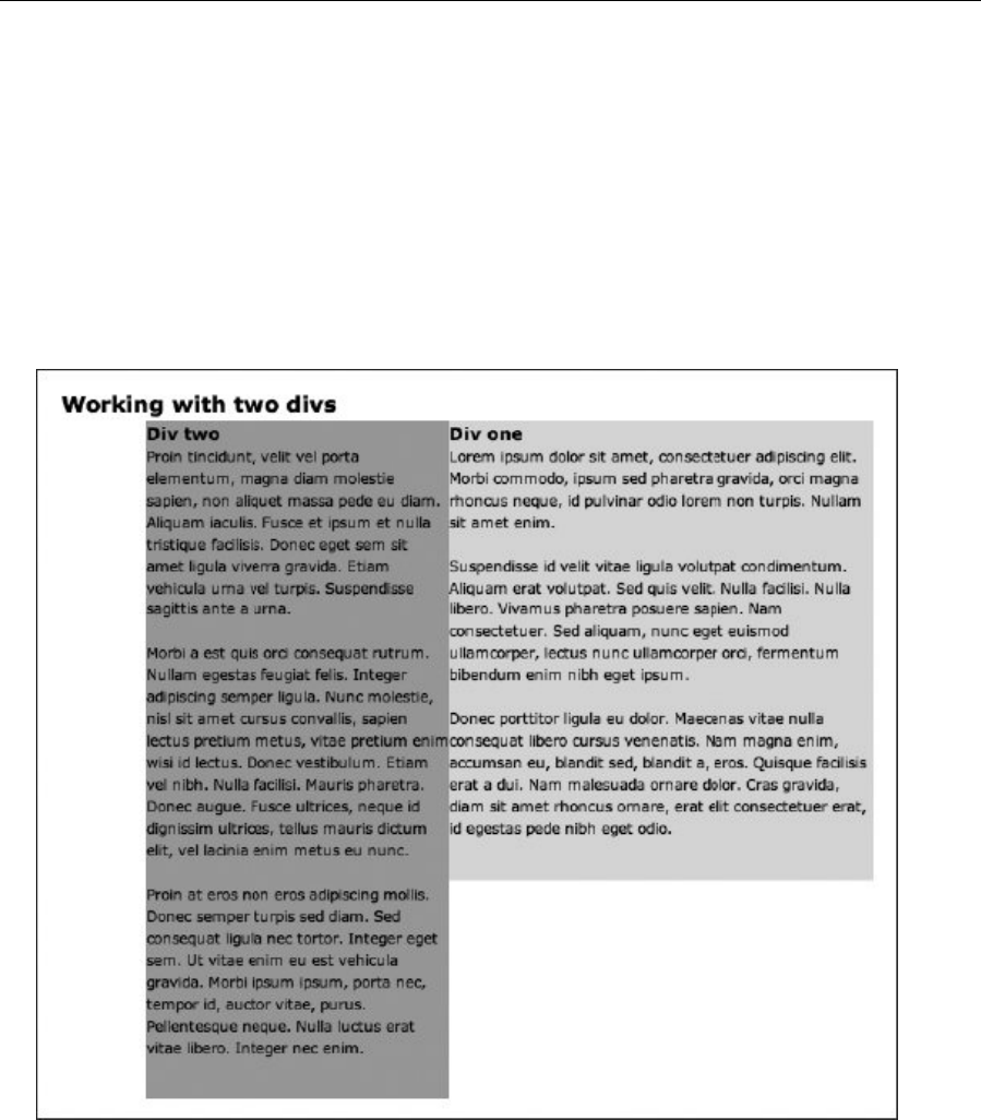
Chapter 7
274
#divOne {
background: #dddddd;
padding-bottom: 1.5em;
float: right;
width: 350px;
}
#divTwo {
background: #aaaaaa;
padding-bottom: 1.5em;
float: right;
width: 250px;
}
8. Add padding and margins. Switch the right values for float back to left, and then change the
padding-bottom properties to padding, adding values for the top and horizontal edges. A margin-
right setting for #divOne provides a gap between the two divs.
www.freepdf-books.com

Page Layouts with CSS
275
#divOne {
background: #dddddd;
padding: 10px 10px 1.5em;
float: left;
width: 350px;
margin-right: 10px;
}
#divTwo {
background: #aaaaaa;
padding: 10px 10px 1.5em;
float: left;
width: 250px;
}
www.freepdf-books.com

Chapter 7
276
Manipulating two structural divs for liquid layouts
Required files Files from two-divs-starting-point in the chapter 7 folder as a starting point
What you’ll learn How to use two structural divs to create various types of liquid layouts, including
two-column designs
Completed files two-divs-liquid-complete in the chapter 7 folder
This exercise looks at working with liquid rather than fixed layouts. Because of the nature of liquid layouts,
there are some very important differences in method that must be taken into account, as you’ll see.
1. Add backgrounds and padding. As per the previous exercise, add background colors to the two
divs to make it easy to see their boundaries.
www.freepdf-books.com

Page Layouts with CSS
277
#divOne {
background: #dddddd;
}
#divTwo {
background: #aaaaaa;
}
2. Float the divs and set widths. As explained in the previous exercise, setting a width for the two
divs and then floating them both in the same direction enables you to stack them horizontally,
thereby providing columns. Note that in this exercise, we’ll be floating divs only left, but you can
float them right, too. Regarding width values, you must ensure that their sum doesn’t exceed
100%, because otherwise the divs will be wider in total than their container and will display in a
linear fashion, one under the other.
#divOne {
background: #dddddd;
float: left;
width: 40%;
}
#divTwo {
background: #aaaaaa;
float: left;
width: 60%;
}
www.freepdf-books.com
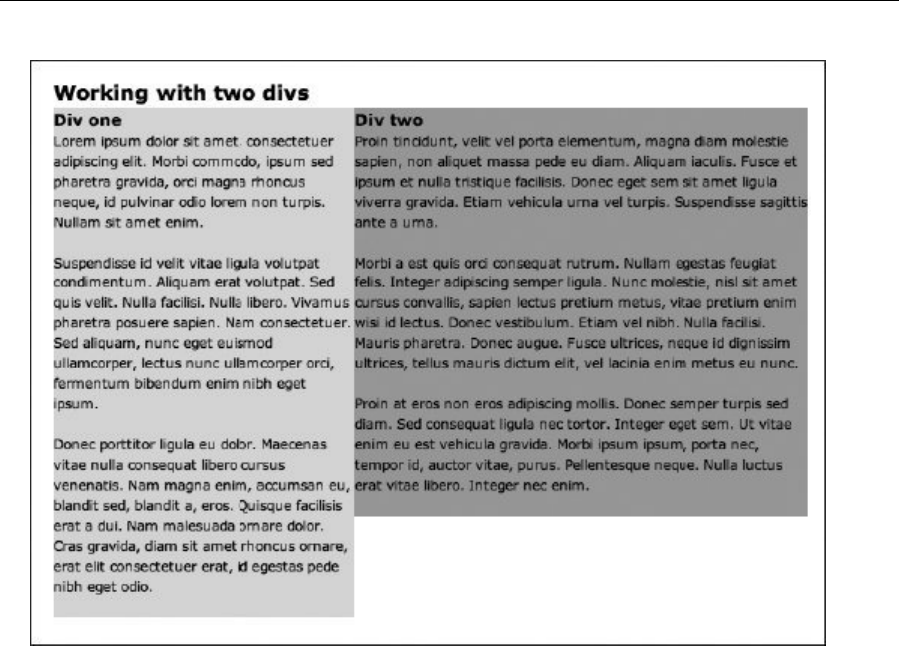
Chapter 7
278
3. Add a margin. In the previous exercise, a margin was included to separate the two divs. This can
be done here, again by adding a margin-right value to #divOne. However, you need to ensure
the overall width of the width and margin values doesn’t exceed 100%. In this example, the
margin is set to 2%, and 1% is removed from each of the two width values to cater for this.
#divOne {
background: #dddddd;
float: left;
width: 39%;
margin-right: 2%;
}
#divTwo {
background: #aaaaaa;
float: left;
width: 59%;
}
www.freepdf-books.com
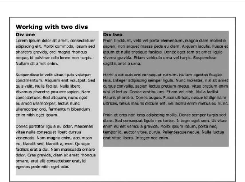
Page Layouts with CSS
279
4. If you want to add padding to the divs, the method changes depending on the required value. If
you’re adding padding on a percentage basis, you add it in the same way as the margin in step 3,
removing relevant values from the width settings. (For example, if you set the padding to 1% for
both divs, this would mean there would be 1% of padding on each side, so 2% would need to be
removed from each width value to keep the combined width of the two divs under 100%.)
5. However, if you want to add pixel-based padding values, things become a little more complex,
because there’s no way of specifying something like 39% - 20px for a width. The most sensible
workaround is to use nested divs: add a content div within each of the two existing divs, and
then set padding for those nested divs to a pixel value. In HTML, you end up with the following:
<div id="divOne">
<div class="columnContent">
[content]
</div>
</div>
<div id="divTwo">
<div class="columnContent">
[content]
</div>
</div>
www.freepdf-books.com
Chapter 7
280
You then apply a padding value to .columnContent in the CSS.
Note that, clearly, liquid layouts can have widths lower than 100%; this example showed
that percentage because it’s the most common width used for liquid layouts and has the
most problems to overcome. Also, rounding errors can cause problems with liquid
layouts when the width values add up to 100%—see the “Dealing with rounding errors”
section in Chapter 9 for more on this.
Placing columns within wrappers and clearing floated content
The heading of this section is a bit of a mouthful, but it makes sense at this point to combine the two things
it mentions—placing columns within wrappers and clearing floated content—because once you’ve started
working with columns, that’s what you’ll likely next have to do. Placing columns within a wrapper enables
you to position the overall layout (for example, centering it within the browser window) and restrict its width
to a set size in pixels or a liquid measurement. Clearing floated content is an important concept to
understand, because floated content appears outside of the normal document flow; subsequent content
then wraps around floated content. Therefore, float an object left and subsequent content will stack to its
right. Also, backgrounds don’t appear behind floated content if it isn’t cleared and doesn’t contain
nonfloated elements, because browsers consider floated elements to technically take up no height.
Placing columns within a wrapper
Required files Files from two-divs-starting-point in the chapter 7 folder as a starting point
What you’ll learn How to use two structural divs to create a two-column fixed-width layout, using
both pixel- and percentage-based values
Completed files using-wrappers-to-contain-columns in the chapter 7 folder
1. Add a wrapper. Open the HTML document, place a div around the web page’s content, and give
the div an id value of wrapper.
<body>
<div id="wrapper">
[web page content]
</div>
</body>
2. Amend the body rule. Because the page will be fixed and centered, there’s no longer a need for
horizontal padding on the body element; therefore, amend the body rule in the CSS file as follows:
body {
font: 62.5%/1.5 Verdana, Arial, Helvetica, sans-serif;
padding: 20px 0;
}
www.freepdf-books.com
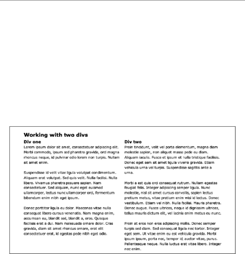
Page Layouts with CSS
281
3. Add the following rule to center the wrapper, per the “Creating a fixed-width-wrapper” exercise
earlier in this chapter:
#wrapper {
width: 700px;
margin: 0 auto;
}
4. Finally, add the following two rules to float the columns, set their widths, and then place a margin
between them (by adding a margin-right setting to the left column).
#divOne, #divTwo {
float: left;
width: 340px;
}
#divOne {
margin-right: 20px;
}
No matter the size of the browser window, the two-column design sits centrally horizontally.
Note that the fixed-width values for the two columns can be replaced with percentages:
#divOne, #divTwo {
float: left;
width: 49%;
}
#divOne {
margin-right: 2%;
}
www.freepdf-books.com
Chapter 7
282
In such cases, the width of each div (and the margin) is a percentage of the parent element—the wrapper
div—rather than the browser window.
Note: When using percentages to size columns, it makes sense to use them also to size
the gutters and margins between them. If you don’t, you’ll have a hard time trying to
match up column widths in percentages and margins in pixels.
Clearing floated content
Required files Files from using-wrappers-to-contain-columns in the chapter 7 folder as a starting
point
What you’ll learnHow to clear floated content, thereby making a wrapper’s background display
behind the content within it
Completed files clearing-floated-content in the chapter 7 folder
1. To highlight issues with content that doesn’t clear floated content, you need to make some quick
changes to the HTML and CSS from the using-wrappers-to-contain-columns folder. First, add a
paragraph of text after the closing tag of the wrapper div:
</div>
</div>
<p>Subsequent content...</p>
</body>
</html>
2. Next, add a background color to the #wrapper rule in the CSS, and change the width and margin-
right settings of the #divOne, #divTwo, and #divOne rules, as shown following:
#wrapper {
width: 700px;
margin: 0 auto;
background: #bbbbbb;
}
#divOne, #divTwo {
float: left;
width: 300px;
}
#divOne {
margin-right: 20px;
}
3. Upon previewing the amended page, you’ll see that the subsequent content stacks to the right of
the floated content; also, the background color for the wrapper doesn’t extend behind the floated
content. Both of these issues can be fixed by clearing the floated content.
www.freepdf-books.com
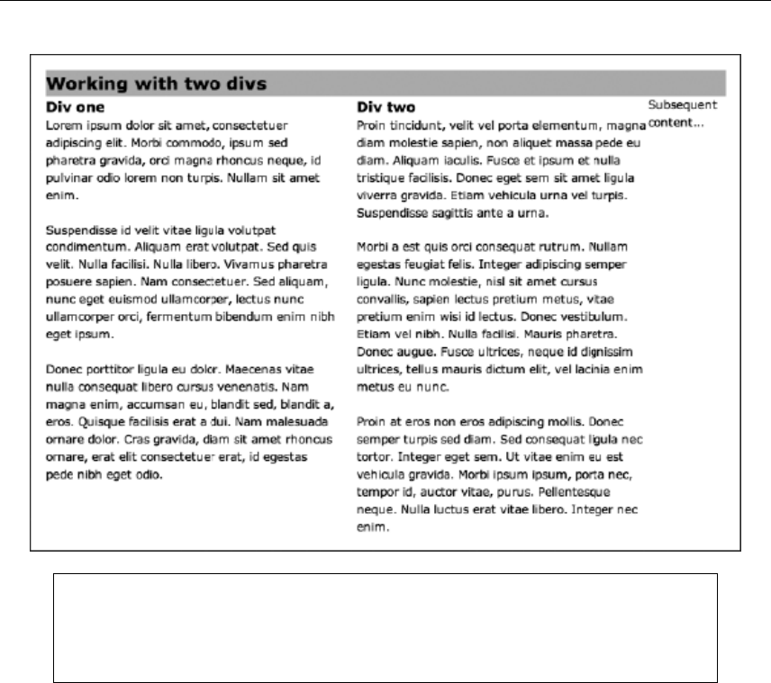
Page Layouts with CSS
283
Note that Internet Explorer’s behavior is different from other browsers here: the wrapper
isn’t being collapsed, so the background extends fully, and the paragraph of text added
after the wrapper doesn’t flow around the floated divs, presumably because the wrapper
isn’t collapsing.
4. Clear the floated content. There are many different clear fixes available today. The micro clearfix
uses the minimum amount of CSS required. This version was introduced by Nicolas Gallagher
(nicolasgallagher.com/micro-clearfix-hack/), and it builds on the work of Thierry Koblentz
(www.yuiblog.com/blog/2010/09/27/clearfix-reloaded-overflowhidden-demystified/). First, add a
class value of clearFix to the container of the floated content (the wrapper div, in this example),
and then add the following rules in CSS:
.clearFix:before,
.clearFix:after {
content: "";
display: table;
}
.clearFix:after {
clear:both;
}
www.freepdf-books.com
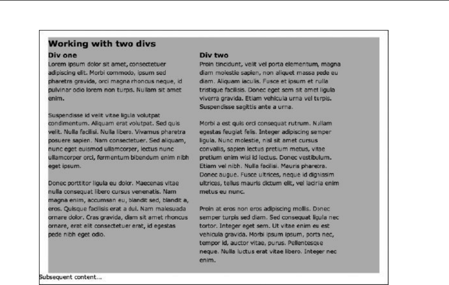
Chapter 7
284
5. The magic of this method is in the CSS rule. By using the :after pseudo-selector, an empty
string is added after the element the class is applied to (in this case, after the wrapper div), and
said empty string’s display is set to table. This creates an anonymous table cell that is set to clear
the element. Unlike previous clearFix methods, there is no content added and therefore no need
to hide it. The genius of the method is that you need no extra markup to clear floats. The :before
pseudo-selecter is not required to clear the float but is used to prevent the top margin from
collapsing in modern browsers. In Chapter 9, I will show you a simple method for making this
clear fix work in IE 6/7.
6. Use an alternate method. The clearFix method is great for when you have content following a
containing wrapper. In some cases, you may not have this, though. For example, place your
subsequent content within the wrapper div, as shown here:
</div>
<p>Subsequent content...</p>
</div>
</body>
</html>
7. The clearFix method won’t work here, because the content is now inside the div that has the
clearFix rule applied to it. Various options are open; the first is to wrap the floated elements in an
internal wrapper and apply the clearFix class to that. In many cases, this will be fine, but you can
end up with a case of divitis, where many nested divs impair the clean nature of the markup. An
www.freepdf-books.com

Page Layouts with CSS
285
alternate option is to apply clearing directly to the element that follows the last piece of floated
content. In HTML, this would look as follows:
<p class="ClearFloats">
8. In CSS, this is styled as follows:
.clearFloats {
clear: both;
}
Generally, the clearFix method is considered superior to adding styles to specific elements, but on
occasions when it doesn’t work for your design, it’s good to have a fallback, so be mindful of both clearing
methods when working on your designs.
Working with sidebars and multiple boxouts
In this chapter so far, you’ve seen how to create web page columns and also how to fashion a boxout. In
this section, two exercises will expand upon these ideas, showing how to create two different layouts that
make use of sidebars. Sidebars are common in print, either for dividing up a page, thereby enabling a
designer to show a main story and a smaller story, or for providing an area for ancillary content to the main
story, but without having text wrapping underneath it (like in a boxout). The Pinkflag.com website (the
official website of the rock band Wire) makes use of sidebars throughout the site. In the following image, a
page from the Us section is shown. The main section of the page shows a photo of a band member, along
with a short biography. In the sidebar is a selection of the subject’s favorite tracks.
www.freepdf-books.com
Chapter 7
286
Based on what you’ve seen so far, you might think the best way to create such a layout would be to create
a two-column layout and then add a border to one of the columns. However, in CSS, borders and
backgrounds stop as soon as the content does. Therefore, if you add a border to the main content area but
the sidebar’s content makes it taller than the main content area, the separating border stops short. What
you therefore need to do is ensure that the two columns are placed in a wrapper and then apply a
vertically tiling background to the wrapper, thereby “faking” the column separator. This technique is
commonly referred to as creating faux columns and is explained fully in the following exercise.
Creating a sidebar with faux-column backgrounds
Required files faux-columns-background.gif from the image folder and all files from using-
wrappers-to-contain-columns (both in the chapter 7 folder) as a starting point
What you’ll learn How to use two structural elements and a background image to create faux columns
Completed files faux-columns in the chapter 7 folder
1. Clear the floated content, using the method outlined in step 2 of the “Clearing floated content”
exercise.
2. Change the id values. When creating a website, you should amend your elements id values to
something appropriate for the content within them. Don’t use generic names such as divOne and
b
www.freepdf-books.com

Page Layouts with CSS
287
divTwo for a completed website. (They’ve been used for some exercises in this chapter just to
make the exercises simpler to work through.) In both the HTML page and the CSS document,
change all instances of divOne to mainContent and all incidences of divTwo to sidebar. Amend
the two level-two headings in the web page accordingly, too. Finally, since the sidebar contains
content that will support the main body, change the div used for the sidebar into an aside.
3. Change the width settings for the columns, making sidebar narrower than mainContent.
#mainContent, #sidebar {
float: left;
width: 479px;
}
#mainContent {
margin-right: 41px;
}
#sidebar {
width: 180px;
display: block;
}
4. Add the background image. Apply the background image (shown right) to the wrapper div, as
shown following. The horizontal position is the width of the main content div, plus
half the margin once 1 pixel is removed from that value (because the width of the
“border” in the background image is a single pixel). By placing the background
image 499 pixels from the left, it ends up exactly halfway between the content of
the two divs.
#wrapper {
width: 700px;
margin: 0 auto;
background: url(faux-columns-background.gif) 499px 0 repeat-y;
}
5. To make it easier to differentiate the two areas of text, change the size of the text in the sidebar,
making it smaller.
#sidebar {
width: 180px;
font-size: 90%;
}
Using a percentage value is a quick way of doing this, with all values being based on those from the main
content area. If you want to set specific values for each of the text elements within the sidebar, you could
do so using contextual selectors (#sidebar h1, #sidebar p, and so on).
www.freepdf-books.com
Chapter 7
288
Note: There is an alternate way to create faux columns; see step 5 of the “Creating
flanking sidebars” exercise later in the chapter.
Boxouts revisited: creating multiple boxouts within a sidebar
Required files Files from multiple-boxouts-starting-point in the chapter 7 folder as a starting
point
What you’ll learn How to use faux columns, boxouts, and the cascade to create a page design with a
sidebar that contains multiple boxouts
Completed files multiple-boxouts-complete in the chapter 7 folder
1. Examine the code. Open the web page and CSS document from multiple-
boxouts-starting-point, and also open the web page in a browser so you can see what it looks
like. Lots of work has already been done here, but it’s all stuff you already know. Essentially, this
page is a combination of the “Creating a boxout” and “Creating a sidebar with faux-column
backgrounds” exercises from earlier in the chapter. A few changes have been made, however.
The boxout has been duplicated three times and placed within the sidebar, the float: right pair
from .boxout has been deleted (because the boxouts no longer need to float—they are within a
container that itself is floated), and some bottom padding has been added (to ensure there’s a
gap below the final paragraph of each boxout). A section has been used instead of multiple
asides since the containing element is an aside.
.boxout {
width: 180px;
padding: 0 10px 1px;
margin: 0 0 20px;
display: block;
background-color: #e1e1e1;
background-image: -webkit-gradient(linear, 0% 0%, 0% 100%, from(#e1e1e1), to(#b5b5b5));
background-image: -webkit-linear-gradient(top, #e1e1e1, #b5b5b5);
www.freepdf-books.com

Page Layouts with CSS
289
background-image: -moz-linear-gradient(top, #e1e1e1, #b5b5b5);
background-image: -ms-linear-gradient(top, #e1e1e1, #b5b5b5);
background-image: -o-linear-gradient(top, #e1e1e1, #b5b5b5);
}
Also, the background from the faux columns exercise isn’t there, because the vertical line the boxouts
create is enough to make the column visually distinct—another separator isn’t necessary.
2. Add class values. While consistent style is good for a website, it’s sometimes neat to offer
multiple styles for an element. This can come in handy for categorization—for example, each
boxout in this design could contain information about a certain area of the website, and therefore
color coding them and providing each with an icon (for those viewers with color vision difficulties)
may help users navigate more easily. Because you can use multiple class values in CSS, it’s
possible to simply add a second class value to each of the boxout sections and then create an
override rule for each in CSS.
<section class="boxout questionsHeader">
[section content]
</section>
<section class="boxout chatHeader">
[section content]
</section>
<section class="boxout toolsHeader">
[section content]
</section>
3. Add new CSS rules. By using three contextual rules, overrides are created, setting a new
background color and gradients for each of the three heading classes defined in step 2.
.questionsHeader h2 {
background-color: #d72a49;
background-image: url(background-icon-questions.gif), -webkit-gradient(linear, 0% 0%, 0% 100%,
from(#d72a49), to(#dc4561));
background-image: url(background-icon-questions.gif), -webkit-linear-gradient(top,
#d72a49, #dc4561);
background-image: url(background-icon-questions.gif), -moz-linear-gradient(top,
#d72a49, #dc4561);
background-image: url(background-icon-questions.gif), -ms-linear-gradient(top,
#d72a49, #dc4561);
background-image: url(background-icon-questions.gif), -o-linear-gradient(top,
#d72a49, #dc4561);
}
.chatHeader h2 {
background-color: #2a84d7;
background-image: url(background-icon-chat.gif), -webkit-gradient(linear, 0% 0%, 0% 100%,
from(#2a84d7), to(#4594dc));
background-image: url(background-icon-chat.gif), -webkit-linear-gradient(top, #2a84d7,
#4594dc);
background-image: url(background-icon-chat.gif), -moz-linear-gradient(top, #2a84d7,
#4594dc);
www.freepdf-books.com

Chapter 7
290
background-image: url(background-icon-chat.gif), -ms-linear-gradient(top, #2a84d7,
#4594dc);
background-image: url(background-icon-chat.gif), -o-linear-gradient(top, #2a84d7,
#4594dc);
}
.toolsHeader h2 {
background-color: #d72ab0;
background-image: url(background-icon-tools.gif), -webkit-gradient(linear, 0% 0%, 0% 100%,
from(#d72ab0), to(#dc45bb));
background-image: url(background-icon-tools.gif), -webkit-linear-gradient(top, #d72ab0,
#dc45bb);
background-image: url(background-icon-tools.gif), -moz-linear-gradient(top, #d72ab0,
#dc45bb);
background-image: url(background-icon-tools.gif), -ms-linear-gradient(top, #d72ab0,
#dc45bb);
background-image: url(background-icon-tools.gif), -o-linear-gradient(top, #d72ab0,
#dc45bb);
}
Note that these rules must be placed after the .boxout h2 rule in the CSS, because the CSS cascade
ensures that the rule closest to the element is applied. If these were placed above the .boxout h2 rule,
they would be overridden by it, resulting in the boxouts all retaining their default appearance.
The following image shows what your page should now look like.
www.freepdf-books.com
Page Layouts with CSS
291
Creating flanking sidebars
Although some sites can be designed around a two-column model, you’ll frequently need more. This can
be achieved by adding further columns to the pages created in earlier exercises or by nesting wrappers
with two columns. (In other words, the first wrapper can contain a sidebar and a wrapper, which itself
contains the main content and another sidebar.)
The only issue with this is that it doesn’t allow for information to be provided in code in an order different
from that shown on the screen. For users of alternate devices, a site with a sidebar (perhaps for navigation
and advertising), followed by the main content, followed by another sidebar (perhaps for boxouts), would
require them to wade through the first sidebar before accessing the main content. You can get around this
by using a “skip to main content” link (as per the skip navigation link from Chapter 5), but you can also set
the content in the order you want in the code (main content, first sidebar, second sidebar) and then use
CSS to reorder the columns on the screen.
Creating flanking sidebars
Required files Files from flanking-sidebars-starting-point in the chapter 7 folder as a starting
point
www.freepdf-books.com
Chapter 7
292
What you’ll learnHow to create flanking sidebars for a content area, thereby enabling you to set
content in one order in the code and another on-screen
Completed files-flanking-sidebars-liquid and flanking-sidebars-fixed in the chapter 7 folder
1. Check out the page. Open flanking-sidebars.html in a web browser and in a text editor. In the
code, you have a wrapper that contains a masthead, followed by a wrapper for the columns,
followed by a footer. Within the column wrapper are three structural elements : mainContent,
leftSidebar, and rightSidebar. Each of these has a content wrapper (as per step 4 of the
“Manipulating two structural divs for liquid layouts” exercise). In CSS, the page defaults and font
styles are already set, as are styles for the masthead and footer. The clearFix method (see the
“Clearing floated content” exercise) has also been used, since the three columns will be
positioned by being floated. Note that for this exercise, the layout will be a liquid one, based on
percentage values for widths and margins.
2. Add the column backgrounds. Add the following two rules, which supply two backgrounds. The
first is applied to the column wrapper, setting the background to gray and adding a horizontally
tiling drop-shadow image. The second is applied to the main content div, defining its background
as white and setting its own background. This will create a seamless shadow effect, but the main
content will be differentiated from the sidebar via a brighter background.
#columnWrapper {
background: #ebebeb url(assets/grey-shadow-top.gif) 0 0 repeat-x;
}
#mainContent {
background: #ffffff url(assets/white-shadow-top.gif) 0 0 repeat-x;
}
3. Set column widths. Amend the #mainContent rule and add rules for the two sidebars, floating all
of the columns left and setting width values. This is a liquid design, so percentages must be used,
and they must add up to 100%.
#mainContent {
background: #ffffff url(assets/white-shadow-top.gif) 0 0 repeat-x;
float: left;
width: 50%;
}
#leftSidebar {
float: left;
width: 30%;
}
#rightSidebar {
float: left;
width: 20%;
}
l
www.freepdf-books.com

Page Layouts with CSS
293
4. Position the sidebars. At the moment, the columns are in the order specified in the code.
However, via the use of margins, this order can be changed. For the main content div, set a
margin-left value equal to the width of the left sidebar. Next, set a margin-left value for
#leftSidebar that’s the negative value of the sum of the width and left margin values of the main
content area.
#mainContent {
background: #ffffff url(assets/white-shadow-top.gif) 0 0 repeat-x;
float: left;
width: 50%;
margin-left: 30%;
}
#leftSidebar {
float: left;
width: 30%;
margin-left: -80%;
}
#rightSidebar {
float: left;
width: 20%;
}
www.freepdf-books.com
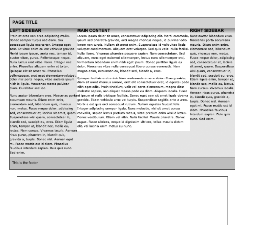
Chapter 7
294
Note: Internet Explorer may cause problems with this layout, making the right sidebar
sometimes appear beneath the others when the browser window is resized. This is
caused by a rounding error (see the “Dealing with rounding errors” section in Chapter 9).
Therefore, it’s often useful to amend one of the percentages (and any related values),
dropping them by 0.0001%—for example, change the width value of #mainContent to
49.9999% and the margin-left value of #leftSidebar to 79.9999%.
5. Fine-tune the design. Add the three rules in the following code block to finish off the layout and
tidy things up:
.columnContentWrapper {
padding: 30px 10px;
}
#mainContent, #leftSidebar, #rightSidebar {
padding-bottom: 32767px !important;
margin-bottom: -32767px !important;
}
#columnWrapper {
overflow: hidden;
}
www.freepdf-books.com

Page Layouts with CSS
295
The first rule merely adds some padding to the column content wrappers. The next rule applies a large
amount of padding to the bottom of each column and a negative margin of the same size, bringing the
document flow back to the point where the padding begins. The use of overflow: hidden on the column
container removes the overflow below the longest column’s content. Note that the value used here is the
maximum allowed by Apple’s Safari because it is the highest number that can be represented in a 16-bit
signed integer. You can also use the second rule in the previous code block to control padding by reducing
the margin-bottom value: the difference between the padding-bottom and margin-bottom values effectively
becomes padding, although in this exercise, padding has been dealt with via the .columnContentWrapper
rule.
6. Make the layout fixed. Amending the layout to a fixed one is simple. Because the layout will no
longer span the window width, a border needs to be placed around the wrapper (otherwise the
drop-shadow cutoffs at the left and right just look weird). Therefore, add a padding-bottom value
of 20px to the body rule, and create the #wrapper rule shown following:
www.freepdf-books.com

Chapter 7
296
#wrapper {
width: 700px;
margin: 0 auto;
border: 1px solid #555555;
border-top: 0;
}
7. Next, update the width and margin-left values for the three rules shown in the following code,
being mindful of the relationships mentioned in step 4 and the fact that the width values cannot
exceed the value set for the wrapper’s width in the previous step:
#mainContent {
background: #ffffff url(assets/white-shadow-top.gif) 0 0 repeat-x;
float: left;
width: 400px;
margin-left: 175px;
}
#leftSidebar {
float: left;
width: 175px;
margin-left: -575px;
}
#rightSidebar {
float: left;
width: 125px;
}
The following image shows what your page should now look like.
www.freepdf-books.com
Page Layouts with CSS
297
Automating layout variations
The final exercise in this section shows how to automate page layouts in a similar manner to automating
navigation, as described in Chapter 5 (namely, in the “Creating a CSS-only tab bar that automates the
active page” exercise). By defining a class value for the body element, contextual selectors can be used to
amend the layout of a web page. This technique comes in handy when working on large sites that have
many variations throughout but some consistent elements. For example, the site’s overall width,
masthead, and footer may remain constant, but the number of columns on the page may change, or they
may change widths.
Using body class values and CSS to automate page layouts
Required files Files from faux-columns in the chapter 7 folder as a starting point
What you’ll learn How to use body class values and contextual selectors to automate page layouts
Completed files automate-page-layouts in the chapter 7 folder.
1. Examine the files. The files from the “Creating a sidebar with faux-column backgrounds” exercise
are used as the basis for this one. The web page has two structural elements, one for the main
content (mainContent) and another for the sidebar (sidebar). The default setup is for the main
content area to take up most of the width and for the sidebar to be narrow, with smaller text.
During the next two steps, contextual selectors will be designed to create two alternate layouts,
one of which will have a single column and one of which will split the columns evenly.
www.freepdf-books.com
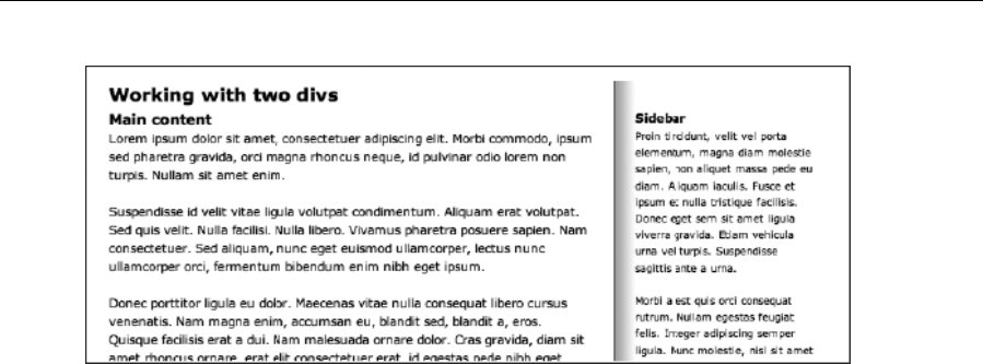
Chapter 7
298
2. Create single-column rules. The way this method works is to create overrides for relevant rules.
The contextual selectors will begin with a class selector that will be applied to the page’s body
start tag, followed by the rules that require overriding. For a single column, the wrapper no longer
needs a background, the main content area needs to be as wide as the wrapper (700 pixels), and
the sidebar doesn’t need to be displayed. Also, the default margin-right value for #wrapper
needs to be overridden; otherwise, the main content area will end up 700 pixels wide plus 41
pixels of margin.
.singleColumn #wrapper {
background: none;
}
.singleColumn #mainContent {
width: 700px;
margin-right: 0;
}
.singleColumn #sidebar {
display: none;
}
3. This style can be applied to the web page by setting the body element’s class value to
singleColumn.
<body class="singleColumn">
www.freepdf-books.com
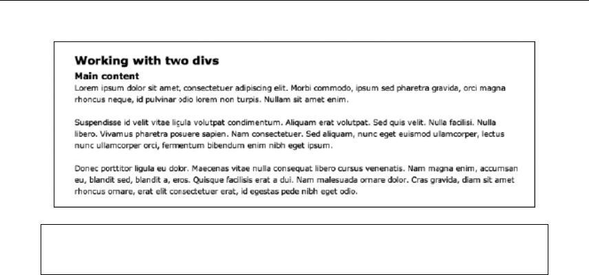
Page Layouts with CSS
299
Note that when using designs such as this, be sure to empty the contents of
nondisplayed elements—any content left within them is just a waste of bandwidth.
4. Create an equal-column-split rule. For an equal column split, the column widths need to be
amended to the same value. But because the margin-right setting defined earlier is 41px, the
sidebar has been set to 1 pixel narrower than the main content area. (An alternate option would
have been to set both column widths to 330px and set margin-right in .equalSplitColumns
#mainContent to 40px.) The background-position horizontal value needs changing to reflect the
new column positions. Finally, because both columns command equal prominence, the
font-size setting for the sidebar is set to 100% in .equalSplitColumns #sidebar.
.equalSplitColumns #wrapper {
background-position: 350px 0;
}
.equalSplitColumns #mainContent {
width: 330px;
}
.equalSplitColumns #sidebar {
width: 329px;
font-size: 100%;
}
This style can be applied to the web page by setting the body element’s class value to equalSplitColumns.
<body class="equalSplitColumns">
www.freepdf-books.com
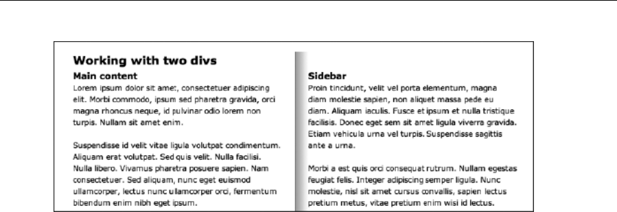
Chapter 7
300
As mentioned, this exercise works in a similar way to some of the navigation ones in Chapter 5. With a
little thought, it should be easy enough to see how this automation method can assist when creating
websites. As long as the site’s structure has been carefully planned, you can usually get away with a
single navigation bar and a single structure but have multiple layouts, each one driven by the CSS
variations and the body class value.
Scrollable content areas
Scrolling is a matter of fact on the Web. Although designers should be careful not to make users scroll too
much (or in multiple directions—sites that force both horizontal and vertical scrolling tend to be awkward
and annoying to use), some scrolling is inevitable with the vast majority of websites. In the past, some
designers created fixed sites that sat in the middle of the browser window, content restricted by the
viewing area. Various techniques later enabled designers to get around this limitation, creating in-page
scrollable content areas. First came frames, and later came CSS-driven scrolling areas. Both enable you
to create in-page scrollable content, but although such things are explored in the final part of this chapter,
scrollable areas should be used with care—if you need a user to see something right away, don’t hide it
“under the fold,” and remember that if you create a centered, fixed-view window, test it using many
different screen resolutions to ensure it looks and works OK for all of your users.
Scrollable content areas with CSS
Scrollable content areas in CSS are often used to provide a lot of information on a single page that can be
viewed at the user’s convenience. Typically the content in a scrollable area isn’t key to the main content of
the page, such as a list of events related to an article. This method allows the content to remain part of the
web page, which is better for accessibility, site maintenance, and search engine indexing.
To do this, create a div with a unique class value:
<div class="scrollableContent">
[content...]
</div>
Then style it in CSS—the rule provides the div’s dimensions and determines how the div’s overflow
works:
www.freepdf-books.com
Page Layouts with CSS
301
.scrollableContent {
width: 200px;
height: 200px;
overflow: auto;
}
When overflow is set to auto, scrollbars appear only when the content is too large for the set dimensions
of the div. Other available values are hidden (display no scrollbars), scroll (permanently display both
scrollbars), and visible (render content outside of the defined box area). Adding some padding, especially
at the right side of the scrollable content box, helps improve the area aesthetically, ensuring that content
doesn’t hug the scrollbar.
.scrollableContent {
width: 200px;
height: 200px;
overflow: auto;
padding: 0 10px 0 0;
}
Note that by also using server-side includes (PHP in this example), you can even make scrollable content
separate from the main web page, thereby emulating an iframe, without resorting to using frames at all.
<div class="scrollableContent">
<?php @include $_SERVER['DOCUMENT_ROOT'] .
"/include/document-name.php"; ?>
</div>
Note: Inline frames (iframes) are the only type of frame allowed in HTML5. Iframes allow
you to include content from external sources into your web page. You can find more
information about iframes in Appendix A.
In this code block, a PHP page called document-name.php is being included into the scrollableContent div.
This implementation is a simple example and should not be attempted without knowledge of PHP.
Another more accessible option than using iframe elements is to use the object element to embed an
external HTML document within a region of the page; when combined with the scrolling div method shown
in this section, it pretty much provides all the benefits of an iframe with very few of the drawbacks (the
content is on the page, unlike with frames and iframes—their content remains external).
The following code block shows how an object element can be added to the page. Note the alternate
content within the object element, displayed if the browser cannot show the object. This can be used to
directly link to the file in the data attribute.
<object data="a-file.html" type="text/html">
<p>[alternate content]</p>
</object>
www.freepdf-books.com
Chapter 7
302
Like other elements, the object element can be styled using CSS, although Internet Explorer adds a
border, so you need to overwrite existing border settings using conditional comments (see Chapter 9 for
more on those) to prevent a double border. Also, if the content is too large for the object dimensions, it will
scroll in whatever direction is needed, unless you explicitly set overflow to hidden.
Fluid grid layouts
Fluid grid layout is designing in proportions instead of fixed pixels and arbitrary percentages. This allows
your layout to look right when crammed onto a tiny mobile screen since all the sections of your layout are
in proportion with each other. A fluid grid layout can be implemented by using div layers percentages and
some simple math. In 2009 Ethan Marcotte introduced “Fluid Grids” on A List Apart
(www.alistapart.com/articles/fluidgrids/). Fluid grids center around a simple formula for converting pixels to
percentages:
(target / context) x 100 = result
How does it work?
1. Pick a section of your design and measure its width. This is your target.
2. Take the target’s measurement and divide it by its parent (the context).
3. Multiple that by 100, and you get your result (round to two decimal places).
4. You now have a percentage that you can drop into your style sheets.
For example, you have a site that has a max width of 960 pixels, and it contains a sidebar of 300 pixels:
(300/960) x 100 = 31.25%
The result is that columns don’t have a fixed width: they can very based on the resolution of the screen or
the resolution of the screen. Fluid grid layouts are an important part of creating a responsive design.
Introduction to fluid grid layouts
Required files Files from fluid-grids in the chapter 7 folder
What you’ll learn How to use everything you've learned so far to great a fluid grid layout
Completed files fluid-grids in the chapter 7 folder
www.freepdf-books.com

Page Layouts with CSS
303
Examine the files. The fluid grid layout markup takes elements of everything you’ve learned so far to
create an advanced layout. The wrapper div is a full width container div that allows layouts to span
the full width of the browser. It has 20px padding applied to the left and right to keep the content
away from the edges. Like a true grid, a row is a row of columns. It centers them and defines a
maximum width. This grid layout is made up of 12 columns and can have any number of columns in
a row that add up to 12. In this example, we have four threecols, but we could easily have two
threecols and a sixcol or any combination that adds up to 12.
<div class="wrapper">
<div class="row">
<div class="twelverow">
[content]
</div>
</div>
<div class="row">
<div class="threecol">
[content]
</div>
<div class="threecol">
[content]
</div>
<div class="threecol">
[content]
</div>
<div class="threecol">
[content]
</div>
</div>
</div>
The maximum width I have chosen for this layout is the popular 960 pixels. All the columns from one to
twelve have had their widths calculated using the previous formula.
Let’s start by finding the width of one column: 960 / 12 = 80. I’ve chosen to have 20px-wide gutters, so
let’s subtract 20 pixels from our total. We have 60. Now using our formula, you can get the width of
column one: (60 / 960) * 100 = 6.25%. For the rest of the columns, we multiply by our original width of 80
pixels, subtract 20 pixels for our gutters, and use our formula to get the rest of the widths (remember to
round to two decimal places).
.onecol{ width: 6.25%; }
.twocol( width: 14.58%; }
.threecol{ width: 22.91%; }
.fourcol{ width: 31.25%; }
As you can see from the following screenshot, building a fluid grid is easy once you know the formula.
The rest of this exercise uses the standard floats and clear fixes explained earlier in this chapter.
www.freepdf-books.com
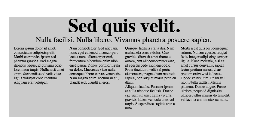
Chapter 7
304
Responsive Web Design
Over the years designers have come up with many solutions that use and combine fixed
and fluid layouts. In an article entitled “Responsive Web Design” published on A List Apart
(www.alistapart.com/articles/responsive-web-design/), Ethan Marcotte takes this a step further, by uniting
the existing technologies of fluid grids, flexible images, and media queries into a new way of approaching
web design. This is a very different way of designing websites, and it represents the future.
Users are browsing your website using their mobile phone, tablet, netbook, or desktop browser. Are you
going to create a new design for each new device? Layouts need to be adaptive. They need to
automatically adjust to fit not only the browser size but the platform and orientation of the device as well.
A responsive design typically consists of a mix of fluid and flexible grid layouts, and the use of CSS media
queries that can reformat your web page and markup to meet the needs of your users.
CSS media queries are used to target styles to specific capabilities, applying different styles based on the
capabilities that match your query. They can test for capabilities such as width, height, max-width, max-
height, device-height, orientation, aspect ratio, and more. Tests can be combined using operators (AND
and NOT) to allow for flexible targeting.
The wide range of devices used to browse your website can generate extreme size changes that may call
for an altogether layout change, through either a separate style sheet or CSS media queries. If you have
structured your CSS correctly, most of your styles can remain the same through inheritance.
Typically a responsive layout would have a main style sheet, which will define the structure, colors,
typography, and backgrounds of your website. Other style sheets would then be defined that would adopt
all the styles from the main style sheet and then redefine the style for new dimensions. A good set of target
pixel widths that should serve as starting points is 320, 480, 600, 768, 900, and 1200. When deciding
which resolutions to target the decision is ultimately up to you as the designer. The more resolutions you
target, the more time it will take to complete your design.
www.freepdf-books.com
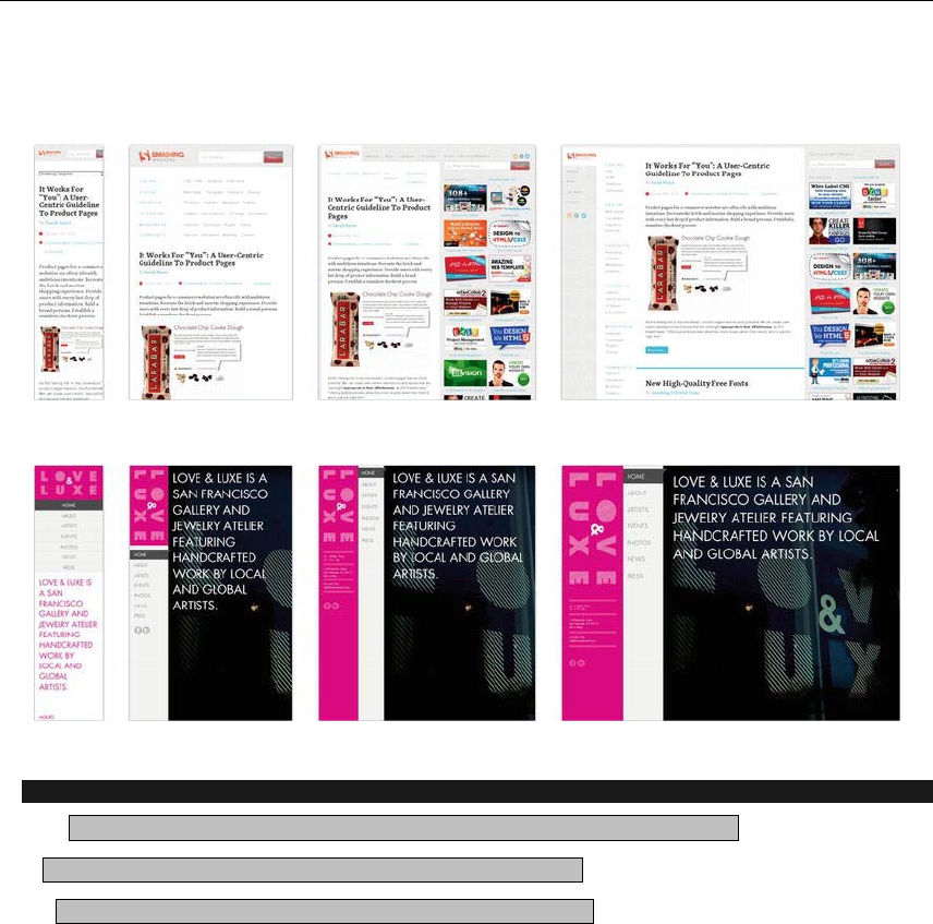
Page Layouts with CSS
305
As you can see from the following screenshots, Smashing Magazine (www.smashingmagazine.com) and
Media Queries (http://mediaqueri.es) are great examples of a responsive layout.
Introduction to Responsive Design
Required files Files from responsive-starting-point in the chapter 7 folder
What you’ll learn How to use make a fluid grid responsive
Completed files responsive-complete in the chapter 7 folder
Let’s take our fluid grid a step further and make it responsive.
1. Open responsive-starting-point.css, and add the following to the bottom:
@media (max-width: 600px) {}
@media (max-width: 767px) {}
These are the different media queries that allow you to change the layout of your design to better
fit your targeted screen size. You can choose as many as you like, but for this example I have
picked two to show you the power of responsive design.
www.freepdf-books.com
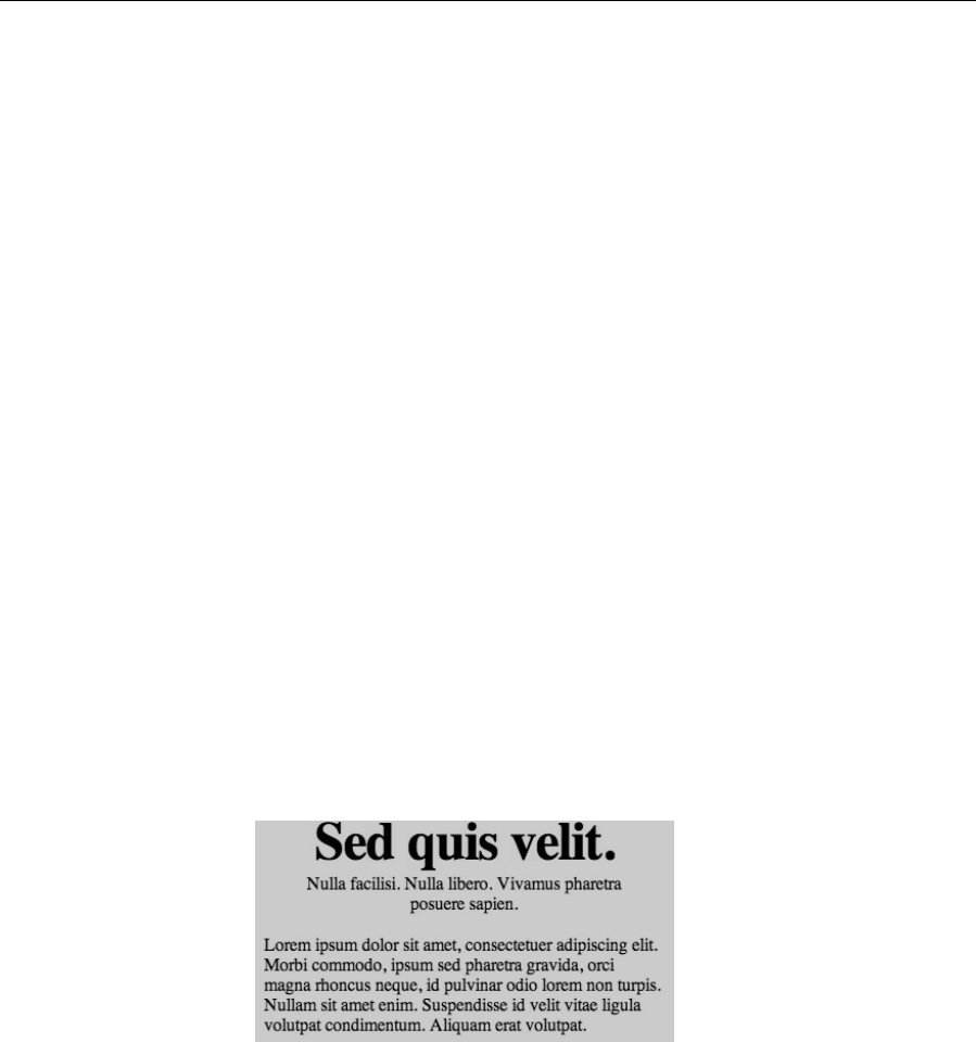
Chapter 7
306
2. Since the media styles will be inherited from 767, we will change the width of the wrapper to auto
so that it can scale down with the browser size. Add the following between the brackets of the
media query targeting 767 pixels.
.wrapper{
width: auto;
}
3. As the browser scales down, let’s stop floating the columns. Add this to the 767 media query:
.row > [class*="col"]{
float: none;
display: block;
width: auto;
margin:0;
}
This targets and applies the style to all elements that contain the string "col" in its class.
4. Finally, let’s adjust the callout section font size for the 600-pixel media query.
.row.callout h2 {
font-size: 32px;
}
.row.callout p {
font-size: 16px;
line-height: 18px;
margin-top: 5px;
}
As you have seen throughout this chapter, even the most complex layout can be broken
down to simple layout techniques combined to create powerful responsive designs.
www.freepdf-books.com
307
Chapter 8
Getting User Feedback
In this chapter:
Creating forms and adding fields and controls
Styling forms in CSS
Configuring a mailform CGI script
Sending forms using PHP
www.freepdf-books.com
Chapter 8
308
Creating a layout for a user feedback page
Creating an online business card using microformats
Introducing user feedback
One of the main reasons the Web has revolutionized working life and communications is its immediacy.
Unlike printed media, websites can be continually updated at relatively minimal cost and also be available
worldwide on a 24/7 basis. However, communication isn’t one-way, and the Web makes it very easy to
enable site users to offer feedback.
Using mailto: URLs
One of the most common methods of providing immediate user feedback is by using mailto: URLs within
anchor tags. Instead of the anchor tag’s value being a file name or URL, it begins with mailto: and is
immediately followed by the recipient e-mail address.
<a href="mailto:someone@your.domain">Click to email!</a>
It’s possible to take this technique further. You can define multiple recipients by using a comma-separated
list; in addition, by placing a question mark immediately after the final recipient address, you can add
further parameters, such as a subject and recipients to carbon copy (cc) and blind carbon copy (bcc). If
using more than one parameter, you must separate them with encoded ampersands (&). Note that
spaces within the subject should also be encoded (as %20).
<a href="mailto:someone@your.domain,someoneelse@your.domain?subject=
ÍContact%20from%20website&cc=bigboss@your.domain">Click
to email!</a>
Note: There should be no spaces in a mailto: value. Therefore, don’t place spaces
before or after colons, commas, or the ? and = symbols.
Although this may sound great, this system has several problems. First, e-mail addresses online are often
harvested by spambots. Second, a mailto: link relies on the user having a preconfigured e-mail client
ready to go—something that people working on college and library machines most likely won’t have. Third,
not all browsers support the range of options explained earlier.
A way to combat the spambots is presented in the next section. For the second issue (the mailto: link’s
reliance on a preconfigured mail client), we recommend using forms for any complex website feedback,
which we will come to later in this chapter. For the third issue (browser support for the more advanced
mailto: options), we recommend just keeping things simple. Place your e-mail address online as a
mailto:, and enable the user to fill in any other details, such common as the subject line.
www.freepdf-books.com
Getting User Feedback
309
Scrambling addresses
In our experience, having an e-mail address online for just a few days is enough to start receiving regular
spam. A workaround is to encrypt e-mail addresses using a bulletproof concoction of JavaScript. The
Enkoder form from Hivelogic is a neat way of going about this and produces decent results.
This online form at www.hivelogic.com/enkoder/form enables you to create a mailto: link that’s
composed of complex JavaScript. Although in time spambots will likely break this code, as they have with
simpler encoders, it’s the best example we’ve seen, and the results we’ve had with it have been good.
Beware, though, that any users with JavaScript disabled won’t see the address, so ensure that you cater
to them by including some other means of contacting the site owner.
Enkoder is also available as a plug-in for Ruby on Rails.
Working with forms
In this section, we’ll work through how to create a form and add controls. We’ll also look at how to improve
form accessibility by using the tabindex attribute and the label, fieldset, and legend elements.
As suggested earlier in the chapter, the best way of getting user feedback is through an online form that
the user fills in and submits. Fields are configured by the designer, enabling the site owner to receive
specific information. However, don’t go overboard: provide users with a massive, sprawling online form,
and they will most likely not bother filling it in and will go elsewhere.
Similarly, although you can use JavaScript to make certain form fields required, we’re not fans of this
technique, because it annoys users. Some sites go overboard on this, “forcing” users to input a whole
bunch of details, some of which may simply not be applicable to the user. In such cases, users will likely
either go elsewhere or insert fake data, which helps no one.
So, keep things simple and use the fewest fields possible. In the vast majority of cases, you should be able
to simply create name, e-mail address, and phone number fields, as well as include a text area that
enables users to input their query.
Creating a form
Form controls are housed within a form element, whose attributes also determine the location of the script
used to parse it (see the “Sending feedback” section later in the chapter). Other attributes define the
encoding type used and the method by which the browser sends the form’s data to the server. A typical
start tag for a form therefore looks like this:
<form action="http://www.yourdomain.com/cgi-bin/FormMail.cgi"
method="post">
www.freepdf-books.com
Chapter 8
310
The preceding form start tag includes attributes that point at a CGI script, but alternative
methods of sending forms exist, including PHP, ASP, and ColdFusion. Check with your
hosting company about the methods available for sending forms, and use the
technology supported by your ISP.
Adding controls
Some form controls are added using the input element. The type attribute declares what kind of control
the element is going to be. The most common values are text, which produces a single-line text input
field; checkbox and radio, which are used for multiple-choice options; and submit, which is used for the all-
important Submit button.
Other useful elements include select, option, and optgroup, used for creating pop-up lists, and textarea,
which provides a means for the user to offer a multiple-line response (this is commonly used in online
forms for a question area). The basic HTML for a form may therefore look like the following, producing the
page depicted in the following screen grab.
<form action="http://www.yourdomain.com/cgi-bin/FormMail.cgi"
method="post">
<p><strong>Name</strong><br />
<input type="text" name="realname" size="30" /></p>
<p><strong>Email address</strong><br />
<input type="text" name="email" size="30" /></p>
<p><strong>Telephone</strong><br />
<input type="text" name="phone" size="30" /></p>
<p><strong>Are you a Web designer?</strong><br />
<input type="radio" name="designer" value="yes" />Yes |
<input type="radio" name="designer" value="no" />No</p>
<p>What platform do you favor?<br />
<select name="platform">
<option selected="selected">Windows</option>
<option>Mac</option>
<option>Linux</option>
<option>Other</option>
</select></p>
<p><strong>Message</strong><br />
<textarea name="message" rows="5" cols="30"></textarea></p>
<p><input type="submit" name="SUBMIT" value="SUBMIT" /></p>
</form>
www.freepdf-books.com
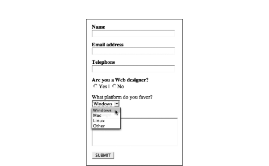
Getting User Feedback
311
The bulk of the HTML is pretty straightforward. In each case, the name attribute value labels the control,
meaning that you end up with the likes of Telephone: 555 555 555 in your form results, rather than just a
bunch of answers. For multiple-option controls (check boxes and radio buttons), this attribute is identical,
and an individual value attribute is set in each start tag.
By default, controls of this type—along with the select list—are set to off (that is, no values selected), but
you can define a default option. I’ve done this for the select list by setting selected="selected" on the
Windows option. You’d do the same on a radio button to select it by default, and with a check box you’d set
checked="checked".
Some of the attributes define the appearance of controls: the input element’s size attribute sets a
character width for the fields, while the textarea’s rows and cols attributes set the number of rows and
columns, again in terms of characters. It’s also worth noting that any content within the textarea element
is displayed, so if you want it to start totally blank, you must ensure that there’s nothing—not even
whitespace—between the start and end tags. (Some applications that reformat your code, and some
website editors, place whitespace here, which some browsers subsequently use as the default
value/content of the textarea. This results in the textarea’s content being partially filled with spaces, and
anyone trying to use it may then find their cursor’s initial entry point partway down the text area, which can
be off-putting.)
Longtime web users may have noticed the omission of a Reset button in this example. This button used
to be common online, enabling the user to reset a form to its default state, removing any content they’ve
added. However, I’ve never really seen the point in having it there, especially seeing as it’s easy to click by
mistake, resulting in the user having to fill in the form again, which is why it’s absent from the examples in
this chapter. However, if you want to add such a button, you can do so by using the following code:
www.freepdf-books.com
Chapter 8
312
<input type="reset" name="RESET" value="RESET" />
Note: A full list of controls is available in Appendix A.
Improving form accessibility
Although there’s an on-screen visual relationship between form label text and the controls, they’re not
associated in any other way. This sometimes makes forms tricky to use for those people using screen
readers and other assistive devices. Also, by default, the Tab key cycles through various web page
elements in order, rather than jumping to the first form field (and continuing through the remainder of the
form before moving elsewhere). Both of these issues are dealt with in this section.
The label, fieldset, and legend elements
The label element enables you to define relationships between the text labeling a form control and the
form control itself. In the following example, the Name text is enclosed in a label element with the for
attribute value of realname. This corresponds to the name and id values of the form field associated with
this text.
<p><label for="realname">Name</label><br />
<input type="text" name="realname" id="realname" size="30" /></p>
Most browsers don’t amend the content’s visual display when it’s nested within a label element, although
you can style the label in CSS. However, most apply an important accessibility benefit: if you click the
label, it gives focus to the corresponding form control (in other words, it selects the form control related to
the label). Note that the id attribute—absent from the form example earlier in the chapter—is required for
this. If it’s absent, clicking the text within the label element won’t cause the browser to do anything.
The fieldset element enables you to group a set of related form controls to which you apply a label via
the legend element.
<fieldset>
<legend>Personal information</legend>
<p><label for="realname">Name</label><br />
<input type="text" id="realname" name="realname" size="30" /></p>
<p><label for="email">Email address</label><br />
<input type="text" id="email" name="email" size="30" /></p>
<p><label for="phone">Telephone</label><br />
<input type="text" id="phone" name="phone" size="30" /></p>
</fieldset>
www.freepdf-books.com
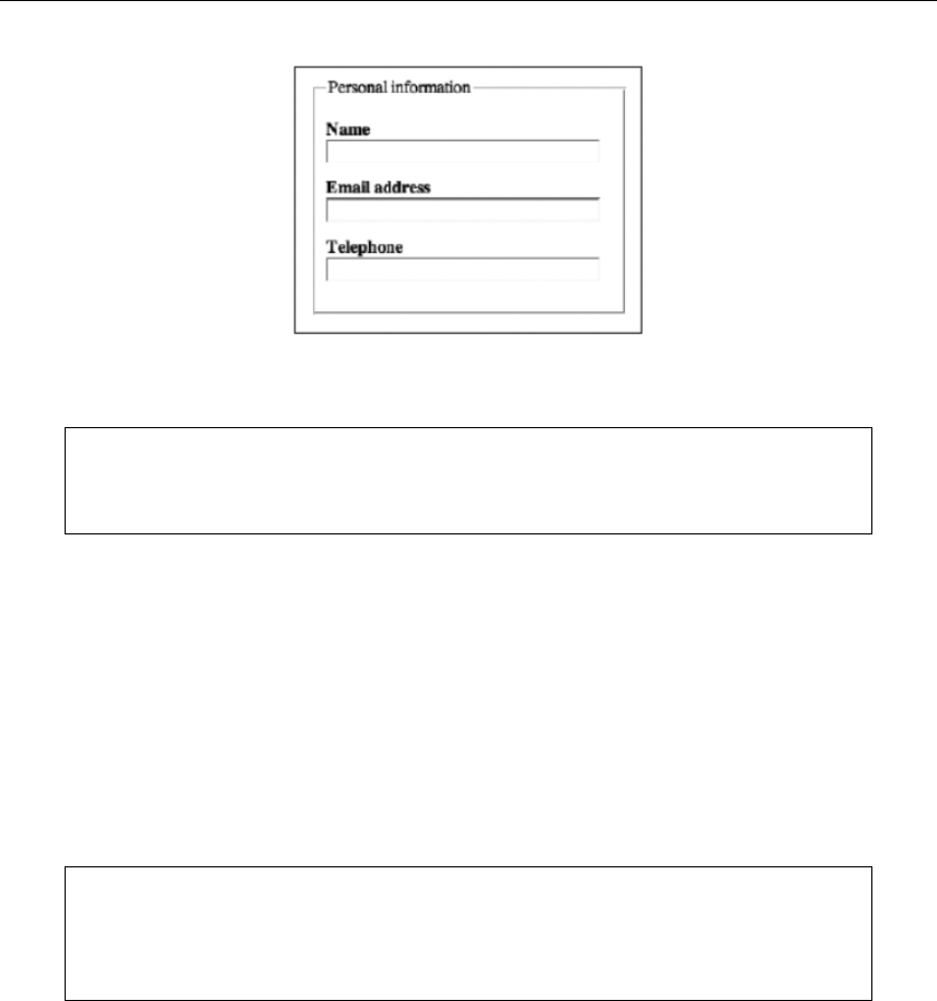
Getting User Feedback
313
As you can see from the previous screenshot, these elements combine to surround the relevant form fields
and labels with a border and provide the group with an explanatory title.
Note that each browser styles forms and controls differently. Therefore, be sure to test
your forms in a wide range of browsers and don’t be too concerned with trying to make
things look exactly the same in each browser.
Adding tabindex attributes
The tabindex attribute was first mentioned in Chapter 5 (in the “Using accesskey and tabindex” section).
For forms, it’s used to define the page’s element tab order, and its value can be set as anything from 0 to
32767. Because the tabindex values needn’t be sequential, it’s advisable to set them in increments of ten,
enabling you to insert others later, without having to rework every value on the page. With that in mind,
you could set tabindex="10" on the realname field, tabindex="20" on the email field, and tabindex="30"
on the phone field (these field names are based on their id/name values from the previous example).
Assuming no other tabindex attributes with lower values are elsewhere on the page, the realname field
becomes the first element highlighted when the Tab key is pressed, and then the cycle continues (in order)
with the email and phone fields.
Note: The reason for starting with 10 rather than 1 is because if you ignore the last digit,
the tabindex values become standard integers, starting with 1. In other words, remove
the final digits from 10, 20, and 30, and you end up with 1, 2, and 3. This makes it easier
to keep track of the tabindex order.
Note that whenever using tabindex, you run the risk of hijacking the mouse cursor, meaning that instead
of the Tab key moving the user from the first form field to the second, it might end up highlighting
something totally different, elsewhere on the page. What’s logical to some people in terms of tab order
may not be to others, so always ensure you test your websites thoroughly, responding to feedback.
Generally, it makes sense to use the value only for form fields, and then with plenty of care.
www.freepdf-books.com

Chapter 8
314
Client-side form validation
With HTML5, forms can be annotated in such a way that the browser will check the user’s input before the
form is submitted. The server still has to verify the input is valid, but this technique allows the user to avoid
the wait incurred by having the server be the sole checker of the user’s input.
The simplest annotation is the required attribute, which can be specified on input elements to indicate that
the form is not to be submitted with an empty value. By adding this attribute to the name and email fields,
we allow the user agent to notify the user when the user submits the form without filling in those fields:
<fieldset>
<legend>Personal information</legend>
<p><label for="realname">Name</label><br />
<input type="text" id="realname" name="realname" size="30" required /></p>
<p><label for="email">Email address</label><br />
<input type="text" id="email" name="email" size="30" required /></p>
<p><label for="phone">Telephone</label><br />
<input type="text" id="phone" name="phone" size="30" /></p>
</fieldset>
It is also possible to limit the length of the input, using the maxlength attribute. By adding this to the
realname element, we can limit the size of names to 25 characters:
<fieldset>
<legend>Personal information</legend>
<p><label for="realname">Name</label><br />
<input type="text" id="realname" name="realname" size="30" required maxlength="25" /></p>
<p><label for="email">Email address</label><br />
<input type="text" id="email" name="email" size="30" required /></p>
<p><label for="phone">Telephone</label><br />
<input type="text" id="phone" name="phone" size="30" /></p>
</fieldset>
Form validation is hard and error prone, so having it performed natively by the browsers and being RFC-
compliant in cases like email, for example, is very helpful. Some forms of validation are notoriously hard to
perform correctly even for the browsers. For example, Chrome validates the string foo@bar as a correct
email address.
Some mobile devices that don’t have a physical keyboard can recognize several of the new HTML5 input
types and dynamically change the on-screen keyboard to optimize for that kind of input. For example,
when you use an iPhone and focus an input type="email" element, you get an on-screen keyboard that
contains a smaller-than-usual spacebar, plus dedicated keys for the @ and. characters. Similarly, for input
type="number", you get a number scroller, and so on.
Default validation alerts are ugly, but in the future it will be easy to add CSS style to them. Chrome and
Safari have recently added support for pseudoselectors like ::-webkit-validation-bubble{}, ::-webkit-
validation-bubble-top-outer-arrow{}, ::-webkit-validation-bubble-top-inner-arrow{}, and ::-webkit-validation-
bubble-message{}. At the time of this writing, Firefox has no way to style the error messages. Similarly,
you might want to change the text of the error messages. Firefox has support for the attribute x-moz-
www.freepdf-books.com

Getting User Feedback
315
errormessage, which enables you to change the text of the error message. The same can be
accomplished in Chrome using CSS and the -webkit-validation-bubble-message.
Date, time, and number formats
The time, date, and number formats used in HTML and in form submissions, are based on the ISO 8601
standard for computer-readable date and time formats, and are intended to be computer-readable and
consistent irrespective of the user’s locale. Dates, for instance, are always written in the format "YYYY-
MM-DD", as in "2012-03-18". Users are not expected to ever see this format.
The time, date, or number given by the page in the wire format is then translated to the user’s preferred
presentation (for example, locale), before being displayed to the user. Similarly, after the user inputs a
time, date, or number using their preferred format, the user agent converts it to the wire format before
putting it in the DOM or submitting it. This allows scripts in pages and on servers to process times, dates,
and numbers in a consistent manner without needing to support dozens of different formats, while still
supporting the users’ needs.
When an input element’s type attribute is datetime, it represents a control for setting the
element’s value to a string representing a specific global date and time. User agents may display
the date and time in whatever time zone is appropriate for the user. The min and max attributes, if
specified, must have a value that is a valid date and time string. The step attribute is expressed in
seconds. The step scale factor is 1000 (milliseconds), and the default step is 60 seconds. It’s
similar to datetime-local, which represents a local date and time, with no time-zone offset
information.
When an input element’s type attribute is in date, it represents a control for setting the element’s
value to a string representing a specific date. The min and max attributes, if specified, must have
a value that is a valid date string. Here the step attribute is expressed in days. The step scale
factor is 86,400,000 (days to milliseconds), and the default step is 1 day.
When an input element’s type attribute is month, it represents a control for setting the element's
value to a string representing a specific month. The min and max attributes, if specified, must
have a value that is a valid month string. The step attribute is expressed in months, it has a scale
factor of 1, and the default step is 1 month.
When an input element’s type attribute is week, it represents a control for setting the element’s
value to a string representing a specific week. The min and max attributes, if specified, must have
a value that is a valid week string. The step attribute is expressed in weeks. The step scale factor
is 604,800,000 (weeks to milliseconds); the default step is 1 week.
When an input element's type attribute is time, it represents a control for setting the element’s value to a
string representing a specific time. The min and max attributes, if specified, must have a value that is a
valid time string. Here the step attribute is expressed in seconds and has a scale factor of 1000 (seconds
to milliseconds), and the default step is 60 seconds.
www.freepdf-books.com
Chapter 8
316
More HTML5 input formats
To make developers’ lives easier, HTML5 offers a set of the most common input field types that should
provide validation, although they’re still not common in browsers:
type=url: For editing a single absolute URL given in the element’s value
type=email: For editing one or multiple e-mail address given in the element’s value
type=password: Represents a one line plain text edit control, which the browser obscures
type=number: For setting the element’s value to a string representing a (floating-point) number
type=range: For setting the element's value to a string representing a number, when the exact value is not important
type=color: For setting the element’s value to a string representing a simple color
More HTML5 form elements
Here are some other HTML5 elements that can be used to create powerful forms and improve the user
experience:
Element Usage Details
button A button The type attribute controls the behavior of the button when it is
activated, and its value can be “submit,” “reset,” or “button”
(which does nothing).
select A control for selecting
amongst a set of options The multiple attribute is a boolean attribute. If the attribute is
present, then the select element represents a control for
selecting zero or more options from the list of options.
The size attribute gives the number of options to show to the
user.
The required attribute is a boolean attribute. When specified, the
user will be required to select a value before submitting the form.
datalist A set of option elements
for predefined options for
other controls
The datalist element can be hooked up to an input element using
the list attribute on the input element.
optgroup A group of option
elements with a common
label
When showing option elements in select elements, browsers
show the option elements of such groups as being related to
each other and separate from other option elements.
www.freepdf-books.com
Getting User Feedback
317
CSS styling and layout for forms
Earlier, we covered how to lay out a form using paragraphs and line breaks. In this section, you’ll see how
tables and CSS can also be used to produce a more advanced layout.
Adding styles to forms
Form fields can be styled, enabling you to get away from the rather clunky default look offered by most
browsers. Although the default appearance isn’t very attractive, it does make obvious which elements are
fields and which are buttons. Therefore, if you choose to style forms in CSS, ensure that the elements are
still easy to make out.
A simple, elegant style to apply to text input fields and text areas is as follows:
.formField {
border: 1px solid #333333;
background-color: #dddddd;
padding: 2px;
}
In HTML, you need to add the usual class attribute to apply this rule to the relevant element(s):
<input class="formField" tabindex="11" type="text" id="realname"
• name="realname" size="30" />
This replaces the default 3D border with a solid, dark gray border, and it also sets the background color as
a light gray, thereby drawing attention to the form input fields. Note that browsers that support :hover and
:focus on more than just anchors can have these states styled with different backgrounds, thereby
providing further prompts. For example, upon focusing a form field, you might change its background color,
making it more obvious that it’s the field in focus.
option A option in a select
element or as part of a list
in a datalist element
An option element can be a select element’s placeholder label
option. A placeholder label option does not represent an actual
option but instead represents a label for the select control.
textarea A multiline plain-text edit
The readonly attribute is a boolean attribute used to control
whether the text is editable.
keygen A key/pair generator
control When the control’s form is submitted, the private key is stored in
the local keystore, and the public key is packaged and sent to
the server.
www.freepdf-books.com
Chapter 8
318
Because the border in the previous code is defined using a class, it can be applied to multiple elements.
The reason we don’t use a tag selector and apply this style to all input fields is that radio buttons and
check boxes look terrible with rectangular borders around them. However, applying this style to the select
element can work well.
Note that the background color in this example is designed to contrast slightly with the page’s background
color but still provide plenty of contrast with any text typed into the form fields; as always, pick your colors
carefully when working with form styles.
The default Submit button style can be amended in a similar fashion, and padding can also be applied to
it. This is usually a good idea because it enables the button to stand out and draws attention to the text
within.
Should you desire a more styled Submit button, you can instead use an image:
<input type ="image" src="submit.gif" height="20" width="100"
alt="Submit form" />
Along with the fields and controls, it’s also possible to style the elements added in the previous section
“The label, fieldset, and legend elements.” The fieldset rule applies a 1-pixel dashed line around the
elements grouped by the fieldset element, along with adding some padding and a bottom margin. The
legend rule amends the legend element’s font and the padding around it and sets the text to uppercase; it
also adds a background color so that the dotted line of the fieldset won’t be shown behind the legend
text in Internet Explorer. Note that not all browsers treat margins on legend elements in the same way, so
if you add a margin value, be sure to thoroughly test your page. The screenshot that follows also includes
the styles included in the default CSS document from the basic-boilerplates folder.
fieldset {
border: 1px dashed #555555;
padding: 10px;
margin-bottom: 10px;
}
www.freepdf-books.com
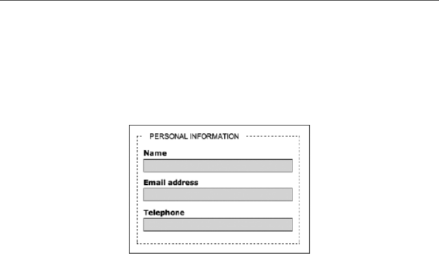
Getting User Feedback
319
legend {
padding: 0 10px;
font-family: Arial, Helvetica, sans-serif;
color: #000000;
background: #ffffff;
text-transform: uppercase;
}
A final style point worth bearing in mind is that you can define styles for the form itself. This can be useful
for positioning purposes (for example, controlling the form’s width and its bottom margin); the width setting
can prove handy, since the fieldset border stretches to the entire window width, which looks very odd if
the form labels and controls take up only a small area of the browser window. Reducing the form’s width to
specifically defined dimensions enables you to get around this. Alternatively, you can set a fixed width on
the fieldset itself (or float it, enabling you to display fieldsets side by side).
You can also color the form’s (or fieldset’s) background in addition to or instead of the input fields,
thereby making the entire form prominent. This is a device I’ve used on various versions of the Snub
Communications website’s contacts page, as shown in the following screenshot.
www.freepdf-books.com
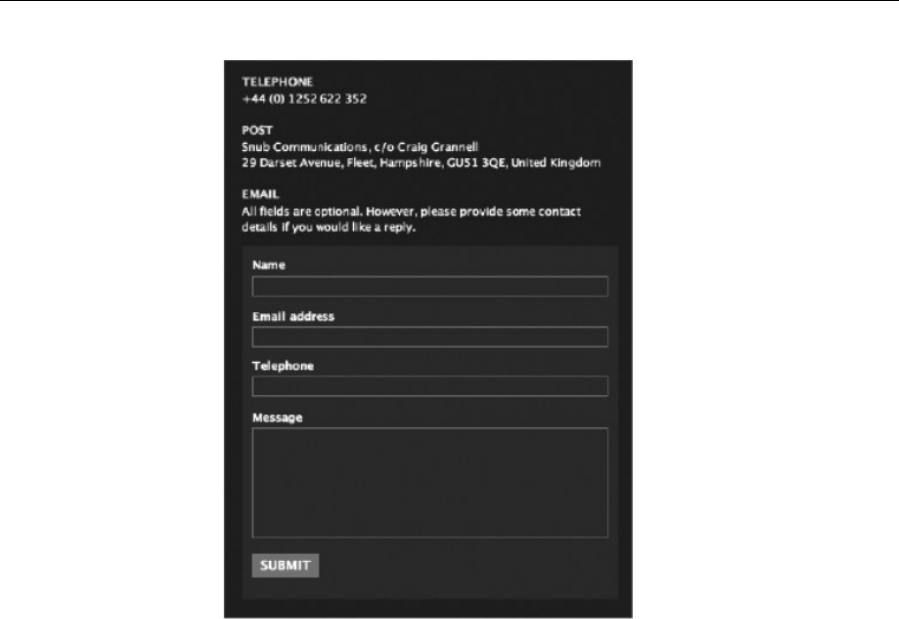
Chapter 8
320
Regardless of the form styles you end up using, be sure to rigorously test across browsers, because the
display of form elements is not consistent. Some variations are relatively minor—you’ll find that defining
values for font sizes, padding, and borders for input fields doesn’t always result in fields of the same height
and that text fields and Submit buttons don’t always align. A more dramatic difference is seen in versions
of Safari prior to 3.0, which ignore many CSS properties for forms, instead using the Mac OS X “Aqua”
look and feel—see the following screenshot for how the Snub Communications form looks in that browser.
Form functionality is not affected by this, but layouts can be.
www.freepdf-books.com
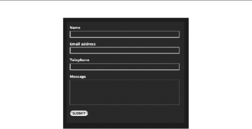
Getting User Feedback
321
Advanced form layout with CSS
A common way of laying out forms is to use a table to line up the labels and form controls, although with
the output being nontabular in nature, this method is not recommended (CSS should be used for
presentation, including positioning elements on a web page); it’s provided here to show a (partial) table
layout that can be replicated in CSS. For our first three fields, a table-based form may have something like
this:
<fieldset>
<legend>Personal information</legend>
<table class="formTable" cellpadding="0" cellspacing="0" border="0"
summary="A contact details form.">
<tr>
<th scope="row">
<label for="realname">Name</label></th>
<td><input class="formField" type="text" id="realname"
name="realname" size="30" /></td>
</tr>
<tr>
<th scope="row"><label for="email">Email address</label></th>
<td><input class="formField" type="text" id="email" name="email"
size="30" /></td>
</tr>
<tr>
<th scope="row"><label for="phone">Telephone</label></th>
<td><input class="formField" type="text" id="phone" name="phone"
size="30" /></td>
</tr>
</table>
</fieldset>
www.freepdf-books.com
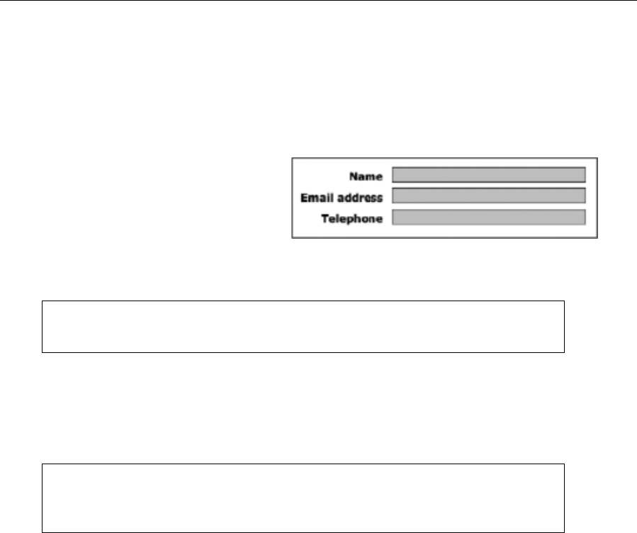
Chapter 8
322
Because a class value was added to the table, the contextual selector .formTable th can be used as the
selector for styling the form labels, defining the text-align property, along with other CSS properties such
as font-weight. Applying a padding-right value to these cells also produces a gap to the right of the label
cells. Another contextual selector, .formTable td, can then be used to style the cells—for example, to add
padding at the bottom of each cell. The image below shows these styles applied to the various elements in
the previous code block, along with the styles shown in the “Adding styles to forms” section.
.formTable td {
padding: 0 0 5px 0;
}
.formTable th {
padding-right: 10px;
text-align: right;
font-weight: bold;
}
Note that the fieldset and legend elements must surround the table containing the relevant
fields. If using these elements, you may need multiple tables for your form.
Although forms are not tabular in nature, using a table to create a form can result in a pleasing visual
appearance, with the labels right-aligned and placed next to their associated labels. This kind of layout can
be replicated using CSS, via a structure built from divs to replace the table rows. This method retains
semantic integrity via the semantic relationship created by the label and associated field’s id. Using CSS
for form layout also brings with it the benefit of being able to rapidly restyle and move form components.
This isn’t a complete form—it’s just a guide to using this method. This example lacks, for
instance, a
Submit
button and many of the controls in the example from earlier in the
chapter.
<form action="http://www.yourdomain.com/cgi-bin/FormMail.cgi"
method="post">
<fieldset>
<legend>Personal information</legend>
<div class="row clearFix">
<label for="realname">Name</label> <input class="formField"
type="text" id="realname" name="realname" size="30" />
</div>
<div class="row clearFix ">
<label for="email">Email address</label> <input class="formField"
type="text" id="email" name="email" size="30" />
</div>
<div class="row clearFix ">
<label for="phone">Telephone</label> <input class="formField"
type="text" id="phone" name="phone" size="30" />
</div>
</fieldset>
www.freepdf-books.com
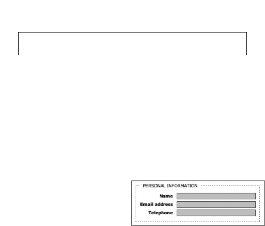
Getting User Feedback
323
</form>
Note the use of the clearing device, the clearFix class value, as outlined in Chapter 7’s
“Placing columns within wrappers and clearing floated content” section.
Various styles are then defined in CSS. The form itself has its width restricted, and label elements are
floated left, the text within aligned right, and the font-weight property set to bold. The width setting is
large enough to contain the largest of the text labels.
form {
width: 350px;
}
label {
float: left;
text-align: right;
font-weight: bold;
width: 95px;
}
The form controls—the input elements—are floated right. Because only input elements within the div
rows should be floated (rather than all of the input elements on the page), the contextual selector .row
input is used. (The containing divs have a class value of row.) The width setting is designed to provide a
gap between the labels and input elements.
.row input{
float: right;
width: 220px;
}
Finally, to make a gap between the rows, a .row
class is added and given a margin-bottom value.
.row {
margin-bottom: 5px;
}
The method works fine in all browsers except Internet Explorer, which doesn’t apply margin-bottom
correctly. However, the slightly different layout in Internet Explorer can largely be fixed by adding the
following in a style sheet attached via an IE-specific conditional comment:
.row {
clear: both;
margin-top: 5px;
}
Alternatively, add the following:
.clearFix {
display: inline-block;
}
www.freepdf-books.com
Chapter 8
324
Example forms for the sections in this chapter are available in the chapter 8 folder of the
download files.
Sending feedback
In this section, you’ll check out how to send form data using a CGI script and PHP. Once users submit
information, it needs to go somewhere and have a method of getting there. Several techniques are
available for parsing forms, but we’re first going to cover using a server-side CGI script. Essentially, this
script collects the information submitted, formats it, and delivers it to the addresses you configure within
the script.
FormMail, available from Matt’s Script Archive (www.scriptarchive.com), is probably the most common,
and a number of web hosts preconfigure this script in their web space packages. However, FormMail does
have flaws, and it hasn’t kept up with current technology. A better script is nms FormMail (available from
http://nms-cgi.sourceforge.net/ and described next)—it emulates the behavior of FormMail but takes a
more modern and bug-free approach.
Configuring nms FormMail
The thought of editing and configuring scripts gives some designers the willies, but nms FormMail takes
only a couple of minutes to get up and running. First, you need to add some more input elements to your
web page, after the form start tag:
<input type="hidden" name="subject" value="Contact form from
website" />
<input type="hidden" name="redirect"
value="http://www.yourdomain.com/contact-thanks.html" />
Note that some browsers display an outline where hidden fields are if input elements are
set to display as block. In such cases, you can apply a class value of hidden to the
relevant fields, with display set to none.
Obviously, the values in the preceding elements need changing for your site. The subject value can be
whatever you like—just make it obvious, so you or your clients can use an e-mail package to filter website
form responses efficiently.
The redirect value isn’t required, but it’s good to provide positive feedback to users, not only to confirm
that their form has been sent but also to communicate that their query will be dealt with as soon as
possible. Many “thank you” pages online tend to look a little barren, with a single paragraph of text. That’s
why we tend to make this page a duplicate of our standard contact page but with the confirmation
paragraph above the form. The script itself needs only minimal editing. Because CGI scripts tend to break
with slight errors, I highly recommend editing them in a text editor that doesn’t affect document formatting,
such as HTML-Kit for Windows (www.chami.com) or BBEdit for Mac (www.barebones.com).
www.freepdf-books.com

Getting User Feedback
325
The first line of the script defines the location of Perl on your web host’s server. Your hosting company can
provide this, so you can amend the path accordingly.
#!/usr/bin/perl -wT
Elsewhere, you only need to edit some values in the user configuration section. The $mailprog value
defines the location of the sendmail binary on your web host’s server. You can find this out from your web
host’s system admin.
$mailprog = '/usr/lib/sendmail -oi -t';
The $postmaster value is the address that receives bounced messages if e-mails cannot be delivered. It
should be a different address from that of the intended recipient.
$postmaster = 'someone@your.domain';
The @referers value lists IP addresses or domain names that can access this script, thereby stopping just
anyone from using your script and your server resources. For instance, the Snub Communications mail
form has snubcommunications.com and the site’s IP address for this value (as a space-delimited list). If you
use localhost, that enables local testing, if you have the relevant software set up on your PC.
@referers = qw(dave.org.uk 209.207.222.64 localhost);
The @allow_mail_to value contains the addresses to which form results can be sent, again as a space-
delimited list. If you include just a domain here, then any address on that domain is valid as a recipient. If
you’re using only one address, set the $max_recipients value to 1 to increase security.
@allow_mail_to = qw(you@your.domain some.one.else@your.domain
localhost);
Multiple recipients
You can also use the script to e-mail multiple recipients. To do so, an additional hidden input element is
needed in the HTML:
<input type="hidden" name="recipient" value="emailgroup" />
And in the script itself, two lines are changed. The @allow_mail_to value is removed, because it’s catered
for by the newly amended %recipient_alias. Both are shown here:
@allow_mail_to = ();
%recipient_alias = ('emailgroup =>
'your-name@your.domain,your-name@somewhere-else.domain');
Should a script be used for multiple groups of recipients, you need a unique value for each in the HTML
and to amend the %recipient_alias value accordingly:
%recipient_alias = ('emailgroup1' => 'your-name@your.domain,your-name@
somewhere-else.domain', 'emailgroup2' => 'foo@your.domain');
Script server permissions
Upload the script to your site’s cgi-bin. Once there, the script’s permissions must be set. Exactly how this
is achieved depends on what FTP client you’re using. Some enable you to right-click and “get info,” while
www.freepdf-books.com
Chapter 8
326
others have a permissions or CHMOD command buried among their menus. Consult your documentation and
find out which your client has. If you can, use the CHMOD command to set the octal numbers for the script
(thereby altering the file permissions) to 755. If you have to manually set permissions, do so as per the
screenshot to the right. Check that the script’s file extension matches that in your form element’s action
attribute (.pl or .cgi—the latter is usually preferred by servers). Also, you might want to amend your
script’s name (and update the form element’s action value accordingly), in an attempt to outfox automated
spammers. (This explains the rather odd name of the script in the screenshot below.)
Not all hosts require you to place CGI scripts in a cgi-
bin directory: some prefer a cgi
directory, and some enable you to place such scripts
anywhere on the server. If in doubt, talk to your web
host’s support people about the specific
requirements for your account. Also note that not all
hosts enable CGI support, so if you want to use such
a script, check that it’s possible with your host before
you spend a load of time trying to set something up
that’s not permitted and won’t run anyway.
Sending form data using PHP
If your hosting company offers support for PHP, the most widely used server-side technology, there is no
need to install a CGI script such as FormMail. Everything can be done with PHP’s built-in mail() function.
As a minimum, the function requires the following three pieces of information:
The address(es) the mail is being sent to
The subject line
The message itself
An optional fourth argument to mail() permits you to send additional information in the e-mail headers,
such as from, cc, and bcc addresses, and to specify a particular character encoding (if, for instance, you
need to include accented characters or an Asian language in the e-mail). Unfortunately, spammers
frequently exploit this ability to add extra e-mail headers, so you need to check the form input for
suspicious content and stop the e-mail from being sent if any is found. A script written by fellow friends of
ED author David Powers does this for you automatically. Even if you have no experience working with
PHP, the following instructions should have you up and running quickly:
www.freepdf-books.com

Getting User Feedback
327
1. Copy process_mail.inc.php from the download files to the same folder (directory) as the page
containing the form. This is the PHP script that does all the hard work. You don’t need to make
any changes to it.
2. Save the page containing the form with a PHP extension—for instance, feedback.php. Amend the
opening form tag like this:
<form action="<?php echo $_SERVER['PHP_SELF']; ?>" method="post">
3. At the top of the page, insert the following PHP code block above the DOCTYPE. Although I’ve
warned you elsewhere in the book never to place any content above the DOCTYPE, it’s perfectly
safe to do so in this case, because the PHP code doesn’t produce any HTML output.
<?php
if (array_key_exists('SUBMIT', $_POST)) {
//mail processing script
$to = 'me@example.com'; // use your own email address
$subject = 'Feedback from website';
// list expected fields
$expected = array('realname', 'email', 'phone', 'message');
// set required fields
$required = array('realname', 'email', 'message');
$headers = 'From: My website<feedback@example.com>';
$process = 'process_mail.inc.php';
if (file_exists($process) && is_readable($process)) {
include($process);
}
else {
$mailSent = false;
mail($to, 'Server problem', "$process cannot be read", $headers);
}
}
?>
4. This script begins by checking whether the PHP $_POST array has been set. This happens only
when a user clicks the form’s Submit button, so this entire block of code will be ignored when the
page first loads. It sets the address to which the
e-mail is to be sent and the subject line. It then checks that all required fields have been filled in
and sends the form input for processing by process_mail.inc.php. If the mail processing file can’t
be found, the script e-mails an error message to you.
To adapt this script to your own form, you need to change some of the values, as explained in upcoming
steps.
www.freepdf-books.com
Chapter 8
328
Note: PHP is case sensitive. Make sure that you use the same combination of
uppercase and lowercase in the PHP script as in the name attributes in the form. Also be
careful to copy the script exactly. Missing semicolons, commas, or quotes will cause the
script to fail and may result in ugly error messages or a blank screen.
5. Change SUBMIT in the second line of the script to the same value as the name of the form’s
Submit button.
6. Replace me@example.com with the e-mail address that the feedback is to be sent to. Make sure the
address is in quotes and that the line ends with a semicolon.
www.freepdf-books.com

Getting User Feedback
329
If you want to send the e-mail to multiple addresses, separate them with commas like this:
$to= 'me@example.com, him@example.com, her@example.com';
7. Replace the content inside the quotes in the following line (Feedback from website ) with
whatever you want the subject line to say.
8. Next, list the name attributes of each form element as a comma-separated list between the
parentheses in the following line:
$expected = array('realname', 'email', 'phone', 'message');
9. This tells the script what form input you’re expecting. This is very important, because it prevents
malicious users from trying to pass unexpected—and possibly dangerous—data through your
form. Any form field not included in this list will be ignored, so make sure you update the list
whenever you add a new field to a form.
Note that the commas go outside the quotes. You can use single or double quotes. It doesn’t matter as
long as each set of quotes is a matching pair.
10. The next line of code looks very similar:
$required = array('realname', 'email', 'message');
11. This is used to check whether all required fields have been filled in. You’ll notice that I’ve omitted
phone from the list, so the script will treat it as optional. The order of items in the $expected and
$required arrays is not important, but it makes maintenance easier if you use the same order as
they appear in the form.
12. The next line looks like this:
$headers = 'From: My website<feedback@example.com>';
13. This sets the e-mail’s From: header. Change My website < feedback@example.com> to the name
and e-mail address that you want the e-mail to be sent from.
14. There are many additional headers you can add to an e-mail, such as Cc or Bcc. You can also
set the encoding to UTF-8 (for messages that require accents or Asian languages). The following
example shows how to add a cc address and UTF-8 encoding:
$headers = "From: My website<feedback@example.com>\r\n";
$headers .= "Cc: copycat@example.com\r\n";
$headers .= "Content-type: text/plain; charset=UTF-8";
15. There are a couple of important points to note about this code. First, the headers are enclosed in
double quotes. This is because each header must be on a separate line, and the characters \r\n
at the end of the first two lines represent a carriage return and new line when enclosed in double
quotes. You need these two characters at the end of each header except the last one. Second,
there’s a period in front of the equal sign in the second and third lines. This has the effect of
stringing all the values together so the script treats the headers as a single block.
16. One nice touch with e-mail headers is to put the user’s e-mail address in the
Reply-to field of the e-mail, so all the user has to do is click Reply in their e-mail program to
www.freepdf-books.com

Chapter 8
330
send a message back to the right person. Unfortunately, this is frequently used by spammers to
inject malicious code into your script. The code in process_mail.inc.php filters out potential
attacks and inserts the sender’s e-mail address only if it’s safe to do so. Consequently, there is no
need to add a Reply-to header yourself; it’s done automatically by the script.
If you want to use a special encoding, such as UTF-8, for your e-mails, make sure the web page
containing the form uses the same encoding in its meta tag.
You don’t need to use all these headers. Just remove the complete line for any you don’t want.
17. You don’t need to make any other changes to the code you inserted in step 3.
18. The script in process_mail.inc.php processes the form input and sends the e-mail if there are no
problems. The final stage is to let the user know what happened.
19. Immediately above the form in the main part of your page, insert the following code:
<?php
if ($_POST && isset($missing) && !empty($missing)) {
?>
<p class="warning">Not all required fields were filled in.</p>
<?php
}
elseif ($_POST && !$mailSent) {
?>
<p class="warning">Sorry, there was a problem sending your message.
Please try later.</p>
<?php
}
elseif ($_POST && $mailSent) {
?>
<p><strong>Your message has been sent. Thank you for your feedback.
</strong></p>
<?php } ?>
This block of code displays an appropriate message depending on the outcome. Put whatever messages
you like in place of the ones shown here, and add the following rule to your style sheet:
.warning {
font-weight: bold;
color: #ff0000;
}
20. If you’re using a visual HTML editor like Dreamweaver, all three messages will appear to be
displayed at once. However, when you load the page onto your website, the PHP conditional
logic hides all the messages, and only the appropriate one is displayed after the user submits the
form.
21. Save the page and upload it to your hosting company, together with process_mail.inc.php. Test
it. In a few moments, you should receive the test message in your inbox. That’s all there is to it!
www.freepdf-books.com

Getting User Feedback
331
If you get error messages or a blank screen, it means you have made a mistake in the script. Check the
commas, quotes, and semicolons carefully. If you get a message saying that process_mail.inc.php
cannot be read, it probably means that you have forgotten to upload it or that it’s not in the same folder as
the form.
Using e-mail to send form data
In rare cases, it may not be possible to set up a form to send form data (although even most free web
hosts tend to provide users with some kind of form functionality, even if it’s a shared script that doesn’t
allow a great deal of customization). If you find yourself in this sticky situation, it’s possible to use a
mailto: URL for the form’s action attribute value. This causes browsers to e-mail the form parameters
and values to the specified address.
<form method="post" action="mailto:anemailaddress@somewhere.com"
enctype="text/plain">
This might seem a simpler method than messing around with CGI scripts, but it has major shortfalls:
Some browsers don’t support mailto: as a form action.
The resulting data may arrive in a barely readable (or unreadable) format, and you have no
control over this.
This method isn’t secure.
The user won’t be redirected and may therefore not realize data has been sent.
That last problem can be worked around by adding a JavaScript alert to the form start tag:
<form method="post" action="mailto:anemailaddress@somewhere.com"
enctype="text/plain" onsubmit="window.alert('This form is being
sent by email. Thank you for contacting us.')">
Of course, this relies on JavaScript being active on the user’s browser—but, then again, this is a last
resort.
Note the enctype attribute in the previous code block. This defines the MIME type used to
encode the form’s content before it’s sent to the server, so it doesn’t become scrambled.
By default, the attribute’s value is application/x-www-form-urlencoded, which is suitable for
most forms; however, multipart/form-data is available for when the user is able to use a
form to upload files.
A layout for contact pages
Once you’ve completed a form, you need to integrate it into your site in a way that most benefits the site’s
visitors. I’ve always been of the opinion that it’s a good idea to offer users multiple methods of contact on
www.freepdf-books.com
Chapter 8
332
the same page. This makes it easy for them to contact you, because it requires fewer clicks than the fairly
common presentation of a form and link to other contact details.
The following images show a couple of example layouts. The first is from the Thalamus Publishing
website, which has the contact form on the right (with a minimum of fields); to the left is the other contact
information—address, telephone number, fax number, e-mail, and so on, along with other addresses and
details relevant to this organization (such as sales representatives).
With this company having plenty of contact information, this two-column approach makes a lot of sense,
and the prominence of the form is handy, because many queries can be dealt with more efficiently via
e-mail.
For Snub Communications, my own site, things are simpler—I don’t have a preference as to how people
contact me, so all possibilities have pretty much the same prominence. The form area is made to stand out
slightly more (thereby giving all contact details relatively equal prominence) by way of its background color.
www.freepdf-books.com

Getting User Feedback
333
Again, everything is in one place, rather than spread out over several pages, which makes sending
feedback to and/or getting in contact with the organization convenient for the end user. The Snub
Communications site doesn’t require a map, but if it did, a link to it would appear on this page, too. The
map page itself would likely resemble this one to some extent, but with the map in place of the form and
image. In other words, the page would still include a telephone number and other contact details; after all,
it’s frustrating to have a map to an organization’s location, get lost, and then discover you don’t have the
organization’s details!
We’re not going to dwell on exactly how to create these layouts, because we’ve already covered the
techniques in the previous chapter—it’s just a question of creating a two-column layout and cutting in the
form (and other details) as appropriate.
www.freepdf-books.com

Chapter 8
334
Using microformats to enhance contact information
As shown in the previous section, user feedback may come in the form of a telephone call or letter, rather
than an e-mail, and therefore you should always add other forms of contact details to a website. Even if
the site is an online store, customers will need other ways to get in touch (faceless multinational
organizations, take note). In the most basic sense, these can be marked up by using some headings and
paragraphs, as follows:
<h1>Contact details</h1>
<h2>Mail</h2>
<p><strong>Company name</strong><br />
00, Street Name<br />
Town or City<br />
County or Region<br />
Postal/ZIP code<br />
Country name</p>
<h2>Telephone/fax</h2>
Tel: +1 (0)0000 555555<br />
Fax: +1 (0)0000 555556<br />
Mobile/cell: +1 (0)7000 555555</p>
Now, there’s nothing at all wrong with the previous block of code: it’s valid, it does the job perfectly well,
and it’s semantically sound, which also means it’s easy enough to style using CSS. However, by utilizing
microformats, the page’s functionality can be enhanced without compromising the markup.
More about microformats can be found at the microformats website at www.microformats.org, and in the
book Microformats: Empowering Your Markup for Web 2.0, by John Allsopp, so I won’t dwell on them too
much. In short, though, microformats provide a way of adding commonly used semantics to web pages
and working with common technologies, such as HTML5. For the example, you’re going to see how to take
a basic set of contact details and then use microformats to provide users with a means of efficiently
downloading and storing the information as a vCard—the vCard format being that commonly used by
address books). The semantic information is also of use to any other application that is microformat-
aware—for example, some Firefox plug-ins are able to autodetect microformat information on any web
page and enable a user to browse and manipulate it.
Using microformats to enhance contact details
Required files The files from using-microformats-starting-point in the chapter 8 folder
What you’ll learn How to use microformats to enhance a set of contact details
Completed files using-microformats-completed in the chapter 8 folder
www.freepdf-books.com
Getting User Feedback
335
1. Add a surrounding div. Open using-microformats. html, and place a div with a class value of
vcard around the contact details content, as shown
(truncated) following:
<h1>Contact details</h1>
<div class="vcard">
<h2>Mail</h2>
[...]
Mobile/cell: +1 (0)7000 555555</p>
</div>
2. Structure the address. Marking up the address is fairly
simple, and few changes are required to the general
structure of the code. However, because each individual
set of information requires its own container and the best
way of creating a container for the address is to place it
within a block element of its own, the company name and
the address each need their own paragraphs, rather than a line break separating the two. The
organization’s paragraph is then given a class value of fn org. Here, fn stands for “full name,”
and org defines that the name belongs to an organization, rather than a person.
3. The address paragraph’s class value is adr, and each line of the address is placed within a span
element. The various class values assigned to the spans denote which element of the address
the content refers to, and those are all straightforward to understand. However, address books—
and therefore microformats—enable you to distinguish between different types of data. For
example, you can have a work address or a home address. This can be defined by adding the
relevant word (for example, work) and wrapping it in a span with a class value of type, thereby
defining the type for the parent property. In this case, the address is being defined as a work
address.
4. For cases when you don’t want this information shown on the web page (which will likely be most
of the time—after all, adding a lowercase “work” in front of the street name hardly looks great),
add a second class value, hidden. Later, CSS will be used to make content with a hidden value
invisible.
<h2>Mail</h2>
<p class="fn org">Company name</p>
<p class="adr">
<span class="type hidden">work</span>
<span class="street-address">00, Street Name</span><br />
<span class="locality">Town or City</span><br />
<span class="region">County or Region</span><br />
<span class="postal-code">Postal/ZIP code</span>
<span class="country-name">Country name</span>
</p>
5. Structure the telephone/fax details. Each definition for a telephone number requires its own
container, so the single paragraph must be split into three, as shown in the following code block.
Each paragraph’s class value should be tel. As with the address, a span with a class value of
www.freepdf-books.com
Chapter 8
336
type hidden is used to define the type for each parent property. For tel, various options are
available, including work, home, fax, cell, pager, and video. Should duplicate types be required
(such as for a work fax), two type spans are added. As for the contact number itself, that’s placed
in a span element with a class value of value.
<h2>Telephone/fax</h2>
<p class="tel">
Tel: <span class="type hidden">work</span>
<span class="value">+1 (0)0000 555555</span></p>
<p class="tel">
Fax: <span class="type hidden">fax</span>
<span class="type hidden">work</span>
<span class="value">+1 (0)0000 555556</span></p>
<p class="tel">
Mobile/cell: <span class="type hidden">cell</span>
<span class="value">+1 (0)7000 555555</span></p>
Note that with some address books, only a limited amount of data seems to get
exported—specifics about work and home phone numbers may not. As always, test your
work on a range of platforms and applications.
6. Style headings and paragraphs. The style sheet, using-microformats.css, already has some
defined styles, which do the usual removal of margins
and padding and setting of the default font size. The
body rule also adds some padding to the page content
so that it doesn’t hug the browser window edges. To
this, add the following three rules, which style the
headings and paragraphs. Both headings are rendered
in uppercase Arial, helping them to stand out, aiding
visual navigation of the contact details.
h1 {
font: bold 1.5em/1.2em Arial, Helvetica
sans-serif;
margin-bottom: 1.2em;
text-transform: uppercase;
}
h2 {
font: bold 1.25em/1.44em Arial, Helvetica sans-serif;
text-transform: uppercase;
}
p {
font-size: 1.2em;
line-height: 1.5em;
margin-bottom: 1.5em;
}
7. Hide hidden elements. As noted in steps 2 and 3, some information requires a type to be defined
for it, but as you can see in the previous image, this is displayed on-screen like any other content.
www.freepdf-books.com
Getting User Feedback
337
This is why the hidden value was also applied to the relevant span elements. By adding the
following rule, these spans are made invisible.
.hidden {
display: none;
}
8. Deal with margin issues. Because the telephone details
are each in an individual paragraph, each has a bottom
margin, and this makes the layout look awful. The same
problem also affects the company name paragraph.
However, because each paragraph has its own class
attribute value, it’s easy to remove the bottom margins
from the relevant paragraphs using the following rule:
.tel, .fn {
margin-bottom: 0;
}
9. Embolden the company name. Balancewise, the
company name could do with standing out more. This is
within a paragraph that has a class value of org, so
making the contents bold is child’s play—just add the
following rule.
.org {
font-weight: bold;
}
10. Finally, style the vcard div via the following rule. This sets a background color, width, border, and
padding, but perhaps the most important property here is margin-bottom. This is required
because the margins from paragraphs with a tel class were removed in step 6. When you add a
bottom margin to the vcard div, the typical spacing you’d expect after a paragraphs returns.
.vcard {
width: 200px;
background: #eeeeee;
border: 1px solid #cccccc;
padding: 8px;
margin-bottom: 1.5em;
}
www.freepdf-books.com
Chapter 8
338
Note that further simplification of some elements of the code shown in the exercise is possible. For
example, where you have the Fax line, the type span could be directly wrapped around the relevant label,
and the hidden class should be removed.
Where before you had the following:
<p class="tel">
Fax: <span class="type hidden">fax</span>
<span class="type hidden">work</span>
<span class="value">+1 (0)0000 555556</span></p>
You’ll now have this:
<p class="tel">
<span class="type">Fax</span>:
<span class="type hidden">work</span>
<span class="value">+1 (0)0000 555556</span></p>
The same is also true for the Mobile/cell line.
Note also that this is a relatively new technology, so it’s not without its drawbacks. As mentioned earlier,
some details are not carried through to some address books. Also, the need to hide extra data is
problematic, since under some circumstances (such as in text readers), it will be displayed, which could
lead to confusion. However, with the popularity of microformats increasing all the time, they’re still worthy
of investigation, which is why we’re including this example in this book.
Online microformat contacts resources
If you decide to use microformats to enhance your site’s contact details, there are two websites you need
to bookmark. The first is Technorati’s Contacts Feed Service, at www.technorati.com/contacts. This
enables you to input the URL of a page with hCard information (that is, the sort of page created in the
previous exercise) and get a vCard out of it, which can be added to your address book.
www.freepdf-books.com
Getting User Feedback
339
Usefully, the site’s system enables you to automate the system via the kind of web page created earlier. If
you upload a page like the one created in the previous exercise and then add the following code
(amending the URL after contacts/), you’ll have a link on the contacts page that uses the microformat
information to create a vCard that users can download.
<p><a href="http://technorati.com/contacts/http://yourdomain.com/
yourcontactpageurl.html">Download vCard</a>. (<em>This process
may take a few seconds.</em>)</p>
A second handy resource is Tantek Çelik’s hCard creator (amusingly titled the hCard-o-matic), at
www.microformats.org/code/hcard/creator. This enables you to automate much of the process from the
previous exercise—you put your values into the field on the left, and the code is built live in the field at the
right of the page.
www.freepdf-books.com
Chapter 8
340
Contact details structure redux
In this chapter, and in the microformats exercise, the address and other contact details were styled using
paragraphs and line breaks. An alternative structure, which perhaps has greater integrity from a semantic
standpoint, is to use a definition list, with further nested definition lists within. At the top level, the term is
Contact details, and the definition is the actual contact details. At the next level, there are two terms,
Mail and Telephone/fax, each with respective definitions. For the latter, the definition has a third definition
within, providing term/definition pairs for the different types of telephone and fax numbers.
<dl>
<dt>Contact details</dt>
<dd>
<dl class="vcard">
<dt>Mail</dt>
<dd>
<address>
<strong>Company name</strong><br />
00, Street Name<br />
Town or City<br />
County or Region<br />
Postal/ZIP code<br />
Country name
</address>
</dd>
<dt>Telephone/fax</dt>
<dd>
www.freepdf-books.com

Getting User Feedback
341
<dl>
<dt>Tel:</dt>
<dd>+1 (0)0000 555555</dd>
<dt>Fax:</dt>
<dd>+1 (0)0000 555556</dd>
<dt>Mobile/cell:</dt>
<dd>+1 (0)7000 555555</dd>
</dl>
</dd>
</dl>
</dd>
</dl>
For the CSS, use the existing rules from using-microformats.css in the using-microformats-starting-
point folder and the .vcard rule from the previous exercise. The following rules can then be used to style
the definition list and its contents.
First, the dt rule is used to style the Contact details text (as per the h1 element in the previous exercise),
with the dd dt rule providing override styles for dt elements within a dd element. This rule is aimed to style
the equivalent of the h2 elements from the previous exercise: the Mail and Telephone/fax text. The dd dd
dt rule provides a third level of override, styling the dt elements within the telephone/fax definition list.
Also, because the dt/dd pairs are displayed in a linear fashion by default, the dd dd dt rule floats the
telephone/fax list dt elements to the left, enabling the dd elements to stack to the right in each case.
dt {
font: bold 1.5em/1.2em Arial, Helvetica sans-serif;
margin-bottom: 1.2em;
text-transform: uppercase;
}
dd dt {
font: bold 1.2em/1.5em Arial, Helvetica sans-serif;
text-transform: uppercase;
margin-bottom: 0;
}
dd dd dt {
float: left;
padding-right: 5px;
display: block;
text-transform: none;
}
The next two rules deal with formatting and fine-tuning of the text. The address rule adds the gap between
the bottom of the address and the telephone/fax heading, along with reverting the address element content
to normal text (it’s italic by default). The second rule in the following code block defines a font for the
address element content and the content of the telephone/fax definition list’s term and definition.
address {
padding-bottom: 1.5em;
font-style: normal;
}
address, dd dd dt, dd dd dd {
www.freepdf-books.com

Chapter 8
342
font: 1.2em/1.5em Verdana, Arial, sans-serif;
}
With these styles added, the contact details look virtually identical to those in the exercise. At this point,
you can add hooks for the vCard as per steps 2 and 3 of the “Using microformats to enhance
contact details” exercise. See contact-details-structure-redux.css and contact-details-structure-
redux.html in the chapter 8 folder for the completed files.
We’ve covered plenty of ground here, so now it’s time to leave the subject of collecting user feedback and
progress to the next chapter, which explores how to test your websites and deal with common browser
bugs.
www.freepdf-books.com
343
Chapter 9
Dealing with Browser Quirks
In this chapter:
Weeding out common web page errors
Creating a browser test suite
Installing multiple versions of Internet Explorer
Catering for unruly web browsers
www.freepdf-books.com

Chapter 9
344
Common fixes for Internet Explorer bugs
Targeting other browsers with JavaScript
The final test
One time that web designers envy designers in other fields is when it comes to testing websites. Although
we’re a long way from the “design a site for each browser” mentality that afflicted the medium in the late
1990s, we’ve still not reached the holy grail of “author once, display anywhere.”
The methods outlined in this book take you most of the way there, providing a solid foundation for websites
that should need little tweaking to get them working across all web browsers. However, to say such sites
will never need any amendments is naïve in the extreme. Therefore, unless authoring for an internal
corporate environment where everyone uses exactly the same browser, designers must always ensure
they thoroughly test sites in a range of browsers.
Weeding out common errors
An error is something that breaks the user’s experience when browsing your website. If, for example, there
is a few pixels difference between different browsers, this is not considered an error. A layout issue that
prevents the user from easily reading your content is considered an error.
Testing in browsers isn’t everything; in fact, you may find that your site fails to work for no reason
whatsoever, tear your hair out, and then find the problem lurking in your code somewhere. With that in
mind, you should either work with software that has built-in and current validation tools (many have
outdated tools, based on old versions of online equivalents) or bookmark and regularly use the W3C’s
suite of online tools: the Markup Validation Service (http://validator.w3.org/), CSS Validation Service
(http://jigsaw.w3.org/css-validator/), Feed Validation Service (http://validator.w3.org/feed/), Link
Checker (http://validator.w3.org/checklink), and others (www.w3.org/QA/Tools/) as relevant.
www.freepdf-books.com
Dealing with Broswer Quirks
345
Here are some of the more common errors you might make that are often overlooked:
Spelling errors: Spell a start tag wrong, and an element likely won’t appear; spell an end tag
wrong, and it may not be closed properly, wrecking the remaining layout. In CSS, misspelled
property or value names can cause rules—and therefore entire layouts—to fail entirely. British
English users should also remember to check for and weed out British spellings—setting colour
won’t work in CSS, and yet we see that extra u in plenty of web pages (which presumably have
their authors scratching their heads, wondering why the colors aren’t being applied properly).
Incorrect use of symbols in CSS: If a CSS rule isn’t working as expected, ensure you’ve not erred
when it comes to the symbols used in the CSS selector. It’s a simple enough mistake to use an id
(#) when you really mean a class (.), and vice versa.
www.freepdf-books.com

Chapter 9
346
Not closing elements, attributes, and rules: An unclosed element in HTML may cause the remainder
of the web page (or part of it) to not display correctly. Similarly, not closing an HTML attribute
makes all of the page’s content until the next double quote part of the attribute. Not closing a CSS
rule may cause part or all of the style sheet to not work. Note that CSS pairs that aren’t
terminated with a semicolon may cause subsequent rules to partially or wholly fail. A good tip to
avoid accidentally not closing elements or rules is to add the end tag/closing bracket immediately
after adding the start tag/opening bracket. This also helps to avoid incorrect nesting of elements.
Multiple rule sets: In CSS, ensure that if you use a selector more than once, any overrides are
intentional. It’s a common error for a designer to duplicate a rule set and have different CSS
property values conflicting in different areas of the CSS.
Errors with the head and body elements: As stated earlier in the book, HTML content should not
appear outside of the html element, and body content should not appear outside of the body
element. Common errors with these elements include placing content between the closing head
element tag (</head>) and the body start tag (<body>) and including multiple html and body
elements.
Inaccessible content: Here, we’re talking in a more general sense, rather than about accessibility
for screen reader users. If you create a site with scrollable areas, ensure users can access the
content within, even if browser settings aren’t at their defaults. Problems mostly occur when
overflow is set to hidden. Similarly, textarea elements that don’t have properly marked-up cols
and rows settings will often be tiny when viewed without CSS (these attributes are functional as
well as presentational). The same is true for text input fields without a defined size attribute.
Dead links: These can take on many forms, such as a link to another page being dead, an image
not showing up, or external documents not being accessible by the web page. If a JavaScript
function isn’t working for some reason, try checking to see whether you’ve actually linked it; in
some cases, the simpler and most obvious errors are the ones that slip through the net. Also, if
things aren’t working on a live site, check the paths—you may have accidentally created a direct
link to a file on your local machine, which obviously won’t be accessible to the entire Internet.
Spaces within href values or the original file names can also be accidentally overlooked.
Whitespace errors: In CSS, do not place whitespace between class/id indicators and the selector
name or between numerals and units for measurements. However, do not omit whitespace from
between contextual selectors; otherwise, you’ll “combine” them into a new, probably unknown,
one.
Using multiple units: In CSS, a value can accept only a single unit—the likes of 50%px can cause a
rule to partially or wholly fail.
A browser test suite
It’s important to note that the market is in continual change—just a quick look at Netscape’s fortunes
should be enough to prove that. Utterly dominant during the period when the Web first started to become
mainstream, Netscape’s share of the market was decimated by the then-upstart Internet Explorer, and it all
www.freepdf-books.com

Dealing with Broswer Quirks
347
but vanished. The point, of course, is that you cannot predict how the browser market will change. Each
year sees new releases of web browsers, with new features and updated—but usually incomplete—
standards support.
All of this is a roundabout way of saying that you need to think hard about browsers when you’re creating
your work. Don’t test sites in only a single browser, and don’t use the most popular for your starting point if
it’s not the most standards-compliant. Instead, use a browser with a good grasp of web standards for your
first line of tests, until you have your templates working. We use the WebKit engine as a starting point—
more specifically, we favor Chrome as an initial choice of browser. Firefox, which uses the Gecko engine,
is also a decent choice.
Once the basic structure is up and running, we test in a range of alternate web browsers, typically in the
following order:
1. The other compliant browsers: Typically, we use Chrome as a starting point, although sometimes
we use Safari. Whichever one you choose to start in, it’s a good idea to test in the other compliant
browsers first. Sometimes, one will pick up a coding error the others don’t, and it’s a good sanity
check to ensure everything is working well. If you’re lucky, everything will work fine right away in
all of these browsers, on both Mac and Windows.
2. A browser in text mode: What we mean by this is testing the site without CSS, which is a way of
somewhat figuring out whether it’s usable on alternate devices.
3. Internet Explorer: Although each release of Internet Explorer is a vast improvement over previous
efforts, it’s not as standards-compliant as the other mainstream browsers. Therefore, tests need
to be done to ensure everything is working properly, not least because Internet Explorer is one of
the more popular browsers in terms of market share. If things aren’t working right, conditional
comments need to be used (see the “Dealing with Internet Explorer bugs” section later in the
chapter).
www.freepdf-books.com

Chapter 9
348
4. Everything—all over again: When any major changes are made, you need to go back through your
browsers and make sure the changes haven’t screwed anything up.
There are other browsers out there, but the preceding list will deal with the vast majority of your users.
However, always try to find out the potential audience for a website to ascertain whether you should place
more focus on a particular browser. For example, if authoring a site for a mostly Mac-based audience, it
might make sense to use Safari as the basis for testing.
At each stage of testing, we recommend that you save HTML and CSS milestones on a very regular basis.
If something fails in a browser, create a copy of your files and work on a fix. Don’t continually overwrite
files, because it’s sometimes useful—and, indeed, necessary—to go back to previous versions. Another
option is to use a version control system such as Subversion or Git.
Whichever browsers you test in, it’s important to not avoid the “other side.” Windows users have long seen
the Mac as being inconsequential, but at the time of writing Safari now counts for about 4% of all web
users, and the trend for Mac sales (as a percentage of the market) is upward. Usefully, there’s now a
version of Safari for Windows, but even the Mac and Windows versions of Firefox show slight differences
in the way sites are handled (mostly regarding text). Even worse, many Mac-based designers don’t test on
a Windows PC or in Internet Explorer. If you’re a Windows user, grab a cheap Mac that’s capable of
running Mac OS X (such as a second-hand Macbook or a Mac mini), and if you’re a Mac user, either grab
www.freepdf-books.com

Dealing with Broswer Quirks
349
a cheap Windows PC to test with or run Windows as a virtual machine (via Parallels Desktop, VMware
Fusion, or Virtual Box, which is free) on an Intel Mac or using Virtual PC if you have a PPC-based
machine. (You can also use Boot Camp on an Intel Mac, but that requires booting back and forth between
Windows and Mac OS X, so using a virtual environment is more efficient unless you have two computers.)
Linux users also have a range of browsers to test on. Firefox is popular on that platform, and Safari is a
rough analog for Konqueror. It is worth noting, however, that the default fonts with Linux vary considerably
from those that you’d expect on a Mac or Windows PC—so you should always define fallback fonts
accordingly and test in Linux if possible. See Chapter 3 for more on font stacks.
Installing multiple versions of browsers
One of the big problems when it comes to web design testing is that some browser manufacturers don’t
enable you to run multiple versions of their products. The two biggest culprits here are, unsurprisingly,
Microsoft and Apple, which presumably argue that as their browsers rely on system-level code, they can’t
provide standalone testing environments for older releases. In Internet Explorer 9 and 10, Microsoft has
provided a browse mode, which allows a developer to render a web page as version of IE as far back as 7.
In a similar vein, Michel Fortin has produced stand-alone versions of Safari for the Mac, available from
www.michelf.com/projects/multi-safari/. However, because of the nature of WebKit (the application
framework that’s the basis for Safari), there are limitations regarding which versions of the browser can be
run on which versions of Mac OS X.
Elsewhere, things are simpler. For Firefox, Chrome, and Safari, different versions can happily live on the
same machine, and they will work fine independently. Chrome installations are user specific, so while it is
possible to run different versions of chrome on your system, you will need to have multiple user accounts.
Dealing with Internet Explorer bugs
As mentioned elsewhere, Microsoft continues to make huge leaps forward with each new version of
Internet Explorer, but it’s still not without its problems. Also, because Microsoft’s browser enjoyed such an
immense market share for so long, older versions remain in use for years. With this in mind, along with the
sad fact that Microsoft’s browser has been the least compliant one out there for a long time now, this
section is dedicated to exploring how to deal with the most common Internet Explorer bugs. These are all
worth committing to memory, because if you’re working on CSS layouts, these bugs will affect your
designs at some point, and yet most of the fixes are extremely simple.
Conditional comments
Conditional comments are proprietary code that’s understood by Microsoft Internet Explorer only from
version 5 to version 9. Since they’re wrapped up in standard HTML comments, they don’t affect other
browsers, and they are also considered perfectly valid by the W3C’s validation services.
You should be aware that Microsoft has removed support of conditional comments from Internet Explorer
10. Internet Explorer 10, like other browsers, will simply ignore conditional comments, so they are still
applicable to versions earlier than 10.
www.freepdf-books.com

Chapter 9
350
What conditional comments enable you to do is target either a specific release of Internet Explorer or a
group of releases by way of expressions. An example of a conditional comment is shown in the following
code block:
<!--[if IE 6]>
[specific instructions for Internet Explorer 6 go here]
<![endif]-->
Anything placed inside this comment will be shown only in Internet Explorer 6—all other browsers ignore
the content. This is most useful for adding IE-specific style sheets to a web page, within which you can
place overrides. This allows you to have a clean style sheet and then override specific values in a separate
style sheet for a targeted version of Internet Explorer before version 10, attached within a conditional
comment.
Conditional comments are generally added after the “default,” or clean, style sheets (which in this case are
the main style sheet added using a style element and a print style sheet added using a link element).
<style type="text/css" media="screen">
/* <![CDATA[ */
@import url(x.css);
/* ]]> */
</style>
<link rel="stylesheet" rev="stylesheet" href="x-print.css"
type="text/css" media="print" />
<!--[if IE 7]>
<link rel="stylesheet" type="text/css" href="ie-7-hacks.css"
media="screen" />
<![endif]-->
<!--[if lte IE 6]>
<link rel="stylesheet" type="text/css" href="ie-6lte-hacks.css"
media="screen" />
<![endif]-->
<!--[if lt IE 6]>
<link rel="stylesheet" type="text/css" href="ie-5-hacks.css"
media="screen" />
<![endif]-->
Within the comments, lte IE 6 means “less than or equal to Internet Explorer 6,” so anything added to
ie-6lte-hacks.css affects Internet Explorer 6 and older; lt IE 6 means “less than Internet Explorer 6,” so
anything added to ie-5-hacks.css affects versions of Internet Explorer older than 6. An alternate way of
attaching a style sheet for Internet Explorer 5 would be to use the syntax if IE 5. Since the cascade still
affects the rules within style sheets attached inside conditional comments, it makes sense to fix things for
Internet Explorer 6 and older first and then work backward to Internet Explorer 5.x to fix the few remaining
things that need sorting out.
See http://msdn2.microsoft.com/en-us/library/ms537512.aspx for more on conditional
comments. The hasLayout site—www.haslayout.net—also offers useful information on
conditional comments.
www.freepdf-books.com
Dealing with Broswer Quirks
351
Note that the preceding code block also includes a link to a print style sheet; print style sheets are covered
in Chapter 10.
The advanced boilerplates from the download files (in the advanced-boilerplates folder)
include the preceding code block.
Let’s now examine an example of a code hack to deal with the box model issues that affect versions of
Internet Explorer older than 6:
.box {
padding: 20px;
width: 340px;
voice-family: "\"}\"";
voice-family: inherit;
width: 300px;
}
When using conditional comments, you’d make the rule in the default style sheet clean, with no hacks:
.box {
padding: 20px;
width: 300px;
}
You’d then add a rule to your style sheet that only Internet Explorer versions older than 6 can see (the one
within the conditional comment that references lt IE 6 in the large code block shown earlier).
.box {
width: 340px;
}
Compliant browsers read the rule in the clean style sheet. Internet Explorer versions older than 6 then
override the width value, thereby displaying the box as intended. Unlike when using a CSS hack, however,
the CSS hasn’t been compromised in any way. The majority of problems detailed in the “Common fixes for
Internet Explorer” sections later in the chapter have to do with CSS and therefore require conditional
comments when they’re being dealt with.
Dealing with rounding errors
In liquid layouts with floated elements, rounding errors sometimes cause the widths of the elements to add
up to more than 100%. This causes one of the floated elements to wrongly stack under the others. This
problem is known to affect all versions of Internet Explorer. For an example, see the following image (from
the “Creating flanking sidebars” exercise in Chapter 7), in which the right sidebar is wrongly sitting
underneath the left sidebar.
www.freepdf-books.com
Chapter 9
352
As explained in the focus point within the “Creating flanking sidebars” exercise, rounding errors can be
dealt with by reducing one of the percentage values of a column by as little as 0.0001%, although
sometimes this reduction needs to be increased.
Alt text overriding title text
If you have an image with alt text nested inside a link that has a title element, the title element will be
overridden. This is largely due to Internet Explorer wrongly displaying the content of the alt attribute as a
tooltip.
The only way around this problem is to duplicate the title attribute and place a copy of it within the img
element. This is superfluous markup, but it fixes the issue in Internet Explorer and does not adversely
affect other web browsers.
<a href="sunset.html" title="Click to view a larger image"><img
title="Sunset in Reykjavík" src="sunset.jpg" alt="Sunset in
Reykjavík" width="400" height="300" /></a>
Fixing hasLayout problems (the peekaboo bug)
Because of the archaic nature of some aspects of the Internet Explorer rendering engine, it sometimes
serves up some rather odd bugs; perhaps the most irritating of these is the so-called peekaboo bug, also
known as the disappearing content bug. Fairly common (but also fairly random as to whether it occurs), it
typically affects layouts that use floats and clearing divs, and it can cause elements to partially disappear
below a given point or for content to flicker on and off as a page is scrolled.
The problem occurs because of a proprietary Internet Explorer concept called layout, which refers to how
elements render their content and interact with other elements. Some elements have layout by default,
others don’t, and some CSS properties (irreversibly) trigger it. Any property that gains layout in some way
has Microsoft’s proprietary hasLayout property set to true. If an element doesn’t have layout, the property
www.freepdf-books.com
Dealing with Broswer Quirks
353
is set to false. Unfortunately, there’s no way to directly set hasLayout for any element, even in an IE-
specific style sheet, and yet hasLayout is the cause of many layout problems in Internet Explorer.
The hasLayout-trigger.html document within the hasLayout folder from the chapter 9 folder of the
download files always exhibits the peekaboo bug. The page’s structure is extremely simple: a wrapper has
within it three divs; the first is floated right and given a 50% width, the second has no style applied, and
the third is a clearing div. By default, when the page is loaded, the second div cannot be seen in Internet
Explorer 6 or older (see the following left image)—only by scrolling, selecting content, or resizing the
window can you make the “missing” content reappear. In a compliant browser, however, this problem
doesn’t occur (see the following right image).
Should you come across this problem when working on your own sites, the solution is to give layout to the
containing div. The best method for doing this is to set the proprietary zoom property to 1 in a style sheet
linked via a conditional comment.
Try doing this for the #wrapper rule in the ie6-lte-hacks.css file (see the following code block), and you’ll
see that the hasLayout problem no longer affects the page—the content that wasn’t initially visible should
now be displayed properly.
#wrapper {
zoom: 1;
}
www.freepdf-books.com
Chapter 9
354
It’s probably worth noting that zoom, like some of the other things mentioned in the
Internet Explorer fixes, will not validate. However, as far as we’re concerned, there’s no
real urgency or reason to make IE-specific style sheets validate. Keep your main style
sheet clean and valid and then add whatever you need to get things working in Internet
Explorer—although always use as few additions as possible, even when working with
conditional comments. In some cases, however, height: 1% should provide the same
effect, and this is valid CSS.
Supporting legacy browsers
Today a common issue presented to web designers is the issue of legacy browsers. What do we do if a
browser doesn’t support HTML5? In this section, I will cover some open source libraries that will allow you
to take advantage of the capabilities of HTML5 and CSS3 while presenting users with legacy browsers or
modern browsers that haven’t implemented a new feature: a feature-rich experience.
It is important to remember to always follow the best practices when designing your websites and the
following libraries to enhance your users’ experience rather than rely on them to complete it.
Modernizr
Modernizr (http://modernizr.com) is a JavaScript library that helps you build next-generation HTML5 and
CSS3 websites. It uses feature detection through JavaScript to tell the page whether a specific feature is
supported.
Modernizr can be installed by downloading and linking to it in the head section of your page.
<script src="modernizer-2.0.min.js"></script>
A class of no-js must be added to the html tag. This allows you to target browsers that do not support
JavaScript. If the browser does support JavaScript, Modernizr will remove this class name, and the styles
that you have created to target browsers that don’t support JavaScript will not be used.
<html class="no-js">
As we mentioned, when Modernizr runs successfully, it will alter the class names assigned to the html
element to allow you to target the browser functionality that is or is not available to the user’s browser.
Here is an example of what Modernizr could output for a user’s browser:
<html class="js canvas canvastext geolocation rgba hsla no-multiplebgs">
This would allow you to target a browser that supports multiple backgrounds differently than a browser that
doesn’t, and your user would see a less complex background on your site instead of no background at all.
www.freepdf-books.com

Dealing with Broswer Quirks
355
Normalize.css
Normalize.css (http://necolas.github.com/normalize.css/) is a customizable CSS library that makes
browsers render all elements more consistently and in line with modern standards. It preserves useful
defaults, normalizes styles, corrects bugs and common browser inconsistencies, and improves usability,
and it has detailed comments making it easy to customize and manage.
To include this on your site, simply download it and link to it in the head section of your page.
<link rel="stylesheet" href="normalize.css">
HTML5 Shim
HTML5 Shim (http://code.google.com/p/html5shim/) is a script that enables all HTML5 elements in
versions of Internet Explorer earlier than 9.
Once again, to use this script, it must be added to the head element of your page, but this time it
must use conditional comments to target Internet Explorer.
<!—[if lt IE 9]> <script
src=http://html5shim.googlecode.com/svn/trunk/html5.js></script><![endif]
www.freepdf-books.com

357
Chapter 10
Putting Everything Together
www.freepdf-books.com
Chapter 10
358
In this chapter:
Combining methods to create website designs
Creating an online gallery (portfolio)
Creating a storefront layout
Creating a business website
Creating a blog layout
Working with style sheets for print output
Putting the pieces together
The majority of this book intentionally works in a modular manner. The idea is that you can work on the
various components as you wish and then combine them to form all manner of websites. This chapter
shows how this process can work. Three layouts will be explored, and elements from each one will be
heavily based on exercises from elsewhere in this book. You’ll see the Photoshop mock-up, a breakdown
of its structure, and instructions for how the completed files were put together—mostly using techniques
you’ve already worked with in this book. In all cases, the completed files are available in the download files
(in the chapter 10 folder). Note that these layouts are mock-ups of websites, with a single page designed,
not complete websites. However, there’s enough material here to use as the basis for your own designs,
although you shouldn’t use them as is—after all, you’re not the only person with a copy of this book!
Note that in the following sections, there are references to exercises elsewhere in the
book, stating that the code was more or less copied and pasted. In all cases, ensure you
check the paths to any linked files—mostly, the book has used a totally flat structure for
files. In this chapter, images are always placed in an assets folder. Therefore, paths to
images need updating accordingly when using portions of exercises from elsewhere in
the book.
Managing style sheets
In the download files, there are two sets of boilerplates. The basic-boilerplates folder is the one used for
the exercises throughout the book. The HTML document contains only a single wrapper div, while the
CSS document has a handful of rules that are designed to reset margins and padding and define a default
font. Projects in this chapter are instead based on the documents from the advanced-boilerplates folder.
This contains a more complex web page and a style sheet that uses CSS comments to split the document
into sections. The “Creating boilerplates” section in Chapter 2 provided an overview of the reasoning
behind this technique, and the “CSS boilerplates and management” section in Appendix D does largely the
same thing. However, because this section will examine CSS rules within certain sections of each style
sheet, a brief overview is required here, too.
www.freepdf-books.com

Putting Everything Together
359
Essentially, you can use CSS comments for writing notes within a style sheet , and whatever is between
CSS comments (which begin with /* and end with */) is ignored by browsers. Comments can be multiline
or single-line, and you can therefore use comments to create sections in the style sheet for various
“groups” of rules. For example, you can use the following to introduce a group of rules on forms:
/* ---------- forms ---------- */
Taking things further, a multiline comment can be added at the start of the document. This can include a
table of contents, and the various section headers within the style sheet can be numbered, thereby making
navigation and editing even easier. As also explained elsewhere, I indent both property/value pairs and the
closing quote of the declaration, as shown in the following code block (with a tab being represented by four
spaces):
#sidebar {
float: right;
}
This makes it simpler to scan the left side of the document for selectors. Note that although the rules within
the remainder of this chapter are not formatted in this manner, the rules within the download file style
sheets are.
Creating a portfolio layout
This section will show how I created a layout for an online portfolio, suitable for a designer or photographer
(professional or otherwise) to show off their wares. The Photoshop file for the document is gallery-
layout.psd, in the PSD mock-ups folder within the chapter 10 folder of the download files. The completed
web page (along with associated files) is within the gallery-website folder, within the chapter 10 folder.
The following image shows the Photoshop mock-up of the page.
www.freepdf-books.com
Chapter 10
360
About the design and required images
As you can see from the previous screenshot, this page has a simple structure. The fixed-width layout has
a masthead that contains the name of the portfolio and is bordered on the bottom, creating a visual
separator between the site’s name and its contents. The main content area is split into two columns. On
the right are thumbnail images, and on the left are the main image, a caption, and basic instructions
regarding how to use the page.
Thumbnails, and full-size images, aren’t in the mock-up but were fine-tuned, optimized, and exported
separately and placed in the assets folder, along with the heading image. Note that I used a convention for
file names: thumbnails share the name of their full-size parent, but with -t appended.
Putting the gallery together
When putting this page together, techniques were used from the following exercises and sections in this
book:
“Creating a fixed-width wrapper” (Chapter 7)
“Placing columns within a wrapper” (Chapter 7)
“Manipulating two structural divs for fixed-width layouts” (Chapter 7)
“Styling semantic markup: a traditional example with serif fonts and a baseline grid” (Chapter 3)
www.freepdf-books.com

Putting Everything Together
361
“Image-replacement techniques” (Chapter 3)
“Switching images using JavaScript” (Chapter 5)
“Adding captions to your image gallery” (Chapter 5)
I also took on board various techniques discussed in Chapter 4 regarding working with images.
Open index.html and examine the code. The head section imports a style sheet and the JavaScript file
gallery.js. The JavaScript document is identical to the one from the “Adding captions to your image
gallery” exercise in Chapter 5.
The page’s basic structure is simple: the page is contained within a wrapper div. Within that, there is a
masthead and a content area, the latter of which has two columns, formed from div elements with id
values of mainImageContainer and thumbnailsContainer. If the content were removed, this structure would
look like that in the following code block:
<div id="wrapper">
<div id="masthead"></div>
<div id="content">
<div id="mainImageContainer"></div>
<div id="thumbnailsContainer"></div>
</div>
</div>
If you’ve read through Chapter 7, you’ll see that this layout is formed using techniques shown in the
“Creating a fixed-width wrapper,” “Placing columns within a wrapper,” and “Manipulating two structural divs
for fixed-width layouts” exercises.
Within the masthead div is a level-one heading with an empty span element. This is as per the image-
replacement method shown in the “Image-replacement techniques” section of Chapter 3. The CSS applied
to the elements (shown later in this section) effectively places the span over the text and sets the heading
image exported from the mock-up as its background.
<h1 class="mainHeading"><span></span>Pictures of Padstow</h1>
In the mainImageContainer div, there’s an image, a caption, and explanatory text. Note the id value for the
image—this is a hook for both the JavaScript and CSS, as explained in the “Switching images using
JavaScript” and “Adding captions to your image gallery” exercises in Chapter 5.
The thumbnailsContainer div contains an unordered list, each item from which contains a linked
thumbnail image, and an example of which is shown in the following code block:
<li><a href="assets/boat.jpg" onclick="javascript:swapPhoto
('boat.jpg','A docked boat, with distant clouds rolling in.');
return false;"><img src="assets/boat-t.jpg" alt="A docked
boat." width="80" height="60" /></a></li>
Again, the various elements of the code are explained in the aforementioned exercises from Chapter 5.
The only difference here is the use of the list, which is used to provide structure for the 18 images; as
you’ve seen elsewhere in the book, CSS makes it possible to style lists in any manner of ways.
www.freepdf-books.com
Chapter 10
362
Styling the gallery
The pictures-of-padstow.css document contains the styles for this layout, and these styles are arranged
into sections, as explained earlier in the chapter. The defaults section includes two rules. The first is the
universal selector (*), used to remove padding and margins (as per the “Zeroing margins and padding on
all elements” section in Chapter 2). The second is a body rule with a commented-out background pair. If
you remove the CSS comments and load the web page into your browser, you’ll see a background grid, as
shown in the following screenshot (the baseline grid’s height is 20 pixels per line). It’s worth leaving the
rules in place when working with baseline grids, because if you make changes to your page later, you can
temporarily turn the grid back on to ensure rhythm is being maintained. Having a commented-out
property/value pair in your CSS makes no noticeable difference to file download times anyway.
In the structure section of the CSS, the #wrapper rule defines a fixed width for the page’s wrapper, and the
margin property value of 0 auto centers the page in the browser window (as explained in Chapter 7’s
“Creating a fixed-width wrapper” exercise). The #masthead rule sets some padding at its top (to place some
space above the heading), adds a single-pixel bottom border, and adds a bottom margin, again for spacing
reasons. Note that the values within this rule, taken in combination with the height of the heading (23
pixels), ensure that the vertical rhythm is maintained. The two other rules in the section style the two
columns, floating them, giving them fixed widths, and adding some space between them, as per the
“Manipulating two structural divs for fixed-width layouts” exercise in Chapter 7.
In the fonts section of the CSS, the default font size is set using the html and body rules, as per the
“Setting text using percentages and ems” section in Chapter 3. The h1.mainHeading and h1.mainHeading
www.freepdf-books.com

Putting Everything Together
363
span rules are the image-replacement technique in full swing, as per the “Image-replacement techniques”
section in Chapter 3. Note the h1.mainHeading rule’s font-size value, which ensures that the text doesn’t
spill out from behind the image in Internet Explorer when zooming the page. While defining font size in
pixels is generally a bad idea, it’s largely irrelevant here, because the HTML text is only likely to be seen if
the CSS isn’t shown. (For anyone surfing with images off, a portfolio is kind of useless, and even if they’re
determined to press on regardless, the 20px value ensures that the heading text is likely to be legible for
them anyway.)
h1.mainHeading {
position: relative;
width: 342px;
height: 28px;
overflow: hidden;
padding-bottom: 19px;
font-size: 20px;
line-height: 1em;
}
h1.mainHeading span {
position: absolute;
background: #ffffff url(assets/pictures-of-padstow.gif) no-repeat;
width: 100%;
height: 100%;
}
The p rule sizes the paragraph, and the line-height value is determined by dividing the baseline grid line
height (2em, derived from the 20 pixel target—see the “Styling semantic markup: A traditional example
with serif fonts and a baseline grid” exercise in Chapter 3 for the thinking behind this) by the font-size
value: 2.0 divided by 1.1 equals 1.81818181 (recurring, but you can stop after a half-dozen or so decimal
places in CSS).
p {
font: 1.1em/1.81818181em Verdana, Arial, Helvetica, sans-serif;
color: #898989;
}
The p em rule reduces the font-size value for the emphasized text in the instructions paragraph, while the
#thumbnailsContainer li rule displays the list items within the thumbnailsContainer div inline, stacking
them horizontally.
www.freepdf-books.com
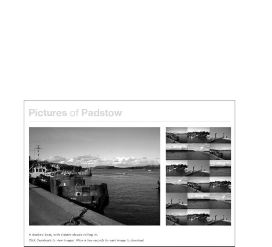
Chapter 10
364
#thumbnailsContainer li {
display: inline;
}
The final section in the style sheet is for images, and the three rules are as follows: img, which removes
borders from linked images; #imgPhoto, which defines the margin under the main image; and
#thumbnailsContainer img, which floats the images within the thumbnailsContainer div, ensuring there’s
no space between them.
The completed page is shown in the following image.
Creating an online storefront
This section will detail how I created a layout for an online storefront, providing the user with a quick and
simple means of accessing a number of product categories by way of a multicolumn drop-down menu. The
Photoshop file for the document is store-front-layout.psd, in the PSD mock-ups folder within the chapter
10 folder of the download files. The completed web page (along with associated files) is within the store-
website folder, within the chapter 10 folder. The following image shows the Photoshop mock-up of the
page.
www.freepdf-books.com
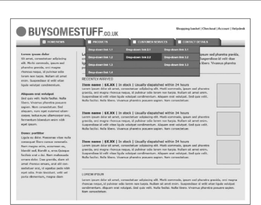
Putting Everything Together
365
About the design and required images
Prior to working on this design, I decided that it would be a semi-liquid layout, with a maximum width of
around 1000 pixels and a minimum width slightly larger than the width of the four tabs (which total 740
pixels). This explains the use of the blue gradient behind the tabs, providing a transition between the dark
orange stripe and the white masthead area when the site is displayed wider. Without this, the jolt between
these two elements would be too harsh. This also explains the lack of fixed-width elements elsewhere in
the design—images are floated right, and recently added items are displayed in a linear fashion. With a
liquid layout, displaying these three containers as columns wouldn’t be entirely straightforward (although it
could be done by replacing the images with divs that have background images large enough to cater for
changes in column width; however, at narrow widths, the images would be cropped).
In terms of imagery, the logo was exported, as was a portion of the gradient image (which was tiled
horizontally). Alternatively, this effect could be done using CSS3 gradients, as described earlier in this
book. Had I been working entirely from scratch on this layout, the tab states would also have been
included in and exported from the mock-up, but I took those directly from the drop-down exercise from
Chapter 5. The inline images in the document are all just a single gray square saved as temporary-
image.gif. Clearly, in an actual site, all of those images would show items for sale!
www.freepdf-books.com

Chapter 10
366
Putting the storefront together
When working on this layout, I made use of techniques shown in the following exercises:
“Creating a maximum-width layout” (Chapter 7)
“Placing columns within a wrapper” (Chapter 7)
“Manipulating two structural divs for liquid layouts” (Chapter 7)
“Creating a sidebar with faux-column backgrounds” (Chapter 7)
“Creating a boxout” (Chapter 7)
“Creating breadcrumb navigation” (Chapter 5)
“Creating a multicolumn drop-down menu” (Chapter 5)
Open index.html and examine the code. The head section imports a style sheet and attaches the
JavaScript file store.js. The JavaScript document is not going to be explored fully. The page’s structure is
shown in the following code block. The page is contained within a wrapper div. Within that, there is a
masthead that contains a logo div and a navContainer div (which itself contains a navigation div). After
the masthead is a content div that contains two columns, formed from div elements with id values of
sidebar and mainContent.
<div id="wrapper">
<div id="masthead">
<div id="logo"></div>
<div id="navContainer">
<div id="navigation"></div>
</div>
</div>
<div id="content">
<div id="sidebar"></div>
<div id="mainContent"></div>
</div>
</div>
In the masthead, prior to the logo div, is an unordered list with an id value of pullNav. This is used for the
pull-navigation at the top right of the design (including the Shopping basket, Checkout, Account, and
Helpdesk links).
<ul id="pullNav">
<li><a href="#">Shopping basket</a></li>
<li><a href="#">Checkout</a></li>
<li><a href="#">Account</a></li>
<li><a href="#">Helpdesk</a></li>
</ul>
The logo div contains a linked image (linked to # in this example, but in a live site, this would be linked to
the website’s home page). The navContainer contents are identical to those in Chapter 5’s “Creating a
multicolumn drop-down menu” exercise.
www.freepdf-books.com

Putting Everything Together
367
In the content area, the sidebar div contents are straightforward: level-two headings are twice followed by
unordered lists full of links (intended for links to top sellers and items coming soon), and a third heading is
followed by a paragraph of text. In the mainContent div, a level-one heading is followed by an introductory
paragraph and a horizontal rule. Next are the page’s recently arrived item highlights. These each take the
form of a containing div (with an id value of itemContainer), and each of these containers contains two
divs, itemImage (which houses an image) and itemDetails. Each itemDetails div contains an unordered
list for the name, price, stock notification, and dispatch details, along with a paragraph of descriptive text.
Two of the list items have class values, which are used as hooks for CSS styles.
<div class="itemContainer">
<div class="itemImage">
<a href="#"><img src="assets/temporary-image.gif" alt="[temporary
image]" width="100" height="100" /></a>
</div>
<div class="itemDetails">
<ul>
<li class="itemName"><a href="#">Item name</a></li>
<li class="itemCost">£X.XX</li>
<li>In stock</li>
<li>Usually dispatched within 24 hours</li>
</ul>
<p>Lorem ipsum dolor […]</p>
</div>
</div>
After the three-item container blocks is a second horizontal rule and then the main content area’s final
content: a level-two heading and a paragraph of text. Because each item container has a bottom border
style assigned in CSS, the second horizontal rule results in a double border. Because of its semantic
significance, it needs to remain, which leaves the choice of making it invisible by CSS or making the final
item container’s bottom border invisible, which is what’s been done. (If you look at the class attribute of
the third itemContainer div, it has a second value, lastItemContainer.)
Finally, after the two columns but inside the content div is a single footer paragraph containing a copyright
statement.
Styling the storefront
The store.css document contains the styles for this layout, arranged into sections, as noted earlier in the
chapter. The defaults section includes two rules. The first is the universal selector (*), used to remove
padding and margins (as per the “Zeroing margins and padding on all elements” section in Chapter 2). The
second is a body rule, which adds some top and bottom padding to the web page, ensuring that there’s
always some whitespace around the design.
In the structure section are a number of rules for styling the page’s structural elements. The #wrapper rule
provides both a maximum width and a minimum width for the site wrapper, along with centering the site via
the margin value.
www.freepdf-books.com

Chapter 10
368
#wrapper {
max-width: 1000px;
min-width: 760px;
margin: 0 auto;
}
The #masthead rule adds a large bottom border of 18 pixels to the masthead.
#masthead {
border-bottom: 18px solid #eeeeee;
}
At this point, the reasoning for the #masthead rule won’t be apparent, so I’ll explain. The design as a whole
has 18 pixels of padding around the content area. It also uses faux columns (as outlined in Chapter 7’s
“Creating a sidebar with faux-column backgrounds” exercise) to apply a vertical separator stripe between
the two columns (the sidebar and the main content area). However, from a design standpoint, it looks
much nicer if the column doesn’t start right from the top of the content area and there’s instead some
space above it. Because the background is applied to the content div, the background image by default
starts from the top of the content area. To avoid this, one option would be to add further markup that
“covers” a portion of the separator stripe (via a div with a background color, a fixed height, and a width
that spans the entire content div’s width). However, adding a border to the bottom of the masthead that
has the same color as the content area’s background has the same effect. Sure, this is kind of a hack, but
it doesn’t cause any problems from a structural standpoint, and no semantics are affected. If you do this
sort of thing, however, always remember where the various elements of the visual design lie in CSS, and
use comments to remind yourself, if you need them.
Anyway, onward. The #logo rule is much simpler, adding some padding at the bottom and left of the div
that houses the site logo. The reason for adding padding at the left is because otherwise the logo would
abut the browser window edge at a screen resolution of 800 x 600. The #content rule adds some
horizontal padding, along with the column-stripe.gif image as a vertically tiling background image (the
aforementioned faux-column technique). Note the horizontal position of 27%. This is designed to sit
roughly within the margin to the right of the sidebar div (see the following code block for the width and
margin-right values of the sidebar and mainContent divs). Logically, a value of 26% should be set,
because that would be the width of the sidebar, plus half of the margin-right value. However, the padding
value of #content messes with that calculation somewhat, because the two columns don’t span the entire
width that the content div background occupies, since that stretches to the edge of the padding, which is
18 pixels on each horizontal edge. A setting of 26% therefore results in the vertical stripe appearing too far
to the left; adding 1% results in a more pleasing position for the background.
#content {
padding: 0 18px;
background: #eeeeee url(assets/column-stripe.gif) 27% 0 repeat-y;
}
#sidebar {
float: left;
width: 24%;
margin-right: 4%;
}
#mainContent {
www.freepdf-books.com

Putting Everything Together
369
float: left;
width: 72%;
}
Next, the .itemContainer rule defines a border and margin at the bottom of the itemContainer divs. This
is overridden for the last of the three containers by the .lastItemContainer rule to avoid a double
underline (as explained earlier). The .itemContainer:after rule is essentially the same as the clearFix
rule (see the “Clearing floated content” exercise in Chapter 7), clearing floated content so that the
itemContainer divs don’t stack incorrectly. The .itemImage rule floats the divs containing the images
right, adding some bottom and left margins so that other content doesn’t abut them. Finally, the hr rule
defines settings for the horizontal rule (although note that Internet Explorer deals with hr margins
differently from other browsers, making them larger—this will be dealt with via conditional comments).
In the navigation section, the first three rules define colors for default, visited, and hover/focus link states,
while the next three style the pull-navigation. The #pullNav rule floats the pull-navigation list right and adds
some right padding, while #pullNav li sets the list items within to display inline, adding the vertical-
bar.gif image as a background and some padding. The ul#pullNav li:first-child rule then removes
the background from the first of the list items. The code is shown in the following block, and a full
explanation is shown in the “Creating breadcrumb navigation” exercise in Chapter 5.
#pullNav {
float: right;
padding-right: 10px;
}
#pullNav li {
display: inline;
background: url(assets/vertical-bar.gif) 0 55% no-repeat;
padding: 0 3px 0 8px;
}
ul#pullNav li:first-child {
background: none;
}
The remainder of the rules are copied from Chapter 5’s “Creating a multicolumn drop-down menu”
exercise, and the path values to the css-tab-rollover-image.gif have been amended accordingly to take
into account that the image is now being housed in an assets folder. There are two other changes as well,
to cater for the layout the menu is being used with. First, #navContainer has a horizontally tiling
background image (the gradient) applied; second, the #navigation ul rule has width and margin values to
center the list horizontally, in the same way the wrapper div was centered earlier.
#navContainer {
height: 30px;
border-bottom: 5px solid #ad3514;
background: url(assets/nav-background.gif) repeat-x;
}
#navigation ul {
list-style-type: none;
width: 740px;
margin: 0 auto;
}
www.freepdf-books.com

Chapter 10
370
Fonts and fixes for the storefront layout
In the fonts section of the CSS, the default font size is set using the html and body rules, as per the
“Setting text using percentages and ems” section in Chapter 3. The h1 rule defines the lead heading, and
I’ve done something that hasn’t been done elsewhere in the book: the heading is floated left. This enables
subsequent content to wrap around the heading and is something I rarely do, but for this design, it made
sense for the heading to be more of an introduction to the introductory paragraph itself, and displaying it
inline was the way to do that. The padding-right value ensures there’s some space before the
subsequent paragraph. The line-height setting was calculated after the values for p and h1+p were
defined, and the final figure was calculated in the same proportional manner as per h1+p (discussed later
in the section).
h1 {
float: left;
padding-right: 0.3em;
font: bold 1.4em/1.2571428em Arial, Helvetica, sans-serif;
}
The next three rules—h2, #sidebar h2 , and p—style the level-two headings, level-two headings in the
sidebar, and paragraphs, respectively. There’s nothing of note here, but refer to Chapter 3 if there’s
something you’re not familiar with. Next is the h1+p rule. This increases the font size of the paragraph that
immediately follows the level-one heading, giving it more prominence. Because the font-size value has
been increased, the line-height value has to be decreased proportionately in order for the text to all line
up correctly. The p and h1+p rules are shown in the following code block.
p {
font: 1.1em/1.6em Verdana, Arial, Helvetica, sans-serif;
margin-bottom: 1.6em;
}
h1+p {
font-size: 1.2em;
line-height: 1.4666666em;
}
The next rule—#content ul, #pullNav —sets the default font and bottom margin for the two types of
horizontally aligned list (the pull-navigation and the item details lists in the main content area). The three
subsequent rules—#content .itemDetails ul , .itemDetails li , and .itemDetails li:first-child —
style the lists in the itemContainer divs in pretty much the same way as for the pull-navigation. The main
difference is the white background applied to the list items, which was added during the build stage in
order to make the item details stand out more (see the detail shown next). This sort of thing happens all
the time when I create sites—mock-ups should always be more a guideline than something to slavishly
and exactly reproduce in the final site. If you can think of an improvement (and the client is happy with it, if
you’re working on a commercial project), then make changes!
www.freepdf-books.com

Putting Everything Together
371
The remaining rules in this section are all straightforward. The .itemName, .itemCost rule emboldens the
text in the list items with the class values of itemName and itemCost, thereby making the name and cost
stand out more. And p.footer styles the footer paragraph. In this rule, clear is set to both so that the
footer clears the two floated columns, and the text is aligned right. However, the footer also serves other
purposes of a more decorative nature. The background is set to white, an 18-pixel top border the same
color as the content background is defined, and negative horizontal margins of 18px are set, along with
padding of 18px. What this does is make the background of the footer white and span the entire width of
the content div, including its padding. The top border deals with the faux-column separator in the same
way as the bottom border on the masthead. A detail of the resulting footer is shown in the following image.
The last three rules are in the images section. The first, a img, removes borders from linked images. The
next, .itemImage img , adds a border to images within the itemImage divs, and .itemImage img:hover
changes the border color on the hover state, indicating that the link is clickable (seeing as all of the item
images are surrounded by links).
As mentioned earlier, this layout also has three style sheets linked via conditional comments to deal with
Internet Explorer issues. The first, ie-hacks.css, has line-height overrides for h1 and h1+p, which line up
the heading and paragraphs properly in Microsoft’s browser. A rounding problem causes a horizontal scroll
bar to appear at narrow browser window sizes, so the #mainContent rule’s width value is overridden with a
setting of 71.9%. Finally, the hr rule defines vertical margin values to make the horizontal rules in Internet
Explorer behave in a similar manner to other browsers.
The completed web page is shown in the following image, with the drop-down active.
www.freepdf-books.com

Chapter 10
372
Creating a business website
This section will detail how I created the third layout in this chapter, which is suitable for a business
website. This makes use of the two-tier navigation system devised in Chapter 5, and although the entire
design doesn’t adhere strictly to a baseline grid, I decided that it would be good for the content area to do
so to create a more pleasing rhythm for the content area of the page. The Photoshop file for the document
is sme-layout.psd, in the PSD mock-ups folder within the chapter 10 folder of the download files. The
completed web page (along with associated files) is within the sme-website folder, within the chapter 10
folder. The following image shows the Photoshop mock-up of the page.
www.freepdf-books.com
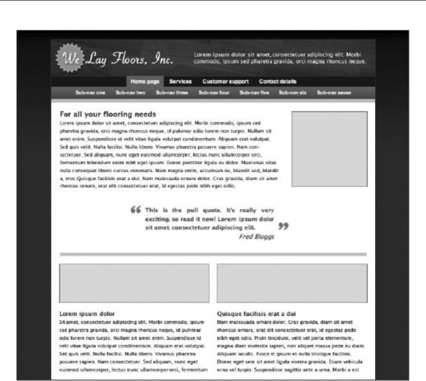
Putting Everything Together
373
About the design and required images
This design is clean and modern. The site is fixed-width, with a dark background color for the overall page;
a dark gradient from the top draws the attention toward the top of the page. The masthead contains the
company logo, along with a short sentence regarding what the organization offers. Below that is the
navigation, followed by the content area. The content area is simple: an introductory heading and
paragraph (with a floated image to the right) is followed by a client quote. Below that is a large horizontal
rule, which is followed by two columns.
Image-wise, the masthead background was exported (with the sentence turned off—that was added in
HTML text), as was the background gradient. Other images were sourced from elsewhere, with the
temporary image being the same one as in the previous layout example and the navigation images being
taken directly from the example created for Chapter 5.
www.freepdf-books.com

Chapter 10
374
Putting the business site together
When creating this layout, I made use of methods shown in the following exercises/sections:
“Creating a fixed-width wrapper” (Chapter 7)
“Manipulating two structural divs for fixed-width layouts” (Chapter 7)
“Placing columns within a wrapper” (Chapter 7)
“Creating a two-tier navigation menu” (Chapter 5)
“Using CSS to wrap text around images” (Chapter 4)
“Gradients” (Chapter 2, from the “Web page background ideas” section)
“Styling semantic markup: a traditional example with serif fonts and a baseline grid” (Chapter 3)
“Creating a boxout” (Chapter 7)
“Creating pull quotes in CSS” (Chapter 3)
Open index.html and examine the code. The head section imports a style sheet and uses conditional
comments to link to three IE-specific style sheets (one for Internet Explorer in general, one for Internet
Explorer 6 and older, and one for Internet Explorer versions older than 6). Note that the body element has
an id value—this dictates the active tab, as per the method shown in the “Creating a two-tier navigation
menu” exercise in Chapter 5.
The page’s structure is shown in the following code block. The page is contained within a wrapper div.
Within that, there is a masthead that contains a logo div and a navContainer div (which itself contains a
navigation div and a subNavigation div). After the masthead is a content div. Without content, the
skeleton structure looks like that shown in the following code block:
<div id="wrapper">
<div id="masthead">
<div id="logo"></div>
<div id="navContainer">
<div id="navigation"></div>
</div>
</div>
<div id="content"></div>
</div>
In the logo div is the paragraph about the company, and the contents of the navContainer div are identical
to those from “Creating a two-tier navigation menu” in Chapter 5.
The content div begins with a level-one heading, immediately followed by an image with a class value of
leadImage. The image is positioned here because it will be floated right, and you need to place floated
content before the content you want it to float left or right of (see the “Using CSS to wrap text around
images” section in Chapter 4). This is followed by a paragraph of text and then a blockquote element, as
per “Creating pull quotes in CSS” from Chapter 3.
www.freepdf-books.com

Putting Everything Together
375
Next, a horizontal rule provides a visual break from the introductory content, followed by two divs that
have class values of columnLeft and columnRight. As you’ve no doubt guessed, these are the two
columns; each contains an image, a level-two heading, and a paragraph. The final piece of code within the
content div is a footer paragraph.
Styling the business website
The sme.css document contains the styles for this layout, arranged into sections, as per the discussion
earlier in this chapter. The defaults section includes two rules. The first is the universal selector (*), used to
remove padding and margins (as per “Zeroing margins and padding on all elements” in Chapter 2). The
second is a body rule, which adds some vertical padding to the web page, ensuring there’s always some
space before and after the bordered content (having borders directly touch browser window edges makes
for a cluttered and visually unappealing design), and defines the page background—a dark gray color
(#333333) into which is blended the horizontally tiled background image page-background.gif.
body {
padding: 20px 0;
background: #333333 url(assets/page-background.gif) repeat-x;
}
In the structure section, the #wrapper rule defines a fixed width for the wrapper, horizontally centers it, and
defines a one-pixel border around its edges. The #masthead rule defines the thick, light gray border under
the masthead, and #logo sets the masthead-background. jpg image as a background for the logo div,
along with setting the height of the div (which is the same height as the image) and adding a one-pixel
bottom margin (otherwise the top border of the navigation items doesn’t show).
Next, the #content rule sets 18 pixels of padding around the content area’s contents and defines the
background color as white (otherwise the dark gray page background would show through). There’s also a
commented-out rule for the baseline grid image, added for the same reason as in the “Pictures from
Padstow” example (see the first paragraph of the “Styling the gallery” section, earlier in this chapter). Note
that 18 pixels is the target baseline grid line height for this design.
Next, the hr rule styles the horizontal rule, making it light gray and ensuring that it takes up a couple of
“rows” in the grid (0.7em plus 2.9em is 3.6em, which because of the standard text sizing used throughout
this book equates by default to 36px—twice the target line height of 18px).
hr {
height: 0.7em;
margin-bottom: 2.9em;
background-color: #cccccc;
color: #cccccc;
border: none;
}
The final two rules in the section, .columnLeft, .columnRight (.columnLeft, .columnRight is a grouped
selector, not two separate rules) and .columnLeft, float the two column divs, set fixed widths for them
(equally, since this property is placed in the grouped selector), and define a margin-right value for the left
column so that there’s space between the two columns.
www.freepdf-books.com

Chapter 10
376
The next section, links and navigation, is copied wholesale from Chapter 5’s “Creating a two-tier navigation
menu” exercise. There are no changes. Nothing to see here . . . move along.
Next is the fonts section. This section is all pretty straightforward, assuming you’ve read and digested the
“Styling semantic markup: A traditional example with serif fonts and a baseline grid” exercise in Chapter 3.
As usual, the html and body rules reset the font size, as per the “Setting text using percentages and ems”
section in Chapter 3. The body rule also sets the preferred font to a Lucida variant (eventually falling back
to Arial and Helvetica). The h1, h2, and p rules then set font-size, line-height, and margin-bottom values
for their respective elements, with the line-height values being calculated by dividing 1.8 by the font-
size value. (If you’re going “wha…?” the “Styling semantic markup: A traditional example with serif fonts
and a baseline grid” exercise in Chapter 3 has all the answers.)
Override rules follow, with specific settings for the masthead paragraph defined via -#masthead p; the color
is set to white, and padding is used to position the block of text.
#masthead p {
color: #ffffff;
font-size: 1.2em;
padding: 24px 20px 0 320px;
line-height: 1.3em;
}
The p.footer rule is used to clear any floated content; the rule also aligns the text right and adds some top
padding to shift it farther away from other page content (ensuring the footer isn’t a distraction). The various
blockquote and cite rules are variants on the method shown in Chapter 3’s “Creating pull quotes in CSS”
exercise. Again, somewhat complex line-height and margin values are used to take into account the
baseline grid.
Finally, the images section has four rules. The first, a im g, removes borders from linked images. Next,
#content img applies a one-pixel border to images within the content div. After that, the img.leadImage
rule floats the image after the main heading right, adding some margins at the bottom and left edges to
ensure there’s some whitespace between the image and other content. And then .columnLeft img,
.columnRight img sets the images within the columns to display as a block, which removes the default
overhang that browsers otherwise apply to images (as they do to text). The margin-bottom value ensures
subsequent content is aligned with the baseline grid. Note that the height of the images, as defined in
HTML, is 70 pixels. Add two pixels from the borders, and you have 72, a multiple of 18, ensuring that the
actual images adhere to the baseline grid, too—at least when browsers are at their default settings.
.columnLeft img, .columnRight img {
display: block;
margin-bottom: 1.8em;
}
The completed layout is shown in the following screenshot.
www.freepdf-books.com
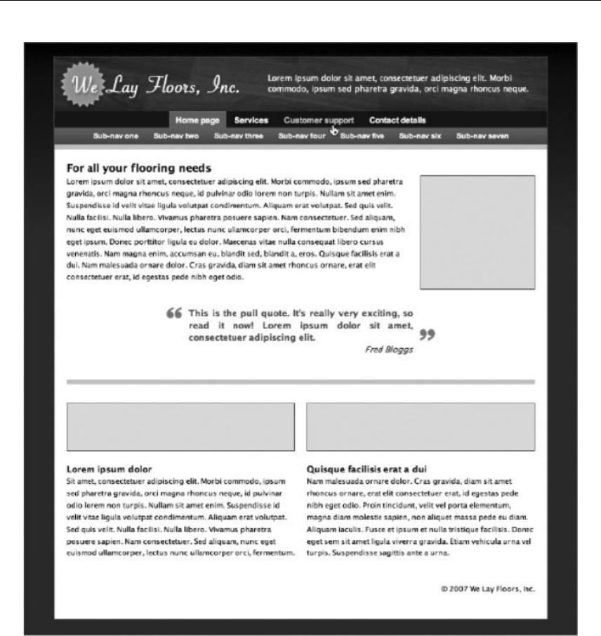
Putting Everything Together
377
Creating a blog layout
This section will detail how I created the fourth layout in this chapter, which is suitable for a blog layout.
The emphasis here will be to create a mobile-first, responsive, adaptive experience. For this to happen, we
will see how to structure HTML for an adaptive site so that flexibility is possible. We’ll also see how to write
CSS that defines shared styles first, builds up styles for larger screens with media queries, and uses
www.freepdf-books.com
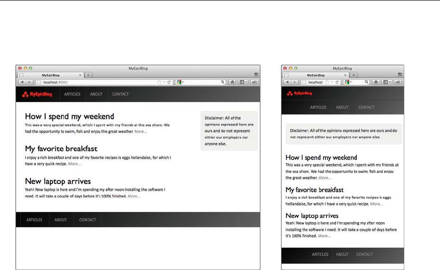
Chapter 10
378
relative units. The completed web page (along with associated files) is within the blog-website folder,
within the chapter 10 folder. The following image shows the mock-up of the page.
About responsive design and semantic markup
Responsive web design gives web designers the tools to create layouts that respond to any screen size.
Designers can use fluid grids, flexible images, and media queries to get the layout looking great regardless
of the size of the device's screen dimensions. Since mobile context is more than just screen size, it is also
important to focus on what content is essential and how to present that content as quickly as possible,
delivering a fast-loading, optimized experience.
There are several semantic elements in HTML5 such as article, aside, figure, footer, header, nav, and
section, and because of the intuitive naming, you can probably guess what most of these elements do.
Here’s the wireframe of a layout, both for the desktop and for mobile, that illustrates how these elements
will be used:
www.freepdf-books.com
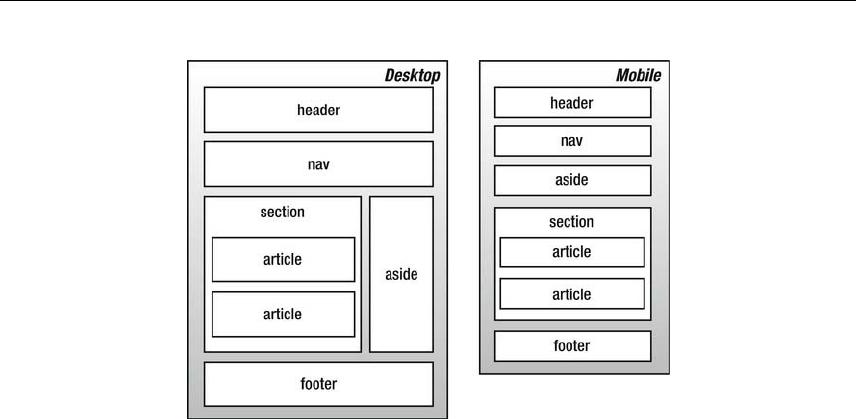
Putting Everything Together
379
Media Queries
Beyond the media attribute, with CSS3 media queries extend the functionality of media types by allowing
more precise labeling of style sheets. A media query consists of a media type and zero or more
expressions that check for the conditions of particular media features. By using media queries,
presentations can be tailored to a specific range of output devices without changing the content itself. A
media query is a logical expression that is either true or false. A media query is true if the media type of
the media query matches the media type of the device where the user agent is running and all expressions
in the media query are true.
Here are a few examples:
<link rel="stylesheet" media="screen and (color)" href="example.css" />
The previous example applies to devices of a certain media type (screen) with certain feature (it must be a
color screen).
A shorthand syntax is offered for media queries that apply to all media types; the keyword all can be left
out (along with the trailing and). In other words, the following are identical:
@media (orientation: portrait) { … }
@media all and (orientation: portrait) { … }
This way, designers and developers can create more complex queries that map to their specific needs.
@media all and (max-width: 698px) and (min-width: 520px), (min-width: 1150px) {
body {
background: #ccc;
}
}
There is a large list of media features, which includes the following:
width and device-width
www.freepdf-books.com

Chapter 10
380
height and device-height
orientation
aspect-ratio and device-aspect-ratio
color and color-index
monochrome (if not a monochrome device, equals 0)
resolution
scan (describes the scanning process of tv output devices)
grid (specifies whether the output device is grid or bitmap)
Putting the blog together
Semantic markup is extremely portable and can be accessed by many mobile devices. Browsers offer
users a viewport (a window or other viewing area on the screen) through which users see a document, and
they may change the document’s layout when the viewport is resized. When the viewport is smaller than
the area of the canvas on which the document is rendered, browsers usually offer some sort of scrolling
mechanism.
Mobile Safari and other mobile browsers set a larger viewport, which allows for better viewing of non-
mobile-optimized sites. Users can then pinch to zoom in on the content they want. Because we’re
optimizing our experience for mobile browsers, we’ll use the viewport meta tag to set the screen width to
the device width.
<meta name="viewport" content="width=device-width, initial-scale=1" />
The width property controls the size of the viewport. It can be set to a specific number of pixels like
width=600 or to the special value device-width value that is the width of the screen in CSS pixels at a scale
of 100%. The initial-scale property controls the zoom level when the page is first loaded.
Styling the blog
If you open index.html, you’ll see that the page includes two different CSS files: style.css for basic styles
on screens less than 40.5em and enhanced.css for screens larger than 40.5em.
<link rel="stylesheet" type="text/css" href="style.css" media="screen, handheld" />
<link rel="stylesheet" type="text/css" href="enhanced.css" media="screen and (min-width:
40.5em)" />
As described in Chapter 3 “Working with type,” we’re using the em units to maintain consistency across
zoom levels.
Starting with baseline shared styles and introducing more advanced layout rules when screen size permits
keeps code simpler, smaller, and more maintainable. Here’s just a quick example to demonstrate this
point.
www.freepdf-books.com

Putting Everything Together
381
Our (mobile-first) strategy will be to define first the mobile-specific styles in style.css and then define media
queries in enhanced.css that take care of the desktop.
Here’s an example:
/* Default (mobile) style in style.css */
#some-id {
/* Styles for mobile */
}
/* Desktop style in enhanced.css */
@media screen and (min-width: 40.5em) {
#some-id {
/* Styles for desktop */
}
For the styling of the header, we use some diagonal gradient, which also adapts well on different screen
sizes.
/* Old browsers */
background: rgb(0, 0, 0);
/* FF3.6+ */
background: -moz-linear-gradient(-45deg, rgba(0, 0, 0, 1) 0%, rgba(96, 96, 96, 1) 100%);
/*Chrome,Safari4+ */
background: -webkit-gradient(linear, left top, right bottom, color-stop(0%, rgba(0, 0, 0, 1)),
color-stop(100%, rgba(96, 96, 96, 1)));
/* Chrome10+,Safari5.1+ */
background: -webkit-linear-gradient(-45deg, rgba(0, 0, 0, 1) 0%, rgba(96, 96, 96, 1) 100%);
/* Opera 11.10+ */
background: -o-linear-gradient(-45deg, rgba(0, 0, 0, 1) 0%, rgba(96, 96, 96, 1) 100%);
/* IE10+ */
background: -ms-linear-gradient(-45deg, rgba(0, 0, 0, 1) 0%, rgba(96, 96, 96, 1) 100%);
/* W3C */
background: linear-gradient(-45deg, rgba(0, 0, 0, 1) 0%, rgba(96, 96, 96, 1) 100%);
/* IE6-9 fallback on horizontal gradient */
filter: progid:DXImageTransform.Microsoft.gradient(startColorstr = '#000000', endColorstr =
'#606060', GradientType = 1);
We will be setting any images to have rounded corners with 0.5em radius.
.content img {
-webkit-border-radius: 0.5em;
-moz-border-radius: 0.5em;
border-radius: 0.5em;
}
Since this is a mobile-first site, we will avoid using @font-face rendering since there are some problems
with it in the mobile context, such as blocking the download of other resources and delaying the UI
rendering. There are a few tricks to optimize @font-face for mobile if we need to use it, like data url and
inlining the font in base64.
www.freepdf-books.com
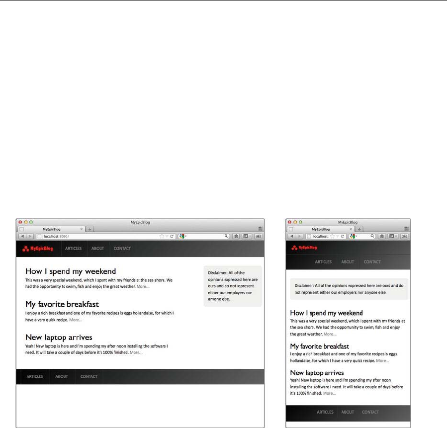
Chapter 10
382
@font-face {
font-family: "My Epic Font";
src: url("data:font/opentype;base64,[base64-encoded font here]");
}
Instead, we’ll be using transitions to create a subtle hover effect for the navigation links.
.nav li a {
display: block;
padding: 1em;
border-left: 1px solid #333;
-webkit-transition: all 0.3s ease-out;
-moz-transition: all 0.3s ease-out;
transition: all 0.3s ease-out;
}
The completed layout is shown in the following screenshot.
Working with style sheets for print
This section briefly looks at using CSS to create a printable version of a website layout. Printing from the
Web is still a bit of a hit-and-miss affair, and even using CSS doesn’t solve every problem, although
browser support for print-oriented CSS is improving. If you omit a print style sheet, though, chances are
the output will be significantly worse. Browsers may have varying opinions on how to present both fixed
and liquid layouts, and you may end up with bizarre results. Most likely, however, if you omit a print style
sheet, all of the elements on your web page will just be printed in a linear fashion, using system defaults
for the fonts—not nice.
s
www.freepdf-books.com

Putting Everything Together
383
In the old days (and, frankly, in the not-so-old days, since the practice somehow survives), designers often
worked on so-called printer-friendly sites, run in parallel with the main site. However, if you’re using CSS
layouts, it’s possible to create a style sheet specifically for print, which you can use to dictate exactly which
elements on the page you want to print, which you want to omit, and how you want to style those that can
be printed.
As mentioned earlier in the book, a print style sheet is attached to web pages using the following HTML:
<link rel="stylesheet" type="text/css"media="print"
href="print-style-sheet.css" />
The media attribute value of print restricts the CSS solely to print, and within the print style sheet, you
define styles specifically for print, such as different fonts and margins. In the example in the download files,
I’ve used a version of the business website, which you can access via the sme-website-print folder in the
chapter 10 folder. The print style sheet is sme-print.css, and if you compare it to the main style sheet,
you’ll see that it’s much simpler and massively honed down.
The defaults section houses a single body rule, defining padding (to take into account varying printer
margins, 5% is a good horizontal padding to use), the background color (white is really the only choice you
should use, and it’s usually the default, but setting it explicitly ensures this is the case), the text color (black
is best for contrast when printing), and the font. There’s absolutely no point in trying to ape your on-screen
design and typography in print; instead, use values that enhance the printed version. In the example’s body
rule (shown in the following code block), serif fonts are defined for font-family, because serifs are easier
to read in print. Note that you’re not only restricted to web-safe fonts at this point either—you can define
choices based on fonts that come with the default install of Windows and Mac OS, such as Baskerville
(Mac) and Palatino Linotype (Windows), prior to Times New Roman and Times.
body {
padding: 0 5%;
background: #ffffff;
font-family: Baskerville, "Palatino Linotype", "Times New Roman",
"Times", serif;
line-height: 16pt;
}
In the structure section, the #masthead declaration sets display to none. That’s because this area of the
page is of no use for printed output—you simply don’t need website masthead and navigation offline. (This
is, of course, a generalization, and in rare cases this may not be applicable; however, in the vast, vast
majority of websites I’ve created, the printed version has not required the masthead and navigation links.)
Note that if other areas aren’t required, just use a grouped selector instead of this rule with a lone selector,
as shown in the following code block (which isn’t in the example CSS):
#element1, #element2, .class1, .class2 {/* these items won't be
printed */
display: none;
}
Because pixel values don’t tend to translate to print well, some settings may need to be redefined. An
example in this case is the two-column section of the page. The widths and margins were initially defined
www.freepdf-books.com

Chapter 10
384
in pixels, but in the print CSS, it makes more sense to define these values in percentages. (Note that the
9.99% value is there in case of rounding errors.)
.columnLeft, .columnRight {
float: left;
width: 45%;
}
.columnLeft {
margin-right: 9.99%;
}
In the links and navigation section, only one rule remains. While links are of no real use offline, it’s still a
good idea to make it apparent which text-based content was originally a link in order for people to be able
to find said links should they want to, or for reasons of context. Just ensuring the default underline is in
place should do, and that can be done via the following rule:
a:link, a:visited {
text-decoration: underline;
}
For browsers other than Internet Explorer (although JavaScript workarounds exist for IE compatibility—for
example, see www.grafx.com.au/dik//printLinkURLs.html), you can also provide the href values
alongside any printed links by using the following code:
a:link:after, a:visited:after {
content: " (" attr(href) ") ";
font-size: 90%;
}
In terms of fonts, keeping things simple makes sense. It’s also worth noting that because you’re working
with print, sizes in points are more useful than sizes in pixels. (Note that in the body rule, the line-height
value was 16pt, not 16px or 1.6em.) Therefore, the font-size values all reflect that. Note in the p.footer
rule that floated content still needs clearing in the print style sheets.
The final section, images, is not changed much. The images within the columns were deemed superfluous,
and so display has been set to none for .columnLeft img, .columnRight img. Elsewhere, the margins on
the floated image have been set to values in centimeters (cm), and the border value for #content img is in
millimeters (mm), since we’re working in print. (Values in pixels are permitted, but they tend to be less
accurate when working with print style sheets—for example, if elements have a one-pixel border, they may
not all be even when printed.)
One final thing that’s useful to know is how to create print-only content. In this example, removing the
masthead from the print output has also removed the site’s corporate ID. A cunning way to bring this back
is to create a black-and-white version of the company logo and add that as the first item on the web page,
within a div that has an id value of printLogo.
<div id="printLogo">
<img src="assets/we-lay-floors-bw-logo.gif" alt="Web Lay Floors,
Inc. logo" width="267" height="70" />
</div>
www.freepdf-books.com

Putting Everything Together
385
Then, in the main style sheet, create a rule that displays this element offscreen when the page is loaded in
a browser window.
#printLogo {
position: absolute;
left: -1000px;
}
The content will then show up in print but not online. Note, however, that you should be mindful to not hide
weighty images in this manner; otherwise, you’ll compromise download speeds for anyone using your
website in a browser, only for making things slightly better for those printing the site. A small, optimized
GIF should be sufficient.
If there’s other content you want to hide in this manner, you can also create a generic printOnly class to
apply to elements you want hidden in the browser but visible in print. The following CSS rule applied to
your screen style sheet would be sufficient for doing this:
.printOnly {
display: none;
}
An example of how the print style sheet looks is shown in the following screenshot.
www.freepdf-books.com

Chapter 10
386
An example of how the print style sheet looks is shown in the following screenshot.
Note that you can take things further in terms of layout, but it’s best to keep it simple. Also, ensure that you
use the Print Preview functions of your browser test suite to thoroughly test your print style sheet output
and ensure that there are no nasty surprises for visitors to your site. Ultimately, it’s worth the extra
hassle—just amending the fonts and page margins and removing images and page areas that are
irrelevant to the printed version of the site not only improves your users’ experience but also makes the
site seem more professional.
www.freepdf-books.com
387
Appendix A
An HTML5 reference
This appendix details, in alphabetical order, generally supported elements and associated attributes. This
is not intended as an exhaustive guide; rather, its aim is to list those elements important and relevant to
current web design. Archaic deprecated elements such as font and layer are therefore ignored, as well
as many attributes once associated with the body element, but the appendix includes still occasionally
useful deprecated and nonstandard elements and attributes such as embed and target.
Note that in the following pages, various styles are used for the attribute names and
values. For the sake of clarity, quote marks have been omitted. Where you see the likes
of id=name in this reference section, the final output should be id="name".
Standard attributes
Standard attributes are common to many elements. For brevity, they are listed in full here rather than in
the HTML5 element table later in the appendix. For each element in the forthcoming table, I simply state
which groups of standard attributes are applicable to the element.
www.freepdf-books.com
Appendix A
388
Core attributes
Attribute Description
class=classname Specifies a CSS class to define the element’s visual
appearance.
id=name Defines a unique reference ID for the element.
style=style Specifies an inline CSS style for an element.
title=string Specifies the element’s title. Often used with links to
provide a tooltip expanding on the link’s purpose or the
target’s content.
Not valid in these elements: base, head, html, meta, param, script, style, and title.
Keyboard attributes
Attribute Description
accesskey=character Defines a keyboard shortcut to access an element.
The shortcut must be a single character. Most
commonly used with navigation links.
See also Chapter 5’s “Using accesskey and tabindex”
section.
tabindex=number Defines the tab order of an element. Most commonly
used with form input elements. Setting the value to 0
excludes the element from the tabbing order. The
maximum value allowed is 32767. The tabindex
values on a page needn’t be consecutive (for
instance, you could use multiples of 10 to leave space
for later additions).
See also Chapter 5’s “Using accesskey and tabindex”
section.
www.freepdf-books.com
An HTML5 reference
389
Language attributes
Attribute Description
dir=dir Specifies the text rendering direction: left-to-right
(ltr, the default) or right-to-left (rtl).
lang Specifies the language for the tag’s contents, using
two-letter primary ISO639 codes and optional dialect
codes. Included for backward compatibility with
HTML.
Examples:
lang="en" (English)
lang="en-US" (US English)
ISO639 codes include the following: ar (Arabic), zh
(Chinese), nl (Dutch), fr (French), de (German), el
(Greek), he (Hebrew), it (Italian), ja (Japanese), pt
(Portuguese), ru (Russian), sa (Sanskrit), es
(Spanish), and ur (Urdu).
Not valid in these elements: base, br, frame, frameset, hr, iframe, param, and script.
Event attributes
An event attribute is an attribute that triggers when something happens on a web page.
Core events
Attribute Description
onclick=script Specifies a script to be run when the user clicks the
element’s content area
ondblclick=script Specifies a script to be run when the user double-clicks
the element’s content area
onkeydown=script Specifies a script to be run when the user presses a key
while the element’s content area is focused
onkeypress=script Specifies a script to be run when the user presses and
releases a key while the element’s content area is focused
onkeyup=script Specifies a script to be run when the user releases a
www.freepdf-books.com

Appendix A
390
pressed key while the element’s content area is focused
onmousedown=script Specifies a script to be run when the user presses down
the mouse button while the cursor is over the element’s
content area
onmousemove=script Specifies a script to be run when the user moves the
mouse cursor in the element’s content area
onmouseout=script Specifies a script to be run when the user moves the
mouse cursor off the element’s content area
onmouseover=script Specifies a script to be run when the user moves the
mouse cursor onto the element’s content area
onmouseup=script Specifies a script to be run when the user releases the
mouse button on the element’s content area
Not valid in these elements: base, bdo, br, frame, frameset, head, html, iframe, meta,
param, script, style, and title.
Form element events
These events are generally restricted to form elements, although some other elements accept some of
them.
Attribute Description
onblur=script Specifies a script to be run when the element loses focus
oninput=script Specifies a script to be run when an element gets user
input
onchange=script Specifies a script to be run when the element changes
onfocus=script Specifies a script to be run when the element is focused
oninvalid=script Specifies a script to be run when an element is invalid
onforminput=script Specifies a script to be run when a form gets user input
onformchange=script Specifies a script to be run when a form changes
oncontextmenu=script Specifies a script to be run when a context menu is
triggered
www.freepdf-books.com
An HTML5 reference
391
onselect=script Specifies a script to be run when the element is selected
onsubmit=script Specifies a script to be run when a form is submitted
Window events
These events are valid only in the following elements: body and frameset.
Attribute Description
onload=script Specifies a script to be run when the document loads
onunload=script Specifies a script to be run when the document unloads
onfocus=script Specifies a script to be run when the window gets focus
onafterprint=script Specifies a script to be run after the document is printed
onbeforeprint=script Specifies a script to be run before the document is printed
onbeforeunload=script Specifies a script to be run before the document loads
onerror=script Specifies a script to be run when an error occur
onhaschange=script Specifies a script to be run when the document has
changed
onmessage=script Specifies a script to be run when the message is triggered
onoffline=script Specifies a script to be run when the document goes
offline
ononline=script Specifies a script to be run when the document comes
online
onpagehide=script Specifies a script to be run when the window is hidden
onpageshow=script Specifies a script to be run when the window becomes
visible
onpopstate=script Specifies a script to be run when the window's history
changes
onredo=script Specifies a script to be run when the document performs a
redo
www.freepdf-books.com
Appendix A
392
onresize=script Specifies a script to be run when the window is resized
onstorage=script Specifies a script to be run when a web storage area is
updated
onundo=script Specifies a script to be run when the document performs
an undo
onunload=script Specifies a script to be run when the document performs
an undo
HTML5 elements and attributes
The following pages list HTML5 elements, associated attributes, and descriptions for all.
Element Attribute Description Standard attributes
<!-- … --> Defines a comment.
See also Chapter 2’s
“Commenting your
work” section.
No attributes
<!DOCTYPE
>
(required)
Specifies a DTD for the
document.
See also Chapter 2’s,
“DOCTYPE declarations
explained” section.
No attributes
<a> Defines an anchor. Can
link to another
document by using the
href attribute or can
create an anchor within
a document by using the
id or name attributes.
Despite the number of
available attributes,
some aren’t well
supported. Generally,
href, name, title, and
target are commonly
used, along with class
and id for use as CSS o
r
scripting hooks.
See also Chapter 5’s
“Creating and styling
Core attributes, keyboard attributes,
language attributes
Core events, onblur, onfocus
www.freepdf-books.com
An HTML5 reference
393
web page links” section.
href=URL Defines the link target.
hreflang=language_c
ode Specifies the language
of the linked document
media=media_query Specifies what
media/device the linked
document is optimized
for
rel=relationship Specifies the
relationship from the
current document to the
target document.
Common values include
next, prev, parent, child,
index, toc, and glossary.
Also used within link
elements to define the
relationship of linked
CSS documents (e.g., to
establish default and
alternative style sheets).
target=_blank|
_parent|_self|_top|[
name]
Defines where the targe
t
URL opens. Primarily of
use with frames, stating
which frame a target
should open in.
Commonly used in web
pages to open external
links in a new window—
a practice that should be
avoided, because it
breaks the browser
history path.
type=MIME type Specifies the MIME type
of the target. For
instance, if linking to a
plain-text file, you might
use the following:<a
href="document.txt" Â
type="text/plain">.
<abbr> Identifies the element
content as an Core attributes, language attributes
www.freepdf-books.com
Appendix A
394
abbreviation. This can
be useful for nonvisual
web browsers. For
example:<abbr
title="Doctor">Dr.</abbr
>
See also Chapter 3’s
“Acronyms and
abbreviations” section.
Core events
<address> Used to define
addresses, signatures,
or document authors.
Typically rendered in
italics, with a line break
above and below (but
no additional space).
See also Chapter 8’s
“Contact details
structure redux” section.
Core attributes, -language attributes
Core events
<area> Defines a clickable area
within a client-side
image map. Should be
nested within a map
element (see separate
<map> entry).
See also Chapter 5’s
“Image maps” section.
Core attributes, keyboard attributes,
language attributes
Core events, onblur, onfocus
alt=string•(re
quired) Provides
alternate text
for nonvisual
browsers. This
attribute is
required.
coords=coordinate
s list Specifies coordinates
for the clickable image
map area. Values are
defined as a comma-
separated list. The
number of values
depends on the shape
attribute value. For rect,
four values are required,
defining the coordinates
on the x- and y-axes of
the top-left and bottom-
www.freepdf-books.com

An HTML5 reference
395
right corners. For circle,
three values are
required, with the first
two defining the x and y
coordinates of the
hotspot center and the
third defining the circle’s
radius.For poly, each
pair of x and y values
defines a point of the
hotspot.
href=URL The link target.
hreflang=langu
age_code Specifies the language
of the target URL.
media=media_qu
ery Specifies what
media/device the target
URL is optimized for.
rel=alternate|
author|
bookmark| help|
license| next|
nofollow|
noreferrer|
prefetch| prev|
search| tag
Specifies the
relationship between the
current document and
the target URL.
shape=rect|circle|p
oly|default Defines the shape of the
clickable region.
target=_blank|
_parent|_self|_top|[
name]
(deprecated)
Defines where the targe
t
URL opens.
type=mime_type Specifies the MIME type
of the target URL
<article> Defines an article. Core attributes, language attributes
Core events
<aside> Defines content aside
from the page content. Core attributes, language attributes
Core events
www.freepdf-books.com
Appendix A
396
<audio> Defines sound content. Core attributes, language attributes
Core events
autoplay=autoplay Specifies that the audio
will start playing as soon
as it is ready.
controls=controls Specifies that audio
controls should be
displayed (such as a
play/pause button).
loop=loop Specifies that the audio
will start over again,
every time it is finished.
preload=auto|
metadata| none Specifies if and how the
author thinks the audio
should be loaded when
the page loads.
src=URL Specifies the URL of the
audio file.
<b> Renders text as bold.
This element is a
physical style,
which defines what
the content looks
like (presentation
only), rather than a
logical style, which
defines what the
content is (which is
beneficial for
technologies like
screen readers). It’s
recommended to use
the logical element
<strong></strong> in
place of <b></b>
(see separate
<strong> entry).
See also Chapter 3’s
“Styles for emphasis
(bold and italic)”
section.
Core attributes, language
attributes Core events
www.freepdf-books.com
An HTML5 reference
397
<base /> Specifies a base URL
for relative URLs on the
web page.
href=URL(required) Defines the base URL to
use. This attribute is
required.
target=_blank|
_parent|_self|_t
op|[name]
(deprecated)
Defines where to open
page links. Can be
overridden by inline
target attributes. Cannot
be used in XHTML
Strict.
<bdi> Isolates a part of text
that might be formatted
in a different direction
from other text outside
it.
Core attributes, language attributes
<bdo> Overrides the default
text direction. Core attributes, language attributes
dir=ltr|rtl(required) Defines text direction as
left to right (ltr) or right
to left (rtl). This
attribute is required.
<blockquote> Defines a lengthy
quotation. To validate as
XHTML Strict, enclosed
content must be set
within a block-level
element (such as
<p></p>).Although it is
common for web
designers to use this
element to indent
content, the W3C
strongly recommends
using CSS for such
things.
See also Chapter 3’s
“Block quotes, quote
citations, and
definitions” and
“Creating drop caps and
pull quotes using CSS”
Core attributes, language attributes
Core events
www.freepdf-books.com
Appendix A
398
sections.
cite=URL Defines the online
location of quoted
material.
<body>(requir
ed)
Defines the document’s
body and contains the
document’s contents.
Core attributes, language attributes
Core events, onload, onunload
<br /> Inserts a single line
break. Core attributes
<button> Defines a push button
element within a form.
Works similarly to
buttons created with the
input element but offers
greater rendering scope.
This is because all
content becomes the
content of the button,
enabling the creation of
buttons with text and
images. For
example:<button
type="submit">Order
now! <img src="go.gif"
alt="Go" /></button>.
Core attributes, keyboard attributes,
language attributes
Core events, onblur, onfocus
disabled=disabled Disables the button.
disabled is the only
possible value of this
attribute.
name=name Defines the button’s
name.
type=button|reset|s
ubmit Identifies the button’s
type.
value=value Specifies an initial value
for the button
autofocus=autofocus Specifies that a button
should automatically get
focus when the page
loads.
www.freepdf-books.com
An HTML5 reference
399
form=form_id Specifies one or more
forms the button
belongs to.
formaction=URL Specifies where to send
the form data when a
form is submitted. Only
for type="submit".
formenctype=
application/x-www-
form-urlencoded|
multipart/form-data|
text/plain
Specifies how form data
should be encoded
before sending it to a
server. Only for
type="submit".
formmethod=get|
post Specifies how to send
the form data (which
HTTP method to use).
Only for type="submit".
formnovalidate=form
novalidate Specifies that the form
data should not be
validated on
submission. Only for
type="submit".
formtarget=blan
k|
_self| _parent|
_top| framename
Specifies where to
display the response
after submitting the
form. Only for
type="submit".
<canvas> Used to draw graphics,
on the fly, via scripting
(usually JavaScript).
Core attributes, language attributes
Core events
height=pixels Specifies the height of
the canvas.
width=pixels Specifies the width of
the canvas.
<caption> Defines a caption for a
table. Seldom used, but
recommended because
it enables you to
associate a table’s title
Core attributes, language attributes
Core events
www.freepdf-books.com
Appendix A
400
with its contents.
Omitting the caption
may mean the table’s
contents are
meaningless out of
context.
See also Chapter 6’s
“Captions and
summaries” section.
<cite> Defines content as a
citation. Usually
rendered in italics.
See also Chapter 3’s
“Block quotes, quote
citations, and
definitions” section.
Core attributes, language attributes
Core events
<code> Defines content as
computer code sample
text. Usually rendered in
a monospace font.
See also Chapter 3’s
“Logical styles for
programming-oriented
content” section and the
“Displaying blocks of
code online” exercise.
Core attributes, language attributes
Core events
<col> Defines properties for a
column or group of
columns within a
colgroup. Attributes
defined within a col
element override those
set in the containing
colgroup element. col is
an empty element that
contains attributes only.
Core attributes, language attributes
Core events
span=n Defines how many
successive columns are
affected by the col tag.
Use only when the
surrounding colgroup
element does not
specify the number of
columns.
www.freepdf-books.com
An HTML5 reference
401
<colgroup> Defines a column group
within a table, enabling
you to define formatting
for the columns within.
See the <col /> entry for
examples.
See also Chapter 6’s
“Scope and headers”
section.
Core attributes, language attributes
Core events
span=number Defines how many
columns the colgroup
should span. Do not use
if any of the col tags
within the colgroup also
use span, because a
colgroup definition will
be ignored in favor of
span attributes defined
within the col elements.
<command> Defines a command
button that a user can
invoke.
Core attributes, language attributes
Core events
checked=checked Specifies that the
command should be
checked when the page
loads. Only for
type="radio" or
type="checkbox".
disabled=disabled Specifies that the
command should be
disabled.
icon=URL Specifies an image that
represents the
command.
label=text Required. Specifies the
name of the command,
as shown to the user.
radiogroup=groupna
me Specifies the name of
the group of commands
that will be toggled
when the command
itself is toggled. Only for
www.freepdf-books.com
Appendix A
402
type="radio".
type=checkbox|
command| radio
Specifies the type of
command.
<datalist> Specifies a list of
predefined options for
input controls.
Core attributes, language attributes
Core events
<dd> Defines a definition
description within a
definition list. See the
<dl> entry for an
example.
See also Chapter 3’s
“Definition lists” section
and the “Displaying
blocks of code online”
exercise.
Core attributes, language attributes
Core events
<del> Indicates deleted text.
Usually appears in
strikethrough format.
See also Chapter 3’s
“Elements for inserted
and deleted text”
section.
Core attributes, language attributes
Core events
cite=URL Defines the URL of a
document that explains
why the text was
deleted.
datetime=date Defines the date and
time that the text was
amended. Various
formats are possible,
including YYYY-MM-DD
and YYYY-MM-
DDThh:mm:ssTZD
(where TZD is the time
zone designator). See
www.w3.org/
TR/1998/NOTE-
datetime-19980827 for
more date and time
formatting information.
<details> Defines additional Core attributes, language attributes
www.freepdf-books.com
An HTML5 reference
403
details that the user can
view or hide. Core events
open=open Specifies that the details
should be visible (open)
to the user.
<dfn> Defines enclosed
content as the defining
instance of a term.
Usually rendered in
italics.
See also Chapter 3’s
“Block quotes, quote
citations, and
definitions” section.
Core attributes, language attributes
Core events
<div> Defines a division within
a web page. Perhaps
one of the most
versatile but least
understood elements.
Used in combination
with an id or class, the
div tag element allows
sections of a page to be
individually styled and is
the primary XHTML
element used for the
basis of CSS-based
web page layouts.
See also Chapter 7’s
“Workflow for CSS
layouts” section.
Core attributes, language attributes
Core events
<dl> Defines a definition list.
Contains pairs of term
and definition elements,
as follows:<dl>
<dt>Windows</dt>
<dd>Operating system
made by
Microsoft.</dd>
<dt>Mac OS</dt>
<dd>Operating system
made by
Apple.</dd></dl>
See also Chapter 3’s
“Definition lists” section
Core attributes, language attributes
Core events
www.freepdf-books.com
Appendix A
404
and the “Displaying
blocks of code online”
exercise.
<dt> Defines a definition term
within a definition list.
See the <dl> entry for
an example.
See also Chapter 3’s
“Definition lists” section
and the “Displaying
blocks of code online”
exercise.
Core attributes, language attributes
Core events
<em> Defines enclosed
content as emphasized.
Generally renders as
italics in a browser and
is preferred over the use
of <i></i>. See separate
<i> entry.
See also Chapter 3’s
“Block quotes, quote
citations, and
definitions” section.
Core attributes, language attributes
Core events
<embed> Defines a container for
an external application
or interactive content (a
plug-in).
height=pixels Specifies the height of
the embedded content.
src=URL Specifies the address of
the external file to
embed.
type=mime_type Specifies the MIME type
of the embedded
content.
width=pixels Specifies the width of
the embedded content.
<fieldset> Creates a group of
related form elements
by nesting them within
the fieldset element.
Usually used in tandem
Core attributes, language attributes
Core events
www.freepdf-books.com

An HTML5 reference
405
with the legend element
to enhance form
accessibility (see the
<legend> entry for more
information).
See also Chapter 8’s
“Improving form
accessibility” section.
disabled=disabled Specifies that a group of
related form elements
should be disabled.
form=form_id Specifies one or more
forms the fieldset
belongs to.
name=text Specifies a name for the
fieldset.
<figcaption> Defines a caption for a
<figure> element. Core attributes, language attributes
Core events
<figure> Specifies self-contained
content. Core attributes, language attributes
Core events
<footer> Defines a footer for a
document or section. Core attributes, language attributes
Core events
<form> Indicates the start and
end of a form. Cannot be
nested within another
form element. Generally,
the method and action
attributes are most used.
See also Chapter 8’s
“Working with forms”
section.
Core attributes, language attributes
Core events, onreset, onsubmit
accept-
charset=charset list Specifies a comma-
separated list of
character sets for form
data.
action=URL(re
quired) The URL of the form
processing application
where the data is sent
once the form is
submitted. This attribute
www.freepdf-books.com
Appendix A
406
is required.
autocomplete=o
n| off Specifies whether a
form should have
autocomplete on or off
enctype=encoding The MIME type used to
encode the form’s
content before it’s sent
to the server, so it
doesn’t become
scrambled. Defaults to
application/x-www-form-
urlencoded. Other
options are
multipart/form-data,
which can be used
when the user is able to
upload files, and text-
plain, which can be
used when using a
mailto: value for the
action instead of a
server-side script to
parse the form data.
method=get|post Specifies the http
method used to submit
the form data. The post
value is most commonly
used.
name=name(depre
cated) Defines the form’s
name.
novalidate=novalidat
e Specifies that the form
should not be validated
when submitted.
target=_blank|
_parent|_self|_top|
[name]
(deprecated)
Defines where the targe
t
URL is opened.
<hn> Defines enclosed
contents as a
heading. Available
levels are 1 to 6.
Note that although h4
through h6 tend to be
Core attributes, language
attributes Core events
www.freepdf-books.com
An HTML5 reference
407
displayed smaller
than body copy by
default, they are not
a means to create
small text; rather,
they are a way to
enable you to
structure your
document. This is
essential, because
headings help with
assistive technology,
enabling the visually
impaired to efficiently
surf the Web.
See also Chapter 3’s
“Paragraphs and
headings” section.
<head>(require
d)
Defines the header of
the HTML file. Houses
information-based
elements, such as base,
link, meta, script, style,
and title. This is a
required element for
XHTML web pages. (It’s
optional for HTML but
implied when absent.
However, it’s good
practice to always
include a head element
in web pages.)
Language attributes
profile=URL The location of a
metadata profile for this
document. Not
commonly used.
<header> Defines a header for a
document or section. Core attributes, language attributes
Core events
<hgroup> Groups heading (<h1>
to <h6>) elements. Core attributes, language attributes
Core events
<hr /> Inserts a horizontal rule. Core attributes, language attributes
Core events
www.freepdf-books.com
Appendix A
408
<html>(requ
ired) Defines the start and
end of the HTML
document.
Language attributes
manifest=URL Specifies the address of
the document’s cache
manifest (for offline
browsing).
xmlns=namespa
ce Defines the XML
namespace (e.g.,
http://www.w3.org/
1999/xhtml).
See also Chapter 2’s,
“Document defaults”
section.
<i> Renders text as italic.
This element is a
physical style, which
defines what the content
looks like (presentation
only), rather than a
logical style, which
defines what the content
is (which is beneficial for
technologies like screen
readers). It’s generally
preferable to use the
logical element
<em></em> in place of
<i></i>. See the
preceding <em> entry.
See also Chapter 3’s
“Styles for emphasis
(bold and italic)” section.
Core attributes, language attributes
Core events
<iframe> Defines an inline frame.
Content within the
element is displayed
only in browsers that
cannot display the
iframe.
See also Chapter 7’s
“Working with internal
frames (iframes)”
section.
www.freepdf-books.com
An HTML5 reference
409
height=pixels Specifies the height of
an iframe.
name=name Specifies a name for the
iframe.
sandbox= ""| allow-
forms| allow-same-
origin| allow-scripts|
allow-top-navigation
Enables a set of extra
restrictions for the
content in the iframe.
seamless=seamless Specifies that the iframe
should look like it is a
part of the containing
document.
src=URL Specifies the location of
the iframe’s default
HTML document.
width=pixels Specifies the width of an
iframe.
<img> Inserts an image. Both
the src and alt attributes
are required; although
many web designers
omit the alt attribute, it’s
essential for screen
readers. The height and
width values are
recommended, too, in
order to assist the
browser in rapidly laying
out the page. The
border value, despite
common usage, is
deprecated and should
be avoided. Use CSS to
determine whether
images have borders.
See also Chapter 4’s
“Working with images”
section.
Core attributes, language attributes
Core events
alt=text(required) Provides alternate text
for nonvisual browsers.
Should provide an
indication of an image’s
www.freepdf-books.com
Appendix A
410
content or, if it’s a link,
its function. When an
image has no visual
semantic significance,
include it via CSS. If
that’s not possible, use
alt="". This attribute is
required.
See also Chapter 4’s
“Using alt text for
accessibility benefits”
section.
height=number Defines the image’s
height in pixels.
ismap=URL Defines the image as a
server-side image map.
The image must be
contained within an
anchor tag. Server-side
image maps require
specialized setup and
are rarely used. Do not
confuse this attribute
with usemap (see the
upcoming usemap
entry).
src=URL(required) The URL of the image to
be displayed. This
attribute is required.
usemap=URL Defines the image as a
client-side image map.
See also Chapter 5’s
“Image maps” section.
width=number Defines the image’s
width in pixels.
<input /> Defines a form input
field.
See also Chapter 8’s
“Adding controls”
section.
Core attributes, -keyboard attributes,
language attributes
Core events, onblur, onchange,
onfocus, onselect
accept=list A list of MIME types that
can be accepted by this
www.freepdf-books.com
An HTML5 reference
411
element. Only used with
type="file".
alt=text Provides alternate text
for nonvisual browsers.
Only used with
type="image".
autocomplete=o
n| off Specifies whether an
<input> element should
have autocomplete
enabled.
autofocus=auto
focus Specifies that an
<input> element should
automatically get focus
when the page loads.
checked=checke
d
Sets input element’s
default state to checked.
The only value for this
attribute is checked.
Only used with
type="checkbox" and
type="radio".
disabled=disab
led
Disables the input
element. The only value
for this attribute is
disabled. Cannot be
used with
type="hidden".
form=form_id Specifies one or more
forms the <input>
element belongs to.
formaction=URL Specifies the URL of the
file that will process the
input control when the
form is submitted (for
type="submit" and
type="image").
formenctype=
application/x-www-
form-urlencoded|
multipart/form-data|
text/plain
Specifies how the form
data should be encoded
when submitting it to the
server (for
type="submit" and
www.freepdf-books.com
Appendix A
412
type="image").
formmethod=get
| post Defines the HTTP
method for sending data
to the action URL (for
type="submit" and
type="image").
formnovalidate=
formnovalidate
Defines that form
elements should not be
validated when
submitted.
formtarget=_bl
ank| _self|
_parent| _top|
framename
Specifies where to
display the response
that is received after
submitting the form (for
type="submit" and
type="image").
height=pixels Specifies the height of
an <input> element
(only for type="image").
list=datalist_
id Refers to a <datalist>
element that contains
predefined options for
an <input> element.
max=number|
date Specifies the maximum
value for an <input>
element.
maxlength=numb
er
Defines the maximum
number of characters
allowed. Only used with
type="text".
min=number|
date Specifies the minimum
value for an <input>
element.
multiple=multi
ple Specifies that a user
can enter more than one
value in an <input>
element.
name=name(requir
ed*) Defines a name for the
input
element.*Required for
www.freepdf-books.com
An HTML5 reference
413
the following types:
button, checkbox, file,
hidden, image,
password, text, and
radio.
pattern=regexp Specifies a regular
expression that an
<input> element’s value
is checked against.
placeholder=text Specifies a short hint
that describes the
expected value of an
<input> element.
readonly=readon
ly Indicates the input
element is read-only
and cannot be modified.
The only value for this
attribute is readonly.
Only used with
type="text" and
type="password".
required=require
d Specifies that an input
field must be filled out
before submitting the
form.
size=number Defines in characters
(not pixels) the width of
the input element. (For
pixel-defined widths,
use CSS.)Cannot be
used with
type="hidden".
src=URL Defines the URL of the
image to be displayed.
Only used with
type="image".
type=button|
checkbox|file|hidde
n|image|password|
radio|
reset|submit|text
Defines the input
element type. Defaults
to text.
www.freepdf-books.com
Appendix A
414
value=string(requir
ed when
type=checkbox and
type=radio)
When type="button",
type= "reset", or
type="submit", it defines
button text.When
type="checkbox" or
type="radio", it defines
the result of the input
element; the result is
sent when the form is
submitted.When
type="hidden",
type="password", or
type="text", it defines
the element’s default
value.When
type="image", it defines
the result of the field
passed to the script.
Cannot be used with
type="file".
width=pixels Specifies the width of an
<input> element (only
for type="image").
<ins> Defines inserted text.
Usually appears in
underline format, which
can be confusing
because links are also
underlined. It’s therefore
recommended that you
use CSS to change the
underline color.ins
{text-decoration: none;
border-bottom: 1px
solid red; }
See also Chapter 3’s
“Elements for inserted
and deleted text”
section.
Core attributes, language attributes
Core events
cite=URL Defines the URL of a
document that explains
why the text was
inserted.
datetime=date Defines the date and
time that the text was
www.freepdf-books.com
An HTML5 reference
415
amended. Various
formats are possible,
including YYYY-MM-DD
and YYYY-MM-
DDThh:mm:ssTZD
(where TZD is the time
zone designator). See
www.w3.org/
TR/1998/NOTE-
datetime-19980827 for
more date and time
formatting information.
<keygen> Defines a key-pair
generator field (for
forms).
Core attributes, language attributes
Core events
autofocus=auto
focus Specifies that a
<keygen> element
should automatically get
focus when the page
loads.
challenge=chal
lenge Specifies that the value
of the <keygen>
element should be
challenged when
submitted.
disabled=disab
led Specifies that a
<keygen> element
should be disabled.
form=form_id Specifies one or more
forms the <keygen>
element belongs to.
keytype=rsa|
dsa| ec Specifies the security
algorithm of the key.
name=name Defines a name for the
<keygen> element.
<kbd> Defines “keyboard” text
(text inputted by the
user). Usually rendered
in a monospace font.
See also Chapter 3’s
“Logical styles for
Core attributes, language attributes
Core events
www.freepdf-books.com
Appendix A
416
programming-oriented
content” section.
<label> Assigns a label to a
form control, enabling
you to define
relationships
between text labels
and form controls.
For
example:<p><stron
g><label
for="realname">Nam
e</label></strong>
<br /><input
type="text"
name="realname"
id="realname"
size="30" /></p>
See also Chapter 8’s
“The label, fieldset,
and legend elements”
section.
Core attributes, language
attributes Core events, onblur,
onfocus
accesskey=charac
ter
Defines a keyboard
shortcut to access an
element.
for=text Defines the form
element that the label is
for. Value must be the
same as the associated
control element’s id
attribute value.
form=form_id Specifies one or more
forms the label belongs
to.
<legend> Defines a caption for a
fieldset. Must be nested
within a fieldset
element. For
example:<fieldset><l
egend>Caption for this
fieldset</legend>[form
labels/controls]</fields
et>
See also Chapter 8’s
Core attributes, language attributes
Core events
www.freepdf-books.com
An HTML5 reference
417
“The label, fieldset, and
legend elements”
section.
accesskey=charact
er Defines a keyboard
shortcut to access an
element.
<li> Defines a list item.
Must be nested
within <ol> or <ul>
elements (see the
separate <ol> and
<ul> entries).
See also Chapter 3’s
“Working with lists”
section.
Core attributes, language attributes
Core events
value=number Defines the number of
the item in an ordered
list.
<link> Defines the
relationship between
two linked
documents. Must be
placed in the head
section of a
document. Mainly
used for attaching
external style sheets
and favicons to a
document. Also,
modern blogging
systems use link
elements to define
relationships
between the current
document and
others, such as XML
feeds, next and
previous pages, and
archives. When used
fully, link elements
can have
considerable
accessibility and
usability benefits; for
example, some
Core attributes, language attributes
Core events
www.freepdf-books.com
Appendix A
418
modern browsers use
the data to provide
extra navigation
toolbars/options.
See also Chapter 2’s,
“Attaching external
CSS files: The link
method” and
“Attaching favicons
and JavaScript”
sections.
href=URL The URL of the target.
hreflang=language
code Defines the language of
the linked document.
media=media_query Specifies on what
device the linked
document will be
displayed.
rel=relationsh
ip
Specifies the
relationship from the
current document to the
target document
(alternate, appendix,
bookmark, chapter,
contents, copyright,
glossary, help, index,
next, prev, section, start,
stylesheet, or
subsection). More than
one relationship can be
combined in a space-
separated list.
size=heightxwidth Specifies the size of the
linked resource. Only for
rel="icon".
type=MIME type Specifies the target’s
MIME type, such as
text/css or
text/javascript.
<map> Contains client-side
image map
specifications. Contains
Core attributes, keyboard attributes,
language attributes
www.freepdf-books.com
An HTML5 reference
419
one or more area
elements (see
preceding <area />
entry).
See also Chapter 5’s
“Image maps” section.
Core events, onblur, onfocus
name=name Defines a unique
name for the map.
<mark> Defines
marked/highlighted text.Core attributes, keyboard attributes,
language attributes
<menu> Defines a list/menu of
commands.
Core attributes, keyboard attributes,
language attributes
label=text Specifies a visible label
for the menu.
type=context|
toolbar| list
Specifies which type of
menu to display. Default
value is "list".
<meta> Provides meta
information about the
document. Must be
placed inside the
HTML page’s head
section. Each meta
element requires a
content attribute and
also an http-equiv or
a name attribute.
Most commonly used
to define the
character set and to
set keywords and
descriptions for
search engines
(increasingly
ineffective, as search
engines now pay
more attention to
page content and
links than to meta
tags).
Language attributes
www.freepdf-books.com
Appendix A
420
See also Chapter 2’s,
“meta tags and
search engines” and
“What about the XML
declaration?”
sections.
charset=character
_set
Specifies the
character encoding
for the HTML
document.
content=string(requ
ired) Defines the value of the
meta tag property.
http-equiv=string Specifies the http
equivalent name for the
meta information.
Examples are content-
type, expires, refresh,
and set-cookie.
name=string Specifies a name for the
meta information.
Examples are author,
description, generator,
and keywords.
<meter> Defines a scalar
measurement within a
known range (a gauge).
form=form_id Specifies one or more
forms the <meter>
element belongs to.
high=number Specifies the range that
is considered to be a
high value.
low=number Specifies the range that
is considered to be a
low value.
max=number Specifies the maximum
value of the range.
min=number Specifies the minimum
value of the range.
www.freepdf-books.com
An HTML5 reference
421
optimum=number Specifies what value is
the optimal value for the
gauge.
value=number Required. Specifies the
current value of the
gauge.
<nav> Defines navigation links.
<noembed>(n
onstandard)
Nested within embed
elements and displayed
only when the browser
cannot display the
embedded object.
Nonstandard and not
supported by any
XHTML DOCTYPE. If
this is included in a web
page, the page will not
validate.
<noscript> Defines content to be
displayed in browsers
that don’t support
scripting. This is
considered a “block-
level” element, so it
cannot be nested in an
element that accepts
only inline content, such
as a paragraph,
heading, or
preformatted text. Can
be used inside a div,
form, or list item.
Core attributes, language attributes
<object> Defines an embedded
object.
See also Chapter 7’s
“Scrollable content
areas with CSS”
section.
Core attributes, keyboard attributes,
language attributes
Core events
data=URL Defines the URL of the
object’s data.
form=form_id Specifies one or more
forms the object belongs
www.freepdf-books.com
Appendix A
422
to.
height=pixels Specifies the height of
the object.
name=name Specifies a name for the
object.
type=mime_type Specifies the MIME type
of data specified in the
data attribute.
usemap=#mapnam
e Specifies the name of a
client-side image map to
be used with the object.
width=pixels Specifies the width of
the object.
<ol> Defines the start and
end of an ordered list.
Contains one or more li
elements (see
preceding <li> entry).
See also Chapter 3’s
“Ordered lists” section.
Core attributes, language attributes
Core events
start=number Starts the list numbering
at the defined value
instead of 1.
type=1|A|a|I|I Specifies the list
numbering system
(1=default numerals,
A=uppercase letters,
a=lowercase letters,
I=uppercase Roman
numerals, and
i=lowercase Roman
numerals).
reversed=reversed Specifies that the list
order should be
descending (9,8,7...).
<optgroup> Defines a form option
group, enabling you to
group related options in
a select element.
Beware: display output
Core attributes, language attributes
Core events
www.freepdf-books.com
An HTML5 reference
423
varies between
browsers. Some italicize
optgroup label values to
highlight them, while
others highlight them by
inverting the optgroup
label value. Others
display t<select
name="><optgroup
label="fruits"><option
value="Apple">Apple<
/option><option
value="Pear">
Pear</option></optgro
up><optgroup
label="vegetables"><o
ption value="Carrot">
Carrot</option><optio
n value="Turnip">
Turnip</option></optg
r
oup></select>
See also Chapter 8’s
“Adding controls”
section.hem as per
option values.
disabled=disab
led
Disables the option
group. The only value
for this attribute is
disabled.
label=string(requi
red)
Defines a label for the
optgroup. This attribute
is required.
tabindex=numbe
r
Defines the tab order of
an element.
<option> Defines an option within
a drop-down list. Nested
within a select element
and can be placed
within optgroup
elements. (See separate
<select> and
<optgroup> entries.)
See also Chapter 8’s
“Adding controls”
Core attributes, language attributes
Core events
www.freepdf-books.com
Appendix A
424
section.
disabled=disabled Disables the option. The
only value for this
attribute is disabled.
label=string Defines a label for this
option.
selected=selec
ted
Sets the option as the
default. The only value
for this attribute is
selected.
value=string Defines the value of the
option to be sent when
the form is submitted.
<output> Defines the result of a
calculation Core attributes, language attributes
Core events
for=element_id Specifies the
relationship between the
result of the calculation,
and the elements used
in the calculation.
form=form_id Specifies one or more
forms the output
element belongs to.
name=name Specifies a name for the
output element.
<p> Defines a paragraph.
See also Chapter 3’s
“Paragraphs and
headings” section.
Core attributes, language attributes
Core events
<param> Supplies parameters for
applets and objects.
Must be enclosed within
an applet or object
element, and must
come at the start of the
content of the enclosing
element.
id=name Defines a unique
reference ID for the
www.freepdf-books.com
An HTML5 reference
425
element.
name=name Defines a unique name
for the element.
value=string Defines the element’s
value.
<pre> Defines enclosed
contents as
preformatted text,
thereby preserving the
formatting from the
HTML document.
Usually displayed in a
monospace font. Canno
t
contain images, objects,
or any of the following
tags: big, small, sub,
and sup.
Core attributes, language attributes
Core events
<progress> Represents the
progress of a task. Core attributes, language attributes
Core events
max=number Specifies how much
work the task requires in
total.
value=number Specifies how much of
the task has been
completed.
<q> Defines enclosed
content as a short
quotation. Some
browsers automatically
insert quote marks.
Core attributes, language attributes
Core events
See also Chapter 3’s
“Block quotes, quote
citations, and
definitions” section.
cite=URL Defines the location of
quoted online material.
<rp> Defines what to show in
browsers that do not Core attributes, language attributes
www.freepdf-books.com
Appendix A
426
support Ruby
annotations. Core events
<rt> Defines an
explanation/pronunciatio
n of characters (for East
Asian typography).
Core attributes, language attributes
Core events
<ruby> Defines a ruby
annotation (for East
Asian typography).
Core attributes, language attributes
Core events
<s> Defines strikethrough
text. Core attributes, language attributes
Core events
<samp> Defines enclosed
content as a computer
code sample. Usually
rendered in a
monospace font.
See also Chapter 3’s
“Logical styles for
programming-oriented
content” section.
Core attributes, language attributes
Core events
<script> Inserts a script into the
document.
See also Chapter 2’s,
“Attaching favicons and
JavaScript” section.
charset=charse
t
Defines the script’s
character set.
defer=defer Indicates the script
doesn’t generate
document content. This
attribute’s only value is
defer. This allows the
browser to delay parsing
the script until after the
page has loaded.
Although this may
speed up loading, it will
generate script errors if
user interaction results
in a call to a script that
still hasn’t been parsed.
www.freepdf-books.com

An HTML5 reference
427
Use with care.
src=URL Provides the URL of an
external script.
type=MIME
type(required) Defines the MIME type
of the scripting
language, such as
text/javascript or
text/vbscript. This
attribute is required.
async=async Specifies that the script
is executed
asynchronously (only for
external scripts).
<section.> Defines a section in a
document. Core attributes, language attributes
Core events
<select> Creates a drop-down
menu or scrolling list
(depending on whether
multiple has been set).
This element is a
container for option and
optional optgroup
elements (see separate
<option> and
<optgroup> entries).
See also Chapter 8’s
“Adding controls”
section.
Core attributes, keyboard attributes,
language attributes
Core events, onblur, onchange,
onfocus
disabled=disab
led
Disables the element.
The only value for this
attribute is disabled.
multiple=multi
ple
Specifies that multiple
items can be selected. If
absent, only single
options can be selected.
If included, the select
element displays as a
scrolling list rather than
a drop-down menu. The
only value for this
attribute is multiple.
www.freepdf-books.com

Appendix A
428
name=name Defines a name for the
element.
size=number Sets the element to a
pop-up menu when the
value is 1, or a scrolling
list when the value is
greater than 1.
autofocus=auto
focus Specifies that the drop-
down list should
automatically get focus
when the page loads.
form=form_id Defines one or more
forms the select field
belongs to.
<small> Reduces text size as
compared to the
surrounding text.
Because the browser
determines the size
differential, precise text
size changes are better
achieved via span
elements and CSS.
See also Chapter 3’s
“The big and small
elements” section.
Core attributes, language attributes
Core events
<source> Defines multiple media
resources for media
elements (<video> and
<audio>).
Core attributes, language attributes
Core events
media=media_query Specifies the type of
media resource.
src=URL Specifies the URL of the
media file.
type=mime_type Specifies the MIME type
of the media resource.
<span> Identifies a span of
inline elements for
applying styles to.
For
example:<p>Use
Core attributes, language attributes
Core events
www.freepdf-books.com
An HTML5 reference
429
span elements to
create <span
class="styleName">s
tyled inline
text</span>.</p>.
<strong> Defines enclosed
content as strongly
emphasized. Generally
renders as bold text in
browsers and is
preferred over <b></b>
(see separate <b>
entry).
See also Chapter 3’s
“Logical and physical
styles” section.
Core attributes, language attributes
Core events
<style> Used to embed CSS
rules in the head
of a web page or
to import CSS
files.•<style
type="text/css"
media="all">•@imp
ort
url(stylesheet.css)
;•.thisPageOnly
{•color: #de3de3;
•}•</style>•
See also Chapter
2’s, “Attaching
CSS files: The
@import method”
section.
Language attributes
scoped=scoped Specifies that the styles
only apply to this
element’s parent
element and that
element’s child
elements.
media=list•(re
quired) Defines target media on
which this style can be
rendered. Possible
values are all, aural,
braille, handheld, print,
www.freepdf-books.com
Appendix A
430
projection, screen, tty,
and tv.
type=MIME
type•(required
)
Defines the MIME
type of the style’s
contents. The only
currently viable value
is text/css, although
this may change in
the future. The value
text/javascript is also
allowed.
<sub> Defines contents as
subscript text.
See also Chapter 3’s
“Teletype, subscript,
and superscript” section.
Core attributes, language attributes
Core events
<sup> Defines contents as
superscript text.
See also Chapter 3’s
“Teletype, subscript,
and superscript” section.
Core attributes, language attributes
Core events
<summary> Defines a visible
heading for a <details>
element.
Core attributes, language attributes
Core events
<table> Defines the start
and end of a
table.•
See also Chapter
6’s “How tables
work” section.
Core attributes, language attributes
Core events
border=number Defines the table border
width.
<tbody> Defines the table
body.
See also Chapter 6’s
“Row groups” and
“Building a table”
section.
Core attributes, language attributes
Core events
<td> Defines a table cell.
See also Chapter 6’s
“How tables work” and
Core attributes, language attributes
Core events
www.freepdf-books.com

An HTML5 reference
431
“Building a table”
sections.
colspan=number Defines how many
columns the cell
spans.
See also Chapter 6’s
“Spanning rows and
cells” section.
headers=id list A list of cell IDs that
provide header
information for this cell,
thereby enabling
nonvisual browsers to
associate header
information with the cell.
If more than one value
is used, values are
space separated.
Example:<th
id="theTitle"
scope="col">The
title</th><th id="price"
scope="col">Price</th>
<td
headers="theTitle">A
new book</td><td
headers="price">$29.99
</td>
rowspan=number Defines how many rows
the cell spans.
See also Chapter 6’s
“Spanning rows and
cells” section.
<textarea> Defines a text area
within a form. Any
element content is
displayed as the
textarea’s default
value, and that
includes spaces.
Therefore, if you
want a blank
textarea, avoid
having any spaces
Core attributes, language attributes
Core events, onblur, onchange,
onfocus
www.freepdf-books.com
Appendix A
432
between the start and
end tags. Although
the cols and rows
attributes are
required, you can
override these
settings by using
CSS.
See also Chapter 8’s
“Adding controls”
section.
cols=number•(r
equired) Specifies the visible
width in characters of
the textarea. This
attribute is required.
disabled=disabled Disables the element.
The only value for this
attribute is disabled.
name=name
autofocus=auto
focus Specifies that a text
area should
automatically get focus
when the page loads.
form=form_id Specifies one or more
forms the text area
belongs to.
maxlength=numb
er Specifies the maximum
number of characters
allowed in the text area.
placeholder=te
xt Specifies a short hint
that describes the
expected value of a text
area.
required=requi
red Specifies that a text
area is required/must be
filled out.
wrap=hard|
soft Specifies how the text in
a text area is to be
wrapped when
www.freepdf-books.com
An HTML5 reference
433
submitted in a form.
readonly=reado
nly
Indicates the textarea is
read-only and cannot be
modified. The only value
for this attribute is
readonly.
rows=number(re
quired)
Specifies the visible
height (expressed as a
number of rows) of the
textarea. This attribute
is required.
<tfoot> Defines a table footer.
See also Chapter 6’s
“Row groups” and
“Building a table”
section.
Core attributes, language attributes
Core events
<th> Defines a table header
cell.
See also Chapter 6’s
“How tables work” and
“Building a table”
section.
Core attributes, language attributes
Core events
colspan=number Defines how many
columns the cell
spans.
See also Chapter 6’s
“Spanning rows and
cells” section.
headers=id
list
A list of cell IDs that
provide header
information for this cell,
thereby enabling
nonvisual browsers to
associate header
information with the cell.
If more than one value
is used, values are
space separated.
Example:<th
id="theTitle"
scope="col">The
title</th><th id="price"
scope="col">Price</th>
www.freepdf-books.com
Appendix A
434
<td
headers="theTitle">A
new book</td><td
headers="price">$29.99
</td>.
rowspan=number Defines how many rows
the cell spans.
See also Chapter 7’s
“Spanning rows and
cells” section.
scope=col|colgroup
|row|rowgroup States whether the cell
provides header
information for the rest
of the row, column,
rowgroup, or colgroup
that contains it. (See the
headers description.)
<thead> Defines a table
header.
See also Chapter 6’s
“Row groups” and
“Building a table”
section.
Core attributes, language attributes
Core events
<tr> Defines a table row.
See also Chapter 6’s
“How tables work” and
“Building a table”
section.
Core attributes, language attributes
Core events
<title> Defines a title for the
document. Core attributes, language attributes
Core events
<time> Defines a date/time. Core attributes, language attributes
Core events
datetime=datetime Gives the date/time
being specified.
Otherwise, the date/time
is given by the
element’s contents.
pubdate=pubdate Indicates that the
date/time in the <time>
element is the
publication date of the
document (or the
www.freepdf-books.com
An HTML5 reference
435
nearest ancestor
<article> element).
<track> Defines text tracks for
media elements
(<video> and <audio>).
Core attributes, language attributes
Core events
default=default Specifies that the track
is to be enabled if the
user's preferences do
not indicate that another
track would be more
appropriate.
kind=captions|
chapters|
descriptions|
metadata| subtitles
Specifies the kind of text
track.
label=text Specifies the title of the
text track.
src=URL Required. Specifies the
URL of the track file.
srclang=language_c
ode Specifies the language
of the track text data
(required if
kind="subtitles").
<ul> Defines the start and
end of an unordered list.
Contains one or more li
elements (see separate
<li> entry).
See also Chapter 3’s
“Unordered lists”
section.
Core attributes, language attributes
Core events
<var> Defines contents as a
variable name. Usually
rendered in italics.
See also Chapter 3’s
“Logical styles for
programming-oriented
content” section.
Core attributes, language attribute
Core events
<video> Defines a video or
movie. Core attributes, language attribute
Core events
www.freepdf-books.com
Appendix A
436
autoplay=autoplay Specifies that the video
will start playing as soon
as it is ready.
controls=controls Specifies that video
controls should be
displayed (such as a
play/pause button).
height=pixels Sets the height of the
video player.
loop=loop Specifies that the video
will start over again,
every time it is finished.
muted=muted Specifies that the audio
output of the video
should be muted.
poster=URL Specifies an image to
be shown while the
video is downloading or
until the user hits the
play button.
preload=auto|
metadata| none Specifies if and how the
author thinks the video
should be loaded when
the page loads.
src=URL Specifies the URL of the
video file.
width=pixels Sets the width of the
video player.
<wbr> Defines a possible line
break. Core attributes, language attribute
Core events
www.freepdf-books.com

437
Appendix B
Web Color Reference
This appendix provides an overview of how to write color values for the Web, as well as a full list of
supported color names. See the “Color theory” section in Chapter 4 for a discussion of color theory.
Color values
On the Web, colors are displayed by mixing red, green, and blue (RGB) light. Using rgb (e.g.,
rgb(5,233,70)), values range from 0 to 255 and can also include an alpha value that ranges from 0 to 1
(e.g., rgba(5,233,70,0.5)). Color can also be represented by hsl (e.g., hsl(0,100%,50%)), which stands for
hue, saturation, lightness and can also include an alpha value (e.g., hsla(0,100%,50%,0.5)). Hue is a
value between 0 and 360 representing the color wheel; saturation and lightness values are represented by
a percentage. Color is most commonly written in hexadecimal (hex). Colors written in hex consist of a hash
sign (#) followed by six digits. The six digits are made up of pairs, representing the red, green, and blue
color values, respectively.
#XXxxxx: Red color value
#xxXXxx: Green color value
#xxxxXX: Blue color value
Hexadecimal notation is a numbering system that has 16, rather than 10, as its base. Digits range from 0 to
f, with 0 to 9 representing the same value as ordinary numbers, and the letters a to f representing 10 to 15.
The letters can be either uppercase or lowercase. If you set the first two digits to their highest value (ff)
www.freepdf-books.com
Appendix B
438
and the others to null, you get #ff0000, which is the hex color value for red. If you write #00ff00, you get
green, and if you write #0000ff, you get blue. If all are set to full, you get white (#ffffff), and if all are null
values, you get black (#000000).
Hexadecimal can also be written in shorthand if the six-digit value is composed of pairs in which both
numbers are the same. For instance, #ff6600 (orange) can be written as #f60, and #ffffff (white) can be
written as #fff. All three pairs must consist of equal numbers. For instance, you cannot use shorthand for
#ffff01. Also, although hexadecimal can be written in shorthand, many designers choose not to do so,
because when all color values are written in full, it tends to be easier to scan CSS files for specific values.
Color names
Although a significant number of HTML color names are supported by major browsers, the CSS standard
recognizes only the following 16.
Color Name Color Hex Value Shorthand
Hex RGB
Aqua #00ffff #0ff 0,255,255
Black #000000 #000 0,0,0
Blue #0000ff #00f 0,0,255
Fuchsia #ff00ff #f0f 255,0,255
Gray (or Grey) #808080 n/a 128,128,128
Green #008000 n/a 0,128,0
Lime #00ff00 #0f0 0,255,0
Maroon #800000 n/a 128,0,0
Navy #000080 n/a 0,0,128
Olive #808000 n/a 128,128,0
Purple #800080 n/a 128,0,128
Red #ff0000 #f00 255,0,0
Silver #c0c0c0 n/a 192,192,192
Teal #008080 n/a 0,128,128
White #ffffff #fff 255,255,255
www.freepdf-books.com
Web Color Reference
439
Yellow #ffff00 #ff0 255,255,0
Although each color name in the preceding table begins with a capital letter (for book style purposes),
color names are case-insensitive, and lowercase is most commonly used. However, most designers ignore
color names entirely, using hex all the time for consistency’s sake—a practice that the W3C recommends.
www.freepdf-books.com

441
Appendix C
ENTITIES reference
Generally speaking, characters not found in the normal alphanumeric set must be added to a web page by
way of character entities. These take the form &#n;, with n being a two- to four-digit number. Many
entities also have a name, which tends to be more convenient and memorable; these are also listed.
However, entities are case sensitive, so take care when adding them to your web pages.
Although most browsers display nonalphanumeric characters when the relevant encoding is specified, it’s
sometimes necessary to use entities to ensure your page displays as intended across a large range of
machines.
Most reference guides tend to list entities in numerical order, but I find it more useful to browse by grouped
items, so I list entities alphabetically within sections such as “Common punctuation and symbols” and
“Characters for European languages.” (The exception is for Greek characters, which I’ve listed in the order
of the Greek alphabet, rather than in alphabetical order from an English language perspective.)
Characters used in HTML5
The less-than and ampersand characters are used in HTML5 markup, and to avoid invalid and broken
pages, they should be added to your web pages as entities. It’s also common (although not required) to
add greater-than and quotation marks as entities.
www.freepdf-books.com

Appendix C
442
The ampersand character is commonly used in URL query strings (particularly when working with server-
side languages), and in such cases, the & must be replaced by the entity name or number (it will still be
correctly interpreted by the browser).
Character Description Entity Name Entity Number
" Quotation
mark
(straight)
" "
' Apostrophe ' '
& Ampersand & &
< Less-than
sign < <
> Greater-than
sign > >
Punctuation characters and symbols
Although many web designers tend to get around punctuation character limitations by using double
hyphens (--) in place of em dashes (—), triple periods (. . .) in place of an ellipsis (...), and straight
quotation marks ("") instead of “smart” quotes (“”), HTML5 supports many punctuation characters as
character entities. Likewise, plenty of symbols are supported in HTML5, so you needn’t write (c) when the
copyright symbol is available.
This section lists all such characters and is split into four subsections: quotation marks, spacing and
nonprinting characters, punctuation characters, and symbols.
Quotation marks
Character Description Entity Name Entity Number
‘ Left single ‘ ‘
’ Right single ’ ’
“ Left double “ “
” Right double ” ”
‹ Single left angle ‹ ‹
› Single right angle › ›
www.freepdf-books.com
ENTITIES reference
443
« Double left angle « «
» Double right angle » »
‚ Single low-9 ‚ ‚
„ Double low-9 „ „
Spacing and nonprinting characters
On Windows, zero-width joiner and zero-width nonjoiner may be displayed by default as a vertical bar with
an x on top and a vertical bar, respectively. To display these as nonprinting characters, you may need to
install the Arabic language pack.
Character Description Entity Name Entity Number
Equal to two space
characters    
Equal to a single space
character    
Nonprinting Left-to-right mark ‎ ‎
Nonbreaking space  
Overline ‾ ‾
Nonprinting Right-to-left mark ‏ ‏
Thin space    
Nonprinting Zero-width joiner ‍ ‍
Nonprinting Zero-width nonjoiner
‌ ‌
www.freepdf-books.com
Appendix C
444
Punctuation characters
Character Description Entity Name Entity Number
| Broken
vertical bar ¦ ¦
• Bullet point • •
† Dagger † †
‡ Double
dagger ‡ ‡
″ ″ ″
… Ellipsis … …
— Em dash — —
– En dash – –
/ Fraction
slash ⁄ ⁄
¡ ¡ ¡
¿ Inverted
question
mark
¿ ¿
′ Prime,
minutes, feet ′ ′
-- Soft hyphen ­ ­
www.freepdf-books.com
ENTITIES reference
445
Symbols
Character Description Entity Name Entity Number
ℑ Blackletter
capital I,
imaginary
part
ℑ ℑ
← Blackletter
capital R,
real part
ℜ ℜ
© Copyright
symbol © ©
ª Feminine
ordinal ª ª
º Masculine
ordinal º º
¬ Not sign ¬ ¬
¶ Paragraph
sign ¶ ¶
‰ Per mille
symbol ‰ ‰
® Registered
trademark
symbol
® ®
§ Section sign § §
™ Trademark
symbol ™ ™
℘ Script capital
P, power set ℘ ℘
www.freepdf-books.com
Appendix C
446
Characters for European languages
For any characters that have accents, circumflexes, or other additions, entities are available. However,
many of these entities have their roots in the days when ASCII was the only available encoding method.
These days, as long as you use the appropriate input method and the page is correctly encoded, you may
not need to use these entities. They are still listed here, though, for times when you just want to be on the
safe side.
Take care when adding these, because case is important. In most cases, capitalizing the first letter of the
entity name results in an uppercase character, but this isn’t always so (notably the Icelandic characters eth
and thorn, the uppercase versions of which require the entire entity name to be in uppercase).
Character Description Entity
Name Entity Number
´ Acute accent (no
letter) ´ ´
¸ Cedilla (no letter) ¸ ¸
ˆ Circumflex spacing
modifier ˆ ˆ
_ Macron accent ¯ ¯
· Middle dot · ·
˜ Tilde ˜ ˜
¨ Umlaut ¨ ¨
Á Uppercase A, acute
accent Á Á
á Lowercase a, acute
accent á á
 Uppercase a,
circumflex accent  Â
â Lowercase a,
circumflex accent â â
À Uppercase A, grave
accent À À
à Lowercase a, grave à à
www.freepdf-books.com
ENTITIES reference
447
accent
Å Uppercase A, ring Å Å
å Lowercase a, ring å å
à Uppercase A, tilde à Ã
ã Lowercase a, tilde ã ã
Ä Uppercase A,
umlaut Ä Ä
ä Lowercase a,
umlaut ä ä
Æ Uppercase AE
ligature Æ Æ
æ Lowercase ae
ligature æ æ
Ç Uppercase C,
cedilla Ç Ç
ç Lowercase c,
cedilla ç ç
É Uppercase E, acute
accent É É
é Lowercase e, acute
accent é é
Ê Uppercase E,
circumflex accent Ê Ê
ê Lowercase e,
circumflex accent ê ê
È Uppercase E, grave
accent È È
è Lowercase e, grave
accent è è
Ë Uppercase E,
umlaut Ë Ë
www.freepdf-books.com
Appendix C
448
ë Lowercase e,
umlaut ë ë
Uppercase eth Ð Ð
Lowercase eth ð ð
Í Uppercase I, acute
accent Í Í
í Lowercase i, acute
accent í í
Î Uppercase I,
circumflex accent Î Î
î Lowercase i,
circumflex accent î î
Ì Uppercase I, grave
accent Ì Ì
ì Lowercase i, grave
accent ì ì
Ï Uppercase I,
umlaut Ï Ï
ï Lowercase i, umlau
t
ï ï
Ñ Uppercase N, tilde Ñ Ñ
ñ Lowercase n, tilde ñ ñ
Ó Uppercase O, acute
accent Ó Ó
ó Lowercase o, acute
accent ó ó
Ô Uppercase O,
circumflex accent Ô Ô
ô Lowercase o,
circumflex accent ô ô
Ò Uppercase O,
grave accent Ò Ò
www.freepdf-books.com
ENTITIES reference
449
ò Lowercase o, grave
accent ò ò
Ø Uppercase O, slash Ø Ø
ø Lowercase o, slash ø ø
Õ Uppercase O, tilde Õ Õ
õ Lowercase o, tilde õ õ
Ö Uppercase O,
umlaut Ö Ö
ö Lowercase o,
umlaut ö ö
ΠUppercase OE
ligature Œ Œ
œ Lowercase oe
ligature œ œ
Uppercase S, caron Š Š
Lowercase s, caron š š
ß Lowercase sz
ligature ß ß
Uppercase thorn Þ Þ
Lowercase thorn þ þ
Ú Uppercase U, acute
accent Ú Ú
ú Lowercase u, acute
accent ú ú
Û Uppercase U,
circumflex accent Û Û
û Lowercase u,
circumflex accent û û
Ù Uppercase U, grave
accent Ù Ù
www.freepdf-books.com
Appendix C
450
ù Lowercase u, grave
accent ù ù
Ü Uppercase U,
umlaut Ü Ü
ü Lowercase u,
umlaut ü ü
Uppercase Y, acute
accent Ý Ý
Lowercase y, acute
accent ý ý
Ÿ Uppercase Y,
umlaut Ÿ Ÿ
ÿ Lowercase y,
umlaut ÿ ÿ
Currency signs
Although the dollar sign is supported in HTML5, other common currency symbols are not. However,
several can be added by way of entities, as shown in the following table.
Character Description Entity Name Entity Number
¢ Cent ¢ ¢
General currency sign ¤ ¤
€ Euro € €
£ Pound £ £
¥ Yen ¥ ¥
Mathematical, technical, and
Greek characters
This set of entities combines mathematical and technical symbols and the Greek alphabet (which is
commonly used in scientific work). For ease of use, this section is divided into three subsections: common
www.freepdf-books.com
ENTITIES reference
451
mathematical characters (fractions and the most commonly used mathematical symbols), advanced
mathematical and technical characters (characters of interest to those marking up technical documents or
anything other than basic mathematical text), and Greek characters.
Common mathematical characters
Character Description Entity Name Entity Number
° Degree sign ° °
÷ Division sign ÷ ÷
½ Fraction—one half ½ ½
¼ Fraction—one quarter ¼ ¼
¾ Fraction—three quarters ¾ ¾
> Greater-than sign > >
≥ Circled times, vector
product ≥ ≥
< Less-than sign < <
≤ Less-than or equal to
sign ≤ ≤
– Minus sign − −
× Multiplication sign × ×
1 Superscript one ¹ ¹
2 Superscript two ² ²
3 Superscript three ³ ³
Advanced mathematical and technical characters
Character Description Entity
Name Entity Number
ℵ Alef symbol, first transfinite
cardinal ℵ ℵ
≈ Almost equal to, asymptotic to ≈ ≈
www.freepdf-books.com
Appendix C
452
∠ Angle ∠ ∠
≅ Approximately equal to ≅ ≅
∗ Asterisk operator ∗ ∗
⊕ Circled plus, direct sum ⊕ ⊕
Circled times, vector product ⊗ ⊗
] Contains as member ∋ ∋
. Dot operator ⋅ ⋅
[ Element of ∈ ∈
\ Empty set, null set, diameter ∅ ∅
᭙ For all ∀ ∀
ƒ Function, florin (Latin small f with
hook) ƒ ƒ
; Identical to ≡ ≡
∞ Infinity ∞ ∞
∨ Integral ∫ ∫
˘ Intersection, cap ∩ ∩
∪ Left ceiling ⌈ ⌈
∈ Left floor ⌊ ⌊
∋ Logical and, wedge ∧ ∧
∨ Logical or, vee ∨ ∨
µ Micro sign µ µ
Nabla, backwards difference ∇ ∇
N-ary product, product sign ∏ ∏
N-ary summation ∑ ∑
www.freepdf-books.com
ENTITIES reference
453
Ó Not an element of ∉ ∉
˜ Not a subset of ⊄ ⊄
fi Not equal to ≠ ≠
∂ Partial differential ∂ ∂
± Plus-minus sign, plus-or-minus
sign ± ±
∝ Proportional to ∝ ∝
′ Right ceiling ⌉ ⌉
Right floor ⌋ ⌋
Square root, radical sign √ √
, Subset of ⊂ ⊂
# Subset of or equal to ⊆ ⊆
. Superset of ⊃ ⊃
$ Superset of or equal to ⊇ ⊇
∃ There exists ∃ ∃
∴ Therefore ∴ ∴
∼ Tilde operator, varies with, similar
to, approximately ∼ ∼
¯ Union, cup ∪ ∪
⊥ Up tack, orthogonal to,
perpendicular ⊥ ⊥
Greek characters
Character Description Entity Name Entity
Number
Α Uppercase alpha Α Α
www.freepdf-books.com
Appendix C
454
α Lowercase alpha α α
Β Uppercase beta Β Β
β Lowercase beta β β
Γ Uppercase gamma Γ Γ
γ Lowercase gamma γ γ
∆ Uppercase delta Δ Δ
δ Lowercase delta δ δ
Ε Uppercase epsilon Ε Ε
ε Lowercase epsilon ε ε
Ζ Uppercase zeta Ζ Ζ
ζ Lowercase zeta ζ ζ
Η Uppercase eta Η Η
η Lowercase eta η η
Θ Uppercase theta Θ Θ
θ Lowercase theta θ θ
Ι Uppercase iota Ι Ι
ι Lowercase iota ι ι
Κ Uppercase kappa Κ Κ
κ Lowercase kappa κ κ
Λ Uppercase lambda Λ Λ
λ Lowercase lambda λ λ
Μ Uppercase mu Μ Μ
µ Lowercase mu μ μ
Ν Uppercase nu Ν Ν
www.freepdf-books.com

ENTITIES reference
455
ν Lowercase nu ν ν
Ξ Uppercase xi Ξ Ξ
ξ Lowercase xi ξ ξ
Ο Uppercase omicron Ο Ο
ο Lowercase omicron ο ο
Π Uppercase pi Π Π
π Lowercase pi π π
Ρ Uppercase rho Ρ Ρ
ρ Lowercase rho ρ ρ
ς Lowercase final sigma ς ς
Σ Uppercase sigma Σ Σ
σ Lowercase sigma σ σ
Τ Uppercase tau Τ Τ
τ Lowercase tau τ τ
Υ Uppercase upsilon Υ Υ
υ Lowercase upsilon υ υ
Φ Uppercase phi Φ Φ
φ Lowercase phi φ φ
Χ Uppercase chi Χ Χ
χ Lowercase chi χ χ
Ψ Uppercase psi Ψ Ψ
ψ Lowercase psi ψ ψ
Ω Uppercase omega Ω Ω
ω Lowercase omega ω ω
www.freepdf-books.com
Appendix C
456
ϑ Small theta symbol ϑ ϑ
° Greek upsilon with hook ϒ ϒ
ϖ Greek pi symbol ϖ ϖ
Arrows, lozenge, and card suits
Character Description Entity Name Entity
Number
↵ Carriage return ↵ ↵
↓ Down arrow ↓ ↓
Down double arrow ⇓ ⇓
← Left arrow ← ←
⇐ Left double arrow ⇐ ⇐
↔ Left-right arrow ↔ ↔
⇔ Left-right double arrow ⇔ ⇔
→ Right arrow → →
Right double arrow ⇒ ⇒
↑ Up arrow ↑ ↑
Up double arrow ⇑ ⇑
Lozenge ◊ ◊
♣ Clubs suit ♣ ♣
♦ Diamonds suit ♦ ♦
♥ Hearts suit ♥ ♥
♠ Spades suit ♠ ♠
www.freepdf-books.com

ENTITIES reference
457
Converting the nonstandard Microsoft set
The final table in this appendix lists the nonstandard Microsoft set and modern equivalents. Some older
HTML editors, such as Dreamweaver 4, insert nonstandard entity values into web pages, causing them to
fail validation. Here, we present the outdated nonstandard value and its corresponding approved
alternatives (entity name and entity number, either of which can be used).
Character Description Nonstandard
Value Entity Name Entity
Number
‚ Single low-9 quote ‚ ‚ ‚
ƒ Lowercase Latin f
with hook (florin) ƒ ƒ ƒ
„ Double low-9 quote „ „ „
… Ellipsis … … …
† Dagger † † †
‡ Double dagger ‡ ‡ ‡
ˆ Circumflex spacing
modifier ˆ ˆ ˆ
‰ Per mille symbol ‰ ‰ ‰
Š Uppercase S, caron Š Š Š
< Less-than sign ‹ < <
ΠUppercase OE
ligature Œ Œ Œ
‘ Left single quote ‘ ‘ ‘
’ Right single quote ’ ’ ’
“ Left double quote “ “ “
” Right double quote ” ” ”
• Bullet point • • •
– En dash – – –
www.freepdf-books.com
Appendix C
458
— Em dash — — —
~ Tilde ˜ ˜ ˜
™ Trademark symbol ™ ™ ™
š Lowercase s, caron š š š
> Greater-than sign › > >
œ Lowercase oe
ligature œ œ œ
Ÿ Uppercase Y,
umlaut Ÿ Ÿ Ÿ
www.freepdf-books.com
459
Appendix D
CSS Reference
This appendix lists CSS properties and values. In many cases, properties have specific values, which are
listed in full. However, some values are common across many properties. These values are outlined in
Table D.1, and in Table D.2 these values are shown in italics. The end of the appendix includes
information on basic selectors, pseudo-classes, pseudo-elements, CSS boilerplates, and CSS
management.
www.freepdf-books.com
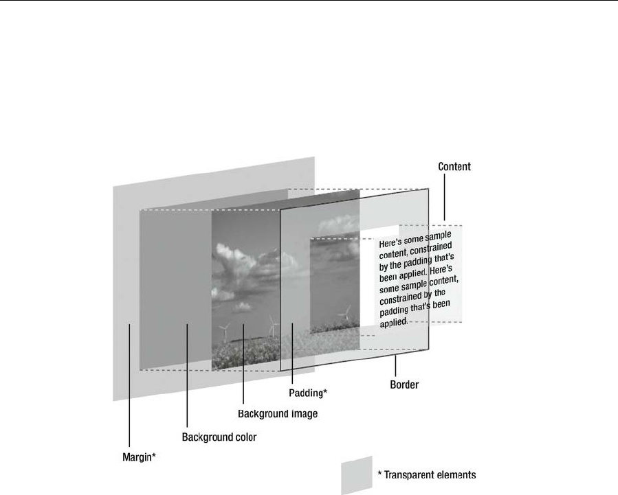
Appendix D
460
The CSS box model
In CSS, every element is considered to be within its own box, and you can define the dimensions of the
content and then add padding, a border, and a margin to each edge as required, as shown in the following
image.
Padding, borders, and margins are added to the set dimensions of the content, so the sum of these
elements is the overall space that they take up. For example, a 100-pixel-wide element with 20 pixels of
padding will take up an overall width of 140 pixels, not 100 pixels with 20 pixels of padding within.
Remember that you can force browsers to respect the width you set by applying box-sizing: border-box to
all elements, like so:
* { -moz-box-sizing: border-box; -webkit-box-sizing: border-box; box-sizing: border-box; }
This is supported by all modern browsers without a vendor prefix with the exception of Firefox.
Note that the top and bottom margins on adjacent elements collapse. For example, if you set the bottom
margin to 50px on an element and set a top margin of 100px on the element below, the margin between the
two elements will be 100 pixels, not 150 pixels.
www.freepdf-books.com
CSS Reference
461
Common CSS values
In addition to the values listed in Table D.1, a property may have a value of inherit, whereupon it takes
the same value as its parent. Some properties are inherited by default—see Table D.2 for more
information.
Table D.1. Common CSS values
Value Formats
color Color name. See Appendix B for information on available CSS color
names.
rgb(n,n,n): Where n is a value from 0 to 255 or a percentage.
#rrggbb: Hexadecimal color format (preferred).
rgba(n,n,n,a): Where n is a value from 0 to 255 or a percentage and
where a is a decimal value from 0 to 1 representing the transparency
or alpha value.
length An optional sign (+ or -), followed by a number and one of the
following units (there should be no whitespace between the number
and unit):
%: A percentage.
cm: Centimeters.
em: One em is equal to the font size of the parent or current element
(see the following note for elaboration).
ex: One ex is, in theory, equal to the font size of the x character of
the current element. Most browsers render ex as half an em.
in: Inches.
mm: Millimeters.
pc: Picas. 1pc = 12pt.
pt: Points. 1pt = 1/72in.
px: Pixels.
For zero values, the unit identifier may be omitted. Generally, px,
em, and % are the best units for screen design, and pt is best for
print fonts.
number An optional sign (+ or -) followed by a number.
percentage An optional sign (+ or -) followed by a number, immediately followed
by the percentage symbol.
url The word url immediately followed by parentheses, within which is
placed a URL. The URL can optionally be enclosed in single or
double quotes.
www.freepdf-books.com
Appendix D
462
When setting element dimensions (width, height, margins, and so on), one em is equal to the font size
of that element. However, when setting font sizes for an element, one em is equal to the font size
of its parent element. In both cases, this is measured relative to the dimensions of the M
character.
CSS properties and values
A number of tables online list browser compatibility with regard to CSS. Some good examples of these and
related resources can be found at the following URLs:
www.quirksmode.org/css/contents.html: Concentrates on quirks
www.css3.info/selectors-test/: Live CSS3 support testing of your browser
www.smashingmagazine.com/tag/css/: Useful information and examples
html5please.com/: A great resource for determining whether a browser supports a feature
Remember that such resources are guides only, are sometimes out-of-date, and should not be considered
a replacement for thorough testing in a range of web browsers.
To inherit a parent element’s style for a property, use the value inherit. To raise a property’s weight in the
cascade, use !important. Important declarations override all others.
p {color: red !important;}
Add comments to CSS files as follows:
/*
This is a comment in CSS
*/
/* This is a single-line comment */
Table D.2. CSS properties and values
Property Values Description Inherited
background Shorthand for defining background property
values in a single declaration. Values can be
any of those from background-attachment,
background-color, background-image,
background-position, and background-repeat,
in any order. Example:
background: #ffffff
url(background.gif) fixed left
repeat-y;
See also Chapter 2’s “Web page
backgrounds in CSS” and “CSS shorthand
www.freepdf-books.com
CSS Reference
463
for web backgrounds” sections.
background-
attachment scroll | fixed |
local Determines whether a background image is
fixed or scrolls with the page. See also
Chapter 2’s “background-attachment” section.
No
background-
color transparent | color Defines an element’s background color. See
also Chapter 2’s “background-color” section. No
background-
image none | url Assigns one: background-image:
url(background_image.jpg); or multiple:
background-image:
url(background_image1.jpg),
url(background_image2.jpg); background
images to an element. See also Chapter 2’s
“background-image” section.
No
background-
position length |
percentage | top |
center | bottom |
left | right | inherit
Defines the initial position of the background
image. Defaults to 0,0. Values are usually
paired: x,y. Combinations of keyword, length,
and percentage are permitted, although
combining keywords with either length or
percentages is buggy in some browsers. If
only one keyword is provided, the other
defaults to center. If only one length or
percentage is given, it sets the horizontal
position, and the vertical position defaults to
50%. See also Chapter 2’s “background-
position” section.
No
background-
repeat repeat | repeat-x
| repeat-y |
no-repeat |
space |
round
Defines how the background image tiles. See
also Chapter 2’s “background-repeat” section. No
background-size auto |
contain |
cover |
percentage |
length
Defines the size of the background images. No
border Shorthand for defining border property values
in a single declaration. Values can be any of
those from border-width, border-style, and
border-color. Borders are drawn on top of a
box’s background. Example:
border: 1px solid #000000;
See also Chapter 4’s “Applying CSS borders
to images” section and Chapter 6’s “Styling a
table” section.
No
www.freepdf-books.com
Appendix D
464
border-bottom Shorthand for defining bottom border property
values (see border). No
border-bottom-
color color |
transparent Sets the bottom border color. No
border-bottom-
style (See border-
style.) Sets the bottom border style. No
border-bottom-
width (See border-
width.) Sets the bottom border width. No
border-bottom-
right-radius length |
percentage Sets the rounding of the bottom-right corner
of the element. No
border-bottom-
left-radius (See border-
bottom-right-
radius.)
Sets the rounding of the bottom-left corner of
the element. No
border-
collapse collapse |
separate |
inherit
Defines a table’s border model. In the
separate border model, which is the default,
each table cell has its own distinct borders,
but in the collapsed border model, adjacent
table cells share borders. See also Chapter
6’s “Adding borders to tables” section.
Yes
border-color color |
transparent |
inherit
Defines the element’s border color. Defaults
to the element’s color. No
border-image Defines an image to be rendered as an
element’s border. No
border-image-
outset length | number Defines the amount the border image extends
beyond the border box. No
border-image-
repeat stretch | repeat |
round | space Defines how the border image is scaled and
tiled. No
border-image-
source none | inherit | url |
linear-gradient Defines the image to use instead of the
border style. No
border-image-
width length |
percentage |
number | auto
Defines the offset to use for dividing the
border image. No
border-left Shorthand for defining left border property
values (see border). No
border-left-
color color |
transparent |
inherit
Sets the left border color. No
www.freepdf-books.com
CSS Reference
465
border-left-
style (See border-
style.) Sets the left border style. No
border-left-
width (See border-
width.) Sets the left border width. No
border-radius length |
percentage Defines how rounded border corners are. No
border-right Shorthand for defining right border property
values (see border). No
border-right-
color color |
transparent |
inherit
Sets the right border color. No
border-right-
style (See border-
style.) Sets the right border style. No
border-right-
width (See border-
width.) Sets the right border width. No
border-spacing length length Defines the distance between borders or
adjacent table cells when using the separated
borders model. (See border-collapse.) If a
single length is given, it’s used for horizontal
and vertical values; if two lengths are
provided, the first is used for the horizontal
spacing, and the second is used for the
vertical spacing. Negative values are not
permitted.
Yes
border-style none |
hidden | dotted |
dashed | solid |
double | groove |
ridge | inset |
outset
Sets the style of an element’s borders. Can
work as shorthand, with one style per edge,
from the top clockwise. Example:
border-style: solid dashed dotted groove;
No
border-top Shorthand for defining top border property
values (see border). No
border-top-
color color |
transparent Sets the top border color. No
border-top-
left-radius
length |
percentage Defines the rounding for the top-left corner of
the element. No
border-top-
right-radius
length |
percentage Defines the rounding for the top-right corner
of the element. No
www.freepdf-books.com
Appendix D
466
border-top-
style (See border-
style.) Sets the top border style. No
border-top-
width (See border-
width.) Sets the top border width. No
border-width length | medium
|thick | thin Sets the width of an element’s borders. Can
work as shorthand:
border-width: 1px 2px 3px 4px;
See also Chapter 4’s “Applying CSS borders
to images” section.
No
bottom auto | length |
percentage Determines the vertical offset of the element’s
bottom edge from the bottom edge of its
parent element if the parent is positioned; if
not, then offset is determined from the first
positioned ancestor. Must be used with a
position value of relative, absolute, or fixed.
No
box-shadow inset | offset-x |
offset-y | blur-
radius | spread-
radius | color
Defines one or more shadow effects as a
comma-separated list. No
box-sizing content-box |
padding-box |
border-box
Alters the default CSS box model used to
calculate widths and heights of elements. No
caption-side bottom | top |
inherit Specifies the position of table caption
elements with relation to the table element
box.
Yes
clear both | left | none |
right | inherit Moves the element down until its margins are
clear of floated elements to its left, right, or
both sides. (See the float entry.)
See also Chapter 7’s “Placing columns within
wrappers and clearing floated content”
section.
No
clip auto | (shape) Creates a clipping area for an absolute
positioned element to determine the visible
area. As of CSS 2.1, the only available
shape is rect. Example:
clip: rect(5px, 60px, 15px, 20px);
As per the preceding code block,
dimensions are stated as a comma-
separated list, and percentage lengths are
not permitted. The dimensions are, as per
typical CSS shorthand, in the following
order: top, right, bottom, left. The top and
bottom values specify offsets from the top
border edge of the box. The left and right
No
www.freepdf-books.com
CSS Reference
467
measurements specify offsets from the left
border edge of the box in left-to-right text
and from the right border edge of the box in
right-to-left text. The defined region clips out
any aspect of the element that falls outside
the clipping region. The preceding example
creates a window 40 pixels wide and 10
pixels high, through which the content of the
clipped element is visible. Everything else is
hidden. See also
www.w3.org/TR/CSS21/visufx.html#propdef-
clip.
color color Sets an element’s foreground color (i.e., the
color of the text). Yes
columns (column-width) |
(column-count) Is a shorthand property allowing you to set
both the column-width and column-
count properties at the same time.
No
column-count auto | integer Describes the number of columns of the
element. No
column-fill auto | balance Controls how contents are partitioned into
columns. No
column-gap normal | length Defines the size of the gap between columns
for elements that are specified to display as a
multicolumn element.
No
column-rule (border-width) |
(border-style |
(color)
Defines a straight line, or rule, to be drawn
between each column. No
column-rule-color (color) Defines the color of the rule drawn between
columns in multicolumn layouts. No
column-rule-style (border-style) Defines the style of the rule drawn between
columns in multicolumn layouts. No
column-rule-
width (border-width) Defines the width of the rule drawn between
columns in multicolumn layouts. No
column-span none | all Defines the span across columns. No
column-width length | auto Suggests an optimal column width. This is not
an absolute value but a mere hint. Browser
will adjust the width of the column around that
suggested value, allowing you to achieve
scalable designs that fit different screen size.
No
content normal | (string) | Generates content to attach before or after a No
www.freepdf-books.com
Appendix D
468
url | counter(name)
| counter(name,
list-style-type) |
counters(name,
string) |
counters(name,
string, list-style-
type) | open-quote
| close-quote | no-
open-quote | no-
close-quote |
attr(X)
CSS selector, using the :before and :after
pseudo-elements. Example:
#users h2:before {content: "Username:
";display: inline; }
See also Chapter 7’s “Placing columns within
wrappers and clearing floated content”
section.
counter-
increment none | identifier
number Increments a counter when the current
selector is encountered. The identifier defines
the selector, ID, or class that is to be
incremented; the optional number defines the
increment amount. Used in conjunction with
content. Browser support for this property is
poor.
No
counter-reset none | identifier
number Defines a new value for the specified counter
whenever the current selector is encountered. No
cursor auto | crosshair |
default | help |
pointer | move |
progress | text |
wait | n-resize | ne-
resize | e-resize |
se-resize | s-
resize | sw-resize
| nw-resize | w-
resize | url
Defines the cursor type to be displayed. Can
be a comma-separated list. Cursors vary by
system, so use this property with care. Also, if
using custom cursors via the url value, include
a generic cursor at the end of the list, in case
of compatibility problems.
Note: Internet Explorer 5.x for Windows does
not recognize pointer, the correct CSS value
for displaying a hand-shaped cursor. Instead,
it uses the nonstandard value hand, which
can be applied using a style sheet attached
via a conditional comment.
Yes
direction ltr | rtl Sets the direction of text flow. ltr: Left to right.
rtl: Right to left. Yes
display block | inline | list-
item | none | run-
in | inline-block |
table | inline-
table | table-
caption | table-cell
| table-column |
table-column-
group | table-
footer-group |
table-header-
group | table-row |
table-row-group |
States how an element is displayed on the
page. The most common values are none,
block, and inline, which all happen to be well
supported.
See several of the exercises in Chapters 5
and 7 for more on this property.
No
www.freepdf-books.com
CSS Reference
469
table-row
empty-cells hide | show Determines whether empty table cell borders
show when using the separated borders
model. (See border-collapse.)
Yes
float left | none |
right Defines whether an element floats left or right
(allowing other content to wrap around it) or
displays inline (by using the none value).
See also Chapter 7’s “The float property”
section.
No
font Shorthand for defining font properties in a
single declaration. Values can include any or
all of the following: font-style, font-variant,
font-weight, font-size, line-height, and font-
family.
Any omitted values revert to default settings,
but font-size and font-family are mandatory.
If font-style, font-weight, and font-variant
values are included, they should appear at
the start of the rule, prior to the font-size
value.
Yes
font (continued) When using line-height, you must combine it
with the font-size property using the syntax
font-size/line-height (e.g., 12px/18px).
Examples (using selected values):
font: bold 12px/16px Verdana, sans-serif;
font: 85%/1.3em Georgia, serif;
See also Chapter 3’s “Styling text using CSS”
and “CSS shorthand for font properties”
sections.
Additional values for the font property are also
available: caption, icon, menu, message-box,
small-caption, status-bar. These set the font
to system fonts, or the nearest equivalent,
and are not available via font-family.
However, these values are rarely, if ever,
used.
Yes
@font-face a-remote-font-
name | source |
weight | style
Allows authors to define online fonts to
display text on their web pages. Yes
font-family (family name) |
(generic family) Defines the font family of an element. Takes
the form of a prioritized comma-separated list,
which should terminate in a generic family
name (cursive, fantasy, monospace, serif, or
sans-serif).
Multiple-word font-family names must be
quoted (e.g., "Times New Roman"). Readers
used to American typographical conventions
Yes
www.freepdf-books.com
Appendix D
470
should take care not to put commas inside the
closing quotes. Example:
font-family: Georgia, "Times New Roman",
serif;
See also Chapter 3’s “Defining fonts” section.
font-size-adjust none | number Defines the font size should be chosen based
on the height of lowercase letters rather than
the height of capital letters.
Yes
font-size xx-small | x-small
| small | medium |
large | x-large | xx-
large | smaller |
larger | length |
percentage
Sets the size of a font.
See also Chapter 3’s “Defining font size and
line height” section.
Yes
font-size-
adjust none | number Defines the font size that should be chosen
based on the height of lowercase letters
rather than the height of capital letters.
Yes
font-stretch inherit | ultra-
condensed | extra-
condensed |
condensed | semi-
condensed |
normal | semi-
expanded |
expanded | extra-
expanded | ultra-
expanded
Defines a normal, condensed, or extended
face from a font family. Yes
font-style italic | normal |
oblique Sets the font’s style.
See also Chapter 3’s “Defining font-style, font-
weight, and font-variant” section.
Yes
font-variant normal | small-
caps Sets the font to display in small caps.
See also Chapter 3’s “Defining font-style, font-
weight, and font-variant” section.
Yes
font-weight lighter | normal |
bold | bolder |
number*
Sets the font weight.
* When using a number, it must be a multiple
of 100 between 100 and 900 inclusive. The
value 700 is considered equivalent to bold,
and 400 is synonymous with normal. In
practice, numbers are supported
inconsistently and poorly in browsers.
See also Chapter 3’s “Defining font-style, font-
weight, and font-variant” section.
Yes
height auto | length |
percentage Sets the content height of an element. No
www.freepdf-books.com
CSS Reference
471
image-rendering auto | inherit |
optimizeSpeed |
optimizeQuality
Provides a hint to the user agent about how to
handle its image rendering. Yes
ime-mode auto | normal |
active | inactive |
disabled
Controls the state of the input method editor
for text fields. No
left auto | length |
percentage Determines the horizontal offset of the
element’s left edge from the left edge of its
parent element if the parent is positioned; if
not, then offset is determined from the first
positioned ancestor. Must be used with a
position value of relative, absolute, or
fixed.
See also the Chapter 7 exercise “Using
absolute positioning to center a box on-
screen.”
No
letter-spacing length | normal Amends kerning (i.e., the space between
characters). Positive and negative values are
permitted. Relative values are determined
once and then inherited.
See also Chapter 3’s “Setting letter-spacing
and word-spacing” section.
Yes
line-height normal | length |
number |
percentage
Controls the element’s leading. When the line-
height value is larger than the font-size value,
the difference (which is the leading) is halved,
and this new value is applied to the top and
bottom of the element’s inline box.
See also Chapter 3’s “Setting line height”
section.
Yes
list-style Shorthand for defining list properties in a
single declaration. Values can be those from
list-style-type, list-style-position, and list-style-
image.
See also Chapter 3’s “Styling lists with CSS”
and “List style shorthand” sections.
Yes
list-style-
image none | url Defines an image for list bullet points. Yes
list-style-
position inside | outside Determines whether the bullet point appears
as the first character of the list item content
(inside) or in default fashion (outside).
Yes
list-style- none | disc | circle | Sets the bullet point style. If a browser doesn’t Yes
www.freepdf-books.com
Appendix D
472
type square | decimal |
decimal-leading-
zero | lower-alpha |
upper-alpha |
lower-greek |
lower-latin | upper-
latin | lower-roman
| upper-roman |
armenian |
georgian
understand an ordered list value, it defaults to
decimal. Generally, none, circle, square,
decimal, and the alpha and roman values are
best supported. The W3C recommends using
decimal for ordered lists whenever possible.
margin Shorthand for defining margin properties in a
single declaration. Examples:
margin: 0; (sets all margins to 0)
margin: 0 10px 20px 30px; (sets individual
margins for each edge)
See also Chapter 2’s “Content margins and
padding in CSS” and “Working with CSS
shorthand for boxes” sections.
No
margin-bottom auto | length |
percentage Sets the bottom margin. Defaults to 0. Note
that browsers usually override the zero value
by applying default margins to most block
elements. Set margins explicitly to 0 to cancel
the browser’s default.
See Chapter 2’s “Zeroing margins and
padding on all elements” section.
No
margin-left auto | length |
percentage Sets the left margin. Defaults to 0. Note that
browsers usually override the zero value by
applying default margins to most block
elements. Set margins explicitly to 0 to cancel
the browser’s default.
See Chapter 2’s “Zeroing margins and
padding on all elements” section.
No
margin-right auto | length |
percentage Sets the right margin. Defaults to 0. Note that
browsers usually override the zero value by
applying default margins to most block
elements. Set margins explicitly to 0 to cancel
the browser’s default.
See Chapter 2’s “Zeroing margins and
padding on all elements” section.
No
margin-top auto | length |
percentage Sets the top margin. Defaults to 0. Note that
browsers usually override the zero value by
applying default margins to most block
elements. Set margins explicitly to 0 to cancel
the browser’s default.
See Chapter 2’s “Zeroing margins and
padding on all elements” section.
No
www.freepdf-books.com
CSS Reference
473
max-height none | length |
percentage Sets the maximum height of an element.
Does not apply to table elements. No
max-width none | length |
percentage Sets the maximum width of an element. Does
not apply to table elements.
See also the Chapter 7 exercise “Creating a
maximum-width layout.”
No
marks crop | cross | none Adds crop and/or cross marks to the
presentation of the document. No
min-height none | length |
percentage Sets the minimum height of an element. Does
not apply to table elements. No
min-width none | length |
percentage Sets the minimum width of an element. Does
not apply to table elements. No
opacity number | inherit Defines the transparency of an element, that
is, the degree to which the background
behind the element is overlaid.
No
orphans number Defines the number of lines of a paragraph
that must be left at the bottom of a page when
printing. Defaults to 2. Defined number must
be an integer. Very poorly supported.
Yes
outline Shorthand for defining outline properties in a
single declaration. Outlines are rendered
outside the border edge and do not affect
document flow. Example:
.highlight {outline: 1px dotted #ff0000; }
Not supported by Internet Explorer up to and
including version 7.
No
outline-color color | invert Sets the color of an outline. Defaults to invert,
which inverts the color of the pixels on-
screen, ensuring the outline is visible.
No
outline-style dashed | dotted |
double | groove |
inset | none |
outset | ridge |
solid
Sets the style of an outline. No
outline-offset length | inherit Defines the space between and outline and
the edge or border of an element. An outline
is a line that is drawn around elements,
outside the border edge.
No
outline-width length | medium |
thick | thin Sets the width of an outline. No
overflow auto | hidden | Determines what happens when content is No
www.freepdf-books.com

Appendix D
474
scroll | visible too large for the defined dimensions of the
element.
auto: If content is clipped, the browser
displays a scroll bar.
hidden: Content is clipped, and content
outside the element’s box is not visible.
scroll: Content is clipped, but a scroll bar is
made available.
visible: Content is not clipped and may be
rendered outside of the element’s containing
box.
See also Chapter 7’s “Scrollable content
areas with CSS” section.
padding Shorthand to define padding properties in a
single declaration. Examples:
padding: 0; (sets padding on all sides to 0)
padding: 0 10px 20px 30px; (sets individual
padding for each edge)
See also Chapter 2’s “Content margins and
padding in CSS” and “Working with CSS
shorthand for boxes” sections.
No
padding-bottom length |
percentage Sets the bottom padding of an element. No
padding-left length |
percentage Sets the left padding of an element. No
padding-right length |
percentage Sets the right padding of an element. No
padding-top length |
percentage Sets the top padding of an element. No
page-break-
after auto | always |
avoid | left | right Determines whether a page break should
appear after the element when printing.
Poorly supported.
No
page-break-
before auto | always |
avoid | left | right Determines whether a page break should
appear before the element when printing.
Poorly supported.
No
page-break-
inside auto | avoid Determines whether a page break should
appear inside the element when printing.
Poorly supported.
Yes
position absolute | fixed |
relative | static Determines the positioning method used to
render the element’s box:
absolute: Element is placed in a specific
location outside of normal document flow,
using the top, right, bottom, and left
No
www.freepdf-books.com
CSS Reference
475
properties.
fixed: As per absolute, but the element
remains stationary when the screen scrolls.
Poorly supported by some browsers.
relative: Offset from the static position by the
values set using top, right, bottom, and left
properties.
static: The default. The top, right, bottom, and
left properties do not affect the element if this
value is set. The element is not removed from
the document’s normal flow.
Various examples of this property in use are
found in Chapters 5 and 7.
quotes none | string
string
Determines the type of quote marks to be
used for embedded quotations. The string contains
paired quoted values, which determine each level
of quote embedding. The default depends on the
user agent (browser).
Yes
resize none | both |
horizontal | vertical
| inherit
Controls how the element is resized. No
right auto | length |
percentage Determines the horizontal offset of the
element’s right edge from the right edge of its
parent element if the parent is positioned; if
not, then offset is determined from the first
positioned ancestor. Must be used with a
position value of relative, absolute, or fixed.
No
table-layout auto | fixed Controls the layout algorithm used to render
tables. Using fixed, table columns are based
on analysis of the first row and rendered
accordingly. This can speed up processing
time but may lead to columns that are too
narrow for subsequently downloaded content.
No
tab-size integer | inherit Defines the size of the tab character. No
text-align center | justify |
left* | right Sets the text alignment for an element.
* The default is left in left-to-right languages
and right in right-to-left languages such as
Arabic, Hebrew, and Urdu. Should be used
instead of the HTML align attribute.
Yes
text-align-last auto | start | end |
left | right | center |
justify | inherit
Describes how the last line of a block or a line
right before a forced line break is aligned. Yes
text-
decoration blink | line-through
| none | overline | Adds decoration to text. Values may be
combined in a space-separated list, and the No
www.freepdf-books.com
Appendix D
476
underline default depends on the element in
question.
Note that browsers may ignore blink but still
be considered compliant. Examples:
text-decoration: underline; text decoration:
underline line-through;
See also Chapter 5’s “Editing link styles using
CSS” section.
text-decoration-
color (color) | inherit Defines the color used when drawing
underlines, overlines, or strike-throughs
specified by text-decoration-line.
No
text-decoration-
line none | underline |
overline | line-
through
Defines what kind of line decorations are
added to an element. No
text-indent length |
percentage Sets the horizontal indent of an element’s first
line of text. Defaults to 0. Yes
text-overflow inherit | end-
overflow-type | left-
overflow-type |
right-overflow-type
Determines how overflowed content that is
not displayed is signaled to the users. No
text-rendering auto |
optimizeSpeed |
optimizeLegibility |
geometricPrecision
| inherit
Provides information to the rendering engine
about what to optimize for when rendering
text.
Yes
text-shadow (color) | offset-x
offset-y | blur-
radius
Adds shadows to text. It accepts a comma-
separated list of shadows to be applied to the
text and text-decorations of the element.
Yes
text-transform capitalize |
lowercase | none
| uppercase
Sets the case of an element’s text.
See also Chapter 3’s “Controlling case with
text-transform” section.
Yes
Top auto | length |
percentage Determines the vertical offset of the element’s
top edge from the top edge of its parent
element if the parent is positioned; if not, then
offset is determined from the first positioned
ancestor. Must be used with a position value
of relative, absolute, or fixed.
See also the Chapter 7 exercise “Using
absolute positioning to center a box
onscreen” section.
No
transform rotate | scale |
scaleX | scaleY |
skewX | skewY |
translate |
translateX |
Allows you to modify the coordinate space of
the CSS visual formatting model. Using it,
elements can be translated, rotated, scaled,
and skewed according to the values set.
No
www.freepdf-books.com
CSS Reference
477
translateY
transform-origin left | center | right |
top | bottom |
center |
percentage |
length
Allows you to you modify the origin for
transformations of an element. No
unicode-bidi bidi-override |
embed | normal Enables overrides for text direction. The
embed value forces text to be displayed with
regard to the associated direction property.
The bidi-override value also overrides the
default Unicode ordering scheme.
This is a complex subject concerned with
inserting elements of right-to-left text in blocks
of left-to-right text (such as embedding Arabic
or Hebrew in English, or vice versa). For
details about working with bidirectional text,
see www.w3.org/International/resource-
index.html#bidi.
No
vertical-align length |
percentage |
baseline | bottom |
middle | top | sub |
super | text-
bottom | text-top
Determines the vertical alignment of an
element. Applies to inline elements and those
within table cells. Should be used in place of
the HTML valign attribute. If a percentage
value is used, that refers to the element’s line-
height value.
No
visibility collapse | hidden |
visible Sets the visibility of an element. When hidden
is used, the element box is invisible but still
affects page layout (use display: none for an
element to not affect document flow). When
collapse is used, results are similar to hidden,
except for spanned table cells, which may
appear clipped.
Yes
white-space normal | nowrap |
pre | pre-wrap |
pre-line
Determines how whitespace within an
element is handled. Browser support for pre-
line and pre-wrap is poor.
Yes
widows number Defines the number of lines of a paragraph
that must be left at the top of a page when
printing. Defaults to 2. Defined number must
be an integer. Very poorly supported.
Yes
width auto | length |
percentage Sets the content width of an element. No
word-spacing length | normal Provides space between words in addition to
the default settings.
See also Chapter 3’s “Setting letter-spacing
and word-spacing” section.
Yes
www.freepdf-books.com
Appendix D
478
word-wrap normal | break-
word Defines whether the browser is allowed to
break lines within words in order to prevent
overflow when an otherwise unbreakable
string is too long to fit.
Yes
z-index auto | number Changes an element’s position in the stack.
Higher numbers are “closer,” and lower
numbers are “further away” section. Negative
values are permitted but will result in content
not being displayed in some browsers.
No
Basic selectors
Table D.3 outlines the most commonly used selectors, along with their syntax. Note that selectors for
pseudo-classes and pseudo-elements are covered in the following two sections, rather than being
duplicated.
Table D.3. Basic selectors
Selector type Syntax Description
Universal * Matches any element. Can be used in context to
attach a rule to all elements within another
element (e.g., #sidebar *).
Type element Matches any element of type element. For
example: h1.
Class .value Matches an element with a class value of value.
ID #value Matches an element with an id value of value.
Descendant element descendant Matches a descendant element that is a
descendant of the element of type element. For
example, div p targets paragraphs that are
descendants of div elements.
Child element>child Matches an element that is a child of another
element. Similar to but more precise than
descendant selectors, rules are applied to
elements that are direct children of the parent
only. For example, div p matches all
paragraphs within all divs. div>p only matches
paragraphs that are direct children of divs and
so would not match a paragraph within a table
within a div.
www.freepdf-books.com
CSS Reference
479
Adjacent element1+element2 Matches element2, adjacent to element1. For
example, h1+h2 matches any h2 element that
directly follows an h1 element within the web
page, with no other elements in between.
Attribute element[attribute] Matches an element of type element that has an
attribute of type attribute. Further clarification
can be added via the syntax
-element[attribute="value"] (targets -element
with attribute with value equal to value),
element[attribute~="value"] (targets element
with attribute that has a list of space-separated
values, of which one is equal to value),
element[lang=value] (targets element with a
lang attribute equal to value),
element[attribute^="val"] (targets elements
whose attribute beings with "val"),
element[attribute$="ue"] (targets elements
whose attribute ends with "ue",
element[attribute*="lu"] (targets elements whose
attribute contains "lu").
General Sibling element1 ~
element2 Matches any element1 element that is preceded
by element2 element.
Note that the word element in the preceding table refers to a general element on the web page, rather
than a de facto HTML element.
Pseudo-classes
Pseudo-classes initially provided additional styles relating to a selector’s state but now also include those
that apply styles to conceptual document components (see Table D.4).
Table D.4. Pseudo-classes
Pseudo-class Description
:active The state when an element is active (e.g.,
when a link is being clicked).
:first-child Selects the first element of its type within a
parent.
:focus The state when an element is focused to
accept keyboard input.
www.freepdf-books.com
Appendix D
480
:hover The state when the pointer is over an element.
:lang Applies to elements with the specified
language (defined using xml:lang).
:link Applies to an unvisited link.
:visited Applies to a visited link.
:target The target pseudo-class is used in conjunction
with IDs and matches when the hash tag in the
current URL matches that ID.
:enabled Selects inputs that are in the default state of
enabled and ready to be used.
:disabled Selects inputs that have the disabled attribute.
:checked Selects checkboxes that are…wait for
it…checked.
:indeterminate Selects radio buttons that are in the purgatory
state of neither chosen or unchosen.
:root Selects the element that is at the root of the
document.
:last-child Selects the last element of its type within a
parent.
:nth-child(N) Selects elements based on a simple provided
algebraic expression (e.g., "2n" or "4n-1").
:nth-of-type(N) Works like :nth-child, but used in places where
the elements at the same level are of different
types.
:first-of-type Selects the first element of this type within any
parent.
:last-of-type Works like :first-of-type, only will select the last
image inside the first div and the last image
inside the second div.
:nth-last-of-
type(N) Works like :nth-of-type, but counts up from the
bottom instead of the top.
:nth-last-
child(N) Works like :nth-child, but counts up from the
bottom instead of the top.
:only-of-type Selects only if the element is the only one of its
kind within the current parent.
:not(S) Removes elements from an existing matched
set that match the selector inside the
www.freepdf-books.com
CSS Reference
481
parameter of :not().
:empty Selects elements that contain no text and no
child elements. For example:
<p></p>
Pseudo-elements
Pseudo-elements enable generated content that’s not in the document source and the styling of
conceptual document components (see Table D.5).
Table D.5. Pseudo-elements
Pseudo-element Description
:after Used in conjunction with content to generate
content after an element. For example:
h1:after {content: url(bleep.wav);}
:before Used in conjunction with content to generate
content before an element.
:first-letter Styles the first letter of an element.
:first-line Styles the first rendered line of a “block-level”
element.
CSS boilerplates and management
By using CSS comments and a monospace font when editing CSS, it’s possible to create clear sections
within the style sheet and a table of contents, enabling you to more easily manage rules. A full example is
available in the advanced-boilerplates folder of the download files. An example of a table of contents is
shown here:
/*
STYLE SHEET FOR [WEB SITE]
Created by [AUTHOR NAME]
[URL OF AUTHOR]
ToC
1. defaults
2. structure
3. links and navigation
4. fonts
5. images
6. tables
www.freepdf-books.com

Appendix D
482
7. forms
Notes
*/
An example of a section of a boilerplate is shown next, with empty rules waiting to be filled. Here, a single
tab is represented by eight spaces. Note how the property/value pairs and closing curly quotes are
indented equally. This makes it easier to scan the far-left side of the document for selectors.
/* ---------- 4. fonts ---------- */
html {
font-size: 100%;
}
body {
font-size: 62.5%;
}
h1, h2, h3, h4, p, ul {
}
h1 {
}
h2 {
}
h3 {
}
h4 {
}
p {
}
ul {
}
The use of the CSS comment to introduce the section, with a string of hyphens before and after the
section name, provides a useful visual separator for when directly editing code. Subsections are best
added by indenting them the same amount as the property/value pairs; rule-specific comments are best
placed after the opening curly quote; pair-specific comments are best placed after the pair. See the
following for examples.
Sub-section introduction:
/* --- sidebar headings --- */
#sidebar h2 {
}
www.freepdf-books.com
CSS Reference
483
#sidebar h3 {
}
Rule-specific comment:
.boxoutProducts {/* used on sales and purchase pages */
}
Pair-specific comment:
body.advert h2 {
font-size: 1.5em;
text-transform: uppercase; /* over-ride for ad pages only */
}
Note that the indents in this section are different from those shown elsewhere in this
book. This is intentional in order to provide a close match to the code in the actual style
sheet, rather than something that works better on the printed page.
www.freepdf-books.com
485
Index
A
Absolute links, 148–149
Additive color systems, 120–121
Attribute selectors, 14
Attributes, HTML5
event
core, 389–390
form element, 390–391
window, 391
standard, 387
core, 388
keyboard, 388
language, 389
Automated gallery scripts, 184–186
Automate page layout, 297–300
B
Blog layout
design and semantic markup, 378
media queries, 379–380
Photoshop mock-up, 377
styling procedure, 380–382
viewport, 380
Boilerplates, CSS
creation, 17–23
and management, 481–483
Box formatting, 253–254
Box model, CSS, 460
Boxouts
description, 263
float property, 264–268
Business website design
design and required images, 373
Photoshop mock-up, 372–373
styling procedure
body rule, 375
.columnLeft rule, 375
.columnRight rule, 375
commented-out rule, 375
completed layout, 376–377
content img, 376
content rule, 375
h1, h2, and p rules, 375
hr rule, 375
html and body rules, 375
img.leadImage rule, 376
img rule, 376
masthead rule, 375
p.footer rule, 376
www.freepdf-books.com

Index
486
Business website design, styling
procedure (cont.)
universal selector rule, 375
wrapper rule, 375
techniques, 373–374
C
Cascading style sheets (CSS)
basic selectors, 478–479
boilerplates and management,
17–22, 481–483
border-spacing, 229–230
box model, 16, 460
box-shadow property, 52
cascade, 16
content and design separation, 10
description, 9
forms, user feedback, 315
layout, 320–322
style, 316–320
images
borders, 134–136
image sprites, 143–144
JavaScript-based image
randomizer creation, 137–
140
PHP-based image randomizer
creation, 140–141
random image display, 137
text wrap, 136–137
patterns, 55
properties and values, 462–478
pseudo-classes, 479–481
pseudo-elements, 481
rules, 10–11
selectors
attribute, 14
class, 11–12
contextual, 13
grouped, 12–13
ID, 12
pseudo-selectors, 14
values, 461–462
web page backgrounds
attachment, 44
color, 43
gradients, 46–47
image, 43
pattern, 47–48
position, 45
repeat, 43
shadows, 52
shorthand, 45
wrapper rule, 47
web page comments, 57
web page files attachments
the @import method, 36
checking paths, 39
favicons and JavaScript, 38
the link method, 36
media queries, 37–38
web page styles, 15–16
Characters
arrows, lozenge, and card suits,
456
currency signs, 450
description, 441
European languages, 445–450
Greek characters, 453–456
in HTML5, 441
mathematical, 450
advanced and technical
characters, 451–453
common, 451
nonstandard Microsoft set
conversion, 457–458
punctuation, 443–444
quotation marks, 442
www.freepdf-books.com

Index
487
spacing and nonprinting
characters, 443
symbols, 444–445
Class selectors, 11–12
Collapsible page content
enhancing accessibility, 188–189
modularizing, 189–190
set up, 186–187
targets, 190–191
Color theory
additive and subtractive color
systems, 120–121
color scheme, 121–122
color wheels, 120, 121
complementary scheme, 121
description, 120
hexadecimal system, 122
split-complementary, 122
web-safe colors, 124
Contact pages layout, user
feedback
description, 330–332
using microformats, 332–337
online microformat contacts
resources, 337–338
structure, 338–340
Contextual selectors, 13–14
Currency signs, 450
D
Dead links, 346
Disappearing content bug. See
Peekaboo bug
Drop shadows, 48
background terminate
contentFooter div, 50–51
markup, 49–50
wrapper rule updation, 50
description, 49
E
European languages, characters,
445–450
F
Fake images maps, using CSS
description, 173
with rollovers, 174–179
Fixed layouts, 252
Flanking sidebars, 291–297
Fluid grid layouts, 302–303
Fluid layouts, 252
Forms, user feedback
accessibility
client-side form validation, 313
date, time, and number formats,
313–314
HTML5 form elements, 315
HTML5 input formats, 314
label, fieldset and legend
elements, 311–312
tabindex attributes, 312
adding controls, 309–311
creation, 309
CSS
layout, 320–322
style, 316–320
description, 309
G
Gradients, web page, 46–47
Graphical navigation, with rollover
effects
bar creation, using CSS
backgrounds, 206–210
CSS sprites, 207
drop-down menu, 219–222
graphical tabs creation, 213–215
www.freepdf-books.com

Index
488
Graphical navigation, with rollover
effects (cont.)
multicolumn drop-down menu,
223–227
multiple link styles and colors,
using grid image, 210–213
Graphics Interchange Format (GIF)
colors restriction, 126
description, 125
GIF89 file format, 127
uses, 126
Greek characters, 453–456
Grid layouts, 250
Grouped selectors, 12–13
H
HyperText Markup Language
(HTML)
boilerplates, 17–22
concept, 7
CSS standard color names, 438–
439
description, 6
images
accessibility benefits, 133
alt and title text, for tooltips, 134
alternate text, 133
img element, 132
link-based images, 133
null alt attributes, for interface
images, 133
nesting tags, 7–8
semantic markup, 9
tables borders, 229
web page. (see Web page)
web standards, 8
HyperText Markup Language 5
(HTML5)
characters, 441
defaults document, 31
description, 6
DOCTYPE declarations, 32
elements and attributes, 392–436
event attributes
core, 389–390
form element, 390–391
window, 391
Shim, 355
standard attributes, 387
core, 388
keyboard, 388
language, 389
vs. XHTML, 30–31
web standards, 8
I
ID selectors, 12
Images
color theory
additive and subtractive color
systems, 120–121
color scheme, 121–122
color wheels, 120, 121
complementary scheme, 121
description, 120
hexadecimal system, 122
split-complementary, 122
web-safe colors, 124
CSS
borders, 134–136
image sprites, 143–144
JavaScript-based image
randomizer creation, 137–
140
PHP-based image randomizer
creation, 140–141
random image display, 137
text wrap, 136–137
www.freepdf-books.com

Index
489
description, 120
formats
BMP /TIFF file, 128
GIF, 125–127
JPEG, 124–125
PNG, 127–128
HTML
accessibility benefits, 133
alt and title text, for tooltips, 134
alternate text, 133
img element, 132
link-based images, 133
null alt attributes, for interface
images, 133
web image gaffes
backgrounds, 129
graphics, for body copy, 129
HTML resizing, 130
images and designs thefts, 132
lack of contrast, 130
original documents overwrite,
129
quality and file size balance,
131
restore original images, 129
splitting images, 131
text overlays, 131
wrong image format usage, 130
Image sprites, 143–144
Inline lists
breadcrumb navigation, 198–199
CSS-only tab bar, 203–206
horizontal navigation bar, 200–
202
Inline navigation, 146
Internal page links, 150–151
Internet Explorer bugs
alt text overriding title text, 352
conditional comments, 349–351
layout problems, 352–353
rounding errors, 351–352
J, K
Joint Photographic Experts Group
(JPEG), 124–125
L
Legacy browsers
description, 354
HTML5 Shim, 355
Modernizr, 354
Normalize.css, 354
Link states
correctly ordering link states,
153–154
definition, with CSS, 153
description, 152
multiple, 156–159
Link targeting, 166
M
Mathematical characters
advanced and technical
characters, 451–453
common, 451
Meta tags, web page
description, 34
keywords and descriptions, 34
revisit-after, robots, and author,
35
Modernizr, 354
Multiple link states, 156–159
N
Navigation bars
graphical navigation, with rollover
effects
www.freepdf-books.com

Index
490
Navigation bars, graphical
navigation, with rollover effects
(cont.)
bar creation, using CSS
backgrounds, 206–210
CSS sprites, 207
drop-down menu, 219–222
graphical tabs creation, 213–
215
multicolumn drop-down menu,
223–227
multiple link styles and colors,
using grid image, 210–213
sliding doors, 214
two-tier navigation menu, 216–
219
inline lists
breadcrumb navigation, 198–
199
CSS-only tab bar, 203–206
horizontal navigation bar, 200–
202
links, 191
lists, 191
nav element
button-like vertical navigation
bar, 192–196
vertical navigation bar, with
collapsible sections, 196–198
Nesting boxes. See Boxouts
Nonstandard Microsoft set, 457–458
Normalize.css, 354
O
Online gallery
automated gallery scripts, 184–
186
captions, 183–184
switching images using
JavaScript, 182–183
Online storefront layout
design and required images, 365
fonts and fixes
content .itemDetails ul rule, 370
content ul rule, 370
h1+p rule, 370
h1 rule, 369
h2 rule, 370
hr rule, 371
html and body rules, 369
img rule, 371
.itemCost rule, 370
.itemDetails li rule, 370
.itemImage img:hover rule, 371
.itemImage img rule, 371
.itemName rule, 370
mainContent rule, 371
p—style rule, 370
pullNav rule, 370
sidebar h2 rule, 370
web page, with drop-down
active, 371
Photoshop mock-up, 364
styling procedure
body rule, 367
clearFix rule, 369
content rule, 368
fonts and fixes, 369
horizontal rule, 369
.itemContainer rule, 368
.itemImage rule, 369
.lastItemContainer rule, 368
logo rule, 368
masthead rule, 368
navContainer rule, 369
navigation ul rule, 369
pullNav rule, 369
www.freepdf-books.com

Index
491
universal selector, 367
wrapper rule, 367
techniques, 366–367
P
Page layouts, CSS
boxouts
description, 263
float property, 264–268
equal-column-split rule, 299
multiple boxes and columns, 268
automate page layout
variations, 297–300
clearing floated content, 282–
285
fixed-width layouts, two
structural divs, 269–275
flanking sidebars creation, 291–
297
liquid layouts, two structural
divs, 276–280
multiple boxouts, within sidebar,
288–291
placing columns within a
wrapper, 280–282
sidebar, with faux-column
backgrounds, 286–288
scrolling
description, 300
fluid grid layouts, 302–303
responsive web design, 304–
306
scrollable content areas, 300–
302
single box
absolute positioning, 260–262
fixed-width wrapper creation,
255–256
maximum-width layout creation,
259–260
padding, margins, and
backgrounds, 256–258
wrappers, 255
single-column rules, 298
for web
columns, 251
fixed layouts, 252
fluid layouts, 252
grids and boxes, 250
logical element placement, 253
workflow
box formatting, 253–254
page structure, 253
Peekaboo bug, 352–354
Plain image gradients, 52–53
Portable Network Graphics (PNG),
127–128
Portfolio layout
design and required images, 359–
360
Photoshop mock-up, 359
styling procedure
body rule, 361
html and body rules, 362
imgPhoto rule, 364
img rule, 364
masthead rule, 362
p em rule, 363
p rule, 363
thumbnailsContainer img, 364
universal selector rule, 361
wrapper rule, 362
techniques, 360–361
Pseudo-classes, CSS, 479–481
Pseudo-elements, CSS, 481
Pseudo-selectors, 14
Punctuation characters, 443–444
www.freepdf-books.com

Index
492
Q
Quotation marks, 442
R
Relative links, 149
Responsive web design, 304–306
Root-relative links, 150
Rounding errors, 351–352
S
Scrolling
description, 300
fluid grid layouts, 302–303
responsive web design, 304–306
scrollable content areas, 300–302
Search-based navigation, 147–148
Selectors, CSS, 478–479
Separator stripes, tables, 243
with nth-child selector, 247
with PHP, 246–247
Sidebars
description, 285
with faux-column backgrounds,
286–288
flanking sidebars creation, 291–
297
multiple boxouts, 288–291
Site navigation, 147
Skip navigation links
creation, 161–163
enhanced, with background
image, 164–166
styling, 163–164
Spacing and nonprinting characters,
443
Style sheets
management, 358–359
for print
body rule, 383
browsers, 384
defaults section, 383
description, 382
images, 384
links and navigation section,
384
media attribute value, 383
pixel values, 383
print-only content, 384
print style sheet output, 385
structure section, 383
Subtractive color systems, 120–121
Symbols, 444–445
T
Tables
accessible tables creation
building a table, 236–239
captions and summaries, 232
row group elements, 233
scope and headers, 233–236
screen readers problems, 232
table header cell element, 233
description, 228
layout
photoshop layout, 247
rules, 247–248
transitional layout, 247
styling, 239
separator stripes, 243–247
table borders, 240–243
working procedure
border, 229
cell spacing and cell padding,
229–230
dimensions setting, 231
spanning rows and cells, 230–
231
structured, 229
www.freepdf-books.com

Index
493
vertical alignment, 231
Top-of-page links, 151–152
Two structural divs
fixed-width layouts, 269–275
liquid layouts, 276–280
U, V
User feedback
addresses scrambling, 308
contact pages layout
description, 330–332
using microformats, 332–337
online microformat contacts
resources, 337–338
structure, 338–340
description, 308
forms
accessibility, 311–315
adding controls, 309–311
creation, 309
CSS styling and layout, 315–
322
description, 309
mailto: URLs, 308
sending procedure
using e-mail, 330
nms FormMail configuration,
323–324
using PHP, 325–330
script server permissions, 324
W
Watermarks, 53–55
Web browsers
browser test suite, 346–349
common errors, 344–346
Internet Explorer bugs
alt text overriding title text, 352
conditional comments, 349–351
hasLayout problems, 352–353
peekaboo bug, 352–353
rounding errors, 351–352
legacy browsers
description, 354
HTML5 Shim, 355
Modernizr, 354
Normalize.css, 354
multiple versions installation, 349
Web color
names, 438–439
values, 437
Web design
audience requirements, 4–5
checklist, 26
creation, 3–4
CSS
boilerplates, 17–22
box model, 16
cascade, 16
content and design separation,
10
description, 9
rules, 10–11
selectors types, 11–14
web page styles, 15–16
description, 5
HTML
boilerplates, 17–22
concept, 7
description, 6
nesting tags, 7–8
semantic markup, 9
web standards, 8
information architecture and site
maps, 24
internet, 2–3
limitations, 27–28
www.freepdf-books.com

Index
494
Web design (cont.)
web page structure and layout,
24–26
WYSIWYG tools, 6
Web navigation
description, 146
do’s and don’ts, 227
inline navigation, 146
navigation bars
graphical navigation, with
rollover effects, 206–226
inline lists, 198–206
links, 191
lists, 191
nav element, 192–198
search-based navigation, 147
site navigation, 147
types, 146
Web page
backgrounds
CSS3 patterns, 55
CSS3 shadows, 52
description, 42
drop shadows, 48–51
pattern, 47–48
plain image gradients, 52–53
watermarks, 53–55
body section
content margins and padding,
39–40
CSS shorthand, 40–41
default font and font color
settings, 41
description, 39
zeroing margins and padding,
40
checklist, 60–61
comments, 57
defaults document, 31
description, 30
DOCTYPE declarations, 32
end of document, 56
head section, 32
external documents
attachments, 35–39
meta tags and search engines,
34–35
page titles, 33–34
HTML vs. XHTML, 30–31
naming files, 57
testing code, 58–60
Web page links
a vs. a:link, 154
absolute links, 148–149
backward compatibility, with
fragment identifiers, 151
correctly ordering link states,
153–154
CSS, link states, 153
description, 148
editing link styles, using CSS,
154–156
enhanced, with JavaScript
collapsible page content, 186–
191
description, 180
online gallery creation, 182–186
pop-up window creation, 180–
182
enhanced link accessibility and
usability, 159
accesskey attribute, 160–161
skip navigation links, 161–166
tabindex attribute, 160
title attribute, 160
the :focus pseudo-class, 156
images
adding pop-ups, 167–172
www.freepdf-books.com

Index
495
description, 166–167
fake images maps, using CSS,
173–179
image maps, 172–173
internal page links, 150–151
link states, 152
link targeting, 166
multiple link states, 156–159
relative links, 149
root-relative links, 149–150
top-of-page links, 151–152
Website design
blog layout creation
design and semantic markup,
378
media queries, 379–380
Photoshop mock-up, 377
styling procedure, 380–382
viewport, 380
business website creation
design and required images,
373
Photoshop mock-up, 372–373
styling procedure, 374–376
techniques, 373–374
online storefront creation
design and required images,
365
fonts and fixes, 369–372
Photoshop mock-up, 364
styling procedure, 367–369
techniques, 366–367
portfolio layout creation
design and required images,
359–360
Photoshop mock-up, 359
styling procedure, 361–364
techniques, 360–361
style sheets
management, 358–359
for print, 382–386
Whitespace errors, 346
Workflow, CSS
box formatting, 253–254
page structure, 253
WYSIWYG tools, 6
X, Y, Z
XHTML. See HyperText Markup
Language 5 (HTML5)
www.freepdf-books.com

The Essential Guide
to HTML5 and CSS3
Web Design
Craig Grannell
Victor Sumner
Dionysios Synodinos
www.freepdf-books.com
ii
The Essential Guide to HTML5 and CSS3 Web Design
Copyright © 2012 by Craig Grannell, Victor Sumner, Dionysios Synodinos
This work is subject to copyright. All rights are reserved by the Publisher, whether the whole or part of the material is concerned,
specifically the rights of translation, reprinting, reuse of illustrations, recitation, broadcasting, reproduction on microfilms or in
any other physical way, and transmission or information storage and retrieval, electronic adaptation, computer software, or by
similar or dissimilar methodology now known or hereafter developed. Exempted from this legal reservation are brief excerpts in
connection with reviews or scholarly analysis or material supplied specifically for the purpose of being entered and executed on
a computer system, for exclusive use by the purchaser of the work. Duplication of this publication or parts thereof is permitted
only under the provisions of the Copyright Law of the Publisher’s location, in its current version, and permission for use must
always be obtained from Springer. Permissions for use may be obtained through RightsLink at the Copyright Clearance Center.
Violations are liable to prosecution under the respective Copyright Law.
ISBN-13 (pbk): 978-1-4302-3786-0
ISBN-13 (electronic): 978-1-4302-3787-7
Trademarked names, logos, and images may appear in this book. Rather than use a trademark symbol with every occurrence of
a trademarked name, logos, or image we use the names, logos, or images only in an editorial fashion and to the benefit of the
trademark owner, with no intention of infringement of the trademark.
The use in this publication of trade names, service marks, and similar terms, even if they are not identified as such, is not to be
taken as an expression of opinion as to whether or not they are subject to proprietary rights.
While the advice and information in this book are believed to be true and accurate at the date of publication, neither the authors
nor the editors nor the publisher can accept any legal responsibility for any errors or omissions that may be made. The publisher
makes no warranty, express or implied, with respect to the material contained herein.
Distributed to the book trade worldwide by Springer Science+Business Media New York, 233 Spring Street, 6th Floor, New
York, NY 10013. Phone 1-800-SPRINGER, fax (201) 348-4505, e-mail orders-ny@springer-sbm.com, or visit
www.springeronline.com.
For information on translations, please e-mail rights@apress.com or visit www.apress.com.
Apress and friends of ED books may be purchased in bulk for academic, corporate, or promotional use. eBook versions and
licenses are also available for most titles. For more information, reference our Special Bulk Sales–eBook Licensing web page at
www.apress.com/bulk-sales.
Any source code or other supplementary materials referenced by the author in this text is available to readers at
www.apress.com. For detailed information about how to locate your book’s source code, go to www.apress.com/source-code.
Credits
President and Publisher:
Paul Manning
Lead Editor:
Tom Welsh
Technical Reviewer:
Jeffrey Sambells
Editorial Board:
Steve Anglin, Ewan Buckingham, Gary Cornell,
Louise Corrigan, Morgan Ertel, Jonathan Gennick,
Jonathan Hassell, Robert Hutchinson, Michelle Lowman,
James Markham, Matthew Moodie,
Jeff Olson, Jeffrey Pepper, Douglas Pundick,
Ben Renow-Clarke, Dominic Shakeshaft,
Gwenan Spearing, Matt Wade, Tom Welsh
Coordinating Editors:
Jessica Belanger, Anamika Panchoo
Copy Editor:
Kim Wimpsett
Compositor:
Bytheway Publishing Services
Indexer:
SPi Global
Artist:
SPi Global
Cover Image Artist:
Corné van Dooren
Cover Designer:
Anna Ishchenko
www.freepdf-books.com
iii
Dedicated to my grandmother, Ellen, whose passion for life has always inspired me to take on
any challenge.
—Victor Sumner
I dedicate this book to my wonderful family.
To my loving mother, Aggeliki.
To my beautiful wife, Elisa.
To my beloved daughter, Aggeliki.
To my precious newborn son.
You make me feel like the luckiest person alive.
—Dionysios Synodinos
www.freepdf-books.com

v
Contents
About the Authors .................................................................................................... xiii
About the Technical Reviewer................................................................................. xiv
About the the Cover Image Designer....................................................................... xv
Acknowledgments .................................................................................................... xvi
Introduction.............................................................................................................. xvii
Chapter 1: An Introduction to Web Design ............................................................... 1
A brief history of the Internet .....................................................................................................2
Why create a website?..............................................................................................................3
Audience requirements .............................................................................................................4
Web design overview ................................................................................................................5
Why WYSIWYG tools aren’t used in this book......................................................................6
Introducing HTML5....................................................................................................................6
Introducing the concept of HTML tags and elements............................................................7
Nesting tags...........................................................................................................................7
Web standards and HTML ....................................................................................................8
Semantic markup...................................................................................................................9
Introducing CSS ........................................................................................................................9
Separating content from design ..........................................................................................10
The rules of CSS .................................................................................................................10
Types of CSS selectors.......................................................................................................11
Adding styles to a web page ...............................................................................................15
The cascade........................................................................................................................16
The CSS box model explained............................................................................................16
Creating boilerplates ...............................................................................................................17
Working with website content..................................................................................................23
Information architecture and site maps ...............................................................................24
Basic web page structure and layout ..................................................................................24
Limitations of web design ....................................................................................................27
Chapter 2: Web Page Essentials .............................................................................. 29
Starting with the essentials......................................................................................................30
HTML vs. XHTML....................................................................................................................30
Document defaults ..................................................................................................................31
www.freepdf-books.com

Contents
vi
DOCTYPE declarations explained ......................................................................................32
The head section.....................................................................................................................32
Page titles............................................................................................................................33
meta tags and search engines ............................................................................................34
Attaching external documents.............................................................................................35
The body section .....................................................................................................................39
Content margins and padding in CSS.................................................................................39
Zeroing margins and padding on all elements ....................................................................40
Working with CSS shorthand for boxes...............................................................................40
Setting a default font and font color.....................................................................................41
Web page backgrounds ..........................................................................................................42
Web page backgrounds in CSS ..........................................................................................43
Web page background ideas...............................................................................................47
Closing your document............................................................................................................56
Naming your files.....................................................................................................................57
Commenting your work ...........................................................................................................57
Quickly testing your code ........................................................................................................58
Web page essentials checklist ................................................................................................60
Chapter 3: Working With Type.................................................................................. 63
An introduction to typography..................................................................................................64
Styling text the old-fashioned way (or, why we hate font tags) ...............................................66
A new beginning: semantic markup ........................................................................................67
Paragraphs and headings ...................................................................................................67
Logical and physical styles..................................................................................................68
The importance of well-formed markup...............................................................................71
Styling text using CSS.............................................................................................................72
Defining font colors..............................................................................................................73
Defining fonts.......................................................................................................................74
Using images for text...........................................................................................................80
Defining font size and line height ........................................................................................82
Defining font-style, font-weight, and font-variant.................................................................87
CSS shorthand for font properties.......................................................................................88
Controlling text element margins.........................................................................................88
Using text-indent for print-like paragraphs ..........................................................................89
Setting letter-spacing and word-spacing .............................................................................90
Controlling case with text-transform....................................................................................91
Creating alternatives with classes and spans .....................................................................91
www.freepdf-books.com

Contents
vii
Styling semantic markup .....................................................................................................92
Creating drop caps and pull quotes using CSS ................................................................103
Working with lists...................................................................................................................109
Unordered lists ..................................................................................................................109
Ordered lists ......................................................................................................................110
Definition lists ....................................................................................................................110
Nesting lists .......................................................................................................................110
Styling lists with CSS.........................................................................................................111
List margins and padding ..................................................................................................114
Inline lists for navigation ....................................................................................................114
Thinking creatively with lists ..............................................................................................115
Chapter 4: Working With Images............................................................................ 119
Introduction............................................................................................................................120
Color theory...........................................................................................................................120
Color wheels......................................................................................................................120
Additive and subtractive color systems .............................................................................120
Creating a color scheme using a color wheel ...................................................................121
Working with hex ...............................................................................................................122
Web-safe colors.................................................................................................................124
Choosing formats for images ................................................................................................124
JPEG .................................................................................................................................124
GIF.....................................................................................................................................125
PNG...................................................................................................................................128
Other image formats..........................................................................................................128
Common web image gaffes...................................................................................................129
Using graphics for body copy............................................................................................129
Not working from original images......................................................................................129
Overwriting original documents.........................................................................................129
Busy backgrounds.............................................................................................................129
Lack of contrast .................................................................................................................130
Using the wrong image format ..........................................................................................130
Resizing in HTML ..............................................................................................................130
Not balancing quality and file size.....................................................................................131
Text overlays and splitting images ....................................................................................131
Stealing images and designs ............................................................................................132
Working with images in HTML...............................................................................................132
Using alt text for accessibility benefits...............................................................................133
www.freepdf-books.com

Contents
viii
Descriptive alt text for link-based images. ........................................................................133
Null alt attributes for interface images. .............................................................................133
Using alt and title text for tooltips .....................................................................................134
Using CSS when working with images. ................................................................................134
Applying CSS borders to images .....................................................................................134
Using CSS to wrap text around images ...........................................................................136
Displaying random images ...............................................................................................137
CSS image sprites............................................................................................................142
Chapter 5: Using Links and Creating Navigation ................................................. 145
Introduction to web navigation..............................................................................................146
Navigation types...................................................................................................................146
Inline navigation................................................................................................................146
Site navigation..................................................................................................................147
Search-based navigation..................................................................................................147
Creating and styling web page links.....................................................................................148
Absolute links .......................................................................................................................148
Relative links ....................................................................................................................149
Root-relative links.............................................................................................................149
Internal page links ............................................................................................................150
Backward compatibility with fragment identifiers. .............................................................151
Top-of-page links..............................................................................................................151
Link states ........................................................................................................................152
Defining link states with CSS ...........................................................................................153
Correctly ordering link states. ...........................................................................................153
The difference between a and a:link ................................................................................154
Editing link styles using CSS............................................................................................154
Multiple link states: The cascade .....................................................................................156
Enhanced link accessibility and usability. .........................................................................159
Link targeting....................................................................................................................166
Links and images .................................................................................................................166
Adding pop-ups to images................................................................................................167
Image maps......................................................................................................................172
Faking images maps using CSS . .....................................................................................173
Enhancing links with JavaScript. ..........................................................................................180
Creating a pop-up window................................................................................................180
Creating an online gallery.................................................................................................182
Collapsible page content ..................................................................................................186
www.freepdf-books.com

Contents
ix
Creating navigation bars .......................................................................................................191
Using lists for navigation bars ...........................................................................................191
The nav element................................................................................................................192
Working with inline lists .....................................................................................................198
Graphical navigation with rollover effects..........................................................................206
The dos and don’ts of web navigation...................................................................................227
Chapter 6: Tables: How Nature (and the W3C) Intended ..................................... 227
The great table debate ..........................................................................................................228
How tables work ....................................................................................................................229
Adding a border.................................................................................................................229
Cell spacing and cell padding............................................................................................229
Spanning rows and cells....................................................................................................230
Setting dimensions and alignment ....................................................................................231
Creating accessible tables ....................................................................................................232
Captions and summaries...................................................................................................232
Using table headers...........................................................................................................233
Row groups .......................................................................................................................233
Scope and headers ...........................................................................................................233
Building a table..................................................................................................................236
Styling a table........................................................................................................................239
Adding borders to tables....................................................................................................240
Adding separator stripes....................................................................................................243
Tables for layout....................................................................................................................247
Chapter 7: Page Layouts with CSS ........................................................................ 249
Layout for the Web................................................................................................................250
Grids and boxes ................................................................................................................250
Working with columns........................................................................................................251
Fixed vs. fluid.....................................................................................................................252
Fixed layouts .....................................................................................................................252
Fluid layouts ......................................................................................................................252
Logical element placement................................................................................................253
Workflow for CSS layouts......................................................................................................253
Creating a page structure..................................................................................................253
Box formatting ...................................................................................................................253
CSS layouts: a single box .....................................................................................................255
Nesting boxes: boxouts.........................................................................................................263
The float property ..............................................................................................................264
www.freepdf-books.com

Contents
x
Advanced layouts with multiple boxes and columns.............................................................268
Working with two structural divs........................................................................................269
Placing columns within wrappers and clearing floated content.........................................280
Working with sidebars and multiple boxouts .....................................................................285
Creating flanking sidebars.................................................................................................291
Automating layout variations .............................................................................................297
Scrollable content areas........................................................................................................300
Scrollable content areas with CSS....................................................................................300
Fluid grid layouts ...............................................................................................................302
Responsive Web Design ...................................................................................................304
Chapter 8: Getting User Feedback......................................................................... 307
Introducing user feedback.....................................................................................................308
Using mailto: URLs............................................................................................................308
Scrambling addresses.......................................................................................................308
Working with forms................................................................................................................309
Creating a form..................................................................................................................309
Adding controls..................................................................................................................309
Improving form accessibility ..............................................................................................311
CSS styling and layout for forms...........................................................................................315
Adding styles to forms .......................................................................................................316
Advanced form layout with CSS........................................................................................320
Sending feedback..................................................................................................................323
Configuring nms FormMail ................................................................................................323
Script server permissions ..................................................................................................324
Sending form data using PHP...........................................................................................325
Using e-mail to send form data .........................................................................................330
A layout for contact pages.....................................................................................................330
Using microformats to enhance contact information.............................................................333
Online microformat contacts resources.............................................................................337
Contact details structure redux..............................................................................................338
Chapter 9: Dealing with Browser Quirks ............................................................... 343
The final test..........................................................................................................................344
Weeding out common errors.................................................................................................344
A browser test suite...............................................................................................................346
Installing multiple versions of browsers.............................................................................349
Dealing with Internet Explorer bugs ......................................................................................349
Conditional comments.......................................................................................................349
www.freepdf-books.com

Contents
xi
Dealing with rounding errors .............................................................................................351
Alt text overriding title text .................................................................................................352
Fixing hasLayout problems (the peekaboo bug)...............................................................352
Supporting legacy browsers..................................................................................................354
Modernizr...........................................................................................................................354
Normalize.css....................................................................................................................354
HTML5 Shim......................................................................................................................355
Chapter 10: Putting Everything Together.............................................................. 357
Putting the pieces together....................................................................................................358
Managing style sheets...........................................................................................................358
Creating a portfolio layout .....................................................................................................359
About the design and required images..............................................................................359
Putting the gallery together ...............................................................................................360
Styling the gallery ..............................................................................................................361
Creating an online storefront.............................................................................................364
About the design and required images..............................................................................365
Putting the storefront together...........................................................................................366
Styling the storefront..........................................................................................................367
Fonts and fixes for the storefront layout............................................................................369
Creating a business website .................................................................................................372
About the design and required images..............................................................................373
Putting the business site together .....................................................................................373
Styling the business website .............................................................................................374
Creating a blog layout ...........................................................................................................377
About responsive design and semantic markup ...............................................................378
Media Queries ...................................................................................................................379
Putting the blog together ...................................................................................................380
Styling the blog..................................................................................................................380
Working with style sheets for print.........................................................................................382
Appendix A: An HTML5 reference.......................................................................... 387
Standard attributes................................................................................................................387
Core attributes...................................................................................................................388
Keyboard attributes ...........................................................................................................388
Language attributes...........................................................................................................389
Event attributes......................................................................................................................389
Core events .......................................................................................................................389
Form element events.........................................................................................................390
www.freepdf-books.com

Contents
xii
Window events ..................................................................................................................391
HTML5 elements and attributes ............................................................................................392
Appendix B: Web Color Reference ........................................................................ 437
Color values...........................................................................................................................437
Color names ..........................................................................................................................438
Appendix C: ENTITES reference ............................................................................ 441
Characters used in HTML5 ...................................................................................................441
Punctuation characters and symbols ....................................................................................442
Quotation marks ................................................................................................................442
Spacing and nonprinting characters..................................................................................443
Punctuation characters......................................................................................................444
Symbols.............................................................................................................................445
Characters for European languages .....................................................................................446
Currency signs.......................................................................................................................450
Mathematical, technical, and Greek characters...................................................................450
Common mathematical characters....................................................................................451
Advanced mathematical and technical characters............................................................451
Greek characters...............................................................................................................453
Arrows, lozenge, and card suits ............................................................................................456
Converting the nonstandard Microsoft set ............................................................................457
Appendix D: CSS Reference................................................................................... 459
The CSS box model ..............................................................................................................460
Common CSS values............................................................................................................461
CSS properties and values....................................................................................................462
Basic selectors ......................................................................................................................478
Pseudo-classes .....................................................................................................................479
Pseudo-elements ..................................................................................................................481
CSS boilerplates and management ......................................................................................481
Index.......................................................................................................................... 485
www.freepdf-books.com
xiii
About the Authors
Craig Grannell is a writer and designer. Originally trained in the fine arts, the mid-
1990s saw Craig immersed in the world of digital media, his creative projects
encompassing video, installation-based audio work, and strange live performances-
sometimes with the aid of a computer, televisions, videos, and a PA system, and
sometimes with a small bag of water above his head. His creative, playful art, which
contained a dark, satirical edge, struck a chord with those who saw it, leading to
successful appearances at a number of leading European media arts festivals.
Craig soon realized he’d actually have to make a proper living, however. Luckily, the
Web caught his attention, initially as a means to promote his art via an online portfolio
but then as a creative medium in itself, and he’s been working with it ever since. He
founded tiny studio Snub Communications (www.snubcommunications.com) and has subsequently worked
on design and writing projects for a diverse range of clients.
Along with writing the original version of the book you’re holding right now (this version ably updated by
Victor Sumner and Dionysios Synodinos), Craig has authored Web Designer’s Reference (friends of ED,
2005) and various books on Dreamweaver. Elsewhere, he’s penned numerous articles for Computer Arts,
MacFormat, .net, Digital Arts, TechRadar, Tap!, and many other publications besides.
When not designing websites, Craig can usually be found hard at work in his quest for global
superstardom by way of his eclectic audio project, the delights of which you can sample at
www.projectnoise.co.uk.
Victor Sumner is a senior software engineer at LookSmart, LTD, helping to build
and maintain an online advertising platform. As a self-taught developer, he is
always interested in emerging technologies and enjoys working on and solving
problems that are outside his comfort zone.
When not at the office, Victor has a number of hobbies, including photography,
horseback riding, and gaming. He lives in Ontario, Canada, with his wife, Alicia.
Dionysios Synodinos is the research platform team lead at C4Media and a
freelance consultant, focusing on rich Internet applications, web application security,
mobile web, and web services. He’s the lead editor for HTML5 and JavaScript for
InfoQ, where he regularly writes about the JVM platform. He’s also the author of Pro
HTML5 and CSS3 Design Patterns, published by Apress. Going back and forth
between server-side programming and UI design for more than a decade, he has
been involved in diverse software projects and has contributed to different technical publications.
www.freepdf-books.com

xiv
About the Technical Reviewer
“I’ve seen the future. It’s in my browser!”
Jeffrey Sambells does what he loves. He is a father, designer, developer,
author, and entrepreneur, among many other things. He started dabbling in the
Web more than a decade ago and has turned it into a passion, pushing the limits
of what’s possible. With an expertise in creating slick end-to-end user
experiences, Jeffrey is always on top of the latest technologies, especially when it
comes to mobile devices.
You can probably find him writing something interesting at
http://jeffreysambells.com or possibly catch him working on a stealth project via Twitter’s @iamamused.
www.freepdf-books.com
xv
About the Cover Image Artist
Corné van Dooren designed the front cover image for this book. After taking a
break from friends of ED to create a new design for the Foundation series, he
worked at combining technological and organic forms, with the results now
appearing on the cover of this and other books.
Corné spent his childhood drawing on everything at hand and then began
exploring the infinite world of multimedia—and his journey of discovery hasn’t
stopped since. His mantra has always been “the only limit to multimedia is the
imagination,” a saying that keeps him moving forward constantly.
Corné works for many international clients, writes features for multimedia
magazines, reviews and tests software, authors multimedia studies, and works on
many other friends of ED books. If you like Corné’s work, be sure to check out his
chapter in New Masters of Photoshop: Volume 2 (friends of ED, 2004). You can see more of his work (and
contact him) at his website, www.cornevandooren.com.
www.freepdf-books.com

xvi
Acknowledgments
I would like to thank the Apress team for providing invaluable support putting this book together. Also, thanks
to my wife and soul mate, Alicia, who continues to be supportive of everything I do and who inspires me to
always do better.
—Victor Sumner
I’d like to thank Petros Efstathopoulos for motivating me to buy my first HTML book back in 1996 and for
doing our first web programming together.
—Dionysios Synodinos
www.freepdf-books.com
