Guide To Intelligent Data Analysis
User Manual:
Open the PDF directly: View PDF ![]() .
.
Page Count: 399 [warning: Documents this large are best viewed by clicking the View PDF Link!]
- Preface
- Contents
- Symbols
- Introduction
- Practical Data Analysis: An Example
- Project Understanding
- Data Understanding
- Principles of Modeling
- Data Preparation
- Finding Patterns
- Clustering
- Hierarchical Clustering
- Prototype-Based Clustering
- Density-Based Clustering
- Self-organizing Maps
- Association Rules
- Deviation Analysis
- Hierarchical Clustering
- Notion of (Dis-)Similarity
- Prototype- and Model-Based Clustering
- Density-Based Clustering
- Self-organizing Maps
- Frequent Pattern Mining and Association Rules
- Deviation Analysis
- Finding Patterns in Practice
- Further Reading
- References
- Finding Explanations
- Finding Predictors
- Evaluation and Deployment
- Appendix A Statistics
- Terms and Notation
- Descriptive Statistics
- Probability Theory
- Inferential Statistics
- Appendix B The R Project
- Appendix C KNIME
- References
- Index


Michael R. Berthold rChristian Borgelt r
Frank Höppner rFrank Klawonn
Guide to Intelligent
Data Analysis
How to Intelligently Make
Sense of Real Data
Prof. Dr. Michael R. Berthold
FB Informatik und
Informationswissenschaft
Universität Konstanz
78457 Konstanz
Germany
Michael.Berthold@uni-konstanz.de
Dr. Christian Borgelt
Intelligent Data Analysis &
Graphical Models Research Unit
European Centre for Soft Computing
C/ Gonzalo Gutiérrez Quirós s/n
Edificio Científico-Technológico
Campus Mieres, 3aPlanta
33600 Mieres, Asturias
Spain
christian.borgelt@softcomputing.es
Prof. Dr. Frank Höppner
FB Wirtschaft
Ostfalia University of Applied Sciences
Robert-Koch-Platz 10-14
38440 Wolfsburg
Germany
f.hoeppner@ostfalia.de
Prof. Dr. Frank Klawonn
FB Informatik
Ostfalia University of Applied Sciences
Salzdahlumer Str. 46/48
38302 Wolfenbüttel
Germany
f.klawonn@ostfalia.de
Series Editors
David Gries
Department of Computer Science
Upson Hall
Cornell University
Ithaca, NY 14853-7501, USA
Fred B. Schneider
Department of Computer Science
Upson Hall
Cornell University
Ithaca, NY 14853-7501, USA
ISSN 1868-0941
ISBN 978-1-84882-259-7 e-ISSN 1868-095X
e-ISBN 978-1-84882-260-3
DOI 10.1007/978-1-84882-260-3
Springer London Dordrecht Heidelberg New York
British Library Cataloguing in Publication Data
A catalogue record for this book is available from the British Library
Library of Congress Control Number: 2010930517
© Springer-Verlag London Limited 2010
Apart from any fair dealing for the purposes of research or private study, or criticism or review, as per-
mitted under the Copyright, Designs and Patents Act 1988, this publication may only be reproduced,
stored or transmitted, in any form or by any means, with the prior permission in writing of the publish-
ers, or in the case of reprographic reproduction in accordance with the terms of licenses issued by the
Copyright Licensing Agency. Enquiries concerning reproduction outside those terms should be sent to
the publishers.
The use of registered names, trademarks, etc., in this publication does not imply, even in the absence of a
specific statement, that such names are exempt from the relevant laws and regulations and therefore free
for general use.
The publisher makes no representation, express or implied, with regard to the accuracy of the information
contained in this book and cannot accept any legal responsibility or liability for any errors or omissions
that may be made.
Cover design: VTeX, Vilnius
Printed on acid-free paper
Springer is part of Springer Science+Business Media (www.springer.com)
Preface
The main motivation to write this book came from all our problems to find suitable
material for a textbook that would really help us to teach the practical aspects of data
analysis together with the needed theoretical underpinnings. Many books out there
tackle either one or the other of these aspects (and, especially for the latter, there are
some fantastic text books out there), but a book providing a good combination was
nowhere to be found.
The idea to write our own book to address this shortcoming arose in two different
places at the same time—when one of the authors was asked to review the book
proposal of the others, we quickly realized that it would be much better to join
forces instead of independently pursuing our individual projects.
We hope that this book helps others to learn what kind of challenges data analysts
face in the real world and at the same time provides them with solid knowledge
about the processes, algorithms, and theories to successfully tackle these problems.
We have put a lot of effort into balancing the practical aspects of applying and using
data analysis techniques while making sure at the same time that we did not forget
to also explain the statistical and mathematical underpinnings behind the algorithms
beneath all of this.
There are many people to be thanked, and we will not attempt to list them all.
However, we do want to single out Iris Adä who has been a tremendous help with
the generation of the data sets used in this book. She and Martin Horn also deserve
our thanks for an intense last minute round of proof reading.
Konstanz, Germany Michael R. Berthold
Oviedo, Spain Christian Borgelt
Braunschweig, Germany Frank Höppner and Frank Klawonn
v
Contents
1 Introduction ................................ 1
1.1 Motivation.............................. 1
1.1.1 Data and Knowledge . . ................... 2
1.1.2 Tycho Brahe and Johannes Kepler .............. 4
1.1.3 Intelligent Data Analysis .................. 6
1.2 The Data Analysis Process . . . ................... 7
1.3 Methods, Tasks, and Tools . . . ................... 11
1.4 HowtoReadThisBook....................... 13
References . ............................. 14
2 Practical Data Analysis: An Example .................. 15
2.1 TheSetup .............................. 15
2.2 Data Understanding and Pattern Finding .............. 16
2.3 ExplanationFinding......................... 20
2.4 PredictingtheFuture......................... 21
2.5 Concluding Remarks ......................... 23
3 Project Understanding .......................... 25
3.1 DeterminetheProjectObjective................... 26
3.2 AssesstheSituation ......................... 28
3.3 DetermineAnalysisGoals...................... 30
3.4 Further Reading ........................... 31
References . ............................. 32
4 Data Understanding ........................... 33
4.1 Attribute Understanding ....................... 34
4.2 Data Quality ............................. 37
4.3 DataVisualization.......................... 40
4.3.1 Methods for One and Two Attributes . . . ......... 40
4.3.2 Methods for Higher-Dimensional Data . . ......... 48
4.4 CorrelationAnalysis......................... 59
vii
viii Contents
4.5 Outlier Detection ........................... 62
4.5.1 Outlier Detection for Single Attributes . . ......... 63
4.5.2 Outlier Detection for Multidimensional Data ........ 64
4.6 MissingValues............................ 65
4.7 A Checklist for Data Understanding ................. 68
4.8 Data Understanding in Practice ................... 69
4.8.1 Data Understanding in KNIME ............... 70
4.8.2 Data Understanding in R .................. 73
References . ............................. 78
5 Principles of Modeling .......................... 81
5.1 Model Classes ............................ 82
5.2 Fitting Criteria and Score Functions ................. 85
5.2.1 Error Functions for Classification Problems ......... 87
5.2.2 Measures of Interestingness ................. 89
5.3 Algorithms for Model Fitting . ................... 89
5.3.1 ClosedFormSolutions ................... 89
5.3.2 GradientMethod....................... 90
5.3.3 CombinatorialOptimization................. 92
5.3.4 Random Search, Greedy Strategies, and Other Heuristics . 92
5.4 Types of Errors ............................ 93
5.4.1 Experimental Error . . ................... 94
5.4.2 SampleError......................... 99
5.4.3 Model Error .........................100
5.4.4 AlgorithmicError ......................101
5.4.5 Machine Learning Bias and Variance . . . .........101
5.4.6 Learning Without Bias? ...................102
5.5 Model Validation ...........................102
5.5.1 TrainingandTestData....................102
5.5.2 Cross-Validation.......................103
5.5.3 Bootstrapping ........................104
5.5.4 Measures for Model Complexity ..............105
5.6 Model Errors and Validation in Practice ...............111
5.6.1 ErrorsandValidationinKNIME ..............111
5.6.2 ValidationinR........................111
5.7 Further Reading ...........................113
References . .............................113
6 Data Preparation .............................115
6.1 SelectData..............................115
6.1.1 Feature Selection . . . ...................116
6.1.2 Dimensionality Reduction ..................121
6.1.3 Record Selection .......................121
6.2 CleanData..............................123
6.2.1 Improve Data Quality . ...................123
Contents ix
6.2.2 MissingValues........................124
6.3 ConstructData............................127
6.3.1 Provide Operability . . ...................127
6.3.2 Assure Impartiality . . ...................129
6.3.3 MaximizeEfficiency.....................131
6.4 Complex Data Types .........................134
6.5 DataIntegration ...........................135
6.5.1 VerticalDataIntegration...................136
6.5.2 Horizontal Data Integration .................136
6.6 Data Preparation in Practice . . ...................138
6.6.1 Data Preparation in KNIME .................139
6.6.2 Data Preparation in R . ...................141
References . .............................142
7 Finding Patterns .............................145
7.1 HierarchicalClustering .......................147
7.1.1 Overview...........................148
7.1.2 Construction.........................150
7.1.3 VariationsandIssues.....................152
7.2 Notionof(Dis-)Similarity......................155
7.3 Prototype- and Model-Based Clustering ...............162
7.3.1 Overview...........................162
7.3.2 Construction.........................164
7.3.3 VariationsandIssues.....................167
7.4 Density-BasedClustering ......................169
7.4.1 Overview...........................170
7.4.2 Construction.........................171
7.4.3 VariationsandIssues.....................173
7.5 Self-organizingMaps ........................175
7.5.1 Overview...........................175
7.5.2 Construction.........................176
7.6 Frequent Pattern Mining and Association Rules . .........179
7.6.1 Overview...........................179
7.6.2 Construction.........................181
7.6.3 VariationsandIssues.....................187
7.7 DeviationAnalysis..........................194
7.7.1 Overview...........................194
7.7.2 Construction.........................195
7.7.3 VariationsandIssues.....................197
7.8 FindingPatternsinPractice .....................198
7.8.1 FindingPatternswithKNIME................199
7.8.2 FindingPatternsinR ....................201
7.9 Further Reading ...........................203
References . .............................204
xContents
8 Finding Explanations ...........................207
8.1 DecisionTrees............................208
8.1.1 Overview...........................209
8.1.2 Construction.........................210
8.1.3 VariationsandIssues.....................213
8.2 Bayes Classifiers ...........................218
8.2.1 Overview...........................218
8.2.2 Construction.........................220
8.2.3 VariationsandIssues.....................224
8.3 Regression..............................229
8.3.1 Overview...........................230
8.3.2 Construction.........................231
8.3.3 VariationsandIssues.....................234
8.3.4 TwoClassProblems.....................242
8.4 Rulelearning.............................244
8.4.1 Propositional Rules . . ...................245
8.4.2 Inductive Logic Programming or First-Order Rules .....251
8.5 FindingExplanationsinPractice ..................253
8.5.1 FindingExplanationswithKNIME.............253
8.5.2 UsingExplanationswithR .................255
8.6 Further Reading ...........................257
References . .............................258
9 Finding Predictors ............................259
9.1 Nearest-Neighbor Predictors . . ...................261
9.1.1 Overview...........................261
9.1.2 Construction.........................263
9.1.3 VariationsandIssues.....................265
9.2 Artifical Neural Networks . . . ...................269
9.2.1 Overview...........................269
9.2.2 Construction.........................272
9.2.3 VariationsandIssues.....................276
9.3 Support Vector Machines . . . ...................277
9.3.1 Overview...........................278
9.3.2 Construction.........................282
9.3.3 VariationsandIssues.....................283
9.4 Ensemble Methods ..........................284
9.4.1 Overview...........................284
9.4.2 Construction.........................286
9.4.3 Further Reading .......................289
9.5 FindingPredictorsinPractice....................290
9.5.1 FindingPredictorswithKNIME ..............290
9.5.2 UsingPredictorsinR ....................292
References . .............................294
Contents xi
10 Evaluation and Deployment .......................297
10.1Evaluation ..............................297
10.2DeploymentandMonitoring.....................299
References . .............................301
A Statistics ..................................303
A.1 TermsandNotation .........................304
A.2 DescriptiveStatistics.........................305
A.2.1 TabularRepresentations...................305
A.2.2 Graphical Representations ..................306
A.2.3 Characteristic Measures for One-Dimensional Data ....309
A.2.4 Characteristic Measures for Multidimensional Data ....316
A.2.5 Principal Component Analysis ...............318
A.3 Probability Theory ..........................323
A.3.1 Probability ..........................323
A.3.2 Basic Methods and Theorems ................327
A.3.3 Random Variables . . . ...................333
A.3.4 Characteristic Measures of Random Variables .......339
A.3.5 Some Special Distributions .................343
A.4 InferentialStatistics .........................349
A.4.1 Random Samples . . . ...................350
A.4.2 ParameterEstimation ....................351
A.4.3 Hypothesis Testing . . . ...................361
B The R Project ...............................369
B.1 InstallationandOverview ......................369
B.2 Reading Files and R Objects . . ...................370
B.3 R Functions and Commands . . ...................372
B.4 Libraries/Packages ..........................373
B.5 R Workspace .............................373
B.6 FindingHelp.............................374
B.7 Further Reading ...........................374
C KNIME ..................................375
C.1 InstallationandOverview ......................375
C.2 BuildingWorkflows .........................377
C.3 ExampleFlow ............................378
C.4 RIntegration.............................380
References ...................................383
Appendix A . . . .............................383
Appendix B . . . .............................383
Index ......................................385
Symbols
A,Aiattribute, variable [e.g., A1=color,A2=price,A3=category]
ωa possible value of an attribute [e.g., ω=red]
Ω, dom(·) set of possible values of an attribute
[e.g., Ω1=Ωcolor =dom(Ai)={red,blue,green}]
Aset of all attributes [e.g., A={color,price,category}]
mnumber of considered attributes [e.g., 3]
xa specific value of an attribute [e.g., x2=xprice =4000]
Xspace of possible data records [e.g., X=ΩA1×···×ΩAm]
Dset of all records, data set, D⊆X[e.g., D={x1,x2,...,xn}]
nnumber of records in data set
xrecord in database [e.g., x=(x1,x
2,x
3)=(red,4000,luxury)]
xAattribute Aof record x[e.g., xprice =4000]
x2,A attribute Aof record x2
DA=vset of all records x∈Dwith xA=v
Ca selected categorical target attribute [e.g., C=A3=category]
ΩCset of all possible classes [e.g., ΩC={quits,stays,unknown}]
Ya selected continuous target attribute [e.g., Y=A2=price ]
Ccluster (set of associated data objects) [e.g., C⊆D]
cnumber of clusters
Ppartition, set of clusters {C1,...,Cc}
pi|jmembership degree of data #j to cluster #i
[pi|j]membership matrix
d.distance function, metric (dE: Euclidean)
[di,j ]distance matrix
xiii
Chapter 1
Introduction
In this introductory chapter we provide a brief overview over some core ideas of
intelligent data analysis and their motivation. In a first step we carefully distinguish
between “data” and “knowledge” in order to obtain clear notions that help us to work
out why it is usually not enough to simply collect data and why we have to strive
to turn them into knowledge. As an illustration, we consider a well-known example
from the history of science. In a second step we characterize the data analysis pro-
cess, also often referred to as the knowledge discovery process, in which so-called
“data mining” is one important step. We characterize standard data analysis tasks
and provide a brief catalog of methods and tools to tackle them.
1.1 Motivation
Every year that passes brings us more powerful computers, faster and cheaper stor-
age media, and higher bandwidth data connections. Due to these groundbreaking
technological advancements, it is possible nowadays to collect and store enormous
amounts of data with amazingly little effort and at impressively low costs. As a
consequence, more and more companies, research centers, and governmental in-
stitutions create huge archives of tables, documents, images, and sounds in elec-
tronic form. Since for centuries lack of data has been a core hindrance to scientific
and economic progress, we feel compelled to think that we can solve—at least in
principle—basically any problem we are faced with if only we have enough data.
However, a closer examination of the matter reveals that this is an illusion. Data
alone, regardless of how voluminous they are, are not enough. Even though large
databases allow us to retrieve many different single pieces of information and to
compute (simple) aggregations (like average monthly sales in Berlin), general pat-
terns, structures, and regularities often go undetected. We may say that in the vast
amount of data stored in some databases we cannot see the wood (the patterns)
for the trees (the individual data records). However, it is most often exactly these
patterns, regularities, and trends that are particularly valuable if one desires, for
example, to increase the turnover of a supermarket. Suppose, for instance, that a
M.R. Berthold et al., Guide to Intelligent Data Analysis,
Texts in Computer Science 42,
DOI 10.1007/978-1-84882-260-3_1, © Springer-Verlag London Limited 2010
1
2 1 Introduction
supermarket manager discovers, by analyzing the sales and customer records, that
certain products are frequently bought together. In such a case sales can sometimes
be stimulated by cleverly arranging these products on the shelves of the market (they
may, for example, be placed close to each other, or may be offered as a bundle, in
order to invite even more customers to buy them together).
Unfortunately, it turns out to be harder than may be expected at first sight to ac-
tually discover such patterns and regularities and thus to exploit a larger part of the
information that is contained in the available data. In contrast to the overwhelm-
ing flood of data there was, at least at the beginning, a lack of tools by which raw
data could be transformed into useful information. Almost fifteen years ago John
Naisbett aptly characterized the situation by saying [3]: “We are drowning in in-
formation, but starving for knowledge.” As a consequence, a new research area has
been developed, which has become known under the name of data mining. The goal
of this area was to meet the challenge to develop tools that can help humans to find
potentially useful patterns in their data and to solve the problems they are facing
by making better use of the data they have. Today, about fifteen years later, a lot of
progress has been made, and a considerable number of methods and implementa-
tions of these techniques in software tools have been developed. Still it is not the
tools alone, but the intelligent composition of human intuition with the computa-
tional power, of sound background knowledge with computer-aided modeling, of
critical reflection with convenient automatic model construction, that leads intelli-
gent data analysis projects to success [1]. In this book we try to provide a hands-on
approach to many basic data analysis techniques and how they are used to solve data
analysis problems if relevant data is available.
1.1.1 Data and Knowledge
In this book we distinguish carefully between data and knowledge. Statements like
“Columbus discovered America in 1492” or “Mister Smith owns a VW Beetle” are
data. Note that we ignore whether we already know these statements or whether
we have any concrete use for them at the moment. The essential property of these
statements we focus on here is that they refer to single events, objects, people, points
in time, etc. That is, they generally refer to single instances or individual cases. As a
consequence, their domain of application and thus their utility is necessarily limited.
In contrast to this, knowledge consists of statements like “All masses attract
each other” or “Every day at 7:30 AM a flight with destination New York departs
from Frankfurt Airport.” Again, we neglect the relevance of these statements for
our current situation and whether we already know them. Rather, we focus on the
essential property that they do not refer to single instances or individual cases but are
general rules or (physical) laws. Hence, if they are true, they have a large domain of
application. Even more importantly, though, they allow us to make predictions and
are thus highly useful (at least if they are relevant to us).
We have to admit, though, that in daily life we also call statements like “Colum-
bus discovered America in 1492” knowledge (actually, this particular statement is
1.1 Motivation 3
used as a kind of prototypical example of knowledge). However, we neglect here
this vernacular and rather fuzzy use of the notion “knowledge” and express our re-
grets that it is not possible to find a terminology that is completely consistent with
everyday speech. Neither single statements about individual cases nor collections of
such statements qualify, in our use of the term, as knowledge.
Summarizing, we can characterize data and knowledge as follows:
data
•refer to single instances
(single objects, people, events, points in time, etc.)
•describe individual properties
•are often available in large amounts
(databases, archives)
•are often easy to collect or to obtain
(e.g., scanner cashiers in supermarkets, Internet)
•do not allow us to make predictions or forecasts
knowledge
•refers to classes of instances
(sets of objects, people, events, points in time, etc.)
•describes general patterns, structures, laws, principles, etc.
•consists of as few statements as possible
(this is actually an explicit goal, see below)
•is often difficult and time-consuming to find or to obtain
(e.g., natural laws, education)
•allows us to make predictions and forecasts
These characterizations make it very clear that generally knowledge is much more
valuable than (raw) data. Its generality and the possibility to make predictions about
the properties of new cases are the main reasons for this superiority.
It is obvious, though, that not all kinds of knowledge are equally valuable as any
other. Not all general statements are equally important, equally substantial, equally
significant, or equally useful. Therefore knowledge has to be assessed, so that we
do not drown in a sea of irrelevant knowledge. The following list (which we do not
claim to be complete) lists some of the most important criteria:
criteria to assess knowledge
•correctness (probability, success in tests)
•generality (domain and conditions of validity)
•usefulness (relevance, predictive power)
•comprehensibility (simplicity, clarity, parsimony)
•novelty (previously unknown, unexpected)
In the domain of science, the focus is on correctness, generality, and simplicity
(parsimony) are in the focus: one way of characterizing science is to say that it is
the search for a minimal correct description of the world. In economy and industry,
however, the emphasis is placed on usefulness, comprehensibility, and novelty: the
main goal is to gain a competitive edge and thus to increase revenues. Nevertheless,
neither of the two areas can afford to neglect the other criteria.
4 1 Introduction
1.1.2 Tycho Brahe and Johannes Kepler
We illustrate the considerations of the previous section with an (at least partially)
well-known example from the history of science. In the sixteenth century studying
the stars and the planetary motions was one of the core areas of research. Among its
proponents was Tycho Brahe (1546–1601), a Danish nobleman and astronomer, who
in 1576 and 1584, with the financial help of King Frederic II, built two observatories
on the island of Ven, about 32 km north-east of Copenhagen. He had access to the
best astronomical instruments of his time (but no telescopes, which were used only
later by Galileo Galilei (1564–1642) and Johannes Kepler (see below) to observe
celestial bodies), which he used to determine the positions of the sun, the moon,
and the planets with a precision of less than one angle minute. With this precision
he managed to surpass all measurements that had been carried out before and to
actually reach the theoretical limit for observations with the unaided eye (that is,
without the help of telescopes). Working carefully and persistently, he recorded the
motions of the celestial bodies over several years.
Stated plainly, Tycho Brahe collected data about our planetary system, fairly
large amounts of data, at least from the point of view of the sixteenth century. How-
ever, he failed to find a consistent scheme to combine them, could not discern a
clear underlying pattern—partially because he stuck too closely to the geocentric
system (the earth is in the center, and all planets, the sun, and the moon revolve
around the earth). He could tell the precise location of Mars on any given day of
the year 1582, but he could not connect its locations on different days by a clear
and consistent theory. All hypotheses he tried did not fit his highly precise data. For
example, he developed the so-called Tychonic planetary system (the earth is in the
center, the sun and the moon revolve around the earth, and the other planets revolve
around the sun on circular orbits). Although temporarily popular in the seventeenth
century, this system did not stand the test of time. From a modern point of view we
may say that Tycho Brahe had a “data analysis problem” (or “knowledge discov-
ery problem”). He had obtained the necessary data but could not extract the hidden
knowledge.
This problem was solved later by Johannes Kepler (1571–1630), a German as-
tronomer and mathematician, who worked as an assistant of Tycho Brahe. Contrary
to Brahe, he advocated the Copernican planetary system (the sun is in the center,
the earth and all other planets revolve around the sun in circular orbits) and tried
all his life to reveal the laws that govern the motions of the celestial bodies. His ap-
proach was almost radical for his time, because he strove to find a mathematical de-
scription. He started his investigations with the data Tycho Brahe had collected and
which he extended in later years. After several fruitless trials and searches and long
and cumbersome calculations (imagine: no pocket calculators), Kepler finally suc-
ceeded. He managed to combine Tycho Brahe’s data into three simple laws, which
nowadays bear his name: Kepler’s laws. After having realized in 1604 already that
the course of Mars is an ellipse, he published the first two of these laws in his work

1.1 Motivation 5
“Astronomia Nova” in 1609 [6] and the third law ten years later in his magnum opus
“Harmonices Mundi” [4,7]:
1. The orbit of every planet (including the earth) is an ellipse,
with the sun at a focal point.
2. A line from the sun to the planet sweeps out equal areas
during equal intervals of time.
3. The squares of the orbital periods of any two planets relate to each other
like the cubes of the semimajor axes of their respective orbits:
T2
1/T 2
2=a3
1/a3
2, and therefore generally T∼a3
2.
Tycho Brahe had collected a large amount of astronomical data, and Johannes Ke-
pler found the underlying laws that can explain them. He discovered the hidden
knowledge and thus became one of the most famous “data miners” in history.
Today the works of Tycho Brahe are almost forgotten—few have even heard his
name. His catalogs of celestial data are merely of historical interest. No textbook on
astronomy contains excerpts from his measurements—and this is only partially due
to the better measurement technology we have available today. His observations and
precise measurements are raw data and thus suffer from a decisive drawback: they
do not provide any insight into the underlying mechanisms and thus do not allow us
to make predictions. Kepler’s laws, on the other hand, are treated in basically all as-
tronomy and physics textbooks, because they state the principles according to which
planets and comets move. They combine all of Brahe’s observations and measure-
ments in three simple statements. In addition, they permit us to make predictions:
if we know the location and the speed of a planet relative to the sun at any given
moment, we can compute its future course by drawing on Kepler’s laws.
How did Johannes Kepler find the simple astronomical laws that bear his name?
How did he discover them in Tycho Brahe’s long tables and voluminous catalogs,
thus revolutionizing astronomy? We know fairly little about his searches and efforts.
He must have tried a large number of hypotheses, most of them failing. He must have
carried out long and cumbersome computations, repeating some of them several
times to eliminate errors. It is likely that exceptional mathematical talent, hard and
tenacious work, and a significant amount of good luck finally led him to success.
What we can be sure of is that he did not possess a universally applicable procedure
or method to discover physical or astronomical laws.
Even today we are not much further: there is still no silver bullet to hit on the right
solution. It is still much easier to collect data, with which we are virtually swamped
in today’s “information society” (whatever this popular term actually means) than
to discover knowledge. Automatic measurement instruments and scanners, digital
cameras and computers, and an abundance of other automatic and semiautomatic
devices have even relieved us of the burden of manual data collection. In addition,
database and data warehouse technology allows us to store ever increasing amounts
of data and to retrieve and to sample them easily. John Naisbett was perfectly right:
“We are drowning in information, but starving for knowledge.”
It took a distinguished researcher like Johannes Kepler several years (actually
half a lifetime) to evaluate the data that Tycho Brahe had collected—data that from
6 1 Introduction
a modern point of view are negligibly few and of which Kepler actually analyzed
closely only those about the orbit of Mars. Given this, how can we hope today to
cope with the enormous amounts of data we are faced with every day? “Manual”
analyses (like Kepler’s) have long ceased to be feasible. Simple aids, like the visual-
ization of data in charts and diagrams, even though highly useful and certainly a first
and important step, quickly reach their limits. Thus, if we refuse to surrender to the
flood of data, we are forced to develop and employ computer-aided techniques, with
which data analysis can be simplified or even automated to some degree. These are
the methods that have been and still are developed in the research areas of intelligent
data analysis, knowledge discovery in databases and data mining. Even though these
methods are far from replacing human beings like Johannes Kepler, especially since
a mindless application can produce artifacts and misleading results, it is not entirely
implausible to assume that Kepler, if he had been supported by these methods and
tools, could have reached his goal a little earlier.
1.1.3 Intelligent Data Analysis
Many people associate any kind of data analysis with statistics (see also Ap-
pendix A, which provides a brief review). Statistics has a long history and originated
from collecting and analyzing data about the population and the state in general.
Statistics can be divided into descriptive and inferential statistics.Descriptive
statistics summarizes data without making specific assumptions about the data,
often by characteristic values like the (empirical) mean or by diagrams like his-
tograms. Inferential statistics provides more rigorous methods than descriptive
statistics that are based on certain assumptions about the data generating random
process. The conclusions drawn in inferential statistics are only valid if these as-
sumptions are satisfied.
Typically, in statistics the first step of the data analysis process is to design the
experiment that defines how data should be collected in order to be able to carry out
a reliable analysis based on the obtained data. To capture this important issue, we
distinguish between experimental and observational studies.Inanexperimental
study one can control and manipulate the data generating process. For instance,
if we are interested in the effects of certain diets on the health status of a person,
we might ask different groups of people to stick to different diets. Thus we have a
certain control over the data generating process. In this experimental study, we can
decide which and how many people should be assigned to a certain diet.
In an observational study one cannot control the data generating process. For
the same dietary study as above, we might simply ask people on the street what they
normally eat. Then we have no control about which kinds of diets we get data and
how many people we will have for each diet in our data.
No matter whether the study is experimental or observational, there are usually
independence assumptions involved, and the data we collect should be representa-
tive. The main reason is that inferential statistics is often applied to hypothesis test-
ing where, based on the collected data, we desire to either confirm or reject some
1.2 The Data Analysis Process 7
hypothesis about the considered domain. In this case representative data and certain
independencies are required in order to ensure that the test decisions are valid.
In contrast to hypothesis testing, exploratory data analysis is concerned with
generating hypotheses from the collected data. In exploratory data analysis there
are no or at least considerably weaker model assumptions about the data generating
process. Most of the methods presented in this book fall into this category, since
they are mostly universal methods designed to achieve a certain goal but are not
based on a rigorous model as in inferential statistics.
The typical situation we assume in this book is that we already have the data.
They might not have been collected in the best way, or in the way we would have
collected them had we been able to design the experiment in advance. Therefore,
it is often difficult to make specific assumptions about the data generating process.
We are also mostly goal-oriented—that is, we ask questions like “Which customers
will yield the highest profit”?—and search for methods that can help us to answer
such questions or to solve our problems.
The opportunity of analyzing large business databases that were initially col-
lected for completely different purposes came with the availability of powerful tools
and technologies that can process and analyze massive amounts of data, so-called
data mining techniques. A few years ago some people seemed to believe that with
just the right data mining tool at hand any kind of desired knowledge could be
squeezed out of a given database automatically with no or only little human inter-
ference. However, practical experience demonstrates that every problem is different
and a full automatization of the data analysis process is simply impossible. Today
we understand by knowledge discovery in databases (KDD) an interactive “pro-
cess of identifying valid, novel, potentially useful, and ultimately understandable
patterns in data” [3]. This process consists of multiple phases, and the data mining
or modeling step became just a single step in it. That is, after a period of time where
powerful tools were (sometimes) naively applied to the data, the “intelligent ana-
lyst” is brought back into the loop. As a consequence, the KDD process differs not
so much anymore from classical statistical data analysis (except where the lacking
principled data acquisition takes its toll). To emphasize that every project is different
and therefore intelligence is required to make the most out of the already gathered
data, we use the term intelligent data analysis, which was coined by David Hand
[1,5] (and is used today almost synonymously with the KDD process).
In this book we strove to provide a comprehensive guide to intelligent data anal-
ysis, outlining the process and its phases, presenting methods and algorithms for
various tasks and purposes, and illustrating them with two freely available software
tools. In this way we hope to offer a good starting point for anyone who wishes to
become more familiar with the area of intelligent data analysis.
1.2 The Data Analysis Process
There are at least two typical situations in which intelligent data analysis may help
us to find solutions to certain problems or provide answers to questions that arise.
8 1 Introduction
In the first case, the problem at hand is by no means new, but it is already solved as
a matter of routine (e.g., approval of credit card applications, technical inspection
during quality assurance, machine control by a plant operator, etc.). If data has been
collected for the past cases together with the result that was finally achieved (such
as poor customer performance, malfunction of parts, etc.), such historical data may
be used to revise and optimize the presently used strategy to reach a decision. In
the second case, a certain question arises for the first time, and only little experi-
ence is available, or the experience is not directly applicable to this new question
(e.g., starting with a new product, preventing abuse of servers, evaluating a large
experiment or survey). In such cases, it is supposed that data from related situations
may be helpful to generalize the new problem or that unknown relationships can be
discovered from the data to gain insights into this unfamiliar area.
What if we have no data at all? This situation does not occur literally in prac-
tice, since in most cases there is always some data. Especially in businesses huge
amounts of data have been collected and stored for operational reasons in the past
(e.g., billing, logistics, warranty claims) that may now be used to optimize vari-
ous decisions or offer new options (e.g., predicting customer performance, reducing
stock on hand, tracking causes of defects). So the right question should be: How do
we know if we have enough relevant data? This question is not answered easily. If
it actually turns out that the data is not sufficient, one option is to acquire new data
to solve the problem. However, as already pointed out in the preceding section, the
experimental design of data acquisition is beyond the scope of this book.
There are several proposals about what the intelligent data analysis process
should look like, such as SEMMA (an acronym for sample, explore, modify, model,
assess used by SAS Institute Inc.), CRISP-DM (an acronym for CRoss Industry
Standard Process for Data Mining as defined by the CRISP-DM consortium) [2],
or the KDD-process [3](see[8] for a detailed comparison). In this book, we are
going to follow the CRISP-DM process, which has been developed by a consortium
of large companies, such as NCR, Daimler, and SPSS, and appears to be the most
widely used process model for intelligent data analysis today.
CRISP-DM consists of six phases as shown in Fig. 1.1. Most of these phases are
usually executed more than once, and the most frequent phase transitions are shown
by arrows. The main objective of the first project understanding step (see Chap. 3)
is to identify the potential benefit as well as the risks and efforts of a successful
project, such that a deliberate decision on conducting the full project can be made.
The envisaged solution is also transferred from the project domain to a more techni-
cal, data-centered notion. This first phase is usually called business understanding,
but we stick to the more general term project understanding to emphasize that our
problem at hand may as well be purely technical in nature or a research project
rather than economically motivated.
Next we need to make sure that we will have sufficient data at hand to tackle
the problem. While we cannot know this for sure until the end of the project, we
at least have to convince ourselves that there is enough relevant data. To achieve
this, we proceed in the data understanding phase (see Chap. 4) with a review of
the available databases and the information contained in the database fields, a visual
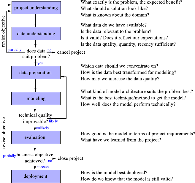
1.2 The Data Analysis Process 9
Fig. 1.1 Overview of the CRISP-DM process together with typical questions to be asked in the
respective phases
assessment of the basic relationships between attributes, a data quality audit, an in-
spection of abnormal cases (outliers), etc. For instance, outliers appear to be abnor-
mal in some sense and are often caused by faulty insertion, but sometimes they give
surprising insights on closer inspection. Some techniques respond very sensitively
to outliers, which is why they should be treated with special care. Another aspect is
empty fields which may occur in the database for various reasons—ignoring them
may introduce a systematic error in the results. By getting familiar with the data,
typically first insights and hypotheses are gained. If we do not believe that the data
suffices to solve the problem, it may be necessary to revise the project’s objective.
So far, we have not changed any field of our database. However, this will be re-
quired to get the data into a shape that enables us to apply modeling tools. In the
data preparation phase (Chap. 6) the data is selected, corrected, modified, even
new attributes are generated, such that the prepared data set best suits the prob-
lem and the envisaged modeling technique. Basically all deficiencies that have been
identified in the data understanding phase require special actions. Often the outliers
10 1 Introduction
and missing values are replaced by estimated values or true values obtained from
other sources. We may restrict the further analysis to certain variables and to a se-
lection of the records from the full data set. Redundant and irrelevant data can give
many techniques an unnecessarily hard time.
Once the data is prepared, we select and apply modeling tools to extract knowl-
edge out of the data in the form of a model (Chaps. 5and 7–9). Depending on
what we want to do with the model, we may choose techniques that are easily in-
terpretable (to gain insights) or less demonstrative black-box models, which may
perform better. If we are not pleased with the results but are confident that the model
can be improved, we step back to the data preparation phase and, say, generate new
attributes from the existing ones, to support the modeling technique or to apply
different techniques. Background knowledge may provide hints on useful transfor-
mations that simplify the representation of the solution.
Compared to the modeling itself, which is typically supported by efficient tools
and algorithms, the data understanding and preparation phases take considerable
part of the overall project time as they require a close manual inspection of the data,
investigations into the relationships between different data sources, often even the
analysis of the process that generated the data. New insights promote new ideas
for feature generation or alter the subset of selected data, in which case the data
preparation and modeling phases are carried out multiple times. The number of
steps is not predetermined but influenced by the process and findings itself.
When the technical benchmarks cannot be improved anymore, the obtained re-
sults are analyzed in the evaluation phase (Chap. 10) from the perspective of the
problem owner. At this point, the project may stop due to unsatisfactory results, the
objectives may be revised in order to succeed under a slightly different setting, or
the found and optimized model may be deployed.
After deployment, which ranges from writing a report to the creation of a soft-
ware system that applies the model automatically to aid or make decisions, the
project is not necessarily finished. If the project results are used continuously over
time, an additional monitoring phase is necessary: during the analysis, a number of
assumptions will be made, and the correctness of the derived model (and the deci-
sions that rely on the model) depends on them. So we better verify from time to time
that these assumption still hold to prevent decision-making on outdated information.
In the literature one can find attempts to create cost models that estimate the costs
associated with a data analysis project. Without going into the details, the major key
factors that remained in a reduced cost model derived from 40 projects were [9]:
•the number of tables and attributes,
•the dispersion of the attributes (only a few vs. many values),
•the number of external data sources,
•the type of the model (prediction being the most expensive),
•the attribute type mixture (mixture of numeric and nonnumeric), and
•the familiarity of the staff with data analysis projects in general,
the project domain in particular, and the software suites.
1.3 Methods, Tasks, and Tools 11
While there is not much we can do about the problem size, the goal of this book is
to increase the familiarity with data analysis projects by going through each of the
phases and providing first instructions to get along with the software suites.
1.3 Methods, Tasks, and Tools
Problem Categories Every data analysis problem is different. To avoid the effort
of inventing a completely new solution for each problem, it is helpful to think of
different problem categories and consider them as building blocks from which a
solution may be composed. These categories also help to categorize the large num-
ber of different tools and algorithms that solve specific tasks. Over the years, the
following set of method categories has been established [3]:
•classification
Predict the outcome of an experiment with a finite number of possible results
(like yes/no or unacceptable/acceptable/good/very good). We may be interested
in a prediction because the true result will emerge in the future or because it is
expensive, difficult, or cumbersome to determine it.
Typical questions: Is this customer credit-worthy? Will this customer respond to
our mailing? Will the technical quality be acceptable?
•regression
Regression is, just like classification, also a prediction task, but this time the value
of interest is numerical in nature.
Typical questions: How will the EUR/USD exchange rate develop? How much
money will the customer spend for vacation next year? How much will the ma-
chine’s temperature change within the next cycle?
•clustering,segmentation
Summarize the data to get a better overview by forming groups of similar cases
(called clusters or segments). Instead of examining a large number of similar
records, we need to inspect the group summary only. We may also obtain some
insight into the structure of the whole data set. Cases that do not belong to any
group may be considered as abnormal or outliers.
Typical questions: Do my customers divide into different groups? How many op-
erating points does the machine have, and what do they look like?
•association analysis
Find any correlations or associations to better understand or describe the inter-
dependencies of all the attributes. The focus is on relationships between all at-
tributes rather than focusing on a single target variable or the cases (full record).
Typical questions: Which optional equipment of a car often goes together? How
do the various qualities influence each other?
•deviation analysis
Knowing already the major trends or structures, find any exceptional subgroup
that behaves differently with respect to some target attribute.
Typical questions: Under which circumstances does the system behave differ-
ently? Which properties do those customers share who do not follow the crowd?
12 1 Introduction
The most frequent categories are classification and regression, because decision
making always becomes much easier if reliable predictions of the near future are
available. When a completely new area or domain is explored, cluster analysis and
association analysis may help to identify relationships among attributes or records.
Once the major relationships are understood (e.g., by a domain expert), a deviation
analysis can help to focus on exceptional situations that deviate from regularity.
Catalog of Methods There are various methods in each of these categories to
find reliable answers to the questions raised above. However, there is no such thing
as a single gold method that works perfectly for all problems. To convey some idea
which method may be best suited for a given problem, we will discuss various meth-
ods in Chaps. 7–9. However, in order to organize these chapters, we did not rely on
the problem categories collected above, as some methods can be used likewise for
more than one problem type. We rather used the intended task of the data analysis
as a grouping criterion:
•finding patterns (Chap. 7)
If the domain (and therefore the data) is new to us or if we expect to find interest-
ing relationships, we explore the data for new, previously unknown patterns. We
want to get a full picture and do not concentrate on a single target attribute yet.
We may apply methods from, for instance, segmentation, clustering, association
analysis, or deviation analysis.
•finding explanations (Chap. 8)
We have a special interest in some target variable and wonder why and how it
varies from case to case. The primary goal is to gain new insights (knowledge)
that may influence our decision making, but we do not necessarily intend au-
tomation. We may apply methods from, for instance, classification, regression,
association analysis, or deviation analysis.
•finding predictors (Chap. 9)
We have a special interest in the prediction of some target variable, but it (possi-
bly) represents only one building block of our full problem, so we do not really
care about the how and why but are just interested in the best-possible prediction.
We may apply methods from, for instance, classification or regression.
Available Tools As already mentioned, the key to success is often the proper com-
bination of data preparation and modeling techniques. Data analysis software suites
are of great help as they reduce data formatting efforts and ease method linking.
There is a long list of commercial and free software suites and tools, including the
following classical products:
•IBM SPSS PASW Modeler (formerly Clementine)
Clementine was the first commercial data mining workbench in 1994 and is a
commercial product from SPSS, now IBM.
http://www.spss.com/
•SAS Enterprise Miner
A commercial data mining solution from SAS.
http://www.sas.com/

1.4 How to Read This Book 13
•The R-project
R is a free software environment for statistical computing and graphics.
http://www.r-project.org/
•Weka
Weka is a popular open-source collection of machine learning algorithms, initially
developed by the University of Waikato, New Zealand.
http://www.cs.waikato.ac.nz/ml/weka/
For an up-to-date list of software suites see, for instance,
http://www.kdnuggets.com/software/suites.html
Although the choice of the software suite has considerable impact on the project
time (usability) and can help to avoid errors (because some of them are easily spot-
ted using powerful visualization capabilities), the suites cannot take over the full
analysis process. They provide at best an initial starting point (by means of analysis
templates or project wizards), but in most cases the key factor is the intelligent com-
bination of tools and background knowledge (regarding the project domain and the
utilized tools). The suites exhibit different strengths, some focus on supporting the
human data analyst by sophisticated graphical user interfaces, graphical configura-
tion and reporting, while others are better suited for batch processing and automati-
zation.
In this book, we will use R, which is particularly powerful in statistical tech-
niques, and KNIME (the Konstanz Information Miner1), which is an open-source
data analysis tool that is growing in popularity due to its graphical workflow editor
and its ability to integrate other well-known toolkits.
1.4 How to Read This Book
In the next chapter we will take a glimpse at the intelligent data analysis process by
looking over the shoulder of Stan and Laura as they analyze their data (while only
one of them actually follows CRISP-DM). The chapter is intended to give an im-
pression of what will be discussed in much greater detail throughout the book. The
subsequent chapters roughly follow the CRISP-DM stages: we analyze the problem
first in Chap. 3(project understanding) and then investigate whether the available
data suits our purposes in terms of size, representativeness, and quality in Chap. 4
(data understanding). If we are confident that the data is worth carrying out the anal-
ysis, we discuss the data preparation (Chap. 6) as the last step before we enter the
modeling phase (Chaps. 7–9). As already mentioned, data preparation is already
tailored to the methods we are going to use for modeling; therefore, we have to in-
troduce the principles of modeling already in Chap. 5. Deployment and monitoring
is briefly addressed in Chap. 10. Readers who, over the years, have lost some of
their statistical knowledge can (partially) recover it in Appendix A. The statistics
1Available for download at http://www.knime.org/.

14 1 Introduction
appendix is not just a glossary of terms to quickly look up details but also serves as
a book within the book for a few preparative lessons on statistics before delving into
the chapters about intelligent data analysis.
Most chapters contain a section that equips the reader with the necessary infor-
mation for some first hands-on experience using either R or KNIME. We have set-
tled on R and KNIME because they can be seen as extremes on the range of possible
software suites: R is a statistical tool, which is (mostly) command-line oriented and
is particularly useful for scripting and automatization. KNIME, on the other hand,
supports the composition of complex workflows in a graphical user interface.2Ap-
pendices Band Cprovide a brief introduction into both systems.
References
1. Berthold, M., Hand, D.: Intelligent Data Analysis. Springer, Berlin (2009)
2. Chapman, P., Clinton, J., Kerber, R., Khabaza, T., Reinartz, T., Shearer, C., Wirth, R.: Cross
Industry Standard Process for Data Mining 1.0, Step-by-step Data Mining Guide. CRISP-DM
consortium (2000)
3. Fayyad, U.M., Piatetsky-Shapiro, G., Smyth, P., Uthurusamy, R. (eds.): Advances in Knowl-
edge Discovery and Data Mining. AAAI Press/MIT Press, Menlo Park/Cambridge (1996)
4. Feynman, R.P., Leighton, R.B., Sands, M.: The Feynman Lectures on Physics. Mechanics, Ra-
diation, and Heat, vol. 1. Addison-Wesley, Reading (1963)
5. Hand, D.: Intelligent data analysis: issues and opportunities. In: Proc. 2nd Int. Symp. on Ad-
vances in Intelligent Data Analysis, pp. 1–14. Springer, Berlin (1997)
6. Kepler, J.: Astronomia Nova, aitiologetos seu physica coelestis, tradita commentariis de
motibus stellae martis, ex observationibus Tychonis Brahe. (New Astronomy, Based upon
Causes, or Celestial Physics, Treated by Means of Commentaries on the Motions of the Star
Mars, from the Observations of Tycho Brahe) (1609); English edition: New Astronomy. Cam-
bridge University Press, Cambridge (1992)
7. Kepler, J.: Harmonices Mundi (1619); English edition: The Harmony of the World. American
Philosophical Society, Philadelphia (1997)
8. Kurgan, L.A., Musilek, P.: A survey of knowledge discovery and data mining process models.
Knowl. Eng. Rev. 21(1), 1–24 (2006)
9. Marban, O., Menasalvas, E., Fernandez-Baizan, C.: A cost model to estimate the effort of data
mining process (DMCoMo). Inf. Syst. 33, 133–150 (2008)
2The workflows discussed in this book are available for download at the book’s website.

Chapter 2
Practical Data Analysis: An Example
Before talking about the full-fledged data analysis process and diving into the details
of individual methods, this chapter demonstrates some typical pitfalls one encoun-
ters when analyzing real-world data. We start our journey through the data analysis
process by looking over the shoulders of two (pseudo) data analysts, Stan and Laura,
working on some hypothetical data analysis problems in a sales environment. Being
differently skilled, they show how things should and should not be done. Through-
out the chapter, a number of typical problems that data analysts meet in real work
situations are demonstrated as well. We will skip algorithmic and other details here
and only briefly mention the intention behind applying some of the processes and
methods. They will be discussed in depth in subsequent chapters.
2.1 The Setup
Disclaimer The data and the application scenario used in this chapter are fictional.
However, the underlying problems are motivated by actual problems which are en-
countered in real-world data analysis scenarios. Explaining particular applicational
setups would have been entirely out of the scope of this book, since in order to un-
derstand the actual issue, a bit of domain knowledge is often helpful if not required.
Please keep this in mind when reading the following. The goal of this chapter is
to show (and sometimes slightly exaggerate) pitfalls encountered in real-world data
analysis setups and not the reality in a supermarket chain. We are painfully aware
that people familiar with this domain will find some of the encountered problems
strange, to say the least. Have fun.
The Data For the following examples, we will use an artificial set of data sources
from a hypothetical supermarket chain. The data set consists of a few tables, which
have already been extracted from an in-house database:1
1Often just getting the data is a problem of its own. Data analysis assumes that you have access to
the data you need—an assumption which is, unfortunately, frequently not true.
M.R. Berthold et al., Guide to Intelligent Data Analysis,
Texts in Computer Science 42,
DOI 10.1007/978-1-84882-260-3_2, © Springer-Verlag London Limited 2010
15
16 2 Practical Data Analysis: An Example
•Customers: data about customers, stemming mostly from information collected
when these customers signed up for frequent shopper cards.
•Products: A list of products with their categories and prices.
•Purchases: A list of products together with the date they were purchased and the
customer card ID used during checkout.
The Analysts Stan and Laura are responsible for the analytics of the southern and
northern parts, respectively, of a large supermarket chain. They were recently hired
to help better understand customer groups and behavior and try to increase revenue
in the local stores. As is unfortunately all too common, over the years the stores
have already begun all sorts of data acquisition operations, but in recent years quite
a lot of this data has been merged—however, still without a clear picture in mind.
Many other stores had started to issue frequent shopping cards, so the directors of
marketing of the southern and northern markets decided to launch a similar program.
Lots of data have been recorded, and Stan and Laura now face the challenge to fit
existing data to the questions posed. Together with their managers, they have sat
down and defined three data analysis questions to be addressed in the following
year:
•differentiate the different customer groups and their behavior to better understand
their impact on the overall revenue,
•identify connections between products to allow for cross selling campaigns, and
•help design a marketing campaign to attract core customers to increase their pur-
chases.
Stan is a representative of the typical self-taught data analysis newbie with little
experience on the job and some more applied knowledge about the different tech-
niques, whereas Laura has some training in statistics, data processing, and data anal-
ysis process planning.
2.2 Data Understanding and Pattern Finding
The first analysis task is a standard data analysis setup: customer segmentation—
find out which types of customers exist in your database and try to link them to
the revenue they create. This can be used later to care for clientele that are re-
sponsible for the largest revenue source or foster groups of customers who are
under-represented. Grouping (or clustering) records in a database is the predomi-
nant method to find such customer segments: the data is partitioned into smaller
subsets, each forming a more coherent group than the overall database contains. We
will go into much more detail on this type of data analysis methods in Chap. 7.For
now it suffices to know that some of the most prominent clustering methods return
one typical example for each cluster. This essentially allows us to reduce a large
data set to a small number of representative examples for the subgroups contained
in the database.

2.2 Data Understanding and Pattern Finding 17
Table 2.1 Stan’s clustering
result Cluster-id Age Customer revenue
146.5€1,922.07
239.4€11,162.20
339.1€7,279.59
446.3€419.23
539.0€4,459.30
The Naive Approach Stan quickly jumps onto the challenge, creates a dump of
the database containing customer purchases and their birth date, and computes the
age of the customers based on their birth date and the current day. He realizes that
he is interested in customer clusters and therefore needs to somehow aggregate the
individual purchases to their respective “owner.” He uses an aggregating operator in
his database to compute the total price of the shopping baskets for each customer.
Stan then applies a well-known clustering algorithm which results in five prototyp-
ical examples, as shown in Table 2.1.
Stan is puzzled—he was expecting the clustering algorithm to return reasonably
meaningful groups, but this result looks as if all shoppers are around 40–50 years
old but spend vastly different amount of money on products. He looks into some of
the customers’ data in some of these clusters but cannot seem to find any interesting
relations or any reason why some seem to buy substantially more than others. He
changes some of the algorithm’s settings, such as the number of clusters created, but
the results are similarly uninteresting.
The Sound Approach Laura takes a different approach. Routinely she first tries
to understand the available data and validates that some basic assumptions are in fact
true. She uses a basis data summarization tool to report the different values for the
string attributes. The distribution of first names seems to match the frequencies she
would expect. Names such as “Michael” and “Maria” are most frequent, and “Rose-
marie” and “Anneliese” appear a lot less often. The frequencies of the occupations
also roughly match her expectations: the majority of the customers are employ-
ees, while the second and third groups are students and freelancers, respectively.
She proceeds to checking the attributes holding numbers. In order to check the age
of the customers, she also computes the customers’ ages from their birth date and
checks minimum and maximum. She spots a number of customers who obviously
reported a wrong birthday, because they are unbelievably young. As a consequence,
she decides to filter the data to only include people between the ages of 18 and 100.
In order to explore the data more quickly, she reduces the overall customer data set
to 5,000 records by random sampling and then plots a so-called histogram, which
shows different ranges of the attribute age and how many customers fall into that
range. Figure 2.1 shows the result of this analysis.
This view confirms Laura’s assumptions—the majority of shoppers is middle
aged, and the number of shoppers continuously declines toward higher age groups.
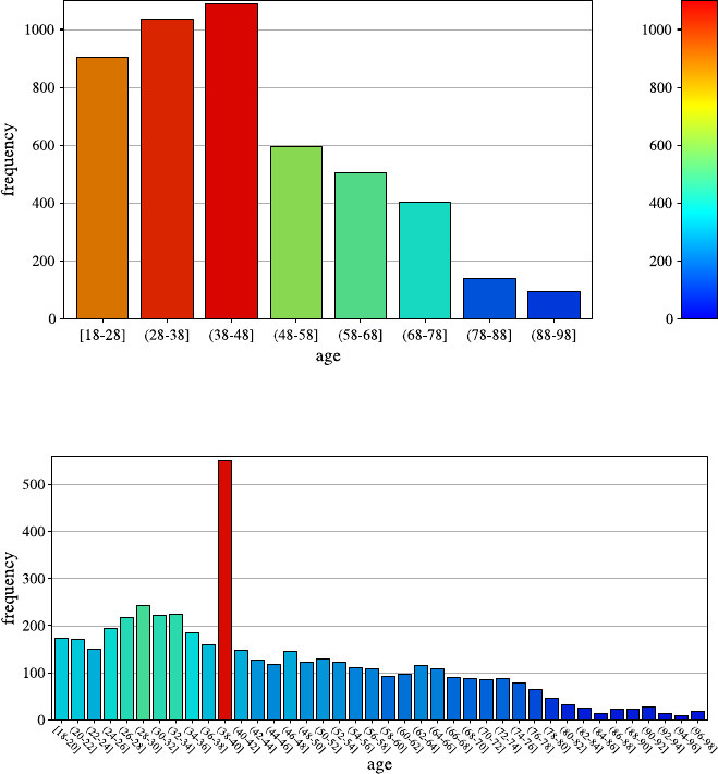
18 2 Practical Data Analysis: An Example
Fig. 2.1 A histogram for the distribution of the value of attribute age using 8 bins
Fig. 2.2 A histogram for the distribution of the value of attribute age using40bins
She creates a second histogram to better inspect the subtle but strange cliff at around
age 48 using finer setting for the bins. Figure 2.2 shows the result of this analysis.
Surprised, she notices the huge peak in the bin of ages 38–40. She discusses this
observation with colleagues and the administrator of the shopping card database.
They have no explanation for this odd concentration of 40-year-old people ei-
ther. After a few other investigations, a colleague of the person who—before his
retirement—designed the data entry forms suspects that this may have to do with
the coding of missing birth dates. And, as it turns out, this is in fact the case: forms
where people entered no or obviously nonsensical birth dates were entered into the
form as zero values. For technical reasons, these zeros were then converted into the
Java 0-date which turns out to be January 1, 1970. So these people all turn up with
the same birth date in the customer database and in turn have the same age after the

2.2 Data Understanding and Pattern Finding 19
Table 2.2 Laura’s clustering
result Cluster Age Avg. cart price Avg. purchases/
month
175.3€19.- 5.6
242.1€78.- 7.8
338.1€112.- 9.3
430.6€16.- 4.8
544.7€45.- 3.7
conversion Laura performed initially. Laura marks those entries in her database as
“missing” in order to be able to distinguish them in future analyses.
Similarly, she inspects the shopping basket and product database and cleans up a
number of other outliers and oddities. She then proceeds with the customer segmen-
tation task. As in her previous data analysis projects, Laura first writes down her
domain knowledge in form of a cognitive map, indicating relationships and depen-
dencies between the attributes of her database. Having thus recalled the interactions
between the variables of interest, she is well aware that the length of customer’s
history and the number of overall shopping trips affect the overall basket price, and
so she settles on the average basket price as a better estimator for the value of a
particular customer. She considers also distinguishing the different product cate-
gories, realizing that those, of course, also potentially affect the average price. For
the first step, she adds the average number of purchases per month, another indicator
for the revenue a customer brings in. Data aggregation is now a bit more complex,
but the modern data analysis tool she is using allows her to do the required join-
ing and pivoting operations effortlessly. Laura knows that clustering algorithms are
very sensitive to attributes with very different magnitudes, so she normalizes the
three attributes to make sure they all three contribute equally to the clustering result.
Running the same clustering algorithm that Stan was using, with the same setting
for the number of clusters to be found, she gets the result shown in Table 2.2.
Obviously, there is a cluster (#1) of older customers who have a relatively small
average basket price. There is also another group of customers (#4) which seems
to correlate to younger shoppers, also purchasing smaller baskets. The middle-aged
group varies wildly in price, however. Laura realizes that this matches her assump-
tion about family status—people with families will likely buy more products and
hence combine more products into more expensive baskets, which seems to explain
the difference between clusters #2/#3 and cluster #5. The latter also seem to shop
significantly less often. She goes back and validates some of these assumptions by
looking at shopping frequency and average basket size as well and also determines
the overall impact on store revenues for these different groups. She finally discusses
these results with her marketing and campaign specialists to develop strategies to
foster the customer groups which bring in the largest chunk of revenue and develop
the ones which seem to be under-represented.
20 2 Practical Data Analysis: An Example
2.3 Explanation Finding
The second analysis goal is another standard shopping basket analysis problem: find
product dependencies in order to better plan campaigns.
The Naive Approach Stan recently read in a book on practical data analysis how
association rules can find arbitrary such connections in market basket data. He runs
the association rule mining algorithm in his favorite data analysis tool with the de-
fault settings and inspects the results. Among the top-ranked generated rules, sorted
by their confidence, Stan finds the following output:
’foie gras’ (p1231) <- ’champagne Don Huberto’ (p2149),
’truffle oil de Rossini’ (p578) [s=1E-5, c=75%]
’Tortellini De Cecco 500g’ (p3456)’
<- ’De Cecco Sugo Siciliana’ (p8764) [s=1E-5, c=60%]
He quickly infers that this representation must mean that foie gras is bought when-
ever champagne and truffle oil are bought together and similarly for the other rule.
Stan knows that the confidence measure cis important, as it indicates the strength
of the dependency (the first rule holds in 3 out of 4 cases). He considers the sec-
ond measure of frequency sto be less important and deliberately ignores its fairly
small value. The two rules shown above are followed by a set of other, similarly lux-
ury/culinary product-oriented rules. Stan concludes that luxury products are clearly
the most important products on the shelf and recommends to his marketing man-
ager to launch a campaign to advertise some of the products on the right side of
these rules (champagne, truffle oil) to increase the sales of the left side (foie gras).
In parallel, he increases orders for these products, expecting a recognizable increase
in sales. He proudly sends the results of his analysis to Laura.
The Sound Approach Laura is puzzled by those nonintuitive results. She reruns
the analysis and notices the support values of the rules extracted by Stan—some
of the rules Stan extracted have indeed a remarkably high confidence, and some
do almost forecast shopping behavior. However, they have very low support values,
meaning that only a small number of shopping baskets containing the products were
ever observed. The rules that Stan found are not representative at all for his customer
base. To confirm this, she runs a quick query on her database and sees that, indeed,
there is essentially no influence on the overall revenue.
She notices that the problem of low support is caused by the fact that Stan ran
the analysis on product IDs, so in effect he was forcing the rules to differentiate
between brands of champagne and truffle oil. She reruns the analysis based on the
product categories instead, ranks them by a mix of support and confidence, and finds
a number of association rules with substantially higher support:
tomatoes <- capers, pasta [s=0.007, c=32%]
tomatoes <- apples [s=0.013, c=22%]
Laura focuses on rules with a much higher support measure sthan before and also
realizes that the confidence measure cis significantly higher than one would expect
2.4 Predicting the Future 21
by chance. The first rule seems to be triggered by a recent fashion of Italian cooking,
whereas the apple/tomato-rule is a known aspect.
However, she is still irritated by one of the rules discovered by Stan, which has
a higher than suspected confidence despite a relatively low support. Are there some
gourmets among the customers who prefer a very specific set of products? Rerun-
ning this analysis on the shopping card owners yields almost the same results, so
the (potential) gourmets appear among their regular customers. Just to be sure, she
inspects how many different customers (resp. shopping cards) occur for baskets that
support this rule. As she had conjectured, there is a very limited number of cus-
tomers that seem to have a strong affection for these products. Those few customers
have bought this combination frequently, thus inflating the overall support measure
(which refers to shopping baskets). This means that the support in terms of the num-
ber of customers is even smaller than the support in terms of number of shopping
baskets. The response to any kind of special promotion would fall even shorter than
expected from Stan’s rule.
Apparently the time period in which the analyzed data has been collected influ-
ences the results. Thinking about it, she develops an idea how to learn about changes
in the customers shopping behavior: She identifies a few rules, some rather promis-
ing other well-known facts, and decides to monitor those combinations on a regular
basis (say quarterly). She got to know that a chain of liquor stores will soon open
a number of shops close to the own markets, so she picks some rules with bever-
ages in their conclusion part to see if the opening has any impact on the established
shopping patterns of the own customers. As she fears a loss of potential sales, she
plans a comparison of rules obtained not only over time but also among markets in
the vicinity of such stores versus the other markets. She wonders whether promot-
ing the products in the rule’s antecedent may help to bring back the customer and
decides to discuss this with the marketing&sales team to determine if and where
appropriate campaigns should be launched, once she has the results of her analysis.
2.4 Predicting the Future
The third and final analysis goal we consider in this brief overview is a forecasting
or prediction problem. The idea is to find some relationship in our existing data that
can help us to predict if and how customers will react to coupon mailings and how
this will affect our future revenue.
The Naive Approach Stan believes that no detailed analysis is required for this
problem and notices that it is fairly straightforward to monitor success. He has seen
at a competitor how discount coupons attract customers to purchase additional prod-
ucts. So he suggests launching a coupon campaign that gives customers a discount of
10% if they purchase products for more than €50. This coupon is mailed to all cus-
tomers on record. Throughout the course of the next month, he carefully monitors
his database and is positively surprised when he sees that his campaign is obviously
22 2 Practical Data Analysis: An Example
working: the average price of shopping baskets is going up in comparison with pre-
vious months. However, at the end of the quarter he is shocked to see that overall
revenues for the past quarter actually fell. His management is finally fed up with the
lack of performance and fires Stan.
The Sound Approach Laura, who is promoted to head of analytics for the north-
ern and southern super market chain first cancels Stan’s campaign and looks into the
underlying data. She quickly realizes that even though quite a number of customers
did in fact use the coupons and increased their shopping baskets, their average num-
ber of baskets per month actually went down—so quite a number of people seem
to have simply combined smaller shopping trips to be able to benefit from the dis-
count offer. However, for some shoppers, the combined monthly shopping basket
value did go up markedly, so there might be value here. Laura wonders how she can
discriminate between those customers who simply use the coupons to discount their
existing purchases and those who are actually enticed to purchase additional items.
She notices that one of the earlier generated customer segments correlates better
than others with the group of customers whose revenue went up—this fraction of
customers is significantly higher than in the other groups. She considers using this
very simple, manually designed predictor for a future campaign but wants to first
make sure that she cannot do better with some smarter techniques. She decides that
in the end it is not so important if she can actually understand the extracted model
but only how well it performs.
To provide good starting points for the modeling technique, she decides to gen-
erate a few potentially informative attributes first. Models that rely on thousands
of details typically perform poor, so providing how often every product has been
bought by the customer in the last month is not an option for her. To get robust mod-
els, she wants to aggregate the tiny bits of information, but what kind of aggregation
could be helpful? She returns to her cognitive map to review the dependencies. One
aspect is the availability of competitors: She reckons that customers may have alter-
native (possibly specialized) markets nearby but have been attracted by the coupon
this time, keeping them away from the competitors. She decides to aggregate the
money spent by the customer per month for a number of product types (such as bev-
erages, thinking of the chain of liquor stores again). She conjectures that customers
that perform well on average, but underperform in a specific segment only, may
be enticed by the coupon to buy products for the underperforming segment also.
Providing the segment performance before and after Stan’s campaign should help a
predictor to detect such dependencies if they exist.
The cognitive map brings another idea into her mind: people who appreciate the
full assortment but live somewhat further away from the own stores may see the
coupon as a kind of travel compensation. So she adds a variable expressing a coarse
estimation of the distance between the customer home and the nearest available
market (which is only possible for the shopping card owners). She continues to use
her cognitive map to address many different aspects and creates attributes that may
help to verify her hypotheses. She then investigates the generated attributes visually
and also technically by means of feature selection methods.
2.5 Concluding Remarks 23
After selecting the most promising attributes, she trains a classifier to distin-
guish the groups. She uses part of the data to simulate an independent test scenario
and thereby evaluates the expected impact of a campaign—are the costs created
by sending coupons to customers who do not purchase additional products offset
by customers buying additional items? After some additional model fine tuning,
she reaches satisfactory performance. She discusses the results with the market-
ing&sales team and deploys the prediction system to control the coupon mailings
for the next quarter. She keeps monitoring the performance of these coupon cam-
paigns over future quarters and updates her model sporadically.
2.5 Concluding Remarks
In this chapter we have, very briefly and informally, touched upon a number of issues
data analysts may encounter while making sense of real-world data. Many other
problems can arise, and many more methods for data analysis exist in the academic
literature and in real-world data analysis tools. We will attempt at covering the most
prominent and most often used examples in the following chapters.
Note that one of the biggest problems data analysts very often have is that the data
they get is not suited to answer the questions they are asked. For instance, if we were
supposed to use the data in our customer database to find out how to differentiate
Asian shopping behavior from European, we would have a very hard time. This
data can only be used to distinguish between different types of European shoppers
because it contains data from European markets only. Note also that we are (why
ever) assuming that we used a nice, representative sample of all different types of
European shoppers to generate the data—very often this is not the case, and the data
itself is already biased and will bias our analysis results—in this example we could
be heavily biased by the type of supermarket chain we used to record the data in
the first place. An upscale delicatessen supermarket will have dramatically different
shopping patterns than the low-scale discounter. We will be discussing these points
later in more depth as well.
Chapter 3
Project Understanding
We are at the beginning of a series of interdependent steps, where the project under-
standing phase marks the first. In this initial phase of the data analysis project, we
have to map a problem onto one or many data analysis tasks. In a nutshell, we con-
jecture that the nature of the problem at hand can be adequately captured by some
data sets (that still have to be identified or constructed), that appropriate modeling
techniques can successfully be applied to learn the relationships in the data, and fi-
nally that the gained insights or models can be transferred back to the real case and
applied successfully. This endeavor relies on a number of assumptions and is threat-
ened by several risks, so the goal of the project understanding phase is to assess the
main objective, the potential benefit, as well as the constraints, assumptions, and
risks. While the number of data analysis projects is rapidly expanding, the failure
rate is still high, so this phase should be carried out seriously to rate the chances
of success realistically. The project understanding phase should be carried out with
care to keep the project on the right track.
We have already sketched the data analysis process (CRISP-DM in Sect. 1.2).
There is a clear order in the steps in the sense that for a later step, all precedent
steps must have been executed. However, this does not mean that we can run once
through all steps to deterministically achieve the desired results. There are many
options and decisions to be made. Most of them will rely on our (subjective and dy-
namic) understanding of the problem at hand. The line of argument will not always
be from an earlier phase to a later one. For instance, if a regression problem has to be
solved, the analyst may decide that a certain method seems to be a promising choice
for the modeling phase. From the characteristics of this technique he knows that all
input data have to be transformed into numerical data, which has to be carried out
beforehand (data preparation phase). This requires a careful look at the multivalued
ordinally scaled attributes already in the data understanding phase to see how the
order of the values is best preserved. If it is not considered in time, it may happen
that later, in the evaluation phase, it turns out that the project owner expected to gain
insights into the input–output relationship rather than having a black-box model
only. If the analyst had considered this requirement beforehand, he might have cho-
sen a different method. Changing this decision at any point later than in this initial
M.R. Berthold et al., Guide to Intelligent Data Analysis,
Texts in Computer Science 42,
DOI 10.1007/978-1-84882-260-3_3, © Springer-Verlag London Limited 2010
25

26 3 Project Understanding
Table 3.1 Problems faced in data analysis projects, excerpt from [1]
Problem source Project owner perspective Analyst perspective
Communication Project owner does not understand
the technical terms of the analyst
Analyst does not understand the terms
of the domain of the project owner
Lack of
understanding
Project owner was not sure what the
analyst could do or achieve Analyst found it hard to understand
how to help the project owner
Models of analyst were different from
what the project owner envisioned
Organization Requirements had to be adopted in
later stages as problems with the data
became evident
Project owner was an unpredictable
group (not so concerned with the
project)
project understanding phase often renders some (if not most) of the earlier work in
data understanding, data preparation, and modeling useless. While the time spent on
project and data understanding compared to data preparation and modeling is small
(20% : 80%), the importance to success is just the opposite (80% : 20%) [4].
3.1 Determine the Project Objective
As a first step, a primary objective (not a long list but one or two) and some success
criteria in terms of the project domain have to be determined (who will decide which
results are desired and whether the original project goal was achieved or not). This
is much easier said than done, especially if the analysis is not carried out by the do-
main expert himself. In such cases the project owner and the analyst speak different
languages which may cause misunderstandings and confusion. In the worst case,
the communication problems lead to very soft project goals, just vague enough to
allow every stakeholder seeing his own perspective somehow accounted for. At the
end, all of a sudden, the stakeholders recognize that the results do not fit their expec-
tations. The challenge here is usually not a matter of technical but of communicative
competence.
Table 3.1 shows some typical problems occurring in such projects. To overcome
language confusion, a glossary of terms, definition, acronyms, and abbreviations is
inevitable. Knowing the terms still does not imply an understanding of the project
domain, the objectives, constraints, and influencing factors. One interviewing tech-
nique that may help to get most out of the expert is to rephrase all of her statements,
which often provokes additional relativizing statements. Another technique is to use
explorative tools such as mind maps or cognitive maps to sketch beliefs, experi-
ences, and known factors and how they influence each other.
An example of a cognitive map in the shopping domain considered in Sect. 2is
given in Fig. 3.1. Each node of this graph represents a property of the considered
product or the customer. The variable of interest is placed in the center: how often
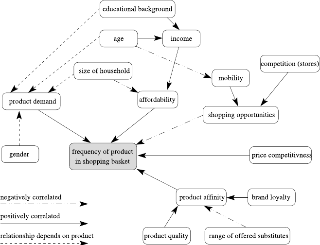
3.1 Determine the Project Objective 27
Fig. 3.1 A cognitive map for the shopping domain: How often will a certain product occur in
a shopping basket of some customer? The positive correlation between income and affordability
reads like the higher the income, the higher the affordability, whereas an example of a negative
correlation reads like the broader the range of offered substitutes, the lower the product affinity
will a certain product be found in the shopping basket of the customer? This depends
on various factors, which are placed around this node. The direction of influence is
given by the arrows, and the line style indicates the way how the variables influence
each other: The higher the customer’s affinity to the product, the more often it will
be found in the basket. The author of the cognitive map conjectures that the product
affinity itself is positively influenced by a high product quality and the customer’s
brand loyalty (a loyal customer is less likely to buy substitute products). On the
other hand, the broader the range of offered substitutes, the more likely a customer
may try out a different product. Other relationships depend on the product itself:
The higher the demand of a certain product, the more often it will be found in the
shopping basket, but the demand itself may, depending on the product, vary with
gender (e.g., razor blades, hairspray), age (e.g., denture cleaner), or family status
(e.g., napkins, fruit juice). The development of such a map supports the domain
understanding and adjustment of expectations.
While constructing a cognitive map, a few rules should be adhered to: First, to
keep the map clear, only direct dependencies should be included in the graph. For
instance, the size of the household influences the target variable, but only indirectly
via the generated product demand and the affordability, and therefore there is no
direct connection from size of household to frequency of product in shopping basket.

28 3 Project Understanding
Table 3.2 Clarifying the primary objectives
Objective: Increase revenues (per campaign and/or per customer) in direct mailing cam-
paigns by personalized offer and individual customer selection
Deliverable: Software that automatically selects a specified number of customers from the
database to whom the mailing shall be sent, runtime max. half-day for database
of current size
Success criteria: Improve order rate by 5% or total revenues by 5%, measured within 4 weeks
after mailing was sent, compared to rate of last three mailings
Secondly, the labels of the nodes should be chosen carefully, so that they are easily
interpretable when plugged into the relationship templates such as the higher ...,
the higher . . . . As an example, the node size of household could have been named
family status, but then it is not quite clear what the more family status . . . actually
means.
Once an understanding of the domain has been achieved, the problem and pri-
mary objective have to be identified (see Table 3.2). Again, it is often useful to
discuss or model the current solution first, for instance, by using techniques from
software engineering (business process modeling, UML use cases, etc.) [3]. When
the current solution has been elaborated, its advantages and disadvantages can be
explored and discussed. Often, the primary objective is assumed to be known be-
forehand, probably the project would not have been initiated without having iden-
tified a problem first. But as there are many different ways to attack a problem, the
objective should be precise about the direction to follow. A general statement about
the goal is easily made (“model the profitable customers to increase the sales”), but
it is often not precise enough (how do we precisely identify a profitable customer?)
and not actionable (how exactly shall this model help to increase the sales?). To
render the objective more precise, it is necessary to sketch the target use already at
this early stage. Thus it becomes clear what kind of result has to be delivered, which
may range from a written technical report with interesting findings to a user-friendly
software that uses the final model to automatize decisions.
From the perspective of the project owner some of these elaborate steps may ap-
pear unnecessary—they master their domain already, after all. However, these steps
must be considered as a preparation of the closely linked data understanding phase
(see next section). All the identified factors, situations, and relationships that are
assumed to be relevant must be present and recognizable in the data. If they cannot
be found in the data, either there is a misconception in the project understanding or
(even worse) the data is not substantial or detailed enough to reflect the important
relations of the real-world problem. In both cases, it would be fatal to miss this point
and proceed unworried.
3.2 Assess the Situation
The next step is to estimate the chances of a successful data analysis project. This
requires the review of available resources, requirements, and risks. The most impor-
3.2 Assess the Situation 29
tant resources are data and knowledge, that is, databases and experts who can pro-
vide background information (about the domain in general and about the databases
in particular). Besides a plain listing of databases and personnel, it is important to
clarify the access to both: if the data is stored in an operative system, mining the
data may paralyze the applications using it. To become independent, it is advisable
to provide a database dump. Experts are typically busy and difficult to grasp—but
an inaccessible knowledge source is useless. A sufficiently large number of time
slots for meetings should be arranged.
Based on the domain exploration (cognitive map, business process model, etc.),
a list of explicit and implicit assumptions and risks is created to judge the chances
of a successful project and guide the next steps. Data analysis lives on data. This
list shall help to convince ourselves that the data is meaningful and relevant to the
project. Why should we undertake this effort? We will see whether we can build
a model from this data later anyway. Unfortunately, this is only half of the truth.
After reviewing a number of reports in a data analysis competition, Charles Elkan
noted that “when something surprising happens, rather than question the expecta-
tions, people typically believe that they should have done something slightly differ-
ent”[2]. Expecting that the problem can be solved with the given data may lead to
continuously changing and “optimizing” the model—rather than taking the possi-
bility into account that the data is not appropriate for this problem. In order to avoid
this pitfall, the conjectured relations and expert-proven connections can help us in
verifying that the given data satisfy our needs—or to put forward good reasons why
the project will probably fail. This is particularly important as in many projects the
available data have not been collected to serve the purpose that is intended now. To
prevent us from carrying out an expensive project having almost no prospect of suc-
cess, we have to carefully track all assumptions and verify them as soon as possible.
Typical requirements and assumptions include:
•requirements and constraints
–model requirements,
e.g., model has to be explanatory (because decisions must be justified clearly)
–ethical, political, legal issues,
e.g., variables such as gender, age, race must not be used
–technical constraints,
e.g., applying the technical solution must not take more than nseconds
•assumptions
–representativeness:
If conclusions about a specific target group are to be derived, a sufficiently
large number of cases from this group must be contained in the database, and
the sample in the database must be representative for the whole population.
–informativeness:
To cover all aspects by the model, most of the influencing factors (identified in
the cognitive map) should be represented by attributes in the database.
–good data quality:
The relevant data must be of good quality (correct, complete, up-to-date) and
unambiguous thanks to the available documentation.
30 3 Project Understanding
–presence of external factors:
We may assume that the external world does not change constantly—for in-
stance, in a marketing project we may assume that the competitors do not
change their current strategy or product portfolio at all.
Every assumption inherently represents a risk (there might be other risks though).
If possible, a contingency should be sketched in case the assumption turns out to be
invalid, including options such as the acquisition of additional data sources.
3.3 Determine Analysis Goals
Finally, the primary objective must be transformed into a more technical data min-
ing goal. An architecture for the envisaged solution has to be found, composed out
of building blocks as discussed in Sect. 1.3 (data analysis tasks). For instance, this
architecture might contain a component responsible for grouping the customers ac-
cording to some readily available attributes first, another component finds interest-
ing deviating subgroups in each of the groups, and a third component predicts some
variable of interest based on the customer data and the membership to the respec-
tive groups and subgroups. The better this architecture fits the actual situation, the
better the chances of finding a model class that will prove successful in practice. To
achieve this analogy, the discussions about the project domain are of great help.
Again there is the danger of accepting a reasonable architecture quickly, under-
estimating or even ignoring the great impact on the overall effort. Suppose that a
company wants to increase the sales of some high-end product by direct mailing.
One approach is to develop a model that predicts who will buy this product using
the company’s own customer database. Such a model might be interesting to in-
terpret (useful for a report), but if it is used to decide to whom a mailing should be
sent, most of the customers may have the product already (within the same customer
database). Applying the model to people not being in the database is impossible as
we lack the information about them that is needed by the model. The predictive
model may also find out that customers buying the product were loyal customers
for many years—but artificially increasing the duration of the customer relationship
to support the purchase of the product is unfortunately impossible. If a foreseeable
result is ignored or a misconception w.r.t. the desired use of the model is not recog-
nized, considerable time may be wasted with building a correct model that turns out
to be useless in the end.
For each of the building blocks, we can select a model class and technique to
derive a model of this class automatically from data. There is nothing like the unique
best method for predictive tasks, because they all have their individual weaknesses
and strengths and it is impossible to combine all their properties or remove all biases
(see Chap. 5). Although the final decision about the modeling technique will be
made in the modeling phase, it should be clear already at this point of the analysis
which properties the model should have and why. The methods and tools optimize
the technical aspects of the model quality (such as accuracy, see also Chap. 5). Other
3.4 Further Reading 31
aspects are often difficult to formalize and thus to optimize (such as interestingness
or interpretability), so that the choice of the model class has the greatest influence
on these properties. Desirable properties may be, for instance:
•Interpretability:
If the goal of the analysis is a report that sketches possible explanations for a
certain situation, the ultimate goal is to understand the delivered model. For some
black-box models, it is hard to comprehend how the final decision is made, and
their model lacks interpretability.
•Reproduceability/stability:
If the analysis is carried out more than once, we may achieve similar performance
—but not necessarily similar models. This does no harm if the model is used as
a black box, but hinders a direct comparison of subsequent models to investigate
their differences.
•Model flexibility/adequacy:
A flexible model can adapt to more (complicated) situations than an inflexible
model, which typically makes more assumptions about the real world and requires
less parameters. If the problem domain is complex, the model learned from data
must also be complex to be successful. However, with flexible models the risk of
overfitting increases (will be discussed in Chap. 5).
•Runtime:
If restrictive runtime requirements are given (either for building or applying the
model), this may exclude some computationally expensive approaches.
•Interestingness and use of expert knowledge:
The more an expert already knows, the more challenging it is to “surprise” him or
her with new findings. Some techniques looking for associations (see Sect. 7.6)
are known for their large number of findings, many of them redundant and thus
uninteresting. So if there is a possibility of including any kind of previous knowl-
edge, this may ease the search for the best model considerably on the one hand
and may prevent us from rediscovering too many well-known artifacts.
When discussing the various modeling techniques in Chaps. 7–9, we will give hints
which properties they possess. The final choice is then up to the analyst.
3.4 Further Reading
The books by Dorian Pyle [4,5] offer many suggestions and constructive hints for
carrying out the project understanding phase. [5] contains a step-by-step workflow
for business understanding and data mining consisting of various action boxes.An
organizationally grounded framework to formally implement the business under-
standing phase of data mining projects is presented in [6]. In [1] a template set for
educing and documenting project requirements is proposed.
32 3 Project Understanding
References
1. Britos, P., Dieste, O., García-Martínez, R.: Requirements elicitation in data mining for business
intelligence projects. In: Advances in Information Systems Research, Education and Practice,
pp. 139–150. IEEE Press, Piscataway (2008)
2. Elkan, C.: Magical thinking in data mining: lessons from coil challenge 2000. In: Proc. 7th Int.
Conf. on Knowledge Discovery and Data Mining (KDD), pp. 426–431. ACM Press, New York
(2001)
3. Marban, O., Segovia, J., Menasalvas, E., Fernandez-Baizan, C.: Towards data mining engineer-
ing: a software engineering approach. Inf. Syst. 34, 87–107 (2009)
4. Pyle, D.: Data Preparation for Data Mining. Morgan Kaufmann, San Mateo (1999)
5. Pyle, D.: Business Modeling and Data Mining. Morgan Kaufmann, San Mateo (2003)
6. Sharma, S., Osei-Bryson, K.-M.: Framework for formal implementation of the business under-
standing phase of data mining projects. Expert Syst. Appl. 36, 4114–4124 (2009)
Chapter 4
Data Understanding
The main goal of data understanding is to gain general insights about the data that
will potentially be helpful for the further steps in the data analysis process, but data
understanding should not be driven exclusively by the goals and methods to be ap-
plied in later steps. Although these requirements should be kept in mind during data
understanding, one should approach the data from a neutral point of view. Never
trust any data as long as you have not carried out some simple plausibility checks.
Methods for such plausibility checks will be discussed in this chapter. At the end
of the data understanding phase, we know much better whether the assumptions we
made during the project understanding phase concerning representativeness, infor-
mativeness, data quality, and the presence or absence of external factors are justified.
We first take a general look at single attributes in Sect. 4.1 and ask questions like:
What kind of attributes do we have, and what do their domains look like? What is
the precision of numerical values? Is the domain of an attribute stable over time, or
does it change? We also need to assess the data quality. Methods and criteria for this
purpose are introduced in Sect. 4.2.
Data understanding requires taking a closer look at the data. However, this does
not mean that we must browse through seemingly endless columns of numbers and
other values. In this way we would probably overlook most of the important facts.
Looking at the data refers to visualization techniques (Sect. 4.3) that can be used
to get a quick overview on basic characteristics of the data and enable us to check
the plausibility of the data to a certain extent. Visualization techniques are suitable
for the analysis of single attributes and of attributes in combination. Apart from the
pure visualization, it is also recommended to compute simple statistical measures
for correlation between attributes as described in Sect. 4.4.
Outliers, values, or records that are very different from all others should be iden-
tified with methods described in Sect. 4.5. They might cause difficulties for some of
the methods applied in later steps, or they might be wrong values due to data quality
problems. Missing values (see Sect. 4.6) can lead to similar problems as outliers,
and by simply ignoring missing values we might obtain wrong data analysis results,
so we must be aware of whether we have to deal with missing values and, if we have
to, of what kind the missing values are.
M.R. Berthold et al., Guide to Intelligent Data Analysis,
Texts in Computer Science 42,
DOI 10.1007/978-1-84882-260-3_4, © Springer-Verlag London Limited 2010
33
34 4 Data Understanding
Data understanding is also a step that is required for data preparation. For ex-
ample, data understanding will help us to identify and to characterize outliers and
missing values. However, how to treat them—whether to leave them as they are,
to exclude them from further analysis steps, or to replace them by more plausible
values—is a task for data preparation.
Throughout this chapter we will use the Iris data set [2,7]: a set of 150 data
points describing three different types of iris flowers (Iris setosa, Iris virginica, and
Iris versicolor) using four different attributes measuring the length and width of
the sepal and the petal leaves. This is a classic data set with a few very simple
and obvious properties which lends itself naturally to demonstrate how the several
different data analysis methods work. However, readers should not let themselves be
fooled into believing that any real-world data sets will ever display just nice and well
pronounced features. Quite the opposite: in real-world data the odd and undesired
effects often far outweigh the interesting ones.
4.1 Attribute Understanding
In most cases, we assume that the data can be described in terms of a table or
data matrix whose rows contain the instances, records, or data objects and whose
columns represent the attributes,features,orvariables. The data might not be
stored directly in one table but in different tables from which the attributes of in-
terest need to be extracted and joined into a single table. For instance, when we
are interested in the correlation between the age of a customer and the number of
budget products they buy, we would need a table with two columns representing
the attributes age and number of budget products bought. The age of the customers
can be extracted directly from the customer table (computing it from the birth date
if necessary), whereas the number of budget products a customer has bought is not
stored in any specific table but must be counted in the list of items he has bought.
An attribute or its domain—the set of possible values for the attribute—can have
different principal characteristics. One of the most basic is the scale type:anat-
tribute can be nominal (or categorical), ordinal,ornumeric (details are provided
below). Numeric attributes are further subdivided depending on whether they are
discrete or continuous and whether they have an interval,ratio,orabsolute scale.
An attribute is called nominal or categorical if its domain is a finite set. The pos-
sible values for a categorical attribute are often considered as classes or categories.
For a purely categorical attribute, there is no additional structure on the domain.
This means that two values or categories are either equal or different, but not more
or less similar. Examples for categorical attributes are the gender with the values
F(female) and M(male) in the customer data set or the species in the Iris data set.
For categorical attributes, there are sometimes different levels of granularity,
and it is necessary to make a choice on which level the model for the analysis of the
data should be built. The different levels of granularities form a hierarchy of more
and more refined domains. A typical example for such refined levels of granularity
are product categories. The general category might have the values drinks, food, ...,
4.1 Attribute Understanding 35
a more refined level for the drinks might distinguish between water, beer, wine, ...,
and these categories might even be more refined by incorporating the producer. Even
the same producer might offer different brands and variants of water, beer, or wine.
This is still not the lowest level of refinement. We might even distinguish identical
drinks by the size of the container in which they are sold, for instance, 0.5 l, 1.0 l, and
1.5 l bottles. Of course, the most refined level will always provide the most detailed
information. Nevertheless, it is often not very useful to carry out an analysis on this
level, since it is impossible to extract general structures or rules when we restrict
our analysis on the refined level. A general rule like “Customers tend to buy wine
and cheese together” might not be discovered on a refined level of granularity where
no combination of a specific wine and specific cheese might be frequent. Therefore,
it is crucial to choose an appropriate level of granularity for such attributes taking
the aim of the analysis and the size of the data set into account. For smaller data
sets, little statistical evidence can be found when we look at a very refined level,
since the number of instances per value of the attribute decreases with the level
of refinement. Especially, if a number of such attributes with different levels of
granularity is considered, the number of possible combinations for the values grows
extremely fast for refined levels. However, the choice of a suitable granularity is a
task within data preparation. Nevertheless, we must make a decision here as well,
on which level we want to understand and take a closer look at the data. We might
do this even on different levels of granularity.
Another problem that sometimes comes along with categorical attributes is a
dynamic domain. For certain categorical attributes, the domain will never change.
The range of possible values for the month of birth is January, ..., December, and
it seems quite improbable that it will be changed in the near future. The situation for
products is, however, completely different. Certain products might not be offered
by a shop anymore or might vanish completely from the market, whereas other new
products enter the market, or already existing products are adopted by the shop.
Such a dynamic domain of an attribute can cause problems in the analysis later
on. When products are analyzed on a long-term basis of, say, several years, then
products that have entered the market just recently will not show significant (ac-
cumulated) sales numbers compared to products that have been in the market for
decades. Therefore, categorical attributes can lead to undesired or even wrong anal-
ysis results when such problems like the level of granularity or dynamic domains
are not taken into account. We identify such attributes already at this early stage and
make sure that we do not forget to handle them later.
A specific type of categorical attributes are ordinal attributes with an additional
linear ordering imposed on the domain. An attribute for university degrees with the
values none, B.Sc., M.Sc., and Ph.D. represents an ordinal attribute. A Ph.D. is a
higher degree than an M.Sc., and an M.Sc. is a higher degree than a B.Sc. However,
the ordering does not say that the difference between a Ph.D. and an M.Sc. is the
same as the difference between an M.Sc. and a B.Sc.
The domain of a numerical attribute are numbers. Numerical attributes can be
discrete, usually taking integer values, or continuous, taking arbitrary real values.
Discrete numerical attributes often result from counting processes like the number

36 4 Data Understanding
of children or the number of times a customer has ordered from an on-line shop in
the last twelve months.
Sometimes, categorical attributes are coded by numerical values. For instance,
the three possible values food, drinks, nonfood of the attribute general product cat-
egory might be coded by the numbers 1, 2, and 3. However, this does not turn the
attribute general product category into a (discrete) numerical attribute. We should
bear this fact in mind for later steps of the analysis to avoid that the attribute is
suddenly interpreted as a numerical attribute: it does not make sense to carry out
numerical operations like computing the mean on such coded categorical attributes.
For a discrete attribute, though, especially when it represents some counting pro-
cess, it is meaningful to calculate the mean value, even though the mean value will
usually not be an integer number. It is meaningful to say that on average the cus-
tomers buy products 2.6 times per year in our on-line shop. But it does not make
sense that the average general product category we sell is 2.6, which we might ob-
tain when we simply compute the mean value of the products we have sold based
on the numerical coding of the general product categories.
In contrast to discrete numerical attributes, a continuous attribute can—at least
theoretically—assume any real value. However, such numerical values will always
be measured and represented with limited precision. It should be taken into account
how precise these values are. Drastic round-off errors or truncations can lead to
problems in later steps of the analysis. Suppose, for instance, that a cluster analysis
is to be carried out later on and that there is one numerical attribute, say X, that
is truncated to only one digit right after the decimal point, while all other numeri-
cal attributes were measured and stored with a higher precision. When comparing
different records, such truncation for the attribute Xinfluences their perceived sim-
ilarity and might be a dominating factor for the further analysis only for this reason.
Truncation errors and measurements with limited precision should be distinguished
from values corrupted with noise. The problem of noise will be tackled in the con-
text of data quality in Sect. 4.2 and will also be discussed in more detail in Chap. 5.
Numerical attributes can have an interval,aratio,oranabsolute scale. For an
interval scale, the definition of what zero means is more or less arbitrary. The date
is a typical example for an attribute measured on an interval scale. There are calen-
dars with different definitions of the time point zero. For instance, the Unix standard
time, counted in milliseconds, has its time point zero in the year 1970 of the Gre-
gorian calendar. The same applies to temperature scales like Fahrenheit and Celsius
degrees, where zero refers to different temperatures. Certain operations like quo-
tients are not meaningful for interval scales. For example, it does not make sense to
say that a temperature of 21°C is three times as warm as 7°C.1
In contrast to this, a ratio scale has a canonical zero value and thus allows us to
compute meaningful ratios. Examples of ratio scales are height, distance, or dura-
tion. Distance can be measured in different units like meters, kilometers, or miles.
1Such a statement may make sense, though, for the Kelvin temperature scale, because on this scale
the temperature is directly proportional to the average kinetic energy of the particles—and it is
meaningful to compute ratios of energies.
4.2 Data Quality 37
But no matter which unit we choose, a distance of zero will always have the same
meaning. Especially ratios, which do not make sense for interval scales, are often
useful for ratio scales: the quotient of distances is independent of the measurement
unit, so that the distance 20 km is always twice as long as the distance 10 km, even
if we change the unit kilometers to meters or miles. Whereas for a ratio scale, only
the value zero has a canonical meaning and the meaning of other values depends
on the choice of the measurement unit, for an absolute scale, there is a unique
measurement unit. A typical example for an absolute scale is any kind of counting
procedure.
4.2 Data Quality
The saying “garbage in, garbage out” applies to data analysis as to any other area.
The results of an analysis cannot be better than the quality of the data, so that we
should be concerned about the data quality before we carry out any deeper analysis
with the data. Data quality refers to how well the data fit to their intended use.
There are various data quality dimensions.
Accuracy is defined as the closeness between the value in the data and the true
value. For numerical attributes, accuracy means how exact the value in the data set is
compared to the true value. Noise or limited precision in measurements can lead to
reduced accuracy for numerical attributes. Limited precision is often obvious from
the data set. For example, in the Iris data set all numerical values are measured with
only one digit right after the decimal point. The magnitude of noise can be estimated
when measurements for the same value have been taken repeatedly. Accuracy of nu-
merical values can also be affected by wrong or erroneous measurements or simply
by errors like transposition of digits when measurements are recorded manually.
For categorical attributes, problems with accuracy can result from misspellings like
“fmale” for a value of the attribute gender, and also from erroneous entries.
We distinguish between syntactic and semantic accuracy.Syntactic accuracy
means that a considered value might not be correct, but it belongs at least to the do-
main of the corresponding attribute. For a categorical attribute like gender for which
only the values female and male are admitted, “fmale” violates syntactic accuracy.
For numerical attributes, syntactic accuracy does not only mean that the value must
be a number and not a string or text. Also certain numerical values can be out of the
range of syntactic accuracy. Attributes like weight or duration will admit only pos-
itive values, and therefore negative values would violate syntactic accuracy. Other
numerical attributes have an interval as their range like [0,100]for the percentage
of votes for a candidate. Negative values and values larger than 100 should not oc-
cur. For integer-valued attributes like the number of items a customer has bought,
floating-point values should be excluded.
Problems with semantic accuracy mean that a value might be in the domain of
the corresponding attribute, but it is not correct. When the attribute gender has the
value female for the customer John Smith, then this is not a question of syntactic

38 4 Data Understanding
accuracy, since female is a possible value of the attribute gender. But it is obviously
a wrong value for a person named “John”.2
Discovering problems of syntactic accuracy in a data set is a relatively easy task.
Once we know the domains of the attributes, we can easily verify, whether the values
lie in the corresponding domains or not. A simple measure for syntactic accuracy is
the fraction of values that lies in the domains of their corresponding attribute.
The verification of semantic accuracy is much more difficult or often even im-
possible. Another source for the same data would enable us to check our data, and
differences not caused by problems with syntactic accuracy indicate problems with
semantic accuracy. Sometimes also certain “business rules” are known for the data.
For instance, if we find a record in our data set with the value male for the at-
tribute gender and yes for the attribute pregnant, there must be a problem of se-
mantic accuracy based on the known “business rule” that only women can be preg-
nant.
Whether or in which detail to check syntactic and semantic accuracy depends
very much on how the data were generated. Especially, when data were entered
manually, there is a higher chance for accuracy problems. In any case, it is rec-
ommended to carry out at least some simple tests to see whether there might be
problems with accuracy. However, the usual practice is to keep these tests at a min-
imum and to find out later on that there are problems with accuracy, namely when
the data analysis yields implausible results.
Throughout this book we normally assume that the data are already given, for
example, as a database table. This is not the best point in time to cope with data
quality problems. Chances of avoiding or reducing data quality problems are highest
when the data are entered into the database. For instance, instead of letting a user
type in the value of categorical attribute with the danger of misspellings, one could
provide a fixed selection of values from which the user can choose.
Another dimension of data quality is completeness which can be divided into
completeness with respect to attribute values and completeness with respect to
records. Completeness with respect to attribute values refers to missing values
(which will be discussed in Sect. 4.6). When missing values are explicitly marked
as such, then a simple measure for this dimension of data quality is the fraction of
missing values among all values. But we will see that missing values are not al-
ways directly recognizable, so that the fraction of known missing values might only
provide a lower bound for the fraction of actually missing values.
Completeness with respect to records means that the data set contains the nec-
essary information that is required for the analysis. Some records might simply
be missing for some technical reasons. Data might have been lost because a few
years ago the underlying database system was changed and only those data records
were transferred to the new database that were considered to be important at that
point in time. In a customer database, customers who had not bought anything
for a longer time might not have been transferred (in order to eliminate potential
2Note, however, that the problem may also reside with the name. Maybe the name of the person
was misspelled, and the correct name is “Joan Smith”—then the gender is actually female.
4.2 Data Quality 39
zombie customers) to the new database, or older transactions were not stored any-
more.
Very often the available dataset itself is biased and not representative. Consider
as an example a bank that provides mortgages to private customers. If the aim of
the analysis is to predict for future applicants of loans whether they will return
the loan, we must take into account that the sample is biased in the sense that we
only have information about those customers who have been granted a loan. For
those customers who have been denied the loan initially, we have no information
whether they would have returned the loan or not. But especially these customers
might be the ones for which it is interesting to find a good scheme to predict the
risk. For customers with high income and a safe job and no current debt, we need
no sophisticated data analysis techniques to predict that there is a good chance that
they will return the loan. Of course, it is impossible to obtain a representative sample
in the statistical sense in this case. Such a sample would mean that we would have
to provide loans to any customer, no matter how bad their financial status is, for a
certain period and collect and evaluate these data. Unfortunately, this would be a
method entailing almost guaranteed bankruptcy.
The same problems occur in many other areas. For a production plant, we usually
have large amounts of data when it is running in a normal mode. For exceptional
situations, we will have little or no data. We cannot ask for such data, for instance,
by requiring to check what happens if, say, a nuclear plant operates at its limit.
In such cases we might encounter future situations for which we had no corre-
sponding data in our sample. Such possible gaps in the data should be identified. One
should be aware that the space of possible values is automatically covered sparsely
by the data when we have a larger number of attributes. Consider a set of mnumer-
ical attributes, and we want to make sure that we have at least positive and negative
values for each attribute in our data set. This does not require a large data set. But
if we want to make sure that we have data for all combinations of positive and neg-
ative values for the considered attributes, this leads to 2mpossible combinations. If
we have m=20 attributes, we have already more than one million possible com-
binations of positive and negative values. Therefore, if we have a data set with one
million records, we have on average one sample for each of these combinations.
For a data set with 100,000 records, at least 90% of the combinations will not be
covered.
Other problems can be caused by unbalanced data. As an example, consider a
production line for goods for which an automatic quality control is to be installed.
Based on suitable measurements, a classifier is to be constructed that sorts out parts
with flaws or faults. The scrap rate in production is usually very small, so that our
data might contain far less than 1% examples for parts with flaws or faults.
Timeliness refers to whether the available data are too old to provide up to date
information or cannot be considered as representative for predictions of future data.
Timeliness is often a problem in dynamically changing domains, where only re-
cently collected data provide relevant information, while older data can be mislead-
ing and can indicate trends that have vanished or even reversed.
40 4 Data Understanding
Fig. 4.1 Measured wind speeds with a period of a jammed sensor
Fig. 4.2 A bar chart (categorical attribute, left) and a histogram (numerical attribute, right)
4.3 Data Visualization
According to Tukey [24], “there is no excuse for failing to plot and look” when one
wants to handle a data analysis problem. The right plots of the data can provide
valuable information as the simple time series plot in Fig. 4.1 shows, which en-
ables us to discover zero values that are actually missing values. There are infinitely
many ways to plot data, and it is not always easy to find the best ways of plotting a
given data set. Nevertheless, there are some very useful standard data visualization
techniques that will be discussed in the following.
4.3.1 Methods for One and Two Attributes
Abar chart is a simple way to depict the frequencies of the values of a categorical
attribute. A simple example for a categorical attribute with six values a,b,c,d,e,
and fis shown on the left in Fig. 4.2.
Ahistogram shows the frequency distribution for a numerical attribute. To this
end, the range of the numerical attribute is discretized into a fixed number of inter-
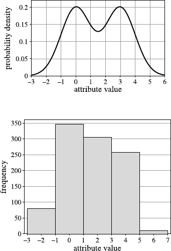
4.3 Data Visualization 41
Fig. 4.3 Probability density
function of a sample
distribution, from which the
data for the histogram in
Fig. 4.2 was sampled
Fig. 4.4 A histogram with
too few bins, for the same
data set that was depicted in
Fig. 4.2 on the right. As a
consequence, the distribution
looks unimodal but skewed
vals (called bins), usually of equal length. For each interval, the (absolute) frequency
of values falling into it is indicated by the height of a bar as shown on the right in
Fig. 4.2. From this histogram it can be read, for example, that a little bit more than
100 values lie in the vicinity of 1.
The histogram in Fig. 4.2 resulted from a sample of size 1000 from a mixture of
two normal distributions with means 0 and 3, respectively, having both a standard
deviation of 1. The density of this distribution is shown in Fig. 4.3.
But how should we choose the number of bins, and how much does this choice
influence the result? Figure 4.4 shows a histogram with only five bins for the same
data set underlying the histogram shown in Fig. 4.2. With only five bins, the two
peaks of the original distribution are no longer visible, and one gets the wrong im-
pression that the distribution is unimodal but skewed.
There is no generally best choice for the number of bins, but there are certain
recommendations. Sturges’ rule [22] proposes to choose the number kof bins ac-
cording to the following formula:
k=log2(n) +1,(4.1)
where nis the sample size. Although Sturges’ rule is still very often used as a default
in various statistics software packages, it is tailored to data from normal distributions
and data sets of moderate size [21]. The number of bins of the histogram in Fig. 4.2
has been computed based on Sturges’ rule. The size of the data set is n=1000.
42 4 Data Understanding
Fig. 4.5 Histograms with a suitable choice for the number of bins (left) and too many bins (right)
Assuming that, as in Sturges’ rule, the bins have equal length, the number of bins
can also be determined based on the length hof each bin:
k=maxi{xi}−mini{xi}
h,(4.2)
where x1,...,x
nis the sample to be displayed. Reasonable values for hare [20]
h=3.5·s
n1
3
,(4.3)
where sis the sample standard deviation, and [8]
h=2·IQR(x)
n1
3
,(4.4)
where IQR(x) is the interquartile range of the sample, that is, the length of the
interval which covers the middle 50% of the data.
For the data set with the histogram displayed in Fig. 4.2,(4.3) yields k=16,
and (4.4) leads to k=17. A histogram for the second choice (that is, for k=17) is
shown on the left in Fig. 4.5.
As we have seen in Fig. 4.4, the histogram can be misleading when the number
of bins is chosen too small. Choosing the number of bins too high usually leads
to a very scattered histogram in which it is difficult to distinguish true peaks from
random peaks. An example is shown on the right in Fig. 4.5, where k=200 was
chosen for the number of bins for the same data underlying Fig. 4.2.
All of these methods (that is, (4.2), (4.3), and (4.4) for determining the number
of bins or the length of the bins) are highly sensitive to outliers, since they divide
the range between the smallest and the largest value of the sample into bins of equal
size. A single outlier can make this range extremely large, so that for a smaller
number of bins, the bins themselves become very large, and for a larger number of
bins, most of the bins can be empty. To avoid this problem, one can either leave out
extreme values from the sample (for instance, the 3% smallest and the 3% largest
values) for calculating and displaying the histogram, or one can deviate from the
principle of bins of equal length.
4.3 Data Visualization 43
Fig. 4.6 Two boxplots for a
sample from a standard
normal distribution
Boxplots are a very compact way to visualize and summarize main character-
istics of a sample from a numerical attribute. Figure 4.6 shows two boxplots from
samples from a standard normal distribution with mean 0 and variance 1. The left
boxplot is based on sample of size n=1000, whereas a sample of size n=100 was
used for the right boxplot.
The line in the middle of a boxplot indicates the sample median. The notch in
the box is not always shown. It indicates a 95% confidence interval for the median.
The box itself corresponds to the interquartile range covering the middle 50% of the
data. The whiskers are drawn in the following way. The maximum length of each
whisker is 1.5 times the length of the interquartile range. But if there is no data point
at the maximum length of a whisker, the corresponding whisker is shortened until
it reaches the next data point. Data points lying outside the whiskers are considered
as outliers and are indicated in the form of small circles.
Comparing the two boxplots in Fig. 4.6, we can observe the following:
•Although both boxplots come from samples from the same normal distribution,
they look different, since they are based on different samples.
•The notch of the left boxplot, representing a 95% confidence interval for the me-
dian, is much smaller than the notch of the right boxplot because of the larger
sample size for the left boxplot.
•Theoretically, the whiskers for a sample from a symmetric distribution like the
normal distribution should have roughly the same length. For the boxplot based
on the smaller sample size, we can see that whiskers differ significantly in length,
since—by chance—the largest value among the sample of 100 values was not
greater than 2, whereas the smallest value was smaller than −3.
•In contrast to the boxplot on the left-hand side, the right boxplot does not contain
any outliers. This is again due to the smaller sample size. The theoretical length
of the interquartile range for a standard normal distribution is 1.349. Therefore,
the probability of a point lying outside the (theoretical) range [−2.698,2.698]of
the whiskers is almost 0.7%. Therefore, for a sample from a normal distribution
of size n=1000, we can expect roughly 7 outliers on average in a boxplot and
less than one for a sample of size n=100.
The boxplots of asymmetric distributions look completely different. If we sample
from an exponential distribution, whose probability density function is shown in
Fig. 4.7, we obtain boxplots as they are shown in Fig. 4.8. The boxplots on the left
and right represent samples of sizes n=1000 and n=100, respectively.
44 4 Data Understanding
Fig. 4.7 The probability
density function of the
exponential distribution with
λ=1
Fig. 4.8 Two boxplots for a
sample from an exponential
distribution
Barcharts, histograms, and boxplots are visualizations for single attributes. In
most cases, we have to deal with a number of attributes, and we are not only in-
terested in the characteristics of single attributes but also in the relations and de-
pendencies between the attributes. However, the display for visualizing the data is
two-dimensional, and even if we use 3D-techniques from computer graphics, we
cannot directly display more than two or three variables at the same time in a simple
coordinate system, unless we use additional features such as symbols, color and size.
Scatter plots refer to displays where two attributes are plotted against each other.
The two axes of the coordinate system represent the two considered attributes, and
each instance in the data set is represented by a point, a circle, or any other symbol.
Simple scatter plots are not suited for larger data sets. For a data set with one
million objects and a window size of 500 ×500 pixels, we would have on average
four data objects per pixel. For larger data sets, many points or symbols in the scatter
plot will be plotted at the same position, and we cannot distinguish whether a point
in the scatter plot represents one or 100 objects. In the worst case, a scatter plot for a
larger data set might simply look like the one in Fig. 4.9, providing only information
about the range of the data, but no hint concerning the distribution of the data.
This can be amended by using density plots or plots based on binning.Using
semitransparent points for plotting the data is one way to generate a density plot.
Each plotted point is semitransparent, and the more points are plotted at the same
place, the less transparent the image will become in this place. Binning was already
used to generate histograms, and the principle is used for the scatter plots. The two-
4.3 Data Visualization 45
Fig. 4.9 A scatter plot of a
data set with n=100,000
instances
Fig. 4.10 Density plot (left) and a plot based on hexagonal binning (right)forthesamedataset
as shown in Fig. 4.9
dimensional domain of the data for the scatter plot is partitioned into bins of the
same size. Possible forms for the bins are rectangles or hexagons. The intensity of
the color for the bin is chosen proportional to the number of data objects falling into
the bin. Figure 4.10 shows a density plot on the left and a plot based on a hexagonal
binning on the right for the same data set displayed in Fig. 4.9. Both plots indicate
a higher density of the data around the point (0.6,0.4), which cannot be seen in the
simple scatter plot in Fig. 4.9.
Scatter plots can be enriched with further information in order to involve more
attributes. Different plot symbols or colors can be used for plotting the points in
order to include information about a categorical attribute. Color intensity and the
size of the symbols are possible means to indicate the value of additional numerical
attributes.
Figure 4.11 shows two scatter plots of the Iris data set—one displaying the sepal
length versus the sepal width and the other one the petal length versus the petal
width—in which different species are displayed by different colors. Both plots show
that the red circles, representing the species Iris setosa, can be well distinguished
from the other two species Iris versicolor and Iris virginica displayed as triangles
46 4 Data Understanding
Fig. 4.11 Scatter plots of the iris data set for sepal length vs. sepal width (left) and for petal length
vs. petal width (right). All quantities are measured in centimeters (cm)
and crosses, respectively. However, the left chart in Fig. 4.11 gives the impression
that Iris virginica and Iris versicolor are very difficult to distinguish, at least when we
only take the sepal length and the sepal width into account. But when we consider
the petal length and the petal width (right chart in Fig. 4.11), we can still see the
overlap of the corresponding symbols for the species, but there is a clear tendency
that Iris virginica tends to larger values than Iris versicolor for the petal length and
width.
Comparing the number of red circles in Figs. 4.11 (left and right), there seem to
be less red circles on the right. But how can some of the objects suddenly vanish
in the scatter plot? When we count the number of red circles, we see that in both
scatter plots there are less than 50, although the data set contains 50 instances of
Iris setosa that should be displayed by red circles. The circles are not missing in the
scatter plots. Some circles are simply plotted at exactly the same position, since their
measured sepal length and width or their measured petal length and width coincide.
Recall that these values were only measured with a precision of just one digit right
after the decimal point. To avoid this impression of seeing less objects than there
actually are, one can add jitter to the scatter plot. Instead of plotting the symbols
exactly at the coordinates specified by the values in the data set, we add a small ran-
dom value to each original value in the data table. The left chart in Fig. 4.12 shows
the resulting scatter plot with jitter where we have added random values from a uni-
form distribution on the interval [−0.04,0.04]to the original values. This ensures
that a point originally lying left or below another point will always remain left or
below the other point, even when the jitter is added.
Jitter is essential when categorical attributes are used for the coordinate axes of
a scatter plots, since categorical attributes have only a limited number of possible
values, so that plotting of objects at exactly the same position occurs very often
when no jitter is added.
From a scatter plot we can already extract important information. Consider again
the scatter plot displayed in Fig. 4.12. We can see that the petal length and width
are correlated. Objects with larger values for the petal length also tend to have larger
4.3 Data Visualization 47
Fig. 4.12 The same scatter plot as in Fig. 4.11 on the right, but with jitter (left) and with jitter and
two outliers (right; the outliers are the red points in the top left and top right corners)
values for the petal width. The scatter plot also shows that Iris setosa—the red circles
in the scatter plot—can be easily distinguished from the other two species just on
the basis of the petal length or width. The scatter plot does not indicate that the other
two species cannot be separated clearly. It only shows that, solely based on the petal
length and width, it is not possible to distinguish the two species perfectly. Outliers
can also be discovered in scatter plots. The left chart in Fig. 4.12 does not have any
outliers. In the right chart, however, we have added two artificial outliers. The data
point in the upper left corner is a clear outlier with respect to the whole data set. Note
that the values for the attributes petal length and width are both in the general range
of the corresponding attributes in the data set. But there is no other object in the data
set with a similar combination of these attribute values. The second outlier in the
right chart of Fig. 4.12—the circle in the upper right corner—is not an outlier with
respect to the values for the petal length and width or their combination. However, it
is an outlier for the class Iris setosa displayed by red circles. Whenever such outliers
are discovered, one should check the data or the data generating process again to
ensure that the outliers are not due to erroneous data.
It should be noted that the scatter plots—like all other visualization techniques—
are very useful tools to discover simple structures and patterns or peculiar deviations
like outliers in a data set. But there is no guarantee that a scatter plot or any visu-
alization technique will automatically show all or even any interesting or deviating
pattern in the data set. A scatter plot with no outliers does not mean that there are
no outliers in the data set. It only means that there are no outliers with respect to the
combination of the attributes displayed in the scatter plot. In this sense, visualization
techniques are like test cases for computer programs. Test cases can discover errors
in a program. But if the test cases have not indicated any errors, this does not imply
that the program does not have any bugs. In the same way, a visualization technique
might give hints to certain interesting patterns in the data set. But if one cannot see
any interesting patterns in a visualization, it does not mean that there are no patterns
in the data set.

48 4 Data Understanding
4.3.2 Methods for Higher-Dimensional Data
In this section, we restrict our considerations to numerical attributes. Scatter plots
are projections of the data set to a two-dimensional plane where the two dimensions
of the projection plane correspond to two selected attributes. The data set can be
considered as a subset of a space that has as many dimensions as the data set has
attributes. How can such a higher-dimensional data set be represented in two or
three dimensions? The idea is to preserve as much of the “structure” of the higher-
dimensional data in the lower-dimensional representation. But what does it mean
to preserve the structure? There is no unique answer to this question, and various
approaches have been proposed to solve this problem. A very efficient method is
principal component analysis that will be introduced in the next section.
4.3.2.1 Principal Component Analysis
Principal component analysis (PCA), which is also briefly described in the ap-
pendix on statistics, is a method from statistics to find a projection to a plane—or
more generally, to a linear subspace—which preserves as much as possible of the
original variance in the data. In order to restrict the search for the best projection
plane to planes through the origin of the coordinate system, the data are first cen-
tered around the origin by subtracting the mean value for each attribute from the
attribute values. In this way, the projection to the plane can be represented by a
matrix Mmapping the data points x∈Rmto the plane by
y=M·(x−¯
x), (4.5)
where ¯
xdenotes the (empirical) mean value (or vector of (empirical) mean values)
¯
x=1
n
n
i=1
xi.
Mis a 2 ×mmatrix when PCA is used for visualizing the data on a plane. As we
will see later on, PCA can be understood as a more general dimension reduction
technique. Therefore, we do not restrict our considerations to projections to a plane
of dimension 2 but to any linear subspace of dimension q≤m. In this case, M
is a q×mmatrix. It should be noted that arbitrary matrices are not admitted for
the projection, since only projections, but no scalings, are allowed. Scalings would
enable the overall variance of the projection to be changed, which is not desired.
The solution of the optimization problem of finding the projection plane such
that the variance of the projected data is maximized leads to an eigenvalue problem.
The projection matrix Mfor PCA is given by
M=(v1,...,vq),
4.3 Data Visualization 49
Fig. 4.13 Left: the first (solid line) and the second principal component (dashed line)ofanexam-
ple data set (Iris data). Right: the example data set projected to the space that is spanned by the first
and second principal components (resulting from a PCA involving all four attributes)
where v1,...,vqare the normalized eigenvectors3of the covariance matrix of the
data
C=1
n−1
n
i=1
(xi−¯
x)(xi−¯
x)
for the qlargest eigenvalues λ1≥···≥λq.
The vectors v1,...,vqare called principal components. Figure 4.13 illustrates
the concept of principal components on a two-dimensional example. Of course, for
such an example, a dimension reduction is not necessary. There are two principal
components. The vector corresponding to the largest eigenvalue is the first compo-
nent, and its direction is indicated by the solid line. The dashed line represents the
direction of the second component, corresponding to the second largest eigenvalue,
which in this two-dimensional case is the smallest eigenvalue. It is obvious that the
projection of the data set to the first principal component preserves a large fraction
of the original variance, whereas a projection to the second principal component
only would lead to a significant loss of the original variance.
The left chart in Fig. 4.13 is a plot of the petal length and width of the Iris data
set. However, apart from the necessary centering of the data around the origin by
subtracting the mean, the data have been z-score standardized by the transformation
x→ x−ˆμX
ˆσX
,(4.6)
where ˆμXand ˆσXare the mean value and empirical standard deviation of attribute X
(see also Sect. 6.3.2). Without standardization, the result of PCA would depend on
3λis called an eigenvalue of a matrix Aif there is a nonzero vector vsuch that Av=λv.The
vector vis called an eigenvector to the eigenvalue λ.

50 4 Data Understanding
Table 4.1 Preservation of
the variance of the Iris data
set depending on the number
of principal components
Principal component
PC1 PC2 PC3 PC4
Proportion of variance 0.73 0.229 0.0367 0.00518
Cumulative proportion 0.73 0.958 0.9948 1.00000
the scaling of the attributes. If no standardization is carried out, the attribute with the
largest variance can easily dominate the first principal component. For the example
in Fig. 4.13 with z-score standardization, the first principal component is the vector
(√2/2,√2/2). If the petal length is measured in meters instead of centimeters, but
the petal width is still measured in centimeters, the first principal component without
z-score standardization becomes the vector (0.0223,0.9998), since the variance of
the petal length has been decreased drastically by the scaling factor 0.01 resulting
from the change from centimeters to meters, so that more or less only the petal width
contributes to the variance in the data.
PCA can be used for visualization purposes by restricting to the first two principal
components. More generally, PCA can carry out a dimension reduction to any lower-
dimensional space; even more, PCA also provides information about over how many
dimensions the data set actually spreads. This information can be extracted from the
eigenvalues λ1≥···≥λmof the covariance matrix. When we project the data to the
first qprincipal components v1,...,v
qcorresponding to the eigenvalues λ1,...,λ
q,
this projection will preserve a fraction of
λ1+···+λq
λ1+···+λm
(4.7)
of the variance of the original data. Table 4.1 shows the corresponding result of
PCA applied to the Iris data set without the categorical attribute for the species.
A projection of this four-dimensional data set to the first principal component, i.e.,
to only one dimension, covers already 73% of the variance of the original data set.
A projection to a plane defined by the first two principal components covers already
95.8% of the variance. This means that the four numerical attributes of the Iris data
set are not located on a two-dimensional plane in the four-dimensional space but do
not deviate too much from the plane defined by the first two principal components.
The right chart in Fig. 4.13 shows the projection of the Iris data set to the first two
principal components where PCA was carried out after the z-score standardization
had been applied.
The importance of the scaling effect carried out by the z-score standardization
can also be observed by revisiting the example where we had considered only the
petal length and width of the Iris data set. We had applied PCA to the original data
and the data where we had changed the measurement of the petal length from cen-
timeters to meters without scaling, resulting in the vector (0.7071,0.7071)as the
first principal component for the original data and the vector (0.0223,0.9998)for
the modified data. The variance preserved by the projection to the first principal
component is 98.1% in the first case and 99.996% in the second case. In the lat-
ter case, the first principal component corresponds more or less to the petal width,
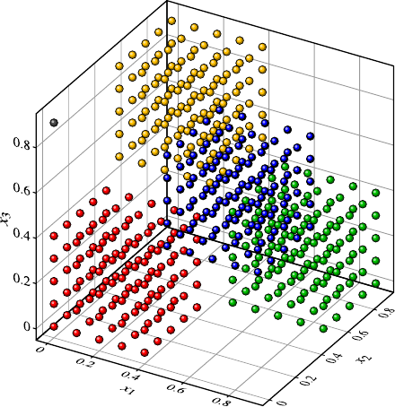
4.3 Data Visualization 51
Fig. 4.14 A data set
distributed over a cube in a
chessboard-like pattern. The
colors are only meant to make
the different cubes more
easily discernible. They do
not indicate classes. Note the
outlier in the upper left corner
since the variance of the petal length measured in meters is almost negligible, and
therefore the projection can preserve close to 100% of the original variance.
In order to illustrate the advantages and limitations of PCA for visualization pur-
poses, we consider an artificial three-dimensional data set illustrated in Fig. 4.14.
The data fill the unit cube in chessboard-like manner. When the unit cube is divided
into eight subcubes, these subcubes are alternatingly empty and filled with data.
There is also one outlier close to the upper left corner of the surface in the front of
the cube. The scatter plots resulting from projections to two axes of the coordinate
system are shown in Fig. 4.15. All these scatter plots give the wrong impression that
the data are uniformly distributed over a grid in the data space. The scatter plots
provide neither a hint to the chessboard pattern in the three-dimensional data space
nor to the single outlier.
Figure 4.16 shows the projection to the first two principal components of the
data set after a z-score standardization has been carried out. The outlier can now
be identified easily. From Fig. 4.16 it is also obvious that the data cannot be dis-
tributed uniformly over the original three-dimensional space but that there must be
some inherent pattern. Of course, it is impossible to recover the three-dimensional
chessboard pattern in a two-dimensional projection completely.
4.3.2.2 Projection Pursuit
PCA has the advantage that the best projection with respect to the given criterion—
the preservation of the variance—can be computed directly based on the eigenvec-
tors of the covariance matrix. Projection pursuit [10] takes a different approach.
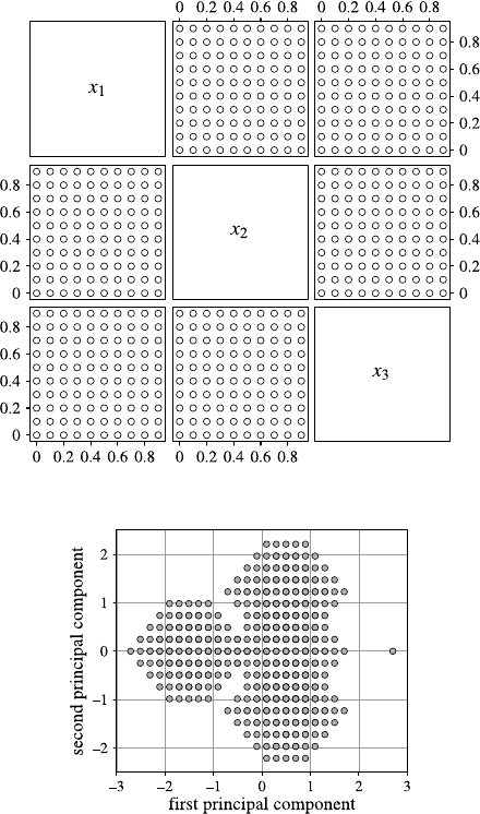
52 4 Data Understanding
Fig. 4.15 The scatter plots
for the data set shown in
Fig. 4.14
Fig. 4.16 The projection to
the first two principal
components of the data set
shown in Fig. 4.14
The projection of the data should show interesting aspects of the data. But what does
interesting mean? Normally, for projection pursuit, interestingness of a projection
is defined as the deviation from a normal distribution, according to the observation
that most of the projections of high-dimensional data will resemble a normal distri-
bution [6]. The more the projected data deviate from a normal distribution, the more
interesting is the projection. Various criteria [5,9–12] can be defined to measure
how much a projection deviates from a normal distribution.
In contrast to PCA, there is no way to find the most interesting projections with
respect to the deviation from a normal distribution. Projection pursuit simply gen-
erates random projections and chooses the ones yielding the best values for the
measures of interestingness.
4.3 Data Visualization 53
4.3.2.3 Multidimensional Scaling
PCA is a method for dimension reduction that is based on two assumptions:
•The representation of the data in a lower-dimensional space should be obtained
by a projection to a linear subspace.
•The criterion to evaluate the representation of the data in the lower-dimensional
space is the preservation of the variance.
Projection pursuit shares the first assumption of PCA but replaces the second one
by the deviation of the projection from the normal distribution. Multidimensional
scaling (MDS) is also a dimension-reduction technique but differs in both assump-
tions from PCA and projection pursuit.
•MDS is not restricted to mappings in the form of simple projections. In con-
trast to PCA, MDS does not even construct an explicit mapping from the high-
dimensional space to the low-dimensional space. It only positions the data points
in the low-dimensional space.
•The representation of the data in the low-dimensional space constructed by MDS
aims at preserving the distances between the data points and not the variance in
the data set, for which PCA was designed.
For a data set with ndata objects, MDS requires a distance matrix [d(X)
ij ]1≤i,j≤n,
where d(X)
ij is the distance between data object iand data object j. MDS assumes
that the distance is symmetric, i.e., d(X)
ij =d(X)
ji for all i, j ∈{1,...,n}. The dis-
tances d(X)
ii must be zero, so that each data object has no distance to itself. MDS
does not require the data, but only the distance matrix. Usually, the distance ma-
trix is derived from the data by computing the Euclidean distances between the data
objects (see Sect. 7.2 for more details on distance measures).
It is important to note that it is recommended to carry out a normalization of
the data first, for instance, by applying a z-score standardization. Without such a
normalization, MDS has to cope with the same problems as PCA. The variance
and the difference between values of an attribute highly depend on the scaling or
the measurement unit of the attribute. In the same way as a single attribute or few
attributes might dominate the variance, just because the corresponding measurement
units tend to larger values, these attributes will contribute more to the Euclidean
distance than attributes with very small values and ranges.
Since MDS is mainly used for visualization purposes, the original high-
dimensional data should be represented by points in two or sometimes also in
three dimensions. Each data object should be represented by a point in the low-
dimensional space, usually in R2or R3. Let us restrict our considerations for
the moment to a two-dimensional visualization. Then MDS must define a point
pi=(p(i)
x,p(i)
y)to be plotted in the plane for each data object xi. The plot of these
points should preserve the original distances d(X)
ij between the data points in the
original high-dimensional space. Of course, it is usually impossible to preserve the
distances exactly in the two-dimensional representation. Therefore, we require that

54 4 Data Understanding
the distances d(Y )
ij =pi−pjbetween the points in the two-dimensional repre-
sentation should deviate as little as possible from the original distances d(X)
ij .One
way to measure this deviation is the sum of the squared errors between the original
distances and the distances in the two-dimensional representation.
E0=
n
i=1
n
j=i+1d(Y )
ij −d(X)
ij 2.(4.8)
This equation does not refer explicitly to the two-dimensional representation. The
distances d(Y )
ij in the lower-dimensional space can be derived from points in R2,but
the distances could also be computed for points in Rqfor any q∈N.
The sum of squared errors depends on the number of data objects and on the val-
ues for the original distances. For more data points and for larger distances d(X)
ij ,E0
will tend to become larger as well. In order to obtain an error measure independent
of these effects, E0is often normalized to
E1=1
n
i=1n
j=i+1(d(X)
ij )2
n
i=1
n
j=i+1d(Y )
ij −d(X)
ij 2.(4.9)
The factor 1
n
i=1n
j=i+1(d(X)
ij )2is independent of the distances d(Y )
ij and therefore in-
dependent of the lower-dimensional representation of the data. It does not affect the
result of the minimization of E0or E1.
The relative error
E2=
n
i=1
n
j=i+1d(Y )
ij −d(X)
ij
d(X)
ij 2
(4.10)
is an alternative to the absolute error in (4.9). Very often, neither the absolute nor
the relative error is considered for MDS, but a compromise between them given by
E3=1
n
i=1n
j=i+1d(X)
ij
n
i=1
n
j=i+1
(d(Y )
ij −d(X)
ij )2
d(X)
ij
.(4.11)
When MDS is carried out based on the error measure E3, it is also called Sam-
mon mapping. The error E3for a concrete representation of the data in the lower-
dimensional space is called stress.
So far, we have only proposed error measures for MDS, but we still need to find
a way to minimize these error measures. The minimization requires finding nsuit-
able points in Rmand therefore involves m×nvariables, where mis the dimension
for the MDS representation of the data, and nis the number of data objects. This
means that even a two-dimensional MDS representation of a small data set like the
Iris data leads to a minimization problem with 2 ×150 =300 parameters to be
optimized. Unfortunately, there is no known analytical solution for any of the er-
ror measures in (4.8)–(4.11). Therefore, a heuristic optimization strategy is needed.
Typically, a gradient method is applied. Gradient methods are discussed in more

4.3 Data Visualization 55
Table 4.2 Multidimensional scaling
Algorithm MDS(D)
input: data set D⊂Rmwith |D|=nor distance matrix [d(X)
i,j ]1≤i,j≤n
parameter: dimension qfor the representation, stepwidth α>0, stop criterion SC
output: set Yof npoints in Rq
1InitializeY={y1,...,yn}⊂Rqrandomly or better with a PCA projection
2 If the input is a data set, compute the distances d(X)
ij between the data objects
3do
4 Compute d(Y )
i,j =yi−yj(for all i, j =1,...,n)
5 Compute ∂E1/∂ykaccording to (4.12) (for all k=1,...,n)
6 update ynew
k=yold
k−α·∂E1/∂yk(for all k=1,...,n)
7while SC is not satisfied
detail in Sect. 5.3.2. In order to minimize a differentiable function—here any of the
error measures (4.8)–(4.11)—one can compute the vector of partial derivatives with
respect to the parameters of the object function and then follow the opposite direc-
tion of the gradient, since the gradient points in the direction of steepest ascend and
our aim is not to maximize but to minimize the error function. The gradient method
starts with a random or a suitable initial solution, computes the gradient at the given
solution, goes in the opposite direction of the gradient, and takes the resulting solu-
tion as the next solution. For this new solution, the gradient is computed again, and
the process is repeated until no or little improvements can be achieved.
As an example, we compute the gradient for error measure E1in (4.9) with re-
spect to one data point ykin the lower-dimensional space:
∂E1
∂yk=2
n
i=1n
j=i+1(d(X)
ij )2
j=kd(Y )
kj −d(X)
kj yk−yj
d(Y )
kj
,(4.12)
wherewehaveused
∂d(Y )
ij
∂yk=∂
∂ykyi−yj=yk−yj
d(Y )
kj
if i=k,
0 otherwise. (4.13)
The basic structure of the MDS algorithm is described in Table 4.2.
It is recommended to start with a good initialization which can be obtained by
first carrying out a principal component analysis and then projecting the data to
the first qprincipal components. The stepwidth αdetermines how far to go in the
opposite direction of the gradient. If αis chosen too large, the algorithm might
never find a (local) minimum of the error function. Small values for αlead to slow
convergence of the algorithm. It is also possible to use an adaptive stepwidth αthat
determines a new value for αin each step of the algorithm. The stop criterion can be
a fixed number of iterations or a lower bound for the change of the error function,
i.e., when E1changes less than a given threshold in one step of the algorithm, the
iteration scheme is terminated.
The algorithm is identical for the error measures (4.10) and (4.11) except for
lines 5 and 6 where the gradient of E1has to be replaced by the gradients of the
corresponding error measures.
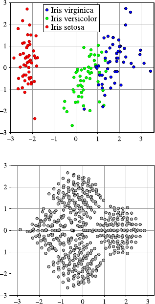
56 4 Data Understanding
Fig. 4.17 The Sammon
mapping of the Iris data,
scatter plots of which are
shown in Fig. 4.11 on p. 46
Fig. 4.18 The Sammon
mapping of the data set that is
shown in Fig. 4.14 on p. 51
Figure 4.17 shows the result of MDS in the form of the Sammon mapping applied
to the Iris data set. The categorical attribute for the species has not been used for
MDS. But the corresponding points resulting from the Sammon mapping are marked
by colors corresponding to the Iris flower species. Before the distances d(X)
ij in the
original four-dimensional space defined by the sepal and petal length and width
are computed, a z-score standardization is applied to each of the four numerical
attributes.
Before the MDS algorithm can be applied, we have to make sure that no distance
between two different data objects is zero because these distances occur in the de-
nominator of the gradient, so that a zero distance would lead to a division by zero
error. There are two Iris flowers—number 102 and number 143—with exactly the
same values for all attributes, leading to a distance of zero between them. Therefore,
we removed one of them from the data set before carrying out the computations for
MDS.
Figure 4.18 shows the result of the Sammon mapping applied to the “3D chess-
board pattern” data set in Fig. 4.14, where we have again carried out z-score stan-
dardization in advance. The four cubes filled with data can even be recognized in
4.3 Data Visualization 57
this two-dimensional representation. However, the outlier—the left-most point—is
not as well separated from the other data points as in the case of PCA in Fig. 4.16.
4.3.2.4 Variations of PCA and MDS
MDS differs from PCA in various aspects. MDS is based on the idea of preserving
the distances among the original data objects, whereas PCA focuses on the variance.
PCA provides an explicit mapping from the space in which the data objects are
located to the lower-dimensional space, whereas MDS provides only an explicit rep-
resentation of the data objects in the lower-dimensional space. This means that when
a new or hypothetical data object is considered, it can be represented immediately
in case of PCA simply by projecting the data object to the corresponding principal
components. This is not possible for MDS.
The computational complexity of PCA is lower than the complexity of MDS.
The computation of the covariance matrix can be carried out in linear time with re-
spect to the size of the data set. Once the covariance matrix has been calculated, the
computation of the eigenvalues and eigenvectors depends only on the number of at-
tributes, but not on the number of data anymore. The number of attributes is usually
much smaller than the number of data objects. For MDS, it is necessary to consider
the pairwise distances between data objects leading to a quadratic complexity in the
number of data objects. Although a quadratic complexity is often considered as fea-
sible in computer science, it is unacceptable for larger data sets. Consider a data set
with one million data objects. The distance matrix contains 1012 entries in this case.
Since the distance matrix is symmetric and the entries in the diagonal are all zero,
we only need to know (1012 −106)/2=4999995 ·105entries. If we want to store
the distances in 4-byte floating-point values, this would require more than 1800 gi-
gabytes! There are various modifications of MDS [3] that try to overcome these
complexity problems by sampling [15] or variations of the error measures [16,17].
All these dimension-reduction methods generate scatter plots with abstract co-
ordinate axes that do not correspond to attributes of the original data. In this way,
the scatter plots of projection pursuit can even be extended and evaluated by the
measures of interestingness proposed for projection pursuit and also other statistical
measures and tests in order to select the most interesting visualizations [23].
4.3.2.5 Parallel Coordinates
So far, the visualization techniques for multidimensional data we have introduced
here are based on scatter plots with abstract coordinate axes. Since coordinate axes
should be drawn pairwise perpendicular and only two axes can satisfy this condition
on a plane and three axes in 3D-space, we cannot use more than three axes for scatter
plot-like visualizations. Parallel coordinates draw the coordinate axes parallel to
each other, so that there is no limitation for the number of axes to be displayed. For
a data object, a polyline is drawn connecting the values of the data object for the
attributes on the corresponding axes.
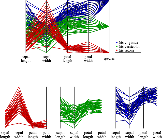
58 4 Data Understanding
Fig. 4.19 Parallel coordinates plot for the Iris data set
Fig. 4.20 Parallel coordinate plots for Iris setosa, Iris versicolor, and Iris virginica (left to right)
Figure 4.19 shows the plot of the Iris data set with parallel coordinates. The
species is a categorical attribute and can only assume three possible values. The
polylines for the different species are displayed with different colors. The plot
clearly shows that the setosa has smaller values for the petal length and width than
the other two species.
For larger data sets, it becomes more or less impossible to track the lines that
correspond to a data object in parallel coordinates plots or even to discover gen-
eral structures. It can be helpful to generate separate parallel coordinate plots for
different subsets of the data. For instance, in the case of the Iris data set, we could
generate a separate plot for each of the three species as shown in Fig. 4.20.Inor-
der to keep the three plots comparable, we have not rescaled the axes for each of
the three plots. Normally, the axes will be scaled in such a way that the minimum
and maximum of all values for the corresponding attribute of the displayed data are
lowest and highest point of the axes.
Figure 4.21 shows the parallel coordinates plot for the “3D chessboard pattern”
data set in Fig. 4.14. This plot is identical to the plot that we would obtain if we had
not used the “3D chessboard pattern,” but had filled the cube uniformly with data.
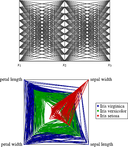
4.4 Correlation Analysis 59
Fig. 4.21 Parallel
coordinates plot for the data
set shown in Fig. 4.14
Fig. 4.22 Radar plot for
the numerical attributes of
the Iris data set
4.3.2.6 Radar and Star Plots
Radar plots are based on a similar idea as parallel coordinates with the difference
that the coordinate axes are not drawn as parallel lines, but in a star-like fashion
intersecting in one point. Figure 4.22 shows a radar plot for the four numerical
attributes of the Iris data set. Due to the fact that radar plots sometimes resemble
spider webs, they are also called spider plots.
Radar plots are only suited for smaller data sets. For such smaller data sets, it is
sometimes better not to draw all data objects in the system of coordinate axes but
to draw each data object separately, which is then called a star plot. A star plot for
the numerical attributes of the Iris data set is shown in Fig. 4.23. The first 50 “stars”
correspond to the objects from the species setosa, the next 50 to versicolor, and the
last 50 to virginica. The star plot also shows clearly that setosa differs much from
the two species.
4.4 Correlation Analysis
In the previous section, we have introduced methods to visualize the distribution
of values for one, two, or even more attributes simultaneously. Scatter plots can
uncover dependencies or correlations between two attributes. Instead of a purely
visual approach, it is possible to compute measures of correlation between attributes
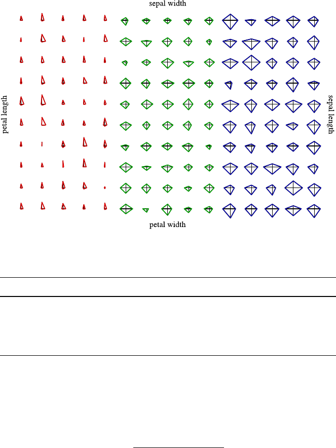
60 4 Data Understanding
Fig. 4.23 Star plot for the numerical attributes of the Iris data set
Table 4.3 Pearson’s correlation coefficients for the numerical attributes of the Iris data set
Sepal length Sepal width Petal length Petal width
Sepal length 1.000 −0.118 0.872 0.818
Sepal width −0.118 1.000 −0.428 −0.366
Petal length 0.872 −0.428 1.000 0.963
Petal width 0.818 −0.366 0.963 1.000
to confirm expected dependencies or to discover unexpected correlations between
attributes.
The (sample) Pearson’s correlation coefficient is a measure for a linear rela-
tionship between two numerical attributes Xand Yand is defined as
rxy =n
i=1(xi−¯x)(yi−¯y)
(n −1)sxsy
,(4.14)
where ¯xand ¯yare the mean values of the attributes Xand Y, respectively, and sx
and syare the corresponding (sample) standard deviations. Pearson’s correlation
coefficient yields values between −1 and 1. The larger the absolute value of the
Pearson correlation coefficient, the stronger the linear relationship between the two
attributes. For |rxy |=1, the values of Xand Ylie exactly on a line. For rxy =1,
the line has a positive slope, for rxy =−1 a negative one. Table 4.3 lists the Pearson
correlation coefficients for the numerical attributes of the Iris data set.

4.4 Correlation Analysis 61
Of course, the values in the diagonal must be equal to 1, since an attribute corre-
lates fully with itself. When we plot an attribute against itself in a scatter plot, the
points lie on a perfect line, the diagonal, so that Pearson’s correlation coefficient
must be 1 in this case. The matrix with the coefficients must also be symmetric.
It is also not surprising that the Pearson’s correlation coefficient between the
length and the petal width is very high. This means more or less that the leaves
roughly keep their shape. A short leaf will also not be very broad, and a long leaf
will be broader. It seems counterintuitive that there is more or less no correlation
between the sepal length and the sepal width or even a very small negative correla-
tion. When we take a look at the scatter plots in Fig. 4.11 on page 46, this can be
explained easily. The negative correlation originates from the fact that we have the
measurements from different species. Setosa has short but broad leaves compared to
the other species. When we compute Pearson’s correlation coefficient separately for
the species for the sepal length and width, we obtain the values 0.743, 0.526, and
0.457 for Iris setosa, Iris versicolor, and Iris virginica, respectively. The correlation
is not as high as for the petal length and width, but at least it is positive and not
negative.
Pearson’s correlation coefficient measures linear correlation. Even if there is a
functional dependency between two attributes, but the function is nonlinear but
monotone, Pearson’s correlation coefficient will not be −1 or 1. It can even be
far away from these values, depending on how much the function describing the
functional relationship deviates from a line.
Rank correlation coefficients avoid this problem by ignoring the exact numeri-
cal values of the attributes and considering only the ordering of the values. Rank cor-
relation coefficients intend to measure monotonous correlations between attributes
where the monotonous function does not have to be linear.
Spearman’s rank correlation coefficient or Spearman’s rho is defined as
ρ=1−6n
i=1(r(xi)−r(yi))2
n(n2−1),(4.15)
where r(xi)is the rank of value xiwhen we sort the list (x1,...,x
n).r(yi)is defined
analogously.
Spearman’s rho measures the sum of quadratic distances of ranks and scales this
measure to the interval [−1,1]. When the rankings of the x- and y-values are exactly
in the same order, Spearman’s rho will yield the value 1; if they are in reverse order,
we will obtain the value −1.
Spearman’s rho assumes that there are no ties, i.e., no two values of one attribute
are equal. If two or more values coincide, their rank is not defined. When ties exist,
the rank r(xi)is usually defined as the mean value of all ranks of consecutive coin-
ciding values in the sorted list. So if we have the (already sorted) list of values 0.6,
1.2, 1.4, 1.4, 1.6 for an attribute, the corresponding ranks would be 1, 2, 3.5, 3.5, 4.
Kendall’s tau rank correlation coefficient or simply Kendall’s tau is not, like
Spearman’s rho, based on ranks, but rather on the comparison of the orders of pairs
of values. Assuming that xi<x
j, the two pairs (xi,x
j)and (yi,y
j)are called con-
cordant if yi<y
j, i.e., when the two pairs are in the same order. They are called
discordant when they are in reverse order, which means that yi>y
j.

62 4 Data Understanding
Table 4.4 Spearman’s rank correlation coefficients for the numerical attributes of the Iris data set
Sepal length Sepal width Petal length Petal width
Sepal length 1.000 −0.167 0.882 0.834
Sepal width −0.167 1.000 −0.289 −0.289
Petal length 0.882 −0.289 1.000 0.938
Petal width 0.834 −0.289 0.938 1.000
Table 4.5 Kendall’s tau for the numerical attributes of the Iris data set
Sepal length Sepal width Petal length Petal width
Sepal length 1.000 −0.077 0.719 0.655
Sepal width −0.077 1.000 −0.186 −0.157
Petal length 0.719 −0.186 1.000 0.807
Petal width 0.655 −0.157 0.807 1.000
Kendall’s tau is computed as
τa=C−D
1
2n(n −1),
where Cand Ddenote the numbers of concordant and discordant pairs, respectively:
C=|{(i, j) |xi<x
jand yi<y
j}|,(4.16)
D=|{(i, j) |xi<x
jand yi>y
j}|.(4.17)
Tables 4.4 and 4.5 contain the values for Spearman’s rho and Kendal’s tau for the
numerical attributes of the Iris data set. The values are not identical but very similar
to the ones in Table 4.3 for Pearson’s correlation coefficient.
Rank correlation coefficients like Spearman’s rho and Kendall’s tau depend only
on the order (ranks) of the values and are therefore more robust against extreme
outliers than Pearson’s correlation coefficient.
For categorical attributes, these correlation coefficients are not applicable. In-
stead, one can carry out independence tests like the χ2test for independence, as it is
described in the appendix in Sect. A.4.3.6. This test can also be used for numerical
attributes when they are discretized by some binning strategy.
4.5 Outlier Detection
Since it has an intuitive, though imprecise meaning, we have used the term outlier
already before without giving a precise definition. Actually there is no formally
precise definition of outliers. An outlier is simply a value or data object that is far
away or very different from all or most of the other data.
4.5 Outlier Detection 63
Outliers can be a hint to data quality problems as they will be discussed in
the next section. Outliers can correspond to erroneous data coming from wrong
measurements or typing mistakes when data are entered manually. Erroneous data
should be corrected, or, if this is not possible, they should be excluded from the data
set before further analysis steps are carried out. However, outliers can also be cor-
rect data that differ from the rest of the data just by chance or for other reasons like
special exceptional situations. Even if outliers are correct data, it might be worth-
while to exclude them from the data set for further analysis and to consider them
separately. Some data analysis methods are robust against outliers and more or less
not influenced by them, whereas other are extremely sensitive to outliers and might
produce incoherent or nonsense results, just because of the presence of one or a few
outliers. As a simple example, consider the median and the mean value. If one re-
places the largest value in a sample by an extremely large value or even infinity, the
median will not change. But the mean value will tend to infinity, even though only
one value in the sample goes to infinity.
4.5.1 Outlier Detection for Single Attributes
For a categorical attribute, one can consider the finite set of values. An outlier is a
value that occurs with a frequency extremely lower than the frequency of all other
values. However, in some cases, this might be actually the target of our analysis.
If we want to set up an automatic quality control system and want to train a clas-
sifier, classifying the parts as correct or with failures based on measurements of
the produced parts, we will probably have so many correct parts in comparison
the ones with failures that we would consider them as outliers. However, removing
these “outliers” from the data set would actually make it impossible to achieve our
original goal to derive a classifier from the data set that can identify the parts with
failures.
For numerical attributes, outlier detection is more difficult. We have already clas-
sified certain data points in a boxplot as outliers. However, the definition of outliers
in a boxplot does not take the number of data into account, so that for larger data
sets, boxplots will usually contain points marked as outliers. We have seen this al-
ready in the boxplots in Fig. 4.6, both showing samples from a standard normal
distribution. The left boxplot in Fig. 4.6 for a sample of size n=1000 contains
eight outliers corresponding to what we expect theoretically, namely seven points
outside the whiskers. As mentioned before, for a normal distribution, we can expect
roughly 0.7% points to be marked as outliers in a boxplot.
For asymmetric distributions, boxplots tend to contain more outliers. For exam-
ple, in boxplots for samples from an exponential distribution with λ=1astheyare
showninFig.4.8, we would expect roughly 4.8% points marked as outliers. Heavy-
tailed distributions tend to show more outliers in a boxplot, whereas for a sample
from a uniform distribution, we would expect no outliers at all, no matter how large
the sample size is.

64 4 Data Understanding
Even if we try to adjust the definition of outliers according to the sample size,
the above examples show that what we consider as an outlier depends strongly on
the underlying distribution from which the data are sampled. Therefore, statistical
tests for outliers are usually based on assumptions about the underlying distribution,
although we might not know from which distribution the data are sampled.
The standard assumption for outlier tests for continuous attributes is that the
underlying distribution is a normal distribution. Grubb’s test is a test for outliers for
normal distributions taking the sample size into account. It is based on the statistics
G=max{|xi−¯x||1≤i≤n}
s,(4.18)
where x1,...,x
nis the sample, ¯xis its mean value, and sis its empirical standard
deviation. For a given significance level α, the null hypothesis that the sample does
not contain outliers is rejected if
G> n−1
√n
t2
1−α/(2n),n−2
n−2+t2
1−α/(2n),n−2
,(4.19)
where t1−α/(2n),n−2denotes the (1−α/(2n))-quantile of the t-distribution with
(n −2)degrees of freedom.
For the Iris data set, Grubb’s test yields the p-values40.92, 0.13, 1.0, and 1.0
for the sepal length and width and the petal length and width, respectively. Even
the lowest p-value does not indicate that there is an outlier. Note that this is the
case although the assumption that the attributes follow normal distributions is not
realistic at all as can be seen from the scatter plot in Fig. 4.11 on page 46.The
attributes for each species separately might follow normal distributions, but not the
attributes considered for all species together.
When Grubb’s test with its assumption of normal distribution is applied to very
skewed and heavy-tailed distributions like the exponential distribution, an outlier
will almost always be indicated.
4.5.2 Outlier Detection for Multidimensional Data
Outlier detection in multidimensional data is usually not based on specific assump-
tions on the distribution of the data and is not carried out in the sense of statistical
tests. Visualization techniques provide a simple method for outlier detection in mul-
tidimensional data. Scatter plots can be used when only two attributes are consid-
ered. In the right scatter plot in Fig. 4.12 on page 47, we had added two outliers.
The one in the upper left corner would not have been detected when only single
4For Grubb’s test, the null hypothesis is that there are no outliers. Then the point in the sample
with the largest distance to the mean is considered. In the case of Grubb’s test, the p-value is the
probability that in a sample of size n, such a large or even large deviation from the mean would
occur. For a more formal and general definition of p-values, see also Appendix A.
4.6 Missing Values 65
attributes are considered. Instead of using projections to two attributes, one can also
use dimension-reduction methods like PCA or multidimensional scaling in order to
identify outliers in the corresponding plots as in Figs. 4.16 and 4.18.
There are many approaches for finding outliers in multidimensional data based
on clustering the data and defining those data objects as outliers that cannot be
assigned reasonably to any cluster [18,19]. There are also distance-based [13,14],
density-based [4], and projection-based methods [1] for outlier detection.
4.6 Missing Values
In the ideal case, all attributes of all objects in the data table have well-defined
values. However, in real data sets, one has to deal with missing values quite often.
The occurrence of missing values can have different causes. A sensor might be
broken leading to a missing value. People might have refused or forgotten to answer
a question in a questionnaire, or an attribute might not be applicable for a certain
object. For instance, the attribute pregnant with the two possible values yes and no
does not make sense for men. Of course, one could always enter the value no for
the attribute pregnant. But this might lead to a grouping of men with nonpregnant
women.
Especially in a customer database, missing values will be quite common. At-
tributes like age,sex, and email address might be available for some customers, but
probably not for all customers.
In the best case, missing values are indicated in a unique way. A symbol like “?”
or null entry might be used for missing value. Sometimes a special numeric value is
used to indicate missing values. For example, the value −1 could indicate a missing
value for a counting attribute (like number of products bought by a customer in a
certain period, number of children, etc.). Since the value −1 can never occur in a
counting attribute, it cannot be misunderstood as meaningful (nonmissing) value.
One must, however, take this into account when simple characteristics like the mean
value or the median of an attribute are computed. If one simply adds up all values—
including the −1’s for the missing values—and divide it by the number of values to
obtain the mean value, the result might even be negative if there are many missing
values. If we know the number of children for only very few of our customers, we
might find out in this way that the average number of children of our customers is
−0.3, which is, of course, complete nonsense.
Sometimes, missing values are not even marked in a specific way. We have seen
already an example in Fig. 2.2 on page 18 where a missing value of the customer’s
birth date was replaced by a default value that could also be just a usual value.
As another example, consider an anemometer, a sensor for measuring the wind
speed. Such an anemometer is equipped with a small wheel that is turned by the
wind, and from the speed of the wheel the speed of the wind can be deduced. Some-
times, the wheel might be blocked for some reason. In this case, the sensor will
constantly yield the value zero for the wind speed. This value zero is also a pos-
sible wind speed although it is very improbable in most geographical regions that
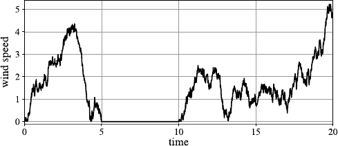
66 4 Data Understanding
Fig. 4.24 Measured wind speeds with a period of a jammed sensor
the wind speed is absolutely zero over a longer time. When we see a diagram like
in Fig. 4.24, it is very probable that during the period between 5 and 10, the wind
speed was not zero, but that there are missing values in this period due to a jammed
anemometer.
It is very important to identify such hidden missing values. Otherwise, the further
analysis of the data can be completely mislead by such erroneous values.
When there are missing values, one should also take into account how missing
values enter the data set. The simplest and most common assumption about missing
values is that they are missing completely at random (MCAR)orareobserved at
random (OAR). This means that special circumstances or special values in the data
lead to higher or lower chances for missing values. One can imagine that one has
printed out the data table on a large sheet of paper with no missing values and then
someone has dropped accidentally some random spots of ink on the paper so that
some values cannot be read anymore.
In a more formal way, the situation missing completely at random can be de-
scribed in the following way. We consider the random variable Xfor which we
might have some missing entries in the data set. The random variable Xitself does
not have missing values. The corresponding value is just not available in our data
set. The random variable Xmiss can assume the value 0 for a missing values and 1
for a nonmissing value for the random variable Xof interest. This means that for
Xmiss =1, we see the true value of Xin our data set, and for Xmiss =0, instead of
the true value of X, we see a missing value. We also consider the random vector Y
representing all attributes except Xin our data set. The situation observed at random
means that Xmiss is independent of Xand Y, i.e.,
P(X
miss)=P(X
miss|X, Y ) (MCAR).
Consider a sensor for the outside air temperature Xwhose battery might run out
of energy once in a while, leading to missing values of the missing completely at
random. This is the best case for missing values. It can, for instance, be concluded
that the unknown missing values follow the same distribution as the known values
of X.
The situation missing at random (MAR) is more complicated but might still
be manageable with appropriate techniques. The probability for a missing value

4.6 Missing Values 67
depends on the value of the other attributes Ybut is conditionally independent5of
the true value of Xgiven Y:
P(X
miss|Y)=P(X
miss|X, Y ) (MAR).
To illustrate what missing at random means, consider the above example of a sensor
for the outside air temperature with the battery running out of energy once in a while.
But assume now that the staff responsible for changing the batteries does not change
the batteries when it is raining. Therefore, missing values for the temperature are
more probable when it is raining, so that the occurrence of missing values depends
on other attributes, in this case the attribute for rain or amount of rain.
Note that the occurrence of a missing value is in this case not independent of
the value of the variable X, it is only conditionally independent given the attribute
for the rain. Usually, the outside temperatures are lower when it is raining, so that
missing values correlate with lower temperatures. In contrast to missing completely
at random, here the missing values of Xdo not follow the same distribution as
the measured values of X. If we compute the average temperature based only on
the measured values, we would obviously overestimate the average temperature.
Therefore, special care has to be taken when missing values occur at random, but
not completely at random.
The worst case are nonignorable missing values, where the occurrence of miss-
ing values directly depends on the true value, and the dependence cannot be resolved
by other attributes. Consider a bad sensor for the outside temperature that always
fails when there is frost. This would mean that we have no information about tem-
peratures below 0°C. In the case of missing at random, we might still be able to
obtain information from the data set about the missing values. For the nonignorable
values, we have no chance to make correct guesses, at least based on the avail-
able data.
How can we distinguish between the three different types of missing values?
First of all, the knowledge and background information about why missing values
occur should be taken into account. It is also possible to try to distinguish the two
cases observed at random and missing at random based on the given data. If an
attribute Xhas missing values and one wants to find out of which type the missing
values are, one way would be to apply independence tests checking directly whether
P(X
miss)=P(X
miss|Y). Usually, it is not feasible to apply a test that checks the
independence of Xmiss against the multivariate attribute Ystanding for all other
attributes, but only against single attributes. Applying independence test of Xmiss
against each other attribute Ywill not uncover multiple dependencies, but if even
these tests indicate a dependency already, then we can be quite sure that the values
of Xare not missing completely at random.
Another way to approach the problem of distinguishing between missing com-
pletely at random and missing at random is the following procedure:
1. Turn the considered attribute Xinto a binary attribute, replacing all measured
values by the values yes and all missing values by the value no.
5A formal definition of conditional independence is given in Sect. A.3.3.4 in the appendix.
68 4 Data Understanding
2. Build a classifier with now binary attribute Xas the target attribute and use all
other attributes for the prediction of the class values yes and no.
3. Determine the misclassification rate. The misclassification rate is the proportion
of data objects that are not assigned to the correct class by the classifier.
In the case of missing values of the type observed at random, the other attributes
should not provide any information, whether Xhas a missing value or not. There-
fore, the misclassification rate of the classifier should not differ significantly from
pure guessing, i.e., if there are 10% missing values for the attribute X, the misclas-
sification rate of the classifier should not be much smaller than 10%. If, however,
the misclassification rate of the classifier is significantly better than pure guessing,
this is an indicator that there is a correlation between missing values for Xand the
values of the other attributes. Therefore, the missing values for Xmight not be of
the type observed at random but of the type missing at random or, even worse, non-
ignorable. Note that it is in general not possible to distinguish the case nonignorable
from the other two cases based on the data only.
4.7 A Checklist for Data Understanding
In this chapter, we have provided a selection of techniques for data understanding.
It is not necessary to go through all of them in the phase of data understanding, but
rather to keep all of them in mind.
•First of all, one should keep in mind that there are general and specific goals for
data understanding. One important part of data understanding is to get an idea of
the data quality. There are standard data quality problems like syntactic accuracy
which are easy to check.
•Outliers are another problem, and there are various methods to support the iden-
tification of outliers. Apart from methods exclusively designed for outlier detec-
tion as they have been discussed in Sect. 4.5, there are especially visualization
techniques like boxplots, histograms, scatter plots, projections based on PCA and
MDS that can help to find outliers but are also useful for other purposes.
•Missing values are another concern of data quality. When there are explicit miss-
ing values, i.e., entries that are directly marked as missing, then one should still
try to find out of which type—OAR, MAR, or nonignorable—they are. This can
sometimes be derived from domain knowledge, but also based on classification
methods as described in the previous section. We should also be aware of the
possibility of hidden missing values that are not explicitly marked as missing.
The simplest case might be hidden missing values that have a default value. His-
tograms might help to identify candidates for such hidden missing values when
there are unusual peaks as in the example in Fig. 2.2 on page 18. However, there
is no standard test or technique to identify possible hidden missing values. There-
fore, whenever we see something unexpected in the data, hidden missing values
of a specific type might be one explanation.
4.8 Data Understanding in Practice 69
•Apart from these data quality issues, data understanding should also help to dis-
cover new or confirm expected dependencies or correlations between attributes.
Techniques like the ones mentioned in Sect. 4.4 are one way to solve this task.
Apart from this, scatter plots can show correlations between pairs of attributes.
•Specific application dependent assumptions—for instance, the assumption that a
specific attribute follows a normal distribution—should also be checked during
data understanding.
•Representativeness of the data cannot always be checked just based on the data,
but we have to compare the statistics with our expectations. If we suspect that
there is a change in a numerical attribute over time, we can compare histograms
or boxplots for different time periods. We can do the same with bar charts for
categorical attributes.
No matter what the specific application dependent purposes of data understanding
are, here is a checklist what we consider as a must for the data understanding phase:
•Check the distributions for each attribute whether there are unusual or unexpected
properties like outliers. Are the domains or ranges correct? Do the medians of
numerical attributes look correct? This should be done based on
– histograms and boxplots for continuous attributes and
– bar charts for categorical attributes.
•Check correlations or dependencies between pairs of attributes with scatter plots
which should be density-based for larger data sets. For small numbers of at-
tributes, inspect scatter plots for all pairs of attributes. For higher numbers of
attributes, do not generate scatter plots for all pairs, but only for those ones where
independence or a specific dependency is expected. Generate in addition scatter
plots for some randomly chosen pairs.
To cite Tukey [24] again, if problems in later phases of the data analysis process oc-
cur that could have been discovered or even avoided in an early plotting and looking
at the data, there is absolutely no excuse for this failure.
Of course, one should also exploit the other methods described in this section for
these and other more specific purposes.
4.8 Data Understanding in Practice
A key issue in data understanding (and actually the entire data analysis process)
often causes considerable headaches: the loading of the data into the analysis tool
of choice. One of the strengths of KNIME is its versatility in terms of powerful
file importing nodes and database connectors. R, on the other hand offers the entire
breadth of analysis and visualizations, although they are often not all that intuitive
to use.
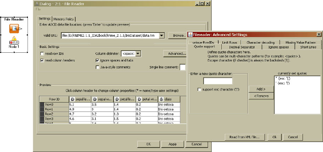
70 4 Data Understanding
Fig. 4.25 The dialog of the file reader node offers manifold options to control the reading of
diverse file formats
4.8.1 Data Understanding in KNIME
Data Loading Data understanding starts with loading the data: KNIME offers a
“File Reader” node which hides an entire file import wizard in its dialog. Manifold
options allow one to choose the underlying character encoding, column types, and
separators and escape characters, to name just a few. The ability to quickly check in
the preview tab if the selected options fit the given file make it possible to smoothly
find suitable settings also for complex files. Figure 4.25 shows the dialog of this
node together with the “expert tab” which hides another set of options.
KNIME also allows one to read data from specialized file formats, such as the
Weka ARFF format or the compressed KNIME table format. For these formats,
specialized nodes are available in the “IO” category as well.
Reading data from databases is often neglected in stand-alone analytic tools.
KNIME offers flexible connectivity to access databases of various types by specify-
ing the corresponding JDBC driver (Java Database Connectivity) in addition to the
table location and name. For basic data filtering, specialized nodes are also available,
which allow one to do, e.g., column and row filtering also within the database, with-
out loading the data into KNIME explicitly. This saves time for larger databases if
only a much smaller subset is to be analyzed. Figure 4.26 shows a part of a workflow
reading data from a database and filtering some rows and columns before reading
the data into KNIME itself.
Data Types KNIME supports all basic data types, such as string, integers, and
numbers, but also date and time types and nominal values. In addition, various ex-
tensions add the ability to process images, molecular structures, sequences, and tex-
tual data. The repository of type extension is constantly growing as well. For a first
glance at the data read it into KNIME and in order to check domain and nominal
value range, add the “Statistics” and “Value Counter” node. The first one computes
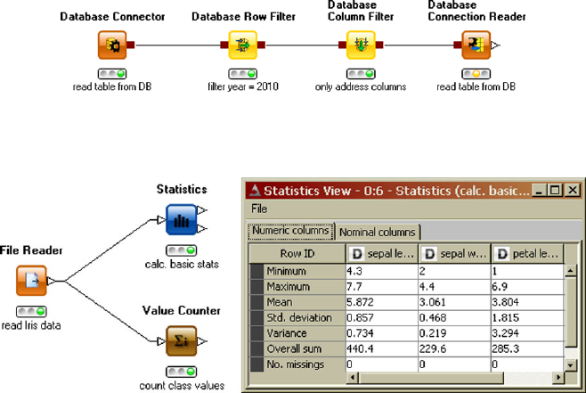
4.8 Data Understanding in Practice 71
Fig. 4.26 Specialized nodes for database access allow one to filter rows and columns using
database routines before loading the data into KNIME
Fig. 4.27 Looking at basic information of the data’s attributes often helps one to spot outliers or
other errors in the data
basic statistical measures (minimum, maximum, mean, standard deviation, variance,
overall sum), counts the number of missing values for numerical attributes, and lists
the most and least frequent values for nominal values. The “Value Counter” node
operates on one nominal attribute and lists the occurrence frequencies of each value.
Figure 4.27 shows an example flow and the view of the statistics node for the iris
data.
Visualization Checking basic descriptors of your data is important, but, as pointed
out earlier in this chapter, looking at visualizations often gives dramatically better
insights into your data. KNIME offers all of the visualizations described in Sect. 4.3:
histograms, boxplots (also conditional), scatter and scatter matrix plots, and parallel
coordinates. Principal Component Analysis and Multidimensional Scaling methods
are also available and can be used to calculate new coordinates for, e.g., scatter plot
views. All of these views make use of color, shape, and size information whenever
possible. Such additional visual dimensions are added by using “Color/Shape/Size
Manager” nodes as the additional advantage that all subsequent nodes are using
the same color/shape/size information. Figure 4.28 shows an example of a KNIME
workflow with a number of views connected to a workflow which assigns color and
shape based on selected columns.
KNIME has been developed to also support explorative data analysis and there-
fore most of the views allow for interactivity, or visual brushing. This means that
points (or other visual objects) representing records in the underlying database can
be marked and will then be marked in other, related views as well. KNIME allows
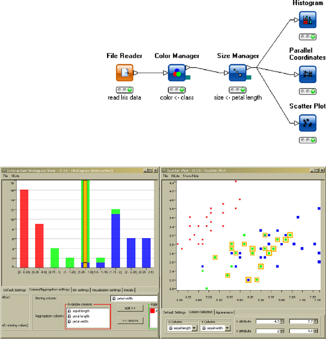
72 4 Data Understanding
Fig. 4.28 Views in KNIME
are simply connected to the
data pipeline as well. Adding
nodes which set additional
visual properties allows to
control color, shape and size
in the subsequent views
Fig. 4.29 Interactive views in KNIME allow one to propagate selections to other views within the
same workflow. The points falling into the selected bar in the histogram are automatically selected
by KNIME’s Hiliting mechanism
for this selection process (called hiliting) to propagate along the data pipeline as
long as a meaningful translation between records (or rows in the table) is possi-
ble. For instance, selecting a rule will hilite all points contained within that rule in
all other views. Visual brushing is a powerful tool to allow interactive exploration
of data since it allows one to quickly select interesting elements in one view and
see details about the selected elements in other views, for instance, the underlying
customer data, the images covered by a rule, or the molecular structures that seem
to look like outliers in a scatter plot. Figure 4.29 illustrates the hiliting mechanism
in KNIME. We see an interactive histogram of one attribute and a scatter plot de-
picting two other attributes. One of the bars in the histogram was selected, and the
corresponding points in the scatter plot are now marked as well.
4.8 Data Understanding in Practice 73
4.8.2 Data Understanding in R
4.8.2.1 Histograms
Histograms are generated by the function hist. The simplest way to create a his-
togram is to just use the corresponding attribute as an argument of the function
hist, and R will automatically determine the number of bins for the histogram
based on Sturge’s rule. In order to generate the histogram for the petal length of the
Iris data set, the following command is sufficient:
>hist(iris$Petal.Length)
The partition into bins can also be specified directly. One of the parameters of hist
is breaks. If the bins should cover the intervals [a0,a
1),[a1,a
2),...,[ak−1,a
k],
then one can simply create a vector in R containing the values aiand assign
it to breaks. Note that a0and akshould be the minimum and maximum val-
ues of the corresponding attribute. If we want the boundaries for the bins at
1.0,3.0,4.5,4.0,6.1, then we would use
>hist(iris$Petal.Length,breaks=c(1.0,3.0,4.5,4.0,6.9))
to generate the histogram. Note that in the case of bins with different length, the
heights of the boxes in the histogram do not show the relative frequencies. The
areas of the boxes are chosen in such a way that they are proportional to the relative
frequencies.
4.8.2.2 Boxplots
A boxplot for a single attribute is generated by
>boxplot(iris$Petal.Length)
yielding the boxplot for the petal length of the Iris data set. Instead of a single
attribute, we can hand over more than one attribute
>boxplot(iris$Petal.Length,iris$Petal.Width)
to show the boxplots in the same plot. We can even use the whole data set as an
argument to see the boxplots of all attributes in one plot:
>boxplot(iris)
In this case, categorical attributes will be turned into numerical attributes by coding
the values of the categorical attribute as 1,2,..., so that these boxplots are also
shown but do not really make sense.
In order to include the notches in the boxplots, we need to set the parameter
notch to true:
74 4 Data Understanding
>boxplot(iris,notch=TRUE)
If one is interested in the precise values of the boxplot like the median, etc., one can
use the print-command:
>print(boxplot(iris$Sepal.Width))
$stats
[,1]
[1,] 2.2
[2,] 2.8
[3,] 3.0
[4,] 3.3
[5,] 4.0
$n
[1] 150
$conf
[,1]
[1,] 2.935497
[2,] 3.064503
$out
[1] 4.4 4.1 4.2 2.0
$group
[1]1111
$names
[1] "1"
The first five values are the minimum, the first quartile, the median, the third quartile,
and the maximum value of the attribute, respectively. nis the number of data. Then
come the boundaries for the confidence interval for the notch, followed by the list of
outliers. The last values group and names only make sense when more than one
boxplot is included in the same plot. Then group is needed to identify to which
attribute the outliers in the list of outliers belong. names just lists the names of the
attributes.
4.8.2.3 Scatter Plots
A scatter plot of the petal width against petal length of the Iris data is obtained by
>plot(iris$Petal.Width,iris$Petal.Length)
All scatter plots of each attribute against each other in one diagram are created with
4.8 Data Understanding in Practice 75
>plot(iris)
If symbols representing the values for some categorical attribute should be included
in a scatter plot, this can be achieved by
>plot(iris$Petal.Width,iris$Petal.Length,
pch=as.numeric(iris$Species))
where in this example the three types of Iris are plotted with different symbols.
If there are some interesting or suspicious points in a scatter plot and one wants
to find out which data records these are, one can do this by
>plot(iris$Petal.Width,iris$Petal.Length)
>identify(iris$Petal.Width,iris$Petal.Length)
and then clicking on the points. The index of the corresponding records will be
added to the scatter plot. To finish selecting points, press the ESCAPE-key.
Jitter can be added to a scatter plot in the following way:
>plot(jitter(iris$Petal.Width),
jitter(iris$Petal.Length))
Intensity plots and density plots with hexagonal binning, as they are shown Fig. 4.9,
can be generated by
>plot(iris$Petal.Width,iris$Petal.Length,
col=rgb(0,0,0,50,maxColorValue=255),
pch=16)
and
>library(hexbin)
> bin<-hexbin(iris$Petal.Width,
iris$Petal.Length,
xbins=50)
>plot(bin)
respectively, where the library hexbin does not come along with the standard ver-
sion of R and needs to be installed as described in the appendix on R. Note that such
plots are not very useful for such a small data sets like the Iris data set.
For three-dimensional scatter plots, the library scatterplots3d is needed
and has to be installed first:
>library(scatterplot3d)
> scatterplot3d(iris$Sepal.Length,
iris$Sepal.Width,
iris$Petal.Length)
76 4 Data Understanding
4.8.2.4 Principal Component Analysis
PCA can be carried out with R in the following way:
> species <- which(colnames(iris)=="Species")
> iris.pca <- prcomp(iris[,-species],
center=T,scale=T)
>print(iris.pca)
Standard deviations:
[1] 1.7083611 0.9560494 0.3830886 0.1439265
Rotation:
PC1 PC2
Sepal.Length 0.5210659 -0.37741762
Sepal.Width -0.2693474 -0.92329566
Petal.Length 0.5804131 -0.02449161
Petal.Width 0.5648565 -0.06694199
PC3 PC4
0.7195664 0.2612863
-0.2443818 -0.1235096
-0.1421264 -0.8014492
-0.6342727 0.5235971
>summary(iris.pca)
Importance of components:
PC1 PC2 PC3 PC4
Standard deviation 1.71 0.956 0.3831 0.14393
Proportion of Variance 0.73 0.229 0.0367 0.00518
Cumulative Proportion 0.73 0.958 0.9948 1.00000
>plot(predict(iris.pca))
For the Iris data set, it is necessary to exclude the categorical attribute Species
from PCA. This is achieved by the first line of the code and calling prcomp with
iris[,-species] instead of iris.
The parameter settings center=T,scale=T, where Tis just a short form of
TRUE, mean that z-score standardization is carried out for each attribute before
applying PCA.
The function predict can be applied in the above-described way to obtain
the transformed data from which the PCA was computed. If the computed PCA
transformation should be applied to another data set x, this can be achieved by
>predict(iris.pca,newdata=x)
where xmust have the same number of columns as the data set from which the PCA
has been computed. In this case, xmust have four columns which must be numer-
ical. predict will compute the full transformation, so that the above command
will also yield transformed data with four columns.
4.8 Data Understanding in Practice 77
4.8.2.5 Multidimensional Scaling
MDS requires the library MASS which is not included in the standard version of R
and needs installing. First, a distance matrix is needed for MDS. Identical objects
leading to zero distances are not admitted. Therefore, if there are identical objects
in a data set, all copies of the same object except one must be removed. In the Iris
data set, there is only one pair of identical objects, so that one of them needs to
be removed. The Species is not a numerical attribute and will be ignored for the
distance.
>library(MASS)
>x<- iris[-102,]
> species <- which(colnames(x)=="Species")
> x.dist <- dist(x[,-species])
> x.sammon <- sammon(x.dist,k=2)
>plot(x.sammon$points)
k=2 means that MDS should reduce the original data set to two dimensions.
Note that in the above example code no normalization or z-score standardization
is carried out.
4.8.2.6 Parallel Coordinates, Radar, and Star Plots
Parallel coordinates need the library MASS. All attributes must be numerical. If the
attribute Species should be included in the parallel coordinates, one can achieve this
in the following way:
>library(MASS)
>x<- iris
>x$Species <- as.numeric(iris$Species)
> parcoord(x)
Star and radar plots are obtained by the following two commands:
>stars(iris)
>stars(iris,locations=c(0,0))
4.8.2.7 Correlation Coefficients
Pearson’s, Spearman’s, and Kendall’s correlation coefficients are obtained by the
following three commands:
>cor(iris$Sepal.Length,iris$Sepal.Width)
>cor.test(iris$Sepal.Length,iris$Sepal.Width,
method="spearman")
>cor.test(iris$Sepal.Length,iris$Sepal.Width,
method="kendall")
78 4 Data Understanding
4.8.2.8 Grubb’s Test for Outlier Detection
Grubb’s test for outlier detection needs the installation of the library outliers:
>library(outliers)
> grubbs.test(iris$Petal.Width)
References
1. Aggarwal, C., Yu, P.: Outlier detection for high dimensional data. In: Proc. ACM SIGMOD
Int. Conf. on Management of Data (SIGMOD 2001, Santa Barbara, CA), pp. 37–46. ACM
Press, New York (2001)
2. Anderson, E.: The irises of the Gaspe Penisula. Bull. Am. Iris Soc. 59, 2–5 (1935)
3. Borg, I., Groenen, P.: Modern Multidimensional Scaling: Theory and Applications. Springer,
Berlin (1997)
4. Breunig, M., Kriegel, H.-P., Ng, R., Sander, J.: LOF: identifying density-based local outliers.
In: Proc. ACM SIGMOD Int. Conf. on Management of Data (SIGMOD 2000, Dallas, TX),
pp. 93–104. ACM Press, New York (2000)
5. Cook, D., Buja, A., Cabrera, J.: Projection pursuit indices based on orthonormal function
expansion. J. Comput. Graph. Stat. 2, 225–250 (1993)
6. Diaconis, P., Freedman, D.: Asymptotics of graphical projection pursuit. Ann. Stat. 17, 793–
815 (1989)
7. Fisher, R.A.: The use of multiple measurements in taxonomic problems. Ann. Eugen. 7(2),
179–188 (1936)
8. Freedman, D., Diaconis, P.: On the histogram as a density estimator: L2theory. Z. Wahrschein-
lichkeitstheor. Verw. Geb. 57, 453–476 (1981)
9. Friedman, J.: Exploraory projection pursuit. J. Am. Stat. Assoc. 82, 249–266 (1987)
10. Friedman, J., Tukey, J.: A projection pursuit algorithm for exploratory data analysis. IEEE
Trans. Comput. C-23, 881–890 (1974)
11. Hall, P.: On polynomial-based projection indices for exploratory projection pursuit. Ann. Stat.
17, 589–605 (1989)
12. Huber, P.: Projection pursuit. Ann. Stat. 13, 435–475 (1985)
13. Knorr, E., Ng, R.: Algorithms for mining distance-based outliers in large datasets. In: Proc.
24th Int. Conf. on Very Large Data Bases (VLDB 1998, New York, NY), pp. 392–403. Morgan
Kaufmann, San Mateo (1998)
14. Knorr, E., Ng, R., Tucakov, V.: Distance-based outliers: algorithms and applications. Very
Large Data Bases 8, 237–253 (2000)
15. Morrison, A., Ross, G., Chalmers, M.: Fast multidimensional scaling through sampling. Inf.
Vis. 2, 68–77 (2003)
16. Pekalska, E., Ridder, D., Duin, R., Kraaijveld, M.: A new method of generalizing Sammon
mapping with application to algorithm speed-up. In: Proc. 5th Annual Conf. Advanced School
for Computing and Imaging, pp. 221–228, Delft, Netherlands (1999)
17. Rehm, F., Klawonn, F., Kruse, R.: Mdspolar : a new approach for dimension reduction to visu-
alize high dimensional data. In: Advances in Intelligent Data Analysis, vol. VI, pp. 316–327.
Springer, Berlin (2005)
18. Rehm, F., Klawonn, F., Kruse, R.: A novel approach to noise clustering for outlier detection.
Soft. Comput. 11, 489–494 (2007)
19. Santos-Pereira, C., Pires, A.: Detection of outliers in multivariate data: a method based on
clustering and robust estimators. In: Proc. 5th Annual Conference of the Advanced School for
Computing and Imaging, pp. 291–296. Physica, Berlin (2002)
20. Scott, S.: On optimal and data-based histograms. Biometrika 66, 605–610 (1979)
References 79
21. Scott, D.: Sturges’ rule. In: Wiley Interdisciplinary Reviews: Computational Statistics, vol. 1,
pp. 303–306. Wiley, Chichester (2009)
22. Sturges, H.: The choice of a class interval. J. Am. Stat. Assoc. 21, 65–66 (1926)
23. Tschumitschew, K., Klawonn, F.: Veda: statistical tests for finding interesting visualisations.
In: Knowledge-Based and Intelligent Information and Engineering Systems 2009, Part II, pp.
236–243. Springer, Berlin (2009)
24. Tukey, J.W.: Exploratory Data Analysis. Addison-Wesley, Reading (1977)
Chapter 5
Principles of Modeling
After we have gone through the phases of project and data understanding, we are ei-
ther confident that modeling will be successful or return to the project understanding
phase to revise objectives (or to stop the project). In the former case, we have to pre-
pare the dataset for subsequent modeling. However, as some of the data preparation
steps are motivated by modeling itself, we first discuss the principles of modeling.
Many modeling methods will be introduced in the following chapters, but this chap-
ter is devoted to problems and aspects that are inherent in and common to all the
methods for analyzing the data.
All we need for modeling, it might seem, is a collection of methods from which
we have to choose the most suitable one for our purpose. By now, the project under-
standing has already ruled out a number of methods. For example, when we have to
solve a regression problem, we do not consider clustering methods. But even within
the class of regression problems, there are various methods designed for this task.
Which one would be the best for our problem, and how do we find out about this?
In order to solve this task, we need a better understanding of the underlying princi-
ples of our specific data analysis methods. Most of the data analysis methods can be
viewed within the following four-step procedure:
•Select the Model Class.
First of all, we must specify the general structure of the analysis result. We call
this the “architecture” or “model class.” In a regression problem, one could de-
cide to consider only linear functions; or instead, quadratic functions could be an
alternative; or we could even admit polynomials of arbitrary degree. This, how-
ever, defines only the structure of the “model.” Even for a simple linear function,
we still would have to determine the coefficients (Sect. 5.1).
•Select the Score Function.
We need a score function that evaluates the possible “models,” and we aim to
find the best model with respect to our goals—which is formalized by the score
function. In the case of the simple linear regression function, our score function
will tell us which specific choice of the coefficients is better when we compare
different linear functions (Sect. 5.2).
M.R. Berthold et al., Guide to Intelligent Data Analysis,
Texts in Computer Science 42,
DOI 10.1007/978-1-84882-260-3_5, © Springer-Verlag London Limited 2010
81
82 5 Principles of Modeling
•Apply the Algorithm.
The score function enables us to compare models, but it does not tell us how to
find the model that obtains the best evaluation from the score function. Therefore,
an algorithm is required that solves this optimization problem (Sect. 5.3).
•Validate the Results.
Even if our optimization algorithm is so cleverly designed that it will find the best
model in the model class we consider, we still do not know, whether this is the
best model among very good models for our data or just the best one among even
worse choices. Therefore, we still need other means than the score function to
validate our model (Sect. 5.5).
Unfortunately, any of these steps can cause serious problems and can completely
spoil the result of the data analysis process. If we are not satisfied with the result
of the process, the reason might be an improper choice in one of these four steps.
But it might also be the case that our data are too noisy or do not contain enough
useful information to yield a satisfactory analysis result. Therefore, in order to better
understand what can lead to unsatisfactory data analysis results, we need to take a
closer look at what types of errors we have to deal with in the four-step procedure
and the data (see Sect. 5.4).
We will not distinguish between the terms “model class” and “model” too pedan-
tically, because usually the model class is characterized by writing down a model
in which, say, the coefficients are replaced by formal parameters. As soon as we
have decided which values these parameters will get, we obtain a concrete model.
That is, by looking at a parameterized model we usually know the model class, and
therefore both terms are used interchangeably.
5.1 Model Classes
In order to extract information from data, it is necessary to specify which general
form the analysis result should have. We call the form or structure of the analysis
result the model class or architecture to be derived from the data. This very general
concept of a model should not be understood in a narrow sense that it must reflect a
structure inherent in the data or represent the process of data generation.
(a) Examples for models in a more strict sense are linear models. The simplest case
of a linear model is a regression line
y=ax +b, (5.1)
describing the idealized relationship between attributes xand y. The parameters
aand bstill need to be determined. They should be chosen in such a way that
the regression line fits best to the given data. A perfect fit, i.e., the data points lie
exactly on the regression line, cannot be expected. In order to fit the regression
line to the data, a criterion or error measure is required, defining how well a line
with given parameters aand bfits the data. Such criteria or error measures are
discussed in more detail in Sect. 5.2. The error measure itself does not tell us
5.1 Model Classes 83
how to find the regression line with the best fit. Depending on the error measure,
an algorithm is needed that finds the best fit or at least a good fit.
(b) Another example of an even simpler model is a constant value as a represen-
tative or prototype of a numerical attribute (or an attribute vector) either for
the full dataset or for various subsets of it. The mean value or median are typ-
ical choices for such prototypes. Although the mean value and median can be
viewed as purely descriptive concepts, they can also be derived as optimal fits
in terms of suitable error measures, as we will see in Sect. 5.3.
(c) Multidimensional scaling as it was introduced in Sect. 4.3.2.3 can also be inter-
preted as a model. Here, the model is a set of points in the plane or 3D-space,
representing the given data set. Again, a criterion or error measure is needed to
evaluate whether a given set of points is a good or bad representation of the data
set under consideration.
(d) All examples so far were numerical in nature, but there are, of course, also
models for nominal data. A simple model class is that of propositional rules like
“If temperature =cold and precipitation =rain, then action =read book” or
“If a customer buys product A, then he also buys product Bwith a probability
of 30%” can also be viewed as models. The latter rules are called association
rules, because they associate features of arbitrary variables.
The four problems or models described in (a) the regression line, (b) the constant
value, (c) multidimensional scaling, and (d) rules will serve as simple examples
throughout this chapter. In most cases the models are parameterized as in the above
first three examples. The number of parameters depends on the model. The con-
stant value and the regression line have only one and two parameters, respectively,
whereas 2nparameters are needed for multidimensional scaling for the represen-
tation of a data set with nrecords in the plane. The freedom of choice in the rule
models are the variables and values that build the conditions in the rule’s antecedent.
When we are looking for a regression function f:R→R, we might decide that
we want to restrict fto lines of the form f(x)=a1x+a0, so that we have fixed set
of two parameters. But we might also not know, whether a line, a quadratic func-
tion or even a polynomial of higher degree f(x)=akxk+···+a1x+a0might be
the best choice. When we do not fix the degree of the polynomial for the regres-
sion function, we have not a fixed but a variable set of parameters. A propositional
rule (example (d)) or sets of rules also belong to this case, as the number of condi-
tions and rules is typically not fixed in advance. The same holds for decision trees
(see Chap. 8), which can also not be represented in terms of a simple fixed set of
parameters.
Another distinction can be made between, say, linear regression models and a
propositional rule, by their applicability: a linear regression model can (in principle)
be applied to all possible values of xand yields a resulting y. As they can be applied
to all data from the data space, they are often called global model. This is different
with rules: the consequent of the rule applies only in those cases where all conditions
of the antecedent hold—there is no information returned otherwise. As such models
can be applied to a somewhat limited fraction of the whole dataspace, they are called
local models. We will use the term local model and pattern synonymously.
84 5 Principles of Modeling
In any case, we need to define the class of possible models that we consider as
possible candidates for solving our data analysis task. Project understanding aims at
identifying the goals of the data analysis process and will therefore already restrict
the choice of possible model classes. But even a well-defined goal will in most cases
not imply a unique class of possible models. For instance, in the case of a regression
function to be learned from the data, it is often not obvious what type of regression
function should be chosen. Unless there is an underlying model—for instance, for a
physical process—that provides the functional dependencies between the attributes,
a polynomial of arbitrary degree or even other functions might be good candidates
for a model.
Finding the “best” model for a given data set is not a trivial task at all, especially
since the question what a good or the best model means is not easy to answer. How
well the model fits the data is one criterion for a good model which can often be
expressed in a more or less obvious manner, for instance, in the case of regression
as the mean square or the mean absolute error of the values predicted by the model
and the values provided in the data set. Such fitting criteria will be discussed in more
detail in the next section.
Another important aspect is the simplicity of the model. Simpler models will be
preferred for various reasons:
•They are usually easier to understand and to be interpreted.
•Their computational complexity is normally lower.
•A model can also be seen as a summary of the data. A complex model might not
be a summary but, in the worst case, just more or less a one-to-one representation
of the data. General structures in the data can only be discovered by a model,
when it summarizes the data to a certain extent. The problem that too complex
models often fail to reveal the general relations and structures in the data is called
overfitting and will be discussed in more detail in Sect. 5.4.
Interpretability is often another requirement for the model derived from the data.
In some cases, when only a classifier or regression function with a low error is
the target, black-box models like neural networks might be accepted. But when the
model should deliver an understandable description of the data or when the way how
a classifier selects the predicted class needs an explanation, black-box models are
not a proper choice. It is impossible to define a general measure for interpretability,
because interpretability depends very much on the context. For instance, a quadratic
regression function might be perfectly interpretable in a mechanical process where
acceleration, velocity, and distance are involved, whereas in other cases a quadratic
function would be nothing else than a black-box model, although a very simple one.
Computational aspect also plays a role in the choice of the model class. Find-
ing the model from a model class that satisfies the desired criteria—data fitting and
low model complexity and interpretability—best or at least reasonably well, is also
a question of computational effort. In some cases, there might be simple ways to
derive a model based on the given data. For example, for the regression line ex-
ample (a), it might be the goal to minimize sum of squared errors. In this case, an
explicit analytical solution for the best choice of the parameters aand bcan be

5.2 Fitting Criteria and Score Functions 85
Fig. 5.1 A small dataset to
which a line is to be fitted
provided as we will see in the next section. Although the search space in the associ-
ation rule example (d) is finite in contrast to the search space R2for the regression
line, it is so large that highly efficient strategies are needed to explore all potentially
interesting rules.
Although all these aspects, the fitting criterion or score function, the model com-
plexity, interpretability, and the required computational complexity for finding the
model, are important, the focus is very often put on the fitting criterion that can be
usually defined in a more or less obvious way.
5.2 Fitting Criteria and Score Functions
The choice of a model class determines only the general structure of the model, very
often in terms of a set of parameters. In order to find the best or at least a good model
for the given data, a fitting criterion is needed, usually in the form of an objective
function
f:M→R,(5.2)
where Mis the set of considered models.
In the case of example (a), a regression line of the form (5.1), a model is charac-
terized by two real parameters, so that the objective function simplifies to
f:R2→R.(5.3)
Figure 5.1 shows a small dataset to which a line y=ax +bshould be fitted. The
most common error measure is the mean squared error,1i.e.,
E(a,b) =1
n
n
i=1
(axi+b−yi)2.(5.4)
The goal is to choose the parameters aand bin such a way that (5.4) is mini-
mized. The error function (5.4) does not tell us directly how to find the best choice
1Note that minimizing the mean squared error or the sum of squared errors leads to the same
solution, since the parameters aand bdo not depend on the constant factor 1
n.
86 5 Principles of Modeling
Fig. 5.2 The mean squared
error for the dataset in
Fig. 5.1
for the parameters aand b. It only provides a criterion telling us whether parame-
ter combination (a1,b
1)is considered better than parameter combination (a2,b
2).
This is the case where E(a1,b
1)<E(a
2,b
2). When we plot the error function
(5.4), which is a function of the parameters aand b, we obtain the graph shown
in Fig. 5.2.
The mean squared error is not the only reasonable choice to measure how well a
model fits the data. Other obvious examples for alternative measures are the mean
absolute error
E(a,b) =1
n
n
i=1|axi+b−yi|(5.5)
or the mean Euclidean distance of the data points to the regression line. Instead
of the mean or the sum of the errors, the maximum of the errors could also be
considered.
All these error measures have in common that they only yield the value zero
when the regression line fits perfectly to the data and that they increase with larger
distance of the data points to the regression line. Properties of such error measures
and their advantages and disadvantages are discussed in more detail in Sect. 8.3.3.3.
Error functions for the even simpler model (b) (on page 83) of a single value m
representing a sample can be defined in a similar way. It can be shown that the
minimization of mean squared errors
E(m) =1
n
n
i=1
(xi−m)2(5.6)
leads to the mean value
m=¯x=1
n
n
i=1
xi,(5.7)

5.2 Fitting Criteria and Score Functions 87
Table 5.1 A cost matrix for
the tea cup classifier True class Predicted class
OK broken
OK 0 c1
broken c20
whereas the median minimizes the mean absolute error
E(m) =1
n
n
i=1|xi−m|.(5.8)
For model (c), multidimensional scaling, three different error functions were already
introduced in Sect. 4.3.2.3.
5.2.1 Error Functions for Classification Problems
A propositional rule may be regarded as a very simple classifier: if all conditions
in the antecedent hold, it predicts the value of some target variable. If the rule does
not apply, there is no prediction (which is usually wrong, of course). For classifiers,
the most common error function is the misclassification rate, i.e., the proportion of
records that are wrongly classified. However, the misclassification rate can be con-
sidered as a special form of a cost function or cost matrix. Such a cost matrix takes
into account that misclassifications for one class can have stronger consequences
or higher costs than another class. Consider the example of a tea cup producer. An
automatic quality control device checks the produced cups before they are delivered
to the shops. The quality control device classifies the tea cups into the two classes
broken and ok. The device might not be absolutely correct, so that some broken
cups are classified as ok and some intact cups are wrongly recognized as broken.
Table 5.1 shows the four possible cases that can occur when a tea cup is classified.
The diagonal of the table represents the situations where the tea cup was classified
correctly. In these cases, the classifier does not cause any extra costs because of an
erroneous classification.
When the device classifies an intact cup as broken, the cup will be wasted, and
it must be produced again. Therefore, the costs c1caused by this error are equal to
the production costs for one cup. The costs c2for a broken cup that was considered
as intact are more difficult to estimate. The cup must be produced again, after the
buyer’s complaint. But these costs for reproduction are not caused by the erroneous
classification, so that they are not included in c2. The costs c2must cover the mail-
ing costs for the reproduced cup and also the costs for the loss of reputation of the
company for delivering broken cups. The costs for misclassifications differ signif-
icantly in certain cases. If instead of cups, safety critical parts like brake pads are
produced, the costs for classifying a broken item as intact might be enormous, since
they might lead to serious accidents.

88 5 Principles of Modeling
Table 5.2 A general cost
matrix True
class
Predicted class
c1c2... c
m
c10c1,2... c
1,m
c1c2,10... c
2,m
.
.
.
.
.
.
.
.
.....
.
.
cmcm,1cm,2... 0
When a cost matrix for a classification problem with mclasses is provided as in
Table 5.2, instead of the misclassification rate, the expected loss given by
loss(ci|E) =
m
j=1
P(c
j|E)cji (5.9)
should be minimized. Eis the evidence, i.e., the observed values of the predictor
attributes used for the classification, and P(c
j|E) is the predicted probability that
the true class is cjgiven observation E.
Sometimes, classification can be considered as a special form of regression.
A classification problem where each instance belongs to one of two classes can
be reformulated as a regression problem by assigning the values 0 and 1 to the two
classes. This means that the regression function must be learned from data where
the values yiare either 0 or 1. Since the regression function will only approximate
the data, it will usually not yield the exact values 0 and 1. In order to interpret such
a regression function as a classifier, it is necessary to assign arbitrary values to the
classes 0 and 1. The obvious way to do this is to choose 0.5 as a threshold and
consider values lower than 0.5 as class 0 and values greater than 0.5 as class 1.
When a classifier is learned as a regression function based on error measures as
they are used for regression problems, this can lead to undesired results. The aim of
regression is to minimize the approximation error which is not the same as the mis-
classification rate. In order to explain this effect, consider a classification problem
with 1000 instances, half of them belonging to class 0 and the other half to class 1.
Assume that there are two regression functions fand gas possible candidates to be
used as a classifier.
•Regression function fyields 0.1 for all data from class 0 and 0.9 for all data from
class 1.
•Regression function galways yields the exact and correct values 0 and 1, except
for 9 data objects where it yields 1 instead of 0 and vice versa.
Although fdoes not yield the exact values 0 and 1 for the classes, it classifies all
instances correctly when the threshold value 0.5 is used to make the classification
decision. As a regression function, the mean squared error of fis 0.01. The regres-
sion function ghas a smaller mean squared error of 0.009, but classifies 9 instances
incorrectly. From the viewpoint of regression, gis better than f, and from the view-
point of the misclassification rate, fshould be preferred.

5.3 Algorithms for Model Fitting 89
5.2.2 Measures of Interestingness
When we search for patterns, for instance, for single classification rules or asso-
ciation rules in the form if A=athen B=b, statistical measures of interest are
typically used to evaluate the rule which is then considered as the “model.” Assume
that A=afor narecords, B=bfor nbrecords, and A=aand B=bat the same
time holds for nab records, where we have nrecords altogether. If nb
n≈nab
na,therule
has no significance at all, since replacing the records with A=aby a random sam-
ple of size nA, we would expect roughly the same fraction of records with B=b
in the random sample. The rule can only be considered as relevant if nab
nanb
n.In
order to measure the relevance of the rule, we can compute the probability that a
random sample of size nacontains at least nab records with B=b. This probability
can be derived from a hypergeometric distribution:
min{na,nb}
i=nab nb
i·n−nb
na−i
n
na.(5.10)
This can be interpreted as the p-value for the statistical test2with the null hypothesis
that the rule applies just by chance. The lower this p-value, the more relevant the
rule can be considered.
A very simple measure of interestingness that is often used in the context of
association rules and frequent item set mining is the support or frequency of the
rule in the data set. There, a rule is considered “interesting” if the support exceeds a
given lower bound. As we have seen above, the support alone is not a good advisor
when looking for unexpected, interesting rules. The focus on support in the context
of association rules/frequent patterns has merely technical/algorithmic reasons.
These are two examples for statistical measures of interest. There are many others
depending on the type of pattern we are searching [5]. We will encounter some of
them in the subsequent chapters.
5.3 Algorithms for Model Fitting
The objective functions, mostly error functions, as they were explained in the pre-
vious section do not tell us directly how to find the best or at least a good model
with respect to the fitting criterion. For this purpose, methods from optimization are
needed.
5.3.1 Closed Form Solutions
In the best case, a closed-form solution for the optimization problem can be ob-
tained directly. This is, however, not possible for most of the objective functions we
2The test here is Fisher’s exact test.

90 5 Principles of Modeling
consider. A positive example, for which we can find a closed form solution, is our
case (a) (see page 82), the linear regression function (see also Sect. 8.3 for more de-
tails). For a minimum of the error function of linear regression, it is necessary that
the partial derivatives with respect to the parameters aand bof the error function
(5.4) vanish. This leads to the system of two linear equations
∂E
∂a =2
n
n
i=1
(axi+b−yi)xi=0,
∂E
∂b =2
n
n
i=1
(axi+b−yi)=0.
The solution of this system of equations is
a=nn
i=1xiyi−(n
i=1xi)(n
i=1yi)
nn
i=1x2
i−(n
i=1xi)2,
b=¯y−a¯x.
For the least squares error, such an analytical solution can be derived as long as
the regression function is a linear function in the model parameters (for details, see
Sect. 8.3).
Sometimes, constraints are defined on the parameters to be optimized, for in-
stance, that the parameters must be positive values. For continuous optimization
problems with such constraints, so-called Lagrange functions or Kuhn–Tucker con-
ditions can be used to incorporate the constraints in the optimization.
However, in many cases the simple technique of computing partial derivatives of
the objective function—with or without constraints—and solving for the parameters
is not applicable, since the resulting system of equations is nonlinear or the deriva-
tives might not exist, for instance, when the absolute error instead of the squared
error is considered.
5.3.2 Gradient Method
If the model to be learned from the data is described by kreal-valued parameters,
i.e., the objective function is of the form f:Rk→R, the problem of optimizing the
objective function might be as simple as in the case of least squares linear regression
as illustrated in Fig. 5.2, but for other models and other objective functions, it could
look more like in Fig. 5.3 with a number of local minima and maxima. Even worse,
the landscape in Fig. 5.3 is three-dimensional because the model is assumed to be
described by two parameters only. But when the model is described by kparameters,
where kis greater than two, the objective function corresponds to a landscape in
(k +1)dimensions, so that is not even possible to plot it adequately. For instance, in
the case of multidimensional scaling, the landscape defined by the objective function
represents a 2n-dimensional surface in a (2n+1)-dimensional space, where nis
5.3 Algorithms for Model Fitting 91
Fig. 5.3 A landscape with
many local minima and
maxima
the number of instances in the data set displayed in the plane by multidimensional
scaling.
When the objective function is differentiable, a gradient method can be applied.
The gradient, i.e., the vector of partial derivatives with respect to the model param-
eters, points in the direction of steepest ascend. The idea of optimization based on a
gradient method is to start at a random point—an arbitrary choice of the parameters
to be optimized—and then to go a certain step in the direction of the gradient, when
the objective function should be maximized, and in the opposite direction of the gra-
dient, when the objective function should be minimized, leading to a new point in
the parameter space. If this point yields a better value for the objective function, the
gradient in this point is computed, and the next point in the direction or, respectively,
in the opposite direction of the new gradient is chosen. This procedure is continued
until no more improvements can be achieved or a fixed number of gradient steps has
been carried out.
The stepwidth can be chosen constant. However, the problem with constant step-
width is that, with a large stepwidth, one might “jump” over or oscillate around a
local optimum. On the other hand, a very small stepwidth can lead to extreme slow
convergence or even to starving, which means that the algorithm converges before
a local optimum is reached. Therefore, an adaptive stepwidth is usually preferred,
however, for the price of higher computational costs.
Applying a gradient method to minimize an objective function, it can only find
the local minimum in the same “valley” of the landscape where the starting point is
located.3Therefore, it is recommended to run a gradient method repeatedly, starting
with different initial points in order to increase the chance to find the global or at
least a good local optimum.
3For maximization, the same holds, except that the gradient method will just climb the “mountain”
or even small “hill” on which the starting point is located.
92 5 Principles of Modeling
5.3.3 Combinatorial Optimization
When the model is determined by kreal-valued parameters, the domain Mof the
objective function (5.2)isRkor a subset of it. It is also very common in data anal-
ysis to consider discrete models, usually leading to finite domains of the objective
function. Rule mining is an example where the domain of the objective function is
finite, at least when we assume that we only consider categorical attributes. In such
cases, taking derivatives is impossible, so that neither a least squares technique as in
the case of linear regression nor a gradient method is applicable. In principle, an ex-
haustive search of the finite domain Mis possible; however, in most cases it is not
feasible, since Mis much too large. As an example, consider the problem of finding
the best possible association rules with an underlying set of 1000 items (products).
Every combination of items, i.e., every nonempty subset is a possible candidate set
from which several rules may be constructed. The number of subsets alone contains
21000 −1>10300 elements, making it impossible to apply an exhaustive search.
Fortunately, in certain cases there are algorithms that exploit the specific structure
of the finite search space and avoid a complete search by suitable branch and bound
techniques. Examples for such techniques will be provided in Sect. 7.6.
5.3.4 Random Search, Greedy Strategies, and Other Heuristics
No matter, whether the domain of the objective function is a subspace Rk, a finite
set, or even a space composed of real and discrete model parameters, in many cases
it is impossible to find the optimum by an analytical method. Therefore, it is very
common to apply heuristic search strategies that cannot guarantee to find the global
optimum but will—hopefully—find at least some good solutions.
In most general terms, we want to find the minimum (or maximum) of an objec-
tive function as in (5.2) where Mis an arbitrary search space.
Random search is a brute force method that simply generates many elements
of the search space Mand chooses the best one among them. As long as we do
not impose any assumptions on the search space and the objective function, random
search or systematic search are the only ways to explore the search space. Usually,
there is a neighborhood structure on the search space, and the objective function will
often yield similar values for neighboring elements (models) in the search space. If
the search space consists of real-valued parameters, then a very small change of
the parameters will usually not lead to an extreme difference in the values of the
objective function.
With such an assumption, it is normally possible to formulate a greedy strategy
in order to find a good solution faster than by pure random search. Hillclimbing is
a very simple example of a greedy strategy. Instead of generating arbitrary random
solutions, hillclimbing starts from a random initial solution and then explores only
the neighborhood of the so far best solution for better solutions. This means, hill-
climbing restricts the random search to the neighborhood of the best solution that
was found so far.
5.4 Types of Errors 93
Gradient methods are also greedy strategies. In contrast to hillclimbing, they do
not explore the neighborhood of the so far best solution randomly, but in a more
systematic manner, namely in the direction of the gradient. Other greedy strategies
do not try to greedily improve a given solution but construct a solution step by step
in a greedy manner. Decision trees are usually built in this way (see Sect. 8.1). In
each step, the attribute is chosen as a node that seems to lead to the best split for the
data.
Greedy strategies have the advantage that they have the ability to quickly improve
a given solution. But they will only find a local optimum of the objective function.
Good optimization heuristics need a greedy component in order to be efficient and to
find good solutions quickly. But the greedy component alone is too limited since it
will get lost in local optima. Therefore, a random component is also required to pro-
vide a chance to escape from local optima. A simple mixture of random search and
a greedy strategy is to apply the greedy strategy repeatedly starting from different
initial random solutions.
Better optimization heuristic will mix the greedy and the random component
in a more intelligent way by focusing on those parts of the search space which
seem to have a higher chance to contain good solutions. Genetic algorithms and
evolution strategies or, more generally, evolutionary algorithms are examples for
such methods that combine random with greedy components, using a population of
solutions in order to explore the search space in parallel and efficiently.
There are many other problem-dependent heuristics that are applied to model fit-
ting. For instance, when the set of parameters can be split into disjoint subsets in
such a way that for each subset, an analytical solution for the optimum can be pro-
vided, given that the parameters in the other subsets are considered to be fixed, alter-
nating optimization is a useful technique. Alternating optimization computes the
analytical solution for the parameter subsets alternatingly and iterates this scheme
until convergence.
No matter which kind of heuristic optimization strategy is applied to fit a model
to data, one should be aware that, except when an analytical solution is known or
exhaustive search is feasible, the result may only represent a local optimum that may
have a much lower quality than the global optimum.
5.4 Types of Errors
When fitting a model to data based on an error measure, a perfect fit will be seldom
possible. A perfect fit with zero error is suspicious in most cases. It is often an
indication that the model fitted to the data may be too flexible and is able to represent
the data exactly, but does not show the actual structures or dependencies in the data.
Consider a simple regression problem as it is illustrated in Fig. 5.4. The data are
approximated by a regression line which fits quite well the data with a small error.
The figure also shows a polynomial—the blue line—that interpolates the data points
with zero error. If we just consider the error, the polynomial is a better choice than
the simple regression line.
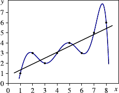
94 5 Principles of Modeling
Fig. 5.4 An example for
overfitting
However, if we assume that the data points are corrupted with noise, the polyno-
mial may mainly fit the noise rather than capture the underlying relationship. When
we obtain further data points, the regression line is likely even a better approxima-
tion for these points than the polynomial. Therefore, a model with a smaller error is
not necessarily a better fit for the data. In general, more complex models can fit the
data better but have a higher tendency to show this bad effect called overfitting.
Once we have fitted a model to given data, the fitting error can be composed into
four components.
•The pure or experimental error,
•the sample error,
•the lack of fit or model error, and
•the algorithmic error.
5.4.1 Experimental Error
The pure error or experimental error is inherent in the data and is due to noise,
random variations, imprecise measurements, or the influence of hidden variables
that cannot be observed. It is impossible to overcome this error by the choice of a
suitable model. This error is inherent in the data. Therefore, it is also called intrinsic
error. In the context of classification problems, it is also called Bayes error.
5.4.1.1 Bayes Error
Classification problems are often illustrated by very simplified examples as shown
on the left in Fig. 5.5, where samples from two classes are shown. The samples from
one class are depicted as red circles, and samples from the other class as blue circles.
In this case, the two classes can be separated easily as indicated by the grey lines.
The upper left and the lower right region correspond to the blue class, whereas the
upper right and the lower left region correspond to the red class.
However, in real-world problems, the situation is usually more complicated.
Classes tend to overlap. An example of such a case is shown in the middle of
Fig. 5.5. Here the samples from both classes tend to scatter a little bit more, so that
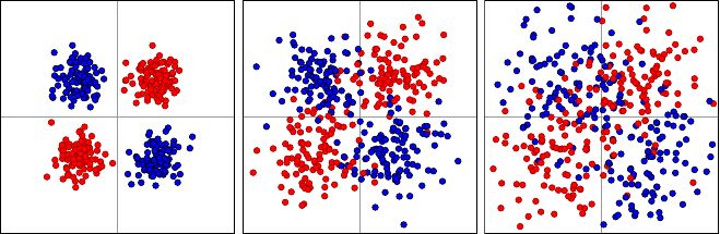
5.4 Types of Errors 95
Fig. 5.5 A simple classification problem with perfect separation (left) and more difficult classifi-
cation problems with slightly (middle) and strongly overlapping classes (right)
it is impossible to classify all objects correctly by a simple partition of the product
space defined by the predictor variables. Nevertheless, the number of incorrectly
classified samples will still be small, and the corresponding samples can be consid-
ered as exceptions. On the right in Fig. 5.5, however, we see an even more extreme
example with a high overlap of the classes.
In all three cases, the upper left and the lower right regions are dominated by
the blue class, and the upper right and the lower left regions by the red class. In
the left chart of Fig. 5.5, the regions are exclusively occupied by the corresponding
class, and in the middle chart, the regions are not exclusively occupied by one class,
but at least highly dominated. Finally, in the right chart, although the domination
of regions by classes is still there, incorrectly classified samples can no longer be
considered as exceptions. Although there are two prototypical examples for each
class—the centers of the four regions—the elements of the classes tend to deviate
strongly from the ideal prototypes leading to the high overlap of the classes and
making it impossible to achieve a high rate of correctly classified samples.
Of course, the data sets shown in Fig. 5.5 are artificial examples for illustration
purposes. The samples from each class were drawn from two bivariate normal dis-
tributions, so that the data come from four normal distributions altogether. In all
cases, the means of the distributions are the same, and only the variances differ,
leading to a higher overlap of the classes for higher variance. Despite the overlap,
the prototypical examples, i.e., the means of the normal distributions, differ signifi-
cantly. However, there are applications where even the prototypical examples from
different classes may be more or less identical. Consider, for instance, the example
of three darts players who try to hit the middle of the dartboard (the so-called em
bull’s eye). The three dart players correspond to the classes, and the goal is to pre-
dict who has thrown the dart, given the hitting point of the dart. Assume that one of
the players is professional, one is a hobby player, and one is a complete beginner.
The results from a number of trials of the three players may look like as shown in
Fig. 5.6. The red dots correspond to the results of the professional player, the blue
dots come from the hobby player, and the green dots were caused by the complete
beginner. Figure 5.7 shows the results of the three player separately.
In all three cases, the results scatter around the center of the dartboard. The dif-
ference between the three players comes from how much their results scatter around
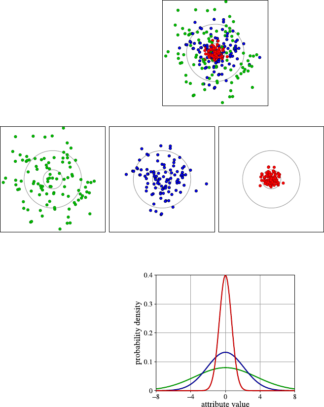
96 5 Principles of Modeling
Fig. 5.6 Results of three dart
players, one of which is a
beginner (green), one a hobby
player (blue), and one a
professional (red)
Fig. 5.7 Darts results for a beginner (left), a hobby player (middle), and a professional (right)
Fig. 5.8 Three normal
distributions with identical
means but different standard
deviations (green:σ=5,
blue:σ=3, red:σ=1)
the center of the dartboard. The hits of the professional player will all be close to
the center, whereas the complete beginner sometimes almost hits the center but has
the highest deviation.
In terms of a classification problems, all three classes have the same prototype
or center, and only the deviation differs. In such cases, a classifier can still be con-
structed, however, with a high misclassification rate.
We take an abstract simplified look at the dart player example. Assume that we
draw samples from three univariate normal distributions, representing three different
classes, with the same mean but with different variances, as shown in Fig. 5.8.This
5.4 Types of Errors 97
corresponds more or less to the classification problem of the dart players when we
consider only the horizontal deviation to the center of the dartboard. Samples from
the normal distribution with the smallest variance correspond to hits of the profes-
sional player, whereas the normal distribution with the largest variance represents
to the complete beginner. In this theoretical example, it is obvious how to find the
classification decision. Assuming that the three classes have the same frequency, an
object, i.e., a simple value in this case, should be assigned to the normal distribution
(class) with the highest likelihood, in other words, to the normal distribution with
the highest value of the corresponding probability density function at the position
of the given value. In this way, the region in the middle would be assigned to the
normal distribution with smallest variance, the left and right outer region would be
assigned to the normal distribution with highest variance, and the region in between
would be assigned to the remaining normal distribution.
In this sense, it is obvious how to make best guesses for the classes, although
these best guesses will still lead to a high misclassification rate. For the best guesses,
there are clear boundaries for the classification decision. However, one should not
mix up the classification boundaries with class boundaries. Classification bound-
aries refer to the boundaries drawn by a classifier by assigning objects to classes.
These boundaries will always exist. But these classification boundaries do not nec-
essarily correspond to class boundaries that separate the classes. In most cases, class
boundaries do not even exist, since classes tend to overlap in real applications and
cannot be clearly separated as in Fig. 5.5. This is due to the Bayes or the pure error.
5.4.1.2 ROC Curves and Confusion Matrices
For many classification problems, there are only two classes which the classifier
is supposed to distinguish. Let us call the two classes plus and minus. The classi-
fier can make two different kinds of mistakes. Objects from the class minus can be
wrongly assigned to the class plus. These objects are called false positives.And
vice versa, objects from the class plus can be wrongly classified as minus. Such ob-
jects are called false negatives. The objects that are classified correctly are called
true positives and true negatives, respectively.
There is always a trade-off between false positives and false negatives. One can
easily ensure that there are no false positives by simply classifying all objects as mi-
nus. However, this means that all objects from the class plus become false negatives.
The other extreme is to classify all objects as plus, in this way avoiding false nega-
tives but accepting that all objects from the class minus are false positives. A clas-
sifier must find a compromise between these two extremes, trying to minimize both
the number of false positives and false negatives. A classifier biased to the class
plus will have fewer false negatives but more false positives, whereas a classifier
biased to the class minus will have fewer false positives but more false negatives.
Cost functions, as they were explained in Sect. 5.2.1, are one way to introduce such
biases to false positives or false negatives.
Some classifiers also provide for each object a probability, whether it belongs
to a class or not. The usual decision is then to assign the object to the class with
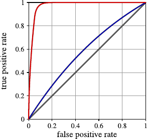
98 5 Principles of Modeling
Fig. 5.9 Examples of ROC
curves
the highest probability. So in the case of the two classes plus and minus, we would
assign an object to the class plus if and only if the probability for this class is greater
than 0.5. But we could also decide to be more careful and to assign objects to the
class plus only when the corresponding probability is higher than τ=0.8, leading
to fewer false positives but more false negatives. If we choose a threshold τfor
assigning an object to the class plus lower than 0.5, we will reduce the number of
false negatives for the price of having false positives.
This trade-off between false positives and false negatives is illustrated by the
receiver operating characteristic or ROC curve showing the false positive rate
versus the true positive rate (in percent). Figure 5.9 shows examples for possible
ROC curves. For various choices of τ, a new point is drawn at the respective co-
ordinates of false positive rate and true positive rate. These dots are connected to a
curve. The ROC curves in Fig. 5.9 are idealized. Normally, the ROC curves based
on sampled data look less smooth and more ragged.
The best case for a ROC curve would be to jump immediately from 0% to 100%,
so that we could have a classifier with 100% true positives and no false positives.
The red line shows a very good, but not perfect, ROC curve. We can have a very high
true positive rate together with a low false positive rate. The diagonal, shown as a
gray line, corresponds to pure random guessing, so that such a classifier has actually
learned nothing from the data, or there is no connection between the classes and the
attributes used for prediction. Therefore, the diagonal line is the worst case for a
ROC curve.
The area under curve (AUC), i.e., the area under the ROC curve, is an indi-
cator how well the classifier solves the problem. The larger the area, the better the
solution for the classification problem. The area is measured relative to the area of
the square [0,100]×[0,100]in which the ROC curve is drawn. The lowest value
for AUC is 0.5, corresponding to random guessing, and the highest value is 1 for a
perfect classifier with no misclassifications. The blue line in Fig. 5.9 is a ROC curve
with a lower performance. The reason for the low performance may be due to the
Bayes error, but also because of other errors that will be discussed in the following
sections.

5.4 Types of Errors 99
Table 5.3 A possible
confusion matrix for the Iris
data set
True class Predicted class
Iris setosa Iris versicolor Iris virginica
Iris setosa 50 0 0
Iris versicolor 0 47 3
Iris virginica 0 2 48
When there are more than two classes, it is not possible to draw a ROC curve as
described above. One can only draw ROC curves with respect to one class against
all others.
The confusion matrix is another way to describe the classification errors. A con-
fusion matrix is a table where the rows represent the true classes and the columns
the predicted classes. Each entry specifies how many objects from a given class are
classified into the class of the corresponding column. An ideal classifier with no
misclassifications would have only entries different from zero in the diagonal.
Table 5.3 shows a possible confusion matrix for the Iris data set. From the confu-
sion matrix we can see that all objects from the class setosa are classified correctly
and no object from another class is wrongly classified as setosa. A few objects from
the other classes—three from versicolor and two from virginica—are wrongly clas-
sified.
5.4.2 Sample Error
The sample error is caused by the fact that the data is only an imperfect represen-
tation of the underlying distribution of the data.
A finite sample, especially when its size is quite small, will seldom exactly reflect
the true distribution of the probability distribution generating the data. According to
the laws of large numbers, the sample distribution converges with probability one
to the true distribution when the sample size approaches infinity. However, a finite
sample can deviate significantly from the true distribution, although the probability
for such a deviation might be small. The bar chart in Fig. 5.10 shows the result for
throwing a fair die 60 times. In the ideal case, one would expect each of the numbers
1,...,6 to occur 10 times. But for this sample, the sample distribution does not look
uniform. Another source for sample errors are measurements with limited precision
and round-off errors.
Sometimes the sample is also biased. Consider a bank that supplies loans to cus-
tomers. Based on the data available on the customers who have obtained loans, the
bank wants to estimate the probability for paying back a loan for new customers.
However, the collected data will be biased in the direction of better customers be-
cause customers with a more problematic financial status have not been granted
loans, and therefore, no information is available for such customers whether they
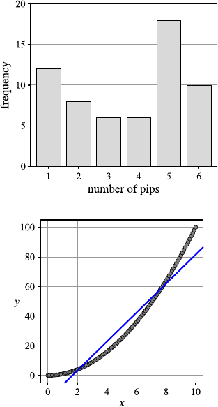
100 5 Principles of Modeling
Fig. 5.10 Asampleof
60 trials from a fair die
Fig. 5.11 A large error due
to lack of fit
might have paid back the loan nevertheless. From the perspective of a representa-
tive sample of all applicants, we deal with a sample error when using the bank’s
database.
5.4.3 Model Error
A large error may be caused by a high pure error, but it may also be due to a lack
of fit. When the set of considered models is too simple for the structure inherent in
the data, no model will yield a small error. Such an error is also called model error.
Figure 5.11 shows how a regression line is fitted to data with no pure error. But the
data points originate from a quadratic and not from a linear function.
The line shown in the figure is the one with the smaller mean squared error. Such
a line can always be computed, no matter from which true function the data come.
But the line that fits best such data does not reflect the structure inherent in the data.
Unfortunately, it is often difficult or even impossible to distinguish between the
pure error and the error due to the lack of fit. Simple models tend to have a large
error due to the lack of fit, whereas more complex models lead to small errors for
the given data but tend to overfitting and may lead to very large errors for new data.
5.4 Types of Errors 101
A discussion of the problem of finding a compromise between too simple models
with large and too complex models with overfitting is discussed in Sect. 5.5.
5.4.4 Algorithmic Error
There is the algorithmic error caused by a method that is used to fit the model or
the model parameters. In the ideal case, when an analytical solution for the optimum
of the objective function exists, the algorithmic error is zero or is only caused by
numerical problems. But as we have seen in Sect. 5.3, in many cases an analytical
solution cannot be provided, and heuristic strategies are needed to fit the model to
the data.
Even if a model exists with a very good fit—the global optimum of the objective
function—the heuristic optimization strategy might only be able to find a local op-
timum with a much larger error that is caused neither by the pure error nor by the
error due to the lack of fit.
Most of the time, the algorithmic error will not be considered, and it is assumed
that the heuristic optimization strategy is chosen well enough to find an optimum
that is at least close to the global optimum.
5.4.5 Machine Learning Bias and Variance
The types of errors mentioned in the previous four subsections can be grouped into
two categories. The algorithmic and the model errors can be controlled to a certain
extend, since we are free to choose a suitable model and algorithm. These errors are
also called machine learning bias. We have no influence on the pure or intrinsic er-
ror. The same applies to the sample error when the data to be analyzed have already
been collected. The error caused by the intrinsic and the sample error sometimes is
also called variance.
It is also well known from statistics that the mean squared error (MSE) of an es-
timator θ∗for an unknown parameter θcan be decomposed in terms of the variance
of the estimator and its bias:
MSE =Var(θ∗)+(Bias(θ∗))2.(5.11)
Note that this decomposition deviates from the classification into model bias and
variance above as it is popular in machine learning. The variance in (5.11) depends
on the intrinsic error, i.e., on the variance of the random variable from which the
sample is generated, and also on the choice of the estimator θ∗which is considered
as part of the model bias in machine learning.
A more detailed discussion on the different meanings and usages of the terms
variance and bias can be found in [3].
102 5 Principles of Modeling
5.4.6 Learning Without Bias?
The different types of errors or biases discussed in the previous section have an in-
teresting additional impact on the ability to find a suitable model for a given data set:
if we have no model or learning bias, we will not be able to generalize. Essentially
this means that we need to constrain either the types of models that are available or
the way we are searching for a suitable model (or both). Tom Mitchell demonstrates
this very convincingly in his hypothesis learning model [8]—in this toy world he
can actually prove that in the unrestricted case of a boolean classification problem,
the fitting models we can possibly find predict “false” in exactly half of the cases
and “true” for the other half. This means that without any constraint we always leave
all choices open. The learner or model bias is essential to put some sort of a priori
knowledge into the model learning process: we either limit what we can express, or
we limit how we search for it.
5.5 Model Validation
In the previous section, algorithms were discussed that fit a model from a prede-
fined model class to a given data set. Complex models can satisfy a simple fitting
criterion better than simple models. However, the problem of overfitting increases
with the complexity of the model. Especially, when the model is built for prediction
purposes, the error of the model based on the data set from which it was computed is
usually smaller than for data that have not been used for determining the model. For
instance, in Fig. 5.4 on page 94, the polynomial fits the data perfectly. The error for
the given data set is zero. Nevertheless, the simple line might be a better description
of the data, at least when we assume that the data are corrupted by noise. Under
this assumption, the polynomial would lead to larger errors for new data, especially
in those regions where it tends to oscillate. How do we find out, which model is
actually suited best to our problem?
5.5.1 Training and Test Data
The most common principle to estimate a realistic performance of the model for
unknown or future data is separating the data set for training and testing purposes. In
the simplest case, the dataset is split into two disjoint sets, the training data which
are used for fitting the model and the test data which only serve for evaluating the
trained model but not for fitting the model. Usually, the training set is chosen larger
than the test data set, for instance, 2/3 of the data are used for training, and 1/3for
testing.
One way to split the data into a training and a test set is a random assignment
of the data objects to these two sets. This means that in average the distributions
5.5 Model Validation 103
of the values in the original data set and in the training and the test data set should
be roughly the same. However, by chance it can happen that the distributions may
differ significantly. When a classification problem is considered, it is usually rec-
ommended to draw stratified samples for the training and the test set. Stratification
means that the random assignments of the data to the test and the training set are
carried out per class and not simply for the whole data set. In this way, it is ensured
that the relative frequency in the original data set, the training, and the test set are
the same.
Sometimes, it is not advisable to carry out a (stratified) random assignment of
the data to the training and test set. Consider again the example of the producer of
tea cups from Sect. 5.2.1 who wants to classify the cups automatically into ok and
broken. Assume that six different types of cups are produced at the moment and in
the future new types of cups might be introduced. Dividing the data set randomly
into training and test data would not reflect the classification problem to be encoun-
tered in the future. If the producer had no intention to change the types of the cups,
it would be correct to draw a random sample for testing from all data. In this way,
the classifier will be trained and tested with examples from all six types of cups.
But since new models of cups might be introduced in the future, this would yield an
over-optimistic estimation of the classification error for future cups. A better way
would be to use the data from four types of cups for training the classifier and to test
them on the remaining two types of cups. In this way, we can get an idea of how the
classifier can cope with cups it has never seen before.
This example shows how important it is in prediction tasks to consider whether
the given data are representative for future data. When predictions are made for
future data for which given data are not representative, extrapolation is carried out
with a higher risk of wrong predictions. In the case of high-dimensional data, it
cannot be avoided to have scarce or no data in certain regions of the space of possible
values as we have discussed already in Sect. 4.2, so that we always have to be aware
of this problem.
Sometimes, the data set is split into three parts: In addition to the training and
the test data set, a validation set is also used. If, for instance, a classifier should be
learned from data, but we do not know which kind of model is the most appropriate
one for the classifier, we could make use of a validation set. All classifier models are
generated based on the training data only. Then the classifier with the best perfor-
mance on the validation set is chosen. The prediction error of this classifier is then
estimated based on the test set.
5.5.2 Cross-Validation
The estimation of the fitting error for new data based on a test data set that has
not been used for learning the model depends on the splitting of the original data
set into training and test data. By chance, we might just be lucky that the test set
contains more easy examples leading to an over-optimistic evaluation of the model.
104 5 Principles of Modeling
Or we might be unlucky when the test set contains more difficult examples and
the performance of the model is underestimated. Cross-validation does not rely on
only one estimation of the model error, but rather on a number of estimations. For
k-fold cross-validation, the data set is partitioned into ksubsets of approximately
equal size. Then the first of the ksubsets is used as a test set, and the other (k −1)
sets are used as training data for the model. In this way, we get the first estimation
for the model error. Then this procedure is repeated by using each of the other k
subsets as test data and the remaining (k −1)subsets as training data. Altogether,
we obtain kestimations for the model error. The average of these values is taken as
the estimation for the model error. Typically, k=10 is chosen.
Small data sets might not contain enough examples for training when 10% are left
out for testing. In this case, the leave-one-out method, also known as the jackknife
method, can be applied which is simply n-fold cross-validation for a data set with n
data objects, so that each time only one data object is used for evaluating the model
error.
5.5.3 Bootstrapping
Bootstrapping is a resampling technique from statistics that does not directly eval-
uate the model error but aims at estimating the variance of the estimated model
parameters. Therefore, bootstrapping is suitable for models with real-valued param-
eters. Like in cross-validation, the model is computed not only once but multiple
times. For this purpose, kbootstrap samples, each of size n, are drawn randomly
with replacement from the original data set with nrecords. The model is fitted to
each of these bootstrap samples, so that we obtain kestimates for the model param-
eters. Based on these kestimates, the empirical standard deviation can be computed
for each parameter to provide information how reliable the estimation of the param-
eter is.
Figure 5.12 shows a data set with n=20 data points from which k=10 bootstrap
samples were drawn. For each of the bootstrap samples, the corresponding regres-
sion line is shown in the figure. The resulting parameter estimates for the intercept
Fig. 5.12 10 lines fitted to a
data set based on 10 bootstrap
samples (blue) and their mean
(red)

5.5 Model Validation 105
Table 5.4 The estimators for
the 10 bootstrap samples
in Fig. 5.12
Bootstrap sample Intercept Slope
10.3801791 0.3749113
20.5705601 0.3763055
3−0.2840765 0.4078726
40.9466432 0.3532497
51.4240513 0.3201722
60.9386061 0.3596913
70.6992394 0.3417433
80.8300100 0.3385122
91.1859194 0.3075218
10 0.2496341 0.4213876
Mean 0.6940766 0.3601367
Standard deviation 0.4927206 0.0361004
and the slope of the regression line are listed in Table 5.4. The standard deviation for
the slope is much lower than for the intercept, so that the estimation for the slope is
more reliable. It is also possible to compute confidence intervals for the parameters
based on bootstrapping [2].
The results from bootstrapping can be used to improve predictions as well by
applying bagging (bootstrap aggregation). In the case of regression, one would use
the average of the predicted values that the kmodels generated from the bootstrap
samples yield. In the example in Fig. 5.12, for a given value x, all 10 lines would
provide a prediction for y, and we would use the average of these predictions. For
classification, one would generate kclassifiers from the bootstrap samples, calculate
the predicted class for all kclassifiers, and use the most frequent class among the
kpredicted classes as the final prediction. Bagging will be introduced in more detail
in Sect. 9.4.
5.5.4 Measures for Model Complexity
Complex models are more flexible and can usually yield a better fit for the training
data. But how well a model fits the training data does not tell much about how
well a model represents the inherent structure in the data. Complex models tend to
overfitting as we have already seen in Fig. 5.4 on page 94.
Model selection—the choice of a suitable model—requires a trade-off between
simplicity and fitting. Based on the principle of Occam’s razor, one should choose
the simplest model that “explains” the data. If a linear function fits the data well
enough, one should prefer the linear function and not a quadratic or cubic function.
However, it is not clear what is meant by “fitting the data well enough.” There is a
need for a trade-off between model simplicity and model fit. But the problem is that

106 5 Principles of Modeling
it is more or less impossible to measure these two aspects in the same unit. In order
to combine the two aspects, regularization techniques are applied. Regularization
is a general mathematical concept that introduces additional information in order to
solve an otherwise ill-posed problem. A penalty term for more complex models can
be incorporated into to the pure measure for model fit as a regularization technique
for the avoidance of overfitting.
5.5.4.1 The Minimum Description Length Principle
The minimum description length principle (MDL) is one promising way to join
measures for model fit and model complexity into one measure. The basic idea be-
hind MDL is to understand modeling as a technique for data compression. The aim
of data compression is to minimize the memory—measured in bits—needed to store
the information contained in the data in a file. In order to recover the original data,
the compressed data and the decompression rule is needed. Therefore, the overall
size of the compressed data file is the sum of the bits needed for the compressed
data plus the bits needed to encode the decompression rule. In principle, any file
can be compressed to the size of one bit, say the bit with value 1, by defining the
decompression rule “if the first bit is 1, then the decompressed file is the original
data.” This implies that the decompression rule contains the original data set and is
therefore as large as the original data, so that no compression is achieved at all when
we consider the compressed data and the decompression rule together. The same ap-
plies when we do not compress the original data at all. Then we need no space at all
for the decompression rule but have not saved memory space at all, since we have
not carried out any compression. The optimum lies somewhere in between by using
a simple decompression rule allowing a reasonable compression.
The application of these ideas to model selection requires an interpretation of
the model as a compression or decompression scheme, the (binary) coding of the
model, and the compressed (binary) coding of the data. We illustrate the minimum
description length principle by two simplified examples.
The first example is a classification task based on the data set shown in Table 5.5.
The attribute Cwith the two possible values +and −shall be predicted with a
decision tree based on the two binary attributes Aand Bwith domains {a1,a
2}and
{b1,b
2}.
We consider the two decision trees shown in Fig. 5.13 to solve this classification
task. The decision tree on the left-hand side is simpler but leads to two misclassifica-
tions. The last two records in Table 5.5 are classified wrongly by this decision. The
Table 5.5 A classification task
ID1 2 3 4 5 6 7 8 9 1011121314151617181920
Aa
1a1a1a1a1a1a1a1a1a1a2a2a2a2a2a2a2a1a2a2
Bb
1b2b2b2b1b1b1b2b1b2b1b1b1b1b1b1b1b1b2b2
C++++++++++−−−−−−−−++
5.5 Model Validation 107
Fig. 5.13 Two decision trees
for the data set in Table 5.5
slightly larger decision tree on the right-hand side classifies all records in Table 5.5
correctly. If we were just concerned with misclassification rate for the training data,
we would prefer the decision tree on the right-hand side. But the node with the at-
tribute Bis only required to correct two misclassifications—10% of the data set.
This might just be an artificial improvement of the misclassification rate only for
the training data set, and it might lead to overfitting.
In order to decide whether we should prefer the smaller or the larger decision
tree, we interpret the two decision trees as compression schemes for the data set
in the following way. Based on the corresponding decision tree, we can predict the
attribute C, so that we do not have to store the value of the attribute Cwhen we know
the decision tree and the values of the attributes Aand Bfor each record. However,
this is only true for the larger decision tree. For the smaller decision tree, we have
to correct the value of the attribute Cfor the two records that are misclassified by
the smaller decision tree. The length of the compressed file for the data set based on
any of the two decision trees is the sum of the lengths needed for coding
•the corresponding decision tree,
•the values of the records for the attributes Aand B, and
•the corrected values for the attribute Conly for the misclassified records.
The coding of the values of the records for the attributes Aand Bis needed for any
decision tree and can be considered as a constant. The length needed for coding the
decision tree depends on the size of the tree. The larger the tree, the more bits are
needed to store the tree. However, with a larger tree, the misclassification rate can
be reduced, and we need less bits for coding the corrections for attribute Cfor the
misclassified records. When we want to minimize the overall length needed to store
the compressed data, we need a compromise between a smaller decision tree with
a higher misclassification rate and larger decision with a lower misclassification
rate. The smaller decision tree will need less space for its own coding but more
for the corrections of the misclassified records, whereas the larger decision tree
needs more space for its own coding but can save space due to a lower number
of misclassifications. According to the minimum description length principle, we
should choose the decision tree with the minimum number of bits needed to code
the tree itself and the corrected values for the attribute C.
Of course, the number of bits needed for the coding depends on the binary coding
scheme we use for encoding the decision tree and the corrections for the values of
the attribute C. If we have a highly efficient coding scheme for decision trees but an
inefficient one for the corrections for the values of the attribute C, larger trees would
be preferred. The naive MDL approach will ignore this problem and simply try to
find the most efficient binary coding for both parts. However, there are more general
108 5 Principles of Modeling
Fig. 5.14 A constant (grey),
aline(blue), and a quadratic
curve (red) fitted to a data set
Table 5.6 A regression problem
ID123456789
X0.00 1.00 2.00 3.00 4.00 5.00 6.00 7.00 8.00
Y1.19 1.33 2.03 1.21 1.80 2.33 1.63 2.88 2.84
concepts of universal codes and universal models freeing the minimum description
length principle from the dependency on the specific coding scheme. For a detailed
introduction to universal codes and universal models that are out of the scope of this
book, we refer to [4].
As a second example for the application of the minimum description length prin-
ciple, we consider a regression problem. Figure 5.14 shows a simple data set to
which line and a quadratic curve is fitted. Which of these two models should we
prefer? Of course, the quadratic curve will lead to a smaller error for the training
data set than the simple line. We could also think of a polynomial of higher degree
that would reduce the error even more. But then we have to face the problem of
overfitting in the same as we have to take this for larger decision trees into account.
For illustration purposes, we consider an even simpler regression problem pro-
vided by the data set in Table 5.6.
What would be the best model for this data set? Should we describe the relation
between Xand Yby a simple constant function, by a linear, or even a quadratic
function? Of course, the quadratic function would yield the smallest, and the con-
stant function the largest error. But we want to avoid overfitting by applying the
minimum description length principle. As in the example of the classification prob-
lem, it will suffice to consider the naive approach and not to bother about universal
codings and universal models. Instead of the decision tree, our models are now func-
tions with one, two, and three real-valued parameters. The errors are now also real
numbers and not just binary values as in the case of the decision trees. If we insist on
exact numbers, the coding of a single error value could need infinite memory, since
a real number can have infinitely many digits. To avoid this problem, we restrict our
precision to two digits right after the decimal point. For reasons of simplicity, we do
not consider a binary coding of the numbers, but a decimal coding. A real number is
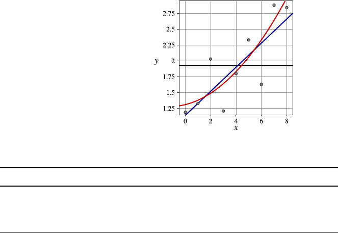
5.5 Model Validation 109
Fig. 5.15 A constant (gray),
a straight line (blue), and a
quadratic curve (red) fitted to
thedatasetofTable5.6
Table 5.7 The errors for the three regression functions
ID 123456789
y=1.92 0.73 0.59 −0.11 0.71 0.12 −0.41 0.29 −0.96 −0.92
y=1.14 +0.19x−0.05 0.00 −0.51 0.50 0.10 −0.24 0.65 −0.41 −0.18
y=1.31 +0.05x+0.02x20.12 0.05 −0.54 0.43 0.03 −0.27 0.70 −0.24 0.15
coded backwards starting from the lowest digit, in our case the second digit after the
decimal point. Therefore, the numbers 1.23, 2.05, 0.06, and 0.89 would be coded as
321, 502, 6, and 98, respectively. Note that smaller numbers require less memory
because we do not code leading zero digits. We also would have to take the sign of
each number into account for the coding. But we will neglect this single bit here in
order not to mix the decimal coding for the numbers with a binary coding for the
sign. If we use a binary coding for the numbers, the sign integrates naturally to the
coding as an additional bit. Figure 5.15 shows a plot of the data set and least squares
fit of constant, linear, and quadratic functions.
Table 5.7 lists the errors for the constant, linear, and quadratic functions that have
been fitted to the data. How many decimal digits do we need for coding of the data
set when we use a constant function? We need three digits for the constant 1.92
representing the function. We also need to encode the errors in order to recover
the original values of the attribute Yfrom our constant function. For the errors of
this constant function, we always need to encode to digits. Only the digit before
the decimal point is always correct. Altogether, the coding of the data set with the
constant function requires 3 +9·2=21 decimal digits.
What about the linear function? The function itself requires the coding of the
two coefficients 1.14 and 0.19 for which we need 5 decimal digits. The coding
errors require two decimal digits each time, except for the data points with the ID 1
and 2, for which we need only one and zero decimal digits. This means that we
have altogether 5 +7·2+1+0=19 decimal digits. Similar considerations for the
quadratic curve lead to 5 +7·2+2·1=20 decimal digits.

110 5 Principles of Modeling
This means that, in terms of our extremely simplified MDL approach, the linear
function leads to the most efficient coding for the data set, and we would therefore
prefer the linear regression function over the other ones.
It should be emphasized again that there is a more rigorous theory for the min-
imum description length principle that avoids the problem of finding the most ef-
ficient coding and the restriction to a fixed precision for the representation of real
numbers. But the naive approach we have described here often suffices to give an
idea how complex the chosen model should be.
5.5.4.2 Akaike’s and the Bayesian Information Criterion
Akaike’s information criterion [1] is based on entropy considerations in terms of
how much additional information a more complex model provides with respect to
the (unknown) stochastic model generating the data. For large sample sizes, Akaike
could show that under these assumptions one should choose the model that mini-
mizes Akaike’s information criterion AIC, originally called “an information crite-
rion”
AIC =2k−2ln(L), (5.12)
where kis the number of parameters of the model, and Lis the likelihood of the
corresponding model. The aim is to minimize the value in (5.12), which is achieved
by a compromise between low model complexity—demanding a small value for k—
and a good fit, i.e., a high likelihood which is achieved easier for complex models.
For a regression problem with the assumption that the underlying measurements
of the “true” function are corrupted with noise coming from a normal distribution,
the minimization problem in (5.12) can be simplified to minimizing
AICGauss =2k+nln(MSE), (5.13)
where MSE is the mean squared error
MSE =1
n
n
i=1
(f (xi)−yi)2(5.14)
with regression function fand ndata points (xi,y
i).
Equation (5.13) applied to our simple regression example described in Table 5.6
yields the values −6.678, −12.130, −9.933 for the constant, the linear, and the
quadratic regression functions obtained from the least squares method. Since small
values for Akaike’s information criterion are better than larger, we would prefer the
linear function that was also the best choice in the context of MDL.
The Bayesian information criterion (BIC)[9] is derived in the context of
Bayesian inference for large sample sizes and under certain assumptions on the type
of probability distribution that generates the data:
BIC =kln(n) −2ln(L). (5.15)
5.6 Model Errors and Validation in Practice 111
With the same assumptions as for (5.13), BIC becomes in the context of regression
BICGauss =kln(n) +n(MSE)/σ 2,(5.16)
where σ2is the (estimated) variance for the underlying normal distribution that
causes the noise.
5.6 Model Errors and Validation in Practice
Although we will introduce realizations of model classes and different optimization
algorithms later in this book, we will already demonstrate how to measure error and
estimate model accuracy using KNIME and R in this section.
5.6.1 Errors and Validation in KNIME
KNIME offers a number of modules to estimate errors. Most prominently, the Scorer
node computes a confusion matrix given two columns with the actual and predicted
class label. There is also a node to plot a ROC curve and an entropy scorer, which
allows one to compute the class–class purities between two columns. So the stan-
dard error metrics are available as individual nodes. Figure 5.16 shows the use of
the scorer node in practice. The trained Naive Bayes classifier is applied to a sec-
ond data set, and the output is fed into the scorer node which compares the target
with the predicted class. The output of this scorer is a confusion matrix (which is
also available as node view) and a second matrix listing some well-known error
measures.
More interestingly, however, are methods to run cross validation or other vali-
dation techniques. KNIME offers those in the form of so-called meta nodes which
encapsulate a series of other nodes. Figure 5.17 shows the inside of such a node.
Besides the node to train a model (a neural network in this case) and apply the
network to unseen data, there are two special nodes: the begin of the cross valida-
tion look which takes care of the repeated partitions of the data and the end node
(X-Aggregator) which collects the information from all runs.
The special type of “loop nodes” are also available individually in KNIME, and
the user can then assemble much more complex looping constructs, but for conve-
nience, frequently used setups, such as the cross validation shown here, are available
in preconfigured meta nodes.
5.6.2 Validation in R
In order to apply the idea of using separate parts of a data set for training and testing,
one needs to select random subsets of the data set. As a very simple example, we
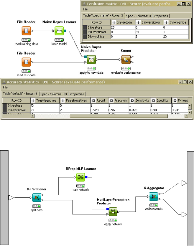
112 5 Principles of Modeling
Fig. 5.16 The use of the scorer node together with the two tables it produces on its outports. One
table holds the confusion matrix, the second output holds some well-known error measurer
Fig. 5.17 Preconfigured meta nodes allow one to run cross validation in KNIME. In this workflow
a neural network is repeatedly applied to different partitions of the incoming data
consider the Iris data set that we want to split into training and test sets. The size
of the training set should contain 2/3 of the original data, and the test set 1/3. It
would not be a good idea to take the first 100 records in the Iris data set for training
purposes and the remaining 50 as a test set, since the records in the Iris data set are
ordered with respect to the species. With such a split, all examples of Iris setosa and
Iris versicolor would end up in the training set, but none of Iris versicolor, which
5.7 Further Reading 113
would form the test set. Therefore, we need random sample from the Iris data set. If
the records in the Iris data set were not systematically orderer, but in a random order,
we could just take the first 100 records for training purposes and the remaining 50
as a test set.
Sampling and orderings in R provide a simple way to shuffle a data set, i.e., to
generate a random order of the records.
First, we need to know the number nof records in our data set. Then we generate
a permutation of the numbers 1,...,n by sampling from the vector containing the
numbers 1,...,n, generated by the R-command c(1:n). We sample nnumbers
without replacement from this vector:
>n<- length(iris$Species)
> permut <- sample(c(1:n),n,replace=F)
Then we define this permutation as an ordering in which the records of our data set
should be ordered and store the shuffled data set in the object iris.shuffled:
> ord <- order(permut)
> iris.shuffled <- iris[ord,]
Now define how large the fraction for the training set should be—here 2/3—and
take the first two thirds of the data set as a training set and the last third as a test set:
>prop.train <- 2/3
>k<- round(prop.train*n)
> iris.training <- iris.shuffled[1:k,]
> iris.test <- iris.shuffled[(k+1):n,]
The R-command sample can also be used to generate bootstrap samples by setting
the parameter replace to TRUE instead of F(FALSE).
5.7 Further Reading
The book [6] introduces data mining approaches in a similar view as in this chapter.
A discussion of the problems of bias and errors from the viewpoint of machine
learning and statistical learning theory can be found in [8] and [7], respectively.
References
1. Akaike, H.: A new look at the statistical model identification. IEEE Trans. Autom. Control 19,
716–723 (1974)
2. Chernick, M.: Bootstrap Methods: A Practitioner’s Guide. Wiley, New York (1999)
3. Dietterich, T., Kong, E.: Machine learning bias, statistical bias, and statistical variance of deci-
sion tree algorithms. Technical report, Oregon State University, USA (1995)
114 5 Principles of Modeling
4. Grünwald, P.: The Minimum Description Length Principle. MIT Press, Cambridge (2007)
5. Hamilton, H.J., Hilderman, R.J.: Knowledge Discovery and Measures of Interest. Springer,
New York (2001)
6. Hand, D., Mannila, H., Smyth, P.: Principles of Data Mining. MIT Press, Cambridge (2001)
7. Hastie, T., Tibshirani, R., Friedman, J.: The Elements of Statistical Learning: Data Mining,
Inference, and Prediction, 2nd edn. Springer, New York (2009)
8. Mitchell, T.: Machine Learning. McGraw-Hill, New York (1997)
9. Schwarz, G.: Estimating the dimension of a model. Ann. Stat. 6, 461–464 (1978)
Chapter 6
Data Preparation
In the data understanding phase we have explored all available data and carefully
checked if they satisfy our assumptions and correspond to our expectations. We in-
tend to apply various modeling techniques to extract models from the data. Although
we have not yet discussed any modeling technique in greater detail (see Chaps. 7ff),
we have already glimpsed at some fundamental techniques and potential pitfalls in
the previous chapter. Before we start modeling, we have to prepare our data set
appropriately, that is, we are going to modify our dataset so that the modeling tech-
niques are best supported but least biased.
The data preparation phase can be subdivided into at least four steps. The first
step is data selection and will be discussed in Sect. 6.1. If multiple datasets are avail-
able, based on the results of the data understanding phase, we may select a subset
of them as a compromise between accessibility and data quality. Within a selected
dataset, we may concentrate on a subset of records (data rows) and attributes (data
columns). We support the subsequent modeling steps best if we remove all useless
information, such as irrelevant or redundant data. The second step involves the cor-
rection of individual fields, which are conjectured to be noisy, apparently wrong or
missing (Sect. 6.2). If something is known, new attributes may be constructed as
hints for the modeling techniques, which then do not have to rediscover the use-
fulness of such transformations themselves. For some modeling techniques, it may
even be necessary to construct new features from existing data to get them running.
Such data transformations will be discussed in Sect. 6.3. Finally, most available
implementations assume that the data is given in a single table, so if data from
multiple tables have to be analyzed jointly, some integration work has to be done
(Sect. 6.5).
6.1 Select Data
Sometimes there is a lot of data available, which sounds good in the first place, but
only if the data is actually relevant for the given problem. By adding new columns
M.R. Berthold et al., Guide to Intelligent Data Analysis,
Texts in Computer Science 42,
DOI 10.1007/978-1-84882-260-3_6, © Springer-Verlag London Limited 2010
115
116 6 Data Preparation
with random values to a table of, say, customer transactions, the table may get an
impressive volume but does not carry any useful information. Even worse, these ad-
ditional attributes are considered harmful as it is often difficult to identify them as
being irrelevant (we will illustrate this point in a minute). This is the main reason
why it is important to restrict the analysis process to potentially useful variables,
but other reasons exist such as efficiency: the computational effort often depends
greatly on the number of variables and the number of data records. The results of
the data understanding phase greatly help to identify useless datasets and attributes,
which have to be withheld from the analysis. But for other attributes, things may
not be that clear, or the number of attributes that are classified as potentially useful
is still quite large. In the following, we investigate how to select the most promising
variables (Sect. 6.1.1) and, alternatively, how to construct a few variables that never-
theless carry most of the information contained in all given attributes (Sect. 6.1.2).
Having selected the data columns, we finally discuss which data rows should enter
our analysis in Sect. 6.1.3.
6.1.1 Feature Selection
Suppose that we have some target or response variable Rthat we want to predict.
For the sake of simplicity, let us assume that we have no data that is relevant for
the final outcome of R. What happens if we nevertheless try to build a model that
explains or predicts the value of Rgiven some other irrelevant variables? How will
it perform? We are going to answer this question following a thought experiment.
Suppose that the probability for a positive response is p.Wepicksomebinary
variable Awith P(A=yes)=q. In this experiment, Ahas nothing to do with the
response R, but usually we do not know this in advance. As Rand Aare (sta-
tistically) independent, we expect the joint probability of observing, say, A=yes
and R=yes to be P(A=yes ∧P(R =yes)=P(A=yes)·P(R =yes)=p·q,
as shown in Table 6.1a. Ignoring the variable Aand assuming p=0.4, having no
other information at hand, we would predict the more likely outcome R=no.Inthe
long run, this prediction would be correct in 60% (=p) of the cases and wrong in
40% (=1−p).
Next we take Ainto account with q=0.7. How would this additional knowledge
of Ainfluence our prediction of R? When looking at the expected number of records
in Table 6.1b, the knowledge of Adoes not suggest a different decision: in both
rows of the table (A=yes and A=no)wehaveP(R =no)>P(R=yes),sothe
chances of getting R=no are higher, and this would be our prediction. Clearly, the
irrelevant information did not help to improve the prediction, but at least it did no
harm—at the first glance. There is, however, one problem: The true probabilities p
and qare not known in advance but have to be estimated from the data (introducing a
sample error, see Sect. 5.4). Suppose that our data set consists of 50 records as shown
in Table 6.1c. Note that, by pure chance, the sample from the whole population
slightly differs in our database from the expected situation: only 2 records out of 50

6.1 Select Data 117
Table 6.1 (a) Probability distribution of independent variables. (b) Expected number of cases for
a total number of n=50 records. (c) Observed number of cases
(a)
R
yes no
Ayes p·q(1−p) ·qq
no p·(1−q) (1−p) ·(1−q) 1−q
p1−p
(b)
n=50 R
yes no
Ayes 14 21 35
no 6 9 15
20 30
(c)
n=50 R
yes no
Ayes 14 21 35
no 8 7 15
22 28
are different (in A=no:R=yes instead of R=no). Now there is a slight majority
for R=yes given A=no. If, based on this sample, the prediction of Ris changed
to yes given A=no, the rate of accurate predictions goes down from 60% to 52%.
Obviously, such situations occur easily if the numbers in the table are relatively
small. If the dataset consists of many more records, say 10,000, the estimates of
the joint probabilities are much more robust—as long as the number of cells in our
table remains constant. The number of cells, however, increases exponentially in the
number of variables; therefore, the number of cases per cell decreases much faster
than we can gather new records: To keep the number of cases per cell constant, we
would have to double the number of records if we add a single binary variable.
Many methods we will discuss in the following chapters come along with their
own weapons against the danger of overfitting, which generally grows with the num-
ber of (irrelevant) attributes. By removing irrelevant (and redundant) attributes in
advance, the variance of the estimated model is reduced, because we have less pa-
rameters to estimate, and the chances of overfitting decrease. In some cases, the ap-
plication of feature selection methods seems to be more important than the choice
of a modeling technique [16].
The goal of feature selection is to select an optimal subset of the full set of
available attributes Aof size n. The more attributes there are, the wider is the range
of possible subsets: the number of subsets increases exponentially in the size of A.
Feature selection typically implies two tasks: (1) the selection of some evaluation
function that enables us to compare two subsets to decide which will perform better
and (2) a strategy (often heuristic in nature) to select (some of) the possible feature
subsets that will be compared against each other via this measure.
Selecting the kTop-Ranked Features If we assume that an attribute subset is
only as good as the individual attributes, a straightforward approach is to use an
attribute evaluation function to rank the attributes only rather than the full subsets.
The selection strategy (step 2) could then be as simple as “take the ktop-ranked
features.” This leads to an extremely fast selection process, because the evaluation
function has to be evaluated only once per attribute (rather than evaluating all pos-
sible subsets once).
If a target variable is given (searching for explanations or predictions), the eval-
uation function may investigate into the correlation of the considered attribute and

118 6 Data Preparation
Table 6.2 The full dataset consists of 9 repetitions of the four records on the left plus the four
records in the middle, which differ only in the last record. To the right, there are contingency tables
for all four variables vs. the target variable
9×
ABCDTarget
+++−no
+−+−yes
−++−yes
−−−+no
,1×
ABCDTarget
+++−no
+−+−yes
−++−yes
−−++no
A Target B Target C Target D Target
no yes no yes no yes no yes
+10 10 +10 10 +11 20 +10 0
−10 10 −10 10 −90−10 20
the target attribute. For categorical data, Pearson’s χ2-test (see Sect. A.4.3.4)in-
dicates the goodness of fit for the observed contingency table (of target and con-
sidered variable) versus the table expected from the marginal observations. A large
deviation from the expected distribution points towards a dependency among both
attributes, which is desirable for predictive purposes. Another evaluation function is
the information gain or its normalized variants symmetric uncertainty or gain ratio,
which will be discussed in Sect. 8.1. The information gain itself is known to prefer
attributes with a large number of values, which is somewhat compensated by the
normalized variants (see also Sect. 6.3.2).
As an example, consider the dataset shown in Table 6.2. As we can see from the
contingency tables, the values +/−of the attributes Aand Bare equally distributed
among the target values no/yes and thus appear useless at first glance. When ob-
serving C=−, the target value distribution no :yes is 9 :0, which indicates a very
clear preference for no and makes Cvaluable. When observing D=+, the target
value distribution is 10 :0, which is even slightly better because it covers one more
case. All the mentioned evaluation measures provide the same ranking for this set
of variables: D–C–A,B (with Aand Bhaving the same rank).
The interesting observation is that in this artificial example the attributes Aand B
together are sufficient to perfectly predict the target value, which is impossible with
attributes Cand D, each of them individually ranked higher than Aand B. Both, C
and D, are quite good in predicting the target value no, but they do not complement
one another. By our initial assumption the evaluation functions considered so far do
not take the interaction among features into account but look at the performance of
individual variables only. They do not recognize that Cand Dare almost redundant,
nor do they realize that Aand Bjointly perform much better than individually. This
holds for all evaluation functions that analyze the contingency table of individual
attributes only.
However, we may arrive at different conclusions if we account for the values of
other attributes, say B,C,D, while evaluating a variable, say A, as it is done by
the Relief family of measures. We discuss only one member (Relief, see Table 6.3)
and refer to the literature for the more robust extensions ReliefF and RReliefF [15].
An advantage of the Relief family is that it is easily implemented for numerical and
categorical attributes (whereas many of the aforementioned evaluation measures are
only available for categorical data in most data analysis toolboxes).

6.1 Select Data 119
Table 6.3 Evaluation of attributes—Relief algorithm. The nearest hit or miss is selected upon the
same diff function (sum over all attributes). Rather than applying the algorithm to all data, it may
be applied to a sample only to reduce the high computational costs of handling big data sets (caused
by the neighborhood search)
Algorithm Relief(D,A,C)→w[·]
input: data set D,|D|=n,
attribute set A, target variable C∈A
output: attribute weights w[A],A∈A
1 set all weights w[A]=0
2for all records x∈D
3 find nearest hit h(same class label xC=hC)
4 find nearest miss m(different class label)
5for all A∈A:
6w[A]=w[A]−diff(A,x,h)
n+diff(A,x,m)
n
where
diff(A, x,y)=0ifxA=yA
1 otherwise
for categorical attributes Aand
diff(A, x,y)=|xA−yA|
max(A)−min(A)
for numerical attributes A.
Intuitively, the Relief measure estimates how much an attribute Amay help to
distinguish between the target classes by means of a weight w[A]:ifw[A]is large,
the attribute is useful. The weights are determined incrementally and respect the
interaction between the attributes by the concept of “nearest” or “most similar”
records, which takes all attributes (rather than just A) into account. Given some
record x, if there are very similar records hand mwith the same or different target
label, the features present in this record are apparently not of much help in predict-
ing the target value (and the weights w[A]for all attributes Aremain unchanged
because the positive and negative diff-terms cancel out in line 6). On the other hand,
if the most similar record with the same target label is close (first diff-term is small),
but the most similar record with a different target label is far away (second diff-term
is large), then the weight will increase overall.
In our particular example, since we have duplicated the records in our dataset,
the nearest hit is almost always identical to the selected record xitself; therefore
the contribution of the first diff-term is zero. If we consider the first two records in
Table 6.2, they carry different labels but differ otherwise only in the value of B.This
makes Battractive, because it is the only attribute that helps to distinguish between
both cases. Overall, the ReliefF ranking delivers A, B −D−C.
Selecting the Top-Ranked Subset A computationally more expensive approach
is to consider an evaluation function that ranks attribute subsets rather than single
attributes. This helps to recognize the power of complementing attributes rather than
their individual contribution only. The question is how such a function may evaluate
the attribute subset. Possible choices include:
Cross product: As a naive solution, we may construct a new attribute as the cross
product of all attributes in the subset and evaluate it by the functions dis-
cussed earlier (information gain, gain ratio, etc.). Continuing our example,
if the subset contains Aand B, we construct an attribute AB with ΩAB =
{++,+−,−+,−−}, which would lead to a perfect prediction of the target
value in our example. This naive approach is only feasible as long as the num-

120 6 Data Preparation
ber of cases per newly constructed feature remains relatively high, otherwise
we risk overfitting.
Wrapper: Once we have methods available to learn models automatically from data
(see Chaps. 7ff), we may evaluate the subset by the performance of the derived
model itself: For each subset, we build a new model, evaluate it, and consider
the result as an evaluation of the attribute subset. This is known as the so-
called wrapper approach to feature selection. In order to avoid overfitting of
the training data, we must carry out the evaluation on hold out validation data.
New measures: As we have already mentioned, we may remove both, irrelevant
attributes (carrying no information) and redundant attributes (information is
already carried by other attributes). So far we have focussed on the former
by investigating how much information a given attribute contains wrt. the tar-
get class (which should be close to zero in case of irrelevant attributes). To
identify redundant attributes, we may apply the same evaluation function on
attribute pairs: if one attribute tells us everything about another, they are ob-
viously redundant, and one of them may be skipped. This is the idea of the
correlation-based filter (CFS) [7], where a set of features is evaluated by the
following heuristic:
k¯rci
√k+k(k −1)¯rii
,
where ¯rci is the average correlation of the target attribute with all other at-
tributes in the set, whereas ¯rii is the average attribute–attribute correlation
between different attributes (except the target) and kdenotes the number of
attributes. The evaluation function becomes the larger, the better the attributes
correlate with the target attribute and the less they correlate with each other.
Once a subset evaluation function has been found, a strategy to select subsets
from the full set of attributes has to be found. Two very simple standard procedures
are forward selection and backward elimination. In the former, one starts with a
subset that does not use any attributes (and a model must always predict the majority
class) and then adds attributes in a greedy manner: in each step the attribute that most
improves the subset performance is added. In backward elimination the process is
reversed: one starts with a subset that uses all available attributes and then removes
them in a greedy manner: in each step the attribute whose removal most improves the
subset performance is eliminated. The process stops if there is no attribute that can
be added (forward selection) or removed (backward elimination) without actually
worsening the model performance. An exhaustive search over all possible attribute
sets is usually prohibitive, but at least possible, if only a limited number of attributes
is available. Even a random set generation is possible (Las Vegas Wrapper).
The data from Table 6.2 evaluated by a forward selection wrapper with a standard
decision tree learner selects the attribute Donly. Exhaustive search of all subsets
identifies the subset A,B,Das the best. In both cases attribute Dis included be-
cause of the preference for attributes that correlate directly with the target variable,
which is built in with most decision tree learners. On the one hand, having iden-
tified the optimal subset does not help if the learner is not capable of constructing
6.1 Select Data 121
the right model out of it (because of representational limitations); therefore it is ad-
vantageous to use the method that builds the model to evaluate the attribute subsets
directly. On the other hand, if we intend to test different techniques later, the optimal
subset of one algorithm is not necessarily the smallest or optimal subset for another.
Using exhaustive search together with the subset evaluation function that considers
the cross product, the minimal optimal subset A,Bis identified.
6.1.2 Dimensionality Reduction
Principal component analysis (PCA) has already been introduced in Sect. 4.3.2.1
in the context of data understanding. PCA was used for generating scatter plots
from higher-dimensional data and to get an idea of how many intrinsic dimensions
there are in the data by looking at how much of the variance can be preserved by a
projection to a lower dimension. Therefore, PCA can also be used as a dimension-
reduction method for data preparation. In contrast to feature selection, PCA does not
choose a subset of features or attributes, but rather a set of linear combinations of
features. Although this can be very efficient in certain cases, the extracted features
in the form of linear combinations of the attributes are often difficult to interpret, so
that the later steps will automatically result in a black-box model.
PCA belongs to a more general class of techniques called factor analysis. Fac-
tor analysis aims at explaining observed attributes as a linear combination of un-
observed attributes. In PCA, the (first) principal components are the corresponding
factors. Independent component analysis (ICA) is another method to identify such
unobserved variables that can explain the observed attributes. In contrast to factor
analysis, ICA drops the restriction to linear combinations of the unobserved vari-
ables.
Dimension-reduction techniques that construct an explicit, but not necessarily
linear mapping, from the high-dimensional space to the low-dimensional space are
often called nonlinear PCA, even though they might not aim at preserving the vari-
ance like PCA, but rather the distances like MDS. Examples for such approaches
can be found in [8,9,13,14].
6.1.3 Record Selection
Except for very rare occasions, the available data is already a sample of the whole
population. If we had started our analysis a few weeks earlier, the sample would
have looked different (smaller, in particular) but probably still representative for the
whole population. Likewise we may create a subsample from our data and use it for
the analysis instead of the full sample, e.g., for the sake of faster computation or
the need for a withhold test dataset (see Sect. 5.5.1). Other reasons for using only a
subsample include:

122 6 Data Preparation
•Timeliness: If we want to draw conclusions to take actions in the future, it is
advisable in a changing world to primarily use recent data rather than data that
is already several years old. Explicit or implicit time stamps in databases are of
great help in selecting the most recent data.
•Representativeness: Sometimes the population of interest is different from the
population available in our database (e.g., applicants that are rejected early are not
recorded in the database). By choosing underrepresented cases more frequently
than overrepresented cases this imbalance may be compensated and lead to a bet-
ter representativeness in the sample. On the other hand, if the data is already rep-
resentative and the subsample is relatively small, chances rise that the probability
distribution of some attribute of interest becomes quite different in the subsample
compared to the full dataset. Stratified sampling takes care of this problem (see
Sect. 5.5.1).
•Rare events: If we want to predict some event that occurs only rarely, a remark-
ably good performance is achieved by simply predicting that the event will not
occur (which is true most of the time but obviously does not help very much).
As many methods are sensitive to this kind of problem, the cost function has
to be chosen appropriately, e.g., by adapting the misclassification costs (see
Sect. 5.2.1). Alternatively, the number of rare cases may be increased artificially
by sampling them with a higher probability.
How large does the subsample have to be? The smaller the subsample, the less
likely it is representative for the population. The more complex a model is, the more
parameters have to be estimated, and the more data is necessary to achieve robust
estimates. But on the other hand, if things seem to converge after observing several
thousand cases, considering more and more data does not add any further value. In
some cases, when the parameters to be estimated can be represented as a sum (like
the mean), a theoretical bound for the size of the subsample can be provided: In case
of the mean value ¯xof all xi,1≤i≤n, and a given (almost certain) variable range
[a,b], that is, xi∈[a,b], the probability that the mean estimate ¯xdeviates from the
true value E[x]only by εis given by
P|¯x−E[x]|≥ε≤2exp
−2nε2
(b −a)2,
which is known as the Hoeffding inequality. For some desired probability, the num-
ber of required samples can be derived directly. However, this conservative estimate
requires quite a large number of samples.
The choice of the modeling technique is always a compromise of interpretabil-
ity, runtime, stability, etc. (see Sect. 3.3). If runtime becomes a problem, why not
reduce the dataset to those cases that are really important for the modeling tech-
nique? Why not remove the bulk of highly similar, uninformative records and just
keep a few representatives instead? This instance selection works surprisingly well
for many data mining tasks. If class boundaries exist in a classification task (see
Sect. 5.4), the instances that influence the class boundaries most are usually those
close to the boundaries—we get the same resulting classifier if some of the interior
cases are removed. This is exploited by classifiers called support vector machines

6.2 Clean Data 123
(Sect. 9.3). Instance selection for clustering tasks often involves some condensation
or compression by choosing one record that represents a number of very similar
records in its neighborhood. Often the number of records it represents is included as
an additional weight attribute, which gets higher the more data it substitutes. Many
clustering algorithms (such as k-means clustering, Sect. 7.3) are easily extended to
process this additional weight information appropriately. The instance selection can
be considered as some kind of preclustering as it identifies representative cases that
may stand for a small group of data (a small cluster). The small clusters may then
be aggregated further in subsequent steps.
6.2 Clean Data
6.2.1 Improve Data Quality
Data scrubbing involves the correction of simple errors, such as inconsistencies,
spelling mistakes, spelling variants, abbreviations, varying formats (time, date, cur-
rency, phone). Such distorted values are frequently called noise. We have to correct
these values in order to recognize differently spelled but semantically identical val-
ues as such (which includes text entries and numerical values). Appropriate steps
include
•Turn all characters into capital letters to level case sensitivity.
•Remove spaces and nonprinting characters.
•Fix the format of numbers, date, and time (including decimal point, sign, currency
signs). Statistical methods have been used in the data understanding phase to
identify potential outliers in numerical fields (e.g., limit the deviation from mean
value to 2–3 standard deviations), which may indicate a missed decimal point
resulting in a much too high value. Such errors are easily corrected, and others
may require careful inspection.
•Split fields that carry mixed information into two separate attributes, e.g., “Choco-
late, 100g” into “Chocolate” and “100.0”. This is known as field overloading.
•Use spell-checker or stemming1to normalize spelling in free text entries.
•Replace abbreviations by their long form (with the help of a dictionary).
•Normalize the writing of addresses and names, possibly ignoring the order of
title, surname, forename, etc. to ease their reidentification.
•Convert numerical values into standard units, especially if data from different
sources (and different countries) are used.
•Use dictionaries containing all possible values of an attribute, if available, to as-
sure that all values comply with the domain knowledge.
1The reduction of inflected or derived words to their root (or stem) is called stemming. So-called
stemmers are computer programs that try to automate this step.
124 6 Data Preparation
While humans are usually very good in spotting and correcting noise, the prob-
lem is that it may occur in many variants which makes an automatic recovery very
difficult. It is therefore extremely helpful to define rules and patterns the correctly
spelled values have to match (e.g., regular expressions for text and valid ranges for
numerical values), so that the data can be filtered and conversion rules may be de-
fined case-by-case whenever a new rule violation occurs. If additional data will be
considered later, these rules prevent us from repeating a manual analysis over and
over again.
While the steps mentioned so far were concerned with single records only, other
errors may be recognized only if multiple records are investigated. The most promi-
nent example is the discovery of duplicate records, e.g., in the table of customers
when creating customer profiles. This problem is known as record linkage or en-
tity resolution. Methods for detecting duplicates utilize some measure of similarity
between records (which will be discussed in Sect. 7.2); two records that are highly
similar are than considered as variants of the same entity and are merged to a sin-
gle record. The greatest difficulty is to avoid that two different entities are merged
mistakenly (false positive).
It is always a good idea to document changes, such as the correction of an out-
lier, because it may turn out later that the entry is not defective at all but points out
some rare, special case. An artificial attribute degree of trustworthiness may be in-
troduced, which is 1.0 by default but decreased whenever some correction is applied
to the record that involves heuristic guesswork, be it outlier correction or missing
value treatment, which will be discussed in the next section. Methods which are nu-
merical in nature frequently offer the possibility to take an additional weight into
account, such that suspicious, less trustworthy records get less influence on the re-
sulting model (see also robust regression and M-estimation in Sect. 8.3.3.3).
Correcting all possible errors is a very time-consuming task; and if the data turns
out to be useless for the task at hand, it is definitely not worth the effort. If potentially
useful attributes have been identified early, efforts in data cleaning can be geared
towards those attributes that pay back.
6.2.2 Missing Values
Why is it necessary to treat missing data, anyway? If the data is not in the database,
this is because we do not know anything about the true value—so there is not much
we can do about it—besides guessing the true value, but this seems to be even worse
than keeping the missing data, because it almost certainly introduces errors.
The reason why we nevertheless may want to change the missing fields is that
the implementations of some methods simply cannot deal with empty fields. Then
the imputation of estimated values is a simple mean to get the program run and
deliver some result, which is often, although affected by estimation errors, better
than having no result at all. Another option would be to remove records with missing
values completely, so that only complete records remain, and the program does not
6.2 Clean Data 125
run into any problems either. In case of nominal attributes there is a third possibility:
we may simply make the missing value explicit by adding another possible outcome,
say MISSING, to its range. Let us consider all these options individually.
Ignorance/Deletion In case deletion all records that contain at least one miss-
ing value are removed completely and are thus not considered in subsequent steps.
Although this procedure is easy to carry out, it also removes a lot of information
(from the nonempty attributes), especially if the number of attributes is large. It
may be safely applied in case of missing completely at random (see Sect. 4.6), as
long as the remaining dataset is still sufficiently large. As soon as we deal with
missing at random (MAR), we may start to seriously distort the data. To continue
the example from Sect. 4.6, where missing temperature values due to empty bat-
teries are less likely to get fixed when it is raining, case deletion will remove more
rainy, cold days than sunny, warm days, which may lead to biased estimates else-
where. A removal of records may therefore threaten the representativeness of the
dataset.
Imputation The missing values may be replaced by some estimate. As a triv-
ial example consider an attribute “number of pregnancies” in a database, which
is for men either 0 or missing (in the sense of “not applicable”). In such cases
we know that the true value must be 0 and may impute it safely. For arbitrary at-
tributes, perhaps the most simple (but not advisable) guess is the mean (for nu-
merical data) or the mode (for categorical data). As such a guess clearly does not
add any new information to the data, it should not do any harm either: it should
leave the characteristics of the dataset unaltered. Indeed, by replacing all miss-
ing values of one variable by the mean of the measured values, the mean of the
modified set will remain unchanged—however, its variance will decrease. This re-
placement procedure affects the variance of the attributes to different degrees (de-
pending on the portion of missing values). Of course, it is also possible to im-
pute a value that preserves the variance (but affects the mean). In one way or the
other, any imputed value will affect some characteristics of the known dataset. To
decide which imputation is better, it is useful to know which statistic will play
an important role in the subsequent steps, and this statistic should be least dis-
torted.
If the values are missing at random (but not completely at random), other at-
tributes can provide hints towards the true value. If the horse power is missing in
a car database, we would estimate quite different values for a compact car and an
off-road vehicle. If an attribute such as fuel consumption or engine displacement
are given, their correlation to horsepower can be exploited to achieve better esti-
mates. How to develop models that help us to predict numerical values (regression)
or categorical values (classification) will be discussed in Chaps. 8and 9.
Replacing all missing values with the very same constant number always reduces
the variability of the dataset, which often influences derived values such as corre-
lation coefficients or fitting errors. This is less pronounced with substitutions that
come from a predictor, but the problem remains. Adding a random value to each
imputed value is not a general solution but helps to reduce the effects.

126 6 Data Preparation
Table 6.4 Treatment of missing values
Treatment of missing values for . . .
Operational reasons
Case deletion Removal of all records where missing values occur, only MCAR
Imputation Estimate the missing value (MAR: with help from other attributes)
Global constant Turn all missing values into a special, newly introduced global
constant
Data quality reasons
Harmonize Select a single representation for missing values and change all other
representations to it
Separate Use background knowledge and other attributes to distinguish
between there is a real value, but it is unknown and there is no value
(yet) (e.g., grade in exams: unknown grade because the test got lost vs.
absence of grade because student was ill)
Lossless preparation
Construct data Construct new attributes that indicate imputation, as this may carry
important information itself
Explicit Value or Variable A very simple approach is to replace the missing val-
ues by some new value, say MISSING. This is only possible for nominal attributes,
as any kind of distance to or computation with this value is undefined and mean-
ingless. If the fact that the value is missing carries important information about the
value itself (nonignorable missing values), the explicit introduction of a new value
may actually be advisable, because it may express an intention that is not recover-
able from the other attributes. If we suppose that the absence of the value and the
intention correlate, we may luckily capture this situation by a new constant, but the
problem is that we cannot assure this from the data itself. If the values are miss-
ing completely at random, there is no need to introduce a new constant. The cases
that are marked by a constant do not exhibit any deviation from those cases that
are not marked. If we introduce it nevertheless, the models will have to deal with
an additional, useless value, which makes the models unnecessary complicated and
estimates less robust.
A better approach is to introduce a new (binary) variable that simply indicates
that the field was missing in the original dataset (and then impute a value). In those
cases where neither the measured nor the estimated values really help, but the fact
that the data was missing represents the most important bit of information, this at-
tribute preserves all chances of discovering this relationship: the newly introduced
attribute will turn out to be informative and useful during modeling. On the other
hand, if no such missing value pattern is present, the original variable (with imputed
values) can be used without any perturbing MISSING entries.

6.3 Construct Data 127
6.3 Construct Data
By now we have selected and cleaned the data; next we consider the transformation
of existing and construction of new attributes that may replace the original attributes.
There are at least three reasons for this step: (1) the tool implementations require a
transformation because they will not work otherwise, (2) in absence of any back-
ground knowledge, we want to make sure that every attribute will play the same
role in the model, and no particular attribute is preferred over or has larger influence
than another, (3) given some domain knowledge, we want to give helpful hints to
the modeling techniques to improve the expected results.
6.3.1 Provide Operability
Scale Conversion If the modeling algorithm handles only certain types of data, we
have to transform the respective attributes such that they fit the needs of the model-
ing tool. Some techniques assume that all attributes are numerical (e.g., regression
in Sect. 8.3, neural networks in Sect. 9.2), so we either ignore the categorical at-
tributes or have to apply some transformation first. Simply assigning a numerical
value to each of the possible (categorical) values is not an option because typical
operations on numerical values (such as averaging or comparison) are not necessar-
ily meaningful for the assigned numerical values. A typical solution is to convert
nominal and ordinal attributes into a set of binary attributes, as it will be discussed
in Sect. 7.2.
Other methods prefer categorical attributes (like Bayesian classifiers2in Sect. 8.2)
or perform superior when a discretization is carried out beforehand [2,17]. Dis-
cretization means that the range of possible numerical values is subdivided into
several contiguous, nonoverlapping intervals and a label of the respective interval
replaces the original value. There are many (more or less intelligent) ways to define
the boundaries of the intervals. An equi-width discretization selects the boundaries
such that all intervals are of the same width (see page 41 for selecting a reasonable
number of bins). As we can see from Fig. 6.1(a) for the sepal length attribute of
the Iris dataset, it may happen that some intervals contain almost no data. An equi-
frequency discretization tries to assure that all intervals contain the same number
of data objects. Of course an equally distributed frequency is not always achievable.
For example, if the dataset with 100 cases contains only 4 distinct numerical values
and a partition into 5 intervals is desired, there are not enough split points. Again,
such a partition does not necessarily represent the underlying data distribution ap-
propriately: in the partition of the sepal length attribute in Fig. 6.1(b), the compact
group of similar data (left) is separated into two intervals; in particular the region of
highest density is split into two intervals.
2Bayesian classifiers can handle numerical data directly by imposing some assumptions on their
distribution. If such assumptions cannot be justified, discretization may be a better alternative.
128 6 Data Preparation
Fig. 6.1 Results of different
discretization strategies of the
sepal length attribute of the
Iris dataset. The class
distribution of the three Iris
flowers is shown by the
stacked bars.(a) Equi-width
partition, (b) equi-frequency
partition, (c) V-optimal
partition, (d) minimal entropy
partition
The discretization problem is essentially the same as the histogram problem
(mentioned already in Sect. 4.3.1). A so-called V-optimal histogram minimizes the
quantity iniVi, where niis the number of data objects in the ith interval, and Vi
is the variance of the data in this interval. Minimization of variances leads to inter-
vals with a roughly uniform data density, as can be seen in Fig. 6.1(c), which makes
it quite similar to clustering (Sect. 7.3) where we also search for areas of higher
data density to define compact groups of similar data. Clustering algorithms may
therefore also be used to derive partitions for discretization.
If additional information is available (such as the labels of some target variable as
in classification tasks), it can provide valuable hints for finding a discretization that
supports the classification task best. Note that the plots in Fig. 6.1(a)–(c) already
show this class label information but that it has not been used by the discretization
so far. We will discuss the idea of discretization via entropy minimization in the con-
text of binary splitting in Sect. 8.1, which can be extended to an arbitrary number of
splits (or intervals) [3,4]. The underlying ideas are similar to those of the V-optimal
histogram, but now we evaluate a partition by the (im)purity of its intervals: If an
interval contains only cases with the same target label, such an interval appears in-
formative wrt. the target variable. On the other hand, if the distribution of the target
variable within one interval is identical to the overall distribution, such an interval
is useless for the prediction. Just as in feature selection, we may now select the par-
tition that utilizes the classification task most, that is, leads to the purest distribution
of target values. This is the same objective we had in feature selection, so that we
can reuse the evaluation measures mentioned there (such as information gain, gain
ratio, Gini index, etc.). The partition that evaluates best among all possible parti-
tions with kintervals can be found quite efficiently (see, e.g., [3]). An example for
the sepal length attribute is shown in Fig. 6.1(d). Having fixed the number of inter-
vals to 6, note that most of the data are already covered by three pure bins, whereas
the remaining three bins are located where the class distribution is ambiguous.
Dynamic Domains We have already tackled the problem of dynamic domains
with nominal attributes in Chap. 4. In order to apply our models to future data with
6.3 Construct Data 129
dynamic domains, we must be prepared to handle values unseen before. One solu-
tion is to introduce a new variable, which is an abstraction of the original one. By
mapping the original values to more abstract or general values we can hope that
newly occurring entries can also be mapped to the generalized terms so that the
model remains applicable. In a data warehouse such a granularization scheme may
already be installed, otherwise we have to introduce it and install means that newly
arriving values will be mapped into the hierarchy first.
Problem Reformulation Transformations also help to reformulate a problem so
that the range of applicable techniques is enlarged. The logit-transformation maps
the unit interval to R, enabling standard linear regression techniques to be used for
(binary) classification problems (see Sect. 8.3.3.1). Some classification techniques
handle binary class variables only, so that multiclass attributes have to be trans-
formed first (e.g., one class against all others).
6.3.2 Assure Impartiality
Another reason for transforming attributes is to ensure that the influence or impor-
tance of every attribute is a priori the same. This is not automatically the case, as the
next examples will show.
When looking for two natural groups in the two datasets of Fig. 6.2 (which is the
task of clustering, see Chap. 7), most people would probably suggest the groups in-
dicated by dotted lines. The rationale for both groupings is that the elements within
each group appear to be more similar than elements of other groups. However, any
notion of similarity or distance strongly depends on the used scaling: Both graphs
in Fig. 6.2 actually display the same dataset, only the scaling of the x-axis has been
changed from hour to minute. If the distance between the elements is taken as an
indication of their similarity, a different scaling may change the whole grouping. In
practical applications with considerable background knowledge, one may be in the
comfortable position to conclude that a difference of 1.0 in attribute Ais as impor-
tant or relevant as a difference of 2.5 in attribute B. In such a case, all attributes
should be rescaled accordingly so that in the rescaled variables a distance of 1.0 is
Fig. 6.2 Distance measures
are influenced by scaling
factors (here: hours vs.
minutes)

130 6 Data Preparation
of equal importance in any attribute. In absence of such knowledge, typical trans-
formations include the min-max-normalization and the z-score standardization.
•min-max normalization: For a numerical attribute X∈Awith minXand maxX
being the minimum and maximum value in the sample, the min-max normaliza-
tion is defined as
n:domX→[0,1],x→ x−minX
maxX−minX
.
•z-score standardization: For a numerical attribute Xwith sample mean ˆμXand
empirical standard deviation ˆσX, the z-score standardization is defined as
s:domX→R,x→ x−ˆμX
ˆσX
.
•robust z-score standardization: As the sample mean and empirical standard de-
viation are easily affected by outliers, a more robust alternative is to replace the
mean by the median ˜xand the standard deviation by the interquartile range IQRX
(difference between third and first quartile, see also boxplots in Sect. 4.3.1):
s:domX→R,x→ x−˜x
IQRX
.
•decimal scaling: For a numerical attribute Xand the smallest integer value s
larger than log10(maxX), the decimal scaling is defined as
d:domX→[0,1],x→ x
10s.
While it may be considered as advantageous if the resulting range is the unit
interval [0,1], the min-max normalization and the decimal scaling are very sensitive
to outliers: even a single outlier can force the majority of the data to concentrate in a
very small interval (and thus being very similar in comparison to other cases). This
effect is less prominent in z-score normalization, and the robust z-score is unaffected
by a moderate number of outliers.
Such as distance measures are used to capture the similarity of data, other
measures are used for different purposes, such as the evaluation of attributes (see
Sect. 6.1.1 on feature selection). Those measures try to identify how much an at-
tribute contributes to the prediction of a given binary target attribute. Suppose that
we have 100 cases in the database and three attributes with 2, 10, and 50 values,
respectively. For the sake of simplicity, let us assume that none of these attributes
can help in predicting the target attribute and that the values are equally likely. It is
probably easy to see that the 2-valued attribute cannot help very much in predicting
the target value, but what about the 50-valued attribute? On average, we have only
two cases in our database where the same value will occur. If (by chance) these two
cases carry the same target value, some algorithm may find it easy to predict the
target value (at least in this case). As we have discussed in Sect. 5.4, as the num-
ber of cases gets smaller and smaller, the danger of memorizing (overfitting) rises.
Of course, this effect takes place gradually, and it will already be recognizable with
the 10-valued attribute but to a lesser extent. Some measures (such as information

6.3 Construct Data 131
gain) are sensitive to such effects and thus implicitly prefer attributes with a larger
number of values (just because memorizing is then much easier). A model, such as
a decision tree, is very likely to evaluate poorly if such a variable is chosen. Rather
than removing such attributes completely, their range of values should be reduced
to a moderate size. This corresponds to selecting a coarser granularity of the data.
For instance, the very large number of individual (full) zip-codes should be reduced
to some regional or area information. The website access timestamp (which even
includes seconds) may be reduced to day-of-week and am/pm. The binning tech-
niques mentioned earlier for discretizing numerical attributes may also be helpful.
If there is useful information contained in these attributes, it is very likely that it is
retained in the coarsed representation, but the risk of overfitting is greatly reduced.
Another typical assumption is that some variables obey a certain probability dis-
tribution, which is not necessarily the case in practice. If the assumption of a Gaus-
sian distribution is not met, we may transform the variable to better suit this require-
ment. This should be a last resort, because the interpretability of the transformed
variable suffers. Typical transformations include the application of the square root,
logarithm, or inverse when there is moderate, substantial, or extreme skewness.
(If the variable’s domain includes the zero, it has to be shifted first by adding an
appropriate constant before applying the inverse or logarithm.) Another choice is
the power transform: Given the mean value ¯y, the power transform
y→yλ−1
λ¯yλ−1if λ=0,
¯ylog yif λ=0,
transforms the data monotonically to better approximate a normal distribution. The
parameter λis optimized for the problem at hand, e.g., such that the sum of squares
of residuals in regression problems is minimized.
6.3.3 Maximize Efficiency
As already mentioned in Sect. 6.1.1, the performance of many standard learning
algorithms, like those we will discuss in Chaps. 7ff, degrades if irrelevant or redun-
dant attributes are supplied. The purpose of feature selection is the identification
and removal of such variables to prevent a performance decline. Sometimes the at-
tributes do contain all necessary information, but it is hard for the chosen modeling
technique to extract this information from the data. As an example, suppose that the
chances for some diagnosis are especially high if at least nout of msymptoms can
be observed. In case of 4 available observations a,b,c, and d, this would mean
that any combination of two of these symptoms can be taken as an indication of
this diagnosis (typical case in the medical domain [11]). Is this relationship difficult
to capture for a given modeling technique? Let us consider two possible models,
a hyperplane model and a rule-based model. If the four symptoms are modeled by
binary 0–1 values (absence–presence), the diagnosis corresponds to the following
condition:
a+b+c+d≥2,
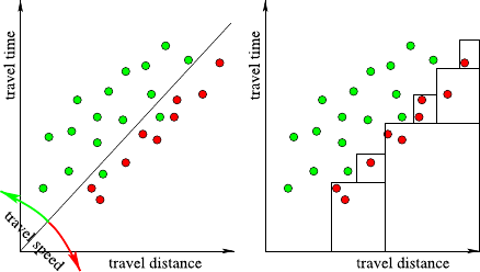
132 6 Data Preparation
Fig. 6.3 Simple example for
the usefulness of derived
features: for a number of
journeys, the travel time and
distance are shown; the color
indicates whether the driver
was ticketed or not.
Discriminating both classes
with axis-parallel rectangles
is laborious, but easy with a
new attribute for travel speed
which is already the definition of the respective hyperplane: the hyperplane a+b+
c+d=2 divides the space into two half-spaces, on one side the sum is less, and on
the other side the sum is larger than 2. If a new case lies on the hyperplane or the
latter side, it satisfies the “at least two symptoms” condition. However, a rule-based
learner delivers rules such as
if (a and b) or (a and c) or (a and d) or . . .then diagnosis =···.
Apparently, the rule-based model requires to include all possible combinations of
2 out of 4 symptoms, which makes the rule quite lengthy and more laborious to
discover. Regardless of the chosen model and thus the model representation, it will
always be well-suited for some real-world problems and perform poorly on others.
Accepting this fact, the idea of feature construction is to overcome the limits of
the representation (representational bias) by offering new features that were other-
wise difficult to represent by the original model. Such features include:
•Derived features. Given some background knowledge, new attributes may be de-
fined from existing attributes, such as average speed from travel time and travel
distance. If the true relationship in the data depends on some threshold on the av-
erage travel speed but the model requires to condition on the individual attributes,
the exact relationship may only be approximated by various pairwise conditions
on the individual variables (see Fig. 6.3). Such models will perform worse and
are difficult to interpret.
•Change the baseline. For an important variable to stand out clearly, selecting
the right baseline is often crucial. For instance, to estimate the spending power
“income per household” (with a thoughtful definition of the size of a household)
may outperform “income per head.”
•Grouping. If it is conjectured that the data form some natural groups or clusters,
then several attributes may strongly correlate within the same group, but not nec-
essarily across groups. Knowing to which group a particular case belongs to can
be helpful to find a concise model. In such cases, a cluster analysis may be carried
out first, and the resulting cluster labels are added as a new attribute. (Make sure
that the cluster analysis uses only attributes that will also be available for new
data when applying the model.)
6.3 Construct Data 133
•Hyperplanes. A linear combination of various attributes may define a new nu-
merical attribute (where a threshold has still to be found by the learner) or, if a
threshold is already supplied (cf. the example above), a binary attribute. A useful
example is a binary attribute that becomes true if at least (or exactly) nout of
mpreselected features hold. Such conditions are hard to identify for models that
work on the symbolic level (such as rules).
•Level of granularity. When looking for interdependencies in the data, it is a
priori not clear on which level of granularity they may unveil. Grouping the values
of a variable to meaningful aggregates or even a hierarchy or taxonomy would
allow us to test for dependencies at various levels of detail.
•Nonlinearities. A linear model y=αx +βy +γis linear in its parameters α,β,
and γ, which is where the name linear model comes from, and also linear in xand
y. If it is known or conjectured that the true dependencies are not linear in xor
y, the input data may be transformed beforehand: new attributes x2and y2may
be constructed, and a more complex linear model y=αx +βy +γx2+δy2+ε
can be built.
•Add metadata. Attributes that indicate where we have altered the data (either
because it was missing or because we supposed it was an outlier) can be helpful in
situations where our assumptions were wrong (the data is not missing completely
at random).
New attributes are often constructed by applying arithmetic or logic operators to
existing attributes. Instead of deriving them manually with the help of background
knowledge, it is in principle also possible to automatically search for helpful at-
tributes by constructing them randomly or heuristically and identifying the best gen-
erated features. This idea has been successfully applied in the context of decision
tree learning [10].
We have seen in Sect. 5.4.5 that the model error can be decomposed into machine
learning bias and variance. The variance is caused by sample errors and causes over-
fitting. In principle, the sample error can be reduced by acquiring a larger dataset
(or by feature selection, as discussed before). The bias is a systematic error that ex-
presses a lack of fit between the model and the real-world relationship. In this sense,
feature construction can help to reduce the limitations of the learning bias by giving
it some new direction. However, we must be aware that the introduction of newly
constructed attributes may also simultaneously increase the sample error again (see
[16] for a case study). If attributes are constructed that take a large number of dif-
ferent values, an increase of the sample error is inevitable. But it is also possible
to construct features that reduce the sample error: whenever we condense informa-
tion (from multiple attributes) to get a coarser view, the robustness of our estimates
increases. Examples for such transformations are aggregations (one attribute total
number (or price) of equipment rather than many individual attributes for each type
of equipment), introducing hierarchies (one attribute fruit juice rather than individ-
ual attributes for apple juice,orange juice, etc.), or grouping. Although we have
discussed feature selection first, this does not mean that we have to apply the same
principles and requirements to our newly constructed attributes.
134 6 Data Preparation
6.4 Complex Data Types
In this book we mainly focus on simple data types such as numerical and nominal at-
tributes. However, the majority of data collected has much more structure: there are
archives of documents, images, and videos. There are databases containing molecu-
lar structure and gene sequences. And there are, of course, the increasing number of
network-style information repositories. It would be outside of the scope of this book
to discuss the analysis of such complex data types in detail, but in almost all cases
one of two approaches is used: either the complex data is somehow transformed into
a simpler representation which can be used to apply standard data analysis methods
to, or existing methods are adopted to deal with specific types of more complex data
types. The following brief overview does not even attempt to be a complete list of
complex data types but rather tries to show a few prominent examples of these two
approaches.
Text Data Analysis Textual data is somewhat difficult to represent in a data ta-
ble. Among the possible representations, the vector model is most frequently used.
The individual words are reduced to their stem and very frequent and very rare
(stemmed) words are removed. The remaining words are then represented by a num-
ber of boolean attributes, indicating that the word occurred in the text or not. This
approach is also known as bag-of-words representation because it is usually easier
to simply enumerate the words contained in the vector instead of storing the en-
tire (usually very sparse) vector itself. Once we have reduced texts/documents to
such a vector-based representation, we can apply the methods presented later in the
book without change. A good summary can be found in [5]. Under the umbrella of
information retrieval, a lot of work has been undertaken as well.
Graph Data Analysis The analysis of large graphs and also the analysis of many
collections of graphs poses interesting challenges: from finding common patterns
of similar structure in social networks that can help to identify groups of similar
interest to the identification of reoccurring elements in molecular databases that
could potentially lead to the discovery of a new molecular theme for a particular
medication. Network analysis is often performed on abstractions, describing degrees
of connectivity, and then proceeds by using standard techniques. However, a number
of approaches also exist that operate on the network structure directly. A prominent
example is frequent subgraph mining approaches which identify graph patterns that
occur sufficiently often or are sufficiently discriminative. These methods follow the
frequent itemset mining approaches described later in this book (see Chap. 7)but
adopt those methods to directly operate on the underlying graph or graph database.
In [1] a good introduction to the analysis of graph data is given. We also discuss
one example of a molecular graph algorithm in more detail in Sect. 7.6.3.4 when we
introduce item mining algorithms.
Image Data Analysis Analyzing large numbers of images often requires a mix
of both methods. In order to find objects or regions of interest, one needs to ap-
ply sophisticated image segmentation approaches. Often already here analysis steps
6.5 Data Integration 135
are involved to semiautomatically find the best segmentation technique. Once this
is done, various types of image feature computations can be applied to describe
brightness, shape, texture, or other properties of the extracted regions. On these fea-
tures classical data analysis routines are then applied. The analysis of these types of
data emphasizes an interesting additional problem in data analysis, which is often
ignored: each object can be described in many different ways, and it is not always
clear from the beginning which of these representations is best suited for the anal-
ysis at hand. Finding out automatically which descriptors to use goes further than
feature selection discussed earlier in this chapter (Sect. 6.1.1) as we cannot select
from various subsets of features accompanied by different semantics. [12]offersa
good summary over the different aspects of image mining.
Other Data Types Of course, plenty other types of data are around: temporal data
from stock indices, process control applications, etc. Lots of work has been done in
the analysis of movies and other multimedia data such as music and speech. But
complex data is also generated by various ways to record data such as weblogs and
other types of user interactions recordings. Complex data also arise during observa-
tions of various types of populations (e.g., cattle herds). From an analysis point of
view, the next big challenge lies in the combined analysis of separate information
sources and types.
6.5 Data Integration
Almost all of the discussions in the remainder of this book focus on the modeling or
analysis of data that arrives in one nice, well-defined table. In the previous sections
of this chapter we have discussed how we can prepare the structure of this table by
selecting, cleaning, or constructing data, but what if our data is spread out over nu-
merous repositories? In reality, the data recording has begun over time, and various
departments have chosen their own recording mechanism. Worse, a merger in the
life time of our corporate database may have thrown two completely independently
developed database setups together that contain similar, but not quite the same, data.
If we now want to analyze the joint customer base, we may want to merge the two
(or more) customer databases into a uniform one first. This type of data integration
is called vertical data integration since we are really interested in concatenating two
tables holding essentially the same information. But already in this simple case we
will run into many annoying problems as we will see in the following section. The
other type of integration asks for combining different types of information and is
called horizontal data integration. Here we aim to enrich an existing table of, e.g.,
customers with information from another database such as purchase behavior which
was recorded independently. Essentially we are aiming to concatenate the entries
from one database with the entries of the second one, somehow smartly matching
which entries should be appended to each other.
136 6 Data Preparation
6.5.1 Vertical Data Integration
An example of vertical data integration could be the combination of two customer
databases from one company which recently acquired a second one. There usually
are two main obstacles to overcome:
Firstly we need to make sure that the structures of our databases are unified. One
database may have stored last and first name in one field, separated by a comma,
whereas the second database uses two separate fields for this. So we need to define
a joint format which we can then transform the entries of both tables into. This
often generates missing values, since very often not all fields will be obtainable
from both tables. If one table holds gender and the other not, we can either drop this
information altogether or replace it with missing value identifiers for the entries of
the second table. This structure unification will also often involve the definition of a
derived identifier because very likely the two databases used two different types of
identifiers.
Secondly, we need to deal with duplicates. This is a problem which often also
occurs within one single database which has grown over the years. But joining two
formerly completely independent databases will almost certainly create duplicate
entries if we not implement counter measures. The problem is that this is usually
not simply a problem of detecting duplicate identifiers. If both of our databases
contain exactly the same, correct information duplicate detection is simple. But if
our identifier is, for example, generated based on the last and first name, we may
sometimes have a middle initial and sometimes not, and then two entries are left in
our database. Slight spelling mistakes (Mayer vs. Meyer) or abbreviations (Sesame
St. vs. Sesame Street) can make this a formidable task. In fact, for postal addresses,
commercial companies exist whose only task is to help clean and merge duplicates
in a corporate database. And for those of us who receive lots of advertisements, we
can easily see how well such systems work.
Vertical data integration therefore comes back to data cleaning. We need to define
a proper structure of our new, combined database, and we need to make sure to unify
the representation in such a way that we can eliminate duplicate entries and clean
incorrect ones.
6.5.2 Horizontal Data Integration
An example of horizontal data integration was discussed before, using our example
customer/shopping data. If we have separate customer and purchase databases but
are, for instance, interested in which purchases were actually done by females, we
need to pull information from these datasets together. In order to do such a join,
we will require some identifier which allows us to identify rows in both tables that
“belong together.”
Table 6.5 illustrates how this works. Here the identifier used for the join is the
customer ID. Note that it is actually named differently in the two tables, so we

6.5 Data Integration 137
Table 6.5 The two datasets on top contain information about customers and product purchases.
The joint dataset at the bottom combines these two tables. Note how we loose information about
individual customers and how a lot of duplicate information is introduced. In reality this effect is,
of course, far more dramatic
id Last name First name Gender
p2 Mayer Susan F
p5 Smith Walter M
p7 Brown Jane F
... ... ... ...
+
Shopper id Item id Price
p2 i254 12.50
p5 i4245 1.99
p5 i32123 1.29
p5 i254 12.50
p5 i21435 5.99
p7 i254 12.50
... ... ...
Item id Price Last name First name gEnder
i254 12.50 Mayer Susan F
i4245 1.99 Smith Walter M
i32123 1.29 Smith Walter M
i254 12.50 Smith Walter M
i21435 5.59 Smith Walter M
i254 12.50 Brown Jane F
... ... ... ... ...
will need to inform the joint operator which two columns to use to join the tables.
There are, of course, other ways to join tables which we will discuss in a minute.
However, let us first discuss the two most problematic issues related to joins in
general: overrepresentation and data explosion.
•overrepresentation of items is (although only mildly) already visible in our ex-
ample table above. If we were to use the resulting table to determine the gender
distribution of our shoppers, we would have a substantially higher degree of male
shoppers that is evident from our table of shoppers. So here we would really
answer the question “what is the number of items purchased by male (female)
shoppers” and not a question related to shoppers.
•data explosion is also visible above: we already see a few duplicate entries which
are clearly not necessary to keep all essential information. Finding a more com-
pact database setup, i.e., splitting a big database into several smaller ones, to
avoid such redundancies is an important aspect in database normalization where
the goal is to ensure dependency of database entries onto the key only.
Joins, as illustrated above, are only a very simple case of what is possible in real
systems. Most database systems allow one to use predicates to define which rows
are to be joined and more generic data analysis systems often allow one to at least
138 6 Data Preparation
choose one or more attributes as join identifiers and select the four main join types:
inner, left, right, and outer joins:
•inner join: creates a row in the output table only if at least one entry in the left
and right tables can be found with matching identifiers.
•left join: creates at least one row in the output table for each row of the left input
table. If no matching entry in the right table can be found, the output table is filled
with missing or null values. So we could make sure that each customer appears
at least once, even if the customer has not made any purchase.
•right join: similar to the left join, but at least one row is created for each row in
the right table.
•outer join: creates at least one row for every row in the left and right table. If no
matching entries can be found in the other tables, the corresponding entries are
filled with null or missing values.
Implementing join operations is not an easy task, and various efficient algorithms
have been developed. Especially on large tables when all data does not fit into main
memory anymore, smart methods need to be used to allow for such out-of-memory
joining. Databases are usually optimized to pick the right algorithm for the tables at
hand so the data analyst does not need to worry about this. However being aware of
the risk of complex SQL statements, launching hidden joins does not hurt.
Integrating data is, of course, a brute force way to transforming a problem into
one that we can then deal with using methods developed for single tables. Min-
ing relational databases, which should actually be called “mining multirelational
databases,” is a research area which deals with finding information directly in such
distributed tables. However, the methods developed so far are rather specialized, and
in the following we will continue to assume the existence of one nice, well-formed
table holding all the relevant data. This is, of course, a drastic simplification, and
quite often, the integration and cleaning of data can easily require much more time
and effort than the analysis itself.
6.6 Data Preparation in Practice
Data Preparation is the most ignored aspect in data analysis, and this is also visible
in many data analysis software packages. They often assume the existence of a nice
file representation or a flat table in database. Visual data-flow-oriented tools such
as KNIME offer the ability to prepare the data intuitively, whereas command line
or script-based tools are often a lot harder to use for data preparation. One of the
important aspects here is not so much to possibility of doing data preparation in the
data analysis tool of choice but the repeatability or reproducibility. If a data analysis
process is to be used in a production environment, it is often necessary to rerun the
analysis periodically or whenever new data becomes available. Having a clear and
intuitive way to model and document the data, preparation phase in conjunction with
the actual analysis is then a serious benefit.
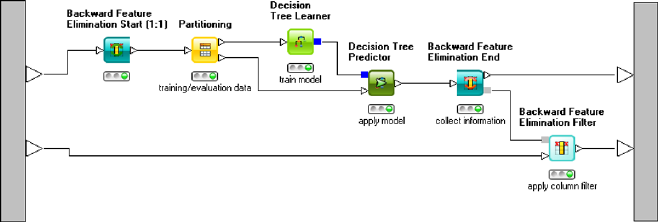
6.6 Data Preparation in Practice 139
6.6.1 Data Preparation in KNIME
KNIME offers a vast array of nodes for all kinds of data preparation. Most of them
can be found in the category Data Manipulation where there are nodes for binning,
converting/replacing, filtering, and transforming columns, rows, and entire tables.
Data selection tasks can be modeled by filtering out columns using the Column
Filter node. For row filtering, many more modules are available which filter rows
based on certain criteria applied to individual cells (Row Filter). These criteria can
be regular expressions for string cells or range or other constraints on numerical
attributes. In addition, the Nominal Value Row Filter allows one to select from the
range of nominal values to determine which rows should be filtered out. Those nodes
also come in a splitter-variant which does not filter out rows but instead has a second
output port containing the table with the remaining elements. Those—and more—
functions are all contained within individual nodes, so we skip the corresponding
very simple examples.
However, automated versions of column or feature selection such as the ones de-
scribed in Sect. 6.1.1 are worth being discussed in a bit more detail as they demon-
strate the interesting and very powerful loop-feature of KNIME. KNIME brings
along the framework to run wrapper approaches for feature selection using arbitrary
models. Figure 6.4 shows a workflow performing backward feature elimination us-
ing a decision tree as the underlying models. The flow starts with a loop node which
creates different subsets of features by filtering out all other columns. The reduced
data is then fed into a data partitioner, which splits it into training and validation
data. Afterwards we learn a model (here a decision tree) on the training data and
apply it to the validation data. The Loop end node (Backward Feature Elimination
End) calculates the accuracy of the resulting prediction and remembers this for all
features that were involved in this run. The loop is now executed several times (the
number of runs and number of features per run can be adjusted in the dialog of the
loop-start node), and finally a column filter model is produced, which can be used
to filter all but the top kfeatures/columns from the second table using the Backward
Feature Elimination Filter node.
Fig. 6.4 An example for feature selection in KNIME using a decision tree as the underlying model
to evaluate feature importance
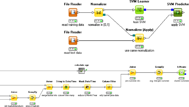
140 6 Data Preparation
Fig. 6.5 An example for a
normalization which is
performed the same way on a
second data pipeline
Fig. 6.6 An example for data preparation in KNIME. We join a number of tables and compute
aggregate information in the Group By nodes. The resulting table is finally fed into a clustering
node
Nodes for constructing and converting data are available in KNIME as well. Dif-
ferent types of normalizations are available via the Normalizer node. Note that this
node has a second outport which carries the normalization model. This allows one
to easily apply the same normalization to a second data pipeline. An often over-
looked problem in data analysis is that users tend to normalize their data using, e.g.,
min/max normalization and then normalize their test data using this same technique!
The resulting errors are hard to find since the min/max ranges of the training and test
data can, but are not guaranteed to be exactly the same. Especially, if the ranges are
almost equal, the resulting small deviations can cause a lot of confusion. Figure 6.5
shows an example of such a flow. Here a different type of model (support vector ma-
chine, see Chap. 9) is trained on normalized training data, and the resulting model
is applied to testing data which underwent the same normalization procedure.
KNIME also offers nodes for different types of binning or discretization of data
which are available in the “Data Manipulation-Column-Binning” category. Addi-
tional nodes allow one to concatenate and join tables, enabling vertical and horizon-
tal data integration. Many other functionalities are available in special nodes. Instead
of showing individual examples we conclude this section by showing (Fig. 6.6)a
small example of a workflow performing more complex data integration, prepro-
cessing steps to create the data we first discussed in Chap. 2.
The workflow fragment shows how information on products, basket/product as-
sociations, additional basket information (date, customer), and customers is merged
to produce information on the average basket price of individual customers. Since
this information is spread out over several different tables, we first need to join the
two tables containing product information (most notably product ID and price) and
the map between product and basket ID. Once we have this, we can aggregate the ta-
6.6 Data Preparation in Practice 141
ble (second node from the left Group By) to obtain the price of each basket. We join
this table with the table containing (among others) customer and basket ID and the
date of purchase. The latter field is only available as a string, so we need to convert
it to a date/time representation before reducing this to only contain year and month.
We can then again aggregate the resulting table to obtain the total and average bas-
ket price per customer and month. Joining this with the customer data allows one
to also add the age of the customer. Note that the age needs to be computed based
on the customer birth dates first. We aggregate this again to compute the average
prices per month and finally obtain a table containing the features we are interested
in (age, average purchase per month, average basket size) which can be fed into the
clustering algorithm.
Modeling data integration, transformation, and aggregation in such a graphical
way has two advantages. Firstly, this process can be documented and communicated
to others. Secondly—and even more importantly—this process can be easily exe-
cuted again whenever the underlying data repositories change. The documentation
aspect is often a problem with script-based platforms. In contrast, reproducibility
is an issue with table-based tools, which do allow for an intuitive way to integrate
and transform data but do not offer the ability to rerun this process reliably over and
over again in the future.
6.6.2 Data Preparation in R
6.6.2.1 Dimensionality Reduction
The use of PCA as technique for dimensionality reduction has already been ex-
plained in Sect. 4.3.2.1.
6.6.2.2 Missing Values
The logical constant NA (not available) is used to represent missing values in R.
There are various methods in R that can handle missing values directly.
As a very simple example, we consider the mean value. We create a data set with
one attribute with four missing values and try to compute the mean:
>x<- c(3,2,NA,4,NA,1,NA,NA,5)
>mean(x)
[1] NA
The mean value is in this case also a missing value, since R has no information
about the missing values and how to handle them. But if we explicitly say that
missing values should simply be ignored for the computation of the mean value
(na.rm=T), then R returns the mean value of all nonmissing values:
142 6 Data Preparation
>mean(x,na.rm=T)
[1] 3
Note that this computation of the mean value implicitly assumes that the values are
missing completely at random (MCAR).
6.6.2.3 Normalization and Scaling
Normalization and standardization of numeric attributes can be achieved in the fol-
lowing way. The function is.factor returns true if the corresponding attribute is
categorical (or ordinal), so that we can ensure with this function that normalization
is only applied to all numerical attributes, but not to the categorical ones. With the
following R-code, z-score standardization is applied to all numerical attributes:
> iris.norm <- iris
>for (i in c(1:length(iris.norm))){
if (!is.factor(iris.norm[,i])){
attr.mean <- mean(iris.norm[,i])
attr.sd <- sd(iris.norm[,i])
iris.norm[,i] <- (iris.norm[,i]-attr.mean)/attr.sd
}
}
Other normalization and standardization techniques can carried out in a similar
manner. Of course, instead of the functions mean (for the mean value) and sd (for
the standard deviation), other functions like min (for the minimum), max (for the
maximum), median (for the median), or IQR (for the interquartile range) have to
be used.
References
1. Cook, D.J., Holder, L.B.: Mining Graph Data. Wiley, Chichester (2006)
2. Dougherty, J., Kohavi, R., Sahami, M.: Supervised and unsupervised discretization of contin-
uous features. In: Proc. 12th Int. Conf. on Machine Learning (ICML 95, Lake Tahoe, CA), pp.
115–123. Morgan Kaufmann, San Mateo (1995)
3. Elomaa, T., Rousu, J.: Efficient multisplitting revisited: optima-preserving elimination of par-
tition candidates. Data Min. Knowl. Discov. 8(2), 97–126 (2004)
4. Fayyad, U., Irani, K.: Multi-interval discretization of continuous-valued attributes for classifi-
cation learning. In: Proc. 10th Int. Conf. on Artificial Intelligence (ICML’93, Amherst, MA),
pp. 1022–1027. Morgan Kaufmann, San Mateo (1993)
5. Feldman, R., Sanger, J.: The Text Mining Handbook: Advanced Approaches in Analyzing
Unstructured Data. Cambridge University Press, Cambridge (2007)
6. Guyon, I., Elisseeff, A.: An Introduction to Variable and Feature Selection. J. Mach. Learn.
Res. 3, 1157–1182 (2003)
References 143
7. Hall, M.A., Smith, L.A.: Feature subset selection: a correlation based filter approach. In: Proc.
Int. Conf. on Neural Information Processing and Intelligent Information Systems, pp. 855–
858. Springer, Berlin (1997)
8. Kolodyazhniy, V., Klawonn, F., Tschumitschew, K.: A neuro-fuzzy model for dimensionality
reduction and its application. Int. J. Uncertain. Fuzziness Knowl. Based Syst. 15, 571–593
(2007)
9. Lowe, D., Tipping, M.E.: Feed-forward neural networks topographic mapping for exploratory
data analysis. Neural Comput. Appl. 4, 83–95 (1996)
10. Markovitch, S., Rosenstein, S.: Feature generation using general constructor functions. Mach.
Learn. 49(1), 59–98 (2002)
11. Murphy, P., Pazani, M.: ID2-of-3: constructive induction of m-of-nconcepts for discrimina-
tors in decision trees. In: Proc. 8th Int. Conf. on Machine Learning (ICML’91, Chicago, IL),
pp. 183–188. Morgan Kaufmann, San Mateo (1991)
12. Petrushin, V.A., Khan, L. (eds.): Multimedia Data Mining and Knowledge Discovery.
Springer, New York (2006)
13. Rehm, F., Klawonn, F., Kruse, R.: POLARMAP—efficient visualisation of high dimensional
data. In: Information Visualization, pp. 731–740. IEEE Press, Piscataway (2006)
14. Rehm, F., Klawonn, F.: Improving angle based mappings. In: Advanced Data Mining and
Applications, pp. 3–14. Springer, Berlin (2008)
15. Robnik-Sikonja, M., Kononenko, I.: Theoretical and empirical analysis of ReliefF and
RReliefF. Mach. Learn. 53(1–2), 23–69 (2004)
16. van der Putten, P., van Someren, M.: A bias-variance analysis of a real world learning problem:
the COIL challenge 2000. Mach. Learn. 57, 177–195 (2004)
17. Yang, Y., Webb, G.I.: Discretization for naive Bayes learning: managing discretization bias
and variance. Mach. Learn. 74(1), 39–74 (2009)
Chapter 7
Finding Patterns
In this chapter we are concerned with summarizing, describing, or exploring the
dataset as a whole. We do not (yet) concentrate on a particular target attribute,
which will be the focus of Chaps. 8and 9. Compact and informative representa-
tions of (possibly only parts of) the dataset stimulate the data understanding phase
and are extremely helpful when exploring the data. While a table with mean and
standard deviation for all fields also summarizes the data somehow, such a repre-
sentation would miss any interaction between the variables. Investigating two fields
in a scatter plot and examining their correlation coefficients could reveal linear de-
pendencies among two variables, but what if more variables are involved, and the
dependency is restricted to a certain part of the data only? We will review several
techniques that try to group or organize the data intelligently, so that the individ-
ual parts are meaningful or interesting by themselves. For the purpose of getting a
quick impression of the methods we will address in this section, consider a dataset
of car offers from an internet platform. A number of interactions and dependencies,
well known to everyone who has actively searched for a car, can be found in such a
dataset.
Clustering For instance, we may want to group all cars according to their sim-
ilarities. Rather than investigating the offers car by car, we could then look at the
groups as a whole and take a closer look only at the group of cars we are particu-
larly interested in. This aggregation into similar groups is called clustering. (From
our background knowledge we expect to recover the well-known classes, such as
luxury class, upper and lower middle-sized class, compact cars, etc.) Cluster anal-
ysis (or clustering) looks for groups of similar data objects that can naturally be
separated from other, dissimilar data objects. As a formal definition of clusters turns
out to be quite challenging, depending on the application at hand or the algorithmic
approach used to find the structure (e.g., search, mathematical optimization, etc., see
Chap. 5), algorithms with quite different notions of a cluster have been proposed.
Their strengths (and weaknesses) lie in different aspects of the analysis: some focus
on the data constellation (such as compactness and separation of clusters), others
concentrate on the detection of changes in data density, and yet others aim at an
easily understandable and interpretable summary.
M.R. Berthold et al., Guide to Intelligent Data Analysis,
Texts in Computer Science 42,
DOI 10.1007/978-1-84882-260-3_7, © Springer-Verlag London Limited 2010
145
146
We have selected the following clustering methods for this chapter:
Hierarchical Clustering As the name suggests, hierarchical clustering constructs
a full-fledged hierarchy for all data that can be inspected visually. As every datum is
represented by its own leaf of the tree, this technique is only feasible for small data
sets but provides a good overview (Sect. 7.1).
Prototype-Based Clustering Alternatively, the data may be condensed to a small,
fixed number of prototypical records, each of them standing for a full subgroup of
the dataset (Sect. 7.3). This technique is efficient, and the results are interpretable
even for much larger datasets. Such techniques assume, however, that the groups
roughly follow some regular shape.
Density-Based Clustering Clusters may also be defined implicitly by the re-
gions of higher data density, separated from each other by regions of lower density
(Sect. 7.4). Most techniques from this category of density-based clustering allow for
arbitrary shaped groups—but the price for this flexibility is a difficult interpretation
of the obtained clusters.
Self-organizing Maps We could even arrange all cars into a two-dimensional map
where similar car offers are placed close together so that we explore cars similar to
some selected car by examining its neighborhood in the map. Such an overview is
generated by so-called self-organizing maps (Sect. 7.5). By means of color coding it
becomes immediately clear where many similar records reside and where we have
a sparsely populated area. Self-organizing maps were not intended as clustering
techniques but can deliver similar insights.
While clustering methods seek for similarities among cases or records in our
database, we may also be interested in relationships between different variables or
in subgroups that behave differently with respect to some target variable.
Association Rules Rather than grouping or organizing the cars, we may be inter-
ested in interdependencies among the individual variables. Several automobile man-
ufacturers, for instance, offer certain packages that contain a number of additional
features for a special price. If the car equipment is listed completely, it is possi-
ble to recover those features that frequently occur together. The existence of some
features increases the probability of others, either because both features are offered
in a package or simply because people frequently select a certain set of features in
combination. One technique to find associations of this kind are association rules
(Sect. 7.6): For every feature that can be predicted confidently from the occurrence
of some other features, we obtain a rule that describes this relationship.
Deviation Analysis The last method we are going to investigate in this chapter is
deviation analysis. Usually expensive cars offer a luxury equipment and consume
significantly more petrol than standard cars. However, new cars with new fuel-
saving engines, hybrid technology, etc. may represent exceptions from this general
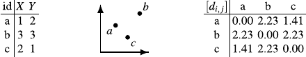
7.1 Hierarchical Clustering 147
rule. Typically, there is a negative correlation with price and mileage, however, the
group of oldtimer cars represents an exception. Typically a domain expert is already
familiar with the more global dependencies and is more interested in deviations
from the standard case or exceptional rules. The discovery of deviating subgroups
of the population is discussed in Sect. 7.7.
7.1 Hierarchical Clustering
We start the discussion of clustering algorithms with one of the oldest and most
frequently used clustering techniques: agglomerative hierarchical clustering.The
term “agglomerative” indicates that this type of clustering operates bottom-up. Con-
sider a dataset as shown in Fig. 7.1. Given a database consisting of many records, we
are interested in a descriptive summary of the database, organizing all cases accord-
ing to their properties and mutual similarity. Before comparing and arguing about
groups of records, we must first solve a much simpler problem, namely the compar-
ison of single cases. Given the first two rows in Fig. 7.1, how can their similarity be
expressed by a single number of proximity or (dis)similarity? We do not just want
to know whether two entries are identical, but we want to express how different
they are in terms of a single number. Without loss of generality, let us concentrate
on dissimilarity or distance (the smaller the value, the more similar the data) rather
than similarity or proximity (the higher the value, the more similar the data).
In the case of a two-dimensional dataset (only two relevant attributes Xand Y
are given), we can visualize the dataset in a scatterplot and immediately see that, for
instance, aand care more similar than aand b—simply because aand care closer
together. Thus, the length of a straight line segment between two records appears
to be a meaningful measure of dissimilarity (or distance). For the remainder of this
section, we will use this notion of Euclidean distance but will discuss other options
in detail in Sect. 7.2.
Given nrecords in our dataset, we need all pairwise distances, that is, a distance
matrix [di,j ]∈Rn×n
≥0, where di,j denotes the dissimilarity between record #iand #j
(or #jand #ifor reasons of symmetry, that is, di,j =dj,i), as shown on the right
in Fig. 7.1. For very small datasets, such a matrix could be acquired manually from
experts (e.g., wine tasting), but for larger datasets, it is more practical to obtain the
values directly from a distance metric d(x,y)that can be applied to arbitrary records
x,y∈Dand defines the distance matrix by di,j :=d(xi,xj).
Hierarchical clustering requires either the provision of a distance metric d(x,y)
or a distance matrix [di,j ]and builds a series of partitions to organize the data.
Formally, a partition Pis defined as a set of clusters {C1,...,Cc}, where each
cluster Ci⊆Dcontains a subset of the data. Any partition Pmust contain all the
Fig. 7.1 A small
two-dimensional data table,
its graphical representation,
and distance matrix
148 7 Finding Patterns
data from D(i.e., C∈PC=D) and assign it exclusively to a single cluster (i.e.,
∀C,C∈P:C∩C=∅). For practical reasons, it is usually required that none of the
clusters is empty (i.e., ∀C∈P:C=∅).
7.1.1 Overview
Suppose that we have x,y∈Dwith δ=d(x,y)and that from our background
knowledge we conclude that both records should belong to the same cluster. As
distance is our only measure to decide upon belongingness to a cluster, to be con-
sistent, any other z∈Dwith d(x,z)≤δshould also belong to the same cluster, as z
is even more similar to xthan yis. Given some distance threshold δ, we may define
clusters implicitly by requiring that any data x,ymust belong to the same cluster C
if they are closer together than δ:
∀x,y∈D:(d(x,y)≤δ⇒∃C∈P:x,y∈C).(7.1)
Apparently, for different values of δ, we will obtain different partitions. Deferring
how to find the partition for the moment, one difficult question is then how to come
up with the right distance threshold δ. The choice must not be arbitrary, because the
resulting clusters should be stable and robust in the sense that a slightly changed
threshold should not lead to completely different clusters (which would render our
clusters arbitrary and useless). The idea is to overcome this problem by exploring
the full range of thresholds and deciding on the best threshold on the basis of the
obtained results.
Exploring the full range of thresholds sounds like a costly task delivering many
different partitions. Comparing all these partitions against each other appears to be
even more expensive. The key observation is, however, that the solutions form a hier-
archy, where clusters obtained from a threshold δ1are always completely contained
in clusters obtained from δ2if δ1<δ
2. This follows directly from (7.1): Suppose
x,y∈C, where cluster Chas been obtained using δ1. Then, d(x,y)≤δ1, and thus
d(x−y)≤δ2(as δ1≤δ2), so xmust be contained in some cluster Cobtained from
δ2that contains y.
The evolution of the partitions (as δincreases) can therefore be summarized in
a single hierarchy, called dendrogram. On the horizontal axis, all data objects are
listed in a suitable order, and the vertical axis shows δ. Consider the example in
Fig. 7.2: For the smallest possible value of δ=0, we obtain 7 clusters (each of
size 1, represented by leaves in the hierarchy). Records dand gare closest, so at
the level δ=d(d,g), these two points unite to a cluster, while all others still remain
singletons. For δ1=d(a,c)(green color), all four points on the right side can be
reached within this distance from d, so that all points belong to the same cluster
already. The three points on the left are still separated into two groups ({a,c}and
{b}), because the distance d(a,b)=δ2(blue color) is larger than δ1.Ifwecut the
dendrogram just above δ1, the set of leaves of the remaining subtrees represent the
currently obtained clusters: {a,c},{b}, and {d,e,f,g}.Atδ2we obtain two clusters
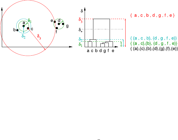
7.1 Hierarchical Clustering 149
Fig. 7.2 Hierarchical clustering (single linkage) applied to a small example dataset
{a,c,b}and {d,e,f,g}, and at a very large distance δ3=d(c,e), the two clusters
become connected, and all data belong to a single cluster.
Coming back to the initially stated problem of finding the best distance threshold
δ, the dendrogram provides useful information: As already mentioned, for robust
clusters, a slightly changed δshould not lead to completely different results. If we
select δ1, it makes a difference whether we cut the tree slightly above or slightly
below δ1, because we obtain different clusters in both cases. However, for δ∗,we
obtain clusters that are stable in the sense that we get the same clusters if we choose
δsomewhat smaller or larger. By using δ∗=1
2(δ2+δ3)this stability is maximized,
and we end up with two clusters. Looking for the largest difference between δiand
δi+1, which corresponds to the largest gap between in the dendrogram, helps us in
finding the most stable partition.
Figure 7.3 shows two examples of performance (so-called single linkage cluster-
ing, see next section) to illustrate the interpretation of a dendrogram. Example (a)
consists of three well-separated clusters, which are easily discovered by the algo-
rithm. The data belonging to each of the clusters unites at relatively low values of δ
already, whereas quite a large value of δis required to merge two of the three clus-
ters into one. Therefore, the vertical gap is large, and the existence of three clusters
is easily recognized by visual inspection. From hierarchy (b) we immediately see
that we have two clusters, one being a bit larger (left cluster in tree occupies more
horizontal space and thus has more leaves) and less dense than the other (higher
δ-values compared to the right cluster). The fact that the shape of the clusters is
very different (cf. scatterplot) does not make a difference for the algorithm (and is
likewise not reflected in the dendrogram).
Although example (c) is somewhat similar to (a), just some random noise has
been added, the dendrogram is very different. To belong to a cluster, it is sufficient
to have a high similarity to just one of the cluster members, noise points get eas-
ily chained, thereby building bridges between the clusters that cause cluster merg-
ing at a relatively low δ-value. These chaining capabilities were advantageous for
case (b) but prevent us from observing a clear cluster structure in case (c). Hierar-
chical (single-linkage) clustering is extremely sensitive to noise—adding just a few
noise points to dataset (a) quickly destroys the clear structure of the dendrogram.
We will discuss solutions to this problem in Sect. 7.1.3.
In addition to the dendrogram, a heatmap can also help to illustrate the cluster-
ing result. For heatmap, hierarchical clustering is carried out for the data records,
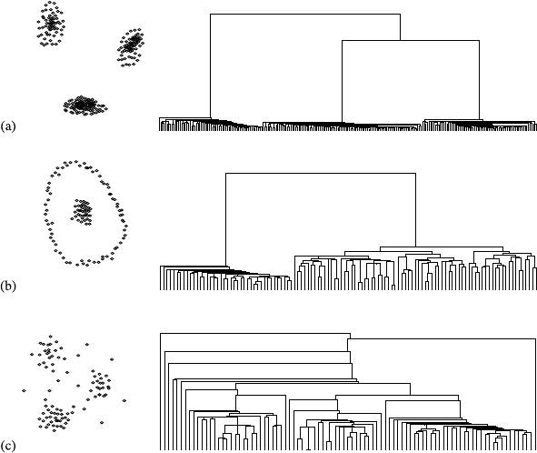
150 7 Finding Patterns
Fig. 7.3 Hierarchical clustering (single linkage) for three example data sets
i.e., the rows of a data table, and also for the attributes by transposing the data table,
so that clustering is applied to the columns of the data table. Then the records and
the attributes are reordered according to the clustering result. Instead of showing the
numerical entries in the data table, a color scale is used to represent the numerical
values.
Figure 7.4 shows a heatmap for clustering the numerical attributes of the Iris
data set (after z-score standardization). The dendrogram for the record clustering is
shown on the left, and the dendrogram for the attribute clustering on top. One can
easily see that in the lower part of the diagram, records are clustered based on lower
values for sepal width, the petal length, and the petal width (red color) and on higher
values for the sepal length (yellow or orange color).
7.1.2 Construction
Table 7.1 shows an algorithm to perform hierarchical clustering. Starting from
δ0=0, we have n=|D|clusters of size 1. In line 4 we find the two closest clusters
in the current partition Pt. These two clusters are removed from the current partition,
and their union is reinserted as a new cluster (line 6). In this way, the number of clus-
ters reduces by 1 for each iteration, and after niterations the algorithm terminates.
Note that the distance measure dused in Table 7.1 measures the distance be-
tween clusters Cand Cand not between data objects. While the Euclidean distance
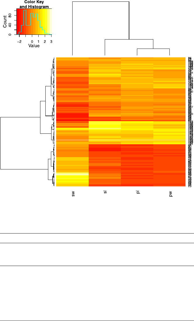
7.1 Hierarchical Clustering 151
Fig. 7.4 A heatmap for the Iris data set
Table 7.1 Hierarchical clustering
Algorithm HC(D):(Pt)t=0..n−1,(δt)t=0..n−1
input: data set D,|D|=n
output: series of hierarchically nested partitions (Pt)t=0..n−1
series of hierarchy levels (δt)t=0..n−1
1P0={{x}|x∈D}
2t=0, δt=0
3while current partition Pthas more than one cluster
4 find pair of clusters (C1,C2)with minimal distance d(C1,C2)
5δt+1=d(C1,C2)
6 construct Pt+1from Ptby removing C1and C2and inserting C1∪C2
7t=t+1
8end while
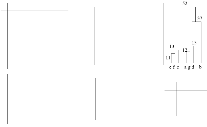
152 7 Finding Patterns
Table 7.2 First five iterations of hierarchical clustering on records a–gwith given distance matrix.
The cluster pairs (C1,C2)are selected by minimal distances (bold font)
ab c d e f g
a0506317728112
b0 4941425437
c0 52131661
d0566615
e011 64
f074
g0
ab c defg
a05063177212
b0 49414237
c0521361
d05615
ef 074
g0
ag b c d ef
ag 0 37611572
b0 494142
c05213
d056
ef 0
ag b d efc
ag 03715 61
b04142
d052
efc 0
agdbefc
agd 037 52
b054
efc 0
can be used to measure point-wise distances, it has to be extended to measure the
distance between sets of points (clusters). According to our initial idea in (7.1), the
distance to a cluster is equivalent to the distance of the nearest point of the cluster;
therefore,
d(C,C):=min{d(x,y) |x∈C,y ∈C}.(7.2)
This definition eases the recalculation of distances of merged clusters, because
d({C∪C},C)can be obtained directly from the previously used distances:
d({C∪C},C)=min{d(C,C), d(C,C)}. This recursive formulation is help-
ful if the distances are given by a distance matrix, because then the distances to
the merged cluster are obtained by simply looking up two distances from the old
distance matrix and taking their minimum.
As an example, consider the data set from Table 7.2, which shows the distance
matrix for seven objects a–g. In each iteration of the algorithm, the smallest distance
in the matrix is identified, and the corresponding objects (clusters, resp.) are merged.
Afterwards, a new distance matrix is constructed, where the new cluster replaces the
two merged clusters, and the entries in the matrix are determined according to (7.2).
The process eventually stops at a 1 ×1 matrix.
7.1.3 Variations and Issues
As long as the data set size is moderate, the dendrogram provides useful in-
sights, but a tree with several thousand leaves is quite difficult to manage. Fur-
thermore, at least in the single linkage clustering, one cannot tell anything about

7.1 Hierarchical Clustering 153
how the data distributes in the data space, since the cluster may be shaped arbi-
trarily. A brief characterization of each cluster is thus difficult to provide. To get
an impression of the cluster, one has to scan through all of its members. On the
other hand, hierarchical clustering may be carried out even if only a distance ma-
trix is given, whereas the approaches in the next two sections require an explicitly
given distance function (often even a specific function, such as the Euclidean dis-
tance).
The runtime and space complexity of the algorithm is quite demanding: In a
naïve implementation we need to store the full distance matrix and have a cubic
runtime complexity (ntimes find the minimal element in an n×nmatrix). At least
the runtime complexity may be reduced by employing data structures that support
querying for neighboring data. Further possibilities to reduce time and space re-
quirements are subsampling (using only part of the dataset), omission of entries
in the distance matrix (transformation into a graph, application of, e.g., minimum
spanning trees), and data compression techniques (use representatives for a bunch
of similar data, e.g., [60]).
7.1.3.1 Cluster-to-Cluster Distance
The so-called single-linkage distance (7.2) is responsible for the high sensitivity to
noise we have observed already in Fig. 7.3(c). Several alternative distance aggrega-
tion heuristics have been proposed in the literature (cf. Table 7.3). The complete-
linkage uses the maximum rather than the minimum and thus measures the diame-
ter of the united cluster rather than the smallest distance to reach one of the cluster
points. It introduces a bias towards compact cloud-like clusters, which enables hier-
archical clustering to better recover the three clusters in Fig. 7.2(c) but fails in case
of Fig. 7.2(b) because any cluster consisting of the ring points would also include
all data from the second (interior) cluster.
The single-linkage and complete-linkage approaches represent the extremes in
measuring distances between clusters. Calculating the exact average distance be-
Table 7.3 Alternative cluster distance aggregation functions
d({C∪C},C)=···
single linkage =min{d(C,C), d(C,C)}(7.3)
complete linkage =max{d(C,C), d(C,C)}(7.4)
average linkage =|C|d(C,C)+|C|d(C,C)
|C|+|C|(7.5)
Ward =(|C|+|C|)d(C,C)+(|C|+|C|)d(C,C)−|C|d(C,C)
|C|+|C|+|C|(7.6)
centroid (metric) =1
|C∪C||C|
x∈C∪C
y∈C
d(x,y)(7.7)
154 7 Finding Patterns
tween data from different clusters via (7.7) is computationally more expensive than
using the heuristics (7.5) or (7.6). If the data stems from a vector space, the cluster
means may be utilized for distance computation. The cluster means can be stored
together with the clusters and easily updated at the merging step, making approach
(7.7) computationally attractive. For hyperspherical clusters, all these measures per-
form comparable but otherwise may lead to quite different dendrograms.
7.1.3.2 Divisive Clustering
Rather than agglomerating small clusters to large ones, we may start with one sin-
gle cluster (full data set) and subsequently subdivide clusters to find the best result.
Such methods are called divisive hierarchical clustering. In agglomerative cluster-
ing we have merged two clusters, whereas in divisive clustering typically a single
cluster is subdivided into two subclusters (bisecting strategy), which leads us again
to a binary tree of clusters (a hierarchy). Two critical questions have to be answered
in every iteration: (1) which cluster has to be subdivided, and (2) how to divide
a cluster into subclusters. For the first problem, validity measures try to evaluate
the quality of a given cluster, and the one with the poorest quality may be the best
candidate for further subdivision. Secondly, if the number of subclusters is known
or assumed to be fixed (e.g., 2 in a bisecting strategy), clustering algorithms from
Sect. 7.3 may be used for this step, as these algorithms subdivide the data into a par-
tition with a fixed number of clusters. In the bottom-up approach of agglomerative
clustering, the decisions are based on local information (neighborhood distances),
which give poor advice in case of diffuse cluster boundaries and noisy data. In such
situations, top-down divisive clustering can provide better results, as the global data
distribution is considered from the beginning. The computational effort is higher for
divisive clustering, though, which can be alleviated by stopping the construction of
the hierarchy after a few steps, as the desired number of clusters is typically rather
small.
7.1.3.3 Categorical Data
Providing distances for categorical data leads to a coarse view on the data, for
instance, the number of distinct distance values is limited (as we will see in the
next section). For the moment, just consider six binary features and let us com-
pare the cases: Visual inspection of the cases a–hin Fig. 7.5 reveals two clusters,
one group of cars (a–d) equipped with features uand v(plus one optional fea-
ture) and the second group (e–h) equipped with yand z(plus one optional fea-
tures).
Applying the Jaccard measure (a well-suited distance measure for binary data,
which will be discussed in the next section) to this dataset leads to the distance ma-
trix in Fig. 7.5. A distance of 0.5 occurs both within groups (e.g., d(a,b),d(e,g))
and across groups (d(c,g)). The Jaccard distance is therefore not helpful to discrim-
inate between these two groups.

7.2 Notion of (Dis-)Similarity 155
full data set
car uvwxyz
a111 000
b110 100
c110 010
d110 000
e000 111
f001 011
g010 011
h000 011
Jaccard distance
abcdefgh
a 0 .50 .50 .33 1 .80 .80 1
b.50 0 .50 .33 .80 1 .80 1
c.50 .50 0 .33 .80 .80 .50 .80
d.33 .33 .33011.75 1
e1.80 .80 1 0 .50 .50 .33
f.80 1 .801.50 0 .50 .33
g.80 .80 .50 .75 .50 .500.33
h11.801.33 .33 .33 0
common neighbours
abcdefg h
a222001 0
b2 22001 0
c22 2010 1
d222 001 0
e0000 22 2
f00102 2 2
g110122 2
h0010222
Fig. 7.5 Grouping of categorical data: A Jaccard distance of 0.5 is achieved within the groups
(e.g., d(a,b),d(e,g)) and also across groups (d(c,g))
Distance measures usually compare only two records from the dataset, but they
do not take any further information into account. We have seen that single-linkage
clustering reacts sensitive to single outliers, which may drastically reduce the dis-
tance between clusters. Knowing the outliers can thus help to improve the clustering
results we obtain from distances alone. One approach in this direction is to use link
information between data objects: The number of links that exist between data x1
and x2is the number of records x∈Dthat are close to both, x1and x2. Based on
some threshold ϑ, we define the neighborhood Nϑ(x)of xas {y∈D|d(x,y)≤ϑ}.
In our example, N0.5(c)={a,b,c,d,g}. The number of links or common neighbors
of xand yis then (Nϑ(x)∩Nϑ(y))\{x,y}. In the example we obtain a single com-
mon neighbor for aand g:({a,b,c,d}∩{c,e,f,g,h})\{a,g}={c}. The matrix on
the right of Fig. 7.5 shows the number of links for all pairs of data objects. Using
the number of links as a measure of similarity rather than the distance now allows us
to discriminate both clusters, and we have no longer the same degree of similarity
within and across groups. This approach is used in the ROCK algorithm (robust
clustering using links) [26].
7.2 Notion of (Dis-)Similarity
In the previous section we have simply taken the length of the line segment be-
tween two data points as the distance or dissimilarity between records. This section
is solely dedicated to distance measures, as they are crucial for clustering appli-
cations. We have already seen in Sect. 6.3.2 that by a different scaling of individ-
ual attributes, the clustering result may be completely different. If we have clearly
pronounced clusters in two dimensions (as in Fig. 7.3(a)), but the distance measure
takes also a third variable into account, which is just random noise, this may mess up
the clear structure completely, and in the end, all groups contain data from the origi-
nal two-dimensional clusters. We have discussed the negative influence of irrelevant
and redundant variables already in Sect. 6.1.1 but assumed a predictive task such that
we had some reference variable to measure a variable’s informativeness—we have
no such target variable in explorative clustering tasks. Instead, we can only observe

156 7 Finding Patterns
Table 7.4 Small excerpt from a database of cars offered on an internet platform
id Manufacturer Name Type yofr cap fu fxu used air abs esp hs ls
1 Volkswagen Golf Variant Estate Car 2004 1.9 6.64.3Y Y Y Y Y N
2 Dacia Logan Limousine 2006 1.4 9.45.5Y N Y N N N
3 Ford Galaxy Van 2004 1.9 12.28.3Y Y Y N N N
Legend: yofr =year of first registration, cap =engine capacity, fu =fuel consumption (urban),
fxu =fuel consumption (extra urban), used =used car, air =air conditioned, abs =anti blocking
system, esp =electronic stability control, hs =heated seats, ls =leather seats
how good the data gets clustered in two and three dimensions. A clear grouping with
respect to variables Aand Bmeans that both attributes correlate somehow (certain
combinations of attribute values occur more frequently than others). There is no rea-
son why a similar co-occurrence pattern should be observable if we add irrelevant
or random variables. Thus, whether we will observe clusters or not strongly depends
on the choice of the distance measure—and that includes the choice of the variable
subset.
For this section, we return to the example of car offers as those shown in Ta-
ble 7.4. This time we have a mixed dataset with binary, categorical, and numerical
attributes. How can we define the similarity between two cars?
Numerical Attributes At the first glance, turning attributes such as manufacturer,
car type, or optional equipment into a numerical value seems a bit more challenging;
therefore we start with numerical attributes, such as horse power, fuel consumption,
or year of first registration. Given that the differences of the numerical values are
meaningful (that is, the data is at least on an interval scale), we can simply take the
absolute difference to measure the dissimilarity in terms of, say, fuel consumption.
Let x1be the first, and x2the second row in Table 7.4; then based on fuel consump-
tion (fu) alone, we have d(x1,x2)=|x1,fu −x2,fu|=|6.6−9.4|=2.8. If we want
to include the extra-urban fuel consumption into our comparison, we actually com-
pare tuple (x1,fu,x1,fxu)against (x2,fu,x2,fxu)rather than just numbers and have the
additional freedom of how to combine the dissimilarity of the individual attributes
(see Table 7.5): we could use the sum of the individual distances (Manhattan dis-
tance)
d(x1,x2)=|x1,fu −x2,fu|+|x1,fxu −x2,fxu|=|6.6−9.4|+|4.3−5.5|=4.0,
the length of the shortest line between x1and x2(Euclidean distance)
d(x1,x2)=(x1,fu −x2,fu)2+(x1,fxu −x2,fxu)2=√7.84 +1.44 ≈3.04,
or even the maximum of all distances
d(x1,x2)=max{|x1,fu −x2,fu|,|x1,fxu −x2,fxu|}=max{2.8,1.2}=2.8.
Under the maximum norm, the Logan (car #2) is equally dissimilar to the Golf
(car #1) and the Galaxy (car #3), whereas for the other measures, the dissimilar-
ity of the Galaxy is 1.4 times higher for the Manhattan distance and 1.3 times

7.2 Notion of (Dis-)Similarity 157
Table 7.5 Dissimilarity of numeric vectors. The graph on the right shows (for selected measures)
all two-dimensional points that have a distance of 1.0 from the small bullet in the centre
higher for the Euclidean distance. We have already seen that these distance val-
ues directly influence the order in which the clusters get merged, so we should
carefully check that our choice corresponds to our intended notion of dissimilar-
ity.
Nonisotropic Distances The term isotropic means that the distance grows in all
directions equally fast, which is obviously true for, e.g., the Euclidean distance. All
points with distance 1.0 from some reference point xform a perfect, symmetric sur-
face of a sphere. We use the distance to capture the dissimilarity between records,
and a large distance may even be used as an indication for an outlier. (In particular, if
we have z-score transformed data, which can be interpreted as “how many standard
deviations is this value away from the mean?”, see Sect. 6.3.2). If we consider a pair
of correlated variables, say urban and extra-urban fuel consumption, we may per-
ceive isotropic distances and counterintuitive: The differences of the fuel consump-
tions x1=(8.1,5.3)and x2=(5.1,5.3)from the fuel consumption x=(6.6,4.3)
is 1=(1.5,1.0)and 2=(−1.5,1.0). The length of the difference vectors are
identical, so are the distances when using an isotropic distance function. However,
we would be very surprised if the difference in the urban fuel consumption is neg-
ative while at the same time the difference in the extra-urban fuel consumption is
positive—this deviates vastly from our expectations.
Nonisotropic distance functions help us to respect such cases. We have already
seen that the joint distribution of multiple variables is captured by the covariance
matrix C(see also Sect. 4.3.2.1). The nonisotropic Mahalanobis distance is defined
as
d(x,y)=(x−y)C−1(x−y)
and considers the variance across all variables. Similar to the z-score transformed
data, the distance may be interpreted as the number of standard deviations a vector
deviates from the mean, but this time the deviation is not measured independently
for every variable but jointly for all variables at the same time. Now, all points
with distance 1.0 from some reference points xdo no longer form the surface of a
symmetric sphere but the surface of an arbitrary hyperellipsoid.
Text Data and Time Series Sometimes not the absolute difference is important
but the fact that the data varies in the same way. This is often the case with em-
bedded time series (xcontains the values of a variable at consecutive time points)

158 7 Finding Patterns
or a bag-of-words text representation (the attributes indicate the number of word
occurrences, see Sect. 6.4). When comparing two texts in a bag-of-words represen-
tation, they are usually considered similar if the same words occur in comparable
frequency. However, if one of the texts is, say, three times longer than the other, the
absolute frequencies will be three times higher, so both texts appear dissimilar. By
normalizing both word vectors (to unit length), the absolute frequencies become rel-
ative frequencies, and both vectors become similar. The cosine measure yields the
cosine of the angle between the normalized vectors xand yand is well suited for
bag-of-words comparison due to the built-in normalization. If we apply a z-score
transformation to the vectors xand y, the Euclidean metric becomes the Pearson
metric (up to a constant factor) and is also invariant to shifting (adding a constant).
The latter is useful when comparing embedded time series that have different offsets
(and scaling).
Binary Attributes Next, we consider binary attributes, e.g., whether the car was
offered by a dealer or not (private offer). If we encode the Boolean values (yes/no)
into numbers (1/0), we may apply the same differencing we used for numeric values
before. In this case, we get a zero distance if both cars are used cars or both cars are
new cars (and a distance of one otherwise).
However, this approach may be inappropriate for other binary attributes. Suppose
that we have a feature “offer by local dealer,” where “local” refers to the vicinity of
your own home. Then, the presence of this feature is much more informative than
its absence: The cars may be offered by private persons in the vicinity and by private
persons or dealers far away. The presence of this feature tells us much more than
the absence; the probability of absence is typically much higher, and therefore the
absence should not have the same effect in the dissimilarity measure as the presence.
A similar argument applies to the optional car equipment, such as ABS, EPS, heated
seats, leather seats, etc. We could easily invent hundred such attributes, probably
only a handful of cars having more than ten of these properties. But if we consider
the absence of a feature as a sharing a common property, most cars will be very
similar, simply because they share that 90% of the equipment is not present. In such
cases, the measure by Russel and Rao could be used that accounts only for shared
present features (see Table 7.6). Another possibility is the Jaccard measure, which
takes its motivation from set theory, where the dissimilarity of two sets A, B ⊆Ωis
well reflected by J=1−|A∩B|
|A∪B|. Apparently, this definition is independent of the size
of the domain |Ω|. For the cars example restricted to the last six binary attributes, we
obtain, for the Jaccard measure, dJ(x1,x2)=1−2
5=3
5and dJ(x2,x3)=1−2
3=1
3
versus dS(x1,x2)=1−3
6=1
2and dS(x2,x3)=1−5
6=1
6for the simple match.
Nominal Attributes Nominal attributes may be transformed into a set of binary
attributes, each of them indicating one particular feature of the attribute (see exam-
ple in Table 7.7). Only one of the introduced binary attributes may be active at a
time. The measures from Table 7.6 could then be reused for comparison. Clearly, as
soon as n>2, we always have co-occurring zero fields, and therefore the Jaccard or
Dice measure should be used. Equivalently, a new attribute might be introduced that

7.2 Notion of (Dis-)Similarity 159
Table 7.6 Measuring the dissimilarity in case of a vector of predicates (binary variables) xand
y, which may also be interpreted as a set of properties X, Y ⊆Ω. The Tanimoto measure from
Table 7.5 becomes identical to the Jaccard measure when applied to binary variables
binary attributes sets of properties
simple match dS=1−b+n
b+n+x
Russel & Rao dR=1−b
b+n+x1−|X∩Y|
|Ω|
Jaccard dJ=1−b
b+x1−|X∩Y|
|X∪Y|
Dice dD=1−2b
2b+x1−2|X∩Y|
|X|+|Y|
no. of predicates that. . .
b=. . . hold in both records
n=...donotholdinbothrecords
x=. . . hold in only one of both records
Example: xy
set X set Y bnx dMdRdJdD
101000 111000 {A, C}{A, B, C}2310.1¯
60.6¯
60.3¯
30.20
Table 7.7 Converting a
nominal attribute Manufacturer . . . Binary vector
Volkswagen . . .
→
00001
Dacia . . . 01000
Ford . . . 00100
Table 7.8 Converting an
ordinal attribute Number of previous owners . . . Binary vector Rank
1 previous owner . . .
→
100
/
1
2 previous owner . . . 110 2
more than 2 previous owners . . . 111 3
becomes true if and only if both records share the same value. Finally, a third alter-
native is the provision of a look-up table for individual dissimilarity values, where
Porsche and BMW are more similar than, say, Mercedes and Dacia.
Ordinal Attributes Ordinal attributes can also be transformed into binary at-
tributes in the same fashion as nominal attributes, but then any two different values
appear equally (dis)similar, which does not reflect the additional information con-
tained in an ordinal attribute. A better transformation is shown in Table 7.8, where
the Jaccard dissimilarity is proportional to the number of ranks lying between the
compared values. This is equivalent to introducing an integer-valued rank attribute
and apply, say, the Manhattan distance to measure the dissimilarity of two values.
The provision of a dissimilarity matrix remains as a third option.
In a mixed scale situation, such as the comparison of car offerings in Table 7.4,
there are two possibilities. First, even interval- and ratio-scaled attributes could be
160 7 Finding Patterns
discretized and then transformed into binary attributes, so that only the Jaccard mea-
sure needs to be applied on the final set of (only) binary attributes. A second option
is the combination of various distance measures (sum, mean, etc.), where each of
the measures considers a different subset of attributes.
Attribute Weighting Although we have mentioned this point earlier, we want to
emphasize once more that it is important to take care about the relative weight an in-
dividual attribute gains. This holds for numeric and nominal-scaled attributes. Sup-
pose that we have compared two cars based on fuel consumption (urban and extra-
urban)—now we want to take mileage into consideration. What will be the effect?
The huge differences in the additional attribute will completely dominate the small
differences obtained earlier. The results would be almost identical to those obtained
from mileage only. The variances of the attributes differ far too much. As a second
example, consider the attributes capturing the car equipment: If two cars share an
additional property, they become more similar. Should they become more similar to
the same degree, regardless of the property they share? Compare a drink-holder to
an automatic air conditioning (a feature that much more contributes to the value of
the car). For the first example (mileage), the standard solution is to standardize the
data so that all numeric attributes have unit variance. The second problem is only
solved by using additional weights for the aggregation of dissimilarity values when
calculating the overall car-to-car distance.
The Curse of Dimensionality While we are used to work with distances in two-
or three-dimensional spaces, our intuition does not help us in high-dimensional
spaces. By considering more and more attributes in a dataset, we mathematically
construct a high-dimensional space. While the generalization of, e.g., the Euclidean
distance to an arbitrary number of dimensions is straightforward, the interpretation
of the distances may be somewhat counterintuitive.
Suppose that all variables have been normalized to the unit interval [−1,1].Ifwe
select two attributes, the space in which our data resides corresponds to the box of
edge length 2 around the origin 0of the coordinate system. Most of its area (≈78%)
is contained in the circle of radius 1 around the origin; only the four corners are omit-
ted. If we add another attribute, the data space corresponds to a three-dimensional
cube. Now, we have already eight corners that are not covered by the a sphere with
radius 1 around the origin, and the sphere contains less than 55% of the cube’s
volume. Figure 7.6 shows the percentage of the data space’s hypervolume that is
covered by a hypersphere of radius 1: The percentage quickly approximates zero.
If one data object is located at the origin of a two-dimensional space and we take
a second data object from [−1,1]2, there is a chance of only ≈22% that its distance
to the first object is greater than 1 (assuming the data space is uniformly populated).
In case of an eight-dimensional data space, the chances of being further away than a
distance of 1 rises to more than 95%. The distances among the data objects increase,
and most of the data is in the corners of the hypercube. If we want to identify data
similar to some reference object (here: the origin), the higher the dimensionality, the
less data we will find. This phenomenon is known as the curse of dimensionality,
a term coined by Bellmann [9].
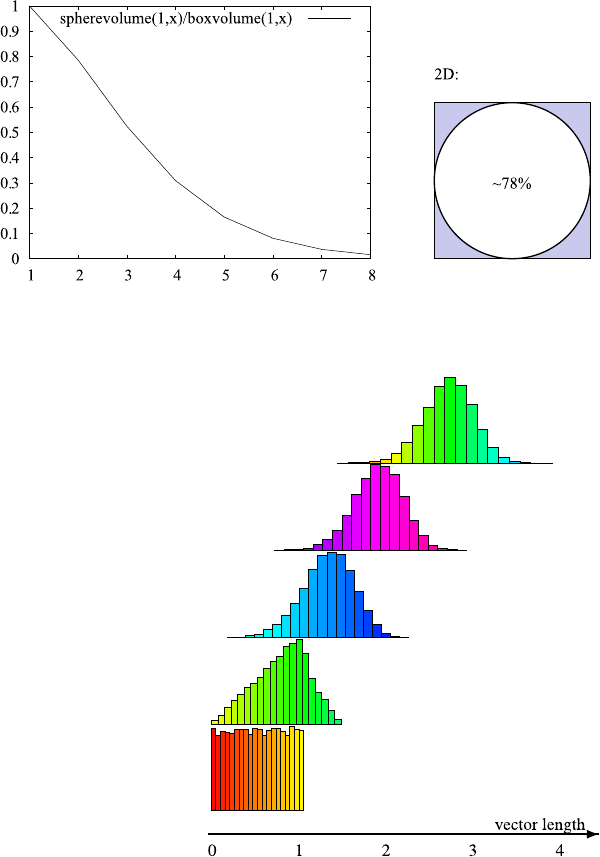
7.2 Notion of (Dis-)Similarity 161
Fig. 7.6 Curse of dimensionality: The higher the dimensionality, the smaller the fraction of the
hyperbox that is covered by the embedded hypersphere
Fig. 7.7 The distribution of
the length of random vectors
in the unit hypercube
(Euclidean norm) in 1, 2, 5,
10, and 20 dimensions (from
bottom to top). While in 1D
any vector length in [0,1]is
equally likely, there were no
vectors of length ≤1inthe
20-dimensional sample of
size 20,000
This effect is also shown in Fig. 7.7, which shows the distribution of the vector
lengths of 20,000 random vectors in the m-dimensional unit hypercube [0,1]m.As
expected, in the one-dimensional case (bottom row) the unit interval [0,1] is almost
uniformly covered. To obtain an Euclidean distance of zero in an m-dimensional
space, all mcomponents must be zero at the same time, so the chances of low overall
distances (sum of all components) decreases rapidly with the dimensionality. In the
10-dimensional sample there are almost no vectors of length ≤1, that is, within a
range of 1.0 from the origin.
162 7 Finding Patterns
7.3 Prototype- and Model-Based Clustering
Clusters are represented by subtrees in a dendrogram, and all cluster members are
represented individually by leaves. For large datasets, such dendrograms are too
detailed, and the clusters themselves somewhat difficult to grasp, because the only
way to inspect the cluster is by looking at the members one by one. A condensed
representation by, say, the mean and variance of the members may be misleading,
because the cluster’s shape is arbitrary. The alternative perspective on clustering in
this section is that we explicitly search for clusters that can be well represented by
simple statistics such as mean and variance.
7.3.1 Overview
In this section, we consider approaches that make (directly or indirectly) assump-
tions on the shape of the clusters, either because there is actually some evidence
about their shape or simply because clusters of a simple shape are easy to grasp.
From the summarization point of view, a roughly hyperspherical cluster is well
characterized by its mean (where we would expect the bulk of the data), standard
deviation (compact or widely spread data), and its size. A table of these values per
cluster eases the interpretation of the results (given that the clusters roughly follow
this model of hyperspherical data clouds). The question is how to determine the lo-
cation (or more generally, the parameters) of each cluster. Several approaches in this
direction exist—although their motivation is different, the resulting algorithms are
quite similar.
As the section title indicates, a cluster is represented by a model, which may be as
simple as a prototypical data object (in which case it is usually called a prototype).
For the moment, we assume that the space of models/prototypes Mis identical to
the dataspace X=Rm. We require that some distance measure
d:M×X→R≥0
allows us to compare clusters (represented by prototypes) and data directly. As long
as M=X, we may use the Euclidean distance here.
From our assumptions on the cluster shape we can derive the correct clus-
ter representative (e.g., by calculating the mean of the associated data) if we just
know which data belongs to the cluster. Here we use a different encoding of clus-
ter membership than in Sect. 7.1:Amembership matrix [pi|j]∈[0,1]c×ncon-
tains the degree of belongingness of data xj∈Dto cluster Ciby pi|j∈[0,1].
A one-to-one mapping of a partition onto a binary membership matrix pi|j∈
{0,1}is obtained from pi|j=1⇔xj∈Ci. Again, none of the clusters shall be
empty (∀i:jpi|j>0), and all data must participate at equal shares in the
clustering (ipi|j=1), so that the membership degrees of the full matrix add
up to the size of the dataset (ijpi|j=n). The exclusiveness of the parti-
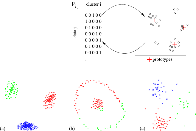
7.3 Prototype- and Model-Based Clustering 163
Fig. 7.8 Schema of
prototype-based clustering:
The membership matrix and
the cluster representation
(prototype) are optimized
alternatingly until
convergence
Fig. 7.9 Fuzzy c-Means clustering for three example data sets (cf. Fig. 7.3)
tion (pi|j∈{0,1}) is required only in some variants of prototype-based cluster-
ing.
As shown in Fig. 7.8, prototype-based clustering starts with some initial guesses
of the prototypes and usually alternates between the adjustment of the member-
ship matrix (using the currently given prototypes) and the adjustment of the proto-
types (using the currently given membership degrees). It is assumed that the number
of clusters cis known beforehand. Actually, all prototype-based clustering proce-
dures optimize an objective-function during this iterative refinement (which could
not be formulated without knowing the number of clusters in advance). Although
an inspection of the membership matrix might be useful in some cases, the pro-
totypes are considered as the primary output, since they concisely characterize
the data associated with them. New data may be associated with the established
clusters easily by assigning it to the nearest prototype (according to the distance
d(pi,x)).
If the cluster is represented by a point prototype (assuming hyperspherical clus-
ters), results for the datasets already presented in Fig. 7.3 are shown in Fig. 7.9.
Where the model assumption was correct (cases (a) and (c)), the clusters are quickly
and robustly recovered. In case (b), however, the ring-shaped outer cluster cannot
be discriminated from the inner cluster: a typical prototype for the outer ring would
have roughly the same distance to all its members, and thus would have to be placed
in the center of the inner cluster. But then, both prototypes compete for the central
data, and eventually both clusters are split among the prototypes.

164 7 Finding Patterns
Table 7.9 Algorithm for prototype-based clustering: k-Means (kM), Fuzzy c-Means (FCM), and
Gaussian mixture decomposition (GMD)
Algorithm CentroidBasedClustering(D,p1,...,pc)→p1,...,pc
input: data set D,|D|=n,
initial models/prototypes p1,...,pc,
output: optimized models/prototypes p1,...,pc
1repeat
2for all 1≤j≤n:
3 update pi|jaccording to. . .
4for all 1≤i≤c:
5 update prototype/model piaccording to. . .
6until maximum number of iterations reached
7orp1,...,pcconverged
kM FCM GMD
(7.10)(7.11)(7.14)
(7.9)(7.13)(7.15)–(7.17)
7.3.2 Construction
The general sketch of the algorithm has already been discussed and is depicted in
Table 7.9. However, there are still placeholders for the two main steps, the mem-
bership update and the prototype update. We will briefly review three common
algorithms for hyperspherical clusters, namely the k-Means, Fuzzy c-Means, and
Gaussian mixture decomposition.
7.3.2.1 Minimization of Cluster Variance (k-Means Model)
The k-Means model corresponds to our initially stated situation where the proto-
types stem from the same space as the data and the membership degrees are binary
(pi|j∈{0,1}). The objective function of k-Means is given by
JkM =
c
i=1
n
j=1
pi|jxj−pi2=
c
i=1
x∈Cixj−pi2
variance within cluster Ci
(7.8)
subject to c
i=1pi|j=1for1≤i≤c. If we think of a prototype pias the center
of a cluster, the term n
j=1pi|jxj−pi2calculates (up to a constant) the variance
within the cluster (only data associated with the cluster is considered because pi|j
is zero otherwise). By minimizing JkM the prototypes will be chosen such that the
variance of all clusters is minimized, thereby seeking for compact clusters. From
the necessary condition for a minimum of JkM (∇piJkM =0) the optimal prototype
location is derived:
pi=n
j=1pi|jxj
n
j=1pi|j
,(7.9)

7.3 Prototype- and Model-Based Clustering 165
which corresponds to the mean of the data associated with the prototype. All proto-
types are updated using (7.9) in the prototype-update step of Algorithm 7.9.Asto
the membership update step, optimization of JkM is simple: for data xj,wehaveto
select a single cluster iwith pi|j=1 (and pk|j=0 for all k=i). Since we seek to
minimize the objective function, we select the prototype where xj−pi2becomes
minimal (which constitutes the membership update step):
pi|j=1ifpi−xjbecomes minimal for i; ties are broken arbitrarily;
0 otherwise.(7.10)
7.3.2.2 Minimization of Cluster Variance (Fuzzy c-Means Model)
The k-Means model can be extended to a membership matrix that contains contin-
uous membership degrees within [0,1]rather than only binary memberships from
{0,1}(the cluster representation remains unchanged). A gradual membership al-
lows one to distinguish data close to the prototype (very typical for the cluster) from
incidentally associated data (far away from prototype). To guarantee a meaningful
comparison of membership values, they should be normalized (c
i=1pi|j=1) and
proportional to the distance to the prototype (if x1has twice the distance to the pro-
totype than x2,x1should receive only one half of the membership that x2receives).
This determines the membership degrees up to a constant [32]:
pi|j=1
c
k=1xj−pi2
xj−pk2
.(7.11)
These membership degrees can also be obtained by minimizing the objective func-
tion of Fuzzy c-Means
JFcM =
c
i=1
n
j=1
p2
i|jxj−pi2,(7.12)
which includes an exponent of 2 and is usually called fuzzifier. Without the intro-
duction of a fuzzifier, the minimization of JFcM would still lead to binary mem-
bership degrees. Other choices than 2 are possible but are less frequently used in
practice. The cluster centroid update is very similar to k-Means; the only difference
is due to the introduction of the fuzzifier:
pi=n
j=1p2
i|jxj
n
j=1p2
i|j
.(7.13)
7.3.2.3 Gaussian Mixture Decomposition (GMD)
In Gaussian mixture decomposition a probabilistic model is estimated that may
explain the observed data. It is assumed that a single cluster roughly follows an

166 7 Finding Patterns
isotropic1Gaussian distribution, which is parameterized by its mean μand vari-
ance σ:
g(x;μ, σ ) =1
√2πσ e−1
2x−μ
σ
2.
Since such a distribution is unimodal (i.e., there is only a single maximum) but
each cluster represents its own peak in the density itself, we assume the overall
density being a mixture of Gaussians. Given that the number of clusters cin the
data is a priori known, the generative model of a dataset of size nis repeating the
following two steps ntimes:
•First, draw a random integer between 1 and cwith probability piof drawing i.
The data generated next will then belong to cluster #i.
•Second, draw a random sample from the Gaussian distribution g(x;μi,σ
i)with
the parameters μi,σ
itaken from model #i.
The overall density function is thus given by
f(x;θ)=
c
i=1
pig(x;μi,σ
i),
where θ=(θ1,...,θ
c)and θi=(pi,μ
i,σ
i). For some given data xj, we interpret
the probability of being generated by model #ias the cluster membership
pi|j=pig(xj;μi,σ
i). (7.14)
Given a mixture θ, the likelihood of the full dataset being generated by this model
is
L=
n
j=1
f(xj;θ).
To find the most likely cluster configuration θ, the following maximum likelihood
estimate can be derived:
μi=n
j=1pi|jxj
n
j=1pi|j
,(7.15)
1Isotropic means that the density is symmetric around the mean, that is, the cluster shapes are
roughly hyperspheres. Using the Mahalanobis distance instead would allow for ellipsoidal shape,
but we restrict ourselves to the isotropic case here.

7.3 Prototype- and Model-Based Clustering 167
σi=
1
mn
j=1pi|jxj−μi2
n
j=1pi|j
,(7.16)
pi=1
n
n
i=1
pi|j.(7.17)
(Note the similarity of (7.15) with (7.9) and (7.13).) The so-called EM-algorithm
performs a gradient descent search for the maximum likelihood estimate and as
such is prone to local minima. If the model is poorly initialized and the clusters
interact, convergence may be very slow.
7.3.3 Variations and Issues
If a good initialization is provided, the model- or prototype-based clustering algo-
rithms are faster than hierarchical clustering, because only a few iterations are nec-
essary. They are therefore better suited for larger datasets, also because the resulting
models are easier to grasp than a complex dendrogram.
7.3.3.1 How many clusters?
One drawback of all prototype-based methods is that the number of clusters needs to
be known (or suspected) in advance. If nothing is known whatsoever about the cor-
rect number of clusters, additional effort is necessary to apply the methods from this
section. One may think of at least three different approaches: (1) top-down, divisive
clustering: start with a relatively small number of clusters and split the cluster in
case it does not fit the associated data well (e.g., bisecting k-means; see, e.g., [61]);
(2) bottom-up, agglomerative clustering: overestimate the number of clusters and
merge similar clusters; and (3) run the algorithm for a full range of possible num-
bers of cluster and evaluate each partition w.r.t. the overall goodness of fit. From the
plot of obtained results the optimal number of clusters is determined by finding an
extremum.
To find the optimal result, all these methods make use of so-called validity mea-
sures (see, e.g., [19,27]). Approaches (1) and (2) employ a local validity measure
that evaluate a single cluster only, such as the data density within the cluster or the
distribution of membership degrees (unambiguous memberships are preferable as
they indicate a successful separation of clusters). Another example is the silhouette
coefficient [46] of a cluster C, which is the average of silhouette coefficients s(x)of
its members x∈C:
s(x)=b(x)−a(x)
max{a(x), b(x)}∈[−1,1],
where a(x)=d(x,C)is the average distance of xto members of the same cluster
C, and b(x)is the average distance to the members of the nearest cluster Cother

168 7 Finding Patterns
than C(b(x)=minC=Cd(x,C)). Well-clustered data xis close to members of its
own cluster (small a(x)) but far away from members of other clusters (large b(x))
and thus receives a high silhouette coefficient near 1. A good cluster receives a high
average silhouette coefficient from its members.
In contrast, approach (3) requires a global validity measure that evaluates all
clusters at the same time. Regarding the global validity measures, we could em-
ploy the objective functions themselves to determine the optimal number of clusters.
However, all the objective functions tend to become better and better the larger the
number of cluster is (and at the end, there would be nsingleton clusters). Validity
measures such as the Aikake information criterion compensate this effect by reduc-
ing the obtained likelihood by the number of necessary parameters. Other typical
measures, such as the separation index [20], identify compact and well-separated
clusters:
D=min
i=1..c min
j=i+1..c
minx∈Ci,y∈Cjd(xi,xj)
maxk=1..c diamk
,
where the numerator represents the distances between clusters Ciand Cj(which
should be large), and the denominator diamk=maxx,y∈Ckx−yexpresses the
extension of cluster Ck(which should be small for compact clusters). Since the
separation index considers neither fuzzy membership nor probabilities, it is well
applicable to k-Means. There are also fuzzified versions of the separation index [58].
Admittedly these heuristic approaches fail to find the number of clusters if the
model assumptions do not hold (e.g., cluster shape is not hyperspherical, cluster
sizes are very different, cluster density is very different) or there is too much noise
in the data.
Although finding the correct number of clusters using model-based clustering
may be difficult, sometimes it is very handy to specify the number of groups in
advance. Clustering algorithms may also be used as a tool for other tasks, such as
discretization or allocation. If customers have to be assigned to k account managers,
k-Means clustering could help to assign a homogeneous group of customers to each
manager. In such settings, the number of groups is usually known beforehand.
7.3.3.2 Cluster Shape
We have only considered hyperspherical, isotropic clusters, that is, clusters that ex-
tend uniformly from the centre into the dataspace. With real data this assumption is
seldom satisfied. The Euclidean distance used in GMD and FcM can be generalized
to the Mahalanobis distance, which adapts to the correlations between dimensions
and accounts for ellipsoidal clusters. There are also many variants of Fuzzy c-Means
that consider somewhat exotic cluster shapes such as circles, ellipses, rectangles, or
quadrics [33] (shell clustering).
Integrating flexible cluster shapes into the used distance measure greatly in-
creases the number of parameters; typically the resulting algorithms react very sen-
sitively to poor initializations. Another approach is to subdivide the data into a pretty

7.4 Density-Based Clustering 169
large number of small clusters (using, e.g., k-Means) and then agglomeratively join
these prototypes to clusters. In a sense, k-Means clustering is then used like a prepro-
cessing phase to compress the data volume before then agglomerative hierarchical
clustering is applied. (On the other hand, such a condensed representation can help
to speed up k-Means and its variants significantly [31,60].)
7.3.3.3 Noise Clustering
A very simple extension of fuzzy c-means clustering to cope with outliers is noise
clustering [18]. We have already discussed that, to consider a different cluster shape,
we only have to define an appropriate distance function. The idea of a noise cluster
is that it has a fixed (usually large) distance dnoise to any data point. As soon as the
distance of some data x∈Xto the nearest prototype picomes close to dnoise,the
noise cluster gains a considerable fraction of the total membership degree, thereby
reducing the influence of xwith respect to pi. Noise clustering simply requires to
exchange the membership update (7.11)by
pi|j=1
xj−pi2
d2
noise +c
k=1xj−pi2
xj−pk2(7.18)
and represents and effective mean to reduce the influence of noise and extract cluster
prototypes more clearly.
The noise cluster allows for a better analysis of the clustering results. What typ-
ically happens when no noise cluster is used is that the memberships of an outlier
tend to ≈1
kfor the kclosest clusters. This situation may also occur for data that
is well within the usual data range (and thus not an outlier) but half way between
these kclusters. By inspection of membership degrees these two cases are undistin-
guishable. When a noise cluster is present, the former case is easily detected, as it
has gained most of the membership degree (and only a small remainder is equally
distributed among the closest prototypes).
7.4 Density-Based Clustering
We have seen in Sect. 7.1 that single-linkage clustering is flexible in terms of rec-
ognizable cluster shapes, but sensitive to outliers, which may easily be misused as
bridges between clusters. These bridges are particularly counterintuitive if the core
of the clusters consists of a considerable amount of data, but the bridge is estab-
lished by a few data objects only. To establish a substantial connection between the
clusters, the data density of the bridge should be comparable to that of the cluster
itself. Density-based clustering goes into this direction by requiring a minimum data
density within the whole cluster.
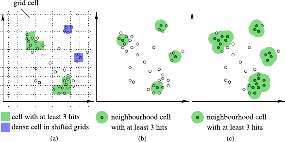
170 7 Finding Patterns
7.4.1 Overview
The underlying idea of density-based clustering is to measure the data density at
a certain spot or region of the data space and then declare those regions as being
clusters, whose density exceeds a certain density threshold. The final clusters are
then obtained by connecting neighboring dense spots or regions. This is easy to
illustrate for so-called grid-clustering algorithms, where an artificial (multidimen-
sional) grid is laid over the data space and the number of data objects falling into a
particular cell is counted. Figure 7.10(a) shows an illustrative example for the two-
dimensional case. While the two larger groups are recognized as clusters, there is
no bridge between both clusters as the data density is too low.
However, with this grid two other small data agglomerations are not recognized
as a cluster (blue regions) but would have been if the grid was slightly shifted. An-
other problem is that in a naïve implementation the total number of cells increases
exponentially with the number of attributes (but not the number of cells with high
data density). A simple solution to both problems is to center the cells directly on
the data rather than defining the grid independently from the data. Figure 7.10(b)
shows a spherical area centered on four data points where each of these neighbor-
hoods contains at least 3 data objects, similarly to the approach of the DBScan
algorithm [21]. If the threshold for establishing a cluster (that is, a dense sphere) is
four, we have thereby found the first four (distinct) clusters in Fig. 7.10(b). All data
within the neighborhoods is considered as belonging to the same cluster. Using this
data as starting points, the area occupied by the cluster is expanded as long as the
minimal density threshold is satisfied. At the end, we arrive at the clusters shown
in Fig. 7.10(c). Note that at the cluster border some data may belong to a cluster
although their density does not satisfy the threshold.
The result of density-based clustering algorithms is a set of clusters, together with
all data belonging to each cluster (a partition). The data within the cluster may be
Fig. 7.10 Density-based clustering using (a) grid cells or (b)/(c) data neighborhoods to estimate
the density

7.4 Density-Based Clustering 171
summarized by statistical measures, but—just as with hierarchical clustering—has
to be interpreted with care as the shape of the clusters may be arbitrary.
7.4.2 Construction
We consider the DBScan algorithm given in Table 7.10. The density threshold is en-
coded by two parameters, the radius of the (hyperspherical) neighborhood and the
number MinPts of data objects that is needed in the neighborhood to consider it as
dense. The actual density at some location xis measured within the ε-neighborhood
Nε(x)={y∈D|x−y≤ε}of x. If this neighborhood contains at least MinPts
elements, xis located within a cluster and is called a core object. All data in the
ε-neighborhood of a core object also belong to the same cluster as the core object.
Other core objects within Nε(x)may likewise be core objects (they are density-
reachable) such that those neighboring elements are also included in the same clus-
Table 7.10 The DBScan algorithm
Algorithm dbscan(D,ε,MinPts)
input: data set D, neighbourhood radius ε, density threshold MinPts
output: labels the data with cluster id (or NOISE)
1. label all data x∈Das UNCLASSIFIED
2. initialize cluster-counter cid =0
3. for all x ∈D
4. if x is labelled as UNCLASSIFIED
5. if expand(D,x,cid,ε,MinPts)
6. increment cluster counter cid =cid +1
Algorithm expand(D,x,cid,ε,MinPts):bool
input: data set D,x∈D, currently unused cluster-id cid, neighbourhood radius ε,
density threshold MinPts
output: returns true iff a new cluster has been found
1. let S={y∈D|x−y≤ε}(range query)
2. if not enough data in neighborhood of x(|S|<MinPts)
3. re-label xas NOISE and return false
4. forall x∈S:re-labelxwith current cluster-ID cid
5. remove xfrom S
6. forall x∈S
7. T={y∈D|x−y≤ε}(range query)
8. if enough data in neighborhood of x(|T|≥MinPts)
9. forall y ∈T
10. if y does not belong to a cluster (labeled as NOISE or UNCLASSIFIED)
11. if y is labelled UNCLASSIFIED: insert yinto S
12. re-label ywith cluster-counter cid
13. remove xfrom S
14. return true
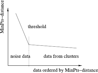
172 7 Finding Patterns
ter. This expansion strategy is repeated until no further expansion is possible. Then,
eventually, the full cluster has been determined.
The main routine dbscan passes once through the database and evokes the sub-
routine expand for every data xunlabeled so far (line 5). Whenever this subroutine
returns true, a new cluster has successfully been extracted from the seed point x.
The expand subroutine firstly identifies the data in the neighborhood of x(set S
in line 1). In case the desired density is not reached (|S|<MinPts), xis relabeled as
NOISE, and no cluster has been found at x. Otherwise, a (potentially new) cluster
has been found, and all data from the neighborhood are assigned to it (relabeled
with cluster-ID cid, line 4). At this point, the processing of xhas been completed,
and the function expand tries to extend the cluster further. For all the data in the
neighborhood, it is consecutively checked if they also satisfy the density threshold
(line 8). If that is the case, they also belong to the core of the cluster (and are called
core-points). All data in the neighborhood of a core-point are then also added to
the cluster, that is, they are relabeled and inserted into the set Sof data that has to
be tested for further cluster expansion. If the data are organized in a data structure
that supports neighborhood queries (as called in line 1), the runtime complexity is
low (O(nlogn)). However, the performance of such data structures (e.g., R∗-trees)
degrades as the data dimensionality increases.
To obtain optimal results, two parameters need to be adjusted, MinPts and ε.An
alternative set of parameters is the desired density threshold and the resolution of the
analysis: Any choice of MinPts and εcorresponds to the selection of a lower bound
on the data density. But for some given density threshold , we have the freedom to
choose MinPts twice as large and double at the same time the volume of Nεwithout
affecting the density threshold. The larger the volume, the more robust the density
estimation, but at the same time we loose the capability of recognizing clusters
smaller than this volume. Besides that, a single best choice may not exist for a given
dataset if clusters of different densities are present. As a rule of thumb, MinPts may
be set to 2 ∗dimension −1, and then εis determined from visually inspecting a
sorted MinPts-distance plot: For all data xi, the radius riis determined for which
Nri(x)=MinPts. These radii riare then plotted in descending order (cf. Fig. 7.11).
Under the assumption that the clusters have roughly comparable densities, the ri-
values of data belonging to clusters should roughly be the same (in the ordered
plot this corresponds to a marginal negative slope). In contrast, outside the clusters
Fig. 7.11 Determination of
the ε-parameter by visual
inspection (identification of
knee point)
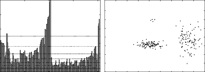
7.4 Density-Based Clustering 173
the distance to the MinPtsth-nearest neighbor strongly depends on the surrounding
noise points, and thus the MinPts-distances will vary much stronger (leading to a
deeper descend in the plot). A reasonable choice for εis then given by the knee
point in the MinPts-distance plot.
7.4.3 Variations and Issues
7.4.3.1 Relaxing the density threshold
The OPTICS algorithm [5] is an extension of DBScan that solves the problem of
determining MinPts and εdifferently. It can also be considered as a hierarchical
clustering algorithm, as it provides the resulting partition for a full range of possible
values ε. For each data object, OPTICS determines the so-called reachability- and
core-distance. The core-distance is basically the smallest value of εunder which
the data object becomes a core point. The reachability distance is the smallest dis-
tance under which the data objects becomes a cluster member, that is, belongs to the
neighborhood of the closest core object. The reachability plot of all data objects in a
specific order determined during clustering can be interpreted as a cluster hierarchy,
asshowninFig.7.12. Valleys in this plot indicate clusters in the dataset: the broader
the valley, the larger the cluster, and the deeper the valley, the higher the density.
Another possibility is to define the data density over the full data space Xby the
superposition of influence functions centered at every data object:
(x)=
y∈D
fy(x),
where fy(·)tells us how well xis represented (or influenced) by y. In the case of DB-
Scan, we may define fy(x)=1⇔x−y≤εand 0 otherwise. For a core object of
Fig. 7.12 The reachability plot of the dataset on the right. The data objects have been ordered, and
for each data object, its reachability value is shown. Contiguous areas on the horizontal axis,where
the reachability drops below a horizontal line, represent a cluster. The horizontal lines represent
certain data density levels; the lower the line, the higher the density
174 7 Finding Patterns
a DBScan-cluster, we have (x)≥MinPts, because at least MinPts data objects ex-
ist around xwithin the ε-neighborhood. The more data exist around x, the higher the
density function (x).TheDENCLUE algorithm [29] uses a Gaussian distribution
for fy(x)instead and concentrates on local maxima of (called density attractors)
via a hill-climbing technique. Such local maxima can be considered as point-like
clusters as in prototype-based clustering. Alternatively, several points with densities
above some threshold can be considered as representing jointly a cluster of arbitrary
shape. The DENCLUE algorithm preprocesses the data and organizes it into grid
cells. The summation of is restricted to some neighboring cells, thereby keeping
the overall runtime requirements low. Since the neighborhood relationship between
grid cells is known, no expensive neighborhood queries are necessary as with DB-
Scan or OPTICS. The regular grid of DENCLUE is adapted to the data at hand in
the OptiGrid approach [30].
7.4.3.2 Subspace Clustering
We have emphasized in Sect. 7.2 that the choice of the (dis)similarity measure has
major impact on the kind and number of clusters the respective algorithm will find.
A certain distance function may ignore some attributes; therefore we may consider
the feature selection problem being part of the distance function design. All the
clustering algorithms we have discussed so far assume that the user is capable of
providing the right distance function—and thus, to select the right features or, in
other words, the right subspace that contains the clusters.
The term subspace clustering refers to those methods that try to solve the prob-
lem of subspace selection simultaneously while clustering. (This short section on
subspace clustering has been located in the section on density-based clustering, be-
cause most subspace clustering techniques base their measurements on a density-
based clustering notion.) As in feature selection, the problem with a naïve approach,
where we simply enumerate all possible subspaces (i.e., subsets of the attribute set)
and run the clustering algorithm of our choice, is the exponential complexity: the
number of potential subspaces increases exponentially with the dimensionality of
the dataspace. There are at least three ways to attack this problem.
In a bottom-up approach, we first seek for clusters in the individual one-
dimensional spaces (1D). From those we can construct two-dimensional spaces
via the cross-product of dense one-dimensional clusters (blue shaded regions in
Fig. 7.13, right). We thereby safe ourselves from investigating those 2D-areas whose
1D-projections are not dense (white areas in Fig. 7.13, right), as they have no chance
of becoming dense in higher dimensions anyway. The algorithm CLIQUE [4]fol-
lows this approach and takes the basic idea of dimension-wise cluster construction
from frequent pattern mining, which will be discussed in Sect. 7.6.
In a top-down solution we seek for a few data points with high data density in the
full dataset (anchor points) and then identify those variables that lead to the highest
data density. This can be done cluster-wise, such that every cluster may live in a
different subspace. A member of this family of algorithms is PROCLUS (projected
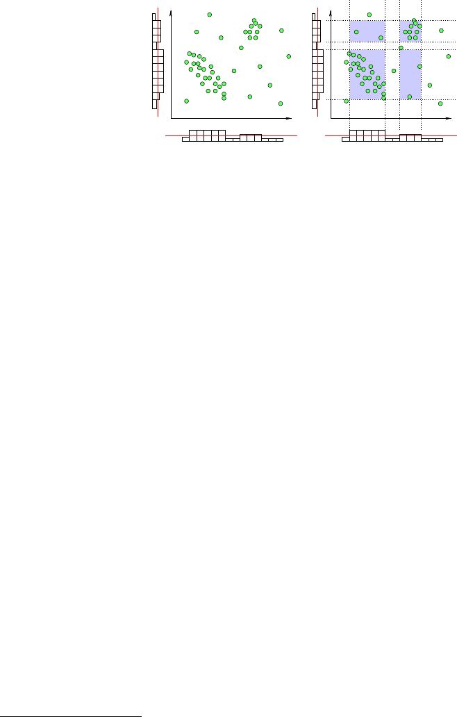
7.5 Self-organizing Maps 175
Fig. 7.13 The stylized
histograms along the axes
indicate density estimates.
The red line corresponds to a
threshold for dense intervals.
By analyzing the density
along the individual
attributes, areas in the
2D-space can be excluded
from further cluster search
(areas left white)
clustering) [1]. Each dimension gets a weight that indicates whether the dimension
belongs to the cluster’s subspace, and this weight is iteratively adjusted to increase
the cluster validity measure.
The third option is to rank subspaces according to their suspected suitability for
clustering and use the top-ranked subspace(s) for a conventional clustering algo-
rithm (similar to feature selection). The basic idea of the SURFING (subspaces
relevant for clustering) approach [7] is to look at the distribution of distances to
the kth nearest neighbor, as it has already been used to determine εin the DBScan
algorithm, cf. Fig. 7.11. If the data is distributed on a regular grid, this rather un-
interesting dataset wrt. clustering is recognized by an almost straight line in this
graph. If clusters are present, we suspect varying distances to the kth neighbor. The
more the distances deviate from a constant line, the more promising is the subspace.
Similar to CLIQUE, the potential subspaces are then explored levelwise to identify
those subspaces that appear most promising.
7.5 Self-organizing Maps
Maps of all kinds are used to distill a large amount of information into a handy,
small, and comprehensible visualization. People are used to maps; being able to
transform the (potentially high-dimensional) dataset into a two-dimensional repre-
sentation may therefore help to get an intuitive understanding of the data.
7.5.1 Overview
A map consists of many tiny pictograms, letters, and numbers, each of them mean-
ingful to the reader, but the most important property when using a map is the neigh-
borhood relationship: If two point are close to each other on the map, so they are in
the real world. The self-organizing maps or Kohonen maps [38] start from a mesh
of map nodes2for which the neighborhood relationship is fixed. One may think
2The node are usually called neurons, since self-organizing maps are a special form of neural
network.
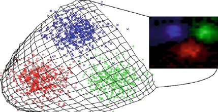
176 7 Finding Patterns
Fig. 7.14 The self-
organizing map (middle)
covers the occupied data
space (left) over time
of a fishing net, where the knots represent the nodes, and all neighbors are con-
nected by strings. The structure of the fishing net is two-dimensional, but in a three-
dimensional world it may lay flat on the ground, forming a regular grid of mesh
nodes, may be packed tightly in a wooden box, or may even float freely in the ocean.
While the node positions in the higher-dimensional space varies, the neighborhood
relationship remains fixed by the a priori defined connections of the mesh (knots).
The idea of self-organizing maps is to define the mesh first (e.g., two-dimensional
mesh)—which serves as the basic layout for the pictorial representation—and then
let it float in the dataspace such that the data gets well covered. Every node pi
in the pictorial representation is associated with a corresponding reference node
riin the high-dimensional space. At the end, the properties of the map at node
pi, such as color or saturation, are taken directly from the properties of the data
space at ri. The elastic network represents a nonlinear mapping of reference vectors
(high-dimensional positions in the data space) to the mesh nodes (two-dimensional
positions in the mesh).
Figure 7.14 shows an example for a two-dimensional data set. In such a low-
dimensional case the self-organizing map provides no advantages over a scatter plot,
it is used for illustrating purposes only. The occupied dataspace is covered by the
reference vectors of the self-organizing map (overlaid on the scatter plot). The color
and data density information is taken from the respective locations and gets mapped
to the two-dimensional display coordinates (right subfigure).
7.5.2 Construction
Learning a self organizing map is done iteratively (see Table 7.11): for any data
vector xfrom the dataset, the closest reference vector rw(in the high-dimensional
dataspace) is identified. The node wis usually called the winner neuron.From
the low-dimensional map topology the neighboring nodes of node ware identified.
Suppose that node iis one of these neighbors, then the associated reference vector ri
is moved slightly towards xso that it better represents this data vector. How much it
is shifted is controlled by a heuristic learning rate η, which slowly approaches zero
to ensure the convergence of the reference vectors. Thus, any new data vector leads
to a local modification of the map around the winner neuron. After a fixed number
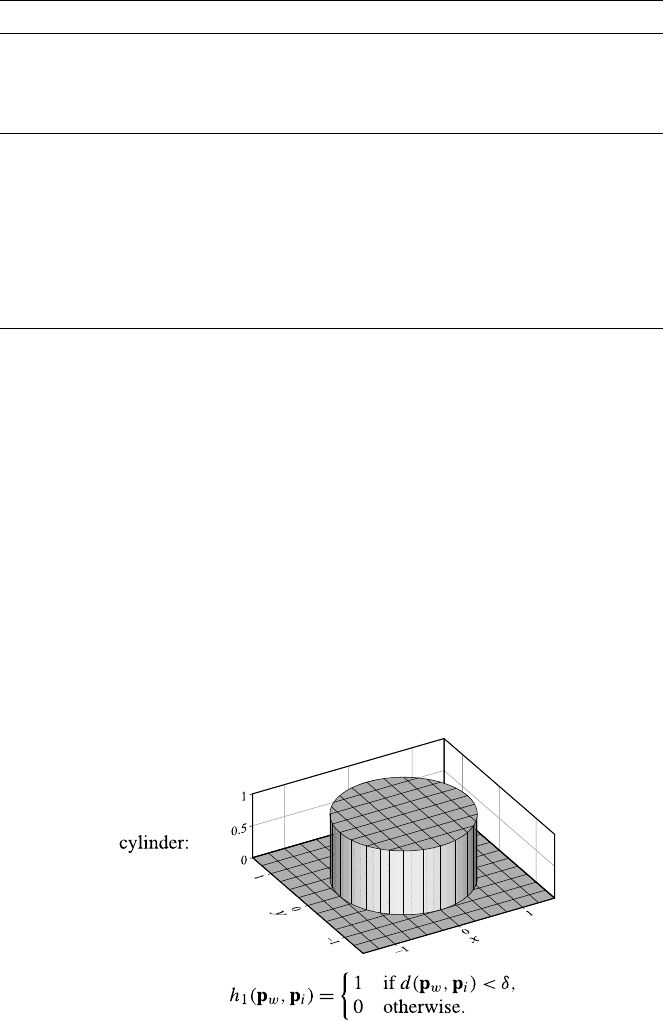
7.5 Self-organizing Maps 177
Table 7.11 Algorithm for mapping a dataset onto a two-dimensional map
Algorithm SOM(D,p1,...,pm,h)→r1,...,rm
input: data set D,|D|=n,
two-dimensional mesh nodes p1,...,pm∈R2×m,
neighborhood function h:R2×R2→[0,1]
output: reference vectors r1,...,rm
1 initialize reference vectors r1,...,rm
2repeat
3forall x ∈X
4 find reference vector rwclosest to xwrt distance function d(x,ri)
5 update all reference vectors ri:
6ri=ri+η·h(pw,pi)·(x−ri)
7 slightly decrease ηand δ
8until maximum number of iterations reached or r1,...,rmconverged
of iterations or when the changes drop below some threshold, the map adjustment
is finished.
To determine the winner node any distance function might be used (see the mea-
sures discussed in Sect. 7.2), but the Euclidean and the cosine distances are most
frequently employed. As not only the winning reference vector rwis shifted towards
the new sample, but also neighboring vectors, we need a way to specify which nodes
will be affected. This is done by a neighborhood function h:R2×R2→[0,1]:For
node i, this function provides a factor h(pw,pi)that directly influences the refer-
ence vector modification. Note that the neighborhood information is taken from the
two-dimensional node locations pi, while the update concerns the high-dimensional
reference vectors ri. The smaller the factor, the smaller the effect of the modifica-
tion; a factor of zero means that the reference vector is left unaltered. The following,
typically used functions share a common parameter, the influence range δ, which
controls the size of the neighborhood:
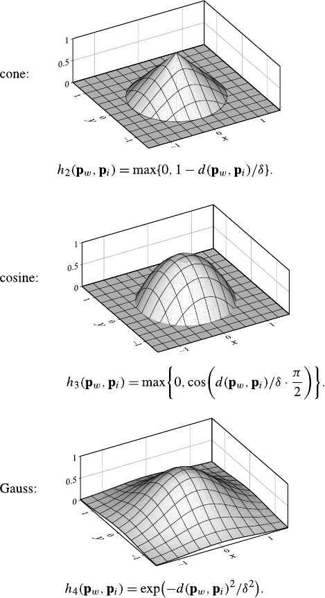
178 7 Finding Patterns
Initially, the neighborhood should be relatively large as the map needs to be first
unfolded. The random initialization leads to an unorganized initial state, and neigh-
boring nodes iand jin the low-dimensional representation are not associated with
neighboring reference vectors. To avoid distorted or twisted maps, the so-called
stiffness parameter δmust be relatively large at the beginning and must not de-
crease too quickly. Figure 7.15 shows some intermediate steps in the evolution of a
self-organizing map.
7.6 Frequent Pattern Mining and Association Rules 179
Fig. 7.15 Evolution of a self organizing map
7.6 Frequent Pattern Mining and Association Rules
Frequent pattern mining tackles the problem of finding common properties (pat-
terns) that are shared by all cases in certain sufficiently large subgroups of a given
data set. The general approach to find such patterns is to (efficiently) search a space
of potential patterns. Based on the type of data to be mined, frequent pattern mining
is divided into (1) frequent item set mining and association rule induction, (2) fre-
quent sequence mining, and (3) frequent (sub)graph mining with the special subarea
of frequent (sub)tree mining.
7.6.1 Overview
Frequent pattern mining was originally developed—in the special form of frequent
item set mining—for market basket analysis, which aims at finding regularities in
the shopping behavior of the customers of supermarkets, mail-order companies, and
online shops. In particular, it tries to identify sets of products that are frequently
bought together. Once identified, such sets of associated products may be exploited
to optimize the organization of the offered products on the shelves of a supermarket
or on the pages of a mail-order catalog or web shop, may be used to suggest other
products a customer could be interested in (so-called cross-selling), or may provide
hints which products may conveniently be bundled. In order to find sets of asso-
ciated products, one analyzes recordings of actual purchases and selections made
by customers in the past, that is, basically lists of items that were in their shopping
carts. Due to the widespread use of scanner cashiers (with bar code readers), such
recordings are nowadays readily available in basically every supermarket.
Generally, the challenge of frequent pattern mining consists in the fact that the
number of potential patterns is usually huge. For example, a typical supermarket
has thousands of products on offer, giving rise to astronomical numbers of sets
180 7 Finding Patterns
of potentially associated products, even if the size of these sets is limited to few
items: there are about 8 quadrillion (8 ·1012) different sets of 5 items that can be
selected from a set of 1000 items. As a consequence, a brute force approach, which
simply enumerates and checks all possible patterns, quickly turns out to be infeasi-
ble.
More sophisticated approaches exploit the structure of the pattern space to guide
the search and the simple fact that a pattern cannot occur more frequently than any
of its subpatterns to avoid useless search, which cannot yield any output. In addition,
clever representations of the data, which allow for efficient counting of the number
of cases satisfying a pattern, are employed. In the area of frequent item set mining,
research efforts in this direction led to well-known algorithms like Apriori [2,3],
Eclat [59], and FP-growth [28], but there are also several variants and extensions
[8,25].
It is often convenient to express found patterns as rules, for example:
If a customer buys bread and wine, she will probably also buy cheese.
Such rules are customarily called association rules, because they describe an
association of the item(s) in the consequent (then-part) with the item(s) in the an-
tecedent (if-part). Such rules are particularly useful for cross-selling purposes, be-
cause they indicate what other products may be suggested to a customer. They are
generated from the found frequent item sets by relating item sets one of which is a
subset of the other, using the smaller item set as the antecedent and the additional
items in the other as the consequent.
With the algorithms mentioned above, the basic task of frequent item set min-
ing can be considered satisfactorily solved, as all of them are fast enough for most
practical purposes. Nevertheless, there is still room for improvement. Recent ad-
vances include filtering the found frequent item sets and association rules (see, e.g.,
[53,54]), identifying temporal changes in discovered patterns (see, e.g., [10,11]),
and mining fault-tolerant or approximate frequent item sets (see, e.g., [16,44,52]).
Furthermore, sequences,trees, and generally graphs have been considered as
patterns, thus vastly expanding the possible applications areas and also introducing
new problems. In particular, for patterns other than item sets—and especially for
general graphs—avoiding redundant search is much more difficult. In addition, the
fact that with these types of data a pattern may occur more than once in a single
sample case (for example, a specific subsequence may occur at several locations in
a longer sequence) allows for different definitions of what counts as frequent and
thus makes it possible to find frequent patterns for single instances (for example,
mining frequent subgraphs of a single large graph).
The application areas of frequent pattern mining in its different specific forms
include market basket analysis, quality control and improvement, customer man-
agement, fraud detection, click stream analysis, web link analysis, genome analysis,
drug design, and many more.

7.6 Frequent Pattern Mining and Association Rules 181
Fig. 7.16 A simple example
database with 10 transactions
(market baskets, shopping
carts) over the item base
B={a,b,c,d,e}(left)and
the frequent item sets that can
be discovered in this database
if the minimum support is
chosen to be smin =3(right;
the numbers state the support
of these item sets)
transaction
database
1: {a,d,e}
2: {b, c, d}
3: {a,c,e}
4: {a,c,d, e}
5: {a,e}
6: {a,c,d}
7: {b, c}
8: {a,c,d, e}
9: {b, c, e}
10: {a,d,e}
Frequent item sets (with support)
(minimum support smin =3)
0items 1item 2items 3 items
∅:10 {a}:7 {a,c}:4 {a,c,d}:3
{b}:3 {a,d}:5 {a,c,e}:3
{c}:7 {a,e}:6 {a,d, e}:4
{d}:6 {b, c}:3
{e}:7 {c, d}:4
{c, e}:4
{d,e}:4
7.6.2 Construction
Formally, the task of frequent item set mining can be described as follows: we
are given a set Bof items, called the item base, and a database Tof transactions.
Each item may represent a product, a special equipment item, a service option, etc.,
and the item base represents the set of all products etc. that are offered. The term
item set refers to any subset of the item base B. Each transaction is an item set
and represents a set of products that has been bought by a customer. Since two or
even more customers may have bought the exact same set of products, the total
of all transactions must be represented as a vector, a bag, or a multiset, since in a
simple set each transaction could occur at most once. (Alternatively, each trans-
action may be enhanced by a unique transaction identifier, and these enhanced
transactions may then be combined in a simple set.) Note that the item base B
is usually not given explicitly but only implicitly as the union of all transactions.
An example transaction database over the item base B={a,b,c,d,e}is shown
in Fig. 7.16.
The support sT(I ) of an item set I⊆Bis the number of transactions in the
database Tit is contained in. Given a user-specified minimum support smin ∈N,
an item set Iis called frequent in Tiff sT(I ) ≥smin. The goal of frequent item
set mining is to identify all item sets I⊆Bthat are frequent in a given transaction
database T. In the transaction database shown in Fig. 7.16, 16 frequent item sets
with 0 to 3 items can be discovered if smin =3 is chosen. Note that more frequent
item sets are found than there are transactions, which is a typical situation.
In order to design an algorithm to find frequent item sets, it is beneficial
to first consider the properties of the support of an item set. Obviously we
have
∀I:∀J⊇I:sT(J ) ≤sT(I ).
That is: If an item set is extended, its support cannot increase. This is immediately
clear from the fact that each added item is like an additional constraint a transaction
has to satisfy. One also says that support is antimonotone or downward closed.
From this property it immediately follows what is known as the a priori prop-
erty:
∀smin :∀I:∀J⊇I:sT(I ) < smin →sT(J ) < smin.
182 7 Finding Patterns
Fig. 7.17 A subset lattice for five items (left) and the frequent item sets (right, frequent item sets
in blue) for the transaction database shown in Fig. 7.16
That is: No superset of an infrequent item set can be frequent. As a consequence, we
need not explore any supersets of infrequent item sets—an insight which can nicely
be exploited to prune the search for frequent item sets.
In order to structure the actual search, it is advantageous to consider the subset
lattice of the item base B. For the simple item base B={a,b,c,d,e}, which un-
derlies the transaction database shown in Fig. 7.16, a Hasse diagram of this subset
lattice is shown in Fig. 7.17 on the left: two item sets are connected if they differ in
size by only one item and if one item set is a subset of the other.
Because of the a priori property, the frequent item sets must be located at the top
of this lattice, thus suggesting that we should search the subset lattice top-down. As
an illustration, in the right part of Fig. 7.17 the frequent item sets of Fig. 7.16 are
highlighted. In this diagram the a priori property is exhibited by the fact that there
cannot be a link between a white node (infrequent item set) in a higher level to a
blue node (frequent item set) in a lower level. Links leading from a blue node to a
white node mark the boundary between frequent and infrequent item sets.
A core problem of searching the subset lattice is that all item sets with at least
two items can be explored on multiple paths. For example, the item set {a,c, e}
may be reached through {a}and {a,c}, or through {c}and {c, e}, or through {e}and
{a,e}, etc. As a consequence, a lot of redundant search would ensue if we always
extended any frequent item set by all possible other items until we reach the bound-
ary between the frequent and infrequent item sets. In order to avoid this redundancy,
aunique parent is assigned to each item set, thus turning the subset lattice into a
subset tree. This is illustrated in Fig. 7.18, where the parents are assigned by the
following simple scheme: we choose an order of the items (which is arbitrary but
fixed; here we simply use the alphabetically order) and then apply the rule
∀I=∅: parent(I ) =I−max
i∈Ii.
This scheme has the important advantage that the permissible extensions of an item
set, which only generate proper children, are easy to find: an item set may be ex-
tended only by items succeeding all already present items in the chosen item order.
7.6 Frequent Pattern Mining and Association Rules 183
Fig. 7.18 A subset tree that results from assigning a unique parent to each item set (left)anda
corresponding prefix tree in which sibling nodes with the same prefix are merged (right)
Since with this scheme of assigning unique parents, all sibling item sets share the
same prefix (w.r.t. the chosen item order), namely the item set that is their parent,
it is convenient to structure the search as a prefix tree, as shown in Fig. 7.18.Inthis
prefix tree the concatenation of the edge labels on the path from the root to a node
is the common prefix of all item sets explored in this node.
A standard approach to find all frequent item sets w.r.t. a given database Tand
given support threshold smin, which is adopted by basically all frequent item set
mining algorithms (except those of the Apriori family), is a depth-first search in
the subset tree of the item base B. Viewed properly, this approach can be inter-
preted as a simple divide-and-conquer scheme. For the first item iin the chosen
item order, the problem to find all frequent item sets is split into two subproblems:
(1) find all frequent item sets containing the item i, and (2) find all frequent item
sets not containing the item i. Each subproblem is then further divided based on the
next item jin the chosen item order: find all frequent item sets containing (1.1) both
items iand j, (1.2) item ibut not j, (2.1) item jbut not i, (2.2) neither item inor j,
and so on, always splitting with the next item (see Fig. 7.19 for an illustration).
All subproblems that occur in this divide-and-conquer recursion can be defined
by a conditional transaction database and a prefix. The prefix is a set of items
that has to be added to all frequent item sets that are discovered in the conditional
database. Formally, all subproblems are tuples S=(C, P ), where Cis a conditional
database, and P⊆Bis a prefix. The initial problem, with which the recursion is
started, is S=(T , ∅), where Tis the given transaction database, and the prefix is
empty. The problem Sis, of course, to find all item sets that are frequent in T.
A subproblem S0=(T0,P
0)is processed as follows: Choose an item i∈B0,
where B0is the set of items occurring in T0. Note that, in principle, this choice is
arbitrary but usually respects a predefined order of the items, which then also defines
the structure of the subset tree as discussed above.
If sT0(i) ≥smin (that is, if the item iis frequent in T0), report the item set P0∪{i}
as frequent with the support sT0(i) and form the subproblem S1=(T1,P
1)with
P1=P0∪{i}. The conditional database T1comprises all transactions in T0that
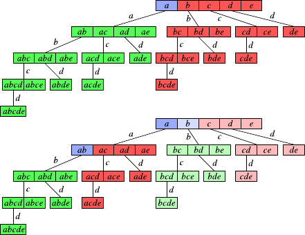
184 7 Finding Patterns
Fig. 7.19 Illustration of the
divide-and-conquer approach
to find frequent item sets.
Top:firstsplit;bottom: second
split; blue: split item/prefix;
green: first subproblem; red:
second subproblem
contain the item i, but with the item iremoved. This also implies that transactions
that contain no other item than iare entirely removed: no empty transactions are
ever kept in the search. If T1is not empty, S1is processed recursively.
In any case (that is, regardless of whether sT0(i) ≥smin or not), form the sub-
problem S2=(T2,P
2), where P2=P0. The conditional database T2comprises all
transactions in T0(including those that do not contain the item i), but again with
the item iremoved (and, as before, transactions containing no other item than i
discarded). If T2is not empty, S2is processed recursively.
Eclat, FP-growth and several other frequent item set mining algorithms all rely
on the described basic recursive processing scheme. They differ mainly in how they
represent the conditional transaction databases. There are two basic approaches: in a
horizontal representation, the database is stored as a list (or array) of transactions,
each of which is a list (or array) of the items contained in it. In a vertical represen-
tation, on the other hand, a database is represented by first referring with a list (or
array) to the different items. For each item, a list (or array) of transaction identifiers
is stored, which indicate the transactions that contain the item.
However, this distinction is not pure, since there are many algorithms that use
a combination of the two forms of representing a database. For example, while
Eclat uses a purely vertical representation and the SaM algorithm presented in
the next section uses a purely horizontal representation, FP-growth combines in its
FP-tree structure (basically a prefix tree of the transaction database, with links be-
tween the branches that connect equal items) a vertical representation (links between
branches) and a (compressed) horizontal representation (prefix tree of transactions).
Apriori also uses a purely horizontal representation but relies on a different process-
ing scheme, because it traverses the subset tree levelwise rather than depth-first.
In order to give a more concrete idea of the search process, we discuss the par-
ticularly simple SaM (Split and Merge) algorithm [14] for frequent item set mining.
In analogy to basically all other frequent item set mining algorithms, the SaM al-
gorithm first preprocesses the transaction database with the aim to find a good item
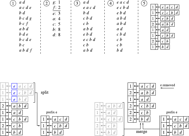
7.6 Frequent Pattern Mining and Association Rules 185
Fig. 7.20 The example database: original form (1), item frequencies (2), transactions with sorted
items (3), lexicographically sorted transactions (4), and the used data structure (5)
Fig. 7.21 The basic operations of the SaM algorithm: split (left)andmerge(right)
order and to set up the representation of the initial transaction database. The steps
are illustrated in Fig. 7.20 for a simple example transaction database. Step 1 shows
a transaction database in its original form. In step 2 the frequencies of individual
items are determined from this input in order to be able to discard infrequent items
immediately. If we assume a minimum support of three transactions for this exam-
ple, there are two infrequent items, namely fand g, which are discarded. In step 3
the (frequent) items in each transaction are sorted according to their frequency in
the transaction database, since experience (also with other algorithms) has shown
that processing the items in the order of increasing frequency usually leads to the
shortest execution times. In step 4 the transactions are sorted lexicographically into
descending order, with item comparisons again being decided by the item frequen-
cies, although here the item with the higher frequency precedes the item with the
lower frequency. In step 5 the data structure on which SaM operates is built by com-
bining equal transactions and setting up an array, in which each element consists of
two fields: an occurrence counter and a pointer to the sorted transaction. This data
structure is then processed recursively, according to the divide-and-conquer scheme
discussed in the preceding section, to find the frequent item sets.
The basic operations used in the recursive processing are illustrated in Fig. 7.21.
In the split step (see the left part of Fig. 7.21) the given array is split w.r.t. the leading
item of the first transaction (the split item; item ein our example): all array elements
referring to transactions starting with this item are transferred to a new array. In
this process the pointer (in)to the transaction is advanced by one item, so that the

186 7 Finding Patterns
common leading item is removed from all transactions, and empty transactions are
discarded. Obviously, the new array represents the conditional database of the first
subproblem (see page 183), which is then processed recursively to find all frequent
item sets containing the split item (provided that this item is frequent).
The conditional database for frequent item sets not containing this item (needed
for the second subproblem, see page 184) is obtained with a simple merge step (see
the right part of Fig. 7.21). The created new array and the rest of the original array
(which refers to all transactions starting with a different item) are combined with a
procedure that is almost identical to one phase of the well-known mergesort algo-
rithm. Since both arrays are obviously lexicographically sorted, one merging traver-
sal suffices to create a lexicographically sorted merged array. The only difference
to a mergesort phase is that equal transactions (or transaction suffixes) are com-
bined. That is, there is always just one instance of each transaction (suffix), while its
number of occurrences is kept in the occurrence counter. In our example this results
in the merged array having two elements less than the input arrays together: the
transaction (suffixes) cbd and bd, which occur in both arrays, are combined, and,
consequently, their occurrence counters are increased to 2.
As association rules, we formally consider rules A→C, with A⊆B,C⊆B,
and A∩C=∅.HereBis the underlying item base, and the symbols Aand C
have been chosen to represent the antecedent and the consequent of the rule. For
simplicity, we confine ourselves in the following to rules with |C|=1, that is, to
rules with only a single item in the consequent. Even though rules with several
items in the consequent have also been studied, they are usually a lot less useful and
only increase the size of the created rule set unnecessarily.
While (frequent) item sets are associated with only one measure, namely their
support, association rules are evaluated with two measures:
•support of an association rule
The support of an association rule A→Ccan be defined in two ways:
–support of all items appearing in the rule:rT(A →C) =sT(A∪C)
sT(∅).
This is the more common definition:
the support of a rule is the fraction of cases in which it is correct.
–support of the antecent of the rule:rT(A →C) =sT(A)
sT(∅).
This definition is actually more plausible:
the support of a rule is the fraction of cases in which it is applicable.
(Note that sT(∅)is simply the number of transactions in the database Tto mine,
because the empty item set is contained in all transactions.)
•confidence of an association rule
The confidence of an association rule is the number of cases in which it is cor-
rect relative to the number of cases in which it is applicable: cT(A →C) =
sT(A∪C)
sT(A) . The confidence can be seen as an estimate of the conditional probability
P(C |A).
Given a transaction database Tover some item base B,aminimum support rmin ∈
[0,1], and a minimum confidence cmin ∈[0,1](both to be specified by a user),
thetaskofassociation rule induction is to find all association rules A→Cwith
A,C ⊂B,rT(A →C) ≥rmin, and cT(A →C) ≥cmin.

7.6 Frequent Pattern Mining and Association Rules 187
Fig. 7.22 The association
rules that can be discovered
with a minimum support
smin =3 and a minimum
confidence cmin =80% in the
transaction database shown in
Fig. 7.16. Note that in this
example it is irrelevant which
rule support definition is used
association
rule
support of
all items
support of
antecedent
confidence
b→c3ˆ= 30% 3ˆ= 30% 100.0%
d→a5ˆ= 50% 6ˆ= 60% 83.3%
e→a6ˆ= 60% 7ˆ= 70% 85.7%
a→e6ˆ= 60% 7ˆ= 70% 85.7%
d,e →a4ˆ= 40% 4ˆ= 40% 100.0%
a,d →e4ˆ= 40% 5ˆ= 50% 80.0%
The usual approach to this task consists in finding, in a first step, the frequent
item sets of T(as described above). For this step, it is important which rule support
definition is used. If the support of an association rule is the support of all items
appearing in the rule, then the minimum support to be used for the frequent item
set mining step is simply smin =sT(∅)rmin(which explains why this is the more
common definition). If, however, the support of an association rule is only the sup-
port of its antecendent, then smin =sT(∅)rmincminhas to be used. In a second
step the found frequent item sets are traversed, and all possible rules (with one item
in the consequent, see above) are generated from them and then filtered w.r.t. rmin
and cmin.
As an example, consider again the transaction database shown in Fig. 7.16 and
the frequent item sets that can be discovered in it (for a minimum support, rmin =
30%, that is, smin =3). The association rules that can be constructed from them
with a minimum confidence cmin =0.8=80% are shown in Fig. 7.22. Due to the
fairly high minimum confidence requirement, the number of found association rules
is relatively small compared to the number of transactions.
7.6.3 Variations and Issues
A general scheme to enhance the efficiency of frequent pattern is perfect extension
pruning (Sect. 7.6.3.1). Since usually many frequent patterns can be found in a data
set, reducing the output is an important task (Sect. 7.6.3.2). The same holds for
association rules (Sect. 7.6.3.3), which are usually filtered based on evaluation mea-
sures. Data types other than item sets need special methods to eliminate redundant
search (Sect. 7.6.3.4). With this last section we go, in one special instance, beyond
the usual scope of this book, because we consider data that has a more complex
structure than a record in a data set. The idea is to convey at least some idea of how
data analysis of such data can look like, while we cannot provide a comprehensive
treatment of all more complex data types.
7.6.3.1 Perfect Extension Pruning
The basic recursive processing scheme for finding frequent item sets described in
Sect. 7.6.2 can easily be improved with so-called perfect extension pruning (also
188 7 Finding Patterns
called parent equivalence pruning), which relies on the following simple idea:
given an item set I, an item i/∈Iis called a perfect extension of Iiff Iand I∪{i}
have the same support, that is, if iis contained in all transactions that contain I. Per-
fect extensions have the following properties: (1) if the item iis a perfect extension
of an item set I, then it is also a perfect extension of any item set J⊇Ias long as
i/∈J, and (2) if Iis a frequent item set and Kis the set of all perfect extensions
of I, then all sets I∪Jwith J∈2K(where 2Kdenotes the power set of K)are
also frequent and have the same support as I. These properties can be exploited by
collecting in the recursion not only prefix items but also, in a third element of a
subproblem description, perfect extension items. Once identified, perfect extension
items are no longer processed in the recursion but are only used to generate all su-
persets of the prefix that have the same support. Depending on the data set, this can
lead to a considerable acceleration of the search.
7.6.3.2 Reducing the Output
Often three types of frequent item sets are distinguished by additional constraints:
•frequent item set
A frequent item set is merely frequent:
Iis a frequent item set ⇔sT(I ) ≥smin.
•closed item set
A frequent item set is called closed if no proper superset has the same support:
Iis a closed item set ⇔sT(I ) ≥smin ∧∀J⊃I:sT(J ) < sT(I ).
•maximal item set
A frequent item set is called maximal if no proper superset is frequent:
Iis a maximal item set ⇔sT(I ) ≥smin ∧∀J⊃I:sT(J ) < smin.
Obviously, all maximal item sets are closed, and all closed item sets are frequent.
The reason for distinguishing these item set types is that with them one can achieve
a compressed representation of all frequent item sets: the set of all frequent item
sets can be recovered from the maximal (or the closed) item sets by simply forming
all subsets of maximal (or closed) item sets, because each frequent item set has a
maximal superset. With closed item sets, one even preserves the knowledge of their
support, because any frequent item set has a closed superset with the same support.
Hence the support of a nonclosed frequent item set Ican be reconstructed with
∀smin :∀I:sT(I ) ≥smin ⇒sT(I ) =max
J∈CT(smin),J ⊇IsT(J ),
where CT(smin)is the set of all closed item sets that are discovered in a given trans-
action database Tif the minimum support smin is chosen.
Note that closed item sets are directly related to perfect extension pruning, since
a closed item set can also be defined as an item set that does not possess a perfect
extension. As a consequence, identifying perfect extensions is particularly useful
and effective if the output is restricted to closed item sets.
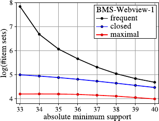
7.6 Frequent Pattern Mining and Association Rules 189
Fig. 7.23 The decimal
logarithms of the numbers of
frequent, closed, and maximal
itemsets(vertical axis)for
the BMS-Webview-1
database and different
minimum support values
(horizontal axis)
For the simple example database shown in Fig. 7.16, all frequent item sets are
closed, with the exception of {b}(since sT({b})=sT({b, c})=3) and {d,e}(since
sT({d,e})=sT({a,d,e})=4). The maximal item sets are {b, c},{a,c,d},{a,c,e},
and {a,d,e}. Note that indeed any frequent item set is a subset of at least one of
these four maximal item sets, demonstrating that they suffice to represent all fre-
quent item sets. In order to give an impression of the relative number of frequent,
closed, and maximal item sets in practice, Fig. 7.23 displays the decimal logarithms
of the numbers of these item sets that are found for different minimum support
values for a common benchmark data set, namely the BMS-Webview-1 database.
Clearly, restricting the output to closed or even to maximal item sets can reduce the
size of the output by orders of magnitude in this case.
Naturally, the notions of a closed and a maximal item set can easily be trans-
fered to other pattern types, leading to closed and maximal sequences, trees, and
(sub)graphs (with analogous definitions). Their purpose is the same in these cases:
to reduce the output to a more manageable size. Nevertheless, however, the size of
the output remains a serious problem in frequent pattern mining, despite several re-
search efforts, for example, to define relevance or interestingness measures by which
the best patterns can be singled out for user inspection.
7.6.3.3 Assessing Association Rules
In practice the number of found association rules is usually huge, often exceeding
(by far) the number of transactions. Therefore considerable efforts have been de-
voted to filter them in order to single out the interesting ones, or at least to rank
them. Here we study only a few simple methods, though often effective. More so-
phisticated approaches are discussed, for instance, in [53,54].
The basic idea underlying all approaches described in the following is that a
rule is interesting only if the presence of its antecedent has a sufficient effect on
the presence of its consequent. In order to assess this, the confidence of a rule
is compared to its expected confidence under the assumption that antecedent and

190 7 Finding Patterns
Fig. 7.24 A contingency
table for the antecedent Aand
the consequent Cof an
association rule A→Cw.r.t.
the transactions tof a given
transaction database T.
Obviously, n11 =sT(A ∪C),
n1∗=sT(C),n∗1=sT(A),
and n∗∗ =sT(∅)
consequent are independent. If antecedent and consequent are independent, then
cT(A →C) =ˆ
P(C |A) and cT(∅→C) =ˆ
P(C) should not differ much (the true
probabilities should actually be the same, but their estimates may differ slightly due
to noise in the data), and thus we can assess association rules by comparing them.
The most straightforward measure based on this idea is the absolute difference of
the two confidences, that is, dT(A →C) =|cT(A →C) −cT(∅→C)|. However,
it is more common to form their ratio, that is,
lT(A →C) =cT(A →C)
cT(∅→C) .
This measure is known as the lift value, because it describes by what factor our
expectation to observe Cis lifted if we learn that Ais present. Clearly, the higher
the lift value, the more influence Ahas on C, and thus the more interesting the rule.
More sophisticated approaches evaluate the dependence of Aand Cbased on the
contingency table shown in Fig. 7.24, which lists the numbers of transactions which
contain or do not contain Aand C, alone and in conjunction. (Note that a star as
a first index means that the value is a sum over a column, and a star in the second
index means that the value is a sum over a row. Two stars mean a sum over both
rows and columns.) Measures based on such a table are the well-known statistical
χ2measure
χ2(A →C) =
1
i=0
1
j=0
(pi∗p∗j−pij )2
pi∗p∗j=n∗∗(n1∗n∗1−n∗∗n11)2
n1∗(n∗∗ −n1∗)n∗1(n∗∗ −n∗1)
and mutual information or information gain
Imut(A →C) =
1
i=0
1
j=0
pij log2
pij
pi∗p∗j=
1
i=0
1
j=0
nij
n∗∗ log2
nij n∗∗
ni∗n∗j
,
where pkl =nkl/n∗∗ for k, l ∈{0,1,∗}. For both of these measures, a higher value
means a stronger dependence of Con Aand thus a higher interestingness of the
rule.
It should be noted that such measures are only a simple aid, as they do not detect
and properly assess situations like the following: suppose that cT(∅→C) =20%
but cT(A →C) =80%. According to all of the above measures, the rule A→C
is highly interesting. However, if we know that cT(A −{i}→C) =76% for some
item i∈A,theruleA→Cdoes not look so interesting anymore: the change in
7.6 Frequent Pattern Mining and Association Rules 191
confidence that is brought about by the item iis fairly small, and thus we should
rather consider a rule with a smaller antecedent.
While this problem can at least be attacked by comparing a rule not only to
its counterpart with an empty antecedent but to all rules with a simpler antecedent
(even though this is more difficult than it may appear at first sight), semantic aspects
of interestingness are completely neglected. For example, the rule “pregnant →fe-
male” has a confidence of 100%, while “∅→female” has a confidence of only 50%.
Nevertheless the rule “pregnant →female” is obviously completely uninteresting,
because it is part of our background knowledge (or can at least be derived from it).
7.6.3.4 Frequent Subgraph Mining
In analogy to frequent item set mining, with which item sets are found that are con-
tained in a sufficiently large number of transactions of a given database (as speci-
fied by the minimum support), frequent subgraph mining tries to find (sub)graphs
that are contained in a sufficiently large number of (attributed or labeled) graphs
of a given graph database. Since the advent of this research area around the turn
of the century, several clever algorithms for frequent subgraph mining have been
developed. Some of them rely on principles from inductive logic programming
and describe the graph structure by logical expressions [23]. However, the vast
majority transfers techniques developed originally for frequent item set mining
(see Sect. 7.6.2). Examples include MolFea [39], FSG [40], MoSS/MoFa [12],
gSpan [56], CloseGraph [57], FFSM [34], and Gaston [42]. A related, but slightly
different approach, is used in Subdue [17], which is geared toward graph compres-
sion with common subgraphs rather than frequent subgraph mining.
Here we confine ourselves to a brief outline of the core principles of frequent
subgraph mining, because frequent sequence and tree mining can obviously be seen
as special cases of frequent subgraph mining. Nevertheless, however, it should be
noted that specific optimizations are possible due to the restricted structure of trees
and those graphs to which different types of sequences can be mapped. Note also
that this is the only place in this book where we consider the analysis of data that
does not have a tabular structure. While we cannot provide a comprehensive cover-
age of all complex data types, we strive in this section to convey at least some idea
of the special requirements and problem encountered when analyzing such data.
Formally, frequent subgraph mining works on a database of labeled graphs (also
called attributed graphs). A labeled graph is a triple G=(V,E,l), where Vis the
set of vertices, E⊆V×V−{(v, v) |v∈V}is the set of edges, and l:V∪E→L
assigns labels from some label set Lto vertices and edges. The graphs we consider
are undirected and simple (that is, there is at most one edge between two given
vertices) and contain no loops (that is, there are no edges connecting a vertex to
itself). However, graphs without these restrictions (that is, directed graphs, graphs
with loops and/or multiple edges) can be handled as well with properly adapted
methods. Note also that several vertices and edges may carry the same label.
192 7 Finding Patterns
Fig. 7.25 Examples of
subgraph isomorphisms with
two molecular fragments and
a molecule containing them
in different ways
The support sG(S) of a (sub)graph Swrt. a given graph database Gis the
number of graphs G∈Git is contained in. What is meant by a graph being con-
tained in another is made formally precise by the notion of a subgraph isomor-
phism. Given two labeled graphs G=(VG,E
G,l
G)and S=(VS,E
S,l
S),asub-
graph isomorphism of Sto Gis an injective function f:VS→VGsatisfying (1)
∀v∈VS:lS(v) =lG(f (v)) and (2) ∀(u, v) ∈ES:(f (u), f (v)) ∈EG∧lS((u, v)) =
lG((f (u), f (v))). That is, the mapping fpreserves the connections and the labels
of both vertices and edges.
Note that there may be several ways to map a labeled graph Sto a labeled
graph Gso that the connection structure and the labels are preserved. For exam-
ple, the graph Gmay possess several subgraphs that are isomorphic to S.Itmay
even be that the graph Scan be mapped in several different ways to the same sub-
graph of G. This is the case if there exists a subgraph isomorphism of Sto itself
(a so-called graph automorphism) that is not the identity. Examples of subgraph
isomorphism wrt. a molecule Gand two molecular fragments S1and S2, all three
of which are modeled as labeled graphs, are shown in Fig. 7.25. The fragment S2is
contained in several different ways in the molecule, two of which are indicated in
the figure.
Given a database Gof labeled graphs and a user-specified minimum sup-
port smin ∈N, a (sub)graph Sis called frequent in Gif sG(S) ≥smin. The task of
frequent subgraph mining is to identify all subgraphs that are frequent in the given
graph database G. However, usually the output is restricted to connected subgraphs
for two reasons: in the first place, connected subgraphs suffice for most applica-
tions. Secondly, restricting the result to connected subgraphs considerably reduces
the search space, thus rendering the search actually feasible.
Also in analogy to frequent item set mining, we consider the partial order of
subgraphs of the graphs of a given database that is induced by the subgraph re-
lationship. A Hasse diagram of an example partial order, for a simple database of
three molecule-like graphs (no chemical meaning attached, to be seen at the bottom)
isshowninFig.7.26 on the top: two subgraphs are connected if one possesses an
additional edge (and an additional vertex, since there are no cycles) compared to
the other. The frequent subgraphs are located at the top of this Hasse diagram, thus
suggesting a top-down search, just as for frequent item set mining.
Like for frequent item set mining (see Sect. 7.6.2), a core problem is that the
same graph can be reached on different paths, as is easily visible from the Hasse
diagram of subgraphs shown in Fig. 7.26. Hence we also face the task to prevent
redundant search. The solution principle is the same as for frequent item sets: to
each subgraph, a unique parent is assigned, which turns the subgraph partial order
into a subgraph tree. This is illustrated in Fig. 7.26 on the bottom (the principle
underlying this assignment of unique parents is discussed below).
7.6 Frequent Pattern Mining and Association Rules 193
Fig. 7.26 A Hasse diagram of subgraphs of three molecule-like graphs, to be seen at the bottom
(top) and an assignment of unique parents, which turns the Hasse diagram into a tree (bottom)
With a unique parent for each subgraph, we can carry out the search for frequent
subgraphs according to the following simple recursive scheme, which parallels the
divide-and-conquer scheme described in Sect. 7.6.2: in a base loop, all possible ver-
tex labels are traversed (their unique parent is the empty graph). All vertex labels
(and thus all single vertex subgraphs) that are frequent are processed recursively.
A given frequent subgraph Sis processed recursively by forming all possible ex-
tensions Rof Sby a single edge and a vertex for which Sis the chosen unique
parent. All such extensions Rthat are frequent (that is, for which sG(R) ≥smin)are
processed recursively, while infrequent extensions are discarded.
Whereas for frequent item sets, it was trivial to assign unique parents, namely
by simply defining an (arbitrary but fixed) order of the items, ordering the labels
in the set L, though also necessary, is not enough. The reason is mainly that sev-
eral vertices (and several edges) may carry the same label. Hence the labels do not
uniquely identify a vertex, thus rendering it impossible to describe the graph struc-
ture solely with these labels. We rather have to endow each vertex with a unique
identifier (usually a number), so that we can unambiguously specify the edges of
the graph.
Given an assignment of unique identifiers, we can describe a graph with a code
word which specifies the vertex and edge labels and the connection structure, and
194 7 Finding Patterns
from which the graph can be reconstructed. Of course, the form of this code word
depends on the chosen numbering of the vertices: each numbering leads to a differ-
ent code word. In order to single out one of these code words, the canonical code
word, we simply select the lexicographically smallest code word.
With canonical code words, we can easily define unique parents: the canonical
code word of a (sub)graph Sis obtained with a specific numbering of its vertices and
thus also fixes (maybe with some additional stipulation) an order of its edges. By
removing the last edge according to this order, which is not a bridge or is incident
to at least one vertex with degree 1 (which is then also removed), we obtain a graph
that is exactly one level up in the partial order of subgraphs and thus may be chosen
as the unique parent of S. Details about code words, together with a discussion of
the important prefix property of code words, can be found, for example, in [13].
7.7 Deviation Analysis
The search for new and interesting association rules can be seen as a discovery of
subgroups of the dataset that share common properties, e.g., buy a certain product
much more often than the average customer. Deviation analysis is another form of
subgroup discovery. In contrast to association analysis, there is usually some target
property given. The goal is to find subgroups of the populations that are statistically
most interesting, that is, they are as large as possible and deviate from the whole
population with respect to the property of interest as much as possible [37,55]. For
example, in a dataset consisting of pricy car offers, most of them will have powerful
engines with respectable cylinder capacity, so their fuel consumption will be quite
high. If we look for a subgroup that deviates from the high-average consumption
as much as possible, we may find a (relatively small) subgroup of pricy cars with
significantly less fuel consumption having hybrid engine, aluminium body, etc.
7.7.1 Overview
In deviation analysis a pattern describes a divergence of some target measure in
a subgroup of the full dataset. The target measure is usually specified by the ana-
lyst, and subgroups with the largest deviations are sought by the respective method.
Cluster analysis may be considered as deviation analysis in the sense that the cluster
represents a subgroup for which the data density deviates from the data density of
the whole dataset. Other possibilities are deviations in the distribution of a nomi-
nal target variable, the mean of a target variable, or more complex targets such as
regression functions. While the methods described in Chaps. 8and 9also require
a target attribute, their primary goal is the prediction of the target attribute for new
data, which requires to build a model that covers the whole dataspace (rather than
just subgroups). Furthermore, the successful discovery of a deviation in the distri-
bution of some target attribute does not necessarily imply that we can easily predict
the target value now (cf. a change in the distribution of 10:50:40 to 40:45:15).

7.7 Deviation Analysis 195
To gain insights from the discovery, the respective subgroup should be easy to
grasp by the analyst and is therefore best characterized by a conjunction of features
(conditions on attributes like fuel =liquid petrol gas,offeredby = dealer,mileage
>100000, etc.). All possible combinations of constraints define jointly the set of
possible subgroups. A search method is then applied to systematically explore this
subgroup space. The target measure of each candidate subgroup is compared against
the value obtained for, say, the whole dataset, and a statistical test decides about the
significance of a discovered deviation (under the null hypothesis that the subgroup
does not differ from the whole dataset). Only significant deviations are considered
as interesting and reported to the analyst. The found subgroups are ranked to allow
the search method to focus on the most interesting patterns and to point the user
to the most promising findings. This ranking involves a quality function, which is
usually a trade off between size of the subgroup and its unusualness.
One of the major practical benefits of deviation analysis is that we do not even try
to find a model for the full dataset, because in practice such a model is either coarse
and well known to the expert or very large and thus highly complex. Concentrating
on the (potentially most interesting) highest deviation from the expected average
and deriving short, understandable rules delivers invaluable insights.
7.7.2 Construction
The ingredients of deviation analysis are (1) the target measure and a verification
test serving as a filter for irrelevant or incidental patterns, (2) a quality measure
to rank subgroups, and (3) a search method that enumerates candidates subgroups
systematically.
Any attribute of the dataset may serve as the target measure, and any combi-
nation or derived variable, and even models themselves, may be considered (e.g.,
regression models [41]). Depending on the scale of the target attribute, an appropri-
ate test has to be selected (see Fig. 7.27). For instance, for some binary target flag,
we have a probability of p0=0.7 in the full population of observing the flag F.
Now, in a subgroup of size n=100 we observe m=80 cases where the flag is set,
so p=P(F)=0.8. Before we claim that we have found a deviation (and thus an
interesting subgroup), we want to get confident that 80 cases or more are unlikely
to occur by chance (say, only in 1%). We state the null hypothesis that p=p0and
apply a one-sample z-test3with a significance level of 0.01. We have to compute
the z-score
z=m−μ
σ=80 −70
0.0458 ≈2.18,
3As nis relatively large, we approximate the binomial distribution by a normal distribution. We
use the z-test for reasons of simplicity—typically p0is not known but has to be estimated from the
sample, and then Student’s t-test is used.

196 7 Finding Patterns
data type/scale target measure possible test
binary single share, e.g., percentage of females binomial test, χ2test
nominal vector of percentages, e.g. (0.3, 0.2, 0.5) χ2goodness-of-fit
ordinal median or probability of better value in subgroup ridit analysis
ratio mean, median, variance median test, t-test
Fig. 7.27 Type of target measure
where μ=np0is the mean, and σis the standard deviation in the whole population,
which is given by σ=√np
0(1−p0). A table of the standard normal distribution
tells us that the probability of observing a z-value of 2.18 or above is approximately
0.0146. Thus, in 1 −0.0146 =98.54% there will be less than 80 observed target
flags. A significance level of 0.01 means that we reject the null-hypothesis if this
situation occurs only in 1 out of 100 times—actually it may occur in ≈1.5 out of
100 times, so the null-hypothesis cannot be rejected (at this significance level), and
the subgroup is not reported. As we will perform quite a large number of tests,
the significance level must be adjusted appropriately. If we test 1000 subgroups for
being interesting and use a significance level of 0.01, we have to expect about 10
subgroups that pass this test (even if there is no substantial deviation).
All interesting subgroups are ranked according to their interestingness. One pos-
sibility is to reuse the outcome of the statistical test itself, as it expresses how un-
usual the finding is. In the above case, this could be the z-score itself:
z=m−np
0
√np
0(1−p0)=√n(p −p0)
√p0(1−p0).
The z-score value balances the size of subgroup (factor of √n), the deviation (factor
of p−p0) and the level of the target share (p0), which is important because an
absolute deviation of p0−p=0.1 may represent both, a small increase (from 0.9
to 1.0) or a doubled share (from 0.1 to 0.2). Another aspect that might be considered
by an additional factor of N
N−nis the relative size of the subgroup with respect to
the total population size. A frequently used quality function is the weighted relative
accuracy (WRAcc), which is typically used for predictive tasks:
WRAcc =(p −p0)·n
N.
However, the user may want to focus on other (application dependent) aspects such
as practical usefulness, novelty, and simplicity and employ other quality function be
used to rank the subgroups.
Since subgroups are to be described by a conjunction of features (such as variable
=value), the number of possible subgroups on the syntactical level grows exponen-
tially with the number of attributes and the number of possible values. Given an at-
tribute Awith ΩA={high,medium,low,absent}, we may form four conditions on
identity (e.g., A=high), four on imparity (e.g., A=medium), and as Ahas ordinal
scale, even more features regarding the order (e.g., A≤low or A≥medium). When
constructing 11 features from Aalone, another 9 attributes with 4 values would al-

7.7 Deviation Analysis 197
Table 7.12 Beam search for deviation analysis
Algorithm SubgrpDisc(D,F)
input: data set D,|D|=n, feature set F
parameter: beam width b
output: set of binteresting subgroups
1 initialize bsubgroups with condition Ciand quality value qi,1≤i≤b
2do
3for all subgroups (1 ≤i≤b)
4for all features f∈F
5 create new candidate subgroup with condition Ci∧f
6 evaluate subgroup and test for significant deviation
7 compute quality qof this new subgroup
8if candidate is evaluated to be better than worst subgroup in beam
9 replace worst subgroup in beam by candidate
10 while beam has improved
low us to define 1110 ≈25 ·109syntactically different subgroups. Examining and
testing each of them individually is apparently not an option.
A commonly applied search technique for deviation analysis is beam search.
The algorithm keeps track of a fixed number bof subgroups (bis called beam
width) and tries to further specialize all these subgroups, that is, make the subgroups
more specific by including another feature in the subgroup description. If these can-
didate subgroups turn out to be interesting (according to the statistical test), they are
evaluated with respect to their quality. In case they evaluate better than one of the
bsubgroups in the beam, they replace the worst subgroup. This process is iterated
until the beam does no longer improve. The algorithm is shown in Table 7.12.
There are other search algorithms besides beam search. For instance, for a highly
ranked subgroup, it is not necessarily the case that all subgroups obtained by taking
prefixes from the condition list must also be interesting. If that is not the case, the
beam search algorithm will not find such a subgroup, because it stops any further
specialization of subgroups that were not successfully verified by the significance
test. A broad view search would still keep such unverified subgroups for further
expansion. Some quality measures, such as the J-measure [49], provide an upper
bound for the quality that may be achieved in subsequent specializations. If such
information is given, this optimistic estimate might be used to eliminate subgroups
only in case there is no chance of becoming one of the ktop-ranked subgroups (as
in [49]). Various heuristics may be implemented to direct the search to the most
promising subgroups and to avoid delving into a large number of very similar sub-
groups [24,36].
7.7.3 Variations and Issues
If a high quality subgroup is present, it is very likely that several variants of this
subgroup exist, which are also evaluated as good subgroups (e.g., by adding a con-
straint A= vfor some attribute Aand a rare feature v). Thus, it may happen that
198 7 Finding Patterns
many of the subgroups in the beam are variations of a single scheme, which prevents
the beam search from focussing on other parts of the dataspace—a small number of
diverse subgroups would be preferable. A subset of diverse subsets can be extracted
from the beam by selecting successively those subgroups that cover most of the
data. Once a subgroup has been selected, the covered data is excluded from the sub-
sequent selection steps [24]. If most of the subgroups in the beam are variations of
one core subgroup, only a few diversive subgroups will be selected. A better ap-
proach is a sequential covering search, where good subgroups are discovered one
after the other. Over several runs, only a few or a single best subgroup is identi-
fied, and the data covered by this subgroup is then excluded from subsequent runs.
Thereby subgroups cannot be rediscovered, but the method has to focus on different
parts of the dataspace. Similar techniques are applied for learning sets of classifi-
cation rules (see Chap. 8). It is also possible to generate a new sample from the
original dataset that no longer exhibits the unusualness that has been discovered by
a given subgroup [48]. If this subsampling is applied before any subsequent run,
new subgroups rather than known subgroups will be discovered.
Another issue is the efficiency of search, the scalability to large datasets. Ex-
haustive searching is prohibitive unless intelligent pruning techniques are applied
that prevent us from losing to much time with redundant, uninteresting subgroups.
On the other hand, any kind of heuristic search (like beam search) bears the risk of
missing the most interesting subgroups. There are multiple directions how to attack
this problem.
For nominal target variables, efficient algorithms from association rule mining
can be utilized. If it is possible to transform the database such that association min-
ing (e.g., via the Apriori algorithm) can be applied, the validation and ranking of
the patterns found are merely a post-processing step [15]. Missing values require
special care in this approach, as the case of missing data is usually not considered
in market basket analysis. Furthermore, deviation analysis typically focusses on a
target variable rather than associations between any attributes, which offers some
optimization potential [6].
If the dataset size becomes an issue, one may use a subsample to test and rank
subgroups rather than the full dataset. For a broad range of quality measures, one
can derive upper bounds for the size of the sample with guaranteed upper bounds
on the subgroup quality estimation error [47]. This speeds up the discovery process
considerably, because there is no need for a full database scan.
7.8 Finding Patterns in Practice
As we have seen, finding patterns in data often consists of finding some sort of
partitioning of the data: those may be hierarchical clusterings, typical patterns, em-
beddings of lower dimensional maps or subgroups. Any reasonably modern data
analysis tool offers the classic clustering algorithm k-Means and provides associ-
ation rule mining methods. All the different variants discussed in this chapter will
usually only be available in certain flavors, however.

7.8 Finding Patterns in Practice 199
Fig. 7.28 A KNIME dendrogram for the Iris data. The colors indicate the underlying class infor-
mation of the three different types of iris plants
7.8.1 Finding Patterns with KNIME
KNIME offers a number of nodes for pattern finding. Hierarchical clustering is, of
course, among them. Applying the node is fairly straight forward. The user selects
the (numerical4) columns to be used along with the distance function and the type
of linkage. The node will also provide a cluster ID assignment of the input on its
outport, and for this, the user can specify the cutoff, i.e., the number of clusters to
be created. Figure 7.28 shows a dendrogram for the Iris data described earlier. We
have also used the color assigner based on the class labels. However, the Euclidean
distance was only computed on the four numerical attributes.
The standard method for prototype based clustering is provided via the k-Means
node. The options here are again the selection of numerical columns to be used
and additionally the number of clusters to be used and the maximum number of
iterations. The latter is usually not required, but in the (rare) case of oscillations and
hence nontermination of the underlying algorithm, KNIME will force termination
after reaching this number of iterations. The node has two outports: one carrying
the input data together with cluster labels and a second port holding the cluster
model. This model can be exported for use in other tools (using, e.g., the Model
Writer node), or it can be used to apply the clustering to new data. The Cluster
Assigner node will compute the closest cluster prototype for each pattern and assign
the corresponding label. Figure 7.29 shows two small flows to demonstrate this.
The part on the left reads a file, runs the k-Means algorithm, and writes the result-
ing cluster model into a file. The flow on the right reads this model and a second file
and applies the cluster model to this new data. Of course, in this little example we
could have simply connected the clustering node to the node assigning the cluster
model, but this demonstrates how we can use one analysis tool to create a clustering
and then use a second tool (maybe a nightly batch job clustering customers?) using
the very same model. We will discuss this aspect of model deployment in more de-
tail in Chap. 10. KNIME also provides a node which allows one to apply the fuzzy
version of k-Means, fuzzy c-Means.
4We will discuss the use of other types of distance metrics in KNIME later.
200 7 Finding Patterns
Fig. 7.29 Two KNIME workflows creating a clustering and writing the resulting model to a file
(left) and reading data and model from file and applying the read clustering model (right)
As we have discussed in Sect. 7.2 the underlying notion of (dis)similarity plays
a crucial role when using clustering algorithms. The KNIME nodes we have dis-
cussed so far assume numerical attributes and then allow to chose a few different
distance metrics based on these numerical feature vectors. Obviously this can be
rather restrictive. KNIME therefore also allows one to use arbitrary distance ma-
trices for some of the clustering methods which can deal with matrices instead of
a well-defined feature space. In particular, KNIME provides nodes to read in dis-
tance matrices but also various nodes to compute distance matrices on other than
just numerical feature vectors. Using this functionality, one can use (dis)similarities
metrics between documents, molecular structures, images, and other objects and the
cluster, those using some of the distance-matrix clustering nodes. KNIME, as of
version 2.1, provides a k-medoids clustering node and a set of nodes to produce,
view, and, apply a hierarchical clustering.
KNIME also offers nodes for association rule mining. Here we will demonstrate
a different aspect of itemset mining, however. Through various different extensions,
KNIME can be extended to deal with other types of data such as documents, im-
ages, and also molecular structures. As we have already shown in Sect. 7.6.3.4,fre-
quent itemset mining algorithms can be extended to find discriminative fragments in
molecules. Once the appropriate extension to KNIME is installed (which are avail-
able online as well), KNIME can read in different molecular file formats and a set of
new nodes is available which can deal with such structures. One of them implements
the MoFa algorithm discussed in Sect. 7.6.3.4. The algorithm can be applied very
similarly to all other nodes. One or more columns in the input table should hold
molecules, which are then also shown in a two-dimensional representation since
the chemistry plugin for KNIME also brings along an open-source renderer via the
Chemistry Development Kit (CDK [50]). Figure 7.30 shows an example flow with
the corresponding output. As one can see, one column in the table holds molecules,
and the others are standard types, indicating screening results which are used as
classes in this example. The output are parts of molecules which could be respon-
sible for the activity against HIV. More information about the underlying algorithm
and application can be found in [12].
Note how the usual KNIME view recognizes the newly registered type and uses
the corresponding renderer. The KNIME Hiliting-mechanism allows the user to
select a fragment in the view on the right and immediately see in the view on

7.8 Finding Patterns in Practice 201
Fig. 7.30 Through additional plugins, KNIME can also process other types of data. In this exam-
ple, molecular file formats are read and processed in a discriminative fragment mining node
the left (connected to the input data) which rows (and molecules) the fragment is
contained in.
7.8.2 Finding Patterns in R
7.8.2.1 Hierarchical Clustering
As an example, we apply hierarchical clustering to the Iris data set, ignoring the
categorical attribute Species. We use the normalized Iris data set iris.norm that
is constructed in Sect. 6.6.2.3. We can apply hierarchical clustering after removing
the categorical attribute and can plot the dendrogram afterwards:
> iris.num <- iris.norm[1:4]
> iris.cl <- hclust(dist(iris.num), method="ward")
>plot(iris.cl)
Here, the Ward method for the cluster distance aggregation function as described
in Table 7.3 was chosen. For the other cluster distance aggregation functions in the
table, one simply has to replace ward by single (for single linkage), by com-
plete (for complete linkage), by average (for average linkage), or by cen-
troid.
For heatmaps, the library gplots is required that needs installing first:
>library(gplots)
> rowv <- as.dendrogram(hclust(dist(iris.num),
method="ward"))
> colv <- as.dendrogram(hclust(dist(t(iris.num)),
method="ward"))
> heatmap.2(as.matrix(iris.num), Rowv=rowv,Colv=colv,
trace="none")
202 7 Finding Patterns
7.8.2.2 Prototype-Based Clustering
The R-function kmeans carries out k-means clustering.
> iris.km <- kmeans(iris.num,centers=3)
The desired numbers of clusters is specified by the parameter centers. The loca-
tion of the cluster centers and the assignment of the data to the clusters is obtained
by the print-function:
>print(iris.km)
For fuzzy c-means clustering, the library cluster is required. The clustering
is carried out by the method fanny similar to kmeans:
>library(cluster)
> iris.fcm <- fanny(iris.num,3)
> iris.fcm
The last line provides the necessary information on the clustering results, especially
the membership degrees to the clusters.
Gaussian mixture decomposition automatically determining the number of clus-
ters requires the library mlcust to be installed first:
>library(mclust)
> iris.em <- mclustBIC(iris.num[,1:4])
> iris.mod <- mclustModel(iris.num[,1:4],iris.em)
>summary(iris.mod)
The last line lists the assignment of the data to the clusters.
Density-based clustering with DBSCAN is implemented in the library fpc
which needs installation first:
>library(fpc)
> iris.dbscan <- dbscan(iris.num[,1:4],1.0,showplot=T)
> iris.dbscan$cluster
The last line will print out the assignment of the data to the clusters. Singletons or
outliers are marked by the number zero. The second argument in dbscan (in the
above example 1.0) is the parameter εfor DBSCAN. showplot=T will generate
a plot of the clustering result projected to the first two dimensions of the data set.
7.8.2.3 Self Organizing Maps
The library som provides methods for self organizing maps. The library som needs
to be installed:
7.9 Further Reading 203
>library(som)
> iris.som <- som(iris.num,xdim=5,ydim=5)
>plot(iris.som)
xdim and ydim define the number of nodes in the mesh in x- and y-directions,
respectively. plot will show, for each node in the mesh, a representation of the
values in the form of parallel coordinates.
7.8.2.4 Association Rules
For association rule mining, the library arules is required in which the function
apriori is defined. This library does not come along with R directly and needs to
be installed first.
Here we use an artificial data set basket that we enter manually. The data set
is a list of vectors where each vector contains the items that were bought:
>library(arules)
> basket <- list(c("a","b","c"), c("a","d","e"),
c("b","c","d"), c("a","b","c","d"),
c("b","c"), c("a","b","d"),
c("d","e"), c("a","b","c","d"),
c("c","d","e"), c("a","b","c"))
> rules <- apriori(baskets,parameter = list(supp=0.1,
conf=0.8,
target="rules"))
> inspect(rules)
The last command lists the rules with their support, confidence, and lift.
7.9 Further Reading
There are quite a number of books about cluster analysis. A good reference to
start is [22]. A review of subspace clustering methods can be found in [43]. Self-
organizing maps are mentioned in almost every book about neural networks, but
only a few books are more or less dedicated to them [35,45]. The usefulness of
SOMs for visualization is shown in [51].
There were two workshops on frequent itemset mining implementations in 2003
and 2004 by Bart Goethals, Mohammed J. Zaki, and Roberto Bayardo, and the
workshop proceedings are available online http://fimi.cs.helsinki.fi/. The website
provides a comparison and the source code of many different implementations.
204 7 Finding Patterns
References
1. Aggarwal, C.C., Wolf, J.L., Yu, P.S., Procopiuc, C., Park, J.S.: Fast algorithms for projected
clustering. In: Proc. 1999 ACM SIGMOD Int. Conf. on Management of Data, pp. 61–72.
ACM Press, New York (1999)
2. Agrawal, R., Srikant, R.: Fast algorithms for mining association rules. In: Proc. 20th Int. Conf.
on very Large Databases (VLDB 1994, Santiago de Chile), pp. 487–499. Morgan Kaufmann,
San Mateo (1994)
3. Agrawal, R., Mannila, H., Srikant, R., Toivonen, H., Verkamo, A.: Fast discovery of asso-
ciation rules. In: Fayyad, U.M., Piatetsky-Shapiro, G., Smyth, P., Uthurusamy, R. (eds.): Ad-
vances in Knowledge Discovery and Data Mining, pp. 307–328. AAAI Press/MIT Press, Cam-
bridge (1996)
4. Agrawal, R., Gehrke, J., Gunopulos, D., Raghavan, P.: Automatic subspace clustering of high
dimensional data. Data Min. Knowl. Discov. 11, 5–33 (2005)
5. Ankerst, M., Breunig, M.M., Kriegel, H.-P., Sander, J.: OPTICS: ordering points to identify
the clustering structure. In: ICMD, pp. 49–60, Philadelphia (1999)
6. Atzmueller, M., Puppe, F.: Sd-map: a fast algorithm for exhaustive subgroup discovery. In:
Proc. Int. Conf. Knowledge Discovery in Databases (PKDD). Lecture Notes in Computer
Science, vol. 4213. Springer, Berlin (2006)
7. Baumgartner, C., Plant, C., Kailing, K., Kriegel, H.-P., Kröger, P.: Subspace selection for
clustering high-dimensional data. In: Proc. IEEE Int. Conf. on Data Mining, pp. 11–18. IEEE
Press, Piscataway (2003)
8. Bayardo, R., Goethals, B., Zaki, M.J. (eds.): Proc. Workshop Frequent Item Set Mining Imple-
mentations (FIMI 2004, Brighton, UK), CEUR Workshop Proceedings 126, Aachen, Germany
(2004). http://www.ceur-ws.org/Vol-126/
9. Bellman, R.: Adaptive Control Processes. Princeton University Press, Princeton (1961)
10. Böttcher, M., Spott, M., Nauck, D.: Detecting temporally redundant association rules. In: Proc.
4th Int. Conf. on Machine Learning and Applications (ICMLA 2005, Los Angeles, CA), pp.
397–403. IEEE Press, Piscataway (2005)
11. Böttcher, M., Spott, M., Nauck, D.: A framework for discovering and analyzing changing
customer segments. In: Advances in Data Mining—Theoretical Aspects and Applications.
Lecture Notes in Computer Science, vol. 4597, pp. 255–268. Springer, Berlin (2007)
12. Borgelt, C., Berthold, M.R.: Mining molecular fragments: finding relevant substructures of
molecules. In: Proc. IEEE Int. Conf. on Data Mining (ICDM 2002, Maebashi, Japan), pp.
51–58. IEEE Press, Piscataway (2002)
13. Borgelt, C.: On canonical forms for frequent graph mining. In: Proc. 3rd Int. Workshop on
Mining Graphs, Trees and Sequences (MGTS’05, Porto, Portugal), pp. 1–12. ECML/PKDD
2005 Organization Committee, Porto (2005)
14. Borgelt, C., Wang, X.: SaM: a split and merge algorithm for fuzzy frequent item set mining
(to appear)
15. Branko, K., Lavrac, N.: Apriori-sd: adapting association rule learning to subgroup discovery.
Appl. Artif. Intell. 20(7), 543–583 (2006)
16. Cheng, Y., Fayyad, U., Bradley, P.S.: Efficient discovery of error-tolerant frequent itemsets in
high dimensions. In: Proc. 7th Int. Conf. on Knowledge Discovery and Data Mining (KDD’01,
San Francisco, CA), pp. 194–203. ACM Press, New York (2001)
17. Cook, D.J., Holder, L.B.: Graph-based data mining. IEEE Trans. Intell. Syst. 15(2), 32–41
(2000)
18. Davé, R.N.: Characterization and detection of noise in clustering. Pattern Recognit. Lett. 12,
657–664 (1991)
19. Ding, C., He, X.: Cluster merging and splitting in hierarchical clustering algorithms. In: Proc.
IEEE Int. Conference on Data Mining, p. 139. IEEE Press, Piscataway (2002)
20. Dunn, J.: Well separated clusters and optimal fuzzy partitions. J. Cybern. 4, 95–104 (1974)
21. Ester, M., Kriegel, H.-P., Sander, J., Xiaowei, X.: A density-based algorithm for discovering
clusters in large spatial databases with noise. In: Proc. 2nd Int. Conf. on Knowledge Discovery
and Data Mining (KDD 96, Portland, Oregon), pp. 226–231. AAAI Press, Menlo Park (1996)
References 205
22. Everitt, B.S., Landau, S., Leese, M.: Cluster Analysis. Wiley, Chichester (2001)
23. Finn, P.W., Muggleton, S., Page, D., Srinivasan, A.: Pharmacore discovery using the inductive
logic programming system PROGOL. Mach. Learn. 30(2–3), 241–270 (1998)
24. Gamberger, D., Lavrac, N.: Expert-guided subgroup discovery: methodology and application.
J. Artif. Intell. Res. 17, 501–527 (2007)
25. Goethals, B., Zaki, M.J. (eds.): Proc. Workshop Frequent Item Set Mining Implementations
(FIMI 2003, Melbourne, FL, USA), CEUR Workshop Proceedings 90, Aachen, Germany
(2003). http://www.ceur-ws.org/Vol-90/
26. Guha, S., Rastogi, R., Shim, K.: ROCK: a robust clustering algorithm for categorical attributes.
Inf. Syst. 25(5), 345–366 (2000)
27. Halkidi, M., Batistakis, Y., Vazirgiannis, M.: On clustering validation techniques. J. Intell. Inf.
Syst. 17(2–3), 107–145 (2001)
28. Han, J., Pei, H., Yin, Y.: Mining frequent patterns without candidate generation. In: Proc.
Conf. on the Management of Data (SIGMOD’00, Dallas, TX), pp. 1–12. ACM Press, New
York (2000)
29. Hinneburg, A., Keim, D.A.: An efficient approach to clustering in large multimedia satabases
with noise. In: Proc. 4th Int. Conf. on Knowledge Discovery and Data Mining (KDD), pp.
224–228. AAAI Press, Menlo Park (1998)
30. Hinneburg, A., Keim, D.A.: Optimal grid-clustering: towards breaking the curse of dimen-
sionality in high-dimensional clustering. In: Proc. 25th Int. Conf. on Very Large Databases,
pp. 506–517. Morgan Kaufmann, San Mateo (1999)
31. Höppner, F.: Speeding up Fuzzy C-means: using a hierarchical data organisation to control the
precision of membership calculation. Fuzzy Sets Syst. 128(3), 365–378 (2002)
32. Höppner, F., Klawonn, F.: A contribution to convergence theory of fuzzy C-means and deriva-
tives. IEEE Trans. Fuzzy Syst. 11(5), 682–694 (2003)
33. Höppner, F., Klawonn, F., Kruse, R., Runkler, T.A.: Fuzzy Cluster Analysis. Wiley, Chichester
(1999)
34. Huan, J., Wang, W., Prins, J.: Efficient mining of frequent subgraphs in the presence of iso-
morphism. In: Proc. 3rd IEEE Int. Conf. on Data Mining (ICDM 2003, Melbourne, FL), pp.
549–552. IEEE Press, Piscataway (2003)
35. Kaski, S., Oja, E., Oja, E.: Kohonen Maps. Elsevier, Amsterdam (1999)
36. Klösgen, W.: Efficient discovery of interesting statements in databases. J. Intell. Inf. Syst. 4,
53–69 (1995)
37. Klösgen, W.: Explora: a multipattern and multistrategy discovery assistant. In: Advances in
Knowledge Discovery and Data Mining. MIT Press, Cambridge (1996). Chap. 10
38. Kohonen, T.: The self-organizing map. Proc. IEEE 78, 1464–1480 (1990)
39. Kramer, S., de Raedt, L., Helma, C.: Molecular feature mining in HIV data. In: Proc. 7th ACM
SIGKDD Int. Conf. on Knowledge Discovery and Data Mining (KDD 2001, San Francisco,
CA), pp. 136–143. ACM Press, New York (2001)
40. Kuramochi, M., Karypis, G.: Frequent subgraph discovery. In: Proc. 1st IEEE Int. Conf. on
Data Mining (ICDM 2001, San Jose, CA), pp. 313–320. IEEE Press, Piscataway (2001)
41. Leman, D., Feelders, A., Knobbe, A.: Exceptional model mining. In: Proc. Europ. Conf. Ma-
chine Learning and Knowledge Discovery in Databases. Lecture Notes in Computer Science,
vol. 5212, pp. 1–16. Springer, Berlin (2008)
42. Nijssen, S., Kok, J.N.: A quickstart in frequent structure mining can make a difference. In:
Proc. 10th ACM SIGKDD Int. Conf. on Knowledge Discovery and Data Mining (KDD2004,
Seattle, WA), pp. 647–652. ACM Press, New York (2004)
43. Parsons, L., Haque, E., Liu, H.: Subspace clustering for high dimensional data: a review.
SIGKDD Explor. Newsl. 6(1), 90–105 (2004)
44. Pei, J., Tung, A.K.H., Han, J.: Fault-tolerant frequent pattern mining: problems and challenges.
In: Proc. ACM SIGMOD Workshop on Research Issues in Data Mining and Knowledge Dis-
covery (DMK’01, Santa Babara, CA). ACM Press, New York (2001)
45. Ritter, H., Martinez, T., Schulten, K.: Neural Computation and Self-Organizing Maps: An
Introduction. Addison-Wesley, Reading (1992)
206 7 Finding Patterns
46. Rousseeuw, P.J.: Silhouettes: a graphical aid to the interpretation and validation of cluster
analysis. J. Comput. Appl. Math. 20, 53–65 (1987)
47. Scheffer, T., Wrobel, S.: Finding the most interesting patterns in a database quickly by using
sequential sampling. J. Mach. Learn. Res. 3, 833–862 (2003)
48. Scholz, M.: Sampling-based sequential subgroup mining. In: Proc. 11th ACM SIGKDD Int.
Conf. on Knowledge Discovery and Data Mining, pp. 265–274. AAAI Press, Menlo Park
(2005)
49. Smyth, P., Goodman, R.M.: An information theoretic approach to rule induction from
databases. IEEE Trans. Knowl. Discov. Eng. 4(4), 301–316 (1992)
50. Steinbeck, C., Han, Y., Kuhn, S., Horlacher, O., Luttmann, E., Willighagen, E.: The chemistry
development kit (CDK): an open-source Java library for chemo- and bioinformatics. J. Chem.
Inf. Comput. Sci. 43(2), 493–500 (2003)
51. Vesanto, J.: SOM-based data visualization methods. Intell. Data Anal. 3(2), 111–126 (1999)
52. Wang, X., Borgelt, C., Kruse, R.: Mining fuzzy frequent item sets. In: Proc. 11th Int. Fuzzy
Systems Association World Congress (IFSA’05, Beijing, China), pp. 528–533. Tsinghua Uni-
versity Press/Springer, Beijing/Heidelberg (2005)
53. Webb, G.I., Zhang, S.: k-Optimal-rule-discovery. Data Min. Knowl. Discov. 10(1), 39–79
(2005)
54. Webb, G.I.: Discovering significant patterns. Mach. Learn. 68(1), 1–33 (2007)
55. Wrobel, S.: An algorithm for multi-relational discovery of subgroups. In: Proc. 1st Europ.
Symp. on Principles of Data Mining and Knowledge Discovery. Lecture Notes in Computer
Science, vol. 1263, pp. 78–87. Springer, London (1997)
56. Yan, X., Han, J.: gSpan: graph-based substructure pattern mining. In: Proc. 2nd IEEE Int.
Conf. on Data Mining (ICDM 2003, Maebashi, Japan), pp. 721–724. IEEE Press, Piscataway
(2002)
57. Yan, X., Han, J.: Close-graph: mining closed frequent graph patterns. In: Proc. 9th ACM
SIGKDD Int. Conf. on Knowledge Discovery and Data Mining (KDD 2003, Washington,
DC), pp. 286–295. ACM Press, New York (2003)
58. Xie, X.L., Beni, G.A.: Validity measure for fuzzy clustering. IEEE Trans. Pattern Anal. Mach.
Intell. (PAMI) 3(8), 841–846 (1991)
59. Zaki, M., Parthasarathy, S., Ogihara, M., Li, W.: New algorithms for fast discovery of asso-
ciation rules. In: Proc. 3rd Int. Conf. on Knowledge Discovery and Data Mining (KDD’97,
Newport Beach, CA), pp. 283–296. AAAI Press, Menlo Park (1997)
60. Zhang, T., Ramakrishnan, R., Livny, M.: BIRCH: a new data clustering algorithm and its
applications. Data Min. Knowl. Discov. 1(2), 141–182 (1997)
61. Zhao, Y., Karypis, G., Fayyad, U.: Hierarchical clustering algorithms for document datasets.
Data Min. Knowl. Discov. 10, 141–168 (2005)
Chapter 8
Finding Explanations
In the previous chapter we have discussed methods that find patterns of different
shapes in data sets. All these methods needed measures of similarity in order to
group similar objects. In this chapter we will discuss methods that address a very
different setup: instead of finding structure in a data set, we are now focusing on
methods that find explanations for an unknown dependency within the data. Such a
search for a dependency usually focuses on a so-called target attribute, that is, we
are particularly interested in why one specific attribute has a certain value. In case
of the target attribute being a nominal variable, we are talking about a classification
problem; in case of a numerical value we are referring to a regression problem.
Examples for such problems would be understanding why a customer belongs to
the category of people who cancel their account (e.g., classifying her into a yes/no
category) or better understanding the risk factors of customers in general.
We are therefore assuming that, in addition to the object description x,wehave
access to a value for the target attribute Y. In contrast to the methods described in
previous chapters, where no target value was available, we now aim to model a de-
pendency towards one particular attribute. Since this can be compared to a teacher
model, where the teacher gives us the desired output, this is often called supervised
learning. Our dataset in this setup consists of tuples D={(xi,Y
i)|i=1,...,n}.
Based on this data, we are interested in finding an explanation in the form of some
type of interpretable model, which allows us to understand the dependency of the
target variable to the input vectors. The focus of these models lies on their inter-
pretability, and in a subsequent chapter we will focus on the quality of the forecast-
ing or predictive ability. Here we are interested in supervised (because we know the
desired outcome) and descriptive (because we care about the explanation) data anal-
ysis. It is important to emphasize immediately that this model will not necessarily
express a causal relationship, that is, the true underlying cause of how the outcome
depends on the inputs. All we can extract (automatically, at least) from the given
data are relationships expressed by some type of numerical correlations.
This chapter will cover the main representatives of model-based explanation
methods: decision trees, Bayes classifiers, regression models, and rule extraction
methods. These four types of explanation finding methods nicely cover four rather
different flavors.
M.R. Berthold et al., Guide to Intelligent Data Analysis,
Texts in Computer Science 42,
DOI 10.1007/978-1-84882-260-3_8, © Springer-Verlag London Limited 2010
207
208 8 Finding Explanations
Decision trees Decision trees aim to find a hierarchical structure to explain how
different areas in the input space correspond to different outcomes. The hierarchical
way to partition this space is particularly useful for applications where we drown in
a series of attributes of unknown importance: the final decision tree often only uses
a small subset of the available set of attributes. Decision trees are often thrown first
at classification problems because they tend to be insensitive to normalization issues
and tolerant toward many correlated or noisy attributes. In addition, the structure of
the tree also allows for data clean-up. Quite often, the first attempt at generating a
decision tree reveals unexpected dependencies in the data which would otherwise
be hidden in a more complex model.
Bayes classifiers Bayes classifiers form a solid baseline for achievable classifica-
tion accuracy—any other model should at least perform as well as the naive Bayes
classifier. In addition they allow quick inspection of possible correlations between
any given input attribute and the target value. Before trying to apply more complex
models, a quick look at a Bayes classifier can be helpful to get a feeling for real-
istic accuracy expectations and simple dependencies in the data. Bayes classifiers
express their model in terms of simple probabilities (or parameters of simple prob-
ability distributions, such as mean and standard deviation) and hence explain nicely
how the classifier works.
Regression models Regression models are the counterpart for numerical approx-
imation problems. Instead of finding a classifier and minimizing the classification
error, regression models try to minimize the approximation error, that is, some mea-
sure for the average deviation between the expected and predicted numerical output
value. Again, many more complex models exist, but the regression coefficients al-
low easy access to the internals of the model. Each coefficient shows the dependency
between any input attribute and the target value.
Rule models Rule models are the most intuitive, interpretable representation.
However, not many efficient or usable algorithms exist to date for complex real-
world data sets. As a result, rule methods are generally not the first choice when
it comes to finding explanations in complex data sets. We still discuss some of the
most prominent methods in this chapter because the knowledge representation is
best suited to offer insights into the data set and some of those methods deserve
a bit more attention in data analysis setups. Generally, one would only apply rule
extraction algorithms only to data set with a reasonably well-understood structure.
Many of the algorithms tend to be rather sensitive toward useless or highly corre-
lated attributes and excessive noise in the data.
8.1 Decision Trees
We start this chapter with likely the most prominent and heavily used methods for
interpretable model extraction from large data sets: Decision Trees. Decision trees
8.1 Decision Trees 209
not only allow one to model complex relationships in an easy-to-understand manner,
but additionally efficient algorithms exist to build such models from large datasets.
Ross Quinlan’s c4.5 [18] and CART [5] started the boom, and nowadays practically
every data mining toolkit offers at least one algorithm to construct decision trees
from data sets.
We will start by explaining what forms of a decision tree exist, then cover the
most prominent training algorithm ID3 (which, with various extensions, ends up
forming c4.5), continue by outlining some extensions and issues of decision trees,
and end this section by showing how decision trees can be build in practice.
8.1.1 Overview
Decision Trees come in two flavors, classification and regression trees. We will first
concentrate on the former, since classification problems are more common and most
training algorithms and other issues can easily be generalized to regression problems
as well. We will discuss issues particularly related to regression trees at the end of
this section. Figure 8.1 shows a typical example for a classification tree. The simple
tree can be used to classify animals, based on a number of attributes (the ability to
swim and fly, in this case). As usual in computer science related areas, trees grow
from top to bottom. The tree then builds a hierarchical decision structure which
helps to understand the classification process by traversing the tree from the root
node until a leaf is reached. At each intermediate node, the relevant attribute is in-
vestigated and the branch matching the attribute’s value is followed. The leaves then
hold the classifications. Obviously, the tree in our example does not work correctly
for all types of animals—we have already discussed this issue of generalization and
performance on unseen cases in Chap. 5. However, it is a reasonable compact repre-
sentation of a generic classification mechanism for animals based on easy to observe
attributes and—more importantly—it summarizes (most of) our data.
Note how the tree in Fig. 8.1 uses different types of splits. In practice there are
really three options:
Fig. 8.1 A simple example
for a decision tree to classify
animals
210 8 Finding Explanations
Fig. 8.2 A simple example for a decision tree using two numerical attributes (left) and the corre-
sponding partitioning of the underlying feature space (right)
1. Boolean splits are considering boolean attributes and have two child nodes. An
example for such a split would be an attribute “married” with two leaves “yes”
and “no.”
2. Nominal splits are based on nominal attributes and can be binary, that is, they
split based on two disjoint subsets of the attribute values. Sometimes also splits
with more children are considered—in the extreme for each nominal value one.
An example for such a split would be connected to the boolean split “mar-
ried=no” above and could split into “never”, “divorced”, and “widow(er)”. Note
that one can model such a split also with a sequence of nodes splitting the same
attribute into increasingly smaller subsets. We will see in the section on decision
tree construction how such potentially very wide splits can lead to rather useless
trees.
3. Splits on continuous attributes finally use a numerical variable and can either
split based on one particular value (e.g., “temperature” with two splits ≤80 F
and >80 F) or on a series of values defining bins for each child.
Decision tree algorithms are also known as recursive partitioning methods since
each split of the tree essentially divides the remaining space into two (or more in
case of not binary splits) disjoint subpartitions. Figure 8.2 shows an example of a
tree operating on two numerical attributes and illustrates the corresponding parti-
tioning of the underlying feature space.
Decision trees are well received by users because they are easy to read and inter-
pret. Additionally, the recursive partitioning approach seems to resemble the human
like hierarchical structuring of the description of a classification problem.
8.1.2 Construction
From a data analysis point of view it is now of course interesting to know how we
can generate such simple, easy to understand structures from real-world data sets.

8.1 Decision Trees 211
Table 8.1 The basic decision tree induction algorithm
Algorithm BuildDecisionTree(D,A)
input: training data D,setAof available attributes
output: a decision tree matching D, using all or a subset of A
1if all elements in Dbelong to one class
2return node with corresponding class label
3elseif A=∅
4return node with majority class label in D
5else
6 select attribute A∈Awhich best classifies D
7 create new node holding decision attribute A
8for each split vAof A
9 add new branch below with corresponding test for this split
10 create D(vA)⊂Dfor which split condition holds
11 if D(vA)=∅
12 return node with majority class label in D
13 else
14 add subtree returned by calling
BuildDecisionTree(D(vA),A\{A})
15 endif
16 endfor
17 return node.
18 endif
Finding the optimal decision tree for a given set of training examples is nontrivial,
but in most cases it is sufficient to find a reasonably small tree, which explains the
training data well. Note also that “optimal” is not obvious to define: do we mean the
smallest tree or the one with the best accuracy on the training data. And if we are
indeed interested in the smallest tree, does this relate to the number of nodes or the
depth or width of the tree? At the end of this chapter we will discuss this issue of
“learning bias” in more detail.
The most prominent algorithms therefore do not attempt to optimize a global
measure but employ a greedy strategy, that is, they focus on building the tree root-
first and then add subsequent branches and splits along those branches for the re-
mainder of the training data—they recursively find the best split at each point. Gen-
erally, such an algorithm looks like the one shown in Table 8.1, where Dindicates
the available training examples, Cthe target attribute, and Athe set of available
input attributes.
The algorithm recursively splits up the data and constructs the decision tree start-
ing with its root node. The recursion stops at steps 1 or 3 if a subset of patterns of
only one class is encountered (the resulting tree is then simply a leaf carrying that
class label) or no further attributes for splits are available (the leaf then carries the
label of the majority class in the subset). Otherwise we find the best split for the
subset at hand (line 6) and create a new split node. We then recursively call the tree
construction method on the subsets created by applying the chosen split (lines 8–14).
Looking at this algorithm, two issues remain unclear:

212 8 Finding Explanations
•How do we determine which of the attributes is the “best” one?
•Which kind of splits are possible?
The second question is already answered above: for nominal attributes, we can either
carve out one value, resulting in a binary split or split the set of values into two
or more subsets ultimately leading to a split into as many branches as there exist
attribute values. (We will discuss other types of attributes later.)
If we focus on the last option, we are dealing with ID3, the classic decision
tree learning algorithm [17],1at developing such an algorithm. ID3 only constructs
decision trees for training data with nominal values and considers solely wide splits,
that is, splits into all possible values of an attribute in a single node. This makes the
choice of possible splits simpler (only one choice exists); however, we still do not
know how to pick the attribute resulting in the “best” split.
Intuitively, a best split would be one which helps us create leaves as soon as
possible. Leaves are created only if we reach a branch holding a subset with training
patterns, all belonging to one class (or, of course, if the subset is empty, but that
is an extreme case). So we need to make sure that we quickly create subsets that
have mostly patterns of one class. An often used measure for such an impurity is
the Shannon Entropy, which measures the impurity of a labeled set, based on the
column of labels C:
HD(C)=−
k∈dom(C)
|DC=k|
|D|log |DC=k|
|D|
with 0 log 0 := 0. The entropy ranges from 0 to 1 and is maximal for the case of
two classes and an even 50 :50 distribution of patterns of those classes. An entropy
of exactly 0 tells us that only patterns of the same class exist. Entropy therefore
provides us with a measure of how impure (with respect to the class variable C)a
dataset is.
We can now determine what the best attribute at any given point is: it is the
attribute Awith the biggest reduction in entropy compared to the original set (recall
that our aim is to find pure leaves). We call this reduction also information gain:
ID(C,A)=HD(C)−HD(C,A),
where
HD(C,A)=
a∈dom(A)
|DA=a|
|D|HDA=a(C),
and DA=aindicates the subset of Dfor which attribute Ahas value a.HD(C,A)
then denotes the entropy that is left in the subsets of the original data after they have
been split according to their values of A. It is interesting to note that the information
1Rumors say that ID3 stands for “Iterative Dichotomiser 3” (from Greek dichotomia: divided), sup-
posedly it was Quinlans’ third attempt. Another interpretation of one of the authors is “Induction
of Decision 3rees.”

8.1 Decision Trees 213
gain can never be negative, that is, no matter which split we choose, the entropy
spread out over the resulting subsets is not going to increase.
However, what happens if we have an attribute ID with unique values for every
single example pattern and we use these kinds of splits and the entropy to measure
the information gain? Simple, the attribute holding the unique IDs will be chosen
first because it results in a node with nbranches for n=|D|training examples: each
example has its individual ID resulting in its own branch. The entropy of the sets
passed down to all of these branches goes down to zero (since only one element
of one class is contained in each set), and the information gain is maximized. This
is clearly not desirable in most applications. The reason for choosing this odd split
is that we are reducing the entropy at all costs, completely ignoring the costs of
actually making the split. In order to compensate for this we can also compute the
split information:
SID(A) =−
a∈dom(A)
|DA=a|
|D|log |DA=a|
|D|,
which computes the entropy of distribution of our original set into subsets, and use
this to normalize the purely entropy driven information gain:
GRD(C,A)=ID(C,A)
SID(A) ,
resulting in GR,thegain ratio of a given split. The gain ratio penalizes very wide
splits, that is, splits with many branches, and biases the selection toward more nar-
row splits.
Of course, building decision trees on nominal values only is of limited interest.
In the following we will touch upon some of the extensions to address this and other
limitations. However, the main underlying algorithm always remains the same—
a greedy search which attempts to locally maximize some measure of information
gain over the available attributes and possible splits at each stage until a certain
criteria is reached.
8.1.3 Variations and Issues
Decision trees are a widely researched topic in machine learning and data analysis.
There are numerous extensions and variants around which various shortcomings or
specific types of data and applications address. In the following we try to briefly
summarize some of the more general variations.
8.1.3.1 Numerical Attributes
As mentioned above, the biggest limitation of ID3 is the focus on nominal attributes
only. In order to extend this to numerical values, let us first explore possible splits
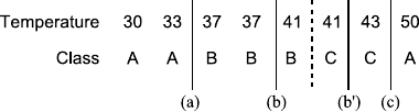
214 8 Finding Explanations
Fig. 8.3 A numerical
attribute together with class
values and a few possible
splits
for such variables and worry about how to actually find those splits a tad later.
A small example for a numerical attribute (top row) and the corresponding class
values (bottom row) is shown in Fig. 8.3.
For convenience, we have sorted the training instances (columns showing values
of one input and one class value in this case) according to the numerical attribute.
Clearly, splits can divide the range of the numerical attribute “temperature” only
into two (or more) ranges. Hence, looking at the sorted series of training instances,
we can really only divide this into two pieces, a set of patterns to the left of the
“cut” and a set to the right. One could imaging performing more than one split at
each branching point in the tree, but this can easily be modeled by a series of binary
splits. So in the following we will concentrate on the binary split setup.
In addition, in the case of a decision tree, we need to care about splits that occur
within class boundaries only—why is that? An intuitive explanation is simple: if
we already have instances of one class (e.g., C) in one branch of our considered
split, it really does not make sense to assign any patterns of that class to the other
branch, that is, splitting a uniform subset into even smaller subsets never gives us
any advantage. This, of course, depends on the chosen measure of information gain,
but in most cases, this assumption holds.
Therefore the only split points we need to consider are the splits indicated in
Fig. 8.3. Note that even though we would like to split at the dashed lined (i.e., in
between the patterns of class Band class C), we cannot do this since the value of
temperature is 41 for both instances. So in this particular case we have to consider
neighboring splits, e.g., (b) and (b). This results in four possible splits that we need
to investigate further. And suddenly, the problem can be converted back into the
issue of looking into finding the one best nominal split: we can simply define four
binary variables temp_leq_35,temp_leq_39,temp_leq_42, and temp_
leq_46.5 that take on values of true resp. false when the value of the original
attribute temperature lies below resp. above the specific threshold. We can then
apply the strategies described in the previous section to determine information gains
for each one of these attributes and compare them with other possible splits on
nominal or numerical attributes.
Note that using this approach, a numerical attribute may appear several times
along the branch of a decision tree, each time being split at a different possible
split point. This may make the tree somewhat harder to read. One could circumvent
this by adding nominal values that split the numerical attributes in class-wise pure
ranges only, but especially for somewhat noisy attributes, this will result in many
small bins and subsequently many nominal values for the resulting variable. As we
have seen above, such splits are favored by pure entropy-based information gains
and discouraged by other measures. Either way, these splits will be hard to inter-

8.1 Decision Trees 215
pret as well. So for many practical applications, it is preferable to restrict splits on
numerical attributes to binary divisions.
8.1.3.2 Numerical Target Attributes: Regression Trees
In addition to handling numerical attributes for the feature vector, one is often also
interested in dealing with numerical target values. The underlying issue then turns
from predicting a class (or the probability of an input vector belonging to a certain
class) to the problem of predicting a continuous output value. We call this regres-
sion, and, in case of decision trees, the resulting tree is called a regression tree.
At the same time when Quinlan was discussing algorithms for construction of clas-
sification tree, Breiman and his colleagues described CART (Classification And
Regression Trees, see [5]).2The structure of such a tree is the same as that of the
trees discussed above; the only difference is the leaves: instead of class labels (or
distributions of class labels), the leaves now contain numerical constants. The tree
output is then simply the constant corresponding to the leaf the input pattern ends
up in. So the regression process is straightforward, but what about constructing such
trees from data? Instead of an entropy-based measurement which aims to measure
class impurity, we now need to find a measure for the quality of fit of a tree, or
at least a branch. For this, we can use the sum of squares measurement, discussed
earlier. The sum of squares for a specific node nmay then simply be defined as the
squared mean error of fit:
SME(Dn)=1
|Dn|
(X,Y )∈Dn
(Y −f(x))
2,
where f(n)indicates the constant values assigned to the node n, and Dnare the data
points ending up at the node. Using this quality measure, we can again apply our
decision tree construction algorithm and continue analogously to the classification
case: we greedily investigate all possible splits, determine the error on the respective
splits, combine them (weighted by the respective sizes of the subsets, of course), and
choose the split which results in the biggest reduction of error.
More sophisticated versions of regression trees, so-called model trees, not only
allow for constants in the leaves but more complex functions on all or a subset of the
input variables. However, these trees are much less commonly used, since normal
regression trees are usually sufficient to approximate regression problems. In effect,
model trees allow one to move some of the complexity from the tree structure into
the functions in each leaf, resulting in smaller trees with leaves that are harder to
interpret.
2Quinlan later also developed methods for regression problems, similar to CART.
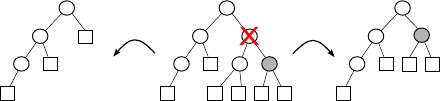
216 8 Finding Explanations
Fig. 8.4 A decision tree
(middle) with one node (red
cross) pruned by subtree
replacement (left) and subtree
raising (right)
8.1.3.3 Pruning
So far we have not really worried much about when to stop growing a tree. Driven
to the extreme, the base algorithm described in Sect. 8.1.2 simply continues until
the tree cannot be refined any further, that is, no split attributes remain to be used,
or the dataset at a node contains one pattern or only patterns of the same class resp.
output value. As we have discussed, this behavior is most likely not desirable since
it leads to overfitting and, in this particular case will also make the interpretation of
the resulting tree unnecessarily complex.
This is why pruning of decision trees gains importance quickly in real-world
applications. Pruning decision trees comes in two variants:
•prepruning refers to the process of stopping the construction of the decision tree
already during the training process, that is, specific splits will not be added since
they do not offer sufficient advantage even though they would produce a (albeit
small) numerical improvement;
•postpruning refers to the reduction of a decision tree which was build to a clearly
overly large size. Here we distinguish two variants; one replaces subtrees with
leaves (subtree replacement), and the other one also removes nodes from within
the tree itself (subtree raising). The latter is substantially more complex since
the instances contained in a node need to be redistributed among the branches
of the raised subtree, and its benefits are questionable since in practice trees rarely
become large enough to make this approach beneficial.
Figure 8.4 illustrates both approaches.
The important question is, independent of when we prune, how do we determine
if a node can be removed (or should not be split in the first place)? Most commonly,
one splits the available data into a training and validation data set, where the training
set is used to determine possible splits, and the validation data then helps to estimate
the split’s actual usefulness. Often a sufficient amount of training data is, however,
not available, and one needs to rely on other measures. One possibility is statistical
tests that help to estimate if expanding a node will likely bring a significant improve-
ment. Quinlan proposes a heuristic which is based on the training data and computes
confidence intervals for each node. From these, a standard Bernoulli-based estimate
(see Sect. A.3 in the appendix) is used to determine which nodes can be pruned.
The statistical foundation of this method is somewhat shaky, but it works well in
practice. Other ways for pruning are based on measures for complexity, similar to
the split information we discussed above. The Minimum Description Principle (see
Sect. 5.5.4.1) can help to weight the expected improvement in accuracy over the
required enlargement of the model.
8.1 Decision Trees 217
There is also a variant to post pruning which deserves to be mentioned at least
briefly: rule post pruning. We can easily convert a decision tree into a set of indepen-
dent rules by simply creating one rule for each leaf of the final decision tree: the rule
will then consist of a conjunction of conditions found along the branch back to the
root of the tree. We can then apply rule pruning techniques where all conditions in
a rule body which do not affect accuracy of the tree are removed. Note that the final
set of rules then needs to be sorted somehow since the conditions of all rules are not
necessarily disjunct anymore. One usually sorts them by their estimated accuracy
on unseen validation data. We discuss rule generation and processing methods later
in this chapter in more detail.
8.1.3.4 Missing Values
Decision trees make it relatively easy to deal with missing values. Instead of simply
ignoring rows which contain missing values, we can make use of the remaining in-
formation both during training and classification. What all approaches for missing
value handling during training have in common is that they use more or less sophis-
ticated ways to estimate the impact of the missing value on the information gain
measure. The most basic one simply adds a fraction of each class to each partition
if the split attribute’s value is missing for that record. During classification, dealing
with missing attribute values is straightforward: special treatment is only required
if, during tree traversal, a node relies on the value which is missing in the pattern
to be classified. Then the remainder of the tree traversal can be simply done in both
branches and later on, the results that are encountered in the two (or more, if more
than one missing values was encountered) leaves are merged.
8.1.3.5 Additional Notes
Decision trees are one of the most well-known and prominently used examples of
more sophisticated data analysis methods. However, one often forgets that they are
notoriously unstable. Stability means that small changes to the training data, such
as removing just one example, can result in drastic changes in the resulting tree.
This is mostly due to the greedy nature of the underlying algorithm, which never re-
considers chosen splits but is also part of the general nature of the tree structure: two
very similar but not necessarily highly correlated attributes can exchange roles in a
decision tree when a few training examples are added or removed, in turn affecting
the rest of the tree dramatically.
When better, more stable performance is needed but interpretation is not such
an issue, one often refers to forests of decision trees or decision stumps, which
belong to the family of ensemble methods: instead of building one large tree, a set
of differently initialized, much smaller decision trees (“stumps”) are created, and
the classification (or regression) output is created by committee voting. Forests of
trees have the advantage that they are more stable than classical decision trees and
218 8 Finding Explanations
often show superior generalization performance. This type of model class can also
be used for feature selection wrapper methods, such as backward feature elimination
as discussed in Sect. 6.1.1.
There are many other variations of decision trees around: for instance, fuzzy
decision trees [12] which allow one to process imprecise data and handle degrees
of class membership. Other variations allow one to include costs of attributes, that
is, they allow one to consider during the coding phase that different attribute values
may be obtainable at different costs. The result is a decision tree which attempts to
optimize both the quality and the expected cost of processing new instances.
8.2 Bayes Classifiers
Bayes classifiers exploit Bayes’ rule and some simplifying assumptions in order to
model the conditional probability distributions of different classes given the values
of the descriptive attributes. They predict, for each new instance, the most probable
class based on this probability model. Bayes classifiers differ mainly in the kind and
the structure of the simplifying assumptions that are made.
8.2.1 Overview
Let us consider the question: what is the best possible classifier? The obvious and
immediate answer seems to be: a classifier that always predicts the correct class,
that is, the class the instance under consideration actually belongs to. Although
this is certainly the ideal we strive for, it is rarely possible to achieve it in prac-
tice.
A fundamental obstacle is that an instantiation of the available descriptive at-
tributes rarely allows us to single out one class as the obtaining one. Rather, there
are usually several possible classes, either because there exist one or more hidden
(unobserved) attributes that influence the class an instance belongs to, or because
there is some random influence which cannot be predicted in principle (see Sect. 5.4
for a more detailed discussion).
Such a situation may be reflected in the available data by the fact that there are
contradictory instances, that is, instances that coincide in their values for all de-
scriptive attributes but differ in the class they belong to. Note, however, that the
absence of contradictory instances does not guarantee that a perfect classifier is
possible: the fact that no contradictory instances were observed (up to now) does
not imply that they are impossible. Even if the training data set does not contain
contradictory instances, it may still be that future cases, for which we want to pre-
dict the class, contradict each other or contradict instances from the training data
set.
In a situation where there exists no unique class that can be predicted with cer-
tainty, but we still have to predict a single class (and not only a set of possible
8.2 Bayes Classifiers 219
classes), the best we can do is to predict the class that has the highest probability
(provided, of course, that all misclassification costs are equal—unequal misclas-
sification costs are discussed in Sect. 8.2.3). The reason is that this scheme ob-
viously yields (at least on average) the highest number or rate of correct predic-
tions.
If we try to build a classifier that predicts, for any instantiation of the available
descriptive attributes, the most probable class, we face two core problems: (1) how
can we properly estimate which is the most probable class for a given instantiation?
and (2) how can we store all of these estimates in a feasible way, so that they are
easily accessible whenever we have to classify a new case? The second problem
is actually a more fundamental one: if we are able to estimate, but cannot store
efficiently, obtaining the estimates is obviously pointless.
Unfortunately, the most straightforward approach, namely simply storing the
most probable class or a probability distribution over the classes for each possi-
ble instance is clearly infeasible: from a theoretical point of view, a single metric
attribute would give rise to a supercountably infinite number of possible instances.
In addition, even if we concede that in practice metric attributes are measured with
finite precision and thus can have only a finite number of values, the number of
possible instances grows exponentially with the number of attributes.
As a consequence, we have to introduce simplifying assumptions. The most com-
mon is to assume that the descriptive attributes are conditionally independent given
the class (see Sect. A.3.2.3 in the appendix for a definition of this notion), thus re-
ducing the number of needed parameters from the product of the domain sizes to
their sum times the number of classes. However, the disadvantage is that this as-
sumption is very strong and not particularly realistic. Therefore the result is also
known as the naive or even the idiot’s Bayes classifier. Despite this pejorative
name, naive Bayes classifiers perform very well in practice and are highly valued
in domains in which large numbers of descriptive attributes have to be taken into
account (for example, chemical compound and text document classification).
Other simplifying assumptions concern metric (numeric) attributes. They are
usually treated by estimating the parameters of one conditional distribution func-
tion per class—most commonly a normal distribution. Of course, this approach
limits how well the actual distribution can be fitted but has the advantage that it
considerably reduces the number of needed parameters. As a consequence, it may
even become possible to abandon the naive conditional independence assumption:
if we model all metric attributes jointly with one (multivariate) normal distribu-
tion per class, the number of parameters is merely quadratic in the number of
(metric) attributes. The result is known as the full Bayes classifier. Note, how-
ever, that this applies only to metric (numeric) attributes. If categorical attributes
are present, assuming conditional independence or something similar may still be
necessary.
Extensions of the basic approach deal with mitigating the objectionable condi-
tional independence assumption, selecting an appropriate subset of descriptive at-
tributes to simplify the classifier, or incorporating misclassification costs.

220 8 Finding Explanations
8.2.2 Construction
As outlined in the preceding section, we want to construct a classifier that predicts
the most probable class, that is, a classifier that computes its prediction as
pred(x)=arg max
y∈dom(Y ) P(y |x).
Here xis an instantiation of the descriptive attributes, and Yis the class attribute.
Exploiting Bayes’ rule, we can rewrite this formula as3
pred(x)=arg max
y∈dom(Y )
P(x|y)P(y)
P(x).
Since P(x)is independent of the class y, this formula is clearly equivalent to
pred(x)=arg max
y∈dom(Y ) P(x|y)P(y).
Note that this simplification is possible even if we desire not only to predict the
most probable class, but want to report its probability as well. The reason is that by
exploiting the law of total probability we can compute P(x)for any xas
P(x)=
y∈dom(Y )
P(x|y)P(y).
This leads to what is also known as the extended Bayes’ rule:
P(y |x)=P(x|y)P(y)
z∈dom(Y ) P(x|z)P (z) .
It shows that in order to find the class probabilities, it suffices to compute
P(x|y)P(y) for all y∈dom(Y ), and we have to do this anyway in order to find the
maximum.
In the formula pred(x)=argmaxy∈dom(Y ) P(x|y)P(y) the factor P(y)is clearly
manageable: since the number of classes yis limited, we can store their probabil-
ities explicitly. The problem resides with the other factor, that is, with P(x|y):
even if all attributes are categorical, storing the |dom(Y )|·X∈X|dom(X)|needed
probabilities cannot be accomplished unless the number of attributes is very small.
In order to reach a manageable number of parameters, we make the crucial (but
naive) assumption that all descriptive attributes are conditionally independent given
the class (see Sect. A.3.3.4 in the appendix for a more detailed treatment of condi-
tional independence). This allows us to rewrite the classification formula as
pred(x)=arg max
y∈dom(Y ) P(y)
X∈X
P(x |y),
3Since one or more of them may be metric, we may have to use a probability density function fto
refer to descriptive attributes: f(x|y). However, we ignore such notational subtleties here.

8.2 Bayes Classifiers 221
where xis the element of the data tuple xthat refers to the descriptive attribute X.
This is the core classification formula of the naive Bayes classifier.
If an attribute Xis categorical, the corresponding factor P(x |y) is fairly eas-
ily manageable: it takes only |dom(X)|·|dom(Y )|parameters to store it explicitly.
However, if Xis metric, a distribution assumption is needed to store the correspond-
ing conditional probability density f(x |y). The most common choice is a normal
distribution f(x|y) =N(μX|y,σ2
X|y)with parameters μX|y(mean) and σ2
X|y(vari-
ance).
Once we have the above classification formula, estimating the model parameters
becomes very simple. Given a data set D={(x1,y
1),...,(xn,y
n)},weuse
∀y∈dom(Y ) :ˆ
P(y)=γ+ny
γ|dom(Y )|+n
as an estimate for the prior class probability4and
∀y∈dom(Y ) :∀x∈dom(X) :ˆ
P(x|y) =γ+nxy
γ|dom(X)|+ny
as an estimate for the conditional probabilities of the values of a categorical descrip-
tive attribute Xgiven the class. The nyand nxy in these formulas are defined as
ny=
n
i=1
τ(y
i=y) and nxy =
n
i=1
τxi[X]=x∧yi=y,
where xi[X]is the value that attribute Xhas in the ith tuple, and yiis the class of
the i-tuple (that is, the value of the class attribute Y). The function τis a kind of
truth function, that is, τ(ϕ)=1ifϕis true and 0 otherwise. Hence, nyis simply the
number of sample cases belonging to class y, and nxy is the number of sample cases
in class yfor which the attribute Xhas the value x.
Finally, γis a constant that is known as Laplace correction. It may be chosen
as γ=0, thus reducing the procedure to simple maximum likelihood estimation
(see Sect. A.4.2.3 in the appendix for more details on maximum likelihood estima-
tion). However, in order to appropriately treat categorical attribute values that do not
occur with some class in the given data set but may nevertheless be possible, it is
advisable to choose γ>0. This also renders the estimation more robust, especially
for a small sample size (small data set or small number of cases for a given class).
Clearly, the larger the value of γ, the stronger the tendency toward a uniform distri-
bution. Common choices are γ=1, γ=1
2,orγ=γ0
|dom(X)|·|dom(Y )|, where γ0is a
user-specified constant that is known as the equivalent sample size (since it can be
justified with an argument from Bayesian statistics, where it represents the weight
of the prior distribution, measured as the size of a sample having the same effect).
4This is a prior probability, because it describes the class probability before observing the values
of any descriptive attributes.

222 8 Finding Explanations
For a metric (numeric) attribute X, a (conditional) normal distribution is com-
monly assumed (see above), that is, it is assumed that
f(x|y) =NμX|y,σ2
X|y=1
√2πσX|y
exp−(x −μX|y)2
2σ2
X|y.
The parameters μX|yand σ2
X|yof this conditional density function are estimated as
ˆμX|y=1
ny
n
i=1
τ(y
i=y) ·xi[X]and
ˆσ2
X|y=1
n
y
n
i=1
τ(y
i=y) ·xi[X]−ˆμX|y2,
where either n
y=ny(maximum likelihood estimator) or n
y=ny−1 (unbiased
estimator for the variance) is chosen. (See Sect. A.4.2 in the appendix for more
details about estimators and their desirable properties.)
As already briefly mentioned above, the normal distribution assumption also per-
mits us to treat all metric attributes jointly if we assume that their distribution can
be modeled with a multivariate normal distribution, that is,
f(xM|y) =1
(2π)|XM|
2|ΣXM|y|
exp−1
2(xM−μXM|y)Σ−1
XM|y(xM−μXM|y),
where XMis the set of metric attributes, and xMis the vector of values of these
attributes. The (class-conditional) mean vectors μXM|yand the corresponding co-
variance matrices ΣXM|ycan be estimated from a given data set Xas
∀y∈dom(Y ) :ˆμXM|y=1
ny
n
i=1
τ(y
i=y) ·xi[XM]
and ˆ
ΣXM|y=1
n
y
n
i=1
τ(y
i=y)
×xi[XM]−μXM|yxi[XM]−μXM|y,
with either n
y=nyor n
y=ny−1 (as above). If all attributes are metric, the result
is
pred(x)=argmax
yP(y)f(x|y),
that is, the core classification formula of the full Bayes classifier.
As a consequence, the classification formula for a mixed Bayes classifier is
pred(x)=argmax
yP(y)f(xM|y)
X∈XC
P(x |y),
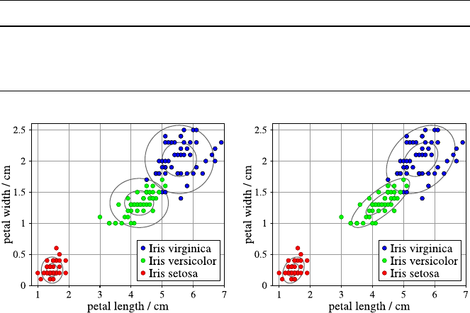
8.2 Bayes Classifiers 223
Table 8.2 A naive Bayes classifier for the iris data. The class-conditional normal distributions are
described by ˆμ±ˆσ(that is, expected value ±standard deviation)
Iris type Iris setosa Iris versicolor Iris virginica
Prior probability 0.333 0.333 0.333
Petal length 1.46 ±0.17 4.26 ±0.46 5.55 ±0.55
Petal width 0.24 ±0.11 1.33 ±0.20 2.03 ±0.27
Fig. 8.5 Naive Bayes density functions for the Iris data (axes-parallel ellipses, left) and density
functions that take the covariance of the two measures into account (general ellipses, right). The
ellipses are the 1 ˆσ-and2ˆσ-boundaries (lines of equal probability density)
where XCis the set of categorical attributes. In a mixed Bayes classifier the metric
attributes are modeled with a multivariate normal distribution (as in a full Bayes
classifier), while the categorical attributes are treated with the help of the conditional
independence assumption (as in a naive Bayes classifier).
In order to illustrate the effect of the conditional independence assumption, we
consider a naive Bayes classifier for the well-known iris data [2,8]. The goal is
to predict the iris type (Iris setosa, Iris versicolor, or Iris virginica) from measure-
ments of the length and width of the petals and sepals. Here we confine ourselves
to the measurements of the petals, which are most informative w.r.t. the class. The
parameters of a naive Bayes classifier, derived with a normal distribution assump-
tion, are shown in Table 8.2, and its graphical illustration in Fig. 8.5 on the left.
In addition, Fig. 8.5 contains, on the right, an illustration of a full Bayes classifier,
in which the two descriptive attributes (petal length and width) are modeled with
class-conditional bivariate normal distributions.
These diagrams show that the conditional independence assumption is expressed
by the orientation of the ellipses, which are lines of equal probability density: in a
naive Bayes classifier, the major axes of these ellipses are always parallel to the co-
ordinate axes, while a full Bayes classifier allows them to have arbitrary directions.
As a consequence, the dependence of the attributes petal length and width can be
modeled better, especially for Iris versicolor.
224 8 Finding Explanations
8.2.3 Variations and Issues
Bayes classifiers have been extended in several ways, for example, by mitigating
the conditional independence assumption (Sect. 8.2.3.3) and by taking misclassifi-
cation costs into account (Sect. 8.2.3.5). In addition, we argue in this section why
naive Bayes classifiers often perform very well despite the strong independence as-
sumptions they make (Sect. 8.2.3.1), study how full Bayes classifiers are related
to linear discriminant analysis (Sect. 8.2.3.2), and consider how missing values are
handled in Bayes classifiers (Sect. 8.2.3.4).
8.2.3.1 Performance
The naive assumption that the descriptive attributes are conditionally independent
given the class attribute is clearly objectionable: it is rarely (exactly) satisfied in
practice. Even in the simple iris classification example studied above it does not
hold. Nevertheless, naive Bayes classifiers usually perform surprisingly well and are
often not much worse than much more sophisticated and complicated classifiers.
The reasons for this behavior are investigated in detail in [7], where it is revealed
that the good performance of naive Bayes classifiers is less surprising than one may
think at first sight. In a nutshell, this behavior is due to the fact that a classifier is
usually evaluated with accuracy or 0–1 loss, that is, it is simply counted how often
it makes a correct prediction (on test data). However, in order to make a correct
prediction, it is not necessary that the class probabilities are predicted with high
accuracy. It suffices that the most probable class receives the highest probability
assignment.
For example, in a classification problem with only two classes, the true proba-
bility of class 1 given some instantiation of the descriptive attributes may be 94%.
If a naive Bayes classifier predicts it to be 51% instead, it wildly misestimates this
probability but still yields the correct classification result.
In a large fraction of all cases in which the conditional independence assump-
tion is not satisfied, the effect of this assumption is mainly the distortion of the
probability distribution, while the most probable class remains the same for most
instantiations. Therefore the classification performance can still be very good, and
this is what one actually observes in practice on many (though not all) data sets.
Note also that, even though it sounds highly plausible, it is not the case that
a (naive) Bayes classifier can only profit from additional attributes. There are cases
where additional attributes actually worsen the prediction performance, even if these
additional attributes carry information about the class. An example is shown in
Fig. 8.6: a naive Bayes classifier that uses only the horizontal axis to discriminate
between cases belonging to class •from cases belonging to class ◦yields a per-
fect result (solid line). However, if the vertical axis is also used, the classification
boundary changes because of the diagonal location of the mass of the data points
(dashed line). As a consequence, two instances are misclassified, namely the data
point marked with •at the top and the data point marked with ◦at the bottom.
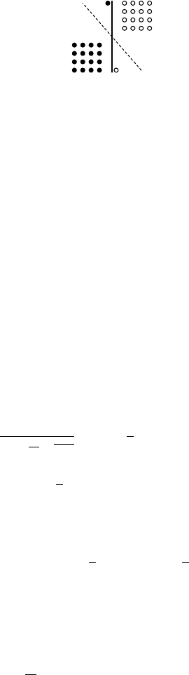
8.2 Bayes Classifiers 225
Fig. 8.6 The classification performance of a (naive) Bayes classifier need not get better if addi-
tional attributes are used. In this example adding the vertical axis, despite its being informative,
yields a worse classification accuracy than using the horizontal axis alone, which allows for a
perfect classification of the data points
8.2.3.2 Linear Discriminant Analysis
Linear discriminant analysis, as developed by Fisher [8], can be seen as a special
case of a full Bayes classifier, which results from additional simplifying assump-
tions. In the first place, this is a method for discriminating between two classes,
while more classes have to be handled by ensembles of classifiers (see Sect. 9.4).
In addition, linear discriminant analysis assumes that the class-conditional multi-
variate normal distributions have the same shape. Formally, this means that they
have the same covariance matrix and differ only in their mean vectors. As a conse-
quence, the class boundary becomes a straight line (in two dimensions) or generally
a hyperplane, thus explaining the name linear discriminant analysis.
Since there are only two classes, it is common to use a decision function, which
is simply the difference of the class probability estimates:
dec(x)=1
(2π)|X|
2√|Σ|exp−1
2(x−μ1)Σ−1(x−μ1)
−exp−1
2(x−μ0)Σ−1(x−μ0).
Class 1 is predicted if the decision function is positive, class 0 if it is negative:
pred(x)=1
2sgn(dec(x)) +1
2.
In the decision function, μ0and μ1are the mean vectors for the two classes that
are estimated in the same way as for a full Bayes classifier. In order to estimate the
covariance matrix, however, the data points from the two classes are pooled:
ˆ
Σ=1
n
n
i=1xi[X]−ˆμyixi[X]−ˆμyi,
where either n=nor n=n−1 (as usually for variance estimation, see
Sect. A.4.2.1 in the appendix). That is, the covariance matrix is computed from
the difference vectors of the data points to their respective class means.
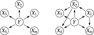
226 8 Finding Explanations
This pooling of data points is possible because of the assumption that the class-
conditional density functions have the same shape. It has the advantage that the
covariance estimate becomes more robust (since it is computed from more data
points) but also the disadvantage that it misrepresents the density functions if the
assumption of equal shape is not valid.
8.2.3.3 Augmented Naive Bayes Classifiers
Bayes classifiers can be seen as a special case of Bayes networks. Although we can-
not provide here a comprehensive treatment of Bayes network (an interested reader
is referred to, for instance, [4,13] for an in-depth treatment), we try to capture some
basics, because otherwise the name of the most common augmented naive Bayes
classifier remains mysterious. The core idea underlying Bayes networks is to ex-
ploit conditional independence statements that hold in a multidimensional proba-
bility distribution, to decompose the distribution function. This already shows the
connection to Bayes classifiers, in which we also factorize the joint probability dis-
tribution of the descriptive attributes based on the assumption that they are condi-
tionally independent given the class.
The other core ingredient of Bayes networks is that, generally, the set of con-
ditional independence statements that hold in a probability distribution has proper-
ties that are highly analogous to those of certain separation statements in graphs or
networks. As a consequence, the idea suggests itself to use graphs or networks to
express these conditional independence statements in a concise and intuitive form.
Although we cannot go into the full formal details here, we would like to mention
that a naive Bayes classifier is a Bayes network with a star-like structure, see Fig. 8.7
on the left: all edges are directed from the class attribute Yat the center to the de-
scriptive attributes X1,...,X
m. This graph structure expresses the conditional inde-
pendence assumption by a graph-theoretic criterion that is known as d-separation:
any path from a descriptive attribute Xito another attribute Xj,i=j, is blocked by
the class attribute Yif it is known (details can be found, for instance, in [4]).
Drawing on the theory of representing conditional independencies by graphs or
networks, these conditional independence assumptions can be mitigated by adding
edges between descriptive attributes that are not conditionally independent given
the class, see Fig. 8.7 on the right: the direct connections between these attributes
express that even if the class is known, and thus the path through the class attribute
Fig. 8.7 A naive Bayes classifier is a Bayes network with a star-like structure (with the class
attribute at the center). Additional edges can mitigate the conditional independence assumptions

8.2 Bayes Classifiers 227
is blocked, the two attributes are still dependent on each other. In this case the clas-
sification formula of a Bayes classifier is generalized with the standard factorization
formula for a Bayes network, namely to
pred(x)=argmax
y∈YP(y)
X∈X
Px|parents(X),
where parents(X) denotes the set of parents of the attribute Xin the graph structure.
Clearly, with a purely star-like structure (as in Fig. 8.7 on the left), this formula coin-
cides with the standard classification formula of a naive Bayes classifier, because in
a purely star-like structure the class attribute Yis the only parent of any descriptive
attribute. If, however, there are additional edges, a descriptive attribute may have
additional parents (other than the class attribute Y) on which it depends and which
are needed in order to compute the correct conditional probability.
The most common form of a Bayes classifier that is extended in this way is the
tree-augmented naive Bayes classifier (TAN) [9,10]. In this classifier the number
of parents of each descriptive attribute is restricted to two: the class attribute Yand
at most one descriptive attribute. Since Bayes networks are required to be acyclic
directed graphs (that is, there must not be a directed path connecting a node to itself),
this constraint allows at most edges forming a tree to be added to the star structure of
a naive Bayes classifier (and hence the name tree-augmented naive Bayes classifier).
The standard way to choose the additional edges is to construct a maximum
weight spanning tree for the descriptive attributes with conditional mutual infor-
mation providing the edge weights. This measure is defined as
I(X
i,X
j|Y)=H(X
i|Y)+H(X
j|Y)−H(X
i,X
j|Y)
=
xi∈dom(Xi)
xj∈dom(Xj)
y∈dom(Y )
P(x
i,x
j,y)
×log2
P(x
i,x
j|y)
P(x
i|y) ·P(x
j|y)
for two descriptive attributes Xiand Xj, conditional on the class attribute Y,
where Hdenotes the Shannon entropy. This procedure has the advantage that it se-
lects those edges that, under the tree constraint, produce a Bayes network that yields
the smallest Kullback–Leibler information divergence between the actual multivari-
ate probability distribution and the probability distribution represented by the Bayes
network/classifier. The edges may then be directed by choosing an arbitrary descrip-
tive attribute as the root of the added tree and directing all added edges away from
it.
More general augmented Bayes classifiers, which allow for more edges than just
a directed tree to be added, together with methods for selecting the edges resulting
in a good classifier, have been studied, for example, in [14,20]. They are generally
Bayes networks in which one variable representing the class attribute plays a special
role, so that all computations are directed toward it.
228 8 Finding Explanations
8.2.3.4 Missing Values
Handling missing values is particularly easy in naive Bayes classifiers. In the con-
struction step, it is convenient that the (conditional) distributions refer to at most two
attributes, namely the class and at most one conditioned attribute. Therefore data
points that are only partially known (that is, miss some attribute values) can still be
used for the estimation: they are useless only for estimating those distributions that
involve one of the attributes for which the value is missing. For all other attributes,
the data point can be exploited. The only exception is the case for which the class is
unknown, since the class is involved in all relevant (conditional) distributions.
In the execution step—that is, when a naive Bayes classifier is employed to com-
pute a prediction for a new case—the factors of the classification formula, which
refer to attributes the values of which are unknown, are simply dropped. The pre-
diction computed in this way is the same as that of a naive Bayes classifier which
has been constructed on the subspace of those attributes that are known for the sam-
ple case under consideration. Hence a naive Bayes classifier can flexibly adapt to
whatever subset of the descriptive attributes is known.
The situation is less convenient for a full Bayes classifier: since all descriptive at-
tributes are treated jointly (no conditional independence assumption), a single miss-
ing value can already make it impossible to use the sample case in the estimation
of the class-conditional distributions. With a multivariate normal distribution as-
sumption, however, the case may still be used to estimate the covariances of known
attribute pairs. One merely has to keep track of the different values of n, which
may be different for each element of the covariance matrix. In the execution step
integrating the class-conditional multivariate normal distributions over unknown at-
tributes provides a means of computing a prediction despite the fact that values are
missing.
8.2.3.5 Misclassification Costs
Up to now we assumed that the costs of misclassifying an instance do not depend on
the true class of the instance. In practice, however, these costs usually differ. Con-
sider, for example, medical diagnosis: if a sick patient is misclassified as healthy, the
consequences are usually much more severe than if a healthy patient is misclassified
as sick. In the former case, the disease is left untreated and thus may develop into
a severe state that may cause considerable harm to the patient. In the latter case the
actually healthy status of the patient will likely be discovered by future tests.
Another example is the task to select customers for a special mail advertisement.
In this case one would like to send the mail only to those customers that will actually
buy the advertised product, that is, the class to predict is whether the customer buys
or not. In this case misclassifying a nonbuying customer as buying incurs only a
relatively small loss, namely, the cost of a useless mailing. However, if a buying
customer is misclassified as nonbuying and thus does not receive the mailing (and
therefore does not buy, because he/she never gets to know about the offer), the costs
are high, because the selling company loses the revenue it could have made.
8.3 Regression 229
Since Bayes classifiers predict a class by estimating the probability of the dif-
ferent possible classes and then selecting the most probable one, misclassification
costs can fairly easily be incorporated into the process. Suppose that we model the
misclassification costs with a cost function c(y), which assigns to each class ythe
costs of wrongly classifying an instance of this class as belonging to some other
class y. Then the classification formula should be modified to
pred(x)=arg min
y∈dom(Y ) c(y)1−P(y |x).
In this way a class with nonmaximal probability may be predicted if the costs for
misclassifying an instance of it as belonging to some other class are high.
A more complicated situation is where we are given misclassification costs in the
form of a matrix Cof size dom(Y ) ×dom(Y ). Each element cyz of this matrix states
the costs of misclassifying an instance of class yas belonging to class z. Naturally,
the diagonal elements cyy are all zero (as these refer to a correct classification). In
this case the classification formula is modified to
pred(x)=arg min
y∈dom(Y )
z∈dom(Y )
czy P(z|x).
With this prediction procedure, the expected costs (under the induced probability
model) that result from possible misclassifications are minimized.
Note that both this and the previous modified classification formula reduce to the
standard case (that is, predicting the most probable class) where all costs are equal:
pred(x)=arg min
y∈dom(Y )
z∈dom(Y )−{y}
c·P(z|x)
=arg min
y∈dom(Y ) c·1−P(y |x)
=arg max
y∈dom(Y ) P(y |x),
where cdenotes the (equal) misclassification costs.
8.3 Regression
Generally, regression is the process of fitting a real-valued function of a given class
to a given data set by minimizing some cost functional, most often the sum of
squared errors. Most commonly, the fitting function is linear, which allows for a
direct solution. Actually, for any polynomial, the solution that minimizes the sum of
squared errors can be computed with methods from linear algebra. Transformations,
like logistic regression, allow us to use more general function classes and still to ob-
tain a direct solution. In other cases, gradient descent methods can be employed.
230 8 Finding Explanations
8.3.1 Overview
Up to now we considered classification, that is, the task to predict a class from a
finite set of possible classes. However, in many applications the quantity to predict
is not categorical, but rather metric (numerical), whether it is the price of the shares
of a given company, the electrical power consumption in a given area, the demand
for a given product, etc. In such cases classification techniques may, in principle,
still be applied, but doing so requires us to discretize the quantity to predict into a
finite set of intervals, which are then considered as the classes. Clearly, however, a
better approach is to use a prediction method that can yield a numeric output.
The main problem of such an approach is that (physical) measurement values
rarely show the exact relationship between the considered quantities, because they
are inevitably afflicted by errors. If one wants to determine the relationship between
the considered quantities nevertheless, at least approximately, one faces the task to
find a function that fits the given data as well as possible, so that the measurement er-
rors are “neutralized.” Naturally, for such an approach, one should possess at least a
conjecture about how the target attribute (in statistics also called the response vari-
able) depends on the descriptive attributes (in statistics also called the explanatory
or regressor variables), so that one can choose a (parameterized) function class and
thus can reduce the problem to a parameter estimation task. This choice is a critical
issue: if a chosen function class does not fit the data (for example, if one tries to fit a
linear function to nonlinear data), the result can be completely useless, because the
function cannot, in principle, be made to fit the data.5
Generally, one has to be particularly careful not to choose a function class with
too many degrees of freedom (too many free parameters), as this invites overfitting.
For example, any set of ndata points with one explanatory and one response variable
can be fitted perfectly with a polynomial of degree n−1 (and thus nfree parame-
ters). An example with eight data points is shown in Fig. 8.8 (blue curve: polynomial
Fig. 8.8 The function class for regression has to be chosen with care. If a very complex function is
chosen, a perfect fit can be achieved, but this fit does not allow for reliable inter- or extrapolations.
A simpler function, although it fits the training data less well, is usually a much better predictor for
new function values
5For more details see also Sect. 5.4.
8.3 Regression 231
of degree 7). Clearly, even though the blue curve fits the data points perfectly, it is
completely useless for interpolation or extrapolation purposes: it is not likely that a
data point with a value for the explanatory variable (x-axis) other than those of the
given data points actually has a value for the response variable (y-axis) so that it lies
on the blue curve. This is particularly obvious for points with an x-value beyond 8.
A better fit of this data set can be obtained with a simple straight line (shown in
black). Intuitively, interpolating or extrapolating the values of the response variable
based on this straight line are much more likely to yield a useful result.
In order to deal with the unavoidable measurement errors and to achieve a good
fit to the data within the limitations imposed by the choice of the function class,
we have to choose a cost function that penalizes (at least large) deviations from the
actual values. The most common cost function is the sum of squared errors (SSE),
with which the approach is also known as the method of least squares (OLS for
“ordinary least squares”). It has the advantage that for a large family of parameter-
ized function classes—in particular, any polynomial of the explanatory variables—
the solution (that is, the set of parameters yielding the least sum of squared errors)
can be obtained by taking derivatives and applying simple methods from linear al-
gebra. However, it has the disadvantage that outliers, either in the explanatory or
the response variable, can have a distorting effect due to the fact that the errors
are squared, and thus outliers strongly influence the estimation. As a consequence,
other cost functions—like the sum of absolute errors or functions that limit the
contribution of a single data point to the total cost to a certain maximum—are also
used.
Once the (parameterized) function class and the cost function have been chosen,
the model construction process is straightforward: try to find the set of parameters
that identifies the function from the chosen class that minimizes the costs. Whether
the result is unique or not and whether it can be computed directly or has to be found
by an iterative improvement procedure (like gradient descent) depends mainly on the
cost function used. As we will see below, a direct solution can be obtained for any
polynomial as the function class and the sum of squared errors as the cost function.
8.3.2 Construction
We start our description of the model construction procedure with the simplest case,
finding a linear regression function for a single explanatory variable. In this case
one has to determine the parameters aand bof a straight line y=f(x)=a+bx.
However, due to the unavoidable measurement errors, it will usually not be possible
to find a straight line such that all ndata points (xi,y
i),1≤i≤n, lie exactly on this
straight line. Rather we have to find a straight line from which the given data points
deviate as little as possible. Hence it is plausible to determine the parameters aand b
in such a way that the sum of squared deviations, that is,
F(a,b)=
n
i=1f(x
i)−yi2=
n
i=1
(a +bxi−yi)2,

232 8 Finding Explanations
is minimal. In other words, the y-values that are computed with the linear equation
should (in total) deviate as little as possible from the measured values. The reasons
for choosing squared deviations are twofold: (1) by using squares the error function
becomes continuously differentiable everywhere (whereas the derivative of the sum
of absolute errors is discontinuous/does not exist at zero), and (2) the squares weight
larger deviations higher, so that individual large deviations are avoided.6
A necessary condition for a minimum of the error function F(a,b) is that the
partial derivatives of this function w.r.t. the parameters aand bvanish, that is,
∂F
∂a =
n
i=1
2(a +bxi−yi)=0 and ∂F
∂b =
n
i=1
2(a +bxi−yi)xi=0.
As a consequence, we obtain (after a few simple steps) the so-called normal equa-
tions
na +n
i=1
xib=
n
i=1
yiand n
i=1
xia+n
i=1
x2
ib=
n
i=1
xiyi,
that is, a linear two-equation system with two unknowns aand b. It can be shown
that this equation system has a unique solution unless all x-values are identical and
that this solution specifies a minimum of the function F. The straight line deter-
mined in this way is called regression line for the data set (x1,y
1),...,(x
n,y
n).
Note that finding a regression line can also be seen as a maximum likelihood
estimation (see Sect. A.4.2.3 in the appendix) of the parameters of the linear model
Y=aX +b+ξ,
where Xis a random variable with arbitrary distribution, and ξis a normally dis-
tributed random variable with mean 0 and arbitrary variance (but independent of
the value of X). The parameters that minimize the sum of squared deviations (in
y-direction) from the data points maximize the probability of the data given this
model class.
In order to illustrate the procedure, we consider a simple example. Let the fol-
lowing data set be given, which consists of eight data points (x1,y
1),...,(x
8,y
8):
x12345678
y13234356
The regression line computed with the above procedure is
y=3
4+7
12x.
6Note, however, that this second property can also be a disadvantage, as it can make outliers have
an overly strong influence on the regression result.
8.3 Regression 233
This line is shown in Fig. 8.8 on page 230 in black. Obviously, it provides a reason-
able fit to the data and may be used to interpolate between or to extrapolate the data
points.
The least squares method is not limited to straight lines but can be extended (at
least) to regression polynomials. In this case one tries to find a polynomial
y=p(x) =a0+a1x+···+amxm,
with a given fixed degree m, which best fits the ndata points (x1,y
1),...,(x
n,y
n).
Consequently, we have to minimize the error function
F(a
0,a
1,...,a
m)=
n
i=1p(xi)−yi2=
n
i=1a0+a1xi+···+amxm
i−yi2.
In analogy to the linear case, we form the partial derivatives of this function w.r.t. the
parameters ak,0≤k≤m, and equate them to zero (as this is a necessary condition
for a minimum). The resulting system of linear equations (m+1 unknowns and
m+1 equations) can be solved with one of the standard methods of linear algebra
(elimination method according to Gauß, inverting the coefficient matrix, etc.).
Note that finding a regression polynomial can also be interpreted as a maximum
likelihood estimation of the parameters (as it was possible for linear regression) if
one assumes a normally distributed error term ξthat is independent of Xand Y.
Furthermore, the least squares method can be used for functions with more than
one argument. This case is known as multivariate regression. We consider only
multilinear regression, that is, we are given a data set ((x1,y
1),...,(xn,y
n)) with
input vectors xiand the corresponding responses yi,1≤i≤n, for which we want
to determine the linear regression function
y=f(x
1,...,x
m)=a0+
m
k=1
akxk.
In order to derive the normal equations, it is convenient to write the functional to
minimize in matrix form, that is, as
F(a)=(Xa −y)(Xa −y), (8.1)
where
X=⎛
⎜
⎝
1x11 ... x
1m
.
.
..
.
.....
.
.
1xn1... x
nm
⎞
⎟
⎠and y=⎛
⎜
⎝
y1
.
.
.
yn
⎞
⎟
⎠(8.2)
represent the data set, and a=(a0,a
1,...,a
m)is the vector of coefficients we have
to determine. (Note that the ones in the matrix Xrefer to the coefficient a0.) Again
a necessary condition for a minimum is that the partial derivatives of this function

234 8 Finding Explanations
w.r.t. the coefficients ak,0≤k≤m, vanish. Using the differential operator ∇,we
can write these conditions as
∇aF(a)=d
daF(a)=∂
∂a0F(a), ∂
∂a1F(a), . . . , ∂
∂am
F(a)=0.
The derivative can most easily be computed by realizing that formally the differen-
tial operator
∇a=∂
∂a0,∂
∂a1,..., ∂
∂am
behaves like a vector (as one can easily confirm by writing out the computations).
As a consequence, we obtain
0=∇
a(Xa −y)(Xa −y)
=∇a(Xa −y)(Xa −y)+(Xa −y)∇a(Xa −y)
=∇a(Xa −y)(Xa −y)+∇a(Xa −y)(Xa −y)
=2X(Xa −y)
=2XXa −2Xy,
from which we immediately obtain the system of normal equations
XXa =Xy.
This system is (uniquely) solvable iff XXis invertible. In this case we have
a=XX−1Xy.
The expression (XX)−1Xis also known as the (Moore–Penrose) pseudo-inverse
of the (usually nonsquare) matrix X[1]. With this pseudo-inverse matrix, the solu-
tion of the regression task can be written down immediately.
It should be clear that the least squares method can also be extended to polynomi-
als in multiple explanatory variables. In this case one starts most conveniently from
the above matrix representation but also enters into the matrix Xall monomials (that
is, products of powers of the regressors, up to a given degree) that can be formed
from the explanatory variables. Formally, these can be seen as additional inputs. In
this way the derivation of the normal equations remains unchanged and can be used
directly to find the solution.
8.3.3 Variations and Issues
As we have seen above, an analytical solution of the least squares problem can
easily be obtained for polynomials. However, by exploiting transformations (for

8.3 Regression 235
example, the logit-transformation), the regression approach can also be applied for
other functions classes (Sect. 8.3.3.1). As least squares regression is sensitive to
outliers, several more robust methods have been developed (Sect. 8.3.3.3). Finally,
methods to automatically select the function class, at least from a wider family of
functions of different complexity, may be worth considering (Sect. 8.3.3.4).
8.3.3.1 Transformations
In certain special cases the procedure described above can also be used to find other
regression functions. In order for this to be possible, one has to find a suitable trans-
formation which reduces the problem to the problem of finding a regression line or
regression polynomial. For example, regression functions of the form
y=axb
can be found by finding a regression line. By simply taking the (natural) logarithm
of this equation, we arrive at
lny=ln a+b·ln x.
This equation can be handled by finding a regression line if we take the (natural)
logarithms of the data points (xi,y
i),1≤i≤n,seta=ln a, and then carry out all
computation with these transformed values.
It should be noted, though, that with such an approach, only the sum of squared
errors in the transformed space (coordinates x=ln xand y=ln y) is minimized,
but not necessarily also the sum of squared errors in the original space (coordi-
nates xand y). Nevertheless, this approach often yields good results. In addition,
one may use the result only as a good starting point for a subsequent gradient de-
scent (see generally Sect. 5.3, also Sect. 9.2 on training artificial neural network, and
Sect. 8.3.3.2 below) in the original space, with which the solution can be improved,
and the true minimum in the original space may be obtained.
For practical purposes, it is important that one can transform the logistic func-
tion,
y=ymax
1+ea+bx ,
where ymax,a, and bare constants, to the linear or polynomial case (so-called logis-
tic regression). The logistic function is relevant for many applications, because it
describes growth processes with a limit, for example, the growth of an animal pop-
ulation with a habitat of limited size or the sales of a (new) product with a limited
market. In addition, it is popular in artificial neural networks (especially multilayer
perceptrons, see Sect. 9.2), where it is often used as the activation function of the
neurons.
In order to linearize the logistic function, we first take the reciprocal values
1
y=1+ea+bx
ymax .

236 8 Finding Explanations
As a consequence, we have
ymax −y
y=ea+bx.
Taking the (natural) logarithm of this equation yields
lnymax −y
y=a+bx.
Obviously, this equation can be handled by finding a regression line if we transform
the y-values of all data points according to the left-hand side of the above equation.
(Note that the value of ymax, which mainly scales the values, must be known.) This
transformation is known under the name logit transformation and can be seen as
an inverse of the logistic function. By finding a regression line for the transformed
data points, we obtain a logistic regression curve for the original data points.
However, note again that this procedure minimizes the sum of squared errors
in the transformed space (coordinates xand z=ln(ymax−y
y)), but not necessarily
also the sum of squared errors in the original space (coordinates xand y). If one
needs to know parameter values that actually describe the minimum of the sum of
squared errors in the original space, one may (as above) use the obtained solution
as a starting point, which is then improved with a gradient descent (see Sect. 8.3.3.2
below).
In order to illustrate the procedure, we consider a simple example. Let the follow-
ing simple data set be given that consists of five data points (x1,y
1),...,(x
5,y
5):
x12345
y0.4 1.0 3.0 5.0 5.6
By transforming these data points with the logit transformation using ymax =6 and
finding a regression line for the result, we obtain
z≈4.133 −1.3775x,
and thus, for the original data, the logistic regression curve is
y≈6
1+e4.133−1.3775x.
These two regression functions are shown together with the (transformed or origi-
nal) data points in Fig. 8.9.
8.3.3.2 Gradient Descent
If a transformation was applied in order to reduce a more complex functional rela-
tionship to the polynomial case, the sum of squared errors is, as emphasized above,
minimized only in the transformed space, but not necessarily in the original space.
8.3 Regression 237
Fig. 8.9 Transformed data (left) and original data (right) as well as the regression line (left)and
the corresponding logistic regression curve (right) computed with the method of least squares
Hence there is room for improvement, which may be achieved by using the solution
that is obtained by solving the system of normal equations in the transformed space
only as an initial point in the parameter space of the regression model. This initial
solution is then iteratively improved by gradient descent (see Sect. 5.3 for a general
treatment), that is, by repeatedly computing the gradient of the objective function
(here, the sum of squared errors) at the current point in the parameter space and then
making a small step in this direction.
If the functional relationship is logistic (as in the example in the previous sec-
tion), this procedure is actually equivalent to training a multilayer perceptron with-
out a hidden layer (so actually a two-layer perceptron, with only an input layer and
one output neuron) with standard error backpropagation, provided, of course, that
the activation function of the output neuron is logistic. Details for this special case
can be found in Sect. 9.2.
8.3.3.3 Robust Regression
As pointed out above, solutions of (ordinary) least squares regression can be
strongly affected by outliers. More robust results can usually be obtained by mini-
mizing the sum of absolute deviations (least absolute deviations, LAD). However,
this approach has the disadvantage of not being analytically solvable (like least
squares) and thus has to be addressed with iterative methods right from the start.
In addition, least absolute deviation solutions can be unstable in the sense that small
changes in the data can lead to “jumps” (discontinuous changes) of the solution pa-
rameters, while least squares solutions always changes “smoothly” (continuously).
Finally, severe outliers can still have a distorting effect on the solution.
As a consequence, more sophisticated regression methods, categorized as robust
regression, have been developed in order to improve robustness. Among these are
M-estimation and S-estimation for regression and least trimmed squares (LTS),
the latter of which simply uses a subset of at least half the size of the data set (with
the exact size to be specified by a user) that yields the smallest sum of squared
errors.

238 8 Finding Explanations
Table 8.3 Error measures ρ
for different approaches Method ρ(e)
Least squares e2
Huber 1
2e2if |e|≤k,
k|e|−1
2k2if |e|>k.
Tukey’s bisquare ⎧
⎨
⎩
k2
6(1−(1−(e
k)2)3)if |e|≤k,
k2
6if |e|>k.
As an example for robust regression, we take a closer look at M-estimators. Let
us revisit the linear regression problem as it was formulated in (8.1) and (8.2). We
rewrite the error function (8.1), i.e., the sum of squared errors, to be minimized in
the form
n
i=1
ρ(ei)=
n
i=1
ρx
ia−yi,(8.3)
where ρ(ei)=e2
i, and eiis the (signed) error of the regression function at the ith
point. Is this the only reasonable choice for the function ρ? The answer is definitely
no. However, ρshould satisfy at least some reasonable restrictions. ρshould always
be positive, except for the case ei=0. Then we should have ρ(ei)=0.Thesignof
the error eishould not matter for ρ, and ρshould be increasing when the absolute
value of the error increases. These requirements can formalized in the following
way:
ρ(e) ≥0,(8.4)
ρ(0)=0,(8.5)
ρ(e) =ρ(−e), (8.6)
ρ(ei)≥ρ(ej)if |ei|≥|ej|.(8.7)
Parameter estimation (here the estimation of the parameter vector b) based on an
objective function of the form (8.3) and an error measure satisfying (8.4)–(8.7)is
called an M-estimator. The classical least squares approach is based on the quadratic
error, i.e. ρ(e) =e2. Table 8.3 provides the error measure ρfor the classical least
squares method and for two approaches from robust statistics.
In order to understand the more general setting of an error measure ρsatisfy-
ing (8.4)–(8.7), it is useful to consider the derivative of the error measure ψ=ρ.
Taking the derivatives of the objective function (8.3) with respect to the parame-
ters ai, we obtain the system of (m +1)linear equations
n
i=1
ψix
ia−yix
i=0.(8.8)

8.3 Regression 239
Table 8.4 The computation
of the weights for the
corresponding approaches
Method w(e)
Least squares 1
Huber 1if|e|≤k,
k/|e|if |e|>k.
Tukey’s bisquare (1−(e
k)2)2if |e|≤k,
0if|e|>k.
Defining w(e) =ψ(e)/e and wi=w(ei), Equation (8.8) can be rewritten in the
form
n
i=1
ψi(x
ia−yi)
ei·ei·x
i=
n
i=1
wi·yi−x
ib·x
i=0.(8.9)
Solving this system of linear equations corresponds to solving a standard least
squares problem with (nonfixed) weights in the form
n
i=1
wie2
i.(8.10)
However, the weights widepend on the residuals ei, the residuals depend on the
coefficients ai, and the coefficients depend on the weights. Therefore, it is in general
not possible to provide an explicit solution to the system of equations. Instead, the
following iteration scheme is applied.
1. Choose an initial solution a(0), for instance, the standard least squares solution
setting all weights to wi=1.
2. In each iteration step t, calculate the residuals e(t−1)and the corresponding
weights w(t−1)=w(e(t−1))determined by the previous step.
3. Compute the solution of the weighted least squares problem n
i=1wie2
iwhich
leads to
a(t) =XW(t−1)X−1XW(t−1)y,(8.11)
where Wstands for the diagonal matrix with weights wion the diagonal.
Table 8.4 lists the formulae for the weights in the regression scheme based on the
error measures listed in Table 8.3.
Figure 8.10 shows the graph of the error measure ρand the weighting function
for the standard least squares approach. The error measure ρincreases in a quadratic
manner with increasing distance. The weights are always constant. This means that
extreme outliers will have full influence on the regression coefficients and can cor-
rupt the result completely.
In the more robust approach by Huber the change of the error measure ρswitches
from a quadratic increase for small errors to a linear increase for larger errors. As a
240 8 Finding Explanations
Fig. 8.10 The error measure ρand the weight wfor the standard least squares approach
Fig. 8.11 The error measure ρand the weight wfor Huber’s approach
Fig. 8.12 The error measure ρand the weight wfor the bisquare approach
result, only data points with small errors will have the full influence on the regres-
sion coefficients. For extreme outliers, the weights tend to zero. This is illustrated
by the corresponding graphs in Fig. 8.11.
Tukey’s bisquare approach is even more drastic than Huber’s approach. For larger
errors, the error measure ρdoes not increase at all but remains constant. As a con-
sequence, the weights for outliers drop to zero when they are too far away from the
regression curve. This means that extreme outliers have no influence on the regres-
sion curve at all. The corresponding graphs for the error measure and the weights
are shown in Fig. 8.12.
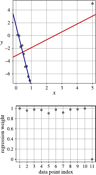
8.3 Regression 241
Fig. 8.13 Least squares (red)
vs. robust regression (blue)
Fig. 8.14 The weights for
the robust regression function
in Fig. 8.13
To illustrate how robust regression works, consider the simple regression prob-
lem in Fig. 8.13. There is one outlier that leads to the red regression line that neither
fits the outlier nor the other points. With robust regression, for instance, based on
Tukey’s ρ-function, we obtain the blue regression line that simply ignores the out-
lier.
An additional result in robust regression is the computed weights for the data
points. The weights for the regression problem in Fig. 8.13 are plotted in Fig. 8.14.
All weights, except one, have a value close to 1. The right-most weight with the
value close to 0 is the weight for the outlier. In this way, outlier can be identified
by robust regression. This applies also to the case of multivariate regression where
we cannot simply plot the regression function as in Fig. 8.13. But the weights can
still be computed and plotted. We can also take a closer look at the data points with
low weights for the regression function. They might be exceptional cases or even
erroneous measurements.
8.3.3.4 Function Selection
In their basic form, regression approaches require a conjecture about the form of the
functional relationship between the involved variables, so that the task only consists
242 8 Finding Explanations
in estimating its parameters. However, sometimes several different function classes
present themselves as reasonable hypotheses. For example, one may be reasonably
sure that the relationship can be described by a polynomial but does not know the
degree. In such a case one can try to determine the function class automatically with
an approach that is based on the minimum description length principle.
The core idea of this principle is to imagine that the training data has to be trans-
mitted as efficiently as possible (that is, using a message of minimal length) from
a sender to a receiver, possibly using a model to code the data. In this way it be-
comes possible to measure the complexity of the model (which, if used, needs to be
specified in the message, so that the receiver can decode the data) and the data on
the same scale, namely as the length of a message describing it. Therefore one goes
through the different functions in the hypothesized family, builds the best model for
each function, and then determines which model, if used to code the data, yields the
shortest message (model description plus data description).
Applied to regression, this general principle takes the form that one considers
functions that sum different numbers of monomials (products of powers of the re-
gressors). The coefficients of these monomials are determined to build the model
(using the techniques described above). The model description consists of a speci-
fication of the monomials that are used in the function and an encoding of the cor-
responding coefficients (for which a finite precision has to be fixed) plus a variance
for the deviations of the response values from the function. The data is described by
specifying how far the value of the response variable differs from the value predicted
by the model, assuming a normal distribution with the specified variance for coding.
Another approach to select an appropriate function is based on bias/variance de-
composition (see Sect. 5.4.5): a more complex function has a lower bias, because it
can adapt better to the actual function due to its larger number of degrees of freedom
(larger number of free parameters). However, it leads to a higher variance, because
the more parameters have to be estimated, the less reliable these estimates become.
As a consequence, we would like to minimize the total, that is, lower the bias only
as far as the gain is not eaten up by an increased variance.
8.3.4 Two Class Problems
Even though mainly directed at numeric prediction problems, regression, especially
logistic regression, is also a popular method for solving classification problems with
two classes. That is, each given data point is assigned to one of two classes, and we
desire to find a function (a so-called discrimination function) that maps the values
of the other, descriptive attributes to a class. More precisely, we desire to find a
function that models the probability of one of the classes for the different points in
the data space. In this way the classification problem is conveniently mapped to a
numeric prediction problem, and, in addition, the classifier yields not only a class but
also a confidence value, namely the class probability. This approach is particularly
popular in the finance industry to model the credit-worthiness of customers.

8.3 Regression 243
Formally the problem to solve can be described as follows: let Ybe a
class attribute with the domain dom(Y ) ={c1,c
2}, and X=(X1,...,X
m)an
m-dimensional random vector. Furthermore, let
P(Y =c1|X=x)=p(x)and thus
P(Y =c2|X=x)=1−p(x).
Finally, let a data set D={(x1,y
1),...,(xn,y
n)}be given, the elements of which
are assigned to one of the classes c1or c2(that is, yi=c1or yi=c2for i=
1,...,n).
We desire to find a reasonably simple description of the function p(x), the pa-
rameters of which have to be estimated from the data set X. A common approach is
to model p(x)as a logistic function, that is, as
p(x)=1
1+ea0+ax =1
1+exp(a0+r
i=1aixi).
By applying the logit-transformation we discussed in Sect. 8.3.3.1, we obtain
ln1−p(x)
p(x)=a0+ax =a0+
r
i=1
aixi,
that is, a multilinear regression problem, which can easily be solved with the tech-
niques introduced above.
What remains to be clarified is how we determine the values p(x)that enter the
above equation. If the data space is small enough, so that there are sufficiently many
realizations for every possible point (that is, for every possible instantiation of the
random variables X1,...,X
m), we may estimate the class probabilities simply as
the relative frequencies of the classes (see Sect. A.4.2 in the appendix).
If this is not the case, we may rely on an approach known as kernel estimation
in order to determine the class probabilities at the data points. The basic idea of
such an estimation is to define a kernel function Kwhich describes how strongly
a data point influences the estimation of the probability (density) at a neighboring
point (see Sect. 9.1.3.1 for a related approach in connection with k-nearest-neighbor
classifiers and Sect. 9.3 on support vector machines). The most common choice is a
Gaussian function, that is,
K(x,y)=1
(2πσ2)m
2
exp−(x−y)(x−y)
2σ2,
where the variance σ2has to be chosen by a user. With the help of this kernel
function the probability density at a point xis estimated from an (unclassified) data
set D={x1,...,xn}as
ˆ
f(x)=1
n
n
i=1
K(x,xi).

244 8 Finding Explanations
If we deal with a two-class problem, one estimates the class probabilities by relating
the probability density resulting from datapoints of one of the classes to the total
probability density. That is, we estimate
ˆp(x)=n
i=1c(xi)K(x,xi)
n
i=1K(x,xi),
where
c(xi)=1ifxibelongs to class c1,
0ifxibelongs to class c2.
Solving the resulting regression problem yields a (multidimensional) logistic func-
tion, which describes the probability of one of the two classes for the points of the
data space. For this function, one has to choose a threshold value: if the function
value exceeds the threshold, the class the function refers to is predicted; otherwise
the other class is predicted. Note that with such a threshold a linear separation of the
input space is described (see also Sect. 9.3).
If this method is used in finance to assess the credit-worthiness of a customer,
one of the classes means that the loan applied for is granted, while the other means
that the application is declined. As a consequence, several threshold values are cho-
sen, which refer to different loan conditions (interest rate, liquidation rate, required
securities, loan duration, etc.)
8.4 Rule learning
The last type of explanation-based methods that we are discussing in this chapter are
rule learning methods. In contrast to association rule learners as discussed before,
we are now concentrating on algorithms that generate sets of rules which explain
all of the training data. Hence we are interested in a global rule system vs. associ-
ation rules that are a collection of local models. These local models can be highly
redundant (and they usually are), and we expect a global rule system to explain the
data reasonably free of overlaps. Rule systems are one of the easiest ways (if not
the easiest way) to express knowledge in a human-readable form. By the end of this
section we hope to have given a better understanding what these types of methods
can achieve and why they are still relatively unknown to data analysis practitioners.
Rule Learning algorithms can be roughly divided into two types of methods.
Simple, “if this fact is true, then that fact holds”-type rules and more complex rules
which allow one to include variables, something along the lines of “if x has wings
then x is a bird”.7The first type of rules are called propositional rules and will
be discussed first. Afterwards we will then discuss first-order rules or the field of
inductive logic programming as this area of rule learning is often also called.
7Note that we are not saying much about the truthfulness or precision of rules at this stage.
8.4 Rule learning 245
8.4.1 Propositional Rules
Propositional rules are rules consisting of atomic facts and combinations of those
using logical operators. In contrast to first-order logic (see next section), no variables
are allowed to be part of those rules. A simple propositional classification rule could
look like this:
IF x1≤10 AND x3=red THEN class A.
Note that we have an antecedent part of the rule (to the left of THEN) indicating
the conditions to be fulfilled in order for the consequent part (to the right) to be
true. As with typical implications, we do not know anything about the truth value
of the consequent if the antecedent does not hold. The atomic facts of propositional
rules more commonly occurring in data analysis tasks are constraints on individual
attributes:
•constraints on numerical attributes, such as greater/smaller (-or-equal) than a con-
stant, equality (usually for integer values) or containment in given intervals;
•constraints on nominal attributes, such as checks for equality or containment in a
set of possible values;
•constraints on ordinal attributes, which add range checks to the list of possible
constraints on numeric attributes.
The rule above shows examples for a numerical constraint and a constraint on a
nominal attribute. How can we now find such rules given a set of training instances?
8.4.1.1 Extracting Rules from Decision Trees
One very straight forward way to find propositional rules was already presented
earlier in this chapter: we can simply train a decision tree and extract the rules from
the resulting representation. The tree shown in Fig. 8.2 can also be interpreted as
four (mutually exclusive—we will get back to this in a second) rules:
Ra:IF temperature ≤20 THEN class “cold”
Rb:IF temperature >20 AND humidity ≤50 THEN class “comfortable”
Rc:IF temperature ∈(20,35]AND humidity >50 THEN class “comfortable”
Rd:IF temperature >35 AND humidity >50 THEN class “unbearable”
Those rules are simply generated by traversing the tree from each leaf up to the root
and collecting the conditions along the way. Note that in rule Rcwe collapsed the
two tests on temperature into one. Since the rules are disjunctive and disjunction is
commutative, this does not alter the antecedent.
Rules extracted from decision trees have two interesting properties:
246 8 Finding Explanations
•mutual exclusivity: this means that a pattern will be explained by one rule only.
This stems from the origin of the rules: they were generated from a hierarchical
structure where each branch partitions the feature space into two disjoint parti-
tions.
•unordered: the rules are extracted in arbitrary order from the tree, that is, no rule
has preference over any other one. This is not a problem since only one (and
exactly one!) rule will apply to a training pattern. However, as we will see later,
rules can also overlap, and then a conflict avoidance strategy may be needed: one
such strategy requires rules to be ordered, and the first on that matches is the one
creating the response.
Creating rules from decision trees is straightforward and uses well-established
and efficient training algorithms. However, we inherit all of the disadvantages of
decision tree learning algorithms (most notably with respect to their notorious in-
stability!), and the rules can also be quite redundant. We can sometimes avoid this
redundancy by transforming the rule set into a set of ordered rules:
R1:IF temperature ≤20 THEN class “cold”
R2:IF humidity ≤50 THEN class “comfortable”
R3:IF temperature ≤25 THEN class “comfortable”
R4:IF true THEN class “unbearable”
Now we really need to apply these rules in the correct order, but then they still
represent exactly the same function as the original decision tree and the unordered
rule set shown before. This type of conversion only works because we have an un-
balanced tree—no branch going to the left actually carries a subtree. So we could
simply assign labels for those branches and carry the rest forward to the next rule
describing the branch to the right. In general, simplifying rule sets extracting from
decision trees are considerably more complex.
8.4.1.2 Extracting Propositional Rules
Real-world propositional Rule Learners can essentially be categorized by looking at
two properties, supported attribute types and learning strategy. There are a number
of algorithms that learn rules on nominal attributes only and a second class which
concentrates on learning rules for numerical attributes. The second categorization
looks at the strategy: most if not all rule learning methods are either specializing or
generalizing, that is, they start with very specific rules and make them more general
until they fit the training data or they start with one very general rule and iteratively
divide and/or specialize the rules until no further conflicts with the training data
are encountered. Specializing and generalizing rules are concepts which are more
formally defined in [15], however, for the purpose of this chapter, it suffices to un-
derstand that we can increase (or decrease) a rule’s support and thereby increase

8.4 Rule learning 247
(or decrease) the set of training patterns that fall within the influence of that rule’s
constraint.
The first type of rule learners generally starts with a set of extremely small special
rules. In the extreme, these will be rules centered on one or more training examples
having constraints that limit numerical values to the exact value of that instance and
a precise match of the nominal value. So, for a training instance (v,k) with
v=(12,3.5,red),
such a rule would look like
IF x1=12 AND x2=3.5 AND x3=‘red’ THEN class k.
There are two typical generalization operators that can now be applied iteratively.
If we start with one rule, we will attempt to make this rule cover more training
instances by finding one (usually the closest) example that can be included in this
rule without including any other example. A second training instance (v2,k) with
v2=(12.3,3.5,blue)
would result in a revised rule
IF x1∈[12,12.3]AND x2=3.5AND x3=‘red’ OR ‘blue’ THEN class k.
Alternatively, we can also combine two rules into a new one, paying attention that
we are not accidentally including a third rule of different class. The first approach
(extending rules by covering one additional example) can be seen as a special case
of the second approach (merging two rules) since we can always model a single
training example as a (very) specific rule.
More generally, we can regard these training algorithms as a heuristic greedy
search which iteratively tries to make rules more general by either merging two rules
of the original set or by enlarging one rule to cover an additional training example.8
The biggest question is then which two rules (or one rule and training example) to
pick in the next step and how to do the generalization in order to merge the rules
(or cover the additional example). As with all greedy algorithms, no matter how
these two questions are answered, the resulting algorithm will usually not return
the optimal set of rules, but in most cases the result will be relatively close to the
optimum.
Specializing Rule Learners operate exactly the opposite way. They start with very
general rules, in the extreme with one rule of the following form:
IF true THEN class k
8Note that this is a substantial deviation from the abstract concepts of rule learners in Mitchell’s
version space setup: real-world rule learners usually do not investigate all more general (or more
specific) rules but only a subset of those chosen by the employed heuristic(s).

248 8 Finding Explanations
Table 8.5 The basic
algorithm to learn a set
of rules
Algorithm BuildRuleSet(D,p
min)
input: training data D
parameter: performance threshold pmin
output: a rule set Rmatching Dwith performance ≥pmin
1R=∅
2Drest =D
3while (Performance(R, Drest)<p
min)
4r=FindOneGoodRule(Drest)
5R=R∪{r}
6Drest =Drest −covered(r, Drest)
7endwhile
8return R
for each class k. Then they iteratively attempt to avoid misclassifications by special-
izing these rules, i.e., adding new or narrowing existing constraints.
We have now, of course, not yet really talked about learning more than one rule;
all we know is how to generate one rule for a data set. However, it is quite optimistic
to assume that one simple rule will be sufficient to explain a complex real-world data
set. Most rule learning algorithms hence wrap this “one rule learning” approach into
an outer loop, which tries to construct an entire set of rules. This outer loop often
employs a set covering strategy, also known as sequential covering and generically
looks as shown in Table 8.5.
The initialization (steps 1 and 2) creates an empty set of rules Rand sets the
training instances which are still to be explained to the entire dataset. The while
loop runs into the performance of the rule set R, reaches a certain threshold pmin
and iteratively creates a new rule r, adds it to the rule base R, and removes the
instances it covers from the “still to be explained” instances. Once the threshold is
reached, the resulting rule set is returned.
The biggest variations in existing implementations of this base algorithm are the
chosen error measure to measure the performance of a given rule (or sets of rules)
and the strategy to find one good rule which optimizes this performance criterion.
One of the earlier and still very prominent methods is called CN2 [6] and uses a
simple generalizing rule searching heuristic as shown in Table 8.6.
This routine essentially performs a search for all hypothesis starting with a gen-
eral one (line 1 and 2) and iteratively specializing them (line 4). During each it-
eration, the so far best hypothesis is remembered (line 5). There are two heuristics
involved controlling the specialization (line 4) and the termination criteria; the latter
is done in line 6, where all newly generated hypotheses which do not fulfill a valid-
ity criteria are eliminated. For this, CN2 uses a significance test on the dataset. The
specialization in line 4 returns only consistent, maximally specific hypotheses. In
line 8, finally, a rule is assembled, assigning to the chosen antecedent the majority
class of the patterns covered by the best hypothesis.
CN2 therefore not only returns 100% correct hypotheses but also rules which do
make some errors on the training data—the amount of this error is controlled by the
statistical significance test in the update-routing used in line 6. The CN2 algorithm

8.4 Rule learning 249
Table 8.6 The algorithm to learn one rule as used in CN2
Algorithm FindOneGoodRule(Drest)
input: (subset of) training data Drest
output: one good rule rexplaining some instance of the training data
1hbest =true
2Hcandidates ={hbest}
3while Hcandidates =∅
4Hcandidates =specialize(Hcandidates)
5hbest =argmaxh∈Hcandidates∪{hbest}{Performance(h, Drest)}
6 update(Hcandidates)
7endwhile
8return IF hbest THEN argmaxk{|coveredk(hbest,Drest)|}
essentially performs a beam search with variable beam width (controlled by the
significance test) and evaluates all hypotheses generated within the beam based on
the performance criteria used also in the main algorithm.
We have not yet specified which attribute types we are dealing with, the “special-
ized” routine just assumes that we know how to specialize (or generalize in other
types of algorithms) our rules. For nominal attributes it is pretty straightforward:
specialization removes individual values from the set of allowed ones, and general-
ization adds some. In the extreme we have either only one value left (leaving none
does not make much sense as it results in a rule that is never valid) or all possible
values, resulting in a constraint that is always true. But what about numerical val-
ues? The most specific case is easy as it translates an equality to one exact numerical
value. Also the most generic case is simple: it results in an interval from minus to
plus infinity. But also generalizing a numerical constraint so that it contains a value
it previously did not contain is simple: we only have to expand the interval so that
it uses this new value either as new lower or upper bound, depending on which side
of the interval the value lied. Specializing is a bit more complicated as we have
two options. In order to move a specific value out of a given numerical interval,
we can either move the lower or upper bound to be just above (or below) the given
value. This is one point where heuristics start playing a role. However, the much
bigger impact of heuristics happens during multidimensional specialization opera-
tions. Figure 8.15 illustrates this for the case of two numerical attributes. On the
left we show how we can generalize a given rule (solid line) to cover an additional
training instance (cross). The new rule (dashed lines) is given without any ambigu-
ity. On the right we show a given rule (solid line) and four possibilities to avoid a
given conflict (cross). Note that the different rectangles are not drawn right on top of
each other as they should be but slightly apart for better visibility. It is obvious that
we have a number of choices and this number will not decrease with an increase in
dimensionality.
However, there is one big problem with all of the current propositional rule in-
duction approaches following the above schema: for real-world data sets, they tend
to generate an enormous amount of rules. Each one of these rules is, of course, inter-
pretable and hence fulfills the requirements of the methods described in this chapter.
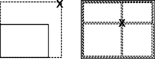
250 8 Finding Explanations
Fig. 8.15 A simple example
for two-dimensional rule
generalization (left)and
generalization (right)
However, the overall set of rules is often a way too large to be even remotely com-
prehensible. Some approaches have been proposed to learn hierarchical rule models
or find rules with outlier models, but those have not yet gained great prominence,
in part also because they rely on a set of heuristics which are hard to control. In the
following section we discuss a few approaches that try to address this problem.
8.4.1.3 Other Types of Propositional Rule Learners
In order to handle the larger number of rules, various approaches have been pro-
posed. Some simply prune rules by their importance, which is usually measured by
the number of patterns they cover. Others include the minimum description length
principle to balance the complexity (e.g., length) of a rule against the amount of
data it covers. Similarly to decision tree learning, we can of course here also employ
pruning strategies to reduce collapse several rules into one or completely eliminate
them. Other approaches attempt to further reduce the number of rules by looking
at their discriminative power between classes or other measures of interestingness.
The most prominent such measure is the J-measure [11], which essentially esti-
mates how dissimilar the a priori and a posteriori beliefs about the rule’s consequent
are. Only if these two likelihoods are substantially different, a rule is potentially in-
teresting. In the J-measure this difference is additionally weighted by the generality
of the rule (probability that the rule’s conditional part holds), because the rule be-
comes the more interesting the more often it applies. See Chap. 5for further details
on some of these techniques.
Note that in the toy setup, as used in the Version Spaces, another very elegant
way to dramatically reduce the number of matching rules was presented: by only
reporting the most general and most specific rules which cover the training data, the
entire part of the lattice in between these two boundaries is reported as well. Un-
fortunately this cannot as easily be applied to rules stemming from real-world data
since coverage will hardly ever be exactly 100%. However, the setup described in
Sect. 7.6.3.3, where we describe a propositional rule learning system finding asso-
ciation rules, uses a related strategy. Also, here it is hard to dig through the resulting
list of association rules. However, looking at closed or maximum itemsets (and the
resulting association rules) drastically reduces the set of rules to consider. So we,
in effect, report only the most specific rules describing a local aspect of the training
data.
One of the reasons why propositional rule learners tend to produce excessive
numbers of rules, especially in numerical feature spaces, is the sharp boundaries
they attempt to impose. If training instances of different class are not separable by
8.4 Rule learning 251
axes parallel lines in some reasonably large local area, the rule learning algorithms
are forced to introduce many small rules to model these relationships. Often the
precise nature of these boundaries is not interesting or, worse, caused only by noisy
data in the first place. To be able to incorporate this imprecision into the learning
process, a large number of fuzzy rule learners have been introduced. They are all
using the notion of fuzzy sets which allows one to model degrees of membership
(to rules in this case) and hence results in the ability to model gray zones where
areas of different class overlap. Fuzzy rule systems have the interesting side ef-
fect that it is possible to express a fuzzy rule system as a system of differentiable
equations of the norm and membership functions are used accordingly. Then other
adaptation methods can be applied, often motivated by work in the neural network
community. The resulting Neuro-Fuzzy systems allow one, for instance, to use ex-
pert knowledge to initialize a set of fuzzy rules and then employ a gradient descent
training algorithm to update those rules to better fit training data. In addition Takagi–
Sugeno–Kang-type fuzzy rules also allow one to build regression systems based on
fuzzy antecedents and (local) regression consequents. We refer to [3] for more de-
tails on fuzzy rules and the corresponding training methods and [16] for details on
Neuro-Fuzzy systems.
8.4.2 Inductive Logic Programming or First-Order Rules
Propositional rules are quite limited in their expressive power. If we want to express
aruleoftheform
IF xis Father of yAND yis female THEN yis Daughter of x
using propositional rules, we would need to enumerate all possible values for xand
yand put those pairs into individual rules. In order to express such types of rules,
we need to introduce variables. First Order rules allow one to do just that and are
based on only a few base constructs:
•constants, such as Bob, Luise, red, green,
•variables, such as xand yin the example above,
•predicates, such as is_father(x, y), which produce truth values as a result, and
•functions, such as age(x), which produce constants.
From this we can construct
•terms which are constants, variables, or functions applied to a term,
•literals, which are predicates (or negations of predicates) applied to any set of
terms,
•ground literals, which are literals that do not contain a variable,
•clauses, which are disjunctions of literals whose variables are universally quanti-
fied, and
•horn clause, which are clauses with at most one positive literal.
252 8 Finding Explanations
The latter is especially interesting because any disjunction with at most one positive
literal can be written as
H∨¬L1∨···∨¬Ln
ˆ=H⇒(L1∧···∧Ln)
ˆ=IF L1AND ...AND L2THEN H.
So horn clauses express rules and H,thehead of the rule, is the consequent, and the
Litogether form the body or consequent.
Horn clauses are also used to express Prolog programs, which is also the reason
why learning first-order rules is often referred to as inductive logic programming
(ILP) , because we can see this as learning (Prolog) programs, not only sets of rules.
We talk about substitutions which denote any replacement, called binding of vari-
ables in a literal with appropriate constants. A rule body is satisfied if at least one
binding exists that satisfies the literals. A few example rules are:
•simple rules:
IF xis Parent of yAND yis male THEN xis Father of y
•existentially qualified variables (zin this case):
IF yis Parent of zAND zis Parent of xTHEN xis Granddaughter of y
•Recursive rules:
IF xis Parent of zAND zis Anchestor of yTHEN xis Anchestor of y
IF xis Parent of yTHEN xis Anchestor of y
Inductive Logic Programming allows one to learn concepts also from data spread
out over several multirelation databases—without the need for previous integration
as discussed in Sect. 6.5. But how do we learn these types of rules from data? A num-
ber of learning methods have been proposed recently, and we will explain one of
earlier algorithms in more detail in the following section.
FOIL, the First Order Inductive Learning method developed by Quinlan [19],
operates very similar to the rule learners we have discussed in the previous section.
It also follows the strategy of a sequential covering approach—the only difference
being the inner FindOneGoodRule() routine. It creates not quite Horn clauses but
something very similar besides two differences:
•the rules learned by FOIL are more restrictive in that they do not allow literals to
contain function symbols (this reduces the hypothesis space dramatically!), and
•FOIL rules are more expressive than Horn clauses because they allow literals in
the body to be negated.
The FindOneGoodRule() routine of FOIL again specializes candidate rules
greedily. It does so by adding literals one by one where these new literals can be
one of the following:
•P(v1,...,vr), where P is any predicate name occurring in the set of available
predicates. At least one of the variables must already be present in the original
rule, the others can be either new or existing;
8.5 Finding Explanations in Practice 253
•Equal(x,y), where xand yare variables already present in the rule; or
•the negation of either of the above forms of literals.
How does FOIL now pick the “best” specialization to continue? For this, Quinlan
introduced a measure (FoilGain) which essentially estimates the utility of the new
added literal by comparing the number of positive and negative bindings of the
original and the extended rules.
This is, of course, a system that does not scale well with large, real-world data
sets. ILP systems are in general not heavily used for real data analysis. They are
more interesting for concept learning in data sets with purely nominal values and/or
structured data sets. However, some of the ideas are used in other applications such
as molecular fragment mining.
8.5 Finding Explanations in Practice
Finding explanations is, similar to finding patterns, a central piece of any analytics
software. The main difference is the way the extracted model is presented to the
user: earlier tools produced long lists of rules or other ASCII representations, but
nowadays tools increasingly offer interactive views which allow one to select in-
dividual parts of an explanation, e.g., a leaf in a decision tree, and propagate this
selection to other views on the underlying data—see Sect. 4.8 for a more detailed
discussion of this type of visual brushing. KNIME is, of course, inherently bet-
ter suited for such type of visual explorations, but also R offers quite a number of
graphical representations of the discovered explanations.
8.5.1 Finding Explanations with KNIME
When constructing decision trees in data mining software, a number of options are
available. KNIME allows one to adjust the information gain criteria and a number
of other options. Figure 8.16 (left) shows the dialog of the native KNIME decision
tree learner. We need to first and foremost select the target attribute (class—it has
to be a nominal attribute, a string in this case). Afterwards, we can choose between
two different ways to compute the information gain (Gini index and Gain ratio) and
if a pruning of the tree is to be performed (KNIME offers to either skip pruning
or performs a minimum description length (MDL)-based pruning). Most of the re-
maining options are self-explanatory or related to the hiliting support of KNIME
(number of records to be stored for the interaction). Noteworthy is the last option
“number threads,” which allows one to control how many threads KNIME can use
to execute the learning method in parallel on, e.g., a multicore machine. Once the
node is run, we can display the resulting decision tree. Figure 8.16 (right) shows
the resulting tree for the training part of the iris data, which, hopefully, shows in-
teresting insights into the structure of the data. The KNIME view shows the color
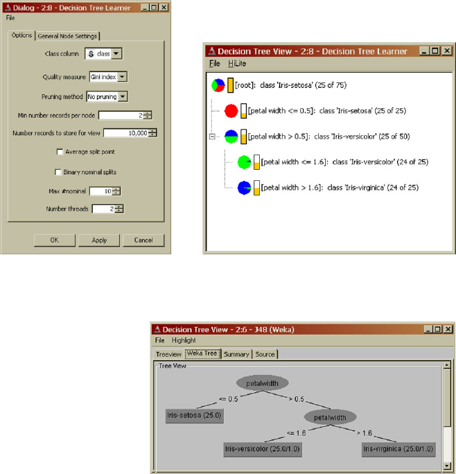
254 8 Finding Explanations
Fig. 8.16 The KNIME dialog of the decision tree construction node (left) along with the tree view
(right) after running on the training part of the iris data
Fig. 8.17 Through the Weka
integration, KNIME also
offers access to the vast
variety of algorithm and
views contained in the
open-source data mining
library Weka
distribution (if available) for each node of the tree, along with the split attribute and
the majority class. The numbers in brackets show the number of training patterns
classified correctly together with the overall number of training patterns falling into
this branch. Additionally, the fraction of patterns falling into splits are displayed by
the vertical orange bar charts. The Weka decision tree learning node works sim-
ilarly. Although the Weka j4.8 (an implementation following closely the original
c4.5, revision 8 version of Quinlan’s algorithm) offers more options to fine tune
the training algorithm, most of those options will hardly be used in practice. After
installing the Weka integration, all learning and clustering algorithms are available
as individual nodes in KNIME as well. Additionally, also the Weka views are ac-
cessible. Figure 8.17 shows the view of the Weka decision tree nodes. The Weka
integration also offers access to a regression tree implementation, which is—as of
version 2.1—not yet available in KNIME.
Many other explanation finding methods are available in KNIME, among them,
Naive Bayes, as described in Sect. 8.2. The corresponding node in KNIME produces
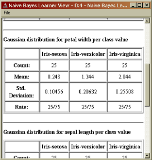
8.5 Finding Explanations in Practice 255
Fig. 8.18 KNIME’s Naive
Bayes Learner shows the
distribution parameters in the
node view
the class-conditional probabilities or normal distributions which can be inspected in
the node’s view. Figure 8.18 shows this for the Iris data. This corresponds to the
distribution parameters listed in Table 8.2, fortunately. KNIME also provides nodes
for Linear, Polynomial, and Logistic Regression. For rule learning, a constructive
fuzzy rule learning method is available, and through the Weka integration, also other
rule learners can be accessed. Those methods are all accessible via individual nodes,
and their dialogs (and inline documentation) should explain the available options
sufficiently.
8.5.2 Using Explanations with R
8.5.2.1 Decision Trees
R also allows for much finer control of the decision tree construction. The script
below demonstrates how to create a simple tree for the Iris data set using a training
set of 100 records. Then the tree is displayed, and a confusion matrix for the test
set—the remaining 50 records of the Iris data set—is printed. The libraries rpart,
which comes along with the standard installation of R, and rattle, that needs to
be installed, are required:
>library(rpart)
> iris.train <- c(sample(1:150,75))
> iris.dtree <- rpart(Species~.,data=iris,
subset=iris.train)
>library(rattle)
> drawTreeNodes(iris.dtree)
>table(predict(iris.dtree,iris[-iris.train,],
type="class"),
iris[-iris.train,"Species"])
256 8 Finding Explanations
In addition to many options related to tree construction, R also offers many ways
to beautify the graphical representation. We refer to R manuals for more details.
8.5.2.2 Naive Bayes Classifers
Naive Bayes classifiers use normal distributions by default for numerical attributes.
The package e1071 must be installed first:
>library(e1071)
> iris.train <- c(sample(1:150,75))
> iris.nbayes <- naiveBayes(Species~.,data=iris,
subset=iris.train)
>table(predict(iris.nbayes,iris[-iris.train,],
type="class"),
iris[-iris.train,"Species"])
As in the example of the decision tree, the Iris data set is split into a training and
a test data set, and the confusion matrix is printed. The parameters for the normal
distributions of the classes can be obtained in the following way:
>print(iris.nbayes)
If Laplace correction should be applied for categorical attribute, this can be
achieved by setting the parameter laplace to the desired value when calling the
function naiveBayes.
8.5.2.3 Regression
Least squares linear regression is implemented by the function lm (linear model).
As an example, we construct a linear regression function to predict the petal width
of the Iris data set based on the other numerical attributes:
> iris.lm <- lm(iris$Petal.Width ~iris$Sepal.Length
+ iris$Sepal.Width + iris$Petal.Length)
>summary(iris.lm)
The summary provides the necessary information about the regression result, in-
cluding the coefficient of the regression function.
If we want to use a polynomial as the regression function, we need to protect the
evaluation of the corresponding power by the function Iinhibiting interpretation.
As an example, we compute a regression function to predict the petal width based
on a quadratic function in the petal length:
> iris.lm <- lm(iris$Petal.Width ~iris$Petal.Length +
I(iris$Petal.Length^2))
8.6 Further Reading 257
Robust regression requires the library MASS, which needs installation. Otherwise
it is handled in the same way as least squares regression, using the function rlm
instead of lm:
> iris.rlm <- rlm(iris$Petal.Width ~iris$Sepal.Length
+ iris$Sepal.Width + iris$Petal.Length)
The default method is based on Huber’s error function. If Tukey’s biweight should
be used, the parameter method should be changed in the following way:
> iris.rlm <- rlm(iris$Petal.Width ~iris$Sepal.Length
+ iris$Sepal.Width + iris$Petal.Length,
method="MM")
A plot of the computed weights can be obtained by the following command:
>plot(iris.rlm$w)
8.6 Further Reading
Explanation Finding Methods are almost always the center piece of data mining
books, so any book on this topic will likely cover most, if not all, of what we dis-
cussed in this chapter. For Decision trees, there are two main directions:
•Classification and Regression Trees (CART), which are covered in much more
detail in the following book: Hastie, T., Tibshirani, R. and Friedman, J.H.: Ele-
ments of Statistical Learning (Springer, 2001).
•Quinlan’s c4.5 algorithm and subsequent improvements, with the original text
book describing c4.5r8: J.R. Quinlan: Induction of Decision Trees (Springer,
1986).
For Bayes and Regression, any more statistically oriented book offers more back-
ground; these (and much more) with a more statistical view are also described in the
book by Hastie, Tibshirani, and Friedman.
Tom Mitchell’s excellent Machine Learning book (McGraw Hill, 1997) intro-
duces the concept of version space learning and also describes decision tree induc-
tion, among others. In order to get a better feeling for how learning systems work
in general, this is highly recommended reading, especially the first half. For fuzzy
rule learning systems, we recommend the chapter on “Fuzzy Logic” in Intelligent
Data Analysis: An Introduction, M.R. Berthold and D.J. Hand (Eds), published by
Springer Verlag (2003) and the book on Foundations of Neuro-Fuzzy Systems by
D. Nauck, F. Klawonn, and R. Kruse (Wiley, 1997). For inductive logic program-
ming, Peter Flach and Nada Lavrac contributed a nice chapter in the Intelligent Data
Analysis book edited by Berthold and Hand.
258 8 Finding Explanations
References
1. Albert, A.: Regression and the Moore–Penrose Pseudoinverse. Academic Press, New York
(1972)
2. Anderson, E.: The irises of the Gaspe Peninsula. Bull. Am. Iris Soc. 59, 2–5 (1935)
3. Berthold, M.R.: Fuzzy logic. In: Berthold, M.R., Hand, D.J. (eds.) Intelligent Data Analysis:
An Introduction, 2nd edn. Springer, Berlin (2003)
4. Borgelt, C., Steinbrecher, M., Kruse, R.: Graphical Models—Representations for Learning,
Reasoning and Data Mining, 2nd edn. Wiley, Chichester (2009)
5. Breiman, L., Friedman, J.H., Olshen, R.A., Stone, C.J.: CART: Classification and Regression
Trees. Wadsworth, Belmont (1983)
6. Clark, P., Niblett, T.: The CN2 induction algorithm. Mach. Learn. 3(4), 261–283 (1989)
7. Domingos, P., Pazzani, M.: On the optimality of the simple Bayesian classifier under zero-one
loss. Mach. Learn. 29, 103–137 (1997)
8. Fisher, R.A.: The use of multiple measurements in taxonomic problems. Ann. Eugen. 7(2),
179–188 (1936)
9. Friedman, N., Goldszmidt, M.: Building classifiers using Bayesian networks. In: Proc. 13th
Nat. Conf. on Artificial Intelligence (AAAI’96, Portland, OR, USA), pp. 1277–1284. AAAI
Press, Menlo Park (1996)
10. Geiger, D.: An entropy-based learning algorithm of Bayesian conditional trees. In: Proc. 8th
Conf. on Uncertainty in Artificial Intelligence (UAI’92, Stanford, CA, USA), pp. 92–97. Mor-
gan Kaufmann, San Mateo (1992)
11. Goodman, R.M., Smyth, P.: An information-theoretic model for rule-based expert systems. In:
Int. Symposium in Information Theory. Kobe, Japan (1988)
12. Janikow, C.Z.: Fuzzy decision trees: issues and methods. IEEE Trans. Syst. Man, Cybern.,
Part B 28(1), 1–14 (1998)
13. Jensen, F.V., Nielsen, T.D.: Bayesian Networks and Decision Graphs, 2nd edn. Springer, Lon-
don (2007)
14. Larrañaga, P., Poza, M., Yurramendi, Y., Murga, R., Kuijpers, C.: Structural learning of
Bayesian networks by genetic algorithms: a performance analysis of control parameters. IEEE
Trans. Pattern Anal. Mach. Intell. 18, 912–926 (1996)
15. Mitchell, T.: Machine Learning. McGraw-Hill, New York (1997)
16. Nauck, D., Klawonn, F., Kruse, R.: Neuro-Fuzzy Systems. Wiley, Chichester (1997)
17. Quinlan, J.R.: Induction of decision trees. Mach. Learn. 1(1), 81–106 (1986)
18. Quinlan, J.R.: C4.5: Programs for Machine Learning. Morgan Kaufmann, San Mateo (1993)
19. Quinlan, J.R., Cameron-Jones, R.M.: FOIL: a midterm report. In: Proc. European Conference
on Machine Learning. Lecture Notes in Computer Science, vol. 667, pp. 3–20. Springer, Berlin
(1993)
20. Sahami, M.: Learning limited dependence Bayesian classifiers. In: Proc. 2nd Int. Conf. on
Knowledge Discovery and Data Mining (KDD’96, Portland, OR, USA), pp. 335–338. AAAI
Press, Menlo Park (1996)
Chapter 9
Finding Predictors
In this chapter we consider methods of constructing predictors for class labels or nu-
meric target attributes. However, in contrast to Chap. 8, where we discussed meth-
ods for basically the same purpose, the methods in this chapter yield models that
do not help much to explain the data or even dispense with models altogether. Nev-
ertheless, they can be useful, namely if the main goal is good prediction accuracy
rather than an intuitive and interpretable model. Especially artificial neural networks
and support vector machines, which we study in Sects. 9.2 and 9.3, are known to
outperform other methods w.r.t. accuracy in many tasks. However, due to the ab-
stract mathematical structure of the prediction procedure, which is usually difficult
to map to the application domain, the models they yield are basically “black boxes”
and almost impossible to interpret in terms of the application domain. Hence they
should be considered only if a comprehensible model that can easily be checked for
plausibility is not required, and high accuracy is the main concern.
Nearest-Neighbor Predictors A very natural approach to predict a class or a nu-
meric target value is to look for historic cases that are similar to the new case at
hand and to simply transfer the class or target value of these historic cases. This
principle, which we apply in all sorts of situations in daily life, is the foundation of
nearest-neighbor predictors. They abstain from computing an explicit model of the
domain or the prediction task but simply store a database of historic cases to draw
on if a new case has to be processed. In addition, they only need a formalization of
what “similar” means in the application context, usually in the form of a distance
measure (which explains the term “nearest” in the name). The advantage of such an
approach is that it is usually easy to convince people that this is a reasonable scheme
to follow, simply because it is so common in daily life. It also yields good predictive
performance in many instances. However, its disadvantage is that it does not yield
any insights into the mechanisms that determine the class or the value of the target
attribute, because it is not even tried to model the relationships between the target
attribute and other attributes; they are left implicit in the database. An indication of
why a certain prediction was made can only be obtained by looking at the historic
cases that were chosen as the nearest/most similar.
M.R. Berthold et al., Guide to Intelligent Data Analysis,
Texts in Computer Science 42,
DOI 10.1007/978-1-84882-260-3_9, © Springer-Verlag London Limited 2010
259
260 9 Finding Predictors
Artificial Neural Networks Among methods that try to endow machines with
learning ability, artificial neural networks are among the oldest and most intensely
studied approaches. They take their inspiration from biological neural networks and
try to mimic the processes that make animals and human beings able to learn and
adapt to new situations. However, the used model of biological processes is very
coarse, and several improvements to the basic approach have even abandoned the
biological analogy. The most common form of artificial neural networks, multilayer
perceptrons, can be described as a staged or hierarchical logistic regression (see
Sect. 8.3), which is trained with a gradient descent scheme, because an analytical
solution is no longer possible due to the staged/hierarchical structure. The advan-
tage of artificial neural networks is that they are very flexible and thus often achieve
very good accuracy. However, the resulting models, due to their involved mathemat-
ical structure (complex prediction function), are basically impossible to interpret
in terms of the application domain. In addition, choosing an appropriate network
structure and conducting the training in such a way that overfitting is avoided can
be tricky.
Support Vector Machines Though closely related to specific types of artificial
neural networks, support vector machines approach the problem of finding a predic-
tor in a way that is more strongly based on statistical considerations, especially on
risk minimization approaches. After they were introduced about 15 years ago, they
quickly became highly popular, because they usually offer shorter training times
than artificial neural networks, while achieving comparable or even better accuracy.
The basic principle underlying support vector machines can be described as fol-
lows: when it comes to classification (with two classes), linear separation is enough;
when it comes to numeric prediction, linear regression is enough—one only has to
properly map the given data to a different feature space. However, this mapping is
never explicitly computed, but only a certain property of it (to be precise, the scalar
product in the image space) is described implicitly by a so-called kernel function,
which intuitively can be seen as a similarity measure for the data points. As a conse-
quence, the choice of the kernel function is crucial for constructing a support vector
machine, and therefore a large number of specialized kernels for different applica-
tion domains have been developed. The advantage of support vector machines is,
as already mentioned, that they usually achieve very good accuracy. However, the
support vectors they base their prediction on usually do not provide much insight
into the relationships that are exploited.
Ensemble Methods If we are sick and seek help from a physician but have some
doubts about the diagnosis we are given, it is standard practice to seek a second or
even a third opinion. Ensemble methods follow the same principle: for a difficult
prediction task, do not rely on a single classifier or numeric predictor but generate
several different predictors and aggregate their individual predictions. Provided that
the predictors are sufficiently different (that is, exploit different properties of the data
to avoid what is expressed in the saying, usually ascribed to Ludwig Wittgenstein:
“If I do not believe the news in todays paper, I buy 100 copies of the paper. Then I
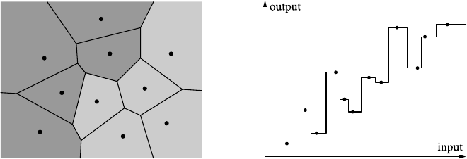
9.1 Nearest-Neighbor Predictors 261
believe.”), this can often lead to a considerably improved prediction accuracy. The
main tasks to consider when constructing such ensemble predictors is how to select
or generate a set of predictors that exhibits sufficient variation to offer good chances
of improving the prediction quality and how to combine the individual predictions.
9.1 Nearest-Neighbor Predictors
The nearest-neighbor algorithm [13] is one of the simplest and most natural classi-
fication and numeric prediction methods: it derives the class labels or the (numeric)
target values of new input objects from the most similar training examples, where
similarity is measured by distance in the feature space. The prediction is computed
by a majority vote of the nearest neighbors or by averaging their (numeric) target
values. The number kof neighbors to be taken into account is a parameter of the
algorithm, the best choice of which depends on the data and the prediction task.
9.1.1 Overview
Constructing nearest-neighbor classifiers and numeric predictors is a special case of
instance-based learning [1]. As such, it is a lazy learning method in the sense that
it is not tried to construct a model that generalizes beyond the training data (as eager
learning methods do), but the training examples are merely stored. Predictions for
new cases are derived directly from these stored examples and their (known) classes
or target values, usually without any intermediate model construction.
In a basic nearest-neighbor approach only one neighbor object, namely the clos-
est one, is considered, and its class or target value is directly transferred to the query
object. This is illustrated in Fig. 9.1, with classification in a two-dimensional feature
space on the left and regression in a one-dimensional input space on the right.
In the left diagram the training examples are drawn as small dots. For illustration
purposes, a Voronoi diagram [2,34], which is a special kind of decomposition of a
Fig. 9.1 Illustrations of nearest neighbor classification (left) and numeric prediction (right)

262 9 Finding Predictors
metric space, has been derived from them. In such a Voronoi diagram each training
example sis a Voronoi site, which defines a Voronoi cell consisting of all points
that are closer to sthan to any other site. The shown line segments comprise those
points that are equidistant to their two nearest sites, the nodes (i.e., points where line
segments meet) are the points that are equidistant to three (or more) sites. A nearest-
neighbor classifier transfers the class of the site sof a Voronoi cell to all points in
the cell of s, illustrated here by two different colorings (shades of grey) of the cells,
which indicates two classes and thus the regions where these classes are predicted.
For points on the line segments, if they border Voronoi cells with different classes,
some (arbitrary) tie-breaking rule has to be applied.
In the right diagram, the horizontal axis represents the input space, and the ver-
tical axis the output (or target) space of a regression task (i.e., a numeric prediction
task). The training examples are again drawn as small dots. The (now metric) target
value is transferred from a training example sto all query values that are closer to
(the input value of) sthan to (the input value of) any other training example. In
effect, this yields a piecewise constant regression function as the predictor.
Note, however, that neither the Voronoi tessellation nor the piecewise linear func-
tion is actually computed in the learning process, and thus no model is built at train-
ing time. The prediction is determined only in response to a query for the class
or target value of a new input object, namely by finding the closest neighbor of
the query object and then transferring its class or target value. Hence the diagrams
should be seen as illustrations that summarize the results of all possible queries
within the range of the diagrams rather than depictions of learned models.
A straightforward generalization of the nearest-neighbor approach is to use not
just the one closest, but the knearest neighbors (usually abbreviated as k-NN). If
the task is classification, the prediction is then determined by a majority vote among
these kneighbors (breaking ties arbitrarily); if the task is numeric prediction, the
average of the target values of these kneighbors is computed. Not surprisingly,
using more than one neighbor improves the robustness of the algorithm, since it is
not so easily fooled by individual training instances that are labeled incorrectly or
outliers for a class (that is, data points that have an unusual location for the class
assigned to them).1However, using too many neighbors can reduce the capability
of the algorithm as it may smooth the classification boundaries or the interpolation
too much to yield good results. As a consequence, apart from the core choice of
the distance function that determines which training examples are the nearest, the
choice of the number of neighbors to consider is crucial.
Once multiple neighbors are considered, further extensions become possible (see
the next sections for details). For example, the (relative) influence of a neighbor may
be made dependent on its distance from the query point, and the prediction may be
computed from a local model that is constructed on the fly for a given query point
(i.e., from its nearest neighbors) rather than by a simple majority or averaging rule.
1Outliers for the complete data set, on the other hand, do not affect nearest-neighbor predictors
much, because they can only change the prediction for data points that should not occur or should
occur only very rarely (provided that the rest of the data is representative).

9.1 Nearest-Neighbor Predictors 263
9.1.2 Construction
Generally, any nearest-neighbor algorithm has four main ingredients:
•distance metric
The distance metric, together with a possible task-specific scaling or weighting
of the attributes, determines which of the training examples are nearest to a query
data point and thus selects the training example(s) used to compute a prediction.
•number of neighbors
The number of neighbors of the query point that are considered can range from
only one (the basic nearest-neighbor approach) through a few (like k-nearest-
neighbor approaches) to, in principle, all data points as an extreme case.
•weighting function for the neighbors
If multiple neighbors are considered, it is plausible that closer (and thus more
similar) neighbors should have a stronger influence on the prediction result. This
can be expressed by a weighting function defined on the distance of a neighbor
from the query point, which yields higher values for smaller distances.
•prediction function
If multiple neighbors are considered, one needs a procedure to compute the pre-
diction from the classes or target values of these neighbors, since they may differ
and thus may not yield a unique prediction directly.
Necessary fundamentals about similarity and distance metrics have already been
discussed in the context of clustering in Sect. 7.2 and are thus not repeated here.
Note that the choice of the distance function is crucial for the behavior of a nearest
neighbor algorithm. Therefore it should be chosen with a lot of care and not just be
set to the Euclidean distance of the data points in their original representation.
As already mentioned in the preceding section, the main effect of the number k
of considered neighbors is how much the class boundaries or the numeric prediction
is smoothed. If only one neighbor is considered, the prediction is constant in the
Voronoi cells of the training data set. This makes the prediction highly susceptible
to the deteriorating effects of incorrectly labeled instances or outliers w.r.t. their
class, because a single data point with the wrong class spoils the prediction in its
whole Voronoi cell. Considering several neighbors (k>1) mitigates this problem,
since neighbors having the correct class can override the influence of an outlier.
However, choosing a very large kis also not generally advisable, because it can
prevent the classifier from being able to properly approximate narrow class regions
or narrow peaks or valleys in a numeric target function. An example of 3-nearest-
neighbor prediction (using a simple averaging of the target values of these nearest
neighbors), which already shows the smoothing effect (especially at the borders of
the input range), is shown in Fig. 9.2 on the left.
A common method to automatically determine an appropriate value for the num-
ber kof neighbors is cross-validation (see Sect. 5.5.2 for a general treatment): the
training data set is divided into rfolds of (approximately) equal size.2Then rclas-
2The fold sizes may differ by one data point, to account for the fact that the total number of training
examples may not be divisible by r, the number of folds.
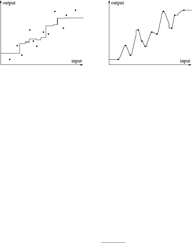
264 9 Finding Predictors
Fig. 9.2 Illustrations of standard 3-nearest neighbor prediction (average of three nearest neigh-
bors, left) and distance-weighted 2-nearest neighbor prediction (right) in one dimension
sification or prediction experiments are performed: each combination of r−1 folds
is once chosen as the training set, with which the remaining fold is classified or
with which the (numeric) target value is predicted, using all numbers kof neighbors
from a user-specified range. The classification accuracy or the prediction error is
aggregated, for the same value k, over these experiments. Finally, the number kof
neighbors that yields the lowest aggregated error is chosen.
Approaches that weight the considered neighbors differently based on their dis-
tance to the query point are known as distance-weighted k-nearest neighbor or
(for numeric targets) locally weighted regression or locally weighted scatterplot
smoothing (abbreviated LOWESS or LOESS) [11,12]. Such weighting is manda-
tory in the extreme case in which all ntraining examples are used as neighbors,
because otherwise only the majority class or the global average of the target values
can be predicted. However, it is also recommended for k<n, since it can, at least
to some degree, counteract the smoothing effect of a large k, because the excess
neighbors are likely to be farther away and thus will influence the prediction less. It
should be noted, though, that distance-weighted k-NN is not a way of avoiding the
need to find a good value for the number kof neighbors.
A typical example of a weighting function for the nearest neighbors is the so-
called tricubic weighting function [11,12] defined as
w(si,q,k)=1−d(si,q)
dmax(q, k) 33
.
Here qis the query point, siis (the input vector of) the ith nearest neighbor of q
in the training data set, kis the number of considered neighbors, dis the employed
distance function, and dmax(q, k) is the maximum distance between any two points
from the set {q,s1,...,s
k}, that is, dmax(q, k) =maxa,b∈{q,s1,...,sk}d(a,b).Asan
illustration, Fig. 9.2 shows on the right the distance-weighted 2-nearest-neighbor
prediction for a one-dimensional input. Note that the interpolation is mainly linear
(because two nearest neighbors are used), except for some small plateaus close to
the data points, which result from the weighting, and certain jumps at points where
the two closest neighbors are on the same side of the query point.

9.1 Nearest-Neighbor Predictors 265
The most straightforward choices for the prediction function are, as already men-
tioned, a (weighted) majority vote for classification or a simple average for numeric
prediction. However, especially for numeric prediction, one may also consider more
complex prediction functions, like building a local regression model from the neigh-
bors (usually with a low-degree polynomial), thus arriving at locally weighted poly-
nomial regression (see Sect. 9.1.3 for some details).
A core issue of implementing nearest-neighbor prediction is the data structure
used to store the training examples. In a naive implementation they are simply stored
as a list, which requires merely O(n) time, where nis the number of training exam-
ples. However, though fast at training time, this approach has the serious drawback
of being very slow at execution time, because a linear traversal of all training ex-
amples is needed to find the nearest neighbor(s), requiring O(nm) time, where m
is the dimensionality of the data. As a consequence, this approach becomes quickly
infeasible with a growing number of training examples or for high-dimensional data.
Better approaches rely on data structures like a kd-tree (short for k-dimensional
tree3)[4,20], an R- or R*-tree [3,24], a UB-tree [33], etc. With such data structures,
the query time can be reduced to O(log n) per query data point. The time to store
the training examples—that is, the time to construct an efficient access structure for
them—is, of course, worse than for storing them in a simple list. However, it is usu-
ally acceptably longer. For example, a kd-tree is constructed by iterative bisections
in different dimensions that split the set of data points (roughly) equally. As a con-
sequence, constructing it from ntraining examples takes O(nlog n) time if a linear
time algorithm for finding the median in a dimension [5,14] is employed.
9.1.3 Variations and Issues
The basic k-nearest-neighbor scheme can be varied and extended in several ways.
By using kernel functions to weight the neighbors (Sect. 9.1.3.1), all data points
or a variable number of neighbors, depending on the query point, may be used.
The simple averaging of the target values for numeric prediction may be replaced
by building a (simple) local regression model (Sect. 9.1.3.2). Feature weights may
be used to adapt the employed distance function to the needs of the prediction
task (Sect. 9.1.3.3). In order to mitigate the problem to extract the nearest neigh-
bors from the training data, one may try to form prototypes in a preprocessing step
(Sect. 9.1.3.4).
9.1.3.1 Weighting with Kernel Functions
An alternative approach to distance-weighted k-NN consists in abandoning the re-
quirement of a predetermined number of nearest neighbors. Rather a data point is
3Note that this kis independent of and not to be confused with the kdenoting the number of
neighbors. This equivocation is an unfortunate accident, which, however, cannot be avoided with-
out deviating from standard nomenclature.

266 9 Finding Predictors
weighted with a kernel function Kthat is defined on its distance dto the query point
and that satisfies the following properties: (1) K(d) ≥0, (2) K(0)=1 (or at least
that Khas its mode at 0), and (3) K(d) decreases monotonously for d→∞.Inthis
case all training examples for which the kernel function yields a nonvanishing value
w.r.t. a given query point are used for the prediction. Since the density of training
examples may, of course, differ for different regions of the feature space, this may
lead to a different number of neighbors being considered, depending on the query
point. If the kernel function has an infinite support (that is, does not vanish for any
finite argument value), all data points are considered for any query point. By using
such a kernel function, we try to mitigate the problem of choosing a good value for
the number Kof neighbors, which is now taken care of by the fact that instances
that are farther away have a smaller influence on the prediction result. On the other
hand, we now face the problem of having to decide how quickly the influence of a
data point should decline with increasing distance, which is analogous to choosing
the right number of neighbors and can be equally difficult to solve.
Examples of kernel functions with a finite support, given as a radius σaround
the query point within which training examples are considered, are
Krect(d) =τ(d ≤σ),
Ktriangle(d) =τ(d ≤σ)·(1−d/σ),
Ktricubic(d) =τ(d ≤σ)·1−d3/σ 33,
where τ(φ) is 1 if φis true and 0 otherwise. A typical kernel function with infinite
support is the Gaussian function
Kgauss(d) =exp−d2
2σ2,
where dis the distance of the training example to the query point, and σ2is a
parameter that determines the spread of the Gaussian function. The advantage of a
kernel with infinite support is that the prediction function is smooth (has no jumps)
if the kernel is smooth, because then a training case does not suddenly enter the
prediction if a query point is moved by an infinitesimal amount, but its influence
rises smoothly in line with the kernel function. One also does not have to choose a
number of neighbors. However, the disadvantage is, as already pointed out, that one
has to choose an appropriate radius σfor the kernel function, which can be more
difficult to choose than an appropriate number of neighbors.
An example of kernel regression with a Gaussian kernel function is shown in
Fig. 9.3 on the left. Note that the regression function is smooth, because the kernel
function is smooth and always refers to all data points as neighbors, so that no jumps
occur due to a change in the set of nearest neighbors. The price one has to pay for
this advantage is an increased computational cost, since the kernel function has to
be evaluated for all data points, not only for the nearest neighbors.
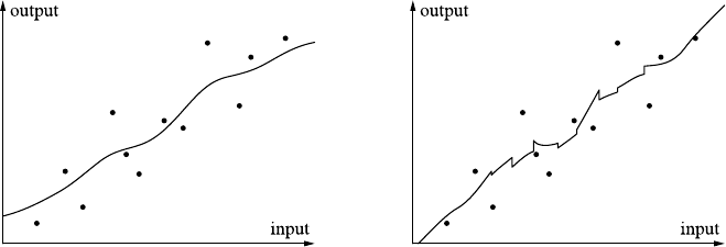
9.1 Nearest-Neighbor Predictors 267
Fig. 9.3 Illustrations of kernel-weighted regression (left) and distance-weighted 4-nearest-neigh-
bor regression (tricubic weighting function, right) in one dimension
9.1.3.2 Locally Weighted Polynomial Regression
Up to now we considered only a simple averaging of the numeric target values
of the nearest neighbors as the prediction function. However, as a straightforward
improvement, computing a (simple) local regression function suggests itself. That
is, the knearest neighbors are used to estimate the parameters of, for example, a
linear regression function (see Sect. 8.3) in the vicinity of the query point, with
which the prediction is then computed.
Not surprisingly, distance weighting (as we discussed it above, both with a fixed
number of neighbors or with kernel functions) may also be used in such a setting,
leading, for example, to the 4-nearest-neighbor distance-weighted locally linear re-
gression shown in Fig. 9.3 on the right (using a tricubic weighting function, see
Sect. 9.1.2). Note how the distance weighting leads to deviations from straight lines
between the data points. Note also the somewhat erratic behavior of the resulting re-
gression function (jumps at points where the set of nearest neighbors changes). This
indicates that such an approach should be employed with a larger number of neigh-
bors, so that a change of the set of nearest neighbors leads to less severe changes of
the local regression line (although there will still be jumps of the predicted value in
this case; they are just less high).
Locally weighted regression is usually applied with very simple regression poly-
nomials: most of the time linear, rarely quadratic, basically never any higher order.
The reason is that the local character of the regression is supposed to take care of
the global shape of the function, so that the regression function is not needed to
model it. As a consequence, the advantage of locally weighted polynomial regres-
sion is that no global regression function, derived from some data generation model,
needs to be found, thus making the method applicable to a broad range of prediction
problems. Its disadvantages are that its prediction can be less reliable in sparsely
sampled regions of the feature space, where the locally employed regression func-
tion is necessarily stretched to a larger area and thus may be a bad fit to the actual
target function.
268 9 Finding Predictors
9.1.3.3 Feature Weights
As already mentioned in Sect. 9.1.2, it is crucial for the success of a nearest-neighbor
approach that a proper distance function is chosen. A very simple and natural way
of adapting a distance function to the needs of the prediction problem is to use
distance weights, thus giving certain features a greater influence than others. If prior
information is available about which features are most informative w.r.t. the target
value, this information can be incorporated directly into the distance function.
However, one may also try to determine appropriate feature weights automati-
cally. The simplest approach is to start with equal feature weights and to modify
them iteratively in a hill climbing fashion (see Sect. 5.3.2 for a general description):
apply a (small) random modification to the feature weights and check with cross
validation whether the new set of feature weights improves the prediction quality.
If it does, accept the new weights, otherwise keep the old. Repeat the generation
of random changes for a user-specified number of steps or until a user-specified
number of trials were unsuccessful (did not yield an improvement of the predic-
tion quality). Such a hill climbing approach has, of course, the disadvantage that it
is prone to getting stuck in local optima. To avoid this, more sophisticated search
approaches like simulated annealing and genetic algorithms (see Sect. 5.3.4 for a
general description) may be employed.
9.1.3.4 Data Set Reduction and Prototype Building
As already pointed out in Sect. 9.1.2, a core problem of nearest-neighbor approaches
is to quickly find the nearest neighbors of a given query point. This becomes an
important practical problem if the training data set is large and predictions must be
computed (very) quickly. In such a case one may try to reduce the set of training
examples in a preprocessing step, so that a set of relevant or prototypical data points
is found, which yields basically the same prediction quality. Note that this set may
or may not be a subset of the training examples, depending on whether the algorithm
used to construct this set merely samples from the training examples or constructs
new data points if necessary. Note also that there are usually no or only few actually
redundant data points, which can be removed without affecting the prediction at all.
This is obvious for the numerical case and a 1-nearest-neighbor classifier but also
holds for a k-nearest-neighbor classifier with k>1, because any removal of data
points may change the vote at some point and potentially the classification.
A straightforward approach is based on a simple iterative merge scheme [9]: at
the beginning each training example is considered as a prototype. Then successively
two nearest prototypes are merged as long as the prediction quality on some hold-out
test data set is not reduced. Prototypes can be merged, for example, by simply com-
puting a weighted sum, with the relative weights determined by how many original
training examples a prototype represents.
More sophisticated approaches may employ, for example, genetic algorithms or
any other method for solving a combinatorial optimization problem. This is possi-
ble, because the task of finding prototypes can be viewed as the task to find a subset
9.2 Artifical Neural Networks 269
of the training examples that yields the best prediction quality (on a given test data
set): finding best subsets is a standard combinatorial optimization problem.
9.2 Artifical Neural Networks
Artificial neural networks are a family of models and accompanying training meth-
ods that try to mimic the learning ability of higher organisms by taking inspiration
from (certain aspects of) biological neural networks. Here we consider the special
types of multilayer perceptrons and radial basis function networks, both of which
are trained with gradient descent schemes. Artificial neural networks usually achieve
high quality in both classification and numerical prediction tasks but suffer from the
fact that they are “black boxes,” that is, they are difficult to interpret in terms of the
application domain because of the abstract mathematical prediction procedure.
9.2.1 Overview
At least many higher organisms exhibit the ability to adapt to new situations and
to learn from experience. Since these capabilities clearly derive from the fact that
these organisms are endowed with a brain or at least a central nervous system, it is
a plausible approach to try to achieve similar capabilities in an artificial system by
mimicking the functionality of (biological) neurons and their interaction.
Depending on which aspects of (theories of) biological neurons are emphasized
and which plausible modifications are introduced, different types of artificial neu-
ral networks can be distinguished. The most popular type is the multilayer per-
ceptron, which is based on a “threshold logic” view of neuronal activity, but can
also be seen—from a statistical perspective—as a staged or hierarchical logistic
regression system. The basic idea underlying multilayer perceptrons relies on the
following operation principle of biological neurons: a neuron receives, through “ex-
tension lines” of other neurons, electrical input, which either increases (excitatory
input) or decreases (inhibitory input) the electrical potential of the neural cell rel-
ative to its environment. If the total input exceeds a certain threshold, the neuron
is activated and “fires,” that is, emits an electrical signal to other neurons it is con-
nected to. The type (excitatory or inhibitory) and the strength of the influence of an
input is determined by the chemical conditions at the connection point (so-called
synapse) between the transmission lines (biologically: axons) and the neuron’s re-
ceptors (biologically, dendrites). By modifying these chemical conditions, the be-
havior of the network of neurons can be changed, and thus adaptation and learning
can be achieved.
By heavily simplifying the actually fairly complex mechanisms, this operation
principle gives rise to a neuron model as it is displayed in Fig. 9.4 on the left: the
influence of the incoming signals from other neurons is encoded as simple weights
(real-valued numbers), which are multiplied with the (strength of) the incoming
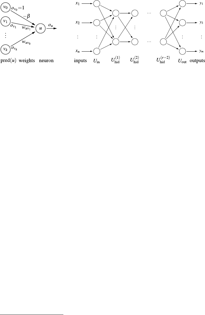
270 9 Finding Predictors
Fig. 9.4 A prototypical artificial neuron with connections to its predecessor neurons, including a
dummy neuron v0(left) and general structure of a multilayer perceptron with rlayers (right)
signal (also a real-valued number). The weighted signals (or signal strengths) are
then summed and submitted to an activation function, which is a kind of threshold
function4and which determines whether the neuron fires (emits a signal) or not.
This signal is then transmitted to other neurons.
A standard connection structure for the neurons is a layered pattern, as it is de-
picted schematically in Fig. 9.4 on the right. This connection structure and the fact
that a single neuron in this structure is called a perceptron (for historical reasons
[26,27]) explains the name “multilayer perceptron.” The first (leftmost) layer is
called the input layer, because it receives input (represented by the xi) from the
environment, while the last (rightmost) layer is called the output layer, because it
emits output (represented by the yi) to the environment. All intermediate layers are
called hidden layers, because they do not interact with the environment and thus
are “hidden” from it. In principle, a multilayer perceptron may have any number of
hidden layers, but it is most common to use only a single hidden layer, based on
certain theoretical results about the capabilities of such neural networks [16].
A multilayer perceptron works by executing the neurons in the layers from left
to right, computing the output of each neuron based on its weighted inputs and the
activation function. This procedure is called forward propagation and gives rise
to the general name feed-forward network for a neural network that operates in
this manner. Note that in this fashion the neural network implements, in a staged or
layered form, the computation of a (possibly fairly complex) function of the input
signals, which is emitted by the output layer at the end of the propagation process.
A multilayer perceptron is trained to implement a desired function with the help
of a data set of sample cases, which are pairs of input values and associated output
values. The input values are fed into the multilayer perceptron, and its output is com-
puted. This output is then compared to the desired output (as specified by the second
part of the sample case). If the two differ, a process called error backpropagation
is executed, which adapts the connection weights and possibly other parameters of
4Note that for technical reasons, the threshold or bias value βof the neuronal activation function is
turned into a connection weight by adding a connection to a dummy neuron emitting a permanent
signal of 1, while the actual activation function has a threshold of zero.
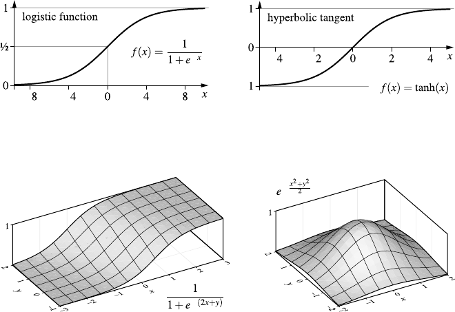
9.2 Artifical Neural Networks 271
Fig. 9.5 The logistic function and the hyperbolic tangent, two common sigmoid activation func-
tions for multilayer perceptrons, both of which describe a “soft” threshold behavior
Fig. 9.6 Logistic function and Gaussian radial basis function for a two-dimensional input space
the activation functions in such a way that the output error (that is, the deviation of
the actual output from the desired output) is reduced.
For error backpropagation to be feasible, it is mandatory that the activation func-
tions of the neurons are not crisp threshold functions (as suggested in the above
description), but differentiable sigmoid (s-shaped) functions. That is, the activation
of the neuron should not jump at the threshold from completely inactive to fully
active but should rise smoothly, over some input range, from inactive (0 or −1) to
active (+1). With such functions, the output of a multilayer perceptron is a differ-
entiable function of the inputs, which also depends on the connection weights and
the function parameters (basically the threshold or bias value β). As a consequence,
the weights and parameters can be adapted with a gradient descent scheme, which
minimizes the sum of the squared output errors for the training data set.
The most commonly used activation functions are the logistic function (unipo-
lar) and the hyperbolic tangent (bipolar). Illustrations for a one-dimensional input
space are shown in Fig. 9.5, and a logistic function for a two-dimensional input
space with threshold β=0inFig.9.6 on the left. Note that the weight vector can
be interpreted as the direction in which the logistic function rises.
Like multilayer perceptrons, radial basis function networks are feed-forward
networks. However, they always have three layers (one hidden layer), while this
is only the most common choice for multilayer perceptrons. In addition, they do
not employ a sigmoid activation function, at least not in the hidden layer. Rather, a
distance from a reference point (or center) in the data space, which is represented by

272 9 Finding Predictors
the neuron weights, is computed.5This distance is transformed with a radial (basis)
function, the name of which derives from the fact that is defined on a distance from
a given point and thus on a radius from this point. Note that radial basis function is
actually just another name for a kernel function, as we considered it in Sect. 9.1.3.1.
Such a function is 0 for infinite distance, increases monotonously for decreasing
distance, and is 1 at zero distance. Thus it is, in a way, similar to a sigmoid function,
which increases monotonously from −∞, where it is 0 (or −1), to +∞, where
it is 1. A radial basis function is parameterized with a reference radius σ, which
takes the place of the bias value βof the sigmoid activation functions of multilayer
perceptrons. An illustration for a two-dimensional input space is shown in Fig. 9.6
on the right, which shows a Gaussian radial basis function centered at (0,0)and
having a reference radius of 1. The value of the radial function for the computed
distance from the reference point is passed on to the output layer.
The neurons in the output layer either have a linear activation function (that is,
the weighted sum of the inputs is merely transformed with a scaling factor and an
offset) or a sigmoid one (like in multilayer perceptrons). The former choice has
certain advantages when it comes to the technical task of initializing the network
before training,6but otherwise no fundamental difference exists between the two
choices. Like multilayer perceptrons, radial basis function networks are trained with
error backpropagation, which differs only due to the different activation functions.
The term “basis” in the name radial basis function derives from the fact that these
functions are the basis, in the sense of the basis of a vector space, for constructing
the function, the neural network is desired to compute; especially with a linear acti-
vation function in the output layer, the outputs are linear combinations of the basis
functions and thus vector representations w.r.t. the basis functions. To some degree
one may also say that a multilayer perceptron behaves in this way, even though it
uses logistic activation functions for the output neurons, because close to the bias
value, a logistic function is almost linear and thus models a linear combination of
the activation functions of the hidden layer. The difference is that the basis func-
tions of multilayer perceptrons are not radial functions, but rather logistic functions,
which are sigmoid functions along a direction in the data space (see Fig. 9.6).
9.2.2 Construction
The first step of the construction of a neural network model consists in choosing the
network structure. Since the number of input and output neurons is fixed by the data
5Note that with respect to the employed distance function all considerations of Sect. 7.2 can be
transferred, although the Euclidean distance is the most common choice.
6A linear activation function also explains the term “basis” in “radial basis function,” as it allows
one to interpret the output as an approximation of the desired function in the vector space spanned
by the radial functions computed by the hidden neurons: the connection weights from the hidden
layer to the output are the coordinates of the approximating function w.r.t. this vector space.

9.2 Artifical Neural Networks 273
analysis task (or, for the inputs, by a feature selection method, see Sect. 6.1.1), the
only choices left for a multilayer perceptron are the number of hidden layers and
the number of neurons in these layers. Since single-hidden-layer networks are most
common (because of certain theoretical properties [16]), the choice is usually even
reduced to the number of hidden neurons. The same applies to radial basis function
networks, which have only one hidden layer by definition.
A simple rule of thumb, which often leads to acceptable training results, is to use
1
2$#inputs +#outputs%hidden neurons, where #inputs and #outputs are the numbers
of input and output attributes, respectively. There also exist approaches to optimize
the number of hidden neurons during the training process [21], or one may employ
a wrapper scheme as for feature selection (see Sect. 6.1.1) in order to find the best
number of hidden neurons for a given task. However, even though a wrong number
of hidden neurons, especially if it is chosen too small, can lead to bad results, one has
to concede that other factors, especially the choice and scaling of the input attributes,
are much more important for the success of neural network model building.
Once the network structure is fixed, the connection weights and the activa-
tion function parameters are initialized randomly. For multilayer perceptrons, the
weights and the bias values are usually chosen uniformly from a small interval cen-
tered around 0. For a radial basis function network, the reference or center points
(the coordinates of which are the weights of the neurons in the hidden layer) may
be chosen by randomly selecting data points or by sampling randomly from some
distribution (Gaussian or rectangular) centered at the center of the data space. The
reference radii are usually initialized to equal values, which are derived from the
size of the data space and the number of hidden neurons, for example, as ld/k,
where ldis the length of the data space diagonal, and kis the number of hidden
neurons. If a linear activation function is chosen for the output layer, the con-
nection weights from the hidden to the output layer can be initialized by solving
a linear optimization problem. Alternatively, the weights can be initialized ran-
domly.
After all network parameters (connection weights and activation function param-
eters) have been initialized, the neural network already implements a function of the
input attributes. However, unless a radial basis function network with linear activa-
tion functions in the output layer has been initialized by solving the corresponding
linear optimization problem, this function is not likely to be anywhere close to the
desired function as represented by the training samples. Rather it will produce (sig-
nificant) errors and thus needs to be adapted or trained.
The rationale of neural network training is as follows: the deviation of the
function implemented by the neural network and the desired function as represented
by the given training data is measured by the sum of squared errors,
e(D)=
(x,y)∈D
u∈Uout
(ou(x)−yu)2,
where D={(x1,y1),...,(xn,yn)}is the given training data set, Uout the set of
output neurons, yuis the desired output of neuron ufor the training case (x,y), and
ou(x)the computed output of neuron ufor training case (x,y). Furthermore, this

274 9 Finding Predictors
Fig. 9.7 Illustration of the
gradient of a two-dimensional
function
error of the neural network for a given training sample can be seen as a function of
the network parameters (connection weights and activation function parameters like
bias value and reference radius), since ou(x)depends on these parameters, while
everything else is fixed by the network structure and the given training data:
e(D)=e(D;θ),
where θis the total of all network parameters. Provided that all activation functions
are (continuously) differentiable (which is the case for the common choices of acti-
vation functions, see above, and also one of the reasons why the error is squared7),
we can carry out a gradient descent on the error function in order to minimize the
error. Intuitively, the principle of gradient descent (see also Chap. 5for a general de-
scription) is the same that scouts follow in order to find water: always go downhill.
Formally, we compute the gradient of the error function, that is, we consider
∇θe(D;θ)=∂
∂θ1,..., ∂
∂θre(D;θ),
where θk,1≤k≤r, are the network parameters, ∂
∂θkdenotes the partial derivative
w.r.t. θk, and ∇θ(pronounced “nabla”) is the gradient operator. Intuitively, the gra-
dient describes the direction of steepest ascent of the error function (see Fig. 9.7 for
a sketch). In order to carry out a gradient descent, it is negated and multiplied by a
factor η, which is called the learning rate and which determines the size of the step
in the parameter space that is carried out. Formally, we thus have
θ(new)=θ(old)−η∇θeD;θ(old)or θ(new)
k=θ(old)
k−η∂
∂θk
eD;θ(old)
if written for an individual parameter θk. The exact form of this expression depends
on the activation functions that are used in the neural network. A particularly simple
case results for the standard case of the logistic activation function
fact(z) =1
1+e−z,
which is applied to z=wx =p
i=1wixi, that is, the weighted sum of the
inputs, written as a scalar product. Here x=(x0=1,x
1,...,x
p)is the in-
put vector of the neuron, extended by a fixed input x0=1 (see above), and
7The other reason is that without squaring the error, positive and negative errors could cancel out.
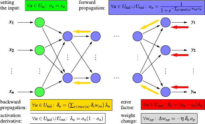
9.2 Artifical Neural Networks 275
Fig. 9.8 Cookbook recipe for the execution (forward propagation) and training (error backpropa-
gation) of a multilayer perceptron for the standard choice of a logistic activation function
w=(w0=−β,w1,...,w
p)is the weight vector of the neuron, extended by the
negated bias value w0=−β. The derivative of this function has a particularly sim-
ple form, namely
f
act(z) =fact(z)1−fact(z).
In addition, the formulas for the different layers are connected by a recursive
scheme, which makes it possible to propagate an error term, usually denoted
by δ, from a given layer to its preceding layer. We skip the detailed deriva-
tion here, which does not pose special mathematical problems (see, for example,
[21,23]).
Rather, we present the final result in the form of a cookbook recipe in Fig. 9.8,
which contains all relevant formulas. The computations start at the input layer
(green), where the external inputs are simply copied to the outputs of the input
neurons. For all hidden and output neurons, forward propagation yields their output
values (blue). The output of the output neurons is then compared to the desired out-
put and a first error factor (for the output neurons) is computed (red), into which the
derivative of the activation function enters (here, the logistic function, for which the
derivative is shown in white). This error factor can be propagated back to the pre-
ceding layer with a simple recursive formula (yellow), using the connection weights
and again the derivative of the activation function. From the error factors the weight
changes are computed, using a user-specified learning rate ηand the output of the
neuron the connection, the weight is associated with, leads to.

276 9 Finding Predictors
9.2.3 Variations and Issues
Since standard (also called “vanilla”8) error backpropagation can be fairly slow and
it may also be difficult to choose an appropriate learning rate, several variants have
been suggested (see Sect. 9.2.3.1). An important technique to achieve robust learn-
ing results with neural networks is weight decay (see Sect. 9.2.3.2). The relative
importance of the different inputs for predicting the target variable can be deter-
mined with sensitivity analysis (see Sect. 9.2.3.3).
9.2.3.1 Backpropagation Variants
As seen in the preceding section, the standard weight update rule is
θk=θ(new)
k−θ(old)
k=−η∂
∂θk
eD;θ(old).
Several variants of this rule have been proposed, mainly to speed up the training
process. In the first place, one may exploit that the error is basically a sum of the
errors for the individual training examples, and thus one may consider online train-
ing, where the weights are updated each time the error for one training example
is computed. This can speed up training considerably, because less computations
are needed before an update can be carried out. However, especially if the training
examples are not properly shuffled, online training can be unstable. This is espe-
cially the case for some of the more complex modifications of backpropagation (see
below), which more or less require batch training—that is, the weight change is
computed from the aggregated error over the whole data set—to be stable.
A popular modification of backpropagation is the introduction of a momentum
term, which means that a certain fraction (to be specified by a user) of the previous
weight change is added to the current one:
θ(new)
k=−η∂
∂θk
e(T ;θ)+mθ(old)
k.
The underlying intuition is that of a ball rolling down the error surface, which gains
momentum when rolling down a slope on which the gradient direction does not
change much. Other modifications include super self-adaptive backpropagation,
which introduces a separate learning rate for each weight and adapts these weights
according to the directions of the two preceding learning steps: if they have the
same sign, the learning rate is increased to cover a slope faster; if they have oppo-
site signs, the learning rate is decreased, because the error minimum was jumped
over. The growth and shrink factors for the learning rate are parameters that have to
be specified by a user. A similar approach is employed by resilient backpropaga-
tion, which, however, directly adapts the (previous) weight change, thus eliminat-
ing a learning rate and using only the sign of the gradient for the update. Finally,
8Because vanilla is the standard ice cream flavor.
9.3 Support Vector Machines 277
quick backpropagation approximates the error function locally and per weight by
a parabola (derived from the gradient of the current and the previous step) and then
sets the weight directly to the value of the apex of this parabola.
9.2.3.2 Weight Decay
It is usually disadvantageous if the (absolute values of the) weights of a neural net-
work become too large. In such a case the gradient becomes very small, since the
activation function argument lies in the saturation region of the sigmoid function,
thus impeding learning. In addition, this increases the likelihood of overfitting. In
order to counteract the general tendency of the (late) learning process to drive the
weights to extreme values, weight decay is recommend, which means that prior to
any update, a weight is multiplied with a factor (1−ξ), where ξis a small positive
value. Weight decay leads to much more stable learning results and thus is highly
important for sensitivity analysis (see below), because otherwise no meaningful re-
sults can be obtained.
9.2.3.3 Sensitivity Analysis
Even though neural networks are essentially black boxes, which compute their out-
put from the input through a series of numerical transformations that are usually
difficult to interpret, there is a simple method to get at least some idea of how im-
portant different inputs are for the computation of the output. This method is called
sensitivity analysis and consists in forming, for the training examples, the partial
derivatives of the function computed by a trained neural network w.r.t. the different
inputs. Given that the inputs are properly normalized, or these derivatives are put
in proper relation with the range of input values, they provide an indication how
strongly an input affects the output, because they describe how much the output
changes if an input is changed. This may be used for feature selection if the relevant
features are filtered out with an appropriately chosen threshold for the derivatives.
9.3 Support Vector Machines
Learning linear discriminant is rather simple as we have seen in Sect. 8.2.3.2.How-
ever, essentially all real-world problems exhibit more complex decision boundaries,
which renders those nice types of models useless for real problems. Nevertheless,
in recent years, a trick which allows one to use those simple classifiers for more
complex problem settings has emerged, the so-called support vector machines,a
special case of kernel methods. The models make use of the well-understood lin-
ear classifiers in combination with a projection into a higher-dimensional spaces
where the original problem can, in fact, be solved—or at least reasonably well
approximated—in a linear manner. Figure 9.9 illustrates this.
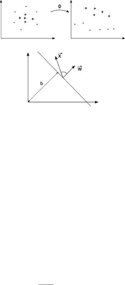
278 9 Finding Predictors
Fig. 9.9 An originally not
linearly separable
classification problem (left)is
transformed into a new space
(right) where the data points
are linearly separable
Fig. 9.10 A linear
discriminant function defined
through a weight vector w
and an offset b. The inner
product between wand an
input vector xthen computes
a (scaled) cosine between
those two vectors
Finding the embedding function Φ, so that the data is in the new space lin-
early separable is, of course, still a problem as we will discuss in more detail later.
Nevertheless, kernel methods are a well-understood mechanism to build powerful
classifiers—and also regression functions, as we will see later as well.
9.3.1 Overview
Before we look into linear separability again, let us first reformulate the problem
slightly, to allow us to easier extend this later into other spaces. We are, as usual,
considering a set of training examples D={(xj,y
j)|j=1,...,n}. The binary class
information is encoded as ±1 in contrast to the often used 0/1, which will allow us
later to simplify equations considerably. Our goal is to find a linear discriminant
function f(·)together with a decision function h(·). The latter reduces the continu-
ous output of fto a binary class label, i.e., ±1:
f(x)=&w,x'+band h(x) =sign(f (x)).
The discriminant function f(·)returns the cosine of the angle between the weight
vector wand the input vector x, under an offset bsince
cos∠(w,x)=&w,x'
|w||x|.
Figure 9.10 illustrates this.
Finding such linear discriminant functions has also attracted interest in the
field of artificial neural networks. Before multilayer perceptrons, as discussed in
Sect. 9.2, grew in popularity because the error backpropagation was developed, the
majority of the interest lied on single perceptrons. A single perceptron can be seen
as computing just this: the linear discriminant function shown above. In [26,27]a
9.3 Support Vector Machines 279
learning rule for the single perceptron was introduced, which updates the parameters
when sequentially presenting the training patterns one after the other:
IF yj·(&w,xj'+b) < 0
THEN wt+1=wt+yj·xjand bt+1=bt+yj·R2
with R=maxjxj. Whenever the product of the actual output value and the de-
sired output is negative, we know that the signs of those two values were different
and the classification was incorrect. We then update the weight vector using the
learning rule. One nice property is that this process is guaranteed to converge to a
solution if the training patterns are indeed perfectly classifiable with such a simple,
linear discriminant function.
9.3.1.1 Dual Representation
One of the key observation is now that we can represent f(·)based on a weighted
sum of the training examples instead of some arbitrary weight vector because
w=
n
j=1
αj·yj·xj.
The αjessentially count how often the jth training pattern triggered an invocation
of the learning rule above. Including the yj, that is, the sign of the correct output,
enables us to keep the αj’s to remain positive. A small trick, which will make our
formalism a lot simpler later on.
Note that this representation does require that during initialization we do not
assign random values to wbut set it to 0 or at least a (random) linear combination
of the training vectors. This, however, is not a substantial limitation.
From this it is straightforward to also represent the discriminant function based
on the weighted training examples:
f(x)=&w,x'+b=
j=1
αj·yj·&xj,x'+b.
Hence we can perform the classification of new patterns solely by computing the
inner product between the new pattern xand the training pattern (xj,y
j).
Finally, the update rule can also be represented based on inner products between
training examples:
IF yj·
j
αjyj&xj,xj'+b<0
THEN α(t+1)
j=α(t)
j+yjand b(t+1)=b(t) +yj·R2.
This representation uses only inner products with training examples. Note that sud-
denly we do not need to know anything about the input space anymore—as long
we have some way to compute the inner product between the training instances, we

280 9 Finding Predictors
can derive the corresponding α’s. This representation is called dual representation
in contrast to the primal representation, which represents the solution through a
weight vector. A nice property of the dual representation is that the vector of α’s
expresses how much each training instance contributes to the solution, that is, how
difficult to classify they were. In fact, in case of a nonlinearly separable problem, the
αof the misclassified patterns will grow infinitely. However, on the other extreme,
some α’s will remain zero, since the corresponding patterns are never misclassi-
fied. Those are patterns that are easy to classify and we do not need to record their
influence on the solution. We will return to this effect later.
9.3.1.2 Kernel Functions
The observation above indicates that we could ignore our input space if we had
access to a function which returned the inner product for arbitrary vectors. So-called
kernel functions offer, among others, precisely that property:
K(x1,x2)=&Φ(x1), Φ(x2)'.
If we find a kernel for which Φ=I, we can replace all our inner products with
K(·,·). This, however, is obviously boring: we can simply define Kto compute the
inner product. However, these kernels offer a very interesting perspective: we can
suddenly compute inner products in spaces that we never really have to deal with.
As long as, for the kernel K, there exists a function Φwhich projects our original
space into some other space, we can use the corresponding kernel Kto compute
the inner product directly. We can, of course, always define a kernel the way we
see it above, e.g., as the inner product on the results of applying Φto our original
vectors. But what if we had much simpler kernel functions Kthat in effect computed
an inner product in some other, Φ-induced space? Polynomial kernels allow us to
demonstrate this nicely. Consider the function
Φx1
x2=x2
1,x2
2,√2x1x2T,
for which we can easily derive the corresponding kernel
Kx1
x2,y1
y2=(x1y1)2+(x2y2)2+2(x1y1x2y2)=%x1
x2,y1
y2&2
.
This particular kernel has the additional twist that we can represent the inner prod-
uct in our Φ-induced space through (among others) the inner product in the original
space. This is, of course, not a requirement. More interestingly, the general kernel
K(x,y)=&x,y'dgives us an implicit induced space of dimension n+d+1
d. Calcu-
lating the resulting φ(·)directly would very quickly become computationally very
expensive. This kernel is a nice example how we can find a model in a very high-
dimensional space without ever explicitly even dealing with the vectors in that space
directly.
A few examples for other kernels are
K(x,y) =&x,y'd

9.3 Support Vector Machines 281
and
K(x,y) =e−x−y2
2σ.
Since the set of kernels is closed under certain arithmetic operations, we can con-
struct much more complex kernels based on simpler ones. Additionally, we can
test for an arbitrary function Kif it does indeed represent a kernel in some other
space or not. There are, in fact, kernels which represent inner products in infinite-
dimensional spaces, so we can find linear discriminant functions in spaces that we
could not possibly deal with directly.
Even more interesting is the ability to define kernels for objects without numer-
ical representations such as texts, images, graphs (such as molecular structures), or
(biological) sequences. We can then create a classifier for such objects without ever
entering an original or the derived space—all we need is a kernel function which re-
turns a measure for the two objects which can then be used to derive the weighting
factors αdetermining the weight vector w.
Note that for the training, we do not even need access to the kernel function itself
as long as we have the inner products of all training examples to each other. The
resulting kernel (or Gram) matrix looks as follows:
K=⎛
⎜
⎜
⎜
⎝
K(x1,x1)K(x1,x2)··· K(x1,xm)
K(x2,x1)K(x2,x2)··· K(x2,xm)
.
.
..
.
.....
.
.
K(xm,x1)K(xm,x2)··· K(xm,xm)
⎞
⎟
⎟
⎟
⎠.
This matrix is a the center piece of kernel machines and contains all the information
required during training. The matrix combines information of both, the training data
and the chosen kernel. For kernel matrices, a couple of interesting observations hold:
•a kernel matrix is symmetric and positive definite;
•every positive definite, symmetric matrix is a kernel matrix, that is, it represents
an inner product in some space; and
•the eigenvectors of the matrix correspond to the input vectors.
Note that it is still crucial to choose an appropriate kernel. If the Gram matrix is
close to being a diagonal matrix, all points end up being essentially orthogonal to
each other in the induced space, and finding a linear separation plane is very simple
but also does not offer any generalization power.
9.3.1.3 Support Vectors and Margin of Error
If we can find a separating hyper plane, we can already visually motivate that in
order to represent w, we do not need to use all our original training data points. It
is sufficient to use points which lie closest to this hyperplane. Those points are the
ones ending up with an α=0 and are called support vectors. Figure 9.11 illustrates
this, only the two boxed x’s and the one boxed oare really needed to define the
weight vector w.
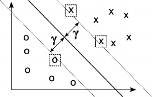
282 9 Finding Predictors
Fig. 9.11 The optimal
hyperplane maximizing the
margin of error for all
training instances
From this picture it also becomes evident that there are actually many differ-
ent solutions for our classification problem—any line which correctly separates the
points of different classes works just fine. However, there are lines that lie closer
to training instances than others. If we were to maximize the minimum distance of
any of the training instances to the separation line, we would create a solution with
maximum distance to possibly making an error: the maximum margin classifier.
Figure 9.11 show this distance for the optimal, that is, largest such margin of error:
γ=max
wmin
j&w,xj'.
There are solid theoretical explanations why this is indeed the best choice for the
separating hyperplane. From statistical learning theory we can derive that the com-
plexity of the class of all hyperplanes with constant margin is smaller than the class
of hyperplanes with smaller margins. From this we can then derive upper bounds
on the generalization error of the resulting SVM. We refer to [15] for a detailed
treatment of these issues.
9.3.2 Construction
We will not describe the many training methods and their variants for SVMs in great
detail here but instead refer to [15]. In a nutshell, the main idea reduces to solving a
quadratic programming problem. In order to do this, we reformulate our constraint
a bit. We now require our decision function to hold,
yj·(&w,xj'+b) ≥1,
instead of merely being greater than zero. The decision line is still given by
&w,x'+b=0,
but we now can also describe the upper and lower margins by
&w,x'+b=1
and
&w,x'+b=−1,
and the distance between those two hyperplanes is 2/w. Our goal of finding the
maximum margin can now be formulated as the minimization problem

9.3 Support Vector Machines 283
minimize (in w,b)
w
subject to (for any j=1,...,n)
yj(&w,x'−b) ≥1
This is fairly complex to solve because it depends on the norm of wwhich in-
volves a square root. However, we can convert this into a quadratic form by sub-
stituting wwith 1
2w2without changing the solution. After expressing this by
means of Lagrange multipliers, this turns into a standard quadratic programming
problem. In [15] more details and references to other, more memory- or time-
efficient solutions are given.
9.3.3 Variations and Issues
Much work has been done on support vector machines. In the following we describe
a few extensions which are essential for practical applications.
9.3.3.1 Slack Variables
We cannot always assume that we can find a linear hyperplane which cleanly sep-
arates our training examples. Especially for noisy training examples, this can also
not be desirable as we would end up overfitting our data. So-called soft margin
classifiers allow one to introduce slack variables which allow some of the training
examples to be within the margin or even on the wrong side of the separation line.
These slack variables end up expressing a degree of misclassification of the indi-
vidual training examples. Our optimization problem in equation 9.3.2 is modified
to
∀j=1,...,n:yj·(&w,xj'+b) ≥1−εj,
and we need to introduce an additional penalty term to punish nonzero εj:
argmin 1
2w2+C
j
εj
subject to yj·(&w,xj'+b) ≥1−εjfor 1 ≤j≤n.
This can again be solved using Lagrange multipliers.
9.3.3.2 Multiclass Support Vector Machines
Not all real-world problems are binary classification tasks. In order to classify ex-
amples into more than two classes, one usually transforms the problem into a set
of binary classification problems. Those can be classifiers which either separate one

284 9 Finding Predictors
class from all others or separate pairs of classes from each other. In the former case,
the class with the highest distance from the hyperplane wins; in the other case, the
winners are counted, and the class which wins the most class-pair classifications
determines the final classification.
9.3.3.3 Support Vector Regression
One interesting variation of support vector machines allows one to address regres-
sion problems instead of binary classifications. The key idea is to change the opti-
mization to the following expression:
argmin 1
2w2
subject to yj−(&w,xj'+b) ≤εfor 1 ≤j≤n.
So, instead of requiring the signs of the target variable and the prediction to match,
we are requesting the prediction error to stay within a certain range (or margin) ε.
We can, of course, also introduce slack variables to tolerate larger errors. Moreover,
we can use the kernel trick to allow for not only linear regression functions. A very
good tutorial of Support Vector Regression can be found in [32].
9.4 Ensemble Methods
Ensemble methods combine several predictors (classifiers or numeric predictors) in
order to improve the prediction quality over the performance of the individual pre-
dictors. The core ingredients of ensemble methods are a procedure to construct dif-
ferent predictors and a rule how to combine their results. Depending on the choices
that are made for these two ingredients, a large variety of different ensemble meth-
ods has been suggested. While usually yielding higher accuracy than individual
models, the fact that sometimes very large ensembles are employed makes the en-
semble prediction mechanism difficult to interpret (even if the elements are simple).
9.4.1 Overview
It is well known from psychological studies of problem solving activities (but also
highly plausible without such scientific backing) that a committee of (human) ex-
perts with different, but complementary skills, usually produces better solutions than
any individual. As a consequence, the idea suggests itself to combine several pre-
dictors (classifiers or regression models) in order to achieve a prediction accuracy
exceeding the quality of the individual predictors. That is, instead of using a single
model to predict the target value, we employ an ensemble of predictors and combine
9.4 Ensemble Methods 285
their predictions (for example, by majority voting for classification or by simple av-
eraging for numeric targets) in order to obtain a joint prediction.
A necessary and sufficient condition for an ensemble of predictors to outperform
the individuals it is made of is that the predictors are reasonably accurate and di-
verse. Technically, a predictor is already called accurate if it predicts the correct
target value for a new input object better than random guessing. Hence this is a
pretty weak requirement that is easy to meet in practice. Two predictors are called
diverse predictors if they do not make the same mistakes on new input objects.
It is obvious that this requirement is essential: if the predictors always made the
same mistakes, no improvement could possibly result from combining them. As
an extreme case, consider that the predictors in the ensemble are all identical: the
combined prediction is necessarily the same as that of any individual predictor—
regardless of how the individual predictions are combined. However, if the errors
made by the individual predictors are uncorrelated, their combination will reduce
these errors. For example, if we combine classifiers by majority voting and if we
assume that the mistakes made by these classifiers are independent, the resulting
ensemble yields a wrong result only if more than half of the classifiers misclassify
the new input object, which is a lot less likely than any individual classifier assign-
ing it to the wrong class. For instance, for five independent classifiers for a two-class
problem, each of which has an error probability of 0.3, the probability that three or
more yield a wrong result is
5
i=35
i0.3i·0.75−i=0.08748.
Note, however, that this holds only for the ideal case that the classifiers are fully in-
dependent, which is usually not the case in practice. Fortunately, though, improve-
ments are also achieved if the dependence is sufficiently weak, although the gains
are naturally smaller. Note also that even in the ideal case no gains result (but rather
a degradation) if the error probability of an individual classifier exceeds 0.5, which
substantiates the requirement that the individual predictors should be accurate.
According to [17], there are basically three reasons why ensemble methods work:
statistical, computational, and representational. The statistical reason is that in prac-
tice any learning method has to work on a finite data set and thus may not be able to
identify the correct predictor, even if this predictor lies within the set of models that
the learning method can, in principle, return as a result (see also Sect. 5.4). Rather,
it is to be expected that there are several predictors that yield similar accuracy. Since
there is thus no sufficiently clear evidence which model is the correct or best one,
there is a certain risk that the learning method selects a suboptimal model. By re-
moving the requirement to produce a single model, it becomes possible to “average”
over many or even all of the good models. This reduces the risk of excluding the best
predictor and the influence of actually bad models.
The computational reason refers to the fact that learning algorithms usually can-
not traverse the complete model space but must use certain heuristics (greedy, hill
climbing, gradient descent, etc.) in order to find a model. Since these heuristics
may yield suboptimal models (for example, local minima of the error function), a
286 9 Finding Predictors
suboptimal model may be chosen (see also Sect. 5.4). However, if several models
constructed with heuristics are combined in an ensemble, the result may be a better
approximation of the true dependence between the inputs and the target variable.
The representational reason is that for basically all learning methods, even the
most flexible ones, the class of models that can be learned is limited, and thus it
may be that the true model cannot be represented accurately. By combining several
models in a predictor ensemble, the model space can be enriched, that is, the ensem-
ble may be able to represent a dependence between the inputs and the target variable
that cannot be expressed by any of the individual models the learning method is able
to produce. That is, from a representational point of view, ensemble methods make
it possible to reduce the bias of a learning algorithm by extending its model space,
while the statistical and computational reasons indicate that they can also reduce the
variance. In this sense, ensemble methods are able to sever the usual link between
bias and variance (see also Sect. 5.4.5).
9.4.2 Construction
As already mentioned, ensemble methods require basically two ingredients, a pro-
cedure to construct accurate and diverse classifiers and a rule how to combine their
predictions. Depending on the choices made for these two ingredients, several spe-
cific methods can be distinguished.
Bayesian Voting In pure Bayesian voting the set of all possible models in a user-
defined hypothesis space is enumerated to form the ensemble. The predictions of
the individual models are combined weighted with the posterior probability of the
model given the training data [17]. That is, models that are unlikely to be correct
given the data have a low influence on the ensemble prediction, models that are
likely to have a high influence. The likelihood of the model given the data can often
be computed conveniently by exploiting P(M |D) ∝P(D |M)P(M), where Mis
the model, Dthe data, P(M) the prior probability of the model (often assumed to
be the same for all models), and P(D|M) the data likelihood given the model.
Theoretically, Bayesian voting is the optimal combination method, because all
possible models are considered and their relative influence reflects their likelihood
given the data. In practice, however, it suffers from several drawbacks. In the first
place, it is rarely possible to actually enumerate all models in the hypothesis space
defined by a learning method. For example, even if we restrict the tree size, it is
usually infeasible to enumerate all decision trees that could be constructed for a
given classification problem. In order to overcome this problem, model sampling
methods are employed, which ideally should select a model with a probability that
corresponds to its likelihood given the data. However, most such methods are biased
and thus usually do not yield a representative sample of the total set of models,
sometimes seriously degrading the ensemble performance.
9.4 Ensemble Methods 287
Bagging The method of bagging (bootstrap aggregating) predictors can be applied
with basically any learning algorithm [7]. The basic idea is to select a single learn-
ing algorithm (most studied in this respect are decision tree inducers) and to learn
several models with it by providing it each time with a different random sample of
the training data. The sampling is carried out with replacement (bootstrapping) with
the sample size commonly chosen as n(1−1/e) ≈0.632n, where nis the number
of training samples. Especially if the learning algorithm is unstable (like decision
tree inducers, where a small change of the data can lead to a considerably different
decision tree, see Sect. 8.1), the resulting models will usually be fairly diverse, thus
satisfying one of the conditions needed for ensemble methods to work. The predic-
tions of the individual models are then combined by simple majority voting or by
averaging them (with the same weight for each model).
Bagging effectively yields predictions from an “average model,” even though this
model does not exist in simple form—it may not even lie in the hypothesis space
of the learning algorithm (see Sect. 9.4.1). It has been shown that bagging reduces
the risk of overfitting the training data (because each subsample has different spe-
cial properties) and thus produces very robust predictions. Experiments show that
bagging yields very good results especially for noisy data sets, where the sampling
seems to be highly effective to avoid any adaptation to the noise data points.
A closely related alternative to bagging are cross-validated committees. Instead
of resampling the training data with replacement (bootstrapping) to generate the
predictors of an ensemble, the predictors learned during a cross validation run are
combined with equal weights in a majority vote or by averaging.
Random Subspace Selection While bagging obtains a set of diverse predictors by
randomly varying the training data, random subspace selection employs a random
selection of the features [22] for this purpose. That is, all data points are used in each
training run, but the features the model construction algorithm can use are randomly
selected. With a learning algorithm like a decision tree inducer (for which random
subspace selection was first proposed), the available features may even be varied
each time a split has to be chosen, so that the whole decision tree can potentially use
all features. However, since the split selections are (randomly) constrained, several
runs of the inducer yield diverse decision trees.
Combining random subspace selection with bagging—that is, varying the train-
ing data by bootstrapping and varying the available features by random selection—
is a highly effective and strongly recommended method if accuracy is the main
goal. Applied to decision trees, this combined method has been named random
forests [8], which is known to be one of the most accurate classification methods to
date. However, the fact that a huge number of trees may be employed, destroys the
advantage decision trees usually have, namely that they are easy to interpret and can
be checked for plausibility.
Injecting Randomness Both bagging and random subspace selection employ ran-
dom processes in order to obtain diverse predictors. This approach can of course be
generalized to the principle of injecting randomness into the learning process. For

288 9 Finding Predictors
example, such an approach is very natural and straightforward for artificial neu-
ral networks (see Sect. 9.2): different initialization of the connection weights often
yield different learning results, which may then be used as the members of an ensem-
ble. Alternatively, the network structure can be modified, for example, by randomly
deleting a certain fraction of the connections between two consecutive layers.
Boosting While in all ensemble methods described so far the predictors can, in
principle, be learned in parallel, boosting constructs them progressively, with the
prediction results of the model learned last influencing the construction of the next
model [18,19,28]. Like bagging, boosting varies the training data. However, in-
stead of drawing random samples, boosting always works on the complete training
data set. It rather maintains and manipulates a data point weight for each training
example in order to generate diverse models. Boosting is usually described for clas-
sification problems with two classes, which are assumed to be coded by 1 and −1.
The best-known boosting approach is AdaBoost [18,19,28] and works as fol-
lows: Initially, all data point weights are equal and therefore set to wi=1/n,
i=1,...,n, where nis the size of the data set. After a predictor Mthas been
constructed in step tusing the current weights wi,t ,i=1,...,n, it is applied to the
training data, and
et=n
i=1wi,t yiMt(xi)
n
i=1wi,t
and αt=1
2ln1−et
1+et
are computed [29], where xiis the input vector, yithe class of the ith training
example, and Mt(xi)is the prediction of the model for the input xi. The data point
weights are then updated according to
wi,t+1=c·wi,t exp(−αtyiMt(xi)),
where cis a normalization constant chosen so that n
i=1wi,t+1=1. The proce-
dure of learning a predictor and updating the data point weights is repeated a user-
specified number of times tmax. The constructed ensemble classifies new data points
by majority voting, with each model Mtweighted with αt. That is, the joint predic-
tion is
Mjoint(xi)=signtmax
t=1
αtMt(xi).
Since there is no convergence guarantee and the performance of the ensemble clas-
sifier can even degrade after a certain number of steps, the inflection point of the
error curve over tis often chosen as the ensemble size [17].
For low-noise data, boosting clearly outperforms bagging and random subspace
selection in experimental studies [17]. However, if the training data contains noise,
the performance of boosting can degrade quickly, because it tends to focus on the
noise data points (which are necessarily difficult to classify and thus receive high
weights after fairly few steps). As a consequence, boosting overfits the data. For
noisy data, bagging and random subspace selection yield much better results [17].
9.4 Ensemble Methods 289
Mixture of Experts In the approach that is often referred to as mixture of experts
the individual predictors to combine are assumed as already given, for example, se-
lected by a user. They may be, for instance, results of different learning algorithms,
like a decision tree, neural networks with different network structure, a support vec-
tor machine, etc.—whatever the user sees as promising to solve the application task.
Alternatively, they may be the set of models obtained from any of the ensemble
methods described so far. The focus is then placed on finding an optimal rule to
combine the predictions of the individual models.
For classification tasks, for example, the input to this combination rule are the
probability distributions over the classes that the individual classifiers yield. Note
that this requires more than the simple (weighted) majority voting we employed up
to now, which only asks each classifier to yield its best guess of the class of a new
input object: each classifier must assign a probability to each class.
The most common rules to combine such class probabilities are the so-called
sum rule, which simply averages, for each class, the probabilities provided by the
individual classifiers, or the so-called product rule, which assumes conditional in-
dependence of the classifiers given the class and therefore multiplies, for each class,
the probabilities provided by the different classifiers. In both cases the class with
the largest sum or product is chosen as the prediction of the ensemble. Experiments
show that the sum rule is usually preferable, likely because due to the product a
class that is seen as (very) unlikely by a single classifier has little chance of being
predicted, even if several other classifiers assign a high probability to it [35].
Both the sum rule and the product rule can be seen as special cases of a general
family of combination rules that are known as f-means [35]. Other combinations
rules include Dempster–Shafer combination and rank-based rules.
Stacking Like a mixture of experts, stacking takes the set of predictors as already
given and focuses on combining their individual predictions. The core idea is to
view the outputs of the predictors as new features and to use a learning algorithm
to find a model that combines them optimally [36]. Technically, a new data table
is set up with one row for each training example, the columns of which contain the
predictions of the different (level-1) models for training example. In addition, a final
column states the true classes. With this new training data set a (level-2) model is
learned, the output of which is the prediction of the ensemble.
Note that the level-2 model may be of the same or of a different type than the
level-1 models. For example, the output of several regression trees (e.g., a random
forest) may be combined with a linear regression [6] or with a neural network.
9.4.3 Further Reading
An extensive coverage of nearest-neighbor techniques can be found in [31]. For a
deeper insight into artificial neural networks, the excellent and very extensive book
[21] is one of the best on the market. The most accessible book on support vector
machines is certainly [15], while [30] provides more details and a coverage of many
special aspects. Good overviews of ensemble methods can be found in [17,25].
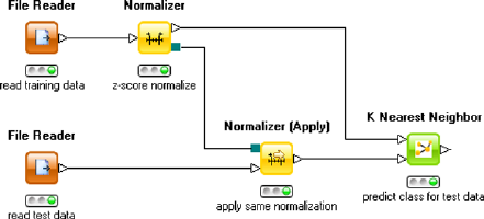
290 9 Finding Predictors
9.5 Finding Predictors in Practice
Using predictors in practice is the classic application scenario for many data analy-
sis, data mining, and machine learning toolkits. As discussed earlier in this chapter,
there are two types of predictors: lazy learners, which require both training data and
the records to assign labels to during prediction, and the model-based predictors,
which first learn a model and then use this model later during prediction to deter-
mine the target value. This difference is also reflected in KNIME and R, as we will
see in the next two sections.
9.5.1 Finding Predictors with KNIME
Nearest-neighbor algorithms are present in essentially all tools and are usually very
straightforward to use. In KNIME, the kNN node allows one to set the number
of neighbors to be considered and, if the distance should be used, to weight those
neighbors. Figure 9.12 shows a small workflow reading in training data and data
to determine the class for. Note that kNN is very sensitive to the chosen distance
function, so we should make sure to normalize the data and use the exact same
normalization procedure for both the training and test data: this can be achieved
by using the normalizer node and “Normalizer (Apply)” node, which copies the
settings from the first node (see also Sect. 6.6.1). We then feed those two data tables
into the “K-Nearest-Neighbor” node which adds a column with the predicted class
to the test data.
Both, artificial neural networks and support vector machines follow a different
setup. Figure 9.13 shows the flow when training and applying a multilayer percep-
tron. KNIME uses two nodes, one creating the model based on training data and the
second node applying the model to new data. Note that the connection between the
model creation and model consumption (prediction) node has different port icons
indicating that, along this connection, a model is transported instead of a data table.
Note that the workflow is also writing (node “PMML Writer”) the network to file
in a standardized XML dialect (Predictive Model Markup Language, PMML) which
allows one to use this model in other learning environments but also databases and
other prediction/scoring toolkits. KNIME offers other types of neural networks as
Fig. 9.12 The kNN node in
KNIME allows one to apply
the well-known
k-Nearest-Neighbor method
to the test data, given some
training data with existing
class labels
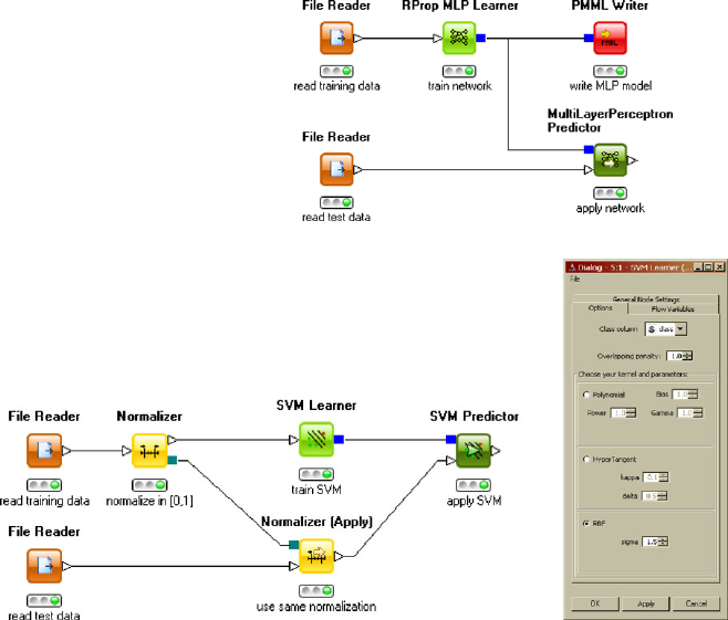
9.5 Finding Predictors in Practice 291
Fig. 9.13 A KNIME
workflow training and
applying a multi-layer
perceptron. The workflow
also exports the trained
network in the PMML format
Fig. 9.14 The base SVM nodes in KNIME offer well-known kernels along with simply dialogs to
adjust the corresponding parameters
well; in particular a probabilistic version of radial basis function networks, called
Probabilistic Neural Network (PNN) along with an efficient, constructive training
algorithm is available. PNNs allow one to predict class probabilities and also assign
a “don’t know” probability which is an interesting variation to many standard classi-
fiers that classify new patterns to one of the existing classes, no matter how different
that pattern is to anything encountered during training.
Support vector machine algorithms have not been around as long as neural net-
works, but in the meantime, many implementations of support vector machines
(SVM) have shown up in commercial and open software packages. KNIME, in
fact, offers several own implementations but also integrates an open-source SVM
package in addition to the SVM classifier and regression models contained in Weka,
which is also accessible from within KNIME using the optional Weka integration.
The base KNIME implementation consists of two nodes, one learning the SVM
model offering the choice of a few well-known kernels and the second one allowing
one to apply the model to a second data set. Figure 9.14 shows part of a workflow
using these two nodes along with the parameter dialog for the learning node.
The native KNIME SVM implementation currently offers three different kernels:
a polynomial, hyper tangent, and RBF kernel. In contrast to, e.g., decision trees,

292 9 Finding Predictors
kernel functions (or at least the settings of their respective parameters) are rather
sensitive to the normalization of the input data. For instance, the sigma parameter
of the RBF kernels controls the width of the basis functions in relation to the Eu-
clidean distance of the input vectors to the support vectors. Hence it is critical to
adjust this parameter accordingly. In the above example workflow we again use the
normalization module to avoid problems with different normalizations.
Using a different implementation, for instance, the Weka SVM classifier or re-
gression nodes works analogously: one simply replaces the learner and predictor
nodes in the above workflow with their respective alternatives. Especially using the
LibSVM [10], integration is of interest since it is computationally substantially more
efficient than both the native KNIME and Weka nodes. LibSVM offers numerous
different learning methods in addition to a number of kernel functions. We refer to
the respective literature for more information on the LibSVM library, where also a
nice guide for classification using SVMs can be found.
An experimental extension to KNIME also allows one to separate the computa-
tion of the Gram matrix from the linear discriminant learning. This allows one to
easily integrate new kernel functions, for instance, to compute kernels on graphs or
text databases without having to recode the entire learning procedure as well. We
refer to the KNIME Labs webpage9for more details.
9.5.2 Using Predictors in R
9.5.2.1 Nearest Neighbor Classifiers
A nearest-neighbor classifier based on the Euclidean distance is implemented in the
package class in R. To show how to use the nearest-neighbor classifier in R, we
use splitting of the Iris data set into a training set iris.training and test set
iris.test as it was demonstrated in Sect. 5.6.2. The function knn requires a
training and a set with only numerical attributes and a vector containing the classifi-
cations for the training set. The parameter kdetermines how many nearest neighbors
are considered for the classification decision.
>library(class)
> iris.knn <- knn(iris.training[,1:4],iris.test[,1:4],
iris.training[,5],k=3)
>table(iris.knn,iris.test[,5])
The last line prints the confusion matrix.
9KNIME Labs: http://labs.knime.org.
9.5 Finding Predictors in Practice 293
9.5.2.2 Neural Networks
For the example of multilayer perceptrons in R, we use the same training and test
data as for the nearest-neighbor classifier above. The multilayer perceptron can only
process numerical values. Therefore, we first have to transform the categorical at-
tribute Species into a numerical attribute:
>x<- iris.training
>x$Species <- as.numeric(x$Species)
The multilayer perceptron is constructed and trained in the following way, where
the library neuralnet needs to be installed first:
>library(neuralnet)
> iris.nn <- neuralnet(x$Species + x$Sepal.Length ~
x$Sepal.Width + x$Petal.Length
+x$Petal.Width, x,
hidden=c(3))
The first argument of neuralnet defines that the attributes species and sepal
length correspond to the output neurons. The other three attributes correspond to
the input neurons. xspecifies the training data set. The parameter hidden defines
how many hidden layers the multilayer perceptron should have and how many neu-
rons in each hidden layer should be. In the above example, there is only one hidden
layer with three neurons. When we replace c(3) by c(4,2), there would be two
hidden layers, one with four and one with two neurons.
The training of the multilayer perceptron can take some time, especially for larger
data sets.
When the training is finished, the multilayer perceptron can be visualized:
>plot(iris.nn)
The visualization includes also dummy neurons as shown in Fig. 9.4.
The output of the multilayer perceptron for the test set can be calculated in the
following way. Note that we first have to remove the output attributes from the test
set:
>y<- iris.test
>y<- y[-5]
>y<- y[-1]
> y.out <- compute(iris.nn,y)
We can then compare the target outputs for the training set with the outputs from
the multilayer perceptron. If we want to compute the squared errors for the second
output neuron—the sepal length—we can do this in the following way:
> y.sqerr <- (y[1] - y.out$net.result[,2])^2
294 9 Finding Predictors
9.5.2.3 Support Vector Machines
For support vector machine, we use the same training and test data as already for the
nearest-neighbor classifier and for the neural networks. A support vector machine to
predict the species in the Iris data set based on the other attributes can be constructed
in the following way. The package e1071 is needed and should be installed first if
it has not been installed before:
>library(e1071)
> iris.svm <- svm(Species ~., data = iris.training)
>table(predict(iris.svm,iris.test[1:4]),iris.test[,5])
The last line prints the confusion matrix for the test data set.
The function svm works also for support vector regression. We could, for in-
stance, use
> iris.svm <- svm(Petal.Width ~., data = iris.training)
> sqerr <- (predict(iris.svm,iris.test[-4])
-iris.test[4])^2
to predict the numerical attribute petal width based on the other attributes and to
compute the squared errors for the test set.
9.5.2.4 Ensemble Methods
As an example for ensemble methods, we consider random forest with the training
and test data of the Iris data set as before. The package randomForest needs to
be installed first:
>library(randomForest)
> iris.rf <- randomForest(Species ~., iris.training)
>table(predict(iris.rf,iris.test[1:4]),iris.test[,5])
In this way, a random forest is constructed to predict the species in the Iris data set
based on the other attributes. The last line of the code prints the confusion matrix
for the test data set.
References
1. Aha, D.W., Kibler, D., Albert, M.K.: Instance-based learning algorithms. Mach. Learn. 6(1),
37–66 (1991)
2. Aurenhammer, F.: Voronoi diagrams—a survey of a fundamental geometric data structure.
ACM Comput. Surv. 23(3), 345–405 (1991)
References 295
3. Beckmann, N., Beckmann, H.-N., Kriegel, H.-P., Schneider, R., Seeger, B.: The R∗-tree: an
efficient and robust access method for points and rectangles. In: Proc. ACM SIGMOD Con-
ference on Management of Data (Atlantic City, NJ), pp. 322–331. ACM Press, New York
(1990)
4. Bentley, J.L.: Multidimensional divide and conquer. Commun. ACM 23(4), 214–229 (1980)
5. Blum, M., Floyd, R.W., Pratt, V., Rivest, R., Tarjan, R.: Time bounds for selection. J. Comput.
Syst. Sci. 7, 448–461 (1973)
6. Breiman, L.: Stacked regressions. Mach. Learn. 24(1), 49–64 (1996)
7. Breiman, L.: Bagging predictors. Mach. Learn. 24(2), 123–140 (1996)
8. Breiman, L.: Random forests. Mach. Learn. 45, 5–32 (2001)
9. Chang, C.-L.: Finding prototypes for nearest neighbor classifiers. IEEE Trans. Comput.
23(11), 1179–1184 (1974)
10. Chang, C.-C., Lin, C.-L.: LIBSVM: a library for support vector machines. Manual (2001).
http://www.csie.ntu.edu.tw/~cjlin/libsvm
11. Cleveland, W.S.: Robust locally weighted regression and smoothing scatterplots. J. Am. Stat.
Assoc. 74(368), 829–836 (1979)
12. Cleveland, W.S., Devlin, S.J.: Locally-weighted regression: an approach to regression analysis
by local fitting. J. Am. Stat. Assoc. 83(403), 596–610 (1988)
13. Cover, T., Hart, P.: Nearest neighbor pattern classification. IEEE Trans. Inf. Theory 13(1),
21–27 (1967)
14. Cormen, T.H., Stein, C., Leiserson, C.E., Rivest, R.L.: Introduction to Algorithms, 2nd edn.
MIT Press/McGraw-Hill, Cambridge/New York (2001)
15. Cristianini, N., Shawe-Taylor, J.: Kernel Methods for Pattern Analysis. Cambridge University
Press, Cambridge (2004)
16. Cybenko, G.V.: Approximation by superpositions of a sigmoidal function. Math. Control Sig-
nals Syst. 2, 303–314 (1989)
17. Dietterich, T.G.: Ensemble methods in machine learning. In: Proc. 1st Int. Workshop on Mul-
tiple Classifier Systems (MCS 2000, Cagliari, Italy). Lecture Notes in Computer Science, vol.
1857, pp. 1–15. Springer, Heidelberg (2000)
18. Freund, Y.: Boosting a weak learning algorithm by majority. In: Proc. 3rd Ann. Workshop
on Computational Learning Theory (COLT’90, Rochester, NY), pp. 202–216. Morgan Kauf-
mann, San Mateo (1990)
19. Freund, Y., Schapire, R.E.: A decision-theoretic generalization of on-line learning and an ap-
plication to boosting. J. Comput. Syst. Sci. 55(1), 119–139 (1997)
20. Friedman, J.H., Bentley, J.L., Finkel, R.A.: An algorithm for finding best matches in logarith-
mic expected time. ACM Trans. Math. Softw. 3(3), 209–226 (1977)
21. Haykin, S.: Neural Networks and Learning Machines. Prentice Hall, Englewood Cliffs (2008)
22. Ho, T.K.: The random subspace method for constructing decision forests. IEEE Trans. Pattern
Anal. Mach. Intell. 20, 832–644 (1998)
23. Mitchell, T.: Machine Learning. McGraw-Hill, New York (1997)
24. Manolopoulos, Y., Nanopoulos, A., Papadopoulos, A.N., Theodoridis, Y.: R-Trees: Theory
and Applications. Springer, Heidelberg (2005)
25. Polikar, R.: Ensemble based systems in decision making. IEEE Circuits Syst. Mag. 6, 21–45
(2006)
26. Rosenblatt, F.: The Perceptron: a probabilistic model for information storage and organization
in the brain. Psychol. Rev. 65, 386–408 (1958)
27. Rosenblatt, F.: Principles of Neurodynamics. Spartan Books, New York (1962)
28. Schapire, R.E.: Strength of weak learnability. Mach. Learn. 5, 197–227 (1990)
29. Schapire, R.E., Singer, Y.: Improved boosting algorithms using confidence-rated predictors.
Mach. Learn. 37(3), 297–336 (1999)
30. Schölkopf, B., Smola, A.J.: Learning with Kernels: Support Vector Machines, Regularization,
Optimization, and Beyond. MIT Press, Cambridge (2001)
31. Shakhnarovich, G., Darrel, T., Indyk, P. (eds.): Nearest Neighbor Methods in Learning and
Vision: Theory and Practice. MIT Press, Cambridge (2006)
296 9 Finding Predictors
32. Smola, A.J., Schölkopf, B.: A tutorial on support vector regression. Technical Report (2003).
http://eprints.pascal-network.org/archive/00002057/01/SmoSch03b.pdf
33. Tropf, H., Herzog, H.: Multidimensional range search in dynamically balanced trees. Angew.
Inform. 1981(2), 71–77 (1981)
34. Voronoi, G.: Nouvelles applications des paramètres continus à la théorie des formes quadra-
tiques. J. Reine Angew. Math. 133, 97–178 (1907)
35. Xu, L., Amari, S.-I.: Combining classifiers and learning mixture of experts. In: Encyclopedia
of Artificial Intelligence, pp. 318–326. IGI Global, Hershey (2008)
36. Wolpert, D.: Stacked generalization. Neural Netw. 5(2), 241–259 (1992)
Chapter 10
Evaluation and Deployment
The models generated by techniques from Chaps. 7–9have already been evalu-
ated during modeling (as discussed in Chap. 5). Performance on technical measures
such as classification accuracy has been checked routinely whenever changes to the
model were made to judge the advantageousness of the modifications. The models
were also interpreted to gain new insights for feature construction (or even data ac-
quisition). Once we are satisfied with the technical performance, what remains is
to judge the potential impact the model will have in the projects domain should we
implement and deploy it. We will tackle these two steps only briefly in the follow-
ing two sections. A deployment in the form of, say, a software system for decision
support involves several planning and coordination tasks, which are out of the scope
of this book.
10.1 Evaluation
The analyst should assure herself that the interpretations of the data and models and
the conclusions drawn are conform to the knowledge of the problem owner or, if
available, domain expert. In particular the evidences, findings, and conclusions (not
only a final model) need to be documented throughout the process and presented at
this evaluation phase, where the results are discussed to decide if and how they may
be deployed later. There are at least three more reasons for documentation: First, it
is important that all steps are revised from the perspective of the project’s owner to
guarantee flawless interpretations and conclusions. Secondly, the findings represent
important resources for future projects, where data understanding and data prepa-
ration phases may exhibit a large overlap with the current project. For instance, the
cognitive map may be revised or extended and possibly linked to evidence found in
the data. Finally, the drawbacks and problems faced may initiate improved data en-
tering procedures (to improve data quality where it is crucial) or establish new data
collections (data acquisition) such that future projects can benefit from an improved
situation.
M.R. Berthold et al., Guide to Intelligent Data Analysis,
Texts in Computer Science 42,
DOI 10.1007/978-1-84882-260-3_10, © Springer-Verlag London Limited 2010
297
298 10 Evaluation and Deployment
Documentation The necessity of documenting the evidences, findings, and gener-
ally all the steps that were carried out during the analysis are often underestimated.
Complaints about the difficulty of reverse engineering what has been done and why
can even be found in the literature [1,5] and are the reason why CRISP-DM in-
cludes a detailed list of outputs (Sect. IV of [3]). Why is the documentation so im-
portant? The modeling tools greatly depend on the input, which is generated in the
data preparation phase. As already mentioned, the phases of the data analysis pro-
cess are by no means linear, and in order to improve the model further, the analyst
may want to test one or another sudden inspiration to see if it impacts the resulting
model. Often this requires a different preprocessing and thus the construction of a
new input data set for the modeling tool of her choice. Some ideas appear promising,
and others do not. After some time, many different versions exist, and it becomes
increasingly difficult to keep track of what has been done already and why. Usually
the (important) results are well remembered, but when it comes to reproducibility of
results, the unorganized analyst starts a cumbersome reconstruction. Documentation
is important, and modern tools support the analyst by modeling the full preprocess-
ing rather than just supporting her with the individual steps. Thus documentation
is indispensable to achieve a reproducible process—and writing down a few lines
what we are about to do next and why let us pause for a moment and helps to avoid
cheap shots.
Testbed Evaluation If possible, a further evaluation that comes close to the final
operation area may be carried out. This is particularly important if several models,
which may perform well individually, but not much is known about their orches-
tration and possible interdependencies, are needed to achieve the projects objective.
In a narrow sense, we have seen this already in the third example of the overview
chapter (Sect. 2.4): the effects of Stan’s strategy are observed in the database by
Laura to judge its successfulness. Depending on the project goal, such an evaluation
may be costly but offers a realistic assessment of the performance in practice. We
have, however, to plan this evaluation in the same way as we have done earlier with
the technical model assessment: we need a baseline to compare with. For instance,
if a new product is introduced and at the same time we start the new marketing cam-
paign, there is no way to separate the effect of marketing. Either we use data from
different points in time (which is not present in this example, because the product
was not available earlier) or we have to generate a control group for comparison
(people excluded from the marketing campaign).
To avoid self-fulfilling prophecies, the decision about the deployment should not
be based on observation of extreme cases. Suppose that we investigate the sales fig-
ures of individual customers and identify the, say, 10% best- and worst-performing
customers. Now, we just developed and started a marketing campaign and want to
convince others that we were really successful by showing the sales figures of the
same customers during the weeks following the campaign. Which group (best- or
worst-performer) would you choose? Which would somebody choose who does not
believe in the success of your campaign? Retail is not deterministic, and the needs
of people may vary from week to week substantially. By cherry-picking the worst
10.2 Deployment and Monitoring 299
performing customers first and observing how they perform next week, it is very
likely that not all of them will perform as poor as before (eventually some other
will do), simply because of the inherent arbitrariness of many shopping decisions.
So we are guaranteed to perform better (regardless of the marketing campaign)
when picking the lowest 10%. Likewise for the 10% top-performers: Customers
who had an extremely full cart last time probably still have some stockpile at home
and need less next time. So these customers will underperform. This effect will be
the more prominent the smaller the groups are chosen and the more both measure-
ments are correlated. If we identify the worst-performing customers before and after
the campaign independently from the first selection (rather than sticking to the same
customers), the observed differences level off.
10.2 Deployment and Monitoring
Arriving at a fine-tuned, approved, ready-to-deploy model takes considerable time.
During evaluation, we have double-checked that the model will deliver the expected
results on newly incoming data. It is time to benefit from the undertaken effort.
Predictive models are often deployed in the form of a software system that accom-
plishes some kind of decision support, like the signal light in the customer relation-
ship management indicating the likeliness of churn to the operator, the prediction of
the most promising customers for direct mailing, the detection of fraudulent trans-
actions, etc. This process of putting a system to use in a productive environment is
called deployment. Deployment can have many forms. We can use the server ver-
sion of our analytics tool and allow others to call the model using a web server or
other Software-as-a-Service (SaaS) setups. Alternatively, we can use an exchange
format to export our model into a different system which is optimized for efficient
model application—a prominent format for the exchange for formats is PMML, the
Predictive Model Markup Language. PMML is an XML dialect which allows one
to represent a wide range of predictive models along with some aspects of the re-
quired preprocessing. Quite a number of database systems actually allow one to load
PMML models and apply them to the tables within the DB. Increasingly, we also
see offerings to use cloud or other types of cluster computing to score your data
given a specific model in PMML.
If we have identified (nominal) variables with a dynamic domain, we have to
make sure that newly occurring values are handled appropriately and not just passed
over to the model, which is unaware of such entries (see Sect. 6.3).
Deployment almost always also means that the problem or question is not singu-
lar and hence to be applied continuously. This can, for instance, be the case where
the developed model is used for autonomous decision making repeatedly. An impor-
tant question is then how we can make sure that the model is still valid. The point is,
of course, that we need to recognize an invalid model as soon as possible, because
otherwise the model will propose costly incorrect decisions. Monitoring the system
during operation aims at recognizing a drop in performance. In predictive tasks the
continuous tracing of the, say, accuracy measure suggests itself: A (sudden or slowly
300 10 Evaluation and Deployment
drifting) decline in the model’s accuracy indicates divergence of the model and the
world, and we must consider a recalibration. The dataset that has been used for
modeling has, however, been constructed in a laborious preprocessing phase, which
sometimes also includes the target attribute. (See, for example, the introductory ex-
ample in Sect. 2.4, where the target attribute has been generated from a preceding
experiment.) Providing the information whether the prediction was correct or not is
thus highly important but often easier said than done.
Additionally, we may look directly for changes in the world that could possi-
bly invalidate the model. Some changes may be detected (semi-)automatically, and
others require external input. Possible reasons include:
•Objectives change. First of all, obviously the objectives can change because of,
say, a different business strategy. This may lead to revised goals and modified
problem statements. Such a management decision is typically propagated through
the whole company, but we must not forget to check the impact on the deployed
model and problem statement.
•Invalidated assumptions. Starting in the project understanding phase, we have
carefully collected all assumptions we made. We have checked, during data un-
derstanding and validation, that these assumptions hold in principle. So our model
may implicity or explicitly rely on these assumptions, and if one of them does no
longer hold, it may perform poor because it was not designed for this kind of
setting. At least for those assumptions we were able to verify in the data, we
could periodically repeat this check to give at least a warning that the model per-
formance might be affected. Sometimes this is easily accomplished by statistical
tests that look for deviations in data distributions (such as the chi-square of good-
ness of fit test, Sect. A.4.3.4).
•The world changes. In the super market domain new products are offered, cus-
tomer habits adapt, other products become affordable, competitors may open (or
close) new stores, etc. In manufacturing newly installed machines (and measure-
ment devices that provide the data) may have different characteristics (e.g., preci-
sion, operation point), machines deteriorate over time, operators may be replaced,
etc. The data that has been used to construct the model may be affected by any
of these factors, distributions of arbitrary variables may change. We have seen
that many models estimate distribution parameters, derive optimal thresholds, etc.
from the data. So if these distributions change, the parameters and thresholds may
no longer be optimal. Again, statistical test can be applied to detect changes in
the variables distributions.
•Shift from inter- to extrapolation. There is one particular situation (typically in
modeling technical systems) which deserve special care, namely when the model
is applied to data that is atypical for the data that has been used for learning. Un-
like humans, who would recognize (and possibly complain) about situations that
never occurred before, most of the models deliver always some result—some do
not even carry information about the range of data for which they were designed.
A polynomial of a higher degree, fitted to the data, usually yields poor predictions
outside the range of the training data (see, for example, Fig. 8.8 on page 230).

References 301
Thus the detection of such cases is extremely important, because otherwise the
model’s behavior becomes objectionable.
Compared to the training data, such cases of extrapolation represent outliers.
Therefore a feasible approach to overcome this problem is to employ cluster-
ing algorithms on the training data. As in outlier detection, the clusters may be
used as a coarse representation of the data distribution (say, kprototypes of k-
means, where kis usually chosen relatively large as the prototypes shall not find
some true clusters in the data but distribute themselves over the whole dataset1).
Then, for every new incoming data, its typicality is determined by finding the
closest cluster (e.g., prototype). If it is too far away from the known data, a case
of extrapolation is on hand.
The objective of monitoring is in the first place to avoid situations where the
model is still applied even if the model may be inappropriate. However, detecting
changes is often interesting by itself, as it may indicate the need to derive, say, new
marketing strategies. We have already seen such a case in the example of Sect. 2.3,
where Laura planned to compare models learned from data of different periods of
time. Such questions are investigated in a relatively new field called change min-
ing [2]. Prominent methods integrate the detection of change and an automatic adap-
tion. For instance, in [4] each node of a decision tree monitors the distribution of
newly arriving data and compares it with the training data distribution. If the de-
viation is significant, the node is replaced with a tree that has been learned in the
meantime with more recent examples.
References
1. Becker, K., Ghedini, C.: A documentation infrastructure for the management of data mining
projects. Inf. Softw. Technol. 47, 95–111 (2005)
2. Böttcher, M., Höppner, F., Spiliopoulou, M.: On exploiting the power of time in data mining.
SIGKDD Explorations 10(2), 3–11 (2008)
3. Chapman, P., Clinton, J., Kerber, R., Khabaza, T., Reinartz, T., Shearer, C., Wirth, R.: Cross
Industry Standard Process for Data Mining 1.0, Step-by-step Data Mining Guide. CRSIP-DM
consortium (2000)
4. Hulten, G., Spencer, L., Domingos, P.: Mining time changing data streams. In: Proc. Int. ACM
SIGKDD Conf. on Knowledge Discovery and Data Mining (KDD’01, San Francisco, CA), pp.
97–106. ACM Press, New York (2001)
5. Wirth, R., Hipp, J.: CRISP-DM: towards a standard process model for data mining. In: Proc. 4th
Int. Conf. on the Practical Application of Knowledge Discovery and Data Mining, pp. 29–39.
London, United Kingdom (2000)
1Sometimes a k-means cluster consists of a single outlier—such clusters should be, of course,
rejected.
Appendix A
Statistics
Since classical statistics provides many data analysis methods and supports and jus-
tifies a lot of others, we provide in this appendix a brief review of some basics of
statistics. We discuss descriptive statistics, inferential statistics, and needed funda-
mentals from probability theory. Since we strove to make this appendix as self-
contained as possible, some overlap with the chapters of this book is unavoidable.
However, material is not simply repeated here but presented from a slightly different
point of view, emphasizing different aspects and using different examples.
In [14] (classical) statistics is characterized as follows:
Statistics is the art to acquire and collect data, to depict them, and to analyze
and interpret them in order to gain new knowledge.
This characterization already indicates that statistics is very important for data anal-
ysis. Indeed: there is a vast collection of statistical procedures with which the tasks
described in Sect. 1.3 (see page 11) can be tackled or which are needed to support or
justify other methods. Some of these methods are discussed in this appendix. How-
ever, we do not claim to have provided a complete overview. For a more detailed
review of (classical) statistics and its procedures, an interested reader is referred to
standard textbooks and references like [3,4,10].
The statistical concepts and procedures we are going to discuss can roughly be
divided into two categories corresponding to the two main areas of statistics:
•descriptive statistics (Sect. A.2) and
•inferential statistics (Sect. A.4).
In descriptive statistics it is tried to make data more comprehensible and inter-
pretable by representing them in tables, charts, and diagrams, and to summarize
them by computing certain characteristic measures. In inferential statistics, on the
other hand, it is tried to draw inferences about the data generating process, like es-
timating the parameters of the process or selecting a model that fits it. The basis of
many procedures of inferential statistics is probability theory (see Sect. A.3); its
goal is usually to prepare for and to support decision making.
M.R. Berthold et al., Guide to Intelligent Data Analysis,
Texts in Computer Science 42,
DOI 10.1007/978-1-84882-260-3, © Springer-Verlag London Limited 2010
303

304 A Statistics
A.1 Terms and Notation
Before we can turn to statistical procedures, we have to introduce some terms and
notions, together with some basic notation, with which we can refer to data.
•object,case
Data describe objects, cases, people etc. For example, medical data usually de-
scribes patients, stockkeeping data usually describes components, devices or gen-
erally products, etc. The objects or cases are sometimes called the statistical units.
•(random) sample
The set of objects or cases that are described by a data set is called a sample, its
size (number of elements) is called the sample size. If the objects or cases are
the outcomes of a random experiment (for example, drawing the numbers in a
lottery), we call the sample a random sample.
•attribute,feature
The objects or cases of the sample are characterized by attributes or features that
refer to different properties of these objects or cases. Patients, for example, may
be described by the attributes sex, age, weight, blood group, etc., component parts
may have features like their physical dimensions or electrical parameters.
•attribute value
The attributes, by which the objects/cases are described, can take different values.
For example, the sex of a patient can be male or female, its age can be a positive
integer number, etc. The set of values an attribute can take is called its domain.
Depending on the kind of the attribute values, one distinguishes different scale types
(also called attribute types). This distinction is important, because certain charac-
teristic measures (which we study in Sect. A.2.3) can be computed only for certain
scale types. Furthermore, certain statistical procedures presuppose attributes of spe-
cific scale types. Table A.1 shows the most important scale types nominal,ordinal,
and metric (or numerical), together with the core operations that are possible on
them and a few examples of attributes having the scale type.
Table A.1 The most important scale types
Scale type Possible operations Examples
nominal test for equality sex
(categorical, qualitative) blood type
ordinal test for equality school grade
(rank scale, comparative) greater/less than wind strength
metric (numerical) test for equality length
(interval scale, quantitative) greater/less than weight
difference time
maybe ratio temperature

A.2 Descriptive Statistics 305
Within nominal scales, one sometimes distinguishes according to the number of
possible values. Attributes with only two values are called dichotomous,alterna-
tives or binary, while attributes with more than two values are called polytomous.
Within metric scales, one distinguishes whether only differences (temperature, cal-
ender time) are meaningful or whether it makes sense to compute ratios (length,
weight, duration). One calls the former case interval scale and the latter ratio scale.
In the following, however, we will not make much use of these additional distinc-
tions.
From the above explanations of notions and expressions it already follows that a
data set is the joint statement of attribute values for the objects or cases of a sample.
The number of attributes that is used to describe the sample is called its dimension.
One-dimensional data sets will be denoted by lowercase letters from the end of the
alphabet, that is, for example x,y,z. These letters denote the attribute that is used
to describe the objects or cases. The elements of the data set (the sample values
are denoted by the same lowercase letter, with an index that states their position
in the data set. For instance, we write x=(x1,x
2,...,x
n)for a sample of size n.
(A data set is written as a vector and not as a set, since several objects or cases may
have the same sample value.) Multidimensional data sets are written as vectors of
lowercase letters from the end of the alphabet. The elements of such data sets are
vectors themselves. For example, a two-dimensional data set is written as (x, y) =
((x1,y
1), (x2,y
2),...,(x
n,y
n)), where xand yare the two attributes by which the
sample is described.
A.2 Descriptive Statistics
The task of descriptive statistics is to describe states and processes on the basis of
observed data. The main tools to tackle this task are tabular and graphical represen-
tations and the computation of characteristic measures.
A.2.1 Tabular Representations
Tables are used to display observed data in a clearly arranged form, and also to
collect and display characteristic measures. The simplest tabular representation of
a (one-dimensional) data set is the frequency table, which is the basis for many
graphical representations. A frequency table records for every attribute value its (ab-
solute and/or relative) frequency in a sample, where the absolute frequency fkis
simply the occurrence frequency of an attribute value akin the sample, and the rela-
tive frequency rkis defined as rk=fk
nwith the sample size n. In addition, columns
for the cumulated (absolute and/or relative) frequencies (also simply referred to as
frequency sums) may be present. As an example, we consider the data set
x=(3,4,3,2,5,3,1,2,4,3,3,4,4,1,5,2,2,3,5,3,2,4,3,2,3),

306 A Statistics
Table A.2 Asimple
frequency table showing the
absolute frequencies fk,the
relative frequencies rk,and
the cumulated absolute and
relative frequencies k
i=1hi
and k
i=1ri, respectively
akfkrkk
i=1fik
i=1ri
12 2
25 =0.08 2 2
25 =0.08
26 6
25 =0.24 8 8
25 =0.32
39 9
25 =0.36 17 17
25 =0.68
45 5
25 =0.20 22 22
25 =0.88
53 3
25 =0.12 25 25
25 =1.00
Table A.3 A contingency
table for two attributes A
and B
a1a2a3a4
b1835 218
b2261 312
b3412 714
14 10 8 12 44
which may be, for instance, the grades of a written exam at school.1A frequency
table for this data set is shown in Table A.2. Obviously, this table provides a much
better view of the data than the raw data set as it is shown above, which only lists
the sample values (an not even in a sorted fashion).
A two- or generally multidimensional frequency table, into which the (relative
and/or absolute) frequency of every attribute value combinations is entered, is also
called a contingency table. An example of a contingency table for two attribute A
and B(with absolute frequencies), which also records the row and column sums,
that is, the frequencies of the values of the individual attributes, is shown in Ta-
ble A.3.
A.2.2 Graphical Representations
Graphical representations serve the purpose to make tabular data more easily com-
prehensible. The main tool to achieve this is to use geometric quantities—like
lengths, areas, and angles—to represent numbers, since such geometric properties
are more quickly interpretable for humans than abstract numbers. The most impor-
tant types of graphical representations are:
1In most of Europe it is more common to use numbers for grades, with 1 being the best and 6
being the worst possible, while in the United States it is more common to use letters, with A being
the best and F being the worst possible. However, there is an obvious mapping between the two
scales. We chose numbers here to emphasize that nominal scales may use numbers and thus may
look deceptively metric.
A.2 Descriptive Statistics 307
Fig. A.1 Pole (a) and bar chart (b) and frequency polygons (c) for the data shown in Table A.2
Fig. A.2 Area chart for the
datashowninTableA.2
•pole/stick/bar chart
Numbers, which may be, for instance, the frequencies of different attribute values
in a sample, are represented by the lengths of poles, sticks, or bars. In this way
a good impression especially of ratios can be achieved (see Figs. A.1a and b, in
which the frequencies of Table A.2 are displayed).
•area and volume charts
Area and volume charts are closely related to pole and bar charts: the difference
is merely that they use areas and volumes instead of lengths to represent numbers
and their ratios (see Fig. A.2, which again shows the frequencies of Table A.2).
However, area and volume charts are usually less comprehensive (maybe except
if the represented quantities are actually areas and volumes), since human be-
ings usually have trouble comparing areas and volumes and often misjudge their
numerical ratios. This can already be seen in Fig. A.2: only very few people cor-
rectly estimate that the area of the square for the value 3 (frequency 9) is three
times as large as that of the square for the value 5 (frequency 3).
•frequency polygons and line chart
Afrequency polygon results if the ends of the poles of pole diagram are connected
by lines, so that a polygonal course results. This can be advantageous if the at-
tribute values have an inherent order and one wants to show the development of
the frequency along this order (see Fig. A.1c). In particular, it can be used if
numbers are to be represented that depend on time. This particular case is usually
referred to as a line chart, even though the name is not exclusively reserved for
this case.
308 A Statistics
Fig. A.3 A pie chart (a)and
astripechart(b)forthedata
shown in Table A.2
Fig. A.4 A mosaic chart for
the contingency table of
Table A.3
Fig. A.5 A bar chart for the
contingency table of
Table A.3
•pie and stripe chart
Pie and stripe charts are particularly well suited if proportions or fractions of a
total, for instance, relative frequencies, are to be displayed. In a pie chart propor-
tions are represented by angles, and in a stripe chart by lengths (see Fig. A.3).
•mosaic chart
Contingency tables (that is, two- or generally multidimensional frequency tables)
can nicely be represented as mosaic charts. For the first attribute, the horizontal
direction is divided like in a stripe diagram. Each section is then divided accord-
ing to the second attribute along the vertical direction—again like in a stripe di-
agram (see Fig. A.4). Mosaic charts can have advantages over two-dimensional
bar charts, because bars at the front can hide bars at the back, making it difficult
to see their height, as shown in Fig. A.5. In principle, arbitrarily many attributes
can be displayed by subdividing the resulting mosaic pieces alternatingly along
the horizontal and vertical axis. However, even if one uses the widths of the gaps
A.2 Descriptive Statistics 309
Fig. A.6 A simple scatter
plot
and colors in order to help a viewer to identify attribute values, mosaic charts can
easily become confusing if it is tried to use to many attributes.
•histogram
In principle, a histogram looks like a bar chart, with the only difference that the
domain of the underlying attribute is metric (numerical). As a consequence, it is
usually impossible to simply enumerate the frequencies of the individual attribute
values (because there are usually too many different values), but one has to form
counting intervals, which are usually called bins or buckets. The width (or, if the
domain is fixed, equivalently the number) of these bins has to be chosen by a user.
All bins should have the same width, since histograms with varying bin widths
are usually more difficult to read—for the same reasons why area charts are more
difficult to interpret than bar charts (see above). In addition, a histogram may only
provide a good impression of the data if an appropriate bin width has been chosen
and onto which values the borders of the bins fall (see Sect. 4.3.1).
•scatter plot
A scatter plot displays a two-dimensional data set of metric attributes by interpret-
ing the sample values as coordinates of a point in a metric space (see Fig. A.6).
A scatter plot is very well suited if one wants to see whether the two represented
quantities depend on each other or vary independently (see also Sects. A.2.4
and 8.3).
Examples how graphical representations can be misleading—a property that is
sometimes (all too often actually) exploited to convey a deceptively favorable or
unfavorable impression, in particular in the press and in advertisements—can be
found in the highly recommended books [6,8].
A.2.3 Characteristic Measures for One-Dimensional Data
The goal of computing characteristic measures is to summarize the data set, that
is, to capture characteristic and relevant properties in as few quantities as possible.
There are basically three types of characteristic measures:
•location measures
As their name clearly indicates, location measures specify the location of the
(majority of) the data in the domain of an attribute by a single number or attribute
values. Thus location measures summarize the data heavily.
310 A Statistics
•dispersion measures
Given the value of a location measure, dispersion measures specify how much the
data scatter around this value (how much they deviate from it) and thus charac-
terize how well the location measure captures the location of the data.
•shape measures
Given the values of a location and a dispersion measure, shape measures char-
acterize the distribution of the data by comparing its shape to a reference shape.
The most common reference shape is the normal distribution (see Sect. A.3.5.7).
In the following we study these characteristic measures, which will turn out to be
very useful in inferential statistics (see Sect. A.4), in more detail.
A.2.3.1 Location Measures
As already mentioned, a location measure characterizes the location of the data in
the domain of the underlying attribute (recall that we are currently concerned only
with one-dimensional data sets) by a single attribute value. This value should be
as representative for the data as possible. We may require, for example, that the
sum of the deviations of the individual sample values from the value of the location
measure should be as small as possible. The most important location measures are
the mode,themedian (also called the central value), and its generalization, the so-
called quantiles and the mean, which is the most common location measure.
Mode An attribute value is called the (empirical) mode x∗of a data set if it is
the value that occurs most frequently in the sample. As a consequence, it need not
be uniquely determined, since there may be several values that have the frequency.
Modes can be determined for any scale type, because the only operation needed to
compute them is a test for equality. Therefore the mode is the most general location
measure. However, for metric data, it is most of the time less well suited than other
measures, because the usually large number of possible values of metric attributes
obviously poses some problems. However, in many cases one can amend this situ-
ation by choosing the middle of the highest bar in an appropriate histogram as the
mode of the distribution of a numerical attribute.
Median (Central Value) The (empirical) median or central value ˜xcan be in-
troduced as a value that minimizes the sum of the absolute deviations. That is, a
median ˜xis any value that satisfies
n
i=1|xi−˜x|=min.
In order to find a value for ˜x, we take the derivative of the left-hand side and equate
the result to zero (since the derivative must vanish at the minimum). In this way we
obtain
n
i=1
sgn(xi−˜x) =0,

A.2 Descriptive Statistics 311
where sgn is the sign function (which is −1 if its argument is negative, +1 if its
argument is positive, and 0 if its argument is 0).2Therefore a median is a value that
lies “in the middle of the data.” That is, in the data set there are as many values
greater than ˜xas smaller than ˜x(this justifies the expression central value as an
alternative to median).
With the above characterization, the median is not always uniquely determined.
For example, if all sample values are distinct, there is only a unique middle element
if the sample size is odd. If it is even, there may be several values that satisfy the
above defining equations. As an example, consider the data set (1,2,3,4).Any
value in the interval [2,3]minimizes the sum of absolute deviations. In order to
obtain a unique value, one usually defines the median as the arithmetic mean of the
two sample values in the middle of the (sorted) data set in such a case. In the above
example, this would result in ˜x=2+3
2=5
2. Note that the median is always uniquely
determined for even sample size if the two middle values are equal.
Formally the median is defined as follows: let x=(x(1),...,x
(n))be a sorted
data set, that is, we have ∀i, j :(j > i) →(x(j) ≥x(i)). Then
˜x=x(n+1
2)if nis odd,
1
2x(n
2)+x(n
2+1)if nis even,
is called the (empirical) median of the data set x.
The median can be computed for ordinal and metric attributes, because all it re-
quires is a test for greater or less than, namely for sorting the sample values. For
ordinal values, computing the arithmetic mean of the two middle values for even
sample size is replaced by simply choosing one of them, thus eliminating the need
for the computation. Note, however, that the above characterization of the median as
the minimizer of the absolute deviations can, of course, not be used for ordinal at-
tributes as they do not allow for computing differences. We used it here nevertheless
in order to show the analogy to the mean, which is considered below.
Quantiles We have seen in the preceding section that the median is an attribute
value such that half of the sample values are less than it, and the other half is greater.
This idea can easily be generalized by finding an attribute value such that a certain
fraction p,0<p<1, of the sample values is less than this attribute value (and a
fraction of 1 −pof the sample values are greater). These values are called (empiri-
cal) p-quantiles. The median in particular is the (empirical) 1
2-quantile of a data set.
Other important quantiles are the first, second, and third quartiles, for which
p=1
4,2
4, and 3
4, respectively, of the data set are smaller (therefore the median
is also identical to the second quartile), and the deciles (ktenths of the data set are
smaller) and the percentiles (khundredths of the data set are smaller).
Note that for metric attributes, it may be necessary, depending on the sample
size and the exact sample values, to introduce adaptations that are analogous to the
computation of the arithmetic mean of the middle values for the median.
2Note that, with the standard definition of the sign function, this equation cannot always be satis-
fied. In this case one confines oneself with the closest possible approximation to zero.

312 A Statistics
Mean While the median minimizes the absolute deviations of the sample values,
the (empirical) mean ¯xcan be defined as the value that minimizes the sum of the
squares of the deviations of the sample values. That is, the mean is the attribute
value that satisfies
n
i=1
(xi−¯x)2=min.
In order to find a value for ¯x, we take the derivative of the left-hand side and equate
it to zero (since the derivative must vanish at a minimum). In this way we obtain
n
i=1
(xi−¯x) =
n
i=1
xi−n¯x=0,
and thus
¯x=1
n
n
i=1
xi.
Therefore the mean of a sample is the arithmetic mean of the sample values.
Even though the mean is the most commonly used location measure for metric at-
tributes (note that it cannot be applied for ordinal attributes as it requires summation
and thus an interval scale), the median should be preferred for
•few measurement values,
•asymmetric (skewed) data distributions, and
•likely presence of outliers,
since the median is more robust in these cases and conveys a better impression of the
data. In order to make the mean more robust against outliers, it is often computed
by eliminating the largest and the smallest sample values (a typical procedure for
averaging the ratings of the judges in sports events) or even multiple extreme values,
like all values before the 1st and beyond the 99th percentile.
A.2.3.2 Dispersion Measures
As already mentioned in the general overview of characteristic measures, dispersion
measures specify how broadly the sample values scatter around a location parameter.
Hence they characterize how well the data are captured by the location parameter.
The reason for introducing dispersion measures is that a location measure alone does
not tell us anything about the size of the deviations and thus one may be deceived
about the true situation. This possibility is captured well in the old statistics joke:
A man with his head in the freezer and feet in the oven is on the average quite
comfortable.

A.2 Descriptive Statistics 313
Range The range of a data set is simply the difference between that largest and
the smallest sample value:
R=xmax −xmin =n
max
i=1xi−n
min
i=1xi.
The range is a very intuitive dispersion measure. However, it is very sensitive against
outliers, which tend to corrupt one or even both of the values it is computed from.
Interquantile Range The difference between the (empirical) (1−p)- and the
(empirical) p-quantiles of a data set is called the p-interquantile range, 0 <p< 1
2.
Commonly used interquantile ranges are the interquartile range (p=1
4, difference
between the third and first quartiles), the interdecile range (p=1
10 , difference be-
tween the 9th and the 1st deciles), and the interpercentile range (p=1
100 , difference
between the 99th and the 1st percentiles). For small p,thep-interquantile range
transfers the idea to make the mean more robust by eliminating extreme values to
the range.
Mean Absolute Deviation The mean absolute deviation is the arithmetic mean of
the absolute deviations of the sample values from the (empirical) median or mean:
d˜x=1
n
n
i=1|xi−˜x|
is the mean absolute deviation from the median, and
d¯x=1
n
n
i=1|xi−¯x|
is the mean absolute deviation from the mean. It is always d˜x≤d¯x, because the
median minimizes the sum and thus also the mean of the absolute deviations.
Variance and Standard Deviation In analogy to the absolute deviation, one may
also compute the mean squared deviation. (Recall that the mean minimizes the sum
of the squared deviations.) However, instead of
m2=1
n
n
i=1
(xi−¯x)2,
it is more common to employ
s2=1
n−1
n
i=1
(xi−¯x)2
as a dispersion measure, which is called the (empirical) variance of the sample.
The reason for the value n−1 in the denominator is provided by inferential statis-
tics, in which the characteristic measures of descriptive statistics are related to cer-
tain parameters of probability distributions and density functions (see Sect. A.4).

314 A Statistics
A detailed explanation will be provided in Sect. A.4.2, which deals with parameter
estimation (unbiasedness of an estimator for the variance of a normal distribution).
The positive square root of the variance, that is,
s=s2=
1
n−1
n
i=1
(xi−¯x)2,
is called the (empirical) standard deviation of the sample.
Not that the (empirical) variance can often be computed more conveniently with
formula that is obtained with the following transformation:
s2=1
n−1
n
i=1
(xi−¯x)2=1
n−1
n
i=1x2
i−2xi¯x+¯x2
=1
n−1n
i=1
x2
i−2¯x
n
i=1
xi+
n
i=1¯x2=1
n−1n
i=1
x2
i−2n¯x2+n¯x2
=1
n−1n
i=1
x2
i−n¯x2=1
n−1n
i=1
x2
i−1
nn
i=1
xi2.
The advantage of this formula is that it allows us to compute both the mean and
the variance of a sample with one pass through the data, by computing the sum of
sample values and the sum of their squares. A computation via the original formula,
on the other hand, needs two passes: in the first pass the mean is computed, and in
the second pass the variance is computed from the sum of the squared deviations.
A.2.3.3 Shape Measures
If one plots a histogram of observed metric data, one often obtains a bell shape. In
practice, this bell shape usually differs more or less from the reference of an ideal
Gaussian bell curve (normal distribution, see Sect. A.3.5.7). For example, the em-
pirical distribution, as shown by the histogram, is asymmetric or differently curved.
With shape measures one tries to capture these deviations.
Skewness The skewness or simply skew α3states whether, and if yes, by how
much a distribution differs from a symmetric distribution.3The skewness is com-
puted as
α3=1
n·s3
n
i=1
(xi−¯x)3=1
n
n
i=1
z3
iwith zi=xi−¯x
s,
that is, zis the z-score normalized variable. For a symmetric distribution, α3=0. If
the skew is positive, the distribution is steeper on the left, and if it is negative, the
distribution is steeper on the right (see Fig. A.7).
3The index 3 indicates that the skew is the 3rd moment of the sample around the mean—see the
defining formula, which employs a third power.

A.2 Descriptive Statistics 315
Fig. A.7 Illustration of the shape measure skewness
Fig. A.8 Illustration of the shape measure kurtosis
Kurtosis The kurtosis α4describes how strongly a bell-shaped distribution is
curved and thus how steep the peak is4(compared to the ideal Gaussian bell curve).
The kurtosis is computed as
α4=1
n·s4
n
i=1
(xi−¯x)4=1
n
n
i=1
z4
iwith zi=xi−¯x
s.
An ideal Gaussian function as a kurtosis of 3. If the kurtosis is smaller than 3,
the distribution is more peaked (leptokurtic) than a Gaussian bell curve; if it is
greater than 3, the distribution is less peaked (platikurtic) than a Gaussian bell curve
(see Fig. A.8). Sometimes the kurtosis is defined as α4−3, so that the Gaussian
functions has a kurtosis of 0 and the sign indicates whether the distribution under
consideration is more (negative, leptokurtic) or less peaked (positive, platikurtic)
than a Gaussian function.
A.2.3.4 Box Plots
Some characteristic measures, namely the median, the mean, the range, and the
interquartile range are often displayed jointly in a so-called box plot (see Fig. A.9):
the outer lines show the range and the box in the middle, which gives this diagram
form its name, indicates the interquartile range. Into the box the median is drawn
as a solid, and the mean as a dashed line (alternatively mean and median can be
drawn in different colors). The range may be replaced by the interpercentile range.
In this case the extreme values outside this range are depicted as individual dots.
Sometimes the box that represents the interquartile range is drawn constricted at the
location of the mean in order to emphasize the location of the mean. Obviously this
simple diagram provides a good compact impression of the rough shape of the data
distribution.
4The index 4 indicates that the kurtosis is the 4th moment around the mean—see the defining
formula, which employs a fourth power.

316 A Statistics
Fig. A.9 A box plot is a
simple diagram that captures
the most important
characteristic measures
A.2.4 Characteristic Measures for Multidimensional Data
Several of the characteristic measures that we introduced in the preceding section
for one-dimensional data sets can easily be transferred to multidimensional data by
simply executing the computations with vectors instead of scalars (simple numbers).
Here we consider as examples the transfer of the mean and the variance, which will
lead us to the covariance (matrix). By normalizing the covariance, we obtain the
important measure of the correlation coefficient.
Mean For multidimensional data, the mean turns into the vector mean of the data
points. For example, for two-dimensional data, we have
(x, y) =1
n
n
i=1
(xi,y
i)=(¯x, ¯y).
It should be noted that one obtains the same result if one forms the vector that
consists of the means of the individual attributes. Hence, for computing the mean,
the attributes can be treated independently.
Covariance and Correlation It is equally simple to transfer dispersion measure
variance to multidimensional data by simply executing the computations with vec-
tors instead of scalars. The only problem consists in squaring the differences be-
tween the sample data points and the mean vector, since these differences are now
vectors. In order to compute this square, the so-called outer product or matrix prod-
uct of the difference vector with itself is computed. This outer product is defined as
vv(where denotes a transposed vector) and yields a square matrix. These ma-
trices (one for each sample data point) are summed and (like the standard scalar
variance) divided by n−1, where nis the sample size. The result is a square,
symmetric,5and positive definite6matrix, the so-called covariance matrix. For two-
dimensional data, the covariance matrix is defined as
5A square matrix M=(mij )1≤i≤m,1≤j≤mis called symmetric if ∀i, j :mij =mji.
6AmatrixMis called positive definite if for all vectors v=0,vMv >0.

A.2 Descriptive Statistics 317
Σ=1
n−1
n
i=1xi
yi−¯x
¯yxi
yi−¯x
¯y=s2
xsxy
sxy s2
y,
where
s2
x=1
n−1n
i=1
x2
i−n¯x2(variance of x),
s2
y=1
n−1n
i=1
y2
i−n¯y2(variance of y),
sxy =1
n−1n
i=1
xiyi−n¯x¯y(covariance of xand y).
In addition to the variances of the individual attributes, a covariance matrix con-
tains an additional quantity, the so-called covariance. It yields information about the
strength of the (linear) dependence of the two attributes. However, since its value
also depends on the variance of the individual attributes, it is normalized by dividing
it by the standard deviations of the individual attributes, which yields the so-called
correlation coefficient (more precisely, Pearson’s product moment correlation coef-
ficient; see Sect. 4.4 for alternatives, especially for ordinal attributes),
r=sxy
sxsy
.
It should be noted that the correlation coefficient is identical to the covariance of the
two attributes if their values are first normalized to mean 0 and standard deviation 1.
The correlation coefficient has a value between −1 and +1 and characterizes the
strength of the linear dependence of two metric quantities: if all data points lie ex-
actly on an ascending straight line, its value is +1. If they lie exactly on a descending
straight line, its value is −1. In order to convey an intuition of intermediate values,
Fig. A.10 shows some examples.
Note that it does not mean that two measures are (stochastically) independent if
their correlation coefficient vanishes. For example, if the data points lie symmet-
rically on a parabola, the correlation coefficient is r=0. Nevertheless there is, of
course, a clear and exact functional dependence of the two measures. If the correla-
tion coefficient is zero, this only means that this dependence is not linear.
Since the covariance and correlation describe the linear dependence of two mea-
sures, it is not surprising that they can be used to fit a straight line to the data, that
is, to determine a so-called regression line. This line is defined as
(y −¯y) =sxy
s2
x
(x −¯x) or y=sxy
s2
x
(x −¯x) +¯y.
The regression line can be seen as kind of mean function, which assigns a mean
of the y-values to each of the x-values (conditional mean). This interpretation is
supported by the fact that the regression line minimizes the sum of the squares of
the deviations of the data points (in y-direction), just like the mean. More details
about regression and the method of least squares, together with generalizations to
larger function classes, can be found in Sect. 8.3.
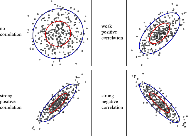
318 A Statistics
Fig. A.10 Illustration of the meaning of the correlations coefficient
A.2.5 Principal Component Analysis
Correlations between the attributes of a data set can be used to reduce its dimension:
if an attribute is (strongly) correlated with another, then this attribute is essentially
a linear function of the other (plus some noise). In such a case it is often sufficient
to consider only one of the two attributes, since the other can be reconstructed (ap-
proximately) via the regression line. However, this approach has the disadvantage
that it is not trivial to decide which of several correlated attributes should be kept
and which can be discarded.
A better approach to reduce the dimension of a data set is the so-called principal
component analysis (PCA; see also Sect. 4.3.2.1). The basic idea of this procedure is
not to select a subset of the features of the data set, but to construct a small number
of new features as linear combinations of the original ones. These new quantities
are supposed to capture the greater part of the information in the data set, where the
information content is measured by the (properly normalized) variance: the larger
the variance, the more important the (constructed) feature.
In order to find the linear combinations that define the new features, the data
is first normalized to mean 0 and standard deviation 1 in all original attributes, so
that the scale of the attributes (that is, for example, the units in which they were
measured) does not influence the result. In the next step one tries to find a new
basis for the data space, that is, perpendicular directions. This is done in such a way
that the first direction is the one in which the (normalized) data exhibits the largest

A.2 Descriptive Statistics 319
variance. The second direction is the one which is perpendicular to the first and in
which the data exhibits the largest variance among all directions perpendicular to
the first, and so on. Finally, the data is transformed to the new basis of the data
space, and some of the constructed features are discarded, namely those, for which
the transformed data exhibits the lowest variances. How many features are discarded
is decided based on the sum of the variances of the kept features relative to the total
sum of the variance of all features.
Formally, the perpendicular directions referred to above can be found with a
mathematical method that is known as principal axes transformation. This trans-
formation is applied to the correlation matrix, that is, the covariance matrix of the
data set that has been normalized to mean 0 and standard deviation 1 in all fea-
tures. That is, one finds a rotation of the coordinate system such that the correlation
matrix becomes a diagonal matrix. The elements of this diagonal matrix are the
variances of the data set w.r.t. the new basis of the data space, while all covariances
vanish. This is also a fundamental goal of principal component analysis: one wants
to obtain features that are linearly independent. As is well known from linear alge-
bra (see, for example, [5,11]), a principal axes transformation consists basically in
computing the eigenvalues and eigenvectors of a matrix. The eigenvalues show up
on the diagonal of the transformed correlation matrix, the eigenvectors (which can
be obtained in parallel with appropriate methods) indicate the desired directions in
the data space. The directions w.r.t. which the data is now described are selected
based on the eigenvalues, and finally the data is projected to the subspace chosen
in this way.
The following physical analog may make the idea of principal axes transfor-
mation clearer: how a solid body reacts to a rotation around a given axis, can be
described by the so-called tensor of inertia [9]. Formally, this tensor is a symmetric
3×3 matrix,
Θ=⎛
⎝Θxx Θxy Θxz
Θxy Θyy Θyz
Θxz Θyz Θzz ⎞
⎠.
The diagonal elements of this matrix are the moments of inertia of the body w.r.t.
the axes that pass through its center of gravity7and are parallel to the axes of the
coordinate system that we use to describe the rotation. The remaining (off-diagonal)
elements of the matrix are called deviation moments and describe the forces that act
perpendicular to the axes during the rotation.8However, for any solid body, regard-
less of its shape, there are three axes w.r.t. which the deviation moments vanish, the
7The inertia behavior of axes that do not pass through the center of gravity can easily be described
with Steiner’s law. However, this goes beyond the scope of this discussion, see standard textbooks
on theoretical mechanics like [9] for details.
8These forces result from the fact that generally the vector of angular momentum is not parallel to
the vector of angular velocity. However, this again leads beyond the scope of this discussion.
320 A Statistics
Fig. A.11 The principal axes
of inertia of a box
so-called principal axes of inertia.9As an example, Fig. A.11 shows the principal
axes of inertia of a box. The principal axes of inertia are always perpendicular to
each other. In the coordinate system that is spanned by the principal axes of inertia,
the tensor of inertia is a diagonal matrix.
Formally, the principal axes of inertia are found by carrying out a principal axes
transformation of the tensor of inertia (given w.r.t. an arbitrary coordinate system):
its eigenvectors are the directions of the principal axes of inertia.
In the real world, the deviation moments cause shear forces, which lead to vibra-
tions and jogs in the bearings of the axis. Since such vibrations and jogs naturally
lead to quick abrasion of the bearings, it is tried to minimize the deviation moments.
As a consequence, a car mechanic who balances a wheel can be seen as carrying out
a principal axes transformation (though not in mathematical form), because he/she
tries to equate the rotation axis with a principal axis of inertia. However, he/she does
not do so by changing the direction of the rotation axis, as this is fixed in the wheel.
Rather, he/she changes the mass distribution by adding, removing, and shifting small
weights so that the deviation moments vanish.
Based on this analog, we may say that a statistician looks, in the first step of a
principal component analysis, for axes around which a mass distribution with unit
weights at the locations of the data points can be rotated without vibrations or jogs
in the bearings. Afterwards, he selects a subset of the axes by removing those axes
around which the rotation needs the most energy, that is, those axes for which the
moments of inertia are largest (in the direction of these axes, the variance is smallest,
and perpendicularly to them, the variance is largest).
Formally, the axes are selected via the percentage of explained variance. It can
be shown that the sum of the eigenvalues of a correlation matrix equals the dimen-
sion mof the data set, that is, it is equal to the number of features (see, for example,
[5,11]). In this case it is plausible to define that the proportion of the total variance
that is captured by the jth principal axis as
pj=λj
m·100%,
where λjis the eigenvalue corresponding to the jth principal axis.
9Note that a body may possess more than three axes w.r.t. which the deviation moments vanish.
For a sphere with homogeneous mass distribution, for example, any axis that passes through the
center is such an axis. However, any body, regardless of its shape, has at least three such axes.
A.2 Descriptive Statistics 321
Let p(1),...,p
(m) a sequence of these percentages that is sorted descendingly.
For this sequence, one determines the smallest value ksuch that
k
j=1
p(j) ≥α·100%
with a proportion αthat has to be chosen by a user (for example, α=0.9). The
corresponding kprincipal axes are chosen as the new features, and the data points
are projected to them. Alternatively, one may specify to how many features one
desires to reduce the data set to and then chooses the axes following a descending
proportion λj
m. In this case the above sum provides information about how much
information contained in the original data is lost.
A.2.5.1 Example of a Principal Component Analysis
As a very simple example of a principal component analysis, we consider the reduc-
tion of a data set of two correlated quantities to a one-dimensional data set. Let the
following data be given:
x5152129314349516165
y33 35 24 21 27 16 18 10 4 12
Even a quick look at this table already reveals that the two features are strongly
correlated, an even clearer impression is provided by Fig. A.12. As a consequence,
it can be expected that this data set can be reduced to a one-dimensional data set
without much loss of information.
In the first step we compute the correlation matrix. To this end we normalize the
data to mean 0 and standard deviation 1 and compute the covariance matrix of the
normalized data. Thus we obtain the normalized data set
x−1.6−1.1−0.8−0.4−0.30.30.60.71.21.4
y1.31.50.40.10.7−0.4−0.2−1.0−1.6−0.8
Fig. A.12 Data of an
example for the principal
component analysis as a
scatter plot

322 A Statistics
The covariance of these normalized features is the correlation coefficient
r=sxy=1
9
10
i=1
xiyi=−8.28
9=−23
25 =−0.92.
Therefore the correlation matrix is
Σ=1
99−8.28
−8.28 9 =1−23
25
−23
25 1.
(Note that the diagonal elements of this matrix are the correlation coefficients of the
features with themselves. Hence they are necessarily 1.)
For this correlation matrix, we have to carry out a principal axes transformation.
In order to do so, we compute the eigenvalues and eigenvectors of this matrix, that
is, those values λiand vectors vi,i=1,2, for which
Σvi=λivior (Σ −λiI)vi=0,
where Iis the unit matrix. In order to compute the eigenvalues λi, we rely here on
the simple method of finding the roots of the characteristic polynomial10
c(λ) =|Σ−λE|=(1−λ)2−529
625.
The roots of this polynomial are the eigenvalues
λ1/2=1±'529
625 =1±23
25;hence λ1=48
25 and λ2=2
25.
The corresponding eigenvectors are
v1=√2
2,−√2
2and v2=√2
2,√2
2
that can be found by simply inserting the eigenvalues into
(Σ −λiE)vi=0
and solving the resulting underdetermined linear equation system.11 Therefore the
principal axes transformation is given by the orthogonal matrix that has the eigen-
vectors as its columns, that is,
T=⎛
⎝
√2
2√2
2
−√2
2√2
2⎞
⎠.
10Note, however, that for larger matrices, this method is numerically unstable and should be re-
placed by some other approach; see, for example, [13].
11Note that for two variables, due to the special form of the characteristic polynomial, the eigen-
vectors are always exactly these two vectors (for the normalized data), independent of original
data.

A.3 Probability Theory 323
This matrix satisfies
TΣT=λ10
0λ2.
However, in order to obtain simple numbers for the transformed data, we multiply
the data points with √2Tinstead of T, that is, we compute
x
y=√2·T·x
y.
With the help of this transformation, the data points are projected to the principal
axes. Intuitively, the multiplication with the matrix is equivalent to dropping perpen-
diculars from each data point to the axes that are given by the eigenvectors and using
the distances of the feet of the perpendiculars from the origin as new coordinates.
The transformed data set is
x −2.9−2.6−1.2−0.5−1.00.70.81.72.82.2
y −0.30.4−0.4−0.30.4−0.10.4−0.3−0.40.6
This data set describes the data points in the space that is spanned by the principal
axes. Since the y values vary only fairly little compared to the x values (without
the factor √2 that we added to the transformation, the eigenvalues λ1=23
25 and
λ2=2
25 would be the variances in these dimensions, with the factor they are twice
as large), we can confine ourselves to considering the x values. Thus we have
reduced the data set to one dimension, without losing much information.
Note that the final data set shown above can be obtained directly from the original
data set by the transformation
x
y=√2·T·s−1
x0
0s−1
y·x
y−¯x
¯y,
which combines the normalization and the projection of the data to the principal
axes. This clearly demonstrates that the new features are merely linear combinations
of the original features—as stated at the beginning.
A.3 Probability Theory
Inferential statistics, as it is considered in Sect. A.4, is firmly based on probability
theory. It uses notions and methods from probability theory in order to obtain con-
clusions and judgments about the data generating process. Therefore this section
recalls some essential notions and theorems of probability theory.
A.3.1 Probability
Probability theory is concerned with random events. That is, it is known what spe-
cific events can occur in principle, but it is uncertain which of the possible events

324 A Statistics
will actually occur in any given instance. Examples are the throw of a coin or the cast
of die. In probability theory a numerical quantity, called probability, is assigned to
random events, which is intended to capture the chance or the tendency of the event
to actually occur, at least in relation to the other possible outcomes.
A.3.1.1 Intuitive Notions of Probability
In order to achieve a first intuition, we start by considering the classical definition
of probability. This definition is actually a procedure to compute probabilities and
was developed out of analyses of the possible outcomes of gambles:
The probability of an event Ais the ratio of the number NAof favorable events
(where an event is called favorable for Aif Aoccurs with it) to the total number N
of mutually exclusive, equally possible events:
P(A)=NA
N.
That the events are equally possible is usually derived from symmetry considera-
tions. The mutually exclusive, equally possible events are called elementary events.
Together they form the sample space. Other random events can be represented as
combinations of elementary events, generally as sets of elementary events. An es-
sential set of tools for determining probabilities on the basis of the above definition
are the methods of combinatorics, which can be used to count the number of all
possible and the number of favorable events (see Sect. A.3.2.1).
As an example, we consider a symmetric die consisting of homogeneous mate-
rial. The sample space consists of the elementary events “The number xwas cast,”
x∈{1,2,3,4,5,6}. The event “An even number was cast” consists of the elemen-
tary events “The number xwas cast,” x∈{2,4,6}, and thus occurs in three out of
six equally possible cases. Therefore its probability is 3
6=1
2.
The classical notion of probability can be generalized by dropping the require-
ment that the elementary events are equally possible. Instead, a sample space is
defined, and each elementary event is associated with an elementary probability.
Obviously, the classical notion then results as a special case of equal elementary
events, demonstrating the term “equally possible” is actually a trick to avoid having
to speak of “equally probable,” which would result in a circular definition.
Another intuitive concept related to the probability of an event is the relative
frequency of the event. Suppose that some experiment with a random outcome is
executed ntimes under equal conditions. If Ais a random event, then Aeither
occurs or does not occur in each execution of the experiment. The number fn(A) of
executions of the experiment in which Aoccurs is called the absolute frequency,
and the ratio rn(A) =fn(A)
nis called the relative frequency of A(cf. page 305).
In [12] von Mises tried to define the probability P(A) of an event as the limit
that is approached by the relative frequencies as the sample size ngoes to infinity,
that is,
P(A)=lim
n→∞rn(A).

A.3 Probability Theory 325
However, this does not work. Even though it is necessary for the above definition to
be valid, it is not possible to ensure that sequences of experiments occur in which
∀n≥n0(ε):P(A)−ε≤rn(A) ≤P(A)+ε
does not hold, regardless of how large n0is chosen. (Even though it is highly un-
likely, it is not impossible that repeated throws of a die result only in, say, ones.)
Nevertheless the intuition of a probability as a relative frequency is helpful, espe-
cially if it is interpreted as our estimate of the relative frequency of the event (in
future executions of the same experiment).
As an example, consider the sex of a newborn child. Usually the number of girls
roughly equals the number of boys. Hence the relative frequency of a girl being born
is equal to the relative frequency of a boy being born. Therefore we say that the
probability that a girl is born (and also the probability that a boy is born) equals 1
2.
Note that this probability cannot be derived from considerations of symmetry (as
we can derive the probabilities of heads and tails when throwing a coin).12
A.3.1.2 The Formal Definition of Probability
The classical notion of probability and the interpretation as a relative frequency
are deeply rooted in our intuition. However, modern mathematics is based on the
axiomatic method, because one has realized that relying too much on intuition can
introduce hidden assumptions, which can reduce the generality of obtained results
or even invalidate them. The axiomatic method abstracts from the meaning of the
objects that one considers. It takes the objects as given and having initially no other
properties than their identity (that is, we can somehow distinguish one object from
another). Then it studies merely the structure of the relations between these objects
as they follow from the axioms (basic statements) that are laid down.
As a consequence, modern probability theory is also based on an axiomatic ap-
proach, which relies on Kolmogorov’s axioms [7]. In this approach an event is
simply a set of elementary events, which are distinguishable, that is, which have
an identity. A probability is a number that is assigned to such events, so that the
resulting system of numbers satisfies certain conditions, which are specified in the
axioms. However, before we take a look at these axioms, we define the more basic
notions of event algebra and σ-algebra, which are referred to in the axioms.
Definition A.1 Let Ωbe a base set of elementary events (the sample space). Any
subset E⊆Ωis called an event. A system S⊆2Ωof events is called an event
algebra iff
1. Scontains the certain event Ωand the impossible event.
2. If an event Abelongs to S, then the event A=Ω−Aalso belongs to S.
12It should be noted, though, that explanations from evolutionary biology for the usually equal
probabilities of the two sexes indeed make references to symmetry.

326 A Statistics
3. If events Aand Bbelong to S, then the events A∩Band A∪Balso belong to S.
In addition the following condition may be satisfied:
3. If for all i∈N, the event Aibelongs to S,
then the events ∞
i=1Aiand (∞
i=1Aialso belong to S.
In this case Sis called a σ-algebra.
The notion of a probability is now defined by the following axioms:
Definition A.2 (Kolmogorov’s axioms) Let Sbe an event algebra that is defined on
a finite sample space Ω.
1. The probability P(A) of an event A∈Sis a uniquely determined, nonnegative
real number, which can be at most one, that is, 0 ≤P(A)≤1.
2. The certain event Ωhas probability 1, that is, P(Ω)=1.
3. Additivity:IfAand Bare two mutually exclusive events (that is, A∩B=∅),
then P(A∪B) =P(A)+P(B).
If the sample space Ωhas infinitely many elements, Smust be a σ-algebra, and
Axiom 3 must be replaced by:
3.Extended additivity:IfA1,A
2,...are countably infinitely many, pairwise mu-
tually exclusive events, then
P∞
)
i=1
Ai=∞
i=1
Ai.
Hence the probability P(A)can be seen as a function that is defined on an event
algebra or on a σ-algebra and that has certain properties. From the above definition
several immediate consequences follow:
1. For every event A,wehaveP(
A) =1−P(A).
2. The impossible event has probability 0, that is, P(∅)=0.
3. From A⊆Bit follows that P(A)≤P(B).
4. For arbitrary events Aand B,wehave
P(A−B) =P(A∩B) =P(A)−P(A∩B).
5. For arbitrary events Aand B,wehave
P(A∪B) =P(A)+P(B)−P(A∩B).
6. Since P(A∩B) cannot be negative, it follows that
P(A∪B) ≤P(A)+P(B).
7. By simple induction we infer from the additivity axiom:
if A1,...,A
mare (finitely many) pairwise mutually exclusive events, we have
P(A
1∩···∩Am)=m
i=1P(A
i).
Kolmogorov’s system of axioms is consistent, because there are actual systems that
satisfy these axioms. This system of axioms allows us to construct probability theory
as part of measure theory and to interpret a probability as a nonnegative, normalized,
additive set function and thus as a measure (in the sense of measure theory).

A.3 Probability Theory 327
Definition A.3 Let Ωbe a set of elementary events, Saσ-algebra defined on a
sample space Ω, and Pa probability that is defined on S. Then the triple (Ω, S,P)
is called a probability space.
A.3.2 Basic Methods and Theorems
After we have defined probability, we now turn to basic methods and theorems of
probability theory, which we explain with simple examples. Among these are the
computation of probabilities with combinatorial and geometrical approaches, the
notions of conditional probability and (conditionally) independent events, the prod-
uct law, the theorem of total probability, and finally the very important Bayes’ rule.
A.3.2.1 Combinatorial Methods
As already mentioned, on the basis of the classical definition of probability, com-
binatorics provides many tools to compute probabilities. We confine ourselves to a
simple example, namely the famous birthday problem:
Let mpeople be randomly chosen. What is the probability of the event Amthat
at least two of these people have their birthday on the same day (day and month in
a year, but not the same year)? In order not to over-complicate things, we neglect
leap years. In addition, we assume that every day of a year is equally possible as a
birthday.13 It is immediately clear that for m≥366, at least two people must have
their birthday on the same day. Hence we have
∀m≥366:P(A
m)=1.
For m≤365, we consider the complementary event Am, which occurs if all mpeo-
ple have their birthday on different days. This switch to the complementary event is
a very common technique when computing with probabilities, which often leads to
considerable simplifications. If we number the people, the first person may have its
birthday on 365, the second on 364 (since the birthday of the first is excluded), for
the mth, 365 −m+1 days (since the birthdays of the m−1 preceding people are
excluded. This yields the number of favorable cases for Am. In all, there are 365m
possible cases (because any person could have its birthday on any day of the year).
Therefore we have
P(
Am)=365 ·364···(365 −m+1)
365m,
and consequently
P(A
m)=1−365 ·364···(365 −m+1)
365m.
13This is not quite correct, since surveys show that the frequency of births is not quite uniformly
distributed over the year, but a reasonable approximation.

328 A Statistics
The surprising property of this formula is that for mas low as 23, we already have
P(A
23)≈0.507. Hence for 23 or more people, it is more likely that two people have
their birthday on the same day than that all have their birthdays on different days.
A.3.2.2 Geometric Probabilities
Geometric probabilities are a generalization of the classical definition of probability.
One no longer counts the favorable and all possible cases and then forms their ratio.
Rather, the counts are replaced by geometric quantities, like lengths or areas.
As an example, we consider the game franc-carreau as it was studied in [2]: In
this game a coin is thrown onto an area that is divided into rectangles of equal shape
and size. Let the coin have the radius r, and the rectangles the side lengths aand
b, with 2r≤aand 2r≤b, so that the coin fits completely into a rectangle. We
desire to find the probability that the coin lies on at least one of the two sides of a
rectangle. If we inscribe into each rectangle a smaller one with side lengths a−2r
and b−2rin such a way that the centers of the rectangles coincide and the sides are
parallel, it is clear that the coin does not lie on any side of a rectangle if and only
if its center lies inside the inner rectangle. Since the area of the inner rectangle is
(a −2r)(b −2r) and the area of the outer ab, the desired probability is
P(A)=1−(a −2r)(b −2r)
ab .
A.3.2.3 Conditional Probability and Independent Events
In many cases one has to determine the probability of an event Awhen it is already
known that some other event Bhas occurred. Such probabilities are called condi-
tional probabilities and denoted P(A|B). In a strict sense the “unconditional” prob-
abilities we considered up to now are also conditional, because they always refer to
specific frame conditions and circumstances. For example, we assumed that the die
we throw is symmetric and made of homogeneous material. Only under these, and
possibly other, silently adopted frame conditions (like no electromagnetic influence
on the die, etc.) we stated that the probability of each number is 1
6.
Definition A.4 Let Aand Bbe two arbitrary events with P(B)>0. Then
P(A|B) =P(A∩B)
P(B)
is called the conditional probability of Agiven B.
A simple example: two dice are cast. What is the probability that one of the dice
displays a five if it is known that the sum of the pips is eight. If two dice are cast,
we have 36 elementary events, five of which satisfy that the sum of the pips is eight
(4 +4, 5 +3, and 6 +2, where the last two have to be counted twice due to the two

A.3 Probability Theory 329
possible distributions of the numbers to the two dice). That is, we have P(B)=5
36 .
The event “The sum of the pips is eight, and one of the dice shows a five” can be
obtained from two elementary events: either the first die shows a five, and the second
a three, or vice versa. Therefore P(A∩B) =2
36 , and thus the desired conditional
probability is P(A|B) =2
5.
Theorem A.1 (product law) For arbitrary events Aand B,we have
P(A∩B) =P(A|B) ·P(B).
This theorem follows immediately from the definition of conditional probability
together with the obvious relation that P(A ∩B) =0ifP(B) =0.14 By simple
induction over the number of events, we obtain the generalization for mevents:
Pm
*
i=1
Ai=
m
i=1
PAi+++++
i−1
*
k=1
Ak.
A conditional probability has all properties of a normal probability, that is, it satisfies
Kolmogorv’s Axioms. Therefore we have:
Theorem A.2 For an arbitrary,but fixed,event Bwith P(B)>0, the function PB
that is defined as PB(A) =P(A|B) is a probability which satisfies PB(B) =0.
With the help of the notion of a conditional probability, we can now define the
notion of (stochastic) independence of events. This notion can be motivated as fol-
lows: if, for example, smoking had no influence on the development of lung cancer,
then the proportion people with lung cancer among smokers should be (roughly)
equal to the proportion of people with lung cancer among nonsmokers.
Definition A.5 Let Bbe an event with 0 <P(B)<1. Then an event Ais called
(stochastically) independent of Biff
P(A|B) =P(A|B).
The following two relations, which are usually easier to handle, are equivalent:
Theorem A.3 An event Ais (stochastically)independent of an event Bwith
0<P(B)<1iff
P(A|B) =P(A)
or equivalently iff
P(A∩B) =P(A)·P(B).
14Formally this argument is not quite valid, though, since for P(B)=0, the conditional probability
P(A|B) is undefined (see Definition A.4). However, since the equation holds for any value that
maybefixedforP(A|B) in case that P(B)=0, we allow ourselves to be slightly sloppy here.
330 A Statistics
Note that the relation of (stochastic) independence is symmetric, that is, if Ais
(stochastically) independent of B, then Bis also (stochastically) independent of A
(provided that 0 <P(A)<1). In addition, the notion of (stochastic) independence
can easily be extended to more than two events:
Definition A.6 mevents A1,...,A
mare called completely (stochastically) inde-
pendent if for any selection Ai1,...,A
itof tevents with ∀r, s;1≤r, s ≤t:ir=is,
we have
Pt
*
k=1
Aik=
t
k=1
P(A
ik).
Note that for the complete (stochastic) independence of more than two events,
their pairwise independence is necessary but not sufficient.
Let us consider a simple example: A white and a red die are cast. Let Abe
the event “The number of pips shown by the white die is even,” Bthe event “The
number of pips shown by the red die is odd,” and Cthe event “The sum of the pips
is even.” It is easy to check that Aand Bare pairwise (stochastically) independent,
as well as Band C, and also Aand C. However, due to P(A∩B∩C) =0 (since the
sum of an even number and an odd number must be odd), they are not completely
independent.
Another generalization of (stochastic) independence can be achieved by intro-
ducing another condition for all involved probabilities:
Definition A.7 (conditionally (stochastically) independent) Two events Aand B
are called conditionally (stochastically) independent given a third event Cwith 0 <
P(C)<1iff
P(A∩B|C) =P(A|C) ·P(B |C).
Note that two events Aand Bmay be conditionally independent but not uncon-
ditionally independent and vice versa. To see this, consider again the example of the
red and white die discussed above. Aand Bare independent but not conditionally
independent given C, because if Cholds, only one of Aand Bcan be true, even
though either of them can be true (provided that the other is false). Hence the joint
probability P(A∩B|C) =0, while P(A|C) ·P(B |C) > 0. Examples for the re-
verse case (conditional independence, but unconditional dependence) are also easy
to find.
A.3.2.4 Total Probability and Bayes’ Rule
Often we face situations in which the probabilities of disjoint events Aiare known,
which together cover the whole sample space. In addition, we know the conditional
probabilities of an event Bgiven these Ai. Desired is the (unconditional) probabil-
ity of the event B. As an example, consider a plant that has a certain number of

A.3 Probability Theory 331
machines to produce the same product. Suppose that the capacities of the individ-
ual machines and their probabilities (rates) of producing faulty products are known.
The total probability (rate) of faulty products is to be computed. This rate can easily
be found by using the law of total probability. However, before we turn to it, we
formally define the notion of an event partition.
Definition A.8 mevents A1,...,A
mform an event partition iff all pairs Ai,
Ak,i= k, are mutually exclusive (that is, Ai∩Ak=∅for i= k) and if
A1∪···∪Am=Ω, that is, all events together cover the whole sample space.
Theorem A.4 (law of total probability) Let A1,...,A
mbe an event partition
with ∀i;1≤i≤m:P(A
i)>0(and,as follows from the additivity axiom,
m
i=1P(A
i)=1). Then the probability of an arbitrary event Bis
P(B)=
m
i=1
P(B |Ai)P (Ai).
The law of total probability can be derived by applying the product rule (see
Theorem A.1) to the relation
P(B)=P(B∩Ω) =PB∩
m
)
i=1
Ai=Pm
)
i=1
(B ∩Ai)=
m
i=1
P(B ∩Ai),
the last step of which follows from the additivity axiom.
With the help of this theorem we can easily derive the important Bayes’ rule. To
do so, it is merely necessary to realize that the product rule can be applied in two
ways to the simultaneous occurrence of two events Aand B:
P(A∩B) =P(A|B) ·P(B)=P(B |A) ·P(A).
Dividing the right-hand side by P(B) (which, of course, must be positive to be
able to do so), yields the simple form of Bayes’ rule. By applying the law of total
probability to the denominator, we obtain the extended form.
Theorem A.5 (Bayes’ rule) Let A1,...,A
mbe an event partition with ∀i;1≤i≤
m:P(A
i)>0, and Ban arbitrary event with P(B)>0. Then
P(A
i|B) =P(B |Ai)P (Ai)
P(B) =P(B |Ai)P (Ai)
m
k=1P(B |Ak)P (Ak).
This rule15 is also called the formula for the probability of hypotheses, since it
can be used to compute the probability of hypotheses (for example, the probabil-
ity that a patient suffers from a certain disease) if the probabilities are known with
15Note that Thomas Bayes (1702–1761) did not derive this formula, despite the fact that it bears
his name. In the form given here it was stated only later by Pierre-Simon de Laplace (1749–1827).
This supports a basic law of the history of science: a law or an effect that bears the name of a
person was found by somebody else.

332 A Statistics
which the hypotheses lead to the considered events Ai(for example, medical symp-
toms).
As an example, we consider five urns with the following contents:
•two urns with the contents A1with two white and three black balls each,
•two urns with the contents A2with one white and four black balls each,
•one urn with the contents A3with four white and one black ball.
Suppose that an urn is chosen at random and a ball is drawn from it, also at random.
Let this ball be white: this is the event B. What is the (posterior) probability that the
ball stems from an urn with the contents A3?
According to our presuppositions, we have:
P(A
1)=2
5,P(A
2)=2
5,P(A
3)=1
5,
P(B |A1)=2
5,P(B|A2)=1
5,P(B|A3)=4
5.
We start by applying the law of total probability in order to find the probabil-
ity P(B):
P(B)=P(B |A1)P (A1)+P(B |A2)P (A2)+P(B |A2)P (A3)
=2
5·2
5+1
5·2
5+4
5·1
5=10
25.
Using Bayes’ rule, we then obtain
P(A
3|B) =P(B |A3)P (A3)
P(B) =
4
5·1
5
10
25 =2
5.
Likewise, we can obtain
P(A
1|B) =2
5and P(A
2|B) =1
5.
A.3.2.5 Bernoulli’s Law of Large Numbers
In Sect. A.3.1 we already considered the relation between the probability P(A)and
the relative frequency rn(A) =hn(A)
nof an event A, where hn(A) is the absolute
frequency of this event in ntrials. We saw that it is not possible to define the prob-
ability of Aas the limit of the relative frequency as n→∞. However, a slightly
weaker statement holds, namely the famous law of large numbers.
Definition A.9 A random experiment in which the event Acan occur is repeated
ntimes. Let Aibe the event that Aoccurs in the ith trial. Then the sequence of
experiments of length nis called a Bernoulli experiment16 for the event Aiff the
following conditions are satisfied:
16The notion “Bernoulli experiment” was introduced in recognition of the Swiss mathematician
Jakob Bernoulli (1654–1705).

A.3 Probability Theory 333
1. ∀1≤i≤n:P(A
i)=p.
2. The events A1,...,A
nare fully independent.
Theorem A.6 (Bernoulli’s law of large numbers) Let hn(A) be the number of oc-
currences of an event Ain nindependent trials of a Bernoulli experiment,where in
each of the trials the probability P(A) of the occurrence of Aequals an arbitrary,
but fixed,value p,0≤p≤1. Then for any ε>0,
lim
n→∞P++++
hn(A)
n−p++++<ε
=1
√2π,e−z2
2dz=1.
This property of the relative frequency rn(A) =hn(A)
ncan be interpreted as fol-
lows: even though p=P(A) is not the limit of the relative frequency for infinite
sample size, as von Mises [12] tried to define, but it can be seen as very probable
(practically certain) that in a Bernoulli experiment of sufficiently large size n,the
relative frequency rn(A) differs only very little from a fixed value, the probabil-
ity p. This is often referred to by saying that the relative frequency rn(A) converges
in probability to the probability P(A)=p. With the above law we have the funda-
mental relationship between the relative frequency and the probability of an event A.
A.3.3 Random Variables
In many situations we are not interested in the complete set of elementary events and
their individual probabilities, but in the probabilities of events that result from a par-
tition of the sample space. That is, these events are mutually exclusive, but together
cover the whole sample space (an event partition, see above). The probabilities of
such events are commonly described by so-called random variables, which can be
seen as transformations from one sample space into another [10].
Definition A.10 A function Xthat is defined on a sample space Ωand has the do-
main dom(X) is called random variable if the preimage of any subset of its domain
possesses a probability. Here the preimage of a subset U⊆dom(X) is defined as
X−1(U) ={ω∈Ω|X(ω) ∈U}.
A.3.3.1 Real-Valued Random Variables
The simplest random variable is obviously one that has the elementary events as
its possible values. However, in principle, any set can be the domain of a random
variable. However, most often the domain is the set of real numbers.
Definition A.11 A function Xthat maps a sample space Ωto the real numbers is
called a real-valued random variable if it possesses the following properties: for
334 A Statistics
any x∈Rand any interval (a, b],a<b, (where a=−∞is possible), the events
Ax={ω∈Ω|X(ω) =x}and A(a,b]={ω∈Ω|a<X(ω)≤b}possess probabili-
ties.
Sometimes the required properties are stated with an interval [a,b) that is open
on the right. This does not lead to any significant differences.
Definition A.12 Let Xbe a real-valued random variable. The real-valued function
F(x)=P(X≤x)
is called the distribution function of X.
A.3.3.2 Discrete Random Variables
Definition A.13 A random variable Xwith finite or only countable infinite
domain dom(X) is called a discrete random variable. The total of all pairs
(x, P (X =x)),x∈dom(X), is called the (probability) distribution of a discrete
random variable X.
If the probabilities P(X =x) can be stated as a function, the distribution of a
discrete random variable is often stated as a function vX(x) =P(X=x). Possible
parameters (in order to select a function from a parameterized family of functions)
are separated by a semicolon from the function argument. For example, the binomial
distribution
bX(x;p,n) =n
xpx(1−p)n−x
has the probability pof the occurrence of the considered event in a single trial and
the size nof the sample as parameters. (The binomial distribution is considered in
more detail in Sect. A.3.5.1; later sections consider other important distributions.)
The values of the distribution function of a discrete, real-valued random variable
can be computed as follows from the values of the probability distribution:
F(x)=P(X≤x) =
x≤x
PX=x.
Every discrete real-valued random variable Xhas a step function Fas its distribu-
tion function, which has jumps of height P(X=x)only at those values xthat are
in the domain dom(X).Fromx<yit follows that F(x)≤F(y), that is, Fis mono-
tone nondecreasing. The function values F(x) become arbitrarily small if only xis
chosen small enough, while the values F(x)get arbitrarily close to 1 for growing x.
Therefore we have
lim
x→−∞F(x)=0 and lim
x→∞F(x)=1.
A.3 Probability Theory 335
Vice versa, from any step function F, which satisfies the above conditions, the dis-
tribution (x, P (X =x)),x∈dom(X), of a real-valued random variable can be de-
rived.
With the help of a distribution function Fit is very simple to compute the prob-
ability that Xassumes a value from a given interval:
Theorem A.7 Let Fbe the distribution function of a discrete real-valued random
variable X.Then the following relations hold:
P(a<X≤b) =F(b)−F(a),
P(a≤X≤b) =F(b)−FL(a),
P(a<X)=1−F(a),
where FL(a) is the left limit of F(x) at the location a.This limit equals F(a),if a
is not the location of a discontinuity,and otherwise equal to the value of the step
directly to the left of a,or formally,FL(a) =supx<a F(x).
A.3.3.3 Continuous Random Variables
In contrast to discrete random variables, continuous (real-valued) random variables
are defined as random variables with a super-countably infinite domain. Obviously,
this requires to replace the sum in the distribution function by an integral.
Definition A.14 A real-valued random variable Xis called continuous if there
exists a nonnegative, integrable function fsuch that for its distribution function
F(x)=P(X≤x), the integral representation
F(x)=P(X≤x) =,x
−∞ f(u)du
holds. The function fis called the (probability) density function (or simply den-
sity) of the random variable X.
Since P(−∞<X<∞)=P({ω∈Ω|−∞<X(ω)<∞})=P(Ω), the den-
sity function fsatisfies ,∞
−∞ f(u)du=1.
For continuous random variables, similar relations hold as for discrete real-valued
random variables.
Theorem A.8 If Xis a continuous random variable with density function f,then
for arbitrary numbers a,b,c ∈Rwith a<b,we have
P(a<X≤b) =F(b)−F(a)=,b
a
f(u)du,
P(X>c)=1−F(c)=,∞
c
f(u)du.
336 A Statistics
A.3.3.4 Random Vectors
Up to now we have only considered single random variables. In the following we
expand our study to several random variables and their interaction, that is, their joint
distribution and their dependence or independence. In order to do so, we define the
notion of a random vector or, equivalently, of a multidimensional random variable.
Definition A.15 Let X1,...,X
mbe mrandom variables that are defined on the
same probability space (Ω, S,P), that is, on the same sample space Ωwith the
same σ-algebra Sand probability P. In this case the vector (X1,...,X
m)is called
arandom vector or an m-dimensional random variable.
In order to keep things simple, we consider here only two-dimensional random
variables. However, all definitions and theorems can easily be transferred to multi-
dimensional random variables (random vectors with finite length m). In addition we
confine ourselves, as in the preceding sections, to real-valued random variables.
Definition A.16 Let Xand Ybe two real-valued random variables. The function F
which is defined for all pairs (x, y) ∈R2as
F(x,y) =P(X≤x,Y ≤y)
is called the distribution function of the two-dimensional random variable (X, Y ).
The one-dimensional distribution functions
F1(x) =P(X≤x) and F2(y) =P(Y ≤y)
are called marginal distribution functions.
For discrete random variables, the notion of their joint distribution is defined in
an analogous way.
Definition A.17 Let Xand Ybe two discrete random variables. Then the total
of pairs ∀x∈dom(X) :∀y∈dom(Y ) :((x, y), P (X =x,Y =y)) is called the
joint distribution of Xand Y. The one-dimensional distributions ∀x∈dom(X) :
(x, yP(X =x,Y =y)) and ∀y∈dom(Y ) :(y, xP(X =x,Y =y)) are
marginal distributions.
Continuous random variables are treated in a similar way, by simply replacing
the joint distribution with the joint density function.
Definition A.18 The two-dimensional random variable (X, Y ) is called continuous
if there exists a nonnegative function f (x,y) such that for every (x, y) ∈R2,we
have
F(x,y) =P(X≤x,Y ≤y) =,x
−∞ ,y
−∞ f(u,v)dudv.
A.3 Probability Theory 337
The function f (x,y) is called the joint density function or simply joint density of
the random variables Xand Y. The one-dimensional density functions
f1(x) =,+∞
−∞ f(x,y)dyand f2(y) =,+∞
−∞ f(x,y)dx
are called marginal density functions or simply marginal densities.
By extending the notion of the independence of events one can define the notion
of the independence of random variables.
Definition A.19 Two continuous real-valued random variables Xand Ywith
two-dimensional distribution function F(x,y) and marginal distribution functions
F1(x) and F2(y) are called (stochastically) independent if for all pairs of values
(x, y) ∈R2,wehave
F(x,y) =P(X≤x,Y ≤y) =P(X≤x) ·P(Y ≤y) =F1(x) ·F2(y).
Definition A.20 Two discrete random variables Xand Ywith joint distribution
∀x∈dom(X) :∀y∈dom(Y ) :((x, y), P (X =x,Y =y)) and marginal distribu-
tions ∀x∈dom(X) :(x, P (X =x)) and ∀y∈dom(Y ) :(y, P (Y =y)) are called
(stochastically) independent,if
∀x∈dom(X) :∀y∈dom(Y ):P(X=x,Y =y) =P(X=x) ·P(Y =y).
As for events, the notion of (stochastic) independence can easily be generalized
to conditional (stochastic) independence. In this case the distributions and distribu-
tion functions are replaced by conditional distributions and conditional distribution
functions. For example, for discrete random variables, we obtain:
Definition A.21 Let X,Y, and Zbe three discrete random variables. Let the
Xand Yhave the conditional joint distribution ∀x∈dom(X) :∀y∈dom(Y ) :
∀z∈dom(Z) :((x, y, z), P (X =x,Y =y|Z=z)) given Zand the conditional
marginal distributions ∀x∈dom(X):∀z∈dom(Z) :((x, z), P (X =x|Z)) and
∀y∈dom(Y ) :∀z∈dom(Z) :((y, z), P (Y =y|Z)).Xand Yare conditionally
(stochastically) independent if
∀x∈dom(X) :∀yindom(Y ) :∀z∈dom(Z):
P(X=x,Y =y|Z=z) =P(X=x|Z=z) ·P(Y =y|Z=z).
For continuous random variables, the definition is generalized in an analogous
way but is formally a bit tricky, and that is why we omit it here. In order to distin-
guish normal (stochastic) independence from conditional (stochastic) independence,
the former is often also called marginal independence.
Since the notion of conditional independence is a very important concept, we
try to convey a better intuition of it with a simple example. Consider the scatter
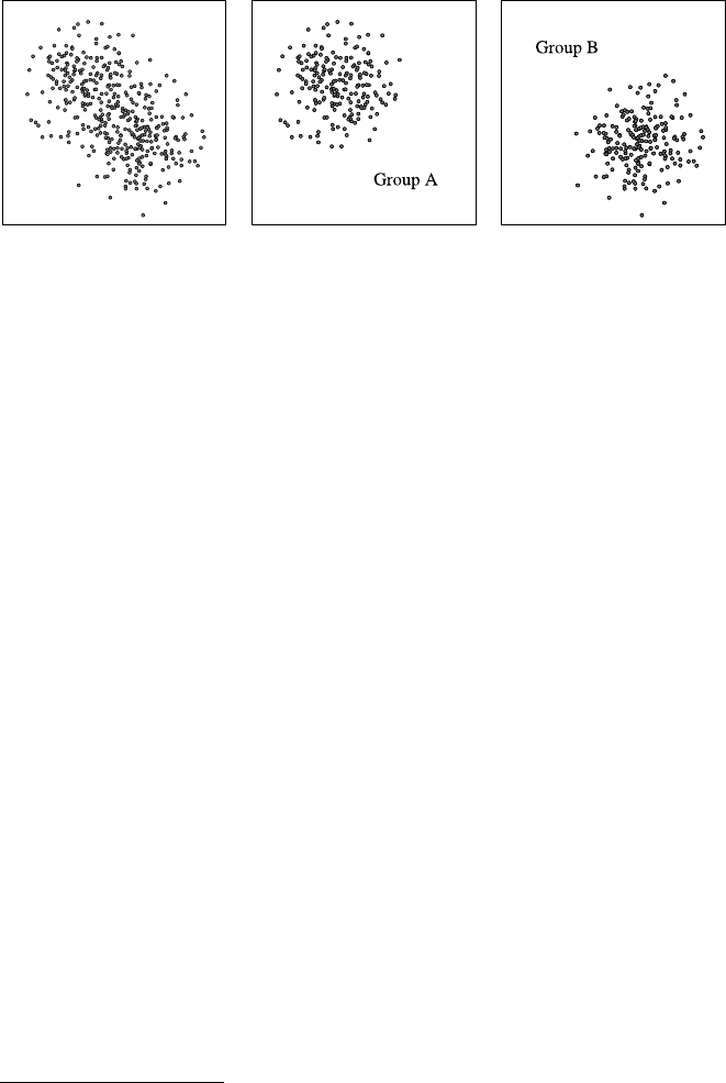
338 A Statistics
Fig. A.13 Illustration of marginal dependence and conditional independence: the two measures
describing the points are marginally dependent (left), but if a third, binary variable is fixed and thus
the data points are split into two groups, the dependence vanishes (middle and right)
plot of a sample from two continuous random variables that is shown in Fig. A.13
on the left. Obviously, the two quantities are not independent, because there is a
clear tendency for the Yvariable (vertical axis) to take lower values if X(hori-
zontal axis) has higher values. Hence Xand Yare not marginally independent. To
make the example more vivid, we can interpret the horizontal axis as the average
number of cigarettes a person smoked per day and the vertical axis as the age of
death of that person. Of course, this is a fictitious example, with artificially gen-
erated data points, but medical surveys usually show such a dependence.17 From
such an observed dependence it is usually concluded that smoking is a health haz-
ard.
However, this need not be conclusive. There may be a third variable that couples
the two, which, if we fix its value, renders the two quantities independent. A pas-
sionate smoker may claim, for example, that this third variable is whether a person
is exposed to severe stress at work. Such stress is certainly a health hazard and it
causes, as our passionate smoker may argue, both: a shorter life span (due to the
strain on the person’s health by the stress it is exposed to) and a higher cigarette
consumption (due to the fact that smoking has a calming effect and thus can help
to cope with stress). If this argument were correct,18 the dependence should van-
ish if we consider people that are exposed to stress at work and those who are not
separately. That is, if the argument were correct, we should see the separate data as
depicted in Fig. A.13 in the middle (people that are not exposed to stress at work and
thus smoke less and live longer) and on the right (people that are exposed to stress
at work and thus smoke more and live less long). In both cases the dependence be-
tween the two quantities has vanished, and thus they are conditionally independent
given the third variable (stress at work or not).
17However, we do not claim that the actual dependence looks like our data.
18We do not believe it is. The claim that smoking harms your health is much better supported
than just by an observation of a correlation like the one depicted in Fig. A.13, even though such
correlations are part of the argument.

A.3 Probability Theory 339
A.3.4 Characteristic Measures of Random Variables
In analogy to Sect. A.2.3, where we defined characteristic measures for data sets,
random variables can be described by analogous measures. While for data sets, these
measures are derived from the sample values, measures for random variables are
derived from their distributions and distribution functions. The analogy is actually
very close: the unit weight of each sample data point is replaced by the probability
mass that is assigned to the different values in the domain of a random variable.
A.3.4.1 Expected Value
If the notion of a random variable is applied to gambling, where the value of the
random variable could be, for example, the gains or losses connected to different
outcomes, the idea suggests itself to consider a kind of average or expected win
(or loss) if a sufficiently large number of gambles is played. This idea leads to the
notion of an expected value.
Definition A.22 Let Xbe a discrete real-valued random variable with distribution
(x, P (X =x)),x∈dom(X).Ifx|x|P(X =x) is finite, the limit (which must
exist in this case)
μ=E(X) =∞
i=1
xiP(X=xi)
is called the expected value of X.
As an example, consider the expected value of the winnings in the classical game
of roulette. We do not bet on a so-called simple chance (Rouge vs. Noir,Pair vs.
Impair,Manque vs. Passe), in order to avoid the difficulties that result from the
special rules applying to them, but bet on a column (one of the sets of numbers
1–12, 13–24, and 14–36). In case of a win we receive three times our wager. Since
in roulette 37 numbers can occur (0–36),19 all of which are equally likely if we
assume perfect conditions, winning with a bet on a column has the probability 12
37 ,
and losing has the probability 25
37 . Let us assume that the wager consists of mchips.
In case of a win we have twice the wager as a net gain (the paid out win has to
be reduced by the initially waged mchips), that is, 2mchips, whereas in case of a
failure we lose mchips. As a consequence, the expected value is
E(X) =2m·12
37 −m·25
37 =−1
37m≈−0.027m.
On average we thus lose 2.7% of our wager in every gamble.
In order to define the expected value of continuous random variables, we only
have to replace the sum by an integral, and the probabilities of the distribution by
the density function.
19In certain types of American roulette even 38, as these have 0 and 00 (double zero).
340 A Statistics
Definition A.23 If Xbe a continuous random variable with density function fand
if the integral
,∞
−∞ |x|f(x)dx=lim
a→−∞
b→∞
,b
a|x|f(x)dx
exists, then the integral (which must exist in this case)
μ=E(X) =,∞
−∞ xf (x ) dx
is called the expected value of X.
A.3.4.2 Properties of the Expected Value
In this section some properties of the expected value are collected, which can often
be exploited when one has to compute the expected value.
Theorem A.9 Let Xbe a discrete random variable that takes no other values than
some constant c.Then its expected value is equal to c:μ=E(X) =c.
Theorem A.10 (linearity of the expected value) Let Xbe a (discrete or continuous)
real-valued random variable with expected value E(X).Then the expected value of
the random variable Y=aX +b,a,b ∈R,is
E(Y) =E(aX +b) =aE(X) +b.
The statement can easily be checked by simply inserting the expression aX +b
into the definition of the expected value, once for a discrete and once for a continu-
ous random variable.
As an example, we consider the distribution of a random variable X, which de-
scribes the sum of the pips of two dice. This sum is clearly symmetric w.r.t. the
value 7, that is, ∀k∈{0,1,...,5}:P(X=7+k) =P(X=7−k). It follows that
the expected values of the random variables Y1=X−7 and Y2=−(X −7)=7−X
must be identical, since they have, due to the symmetry, the same distribution.
Therefore,
E(Y1)=E(X −7)=E(7−X) =E(Y2).
Applying Theorem A.10 yields E(X) −7=7−E(X), and therefore E(X) =7.
From this example we can conclude generally that the point of symmetry of a dis-
tribution, provided that it has one, must be its expected value. This also holds for
continuous random variables.
Next, we turn to the expected value of functions of two random variables, namely
their sum and their product.
Theorem A.11 (expected value of a sum of random variables) The expected value
of a sum Z=X+Yof two arbitrary real-valued random variables Xand Y,whose

A.3 Probability Theory 341
expected values E(X) and E(Y) both exist,is equal to the sum of their expected
values,
E(Z) =E(X +Y)=E(X) +E(Y).
Theorem A.12 (expected value of a product of random variables) The expected
value of a product Z=X·Yof two independent real-valued random variables X
and Y,whose expected values E(X) and E(Y) exist,is equal to the product of their
expected values,
E(Z) =E(X ·Y)=E(X) ·E(Y).
Again the validity of these theorems can easily be checked by inserting the
sum/product into the definition of the expected value, in the case of a product of
random variables by also exploiting the definition of independence. It should be
clear that both theorems can easily be generalized to sums and products of finitely
many (independent) random variables. Never forget about the presupposition of in-
dependence in the second theorem, since it does not hold for dependent random
variables.
A.3.4.3 Variance and Standard Deviation
The expected value alone does not sufficiently characterize a random variable. We
must consider also what deviation from the expected value can occur on average
(see Sect. A.2.3.2). This dispersion is described by variance and standard deviation.
Definition A.24 If μis the expected value of a discrete real-valued random vari-
able X, then the value (provided that it exists)
σ2=D2(X) =E[X−μ]2=∞
i=1
(xi−μ)2P(X=xi)
is called the variance, and the positive square root σ=D(X) =+√σ2is called the
standard deviation of X
Let us again consider roulette as an example. If we bet mchips on a column, the
variance is
D2(X) =2m+1
37m2
·12
37 +−m+1
37m2
·25
37 =99900
50653m2≈1.97m2.
Hence the standard deviation D(X) is about 1.40m. In comparison, the variance of
a bet on a plain chance, that is, on a single number, has the same expected value,
but the variance
D2(X) =35m+1
37m2
·1
37 +−m+1
37m2
·36
37 =1726272
50653 m2≈34.1m2,

342 A Statistics
and thus a standard deviation D(X) of about 5.84m. Despite the same expected
value, the average deviation from the expected value is about 4 times as large for a
bet on a plain chance than for a bet on a column.
In order to define the variance of a continuous random variable, we only have to
replace the sum by an integral—just as we did for the expected value.
Definition A.25 If μis the expected value of a continuous random variable X, then
the value (provided that it exists)
σ2=D2(X) =,∞
−∞(x −μ)2f(x)dx
is called the variance of X, and σ=D(X) =+√σ2is called the standard devia-
tion of X.
A.3.4.4 Properties of the Variance
In this section we collect a few useful properties of the variance.
Theorem A.13 Let Xbe a discrete random variable which takes no other values
than a constant c.Then its variance is 0: σ2=D2(X) =0.
Theorem A.14 Let Xbea(discrete or continuous)real-valued random variable
with variance D2(X).Then the variance of the random variable Y=aX +b, a,
b∈R,is
D2(Y ) =D2(aX +b) =a2D2(X),
and therefore,for the standard deviation,we have
D(Y) =D(aX +b) =|a|D(X).
The validity of this theorem (like the validity of the next theorem) can easily be
checked by inserting the given expressions into the definition of the variance, once
for discrete and once for continuous random variables.
Theorem A.15 The variance σ2of a (discrete or continuous)real-valued random
variable satisfies
σ2=EX2−μ2.
Theorem A.16 (variance of a sum of random variables, covariance) If Xand Yare
two (discrete or continuous)real-valued random variables,whose variances D2(X)
and D2(Y ) exist,then
D2(X +Y)=D2(X) +D2(Y ) +2[E(X ·Y)−E(X) ·E(Y)].
A.3 Probability Theory 343
The expression E(X ·Y)−E(X)·E(Y) =E[(X −E(X))(Y −E(Y))]is called the
covariance of Xand Y.From the (stochastic)independence of Xand Yit follows
that
D2(Z) =D2(X +Y)=D2(X) +D2(Y ),
that is,the covariance of independent random variables vanishes.
Again the validity of this theorem can easily be checked by inserting the sum
into the definition of the variance. By simple induction it can easily be generalized
to finitely many random variables.
A.3.4.5 Quantiles
Quantiles are defined in direct analogy to the quantiles of a data set, with the frac-
tion of the data set replaced by the fraction of the probability mass. For continuous
random variables, quantiles are often also called percentage points.
Definition A.26 Let Xbe a real-valued random variable. Then any value xα,
0<α<1, with
P(X≤xα)≥αand P(X≥xα)≥1−α
is called an α-quantile of X(or of its distribution).
Note that for discrete random variables, several values may satisfy both inequali-
ties, because their distribution function is piecewise constant. It should also be noted
that the pair of inequalities is equivalent to the double inequality
α−P(X=x) ≤FX(x) ≤α,
where FX(x) is the distribution function of a random variable X. For a continuous
random variable X, it is usually more convenient to define that the α-quantile is the
value xthat satisfies FX(x) =α. In this case a quantile can be computed from the
inverse of the distribution function FX(provided that it exists and can be specified
in closed form).
A.3.5 Some Special Distributions
In this section we study some special distributions, which are often needed in appli-
cations (see Sect. A.4 about inferential statistics).
A.3.5.1 The Binomial Distribution
Let Xbe a random variable that describes the number of trials of a Bernoulli exper-
iment of size nin which an event Aoccurs with probability p=P(A) in each trial.

344 A Statistics
Then Xhas the distribution ∀x∈N:(x;P(X=x)) with
P(X=x) =bX(x;p,n) =n
xpx(1−p)n−x
and is said to be binomially distributed with parameters pand n. This formula is
also known as Bernoulli’s formula. The expression n
x=n!
x!(n−x)!(pronounced “n
choose x”) is called a binomial coefficient.
The distribution satisfies the recursive relation
∀x∈N0:bX(k +1;p,n) =(n −x)p
(x +1)(1−p)bX(x;p,n)
with bX(0;p,n) =(1−p)n.
For the expected value and variance, we have
μ=E(X) =np ;σ2=D2(X) =np ( 1−p).
A.3.5.2 The Polynomial Distribution
Bernoulli experiments can easily be generalized to more than two mutually exclu-
sive events. In this way one obtains the polynomial distribution, which is a multi-
dimensional distribution: a random experiment is executed independently ntimes.
Let A1,...,A
kbe mutually exclusive events, of which in each trial exactly one must
occur, that is, let A1,...,A
kbe an event partition. In every trial each event Aioc-
curs with constant probability pi=P(A
i),1≤i≤k. Then the probability that in
ntrials the event Ai,i=1,...,k, occurs xitimes, k
i=1xi=n, is equal to
P(X
1=x1,...,X
k=xk)=n
x1...x
kpx1
1···pxk
k=n!
x1!···xk!px1
1···pxk
k.
The total of all probabilities of all vectors (x1,...,x
k)with k
i=1xi=nis called
the (k-dimensional) polynomial distribution with parameters p1,...,p
kand n.
The binomial distribution is obviously a special case of for k=2. The expression
n
x1...xk=n!
x1!···xk!is called a polynomial coefficient, in analogy to the binomial
coefficient n
x=n!
x!(n−x)!.
A.3.5.3 The Geometric Distribution
Let Xbe a random variable that describes the number of trials in a Bernoulli exper-
iment that are needed until an event A, which occurs with p=P(A)> 0 in each
trial, occurs for the first time. Then Xhas the distribution ∀x∈N:(x;P(X =x))
with
P(X=x) =gX(x;p) =p(1−p)x−1

A.3 Probability Theory 345
and is said to be geometrically distributed with parameter p. In order to compute
the probabilities the recursive relation
∀x∈N:P(X=x+1)=(1−p)P (X =x) with P(X=1)=p
can be useful. The expected value and variance are
μ=E(X) =1
p;σ2=D2(X) =1−p
p2.
A.3.5.4 The Hypergeometric Distribution
From an urn which contains Mblack and N−Mwhite, and thus in total Nballs,
nballs are drawn without replacement. Let Xbe the random variable that de-
scribes the number of black balls that have been drawn. Then Xhas the distribution
∀x;max(0,n−(N −M)) ≤x≤min(n, M) :(x;P(X=x)) with
P(X=x) =hX(x;n, M, N) =M
xN−M
n−x
N
n
and is said to be hypergeometrically distributed with parameters n,Mand N.
This distribution satisfies the recursive relation
∀x;max(0,n−(N −M)) ≤x≤min(n, M) :
hX(x +1;n, M, N) =(M −x)(n −x)
(x +1)(N −M−n+x+1)hX(x;n, M, N)
with hX(1;n, M, N) =M
N.
With p=M
Nand q=1−p, the expected value and variance are
μ=E(X) =np ;σ2=D2(X) =np q N−n
N−1.
A.3.5.5 The Poisson Distribution
A random variable Xwith the distribution ∀x∈N:(x;P(X=x)) where
P(X=x) =ΛX(x;λ) =λx
x!e−λ
is said to be Poisson distributed20 with parameter λ. This distribution satisfies the
recursive relation
∀x∈N0:ΛX(x +1;λ) =λ
x+1ΛX(x;λ) with ΛX(0;λ) =e−λ.
20This distribution bears its name in recognition of the French mathematician Siméon-Denis Pois-
son (1781–1840).

346 A Statistics
The expected value and variance are
μ=E(X) =λ;σ2=D2(X) =λ.
A Poisson distribution describes the occurrence frequency of a certain type of events
in a fixed duration of time, for example, the number of deadly traffic accidents.
For rare events Aand a large number nof trials, the binomial distribution can be
approximated by a Poisson distribution, because the following relation holds: if in a
binomial distribution, ngoes to infinity so that np =λstays constant, then
∀x∈N:lim
n→∞
np =λ
bX(x;p,n) =λx
x!e−λ,
and thus for large nand small p, we obtain the approximation
∀x∈N:bX(x;p,n) ≈np x
x!e−np .
For Poisson distributed random variables, the following reproduction law holds:
Theorem A.17 Let Xand Ybe two (stochastically)independent Poisson-distrib-
uted random variables with parameters λXand λY,respectively.Then the sum Z=
X+Yis also Poisson distributed with parameter λZ=λX+λY.
A.3.5.6 The Uniform Distribution
A random variable Xwith the density function
fX(x;a,b) =1
b−afor x∈[a,b],
0 otherwise,
with a,b ∈R,a<b,issaidtobeuniformly distributed in [a,b]. Its distribution
function FXis
FX(x;a,b) =⎧
⎨
⎩
0forx≤a,
x−a
b−afor a≤x≤b,
1forx≥b.
The expected value and variance are
μ=E(X) =a+b
2;σ2=D2(X) =(b −a)2
12 .
A.3.5.7 The Normal Distribution
A random variable Xwith the density function
NXx;μ, σ 2=1
√2πσ2e
(x−μ)2
2σ2
is said to be normally distributed with parameters μand σ2.
A.3 Probability Theory 347
The expected value and variance are
E(X) =μ;D2(X) =σ2.
The normal distribution with expected value μ=0 and variance σ2=1 is called
standard normal distribution.
The density function fX(x;μ, σ 2)has its maximum at μand inflection points at
x=μ±σ. The distribution function of Xdoes not possess a closed-form represen-
tation. As a consequence, it is usually tabulated, most commonly for the standard
normal distribution, from which the values of arbitrary normal distributions can be
easily obtained by simple linear transformations.
However, in practice one often faces the reversed problem, namely to find the
argument of the distribution function of the standard normal distribution for which
is has a given value (or, in other words, one desires to find a quantile of the normal
distribution). In order to solve this problem one may just as well use tabulated val-
ues. However, the inverse function can be approximated fairly well by the ratio of
two polynomials, which is usually employed in computer programs (e.g., [15]).
The normal distribution is certainly the most important continuous distribution,
since many random processes, especially measurements of physical quantities, can
be described well by this distribution. The theoretical justification for this observed
fact is the important central limit theorem:
Theorem A.18 (central limit theorem) Let X1,...,X
mbe m(stochastically)in-
dependent real-valued random variables.In addition,let them satisfy the so-called
Lindeberg condition,that is,if Fi(x) are the distribution functions of the random
variables Xi,i=1,...,m,μitheir expected values,and σ2
itheir variances,then
for every ε>0, it is
lim
m→∞
1
V2
m
m
i=1,|xi−μi|>εV 2
m
(xi−μi)2dFi(x) =0
with V2
m=m
i=1σ2
i.Then the standardized sums
Sm=m
i=1(Xi−μi)
m
i=1σ2
i
(that is,standardized to expected value 0and variance 1) satisfy
∀x∈R:lim
m→∞P(S
m≤x) =Φ(x) =1
√2π,x
−∞ e−t2
2dt,
where Φ(x) is the distribution function of the standard normal distribution.
Intuitively this theorem says that the sum of a large number of almost arbitrarily
distributed random variables (the Lindeberg condition is a very weak restriction)
is approximately normally distributed. Since physical measurements are usually af-
fected by a large number of random influences from several independent sources,

348 A Statistics
which all add up to form the total measurement error, the result is often approxi-
mately normally distributed. The central limit theorem thus explains why normally
distributed quantities are so common in practice.
Like the Poisson distribution, the normal distribution can be used as an approxi-
mation of the binomial distribution, even if the probabilities pare not small.
Theorem A.19 (limit theorem of de Moivre–Laplace)21 If the probability of the
occurrence of an event Ain nindependent trials is constant and equal to p,0<
p<1, then the probability P(X=x) that,in these trials,the event Aoccurs exactly
xtimes satisfies as n→∞the relation
np (1−p)P (X =x) 1
√2πe−1
2y2→1,where y=x−np
√np (1−p).
The convergence is uniform for all xfor which ylies in an arbitrary finite inter-
val (a, b).
This theorem allows us to approximate the probabilities of the binomial distribu-
tion for large nby
∀x;0≤x≤n:
P(X=x) =n
xpx(1−p)n−x
≈1
√2πnp(1−p) exp−(x −np ) 2
2np (1−p)or
P(X=x) ≈Φx−np +1
2
√np (1−p)−Φx−np −1
2
√np (1−p)and
∀x1,x
2;0≤x1≤x2≤n:
P(x
1≤X≤x2)≈Φx2−np +1
2
√np (1−p)−Φx1−np −1
2
√np (1−p),
where Φis the distribution function of the standard normal distribution. The ap-
proximation is reasonably good for np ( 1−p) > 9.
A.3.5.8 The χ2Distribution
If one forms the sum of mindependent, standard normally distributed random vari-
ables (expected value 0 and variance 1), one obtains a random variable Xwith the
density function
fX(x;m) =0forx<0,
1
2m
2·( m
2)·xm
2−1·e−x
2for x≥0,
21This theorem bears its name in recognition of the French mathematicians Abraham de Moivre
(1667–1754) and Pierre-Simon de Laplace (1749–1827).

A.4 Inferential Statistics 349
where is the so-called Gamma function (generalization of the factorial)
(x) =,∞
0tx−1etdt
for x>0. This random variable is said to be χ2-distributed with mdegrees of free-
dom. The expected value and variance are
E(X) =m;D2(X) =2m.
The χ2distribution plays an important role in the statistical theory of hypothesis
testing (see Sect. A.4.3), for example, for independence tests.
A.3.5.9 The Exponential Distribution
A random variable Xwith the density function
fX(x;α) =0forx≤0,
αe−αx for x>0,
with α>0issaidtobeexponentially distributed with parameter α. Its distribution
function FXis
FX(x;α) =0forx≤0,
1−e−αx for x>0.
The expected value and variance are
μ=E(X) =1
α;σ2=D2(X) =1
α2.
The exponential distribution is commonly used to model the durations between the
arrivals of people or jobs that enter a queue to wait for service or processing.
A.4 Inferential Statistics
With inferential statistics one tries to answer the question whether observed phe-
nomena are typical or regular or whether they may also be caused by random influ-
ences. In addition, one strives to find probability distributions that are good models
of the data-generating process and tries to estimate their parameters. Therefore in-
ferential statistics is concerned with the following important tasks:
•parameter estimation
Given a model of the data-generating process, especially an assumption about the
family of distributions of the underlying random variables, the parameters of this
model are estimated from the data.
•hypothesis testing
One or more hypotheses about the data-generating process are checked on the
basis of the given data. Special types of hypothesis tests are:
350 A Statistics
– parameter test: a test whether a parameter of a distribution can have a certain
value or whether the parameter of the distributions underlying two different
data sets are equal.
– goodness-of-fit test: a test whether a certain distribution assumption fits the data
or whether observed deviations from the expected characteristics of the data
(given the distribution assumption) can be explained by random influences.
– dependence test: a test whether two features are dependent, or whether ob-
served deviations from an independent distribution can be explained by random
influences.
•model selection
From several models, which could be used to explain the data, select the best
fitting one, paying attention to the complexity of the models.
Note that parameter estimation can be seen as a special case of model selection, in
which the class of models from which one can select is highly restricted, so that they
differ only in the value(s) of a (set of) parameter(s). The goodness-of-fit test resides
on the border between hypothesis testing and model selection, because it serves the
purpose to check whether a model of a certain class is appropriate to explain the
data. We do not discuss more complex model selection in this appendix.
A.4.1 Random Samples
In Sect. A.2 we considered so-called samples (vectors of observed or measured
feature values) and represented them in a clearly arranged form in tables and charts.
In inferential statistics we also consider samples: we employ the mathematical tools
of probability calculus in order to gain (new) knowledge or to check hypotheses on
the basis of data samples. In order for this to be possible, the sample values must
be obtained as the outcomes of random experiments, so that probability theory is
applicable. Such specific samples are called random samples.
The random variable which yields the sample value xiwhen carrying out the cor-
responding random experiment is denoted Xi.Thevaluexiis called a realization of
the random variable Xi,i=1,...,n. Therefore a random sample x=(x1,...,x
n)
can be seen as a realization of the random vector X=(X1,...,X
n). A random
sample is called independent if the random variables X1,...,X
nare (stochasti-
cally) independent, that is, if
∀c1,...,c
n∈R:Pn
-
i=1
Xi≤ci=
n
i=1
P(X
i≤ci).
An independent random sample is called simple if all random variables X1,...,X
n
have the same distribution function. Likewise we will call the corresponding random
vector independent and simple, respectively.
A.4 Inferential Statistics 351
A.4.2 Parameter Estimation
As already pointed out, parameter estimation rests on an assumption of a model
for the data-generating process, in particular an assumption about the family of dis-
tribution functions of the underlying random variables. Given this assumption, it
estimates the parameters of this model from the given data.
Given: •A data set and
•a family of equally shaped, parameterized distribution functions
fX(x;θ1,...,θ
k).
Such families may be, for example:
The family of binomial distributions bX(x;p,n) with parameters p,
0≤p≤1, and n∈N, where n, however, is already implicitly given
by the sample size.
The family of Poisson distributions ΛX(x;λ,n) with parameters
λ>0 and n∈N, where nis again given by the sample size.
The family of normal distributions NX(x;μ, σ 2)with parameters μ
(expected value) and σ2(variance).
Assumption: The process that has generated the given data can appropriately be
described by an element of the considered family of distribution func-
tions: distribution assumption.
Desired: There is an element of the considered family of distribution functions
(determined by the values of the parameters) that is the best model of
the given data (w.r.t. certain quality criteria).
Estimators for the parameters are statistics, that is, functions of the sample values
of a given data set. Hence they are functions of (realizations of) random variables
and therefore (realizations of) random variables themselves. As a consequence, the
whole set of tools that probability theory provides for examining the properties of
random variables can be applied to estimators.
One distinguishes mainly two types of parameter estimation:
•point estimators
determine the best individual value of a parameter w.r.t. the given data and certain
quality criteria;
•interval estimators
yield a so-called confidence interval, in which the true value of the parameter lies
with high certainty, with the degree of certainty to be chosen by a user.
A.4.2.1 Point Estimation
It is immediately clear that not every statistic, that is, not every function computed
from the sample values, is a usable point estimator for an examined parameter θ.
Rather, a statistic should have certain properties, in order to be a reasonable estima-
tor. Desirable properties are:

352 A Statistics
•consistency
If the amount of available data grows, the estimated value should become closer
and closer to the actual value of the estimated parameter, at least with higher and
higher probability. This can be formalized by requiring that for growing sam-
ple size, the estimation function converges in probability to the true value of the
parameter. For example, if Tis an estimator for the parameter θ, it should be
∀ε>0:lim
n→∞P(|T−θ|<ε)=1,
where nis the sample size. This condition should be satisfied by every point
estimator; otherwise we have no reason to assume that the estimated value is in
any way related to the true value.
•unbiasedness
An estimator should not tend to generally under- or over-estimate the parame-
ter, but should, on average, yield the right value. Formally, this means that the
expected value of the estimator should coincide with the true value of the param-
eter. For example, if Tis an estimator for the parameter θ, it should be
E(T ) =θ,
independently of the sample size.
•efficiency
The estimation should be as precise as possible, that is, the deviation from the true
value of the parameter should be as small as possible. Formally, one requires that
the variance of the estimator should be as small as possible, since the variance is
a natural measure for the precision of the estimation. For example, let Tand Ube
unbiased estimators for a parameter θ. Then Tis called more efficient than Uiff
D2(T ) < D2(U ).
However, it is rarely possible to show that an estimator achieves the highest pos-
sible efficiency for a given estimation problem.
•sufficiency
An estimation function should exploit the information that is contained in the
data in an optimal way. This can be made more precise by requiring that different
samples, which yield the same estimated value, should be equally likely (given
the estimated value of the parameter). The reason is that if they are not equally
likely, it must be possible to derive additional information about the parameter
value from the data. Formally, this means that an estimator Tfor a parameter θ
is called sufficient if for all random samples x=(x1,...,x
n)with T(x)=t,the
expression
fX1(x1;θ)···fXn(xn;θ)
fT(t;θ)
does not depend on θ[10].
Note that the estimators used in the definition of efficiency must be unbiased, since
otherwise arbitrary constants (variance D2=0) would be efficient estimators. Con-

A.4 Inferential Statistics 353
sistency, on the other hand, can often be neglected as an additional condition, since
an unbiased estimator Tfor a parameter θwhich also satisfies
lim
n→∞D2(T ) =0
is consistent (not surprisingly).
A.4.2.2 Point Estimation Examples
Given: A family of uniform distributions on the interval [0,θ], that is,
fX(x;θ)=1
θif 0 ≤x≤θ,
0 otherwise.
Desired: An estimator for the unknown parameter θ.
(a) Estimate the parameter θas the maximum of the sample values, that is, choose
T=max{X1,...,X
n}as the estimation function.
In order to check the properties of this estimator, we first determine its proba-
bility density,22 from which we can then derive other properties:
fT(t;θ) =d
dtFT(t;θ) =d
dtP(T ≤t)
=d
dtPmax{X1,...,X
n}≤t
=d
dtPn
-
i=1
Xi≤t=d
dt
n
i=1
P(X
i≤t)
=d
dt(FX(t;θ))n=n·(FX(t;θ))n−1fX(t, θ),
where
FX(x;θ)=,x
−∞ fX(x;θ)dx=⎧
⎨
⎩
0ifx≤0,
x
θif 0 ≤x≤θ,
1ifx≥θ.
It follows that
fT(t;θ) =n·tn−1
θnfor 0 ≤t≤θ.
Tis a consistent estimator for θ:
lim
n→∞P(|T−θ|<ε)=lim
n→∞P(T >θ −ε)
=lim
n→∞,θ
θ−ε
n·tn−1
θndt=lim
n→∞.tn
θn/θ
θ−ε
22Recall that estimators are functions of random variables and thus random variables themselves.
As a consequence, they have a probability density.

354 A Statistics
=lim
n→∞θn
θn−(θ −ε)n
θn
=lim
n→∞1−θ−ε
θn=1.
However, Tis not unbiased. This is already intuitively clear, since Tcan only
underestimate the value of θ, but never overestimate it. Therefore the estimated
value will “almost always” be too small. Formally, we have:
E(T ) =,∞
−∞ t·fT(t;θ)dt=,θ
0t·n·tn−1
θndt
=.n·tn+1
(n +1)θn/θ
0=n
n+1θ<θ for n<∞.
(b) Choose U=n+1
nT=n+1
nmax{X1,...,X
n}as the estimation function.
The statistic Uis a consistent and unbiased estimator for the parameter θ.We
omit a formal proof, which can be obtained along the same lines as in a). How-
ever, we will later need the probability density of this estimator, which is
fU(u;θ)=nn+1
(n +1)n
un−1
θn.
Given: A family of normal distributions N(x;μ, σ ), i.e.,
fXx;μ, σ 2=1
√2πσ2exp−(x −μ)2
2σ2.
Desired: Estimators for the unknown parameters μand σ2.
(a) The (empirical) median and the (empirical) mean are both consistent and unbi-
ased estimators for the parameter μ. The median is less efficient than the mean.
Since it only exploits order information from the data, it is naturally also not
sufficient. Even though the median is preferable for small sample size due to the
fact that it is less sensitive to outliers, its variance is larger than that of the mean
(provided that the sample size is sufficiently large).
(b) The function V2=1
nn
i=1(Xi−¯
X)2is a consistent, but not unbiased, estimator
for the parameter σ2, since this function tends to underestimating the variance.
The (empirical) variance S2=1
n−1n
i=1(Xi−¯
X)2, however, is a consistent
and unbiased estimator for the parameter σ2. (Due to the square root, however,
√S2is not an unbiased estimator for the standard deviation.)
Given: A family of polynomial distributions, that is,
fX1,...,Xk(x1,...,x
k;θ1,...,θ
k,n)=n!
k
i=1xi!
k
i=1
θxi
i,
where θiis the probability that values aioccurs, and the random vari-
able Xidescribes how often the value aioccurs in the sample.
Desired: Estimators for the unknown parameters θ1,...,θ
k.

A.4 Inferential Statistics 355
The relative frequencies Ri=Xi
nof the feature values in the sample are consistent,
unbiased, most efficient, and sufficient estimators for the unknown parameters θi,
i=1,...,k. This is the reason why relative frequencies are used in basically all
cases to estimate the probabilities of nominal values.
A.4.2.3 Maximum Likelihood Estimation
Up to now we have simply stated estimation functions for parameters. This is possi-
ble because for many standard problems, consistent, unbiased, and efficient estima-
tors are known, so that they can be looked up in standard textbooks. Nevertheless,
we consider briefly how one can find estimation functions in principle.
Besides the method of moments, which we omit here, maximum likelihood es-
timation, as it was developed by R.A. Fisher,23 is one of the most popular methods
for finding estimation functions. The underlying principle is very simple: choose
the value of the parameter to estimate (or the set of values of the parameters to es-
timate if there are several) that renders the given random sample most likely. This
is achieved as follows: if the parameter(s) of the true underlying distribution were
known, we could easily compute the probability of a random experiment generat-
ing the observed random sample. However, this probability can also be written with
unknown parameters (though not necessarily be numerically computed). The result
is a function that describes the likelihood of a random sample given the unknown
parameters. This function is called a likelihood function. By taking partial deriva-
tives of this function w.r.t. the parameters to estimate and setting them equal to zero
(since the derivative must vanish at a maximum), estimation functions are derived.
A.4.2.4 Maximum Likelihood Estimation Example
Given: A family of normal distributions NX(x;μ, σ 2), that is,
NXx;μ, σ 2=1
√2πσ2exp−(x −μ)2
2σ2.
Desired: Estimators for the unknown parameters μand σ2.
The likelihood function of a simple random sample x=(x1,...,x
n), which is the
realization of a vector X=(X1,...,X
n)of normally distributed random variables
with parameters μand σ2,is
Lx1,...,x
n;μ, σ 2=
n
i=1
1
√2πσ2exp−(xi−μ)2
2σ2.
23However, R.A. Fisher did not invent this method as is often believed. Earlier on C.F. Gauß and
D. Bernoulli already made use of it, but Fisher was the first to study it systematically and to
establish it in statistics [10].

356 A Statistics
It describes the probability of the sample (the data set) depending on the parame-
ters μand σ2. By exploiting the known rules for computing with exponential func-
tions, this expression can be transformed into
Lx1,...,x
n;μ, σ 2=1
(√2πσ2)nexp−1
2σ2
n
i=1
(xi−μ)2.
In order to determine the maximum of this function w.r.t. parameters μand σ2,it
is convenient to take the natural logarithm (in order to eliminate the exponential
function). Since the logarithm is a monotone function, this does not change the
location of the maximum. We obtain the log-likelihood function
lnLx1,...,x
n;μ, σ 2=−nln02πσ21−1
2σ2
n
i=1
(xi−μ)2.
In order to find the maximum, we set the partial derivatives w.r.t. μand σ2equal
to 0. The partial derivative w.r.t. μis
∂
∂μ lnLx1,...,x
n;μ, σ 2=1
σ2
n
i=1
(xi−μ) !
=0,
from which
n
i=1
(xi−μ) =n
i=1
xi−nμ !
=0,
and thus
ˆμ=1
n
n
i=1
xi
follows as an estimate for the parameter μ. The partial derivative of the log-
likelihood function w.r.t. σ2yields
∂
∂σ2lnLx1,...,x
n;μ, σ 2=− n
2σ2+1
2σ4
n
i=1
(xi−μ)2!
=0.
By inserting the estimated value ˆμfor the parameter μ, we obtain the estimator
ˆσ2=1
n
n
i=1xi−ˆμ2=1
n
n
i=1
x2
i−1
n2n
i=1
xi2
for the parameter σ2. Note that the result is not unbiased. (Recall that, as we men-
tioned above, the empirical variance with a factor of 1
ninstead of 1
n−1is not unbi-
ased.) This shows that there is no estimator for the variance of a normal distribution
that has all desirable properties. Among those that are unbiased, the data is not max-
imally likely, and the one that makes the data maximally likely is not unbiased.

A.4 Inferential Statistics 357
A.4.2.5 Maximum A Posteriori Estimation
An alternative for maximum likelihood estimation is maximum a posteriori estima-
tion, which rest on Bayes’ rule. This estimation method assumes a prior distribution
on the domain of the parameter(s) and computes, with the help of this prior distribu-
tion and the given data, a posterior distribution via Bayes’ rule. The parameter value
with the greatest posterior probability (density) is chosen as the estimated value.
That is, one chooses the value for θthat maximizes
f(θ |D) =f(D|θ)f(θ)
f(D) =f(D|θ)f(θ)
2∞
−∞ f(D|θ)f(θ)dθ,
where Dare the given data, and f(θ) is the assumed prior distribution. Compare
this to maximum likelihood estimation, which chooses the value of the parameter θ
that maximizes f(D|θ), that is, the likelihood of the data.
A.4.2.6 Maximum A Posteriori Estimation Example
In order to illustrate why it can be useful to assume a prior distribution on the pos-
sible values of the parameter θ, we consider three situations:
•A drunkard claims to be able to predict the side onto which a tossed coin will
land (head or tails). On ten trials he always states the correct side beforehand.
•A tea lover claims that she is able to taste whether the tea or the milk was poured
into the cup first. On ten trials she always identifies the correct order.
•An expert of classical music claims to be able to recognize from a single sheet
of music whether the composer was Mozart or somebody else. On ten trials he is
indeed correct every time.
Let θbe the (unknown) parameter that states the probability that a correct prediction
is made. The data is formally identical in all three cases: 10 correct, 0 wrong predic-
tions. Nevertheless we are reluctant to treat these three cases equally, as maximum
likelihood estimation does. We hardly believe that the drunkard can actually predict
the side a tossed coin will land on but assume that he was simply “lucky.” The tea
lover we also view sceptically, even though our skepticism is less pronounced as in
the case of the drunkard. Maybe there are certain chemical processes that depend on
the order in which tea and milk are poured into the cup and which change the taste
slightly and thus are noticeable to a passionate tea drinker. We just see this possibil-
ity as unlikely. On the other hand, we are easily willing to believe the music expert.
Clearly, there are differences in the style of different composers that may allow a
knowledgeable music expert to see even from a single sheet of music whether it was
composed by Mozart or not.
The three attitudes with which we see the three situations can be expressed by
prior distribution on the domain of the parameter θ. In the case of the drunkard we
ascribe a nonvanishing probability density only to the value 0.5.24 In the case of the
24Formally: Dirac pulse at θ=0.5.

358 A Statistics
tea lover we may choose a prior distribution, which ascribes values close to 0.5 a
high probability density, which quickly declines towards 1. In the case of the music
expert, however, we ascribe a significant probability densities also to values closer
to 1. In effect, this means that in the case of the drunkard we always estimate θ
as 0.5, regardless of the data. In the case of the tea lover only fairly clear evidence in
favor of her claim will make us accept higher values for θ. In the case of the music
expert, however, few positive examples suffice to obtain a fairly high value for θ.
Obviously, the prior distribution contains background knowledge about the data-
generating process and expresses which parameter values we expect and how easily
we are willing to accept them. However, how to choose the prior distribution is a
tricky and critical problem, since it has to be chosen subjectively. Depending on
their experience, different people will choose different distributions.
A.4.2.7 Interval Estimation
A parameter value that is estimated with a point estimator from a data set usually
deviates from the true value of the parameter. Therefore it is useful if one can make
statements about these unknown deviations and their expected magnitude. The most
straightforward approach is certainly to provide a point-estimated value tand the
standard deviation D(T ) of the estimator, that is,
t±D(T ) =t±D2(T ).
However, a better possibility consists in determining intervals—so-called confi-
dence intervals—that contain the true value of the parameter with high probability.
The boundaries of these confidence intervals are computed by certain rules from
the sample values. Hence they are also statistics, and thus, like point estimators,
(realizations of) random variables. Therefore they can be treated analogously. For-
mally, they are defined as follows:
Let X=(X1,...,X
n)be a simple random vector the random variables of which
have the distribution function FXi(xi;θ) with (unknown) parameter θ. Furthermore,
let A=gA(X1,...,X
n)and B=gB(X1,...,X
n)be two estimators defined on X
such that
P(A<θ <B)=1−α, P (θ ≤A) =α
2,P(θ≥B) =α
2.
Then the random interval [A, B](or a realization [a,b]of this random interval) is
called a (1−α) ·100% confidence interval for the (unknown) parameter θ.The
value 1 −αis called confidence level.
Note the term “confidence” refers to the method and not to the result of the
procedure (that is, to a realization of the random interval). Before data has been
collected, a (1−α) ·100% confidence interval contains the true parameter value
with probability 1 −α. However, after the data has been collected and the interval
boundaries have been computed, the interval boundaries are not random variables
anymore. Therefore the interval either contains the true value of the parameter θ

A.4 Inferential Statistics 359
or it does not (probability 1 or 0—even though it is not known which of the two
possibilities is obtained).
The above definition of a confidence interval is not specific enough to derive a
computation procedure from it. Indeed, the estimators Aand Bare not uniquely
determined: the sets of realizations of the random vectors X1,...,X
nfor which
A≥θand B≤θhold merely have to be disjoint and must possess the probability α
2.
In order to derive a procedure to obtain the boundaries Aand Bof a confidence
interval, the estimators are restricted as follows: they are not defined as general
functions of the random vector but rather as functions of a chosen point estimators T
for the parameter θ. That is,
A=hA(T ) and B=hB(T ).
In this way confidence intervals can be determined generally, namely by replacing
an investigation of A<θ <B with the corresponding event w.r.t. the estimator T,
that is, A∗<T <B
∗. Of course, this is only possible if we can derive the func-
tions hA(T ) and hB(T ) from the inverse functions A∗=h−1
A(θ) and B∗=h−1
B(θ)
that we have to consider w.r.t. T.
Idea: PA∗<T <B
∗=1−α
⇒Ph−1
A(θ) < T < h−1
B(θ)=1−α
⇒P(h
A(T ) < θ < hB(T )) =1−α
⇒P(A<θ <B)=1−α.
Unfortunately, this is not always possible (in a sufficiently simple way).
A.4.2.8 Interval Estimation Examples
Given: A family of uniform distributions on the interval [0,θ], that is,
fX(x;θ)=1
θif 0 ≤x≤θ,
0 otherwise.
Desired: A confidence interval for the unknown parameter θ.
A confidence interval can be computed in this case by starting from the unbiased
point estimator U=n+1
nmax{X1,...,X
n}:
P(U ≤B∗)=,B∗
0fU(u;θ)du=α
2and
P(U ≥A∗)=,n+1
nθ
A∗fU(u;θ)du=α
2.
As we know from the section on point estimation,
fU(u;θ)=nn+1
(n +1)n
un−1
θn.

360 A Statistics
Thus we obtain
B∗=n
'α
2
n+1
nθand A∗=n
'1−α
2
n+1
nθ,
that is,
Pn
'α
2
n+1
nθ<U< n
'1−α
2
n+1
nθ=1−α,
from which we can derive easily
PU
n
1−α
2n+1
n
<θ< U
n
α
2n+1
n=1−α.
This expression allows us to read the values Aand Bdirectly.
Given: A family of binomial distributions, that is,
bX(x;θ,n) =n
xθx(1−θ)n−x.
Desired: A confidence interval for the unknown parameter θ.
For an exact computation of a confidence interval for the parameter θ, we start in
analogy to the above example with
P(X≥A∗)=
n
i=A∗n
iθi(1−θ)n−i≤α
2,
P(X≤B∗)=
B∗
i=0n
iθi(1−θ)n−i≤α
2.
However, these expressions are often difficult to evaluate. Hence one often chooses
an alternative approach, namely the approximate computation of a confidence in-
terval based on the central limit theorem (see Theorem A.19 on page 348). This
theorem allows us to approximate the binomial distribution by a standard normal
distribution:
bX(x;θ,n) ≈Nx−nθ
√nθ(1−θ);0,1=1
√2πnθ(1−θ) exp−(x −nθ)2
2nθ(1−θ).
This approximation is fairly good already for nθ(1−θ) > 9.
Similar to the approach above, we now start from
PX−nθ
√nθ(1−θ) ≤B∗=α
2and
PX−nθ
√nθ(1−θ) ≥A∗=α
2.
Note that this expression does not contain the estimator (here T=X
n) for the un-
known parameter θitself but a function of this estimator (because of the approxi-
mation used).

A.4 Inferential Statistics 361
Due to the symmetry of the normal distribution, the computations become fairly
simple. For example, due to this symmetry, we know that B∗=−A∗. Hence we can
write
P−A∗<X−nθ
√nθ(1−θ) <A
∗
=,A∗
−A∗
1
√2πnθ(1−θ) exp−(x −nθ)2
2nθ(1−θ)dx
=ΦA∗−Φ−A∗=2ΦA∗−1=1−α,
where Φis the distribution function of the standard normal distribution. This func-
tion cannot be computed analytically but is available in tabulated form, so that one
can easily find the value xthat corresponds to a given value Φ(x). Thus we only
have to derive an expression P(A<θ <B)from the above expression. This is done
as follows:
−A∗<X−nθ
√nθ(1−θ) <A
∗
⇒|X−nθ |<A
∗nθ(1−θ)
⇒(X −nθ)2<A∗2nθ(1−θ)
⇒θ2nA∗2+n2−θ2nX +A∗2n+X2<0.
From the resulting quadratic equation we easily obtain the values of Aand Bas
A/B =1
n+(A∗)2X+(A∗)2
2∓A∗3X(n −X)
n+(A∗)2
4,
where Φ(A∗)=1−α
2.
A.4.3 Hypothesis Testing
A hypothesis test is a statistical procedure where a decision is made between two
contrary hypotheses about the data generating process. The hypotheses may refer to
the value of a parameter (parameter test), to a distribution assumption (goodness-
of-fit test), or to the dependence or independence of two quantities (dependence
test). One of the two hypotheses is preferred, that is, in case of doubt the decision is
made in its favor. The preferred hypothesis is called the null hypothesis H0, and the
other is called the alternative hypothesis Ha. Only if sufficiently strong evidence is
available against the null hypothesis, then the alternative hypothesis is accepted (and
thus the null hypothesis is rejected). One also says that the null hypothesis receives
the benefit of the doubt.25
25Alternatively, one may say that a court trial is held against the null hypothesis, where the data
(sample) act as evidence. In case of doubt the defendant is acquitted (the null hypothesis is ac-
cepted). Only if the evidence is sufficiently incriminating, the defendant is convicted (the null
hypothesis is rejected).
362 A Statistics
The test decision is made on the basis of a test statistic, that is, a function of the
sample values of the given data set. The null hypothesis is rejected if the value of
the test statistic lies in the so-called critical region C. The development of a statis-
tical test consists in choosing, for a given distribution assumption and a parameter,
an appropriate test statistic and then to determine, for a user-specified significance
level (see the next section), the corresponding critical region C(see the following
sections).
A.4.3.1 Error Types and Significance Level
Since the data on which the test decision rests is the outcome of a random process,
we cannot be sure that the decision made with a hypothesis test is correct. We may
decide wrongly and may do so in two different ways:
•error of the first kind:
The null hypothesis H0is rejected, even though it is correct.
•error of the second kind:
The null hypothesis H0is accepted, even though it is wrong.
Errors of the first kind are seen as more severe, because the null hypothesis receives
the benefit of the doubt and thus is not rejected as easily as the alternative hypothesis.
If the null hypothesis is rejected nevertheless, despite being correct, we commit a
serious error. Therefore it is tried to limit the probability of an error of the first kind
to a certain maximal value. This maximal value αis called the significance level of
the hypothesis test. It has to be chosen by a user. Typical values of the significance
level are 10%, 5%, or 1%.
A.4.3.2 Parameter Test
Inaparameter test the contrary hypotheses make statements about the values of
one or more parameters. For example, the null hypothesis may be that the true value
of a parameter θis at least (or at most) θ0:
H0:θ≥θ0,H
a:θ<θ
0.
In such a case the test is called one-sided. On the other hand, in a two-sided test
the null hypothesis consists of a statement that the true value of a parameter lies in
a certain interval or equals a specific value. Other forms of parameter tests compare
the parameters of the distributions that underlie two different samples. Here we only
consider a one-sided test as an example.
For a one-sided test, like the one described above, one usually chooses a point
estimator Tfor the parameter θas a test statistic. In such a case we will reject the
null hypothesis H0only if the value of the point estimator Thas a value c, which
does not exceed the critical value. Therefore the critical region is C=(−∞,c].
Hence it is clear that the value cmust lie to the left of θ0, because we will not be

A.4 Inferential Statistics 363
able to reasonably reject H0if even the value of the point estimators Texceeds θ0.
However, even a value that is only slightly smaller than θ0will not be sufficient to
make the probability of an error of the first kind (the null hypothesis H0is rejected
even though it is correct) sufficiently small. Therefore cmust lie at some distance to
the left of θ0. Formally, the critical value cis determined as follows: We consider
β(θ) =Pθ(H0is rejected)=Pθ(T ∈C),
which can be simplified to β(θ) =P(T ≤c) for a one-sided test. The quantity β(θ)
is also called the power of the test. It describes the probability of a rejection of H0
dependently on the value of the parameter θ. For all values θthat satisfy the null
hypothesis, the value of β(θ) must be less than the significance level α. The reason
is that it the null hypothesis is true, we want to reject it at most with probability α
in order to commit an error of the first kind at most with this probability. Therefore
we must have
max
θ:θsatisfies H0
β(θ) ≤α.
For the test we consider here, it is easy to see that the power β(θ) of the test reaches
its maximum for θ=θ0: the larger the true value of θ, the less likely it is that the test
statistic (the point estimator T) yields a value of at most c. Hence we must choose
the smallest value θthat satisfies the null hypothesis H0:θ≥θ0. The expression
reduces to
β(θ0)≤α.
At this point all that is left to do to complete the test is to determine β(θ0)from the
distribution assumption and the point estimator T.
A.4.3.3 Parameter Test Example
As an example, for a parameter test, we consider a one-sided test of the expected
value μof a normal distribution N(μ,σ2)with known variance σ2[1]. That is, we
consider the hypotheses
H0:μ≥μ0,H
a:μ<μ
0.
As a test statistic, we use the standard point estimator for the mean (expected value)
of a normal distribution, namely
¯
X=1
n
n
i=1
Xi,
that is, the arithmetic mean of the sample values. (nis the sample size.) As one can
easily check, this estimator has the probability density
f¯
X(x) =Nx;μ, σ2
n.

364 A Statistics
Therefore it is
α=β(μ0)=Pμ0(¯
X≤c) =P¯
X−μ0
σ/√n≤c−μ0
σ/√n=PZ≤c−μ0
σ/√n
with standard normally distributed random variable Z. (The third step in the above
transformation served the purpose to obtain a statement about such a random vari-
able.) Thus we have
α=Φc−μ0
σ/√n,
where Φis the distribution function of the standard normal distribution, which can
be found in a tabulated form in many textbooks. From such a table we obtain the
value zαfor which Φ(zα)=α. Then the critical value is
c=μ0+zα
σ
√n.
Note that due to the small value of α,thevalueofzαis negative, and therefore c,as
already made plausible above, is smaller than μ0.
In order to give a numeric example, we choose [1]μ0=130 and α=0.05. In
addition, let σ=5.4, n=125, and ¯x=128. From a table of the standard normal
distribution we obtain z0.05 ≈−1.645 and arrive at
c0.05 ≈130 −1.645 5.4
√25 ≈128.22.
Since ¯x=128 <128.22 =c, the null hypothesis H0is rejected. If we had chosen
α=0.01 instead, we would have obtained (with z0.01 ≈−2.326)
c0.01 ≈130 −2.326 5.4
√25 ≈127.49,
and thus H0would not have been rejected.
As an alternative, the significance level can be left unspecified. Instead, one pro-
vides the value αfrom which upward the null hypothesis H0is rejected. This value α
is also called p-value. For the above example, it has the value
p=Φ128 −130
5.4/√25 ≈0.032.
That is, the null hypothesis H0is rejected for a significance level above 0.032 but
accepted for a significance level less than 0.032. Note, however, that one must not
choose the significance level after computing the p-value as this would undermine
the validity of the test. The p-value is only a convenience in order to accommodate
the different attitudes of users, some of which are more cautious and thus choose
lower significance levels α, while other are more daring and thus choose higher
significance levels. From the p-value all users can see whether they would reject or
accept the null hypothesis and thus need not follow the choice of the writer.

A.4 Inferential Statistics 365
A.4.3.4 Goodness-of-Fit Test
With a goodness of fit test, it is checked whether two distributions, two empirical
distributions, or one empirical and one theoretical coincide. Often a goodness-of-fit
test is used to check a distribution assumption, as it is needed for parameter esti-
mation. As an example, we consider the χ2goodness-of-fit test for a polynomial
distribution: let a one-dimensional data set of size nbe given for kattribute values
a1,...,a
k. In addition, let p∗
i,1≤i≤k, be an assumption about the probabilities
with which the attribute values aioccur. We want to check whether the hypothe-
sis fits the data set, that is, whether the actual probabilities picoincide with the
hypothetical p∗
i,1≤i≤k, or not. Thus we contrast the hypotheses
H0:∀i, 1≤i≤k:pi=p∗
iand Ha:∃i, 1≤i≤k:pi=p∗
i.
An appropriate test statistic can be derived from the following theorem about poly-
nomially distributed random variables, which describe the frequency of the occur-
rence of the different values aiin a sample.
Theorem A.20 Let (X1,...,X
k)be a k-dimensional polynomially distributed ran-
dom variable with parameters p1,...,p
kand n.Then the random variable
Y=
k
i=1
(Xi−npi)2
npi
is approximately χ2-distributed with k−1degrees of freedom.(In order for this
approximation to be sufficiently good,it should be ∀i, 1≤i≤k:npi≥5. This can
always be achieved by combining attribute values and/or random variables.)
In the expression for calculating the random variable Y, the values of the random
variables Xiare compared to their expected values npi, the deviations are squared
(among other reasons, so that positive and negative deviations do not cancel), and
summed weighted, with a deviation being weighted the lower, the smaller the ex-
pected value is. Since Yis χ2distributed, large values are unlikely.
The degrees of freedom result from the number of free parameters of the dis-
tribution. The number nis not a free parameter, since it is fixed by the size of the
sample. From the kparameters p1,...,p
konly k−1 can be chosen freely, since it
must be k
i=1pi=1. Hence only k−1ofthek+1 parameters of the polynomial
distribution remain that determine the degrees of freedom.
By replacing the actual probabilities piby the hypothetical p∗
iand replacing the
random variables Xiby their realizations (absolute frequency of the occurrence of
aiin the sample), we obtain a test statistic for the goodness-of-fit test, namely
y=
k
i=1
(xi−np ∗
i)2
np ∗
i
.
If the null hypothesis H0is correct, that is, if all hypothetical probabilities coin-
cide with the actual ones, it is very unlikely that ytakes a large value, since y

366 A Statistics
is a realization of the random variable Y, which is χ2distributed. Therefore the
null hypothesis H0is rejected if the value of yexceeds a certain critical value c,
which depends of the significance level. Hence the critical region is C=[c, ∞).
The critical value cis determined from the χ2distribution with k−1 degrees
of freedom, namely as the value for which P(Y > c) =α(or equivalently, for
which P(Y ≤c) =FY(c) =1−α), where FYis the distribution function of the
χ2-distribution with k−1 degrees of freedom.
Note that in practice the number kof attribute values may have to be reduced
by combining attribute values, in order to ensure that ∀i, 1≤i≤k:npi≥5 holds.
Otherwise the approximation by the χ2distribution is not sufficiently good.
For continuous distributions, the domain of values can be divided into nonover-
lapping regions that approximate the hypothetical distribution by a step function
(constant function value in each interval). Then the goodness-of-fit test for a poly-
nomial distribution is applied, with each interval yielding an outcome of the exper-
iment. In this case one may either work with a completely determined hypothetical
distribution (all parameters being given, test whether a specific distribution fits the
data) or one may estimate all or some of the parameters from the data (test whether a
distribution of a given type fits the data). In the latter case the degrees of freedom of
the χ2distribution has to be reduced by 1 for each parameter that is estimated from
the data. This is actually plausible, because with each parameter that is estimated
from the data, the power of the test should go down. However, this is exactly the
effect of reducing the degrees of freedom.
As an alternative of applying the χ2goodness-of-fit test to an interval partition,
the Kolmogorov–Smirnov test may be used for continuous distributions, which
does without an interval partition, but directly compares the empirical and hypo-
thetical distribution functions.
A.4.3.5 Goodness-of-Fit Test Example
A die is suspected to be unfair, that is, that when tossed, the die shows the different
numbers of pips with different probabilities. In order to test this hypothesis, the die
is tossed 30 times and it is counted how frequently the different numbers turn up:
x1=2,x
2=4,x
3=3,x
4=5,x
5=3,x
6=13.
That is, one pip turned up twice, two pips four times, etc. Now we contrast the
hypotheses
H0:∀i, 1≤i≤6:pi=1
6and Ha:∃i, 1≤i≤6:pi= 1
6.
Since n=30, we have ∀i:npi=301
6=5, and thus the prerequisites of Theo-
rem A.20 are satisfied. Hence the χ2distribution with 5 degrees of freedom is a
good approximation of the random variable Y. We compute the test statistic
y=
6
i=1
(xi−30 ·1
6)2
30 ·1
6=1
5
6
i=1
(xi−5)2=67
5=13.4.
A.4 Inferential Statistics 367
For a significance level of α1=0.05 (5% probability for an error of the first kind),
the critical value is c≈11.07, since a χ2distributed random variable Ywith five de-
grees of freedom satisfies
P(Y ≤11.07)=FY(11.07)=0.95 =1−α1,
as one may easily obtain from tables of the χ2distribution. Since 13.4>11.07,
the null hypothesis that the die is fair can be rejected on a significance level of
α1=0.05. However, it cannot be rejected on a significance level of α2=0.01, since
P(Y ≤15.09)=FY(15.09)=0.99 =1−α2
and 13.4<15.09. The p-value is
p=1−FY(13.4)≈1−0.9801 =0.0199.
That is, for a significance level of 0.0199 and above, the null hypothesis H0is re-
jected, while for a significance level below 0.0199, however, it is accepted.
A.4.3.6 (In)Dependence Test
With a dependence test, it is checked whether two quantities are dependent. In prin-
ciple, any goodness-of-fit test can easily be turned into a dependence test: simply
compare the empirical joint distribution of two quantities with a hypothetical in-
dependent distribution that has the same marginals. In such a case the marginal
distributions are usually estimated from the data.
As an example, we consider the χ2dependence test for two nominal values,
which is derived from the χ2goodness-of-fit test. Let Xij ,1≤i≤k1,1≤j≤k2,
be random variables that describe the absolute frequency of the joint occurrence of
the values aiand bjof two attributes Aand B, respectively. Furthermore, let Xi. =
k2
j=1Xij and X.j =k1
i=1Xij be the marginal frequencies (absolute frequencies
of the attribute values aiand bj). Then, as a test statistic, we compute
y=
k1
i=1
k2
j=1
(xij −1
nxi.x.j )2
1
nxi.x.j =
k1
i=1
k2
j=1
n(pij −pi.p.j )2
pi.p.j
from the realizations xij ,xi., and x.j of these random variables, which are counted in
a sample of size n, or from the estimated joint probabilities pij =xij
nand marginal
probabilities pi. =xi.
nand p.j =x.j
n. The critical value cis determined with the help
of the chosen significance level from a χ2distribution with (k1−1)(k2−1)de-
grees of freedom. The degrees of freedom are justified as follows: for the k1·k2
probabilities pij ,1≤i≤k1,1≤j≤k2, and for the occurrence of the different
combinations of aiand bj,itmustbek1
i=1k2
j=1pij =1. Thus k1·k2−1 free pa-
rameters remain. From the data we estimate the k1probabilities pi. and the k2prob-
abilities p.j . However, they must also satisfy k2
j=1pi. =1 and k1
i=1p.j =1, so
that the degrees of freedom are reduced by only (k1−1)+(k2−1). In total, we
have k1k2−1−(k1−1)−(k2−1)=(k1−1)(k2−1)degrees of freedom.
Appendix B
The R Project
Ris an open-source statistics and data analysis software available under the General
Public License (GPL). This means especially that R can be downloaded, used, and
distributed freely.
R is based on a very simple command-line language that can be used interac-
tively, but also for writing programs in R. The sections in this book referring to R
are in no way intended to give a comprehensive introduction to R and do not claim
to be complete in anyway. The main purpose of these sections is to enable the reader
to apply methods introduced in the “theoretical chapters” directly to their own data.
For most of the methods whose usage is explained in R, one or two commands will
be sufficient.
This appendix explains how to get started with R a provides quick overview on
the very basics of R. More details can be found at the website for R
http://www.r-project.org
B.1 Installation and Overview
R can be downloaded from the above-mentioned website where versions suitable for
standard operating systems are available. All is needed to download the correspond-
ing installation file, unzip and start it and then follow the installation instructions.
The simplest way is to stick to the proposed default settings.
Once R is installed, double click the R symbol on the desktop that should have
been created during installation.
Figure B.1 shows a screenshot of R after the command
>plot(iris)
has been entered in the console window. Note that the prompt symbol >does not
belong to the command. We will always display the prompt symbol in order to
distinguish R commands from outputs generated after a command has been entered.
Outputs will be shown without the prompt symbol.
M.R. Berthold et al., Guide to Intelligent Data Analysis,
Texts in Computer Science 42,
DOI 10.1007/978-1-84882-260-3, © Springer-Verlag London Limited 2010
369
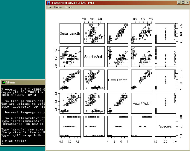
370 B The R Project
Fig. B.1 A screenshot of R
The graphics displayed on the right in Fig. B.1 is generated by the plot com-
mand.
B.2 Reading Files and R Objects
R is a type-free language. This means that variables need not to be declared before
their use. A variable might be used to store just a single number, but it can also
be a complex object with many attributes. In most cases, the objects in this book
will contain data sets or analysis results. Assignments in R are denoted by the two
symbols <-. Before we can analyze a data set with R, we have to load the data set
into R. The easiest way to achieve this uses the function read.table:
> mydata <- read.table(file.choose(),header=TRUE)
This command will open a file chooser window to find and select the file with
the data set to be analyzed. After the file has been chosen, it will be stored in
the variable mydata. The specification header=TRUE when calling the function
read.table tells R that the first line in the file should not be interpreted as data,
B.2 Reading Files and R Objects 371
but rather as names for the attributes. It is therefore assumed that the structure of the
file looks like
xyz
1.3 2.8 a
3.4 1.9 b
2.7 4.2 a
... ... ...
In this case, there are three attributes named x,y, and zgiven in the first line.
The records then come in the following lines. Because three attribute names have
been given in the first line, each of the following lines must also have three entries
separated by an arbitrary number of blanks. If the values of the attributes are not
separated by blanks but by another symbol, say a comma, then one would have to
write
> mydata <- read.table(file.choose(),header=TRUE,sep=",")
Now the object named mydata contains the data from the file. Assume that the file
contains only three records and not more as indicated by the dots above.
At least for smaller data sets, one can take a look at the data by simply typing
> mydata
xyz
1 1.3 2.8 a
2 3.4 1.9 b
3 2.7 4.2 a
or print(mydata), which gives the same result.
The summary function gives main properties—in the case of an object repre-
senting a data set simple statistics—of an object:
>summary(mydata)
xyz
Min. :1.300 Min. :1.900 a:2
1st Qu.:2.000 1st Qu.:2.350 b:1
Median :2.700 Median :2.800
Mean :2.467 Mean :2.967
3rd Qu.:3.050 3rd Qu.:3.500
Max. :3.400 Max. :4.200
print and summary can be applied to any R object. If the corresponding R
object is not a data set but a result of some analysis method, then the main properties
of the analysis result will be listed.
One can access a specific attribute of an object by writing the name of the object,
followed by the symbol $ and then by the name of the variable:
372 B The R Project
> mydata$y
[1] 2.8 1.9 4.2
In this simple example, we only have three records and therefore only three values
for the attribute y. If one line is not enough to list all values, R will simply continue
in the next line and list the index of the first data entry in each line in square brackets.
So if we had 15 records, the result might look like the following one:
> mydata$y
[1] 2.8 1.9 4.2 2.4 3.0 1.7
[7] 4.1 3.3 2.6 1.8 4.3 3.1
[13] 3.7 2.1 1.8
We can also assess the values of an attribute—a column in our data table—by
using its index in square brackets:
> mydata[2]
y
1 2.8
2 1.9
3 4.2
A specific record, a row in our data table, can be selected in the following way:
> mydata[2,]
xyz
2 3.4 1.9 b
Most of the R code examples given in the “Practical ...” section at the ends of the
corresponding chapters are based on the Iris data set. It is not necessary to first load
this data set into R. R provides some simple data sets, and, among them, there is the
Iris data set that can be accessed via an object called iris. The attribute names
are Sepal.Length,Sepal.Width,Petal.Length,Petal.Width, and
Species. So, if we want to know the mean value of the sepal length, we simply
need to enter
>mean(iris$Sepal.Length)
[1] 5.843333
without loading any file in advance.
B.3 R Functions and Commands
Functions in R can have quite a number of parameters, but, when using a function,
most of the parameters do not have to be specified, unless one wants to use a value
B.4 Libraries/Packages 373
different from the default value of the parameter. Such a parameters can be set inside
the call of the function by specifying the parameter name, followed by “=” and the
value of the parameter. We have seen examples for such parameters already in the
function read.table in the beginning of the previous section. The default value
of the parameter header is FALSE, assuming that the file to be read does not
contain the names of the attributes. Only if we have a file whose first line defines
the names of the attributes, we have to use header=TRUE, as we have done using
the function read.table. Another parameter of this function is sep.Wedonot
need to specify the value of this parameter when the attribute values in a row of our
file are separated by blanks. If another symbol like comma is used to separate the
values, we must assign the corresponding value (symbol) to the parameter sep.
Not all parameters are specified in this form. As in most programming languages,
the data set is just handed over to the function as normal argument as in the very
first example of this appendix (plot(iris)).
One can browse through the history of commands or functions that have been
used in an R session by the key “cursor up” and “cursor down.”
B.4 Libraries/Packages
There are various libraries or packages for R for special topics or specialized meth-
ods. Some of these libraries come along with R, and other need to be downloaded.
Downloading an additional package is very easy. Given that the computer is con-
nected to the Internet, just type
>install.packages
and wait for the window asking you to choose a mirror site from which you would
like to download the package. After you have clicked the mirror site, the packages
will be listed in alphabetical order in a new window, and you can choose the package
you need by clicking it.
Once a package—for instance, the package cluster—has been downloaded,
it can be added to an R session by the following command:
>library(cluster)
When a package has been downloaded once, it is not necessary to download it
again. However, unless the workspace (see next the section) is saved and reloaded,
the packages must be added to the R session each time R is restarted.
B.5 R Workspace
The actual R session can be stored, so that it can be reloaded next time, and all the
R objects, like the data that had been loaded and the analysis results that have been
stored in objects, can be recovered:
374 B The R Project
>save(list =ls(all=TRUE), file="all.Rdata")
In order to load a workspace that has been stored before, the command
>load("all.Rdata", .GlobalEnv)
can be used. Of course, the file does not have to be called all.Rdata.
B.6 Finding Help
If detailed information about an R function or command is needed,
>help(...)
will provide the description of the R function or command that has been entered in
place of the three dots.
If one does not know the command,
>help.search("...")
will help. It will list all the R functions/commands in which the specified term that
should be given in place of the three dots occurs.
Even if you know the correct name of the command or function you are interested
in, R will not be able to provide help if the function belongs to a package that has
not been included in the corresponding R session. So
>help(scatterplot3d)
will not give any information on scatterplot3d, unless the package to which
the function scatterplot3d belongs has been added to the session. (In this case,
the package name is even identical with the function name.)
If you know neither the exact function name nor the corresponding package, you
can simply search the R website for the topic or use a search engine and type in R
the corresponding term for which you would like to find an R function.
B.7 Further Reading
There are various introductory books on R and numerous books on specialized top-
ics like time series analysis or Bayesian statistics where R code is included. It is
impossible to list all of them here. As a starting point for R and how to apply basic
statistics with R, we refer to [17]. The book [19] provides details for manipulating
data and connecting to databases with R. An introduction to programming with R is
given in [16]. Those who are not satisfied with the simple default graphics provided
by R might like to take a look at the book [18].
Appendix C
KNIME
KNIME, pronounced [naim], is a modular data exploration platform that enables the
user to visually create data flows (often referred to as pipelines), selectively execute
some or all analysis steps, and later investigate the results through interactive views
on data and models. This appendix will give a short introduction to familiarize the
readers of this book with the basic usage of KNIME. Considerably more information
regarding the use of KNIME is available online at
http://www.knime.org
C.1 Installation and Overview
In order to install KNIME, download one of the versions suitable for your operating
system and unzip it to any directory for which you have write permissions. No
other action to install KNIME is required, in particular no setup routine has to be
launched. In order to start KNIME for the first time, double click the knime.exe file
on Windows or on Linux launch knime.
KNIME is uninstalled from the system by simply deleting the installation direc-
tory. Per default the workspace is also in this directory. If a different location for the
workspace was chosen, this directory needs to be deleted manually as well.
When KNIME is started the first time, a welcome screen opens. From here the
user can
•Open KNIME workbench: opens the KNIME workbench to immediately start
exploring KNIME, build own workflows, and explore your data.
•Get additional nodes: In addition to the ready-to-use basic KNIME installation,
there are additional plug-ins for KNIME, e.g., an R and Weka integration, mod-
ules for image and text processing, or the integration of the Chemistry Develop-
ment Kit with additional nodes for the processing of molecular structures. These
features can be downloaded also later from within KNIME itself if you choose to
skip this step.
M.R. Berthold et al., Guide to Intelligent Data Analysis,
Texts in Computer Science 42,
DOI 10.1007/978-1-84882-260-3, © Springer-Verlag London Limited 2010
375

376 C KNIME
Fig. C.1 The standard outlay of the KNIME workbench
The KNIME Workbench is organized as depicted in Fig. C.1. It consists of dif-
ferent areas:
•Workflow Projects: All KNIME workflows are displayed in the Workflow
Projects view. The status of the workflow is indicated by an icon showing whether
the workflow is closed, idle, executing, or if execution is complete.
•Favorite Nodes: The Favorite Nodes view displays your favorite, most frequently
used, and last used nodes. A node is added to the favorites by dragging it from
the node repository into the personal favorite nodes category. Whenever a node
is dragged onto the workflow editor, the last used and most frequently used cate-
gories are updated.
•Node Repository: The node repository contains all KNIME nodes ordered in cat-
egories. A category can contain another category, for example, the Read category
is a subcategory of the IO category. Nodes are added from the repository to the
workflow editor by dragging them to the workflow editor. Selecting a category
displays all contained nodes in the node description view; selecting a node dis-
plays the help for this node. If the user knows the name of a node, you can enter
parts of the name into the search box of the node repository. As you type, all nodes
are filtered immediately to those that contain the entered text in their names.
•Outline: The outline view provides an overview over the whole workflow even if
only a small part is visible in the workflow editor (marked in gray in the outline
view). The outline view can also be used for navigation: the gray rectangle can be

C.2 Building Workflows 377
moved with the mouse, which causes the editor to scroll so that the visible part
matches the gray rectangle.
•Console: The console view prints out error and warning messages in order to give
you a clue of what is going on under the hood. The same information is written
to a log file, which is located in the workspace directory.
•Node Description: The node description displays information about the selected
node (or the nodes contained in a selected category). In particular, it explains the
dialog options, the available views, the expected input data, and resulting output
data.
•Workflow Editor: The workflow editor is used to assemble workflows, config-
ure and execute nodes, inspect the results, and explore your data. This section
describes the interactions possible within the editor.
C.2 Building Workflows
A workflow is built by dragging nodes from the Node Repository onto the Work-
flow Editor and connecting them there. Nodes are the basic processing units of a
workflow. Each node has a number of input and/or output ports. Data (or a model)
is transferred over a connection from an out-port to the in-port(s) of other nodes.
When a node is dragged onto the workflow editor, the status light is usually red,
which means that the node has to be configured in order to be able to be executed.
A node is configured by right clicking it, choosing Configure, and adjusting the
necessary settings in the node’s dialog (see Fig. C.2 on the left).
When the dialog is closed by pressing the OK button, the node is configured, and
the status light changes to yellow: the node is ready to be executed. A right-click on
the node again shows an enabled Execute option; pressing it will execute the node,
Fig. C.2 The node dialog allows one to configure (left) and later execute (right) individual nodes

378 C KNIME
Fig. C.3 Different port
types: data, database, PMML,
and unspecified ports
and the result of this node will be available at the out-port (see Fig. C.2 on the right).
After a successful execution the status light of the node is green, indicating that the
processed data is now available on the outports. The result(s) can be inspected by
exploring the out-port view(s): the last entries in the context menu open them.
Ports on the left are input ports, where the data from the outport of the predeces-
sor node is fed into the node. Ports on the right are outgoing ports. The result of the
node’s operation on the data is provided at the out-port to successor nodes. A tooltip
gives information about the output of the node.
Nodes are typed such that only ports of the same type can be connected; Fig. C.3
shows the corresponding symbols for the following, most prominently encountered
port types:
•Data Ports: The most common type is the data port (a white triangle) which trans-
fers flat data tables from node to node.
•Database Ports: Nodes executing commands inside a database can be identified
by their port color and shape (brown square):
•PMML Ports: Data Mining nodes learn a model which is passed to a model writer
or predictor node via a blue squared PMML port:
•Other Ports: Whenever a node provides data which does not fit a flat data table
structure, a general purpose port for structured data is used (dark cyan square).
Ports that are not data, database, PMML, or ports for structured data are displayed
as unknown types (gray square):
C.3 Example Flow
This section demonstrates the basic process of building a small, simple workflow:
read data from an ASCII file, assign colors based on certain properties, cluster the
data, and display it in a table and a scatter plot.
Start KNIME with an empty workflow and create new empty workflow by right
clicking in the Project Repository and selecting New Project.
In the Node Repository expand the IO category and the Read subcategory as
shown in Fig. C.4. Drag&drop the File Reader node onto the Workflow Editor win-
dow.
The next node will be a learning node, implementing the well-known k-means
clustering algorithm. Expand the Mining category followed by the Clustering cate-
gory and then drag the K-Means node onto the flow.
We will find the third node by using the convenient search node facility. In the
search box above the Node Repository, enter “color” and press Enter. This limits the
nodes shown to the ones with “color” in their name (see Fig. C.5). Pull the Color
Manger node onto the workflow (this node will be used to define the color in the
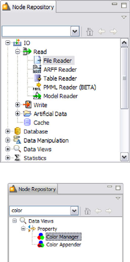
C.3 Example Flow 379
Fig. C.4 Locating the file
reader in the node repository
Fig. C.5 Search for nodes in
the node repository
data views later). To again see all nodes in the repository, press ESC or Backspace
in the search field of the Node Repository.
Finally, drag the Interactive Table and the Scatter Plot from the Data Views cat-
egory to the Workflow Editor and position them to the right of the Color Manager
node.
After placing all nodes, we can now connect them (one can, of course, also later
drag new nodes onto the workbench). Click one output (right) port of the file reader
and drag the connection to the input port of the k-means node. Then continue to
connect the ports as shown in Fig. C.6. (Note that your nodes will not show a green
status, as long as they are not configured and executed.)
Some of the now connected nodes may still show a red status icon, indicating
that it must be configured in order to produce meaningful results. Right click the
File Reader and select Configure from the menu. Navigate to the IrisDataSet direc-
tory located in the KNIME installation directory. Select the data.all file from this
location. The File Reader’s preview table shows a sample of the data, which should
match the structure of the data file correctly. Click OK to confirm this configuration.
Once the node has been configured correctly, it switches to yellow (indicating that
it is ready for execution). After that, the K-Means node will also turn yellow, since
its default settings can be applied. To be sure that the default settings fit your needs,
open the dialog and inspect the default settings.
In order to configure the Color Manager node, you must first execute the K-
Means node by right clicking the node and selecting Execute. Note how the File
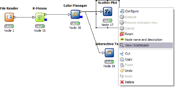
380 C KNIME
Fig. C.6 The example flow to cluster and visualize the sample data set
Reader node will automatically be executed as well. After execution all nominal
values and ranges of all attributes are known at the outport of the executed node:
this meta information is propagated to the successor nodes. The Color Manager
needs this data before it can be configured. Once the K-Means node is executed,
open the configuration dialog of the Color Manger node. The node will suggest
to color the rows in our table based on the clustering results. Accept these default
settings by clicking OK.
Finally, execute the Scatter Plot. In order to examine the data and the results,
open the nodes’ views. In our example, the K-Means,theInteractive Table, and the
Scatter Plot have views. Open them from the nodes’ context menus.
Select some points in the scatter plot and choose “Hilite Selected” from the
“Hilite” menu. The hilited points are marked with an orange border. You will also
see the hilited points in the table view. The propagation of the hilite status works for
all views in all branches of the flow displaying the same data. Figure C.7 shows an
example of the views with a couple of highlighted points.
C.4 R Integration
One of the nice features of KNIME is the modular, open API which allows one to
easily integrate other data processing or analysis projects. From the KNIME web-
page one can already download a number of such integrations of third party libraries
and projects, most notable the statistical data analysis package R, and the machine
learning library Weka. In addition, a number of external contributors are providing
nodes integrating their own projects into KNIME.
The Weka integration is fairly straightforward to use, one simply drags the node
corresponding to the desired learning algorithm onto the workbench, connects it,
and opens the configuration dialog which then provides access to all appropriate
parameters. If views are available, the KNIME–Weka nodes allow one to open those
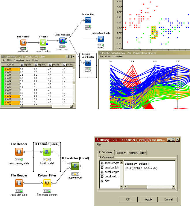
C.4 R Integration 381
Fig. C.7 A number of open views with highlights patterns
Fig. C.8 A small example workflow using an R code fragment
just like other KNIME views. Weka models can also be fed into a predictor node,
similar to KNIME models and hence applied to other data.
The R integration is a bit different, however. Since R really provides more of a
statistical programming language, it would require thousand of nodes to cover all the
possibilities hidden within the language. KNIME therefore offer nodes which allow
one to call small fragments of R code instead—which allows one to use the power
of R when needed, e.g., for sophisticated statistical analyses and rely on KNIME’s
strengths for data loading, integration, and transformation and some of the built-in
analysis routines. KNIME offers to point to a local R installation (one can actu-
ally download an integrated R installation together with the corresponding KNIME
nodes), and it also allows one to access an R installation residing on a server. Dif-
References
Appendix A
1. Berthold, M., Hand, D.: Intelligent Data Analysis. Springer, Berlin (2009)
2. Buffon, G.-L.L.: Mémoire sur le Jeu Franc-Carreau, France (1733)
3. Everitt, B.S.: The Cambridge Dictionary of Statistics, 3rd edn. Cambridge University Press,
Cambridge (2006)
4. Freedman, S., Pisani, R., Purves, R.: Statistics, 4th edn. Norton, London (2007)
5. Friedberg, S.H., Insel, A.J., Spence, L.E.: Linear Algebra, 4th edn. Prentice Hall, Englewood
Cliffs (2002)
6. Huff, D.: How to Lie with Statistics. Norton, New York (1954)
7. Kolmogorow, A.N.: Foundations of the Theory of Probability. Chelsea, New York (1956)
8. Krämer, W.: So lügt man mit Statistik, 7 Auflage. Campus-Verlag, Frankfurt (1997)
9. Landau, L.D., Lifshitz, E.M.: Mechanics, 3rd edn. Butterworth-Heinemann, Oxford (1976)
10. Larsen, R.J., Marx, M.L.: An Introduction to Mathematical Statistics and Its Applications, 4th
edn. Prentice Hall, Englewood Cliffs (2005)
11. Lay, D.C.: Linear Algebra and Its Applications, 3rd edn. Addison Wesley, Reading (2005)
12. von Mises, R.: Wahrscheinlichkeit, Statistik und Wahrheit. Berlin (1928)
13. Press, W.H., Teukolsky, S.A., Vetterling, W.T., Flannery, B.P.: Numerical Recipes in C—The
Art of Scientific Computing, 2nd edn. Cambridge University Press, Cambridge (1992)
14. Sachs, L.: Angewandte Statistik—Anwendung statistischer Methoden, 11 Auflage. Springer,
Berlin (2003)
15. Wichura, M.J.: Algorithm AS 241: the percentage points of the normal distribution. Appl.
Stat. 37, 477–484 (1988)
Appendix B
16. Chambers, J.: Software for Data Analysis: Programming with R. Springer, New York (2008)
17. Dalgaard, P.: Introductory Statistics with R, 2nd edn. Springer, New York (2008)
18. Murrell, P.: R Graphics. Chapman & Hall/CRC, Boca Raton (2006)
19. Spector, P.: Data Manipulation with R. Springer, New York (2008)
M.R. Berthold et al., Guide to Intelligent Data Analysis,
Texts in Computer Science 42,
DOI 10.1007/978-1-84882-260-3, © Springer-Verlag London Limited 2010
383
Index
χ2dependence test, 367
χ2distribution, 349
χ2measure, 190
χ2-goodness-of-fit test, 365
σ-algebra, 326
0–1 loss, 224
A
a priori property, 181
absolute frequency, 305, 324
absolute scale, 37
accuracy, 37, 224
accurate predictor, 285
acyclic directed graph, 227
AdaBoost, 288
additivity, 326
agglomerative hierarchical clustering, 147
AIC, 110
Aikake information criterion, 168
Akaike’s information criterion, 110
algorithmic error, 101
alternating optimization, 93
alternative hypothesis, 361
alternatives, 305
antecedent, 180, 245
antimonotone, 181
Apriori, 180, 184
architecture, 82
area chart, 307
area under curve, 98
artificial neural networks, 290
association analysis, 11
association rule, 180
χ2measure, 190
confidence, 186
minimum, 186
information gain, 190
lift value, 190
mutual information, 190
support, 186
minimum, 186
association rule induction, 186
association rules, 146
assumption, 29
attribute, 34, 304
attribute type, 304
attribute value, 304
attributed graph, 191
AUC, 98
automorphism, 192
B
backward elimination, 120
backward feature elimination, 139
bag-of-words, 134, 158
bagging, 105, 287
bar chart, 40, 307
batch training, 276
Bayes classifier, 208
full, 219, 222
classification formula, 222
idiot’s, 219
mixed, 222
naive, 219, 221
classification formula, 221
Bayes error, 94
Bayes network, 226
Bayes’ rule, 220, 331
Bayesian information criterion, 110
M.R. Berthold et al., Guide to Intelligent Data Analysis,
Texts in Computer Science 42,
DOI 10.1007/978-1-84882-260-3, © Springer-Verlag London Limited 2010
385
386 Index
Bayesian statistics, 221
Bayesian voting, 286
beam search, 197
beam width, 197
Bernoulli experiment, 332
Bernoulli’s formula, 344
Bernoulli’s law of large numbers, 333
bias, 286
BIC, 110
bin, 309
binary, 305
binning, 44
binomial coefficient, 344
binomial distribution, 344
bipolar, 271
birthday problem, 327
bisecting strategy, 154
black box model, 84
boosting, 288
bootstrapping, 104
bottom-up, 154, 167
box plot, 315
boxplot, 42
Brahe, Tycho, 4, 5
bucket, 309
business understanding, 8
C
canonical code word, 194
CART, 215
case, 304
case deletion, 125
categorical, 304
categorical attribute, 34
central limit theorem, 347
central value, 310
certain event, 325, 326
CFS, 120
characteristic measure, 309
class boundaries, 97
classification, 11
classification boundaries, 97
classification problem, 207
classification tree, 209
CLIQUE, 174
closed
item set, 188
cluster, 11
cluster analysis, 145
clustering, 11, 145
code word, 193
canonical, 194
cognitive map, 26
combinatorics, 324, 327
comparative, 304
complementary event, 327
complete-linkage, 153
completely (stochastically) independent, 330
completely independent, 330
completeness, 38
comprehensibility, 3
concordant, 61
conditional database, 183
prefix, 183
conditional mutual information, 227
conditional probability, 328
conditional transaction database, 183
conditionally (stochastically) independent,
330, 337
conditionally independent, 220, 330, 337
confidence, 186
minimum, 186
confidence interval, 43, 351, 358
confidence level, 358
confusion matrix, 99, 111
connected subgraph, 192
consequent, 180, 245
consistency, 352
constraint, 29
contingency table, 306
continuous attribute, 35
continuous random variable, 335
contradictory instances, 218
converges in probability, 333
core object, 171
correctness, 3
correlation, 316
correlation coefficient, 317
correlation matrix, 319
correlation-based filter, 120
cost function, 87, 229
cost matrix, 87
covariance, 316, 317, 343
covariance matrix, 49, 157, 316
critical region, 362
critical value, 362
cross product, 119
cross validation, 111
Index 387
cross-selling, 179
cross-validated committees, 287
cross-validation, 104, 263
cross-validation fold, 263
curse of dimensionality, 160
D
d-separation, 226
data, 2, 3
data analysis, 207
descriptive, 207
supervised, 207
data mining, 7
data objects, 34
data preparation, 9
data quality, 37
data scrubbing, 123
data understanding, 8
database normalization, 137
DBScan, 170
decision function, 225, 278
decision tree, 208, 253
Decision Tree, 208
forest, 217
fuzzy, 218
postpruning, 216
prepruning, 216
DENCLUE, 174
dendrogram, 148, 199
density, 335
density attractors, 174
density function, 335
density plot, 44
joint, 337
marginal, 337
density-reachable, 171
dependence test, 350, 367
deployment, 10, 299
depth-first search, 183
descriptive statistics, 6, 303
deviation analysis, 11, 146
deviation moments, 319
deviation
mean absolute, 313
standard, 313
dichotomous, 305
dimension, 305
dimension reduction, 318
discordant, 61
discrete attribute, 35
discrete random variable, 334
discretization, 127
discrimination function, 242
dispersion measure, 310, 312
distance
binary, 158
curse of dimensionality, 160
isotropic, 157
nominal, 158
numerical, 156
ordinal, 159
text, 157
time series, 157
distance matrix, 147
distance metric, 147, 263
distance-weighted k-nearest neighbor, 264
distribution, 334
joint, 336
marginal, 336
distribution assumption, 351
distribution function, 334, 336
marginal, 336
multi-dimensional, 336
diverse predictors, 285
divide-and-conquer, 183
divisive hierarchical clustering, 154
domain, 34, 304
downward closed, 181
dual representation, 279, 280
dynamic domain, 35, 128, 299
E
eager learning, 261
Eclat, 180, 184
efficiency, 352
eigenvalues, 319
eigenvectors, 319
elementary events, 324
elementary probability, 324
ensemble methods, 284
entity resolution, 124
entropy, 212
entropy scorer, 111
equi-frequency, 127
equi-width, 127
equivalent sample size, 221
error backpropagation, 270
error of the first kind, 362
388 Index
error of the second kind, 362
error types, 362
estimation, 349
Euclidean distance, 147, 156
evaluation, 10
event, 325
mutually exclusive, 326
event algebra, 325
event partition, 331
evolution strategies, 93
evolutionary algorithms, 93
exhaustive search, 92, 120
expected loss, 88
expected value, 339, 340
linearity, 340
product of random variables, 341
sum of random variables, 340
experimental error, 94
experimental study, 6
explanatory variable, 230
exploratory data analysis, 7
exponential distribution, 349
extended additivity, 326
extended Bayes’ rule, 220
F
factor analysis, 121
factorization formula, 227
false negatives, 97
false positive, 124
false positives, 97
feature, 34, 304
feature selection, 117, 139, 174
feed-forward network, 270
field overloading, 123
first-order rules, 244, 251
FOIL, 252
forests of decision trees, 217
forward propagation, 270
forward selection, 120
FP-growth, 180, 184
FP-tree, 184
Franc-Carreau, 328
frequency polygons, 307
frequency sums, 305
frequency table, 305
frequent
item set, 181, 188
subgraph, 192
frequent (sub)graph mining, 180
frequent item set mining, 179, 181
frequent pattern growth, 180
frequent sequence mining, 180
frequent subgraph mining, 191
frequent tree mining, 180
full Bayes classifier, 219, 222
classification formula, 222
fuzzifier, 165
fuzzy c-Means, 199
fuzzy rule learning, 251
Fuzzy rule systems, 251
fuzzy set, 251
G
gain ratio, 213
Galilei, Galileo, 4
Gamma function, 349
Gaussian mixture decomposition, 165
generality, 3
generative model, 166
genetic algorithms, 93
geometric distribution, 345
geometric probability, 328
global model, 83
global validity measure, 168
GMD, 165
goodness-of-fit test, 350, 365
gradient descent, 274
gradient method, 54, 91
Gram matrix, 281
granularity, 34, 131
granularization, 129
graph
attributed, 191
automorphism, 192
frequent, 192
labeled, 191
loop, 191
simple, 191
support, 192
minimum, 192
undirected, 191
graph kernel, 281
greedy strategy, 92
Grubb’s test, 64
Index 389
H
Hasse diagram, 182
heatmap, 149
hidden layers, 270
hierarchical clustering, 147, 154, 173, 199
hill-climbing, 174
hillclimbing, 92
histogram, 40, 309
Hoeffding inequality, 122
horizontal data integration, 135
horizontal representation, 184
horn clauses, 251
hyperbolic tangent, 271
hypergeometric distribution, 345
hypothesis test
dependence, 350
goodness-of-fit, 350
parameter, 350
hypothesis testing, 349, 361
I
ICA, 121
idiot’s Bayes classifier, 219
ILP, 252
image kernel, 281
impossible event, 325, 326
impurity, 212
imputation, 125
independence test, 367
independent, 329, 337
conditionally, 220, 330
independent component analysis, 121
independent random sample, 350
inductive logic programming, 244, 252
inductive logic programming (ILP), 251
inferential statistics, 6, 303
information gain, 118, 128, 130, 190, 212
information retrieval, 134
input layer, 270
instance, 34
instance selection, 122
instance-based learning, 261
intelligent data analysis, 7
interpretability, 84
interquantile range, 313
interval estimation, 358
interval estimators, 351
interval scale, 36, 304, 305
intrinsic error, 94
iris data, 223
isotropic, 157, 166, 168
item, 181
item base, 181
item set, 181
closed, 188
frequent, 181, 188
maximal, 188
prefix, 183
support, 181
minimum, 181
unique parent, 182
J
J-measure, 197, 250
Jaccard measure, 154, 158
jackknife method, 104
jitter, 46
joint density, 337
joint density function, 337
joint distribution, 336
K
k-NN, 262
knearest neighbors, 262
k-Means, 199
k-medoids, 200
kd-tree, 265
KDD, 7
Kendall’s tau, 61
Kendall’s tau rank correlation coefficient, 61
Kepler’s laws, 4
Kepler, Johannes, 4, 5
kernel estimation, 243
kernel function, 266, 280
kernel matrix, 281
kernel methods, 277
kernel regression, 266
KNIME, 375
knowledge, 2, 3
assessment criteria, 3
knowledge discovery in databases, 7
Kohonen maps, 175
Kolmogorov’s axioms, 325, 326
Kolmogorov–Smirnov test, 366
Kullback–Leibler information divergence,
227
kurtosis, 315
390 Index
L
labeled graph, 191
lack of fit, 100
LAD, 237
Laplace correction, 221
Las Vegas Wrapper, 120
lattice, 182
law of large numbers, 333
law of total probability, 220, 331
lazy learning, 261
learning bias, 133
learning rate, 274
learning rule, 279
least absolute deviations, 237
least squares, 231
least trimmed squares, 237
leave-one-out method, 104
levelwise search, 184
lift value, 190
likelihood function, 355
limit theorem, 347
de Moivre–Laplace, 348
Lindeberg condition, 347
line chart, 307
line charts, 307
linear discriminant analysis, 225
linear discriminant function, 278
link information, 155
local model, 83
local validity measure, 167
locally weighted polynomial regression, 267
locally weighted regression, 264
locally weighted scatterplot smoothing, 264
location measure, 309, 310
LOESS, 264
log-likelihood function, 356
logistic function, 235, 271
logistic regression, 235
logit transformation, 236
logit-transformation, 129
loop, 191
LOWESS, 264
LTS, 237
M
m-dimensional random variable, 336
M-estimation, 124, 237
machine learning bias, 101
Mahalanobis distance, 157, 166, 168
Manhattan distance, 156
MAR, 66
marginal density, 337
marginal density function, 337
marginal distribution, 336
marginal distribution function, 336
marginally independent, 337
market basket analysis, 179
matrix product, 316
maximal
item set, 188
maximum a-posteriori estimation, 357
maximum likelihood estimate, 166
maximum likelihood estimation, 232, 355
maximum margin classifier, 282
MCAR, 66
MDL, 106
MDS, 53
mean, 310, 312
multi-dimensional, 316
mean absolute deviation, 313
measure, 326
measure theory, 326
median, 310
membership matrix, 162
merge step, 186
method of least squares, 231
metric, 304
minimum confidence, 186
minimum description length, 242
minimum description length principle, 106
minimum support
association rule, 186
item set, 181
misclassification rate, 87
missing at random, 66, 125
missing completely at random, 66, 125
missing value, 65
mixed Bayes classifier, 222
mixture of experts, 289
mixture of Gaussians, 166
mode, 310
model, 162
global, 83
local, 83
model class, 82
model deployment, 199
model error, 100
model selection, 105, 350
Index 391
model tree, 215
modeling, 10
momentum term, 276
monitoring, 299, 301
more efficient, 352
mosaic chart, 308
multidimensional scaling, 53
multilayer perceptron, 237, 269, 290
multilinear regression, 233
multivariate normal distribution, 222
multivariate regression, 233
mutual information, 190
N
naive Bayes classifier, 219, 221
classification formula, 221
for the iris data, 223
nearest-neighbor, 290
neighborhood, 171
neural network training, 273
noise, 123
noise cluster, 169
noise clustering, 169
nominal, 304
nominal attribute, 34
nonignorable missing values, 67, 126
nonlinear PCA, 121
normal distribution, 222, 346
multivariate, 222
normal equations, 232
normalization, 130
novelty, 3
null hypothesis, 361
number of neighbors, 263
numerical, 35, 304
O
OAR, 66
object, 304
objective function, 85
observational study, 6
observed at random, 66
Occam’s razor, 105
OLS, 231
one-sided test, 362
online training, 276
OPTICS, 173
ordinal, 304
ordinal attribute, 35
outer product, 316
outlier, 62
output layer, 270
overfitting, 84, 94, 117, 130, 216
P
p-value, 364
parallel coordinates, 57
parameter estimation, 349, 351
parameter test, 350, 362
parent equivalence pruning, 188
partial order, 192
partition, 147, 162
pattern, 83
PCA, 48, 121
Pearson’s correlation coefficient, 60
percentage points, 343
perceptron, 270
perfect extension, 188
perfect extension pruning, 187
pie chart, 308
PMML, 290, 299
PNN, 291
point estimation, 351
point estimators, 351
Poisson distribution, 345
pole chart, 307
polynomial coefficient, 344
polynomial distribution, 344
polytomous, 305
positive definite, 316
power, 363
power transform, 131
prediction function, 263
preface, v
prefix, 183
prefix property, 194
prefix tree, 183
primal representation, 280
principal axes transformation, 319
principal component, 49
principal component analysis, 48, 121, 318
Probabilistic Neural Network, 291
probability, 324, 326
classical definition, 324
probability of hypotheses, 331
probability space, 327
probability theory, 303, 323
(probability) density function, 335
392 Index
(probability) distribution, 334
PROCLUS, 174
product law, 329
product rule, 289
project understanding, 8
projection pursuit, 51
propositional rules, 244, 245
prototype, 162
pruning
decision tree, 216
pseudo-inverse, 234
pure error, 94
Q
qualitative, 304
quantile, 310, 311, 343
quantitative, 304
quick backpropagation, 277
R
R, 369
R∗-tree, 265
radar plot, 59
radial (basis) function, 272
radial basis function network, 271
random event, 323
random forests, 287
random sample, 304
independent, 350
simple, 350
random samples, 350
random search, 92
random subspace selection, 287
random variable, 333
continuous, 335
discrete, 334
m-dimensional, 336
real-valued, 333
realization, 350
random vector, 336
realization, 350
range, 313
rank correlation coefficient, 61
rank scale, 304
ratio scale, 36, 305
real-valued random variable, 333
realization, 350
receiver operating characteristic, 98
record linkage, 124
records, 34
recursive partitioning, 210
regression, 11
regression line, 232, 317
regression model, 208
regression polynomial, 233
regression problem, 207
regression tree, 215
regression trees, 209
regressor variable, 230
regularization, 106
relative frequency, 305, 324
representational bias, 132
requirement, 29
resilient backpropagation, 276
response variable, 230
robust clustering, 155
robust regression, 124, 237
ROC curve, 98, 111
ROCK, 155
rule learning, 244
rule model, 208
rule pruning, 250
S
S-estimation, 237
SaM, 184
merge step, 186
split step, 185
Sammon mapping, 54
sample, 304
sample error, 99, 116, 133
sample size, 304
sample space, 324, 325
scalability, 198
scale type, 34
metric, 304
nominal, 304
ordinal, 304
scale types, 304
scatter plot, 44, 309
segment, 11
segmentation, 11
self-organizing maps, 146, 175, 176
semantic accuracy, 37
sensitivity analysis, 277
separation index, 168
sequence kernel, 281
sequential covering, 248, 252
Index 393
set covering, 248
Shannon entropy, 212, 227
shape measure, 310, 314
significance level, 362
silhouette coefficient, 167
simple graph, 191
simple random sample, 350
single-linkage, 153, 155, 169
skew, 314
skewness, 314
slack variable, 283
soft margin classifier, 283
software tools, 12
Spearman’s rank correlation coefficient, 61
Spearman’s rho, 61
spider plot, 59
split information, 213
split item, 185
split step, 185
SSE, 231
stability, 217
stacking, 289
standard deviation, 313, 341, 342
standard normal distribution, 347
standardization, 130
star plot, 59
statistical unit, 304
statistics, 6, 303, 351
descriptive, 303
inferential, 303
stick chart, 307
(stochastically) independent, 329, 337
stratification, 103
stress, 54
stripe chart, 308
Sturges’ rule, 41
subgraph
frequent, 192
isomorphism, 192
minimum, 192
unique parent, 192
subgraph isomorphism, 192
subgraph tree, 192
subset lattice, 182
subset tree, 182
subspace clustering, 174
subtree raising, 216
subtree replacement, 216
sufficiency, 352
sum of absolute deviations, 237
sum of absolute errors, 231
sum of squared errors, 231, 273
sum rule, 289
super self-adaptive backpropagation, 276
supervised learning, 207
support
association rule, 186
graph, 192
item set, 181
minimum, 186, 192
association rule, 186
item set, 181
support vector, 281
support vector machine, 291
support vector machines, 277
SURFING, 175
syntactic accuracy, 37
T
TAN, 227
target attribute, 207
test data, 102
test statistic, 362
text data analysis, 134
text kernel, 281
text mining, 134
timeliness, 39
top-down, 154, 167
total probability, 331
training data, 102
transaction, 181
identifier, 181
transaction database, 181
conditional, 183
horizontal representation, 184
vertical representation, 184
tree-augmented naive Bayes classifier, 227
tricubic weighting function, 264
true negatives, 97
true positives, 97
two-sided test, 362
types of errors, 362
U
UB-tree, 265
unbalanced data, 39
unbiasedness, 352
undirected graph, 191
394 Index
uniform distribution, 346
unimodal, 166
unipolar, 271
unique parent, 182, 192
item set, 182
subgraph, 192
usefulness, 3
V
V-optimal, 128
validation set, 103
validity measure, 154
validity measures, 167
variable, 34
variance, 101, 286, 313, 341, 342
sum of random variables, 342
vertical data integration, 135
vertical representation, 184
visual brushing, 71, 253
visual dimensions, 71
volume chart, 307
Voronoi cell, 262
Voronoi diagram, 261
Voronoi site, 262
W
weight decay, 277
weighted relative accuracy, 196
weighting function, 263
whisker, 43
winner neuron, 176
WRAcc, 196
wrapper approach, 120
Z
z-score, 130
z-score standardization, 49
