HTML5: The Missing Manual HTML5 (en)
User Manual:
Open the PDF directly: View PDF  .
.
Page Count: 519 [warning: Documents this large are best viewed by clicking the View PDF Link!]
- Contents
- The Missing Credits
- Introduction
- Part One: Modern Markup
- Part Two: Video, Graphics, and Glitz
- Part Three: Building Web Apps
- Part Four: Appendixes
- Index

HTML5: The Missing Manual, 2nd Edition
by Matthew MacDonald
Copyright © 2014 Matthew MacDonald. All rights reserved.
Printed in the United States of America.
Published by O’Reilly Media, Inc.,
1005 Gravenstein Highway North, Sebastopol, CA 95472.
O’Reilly books may be purchased for educational, business, or sales promotional use.
Online editions are also available for most titles (
http://my.safaribooksonline.com
).
For more information, contact our corporate/institutional sales department:
(800) 998-9938 or
corporate@oreilly.com
.
August 2011: First Edition.
December 2013: Second Edition
Revision History for the Second Edition:
2013-12-09 First release
See
http://oreil.ly/html5tmm_2e
for release details.
The Missing Manual is a registered trademark of O’Reilly Media, Inc. The Missing
Manual logo, and “The book that should have been in the box” are trademarks of
O’Reilly Media, Inc. Many of the designations used by manufacturers and sellers to
distinguish their products are claimed as trademarks. Where those designations
appear in this book, and O’Reilly Media is aware of a trademark claim, the
designations are capitalized.
While every precaution has been taken in the preparation of this book, the publisher
and author assume no responsibility for errors or omissions, or for damages resulting
from the use of the information contained in it.
ISBN-13: 978-1-4493-6326-0
[LSI]
www.it-ebooks.info

III
Contents
The Missing Credits ....................................... vii
Introduction ............................................... xi
Part One: Modern Markup
CHAPTER 1:
Introducing HTML5 ........................................ 3
The Story of HTML5 .................................................3
Three Key Principles of HTML5 .......................................7
Your First Look at HTML5 Markup ....................................10
A Closer Look at HTML5 Syntax .....................................16
HTML5’s Element Family ............................................21
Using HTML5 Today ................................................26
CHAPTER 2:
Structuring Pages with Semantic Elements ............... 37
Introducing the Semantic Elements ..................................38
Retrofitting a Traditional HTML Page .................................39
Browser Compatibility for the Semantic Elements .....................51
Designing a Site with the Semantic Elements ..........................53
The HTML5 Outlining System ........................................65
CHAPTER 3:
Writing More Meaningful Markup ......................... 75
The Semantic Elements Revisited ....................................76
Other Standards That Boost Semantics ...............................82
A Practical Example: Retrofitting an “About Me” Page .................88
How Search Engines Use Metadata ..................................93
CHAPTER 4:
Building Better Web Forms .............................. 103
Understanding Forms .............................................104
Revamping a Traditional HTML Form ................................105
Validation: Stopping Errors ..........................................112
Browser Support for Web Forms and Validation ...................... 119
New Types of Input ...............................................123
New Elements ....................................................130
An HTML Editor in a Web Page .....................................136
www.it-ebooks.info

CONTENTS
IV
Part Two: Video, Graphics, and Glitz
CHAPTER 5:
Audio and Video ......................................... 143
The Evolution of Web Video ........................................144
Introducing HTML5 Audio and Video ................................145
Understanding the HTML5 Media Formats ...........................149
Fallbacks: How to Please Every Browser .............................154
Controlling Your Player with JavaScript ..............................160
Video Captions ...................................................169
CHAPTER 6:
Fancy Fonts and Eects with CSS3....................... 177
Using CSS3 Today. . . . . . . . . . . . . . . . . . . . . . . . . . . . . . . . . . . . . . . . . . . . . . . . . 178
Building Better Boxes .............................................184
Creating Eects with Transitions ....................................195
Web Fonts ...................................................... 206
CHAPTER 7:
Responsive Web Design with CSS3 ...................... 221
Responsive Design: The Basics .....................................222
Adapting Your Layout with Media Queries ...........................231
CHAPTER 8:
Basic Drawing with the Canvas...........................245
Getting Started with the Canvas ....................................246
Building a Basic Paint Program .....................................263
Browser Compatibility for the Canvas ...............................271
CHAPTER 9:
Advanced Canvas: Interactivity and Animation .......... 275
Other Things You Can Draw on the Canvas. . . . . . . . . . . . . . . . . . . . . . . . . . .275
Shadows and Fancy Fills ...........................................281
Making Your Shapes Interactive ....................................293
Animating the Canvas ............................................300
A Practical Example: The Maze Game ...............................307
Part Three: Building Web Apps
CHAPTER 10:
Storing Your Data ........................................ 319
Web Storage Basics ...............................................320
Deeper into Web Storage ..........................................326
Reading Files .....................................................332
IndexedDB: A Database Engine in a Browser ........................ 340
CHAPTER 11:
Running Oine .......................................... 355
Caching Files with a Manifest .......................................356
Practical Caching Techniques ......................................366
www.it-ebooks.info

CONTENTS V
CHAPTER 12:
Communicating with the Web Server .................... 375
Sending Messages to the Web Server ...............................376
Server-Sent Events ................................................386
Web Sockets .....................................................393
CHAPTER 13:
Geolocation, Web Workers, and History Management ... 401
Geolocation ..................................................... 402
Web Workers .....................................................414
History Management ..............................................425
Part Four: Appendixes
APPENDIX A:
Essential CSS ............................................ 435
Adding Styles to a Web Page. . . . . . . . . . . . . . . . . . . . . . . . . . . . . . . . . . . . . . .435
The Anatomy of a Style Sheet ......................................436
Slightly More Advanced Style Sheets ............................... 440
A Style Sheet Tour ............................................... 445
APPENDIX B:
JavaScript: The Brains of Your Page ..................... 451
How a Web Page Uses JavaScript ...................................452
A Few Language Essentials ........................................459
Interacting with the Page ..........................................470
Index..................................................... 477
www.it-ebooks.info

THE MISSING CREDITS VII
The Missing Credits
ABOUT THE AUTHOR
Matthew MacDonald is a science and technology writer with well
over a dozen books to his name. Web novices can tiptoe out onto
the Internet with him in
Creating a Website: The Missing Manual
.
Oce geeks can crunch the numbers in
Excel 2013: The Missing
Manual
. And human beings of all description can discover just
how strange they really are in the quirky handbooks
Your Brain:
The Missing Manual
and
Your Body: The Missing Manual
.
ABOUT THE CREATIVE TEAM
Nan Barber (editor) has been working on the Missing Manual series since its incep-
tion. She lives in Massachusetts with her husband and various Apple and Android
devices. Email:
nanbarber@oreilly.com
.
Kristen Brown (production editor) is a graduate of the publishing program at Emer-
son College. She lives in the Boston area with her husband and their large collection
of books and board games. Email:
kristen@oreilly.com
.
Kara Ebrahim (conversion) lives, works, and plays in Cambridge, MA. She loves
graphic design and all things outdoors. Email:
kebrahim@oreilly.com
.
Julie Van Keuren (proofreader) quit her newspaper job in 2006 to move to Montana
and live the freelancing dream. She and her husband (who is living the novel-writing
dream) have two sons. Email:
little_media@yahoo.com
.
Julie Hawks (indexer) is a teacher and eternal student. She can be found wandering
about with a camera in hand. Email:
juliehawks@gmail.com
.
Shelley Powers (technical reviewer) is a former HTML5 working group member and
author of several O’Reilly books. Website:
http://burningbird.net
.
Darrell Heath (technical reviewer) is a freelance web/print designer and web de-
veloper from Newfoundland and Labrador, Canada, with a background in Informa-
tion Technology and visual arts. He has authored weekly tutorial content for NAPP,
Layers
magazine, and Planet Photoshop, and in his spare time oers design- and
technology-related tips through his blog at
www.heathrowe.com/blog
. Email:
darrell@heathrowe.com
.
www.it-ebooks.info

THE MISSING CREDITS
VIII
ACKNOWLEDGEMENTS
No author could complete a book without a small army of helpful individuals.
I’m deeply indebted to the whole Missing Manual team, especially my editor Nan
Barber, who never seemed fazed by the shifting sands of HTML5; and expert tech
reviewers Shelley Powers and Darrell Heath, who helped spot rogue errors and
oered consistently good advice. And, as always, I’m also deeply indebted to
numerous others who’ve toiled behind the scenes indexing pages, drawing figures,
and proofreading the final copy.
Finally, for the parts of my life that exist outside this book, I’d like to thank all my
family members. They include my parents, Nora and Paul; my extended parents,
Razia and Hamid; my wife, Faria; and my daughters, Maya, Brenna, and Aisha.
Thanks, everyone!
—Matthew MacDonald
THE MISSING MANUAL SERIES
Missing Manuals are witty, superbly written guides to computer products that don’t
come with printed manuals (which is just about all of them). Each book features
a handcrafted index; cross-references to specific pages (not just chapters); and
RepKover, a detached-spine binding that lets the book lie perfectly flat without the
assistance of weights or cinder blocks.
Recent and upcoming titles include:
Access 2013: The Missing Manual
by Matthew MacDonald
Adobe Edge Animate: The Missing Manual
by Chris Grover
Buying a Home: The Missing Manual
by Nancy Conner
Creating a Website: The Missing Manual, Third Edition
by Matthew MacDonald
CSS3: The Missing Manual, Third Edition
by David Sawyer McFarland
David Pogue’s Digital Photography: The Missing Manual
by David Pogue
Dreamweaver CS6: The Missing Manual
by David Sawyer McFarland
Dreamweaver CC: The Missing Manual
by David Sawyer McFarland and Chris Grover
Excel 2013: The Missing Manual
by Matthew MacDonald
FileMaker Pro 12: The Missing Manual
by Susan Prosser and Stuart Gripman
Flash CS6: The Missing Manual
by Chris Grover
Galaxy Tab: The Missing Manual
by Preston Gralla
Google+: The Missing Manual
by Kevin Purdy
iMovie ’11 & iDVD: The Missing Manual
by David Pogue and Aaron Miller
iPad: The Missing Manual, Sixth Edition
by J.D. Biersdorfer
www.it-ebooks.info

THE MISSING CREDITS IX
iPhone: The Missing Manual, Fifth Edition
by David Pogue
iPhone App Development: The Missing Manual
by Craig Hockenberry
iPhoto ’11: The Missing Manual
by David Pogue and Lesa Snider
iPod: The Missing Manual, Eleventh Edition
by J.D. Biersdorfer and David Pogue
JavaScript & jQuery: The Missing Manual, Second Edition
by David Sawyer McFarland
Kindle Fire HD: The Missing Manual
by Peter Meyers
Living Green: The Missing Manual
by Nancy Conner
Microsoft Project 2013: The Missing Manual
by Bonnie Biafore
Motorola Xoom: The Missing Manual
by Preston Gralla
Netbooks: The Missing Manual
by J.D. Biersdorfer
NOOK HD: The Missing Manual
by Preston Gralla
Oce 2011 for Macintosh: The Missing Manual
by Chris Grover
Oce 2013: The Missing Manual
by Nancy Conner and Matthew MacDonald
OS X Mountain Lion: The Missing Manual
by David Pogue
OS X Mavericks: The Missing Manual
by David Pogue
Personal Investing: The Missing Manual
by Bonnie Biafore
Photoshop CS6: The Missing Manual
by Lesa Snider
Photoshop CC: The Missing Manual
by Lesa Snider
Photoshop Elements 12: The Missing Manual
by Barbara Brundage
PHP & MySQL: The Missing Manual, Second Edition
by Brett McLaughlin
QuickBooks 2013: The Missing Manual
by Bonnie Biafore
Switching to the Mac: The Missing Manual, Mountain Lion Edition
by David Pogue
Switching to the Mac: The Missing Manual, Mavericks Edition
by David Pogue
Windows 8.1: The Missing Manual
by David Pogue
WordPress: The Missing Manual
by Matthew MacDonald
Your Body: The Missing Manual
by Matthew MacDonald
Your Brain: The Missing Manual
by Matthew MacDonald
Your Money: The Missing Manual
by J.D. Roth
For a full list of all Missing Manuals in print, go to
www.missingmanuals.com/library.
html
.
www.it-ebooks.info

XI
At first glance, you might assume that HTML5 is the fifth version of the HTML
web page–writing language. But the real story is a whole lot messier.
HTML5 is a rebel. It was dreamt up by a loose group of freethinkers who
weren’t in charge of the ocial HTML standard. It allows page-writing practices
that were banned a decade ago. It spends thousands of words painstakingly tell-
ing browser makers how to deal with markup mistakes, rather than rejecting them
outright. It finally makes video playback possible without a browser plug-in like
Flash. And it introduces an avalanche of JavaScript-fueled features that can give
web pages some of the rich, interactive capabilities of traditional desktop software.
Understanding HTML5 is no small feat. One stumbling block is that people use the
word
HTML5
to refer to a dozen or more separate standards. (As you’ll learn, this
problem is the result of HTML5’s evolution. It began as a single standard and was later
broken into more manageable pieces.) In fact, HTML5 has come to mean “HTML5
and all its related standards” or, even more broadly, “the next generation of web-
page-writing technologies.” That’s the version of HTML5 that you’ll explore in this
book: everything from the HTML5 core language to a few new features lumped in
with HTML5 even though they were
never
a part of the standard.
The second challenge of HTML5 is browser support. Dierent browsers support
HTML5 to dierent degrees. The most notable laggard is Internet Explorer 8, which
supports very little HTML5 and is still found on one out of every 20 web-surfing
computers. (At least it was at the time of this writing. Page 30 explains how you can
get the latest browser usage statistics.) Fortunately, there are workarounds that can
bridge the browser support gaps—some easy, and some ugly. In this book, you’ll
learn a bit of both on your quest to use HTML5 in your web pages
today
.
Introduction
www.it-ebooks.info

HTML5: THE MISSING MANUAL, SECOND EDITION
XII
WHAT YOU
NEED TO GET
STARTED
Despite the challenges HTML5 presents, there’s one fact that no one disputes—
HTML5
is the future
. Huge software companies like Apple, Google, and Microsoft have lent
it support, and the W3C (World Wide Web Consortium) has given up its work on
XHTML to formalize and endorse it. With this book, you too can join the party and
use HTML5 to create cool pages like the one shown in Figure I-1.
FIGURE I-1
In the dark old days of
the Web, you had to build
your web page games
with a browser plug-in
like Flash. But with
HTML5’s features, includ-
ing the canvas (shown
here), you can use trusty,
plug-in-free JavaScript.
Here, HTML5 powers a
maze game that you’ll
dissect in Chapter 9.
What You Need to Get Started
This book covers HTML5, the latest and greatest version of the HTML standard. And
while you don’t need to be a markup master to read it, you
do
need some previous
web design experience. Here’s the ocial rundown:
www.it-ebooks.info

INTRODUCTION XIII
WHAT YOU
NEED TO GET
STARTED
• Web page writing. This book assumes you’ve written at least a few web pages
before (or at the very least, you understand how to use HTML elements to struc-
ture content into headings, paragraphs, and lists). If you’re new to web design,
you’re better o with a gentler introduction, like my own
Creating a Website:
The Missing Manual, Third Edition
. (But don’t worry; you won’t be trapped in
the past, as all the examples in the third edition of
Creating a Website
are valid
HTML5 documents.)
• Style sheet experience. No modern website is possible without CSS—the
Cascading Style Sheet standard—which supplies the layout and formatting for
web pages. To follow along in this book, you should know the basics of style
sheets: how to create them, what goes inside, and how to attach one to a page.
If you’re a bit hazy on the subject, you can catch up in Appendix A, “Essential
CSS.” But if you need more help, or if you just want to sharpen your CSS skills to
make truly cool layouts and styles, check out a supplementary book like
CSS3:
The Missing Manual
by David Sawyer McFarland.
• JavaScript experience. No, you don’t need JavaScript to create an HTML5
page. However, you do need JavaScript if you want to use many of HTML5’s
most powerful features, like drawing on a canvas or talking to a web server. If
you have a smattering of programming experience but don’t know much about
JavaScript, then Appendix B, “JavaScript: The Brains of Your Page” can help you
get up to speed. But if the idea of writing code sounds about as comfortable as
crawling into bed with an escaped python, then you’ll either end up skipping
a lot of material in this book, or you’ll need to fill in the gaps with a book like
JavaScript & jQuery: The Missing Manual
by David Sawyer McFarland.
Writing HTML5
You can write HTML5 pages using the same software you use to write HTML pages.
That can be as simple as a lowly text editor, like Notepad (on Windows) or TextEdit
(on Mac). Many current design tools, like Adobe Dreamweaver and Microsoft Visual
Studio, have templates that let you quickly create new HTML5 documents. However,
the basic structure of an HTML5 page is so simple that you can use any web editor
to create one, even if it wasn’t specifically designed for HTML5.
NOTE And, of course, it doesn’t matter whether you do your surfing and web page creation on a Windows
PC or the latest MacBook Pro—HTML5 pays no attention to what operating system you use.
Viewing HTML5
You’ll get support for most HTML5 features in the latest version of any modern
browser, including the mobile browsers than run on Apple and Android devices. As
long as your browser is up to date, HTML5 will perform beautifully—and you’ll be
able to try out the examples in this book.
www.it-ebooks.info

HTML5: THE MISSING MANUAL, SECOND EDITION
XIV
WHEN WILL
HTML5 BE
READY?
Currently, no browser supports
every
last detail of HTML5, in part because HTML5
is really a collection of interrelated standards. Google Chrome generally leads the
browser race in HTML5 support, with Firefox and Opera in close pursuit. Safari lags
the pack a bit, and Internet Explorer trails still further behind. The real problem lies
in the old copies of Internet Explorer that can’t be updated because they’re run-
ning on creaky operating systems like Windows Vista or Windows XP (which is still
chugging away on a fifth of the world’s desktop computers). Page 26 has a closer
look at this problem and some advice on how to deal with it.
When Will HTML5 Be Ready?
The short answer is “now.” Even the despised Internet Explorer 6, which is 10 years
old and chock-full of website-breaking quirks, can display basic HTML5 documents.
That’s because the HTML5 standard was intentionally created in a way that embraces
and extends traditional HTML.
The more detailed answer is “it depends.” As you’ve already learned, HTML5 is a
collection of dierent standards with dierent degrees of browser support. So al-
though every web developer can switch over to HTML5 documents today (and many
big sites, like Google, YouTube, and Wikipedia, already have), it may be some time
before it’s safe to use all of HTML5’s fancy new features—at least without adding
some sort of fallback mechanism for less-enlightened browsers.
NOTE Before encouraging you to use a new HTML5 feature, this book clearly indicates that feature’s current
level of browser support. Of course, browser versions change relatively quickly, so you’ll want to perform your
own up-to-date research before you embrace any feature that might cause problems. The website
http://caniuse.com
lets you look up specific features and tells you exactly which browser versions support them. (You’ll learn more
about this useful tool on page 27.)
As a standards-minded developer, you also might be interested in knowing how far
the various standards are in their journey toward ocial status. This is complicated
by the fact that the people who dreamt up HTML5 have a slightly subversive phi-
losophy, and they often point out that what browsers support is more important
than what the ocial standard says. In other words, you can go ahead and use
everything that you want right now, if you can get it to work. But web developers,
big companies, governments, and other organizations often take their cues about
whether a language is ready to use by looking at the status of its standard.
At this writing, the HTML5 language is in the
candidate recommendation
stage,
which means the standard is largely settled but browser makers are still polishing
up their HTML5 implementations. The next and final stage is for the standard to
become a full
recommendation
, and HTML5 is expected to hit that landmark in late
2014. In the meantime, the W3C has already published a
working draft
of the next
version of the standard, which it calls HTML 5.1. (For more help making sense of all
the dierent versions, see the box on the next page.)
www.it-ebooks.info
INTRODUCTION XV
ABOUT THE
OUTLINE
FREQUENTLY ASKED QUESTION
The Dierence Between HTML5 and HTML 5.1
Is there another new version of HTML? And what’s with the
inconsistent spacing?
As you’ll learn in Chapter 1, HTML5 has gone through two sets
of hands. This process has left a few quirks behind, including
a slightly schizophrenic versioning system.
The people who originally created HTML5—the members of
WHATWG, which you’ll meet on page 5—aren’t much inter-
ested in version numbers. They consider HTML5 to be a living
language. They encourage web developers to pay attention
to browser support, rather than worry about exact version
numbers.
However, the WHATWG passed HTML5 to the official web
standard-keepers—the W3C—so they could finalize it. The W3C
is a more careful, methodical organization. The folks there
wanted a way to separate their initial publication of the HTML5
standard from the slightly tweaked and cleaned up successors
that were sure to follow. Thus, the W3C decided to name the
first release of the HTML5 standard HTML 5.0 (note the space).
The second release will be HTML 5.1, followed by a third release
called HTML 5.2. Confusingly enough, all these versions are still
considered to be HTML5.
Incidentally, the later iterations of the HTML5 standard aren’t
likely to add major changes. Instead, new features will turn
up in separate, complementary specifications. This way, small
groups of people can quickly develop new, useful HTML5
features without needing to wait for an entirely new revision
of the language.
About the Outline
This book crams a comprehensive HTML5 tutorial into 13 chapters. Here’s what
you’ll find:
Part One: Meet the New Language
• Chapter 1 explains how HTML turned into HTML5. You’ll meet your first HTML5
document, see how the language has changed, and take a look at browser
support.
• Chapter 2 tackles HTML5’s
semantic elements
—a group of elements that can
inject meaning into your markup. Used properly, this extra information can help
browsers, screen readers, web design tools, and search engines work smarter.
• Chapter 3 goes deeper into the world of semantics with add-on standards like
microdata
. And while it may seem a bit theoretical, there’s a fat prize for the
web developers who understand it best: better, more detailed listings in search
engines like Google.
• Chapter 4 explores HTML5’s changes to the web form elements—the text
boxes, lists, checkboxes, and other widgets that you use to collect information
from your visitors. HTML5 adds a few frills and some basic tools for catching
data-entry errors.
www.it-ebooks.info

HTML5: THE MISSING MANUAL, SECOND EDITION
XVI
ABOUT THE
OUTLINE
Part Two: Video, Graphics, and Glitz
• Chapter 5 hits one of HTML5’s most exciting features: its support for audio and
video playback. You’ll learn how to survive Web Video Codec Wars to create
playback pages that work in every browser, and you’ll even see how to create
your own customized player.
• Chapter 6 introduces the latest version of the CSS3 standard, which comple-
ments HTML5 nicely. You’ll learn how to jazz up your text with fancy fonts and
add eye-catching eects with transitions and animation.
• Chapter 7 explores CSS3 media queries. You’ll learn how to use them to create
responsive designs—website layouts that seamlessly adapt themselves to dif-
ferent mobile devices.
• Chapter 8 introduces the two-dimensional drawing surface called the
canvas
.
You’ll learn how to paint it with shapes, pictures, and text, and even build a basic
drawing program (with a healthy dose of JavaScript code).
• Chapter 9 pumps up your canvas skills. You’ll learn about shadows and fancy
patterns, along with more ambitious canvas techniques like clickable, interac-
tive shapes and animation.
Part Three: Building Web Apps
• Chapter 10 covers the web storage feature that lets you store small bits of infor-
mation on the visitor’s computer. You’ll also learn about ways to process a user-
selected file in your web page JavaScript code, rather than on the web server.
• Chapter 11 explores the HTML5 caching feature that can let a browser keep
running a web page, even if it loses the web connection.
• Chapter 12 dips into the challenging world of web server communication. You’ll
start with the time-honored XMLHttpRequest object, which lets your JavaScript
code contact the web server and ask for information. Then you’ll move on to
two newer features: server-side events and the more ambitious web sockets.
• Chapter 13 covers three miscellaneous features that address challenges in
modern web applications. First, you’ll see how geolocation can pin down a
visitor’s position. Next, you’ll use web workers to run time-consuming tasks in
the background. Finally, you’ll learn about the browser history feature, which
lets you sync up the web page URL to the current state of the page.
There are also two appendixes that can help you catch up with the fundamentals
you need to master HTML5. Appendix A, “Essential CSS,” gives a stripped-down
summary of CSS; Appendix B, “JavaScript: The Brains of Your Page” gives a concise
overview of JavaScript.
www.it-ebooks.info

INTRODUCTION XVII
ABOUT THE
ONLINE
RESOURCES
About the Online Resources
As the owner of a Missing Manual, you’ve got more than just a book to read. Online,
you’ll find example files as well as tips, articles, and maybe even a video or two.
You can also communicate with the Missing Manual team and tell us what you love
(or hate) about the book. Head over to
www.missingmanuals.com
, or go directly to
one of the following sections.
The Missing CD
This book doesn’t have a CD pasted inside the back cover, but you’re not missing
out on anything. Go to
http://missingmanuals.com/cds/html5tmm2e
to download
the web page examples discussed and demonstrated in this book. And so you don’t
wear down your fingers typing long web addresses, the Missing CD page oers a
list of clickable links to the websites mentioned in each chapter.
TIP If you’re looking for a specific example, here’s a quick way to find it: Look at the corresponding figure in
this book. The file name is usually visible at the end of the text in the web browser’s address box. For example, if
you see the file path
c:\HTML5\Chapter01\SuperSimpleHTML5.html
(Figure 1-1), you’ll know that the corresponding
example file is
SuperSimpleHTML5.html
.
The Try-Out Site
There’s another way to use the examples: on the example site at
www.prosetech.com/
html5
. There you’ll find live versions of every example from this book, which you can
run in your browser. This convenience just might save you a few headaches, because
HTML5 includes several features that require the involvement of a real web server.
(If you’re running web pages from the hard drive on your personal computer, these
features may develop mysterious quirks or stop working altogether.) By using the
live site, you can see how an example is supposed to work before you download the
page and start experimenting on your own.
NOTE Don’t worry—when you come across an HTML5 feature that needs web server hosting, this book will
warn you.
Registration
If you register this book at oreilly.com (
www.oreilly.com
), you’ll be eligible for special
oers—like discounts on future editions of
HTML5: The Missing Manual
. Registering
takes only a few clicks. Type
http://tinyurl.com/registerbook
into your browser to
hop directly to the Registration page.
www.it-ebooks.info

HTML5: THE MISSING MANUAL, SECOND EDITION
XVIII
SAFARI® BOOKS
ONLINE
Feedback
Got questions? Need more information? Fancy yourself a book reviewer? On our
Feedback page, you can get expert answers to questions that come to you while
reading, share your thoughts on this Missing Manual, and find groups of folks who
share your interest in creating their own sites.
To have your say, go to
www.missingmanuals.com/feedback
.
Errata
To keep this book as up to date and accurate as possible, each time we print more
copies, we’ll make any confirmed corrections you suggest. We also note such changes
on the book’s website, so you can mark important corrections into your own copy
of the book, if you like. Go to
http://tinyurl.com/html52e-mm
to report an error and
view existing corrections.
Safari® Books Online
Safari® Books Online is an on-demand digital library that lets you search over 7,500
technology books and videos.
With a subscription, you can read any page and watch any video from our library.
Access new titles before they’re available in print. Copy and paste code samples,
organize your favorites, download chapters, bookmark key sections, create notes,
print out pages, and benefit from tons of other time-saving features.
O’Reilly Media has uploaded this book to the Safari Books Online service. To have
full digital access to this book and others on similar topics from O’Reilly and other
publishers, sign up for free at
http://my.safaribooksonline.com
.
www.it-ebooks.info


3
CHAPTER
1
If HTML were a movie, HTML5 would be its surprise twist. HTML wasn’t meant to
survive into the 21st century. The ocial web standards organization, the W3C
(short for World Wide Web Consortium), left HTML for dead way back in 1998.
The W3C pinned its future plans on a specification called XHTML, which it intended
to be HTML’s cleaned-up, modernized successor. But XHTML stumbled, and a group
of disenfranchised rebels resuscitated HTML, laying the groundwork for the features
that you’ll explore in this book.
In this chapter, you’ll get the scoop on why HTML died and how it came back to life.
You’ll learn about HTML5’s philosophy and features, and you’ll consider the thorny
issue of browser support. You’ll also get your first look at an authentic HTML5
document.
The Story of HTML5
The basic idea behind HTML—that you use
elements
to structure your content—hasn’t
changed since the Web’s earliest days. In fact, even the oldest web pages still work
perfectly in the most modern web browsers.
Being old and successful also carries some risks—namely, that everyone wants to
replace you. In 1998, the W3C stopped working on HTML and attempted to improve
it with an XML-powered successor called XHTML 1.0.
Introducing HTML5
www.it-ebooks.info

HTML5: THE MISSING MANUAL, SECOND EDITION
4
THE STORY OF
HTML5
XHTML 1.0: Getting Strict
XHTML has most of the same syntax conventions as HTML, but it enforces stricter
rules. Much of the sloppy markup that traditional HTML permitted just isn’t accept-
able in XHTML.
For example, suppose you want to italicize the last word in a heading, like so:
<h1>The Life of a <i>Duck</i></h1>
And you accidentally swap the final two tags:
<h1>The Life of a <i>Duck</h1></i>
When a browser encounters this slightly messed-up markup, it can figure out what
you really want. It italicizes the last word without even a polite complaint. However,
the mismatched tags break XHTML’s ocial rules. If you plug your page into an
XHTML validator (or use a web design tool like Dreamweaver), you’ll get a warning
that points out your mistake. From a web design point of view, XHTML’s strictness
is helpful in that it lets you catch minor mistakes that might cause inconsistent
results on dierent browsers (or might cause bigger problems when you edit and
enhance the page).
At first, XHTML was a success story. Professional web developers, frustrated with
browser quirks and the anything-goes state of web design, flocked to XHTML.
Along the way, they were forced to adopt better habits and give up a few of HTML’s
half-baked formatting features. However, many of XHTML’s imagined benefits—like
interoperability with XML tools, easier page processing for automated programs,
portability to mobile platforms, and extensibility of the XHTML language itself—never
came to pass.
Still, XHTML became the standard for most serious web designers. And while every-
one seemed pretty happy, there was one dirty secret: Although browsers understood
XHTML markup, they didn’t enforce the strict error-checking that the standard
required. That means a page could break the rules of XHTML, and the browsers
wouldn’t blink twice. In fact, there was nothing to stop a web developer from throw-
ing together a mess of sloppy markup and old-fashioned HTML content and calling
it an XHTML page. There wasn’t a single browser on the planet that would complain.
And
that
made the people in charge of the XHTML standard deeply uncomfortable.
XHTML 2: The Unexpected Failure
XHTML 2 was supposed to provide a solution to this sloppiness. It was set to tighten
up the error-handling rules, forcing browsers to reject invalid XHTML 2 pages.
XHTML 2 also threw out many of the quirks and conventions that originated with
HTML. For example, the system of numbered headings (<h1>, <h2>, <h3>, and so
on) was superseded by a new <h> element, whose significance depended on its
position in a web page. Similarly, the <a> element was eclipsed by a feature that let
web developers transform any element into a link, and the <img> element lost its
alt attribute in favor of a new way to supply alternate content.
www.it-ebooks.info

CHAPTER 1: INTRODUCING HTML5 5
THE STORY OF
HTML5
These changes were typical of XHTML 2. In theory, they made for cleaner, more
logical markup. In practice, the changes forced web designers to alter the way they
wrote web pages (to say nothing of updating the web pages they already had), and
added no new features to make all that work worthwhile. XHTML 2 even dumped a
few well-worn elements that some web designers still loved, like <b> for bold text,
<i> for italics, and <iframe> for embedding one web page inside another.
But perhaps the worst problem was the glacial pace of change. Development on
XHTML 2 dragged on for five years, and developer enthusiasm slowly leaked away.
HTML5: Back from the Dead
At about the same time—starting in 2004—a group of people started looking at
the future of the Web from a dierent angle. Instead of trying to sort out what was
wrong (or just “philosophically impure”) in HTML, they focused on what was missing,
in terms of the things web developers wanted to get done.
After all, HTML began its life as a tool for displaying documents. With the addition
of JavaScript, it had morphed into a system for developing web applications, like
search engines, ecommerce stores, mapping tools, email clients, and a whole lot
more. And while a crafty web application can do a lot of impressive things, it isn’t
easy to create one. Most web apps rely on a soup of handwritten JavaScript, one or
more popular JavaScript toolkits, and a code module that runs on the web server.
It’s a challenge to get all these pieces to interact consistently on dierent browsers.
Even when you get it to work, you need to mind the duct tape and staples that hold
everything together.
The people creating browsers were particularly concerned about this situation. So
a group of forward-thinking individuals from Opera Software (the creators of the
Opera browser) and the Mozilla Foundation (the creators of Firefox) lobbied to get
XHTML to introduce more developer-oriented features. When they failed, Opera,
Mozilla, and Apple formed the loosely knit WHATWG (Web Hypertext Application
Technology Working Group) to think of new solutions.
The WHATWG wasn’t out to replace HTML, but to
extend
it in a seamless, backward-
compatible way. The earliest version of its work had two add-on specifications called
Web Applications 1.0 and Web Forms 2.0. Eventually, these standards evolved into
HTML5.
NOTE The number
5
in the HTML5 specification name is supposed to indicate that the standard picks up
where HTML left off (that’s HTML version 4.01, which predates XHTML). Of course, this isn’t really accurate, because
HTML5 supports everything that’s happened to web pages in the decade since HTML 4.01 was released, including
strict XHTML-style syntax (if you choose to use it) and a slew of JavaScript innovations. However, the name still
makes a clear point: HTML5 may support the
conventions
of XHTML, but it enforces the
rules
of HTML.
By 2007, the WHATWG camp had captured the attention of web developers every-
where. After some painful reflection, the W3C decided to disband the group that
was working on XHTML 2 and work on formalizing the HTML5 standard instead. At
www.it-ebooks.info
HTML5: THE MISSING MANUAL, SECOND EDITION
6
THE STORY OF
HTML5
this point, the original HTML5 was broken into more manageable pieces, and many
of the features that had originally been called HTML5 became separate standards
(for more, see the box on this page).
TIP You can read the official W3C version of the HTML5 standard at
www.w3.org/TR/html5
.
UP TO SPEED
What Does HTML5 Include?
HTML5 is really a web of interrelated standards. This approach is
both good and bad. It’s good because the browsers can quickly
implement mature features while others continue to evolve.
It’s bad because it forces web page writers to worry about
checking whether a browser supports each feature they want
to use. You’ll learn some painful and not-so-painful techniques
for doing so in this book.
Here are the major feature categories that fall under the
umbrella of HTML5:
• Core HTML5. This part of HTML5 makes up the official W3C
version of the specification. It includes the new semantic
elements (Chapter 2 and Chapter 3), new and enhanced
web form widgets (Chapter 4), audio and video support
(Chapter 5), and the canvas for drawing with JavaScript
(Chapter 8 and Chapter 9).
• Features that were once HTML5. These features sprang
from the original HTML5 specification as prepared by the
WHATWG. Most of these are specifications for features that
require JavaScript and support rich web applications. The
most significant include local data storage (Chapter 10),
offline applications (Chapter 11), and messaging (Chapter 12),
but you’ll learn about several more in this book.
• Features that are sometimes called HTML5. These are
next-generation features that are often lumped together
with HTML5, even though they weren’t ever a part of the
HTML5 standard. This category includes CSS3 (Chapter 6
and Chapter 7) and geolocation (Chapter 13).
Even the W3C is blurring the boundaries between the “real”
HTML5 (what’s actually in the standard) and the “marketing”
version (which includes everything that’s part of HTML5 and
many complementary specifications). For example, the official
W3C logo website (
www.w3.org/html/logo
) encourages you
to generate HTML5 logos that promote CSS3 and SVG—two
standards that were under development well before HTML5
appeared.
HTML: The Living Language
The switch from the W3C to the WHATWG and back to the W3C again has led to a
rather unusual arrangement. Technically, the W3C is in charge of determining what
is and isn’t ocial HTML5. But at the same time, the WHATWG continues its work
dreaming up future HTML features. Only now, they no longer refer to their work
as HTML5. They simply call it HTML, explaining that HTML will continue as a
living
language
.
Because HTML is a living language, an HTML page will never become obsolete and
stop working. HTML pages will never use a version number (even in the doctype),
and web developers will never need to “upgrade” their markup from one version to
another to get it to work on new browsers. By the same token, new features may
be added to HTML at any time.
www.it-ebooks.info
CHAPTER 1: INTRODUCING HTML5 7
THREE KEY
PRINCIPLES OF
HTML5
When web developers hear about this plan, their first reaction is usually unmitigated
horror. After all, who wants to deal with a world of wildly variable standards sup-
port, where developers need to pick and choose the features they use based on the
likelihood that these features will be supported? However, on reflection, most web
developers come to a grudging realization: For better or for worse, this is exactly
the way browsers have worked since the dawn of the Web.
As explained earlier, today’s browsers are happy with any mishmash of supported
features. You can take a state-of-the-art XHTML page and add something as scandal-
ously backward as the <marquee> element (an obsolete feature for creating scrolling
text), and no browser will complain. Similarly, browsers have well-known holes in
their support for even the oldest standards. For example, browser makers started
implementing CSS3 before CSS2 support was finished, and many CSS2 features were
later dropped. The only dierence is that now HTML5 makes the “living language”
status ocial. Still, it’s no small irony that just as HTML is embarking on a new, in-
novative chapter, it has finally returned full circle to its roots.
TIP To see the current, evolving draft of HTML that includes the stuff called HTML5 and a small but ever-
evolving set of new, unsupported features, go to
http://whatwg.org/html
.
Three Key Principles of HTML5
By this point, you’re probably eager to get going with a real HTML5 page. But first,
it’s worth climbing into the minds of the people who built HTML5. Once you under-
stand the philosophy behind the language, the quirks, complexities, and occasional
headaches that you’ll encounter in this book will make a whole lot more sense.
1. Don’t Break the Web
“Don’t break the Web” means that a standard shouldn’t introduce changes that
make other people’s web pages stop working. Fortunately, this kind of wreckage
rarely happens.
“Don’t break the Web”
also
means that a standard shouldn’t casually change the
rules, and in the process make perfectly good current-day web pages to be obsolete
(even if they still happen to work). For example, XHTML 2 broke the Web because
it demanded an immediate, dramatic shift in the way web pages were written. Yes,
old pages would still work—thanks to the backward compatibility that’s built into
browsers. But if you wanted to prepare for the future and keep your website up
to date, you’d be forced to waste countless hours correcting the “mistakes” that
XHTML 2 had banned.
HTML5 has a dierent viewpoint. Everything that was valid before HTML5 remains
valid in HTML5. In fact, everything that was valid in HTML 4.01 also remains valid
in HTML5.
www.it-ebooks.info
HTML5: THE MISSING MANUAL, SECOND EDITION
8
THREE KEY
PRINCIPLES OF
HTML5
NOTE Unlike previous standards, HTML5 doesn’t just tell browser makers what to support—it also documents
and formalizes the way they
already work
. Because the HTML5 standard documents reality, rather than just setting
out a bunch of ideal rules, it may become the best-supported web standard ever.
UP TO SPEED
How HTML5 Handles Obsolete Elements
Because HTML5 supports all of HTML, it supports many fea-
tures that are considered obsolete. These include formatting
elements like
<font>
, despised special-effect elements
like
<blink>
and
<marquee>
, and the awkward system
of HTML frames.
This open-mindedness is a point of confusion for many HTML5
apprentices. On the one hand, HTML5 should by all rights ban
these outdated elements, which haven’t appeared in an official
specification for years (if ever). On the other hand, modern
browsers still quietly support these elements, and HTML5 is
supposed to reflect how web browsers really work. So what’s
a standard to do?
To solve this problem, the HTML5 specification has two sepa-
rate parts. The first part—which is what you’ll consider in this
book—targets web developers. Developers need to avoid the
bad habits and discarded elements of the past. You can make
sure you’re following this part of the HTML5 standard by using
an HTML5 validator.
The second, much longer part of the HTML5 specification targets
browser makers. Browsers need to support everything that’s
ever existed in HTML, for backward compatibility. Ideally, the
HTML5 standard should have enough information that someone
could build a browser from scratch and make it completely
compatible with the modern browsers of today, whether it
was processing new or old markup. This part of the standard
tells browsers how to deal with obsolete elements that are
officially discouraged but still supported.
Incidentally, the HTML5 specification also formalizes how
browsers should deal with a variety of errors (for example,
missing or mismatched tags). This point is important, because
it ensures that a flawed page will work the same on different
browsers, even when it comes to subtle issues like the way
a page is modeled in the DOM (that’s the Document Object
Model, the tree of in-memory objects that represents the
page and is made available to JavaScript code). To create
this long, tedious part of the standard, the creators of HTML5
performed exhaustive tests on modern browsers to figure
out their undocumented error-handling behavior. Then, they
wrote it down.
2. Pave the Cowpaths
A cowpath is the rough, heavily trodden track that gets people from one point to
another. A cowpath exists because it’s being used. It might not be the best possible
way to move around, but at some point it was the most practical working solution.
HTML5 standardizes these unocial (but widely used) techniques. It may not be as
neat as laying down a nicely paved expressway with a brand-new approach, but it
has a better chance of succeeding. That’s because switching over to new techniques
may be beyond the ability or interest of the average website designer. And worse,
new techniques may not work for visitors who are using older browsers. XHTML 2
tried to drive people o the cowpaths, and it failed miserably.
www.it-ebooks.info

CHAPTER 1: INTRODUCING HTML5 9
THREE KEY
PRINCIPLES OF
HTML5
NOTE Paving the cowpaths has an obvious benefit: It uses established techniques that already have some
level of browser support. If you give web developers a choice between a beautifully designed new feature that
works on 70 percent of the web browsers out there and a messy hack that works everywhere, they’ll choose the
messy hack and the bigger audience every time.
The “pave the cowpaths” approach also requires some compromises. Sometimes it
means embracing a widely supported but poorly designed feature. One example is
HTML5’s drag-and-drop ability (page 337), which is based entirely on the behavior
Microsoft created for IE 5. Although this drag-and-drop feature is now supported in
all browsers, it’s universally loathed for being clumsy and overly complicated. This
magnanimousness has led some web designers to complain that “HTML5 not only
encourages bad behavior, it defines it.”
3. Be Practical
This principle is simple: Changes should have a practical purpose. And the more
demanding the change, the bigger the payo needs to be. Web developers may
prefer nicely designed, consistent, quirk-free standards, but that isn’t a good enough
reason to change a language that’s already been used to create several billion pages.
Of course, it’s still up to someone to decide whose concerns are the most important.
A good clue is to look at what web pages are already doing—or trying to do.
For example, the world’s third most popular website (at the time of this writing)
is YouTube. But because HTML had no real video features before HTML5, YouTube
has had to rely on the Flash browser plug-in. This solution works surprisingly well
because the Flash plug-in is present on virtually all web-connected computers.
However, there are occasional exceptions, like locked-down corporate computers
that don’t allow Flash, or mobile devices that don’t support it (like the iPhone, iPad,
and Kindle). And no matter how many computers have Flash, there’s a good case for
extending the HTML standard so it directly supports one of the most fundamental
ways people use web pages today—to watch video.
There’s a similar motivation behind HTML5’s drive to add more interactive features—
drag-and-drop support, editable HTML content, two-dimensional drawing on a
canvas, and so on. You don’t need to look far to find web pages that use all of these
features right now, some with plug-ins like Adobe Flash and Microsoft Silverlight, and
others with JavaScript libraries or (more laboriously) with pages of custom-written
JavaScript code. So why not add ocial support to the HTML standard and make sure
these features work consistently on all browsers? That’s what HTML5 sets out to do.
NOTE Browser plug-ins like Flash won’t go away overnight. Despite its many innovations, it still takes
far more work to build complex, graphical applications in HTML5. But HTML5’s ultimate vision is clear: to allow
websites to offer video, rich interactivity, and piles of frills without requiring a plug-in.
www.it-ebooks.info
HTML5: THE MISSING MANUAL, SECOND EDITION
10
YOUR FIRST
LOOK AT
HTML5 MARKUP
Your First Look at HTML5 Markup
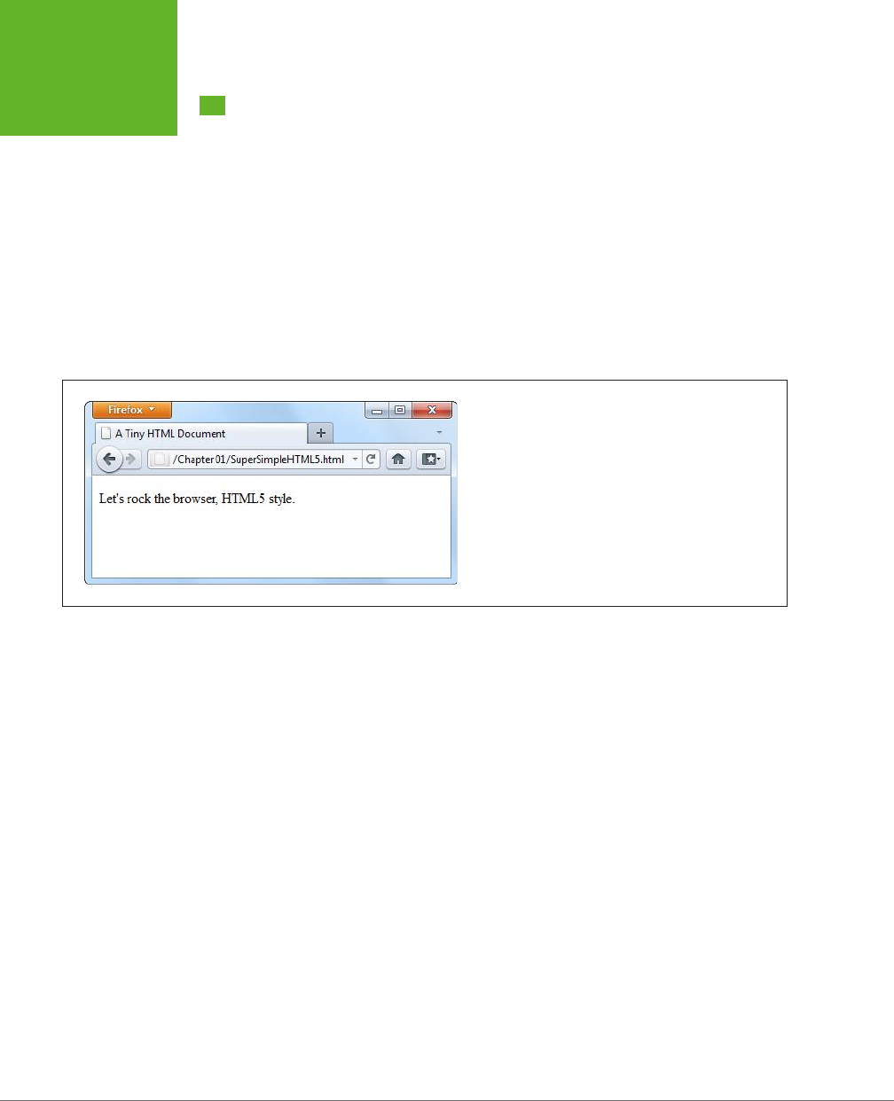
Here’s one of the simplest HTML5 documents you can create:
<!DOCTYPE html>
<title>A Tiny HTML Document</title>
<p>Let's rock the browser, HTML5 style.</p>
It starts with the HTML5 doctype (a special code that’s explained on page 11), fol-
lowed by a title, and then followed by some content. In this case, the content is a
single paragraph of text.
You already know what this looks like in a browser, but if you need reassuring, check
out Figure 1-1.
FIGURE 1-1
This super-simple HTML5 document holds a single line of
text.
You can pare down this document a bit more. For example, the HTML5 standard
doesn’t really require the final </p> tag, since browsers know to close all open ele-
ments at the end of the document (and the HTML5 standard makes this behavior
ocial). However, shortcuts like these create confusing markup and can lead to
unexpected mistakes.
The HTML5 standard also lets you omit the <title> element if the title information
is provided in another way. For example, if you’re sending an HTML document in an
email message, you could put the title in the title of the email message and put the
rest of the markup—the doctype and the content—into the body of the message.
But this is obviously a specialized scenario.
More commonly, you’ll want to flesh out this bare-bones HTML5 document. Most web
developers agree that using the traditional <head> and <body> sections can prevent
confusion, by cleanly separating the information about your page (the head) and its
actual content (the body). This structure is particularly useful when you start adding
scripts, style sheets, and meta elements.
www.it-ebooks.info

CHAPTER 1: INTRODUCING HTML5 11
YOUR FIRST
LOOK AT
HTML5 MARKUP
<!DOCTYPE html>
<head>
<title>A Tiny HTML Document</title>
</head>
<body>
<p>Let's rock the browser, HTML5 style.</p>
</body>
As always, the indenting (at the beginning of lines three and six) is purely optional.
This example uses it to make the structure of the page easier to see at first glance.
Finally, you can choose to wrap the entire document (not including the doctype) in
the traditional <html> element. Here’s what that looks like:
<!DOCTYPE html>
<html>
<head>
<title>A Tiny HTML Document</title>
</head>
<body>
<p>Let's rock the browser, HTML5 style.</p>
</body>
</html>
Up until HTML5, every version of the ocial HTML specification had demanded
that you use the <html> element, despite the fact that it has no eect on browsers.
However, HTML5 makes this detail completely optional.
NOTE The use of the
<html>
,
<head>
, and
<body>
elements is simply a matter of style. You can leave
them out and your page will work perfectly well, even on old browsers that don’t know a thing about HTML5. In
fact, the browser will automatically assume these details. So if you use JavaScript to peek at the DOM (the set of
programming objects that represents your page), you’ll find objects for the
<html>
,
<head>
, and
<body>
elements, even if you didn’t add them yourself.
Currently, this example is somewhere between the simplest possible HTML5 docu-
ment and the fleshed-out starting point of a practical HTML5 web page. In the fol-
lowing sections, you’ll fill in the rest of what you need and dig a little deeper into
the markup.
The HTML5 Doctype
The first line of every HTML5 document is a special code called the
doctype
. The
doctype clearly indicates the standard that was used to write the document markup
that follows. Here’s how a page announces that it adheres to the HTML5 standard:
<!DOCTYPE html>
www.it-ebooks.info

HTML5: THE MISSING MANUAL, SECOND EDITION
12
YOUR FIRST
LOOK AT
HTML5 MARKUP
The first thing you’ll notice about the HTML5 doctype is its striking simplicity.
Compare it, for example, to the ungainly doctype that web developers need when
using XHTML 1.0 strict:
<!DOCTYPE html PUBLIC "-//W3C//DTD XHTML 1.0 Strict//EN"
"http://www.w3.org/TR/xhtml1/DTD/xhtml1-strict.dtd">
Even professional web developers were forced to copy and paste the XHTML doctype
from one document to another. But the HTML5 doctype is short and snappy, so you
won’t have much trouble typing it by hand.
The HTML5 doctype is also notable for the fact that it doesn’t include the ocial
specification version (that’s the
5
in HTML5). Instead, the doctype simply indicates
that the page is HTML, which is in keeping with the new vision of HTML5 as a living
language (page 6). When new features are added to the HTML language, they’re
automatically available in your page, without requiring you to edit the doctype.
All of this raises a good question—if HTML5 is a living language, why does your web
page require any doctype at all?
The answer is that the doctype remains for historical reasons. Without a doctype,
most browsers (including Internet Explorer and Firefox) will lapse into
quirks mode
.
In this mode, they’ll attempt to render pages according to the slightly buggy rules
that they used in older versions. The problem is that one browser’s quirks mode dif-
fers from the next, so pages designed for one browser are likely to get inconsistently
sized fonts, scrambled layouts, and other glitches on another browser.
When you add a doctype, the browser recognizes that you want to use the stricter
standards mode
, which ensures that the web page is displayed with consistent
formatting and layout on every modern browser. The browser doesn’t even care
which
doctype you use (with just a few exceptions). Instead, it simply checks that
you have
some
doctype. The HTML5 doctype is simply the shortest valid doctype,
so it always triggers standards mode.
TIP The HTML5 doctype triggers standards mode on all browsers that have a standards mode, including
browsers that don’t know anything about HTML5. For that reason, you can use the HTML5 doctype now, in all your
pages, even if you need to hold off on some of HTML5’s less-supported features.
Although the doctype is primarily intended to tell web browsers what to do, other
agents can also check it. This includes HTML5 validators, search engines, design tools,
and other human beings when they’re trying to figure out what flavor of markup
you’ve chosen for your page.
Character Encoding
The
character encoding
is the standard that tells a computer how to convert your
text into a sequence of bytes when it’s stored in a file—and how to convert it back
again when the file is opened. For historical reasons, there are many dierent char-
acter encodings in the world. Today, virtually all English websites use an encoding
www.it-ebooks.info

CHAPTER 1: INTRODUCING HTML5 13
YOUR FIRST
LOOK AT
HTML5 MARKUP
called UTF-8, which is compact, fast, and supports all the non-English characters
you’ll ever need.
Often, the web server that hosts your pages is configured to tell browsers that it’s
serving out pages with a certain kind of encoding. However, because you can’t be
sure that your web server will take this step (unless you own the server), and be-
cause browsers can run into an obscure security issue when they attempt to guess
a page’s encoding, you should always add encoding information to your markup.
HTML5 makes that easy to do. All you need to do is add the <meta> element shown
below at the very beginning of your <head> section (or right after the doctype, if
you don’t define the <head> element):
<head>
<meta charset="utf-8">
<title>A Tiny HTML Document</title>
</head>
Design tools like Dreamweaver add this detail automatically when you create a new
page. They also make sure that your files are being saved with UTF encoding. How-
ever, if you’re using an ordinary text editor, you may need to take an extra step to
make sure your files are being saved correctly. For example, when editing an HTML
file in Notepad (on Windows), in the Save As dialog box, you must choose UTF-8
from the Encoding list (at bottom). In TextEdit (on Mac), in the Save As dialog box,
you need to first choose Format→Make Plain Text to make sure the program saves
your page as an ordinary text file, and then choose “Unicode (UTF-8)” from the
Plain Text Encoding pop-up menu.
The Language
It’s considered good style to indicate your web page’s
natural language
. This informa-
tion is occasionally useful to other people—for example, search engines can use it to
filter search results so they include only pages that match the searcher’s language.
To specify the language of some content, you use the lang attribute on any element,
along with the appropriate language code. That’s
en
for plain English, but you can
find more exotic language codes at
http://tinyurl.com/l-codes
.
The easiest way to add language information to your web page is to use the <html>
element with the lang attribute:
<html lang="en">
This detail can also help screen readers if a page has text from multiple languages. In
this situation, you use the lang attribute to indicate the language of dierent sections
of your document; for example, by applying it to dierent <div> elements that wrap
dierent content. Screen readers can then determine which sections to read aloud.
www.it-ebooks.info

HTML5: THE MISSING MANUAL, SECOND EDITION
14
YOUR FIRST
LOOK AT
HTML5 MARKUP
Adding a Style Sheet
Virtually every web page in a properly designed, professional website uses CSS style
sheets. You specify the style sheets you want to use by adding <link> elements to
the <head> section of an HTML5 document, like this:
<head>
<meta charset="utf-8">
<title>A Tiny HTML Document</title>
<link href="styles.css" rel="stylesheet">
</head>
This method is more or less the same way you attach style sheets to a traditional
HTML document, but slightly simpler.
NOTE Because CSS is the only style sheet language around, there’s no need to add the
type="text/
css"
attribute that web pages used to require.
Adding JavaScript
JavaScript started its life as a way to add frivolous glitter and glamour to web pages.
Today, JavaScript is less about user interface frills and more about novel web ap-
plications, including super-advanced email clients, word processors, and mapping
engines that run right in the browser.
You add JavaScript to an HTML5 page in much the same way that you add it to
a traditional HTML page. Here’s an example that references an external file with
JavaScript code:
<head>
<meta charset="utf-8">
<title>A Tiny HTML Document</title>
<script src="scripts.js"></script>
</head>
There’s no need to include the language="JavaScript" attribute. The browser as-
sumes you want JavaScript unless you specify otherwise—and because JavaScript
is the only HTML scripting language with broad support, you never will. However,
you
do
still need to remember the closing </script> tag, even when referring to an
external JavaScript file. If you leave it out or attempt to shorten your markup using
the empty element syntax, your page won’t work.
If you spend a lot of time testing your JavaScript-powered pages in Internet Explorer,
you may also want to add a special comment called the
mark of the Web
to your
<head> section, right after the character encoding. It looks like this:
www.it-ebooks.info

CHAPTER 1: INTRODUCING HTML5 15
YOUR FIRST
LOOK AT
HTML5 MARKUP
<head>
<meta charset="utf-8">
<!-- saved from url=(0014)about:internet -->
<title>A Tiny HTML Document</title>
<script src="scripts.js"></script>
</head>
This comment tells Internet Explorer to treat the page as though it has been down-
loaded from a remote website. Otherwise, IE switches into a special locked-down
mode, pops up a security warning in a message bar, and won’t run any JavaScript
code until you explicitly click “Allow blocked content.”
All other browsers ignore the “mark of the Web” comment and use the same security
settings for remote websites and local files.
The Final Product
If you’ve followed these steps, you’ll have an HTML5 document that looks something
like this:
<!DOCTYPE html>
<html lang="en">
<head>
<meta charset="utf-8">
<title>A Tiny HTML Document</title>
<link href="styles.css" rel="stylesheet">
<script src="scripts.js"></script>
</head>
<body>
<p>Let's rock the browser, HTML5 style.</p>
</body>
</html>
Although it’s no longer the shortest possible HTML5 document, it’s a reasonable
starting point for any web page you want to build. And while this example seems
wildly dull, don’t worry—in the next chapter, you’ll step up to a real-life page that’s
full of carefully laid-out content, and all wrapped up in CSS.
NOTE All the HTML5 syntax you’ve learned about in this section—the new doctype, the meta element for
character encoding, the language information, and the style sheet and JavaScript references, work in browsers
both new and old. That’s because they rely on defaults and built-in error-correcting practices that all browsers
use.
www.it-ebooks.info

HTML5: THE MISSING MANUAL, SECOND EDITION
16
A CLOSER
LOOK AT
HTML5 SYNTAX
A Closer Look at HTML5 Syntax
As you’ve already learned, HTML5 loosens some of the rules. That’s because the
creators of HTML5 wanted the language to more closely reflect web browser real-
ity—in other words, they wanted to narrow the gap between “web pages that work”
and “web pages that are considered valid, according to the standard.” In the next
section, you’ll take a closer look at how the rules have changed.
NOTE There are still plenty of obsolete practices that browsers support but that the HTML5 standard strictly
discourages. For help catching these in your own web pages, you’ll need an HTML5 validator (page 17).
The Loosened Rules
In your first walk through an HTML5 document, you discovered that HTML5 makes
the <html>, <head>, and <body> elements optional (although they can still be pretty
useful). But HTML5’s relaxed attitude doesn’t stop there.
HTML5 ignores capitalization, letting you write markup like the following:
<P>Capital and lowercase letters <EM>don't matter</eM> in tag names.</p>.
HTML5 also lets you omit the closing slash from a
void element
—that’s an element
with no nested content, like an <img> (image), a <br> (line break), or an <hr> (hori-
zontal line). Here are three equivalent ways to add a line break:
I cannot<br />
move backward<br>
or forward.<br/>
I am caught
HTML5 also changes the rules for attributes. Attribute values don’t need quotation
marks anymore, as long as the value doesn’t include a restricted character (typi-
cally >, =, or a space). Here’s an example of an <img> element that takes advantage
of this ability:
<img alt="Horsehead Nebula" src=Horsehead01.jpg>
Attributes with no values are also allowed. So while XHTML required the somewhat
redundant syntax to put a checkbox in the checked state…
<input type="checkbox" checked="checked" />
…you can now revive the shorter HTML 4.01 tradition of including the attribute name
on its own.
<input type="checkbox" checked>
What’s particularly disturbing to some people isn’t the fact that HTML5 allows these
things. It’s the fact that inconsistent developers can casually switch back and forth
between the stricter and the looser styles, even using both in the same document.
In reality, though, XHTML permitted the same kind of inconsistency. In both cases,
www.it-ebooks.info

CHAPTER 1: INTRODUCING HTML5 17
A CLOSER
LOOK AT
HTML5 SYNTAX
good style is the responsibility of the web designer, and the browser tolerates
whatever you can throw at it.
Here’s a quick summary of what constitutes good HTML5 style—and what conven-
tions the examples in this book follow, even if they don’t have to:
• Including the optional <html>, <body>, and <head> elements. The <html>
element is a handy place to define the page’s natural language (page 13); and
the <body> and <head> elements help to keep page content separate from the
other page details.
• Using lowercase tags (like <p> instead of <P>). They’re not necessary, but
they’re far more common, easier to type (because you don’t need the Shift
key), and not nearly as shouty.
• Using quotation marks around attribute values. The quotation marks are
there for a reason—to protect you from mistakes that are all too easy to make.
Without quotation marks, one invalid character can break your whole page.
On the other hand, there are some old conventions that this book ignores (and you
can, too). The examples in this book don’t close empty elements, because most
developers don’t bother to add the extra slash (/) when they switch to HTML5.
Similarly, there’s no reason to favor the long attribute form when the attribute name
and the attribute value are the same.
HTML5 Validation
HTML5’s new, relaxed style may suit you fine. Or, the very thought that there could
be inconsistent, error-ridden markup hiding behind a perfectly happy browser may
be enough to keep you up at night. If you fall into the latter camp, you’ll be happy
to know that a validation tool can hunt down markup that doesn’t conform to the
recommended standards of HTML5, even if it doesn’t faze a browser.
Here are some potential problems that a validator can catch:
• Missing mandatory elements (for example, the <title> element)
• A start tag without a matching end tag
• Incorrectly nested tags
• Tags with missing attributes (for example, an <img> element without the src
attribute)
• Elements or content in the wrong place (for example, text that’s placed directly
in the <head> section)
Web design tools like Dreamweaver often have their own validators. But if you don’t
want the cost or complexity of a professional web editor, you can get the same
information from an online validation tool. Here’s how to use the popular validator
provided by the W3C standards organization:
www.it-ebooks.info
HTML5: THE MISSING MANUAL, SECOND EDITION
18
A CLOSER
LOOK AT
HTML5 SYNTAX
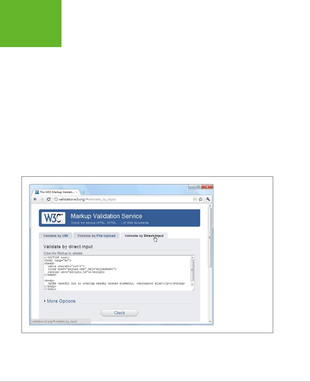
1. In your web browser, go to
http://validator.w3.org
(Figure 1-2).
The W3C validator gives you three choices, represented by three separate tabs:
“Validate by URI” (for a page that’s already online), “Validate by File Upload”
(for a page that’s stored in a file on your computer), and “Validate by Direct
Input” (for a bunch of markup you type in yourself).
2. Click the tab you want, and supply your HTML content.
• Validate by URI lets you validate an existing web page. You just need to
type the page’s URL in the Address box (for example,
http://www.MySlop-
pySite.com/FlawedPage.html
).
• Validate by File Upload lets you upload any file from your computer. First,
click the Browse button (in Chrome, click Choose File). In the Open dialog
box, select your HTML file and then click Open.
• Validate by Direct Input lets you validate any markup—you just need to
type it into a large box. The easiest way to use this option is to copy the
markup from your text editor and paste it into the box on the W3C valida-
tion page.
FIGURE 1-2
The website
http://valida-
tor.w3.org
gives you three
options for validating
HTML. You can fill in the
address of another web
page, you can upload a
file of your own, or you
can type the markup in
directly (shown here).
Before continuing, you can click More Options to change some settings, but
you probably won’t. It’s best to let the validator automatically detect the docu-
ment type—that way, the validator will use the doctype specified in your web
page. Similarly, use automatic detection for the character set unless you have
www.it-ebooks.info
CHAPTER 1: INTRODUCING HTML5 19
A CLOSER
LOOK AT
HTML5 SYNTAX
an HTML page that’s written in another language and the validator has trouble
determining the correct character set.
3. Click the Check button.
This click sends your HTML page to the W3C validator. After a brief delay, the
report appears. You’ll see whether your document passed the validation check
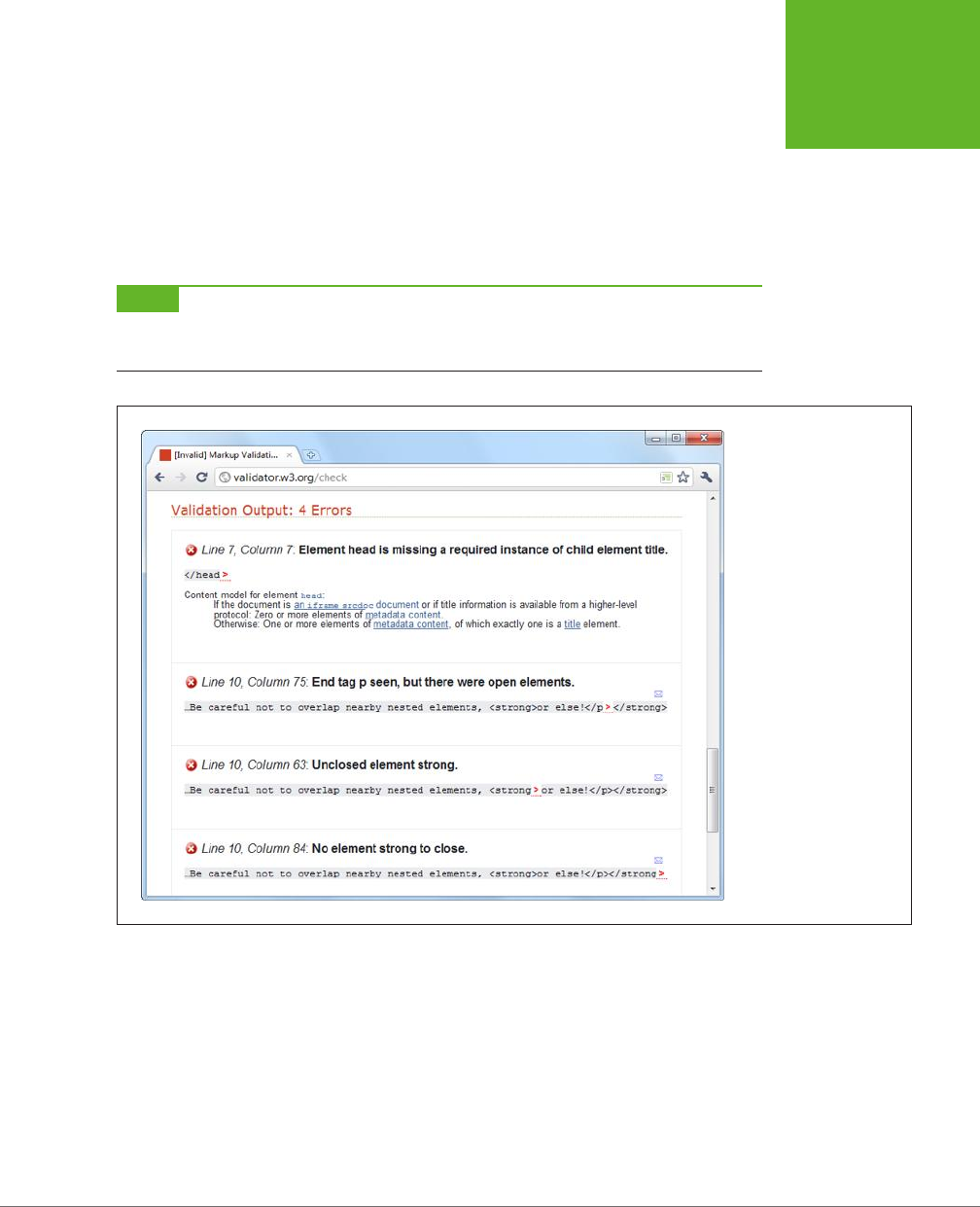
and, if it failed, what errors the validator detected (see Figure 1-3).
NOTE Even in a perfectly valid HTML document, you may get a few harmless warnings, including that the
character encoding was determined automatically and that the HTML5 validation service is considered to be an
experimental, not-fully-finished feature.
FIGURE 1-3
The validator has discov-
ered four errors in this
document that stem from
two mistakes. First, the
page is missing the man-
datory
<title>
element.
Second, it closes the
<p>
element before closing the
<strong>
element that’s
nested inside. (To solve
this problem, you would
replace
</p></strong>
with
</strong></p>
.)
Incidentally, this document
is still close enough to being
correct that all browsers will
display it properly.
The Return of XHTML
As you’ve already learned, HTML5 spells the end for the previous king of the Web—
XHTML. However, reality isn’t quite that simple, and XHTML fans don’t need to give
up all the things they loved about the past generation of markup languages.
First, remember that XHTML syntax lives on. The rules that XHTML enforced either
remain as guidelines (for example, nesting elements correctly) or are still supported
as optional conventions (for example, including the trailing slash on empty elements).
www.it-ebooks.info

HTML5: THE MISSING MANUAL, SECOND EDITION
20
A CLOSER
LOOK AT
HTML5 SYNTAX
But what if you want to
enforce
the XHTML syntax rules? Maybe you’re worried that
you (or the people you work with) will inadvertently slip into the looser conven-
tions of ordinary HTML. To stop that from happening, you need to use XHTML5—a
less common standard that is essentially HTML5 with the XML-based restrictions
slapped on top.
To turn an HTML5 document into an XHTML5 document, you need to explicitly add
the XHTML namespace to the <html> element, close every element, make sure you use
lowercase tags, and so on. Here’s an example of a web page that takes all these steps:
<!DOCTYPE html>
<html lang="en" xmlns="http://www.w3.org/1999/xhtml">
<head>
<meta charset="utf-8"/>
<title>A Tiny HTML Document</title>
<link href="styles.css" rel="stylesheet"/>
<script src="scripts.js"></script>
</head>
<body>
<p>Let's rock the browser, XHTML5 style.</p>
</body>
</html>
Now you can use an XHTML5 validator to get stricter error checking that enforces
the old-style XHTML rules. The standard W3C validator won’t do it, but the valida-
tor at
http://validator.w3.org/nu
will, provided you click the Options button and
choose XHTML5 from the Preset list. You also need to choose the “Be lax about
content-type” option, unless you’re using the direct input approach and pasting
your markup into a text box.
By following these steps, you can create and validate an XHTML document. However,
browsers
will still process your page as an HTML5 document—one that just happens
to have an XML inferiority complex. They won’t attempt to apply any extra rules.
If you want to go XHTML5 all the way, you need to configure your web server to
serve your page with the MIME type application/xhtml+xml or application/xml,
instead of the standard text/html. (See page 152 for the lowdown on MIME types.)
But before you call your web hosting company, be warned that this change will
prevent your page from being displayed by any version of Internet Explorer before
IE 9. For that reason, true XHTML5 is an immediate deal-breaker in the browser.
Incidentally, browsers that do support XHTML5 deal with it dierently from ordinary
HTML5. They attempt to process the page as an XML document, and if that process
fails (because you’ve left a mistake behind), the browser gives up on the rest of
the document.
Bottom line? For the vast majority of web developers, from ordinary people to serious
pros, XHTML5 isn’t worth the hassle. The only exceptions are developers who have a
www.it-ebooks.info
CHAPTER 1: INTRODUCING HTML5 21
HTML5’S
ELEMENT
FAMILY
specific XML-related goal in mind; for example, developers who want to manipulate
the content in their pages with XML-related standards like XQuery and XPath.
TIP If you’re curious, you can trick your browser into switching into XHTML mode. Just rename your file so
that it ends with .xhtml or .xht. Then open it from your hard drive. Most browsers (including Firefox, Chrome, and
IE 9 or later) will act as though you downloaded the page from a web server with an XML MIME type. If there’s
a minor error in the page, the browser window will show a partially processed page (IE), an XML error message
(Firefox), or a combination of the two (Chrome).
HTML5’s Element Family
So far, this chapter has focused on the changes to HTML5’s syntax. But more im-
portant are the additions, subtractions, and changes to the
elements
that HTML
supports. In the following sections, you’ll get an overview of how they’ve changed.
Added Elements
In the following chapters, you’ll spend most of your time learning about new ele-
ments—ingredients that haven’t existed in web pages up until now. Table 1-1 has a
preview of what’s in store (and where you can read more about it).
TABLE 1-1
New HTML5 elements
CATEGORY ELEMENTS DISCUSSED IN…
Semantic elements for
structuring a page
<article>, <aside>,
<figcaption>, <figure>,
<footer>, <header>, <nav>,
<section>, <details>,
<summary>
Chapter 2
Semantic elements for text <mark>, <time>, <wbr>
(previously supported, but
now an official part of the
language)
Chapter 3
Web forms and interactivity <input> (not new, but
has many new subtypes)
<datalist>, <keygen>,
<meter>, <progress>,
<command>, <menu>, <output>
Chapter 4
Audio, video, and plug-ins <audio>, <video>, <source>,
<embed> (previously
supported, but now an
official part of the language)
Chapter 5
Canvas <canvas> Chapter 8
Non-English language
support
<bdo>, <rp>, <rt>, <ruby> HTML5 specification at
http://dev.w3.org/html5/
markup
www.it-ebooks.info

HTML5: THE MISSING MANUAL, SECOND EDITION
22
HTML5’S
ELEMENT
FAMILY
Removed Elements
Although HTML5 adds new elements, it also boots a few out of the ocial family.
These elements will keep working in browsers, but any decent HTML5 validator will
smoke them out of their hiding places and complain loudly.
Most obviously, HTML5 keeps the philosophy (first cooked up with XHTML) that
presentational elements
are not welcome in the language. Presentational elements
are elements that are simply there to add formatting to web pages, and even the
greenest web designer knows that’s a job for style sheets. Rejects include elements
that professional developers haven’t use in years (like <big>, <center>, <font>, <tt>,
and <strike>). HTML’s presentational attributes died the same death, so there’s no
reason to rehash them all here.
Additionally, HTML5 kicks more sand on the grave where web developers buried
the HTML frames feature. When it was first created, HTML frames seemed like a
great way to show multiple web pages in a single browser window. But now, frames
are better known as an accessibility nightmare because they cause problems with
search engines, assistive software, and mobile devices. Interestingly, the <iframe>
element—which lets developers put one page inside another—squeaks through.
That’s because web applications use the <iframe> for a range of integration tasks,
like incorporating YouTube windows, ads, and Google search boxes in a web page.
A few more elements were kicked out because they were redundant or the cause of
common mistakes, including <acronym> (use <abbr> instead) and <applet> (because
<object> is preferred). But the vast majority of the element family lives on in HTML5.
NOTE For those keeping count, HTML5 includes a family of just over 100 elements. Out of these, almost 30
are new and about 10 are significantly changed. You can browse the list of elements (and review which ones are
new or changed) at
http://dev.w3.org/html5/markup
.
Adapted Elements
HTML5 has another odd trick: Sometimes it adapts an old feature to a new purpose.
For example, consider the <small> element, which fell out of favor as a clumsy
way to shrink the font size of a block of text—a task more properly done with style
sheets. But unlike the discarded <big> element, HTML5 keeps the <small> element,
with a change. Now, the <small> element represents “small print”—for example, the
legalese that no one wants you to read at the bottom of a contract:
<small>The creators of this site will not be held liable for any injuries that
may result from unsupervised unicycle racing.</small>
Text inside the <small> element is still displayed as it always was, using a smaller
font size, unless you override that setting with a style sheet.
www.it-ebooks.info

CHAPTER 1: INTRODUCING HTML5 23
HTML5’S
ELEMENT
FAMILY
NOTE Opinions on this
<small>
technique differ. On the one hand, it’s great for backward compatibility,
because old browsers already support the
<small>
element, and so they’ll continue to support it in an HTML5
page. On the other hand, it introduces a potentially confusing change of meaning for old pages. They may be
using the
<small>
element for presentational purposes, without wanting to suggest “small print.”
Another changed element is <hr> (short for horizontal rule), which draws a separating
line between sections. In HTML5, <hr> represents a thematic break—for example,
a transition to another topic. The default formatting stays, but now a new meaning
applies.
Similarly, <s> (for struck text), isn’t just about crossing out words anymore—it now
represents text that is no longer accurate or relevant, and has been “struck” from
the document. Both of these changes are subtler than the <small> element’s shift in
meaning, because they capture ways that the <hr> and <s> elements are commonly
used in traditional HTML.
BOLD AND ITALIC FORMATTING
The most important adapted elements are the ones for bold and italic formatting.
Two of HTML’s most commonly used elements—that’s <b> for bold and <i> for ital-
ics—were partially replaced when the first version of XHTML introduced the look-
alike <strong> and <em> elements. The idea was to stop looking at things from a
formatting point of view (bold and italics), and instead substitute elements that had
a real logical meaning (strong importance or stressed emphasis). The idea made
a fair bit of sense, but the <b> and <i> tags lived on as shorter and more familiar
alternatives to the XHTML fix.
HTML5 takes another crack at solving the problem. Rather than trying to force
developers away from <b> and <i>, it assigns new meaning to both elements. The
idea is to allow all four elements to coexist in a respectable HTML5 document. The
result is the somewhat confusing set of guidelines listed here:
• Use <strong> for text that has
strong importance
. This is text that needs to
stand out from its surroundings.
• Use <b> for text that should be presented in bold but doesn’t have greater
importance than the rest of your text. This could include keywords, product
names, and anything else that would be bold in print.
• Use <em> for text that has
emphatic stress
—in other words, text that would
have a dierent inflection if read out loud.
• Use <i> for text that should be presented in italics but doesn’t have extra em-
phasis. This could include foreign words, technical terms, and anything else that
you’d set in italics in print.
www.it-ebooks.info

HTML5: THE MISSING MANUAL, SECOND EDITION
24
HTML5’S
ELEMENT
FAMILY
And here’s a snippet of markup that uses all four of these elements in the appropri-
ate way:
<strong>Breaking news!</strong> There's a sale on <i>leche quemada</i> candy
at the <b>El Azul</b> restaurant. Don't delay, because when the last candy
is gone, it's <em>gone</em>.
In the browser, the text looks like this:
Breaking news! There’s a sale on
leche quemada
candy at the El Azul restaurant. Don’t delay,
because when the last candy is gone, it’s
gone
.
Some web developers will follow HTML’s well-intentioned rules, while others just
stick with the most familiar elements for bold and italic formatting.
Tweaked Elements
HTML5 also shifts the rules of a few elements. Usually, these changes are minor
details that only HTML wonks will notice, but occasionally they have deeper eects.
One example is the rarely used <address> element, which is not suitable (despite the
name) for postal addresses. Instead, the <address> element has the narrow purpose
of providing contact information for the creator of the HTML document, usually as
an email address or website link:
Our website is managed by:
<address>
<a href="mailto:jsolo@mysite.com">John Solo</a>,
<a href="mailto:lcheng@mysite.com">Lisa Cheng</a>, and
<a href="mailto:rpavane@mysite.com">Ryan Pavane</a>.
</address>
The <cite> element has also changed. It can still be used to cite some work (for
example, a story, article, or television show), like this:
<p>Charles Dickens wrote <cite>A Tale of Two Cities</cite>.</p>
However, it’s not acceptable to use <cite> to mark up a person’s name. This restric-
tion has turned out to be surprisingly controversial, because this usage was allowed
before. Several guru-level web developers are on record urging people to disregard
the new <cite> rule, which is a bit odd, because you can spend a lifetime editing
web pages without ever stumbling across the <cite> element in real life.
A more significant tweak aects the <a> element for creating links. Past versions of
HTML have allowed the <a> element to hold clickable text or a clickable image. In
HTML5, the <a> element allows anything and everything, which means it’s perfectly
acceptable to stu entire paragraphs in there, along with lists, images, and so on.
(If you do, you’ll see that all the text inside becomes blue and underlined, and all
the images inside sport blue borders.) Web browsers have supported this behavior
for years, but it’s only HTML5 that makes it an ocial, albeit not terribly useful, part
of the HTML standard.
www.it-ebooks.info

CHAPTER 1: INTRODUCING HTML5 25
HTML5’S
ELEMENT
FAMILY
There are also some tweaks that don’t work yet—in any browser. For example, the
<ol> element (for ordered lists) now gets a reversed attribute, which you can set
to count backward (either toward 1, or toward whatever starting value you set with
the start attribute), but currently there are only two browsers that recognize this
setting—Chrome and Safari.
You’ll learn about a few more tweaks as you make your way through this book.
Standardized Elements
HTML5 also adds supports for a few elements that were supported but weren’t of-
ficially welcome in the HTML or XHTML language. One of the best-known examples
is <embed>, which is used all over the Web as an all-purpose way to shoehorn a
plug-in into a page.
A more exotic example is <wbr>, which indicates an optional word break—in other
words, a place where the browser can split a line if the word is too long to fit in its
container:
<p>Many linguists remain unconvinced that
<b>supercali<wbr>fragilistic<wbr>expialidocious</b> is indeed a word.</p>
The <wbr> element is useful when you have long names (sometimes seen in program-
ming terminology) in small places, like table cells or tiny boxes. Even if the browser
supports <wbr>, it will break the word only if it doesn’t fit in the available space. In
the previous example, that means the browser may render the word in one of the
following ways:
Many linguists remain
unconvinced that
supercalifragilisticexpialidocious
is indeed a word.
Many linguists remain
unconvinced that
supercalifragilistic
expialidocious is indeed a
word.
Many linguists
remain
unconvinced
that supercali
fragilistic
expialidocious
is indeed a
word.
www.it-ebooks.info

HTML5: THE MISSING MANUAL, SECOND EDITION
26
USING HTML5
TODAY
The <wbr> element has a natural similarity to the <nobr> element, which prevents
text from wrapping no matter how narrow the available space. However, HTML5
considers <nobr> obsolete and advises all self-respecting web developers to avoid
using it. Instead, you can get the same eect by adding the white-space property
to your style sheet and setting it to nowrap.
Using HTML5 Today
Before you commit to HTML5, you need to know how well it works with the browsers
your visitors are likely to use. After all, the last thing any web developer wants is a
shiny new page that collapses into a muddle of scrambled markup and script errors
when it meets a vintage browser.
In a moment, you’ll learn how to research specific HTML5 features to find out which
browsers support them, and examine browser usage statistics to find out what por-
tion of your audience meets the bar. But before digging into the fine details, here’s
a broad overview of the current state of HTML5 support:
• If your visitors use the popular Google Chrome or Mozilla Firefox, they’ll be fine.
Not only have both browsers supported the bulk of HTML5 for several years, but
they’re also designed to update themselves automatically. That means you’re
unlikely to find an old version of Chrome or Firefox in the wild.
• If your visitors use Safari or Opera, you’re probably still on safe ground. Once
again, these browsers have had good HTML5 support for several years, and old
versions are rarely seen.
• If your visitors use tablet computers or smartphones, you may face some
limitations with certain features, as you’ll learn throughout this book. However,
the mobile browsers on all of today’s web-enabled gadgets were created with
HTML5 in mind. That means your pages are in for maybe a few hiccups, not a
horror show.
• If your visitors use an older version of Internet Explorer—that is, any version
before IE 10—most HTML5 features
won’t
work. Here’s where the headaches
come in. Old versions of Windows are still common, and they typically include
old versions of Internet Explorer. Even worse, many old versions of Windows
don’t let their users upgrade to a modern, HTML5-capable version of IE. Win-
dows Vista, for example, is limited to IE 9. The mind-bogglingly old (but still
popular) Windows XP is stuck with IE 8.
No, it’s not Microsoft’s diabolical plan to break the Web—it’s just that newer
versions of IE were designed with newer computer hardware in mind. This new
software simply won’t work on old machines. But people with old versions of
Windows can use an alternative browser like Firefox, although they may not
know how to install it or may not be allowed to make such changes to a com-
pany computer.
www.it-ebooks.info
CHAPTER 1: INTRODUCING HTML5 27
USING HTML5
TODAY
NOTE Although really old versions of Internet Explorer—like IE 6 and IE 7—have finally disappeared from the
scene, the problematic IE 8 and IE 9 still account for over 10 percent of all Web traffic (at the time of this writing).
And because it’s never OK to force one in ten website visitors to suffer, you’ll need to think about workarounds
for most HTML5 features—at least for the immediate future.
UP TO SPEED
Dealing with Old Browsers
For the next few years, some of your visitors’ browsers won’t
support all the HTML5 features you want to use. That’s a fact
of life. But it doesn’t need to prevent you from using these
features, if you’re willing to put in a bit more work. There are
two basic strategies you can use:
• Degrade gracefully. Sometimes, when a feature doesn’t
work, it’s not a showstopper. For example, HTML5’s new
<video>
element has a fallback mechanism that lets
you supply something else to older browsers, like a video
player that uses the Flash plug-in. (Supplying an error
message is somewhat rude, and definitely not an example
of degrading gracefully.) Your page can also degrade
gracefully by ignoring nonessential frills, like some of
the web form features (like placeholder text) and some of
the formatting properties from CSS3 (like rounded corners
and drop shadows). Or, you can write your own JavaScript
code that checks whether the current browser supports
a feature you want to use (using a tool like Modernizr). If
the browser fails the test, your code can show different
content or use a less glamorous approach.
• Use a JavaScript workaround. Many of HTML5’s new
features are inspired by the stuff web developers are
already doing the hard way. Thus, it should come as no
surprise that you can duplicate many of HTML5’s features
using a good JavaScript library (or, in the worst-case
scenario, by writing a whackload of your own custom
JavaScript). Creating JavaScript workarounds can be a
lot of work, but there are hundreds of good (and not-
so-good) workarounds available free on the Web, which
you can drop into your pages when needed. The more
elaborate ones are called polyfills (page 35).
How to Find the Browser Requirements for Any HTML5
Feature
The people who have the final word on how much HTML5 you use are the browser
vendors. If they don’t support a feature, there’s not much point in attempting to use
it, no matter what the standard says. Today, there are four or five major browsers (not
including the mobile variants that run on web-connected devices like smartphones
and tablets). A single web developer has no chance of testing each prospective
feature on every browser—not to mention evaluating support in older versions that
are still widely used.
Fortunately, there’s an ingenious website named “Can I use” that can help you out.
It details the HTML5 support found in
every
mainstream browser. Best of all, it lets
you focus on exactly the features you need. Here’s how it works:
1. Point your browser to
http://caniuse.com
.
The main page has a bunch of links grouped into categories, like CSS, HTML5,
and so on.
www.it-ebooks.info
HTML5: THE MISSING MANUAL, SECOND EDITION
28
USING HTML5
TODAY
2. Choose the feature you want to study.
The quickest way to find a feature is to type its name into the Search box near
the top of the page.
Or, you can browse to the feature by clicking one of the links on the front page.
The HTML5 group has a set of links that are considered part of the core HTML5
standard; the JS API group has links for JavaScript-powered features that began
as part of HTML5 but have since been split o; the CSS group has links for the
styling features that are part of CSS3; and so on.
TIP If you want, you can view the support tables for every feature in a group, all at once. Click the group
title (like HTML5 or JS API), which is itself a link.
3. Examine your results (Figure 1-4).
Each feature table shows a grid of dierent browser versions. The tables indicate
support with the color of the cell, which can be red (no support), bright green
(full support), olive green (partial support), or gray (undetermined, usually
because this version of the browser is still under development and the feature
hasn’t been added yet).
4. Optionally, choose dierent browsers to put under the microscope.
Ordinarily, the support table includes the most recent versions of the most
popular browsers. However, you can tweak the table so it includes support
information for other browsers that may be important to you—say, the aging
IE 7 or a specialized mobile browser like Firefox for Android.
To choose which browsers appear in the tables, start by clicking the “Show op-
tions” link above the table. A list of browsers appears, and you can choose the
browsers you want by adding a checkmark next to their names. You can also
tweak the “Versions shown” slider, which acts as a kind of popularity thresh-
old—lower it to include older browser versions that are used less frequently.
Alternatively, click the “Show all versions” link in the top-left corner of the
table to see
all
the browser compatibility information that “Can I use” has in its
database. But be warned that you’ll get an immense table that stretches back
to the dark days of Firefox 2 and IE 5.5.
www.it-ebooks.info
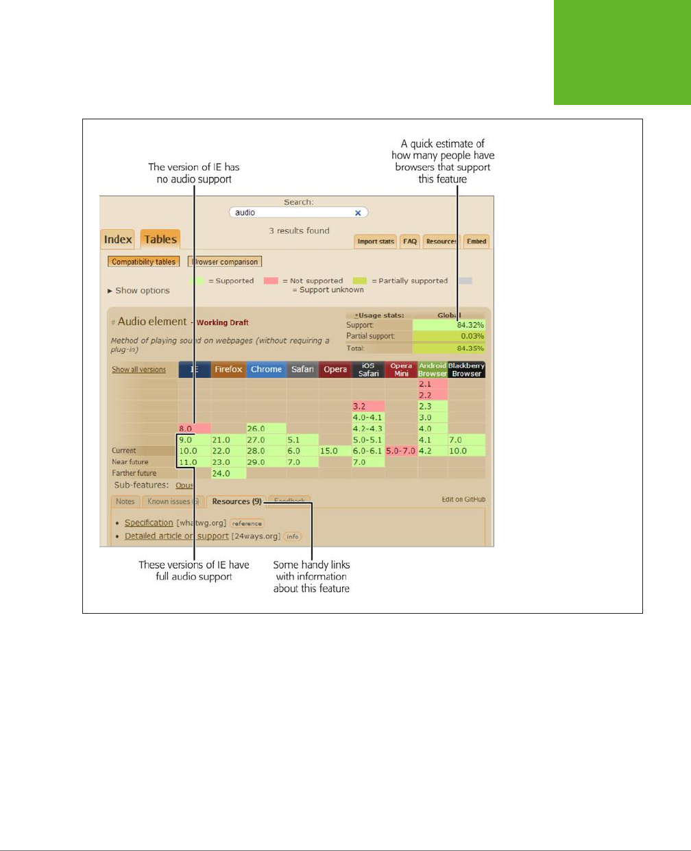
CHAPTER 1: INTRODUCING HTML5 29
USING HTML5
TODAY
FIGURE 1-4
This search for
audio
finds two
tables. First is the table that
describes browser support for
the
<audio>
element (shown
here).
Green-shaded squares indicate
browser versions that have
full audio support, while
red-shaded squares indicate
browser versions that do not.
www.it-ebooks.info

HTML5: THE MISSING MANUAL, SECOND EDITION
30
USING HTML5
TODAY
How to Find Out Which Browsers Are on the Web
How do you know
which
browser versions you need to worry about? Browser adop-
tion statistics can tell you what portion of your audience has a browser that supports
the features you plan to use. One good place to get an overall snapshot of all the
browsers on the Web is GlobalStats, a popular tracking site. Here’s how to use it:
1. Browse to
http://gs.statcounter.com
.
On the GlobalStats site, you’ll see a line graph showing the most popular
browsers during the previous year. However, this chart doesn’t include version
information, so it doesn’t tell you how many people are surfing with problematic
versions of Internet Explorer (versions before IE 10). To get this information, you
need to adjust another setting.
2. Look for the Stat setting (under the chart) and choose “Browser Version
(Partially Combined).”
This choice lets you consider not just which browsers are being used, but which
versions
of each browser. The partial combining tells GlobalStats to group to-
gether browsers that are rapidly updated, like Chrome and Firefox (Figure 1-5),
so your chart isn’t cluttered with dozens of extra lines.
3. Optionally, change the geographic region in the Region box.
The standard setting is Worldwide, which shows browser statistics culled from
across the globe. However, you can home in on a specific country (like Bolivia)
or continent (like North America).
FIGURE 1-5
This chart shows that al-
though Chrome’s popular-
ity is soaring, troublesome
browser versions like IE 8
and IE 9 still cling to life.
www.it-ebooks.info

CHAPTER 1: INTRODUCING HTML5 31
USING HTML5
TODAY
4. Optionally, click the text next to the Period setting to pick a dierent date
range.
You’ll usually see the browser usage trends for an entire year, but you can choose
to focus on a smaller range, like the past three months.
5. Optionally, change the chart type using the option buttons that are just to
the right of the chart box.
Choose the Line option to see a line chart that shows the trend in browser
adoption over time. Choose Bar to see a bar chart that shows a snapshot of
the current situation. Or, choose Map to see a color-coded map that shows the
countries where dierent browsers reign supreme.
GlobalStats compiles its statistics daily using tracking code that’s present on millions
of websites. And while that’s a large number of pages and a huge amount of data,
it’s still just a small fraction of the total Web, which means you can’t necessarily
assume that your website visitors will use the same browsers.
Furthermore, browser-share results change depending on the web surfer’s country
and the type of website. For example, in Germany, Firefox is the top browser with
over 40 percent of web surfers. And on the TechCrunch website (a popular news site
for computer nerds), old versions of Internet Explorer are a rarity. So if you want to
design a website that works for your peeps, it’s worth reviewing the web statistics
generated by your own pages. (And if you aren’t already using a web tracking service
for your site, check out the top-tier and completely free Google Analytics at
www.
google.com/analytics
.)
Feature Detection with Modernizr
Feature detection is one strategy for dealing with features that aren’t supported by
all the browsers that hit up your site. The typical pattern is this: Your page loads and
runs a snippet of JavaScript code to check whether a specific feature is available.
You can then warn the user (the weakest option), fall back to a slightly less impres-
sive version of your page (better), or implement a workaround that replicates the
HTML5 feature you wanted to use (best).
Unfortunately, because HTML5 is, at its heart, a loose collection of related standards,
there’s no single HTML5 support test. Instead, you need dozens of dierent tests to
check for dozens of dierent features—and sometimes even to check if a specific
part
of a feature is supported, which gets ugly fast.
Checking for support usually involves looking for a property on a programming ob-
ject, or creating an object and trying to use it a certain way. But think twice before
you write this sort of feature-testing code, because it’s so easy to do it badly. For
example, your feature-testing code might fail on certain browsers for some obscure
reason or another, or quickly become out of date. Instead, consider using Modernizr
(
http://modernizr.com
), a small, constantly updated tool that tests the support of a
wide range of HTML5 and related features. It also has a cool trick for implementing
fallback support when you’re using new CSS3 features, which you’ll see on page 180.
www.it-ebooks.info

HTML5: THE MISSING MANUAL, SECOND EDITION
32
USING HTML5
TODAY
Here’s how to use Modernizr in one of your web pages:
1. Visit the Modernizr download page at
http://modernizr.com/download
.
Look for the “Development version” link, which points to the latest all-in-one
JavaScript file for Modernizr.
2. Right click the “Development version” link and choose “Save link as” or
“Save target as.”
Both commands are the same thing—the wording just depends on the browser
you’re using.
3. Choose a place on your computer to save the file, and click Save.
The JavaScript file has the name
modernizr-latest.js
, unless you pick something
dierent.
4. When you’re ready to use Modernizr, place that file in the same folder as
your web page.
Or, place it in a subfolder and modify the path in the JavaScript reference
accordingly.
5. Add a reference to the JavaScript file in your web page’s <head> section.
Here’s an example of what your markup might look like, assuming the
modernizr-
latest.js
file is in the same folder as your web page:
<head>
<meta charset="utf-8">
<title>HTML5 Feature Detection</title>
<script src="modernizr-latest.js"></script>
...
</head>
Now, when your page loads, the Modernizr script runs. It tests for a couple of
dozen new features in mere milliseconds, and then creates a JavaScript object
called modernizr that contains the results. You can test the properties of this
object to check the browser’s support for a specific feature.
TIP For the full list of features that Modernizr tests, and for the JavaScript code that you need to examine
each one, refer to the documentation at
http://modernizr.com/docs
.
6. Write some script code that tests for the feature you want and then carries
out the appropriate action.
For example, here’s how you might test whether Modernizr supports the HTML5
drag-and-drop feature, and show the result in the page:
www.it-ebooks.info
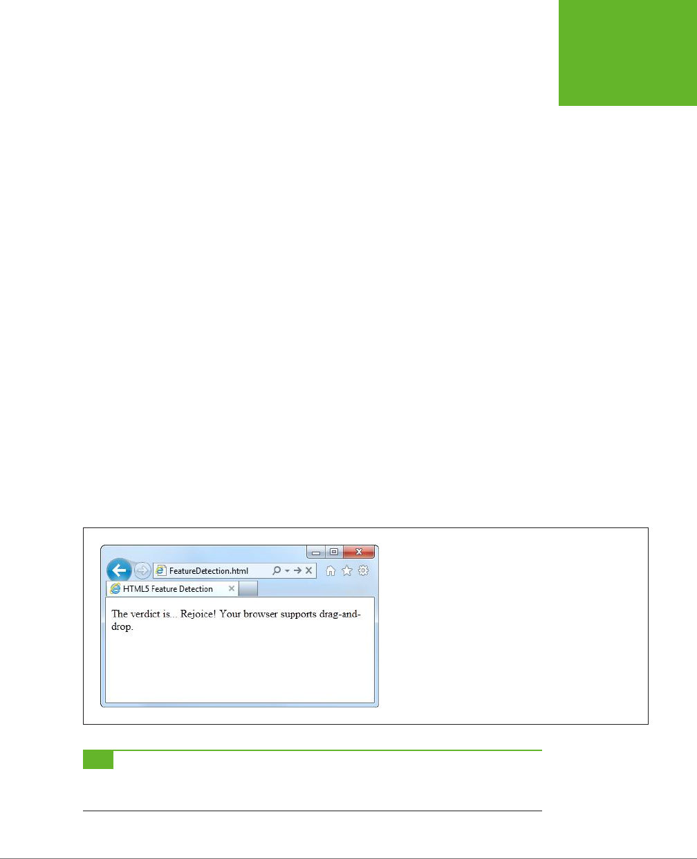
CHAPTER 1: INTRODUCING HTML5 33
USING HTML5
TODAY
<!DOCTYPE html>
<html lang="en">
<head>
<meta charset="utf-8">
<title>HTML5 Feature Detection</title>
<script src="modernizr-latest.js"></script>
</head>
<body>
<p>The verdict is... <span id="result"></span></p>
<script>
// Find the element on the page (named result) where you can show
// the results.
var result = document.getElementById("result");
if (Modernizr.draganddrop) {
result.innerHTML = "Rejoice! Your browser supports drag-and-drop.";
}
else {
result.innerHTML = "Your feeble browser doesn't support drag-and-drop.";
}
</script>
</body>
</html>
Figure 1-6 shows the result.
FIGURE 1-6
Although this example shows the right way to test for features,
it shows a less-than-ideal approach for dealing with them.
Instead of telling your website visitor about a missing feature,
it’s far, far better to implement some sort of workaround (even
if it’s not as neat or fully featured as the HTML5 equivalent) or
to simply ignore the problem altogether (if the missing feature
is a minor frill that’s not necessary for the visitor to enjoy the
page).
TIP This example uses basic and time-honored JavaScript techniques—looking up an element by ID and
changing its content. If you find it a bit perplexing, you can brush up with the JavaScript review in Appendix B,
“JavaScript: The Brains of Your Page.”
www.it-ebooks.info
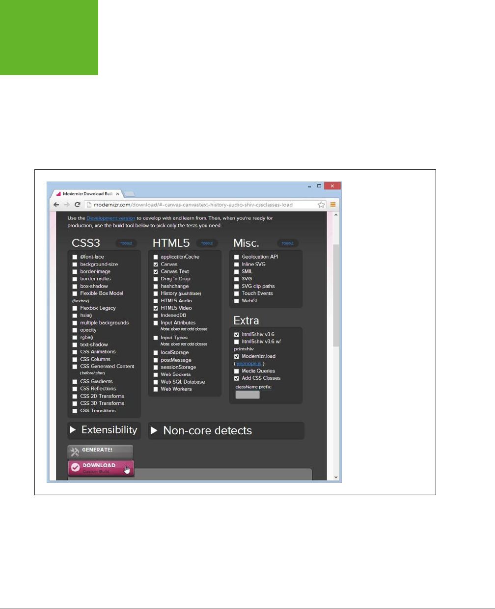
HTML5: THE MISSING MANUAL, SECOND EDITION
34
USING HTML5
TODAY
The full Modernizr script is a bit bulky. It’s intended for testing purposes while
you’re still working on your website. Once you’ve finished development and you’re
ready to go live, you can create a slimmed-down version of the Modernizr script
that tests only for the features you need. To do so, go to the download page at
http://modernizr.com/download
.
But this time, instead of using the “Development
version” link, peruse the checkboxes below. Click the ones that correspond to the
features you need to detect. Finally, click the Generate button to create your own
custom Modernizr version, and then click the Download button to save it on your
computer (Figure 1-7).
FIGURE 1-7
You’re about to download
a custom build of Modern-
izr that can detect support
for the HTML5 canvas, the
canvas text feature, and
HTML5 video. This build of
Modernizr won’t be able to
check for other features.
www.it-ebooks.info

CHAPTER 1: INTRODUCING HTML5 35
USING HTML5
TODAY
Feature “Filling” with Polyfills
Modernizr helps you spot the holes in browser support. It alerts you when a feature
won’t work. However, it doesn’t do anything to patch these problems. That’s where
polyfills
come in. Basically, polyfills are a hodgepodge collection of techniques for
filling the gaps in HTML5 support on aging browsers. The word
polyfills
is borrowed
from the product polyfiller, a compound that’s used to fill in drywall holes before
painting (also known as spackling paste). In HTML5, the ideal polyfill is one you can
drop into a page without any extra work. It takes care of backward compatibility
in a seamless, unobtrusive way, so you can work with pure HTML5 while someone
else worries about the workarounds.
But polyfills aren’t perfect. Some rely on other technologies that may be only partly
supported. For example, one polyfill allows you to emulate the HTML5 canvas on
old versions of Internet Explorer using the Silverlight plug-in. But if the web visitor
isn’t willing or able to install Silverlight, then you need to fall back on something
else. Other polyfills may have fewer features than the real HTML5 feature, or poorer
performance.
Occasionally, this book will point you to a potential polyfill. If you want more in-
formation, you can find the closest thing there is to a comprehensive catalog of
HTML5 polyfills on GitHub at
http://tinyurl.com/polyfill
. But be warned—polyfills
dier greatly in quality, performance, and support.
TIP Remember, it’s not enough to simply know that a polyfill exists for a given HTML5 feature. You must test
it and check how well it works on various old browsers
before
you risk incorporating the corresponding feature
into your website.
With tools like browser statistics, feature detection, and polyfills, you’re ready to
think in depth about integrating HTML5 features into your own web pages. In the
next chapter, you’ll take the first step, with some HTML5 elements that can function
in browsers both new and old.
www.it-ebooks.info

37
CHAPTER
2
Over the two decades that the Web’s been around, websites have changed
dramatically. But the greatest surprise isn’t how much the Web has changed,
but how well ancient HTML elements have held up. In fact, web developers
use the same set of elements to build today’s modern sites that they used to build
their predecessors 10 years ago.
One element in particular—the humble <div> (or
division
)—is the cornerstone of
nearly every modern web page. Using <div> elements, you can carve an HTML
document into headers, side panels, navigation bars, and more. Add a healthy pinch
of CSS formatting, and you can turn these sections into bordered boxes or shaded
columns, and place each one exactly where it belongs.
This <div>-and-style technique is straightforward, powerful, and flexible, but it’s not
transparent
. When you look at someone else’s markup, you have to put some eort
into figuring out what each <div> represents and how the whole page fits together.
To make sense of it all, you need to jump back and forth among the markup, the style
sheet, and the displayed page in the browser. And you’ll face this confusion every
time you crack open anyone else’s halfway-sophisticated page, even though you’re
probably using the same design techniques in your own websites.
This situation got people thinking. What if there was a way to replace <div> with
something better? Something that worked like <div>, but conveyed a bit more
meaning. Something that might help separate the sidebars from the headers and
the ad bars from the menus. HTML5 fulfills this dream with a set of new elements
for structuring pages.
Structuring Pages with
Semantic Elements
www.it-ebooks.info
HTML5: THE MISSING MANUAL, SECOND EDITION
38
INTRODUCING
THE SEMANTIC
ELEMENTS
TIP If your CSS skills are so rusty that you need a tetanus shot before you can crack open a style sheet, then
you’re not quite ready for this chapter. Fortunately, Appendix A, “Essential CSS,” has a condensed introduction
that covers the fundamentals.
Introducing the Semantic Elements
To improve the structure of your web pages, you need HTML5’s
semantic elements
.
These elements give extra meaning to the content they enclose. For example, the
new <time> element flags a valid date or time in your web page. Here’s an example
of the <time> element at its very simplest:
Registration begins on <time>2014-11-25</time>.
And this is what someone sees when viewing the page:
Registration begins on 2014-11-25.
The important thing to understand is that the <time> element doesn’t have any
built-in formatting. In fact, the web page reader has no way of knowing that there’s
an extra element wrapping the date. You can add your own formatting to the <time>
element using a style sheet, but by default, the text inside a <time> element is in-
distinguishable from ordinary text.
The <time> element is designed to wrap a single piece of information. However, most
of HTML5’s semantic elements are designed to identify larger sections of content.
For example, the <nav> element identifies a set of navigation links. The <footer>
element wraps the footer that sits at the bottom of a page. And so on, for a dozen
(or so) new elements.
NOTE Although semantic elements are the least showy of HTML5’s new features, they’re one of the largest.
In fact, the majority of the new elements in HTML5 are semantic elements.
All the semantic elements share a distinguishing feature: They don’t really do any-
thing. By contrast, the <video> element, for example, embeds a fully capable video
player in your page (page 147). So why bother using all these new elements that
don’t change the way your web page looks?
There are several good reasons:
• Easier editing and maintenance. It can be dicult to interpret the markup in
a traditional HTML page. To understand the overall layout and the significance
of various sections, you’ll often need to scour a web page’s style sheet. But by
using HTML5’s semantic elements, you provide extra structural information in
the markup. That makes your life easier when you need to edit the page months
later, and it’s even more important if someone else needs to revise your work.
www.it-ebooks.info

CHAPTER 2: STRUCTURING PAGES WITH SEMANTIC ELEMENTS 39
RETROFITTING
A TRADITIONAL
HTML PAGE
• Accessibility. One of the key themes of modern web design is making
acces-
sible
pages—that is, pages that people can navigate using screen readers and
other assistive tools. Accessibility tools that understand HTML5 can provide
a far better browsing experience for disabled visitors. (For just one example,
imagine how a screen reader can home in on the <nav> sections to quickly find
the navigation links for a website.)
TIP To learn more about the best practices for web accessibility, you can visit the WAI (Web Accessibility
Initiative) website at
www.w3.org/WAI
. Or, to get a quick look at what life is like behind a screen reader (and to
learn why properly arranged headings are so important), check out the YouTube video at
http://tinyurl.com/6bu4pe
.
• Search-engine optimization. Search engines like Google use powerful
search
bots
—automated programs that crawl the Web and fetch every page they can—
to scan your content and index it in their search databases. The better Google
understands your site, the better the chance that it can match a web searcher’s
query to your content, and the better the chance that your website will turn up
in someone’s search results. Search bots already check for some of HTML5’s
semantic elements to glean more information about the pages they’re indexing.
• Future features. New browsers and web editing tools are sure to take advantage
of semantic elements. For example, a browser could provide an outline that lets
visitors jump to the appropriate section in a page. (In fact, Chrome already has
a plug-in that does exactly that—see page 65.) Similarly, web design tools can
include features that let you build or edit navigation menus by managing the
content you’ve placed in the <nav> section.
The bottom line is this: If you can apply the semantic elements correctly, you can
create cleaner, clearer pages that are ready for the next wave of browsers and web
tools. But if your brain is still tied up with the old-fashioned practices of traditional
HTML, the future may pass you by.
Retrofitting a Traditional HTML Page
The easiest way to introduce yourself to the new semantic elements—and to learn
how to use them to structure a page—is to take a classic HTML document and inject
it with some HTML5 goodness. Figure 2-1 shows the first example you’ll tackle. It’s a
simple, standalone web page that holds an article, although other types of content
(like a blog posting, a product description, or a short story) would work equally well.
TIP You can view or download the example in Figure 2-1 from the try-out site at
http://prosetech.com/html5
,
along with all the examples for this chapter. Start with
ApocalypsePage_Original.html
if you’d like to try to remodel
the HTML yourself, or
ApocalypsePage_Revised.html
if you want to jump straight to the HTML5-improved final
product.
www.it-ebooks.info
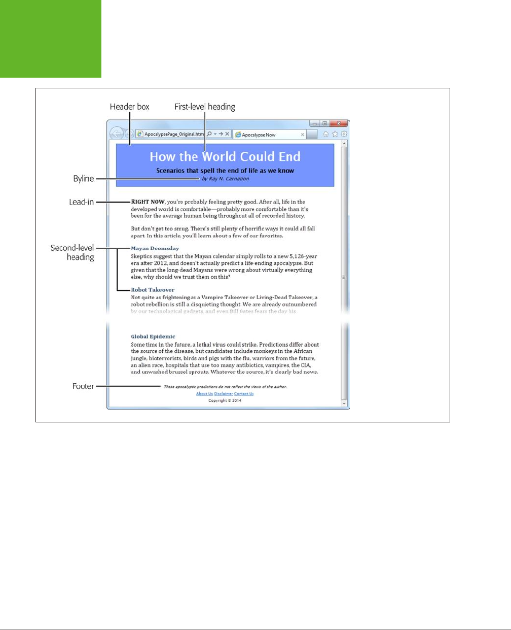
HTML5: THE MISSING MANUAL, SECOND EDITION
40
RETROFITTING
A TRADITIONAL
HTML PAGE
FIGURE 2-1
This ordinary HTML page
has a basic, document-like
structure. A linked style
sheet provides all the
formatting.
Page Structure the Old Way
There are a number of ways to format a page like the one shown in Figure 2-1. Hap-
pily, this example uses HTML best practices, which means the markup doesn’t have
a lick of formatting logic. There are no bold or italic elements, no inline styles, and
certainly nothing as hideous as the obsolete <font> element. Instead, it’s a neatly
formatted document that’s bound to an external style sheet.
www.it-ebooks.info
CHAPTER 2: STRUCTURING PAGES WITH SEMANTIC ELEMENTS 41
RETROFITTING
A TRADITIONAL
HTML PAGE
Here’s a shortened version of the markup, which highlights where the document
plugs into its style sheet:
<div class="Header">
<h1>How the World Could End</h1>
<p class="Teaser">Scenarios that spell the end of life as we know it</p>
<p class="Byline">by Ray N. Carnation</p>
</div>
<div class="Content">
<p><span class="LeadIn">Right now</span>, you're probably ...</p>
<p>...</p>
<h2>Mayan Doomsday</h2>
<p>Skeptics suggest ...</p>
...
</div>
<div class="Footer">
<p class="Disclaimer">These apocalyptic predictions ...</p>
<p>
<a href="AboutUs.html">About Us</a>
...
</p>
<p>Copyright © 2014</p>
</div>
UP TO SPEED
What Are These Dots (…)?
This book can’t show you the full markup for every example—at
least not without expanding itself to 12,000 pages and wiping
out an entire old-growth forest. But it
can
show you basic
structure of a page and all its important elements. To do that,
many of the examples in this book use an ellipsis (a series of
three dots) to show where some content has been left out.
For example, consider the markup shown above on this page.
It includes the full body of the page shown in Figure 2-2, but it
leaves out the full text of most paragraphs, most of the article
after the “Mayan Doomsday” heading, and the full list of links
in the footer. But, as you know, you can pore over every detail
by examining the sample files for this chapter on the try-out
site (
http://prosetech.com/html5
).
In a well-written, traditional HTML page (like this one), most of the work is farmed
out to the style sheet using the <div> and <span> containers. The <span> lets you
format snippets of text inside another element. The <div> allows you to format entire
sections of content, and it establishes the overall structure of the page (Figure 2-2).
www.it-ebooks.info
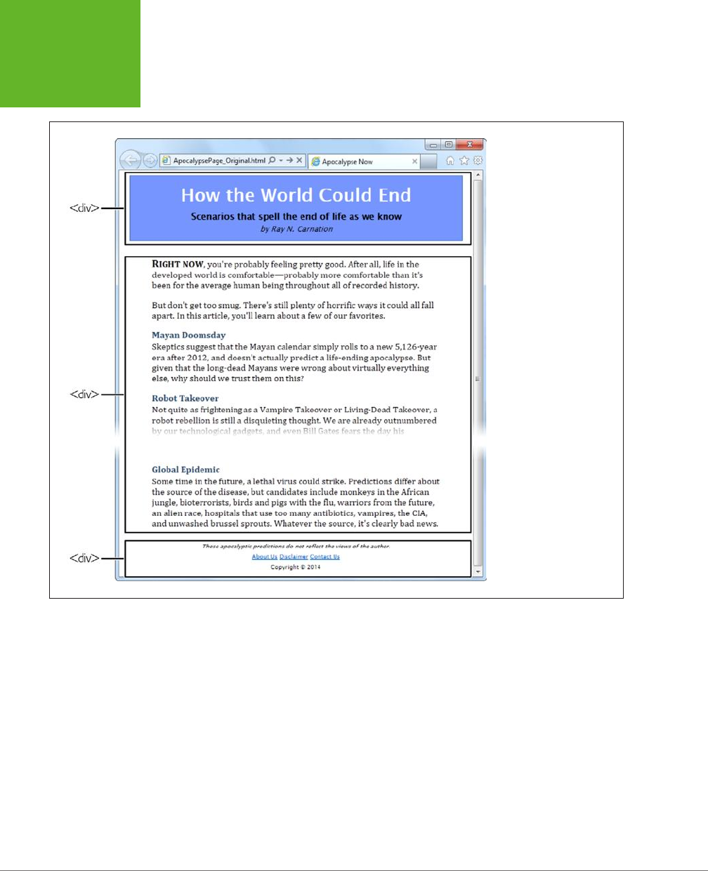
HTML5: THE MISSING MANUAL, SECOND EDITION
42
RETROFITTING
A TRADITIONAL
HTML PAGE
FIGURE 2-2
The
<div>
elements carve
this page into three logical
sections: the header at
the top, the content that
follows, and the footer at
the bottom.
Here, the style sheet formatting tasks are simple. The entire page is given a maxi-
mum width (800 pixels) to prevent really long text lines on widescreen monitors.
The header is put in a bordered blue box. The content is padded on either side, and
the footer is centered at the bottom of the page.
Thanks to the <div>, formatting is easy. For example, the
ApocalypsePage_Original.
css
style sheet uses the following rules to format the header box and the content
inside:
/* Format the <div> that represents the header (as a blue, bordered box). */
.Header {
background-color: #7695FE;
border: thin #336699 solid;
padding: 10px;
www.it-ebooks.info

CHAPTER 2: STRUCTURING PAGES WITH SEMANTIC ELEMENTS 43
RETROFITTING
A TRADITIONAL
HTML PAGE
margin: 10px;
text-align: center;
}
/* Format any <h1> headings in the header <div> (that's the article title). */
.Header h1 {
margin: 0px;
color: white;
font-size: xx-large;
}
/* Format the subtitle in the header <div>. */
.Header .Teaser {
margin: 0px;
font-weight: bold;
}
/* Format the byline in the header <div>. */
.Header .Byline {
font-style: italic;
font-size: small;
margin: 0px;
}
You’ll notice that this example makes good use of contextual selectors (page 441). For
example, it uses the selector .Header h1 to format all <h1> elements in the header box.
TIP This example is also described in the CSS review in Appendix A, “Essential
CSS.” If you’d like to take a
detailed walk through the style sheet rules that format each section, flip to page 445.
Page Structure with HTML5
The <div> element is still a staple of web design. It’s a straightforward, all-purpose
container that you can use to apply formatting anywhere you want in a web page.
The limitation of the <div> is that it doesn’t provide any information about the page.
When you (or a browser, or a design tool, or a screen reader, or a search bot) come
across a <div>, you know that you’ve found a separate section of the page, but you
don’t know the purpose of that section.
To improve this situation in HTML5, you can replace some of your <div> elements
with more descriptive semantic elements. The semantic elements behave exactly
like <div> elements: They group a block of markup, they don’t do anything on their
own, and they give you a styling hook that lets you apply formatting. However, they
also give your page a little more semantic smarts.
Here’s a quick revision of the article shown in Figure 2-1. It removes two <div> ele-
ments and adds two semantic elements from HTML5: <header> and <footer>.
www.it-ebooks.info

HTML5: THE MISSING MANUAL, SECOND EDITION
44
RETROFITTING
A TRADITIONAL
HTML PAGE
<header class="Header">
<h1>How the World Could End</h1>
<p class="Teaser">Scenarios that spell the end of life as we know it</p>
<p class="Byline">by Ray N. Carnation</p>
</header>
<div class="Content">
<p><span class="LeadIn">Right now</span>, you're probably ...</p>
<p>...</p>
<h2>Mayan Doomsday</h2>
<p>Skeptics suggest ...</p>
...
</div>
<footer class="Footer">
<p class="Disclaimer">These apocalyptic predictions ...</p>
<p>
<a href="AboutUs.html">About Us</a>
...
</p>
<p>Copyright © 2014</p>
</footer>
In this example, the <header> and <footer> elements take the place of the <div>
elements that were there before. Web developers who are revising a large website
might start by wrapping the existing <div> elements in the appropriate HTML5
semantic elements.
You’ll also notice that the <header> and <footer> elements in this example still use
the same class names. This way, you don’t need to change the original style sheet.
Thanks to the class names, the style sheet rules that used to format the <div> ele-
ments now format the <header> and <footer> elements.
However, you might feel that the class names seem a bit redundant. If so, you can
leave them out, like this:
<header>
<h1>How the World Could End</h1>
<p class="Teaser">Scenarios that spell the end of life as we know it</p>
<p class="Byline">by Ray N. Carnation</p>
</header>
To make this work, you need to alter your style sheet rules so they apply themselves
by element name. This works for the header and footer, because the current page
has just a single <header> element and a single <footer> element.
www.it-ebooks.info

CHAPTER 2: STRUCTURING PAGES WITH SEMANTIC ELEMENTS 45
RETROFITTING
A TRADITIONAL
HTML PAGE
Here’s the revised style sheet that applies its formatting to the <header> element:
/* Format the <header> (as a blue, bordered box.) */
header {
...
}
/* Format any <h1> headings in the <header> (that's the article title). */
header h1 {
...
}
/* Format the subtitle in the <header>. */
header .Teaser {
...
}
/* Format the byline in the <header>. */
header .Byline {
...
}
Both approaches are equally valid. As with many design decisions in HTML5, there
are plenty of discussions but no hard rules.
You’ll notice that the <div> section for the content remains. This is perfectly ac-
ceptable, as HTML5 web pages often contain a mix of semantic elements and the
more generic <div> containers. Because there’s no HTML5 “content” element, an
ordinary <div> still makes sense.
NOTE Left to its own devices, this web page won’t display correctly on versions of Internet Explorer before
IE 9. To fix this issue, you need the simple workaround discussed on page 51. But first, check out a few more
semantic elements that can enhance your pages.
Finally, there’s one more element worth adding to this example. HTML5 includes an
<article> element that represents a complete, self-contained piece of content, like
a blog posting or a news story. The <article> element includes the whole shebang,
including the title, author byline, and main content. Once you add the <article>
element to the page, you get this structure:
<article>
<header>
<h1>How the World Could End</h1>
...
</header>
www.it-ebooks.info

HTML5: THE MISSING MANUAL, SECOND EDITION
46
RETROFITTING
A TRADITIONAL
HTML PAGE
<div class="Content">
<p><span class="LeadIn">Right now</span>, you're probably ...</p>
<p>...</p>
<h2>Mayan Doomsday</h2>
<p>Skeptics suggest ...</p>
...
</div>
</article>
<footer>
<p class="Disclaimer">These apocalyptic predictions ...</p>
...
</footer>
Figure 2-3 shows the final structure.
FIGURE 2-3
After the redesign, the page uses three of HTML5’s semantic elements.
If the old structure said, “Here is a page with three sections,” then the
new structure says, “Here is an article with a header, on a page with
a footer.”
Although the web page still looks the same in the browser, there’s a fair bit of extra
information lurking behind the scenes. For example, a search bot that stops by your
site can quickly find your page’s content (that’s your article) and the title of that
content (that’s the header). It won’t pay as much attention to the footer.
NOTE Sometimes articles are split over several web pages. The current consensus of webheads is that
each part of the article should be wrapped in its own
<article>
element, even though it’s not complete
and self-contained. This messy compromise is just one of many that occur when semantics meet the practical,
presentational considerations of the Web.
Adding a Figure with <figure>
Plenty of pages have images. But the concept of a
figure
is a bit dierent. The HTML5
specification suggests that you think of them much like figures in a book—in other
words, a picture that’s separate from the text, yet referred to in the text.
Generally, you let figures
float
, which means you put them in the nearest convenient
spot alongside your text, rather than lock them in place next to a specific word or
element. Often, figures have captions that float with them.
www.it-ebooks.info

CHAPTER 2: STRUCTURING PAGES WITH SEMANTIC ELEMENTS 47
RETROFITTING
A TRADITIONAL
HTML PAGE
The following example shows some HTML markup that adds a figure to the apocalyp-
tic article. It also includes the paragraph that immediately precedes the figure and the
one that follows it, so you can see exactly where the figure is placed in the markup.
<p><span class="LeadIn">Right now</span>, you're probably ...</p>
<div class="FloatFigure">
<img src="human_skull.jpg" alt="Human skull">
<p>Will you be the last person standing if one of these apocalyptic
scenarios plays out?</p>
</div>
<p>But don't get too smug ...</p>
This markup assumes that you've created a style sheet rule that positions the figure
(and sets margins, controls the formatting of the caption text, and optionally draws
a border around it). Here's an example:
/* Format the floating figure box. */
.FloatFigure {
float: left;
margin-left: 0px;
margin-top: 0px;
margin-right: 20px;
margin-bottom: 0px;
}
/* Format the figure caption text. */
.FloatFigure p {
max-width: 200px;
font-size: small;
font-style: italic;
margin-bottom: 5px;
}
Figure 2-4 shows this example at work.
If you’ve created this sort of figure before, you’ll be interested to know that HTML5
provides new semantic elements that are tailor-made for this pattern. Instead of
using a boring <div> to hold the figure box, you use a <figure> element. And if you
have any caption text, you put that in a <figcaption> element inside the <figure>:
<figure class="FloatFigure">
<img src="human_skull.jpg" alt="Human skull">
<figcaption>Will you be the last person standing if one of these
apocalyptic scenarios plays out?</figcaption>
</figure>
www.it-ebooks.info

HTML5: THE MISSING MANUAL, SECOND EDITION
48
RETROFITTING
A TRADITIONAL
HTML PAGE
FIGURE 2-4
Now a figure graces the
article. In the markup, it’s
defined just after the first
paragraph, so it floats to
the left of the following
text. Notice that the width
of the caption is limited,
to create a nice, packed
paragraph.
Of course it’s still up to you to use a style sheet to position and format your figure
box. In this example, you need to change the style rule selector that targets the
caption text. Right now it uses .FloatFigure p, but the revised example requires
.FloatFigure figcaption.
TIP In this example, the
<figure>
element still gets its formatting based on its class name (FloatFigure),
not its element type. That’s because you’re likely to format figures in more than one way. For example, you might
have figures that float on the left, figures that float on the right, ones that need different margin or caption
settings, and so on. To preserve this sort of flexibility, it makes sense to format your figures with classes.
In the browser, the figure still looks the same. The dierence is that the purpose of
your figure markup is now perfectly clear. (Incidentally, <figcaption> isn’t limited to
holding text—you can use any HTML elements that make sense. Other possibilities
include links and tiny icons.)
Finally, it’s worth noting that in some cases the figure caption may include a complete
description of the image, rendering the alt text redundant. In this situation, you can
remove the alt attribute from the <img> element:
www.it-ebooks.info
CHAPTER 2: STRUCTURING PAGES WITH SEMANTIC ELEMENTS 49
RETROFITTING
A TRADITIONAL
HTML PAGE
<figure class="FloatFigure">
<img src="human_skull.jpg">
<figcaption>A human skull lies on the sand</figcaption>
</figure>
Just make sure you don't set the alternate text with an empty string, because that
means your image is purely presentational and screen readers should avoid it al-
together.
Adding a Sidebar with <aside>
The new <aside> element represents content that is tangentially related to the text
that surrounds it. For example, you can use an <aside> in the same way you use a
sidebar in print—to introduce a related topic or to expand on a point that’s raised
in the main document. (See, for instance, the box at the bottom of page 50.) The
<aside> element also makes sense if you need somewhere to stash a block of ads,
some related content links, or even a pull-quote like the one shown in Figure 2-5.
FIGURE 2-5
A pull-quote is a technique
borrowed from print.
It attracts the reader’s
attention and highlights
important content.
You can easily create this eect with the well-worn <div> element, but the <aside>
element gives you a more meaningful way to mark up the same content:
<p>... (in a suitably robotic voice) "Who's your daddy now?"</p>
<aside class="PullQuote">
<img src="quotes_start.png" alt="Quote">
www.it-ebooks.info
HTML5: THE MISSING MANUAL, SECOND EDITION
50
RETROFITTING
A TRADITIONAL
HTML PAGE
We don't know how the universe started, so we can't be sure it won't
just end, maybe today.
<img src="quotes_end.png" alt="End quote">
</aside>
<h2>Unexplained Singularity</h2>
This time, the style sheet rule floats the pull-quote to the right. Here are the styling
details, just in case you’re curious:
.PullQuote {
float: right;
max-width: 300px;
border-top: thin black solid;
border-bottom: thick black solid;
font-size: 30px;
line-height: 130%;
font-style: italic;
padding-top: 5px;
padding-bottom: 5px;
margin-left: 15px;
margin-bottom: 10px;
}
.PullQuote img {
vertical-align: bottom;
}
UP TO SPEED
How the Semantic Elements Were Chosen
Before inventing HTML5, its creators took a long look at
the current crop of web pages. And they didn’t just browse
through their favorite sites; instead, they reviewed the Google-
crunched statistics for over a
billion
web pages. (You can see
the results of this remarkable survey at
http://tinyurl.com/
state-of-the-web
.)
The Google survey analyzed the markup and compiled a list of
the class names web authors were using in their pages. Their
idea was that the class name might betray the purpose of the
element and give a valuable clue about the way people were
structuring pages. For example, if everyone has a
<div>
ele-
ment that uses a class named header, then it’s logical to assume
everyone is putting headers at the tops of their web pages.
The first thing that Google found is that the vast majority of
pages didn’t use class names (or style sheets at all). Next, they
compiled a short list of the most commonly used class names.
Some of the most popular names were footer, header, title,
menu, nav—which correspond well to HTML5’s new semantic
elements
<footer>
,
<header>
, and
<nav>
. A few others
suggest possible semantic elements that haven’t been created
yet, like search and copyright.
In other words, the Web is awash with the same basic de-
signs—for example, pages with headers, footers, sidebars, and
navigation menus. But everyone has a slightly different way of
doing more or less the same thing. From this realization, it’s
just a small leap to decide that the HTML language could be
expanded with a few new elements that capture the semantics
of what everyone is already doing. And this is exactly the
insight that inspired HTML5’s semantic elements.
www.it-ebooks.info

CHAPTER 2: STRUCTURING PAGES WITH SEMANTIC ELEMENTS 51
BROWSER
COMPATIBILITY
FOR THE
SEMANTIC
ELEMENTS
Browser Compatibility for the Semantic
Elements
So far, this exercise has been a lot of fun. But the best-structured page is useless if
it won’t work on older browsers.
Fortunately, HTML5’s semantic elements are broadly supported on all modern brows-
ers. It’s almost impossible to find a version of Chrome, Firefox, Safari, or Opera that
doesn’t recognize them. The chief stumbling block is any version of Internet Explorer
before IE 9, including the still-kicking IE 8.
Fortunately, this is one missing feature that’s easy to patch up. After all, the semantic
elements don’t actually do anything. To support them, a browser simply needs to
treat them like an ordinary <div> element. And to make that happen, all you need
to do is fiddle with their styles, as described in the following sections. Do that, and
you’ll be rewarded with super-reliable semantic elements that work with any browser
that’s been released in the last 10 years.
NOTE If you’re already using Modernizr (page 31), your pages are automatically immunized against semantic
element issues, and you can safely skip the following discussion. But if you aren’t using Modernizr, or if you’re
curious about how this fix works, read on.
Styling the Semantic Elements
When a browser meets an element it doesn’t recognize, it treats it as an inline ele-
ment. Most of HTML5’s semantic elements (including all the ones you’ve seen in this
chapter, except <time>) are
block
elements, which means the browser is supposed
to render them on a separate line, with a little bit of space between them and the
preceding and following elements.
Web browsers that don’t recognize the HTML5 elements won’t know to display some
of them as block elements, so they’re likely to end up in a clumped-together mess.
To fix this problem, you simply need to add a new rule to your style sheet. Here’s a
super-rule that applies block display formatting to the nine HTML5 elements that
need it in one step:
article, aside, figure, figcaption, footer, header, main, nav, section,
summary {
display: block;
}
This style sheet rule won’t have any eect for browsers that already recognize
HTML5, because the display property is already set to block. And it won’t aect
any style rules you already use to format these elements. They will still apply
in
addition
to this rule.
www.it-ebooks.info

HTML5: THE MISSING MANUAL, SECOND EDITION
52
BROWSER
COMPATIBILITY
FOR THE
SEMANTIC
ELEMENTS
Using the HTML5 Shiv
That technique described in the previous section is enough to solve compatibility
issues in most browsers, but “most” doesn’t include Internet Explorer 8 and older.
Old versions of IE introduce a second challenge: They refuse to apply style sheet
formatting to elements they don’t recognize. Fortunately, there is a workaround:
You can trick IE into recognizing a foreign element by registering it with a JavaScript
command. For example, here’s a script block that gives IE the ability to recognize
and style the <header> element:
<script>
document.createElement('header')
</script>
Rather than write this sort of code yourself, you can find a ready-made script that
does it for you. You simply need to add a reference to it in the <head> section of
your page, like this:
<head>
<title>...</title>
<script src="http://html5shim.googlecode.com/svn/trunk/html5.js"></script>
...
<head>
This code grabs the script from the
html5shim.googlecode.com
web server and
runs it before the browser starts processing the rest of the page. This script uses
the JavaScript described above to create all the new HTML5 elements and goes
one step further, by dynamically applying the styles described on page 51, to make
sure the new elements display as proper block elements. The only remaining task
is for you to use the elements and add your own style sheet rules to format them.
Incidentally, the
html5.js
script code is conditional—it runs only if it detects that
you’re running an old version of Internet Explorer. But if you want to avoid the
overhead of requesting the JavaScript file at all, you can make the script reference
conditional, like so:
<!--[if lt IE 9]>
<script src="http://html5shim.googlecode.com/svn/trunk/html5.js"></script>
<![endif]-->
That way, other browsers (and IE 9 or later) will ignore this instruction, saving your
page a few milliseconds of time.
TIP The previous example uses the HTML5 shiv straight from Google’s code-hosting site. However, you can
download your own copy from
http://tinyurl.com/the-shiv
and place it alongside your web pages. Just modify
the script reference to point to the location where you upload the script file.
Finally, it’s worth pointing out that if you test a web page on your own computer
(rather than uploading it to a web server), Internet Explorer automatically places
www.it-ebooks.info

CHAPTER 2: STRUCTURING PAGES WITH SEMANTIC ELEMENTS 53
DESIGNING
A SITE WITH
THE SEMANTIC
ELEMENTS
the page in restricted mode. That means you’ll see the infamous IE security bar at
the top of the page, warning you that Internet Explorer has disabled all your scripts,
including the HTML5 shiv. To run it, you need to explicitly click the security bar and
choose to allow active content.
This problem disappears once you upload the page to a website, but it can be a
hassle when testing your work. The solution is to add the “mark of the Web” com-
ment to the beginning of your web page, as described on page 14.
Modernizr: An All-in-One Fix
There’s one excellent alternate solution to the semantic styling problem: Use Mod-
ernizr (page 31). It has the HTML5 shiv built in, which means there’s no need for you
to fiddle with style rules or to include a reference to the
html5.js
script. So if you’re
already using Modernizr to test for feature support, consider the problem solved.
Designing a Site with the Semantic
Elements
Adding the semantic elements to a simple, document-like page is easy. Adding them
to a complete website isn’t any harder, but it does raise a whole lot more questions.
And because HTML5 is essentially virgin territory, there are a small number of settled
conventions (but a large number of legitimate disagreements). That means when
you have a choice between two markup approaches, and the HTML5 standard says
they’re both perfectly acceptable, it’s up to you to decide which one makes the
most sense for your content.
Figure 2-6 shows the more ambitious example that you’ll consider next.
Deeper into Headers
There are two similar, but subtly dierent, ways to use the <header> element. First,
you can use it to title some content. Second, you can use it to title your web page.
Sometimes, these two tasks overlap (as with the single article example shown in
Figure 2-1). But other times, you’ll have a web page with both a page header and
one or more pieces of headered content. Figure 2-6 is this sort of example.
What makes this situation a bit trickier is that the conventions for using the <header>
element change based on its role. If you’re dealing with content, you probably won’t
use a header unless you need it. And you need it only if you’re creating a “fat” header.
That is, one that includes the title and some other content—for example, a summary,
the publication date, an author byline, an image, or subtopic links. Here’s an example:
<header>
<h1>How the World Could End</h1>
<p class="Tagline">Scenarios that spell the end of life as we know it</p>
<p class="Byline">by Ray N. Carnation</p>
</header>
www.it-ebooks.info
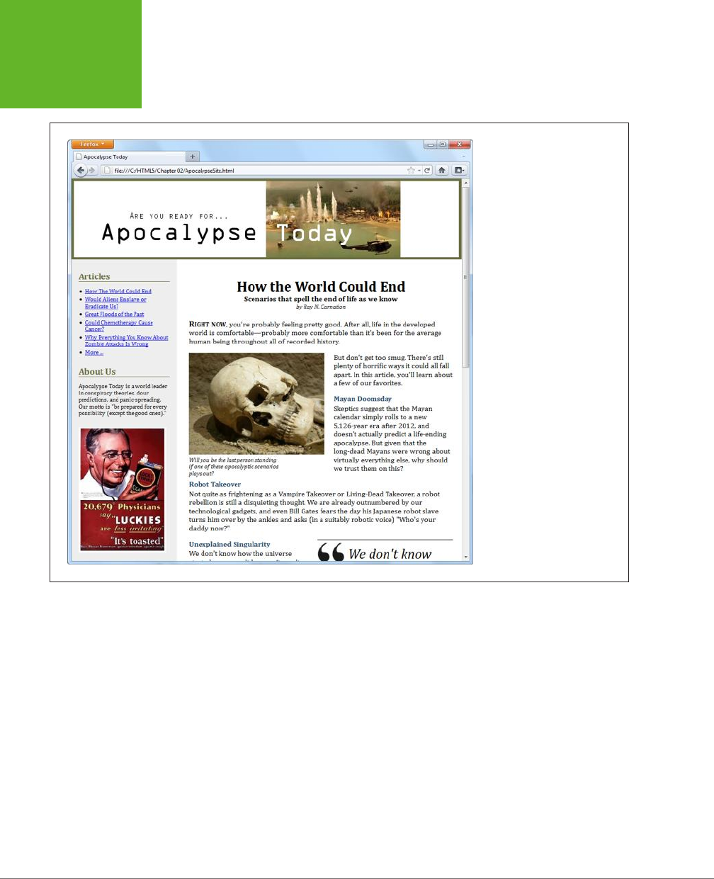
HTML5: THE MISSING MANUAL, SECOND EDITION
54
DESIGNING
A SITE WITH
THE SEMANTIC
ELEMENTS
FIGURE 2-6
Here, the single-page article
you considered previously has
been placed in a complete
content-based website. A site
header caps the page; the
content is underneath; and a
sidebar on the left provides
navigation controls, “About Us”
information, and an image ad.
However, when people create a header for a website, they almost always wrap it in
a <header> element, even if there’s nothing there but a title in a big CSS-formatted
box. After all, it’s a major design point of your website, and who knows when you
might need to crack it open and add something new?
Here’s the takeaway: Pages can have more than one <header> element (and they
often will), even though these headers play dierent roles on the page.
The apocalyptic site (Figure 2-6) uses the <header> element for the website header
and another <header> element for the article title. The <header> that caps the website
holds a banner image, which combines graphical text and a picture:
<header class="SiteHeader">
<img src="site_logo.png" alt="Apocalypse Today">
<h1 style="display:none">Apocalypse Today</h1>
</header>
www.it-ebooks.info
CHAPTER 2: STRUCTURING PAGES WITH SEMANTIC ELEMENTS 55
DESIGNING
A SITE WITH
THE SEMANTIC
ELEMENTS
UP TO SPEED
Turning a Web Page into a Website
Figure 2-6 shows a single page from a fictional website.
In a real website, you’d have the same layout (and the same
side panel) on
dozens
of different pages or more. The only
thing that would change as the visitor clicks around the page
is the main page content—in this case, the article.
HTML5 doesn’t have any special magic for turning web pages
into websites. Instead, you need to use the same tricks and
technologies that web developers rely on in traditional HTML:
• Server-side frameworks. The idea is simple: When a
browser requests a page, the web server assembles the
pieces, including the common elements (like a navigation
bar) and the content. This approach is by far the most
common, and it’s the only way to go on big, professional
websites. Countless different technologies implement
this approach in different ways, from web programming
platforms like ASP.NET and PHP to content management
systems like Drupal and WordPress.
• Page templates. Some high-powered web page editors
(like Adobe Dreamweaver and Microsoft Visual Studio)
include a page template feature. You begin by creating
a template that defines the structure of your web pages
and includes the repeating content you want to appear
on every page (like the header and the sidebar). Then you
use that template to create all your site pages. Here’s the
neat part: When you update the template, your web page
editor automatically updates all the pages that use it.
Of course, you’re free to use either technique, so this book
focuses on the final result: the pasted-together markup that
forms a complete page and is shown in the web browser.
Right away, you’ll notice that this header adds a detail that you don’t see on the
page: an <h1> heading that duplicates the content that’s in the picture. However, an
inline style setting hides this heading.
This example raises a clear question: What’s the point of adding a heading that you
can’t see? There are actually several reasons. First, all <header> elements require
some level of heading inside, just to satisfy the rules of HTML5. Second, this design
makes the page more accessible for people who are navigating it with screen read-
ers, because they’ll often jump from one heading to the next without listening to
the content in between. And third, it establishes a heading structure that you can
use in the rest of the page. That’s a fancy way of saying that if you start with an
<h1> for your website header, you may decide to use <h2> elements to title the other
sections of the page (like “Articles” and “About Us” in the sidebar). For more about
this design decision, see the box on page 56.
NOTE Of course, you could simplify your life by creating an ordinary text header. (And if you want fancy
fonts, the CSS3 web font feature, described on page 206, can help you out.) But for the many web pages that put
the title in a picture, the hidden heading trick is the next best solution.
www.it-ebooks.info

HTML5: THE MISSING MANUAL, SECOND EDITION
56
DESIGNING
A SITE WITH
THE SEMANTIC
ELEMENTS
FREQUENTLY ASKED QUESTION
The Heading Structure of a Site
Is it acceptable to have more than one level-1 heading on a
page? Is it a good idea?
According to the official rules of HTML, you can have as many
level-1 headings as you want. However, website creators often
strive to have just a single level-1 heading per page, because it
makes for a more accessible site—because people using screen
readers might miss a level-1 heading as they skip from one
level-2 heading to the next. There’s also a school of webmaster
thought that says every page should have exactly one level-1
heading, which is unique across the entire website and clearly
tells search engines what content awaits.
The example in Figure 2-6 uses this style. The “Apocalypse
Today” heading that tops the site is the only
<h1>
on the
page. The other sections on the page, like “Articles” and “About
Us” in the sidebar, use level-2 headings. The article title also
uses a level-2 heading. (With a little bit of extra planning,
you could vary the text of the level-1 heading to match the
current article—after all, this heading isn’t actually visible,
and it could help the page match more focused queries in a
search engine like Google.)
But there are other, equally valid approaches. For example, you
could use level-1 headings to title each major section of your
page, including the sidebar, the article, and so on.
Or, you could give the website a level-1 site heading and put
level-2 headings in the sidebar (as in the current example) but
make the article title into a second level-1 heading. This works
fine in HTML5, because of its new outlining system. As you’ll
learn on page 65, some elements, including
<article>
, are
treated as separate sections, with their own distinct outlines.
So it makes perfect sense for these sections to start the head-
ing hierarchy over again with a brand new
<h1>
. (However,
HTML5 says it’s fine to start with a different heading level, too.)
In short, there’s no clear answer about how to structure your
website. It seems likely that the “multiple
<h1>
” approach will
become increasingly popular as HTML5 conquers the Web. But
for now, many web developers are sticking with the “single
<h1>
” approach to keep screen readers happy.
Navigation Links with <nav>
The most interesting new feature in the apocalyptic website is the sidebar on the
left, which provides the website’s navigation, some extra information, and an image
ad. (Typically, you’d throw in a block of JavaScript that fetches a randomly chosen
ad using a service like Google AdSense. But this example just hard-codes a picture
to stand in for that.)
In a traditional HTML website, you’d wrap the whole sidebar in a <div>. In HTML5,
you almost always rely on two more specific elements: <aside> and <nav>.
The <aside> element is a bit like the <header> element in that it has a subtle, slightly
stretchable meaning. You can use it to mark up a piece of related content, as you
did with the pull-quote on page 49. Or, you can also use it to designate an entirely
separate section of the page—one that’s oset from the main flow.
The <nav> element wraps a block of links. These links may point to topics on the
current page, or to other pages on the website. Most pages will have multiple <nav>
sections in them. But not all links need a <nav> section—instead, it’s generally
reserved for the largest and most important navigational sections on a page. For
www.it-ebooks.info
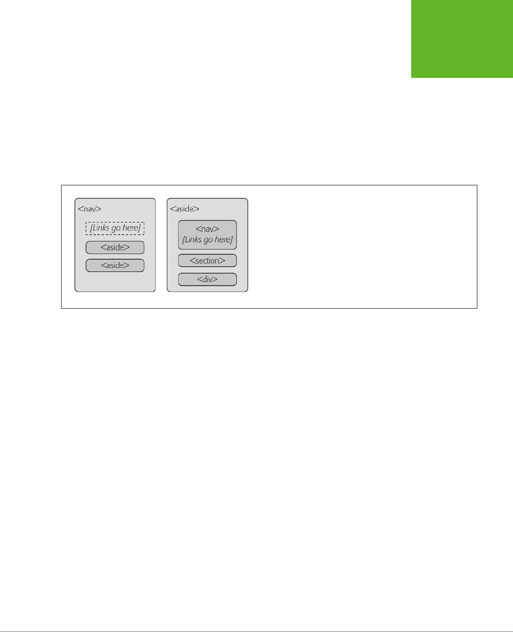
CHAPTER 2: STRUCTURING PAGES WITH SEMANTIC ELEMENTS 57
DESIGNING
A SITE WITH
THE SEMANTIC
ELEMENTS
example, if you have a list of articles (as in Figure 2-6), you definitely need a <nav>
section. But if you have just a couple of links at the bottom of the page with licens-
ing and contact information, a full-blown <nav> isn’t necessary.
With these two elements in mind, it’s a good time to try a practice exercise. First,
review the sidebar in Figure 2-6. Next, sketch out on a piece of paper how you would
mark up the structure of this content. Then, read on to find out the best possible
solution.
In fact, there are at least two reasonably good ways to structure this sidebar, as
shown in Figure 2-7.
FIGURE 2-7
Left: You can think of the entire side panel as a navigation bar, with
some other content wedged in. In this case, the whole panel can be a
<nav>
, and the other content sections require an
<aside>
(because
they aren’t related to the sidebar’s main content, the links).
Right: Alternatively, consider the entire side panel to be a separate
web page section that serves several purposes. In this case, the
sidebar becomes an
<aside>
while the navigational content inside is
wrapped in a
<nav>
.
The apocalyptic site uses the second approach (Figure 2-7, right). That’s because
the sidebar seems to serve several purposes, with none clearly being dominant. But
if you have a lengthy and complex navigational section (like a collapsible menu)
followed by a short bit of content, the first approach just might make more sense.
Here’s the markup that shapes the sidebar, dividing it into three sections:
<aside class="NavSidebar">
<nav>
<h2>Articles</h2>
<ul>
<li><a href="...">How The World Could End</a></li>
<li><a href="...">Would Aliens Enslave or Eradicate Us?</a></li>
...
</ul>
</nav>
<section>
<h2>About Us</h2>
<p>Apocalypse Today is a world leader in conspiracy theories ..."
</p>
</section>
www.it-ebooks.info

HTML5: THE MISSING MANUAL, SECOND EDITION
58
DESIGNING
A SITE WITH
THE SEMANTIC
ELEMENTS
<div>
<img src="ad.jpg" alt="Luckies cigarette ad: it's toasted">
</div>
</aside>
Here are the key points:
• The title sections (“Articles” and “About Us”) are level-2 headings. That
way, they are clearly subordinate to the level-1 website heading, which makes
the page more accessible to screen readers.
• The links are marked up in an unordered list using the <ul> and <li> ele-
ments. Website designers agree that a list is the best, most accessible way to
deal with a series of links. However, you may need to use style sheet rules to
remove the indent (as done here) and the bullets (not done in this example).
• The “About Us” section is wrapped in a <section> element. That’s because
there’s no other semantic element that suits this content. A <section> is slightly
more specific than a <div>—it’s suitable for any block of content that starts
with a heading. If there were a more specific element to use (for example, a
hypothetical <about> element), that would be preferable to a basic <section>,
but there isn’t.
• The image ad is wrapped in a <div>. The <section> element is appropriate
only for content that starts with a title, and the image section doesn’t have a
heading. (Although if it did—say, “A Word from Our Sponsors”—a <section>
element would be the better choice.) Technically, it’s not necessary to put any
other element around the image, but the <div> makes it easier to separate
this section, style it, and throw in some JavaScript code that manipulates it, if
necessary.
There are also some details that this sidebar
doesn’t
have but many others do. For
example, complex sidebars may start with a <header> and end with a <footer>. They
may also include multiple <nav> sections—for example, one for a list of archived
content, one with a list of late-breaking news, one with a blogroll or list of related
sites, and so on. For an example, check out the sidebar of a typical blog, which is
packed full of sections, many of which are navigational.
The style sheet rules you use to format the <aside> sidebar are the same as the
ones you’d use to format a traditional <div> sidebar. They place the sidebar in the
correct spot, using absolute positioning, and set some formatting details, like pad-
ding and background color:
aside.NavSidebar
{
position: absolute;
top: 179px;
left: 0px;
padding: 5px 15px 0px 15px;
width: 203px;
www.it-ebooks.info
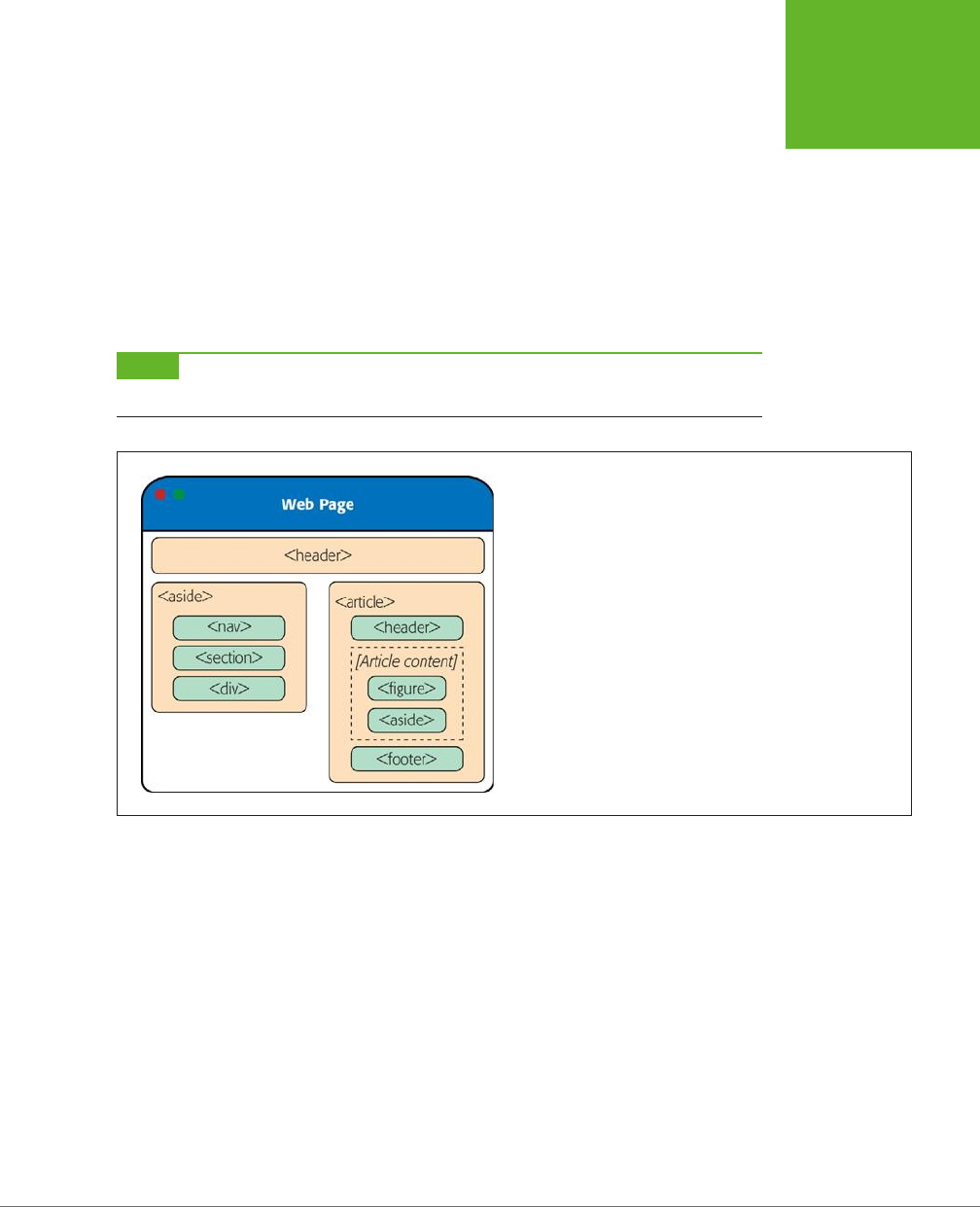
CHAPTER 2: STRUCTURING PAGES WITH SEMANTIC ELEMENTS 59
DESIGNING
A SITE WITH
THE SEMANTIC
ELEMENTS
min-height: 1500px;
background-color:#eee;
font-size: small;
}
This rule is followed by contextual style sheet rules that format the <h2>, <ul>, <li>,
and <img> elements in the sidebar. (As always, you can get the sample code from
http://prosetech.com/html5
, and peruse the complete style sheet.)
Now that you understand how the sidebar is put together, you’ll understand how it
fits into the layout of the entire page, as shown in Figure 2-8.
NOTE As you’ve learned, the
<nav>
is often found on its own, or in an
<aside>
. There’s one more com-
mon place for it to crop up: in the
<header>
element that tops a web page.
FIGURE 2-8
Here are all the semantic elements that you’ll find in the apocalyptic
web page shown in Figure 2-6.
Deeper into Sections
As you’ve already learned, the <section> is the semantic element of last resort. If you
have a titled block of content, and the other semantic elements aren’t appropriate,
then the <section> element is generally a better choice than <div>.
So what goes in a typical section? Depending on your perspective, the <section>
element is either a flexible tool that fits many needs, or a loose and baggy monster
with no clear identity. That’s because sections play a variety of dierent web page
roles. They can mark up any of the following:
• Small blocks of content that are displayed alongside the main page, like the
“About Us” paragraph in the apocalyptic website.
• Self-contained content that can’t really be described as an article, like a customer
billing record or a product listing.
www.it-ebooks.info

HTML5: THE MISSING MANUAL, SECOND EDITION
60
DESIGNING
A SITE WITH
THE SEMANTIC
ELEMENTS
• Groups of content—for example, a collection of articles on a news site.
• A
portion
of a longer document. For example, in the apocalyptic article, you
could mark up each separate end-of-the-world scenario as a distinct section.
Sometimes you’ll use sections in this way to ensure a correct outline for your
document, as explained in the next section.
The last two items in the list are the most surprising. Many web developers find it’s
a bit of a stretch to use the same element to deal with a small fragment of an article
and an entire group of articles. Some think that HTML5 should have at least two
dierent elements to deal with these dierent scenarios. But the creators of HTML5
decided to keep things simple (by limiting the number of new elements) while mak-
ing the new elements as flexible and practical as possible.
There’s one last consideration. The <section> element also has an eect on a web
page’s outline, which is the concept you’ll explore on page 65.
GEM IN THE ROUGH
Collapsible Boxes with <details> and <summary>
You’ve no doubt seen collapsible boxes on the Web—sections
of content that you can show or hide by clicking a heading.
Collapsible boxes are one of the easiest feats to pull off with
basic JavaScript. You simply need to react when the heading
is clicked, and then change a style setting to hide your box:
var box = document.
getElementById("myBox");
box.style.display = "none";
And then back again to make it reappear:
var box = document.
getElementById("myBox");
box.style.display = "block";
Interestingly, HTML5 adds two semantic elements that aim to
make this behavior automatic. The idea is that you wrap your
collapsible section in a
<details>
element and wrap the
heading inside in a
<summary>
element. The final result is
something like this:
<details>
<summary>Section #1</summary>
<p>If you can see this content, the
section is expanded</p>
</details>
Browsers that support these elements (currently, that’s just
Chrome), will show just the heading, possibly with some sort of
visual adornment (like a tiny triangle icon next to the heading).
Then, if the user clicks the heading, the full content expands
into view. Browsers that don’t support the
<details>
and
<summary>
elements will show the full content right from the
start, without giving the user any way to collapse it.
The
<details>
and
<summary>
elements are controversial.
Many web developers feel that they aren’t really semantic,
because they’re more about visual style than logical structure.
For now, it’s best to avoid the
<details>
and
<summary>
elements because they have such poor browser support. Al-
though you could write a workaround that uses JavaScript on
browsers that don’t support them, writing this workaround is
more effort than just using a few lines of JavaScript to perform
the collapsing on your own, on any browser.
www.it-ebooks.info

CHAPTER 2: STRUCTURING PAGES WITH SEMANTIC ELEMENTS 61
DESIGNING
A SITE WITH
THE SEMANTIC
ELEMENTS
Deeper into Footers
HTML5 and fat headers were meant for each other. Not only can you stu in subtitles
and bylines, but you can also add images, navigational sections (with the <nav> ele-
ment), and virtually anything else that belongs at the top of your page.
Oddly, HTML5 isn’t as accommodating when it comes to footers. The footer is sup-
posed to be limited to a few basic details about the website’s copyright, author-
ship, legal restrictions, and links. Footers aren’t supposed to hold long lists of links,
important pieces of content, or extraneous details like ads, social media buttons,
and website widgets.
This raises a question: What should you do if your website design calls for a fat
footer? After all, fat footers are wildly popular in website design right now (see Figure
2-9 for an example). They incorporate a number of fancy techniques, sometimes
including the following:
• Fixed positioning, so the footer is always attached to the bottom of the browser
window, no matter where the visitor scrolls (as with the example in Figure 2-9).
• A close button, so the visitor can close the footer and reclaim the space after
reading the content (as with the example in Figure 2-9). To make this work, you
use a simple piece of JavaScript that hides the element that wraps the footer
(like the code shown in the box on page 60).
FIGURE 2-9
This absurdly fat footer is
stuffed with garish extras,
like an award picture and
social media buttons. It
uses fixed positioning to
lock itself to the bottom of
the browser window, like
a toolbar. Fortunately, this
footer has one redeeming
quality: the close button
in the top-right corner
that lets anyone banish it
from view.
www.it-ebooks.info

HTML5: THE MISSING MANUAL, SECOND EDITION
62
DESIGNING
A SITE WITH
THE SEMANTIC
ELEMENTS
• A partially transparent background, so you can see the page content
through
the footer. This setup works well if the footer is advertising breaking news or an
important disclaimer, and it’s usually used in conjunction with a close button.
• Animation, so the footer springs or slides into view. (For an example, see the
related-article box that pops up when you reach the bottom of an article at
www.nytimes.com.
)
If your site includes this sort of footer, you have a choice. The simple approach is
to disregard the rules. This approach is not as terrible as it sounds, because other
website developers are sure to commit the same mistake, and over time the ocial
rules may be loosened, allowing fancier footers. But if you want to be on the right
side of the standard right now, you need to adjust your markup. Fortunately, it’s
not too dicult.
The trick is to split the standard footer details from the extras. In the browser, these
can appear to be a single footer, but in the markup, they won’t all belong to the
<footer> element. For example, here’s the structure of the fat footer in Figure 2-9:
<div id="FatFooter">
<!-- Fat footer content goes here. -->
<img onclick="CloseBox()" src="close_icon.png" class="CloseButton">
...
<footer>
<!-- Standard footer content goes here. -->
<p>The views expressed on this site do not ... </p>
</footer>
</div>
The outer <div> has no semantic meaning. Instead, it’s a convenient package that
bundles the extra “fat” content with the bare-bones footer details. It also lets you
apply the style sheet formatting rule that locks the fat footer into place:
#FatFooter {
position: fixed;
bottom: 0px;
height: 145px;
width: 100%;
background: #ECD672;
border-top: thin solid black;
font-size: small;
}
NOTE In this example, the style sheet rule applies its formatting by ID name (using the
#FatFooter
selector) rather than by class name (for example, using a
.FatFooter
selector). That’s because the fat footer
already needs a unique ID, so the JavaScript code can find it and hide it when someone clicks the close button.
It makes more sense to use this unique ID in the style sheet than to add a class name for the same purpose.
www.it-ebooks.info

CHAPTER 2: STRUCTURING PAGES WITH SEMANTIC ELEMENTS 63
DESIGNING
A SITE WITH
THE SEMANTIC
ELEMENTS
You could also choose to put the footer in an <aside> element, to clearly indicate
that the footer content is a separate section, and tangentially related to the rest of
the content on the page. Here’s what that structure looks like:
<div id="FatFooter">
<aside>
<!-- Fat footer content goes here. -->
<img onclick="CloseBox()" src="close_icon.png" class="CloseButton">
...
</aside>
<footer>
<!-- Standard footer content goes here. -->
<p>The views expressed on this site do not ... </p>
</footer>
</div>
The important detail here is that the <footer> is not placed inside the <aside> ele-
ment. That’s because the <footer> doesn’t apply to the <aside> but to the entire
website. Similarly, if you have a <footer> that applies to some piece of content, your
<footer> needs to be placed inside the element that wraps that content.
NOTE The rules and guidelines for the proper use of HTML5’s semantic elements are still evolving. Questions
about the proper way to mark up large, complex sites stir ferocious debate in the HTML community. The best
advice is this: If something doesn’t seem true to your content, don’t do it. Or you can discuss it online, where you
can get feedback from dozens of super-smart HTML gurus. (One particularly good site is
http://html5doctor.com
,
where you can see these ongoing debates unfolding in the comments section of most articles.)
Identifying the Main Content with <main>
HTML5 includes a sometimes-overlooked <main> element that identifies a web page’s
primary content. In the apocalypse site, for example, the main content is the entire
article, not including the website header, sidebar, or footer. You should strongly
consider using it on your own pages.
A properly applied <main> element wraps the <article> element precisely. Here’s
how it looks in the apocalypse page:
<!DOCTYPE html>
<html lang="en">
<head>
...
</head>
<body>
<header>
...
</header>
www.it-ebooks.info

HTML5: THE MISSING MANUAL, SECOND EDITION
64
DESIGNING
A SITE WITH
THE SEMANTIC
ELEMENTS
<aside>
...
</aside>
<main>
<article>
...
</article>
</main>
<footer>
...
</footer>
</body>
</html>
You can’t put the <main> element inside the <article> element (or in any other
semantic element). That’s because the <main> element is meant to hold the page’s
full main content. It’s
not
meant to indicate a portion of important content inside
your document. For the same reason, unlike the other semantic elements, the <main>
element can be used only
once
in a page.
At first glance, the <main> element doesn’t seem terribly useful. However, it can
be important for screen readers, because it lets them skip over extraneous mate-
rial—like website headers, navigation menus, ads, sidebars, and so on—to get to the
real content. And although the <main> element clings to the <article> element in
this example, that’s not necessarily the case in a more complex page. For example,
if you created a page that lists multiple article summaries, each one wrapped in an
<article> element, the <main> element would wrap the complete list of <article>
elements, like this:
<main>
<article>
...
</article>
<article>
...
</article>
<article>
...
</article>
...
</main>
www.it-ebooks.info
CHAPTER 2: STRUCTURING PAGES WITH SEMANTIC ELEMENTS 65
THE HTML5
OUTLINING
SYSTEM
Here, the distinction is clear—each <article> represents a self-contained piece of
content, but the main content of the page is the full set of articles.
It’s appropriate to use the <main> element on any type of page, even if that page
doesn’t include an article. For example, if you build a game or an app, the main con-
tent is the bunch of markup that creates that game or app. You can use the <main>
element to wrap the whole shebang, not including outside details like headers and
footers.
NOTE The
<main>
element is a relative newcomer. It was introduced in the slightly tweaked version of
the HTML5 standard called HTML 5.1 (page xv).
The HTML5 Outlining System
HTML5 defines a set of rules that dictate how you can create a
document outline
for any web page. A web page’s outline could come in handy in a lot of ways. For
example, a browser could let you jump from one part of an outline to another. A
design tool could let you rearrange sections by dragging and dropping them in an
outline view. A search engine could use the outline to build a better page preview,
and screen readers could benefit the most of all, by using outlines to guide users
with vision diculties through a deeply nested hierarchy of sections and subsections.
However, none of these scenarios is real yet, because—except for the small set of
developer tools you’ll consider in the next section—almost no one uses HTML5
outlines today.
NOTE It’s hard to get excited about a feature that doesn’t affect the way the page is presented in a browser
and isn’t used by other tools. However, it’s still a good idea to review the outline of your web pages (or at least
the outline of a typical page from your website) to make sure that its structure makes sense and that you aren’t
breaking any HTML5 rules.
How to View an Outline
To understand outlines, you can simply take a look at the outlines your own pages
produce. Right now, no browser implements the rules of HTML5 outlines (or gives
you a way to peek at one). However, there are several tools that fill the gap:
• Online HTML outliner. Visit
http://gsnedders.html5.org/outliner
and tell the
outliner which page you want to outline. As with the HTML5 validator you used
in Chapter 1 (page 17), you can submit the page you want to outline in any of
three ways: by uploading a file from your computer, by supplying a URL, or by
pasting the markup into a text box.
• Chrome extension. You can use the h5o plug-in to analyze the outlines of
pages when you view them in Chrome. Install it at
http://code.google.com/p/
h5o
and then surf to an HTML5 page somewhere on the Web (sadly, h5o doesn’t
www.it-ebooks.info
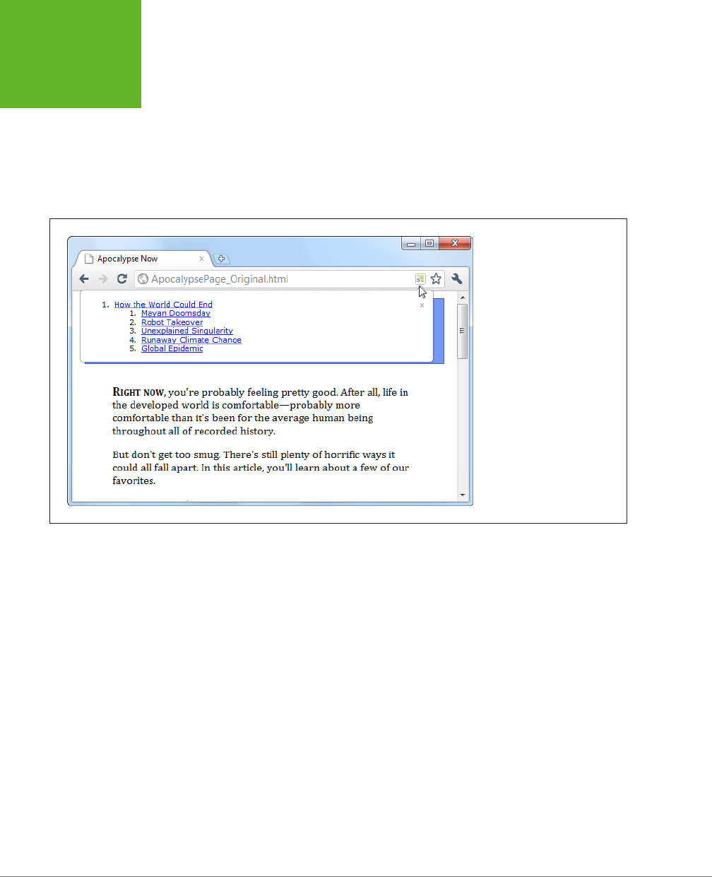
HTML5: THE MISSING MANUAL, SECOND EDITION
66
THE HTML5
OUTLINING
SYSTEM
work with files that are stored on your computer). An outline icon appears in
the address bar, which reveals the structure of the page when clicked (Figure
2-10). The h5o page also provides a
bookmarklet
(a piece of JavaScript code
that you can add to your web browser’s bookmark list) which lets you display
page outlines in Firefox and Internet Explorer, albeit with a few quirks.
• Opera extension. There’s an Opera version of the h5o Chrome extension. Get
it at
http://tinyurl.com/3k3ecdy
.
FIGURE 2-10
When you visit an HTML5 page
with the Chrome h5o extension
installed, an outline icon ap-
pears in the address bar. Click
the icon to pop open a window
with the full page outline.
Basic Outlines
To visualize the outline of your web page, imagine it stripped of all content except
for the text in a numbered heading element (<h1>, <h2>, <h3>, and so on). Then,
indent those headings based on their place in your markup, so more deeply nested
headings are indented more in the outline.
For example, consider the apocalypse article in its initial, pre-HTML5 state:
<body>
<div class="Header">
<h1>How the World Could End</h1>
...
</div>
...
<h2>Mayan Doomsday</h2>
...
www.it-ebooks.info

CHAPTER 2: STRUCTURING PAGES WITH SEMANTIC ELEMENTS 67
THE HTML5
OUTLINING
SYSTEM
<h2>Robot Takeover</h2>
...
<h2>Unexplained Singularity</h2>
...
<h2>Runaway Climate Change</h2>
...
<h2>Global Epidemic</h2>
...
<div class="Footer">
...
</div>
</body>
This simple structure leads to an outline like this:
1. How the World Could End
1. Mayan Doomsday
2. Robot Takeover
3. Unexplained Singularity
4. Runaway Climate Change
5. Global Epidemic
Two levels of headings (<h1> and <h2>) create a two-level outline. This scheme is
similar to the outline features in many word processing programs—for example, you
can see much the same thing in Microsoft Word’s Navigation pane.
On the other hand, markup like this:
<h1>Level-1 Heading</h1>
<h2>Level-2 Heading</h2>
<h2>Level-2 Heading</h2>
<h3>Level-3 Heading</h3>
<h2>Level-2 Heading</h2>
Gets an outline like this:
1. Level-1 Heading
1. Level-2 Heading
2. Level-2 Heading
1. Level-3 Heading
3. Level-2 Heading
Again, there are no surprises.
www.it-ebooks.info

HTML5: THE MISSING MANUAL, SECOND EDITION
68
THE HTML5
OUTLINING
SYSTEM
Finally, the outline algorithm is smart enough to ignore skipped levels. For example,
if you write this slightly wobbly markup, which skips from <h1> directly to <h3>:
<h1>Level-1 Heading</h1>
<h2>Level-2 Heading</h2>
<h1>Level-1 Heading</h1>
<h3>Level-3 Heading</h3>
<h2>Level-2 Heading</h2>
You get this outline:
1. Level-1 Heading
1. Level-2 Heading
2. Level-1 Heading
1. Level-3 Heading
2. Level-2 Heading
Now the level-3 heading has level-2 status in the outline, based on its position in the
document. This might seem like one of those automatic error corrections browsers
love to make, but it actually serves a practical purpose. In some situations, a web page
may be assembled out of separate pieces—for example, it might contain a copy of
an article that’s published elsewhere. In this case, the heading levels of the embed-
ded content might not line up perfectly with the rest of the web page. But because
the outlining algorithm smooths these dierences out, it’s unlikely to be a problem.
Sectioning Elements
Sectioning elements are the ones that create a new, nested outline inside your page:
<article>, <aside>, <nav>, and <section>. To understand how sectioning elements
work, imagine a page that contains two <article> elements. Because <article>
is a sectioning element, this page has (at least) three outlines—the outline of the
overall page and one nested outline for each article.
To get a better grasp of this situation, consider the structure of the apocalypse
article, after it’s been revised with HTML5:
<body>
<article>
<header>
<h1>How the World Could End</h1>
...
</header>
<div class="Content">
...
<h2>Mayan Doomsday</h2>
...
www.it-ebooks.info

CHAPTER 2: STRUCTURING PAGES WITH SEMANTIC ELEMENTS 69
THE HTML5
OUTLINING
SYSTEM
<h2>Robot Takeover</h2>
...
<h2>Unexplained Singularity</h2>
...
<h2>Runaway Climate Change</h2>
...
<h2>Global Epidemic</h2>
...
</div>
</article>
<footer>
...
</footer>
</body>
Plug this into an outline viewer like
http://gsnedders.html5.org/outliner
, and you’ll
see this:
1.
Untitled Section
1. How the World Could End
1. Mayan Doomsday
2. Robot Takeover
3. Unexplained Singularity
4. Runaway Climate Change
5. Global Epidemic
Here, the outline starts with an untitled section, which is the root <body> element.
The <article> element starts a new, nested outline, which contains a single <h1>
and several <h2> elements.
Sometimes, the “Untitled Section” note indicates a mistake. Although it’s considered
acceptable for <aside> and <nav> elements to exist without titles, the same leniency
isn’t usually given to <article> or <section> elements. In the previous example,
the untitled section is the main section for the page, which belongs to the <body>
element. Because the page contains a single article, there’s no reason for the page
to have a separate heading, and you can ignore this quirk.
Now consider what happens with a more complex example, like the apocalypse
site with the navigation sidebar (page 54). Put that through an outliner, and you’ll
get this outline:
www.it-ebooks.info

HTML5: THE MISSING MANUAL, SECOND EDITION
70
THE HTML5
OUTLINING
SYSTEM
1.
Apocalypse Today
1.
Untitled Section
1. Articles
2. About Us
2. How the World Could End
1. Mayan Doomsday
2. Robot Takeover
3.
Untitled Section
4. Unexplained Singularity
5. Runaway Climate Change
6. Global Epidemic
Here, there are two sectioning elements, and two nested outlines: one for the side-
bar and one for the article. There are also two untitled sections, both of which are
legitimate. The first is the <aside> element for the sidebar, and the second is the
<aside> element that represents the pull-quote in the article.
NOTE In addition to sectioning elements, some elements are called
section roots
. These elements aren’t
just branches of an existing outline; they start a new outline of their own that doesn’t appear in the main outline
of the containing page. The
<body>
element that contains your web page content is a sectioning root, which
makes sense. But HTML5 also considers the following elements to be sectioning roots:
<blockquote>
,
<td>
,
<fieldset>
,
<figure>
, and
<details>
.
Solving an Outline Problem
So far, you’ve looked at the examples in this chapter and seen the outlines they
generated. And so far, the outlines have made perfect sense. But sometimes, a
problem can occur. For example, imagine you create a document with this structure:
<body>
<article>
<h1>Natural Wonders to Visit Before You Die</h1>
...
<h2>In North America</h2>
...
<h3>The Grand Canyon</h3>
...
<h3>Yellowstone National Park</h3>
...
<h2>In the Rest of the World</h2>
...
<aside>...</aside>
www.it-ebooks.info

CHAPTER 2: STRUCTURING PAGES WITH SEMANTIC ELEMENTS 71
THE HTML5
OUTLINING
SYSTEM
...
<h3>Galapagos Islands</h3>
...
<h3>The Swiss Alps</h3>
...
</article>
</body>
GEM IN THE ROUGH
How Sectioning Elements Help Complex Pages
Sectioning is a great help with
syndication
and
aggregation
—
two examples of the fine art of taking content from one web
page and injecting it into another.
For example, imagine you have a web page that includes
excerpts from several articles, all of which are drawn from
other sites. Now imagine that this page has a deeply nested
structure of headings, and somewhere inside—let’s say under
an
<h4>
heading—there’s an article with content pulled from
another web page.
In traditional HTML, you’d like the first heading in this content to
use the
<h5>
element, because it’s nested under an
<h4>
. But
this article was originally developed to be placed somewhere
else, on a different page, with less nesting, so it probably
starts with an
<h2>
or an
<h1>
. The page would still work,
but its hierarchy would be scrambled, and the page could be
more difficult for screen readers, search engines, and other
software to process.
In HTML5, this page isn’t a problem. As long as you wrap the
nested article in an
<article>
element, the extracted
content becomes part of its own nested outline. That outline
can start with any heading—it doesn’t matter. What matters is
its position in the containing document. So if the
<article>
element falls after an
<h4>
, then the first level of heading in
that article behaves like a logical
<h5>
, the second level acts
like a logical
<h6>
, and so on.
The conclusion is this: HTML5 has a logical outline system that
makes it easier to combine documents. In this outline system,
the position of your headings becomes more important, and
the exact level of each heading becomes less significant—mak-
ing it harder to shoot yourself in the foot.
You probably expect an outline like this:
1.
Untitled Section for the <body>
1. Natural Wonders to Visit Before You Die
1. In North America
1. The Grand Canyon
2. Yellowstone National Park
2. In the Rest of the World
3.
Untitled Section for the <aside>
1. Galapagos Islands
2. The Swiss Alps
www.it-ebooks.info

HTML5: THE MISSING MANUAL, SECOND EDITION
72
THE HTML5
OUTLINING
SYSTEM
But the outline you actually get is this:
1.
Untitled Section for the <body>
1. Natural Wonders to Visit Before You Die
1. In North America
1. The Grand Canyon
2. Yellowstone National Park
2. In the Rest of the World
3.
Untitled Section for the <aside>
4. Galapagos Islands
5. The Swiss Alps
Somehow, the addition of the <aside> after the <h2> throws o the following <h3>
elements, making them have the same logical level as the <h2>. This clearly isn’t
what you want.
To solve this problem, you first need to understand that the HTML5 outline system
automatically creates a new section every time it finds a numbered heading element
(like <h1>, <h2>, <h3>, and so on),
unless
that element is already at the top of a section.
In this example, the outline system doesn’t do anything to the initial <h1> element,
because it’s at the top of the <article> section. But the outline algorithm does
create new sections for the <h2> and <h3> elements that follow. It’s as though you
wrote this markup:
<body>
<article>
<h1>Natural Wonders to Visit Before You Die</h1>
...
<section>
<h2>In North America</h2>
...
<section>
<h3>The Grand Canyon</h3>
...
</section>
<section>
<h3>Yellowstone National Park</h3>
...
</section>
</section>
www.it-ebooks.info

CHAPTER 2: STRUCTURING PAGES WITH SEMANTIC ELEMENTS 73
THE HTML5
OUTLINING
SYSTEM
<section>
<h2>In the Rest of the World</h2>
...
</section>
<aside>...</aside>
...
<section>
<h3>Galapagos Islands</h3>
...
</section>
<section>
<h3>The Swiss Alps</h3>
...
</section>
</article>
</body>
Most of the time, these automatically created sections aren’t a problem. In fact,
they’re usually an asset, because they make sure incorrectly numbered headings are
still placed in the right outline level. The cost for this convenience is an occasional
glitch, like the one shown here.
As you can see in this listing, everything goes right at first. The top <h1> is left alone
(because it’s in an <article> already), there’s a subsection created for the first <h2>,
then a subsection for each <h3> inside, and so on. The problem starts when the
outline algorithm runs into the <aside> element. It sees this as a cue to close the
current section, which means that when the sections are created for the following
<h3> elements, they’re at the same logical level as the <h2> elements before.
To correct this problem, you need to take control of the sections and subsections by
defining some yourself. In this example, the goal is to prevent the second <h2> section
from being closed too early, which you can do by defining it explicitly in the markup:
<body>
<article>
<h1>Natural Wonders to Visit Before You Die</h1>
...
<h2>In North America</h2>
...
<h3>The Grand Canyon</h3>
...
<h3>Yellowstone National Park</h3>
...
<section>
<h2>In the Rest of the World</h2>
...
<aside>...</aside>
...
www.it-ebooks.info

HTML5: THE MISSING MANUAL, SECOND EDITION
74
THE HTML5
OUTLINING
SYSTEM
<h3>Galapagos Islands</h3>
...
<h3>The Swiss Alps</h3>
...
</section>
</article>
</body>
Now, the outline algorithm doesn’t need to create an automatic section for the sec-
ond <h2>, and so there’s no risk of it closing the section when it stumbles across the
<aside>. Although you could define the section for every heading in this document,
there’s no need to clutter your markup, as this single change fixes the problem.
NOTE Another solution is to replace the
<aside>
with a
<div>
. The
<div>
is not a sectioning element,
so it won’t cause a section to close unexpectedly.
Using the <aside> element doesn’t always cause this problem. The earlier article
examples used the <aside> element for a pull-quote but worked fine, because the
<aside> fell between two <h2> elements. But if you carelessly plunk a sectioning
element between two dierent heading levels, you should check your outline to
make sure it still makes sense.
TIP If the whole outline concept seems overwhelmingly theoretical, don’t worry. Truthfully, it’s a subtle
concept that many web developers will ignore (at least for now). The best approach is to think of the HTML5
outlining system as a quality assurance tool that can help you out. If you review your pages in an outline generator
(like one of the tools listed on page 65), you can catch mistakes that may indicate other problems and make sure
that you’re using the semantic elements correctly.
www.it-ebooks.info

75
CHAPTER
3
In the previous chapter, you met HTML5’s semantic elements. With their help, you
can give your pages a clean, logical structure and prepare for a future of super-
smart browsers, search engines, and assistive devices.
But you haven’t reached the end of the semantic story yet. Semantics are all about
adding
meaning
to your markup, and there are several types of information you
can inject. In Chapter 2, semantics were all about
page structure
—you used them
to explain the purpose of large blocks of content and entire sections of your layout.
But semantics can also include
text-level information
, which you add to explain much
smaller pieces of content. You can use text-level semantics to point out important
types of information that would otherwise be lost in a sea of web page content, like
names, addresses, event listings, products, recipes, restaurant reviews, and so on.
Then this content can be extracted and used by a host of dierent services—every-
thing from nifty browser plug-ins to specialized search engines.
In this chapter, you’ll start by returning to the small set of semantic elements that are
built into the HTML5 language. You’ll learn about a few text-level semantic elements
that you can use today, eortlessly. Next, you’ll look at the companion standards that
tackle text-level semantics head-on. That means digging into
microdata
, which began
its life as part of the original HTML5 specification but now lives on as a separate,
still-evolving standard managed by the W3C. Using microdata, you’ll learn how to
enrich your pages and juice up your web search listings.
Writing More
Meaningful Markup
www.it-ebooks.info
HTML5: THE MISSING MANUAL, SECOND EDITION
76
THE SEMANTIC
ELEMENTS
REVISITED
The Semantic Elements Revisited
There’s a reason you began your exploration into semantics with the page structure
elements (see Table 3-1 for a recap). Quite simply, page structure is an easy chal-
lenge. That’s because the vast majority of websites use a small set of common design
elements (headers, footers, sidebars, and menus) to create layouts that are—for all
their cosmetic dierences—very similar.
TABLE 3-1
Semantic elements for page structure
ELEMENT DESCRIPTION
<article> Represents whatever you think of as an article—a
section of self-contained content like a newspaper
article, a forum post, or a blog entry (not including
frills like comments or the author bio).
<aside> Represents a complete chunk of content that’s
separate from the main page content. For example, it
makes sense to use <aside> to create a sidebar with
related content or links next to a main article.
<figure> and <figcaption> Represents a figure. The <figcaption> element wraps
the caption text, and the <figure> element wraps the
<figcaption> and the <img> element for the picture
itself. The goal is to indicate the association between
an image and its caption.
<footer> Represents the footer at the bottom of the page.
This is a tiny chunk of content that may include small
print, a copyright notice, and a brief set of links (for
example, “About Us” or “Get Support”).
<header> Represents an enhanced heading that includes a
standard HTML heading and extra content. The extra
content might include a logo, a byline, or a set of
navigation links for the content that follows.
<nav> Represents a significant collection of links on a page.
These links may point to topics on the current page or
to other pages on the website. In fact, it’s not unusual
to have a page with multiple <nav> sections.
<section> Represents a section of a document or a group of
documents. The <section> is an all-purpose container
with a single rule: The content it holds should begin
with a heading. Use <section> only if the other
semantic elements (for example, <article> and
<aside>) don’t apply.
<main> Represents the main content of the page—all of it. For
example, <main> might wrap an <article> element
but leave out site-wide headers, footers, and sidebars.
The <main> element is a new addition to the HTML 5.1
revision of HTML5 (page xv).
www.it-ebooks.info

CHAPTER 3: WRITING MORE MEANINGFUL MARKUP 77
THE SEMANTIC
ELEMENTS
REVISITED
Text-level semantics are a tougher nut to crack. That’s because people use a huge
number of dierent types of content. If HTML5 set out to create an element for
every sort of information you might add to a page, the language would be swim-
ming in a mess of elements. Complicating the problem is the fact that structured
information is also made of smaller pieces that can be assembled in dierent ways.
For example, even an ordinary postal address would require a handful of elements
(like <address>, <name>, <street>, <postalcode>, <country>, and so on) before
anyone could use it in a page.
HTML5 takes a two-pronged approach. First, it adds a very small number of text-
level semantic elements. But second, and more importantly, HTML5 supports a
separate microdata standard, which gives people an extensible way to define any
sort of information they want and then flag it in their pages. You’ll cover both of
these topics in this chapter. First up are three new text-level semantic elements:
<time>, <output>, and <mark>.
Dates and Times with <time>
Date and time information appears frequently in web pages. For example, it turns
up at the end of most blog postings. Unfortunately, there’s no standardized way to
tag dates, so there’s no easy way for other programs (like search engines) to extract
them without guessing. The <time> element solves this problem. It allows you to
mark up a date, time, or combined date and time. Here’s an example:
The party starts <time>2014-03-21</time>.
NOTE It may seem a little counterintuitive to have a
<time>
element wrapping a date (with no time),
but that’s just one of the quirks of HTML5. A more sensible element name would be
<datetime>
, but that isn’t
what they chose.
The <time> element performs two roles. First, it indicates where a date or time
value is in your markup. Second, it provides that date or time value in a form that
any software program can understand. The previous example meets the second
requirement using the universal date format, which includes a four-digit year, a
two-digit month, and a two-digit day, in that order, with each piece separated by a
dash. In other words, the format follows this pattern:
YYYY-MM-DD
However, it’s perfectly acceptable to present the date in a dierent way to the person
reading your web page. In fact, you can use whatever text you want, as long as you
supply the computer-readable universal date with the datetime attribute, like this:
The party starts <time datetime="2014-03-21">March 21<sup>st</sup></time>.
Which looks like this in the browser:
The party starts March 21st.
www.it-ebooks.info

HTML5: THE MISSING MANUAL, SECOND EDITION
78
THE SEMANTIC
ELEMENTS
REVISITED
The <time> element has similar rules about times, which you supply in this format:
HH:MM
That’s a two-digit hour (using a 24-hour clock), followed by a two-digit number of
minutes, like this:
Parties start every night at <time datetime="16:30">4:30 p.m.</time>.
Finally, you can specify a time on a specific date by combining these two standards.
Just put the date first, followed by a space, and then the time information.
The party starts <time datetime="2014-03-21 16:30">March 21<sup>st</sup>
at 4:30 p.m.</time>.
NOTE Originally, the
<time>
element required a slightly different format to combine date and time infor-
mation. Instead of separating the two components with a space, you had to separate them with an uppercase
T
(for
time
), as in
2014-03-21T16:30
. This format is still acceptable, so you may encounter it while perusing
other people’s web pages.
When combining dates and times, you may choose to tack a time zone oset on the
end. For example, New York is in the Eastern time zone, which is known as UTC-5:00.
(You can figure out your time zone at
http://en.wikipedia.org/wiki/Time_zone
.) To
indicate 4:30 p.m. in New York, you’d use this markup:
The party starts <time datetime="2014-03-21 16:30-05:00">March 21<sup>st</sup>
at 4:30 p.m.</time>.
This way, the people reading your page get the time in the format they expect,
while search bots and other bits of software get an unambiguous datetime value
that they can process.
The <time> element also supports a pubdate attribute. You should use this if your
date corresponds to the publication date of the current content (for example, the
<article> in which the <time> is placed). Here’s an example:
Published on <time datetime="2014-03-21" pubdate>March 31, 2014</time>.
NOTE Because the
<time>
element is purely informational and doesn’t have any associated formatting,
you can use it with any browser. There are no compatibility issues to worry about. But if you want to style the
<time>
element, you need the Internet Explorer workaround described on page 51.
JavaScript Calculations with <output>
HTML5 includes one semantic element that’s designed to make certain types of
JavaScript-powered pages a bit clearer—the <output> element. It’s nothing more
than a placeholder that your code can use to show a piece of calculated information.
www.it-ebooks.info
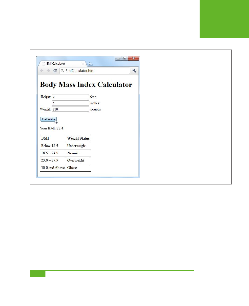
CHAPTER 3: WRITING MORE MEANINGFUL MARKUP 79
THE SEMANTIC
ELEMENTS
REVISITED
For example, imagine you create a page like the one shown in Figure 3-1. This figure
lets the user enter some information. A script then takes this information, performs
a calculation, and displays the result just underneath.
FIGURE 3-1
It’s a time-honored web design pattern. Type some num-
bers, click a button, and let the page give you the answer.
The usual way of dealing with this is to assign a unique ID to the placeholder, so
the JavaScript code can find it when it performs the calculation. Typically, web
developers use the <span> element, which works perfectly but doesn’t provide any
specific meaning:
<p>Your BMI: <span id="result"></span></p>
Here’s the more meaningful version you’d use in HTML5:
<p>Your BMI: <output id="result"></output></p>
The actual JavaScript code doesn’t need any changes, because it looks up the ele-
ment by name and doesn’t care about the element type:
var resultElement = document.getElementById("result");
NOTE Before you use
<output>
, make sure you’ve included the Internet Explorer workaround described
on page 51. Otherwise, the element won’t be accessible in JavaScript on old versions of Internet Explorer (IE 8
and earlier).
www.it-ebooks.info

HTML5: THE MISSING MANUAL, SECOND EDITION
80
THE SEMANTIC
ELEMENTS
REVISITED
Often, this sort of page has its controls inside a <form> element. In this example,
that’s the three text boxes where people can type in information:
<form action="#" id="bmiCalculator">
<label for="feet inches">Height:</label>
<input name="feet"> feet<br>
<input name="inches"> inches<br>
<label for="pounds">Weight:</label>
<input name="pounds"> pounds<br><br>
...
</form>
If you want to make your <output> element look even smarter, you can add the
form attribute (which indicates the ID of the form that has the related controls) and
the for attribute (which lists the IDs of the related controls, separated by spaces).
Here’s an example:
<p>Your BMI: <output id="result" form="bmiCalculator"for="feet inches pounds">
</output></p>
These attributes don’t actually do anything, other than convey information about
where your <output> element gets its goods. But they will earn you some serious
semantic brownie points. And if other people need to edit your page, these attributes
could help them sort out how it works.
TIP If you’re a bit hazy about forms, you’ll learn more in Chapter 4. If you know more about Esperanto than
JavaScript, you can brush up on the programming language in Appendix B, “JavaScript: The Brains of Your Page.”
And if you want to try this page out for yourself, you can find the complete example at
http://prosetech.com/
html5
.
Highlighted Text with <mark>
The <mark> element represents a section of text that’s highlighted for reference. It’s
particularly appropriate when you’re quoting someone else’s text and you want to
bring attention to something:
<p>In 2009, Facebook made a bold grab to own everyone's content,
<em>forever</em>. This is the text they put in their terms of service:</p>
<blockquote>You hereby grant Facebook an <mark>irrevocable, perpetual,
non-exclusive, transferable, fully paid, worldwide license</mark> (with the
right to sublicense) to <mark>use, copy, publish</mark>, stream, store,
retain, publicly perform or display, transmit, scan, reformat, modify, edit,
frame, translate, excerpt, adapt, create derivative works and distribute
(through multiple tiers), <mark>any user content you post</mark>
...
</blockquote>
www.it-ebooks.info
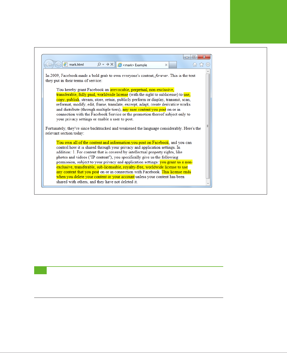
CHAPTER 3: WRITING MORE MEANINGFUL MARKUP 81
THE SEMANTIC
ELEMENTS
REVISITED
The text in a <mark> element gets the yellow background shown in Figure 3-2.
FIGURE 3-2
Here, the
<mark>
ele-
ment highlights important
details in a block of quoted
text.
You can also use <mark> to flag important content or keywords, as search engines
do when showing matching text in your search results, or to mark up document
changes, in combination with <del> (for deleted text) and <ins> (for inserted text).
Truthfully, the <mark> element is a bit of a misfit. The HTML5 specification considers
it to be a semantic element, but it plays a presentational role that’s arguably more
important. By default, marked-up text is highlighted with a bright yellow background
(Figure 3-2), although you can apply your own style sheet rules to use a dierent
formatting eect.
TIP The
<mark>
element isn’t really about formatting. After all, there are lots of ways to make text stand
out in a web page. Instead, you should use
<mark>
(coupled with any CSS formatting you like) when it’s semanti-
cally appropriate. A good rule of thumb is to use
<mark>
to draw attention to ordinary text that has
become
important, either because of the discussion that frames it, or because of the task the user is performing.
Even if you stick with the default yellow-background formatting, you should add a
style sheet fallback for browsers that don’t support HTML5. Here’s the sort of style
rule you need:
www.it-ebooks.info

HTML5: THE MISSING MANUAL, SECOND EDITION
82
OTHER
STANDARDS
THAT BOOST
SEMANTICS
mark {
background-color: yellow;
color: black;
}
You’ll also need the Internet Explorer workaround described on page 51 to make the
<mark> element style-able in old versions of IE.
Other Standards That Boost Semantics
At this point, it’s probably occurring to you that there are a lot of potential semantic
elements that HTML
doesn’t
have. Sure, you can flag dates and highlighted text,
but what about other common bits of information, like names, addresses, business
listings, product descriptions, personal profiles, and so on? HTML5 deliberately
doesn’t wade into this arena, because its creators didn’t want to bog the language
down with dozens of specialized elements that would suit some people but leave
others bored and unimpressed. To really get to the next level with semantics, you
need to broaden your search beyond the core HTML5 language, and consider a few
standards that can work with your web pages.
Semantically smart markup isn’t a new idea. In fact, way back when HTML5 was
still just a fantasy in WHATWG editor Ian Hickson’s head, there were plenty of web
developers clamoring for ways to make their markup more meaningful. Their goals
weren’t always the same—some wanted to boost accessibility, some were planning
to do data mining, and others just wanted to dial up the cool factor on their resumés.
But none of them could find what they wanted in the standard HTML language which
is why several new specifications sprung up to fill the gap.
In the following sections, you’ll learn about no fewer than
four
of these standards.
First, you’ll get the scoop on ARIA, a standard that’s all about improving accessibil-
ity for screen readers. Then, you’ll take a peek at three competing approaches for
describing dierent types of content, whether it’s contact details, addresses, business
listings, or just about anything else you can fit between the tags of an HTML page.
ARIA (Accessible Rich Internet Applications)
ARIA is a developing standard that lets you supply extra information for screen
readers through attributes on any HTML element. For example, ARIA introduces
the role attribute, which indicates the purpose of a given element. For example, if
you have a <div> that represents a header:
<div class="header">
You can announce that fact to screen readers by setting the ARIA role attribute
to banner:
<div class="header" role="banner">
www.it-ebooks.info

CHAPTER 3: WRITING MORE MEANINGFUL MARKUP 83
OTHER
STANDARDS
THAT BOOST
SEMANTICS
Of course, you learned last chapter that HTML5 also gives you a more meaningful
way to mark up headers. So what you really should use is something like this:
<header role="banner">
This example demonstrates two important facts. First, ARIA requires you to use one
of a short list of recommended role names. (For the full list, refer to the appropriate
section of the specification at
http://tinyurl.com/roles-aria
.) Second, parts of ARIA
overlap the new HTML5 semantic elements—which makes sense, because ARIA pre-
dates HTML5. But the overlap isn’t complete. For example, some role names duplicate
HTML5 (like banner and article), while others go further (like toolbar and search).
ARIA also adds two attributes that work with HTML forms. The aria-required at-
tribute in a text box indicates that the user needs to enter a value. The aria-invalid
attribute in a text box indicates that the current value isn’t right. These attributes
are helpful, because screen readers are likely to miss the visual cues that sighted
users rely on, like an asterisk next to a missing field, or a flashing red error icon.
In order to apply ARIA properly, you need to learn the standard and spend some time
reviewing your markup. Web developers are divided over whether it’s a worthwhile
investment, given that the standard is still developing and that HTML5 provides
some of the same benefits with less trouble. However, if you want to create a truly
accessible website today, you need to use both, because newer screen readers sup-
port ARIA but not yet HTML5.
NOTE For more information about ARIA (fully known as WAI-ARIA, because it was developed by the Web
Accessibility Initiative group), you can read the specification at
www.w3.org/TR/wai-aria
.
RDFa (Resource Description Framework)
RDFa is a standard for embedding detailed metadata into your web documents
using attributes. RDFa has a significant advantage: Unlike the other approaches
discussed in this chapter, it’s a stable, settled standard. RDFa also has two significant
drawbacks. First, RDFa was originally designed for XHTML, not HTML5. It’s a matter
of debate how well the stricter, more elaborate RDFa syntax meshes with the more
freewheeling philosophy of HTML5. Second, RDFa is complicated. Markup that’s
augmented with RDFa metadata is significantly longer and more cumbersome than
ordinary HTML. And because of its complexity, RDFa is also more likely to contain
errors—three times more likely, according to a recent Google web page survey.
RDFa isn’t discussed in this chapter, although you will dig into its close HTML5 rela-
tive, microdata, on page 85. But if you prefer to learn more about RDFa, you can
get a solid introduction on Wikipedia at
http://en.wikipedia.org/wiki/RDFa
, or you
can visit the Google Rich Snippets page described later (page 94), which has RDFa
versions of all its examples.
www.it-ebooks.info

HTML5: THE MISSING MANUAL, SECOND EDITION
84
OTHER
STANDARDS
THAT BOOST
SEMANTICS
Microformats
Microformats are a simple, streamlined approach to putting metadata in your pages.
Microformats don’t attempt to be any sort of ocial standard. Instead, they’re a loose
collection of agreed-upon conventions that let pages share structured information
without requiring the complexities of something like RDFa. This approach has given
microformats tremendous success, and a recent web survey found that when a page
has some sort of rich metadata, it’s microformats 70 percent of the time.
Microformats work in an interesting way—they piggyback on the class attribute
that’s usually used for styling. You mark up your data using certain standardized style
names, depending on the type of data. Then, another program can read your markup,
extract the data, and check the attributes to figure out what everything means.
For example, you can use the hCard microformat to represent the contact details
for a person, company, organization, or place. The first step is to add a root element
that has the right class name. For hCard, the class name is vcard. (Usually, the class
name matches the name of the microformat. The name vcard was chosen for histori-
cal reasons, because hCards are based on a much older format called Versitcard.)
Here’s an example of a <div> that’s ready to hold contact details using the hCard
microformat:
<div class="vcard">
</div>
Inside this root element, you supply the contact information. Each detail must be
wrapped in a separate element and marked up with the correct class name, as
defined by the microformat you’re using. For example, in an hCard you can use the
fn class to flag a person’s full name and the url class for that person’s home page:
<div class="vcard">
<h3 class="fn">Mike Rowe</h3>
You can see Mike Rowe's website at
<a class="url" href="http://www.magicsemantics.com">www.magicsemantics.com
</a>
</div>
When you use class names for a microformat, you don’t need to create matching
styles in your style sheet. In the example above, that means that you don’t need to
write style rules for the vcard, fn, or url classes. Instead, the class names are put
to a dierent use—advertising your data as a nicely structured, meaningful chunk
of content.
NOTE Before you can mark up any data, you need to choose the microformat you want to use. There are
only a few dozen microformats in widespread use, and most are still being tweaked and revised. You can see
what’s available and read detailed usage information about each microformat at
http://microformats.org/wiki
.
To learn more about hCard, surf straight to
http://microformats.org/wiki/hCard
.
www.it-ebooks.info

CHAPTER 3: WRITING MORE MEANINGFUL MARKUP 85
OTHER
STANDARDS
THAT BOOST
SEMANTICS
Once you’ve worked your way around hCard, you’ll have no trouble understanding
hCalendar, the world’s second-most-popular microformat. Using hCalendar, you
can mark up appointments, meetings, holidays, product releases, store openings,
and so on. Just wrap the event listing in an element with the class name vevent.
Inside, you need at least two pieces of information: the start date (marked up with
the dt-start class) and a description (marked up with the summary class). You can also
choose from a variety of optional attributes described at
http://microformats.org/
wiki/hCalendar
, including an ending date or duration, a location, and a URL with
more details. Here’s an example:
<div class="vevent">
<h2 class="summary">Web Developer Clam Bake</h2>
<p>I'm hosting a party!</p>
<p>It's
<span class="dtstart" title="2014-10-25 13:30">Tuesday, October 25,
1:30PM</span>
at the <span class="location">Deep Sea Hotel, San Francisco, CA</span></p>
</div>
Based on the popularity of microformats, you might assume that the battle for the
Semantic Web is settled. But not so fast—there are several caveats. First, the vast
majority of pages have no rich semantic data at all. Second, most of the pages that
have adopted microformats use them for just two purposes: contact information
and event listings. So although microformats aren’t going anywhere soon, there’s
still plenty of space for the competition. Third, the climate is beginning to shift to
the more flexible but still lesser-known
microdata
specification. It seems increas-
ingly likely that microformats were an interim stopping point on the way to the more
sophisticated microdata standard, which is described in the next section.
Microdata
Microdata is a third take at solving the challenge of semantic markup. It began life
as part of the HTML5 specification and later split into its own developing standard
at
http://dev.w3.org/html5/md
. Microdata uses an approach that’s similar to RDFa’s,
but simpler. Unlike microformats, microdata uses its own attributes and doesn’t risk
colliding with style sheet rules (or confusing the heck out of other web developers).
This design means microdata is more logical, as well as easier to adapt for your own
custom languages. But it also comes at the cost of brevity—microdata-enriched
markup can bloat up a bit more than microformat-enriched markup.
Recently, microdata received a big boost when Microsoft, Google, Yahoo, and Yandex
(Russia’s largest search engine) teamed up to create a microdata-cataloguing site
called
http://schema.org
. Here you’ll find examples of all sorts of dierent microdata
formats, including Person and Event (which echo the popular hCard and hEvent
microformats) and more specialized types for marking up businesses, restaurants,
reviews, products, books, movies, recipes, TV shows, bus stops, tourist attractions,
medical conditions, medications, and more. Right now, only search engines pay any
www.it-ebooks.info

HTML5: THE MISSING MANUAL, SECOND EDITION
86
OTHER
STANDARDS
THAT BOOST
SEMANTICS
attention to this information, but their trac-driving, web-shaping clout is undeni-
able. (You’ll see how search engines use this sort of information starting on page 94.)
NOTE It now seems possible that microdata just might catch on as the Goldilocks standard for metadata—a
specification that’s more flexible than microformats but not quite as complex as RDFa.
To begin a microdata section, you add the itemscope and itemtype attributes to any
element (although a <div> makes a logical container, if you don’t have one already).
The itemscope attribute indicates that you’re starting a new chunk of semantic
content. The itemtype attribute indicates the specific type of data you’re encoding:
<div itemscope itemtype="http://schema.org/Person">
</div>
To identify the data type, you use a predetermined, unique piece of text called an
XML namespace
. In this example, the XML namespace is
http://schema.org/Person
,
which is a standardized microdata format for encoding contact details, as discussed
in the box below.
UP TO SPEED
Understanding Microdata Namespaces
Every microdata format needs a namespace. Technically, the
namespace identifies the
vocabulary
your microdata uses. For
example, the namespace
http://schema.org/Person
indicates
that this section of markup uses the Person vocabulary. You
can go cross-eyed exploring dozens of microdata vocabularies
at
http://schema.org
(see Figure 3-3).
XML namespaces are often URLs. Sometimes, you can even
find a description of the corresponding data type by typing
the URL into your web browser (as you can with the
http://
schema.org/Person
data format). However, XML namespaces
don’t
need
to correlate to real web locations, and they don’t
need to be URLs at all. It just depends on what the developer
chose when creating the format. The advantage of a URL is
that it can incorporate a domain name belonging to a person
or organization. This way, the namespace is more likely to be
unique—no one else will create a different data format that
shares the same namespace name and confuses everyone.
If a namespace begins with
http://schema.org
, it’s an official
vocabulary endorsed by the search engine dream team of
Microsoft, Google, Yahoo, and Yandex. So if you use that
vocabulary, you can be confident that the search engines of
the world will understand what you’re doing. If a namespace
begins with
http://data-vocabulary.org
, it’s using a slightly
older set of microdata vocabularies. Most search engines will
still understand your markup, but it’s better to stick with the
times and find an equivalent vocabulary at
http://schema.org
.
Once you have the container element, you’re ready to move on to the next step. Inside
your container element, you use the itemprop attribute to capture the important bits
of information. The basic approach is the same as it was for microformats—you use
a recognized itemprop name, and other pieces of software can grab the information
from the associated elements.
www.it-ebooks.info
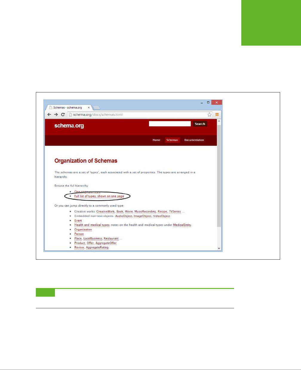
CHAPTER 3: WRITING MORE MEANINGFUL MARKUP 87
OTHER
STANDARDS
THAT BOOST
SEMANTICS
Here’s a microdata-fied version of the hCard microformat you saw earlier:
<div itemscope itemtype="http://schema.org/Person">
<h3 itemprop="name">Mike Rowe</h3>
You can see Mike Rowe’s website at
<a itemprop="url" href="http://www.magicsemantics.com">www.magicsemantics.
com</a>
</div>
FIGURE 3-3
To find a microdata
vocabulary that suits your
information, there are
few better starting points
than the
http://schema.
org/docs/schemas.html
page. Click a link to jump
straight to the definition of
a common vocabulary, like
Person, Organization, or
Event. Or, browse through
the sprawling catalog by
clicking the “Full list of
types” link.
The most significant dierence between microdata and microformats is that micro-
data uses the itemprop attribute to mark up elements instead of the class attribute.
NOTE Since microdata uses its own
itemscope
,
itemtype
, and
itemprop
attributes, rather than the
class
attribute, there’s no chance you’ll confuse your semantic markup with your style sheet formatting.
There are plenty of additional details you can mark up using the Person vocabulary.
Common choices include postal and email address, telephone number, birth date,
photo, job title, organization name, gender, nationality, and so on. For the full list of
possible properties, refer to
http://schema.org/Person
.
www.it-ebooks.info

HTML5: THE MISSING MANUAL, SECOND EDITION
88
A PRACTICAL
EXAMPLE:
RETROFITTING
AN “ABOUT
ME” PAGE
NOTE The three standards for rich semantic data—RDFa, microdata, and microformats—all share broad
similarities. They aren’t quite compatible, but the markup is similar enough that the skills you pick up learning
one system are mostly applicable to the others.
A Practical Example: Retrofitting an “About
Me” Page
So far, you’ve learned about the basic structure of two semantic staples: microformats
and microdata. Armed with this knowledge, you could look up a new microformat
(from
http://microformats.org
) or microdata vocabulary (from
http://schema.org
)
and start writing semantically rich markup.
However, life doesn’t usually unfold this way—at least not for most web developers.
Instead, you’ll often need to take a web page that already has all the data it needs
and retrofit the page with semantic data. This task is fairly easy if you keep a few
points in mind:
• Often, you’ll have important data mixed in with content that you want to ignore.
In this case, you can add new elements around each piece of information you
want to capture. Use a <div> if you want a block-level element or a <span> if
you want to get a piece of inline content.
• Don’t worry about the order of your information. As long as you use the right
class names (for a microformat) or property names (for microdata), you can
arrange your markup however you wish.
• If you’re supplying a picture, you can use the <img> element. If you’re supply-
ing a link, you can use the <a> element. The rest of the time, you’ll usually be
marking up ordinary text.
Here’s a typical example. Imagine you start with an “About Me” page (Figure 3-4)
that has content like this:
<h1>About Me</h1>
<img src="face.jpg" alt="Mike's Face">
<p>This website is the work of <b>Mike Rowe Formatte</b>.
His friends know him as <b>The Big M</b>.</p>
<p>You can contact him where he works, at
The Magic Semantic Company (phone
641-545-0234 and ask for Mike) or email mike-f@magicsemantics.com.</p>
<p>Or, visit Mike on the job at:<br>
42 Jordan Gordon Street, 6th Floor<br>
San Francisco, CA 94105<br>
USA<br>
www.it-ebooks.info
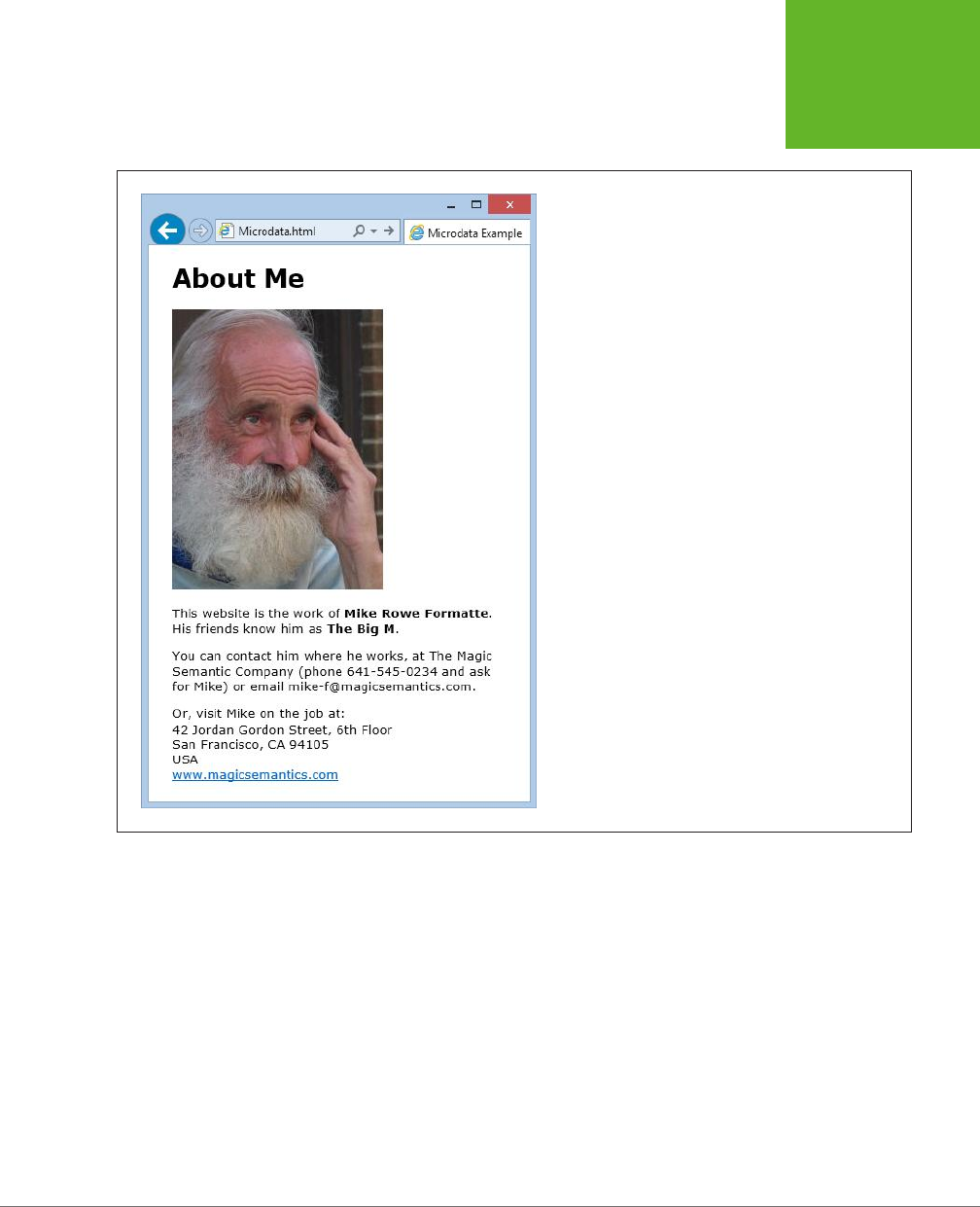
CHAPTER 3: WRITING MORE MEANINGFUL MARKUP 89
A PRACTICAL
EXAMPLE:
RETROFITTING
AN “ABOUT
ME” PAGE
<a href="http://www.magicsemantics.com">www.magicsemantics.com</a>
</p>
FIGURE 3-4
This “About Me” page includes the website author’s contact
details, before adding any microdata.
Clearly, this is a good fit for the familiar Person vocabulary (detailed at
http://
schema.org/Person
). Here’s a first attempt at weaving microdata around the key
details in the “About Me” page. The newly inserted bits of microdata are emphasized
with bold lettering:
<h1>About Me</h1>
<div itemscope itemtype="http://schema.org/Person">
<img itemprop="image" src="face.jpg" alt="Mike's Face">
<p>This website is the work of
<span itemprop="jobTitle" style="display:none">Web Developer</span>
<b itemprop="name">Mike Rowe Formatte</b>.
His friends know him as <b itemprop="additionalname">The Big M</b>.</p>
www.it-ebooks.info

HTML5: THE MISSING MANUAL, SECOND EDITION
90
A PRACTICAL
EXAMPLE:
RETROFITTING
AN “ABOUT
ME” PAGE
<p>You can contact him where he works, at
The Magic Semantic Company</span> (phone
<span itemprop="telephone">641-545-0234</span> and ask for Mike)
or email <span itemprop="email">mike-f@magicsemantics.com</span>.</p>
<p>Or, visit Mike on the job at:<br>
42 Jordan Gordon Street, 6th Floor<br>
San Francisco, CA 94105<br>
USA<br>
<a itemprop="url" href="http://www.magicsemantics.com">www.magicsemantics.
com</a>
</p>
</div>
This example uses a few handy techniques:
• It adds new <span> elements to wrap the bits of content you need for the
microdata.
• It adds the itemprop attribute to existing elements, where doing so makes
sense. For example, the <b> element wraps the name information, so there’s
no need to add an additional <span>. (Of course, you
could
do so. For example,
you might prefer to write something like <b><span itemprop="name">Mike Rowe
Formatte</span></b>.
• It uses a hidden <span> to indicate the person’s job title. (The text is hidden with
an inline style rule that sets the display property to none, as you can see in the
markup above.) This technique lets you hide redundant information, while still
preserving it for search engines and other tools. That said, the content-hiding
technique is a bit controversial, because some tools (like Google) ignore infor-
mation that isn’t made visible to the web page viewer.
It’s common for microdata to have a
nested
structure that puts one microdata vo-
cabulary inside another. For example, in the Person vocabulary you might have a set
of address information nestled inside the personal details. Technically, the address
information all belongs to a separate vocabulary, called PostalAddress.
To mark up the address information, you need to add a new <div> or <span> element
that uses an itemprop, itemscope, or itemtype attribute. The itemprop attribute has
the property name, the itemscope attribute indicates that you’re starting a new
vocabulary to supply the property data, and the itemtype property identifies the
vocabulary by its XML namespace (in this case that’s
http://schema.org/PostalAddress
).
Here’s how it all comes together:
<div itemscope itemtype="http://schema.org/Person">
<img itemprop="image" src="face.jpg" alt="Mike's Face">
<p>This website is the work of
...
www.it-ebooks.info

CHAPTER 3: WRITING MORE MEANINGFUL MARKUP 91
A PRACTICAL
EXAMPLE:
RETROFITTING
AN “ABOUT
ME” PAGE
<p>Or, visit Mike on the job at:<br>
<span itemprop="address" itemscope
itemtype="http://schema.org/PostalAddress">
...
</span>
</div>
You can then fill in the address details inside the new section:
<div itemscope itemtype="http://schema.org/Person">
<img itemprop="image" src="face.jpg" alt="Mike's Face">
<p>This website is the work of
...
<p>Or, visit Mike on the job at:<br>
<span itemprop="address" itemscope
itemtype="http://schema.org/PostalAddress">
<span itemprop="streetAddress">42 Jordan Gordon Street,
6th Floor</span><br>
<span itemprop="addressLocality">San Francisco</span>,
<span itemprop="addressRegion">CA</span>
<span itemprop="postalCode">94105</span><br>
<span itemprop="addressCountry">USA</span><br>
</span>
...
</div>
This all makes perfect sense, but you might be wondering how you know
when
to
define a new microdata section inside your first microdata section. Fortunately, the
reference page on
http://schema.org
makes it clear (Figure 3-5).
A similar microdata-within-microdata trick takes place when you mark up the
company name. Here, you need to set the person’s affiliation property using the
Organization vocabulary:
<p>You can contact him where he works, at
<span itemprop="affiliation" itemscope
itemtype="http://schema.org/Organization">
<span itemprop="name">The Magic Semantic Company</span>
</span>
TIP If you don’t fancy filling in all the itemtypes and itemprops yourself, there are online tools that you can
use to generate properly formatted microdata-enriched markup. Two examples are
http://schema-creator.org
and
www.microdatagenerator.com
. With both sites, the idea is the same—you pick your vocabulary, type your
data into the supplied text boxes, and then copy the finished markup.
www.it-ebooks.info
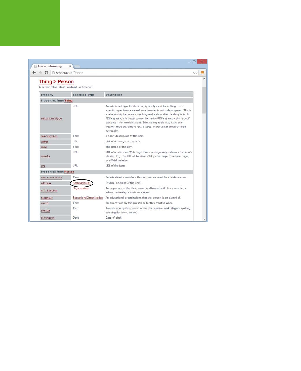
HTML5: THE MISSING MANUAL, SECOND EDITION
92
A PRACTICAL
EXAMPLE:
RETROFITTING
AN “ABOUT
ME” PAGE
FIGURE 3-5
The Person vocabulary
accepts a long list of
properties (only some of
which are shown here).
Most properties take
ordinary text, numbers, or
date values. But some (like
the
address
property,
shown here) use their
own vocabularies (like
PostalAddress). To learn
more about one of these
subsections, just click
the link.
Extracting Semantic Data in Your Browser
Now that you’ve gone to all this trouble, it’s time to see what sort of benefits you
can reap. Although no browser recognizes microformats on its own (at least at the
time of this writing), there are a variety of plug-ins and scripts that can give brows-
ers these capabilities. And it’s not dicult to imagine useful scenarios. For example,
a browser could detect the contact information on a page, list it in a side panel,
and give you commands that would let you add a person to your address book as
quickly as you bookmark a page. A similar trick could detect event information and
let you add it to your calendar in a single click, or find locations and automatically
plot them on a map.
Right now, no plug-in goes that far. However, some hardcore web developers
have created a variety of JavaScript routines that can search for microformats or
metadata, display it in pop-up boxes, or use it in another task. (One example is the
JavaScript-powered Microdata Tool at
http://krofdrakula.github.io/microdata-tool
.)
And some browsers have plug-ins that can spot dierent types of metadata on a
web page (Figure 3-6).
www.it-ebooks.info
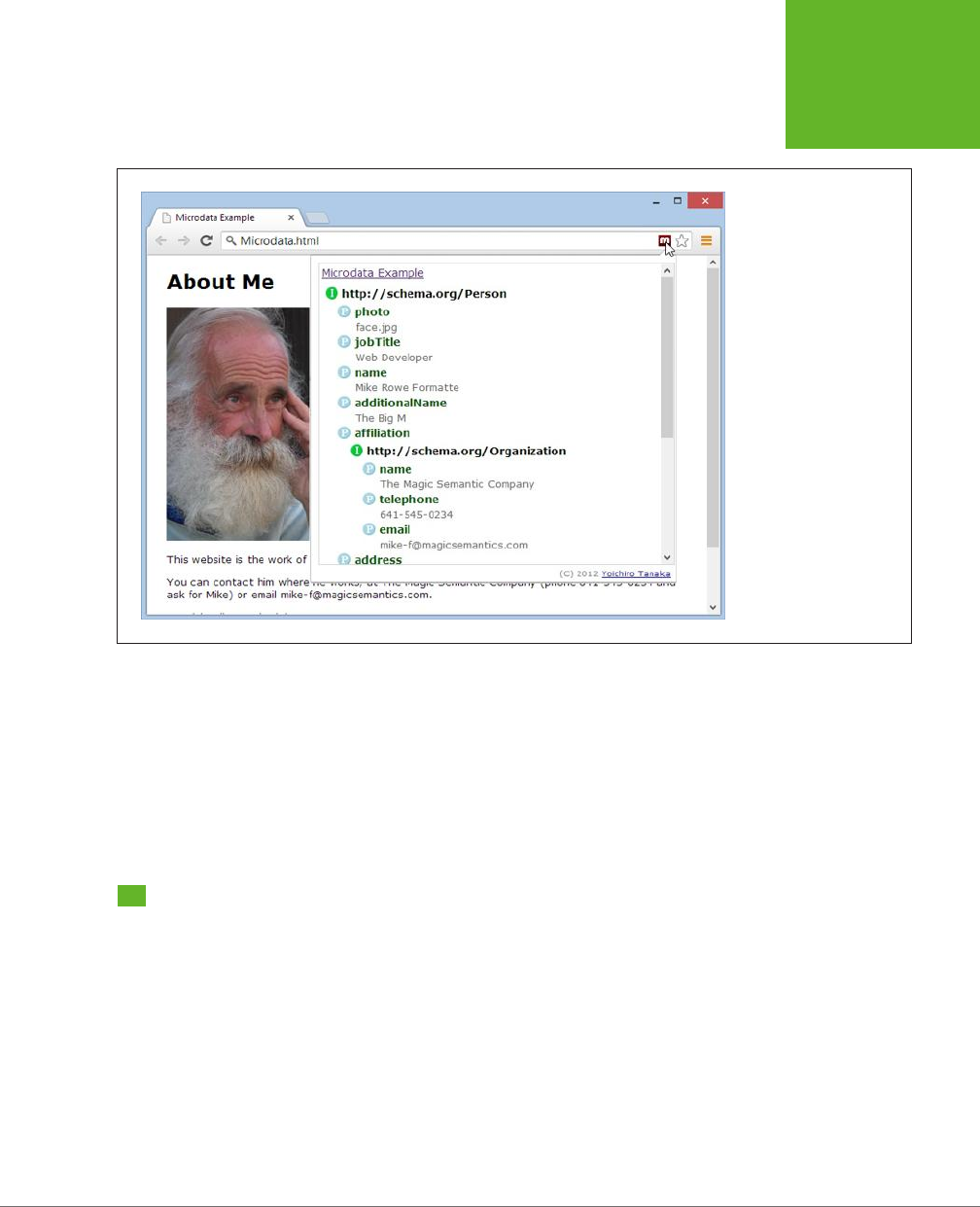
CHAPTER 3: WRITING MORE MEANINGFUL MARKUP 93
HOW SEARCH
ENGINES USE
METADATA
FIGURE 3-6
The Semantic Inspector is
a Chrome extension that
extracts all the microdata
on the current page. Click
its toolbar button, and
you’ll get the semantic
skinny. Here, the Semantic
Inspector examines the
“About Me” page.
The best bet for a microdata future may be for mainstream browsers to incorporate
direct support, just like Internet Explorer and Firefox do for feeds. A
feed
is a special
sort of markup document that provides up-to-date content, like a list of recently
published news articles. For example, if you visit a blog with Firefox, it automatically
detects the blog’s RSS feed and lets you create a “live” bookmark that fetches new
content automatically. This is exactly the sort of value-added feature that could
make microformats really useful.
How Search Engines Use Metadata
Stung your page with semantic details is a great way to win yourself some seri-
ous web-nerd cred. But even hardcore web developers need some sort of payo to
make the extra work (and the messier markup) worthwhile. It’s nice to think about
a world of super-smart, semantically aware browsers, but right now the cold, hard
reality is that web surfers have little more than a few experimental and little-known
browser plug-ins.
Fortunately, there is another reason to embrace rich semantics:
search engine
optimization
(SEO). SEO is the art of making your website more visible in a search
engine—in other words, making it turn up more often in a results page, helping it
get a better ranking for certain keywords, and making it more likely to entice a
www.it-ebooks.info

HTML5: THE MISSING MANUAL, SECOND EDITION
94
HOW SEARCH
ENGINES USE
METADATA
visitor to click through to your site. Good metadata can help with the last part of
this equation. All you do is put the right semantic data on your page, and a search
engine like Google will use it to present a fancier search listing, which can help your
website stand out from the crowd.
Google Rich Snippets
Nowadays, most search engines can understand the metadata in the pages they
catalog. In the rest of this chapter, you’ll focus on what Google does with the meta-
data it finds. There are two reasons to go Google-centric. First, Google is the Earth’s
most popular search engine, with a commanding two-thirds share of worldwide web
searches. Second, Google has been using and promoting metadata for years. The
way it uses metadata today is the way other search engines will do so tomorrow.
Google uses the term
rich snippets
to lump together RDFa, microformats, and mi-
crodata. As you’ve already learned, these approaches share significant similarities
and address the same problem. Google understands them all and attempts to treat
them all equally, so it doesn’t matter which approach you favor. (The following
examples use microdata, with the aim of helping you get onboard with HTML5’s
newest semantic standard.)
To learn more about the metadata that Google supports, you can view Google’s
documentation at
http://tinyurl.com/GoogleRichSnippets
. Not only does it include a
decent overview of RDFa, microformats, and microdata, it also shows many dierent
snippet examples (like contact information, events, products, reviews, recipes, and
so on). Best of all, Google includes an RDFa, microformat, and microdata version of
each example, which can help you translate your semantic skills from one standard
to another, if the need arises.
Enhanced Search Results
To see how Google’s rich snippets feature works, you can use Google’s Structured
Data Testing Tool. This tool checks a page you supply, shows you the semantic data
that Google can extract from the page, and then shows you how Google might use
that information to customize the way it presents that page in someone’s search
results.
NOTE The Structured Data Testing Tool is useful for two reasons. First, it helps validate your semantic
markup. If Google isn’t able to extract all the information you put in the page, or if some of it is assigned to the
wrong property, then you know you’ve done something wrong. Second, it shows you how the semantic data can
change your page’s appearance in Google’s search results.
To use the Structured Data Testing Tool, follow these simple steps:
1. Go to
www.google.com/webmasters/tools/richsnippets
.
This simple page includes a single text box (see Figure 3-7).
www.it-ebooks.info
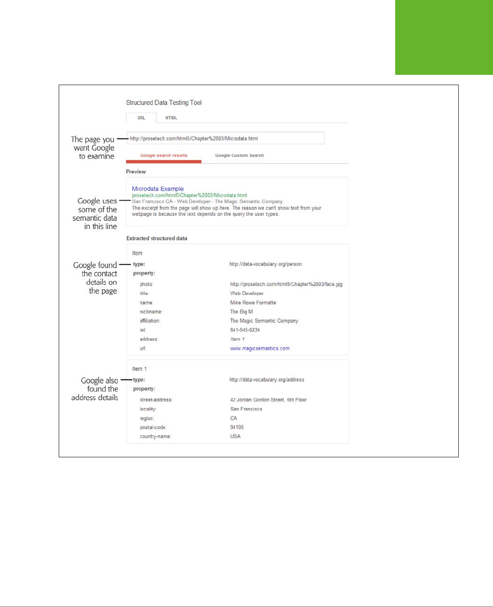
CHAPTER 3: WRITING MORE MEANINGFUL MARKUP 95
HOW SEARCH
ENGINES USE
METADATA
FIGURE 3-7
Here, Google found the person
contact details and address
information (from the microdata
example shown on page 89).
It used this information to add
a gray byline under the page
title with some of the personal
details.
2. If you want to paste in your markup, click the HTML tab.
There are two ways to use the Structured Data Testing Tool, represented by
the two tabs on the page.
• The URL tab asks Google to analyze a page that’s already online. You simply
put in its full web address.
• The HTML tab lets you paste in the chunk of markup you want to analyze
(the complete page isn’t necessary) into a large text box. If you haven’t yet
uploaded your work, this is the most convenient approach.
www.it-ebooks.info
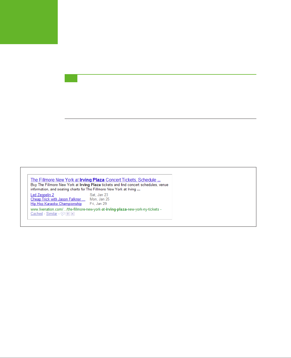
HTML5: THE MISSING MANUAL, SECOND EDITION
96
HOW SEARCH
ENGINES USE
METADATA
3. Type in your URL or paste in your markup. Then click Preview.
You can now review the results (see Figure 3-7). There are two important sec-
tions to review. The “Google search preview” section shows how the page may
appear in a search result. The “Extracted rich snippet data from the page” shows
all the raw semantic data that Google was able to pull out of your markup.
TIP If you see the dreaded “Insufficient data to generate the preview” error message, there are three
possible causes. First, your markup may be faulty. Review the raw data that Google extracted, and make sure it
found everything you put there. If you don’t find a problem here, it’s possible that you’re trying to use a data
type that Google doesn’t yet support or you haven’t included the bare minimum set of properties that Google
needs. To figure out what the problem is, compare your markup with one of Google’s examples at
http://tinyurl.com/
GoogleRichSnippets
.
The method Google uses to emphasize contact details (Figure 3-7) is fairly restrained.
However, contact details are only one of the rich data types that Google recognizes.
Earlier in this chapter (page 85), you saw how to define events using microformats.
Add a list of events to your page, and Google just might include them at the bottom
of your search result, as shown in Figure 3-8.
FIGURE 3-8
This example page has three events. If you
supply a URL with your event listing (as done
here), Google turns each event listing into a
clickable link.
Google is also interested in business listings (which are treated in much the same
way as personal contact details), recipes (which you’ll take a peek at in the next
section), and reviews (which you’ll consider next).
The following example shows the markup you need to turn some review text into
recognizable review microdata. The data standard is defined at
http://schema.org/
Review
. Key properties include itemReviewed (in this case, a restaurant), author (the
person making the review) and reviewBody (the full account of the review). You can
also supply a one-sentence overview (description), the date when the review was
made (datePublished, which supports HTML5’s <time> element), and a score that’s
typically made on a scale from 0 to 5 (reviewRating).
Here’s an example, with all the microdata details highlighted:
<div itemscope itemtype="http://schema.org/Review">
<p itemprop="description">Pretty bad, and then the Health Department showed
up.
</p>
www.it-ebooks.info
CHAPTER 3: WRITING MORE MEANINGFUL MARKUP 97
HOW SEARCH
ENGINES USE
METADATA
<div itemprop="itemReviewed" itemscope itemtype="http://schema.org/Thing">
<span itemprop="name">Jan's Pizza House</span>
</div>
<div>
<span itemprop="author" itemscope itemtype="http://schema.org/Person">
Reviewed by: <span itemprop="name">Jared Elberadi</span>
</span>
on <time itemprop="datePublished" datetime="2014-06-26">January 26</time>
</div>
<div itemprop="reviewBody">I had an urge to mack on some pizza, and this
place was the only joint around. It looked like a bit of a dive, but I went
in hoping to find an undiscovered gem. Instead, I watched a Health
Department inspector closing the place down. Verdict? I didn't get to
finish my pizza, and the inspector recommends a Hep-C shot.</div>
<div itemprop="reviewRating" itemscope itemtype="http://schema.org/Rating">
Rating:<span itemprop="ratingValue">1.5</span></div>
</div>
If you put this microdata-formatted review in a web page, Google gives it truly
special treatment (Figure 3-9).
FIGURE 3-9
Reviews really stand out in search results.
The ranking stars are eye-catching and attract
immediate interest.
www.it-ebooks.info
HTML5: THE MISSING MANUAL, SECOND EDITION
98
HOW SEARCH
ENGINES USE
METADATA
Keen eyes will notice that there are actually
four
microdata formats at work in this
single review. There’s one format for the review itself (
http://schema.org/Review
),
one for the thing you’re reviewing (
http://schema.org/Thing
), one for the person do-
ing the reviewing (
http://schema.org/Person
), and one for the rating system (
http://
schema.org/Rating
). You can use these standards to supply even more details with
your review. For example, you can add the menu of the restaurant, the email address
of the reviewer, or the minimum and maximum values of a custom rating system.
The
http://schema.org/Thing
data format, which is used by the itemReviewed
property, is a bit dierent from the others. At first glance, a vocabulary for “things”
sounds rather vague. This design is intentional—it gives you the flexibility to write
a review about virtually anything, because Thing is a basic vocabulary upon which
many more specialized categories are based. These include products, places, events,
books, music recordings, and much more (see
http://schema.org/docs/full.html
for
the full list of types). In this example, you could easily switch out the Thing vocabulary
for the more specialized Restaurant vocabulary (defined at
http://schema.org/
Restaurant
). However, as this page doesn’t include any extra information about the
restaurant, there’s no need to take this step.
NOTE You can take a similar look at how Bing (Microsoft’s search engine) deals with metadata using the
Bing Markup Validator at
www.bing.com/toolbox/markup-validator
. And if you speak fluent Russian, why not
take a look at Yandex’s microformat validator? It’s available at
http://webmaster.yandex.ru/microtest.xml
.
The Recipe Search Engine
Enhanced search listings are a neat trick, and they can drive new trac into your
website. But still, it’s hard not to want something even more impressive to justify
your newfound semantic skills. Happily, the geniuses at Google are busy dreaming
up the future of search, and it has semantics all over it.
One brilliant idea is to use the semantic information not to tweak how an item is
presented in a search, but to allow smarter search filtering. For example, if people
marked up their résumés using RDFa, microformats, or microdata, Google could
provide a specialized résumé searching feature that looks at this data, considering
résumés from every popular career website and ignoring every other type of web
content. This résumé search engine could also provide enhanced filtering options—for
example, allowing companies to find candidates who have specific accreditations
or have worked for specific companies.
www.it-ebooks.info
CHAPTER 3: WRITING MORE MEANINGFUL MARKUP 99
HOW SEARCH
ENGINES USE
METADATA
TROUBLESHOOTING MOMENT
What to Do When Google Ignores Your Semantic Data
Just because Google
can
show a semantically enriched page in
a certain special way doesn’t mean it
will
. Google uses its own
set of semi-secret rules to determine whether the semantic
information is valuable to the searcher. But here are some
surefire ways to make sure Google ignores your data:
• The semantic data doesn’t represent the main content.
In other words, if you slap your contact details on a page
about fly-fishing, Google isn’t likely to use your contact
information. (After all, the odds are that when web
searchers find this page, they’re searching for something
to do with fishing, and it doesn’t make any sense to see a
byline with your address and business underneath.) On
the other hand, if you put your contact details on your
résumé page, they’re more likely to be used.
• The semantic data is hidden. Google won’t use any content
that’s hidden via CSS.
• Your website uses just a little semantic data. If your site
has relatively few pages that use semantic data, Google
might inadvertently overlook the ones that do.
Avoid these mistakes and you stand a good chance of getting
an enhanced listing.
Right now, Google doesn’t have a resumé search engine. However, Google has ex-
perimented with job search technology for veterans (
http://tinyurl.com/vetjobsearch
)
and product searches (
www.google.ca/merchants
). But one of its more mature
metadata-powered search services is a tool called Recipe View that can hunt through
millions of recipes.
By now, you can probably guess what recipe data looks like when it’s marked up with
microdata or a microformat. The entire recipe sits inside a container that uses the
Recipe data format (that’s
http://data-vocabulary.org/Recipe
). There are separate
properties for the recipe name, the author, and a photo. You can also add a one-
sentence summary and a ranking from user reviews.
Here’s a portion of recipe markup:
<div itemscope itemtype="http://data-vocabulary.org/Recipe">
<h1 itemprop="name">Elegant Tomato Soup</h1>
<img itemprop="photo" src="soup.jpg" alt="A bowl of tomato soup">
<p>By <span itemprop="author">Michael Chiarello</span></p>
<p itemprop="summary">Roasted tomatoes are the key to developing the rich
flavor of this tomato soup.</p>
...
After this, you can include key details about the recipe, including its prep time, cook
time, and yield. You can also add a nested section for nutritional information (with
details about serving size, calories, fat, and so on):
...
<p>Prep time: <time itemprop="prepTime" datetime="PT30M">30 min</time></p>
<p>Cook time: <time itemprop="cookTime" datetime="PT1H">40 min</time></p>
<p>Yield: <span itemprop="yield">4 servings</span></p>
www.it-ebooks.info

HTML5: THE MISSING MANUAL, SECOND EDITION
100
HOW SEARCH
ENGINES USE
METADATA
<div itemprop="nutrition" itemscope
itemtype="http://data-vocabulary.org/Nutrition">
Serving size: <span itemprop="servingSize">1 large bowl</span>
Calories per serving: <span itemprop="calories">250</span>
Fat per serving: <span itemprop="fat">3g</span>
</div>
...
NOTE The
prepTime
and
cookTime
properties are meant to represent a
duration
of time, not a single
instant in time, and so they can’t use the same format as the HTML5
<time>
element. Instead, they use an ISO
format that’s detailed at
http://tinyurl.com/ISOdurations
.
After this is the recipe’s ingredient list. Each ingredient is a separate nested section,
which typically includes information like the ingredient name and quantity:
...
<ul>
<li itemprop="ingredient" itemscope
itemtype="http://data-vocabulary.org/RecipeIngredient">
<span itemprop="amount">1</span>
<span itemprop="name">yellow onion</span> (diced)
</li>
<li itemprop="ingredient" itemscope
itemtype="http://data-vocabulary.org/RecipeIngredient">
<span itemprop="amount">14-ounce can</span>
<span itemprop="name">diced tomatoes</span>
</li>
...
</ul>
...
Writing this part of the markup is tedious. But don’t stop yet—the payo is just ahead.
Finally, the directions are a series of paragraphs or a list of steps. They’re wrapped
up in a single property, like this:
...
<div itemprop="instructions">
<ol>
<li>Preheat oven to 450 degrees F.</li>
<li>Strain the chopped canned tomatoes, reserving the juices.</li>
...
</div>
...
</div>
For a full recipe example, see
http://tinyurl.com/RichSnippetsRecipe
.
www.it-ebooks.info

CHAPTER 3: WRITING MORE MEANINGFUL MARKUP 101
HOW SEARCH
ENGINES USE
METADATA
NOTE Recipes tend to be long and fairly detailed, so marking them up is a long and involved project. This
is a clear case where a good authoring tool could make a dramatic difference. Ideally, this tool would let web
authors enter the recipe details in the text boxes of a nicely arranged window. It would then generate semantically
correct markup that you could place in your web page.
Once Google indexes your marked-up recipe page, it will make that recipe available
through the Recipe View search feature. Here’s how to try out Recipe View:
1. Surf to
www.google.com/landing/recipes
.
You arrive at the Recipe View feature homepage. It includes plenty of infor-
mation about how Recipe View works, including a video that shows a recipe
search in action.
2. Click the “Try Google with Recipe View” button.
This button takes you to the familiar Google search page. However, there’s
something subtly dierent. Under the search box, the Recipes tab is highlighted
in red, which indicates that you’re performing a recipe search.
3. Type a recipe name in the search box and click the search button.
Google starts you out with a search for
chicken pasta
, but you can do better.
4. Click the “Search tools” button (which appears under the right side of the
search box).
Because Google can
understand
the structure of every recipe, it can include
smarter filtering options. When you click “Search tools,” Google calls up three
recipe-specific filtering features, which appear in drop-down lists, just above
the search results (see Figure 3-10).
• Ingredients lets you choose to see only the recipes that include or omit
certain ingredients. You choose by clicking a tiny Yes or No checkbox next
to the corresponding ingredient. (To create the ingredient list, Google
grabs the most commonly used ingredients from the search results for
your search.)
• Any cook time lets you pinpoint fast recipes—for example, ones that take
less than an hour or less than 10 minutes (raw chicken alert).
• Any calories lets you filter out recipes that come in under a specific calorie-
per-portion threshold, which is handy for dieters.
www.it-ebooks.info
HTML5: THE MISSING MANUAL, SECOND EDITION
102
HOW SEARCH
ENGINES USE
METADATA
FIGURE 3-10
After you perform a recipe
search, Google lets you
filter the results based on
some of the metadata that
it found in the matching
recipes. Here, a search
hunts for a tomato soup
recipe that’s heavy on the
basil but avoids tomato
juice.
The semantic data you’ve learned about in this chapter gives web surfers a powerful
information-hunting tool—and a more eective way to find your web pages.
www.it-ebooks.info

103
CHAPTER
4
H
TML forms
are simple HTML controls you use to collect information from
website visitors. They include text boxes people can type into, list boxes they
can pick from, checkboxes they can switch on or o, and so on. On the Web,
forms let people do everything from getting stock quotes to buying concert tickets.
HTML forms have existed almost since the dawn of HTML, and they haven’t changed
a wink since last century, despite some serious eorts. Web standards-makers
spent years cooking up a successor called XForms, which fell as flat as XHTML 2
(see page 4). Although XForms solved some problems easily and elegantly, it also
had its own headaches—for example, XForms code was verbose and assumed that
web designers were intimately familiar with XML. But the biggest hurdle was the
fact that XForms wasn’t compatible with HTML forms in any way, meaning that
developers would need to close their eyes and jump to a new model with nothing
but a whole lot of nerve and hope. But because mainstream web browsers never
bothered to implement XForms—it was too complex and little used—web developers
never ended up taking that leap.
HTML5 takes a dierent approach. It adds refinements to the existing HTML forms
model, which means HTML5-enhanced forms can keep working on older browsers,
just without all the bells and whistles. (This is a good thing, because Internet Ex-
plorer doesn’t support any new form features in versions before IE 10.) HTML5 also
adds practical form features that developers were already using but that previously
required a pile of JavaScript code or a JavaScript toolkit. Now, HTML5 makes these
features easily accessible.
In this chapter, you’ll tour all the new features of HTML5 forms. You’ll see which ones
are supported, which ones aren’t, and which workarounds can help you smooth
Building Better
Web Forms
www.it-ebooks.info
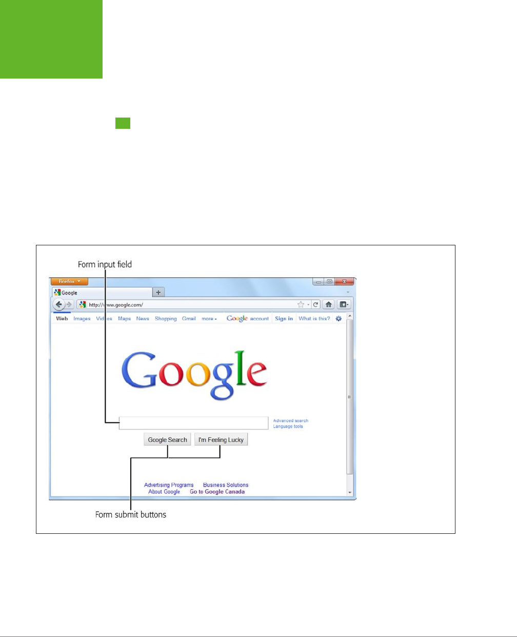
HTML5: THE MISSING MANUAL, SECOND EDITION
104
UNDERSTANDING
FORMS
over the dierences. You’ll also consider a feature that isn’t technically part of the
HTML5 forms standard but is all about interactivity—putting a rich HTML editor in
an ordinary web page.
Understanding Forms
Odds are that you’ve worked with forms before. But if you’re a bit sketchy on the
details, the following recap will refresh your memory.
A
web form
is a collection of text boxes, lists, buttons, and other clickable widgets
that a web surfer uses to supply some sort of information to a website. Forms are
all over the Web—they allow you to sign up for email accounts, review products,
and make bank transactions. The simplest possible form is the single text box that
adorns search engines like Google (see Figure 4-1).
FIGURE 4-1
Google’s Spartan search
page holds a basic HTML
form. You use it in the
same way you use any
form: You enter some
information (in this case,
search keywords), and click
a button to submit that
information.
All basic web forms work in the same way. The user fills in some information and
then clicks a button. At that point, the server collects all the data that the user has
entered and sends it back to the web server. On the web server, some sort of appli-
cation digests the information and takes the appropriate next step. The server-side
program might consult a database, either to read or to store some information,
before sending a new page back to the web browser.
www.it-ebooks.info
CHAPTER 4: BUILDING BETTER WEB FORMS 105
REVAMPING A
TRADITIONAL
HTML FORM
The tricky part of this discussion is that there are hundreds of ways to build the
server-side part of the equation—that’s the application that processes the information
that’s submitted from the form. Some developers may use stripped-down scripts
that let them manipulate the raw form data, while others may work with higher-level
models that package the form details in neat programming objects. But either way,
the task is basically the same. You examine the form data, do something with it, and
then send back a new page.
NOTE This book doesn’t make any assumptions about your choice of server-side programming tool. In fact,
it doesn’t really matter, because you still need to use the same set of form elements, and these elements are still
bound by the same HTML5 rules.
UP TO SPEED
Bypassing Form Submission with JavaScript
It’s worth noting that forms aren’t the only way to send
user-entered information to a web server (although they
were, once upon a time). Today, crafty developers can use
the
XMLHttpRequest
object (page 377) in JavaScript code
to quietly communicate with a web server. For example,
the Google search page uses this approach in two different
ways—first, to get search suggestions, which it displays in a
drop-down list; and second, to get a search results page as
you type, if you’ve enabled the Google Instant feature (
www.
google.com/instant
).
It might occur to you that JavaScript can completely bypass
the form submission step, as it does in Google Instant. But
while it’s possible to offer this technique as a
feature
, it’s not
acceptable to include it as a
requirement
. That’s because the
JavaScript approach isn’t bulletproof (for example, it may
exhibit the occasional quirk on a slow connection) and there’s
still a small fraction of people with no JavaScript support or
with JavaScript turned off in their browsers.
Finally, it’s worth noting that it’s perfectly acceptable to have a
page that includes a form but never
submits
that form. You’ve
probably seen pages that perform simple calculations (for
example, a mortgage interest rate calculator). These forms
don’t need any help from the server, because they can perform
their calculations entirely in JavaScript and display the result
on the current page. For that reason, these forms never need
to submit their data.
From the HTML5 point of view, it really doesn’t matter whether
you submit your form to a server, use the data in an ordinary
JavaScript routine, or pass it back to the server through
XML-
HttpRequest
. In all cases, you’ll still build your form using
the standard HTML forms controls.
Revamping a Traditional HTML Form
The best way to learn about HTML5 forms is to take a typical example from today
and enhance it. Figure 4-2 shows the example you’ll start out with.
The markup is dishwater-dull. If you’ve worked with forms before, you won’t see
anything new here. First, the entire form is wrapped in a <form> element:
<form id="zooKeeperForm" action="processApplication.cgi">
<p><i>Please complete the form. Mandatory fields are marked with
a </i><em>*</em></p>
...
www.it-ebooks.info
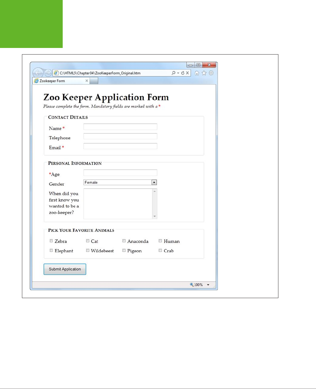
HTML5: THE MISSING MANUAL, SECOND EDITION
106
REVAMPING A
TRADITIONAL
HTML FORM
FIGURE 4-2
If you’ve traveled the Web,
you’ve seen your share of
forms like this one, which
collects basic information
from a web page visitor.
The <form> element bundles together all the form widgets (also known as
controls
or
fields
). It also tells the browser where to post the page when it’s submitted, by
providing a URL in the action attribute. If you plan to do all the work in client-side
JavaScript code, you can simply use a number sign (#) for the action attribute.
www.it-ebooks.info
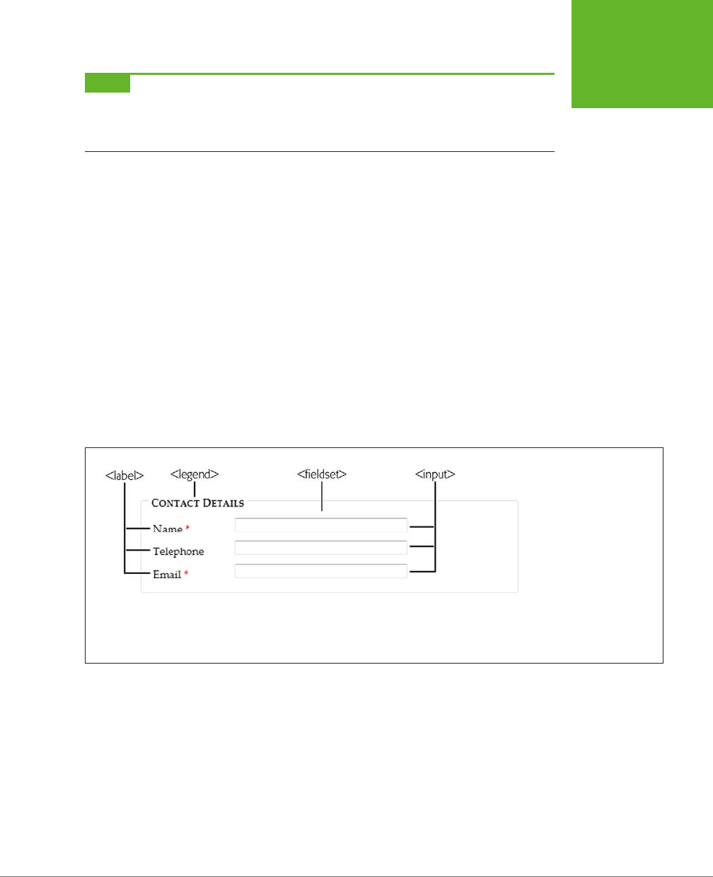
CHAPTER 4: BUILDING BETTER WEB FORMS 107
REVAMPING A
TRADITIONAL
HTML FORM
NOTE HTML5 adds a mechanism for placing form controls outside of the form to which they belong. The
trick is to use the new
form
attribute to refer to the form by its
id
value (as in
form="zooForm"
). However,
browsers that don’t support this feature will completely overlook your data when the form is submitted, which
means this minor feature is still too risky to use in a real web page.
A well-designed form, like the zookeeper application, divides itself into logical chunks
using the <fieldset> element. Each chunk gets a title, courtesy of the <legend>
element. Here’s the <fieldset> for the Contact Details section (which is dissected
in Figure 4-3):
...
<fieldset>
<legend>Contact Details</legend>
<label for="name">Name <em>*</em></label>
<input id="name"><br>
<label for="telephone">Telephone</label>
<input id="telephone"><br>
<label for="email">Email <em>*</em></label>
<input id="email"><br>
</fieldset>
...
FIGURE 4-3
This
<fieldset>
collects
three pieces of information:
a name, telephone number,
and email address. For each
piece of information, you
supply a caption (using
the
<label>
element)
and a control to collect the
data (using an
<input>
,
<textarea>
, or
<select>
element).
As in all forms, the bulk of the work is handled by the all-purpose <input> element,
which collects text and creates checkboxes, radio buttons, and list buttons. Along
with <input>, the <textarea> element gives people a way to enter multiple lines
of text, and the <select> element creates a list. If you need a refresher, Table 4-1
will fill you in.
www.it-ebooks.info
HTML5: THE MISSING MANUAL, SECOND EDITION
108
REVAMPING A
TRADITIONAL
HTML FORM
TABLE 4-1
Form controls
CONTROL HTML ELEMENT DESCRIPTION
Single-line textbox <input type="text">
<input type="password">
Shows a text box where visitors can
type in text. If you use the password
type, the browser won’t display the
text. Instead, visitors see an asterisk (*)
or a bullet (•) in place of each letter as
they type in their password.
Multiline textbox <textarea>...</textarea> Shows a large text box that can fit
multiple lines of text.
Checkbox <input type="checkbox"> Shows a checkbox that can be
switched on or off.
Radio button <input type="radio"> Shows a radio button (a circle you can
turn on or off). Usually, you have a
group of radio buttons with the same
value for the name attribute, in which
case the visitor can select only one.
Button <input type="submit">
<input type="image">
<input type="reset">
<input type="button">
Shows the standard clickable button.
A submit button always gathers up
the form data and sends it to its
destination. An image button does
the same thing, but it lets you display
a clickable picture instead of the
standard text-on-a-button. A reset
button clears the visitor’s selections
and text from all the input controls.
A button button doesn’t do anything
unless you add some JavaScript code.
List <select>...</select> Shows a list where your visitor can
select one or more items. You add an
<option> element for each item in the
list.
Here’s the rest of the zookeeper form markup, with a few new details (a <select>
list, checkboxes, and the button that submits the form):
...
<fieldset>
<legend>Personal Information</legend>
<label for="age"><em>*</em>Age</label>
<input id="age"><br>
<label for="gender">Gender</label>
<select id="gender">
<option value="female">Female</option>
<option value="male">Male</option>
</select><br>
www.it-ebooks.info

CHAPTER 4: BUILDING BETTER WEB FORMS 109
REVAMPING A
TRADITIONAL
HTML FORM
<label for="comments">When did you first know you wanted to be a
zoo-keeper?</label>
<textarea id="comments"></textarea>
</fieldset>
<fieldset>
<legend>Pick Your Favorite Animals</legend>
<label for="zebra"><input id="zebra" type="checkbox"> Zebra</label>
<label for="cat"><input id="cat" type="checkbox"> Cat</label>
<label for="anaconda"><input id="anaconda" type="checkbox"> Anaconda
</label>
<label for="human"><input id="human" type="checkbox"> Human</label>
<label for="elephant"><input id="elephant" type="checkbox"> Elephant
</label>
<label for="wildebeest"><input id="wildebeest" type="checkbox">
Wildebeest</label>
<label for="pigeon"><input id="pigeon" type="checkbox"> Pigeon</label>
<label for="crab"><input id="crab" type="checkbox"> Crab</label>
</fieldset>
<p><input type="submit" value="Submit Application"></p>
</form>
You can find the full example, along with the relatively simple style sheet that for-
mats it, on the try-out site (
http://prosetech.com/html5
). Look for the
Zookeeper-
Form_Original.html
file to play around with a traditional, unenhanced version of the
form, and
ZookeeperForm_Revised.html
to get all the HTML5 goodies.
NOTE One limit of HTML forms is that you can’t change how the browser draws controls. For example, if you
want to replace the standard dull gray checkbox with a big black-and-white box with a fat red checkmark image,
you can’t. (The alternative is to create a normal element that has checkbox-like behavior using JavaScript—in
other words, it changes its appearance back and forth when someone clicks it.)
HTML5 keeps this no-customization limit in place and extends it to the new controls you’ll learn about in this
chapter. That means ordinary HTML5 forms aren’t enough for web developers who want complete control over
the look of their pages. Instead, they’ll need a JavaScript toolkit like jQuery UI.
Now that you’ve got a form to work with, it’s time to start improving it with HTML5. In
the following sections, you’ll start small, with placeholder text and an autofocus field.
Adding Hints with Placeholders
Forms usually start out empty. But a column of blank text boxes can be a bit in-
timidating, especially if it’s not absolutely clear what belongs inside each text box.
That’s why you commonly see some sort of sample text inside otherwise-empty
text boxes. This placeholder text is also called a
watermark
, because it’s often given
a light-gray color to distinguish it from real, typed-in content. Figure 4-4 shows a
placeholder in action.
www.it-ebooks.info

HTML5: THE MISSING MANUAL, SECOND EDITION
110
REVAMPING A
TRADITIONAL
HTML FORM
To create a placeholder, simply use the placeholder attribute:
<label for="name">Name <em>*</em></label>
<input id="name" placeholder="Jane Smith"><br>
<label for="telephone">Telephone</label>
<input id="telephone" placeholder="(xxx) xxx-xxxx"><br>
FIGURE 4-4
Top: When a field is
empty, its placeholder text
appears, as with the Name
and Telephone fields shown
here.
Bottom: When the user
clicks in the field (giving it
focus), the placeholder text
disappears. When the form
filler moves on to another
field, the placeholder text
reappears, as long as the
text box is still empty.
Browsers that don’t support placeholder text just ignore the placeholder attribute;
Internet Explorer (before IE 10) is the main culprit. Fortunately, it’s not a big deal,
since placeholders are just nice form frills, not essential to your form’s functioning.
If it really bothers you, there are plenty of JavaScript patches that can bring IE up
to speed, painlessly, at
http://tinyurl.com/polyfills
.
Right now, there’s no standard, consistent way to change the appearance of place-
holder text (for example, to italicize it or to change the text color). Eventually, browser
makers will create the CSS styling hooks that you need—in fact, they’re hashing out
the details even as you read this. But to get it to work right now, you need to fiddle
with browser-specific pseudo-classes (namely, -webkit-input-placeholder for
Chrome, -ms-input-placeholder for Internet Explorer, and –moz-placeholder for
Firefox). Page 443 has the full details about pseudo-classes, and page 183 explains
the awkward world of browser-specific styles.
However, you can use the better-supported focus pseudo-class without any head-
aches. You use it to change the way a text box looks when it gets the focus. For
example, you might want to assign a darker background color to make it stand out:
input:focus {
background: #eaeaea;
}
www.it-ebooks.info

CHAPTER 4: BUILDING BETTER WEB FORMS 111
REVAMPING A
TRADITIONAL
HTML FORM
UP TO SPEED
Writing Good Placeholders
You don’t need placeholders for every text box. Instead, you
should use them to clear up potential ambiguity. For example,
no one needs an explanation about what goes in a First Name
box, but the Name box in Figure 4-4 isn’t quite as obvious.
The placeholder text makes it clear that there’s room for a
first and a last name.
Sometimes placeholders include a sample value—in other
words, something you might actually type into the box. For
example, Microsoft’s Hotmail login page (
www.hotmail.com
)
uses the text
someone@example.com
for a placeholder, mak-
ing it obvious that you should enter your email address in the
box—not your name or any other information.
Other times, placeholders indicate the way a value should be
formatted. The telephone box in Figure 4-4 is an example—it
shows the value
(xxx) xxx-xxxx
to concisely indicate that
telephone numbers should consist of a three-digit area code,
followed by a sequence of three, then four digits. This place-
holder doesn’t necessarily mean that differently formatted
input isn’t allowed, but it does offer a suggestion that uncertain
people can follow.
There are two things you shouldn’t try with a placeholder. First,
don’t try to cram in a description of the field or instructions. For
example, imagine you have a box for a credit card’s security
code. The text “The three digits listed on the back of your card”
is
not
a good placeholder. Instead, consider adding a text note
under the input box, or using the
title
attribute to make a
pop-up window appear when someone hovers over the field:
<label for="promoCode">Promotion Code
</label>
<input id="promoCode" placeholder="QRB001"
title="Your promotion code is three
letters followed by three numbers">
Second, you shouldn’t add special characters to your place-
holder in an attempt to make it obvious that your placeholder
is not real, typed-in text. For example, some websites use
placeholders like
[John Smith]
instead of
John Smith
, with the
square brackets there to emphasize that the placeholder is just
an example. This convention can be confusing.
Focus: Starting in the Right Spot
After loading up your form, the first thing your visitors want to do is start typing.
Unfortunately, they can’t—at least not until they tab over to the first control, or click
it with the mouse, thereby giving it
focus
.
You can make this happen with JavaScript by calling the focus() method of the
appropriate <input> element. But this involves an extra line of code and can some-
times cause annoying quirks. For example, it’s sometimes possible for the user to
click somewhere else and start typing before the focus() method gets called, at
which point focus is rudely transferred back to the first control. But if the browser
were able to control the focus, it could be a bit smarter, and transfer focus only if
the user hasn’t already dived into another control.
That’s the idea behind HTML5’s autofocus attribute, which you can add to a single
<input> or <textarea> element, like this:
<label for="name">Name <em>*</em></label>
<input id="name" placeholder="Jane Smith" autofocus><br>
www.it-ebooks.info

HTML5: THE MISSING MANUAL, SECOND EDITION
112
VALIDATION:
STOPPING
ERRORS
The autofocus attribute has similar support as the placeholder attribute, which
means basically every browser recognizes it except IE 9 and older. Once again, it’s
easy enough to plug the hole. You can check for autofocus support using Modernizr
(page 31) and then run your own autofocus code if needed. Or, you can use a ready-
made JavaScript polyfill that adds autofocus support (
http://tinyurl.com/polyfills
).
However, it hardly seems worth it for such a minor frill, unless you’re also aiming to
give IE support for other form features, like the validation system discussed next.
Validation: Stopping Errors
The fields in a form are there to gather information from web page visitors. But no
matter how politely you ask, you might not get what you want. Impatient or confused
visitors can skip over important sections, enter partial information, or just hit the
wrong keys. The end result? They click Submit, and your website gets a whackload
of scrambled data.
What a respectable web page needs is
validation
—a way to catch mistakes when
they happen (or even better, to prevent them from happening at all). For years,
developers have done that by writing their own JavaScript routines or using profes-
sional JavaScript libraries. And, truthfully, these approaches work perfectly well. But
seeing as validation is so common (just about everyone needs to do error-checking),
and seeing as validation generally revolves around a few key themes (for example,
spotting invalid email addresses or dates), and seeing as validation is boring (no one
really wants to write the same code for every form, not to mention
test
it), there’s
clearly room for a better way.
The creators of HTML5 spotted this low-hanging fruit and invented a way for browsers
to help out, by getting them to do the validation work instead of web developers.
They devised a
client-side
validation system (see the box on page 113) that lets you
embed common error-checking rules into any <input> field. Best of all, this system
is easy—all you need to do is insert the right attribute.
How HTML5 Validation Works
The basic idea behind HTML5 form validation is that you indicate where validation
should happen, but you don’t actually
implement
the tedious details. It’s a bit like
being promoted into a management job, just without the pay raise.
For example, imagine you decide a certain field cannot be left blank—the form filler
needs to supply some sort of information. In HTML5, you can make this demand by
adding the required attribute:
<label for="name">Name <em>*</em></label>
<input id="name" placeholder="Jane Smith" autofocus required><br>
www.it-ebooks.info

CHAPTER 4: BUILDING BETTER WEB FORMS 113
VALIDATION:
STOPPING
ERRORS
UP TO SPEED
Validating in Two Places
Throughout the years, crafty developers have approached the
validation problem in different ways. Today, the consensus
is clear. To make a bulletproof form, you need two types of
error-checking:
• Client-side validation. These are the checks that happen
in the browser,
before
a form is submitted. The goal here
is to make life easier for the people filling out the form.
Instead of waiting for them to complete three dozen
text boxes and click a submit button, you want to catch
problems in the making. That way you can pop up a helpful
error message right away and in the right spot, allowing
the form filler to correct the mistake before submitting
the form to the server.
• Server-side validation. These are the checks that happen
after
a form is sent back to the web server. At this point,
it’s up to your server-side code to review the details and
make sure everything is kosher before continuing. No
matter what the browser does, server-side validation
is essential. It’s the only way to defend yourself from
malicious people who are deliberately trying to tamper
with form data. If your server-side validation detects a
problem, you send back a page with an error message.
So client-side validation (of which HTML5 validation is an ex-
ample) is there to make life easier for your web page visitors,
while server-side validation ensures correctness. The key thing
to understand is that you need both types of validation—unless
you have an exceedingly simple form where mistakes aren’t
likely or aren’t a big deal.
Initially, there’s no visual detail to indicate that a field is required. For that reason,
you might want to use some other visual clue, such as giving the text box a dier-
ent border color or placing an asterisk next to the field (as in the zookeeper form).
Validation kicks in only when the form filler clicks a button to submit the form. If the
browser implements HTML5 forms, then it will notice that a required field is blank,
intercept the form submission attempt, and show a pop-up message that flags the
invalid field (Figure 4-5).
As you’ll see in the following sections, dierent attributes let you apply dierent
error-checking rules. You can apply more than one rule to the same input box, and
you can apply the same rule to as many <input> elements as you want (and to the
<textarea> element). All the validation conditions must be met before the form
can be submitted.
This raises a good question: What happens if form data breaks more than one rule—
for example, it has multiple required fields that aren’t filled in?
Once again, nothing happens until the person filling out the form clicks the submit
button. Then, the browser begins examining the fields from top to bottom. When it
finds the first invalid value, it stops checking any further. It cancels the form submis-
sion and pops up an error message next to this value. (Additionally, if the oending
text box isn’t currently visible, the browser scrolls up just enough that it appears at
the top of the page.) If the visitor corrects the problem and clicks the submit button
again, the browser will stop and highlight the next invalid value.
www.it-ebooks.info
HTML5: THE MISSING MANUAL, SECOND EDITION
114
VALIDATION:
STOPPING
ERRORS
FIGURE 4-5
Here’s the same required
field in Chrome (top), Inter-
net Explorer (middle), and
Firefox (bottom). Browsers
are free to choose the exact
way they notify people
about validation problems,
but they all use a pop-up
box that looks like a styl-
ized tooltip. Unfortunately,
you can’t customize the
formatting of this box or
change the wording of the
validation message—at
least not yet.
NOTE Web browsers hold off on validation until a submit button is clicked. This ensures that the validation
system is efficient and restrained, so it works for everyone.
Some web developers prefer to alert people as soon as they leave an invalid field (when they tab away or click
somewhere else with the mouse). This sort of validation is handy in long forms, especially if there’s a chance
that someone may make a similar mistake in several different fields. Unfortunately, HTML5 doesn’t have a way
for you to dictate when the web browser does its validation, although it’s possible that it might add one in the
future. For now, if you want immediate validation messages, it’s best to write the JavaScript yourself or to use
a good JavaScript library.
Turning Validation O
In some cases, you may need to disable the validation feature. For example, you
might need to turn it o for testing to verify that your server-side code deals ap-
propriately with invalid data. To turn validation o for an entire form, you add the
novalidate attribute to the containing <form> element:
<form id="zooKeeperForm" action="processApplication.cgi" novalidate>
www.it-ebooks.info
CHAPTER 4: BUILDING BETTER WEB FORMS 115
VALIDATION:
STOPPING
ERRORS
The other option is to provide a submit button that bypasses validation. This tech-
nique is sometimes useful in a web page. For example, you may want to enforce
strict validation for the ocial submit button but provide another button that does
something else (like storing half-completed data for later use). To allow this, add
the formnovalidate attribute to the <input> element that represents your button:
<input type="submit" value="Save for Later" formnovalidate>
You’ve now seen how to use validation to catch missing information. Next, you’ll
learn to search for errors in dierent types of data.
NOTE Planning to validate numbers? There’s no validation rule that forces text to contain digits, but there
is a new
number
data type, which you’ll examine on page 126. Unfortunately, its support is still sketchy.
Validation Styling Hooks
Although you can’t style validation messages, you can change the appearance of
the input fields based on whether or not they’re validated. For example, you can
give invalid values a dierent background color, which will appear in the text box
as soon as the browser detects the problem.
To use this technique, you simply need to add a few new pseudo-classes (page 443).
Your options include the following:
• required and optional, which apply styles to fields based on whether they use
the required attribute.
• valid and invalid, which apply styles to controls based on whether they
contain mistakes. But remember that most browsers won’t actually discover
invalid values until the visitor tries to submit the form, so you won’t see the
invalid formatting right away.
• in-range and out-of-range, which apply formatting to controls that use the min
and max attributes to limit numbers to a range (page 127).
For example, if you want to give required <input> fields a light-yellow background,
you could use a style rule with the required pseudo-class:
input:required {
background-color: lightyellow;
}
Or, you might want to highlight only those fields that are required and currently
hold invalid values by combining the required and invalid pseudo-classes like this:
input:required:invalid {
background-color: lightyellow;
}
With this setting, blank fields are automatically highlighted, because they break the
required-field rule.
www.it-ebooks.info

HTML5: THE MISSING MANUAL, SECOND EDITION
116
VALIDATION:
STOPPING
ERRORS
You can use all sorts of other tricks, like combining the validation pseudo-classes
with the focus pseudo-class, or using an oset background that includes an error
icon to flag invalid values. Of course, a hefty disclaimer applies: You can use these
pseudo-classes to improve your pages, but make sure your form still looks good
without them, because support lags in older browsers.
Validating with Regular Expressions
The most powerful (and complex) type of validation that HTML5 supports is based
on regular expressions. Seeing as JavaScript already supports regular expression,
adding this feature to HTML forms makes perfect sense.
A
regular expression
is a pattern written using the regular expression language.
Regular expressions are designed to match patterned text—for example, a regular
expression can make sure that a postal code has the right sequence of letters and
digits, or that an email address has an @ symbol and a domain extension that’s at
least two characters long. For example, consider this expression:
[A-Z]{3}-[0-9]{3}
The square brackets at the beginning define a range of allowed characters. In other
words, [A-Z] allows any uppercase letter from A to Z. The curly brackets that fol-
low multiply this eect, so {3} means you need three uppercase letters. The dash
that follows doesn’t have a special meaning, so it indicates that a dash must follow
the three-letter sequence. Finally, [0-9] allows a digit from 0 to 9, and {3} requires
three of them.
Regular expression matching is useful for searching (finding pattern matches in a
long document) and validation (verifying that a value matches a pattern). HTML5
forms use regular expressions for validation.
NOTE Regular expression geeks take note: You don’t need the magic ^ and $ characters to match the begin-
ning or end of a value in a field. HTML5 assumes both details automatically, which means a regular expression
must match the
entire
value in a field in order to be deemed valid.
These values are valid, because they match the pattern shown above:
QRB-001
TTT-952
LAA-000
But these values are not:
qrb-001
TTT-0952
LA5-000
www.it-ebooks.info
CHAPTER 4: BUILDING BETTER WEB FORMS 117
VALIDATION:
STOPPING
ERRORS
Regular expressions quickly get much more complex than this example. Writing a
regular expression can be quite a chore, which is why most developers simply search
for a ready-made regular expression that validates the type of data they want to
check. Or they get help.
TIP To learn just enough about the regular expression language to make your own super-simple expres-
sions, check out the concise tutorials at
http://tinyurl.com/regexp-object
or
http://tinyurl.com/jsregex
. To find
ready-made regular expressions that you can use with your forms, visit
http://regexlib.com
. And to become a
regular expression guru, read
Mastering Regular Expressions
by Jeffrey Friedl (O’Reilly).
Once you have a regular expression, you can enforce it in any <input> or <textarea>
element by adding the pattern attribute:
<label for="promoCode">Promotion Code</label>
<input id="promoCode" placeholder="QRB-001" title=
"Your promotion code is three uppercase letters, a dash, then three numbers"
pattern="[A-Z]{3}-[0-9]{3}">
Figure 4-6 shows what happens if you break the regular expression rule.
TIP Browsers don’t validate blank values. In this example, a blank promotion code passes muster. If this isn’t
what you want, then combine the
pattern
attribute with the
required
attribute.
FIGURE 4-6
Smart browsers (like Google Chrome, shown here) don’t
just catch the mistake, they also grab the text from the
title
attribute and display that as well, to help guide
the person who’s filling out the form.
NOTE Regular expressions seem like a perfect match for email addresses (and they are). However, hold
off on using them this way, because HTML5 already has a dedicated input type for email addresses that has the
correct regular expression baked in (page 125).
Custom Validation
The HTML5 specification also outlines a set of JavaScript properties that let you find
out if fields are valid (or force the browser to validate them). The most useful of these
is the setCustomValidity() method, which lets you write custom validation logic
for specific fields and have it work with the HTML5 validation system.
www.it-ebooks.info
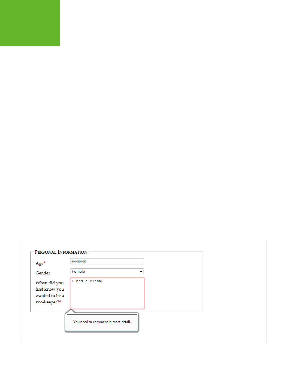
HTML5: THE MISSING MANUAL, SECOND EDITION
118
VALIDATION:
STOPPING
ERRORS
Here’s how it works. First, you need to check the appropriate field for errors. You
do this by handling the onInput event, which is nothing new:
<label for="comments">When did you first know you wanted to be a
zookeeper?</label>
<textarea id="comments" oninput="validateComments(this)"></textarea>
In this example, the onInput event triggers a function named validateComments().
It’s up to you to write this function, check the current value of the <input> element,
and then call setCustomValidity().
If the current value has problems, you need to supply an error message when you
call setCustomValidity(). Or, if the current value checks out, you need to call
setCustomValidity() with an empty string. This clears any error custom messages
that you may have set earlier.
Here’s an example that forces the text in the comment box to be at least 20 char-
acters long:
function validateComments(input) {
if (input.value.length < 20) {
input.setCustomValidity("You need to comment in more detail.");
}
else {
// There's no error. Clear any error message.
input.setCustomValidity("");
}
}
Figure 4-7 shows what happens if someone breaks this rule and then tries to submit
the form.
FIGURE 4-7
When you supply an error
message with
setCustom-
Validity()
, the browser
treats it the same as its own
built-in validation messages.
Try to submit the form, and
you’ll see a pop-up warning
with your message text.
www.it-ebooks.info
CHAPTER 4: BUILDING BETTER WEB FORMS 119
BROWSER
SUPPORT FOR
WEB FORMS
AND VALIDATION
Of course, you could solve this problem more neatly with a regular expression that
requires long strings. But while regular expressions are great for validating some
data types, custom validation logic can do
anything
, from complex algebra to con-
tacting the web server.
NOTE Remember, your web page visitors can see anything you put in JavaScript, so it’s no place for secret
algorithms. For example, you might know that in a valid promotional code, the digits always add up to 12. But
you probably don’t want to reveal that detail in a custom validation routine, because it will help shifty people
cook up fake codes. Instead, keep this sort of validation in the web server.
Browser Support for Web Forms and
Validation
Browser makers added support for HTML5 forms in pieces. That means some
browser builds support some validation features while ignoring others. Table 4-2
indicates the minimum browser versions you need to use to get solid support for
all the validation tricks you’ve learned so far. As this table indicates, there are two
potential support headaches: old versions of IE, and mobile browsers that run on
smartphones and tablets.
TABLE 4-2
Browser support for validation
IE FIREFOX CHROME SAFARI OPERA
SAFARI
IOS
CHROME
FOR
ANDROID
Minimum
version
10 4 10 5* 10 - 28
* Safari doesn’t support the required attribute.
Because HTML5 validation doesn’t replace the validation you do on your web server,
you may see it as a frill, in which case you can accept this uneven support. Browsers
that don’t implement validation, like IE 9, let people submit forms with invalid dates,
but you can then catch these problems on the web server and return the same page
with error details.
On the other hand, your website might include complex forms with lots of potential
for confusion, and you might not be ready to accept a world of frustrated IE users.
In this case, you have two basic choices: Fall back on your own validation system or
use a JavaScript library that adds the missing smarts. Your choice depends on the
extent and complexity of your validation.
www.it-ebooks.info

HTML5: THE MISSING MANUAL, SECOND EDITION
120
BROWSER
SUPPORT FOR
WEB FORMS
AND VALIDATION
Testing for Support with Modernizr
If all your form needs is a smattering of simple validation, it’s probably worth adding
your own checks. Using Modernizr (page 31), you can check for a variety of HTML5
web forms features. For example, use the Modernizr.input.pattern property to
check whether the current browser recognizes the pattern attribute:
if (!Modernizr.input.pattern) {
// The current browser doesn't perform regular expression validation.
// You can use the regular expression features in JavaScript instead.
...
}
NOTE The
pattern
property is just one of the properties exposed by
Modernizr.input
object. Other
properties that are useful for testing web form support include
placeholder
,
autofocus
,
required
,
max
,
min
, and
step
.
Of course, this example doesn’t tell you
when
to perform this check or
how
to react.
If you want your validation to mimic the HTML5 validation system, it makes sense to
perform your validation when the person viewing the form attempts to submit it. You
do this by handling the form’s onSubmit event and then returning either true (which
means the form is valid and the browser can submit it) or false (which means the
form has a problem and the browser should cancel the operation):
<form id="zooKeeperForm" action="processApplication.cgi"
onsubmit="return validateForm()">
Here’s an example of a very simple custom validation routine that enforces required
fields:
function validateForm() {
if (!Modernizr.input.required) {
// The required attribute is not supported, so you need to check the
// required fields yourself.
// First, get an array that holds all the elements.
var inputElements = document.getElementById("zooKeeperForm").elements;
// Next, move through that array, checking each element.
for(var i = 0; i < inputElements.length; i++) {
// Check if this element is required.
if (inputElements[i].hasAttribute("required")) {
// If this element is required, check if it has a value.
// If not, the form fails validation, and this function returns false.
if (inputElements[i].value == "") return false;
}
}
www.it-ebooks.info
CHAPTER 4: BUILDING BETTER WEB FORMS 121
BROWSER
SUPPORT FOR
WEB FORMS
AND VALIDATION
// If you reach this point, everything worked out and the browser
// can submit the form.
return true;
}
}
TIP This block of code relies on a number of basic JavaScript techniques, including element lookup, a loop,
and conditional logic. To learn more about all these details, check out Appendix B, “JavaScript: The Brains of Your
Page.”
Polyfilling with HTML5Forms
If you have a complex form and you want to save some eort (while at the same time
preparing for the future), you may prefer to use a JavaScript patch to solve all your
problems. Technically, the approach is the same—your page will check for validation
support and then perform validation manually if necessary. The dierence is that
the JavaScript library already has all the tedious code you need.
At
http://tinyurl.com/polyfills
, you can find a long, intimidating list of JavaScript
libraries that all attempt to do more or less the same thing. One oldie but goody
is the HTML5Forms library, which is available from
http://tinyurl.com/html5forms
.
To get a copy, click the Download ZIP button. You’ll be rewarded with a Zip folder
stued full of files. Unzip it, and you’ll find a pile of useful scripts (in the
shared/js
folder) and a long list of example pages (in the
tests/html5forms
folder).
To get started with HTML5Forms, copy the
shared
folder (with all its subfolders) to
your website folder. You can rename it to something else (for example,
html5forms
instead of
shared
), as long as you tweak the name in your script references. Once
you’ve copied the files, you need to add two references to your web page, like this:
<head>
<title>...</title>
<script src="shared/js/modernizr.com/Modernizr-2.5.3.forms.js"></script>
<script src="shared/js/html5Forms.js" data-webforms2-support="all"
data-webforms2-force-js-validation="true">
</script>
...
<head>
The first reference points to a small build of Modernizr (here, it’s named
Modernizr-
2.5.3.forms.js
) that’s included with HTML5Forms, and provides feature detection,
ensuring that the validation workarounds are loaded only if the browser needs
them. If you’re already using Modernizr, you should omit this reference. Just make
sure that your Modernizr build includes the form detection options. These are the
options that begin with forms- (for example, forms-validation) on the “Non-core
detects” section of the Modernizr download page.
www.it-ebooks.info

HTML5: THE MISSING MANUAL, SECOND EDITION
122
BROWSER
SUPPORT FOR
WEB FORMS
AND VALIDATION
The second reference is to the HTML5Forms library. After the familiar src attribute,
you’ll see one or more attributes that specify the features you need. In the example
above, the script loads all the webforms features. HTML5Forms is a modular library,
which means you can opt to use only some of its features. This strategy ensures
that your pages don’t perform any extra work to load up features you don’t need.
Here’s an example that turns on basic support for validation, required fields, and
placeholders:
<script src="shared/js/html5Forms.js"
data-webforms2-support="validation,placeholder"
data-webforms2-force-js-validation="true">
TIP If you want to pick a different combination of features, look for a corresponding example page file in
the
tests/html5forms
folder that’s included with the HTML5Forms download.
HTML5Forms library also adds surprisingly good support for the form features you’ll
learn about next, like the slider, date picker, and color chooser. Still, there are inevi-
table gaps and minor bugs buried in the code. If you plan to use these newer controls,
you should test your site with old browser versions (like IE 9) before you go live.
GEM IN THE ROUGH
A Few Rogue Input Attributes
HTML5 recognizes a few more attributes that can control
browser behavior when editing forms, but aren’t used for
validation. Not all of these attributes apply to all browsers.
Still, they make for good experimenting:
• spellcheck. Some browsers try to help you avoid
embarrassment by spell-checking the words you type in
an input box. The obvious problem is that not all text is
meant to be real words, and there are only so many red
squiggles a web surfer can take before getting just a bit
annoyed. Set
spellcheck
to
false
to recommend
that the browser not spellcheck a field, or
true
to
recommend that it does. (Browsers differ on their default
spell-checking behavior, which is what you get if you don’t
set the
spellcheck
attribute at all.)
• autocomplete. Some browsers try to save you
time by offering you recently typed-in values when you
enter information in a field. This behavior isn’t always
appropriate—as the HTML5 specification points out, some
types of information may be sensitive (like nuclear attack
codes) or may be relevant for only a short amount of
time (like a one-time bank login code). In these cases,
set
autocomplete
to
off
to recommend that the
browser not offer autocomplete suggestions. You can
also set
autocomplete
to
on
to recommend it for a
particular field.
• autocorrect and autocapitalize. Use
these attributes to control automatic correction and
capitalization features on some mobile devices—namely,
the version of Safari that runs on iPads and iPhones.
• multiple. Web designers have been adding the
multiple
attribute to the
<select>
element to create
multiple-selection lists since time immemorial. But now
you can add it to certain types of
<input>
elements,
including ones that use the
file
type (for uploading
files) and ones that use the
email
type (page 125). On a
supporting browser, the user can then pick several files
to upload at once, or stick multiple email addresses in
one box.
www.it-ebooks.info

CHAPTER 4: BUILDING BETTER WEB FORMS 123
NEW TYPES OF
INPUT
New Types of Input
One of the quirks of HTML forms is that one ingredient—the vaguely named <input>
element—is used to create a variety of controls, from checkboxes to text boxes to
buttons. The type attribute is the master switch that determines what each <input>
element really is.
If a browser runs into an <input> element with a type that it doesn’t recognize, the
browser treats it like an ordinary text box. That means these three elements get
exactly the same treatment in every browser:
<input type="text">
<input type="super-strange-wonky-input-type">
<input>
HTML5 uses this default to its benefit. It adds a few new data types to the <input>
element, secure in the knowledge that browsers will treat them as ordinary text
boxes if they don’t recognize them. For example, if you need to create a text box
that holds an email address, you can use the new input type email:
<label for="email">Email <em>*</em></label>
<input id="email" type="email"><br>
If you view this page in a browser that doesn’t directly support the email input type
(like Internet Explorer 9), you’ll get an ordinary text box, which is perfectly acceptable.
But browsers that support HTML5 forms are a bit smarter. Here’s what they can do:
• Oer editing conveniences. For example, an intelligent browser or a handy
JavaScript widget might give you a way to get an email from your address book
and pop it into an email field.
• Restrict potential errors. For example, browsers can ignore letters when you
type in a number text box. Or, they can reject invalid dates (or just force you to
pick one from a mini calendar, which is easier
and
safer).
• Perform validation. Browsers can perform more sophisticated checks when you
click a submit button. For example, an intelligent browser will spot an obviously
incorrect email address in an email box and refuse to continue.
The HTML5 specification doesn’t give browser makers any guidance on the first
point. Browsers are free to manage the display and editing of dierent data types
in any way that makes sense, and dierent browsers can add dierent little luxuries.
For example, mobile browsers take advantage of this information to customize their
virtual keyboards, hiding keys that don’t apply (see Figure 4-8).
www.it-ebooks.info
HTML5: THE MISSING MANUAL, SECOND EDITION
124
NEW TYPES OF
INPUT
FIGURE 4-8
When people use a mobile
device to fill out a form,
they don’t have the luxury
of entering information
on a full keyboard. The
iPod makes life easier by
customizing the virtual
keyboard depending on
the data type, so
telephone numbers get a
telephone-style numeric
keypad (left), while email
addresses get a dedicated
@ button and a smaller
space bar (right).
The error-prevention and error-checking features are more important. At a bare
minimum, a browser that supports HTML5 web forms must prevent a form from
being submitted if it contains data that breaks the data type rules. So if the browser
doesn’t prevent errors (according to the second point in the previous list), it must
validate them when the user submits the data (that’s the third point).
Unfortunately, not all current browsers live up to this requirement. Some recognize the
new data types and provide some sort of editing niceties but no validation. Many under-
stand one data type but not another. Mobile browsers are particularly problematic—they
provide some editing conveniences but currently have none of the validation.
Table 4-3 lists the new data types and the browsers that support them completely—
meaning that they prevent forms from being submitted when the data type rules
are broken.
TABLE 4-3
Browser compatibility for new input types
DATA TYPE IE FIREFOX CHROME SAFARI OPERA
email 10 4 10 5 10.6
url 10 4 10 5 10.6
search*n/a n/a n/a n/a n/a
tel*n/a n/a n/a n/a n/a
www.it-ebooks.info

CHAPTER 4: BUILDING BETTER WEB FORMS 125
NEW TYPES OF
INPUT
DATA TYPE IE FIREFOX CHROME SAFARI OPERA
number 10 - 10 5 9
range 10 23 6 5 11
date, month,
week, time
- - 10 - 11
color - - 20 - -**
* The HTML5 standard does not require validation for this data type.
** Opera supported the color input type in versions 11 and 12, but removed this support in more recent
versions.
TIP Incidentally, you can test for data type support in Modernizr using the properties of the
Modernizr.
inputtypes
object. For example,
Modernizr.inputtypes.range
returns
true
if the browser supports
the
range
data type.
Email Addresses
Email addresses use the email type. Generally, a valid email address is a string of
characters (with certain symbols not allowed). An email address must contain the @
symbol and a period, and there needs to be at least one character between them and
two characters after the period. These are, more or less, the rules that govern email
addresses. However, writing the right validation logic or regular expression for email
addresses is a surprisingly subtle task that has tripped up many a well-intentioned
developer. Which is why it’s great to find web browsers that support the email data
type and perform validation automatically (see Figure 4-9).
FIGURE 4-9
Firefox refuses to accept the
space in this spurious email
address.
Email boxes support the multiple attribute, which allows the field to hold multiple
email addresses. However, these multiple email addresses still look like a single piece
of text—you just separate each one with a comma.
NOTE Remember, blank values bypass validation. If you want to force someone to enter a valid email
address, you need the
email
data type combined with the
required
attribute (page 112).
www.it-ebooks.info

HTML5: THE MISSING MANUAL, SECOND EDITION
126
NEW TYPES OF
INPUT
URLs
URLs use the url type. What constitutes a valid URL is still a matter of hot debate.
But most browsers use a relatively lax validation algorithm. It requires a URL prefix
(which could be legitimate, like
http://
, or made up, like
bonk://
), and accepts spaces
and most special characters other than the colon (:).
Some browsers also show a drop-down list of URL suggestions, which is typically
taken from the browser’s history of recently visited pages.
Search Boxes
Search boxes use the search type. A search box is generally meant to contain key-
words that are then used to perform some sort of search. It could be a search of the
entire Web (as with Google, in Figure 4-1), a search of a single page, or a custom-built
search routine that examines your own catalog of information. Either way, a search
box looks and behaves almost exactly like a normal text box.
On some browsers, like Safari, search boxes are styled slightly dierently, with
rounded corners. Also, as soon as you start typing in a search box in Safari or
Chrome, a small X icon appears on the right side that you can click to clear the box.
Other than these very minor dierences, search boxes
are
text boxes. The value is
in the semantics. In other words, you use the search data type to make the purpose
of the box clear to browsers and assistive software. They can then guide visitors to
the right spot or oer other smart features—maybe, someday.
Telephone Numbers
Telephone numbers use the tel type. Telephone numbers come in a variety of
patterns. Some use only numbers, while others incorporate spaces, dashes, plus
signs, and parentheses. Perhaps it’s because of these complications that the HTML5
standard doesn’t ask browsers to perform any telephone number validation at all.
However, it’s hard to ignore the feeling that a tel field should at least reject letters
(which it doesn’t).
Right now, the only value in using the tel type is to get a customized virtual keyboard
on mobile browsers, which focuses on numbers and leaves out letters.
Numbers
HTML5 defines two numeric data types. The number type is the one to use for or-
dinary numbers.
The number data type has obvious potential. Ordinary text boxes accept anything:
numbers, letters, spaces, punctuation, and the symbols usually reserved for cartoon
character swearing. For this reason, one of the most common validation tasks is to
check that a given value is numeric and falls in the right range. But use the number
data type, and the browser automatically ignores all non-numeric keystrokes. Here’s
an example:
<label for="age">Age<em>*</em></label>
<input id="age" type="number"><br>
www.it-ebooks.info
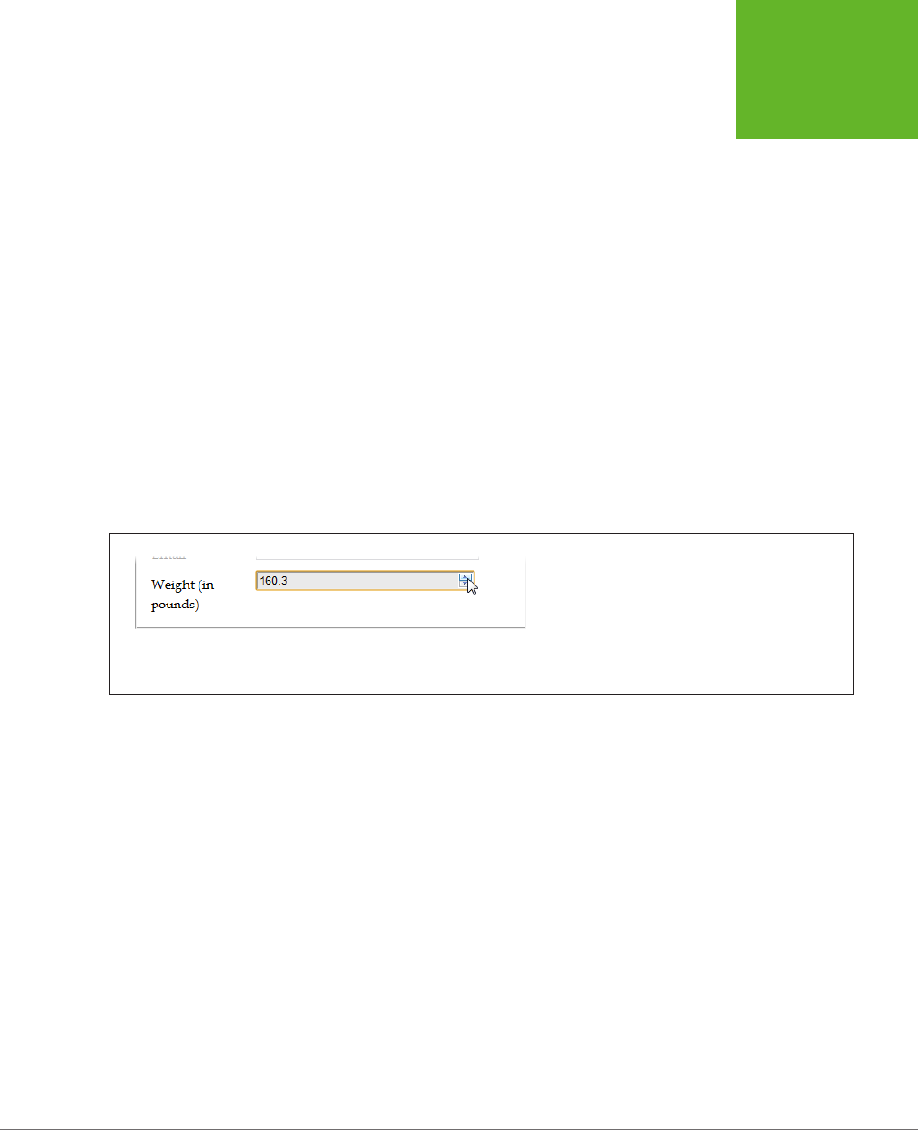
CHAPTER 4: BUILDING BETTER WEB FORMS 127
NEW TYPES OF
INPUT
Of course, there are plenty of numbers, and they aren’t all appropriate for every
kind of data. The markup shown above allows ages like 43,000 and -6. To fix this,
you need to use the min and max attributes. Here’s an example that limits ages to
the reasonable range of 0 to 120:
<input id="age" type="number" min="0" max="120"><br>
Ordinarily, the number data type accepts only whole numbers, so a fractional age
like 30.5 isn’t accepted. (In fact, some browsers won’t even let you type the deci-
mal point.) However, you can change this too by setting the step attribute, which
indicates the acceptable intervals for the number. For example, a minimum value of
0 and a step of 0.1 means you can use values like 0, 0.1, 0.2, and 0.3. Try to submit
a form with 0.15, however, and you’ll get the familiar pop-up error message. The
default step is 1.
<label for="weight">Weight (in pounds)</label>
<input id="weight" type="number" min="50" max="1000"
step="0.1"value="160"><br>
The step attribute also aects how the spin buttons work in the number box, as
shown in Figure 4-10.
FIGURE 4-10
Many browsers add spin buttons to number boxes. Every
time you click the up arrow, the number increases by
the step value (unless you reach the maximum allowed
number). Similarly, when you click the down arrow, the
number decreases by one step.
Sliders
The range type is HTML5’s other numeric data type. Like the number type, it can
represent whole numbers or fractional values. It also supports the same attributes
for setting the range of allowed values (min and max). Here’s an example:
<label for="weight">Weight (in pounds)</label>
<input id="weight" type="range" min="50" max="1000" value="160"><br>
The dierence is the way the range type presents its information. Instead of ask-
ing you to type the value you want in a text box, intelligent browsers show a slider
control (Figure 4-11).
www.it-ebooks.info
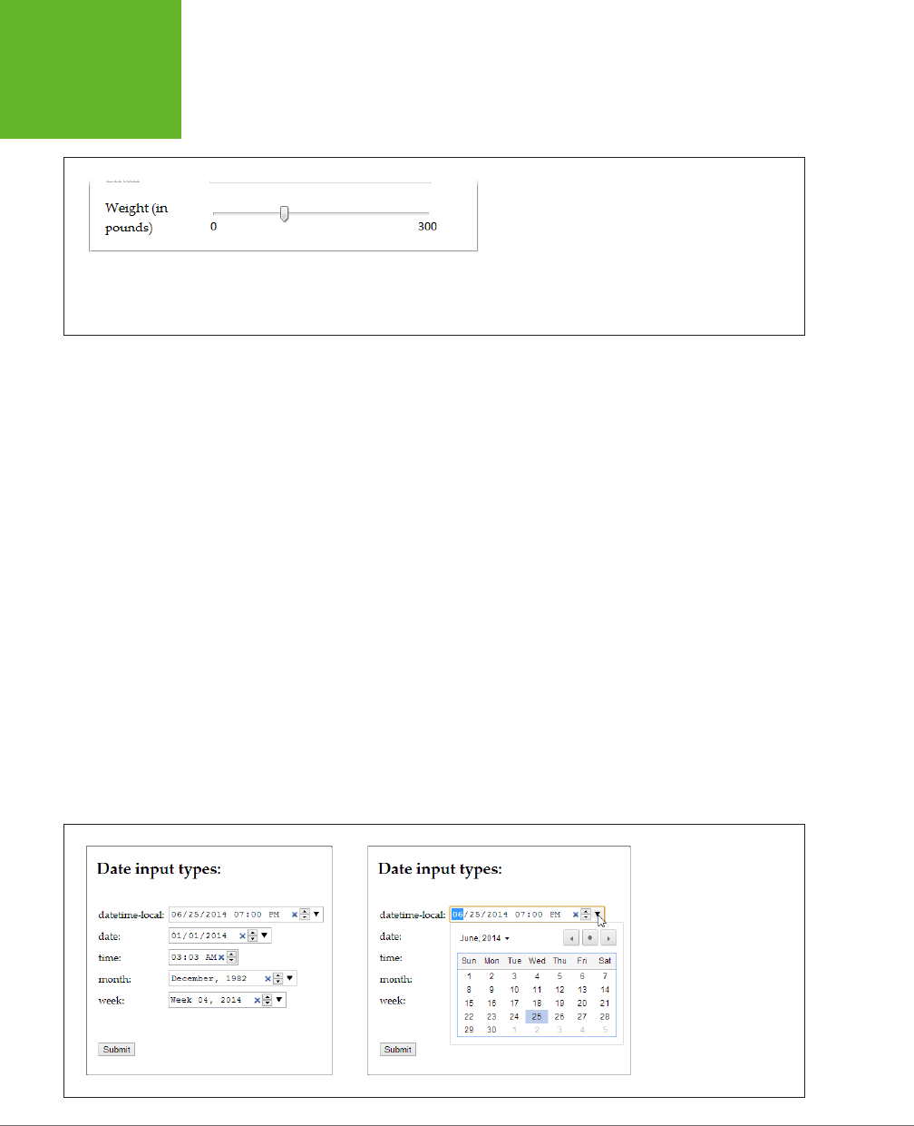
HTML5: THE MISSING MANUAL, SECOND EDITION
128
NEW TYPES OF
INPUT
FIGURE 4-11
You’ve probably used range-like controls to set things
like sound volume. They work well for information where
there’s a narrow range of values between a known mini-
mum and a known maximum, and the specific numeric
value isn’t important (but the placement of that value
relative to the minimum and maximum is).
To set a range type, you simply pull the tab to the position you want, somewhere
between the minimum and maximum values at either end of the slider. Browsers
that support the range type don’t give any feedback about the specific value that’s
set. If you want that piece of information, you need to add a scrap of JavaScript
that reacts when the slider changes (perhaps by handling the onChange event) and
then displays the value nearby. Of course, you’d also want to check if the current
browser supports the range type (using a tool like Modernizr). If the browser doesn’t
support the range type, there’s no need to take any extra steps, because the value
will show up in an ordinary text box.
Dates and Times
HTML5 defines several date-related types. Browsers that understand the date types
can provide handy drop-down calendars for people to pick from. Not only does this
clear away confusion about the right way to format the date, but it also prevents people
from accidentally (or deliberately) picking a date that doesn’t exist. And smart brows-
ers can go even further—for example, adding integration with a personal calendar.
Right now, the date types are poorly supported, despite their obvious usefulness.
Chrome and Opera are the only browsers that provide drop-down calendars (see
Figure 4-12). Other browsers ignore date data types and show ordinary, unvalidated
text boxes instead.
FIGURE 4-12
The
<input>
boxes
look slightly different
when storing date and
time information (left).
But the real convenience
that supporting browsers
provide is the drop-down
calendar that lets you set
these values with a proper
date, and no formatting
headaches (right).
www.it-ebooks.info
CHAPTER 4: BUILDING BETTER WEB FORMS 129
NEW TYPES OF
INPUT
TIP If you decide to use one of the date types, consider using a polyfill like HTML5Forms library (page 121)
for older browsers. That’s because it’s easy for people on non-supporting browsers to enter dates in the wrong
format, and it’s tedious for you to validate date data and provide the appropriate guidance. (That’s also why
custom JavaScript date controls already exist—and why they’re all over the Web.)
Table 4-4 explains the six date formats.
TABLE 4-4
Date data types
DATE TYPE DESCRIPTION EXAMPLE
date A date in the format
YYYY-MM-DD
. January 25, 2014:
2014-01-25
time A 24-hour time with an optional
seconds portion, in the format
HH:mm:ss.ss
.
2:35 p.m. (and 50.2 seconds):
14:35
or
14:35:50.2
datetime-local A date and a time, separated
by a capital T (so the format is
YYYY-MM-DDTHH:mm:ss
).
January 25, 2014, 2:35 p.m:
2014-01-15T14:35
datetime A date and a time, like the
datetime-local data type, but
with a time-zone offset. This uses
the same format (
YYYY-MM-DD
HH:mm:ss-HH:mm
) as the <time>
element you considered on page 78.
However, the datetime format is not
supported reliably in any browser
and may be removed in the future,
so use datetime-local instead.
January 25, 2014, 2:35 p.m.,
in New York:
2014-01-15 14:35-05:00
month A year and month number, in the
format
YYYY-MM
.
First month in 2014:
2014-01
week A year and week number, in the
format
YYYY-Www
. Note that there
can be 52 or 53 weeks, depending
on the year.
Second week in 2014:
2014-W02
TIP Browsers that support the date types also support the
min
and
max
attributes with them. That means
you can set maximum and minimum dates, as long as you use the right date format. So, to restrict a
date
field
to dates in the year 2014, you would write
<input type="date" min="2014-01-01" max="2014-
12-31">
.
Colors
Colors use the color data type. The color type is an interesting, albeit little-used,
frill that lets a web page visitor pick a color from a drop-down color picker, which
looks like what you might see in a desktop paint program. Currently, Chrome is the
only browser to add one. Opera had one briefly, in versions 10 and 11, but removed
it after deciding it was too experimental.
www.it-ebooks.info
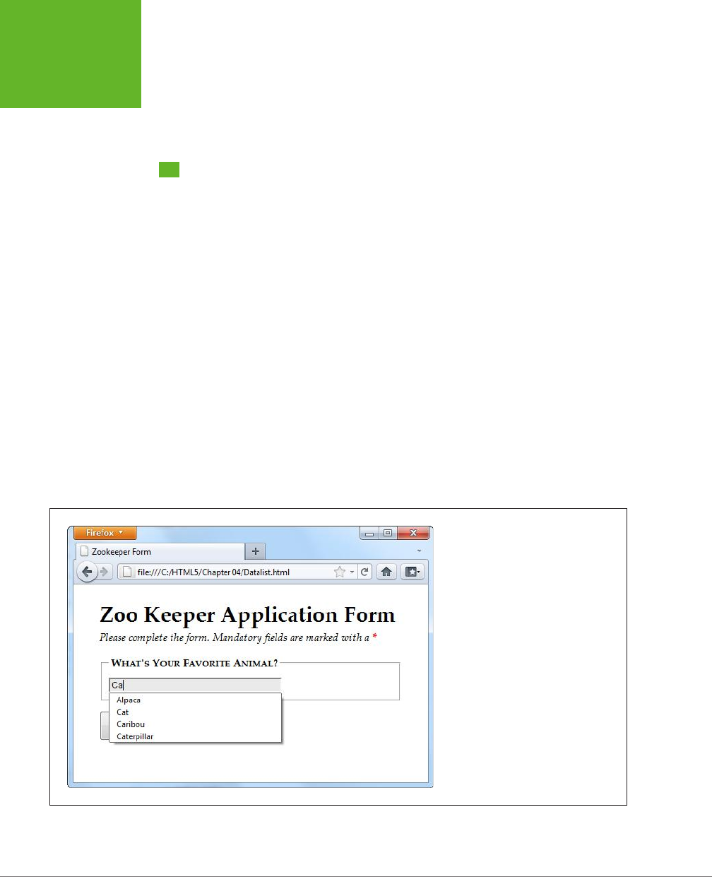
HTML5: THE MISSING MANUAL, SECOND EDITION
130
NEW ELEMENTS
In browsers that don’t support the color type, form-fillers will need to type a hexa-
decimal color code on their own (or you can use the Html5Forms library described
on page 121).
New Elements
So far, you’ve learned how HTML5 extends forms with new validation features and
how it gets smarter about data by adding more input types. These are the most
practical and the most widely supported new features, but they aren’t the end of
the HTML5 forms story.
HTML5 also introduces a few entirely new elements to fill gaps and add features. Using
these nifty new elements, you can add a drop-down list of suggestions, a progress
bar, a toolbar, and more. The problem with new elements is that old browsers are
guaranteed not to support them, and even new browsers are slow to wade in when
the specification is still changing. As a result, these details include some of the
least
supported features covered in this chapter. You may want to see how they work, but
you’ll probably wait to use them, unless you’re comfortable inching your way out
even further into the world of browser quirks and incompatibilities.
Input Suggestions with <datalist>
The <datalist> element gives you a way to fuse a drop-down list of suggestions
to an ordinary text box. It gives people filling out a form the convenience to pick an
option from the list, or the freedom to type exactly what they want (see Figure 4-13).
FIGURE 4-13
As you type, the browser shows you
potential matches. For example, type in
the letters “ca,” and the browser shows
you every animal that has that letter
sequence somewhere in its name (and not
necessarily at the beginning).
www.it-ebooks.info

CHAPTER 4: BUILDING BETTER WEB FORMS 131
NEW ELEMENTS
To use a datalist, you must first start with a standard text box. For example, imagine
you have an ordinary <input> element like this:
<legend>What's Your Favorite Animal?</legend>
<input id="favoriteAnimal">
To add a drop-down list of suggestions, you need to create a datalist. Technically,
you can place that <datalist> element anywhere you want. That’s because the
datalist can’t display itself—instead, it simply provides data that an input box will
use. However, it makes logical sense to place the <datalist> element just after or
just before the <input> element that uses it. Here’s an example:
<datalist id="animalChoices">
<option label="Alpaca" value="alpaca">
<option label="Zebra" value="zebra">
<option label="Cat" value="cat">
<option label="Caribou" value="caribou">
<option label="Caterpillar" value="caterpillar">
<option label="Anaconda" value="anaconda">
<option label="Human" value="human">
<option label="Elephant" value="elephant">
<option label="Wildebeest" value="wildebeest">
<option label="Pigeon" value="pigeon">
<option label="Crab" value="crab">
</datalist>
The datalist uses <option> elements, just like the traditional <select> element.
Each <option> element represents a separate suggestion that may be oered to
the form filler. The label shows the text that appears in the text box, while the value
tracks the text that will be sent back to the web server, if the user chooses that
option. On its own, a datalist is invisible. To hook it up to a text box so it can start
providing suggestions, you need to set the list attribute to match the ID of the
corresponding datalist:
<input id="favoriteAnimal" list="animalChoices">
Current versions of Chrome, Internet Explorer, Firefox, and Opera support the
datalist. They’ll show the list of possible matches shown in Figure 4-13. But Safari,
older versions of Internet Explorer (IE 9 and before), and mobile browsers will ignore
the list attribute and the datalist markup, rendering your suggestions useless.
However, there’s a clever fallback trick that makes other browsers behave properly.
The trick is to put other content inside the datalist. This works because browsers
that support the datalist pay attention to <option> elements only, and ignore all
other content. Here’s a revised example that exploits this behavior. (The bold parts
are the markup that datalist-supporting browsers will ignore.)
<legend>What's Your Favorite Animal?</legend>
<datalist id="animalChoices">
<span class="Label">Pick an option:</span>
www.it-ebooks.info

HTML5: THE MISSING MANUAL, SECOND EDITION
132
NEW ELEMENTS
<select id="favoriteAnimalPreset">
<option label="Alpaca" value="alpaca">
<option label="Zebra" value="zebra">
<option label="Cat" value="cat">
<option label="Caribou" value="caribou">
<option label="Caterpillar" value="caterpillar">
<option label="Anaconda" value="anaconda">
<option label="Human" value="human">
<option label="Elephant" value="elephant">
<option label="Wildebeest" value="wildebeest">
<option label="Pigeon" value="pigeon">
<option label="Crab" value="crab">
</select>
<br>
<span class="Label">Or type it in:</span>
</datalist>
<input list="animalChoices" name="list">
If you remove the bold markup, you end up with the same markup you had before.
That means browsers that recognize the datalist still show the single input box and
the drop-down suggestion list, as shown in Figure 4-13. But on other browsers,
the additional details wrap the datalist suggestion in a traditional select list, giving
users the option of typing in what they want or picking it from a list (Figure 4-14).
FIGURE 4-14
You can still use your suggestions on
browsers that don’t support the datalist.
But you need to wrap them in a
<select>
list first.
www.it-ebooks.info

CHAPTER 4: BUILDING BETTER WEB FORMS 133
NEW ELEMENTS
This eect isn’t completely seamless. When you receive the form data on the
web server, you need to check for data from the list (in this example, that’s
favoriteAnimalPreset) and from the text box (that’s favoriteAnimal). But
other than this minor wrinkle, you’ve got a solid way to add new conveniences
without leaving anyone behind.
NOTE When the datalist was first created, it had a feature that let it fetch suggestions from somewhere
else—for example, it could call a web server, which could then pull a list of suggestions out of a database. This
feature might still be added in a future version of the HTML standard, but for now it’s possible only if you write
JavaScript code to handle the fetching, with the help of the
XMLHttpRequest
object (page 377).
Progress Bars and Meters
The <progress> and <meter> element are two new graphical widgets that look similar
but serve dierent purposes (Figure 4-15).
FIGURE 4-15
The
<progress>
and
<meter>
elements are
nice visual conveniences,
on the browsers that
support them (left). Other
browsers simply substi-
tute the fallback content
you’ve set (right).
The <progress> element indicates how far a task has progressed. It uses a gray back-
ground that’s partially filled in with a pulsating green bar. The <progress> element
resembles the progress bars you’ve probably seen before (for example, when the
Windows operating system is copying files), although its exact appearance depends
on the browser being used to view the page.
The <meter> element indicates a value within a known range. It looks similar to the
<progress> element, but the green bar is a slightly dierent shade, and it doesn’t
pulse. Depending on the browser, the meter bar may change color when a value is
classified as “too low” or “too high”—for example, in the latter case Chrome changes
the bar from green to yellow. But the most important dierence between <progress>
and <meter> is the semantic meaning that the markup conveys.
www.it-ebooks.info

HTML5: THE MISSING MANUAL, SECOND EDITION
134
NEW ELEMENTS
NOTE Technically, the new
<meter>
and
<progress>
elements don’t need to be in a form. In fact,
they aren’t even real controls (because they don’t collect input from the web page visitor). However, the official
HTML5 standard lumps them all together, because in some respects the
<progress>
and
<meter>
elements
feel
like form widgets, probably because they display bits of data in a graphical way.
The latest versions of all major browsers support the <progress> and <meter> ele-
ments. However, you’ll run into trouble on older versions of Internet Explorer (IE 9
and before) and some mobile browsers. To guarantee support for everyone, you’ll
need to polyfill this feature with something like HTML5Forms (page 121).
Using the <progress> and <meter> elements is easy. First, consider the <progress>
element. It takes a value attribute, which sets the percentage of progress (and thus
the width of the green fill) as a fractional value from 0 to 1. For example, you could
set the value to 0.25 to represent a task that’s 25 percent complete:
<progress value="0.25"></progress>
Alternatively, you can use the max attribute to set an upper maximum and change
the scale of the progress bar. For example, if max is 200, your value needs to fall
between 0 and 200. If you set it to 50, you’d get the same 25 percent fill as in the
previous example:
<progress value="50" max="200"></progress>
The scale is simply a matter of convenience. The web page viewer doesn’t see the
actual value in the progress bar.
NOTE The
<progress>
element is simply a way to display a nicely shaded progress bar. It doesn’t actu-
ally
do
anything. For example, if you’re using the progress bar to show the progress of a background task (say,
using web workers, as demonstrated on page 414), it’s up to you to write the JavaScript code that grabs hold of
the
<progress>
element and changes its value.
Browsers that don’t recognize the <progress> element simply ignore it. To deal
with this problem, you can put some fallback content inside the <progress> ele-
ment, like this:
<progress value="0.25">25%</progress>
Just remember that the fallback content won’t appear in browsers that
do
support
the <progress> element.
There’s one other progress bar option. You can show an
indeterminate
progress
bar, which indicates that a task is under way, but you aren’t sure how close it is
to completion. (Think of an indeterminate progress bar as a fancy “in progress”
message.) An indeterminate progress bar looks like an empty gray bar but has a
periodic green flash travel across it, from left to right. To create one, just leave out
the value attribute, like this:
<progress>Task in progress ...</progress>
www.it-ebooks.info

CHAPTER 4: BUILDING BETTER WEB FORMS 135
NEW ELEMENTS
The <meter> element has a similar model, but it indicates any sort of measurement.
The <meter> element is sometimes described as a
gauge
. Often, the specific meter
value you use will correspond to something in the real world (for example, an amount
of money, a number of days, an amount of weight, and so on). To control how the
<meter> element displays this information, you’re able to set both a minimum and
maximum value (using the min and max attributes):
Your suitcase weighs: <meter min="5" max="70" value="28">28 pounds</meter>
Once again, the content inside the <meter> element is shown only if the browser
doesn’t know how to display a meter bar. Of course, sometimes it’s important to
show the specific number that the <meter> element uses. In this case, you’ll need to
add it to the page yourself, and you don’t need the fallback content. The following
example uses this approach. It provides all the information up front and adds an
optional <meter> element on browsers that support it:
<p>Our goal is to raise $50,000 for SLF (Save the Lemmings Foundation).</p>
<p>So far we've raised $14,000. <meter max="50000" value="14000"></meter>
The <meter> element also has the smarts to indicate that certain values are too high
or too low, while still displaying them properly. To do this, you use the low and high
attributes. For example, a value that’s above high (but still below max) is higher
than it should be, but still allowed. Similarly, a value that’s below low (but still above
min) is lower than it should be:
Your suitcase weighs:
<meter min="5" max="100" high="70" value="79">79 pounds</meter>*
<p><small>* A surcharge applies to suitcases heavier than 70 pounds.
</small></p>
Browsers may or may not use this information. For example, Chrome shows a yel-
low bar for overly high values (like the one in the previous example). It doesn’t do
anything to indicate low values. Finally, you can flag a certain value as being an
optimal value using the optimum attribute, but it won’t change the way it shows up
in today’s browsers.
All in all, <progress> and <scale> are minor conveniences that will be useful once
their browser support improves just a bit.
Toolbars and Menus with <command> and <menu>
Count this as the greatest feature that’s not yet implemented. The idea is to have an
element that represents actions the user can trigger (that’s <command>) and another
one to hold a group of them (that’s <menu>). Depending on how you put it together
and what styling tricks you use, the <menu> element could become anything from a
toolbar docked to the side of the browser window to a pop-up menu that appears
when you click somewhere on the page. But right now, no browser supports these
elements, and so you’ll have to wait to find out if they’re really as cool as web de-
velopers hope.
www.it-ebooks.info
HTML5: THE MISSING MANUAL, SECOND EDITION
136
AN HTML EDITOR
IN A WEB PAGE
An HTML Editor in a Web Page
As you learned in Chapter 1, HTML5 believes in paving cowpaths—in other words,
taking the unstandardized features that developers use today and making them
part of the ocial HTML5 standard. One of the single best examples is its inclusion
of two odd attributes, named contenteditable and designMode, which let you turn
an ordinary browser into a basic HTML editor.
These two attributes are nothing new. In fact, they were originally added to Internet
Explorer 5 in the dark ages of the Internet. At the time, most developers dismissed
them as more Windows-only extensions to the Web. But as the years wore on, more
browsers began to copy IE’s practical but quirky approach to rich HTML editing.
Today, every desktop browser supports these attributes, even though they have
never been part of an ocial standard.
UP TO SPEED
When to Use HTML Editing
Before you try out rich HTML editing, it’s worth asking what
the feature is actually for. Despite its immediate cool factor,
HTML editing is a specialized feature that won’t appeal to
everyone. It makes most sense if you need a quick-and-easy
way for users to edit HTML content—for example, if you need
to let them add blog posts, enter reviews, post classified ads,
or compose messages to other users.
Even if you decide you need this sort of feature, the
con-
tenteditable
and
designMode
attributes might not
be your first choice. That’s because they don’t give you all
the niceties of a real web design tool, like markup-changing
commands, the ability to view and edit the HTML source,
spell-checking, and so on. Using HTML’s rich editing feature,
you
can
build a much fancier editor, with a bit of work. But if
you really need rich editing functionality, you may be happier
using someone else’s ready-made editor, which you can then
plug into your own pages. Popular examples include TinyMCE
(
www.tinymce.com
) and CKEditor (
http://ckeditor.com
).
Using contenteditable to Edit an Element
The first tool you have for HTML editing is the contenteditable attribute. Add it to
any element and set its value to true to make the content of that element editable:
<div id="editableElement" contenteditable="true">You can edit this text, if
you'd like.</div>
You probably won’t notice the dierence at first. But if you load your page in a
browser and click inside that <div>, a text-editing cursor (called a
caret
) will appear
(Figure 4-16).
In this example, the editable <div> contains nothing but text. However, you could
just as easily put other elements inside. In fact, this <div> element could wrap your
entire page, making the whole thing editable. Similarly, you could use contentedit-
able on multiple elements to make several sections of a page editable.
www.it-ebooks.info
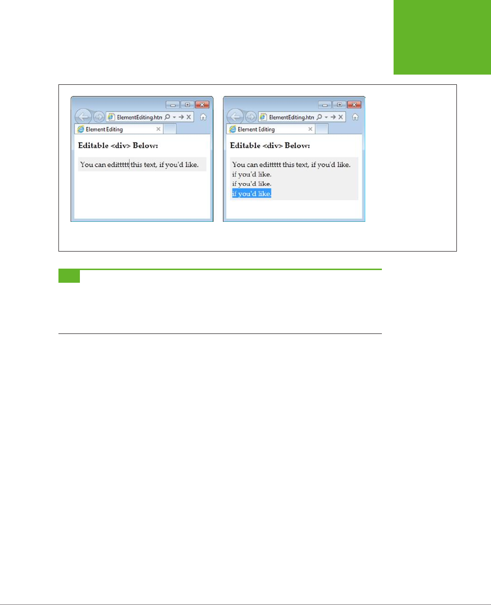
CHAPTER 4: BUILDING BETTER WEB FORMS 137
AN HTML EDITOR
IN A WEB PAGE
FIGURE 4-16
When you click in an edit-
able region, you can move
around using the arrow
keys, delete text, and insert
new content (left). You can
also select text with the
Shift key and then copy,
cut, and paste it (right).
It’s a bit like typing in a
word processor, only you
won’t be able to escape the
confines of the
<div>
to
get to the rest of the page.
TIP Some browsers support a few built-in commands. For example, you can get bold, italic, and underline
formatting in IE using the shortcut keys Ctrl+B, Ctrl+I, and Ctrl+U. Similarly, you can reverse your last action in
Firefox by pressing Ctrl+Z, and you can use all of these shortcuts in Chrome. To learn more about these editing
commands and how you can create a custom toolbar that triggers them, see Opera’s two-part article series at
http://tinyurl.com/htmlEdit1
and
http://tinyurl.com/htmlEdit2
.)
Usually, you won’t set contenteditable in your markup. Instead, you’ll turn it on
using a bit of JavaScript, and you’ll turn it o when you want to finish editing. Here
are two functions that do exactly that:
function startEdit() {
// Make the element editable.
var element = document.getElementById("editableElement");
element.contentEditable = true;
}
function stopEdit() {
// Return the element to normal.
var element = document.getElementById("editableElement");
element.contentEditable = false;
// Show the markup in a message box.
alert("Your edited content: " + element.innerHTML);
}
www.it-ebooks.info
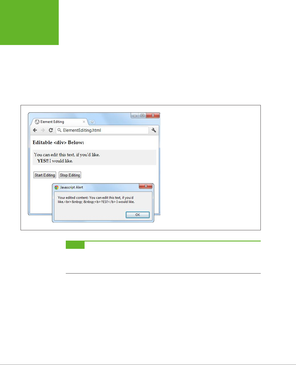
HTML5: THE MISSING MANUAL, SECOND EDITION
138
AN HTML EDITOR
IN A WEB PAGE
And here are two buttons that use them:
<button onclick="startEdit()">Start Editing</button>
<button onclick="stopEdit()">Stop Editing</button>
Just make sure you don’t place the buttons in the editable region of your page,
because when a page is being edited, its elements stop firing events and won’t
trigger your code.
Figure 4-17 shows the result after the element has been edited and some formatting
has been applied (courtesy of the Ctrl+B shortcut command).
FIGURE 4-17
This proves it—editing an element really does change
the in-memory content of the page. In this example,
the new content is simply shown in a message box.
However, a more typical page would send this data to
a web server, probably using the
XMLHttpRequest
object described on page 377.
NOTE There are subtle differences in the way rich HTML editing works in different browsers. For example,
pressing Ctrl+B in Chrome adds a
<b>
element, while pressing it in IE adds the
<strong>
element. Similar
variations occur when you hit the Enter key to add a new line or Backspace to delete a tag. One of the reasons that
it makes sense for HTML5 to standardize the rich HTML editing feature is the ability to enforce better consistency.
Using designMode to Edit a Page
The designMode property is similar to contenteditable, except it allows you to edit
an entire web page. This may seem like a bit of a problem—after all, if the whole
page is editable, how will the user click buttons and control the editing process? The
solution is to put the editable document inside an <iframe> element, which then
acts as a super-powered editing box (Figure 4-18).
www.it-ebooks.info

CHAPTER 4: BUILDING BETTER WEB FORMS 139
AN HTML EDITOR
IN A WEB PAGE
FIGURE 4-18
This page contains two
boxes. The first is an
<iframe>
that shows
the apocalypse page
example from Chapter 2.
The second is an ordinary
<div>
that shows the
HTML markup of the page
after it’s been edited. The
two buttons at the top of
the page control the show,
switching the
<iframe>
into design mode when
the user is ready to work.
The markup in this page is refreshingly simple. Here are the complete contents of
the <body> element in the page:
<h1>Editable Page</h1>
<iframe id="pageEditor" src="ApocalypsePage_Revised.html"></iframe>
<div>
<button onclick="startEdit()">Start Editing</button>
<button onclick="stopEdit()">Stop Editing</button>
</div>
<h1>Edited HTML</h1>
<div id="editedHTML"></div>
www.it-ebooks.info

HTML5: THE MISSING MANUAL, SECOND EDITION
140
AN HTML EDITOR
IN A WEB PAGE
As you can see, this example relies on the startEdit() and stopEdit() methods,
much like the previous example. However, the code is tweaked so that it sets the
designMode attribute rather than the contenteditable attribute:
function startEdit() {
// Turn on design mode in the <iframe>.
var editor = document.getElementById("pageEditor");
editor.contentWindow.document.designMode = "on";
}
function stopEdit() {
// Turn off design mode in the <iframe>.
var editor = document.getElementById("pageEditor");
editor.contentWindow.document.designMode = "off";
// Display the edited HTML (just to prove it’s there).
var htmlDisplay = document.getElementById("editedHTML");
htmlDisplay.textContent = editor.contentWindow.document.body.innerHTML;
}
This example gives you a better idea of the scope of the rich editing feature. For
example, click on a picture and you’ll see how the browser lets you manipulate it.
You can resize it, drag it to a new place, or delete it completely with a single click
of the Delete button. You’ll have similar power over form controls, if they’re in the
page you’re editing.
Of course, there’s still a significant gap you’ll need to cross if you want to turn this
example into something practical. First, you’ll probably want to add better editing
controls. Once again, the helpful folks at Opera have your back if you’re ready to
make a deeper exploration into the command model, which is beyond the scope
of this chapter (see
http://tinyurl.com/htmlEdit1
and
http://tinyurl.com/htmlEdit2
).
Second, you’ll need to do something useful with your edited markup, like sending
it to your web server via XMLHttpRequest (page 377).
There’s one more caveat to note. If you run this example locally from your hard
drive, it won’t work in all browsers. (Internet Explorer and Chrome run into security
restrictions, while Firefox sails ahead without a problem.) To avoid the problem, you
can run it from the try-out site at
http://prosetech.com/html5
.
www.it-ebooks.info


143
CHAPTER
5
There was a time when the Internet was primarily a way to share academic
research. Then things changed and the Web grew into a news and commerce
powerhouse. Today the Internet’s state-of-the-art networking technology is
used less for physics calculations and more for spreading viral videos of piano-playing
kittens across the planet. And network colossus Cisco reports that the trend isn’t
slowing down, estimating that a staggering
80 percent
of all Internet trac will be
video by 2017.
Amazingly, this monumental change happened despite the fact that—up until now—
the HTML language had no built-in support for video or audio. Instead, Web surfers
of the recent past relied on the Flash plug-in, which worked for most people, most
of the time. But Flash has a few key gaps, including the fact that Apple devices (like
iPhones and iPads) refuse to support it.
HTML5 solves these problems by adding the <audio> and <video> elements that
HTML has been missing all these years. However, the transition to HTML5 audio and
video has been far from seamless. Browser makers spent a few years locked in a
heated name-calling, finger-pointing format war. The good news today is that much
of the dust has settled, and HTML5 audio and video have become good choices for
even the most cautious web developer.
Audio and Video
www.it-ebooks.info

HTML5: THE MISSING MANUAL, SECOND EDITION
144
THE EVOLUTION
OF WEB VIDEO
The Evolution of Web Video
Without HTML5, you have a couple of ways to add video to a web page. One old-
fashioned approach is to shoehorn it into a page with the <embed> element. The
browser then creates a video window that uses Windows Media Player, Apple
QuickTime, or some other video player, and places it on the page.
The key problem with this technique is that it puts you in a desolate no-man’s-land of
browser support. You have no way to control playback, you may not be able to buer
the video to prevent long playback delays, and you have no way of knowing whether
your video file will be playable at all on dierent browsers or operating systems.
The second approach is to use a browser plug-in—like Microsoft’s relative newcomer,
Silverlight, or the overwhelming favorite, Adobe Flash. Up until recently, Flash had the
problem of browser support solved cold. After all, Flash video works everywhere the
Flash plug-in is installed, and currently that’s on more than 99 percent of Internet-
connected computers. Flash also gives you nearly unlimited control over the way
playback works. For example, you can use someone else’s prebuilt Flash video player
for convenience, or you can design your own and customize every last glowy button.
But the Flash approach isn’t perfect. To get Flash video into a web page, you need
to throw down some seriously ugly markup that uses the <object> and <embed>
elements. You need to encode your video files appropriately, and you may also
need to buy the high-priced Flash developer software and learn to use it, and the
learning curve can be steep. But the worst problem is Apple’s mobile devices—the
iPhone and iPad. They refuse to tolerate Flash at all, slapping blank boxes over the
web page regions that use it.
NOTE Plug-ins also have a reputation for occasional unreliability. That’s because of the way they work. For
example, when you visit a page that uses Flash, the browser lets the Flash plug-in take control of a rectangular
box somewhere on the web page. Most of the time, this hands-off approach works well, but minor bugs or unusual
system configurations can lead to unexpected interactions and glitches, like suddenly garbled video or pages that
suck up huge amounts of computer memory and slow your web surfing down to a crawl.
Still, if you watch video on the Web today, and you aren’t using an iPhone or iPad,
odds are that it’s wrapped in a Flash mini-application. If you’re not sure, try right-
clicking the video player. If the menu that pops up includes a command like “About
Flash Player 11,” then you know you’re dealing with the ubiquitous Flash plug-in. And
even when you move to HTML5, you’ll probably still need a Flash-powered fallback
for browsers that aren’t quite there yet, like Internet Explorer 8.
NOTE YouTube provides a trial HTML5 video player at
www.youtube.com/html5
. Everywhere else, YouTube
sticks exclusively with Flash. The exception is if you visit YouTube using an iPhone or iPad, in which case YouTube
is smart enough to switch to properly supported HTML5 video automatically.
www.it-ebooks.info

CHAPTER 5: AUDIO AND VIDEO 145
INTRODUCING
HTML5 AUDIO
AND VIDEO
Introducing HTML5 Audio and Video
A simple idea underpins HTML5’s audio and video support. Just as you can add
images to a web page with the <img> element, you should be able to insert sound
with an <audio> element and video with a <video> element. Logically enough,
HTML5 adds both.
UP TO SPEED
Turn Back Now If…
Unfortunately, some things are beyond HTML5’s new audio
and video capabilities. If you want to perform any of these
tricks, you’ll need to scramble back to Flash (at least for now):
• Licensed content. HTML5 video files don’t use any sort
of copy protection system. In fact, folks can download
HTML5 videos as easily as downloading pictures—with a
simple right-click of the mouse. That said, digital rights
management features are currently under development
and slated for inclusion in HTML 5.1.
• Video or audio recording. HTML5 has no way to stream
audio or video from your computer to another computer.
So if you want to build a web chat program that uses the
microphones and webcams of your visitors, stick with
Flash. The creators of HTML5 are experimenting with a
<device>
element that might serve the same purpose,
but for now there’s no HTML-only solution, in any browser.
• Adaptive video streaming. Advanced, video-heavy
websites like YouTube need fine-grained control over
video streaming and buffering. They need to provide
videos in different resolutions, stream live events, and
adjust the video quality to fit the bandwidth of the
visitor’s Internet connection. Until HTML5 can provide
these features, video-sharing sites may add HTML5
support, but they won’t completely switch from Flash.
• Low-latency, high-performance audio. Some applications
need audio to start with no delay or they need to play
multiple audio clips in perfect unison. Examples include
a virtual synthesizer, music visualizer, or a real-time
game with plenty of overlapping sound effects. And
while browser makers are hard at work improving HTML5’s
audio performance, it still can’t live up to these demands.
• Dynamically created or edited audio. What if you could
not just play recorded audio, but also analyze audio
information, modify it, or generate it in real time? New
specifications, like the experimental Web Audio API
(
http://tinyurl.com/web-audio-API
), are competing to
add on these sorts of features to HTML5 audio, but they
aren’t here yet.
Making Some Noise with <audio>
Here’s an example of the <audio> element at its absolute simplest:
<p>Hear us rock out with our new song,
<cite>Death to Rubber Duckies</cite>:</p>
<audio src="rubberduckies.mp3" controls></audio>
The src attribute provides the file name of the audio file you want to play. The con-
trols attribute tells the browser to include a basic set of playback controls. Each
browser has a slightly dierent version of these controls, but they always serve the
same purpose—to let the user start and stop playback, jump to a new position, and
change the volume (Figure 5-1).
www.it-ebooks.info
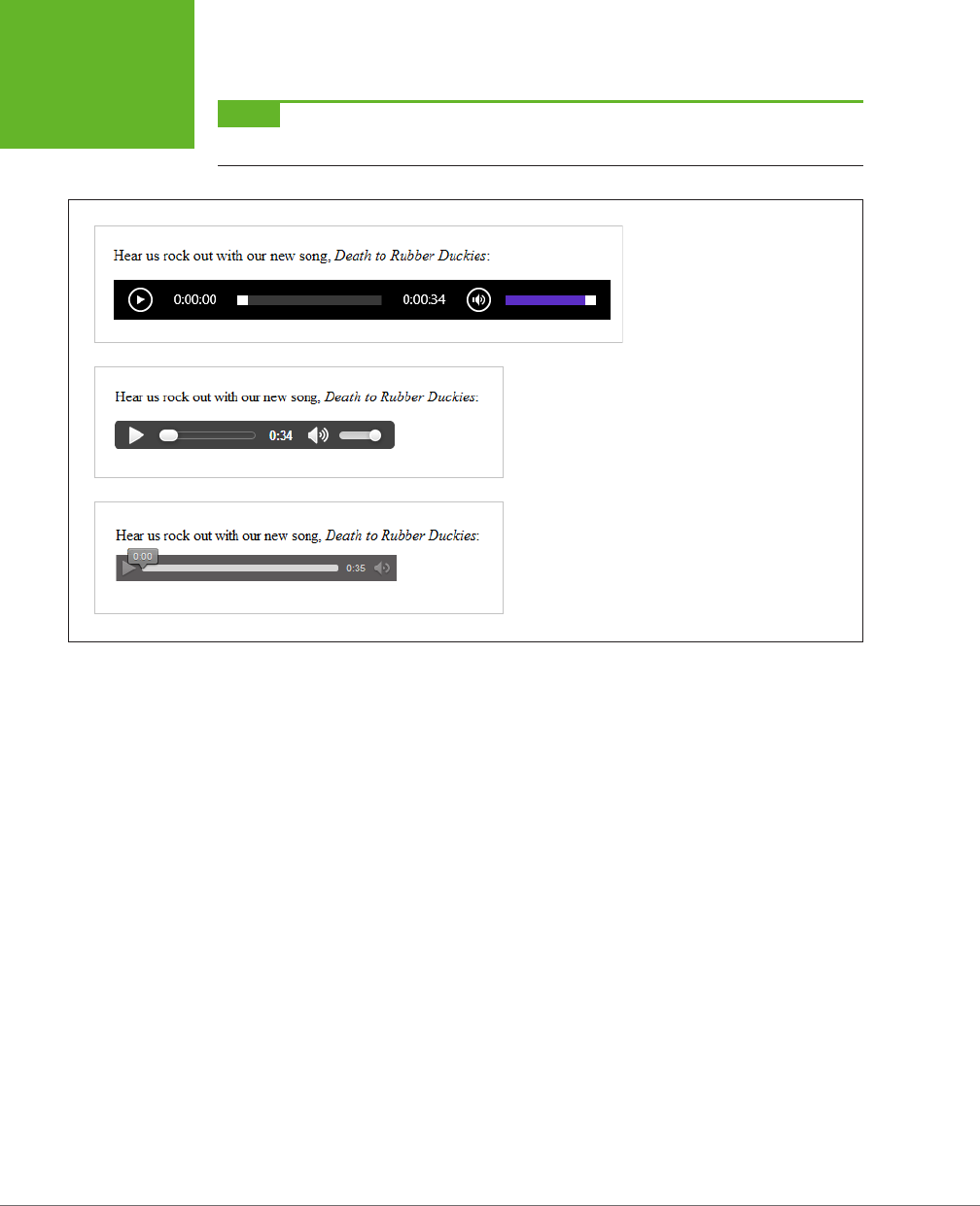
HTML5: THE MISSING MANUAL, SECOND EDITION
146
INTRODUCING
HTML5 AUDIO
AND VIDEO
NOTE The
<audio>
and
<video>
elements must have both a start and an end tag. You can’t use empty
element syntax, like
<audio />
.
FIGURE 5-1
Here’s what playback controls look
like on three browsers: Internet
Explorer (top), Google Chrome
(middle), and Firefox (bottom).
Along with the basic src and controls attributes, the <audio> element supports
several other attributes, which are detailed in the following sections.
Preloading Media Files
One useful attribute is preload, which tells the browser how it should download a
media file. Set preload to auto to tell the browser to start downloading the whole
file, so it’s available when the user clicks the play button. Of course, this download
process unfolds in the background, so your web page visitor can scroll around and
read the page without waiting for the download to finish.
The preload attribute also supports two other values. You can use metadata to tell
the browser to grab the first small chunk of data from the file, which is enough to
determine some basic details (like the total length of the audio). Or, you can use none,
which tells the browser to hold o completely. You might use one of these options
to save bandwidth, for example, if you have a page stued full of <audio> elements
and you don’t expect the visitor to play more than a few of them.
<audio src="rubberduckies.mp3" controls preload="metadata"></audio>
When you use the none or metadata values, the browser downloads the audio file
as soon as someone clicks the play button. Happily, browsers can play one chunk
of audio while downloading the next without a hiccup unless you’re working over
a slow network connection.
www.it-ebooks.info
CHAPTER 5: AUDIO AND VIDEO 147
INTRODUCING
HTML5 AUDIO
AND VIDEO
If you don’t set the preload attribute, browsers can do what they want, and dierent
browsers make dierent assumptions. Most browsers assume auto as the default
value, but Firefox uses metadata. Furthermore, it’s important to note that the preload
attribute isn’t a rigid rule, but a recommendation you’re giving to the browser—one
that may be ignored depending on other factors. (And some slightly older browser
builds don’t pay attention to the preload attribute at all.)
NOTE If you have a page stuffed with
<audio>
elements, the browser creates a separate strip of playback
controls for each one. The web page visitor can listen to one audio file at a time or start them all playing at once.
Automatic Playback
Next up is the autoplay attribute, which tells the browser to start playback imme-
diately once the page has finished loading. It looks like this:
<audio src="rubberduckies.mp3" controls autoplay></audio>
Without autoplay, it’s up to the person viewing the page to click the play button.
You can use the <audio> element to play background music unobtrusively, or even
to provide the sound eects for a browser-based game. To get background music,
remove the controls attribute and add the autoplay attribute (or use JavaScript-
powered playback, as described on page 160). But use this approach with caution,
and remember that your page still needs some sort of audio shuto switch.
NOTE No one wants to face a page that blares music or sound effects but lacks a way to shut the sound off.
If you decide to use the
<audio>
element without the
controls
attribute, you
must
, at a bare minimum, add
a mute button that uses JavaScript to silence the audio.
Looping Playback
Finally, the loop attribute tells the browser to start over at the beginning when
playback ends:
<audio src="rubberduckies.mp3" controls loop></audio>
In most browsers, playback is fluid enough that you can use this technique to create
a seamless, looping soundtrack. The trick is to choose a loopable piece of audio that
ends where it begins. You can find hundreds of free examples at
www.flashkit.com/
loops
. (These loops were originally designed for Flash but can also be downloaded
in MP3 and WAV versions.)
Getting the Big Picture with <video>
The <video> element pairs nicely with the <audio> element. Here’s a straightforward
example that puts it to use:
<p>A butterfly from my vacation in Switzerland!</p>
<video src="butterfly.mp4" controls></video>
www.it-ebooks.info
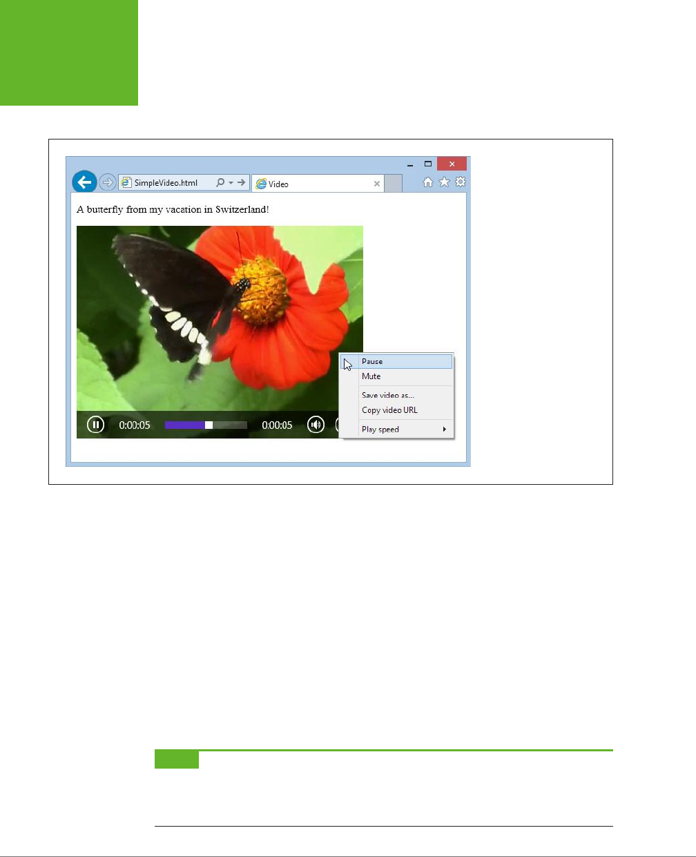
HTML5: THE MISSING MANUAL, SECOND EDITION
148
INTRODUCING
HTML5 AUDIO
AND VIDEO
Once again, the controls attribute gets the browser to generate a set of handy
playback controls (Figure 5-2). In most browsers, these controls disappear when
you click somewhere else on the page and return when you hover over the movie.
FIGURE 5-2
The
<video>
element
could easily be mistaken for
a Flash video window. But if
you right-click the
<video>
element, you’ll get a simpler
menu that includes the
option to save the video file
to your computer. Depending
on the browser, it may
also include commands for
changing the playback speed,
looping the video, taking it
full screen, and muting the
sound.
The <video> element has the same src, controls, preload, autoplay, and loop
attributes as the <audio> element. However, if you choose to enable automatic
playback, you can make it less obnoxious by throwing in the muted attribute, which
shuts o the sound on most browsers. The viewer can switch the audio back on by
clicking the speaker icon, as usual.
The <video> element also adds three more attributes: height, width, and poster.
The height and width attributes set the size of the video window (in pixels). Here’s
an example that creates a video box that measures 400 x 300 pixels:
<video src="butterfly.mp4" controls width="400" height="300"></video>
This should match the natural size of the video itself, but you might choose to indicate
these details explicitly so your layout doesn’t get messed up before the video loads
(or if the video fails to load altogether).
NOTE No matter which dimensions you use to size the video box, the video
frame
always keeps its proper
proportions. For example, if you take a 400 x 300 pixel video and put it in a 800 x 450 pixel video box, you’ll get
the biggest video frame that fits in the box without stretching, which is 600 x 450 pixels. This leaves 100 pixels
on each side of the video frame, which appear as blank space.
www.it-ebooks.info
CHAPTER 5: AUDIO AND VIDEO 149
UNDERSTANDING
THE HTML5
MEDIA FORMATS
Finally, the poster attribute lets you supply an image that should be used in place
of the video. Browsers use this picture in three situations: if the first frame of the
video hasn’t been downloaded yet, if you’ve set the preload attribute to none, or if
the selected video file wasn’t found.
<video src="butterfly.mp4" controls poster="swiss_alps.jpg"></video>
Although you’ve now learned everything there is to know about audio and video
markup, there’s a lot more you can do with some well-placed JavaScript. But before
you can get any fancier with the <audio> and <video> elements, you need to face
the headaches of audio and video codec support.
GEM IN THE ROUGH
Media Groups
The HTML5 standard specifies an unusual attribute named
mediagroup
that applies to both the
<audio>
element
and the
<video>
element. You can use the
mediagroup
attribute to link multiple media files together, so their play-
back is synchronized. All you need to do is assign the same
mediagroup
name (which can be whatever you want) to
each
<audio>
or
<video>
element:
<video src="shot12_cam1.mp4" controls
mediagroup="shot12"></video>
<video src="shot12_cam2.mp4" controls
mediagroup="shot12"></video>
Now if the viewer presses play in the first video window (for
shot12_cam1.mp4
), playback begins in both windows at once.
The
mediagroup
attribute might be a useful tool if you
need to synchronize concurrent video files—for example,
recordings of a sporting event taken from different angles.
You can also use it to synchronize audio and video, which is
useful if you need to choose different audio tracks based on
the visitor’s language or accessibility needs. For example, an
audio track for visually impaired users might add a voiceover
that describes the action that’s taking place. To accomplish this
wizardry, you’d create a page with several hidden
<audio>
elements, give each one a different
mediagroup
name, and
then add a bit of simple JavaScript that sets the
mediagroup
of your
<video>
element to match the
mediagroup
of the
right
<audio>
element, based on the visitor’s requirements.
Unfortunately,
mediagroup
isn’t much use right now, be-
cause its browser support is still limited. Chrome and Opera
understand it, but the latest versions of Internet Explorer and
Firefox ignore it completely.
Understanding the HTML5 Media Formats
If the <video> and <audio> elements seem too good to be true, well, sometimes they
are. The problem is that a media file format that works flawlessly in one browser
can flummox another.
The examples you’ve just considered use two popular standards: MP3 audio and
H.264 video. They’re enough to keep most browsers happy. But use them on the
Opera browser, and they won’t work (Figure 5-3).
www.it-ebooks.info
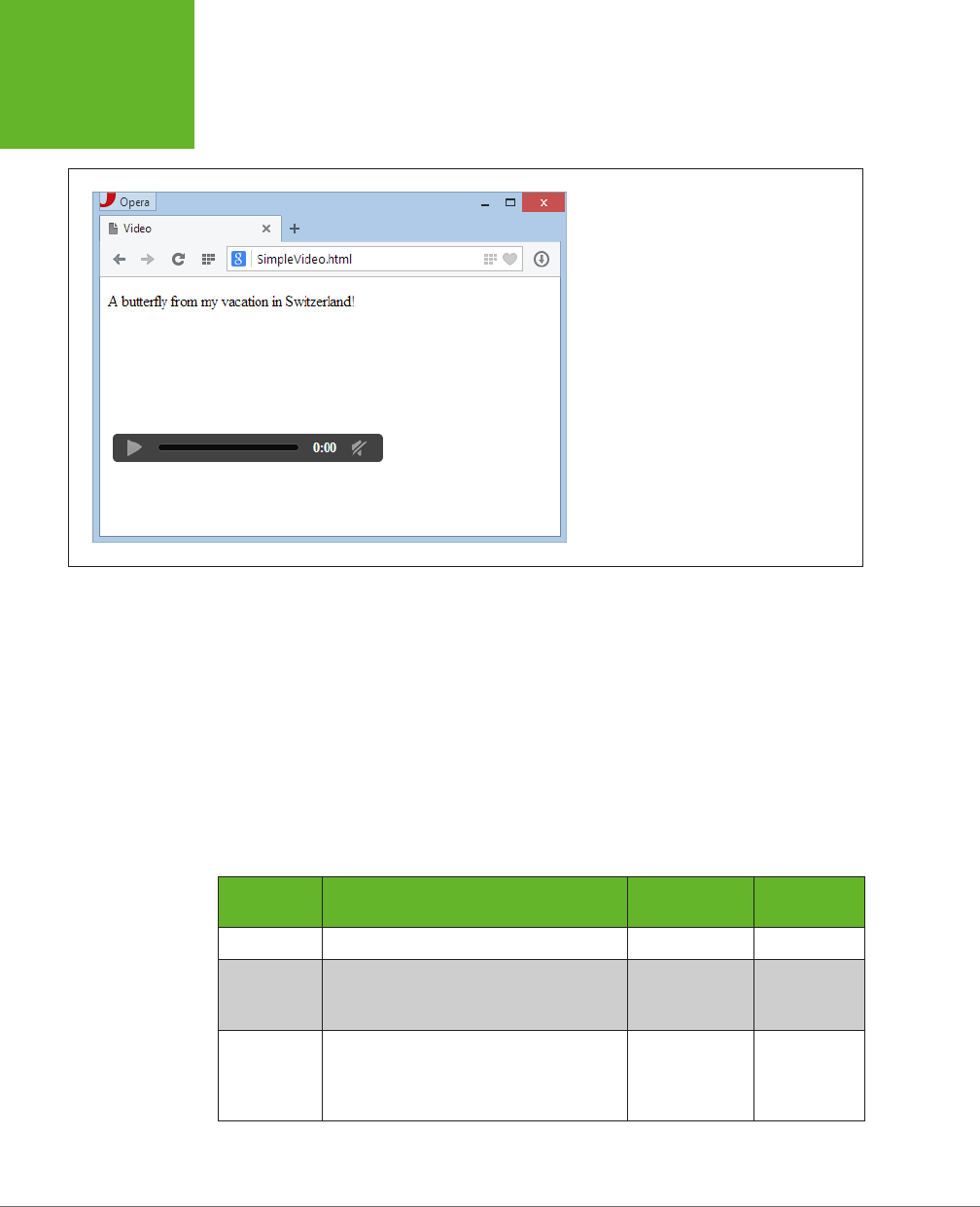
HTML5: THE MISSING MANUAL, SECOND EDITION
150
UNDERSTANDING
THE HTML5
MEDIA FORMATS
FIGURE 5-3
If you load a page that uses an H.264 video in
Opera, the playback controls are disabled, and a
blank space appears where the video should be.
Fortunately, you can solve this problem with a format fallback, as you’ll see on page
155. But before you learn how to do that, you need to take a closer look at the range of
audio and video formats on the Web today, and the current state of browser support.
Meet the Media Formats
The ocial HTML5 standard doesn’t require support for any specific video or audio
format. (Early versions did, but the recommendation was dropped after intense
lobbying.) As a result, browser makers are free to choose the formats
they
want to
support, despite the fact that they’re congenitally unable to agree with one another.
Table 5-1 shows the standards that they’re using right now.
TABLE 5-1
Some of the audio and video standards that HTML5 browsers may support
FORMAT DESCRIPTION
COMMON FILE
EXTENSION MIME TYPE
MP3 The world’s most popular audio format. .mp3 audio/mp3
Ogg Vorbis A free, open standard that offers high-
quality, compressed audio comparable to
MP3.
.ogg audio/ogg
WAV The original format for raw digital audio.
Doesn’t use compression, so files are
staggeringly big and unsuitable for most
web uses.
.wav audio/wav
www.it-ebooks.info
CHAPTER 5: AUDIO AND VIDEO 151
UNDERSTANDING
THE HTML5
MEDIA FORMATS
FORMAT DESCRIPTION
COMMON FILE
EXTENSION MIME TYPE
H.264 The industry standard for video encoding,
particularly when dealing with high-
definition video. Used by consumer
devices (like Blu-ray players and
camcorders), web sharing websites (like
YouTube and Vimeo), and web plug-ins
(like Flash and Silverlight).
.mp4 video/mp4
Ogg Theora A free, open standard for video by the
creators of the Vorbis audio standard.
Byte for byte, the quality and performance
doesn’t match H.264, although it’s still
good enough to satisfy most people.
.ogv video/ogg
WebM The newest video format, created when
Google purchased VP8 and transformed
it into a free standard. Critics argue
that the quality isn’t up to the level
of H.264 video—yet—and that it may
have unexpected links to other people’s
patents, which could lead to a storm of
lawsuits in the future.
.webm video/webm
Table 5-1 also lists the recommended file extensions your media files should use. To
realize why this is important, you need to understand that there are actually three
standards at play in a video file. First, and most obviously, is the
video codec
, which
compresses the video into a stream of data (examples include H.264, Theora, and
WebM). Second is the
audio codec
, which compresses one or more tracks of audio
using a related standard. (For example, H.264 generally uses MP3, while Theora
uses Vorbis.) Third is the
container format
, which packages everything together
with some descriptive information and, optionally, other frills like still images and
subtitles. Often, the file extension refers to the container format, so .mp4 signifies
an MPEG-4 container, .ogv signifies an Ogg container, and so on.
Here’s the tricky part: Most container formats support a range of dierent video and
audio standards. For example, the popular Matroska container (.mkv) can hold video
that’s encoded with H.264 or Theora. To keep your head from exploding, Table 5-1
puts each video format with the container format that’s most common and has the
most reliable web support.
Table 5-1 also indicates the proper MIME type, which must be configured on your
web server. If you use the wrong MIME type, browsers may stubbornly refuse to
play a perfectly good media file. (If you’re a little fuzzy on exactly what MIME types
do and how to configure them, see the box on page 152.)
www.it-ebooks.info
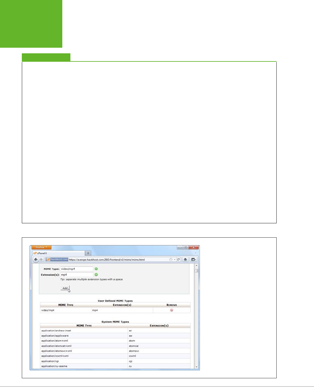
HTML5: THE MISSING MANUAL, SECOND EDITION
152
UNDERSTANDING
THE HTML5
MEDIA FORMATS
UP TO SPEED
MIME Types and Why to Use Them
A
MIME type
(sometimes called a
content type
) is a piece of
information that identifies the type of content in a web re-
source. For example, the MIME type of a web page is
text/html
.
Before a web server sends a resource to a browser, it sends
the MIME type. For example, if a browser asks for the page
SuperVideoPlayerPage.html, the web server sends the
text/
html
MIME type, a few other pieces of information, and the
actual file content. When the browser receives the MIME type,
it knows what to do with the content that comes next. It doesn’t
need to try to make a guess based on a file name extension or
some other sort of hackery.
For common file types—for example, HTML pages and im-
ages—you don’t need to worry about MIME types, because
every web server already handles them properly. But some
web servers might not be configured with the MIME types for
audio and video. That’s a problem, because browsers will be
thrown off course if the web server sends a media file with
the wrong MIME type. Usually, they won’t play the file at all.
To avoid this problem, make sure your web server is set up with
the MIME types listed in Table 5-1, and use the corresponding
file extensions for your audio and video files. (It’s no use
configuring the MIME type and then using the wrong file
extension, because the web server needs to be able to pair
the two together. For example, if you configure .mp4 files to
use the MIME type
video/mp4
, but then you give your video
file the extension
.mpFour
, the web server won’t have a clue
what you’re trying to do.)
Configuring MIME types is an easy job, but the exact steps
depend on your web hosting company (or your web server
software, if you’re hosting your site yourself). If your web
hosting company uses the popular cPanel interface, then look
for an icon named MIME Types and click it. You’ll then see a page
like the one shown in Figure 5-4. And if you’re in any doubt,
contact your web hosting company for help.
FIGURE 5-4
Here a new MIME type is being added
to support H.264 video files. In many
cases, you won’t need to take this
step, because your website will
already be configured correctly.
www.it-ebooks.info
CHAPTER 5: AUDIO AND VIDEO 153
UNDERSTANDING
THE HTML5
MEDIA FORMATS
Browser Support for Media Formats
The format headaches in HTML5 have a long history. The conflict is fueled by the
dierent needs of browser makers. Small companies, like Mozilla (the creators of
Firefox) and Opera (the creators of the Opera browser) don’t want to pay sti li-
censing costs for popular standards like MP3 audio and H.264 video. And it’s hard
to blame them—after all, they are giving away their work for free.
But bigger companies, like Microsoft and Apple, have their own reasonable-sounding
excuses for shunning unlicensed standards. They complain that these standards
won’t perform as well (they currently lack hardware acceleration) and aren’t as
widespread (unlike H.264, which is used in camcorders, Blu-ray players, and a host
of other devices). But the biggest problem is that these unlicensed standards may
have obscure ties to someone else’s intellectual property. If they do, and if big
companies like Microsoft and Apple start using them, they open themselves up to
pricey patent lawsuits that could drag on for years.
Fortunately, the situation is improving. In 2013, Firefox gave in and agreed to support
MP3 and H.264. Google, despite threatening to remove support for H.264 in Chrome,
has never taken that step and now seems unlikely to do so. Opera remains the last
holdout on the desktop—for now. For the full details of browser media support, see
Table 5-2 (for audio formats) and Table 5-3 (for video formats).
TABLE 5-2
Browser support for HTML5 audio formats
IE FIREFOX CHROME SAFARI OPERA
SAFARI
IOS ANDROID
MP3 9 21 5 3.1 - 3 2.3
Ogg
Vorbis
-3.6 5 - 10.5 - -
WAV -3.6 83.1 10.5 - -
TABLE 5-3
Browser support for HTML5 video formats
IE FIREFOX CHROME SAFARI OPERA
SAFARI
IOS ANDROID
H.264
Video
9 21 5 3.1 - 4* 2.3
Ogg
Theora
- 3.5 5 - 10.5 - -
WebM - 4 6 - 10.6 - 2.3
* iOS 3.x supports video, but there are subtle video bugs hiding in older versions of the Safari browser. For
example, if you set the poster attribute (page 149), you may find that the video becomes unplayable.
Mobile browsers have their own quirks. Some don’t support features like autoplay
and looping, because these features can drain batteries and use up valuable band-
width. But even if you don’t plan to use these features, mobile devices need special
consideration to ensure good video playback performance and to minimize data
www.it-ebooks.info

HTML5: THE MISSING MANUAL, SECOND EDITION
154
FALLBACKS:
HOW TO PLEASE
EVERY BROWSER
usage. To make mobile-friendly videos, you should encode them with lower quality
settings and, possibly, with a lower resolution.
TIP As a general rule of thumb, if you want a video to be playable on a mobile device, you should encode
it using the H.264 Baseline Profile (rather than High Profile). For iPhone and Android phones, use a size of 640 x
480 or smaller (and stick to 480 x 360 if you want to play it on a BlackBerry). Many encoding programs (see the
box on page 156) have presets that let you prepare mobile-optimized video.
FREQUENTLY ASKED QUESTION
H.264 Licensing
I’m using H.264 for my videos. Do I have to pay licensing costs?
If you’re using an H.264 decoder in your product (for example,
you’re creating a browser that can play H.264-encoded video),
you definitely need to pay. But if you’re a video provider, it’s
less clear cut.
First, the good news. If you’re using H.264 to make free videos,
you won’t be asked to pay anything, ever. If you’re creating
videos that have a commercial purpose but aren’t actually
being sold (say, you’re shooting a commercial or promoting
yourself in an interview), you’re also in the clear.
If you’re
selling
H.264-encoded video content on your website,
you may be on the hook to pay license fees to MPEG-LA, either
now or in the future. Right now, the key detail is the number of
subscribers. If you have fewer than 100,000, there’s no licensing
cost, but if you have 100,000 to 250,000, you’re expected to
cough up $25,000 a year. This probably won’t seem like much
bank for a video- selling company of that size, and it may pale
in comparison to other considerations, like the cost of profes-
sional encoding tools. However, these numbers could change
when the licensing terms are revised in 2016. Big companies
looking to make lots of money in web video might prefer to
use an open, unlicensed video standard like Theora or WebM.
For the full licensing legalese on H.264, visit
http://tinyurl.com/
h264-lic
.
Fallbacks: How to Please Every Browser
At this writing, an H.264 video file presented by the HTML5 <video> element works
for over 80 percent of the people surfing the Web. This percentage is impressive,
but it isn’t good enough on its own. To create a video that
everyone
can see, you
need the help of a fallback.
There are two types of fallbacks that web developers use with HTML5 video. The
first is a
format fallback
. This mechanism, which is built into HTML5, lets you swap
out one type of media file—say, an MP3 file—and replace it with a file in another
format (for example, Ogg Vorbis). This type of fallback solves the Opera problem
shown on page 150. However, it won’t help when your page meets an old browser
that doesn’t support HTML5’s media features, like Internet Explorer 8.
The second type of fallback is a
technology fallback
. If the browser that’s process-
ing your page doesn’t support the <video> and <audio> element, your page can
substitute a time-tested Flash player that does the job.
www.it-ebooks.info

CHAPTER 5: AUDIO AND VIDEO 155
FALLBACKS:
HOW TO PLEASE
EVERY BROWSER
Conscientious web developers use
both
types of fallback. More time-constrained (or
lazier) web developers sometimes omit the format fallback, in order to eliminate the
work of re-encoding their video files. After all, the Opera browser (the lone desktop
browser that doesn’t support H.264) accounts for a mere 1 percent of worldwide
browser use, and developers speculate that Opera may eventually be forced to add
H.264 support. On the other hand, the Flash fallback is easier to implement, be-
cause it uses the same media file, and it fills in the support gap for a larger portion
of browsers, like that dinosaur IE 8. So ignore the Flash fallback at your own peril.
The following sections explain both types of fallbacks.
Supporting Multiple Formats
The <audio> and <video> elements have a built-in format fallback system. To use
it, you must remove the src attribute from the <video> or <audio> element, and
replace it with a list of nested <source> elements inside. Here’s an example with
the <audio> element:
<audio controls>
<source src="rubberduckies.mp3" type="audio/mp3">
<source src="rubberduckies.ogg" type="audio/ogg">
</audio>
Here, the same <audio> element holds two <source> elements, each of which points
to a separate audio file. The browser then chooses the first file it finds that has a
format it supports. Firefox and Opera will grab
rubberduckies.ogg
. Internet Explorer,
Safari, and Chrome will stick with
rubberduckies.mp3.
Unfortunately, it’s up to you
to encode your content in every alternate format you want to support—a process
that wastes time, CPU power, and disk space.
In theory, a browser can determine whether or not it supports a file by downloading
a chunk of it. But a better approach is to use the type attribute to supply the correct
MIME type (see page 152). That way, the browser will attempt to download only a
file it believes it can play. (To figure out the correct MIME type, consult Table 5-1.)
The same technique works for the <video> element. Here’s an example that sup-
plies the same video file twice, once encoded with H.264 and once with WebM,
guaranteeing support for all HTML5-aware browsers:
<video controls width="700" height="400">
<source src="beach.mp4" type="video/mp4">
<source src="beach.webm" type="video/webm">
</video>
In this example, there’s one new detail to note. When using multiple video formats,
the H.264-encoded file should always come first. Otherwise, it won’t work for old
iPads running iOS 3.x. (The problem has since been fixed in iOS 4, but there’s no
disadvantage to keeping H.264 in the top spot.)
www.it-ebooks.info

HTML5: THE MISSING MANUAL, SECOND EDITION
156
FALLBACKS:
HOW TO PLEASE
EVERY BROWSER
NOTE Just because a browser believes it supports a specific type of audio or video doesn’t necessarily
mean it can play it. For example, you may have used an insanely high bitrate, or a strange codec in a recognized
container format. You can deal with issues like these by supplying type
and codec
information through the
type
attribute, but it’ll make a mess of your markup. The HTML5 spec has all the gruesome details at
http://tinyurl.com/
media-types
.
If you’re really ambitious, you may opt to create a single video page that’s meant
for both desktop browsers and mobile devices. In this case, you not only need to
worry about the H.264 and WebM video formats, but you also need to think about
creating low-bandwidth versions of your video files that are suitable for devices
that have less hardware power and use slower Internet connections. To make sure
mobile devices get the lighter-weight video files while desktop browsers get the
higher-quality ones, you need to write some crafty JavaScript or use
media queries
,
as explained on page 231.
UP TO SPEED
Encoding Your Media
Now you know what combination of formats to use, but you
don’t necessarily know how to transform your media files into
those formats. Don’t despair, as there are plenty of tools. Some
work on entire batches of files at once, some have a reputation
for professional-grade quality (and a price tag to match), and
some do their work on powerful web servers so you don’t have
to wait. The trick is picking through all the choices to get the
encoder that works for you.
Here are some of your options:
• Audio editors. If you’re looking to edit WAV files and save
them in the MP3 or Vorbis formats, a basic audio editor
can help out. Audacity (
http://audacity.sourceforge.net
)
is a free editor for Mac and Windows that fits the bill,
although you’ll need to install the LAME MP3 encoder to
get MP3 support (
http://lame1.buanzo.com.ar
). Goldwave
(
www.goldwave.com
) is a similarly capable audio editor
that’s free to try, but sold for a nominal fee.
• Miro Video Converter. This free, open-source program runs
on Windows and Mac OS X. It can take virtually any video
file and convert it to WebM, Theora, or H.264. It also has
presets that match the screen sizes and supported formats
for mobile devices, like iPads, iPhones, or Android phones.
The only downside is that you can’t tweak more advanced
options to control how the encoding is done. To try it out,
go to
www.mirovideoconverter.com
.
• Firefogg. This Firefox plug-in (available at
http://firefogg.
org
) can create Theora or WebM video files, while giving
you a few more options than Miro. It also runs right inside
your web browser (although it does all its work locally,
without involving a web server).
• HandBrake. This open-source, multi-platform program
(available at
http://handbrake.fr
) converts a wide range
of video formats into H.264 (and a couple of other modern
formats).
• Zencoder. Here’s an example of a professional media
encoding service that you can integrate with your website.
Zencoder (
http://zencoder.com
) pulls video files off your
web server, encodes them in all the formats and bitrates
you need, gives them the names you want, and places
them in the spot they belong. A big player (say, a video
sharing site) would pay Zencoder a sizable monthly fee.
www.it-ebooks.info

CHAPTER 5: AUDIO AND VIDEO 157
FALLBACKS:
HOW TO PLEASE
EVERY BROWSER
Adding a Flash Fallback
The format fallback system has a key limitation: It works only on browsers that
understand the <audio> and <video> elements (which is almost every browser in
circulation today, except IE 8). To get your pages to work on non-HTML5 browsers,
you need to add a Flash fallback.
To understand how the Flash fallback works, you first need to know that every web
browser since the dawn of time deals with the tags it doesn’t recognize in the same
way—it ignores them. For example, if Internet Explorer 8 comes across the opening
tag for the <video> element, it barrels merrily on, without bothering to check the
src attribute. However, browsers don’t ignore the
content
inside an unrecognized
element, which is a crucial dierence. It means if you have markup like this:
<video controls width="400" height="300">
<source src="discoParty.mp4" type="video/mp4">
<source src="discoParty.webm" type="video/webm">
<p>We like disco dancing.</p>
</video>
Browsers that don’t understand HTML5 will act as though they saw this:
<p>We like disco dancing.</p>
This fallback content provides a seamless way to deal with older browsers.
NOTE Browsers that support HTML5 audio ignore the fallback section, even if they can’t play the media file.
For example, consider what happens if Opera finds a
<video>
element that uses an H.264 video file but doesn’t
support Theora. In this situation, the video player won’t show anything at all.
So now that you know how to add fallback content, you need to decide what your
fallback content should include. One example of bad fallback content is a text mes-
sage (as in, “Your browser does not support HTML5 video, so please upgrade.”).
Website visitors consider this sort of comment tremendously impolite, and they’re
likely never to return when they see it.
The proper thing to include for fallback content is another working video window—in
other words, whatever you’d use in an ordinary, non-HTML5 page. One possibility
is a YouTube video window. If you use this approach, you need to meet YouTube’s
rules (make sure your video is less than 15 minutes and doesn’t contain oensive
or copyrighted content). You can then upload your video to YouTube in the best
format you have on hand, and YouTube will re-encode the video into the formats it
supports. To get started, head to
www.youtube.com/my_videos_upload
.
Another possibility is to use a Flash video player. (Or, if you’re playing audio, a Flash
audio player.) Happily, the world has plenty of Flash players. Many of them are free,
at least for noncommercial uses. And best of all, most support H.264, a format you’re
probably already using for HTML5 video.
www.it-ebooks.info

HTML5: THE MISSING MANUAL, SECOND EDITION
158
FALLBACKS:
HOW TO PLEASE
EVERY BROWSER
Here’s an example that inserts the popular Flowplayer Flash (
http://flash.flowplayer.org
)
into an HTML5 <video> element:
<video controls width="700" height="400">
<source src="beach.mp4" type="video/mp4">
<source src="beach.webm" type="video/webm">
<object id="flowplayer" width="700" height="400"
data="flowplayer-3.2.16.swf"
type="application/x-shockwave-flash">
<param name="movie" value="flowplayer-3.2.16.swf">
<param name="flashvars" value='config={"clip":"beach.mp4"}'>
</object>
</video>
Here, the bold part is a parameter that the browser passes to the Flowplayer Flash,
with the file name of the video file. As you can see, even though this example has
three possible outcomes (HTML5 video with H.264, HTML5 video with WebM, or
Flash video with H.264), it needs only
two
video files, which saves on the encoding
work. Figure 5-5 shows the result in action.
Of course, some people won’t have Flash or a browser that supports HTML5. You
can oer them another fallback, such as a link to download the video file and open
it in an external program. You place that fallback after the Flash content, but still
inside the <object> element, like this:
<video controls width="700" height="400">
<source src="beach.mp4" type="video/mp4">
<source src="beach.webm" type="video/webm">
<object id="flowplayer" width="700" height="400"
data="http://releases.flowplayer.org/swf/flowplayer-3.2.16.swf"
type="application/x-shockwave-flash">
<param name="movie" value="beach.mp4">
<img src="beach_thumbnail.jpg" alt="A lazy day at the beach">
<p>Your browser does not support HTML5 video or Flash.</p>
<p>You can download the video in <a href="beach.mp4">MP4 H.264</a>
or <a href="beach.webm">WebM</a> format.</p>
</object>
</video>
www.it-ebooks.info
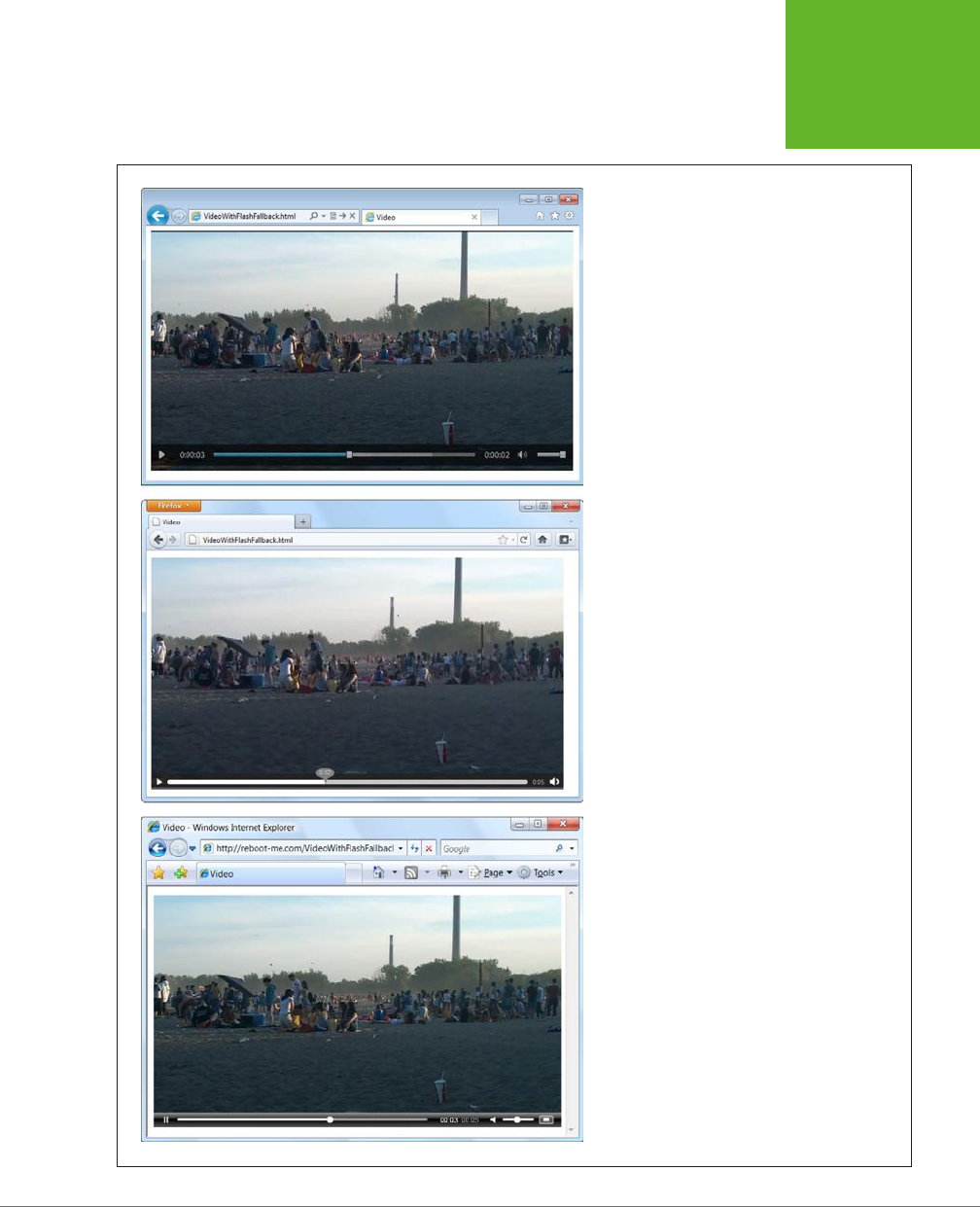

HTML5: THE MISSING MANUAL, SECOND EDITION
160
CONTROLLING
YOUR
PLAYER WITH
JAVASCRIPT
Interestingly, there’s another way to implement a Flash fallback. The examples
you’ve seen so far use HTML5 with a Flash fallback, which gives everybody HTML5
video (or audio) except for people with older browsers, who get Flash. However,
you can invert this approach and use Flash first, with an HTML5 fallback. This gives
everybody Flash, except for those who don’t have it installed. This strategy makes
sense if you’re already showing video content on your website with a mature Flash
video player, but you want to reach out to iPad and iPhone users. You might also
choose this approach if your media requirements go beyond what HTML5 currently
supports (as detailed in the box on page 145).
If you want a Flash player with an HTML fallback, you simply need to invert the
previous example. Start with the <object> element, and nestle the <video> element
inside, just before the closing </object> tag. Place the fallback content just after
the last <source> element, like this:
<object id="flowplayer" width="700" height="400"
data="http://releases.flowplayer.org/swf/flowplayer-3.2.16.swf"
type="application/x-shockwave-flash">
<param name="movie" value="butterfly.mp4">
<video controls width="700" height="400">
<source src="beach.mp4" type="video/mp4">
<source src="beach.webm" type="video/webm">
<img src="beach_thumbnail.jpg" alt="A lazy day at the beach">
<p>Your browser does not support HTML5 video or Flash.</p>
<p>You can download the video in <a href="beach.mp4">MP4 H.264</a>
or <a href="beach.webm">WebM</a> format.</p>
</video>
</object>
Incidentally, there are a number of JavaScript players that support HTML5 directly
and have a built-in Flash fallback. For example, Flowplayer provides another version
called Flowplayer HTML5 (get it at
http://flowplayer.org
), which uses the HTML5
<video> element if the browser supports it and performs a Flash fallback automati-
cally if needed. The advantage is that this approach simplifies your markup, because
one ingredient (the JavaScript-powered media player) handles everything. The
disadvantage is that it takes you further away from a pure HTML5 solution, which is
what you’ll want to use one day soon when HTML5-loving browsers are ubiquitous.
Controlling Your Player with JavaScript
So far, you’ve covered some heavy ground. You’ve learned how to take the new
<audio> and <video> elements and turn them into a reasonably supported solution
that works on
more
web pages than today’s Flash-based players. Not bad for a
bleeding-edge technology.
www.it-ebooks.info
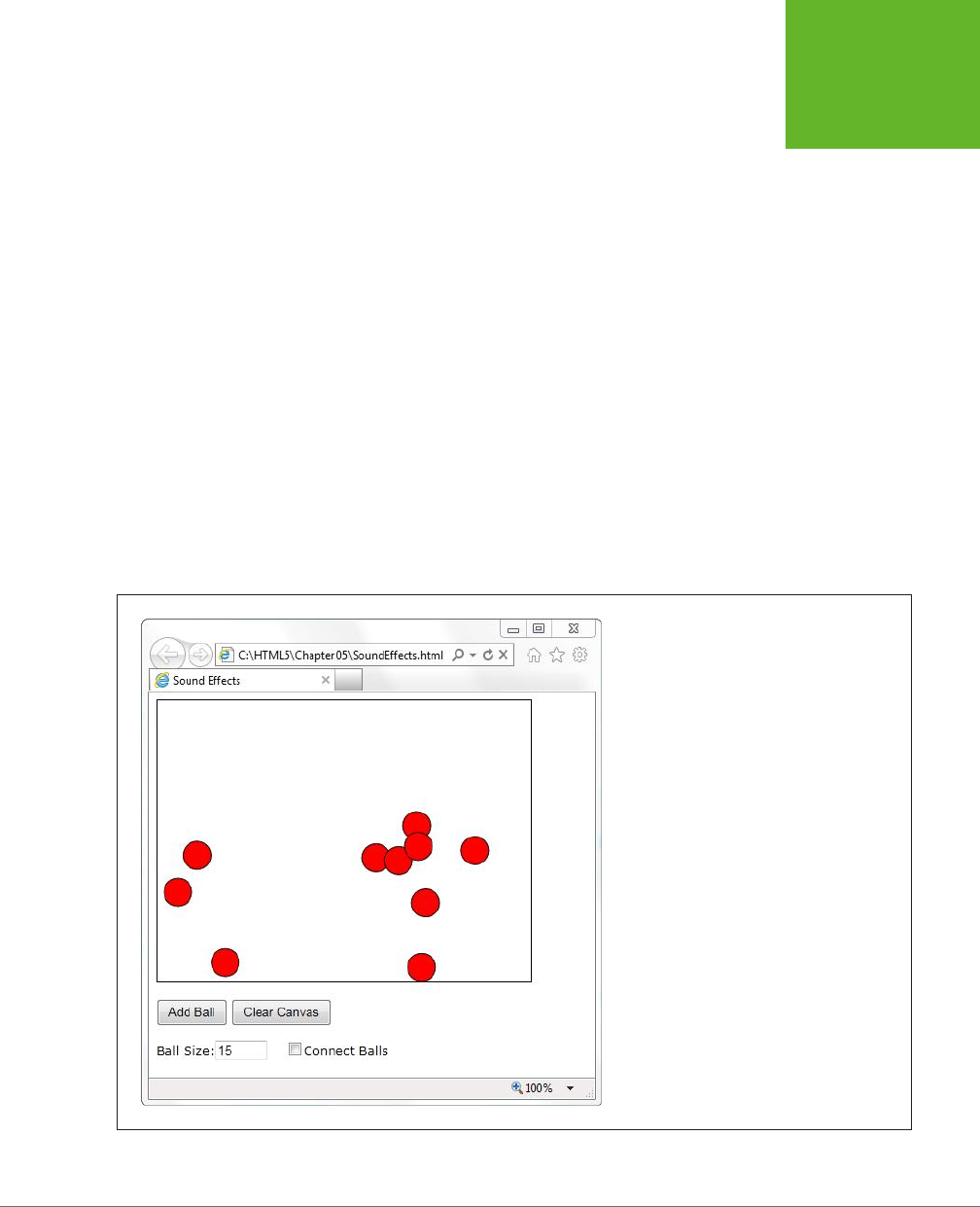
CHAPTER 5: AUDIO AND VIDEO 161
CONTROLLING
YOUR
PLAYER WITH
JAVASCRIPT
That’s about the most you can do with the <audio> and <video> elements if you
stick to markup only. But both elements have an extensive JavaScript object model,
which lets you control playback with code. In fact, you can even adjust some de-
tails—like playback speed—that aren’t available in the browser’s standard audio
and video players.
In the following sections, you’ll explore the JavaScript support by considering two
practical examples. First, you’ll add sound eects to a game. Next, you’ll create a
custom video player. And finally, you’ll consider the solutions that other people have
developed using this potent mix of HTML5 and JavaScript, including supercharged,
skinnable players and accessible captioning.
Adding Sound Eects
The <audio> element doesn’t just let web visitors play songs and voice recordings.
It’s also a useful tool for playing sound eects, whenever you need them. This makes
it particularly useful if you need to add music and sound eects to a game.
Figure 5-6 shows a very simple example, with an interactive ball-dropping animation.
You’ll see the code that makes this example work when you consider the <canvas>
element in Chapter 8. But for now, the only important detail is how you can add a
suitable sonic backdrop.
FIGURE 5-6
This web page runs a simple animation on a
canvas. The visitor can click a button to add a new
ball (which then falls down and bounces around
the drawing surface). Or, the visitor can click a ball
to send it bouncing in a new direction.
www.it-ebooks.info

HTML5: THE MISSING MANUAL, SECOND EDITION
162
CONTROLLING
YOUR
PLAYER WITH
JAVASCRIPT
This example combines a background music track with sound eects. The back-
ground music track is the easiest part. To create it, you start by adding an invisible
<audio> element to your page, like this:
<audio id="backgroundMusic" loop>
<source src="TheOwlNamedOrion.mp3" type="audio/mp3">
<source src="TheOwlNamedOrion.ogg" type="audio/ogg">
</audio>
This audio player doesn’t include the autoplay or controls attributes, so initially
it’s silent and invisible. It does use the loop attribute, so once it starts playing it will
repeat the music track endlessly. To control playback, you need to use two methods
of the audio (or video) object: play() and pause(). Confusingly, there’s no stop
method—for that, you need to pause the video and then reset the currentTime
property to 0, which represents the beginning of the file.
With this in mind, it’s quite easy to start playback on the background audio when
the first ball is created:
var audioElement = document.getElementById("backgroundMusic");
audioElement.play();
And just as easy to stop playback when the canvas is cleared:
var audioElement = document.getElementById("backgroundMusic");
audioElement.pause();
audioElement.currentTime = 0;
As you learned earlier, there’s no limit on the amount of audio you can play at once.
So while the background audio is playing its tune, you can concentrate on the more
interesting challenge of adding sound eects.
In this example, a “boing” sound eect is played every time a ball ricochets against
the ground or a wall. To keep things interesting, several slightly dierent boing
sounds are used. This is a stand-in for a more realistic game, which would probably
incorporate a dozen or more sounds.
There are several ways to implement this design, but not all of them are practical.
The first option is to add a single new <audio> element to play sound eects. Then,
every time a collision happens, you can load a dierent audio file into that element
(by setting the src property) and play it. This approach hits two obstacles. First, a
single <audio> element can play only a single sound at once, so if more than one ball
hits the ground in quick succession, you need to either ignore the second, overlap-
ping sound, or interrupt the first sound to start the second one. The other problem
is that setting the src property forces the browser to request the audio file. And
while some browsers will do this quickly (if the audio file is already in the cache),
Internet Explorer doesn’t. The result is laggy audio—in other words, a boing that
happens half a second after the actual collision.
www.it-ebooks.info

CHAPTER 5: AUDIO AND VIDEO 163
CONTROLLING
YOUR
PLAYER WITH
JAVASCRIPT
A better approach is to use a group of <audio> elements, one for each sound. Here’s
an example:
<audio id="audio1">
<source src="boing1.mp3" type="audio/mp3">
<source src="boing1.wav" type="audio/wav">
</audio>
<audio id="audio2">
<source src="boing2.mp3" type="audio/mp3">
<source src="boing2.wav" type="audio/wav">
</audio>
<audio id="audio3">
<source src="boing3.mp3" type="audio/mp3">
<source src="boing3.wav" type="audio/wav">
</audio>
NOTE Even though these three
<audio>
elements use different audio files, that isn’t a requirement. For
example, if you wanted to have the same boing sound effect but allow overlapping audio, you’d still use three
audio players.
Whenever a collision happens, the JavaScript code calls a custom function named
boing(). That method grabs the next <audio> element in the sequence and plays it.
Here’s the code that makes it happen:
// Keep track of the number of <audio> elements.
var audioElementCount = 3;
// Keep track of the <audio> element that's next in line for playback.
var audioElementIndex = 1;
function boing() {
// Get the <audio> element that's next in the rotation.
var audioElementName = "audio" + audioElementIndex;
var audio = document.getElementById(audioElementName);
// Play the sound effect.
audio.currentTime = 0;
audio.play();
// Move the counter to the next <audio> element.
if (audioElementIndex == audioElementCount) {
audioElementIndex = 1;
}
else {
audioElementIndex += 1;
}
}
www.it-ebooks.info

HTML5: THE MISSING MANUAL, SECOND EDITION
164
CONTROLLING
YOUR
PLAYER WITH
JAVASCRIPT
TIP To get an idea of the noise this page causes with its background music and sound effects, visit the try-out
site at
http://prosetech.com/html5
.
This example works well, but what if you want to have a much larger range of audio
eects? The easiest choice is to create a hidden <audio> element for each one. If
that’s impractical, you can dynamically set the src property of an existing <audio>
element. Or, you can create a new <audio> element on the fly, like this:
var audio = document.createElement("audio");
audio.src = "newsound.mp3";
Or use this shortcut:
var audio = new Audio("newsound.mp3");
However, there are two potential problems with both approaches. First, you need
to set the source well before you play the audio. Otherwise, playback will be no-
ticeably delayed, particularly on Internet Explorer. Second, you need to know what
the supported audio formats are, so you can set the right file type. This requires
using the clunky canPlayType() method. You pass in an audio or video MIME type,
and canPlayType() tells you if the browser can play that format—sort of. It actually
returns a blank string if it can’t, the word “probably” if it thinks it can, and the word
“maybe” if it hopes it might but just can’t make any promises. This rather embar-
rassing situation exists because supported container formats can use unsupported
codecs, and supported codecs can still use unsupported encoding settings.
Most developers settle on code like this, which attempts playback if canPlayType()
gives any answer other than a blank string:
if (audio.canPlayType("audio/ogg")) {
audio.src = "newsound.ogg";
}
else if (audio.canPlayType("audio/mp3")) {
audio.src = "newsound.mp3";
}
Creating a Custom Video Player
One of the most common reasons to delve into JavaScript programming with the
<audio> and <video> elements is to build your own player. The basic idea is pure
simplicity—remove the controls attribute, so that all you have is a video window,
and add your own widgets underneath. Finally, add the JavaScript code that makes
these new controls work. Figure 5-7 shows an example.
Every video player needs a basic complement of playback buttons. Figure 5-7 uses
plain-Jane buttons:
<button onclick="play()">Play</button>
<button onclick="pause()">Pause</button>
<button onclick="stop()">Stop</button>
www.it-ebooks.info
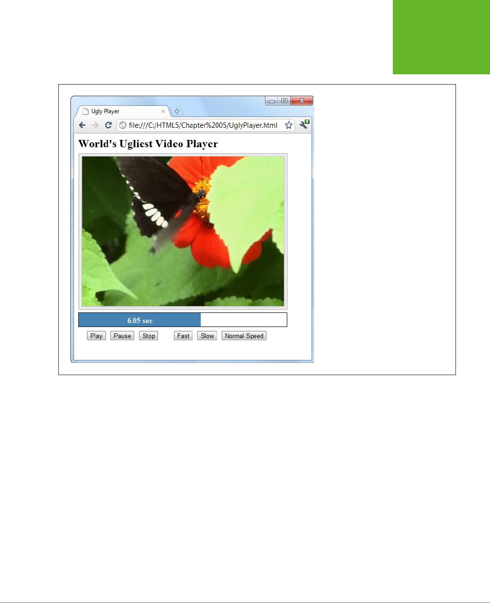
CHAPTER 5: AUDIO AND VIDEO 165
CONTROLLING
YOUR
PLAYER WITH
JAVASCRIPT
FIGURE 5-7
Making a custom HTML5 video player is
easy (making it pretty is not). This example
includes the standard playback buttons,
a playback progress bar, and a few extra
buttons that show off what JavaScript can do
with the
<video>
element.
These buttons trigger the following super-simple functions:
function play() {
video.play();
}
function pause() {
video.pause();
}
function stop() {
video.pause();
video.currentTime = 0;
}
The other three playback buttons are more exotic. They adjust the playbackRate
property to change the speed. For example, a playbackRate of 2 plays video at
twice the normal speed, but with pitch correction so the audio sounds normal,
just accelerated. This is a great feature for getting through a slow training video
www.it-ebooks.info
HTML5: THE MISSING MANUAL, SECOND EDITION
166
CONTROLLING
YOUR
PLAYER WITH
JAVASCRIPT
in a hurry. Similarly, a playbackRate of 0.5 plays video at half normal speed, and a
playbackRate of -1 should play video at normal speed, backward, but browsers have
trouble smoothly implementing this behavior.
function speedUp() {
video.play();
video.playbackRate = 2;
}
function slowDown() {
video.play();
video.playbackRate = 0.5;
}
function normalSpeed() {
video.play();
video.playbackRate = 1;
}
Creating the playback progress bar is a bit more interesting. From a markup point
of view, it’s built out of two <div> elements, one inside the other:
<div id="durationBar">
<div id="positionBar"><span id="displayStatus">Idle.</span></div>
</div>
TIP The playback progress bar is an example where the
<progress>
element (page 133) would make
perfect sense. However, the
<progress>
element still has limited support—far less than the HTML5 video
feature—so this example builds something that looks similar using two
<div>
elements.
The outer <div> element (named durationBar) draws the solid black border, which
stretches over the entire bar and represents the full duration of the video. The inner
<div> element (named positionBar) indicates the current playback position, by filling
in a portion of the black bar in blue. Finally, a <span> element inside the inner <div>
holds the status text, which shows the current position (in seconds) during playback.
Here are the style sheet rules that size and paint the two bars:
#durationBar {
border: solid 1px black;
width: 100%;
margin-bottom: 5px;
}
#positionBar {
height: 30px;
color: white;
font-weight: bold;
www.it-ebooks.info

CHAPTER 5: AUDIO AND VIDEO 167
CONTROLLING
YOUR
PLAYER WITH
JAVASCRIPT
background: steelblue;
text-align: center;
}
When video playback is under way, the <video> element triggers the onTimeUpdate
event continuously. You can react to this event to update the playback bar:
<video id="videoPlayer" ontimeupdate="progressUpdate()">
<source src="butterfly.mp4" type="video/mp4">
<source src="butterfly.webm" type="video/webm">
</video>
Here, the code gets the current positioning in the video (from the currentTime
property), divides that into the total time (from the duration property), and turns
that into a percentage that sizes the <div> element named positionBar:
function progressUpdate() {
// Resizing the blue positionBar, from 0 to 100%.
var positionBar = document.getElementById("positionBar");
positionBar.style.width = (video.currentTime / video.duration * 100) + "%";
// Display the number of seconds, using two decimal places.
displayStatus.innerHTML = (Math.round(video.currentTime*100)/100) + " sec";
}
TIP To get fancier, you could superimpose a download progress bar that shows how much current content
has been downloaded and buffered so far. Browsers already add this feature to their built-in players. To add it
to your own player, you need to handle the
onProgress
event and work with the
seekable
property. For
more information about the many properties, methods, and events provided by the
<video>
element, check
out Microsoft’s reference at
http://tinyurl.com/video-obj-js
.
JavaScript Media Players
If you’re truly independent-minded, you can create your own audio or video player
from scratch. But it’s not a small project, especially if you want nifty features, like
an interactive playlist. And if you don’t have a small art department to back you
up, there’s a distinct possibility that your final product will look just a little bit ugly.
Happily, there’s a better option for web authors in search of the perfect HTML5 player.
Instead of building one yourself, you can pick up a free, JavaScript-customized media
player from the Web. Two solid choices are VideoJS (
http://videojs.com
) and, for
jQuery fans, jPlayer (
www.jplayer.org
). Both of these players are lightweight, easy to
use, and
skinnable
, which means you can change the look of the playback controls
by plugging in a dierent style sheet.
www.it-ebooks.info
HTML5: THE MISSING MANUAL, SECOND EDITION
168
CONTROLLING
YOUR
PLAYER WITH
JAVASCRIPT
Most JavaScript media players (including VideoJS and jPlayer) have built-in Flash
fallbacks, which saves you from needing to find a separate Flash player. And jPlayer
includes its own handy playlist feature, which lets you queue up a whole list of audio
and video files (Figure 5-8).
FIGURE 5-8
Using jPlayer’s playlist
feature, you can offer a
series of audio or video
files. The user can then
play them all in sequence
or click to play a specific
one. The example playlist
here has three videos.
To use VideoJS, you start by downloading the JavaScript files from the VideoJS
website. Then you add the JavaScript reference and style sheet reference shown here:
<!DOCTYPE html>
<html>
<head>
<meta charset="utf-8">
<title>...</title>
<script src="video.js"></script>
<link rel="stylesheet" href="video-js.css">
</head>
...
www.it-ebooks.info

CHAPTER 5: AUDIO AND VIDEO 169
VIDEO CAPTIONS
Then you use the exact same <video> element you’d normally use, with the mul-
tiple source elements and Flash fallback. (The VideoJS player sample code has the
Flowplayer already slotted in for the Flash fallback, but you can remove it and use a
dierent Flash player instead.) In fact, the only dierence between a normal HTML5
video page and one that uses VideoJS is the fact that you must use a special <div>
element to wrap the video player, as shown here:
<div class="video-js-box">
<video class="video-js" width="640" height="264" controls ...>
...
</video>
</div>
It’s nice to see that even when extending HTML5, life can stay pretty simple.
Video Captions
As you’ve seen in previous chapters, the creators of HTML5 were often thinking
about web accessibility—in other words, how people with disabilities can use rich
web pages easily and eciently.
Adding accessibility information to images is easy enough. You simply need to bolt
on some suitably descriptive text with the alt attribute. But what’s the equivalent
to alt text for a video stream? The consensus is to use
subtitles
, text captions that
pop up at the right point during playback. Subtitles can be similar to television
closed-captioning, by simply transcribing dialogue, or they can add descriptive
and supplementary information of their own. The point is that they give people an
avenue to follow the video even if they have hearing diculties (or if they just don’t
want to switch on their computer speakers to play the
Iron Man 4
movie trailer for
the entire oce).
Figure 5-9 shows an example of a captioned video.
www.it-ebooks.info

HTML5: THE MISSING MANUAL, SECOND EDITION
170
VIDEO CAPTIONS
FIGURE 5-9
The subtitles in this video appear in
their usual place: centered, and near
the bottom of the video window.
Timed Text Tracks and WebVTT
In technical video speak, a
subtitle
is a caption that appears superimposed on a video,
and a sequence of subtitles is a
timed text track
. There are a number of dierent
formats for timed text tracks, but they all have fundamental similarities. All of them
are recorded as ordinary text with time markings and are placed in chronological
order in an ordinary text file. Here’s an example of a timed tracks file written in
WebVTT (Web Video Text Tracks Format), which is the format favored by HTML5.
It holds four captions:
www.it-ebooks.info

CHAPTER 5: AUDIO AND VIDEO 171
VIDEO CAPTIONS
WEBVTT
00:00:05.000 --> 00:00:10.000
This caption appears 5 seconds in and lingers until the 10 second mark.
00:01:00.000 --> 00:01:10.000
Now 1 minute has passed. Think about that for 10 seconds.
00:01:10.000 --> 00:01:15.000
This caption appears immediately after the second caption disappears.
00:01:30.000 --> 00:01:35.000
Captions can use <i>line breaks</i> and <b>simple</b> HTML markup.
As you can see, every entry in a WebVTT file specifies three details: the time the
caption should appear (in
hour:minute:seconds
format), the time it should disappear,
and the associated text. Save this content in a text file with the extension
.vtt
(as in
subtitles.vtt
), and you have a ready-to-go timed track file.
Although captioning seems simple, there are a number of fiddly details. For example,
you may want to control line breaks, format your text, move the text captions to
another position in the video window, or show karaoke-style captions that fill in
one word at a time. That’s why there are close to 50 dierent timed track formats.
In fact, the struggle between timed text standards has been as ugly as the format
war over audio and video codecs.
Currently, the ocial HTML5 specification doesn’t specify what timed text format you
should use. However, browser makers have united around WebVTT, a still-evolving
specification inspired by the simple SRT format used for subtitles in desktop media
players. Browser makers have chosen to ignore the more mature TTML (Timed Text
Markup Language) standard, which the W3C has honed over a decade, because it’s
too complex. (Currently, IE 10 [and later] are the only browsers that give TTML any
measure of support.)
TIP You can learn more about the WebVTT standard—including the techniques you need to format and style
captions—from the specification at
http://dev.w3.org/html5/webvtt
. If you’d like some help writing your captions,
you can try out Microsoft’s nifty Caption Maker page (Figure 5-10), which you can find at
http://tinyurl.com/capmaker
.
www.it-ebooks.info
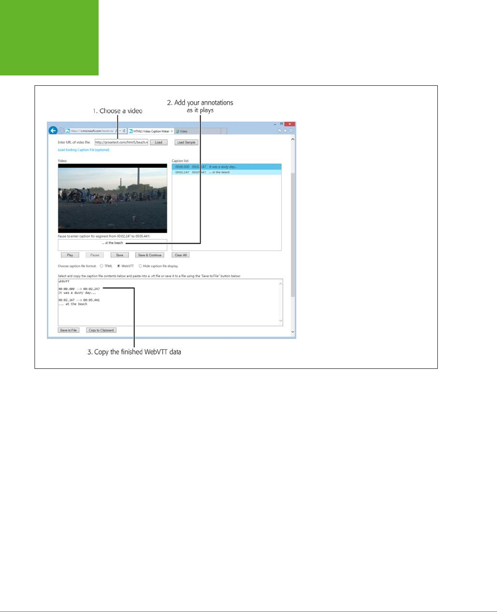
HTML5: THE MISSING MANUAL, SECOND EDITION
172
VIDEO CAPTIONS
FIGURE 5-10
To use the Caption Maker, you must first
point it to a video file that’s already on the
Web (type in the URL and click Load). While
you’re playing the video, it’s easy to make
a quick caption (type it in the box under
the video window and then click Save).
Then, when you’re all done, you can copy
the complete WebVTT listing from the text
box below.
Adding Captions with <track>
Once you have a WebVTT file that contains your captions, you need a way to pair
them up with your video file. The element that works this magic is named <track>.
You add it inside your <video> element, after any <source> elements:
<video controls width="700" height="400">
<source src="butterfly.mp4" type="video/mp4">
<source src="butterfly.webm" type="video/webm">
<track src="butterfly.vtt" srclang="en" kind="subtitles" label="English"
default>
</video>
The <track> element takes several attributes. First is the src attribute, which identi-
fies the timed track file. The srclang attribute identifies the language code of your
subtitle file, for accessibility tools. Use en for English (or get the code for a more
exotic language at
http://tinyurl.com/l-codes
).
www.it-ebooks.info
CHAPTER 5: AUDIO AND VIDEO 173
VIDEO CAPTIONS
The kind attribute describes the type of content in your captions. The HTML5
specification gives you five choices, but only two result in the pop-up captions you
expect. Specify subtitles if your text consists of transcriptions or translations of
dialogue), or captions if your text includes dialogue
and
descriptions for sound
eects and musical cues.
TIP Subtitles make sense when you can hear the audio but not understand it—for example, when watching
a movie in another language. Captions make sense when no audio is available at all—for example, you’ve muted
your player so you won’t wake up your officemate in the cubicle beside you.
More specialized values for the kind attribute are descriptions (text that can
replace the video when it’s not available and may be spoken by speech synthesis),
chapters (chapter titles, which viewers can use as a navigation aid), and metadata
(bits of information that you can retrieve in your JavaScript code). If you choose
one of these values, the video player won’t show the text. It’s up to another tool—or
your JavaScript code—to retrieve this information and act on it.
The label attribute sets the text that’s shown in the video player’s Caption menu,
which you can call up by clicking a small button under the video window. The label
text is particularly important if you want to let viewers choose from multiple tracks.
For example, here’s a video that has two tracks:
<video controls width="700" height="400">
<source src="butterfly.mp4" type="video/mp4">
<source src="butterfly.webm" type="video/webm">
<track src="butterfly.vtt" srclang="en" kind="subtitles" label="English"
default>
<track src="butterfly_fr.vtt" srclang="fr" kind="subtitles" label="French">
</video>
The first track has the default attribute, so it’s the one that’s initially picked. But the
viewer can click the caption button and pick the other track (Figure 5-11).
Even if your video has just a single track, the caption list still includes two choices:
your track and an O option that turns o the captions. If you want to give viewers
the option of captions, but you want your captions to be o initially, just make sure
none of your tracks have the default attribute. That way, the video player starts
with the O option.
NOTE Track files aren’t just for accessibility and soundless playback. Search engines can also mine the
information in a track file and use it to improve search results. If fact, a super-smart search engine of the future
might use WebVTT information to lead a searcher directly to a specific playback location
within
a video file, by
matching the search text with a timed caption.
www.it-ebooks.info
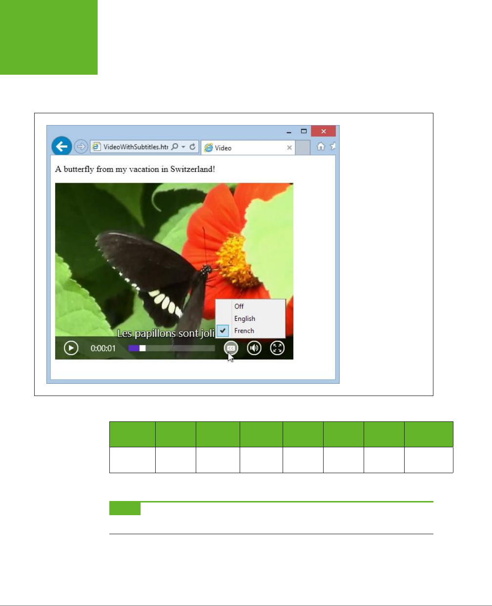
HTML5: THE MISSING MANUAL, SECOND EDITION
174
VIDEO CAPTIONS
Browser Support for Video Captions
Browsers have been slow to support the <track> element. At this writing, Firefox
doesn’t support it at all, but the developers at Mozilla plan to include it in the future.
Table 5-4 details the current state of aairs.
FIGURE 5-11
Browsers that support
the
<track>
element
add a caption-picking
button like this one. Using
it, the viewer can switch
tracks or turn captions off
altogether.
TABLE 5-4
Browser support for the <track> element
IE FIREFOX CHROME SAFARI OPERA
SAFARI
IOS ANDROID
Minimum
Version
10 - 26 6* 15 - 2
* Safari doesn’t provide a caption button for switching tracks or turning captions on and off.
NOTE If you’re testing videos that use captions in Chrome, you’ll need to upload your files first. If you simply
launch the file from your computer, Chrome can play the video file, but it can’t fetch the matching WebVTT file.
www.it-ebooks.info

CHAPTER 5: AUDIO AND VIDEO 175
VIDEO CAPTIONS
Fortunately, you can use the <track> element without worry. Browsers that don’t
support it simply ignore it, without a hiccup.
If you need a way to provide captions that work on every HTML5 browser, there’s
an easy workaround. You can use the <track> element as you would normally, in
conjunction with a JavaScript polyfill, such as Captionator.js (
http://captionatorjs.
com
). Captionator works by placing a floating element over the video window. Then,
when playback reaches the appropriate points, Captionator.js retrieves the caption
text from the WebVTT file and inserts it into the floating element.
www.it-ebooks.info

177
CHAPTER
6
It would be ludicrous to build a modern website without CSS. The standard is fused
into the fabric of the Web almost as tightly as HTML. Whether you’re laying out
pages, building interactive buttons and menus, or just making things look pretty,
CSS is a fundamental tool. In fact, as HTML has increasingly shifted its focus to con-
tent and semantics (page 38), CSS has become the heart and soul of web
design
.
Along the way, CSS has become far more detailed and far more complex. When
CSS evolved from its first version to CSS 2.1, it quintupled in size, reaching the size
of a modest novel. Fortunately, the creators of the CSS standard had a better plan
for future features. They carved the next generation of enhancements into a set of
separate standards, called
modules
. That way, browser makers were free to imple-
ment the most exciting and popular parts of the standard first—which is what they
were already doing, modules or not. Together, the new CSS modules fall under the
catchall name
CSS3
(note the curious lack of a space, as with
HTML5
).
CSS3 has roughly 50 modules in various stages of maturity. They range from features
that provide fancy eye candy (like rich fonts and animation) to ones that serve a more
specialized, practical purpose (for example, speaking text aloud or varying styles
based on the capabilities of the computer or mobile device). They include features
that are reliably supported in the most recent versions of all modern browsers and
features so experimental that no browser yet supports them.
In this chapter, you’ll tour some of the most important (and best supported) parts of
CSS3. First, you’ll see how to use shadows, rounded corners, and other refinements
to make your boxes look better. Next, you’ll learn how you can use transitions to
create subtle eects when the visitor hovers over an element, clicks on it, or tabs
over to a control. (And you’ll make these eects even better with two more CSS3
Fancy Fonts and
Eects with CSS3
www.it-ebooks.info
HTML5: THE MISSING MANUAL, SECOND EDITION
178
USING CSS3
TODAY
features: transforms and transparency.) Finally, you’ll learn how to jazz up ordinary
text with a rich variety of web fonts.
But first, before you get to any of these hot new features, it’s time to consider how
you can plug in the latest and most stylin’ features without leaving a big chunk of
your audience behind.
Using CSS3 Today
CSS3 is the unchallenged future of web styling, and it’s not finished yet. Many
modules are still being refined and revised, and no browser supports them all. You
can see the current state of this giant family of specifications at
http://tinyurl.com/
CSS3-stages
.
Because CSS3 is still being fine-tuned, it has the same complications as HTML5.
Website authors like yourself need to decide what to use, what to ignore, and how
to bridge the support gaps.
There are essentially three strategies you can use when you start incorporating CSS3
into a website. The following sections describe them.
NOTE CSS3 is not part of HTML5. The standards were developed separately, by different people working at
different times in different buildings. However, even the W3C encourages web developers to lump HTML5 and CSS3
together as part of the same new wave of modern web development. For example, if you check out the W3C’s
HTML5 logo-building page at
www.w3.org/html/logo
, you’ll see that it encourages you to advertise CSS3 in its
HTML5 logo strips. Furthermore, many hallmarks of modern web design with HTML5—such as the mobile-friendly
layout techniques you’ll learn about in the next chapter—require CSS3.
Strategy 1: Use What You Can
It makes sense to use features that already have solid browser support across all
browser brands. One example is the web font feature (page 206). With the right
font formats, you can get it working with browsers all the way back to IE 6. Unfortu-
nately, very few CSS3 features fall into this category. The word-wrap property works
virtually everywhere, and older browsers can do transparency with a bit of fiddling,
but just about every other feature leaves the still-popular IE 8 browser in the dust.
NOTE Unless otherwise noted, the features in this chapter work on the latest version of every modern
browser, including Internet Explorer, provided you use IE 9 or later. However, they don’t work on older versions
of IE.
Strategy 2: Treat CSS3 Features as Enhancements
CSS3 fans have a rallying cry: “Websites don’t need to look exactly the same on every
browser.” Which is certainly true. (They have a one-page website, too—see
http://
DoWebsitesNeedToBeExperiencedExactlyTheSameInEveryBrowser.com
, which picks
up a few frills on modern browsers but remains functional on laggards like IE 7.)
www.it-ebooks.info
CHAPTER 6: FANCY FONTS AND EFFECTS WITH CSS3 179
USING CSS3
TODAY
The idea behind this strategy is to use CSS3 to add fine touches that won’t be missed
by people using less-capable browsers. One example is the border-radius property
that you can use to gently round the corners of a floating box. Here’s an example:
header {
background-color: #7695FE;
border: thin #336699 solid;
padding: 10px;
margin: 10px;
text-align: center;
border-radius: 25px;
}
Browsers that recognize the border-radius property will know what to do. Older
browsers will just ignore it, keeping the plain square corners (Figure 6-1).
FIGURE 6-1
On Internet Explorer 9, this
header box has rounded
corners (top). IE 8 ignores
the border-radius property
but applies the rest of
the style sheet properties
(bottom).
This backward compatibility allows web designers to play with the latest frills in
the newest version of CSS without breaking their sites on older browsers. However,
there’s a definite downside if you go too far. No matter how good a website looks
in the latest version of your favorite browser, it can be deeply deflating if you fire up
an older browser that’s used by a significant slice of your clientele and find that it
looks distinctly less awesome. After all, you want your website to impress everyone,
not just web nerds with the best browsers.
For this reason, you may want to approach some CSS3 enhancements with caution.
Limit yourself to features that are already in most browsers, even if they require the
latest browser versions. And don’t use CSS3 features in ways that change the experi-
ence of your website so dramatically that some people will get second-rate status.
www.it-ebooks.info

HTML5: THE MISSING MANUAL, SECOND EDITION
180
USING CSS3
TODAY
TIP When it comes to CSS3, Internet Explorer is the straggler. There’s a militant minority of web designers
who believe that web designers should ignore backward browsers like IE 8 and start using CSS3 features as soon
as other browsers support them. Otherwise, who will keep pressure on Microsoft and encourage the Web to get
better? That philosophy makes sense,
if
the primary purpose of your website is the political one of promoting
advanced web standards. But otherwise, keep in mind that dismissing a large segment of the web world will
reflect poorly on you—because no matter how much you dislike someone’s browser, that person is still using it
to look at
your
work.
Strategy 3: Add Fallbacks with Modernizr
Using a partially supported CSS3 feature is a great idea if the website still looks
great without it. But sometimes, a vital part of your website design can go missing,
or the downgraded version of your website just looks ugly. For example, consider
what happens if you use the Firefox-only multicolored border settings, as shown
in Figure 6-2.
FIGURE 6-2
This multicolored border looks snazzy in
Firefox (top). But try the same thing out
in Chrome, and you’ll get a thick, plain
black border (bottom)—and that never
looks good.
Sometimes, you can solve the problem by stacking properties in the right order. The
basic technique is to start with more general properties, followed by new properties
that override these settings. When this works, it satisfies every browser—the old
browsers get the standard settings, while the new browsers override these settings
with newer ones. For example, you can use this technique to replace an ordinary
background fill with a gradient:
.stylishBox {
...
background: yellow;
background: radial-gradient(ellipse, red, yellow);
}
Figure 6-3 shows the result.
In some cases, overriding style properties doesn’t work, because you need to set
properties in combination. The multicolored border in Figure 6-2 is an example.
The multicolored eect is set with the border-colors property, but it appears only
if the border is made thick with the border-thickness property. On browsers that
www.it-ebooks.info
CHAPTER 6: FANCY FONTS AND EFFECTS WITH CSS3 181
USING CSS3
TODAY
don’t support multicolored borders, the thick border is an eyesore, no matter what
single color you use.
FIGURE 6-3
Top: In browsers that don’t understand CSS3, the
stylishBox
rule
paints a yellow background.
Bottom: In browsers that do understand CSS3, the yellow background
is replaced with a radial gradient that blends from a red center point to
yellow at the edges.
One way to address problems like these is with Modernizr, the JavaScript library
that tests HTML5 feature support (page 31). It lets you define alternate style settings
for browsers that don’t support the style properties you really want. For example,
imagine you want to create two versions of the header box shown in Figure 6-1.
You want to use rounded corners if they’re supported, but substitute a double-line
border if they aren’t. If you’ve added the Modernizr script reference to your page,
then you can use a combination of style rules, like this:
/* Settings for all headers, no matter what level of CSS3 support. */
header {
background-color: #7695FE;
padding: 10px;
margin: 10px;
text-align: center;
}
/* Settings for browsers that support border-radius. */
.borderradius header {
border: thin #336699 solid;
border-radius: 25px;
}
www.it-ebooks.info

HTML5: THE MISSING MANUAL, SECOND EDITION
182
USING CSS3
TODAY
/* Settings for browsers that don't support border-radius. */
.no-borderradius header {
border: 5px #336699 double;
}
So how does this nifty trick work? When you use Modernizr in a page, you begin by
adding the class="no-js" attribute to the root <html> element:
<html class="no-js">
When you load Modernizr on a page, it quickly checks if a range of HTML5, Java-
Script, and CSS3 features are supported. It then applies a pile of classes to the root
<html> element, separated by spaces, changing it into something like this:
<html class="js flexbox canvas canvastext webgl no-touch geolocation
postmessage no-websqldatabase indexeddb hashchange history draganddrop
no-websockets rgba hsla multiplebgs backgroundsize borderimage borderradius
boxshadow textshadow opacity no-cssanimations csscolumns cssgradients
no-cssreflections csstransforms no-csstransforms3d csstransitions fontface
generatedcontent video audio localstorage sessionstorage webworkers
applicationcache svg inlinesvg smil svgclippaths">
If a feature appears in the class list, that feature is supported. If a feature name is
prefixed with the text “no-” then that feature is not supported. Thus, in the example
shown here, JavaScript is supported (js) but web sockets are not (no-websockets).
On the CSS3 side of things, the border-radius property works (borderradius) but
CSS3 reflections do not (no-cssreflections).
You can incorporate these classes into your selectors to filter out style settings based
on support. For example, a selector like .borderradius header gets all the <header>
elements inside the root <html> element—if the browser supports the border-radius
property. Otherwise, there will be no .borderradius class, the selector won’t match
anything, and the rule won’t be applied.
The catch is that Modernizr provides classes for only a subset of CSS3 features.
This subset includes some of CSS3’s most popular and mature features, but the
border-color feature in Figure 6-2 doesn’t qualify because it’s still Firefox-only.
For that reason, it’s a good idea to hold o on using multicolored borders in your
pages, at least for now.
NOTE You can also use Modernizr to create JavaScript fallbacks. In this case, you simply need to check
the appropriate property of the Modernizr object, as you do when checking for HTML5 support. You can use this
technique to compensate if you’re missing more advanced CSS3 features, like transitions or animations. However,
there’s so much work involved and the models are so different that it’s usually best to stick with a JavaScript-only
solution for essential website features.
www.it-ebooks.info

CHAPTER 6: FANCY FONTS AND EFFECTS WITH CSS3 183
USING CSS3
TODAY
Browser-Specific Styles with Vendor Prefixes
When the creators of CSS develop new features, they often run into a chicken-and-
egg dilemma. In order to perfect the feature, they need feedback from browser
makers and web designers. But in order to get this feedback, browser makers and
web designers need to implement these new-and-imperfect features. The result is
a cycle of trial and feedback that takes many revisions to settle down. As this pro-
cess unfolds, the syntax and implementation of features change. This raises a very
real danger—unknowing web developers might learn about a dazzling new feature
and implement it in their real-life websites, not realizing that future versions of the
standard could change the rules and break the websites.
To avoid this threat, browser makers use a system of
vendor prefixes
to change CSS
property and function names while they’re still under development. For example,
consider the radial-gradient() function described on page 193. In older versions
of Firefox, the radial-gradient() function wasn’t available. However, you could use
an “in progress” version of this function called -moz-radial-gradient:
.stylishBox {
background: yellow;
background: -moz-radial-gradient(ellipse, red, yellow);
}
Firefox uses the vendor prefix -moz- (which is short for Mozilla, the organization
that’s behind the Firefox project). Every browser engine has its own vendor prefix
(Table 6-1), which complicates life horrendously, but for a good reason. Dierent
browser makers add support at dierent times, often using dierent draft versions of
the same specification. Although all browsers will support the same syntax for final
specification, the syntax of the vendor-specific properties and functions often varies.
TABLE 6-1
Vendor prefixes
PREFIX FOR BROWSERS
-moz- Firefox
-webkit- Chrome, Safari, and the latest versions of Opera (the same rendering
engine powers all three browsers)
-ms- Internet Explorer
-o- Old versions of Opera (before version 15)
Here’s an example that applies a radial gradient using all four of the browser-specific
prefixes:
.stylishBox {
background: yellow;
background-image: -moz-radial-gradient(circle, green, yellow);
background-image: -webkit-radial-gradient(circle, green, yellow);
background-image: -o-radial-gradient(circle, green, yellow);
background-image: -ms-radial-gradient(circle, green, yellow);
}
www.it-ebooks.info
HTML5: THE MISSING MANUAL, SECOND EDITION
184
BUILDING
BETTER BOXES
Clearly, when dealing with the less mature parts of CSS3, you need some bloated
style sheet rules.
The obvious question for every web designer is “When do I need to use vendor
prefixes, and when is it safe to use the ordinary, unprefixed property or function
name?” You might think you could just fire up your browser for a quick test, but you
won’t have a conclusive answer unless you run your page through
every
browser
out there. For example, the borderadius property works on all browsers, with no
vendor prefixes required. But the radial-gradient() function is a bit trickier: At
this writing, it works on most browsers but still requires the -webkit- prefix on
some mobile browsers. And the transform property that you’ll consider later in this
chapter works with no prefix on IE and Firefox, but still requires the -webkit- prefix
in Chrome, Safari, and Opera.
Further complicating life, the syntax you use to specify a property value or func-
tion argument can change. For example, IE 10 introduced a prefixed version of the
radial-gradient() function during testing. The final, released version of IE 10 lets
developers use either the most recent syntax with the unprefixed radial-gradient()
function or the slightly older form with the prefixed -ms-radial-gradient() func-
tion. This setup is good for endless hours of debugging fun.
NOTE In this chapter, you’ll learn about the current state of support for all CSS3 parts covered here, including
which ones need vendor prefixes. If a style sheet example in this chapter
doesn’t
use vendor prefixes, you can
assume that it’s safe to omit them when you use the feature in your own pages.
If your head is starting to spin, don’t worry—help is at hand. To get the latest informa-
tion about which CSS3 features require vendor prefixes, you can turn to the virtually
indispensable site
http://caniuse.com
(which you first saw on page 27). When you
look up a CSS3 feature, the “Can I use…” site clearly spells out which browser ver-
sions require a vendor prefix (Figure 6-4).
NOTE Using vendor prefixes is a messy business. Web developers are split on whether they’re a necessary
evil of getting the latest and greatest frills, or a big fat warning sign that should scare clear-thinking designers
away. But one thing is certain: If you don’t use the vendor prefixes, significant parts of CSS3 will be off limits for
now.
Building Better Boxes
From the earliest days of CSS, web designers were using it to format boxes of con-
tent. As CSS became more powerful, the boxes became more impressive, creating
everything from nicely shaded headers to floating, captioned figures. And when
CSS cracked the hovering problem, floating boxes were even turned into rich, glowy
buttons, taking over from the awkward JavaScript-based approaches of yore. With
this in mind, it’s no surprise that some of the most popular and best-supported
CSS3 features can make your boxes look even prettier, no matter what they hold.
www.it-ebooks.info
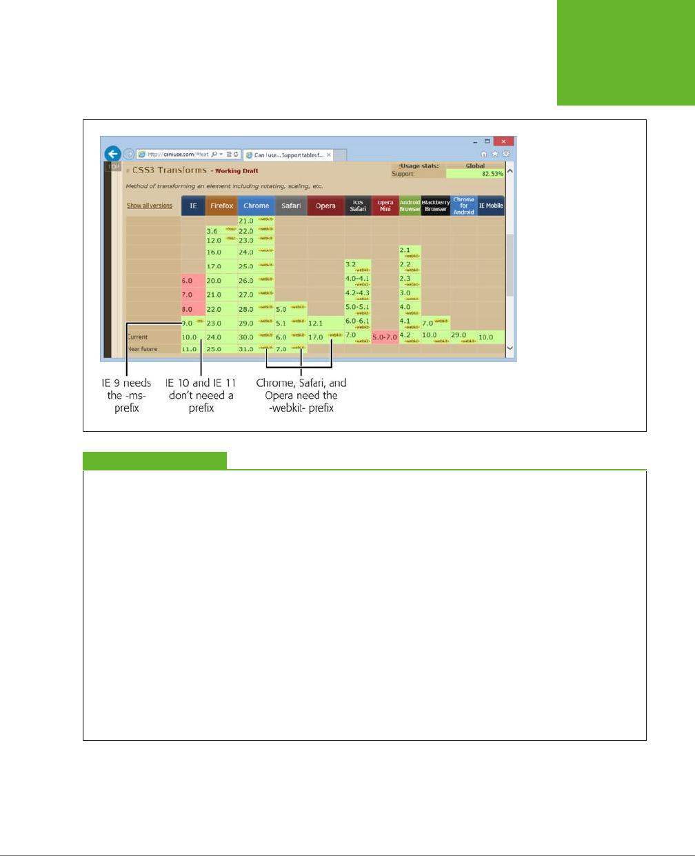
CHAPTER 6: FANCY FONTS AND EFFECTS WITH CSS3 185
BUILDING
BETTER BOXES
FIGURE 6-4
If you need to use a
prefix, the “Can I use…”
website lets you know
in a tiny yellow text
bubble. For example,
the CSS3 transforms
feature doesn’t need a
vendor prefix in the latest
versions of Firefox or IE,
but it does in all other
browsers.
GEM IN THE ROUGH
Adding Vendor Prefixes Automagically
If you make heavy use of the parts of CSS3 that still require
vendor prefixes, you can quickly get worn down updating
massive style sheets and adding multiple versions of the
same style sheet property over and over again. Before you
lose your sanity, consider a miraculously clever JavaScript
tool called
-prefix-free
.
To use -prefix-free, you create an ordinary style sheet, using
CSS3 properties as you need them, without worrying about
vendor prefixes. Then, in your web pages, you add a reference
to the -prefix-free script.
When someone views one of your pages, the -prefix-free
script springs into action. It examines the current browser and
automatically tweaks your style sheet to suit by adding all the
vendor prefixes that that browser needs. (Yes, this automatic
tweaking takes a bit of extra time, but you’ll probably find
it’s so fast as to be undetectable.) Of course, -prefix-free can’t
make a browser support a feature that it otherwise wouldn’t,
but it can transform ordinary, sensibly named properties into
the messy, vendor-specific names that some browsers need to
support new and evolving features. For many developers, add-
ing an extra JavaScript file is a small price to pay for managing
the chaos of CSS3 prefixes.
To download the -prefix-free library, or play with an interac-
tive page that lets you type some CSS and test the script’s
prefix-adding ability, visit
http://leaverou.github.io/prefixfree
.
Transparency
The ability to make partially transparent pictures and colors is one of the most basic
building blocks in CSS3. There are two ways to do it.
www.it-ebooks.info
HTML5: THE MISSING MANUAL, SECOND EDITION
186
BUILDING
BETTER BOXES
Your first option is to use the rgba() color function, which accepts four numbers.
The first three values are the red, green, and blue components of the color, from 0
to 255. The final value is the
alpha
, a fractional value number from 0 (fully transpar-
ent) to 1 (fully opaque).
Here’s an example that creates a 50 percent transparent lime green color:
.semitransparentBox {
background: rgba(170,240,0,0.5);
}
Browsers that don’t support rgba() will just ignore this rule, and the element will
keep its default, completely transparent background. So the second, and better,
approach is to start by declaring a solid fallback color, and then replace that color
with a semitransparent one:
.semitransparentBox {
background: rgb(170,240,0);
background: rgba(170,240,0,0.5);
}
This way, browsers that don’t support the rgba() function will still color the element’s
background, just without the transparency.
TIP To make this fallback better, strive to use a color that more accurately reflects the semitransparent effect.
For example, if you’re putting a semitransparent lime green color over a mostly white background, the color will
look lighter because the white shows through. Your fallback color should reflect this fact, if possible.
CSS3 also adds a style property named opacity, which works just like the alpha value.
You can set opacity to a value from 0 to 1 to make any element partially transparent:
.semitransparentBox {
background: rgb(170,240,0);
opacity: 0.5;
}
Figure 6-5 shows two examples of semitransparency, one that uses the rgba()
function and one that uses the opacity property.
The opacity property is a better tool than the rgba() function if you want to do any
of the following:
• Make more than one color semitransparent. With opacity, the background color,
text color, and border color of an element can become transparent.
• Make something semitransparent, even if you don’t know its color (for example,
because it might be set by another style sheet or in JavaScript code).
• Make an image semitransparent.
• Use a transition, an animated eect that can make an element fade away or
reappear (page 199).
www.it-ebooks.info
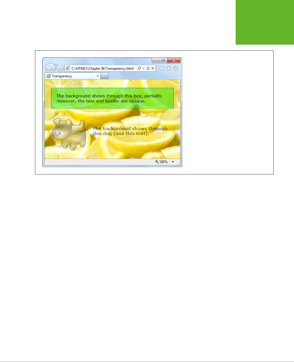
CHAPTER 6: FANCY FONTS AND EFFECTS WITH CSS3 187
BUILDING
BETTER BOXES
FIGURE 6-5
This page serves up semitransparency two
different ways: to fade out a picture (using the
opacity
property) and to let the background
show through a box (using a background color
created with the
rgba()
function).
Rounded Corners
You’ve already learned about the border-radius property, which lets you shave the
hard corners o boxes. But what you haven’t yet seen is how you can tweak this
setting to get the curve you want.
First, you can choose a dierent, single value for the border-radius property, since
the property specifies the radius of the circle that’s used to draw the rounded edge.
(You don’t see the entire circle—just enough to connect the vertical and horizontal
sides of the box.) Set a bigger border-radius value, and you’ll get a bigger curve
and a more gently rounded corner. As with most measurements in CSS, you can use
a variety of units, including pixels and percentages. You can also adjust each corner
separately by supplying four values:
.roundedBox {
background: yellow;
border-radius: 25px 50px 25px 85px;
}
But that’s not all—you can also stretch the circle into an ellipse, creating a curve
that stretches longer in one direction. To do this, you need to target each corner
separately (using properties like border-top-left-radius) and then supply two
numbers: one for the horizontal radius and one for the vertical radius:
www.it-ebooks.info
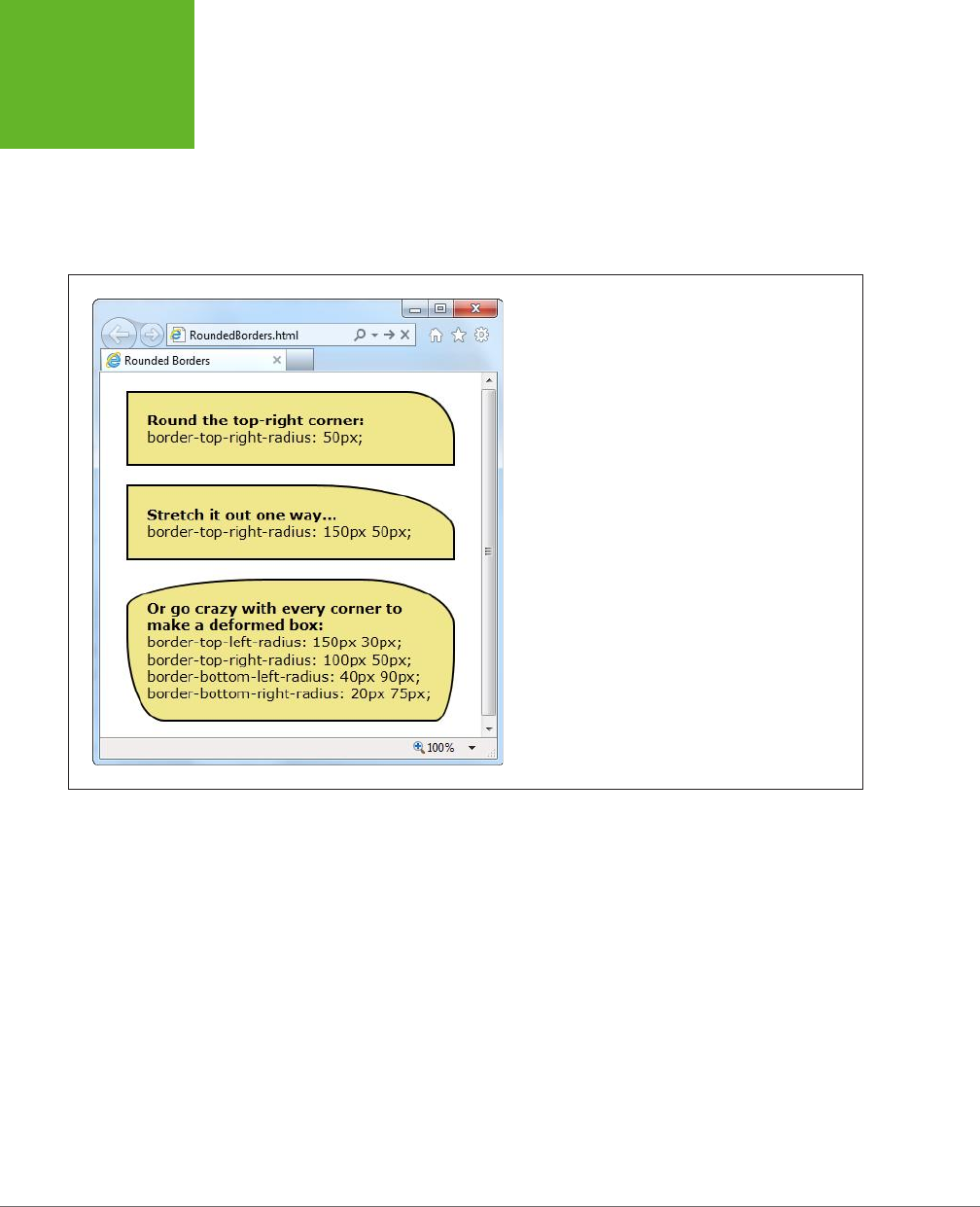
HTML5: THE MISSING MANUAL, SECOND EDITION
188
BUILDING
BETTER BOXES
.roundedBox {
background: yellow;
border-top-left-radius: 150px 30px;
border-top-right-radius: 150px 30px;
}
Figure 6-6 shows some examples.
FIGURE 6-6
A clever application of
border-radius
can create virtu-
ally any sort of curve.
Backgrounds
One shortcut to attractive backgrounds and borders is to use images. CSS3 intro-
duces two new features to help out here. First is multiple background support, which
lets you combine two or more images in a single element’s background. Here’s an
example that uses two backgrounds to embellish the top-left and bottom-right
corner of a box:
.decoratedBox {
margin: 50px;
padding: 20px;
background-image: url('top-left.png'), url('bottom-right.png');
background-position: left top, right bottom;
background-repeat: no-repeat, no-repeat;
}
www.it-ebooks.info
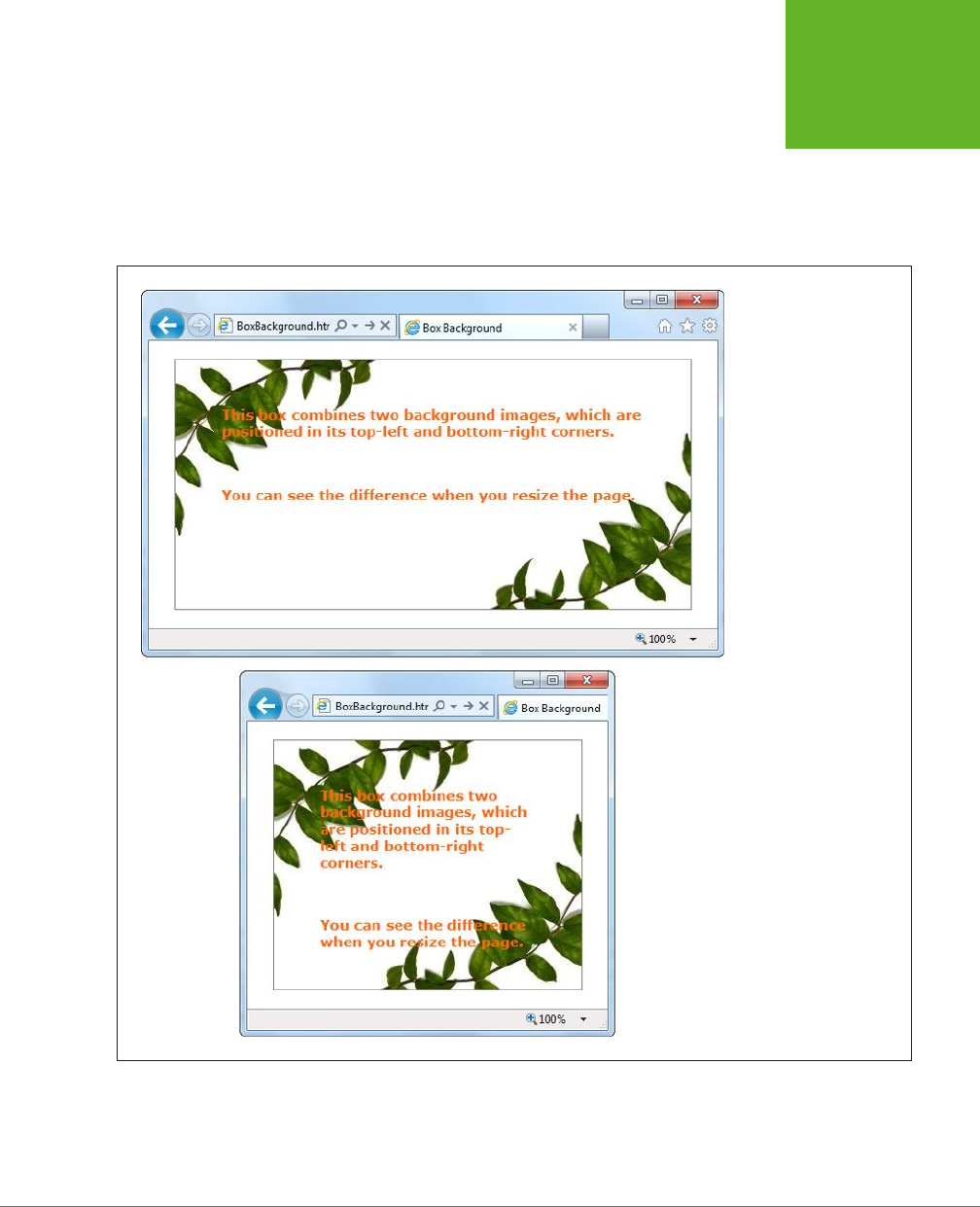
CHAPTER 6: FANCY FONTS AND EFFECTS WITH CSS3 189
BUILDING
BETTER BOXES
This first step is to supply a list with any number of images, which you use to set the
background-image property. You can then position each image and control whether
it repeats, using the background-position and background-repeat properties. The
trick is to make sure that the order matches, so the first image is positioned with the
first background-position value, the second image with the second background-
position value, and so on. Figure 6-7 shows the result.
FIGURE 6-7
It doesn’t matter how big
this box grows—the two
background images stay
fixed at either corner.
www.it-ebooks.info

HTML5: THE MISSING MANUAL, SECOND EDITION
190
BUILDING
BETTER BOXES
NOTE If browsers don’t support multiple backgrounds, they’ll completely ignore your attempt to set the
background. To avoid this problem, start by setting the
background
or
background-image
property with
a fallback color or picture. Then, attempt to set multiple backgrounds by setting
background-image
with a
list of pictures.
And here’s a revised example that uses the
sliding doors
technique—a time-honored
web design pattern that creates a resizable graphic out of three pieces: an image
for the left, an image for the right, and an extremely thin sliver that’s tiled through
the middle:
.decoratedBox {
margin: 50px;
padding: 20px;
background-image: url('left.png'), url('middle.png'), url('right.png');
background-position: left top, left top, right bottom;
background-repeat: no-repeat, repeat-x, no-repeat;
}
You could use markup like this to draw a background for a button. Of course, with all
of CSS3’s fancy new features, you’ll probably prefer to create those using shadows,
gradients, and other image-free eects.
Shadows
CSS3 introduces two types of shadows: box shadows and text shadows. Of the
two, box shadows are generally more useful. You can use a box shadow to throw a
rectangular shadow behind any <div> (but don’t forget your border, so it still looks
like a box). Shadows even follow the contours of boxes with rounded corners (see
Figure 6-8).
FIGURE 6-8
Shadows can make text float (top), boxes pop out (middle), or buttons
look glowy (bottom).
www.it-ebooks.info

CHAPTER 6: FANCY FONTS AND EFFECTS WITH CSS3 191
BUILDING
BETTER BOXES
The two properties that make shadows work are box-shadow and text-shadow. Here’s
a basic box shadow example:
.shadowedBox {
border: thin #336699 solid;
border-radius: 25px;
box-shadow: 5px 5px 10px gray;
}
The first two values set the horizontal and vertical oset of the shadow. Using
positive values (like 5 pixels for both, in the above example) displaces the shadow
down and to the right. The next value sets the
blur
distance—in this example, 10
pixels—which increases the fuzziness of the shadow. At the end is the shadow color.
If there’s any content underneath the box, consider using the rgba() function (page
186) to supply a semitransparent shadow.
If you want to tweak your shadow, you can tack on two details. You can add another
number between the blur and the color to set the shadow
spread
, which expands
the shadow by thickening the solid part before the blurred edge starts:
box-shadow: 5px 5px 10px 5px gray;
And you can add the word inset on the end to create a shadow that reflects inside
an element, instead of outside. This works best if you use a shadow that’s directly
on top of the element, with no horizontal or vertical oset:
box-shadow: 0px 0px 20px lime inset;
This creates the bottom example in Figure 6-8. You can use inset shadows to add
hover eects to a button (page 196).
NOTE You can even supply multiple shadows by separating each one with a comma. But getting shadow-
crazy is usually a waste of effort and computing power.
The text-shadow property requires a similar set of values, but in a dierent order. The
color comes first, followed by the horizontal and vertical osets, followed by the blur:
.textShadow {
font-size: 30px;
font-weight: bold;
text-shadow: gray 10px 10px 7px;
}
Box shadows and text shadows don’t show up in old versions of Internet Explorer.
Box shadows require IE 9 or later, while text shadows require IE 10 or later.
Gradients
Gradients are blends of color that can create a range of eects, from the subtle
shading behind a menu bar to a psychedelic button that’s colored like a 1960s revival
party. Figure 6-9 shows some examples.
www.it-ebooks.info
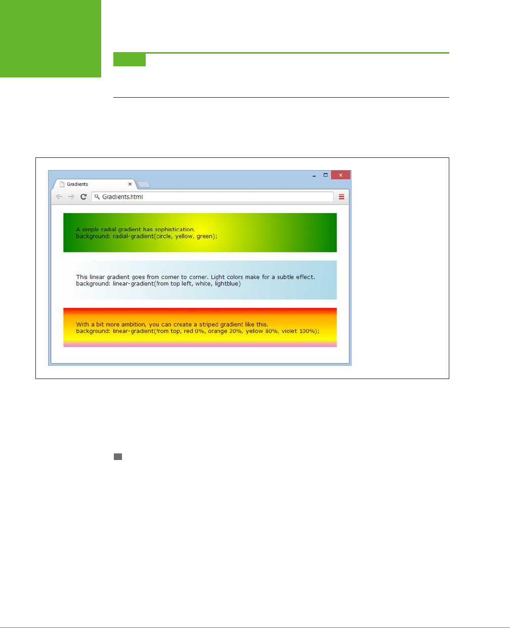
HTML5: THE MISSING MANUAL, SECOND EDITION
192
BUILDING
BETTER BOXES
NOTE Many web gradients are faked with background images. But CSS3 lets you define the gradient you
want and gets the browser to do the work. The advantage is fewer image files to schlep around and the ability
to create gradients that seamlessly resize themselves to fill any amount of space.
CSS supports two types of gradients: linear gradients that blend from one band of
color to another, and radial gradients that blend from a central point to the outer
edges of your region.
FIGURE 6-9
At the heart of it, gradients
are nothing more than
blends of two or more
colors. But that simple
recipe cooks up into plenty
of different dishes.
There are no special CSS properties for creating gradients. Instead, you can use a
gradient function to set the background property. Just remember to set the property
to a solid color first to create a fallback for browsers that don’t support gradients
(like versions of Internet Explorer before IE 10).
LINEAR GRADIENTS
There are four gradient functions. The first function is linear-gradient(). Here it is in
one of its simpler forms, shading a region from white at the top to blue at the bottom:
.colorBlendBox {
background: linear-gradient(from top, white, blue);
}
The word from indicates that the top is the starting point for the first color (white).
You can replace this with to, which reverses the gradient so it blends from blue at
the bottom to white at the top:
background: linear-gradient(to top, white, blue);
www.it-ebooks.info

CHAPTER 6: FANCY FONTS AND EFFECTS WITH CSS3 193
BUILDING
BETTER BOXES
Similarly, you can replace top with left to go from one side to another. Or use both
to blend diagonally from the top-left corner:
background: linear-gradient(from top left, white, lightblue)
If you want multiple-color bands, you simply supply a list of colors. Here’s how you
create a series of three horizontal color stripes, starting with red at the top:
background: linear-gradient(from top, red, orange, yellow);
Finally, you can control where each color starts (bumping some together or o to
one side), using
gradient stops
. Each gradient stop is a percentage, with 0 percent
being at the very start of the gradient and 100 percent being at the very end. Here’s
an example that extends the orangey-yellow section in the middle:
background: linear-gradient(from top, red 0%, orange 20%, yellow 80%,
violet 100%);
The syntax of the linear-gradient() function is easy to follow. But here’s the
bad news: To guarantee support on Android browsers and slightly older versions
of Safari (before Safari 7), you need to also add the -webkit- vendor prefix. And
what’s worse, the -webkit-linear-gradient() function is subtly dierent from the
true linear-gradient() function. Unlike linear-gradient(), -webkit-linear-
gradient() doesn’t use the to or from values to specify direction. Instead, from is
assumed automatically.
Here’s a fully outfitted style sheet rule that satisfies slightly older browsers by add-
ing a vendor-prefixed gradient:
.colorBlendBox {
background: lightblue;
background: -webkit-linear-gradient(top left, white, lightblue);
background: linear-gradient(from top left, white, lightblue);
}
Fortunately, there’s no need to add other vendor prefixes (like -moz- and -o-), unless
you want to support
much
older versions of Firefox and Opera.
TIP In all these examples, gradients were used with the
background
property. However, you can also
use gradient functions to set the
background-image
property in exactly the same way. The advantage here
is that
background-image
lets you use an image fallback. First, set
background-image
to a suitable
fallback image for less-equipped browsers, and then set it again using a gradient function. Most browsers are
smart enough that they won’t download the gradient image unless they need it, which saves bandwidth.
RADIAL GRADIENTS
To set a radial gradient, you use the radial-gradient() function. You need to supply
a color for the center of the circle and a color for the outer edge of the circle, where
it meets the boundaries of the element. Here’s a radial gradient that places a white
point in the center and fades out to blue on the edges:
www.it-ebooks.info

HTML5: THE MISSING MANUAL, SECOND EDITION
194
BUILDING
BETTER BOXES
background: radial-gradient(circle, white, lightblue);
Once again, you need to add a -webkit- version of the function to be safe:
background: -webkit-radial-gradient(circle, yellow, green);
Replace the word circle with ellipse if you want to stretch your gradient out into
an oblong shape to better fit its container.
As with a linear gradient, you can supply a whole list of colors. Optionally, you can
add percentages to tweak how quickly the gradient blends from one color to the
next. Here’s an example that starts yellow, blends slowly into green, and then quickly
blends through blue, white, and black near the outside edge of the element:
background: radial-gradient(circle, yellow 10%, green 70%, blue, white,
black);
You can also place the center of your gradient using percentages. For example, if
you want the center point of your circle to be near the top-right corner of your ele-
ment, you might use this sort of radial gradient:
background: radial-gradient(circle at 90% 5%, white, lightblue);
These percentages tell the browser to start the gradient 90% from the left edge
(which is almost all the way to the right side) and 5% from the top edge.
NOTE The syntax of the
radial-gradient()
function has changed since it was first created. The
at
keyword, which positions the gradient’s center point, is a relatively new detail. Although it’s safe to use
at
with
the
radial-gradient()
function, don’t attempt to use it with the vendor-specific
-webkit-radial-
gradient()
function.
REPEATING GRADIENTS
CSS3 also includes two functions that let you create more dizzying gradients:
repeating-linear-gradient() and repeating-radial-gradient(). Whereas
linear-gradient() and radial-gradient() blend through your list of colors once,
the repeating-linear-gradient() and repeating-radial-gradient() functions
cycle through the same set of colors endlessly, until they fill up all the available space
in your element with blended stripes of color. The result is a psychedelic tie-dye
eect that just might fool you into thinking you’ve stepped back in time to the ’70s.
The syntax of repeating-linear-gradient() and repeating-radial-gradient() is
essentially the same as the syntax of linear-gradient() and radial-gradient().
The only dierence is that you need to make sure you limit the size of your gradient
so it can repeat.
For example, this repeating gradient won’t look any dierent from a normal gradient,
because its size isn’t limited. Instead, it starts with yellow in the center and blends
to green at the outer edge:
background: repeating-radial-gradient(circle, yellow, green);
www.it-ebooks.info
CHAPTER 6: FANCY FONTS AND EFFECTS WITH CSS3 195
CREATING
EFFECTS WITH
TRANSITIONS
The following gradient is dierent. It keeps the yellow in the center, but sets the
green to kick in at the 10% mark. After that, the gradient repeats, starting with the
yellow color again. The result is a striped eect of blurry yellow and green lines.
background: repeating-radial-gradient(circle, yellow, green 10%);
You can have as many colors as you like in a repeating gradient. The key detail is to
make sure that the final color includes a percentage or pixel value, which sets that
color’s position. That way, the color won’t be placed at the edge of your element.
Instead of using a percentage value, you can use a pixel width, like this:
background: repeating-linear-gradient(to top, red, orange, white, yellow,
red 30px);
This gradient creates a slightly dierent eect. Now each stripe always has the same
thickness (30 pixels), and the number of stripes depends on the available space. By
comparison, the previous example always had the 10 proportionately sized stripes,
each one filling 10% of the available space.
TIP Repeating gradients come with two caveats. First, you may include only the
to
keyword but never
from
, because a repeating gradient can be filled in only one direction. Second, if you want your gradient to
blend seamlessly without a sharp break between colors each time the gradient repeats itself, make sure the final
color in your list is the same as the first color in your list.
GEM IN THE ROUGH
Fancy Gradients with Less Fuss
Creating complex gradients is a fiddly business. To speed up
the process, you may want to try an online gradient-generating
tool. The idea is simple: You play with the controls in your
browser until the gradient looks fabulous, and the tool spits out
the markup you need (complete with different vendor-prefixed
versions, just in case you need them). Two good gradient-
generating tools are the Ultimate CSS Gradient Generator
(
www.colorzilla.com/gradient-editor
) and Microsoft’s CSS
Gradient Background Maker (
http://tinyurl.com/ms-gradient
).
Creating Eects with Transitions
Back in the day when CSS 2.1 was hot stu, web developers were excited about a
new feature called
pseudo-classes
(page 443). Suddenly, with the help of :hover and
:focus, developers could create interactive eects without writing any JavaScript
code. For example, to create a hover button, you simply supply a set of new style
properties for the :hover pseudo-class. These styles kick in automatically when the
visitor moves the mouse pointer over your button.
www.it-ebooks.info
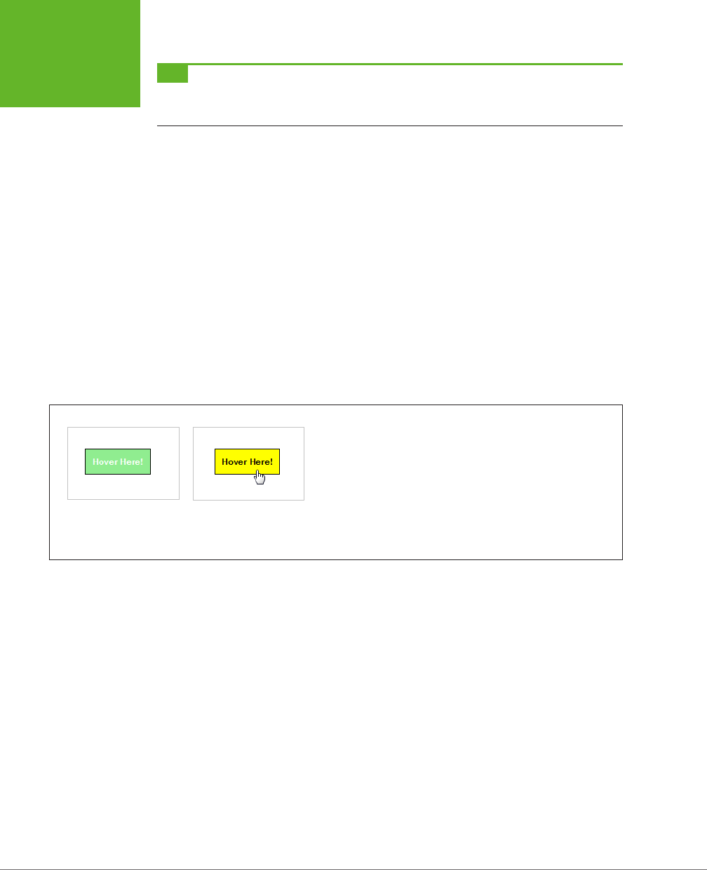
HTML5: THE MISSING MANUAL, SECOND EDITION
196
CREATING
EFFECTS WITH
TRANSITIONS
TIP If you’re the last web developer on earth who hasn’t rolled your own hover button, you can find a
detailed tutorial in
Creating a Website: The Missing Manual
, or in an online article at
www.elated.com/articles/
css-rollover-buttons
.
Great as they are, pseudo-classes aren’t cutting edge any longer. The problem is
their all-or-nothing nature. For example, if you use the :hover pseudo-class, then
your style settings spring into action immediately when someone hovers over an
element. But in Flash applications or in desktop programs, the eect is usually more
refined. The hovered-over button may shift its color, move, or begin to glow using
a subtle animation that takes a fraction of a second to complete.
Some web developers have begun to add eects like these to their pages, but it
usually requires the help of someone else’s JavaScript animation framework. But
CSS3 has a simpler solution—a
transitions
feature that lets you smoothly switch from
one group of settings to another.
A Basic Color Transition
To understand how transitions work, you need to see a real example. Figure 6-10
shows a color-changing button that’s bolstered with some CSS3 transition magic.
FIGURE 6-10
If this were an ordinary rollover button, its background would jump
from green to yellow in one step. But with transitions, the green
blends into yellow, taking half a second to make the change. Move the
mouse off, and the same transition plays out in reverse, returning the
button to its normal state. The result is a button that just feels more
polished. (To try if for yourself, head to the try-out page at
http://
prosetech.com/html5
.)
First, consider how you’d style this button the ordinary way, without using transitions.
This task is basic CSS, requiring one style rule to set the button’s initial appearance
and a second style rule to change it when it’s hovered on:
.slickButton {
color: white;
font-weight: bold;
padding: 10px;
border: solid 1px black;
background: lightgreen;
cursor: pointer;
}
.slickButton:hover {
color: black;
background: yellow;
}
www.it-ebooks.info

CHAPTER 6: FANCY FONTS AND EFFECTS WITH CSS3 197
CREATING
EFFECTS WITH
TRANSITIONS
Here’s a button that uses these style rules:
<button class="slickButton">Hover Here!</a>
This approach is all well and good, but it lacks a certain finesse. To smooth out the
green-to-yellow color change, you can create a CSS3 transition using the transition
property. You do this in the normal slickButton style (not the :hover pseudo-class).
At a minimum, every transition needs two pieces of information: the CSS property
that you want to animate and the time the browser should take to make the change.
In this example, the transition acts on the background property, and the duration
is 0.5 seconds:
.slickButton {
color: white;
font-weight: bold;
padding: 10px;
border: solid 1px black;
background: lightgreen;
cursor: pointer;
-webkit-transition: background 0.5s;
transition: background 0.5s;
}
.slickButton:hover {
color: black;
background: yellow;
}
As you’ll no doubt notice, this example adds two transition properties instead of the
promised one. That’s because the CSS3 transitions standard is not quite final and
some browsers still require the -webkit- vendor prefix.
There’s one quirk in this example. The hovered-over button changes two details: its
background color and its text color. But the transition applies to the background
color only. As a result, the text blinks from white to black in an instant, while the
new background color fades in slowly.
There are two ways to patch this up. Your first option is to set the transition property
with a comma-separated list of transitions, like this:
.slickButton {
...
-webkit-transition: background 0.5s, color 0.5s;
transition: background 0.5s, color 0.5s;
...
}
But there’s a shortcut if you want to set transitions for all the properties that change
and you want to use the same duration for each one. In this case, you can simply
add a single transition and use all for the property name:
www.it-ebooks.info

HTML5: THE MISSING MANUAL, SECOND EDITION
198
CREATING
EFFECTS WITH
TRANSITIONS
-webkit-transition: all 0.5s;
transition: all 0.5s;
Right now, transitions work in the latest version of every browser. Old versions of
Internet Explorer (IE 9 and before) don’t have any transition support, and vendor
prefixes won’t help. However, this lack of support isn’t the problem it seems. Even
if a browser ignores the transition property, it still applies the eect. It just makes
the change immediately, rather than smoothly fading it in. That’s good news—it
means a website can use transitions and keep the essentials of its visual style intact
on old browsers.
More Transition Ideas
It’s gratifying to see that CSS transitions can make a simple color change look good.
But if you’re planning to build a slick rollover eect for your buttons or menus,
there are plenty of other properties you can use with a transition. Here are some
first-rate ideas:
• Transparency. By modifying the opacity property, you can make an image fade
away into the background. Just remember not to make the picture completely
transparent, or the visitor won’t know where to hover.
• Shadow. Earlier, you learned how the box-shadow property can add a shadow
behind any box (page 190). But the right shadow can also make a good hover
eect. In particular, consider shadows with no oset and lots of blur, which
create more of a traditional glow eect. You can also use an inset shadow to
put the eect inside the box.
• Gradients. Change up a linear gradient or add a radial one—either way, it’s
hard not to notice this eect.
• Transforms. As you’ll learn on page 201, transforms can move, resize, and warp
any element. That makes them a perfect tool for transitions.
On the flip side, it’s usually not a good idea to use transitions with padding, margins,
and font size. These operations take more processing power (because the browser
needs to recalculate layout or text hinting), which can make them slow and jerky.
If you’re trying to make something move, grow, or shrink, you’re better o using a
transform (page 201).
Triggering Transitions with JavaScript
As you’ve seen, transitions kick in when an element switches from one style to an-
other. If you want a nice, code-free way to make this happen, you can use pseudo-
classes like :hover and :focus. But this approach has obvious limits. For example, it
won’t work if you want your transition to take place at another time or in response
to a dierent event. It also won’t work if you want your transition to be triggered by
one element but then
aect
a dierent element. In situations like these, you need
to chip in with a bit of JavaScript code.
www.it-ebooks.info

CHAPTER 6: FANCY FONTS AND EFFECTS WITH CSS3 199
CREATING
EFFECTS WITH
TRANSITIONS
Fortunately, it’s easy to create a JavaScript-powered transition. As with an ordinary
transition, you begin by creating two style rules, one for your element’s initial state,
and one for its transitioned state. Then you add the JavaScript code that finds your
element and changes its style when the time is right.
WORD TO THE WISE
Don’t Leave Old Browsers Behind
As you know, browsers that don’t support transitions switch
between states immediately, which is usually a good thing.
However, if you use CSS3 glitter to make your states look dif-
ferent (for example, you’re adding a shadow or a gradient to
a hovered-over button), old browsers ignore that, too. That’s
not so good. It means that visitors with less capable browsers
get
no
hover effect at all.
To solve this problem, use a fallback that older browsers
understand. For example, you might create a hover state that
sets a different background color and
then
sets a gradient.
This way, older browsers will see the background change to a
new solid color when the button is hovered over. More capable
browsers will see the background change to a gradient fill. For
even more customizing power, you can use Modernizr, which
lets you define completely different styles for older browsers
(page 31).
Figure 6-11 shows an example that uses a code-powered transition. In this page, two
images are layered over each other—an image of a city skyline in the day and an
image of the same skyline at night. The buttons use a few simple lines of JavaScript
to trigger a transition that hides or shows the night-time image.
The first step to creating this example is adding an image-formatting style sheet
rule. It does two things: switches the images to absolute positioning (so they can
be placed on top of one another in their containing <div>), and defines the type of
transition you plan to carry out. In this case, it’s a 10-second transition that alters
the opacity of the nighttime image.
img {
position: absolute;
-webkit-transition: opacity 10s;
transition: opacity 10s;
}
You also need two style rules to represent the dierent possible states for the
nighttime image, which begins fully transparent but can become solid at the click
of a button:
.solid {
opacity: 1;
}
.transparent {
opacity: 0;
}
www.it-ebooks.info
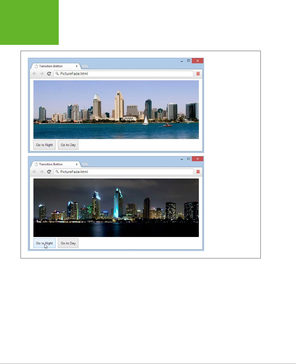
HTML5: THE MISSING MANUAL, SECOND EDITION
200
CREATING
EFFECTS WITH
TRANSITIONS
FIGURE 6-11
Initially, the image with
the night skyline is
completely transparent
(top). But click the To
Night button and the night
image fades in, gradu-
ally blotting out the day
skyline (bottom).
The page markup places both images into a <div>, taking care to apply the trans-
parent class to the second image, and defines two buttons that are hard-wired into
the JavaScript functions you need.
<div>
<img src="day.png" alt="Daytime view">
<img id="nightImage" src="night.png" alt="Night-time view"
class="transparent">
</div>
<button onclick="toNight()">Go to Night</button>
<button onclick="toDay()">Go to Day</button>
www.it-ebooks.info

CHAPTER 6: FANCY FONTS AND EFFECTS WITH CSS3 201
CREATING
EFFECTS WITH
TRANSITIONS
The final step is to add the code that reacts to the button clicks, finds the nighttime
image, and switches its style:
function toNight() {
var nightImage = document.getElementById("nightImage");
nightImage.className = "solid";
}
function toDay() {
var nightImage = document.getElementById("nightImage");
nightImage.className = "transparent";
}
Although this seems like a single abrupt act, the change will phase in steadily over
10 seconds, thanks to the transition that’s defined for all <img> elements.
Remember, transitions take place only if your visitor has a modern browser. If
someone visits your site with IE 9 and clicks the To Night or To Day button, the
page will shift abruptly from one style to the other, with no 10-second blending
eect. Unfortunately, there’s no easy polyfill to patch this gap, and it’s all too easy
to ignore what your pages will look like on less capable browsers when you start
weaving transitions into your code
NOTE If animated effects are an essential part of your pages, you’re probably not quite ready to embrace
CSS3. Instead, the most practical solution for transitions today is a JavaScript library like jQuery UI or MooTools.
But CSS3 is the clear future of web effects, once the standards settle down and modern browsers have colonized
the computers of the world.
Transforms
A
transform
is a powerful tool that lets you move, scale, skew, or rotate an element,
warping its appearance. With CSS3 transforms, you use them to change the ap-
pearance of an element. Like transitions, transforms are a new and experimental
feature. To use them, you need to use the transform property. Here’s an example
that rotates an element and all its contents:
.rotatedElement {
transform: rotate(45deg);
}
To get your transforms to work on Chrome, Safari, and Opera, you need to add the
-webkit- vendor prefix. On Internet Explorer 9, you need the -ms- prefix (although
IE 10 and later don’t need any prefix). Firefox doesn’t need a prefix. So unless you’re
using the -prefix-free tool (page 185), the proper way to use a transform looks like this:
www.it-ebooks.info
HTML5: THE MISSING MANUAL, SECOND EDITION
202
CREATING
EFFECTS WITH
TRANSITIONS
.rotatedElement {
-ms-transform: rotate(45deg);
-webkit-transform: rotate(45deg);
transform: rotate(45deg);
}
POWER USERS’ CLINIC
Making More Natural Transitions
The
transition
property is an all-in-one property that
combines several details. So far, you’ve seen how to give
a transition a duration and specify the property it acts on.
However, there are two more details you can use to fine-tune
your transition.
First, you can choose a
timing function
that controls how the
transition effect flows—for example, whether it starts slow
and then speeds up or starts fast and then decelerates. In
a short transition, the timing function you choose doesn’t
make much of a difference. But in a longer, more complex
animation, it can change the overall feel of the effect. Here’s
an example that uses the
ease-in-out
timing function so
that a transition starts slow, then accelerates, and then slows
back down at the end:
transition: opacity 10s ease-in-out;
Other timing functions include
linear
(the transition has a
constant rate from start to finish),
ease-in
(the transition
starts slow and then goes at a constant rate),
ease-out
(the
transition starts at a constant rate but slows at the end), and
cubic-bezier
(the transition goes according to a Bézier
curve that you define, you math lover, you).
No matter what timing function you choose, the whole tran-
sition takes the same amount of time—the duration you’ve
specified. The difference is in how the transition speeds up or
slows down as it takes place. To review the different timing
functions and get a feel for how each one alters the pace of a
transition, you can see them in action with a helpful series of
rolling square animations at
http://css3.bradshawenterprises.
com/transitions/
.
The other transition detail that you can add is an optional delay
that holds off the start of the transition for some period of time.
Here’s an example that waits 0.1 seconds:
transition: opacity 10s ease-in-out 0.1s;
In this example, the rotate() function does the work, twisting an element 45 degrees
around its center. However, there are many more transform functions that you can
use, separately or at the same time. For example, the following style chains three
transforms together. It enlarges an element by half (using the scale transform),
moves it 10 pixels to the left (using the scaleX transform), and skews it for eect
(using the skew transform):
.rotatedElement {
-ms-transform: scale(1.5) scaleX(10px) skew(10deg);
-webkit-transform: scale(1.5) scaleX(10px) skew(10deg);
transform: scale(1.5) scaleX(10px) skew(10deg);
}
A skew twists an element out of shape. For example, imagine pushing the top edge
of a box out to the side, while the bottom edge stays fixed (so it looks like a paral-
lelogram).
www.it-ebooks.info
CHAPTER 6: FANCY FONTS AND EFFECTS WITH CSS3 203
CREATING
EFFECTS WITH
TRANSITIONS
Table 6-2 lists all the two-dimensional transform functions you can use. To remove
all your transforms, set the transform property to none.
NOTE Transforms don’t affect other elements or the layout of your web page. For example, if you enlarge
an element with a transform, it simply overlaps the adjacent content.
TABLE 6-2
Transform functions
FUNCTION DESCRIPTION
translateX(x) Moves an element horizontally. Use a positive value to
shift it to the right, and a negative value to shift it to
the left.
translateY(y) Moves an element vertically. Use a positive value to
shift it down, and a negative value to shift it up.
translate(x, y) Moves an element vertically and horizontally.
scaleX(x) Scales an element horizontally. Use a value greater
than 1.0 to enlarge it (2.0 is twice as big) and a value
between 0 and 1.0 to shrink it (0.5 is half as big). Use
a negative value to flip the element around the y-axis,
creating a right-to-left mirror image.
scaleY(y) Scales an element vertically. Use a value greater
than 1.0 to enlarge it and a value between 0 and 1.0
to shrink it. Use a negative value to flip the element
around the x-axis, creating a bottom-to-top mirror
image.
scale(x, y) Scales an element horizontally and vertically.
rotate(angle) Rotates an element clockwise around its center.
Use a negative value to rotate the element counter-
clockwise. If you want to rotate an element around
another point, use the CSS transform-origin
property.
skewX(angle) Tilts an element horizontally. The top and bottom
edges remain level, but the sides are pulled out of
alignment.
skewY(angle) Tilts an element vertically. The left and right edges
remain in place, but the top and bottom are slanted.
skew(x-angle, y-angle) Tilts an element horizontally and vertically.
matrix(n1, n2, n3, n4, n5, n6) Uses matrix multiplication to move each of the corners
of the element. The matrix, which is represented by six
numbers, can duplicate any other transform (or any
combination of transforms). However, you’re unlikely
to build the matrix you need yourself, even if you’re
a math nerd. Instead, you’ll probably use a tool that
provides you with the ready-made matrix you want.
www.it-ebooks.info

HTML5: THE MISSING MANUAL, SECOND EDITION
204
CREATING
EFFECTS WITH
TRANSITIONS
NOTE When you get tired of moving an element around in two dimensions, you can use 3-D transforms
to move, rotate, and warp it in three-dimensional space. You’ll find several good, interactive examples of 3-D
transforms at
http://tinyurl.com/3d-transitions
.
POWER USERS’ CLINIC
How to Shift the Starting Point
Ordinarily, transforms are made using the center point of your
element as a reference point. You can shift this reference point
by using the
transform-origin
property before you apply
your transform. For example, here’s how you can rotate a shape
around its top-left corner:
.rotatedElement {
-ms-transform-origin: 0% 0%;
-webkit-transform-origin: 0% 0%;
transform-origin: 0% 0%;
-ms-transform: rotate(45deg);
-webkit-transform: rotate(45deg);
transform: rotate(45deg);
}
To rotate around the top-right corner, you’d use a value of 100%
0%. You can even specify a far-off origin that doesn’t appear in
your element (like 50% 200%, which puts the reference point
halfway across the element, and a distance down that’s equal
to twice the element’s height).
By default, the
transform-origin
property is set to
50% 50%, which puts the center point exactly in the middle
of your element.
Transitions That Use Transforms
Transforms and transitions make a natural pair. For example, imagine you want to
create an image gallery, like the one shown in Figure 6-12.
FIGURE 6-12
Here, a transform makes
the hovered-over image
stand out.
This example starts out simple enough, with a bunch of images wrapped in a <div>
container:
www.it-ebooks.info

CHAPTER 6: FANCY FONTS AND EFFECTS WITH CSS3 205
CREATING
EFFECTS WITH
TRANSITIONS
<div class="gallery">
<img src="bunny.jpg">
<img src="cat.jpg">
<img src="dog.jpg">
<img src="platypus.jpg">
<img src="goose.jpg">
</div>
Here’s the style for the <div> that holds all the images:
.gallery {
margin: 0px 30px 0px 30px;
background: #D8EEFE;
padding: 10px;
}
And here’s how each <img> element starts o:
.gallery img {
margin: 5px;
padding: 5px;
width: 75px;
border: solid 1px black;
background: white;
}
Notice that all the images are given explicit sizes with the width property. That’s
because this example uses slightly bigger pictures that are downsized when they’re
shown on the page. This technique is deliberate: It makes sure the browser has all the
picture data it needs to enlarge the image with a transform. If you didn’t take this
step, and used thumbnail-sized picture files, the enlarged versions would be blurry.
Now for the hover eect. When the user moves the mouse over an image, the page
uses a transform to rotate and expand the image slightly:
.gallery img:hover {
-ms-transform: scale(2.2) rotate(10deg);
-webkit-transform: scale(2.2) rotate(10deg);
transform: scale(2.2) rotate(10deg);
}
Right now, this transform snaps the picture to its new size and position in one step. But
to make this eect look more fluid and natural, you can define an all-encompassing
transition in the normal state:
.gallery img {
margin: 5px;
padding: 5px;
width: 75px;
border: solid 1px black;
www.it-ebooks.info

HTML5: THE MISSING MANUAL, SECOND EDITION
206
WEB FONTS
-ms-transition: all 1s;
-webkit-transition: all 1s;
transition: all 1s;
background: white;
}
Now the picture rotates and grows over a time span of 1 second. Move the mouse
away, and it takes another second to shrink back to its original position.
Web Fonts
With all its pizzazzy new features, it’s hard to pick the best of CSS3. But if you had
to single out just one feature that opens an avalanche of new possibilities and is
ready to use
right now
, that feature may just be web fonts.
In the past, web designers had to work with a limited set of web-safe fonts. These are
the few fonts that are known to work on dierent browsers and operating systems.
But as every decent designer knows, type plays a huge role in setting the overall
atmosphere of a document. With the right font, the same content can switch from
coolly professional to whimsical, or from old-fashioned to futuristic.
NOTE There were good reasons why web browsers didn’t rush to implement custom web fonts. First, there
are optimization issues, because computer screens offer far less resolution than printed documents. If a web
font isn’t properly tweaked for onscreen viewing, it’ll look like a blurry mess at small sizes. Second, most fonts
aren’t free. Big companies like Microsoft were understandably reluctant to add a feature that could encourage
web developers to take the fonts installed on their computers and upload them to a website without proper
permission. As you’ll see in the next section, font companies now have good solutions for both problems.
CSS3 adds support for fancy fonts with the @font-face feature. Here’s how it works:
1. You upload the font to your website (or, more likely, multiple versions of that
font to support dierent browsers).
2. You register each font-face you want to use in your style sheet, using the
@font-face command.
3. You use the registered font in your styles, by name, just as you use the web-
safe fonts.
4. When a browser encounters a style sheet that uses a web font, it downloads
the font to its temporary cache of pages and pictures. It then uses that font
for just your page or website (Figure 6-13). If other web pages want to use the
same font, they’ll need to register it themselves and provide their own font files.
NOTE Technically,
@font-face
isn’t new. It was a part of CSS 2, but dropped in CSS 2.1 when browser
makers couldn’t cooperate. Now, in CSS3, there’s a new drive to make
@font-face
a universal standard.
www.it-ebooks.info
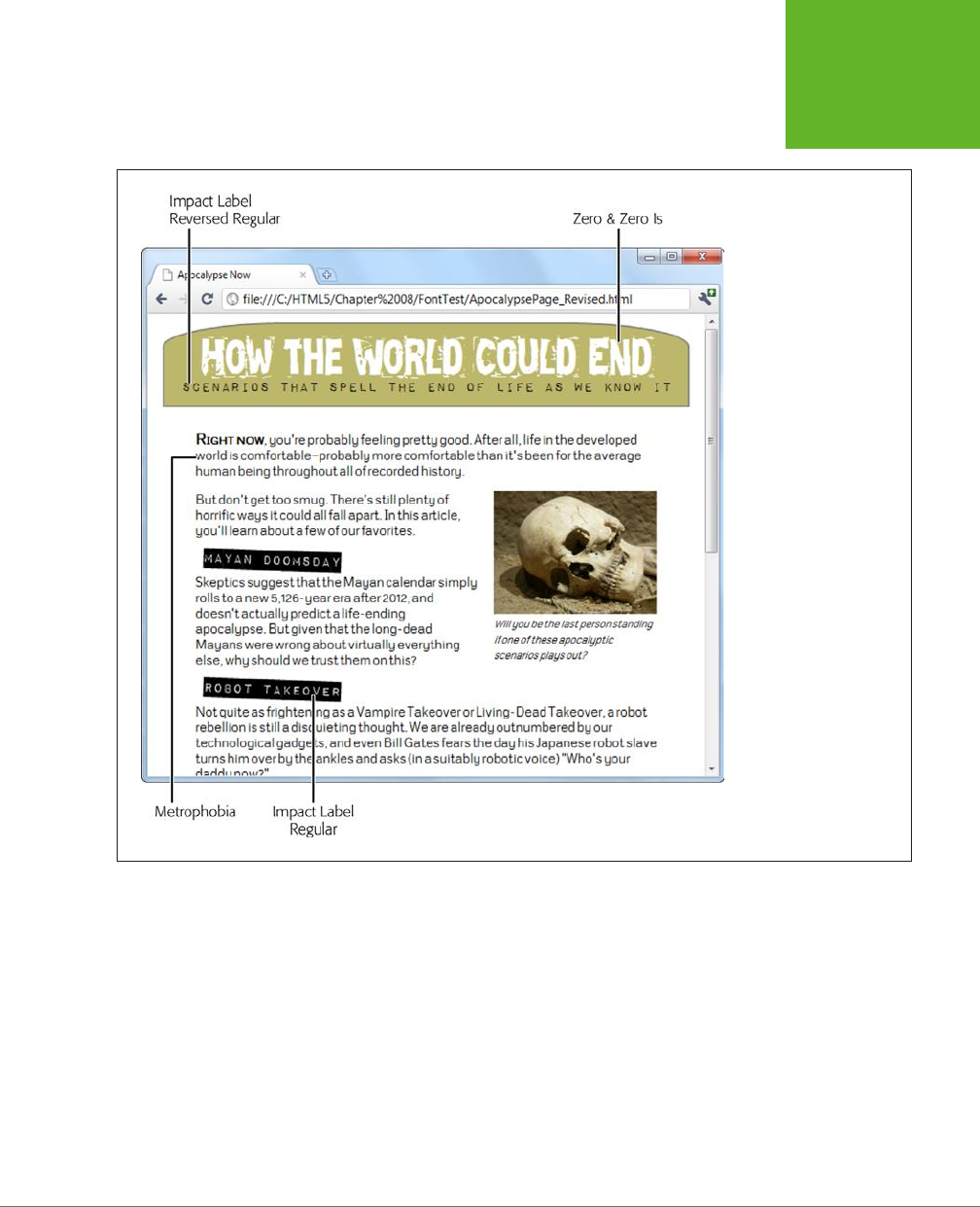
CHAPTER 6: FANCY FONTS AND EFFECTS WITH CSS3 207
WEB FONTS
The following sections walk you through these essential steps.
FIGURE 6-13
This revised version of the
apocalyptic page combines
a hodgepodge of four
fonts. All of these fonts are
free, and you’ll learn how
to get them for yourself
from Font Squirrel on
page 209.
Web Font Formats
Although all current browsers support @font-face, they don’t all support the same
types
of font files. Internet Explorer, which has supported @font-face for years,
supports only EOT (Embedded OpenType) font files. This format has a number of
advantages—for example, it uses compression to reduce the size of the font file,
and it allows strict website licensing so a font can’t be stolen from one website and
used on another. However, the EOT format never caught on, and no other browser
uses it. Instead, other browsers have (until recently) stuck with the more familiar
font standards used in desktop computer applications—that’s TTF (TrueType) and
OTF (OpenType PostScript). But the story’s still not complete without two more
acronyms—SVG and WOFF. Table 6-3 puts all the font formats in perspective.
www.it-ebooks.info
HTML5: THE MISSING MANUAL, SECOND EDITION
208
WEB FONTS
TABLE 6-3
Embedded font formats
FORMAT DESCRIPTION USE WITH
WOFF (Web Open Font
Format)
The single font format of
the future. Newer browsers
support it.
Any browser that supports
it, starting with Internet
Explorer 9, Firefox 3.6, and
Chrome 6.
EOT (Embedded Open Type) A Microsoft-specific format
that never caught on with
browsers except Internet
Explorer.
Internet Explorer (before
IE 9)
TTF (TrueType) OTF
(OpenType PostScript)
Your font will probably begin
in one of these common
desktop formats.
Mobile devices using the
Android operating system
and (optionally) non-IE
browsers, such as Firefox,
Chrome, Safari, and Opera
SVG (Scalable Vector
Graphics)
An all-purpose graphics
format you can use for fonts,
with good but not great
results (it’s slower to display
and produces lower-quality
text).
Old mobile versions of
Safari (before iOS 4.2), and
(optionally) mobile devices
using the Android operating
system.
Bottom line: If you want to use the @font-face feature and support a wide range
of browsers, you need to distribute your font in several dierent formats. The best
practice is to include a WOFF file (for optimum performance on modern browsers),
an EOT file (to fill in the gaps on old versions of IE), and a TTF or OTF file (to fill in
support for Android and older non-IE browsers). It’s also a good idea to supply a
lower-quality SVG file to satisfy old iPads and iPhones.
If you think that’s too many font files to manage, you can strip this down to an abso-
lute minimum and cover most browsers with just two files: a font in the TTF or OTF
format (either one is fine), and a font in the EOT format. This won’t satisfy everyone,
but it will give fancy fonts to the vast majority of people who visit your site.
NOTE Fortunately, font vendors and online font services will usually supply you with all four font formats
you need, so you can guarantee the best possible level of browser support.
Finding a Font for Your Website
Now that you know where you can get the font files you need for your website, in
which formats, you need to get your hands on them. You have two possibilities:
• Download a free web font. This way, you don’t need to worry about licensing
details. You can keep your wallet closed.
www.it-ebooks.info
CHAPTER 6: FANCY FONTS AND EFFECTS WITH CSS3 209
WEB FONTS
• Convert a desktop font you already have into a web font. This approach lets
you use a font that you’ve already fallen in love with. It’s also great for consis-
tency—for example, if you work in a company that already has a standard set of
fonts that it uses in logos, memos, and publications, it makes sense to stick with
the same typefaces online. However, you’ll need to do a bit of research to figure
out the licensing situation, and you may need to cough up some more cash.
In the following sections, you’ll try both approaches.
TROUBLESHOOTING MOMENT
Ironing Out the Quirks
Even if you follow the rules and supply all the required font
formats, expect a few quirks. Here are some problems that
occasionally crop up with web fonts:
• Many fonts look bad on the ancient but still-popular
Windows XP operating system, because Windows XP
computers often have the anti-aliasing display setting
turned off. (And fonts without anti-aliasing look as
attractive as mascara on a mule.)
• Some people have reported that some browsers (or
some operating systems) have trouble printing certain
embedded fonts.
• Some browsers suffer from a problem known as
FOUT (which stands for Flash of Unstyled Text). This
phenomenon occurs when an embedded font takes a
few seconds to download, and the page is rendered first
using a fallback font, and then re-rendered using the
embedded font. This problem is most noticeable on old
builds of Firefox. If it really bothers you, Google provides a
JavaScript library that lets you define fallback styles that
kick in for unloaded fonts, giving you complete control
over the rendering of your text at all times (see
http://
tinyurl.com/font-loader
).
Although these quirks are occasionally annoying, most are
being steadily ironed out in new browser builds. For example,
Firefox now minimizes FOUT by waiting for up to 3 seconds to
download an embedded font before using the fallback font.
Getting a Free Font from Font Squirrel
One of the best places to find free web fonts is the Font Squirrel website at
www.
fontsquirrel.com
. It provides a catalog of roughly 1,000 free-to-use fonts (see Figure
6-14).
When you find a font you like in Font Squirrel’s list, start by checking the tiny icons
underneath (Figure 6-15). These icons indicate how the font is licensed. Solid icons
indicate that the font can be used in a particular context; white outlines indicate
that it cannot.
If a font’s licensing details check out (and on Font Squirrel, they almost always do),
the next step is to take a closer look at your font. Click on the font text to switch to
a font preview page, which shows every letter of the font and lets you test drive it
on some text you type in.
www.it-ebooks.info
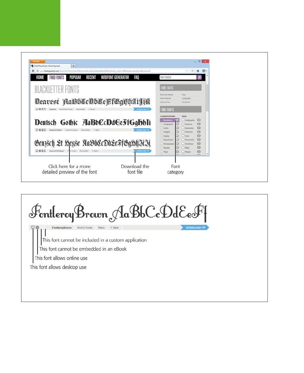
HTML5: THE MISSING MANUAL, SECOND EDITION
210
WEB FONTS
FIGURE 6-14
Font Squirrel gives you
several options for font
hunting, but the most
effective way to find what
you want is to browse
by type (“Calligraphic,”
“Novelty,” and “Retro,”
for example). Best of all,
most fonts are free to use
wherever you want—on
your personal computer
to create documents, or
on the Web to build web
pages.
FIGURE 6-15
The first two icons are the
most important—they
indicate that the font
is allowed both on the
desktop and on the Web.
Virtually all Font Squirrel
fonts include these two
icons. The next two icons
indicate whether you can
use the font in ebooks and
custom-built applications.
(If you’re not sure what an
icon means, just click it to
find out.)
If you like what you see, the final step is to download the font. Depending on the font,
you may be able to download a complete web-ready font kit, or—more likely—you’ll
need to download just the TTF or OTF file and then create your own kit. This quirk is
largely due to the messy world of font licensing. Many fonts use the SIL Open Font
License, which makes the font free for everyone to use but doesn’t allow a service
like Font Squirrel to repackage it. Fortunately, creating your own kit is easy—and
perfectly legit. You’ll learn how to do that in the next section.
www.it-ebooks.info
CHAPTER 6: FANCY FONTS AND EFFECTS WITH CSS3 211
WEB FONTS
FREQUENTLY ASKED QUESTION
Using a Font on Your Computer
Can I use the same font for web work and printed documents?
If you find a hot new font to use in your website, you can prob-
ably put it to good use on your computer, too. For example,
you might want to use it in an illustration program to create
a logo. Or, your business might want to use it for other print
work, like ads, fliers, product manuals, and financial reports.
Modern Windows and Mac computers support TrueType (.ttf)
and OpenType (.otf) fonts. Every font package includes a
font in one of these formats—usually TrueType. To install it in
Windows, make sure you’ve pulled it out of the ZIP download
file. Right-click the font file and then choose Install. (You can
do this with multiple font files at once.) On a Mac, double-click
the font file to open the Font Book utility. Then, click the Install
Font button.
Preparing a Font for the Web
Using Font Squirrel, you can convert a standard desktop TTF or OTF format font file
into a web-ready font that you can use in any web page. You can do this with any
of the free fonts you download from Font Squirrel. You
may
also be able to do this
with the fonts on your own computer, but it’s important to understand the licensing
issues that you’ll face first (see the box below). Using an ordinary desktop font in
an online website without permission is likely to be a breach of copyright—and, if
the font maker has asked Font Squirrel to blacklist the font, you won’t be allowed
to perform the desktop-to-web conversion anyway.
UP TO SPEED
Understanding the Rules of Font Licensing
Ordinary fonts used in desktop software aren’t free. It’s not
kosher to take a font you have on your computer and use it
on your website, unless you have explicit permission from
the font’s creator.
For example, Microsoft and Apple pay to include certain fonts
with their operating systems and applications so you can use
them to, say, create a newsletter in a word processor. However,
this license doesn’t give you permission to put these fonts on
a web server and use them in your pages.
If you have a favorite font, the only way to know whether you
need to pay for it is to contact the company or individual that
made it. Some font makers charge licensing fees based on the
amount of traffic your website receives. Other font creators
may let you use their fonts for a nominal amount or for free,
provided you meet certain criteria (for example, you include
some small-print note about the font you’re using, or you have
a noncommercial website that isn’t out to make boatloads of
money). There’s also a side benefit to reaching out: Skilled
font makers often provide versions of their creations that are
optimized for web viewing.
www.it-ebooks.info
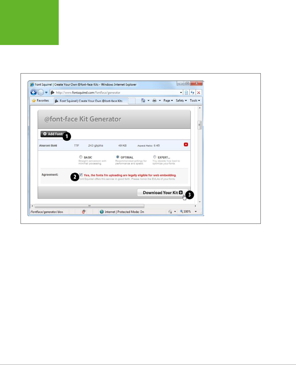
HTML5: THE MISSING MANUAL, SECOND EDITION
212
WEB FONTS
Once you know that you’re allowed to use a specific font, you can convert it us-
ing Font Squirrel’s handy web font generator. To get there, click on the Webfont
Generator tab near the top of the Font Squirrel site, or just surf directly to
www.
fontsquirrel.com/fontface/generator
. Figure 6-16 shows you the three-step process
you need to follow.
FIGURE 6-16
First, click Add Fonts to up-
load a font file from your
computer (#1). Then, add
a checkmark to the setting
“Yes, the fonts I’m upload-
ing are legally eligible for
web embedding,” assum-
ing you’ve reviewed their
license requirements, as
described on page 211 (#2).
Finally, click Download
Your Kit (#3).
When you download a font kit, you get a compressed Zip file that contains a num-
ber of files. For example, if you download the Chantelli Antiqua font, then you get
these files:
Bernd Montag License.txt
Chantelli_Antiqua-webfont.eot
Chantelli_Antiqua-webfont.svg
Chantelli_Antiqua-webfont.ttf
Chantelli_Antiqua-webfont.woff
demo.html
stylesheet.css
The text file (
Bernd Montag License.txt
) provides licensing information that basically
says you can use the font freely but never sell it. The Chantelli_Antiqua-webfont files
provide the font in four dierent file formats. (Depending on the font you pick, you
may get additional files for dierent variations of that font—for example, in bold,
italic, and extra-dark styles.) Finally, the
stylesheet.css
file contains the style sheet
rule you need to apply the font to your web page, and
demo.html
displays the font
in a sample web page.
www.it-ebooks.info

CHAPTER 6: FANCY FONTS AND EFFECTS WITH CSS3 213
WEB FONTS
To use the Chantelli Antiqua font, you need to copy all the Chantelli_Antiqua-webfont
files to the same folder as your web page. Then you need to register the font so
that it’s available for use in your style sheet. To do that, you use a complex @font-
face rule at the beginning of your style sheet, which looks like this (with the lines
numbered for easy reference):
1 @font-face {
2 font-family: 'ChantelliAntiquaRegular';
3 src: url('Chantelli_Antiqua-webfont.eot');
4 src: local('Chantelli Antiqua'),
5 url('Chantelli_Antiqua-webfont.woff') format('woff'),
6 url('Chantelli_Antiqua-webfont.ttf') format('truetype'),
7 url('Chantelli_Antiqua-webfont.svg') format('svg');
8 }
To understand what’s going on in this rule, it helps to break it down line by line:
• Line 1. @font-face is the tool you use to ocially register a font so you can use
it elsewhere in your style sheet.
• Line 2. You can give the font any name you want. You’ll use this name later,
when you apply the font.
• Line 3. The first format you specify must be the file name of the EOT file. That’s
because Internet Explorer gets confused by the rest of the rule and ignores the
other formats. The url() function is a style sheet technique that tells a browser
to download another file at the location you specify. If you put the font in the
same folder as your web page, then you can simply provide the file name here.
• Line 4. The next step is running the local() function. This function tells the
browser the font name, and if that font just happens to be installed on the
visitor’s computer, the browser uses it. However, in rare cases this can cause a
problem (for example, it could cause Mac OS X to show a security dialog box,
depending on where your visitor has installed the font, or it could load a dier-
ent font that has the same name). For these reasons, web designers sometimes
use an obviously fake name to ensure that the browser finds no local font. One
common choice is to use a meaningless symbol like local('').
• Lines 5 to 7. The final step is to tell the browser about the other font files it can
use. If you have a WOFF font file, suggest that first, as it oers the best quality.
Next, tell the browser about the TTF or OTF file, and finally about the SVG file.
TIP Of course, you don’t need to type the
@font-face
rule by hand (and you definitely don’t need to
understand all the technical underpinnings described above). You can simply copy the rule from the
stylesheet.
css
file that’s included in the web font kit.
www.it-ebooks.info

HTML5: THE MISSING MANUAL, SECOND EDITION
214
WEB FONTS
Once you register an embedded font using the @font-face feature, you can use it
in any style sheet. Simply use the familiar font-family property, and refer to the
font family name you specified with @font-face (in line 2). Here’s an example that
leaves out the full @font-face details:
@font-face {
font-family: 'ChantelliAntiquaRegular';
...
}
body {
font-family: 'ChantelliAntiquaRegular';
}
This rule applies the font to the entire web page, although you could certainly re-
strict it to certain elements or use classes. However, you must register the font with
@font-face
before
you use it in a style rule. Reverse the order of these two steps,
and the font won’t work properly.
Even Easier Web Fonts with Google
If you want a simpler way to use a fancy font on your website, Google has got you
covered. It provides a service called Google Fonts (formerly Google Web Fonts),
which hosts free fonts that anyone can use. The beauty of Google Fonts is that
you don’t need to worry about font formats, because Google detects the user’s
browser and automatically sends the right font file. All you need to do is add a link
to a Google-generated style sheet.
To use a Google font in your pages, follow these steps:
1. Go to
www.google.com/fonts
.
Google shows you a long list of available fonts (Figure 6-17).
2. At the top of the page, click a tab title (Word, Sentence, or Paragraph) to
choose how you preview fonts.
For example, if you’re hunting for a font to use in a heading, you’ll probably
choose Word or Sentence to take a close look at a single word or line of text.
But if you’re looking for a font to use in your body text, you’ll probably choose
Paragraph to study a whole paragraph of text at once. No matter what option
you choose, you can type in your own preview text and set an exact font size
for your previews.
3. Set your search options.
If you have a specific font in mind, type it into the search box. Otherwise, you’ll
need to scroll down, and that could take ages. To help you get what you want
more quickly, start by setting a sort order and some filtering options, if they
apply (for example, you might want to find the most popular bold sans-serif
fonts). Figure 6-17 shows you where to find these options.
www.it-ebooks.info
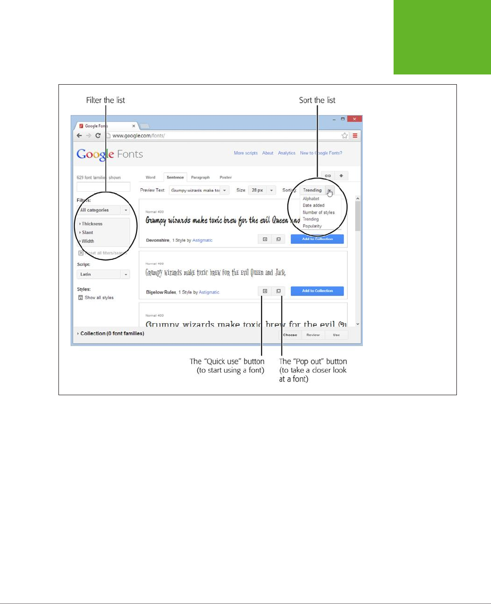
CHAPTER 6: FANCY FONTS AND EFFECTS WITH CSS3 215
WEB FONTS
FIGURE 6-17
Google has a relentlessly
expanding selection of
fonts. When you’re looking
for a font, you’ll probably
want to tweak the font
list’s sorting and filtering
options (circled). For
example, you can sort
alphabetically or put the
most popular fonts first,
and you can filter out just
serif, sans-serif, or hand-
written (cursive) fonts.
4. When you see a font that’s a candidate for your site, click the “Pop out”
button.
Google pops open an informative window that describes the font and shows
each of its characters.
5. If you like the font, click the “Quick-use” button to get the information you
need to use it.
Google shows you the code you need to use this font. It consists of a style sheet
link (which you must add to your web page) and an example of a style sheet
rule that uses the font.
6. Add a style sheet link to your web page.
For example, if you picked the Metrophobic font, Google wants you to place
the following link in the <head> section of your page:
www.it-ebooks.info
HTML5: THE MISSING MANUAL, SECOND EDITION
216
WEB FONTS
<link href="http://fonts.googleapis.com/css?family=Metrophobic"
rel="stylesheet">
This style sheet registers the font, using @font-face, so you don’t have to. Best
of all, Google provides the font files, so you don’t need to upload anything extra
to your website.
NOTE Remember to put the link for the Google font style sheet before your other style sheet links. That
way, your other style sheets can use the Google font.
7. Use the font, by name, wherever you want.
For example, here’s how you could use the newly registered Metrophobic font
in a heading, with fallbacks in case the browser fails to download the font file:
h1 {
font-family: 'Metrophobic', arial, serif;
}
POWER USERS’ CLINIC
Creating a Font Collection
These steps show the fastest way to get the markup you need
for a font. However, you can get more options by creating a
font collection
.
A font collection is a way to package up multiple fonts. To start
creating one, you simply click the “Add to Collection” button
next to a font you like. As you add fonts to your collection, each
one appears in the fat blue footer at the bottom of the page.
When you’re finished picking the fonts you want, click the Use
button in the footer. Google then shows a page that’s similar
to the “Quick-use” page, except that it allows you to create a
single style sheet reference that supports
all
the fonts from
your custom-picked collection.
When you create a font collection, you can also use two buttons
that appear at the top right of the page. Click the Bookmark
button (which looks like a link in a chain) to create a browser
bookmark that lets you load up the same collection at some
point in the future, so you can tweak it. Click the Download
button (which looks like a down-pointing arrow) to download
copies of the fonts to your computer, so you can install the
fonts and use them for print work.
TIP Still looking for the perfect font? Popular font subscription sites like
http://fonts.com
and
http://
typekit.com
give you access to thousands of ultra-high-quality typefaces from legendary font foundries like
Linotype and Monotype. Font-addicted web developers will need to pay from $10 to $100 a year, with more money
needed to outfit super-popular sites that get avalanches of web traffic.
www.it-ebooks.info

CHAPTER 6: FANCY FONTS AND EFFECTS WITH CSS3 217
WEB FONTS
Putting Text in Multiple Columns
Fancy fonts aren’t the only innovation CSS3 has for displaying text. It also adds a
module for multicolumn text, which gives you a flexible, readable way to deal with
lengthy content.
Using multiple columns is almost eortless, and you have two ways to create them.
Your first option is to set the number of columns you want using the column-count
property, like this:
.Content {
text-align: justify;
column-count: 3;
}
As of this writing, the column-count property works only in Internet Explorer 10 and
11. Although multiple columns are supported by Chrome, Firefox, Safari, and Opera,
you need to use the vendor-prefixed versions of the column-count property, like this:
.Content {
text-align: justify;
-moz-column-count: 3;
-webkit-column-count: 3;
column-count: 3;
}
This approach—creating a set number of columns—works well for fixed-size layouts.
But if you have a space that grows and shrinks with the browser window, your col-
umns may grow too wide and become unreadable. In this situation, it’s better
not
to set the exact number of columns. Instead, tell the browser how big each column
should be using the column-width property:
.Content {
text-align: justify;
-moz-column-width: 10em;
-webkit-column-width: 10em;
column-width: 10em;
}
The browser can then create as many columns as it needs to fill up the available
space (see Figure 6-18).
NOTE You can use pixel units to size a column, but em units make more sense. That’s because em units
adapt to the current font size. So if a web page visitor ratchets up the text size settings in her browser, the column
width grows proportionately to match. To get a sense of size, 1 em is equal to two times the current font size. So
if you have a 12 pixel font, 1 em works out to 24 pixels.
www.it-ebooks.info
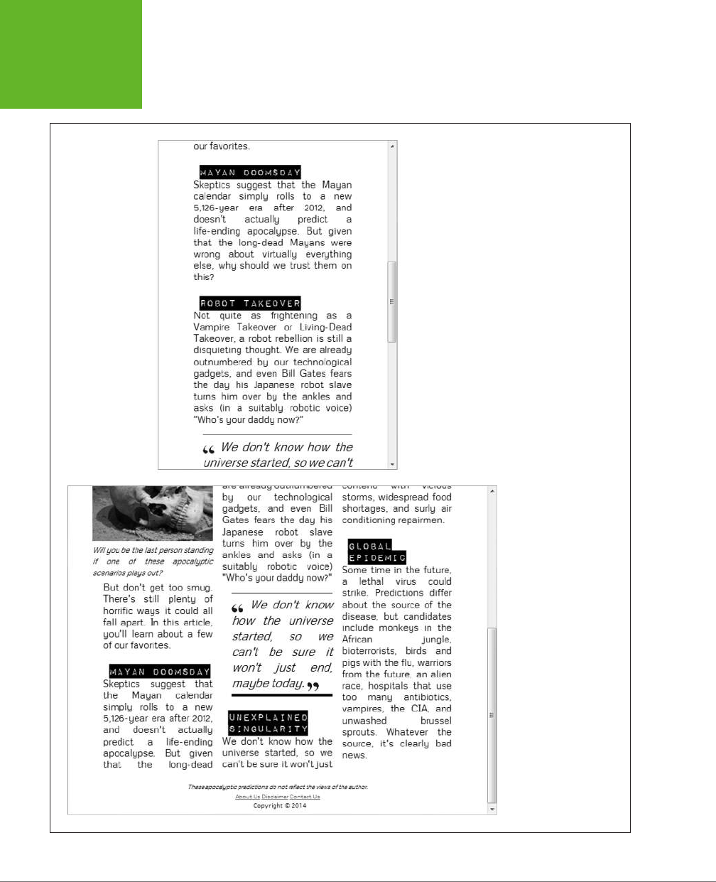

CHAPTER 6: FANCY FONTS AND EFFECTS WITH CSS3 219
WEB FONTS
CSS3 provides a few more properties for tailoring the look of your columns. You
can adjust the size of the spacing between columns with column-gap. You can also
add a vertical line to separate them with column-rule, which accepts a thickness,
border style, and color (just like the border property). Here’s an example that makes
a red, 1-pixel-wide column rule:
-webkit-column-rule: 1px solid red;
-moz-column-rule: 1px solid red;
column-rule: 1px solid red;
You can also use the column-span property to let figures and other elements span
columns. The default value of column-span is 1, which means the element is locked
in the single column where it appears. The only other acceptable value is all, which
lets an element stretch across the entire width of all the columns. There’s currently
no way to let an element span some but not all columns.
Here’s an example (shown in Figure 6-19) that uses column spanning with a figure:
.SpanFigure {
-moz-column-span: all;
-webkit-column-span: all;
column-span: all;
}
This technique doesn’t work for figures that set the float property to something
other than none. That’s because floating figures already have the ability to float free
of your layout and any columns it contains.
NOTE Columns work well if you need to break up text to make it more readable on wide layouts. However,
columns aren’t the best choice for truly large amounts of content, since there’s currently no way to tie the height
of a column to the height of the browser window. So if you split a lengthy essay into three columns, the reader
will need to scroll from top to bottom to read the first column, then back to the top, then down to the bottom to
read the second column, and again for the third. If the content is more than a screenful or two, all this scrolling
gets old fast.
www.it-ebooks.info
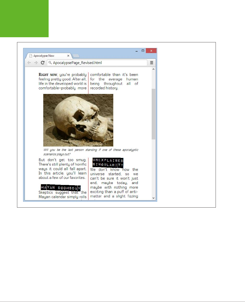

221
CHAPTER
7
When web designers first started putting their content into HTML pages,
they faced a challenge. Whereas print designers could rely on certain as-
sumptions about how their documents would be arranged on paper and
how they would be read by their audiences, the online world was loose and lawless.
Depending on the user’s browser (and personal preferences), the same HTML page
might appear wedged in a tiny window or floating in a giant one. This made complex
layouts risky. A layout that looked perfect in one window could easily turn into an
awkward and ungainly mess when viewed in a window with dierent proportions.
Today, this variability has only increased. Not only do web designers need to think
about dierent sizes of browser windows on desktop computers, but they also need
to accommodate dierent sizes of
devices
, like tablets and smartphones. And at
the same time, website layouts have become more intricate, with most sites now
composed of menus, navigation aids, sidebars, and so on. If your goal is to create
a single website that can shift gracefully between dierent viewing contexts, these
details present a significant challenge.
Because web designers have long since outsourced the layout and formatting work
of their web pages to CSS, it makes sense for CSS to provide the solution for this
problem. Fortunately, CSS3 has the perfect tool: a feature called
media queries
, which
lets your website seamlessly switch from one set of styles to another depending on
the window size or the viewing device.
Media queries are an essential technique for mobile web development. But even
if you don’t expect any visitors to surf your site on a smartphone, media queries
will still help you ensure that your layout adapts itself to the viewer—for example,
dropping an extra column when there’s no space to show it comfortably, or moving
Responsive Web
Design with CSS3
www.it-ebooks.info

HTML5: THE MISSING MANUAL, SECOND EDITION
222
RESPONSIVE
DESIGN: THE
BASICS
the navigation links from the top of a page to its side. This sort of adaptation is part
of a wildly popular web design philosophy called
responsive design
, which you’ll
explore in this chapter.
Responsive Design: The Basics
The problem of varying window sizes has been around since the dawn of the Web.
Over the years, web designers have cooked up a variety of complementary tech-
niques—some elegant, some messy—to cope with the challenges of responsive
design.
Before you learn how to use media queries, it’s important to consider the follow-
ing traditional tactics. All of them are still important today—but, as you’ll see, they
don’t form a complete solution on their own. Once you recognize their limits, you’ll
understand how CSS3 patches the gaps.
Fluid Layout
The simplest solution to the problem of resizing windows is to make a
proportional
layout—one that simply sucks up the available space, no matter how large or small it is.
Creating a proportional layout is easy enough in theory. The basic principle is to
carve up your page into columns using percentage sizes instead of pixel sizes. Say,
for example, you have a two-column layout like this:
<body>
<div class="leftColumn">
...
</div>
<div class="rightColumn">
...
</div>
</body>
The style rules for a fixed layout might look like this:
.leftColumn {
width: 275px;
float: left;
}
.rightColumn {
width: 685px;
float: left;
}
www.it-ebooks.info

CHAPTER 7: RESPONSIVE WEB DESIGN WITH CSS3 223
RESPONSIVE
DESIGN: THE
BASICS
body {
margin: 0px;
}
But the style rules for a proportionately sized layout would look like this:
.leftColumn {
width: 28.6%;
float: left;
}
.rightColumn {
width: 71.4%;
float: left;
}
body {
margin: 0px;
}
Here, the left column has a width of 28.6%, so it takes 28.6% of the width of its
container, which is the <body> element. In this example, the <body> element has no
margins, so it takes up the full width of the browser window, and the left column
gets 28.6% of that.
As you would expect, the percentages of the two columns combined add up to
exactly 100%, filling the page. No matter what the size of the browser window, the
columns expand or shrink to match. Proportional layouts are also called
fluid layouts
,
because the content flows seamlessly into whatever space is available.
NOTE In this example, the left column width of 28.6% is calculated by dividing the fixed width of the
column (275 pixels) into the fixed width of the entire layout (which, previously, was set at the relatively common
default width of 960 pixels). Because most layouts are initially planned using fixed widths, web developers are
accustomed to using this sort of calculation when they create fluid layouts.
Of course, it’s not enough to adjust column sizes alone. You also need to think about
margins, padding, and borders. When novice web developers create their first fluid
layouts, they often leave in fixed margins and padding (using pixel values), while
sizing their columns proportionately. As a result, the columns can occupy only the
space that’s left over after the margins are subtracted. However, the column width
percentages are calculated according to the full page width, without taking the
margins into account. This discrepancy can lead to problems in narrow windows,
when the fixed-width margins crowd out the proportional columns.
For example, imagine you create styles like this:
.leftColumn {
width: 27%;
www.it-ebooks.info
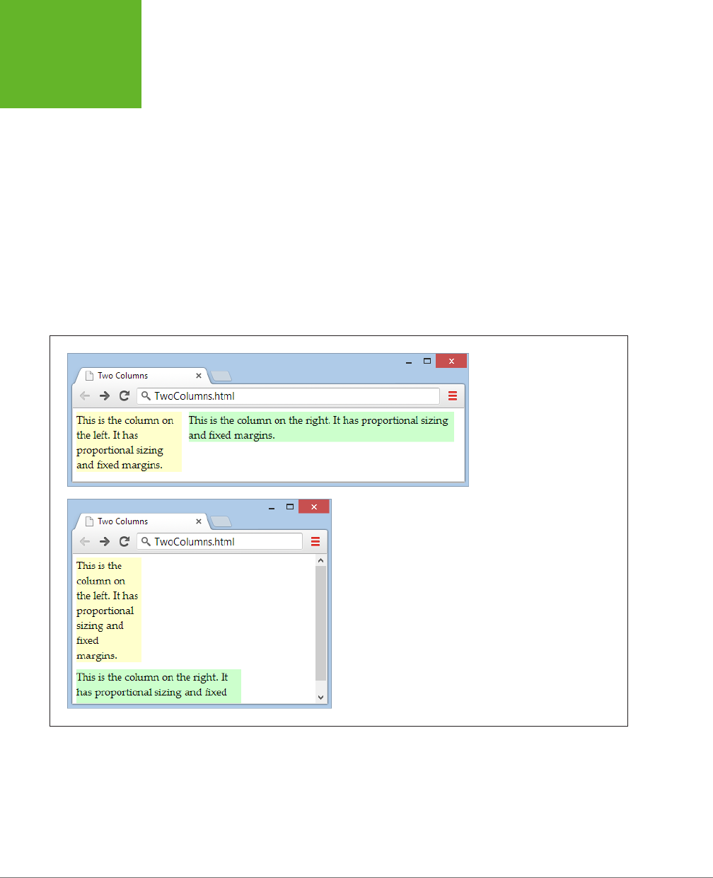
HTML5: THE MISSING MANUAL, SECOND EDITION
224
RESPONSIVE
DESIGN: THE
BASICS
margin: 5px;
float: left;
}
.rightColumn {
width: 68%;
margin: 5px;
float: left;
}
These two columns occupy a combined 95%, leaving an extra 5% for the margin
space. This is enough for mid- to large-sized windows, but if you size the window
small enough, the leftover 5% can’t accommodate the fixed margin space. To see
this problem in action, simply give each column a dierent background color using
the background property and then try resizing the window, as shown in Figure 7-1.
FIGURE 7-1
Proportionally sized columns and
fixed margins don’t mix. Make
the window too small, and the
margins crowd out the second
column.
To fix this problem, any margins you add between proportional columns must also
use proportional sizing. So if the columns leave 5% of the page width unclaimed,
you can use that for your margins. Split it into three 1.66% sections—one for the left
edge of the window, one for the right edge of the window, and one for the space
between the columns, like this:
www.it-ebooks.info
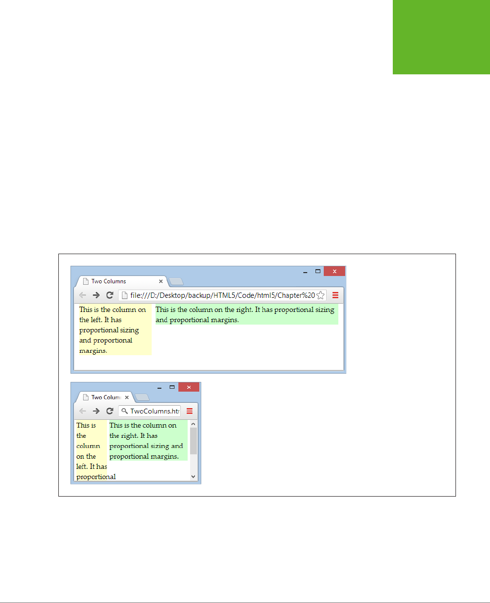
CHAPTER 7: RESPONSIVE WEB DESIGN WITH CSS3 225
RESPONSIVE
DESIGN: THE
BASICS
.leftColumn {
width: 27%;
margin-left: 1.66%;
margin-right: 1.66%;
background: #FFFFCC;
float: left;
}
.rightColumn {
width: 68%;
margin-right: 1.66%;
background: #CCFFCC;
float: left;
}
Figure 7-2 shows the solution, with both margins and columns sized proportionally
using percentages.
FIGURE 7-2
As long as all the horizontal
measurements are done
proportionally with percentages,
your page’s layout will scale to
any size.
Depending on the eect you want, you may find that proportional margins don’t look
quite right. If you don’t want your margins to change based on the size of the web
browser window, you can use a workaround. For example, you can place another
element inside one of your proportional columns and give that element its own fixed
margins or padding. Because this element is placed
inside
the top-level layout that
you’ve already established, and because your layout is fully proportional, it will fit
snugly into any window size.
www.it-ebooks.info
HTML5: THE MISSING MANUAL, SECOND EDITION
226
RESPONSIVE
DESIGN: THE
BASICS
Borders present a similar problem. If you add borders to your columns, the extra
space they require will break your layout in the same way as the fixed margins
shown in Figure 7-1. In this situation, you can’t solve the problem with proportional
measurements, because borders don’t accept percentage widths. Instead, the easi-
est solution is to use the workaround suggested above: Add a <div> element inside
your proportional column, and apply the border to the <div>. This time-honored
technique makes your markup a bit messier (because you need an extra layer of
layout), but it ensures that your layout works at any size.
FEATURE FROM THE FUTURE
CSS3 Box-Sizing and calc()
The layout problems you’ve touched on in this section are
common—so common that CSS3 is brimming with potential
solutions. Here are two of the most promising (although not
perfect, as you’ll see).
• Box-sizing. Ordinarily, borders are added to the outside of
elements, which means you need to subtract the border
space from your layout calculations. But CSS3 adds a new
box-sizing
property that, if set to
border-box
, puts
the border on the
inside
of your box. The border looks the
same, but the size calculation is different. For example, it
means that a 67%-wide column stays 67% wide, no matter
how thick its border.
• The calc() function. If you need to combine prop-
ortional and fixed measurements, you can ask CSS3
to do the calculations for you—and use the results in
your layout—thanks to the nifty
calc()
function. For
example, imagine you need to create a column that’s 67%
wide, less 5px of margin space. Careless web developers
might fudge the issue by sizing the column down to 65%
(causing the inconsistent spacing issue shown in Figure
7-1). But with CSS3 you can set the
width
property to
calc(67%-5px)
, which makes sure your column mops
up exactly all of the available space—and not a pixel more.
Unfortunately, in both cases the cure may not be much bet-
ter than the disease. The
box-sizing
setting fails on IE 7,
and requires the vendor-specific
-moz-
prefix (page 183)
on Firefox. The
calc()
function fails on IE 7, IE 8, and the
pre-Chrome Android browser, and older versions of Safari
require the
-webkit-
prefix. There are polyfills that can
smooth out these issues, but for now it’s easier to avoid these
features altogether until more people inch forward to newer,
more modern browsers.
Fluid Images
Achieving a multicolumn, proportional layout is the first step in responsive design.
However, there’s plenty more to occupy yourself with when you begin to consider
the content in those columns.
One issue is images. Ordinarily, image boxes are sized to fit their content—in other
words, the exact pixel dimensions of your picture file. However, this arrangement
can lead to a problem in small-sized windows. If there’s not enough room to accom-
modate the picture, it will spill out of its column and sprawl over other elements,
obscuring them and generally looking sloppy.
The solution to this annoyance is simple. Cap each image at the maximum width of
its container, with a style rule that looks like this:
www.it-ebooks.info
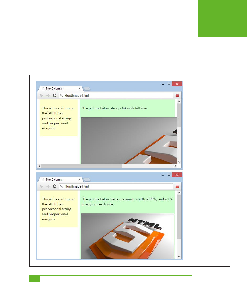
CHAPTER 7: RESPONSIVE WEB DESIGN WITH CSS3 227
RESPONSIVE
DESIGN: THE
BASICS
img {
max-width: 100%;
}
As always, the 100% is relative to the element’s container. In this case, that’s the
column that contains the image, not the whole page. Now your image can grow until
it reaches its full size
or
until it meets the boundaries of its container, whichever
comes first (Figure 7-3).
FIGURE 7-3
Without fluid images,
any picture can run amok
(top). But limit the width
to match the container,
and images get exactly the
right size (bottom).
TIP If you decide to add a margin around your image, make sure the percentages you use for the
margin-
left
,
margin-right
, and
max-width
total 100% (and not more).
www.it-ebooks.info

HTML5: THE MISSING MANUAL, SECOND EDITION
228
RESPONSIVE
DESIGN: THE
BASICS
One limitation of fluid images is that the browser needs to download the full-sized
image file no matter what size the image is displayed at. This wastes a small amount
of time and bandwidth, which is inconvenient for mobile devices. Sadly, CSS can’t
correct this problem on its own. But there are other potential solutions that attempt
to deal with this issue using some combination of server-side code, web services,
and JavaScript libraries. If you’re serving up an image-heavy site to large numbers
of mobile users, you may want to consider these techniques, which are discussed
in a Smashing Magazine article at
http://tinyurl.com/responsive-img
(but most web
developers won’t bother). Happily, there is a way to solve the analogous but more
serious problem of video sizes on mobile devices—see the box on page 244.
Fluid Typography
Now that you have a fluid layout with properly sized pictures, it’s time to turn your
attention to the text in each column. Casual web developers pick an attractive fixed
size for their text (using pixel measurements) and leave it at that. However, such
hard-coded sizes break the responsive layout model, because text that’s properly
sized on a desktop display will be vanishingly tiny on mobile devices. And while
website readers can always zoom in to see small text, the goal of responsive design
is to make a page that fits any window without requiring excessive zooming and
side-to-side scrolling.
Once again, the solution involves avoiding using fixed units of measurement like
pixels and points. Instead, you want to set your text sizes relatively, using percent-
ages or em units. The
em
unit, named after the letter M, is the most popular choice.
NOTE The em has a long tradition of representing widths in print typography. For example, the term
em
dash
originally referred to a dash that was the width of a capital M in the current typeface.
Percentage sizes and em units have the same result: The size of your text is adjusted
relative to the browser’s default text size. If you set a text size of 110% or 1.1em, you’ll
get letters that are 10% bigger than normal, unstyled text. Set a text size of 50% or
0.5em, and you’ll get half-sized characters.
Although it doesn’t matter whether you use percentages or ems, most responsive
web designs follow the same convention. They set the base text size of the page to
100% (just to emphasize that this is the baseline from which all other text is sized),
and then tweak that size up or down in other elements with ems:
body {
font-size: 100%
}
p {
font-size: 0.9em
}
www.it-ebooks.info

CHAPTER 7: RESPONSIVE WEB DESIGN WITH CSS3 229
RESPONSIVE
DESIGN: THE
BASICS
h1 {
font-size: 2em
}
Experienced web developers don’t stop there. Instead, they use ems for all other
fixed measurements in their layouts. For example, if you have a border or a bit of
margin or padding space deep inside your layout, you’re better o to set it with
ems than pixels. That way, these sizes are tweaked to match the size of the text. It’s
a subtle adjustment, but one that creates a more polished appearance.
For example, imagine you’ve created a two-level layout that places a <div> inside
your left column. You use this <div> to get the extra spacing you want around your
content, without breaking the proportionally sized column layout:
<body>
<div class="leftColumn">
<div class="leftColumnContent">
...
</div>
</div>
<div class="rightColumn">
...
</div>
</body>
You could set the border, margins, and padding of your left column content <div>
using pixels. Your layout would still work and it would still be fluid. But it’s even
better if you use ems, as shown here:
.leftColumn {
width: 28.6%;
background: #FFFFCC;
float: left;
}
.rightColumn {
width: 71.4%;
background: #CCFFCC;
float: left;
}
.leftColumnContent {
border: 0.07em solid gray;
margin: 0.3em;
padding: 0.2em 0.3em 0.4em 0.4em;
}
www.it-ebooks.info
HTML5: THE MISSING MANUAL, SECOND EDITION
230
RESPONSIVE
DESIGN: THE
BASICS
NOTE In most layouts, the chief benefit of using ems for borders, margins, and padding is that it prevents
these elements from being too large in tiny windows and dominating your layout on mobile devices.
FEATURE FROM THE FUTURE
CSS3: When an Em Becomes a Rem
There’s one quirk that faces web designers when using text in
complex responsive layouts. Proportionately sized text units,
like ems and percentages, size their text with respect to the
containing element. That’s no problem in a simple example
like the one considered on page 229, because the containing
element is the
<body>
element that holds the page, or another
element that inherits the font settings of the
<body>
element.
The headaches happen when you apply proportional sizing to
multiple
levels of your layout.
For example, suppose you create a
<div>
and give it a text
size of 1.1em. Then, inside that
<div>
you add an
<h1>
head-
ing with a size of 2em. You might expect that the heading is
twice the default text size, but it’s actually twice the size of its
container
, which is 1.1em. That works out to a heading that’s
2.2 times the default text size.
To avoid this compounding effect, you need to be disciplined
about where you apply your text sizing. Ideally, you should
do it at only one layout level. However, CSS3 has a new unit
that neatly solves the problem, called
rems
(which stands for
“root em”). Essentially, a rem is a relative measurement just
like an em, but with a twist: No matter where you put it, a rem
is always calculated relative to the text size of the
<html>
element, not the text size of the containing element. Thus,
2rem is always two times the size of normal text, no matter
where you apply it.
Rems have surprisingly good support—they work in every mod-
ern browser. The problem is the familiar stragglers, IE 8 and IE 7,
which don’t understand rems at all. And while it’s technically
possible to polyfill the gap with JavaScript (see
http://tinyurl.
com/rem-polyfill
), most sensible web developers avoid adding
yet another script simply to switch their unit system and stick
to the slightly inconvenient em units for now.
Of course there’s much more to typography than the size of your typeface. To
create text that remains readable on a range of displays, you need to think about
line-lengths, margins, line height, and even multicolumn text (as demonstrated on
page 217). You can’t deal with any of these issues using ordinary fluid layouts and
proportional sizing. However, you
can
create more flexible style sheets that tweak
these other details using media queries, as you’ll see shortly. But first, there’s one
more consideration that you need to unravel: the automatic scaling behavior of
mobile phones.
Understanding Viewports: Making Your Layout Work on a
Smartphone
In theory, the two-column example you’ve seen so far can fit into any window size.
But in practice there’s another complication that comes into play for small mobile
devices: the size of the
viewport
.
Apple introduced the viewport concept so its iPhones could do a respectable job
displaying the ordinary websites of the time, which didn’t use the techniques of
responsive web design. Instead of showing just a tiny fragment of a large web page,
mobile browsers like Safari show a zoomed-out view that fits in more content. This
zoomed-out display area is called the viewport.
www.it-ebooks.info

CHAPTER 7: RESPONSIVE WEB DESIGN WITH CSS3 231
ADAPTING
YOUR LAYOUT
WITH MEDIA
QUERIES
The viewport technique is a bit of a tradeo. It ensures that the page looks more
like it would on a desktop browser, but it also makes most ordinary text illegible. It
reduces the need to scroll back and forth, but it increases the need to zoom in and
out. It makes it easier for viewers to orient themselves in the page, but it prevents
them from comfortably reading the content.
NOTE Although Apple introduced the viewport feature, all other mobile developers now follow the same
practice. The only difference is how big the viewport is and how much of the web page gets crammed into view
at once.
If you’re creating a traditional desktop website, you don’t have to worry about the
devices’ viewport settings. They’ll ensure that your site looks reasonably good on
super-small mobile screens (even though mobile visitors won’t find the scaled-down
site completely convenient). On the other hand, if you’re planning to go all the way
with responsive design and create a true, mobile-friendly website, you need to make
viewport changes. You need to tell mobile browsers
not
to perform their automatic
viewport scaling, which you can easily do by adding the following <meta> element
to the page’s <head> section:
<meta content="initial-scale=1.0" name="viewport">
This line tells mobile devices to use the true scale of your page, with no zooming
out. For example, it means a modern iPhone will fit your page into a 320-pixel wide
window and display that at full size. Without this scale adjustment, the iPhone will
give your page a desktop-sized 980 pixels of width and then shrink that down to
fit. Figure 7-4 shows the dierence.
NOTE You’re probably aware that there are plenty of online simulators that let you see what your website
looks like on different mobile devices. For example, on
http://mobiletest.me
you can compare your site’s appear-
ance on the latest iPhones, iPads, and Android devices. However, most simulators don’t replicate the automatic
scaling behavior. In other words, when you preview your site in a simulator, it may look as though you set the
initial scale to 1.0 with the
<meta>
element shown above. If you haven’t, you won’t get an accurate reflection
of what you’ll see on the device itself, so tread with caution.
Adapting Your Layout with Media Queries
You’ve now seen how to create a fluid layout that can grow or shrink to fit any
browser window. This approach guarantees that your page will fit into any window.
However, it doesn’t ensure that your page will always look good.
Simple fluid layouts tend to break down at the extremes. In a very tiny window,
multiple columns are compacted down to embarrassingly thin dimensions, crowd-
ing text and pictures into an unreadable jumble. In a very large window, columns
become dauntingly large, and it’s hard to follow a line across the vast expanse of
the page without losing your place.
www.it-ebooks.info
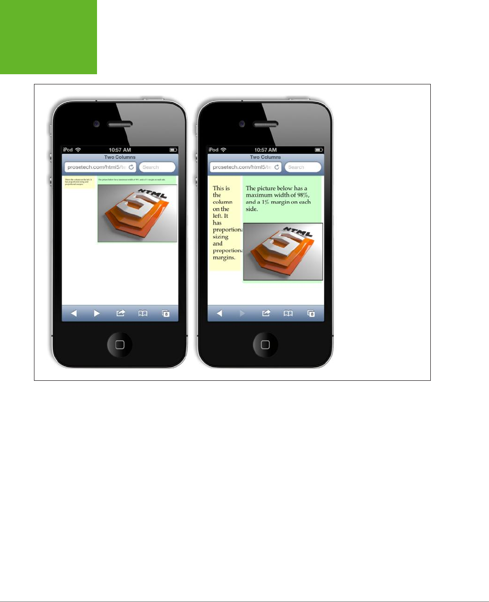
HTML5: THE MISSING MANUAL, SECOND EDITION
232
ADAPTING
YOUR LAYOUT
WITH MEDIA
QUERIES
FIGURE 7-4
Left: The iPhone’s
automatic rescaling treats
this fluid layout like a
desktop-optimized web
page. As a result, its text
is unreadable without
zooming.
Right: Turn off the scaling,
and you see your page as
it truly is. The next step is
to simplify the layout at
small sizes using media
queries.
One way to deal with these issues is to set limits on how far your layout can expand
or contract. You can do that with the max-width and min-width properties. Expand
a page beyond its maximum width, and you’ll end up with an extra margin of space
on the right. Shrink a page past its minimum width, and the columns will lock into
their dimensions, while the browser adds scroll bars to let you move around. Maxi-
mum and minimum width settings give you a bit of basic protection against extreme
layouts. However, they also reduce the value of your responsive design. For example,
if your page can’t shrink down to the dimensions of an iPhone window, it’s not much
use to mobile visitors.
A better solution is to gracefully tweak the
structure
of the layout when your page
size changes. For example, a really small window needs a streamlined layout with no
sidebars or ad panels. And a really big window presents the opportunity for scaled
up text or multiple columns of text (page 217).
Enter
media queries
. This CSS3 feature gives you a simple way to vary styles for
dierent viewing settings. Used carefully, they can help you serve everything from
www.it-ebooks.info
CHAPTER 7: RESPONSIVE WEB DESIGN WITH CSS3 233
ADAPTING
YOUR LAYOUT
WITH MEDIA
QUERIES
an ultra-widescreen desktop computer to an iPhone—without altering a single line
of HTML.
The Anatomy of a Media Query
Media queries work by latching onto a key detail about the device that’s viewing your
page (like its size, resolution, color capabilities, and so on). Based on that information,
you can apply dierent styles, or even swap in a completely dierent style sheet.
At its simplest, a media query is a separate section in your style sheet. That section
starts with the word @media, followed by a condition in parentheses, and then a
series of related styles in curly brackets. Here’s the basic structure:
@media (media-feature-name: value) {
/* New styles go here. */
}
A media query is similar to a block of conditional JavaScript code. If the current
browser meets the condition that you’ve set out in parentheses, the styles inside come
into eect. But if the browser doesn’t satisfy the condition, the styles are ignored.
NOTE The styles that lie outside of your
@media
section are always applied, no matter what. The conditional
media query styles are applied in
addition
to the other styles. For that reason, the conditional media query styles
often have the job of overriding the other style settings—for example, hiding something that was previously
visible, moving a section to a new location, applying new text sizes, and so on.
To use a media query, you need to know what sorts of conditions you can construct.
The media query standard lets you examine various details, which it calls
media fea-
tures
. For example, you can find out the width of the display area and then change
your styles when it shrinks beyond a certain limit. Table 7-1 lists the most commonly
used media features. (There are also several vendor-specific, experimental media
features that aren’t supported consistently. These aren’t included in this table.)
TABLE 7-1
Most useful media features for building media queries
FEATURE NAME VALUE COMMONLY USED TO…
width
min-width
max-width
The width of the display area
(or rendering surface, on a
printer).
Change the layout to
accommodate very narrow
displays (like a smartphone)
or very wide displays.
height
min-height
max-height
The height of the display
area.
Change the layout to
accommodate very tall or
very short displays.
device-width
min-device-width
max-device-width
The full width of the screen
on the current computer or
device (or the full width of a
page in a printout).
Adjust the layout to
specifically target different
devices, like smartphones.
www.it-ebooks.info

HTML5: THE MISSING MANUAL, SECOND EDITION
234
ADAPTING
YOUR LAYOUT
WITH MEDIA
QUERIES
FEATURE NAME VALUE COMMONLY USED TO…
device-height
min-device-height
max-device-height
The full height of the screen
or page.
Adjust the layout to
specifically target different
devices, like smartphones.
orientation One of two values: landscape
or portrait.
Change the layout for
different orientations on a
table computer.
device-aspect-ratio
min-device-aspect-ratio
max-device-aspect-ratio
The proportions of the
display area, as a ratio. For
example, an aspect ratio of
1/1 is completely square.
Adjust styles to fit different
window shapes (although
this approach quickly gets
complicated).
color
min-color
max-color
The number of color bits.
For example, 1-bit color is
monochrome, while modern
displays typically use 24-bit
color, which accommodates
millions of colors.
Check for the presence of
color (for example, for a
printable version of a page),
or assess the level of color
support.
NOSTALGIA CORNER
CSS Media Types
Interestingly, the creators of CSS took a crack at the multiple-
device problem in CSS 2.1, using a feature called
media types
.
You may already be using this standard to supply a separate
style sheet for printouts:
<head>
...
<!-- Use this stylesheet to display the
page onscreen. -->
<link rel="stylesheet" media="screen"
href="styles.css">
<!-- Use this stylesheet to print the
page. -->
<link rel="stylesheet" media="print"
href="print_styles.css">
</head>
The
media
attribute also accepts the value
handheld
,
which is meant for low-bandwidth, small-screen mobile
devices. As a result, many modern mobile browsers ignore
handheld style sheets anyway, making the
media
attribute
a woefully inadequate tool for dealing with the wide range of
web-connected devices that exists today. However, it’s still a
good way to clean up printouts.
Creating a Simple Media Query
You’ll notice that most media query features have several versions, which let you
set maximum or minimum limits. These limits are important, because most media
queries apply to a range of values.
To use media queries, you must first choose the property you want to examine. For
example, if you wanted to create a new set of styles that comes into eect for narrow
windows, you’d choose the max-width setting. It’s then up to you to choose a suitable
www.it-ebooks.info
CHAPTER 7: RESPONSIVE WEB DESIGN WITH CSS3 235
ADAPTING
YOUR LAYOUT
WITH MEDIA
QUERIES
limit. For example, the following media query creates a block of conditional styles
that spring into action when the width of the browser window is 480 pixels or less:
@media (max-width: 480px) {
...
}
TIP Right now, the most popular media features are
max-device-width
(for creating mobile versions
of your pages),
max-width
(for varying styles based on the current size of the browser window), and
ori-
entation
(for changing your layout based on whether a tablet computer like an iPad is turned horizontally or
vertically).
For a simple test, use a media query to make an obvious change. For example, this
media query alters the background color of a column:
@media (max-width: 480px) {
.leftColumn {
background: lime;
}
}
Now you can check whether your media query is working. In your browser, slowly
resize the browser window. As soon as the display area of the window shrinks to less
than 480 pixels, the new style kicks in and the column changes to a fetching shade
of lime green. All the other style properties that you’ve applied to the leftColumn
class (for example, its size and positioning) stay in place, because the media query
doesn’t override them.
NOTE Browsers that don’t understand media queries, like Internet Explorer 8, will simply ignore these new
styles and keep applying the original styles, no matter how big or small the browser window becomes.
If you want, you can add another media query section that overrides these rules at
a still-smaller size. For example, this section will apply new rules when the browser
width creeps under 250 pixels:
@media (max-width: 250px) {
...
}
Just remember that these rules are overriding everything that’s been applied so
far—in other words, the cumulative set of properties that have been set by the normal
styles and the media query section for under 450 pixels. If this seems too confusing,
don’t worry—you’ll learn to work around it with more tightly defined media queries
on page 239. But first, it’s time to consider a more practical example.
www.it-ebooks.info
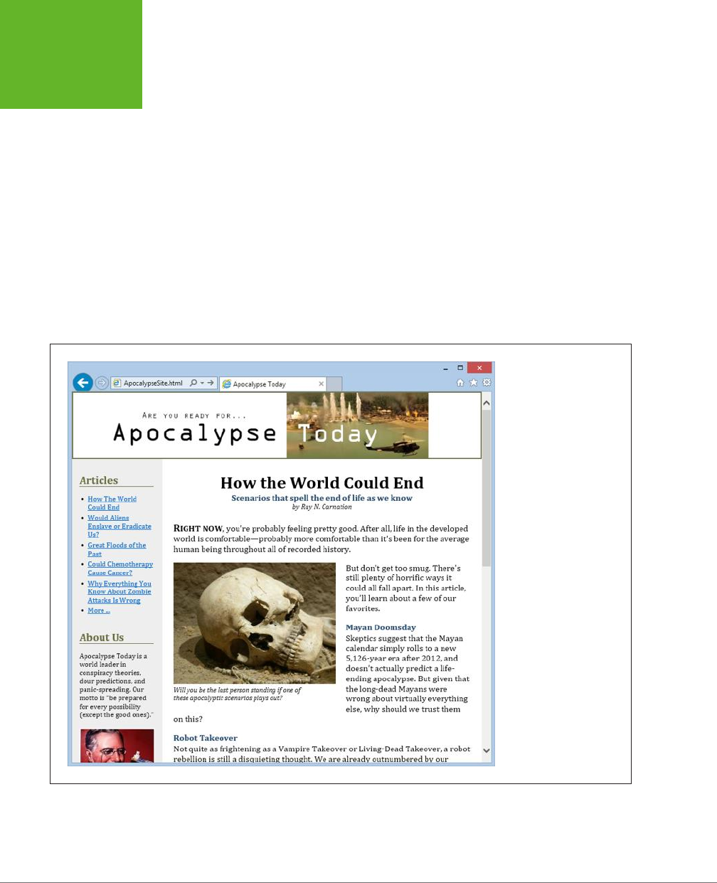
HTML5: THE MISSING MANUAL, SECOND EDITION
236
ADAPTING
YOUR LAYOUT
WITH MEDIA
QUERIES
Building a Mobile-Friendly Layout
With media queries, you have the essential building blocks you need to create a
website that looks just as respectable in a smartphone browser as a desktop browser.
All you need to do is apply them.
Figure 7-5 shows a revamped example of the
ApocalypseSite.html
page you first
saw in Chapter 2 (page 54). The original page used a fixed layout with hard-coded
column widths. The revised version uses all of the techniques explored in this chap-
ter. It has a fluid layout with proportional sizing (page 222) that fits any window
width. It uses em units for margins, padding, border widths, and text sizes, ensuring
that these details are adjusted in harmony on dierent devices (page 228). The site
header image grows or shrinks to fit the available space, and the ad image in the
sidebar uses the fluid image technique to make sure it never oversteps its bounds
(page 226). It also uses the <meta> element fix to prevent mobile browsers from
zooming out (page 231).
FIGURE 7-5
Behind the scenes, this
page uses the best prac-
tices of responsive web
design. You can peruse
the complete CSS on the
try-out site at
http://
prosetech.com/html5
.
In short, the new
ApocalypseSite.html
page is mobile-ready. However, its layout
still isn’t mobile-
friendly
. That’s because no matter how small the two side-by-side
www.it-ebooks.info
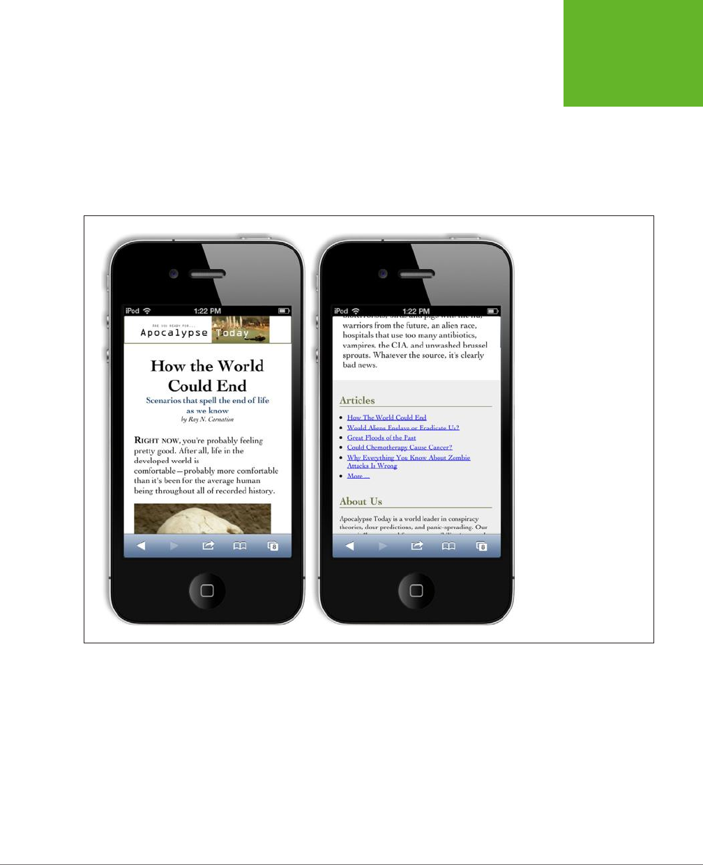
CHAPTER 7: RESPONSIVE WEB DESIGN WITH CSS3 237
ADAPTING
YOUR LAYOUT
WITH MEDIA
QUERIES
columns compress themselves, they won’t fit cleanly in a tiny window. To correct
this oversight, you need to use a media query.
Before you crack open your style sheet, you need to consider what the mobile ver-
sion of your site should look like. Usually, mobile sites slim themselves down to a
single column. Sidebars are either hidden completely or inserted above or below
the main content. Figure 7-6 shows a cleaned-up version of the
ApocalypseSite.
html
on an iPhone.
FIGURE 7-6
Here are two snapshots of
the mobile version of the
ApocalypseSite.html
page.
The page starts with a
small site header, followed
by the article content
(left). The article links and
ad block from the sidebar
are placed after the article
footer (right).
It’s surprisingly easy to create the mobile version of the
ApocalypseSite.html
page.
The shrunken site header and nicely sized text happen automatically, thanks to the
page’s use of fluid images and em units. The only task left for your media query is
to rearrange the columns.
Initially, the two columns are defined with these two style rules:
.NavSidebar {
float: left;
width: 22%;
font-size: small;
}
www.it-ebooks.info

HTML5: THE MISSING MANUAL, SECOND EDITION
238
ADAPTING
YOUR LAYOUT
WITH MEDIA
QUERIES
.Content {
float: left;
width: 78%;
}
The sidebar is floated on the left with a width of 22%. The content is floated next to
it and given a width of 78%.
Because the layout stops working at small widths, it makes sense to use the popular
max-width media feature. As you learned in the previous section, max-width gets the
current size of the page in the browser window. If this value is small, two columns
aren’t appropriate.
Here’s the media query that removes the floats and resizes the section so the columns
take the full available width:
@media (max-width: 568px) {
.NavSidebar {
float: none;
width: auto;
}
.Content {
float: none;
width: auto;
}
}
These styles are applied in addition to the normal styles you’ve already defined. Thus,
you may need to reset properties you’ve already changed to their default values.
In this example, the media query styles reset the float property to none, and the
width property to auto (although it would work equally well if you set the width to
100%). These are the default values, but the original sidebar style changed them.
You’ll also notice that the original NavSidebar style set the font size. The media query
doesn’t override this detail, so it stays in place.
Technically, this media query creates styles that apply to any narrow window, regard-
less of whether it’s in a mobile browser or in a micro-sized window on a desktop
browser. This makes perfect sense, but you can get more particular and create one
set of styles for tiny desktop windows and another for mobile devices. To target
tiny desktop windows, you’d use max-width, and to spot mobile devices, you’d use
max-device-width, as detailed in Table 7-1.
TIP It’s up to you when you want to switch to your simplified layout, but the 568-pixel mark is a good
choice. That’s because 568 pixels is the width of your page in an iPhone when it’s turned sideways, in landscape
orientation. (It works for Android devices too, as explained on page 243.)
www.it-ebooks.info

CHAPTER 7: RESPONSIVE WEB DESIGN WITH CSS3 239
ADAPTING
YOUR LAYOUT
WITH MEDIA
QUERIES
This example needs one more adjustment. In the original version of the page, the
NavSidebar section is defined before the Content section in the HTML markup. This
lets you float them both on the left side, and makes sure the NavSidebar is on the
left. Unfortunately, when you remove the floating behavior, the mobile version of
the site is forced to show the sections in the order they appear, which means the
NavSidebar appears at the top of the page, followed by the Content section under-
neath. This layout is a bit o-putting to mobile viewers, since they’d rather not scroll
through a set of links and advertisements before they get to the meat of the page.
When faced with a challenge like this, the solution is to start by arranging your
markup to suit the mobile version of the site, and
then
layer on extra CSS rules to
create the more sophisticated multicolumn layout. This gold-standard technique is
called
mobile-first
development.
In this example, that means putting the Content section before the NavSidebar
section. This solves the problem in the mobile version of the page, but it also forces
the sidebar to the right column on the full-sized version of the page. To correct this
quirk, simply tweak the Content section so it floats to the right:
.Content {
float: right;
width: 78%;
}
Now the Content section returns to its place on the right, while the NavSidebar clings
to the left, restoring the full-size layout shown in Figure 7-5.
At this point, you may want to consider adding another media query to also change
your styles for very wide windows. For example, you could break your text into
multiple columns (using the CSS properties described on page 217) to make sure
your text remains readable.
TIP Looking for some examples to inspire you? Try out a ready-made responsive template. There are plenty
of examples on the Web. To get started, start browsing
http://html5up.net
,
www.typeandgrids.com
, or
http://
responsify.it
.
More Advanced Media Query Conditions
Sometimes you might want to make your styles even more specific, so they depend
on multiple conditions. Here’s an example:
@media (min-width: 400px) and (max-width: 700px) {
/* These styles apply to windows from 400 to 700 pixels wide. */
}
www.it-ebooks.info
HTML5: THE MISSING MANUAL, SECOND EDITION
240
ADAPTING
YOUR LAYOUT
WITH MEDIA
QUERIES
POWER USERS’ CLINIC
Hiding and Replacing Sections
If you’re ambitious, there are many more changes you can
make to differentiate the mobile version of your site from its
full-size incarnation. For example, you can use the CSS
dis-
play
property to hide and show entire
sections
of your page.
Before you use this approach, consider its drawbacks. If you
switch large sections of your page, you’ll be left with messy
markup, which you’ll need to maintain, keep consistent, and
test on different devices. Also, if your hidden sections contain
images, browsers will still download them, even if they’re
never shown. On a mobile device, this can become a perfor-
mance drag and a waste of bandwidth.
However, there
is
an appropriate time to use the section-
switching technique: when you need to replace a complex
navigation aid or menu with a slimmer, simpler mobile ver-
sion. For example, it’s common practice to give mobile users
a drop-down list for navigation instead of an unwieldy tree.
(There’s even a clever style technique that can convert a row
of links into a drop-down list, as detailed at
http://css-tricks.com/
convert-menu-to-dropdown
).
Sometimes, simple tricks and small alterations aren’t enough.
You may want to revamp the mobile version of your site more
radically. Here, you have a range of options, ranging in com-
plexity and sophistication. At one extreme, you could create
a completely separate mobile site and host it on a different
web domain (as the New York Times does with its mobile site
at
http://mobile.nytimes.com
). This option is a lot more work,
and without some sort of content management system running
on your web server, you’ll never keep your mobile site in sync
with your standard site. Another way is to write web server
code that checks every request, figures out what web browser
is on the other end, and sends the appropriate type of content.
This sort of solution is great, if you have the time and skills.
A more modest approach is to use a JavaScript tool that lets you
alter your pages dynamically based on the viewer. One example
is Modernizr, which provides a method named
Modernizr.
mq()
for testing media queries in your code (read about it at
http://modernizr.com/docs
). This approach is more powerful
than media queries, but it also introduces more complexity
into your page design.
This type of media query comes in handy if you want to apply several sets of mutually
exclusive styles, but you don’t want the headaches of several layers of overlapping
rules. Here’s an example:
/* Normal styles here */
@media (min-width: 600px) and (max-width: 700px) {
/* Override the styles for 600-700 pixel windows. */
}
@media (min-width: 400px) and (max-width: 599.99px) {
/* Override the styles for 400-600 pixel windows. */
}
@media (max-width: 399.99px) {
/* Override the styles for sub-400 pixel windows. */
}
www.it-ebooks.info

CHAPTER 7: RESPONSIVE WEB DESIGN WITH CSS3 241
ADAPTING
YOUR LAYOUT
WITH MEDIA
QUERIES
In this case, if the browser window is 380 pixels, exactly two sets of styles will apply:
the standard styles and the styles in the final @media block. Whether this approach
simplifies your life or complicates it depends on what you’re trying to accomplish.
If you’re using complex styles and changing them a lot, the no-overlap approach
shown here is often the simplest way to go.
Notice that you have to take care that your rules don’t unexpectedly overlap. For
example, if you set the maximum width of one rule to 400 pixels and the minimum
width of another rule to 400 pixels, you’ll have one spot where both style settings
suddenly combine. The slightly awkward solution is to use fractional values, like the
399.99 pixel measurement used in this example.
Another option is to use the not keyword. There’s no functional dierence, but if
the following style sheet makes more sense to you, feel free to use this approach:
/* Normal styles here */
@media (not max-width: 600px) and (max-width: 700px) {
/* Override the styles for 600-700 pixel windows. */
}
@media (not max-width: 400px) and (max-width: 600px) {
/* Override the styles for 400-600 pixel windows. */
}
@media (max-width: 400px) {
/* Override the styles for sub-400 pixel windows. */
}
In these examples, there’s still one level of style overriding to think about. That’s
because every @media section starts o with the standard, no-media-query style
rules. Depending on the situation, you may prefer to separate your style logic com-
pletely (for example, so a mobile device gets its own, completely independent set
of styles). To do so, you need to use media queries with external style sheets, as
described next.
Replacing an Entire Style Sheet
If you have simple tweaks to make, the @media block is handy, because it lets you
keep all your styles together in one file. But if the changes are more significant, you
may decide that it’s easier to create a whole separate style sheet. You can then use
a media query to create a link to that style sheet:
<head>
<link rel="stylesheet" href="standard.css">
<link rel="stylesheet" media="(max-width: 568px)" href="small_styles.css">
...
</head>
www.it-ebooks.info

HTML5: THE MISSING MANUAL, SECOND EDITION
242
ADAPTING
YOUR LAYOUT
WITH MEDIA
QUERIES
The browser will download the second style sheet (
small_styles.css
) with the page
but won’t apply it unless the browser width falls under the maximum.
As in the previous example, the new styles will override the styles you already have
in place. In some cases, you want completely separate, independent style sheets. If
so, you first need to add a media query to your standard style sheet to make sure
it kicks in only for large sizes:
<link rel="stylesheet" media="(min-width: 568.01px)" href="standard.css">
<link rel="stylesheet" media="(max-width: 568px)" href="small_styles.css">
The problem with this approach is that browsers that don’t understand media queries
will ignore
both
style sheets. You can fix this up for old versions of Internet Explorer
by adding your main style sheet again, but with conditional comments:
<link rel="stylesheet" media="(min-width: 568.01px)" href="standard.css">
<link rel="stylesheet" media="(max-width: 568px)" href="small_styles.css">
<!--[if lt IE 9]>
<link rel="stylesheet" href="standard.css">
<![endif]-->
This example still has one small blind spot. Old versions of Firefox (earlier than 3.5)
don’t understand media queries and don’t use the conditionally commented IE sec-
tion. You could solve the problem by detecting the browser in your code and then
using JavaScript to swap in a new page, but it’s messy. Fortunately, old versions of
Firefox are becoming increasingly rare.
Incidentally, you can combine media queries with the media types described in the
box on page 234. When you do so, always start with the media type, and don’t put
it in parentheses. For example, here’s how you could create a print-only style sheet
for a specific page width:
<link rel="stylesheet" media="print and (min-width: 25cm)"
href="NormalPrintStyles.css" >
<link rel="stylesheet" media="print and (not min-width: 25cm)"
href="NarrowPrintStyles.css" >
Recognizing Specific Mobile Devices
As you’ve already learned, you can distinguish between normal computers and
mobile devices by writing a media query that uses max-device-width. But what
widths should you use?
If you’re looking for mobile phones, check for a max-device-width of 568 pixels. This
is a good rule of thumb, since it catches current iPhone and Android phone models,
whether they’re in portrait or landscape orientation:
<link rel="stylesheet" media="(max-device-width: 568px)"
href="mobile_styles.css">
www.it-ebooks.info

CHAPTER 7: RESPONSIVE WEB DESIGN WITH CSS3 243
ADAPTING
YOUR LAYOUT
WITH MEDIA
QUERIES
If you’re a hardware geek, this rule may have raised a red flag. After all, modern
mobile devices use tiny, super-high-resolution screens. For example, the iPhone 5
crams a grid of 640 x 1136 pixels into view at once. You might think you’d need larger
device widths to recognize these devices. Surprisingly, though, that isn’t the case.
For example, consider the iPhone 5. It claims that it has a pixel width of 320 pixels
(in portrait orientation), even though it actually has twice as many physical pixels.
It uses this quirk to prevent websites from concluding that 640-pixel wide iPhone
displays should receive the full desktop version of a website. Although the iPhone can
certainly display such a site, its tiny pixels would make it all but impossible to read.
Most modern, high-resolution devices behave this way. They add in a fudge fac-
tor called the
pixel ratio
. In the iPhone (version 4 and later), every CSS pixel is two
physical pixels wide, so the pixel ratio is 2. In fact, you can create a media query that
matches the iPhone 4 but ignores older iPhones, using the following media query:
<link rel="stylesheet"
media="(max-device-width: 480px) and (-webkit-min-device-pixel-ratio: 2)"
href="iphone4.css">
Table 7-2 lists the device widths of some popular devices. Keep in mind that there’s
often a bit of pixel ratio fudgery at work. For example, all versions of the iPad report a
device width of 768, even though the number of physical pixels doubled in the iPad 3.
TABLE 7-2
Common device widths
DEVICE
DEVICE WIDTH (IN
PORTRAIT MODE)
DEVICE WIDTH (IN
LANDSCAPE MODE)
Apple iPhone 4 320 480
Apple iPhone 5 320 568
Apple iPad 768 1024
Samsung Galaxy S4 360 640
Google Nexus 4 384 640
Kindle Fire 600 1024
TIP New devices are released all the time. For current information, consult a site like
www.mobitest.me/
devices
.
Tablets like the iPad pose a special challenge: Users can turn them to show content
vertically or horizontally. And although this changes the max-width, it doesn’t alter
the max-device-width. In both portrait and landscape orientation, the iPad reports
a device width of 768 pixels. Fortunately, you can combine the max-device-width
property with the orientation property if you want to vary styles based on the
iPad’s orientation:
www.it-ebooks.info

HTML5: THE MISSING MANUAL, SECOND EDITION
244
ADAPTING
YOUR LAYOUT
WITH MEDIA
QUERIES
<link rel="stylesheet"
media="(max-device-width: 768px) and (orientation: portrait)"
href="iPad_portrait.css">
<link rel="stylesheet"
media="(max-device-width: 768px) and (orientation: landscape)"
href="iPad_landscape.css">
Of course, this rule isn’t limited to iPads. Other devices that have similar screen sizes
(in this case, 768 pixels or less) will get the same style rules.
NOTE On their own, media queries probably aren’t enough to turn a normal website into a mobile-friendly
one. You’ll also need to think about the user experience. You may need to break content down into smaller pieces
(so less scrolling is required) and avoid effects and interactions that are difficult to navigate with a touch interface
(like pop-up menus).
GEM IN THE ROUGH
Media Queries for Video
One obvious difference between desktop websites and mobile
websites is the way they use video. A mobile website may still
include video, but it will typically use a smaller video window
and a smaller media file. The reasons are obvious—not only do
mobile browsers have slower, more expensive network con-
nections to download video, but they also have less powerful
hardware to play it back.
Using the media query techniques you’ve just learned, you can
easily change the size of a
<video>
element to suit a mobile
user. However, it’s not as easy to take care of the crucial second
step and link to a slimmed-down video file.
HTML5 has a solution: It adds a
media
attribute directly to
the
<source>
element. As you learned in Chapter 5, the
<source>
element specifies the media file a
<video>
element should play. By adding the
media
attribute, you can
limit certain media files to certain device types.
Here’s an example that hands the
butterfly_mobile.mp4
file
out to small-screened devices. Other devices get
butterfly.
mp4
or
butterfly.ogv
, depending on which video format they
support.
<video controls width="400" height="300">
<source src="butterfly_mobile.mp4"
type="video/mp4"
media="(max-device-width: 480px)">
<source src="butterfly.mp4"
type="video/mp4">
<source src="butterfly.ogv"
type="video/ogg">
</video>
It’s still up to you to encode a separate copy of your video
for mobile users. Encoding tools usually have device-specific
profiles that can help you out. For example, they might have
an option for encoding “iPad video.” It’s also still up to you
to make sure that you use the right media format for your
device (usually, that will be H.264) and supply video formats
for every other browser.
www.it-ebooks.info

245
CHAPTER
8
As you learned in Chapter 1, one of HTML5’s goals is to make it easier to put
rich applications
inside otherwise ordinary web pages. In this case, the word
“rich” doesn’t have anything to do with your bank account. Instead, a rich
application is one that’s decked out with slick graphics, interactive features, and
showy frills like animation.
One of the most important HTML5 tools for rich applications is the
canvas
, a draw-
ing surface where you can let your inner Picasso loose. Compared with every other
HTML element, the canvas is unique because it
requires
JavaScript. There’s no way
to draw shapes or paint pictures without it. That means the canvas is essentially
a programming tool—one that takes you far beyond the original document-based
idea of the Web.
At first, using the canvas can feel like stung your page with a crude version of
Windows Paint. But dig deeper, and you’ll discover that the canvas is the key to a
range of graphically advanced applications, including some you’ve probably already
thought about (like games, mapping tools, and dynamic charts) and others that you
might not have imagined (like musical lightshows and physics simulators). In the
not-so-distant past, these applications were extremely dicult without the help of
a browser plug-in like Flash. Today, with the canvas, they’re all possible, provided
you’re willing to put in a fair bit of work.
In this chapter, you’ll learn how to create a canvas and fill it up with lines, curves,
and simple shapes. Then you’ll put your skills to use by building a simple painting
program. And, perhaps most importantly, you’ll learn how you can get canvas-
equipped pages to work on old browsers that don’t support HTML5.
Basic Drawing
with the Canvas
www.it-ebooks.info
HTML5: THE MISSING MANUAL, SECOND EDITION
246
GETTING
STARTED WITH
THE CANVAS
NOTE For some developers, the canvas will be indispensable. For others, it will just be an interesting diver-
sion. (And for some, it may be interesting but still way too much work compared with a mature programming
platform like Flash.) But one thing is certain: This straightforward drawing surface is destined to be much more
than a toy for bored programmers.
Getting Started with the Canvas
The <canvas> element is the place where all your drawing takes place. From a markup
point of view, it’s as simple as can be. You supply three attributes: id, width, and
height:
<canvas id="drawingCanvas" width="500" height="300"></canvas>
The id attribute gives the canvas a unique name, which you’ll need when your
script code goes searching for it. The width and height attributes set the size of
your canvas, in pixels.
NOTE You should always set the size of your canvas through the width and height attributes, not the width
and height style sheet properties. To learn about the possible problem that can occur if you use style sheet sizing,
see the box on page 277.
Ordinarily, the canvas shows up as a blank, borderless rectangle (which is to say it
doesn’t show up at all). To make it stand out on the page, you can apply a background
color or a border with a style sheet rule like this:
canvas {
border: 1px dashed black;
}
Figure 8-1 shows this starting point.
To work with a canvas, you need to fire o a bit of JavaScript that takes two steps.
First, your script must use the indispensable document.getElementById() method
to grab hold of the canvas object. In this example, you’ll name the canvas drawing-
Canvas, so the code looks like this:
var canvas = document.getElementById("drawingCanvas");
This code is nothing new, as you use the getElementById() method whenever you
need to find an HTML element on your page.
NOTE If you aren’t familiar with JavaScript, you won’t get far with the canvas. To brush up with the absolute
bare-minimum essentials, read Appendix B, “JavaScript: The Brains of Your Page.”
www.it-ebooks.info
CHAPTER 8: BASIC DRAWING WITH THE CANVAS 247
GETTING
STARTED WITH
THE CANVAS
FIGURE 8-1
Every canvas begins as an empty
rectangle somewhere on a web page. To
put even a single line inside, you need to
write some JavaScript code.
Once you have the canvas object, you can take the second essential step. You use
the canvas object’s getContext() method to retrieve a two-dimensional
drawing
context
, like this:
var context = canvas.getContext("2d");
You can think of the context as a supercharged drawing tool that handles all your
canvas tasks, like painting rectangles, writing text, pasting an image, and so on. It’s
a sort of one-stop shop for canvas drawing operations.
NOTE The fact that the context is explicitly called
two-dimensional
(and referred to as
2d
in the code)
raises an obvious question—namely, is there a three-dimensional drawing context? Not yet, but the creators of
HTML5 have clearly left space for one in the future.
You can grab the context object and start drawing at any point: for example, when
the page first loads, when the visitor clicks a button, or at some other point. When
you’re just starting out with the canvas, you probably want to create a practice page
that gets to work straightaway. Here’s a template for a page that does just that:
<!DOCTYPE html>
<html lang="en">
<head>
<meta charset="utf-8">
<title>Canvas Test</title>
www.it-ebooks.info

HTML5: THE MISSING MANUAL, SECOND EDITION
248
GETTING
STARTED WITH
THE CANVAS
<style>
canvas {
border: 1px dashed black;
}
</style>
<script>
window.onload = function() {
var canvas = document.getElementById("drawingCanvas");
var context = canvas.getContext("2d");
// (Put your fabulous drawing code here.)
};
</script>
</head>
<body>
<canvas id="drawingCanvas" width="500" height="300"></canvas>
</body>
</html>
The <body> of this page includes the <canvas> element and no other markup.
The <style> section of this page makes the canvas stand out with a border. The
<script> section handles the window.onload event, which occurs once the browser
has completely loaded the page. The code then gets the canvas, creates a drawing
context, and gets ready to draw. You can use this example as the starting point for
your own canvas experiments.
NOTE Of course, when you’re using the canvas in a real page on your website, you’ll want to declutter a bit
by snipping out the JavaScript code and putting it in an external script file (page 455). But for now, this template
gives you single-page convenience. If you want to type the examples in on your own, you can get this markup
from the CanvasTemplate.html file on the try-out site (
http://prosetech.com/html5
).
Straight Lines
Now you’re just about ready to start drawing. But before you add anything on a
canvas, you need to understand its coordinate system. Figure 8-2 shows you how
it works.
www.it-ebooks.info
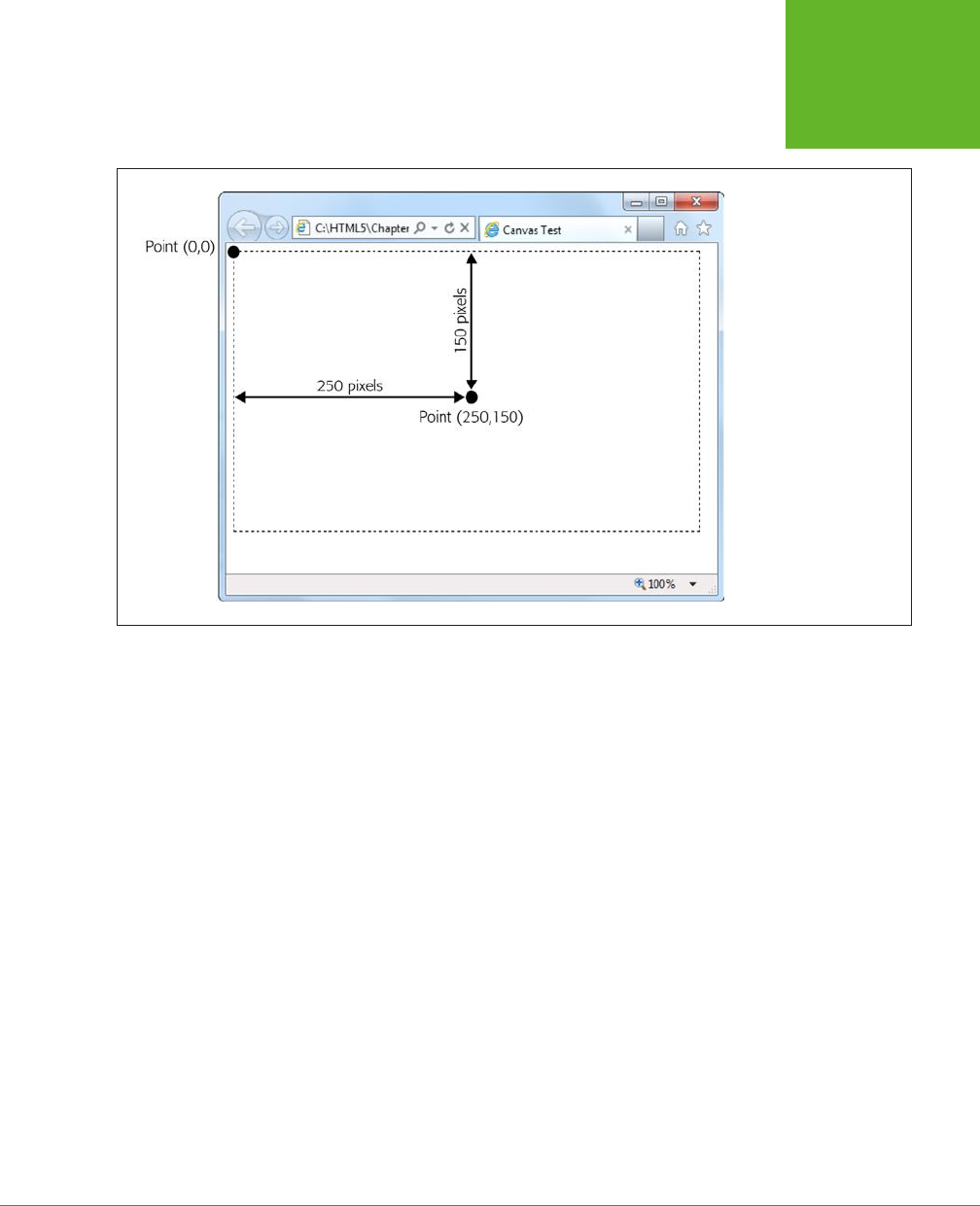
CHAPTER 8: BASIC DRAWING WITH THE CANVAS 249
GETTING
STARTED WITH
THE CANVAS
FIGURE 8-2
As with every other HTML
element, the canvas
designates its top-left
corner as the point (0,0).
As you move right, the
x-value increases, and as
you move down, the y-
value increases. If a canvas
is 500 x 300 pixels, then
the bottom-right corner is
point (500, 300).
The simplest thing you can draw on a canvas is a solid line. Doing that takes three
actions with the drawing context. First, you use the moveTo() method to move to
the point where you want the line to start. Second, you use the lineTo() method
to travel from the current point to the end of the line. Third, you call the stroke()
method to make the line actually appear:
context.moveTo(10,10);
context.lineTo(400,40);
context.stroke();
Or think of it this way: First you lift up your pen and put it where you want (using
moveTo), then you drag the pen across the canvas (using lineTo), then you make
the line appear (using stroke). This result is a thin (1-pixel) black line from point
(10,10) to point (400,40).
Happily, you can get a little fancier with your lines. At any point before you call the
stroke() method that winks your line into existence, you can set three drawing
context properties: lineWidth, strokeStyle, and lineCap. These properties aect
everything you draw from that point on, until you change them.
You use lineWidth to set the width of your lines, in pixels. Here’s a thick, 10-pixel line:
context.lineWidth = 10;
www.it-ebooks.info

HTML5: THE MISSING MANUAL, SECOND EDITION
250
GETTING
STARTED WITH
THE CANVAS
You use strokeStyle to set the color of your lines. You can use an HTML color name,
an HTML color code, or the CSS rgb() function which lets you assemble a color from
red, green, and blue components. (This approach is useful because most drawing
and painting programs use the RGB system.) No matter which one you use, you
need to wrap the whole value in quotation marks, as shown here:
// Set the color (brick red) using an HTML color code:
context.strokeStyle = "#cd2828";
// Set the color (brick red) using the rgb() function:
context.strokeStyle = "rgb(205,40,40)";
NOTE This property is named
strokeStyle
rather than
strokeColor
because you aren’t limited to
plain colors. As you’ll see later on, you can use color blends called gradients (page 284) and image-based patterns
(page 283).
Finally, use lineCap to decide how you want to cap o the ends of your lines. The
default is to make a squared-o edge with butt, but you can also use round (to
round o the edge) or square (which looks the same as butt, but extends the line
an amount equal to half its thickness on each end).
And here’s the complete script code you need to draw three horizontal lines, with
dierent line caps (Figure 8-3). To try this code out, pop it into any JavaScript
function you want. To make it run right away, put it in the function that handles the
window.onload event, as shown on page 248:
var canvas = document.getElementById("drawingCanvas");
var context = canvas.getContext("2d");
// Set the line width and color (for all the lines).
context.lineWidth = 20;
context.strokeStyle = "rgb(205,40,40)";
// Draw the first line, with the standard butt ending.
context.moveTo(10,50);
context.lineTo(400,50);
context.lineCap = "butt";
context.stroke();
// Draw the second line, with a round cap.
context.beginPath();
context.moveTo(10,120);
context.lineTo(400,120);
context.lineCap = "round";
context.stroke();
www.it-ebooks.info
CHAPTER 8: BASIC DRAWING WITH THE CANVAS 251
GETTING
STARTED WITH
THE CANVAS
// Draw the third line, with a square cap.
context.beginPath();
context.moveTo(10,190);
context.lineTo(400,190);
context.lineCap = "square";
context.stroke();
This example introduces one new feature: the beginPath() method of the drawing
context. When you call beginPath(), you start a new, separate segment of your
drawing. Without this step, every time you call stroke(), the canvas will attempt
to draw everything over again. This is a particular problem if you’re changing other
context properties. In this case, you’d end up drawing over your existing content
with the same shapes but a new color, thickness, or line cap.
NOTE While you do need to begin new segments by calling
beginPath()
, you don’t need to do anything
special to end a segment. Instead, the current segment is automatically considered “finished” the moment you
create a new segment.
FIGURE 8-3
The top line uses the standard
butt
ending, while the lines below have
added caps (
round
or
square
),
which extend the line by an amount
equal to half the line’s thickness.
Paths and Shapes
In the previous example, you separated dierent lines by starting a new path for each
one. This method lets you give each line a dierent color (and a dierent width and
cap style). Paths are also important because they allow you to fill custom shapes.
For example, imagine you create a red-outlined triangle using this code:
www.it-ebooks.info

HTML5: THE MISSING MANUAL, SECOND EDITION
252
GETTING
STARTED WITH
THE CANVAS
context.moveTo(250,50);
context.lineTo(50,250);
context.lineTo(450,250);
context.lineTo(250,50);
context.lineWidth = 10;
context.strokeStyle = "red";
context.stroke();
But if you want to
fill
that triangle, the stroke() method won’t help you. Instead,
you need to close the path by calling closePath(), pick a fill color by setting the
fillStyle property, and then call the fill() method to make it happen:
context.closePath();
context.fillStyle = "blue";
context.fill();
It’s worth tweaking a couple of things in this example. First, when closing a path, you
don’t need to draw the final line segment, because calling closePath() automati-
cally draws a line between the last drawn point and the starting point. Second, it’s
best to fill your shape first, and
then
draw its outline. Otherwise, your outline may
be partially overwritten by the fill.
Here’s the complete triangle-drawing code:
var canvas = document.getElementById("drawingCanvas");
var context = canvas.getContext("2d");
context.moveTo(250,50);
context.lineTo(50,250);
context.lineTo(450,250);
context.closePath();
// Paint the inside.
context.fillStyle = "blue";
context.fill();
// Draw the outline.
context.lineWidth = 10;
context.strokeStyle = "red";
context.stroke();
Notice that you don’t need to use beginPath() in this example, because the canvas
starts you o with a new path automatically. You need to call beginPath() only when
you need a
new
path—for example, when changing line settings or drawing a new
shape. Figure 8-4 shows the result of running this JavaScript.
www.it-ebooks.info

CHAPTER 8: BASIC DRAWING WITH THE CANVAS 253
GETTING
STARTED WITH
THE CANVAS
NOTE When drawing connecting line segments (like the three sides of this triangle), you can set the drawing
context’s
lineJoin
property to round or bevel the edges (by using the values
round
or
bevel
—the default
is
mitre
).
FIGURE 8-4
To create a closed shape like this
triangle, use
moveTo()
to get to the
starting point,
lineTo()
to draw
each line segment, and
closePath()
to complete the shape. You can then
fill it with
fill()
and outline it with
stroke()
.
Most of the time, when you want a complex shape, you’ll need to assemble a path
for it, one line at a time. But there’s one shape that’s important enough to get spe-
cial treatment: the rectangle. You can fill a rectangular region in one step using the
fillRect() method. You supply the coordinate for the top-left corner, the width,
and the height.
For example, to place a 100 x 200 pixel rectangle starting at point (0,10), use this
code:
fillRect(0,10,100,200);
The fillRect() method gets the color to use from the fillStyle property, just like
the fill() method.
Similarly, you can use strokeRect() to draw the outline of a rectangle in one step:
strokeRect(0,10,100,200);
The strokeRect() method uses the current lineWidth and strokeStyle properties to
determine the thickness and color of the outline, just as the stroke() method does.
www.it-ebooks.info
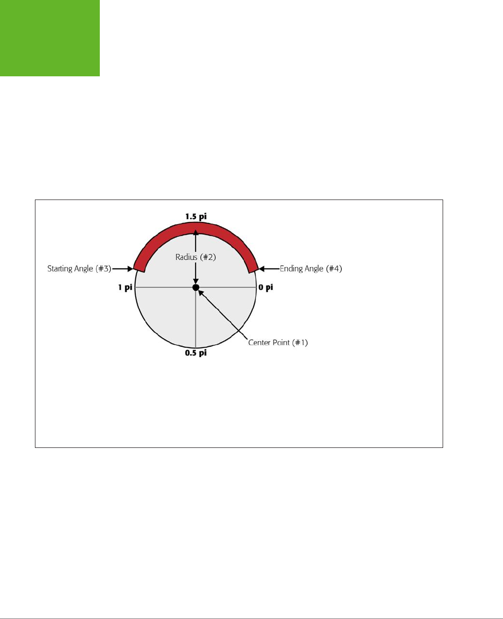
HTML5: THE MISSING MANUAL, SECOND EDITION
254
GETTING
STARTED WITH
THE CANVAS
Curved Lines
If you want something more impressive than lines and rectangles (and who doesn’t?),
you’ll need to understand four methods that can really throw you for a curve: arc(),
arcTo(), bezierCurveTo(), and quadraticCurveTo(). All of these methods draw
curved lines in dierent ways, and they all require at least a smattering of math (and
some need a whole lot more).
The arc() method is the simplest of the bunch. It draws a portion of a circle’s outline.
To draw an arc, you first need to visualize an imaginary circle, and then decide which
part of the edge you need, as explained in Figure 8-5. You’ll then have all the data
you need to pass to the arc() method.
FIGURE 8-5
An arc seems simple enough,
but you need several pieces
of information to describe it
completely. First, you need
to pin down the imaginary
circle. That requires the
coordinates of the center
point (#1) and the radius
that indicates how big the
circle is (#2). Next, you need
to describe the length of the
arc, which requires the angle
where the arc starts (#3) and
the angle where it ends (#4).
You must supply angles in
radian coordinates, which
are expressed as fractions
of the constant pi. (So 1
pi is halfway around the
circle, and 2 pi is all the way
around, as indicated here.)
Once you’ve sorted out all the details you need, you can call the arc() method:
var canvas = document.getElementById("drawingCanvas");
var context = canvas.getContext("2d");
// Create variables to store each detail about the arc.
var centerX = 150;
var centerY = 300;
var radius = 100;
var startingAngle = 1.25 * Math.PI;
var endingAngle = 1.75 * Math.PI;
www.it-ebooks.info

CHAPTER 8: BASIC DRAWING WITH THE CANVAS 255
GETTING
STARTED WITH
THE CANVAS
// Use this information to draw the arc.
context.arc(centerX, centerY, radius, startingAngle, endingAngle);
context.stroke();
Or, call closePath() before you call stroke() to add a straight line between the two
ends of the arc. This creates a closed semi-circle.
Incidentally, a circle is simply an arc that stretches all the way around. You can draw
it like this:
var canvas = document.getElementById("drawingCanvas");
var context = canvas.getContext("2d");
var centerX = 150;
var centerY = 300;
var radius = 100;
var startingAngle = 0;
var endingAngle = 2 * Math.PI;
context.arc(centerX, centerY, radius, startingAngle, endingAngle);
context.stroke();
NOTE The
arc()
method doesn’t let you draw an ellipse (a flattened circle). To get that, you need to do
more work—either use some of the more sophisticated curve methods described next, or use a transform (page
256) to stretch out an ordinary circle as you draw it.
The three other curve methods—arcTo(), bezierCurveTo(), and quadraticCurveTo()—
are a bit more intimidating to the geometrically challenged. They involve a concept
called
control points
—points that aren’t included in the curve, but influence the way
it’s drawn. The most famous example is the Bézier curve, which is used in virtually
every computer illustration program ever created. It’s popular because it creates a
curve that looks smooth no matter how small or big you draw it. Figure 8-6 shows
how control points shape a Bézier curve.
And here’s the code that creates the curve from Figure 8-6:
var canvas = document.getElementById("drawingCanvas");
var context = canvas.getContext("2d");
// Put the pen where the curve starts.
context.moveTo(62, 242);
// Create variables for the two control points and the end point of the curve.
var control1_x = 187;
var control1_y = 32;
var control2_x = 429;
var control2_y = 480;
www.it-ebooks.info
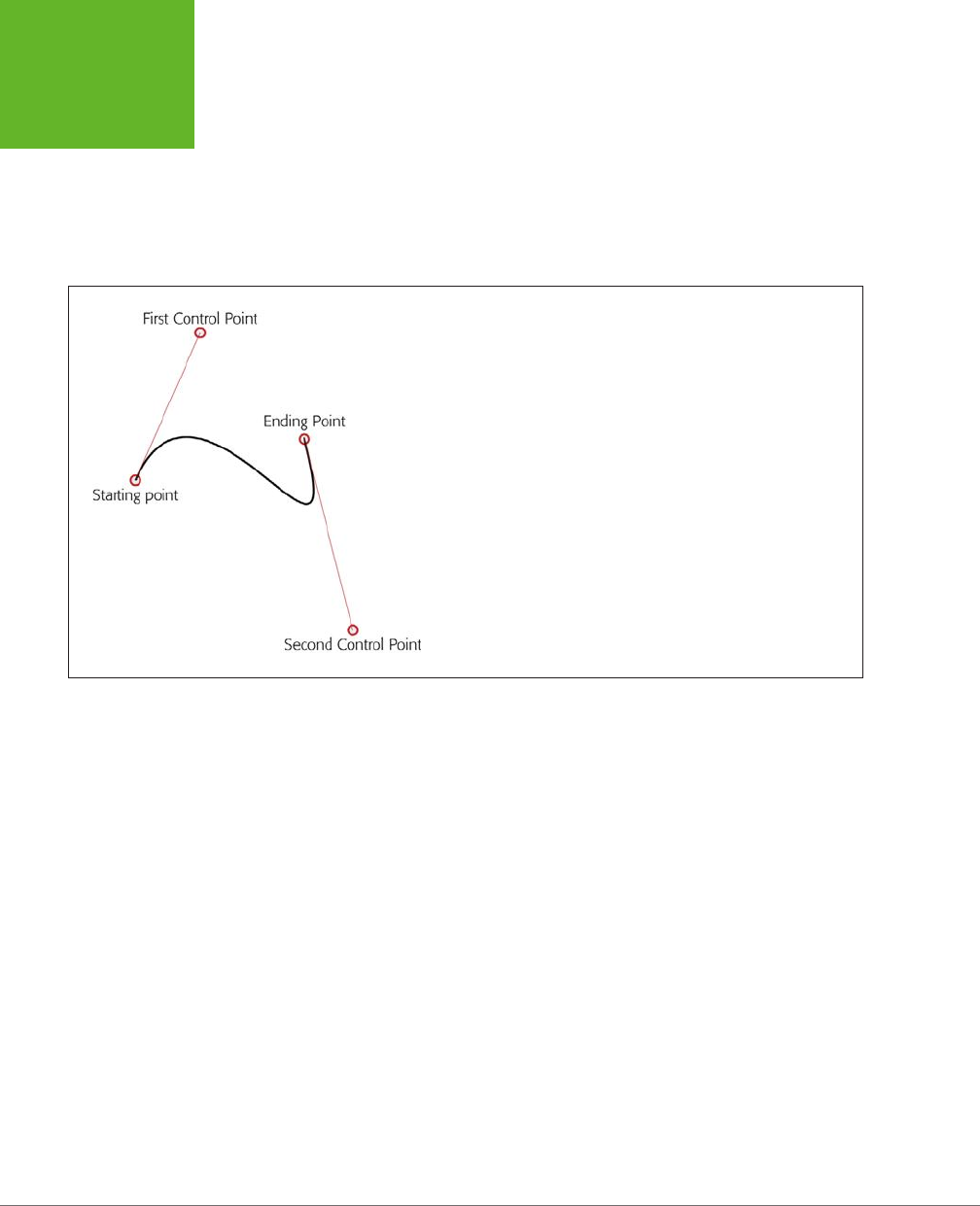
HTML5: THE MISSING MANUAL, SECOND EDITION
256
GETTING
STARTED WITH
THE CANVAS
var endPointX = 365;
var endPointY = 133;
// Draw the curve.
context.bezierCurveTo(control1_x, control1_y, control2_x, control2_y,
endPointX, endPointY);
context.stroke();
FIGURE 8-6
A Bézier curve has two control points. The start of the curve runs
parallel to the first control point. The end of the curve runs parallel to
the second control point. In between, the line curves. The amount of
curvature is influenced by the distance to the control point—the farther
away the point is, the stronger its “pull.” It’s sort of like gravity, but
in reverse.
The outline of a complex, organic shape often involves a series of arcs and curves
glued together. Once you’re finished, you can call closePath() to fill or outline the
entire shape. The best way to learn about curves is to play with one on your own.
You can find a perfect test page at
http://tinyurl.com/html5bezier
(Figure 8-7).
Transforms
A transform is a drawing technique that lets you shift the canvas’s coordinate system.
For example, imagine you want to draw the same square in three places. You could
call fillRect() three times, with three dierent points:
var canvas = document.getElementById("drawingCanvas");
var context = canvas.getContext("2d");
// Draw a 30x30 square, at three places.
context.rect(0, 0, 30, 30);
context.rect(50, 50, 30, 30);
context.rect(100, 100, 30, 30);
context.stroke();
www.it-ebooks.info

CHAPTER 8: BASIC DRAWING WITH THE CANVAS 257
GETTING
STARTED WITH
THE CANVAS
Or you could call fillRect() three times, with the
same
point, but shift the coordi-
nate system each time so the square actually ends up in three dierent spots, like so:
var canvas = document.getElementById("drawingCanvas");
var context = canvas.getContext("2d");
// Draw a square at (0,0).
context.rect(0, 0, 30, 30);
// Shift the coordinate system down 50 pixels and right 50 pixels.
context.translate(50, 50);
context.rect(0, 0, 30, 30);
// Shift the coordinate system down a bit more. Transforms are cumulative,
// so now the (0,0) point will actually be at (100,100).
context.translate(50, 50);
context.rect(0, 0, 30, 30);
context.stroke();
FIGURE 8-7
This page (found at
http://
tinyurl.com/html5bezier
)
lets you tweak all the
details of a Bézier curve by
clicking and pulling with
the mouse. Best of all,
as you drag the starting
point, control points, and
end point, the page gener-
ates the corresponding
snippet of HTML5 canvas
code that you can use to
create the same curve on
your own canvas. You can
find a similarly great test
page for quadratic curves
at
http://tinyurl.com/
html5quadratic
.
www.it-ebooks.info

HTML5: THE MISSING MANUAL, SECOND EDITION
258
GETTING
STARTED WITH
THE CANVAS
FREQUENTLY ASKED QUESTION
Canvas Drawing for Math-Phobes
How do I get all the shapes with none of the headaches?
If you’re hoping to use the canvas to create eye-catching
graphics, but you don’t want to pick up a degree in geometry,
you might be a bit frustrated. Fortunately, there are several
approaches that can help you draw what you want without
worrying about the mathematical underpinnings:
• Use a drawing library. Why draw everything the hard
way when you can use someone else’s drawing library
to draw circles, triangles, ellipses, and polygons in a
single step? The idea is simple—you call a higher-level
method (say,
fillEllipse()
, with the appropriate
coordinates), and the JavaScript library translates
that to the correct canvas operations. Two good
examples are Fabric.js (
http://fabricjs.com
) and KineticJS
(
http://kineticjs.com
). However, these libraries (and
more) are still evolving—and rapidly. It’s too soon
to say which ones will have real staying power, but
you could read a lively debate and some developer
suggestion on the popular question-and-answer Stack
Overflow site (
http://tinyurl.com/canvas-libraries
).
• Draw bitmap images. Instead of painstakingly drawing
each shape you need, you can copy ready-made graphics
to your canvas. For example, if you have an image of a
circle with a file name
circle.png
, you can insert that
into your canvas using the approach shown on page
276. However, this technique won’t give you the same
flexibility to manipulate your image (for example, to
stretch it, rearrange it, remove part of it, and so on).
• Use an export tool. If you have a complex graphic and
you need to manipulate it on the canvas or make it
interactive, drawing a fixed bitmap isn’t good enough.
But a conversion tool that can examine your graphic and
generate the right canvas-creation code just might solve
your problem. One intriguing example is the Ai→Canvas
plug-in for Adobe Illustrator (
http://visitmix.com/labs/
ai2canvas
), which converts Adobe Illustrator artwork to
an HTML page with JavaScript code that painstakingly
recreates the picture on a canvas.
Both versions of this code have the same eect: They draw three squares, in the
same three spots.
At first glance, transforms may seem like nothing more than a way to make a some-
what complicated drawing task even more complicated. But transforms can work
magic in some tricky situations. For example, suppose you have a function that draws
a series of complex shapes that, put together, create a picture of a bird. Now, say
you want to animate that bird, so it appears to fly around the canvas. (You’ll see a
basic example of animation on the canvas on page 301.)
Without transforms, you’d need to adjust every coordinate in your drawing code
each time you drew the bird. But with transforms, you can leave your drawing code
untouched and simply tweak the coordinate system over and over again.
Transforms come in several dierent flavors. In the previous example, a translate
transform was used to move the center point of the coordinate system—that’s the
(0,0) point that’s usually placed in the top-left corner of the canvas. Along with
the translate transform, there’s also a scale transform (which lets you draw things
www.it-ebooks.info
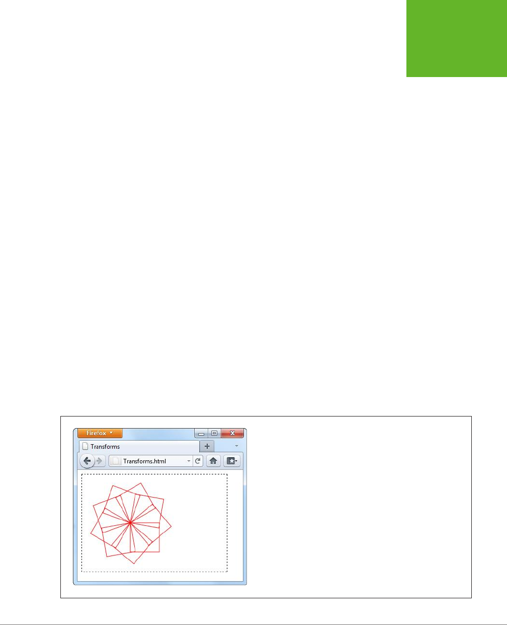
CHAPTER 8: BASIC DRAWING WITH THE CANVAS 259
GETTING
STARTED WITH
THE CANVAS
bigger or smaller), a rotate transform (which lets you turn the coordinate system
around), and a matrix transform (which lets you stretch and warp the coordinate
system in virtually any way—provided you understand the complex matrix math that
underpins the visual eect you want).
Transforms are cumulative. The following example moves the (0,0) point to (100,100)
with a translate transform and then rotates the coordinate system around that
point several times. Each time, it draws a new square, creating the pattern shown
in Figure 8-8:
var canvas = document.getElementById("drawingCanvas");
var context = canvas.getContext("2d");
// Move the (0,0) point. This is important, because
// the rotate transform turns around this point.
context.translate(100, 100);
// Draw 10 squares.
var copies = 10;
for (var i=1; i<copies; i++) {
// Before drawing the square, rotate the coordinate system.
// A complete rotation is 2*Math.PI. This code does a fraction of this
// for each square, so that it has rotated around completely by the time
// it's drawn the last one.
context.rotate(2 * Math.PI * 1/(copies-1));
// Draw the square.
context.rect(0, 0, 60, 60);
}
context.stroke();
FIGURE 8-8
By drawing a series of rotated squares, you can create Spirograph-like
patterns.
www.it-ebooks.info
HTML5: THE MISSING MANUAL, SECOND EDITION
260
GETTING
STARTED WITH
THE CANVAS
TIP You can use the drawing context’s
save()
method to save the current state of the coordinate system.
Later on, you can use the
restore()
method to return to your previous saved state. You might want to call
save()
before you’ve applied any transforms, so you can call
restore()
to get the coordinate system back
to normal. And in long, complex drawing tasks, you might save the state many times. This list of saved states
acts like the web page history in a browser. Each time you call
restore()
, the coordinate system reverts to
the immediately preceding state.
Transforms are somewhat beyond the scope of this chapter. If you want to explore
them in more detail, Mozilla (the company that created Firefox) has some helpful
documentation and examples at
http://tinyurl.com/canvas-transforms
.
Transparency
So far, you’ve been dealing with solid colors. However, the canvas also lets you
use partial transparency to layer one shape over another. There are two ways to
use transparency with the canvas. The first approach is to set a color (through the
fillStyle or strokeStyle properties) with the rgba() function, instead of the more
common rgb() function. The rgba() function takes four arguments—the numbers
for the red, green, and blue color components (from 0 to 255), and an additional
number for the alpha value (from 0 to 1), which sets the color’s opacity. An alpha
value of 1 is completely solid, while an alpha value of 0 is completely invisible. Set a
value in between—for example, 0.5—and you get a partially transparent color that
any content underneath shows through.
NOTE What content is underneath and what content is on top depends solely on the order of your drawing
operations. For example, if you draw a circle first, and then a square at the same location, the square will be
superimposed on top of the circle.
Here’s an example that draws a circle and a triangle. They both use the same fill color,
except that the triangle sets the alpha value to 0.5, making it 50 percent opaque:
var canvas = document.getElementById("drawingCanvas");
var context = canvas.getContext("2d");
// Set the fill and outline colors.
context.fillStyle = "rgb(100,150,185)";
context.lineWidth = 10;
context.strokeStyle = "red";
// Draw a circle.
context.arc(110, 120, 100, 0, 2*Math.PI);
context.fill();
context.stroke();
www.it-ebooks.info
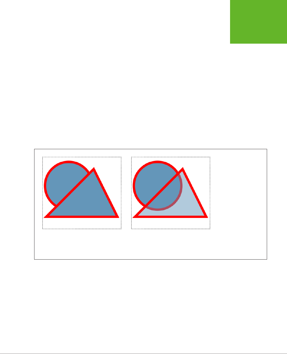
CHAPTER 8: BASIC DRAWING WITH THE CANVAS 261
GETTING
STARTED WITH
THE CANVAS
// Remember to call beginPath() before adding a new shape.
// Otherwise, the outlines of both shapes will
// be merged together in an unpredictable way.
context.beginPath();
// Give the triangle a transparent fill.
context.fillStyle = "rgba(100,150,185,0.5)";
// Now draw the triangle.
context.moveTo(215,50);
context.lineTo(15,250);
context.lineTo(315,250);
context.closePath();
context.fill();
context.stroke();
Figure 8-9 shows the result.
FIGURE 8-9
Left: Two solid shapes, one
on top of the other.
Right: One solid shape, with
a semitransparent shape
on top. Semitransparent
shapes look lighter (be-
cause they let the white
background through),
and they allow you to see
whatever content you’ve
drawn underneath. Notice
that in this example, the
semitransparent shape
uses a fully opaque color
for its border.
The other way to use transparency is to set the drawing context’s globalAlpha
property, like this:
context.globalAlpha = 0.5;
// Now this color automatically gets an alpha value of 0.5:
context.fillStyle = "rgb(100,150,185)";
Do that, and everything you draw from that point on (until you change globalAlpha
again) will use the same alpha value and get the same degree of transparency. This
includes both stroke colors and fill colors.
www.it-ebooks.info
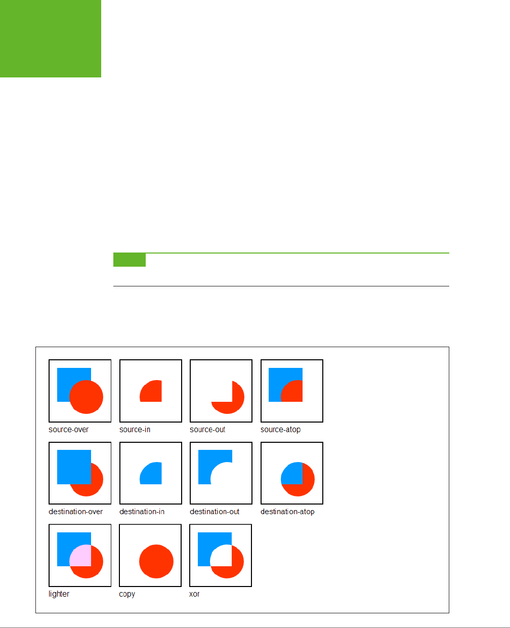
HTML5: THE MISSING MANUAL, SECOND EDITION
262
GETTING
STARTED WITH
THE CANVAS
So which approach is better? If you need just a single transparent color, use rgba().
If you need to paint a variety of shapes with dierent colors, and they all need the
same level of transparency, use globalAlpha. The globalAlpha property is also
useful if you want to paint semitransparent images on your canvas, as you’ll learn
to do on page 301.
Composite Operations
So far, this chapter has assumed that when you put one shape on top of another, the
second shape paints over the first, obscuring it. The canvas works this way most of
the time. However, the canvas also has the ability to use more complex
composite
operations
.
A composite operation is a rule that tells the canvas how to display two images that
overlap. The default composite operation is source-over, which tells the canvas that
the new shape should be painted
over
the first shape (that is, on top of the first
shape). If the new shape overlaps with the first shape, the new shape obscures it.
NOTE In the lingo of composite operations, the
source
is the new object you’re drawing, and the
destination
is the existing content on the canvas that you’ve already drawn.
But other composition options are possible. For example, you can use xor, which
tells the canvas to show nothing at all in the area where the shapes overlap. Figure
8-10 shows an overview of the dierent composite operations.
FIGURE 8-10
Here are the 11 possible composite
operations and their effects. There
used to be 12, but browser makers
couldn’t agree on how to perform
the calculations for the
darker
composite operation, and it was
dropped.
www.it-ebooks.info

CHAPTER 8: BASIC DRAWING WITH THE CANVAS 263
BUILDING A
BASIC PAINT
PROGRAM
To change the current composite operation that the canvas uses, simply set the
drawing context’s globalCompositeOperation property before you draw the second
shape, like this:
context.globalCompositeOperation = "xor";
For example, to create the source-atop combination shown in the top-right corner
of Figure 8-10, you’d use this code:
var canvas = document.getElementById("drawingCanvas");
var context = canvas.getContext("2d");
// Draw a rectangle.
context.fillStyle = "blue";
context.fillRect(15,15,70,70);
// Choose the global composite operation.
context.globalCompositeOperation = "source-atop";
// Draw a circle overtop.
context.fillStyle = "red";
context.beginPath();
context.arc(75, 75, 35, 0, Math.PI*2, true);
context.fill();
Used cleverly, a composite operation can provide shortcuts for certain drawing tasks,
like drawing complex shapes. Hard-core canvas coders can even use these shortcuts
to improve performance by reducing the number of drawing operations they perform.
In the recent past, browsers didn’t quite agree on how to deal with certain composite
operations. Fortunately, these quirks have now been ironed out. The only issue is
with any polyfills that you use to get canvas support on old browsers. Right now,
the only polyfill that supports composite operations is FlashCanvas Pro (page 273).
Building a Basic Paint Program
The canvas still has a fair bit more in store for you. But you’ve covered enough
ground to build your first practical canvas-powered program. It’s the simple paint-
ing program shown in Figure 8-11.
The JavaScript that makes this example work is longer than the examples you’ve
seen so far, but still surprisingly straightforward. You’ll consider it piece by piece in
the following sections.
TIP If you’re curious about the style sheet rules that create the blue toolbars above and below the canvas,
you want to see the whole example in one piece, or you just want to paint something in your browser, then you
can use the
Paint.html
file on the try-out site (
http://prosetech.com/html5
).
www.it-ebooks.info
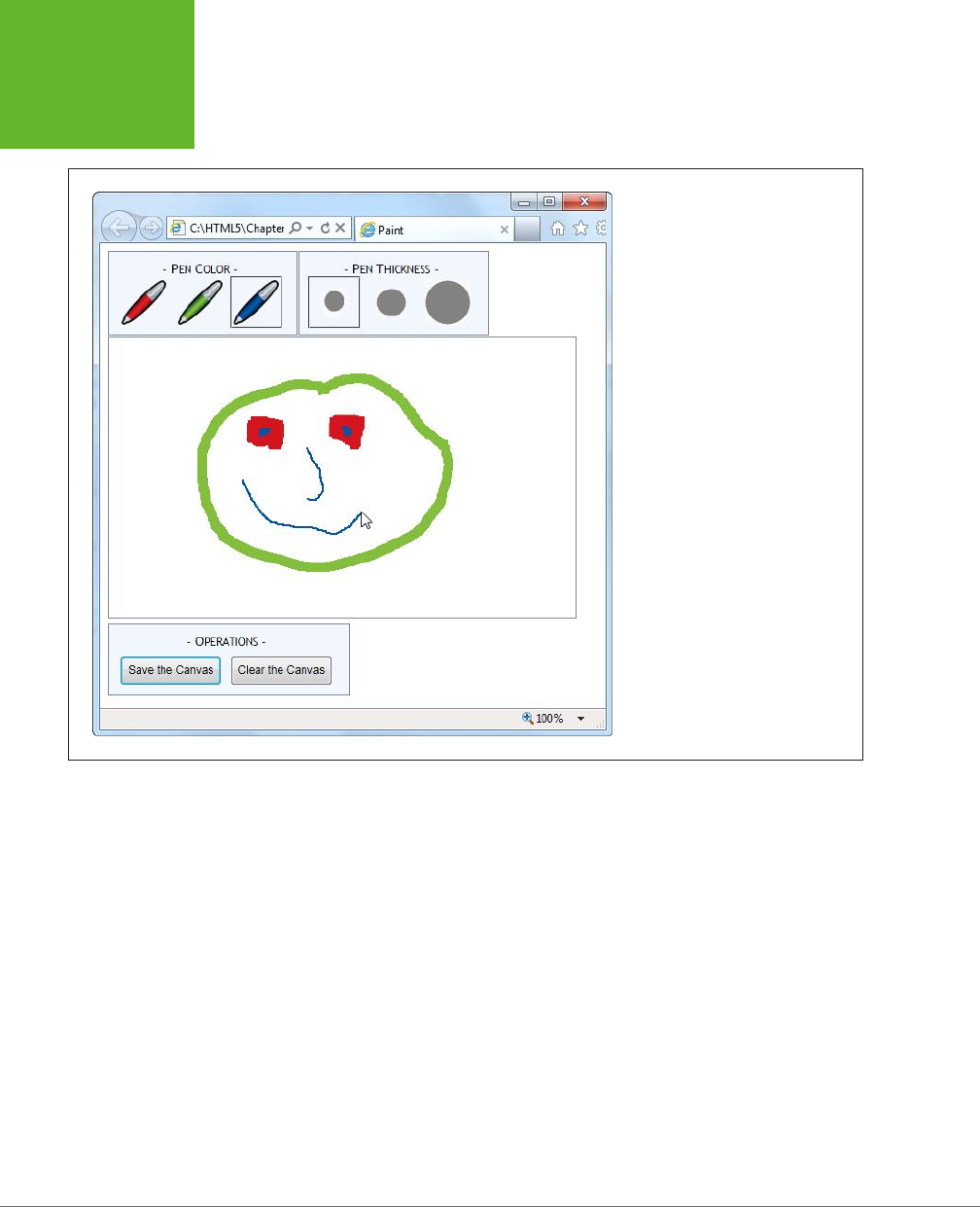
HTML5: THE MISSING MANUAL, SECOND EDITION
264
BUILDING A
BASIC PAINT
PROGRAM
FIGURE 8-11
To express yourself with this paint
program, just pick a pen color, pick a
pen thickness, and scribble away with
the mouse.
Preparing to Draw
First, when the page loads, the code grabs the canvas object and attaches functions
that will handle several JavaScript events for dierent mouse actions: onMouseDown,
onMouseUp, onMouseOut, and onMouseMove. (As you’ll see, these events control the
drawing process.) At the same time, the page also stores the canvas in a handy global
variable (named canvas), and the drawing context in another global variable (named
context). This way, these objects will be easily available to the rest of the code:
var canvas;
var context;
window.onload = function() {
// Get the canvas and the drawing context.
canvas = document.getElementById("drawingCanvas");
context = canvas.getContext("2d");
www.it-ebooks.info

CHAPTER 8: BASIC DRAWING WITH THE CANVAS 265
BUILDING A
BASIC PAINT
PROGRAM
// Attach the events that you need for drawing.
canvas.onmousedown = startDrawing;
canvas.onmouseup = stopDrawing;
canvas.onmouseout = stopDrawing;
canvas.onmousemove = draw;
};
To get started with the paint program, the person using the page chooses the pen
color and pen thickness from the two toolbars at the top of the window. These
toolbars are simple <div> elements styled to look like nice steel-blue boxes, with a
handful of clickable <img> elements in them. For example, here’s the toolbar with
the three color choices:
<div class="Toolbar">
- Pen Color -<br>
<img id="redPen" src="pen_red.gif" alt="Red Pen"
onclick="changeColor('rgb(212,21,29)', this)">
<img id="greenPen" src="pen_green.gif" alt="Green Pen"
onclick="changeColor('rgb(131,190,61)', this)">
<img id="bluePen" src="pen_blue.gif" alt="Blue Pen"
onclick="changeColor('rgb(0,86,166)', this)">
</div>
The important part of this markup is the <img> element’s onclick attribute. When-
ever the web page visitor clicks a picture, the <img> element calls the changeColor()
function. The changeColor() function accepts two pieces of information—the new
color, which is set to match the icon, and a reference to the <img> element that was
clicked. Here’s the code:
// Keep track of the previous clicked <img> element for color.
var previousColorElement;
function changeColor(color, imgElement) {
// Change the current drawing color.
context.strokeStyle = color;
// Give the newly clicked <img> element a new style.
imgElement.className = "Selected";
// Return the previously clicked <img> element to its normal state.
if (previousColorElement != null) previousColorElement.className = "";
previousColorElement = imgElement;
}
The changeColor() code takes care of two basic tasks. First, it sets the drawing con-
text’s strokeStyle property to match the new color; this takes a single line of code.
Second, it changes the style of the clicked <img> element, giving it a solid border, so
it’s clear which color is currently active. This part requires a bit more work, because
www.it-ebooks.info

HTML5: THE MISSING MANUAL, SECOND EDITION
266
BUILDING A
BASIC PAINT
PROGRAM
the code needs to keep track of the previously selected color so it can remove the
solid border around that <img> element.
The changeThickness() function performs an almost identical task, only it alters
the lineWidth property to have the appropriate thickness:
// Keep track of the previously clicked <img> element for thickness.
var previousThicknessElement;
function changeThickness(thickness, imgElement) {
// Change the current drawing thickness.
context.lineWidth = thickness;
// Give the newly clicked <img> element a new style.
imgElement.className = "Selected";
// Return the previously clicked <img> element to its normal state.
if (previousThicknessElement != null) {
previousThicknessElement.className = "";
}
previousThicknessElement = imgElement;
}
This code gets all the drawing setup out of the way, but this example still isn’t ready
to run. The next (and final) step is to add the code that performs the actual drawing.
Drawing on the Canvas
Drawing begins when the user clicks down on the canvas with the mouse button.
The paint program uses a global variable named isDrawing to keep track of when
drawing is taking place, so the rest of the code knows whether it should be writing
on the drawing context.
As you saw earlier, the onMouseDown event is linked to the startDrawing() function.
It sets the isDrawing variable, creates a new path, and then moves to the starting
position to get ready to draw something:
var isDrawing = false;
function startDrawing(e) {
// Start drawing.
isDrawing = true;
// Create a new path (with the current stroke color and stroke thickness).
context.beginPath();
// Put the pen down where the mouse is positioned.
context.moveTo(e.pageX - canvas.offsetLeft, e.pageY - canvas.offsetTop);
}
www.it-ebooks.info

CHAPTER 8: BASIC DRAWING WITH THE CANVAS 267
BUILDING A
BASIC PAINT
PROGRAM
In order for the paint program to work properly, it needs to start drawing at the
current position—that’s where the mouse is hovering when the user clicks down.
However, getting the right coordinates for this point is a bit tricky.
The onMouseDown event provides coordinates (through the pageX and the pageY
properties shown in this example), but these coordinates are relative to the whole
page. To calculate the corresponding coordinate on the canvas, you need to subtract
the distance between the top-left corner of the browser window and the top-left
corner of the canvas.
The actual drawing happens while the user is moving the mouse. Every time the user
moves the mouse, even just a single pixel, the onMouseMove event fires and the code
in the draw() function runs. If isDrawing is set to true, then the code calculates the
current canvas coordinate—where the mouse is
right now
—and then calls lineTo()
to add a tiny line segment to the new position and stroke() to draw it:
function draw(e) {
if (isDrawing == true) {
// Find the new position of the mouse.
var x = e.pageX - canvas.offsetLeft;
var y = e.pageY - canvas.offsetTop;
// Draw a line to the new position.
context.lineTo(x, y);
context.stroke();
}
}
If the user keeps moving the mouse, the draw() function keeps getting called, and
another short piece of line keeps getting added. This line is so short—probably just
a pixel or two—that it doesn’t even look like a straight line when the user starts
scribbling.
Finally, when the user releases the mouse button or moves the cursor o to the
side, away from the canvas, the onMouseUp or onMouseOut events fire. Both of these
trigger the stopDrawing() function, which tells the application to stop drawing:
function stopDrawing() {
isDrawing = false;
}
So far, this code covers almost all there is to the simple paint program. The only
missing details are the two buttons under the canvas, which oer to clear or save
the current work. Click clear, and the clearCanvas() function blanks out the entire
surface, using the drawing context’s clearRect() method:
function clearCanvas() {
context.clearRect(0, 0, canvas.width, canvas.height);
}
www.it-ebooks.info

HTML5: THE MISSING MANUAL, SECOND EDITION
268
BUILDING A
BASIC PAINT
PROGRAM
The save option is slightly more interesting, and you’ll consider it next.
Saving the Picture in the Canvas
When it comes to saving the picture in a canvas, there are countless options. First,
you need to decide how you’re going to get the data. The canvas gives you three
basic options:
• Use a data URL. Converts the canvas to an image file and then converts that
image data to a sequence of characters, formatted as a URL. This gives you a
nice, portable way to pass the image data around (for example, you can hand
it to an <img> element or send it o to the web server). The paint program uses
this approach.
• Use the getImageData() method. Grabs the raw pixel data, which you can
then manipulate as you please. You’ll learn to use getImageData() on page 313.
• Store a list of “steps.” Lets you store, for example, an array that lists every
line you drew on the canvas. Then you can save that data and use it to recreate
the image later. This approach takes less storage space, and it gives you more
flexibility to work with or edit the image later on. Unfortunately, it works only
if you keep track of all the steps you’re taking, using a technique like the one
you’ll see in the circle-drawing example (page 294).
If that seems a bit intimidating, well, you’re not done quite yet. Once you decide
what you want to save, you still need to decide
where
to save it. Here are some
options for that:
• In an image file. For example, you can let the web surfer save a PNG or JPEG
on the computer. That’s the approach you’ll see next.
• In the local storage system. You’ll learn how that works in Chapter 10.
• On the web server. Once you transfer the data, the web server could store it in
a file or a database and make it available the next time the web page user visits.
To make the save feature work in the paint program, the code uses a feature called
data URLs
. To get a URL for the current data, you simply use the canvas’s toDataURL()
method:
var url = canvas.toDataURL();
When you call toDataURL() without supplying any arguments, you get a PNG-
formatted picture. Alternatively, you can supply an image type to request that
format instead:
var url = canvas.toDataURL("image/jpeg");
But if the browser is unable to honor your format request, it will still send you a PNG
file, converted to a long string of letters.
www.it-ebooks.info

CHAPTER 8: BASIC DRAWING WITH THE CANVAS 269
BUILDING A
BASIC PAINT
PROGRAM
At this point, you’re probably wondering what a data URL looks like. Technically, it’s
a long string of base-64 encoded characters that starts with the text
data:image/
png;base64
. It looks like gobbledygook, but that’s OK, because it’s supposed to be
readable by computer programs (like browsers). Here’s a data URL for the current
canvas picture:
data:image/png;base64,iVBORw0KGgoAAAANSUhEUgAAAfQAAAEsCAYAAAA1u0HIAAAAAXNSR
0IArs4c6QAAAARnQU1BAACxjwv8YQUAACqRSURBVHhe7Z1bkB1Hecdn5uxFFzA2FWOnsEEGiiew
nZgKsrWLrZXMRU9JgZQKhoSHVK...gAAEIQAACEIBAiAT+HxAYpeqDfKieAAAAAElFTkSuQmCC
This example leaves out a huge amount of the content in the middle (where the ellipsis
is) to save space. If it was all left in, this data URL would fill five pages in this book.
NOTE Base-64 encoding is a system that converts image data to a long string of characters, numbers, and
a small set of special characters. It avoids punctuation and all the bizarre extended characters, so the resulting
text is safe to stick in a web page (for example, to set the value of a hidden input field or the
src
attribute in
an
<img>
element).
So, it’s easy to convert a canvas to image data in the form of a data URL. But once
you have that data URL, what can you do with it? One option is to send it to the
web server for long-term storage. You can see an example of a web page that does
that, using a sprinkling of PHP script on the server, at
http://tinyurl.com/5uud9ob
.
If you want to keep your data on the client, your options are a bit more limited. Some
browsers will let you navigate directly to a data URL. That means you can use code
like the following to navigate to the image:
window.location = canvas.toDataURL();
A more reliable technique is to hand the data URL over to an <img> element. Here’s
what the paint program does (Figure 8-12):
function saveCanvas() {
// Find the <img> element.
var imageCopy = document.getElementById("savedImageCopy");
// Show the canvas data in the image.
imageCopy.src = canvas.toDataURL();
// Unhide the <div> that holds the <img>, so the picture is now visible.
var imageContainer = document.getElementById("savedCopyContainer");
imageContainer.style.display = "block";
}
This code doesn’t exactly “save” the image data, because the image hasn’t yet been
stored permanently, in a file. However, it takes just one more step to save the data
once it’s in an image. The web page visitor simply needs to right-click the image and
choose the Save command. This isn’t quite as convenient as a file download or the
Save dialog box, but it’s the only client-side option that works reliably in all browsers.
www.it-ebooks.info
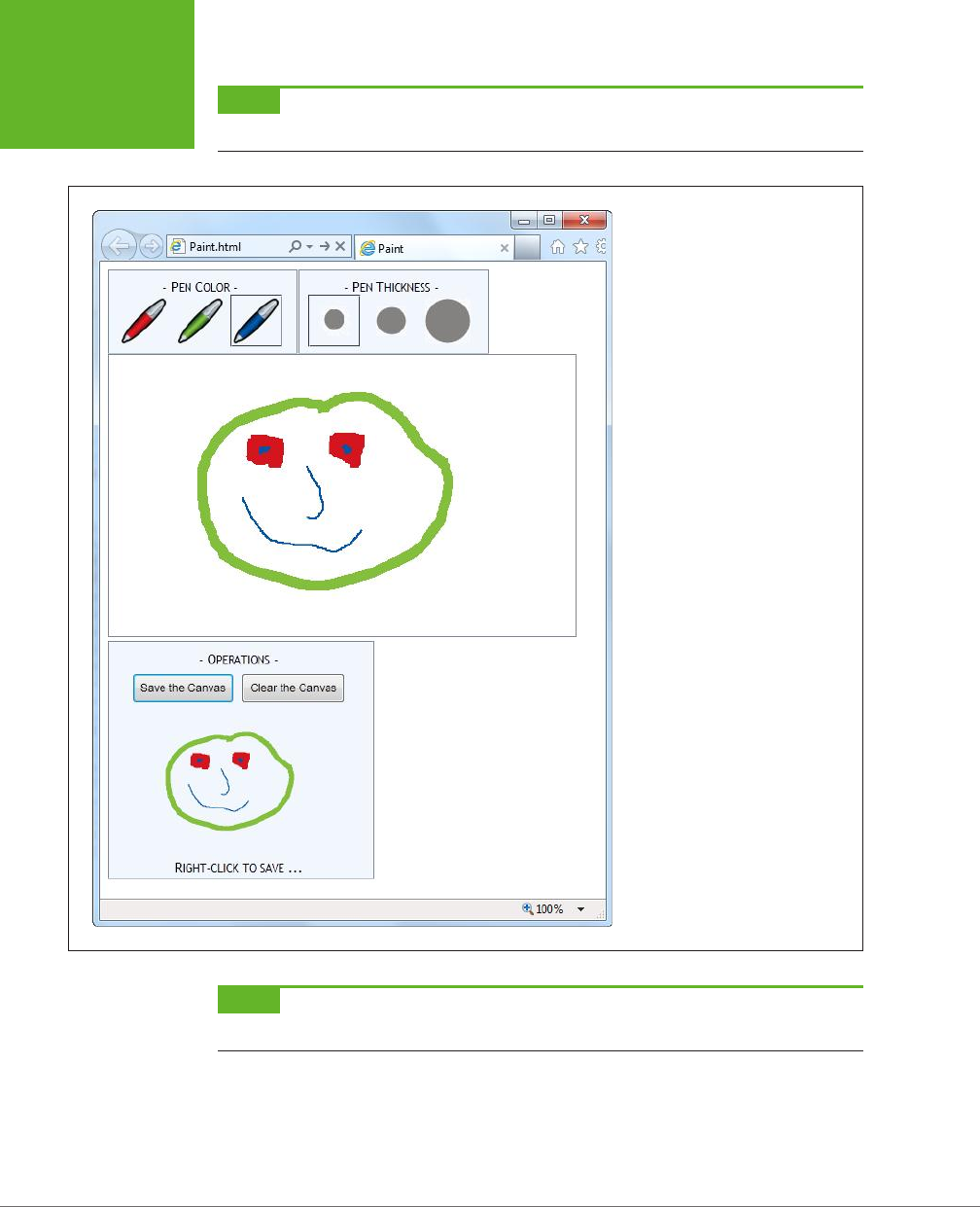
HTML5: THE MISSING MANUAL, SECOND EDITION
270
BUILDING A
BASIC PAINT
PROGRAM
NOTE Firefox has the built-in ability to save canvas content. Just right-click any canvas (not the image
copy) and choose Save Image As. Other browsers, like Chrome and Internet Explorer, don’t offer this option.
FIGURE 8-12
Here, the data URL is used to transmit
information to an
<img>
element.
The
<img>
element has been given a
smaller size, to distinguish it from the
main canvas. If you want to save this
image as a respectable .png file, sim-
ply right-click the image and choose
“Save picture as,” just as you would
with any other picture in a web page.
NOTE The data URL feature is one of several canvas features that may fail to work if you’re running a test
page from your computer hard drive. To avoid problems, upload your work to a live web server for testing.
www.it-ebooks.info

CHAPTER 8: BASIC DRAWING WITH THE CANVAS 271
BROWSER
COMPATIBILITY
FOR THE
CANVAS
GEM IN THE ROUGH
Canvas-Based Paint Programs
A paint program is one of the first examples that comes to
mind when people start exercising their canvas-programming
muscles. It’s thus no surprise that you can Google up many
more paint program examples on the Web, including some
ridiculously advanced versions. Here are two favorites:
• iPaint (
http://tinyurl.com/js-ipaint
). This straightforward
program looks like Microsoft Paint in a web browser.
However, it adds at least one feature traditional Paint
doesn’t—the ability to select and manipulate the objects
in your picture after you’ve drawn them.
• Sketchpad
(
http://mugtug.com/sketchpad
). This
amazingly tricked-out painting program has support for
advanced illustration features like shape manipulation,
marquee selection, textures, and even Spirograph
drawing.
Browser Compatibility for the Canvas
You’ve come a long way with the canvas already. Now it’s time to step back and an-
swer the question that hangs over every new HTML5 feature: When is it safe to use it?
Fortunately, the canvas is one of the better-supported parts of HTML5. The latest
version of every mainstream browser supports it. Of course, the more up-to-date
the browser, the better—later builds of these browsers improve the drawing speed
of the canvas and remove occasional glitches.
You’re not likely to run into an old browser that doesn’t support the canvas, except
for versions of Internet Explorer before IE 9. And that’s the clear issue that today’s
canvas users will be thinking about: How can you put the canvas in your pages
without locking out IE 8 and IE 7?
As with many HTML5 features, you have two compatibility choices. Your first op-
tion is to detect when canvas support is missing and try to fall back on a dierent
approach. Your second option is to fill the gap with another tool that can simulate
the HTML5 canvas, so your pages will work—as written—on old browsers. In the
case of the canvas, the second approach is the surprise winner, as you’ll learn in
the next section.
Polyfilling the Canvas with ExplorerCanvas
There are several solid workarounds that grant canvas-like abilities to aging copies of
IE. The first is the ExplorerCanvas library (also called excanvas), by Google engineer
and JavaScript genius Erik Arvidsson. It simulates the HTML5 canvas in Internet
Explorer 7 or 8, using nothing but JavaScript and a now out-of-date technology
called VML (Vector Markup Language).
www.it-ebooks.info

HTML5: THE MISSING MANUAL, SECOND EDITION
272
BROWSER
COMPATIBILITY
FOR THE
CANVAS
NOTE VML is a specification for creating line art and other illustrations using markup in an HTML document.
It’s now been replaced by a similar, but better supported, standard called SVG (Scalable Vector Graphics), which
browsers are just beginning to support. Today, VML still lingers in a few Microsoft products, like Microsoft Office
and Internet Explorer. This makes it a reasonable substitute for the canvas, albeit with some limitations.
You can download ExplorerCanvas from
http://code.google.com/p/explorercanvas
.
To use it, copy the
excanvas.js
file to the same folder as your web page, and add a
script reference like this to your web page:
<head>
<title>...</title>
<!--[if lt IE 9]>
<script src="excanvas.js"></script>
<![endif]-->
...
<head>
Notice that this reference is conditional. Versions of Internet Explorer that are
earlier
than IE 9 will use it, but IE 9 and non-IE browsers will ignore the script altogether.
From this point, you can use the <canvas> without any serious headaches. For ex-
ample, this change is all you need to get the basic paint program (shown on page
263) working in old versions of IE.
NOTE If you plan to draw text on your canvas (a feature discussed on page 279), you’ll also need the help of
a second JavaScript library, called Canvas-text, which works in conjunction with ExplorerCanvas. You can download
it from
http://code.google.com/p/canvas-text
.
Polyfilling the Canvas with FlashCanvas
Of course, the ExplorerCanvas isn’t perfect. If you use advanced features, you’ll
probably run into something that doesn’t look right. The main features that aren’t
supported in ExplorerCanvas include radial gradients, shadows, clipping regions,
raw pixel processing, and data URLs. And although someone may update Explorer-
Canvas in the future to add these features, it doesn’t seem likely—the current build
of ExplorerCanvas is a few years old and the code hasn’t been touched in a while.
If you have really ambitious plans—for example, you’re planning to create complex
animations or a side-scrolling game—you might find that ExplorerCanvas isn’t fast
enough to keep up. In this situation, you can consider switching to a dierent poly-
fill that uses a high-performance browser plug-in like Silverlight or Flash. You can
review all your options on GitHub’s polyfill page at
http://tinyurl.com/polyfills
. Or,
go straight to one of the best: the free FlashCanvas library at
http://code.google.com/
p/flashcanvas
. Like ExplorerCanvas, you can plug it into your page using a single
line of JavaScript. But unlike ExplorerCanvas, it uses the Flash plug-in, without a
trace of VML.
www.it-ebooks.info

CHAPTER 8: BASIC DRAWING WITH THE CANVAS 273
BROWSER
COMPATIBILITY
FOR THE
CANVAS
FlashCanvas also has a grown-up professional version called FlashCanvas Pro. It
adds support for a few additional features, like global composite operations (page
262) and shadows (page 281).
FlashCanvas Pro is free for noncommercial use (get it at
http://flashcanvas.net/
download
). Or, if you’re a business or an individual planning to make some money,
you can buy FlashCanvas Pro for a small fee (currently $31) at
http://flashcanvas.net/
purchase
. You can compare the canvas support of ExplorerCanvas, FlashCanvas,
and FlashCanvas Pro at
http://flashcanvas.net/docs/canvas-api
.
Like ExplorerCanvas, the FlashCanvas project isn’t seeing much action these days.
However, in its current state it remains a reliable choice for canvas support in old
browsers. If you’re planning to create a truly ambitious canvas-powered site—for
example, a real-time game—you’ll need to test out FlashCanvas to see if it supports
everything you need to do.
NOTE When you combine a canvas-powered page with a library like FlashCanvas, you get truly impressive
support on virtually every browser known to humankind. Not only do you get support for slightly older versions
of IE through Flash, but you also get support for Flash-free mobile devices like the iPad and iPhone through HTML5.
The Canvas Fallback and Feature Detection
The most popular way to extend the reach of pages that use the canvas is with
ExplorerCanvas and FlashCanvas. However, they aren’t the only options.
The <canvas> element supports fallback content, just like the <audio> and <video>
elements you explored in the last chapter. For example, you could apply this sort
of markup to use the canvas (if it’s supported) or to display an image (if it isn’t):
<canvas id="logoCreator" width="500" height="300">
<p>The canvas isn't supported on your computer, so you can't use our
dynamic logo creator.</p>
<img src="logo.png" alt="Standard Company Logo">
</canvas>
This technique is rarely much help. Most of the time, you’ll use the canvas to draw
dynamic graphics or to create some sort of interactive graphical application, and a
fixed graphic just can’t compensate. One alternative is to place a Flash application
inside the <canvas> element. This approach is especially good if you already have a
Flash version of your work but you’re moving to the canvas for future development.
It lets you oer a working Flash-based solution to old versions of IE, while letting
everyone else use the plug-in-free canvas.
If you’re using Modernizr (page 31), you can test for canvas support in your JavaScript
code. Just test the Modernizr.canvas property, and check the Modernizr.canvastext
property to look for the canvas’s text-drawing feature (which was a later addition
to the canvas drawing model). If you don’t detect canvas support in the current
browser, then you can use any workaround you’d like.
www.it-ebooks.info

HTML5: THE MISSING MANUAL, SECOND EDITION
274
BROWSER
COMPATIBILITY
FOR THE
CANVAS
FREQUENTLY ASKED QUESTION
Canvas Accessibility
Is it possible to make the canvas more accessible?
One of the key themes of HTML5, the semantic elements, and
the past few chapters is
accessibility
—designing a page that
provides information to assistive software, so it can help people
with disabilities use your website. After all this emphasis, it
may come as a shock that one of HTML5’s premier new features
has no semantics or accessibility model
at all
.
The creators of HTML5 are working to patch the hole. However,
no one is quite certain of the best solution. One proposal is to
create a separate document model for assistive devices, which
would then mirror the canvas content. The problem here is that
it’s up to the author to keep this “shadow” model in sync with
the visuals, and lazy or overworked developers are likely to
pass on this responsibility if it’s at all complicated.
A second proposal is to extend image maps (an existing HTML
feature that divides pictures into clickable regions) so they act
as a layer over the top of the canvas. Because an image map is
essentially a group of links, it could hold important information
for assistive software to read and report to the user.
Currently, there’s no point in thinking too much about either
of these ideas, because they’re both still being debated. In
the meantime, it makes sense to use the canvas for a variety
of graphical tasks, like arcade games (most of which can’t
practically be made accessible) and data visualization (as
long as you have the data available in text form elsewhere
on the page). However, the canvas isn’t a good choice for an
all-purpose page design element. So if you’re planning to
use the canvas to create a fancy heading or a menu for your
website, hold off for now.
.
www.it-ebooks.info

275
CHAPTER
9
The canvas is a huge, sprawling feature. In the previous chapter, you learned
how to draw line art and even create a respectable drawing program in a few
dozen lines of JavaScript. But the canvas has more up its sleeve than that. Not
only can it show dynamic pictures and host paint programs, but it can also play
animations, process images with pixel-perfect control, and run interactive games.
In this chapter, you’ll learn the practical beginnings for all these tasks.
First, you’ll start by looking at drawing context methods that let you paint dierent
types of content on a canvas, including images and text. Next, you’ll learn how to
add some graphical pizzazz with shadows, patterned fills, and gradients. Finally,
you’ll learn practical techniques to make your canvas interactive and to host live
animations. Best of all, you can build all of these examples with nothing more than
ordinary JavaScript and raw ambition.
NOTE For the first half of this chapter, you’ll focus on small snippets of drawing code. You can incorporate
this code into your own pages, but you’ll need to first add a
<canvas>
element to your page and create a draw-
ing context, as you learned on page 246. In the second half of this chapter, you’ll look at much more ambitious
examples. Although you’ll see most (or all) of the canvas-drawing code that these examples use, you won’t get
every page detail. To try out the examples for yourself, visit the try-out site at
http://prosetech.com/html5
.
Other Things You Can Draw on the Canvas
Using the canvas, you can painstakingly recreate any drawing you want, from a
bunch of lines and triangles to a carefully shaded portrait. But as the complexity of
Advanced Canvas:
Interactivity and
Animation
www.it-ebooks.info

HTML5: THE MISSING MANUAL, SECOND EDITION
276
OTHER THINGS
YOU CAN
DRAW ON THE
CANVAS
your drawing increases, so does the code. It’s extremely unlikely that you’d write
by hand all the code you need to create a finely detailed picture.
Fortunately, you have other options. The drawing context isn’t limited to lines and
curves—it also has methods that let you slap down pre-existing images, text, pat-
terns, and even video frames. In the following sections, you’ll learn how to use these
methods to get more content on your canvas.
Drawing Images
You’ve probably seen web pages that build maps out of satellite images, downloaded
and stitched together. That’s an example of how you can take images you already
have and combine them to get the final image that you want.
The canvas supports ordinary image data through the drawing context’s logically
named drawImage() method. To put an image in your canvas, you call drawImage()
and pass in an image object and your coordinates, like this:
context.drawImage(img, 10, 10);
But before you can call drawImage(), you need the image object. HTML5 gives you
three ways to get it. First, you can build it yourself out of raw pixels, one pixel at a
time, using createImageData(). This approach is tedious and slow (although you’ll
learn more about per-pixel manipulation on page 313).
Your second option is to use an <img> element that’s already on your page. For
example, if you have this markup:
<img id="arrow_left" src="arrow_left.png">
You can copy that picture onto the canvas with this code:
var img = document.getElementById("arrow_left");
context.drawImage(img, 10, 10);
The third way that you can get an image for use with drawImage() is by creating an
image object and loading an image picture from a separate file. The disadvantage
to this approach is that you can’t use your image with drawImage() until that picture
has been completely downloaded. To prevent problems, you need to wait until the
image’s onLoad event occurs before you do anything with the image.
To understand this pattern, it helps to look at an example. Imagine you have an im-
age named
maze.png
that you want to display on a canvas. Conceptually, you want
to take this series of steps:
// Create the image object.
var img = new Image();
// Load the image file.
img.src = "maze.png";
www.it-ebooks.info

CHAPTER 9: ADVANCED CANVAS: INTERACTIVITY AND ANIMATION 277
OTHER THINGS
YOU CAN
DRAW ON THE
CANVAS
// Draw the image. (This could fail, because the picture
// might not be downloaded yet.)
context.drawImage(img, 0, 0);
The problem here is that setting the src attribute starts an image download, but
your code carries on without waiting for it to finish. The proper way to arrange this
code is like this:
// Create the image object.
var img = new Image();
// Attach a function to the onload event.
// This tells the browser what to do after the image is loaded.
img.onload = function() {
context.drawImage(img, 0, 0);
};
// Load the image file.
img.src = "maze.png";
This may seem counterintuitive, since the order in which the code is listed doesn’t
match the order in which it will be
executed
. In this example, the context.draw
Image() call happens last, shortly after the img.src property is set.
Images have a wide range of uses. You can use them to add embellishments to
your line drawings, or as a shortcut to avoid drawing by hand. In a game, you can
use images for dierent objects and characters, positioned appropriately on the
canvas. And fancy paint programs use them instead of basic line segments so the
user can draw “textured” lines. You’ll see some practical examples that use image
drawing in this chapter.
TROUBLESHOOTING MOMENT
My Pictures Are Squashed!
If you attempt to draw a picture and find that it’s inexplicably
stretched, squashed, or otherwise distorted, the most likely
culprit is a style sheet rule.
The proper way to size the canvas is to use its height and width
attributes in your HTML markup. You might think you could
remove these in your markup, leaving a tag like this:
<canvas></canvas>
And replace them with a style sheet rule that targets your
canvas, like this one:
canvas {
height: 300px;
width: 500px;
}
But this doesn’t work. The problem is that the CSS height and
width properties aren’t the same as the canvas height and
width properties. If you make this mistake, what actually hap-
pens is that the canvas gets its default size (300 x 150 pixels).
Then, the CSS size properties stretch or squash the canvas to fit,
causing it to resize its contents accordingly. As a result, when
you put an image on the canvas, it’s squashed too, which is
decidedly unappealing.
To avoid this problem, always specify the canvas size using its
height and width attributes. And if you need a way to change
the size of the canvas based on something else, use a bit of
JavaScript code to change the
<canvas>
element’s height
and width when needed.
www.it-ebooks.info
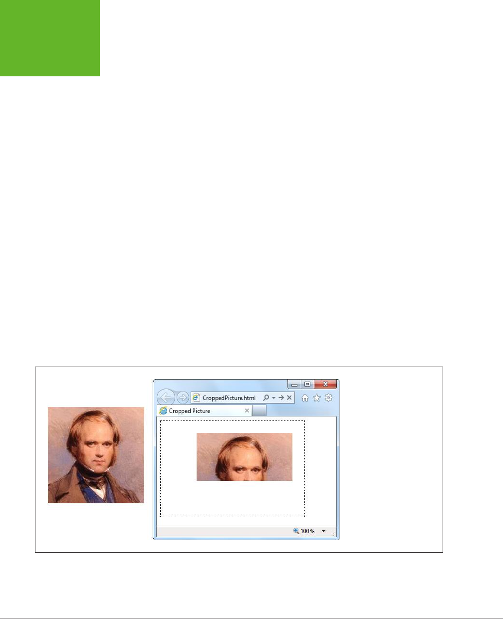
HTML5: THE MISSING MANUAL, SECOND EDITION
278
OTHER THINGS
YOU CAN
DRAW ON THE
CANVAS
Slicing, Dicing, and Resizing an Image
The drawImage() function accepts a few optional arguments that let you alter the
way your image is painted on the canvas. First, if you want to resize the image, you
can tack on the width and height you want, like this:
context.drawImage(img, 10, 10, 30, 30);
This function makes a 30 x 30 pixel box for the image, with the top-left corner at
point (10,10). Assuming the image is naturally 60 x 60 pixels, this operation squashes
it by half in both dimensions, leaving it just a quarter as big as it would ordinarily be.
If you want to crop a piece out of the picture, you can supply the four extra arguments
to drawImage() at the beginning of the argument list. These four points define the
position and size of the rectangle you want to cut out of the picture, as shown here:
context.drawImage(img, source_x, source_y, source_width, source_height, x, y,
width, height);
The last four arguments are the same as in the previous example—they define the
position and size that the cropped picture should have on the canvas.
For example, imagine you have a 200 x 200 pixel image and you want to paint just
the top half. To do that, you create a box that starts at point (0,0) and has a width
of 200 and a height of 100. You can then draw it on the canvas at point (75,25),
using this code:
context.drawImage(img, 0, 0, 200, 100, 75, 25, 200, 100);
Figure 9-1 shows exactly what’s happening in this example.
FIGURE 9-1
Left: The original source
image.
Right: A cropped portion of
the source image, on the
canvas.
If you want to do more—for example, skew or rotate an image before you draw it,
the drawImage() method can’t keep up. However, you can use transforms to alter
the way you draw anything and everything, as explained on page 256.
www.it-ebooks.info
CHAPTER 9: ADVANCED CANVAS: INTERACTIVITY AND ANIMATION 279
OTHER THINGS
YOU CAN
DRAW ON THE
CANVAS
GEM IN THE ROUGH
Drawing a Video Frame
The first parameter of the
drawImage()
method is the image
you want to draw. As you’ve seen, this can be an Image object
you’ve just created, or an
<img>
element that’s elsewhere
on the page.
But that’s not the whole story. HTML5 actually allows two
more substitutions. Instead of an image, you can throw in a
complete
<canvas>
element (not the one you’re drawing
on). Or, you can use a currently playing
<video>
element,
with no extra work:
var video =
document.getElementById("videoPlayer");
context.drawImage(video, 0, 0,
video.clientWidth, video.clientWidth);
When this code runs, it grabs a single frame of video—the
frame that’s being played at the very instant the code runs. It
then paints that picture onto the canvas.
This ability opens the door to a number of interesting effects.
For example, you can use a timer to grab new video frames
while playback is under way and keep painting them on a can-
vas. If you do this fast enough, the copied sequence of images
on the canvas will look like another video player.
To get more exotic, you can change something about the
copied video frame before you paint it. For example, you could
scale it larger or smaller, or dip into the raw pixels and apply
a Photoshop-style effect. For an example, read the article at
http://html5doctor.com/video-canvas-magic
. It shows how
you can play a video in grayscale simply by taking regular
snapshots of the real video and converting each pixel in each
frame to a color-free shade of gray.
Drawing Text
Text is another thing that you wouldn’t want to assemble yourself out of lines and
curves. And the HTML5 canvas doesn’t expect you to. Instead, it includes two draw-
ing context methods that can do the job.
First, before you draw any text, you need to set the drawing context’s font property.
You use a string that uses the same syntax as the all-in-one CSS font property. At a
bare minimum, you must supply the font size, in pixels, and the font name, like this:
context.font = "20px Arial";
You can supply a list of font names, if you’re not sure that your font is supported:
context.font = "20px Verdana,sans-serif";
And optionally, you can add italics or bold at the beginning of the string, like this:
context.font = "bold 20px Arial";
You can also use a fancy web font, courtesy of CSS3. All you need to do is register
the font name first, using a style sheet (as described on page 206).
Once the font is in place, you can use the fillText() method to draw your text.
Here’s an example that puts the top-left corner of the text at the point (10,10):
www.it-ebooks.info
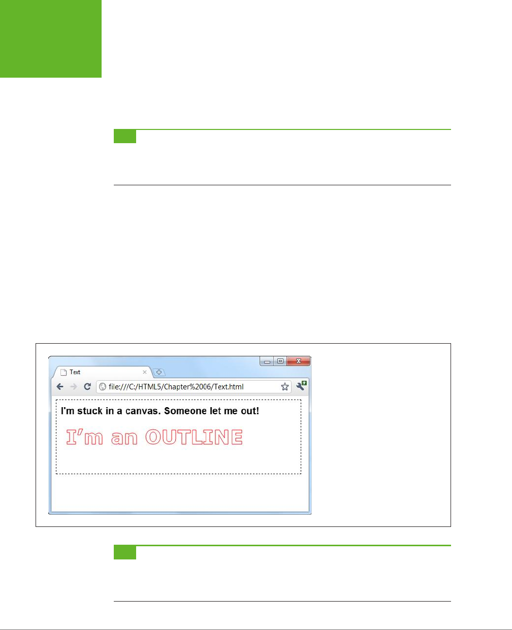
HTML5: THE MISSING MANUAL, SECOND EDITION
280
OTHER THINGS
YOU CAN
DRAW ON THE
CANVAS
context.textBaseline = "top";
context.fillStyle = "black";
context.fillText("I'm stuck in a canvas. Someone let me out!", 10, 10);
You can put the text wherever you want, but you’re limited to a single line. If you
want to draw multiple lines of text, you need to call fillText() multiple times.
TIP If you want to divide a solid paragraph over multiple lines, you can create your own
word wrapping
algorithm
. The basic idea is this: Split your sentence into words, and see how many words fit in each line using the
drawing context’s
measureText()
method. It’s tedious to do, but the sample code at
http://tinyurl.com/6ec7hld
can get you started.
Instead of using fillText(), you can use the other text-drawing method, stroke-
Text(). It draws an outline around your text, using the strokeStyle property for its
color and the lineWidth property for its thickness. Here’s an example:
context.font = "bold 40px Verdana,sans-serif";
context.lineWidth = "1";
context.strokeStyle = "red";
context.strokeText("I'm an OUTLINE", 20, 50);
When you use strokeText(), the middle of the text stays blank. Of course, you can
use fillText() followed by strokeText() if you want colored, outlined text. Figure
9-2 shows both pieces of text in a canvas.
FIGURE 9-2
The canvas makes it easy to draw solid
text and outlined text.
TIP Drawing text is much slower than drawing lines and images. The speed isn’t important if you’re creat-
ing a static, unchanging image (like a chart), but it may be an issue if you’re creating an interactive, animated
application. If you need to optimize performance, you may find that it’s better to save your text in an image file
and then draw it on the canvas with
drawImage()
.
www.it-ebooks.info
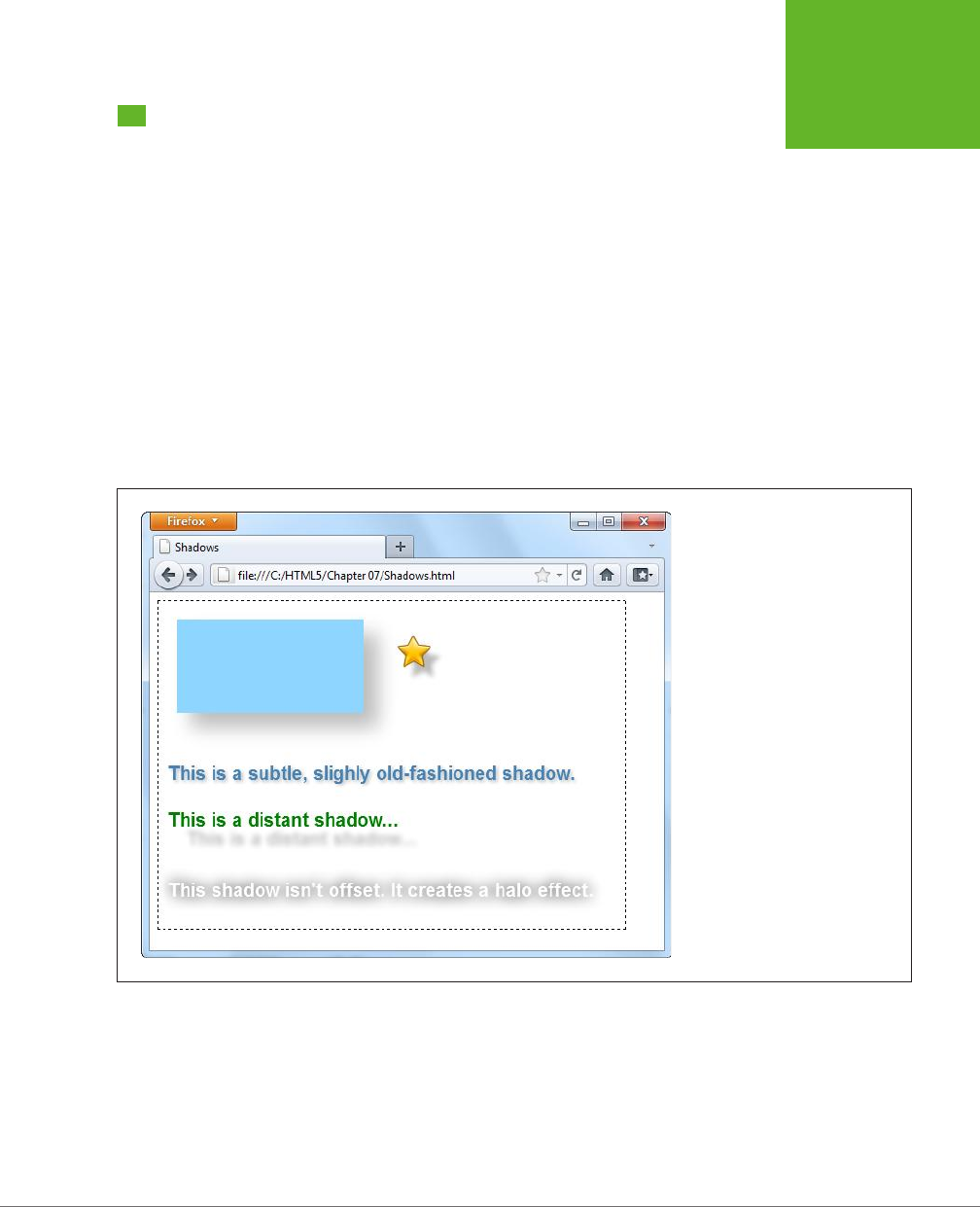
CHAPTER 9: ADVANCED CANVAS: INTERACTIVITY AND ANIMATION 281
SHADOWS AND
FANCY FILLS
Shadows and Fancy Fills
So far, when you’ve drawn lines and filled shapes on the canvas, you’ve used solid
colors. And while there’s certainly nothing wrong with that, ambitious painters will
be happy to hear that the canvas has a few fancier drawing techniques. For example,
the canvas can draw an artfully blurred shadow behind any shape. Or, it can fill a
shape by tiling a small graphic across its surface. But the canvas’s fanciest painting
frill is
gradients
, which you can use to blend two or more colors into a kaleidoscope
of patterns.
In the following sections, you’ll learn to use all these features, simply by setting dif-
ferent properties in the canvas’s drawing context.
Adding Shadows
One handy canvas feature is the ability to add a shadow behind anything you draw.
Figure 9-3 shows some snazzy shadow examples.
FIGURE 9-3
Shadows work equally well with
shapes, images, and text. One nifty
feature is the way that shadows work
with images that have transparent
backgrounds, like the star at the top
right corner of this page. As you can
see, the shadow follows the outline
of the star shape, not the square box
that delineates the entire image. (At
the time of this writing, only Internet
Explorer and Firefox support this
feature.) Shadows also pair nicely
with text, so you can create a range
of different effects, depending on
the shadow settings you pick.
Essentially, a shadow looks like a blurry version of what you would ordinarily draw
(lines, shapes, images, or text). You control the appearance of shadows using several
drawing context properties, as outlined in Table 9-1.
www.it-ebooks.info
HTML5: THE MISSING MANUAL, SECOND EDITION
282
SHADOWS AND
FANCY FILLS
TABLE 9-1
Properties for creating shadows
PROPERTY DESCRIPTION
shadowColor Sets the shadow’s color. You could go with black
or a tinted color, but a nice midrange gray is
generally best. Another good technique is to use
a semitransparent color (page 185) so the content
that’s underneath still shows through. When you
want to turn shadows off, set shadowColor back to
transparent.
shadowBlur Sets the shadow’s “fuzziness.” A shadowBlur of
0 creates a crisp shadow that looks just like a
silhouette of the original shape. By comparison, a
shadowBlur of 20 is a blurry haze, and you can go
higher still. Most people agree that some fuzz (a blur
of at least 3) looks best.
shadowOffsetX and shadowOffsetY Positions the shadow relative to the content. For
example, set both properties to 5, and the shadow
will be bumped 5 pixels to the right and 5 pixels
down from the original content. You can also use
negative numbers to move the shadow the other
way (left and up).
The following code creates the assorted shadows shown in Figure 9-3:
// Draw the shadowed rectangle.
context.rect(20, 20, 200, 100);
context.fillStyle = "#8ED6FF";
context.shadowColor = "#bbbbbb";
context.shadowBlur = 20;
context.shadowOffsetX = 15;
context.shadowOffsetY = 15;
context.fill();
// Draw the shadowed star.
context.shadowOffsetX = 10;
context.shadowOffsetY = 10;
context.shadowBlur = 4;
img = document.getElementById("star");
context.drawImage(img, 250, 30);
context.textBaseline = "top";
context.font = "bold 20px Arial";
// Draw three pieces of shadowed text.
context.shadowBlur = 3;
context.shadowOffsetX = 2;
context.shadowOffsetY = 2;
www.it-ebooks.info

CHAPTER 9: ADVANCED CANVAS: INTERACTIVITY AND ANIMATION 283
SHADOWS AND
FANCY FILLS
context.fillStyle = "steelblue";
context.fillText("This is a subtle, slightly old-fashioned shadow.", 10, 175);
context.shadowBlur = 5;
context.shadowOffsetX = 20;
context.shadowOffsetY = 20;
context.fillStyle = "green";
context.fillText("This is a distant shadow...", 10, 225);
context.shadowBlur = 15;
context.shadowOffsetX = 0;
context.shadowOffsetY = 0;
context.shadowColor = "black";
context.fillStyle = "white";
context.fillText("This shadow isn't offset. It creates a halo effect.", 10,
300);
Filling Shapes with Patterns
So far, you’ve filled the shapes you’ve drawn with solid or semitransparent colors.
But the canvas also has a fancy fill feature that lets you slather the inside with a
pattern or a gradient. Using these fancy fills is a sure way to jazz up plain shapes.
Using a fancy fill is a two-step aair. First, you create the fill. Then, you attach it to
the fillStyle property (or, occasionally, the strokeStyle property).
To make a pattern fill, you start by choosing a small image that you can tile seam-
lessly over a large area (see Figure 9-4). You need to load the picture you want to
tile into an image object using one of the techniques you learned about earlier, such
as putting a hidden <img> on your page (page 276), or loading it from a file and
handling the onLoad event of the <img> element (page 277). This example uses
the first approach:
var img = document.getElementById("brickTile");
Once you have your image, you can create a pattern object using the drawing
context’s createPattern() method. At this point, you pick whether you want the
pattern to repeat horizontally (repeat-x), vertically (repeat-y), or in both dimen-
sions (repeat):
var pattern = context.createPattern(img, "repeat");
The final step is to use the pattern object to set the fillStyle or strokeStyle
property:
context.fillStyle = pattern;
context.rect(0, 0, canvas.width, canvas.height);
context.fill();
This creates a rectangle that fills the canvas with the tiled image pattern, as shown
in Figure 9-4.
www.it-ebooks.info

HTML5: THE MISSING MANUAL, SECOND EDITION
284
SHADOWS AND
FANCY FILLS
FIGURE 9-4
Left: An image that holds a
single tile.
Right: The pattern created
by tiling the image over an
entire canvas.
Filling Shapes with Gradients
The second type of fancy fill is a gradient, which blends two or more colors. The can-
vas supports linear gradients and radial gradients, and Figure 9-5 compares the two.
FIGURE 9-5
A linear gradient (top left) blends from one line of color to another. A
radial gradient (top right) blends from one point of color to another.
Both types support more than two colors, allowing you to create a
banded effect with linear gradients (bottom left) or a ring effect with
radial gradients (bottom right).
www.it-ebooks.info

CHAPTER 9: ADVANCED CANVAS: INTERACTIVITY AND ANIMATION 285
SHADOWS AND
FANCY FILLS
TIP If you’re looking at these gradients in a black-and-white print copy of this book, give your head a shake
and try out the examples at
http://prosetech.com/html5
, so you can see the wild colors for yourself. (The sample
code also includes the drawing logic for the hearts, which stitches together four Bézier curves in a path.)
Unsurprisingly, the first step to using a gradient fill is creating the right type of
gradient object. The drawing context has two methods that handle this task: cre-
ateLinearGradient() and createRadialGradient(). Both work more or less the
same way: They hold a list of colors that kick in at dierent points.
The easiest way to understand gradients is to start by looking at a simple example.
Here’s the code that’s used to create the gradient for the top-left heart in Figure 9-5:
// Create a gradient from point (10,0) to (100,0).
var gradient = context.createLinearGradient(10, 0, 100, 0);
// Add two colors.
gradient.addColorStop(0, "magenta");
gradient.addColorStop(1, "yellow");
// Call another function to draw the shape.
drawHeart(60, 50);
// Paint the shape.
context.fillStyle = gradient;
context.fill();
context.stroke();
When you create a new linear gradient, you supply two points that represent the
starting point and ending point of a
line
. This line is the path over which the color
change takes place.
The gradient line is important, because it determines what the gradient looks like (see
Figure 9-6). For example, consider a linear gradient that transitions from magenta
to yellow. It could make this leap in a few pixels, or it could blend it out over the
entire width of the canvas. Furthermore, the blend could be from left to right, top
to bottom, or slanted somewhere in between. The line determines all these details.
TIP Think of a gradient as a colorful design just under the surface of your canvas. When you create a gradi-
ent, you’re creating this colorful, but hidden, surface. When you fill a shape, you cut a hole that lets part of that
gradient show through. The actual result—what you see in your canvas—depends on both the settings of your
gradient and the size and position of your shape.
www.it-ebooks.info
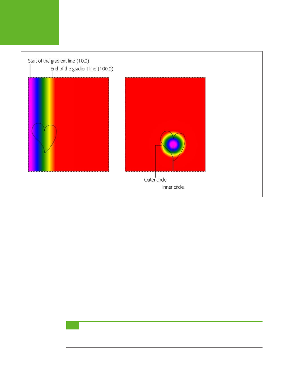
HTML5: THE MISSING MANUAL, SECOND EDITION
286
SHADOWS AND
FANCY FILLS
FIGURE 9-6
Left: Here’s the gradient
generated for the bottom-
left heart from Figure 9-5.
When you use that gradi-
ent to fill a shape, you see
just a portion of it.
Right: The same is true for
this radial gradient, which
is used for the bottom-
right heart in Figure 9-5.
In this example, the gradient line starts at point (10,0) and ends at point (100,0).
These points tell you several important things:
• The gradient is horizontal. That means it blends colors from left to right. You
know this because the two points have the same y-coordinate. If, on the other
hand, you wanted to blend from top to bottom, you could use points like (0,10)
and (0,100). If you wanted it to stretch diagonally from top left to bottom right,
you could use (10,10) and (100,100).
• The actual color blend spans just 90 pixels (starting when the x-coordinate
is 10 and ending when the x-coordinate is 100). In this example, the heart
shape is just slightly smaller than the gradient dimensions, which means you
see most of the gradient in the heart.
• Beyond the limits of this gradient, the colors become solid. So if you make
the heart wider, you’ll see more solid magenta (on the left) and solid yellow
(on the right).
TIP Often, you’ll create a gradient that’s just barely bigger than the shape you’re painting, as in this example.
However, other approaches are possible. For example, if you want to paint several shapes using different parts
of the same gradient, you might decide to create a gradient that covers the entire canvas.
www.it-ebooks.info

CHAPTER 9: ADVANCED CANVAS: INTERACTIVITY AND ANIMATION 287
SHADOWS AND
FANCY FILLS
To actually set the colors in a gradient, you call the gradient’s addColorStop()
method. Each time you do, you supply an oset from 0 to 1, which sets where the
color appears in the blend. A value of 0 means the color appears at the very start of
the gradient, while a value of 1 puts the color at the very end. Change these numbers
(for example, to 0.2 and 0.8), and you can compress the gradient, exposing more
solid color on either side.
When you create a two-color gradient, 0 and 1 make most sense for your osets.
But when you create a gradient with more colors, you can choose dierent osets
to stretch out some bands of colors while compressing others. The bottom-left
heart in Figure 9-5 splits its osets evenly, giving each color an equal-sized band:
var gradient = context.createLinearGradient(10, 0, 100, 0);
gradient.addColorStop("0", "magenta");
gradient.addColorStop(".25", "blue");
gradient.addColorStop(".50", "green");
gradient.addColorStop(".75", "yellow");
gradient.addColorStop("1.0", "red");
drawHeart(60, 200);
context.fillStyle = gradient;
context.fill();
context.stroke();
NOTE If the room is starting to revolve around you, don’t panic. After all, you don’t need to understand
everything that happens in a gradient. You can always just tweak the numbers until an appealing blend of colors
appears in your shape.
You use the same process to create a radial gradient as you do to create a linear one.
But instead of supplying two points, you must define two circles. That’s because a
radial gradient is a blend of color that radiates out from a small circle to a larger, con-
taining circle. To define each of these circles, you supply the center point and radius.
In the radial gradient example shown in the top right of Figure 9-5, the colors blend
from a center point inside the heart, at (180,100). The inner color is represented by a
10-pixel circle, and the outer color is a 50-pixel circle. Once again, if you go beyond
these limits, you get solid colors, giving the radial gradient a solid magenta core and
solid yellow surroundings. Here’s the code that draws the two-color radial gradient:
var gradient = context.createRadialGradient(180, 100, 10, 180, 100, 50);
gradient.addColorStop(0, "magenta");
gradient.addColorStop(1, "yellow");
drawHeart(180, 80);
context.fillStyle = gradient;
context.fill();
context.stroke();
www.it-ebooks.info

HTML5: THE MISSING MANUAL, SECOND EDITION
288
SHADOWS AND
FANCY FILLS
NOTE Most often, you’ll choose the same center point for both the inner and outer circles. However, you
could offset one from the other, which can stretch, squash, and distort the blend of colors in interesting ways.
Using this example, you can create the final, multicolored radial gradient that’s in
the bottom-right corner of Figure 9-5. You simply need to move the center point
of the circles to the location of the heart and add a dierent set of color stops—the
same ones that you used for the multicolored linear gradient:
var gradient = context.createRadialGradient(180, 250, 10, 180, 250, 50);
gradient.addColorStop("0","magenta");
gradient.addColorStop(".25","blue");
gradient.addColorStop(".50","green");
gradient.addColorStop(".75","yellow");
gradient.addColorStop("1.0","red");
drawHeart(180, 230);
context.fillStyle = gradient;
context.fill();
context.stroke();
Now you have the smarts to create more psychedelic patterns than a 1960s revival
party.
Putting It Together: Drawing a Graph
Now that you’ve slogged your way through the better part of the canvas’s draw-
ing features, it’s time to pause and enjoy the fruits of your labor. In the following
example, you’ll take some humdrum text and numbers and use the canvas to create
simple, standout charts.
Figure 9-7 shows the starting point: a two-page personality test that’s light on
graphics. The user answers the questions on the first page and then clicks Get
Score to move to the second page. The second page reports the personality scores
according to the infamous five-factor personality model (see the box on page 290).
The JavaScript code that makes this example work is pretty straightforward. When
the user clicks a number button, its background is changed to indicate the user’s
choice. When the user completes the quiz, a simple algorithm runs the answers through
a set of scoring formulas to calculate the five personality factors. If you want to exam-
ine this code or to take the test, visit the try-out site at
http://prosetech.com/html5
.
So far, there’s no HTML5 magic. But consider how you could improve this two-page
personality test by
graphing
the personality scores so that each factor is shown vi-
sually. Figure 9-8 shows the revamped version of the personality test results page,
which uses this technique.
www.it-ebooks.info
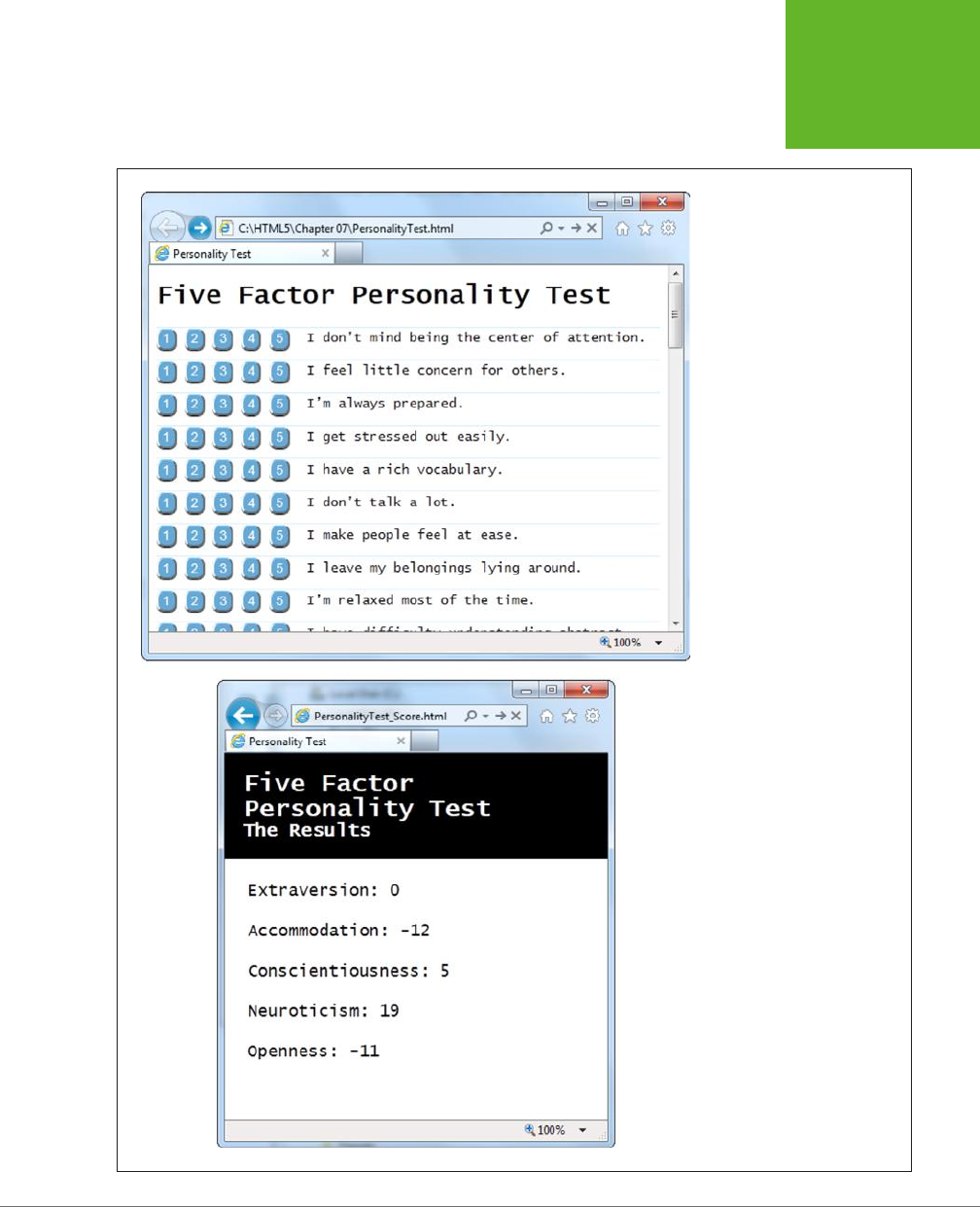
CHAPTER 9: ADVANCED CANVAS: INTERACTIVITY AND ANIMATION 289
SHADOWS AND
FANCY FILLS
FIGURE 9-7
Click your way through the ques-
tions (top), and then review the
scores (bottom). Unfortunately,
without a scale or any kind of
visual aid, it’s difficult for ordi-
nary people to tell what these
numbers are supposed to mean.
www.it-ebooks.info

HTML5: THE MISSING MANUAL, SECOND EDITION
290
SHADOWS AND
FANCY FILLS
UP TO SPEED
How to Convert One Personality into Five Numbers
This five-factor personality test ranks you according to five
personality “ingredients,” which are usually called open-
ness, conscientiousness, extraversion, agreeableness, and
neuroticism. These factors were cooked up when researchers
analyzed the thousands of personality-describing adjectives
in the English language.
To pick just five factors, psychologists used a combination of
hard-core statistics, personality surveys, and a computer. They
identified which adjectives people tend to tick off together and
used that to distill the smallest set of personality super-traits.
For example, people who describe themselves as
outgoing
usually also describe themselves as
social
and
gregarious
, so it
makes sense to combine all these traits into a single personality
factor (which psychologists call
extraversion
). By the time the
researchers had finished chewing through their set of nearly
20,000 adjectives, they had managed to boil them down to
five closely interrelated factors.
You can learn more about the five-factor personality model at
http://tinyurl.com/big-five-p
, or in the book
Your Brain: The
Missing Manual
(by this author).
To show these charts, the page uses five separate canvases, one for each personality
factor. Here’s the markup:
<header>
<h1>Five Factor Personality Test</h1>
<p>The Results</p>
</header>
<div class="score">
<h2 id="headingE">Extraversion: </h2>
<canvas id="canvasE" height="75" width="550"></canvas>
</div>
<div class="score">
<h2 id="headingA">Accommodation: </h2>
<canvas id="canvasA" height="75" width="550"></canvas>
</div>
<div class="score">
<h2 id="headingC">Conscientiousness: </h2>
<canvas id="canvasC" height="75" width="550"></canvas>
</div>
<div class="score">
<h2 id="headingN">Neuroticism: </h2>
<canvas id="canvasN" height="75" width="550"></canvas>
</div>
www.it-ebooks.info
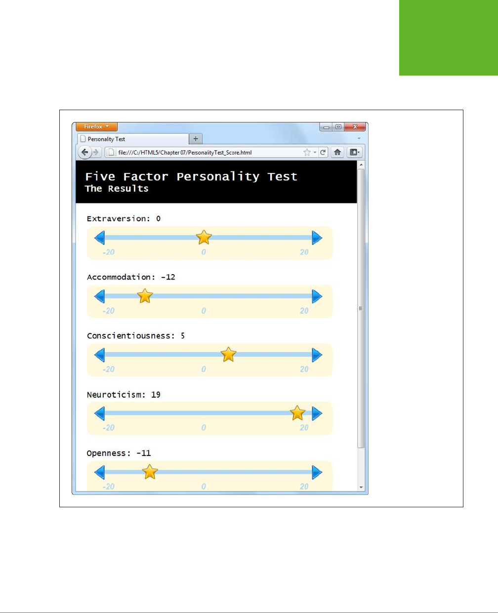
CHAPTER 9: ADVANCED CANVAS: INTERACTIVITY AND ANIMATION 291
SHADOWS AND
FANCY FILLS
<div class="score">
<h2 id="headingO">Openness: </h2>
<canvas id="canvasO" height="75" width="550"></canvas>
</div>
FIGURE 9-8
This page combines
several different types of
canvas drawing, including
lines, images, and text. But
the most interesting part
of it is the way it dynami-
cally draws these simple
graphs, based on your
answers in the personality
quiz.
Each chart is drawn by the same custom JavaScript function, named plotScore().
The page calls this function five times, using dierent arguments each time. For
example, to draw the extraversion chart at the top of the page, the code passes the
topmost canvas element, the extraversion score (as a number from -20 to 20), and
the text title (“Extraversion”):
www.it-ebooks.info

HTML5: THE MISSING MANUAL, SECOND EDITION
292
SHADOWS AND
FANCY FILLS
window.onload = function() {
...
// Get the <canvas> element for the extraversion score.
var canvasE = document.getElementById("canvasE");
// Add the score number to the corresponding heading.
// (The score is stored in a variable named extraversion.)
document.getElementById("headingE").innerHTML += extraversion;
// Plot the score in the corresponding canvas.
plotScore(canvasE, extraversion, "Extraversion");
...
}
The plotScore() function runs through a bit of drawing code that will seem familiar
to you by now. It uses the various drawing context methods to draw the dierent
parts of the score graph:
function plotScore(canvas, score, title) {
var context = canvas.getContext("2d");
// Draw the arrows on the side of the chart line.
var img = document.getElementById("arrow_left");
context.drawImage(img, 12, 10);
img = document.getElementById("arrow_right");
context.drawImage(img, 498, 10);
// Draw the line between the arrows.
context.moveTo(39, 25);
context.lineTo(503, 25);
context.lineWidth = 10;
context.strokeStyle = "rgb(174,215,244)";
context.stroke();
// Write the numbers on the scale.
context.fillStyle = context.strokeStyle;
context.font = "italic bold 18px Arial";
context.textBaseline = "top";
context.fillText("-20", 35, 50);
context.fillText("0", 255, 50);
context.fillText("20", 475, 50);
// Add the star to show where the score ranks on the chart.
img = document.getElementById("star");
context.drawImage(img, (score+20)/40*440+35-17, 0);
}
www.it-ebooks.info
CHAPTER 9: ADVANCED CANVAS: INTERACTIVITY AND ANIMATION 293
MAKING
YOUR SHAPES
INTERACTIVE
The most important bit is the final line, which plots the star at the right position
using this slightly messy equation:
context.drawImage(img, (score+20)/40*440+35-17, 0);
Here’s how it works. The first step is to convert the score into a percentage from 0
to 100 percent. Ordinarily, the score falls between -20 and 20, so the first operation
the code needs to carry out is to change it to a value from 0 to 40:
score+20
You can then divide that number by 40 to get the percentage:
(score+20)/40
Once you have the percentage, you need to multiply it by the length of the line.
That way, 0 percent ends up at the far left side, while 100 percent ends up at the
opposite end, and everything else falls somewhere in between:
(score+20)/40*440
This code would work fine if the line stretched from the x-coordinate 0 to the x-
coordinate 400. But in reality the line is oset a bit from the left edge, to give it a
bit of padding. You need to oset the star by the same amount:
(score+20)/40*440+35
But this lines the left edge of the start up with the proper position, when really you
want to line up its midpoint. To correct this issue, you need to subtract an amount
that’s roughly equal to half the start’s width:
(score+20)/40*440+35-17
This gives you the final x-coordinate for the star, based on the score.
NOTE It’s a small jump to move from fixed drawings to dynamic graphics like the ones in this example,
which tailor themselves according to the latest data. But once you’ve made this step, you can apply your skills
to build all sorts of interesting data-driven graphics, from traditional pie charts to infographics that use dials
and meters. And if you’re looking for a way to simplify the task, check out one of the canvas graphic libraries,
which include pre-written JavaScript routines for drawing common types of graphs based on your data. Two good
examples are RGraph (
www.rgraph.net
) and ZingChart (
www.zingchart.com
).
Making Your Shapes Interactive
The canvas is a
non-retained
painting surface. That means that the canvas doesn’t
keep track of what drawing operations you’ve performed. Instead, it just keeps the
final result—the grid of colored pixels that makes up your picture.
www.it-ebooks.info

HTML5: THE MISSING MANUAL, SECOND EDITION
294
MAKING
YOUR SHAPES
INTERACTIVE
For example, if you draw a red square in the middle of your canvas, the moment
you call stroke() or fill(), that square becomes nothing more than a block of red
pixels. It may look like a square, but the canvas has no memory of its squareness.
This model makes drawing fast. However, it also makes life dicult if you want
to add interactivity to your drawing. For example, imagine you want to create a
smarter version of the painting program you saw on page 263. You want people to
be able to not only draw a line, but also draw a rectangle. (That part’s easy.) And
you want people to be able to not only draw a rectangle, but also select it, drag it
to a new place, resize it, change its color, and so on. Before you can give them all
that power, you need to deal with several complications. First, how do you know if
someone has clicked on the rectangle? Second, how do you know the details about
the rectangle—its coordinates, size, stroke color, and fill color? And third, how do
you know the details about every
other
shape on the canvas—which you’ll need to
know if you need to change the rectangle and repaint the canvas?
To solve these problems and make your canvas interactive, you need to keep track
of every object you paint. Then, when users click somewhere, you need to check
whether they’re clicking one of the shapes (a process known as
hit testing
). If you
can tackle these two tasks, the rest—changing one of your shapes and repainting
the canvas—is easy.
Keeping Track of What You’ve Drawn
In order to be able to change and repaint your picture, you need to know everything
about its contents. For example, consider the circle-drawing program shown in
Figure 9-9. To keep things simple, it consists entirely of separately sized, dierently
colored circles.
To keep track of an individual circle, you need to know its position, radius, and fill
color. Rather than create dozens of variables to store all this information, it makes
sense to put all four details in a small package. That package is a
custom object
.
If you haven’t created a custom object before, here’s the standard technique. First,
you create a function that’s named after your type of object. For example, if you
want to build a custom object for a circle creation, you might name the function
Circle(), like this:
function Circle() {
}
Next, you need your object to store some data. You do that by using a keyword
named this to create properties. For example, if you want to give your circle ob-
ject a property named radius, so you can keep track of its size, you would assign a
starting value to this.radius inside the Circle() function.
www.it-ebooks.info

CHAPTER 9: ADVANCED CANVAS: INTERACTIVITY AND ANIMATION 295
MAKING
YOUR SHAPES
INTERACTIVE
FIGURE 9-9
This circle-drawing program is interactive. You
can click to select a circle (at which point it
becomes highlighted with a different border
color) and drag it to a new position.
Here’s a function that defines a circle with three details: the x- and y-coordinates,
and the radius of the circle:
function Circle() {
this.x = 0;
thix.y = 0;
this.radius = 15;
}
The numbers you set in the Circle() function are just default values. When you
use the function to create a new circle object, you can change each property value.
Once you’ve added all the properties you need, you’re ready to use your function to
create live objects. In this case, that means using the Circle() function to create a
new circle object. The trick is that you don’t want to call the function—instead, you
want to create a new copy of it with the new keyword. Here’s an example:
// Create a new circle object, and store it in a variable named myCircle.
var myCircle = new Circle();
Once you have a live circle object, you can access all the circle details as properties:
// Change the radius.
myCircle.radius = 20;
www.it-ebooks.info

HTML5: THE MISSING MANUAL, SECOND EDITION
296
MAKING
YOUR SHAPES
INTERACTIVE
If you want to get a bit fancier, you can pass arguments to the Circle() function.
That way, you can create a circle object and set all the circle properties in one step.
Here’s the version of the Circle() function that’s used for the page in Figure 9-9:
function Circle(x, y, radius, color) {
this.x = x;
this.y = y;
this.radius = radius;
this.color = color;
this.isSelected = false;
}
The isSelected property takes a true or false value. When someone clicks the
circle, isSelected is set to true, and then the drawing code knows to paint a dif-
ferent border around it.
Using this version of the Circle() function, you can use code like this to create a
circle object:
var myCircle = new Circle(0, 0, 20, "red");
Of course, the whole point of the circle-drawing program is to let people draw as
many circles as they want. That means just one circle object won’t do. Instead, you
need to create an array that can hold all the circles. Here’s the global variable that
makes this work in the current example:
var circles = [];
The rest of the code is easy. When someone clicks the Add Circle button to create
a new circle, it triggers the addRandomCircle() function. The addRandomCircle()
function creates a new circle with a random size, color, and position:
function addRandomCircle() {
// Give the circle a random size and position.
var radius = randomFromTo(10, 60);
var x = randomFromTo(0, canvas.width);
var y = randomFromTo(0, canvas.height);
// Give the circle a random color.
var colors = ["green", "blue", "red", "yellow", "magenta",
"orange", "brown", "purple", "pink"];
var color = colors[randomFromTo(0, 8)];
// Create the new circle.
var circle = new Circle(x, y, radius, color);
// Store it in the array.
circles.push(circle);
www.it-ebooks.info

CHAPTER 9: ADVANCED CANVAS: INTERACTIVITY AND ANIMATION 297
MAKING
YOUR SHAPES
INTERACTIVE
// Redraw the canvas.
drawCircles();
}
This code makes use of a custom function named randomFromTo(), which generates
random numbers in a set range.
(To play with the full code, visit
http://prosetech.com/html5
.)
The final step in this sequence is actually painting the canvas, based on the current
collection of circles. After a new circle is created, the addRandomCircle() function
calls another function, named drawCircles(), to do the job. The drawCircles()
function moves through the array of circles, using this loop:
for(var i=0; i<circles.length; i++) {
var circle = circles[i];
...
}
This code uses the trusty for loop (which is described in Appendix B, “JavaScript:
The Brains of Your Page”). The block of code in the braces runs once for each circle.
The first line of code grabs the current circle and stores it in a variable, so it’s easy
to work with.
Here’s the complete drawCircles() function, which fills the canvas with the current
collection of circles:
function drawCircles() {
// Clear the canvas and prepare to draw.
context.clearRect(0, 0, canvas.width, canvas.height);
context.globalAlpha = 0.85;
context.strokeStyle = "black";
// Go through all the circles.
for(var i=0; i<circles.length; i++) {
var circle = circles[i];
// Draw the circle.
context.beginPath();
context.arc(circle.x, circle.y, circle.radius, 0, Math.PI*2);
context.fillStyle = circle.color;
context.fill();
context.stroke();
}
}
www.it-ebooks.info

HTML5: THE MISSING MANUAL, SECOND EDITION
298
MAKING
YOUR SHAPES
INTERACTIVE
NOTE Each time the circle-drawing program refreshes the display, it starts by clearing everything away
with the
clearRect()
method. Paranoid programmers might worry that this step would cause a flicker, as
the canvas goes blank and the circles disappear, then reappear. However, the canvas is optimized to prevent this
problem. It doesn’t actually clear or paint
anything
until all your drawing logic has finished, at which point it
copies the final product to the canvas in one smooth step.
Right now, the circles still aren’t interactive. However, the page has the all-important
plumbing that keeps track of every circle that’s drawn. Although the canvas is still
just a block of colored pixels, the code knows the precise combination of circles
that creates the canvas—and that means it can manipulate those circles at any time.
In the next section, you’ll see how you can use this system to let the user select a circle.
Hit Testing with Coordinates
If you’re creating interactive shapes, you’ll almost certainly need to use
hit test-
ing
, a technique that checks whether a given point has “hit” another shape. In the
circle-drawing program, you want to check whether the user’s click has hit upon a
circle or just empty space.
More sophisticated animation frameworks (like those provided by Flash and Silver-
light) handle hit testing for you. And there are add-on JavaScript libraries for the
canvas (like KineticJS) that aim to oer the same conveniences, but none is mature
enough to recommend without reservations. So the best bet is for canvas fans to
start by learning to write their own hit testing logic. (After you’ve done that, you
can consider pumping up the canvas with one of the JavaScript libraries discussed
in the box on page 307.)
To perform hit testing, you need to examine each shape and calculate whether the
point is inside the bounds of that shape. If it is, the click has “hit” that shape. Con-
ceptually, this process is straightforward, but the actual details—the calculations you
need to figure out whether a shape has been clicked—can get messy.
The first thing you need is a loop that moves through all the shapes. This loop looks
a little dierent from the one that the drawCircles() function uses:
for (var i=circles.length-1; i>=0; i--) {
var circle = circles[i];
...
}
Notice that the code actually moves backward through the array, from finish to
start. It starts at the end (where the index is equal to the total number of items in
the array, minus 1), and counts back to the beginning (where the index is 0). The
backward looping is deliberate, because in most applications (including this one),
the objects are drawn in the same order they’re listed in the array. That means later
objects are superimposed over earlier ones, and when shapes overlap, it’s always
the shape on top that should get the click.
www.it-ebooks.info

CHAPTER 9: ADVANCED CANVAS: INTERACTIVITY AND ANIMATION 299
MAKING
YOUR SHAPES
INTERACTIVE
To determine if a click has landed in a shape, you need to use some math. In the case
of a circle, you need to calculate the straight-line distance from the clicked point to
the center of the circle. If the distance is less than or equal to the radius of the circle,
then the point lies inside its bounds.
In the current example, the web page handles the onClick event of the canvas to
check for circle clicks. When the user clicks the canvas, it triggers a function named
canvasClick(). That function figures out the click coordinates and then sees if they
intersect any circle:
function canvasClick(e) {
// Get the canvas click coordinates.
var clickX = e.pageX - canvas.offsetLeft;
var clickY = e.pageY - canvas.offsetTop;
// Look for the clicked circle.
for (var i=circles.length; i>0; i--) {
// Use Pythagorean theorem to find the distance from this point
// and the center of the circle.
var distanceFromCenter =
Math.sqrt(Math.pow(circle.x - clickX, 2) + Math.pow(circle.y - clickY, 2))
// Does this point lie in the circle?
if (distanceFromCenter <= circle.radius) {
// Clear the previous selection.
if (previousSelectedCircle != null) {
previousSelectedCircle.isSelected = false;
}
previousSelectedCircle = circle;
// Select the new circle.
circle.isSelected = true;
// Update the display.
drawCircles();
// Stop searching.
return;
}
}
}
NOTE You’ll look at another way to do hit testing—by grabbing raw pixels and checking their color—when
you create a maze game, on page 313.
www.it-ebooks.info

HTML5: THE MISSING MANUAL, SECOND EDITION
300
ANIMATING
THE CANVAS
To finish this example, the drawing code in the drawCircles() function needs a
slight tweak. Now it needs to single out the selected circle for special treatment (in
this case, a thick, bold border):
function drawCircles() {
...
// Go through all the circles.
for(var i=0; i<circles.length; i++) {
var circle = circles[i];
if (circle.isSelected) {
context.lineWidth = 5;
}
else {
context.lineWidth = 1;
}
...
}
}
There’s no end of ways that you can build on this example and make it smarter. For
example, you can add a toolbar of commands that modify the selected circle—for
example, changing its color or deleting it from the canvas. Or, you can let the user
drag the selected circle around the canvas. To do that, you simply need to listen for
the onMouseMove event of the canvas, change the circle coordinates accordingly, and
call the drawCircles() function to repaint the canvas. (This technique is essentially
a variation of the mouse-handling logic in the paint program on page 263, except
now you’re using mouse movements to drag a shape, not draw a line.) The try-out
site (
http://prosetech.com/html5
) includes a variation of this example named
Inter-
activeCircles_WithDrag.html
that demonstrates this technique.
The lesson is clear: If you keep track of what you draw, you have unlimited flexibility
to change it and redraw it later on.
Animating the Canvas
Drawing one perfect picture can seem daunting enough. So it’s no surprise that
even seasoned web developers approach the idea of drawing several dozen each
second with some trepidation. The whole challenge of animation is to draw and
redraw canvas content fast enough that it looks like it’s moving or changing right
in front of your visitors.
Animation is an obvious and essential building block for certain types of applications,
like real-time games and physics simulators. But simpler forms of animation make
sense in a much broader range of canvas-powered pages. You can use animation to
highlight user interactivity (for example, making a shape glow, pulse, or twinkle when
www.it-ebooks.info

CHAPTER 9: ADVANCED CANVAS: INTERACTIVITY AND ANIMATION 301
ANIMATING
THE CANVAS
someone hovers over it). You can also use animation to draw attention to changes
in content (for example, fading in a new scene or creating graphs and charts that
“grow” into the right positions). Used in these ways, animation is a powerful way to
give your web applications some polish, make them feel more responsive, and even
help them stand out from the crowd of web competitors.
A Basic Animation
It’s easy enough to animate a drawing on an HTML5 canvas. First, you set a timer
that calls your drawing over and over again—typically 30 or 40 times each second.
Each time, your code repaints the entire canvas from scratch. If you’ve done your
job right, the constantly shifting frames will blend into a smooth, lifelike animation.
JavaScript gives you two ways to manage this repetitive redrawing:
• Use the setTimeout() function. This tells the browser to wait a few milliseconds
and then run a piece of code—in this case, that’s your canvas-drawing logic.
Once your code finishes, you call setTimeout() to ask the browser to call it
again, and so on, until you want your animation to end.
• Use the setInterval() function. Tells your browser to run a piece of code
at regular intervals (say, every 20 milliseconds). It has much the same eect
as setTimeout(), but you need to call setInterval() only once. To stop the
browser from calling your code, you call clearInterval().
If your drawing code is quick, both of these have the same eect. If your drawing
code is less than snappy, then the setInterval() approach will do a better job of
keeping your redraws precisely on time, but possibly at the expense of performance.
(In the worst-case situation, when your drawing code takes a bit longer than the
interval you’ve set, your browser will struggle to keep up, your drawing code will run
continuously, and your page may briefly freeze up.) For this reason, the examples
in this chapter use the setTimeout() approach.
When you call setTimeout(), you supply two pieces of information: the name of
the function you want to run, and the amount of time to wait before running it. You
give the amount of time as a number of milliseconds (thousandths of a second), so
20 milliseconds (a typical delay for animation) is 0.02 seconds. Here’s an example:
var canvas;
var context;
window.onload = function() {
canvas = document.getElementById("canvas");
context = canvas.getContext("2d");
// Draw the canvas in 0.02 seconds.
setTimeout(drawFrame, 20);
};
www.it-ebooks.info

HTML5: THE MISSING MANUAL, SECOND EDITION
302
ANIMATING
THE CANVAS
This call to setTimeout() is the heart of any animation task. For example, imagine
you want to make a square fall from the top of the page to the bottom. To do this,
you need to keep track of the square’s position using two global variables:
// Set the square's initial position.
var squarePosition_y = 0;
var squarePosition_x = 10;
Now, you simply need to change the position each time the drawFrame() function
runs, and then redraw the square in its new position:
function drawFrame() {
// Clear the canvas.
context.clearRect(0, 0, canvas.width, canvas.height);
// Call beginPath() to make sure you don't redraw
// part of what you were drawing before.
context.beginPath();
// Draw a 10x10 square, at the current position.
context.rect(squarePosition_x, squarePosition_y, 10, 10);
context.lineStyle = "black";
context.lineWidth = 1;
context.stroke();
// Move the square down 1 pixel (where it will be drawn
// in the next frame).
squarePosition_y += 1;
// Draw the next frame in 20 milliseconds.
setTimeout(drawFrame, 20);
}
Run this example, and you’ll see a square that plummets from the top of the canvas
and carries on, disappearing past the bottom edge.
In a more sophisticated animation, the calculations get more complex. For example,
you may want to make the square accelerate to simulate gravity, or bounce at the
bottom of the page. But the basic technique—setting a timer, calling a drawing
function, and redrawing the entire canvas—stays exactly the same.
Animating Multiple Objects
Now that you’ve learned the basics of animation and the basics of making interactive
canvas drawings, it’s time to take the next step and merge them together. Figure
9-10 shows a test page with an animation of falling, bouncing balls. The page uses
the familiar setTimeout() method you met in the last section, but now the drawing
code has to manage an essentially unlimited number of flying balls.
www.it-ebooks.info
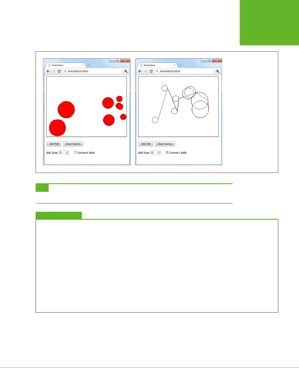
CHAPTER 9: ADVANCED CANVAS: INTERACTIVITY AND ANIMATION 303
ANIMATING
THE CANVAS
FIGURE 9-10
This test page lets you
add as many balls as you
want. You can choose the
size of each ball (the de-
fault is a 15-pixel radius),
and you can switch on
connecting lines (shown
on right). Once added,
each ball begins its own
independent journey,
falling down and picking
up speed until it collides
with the bottom of the
canvas and bounces off
somewhere else.
TIP Pictures can’t do justice to animations. To find out how animations like the one in Figure 9-10 look and
feel, you can try out the examples for yourself at
http://prosetech.com/html5
.
UP TO SPEED
Animation Performance
Because of these rapid redraws, it’s clear that animation will
tax the abilities of the canvas far more than ordinary drawing
does. However, the canvas holds up surprisingly well. Modern
browsers use performance-enhancing features like
hardware
acceleration
, which farms out some of the graphical work to the
computer’s video card, rather than using its CPU for everything.
And even though JavaScript isn’t the fastest language on the
block, it’s quite possible to create a complex, high-speed
animation—even a real-time arcade game—without using
anything except script code and the canvas.
However, canvas performance
can
become a problem for
people using underpowered mobile devices, like iPhones or
phones running Google’s Android operating system. Tests have
shown that an animation that can run at 60 fps (frames per
second) on a desktop browser probably tops out at a jerky 10
fps on a smartphone. So if you want to create an application for
mobile visitors, make sure you test before you get too far into
your design, and be prepared to sacrifice some of the animation
eye candy to keep things running smoothly.
To manage all the balls in Figure 9-10, you need to reuse the custom object trick
you picked up on page 295. Only now you need to track an array of ball objects,
and each ball needs not only a position (represented by the properties x and y), but
also a speed (represented by dx or dy):
www.it-ebooks.info

HTML5: THE MISSING MANUAL, SECOND EDITION
304
ANIMATING
THE CANVAS
// These are the details that represent an individual ball.
function Ball(x, y, dx, dy, radius) {
this.x = x;
this.y = y;
this.dx = dx;
this.dy = dy;
this.radius = radius;
this.color = "red";
}
// This is an array that will hold all the balls on the canvas.
var balls = [];
NOTE In mathematics lingo,
dx
is the rate that
x
is changing, and
dy
is the rate that
y
is changing. So as
the ball is falling, each frame
x
increases by the
dx
amount and
y
increases by the
dy
amount.
When the visitor clicks the Add Ball button, a simple bit of code creates a new ball
object and stores it in the balls array:
function addBall() {
// Get the requested size.
var radius = parseFloat(document.getElementById("ballSize").value);
// Create the new ball.
var ball = new Ball(50,50,1,1,radius);
// Store it in the balls array.
balls.push(ball);
}
The Clear Canvas button has the complementary task of emptying the balls array:
function clearBalls() {
// Remove all the balls.
balls = [];
}
However, neither the addBall() nor the clearBalls() function actually draws any-
thing. Neither one even calls a drawing function. Instead, the page sets itself up to
call the drawFrame() function, which paints the canvas in 20 milliseconds intervals:
var canvas;
var context;
window.onload = function() {
canvas = document.getElementById("canvas");
context = canvas.getContext("2d");
www.it-ebooks.info

CHAPTER 9: ADVANCED CANVAS: INTERACTIVITY AND ANIMATION 305
ANIMATING
THE CANVAS
// Redraw every 20 milliseconds.
setTimeout(drawFrame, 20);
};
The drawFrame() function is the heart of this example. It not only paints the balls on
the canvas, but it also calculates their current position and speed. The drawFrame()
function uses a number of calculations to simulate more realistic movement—for
example, making balls accelerate as they fall and slow down when they bounce o
of obstacles. Here’s the complete code:
function drawFrame() // Clear the canvas.
context.clearRect(0, 0, canvas.width, canvas.height);
context.beginPath();
// Go through all the balls.
for(var i=0; i<balls.length; i++) {
// Move each ball to its new position.
var ball = balls[i];
ball.x += ball.dx;
ball.y += ball.dy;
// Add in a "gravity" effect that makes the ball fall faster.
if ((ball.y) < canvas.height) ball.dy += 0.22;
// Add in a "friction" effect that slows down the side-to-side motion.
ball.dx = ball.dx * 0.998;
// If the ball has hit the side, bounce it.
if ((ball.x + ball.radius > canvas.width) || (ball.x - ball.radius < 0)) {
ball.dx = -ball.dx;
}
// If the ball has hit the bottom, bounce it, but slow it down slightly.
if ((ball.y + ball.radius > canvas.height) || (ball.y - ball.radius < 0))
{
ball.dy = -ball.dy*0.96;
}
// Check if the user wants lines.
if (!document.getElementById("connectedBalls").checked) {
context.beginPath();
context.fillStyle = ball.fillColor;
}
else {
context.fillStyle = "white";
}
www.it-ebooks.info

HTML5: THE MISSING MANUAL, SECOND EDITION
306
ANIMATING
THE CANVAS
// Draw the ball.
context.arc(ball.x, ball.y, ball.radius, 0, Math.PI*2);
context.lineWidth = 1;
context.fill();
context.stroke();
}
// Draw the next frame in 20 milliseconds.
setTimeout(drawFrame, 20);
}
TIP If you’re fuzzy about how the
if
statements work in this example, and what operators like
!
and
||
really mean, check out the summary of logical operators on page 463 in Appendix B, “JavaScript: The Brains of
Your Page.”
The sheer amount of code can seem a bit intimidating. But the overall approach
hasn’t changed. The code performs the same steps:
1. Clear the canvas.
2. Loop through the array of balls.
3. Adjust the position and velocity of each ball.
4. Paint each ball.
5. Set a timeout so the drawFrame() method will be called again, 20 milliseconds
later.
The complex bit is step 3, where the ball is tweaked. This code can be as complicated
as you like, depending on the eect you’re trying to achieve. Gradual, natural move-
ment is particularly dicult to model, and it usually needs more math.
Finally, now that you’ve done all the work tracking each ball, it’s easy to add inter-
activity. In fact, you can use virtually the same code you used to detect clicks in the
circle-drawing program on page 298. Only now, when a ball is clicked, you want
something else to happen—for example, you might choose to give the clicked ball
a sudden boost in speed, sending it ricocheting o to the side. (The downloadable
version of this example, available at
http://prosetech.com/html5
, does exactly that.)
To see this example carried to its most impressive extreme, check out the bouncing
Google balls at
http://tinyurl.com/6byvnk5
. When left alone, the balls are pulled,
magnet-like, to spell the word “Google.” But when your mouse moves in, they’re
repulsed, flying o to the far corners of the canvas and bouncing erratically. And
if you’re still hungry for more animation examples, check out the poke-able blob
at
http://www.blobsallad.se
and the somewhat clichéd flying star field at
http://
tinyurl.com/crn3ed
.
www.it-ebooks.info

CHAPTER 9: ADVANCED CANVAS: INTERACTIVITY AND ANIMATION 307
A PRACTICAL
EXAMPLE: THE
MAZE GAME
FREQUENTLY ASKED QUESTION
Canvas Animations for Busy (or Lazy) People
Do I really need to calculate everything on my own? For real?
The most significant drawback to canvas animation is the fact
that you need to do everything yourself. For example, if you
want a picture to fly from one side of the canvas to the other,
you need to calculate its new position in each frame, and then
draw the picture in its proper location. If you have several
things being animated at the same time in different ways, your
logic can quickly get messy. By comparison, life is much easier
for programmers who are using a browser plug-in like Flash or
Silverlight. Both technologies have built-in animation systems,
which allow developers to give instructions like “Move this
shape from here to there, taking 45 seconds.” Or, even better,
“Move this shape from the top of the window to the bottom,
using an accelerating effect that ends with a gentle bounce.”
To fill this gap, enterprising JavaScript developers have begun
creating higher-level drawing and animation systems that sit
on top of the canvas. Using these JavaScript libraries, you can
pick the effects you want, without having to slog through all
the math. The catch? There are at least a half-dozen high quality
frameworks for canvas animation, each with its own distinct
model and subtle quirks. And it’s impossible to pick which of
the evolving toolkits of today will become the best-supported
and most widely accepted leaders of tomorrow. Some of the
most worthy candidates today are Fabric.js (
http://fabricjs.com
),
Paper.js (
http://paperjs.org
), EaselJS (
www.createjs.com
),
and KineticJS (
http://kineticjs.com
). You can read some recent
developer opinions on these libraries at
http://tinyurl.com/
canvas-libraries
.
A Practical Example: The Maze Game
So far, you’ve explored how to combine the canvas with some key programming
techniques to make interactive drawings and to perform animations. These build-
ing blocks take the canvas beyond mere drawing and into the realm of complete,
self-contained applications—like games or Flash-style mini-apps.
Figure 9-11 shows a more ambitious example that takes advantage of what you’ve
learned so far and builds on both concepts. It’s a simple game that invites the user
to guide a small happy face icon through a complex maze. When the user presses
an arrow key, the happy face starts moving in that direction (using animation) and
stops only when it hits a wall (using hit testing).
www.it-ebooks.info

HTML5: THE MISSING MANUAL, SECOND EDITION
308
A PRACTICAL
EXAMPLE: THE
MAZE GAME
FIGURE 9-11
Guide the face through the
maze. To a user, it looks
like a fun game. To a de-
veloper, it’s a potent mix
of the HTML5 canvas and
some smart JavaScript.
Of course, there’s a trade-o. If you’re going to rely on the canvas to build some-
thing sophisticated, you’ll need to dig your way through a significant amount of
code. The following sections show you the essentials, but be prepared to flex your
JavaScript muscles.
NOTE You can run this example from your local computer if you’re using Internet Explorer 9. But on other
browsers, it works only if you first put your page (and the graphics it uses) on a test web server. To save the
trouble, run this example from the try-out site at
http://prosetech.com/html5
.
www.it-ebooks.info

CHAPTER 9: ADVANCED CANVAS: INTERACTIVITY AND ANIMATION 309
A PRACTICAL
EXAMPLE: THE
MAZE GAME
Setting Up the Maze
Before anything can happen, the page needs to set up the canvas. Although you
could paint the entire maze out of lines and rectangles, you’d need a lot of drawing
code. Writing that drawing code by hand would be extremely tedious. You’d need
to have a mental model of the entire maze, and then draw each short wall segment
using a separate drawing operation. If you went this route, you’d almost certainly
use a tool that automatically creates your drawing code. For example, you might
draw the maze in Adobe Illustrator and then use a plug-in to convert it to canvas
code (page 258).
Another option is to take a preexisting graphic of a maze and paint that on the
canvas. This is particularly easy, because the web is filled with free pages that will
create mazes for you. Using one of these pages, you set a few details—for example,
the size, shape, colors, density, and complexity of the maze—and the page creates
a downloadable graphic. (To try it out for yourself, just Google
maze generator
.)
This example uses maze pictures. When the page first loads, it takes a picture file
(named
maze.png
) and draws that on the canvas. Here’s the code that kicks that
process o when the page first loads:
// Define the global variables for the canvas and drawing context.
var canvas;
var context;
window.onload = function() {
// Set up the canvas.
canvas = document.getElementById("canvas");
context = canvas.getContext("2d");
// Draw the maze background.
drawMaze("maze.png", 268, 5);
// When the user presses a key, run the processKey() function.
window.onkeydown = processKey;
};
This code doesn’t actually draw the maze background. Instead, it hands the work
o to another function, named drawMaze().
Because this example uses a separate maze-drawing function, it’s not limited to a
single maze. Instead, it lets you load any maze graphic you want. You simply need
to call drawMaze() and pass in the file name of the maze picture, along with the
coordinates for where the happy face should start. Here’s the drawMaze() code
that does the job:
// Keep track of the current face position.
var x = 0;
var y = 0;
www.it-ebooks.info

HTML5: THE MISSING MANUAL, SECOND EDITION
310
A PRACTICAL
EXAMPLE: THE
MAZE GAME
function drawMaze(mazeFile, startingX, startingY) {
// Load the maze picture.
imgMaze = new Image();
imgMaze.onload = function() {
// Resize the canvas to match the size of the maze picture.
canvas.width = imgMaze.width;
canvas.height = imgMaze.height;
// Draw the maze.
var imgFace = document.getElementById("face");
context.drawImage(imgMaze, 0,0);
// Draw the face.
x = startingX;
y = startingY;
context.drawImage(imgFace, x, y);
context.stroke();
// Draw the next frame in 10 milliseconds.
setTimeout(drawFrame, 10);
};
imgMaze.src = mazeFile;
}
This code uses the two-step image drawing method explained on page 276. First,
it sets a function that will handle the image’s onLoad event and draw the maze im-
age after it loads. Second, it sets the src attribute on the image object, which loads
the image and triggers the code. This two-step process is a bit more complicated
than just pulling the picture out of a hidden <img> element on the page, but it’s
necessary if you want to create a function that’s flexible enough to load any maze
picture you want.
When the maze image is loaded, the code adjusts the size of the canvas to match,
places the face at its proper position, and then paints the face image. Finally, it calls
setTimeout() to start drawing frames.
NOTE The downloadable version of this example (at
http://prosetech.com/html5
) is slightly more sophisti-
cated. It lets the user load a new maze at any time—even while the happy face is still moving around the current
maze. To make this work, it adds a bit of extra code in the
drawMaze()
function to stop the happy face (if it’s
currently moving) and halt the animating process, before loading the background and starting it again.
www.it-ebooks.info

CHAPTER 9: ADVANCED CANVAS: INTERACTIVITY AND ANIMATION 311
A PRACTICAL
EXAMPLE: THE
MAZE GAME
Animating the Face
When the user hits a key, the face begins moving. For example, if the user presses
the down key, the happy face continues moving down until it hits a barrier or another
key is pressed.
To make this work, the code uses two global variables that track the happy face’s
speed—in other words, how many pixels it will move in the x or y dimension, per
frame. The variables that do this are named dx and dy, just as they were in the
bouncing ball example (page 304). The dierence is that you don’t need an array
for this page, because there’s only one happy face:
var dx = 0;
var dy = 0;
When the user presses a key, the canvas calls the processKey() function. The function
then checks if one of the arrow keys was pressed and adjusts the speed accordingly.
To identify an arrow key, the code checks its key code against a known value. For
example, a key code of 38 always represents the up arrow key. The processKey()
function ignores all other keys except the arrow keys:
function processKey(e) {
// If the face is moving, stop it.
dx = 0;
dy = 0;
// The up arrow was pressed, so move up.
if (e.keyCode == 38) {
dy = -1;
}
// The down arrow was pressed, so move down.
if (e.keyCode == 40) {
dy = 1;
}
// The left arrow was pressed, so move left.
if (e.keyCode == 37) {
dx = -1;
}
// The right arrow was pressed, so move right.
if (e.keyCode == 39) {
dx = 1;
}
}
www.it-ebooks.info

HTML5: THE MISSING MANUAL, SECOND EDITION
312
A PRACTICAL
EXAMPLE: THE
MAZE GAME
The processKey() function doesn’t change the current position of the happy face,
or attempt to draw it. Instead, this task happens every 10 milliseconds, when the
drawFrame() function is called.
The drawFrame() code is fairly straightforward, but detailed. It performs several
tasks. First, it checks if the face is moving in either direction. If not, there’s really
no work to be done:
function drawFrame() {
if (dx != 0 || dy != 0) {
If the face is moving, the drawFrame() code draws a yellow patch in the current face
position (which creates the “trail” eect. It then moves the face to its new position:
context.beginPath();
context.fillStyle = "rgb(254,244,207)";
context.rect(x, y, 15, 15);
context.fill()
// Increment the face's position.
x += dx;
y += dy;
Next, the code calls checkForCollision() to see if this new position is valid. (You’ll
see the code for this hit testing function in the next section.) If the new position
isn’t valid, the face has hit a wall, and the code must move the face back to its old
position and stop it from moving:
if (checkForCollision()) {
x -= dx;
y -= dy;
dx = 0;
dy = 0;
}
Now the code is ready to draw the face, where it belongs:
var imgFace = document.getElementById("face");
context.drawImage(imgFace, x, y);
And check if the face has reached the bottom of the maze (and has thus completed
it). If so, the code shows a message box:
if (y > (canvas.height - 17)) {
alert("You win!");
return;
}
}
If not, the code sets a timeout so the drawFrame() method will be called again, 10
milliseconds later:
www.it-ebooks.info

CHAPTER 9: ADVANCED CANVAS: INTERACTIVITY AND ANIMATION 313
A PRACTICAL
EXAMPLE: THE
MAZE GAME
// Draw a new frame in 10 milliseconds.
setTimeout(drawFrame, 10);
}
You’ve now seen all the code for the maze game, except the innovative bit of logic
in the checkForCollision() function, which handles the hit testing. That’s the topic
you’ll tackle next.
Hit Testing with Pixel Colors
Earlier in this chapter, you saw how you can use mathematical calculations to do
your hit testing. However, there’s another approach you can use. Instead of looking
through a collection of objects you’ve drawn, you can grab a block of pixels and look
at their colors. This approach is simpler in some ways, because it doesn’t need all
the objects and the shape tracking code. But it works only if you can make clear-cut
assumptions about the colors you’re looking for.
NOTE The pixel-based hit-testing approach is the perfect approach for the maze example. Using this sort
of hit testing, you can determine when the happy face runs into one of the black walls. Without this technique,
you’d need a way to store all the maze information in memory and then determine if the current happy-face
coordinates overlap one of the maze’s wall lines.
The secret to the color-testing approach is the canvas’s support for manipulating
individual pixels—the tiny dots that comprise every picture. The drawing context
provides three methods for managing pixels: getImageData(), putImageData(),
and createImageData(). You use getImageData() to grab a block of pixels from a
rectangular region and examine them (as in the maze game). You can also modify
the pixels and use putImageData() to write them back to the canvas. And finally,
createImageData() lets you create a new, empty block of pixels that exists only in
memory, the idea being that you can customize them and then write them to the
canvas with putImageData().
To understand a bit more about the pixel-manipulation methods, consider the
following code. First, it grabs a 100 x 50 square of pixels from the current canvas,
using getImageData():
// Get pixels starting at point (0,0), and stretching out 100 pixels to
// the right and 50 pixels down.
var imageData = context.getImageData(0, 0, 100, 50);
Then, the code retrieves the array of numbers that has the image data, using the
data property:
var pixels = imageData.data;
You might expect that there’s one number for each pixel, but life isn’t that simple.
There are actually
four
numbers for each pixel, one each to represent its red, green,
blue, and alpha components. So if you want to examine each pixel, you need a loop
that bounds through the array four steps at a time, like this:
www.it-ebooks.info

HTML5: THE MISSING MANUAL, SECOND EDITION
314
A PRACTICAL
EXAMPLE: THE
MAZE GAME
// Loop over each pixel and invert the color.
for (var i = 0, n = pixels.length; i < n; i += 4) {
// Get the data for one pixel.
var red = pixels[i];
var green = pixels[i+1];
var blue = pixels[i+2];
var alpha = pixels[i+3];
// Invert the colors.
pixels[i] = 255 - red;
pixels[i+1] = 255 - green;
pixels[i+2] = 255 - blue;
}
Each number ranges from 0 to 255. The code above uses one of the simplest image
manipulation methods around—it inverts the colors. Try this with an ordinary picture,
and you get a result that looks like a photo negative.
To see the results, you can write the pixels back to the canvas, in their original posi-
tions (although you could just as easily paint the content somewhere else):
context.putImageData(imageData, 0, 0);
The pixel-manipulation methods certainly give you a lot of control. However, they
also have drawbacks. The pixel operations are slow, and the pixel data in the aver-
age canvas is immense. If you grab o a large chunk of picture data, you’ll have tens
of thousands of pixels to look at. And if you were already getting tired of drawing
complex pictures using basic ingredients like lines and curves, you’ll find that dealing
with individual pixels is even more tedious.
That said, the pixel-manipulation methods can solve certain problems that would be
dicult to deal with in any other way. For example, they provide the easiest way to
create fractal patterns and Photoshop-style picture filters. In the maze game, they
let you create a concise routine that checks the next move of the happy face icon
and determines whether it collides with a wall. Here’s the checkForCollision()
function that handles the job:
function checkForCollision() {
// Grab the block of pixels where the happy face is, but extend
// the edges just a bit.
var imgData = context.getImageData(x-1, y-1, 15+2, 15+2);
var pixels = imgData.data;
// Check these pixels.
for (var i = 0; n = pixels.length, i < n; i += 4) {
var red = pixels[i];
var green = pixels[i+1];
var blue = pixels[i+2];
www.it-ebooks.info

CHAPTER 9: ADVANCED CANVAS: INTERACTIVITY AND ANIMATION 315
A PRACTICAL
EXAMPLE: THE
MAZE GAME
var alpha = pixels[i+3];
// Look for black walls (which indicates a collision).
if (red == 0 && green == 0 && blue == 0) {
return true;
}
// Look for gray edge space (which indicates a collision).
if (red == 169 && green == 169 && blue == 169) {
return true;
}
}
// There was no collision.
return false;
}
This completes the canvas maze game, which is the longest and most code-packed
example you’ll encounter in this book. It may take a bit more review (or a JavaScript
brush-up) before you really feel comfortable with all the code it contains, but once
you do you’ll be able to use similar techniques in your own canvas creations.
If you’re hungering for more canvas tutorials, you may want to check out a complete
book on the subject, such as
HTML5 Canvas
(by Steve Fulton and Je Fulton) or
Core HTML5 Canvas
(by David Geary). Either book will take you deeper into the raw
and gritty details of do-it-yourself canvas drawing.
POWER USERS’ CLINIC
Eye-Popping Canvas Examples
There’s virtually no limit to what you can do with the canvas.
If you want to look at some even more ambitious examples
that take HTML5 into the world of black-belt coding, the Web
is your friend. Here’s a list of websites that demonstrate some
mind-blowing canvas mojo:
• Canvas Demos. This canvas example site has enough
content to keep you mesmerized for days. Entries include
the game Mutant Zombie Masters and the stock-charting
tool TickerPlot. Visit
www.canvasdemos.com
to browse
them all.
• Wikipedia knowledge map. This impressive canvas
application shows a graphical representation of Wikipedia
articles, with linked topics connected together by slender,
web-like lines. Choose a new topic, and you zoom into
that part of the knowledge map, pulling new articles
to the forefront with a slick animation. See it at
http://
en.inforapid.org
.
• 3D Walker. This example lets you walk through a simple
3D world of walls and passages (similar to the ancient
Wolfenstein 3D game that kicked off the first-person-
shooter gaming craze way back in 1992). Take it for a spin
at
www.benjoffe.com/code/demos/canvascape
.
• Chess. This HTML5 chess simulator lets you try your hand
against a computer opponent with a canvas-drawn board
that’s rendered from above or with a three-dimensional
perspective, depending on your preference. Challenge
yourself to a game at
http://htmlchess.sourceforge.net/
demo/example.html
.
www.it-ebooks.info


319
CHAPTER
10
On the Web, there are two places to store information: on the web server, or
on the web client (the viewer’s computer). Certain types of data belong on
one, while others work better on the other.
The web server is the place to store sensitive information and data you don’t want
people tampering with. For example, if you fill your shopping cart at an online book-
store, your potential purchases are stored on the web server, as are the catalog of
books, the history of past sales, and just about everything else. The only data your
computer keeps is a tiny bit of tracking information that tells the website who you
are, so it knows which shopping cart is yours. Even with HTML5, there’s no reason
to change this setup—it’s safe, secure, and ecient.
But server-side storage isn’t the best bet for every website. Sometimes, it’s easier
to keep nonessential information on the web surfer’s computer. For example, local
storage makes sense for
user preferences
(for example, settings that influence how
the web page tailors its display) and
application state
(a snapshot of where the web
application is right now, so the web visitor can pick up at the same spot later on).
And if the data takes time to calculate or retrieve from the web server, you may be
able to improve performance by storing it on the visitor’s computer.
Before HTML5, the only way to get local storage was to use
cookies
, a mechanism
originally devised to transmit small bits of identifying information between web
browsers and web servers. Cookies work perfectly well for storing small amounts
of data, but the JavaScript model for using them is a bit clunky. Cookies also force
you to fiddle with expiry dates and needlessly send your data back and forth over
the Internet with every web request.
Storing Your Data
www.it-ebooks.info
HTML5: THE MISSING MANUAL, SECOND EDITION
320
WEB STORAGE
BASICS
HTML5 introduces a better alternative that lets you store information on your visitor’s
computer simply and easily. This data stays on the client indefinitely, isn’t sent to
the web server (unless you do it yourself), has plenty of room, and works through
a couple of simple, streamlined JavaScript objects. This feature—called
web stor-
age
—is a particularly nice fit with the oine application feature explored in Chapter
11, because it lets you build self-sucient oine applications that can store all the
information they need, even when there’s no web connection.
In this chapter, you’ll explore every corner of the web storage feature. You’ll also look
at two additional, newer standards: the File API, which lets the web browser read
the content from other files on the computer’s hard drive; and IndexedDB, which lets
web developers run a complete, miniature database engine right inside the browser.
Web Storage Basics
HTML5’s web storage feature lets a web page store some information on the viewer’s
computer. That information could be short-lived (so it disappears once the browser is
shut down), or it could be long-lived (so it’s still available days later, on subsequent
visits to the website).
NOTE The name
web storage
is more than a little misleading. That’s because the information a page stores
is never on the Web—in fact, it never leaves the web surfer’s computer.
There are two types of web storage, and they revolve around two objects:
• Local storage uses the localStorage object to store data permanently and
make it accessible to any page in your website. If a web page stores local data,
it will still be there when the visitor returns the next day, the next week, or the
next year. Of course, most browsers also include a way to let users clear out
local storage. Some web browsers provide an all-or-nothing command that
lets people wipe out local data, in much the same way that you can clear out
your cookies. (In fact, in some browsers the two features are linked, so that
the only way to clear local data is to clear the cookies.) Other browsers may let
their users review the storage usage of each website and clear the local data
for specific sites.
• Session storage uses the sessionStorage object to store data temporarily, for
a single window (or tab). The data remains until the visitor closes that tab, at
which point the session ends and the data disappears. However, the session
data stays around if the user goes to another website and then returns to your
site, provided that this all happens in the same window tab.
www.it-ebooks.info

CHAPTER 10: STORING YOUR DATA 321
WEB STORAGE
BASICS
TIP From the point of view of your web page code, both local storage and session storage work exactly the
same. The difference is just how long the data lasts. Using local storage is the best bet for information you want
to keep for future visits. Use session storage for data that you want to pass from one page to another. (You can
also use session storage to keep temporary data that’s used in just one page, but ordinary JavaScript variables
work perfectly well for that purpose.)
Both local storage and session storage are linked to your website domain. So if you
use local storage on a page at
www.GoatsCanFloat.org/game/zapper.html
, that
data will be available on the page
www.GoatsCanFloat.org/contact.html
, because
the domain is the same (
www.GoatsCanFloat.org
). However, other websites won’t
be able to see it or manipulate it.
Also, because web storage is stored on your computer (or mobile device), it’s linked
to that computer; a web page can’t access information that was stored locally on
someone else’s computer. Similarly, you get dierent local storage if you log onto
your computer with a dierent user name or fire up a dierent browser.
NOTE Although the HTML5 specification doesn’t lay down any hard rules about maximum storage space,
most browsers limit local storage to 5 MB. That’s enough to pack in a lot of data, but it falls short if you want to
use local storage to optimize performance by caching large pictures or videos (and truthfully, this isn’t what local
storage is designed to do). For space-hoggers, the still-evolving IndexedDB database storage standard (see page
340) offers much more room—typically hundreds of megabytes, if the user agrees.
Storing Data
To put a piece of information away into local storage or session storage, you first
need to think of a descriptive name for it. This name is called a
key
, and you need
it to retrieve your data later on.
To store a piece of data, you use the localStorage.setItem() method, as follows:
localStorage.setItem(keyName, data);
For example, imagine you want to store a piece of text with the current user’s name.
For this data, you might use the key name user_name, as shown here:
localStorage.setItem("user_name", "Marky Mark");
Of course, it doesn’t really make sense to store a hard-coded piece of text. Instead,
you’d store something that changes—for example, the current date, the result of
a mathematical calculation, or some text that the user has typed into a text box.
Here’s an example of that last one:
// Get a text box.
var nameInput = document.getElementById("userName");
// Store the text from that text box.
localStorage.setItem("user_name", nameInput.value);
www.it-ebooks.info
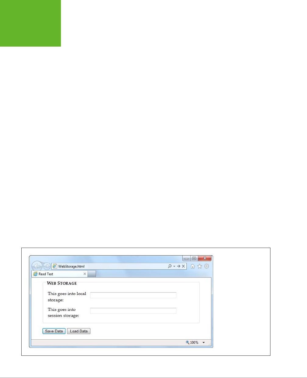
HTML5: THE MISSING MANUAL, SECOND EDITION
322
WEB STORAGE
BASICS
Pulling something out of local storage is as easy as putting it in, provided you use
the localStorage.getItem() method. For example, here’s a line of code that grabs
the previously stored name and shows it in a message box:
alert("You stored: " + localStorage.getItem("user_name"));
This code works whether the name was stored five seconds ago or five months ago.
Of course, it’s possible that nothing was stored at all. If you want to check whether
a storage slot is empty, you can test for a null reference. Here’s an example of that
technique:
if (localStorage.getItem("user_name") == null) {
alert ("You haven't entered a name yet.");
}
else {
// Put the name into a text box.
document.getElementById("userName").value = localStorage.getItem("user_
name");
}
Session storage is just as simple. The only dierence is that you use the session-
Storage object instead of the localStorage object:
// Get the current date.
var today = new Date();
// Store the time as a piece of text in the form HH:mm.
var time = today.getHours() + ":" + today.getMinutes();
sessionStorage.setItem("lastUpdateTime", time);
Figure 10-1 shows a simple test page that puts all of these concepts together.
FIGURE 10-1
This page has two text
boxes, one for session
storage and one for local
storage. When you click
Save, the page stores the
values. Click Load Data,
and it brings them back.
To try this out (and to
verify that session storage
disappears when the
window is closed but that
local storage lives forever),
run this page at
http://
prosetech.com/ html5
.
www.it-ebooks.info

CHAPTER 10: STORING YOUR DATA 323
WEB STORAGE
BASICS
NOTE Web storage also supports two alternate syntaxes for accessing data. Instead of using the
getItem()
and
setItem()
methods that you’ve already seen, you can use property names or an indexer. With property
names, you access a storage slot called
"user_name"
as
localStorage.user_name
. With an indexer,
you access the same storage slot as
localStorage["user_name"]
. You can choose a syntax based on
your preference, but most web experts believe the
getItem()
and
setItem()
methods are best because
they offer the least ambiguity.
TROUBLESHOOTING MOMENT
Web Storage Fails Without a Web Server
There’s an unexpected problem that can trip up your web stor-
age testing. In many browsers, web storage works only when
you’re requesting the pages from a live web server. It doesn’t
matter whether that web server is located on the Internet or
if it’s just a test server running on your own computer—the
important detail is that you aren’t just launching the pages
from your local hard drive.
This quirk is a side effect of the way browsers dole out their
local storage space. As you’ve already learned, they limit each
website to 5 MB, and in order to do that, they need to associate
every page that wants to use local storage to a website domain.
So what happens if you break this rule and open a web page
that uses web storage, straight from a file? It depends. In
Internet Explorer, the browser appears to lose its web stor-
age support completely. The
localStorage
and
ses-
sionStorage
objects disappear, and trying to use them
causes a JavaScript error. In Firefox, the
localStorage
and
sessionStorage
objects remain, and support
appears
to
be there (even to Modernizr), but everything you try to store
quietly disappears into a void. And in Chrome, the result is
different again—most of web storage works fine, but some
features (like the
onStorage
event) don’t work. You’ll see the
same issues when you use the File API (page 332). So do your-
self a favor and put your pages on a test server, so you’re not
tripped up by unexpected quirks. Or, run the examples in this
chapter from the try-out site at
http://prosetech.com/html5
.
A Practical Example: Storing the Last Position in a Game
At this point, you might have the impression that there isn’t much to web storage,
other than remembering to pick a name and put it in square brackets. And you’d
be mostly right. But you can put local storage to some more practical purposes
without any extra eort.
For example, consider the canvas-based maze game you saw in Chapter 9 (page
307). A maze might be too much trouble to solve in one go, in which case it makes
sense to store the current position when the user closes the window or navigates to
a new page. When the user returns to the maze page, your code can then restore
the happy face to its previous position in the maze.
There are several possible ways to implement this example. You could simply save
a new position after each move. Local storage is fast, so this wouldn’t cause any
problem. Or, you could react to the page’s onBeforeUnload event to ask the game
player whether it’s worth storing the current position (Figure 10-2).
www.it-ebooks.info
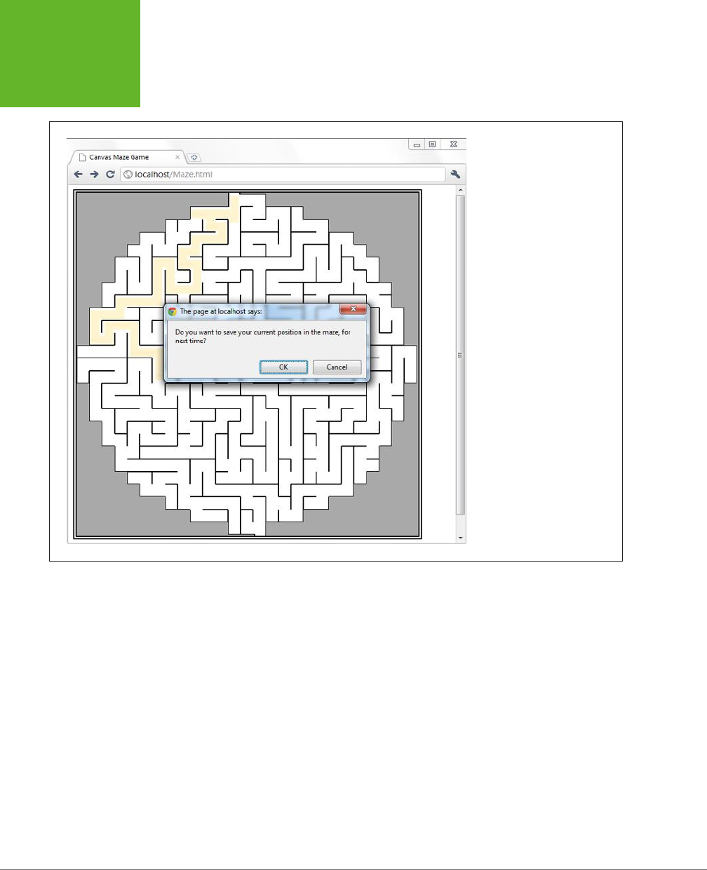
HTML5: THE MISSING MANUAL, SECOND EDITION
324
WEB STORAGE
BASICS
FIGURE 10-2
When a visitor leaves this page,
either by navigating to a new
site or by closing the window,
the page offers to store the
current position.
Here’s the code that oers to store the position details:
window.onbeforeunload = function(e) {
// Check if the localStorage object exists (as there's no reason to offer
// to save the position if it won't work).
if (localStorage) {
// Ask to save the position.
if (confirm(
"Do you want to save your current position in the maze, for next time?")) {
// Store the two coordinates in two storage slots.
localStorage.setItem("mazeGame_currentX", x);
localStorage.setItem("mazeGame_currentY", y);
}
}
}
www.it-ebooks.info

CHAPTER 10: STORING YOUR DATA 325
WEB STORAGE
BASICS
TIP Long key names, like
mazeGame_currentX
, are good. After all, it’s up to you to ensure that key
names are unique, so two web pages on your website don’t inadvertently use the same name to store different
pieces of data. With just a single container that holds all your data, it’s all too easy to run into naming conflicts,
which is the one glaring weakness in the web storage system. To prevent problems, come up with a plan for
creating logical, descriptive key names. For example, if you have separate maze games on separate pages, consider
incorporating the page name into the key name, as in
Maze01_currentX
.
This example shows how to store an
application state
(the current position). If you
wanted to avoid showing the same message each time the user leaves the game,
you could add an “Automatically save position” checkbox. You would then store the
position if the checkbox is switched on. Of course, you’d want to save the value of
the checkbox too, and that would be an example of storing
application preferences
.
When the page loads the next time, you can check to see whether there’s a previ-
ously stored position:
// Is the local storage feature supported?
if (localStorage) {
// Try to get the data.
var savedX = localStorage.getItem("mazeGame_currentX");
var savedY = localStorage.getItem("mazeGame_currentY");
// If the variables are null, no data was saved.
// Otherwise, use the data to set new coordinates.
if (savedX != null) x = Number(savedX);
if (savedY != null) y = Number(savedY);
}
This example also uses the JavaScript Number() function to make sure the saved
data is converted to valid numbers. You’ll learn why that’s important on page 327.
Browser Support for Web Storage
Web storage is one of the best-supported HTML5 features in modern browsers.
The only browser that you’re likely to find that doesn’t support web storage is the
thankfully endangered IE 7.
If you need a workaround for IE 7, you can simulate web storage using cookies. The
fit isn’t perfect, but it works. And although there’s no ocial piece of script that
plugs that gap, you can find many decent starting points on the GitHub polyfill page
at
http://tinyurl.com/polyfill
(just look under the “Web Storage” section heading).
One web storage feature that enjoys slightly less support is the onStorage event,
which you’ll consider on page 330. In particular, IE 8 supports web storage but not
the onStorage event. (IE 9 and later versions correct the problem, with full web stor-
age support.) This situation is fine if you’re using onStorage to add a nonessential
feature, but otherwise be warned.
www.it-ebooks.info
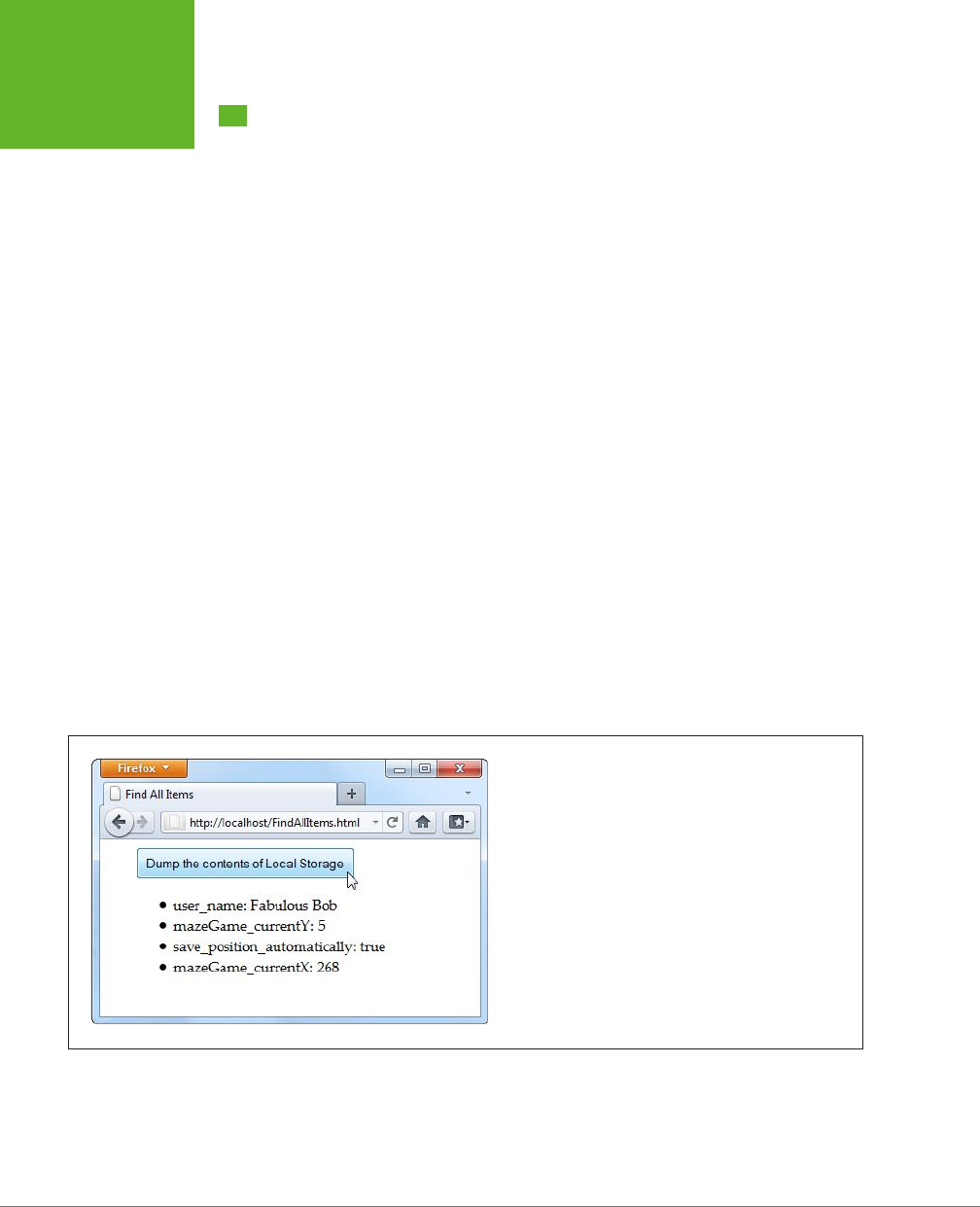
HTML5: THE MISSING MANUAL, SECOND EDITION
326
DEEPER INTO
WEB STORAGE
Deeper into Web Storage
You now know the essentials of web storage—how to put information in, and how to
get it out again. However, there are several finer points and a few useful techniques
left to cover before you put it to use. In the following sections, you’ll see how to
remove items from web storage and how to examine all the currently stored items.
You’ll also learn to deal with dierent data types, to store custom objects, and to
react when the collection of stored items changes.
Removing Items
It couldn’t be easier. You use the removeItem() method, and the key name, to get
rid of a single piece of data you don’t want:
localStorage.removeItem("user_name");
Or, if you want to empty out all the local data your website has stored, use the more
radical clear() method:
sessionStorage.clear();
Finding All the Stored Items
To get a single piece of data out of web storage, you need to know its key name. But
here’s another neat trick. Using the key() method, you can pull every single item
out of local or session storage (for the current website), even if you don’t know any
key names. This is a nifty technique when you’re debugging, or if you just want to
review what other pages in your site are storing, and what key names they’re using.
Figure 10-3 shows a page that puts this technique into practice.
FIGURE 10-3
Click the button, and this page fills a list with the local storage
contents.
www.it-ebooks.info

CHAPTER 10: STORING YOUR DATA 327
DEEPER INTO
WEB STORAGE
When you click the button in this example, it triggers the findAllItems() function,
which scans through the collection of items in local storage. Here’s the code:
function findAllItems() {
// Get the <ul> element for the list of items.
var itemList = document.getElementById("itemList");
// Clear the list.
itemList.innerHTML = "";
// Do a loop over all the items.
for (var i=0; i<localStorage.length; i++) {
// Get the key for the item at the current position.
var key = localStorage.key(i);
// Get the item that's stored with this key.
var item = localStorage.getItem(key);
// Create a new list item with this information,
// and add it to the page.
var newItem = document.createElement("li");
newItem.innerHTML = key + ": " + item;
itemList.appendChild(newItem);
}
}
Storing Numbers and Dates
So far, the exploration into web storage has glossed over one important detail.
Whenever you store something in the localStorage or sessionStorage object,
that data is automatically converted to a string of text. For values that are already
text (like the user name typed into a text box), there’s no problem. But numbers
aren’t as forgiving. Consider the example on page 324, which stores the most recent
maze position in local storage. If you forget to convert the coordinates from text to
numbers, you can run into this sort of problem:
// Get the last x-coordinate position.
// For example, this might return the text "35"
x = localStorage.getItem("mazeGame_currentX");
// Attempt to increment the position (incorrectly).
x += 5;
Unfortunately, this code doesn’t have the result you want. Because x is a string,
JavaScript converts the number 5 to a string as well. And instead of adding 35+5,
JavaScript actually performs the string combination "35"+"5", which returns a result
of 355. This clearly isn’t what you want. In fact, this code will cause the happy face
to jump to completely the wrong position, or right out of the maze.
www.it-ebooks.info

HTML5: THE MISSING MANUAL, SECOND EDITION
328
DEEPER INTO
WEB STORAGE
The issue here is that JavaScript assumes you’re trying to stick two pieces of text
together, rather than perform a mathematical operation. To solve the problem, you
need to give JavaScript a hint that you’re trying to work with numbers. Several
solutions are possible, but the Number() function works well:
x = Number(localStorage.getItem("mazeGame_currentX"));
// Now JavaScript calculates 35+10 properly, and returns 40.
x += 10;
Text and numbers are easy to deal with, but if you want to place other sorts of data
into web storage, you’ll need to handle them with care. Some data types have handy
conversion routines. For example, imagine you store a date like this:
var today = new Date();
This code doesn’t store a date object, but a text string, like “Sat Jun 07 2014
13:30:46”. Unfortunately, there’s no easy way to convert this text back into a date
object when you pull it out of storage. And if you don’t have a date object, you
won’t be able to manipulate the date in the same way—say, calling date methods
and performing date calculations.
To solve this problem, it’s up to you to explicitly convert the date into the text you
want, and then convert it back into a proper date object when you retrieve it. Here’s
an example:
// Create a date object.
var today = new Date();
// Turn the date into a text string in the standard form YYYY/MM/DD,
// and store that text.
var todayString = today.getFullYear() + "/" +
today.getMonth() + "/" + today.getDate();
sessionStorage.setItem("session_started", todayString);
...
// Now retrieve the date text and use it to create a new date object.
// This works because the date text is in a recognizable format.
today = new Date(sessionStorage.getItem("session_started"));
// Use the methods of the date object, like getFullYear().
alert(today.getFullYear());
Run this code, and the year appears in a message box, confirming that you’ve suc-
cessfully recreated the date object.
www.it-ebooks.info

CHAPTER 10: STORING YOUR DATA 329
DEEPER INTO
WEB STORAGE
Storing Objects
In the previous section, you saw how to convert numbers and dates to text and
back again, so you can store them with web storage. These examples work because
the JavaScript language helps you out, first with the handy Number() function, and
then with the text-to-date conversion smarts that are hard-wired into date objects.
However, there are plenty of other objects that you can’t convert this way, especially
if you create a custom object of your own.
For example, consider the personality quiz you first saw in Chapter 9 (page 290). The
personality quiz uses two pages. On the first, the quiz-taker answers some questions
and gets a score. On the second, the results are shown. In the original version of
this page, the information is passed from the first page to the second using query
string arguments that are embedded in the URL. This approach is traditional HTML
(although a cookie would work too). But in HTML5, local storage is the best way to
shue data around.
But here’s the challenge. The quiz data consists of five numbers, one for each per-
sonality factor. You
could
store each personality factor in a separate storage slot.
But wouldn’t it be neater and cleaner to create a custom object that packages up all
the personality information in one place? Here’s an example of a PersonalityScore
object that does the trick:
function PersonalityScore(o, c, e, a, n) {
this.openness = o;
this.conscientiousness = c;
this.extraversion = e;
this.accommodation = a;
this.neuroticism = n;
}
If you create a PersonalityScore object, you need just one storage slot, instead of
five. (For a refresher about how custom objects work in JavaScript, see page 468.)
To store a custom object in web storage, you need a way to convert the object to
a text representation. You could write some tedious code that does the work. But
fortunately, there’s a simpler, standardized approach called
JSON encoding
.
JSON (JavaScript Object Notation) is a lightweight format that translates structured
data—like all the values that are wrapped in an object—into text. The best thing
about JSON is that browsers support it natively. That means you can call JSON.
stringify() to turn any JavaScript object into text, complete with all its data, and
JSON.parse() to convert that text back into an object. Here’s an example that puts
this to the test with the PersonalityScore object. When the test is submitted, the
page calculates the score (not shown), creates the object, stores it, and then redi-
rects to the new page:
// Create the PersonalityScore object.
var score = new PersonalityScore(o, c, e, a, n);
www.it-ebooks.info

HTML5: THE MISSING MANUAL, SECOND EDITION
330
DEEPER INTO
WEB STORAGE
// Store it, in handy JSON format.
sessionStorage.setItem("personalityScore", JSON.stringify(score));
// Go to the results page.
window.location = "PersonalityTest_Score.html";
On the new page, you can pull the JSON text out of storage and use the JSON.parse()
method to convert it back to the object you want. Here’s that step:
// Convert the JSON text to a proper object.
var score = JSON.parse(sessionStorage.getItem("personalityScore"));
// Get some data out of the object.
lblScoreInfo.innerHTML = "Your extraversion score is " + score.extraversion;
To see the complete code for this example, including the calculations for each
personality factor, visit
http://prosetech.com/html5
. To learn more about JSON
and take a peek at what JSON-encoded data actually looks like, check out
http://
en.wikipedia.org/wiki/JSON
.
Reacting to Storage Changes
Web storage also gives you a way to communicate among dierent browser windows.
That’s because whenever a change happens to local storage or session storage,
the window.onStorage event is triggered in every other window that’s viewing the
same page or another page on the same website. So if you change local storage on
www.GoatsCanFloat.org/storeStu.html
, the onStorage event will fire in a browser
window for the page
www.GoatsCanFloat.org/checkStorage.html
. (Of course, the
page has to be viewed in the same browser and on the same computer, but you
already knew that.)
The onStorage event is triggered whenever you add a new object to storage, change
an object, remove an object, or clear the entire collection. It doesn’t happen if your
code makes a storage operation that has no eect (like storing the same value that’s
already stored, or clearing an already-empty storage collection).
Consider the test page shown in Figure 10-4. Here, the visitor can add any value
to local storage, with any key, just by filling out two text boxes. When a change is
made, the second page reports the new value.
To create the example shown in Figure 10-4, you first need to create the page that
stores the data. In this case, clicking the Add button triggers a short addValue()
function that looks like this:
function addValue() {
// Get the values from both text boxes.
var key = document.getElementById("key").value;
var item = document.getElementById("item").value;
www.it-ebooks.info

CHAPTER 10: STORING YOUR DATA 331
DEEPER INTO
WEB STORAGE
// Put the item in local storage.
// (If the key already exists, the new item replaces the old.)
localStorage.setItem(key, item);
}
The second page is just as simple. When the page first loads, it attaches a function
to the window.onStorage event, using this code:
window.onload = function() {
// Connect the onStorage event to the storageChanged() function.
window.addEventListener("storage", storageChanged, false);
};
This code looks a little dierent than the event handling code you’ve seen so far.
Instead of setting window.onstorage, it calls window.addEventListener(). That’s
because this code is the simplest that works on all current browsers. If you set
window.onstorage directly, your code will work in every browser except Firefox.
NOTE Web graybeards may remember that the
addEventListener()
method doesn’t work on Internet
Explorer 8 (or older). In this example, that limitation is no cause for concern, because IE 8 doesn’t support storage
events anyway.
The storageChanged() function has a simple task. It grabs the updated information
and displays it on the page, in a <div> element:
function storageChanged(e) {
var message = document.getElementById("updateMessage");
message.innerHTML = "Local storage updated.";
message.innerHTML += "<br>Key: " + e.key;
message.innerHTML += "<br>Old Value: " + e.oldValue;
message.innerHTML += "<br>New Value: " + e.newValue;
message.innerHTML += "<br>URL: " + e.url;
}
As you can see, the onStorage event provides several pieces of information, including
the key of the value that was changed, the old value, the newly applied value, and
the URL of the page that made the change. If the onStorage event is a reaction to
the insertion of a new item, the e.oldValue property is either null (in most browsers)
or an empty string (in Internet Explorer).
NOTE If you have several pages open for the same website, the
onStorage
event occurs in each one,
except the page that made the change (in the current example, that’s
StorageEvents1.html
). However, Internet
Explorer is the exception—it doesn’t follow this rule, and fires the
onStorage
event in the original page as
well.
www.it-ebooks.info
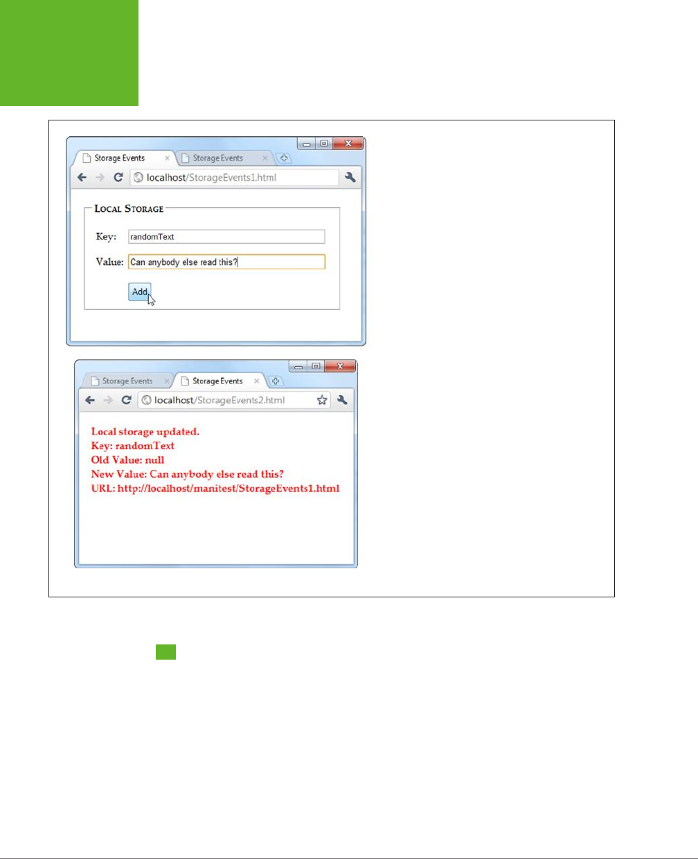
HTML5: THE MISSING MANUAL, SECOND EDITION
332
READING FILES
FIGURE 10-4
To see the
onStorage
event in action, open
Storage
Events1.html
and
StorageEvents2.html
at the same time.
When you add or change a value in the first page (top),
the second page captures the event and reports it in the
page (bottom).
Reading Files
Web storage is a solidly supported part of HTML5. But it’s not the only way to access
information. Several new standards are creeping onto the field for dierent types of
storage-related tasks. One example is a standard called the File API, which techni-
cally isn’t a part of HTML5, but has good support across modern browsers, with the
exception of Internet Explorer (which didn’t add support until IE 10).
Based on its rather vague name, you might expect that the File API is a sweeping
standard for reading and writing files on a web browser’s hard drive. However, it’s
not that ambitious or powerful. Instead, the File API gives a way for a visitor to pick
a file from his hard drive and hand it directly to the JavaScript code that’s running
www.it-ebooks.info
CHAPTER 10: STORING YOUR DATA 333
READING FILES
on the web page. This code can then open the file and explore its data, whether
it’s simple text or something more complicated. The key thing is that the file goes
directly to the JavaScript code. Unlike a normal file upload, it never needs to travel
to the web server.
It’s also important to note what the File API
can’t
do. Most significantly, it can’t
change a file or create a new one. If you want to store any data, you’ll need to use
another mechanism—for example, you can send your data to a web server through
XMLHttpRequest (page 377), or you can put it in local storage.
You might think that the File API is less useful than local storage—and for most
websites, you’d be right. However, the File API is also a toehold into a world where
HTML has never gone before, at least not without a plug-in to help.
NOTE Right now, the File API is an indispensable feature for certain types of specialized applications, but in
the future its capabilities may expand to make it much more important. For example, future versions may allow
web pages to
write
local files, provided the user has control over the file name and location, using a Save dialog
box. Browser plug-ins like Flash already have this capability.
Getting Hold of a File
Before you can do anything with the File API, you need to get hold of a file. There
are three strategies you can use, but they are the same in one key fact—namely,
your web page gets a file only if the visitor explicitly picks it and gives it to you.
Here are your options:
• The <input> element. Set the type attribute to file, and you’ve got the standard
file upload box. But with a bit of JavaScript and the File API, you can open it
locally.
• A hidden <input> element. The <input> element is ugly. To get right with the
style police, you can hide your <input> element and make a nicer browser but-
ton. When it’s clicked, use JavaScript to call the click() method on the hidden
<input> element. This shows the standard file-selection dialog box.
• Drag-and-drop. If the browser supports it, you can drag a file from the desktop
or a file browser window and drop it on a region in the web page.
In the following sections, you’ll see all three approaches.
Reading a Text File with <input>
One of the easiest things you can do with the File API is read the content from a
simple text file. Figure 10-5 shows a web page that uses this technique to read the
markup in a web page and then display it.
www.it-ebooks.info
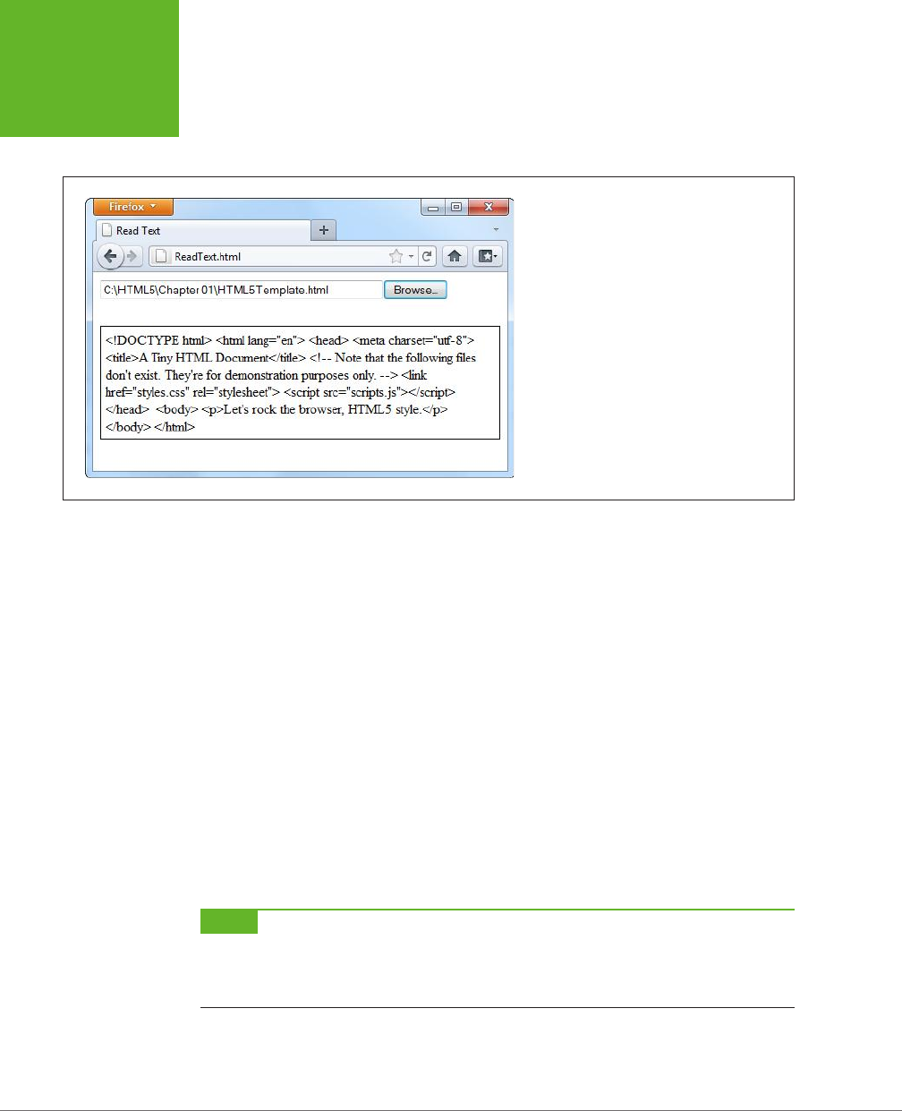
HTML5: THE MISSING MANUAL, SECOND EDITION
334
READING FILES
FIGURE 10-5
Click the Browse button (or Choose File, as it’s
named in Chrome), choose a file, and then
click OK. Instead of the usual upload, the web
page JavaScript takes it from there, copying the
content into your page.
To build this example, you start with the <input type="file"> element, which cre-
ates the infamous text box and Browse button combination:
<input id="fileInput" type="file" onchange="processFiles(this.files)">
However, whereas an <input> element usually belongs in a <form> container so the
file can be posted to the web server, this <input> element goes its own way. When
the web page visitor picks a file, it triggers the <input> element’s onChange event,
and that triggers the processFiles() function. It’s here that the file is opened, in
ordinary JavaScript.
Now you’ll consider the processFiles() function, one piece at a time. The first order
of business is to grab the first file from the collection of files that the <input> ele-
ment provides. Unless you explicitly allow multiple file selection (with the multiple
attribute), the files collection is guaranteed to hold just one file, which will be at
position 0 in the files array:
function processFiles(files) {
var file = files[0];
NOTE Every file object has three potentially useful properties. The name property gives you its file name
(not including the path), the size property tells you how many bytes big it is, and the type property tells you
the MIME type of the file (page 152), if it can be determined. You could read these properties and add additional
logic—for example, you could refuse to process files above a certain size, or allow files of only a certain type.
Next, you create a FileReader object that allows you to process the file:
var reader = new FileReader();
www.it-ebooks.info

CHAPTER 10: STORING YOUR DATA 335
READING FILES
It’s almost time to call one of the FileReader’s methods to extract the file content.
All of these methods are
asynchronous
, which means they start the file-reading task
but don’t wait for the data. To get the data, you first need to handle the onLoad event:
reader.onload = function (e) {
// When this event fires, the data is ready.
// Copy it to a <div> on the page.
var output = document.getElementById("fileOutput");
output.textContent = e.target.result;
};
Finally, with that event handler in place, you can call the FileReader’s readAsText()
method:
reader.readAsText(file);
}
This method dumps all the file content into a single long string, which is provided
in the e.target.result that’s sent to the onLoad event.
The readAsText() method works properly only if the file holds text content (not
binary content). That means it suits HTML files perfectly well, as shown in Figure 10-5.
However, there are other useful formats that use plain text. One good example is the
CSV format, which is a basic export format supported by all spreadsheet programs.
Another example is the XML format, which is a standard way of exchanging bunches
of data between programs. (It’s also the foundation of the Oce XML formats, which
means you can hand .docx and .xlsx files directly to the readAsText() method as well.)
NOTE The JavaScript language even has a built-in XML parser, which means you can browse around an XML
file and dig out just the content you need. Of course, the code this requires is considerable, it performs poorly
for large files, and it’s rarely easier than just uploading the file to a web server and running your file-processing
logic there. However, you can start to see how the File API can open up new possibilities that HTML lovers didn’t
dare imagine even just a few years ago.
The readAsText() method isn’t the only way to pull your data out of a file.
The FileReader object also includes the following file-reading methods:
readAsBinaryString(), readAsArrayBuffer(), and readAsDataUrl().
The readAsBinaryString() method gives your application the ability to deal with
binary-encoded data, although it somewhat awkwardly sticks it into a text string,
which is inecient. And if you actually want to
interpret
that data, you need to
struggle through some horribly convoluted code.
The readAsArryaBuffer() method is a better bet for web developers who need to
do some serious do-it-yourself data processing. This method reads the data into an
array (page 465), where each element represents a single byte of data. The advantage
of this package is that you can use it to create Blob objects and slice out smaller
sections of binary data, so you can process it one chunk at a time.
www.it-ebooks.info

HTML5: THE MISSING MANUAL, SECOND EDITION
336
READING FILES
NOTE Blob is shorthand for
binary large object
—in other words, a fat chunk of raw data. Blobs are an
advanced part of the File API; to learn more, you can take a look at Mozilla’s steadily evolving documentation on
the subject at
http://tinyurl.com/file-blob
.
Lastly, the readAsDataURL() method gives you an easy way to grab picture data.
You’ll use that on page 339. But first, it’s time to make the page in this example a
bit prettier.
Replacing the Standard Upload Control
Web developers agree: The standard <input> control for file submission is ugly. And
although you do need to use it, you don’t need to let anyone see it. Instead, you can
simply hide it, with a style rule like this:
#fileInput {
display: none;
}
Now add a new control that will trigger the file-submission process. An ordinary link
button will do, which you can make look as pretty as you want:
<button onclick="showFileInput()">Analyze a File</button>
The final step is to handle the button click and use it to manually trigger the <input>
element, by calling
its
click() method:
function showFileInput() {
var fileInput = document.getElementById("fileInput");
fileInput.click();
}
Now, when the button is clicked, the showFileInput() function runs, which clicks
the hidden Browse button and shows the dialog box where the visitor can pick a
file. This, in turn, triggers the hidden <input> element’s onChange event, which runs
the processFiles() function, just like before.
Reading Multiple Files at Once
There’s no reason to limit people to submitting one file at a time. HTML5 allows
multiple file submission, but you need to explicitly allow it by adding the multiple
attribute to the <input> element:
<input id="fileInput" type="file" onchange="processFiles(this.files)"
multiple>
Now the user can select more than one file in the Open dialog box (for example,
by pressing Ctrl on a Windows computer while clicking several files, or by dragging
a box around a group of them). Once you allow multiple files, your code needs to
accommodate them. That means you can’t just grab the first file from the files col-
lection, as in the previous example. Instead, you need a for loop that processes
each file, one at a time:
www.it-ebooks.info
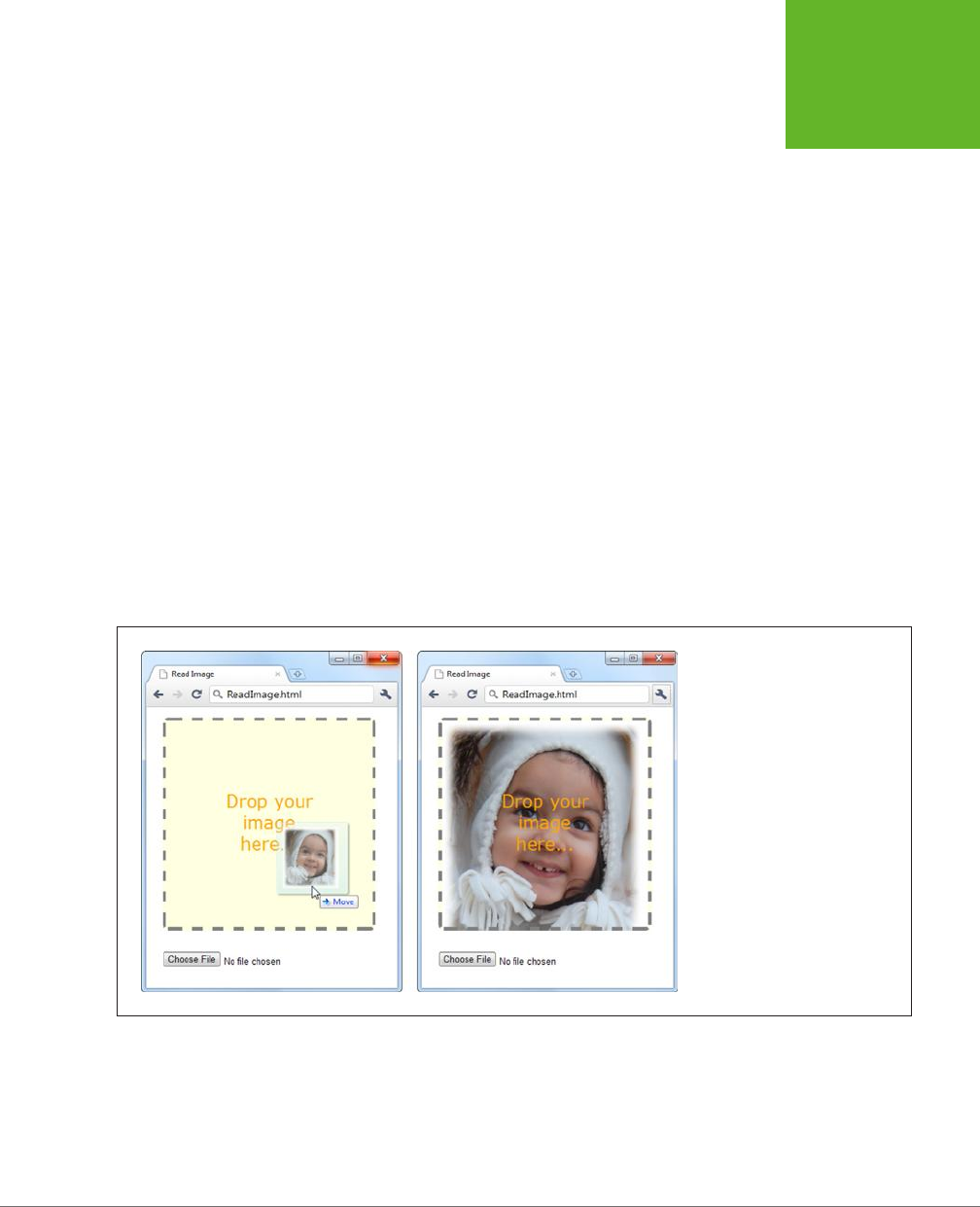
CHAPTER 10: STORING YOUR DATA 337
READING FILES
for (var i=0; i<files.length; i++) {
// Get the next file
var file = files[i];
// Create a FileReader for this file, and run the usual code here.
var reader = new FileReader();
reader.onload = function (e) {
...
};
reader.readAsText(file);
}
Reading an Image File with Drag-and-Drop
As you’ve seen, FileReader handles text content in a single, simple step. It deals
will images just as easily, thanks to the readAsDataURL() method.
Figure 10-6 shows an example that introduces two new features: image support,
and file drag-and-drop. The submitted image is used to paint the background of an
element, although you could just as easily paint it on a canvas and process it using
the canvas’s raw pixel features (page 313). For example, you could use this technique
to create a page where someone can drop in a picture, draw on it or modify it, and
then upload the final result using an XMLHttpRequest call (page 377).
FIGURE 10-6
There are two ways to provide an
image to this page: Use the file
controls below, or drag one or more
images onto the drop box.
To create this page, you first need to decide what element will capture the dropped
files. In this example, it’s a <div> element named dropBox:
<div id="dropBox">
<div>Drop your image here...</div>
</div>
www.it-ebooks.info

HTML5: THE MISSING MANUAL, SECOND EDITION
338
READING FILES
Some straightforward style sheet magic gives the drop box the size, borders, and
colors you want:
#dropBox {
margin: 15px;
width: 300px;
height: 300px;
border: 5px dashed gray;
border-radius: 8px;
background: lightyellow;
background-size: 100%;
background-repeat: no-repeat;
text-align: center;
}
#dropBox div {
margin: 100px 70px;
color: orange;
font-size: 25px;
font-family: Verdana, Arial, sans-serif;
}
Keen eyes will notice that the drop box sets the background-size and background-
repeat properties in preparation for what comes next. When the image is dropped
onto the <div>, it’s set as the background. The background-size property ensures
that the picture is compressed down so you can see all of it at once. The background-
repeat property ensures that the picture isn’t tiled to fill the leftover space.
To handle file drops, you need to handle three events: onDragEnter, onDragOver, and
onDrop. When this page first loads, it attaches event handlers for all three:
var dropBox;
window.onload = function() {
dropBox = document.getElementById("dropBox");
dropBox.ondragenter = ignoreDrag;
dropBox.ondragover = ignoreDrag;
dropBox.ondrop = drop;
};
The ignoreDrag() function handles both onDragEnter (which fires when the mouse
pointer enters the drop box, with a file attached) and onDragOver (which fires continu-
ously, as the file-dragging mouse pointer moves over the drop box). That’s because
you don’t need to react to either of these actions, other than to tell the browser to
hold o from taking any actions of its own. Here’s the code you need:
function ignoreDrag(e) {
// Make sure nobody else gets this event, because you're handling
// the drag and drop.
www.it-ebooks.info

CHAPTER 10: STORING YOUR DATA 339
READING FILES
e.stopPropagation();
e.preventDefault();
}
The onDrop event is more important. It’s at this point that you get the file and process
it. However, because there are actually two ways to submit files to this page, the
drop() function calls the processFiles() function to do the actual work:
function drop(e) {
// Cancel this event for everyone else.
e.stopPropagation();
e.preventDefault();
// Get the dragged-in files.
var data = e.dataTransfer;
var files = data.files;
// Pass them to the file-processing function.
processFiles(files);
}
The processFiles() function is the last stop in the drag-and-drop journey. It creates
a FileReader, attaches a function to the onload event, and calls readAsDataURL()
to transform the image data into a data URL (page 269):
NOTE As you learned when you explored the canvas, a data URL is a way of representing image data in
a long text string that’s fit for URL. This gives you a portable way to move the image data around. To show the
image content in a web page, you can set the
src
property of an
<img>
element (as on page 276), or you can
set the CSS
background-image
property (as in this example).
function processFiles(files) {
var file = files[0];
// Create the FileReader.
var reader = new FileReader();
// Tell it what to do when the data URL is ready.
reader.onload = function (e) {
// Use the image URL to paint the drop box background
dropBox.style.backgroundImage = "url('" + e.target.result + "')";
};
// Start reading the image.
reader.readAsDataURL(file);
}
www.it-ebooks.info
HTML5: THE MISSING MANUAL, SECOND EDITION
340
INDEXEDDB:
A DATABASE
ENGINE IN A
BROWSER
The FileReader provides several more events, and when reading image files you
might choose to use them. The onProgress event fires periodically during long op-
erations, to let you know how much data has been loaded so far. (You can cancel
an operation that’s not yet complete by calling the FileReader’s abort() method.)
The onError event fires if there was a problem opening or reading the file. And the
onLoadEnd event fires when the operation is complete for any reason, including if
an error forced it to end early.
Browser Support for the File API
The File API has solid browser support, but it isn’t quite as reliable as web storage.
Table 10-2 shows which browsers include it.
TABLE 10-1
Browser support for the File API
IE FIREFOX CHROME SAFARI OPERA
SAFARI
IOS ANDROID
Minimum
version
10 3.6 13 6 11.1 6 3
Because the File API requires some privileges that ordinary web pages don’t have,
you can’t patch the missing feature with more JavaScript. Instead, you need to rely
on a plug-in like Flash or Silverlight. For example, you can find a polyfill at
https://
github.com/MrSwitch/dropfile
that uses Silverlight to intercept a dragged file, open
it, and then pass the details to the JavaScript code on the page.
IndexedDB: A Database Engine in a Browser
You’re probably familiar with the concept of
databases
—carefully structured catalogs
of information that can swallow lists of people, products, sales, and just about any
other sort of data you want to stu them with. Many websites use databases that
are stored on the web server. For example, when you look up a book on Amazon, the
page extracts the details from Amazon’s staggeringly big database. Much the same
thing happens when you look for an article on Wikipedia or a video on YouTube, or
when you perform a web search on Google.
For years, the story ended there. Databases were the province of the web server;
conversation closed. But HTML5 introduces another possibility. What if the browser
had the ability to create a
local
database—a database that’s stored on the client’s
computer rather than the far-o web server? Dierent ideas cropped up, including
a briefly popular and now abandoned specification called Web SQL Databases.
More recently, the still-evolving IndexedDB specification rose to prominence as the
ocial HTML5-sanctioned solution for local databases.
NOTE The name “IndexedDB” emphasizes the fact that the databases use
indexes
to identify and arrange
data. Indexes ensure that you don’t end up with the same record of data stored in two places, and they also speed
up data retrieval when you have acres of information.
www.it-ebooks.info

CHAPTER 10: STORING YOUR DATA 341
INDEXEDDB:
A DATABASE
ENGINE IN A
BROWSER
UP TO SPEED
The Dierence Between Server-Side and Client-Side Databases
There are plenty of ways for websites to use server-side data-
bases, but none of them have anything to do with HTML5. To
understand why, you need to remember that the HTML5 uni-
verse is centered on the mix of markup, styles, and JavaScript
that’s loaded in the client’s browser. There’s no direct way for
a browser on your computer to access a database on the web
server. Even if it were technically possible, this kind of contact
would raise all kinds of security issues. Instead, to interact with
a server-side database you need code that runs on the web
server. For example, websites commonly use PHP or C# code
(although there are many other technologies) to take care of
server-side database tasks like generating a page of search
results or logging a customer’s purchase.
Before going ahead, it’s important to understand exactly what role IndexedDB can
play in a web application. For a host of reasons, IndexedDB can never replace the
server-side databases described earlier. Most significantly, there’s this: IndexedDB
creates a separate database for every user. Websites that use server-side data need
a single, centralized catalog of information that they can share with everyone.
However, IndexedDB is useful in several other special scenarios:
• Making a self-sucient oine application. In Chapter 11, you’ll learn how
HTML5 caching lets you run a web page even without a web connection—a feat
that’s particularly useful for mobile devices. You can make your oine apps even
more capable by using IndexedDB storage. For example, your page can retrieve
the data it needs from a database on the web server when it’s connected (using
the XMLHttpRequest object demonstrated on page 377), and store that data in
a local database so it’s available even when the network isn’t.
• Enhancing performance. Some applications use masses of data, and if you’re
continually retrieving the same data every time you need it, you’ll slow down
your pages. Similarly, if you create an application that generates data using
complex calculations, you don’t want to waste time performing the same work
more than once. The solution is to store everything you need in an IndexedDB
database. Treat it like your own super-customizable cache.
• Improving local storage. As you learned earlier, local storage provides a place
to stash some data between browser sessions, and pass it from one page to
another. If your data is relatively simple in structure and small in size, ordinary
JavaScript variables and objects will hold it fine. But if you have an extraordi-
narily large or complex batch of data, you may find that it’s easier and faster to
manage it with an IndexedDB database.
www.it-ebooks.info

HTML5: THE MISSING MANUAL, SECOND EDITION
342
INDEXEDDB:
A DATABASE
ENGINE IN A
BROWSER
NOTE The IndexedDB storage system behaves like local storage in several key ways. Most importantly, an
IndexedDB database belongs to a single person, using a particular browser and a particular computer, and visiting
a specific site. If you change any of these details—for example, switching browsers, logging on with a different
user account, or switching to your smartphone—the web page gets a new IndexedDB database.
Learning to use IndexedDB can be daunting. First, the specification is complex
(some less charitable developers say ugly). You, the web developer, are responsible
for creating the database, building its tables, and filling them with data. Second,
IndexedDB uses an
asynchronous model
, which means that database tasks happen
in the background, without stalling your code or locking up the page. The drawback
is that this forces you to use a more complex model that scatters your code into
dierent places. For example, the code you use to start a database task isn’t in the
same place as the code you use to handle the outcome of that task. Following the
sequence and figuring out how each piece of code fits together takes some practice.
Figure 10-7 shows the database-powered web page that you’ll analyze through the
rest of this chapter. It puts the IndexedDB feature through a set of basic operations
with a database that stores link information. Each record in the database consists of
a URL and some relevant information about that URL, like its name and a description.
Using the
FavoriteSiteTracker.html
page, you can add new link records, browse the
ones that already exist, and change or delete individual records—all of which are
fundamental tasks for code that deals with any type of database.
The Data Object
Before you get started with the link tracker example, it’s time to learn about the
data it stores—the LinkRecord object. Traditional databases are all about tables and
fields, but IndexedDB simplifies life by storing
objects
. So before you create your
database, it’s a good idea to define your data structure in JavaScript.
In the link tracker example, the database has a single table, and each record in that
table holds the information for a single link. You can package all the link details in
JavaScript using an object-definition function, like this:
function LinkRecord(name, url, description, notes) {
this.name = name;
this.url = url;
this.description = description;
this.notes = notes;
}
Once you’ve added this function to your code, you can call it when needed to cre-
ate a LinkRecord object, complete with a descriptive name, URL, full description,
and notes. (If you’re a bit fuzzy on object-creation with JavaScript, refer to page
468 for a review.)
www.it-ebooks.info
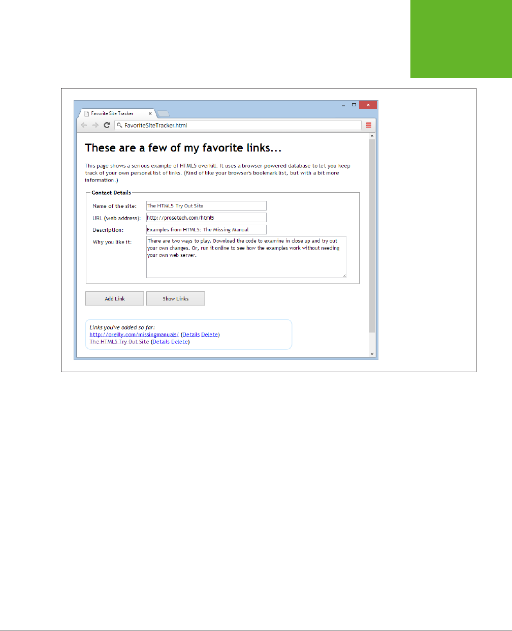
CHAPTER 10: STORING YOUR DATA 343
INDEXEDDB:
A DATABASE
ENGINE IN A
BROWSER
FIGURE 10-7
This example uses an
IndexedDB database to
hold link information. The
top of the page has a form
that lets you create a new
link record. Underneath is
a list that shows the name
and URL (but not the other
details) of every link that’s
in the database. As always,
you can try this example
for yourself at
http://
prosetech.com/html5
.
Creating and Connecting to a Database
In any web page that uses IndexedDB, the first task is to connect to your database.
Since you’ll usually perform this task when the page first loads, it makes sense to
handle the window.onload event and put your code there. Here’s the basic skeleton:
var database;
window.onload = function () {
...
}
The database variable goes outside your function. That way, once you set the da-
tabase variable, you can access it everywhere else in your code.
www.it-ebooks.info

HTML5: THE MISSING MANUAL, SECOND EDITION
344
INDEXEDDB:
A DATABASE
ENGINE IN A
BROWSER
So, what does your code need to do when the page loads? That depends on what
you’ve done before:
• If this is the first time the user is visiting the page, you need to create the da-
tabase and set up its tables from scratch.
• If the user has been here before, you only need to open the database and set
the database variable, so it’s ready for use.
Either way, your starting point is the open() function that’s provided by the window.
indexedDB object. It takes two arguments: the name of the database you want to use
(or create), and its version number. If you’re starting out with a brand new database,
you need to set the version to 1:
var request = window.indexedDB.open("LinksDB", 1);
NOTE It doesn’t matter what name you give your database, so long as you stay consistent and aren’t already
using that name in another page on the same website.
As explained earlier, everything in IndexedDB land is asynchronous. Accordingly,
when you call the open() method, nothing is actually opened. Instead, you’re making
a
request
. In this case, your request is for the browser to open the database when
it gets the chance, and preferably on a background thread so it won’t freeze up the
page for even a moment.
You’ll find this pattern of asynchronous requests—and the same request object—
with just about every task you perform with IndexedDB. To react when the task is
finished, you need to attach at least two event handlers: one that handles a suc-
cessful result (onSuccess) and one that handles an unexpected failure (onError).
In addition, when using the open() method, you need a third event handler for an
event called onUpgradeNeeded.
When opening a database, the onSuccess event indicates that the right version of
your database already exists. At this point you need to set the database variable so
you can use it later. Optionally, you can get to work reading data. In the link tracker
example, a separate function named showLinks() does that job (page 349).
request.onsuccess = function(event) {
alert("Created or opened database successfully.");
// Make the database available everywhere in the code.
database = request.result;
// Call the showLinks() function to read the database and display the
// list of links that already exist.
showLinks();
};
www.it-ebooks.info

CHAPTER 10: STORING YOUR DATA 345
INDEXEDDB:
A DATABASE
ENGINE IN A
BROWSER
The onError event is equally straightforward. Depending on the error, you may be
able to take corrective action, or you may simply choose to report it to the user with
a message either in a pop-up box or right on the page.
request.onerror = function(event) {
alert(request.error + " occurred.");
};
WARNING Don’t make the mistake of omitting the
onError
event handler. If you do, problems will slip
by without any notification at all, and you’ll have no clue what went wrong.
The onUpgradeNeeded event is the most interesting of the three. It fires when the
database version you requested isn’t available. For example, if you requested data-
base version 2 and the computer currently has database version 1, this event fires.
At this point, you can upgrade the database—for example, by adding a new table.
(You can find out the version of the current database from the event.oldVersion
argument.) The onUpgradeNeeded event also fires if the database doesn’t exist at
all, in which case the browser obligingly creates a blank database and waits for you
to fill in the tables you want.
To create a table, you must first grab the database object from the request.result
property. Then, you call its createObjectStore() method. Here’s the code that adds
a table named Links to the LinksDB database:
request.onupgradeneeded = function(event) {
var db = request.result;
var objectStore = db.createObjectStore("Links", { keyPath: "url" });
}
};
In traditional database programming, you need to specify field names and data types
when you create a table. But IndexedDB uses a simpler, object-focused model. When
you create a table, you supply just two details: the name of the table and the
key
path
, which is the property of your object that should be used for the primary key.
NOTE The key path identifies a property in your data object. In this example, the word
url
is written in
lowercase so it matches the name of the property of the data object. If you flip back to page 342, you’ll see that
the
LinkRecord
object defines a property named
url
.
www.it-ebooks.info
HTML5: THE MISSING MANUAL, SECOND EDITION
346
INDEXEDDB:
A DATABASE
ENGINE IN A
BROWSER
UP TO SPEED
Understanding Primary Keys
The
primary key
is the bit of information that uniquely
identifies each record. In the case of the Links table, each link
record has a unique URL, so it makes sense to use that for the
key. This setup prevents you from accidentally creating two
records for the same address. It also forces the browser to
create an index for the Links table that will let you look up
any link record by URL.
If your data doesn’t include an obvious candidate for the
primary key—in other words, it doesn’t have an essential piece
of information that’s guaranteed to be unique—you can use the
time-honored database technique of adding a numeric ID num-
ber. Even better, you can get the browser to generate unique
numbers for you automatically and fill them in whenever you
insert a new record. To do that, set the
autoIncrement
property to
true
when you create the database:
var objectStore =
db.createObjectStore("Links",
{ keyPath: "id", autoIncrement: true });
If your database needs to have multiple tables, you can call createObjectStore()
multiple times, with dierent data objects. The request.onError event fires if the
browser encounters a problem. Once the tables are added successfully, the request.
onSuccess event will fire and your code can finish setting up the page.
NOTE The databases you create with IndexedDB are stored permanently, just like the objects you store in
local storage. However, you can delete a database using the
window.indexedDB.deleteDatabase()
method, and some browsers allow users to review how much data each website is storing and remove whatever
they don’t want.
Storing Records in the Database
Database geeks use the term
data manipulation
to describe every database opera-
tion that works with table data, whether it involves reading, changing, inserting, or
updating information. In the IndexedDB world, data manipulation operations always
follow the same four basic steps. Once you understand this pattern, you’ll have an
easier time following the code for dierent database tasks.
Here are the steps:
1. Create a transaction.
Whenever you want to do anything with an IndexedDB database, whether it’s
writing data or reading it, you must first begin by creating a transaction. In a
database, a
transaction
is one or more data operations that are committed
together, as a unit. If any part of a transaction fails, every operation inside the
transaction is reversed, restoring the database to its pre-transaction state.
www.it-ebooks.info
CHAPTER 10: STORING YOUR DATA 347
INDEXEDDB:
A DATABASE
ENGINE IN A
BROWSER
Transactions are important in the IndexedDB world because there are so many
ways that a database operation can be interrupted. For example, if the user
closes the browser while the page is still at work, the browser interrupts your
code mid-task. The transaction system guarantees that even when these rude
interruptions occur, the database is kept in a consistent state. In fact, transac-
tions are so important that there’s no way to perform IndexedDB operations
without one.
NOTE To understand the problems you can run into without transactions, imagine you’re transferring money
from one bank account to another. In a transactional world, the first step (removing money from account A) and
the second step (depositing it in account B) either succeed or fail together. But without transactions, you could
end up in an unhappy situation: a successful debit from account A, but a failed deposit to account B, leading to
some serious missing cash.
2. Retrieve the object store for your transaction.
Object store
is a fancy name for table. Because every record in an IndexedDB
table is actually a data object, this name makes sense.
3. Call one of the object store methods.
The object store is the gateway to all the table-manipulation features. For ex-
ample, to add a record you call its put() method. To delete a record, you call
its delete() method. The method returns a request object, which you must
use for the next step.
4. Handle the success and error events.
As you already know, virtually everything in IndexedDB is asynchronous. If you
want to do something when an operation is finished, and if you want to catch
errors before they metastasize into more serious problems, you need to handle
the onSuccess and onError events, just as you did when opening the database.
With these steps in mind, you’re ready to look at the code in the addLink() function,
which runs when the web page visitor clicks the Add Link button.
Before you do anything with your database, you need your data on hand. In the
link tracker example, the code grabs the typed-in data from the form and uses it to
create a LinkRecord object. This task is basic JavaScript—you simply need to find
your elements, pull out the corresponding values, and use the LinkRecord() func-
tion shown on page 342.
function addLink() {
// Collect the data from the form.
var name = document.getElementById("name").value;
var url = document.getElementById("url").value;
var description = document.getElementById("description").value;
var notes = document.getElementById("notes").value;
www.it-ebooks.info

HTML5: THE MISSING MANUAL, SECOND EDITION
348
INDEXEDDB:
A DATABASE
ENGINE IN A
BROWSER
// Create the LinkRecord object.
var linkRecord = new LinkRecord(name, url, description, notes);
Now you’re ready to follow step 1 from the list and create your transaction. To do
that, you call the database.transaction() method and provide two parameters:
var transaction = database.transaction(["Links"], "readwrite");
The first parameter is a list of all the tables involved in the transaction. This informa-
tion enables IndexedDB to lock the tables, preventing other pieces of code from
making overlapping and possibly inconsistent changes at the same time. Techni-
cally, this parameter is an array that holds a list of table names, which is why you
wrap the whole thing in square brackets. But in this example, there’s just one table
involved in the task.
The second parameter is a string that identifies the type of transaction. Use the
word readwrite if you want to create a transaction that changes the table in any
way, whether it’s inserting, updating, or deleting records. But if all you need to do
is retrieve data, use the word readonly instead.
This brings you to step 2—getting the indispensable object store for your table. You
can do so easily with the transaction.objectStore() property. Just supply the
name of the table, like this:
var objectStore = transaction.objectStore("Links");
To add a record, use the put() method of the object store and supply the data object:
var request = objectStore.put(linkRecord);
Finally, you need to handle the onError and onSuccess events to find out whether
the record was successfully added:
request.onerror = function(event) {
alert(request.error + " occurred.");
};
request.onsuccess = function(event) {
// The record has been added.
// Refresh the display. (For better performance, you could add just the
// one new item, rather than refresh the whole list.)
showLinks();
};
}
NOTE If you call
put()
to add a record that has the same primary key as an existing record (for example,
a link with an existing URL), the browser quietly replaces the existing record with your new data.
www.it-ebooks.info

CHAPTER 10: STORING YOUR DATA 349
INDEXEDDB:
A DATABASE
ENGINE IN A
BROWSER
Querying All the Records in a Table
Querying
is the essential job of retrieving your stored information. You pick out a
single record, search for a group of records that match certain criteria, or travel
through all the records in your table, whichever you prefer.
The link tracker performs a complete table scan and a single-record search. It uses
the table scan to create the list of links that appears under the link-adding form. It
uses the record search to get the full details for a specific site when you click one
of the Details links in the list, as you’ll see shortly.
The first task is the more complex one. That’s because you need the help of a cursor
to browse through an IndexedDB table. (A database
cursor
is an object that keeps
track of your current position in a table and lets you step through its records.)
You begin by creating a transaction and getting the object store. This time, you don’t
need to make any changes, so a read-only transaction fits the bill:
function showLinks() {
var transaction = database.transaction(["Links"], "readonly");
var objectStore = transaction.objectStore("Links");
Next, you create the cursor using the openCursor() method of the object store:
var request = objectStore.openCursor();
Then, you attach your code to the familiar onError and onSuccess events. The onEr-
ror event handler is nothing special:
request.onerror = function(event) {
alert(request.error + " occurred.");
};
The onSuccess event handler is more interesting. It has the job of stepping through
the records in the Links table, one by one. As it travels, it builds up a string of HTML
with the list of links.
// Prepare the string of markup that will be inserted into the page.
var markupToInsert = "";
request.onsuccess = function(event) {
// Create a cursor.
var cursor = event.target.result;
Initially, the cursor is positioned on the first record of the table, if it exists. You check
for data by testing whether the cursor is true or false. If it’s true, there’s a record
there ready for you to read. You can get the record from the cursor.value property:
if (cursor) {
var linkRecord = cursor.value;
www.it-ebooks.info
HTML5: THE MISSING MANUAL, SECOND EDITION
350
INDEXEDDB:
A DATABASE
ENGINE IN A
BROWSER
Your data is returned to you as an object. In the link tracker example, each record is
a genuine LinkRecord object, complete with the name, url, description, and notes
properties outlined in the object-definition function on page 342.
Once you retrieve your object, it’s up to you to decide what to do with it. In the
current example, the code uses the LinkRecord data to construct an <a> element.
It uses the site name for the link text and the URL for the link address:
markupToInsert += "<a href=" + linkRecord.url + ">" + linkRecord.name +
"</a>";
For now, the <a> is stored in a variable called markupToInsert. When the code is fin-
ished examining every LinkRecord in the database and adding all their information to
the markupToInsert variable, it will finally be ready to copy the markup to the page.
The link tracker example gets a bit fancier by adding two clickable bits of text after
every link. One is named “Details” and the other is named “Delete,” and you can see
them both in Figure 10-7 (near the very bottom of the screen).
These bits of text look like ordinary links, but they are actually <span> elements that
are hard-wired to call two other JavaScript functions in the page (getLinkDetails
and deleteLink) when clicked. Here’s the code that creates them:
markupToInsert += "(" +
"<span class='linkButton' data-url='" + linkRecord.url +
"' onclick='getLinkDetails(this)'>Details</span>" + " " +
"<span class='linkButton' data-url='" + linkRecord.url +
"' onclick='deleteLink(this)'>Delete</span>" +
")<br>";
There’s a neat trick here. The Details and Delete commands are <span> elements.
To simplify life, the URL of the corresponding element is stored in each <span>
element using an attribute. That way, when one of these commands is clicked, the
page can quickly retrieve the URL and use it to look up the corresponding record
in the Links table.
NOTE The attribute that stores the URL is named
data-url
, according to HTML5 convention. The
data-
prefix indicates that you’re using the attribute to hold custom data, which the browser can ignore. You can use
whatever you want for the rest of the attribute name—here,
url
makes sense because the attribute is storing
a URL.
So far, you’ve seen how the code processes a single record during a search. When
you’re ready to move to the next record, you call the cursor.continue() method.
However, you
don’t
attempt to process any more data. That’s because stepping
through your records is an asynchronous operation. When the cursor reaches the
next record, the onSuccess event fires again, triggering the same code a second
time, at which point you can add the markup for the next record, if it exists.
cursor.continue();
}
www.it-ebooks.info

CHAPTER 10: STORING YOUR DATA 351
INDEXEDDB:
A DATABASE
ENGINE IN A
BROWSER
When you reach the last record in the table, the cursor will evaluate to false. At this
point, it’s time to copy your markup into the page:
else {
// If there wasn't at least one result, substitute some placeholder text.
if (markupToInsert == "") {
markupToInsert = "<< No links. >>";
}
else {
markupToInsert = "<i>Links you've added so far: </i><br>" +
markupToInsert;
}
// Insert the markup.
var resultsElement = document.getElementById("links");
resultsElement.innerHTML = markupToInsert;
}
};
}
Querying a Single Record
Querying an individual record in a table is easier than getting them all, because you
don’t have to mess around with cursors. Instead, you follow the well-established four-
step procedure you saw on page 346, using the get() method from the object store.
If you click one of the “Details” links in the link tracker example, the following code
springs into action. It grabs the corresponding LinkRecord object and extracts all
of its information.
function getLinkDetails(element) {
// Get the URL for this link from the handy data-url attribute we added
// earlier.
var url = element.getAttribute("data-url");
var transaction = database.transaction(["Links"], "readonly");
var objectStore = transaction.objectStore("Links");
// Find the record that has this URL.
var request = objectStore.get(url);
request.onerror = function(event) {
alert(request.error + " occurred.");
};
request.onsuccess = function(event) {
var linkRecord = request.result;
www.it-ebooks.info
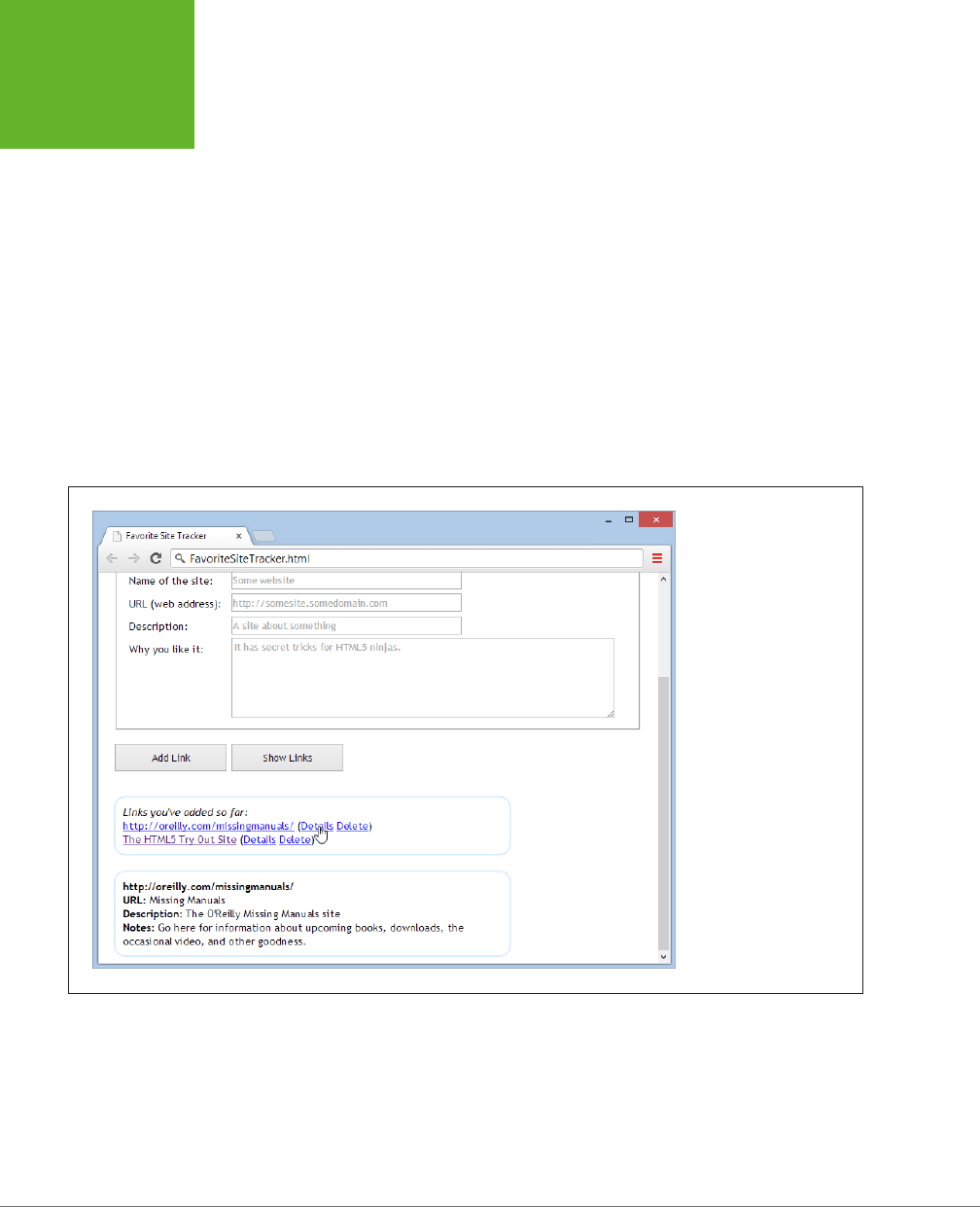
HTML5: THE MISSING MANUAL, SECOND EDITION
352
INDEXEDDB:
A DATABASE
ENGINE IN A
BROWSER
var resultsElement = document.getElementById("linkDetails");
resultsElement.innerHTML = "<b>" + linkRecord.name + "</b><br>" +
"<b>URL:</b> " + linkRecord.url + "<br>" +
"<b>Description:</b> " + linkRecord.description + "<br>" +
"<b>Notes:</b> " + linkRecord.notes;
}
}
The information from the LinkRecord object is used to create a snippet of HTML
markup, which is then inserted into the page in a separate box under the link list.
Figure 10-8 shows the result.
Deleting a Record
By this point, you’re familiar with the four-step sequence that underpins every data
operation. Deleting a record isn’t any dierent. You simply need to use the delete()
method of the object store.
FIGURE 10-8
When you click Details,
the code grabs the cor-
responding record and
shows all its data in the
bottom box.
In the link tracker example, the “Delete” link does the job. When clicked, it removes
the LinkRecord with the matching URL, using this code:
www.it-ebooks.info
CHAPTER 10: STORING YOUR DATA 353
INDEXEDDB:
A DATABASE
ENGINE IN A
BROWSER
function deleteLink(element) {
var url = element.getAttribute("data-url");
var transaction = database.transaction(["Links"], "readwrite");
var objectStore = transaction.objectStore("Links");
var request = objectStore.delete(url);
request.onerror = function(event) {
alert(request.error + " occurred.");
};
request.onsuccess = function (event) {
// The record has been deleted.
// Refresh the display.
showLinks();
}
}
You’ve now seen the key methods that you can use to manipulate data with In-
dexedDB. You’ve learned how to use the object store to add records or update them
(with the put() method) and delete them (with delete). You’ve also learned how to
retrieve individual records by key value (with get) or browse through them all (with
openCursor). But if you want to get deeper into databases, check out Mozilla’s help-
ful documentation for the object store at
http://tinyurl.com/objectstore
, or
explore
the nitty-gritty details of the IndexedDB standard at
www.w3.org/TR/IndexedDB
.
Browser Support for IndexedDB
IndexedDB is a relatively new specification,and requires a relatively recent browser.
Table 10-2 shows the current state of aairs.
TABLE 10-2
Browser support for IndexedDB
IE FIREFOX CHROME SAFARI OPERA
SAFARI
IOS
CHROME
FOR
ANDROID
Minimum
version
10 10 23 - 15 - 29
Sadly, IndexedDB isn’t yet available on desktop or mobile versions of Safari. This
support gap exists because the developers of Safari invested their eort in the
now-abandoned Web SQL Database standard. If you need Safari support, you
can use a polyfill that converts IndexedDB operations to the corresponding Web
SQL commands. (Download it at
http://tinyurl.com/DBpolyfill
.) But if you want
IndexedDB support on a browser that doesn’t support IndexedDB or Web SQL,
such as Internet Explorer version 9 or 8, you’re unfortunately out of luck.
www.it-ebooks.info

355
CHAPTER
11
If you want to view a website, you need to connect to the Internet. Everybody
knows that. So why a chapter about oine applications? The very notion seems
so last century. After all, didn’t web applications overthrow several generations of
oine, desktop applications on their way to conquering the world? And there are
plenty of tasks—from following the latest Kardashian sightings to ordering a new
oce chair—that just wouldn’t be possible without a live, real-time connection. But
remember, even web applications aren’t meant to stay
permanently
online. Instead,
they’re designed to keep working during occasional periods of downtime when a
computer loses its network connection. In other words, a useful oine web applica-
tion can tolerate intermittent network disruptions.
This fact is particularly important for people using smartphones and tablets. To
see the problem, try traveling through a long tunnel while using a web application
on one of these devices. Odds are you’ll get a nasty error page, and you’ll have to
start all over again when you get to the other side. But do the same with an
oine
web application, and you’ll avoid interruption. Some of the features of the web ap-
plication may become temporarily unavailable, but you won’t get booted out. (Of
course, some tunnels are longer than others. An ambitious oine web application can
keep working through a three-hour plane flight—or a three-week trip to the Congo,
if that’s what you’re after. There’s really no limit to how long you can stay oine.)
By using HTML5’s oine application feature, you can start to shift your ordinary
web page into a web-based “mini-app.” And if you combine the oine feature with
plenty of JavaScript code, the data storage features described in Chapter 10, and the
server communication features described in Chapter 12, your mini-app can be nearly
as powerful and self-sucient as the native applications designed for smartphones
Running Oine
www.it-ebooks.info
HTML5: THE MISSING MANUAL, SECOND EDITION
356
CACHING
FILES WITH A
MANIFEST
and tablets. The big advantage is that your HTML5-powered mini-app can run on
any
device, whereas a native app is locked into a specific platform.
In this chapter, you’ll learn how to turn any web page (or group of web pages) into
an oine application. You’ll also learn how to tell when a website is available and
when it’s oine, and react accordingly.
FREQUENTLY ASKED QUESTION
When It Makes Sense to Go Oine
Should I make my web page offline-able?
Offline web applications don’t suit every sort of web page.
For example, there’s really no point in turning a stock quote
page into an offline web application, since the whole point of
its existence is to fetch updated stock data from a web server.
However, the offline feature might suit a more detailed stock
analysis tool that downloads a bunch of data at once and then
lets you choose how to chart it or analyze it. Using a page like
this, you could download some data while you’re online and
then tweak options and fiddle with buttons until you reach the
proverbial other side of the tunnel.
The offline feature also suits web pages that are interactive and
stateful
—ones that have piles of JavaScript code maintaining
lots of information in memory. These pages do more on their
own, so they make sense as offline applications. And the cost
of losing your connection with one of these pages is also
higher, because being kicked out in the middle of a complex
task is seriously annoying. So while there’s no point in making
a simple page of content offline-able, it’s immediately obvious
that a word-processor-in-a-browser tool can benefit from of-
fline support. In fact, an offline application like this might just
be able to stand in for a more fully featured desktop program.
The other consideration is your audience. The offline applica-
tion feature makes great sense if your visitors include people
who don’t have reliable Internet connections or are likely to
need mobile access (for example, if you’re creating a mapping
tool for tablet devices). But if not, adding offline support might
not be worth the trouble.
Caching Files with a Manifest
The basic technique that makes oine applications work is
caching
—the technique
of downloading a file (like a web page) and keeping a copy of it on the web surfer’s
computer. That way, if the computer loses its web connection, the browser can still
use the cached copy of the page. Of course, caching isn’t limited to pages—it works
with style sheets, JavaScript code files, pictures, fonts, and any other resource your
web page needs to have on hand to do its work.
To create an oine application, you need to complete three steps. Here’s the high-
level overview:
1. Create a
manifest
file.
A manifest is a special sort of file that tells browsers which files to store, which
files not to store, and which files to substitute with something else. This package
of cacheable content is called an
oine application
.
www.it-ebooks.info

CHAPTER 11: RUNNING OFFLINE 357
CACHING
FILES WITH A
MANIFEST
2. Modify your web page so it refers to the manifest.
That way, the browser knows to download the manifest file when someone
requests the page.
3. Configure the web server.
Most importantly, the web server needs to serve manifest files with the proper
MIME type. But as you’ll see, there are a few more subtle issues that can also
trip up caching.
You’ll tackle all these tasks in the following sections.
UP TO SPEED
Traditional Caching vs. Oine Applications
Caching is nothing new in the web world. Browsers use caching
regularly to avoid repeatedly downloading the same files. After
all, if you travel through several pages in a website, and each
page uses the same style sheet, why download it more than
once? However, the mechanism that controls this sort of caching
isn’t the same as the one that makes offline applications work.
Traditional caching happens when the web server sends extra
information (called
cache-control headers
) along with some
file that a web browser has requested. The headers tell the
browser if the file should be cached and how long to keep
the cached copy before asking the web server if the file has
changes. Typically, caching is brief for web pages and much
longer for the resources that web pages use, like style sheets,
pictures, and script files.
By comparison, an offline application is controlled by a separate
file (called a manifest), and it doesn’t use any time limit at all.
Instead, it applies the following rule: “If a web page is part of
an offline application, and if the browser has a cached copy of
that application, and if the definition of that application hasn’t
changed, then use the cached copy.” You, the web developer,
can add certain exceptions—for example, telling the browser
not to cache certain files or to substitute one file for another.
But there’s no need to worry about expiration dates and other
potentially messy details.
Creating a Manifest
The manifest is the heart of HTML5’s oine application feature. It’s a text file that
lists the files you want to cache.
The manifest always starts with the words CACHE MANIFEST (in uppercase), like this:
CACHE MANIFEST
After that, you list the files you want to cache. Here’s an example that grabs two
web pages (from the personality test example described on page 289):
CACHE MANIFEST
PersonalityTest.html
PersonalityTest_Score.html
Spaces (like the blank line in the manifest shown above) are optional, so you can
add them wherever you want.
www.it-ebooks.info

HTML5: THE MISSING MANUAL, SECOND EDITION
358
CACHING
FILES WITH A
MANIFEST
NOTE Watch for typos. If you attempt to cache a file that doesn’t exist, the browser will ignore not just that
file, but the entire manifest.
With an oine application, the browser must cache everything your application
needs. That includes web pages and the resources these web pages use (like scripts,
graphics, style sheets, and embedded fonts). Here’s a more complete manifest that
takes these details into account:
CACHE MANIFEST
# pages
PersonalityTest.html
PersonalityTest_Score.html
# styles & scripts
PersonalityTest.css
PersonalityTest.js
# pictures & fonts
Images/emotional_bear.jpg
Fonts/museo_slab_500-webfont.eot
Fonts/museo_slab_500-webfont.woff
Fonts/museo_slab_500-webfont.ttf
Fonts/museo_slab_500-webfont.svg
Here, you’ll notice two new details. First, you’ll see several lines that begin with a
number sign (#). These are
comments
, which you can add to remind yourself what
goes where. Second, you’ll see some files that are in subfolders (for example,
emo-
tional_bear.jpg
in the
Images
folder). As long as these files are on the web server
and accessible to the browser, you can bundle them up as part of your oine ap-
plication package.
Complex web pages will need a lot of supporting files, which can lead to long, com-
plex manifest files. Worst of all, a single mistyped file name will prevent the oine
application feature from working
at all
.
TIP You might decide to leave out some resources that are unimportant or overly large, like ad banners or
huge pictures. That’s quite all right, but if you think their absence might cause some trouble (like error messages,
odd blank spaces, or scrambled layouts), consider using JavaScript to tweak your pages when the user is offline,
by using the connection-checking trick described on page 370.
Once you’ve filled out the contents of your manifest file, you can save it in your
site’s root folder, alongside your web pages. You can use whatever file name you
want, although you should add the file extension
.appcache
(as in
PersonalityTest.
appcache
). Other file extensions may work (for example, in the early days of HTML5
some web developers used
.manifest
), but the latest versions of the HTML5 specifica-
tion recommend
.appcache
. The important thing is that the web server is configured
www.it-ebooks.info
CHAPTER 11: RUNNING OFFLINE 359
CACHING
FILES WITH A
MANIFEST
to recognize the file extension. If you’re running your own web server, you can use
the setup steps described on page 360. If not, you need to talk to your web host-
ing company and ask them what file extensions they use to support manifest files.
TROUBLESHOOTING MOMENT
Don’t Cache Pages That Use the Query String
The query string is the extra bit of information that appears
on the end of some URLs, separated by a question mark. Usu-
ally, you use the query string to pass information from one
web page to another. For example, the original version of the
personality test uses the query string to pass the personality
scores from the
PersonalityTest.html
page to the
Person-
alityTest_Score.html
page. If you fill out the multiple-choice
questions on the first page and click Get Score, the browser
redirects you using a URL like this:
http://prosetech.com/html5/Personali-
tyTest_Score.html?e=-10&a=-5&c=10&n=5&o=20
Here’s the problem. In the eyes of the HTML5 caching system,
a request for the page
PersonalityTest_Score.html
is not the
same as a request for
PersonalityTest_Score.html?e=-10&a=-
5&c=10&n=5&o=20
. The first page is cached, according to the
manifest. But the second URL may as well point to a completely
different page. Unless you add the page name and the com-
plete query string in the manifest, it won’t be cached. And
because there’s no way you want to add a separate manifest
entry for every possible combination of personality scores,
there’s no way to properly cache the query-string-enabled
version of the
PersonalityTest_Score.html
page.
To avoid this problem, don’t use caching and query strings
at the same time. For example, if you want to add caching
to the personality test, use the version that puts personality
scores in local storage. (That’s the version used in the caching
example on page 357.)
Using Your Manifest
Just creating a manifest isn’t enough to get a browser to pay attention. To put your
manifest into eect, you need to refer to it in your web pages. You do that by add-
ing the manifest attribute to the root <html> element and supplying the manifest
file name, like this:
<!DOCTYPE html>
<html lang="en" manifest="PersonalityTest.manifest">
...
You need to take this step for every page that’s part of your oine application. In
the previous example, that means you need to change two files:
PersonalityTest.
html
and
PersonalityTest_Score.html
.
NOTE A website can have as many offline applications as you want, as long as each one has its own manifest.
Putting Your Manifest on a Web Server
Testing manifest files can be a tricky process. Minor problems can cause silent
failures and throw o the entire caching process. Still, at some point you’ll need to
give it a try to make sure your oine application is as self-sucient as you expect.
www.it-ebooks.info

HTML5: THE MISSING MANUAL, SECOND EDITION
360
CACHING
FILES WITH A
MANIFEST
It should come as no surprise that you can’t test oine applications when you’re
launching files from your hard drive. Instead, you need to put your application on
a web server (or use a test web server that runs on your computer, like the IIS web
server that’s built into Windows).
To test an oine application, follow these steps:
1. Make sure the web server is configured to use the MIME type
text/cache-
manifest
when serving manifest files (typically, those are files with the
extension .appcache).
If the web server indicates that the file is any other type, including a plain text
file, the browser will ignore the manifest completely.
NOTE Every type of web server works differently. Depending on your skills, you may need the help of your
web hosting company or your neighborhood webmaster to set MIME types (step 1) and change caching settings
(step 2). Page 152 has more information about MIME types, and shows one example of how you might add a new
MIME type through a web hosting account.
2. Consider turning o traditional caching (page 357) for manifest files.
Here’s the problem. Web servers may tell web browsers to cache manifest files
for a short period of time, just as they tell them to cache other types of files. This
behavior is reasonable enough, but it can cause king-sized testing headaches.
That’s because when you update the manifest file, some browsers will ignore
it and carry on with the old, cached manifest file, and so they’ll keep using the
old, cached copies of your web pages. (Firefox has a particularly nasty habit
of sticking with out-of-date manifest files.) To avoid this problem, you should
configure the web server to tell browsers not to cache manifest files, ever.
Once again, every web server software has its own configuration system, but the
basic idea is to tell your server to send a no-cache header whenever someone
requests an .appcache file.
3. Request the page in a web browser that supports oine applications. Vir-
tually every browser does, except old versions of Internet Explorer—you
need IE 10 or better.
When a web browser discovers a web page that uses a manifest, it may ask
for your permission before downloading the files. Mobile devices probably will,
because they have limited space requirements. Desktop browsers may or may
not—for example, Firefox does (see Figure 11-1), but Chrome, Internet Explorer,
and Safari don’t.
If you give your browser permission (or if your browser doesn’t ask for it), the
caching process begins. The browser downloads the manifest and then down-
loads each of the files it references. This downloading process takes place in
the background and doesn’t freeze up the page. It’s just the same as when a
browser downloads a large image or video, while displaying the rest of the page.
www.it-ebooks.info
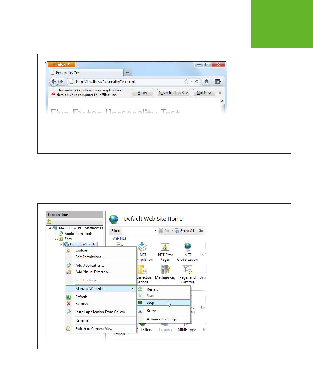
CHAPTER 11: RUNNING OFFLINE 361
CACHING
FILES WITH A
MANIFEST
FIGURE 11-1
Firefox shows this message
when it loads a web page
that uses a manifest. Click
Allow to grant permission
to download and cache all
the files that are listed in
the manifest. On subsequent
visits, when Firefox detects
a changed manifest, it will
download the new files
without asking for permis-
sion again.
4. Go oine.
If you’re testing on a remote server, just disconnect your network connection.
If you’re testing on a local web server (one that’s running on your computer),
shut your website down (Figure 11-2).
FIGURE 11-2
The exact way you shut down your test
website depends on the type of web
server software you’re using. In the
Windows-based IIS software (shown
here), a simple right-click gets you
started.
www.it-ebooks.info

HTML5: THE MISSING MANUAL, SECOND EDITION
362
CACHING
FILES WITH A
MANIFEST
5. Browse to one of the pages in your oine application, and refresh it.
Ordinarily, when you click the Refresh or Reload button, your browser always
tries to make contact with the web server. If you’re requesting an ordinary page
and you’ve lost your Internet connection, this request will fail. But if you’re re-
questing a page from an oine application, the browser seamlessly substitutes
the cached copy, without even informing you of the switch. You can even click
links to jump from one page to another, but if you navigate to a page that’s
not part of the oine application, you’ll get the familiar “no response” error.
TROUBLESHOOTING MOMENT
My Oine Application Doesn’t Work Oine
The offline application feature is fragile and a bit quirky. A mi-
nor mistake can throw it all off. If you follow the steps described
above, but you get a “no response” error when you attempt to
access your offline pages, check for these common problems:
• Problems downloading the manifest. If the manifest isn’t
there, or isn’t accessible to the browser, you’ll have an
obvious problem. But equally important is serving the
manifest with the right MIME type (page 152).
• Problems downloading the files that are listed in the
manifest. For example, imagine that your manifest
includes a picture that no longer exists. Or it asks for a
web font file, and that font file uses a file type that your
web server doesn’t allow. Either way, if the browser fails
to download even a single file, it will give up completely
(and throw away any cached information it already has).
To avoid this problem, start simple, with a manifest that
lists just a single web page and no resources. Or, in more
complex examples, look at the web server logs to find
out exactly what resources the browser has requested
(which may tell you the point at which it met an error
and gave up).
• An old manifest is still cached. Browsers can cache the
manifest file (according to the traditional caching rules of
the Web) and ignore the fact that you’ve changed it. One of
the signs that you’ve stumbled into this problem is when
some pages are cached but other, more recently added
pages are not. To solve this problem, consider manually
clearing the browser cache (see the box on page 364).
Updating the Manifest File
Getting an application to work oine is the first challenge. The next is updating it
with new content.
For example, consider the previous example (page 358), which caches two web
pages. If you update
PersonalityTest.html
, fire up your browser, and reload the
page, you’ll still see the original, cached version of the page—regardless of whether
your computer is currently online. The problem is that once a browser has a cached
copy of an application, it uses that. The browser ignores the online versions of the
associated web pages and doesn’t bother to check whether they’ve changed. And
because oine applications never expire, it doesn’t matter how long you wait: Even
months later, the browser will stubbornly ignore changed pages.
However, the browser
will
check for a new manifest file. So you can save a new copy
of that, put it on the web server, and you’ve solved the problem, right?
www.it-ebooks.info

CHAPTER 11: RUNNING OFFLINE 363
CACHING
FILES WITH A
MANIFEST
Not necessarily. To trigger an update for a cached web application, you need to
meet three criteria:
• The manifest file can’t be cached in the browser. If the browser has a locally
cached copy of the manifest file, it won’t bother to check the web server at
all. Browsers dier on how they handle manifest file caching, with some (like
Chrome) always checking with the web server for new manifests. But Firefox
follows the traditional rules of HTTP caching and holds onto its cached copy
for some time. So if you want to save yourself development headaches, make
sure your web server explicitly tells clients that they shouldn’t cache manifests
(page 360).
• The manifest file needs a new date. When a browser checks the server, the
first thing it does is ask whether the last-updated timestamp has changed. If it
hasn’t, the web browser doesn’t bother to download the manifest file.
• The manifest file needs new content. If a browser downloads a newly updated
manifest file but discovers that the content hasn’t changed, it stops the update
process and keeps using the previously cached copy. This potentially frustrating
step actually serves a valuable purpose. Re-downloading a cached application
takes time and uses up network bandwidth, so browsers don’t want to do it if
it’s really not necessary.
If you’ve been following along carefully, you’ll notice a potential problem here. What
if there’s no reason to change the manifest file (because you haven’t added any
files), but you do need to force browsers to update their application cache (because
some of the existing files have changed)? In this situation, you need to make a trivial
change to the manifest file, so it appears to be new when it isn’t. The best way to
do so is with a comment, like this:
CACHE MANIFEST
# version 1.00.001
# pages
PersonalityTest.html
PersonalityTest_Score.html
# styles & scripts
PersonalityTest.css
PersonalityTest.js
# pictures & fonts
Images/emotional_bear.jpg
Fonts/museo_slab_500-webfont.eot
Fonts/museo_slab_500-webfont.woff
Fonts/museo_slab_500-webfont.ttf
Fonts/museo_slab_500-webfont.svg
www.it-ebooks.info

HTML5: THE MISSING MANUAL, SECOND EDITION
364
CACHING
FILES WITH A
MANIFEST
The next time you need browsers to update their caches, simply change the version
number in this example to 1.00.002, and so on. Presto—you now have a way to force
updates and keep track of how many updates you’ve uploaded.
Updates aren’t instantaneous. When the browser discovers a new manifest file, it
quietly downloads all the files and uses them to replace the old cache content. The
next time the user visits the page (or refreshes the page), the new content will ap-
pear. If you want to switch over to the newly downloaded application right away,
you can use the JavaScript technique described on page 372.
NOTE There is no incremental way to update an offline application. When the application has changed, the
browser tosses out the old and downloads every file again, even if some files haven’t changed.
GEM IN THE ROUGH
Clearing the Browser’s Cache
When testing an offline application, it’s often helpful to manu-
ally clear the cache. That way, you can test new updates without
changing the manifest.
Every browser has a way to clear the cache, but every browser
tucks it away somewhere different. The most useful browsers
keep track of how much space each offline application uses
(see Figure 11-3). This information lets you determine when
caching has failed—for example, the application’s website
isn’t listed or the cached size isn’t as big as it should be. It
also lets you remove the cached files for a single site without
disturbing the others.
Browser Support for Oine Applications
By now, you’ve probably realized that all major browsers support oine applica-
tions, aside from the notable HTML5 laggard, Internet Explorer. Support stretches
back several versions, which all but ensures that Firefox, Chrome, and Safari users
will be able to run your applications oine. But Internet Explorer didn’t get around
to adding support until version IE 10, which means there’s no caching in the still-
popular IE 9 and IE 8.
However, the way that dierent browsers support oine applications isn’t com-
pletely consistent. The most important dierence is the amount of space they allow
oine applications to fill. This variation is significant, because it sets the dierence
between websites that will be cached for oine access and ones that won’t (see
the box on page 366).
There’s no worthwhile way to get oine application support on browsers that don’t
include it as a feature (like IE 9). However, this shouldn’t stop you from using the
oine application feature. After all, oine applications are really just a giant frill.
Web browsers that don’t support them will still work: They just require a live web
connection. And people that need oine support—for example, frequent travelers—
will discover the value of having a non-IE browser on hand for their disconnected
times of need.
www.it-ebooks.info
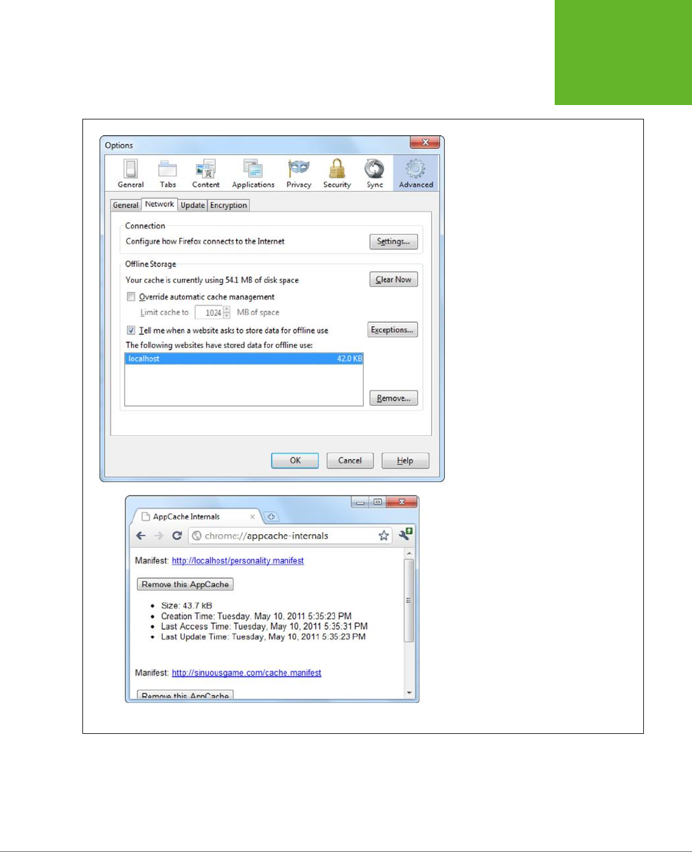
CHAPTER 11: RUNNING OFFLINE 365
CACHING
FILES WITH A
MANIFEST
FIGURE 11-3
Top: In the Firefox menu, click Options,
choose the Advanced icon, and then
choose the Network tab to end up here.
You can review the space usage of every
website, or clear the cached resources
of any one, by selecting it and clicking
Remove. In this example, there’s just one
cached website, on the domain localhost
(which represents a test server on the
current computer).
Bottom: To get a similar display in Chrome,
type
chrome://appcache-internals
into the
address bar.
www.it-ebooks.info

HTML5: THE MISSING MANUAL, SECOND EDITION
366
PRACTICAL
CACHING
TECHNIQUES
FREQUENTLY ASKED QUESTION
How Much Can You Cache?
Are there limits on how much information can be cached?
Different browsers impose wildly different size restrictions on
offline applications.
Mobile browsers are the most obvious example. Because
they run on space-limited devices, they tend to be stingy
with their caching. Desktop browsers are more generous, but
they’re equally unpredictable. Browsers may assign a fixed
space limit to each website domain, or they may calculate a
suitable allotment based on the current amount of free space
on your computer, along with other factors. Often, space is
shared between several HTML5 features—for example, if you’re
using the File API or IndexedDB feature (see Chapter 10), your
browser may use a single pool of space with these features
and the application cache.
Unfortunately, the lack of consistency among browsers is a
problem. If you create an offline application that attempts to
stuff the cache beyond its limit, the browser quietly gives up
and throws away all the downloaded data. Not only will you
waste time and bytes, but your website users won’t get any
offline benefits. They’ll be forced to use your application online.
The best rule of thumb is to assume you’ll be limited to 50
MB on Apple devices (like the iPad and iPhone) and closer to 85 MB
on Android devices. All mobile browsers will ask the user for
permission before allowing a website to use the cache. On
desktop browsers, you’ll probably get a starting allotment of
250 or 350 MB. If your cache swells, some desktop browsers
will offer to ratchet up the available space beyond the starting
allotment, but there’s no guarantee.
Practical Caching Techniques
So far, you’ve seen how to package up a group of pages and resources as an oine
application. Along the way, you learned to write a manifest file, update it, and make
sure browsers don’t ignore your hard work. This knowledge is enough to put simple
applications oine. However, more complex websites sometimes need more. For
example, you may want to keep some content online, substitute dierent pages when
oine, or determine (in code) whether the computer has a live Internet connection.
In the following sections, you’ll learn how to accomplish all these tasks with smarter
manifest files and a dash of JavaScript.
Accessing Uncached Files
Earlier, you learned that once a page is cached, the web browser uses that cached
copy and doesn’t bother talking to any web servers. But what you may not realize
is that the browser’s reluctance to go online applies to
all
the resources an oine
web page uses, whether they’re cached or not.
For example, imagine you have a page that uses two pictures, using this markup:
<img src="Images/logo.png" alt="Personality quiz">
<img src="Images/emotional_bear.jpg" alt="Sad stuffed bear">
www.it-ebooks.info

CHAPTER 11: RUNNING OFFLINE 367
PRACTICAL
CACHING
TECHNIQUES
However, the manifest caches just one of the pictures:
CACHE MANIFEST
PersonalityTest.html
PersonalityTest_Score.html
PersonalityTest.css
PersonalityTest.js
Images/emotional_bear.jpg
You might assume that a browser will grab the
emotional_bear.png
picture from
its cache, while requesting
logo.png
from the web server (as long as the computer
is online). After all, that’s the way it works in your browser when you step from
a cached web page to an uncached page. But here, the reality is dierent. The
browser grabs
emotional_bear.jpg
from the cache but ignores the uncached
logo.
png
graphic, displaying a broken-image icon or just a blank space on the page,
depending on the browser.
To solve this problem, you need to add a new section to your manifest. You title this
section with a NETWORK: title, followed by a list of the pages that live online:
CACHE MANIFEST
PersonalityTest.html
PersonalityTest_Score.html
PersonalityTest.css
PersonalityTest.js
Images/emotional_bear.jpg
NETWORK:
Images/logo.png
Now the browser will attempt to get the
logo.png
file from the web server when the
computer is online, but not do anything when it’s oine.
At this point, you’re probably wondering why you would bother to explicitly list files
you don’t want to cache. It could be for space considerations—for example, maybe
you’re leaving out large files to make sure your application can be cached on brows-
ers that allow only small amounts of cache space (page 366).
But a more likely situation is that you have content that should be available when
requested but never cached—for example, tracking scripts or dynamically gener-
ated ads. In this case, the easiest solution is to add an asterisk (*) in your network
section. That’s a wildcard character that tells the browser to go online to get every
resource you haven’t explicitly cached:
NETWORK:
*
www.it-ebooks.info
HTML5: THE MISSING MANUAL, SECOND EDITION
368
PRACTICAL
CACHING
TECHNIQUES
You can also use the asterisk to target files of a specific type (for example, *.jpg
refers to all JPEG images) or all the files on a specific server (for example, http://
www.google-analytics.com/* refers to all the resources on the Google Analytics
web domain).
NOTE It may occur to you that you could simplify your manifest by using the asterisk wildcard in the list of
cached files. That way, you could cache bunches of files at once, rather than list each one individually. Unfortu-
nately, the asterisk isn’t supported for picking cached files, because the creators of HTML5 were concerned that
careless web developers might try to cache entire mammoth websites.
Adding Fallbacks
Using a manifest, you tell the browser which files to cache and, using the network
section, which files to always get from the Web and
never
cache. Manifests also
support one more trick: a fallback section that lets you swap one file for another,
depending on whether the computer is online or oine.
To create a fallback section, start with the FALLBACK: title, which you can place any-
where in your manifest. Then, list files in pairs on a single line. The first file name is
the file to use when online; the second file name is the oine fallback:
FALLBACK:
PersonalityScore.html PersonalityScore_offline.html
The web browser will download the fallback file (in this case, that’s
Personali-
tyScore_oine.html
) and add it to the cache. However, the browser won’t use the
fallback file unless the computer is oine. While it’s online, the browser will request
the other file (in this case,
PersonalityScore.html
) directly from the web server.
NOTE Remember, you don’t have to be disconnected from the Web to be “offline” with respect to a web
application. The important detail is whether the web domain is accessible—if it doesn’t respond, for any reason,
that web application is considered to be offline.
There are plenty of reasons to use a fallback. For example, you might want to sub-
stitute a simpler page when oine, a page that doesn’t use the same scripts, or
smaller resources. You can put the fallback section wherever you want, so long as
it’s preceded by the section title:
CACHE MANIFEST
PersonalityTest.html
PersonalityTest_Score.html
PersonalityTest.css
www.it-ebooks.info
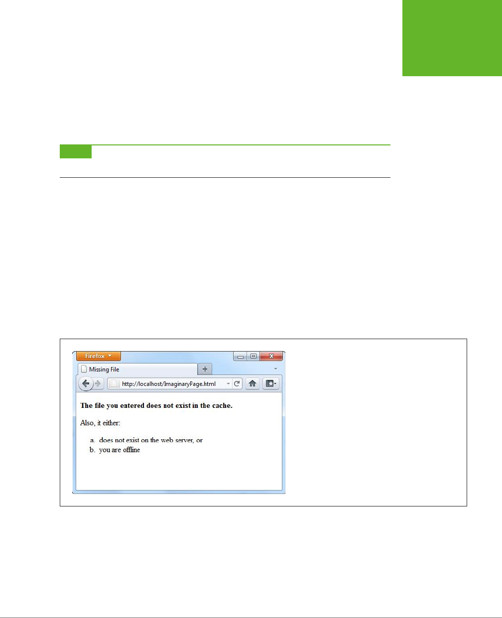
CHAPTER 11: RUNNING OFFLINE 369
PRACTICAL
CACHING
TECHNIQUES
FALLBACK:
PersonalityScore.html PersonalityScore_offline.html
Images/emotional_bear.jpg Images/emotional_bear_small.jpg
PersonalityTest.js PersonalityTest_offline.js
NETWORK:
*
NOTE Incidentally, the files that you want to cache are part of the
CACHE:
section in the manifest. You can
add the section title if you want, but you don’t need it unless you want to list files after one of the other sections.
The fallback section also supports wildcard matching. This feature lets you create
a built-in error page, like this:
FALLBACK:
/ offline.html
This line tells the browser to use the fallback for
any
file that isn’t in the cache.
Now imagine someone attempts to request a page that’s in the same website as the
oine application, but isn’t in the cache. If the computer is online, the web browser
tries to contact the web server and get the real page. But if the computer is oine,
or if the website is unreachable, or if the requested page quite simply doesn’t exist,
the web browser shows the cached
oine.html
page instead (Figure 11-4).
FIGURE 11-4
Here the page
ImaginaryPage.html
doesn’t exist. Interest-
ingly, the browser doesn’t update the address bar, so the
visitor has no way of knowing the exact name of the error
page.
The previous example used the somewhat arbitrary convention of using a single
forward slash character (/) to represent any page. That might strike you as a bit
odd, considering that the network section uses the asterisk wildcard character for
much the same purpose. (And some browsers, like Firefox, do allow you to substitute
an asterisk for the slash.) You’re simply looking at one more harmless HTML5 quirk.
www.it-ebooks.info
HTML5: THE MISSING MANUAL, SECOND EDITION
370
PRACTICAL
CACHING
TECHNIQUES
Incidentally, you can write more targeted fallbacks that still use the slash to match
all the files in a specific subfolder, like this:
FALLBACK:
/paint_app/ offline.html
GEM IN THE ROUGH
How to Bypass the Cache When You’re Online
When you load up a cached page, the browser expects to find
everything in the cache. It doesn’t matter whether you’re online
or offline. The browser prefers the cache and expects to use it
for everything, aside from the files you’ve explicitly identified
in the
NETWORK:
section.
This behavior is straightforward, but it’s also frustratingly
inflexible. The chief problem happens in situations where you
would
prefer
to use the online version of a page, but you still
want to have the cached copy ready if you can’t connect to
the network. For example, think of the front page of a news
site. If you’re online, it makes sense to grab the latest copy of
the front page every time you visit it. But if you’re offline, the
most recently cached page would still be helpful. The standard
caching system doesn’t allow for this scenario, because it forces
you to choose between caching
always
and caching
never
.
In the eleventh hour of the HTML5 standardization process,
a new idea slipped in that offers the solution. The trick is to
add a new section, called
SETTINGS:
, with the following
information:
SETTINGS:
prefer-online
This tells the browser to try and get resources from the network
if possible, but to use the cached version if that request fails.
Although this quick fix seems ideal, it raises several problems
of its own. It’s an all-or-nothing setting that applies to
every
page and resource (not just the files you choose). It guarantees
that the cache won’t be as fast in offline mode, because the
browser will waste at least some time trying to contact the
web server. But the biggest drawback is that, at the time of this
writing, only Firefox respects the
prefer-online
setting.
Other browsers simply ignore it and carry on using the cache
in the normal way.
Checking the Connection
The fallback section is the secret to a handy JavaScript trick that lets you determine
whether the browser is currently online. If you’re an old-hand JavaScript developer,
you probably know about the navigator.onLine property, which provides a slightly
unreliable way to check whether the browser is currently online. The problem is that
the onLine property really reflects the state of the browser’s “work oine” setting,
not the actual presence of an Internet connection. And even if the onLine property
were a more reliable indicator of connectivity, it still wouldn’t tell you whether the
browser failed to contact the web server or whether it failed to download the web
page for some other reason.
The solution is to use a fallback that loads dierent versions of the same JavaScript
function, depending on whether the application is online or oine. Here’s how you
write the fallback section:
FALLBACK:
online.js offline.js
www.it-ebooks.info

CHAPTER 11: RUNNING OFFLINE 371
PRACTICAL
CACHING
TECHNIQUES
The original version of the web page refers to the
online.js
JavaScript file:
<!DOCTYPE html>
<html lang="en" manifest="personality.manifest">
<head>
<meta charset="utf-8">
<title>...</title>
<script src="online.js"></script>
...
It contains this very simple function:
function isSiteOnline() {
return true;
}
But if the
online.js
file can’t be accessed, the browser substitutes the
oine.js
file,
which contains a method with the same name but a dierent result:
function isSiteOnline() {
return false;
}
In your original page, whenever you need to know the status of your application,
check with the isSiteOnline() function:
var displayStatus = document.getElementById("displayStatus");
if (isSiteOnline()) {
// (It's safe to run tasks that require network connectivity, like
// contacting the web server through XMLHttpRequest.)
displayStatus.innerHTML = "You are connected and the web server is online.";
}
else {
// (The application is running offline. You may want to hide or
// programmatically change some content, or disable certain features.)
displayStatus.innerHTML = "You are running this application offline.";
}
Pointing Out Updates with JavaScript
You can interact with the oine application feature using a relatively limited JavaScript
interface. It all revolves around an object called applicationCache.
The applicationCache object provides a status property that indicates whether
the browser is checking for an updated manifest, downloading new files, or doing
something else. This property changes frequently and is nearly as useful as the
complementary events (listed in Table 11-2), which fire as the applicationCache
switches from one status to another.
www.it-ebooks.info
HTML5: THE MISSING MANUAL, SECOND EDITION
372
PRACTICAL
CACHING
TECHNIQUES
TABLE 11-1
Caching events
EVENT DESCRIPTION
onChecking When the browser spots the manifest attribute in a web page, it fires this
event and checks the web server for the corresponding manifest file.
onNoUpdate If the browser has already downloaded the manifest, and the manifest
hasn’t changed, it fires this event and doesn’t do anything further.
onDownloading Before the browser begins downloading a manifest (and the pages it
references), it fires this event. This occurs the first time it downloads the
manifest files and during updates.
onProgress During a download, the browser fires this event to periodically report its
progress.
onCached Signals the end of a first-time download for a new offline application. No
further events occur after that happens.
onUpdateReady Signals the end of a download that retrieved updated content. At this
point, the new content is ready to use, but it won’t appear in the browser
window until the page is reloaded. No further events occur after that
happens.
onError Something went wrong somewhere along the process. The web server
might not be reachable (in which case the page will have switched
into offline mode), the manifest might have invalid syntax, or a cached
resource might not be available. If this event occurs, no more follow.
onObsolete While checking for an update, the browser discovered that the manifest
no longer exists. It then clears the cache. The next time the page is loaded,
the browser will get the live, latest version from the web server.
Figure 11-5 shows how these events unfold when you request a cached page.
The most useful event is onUpdateReady, which signals that a new version of the ap-
plication has been downloaded. Even though the new version is ready for use, the
old version of the page has already been loaded into the browser. You may want to
inform the visitor of the change, in much the same way that a desktop application
does when it downloads a new update:
<script>
window.onload = function() {
// Attach the function that handles the onUpdateReady event.
applicationCache.onupdateready = function() {
var displayStatus = document.getElementById("displayStatus");
displayStatus.innerHTML = "There is a new version of this application. " +
"To load it, refresh the page.";
}
}
</script>
www.it-ebooks.info
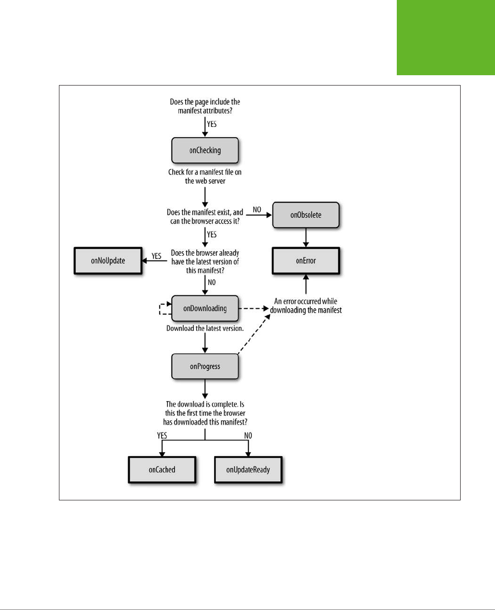
CHAPTER 11: RUNNING OFFLINE 373
PRACTICAL
CACHING
TECHNIQUES
FIGURE 11-5
If you’re a micromanager at
heart, you can take control of the
caching process. But first you need
to understand how the caching
event unfolds, as depicted in this
diagram. The process stops when
the browser reaches one of the
square boxes (with a bold border)
shown here.
Or, you can oer to reload the page
for
the visitor using the window.location.
reload() method:
<script>
window.onload = function() {
applicationCache.onupdateready = function() {
www.it-ebooks.info
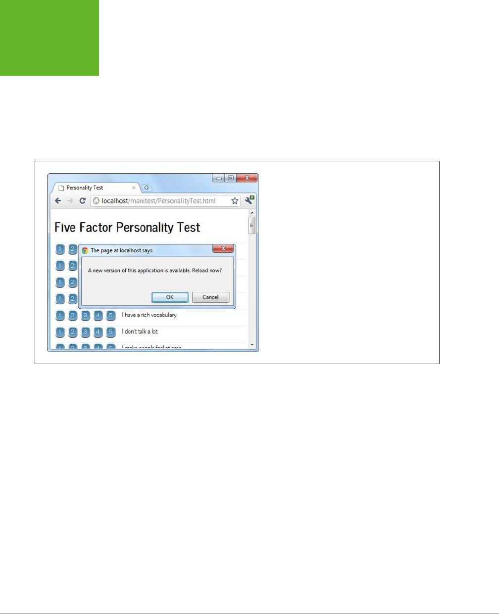
HTML5: THE MISSING MANUAL, SECOND EDITION
374
PRACTICAL
CACHING
TECHNIQUES
if (confirm(
"A new version of this application is available. Reload now?")) {
window.location.reload();
}
}
}
</script>
Figure 11-6 shows this code at work.
FIGURE 11-6
Here, the application offers to reload itself with the newly
downloaded content, if the visitor clicks OK. (Otherwise, the
new content will appear the next time the page is loaded
or refreshed.)
The applicationCache also provides two methods for more specialized scenarios.
First is the confusingly named update() method, which simply checks for a new
manifest. If one exists, it starts the download process in the background. Otherwise,
it does nothing more.
Although browsers check for updates automatically, you can call update() if you
think the manifest has changed since the user first loaded the page. This method
might be important in a very long-lived web application—for example, one that users
leave open on the same page, all day.
The second method is swapCache(), which tells the browser to start using the newly
cached content, if it has just downloaded an update. However, swapCache() doesn’t
change the page that’s currently on display—for that, you need a reload. So what
good is swapCache()? Well, by changing over to the new cache, anything that you
load from that point on—say, a dynamically loaded image—comes from the new
cache, not the old one. If managed carefully, swapCache() could give your page
a way to get access to new content without forcing a complete page reload (and
potentially resetting the current application to its initial state). But in most applica-
tions, swapCache() is more trouble than it’s worth, and it can cause subtle bugs by
mixing old and new bits of the cache.
www.it-ebooks.info

375
CHAPTER
12
When you started your journey with HTML5, you began with its markup-
based features, like semantic elements, web forms, and video. But as you
progressed through this book, you slowly shifted your focus to web page
programming
and the JavaScript-powered parts of HTML5. Now you’re about to
dip your toe into a few HTML5 features that take web page programming to the next
level. They not only require JavaScript code but also some
server-side code
—code
that runs on the web server, in whatever server-side programming language you
want to use.
Adding a server-side language to the mix poses a bit of a problem. On one hand, it
doesn’t matter what server-side programming language you pick, as long as it can
work with pure HTML5 pages (and they all can). On the other hand, there’s not much
point in getting knee-deep learning a technology that you don’t plan to use or that
your web host doesn’t support. And there’s no shortage of good choices for server-
side programming, including PHP, ASP.NET, Ruby, Java, Python, and many more.
This chapter tackles the problem by using a small amount of very simple server-side
code. It’s just enough to round out each example and to let you test the HTML5 part
of the equation (that’s the JavaScript code in the web page). In your websites, you’ll
need to change and extend this server-side code, depending on what you’re trying
to accomplish and which server-side language you prefer.
So what are these features that require server-side interaction? HTML5 provides two
new ways for your web pages to talk with a web server. The first feature is
server-
sent events
, which lets the web server call up your page and pass it information
at periodic intervals. The second feature is the much more ambitious
web sockets
framework, which lets browsers and web servers carry out a freewheeling back-and-
Communicating with
the Web Server
www.it-ebooks.info
HTML5: THE MISSING MANUAL, SECOND EDITION
376
SENDING
MESSAGES
TO THE WEB
SERVER
forth conversation. But before you explore either of these, you’ll start with a review
of the current-day tool for web server communication: the XMLHttpRequest object.
NOTE Server-sent events and web sockets seem deceptively simple. It’s easy enough to learn how they
work and to create a very basic example (as in this chapter). But building on that to create something that will
work securely and reliably on a professional website, and provide the sort of features you want, is an entirely
different matter. The bottom line is this: To implement these features in your website, you’ll probably need to
get the help of someone with serious server-side programming experience.
Sending Messages to the Web Server
Before you can understand the new server communication features in HTML5, you
need to understand the situation that web pages were in before. That means explor-
ing XMLHttpRequest—the indispensable JavaScript object that lets a web page talk
to its web server. If you already know about XMLHttpRequest (and are using it in your
own pages), feel free to skip over this section. But if your web page design career
so far consists of more traditional web pages, keep reading to get the essentials.
UP TO SPEED
The History of Web Server Involvement
In the early days of the Web, communicating with a web server
was a straightforward and unexciting affair. A browser would
simply ask for a web page, and the web server would send it
back. That was that.
A little bit later, software companies began to get clever. They
devised web server tools that could get in between the first
step (requesting the page) and the second step (sending the
page), by running some sort of code on the web server. The
idea was to change the page dynamically—for example, by
inserting a block of markup in the middle of it. Sometimes code
would even create a new page from scratch—for example, by
reading a record in a database and generating a tailor-made
HTML page with product details.
And then web developers got even more ambitious, and
wanted to build pages that were more interactive. The
server-side programming tools could handle this, with a bit
of juggling, as long as the web browser was willing to refresh
the page. For example, if you wanted to add a product to your
ecommerce shopping cart, you would click a button that would
submit the current page (using web forms; see Chapter 4) and
ask for a new one. The web server could then send back the
same page or a different page (for example, one that shows
the contents of the shopping cart). This strategy was wildly
successful, and just a bit clunky.
Then web developers got ambitious again. They wanted a way
to build slick web applications (like email programs) without
constantly posting back the page and regenerating everything
from scratch. The solution was a set of techniques that are
sometimes called Ajax, but almost always revolve around
a special JavaScript object called
XMLHttpRequest
. This
object lets web pages contact the web server, send some data,
and get a response, without posting or refreshing anything.
That clears the way for JavaScript to handle every aspect of
the page experience, including updating content. It also makes
web pages seem slicker and more responsive.
www.it-ebooks.info

CHAPTER 12: COMMUNICATING WITH THE WEB SERVER 377
SENDING
MESSAGES
TO THE WEB
SERVER
The XMLHttpRequest Object
The chief tool that lets a web page speak to a web server is the XMLHttpRequest
object. The XMLHttpRequest object was originally created by Microsoft to improve
the web version of its Outlook email program, but it steadily spread to every modern
browser. Today, it’s a fundamental part of most modern web applications.
The basic idea behind XMLHttpRequest is that it lets your JavaScript code make a
web request on its own, whenever you need some more data. This web request
takes place
asynchronously
, which means the web page stays responsive even while
the request is under way. In fact, the visitor never knows that there’s a web request
taking place behind the scenes (unless you add a message or some sort of progress
indicator to your page).
The XMLHttpRequest object is the perfect tool when you need to get some sort of
data from the web server. Here are some examples:
• Data that’s stored on the web server. This information might be in a file or,
more commonly, a database. For example, you might want a product or cus-
tomer record.
• Data that only the web server can calculate. For example, you might have a
piece of server-side code that performs a complex calculation. You could try
to perform the same calculation in JavaScript, but that might not be appropri-
ate—for example, JavaScript might not have the mathematical smarts you need,
or it might not have access to some of the data the calculation involves. Or your
code might be super-sensitive, meaning you need to hide it from prying eyes or
potential tamperers. Or the calculation might be so intensive that it’s unlikely a
desktop computer could calculate it as quickly as a high-powered web server.
In all these cases, it makes sense to do the calculation on the web server.
• Data that’s on someone else’s web server. Your web page can’t access some-
one else’s web server directly. However, you can call a program on your web
server (using XMLHttpRequest), and that program can then call the other web
server, get the data, and return it to you.
The best way to really understand XMLHttpRequest is to start playing with it. In the
following sections, you’ll see two straightforward examples.
Asking the Web Server a Question
Figure 12-1 shows a web page that asks the web server to perform a straightforward
mathematical calculation. The message is sent through the XMLHttpRequest object.
Before you can create this page, you need some sort of server-side script that will run,
process the information you send it (in this case, that’s the two typed-in numbers),
and then send back a result. This trick is possible in every server-side programming
language ever created (after all, sending back a single scrap of text is easier than
sending a complete HTML document). This example uses a PHP script, largely be-
cause PHP is relatively simple and supported by almost all web hosting companies.
www.it-ebooks.info
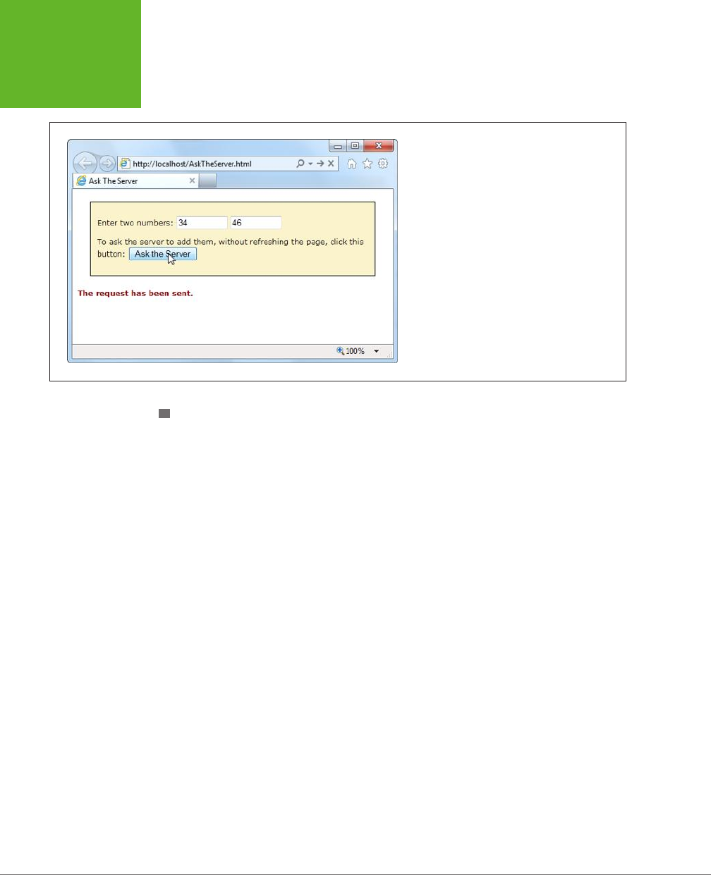
HTML5: THE MISSING MANUAL, SECOND EDITION
378
SENDING
MESSAGES
TO THE WEB
SERVER
FIGURE 12-1
Click the “Ask the Server” button, and this web
page creates an
XMLHttpRequest
object and
sends the two numbers to the web server. The web
server runs a simple script to calculate the answer
and then returns the result (shown later, in Figure
12-2).
CREATING THE SCRIPT
To create a PHP script, you first create a new text file. Inside that text file, you start
by adding the funny-looking codes shown here, which delineate the beginning and
end of your script:
<?php
// (Code goes here.)
?>
In this example the code is straightforward. Here’s the complete script:
<?php
$num1 = $_GET['number1'];
$num2 = $_GET['number2'];
$sum = $num1 + $num2
echo($sum);
?>
Even if you aren’t a PHP expert, you probably have a pretty good idea of what this
code does just by looking over it. The first order of business is to retrieve the two
numbers that the web page will have sent:
$num1 = $_GET['number1'];
$num2 = $_GET['number2'];
The $ symbol indicates a variable, so this code creates a variable named $num1 and
another named $num2. To set the variables, the code pulls a piece of information out
of a built-in collection named $_GET. The $_GET collection holds all the information
from the URL that was used to request the script.
www.it-ebooks.info
CHAPTER 12: COMMUNICATING WITH THE WEB SERVER 379
SENDING
MESSAGES
TO THE WEB
SERVER
For example, if you place the PHP script in a file named
WebCalculator.php
, a web
request might look like this:
http://www.magicXMLHttpRequest.com/WebCalculator.php?number1=34&number2=46
Here, the URL holds two pieces of information tacked onto the end, in the URL sec-
tion known as the
query string
. (The code is easier to interpret with a bit of extra
spacing for illustrative purposes, as shown here. In real life, browsers don’t let you
use URLs with spaces.)
http://www.magicXMLHttpRequest.com/WebCalculator.php ? number1=34 & number2=46
First, the query string has a value named number1, which is set to 34. Next is a value
named number2, which is set to 46. The question mark (?) denotes the start of the
query string, and the ampersand symbol (&) separates each value from the one
that precedes it (unless you have just a single value in your query string, in which
case you don’t need it). When the PHP engine fires up, it retrieves the query string
values and stus them into the $_GET collection so your code can access them.
(Most server-side programming platforms support a model like this. For example,
in Microsoft’s ASP.NET framework, you can access the same information through
the Request.QueryString collection.)
NOTE HTML veterans know that there are two ways to send data to a web server—through the query string,
or by posting it in the body of the request message. With either technique, the data is encoded in the same way,
and it’s accessed in the web server in a similar way as well. For example, PHP has a
$_POST
collection that
provides access to any posted data.
Once the PHP script has the two numbers in hand, it simply needs to add them to-
gether and store the result in a new variable. Here, that new variable is named $sum:
$sum = $num1 + $num2
The last step is to send the result back to the web page that’s making the request. You
could package the result in a scrap of HTML markup or even some data-friendly XML.
But that’s overkill in this example, since plain text does just fine. But no matter what
you choose, sending the data back is simply a matter of using PHP’s echo command:
echo($sum);
Altogether, this script contains a mere four lines of PHP code. However, it’s enough
to establish the basic pattern: The web page asks a question, and the web server
returns a result.
NOTE Could you write this page entirely in JavaScript, so that it performs its work in the browser, with no
web server request? Of course. But the actual calculation isn’t important. The PHP script shown here is an example
that stands in for
any
server task you want to perform. You could make the PHP script as complex as you like, but
the basic exchange of data will stay the same.
www.it-ebooks.info

HTML5: THE MISSING MANUAL, SECOND EDITION
380
SENDING
MESSAGES
TO THE WEB
SERVER
CALLING THE WEB SERVER
The second step is to build the page that uses the PHP script, with the help of XML-
HttpRequest. It all starts out simply enough. At the beginning of the script code, an
XMLHttpRequest object is created, so it will be available in all your functions:
var req = new XMLHttpRequest();
When the user clicks the “Ask the Server” button, it calls a function named ask-
Server():
<div>
<p>Enter two numbers:
<input id="number1" type="number">
<input id="number2" type="number">
</p>
<p>To ask the server to add them, without refreshing the page, click
this button:<button onclick="askServer()">Ask the Server</button>
</p>
</div>
<p id="result"></p>
Here’s where the real work takes place. The askServer() function uses the XML-
HttpRequest object to make its behind-the-scenes request. First, it gathers the data
it needs—two numbers, which are in the text boxes in the form:
function askServer() {
var number1 = document.getElementById("number1").value;
var number2 = document.getElementById("number2").value;
Then it uses this data to build a proper query string, using the format you saw earlier:
var dataToSend = "?number1=" + number1 + "&number2=" + number2;
Now it’s ready to prepare the request. The open() method of the XMLHttpRequest
starts you out. It takes the type of HTTP operation (GET or POST), the URL you’re
using to make your request, and a true or false value that tells the browser whether
to do its work asynchronously:
req.open("GET", "WebCalculator.php" + dataToSend, true);
NOTE Web experts agree unanimously—the final argument of the
open()
method should
always
be
true
, which enables asynchronous use. That’s because no website is completely reliable, and a synchronous
request (a request that forces your code to stop and wait) could crash your whole web page while it’s waiting
for a response.
Before actually sending the request, you need to make sure you have a function
wired up to the event of the XMLHttpRequest object’s onReadyStateChange event. This
event is triggered when the server sends back any information, including the final
www.it-ebooks.info

CHAPTER 12: COMMUNICATING WITH THE WEB SERVER 381
SENDING
MESSAGES
TO THE WEB
SERVER
response when its work is done. Here, the code links the event to another function
in the page, named handleServerResponse():
req.onreadystatechange = handleServerResponse;
Now you can start the process with the XMLHttpRequest object’s send() method.
Just remember, your code carries on without any delay. The only way to read the
response is through the onReadyStateChange event, which may be triggered later on:
req.send();
document.getElementById("result").innerHTML = "The request has been sent.";
}
When the onReadyStateChange event occurs and you receive a response, you need
to immediately check two XMLHttpRequest properties. First, you need to look at
readyState, a number that travels from 0 to 4 as the request is initialized (1), sent
(2), partially received (3), and then complete (4). Unless readyState is 4, there’s no
point continuing. Next, you need to look at status, which provides the HTTP status
code. Here, you’re looking for a result of 200, which indicates that everything is OK.
You’ll get a dierent value if you attempt to request a page that’s not allowed (401),
wasn’t found (404), has moved (302), or is too busy (503), among many others. (See
www.addedbytes.com/for-beginners/http-status-codes
for a full list.)
Here’s how the current example checks for these two details:
function handleServerResponse() {
if ((req.readyState == 4) && (req.status == 200)) {
If those criteria are met, you can retrieve the result from the responseText property.
In this case, the response is the new sum. The code then displays the answer on the
page (Figure 12-2):
var result = req.responseText;
document.getElementById("result").innerHTML = "The answer is: " +
result + ".";
}
}
The XMLHttpRequest object doesn’t make any assumptions about the type of data
you’re requesting. The name of the object has XML in it because it was originally
designed with XML data in mind, simply because XML is a convenient, logical pack-
age for parceling up structured information. However, XMLHttpRequest is also used
with requests for simple text (as in this example), JSON data (page 329), HTML (as
in the next example), and XML. In fact, non-XML uses are now
more
common than
XML uses, so don’t let the object name fool you.
TIP You need to put your web pages on a test web server before you can use any server-side code, includ-
ing PHP scripts. To run the example pages in this chapter without the frustration, visit the try-out site at
http://
prosetech.com/html5
.
www.it-ebooks.info
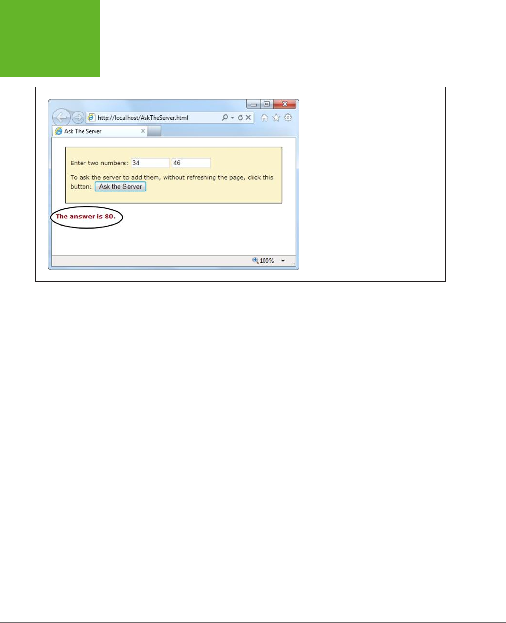
HTML5: THE MISSING MANUAL, SECOND EDITION
382
SENDING
MESSAGES
TO THE WEB
SERVER
FIGURE 12-2
The web server has returned a response, trig-
gering a JavaScript function, which changed
the page.
Getting New Content
Another scenario where XMLHttpRequest comes in handy is loading new HTML con-
tent into a page. For example, a news article might contain multiple pictures but show
just one at a time. You click a button, and some JavaScript fetches the content for
the next picture and inserts it in the page. Or a page might use the same technique
to show the slides in a top-five or top-10 list. Figure 12-3 shows a slideshow example
that shows a series of captioned pictures that accompany an article.
There are a number of reasons to use a design like the one shown in Figure 12-3.
Done skillfully, this technique can be a great way to tame huge amounts of content,
so it’s readily available but not immediately overwhelming. (In less capable hands,
it’s just a desperate attempt to boost page views by forcing readers to make multiple
requests to get all the content they want.)
The best way to design this sort of page is with the XMLHttpRequest object. That
way, the page can request new content and update the page without triggering a
full refresh. And full refreshes are bad, because they download extra data, cause the
page to flicker, and scroll the user back to the top. All of these details seem minor,
but they make the dierence between a website that feels slick and seamless, and
one that seems hopelessly clunky and out of date.
www.it-ebooks.info
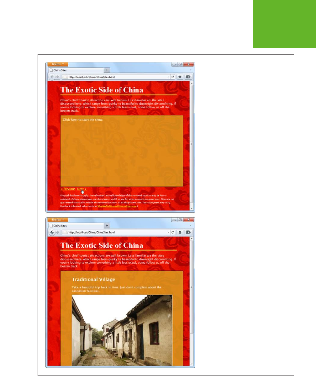
CHAPTER 12: COMMUNICATING WITH THE WEB SERVER 383
SENDING
MESSAGES
TO THE WEB
SERVER
FIGURE 12-3
This page splits its content into separate slides.
Click the Previous or Next link to load in a new
slide, with different text content and a new
picture. To make this work, the page uses the
XMLHttpRequest
object to request the new
content as it’s needed.
www.it-ebooks.info

HTML5: THE MISSING MANUAL, SECOND EDITION
384
SENDING
MESSAGES
TO THE WEB
SERVER
To build the example in Figure 12-3, you first need to carve out a spot for the dy-
namic content. Here it’s a <div> element that creates a golden box and has two
links underneath:
<div id="slide">Click Next to start the show.</div>
<a onclick="return previousSlide()" href="#">< Previous</a>
<a onclick="return nextSlide()" href="#">Next ></a>
The links call previousSlide() or nextSlide(), depending on whether the visitor is
traveling forward or backward in the list of sites. Both functions increment a counter
that starts at 0, moves up to 5, and then loops back to 1. Here’s the code for the
nextSlide() function:
var slideNumber = 0;
function nextSlide() {
// Move the slide index ahead.
if (slideNumber == 5) {
slideNumber = 1;
} else {
slideNumber += 1;
}
// Call another function that shows the slide.
goToNewSlide();
// Make sure the link doesn't actually do anything (like attempt
// to navigate to a new page).
return false;
}
And here's the very similar code for previousSlide():
function previousSlide() {
if (slideNumber == 1) {
slideNumber = 5;
} else {
slideNumber -= 1;
}
goToNewSlide();
return false;
}
Both functions rely on another function, goToNewSlide(), which does the real work.
It uses XMLHttpRequest to contact the web server and ask for the new chunk of data.
The real question: Where does the
ChinaSites.html
page get its data from? Sophisti-
cated examples might call some sort of web service or PHP script. The new content
could be generated on the fly or pulled out of a database. But this example uses
www.it-ebooks.info

CHAPTER 12: COMMUNICATING WITH THE WEB SERVER 385
SENDING
MESSAGES
TO THE WEB
SERVER
a low-tech solution that works on any web server—it looks for a file with a specific
name. For example, the file with the first slide is named
ChinaSites1_slide.html
, the
file with the second is
ChinaSites2_slide.html
, and so on. Each file contains a scrap
of HTML markup (not an entire page). For example, here’s the content in
China-
Sites5_slide.html
:
<figure>
<h2>Wishing Tree</h2>
<figcaption>Make a wish and toss a red ribbon up into the branches
of this tree. If it sticks, good fortune may await.</figcaption>
<img src="wishing_tree.jpg">
</figure>
Now that you know where the data is stored, it’s easy enough to create an XMLHttpRe-
quest that grabs the right file. A simple line of code can generate the right file name
using the current counter value. Here’s the goToNewSlide() function that does it:
var req = new XMLHttpRequest();
function goToNewSlide() {
if (req != null) {
// Prepare a request for the file with the slide data.
req.open("GET", "ChinaSites" + slideNumber + "_slide" + ".html", true);
// Set the function that will handle the slide data.
req.onreadystatechange = newSlideReceived;
// Send the request.
req.send();
}
}
The last step is to copy the retrieved data in the <div> that represents the current
slide:
function newSlideReceived() {
if ((req.readyState == 4) && (req.status == 200)) {
document.getElementById("slide").innerHTML = req.responseText;
}
}
TIP To give this example a bit more pizzazz, you could create a transition effect. For example, the new picture
could fade into view while the old one fades out of sight. All you need to do is alter the
opacity
property, either
with a JavaScript timer (page 301) or a CSS3 transition (page 199). This is one of the advantages of dynamic pages
that use
XMLHttpRequest
—they can control exactly how new content is presented.
This isn’t the last you’ll see of this example. In Chapter 13 (page 428), you’ll use
HTML5’s history management to manage the web page’s URL so that the URL
www.it-ebooks.info
HTML5: THE MISSING MANUAL, SECOND EDITION
386
SERVER-SENT
EVENTS
changes to match the currently displayed slide. But for now, it’s time to move on to
two new ways to communicate with the web server.
NOTE If you’re using the popular jQuery JavaScript toolkit, you probably won’t use
XMLHttpRequest
directly. Instead, you’ll use jQuery methods, like
jQuery.ajax()
, which use
XMLHttpRequest
behind the
scenes. The underlying technology remains the same, but jQuery streamlines the process.
Server-Sent Events
The XMLHttpRequest object lets your web page ask the web server a question and
get an immediate answer. It’s a one-for-one exchange—once the web server provides
its response, the interaction is over. There’s no way for the web server to wait a few
minutes and send another message with an update.
However, there are some types of web pages that could use a longer-term web server
relationship. For example, think of a stock quote on Google Finance (
www.google.
com/finance
). When you leave that page open on your desktop, you’ll see regular
price updates appear automatically. Another example is a news ticker like the one at
www.bbc.co.uk/news
. Linger here, and you’ll find that the list of headlines is updated
throughout the day. You’ll find similar magic bringing new messages into the inbox
of any web-based mail program, like Microsoft Outlook.com (
www.outlook.com
).
In all these examples, the web page is using a technique called
polling
. Periodically
(say, every few minutes), the page checks the web server for new data. To implement
this sort of design, you use JavaScript’s setInterval() or setTimeout() functions
(see page 301), which trigger your code after a set amount of time.
Polling is a reasonable solution, but it’s sometimes inecient. In many cases, it means
calling the web server and setting up a new connection, only to find out that there’s
no new data. Multiply this by hundreds or thousands of people using your website
at once, and it can add up to an unnecessary strain on your web server.
One possible solution is
server-sent events
, which let a web page hold an open
connection to the web server. The web server can send new messages at any time,
and there’s no need to continually disconnect, reconnect, and run the same server
script from scratch. (Unless you want to, because server-sent events
also
support
polling.) Best of all, the server-sent event system is simple to use, works on most
web hosts, and is sturdily reliable. However, it’s relatively new, as Table 12-1 attests,
with no support in current versions of Internet Explorer.
NOTE If you’re looking for a polyfill that can fake server-sent event support using polling, there are several
candidates worth checking out at
http://tinyurl.com/polyfills
.
www.it-ebooks.info

CHAPTER 12: COMMUNICATING WITH THE WEB SERVER 387
SERVER-SENT
EVENTS
TABLE 12-1
Browser support for server-sent events
IE FIREFOX CHROME SAFARI OPERA
SAFARI
IOS
CHROME
FOR
ANDROID
Minimum
version
- 6 6 5 11 4 29
In the following sections, you’ll put together a simple example that demonstrates
server-sent events.
The Message Format
Unlike XMLHttpRequest, the server-sent events standard doesn’t let you send just
any data. Instead, you need to follow a simple but specific format. Every message
must start with the text data: followed by the actual message text and the
new line
character sequence, which is represented as \n\n in many programming languages,
including PHP.
Here’s an example of what a line of message text looks like as it travels over the
Internet:
data: The web server has sent you this message.\n\n
It’s also acceptable to split a message over multiple lines. You use the end-of-line
character sequence, which is often represented as a single \n. This makes it easier
to send complex data:
data: The web server has sent you this message.\n
data: Hope you enjoy it.\n\n
You’ll notice that you still need to start each line with data: and you still need to
end the entire message with \n\n.
You could even use this technique to send JSON-encoded data (page 329), which
would allow the web page to convert the text into an object in a single step:
data: {\n
data: "messageType": "statusUpdate",\n
data: "messageData": "Work in Progress"\n
data: }\n\n
Along with the message data, the web server can send a unique ID value (using the
prefix id:) and a connection timeout (using retry:):
id: 495\n
retry: 15000\n
data: The web server has sent you this message.\n\n
www.it-ebooks.info
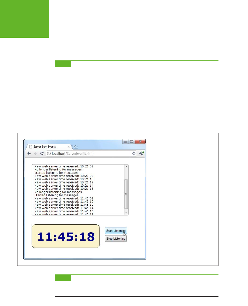
HTML5: THE MISSING MANUAL, SECOND EDITION
388
SERVER-SENT
EVENTS
Your web page pays attention to the message data, but it doesn’t deal with the ID
and connection timeout information. Instead, the
browser
uses these details. For
example, after reading the above message, the browser knows that if it loses it con-
nection to the web server, it should attempt to reconnect after 15,000 milliseconds
(15 seconds). It should also send the ID number 495 to help the web server identify it.
NOTE A web page can lose its connection to the web server for a variety of reasons, including a brief
network outage or a proxy server that times out while waiting for data. If possible, the browser will attempt to
reopen the connection automatically after waiting a default 3 seconds.
Sending Messages with a Server Script
Now that you know the message format, it’s trivially easy to create some server-
side code that spits it out. Once again, it makes sense to turn to PHP to build a
straightforward example that virtually all web hosts will support. Figure 12-4 shows
a page that gets regular messages from the server. In this case, the messages are
simple—they contain the current time on the web server.
FIGURE 12-4
When this page is listening, it receives a
steady stream of messages from the web
server—approximately one every 2 seconds.
Each message is added to the scrolling list at
the top, and the time display at the bottom
shows the time received from the most recent
message.
NOTE The web server time is a single piece of information that’s continuously updated. That makes it a
good candidate for creating a simple server-side event demonstration like this one. However, in a real example,
you’re more likely to send something more valuable, like the most up-to-date headlines for a news ticker.
www.it-ebooks.info

CHAPTER 12: COMMUNICATING WITH THE WEB SERVER 389
SERVER-SENT
EVENTS
The server-side part of this example simply reports the time, in regular intervals.
Here’s the complete script, at a glance:
<?php
header('Content-Type: text/event-stream');
header('Cache-Control: no-cache');
ob_end_clean();
// Start a loop that goes forever.
do {
// Get the current time.
$currentTime = date('h:i:s', time());
// Send it in a message.
echo 'data: ' . $currentTime . PHP_EOL;
echo PHP_EOL;
flush();
// Wait 2 seconds before creating a new message.
sleep(2);
} while(true);
?>
The beginning of this script sets two important headers. First, it sets the MIME type
to text/event-stream, which is required by the server-side event standard:
header('Content-Type: text/event-stream');
Then, it tells the web server (and any proxy servers) to turn o web caching. Oth-
erwise, it’s possible that some of the time messages will arrive in uneven batches:
header('Cache-Control: no-cache');
There’s one more step needed to turn o PHP’s built-in buering system. This way,
the data your PHP script returns is delivered to the browser immediately.
ob_end_clean();
The rest of the code is wrapped in a loop that continues indefinitely (or at least until
the client disappears). Each time the loop runs, it uses the built-in time() function
to grab the current time (in the format
hours:minutes:seconds
), and it stus that
into a variable:
$currentTime = date('h:i:s', time());
Next, the loop uses this information to build a message in the proper format, which
it sends using PHP’s trusty echo command. In this example, the message is single
line, starting with data: and followed by the time. It ends with the constant PHP_EOL
www.it-ebooks.info

HTML5: THE MISSING MANUAL, SECOND EDITION
390
SERVER-SENT
EVENTS
(for PHP
end of line
), which is a shorthand way of referring to the \n character se-
quence described earlier:
echo 'data: ' . $currentTime . PHP_EOL;
echo PHP_EOL;
NOTE If this looks funny, it’s probably because PHP uses the dot operator (.) to join strings. It works in the
same way as the + operator with text in JavaScript, only there’s no way to accidentally confuse it with numeric
addition.
The flush() function makes sure the data is sent right away, rather than buered
until the PHP code is complete. Finally, the code uses the sleep() function to stall
itself for 2 seconds before continuing with a new pass through the loop.
TIP If you wait a long time between messages, your connection might be cut off by a
proxy server
(a server
that sits between your web server and the client’s computer, directing traffic). To avoid this behavior, you can
send a comment message every 15 seconds or so, which is simply a colon (
:
) with no text.
Processing Messages in a Web Page
The web page that listens to these messages is even simpler. Here’s all the markup
from the <body> section, which divides the pages into three <div> sections—one
for the message list, one for the big time display, and one for the clickable buttons
that start the whole process:
<div id="messageLog"></div>
<div id="timeDisplay"></div>
<div id="controls">
<button onclick="startListening()">Start Listening</button><br>
<button onclick="stopListening()">Stop Listening</button>
</div>
When the page loads, it looks up these messageLog and timeDisplay elements and
stores them in global variables so they’ll be easy to access in all your functions:
var messageLog;
var timeDisplay;
window.onload = function() {
messageLog = document.getElementById("messageLog");
timeDisplay = document.getElementById("timeDisplay");
};
The magic happens when someone clicks the Start Listening button. At this point,
the code creates a new EventSource object, supplying the URL of the server-side
resource that’s going to send the messages. (In this example, that’s a PHP script
named
TimeEvents.php
.) It then attaches a function to the onMessage event, which
fires whenever the page receives a message.
www.it-ebooks.info

CHAPTER 12: COMMUNICATING WITH THE WEB SERVER 391
SERVER-SENT
EVENTS
var source;
function startListening() {
source = new EventSource("TimeEvents.php");
source.onmessage = receiveMessage;
messageLog.innerHTML += "<br>" + "Started listening for messages.";
}
TIP To check for server-side event support, you can test if the
window.EventSource
property exists. If
it doesn’t, you’ll need to use your own fallback approach. For example, you could use the
XMLHttpRequest
object to make periodic calls to the web server to get data.
When receiveMessage is triggered, you can get the message from the data property
of the event object. In this example, the data adds a new message in the message
list and updates the large clock:
function receiveMessage(e) {
messageLog.innerHTML += "<br>" + "New web server time received: " + e.data;
timeDisplay.innerHTML = e.data;
}
You’ll notice that once the message is delivered to your page, the pesky data: and
/n/n details are stripped out, leaving you with just the content you want.
Finally, a page can choose to stop listening for server events at any time by calling
the close() method of the EventSource object. It works like this:
function stopListening() {
source.close();
messageLog.innerHTML += "<br>" + "No longer listening for messages.";
}
Polling with Server-Side Events
The previous example used server-side events in the simplest way. The page makes
a request, the connection stays open, and the server sends information periodically.
The web browser may need to reconnect (which it will do automatically), but only if
there’s a problem with the connection or if it decides to temporarily stop the com-
munication for other reasons (for example, low battery in a mobile device).
But what happens if the server script ends and the web server closes the connec-
tion? Interestingly, even though no accident occurred, and even though the server
deliberately broke o communication, the web page still automatically reopens
the connection (after waiting the default 3 seconds) and requests the script again,
starting it over from scratch.
You can use this behavior to your advantage. For example, imagine that you create a
relatively short server script that sends just one message. Now your web page acts
like it’s using polling (page 386), by periodically reestablishing the connection. The
www.it-ebooks.info

HTML5: THE MISSING MANUAL, SECOND EDITION
392
SERVER-SENT
EVENTS
only dierence is that the web server tells the browser how often it should check
for new information. In a page that uses traditional polling, this detail is built into
your JavaScript code.
The following script uses a hybrid approach. It stays connected (and sends periodic
messages) for 1 minute. Then it recommends that the browser try again in 2 minutes
and closes the connection:
<?php
header('Content-Type: text/event-stream');
header('Cache-Control: no-cache');
ob_end_clean();
// Tell the browser to wait 2 minutes before reconnecting,
// when the connection is closed.
echo 'retry: 120000' . PHP_EOL;
// Store the start time.
$startTime = time();
do {
// Send a message.
$currentTime = date('h:i:s', time());
echo 'data: ' . $currentTime . PHP_EOL;
echo PHP_EOL;
flush();
// If a minute has passed, end this script.
if ((time() - $startTime) > 60) {
die();
}
// Wait 5 seconds, and send a new message.
sleep(5);
} while(true);
?>
Now when you run the page, you’ll get a minute’s worth of regular updates, followed
by a 2-minute pause (Figure 12-5). In a more sophisticated example, you might have
the web server send a special message to the web browser that tells it there’s no
reason to wait for updated data (say, the stock markets have closed for the day). At
this point, the web page could call the close() method of the EventSource object.
www.it-ebooks.info
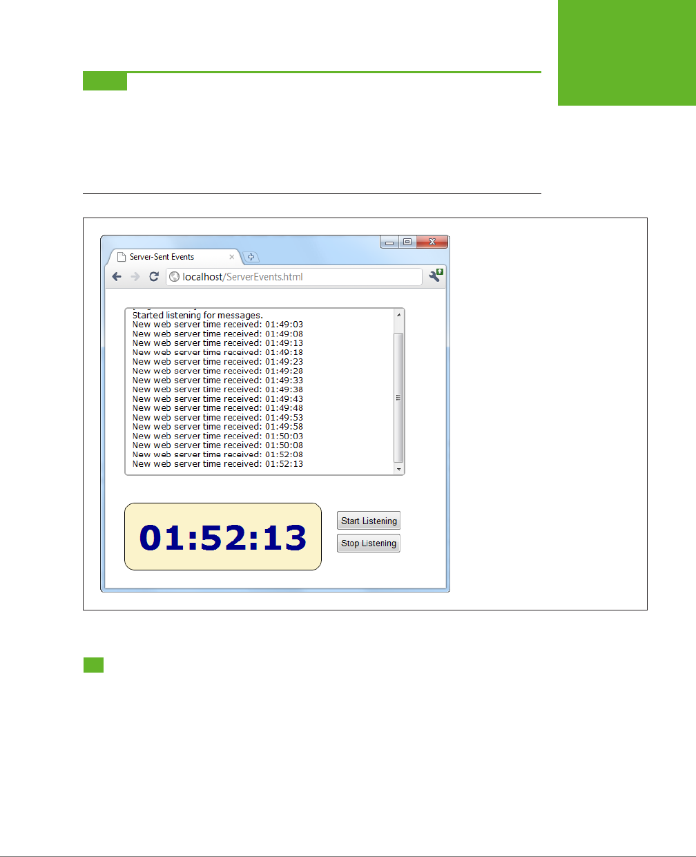
CHAPTER 12: COMMUNICATING WITH THE WEB SERVER 393
WEB SOCKETS
NOTE With complex server scripts, the web browser’s automatic reconnection feature may not work out
so well. For example, the connection may have been cut off while the web server was in the middle of a specific
task. In this case, your web server code can send each client an ID (as described on page 387), which will be sent
back to the server when the browser reconnects. However, it’s up to your server-side code to generate a suitable
ID, keep track of what task each ID is doing (for example, by storing some information in a database), and then
attempt to pick up where you left off. All of these steps can be highly challenging if you lack super-black-belt
coding skills.
FIGURE 12-5
This page uses a combination of streaming
(for a batch of messages, over the course of
a minute), followed by polling (for the next
2 minutes). This sort of design might make
sense as a way to minimize web server
traffic, depending on how often your data
is updated and how important it is to have
up-to-the-minute data.
Web Sockets
Server-sent events are a perfect tool if you want to receive a series of messages from
the web server. But the communication is completely one-sided. There’s no way for
the browser to respond, or to enter into a more complex dialogue.
If you’re creating a web application where the browser and the web server need to
have a serious conversation, your best bet (without adopting Flash) is to use the
XMLHttpRequest object. Depending on the sort of application you’re building, this
approach may work fine. However, there are stumbling blocks aplenty. First, the
XMLHttpRequest object doesn’t work well if you need to send multiple messages
www.it-ebooks.info

HTML5: THE MISSING MANUAL, SECOND EDITION
394
WEB SOCKETS
back and forth very quickly (like you might in a chat application, for example).
Second, there’s no way to associate one call with the next, so every time the web
page makes a request, the web server needs to sort out who you are all over again.
If your web page needs to make a chain of related requests, your web server code
can become frightfully complicated.
There’s a solution to these problems, but it’s not for the faint of heart. That solution is
web sockets
, a standard that lets a browser hold open a connection to a web server
and exchange back-and-forth messages for as long as it wants. The web sockets
feature has generated plenty of excitement, and has gained reasonably good browser
support (see Table 12-2), although Internet Explorer users need IE 10 or later to use it.
TABLE 12-2
Browser support for web sockets
IE FIREFOX CHROME SAFARI OPERA
SAFARI
IOS
CHROME
FOR
ANDROID
Minimum
version
10 11 14 6 12.1 6 29
TIP Web sockets are a bit finicky. For example, you could run a browser that supports them but still run into
trouble because of restrictive computer network settings, a firewall, or the antivirus software on your computer.
If you’re in doubt about whether your computer can use web sockets, go to
http://websocketstest.com
. This site
attempts to connect to a test server and provides a handy single-page report that tells you whether web sockets
are working.
Before you use web sockets, you need to understand two important points. First,
web sockets are a specialized tool. They make great sense in a chat application, a
massive multiplayer game, or a peer-to-peer collaboration tool. They allow new types
of applications, but they probably don’t make sense in most of today’s JavaScript-
powered web applications (like ecommerce websites).
Second, web socket solutions can be fiendishly complex. The web page JavaScript
is simple enough. But to build the server-side application, you’ll need mad program-
ming skills, including a good grasp of multithreading and networking concepts,
which are beyond the scope of this book. However, if some other company, service,
or hotshot programmer has already created a web socket server for you to use, you
won’t have too much trouble talking to it using a bit of HTML5-enhanced JavaScript.
You’ll learn how in the following sections.
The Web Socket Server
In order to use web sockets, you need to run a program (called a
web socket server
)
on the web server for your website. This program has the responsibility of coordinat-
ing everyone’s communication, and once it’s launched it keeps running indefinitely.
www.it-ebooks.info

CHAPTER 12: COMMUNICATING WITH THE WEB SERVER 395
WEB SOCKETS
NOTE Many web hosts won’t allow long-running programs, unless you pay for a
dedicated server
(a web
server that’s allocated to your website, and no one else’s). If you’re using ordinary shared hosting, you probably
can’t create web pages that use the web socket feature. Even if you can manage to launch a web socket server
that keeps running, your web host will probably detect it and shut it down.
To give you an idea of the scope of a web socket server, consider some of the tasks
a web socket server needs to manage:
• Set the message “vocabulary”—in other words, decide what types of messages
are valid and what they mean.
• Keep a list of all the currently connected clients.
• Detect errors sending messages to clients, and stop trying to contact them if
they don’t seem to be there anymore.
• Deal with any in-memory data—that is, data that all web clients might access—
safely. Subtle issues abound—for example, consider what happens if one client
is trying to join the party while another is leaving, and the connection details
for both are stored in the same in-memory object.
Most developers will never create a server-side program that uses sockets; it’s simply
not worth the considerable eort. The easiest approach is to install someone else’s
socket server and design custom web pages that use it. Because the JavaScript part
of the web socket standard is easy to use, this method won’t pose a problem. Another
option is to pick up someone else’s socket server code and then customize it to get
the exact behavior you want. Right now, plenty of projects are developing usable
web socket servers (many of them free and open source) for a variety of tasks, in a
variety of server-side programming languages. You’ll get the details on page 399.
A Simple Web Socket Client
From the web page’s point of view, the web socket feature is easy to understand
and use. The first step is to create the WebSocket object. When you do, you supply
a URL that looks something like this:
var socket = new WebSocket("ws://localhost/socketServer.php");
The URL starts with
ws://
, which is the new system for identifying web socket con-
nections. However, the URL still leads to a web application on a server (in this case,
the script named socketServer.php). The web socket standard also supports URLs
that start with wss://, which indicates that you want to use a secure, encrypted
connection (just as you do when requesting a web page that starts with https://
instead of http://).
NOTE Web sockets aren’t limited to contacting their home web server. A web page can open a socket
connection to a web socket server that’s running on another web server, without any extra work.
www.it-ebooks.info

HTML5: THE MISSING MANUAL, SECOND EDITION
396
WEB SOCKETS
Simply creating a new WebSocket object causes your page to attempt to connect
to the server. You deal with what happens next using one of the WebSocket’s four
events: onOpen (when the connection is first established), onError (when there’s a
problem), onClose (when the connection is closed), and onMessage (when the page
receives a message from the server):
socket.onopen = connectionOpen;
socket.onmessage = messageReceived;
socket.onerror = errorOccurred;
socket.onopen = connectionClosed;
For example, if the connection has succeeded, it makes sense to send a confirma-
tion message. To deliver a message, you use the WebSocket object’s send() method,
which takes ordinary text. Here’s a function that handles the onOpen event and sends
a message:
function connectionOpen() {
socket.send("UserName:jerryCradivo23@gmail.com");
}
Presumably, the web server will receive this and then send a new message back.
You can use the onError and onClose events to notify the web page user. However,
the most important event (by far) is the onMessage event that fires every time the
web server delivers new data. Once again, the JavaScript that’s involved is perfectly
understandable—you simply grab the text of the message from the data property:
function messageReceived(e) {
alert("You received a message: " + e.data);
}
If the web page decides its work is done, it can easily close the connection with the
close() method:
socket.close();
However, once the socket is closed, you can’t send any more messages unless you
recreate the socket object. Recreating the socket object is the same as creating it for
the first time—you use the new keyword, supply the URL, and attach all your event
handlers. If you plan to be connecting and disconnecting frequently, you’ll want
to move this code into separate functions so you can call on them when needed.
As you can see, the WebSocket object is surprisingly simple. In fact, you’ve now
covered all the methods and events it oers. Based on this overview, you can see
that using someone else’s socket server is a breeze—you just need to know what
messages to send and what messages to expect.
www.it-ebooks.info

CHAPTER 12: COMMUNICATING WITH THE WEB SERVER 397
WEB SOCKETS
NOTE A lot of behind-the-scenes work takes place to make a web socket connection work. First, the web
page makes contact using the well-worn HTTP standard. Then it needs to “upgrade” its connection to a web socket
connection that allows unfettered back-and-forth communication. At this point, you could run into a problem
if a proxy server sits between your computer and the web server (for example, on a typical company network).
The proxy server may refuse to go along with the plan and drop the connection. You can deal with this problem
by detecting the failed connection (through the
WebSocket
’s
onError
event) and falling back on one of the
socket polyfills described on GitHub at
http://tinyurl.com/polyfills
. They use tricks like polling to simulate a web
socket connection as well as possible.
Web Socket Examples on the Web
Curious to try out web sockets for yourself? There are plenty of places on the web
where you can fire up an example.
For starters, try
www.websocket.org/echo.html
, which features the most basic web
socket server imaginable: You send a message, and it echoes the same message
back to you (Figure 12-6). While this isn’t very glamorous, it lets you exercise all the
features of the WebSocket class. In fact, you can create your own pages that talk
to the echo server, which is a good way to practice your web socket skills. As long
as you use the correct socket server URL (in this case, that’s
ws://echo.websocket.
org
), the code works perfectly well. It doesn’t matter whether the web page is on a
dierent web domain or it’s stored on your computer’s hard drive.
It’s easy to understand the JavaScript that powers a page like this. The first task is
to create the socket when the page first loads and wire up all its events:
var socket;
window.onload = function () {
connect();
}
function connect() {
socket = new WebSocket("ws://echo.websocket.org")
// Listen to all the web socket events.
socket.onopen = connectionOpen;
socket.onmessage = messageReceived;
socket.onerror = errorOccurred;
socket.onopen = connectionClosed;
}
Here, the socket-connection code is moved into its own dedicated function, named
connect(), so you can call it whenever you need it. That way, you can connect and
disconnect as you please. You’ve already seen the disconnection code:
function connect() {
socket.close();
}
www.it-ebooks.info
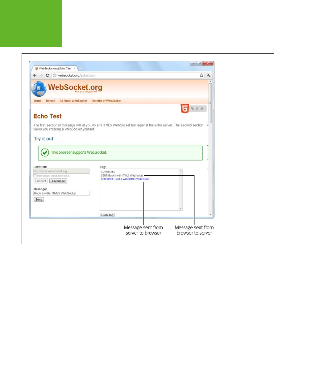
HTML5: THE MISSING MANUAL, SECOND EDITION
398
WEB SOCKETS
FIGURE 12-6
A web socket server that
simply repeats what you
say won’t win any prizes
in software innovation.
However, it does let you
see how easy it is to talk to
a ready-made web socket
server.
Incidentally, you can check the readyState property of your socket to determine
whether it’s open and ready to go (in which case readyState is 1), not yet established
(0), in the process of closing (2), or closed (3).
The echo server has no real vocabulary to speak of. It treats all messages the same,
as bits of text that it simply sends back to the page. Because of this simplicity, it’s a
simple job to send the current contents of a text box when the user clicks a button:
function sendMessage() {
// Get the message data.
var message = messageBox.value;
// Send the message through the socket.
socket.send(message);
// Let the user know what just happened.
messageLog.innerHTML += "<br>" + "Sent: " + message;
}
www.it-ebooks.info
CHAPTER 12: COMMUNICATING WITH THE WEB SERVER 399
WEB SOCKETS
And it’s just as easy to take the messages you receive and insert them into the page:
function messageReceived(e) {
messageLog.innerHTML += "<br>" + "Message received: " + e.data;
}
NOTE If you want to look at a slightly more exciting example, check out the chat free-for-all at
http://
html5demos.com/web-socket
. Log in to this simple web socket server, send a message, and everyone gets it
immediately.
POWER USERS’ CLINIC
Web Socket Servers
To actually run a practical example of your own, you need a
web socket server that your web page can talk to. And although
the server code that’s required—which is several dozen lines
at least—is beyond the scope of this chapter, there are plenty
of places where you can find a test server. Here are some of
your many options:
• PHP. This simple and slightly crude code project gives you
a good starting point for building a web socket server with
PHP. Get it at
http://code.google.com/p/phpwebsocket
.
• Ruby. There’s more than one sample web socket server for
Ruby, but this one that uses the Event-Machine model is
popular. See
http://github.com/igrigorik/em-websocket
.
• Python. This Apache extension adds a socket server using
Python. Get it at
http://code.google.com/p/pywebsocket
.
• .NET. Simple, it isn’t. But this comprehensive project
contains a complete web socket server that uses
Microsoft’s .NET platform and the C# language.
Download it from
http://superwebsocket.codeplex.com
.
• Java. Similar in scope to the .NET project described
above, this web socket server is pure Java. See
http://
jwebsocket.org
.
• node.JS. Depending on who you ask, node.JS—a web
server that runs JavaScript code—is either the next big
thing in the making or an overgrown testing tool. Either
way, you can get a web socket server that runs on it from
http://github.com/miksago/node-websocket-server
.
• Kaazing. Unlike the other items in this list, Kaazing doesn’t
provide the code for a web socket server. Instead, it
provides a mature web socket server that you can license
for your website. Adventurous developers who want to
go it alone won’t be interested. But it may make sense
for less ambitious websites, especially considering the
built-in fallback support in its client libraries (which try
the HTML5 web socket standard first, then attempt to use
Flash, or finally fall back to pure JavaScript polling). Learn
more at
http://kaazing.com/products/html5-edition.html
.
www.it-ebooks.info

401
CHAPTER
13
By now, you know all about the key themes of HTML5. You’ve used it to write
more meaningful and better-structured markup. You’ve seen its rich graphical
features, like video and dynamic drawing. And you’ve used it to create self-
sucient, JavaScript-powered pages that can work even without a web connection.
In this chapter, you’ll tackle three features that have escaped your attention so far.
As with much of what you’ve already learned, these features extend the capabilities
of what a web page can do—once you add a sprinkling of JavaScript code. Here’s
what awaits:
• Geolocation. Although it’s often discussed as part of HTML5, geolocation is
actually a separate standard that’s never been in the hands of the WHATWG
(page 5). Using geolocation, you can grab hold of a single piece of informa-
tion: the geographic coordinates that pinpoint a web visitor’s current location.
• Web workers. As web developers make smarter pages that run more JavaScript,
it becomes more important to run certain tasks in the background, quietly,
unobtrusively, and over long periods of time. You
could
use timers and other
tricks. But the web workers feature provides a far more convenient solution for
performing background work.
• Session history. In the old days of the Web, a page did one thing only: display
stu. As a result, people spent plenty of time clicking links to get from one
document to another. But today, a JavaScript-fueled page can load content
from another page without triggering a full page refresh. In this way, JavaScript
creates a more seamless viewing experience. However, it also introduces a few
Geolocation, Web
Workers, and History
Management
www.it-ebooks.info
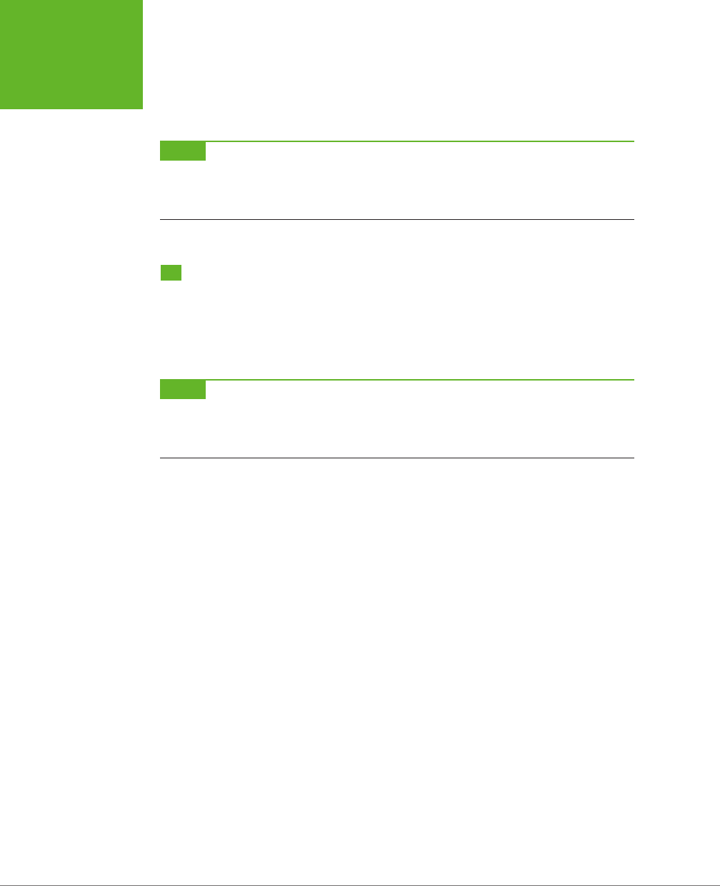
HTML5: THE MISSING MANUAL, SECOND EDITION
402
GEOLOCATION
wrinkles, like the challenge of keeping the browser URL synchronized with the
current content. Web developers use plenty of advanced techniques to keep
things in order, and now HTML5 adds a session history tool that can help.
NOTE As you explore these last three features, you’ll get a still better idea of the scope of what is now called
HTML5. What started as a few good ideas wedged into an overly ambitious standard has grown to encompass a
grab bag of new features that tackle a range of different problems, with just a few core concepts (like semantics,
JavaScript, and CSS3) to hold it all together.
Geolocation
Geolocation is a feature that lets you find out where in the world your visitors are.
And that doesn’t just mean what country or city a person’s in. The geolocation feature
can often narrow someone’s position down to a city block, or even determine the
exact coordinates of someone who’s strolling around with a smartphone.
NOTE Most of the new JavaScript features you’ve seen in this book were part of the original HTML5 specifica-
tion and were split off when it was handed over to the W3C. But geolocation isn’t like that—it was never part of
HTML5. Instead, it simply reached maturity around the same time. However, almost everyone now lumps them
together as part of the wave of future web technologies.
How Geolocation Works
Geolocation raises quite a lot of questions in people who ordinarily aren’t paranoid.
Like, how does a piece of software know I’m hanging out at the local coee shop?
Is there some hidden code that’s tracking my every move? And who’s in that white
van parked outside?
Fortunately, geolocation is a lot less Big Brotherish than it seems. That’s because
even if a browser can figure out your position, it won’t tell a website unless you give
it explicit permission (see Figure 13-1).
To figure out a person’s location, the browser enlists the help of a
location provider
—
for example, on Firefox that’s Google Location Services. This location provider has the
tough job of finding the location, and it can use several dierent strategies to do it.
For a desktop computer with a fixed (not wireless) Internet connection, the science
is simple but imprecise. When someone goes online, her trac is funneled from
her computer or local network through a cable, telephone wire, or (horrors) dial-up
connection, until it reaches a high-powered piece of network hardware that brings
it onto the Internet. That piece of hardware has a unique
IP address
, a numeric code
that establishes its public identity to other computers. It also has a postal address
in the real world.
www.it-ebooks.info
CHAPTER 13: GEOLOCATION, WEB WORKERS, AND HISTORY MANAGEMENT 403
GEOLOCATION
FIGURE 13-1
Here a web page wants location
data, and Firefox asks whether you
want to allow it just this once (click
Share Location), to allow it every
time (Always Share), or never to
allow it (Never Share). This behavior
isn’t just Firefox being polite; the
geolocation standard makes it an
official rule to get user permis-
sion for every website that wants
location data.
NOTE If you have some networking experience, you already know that your computer has its own IP address,
like every computer on a network. However, this IP address is your own private one whose purpose is to separate
your computer from any other devices that are sharing your connection (like the netbook in your kitchen or the
tablet in your knapsack). Geolocation doesn’t use that IP address.
The location provider combines these two features. First, it figures out the IP ad-
dress you’re connecting through, and then it pinpoints the home of the router that
uses it. Because of this indirection, geolocation won’t be spot-on when you’re using
a desktop computer. For example, if you surf from a computer on the west side of
Chicago, you might find that your trac is being funneled through a router that’s
several miles closer to downtown. Still, even an imprecise result like this is often
useful. For example, if you’re looking for nearby pizza stores in a mapping tool, you
can quickly skip over to the area you’re really interested in—your home neighbor-
hood—even if you start a certain distance away.
NOTE The IP address technique is the roughest form of geolocation. If there’s a better source of location
data, the location provider will use that instead.
If you’re using a laptop or a mobile device with a wireless connection, a location
provider can look for nearby wireless access points. Ideally, the location provider
consults a giant database to figure out the exact location of these access points and
then uses that information to triangulate your location.
www.it-ebooks.info
HTML5: THE MISSING MANUAL, SECOND EDITION
404
GEOLOCATION
If you’re using a web-enabled phone, the location provider provides a similar trian-
gulation process, but it uses the signals from dierent cellphone towers. This quick,
relatively eective procedure usually gets your position down to less than a kilometer.
(More industrialized areas—like downtown city cores—have more cellphone towers,
which results in more precise geolocation.)
Finally, many mobile devices also have dedicated GPS hardware, which uses satellite
signals to pin your location down to just a few meters. The drawback is that GPS is a
bit slower and draws more battery power. It also doesn’t work as well in built-up cit-
ies, where tall buildings can obscure the signals. As you’ll see, it’s up to you whether
you want to request a high-precision location using GPS, if it’s available (page 409).
And of course, other techniques are possible. Nothing stops a location provider
from relying on dierent information, like an RFID chip, nearby Bluetooth devices,
a cookie set by a mapping website like Google Maps, and so on.
TIP You may also be able to change your starting position by using another tool. For example, Chrome fans
can use a browser plug-in named Manual Geolocation (
http://tinyurl.com/manual-geo
) to set the position that
Chrome should report when you browse a website that uses geolocation. You can even use this technique to fake
your address—for example, to pretend your computer in Iowa is actually surfing in from the Netherlands. This
trick isn’t for espionage only—it can also be a useful debugging trick when you’re testing a location-aware web
app.
The takeaway is this: No matter how you connect to the Internet—even if you’re
sitting at a desktop computer—geolocation can get somewhere near you. And if
you’re using a device that gets a cellphone signal or has a GPS chip, the geolocation
coordinates will be scarily accurate.
UP TO SPEED
How You Can Use Geolocation
Once you’ve answered the big question—how does geoloca-
tion work?—you need to resolve another one—namely, why
should you use it?
The key point to understand is that geolocation tells your code
the approximate geographic coordinates of a person—and
that’s it. You need to combine this simple but essential infor-
mation with more detailed location data. This data could be
provided by your web server (typically fetched out of a huge
server-side database) or another geographic web service (like
Google Maps).
For example, if you’re a big business with a physical presence
in the real world, you might compare the user’s position with
the coordinates of your different locations. You could then
determine which location is closest. Or, if you’re building some
sort of social networking tool, you might plot the information
of a group of people to show them how close they are to one
another. Or you might take someone else’s location data and
use that to provide a service for your visitors, like hunting
down the nearest chocolate store, or finding the closest clean
toilet in Brooklyn. Either way, the geolocation coordinates of
the visitor become important only when they’re combined with
more geographic data.
Although other businesses’ mapping and geographic services
are outside the scope of this chapter, you’ll get the chance to
try out an example with Google Maps on page 409.
www.it-ebooks.info

CHAPTER 13: GEOLOCATION, WEB WORKERS, AND HISTORY MANAGEMENT 405
GEOLOCATION
Finding a Visitor’s Coordinates
The geolocation feature is strikingly simple. It consists of three methods that are
packed into the navigator.geolocation object: getCurrentPosition(), watchPosi-
tion(), and clearWatch().
NOTE If you aren’t already familiar with the navigator object, it’s a relatively minor part of JavaScript,
with a few properties that tell you about the current browser and its capabilities. The most useful of these is
navigator.userAgent
, which provides an all-in-one string that details the browser, its version number,
and the operating system on which it’s running.
To get a web visitor’s location, you call getCurrentPosition(). Of course, the
location-finding process isn’t instantaneous, and no browser wants to lock up a
page while it’s waiting for location data. For that reason, the getCurrentPosi-
tion() method is asynchronous—it carries on immediately, without stalling your
code. When the geolocation process is finished, it triggers another piece of code
to handle the results.
You might assume that geolocation uses an event to tell you when it’s done, in much
the same way that you react when an image has been loaded or a text file has been
read. But JavaScript is nothing if not inconsistent. Instead, when you call getCur-
rentPosition() you supply the
completion function
.
Here’s an example:
navigator.geolocation.getCurrentPosition(
function(position) {
alert("You were last spotted at (" + position.coords.latitude +
"," + position.coords.longitude + ")");
}
);
When this code runs, it calls getCurrentPosition() and passes in a function. Once
the browser determines the location, it triggers that function, which shows a mes-
sage box. Figure 13-2 shows the result in Internet Explorer.
To keep your code clear and organized, you probably won’t define your comple-
tion function right inside the getCurrentPosition() call (as done in this example).
Instead, you can put it in a separate, named function:
function geolocationSuccess(position) {
alert("You were last spotted at (" + position.coords.latitude +
"," + position.coords.longitude + ")");
}
Then you can point to it when you call getCurrentLocation():
navigator.geolocation.getCurrentPosition(geolocationSuccess);
www.it-ebooks.info

HTML5: THE MISSING MANUAL, SECOND EDITION
406
GEOLOCATION
FIGURE 13-2
Top: First, you need to agree to let the browser tell the web
server about your position.
Bottom: The results are in—your coordinates on the globe.
Remember, you need to use a browser that supports geolocation and let the web
page track you. Also, it’s a good idea to upload your page to a test server before
trying it out. Otherwise, you’ll see some quirks (for example, geolocation error-
handling won’t work) and some browsers will fail to detect your position altogether
(like Chrome).
If you’re wondering, “What good are geographic coordinates to me?” you’ve asked
a good question. You’ll explore how you can use the geolocation data shortly (page
409). But first, you should understand how to catch errors and configure a few
geolocation settings.
Dealing with Errors
Geolocation doesn’t run so smoothly if the visitor opts out and decides not to share
the location data with your page. In the current example, the completion function
won’t be called at all, and your page won’t have any way to tell whether the browser
is still trying to dig up the data or has run into an error. To deal with this sort of
situation, you supply two functions when you call getCurrentLocation(). The first
function is called if your page meets with success, while the second is called if your
geolocation attempt ends in failure.
www.it-ebooks.info

CHAPTER 13: GEOLOCATION, WEB WORKERS, AND HISTORY MANAGEMENT 407
GEOLOCATION
POWER USERS’ CLINIC
Finding Out the Accuracy of a Geolocation Guess
When the
getCurrentPosition()
method meets with
success, your code gets a position object that has two proper-
ties:
timestamp
(which records when the geolocation was
performed) and
coords
(which indicates the geographic
coordinates).
As you’ve seen, the
coords
object gives you the latitude and
longitude—the coordinates that pin down your position on the
globe. However, the
coords
object bundles up a bit more
information that you haven’t seen yet. For example, there are
more specialized
altitude
,
heading
, and
speed
proper-
ties, none of which are currently supported by any browser.
More interesting is the
accuracy
property, which tells
you how precise the geolocation information is, in meters.
(Somewhat confusingly, that means the value of the
ac-
curacy
property increases as the accuracy of the location
data decreases.) For example, an
accuracy
of 2,135 meters
converts to about 1.3 miles, meaning the geolocation coordi-
nates have pinpointed the current visitor’s position within that
distance. To visualize this, imagine a circle with the center at
the geolocation coordinates and a radius of 1.3 miles. Odds are
the visitor is somewhere in that circle.
The
accuracy
property is useful for identifying bad geolo-
cation results. For example, if you get an
accuracy
result
that’s tens of thousands of meters, then the location data
isn’t reliable:
if (position.coords.accuracy > 50000) {
results.innerHTML =
"This guess is all over the map.";
}
At this point, you might want to warn the user or offer him the
chance to enter the right position information himself.
Here’s an example that uses both a completion function and an error function:
// Store the element where the page displays the result.
var results;
window.onload = function() {
results = document.getElementById("results");
// If geolocation is available, try to get the visitor's position.
if (navigator.geolocation) {
navigator.geolocation.getCurrentPosition(
geolocationSuccess, geolocationFailure
);
results.innerHTML = "The search has begun.";
}
else {
results.innerHTML = "This browser doesn't support geolocation.";
}
};
www.it-ebooks.info

HTML5: THE MISSING MANUAL, SECOND EDITION
408
GEOLOCATION
function geolocationSuccess(position) {
results.innerHTML = "You were last spotted at (" +
position.coords.latitude + "," + position.coords.longitude + ")";
}
function geolocationFailure(positionError) {
results.innerHTML = "Geolocation failed.";
}
When the error function is called, the browser hands it an error object with two
properties: code (a numeric code that classifies it as one of four types of problems)
and message (which provides a short text message reporting the problem). Gener-
ally, the message is intended for testing, and your code will use the error code to
decide how it should handle the issue.
Here’s a revised error function that checks all possible error code values:
function geolocationFailure(positionError) {
if (positionError.code == 1) {
results.innerHTML =
"You decided not to share, but that's OK. We won't ask again.";
}
else if (positionError.code == 2) {
results.innerHTML =
"The network is down or the positioning service can't be reached.";
}
else if (positionError.code == 3) {
results.innerHTML =
"The attempt timed out before it could get the location data.";
}
else {
results.innerHTML =
"This the mystery error. We don't know what happened.";
}
}
NOTE If you’re running the test web page from your computer (not a real web server), the error function
won’t be triggered when you decline to share your location.
Setting Geolocation Options
So far, you’ve seen how to call getCurrentLocation() with two arguments: the
success function and the failure function. You can also supply a third argument,
which is an object that sets certain geolocation options.
Currently, there are three options you can set, and each one corresponds to a dierent
property on the geolocation options object. You can set just one or any combination.
Here’s an example that sets one, named enableHighAccuracy:
www.it-ebooks.info

CHAPTER 13: GEOLOCATION, WEB WORKERS, AND HISTORY MANAGEMENT 409
GEOLOCATION
navigator.geolocation.getCurrentPosition(geolocationSuccess,
geolocationFailure, {enableHighAccuracy: true});
And here’s an example that sets all three:
navigator.geolocation.getCurrentPosition(
geolocationSuccess, geolocationFailure, {enableHighAccuracy: true,
timeout: 10000,
maximumAge: 60000}
);
Both of these examples supply the geolocation options using a JavaScript object
literal. This technique works perfectly as long as you use the right property names,
such as enableHighAccuracy and timeout, because these are the properties that
the getCurrentPosition() method is expecting. (If this code still looks a bit weird
to you, check out the more detailed object introduction on page 468 in Appendix
B, “JavaScript: The Brains of Your Page.”)
So what do these properties mean? The enableHighAccuracy property opts into
high-precision GPS-based location detection, if the device supports it (and the user
allows it). Don’t choose this option unless you need exact coordinates, because it can
draw serious battery juice and may take more time. The default for enableHighAc-
curacy, should you choose not to set it, is false.
The timeout property sets the amount of time your page is willing to wait for loca-
tion data before throwing in the towel. The timeout is in milliseconds, so a value of
10,000 milliseconds means a maximum wait of 10 seconds. The countdown begins
after
the user agrees to share the location data. By default, timeout is 0, meaning
the page will wait indefinitely, without ever triggering the timeout error.
The maximumAge property lets you use cached location data. For example, if you
set maximumAge to 60,000 milliseconds, you’ll accept a previous value that’s up to
a minute old. This saves the eort of repeated geolocation calls, but it also means
your results will be less accurate for a person on the move. By default, maximumAge
is 0, meaning cached location data is never used. (You can also use a special value
of Infinity, which means use any cached location data, no matter how old it is.)
Showing a Map
Being able to grab someone’s geographic coordinates is a neat trick. But the novelty
wears o fast unless you have something useful to do with that information. Hard-
core geo-junkies know that there’s a treasure trove of location information out there.
(Often, the problem is taking this information and converting it to a form that’s useful
to your web application.) There are also several web-based mapping services, the
king of which is Google Maps. In fact, good estimates suggest that Google Maps is
the most heavily used web application service, for
any
purpose.
Using Google Maps, you can create a map for any portion of the world, at any size
you want. You can control how your visitors interact with that map, generate driv-
ing instructions, and—most usefully—overlay your own custom data points on that
www.it-ebooks.info
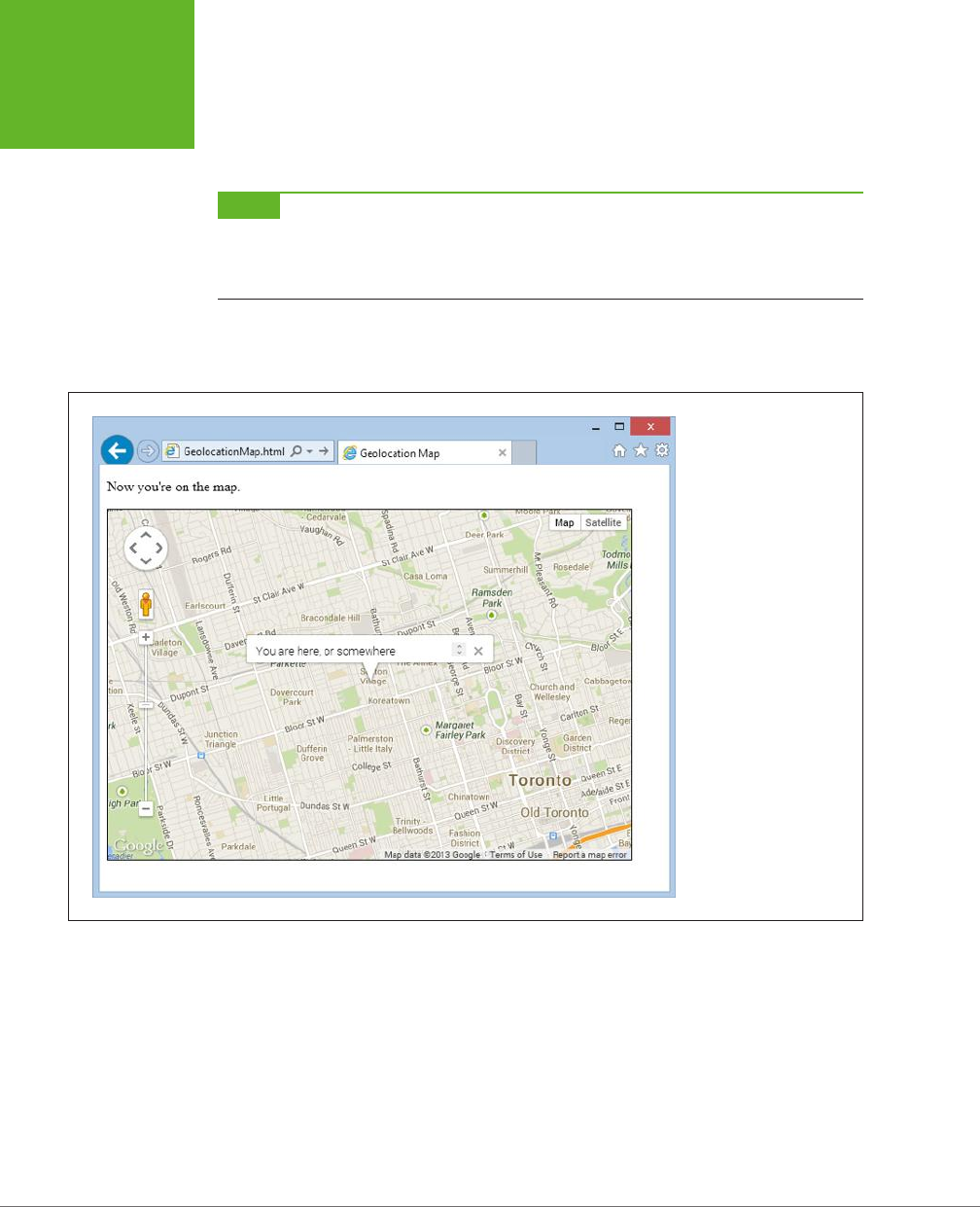
HTML5: THE MISSING MANUAL, SECOND EDITION
410
GEOLOCATION
map. For example, a Google Maps–fortified page can show visitors your business
locations or flag interesting sights in a Manhattan walking tour. To get started with
Google Maps, check out the documentation at
http://tinyurl.com/maps-docs
.
NOTE Google Maps is free to use, even for commercial websites, provided you aren’t charging people to
access your site. (And if you are, Google has a premium mapping service you can pay to use.) Currently, Google
Maps does not show ads, although the Google Maps license terms explicitly reserve the right to do that in the
future.
Figure 13-3 shows a revised version of the geolocation page. Once it grabs the cur-
rent user’s coordinates, it shows that position in a map.
FIGURE 13-3
Geolocation and Google
Maps make a potent
combination. They let you
generate a map for any
position, with just a few
extra lines of JavaScript.
Creating this page is easy. First, you need a link to the scripts that power the Google
Maps API. Place this before any script blocks that use the mapping functionality:
<head>
<meta charset="utf-8">
<title>Geolocation Map</title>
<script src="http://maps.google.com/maps/api/js?sensor=true"></script>
...
</head>
www.it-ebooks.info

CHAPTER 13: GEOLOCATION, WEB WORKERS, AND HISTORY MANAGEMENT 411
GEOLOCATION
Next, you need a <div> element that will hold the dynamically generated map. Give
it a unique ID for easy reference:
<body>
<p id="results">Where do you live?</p>
<div id="mapSurface"></div>
</body>
You can then use a style sheet rule to set the size of your map:
#mapSurface {
width: 600px;
height: 400px;
border: solid 1px black;
}
Now you’re ready to start using Google Maps. The first job is to create the map
surface. This example creates the map when the page loads, so that you can use
it in the success or failure function. (After all, failure doesn’t mean the visitor can’t
use the mapping feature in your page; it just means that you can’t determine that
visitor’s current location. You’ll probably still want to show the map, but just default
to a dierent starting point.)
Here’s the code that runs when the page loads. It creates the map and then starts
a geolocation attempt:
var results;
var map;
window.onload = function() {
results = document.getElementById("results");
// Set some map options. This example sets the starting zoom level and the
// map type, but see the Google Maps documentation for all your options.
var mapOptions = {
zoom: 13,
mapTypeId: google.maps.MapTypeId.ROADMAP };
// Create the map, with these options.
map = new google.maps.Map(document.getElementById("mapSurface"), mapOptions);
// Try to find the visitor's position.
if (navigator.geolocation) {
navigator.geolocation.getCurrentPosition(geolocationSuccess,
geolocationFailure);
results.innerHTML = "The search has begun.";
}
else {
results.innerHTML = "This browser doesn't support geolocation.";
www.it-ebooks.info

HTML5: THE MISSING MANUAL, SECOND EDITION
412
GEOLOCATION
goToDefaultLocation();
}
};
Even after you’ve created the map with this code, you still won’t see it in the page.
That’s because you haven’t set a geographic position. To do that, you need to create
a specific global
point
using the LatLng object. You can then place that point on the
map with the map’s setCenter() method. Here’s the code that does that with the
visitor’s coordinates:
function geolocationSuccess(position) {
// Turn the geolocation position into a LatLng object.
location = new google.maps.LatLng(
position.coords.latitude, position.coords.longitude);
// Map that point.
map.setCenter(location);
This code is sucient for displaying a map, like the one in Figure 13-3. But you can
also add adornments to that map, like other places or an info bubble. For the lat-
ter, you need to create an InfoWindow object. Here’s the code that creates the info
bubble shown in Figure 13-3:
// Create the info bubble and set its text content and map coordinates.
var infowindow = new google.maps.InfoWindow();
infowindow.setContent("You are here, or somewhere thereabouts.");
infowindow.setPosition(location);
// Make the info bubble appear.
infowindow.open(map);
results.innerHTML = "Now you're on the map.";
}
Finally, if geolocation fails or isn’t supported, you can carry out essentially the same
process. Just use the hard-coded coordinates of a place you know:
function geolocationFailure(positionError) {
...
goToDefaultLocation();
}
function goToDefaultLocation() {
// This is the location of New York.
var newYork = new google.maps.LatLng(40.69847, -73.95144);
map.setCenter(newYork);
}
www.it-ebooks.info

CHAPTER 13: GEOLOCATION, WEB WORKERS, AND HISTORY MANAGEMENT 413
GEOLOCATION
Monitoring a Visitor’s Moves
All the examples you’ve used so far have relied on the getCurrentPosition() method,
which is the heart of geolocation. However, the geolocation object has two more
methods that allow you to track a visitor’s position, so your page receives notifica-
tions as the location changes.
It all starts with the watchPosition() method, which looks strikingly similar to get-
CurrentPosition(). Like getCurrentPosition(), watchPosition() accepts three
arguments: a success function (which is the only required detail), a failure function,
and an options object:
navigator.geolocation.watchPosition(geolocationSuccess, geolocationFailure);
The dierence between getCurrentPosition() and watchPosition() is that watch-
Position() may trigger the success function multiple times—when it gets the loca-
tion for the first time, and again whenever it detects a new position. (It’s not in your
control to set how often the device checks for a new position. All you need to know
is that the device won’t bother you if the position hasn’t changed, but it will trigger
the success function again if it has.) On a desktop computer, which never moves, the
getCurrentPosition() and watchPosition() methods have exactly the same eect.
Unlike getCurrentPosition(), watchPosition() returns a number. You can hold
onto this number and pass it in to clearWatch() to stop paying attention to loca-
tion changes. Or you can ignore this step and keep receiving notifications until the
visitor surfs to another page:
var watch = navigator.geolocation.watchPosition(geolocationSuccess,
geolocationFailure);
...
navigator.geolocation.clearWatch(watch);
Browser Compatibility for Geolocation
The geolocation feature has good support in every modern browser, including mobile
browsers. The only exception is old versions of Internet Explorer. Sadly, geolocation
isn’t available in IE 8 or IE 7. If you expect your audience to include people using older
versions of Internet Explorer, you can polyfill the gap. There are a number of simple
JavaScript libraries that solve the problem. Usually, they use the IP lookup technique
described on page 403, which is the crudest form of geolocation. For example, the
geolocation polyfill at
http://github.com/inexorabletash/polyfill
grabs the router’s
IP address and looks up its physical location in the database at
http://freegeoip.net
.
Alternatively, you can choose to pick a default starting position without trying to
get the user’s current location. Or, if you’re using Google Maps, you can let the user
pick a point from a map and then use those coordinates. The documentation for the
Google Maps API is filled with examples like these—start with
http://tinyurl.com/
qbmqdsq
for one example that intercepts clicks on a map.
www.it-ebooks.info
HTML5: THE MISSING MANUAL, SECOND EDITION
414
WEB WORKERS
Web Workers
Way back when JavaScript was first created, no one worried too much about per-
formance. JavaScript was built to be a straightforward language for running small
bits of script in a web page. JavaScript was a frill—a simplified scripting language
for amateur programmers. It certainly wasn’t meant to run anyone’s business.
Fast-forward nearly 20 years, and JavaScript has taken over the Web. Developers
use it to add interactivity to almost every sort of page, from games and mapping
tools to shopping carts and fancy forms. But in many ways, the JavaScript language
is still scrambling to catch up to its high status.
One example is the way JavaScript deals with big jobs that require hefty calculations.
In most modern programming systems, work like this would happen quietly in the
background
, while the person using the application carried on, undisturbed. But in
JavaScript, code always runs in the
foreground
. So any time-consuming piece of
code will interrupt the user and freeze up the page until the job is done. Ignore this
problem, and you’ll wind up with some seriously annoyed, never-to-return visitors.
NOTE Crafty web developers have found some partial solutions to the JavaScript freeze-up problem. These
involve splitting long-running tasks into small pieces and using
setInterval()
or
setTimeout()
to run
one piece at a time. For certain types of tasks, this solution works well (for example, it’s a practical way to animate
a canvas, as demonstrated on page 301). But if you need to run a single, very long operation from start to finish,
this technique adds complexity and confusion.
HTML5 introduces a better solution. It adds a dedicated object, called a
web worker
,
that’s designed to do background work. If you have a time-consuming job to polish
o, you create a new web worker, supply it with your code, and start it on its way.
While it works, you can communicate with it in a safe but limited way—by passing
text messages.
A Time-Consuming Task
Before you can see the benefits of web workers, you need to find a suitable intensive
piece of code. There’s no point in using web workers for short tasks. But if you plan
to run some CPU-taxing calculations that could tie up the web browser for more
than a few seconds, web workers make all the dierence. Consider, for example, the
prime number searcher shown in Figure 13-4. Here, you can hunt for prime numbers
that fall in a given range. The code is simple, but the task is
computationally dicult
,
which means it could take some serious number-crunching time.
Clearly, this page can be improved with web workers. But before you get to that,
you need to take a quick look through the existing markup and JavaScript code.
www.it-ebooks.info
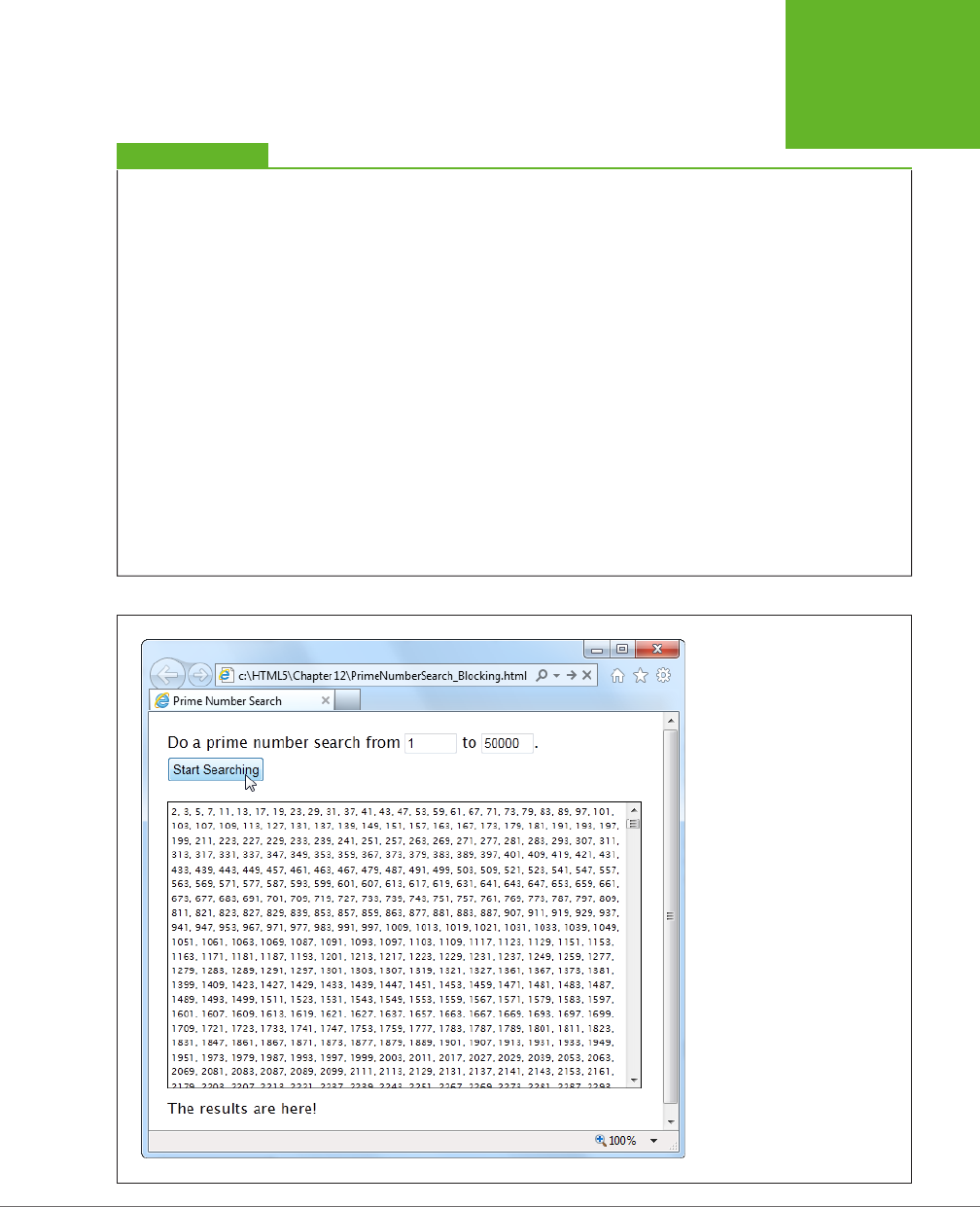
CHAPTER 13: GEOLOCATION, WEB WORKERS, AND HISTORY MANAGEMENT 415
WEB WORKERS
UP TO SPEED
Web Worker Safety Measures
JavaScript’s web worker lets your code work in the background
while something else takes place in the foreground. This brings
up a well-known theme of modern programming: If an applica-
tion can do two things at once, one of them has the potential
to mess up the other.
The problem occurs when two different pieces of code fight
over the same data, at the same time. For example, one piece
of code may attempt to read some data, while another attempts
to set it. Or both may attempt to set a variable at the same
time, causing one change to be overwritten. Or two pieces of
code may attempt to manipulate the same object in different
ways, pushing it into an inconsistent state. The possible issues
are endless, and they’re notoriously difficult to discover and
solve. Often, a multithreaded application (that’s an application
that uses several
threads
of independently executing code)
works fine during testing. But when you start using it in the
real world, maddeningly inconsistent errors appear.
Fortunately, you won’t face these problems with JavaScript’s
web workers feature. That’s because it doesn’t let you share
the same data between your web page and your web workers.
You can
send
data from your web page to a web worker (or
vice versa), but JavaScript automatically makes a copy of your
data and sends that. That means there’s no possible way for
two threads to get hold of the same memory slot at the same
time and cause subtle issues. Of course, this simplified model
also restricts some of the things that web workers can do, but
a minor reduction in capabilities is the cost of making sure
ambitious programmers can’t shoot themselves in the foot.
FIGURE 13-4
Pick your range and click the
button to start the search. Pick
a relatively narrow range (like
this one, from 1 to 50,000), and
the task completes in seconds,
without inconveniencing anyone.
But launch a broader search (say,
from 1 to 500,000) and your page
could become unresponsive for
minutes or more. You won’t be
able to click, scroll, or interact
with anything—and the browser
may even give you a “long-
running script” warning or gray
out the entire page.
www.it-ebooks.info

HTML5: THE MISSING MANUAL, SECOND EDITION
416
WEB WORKERS
The markup is short and concise. The page uses two <input> controls, one for each
text box. It also includes a button to start the search and two <div> elements, one
to hold the results and another to hold the status message underneath. Here’s the
complete markup from inside the <body> element:
<p>Do a prime number search from <input id="from" value="1"> to
<input id="to" value="20000">.</p>
<button id="searchButton" onclick="doSearch()">Start Searching</button>
<div id="primeContainer">
</div>
<div id="status"></div>
One interesting detail is the styling of the <div> element that holds the prime number
list. It’s given a fixed height and a maximum width, and the overflow and overflow-
x properties work together to add a vertical scroll bar (but not a horizontal one):
#primeContainer {
border: solid 1px black;
margin-top: 20px;
margin-bottom: 10px;
padding: 3px;
height: 300px;
max-width: 500px;
overflow: scroll;
overflow-x: hidden;
font-size: x-small;
}
The JavaScript code is a bit longer, but not much more complicated. It retrieves the
numbers from the text boxes, starts the search, and then adds the prime number
list to the page. It doesn’t actually perform the mathematical operations that find
the prime numbers—this is handled through a separate function, which is named
findPrimes() and stored in a separate JavaScript file.
TIP You don’t need to see the
findPrimes()
function to understand this example or web workers—all
you need is a suitably long task. However, if you’re curious to see the math that makes this page work, or if
you just want to run a few prime number searches yourself, check out the full code on the try-out site at
http://
prosetech.com/html5
.
Here’s the complete code for the doSearch() function:
function doSearch() {
// Get the numbers for the search range.
var fromNumber = document.getElementById("from").value;
var toNumber = document.getElementById("to").value;
www.it-ebooks.info

CHAPTER 13: GEOLOCATION, WEB WORKERS, AND HISTORY MANAGEMENT 417
WEB WORKERS
// Perform the prime search. (This is the time-consuming step.)
var primes = findPrimes(fromNumber, toNumber);
// Loop over the array of prime numbers, and paste them together into
// one long piece of text.
var primeList = "";
for (var i=0; i<primes.length; i++) {
primeList += primes[i];
if (i != primes.length-1) primeList += ", ";
}
// Insert the prime number text into the page.
var displayList = document.getElementById("primeContainer");
displayList.innerHTML = primeList;
// Update the status text to tell the user what just happened.
var statusDisplay = document.getElementById("status");
if (primeList.length == 0) {
statusDisplay.innerHTML = "Search failed to find any results.";
}
else {
statusDisplay.innerHTML = "The results are here!";
}
}
As you can see, the markup and code is short, simple, and to the point. Unfortunately,
if you plug in a large search you’ll find that it’s also as slow and clunky as riding a
golf cart up a steep hill.
Doing Work in the Background
The web worker feature revolves around a new object called the Worker. When you
want to run something in the background, you create a new Worker, give it some
code, and send it some data.
Here’s an example that creates a new web worker that runs the code in the file
named
PrimeWorker.js
:
var worker = new Worker("PrimeWorker.js");
The code that a worker runs is
always
stored in a separate JavaScript file. This design
discourages newbie programmers from writing web worker code that attempts
to use global variables or directly access elements on the page. Neither of these
operations is possible.
NOTE Browsers enforce a strict separation between your web page and your web worker code. For example,
there’s no way for the code in
PrimeWorker.js
to write prime numbers into a
<div>
element. Instead, your worker
code needs to send its data back to JavaScript code on the page, so the web page code can display the results.
www.it-ebooks.info
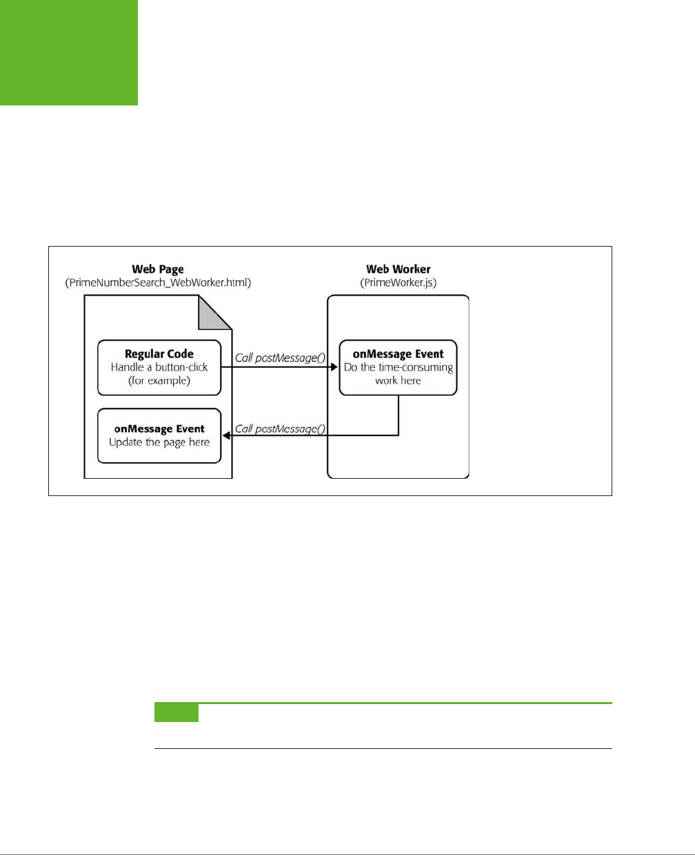
HTML5: THE MISSING MANUAL, SECOND EDITION
418
WEB WORKERS
Web pages and web workers communicate by exchanging messages. To send data
to a worker, you call the worker’s postMessage() method:
worker.postMessage(myData);
The worker then receives an onMessage event that provides a copy of the data. This
is when it starts working.
Similarly, when your worker needs to talk back to the web page, it calls its own post-
Message() method, along with some data, and the web page receives an onMessage
event. Figure 13-5 shows this interaction close up.
FIGURE 13-5
Here’s the web workers
feature at its simplest. There
are three basic steps: The
page sends the worker some
data, the worker runs, and
the worker sends back some
data.
There’s one more wrinkle to consider before you dive in. The postMessage() func-
tion allows only a single value. This fact is a stumbling block for the prime number
cruncher, because it needs
two
pieces of data (the two numbers in the range). The
solution is to package these two details into an object literal (see page 469). This
code shows one example, which gives the object two properties (the first named
from, and the second named to), and assigns values to both of them:
worker.postMessage(
{ from: 1,
to: 20000 }
);
NOTE Incidentally, you can send virtually any object to a worker. Behind the scenes, the browser uses JSON
(page 329) to convert your object to a harmless piece of text, duplicate it, and re-objectify it.
With these details in mind, you can revise the doSearch() function you saw earlier.
Instead of performing the prime number search itself, the doSearch() function cre-
ates a worker and gets it to do the real job:
www.it-ebooks.info

CHAPTER 13: GEOLOCATION, WEB WORKERS, AND HISTORY MANAGEMENT 419
WEB WORKERS
var worker;
function doSearch() {
// Disable the button, so the user can't start more than one search
// at the same time.
searchButton.disabled = true;
// Create the worker.
worker = new Worker("PrimeWorker.js");
// Hook up to the onMessage event, so you can receive messages
// from the worker.
worker.onmessage = receivedWorkerMessage;
// Get the number range, and send it to the web worker.
var fromNumber = document.getElementById("from").value;
var toNumber = document.getElementById("to").value;
worker.postMessage(
{ from: fromNumber,
to: toNumber }
);
// Let the user know that things are on their way.
statusDisplay.innerHTML = "A web worker is on the job ("+
fromNumber + " to " + toNumber + ") ...";
}
Now the code in the
PrimeWorker.js
file springs into action. It receives the onMes-
sage event, performs the search, and then posts a new message back to the page,
with the prime list:
onmessage = function(event) {
// The object that the web page sent is stored in the event.data property.
var fromNumber = event.data.from;
var toNumber = event.data.to;
// Using that number range, perform the prime number search.
var primes = findPrimes(fromNumber, toNumber);
// Now the search is finished. Send back the results.
postMessage(primes);
};
function findPrimes(fromNumber, toNumber) {
// (The boring prime number calculations go in this function.)
}
www.it-ebooks.info
HTML5: THE MISSING MANUAL, SECOND EDITION
420
WEB WORKERS
When the worker calls postMessage(), it fires the onMessage event, which triggers
this function in the web page:
function receivedWorkerMessage(event) {
// Get the prime number list.
var primes = event.data;
// Copy the list to the page.
...
// Allow more searches.
searchButton.disabled = false;
}
You can now use the same code you saw earlier (page 417) to convert the array of
prime numbers into a piece of text and insert that text into the web page.
Overall, the structure of the code has changed a bit, but the logic is mostly the
same. The result, however, is dramatically dierent. Now, when a long prime number
search is under way, the page remains responsive. You can scroll down, type in the
text boxes, and select numbers in the list from the previous search. Other than the
message at the bottom of the page, there’s nothing to reveal that a web worker is
plugging away in the background.
TIP Does your web worker need access to the code in another JavaScript file? There’s a simple solution
with the
importScripts()
function. For example, if you want to call functions from the
FindPrimes.js
file in
PrimeWorker.js
, just add this line of code before you do:
importScripts("FindPrimes.js");
GEM IN THE ROUGH
Running Web Workers Oine
If you take the time to prepare a complete web worker ex-
ample and upload it to a web server, you can test your page
complication-free. Of course, in the real world it’s easier to
try things out on your desktop and run them straight from
your hard drive. This method works in Firefox and current
versions of Internet Explorer, but not in Chrome—unless you
take additional steps.
If you’re running your web worker page from a local file,
Chrome will fail unless you start it with the
--allow-
file-access-from-files
parameter. In Windows, you
accomplish this by changing your Chrome shortcut (right-click
it and choose Properties) or by creating a new Chrome shortcut
and customizing that. Either way, you need to look in the Target
box and tack the parameter onto the end of the command line.
For example, you would change a shortcut like this:
C:\Users\billcruft\ ... \chrome.exe
to this:
C:\Users\billcruft\ ... \chrome.exe
--allow-file-access-from-files
Now you can try out your web worker code in the comfort and
privacy of your own computer, no uploads required.
www.it-ebooks.info

CHAPTER 13: GEOLOCATION, WEB WORKERS, AND HISTORY MANAGEMENT 421
WEB WORKERS
Handling Worker Errors
As you’ve learned, the postMessage() method is the key to communicating with
web workers. However, there’s one more way that a web worker can notify your
web page—with the onerror event that signals an error:
worker.onerror = workerError;
Now, if some dodgy script or invalid data causes an error in your background code,
the error details are packaged up and sent back to the page. Here’s some web page
code that simply displays the text of the error message:
function workerError(error) {
statusDisplay.innerHTML = error.message;
}
Along with the message property, the error object also includes a lineno and file-
name property, which report the line number and file name where the error occurred.
Canceling a Background Task
Now that you’ve built a basic web worker example, it’s time to add a few refine-
ments. First is cancellation support, which lets your page shut down a worker in
mid-calculation.
There are two ways to stop a worker. First, a worker can stop itself by calling close().
More commonly, the page that created the worker will shut it down by calling the
worker’s terminate() method. For example, here’s the code you can use to power
a straightforward cancel button:
function cancelSearch() {
worker.terminate();
statusDisplay.innerHTML = "";
searchButton.disabled = false;
}
Click this button to stop the current search and re-enable the search button. Just
remember that once a worker is stopped in this way, you can’t send any more mes-
sages, and it can’t be used to do any more operations. To perform a new search,
you need to create a new worker object. (The current example does this already,
so it works perfectly.)
Passing More Complex Messages
The last trick you’ll learn to do with a web worker is return progress information.
Figure 13-6 shows a revised version of the web worker page that adds this feature.
www.it-ebooks.info
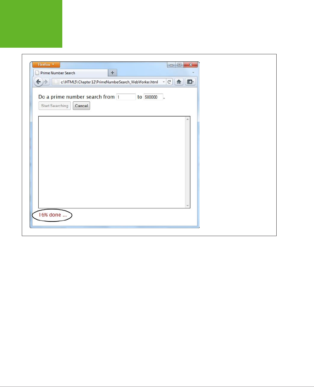
HTML5: THE MISSING MANUAL, SECOND EDITION
422
WEB WORKERS
FIGURE 13-6
As the prime number search is under
way, the search updates the status
display to tell you how close the
task is to completion. For a fancier
display, you could use a color-filling
progress bar like the one on page
165.
To build the progress display, the web worker needs to send the progress percentage
to the page while it works. But as you already know, web workers have just one way
to talk to the pages that own them—with the postMessage() method. So to create
this example, the web worker needs to send
two
types of messages: progress noti-
fications (while the work is under way) and the prime number list (when the work is
finished). The trick is making the dierence between these two messages clear, so the
onMessage event handler in the page can easily distinguish between the two types.
The best approach is to add a bit of extra information to the message. For example,
when the web worker sends progress information, it can slap the text label “Prog-
ress” on its message. And when the web worker sends the prime number list, it can
add the label “PrimeList.”
To bundle all the information you want together in one message, you need to create
an object literal. This is the same technique the web page used to send the num-
ber range data to the web worker. The extra piece of information is the text that
describes the type of message, which is placed in a property called messageType in
this example. The actual data goes in a second property, named data.
www.it-ebooks.info

CHAPTER 13: GEOLOCATION, WEB WORKERS, AND HISTORY MANAGEMENT 423
WEB WORKERS
Here’s how you would rewrite the web worker code to add a message type to the
prime number list:
onmessage = function(event) {
// Perform the prime number search.
var primes = findPrimes(event.data.from, event.data.to);
// Send back the results.
postMessage(
{messageType: "PrimeList", data: primes}
);
};
The code in the findPrimes() function also uses the postMessage() method to send
a message back to the web page. It uses the same two properties—messageType and
data. But now the messageType indicates that the message is a progress notification,
and data holds the progress percentage:
function findPrimes(fromNumber, toNumber) {
...
// Calculate the progress percentage.
var progress = Math.round(i/list.length*100);
// Only send a progress update if the progress has changed at least 1%.
if (progress != previousProgress) {
postMessage(
{messageType: "Progress", data: progress}
);
previousProgress = progress;
}
...
}
When the page receives a message, it needs to start by checking the messageType
property to determine what sort of message it has just received. If it’s a prime list,
then the results are shown in the page. If it’s a progress notification, then the prog-
ress text is updated:
function receivedWorkerMessage(event) {
var message = event.data;
if (message.messageType == "PrimeList") {
var primes = message.data;
// Display the prime list. This code is the same as before.
...
}
www.it-ebooks.info
HTML5: THE MISSING MANUAL, SECOND EDITION
424
WEB WORKERS
else if (message.messageType == "Progress") {
// Report the current progress.
statusDisplay.innerHTML = message.data + "% done ...";
}
}
NOTE There’s another way to design this page. You could get the worker to call
postMessage()
every
time it finds a prime number. The web page would then add each prime number to the list and show it in the
page immediately. This approach has the advantage of showing results as they arrive. However, it also has the
drawback of continually interrupting the page (because the web worker will find prime numbers quite quickly).
The ideal design depends on the nature of your task—how long it takes to complete, whether partial results are
useful, how quickly each partial result is calculated, and so on.
POWER USERS’ CLINIC
More Ways to Use a Web Worker
The prime number search uses web workers in the most
straightforward way possible—to perform one well-defined
task. Every time the search is started, the page creates a new
web worker. That web worker is responsible for a single task.
It receives a single message and sends a single message back.
Your pages don’t need to be this simple. Here are a few
examples of how you can extend your web-worker designs to
do more complicated things:
• Reuse a web worker for multiple jobs. When a worker
finishes its work and reaches the end of the
onMessage
event handler, it doesn’t die. It simply goes idle and waits
quietly. If you send the worker another message, it springs
back to life and does the work.
• Create multiple web workers. Your page doesn’t need to
stick to one worker. For example, imagine you want to
let a visitor launch several prime number searches at a
time. You could create a new web worker for each search
and keep track of all your workers in an array. Each time
a web worker responds with its list of prime numbers,
you add that to the page, taking care not to overwrite
any other worker’s result. (However, some words of
caution are in order. Web workers have a relatively high
overhead, and running a dozen at once could swamp the
computer with work.)
• Create web workers inside a web worker. A web worker
can start its own web workers, send them messages, and
receive their messages back. This technique is useful for
complex computational tasks that require recursion, like
calculating the Fibonacci sequence.
• Download data with a web worker. Web workers can
use the
XMLHttpRequest
object (page 377) to
grab new pages or to send requests to a web service.
When they get the information they need, they can call
postMessage()
to send it up to the page.
• Do periodic tasks with a web worker. Web workers can use
the
setTimeout()
and
setInterval()
functions,
just like ordinary web pages. For example, you might
create a web worker that checks a website for new data
every minute.
Browser Compatibility for Web Workers
The web worker feature isn’t supported as broadly as the geolocation feature. Table
13-1 shows which browsers you can rely on.
www.it-ebooks.info
CHAPTER 13: GEOLOCATION, WEB WORKERS, AND HISTORY MANAGEMENT 425
HISTORY
MANAGEMENT
TABLE 13-1
Browser support for web workers
IE FIREFOX CHROME SAFARI OPERA
SAFARI
IOS
CHROME
FOR
ANDROID
Minimum
version
10 3.5 3 4 10.6 5 29
So what can you do if you face a browser that doesn’t have web worker support?
The easiest option is to simply do the same work in the foreground:
if (window.Worker) {
// Web workers are supported.
// So why not create a web worker
// and start it?
} else {
// Web workers aren't available.
// You can just call the prime search
// function, and wait.
}
This approach doesn’t force you to write any extra code, because the prime-number-
searching function is already written, and you can call it with or without a web worker.
However, if you have a long task, this approach could lock up the browser for a bit.
So if you use this strategy, it’s wise to warn the user (for example, with a message
on the page), that he’s using a less-supported browser and the calculation process
may temporarily freeze up the page.
An alternate (but more tedious) approach is to try to fake a background job using
the setInterval() or setTimeout() methods. For example, you could write some
code that tests just a few numbers every interval. Some polyfills even attempt to
add this sort of system (see the Web Workers section on
http://tinyurl.com/polyfills
),
but this approach gets messy quickly.
History Management
Session history is an HTML5 add-on that extends the capabilities of the JavaScript
history object. This sounds simple, but the trick is knowing when and why you
should use it.
If you’ve never noticed the history object before, don’t be alarmed. Up until now, it’s
had very little to oer. In fact, the traditional history object has just one property and
three basic methods. The property is
length
, and it tells you how many entries are
www.it-ebooks.info

HTML5: THE MISSING MANUAL, SECOND EDITION
426
HISTORY
MANAGEMENT
in the browser’s History list (the list of recently visited web pages that the browser
maintains as you skip from page to page across the Web). Here’s an example that
uses it:
alert("You have " + history.length +
" pages in your browser's history list.");
The most useful history method is back(). It lets you send a visitor one step back
in the browsing history:
history.back();
This method has the same eect as if the visitor clicked the browser’s Back button.
Similarly, you can use the forward() method to step forward, or the go() method
to move a specified number of steps backward or forward.
All this adds up to relatively little, unless you want to design your own custom Back
and Forward buttons on a web page. But HTML5 adds a bit more functionality, which
you can put to far more ambitious purposes. The centerpiece is the pushState()
method, which lets you change the URL in the browser window without triggering a
page refresh. This comes in handy in a specific scenario—namely, when you’re build-
ing dynamic pages that quietly load new content and seamlessly update themselves.
In this situation, the page’s URL and the page’s content can become out of sync.
For example, if a page loads content from another page, the first page’s URL stays
in the browser’s address box, which can cause all sorts of bookmarking confusion.
Session history gives you a way to patch this hole.
If you’re having a bit of trouble visualizing this scenario, hold on. In the next section,
you’ll see a page that’s a perfect candidate for session history.
The URL Problem
In the previous chapter, you considered a page about Chinese tourism that had a
built-in slideshow (page 382). Using the Previous and Next buttons on this page,
the viewer could load dierent slides. But the best part about this example is that
each slide was loaded quietly and unobtrusively and without reloading the page,
thanks to the trusty XMLHttpRequest object.
Pages that include dynamic content and use this sort of design have a well-known
limitation. Even though the page changes when it loads in new content, the URL
stays the same in the browser’s address bar (Figure 13-7).
To understand the problem, imagine that Joe reads the article shown in Figure 13-7,
looks at the dierent sights, and is excited by the wishing tree in the fifth slide. Joe
bookmarks the page, sends the URL to his friend Claire via email, and promotes it
to the whole world with a Twitter message (“Throwing paper into a tree beats drop-
ping coins in a fountain. Check it out at http://…”). The problem is that when Joe
returns to his bookmark, or when Claire clicks the link in the email, or when any of
Joe’s followers visit the link in the tweet, they all end up at the first slide. They may
not have the patience to click through to the fifth slide, or they may not even know
www.it-ebooks.info
CHAPTER 13: GEOLOCATION, WEB WORKERS, AND HISTORY MANAGEMENT 427
HISTORY
MANAGEMENT
where it is. And this problem grows worse if there are more than just five slides—for
example, a Flickr photo stream could have dozens or hundreds of pictures.
FIGURE 13-7
Here are two versions
of the
ChinaSites.html
page, with different slides
loaded. In both pages, the
URL stays the same (it’s
ChinaSites.html
).
The Old Solution: Hashbang URLs
To deal with this problem, some web pages tack extra information onto the end
of the URL. Just a few years ago, leading sites like Facebook, Twitter, and Google
fell over themselves in excitement to implement a controversial strategy called the
hashbang
technique. To use the hashbang technique, you add the characters #! at
the end of any URL, followed by some additional information. Here’s an example:
http://jjtraveltales.com/ChinaSites.html#!/Slide5
The reason the hashbang approach works is because browsers treat everything after
the # character as the
fragment
portion of a URL. So in the example shown here,
the web browser knows that you’re still referring to the same
ChinaSites.html
page,
just with an extra fragment added to the end.
On the other hand, consider what happens if your JavaScript code changes the URL
without using the # character:
http://jjtraveltales.com/ChinaSites.html/Slide5
Now the web browser will immediately send this request to the web server and
attempt to download a new page. This isn’t what you want.
So how would you implement the hashbang technique? First, you need to change
the URL that appears in the browser whenever your page loads a new slide. (You
can do this by setting the location.href property in your JavaScript code.) Second,
you need to check the URL when the page first loads, retrieve the fragment, and
www.it-ebooks.info
HTML5: THE MISSING MANUAL, SECOND EDITION
428
HISTORY
MANAGEMENT
fetch the corresponding bit of dynamic content from the web server. All of this adds
up to a fair bit of juggling, but you can use a JavaScript library like PathJS (
https://
github.com/mtrpcic/pathjs
) to make life much easier.
Recently, the hashbang technique has fallen into disrepute, and many of its former
supporters have dropped it altogether (for the reasons discussed in the box on this
page). However, hashbangs still turn up in some heavily tracked sites, like Google
Groups.
UP TO SPEED
Why Nobody Likes Hashbangs
In recent Web history, the hashbang approach was widely used
but deeply controversial. Today, web designers are backing
away from it for a number of reasons:
• Complex URLs. Facebook is a good example of the
problem. In the past, it wouldn’t take much browsing
before the browser’s URL would be polluted with extra
information, as in
http://www.facebook.com/profile.
php?id=1586010043#!/pages/Haskell/401573824771
. Now
designers use session history, if the browser supports it.
• Inflexibility. Hashbang pages store a lot of information
in the URL. If you change the way a hashbanged page
works, or the way it stores information, old URLs could
stop working, which is a major website fail.
• Search engine optimization. Search engines may treat
different hashbanged URLs as essentially the same page.
In the
ChinaSites.html
page, that means you won’t get a
separately indexed page for each tourist site—in fact,
search engines might ignore this information altogether.
This means that if someone searches for “china wishing
tree,” the
ChinaSites.html
page might not turn up as a
match.
• Cool URLs matter. Cool URLs are web page addresses that
are short, clear, and—most importantly—never change.
Tim Berners-Lee, the creator of the Web, explains the
philosophy at
www.w3.org/Provider/Style/URI.html
. And
no matter how strongly you feel about keeping good web
content alive, hashbang URLs are difficult to maintain
and unlikely to survive the next stage in web evolution.
Although webmasters differ over how much they tolerate the
hashbang approach, most agree that it’s a short stage of web
development that soon will be replaced by HTML5’s session
history feature.
The HTML5 Solution: Session History
HTML5’s session history feature provides a dierent solution to the URL problem. It
gives you a way to change the URL to whatever you want, without needing to stick
in funny characters like the hashbang. For example, when the
ChinaSites.html
page
loads the fourth slide, you could change the URL to look like this:
http://jjtraveltales.com/ChinaSites4.html
When you do this, the browser won’t actually attempt to request a page named
ChinaSites4.html
. Instead, it keeps the current page, with the newly loaded slide,
which is exactly what you want. The same is true if the visitor goes back through
the browser history. For example, if a visitor moves to the next slide (and the URL
changes to
ChinaSites5.html
) and then clicks the Back button (returning the URL
to
ChinaSites4.html
), the browser sticks with the current page and raises an event
that gives you the chance to load the matching slide and restore the right version
of the page.
www.it-ebooks.info

CHAPTER 13: GEOLOCATION, WEB WORKERS, AND HISTORY MANAGEMENT 429
HISTORY
MANAGEMENT
So far, this sounds like a perfect solution. However, there’s a significant drawback.
If you want this system to work the way it’s intended, you actually need to create a
page for every URL you use. In this example, that means you need to create
China-
Sites1.html
,
ChinaSites2.html
,
ChinaSites3.html
, and so on. That’s because surfers
might go directly to those pages—for example, when returning through a bookmark,
typing the link in by hand, clicking it in an email message, and so on. For big web
outfits (like Facebook or Flickr), this is no big deal, because they can use a scrap of
server-side code to serve up the same slide content in a dierent package. But if
you’re a small-scale web developer, it might be a bit more work. For some options
on how to handle the challenge, see the box on page 431.
Now that you understand how session history fits into your pages (the hard part),
actually using it is easy. In fact, session history consists of just two methods and a
single event, all of which are added to the history object.
The most important of these is the pushState() method, which lets you change the
web page portion of the URL to whatever you want. For security reasons, you can’t
change the rest of the URL. (If you could, hackers would have a powerful tool for
faking other people’s websites—including, say, the Gmail sign on a bank transac-
tion form.)
Here’s an example that changes the web page part of the URL to ChinaSites4.html:
history.pushState(null, null, "ChinaSites4.html");
The pushState() method accepts three arguments. The third one is the only essential
detail—it’s the URL that appears in the browser’s address bar.
The first argument is any piece of data you want to store to represent the current
state of this page. As you’ll see, you can use this data to restore the page state if the
user returns to this URL through the browser’s History list. The second argument is
the page title you want the browser to show. All browsers are currently unified in
ignoring this detail. If you don’t want to set either the state or the title, just supply
a
null
value, as shown above.
Here’s the code you’d add to the
ChinaSites.html
page to change the URL to match
the currently displayed slide. You’ll notice that the current slide number is used for
the page state. That detail will become important in a moment, when you consider
the onPopState event:
function nextSlide() {
if (slideNumber == 5) {
slideNumber = 1;
} else {
slideNumber += 1;
}
history.pushState(slideNumber, null, "ChinaSites" + slideNumber + ".html");
goToNewSlide();
return false;
}
www.it-ebooks.info
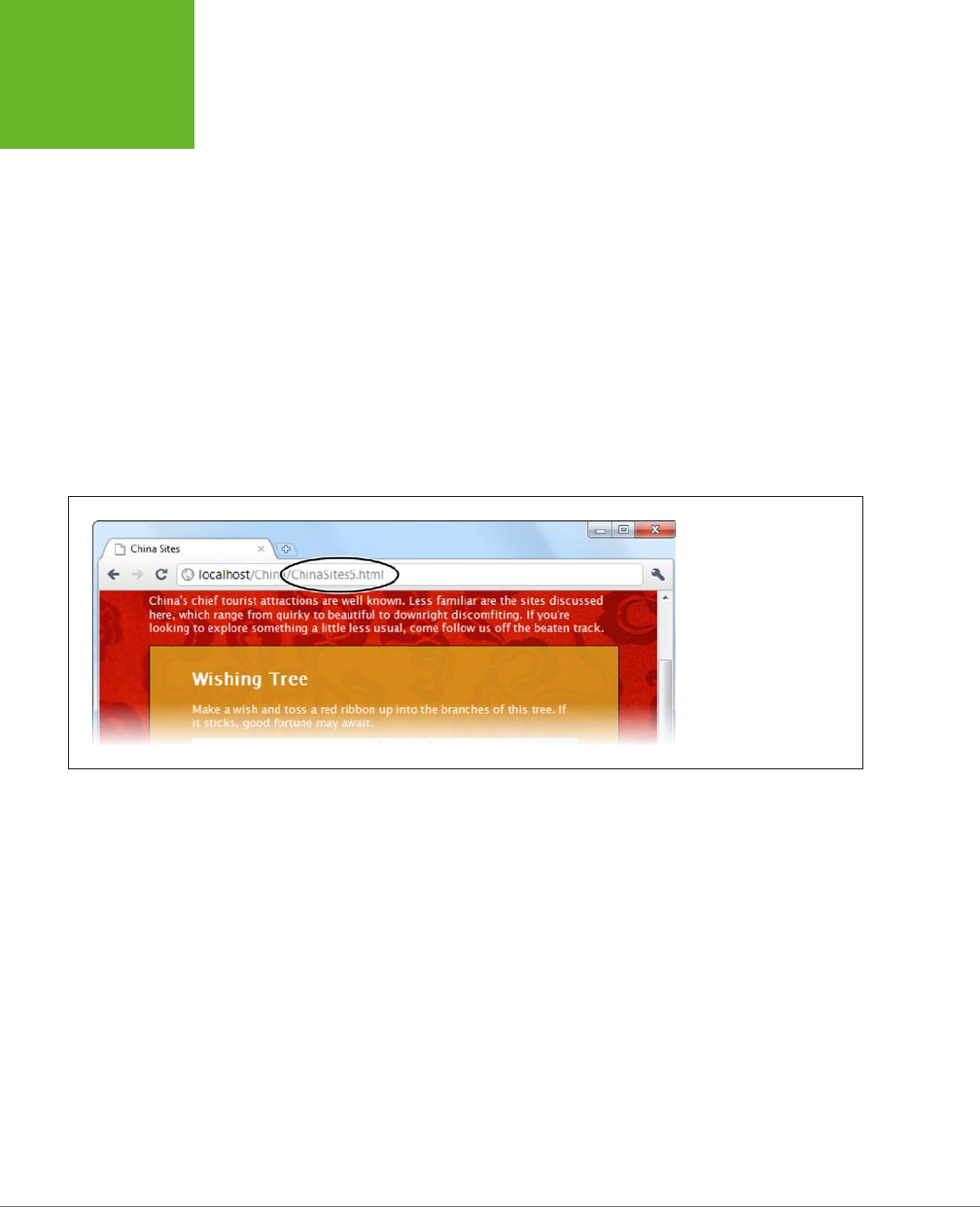
HTML5: THE MISSING MANUAL, SECOND EDITION
430
HISTORY
MANAGEMENT
function previousSlide() {
if (slideNumber == 1) {
slideNumber = 5;
} else {
slideNumber -= 1;
}
history.pushState(slideNumber, null, "ChinaSites" + slideNumber + ".html");
goToNewSlide();
return false;
}
The goToNewSlide() function hasn’t changed from the first version of this example
(page 385). It still uses the XMLHttpRequest object to fetch the data for the next
slide, asynchronously.
Figure 13-8 shows the new URL management system at work.
FIGURE 13-8
As a visitor clicks through
the slides, the URL changes
to match. The URL that ap-
pears is clean and sensible,
and it refers to exactly the
right spot in the slideshow.
If you use the pushState() method, you’ll also need to think about the onPopState
event, which is its natural counterpart. While the pushState() method puts a new
entry into the browser’s History list, the onPopState event gives you the chance to
deal with it when the user returns.
To understand how it works, consider what happens if a visitor works through all the
slides. As she clicks through, the URL in the address bar changes from
ChinaSites.
html
to
ChinaSites1.html
, then
ChinaSites2.html
,
ChinaSites3.html
, and so on. Even
though the page hasn’t actually changed, all of these URLs are added to the browser’s
history. If the user clicks back to get to a previous slide (for example, moving from
ChinaSites3.html
to
ChinaSites2.html
), the onPopState event is triggered. It provides
your code with the state information you stored earlier, with pushState(). Your job
is to use that to restore the page to its proper version. In the current example, that
means loading the corresponding slide:
window.onpopstate = function(e) {
if (e.state != null) {
www.it-ebooks.info
CHAPTER 13: GEOLOCATION, WEB WORKERS, AND HISTORY MANAGEMENT 431
HISTORY
MANAGEMENT
// What's the slide number for this state?
// (You could also snip it out of the URL, using the location.href
// property, but that's more work.)
slideNumber = e.state;
// Request this slide from the web server.
goToNewSlide();
}
};
You’ll notice that this example checks to see if there is any state object before it
does its work. That’s because some browsers (including Chrome) fire the onPopState
event the first time a page is loaded, even if you haven’t yet called pushState().
NOTE There’s one more new history method, but it’s used a lot less frequently—
replaceState()
. You
can use
replaceState()
to change the state information that’s associated with the current page, without
adding anything to the History list.
UP TO SPEED
Creating Extra Pages to Satisfy Your URLs
Session history follows the original philosophy of the Web:
Every piece of content should be identified with a unique,
durable URL. Unfortunately, this means you’ll need to make
sure that these URLs lead visitors back to the content they want,
which is a much stickier affair. For example, when someone
types in a request for
ChinaSites3.html
, you need to grab the
main content from
ChinaSites.html
and the slide content from
ChinaSites3_slide.html
and somehow stick it together.
If you’re a hard-core web programmer, you can write code that
runs on the web server, intercepts web requests, and carries out
this assembly process on the fly. But if you don’t have serious
codemaster skills, you’ll need to use a different approach.
The simplest option is to make a separate file for each URL—in
other words, actually create the files
ChinaSites1.html
,
China-
Sites2.html
,
ChinaSites3.html
, and so on. Of course, you don’t
want to duplicate the slide content in more than one place
(for example, in both
ChinaSites3.html
and
ChinaSites3_slide.
html
), because that would create a maintenance nightmare.
Fortunately, there are two simple approaches that can simplify
your life:
• Use server-side includes. If your web server supports
this technique (and most do), you can use a special coded
instruction like the following:
<!--#include file="footer.html" -->
Although it looks like a comment, this tells the web server
to open the file and insert its contents at that position in
the markup. Using this technique, you can insert the main
content and the slide content into each slide-specific page.
In fact, each slide-specific web page file (
ChinaSites1.html
,
ChinaSites2.html
, and so on) will need just a few lines of
markup to create a basic shell of a page.
• Use templates in a web design tool. Some web design
tools, like Adobe Dreamweaver, allow you to create web
templates that can be copied to as many pages as you
want. So if you create a template that has the main content
and style details, you can reuse it to create all the slide-
specific pages you need, quickly and easily.
www.it-ebooks.info
HTML5: THE MISSING MANUAL, SECOND EDITION
432
HISTORY
MANAGEMENT
Browser Compatibility for Session History
Session history has roughly the same level of support as the web workers feature.
Once again, it’s pre–IE 10 versions of Internet Explorer that are most likely to cause
a problem (see Table 13-2).
TABLE 13-2
Browser support for session history
IE FIREFOX CHROME SAFARI OPERA
SAFARI
IOS ANDROID
Minimum
version
10 4 8 5 11.5 5 4.2
There are two ways you can handle a browser that doesn’t support session history.
If you do nothing at all, the fancy URLs just won’t appear. This is what you get if you
load the previous example in Internet Explorer—no matter what slide you load up,
the URL stays fixed at
ChinaSites.html
. Flickr also uses this approach with its photo
streams (to see an example, view
http://tinyurl.com/6hnvanw
with an old version
of Internet Explorer).
Another choice is to trigger a full page refresh when the user loads new content on a
browser that doesn’t support session history. This makes sense if providing a good,
meaningful URL is more important that providing the slick experience of dynami-
cally loaded content. However, this approach also takes more work to implement.
One easy way to do it is to enhance your navigation logic so that it performs a
page redirect if necessary. In the
ChinaSites.html
page, that involves enhancing the
goToNextSlide() function, like this:
function goToNewSlide() {
if (window.history) {
// Session history support is available.
if (req != null) {
req.open("GET", "ChinaSites" + slideNumber + "_slide" + ".html", true);
req.onreadystatechange = newSlideReceived;
req.send();
}
else {
// There was a problem. Ignore it.
}
}
else {
// There's no session history support, so direct the browser to a new page.
window.location = "ChinaSites" + slideNumber + ".html"
}
}
This code checks for session history using the window.history property. If support
is there, the code downloads just the small chunk of slide data you need and loads
it into the existing page. But if session support isn’t available, the code abandons
this fancy approach and performs an old-school redirect to the new page.
www.it-ebooks.info


435
APPENDIX
A
It’s no exaggeration to say that modern web design wouldn’t be possible without
CSS
, the Cascading Style Sheet standard. CSS allows even the most richly format-
ted, graphically complex web pages to outsource the formatting work to a separate
document—a
style sheet
. This keeps the web page markup clean, clear, and readable.
To get the most out of HTML5 (and this book), you need to be familiar with the CSS
standard. If you’re a CSS pro, don’t worry about this appendix—carry on with the
material in the rest of the book, and pay special attention to Chapters 6 and 7, which
introduce many of the new style features that CSS3 adds. But if your CSS skills are a
bit rusty, this appendix will help to refresh your memory before you go any further.
NOTE This appendix gives a very quick (and not comprehensive) rundown of CSS. If you’re still overwhelmed,
consult a book that deals with CSS in more detail, like
CSS3: The Missing Manual
by David Sawyer McFarland.
Adding Styles to a Web Page
There are three ways to use styles in a web page.
The first approach is to embed style information directly into an element using the
style attribute. Here’s an example that changes the color of a heading:
<h1 style="color: green">Inline Styles are Sloppy Styles</h1>
This is convenient, but it clutters the markup terribly. You have to style every line,
one by one.
Essential CSS
www.it-ebooks.info
HTML5: THE MISSING MANUAL, SECOND EDITION
436
THE ANATOMY
OF A STYLE
SHEET
The second approach is to embed an entire style sheet in a <style> element, which
you must place in the page’s <head> section:
<head>
<title>Embedded Style Sheet Test</title>
<style>
...
</style>
</head>
This code separates the formatting from your web page markup but still keeps
everything together in one file. This approach makes sense for one-o formatting
tasks (when you don’t want to reuse your formatting choices in another page), and
it’s a good choice for simple tests and examples, like the ones included with this
book. However, it’s not so great for a real-world, professional website, because it
leads to long, bloated pages.
The third approach is to link to a separate style sheet file by adding a <link> ele-
ment to the <head> section. Here’s an example that tells a web browser to apply the
styles from the style sheet named
SampleStyles.css
:
<head>
<title>External Style Sheet Test</title>
<link rel="stylesheet" href="SampleStyles.css">
</head>
This approach is the most common and the most powerful. It gives you the flex-
ibility to reuse your styles in other pages. If you want, you can further divide your
styles into multiple style sheets and link to as many as you need in any HTML page.
NOTE A simple philosophy underpins modern web development. HTML markup is for structuring a page into
logical sections (paragraphs, headings, lists, images, links, and so on), while a CSS style sheet is for formatting
it (by specifying fonts, colors, borders, backgrounds, and layout). Follow this rule, and your web pages will be
easy to edit. You’ll also be able to change the formatting and layout of your entire website simply by modifying
its linked style sheet. (To see a truly impressive example of style sheet magic, check out
www.csszengarden.com
,
where one website is given more than 200 different faces, simply by swapping in different style sheets.)
The Anatomy of a Style Sheet
A style sheet is a text file, which you’ll usually place on a web server alongside your
HTML pages. It contains one or more
rules
. The order of these rules doesn’t matter.
www.it-ebooks.info

APPENDIX A: ESSENTIAL CSS 437
THE ANATOMY
OF A STYLE
SHEET
Each rule applies one or more formatting details to one or more HTML elements.
Here’s the structure of a simple rule:
selector {
property: value;
property: value;
}
And here’s what each part means:
• The selector identifies the type of content you want to format. A browser
hunts down all the elements in the web page that match your selector. There
are many dierent ways to write a selector, but one of the simplest approaches
(shown next) is to identify the elements you want to format by their element
names. For example, you could write a selector that picks out all the level-one
headings in your page.
• The property identifies the type of formatting you want to apply. Here’s where
you choose whether you want to change colors, fonts, alignment, or something
else. You can have as many property settings as you want in a rule—this ex-
ample has two.
• The value sets a value for the property. For example, if your property is color,
the value could be light blue or a queasy green.
Now here’s a real rule that does something:
h1 {
text-align: center;
color: green;
}
Pop this text into a style sheet and save it (for example, as
SampleStyles.css
). Then,
take a sample web page (one that has at least one <h1> heading) and add a <link>
element that refers to this style sheet. Finally, open this page in a browser. You’ll
see that the <h1> headings don’t have their normal formatting—instead, they will
be centered and green.
CSS Properties
The previous example introduces two formatting properties: text-align (which sets
how text is positioned, horizontally) and color (which sets the text color).
There are many, many more formatting properties for you to play with. Table A-1
lists some of the most commonly used. In fact, this table lists almost all the style
properties you’ll encounter in the examples in this book (not including the newer
CSS3 properties that are described in Chapters 6 and 7).
www.it-ebooks.info
HTML5: THE MISSING MANUAL, SECOND EDITION
438
THE ANATOMY
OF A STYLE
SHEET
TABLE A-1
Commonly used style sheet properties, by category
PROPERTIES
Colors color
background-color
Spacing margin
padding
margin-left, margin-right, margin-top, margin-bottom
padding-left, padding-right, padding-top, padding-bottom
Borders border-width
border-style
border-color
border (to set the width, style, and color in one step)
Text alignment text-align
text-indent
word-spacing
letter-spacing
line-height
white-space
Fonts font-family
font-size
font-weight
font-style
font-variant
text-decoration
@font-face (for using fancy web fonts; see page 206)
Size width
height
Layout position
left, right
float, clear
Graphics background-image
background-repeat
background-position
TIP If you don’t have a style sheet book on hand, you can get an at-a-glance overview of all the properties
listed here (and more) at
www.htmldog.com/reference/cssproperties
. You can also get more information about
each property, including a brief description of what it does and the values it allows.
Formatting the Right Elements with Classes
The previous style sheet rule formatted all the <h1> headings in a document. But in
more complex documents, you need to pick out specific elements and give them
distinct formatting.
www.it-ebooks.info

APPENDIX A: ESSENTIAL CSS 439
THE ANATOMY
OF A STYLE
SHEET
To do this, you need to give these elements a name with the class attribute. Here’s
an example that creates a class named ArticleTitle:
<h1 class="ArticleTitle">HTML5 is Winning</h1>
Now you can write a style sheet rule that formats only this heading. The trick is to
write a selector that starts with a period, followed by the class name, like this:
.ArticleTitle {
font-family: Garamond, serif;
font-size: 40px;
}
Now, the <h1> that represents the article title is sized up to be 40 pixels tall.
You can use the class attribute on as many elements as you want. In fact, that’s the
idea. A typical style sheet is filled with class rules, which take web page markup and
neatly carve it into stylable units.
Finally, it’s worth noting that you can create a selector that uses an element type
and a class name, like this:
h1.ArticleTitle {
font-size: 40px;
}
This selector matches any <h1> element that uses the ArticleTitle class. Sometimes,
you may write this sort of style rule just to be clear. For example, you may decide to
write your rule this way to make it clear that the ArticleTitle applies only to <h1>
headings and shouldn’t be used anywhere else. But most of the time, web designers
just create straight classes with no element restrictions.
NOTE Different selectors can overlap. If more than one selector applies to the same element, they will both
take effect, with the most general being applied first. For example, if you have a rule that applies to all headings
and a rule that applies to the class named
ArticleTitle
, the all-headings rule is applied first, followed by
the class rule. As a result, the class rule can override the properties that are set in the all-headings rule. If two
rules are equally specific, the one that’s defined last in the style sheet wins.
Style Sheet Comments
In a complicated style sheet, it’s sometimes worth leaving little notes to remind
yourself (or to let other people know) why a style sheet rule exists and what it’s
designed to do. Like HTML, CSS lets you add comments, which the web browser
ignores. However, CSS comments don’t look like HTML comments. They always
start with the characters /* and end with the characters */. Here’s an example of
a somewhat pointless comment:
/* The heading of the main article on a page. */
.ArticleTitle {
font-size: 40px;
}
www.it-ebooks.info
HTML5: THE MISSING MANUAL, SECOND EDITION
440
SLIGHTLY
MORE
ADVANCED
STYLE SHEETS
Slightly More Advanced Style Sheets
You’ll see an example of a practical style sheet in a moment. But first you need to
consider a few of the finer points of style-sheet writing.
Structuring a Page with <div> Elements
When working with style sheets, you’ll often use the <div> element to wrap up a
section of content:
<div>
<p>Here are two paragraphs of content.</p>
<p>In a div container.</p>
</div>
On its own, the <div> does nothing. But it gives you a convenient place to apply
some class-based style sheet formatting. Here are some examples:
• Inherited values. Some CSS properties are
inherited
, which means the value
you set in one element is automatically applied to all the elements inside. One
example is the set of font properties—set them on a <div>, and everything in-
side gets the same text formatting (unless you override it in places with more
specific formatting rules).
• Boxes. A <div> is a natural container. Add a border, some spacing, and a dif-
ferent background color (or image), and you have a way to make select content
stand out.
• Columns. Professional websites often carve their content up into two or three
columns. One way to make this happen is to wrap the content for each column
in a <div>, and then use CSS positioning properties to put them in their proper
places.
TIP Now that HTML5 has introduced a new set of semantic elements, the
<div>
element doesn’t play quite
as central a role. If you can replace a
<div>
with another, more meaningful semantic element (like
<header>
or
<figure>
), you should do that. But when nothing else fits, the
<div>
remains the go-to tool. Chapter 2
has a detailed description of all the semantic elements.
The <div> element also has a smaller brother named <span>. Like the <div> element,
the <span> element has no built-in formatting. The dierence is that <div> is a block
element, designed to wrap separate paragraphs or entire sections of content, while
<span> is an inline element that’s meant to wrap smaller portions of content inside
a block element. For example, you can use <span> to apply custom formatting to a
few words inside a paragraph.
NOTE CSS encourages good design. How? If you want to use CSS effectively, you need to properly plan your
web page’s structure. Thus, the need for CSS encourages even casual web-page writers to think seriously about
how their content is organized.
www.it-ebooks.info

APPENDIX A: ESSENTIAL CSS 441
SLIGHTLY
MORE
ADVANCED
STYLE SHEETS
Multiple Selectors
Sometimes, you might want to define some formatting that applies to more than one
element or more than one class. The trick is to separate each selector with a comma.
For example, consider these two heading levels, which have dierent sizes but share
the same title font:
h1 {
font-family: Impact, Charcoal, sans-serif;
font-size: 40px;
}
h2 {
font-family: Impact, Charcoal, sans-serif;
font-size: 20px;
}
You could pull the font-family setting into a separate rule that applies to both
heading levels, like this:
h1, h2 {
font-family: Impact, Charcoal, sans-serif;
}
h1 {
font-size: 40px;
}
h2 {
font-size: 20px;
}
It’s important to understand that this isn’t necessarily a better design. Often, it’s
better to duplicate settings because that gives you the most flexibility to change
formatting later on. If you have too many shared properties, it’s more awkward to
modify one element type or class without aecting another.
Contextual Selectors
A contextual selector matches an element
inside
another element. Here’s an example:
.Content h2 {
color: #24486C;
font-size: medium;
}
This selector looks for an element that uses the Content class. Then it looks for <h2>
elements inside that element and formats them with a dierent text color and font
size. Here’s an example of an element it will format:
www.it-ebooks.info

HTML5: THE MISSING MANUAL, SECOND EDITION
442
SLIGHTLY
MORE
ADVANCED
STYLE SHEETS
<div class="Content">
...
<h2>Mayan Doomsday</h2>
...
</div>
In the first example, the first selector is a class selector, and the second selector
(the contextual one) is an element type selector. However, you can change this up
any way you want. Here’s an example:
.Content .LeadIn {
font-variant: small-caps;
}
This selector looks for an element in the LeadIn class, wrapped inside an element
in the Content class. It matches this element:
<div class="Content">
<p><span class="LeadIn">Right now</span>, you're probably feeling pretty
good. After all, life in the developed world is comfortable ...</p>
...
</div>
Once you get the hang of contextual selectors, you’ll find that they’re quite straight-
forward and ridiculously useful.
ID Selectors
Class selectors have a closely related cousin called
ID selectors
. Like a class selector,
the ID selector lets you format just the elements you choose. And like a class selec-
tor, the ID selector lets you pick a descriptive name. But instead of using a period,
you use a number-sign character (#):
#Menu {
border-width: 2px;
border-style: solid;
}
As with class rules, browsers don’t apply ID rules unless you specifically tell them
to in your HTML. However, instead of switching on the rules with a class attribute,
you do so with the id attribute. For example, here’s a <div> element that uses the
Menu style:
<div id="Menu">...</div>
At this point, you’re probably wondering why you would use an ID selector—after
all, the ID selector seems almost exactly the same as a class selector. But there’s one
dierence: You can assign a given ID to just
one
element in a page. In the current
example, that means only one <div> can be labeled as a Menu. This restriction doesn’t
apply to class names, which you can reuse as many times as you like.
www.it-ebooks.info

APPENDIX A: ESSENTIAL CSS 443
SLIGHTLY
MORE
ADVANCED
STYLE SHEETS
That means the ID selector is a good choice if you want to format a single, never-
repeated element on your page. The advantage is that the ID selector clearly indicates
the special importance of that element. For example, if a page has an ID selector
named Menu or NavigationBar, the web designer knows there’s only one menu or
navigation bar on that page. Of course, you never
need
to use an ID selector. Some
web designers use class selectors for everything, whether the section is unique or
not. It’s a matter of personal preference.
NOTE The
id
attribute also plays an important role in JavaScript, letting web page designers identify a
specific element so it can be manipulated in code. The examples in this book use ID rules whenever an element
already uses the
id
attribute for JavaScript, which avoids setting both the
id
attribute and the
class
attribute.
In every other case, the examples use class rules, regardless of whether or not the element is unique.
Pseudo-Class Selectors
So far, the selectors you’ve seen have been straightforward. They’ve taken a single,
obvious piece of information into consideration, like the element type, class name, or
ID name.
Pseudo-classes
are a bit more sophisticated. They take extra information
into account—information that might not be set in the markup or might be based
on user actions.
For most of CSS history, browsers have supported just a few pseudo-classes, which
were mostly designed for formatting links. The :link pseudo-class formats any link
that points to a new, unvisited location. The :visited pseudo-class applies to any
link that points to a location the reader has already visited. The :hover pseudo-class
formats a link when a visitor moves the mouse over it, and the :active pseudo-class
formats a link as a reader clicks it, before releasing the mouse button. As you can
see, pseudo-classes always start with a colon (:).
Here’s a style rule that uses pseudo-classes to create a misleading page—one where
visited links are blue and unvisited links are red:
a:link {
color: red;
}
a:visited {
color: blue;
}
You can also use pseudo-classes with a class name:
.BackwardLink:link {
color: red;
}
.BackwardLink:visited {
color: blue;
}
www.it-ebooks.info
HTML5: THE MISSING MANUAL, SECOND EDITION
444
SLIGHTLY
MORE
ADVANCED
STYLE SHEETS
Now an anchor element needs to specify the class name to display your new style,
as shown here:
<a class="BackwardLink" href="...">...</a>
Pseudo-classes aren’t just a way to format links. The :hover pseudo-class is use-
ful for applying animated eects and creating fancy buttons. It’s used with CSS3
transitions, as explained in Chapter 6 (page 195).
NOTE CSS3 also introduces some more advanced pseudo-classes that take other details into consideration,
like the position of an element relative to other elements or the state of an input control in a web form. These
pseudo-classes aren’t described in this book, but you can learn about them from a Smashing Magazine article at
http://tinyurl.com/pc-css3
.
Attribute Selectors
Attribute selection is a feature oered by CSS3 that lets you format a specific type
of element that also has a specific value set for one of its attributes. For example,
consider the following style rule, which applies only to text boxes:
input[type="text"] {
background-color:silver;
}
First, this selector grabs all the <input> elements. Then, it filters down its selection to
include just those <input> elements that have a type attribute set to "text", which
it then formats. In the following markup, that means the first <input> element gets
the silver background but the second doesn’t:
<label for="name">Name:</label><input id="name" type="text"><br>
<input type="submit" value="OK">
Technically, you don’t need to include the type="text" attribute in the first <input>
element, because that’s the default value. If you leave it out, the attribute selector
still works, because it pays attention to the current value of the attribute and doesn’t
care how that value is defined in your markup.
Similarly, you could create a rule that formats the caption for this text box but ig-
nores all other labels:
label[for="name"] {
width: 200px;
}
NOTE You can still get a bit fancier with attribute selectors. For example, you can match a combination of
attribute values, or match part of an attribute value. These techniques are awfully clever but inject too much
complexity into the average style sheet. To get the lowdown, see the CSS3 standard for selectors at
http://
tinyurl.com/s-css3
.
www.it-ebooks.info
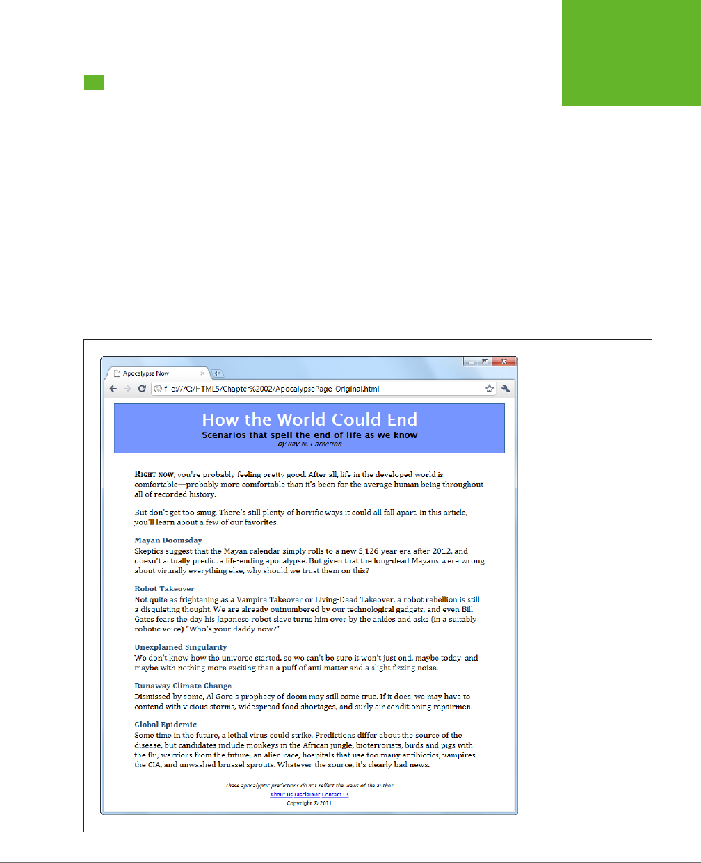
APPENDIX A: ESSENTIAL CSS 445
A STYLE SHEET
TOUR
A Style Sheet Tour
Chapter 2 shows how you can learn to use HTML5’s semantic elements by revising
a straightforward, but nicely formatted page called
ApocalypsePage_Original.html
(Figure A-1). This page links to a style sheet named
ApocalypsePage_Original.css
:
<!DOCTYPE html>
<html lang="en">
<head>
<title>Apocalypse Now</title>
<link rel="stylesheet" href="ApocalypsePage_Original.css">
</head>
...
The style sheet is straightforward and relatively brief, weighing in somewhere over
50 lines. In this section, you’ll dissect each one of its style rules.
FIGURE A-1
The styles in this page are
simple, but they follow the
basic organizational prin-
ciples that you’ll see put
into practice throughout
this book.
www.it-ebooks.info

HTML5: THE MISSING MANUAL, SECOND EDITION
446
A STYLE SHEET
TOUR
First, the style sheet begins with a selector that targets the <body> element, which is
the root of the entire web page. This is the best place to set inherited values that you
want to apply, by default, to the rest of the document. Examples include margins,
padding, background color, the font, and the width:
body {
font-family: "Lucida Sans Unicode", "Lucida Grande", Geneva, sans-serif;
max-width: 800px;
}
When setting the font-family property in CSS, you should follow two rules. First,
use a web-safe font—one of the small number of fonts that are known to work on
virtually all web-connected computers (see
http://tinyurl.com/ws-fonts
for a list).
Second, use a font list that starts with the specific variant you want, followed by
other possible fallbacks, and ends with serif or sans-serif (two font instructions
that all browsers understand). If you prefer to use a fancy font that the user must
download from your web server, check out the CSS3 web font feature on page 206.
The body rule also sets a maximum width, capping it at 800 pixels. This rule prevents
overly long, unreadable lines when the browser window is made very wide. There
are other possible techniques for handling this situation, including splitting the text
into columns (page 217), using CSS media queries (page 231), or creating a sidebar
to soak up the additional space. However, although setting a fixed 800-pixel width
isn’t the most glamorous solution, it’s a common approach.
Next in the style sheet is a class-specific rule that formats the header region at the
top of the page:
.Header {
background-color: #7695FE;
border: thin #336699 solid;
padding: 10px;
margin: 10px;
text-align: center;
}
NOTE In this example, the header is simply a
<div>
with the class name
Header
. However, Chapter 2
explains how you might consider replacing that with HTML5’s
<header>
element.
There’s a lot of information packed into this rule. The background-color property
can be set, like all CSS colors, using a color name (which provides relatively few
choices), an HTML color code (as done here), or the rgb() function (which specifies
the red, green, and blue components of the color). The examples in this book use
all three approaches, with color names in simple examples and color codes and the
rgb() function in more realistic examples.
www.it-ebooks.info

APPENDIX A: ESSENTIAL CSS 447
A STYLE SHEET
TOUR
Incidentally, every HTML color code can be written with the rgb() function, and vice
versa. For example, you can write the color in the above example using the rgb()
function, like this:
background-color: rgb(118,149,254);
TIP To actually get the RGB values for the color you want, try an online color picker, or look the numbers up
in your favorite drawing or graphics program.
The header rule also draws a thin border around its edges. It uses the all-in-one
border property to specify the border thickness, border color, and border style
(for example, solid, dashed, dotted, double, groove, ridge, inset, or outset) in
one property setting.
With the background color and border details out of the way, the header rule sets
10 pixels of padding (between the content inside and the border) and 10 pixels of
margin space (between the border and the surrounding web page). Finally, the text
inside the header is centered.
The following three rules use contextual selectors to control how elements are
formatted inside the header. The first one formats <h1> elements in the header:
.Header h1 {
margin: 0px;
color: white;
font-size: xx-large;
}
TIP When setting a font size, you can use keywords (like the
xx-large
value used here). Or, if you want
precise control, you can supply an exact measurement using pixels or em units.
The next two rules format two classes, named Teaser and Byline, which are also
inside the header:
.Header .Teaser {
margin: 0px;
font-weight: bold;
}
.Header .Byline {
font-style: italic;
font-size: small;
margin: 0px;
}
www.it-ebooks.info

HTML5: THE MISSING MANUAL, SECOND EDITION
448
A STYLE SHEET
TOUR
This code works because the header contains two <span> elements. One <span> has
the class name Teaser, and contains the subtitle. The second <span> has the author
information, and uses the class name Byline. Here’s the relevant portion of markup:
<div class="Header">
<h1>How the World Could End</h1>
<p class="Teaser">Scenarios that spell the end of life as we know it</p>
<p class="Byline">by Ray N. Carnation</p>
</div>
Next up is a rule that formats a <div> with the class name Content. It holds the
main body of the page. The accompanying style sheet rule sets the font, padding,
and line height:
.Content {
font-size: medium;
font-family: Cambria, Cochin, Georgia, "Times New Roman", Times, serif;
padding-top: 20px;
padding-right: 50px;
padding-bottom: 5px;
padding-left: 50px;
line-height: 120%;
}
Whereas the header rule set the padding to be the same on all sides, the content
rule sets dierent padding on each side, adding more space above and the most
space on the sides. One way to do that is to specify the expanded padding proper-
ties (like padding-top, padding-right, and so on), as done here. Another option is
to use the padding property with a series of values in a particular order—top, right,
bottom, left. Here’s how you can replace the expanded padding properties with
just one property:
padding: 20px 50px 5px 50px;
Generally, you’ll use this form when setting the padding on all sides, but you’ll use
the expanded padding properties if you want to change the padding on only certain
sides. Of course, it’s really a matter of taste.
The final line-height property sets the space between adjacent lines. The value of
120% gives some extra spacing, for a more readable feel.
Following the content rule are three contextual selectors that format elements inside.
The first rule formats a span with the class name LeadIn. It’s used to put the first
two words in large, bold, small-cap lettering:
.Content .LeadIn {
font-weight: bold;
font-size: large;
font-variant: small-caps;
}
www.it-ebooks.info

APPENDIX A: ESSENTIAL CSS 449
A STYLE SHEET
TOUR
The next two rules change how the <h2> and <p> elements are formatted in the
content region:
.Content h2 {
color: #24486C;
margin-bottom: 2px;
font-size: medium;
}
.Content p {
margin-top: 0px;
}
As you can see, as a style sheet grows longer it doesn’t necessarily become more
complex. Here, the style sheet simply repeats the same basic techniques (class selec-
tors and contextual selectors), but uses them to format other parts of the document.
Finally, the style sheet ends with the rules that format the footer portion. By now,
you can interpret these on your own:
.Footer {
text-align: center;
font-size: x-small;
}
.Footer .Disclaimer {
font-style: italic;
}
.Footer p {
margin: 3px;
}
This rounds out the
ApocalypsePage_Original.css
style sheet. Feel free to download
it from the try-out site (
http://prosetech.com/html5
) and try tweaking it to see what
happens. Or, check out Chapter 2, which revises this page and the accompanying
style sheet to use the HTML5 semantic elements.
www.it-ebooks.info

451
APPENDIX
B
There was a time when the Web was all about markup. Pages held text and
HTML tags, and not much more. Really advanced websites used server scripts
that could tweak the HTML markup before it made its way to the browser, but
the code stopped there.
Crack open a web page today and you’re likely to find buckets of JavaScript code,
powering everything from vital features to minor frills. Self-completing text boxes,
pop-up menus, slideshows, real-time mapping, and webmail are just a few examples
of the many ways crafty developers put JavaScript to work. In fact, it’s nearly impos-
sible to imagine a Web
without
JavaScript. While HTML is still the language of the
Web, JavaScript is now the brains behind its most advanced pages.
In this appendix, you’ll get a heavily condensed JavaScript crash course. This appen-
dix won’t provide a complete tutorial on JavaScript, nor does it have enough informa-
tion to help you get started if you’ve never written a line of code in any programming
language, ever. But if you have some rudimentary programming knowledge—say,
you once learned a lick of Visual Basic, picked up the basics of Pascal, or took C
out for spin—this appendix will help you transfer your skills to the JavaScript world.
You’ll get just enough information to identify familiar programming ingredients
like variables, loops, and conditional logic. And you’ll cover all the basic language
elements that are used in the JavaScript-based examples in the rest of this book.
TIP If you need more help to get started with JavaScript, check out
JavaScript & jQuery: The Missing Manual
by David Sawyer McFarland, which also introduces jQuery, a popular JavaScript-enhancing toolkit. Or read Mozilla’s
detailed JavaScript guide at
http://developer.mozilla.org/JavaScript
.
JavaScript: The
Brains of Your Page
www.it-ebooks.info

HTML5: THE MISSING MANUAL, SECOND EDITION
452
HOW A WEB
PAGE USES
JAVASCRIPT
How a Web Page Uses JavaScript
Before you can run a line of JavaScript, you need to know where to put it in your web
page. It all starts with the <script> element. The following sections show you how
to take a page from quick-and-dirty JavaScript injection to a properly structured
example that you can put online without embarrassment.
Embedding Script in Your Markup
The simplest way to use the <script> element is to stick it somewhere in your HTML
markup, like this:
<!DOCTYPE html>
<html lang="en">
<head>
<meta charset="utf-8">
<title>A Simple JavaScript Example</title>
</head>
<body>
<p>At some point in the processing of this page, a script block
will run and show a message box.</p>
<script>
alert("We interrupt this web page with a special JavaScript announcement.");
</script>
<p>If you get here, you've already seen it.</p>
</body>
</html>
This script block contains just one line of code, although you could just as easily
pack it with a sequence of operations. In this case, the single line of code triggers
JavaScript’s built-in alert() function. The alert() function accepts a piece of text
and shows that text in a message box (see Figure B-1). To move on, the user must
click the OK button.
NOTE This example introduces a JavaScript convention that you’ll see throughout this book, and on good
websites everywhere: the semicolon. In JavaScript, semicolons indicate the end of each programming statement.
Strictly speaking, semicolons aren’t necessary (unless you want to cram multiple statements on a single line).
However, they’re considered good style.
If you want to run some JavaScript right away (as in this example), you’ll probably
put the <script> section at the end of the <body> section, just before the final
</body> tag. That way, it runs only after the browser has processed all the page
markup.
www.it-ebooks.info
APPENDIX B: JAVASCRIPT: THE BRAINS OF YOUR PAGE 453
HOW A WEB
PAGE USES
JAVASCRIPT
FIGURE B-1
When the web browser comes across
JavaScript code, it runs it immediately.
In fact, it even halts the page process-
ing, temporarily. In this case, the code is
held up until the web page user closes
the message box by clicking OK. This al-
lows the code to continue and the script
block to end. The web browser then
processes the rest of the markup.
GEM IN THE ROUGH
Dealing with Internet Explorer’s Paranoia
If you run the alert example above in Firefox or Chrome, you’ll
find that everything works seamlessly. If you run it in Internet
Explorer, you won’t get the same satisfaction. Instead, you’ll
see a security warning in a yellow bar at the top or bottom
of the page (depending on the version of IE). Until you go to
that bar and click “Allow blocked content,” your JavaScript
code won’t run.
At first glance, IE’s security warning seems like a surefire way to
scare off the bravest web visitor. But you don’t need to worry;
the message is just part of the quirky way Internet Explorer
deals with web pages that you store on your hard drive. When
you access the same page over the Web, Internet Explorer won’t
raise the slightest objection.
That said, the security warning is still an annoyance while
you’re testing your web page, because it forces you to keep
explicitly telling the browser to allow the page to run JavaScript.
To avoid the security notice altogether, you can tell Internet
Explorer to pretend you downloaded your page from a web
server. You do this by adding a special comment called the
mark of the Web
. You place this comment in the
<head>
section of your page:
<head>
<meta charset="utf-8">
<!-- saved from url=(0014)about:internet
-->
...
</head>
When IE sees the mark of the Web, it treats the page as though
it came from a web server, skipping the security warning and
running your JavaScript code without hesitation. To all other
browsers, the mark of the Web just looks like an ordinary
HTML comment.
www.it-ebooks.info

HTML5: THE MISSING MANUAL, SECOND EDITION
454
HOW A WEB
PAGE USES
JAVASCRIPT
Using a Function
The problem with the previous example is that it encourages you to mingle code
and markup in an unseemly mess. To keep things organized, you should wrap each
code “task” in a
function
—a named unit of code that you can call into action when-
ever you need it.
When you create a function, you should give it a logical name. Here’s a function
named showMessage():
function showMessage() {
// Code goes here ...
}
The function
body
—its guts—includes everything between the opening { bracket
and the closing } bracket. Inside these delimiters, a function can hold as many lines
of code as you need. Right now, the showMessage() function contains a single line,
which is the “Code goes here” comment. (A JavaScript comment is a line that starts
with two slash characters. The browser ignores all comments—you add them to
remind yourself of important details or inform others about what the code is doing.)
To add some code to your function, just put all the statements you need between
the curly brackets:
function showMessage() {
alert("We interrupt this web page with a special JavaScript announcement.");
}
Of course, this whole shebang needs to go in a <script> block. The best place to put
JavaScript functions is in the <head> section. This imposes some basic organization
on your page, by moving the code out of the markup and into a separate section.
Here’s a revamped version of the earlier example, which now uses a function:
<!DOCTYPE html>
<html lang="en">
<head>
<meta charset="utf-8">
<title>A Simple JavaScript Example</title>
<script>
function showMessage() {
alert("We interrupt this web page with a special JavaScript announcement.");
}
</script>
</head>
...
Functions, on their own, don’t do anything. To trigger a function, you need another
piece of code that
calls
the function.
Calling a function is easy—in fact, you’ve already seen how to do it with the built-
in alert() function. You simply write the function name, followed by a set of
www.it-ebooks.info

APPENDIX B: JAVASCRIPT: THE BRAINS OF YOUR PAGE 455
HOW A WEB
PAGE USES
JAVASCRIPT
parentheses. Inside the parentheses, you put whatever data the function needs.
Or, if the function doesn’t accept any data, like showMessage(), you simply include
parentheses with nothing inside them:
...
<body>
<p>At some point in the processing of this page, a script block
will run and show a message box.</p>
<script>
showMessage();
</script>
<p>If you get here, you've already seen it.</p>
</body>
</html>
In this example, the function and the code that calls the function are in separate
<script> blocks. This design isn’t necessary, but it’s used here to emphasize the
separation between these two pieces.
At first glance, adding a function seems to make this example more complicated
than before. But it’s actually a dramatic step forward in design, for several reasons:
• The bulk of the code is out of the markup. You need just one line of code to
call a function. However, a realistic function will contain a pile of code, and a
realistic page will contain a pile of functions. You definitely want to separate all
those details from your markup.
• You can reuse your code. Once code is in a function, you can call that function
at dierent times, from dierent places in your code. This isn’t obvious in this
simple example, but it becomes an important factor in more complex applica-
tions, like the painting application in Chapter 8.
• You’re ready to use external script files. Moving your code out of the markup
is a precursor to moving it right out of the HTML file, as you’ll see in the next
section, for even better organization.
• You can add events. An event is a way for you to tell the page to run a specific
function when a specific occurrence takes place. Web pages are event-driven,
which means most code is fired up when an event happens (rather than being
launched through a script block). Events pair neatly with functions, as you’ll
see on page 457.
Moving the Code to a Script File
Pulling your JavaScript code together into a set of functions is the first step in
good organization. The second step is to take that script code and put it in an en-
tirely separate file. Do this with all your scripts, and you’ll get smaller, simpler web
pages—and the ability to reuse the same functions in dierent web pages. In fact,
putting script code in an external file is analogous to putting CSS style rules in an
external file. In both cases, you gain the ability to reuse your work and you leave
simpler pages behind.
www.it-ebooks.info
HTML5: THE MISSING MANUAL, SECOND EDITION
456
HOW A WEB
PAGE USES
JAVASCRIPT
NOTE Virtually every well-designed web page that uses JavaScript puts the code in one or more script files.
The only exceptions are if you have a few lines of very simple code that you’re certain not to use anywhere else,
or if you’re creating a one-off example.
Script files are always plain text files. Usually, they have the extension
.js
(which
stands for JavaScript). You put all your code inside a script file, but you don’t include
the <script> element. For example, here are the complete contents of a script file
named
MessageScripts.js
:
function showMessage() {
alert("We interrupt this web page with a special JavaScript announcement.");
}
Now save the file, and put it in the same folder as your web page. In your web page,
define a script block, but don’t supply any code. Instead, add the src attribute and
indicate the script file you want to link to:
<!DOCTYPE html>
<html lang="en">
<head>
<meta charset="utf-8">
<title>A Simple JavaScript Example</title>
<script src="MessageScripts.js"></script>
</head>
<body>
<p>At some point in the processing of this page, a script block
will run and show a message box.</p>
<script>
showMessage()
</script>
<p>If you get here, you've already seen it.</p>
</body>
</html>
When a browser comes across this script block, it requests the
MessageScripts.js
file and treats it as though the code were right inside the page. That means you can
call the showMessage() function in exactly the same way you did before.
NOTE Even though the script block doesn’t actually contain any code when you use external script files,
you must still include the closing
</script>
tag. If you leave that out, the browser assumes everything that
follows—the rest of the page—is part of your JavaScript code.
www.it-ebooks.info

APPENDIX B: JAVASCRIPT: THE BRAINS OF YOUR PAGE 457
HOW A WEB
PAGE USES
JAVASCRIPT
You can also link to JavaScript functions on another website—just remember that
the src attribute in the <script> element needs to point to a full URL (like
http://
SuperScriptSite.com/MessageScript.js
) instead of just a file name. This technique
is necessary for plugging into other companies’ web services, like Google Maps
(page 410).
Responding to Events
So far, you’ve seen how to run script right away—by weaving a script block into your
HTML markup. But it’s far more common to trigger code after the page is finished
processing, when the user takes a specific action—like clicking a button or moving
the mouse pointer over an element.
To do so, you need to use JavaScript
events
, which are notifications that an HTML
element sends out when specific things happen. For example, JavaScript gives every
element an event named onMouseOver (a compressed version of “on mouse over”).
As the name suggests, this event takes place (or
fires
, to use programmer-speak)
when a visitor moves his mouse pointer over an HTML element like a paragraph,
link, image, table cell, or text box. That action triggers the onMouseOver event and
your code flies into action.
This discussion brings up one key question: How do you link your code to the event
you want to use? The trick is to add an event attribute to the appropriate element.
So if you want to handle the onMouseOver event of an <img> element, you need
markup like this:
<img src="sunny.jpg" alt="A sunny day" onmouseover="showMessage()">
NOTE In JavaScript, function, variable, and object names are case-sensitive, meaning
showMessage
is
not the same as
showMESSAGE
(and the latter fails). However, the event attribute names are not case sensi-
tive, because they are technically a part of HTML markup, and HTML tolerates any combination of uppercase and
lowercase letters. Even so, it’s common to write event attributes with no capitals (as shown here) because this
matches the old rules of XHTML, and most programmers are too lazy to reach for the Shift key anyway.
Now, when the mouse moves over the image, and the onMouseOver event fires, the
browser automatically calls the showMessage() function. This function pops up a
rather unremarkable message box (Figure B-2). When an event triggers a function
in this way, that function is called an
event handler
.
To use events eectively, you need to know which events JavaScript supports. In
addition, you need to know which events work on which HTML elements. Table B-1
provides a list of commonly used events and the HTML elements that they apply
to. (You can find a more complete reference at
http://developer.mozilla.org/DOM/
element
.)
www.it-ebooks.info
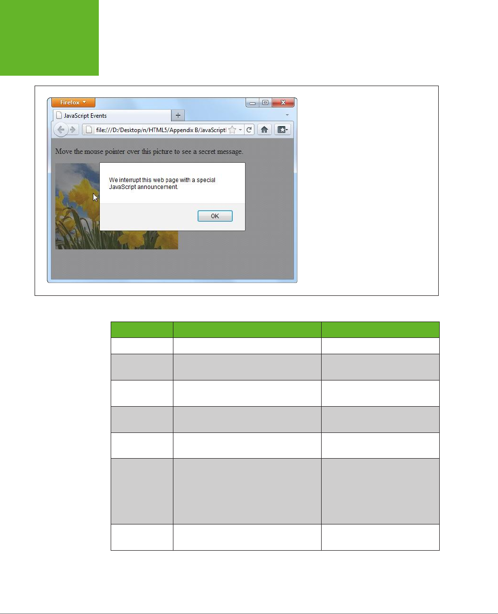
HTML5: THE MISSING MANUAL, SECOND EDITION
458
HOW A WEB
PAGE USES
JAVASCRIPT
FIGURE B-2
In this example, the alert box doesn’t pop
up until you move your mouse pointer over
the link.
TABLE B-1
Common HTML object events
EVENT NAME DESCRIPTION APPLIES TO
onClick Triggered when you click an element. Virtually all elements
onMouseOver Triggered when you move your mouse
pointer over an element.
Virtually all elements
onMouseOut Triggered when you move your mouse
pointer away from an element.
Virtually all elements
onKeyDown Triggered when you press a key. <select>, <input>, <textarea>,
<a>, <button>
onKeyUp Triggered when you release a pressed
key.
<select>, <input>, <textarea>,
<a>, <button>
onFocus Triggered when a control receives
focus
(in other words, when you position the
cursor on the control so you can type
something in). Controls include text
boxes, checkboxes, and so on—see page
108 to learn more.
<select>, <input>, <textarea>,
<a>, <button>
onBlur Triggered when focus leaves a control. <select>, <input>, <textarea>,
<a>, <button>
www.it-ebooks.info
APPENDIX B: JAVASCRIPT: THE BRAINS OF YOUR PAGE 459
A FEW
LANGUAGE
ESSENTIALS
EVENT NAME DESCRIPTION APPLIES TO
onChange Triggered when you change a value in
an input control. In a text box, this event
doesn’t fire until you move to another
control.
<select>, <input
type="text">, <textarea>
onSelect Triggered when you select a portion of
text in an input control.
<input type="text">,
<textarea>
onError Triggered when the browser fails to
download an image (usually due to an
incorrect URL).
<img>
onLoad Triggered when the browser finishes
downloading a new page or finishes
loading an object, like an image.
<img>, <body>
onUnload Triggered when a browser unloads a
page. (This typically happens after you
enter a new URL or when you click a
link. It fires just
before
the browser
downloads the new page.)
<body>
A Few Language Essentials
A brief appendix isn’t enough to cover any language, even one as straightforward
as JavaScript. However, the following sections will fill you in on a few language es-
sentials that you’ll need to digest the examples elsewhere in this book.
Variables
Every programming language has the concept of
variables
—containers that you can
use to store bits of information in memory. In JavaScript, every variable is created
the same way, by declaring it with the var keyword followed by the variable name.
This example creates a variable named myMessage:
var myMessage;
NOTE JavaScript variables are case-sensitive, which means a variable named
myMessage
differs from
one named
MyMessage
. If you try to use them interchangeably, you’ll wind up with an error message (if your
browser is nice) or a bizarre mistake in the page (which is usually what happens).
To store information in a variable, you use the equal sign (=), which copies the data
on the right side of the equal sign into the variable on the left. Here’s a one-step ex-
ample that defines a variable and puts a text value (which is known as a
string
) inside:
var myMessage = "Everybody loves variables";
www.it-ebooks.info

HTML5: THE MISSING MANUAL, SECOND EDITION
460
A FEW
LANGUAGE
ESSENTIALS
You can then use your variable:
// Show the variable text in a message box.
alert(myMessage);
NOTE JavaScript is a notoriously loose language, and it lets you use variables even if you don’t specifically
declare them with the
var
keyword. However, doing so is considered extremely bad form and is likely to lead to
sloppy mistakes.
Null Values
One special value you may run into is null, which is programmer-speak for “noth-
ing.” If a variable is null, it indicates that a given object doesn’t exist or is empty.
Depending on the context, this may signal that a specific feature is unavailable. For
example, Modernizr (page 31) uses null value tests to determine whether the browser
supports certain HTML5 features. You may also check for null values in your scripts—
for example, to determine whether you haven’t yet created or stored an object:
if (myObject == null) {
// There is no myObject in existence.
// Now might be a good time to create one.
}
Variable Scope
There are two basic places you can create a variable—inside or outside a function.
The following code snippet has one of both:
<script>
var outsideVariable;
function doSomething() {
var insideVariable;
...
}
</script>
If you create a variable inside a function (called a
local variable
), that variable ex-
ists only while that function is running. Here, insideVariable is a local variable. As
soon as the doSomething() method ends, the variable is tossed out of memory. That
means the next time the page calls doSomething(), the insideVariable is created
from scratch, with none of its previous data.
On the other hand, if you create a variable outside a function (called a
global vari-
able
), its value lasts as long as the page is loaded in the browser. Furthermore,
every function can use that variable. In the previous example, outsideVariable is
a global variable.
www.it-ebooks.info

APPENDIX B: JAVASCRIPT: THE BRAINS OF YOUR PAGE 461
A FEW
LANGUAGE
ESSENTIALS
TIP The rule of thumb is to use a local variable, unless you specifically need to share your variable with
multiple functions, or to retain its value after the function ends. That’s because it’s more trouble to keep track of
global variables, and if you use too many, your code becomes messy.
Variable Data Types
In JavaScript, variables can store dierent data types, such as text, integers, float-
ing point numbers, arrays, and objects. However, no matter what you want to store
in your variable, you define it with the same var keyword. You do
not
set the data
type of your variable.
That means you can take the myMessage variable, with its piece of text, and replace
that with a numeric value, like this:
myMessage = 27.3;
This behavior makes JavaScript easy to use, because any variable can hold any type
of content. It can also let JavaScript mistakes slip past undetected. For example,
you might want to grab the text out of a text box and put that in a variable, like this:
var = inputElement.value;
But if you’re not careful, you can accidentally end up putting the entire text box
object
into the variable, like this:
var = inputElement;
JavaScript allows both actions, so it won’t complain. But a few lines into your code, this
mistake will probably lead to some sort of unrecoverable problem. At that point, the
browser simply stops running the rest of your code, without giving you any error mes-
sage to explain what happened. In cases like these, you need the help of a Java-Script
debugging tool (see the box on page 462), which can pause your code at any time
and let you peer into your variables, so you can see what data they currently contain.
Operations
One of the most useful things you can do with numeric variables is perform
opera-
tions
on them to change your data. For example, you can use arithmetic operators
to perform mathematical calculations:
var myNumber = (10 + 5) * 2 / 5;
These calculations follow the standard order of operations (parentheses first, then
multiplication and division, then addition and subtraction). The result of this calcu-
lation is 6.
You can also use operations to join together multiple pieces of text into one long
string. In this case, you use the plus (+) operator:
var firstName = "Sarah";
var lastName = "Smithers";
var fullName = firstName + " " + lastName;
www.it-ebooks.info
HTML5: THE MISSING MANUAL, SECOND EDITION
462
A FEW
LANGUAGE
ESSENTIALS
TROUBLESHOOTING MOMENT
Identifying Errors in JavaScript Code
In order to deal with problems (like the variable mistake shown
on page 461), you need to master
debugging
—the fine art of
hunting down the problems in your code and stamping them
out. Unfortunately, the way you go about debugging depends
on the browser you’re using. Different browsers have different
debugging tools (or support different debugging extensions).
And while they all serve the same purpose, they don’t work in
exactly the same way.
Fortunately, all the information you need is on the Web. Here
are some links that can explain how to debug JavaScript
mistakes, based on your browser of choice:
• Internet Explorer. To sort out problems with IE, press F12
to pop up the Developer Tools window. To learn how to
use it, visit
http://tinyurl.com/debug-ie
.
• Firefox. Serious Firefox developers use a Firefox add-
in called Firebug to see what their code is doing at all
times. Get it (and learn more) at
http://getfirebug.com/
javascript
.
• Google Chrome. Chrome has a respectable built-in
debugger. To get started, read Google’s debugging tutorial
at
http://tinyurl.com/c-debugger
.
• Opera. Opera’s debugging tool of choice is Dragonfly. You
can learn about it at
www.opera.com/dragonfly
.
• Safari. Safari has a powerful set of built-in debugging
tools, although tracking down the documentation that
explains them can be tricky. You can start with a fairly
technical article from the Safari Developer Library at
http://tinyurl.com/safari-debug
.
Remember, it doesn’t matter what browser and debugging
tool you use to correct problems. Once they’re fixed in one
browser, they’re fixed for everyone.
Now the fullName variable holds the text “Sarah Smithers.” (The " " in the code
above tells JavaScript to leave a space between the two names).
When making simple modifications to a variable, there’s a shortcut you’re likely to
use. For example, if you have this basic addition operation:
var myNumber = 20;
myNumber = myNumber + 10;
// (Now myNumber is 30.)
You can rewrite it like this:
var myNumber = 20;
myNumber += 10;
// (Now myNumber is 30.)
This trick of moving the operator to the left side of the equal sign works with pretty
much any operator. Here are some examples:
var myNumber = 20;
myNumber -= 10;
// (Now myNumber is 10.)
myNumber *= 10;
// (Now myNumber is 100.)
www.it-ebooks.info
APPENDIX B: JAVASCRIPT: THE BRAINS OF YOUR PAGE 463
A FEW
LANGUAGE
ESSENTIALS
var myText = "Hello";
var myText += " there.";
// (Now myText is "Hello there.")
And if you want to add or subtract the number 1, there’s an even more concise
shortcut:
var myNumber = 20;
myNumber++;
// (Now myNumber is 21.)
myNumber--;
// (Now myNumber is 20.)
Conditional Logic
All conditional logic starts with a
condition
: an expression that is either true or false.
Based on the result, you can decide to run some code or to skip over it.
To create a condition, you need to rely on JavaScript’s
logical operators
, which are
detailed in Table B-2.
TABLE B-2
Logical operators
OPERATOR DESCRIPTION
== Equal to.
!= Not equal to.
=== Exactly equal to (in value
and
data type).
!== Not exactly equal to.
!Not. (This reverses the condition, so if it would ordinarily be true, it is
now false, and vice versa.)
<Less than.
>Greater than.
<= Less than or equal to.
>= Greater than or equal to.
&& Logical and (evaluates to true only if both expressions are true). If the
first expression is false, the second expression is not evaluated.
|| Logical or (evaluates to true if either expression is true). If the first
expression is true, the second expression is not evaluated.
Here’s an example of a simple condition:
myNumber < 100
www.it-ebooks.info

HTML5: THE MISSING MANUAL, SECOND EDITION
464
A FEW
LANGUAGE
ESSENTIALS
To use this condition to make decisions, you need to put it with an if statement.
Here’s an example:
if (myNumber < 100) {
// (This code runs if myNumber is 20, but not if it's 147.)
}
NOTE Technically, you don’t need the curly brackets around your conditional code, unless you have more
than one statement. However, including the brackets is always clearer and avoids potential errors if you do have
multiple statements.
When testing equality, make sure you use two equal signs. A single equal sign sets
a variable’s value, rather than performing the comparison you want:
// Right:
if (myName == "Joe") {
}
// Wrong:
if (myName = "Sarah") {
}
Although two equal signs are good, it turns out that
three
may be even better. Many
JavaScript pros prefer to test equality using the “exactly equal to” operator (that’s
===) rather than the mere “equal to” operator (==). The dierence is that the “equal
to” operator will convert data types to try to make a match, while the more strin-
gent “exactly equal to” operator insists on a perfect match of value and data type.
Here’s an example that illustrates the dierence:
var myNumberAsText = "45";
// This is true, because the "equal to" operator is willing to convert
// "45" the string to 45 the number.
if (myNumberAsText == 45) {
}
// This is false, because the data types don't match.
if (myNumberAsText === 45) {
}
In most cases, it doesn’t matter whether you use the “equal to” or “exactly equal
to” operator, but there are some rare type conversion mistakes that “exactly equal
to” can prevent. For that reason, JavaScript experts generally prefer using three
equal signs instead of two.
If you want to evaluate more than one condition, one after the other, you can use
more than one if block (naturally). But if you want to look at a series of conditions
www.it-ebooks.info

APPENDIX B: JAVASCRIPT: THE BRAINS OF YOUR PAGE 465
A FEW
LANGUAGE
ESSENTIALS
and find the first one that matches (while ignoring the others), you need the else
keyword. Here it is at work:
if (myNumber < 100) {
// (This code runs if myNumber is less than 100.)
}
else if (myNumber < 200) {
// (This code runs if myNumber is less than 200 but greater than or equal to
// 100.)
}
else {
// (In all other cases, meaning myNumber is 200 or more, this code runs.)
}
You can include as many or as few conditions as you like in an if block, and adding
a final else without a condition is also optional.
Loops
A loop is a basic programming tool that lets you repeat a block of code. The king of
JavaScript loops is the for loop. It’s essentially a loop with a built-in counter. Most
programming languages have their own version of this construct.
When creating a for loop, you set the starting value, the ending value, and the
amount to increment the counter after each pass. Here’s one example:
for (var i = 0; i < 5; i++){
// (This code executes five times.)
alert("This is message: " + i);
}
At the beginning of the for loop is a set of brackets with three important pieces of
information. The first portion (in this example, var i = 0) creates the counter vari-
able (i) and sets its initial value (0). The second portion (i < 5) sets a termination
condition. If it’s not true (for example, i is increased to 5), the loop ends and the
code inside is not repeated again. The third portion (i++), increments the counter
variable. In this example, the counter is incremented by 1 after each pass. That means
i will be 0 for the first pass, 1 for the second pass, and so on. The end result is that
the code runs five times and shows this series of messages:
This is message: 0
This is message: 1
This is message: 2
This is message: 3
This is message: 4
Arrays
The for loop pairs naturally with the
array
—a programming object that stores a
list of values.
www.it-ebooks.info
HTML5: THE MISSING MANUAL, SECOND EDITION
466
A FEW
LANGUAGE
ESSENTIALS
JavaScript arrays are remarkably flexible. Unlike in many other programming lan-
guages, you don’t define the number of items you want an array to store in JavaScript.
Instead, you simply begin by creating an empty array with square brackets, like this:
var colorList = [];
You can then add items using the array’s push() method:
colorList.push("blue");
colorList.push("green");
colorList.push("red");
Or you can place an array item in a specific position. If this memory slot doesn’t
already exist, JavaScript creates if for you, happily:
colorList[3] = "magenta";
And you can pull it out yourself, also by position:
var color = colorList[3];
NOTE Just remember that JavaScript arrays use zero-based counting: The first item in an array is in slot 0,
the second is in slot 1, and so on.
Once you have an array stocked with items, you can process each of them using a
for loop like this:
for (var i = 0; i < colorList.length; i++) {
alert("Found color: " + colorList[i]);
}
This code moves from the first item (the item at position 0) to the last item (using
the array’s length property, which reports its total item count). It shows each item
in a message box, although you could surely think of something more practical to
do with your array items.
Using a for loop to process an array is a basic technique in JavaScript. You’ll use it
often in this book, with arrays that you create yourself and ones that are provided
to you by other JavaScript functions.
Functions That Receive and Return Data
Earlier, you saw a simple function, showMessage(). When you called showMessage(),
you didn’t need to supply any data, and when it finished, it didn’t provide you with
any additional information.
Functions aren’t always that simple. In many cases, you need to send specific in-
formation to a function, or take the results of a function and use them in another
operation. For example, imagine you want to create a version of the showMessage()
function that you can use to show dierent messages. To do so, you need to make
the showMessage() function accept a single
parameter
. This parameter represents
the customized text you want to incorporate into your greeting.
www.it-ebooks.info
APPENDIX B: JAVASCRIPT: THE BRAINS OF YOUR PAGE 467
A FEW
LANGUAGE
ESSENTIALS
To add the parameter, you must first give it a name, say customMessage, and put it
in parentheses after the function name, like so:
function showMessage(customMessage) {
alert(customMessage);
}
NOTE There’s no limit to how many pieces of information a function can accept. You just need to separate
each parameter with a comma.
Inside the function, it can work with the parameters just like normal variables. In this
example, the function simply takes the supplied text and shows it in a message box.
Now, when calling the showMessage() function, you need to supply one value (called
an
argument
) for each of the function’s parameters:
showMessage("Nobody likes an argument.");
Parameters let you send information
to
a function. You can also create functions that
send information
back
to the script code that called them. The key to doing this is
the return command, which you put right at the end of your function. The return
command ends the function immediately, and spits out whatever information your
function generates.
Of course, a sophisticated function can accept
and
return information. For example,
here’s a function that multiplies two numbers (the numberA and numberB parameters)
and returns the result to anyone who’s interested:
function multiplyNumbers(numberA, numberB) {
return numberA * numberB;
}
Here’s how you use this function elsewhere on your web page:
// Pass in two numbers, and get the result.
var result = multiplyNumbers(3202, 23405);
// Use the result to create a message.
var message = "The product of 3202 and 23405 is " + result;
// Show the message.
showMessage(message);
Of course you don’t really need a function to multiply numbers (an ordinary JavaScript
calculation can do that), nor do you need a function to show a message box (because
the built-in alert() function can handle that job). But both examples do a good job
of showing you how functions tick, and you’ll use parameters and return values in
the same way in more complex functions.
www.it-ebooks.info

HTML5: THE MISSING MANUAL, SECOND EDITION
468
A FEW
LANGUAGE
ESSENTIALS
Objects
Virtually all modern programming languages include the concept of an
object
,
which is a package of related data and features that you can interact with in code.
For example, every HTML element on a web page is an object in the eyes of your
code. Using the dierent properties of this object, you can read or alter its content,
change its style, and handle its events.
Programmers often need to create their own objects, too. For example, you’ll create
circle objects in the circle-drawing example in Chapter 9 (page 294) and ball objects
for the bouncing ball example on page 304.
Objects make complex programming tasks easier, particularly when you need to
manage multiple copies of the same data structure. For example, if you need to fill
a page with bouncing balls, it would be a serious headache to create dozens and
dozens of variables to hold the position and speed of each individual ball. But if you
have a way to declare a
template
for your balls, you can reuse that single template
to create as many live ball objects as you need, whether that’s just one or eighty-
four thousand.
Most languages have a specific syntax for creating object templates. Often, these
templates are called
classes
. But JavaScript doesn’t include an ocial class feature.
This oversight is due to JavaScript’s history—it started life as a simple, streamlined
scripting language, not a serious tool for building online apps. Fortunately, clever
JavaScript programmers have found ways to fill the object gaps. Although their
tricks began as inventive-but-odd hacks, they’re now considered standard practice.
For example, if you need to define an object in JavaScript, you write an object-
definition function for it. This object-definition function is the template that takes
the place of a true class in languages like C#, Java, and Visual Basic. Here’s an
object-definition function that lets you create Person objects:
function Person() {
this.firstName = "Joe";
this.lastName = "Grapta";
}
The object-definition function has a single task. It defines, one at a time, all the
individual bits of data that constitute that object. In the case of the Person object
shown above, this includes two details: a first and last name. (You could easily add
additional details, like a date of birth, email address, and so on.) The this keyword
is the magic touch—it makes sure that each property you create will become part
of the object.
As long as you start the line with this followed by a dot, you can name the property
variable whatever you want. So the following example is an equally valid person that
stores the same data, but with dierent property names:
function Person() {
this.F_name = "Joe";
www.it-ebooks.info

APPENDIX B: JAVASCRIPT: THE BRAINS OF YOUR PAGE 469
A FEW
LANGUAGE
ESSENTIALS
this.L_name = "Grapta";
}
Now you can use the Person() function to create a new person object. The trick is
that you don’t want to call the function and trigger its code. Instead, you want to
create a new copy of the function by using the new keyword. Here’s how that works:
// Create a new Person, and store it in a variable named joePerson.
var joePerson = new Person();
Once you have a live object, you can access all its details through the property names
that you used in the object-definition function:
// Read the firstName property.
alert("His name is " + joePerson.firstName);
// Change the firstName property.
joePerson.FirstName = "Joseph";
You can improve your object-definition function so your code specifies some or
all the data details through arguments. This saves you the trouble of creating your
object and then customizing it with additional lines of code. It also makes sure your
object starts out in the correct state, avoiding potential mistakes. Here’s an example
that updates the Person() function in this way:
function Person(fname, lname) {
this.firstName = fname;
this.lastName = lname;
}
And here’s how you use the new Person() function to create two objects:
var newCustomer1 = new Person("Christy", "Shanks");
var newCustomer2 = new Person("Emilio", "Taginelle");
Page 294 has a full walkthrough of an example that uses basic object creation, and
you’ll see the same technique at work throughout this book.
Object Literals
In the previous section, you saw how to create objects in JavaScript using a function,
which acts as a template. When you want to formally define the ingredients that
make up an object, using a function is the best approach. It leads to well-organized
code and makes complex coding tasks easier. It’s the best choice when you want
to work with your objects in dierent ways and in dierent places in your code. But
sometimes you just need a quick way to create an object for a one-o task. In this
case, an
object literal
makes sense, because it requires nothing more advanced than
a pair of curly braces.
To create an object literal, you use an opening curly brace, supply a comma-separated
list of properties, and then end with a closing curly brace. You can use spacing and line
breaks to make your code more readable, but that’s not required. Here’s an example:
www.it-ebooks.info

HTML5: THE MISSING MANUAL, SECOND EDITION
470
INTERACTING
WITH THE PAGE
var personObject = {
firstName="Joe",
lastName="Grapta"
};
For each property, you specify the property name and its starting value. Thus, the
above code sets personObject.firstName to the text “Joe” and personObject.
lastName to “Grapta.”
The example on page 408 uses object literals to send information to the geolocation
system. As long as you use the right property names (the ones the getCurrentPosi-
tion() method is expecting), an object literal works perfectly.
TIP If you want to learn more about object literals, object functions, and everything else to do with custom
objects in JavaScript, check out the detailed information at
www.javascriptkit.com/javatutors/oopjs.shtml
.
Interacting with the Page
So far, you’ve seen the right way to put JavaScript in a page, but you haven’t done
anything impressive (in fact, you haven’t done anything but pop up a message
box). Before going ahead, you need to know a bit more about the role JavaScript
typically plays.
First, it’s important to understand that JavaScript code is
sandboxed
, which means
its capabilities are carefully limited. Your page can’t perform any potentially risky
tasks on your visitor’s computer, like sending orders to a printer, accessing files,
running other programs, reformatting a hard drive, and so on. This design ensures
good security, even for careless visitors.
Instead, JavaScript spends most of its time doing one of these tasks:
• Updating the page. Your script code can change elements, remove them, or
add new ones. In fact, JavaScript has complete flexibility to change every detail
about the currently displayed HTML, and can even replace the whole document.
• Retrieving data from the server. JavaScript can make new web requests from
the same web server that sent the original page. By combining this technique
with the one above, you can create web pages that seamlessly update important
information, like a list of news stories or a stock quote.
• Sending data to the server. HTML already has a way to send data to a web
server, called web forms (Chapter 4). But JavaScript can take a much more
subtle approach. It can grab bits of information out of your form controls, vali-
date them, and even transmit them to the web server, all without forcing the
browser to refresh the page.
www.it-ebooks.info
APPENDIX B: JAVASCRIPT: THE BRAINS OF YOUR PAGE 471
INTERACTING
WITH THE PAGE
The last two techniques require the XMLHttpRequest object, a JavaScript extension
that’s described on page 377. In the following sections, you’ll take a look at the first
of these, which is a fundamental part of almost every JavaScript-powered page.
Manipulating an Element
In the eyes of JavaScript, your page is much more than a static block of HTML. Instead,
each element is a live object that you can examine and modify with JavaScript code.
The easiest way to get hold of an object is to identify it with a unique name, which
you apply through the id attribute. Here’s an example:
<h1 id="pageTitle">Welcome to My Page</h1>
Once you give your element a unique ID, you can easily locate that object in your
code and have JavaScript act on it.
JavaScript includes a handy trick for locating an object: the document.getElementById()
method. Basically, document is an object that represents your whole HTML document.
It’s always available, and you can use it anytime you want. This document object,
like any object worthy of the name, gives you some handy properties and methods.
The getElementById() method is one of the coolest—it scans a page looking for a
specific HTML element.
NOTE If you’re familiar with the basics of object-oriented programming, properties and methods are old
hat. If not, you can think of
properties
as data attached to an object, and you can think of
methods
as functions
built into an object.
When you call the document.getElementById() method, you supply the ID of the
HTML element you’re looking for. Here’s an example that digs up the object for an
HTML element with the ID pageTitle:
var titleObject = document.getElementById("pageTitle");
This code gets the object for the <h1> element shown earlier and stores it in a variable
named titleObject. By storing the object in a variable, you can perform a series of
operations on it without having to look it up more than once.
So what, exactly, can you do with HTML objects? To a certain extent, the answer
depends on the type of element you’re working with. For example, if you have a
hyperlink, you can change its URL. If you have an image, you can change its source.
And there are some actions you can take with almost all HTML elements, like
changing their style or modifying the text that appears between the beginning and
ending tags. As you’ll see, you’ll find these tricks useful in making your pages more
dynamic—for example, you can change a page when a visitor takes an action, like
clicking a link. Interactions like these make visitors feel as though they’re using an
intelligent, responsive program instead of a plain, inert web page.
Here’s how you modify the text inside the just-mentioned <h1> element, for example:
titleObject.innerHTML = "This Page Is Dynamic";
www.it-ebooks.info

HTML5: THE MISSING MANUAL, SECOND EDITION
472
INTERACTING
WITH THE PAGE
This script works because it uses the
property
named innerHTML, which sets the
content that’s nested inside an element (in this case, an <h1> element with the page
title). Like all properties, innerHTML is just one aspect of an HTML object you can
alter. To write code statements like this, you need to know what properties JavaScript
lets you play with.
Obviously, some properties apply to specific HTML elements only, like the src at-
tribute that’s used to load a new picture into this <img> element:
var imgObject = document.getElementById("dayImage");
dayImage.src = "cloudy.jpg";
You can also tweak CSS properties through the style object:
titleObject.style.color = "rgb(0,191,255)";
Modern browsers boast a huge catalog of DOM properties you can use with just
about any HTML element. Table B-3 lists some of the most useful.
TABLE B-3
Common HTML object properties
PROPERTY DESCRIPTION
className Lets you retrieve or set the class attribute (see page 438). In other
words, this property determines what style (if any) this element uses.
Of course, you need to define this style in an embedded or linked style
sheet, or you’ll end up with the plain-Jane default formatting.
innerHTML Lets you read or change the HTML inside an element. The innerHTML
property is insanely useful, but it has two quirks. First, you can use it
on all HTML content, including text and tags. So if you want to put bold
text inside a paragraph, you can set innerHTML to <b>Hi</b>. Second,
when you set innerHTML, you replace all the content inside this element,
including any other HTML elements. So if you set the innerHTML of a
<div> element that contains several paragraphs and images, all of these
items disappear, to be replaced by your new content.
parentElement Provides the HTML object for the element that contains this element.
For example, if the current element is a <b> element in a paragraph, this
gets the object for the <p> element. Once you have this element, you
can modify it too.
style Bundles together all the CSS attributes that determine the appearance
of the HTML element. Technically, the style property returns a full-
fledged style object, and you need to add another dot (.) and the name
of the style attribute you want to change, as in myElement.style.
fontSize. You can use the style object to dictate colors, borders, fonts,
and even positioning.
tagName Provides the name of the HTML element for this object, without the
angle brackets. For example, if the current object represents an <img>
element, this returns the text “img.”
www.it-ebooks.info
APPENDIX B: JAVASCRIPT: THE BRAINS OF YOUR PAGE 473
INTERACTING
WITH THE PAGE
TIP HTML elements also provide a smaller set of useful methods, including some for modifying attributes,
like
getAttribute()
and
setAttribute()
; and some for adding or removing elements, like
insert-
Child()
,
appendChild()
, and
removeChild()
. To learn more about the properties and methods that
a specific HTML element supports, check out the reference at
http://developer.mozilla.org/DOM/element
.
Connecting to an Event Dynamically
On page 457, you saw how to wire up a function using an event attribute. However,
it’s also possible to connect an event to a function using JavaScript code.
Most of the time, you’ll probably stick to event attributes. However, there are cases
where that isn’t possible or convenient. One of the most common examples is when
you create an HTML object in your code and then add it to the page dynamically.
In this situation, there’s no markup for the new element, so there’s no way to use
an event attribute. (You’ll see this technique in the canvas-drawing example
in Chapter 8.) Another case is when you’re attaching an event to a built-in object
rather than an element. (You’ll see this example when you handle storage events
in Chapter 10.) For all these reasons, it’s important to understand how to wire up
events with code.
NOTE There are several different ways to attach events, but they aren’t all supported by all browsers. This
section uses the
event property
approach, which is supported by all. Incidentally, if you decide to use a JavaScript
toolkit like jQuery, you’ll probably find that it adds yet another event-attaching system, which will work on all
browsers and may provide a few extra features.
Fortunately, attaching events is easy. You simply set an event property that has the
same name as the event attribute you would normally use. For example, say you
have an <img> element like this somewhere on your page:
<img id="dayImage" src="sunny.jpg" alt="The weather">
Here’s how you tell the browser to call the swapImage() method when that image
is clicked:
var imgObject = document.getElementById("dayImage");
imgObject.onclick = swapImage;
However, don’t make this mistake:
imgObject.onclick = swapImage();
This runs the swapImage() function, takes the result (if it returns one), and uses that
to set the event handler. This is almost certainly not what you want.
To understand what really happens when the <img> element is clicked, you need to
look at the code in the swapImage() function. It grabs the <img> element and modi-
fies the src attribute to point to a new picture (see Figure B-3):
// Keep track of whether the picture has been swapped from day to night.
var dayTime = true;
www.it-ebooks.info
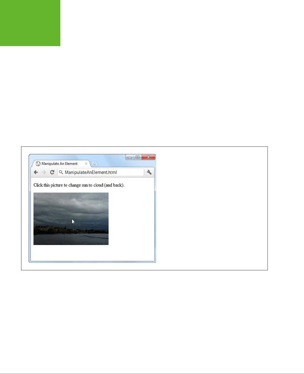
HTML5: THE MISSING MANUAL, SECOND EDITION
474
INTERACTING
WITH THE PAGE
// This function runs when the onClick event happens.
function swapImage() {
var imgObject = document.getElementById("dayImage");
// Flip from day to night or night to day, and update the picture to match.
if (dayTime === true) {
dayTime = false;
imgObject.src = "cloudy.jpg";
}
else {
dayTime = true;
imgObject.src = "sunny.jpg";
}
}
FIGURE B-3
Click this picture, and the page fires an event. That event
triggers a function, and that function loads a new image.
Sometimes, an event passes valuable information to your event-handling function.
To capture this information, you need to add a single parameter to your function.
By convention, this parameter is usually named event or just e:
function swapImage(e) {
...
}
www.it-ebooks.info
APPENDIX B: JAVASCRIPT: THE BRAINS OF YOUR PAGE 475
INTERACTING
WITH THE PAGE
The properties of the event object depend on the event. For example, the onMouse-
Move event supplies the current mouse coordinates (which you’ll use when creating
the painting program on page 263).
There’s one more fine point to note. When you use code to connect an event, you
must
put the entire event name in lowercase letters. This is dierent from when you
wire up an event using an attribute in HTML. Unlike JavaScript, HTML doesn’t care
one whit about case.
NOTE This book refers to events using an easy-to-read convention called Pascal case, which uses uppercase
letters to indicate each new word (for example,
onLoad
and
onMouseOver
). However, the code listings use
all lowercase letters (for example,
onload
and
onmouseover
) because JavaScript requires it.
Inline Events
In order for the previous example to work, the swapImage() function must be defined
somewhere else in your code. Sometimes, you may want to skip this step and define
the function code in the same place where you attach the function to the event. This
slick technique is called an
inline function
.
Here’s an example that connects an inline function to the onClick event:
var imgObject = document.getElementById("dayImage");
imgObject.onclick = function() {
// The code that went in the swapImage() function
// now goes here.
if (dayTime === true) {
dayTime = false;
imgObject.src = "cloudy.jpg";
}
else {
dayTime = true;
imgObject.src = "sunny.jpg";
}
};
This shortcut approach to event handling is less common than using a separate,
named function to handle the event. However, it’s still a useful convenience, and
the examples in this book use it occasionally.
NOTE Inline functions are sometimes useful when you’re dealing with an
asynchronous task
—a task that the
browser handles in the background. When an asynchronous task is finished, the browser fires an event to notify
your code. Sometimes, the clearest way to deal with this situation is to put the code that handles the
completion
of a task right next to the code that triggered the
start
of the task. (Page 277 shows an example with a picture
that’s loaded asynchronously and then processed.)
www.it-ebooks.info

HTML5: THE MISSING MANUAL, SECOND EDITION
476
INTERACTING
WITH THE PAGE
Finally, there’s one sort of inline function that’s used in many of the examples in
this book. It’s the event handler for the window’s onLoad event, which fires after the
entire page is rendered, displayed, and ready to go. This makes it a logical point
for your code to take over. If you try to run code before this point, you might run
into trouble if an object hasn’t been created yet for the element you want to use:
<script>
window.onload = function() {
alert("The page has just finished loading.);
}
</script>
This approach frees you from worrying about the position of your script block. It
lets you place the initialization code in the <head> section, where it belongs, with
the rest of your JavaScript functions.
www.it-ebooks.info

477
accessibility, 39
best practices, 39
canvas and, 274
video captions, 169–176
<acronym> element, 22
<address> element, 24
<a> element, 24
Android
animation performance, 303
browser support for
File API, 340
forms, 119
HTML5 audio formats, 153
HTML5 video formats, 153
IndexedDB, 353
server-sent events, 387
session history, 432
<track> element, 174
validation, 119
web sockets, 394
web workers, 425
cache, 366
calc() function, 226
embedded font formats, 208
H.264 Baseline Profile, 154
linear-gradient() function, 193
Miro Video Converter and, 156
mobile-optimized video, 154
simulators, 231
<applet> element, 22
applicationCache objects, 371–374
swapCache() method, 374
update() method, 374
Index
Symbols
3-D transforms, 204
3D Walker website, 315
$_GET collection (PHP), 378–379
$_POST collection (PHP), 379
: (colon) and pseudo-classes, 443
{} (curly brackets), 464
== (equal to), 463
=== (exactly equal to), 463
@font-face, 206–208, 213–216
@font-face property, 438
> (greater than), 463
>= (greater than or equal to), 463
< (less than), 463
<= (less than or equal to), 463
&& (logical and), 463
|| (logical or), 463
@media block, 239–241
! (not), 463
!= (not equal to), 463
!== (not exactly equal to), 463
-prefix-free JavaScript tool, 185, 201
: (semicolon)
JavaScript, 452
-webkit- vendor prefix, 183–184,
193–194, 197, 201
A
<abbr> element, 22
“About Me” page, retrofitting, 88–93
www.it-ebooks.info

INDEX
478
ARIA
(ACCESSIBLE
RICH INTERNET
APPLICATIONS)
recording, 145
Web Audio API, 145
<audio> element, 21, 143
adding sound eects, 161–164
autoplay attribute, 147
browser support for, 29
controlling players with
JavaScript, 160–169
adding sound eects, 161–164
controls attribute, 146
empty syntax tags, 146
example of, 145–146
format fallbacks, 155–156
hidden, 164
loop attribute, 147
mediagroup attribute, 149
metadata, 146
MIME type, 155
multiple instances, 147, 163
mute button, 147
nested <source> elements, 155–156
paired with <video> element, 147–
149
preload attribute, 146–147
src attribute, 145–146
autocapitalize attribute, 122
autocomplete attribute, 122
autocorrect attribute, 122
B
background-color property, 438, 446
background-image property, 438
background-position property, 438
background-repeat property, 438
base-64 encoding, 269
<bdo> element, 21
<b> element, 23
Berners-Lee, Tim, 428
<big> element, 22
bitmap images, 258
Blackberry mobile-optimized
video, 154
blank values and validation, 117
block elements, 51–52
Blu-ray players, 151, 153
<body> element, 11, 446
bold formatting, 23
bookmarklet, 66
border-color property, 438
border property, 438, 447
ARIA (Accessible Rich Internet
Applications), 82–83
<article> element, 21, 45–46, 76
outlines and, 68–70
Arvidsson, Erik, 271
<aside> element, 21, 49–51, 56, 76
<footer> element inside of, 63
outlines and, 68–70
solving problems with, 72–74
asynchronous tasks, 475
attribute values, 16
quotation marks around, 17
Audacity, 156
audio
Audacity, 156
<audio>.
See
<audio> element
automatic playback, 147
browser support for, 150, 153–154
codec, 151
container format, 151
controlling players with
JavaScript, 160–169
dynamically created or edited, 145
editors, 156
encoding media, 156
fallbacks, 154–160
Flash, 157–160
supporting multiple formats, 155–
156
file formats
MP3, 149–156
Ogg Vorbis, 150, 153–154
using multiple, 155–156, 163
WAV, 147, 150, 153, 156
Flash players, 157
JavaScript and media players, 167–
175
licensed content, 145
linking multiple media files
together, 149
looping playback, 147
low-latency, high-performance, 145
MIME type, 151
why to use them, 152
mobile browser support for, 153
mute button, 147
overview, 145–149
paired with video, 147–149
playback controls, 146
preloading media files, 146–147
www.it-ebooks.info

INDEX 479
CANVAS
<audio> element, 29
canvas and, 271–274
File API, 340
foreign elements in Internet
Explorer, 52
geolocation feature, 413
HTML5 audio formats, 150, 153
HTML5 video formats, 151, 153
IndexedDB, 353
new input types in forms, 124–125
oine applications, 364–366
semantic elements, 51–53
server-sent events, 387
session history, 432
<track> element, 174
validation, 119
video captions, 174–175
web sockets, 394
web storage, 325
web workers, 425
C
caching
bypassing cache when online, 370
clearing browser cache, 364
events, 372
practical techniques, 366–374
accessing uncached files, 366–
368
adding fallbacks for cached
files, 368–370
checking the connection, 370–371
updates with JavaScript, 371–374
query string and, 359
size, 366
tradition vs. oine applications, 357
triggering update for cached
application, 363
with manifest files, 356–366
creating, 357–359
putting on web server, 359–362
updating, 362–364
using, 359
calc() function, 226
canvas, 245–274
accessibility, 274
animation, 300–307
basic, 301–302
for lazy people, 307
hit testing, 313–316
border-style property, 438
border-width property, 438
box shadows, 190–191
box-sizing, 226
browsers
blank values and validation, 117
browser-specific styles with
CSS3, 183–184
clearing browser cache, 364
complex scripts and browser’s
automatic reconnection
feature, 393
dealing with old, 27
dierences in way rich HTML editing
works in dierent, 138
extracting semantic data in, 92–93
feature detection, 32–34
finding requirements for HTML5, 27–
29
GlobalStats, 30–31
Google Chrome.
See
Chrome
HTML5 and, 26–35
IE.
See
Internet Explorer
mobile.
See
Android; mobile
browsers
Modernizr and, 32–34
Mozilla Firefox.
See
Firefox
old browsers and HTML5, 27
Opera.
See
Opera
placeholder text and, 110
plug-ins, 9
Safari.
See
Safari
single page for desktop browsers and
mobile devices, 156
support for form validation, 119–122
Modernizr and, 120–121
polyfills and, 121–122
tricking into switching into XHTML
mode, 21
turning into HTML editors, 136–140
used by audience, 30–31
using polyfills to fill HTML5 gaps, 35–
36
web storage
communicating between dierent
browser windows, 330–332
browser support for
Android
forms, 119
www.it-ebooks.info

INDEX
480
CANVAS
ExplorerCanvas library, 271–272
Fabric.js, 258
fillEllipse() method, 258
filling shapes with patterns, 283–284
fill() method, 252–253
fillRect() method, 253, 256–257
fillStyle property, 252–253, 283
getContext() method, 247
getElementById() method, 246
getElementById() method and, 246
getting started, 246–263
globalAlpha property, 261
gradients, 281, 284–288
addColorStop() method, 287
creating gradient object, 285
setting colors in, 287
graphs, 288–293
plotScore() function, 292
hit testing, 298–301, 313–316
HTML Canvas, 315
images
drawing, 276–277
slicing, dicing, and resizing, 278–
279
squashed, 277
<img> element
creating image object, 276
handing data URL to, 269
onclick attribute, 265
iPaint, 271
isDrawing variable, 266–267
KineticJS, 258
lineTo() method, 249, 253, 267
making shapes interactive, 293–300
animation, 300–307
hit testing, 298–301
keeping track of what you’ve
done, 294–298
matrix transform, 259
maze game, 307–316
animating the face, 311–313
drawMaze(), 309
hit testing, 313–316
processKey() function, 309–312
setting up, 309–310
Modernizr and, 273
moveTo() method, 249, 253
online examples, 315
onMouseDown event, 266, 267
onMouseMove event, 267
maze game, 307–316
multiple objects, 302–307
performance, 303
arc() method, 254–255
arcTo() method, 254–255
base-64 encoding, 269
beginPath() method, 251
bezierCurveTo() method, 254–255
bitmap images, 258
browser compatibility, 271–274
building a basic paint program, 263–
271
drawing on the canvas, 266–268
preparing to draw, 264–266
saving the picture in canvas, 268–
271
<canvas>.
See
<canvas> element
Canvas plug-in for Adobe
Illustrator, 258
changeColor() function, 265
changeThickness() function, 266
chess simulator, 315
clearCanvas() function, 267
clearRect() method, 267, 298
closePath() medthod, 252–253,
255–256, 261
composite operations, 262–263
control points, 255–257
Core HTML5 Canvas, 315
createImageData() method, 276, 313
createLinearGradient() function, 285
createRadialGradient() function, 285
creating image object, 276
curved lines, 254–256
custom objects, 294–298
data URLs, 268–271
drawFrame() function, 302, 304,
305, 312
draw() function, 267
drawImage() function, 276–277
slicing, dicing, and resizing
images, 278–279
drawing
for math-phobes, 258
graphs, 288–293
images, 276–277.
See
canvas,
images
library, 258
text, 279–280
www.it-ebooks.info

INDEX 481
COMPOSITE
OPERATIONS
capitalization, 16
Captionator.js, 175
<center> element, 22
character encoding, 12–13
chess simulator, 315
Chrome
audio/video playback controls, 146
browser support for
File API, 340
HTML5 audio formats, 153
HTML5 video formats, 153
IndexedDB, 353
server-sent events, 387
session history, 432
<track> element, 174
validation, 119
web sockets, 394
web workers, 425
debugging JavaScript code, 462
extensions
h5o, 66
outline that lets visitors jump to
the appropriate section in a
page, 39, 65
Semantic Inspector, 93
HTML5 and, 26
Manual Geolocation plug-in, 404
transform property, 184
transforms, 201
vendor prefix, 183
WebVTT files and, 174
<cite> element, 24
CKEditor, 136
className property, 472
clear property, 438
client-side validation, 113
collapsible boxes, 60
colon (:) and pseudo-classes, 443
color
data type, 125, 129
gradients, 191–195, 250, 272
linear, 192–193
online gradient-generating
tool, 195
radial, 193–194
repeating, 194–195
transitions, 198
property, 438
<command> element, 21, 135
composite operations, 262–263
onMouseUp event, 264, 267
paint programs, 271
paths and shapes, 251–253
polyfilling
with ExplorerCanvas, 271–272
with FlashCanvas library, 272–273
processKey() function, 309–312
quadraticCurveTo() method, 254–
255
requiring JavaScript, 245
restore() method, 260
rgba() function, 260
rgb() function, 250, 260
rotate transform, 259
save() method, 260
saving content in Firefox, 270
scale transform, 258
setTimeout() method, 302
shadowBlur property, 282
shadowColor property, 282
shadowOsetX and shadowOsetY
properties, 282
shadows, 281–283
properties for creating, 282
Sketchpad, 271
Stack Overflow site, 258
startDrawing() function, 266
stopDrawing() function, 267
straight lines, 248–251
capping o ends, 250
lineTo() method, 249
moveTo() method, 249
setting color of, 250
stroke() method, 249
stroke() method, 251–263
strokeRect() method, 253
transforms, 256–260
documentation and
examples, 260
translate transform, 258
transparency, 260–262
triangle-drawing code, 252
<video> element, 279
VML (Vector Markup
Language), 271–272
Canvas Demos website, 315
<canvas> element, 21, 246, 248
fallback content, 273–274
squashed images, 277
Canvas-text JavaScript library, 272
www.it-ebooks.info

INDEX
482
CONDITIONAL
LOGIC
transform functions, 203
transitions that use, 198, 204–206
transitions, 195–206, 385
basic, 196–198
gradients, 198
making more natural, 202
shadows, 198
that use transforms, 198, 204–206
transparency, 198
translateX(x) function, 203
translate(x, y) function, 203
translateY(y) function, 203
transparency, 185–187
vendor prefixes, 183–184
when an em becomes a rem, 230
CSS3: The Missing Manual, xiii, 435
CSS (Cascading Style Sheets), 435–
450
<body> element, 446
body rule, 446
boxes, 440
class attribute, 439
class-specific rule, 446
columns, 440
comments, 439
<div> element, 440, 448
elements
naming, 439
embedding style information directly
into element, 435
embedding style sheet in <style>
element, 436
example of style sheet magic, 436
formatting right elements, 438–439
header rule, 447
ID selectors, 442–443
linking separate style sheet file, 436
media types, 234
properties, 437, 437–438
borders, 438
colors, 438
common, 438
fonts, 438
graphics, 438
inherited, 440
layout, 438
overview of all, 438
padding, 448
size, 438
spacing, 438
text alignment, 438
conditional logic, 463–465
contenteditable attribute, 136–140
using to edit element, 136–138
contextual selectors, 43, 442, 447–
449
cookies, 319, 320, 325
coords object, 407–408
Core HTML5 Canvas, 315
createImageData() method, 276
Creating a Website: The Missing
Manual, xiii, 196
CSS3
background images, 188–190
backwards compatibility, 179
border-radius property, 179, 187
box and text shadows, 190–191
box-sizing, 226
browser-specific styles, 183–184
calc() function, 226
creating fallbacks with
Modernizr, 180–182
current features, 178–184
fonts.
See
web fonts
gradients, 191–195
linear, 192–193
online gradient-generating
tool, 195
radial, 193–194
repeating, 194–195
transitions, 198
matrix(n1, n2, n3, n4, n5, n6)
function, 203
modules, 177
multicolumn text, 217–220
responsive design.
See
responsive
web design with CSS3
rotate(angle) function, 203
rounded corners, 187
scaleX(x) function, 203
scale(x, y) function, 203
scaleY(y) function, 203
shadows
transitions, 198
skewX(angle) function, 203
skew(x-angle, y-angle) function, 203
skewY(angle) function, 203
specifications, 178
transforms, 201–206
3-D, 204
shifting starting point, 204
www.it-ebooks.info

INDEX 483
FILE API
E
easier editing and maintenance, 38
echo server, 397–398
elements
adapted, 22–24
added, 21
removed, 22
standardized, 25–26
tweaked, 24–25
ellipsis in book examples, 41
email data type, 124–125
<embed> element, 21, 25
<em> element, 23
em unit, 228
when an em becomes a rem, 230
enhanced search results, 94–98
EOT (Embedded Open Type), 207–
208, 213
equal to (==), 463
events
caching, 372
exactly equal to (===), 463
ExplorerCanvas library, 271–272
F
Fabric.js, 258, 307
fallbacks
adding for cached files, 368–370
creating with Modernizr
CSS3, 180–182
JavaScript, 182
multiple background images, 190
feeds, 93
<fieldset> element, 107
<figcaption> element, 21, 48, 76
<figure> element, 21, 46–49, 76
File API, 332–340.
See also
FileReader
object
browser support for, 340
getting hold of a file, 333
<input> element, 333
reading multiple files at
once, 336–337
reading text file with, 333–336
reading image file wth drag-and-
drop, 337–340
replacing standard upload
control, 336
selectors, 437, 446
attribute, 444
contextual, 441–442, 447, 448
creating, 439
ID, 442–443
multiple, 441
overlapping, 439
pseudo-class, 443–444
<span> element, 440, 448
styles, adding to page, 435–436
style sheets, 436–439
adding, 14–35
overview, 445–450
values, 437
inherited, 440
csszengarden.com, 436
curly brackets ({}), 464
D
databases.
See also
IndexedDB
dierence between server-side and
client-side, 341
primary keys, 346
<datalist> element, 21, 130–133
with <option> element, 131–133
data storage.
See
web storage
data URLs, 268–271
date data type, 125, 128–129
dates.
See
<time> element
datetime data type, 129
datetime-local data type, 129
debugging JavaScript code, 462
logical operators, 463
dedicated web servers, 395
designMode attribute, 136–140
editing pages, 138–140
<details> element, 21, 60
<div> element, 37, 440, 448
in HTML, 40–43
in HTML5, 43
itemprop, itemscope, or itemtype
attribute, 90–95
doctype, 11–12
standards mode, 12
document outlines.
See
outlines
drawing.
See
canvas
drawing library, 258
www.it-ebooks.info

INDEX
484
FILEREADER
OBJECT
fluid layouts, 222–226.
See also
media
queries
adapting with media queries, 231–
244
max-width and min-width
properties, 232
fluid typography, 228–230
<font> element, 22
font-family property, 438, 446
fonts
creating font collections, 216
embedded font formats, 208
licensing, 211
subscription sites, 216
web.
See
web fonts
font-size property, 438
Font Squirrel, 209–211
preparing fonts for web, 211–214
font-style property, 438
font-variant property, 438
font-weight property, 438
<footer> element, 21, 43–46, 50,
61–63, 76
animation, 62
close button, 61
fixed positioning, 61
in an <aside> element, 63
partially transparent background, 62
<form> element, 105–106, 114
forms, 103–140
autocapitalize attribute, 122
autocomplete attribute, 122
autocorrect attribute, 122
autofocus attribute, 111–112
bypassing form submission with
JavaScript, 105
<command> element, 135
controls, 108
how browser draws, 109
<datalist> element, 130–133
with <option> element, 131–133
error-prevention and error-checking
features, 124
<fieldset> element, 107
Google Instant feature, 105
HTML5Forms library, 122
<input> element, 107, 111, 115, 118
browser compatibility for new
input types, 124–125
color data type, 129
FileReader object, 334–340
abort() method, 340
drop() function, 339
ignoreDrag() function, 338
processFiles() function, 339
readAsArrayBuer() method, 335
readAsBinaryString() method, 335
readAsDataUrl() method, 335
readAsDataURL() method, 337–340
readAsText() method, 335
Firefogg plug-in, 156
Firefox
audio/video playback controls, 146
browser support for
File API, 340
HTML5 audio formats, 153
HTML5 video formats, 153
IndexedDB, 353
server-sent events, 387
session history, 432
<track> element, 174
validation, 119
web sockets, 394
web workers, 425
calc() function, 226
debugging JavaScript code, 462
Firefogg plug-in, 156
HTML5 and, 26
metadata and <audio> element, 147
saving canvas content in, 270
transform property, 184
transforms, 201
vendor prefix, 183
Flash
fallbacks, 157–160
JavaScript media players, 168
Flowplayer Flash, 158
Flowplayer HTML5, 160
H.264 video file format, 151
players, 157
with HTML fallback, 160
FlashCanvas library, 272–273
Flash plug-ins, 9
float property, 438
Flowplayer Flash, 158
Flowplayer HTML5, 160
fluid design and media queries, 234–
235
fluid images, 226–228
www.it-ebooks.info

INDEX 485
GREATER THAN
OR EQUAL TO
(>=)
how it works, 402–404
IP addresses, 402–403, 413
Manual Geolocation plug-in, 404
monitoring visitor’s moves, 413
showing a map, 409–412
why you should use it, 404
Geolocation object
accuracy property, 407
browser compatibility and, 413
clearWatch() method
(geolocation), 405, 413
coords object and, 405, 407–408,
412
enableHighAccuracy property, 409
errors, 406–408
getCurrentLocation() method, 405,
406, 408
getCurrentPosition() medthod, 405,
407, 409, 413
maximumAge property, 409
methods, 405
setting options, 408–409
timeout property, 409
watchPosition() method, 405, 413
GlobalStats, 30–31
global variables, 460
Goldwave, 156
Google
ignoring semantic data, 99
job search technology for
veterans, 99
product searches, 99
Recipe View, 98–102
rich snippets, 94
Structured Data Testing Tool, 94–98
Google Analytics, 31, 368
Google Chrome.
See
Chrome
Google Fonts, 214–216
Google Instant feature, 105
Google Maps, 409–412
gradients, 191–195
linear, 192–193
online gradient-generating tool, 195
radial, 193–194
repeating, 194–195
transitions, 198
greater than (>), 463
greater than or equal to (>=), 463
date-related types, 128–129
email data type, 124–125
new data types, 123–130
number type, 126
range data type, 127–128
search data type, 126
tel data type, 126
url data type, 126
limit of, 109
<menu> element, 135
<meter> element, 133–135
mobile devices and, 124
multiple attribute, 122
overview, 104–105
placeholders, 109–111
browsers not supporting, 110
special characters and, 111
writing good, 111
placing controls outside of, 107
<progress> element, 133–135
revamping traditional forms, 105–112
spellcheck attribute, 122
starting in right place, 111–112
<textarea> element, 107, 111, 113, 117
validation, 112–119
browser support for, 119–122
client-side validation, 113
how HTML5 form validation
works, 112–114
Modernizr, 120–121
polyfills and, 121–122
regular expression, 116–119
server-side validation, 113
styling hooks, 115–116
turning o, 114–115
XForms, 103
XMLHttpRequest object, 105, 133,
138, 140
frames feature, 22
Friedl, Jerey, 117
Fulton, Je, 315
Fulton, Steve, 315
G
Geary, David, 315
geolocation, 401, 402–413.
See
also
Geolocation object
assessing accuracy of guess, 407
finding visitor coordinates, 405–406
www.it-ebooks.info

INDEX
486
H5O PLUG-IN
smartphones and, 26
standard, 10
story of, 3–7
syntax, 16–21
tablet computers and, 26
three key principles of, 7–9
being practical, 9
“Don’t break the Web”, 7–8
“pave the cowpaths”
approach, 8–9
using polyfills to fill HTML5 gaps, 35–
36
viewing, xiii–xiv
vs. HTML, xv
writing, xiii
HTML5Forms library, 122
HTML Canvas, 315
HTML color code, 250, 446–447
HTML editors
browser dierences, 138
turning browsers into, 136–140
<html> element, 11
I
<i> element, 23
<iframe> element, 22
image-based patterns, 250
images.
See also
<figure> element;
<figcaption> element
background images with CSS3, 188–
190
<img> element
handing data URL to, 269
onclick attribute, 265
reading image file wth drag-and-
drop, 337–340
transparency, 185–187
transitions, 198
<img> element, 16
creating image object, 276
handing data URL to, 269
onclick attribute, 265
IndexedDB, 340–354
browser support for, 353
calling open() method, 344
creating and connecting to a
database, 343–346
dierence between server-side and
client-side databases, 341
enhancing performance, 341
H
h5o plug-in, 65
H.264 Baseline Profile, 154
H.264 video format, 149–160
converting to, 156
in Opera browser, 150
licensing, 154
HandBrake, 156
hardware acceleration, 303
hashbang URLs, 427–428
hCalendar microformat, 85
hCard microformat, 84
<head> element, 11
<header> element, 21, 43–46, 50, 76
adding headings you can’t see, 55
getting IE to recognize, 52
multiple inclusions, 54
heading structure of a site, 56
height property, 438
highlighted text, 80–82
hit testing, 298–301, 313–316
<hr> element, 23
HTML
<div> element, 41–43
frames feature, 22
page structure the old way, 40–43
retrofitting traditional page, 39–50
HTML5
a living language, 6–7
availability, xiv–xv
back from the dead, 5
browser plug-ins, 9
browsers
finding requirements for, 27–29
used by audience, 30–31
Chrome and, 26
current, evolving draft of, 7
<div> element, 440
<div> element, 43
example, 15
Firefox and, 26
included features, 6
Internet Explorer and, 26
loosened rules, 16–17
number 5 in the name, 5
obsolete elements, 8
old browsers and, 27
Opera and, 26
Safari and, 26
www.it-ebooks.info

INDEX 487
ITEMREVIEWED
PROPERTY
“Insucient data to generate the
preview” error message, 96
interactivity elements, 21
Internet Explorer
alert( ) function, 453
audio/video playback controls, 146
browser support for
File API, 340
HTML5 audio formats, 153
HTML5 video formats, 153
IndexedDB, 353
server-sent events, 387
session history, 432
<track> element, 174
validation, 119
web sockets, 394
web workers, 425
calc() function, 226
debugging JavaScript code, 462
HTML5 and, 26
JavaScript patches that can bring IE
up to speed, 110
radial-gradient() function, 184
storage events, 331
transform property, 184
transforms, 201
tricking into recognizing a foreign
element, 52
vendor prefix, 183
workaround for <output>
element, 79
iPad
cache, 366
Miro Video Converter and, 156
simulators, 231
IP addresses, 402–403, 413
iPaint, 271
iPhone
animation performance, 303
cache, 366
H.264 Baseline Profile, 154
Miro Video Converter and, 156
mobile-optimized video, 154
simulators, 231
italic formatting, 23
itemprop, itemscope, or itemtype
attribute, 90–95
generating properly formatted
microdata-enriched markup, 91
itemReviewed property, 96–97
improving local storage, 341
key path, 345
LinkRecord object, 342–343,
347–348
making self-sucient oine
application, 341
naming database, 344
onError event handler, 344–345
onSuccess event handler, 344
onUpgradeNeeded event
handler, 344–345
primary keys, 346
querying
all records in a table, 349–351
single record, 351–352
records
deleting, 352–353
querying all, 349–351
querying single, 351–352
similarities with local storage, 342
storing records in the database, 346–
348
calling object store method, 347
creating transaction, 346
handling success and error
events, 347
retrieving object store, 347
tables
creating, 345
querying all records in, 349–351
InfoWindow object, 412
inline functions, 475
innerHTML property, 472
<input> element, 21
File API, 333
reading text file with, 333–336
forms, 107, 111, 115, 118
browser compatibility for new
input types, 124–125
color data type, 129
date-related types, 128–129
email data type, 124–125
new data types, 123–130
number type, 126
range data type, 127–128
search data type, 126
tel data type, 126
url data type, 126
multiple attribute, 122
reading multiple files at once, 336–337
www.it-ebooks.info

INDEX
488
JAVASCRIPT
getCurrentPosition() method, 405,
407, 409, 413, 470
getElementById() method, 471
hiding element that wraps footer, 61
how web pages use, 452–459
HTML5 features that require, 375
inline events, 475–476
insertChild() method, 473
interacting with oine
applications, 371–374
interacting with pages, 470–476
jQuery UI, 201
JS API group, 28
KineticJS, 258, 298, 307
language=”JavaScript” attribute, 14
logical operators, 463
loops, 465
manipulating elements, 471–473
media players, 167–169
controlling with JavaScript, 160–
169
creating custom, 164–167
Flash fallbacks, 168
Microdata Tool, 92
Modernizr tool.
See
Modernizr
MooTools, 201
moving code to script file, 455–457
null values, 460
Paper.js, 307
patches that can bring IE up to
speed, 110
peeking at the DOM, 11
polyfill that adds autofocus
support, 112
postMessage() method, 418, 421–423
web workers and, 418
-prefix-free, 185, 201
processFiles() function, 339
properties and HTML5
specification, 117
pushState() method, 426, 429–430
readAsArrayBuer() method, 335
readAsBinaryString() method, 335
readAsDataUrl() method, 335
readAsText() method, 335
reading text files, 333–336
regular expressions, 116
removeChild() method, 473
replaceState() method, 431
responding to events, 457–459
J
JavaScript, 451–476.
See also
objects
abort() method, 340
adding, 14
appendChild() method, 473
arrays, 465–466
asynchronous tasks, 475
audio/video players, 160–169
adding sound eects, 161–164
creating custom video
player, 164–167
beginPath() method, 251
bookmarklet, 66
buttons and, 108
bypassing form submission with, 105
calculations, 78–80
Canvas-text library, 272
Captionator.js, 175
checking whether browser is
online, 370–371
clearWatch() method, 405, 413
client-side code, 106
closing </script> tag, 14
collapsible boxes, 60
conditional logic, 463–465
connecting to event
dynamically, 473–475
contenteditable, 137
datalist and, 133
dealing with old browsers, 27
debugging code, 462
defining data structure in, 342
drawing.
See
canvas
dynamically connecting to
events, 470–471
embedding script in markup, 452–
453
events.
See
JavaScript events
extending history object, 425–432
Fabric.js, 258, 307
fallbacks, 180–182
multiple background images, 190
transparency, 186
focus() method, 111
freeze-up problem, 414
functions.
See
JavaScript functions
geolocation, 405–413
getAttribute() method, 473
getCurrentLocation() method, 405–
408
www.it-ebooks.info

INDEX 489
LESS THAN OR
EQUAL TO (<=)
ignoreDrag(), 338
importScripts(), 420
inline, 475, 475–476
linear-gradient(), 193
LinkRecord(), 347
naming, 457
Number(), 325, 328–329
object-definition, 468–469
processFiles(), 334, 336, 339
receiving and returning data, 466–
467
rgb(), 446–447
canvas, 250, 260
rgba(), 260
setInterval(), 386
animation, 301
web workers and, 414, 424–425
setTimeout(), 386
animation, 301
web workers and, 414, 424–425
showFileInput(), 336
showMessage(), 454–457
parameters, 466–467
swapImage(), 473, 475
that receive and return data, 466–
467
triggering, 454
using, 454–455
JavaScript & jQuery: The Missing
Manual, xiii, 451
Java web socket server, 399
job search technology for
veterans, 99
jPlayer, 167
jQuery UI, 201
JSON (JavaScript Object
Notation), 329–330
K
Kaazing web socket server, 399
<keygen> element, 21
KineticJS, 258, 298, 307
L
LAME MP3 encoder, 156
lang attribute, 13
LatLng object, 412
left property, 438
less than (<), 463
less than or equal to (<=), 463
retrieving data from server, 470
RGraph, 293
<script> block, 452
</script> tag and, 456
semicolon (:), 452
sending data to the server, 470
setAttribute() method, 473
setCustomValidity() method, 117–119
terminate() method, 421
transitions, 198–220
adding, 385
tricking IE into recognizing a foreign
element, 52
updating pages, 470
variables, 459–460
data types, 461
global, 460
local, 460
naming, 457, 459
null values, 460
operations, 461–463
scope, 460
VideoJS player, 167–169
watchPosition() method, 405, 413
web storage.
See
web storage
XMLHttpRequest
objects.
See
XMLHttpRequest
objects
XML parser, 335
ZingChart, 293
JavaScript events, 455
common object events, 458–459
connecting dynamically to, 473–475
event handlers, 457, 473, 476
event property approach, 473
responding to, 457–459
server-sent, 387
JavaScript functions, 454–455
adding code to, 454
adding events, 455
advantages of using, 455
alert(), 452, 454, 467
arguments, 467
boing(), 163
calling, 454–455
doSearch(), 416–432
drop(), 339
findPrimes(), 416, 423
goToNewSlide(), 384, 430
goToNextSlide(), 432
www.it-ebooks.info

INDEX
490
LETTER-
SPACING
PROPERTY
max-width media feature, 233–242
@media block, 239–241
more advanced query
conditions, 239–241
most useful features for
building, 233–234
orientation media feature, 234–235,
238, 242–244
recognizing specific mobile
devices, 242–244
replacing entire style sheet, 241–242
<menu> element, 21, 135
metadata
<audio> element, 146
enhanced search results, 94–98
how search engines use, 93–102
enhanced search results, 94–98
rich snippets, 94
plug-ins that can spot dierent types
of, 92
<meta> element, 231, 236
<meter> element, 21, 133–135
microdata, 75, 85–88
formats, 98
generating properly formatted
microdata-enriched markup, 91
namespaces, 86
nested structure, 90
Recipe data format, 98–102
vs. micro formats, 87
when to define new section, 91
Microdata Tool, 92
microformats, 84–85
Recipe data format, 98–102
vs. microdata, 87
MIME type, why to use them, 152
Miro Video Converter, 156
mobile browsers.
See also
Android
audio and video support, 153
H.264 Baseline Profile, 154
mobile-optimized video, 154
single page for desktop browsers and
mobile devices, 156
mobile devices.
See also
Android; iPad;
iPhone; mobile browsers
common device widths, 243
forms and, 124
recognizing specific, 242–244
letter-spacing property, 438
licensed content, 145
line caps, 250
line-height property, 438
<link> element, 436
LinkRecord object, 342–343, 347–348
local variables, 460
logical and (&&), 463
logical operators, 463
logical or (||), 463
loops, 465
M
<main> element, 63–65, 76
manifest files, 356–366
adding fallbacks for cached
files, 368–370
browser support for oine
applications, 364–366
caching and query string, 359
clearing browser cache, 364
creating, 357–359
putting on web server, 359–362
triggering update for cached
application, 363
updating, 362–364
using, 359
Manual Geolocation plug-in, 404
margin-bottom property, 438
margin-left property, 438
margin property, 438
margin-right property, 438
margin-top property, 438
<mark> element, 21, 80–82
mark of the Web comment, 14
Mastering Regular Expressions, 117
max-device-width media feature, 233,
235, 238, 242–244
max-width media feature, 233–242
McFarland, David Sawyer, xiii, 435, 451
media.
See
audio; video
media queries, 221
adapting layout with, 231–244
anatomy of, 233–234
building mobile-friendly layout, 236–
239
creating simple, 234–235
for video, 244
max-device-width media
feature, 233, 235, 238, 242–244
www.it-ebooks.info

INDEX 491
ONLINE HTML
OUTLINER
LinkRecord, 342–343, 347–348
literals, 469–470
naming, 457
navigator, 405
storing, 329–330
WebSocket
creating, 395–397
detecting failed connection, 397
socket-connection code, 397
oine application feature, 355–374
browser support for, 364–366
browser support for oine
applications, 364–366
bypassing cache when online, 370
caching and query string, 359
caching events, 372
manifest files, 356–366
clearing browser cache, 364
creating, 357–359
putting on web server, 359–362
updating, 362–364
using, 359
practical caching techniques, 366–
374
accessing uncached files, 366–
368
adding fallbacks for cached
files, 368–370
checking the connection, 370–371
updates with JavaScript, 371–374
triggering update for cached
application, 363
troubleshooting, 362
when to work oine, 356
Ogg Theora video file format, 151, 153
converting to, 156
Ogg Vorbis audio file format, 150,
153–154
<ol> element, 25
onBlur event, 458
onCached event, 372
onChange event, 459
onChecking event, 372
onClick event, 458
onDownloading event, 372
onError event, 372, 459
onFocus event, 458
onKeyDown event, 458
onKeyUp event, 458
Online HTML outliner, 65
Modernizr, 32–34, 51, 53
canvas and, 273
creating fallbacks with
CSS3, 180–182
JavaScript, 182
form validation and, 120–121
full list of features, 32
hiding and replacing sections, 240
month data type, 125, 129
MooTools, 201
MP3 file format, 149–156
LAME MP3 encoder, 156
multicolumn text, 217–220
multiple attribute, 122
N
natural language, 13
navigator object, 405
<nav> section, 21, 39, 50, 56–59, 76
multiple, 58
outlines and, 68–70
within <aside> or <header>, 59
nested structure and microdata, 90
.NET web socket server, 399
<nobr> element, 26
node.JS web socket server, 399
not (!), 463
not equal to (!=), 463
not exactly equal to (!==), 463
null values, 460
number data type, 125, 126
numeric variables, 461–476
O
<object> element, 22
objects, 468–469.
See also
FileReader
object; Geolocation object;
XMLHttpRequest objects
applicationCache, 371–374
swapCache() method, 374
update() method, 374
common events, 458–459
common properties, 472
coords, 407–408
custom objects in canvas, 294–298
defining, 468
InfoWindow, 412
JSON (JavaScript Object
Notation), 329–330
LatLng, 412
www.it-ebooks.info

INDEX
492
ONLOAD
EVENT
P
padding-bottom property, 438
padding-left property, 438
padding properties, 448
padding property, 438
padding-right property, 438
padding-top property, 438
page redirect, 432
page structure, 37–74, 75
elements, 76
nested structure and microdata, 90
the old way, 40–43
page structuring elements, 21
Paper.js, 307
parentElement property, 472
Person data format, 98
PHP scripts
$_GET collection, 378–379
$_POST collection, 379
asking the web server a
question, 377–382
calling the web server with, 380–382
close() method of the EventSource
object, 391
complex scripts and browser’s
automatic reconnection
feature, 393
creating, 378–379
dot operator (.), 390
final argument of the open()
method, 380
flush() function, 390
onMessage event, 390
polling with server-side events, 392
sending messages with a server
script, 388–390
time() function, 389
PHP web socket server, 399
polling with server-side events, 386,
391–393
polyfills, 35–36
canvas
with ExplorerCanvas library, 271–
272
with FlashCanvas library, 272–273
form validation and, 121–122
position property, 438
primary keys, 346
onLoad event, 459
onMouseDown event, 266–267
onMouseMove event, 267
onMouseOut event, 458
onMouseOver event, 457–458, 475
onMouseUp event, 264, 267
onNoUpdate event, 372
onObsolete event, 372
onPopState event, 429, 430, 431
onProgress event, 372
onSelect event, 459
onUnload event, 459
onUpdateReady event, 372
Opera
browser support for
File API, 340
HTML5 audio formats, 153
HTML5 video formats, 153
IndexedDB, 353
server-sent events, 387
session history, 432
<track> element, 174
validation, 119
web sockets, 394
web workers, 425
debugging JavaScript code, 462
extension for outlines, 66
H.264 video, 150
HTML5 and, 26
transform property, 184
transforms, 201
vendor prefix, 183
operations, 461–463
optional word break, 25
<option> element with <datalist>
element, 131–140
orientation media feature, 234–235,
238, 242–244
OTF (OpenType PostScript), 207–208,
210
outlines, 65–74
basic, 66–68
sectioning elements, 68–70
solving an outline problem, 70–74
viewing, 65–66
<output> element, 21, 78–80
Internet Explorer workaround, 79
www.it-ebooks.info

INDEX 493
<SELECT>
ELEMENT
<rp> element, 21
RSS feeds, 93
<rt> element, 21
<ruby> element, 21
Ruby web socket server, 399
running applications
oine.
See
oine application
feature
S
Safari
browser support for
File API, 340
HTML5 audio formats, 153
HTML5 video formats, 153
IndexedDB, 353
server-sent events, 387
session history, 432
<track> element, 174
validation, 119
web sockets, 394
web workers, 425
debugging JavaScript code, 462
HTML5 and, 26
linear-gradient() function, 193
transform property, 184
transforms, 201
vendor prefix, 183
screen reader, 39
<script> block, 452
</script> tag and, 456
script files, moving code to, 455–476
search data type, 124, 126
search engine optimization (SEO), 39,
93
hashbang URLs and, 428
search engines
enhanced search results, 94–98
Recipe View (Google), 98–102
smarter search filtering, 98
Structured Data Testing Tool, 94–95
using metadata, 93–102
video subtitles and, 173
<section> element, 21, 59–60, 76
outlines and, 68–70
sectioning elements, 68–70
complex pages and, 71
sections, hiding and placing, 240
<select> element, 122
prime numbers that fit in certain
range, 414–432
<progress> element, 21, 133–135
playback progress bar, 166
pseudo-classes
for transitions, 195, 196, 198
validation styling hooks, 115
pull-quotes, 49–50, 56, 70, 74
Python web socket server, 399
Q
query string, 379–380
quotation marks around attribute
values, 17
R
range data type, 125, 127–128
Rating data format, 98
RDFa (Resource Description
Framework), 83
Recipe data format, 99–102
Recipe View (Google), 98–102
recording audio or video, 145
regular expression and form
validation, 116–140
rems, 230
responsive web design with
CSS3, 221–244.
See also
media
queries
basics, 222–231
box-sizing, 226
calc() function, 226
fluid images, 226–228
fluid layouts, 222–226
fluid typography, 228–230
making layouts work on
smartphones, 230–231
max-width and min-width
properties, 232
when an em becomes a rem, 230
retrofitting an “About Me” page, 88–
93
reviewBody property, 96–97
Review data format, 98
rgba() function and transparency, 186
rgb() function, 250, 446–447
RGraph, 293
rich snippets, 94
right property, 438
rounded corners, 187
www.it-ebooks.info

INDEX
494
SELECTORS,
CONTEXTUAL
goToNewSlide() function, 430
hashbang URLs, 427–428
onPopState event, 429, 430, 431
pushState() method, 426, 429–430
replaceState() method, 431
server-side includes and, 431
templates and, 431
three basic methods, 425
URL problem, 426
sidebars, 56–59.
See also
<aside>
element
complex, 58
shaping into three sections, 57
Silverlight, 151
simulators, 231
Sketchpad, 271
<small> element, 22
smartphones
HTML5 and, 26
making layouts work on, 230–231
<source> element, 21
media attribute, 244
<span> element, 41, 440, 448
itemprop, itemscope, or itemtype
attribute, 90–95
special characters, 111
spellcheck attribute, 122
Stack Overflow site, 258
standards that boost semantics, 82–
88
ARIA (Accessible Rich Internet
Applications), 82–83
microdata, 85–88
namespaces, 86
vs. microformats, 87
microformats, 84–85
RDFa (Resource Description
Framework), 83
streaming video, 145
<strike> element, 22
<strong> element, 23
Structured Data Testing Tool, 94–98
HTML tab, 95
URL tab, 95
<style> element, 436
style property, 472
<summary> element, 21, 60
SVG (Scalable Vector Graphics), 207–
208, 213
selectors, contextual, 43, 442,
447–449
<s> element, 23
semantic data.
See also
metadata;
microdata; microformats
extracting in browser, 92–93
Google ignoring, 99
hidden, 99
structuring pages with.
See
page
structure
text-level information, 75–102
semantic elements, 38–39
browser compatibility for, 51–53
designing a site with, 53–65
how they were chosen, 50
styling, 51
Semantic Inspector, 93
semicolon (:) in JavaScript, 452
server-side programming.
See
also
PHP scripts; web servers; web
sockets; XMLHttpRequest objects
checking for server-side event
support, 391
complex scripts and browser’s
automatic reconnection
feature, 393
final argument of the open()
method, 380
frameworks, 55
processing messages in web
page, 390–391
sending messages with a server
script, 388–390
server-sent events, 375, 386–393
browser support for, 387
message format, 387
server-side events
polling with, 391–393
server-side includes
session history and, 431
validation, 113
XMLHttpRequest objects, 105, 133,
138, 140, 430
web workers and, 424
session history, 401, 425–432
back() method, 426
browser compatibility and, 432
browser support for, 432
forward() method, 426
go() method, 426
www.it-ebooks.info

INDEX 495
VIDEO
oine application feature, 362
<tt> element, 22
TTF (TrueType), 207–208, 210
U
url data type, 124, 126
URLs
changing to anything you
like.
See
session history
creating extra pages to satisfy, 431
data URLs, 268–271
hashbang, 427–428
UTF-8 encoding, 13
V
validation, 17–19
blank values and, 117
browser support for, 119
forms, 112–119
browser support for, 119–122
client-side validation, 113
how HTML5 form validation
works, 112–114
Modernizr, 120–121
polyfills and, 121–122
regular expression, 116–119
server-side validation, 113
styling hooks, 115–116
turning o, 114–115
JavaScript setCustomValidity()
method, 117–119
potential problems that a validator
can catch, 17
validator provided by the W3C
standards organization, 17–19
XHTML5 validator, 20
vendor prefixes, 183–184
-prefix-free, 185
-webkit-, 183–184, 193–194, 197, 201
veterans, job search technology
for, 99
video.
See also
<video> element
accessibility.
See
video, subtitles
adaptive streaming, 145
automatic playback, 147
browser support for, 153–154
captions, 174–175
HTML5 formats, 151, 153
captions.
See
video, subtitles
codec, 149, 151
container format, 151
T
tablet computers and HTML5, 26
tagName property, 472
tel data type, 124, 126
templates, 55
session history and, 431
text
drawing in canvas, 279–280
highlighted, 80–82
multicolumn, 217–220
optional word break, 25
text-align property, 438
<textarea> element, 107, 111, 113, 117
text-decoration property, 438
text elements, 21
text-indent property, 438
text-level information, 75–102
text shadows, 190–191
Thing data format, 98
Third Edition, xiii
time-consuming tasks, 414–417
time data type, 125, 129
<time> element, 21, 38, 77–78
TinyMCE, 136
<track> element, 172–173
browser support for, 174
transforms, 201–206
3-D, 204
shifting starting point, 204
transform functions, 203
transitions, 198, 204–206
transitions
CSS3, 195–206, 385
basic transition, 196–198
gradients, 198
JavaScript, 385
making more natural, 202
pseudo-classes for, 195, 196, 198
shadows, 198
transforms, 198, 204–206
transparency, 198
triggering with JavaScript, 198–220
transparency, 185–187, 260–262
fallbacks, 186
rgba() function, 186
transitions, 198
troubleshooting
debugging JavaScript code, 462
“Insucient data to generate the
preview” error message, 96
www.it-ebooks.info

INDEX
496
<VIDEO>
ELEMENT
preloading, 146–147
recording, 145
single page for desktop browsers and
mobile devices, 156
subtitles, 169–175
adding, 172–173
search engines and, 173
timed text tracks, 170
versus captions, 173
WebVTT file, 170–176
VideoJS player, 167–169
YouTube, 157
Zencoder, 156
<video> element, 21, 38
adding subtitles with <track>
element, 172–173
autoplay attribute, 147, 148
controlling players with
JavaScript, 160–169
controls attribute, 146, 148
drawing video frame, 279
empty syntax tags, 146
format fallbacks, 155–156
height attribute, 148
inserting Flowplayer Flash, 158
loop attribute, 147, 148
mediagroup attribute, 149
metadata, 146
MIME type, 155
muted attribute, 148
nested <source> elements, 155–156
paired with <audio> element, 147–
149
poster attribute, 148–149
preload attribute, 146, 148
<progress> element
playback progress bar, 166
src attribute, 146, 148
width attribute, 148
VideoJS, 167–169
Vimeo, 151
VML (Vector Markup Language), 271–
272
void element, omitting final slash, 16
W
W3C validator, 18–19
WAI-ARIA, 83
WAI (Web Accessibility Initiative)
website, 39
drawing video frame, 279
encoding media, 156
fallbacks, 154–160
Flash, 157–160
Flash player with HTML
fallback, 160
format, 154
supporting multiple formats, 155–
156
technology, 154
file formats
encoding media, 156
H.264, 149–160
Ogg Theora, 151, 153
using multiple, 155–156
WebM, 151, 153–156, 158, 160
Firefogg plug-in, 156
Flash players, 157
with HTML fallback, 160
Flowplayer Flash, 158
Flowplayer HTML5, 160
frame, 148
H.264 Baseline Profile, 154
H.264 licensing, 154
HandBrake, 156
JavaScript
Captionator.js, 175
controlling players with, 160–169
creating custom player with, 164–
167
media players, 167–169
jPlayer media player, 167
licensed content, 145
linking multiple media files
together, 149
link to download file and open it in an
external program, 158
looping playback, 147
media queries for, 244
MIME type, 151
why to use them, 152
Miro Video Converter, 156
mobile browser support for, 153
mobile-optimized, 154
overview, 145–149
paired with audio, 147–149
playback controls, 146
H.264 video in Opera, 150
playback progress bar, 166
www.it-ebooks.info

INDEX 497
WEB WORKERS
WebSocket objects
creating, 395–397, 397
detecting failed connection, 397
socket-connection code, 397
web sockets, 375, 393
browser support for, 394
checking support for, 394
echo server, 397–398
examples on the web, 397–400
simple client, 395–397
web socket server, 394–395
web socket servers, 399
Web SQL Database, 353
web storage, 319–354.
See also
File
API; IndexedDB
application preferences, 325
application state, 319, 325
basics, 320–325
browser support for, 325
communicating between dierent
browser windows, 330–332
cookies, 319–320, 325
finding all stored items, 326–327
JSON (JavaScript Object
Notation), 329–330
local storage, 319–321
improving, 341
storing data, 321–323
session storage, 320–321
storing data, 321–323
storage events, 331
storage space limits, 321
storing last position in a game, 323–
325
storing numbers and dates, 327–328
storing objects, 329–330
user preferences, 319
without web server, 323
WebVTT file, 171–176
Chrome and, 174
web workers, 401
accessing code in another JavaScript
file, 420
browser support for, 425
cancelling background task, 421
communicating with web pages, 418
creating multiple, 424
doing periodic tasks with, 424
downloading data with, 424
error handling, 421
watchPosition() method
(geolocation), 405, 413
watermark, 109
WAV audio file format, 147, 150, 153,
156
<wbr> element, 21, 25
Web Audio API, 145
web fonts, 206–220
converting desktop fonts to, 209
creating font collections, 216
embedded font formats, 208
finding, 208–209
@font-face, 206–208, 213–216
Font Squirrel, 209–211
preparing fonts for web, 211–214
formats, 207–208
free, 209–211
Google Fonts, 214–216
licensing, 211
preparing fonts for web, 211–214
some problems with, 209
subscription sites, 216
using on computer, 211
web forms, 21
WebM video file format, 151, 153–156,
158, 160
converting to, 156
web pages
heading structure, 56
JavaScript and, 452–459
retrofitting an “About Me” page, 88–
93
sections, hiding and placing, 240
turning into websites, 55
web servers, 375–400.
See
also
server-side programming; web
sockets
asking a question, 377–382
calling the web server, 380–382
creating PHP script, 378–379
dedicated, 395
history of, 376
polling, 386
sending messages to, 376–386
time, 388
XMLHttpRequest objects, 105, 133,
138, 140, 430
web workers and, 424
www.it-ebooks.info

INDEX
498
WEEK DATA
TYPE
XHTML5 validator, 20
XMLHttpRequest objects, 105, 133,
138, 140, 377, 430
asking the web server a
question, 377–382
calling the web server, 380–382
getting new content, 382–386
goToNewSlide() function, 384
onReadyStateChange event, 380–
381
query string, 379
sending messages to web
server, 376
send() method, 381, 396
web workers and, 424
Y
Your Brain: The Missing Manual, 290
YouTube
H.264 video file format, 151
re-encoding videos, 157
screen reader video on, 39
trial HTML5 player, 144
Z
Zencoder, 156
ZingChart, 293
nested, 424
passing complex messages, 421–424
postMessage() method, 418, 421–423
prime numbers that fit in certain
range, 414–425
reusing for multiple jobs, 424
running oine, 420
safety measures, 415
sending progress percentage to
page, 422
setInterval() function and, 414,
424–425
setTimeout() function and, 414,
424–425
time-consuming tasks and, 414–417
Worker object, 417–420
XMLHttpRequest object, 424
week data type, 125, 129
WHATWG (Web Hypertext Application
Technology Working Group), 5–6
white-space property, 438
width property, 438
Wikipedia knowledge map
website, 315
WOFF (Web Open Font Format), 208
word-spacing property, 438
Worker object, 417–420
X
XForms, 103
XHTML
enforcing syntax rules, 20
return of, 19–21
tricking browser into switching into
XHTML mode, 21
version 1.0, 4
version 2, 4–5
www.it-ebooks.info

Don’t miss a thing!
Sign up for the free Missing
Manual email announcement
list at missingmanuals.com.
We’ll let you know when we
release new titles, make
free sample chapters available,
and update the features and
articles on the Missing Manual
website.
HTML5
T
H
E
M
I
S
S
I
N
G
C
D
There’s no
CD with this book;
you just saved $5.00.
Instead, every single Web address, practice file, and
piece of downloadable software mentioned in this
book is available at missingmanuals.com
(click the Missing CD icon).
There you’ll find a tidy list of links,
organized by chapter.
www.it-ebooks.info
